| | |
04 extra
[Yuji Oshimoto]
|
Free pixelized fonts by Yuji Oshimoto: the 04b family. Postscript and truetype, PC and Mac. Japanese designer of Beech (psychedelic), Broccoli, Beech, Chicory, Carrot, Sixgun (dot font) and Horseradish. Alternate URL. Alternate URL. Another URL. Dafont link, Abstract Fonts link. [Google]
[More] ⦿
|
A Thousand Shipwrecks
[Sara Hayat]
|
Design collective in Melbourne which includes Sara Hayat. They created the art deco / Futura Black style typeface Nick Dale in 2009. They also created an ultra-fat psychedelic face in 2009. Posts stopped in 2009. [Google]
[More] ⦿
|
Adam Fathony
[AF Studio]

|
 [MyFonts]
[More] ⦿
|
Ade Santani
[Sancrea Studio]

|
[MyFonts]
[More] ⦿
|
AEP (or: An Elektrum Press)
[Ashley Evan Pond]
|
Now located in Seattle, WA, and before that in El Prado, NM, Pond is a freelance software specialist who did some great work at Amazon.com. Ashley Evan Pond (who also used the company names AEP and An Elektrum Press) designed the IBM logo imitation typeface Element (1996), as well as Vampire Winter, Kismet Demibold, Atrium Initials, Atrium Deco, Abraxis, Seraphim Freaky, Acrylic, Aradia Heavy, Blocks, Evil Egg (based on psychedelic lettering by Chipper Thompson), International, Zebra, Daisy, Inverno, American Light, Santa Fe, Karma, Romanette, and American. Dafont link. Home page. [Google]
[More] ⦿
|
AF Studio
[Adam Fathony]

|
 Adam Fathony (or Adam Fathoni Haris; AF Studio, Bandung, Indonesia) created the vintage typeface Grandesa (2014), the signage typeface Magnifika (2014) and the Victorian typeface Marema (2014).
 In 2015, he published the connected swashy script typeface Octavia Script, the brush scripts Carbonera and Shallom, the hand-lettered Vanilla Daisy Script and Mightype, the watercolor script Hollycakes, and the connected Brayden Script (and Sans). Typefaces from 2016: Drustic Daily, Karlberg Script, Ecosmith Script, Halosense Script (calligraphic), Lunar Cone (connected layered script), Clarkson Script, Salvador Script, Salvador Serif, Salvador Condensed, La Venice Script (retro signage lettering). Typefaces from 2017: Clarkson Script (brush lettering), Bignord Vintage (with Fauzan Rafhy), Douglas Collection (12 fonts: Aaronade Script, Ancaster Script, Burlington, Calgury, Montreal Rounded, Morphic 60s, Norwood Old, Ogdensburgh, Palmeira, Rutland Extended, Wolves Sans, Wolves Serif), Almost Lover, Rhythmic Dances (rough script), Sevastian (layered font set), Rustling Trees (dry brush), Little Karla Script. Typefaces from 2018: Figuera Variable (a late Victorian, early art nouveau typeface family; variable font format), Brignola (a calligraphic penmanship script), Eastside Brush (a brush signage script done with Angga Kristiandri), Marshfield (a retro cursive typeface by Adam Fathoni Haris and Renov Olivian), C'est La Vie (font duo), Chivels (a vintage typeface done with Angga Kristiandri at Abbassy Studio), Sevastian (a layered font family), Drustic Dialy (weathered; with Angga Kristiandri), Elli Bellie (calligraphic). Typefaces from 2019: Scottsdale Serif (at Typeverything), Scottsdale Desert (an opentype feature-laden display serif), Norfolk (Narrow, serif), Tiverton (Sans, Serif, Script: by Adam Fathony Haris and Angga Kristiandri), Havard (a layerable athletic lettering set of 12 fonts), Gorga Grotesque. Typefaces from 2020: Auvelle (a hairline sans), Windsore (a font trio), Howli (layerable, rounded; sans, serif and script), Genty (a creamy retro signage script typeface by Ilham Herry and Adam Fathoni Haris), Burnest (a vintage typeface by Adam Fathoni Haris and Renov Olivian), Glaw (a psychedelic font by Ilham Herry and Adam Fathoni Haris), Oliviar Sans (28 styles and a variable font), Budge (a layerable retro signage script by Ilham Herry and Adam Fathoni Haris), Stanlow, Muray House (a bold swashy bathroom towel typeface by Ilham Herry and Adam Fathoni Haris), Esteric (a playful tapered font by Ilham Herry and Adam Fathony). Typefaces from 2021: Alstera (an oblique serif), Monvar (a layerable Cooper Black style typeface by Ilham Herry and Adam Fathoni Haris), Rische (a 6-style display serif with huge counters and an enormous x-height; by Ilham Herry and Adam Fathoni Haris), Ottenthic (script and serif), Mionic (a reverse contrast slab serif by Adam Fathoni Haris and Angga Kristiandri), Matchbox Font Collections (a set of vintage fonts based on lettering on matchboxes; it includes substyles called Linea, Lettre, Deco, Scriptura, Ornato, and Graso). Typefaces from 2022: Balide (a 70s style display typeface), Norsy (a 21-style and variable flared font family). [Google]
[MyFonts]
[More] ⦿
|
Affolter und Gschwind AG
[Werner Affolter]
|
 Werner Affolter ran a phototype and printing company in Basel, Switzerland, called Affolter und Gschwind AG, Fotosatz&Reprotechnik. In 1981, Affolter published an extensive catalog entitled Letterama that showed over one thousand alphabets. Few of those were original, so I suspect he acted as a vendor of sorts, but at least a couple seemed original, or were claimed to be original or exclusive: Guigoz, Moby Dick. Moby Dick was revived in 2014 by Nick Curtis as Call Me Ishmael NF.
 Some examples of the types shown, in alphabetical order: Antique Wood MP363 (art nouveau), Antique Wood MP 364 (oriental simulation face) [the Antique Wood series is quite extensive, and is just numbered], B+T Classic (roman), Bernhard Fett, Beton Fine Line (typewriter), Burko (avant garde family), fonts starting with G, Gaston Fett (a squarish gothic typeface also called Gipsy), Gaston Halbfett (also called Grassy), Gemini Computer, Germanic Sans (more avant garde and Lubalin-style glyphs), Hollandse Mediaeval, Hollywood (a 3d decorative family), typefaces starting with K, Lineamarca (slabby), Linear (avant garde, geometric monoline), Melen (experimental, geometric), Meola Bookman swash (decorative), Metro (art nouveau, after the Metroploitaine font), Moraine (squarish), the Old Foundry sub-collection [another mysterious numbered collection; examples include some uncials, and some more art nouveau typefaces, some Victorian ornamental typefaces (F260 through F262), more art nouveau (MP418 through MP420) and blackletter typefaces (MP421)], Pierrot (psychedelic, groovy), Phydian (one of many Western style ornamental typefaces), Ronda, Roulette, Roulette Schattiert (=Rajah) (more Western fare), Ruby (shaded caps), Runic Small (condensed), Rustic (wood log look), typefaces starting with S, Spengler Gothik, St. Clair (ornamental), Zither (calligraphic script). [Google]
[More] ⦿
|
Agata Pietraszko
|
Polish creator of the curly psychedelic didone typeface Hippie (2010). In 2012, she created a text typeface. Behance link. [Google]
[More] ⦿
|
Ahmad Jamaludin
[Dharma Sahestya (or: Dharmas Studio)]

|
[MyFonts]
[More] ⦿
|
Ahmad Zulfikar Ali
[Zet Design (or: Afredo.fk, or: Seventype)]

|
[MyFonts]
[More] ⦿
|
Ahsya
|
Banda Aceh, Indonesia-based designer of Rollason (2017: script), Pilattez (2017: handwriting script), Rolly Wave Script (2016), Verbalio (2016, an art nouveau typeface), Verbalio Sans (2016), Sweetlove Script (2016), Aheads Brush Script (2016), Mahakam Script (2016), the free handcrafted psychedelic typeface Verona (2016) and the free script typeface Markona Script (2016). Typefaces from 2017: Hideline (a futuristic brush). Creative Market link. [Google]
[More] ⦿
|
Aiyari
[Ricky Rinaldi]

|
 Bandung, Indonesia-based designer (b. 1988) of the modular display typeface Kurawal (2013) that is based on compositions of curly brackets. In 2015, he designed the angry brush typeface Violence, the connected creamy script Nurture (2015), the handcrafted sans typeface Imperiosa (2015), the connected Fabulous, and the watercolor brush script Sweetiest.
 Typefaces from 2016: Holiday (17-script family), Dreadful (a layered Halloween typeface family, with dingbats), Casual Brush, Lucidity (signage script), Euphoria (Victorian), The Painter, Minority (very condensed hand-lettered typeface), Thunderstorm. Typefaces from 2017: Tjikapoendoeng Script (formal calligraphic script by Ricky Rinaldi and Juru Aksara), Lovadelic (psychedelic), Neptunian (dry brush), The Moonlight (comic book script), Savath (a horror font), MacLaurent (tattoo font). Typefaces from 2018: Lucidity (an expansion of his 2016 version, including Psych, Expand, Extras: psychedelic / art nouveau trio), Winter Is Coming (a beatnik font), The Beardy, Dreadful (a layered horror movie font), Saturday Night (a great retro disco poster typeface family with a particularly striking interlocking style). Typefaces from 2019: Spooktacular (a Halloween font), Spooky Sans. Typefaces from 2020: Tropika Island (a great tiki font), Swettiest, Laguna Vintage. Typefaces from 2021: Ayr Blufy (a puffy supermarket signage script). Typefaces from 2022: Ayr Thrope (a weightlifter's font). Dafont link. Behance link. Graphicriver link. [Google]
[MyFonts]
[More] ⦿
|
AJPT
[Alan Jay Prescott]
|
 Pottstown (Philadelphia)-based designer and PostScript font hacker who ran Prescott Design and now Alan Jay Prescott Typography, but was also involved in other ventures such as the Black Walnut Winery. Originally from Greenfield, MA, he graduated from Saddleback College, and worked for some time as a typesetter in New York. He advertizes himself as a leader in PostScript Open Type Font development specializing in the revival of print-only letterforms into digital typographic materials. He operates as APT and more recently as AJPT. In 2019, he announced that he would stop making typefaces altogether. His work can be partitioned into time periods. For this reason, Prescott's oeuvre is split over several pages:
 - His late period (2017-2019). In these three years, he showcased his work on Facebook, and was mainly involved in reving 19th century typefaces, about half of which were from the Victorian era. The annotations in the list below are quoted from Prescott's pages.
- Absolution Cursive (2017). When I was a typesetter in New York City, I had one of the largest collections of typefaces from CompuGraphic's library available for setting. One of the faces I never used in two decades of work was a rather ungainly decorative font called Abel Cursive. Apparently it was designed by Bernie Abel (perhaps one of CompuGraphic's employees) and I'm not sure it got much use, since I don't recall seeing it anywhere except my type catalog. Before I sold my equipment and closed my business for good, I made a scan of every typeface at 72-point size that I owned for future development, if there ever came a time to work on something crazy like that. Most of those 2,000 scans were lost when I changed computers a long time ago, but Abel Cursive survived and I made a down-and-dirty mow-and-blow font back then. I have recently worked on it extensively to make it usable as a multilingual slightly redesigned font in OTF format. I would classify it is as neo-Victorian medium-contrast decorative italic. It is definitely an oddball and may never see use.
- Algol (2017). Based on a scan from Dan X. Solo, Algol is a vastly expanded character set for Algernon, a typeface that clearly presages Machine and other "octics." I don't have any source material for the original design, but it may have been a Dan Solo original.
- Aloysius and Aloysius Ornamented (2017). This is a digital revival of the original Algonquin, cut by J.F. Cumming in the late 1880s for the Dickinson Type Foundry in Boston. While this was not my most challenging project, it was a doozy.
- Alpenhorn Roman (2017). Another oddball typeface is revived here, renamed from the design called Alpine by Henry Schuenemann for the Cleveland Type Foundry in the 1880s. Buried in the "gingerbread" of this weird face is technically a Latin serif, but otherwise it is an entirely unique letterform for which I had a heart soft enough to revive here in digital form.
- Androgen Roman (2017). I know next to nothing about this ultra-geometric blackletter called Anderson that I found displayed in a Dan X. Solo catalog, but it is another oddball that is attractive and very simple to revive in digital format. It is one of those projects I would recommend to a beginning revivalist who wanted to cut his or her teeth on a moderate challenge after mastering some basic tools in font development software.
- Angolan Text (2017). I found Angular Text in a Solo catalog and revived it as a digital font with diacritics and other characters for expanded typesetting possibilities. It was designed by Herman Ihlenburg in 1884 for MacKellar, Smiths & Jordan, which information I found in a link from Tom Cruz for a fellow named Toto who revived the font as well; he has several glyphs I do not have and I like his showing better. Interesting to see what others have done with the exact same typeface and scan and some research for tantalizing missing glyphs...kudos.
- Antiochia Series (2017). This collection of typefaces represents a revival of several bold slab-serif wood types with the name Antique that are related. Their individual histories will follow at another time, but note that several here are useful derivatives that add to the variety of this letterform's impact.
- Azurine Roman (2017). Azurine is a digital revival of a typeface known as Aztec, drawn by an unknown designer for the Union Type Foundry before 1889.
- Beltane Roman (2017). The very complicated story behind the work on this revival is too long for this space (and perhaps too boring to most), but suffice it to say that this letterform started out in 1886 as drawn by the great Herman Ihlenburg as Artistic and assigned to MacKellar Smiths & Jordan. Dan Solo called this face Belmont but only showed caps and was suspect anyway. I was able to find specimens elsewhere and a motherlode of other interesting things in the Inland Printer. I developed my first full-featured OTF using this typeface and designed Greek and Cyrillic glyphs as well. I also fitted it out with a set of small caps to make a font that now has 4,000 glyphs for nearly every non-Asian language. To top it off, Robert Donona revived the decorative caps for this typeface, an excruciating task that I once considered for myself but was lucky enough to have this other crazy person take up. The number of hours dedicated between Robert and myself in reviving this complete series digitally is probably unprecedented.
- Bernhard Swirl (2019). This is a digital revival of the letterform of the same name. It is equipped only with the upper case, an ampersand, a spacer dingbat and the numerals. The numerals are quirky, not only in design, but the fact that they seem to have been intended as old-style figures with the exception for the 4 and 7. Lucian Bernhard is either the designer of this limited-use typeface or inspired a reworking of his "wobbly" poster typefaces for which he is known as an innovator. I have reworked the scanned samples I had used as templates and drew them with a little more consistency than the originals to improve color on the page.
- Bireme Roman (2017). Below is a digital revival of a typeface called Bijou. As I have come to understand, several people have revived this face already. It is similar to Flirt in many respects. I will update information as I come across it, but I wanted to post my version here for your appreciation.
- Blackguard (2018). This is a digital revival of a typeface known as Black Cap. William E. Loy writes that Black Cap was designed and cut by Charles H. Beeler Jr. for MacKellar, Smiths & Jordan. The earliest-known commercial specimen was advertised in the January 1891 edition of The Inland Printer, so he probably created it in 1890.
- Blackminster (2017). One of the more interesting treatments of blackletter forms in the 19th century is this beauty called Black No. 544 designed by Henry Brehmer in 1889, who assigned the rights to Bruce Type Foundry. Originally I was unable to locate certain key glyphs in this font, but they were graciously supplied by others in our crazy network of type geeks. More information on the people behind these projects will follow in other articles.
- Bleak (2017). Bleak is a series based closely on a typeface called Stark. As with nearly all typeface names, there are several unrelated fonts developed in recent years that bear no resemblance to this gorgeous sans serif.
- Brotherly Roman (2017). Among many "antiqued" letterforms developed in the late 19th century, Ben Franklin was offered by Keystone Type Foundry in Philadelphia. Several glyphs were missing from my best showing of the font, but I was luckily able to find them, as well as logotypes, two ornaments, several alternate characters and some punctuation. There had already been a digital revival of this typeface kicking around as shareware in the 1990s, but it was very poorly drawn and incomplete. I believe it has been rendered nicely and consistently here for posterity.
- Busker Contour (2017). Burlesque was the name given by Solo to a typeface originating through Caslon or Figgins around 1843 and shown in German specimens a couple of years later.
- Cane Gothic (2018). Cane Gothic was designed and cut by Edwin C. Ruthven c.1886; he patented it in March–April 1886 and assigned the rights to David Wolfe Bruce (son of George Bruce, holder of the first design patent in US history). The Bruce catalog number is unknown. The tradename Cane Gothic, an apt description of the caning patterned background, may have been assigned by Dan X. Solo, who had revived the face for his photo-lettering service, but it has previously been considered impossible for digitizing. Although the average character in this font contains something like 3,000 Bézier control points, it turned out to be doable once I figured out the original mathematics that Ruthven must have used to guide his design objectively. It is digitized for posterity and I thank Anna Allen once again for the patent specimen (No. 16,643) indicating, if extremely faintly, five missing glyphs from my otherwise excellent scan. Thus I've generated the border glyphs and a pound Sterling symbol to augment this letterform. As far as I can determine, this character set is complete, and I have generated three fonts in order to accommodate chromatic typesetting with very little effort.
- Cantini Casual (2019). This is a digital revival of the typeface of the same name (or at least that is the name Solo gave it in the type specimen book from which it was scanned). It is a great example of the exuberant fancy characters that came to ascendance during the 1960s and 1970s. It is a medium-weight Latin italic with unusual decorative details in addition to crazy swash choices. I do not have any information on the history of this trippy face, but it is likely it was revived at some time in the recent past. It includes a large number of alternate glyphs as well.
- Capulet (2017). This is a revival of a typeface called Caprice that was patented in 1888 by Arthur M. Barnhart and assigned to Barnhart Bros. & Spindler of Chicago. This letterform is a prime example of the explosion in design ideas occurring before the turn of the century, hundreds of which remain to be translated into digital format.
- Carmenite Roman (2017). This beautiful digital revival covers a letterform drawn by the Bauer Type Foundry of Stuttgart, Germany sometime before 1896. It was originally called Carmen and has been referred to as Carmencita in the Solo books.
- Centrum Text (2017). This is my digital revival of one of the more complex decorated blackletters, among my favorite and most difficult projects to work on and just finished today. It is identified as Celebration Text on p. 18 of Solo's "Gothic and Old English Alphabets." The lowercase for this letterform is also presented for two other typefaces, Testimonial Text and Innsbruck in his larger catalog, presenting some confusion. But I believe all three were drawn by the same designer, although I have no idea how old they are. The lowercase may simply have been used for all three decorated capitals, since they are a very good match. Intentional, who knows? It is a real beauty and I'm going to perhaps revive the other two in this triplet of great examples of decorated capitals.
- Chapterhouse Roman (2017). This is an interesting typeface known as Ecclesiastic from Caslon around 1870. It was also known as Albion and Chapel Text No. 30. Most of those names were applied to completely unrelated designs, adding to the confusion that permeates typographic development and history to this day (and only gets worse over time). There are probably more alternate characters out there, but this is the best showing I could make with the resources I have and it is now available from me as a digital font.
- Chapterhouse Roman (2017). This is an interesting typeface known as Ecclesiastic from Caslon around 1870. It was also known as Albion and Chapel Text No. 30. Most of those names were applied to completely unrelated designs, adding to the confusion that permeates typographic development and history to this day (and only gets worse over time). There are probably more alternate characters out there, but this is the best showing I could make with the resources I have and it is now available from me as a digital font.
- Clarence Roman and Dotted (2017). Clarence Roman is a revival of Clown Alley and Clarence Dotted that of Cooktent (also called No. 515). Wood typeface Cooktent comes from W.H. Page before 1890 and the other looks to be a back-formation from it.
- Commissioner Script (2017). The typeface known as Commercial Script was designed by Morris Fuller Benton in the early twentieth century and enjoyed widespread use for decades. There have been many variations from other foundries, varying mostly in contrast; but as far as I know there was ever only one rather bold weight produced. I have redesigned the letterforms for consistency on the way to producing the ten weights shown here. It is interesting to see the font in lighter weights that accentuate the beauty lurking in this standard, and the heavier weights to see that the design still holds up under even heavier lifting.
- Courtesan Roman (2017). Among the dozens of wood types I have revived digitally is Courier, here called Courtesan. Many of these letterforms have been revived by others, all slightly different in their interpretations. More information on wood types will follow in articles I plan to write in the future on various areas of interest in the field of revival in particular and typography in general.
- Cranston Ornamented (2017). This is one of the most difficult digital revivals I have worked on. It started as Crayon, another masterful design from the prolific Ihlenburg, available at MSJ in 1885. There are sister fonts in an Open and a Solid that differ slightly in design and will be available from me at some point in the future.
- Creekside Playful and Calligrapic (2018). These are two digital casual scripts of my own creation based loosely on hand-drawn types from the 1950's. One is a calligraphic interpretation and the other is a more mono weight design that is a bit more slanted, both available for multi-language setting.
- Criticism (2017). This is a digital revival of Critic, a typeface designed by William F. Capitain in the mid-1880s with rights assigned to Marder, Luse & Co. Several logotypes had been designed for this letterform and many alternate glyphs. I added a few of my own, as well as diacritic marks, for balance to this surprisingly modern face that can be rendered multilingually as well.
- Crosby Roman (2017). This is a digital revival of the typeface known as University Text, designed in 1862 and shown by MacKellar, Smiths & Jordan in 1869 as Crosier. It was also known much later as Morningside. It is a stylized Latin with great charm.
- Crossan Roman (2017). This is digital multilingual OTF revival of a typeface called Cross Gothic, another one of those unique, nearly unusable letterforms I adore. I got a million of 'em.
- Cullane Roman (2017). Cullane is a digital revival of Herman Ihlenburg's Culdee, patented in 1885 and offered through MSJ. Others helped me scour the literature for missing glyphs and no one is sure we've got them all, but this is a wonderful showing of what we think is available until something randomly shows up in the future.
- Currier (2018). J.B. Lieberman, Ph.D. identifies it as Deberny & Peignot Lettres Ombrés Ornés (ornamented shaded letters) and adds that it was originally cut by Gillé in 1820, thus making it one of the oldest typefaces I have revived digitally. It is an exuberantly decorated engraved shadowed heavy-weight Egyptian.
- Danuvius (2017). Danube is the original name for this letterform, again found in a Solo catalog, and its links with medieval letterforms is obvious despite the trends toward modernization at the time it was first produced. I otherwise have no information on this face.
- Devonian Roman (2017). This is a digital revival of a wood typeface known as DeVinne. More information updated later.
- Dorothy Series (2017). The original Doric Chromatic was designed as a wood typeface and made its appearance in the United States in the 1850s, though it probably got its start in France in the 1840s according to Rob Roy Kelly.
- Doughboy Roman (2017). This series of decorative caps is shown as Dodge City in Solo. I am not sure it is very old; it may very well have been a photographically slanted version of an older wood typeface in the Thunderbird category with flourishes added on at the same time. This has been revived before because of its simplicity, but I made my own version a little more consistent and they make attractive drop caps.
- Enclave Roman and Expanded (2017). These two related digital revivals represent Enchorial in two versions. The roman came out of the Caslon Type Foundry in 1884 and was extremely popular (sometimes known as London). Petzendorfer showed the expanded Enchorial around 1903.
- Esteban (2017). Esteban is an original design I developed around 2010, named after the recently deceased Esteban Arriaga, a leading seascape painter in the area of Málaga in Spain. It is a medium-contrast sans serif produced in nine weights plus italics. Currently it is available only for the Macintosh OS, but an OTF cross-platform font is anticipated.
- Euclid, Euclid Initials,Euclastic, Elberon, Astral, and Auroral (2018). Elberon existed by November 1886 from Cleveland Type Foundry in The Inland Printer. Euclid (a lighter version of Elberon with a few different glyphs) is an obvious derivative from Illinois Type Founding Co. in Chicago in August 1890. Euclid appears with several Euclid Initials, a full sample of which appears as "Grant Iniitials" from Minnesota Typographic Co. Auroral (basically a shaded form of Elberon) appears in January 1887 from Central type foundry. Astral, also from Central type foundry, (the almost exact shading concept) whose base form is a condensed, heavier form than Euclid) appears in December 1886. Euclastic is my name for a complete set of weights, from a Hairline at the extreme end of lightness, through Black at the other extreme, using redesigned examples of Euclid and Elberon.
- Farmerboy and Farmergirl (2017). Although these two typefaces have both been called Fargo in the past, they are distinctly not the same letterform despite sharing some characteristics. They are both probably late 1850s, early 1860s and some sources say they are German. In any case, two interesting oddballs with no usage in the last century-and-a-half are revived digitally by AJPT.
- Fastidious Series (2017). The typeface known as Fashion started out in 1876 and was patented by Andrew Little for A.D. Farmer & Son. There are a total of five related typefaces in the same design: the prototype, condensed, ornamented, antique and extra-condensed. It turned out that the samples I had available when I originally revived these two were rather suspect and I have to consider going back to these and try to figure out what the "real" glyphs are. I believe that the Solo ornamental showing was rather a hatchet job on the base font, so I consider these two on hold pending further research, but they are interesting to view how they are so far.
- Flare Serif Striped (2018). This is a digital revival of a face called Ornamented 1,079. This over-the-top candy-cane-with-curls design was created by Henry Brehmer, who patented it in December 1884–January 1885. The application was submitted and approved on the same days as Ornamented No. 1,077 (Hermann Ihlenburg), and the rights to both were assigned to David W. Bruce of the Bruce TF (New York) [USPTO D15748]. It was advertised in The Inland Printer of October 1885. Thanks again to Anna Allen Conroy for the background on Ornamented 1,079 and for the patent samples giving a good idea of the design of glyphs missing from the catalogs. I have produced AE and OE ligatures as well as a decent set of diacritical marks for setting in a few important languages, but it is not at OTF font at the moment and exists only as PostScript for Mac only.
- Flippant Roman (2017). This fun font is a revival of a typeface known as Flirt. Although it has that 1960s feel, like many fonts popular then, I believe it has a much older pedigree. I will supply more information as I come across it. (There is currently an unrelated script font called Flirt on the market now, designed in 2009.)
- Fusion (2017). i developed three weights (including small caps) for the popular typeface Futura, all of them lighter than the Futura Light that is widely available. You can never be too thin.
- Gallantry Roman (2017). The earliest known specimen of the original Gazelle is found in the 1893 catalog of ATF in Cleveland and designed by Henry Schuenemann. This digital revival has multilingual capabilities and is quite unusual, demonstrating again the almost limitless possibilities of type design over the centuries.
- Gamut (2017). The Gamut series of very condensed sans serifs is based on a wide range of typefaces that all began with the letter "G": Galaxy, Gable, Garfield, Giant, Gamma, etc. (Their italics began with the letter "E", perhaps to come at a later time). I produced these typefaces under the same name to keep them all in one place, all ten weights that are floating around somewhere undigitized until now. They are currently available from me as Mac-only fonts, but OTF may be developed over time. They are members of the large "family" of typefaces whose members can be difficult to separate, such as the Helveticas, Trade Gothics, Standard Gothics, etc. I believe this was a well-designed condensed face that has nice nuances.
- Gironde and Gironde Extended (2017). Giraffe is the original name for this digital revival. It has been difficult to find a complete character set for this typeface, as I'm sure whatever existed in the roman also existed for the extended version. I revived what I could find, but it is a rather simple design and other characters can be imagined that are congruent with what is seen here. I'm not sure how much use these two oddball typefaces got in their time, but they were designed by Charles Beeler, Jr. in 1891for MacKellar , Smiths & Jordan.
- Gothic Decorated (2018). This is my temporary name for the digital revival of a typeface once called Ornamented 1,078. In the past couple of weeks, I have revived the "ornamenteds" on either side of this number. I have no information on this other than that it appears in the Inland Printer of October 1885 from George Bruce's Son & Co. TF in New York City.
- Goudy Flare Extra Bold (2019). This is a digital revival of another typeface in the Goudy superfamily, titled originally as simply Goudy Flare. I don't know the provenance of this particular letterform, but it was found in a Solo publication and could very well be one of his own creations, since I have never seen it used in print. It turns out that this is a modification of Goudy Old Style Extra Bold, and so I was able to find a suitable digitized version that matched the base forms very closely and modified the existing characters to accommodate these rather simple swashes. A reader added: "Goudy Flair was created by Mr. Phil Martin of Alphabet Innovations, that is he took Goudy Extra Bold and added swashes to this."
- Goudy Long Fancy (2019). This is a digital revival of the typeface of the same name, again another addition to the large Goudy family. There is a tremendous selection of swashes and alternate characters in this font, especially the upper case. It is an extra bold italic Goudy whose slant is less steep than normal for this family. There are no figures or punctuation provided for this letterform; those provided in the scan from which I worked were incorrect, and possibly back-formations from a different Goudy, so they were not produced for this version.
- Goudy Swash Heavy Italic (2019). This is a digital revival of the typeface of the same name. There are literally hundreds of revivals of letterforms in the Goudy "family" of typefaces. Nearly every foundry has produced its own version of this popular form, with many nuances between them. There are many weights, italics, various alternate characters and swashes galore, but I haven't seen a revival of this particular set of gorgeous swashes and alternates. Thus, I worked on very good printed samples, perhaps from a photolettering catalog half a century ago.
- Goudytype Antique (2019). This is digital revival of a typeface designated as Goudytype in a Solo catalog, with a slight twist. There is no punctuation for this font, but several nice swash alternates, a dollar sign and an ampersand. I decided to draw this as an "antique," because the ink spread in the original lent itself to this sort of treatment. Although a bit tedious, it can be used in the same way as other faces, such as Packard, Benjamin Franklin, Caslon Antique, Papyrus (heaven forbid) and others. Although one would assume this is in the Goudy superfamily, there are some characteristics that set it apart. The stresses and some other features are rather reminiscent of Palatino. And the slant is so slight as to make it unlike both typefaces' italics.
- Gracile (2019). Gracile is based closely on Greyhound Script, but has been expanded and standardized to include weights on either side of the two available in Solo. It is a semi script, since not all characters can be joined, and thus has a more casual feel. It is a strictly monoweight letterform in all six stroke thicknesses, with several alternate glyphs. There are digital versions in two medium strokes available from others, but those I was able to locate are rather poorly realized despite having diacritical marks for foreign languages. They can readily be designed and added to my interpretations, but I have chosen to do this later if anyone requires them.
- Griego Wood Series (2017). Several typefaces classified as Grecian were produced in wood for large sizes. Here I show Full Faced (William Page, 1859); Condensed and X Condensed (Wells & Webb/L. Johnson, 1846); X Condensed Bold (probably handmade, Nebraska, before 1885), and XX Condensed (John Cooley, 1859). I had revived some of these digitally years ago, but I revisited them recently and gave them a real facelift. They have undoubtedly been revived before because of their relative simplicity.
- Grosgrain (2017). This is a revival of a typeface called Grotesque No. 120. The lineage of the most famous typeface in the world, Helvetica (and, sort of, Arial) is evident in the early "grotesques." Although there are distinct differences in many of the characters of this very light typeface designed for mostly display use with alternate flourished glyphs, its resemblance to the later sans serifs of the twentieth century is striking. Marder, Luse & Co. of Chicago shows this face in 1885. Another similar typeface from around the same time called Circular Gothic is even closer to the Helveticas and derivatives of today. The alternate characters are revived from the sister font called Grotesque Fancy.
- Grounded Series (2017). I have revived Abramesque again, this time in congruence with the series from which it originated, thus it is called Grounded Ornamented. The original types started with Gothic Rounded. There was a Roman, an Outline, an Open and an Ornamented. The story behind these beauties is (as usual) too long, but briefly, information from Anna Allen: Old Bowery and Abramesque were originally called Rounded Open and Rounded Ornamented and have led interesting lives. Nicolette Gray identifies them with Caslon c1844. As a teenager, Rounded Open visited the Bruce TF (c1854), where she was called Ornamented No. 1007. After a suspected Bruce facelift as Gothic Round Shaded (≤1869), she was reintroduced by ATF as Old Bowery in 1933. McGrew writes, “Old Bowery is an ATF revival, in 1933 and again in 1949, of Round Shade No. 2, originated by Bruce , one of its predecessor companies, about 1854, as Ornamented No. 1007.“ Only an ornamented version, different from Abramesque and not illustrated by Gray, is shown in Bruce 1856. At a recent Oak Knoll event, Nick Sherman shot a photo of the page in Caslon's 1844 catalog showing Rounded, the solid prototype of these faces (not documented by Gray) and shared it at flickr.com. Albert-Jan Pool (designer of DIN and keen historian of sans-serif faces) observed that the footer is dated “September 1836,” so it was reprinted (probably as a stereotyped page) from an earlier Caslon publication. Until then, the earliest specimen examined by THP is shown in Caslon 1841. All agree that, so far, it is the earliest-known rounded sans-serif face in history—and this pleasingly plump family of three is as appealing today as ever! Of a very similar wood-type face tradenamed Gothic Round, Kelly reports: “First shown by George Nesbitt in his 1838 specimens. … The Nesbitt design was an Outlined or Rimmed Gothic Round. The Caslon Foundry issued several Gothic Round designs, of which an ornamented one (Abramesque), in particular, came into general usage in America around mid-century.” George Nesbittt, a New York printer, distributed wood types produced by Edwin Allen (Windham, CT ). Sherman adds that “Miguel Sousa at Adobe is in the process of making a digital revival of this face (Gothic Round|Old Bowery) for the Hamilton Wood Type Foundry.”
- Heraldry Roman (2017). This is a digital revival of a typeface called Heraldic, patented by John K. Rogers in 1880, an agent of the Boston Type Foundry.
- Hinterland (2017). Attached is a revival of an exuberant, heavy sans serif called Hibernian in Solo's catalogs. I've included alternate glyphs that I know of, but there may be some floating out there somewhere. The origin of this typeface is obscure, but there is some evidence it may have been from Genzsch & Heyse around 1893 according to one knowledgeable source.
- Hopscotch Roman (2017). Hopscotch is a revival of a wood typeface known as Hopkins.
- Jackdaw (+Open) (2017). This is a revival of a wood typeface known as Jackpot in Solo's catalogs, but was originally named Tuscan Shade No. 1. I have also produced a derivative called Jackdaw Open. Otherwise, I have little information on this bizarre beauty.
- Jeffers Contour (2017). Another decorative cap discovered as Jeffrey in a Solo catalog has been digitally revived here.
- Jeremiad (2018). A digital revival of Jenson Old Style, a typeface cut by Hamilton with the permission of American Type Founders in 1906. It has undoubtedly been revived before, as many wood types already have, but this is my interpretation and has been given a measure of consistency without losing its charm. I post this now, but it was produced a couple of years ago and I overlooked posting
- Joshua Contour (2017). I found a rather odd display typeface called Joseph in a Solo catalog, and it seems not to have a history longer than that, so who knows?
- Juvenilia Roman (2018). Juvenilia is a revival of a semiserif medium-weight typeface called Jumbo. Anna Allen's description follows: This slick stylized sans serif was designed and patented by Ernst Lauschke in 1887; he assigned the rights to Arthur M. and Alson E.Barnhart. This letterform is very unusual in having the tops of the characters generally devoid of the expected serif. Overall the design has medium contrast, which would be expected of a serif face. Several characters reflect missal-style influences (e.g. T, M), which was common for the time, but they are sprinkled in with standard types. The ampersand is influenced by wood types of the era. It is a distinctly odd species, another Lauschke innovation and unique.
- Katy Beth (2017). I discovered in the Inland Printer typefaces called Katherine and Elizabeth that were identical to each other and I was able to piece together a complete set of glyphs between the two to make a full digital revival.
- Kodiak (2017). Kodiak is a revival of Komet, an exuberant calligraphic sans serif produced by Roos & Junge Type Foundry around 1902
- Latchkey Roman (2018). This is a digital revival of Lattice, a face designed by Carl/Charles E.Heyer (1841 Berlin–1897 Chicago). He patented it in October–December 1883 and assigned the rights to Arthur M. and Alson E. Barnhart by name (the firm was not yet incorporated). Among other things, his unique hooked C was probably inspired by the hint of a hook in Copley (a sign-painter face dated before or in 1877 and cut by J.F. Cumming in 1881-1884). As Heyer's talent flourished at BBS (Chicago, 1868–1929), he led his new employer from one loathed by traditional TFs for bartering stolen designs for newspaper advertising space to one at the forefront of truly innovative display types. In the history of this TF historically regarded as great, he conceived at least 50% of their designs. Thanks to Anna Allen for the background on Lattice. Thanks to Dan X. Solo for the complete specimen, which although inconsistent and ink-heavy for some characters, was complete as far as I know. I have substantially reworked this typeface to bring a consistency for modern-day typesetting, but it is entirely faithful to the original cutting. Several of the characters are adventurous for their time (the C and ampersand, for example).
- Latin Fancy (2018). The Latin Fancy Engraved Shade version of these three fonts (the two others are derivatives) started life as Ornamented No. 1,077. Thanks again to Anna for the research that follows and for a patent specimen that gave a very rough idea of glyphs that did not appear in the catalog showings. It has ben digitally revived for posterity and is available for now as Mac-only. It appeared in October 1885 in the Inland Printer. Herman Ihlenburg, usually associated with MacKellar, Smiths & Jordan (Philadelphia), designed and cut this sizzling all-caps Latin face for the Bruce TF (New York). The patent application, submitted and approved on the same days as the one for Ornamented No. 1,079 (Brehmer), was likewise assigned to David W. Bruce (New York) [USPTO D15752]. A caveat for purists out there: The "A" has been drawn to compensate for a cutting or design error that appears in all examined versions of the typeface. No alternate has been provided for the misdrawn A.
- Lipo Caps Series (2017). Lipo Caps is a typeface series whose members are related in the sense that they have never existed as digital fonts (as far as I know), they are hand-lettered (probably by the same person), they were unlikely ever to have been developed as typefaces at the time they were drawn, and they were found in the same publication of bizarre letterforms. I have given them consistency without sacrificing the hand-drawn qualities and produced two versions of each one that I found, five fonts altogether (with "undecorated" versions as the lower-case keystrokes in each case). It is interesting to see great drawing technique that nevertheless never resulted into typography until now.
- Livornese Roman (2018). This is a digital revival of Livonia, an art nouveau-inspired typeface for which I have no information. There is a full set of alphanumerics, but no punctuation. It is a monoweight bold condensed sans serif with minimal descenders and an x-height that is at the maximum allowed visual percentage of cap height. This is another example of a face I revived in the 1990s but has been tightened up considerably for consistency and professional typesetting.
- Lubricious (2018). This strictly monoweight rounded sans serif typeface was referred to as Lute Medium in a Dan X. Solo publication, but I otherwise have no information on this letterform. It is influenced by the Art Nouveau movement and I have drawn a plausible Light and Bold as well; it seems that either one or both must have existed if it was referred to as a medium and I have made a rough guess as to the stroke weight. I think this face is quite pretty and has several innovations that are not over the top.
- Luring Series (2017). Luring is a faithful rendition of MacKellar , Smiths & Jordan's Luray and patented by Charles H. Beeler around the mid-1880s. Because the lining work in each was different depending on the point size of the metal type used (in order to achieve the same visual "grayness" when printed), I have developed each of these in such a way that when the same size is selected for each font, the optimal relative size is actually produced. The same technique was used for the equally challenging typeface called Tinted.
- Luscious (2017). This is a revival of a typeface called Lulubelle found in Solo's catalogs. It has been rendered in 7 weights, several of which correspond to known weights of this interesting sans serif condensed Art Deco-influenced letterform.
- Maggie Tried (2018). This is my digital revival (there have been others) of a typeface called Margit. According to sources I believe to be reliable, it was designed in 1969 by Phil Martin. An inquiry from a follower of this page generated a look back at a face I had once revived in the 1990s, but it was not as well-rendered as it could have been. I started from scratch and brought it back to life in a way more congruent with my current skills. It is a lovely example of letterforms developed in the late 1960s and early 1970s.
- Maltic (2018). In the six original sizes advertised and an additional three sizes to fill the gaps: This is a revival of the typeface by the same name, since it may not have been patented or trademarked by anyone until further notice. This typeface may never have been used and certainly is rather odd, but it can be seen that it must be one of the oldest forerunners of typefaces that were built from discrete "pieces" into a dot pattern, presaging the use of pixelation on monitors a hundred years later, as well as many other examples of typefaces built from pixels, dots, rectangles, stars and numerous other doodads and dingbats. In this case, the strict grid is violated for diagonals and many other interesting work-arounds; there are actually three different shapes used to build this geometric sans serif letterform. Information by Anna Allen: "Maltic is an interesting sans-serif face built from geometric motifs, was shown by the Illinois Type Foundry in The Inland Printer edition of December 1886. The specimen is marked patented, but extensive THP research finds no verification of this claim. This typeface is a complete mystery to me, as is the Illinois TF [Chicago, 1872–1892]… Annenberg (who bewails the lack of history details) reports that it was originally a distributor for the BruceTF (New York) and no record exists of any types that were originated by the Illinois Type Foundry. A showing of ornamental borders in the August 1890 edition of The Inland Printer advertises that they were Western Agents for Conner (New York) types as well."
- Margarethe (2017). It is hard to believe, but the original typeface was shown by Eduard Haenel (Berlin) in 1847 and was later adopted by American type houses. Eventually it was called Marble Heart, but most samples show only the upper case. Eventually I was ably to put together a large character set for multilingual setting after a rare, complete lower case specimen was discovered. This digital revival also covers typefaces variously known as Ornamented No. 11, 13 and 33. It is an early forerunner of faces known as grotesques (sans serifs that resemble Helvetica, Standard Gothic, etc.) This is another very difficult drawing exercise, but made all the more enjoyable after valuable sleuthing for missing glyphs by Anna at Type Heritage Project.
- Minster (2018). Minster was yet another style ground-breaker by Herman Ihlenburg, who patented the design in May–June, 1878 with assignment to MacKellar, Smiths & Jordan. This rimmed dual-case ornamented Latin beauty was consistently shown by MSJ and by ATF as late as 1897. It was also distributed by the Franklin TF (Cincinnati) [aka Allison & Smith]. Charles H. Smith, foreman, was the son of Lawrence Johnson's former partner (Johnson & Smith, 1833–1843). It has been digitally revived for posterity and took about two weeks to produce the full set of glyphs. Thanks to J. Choi and Anna Allen for very good specimens of printed materials.
- Molto (Fiorito, Ombreggiato and Nero) (2018). Molto Fiorito is a digital revival of MoléFoliate, whose history below has been researched by Anna Allen. Ombreggiato is a derivative with just the shadow, and Nero is the central characters adapted for separate setting, Bodoni or Didone letterform with high contrast and thin slab serifs. It has been produced in multiple sub-fonts for a wide variety of pin-register multicolor setting. Researching the topic on Fonderie Générale (Paris, 1834–1912) raised some perplexing questions about the history of this famous ornamented Didone. Twentieth-century historians attribute the design to Joseph Moléin c1819. Indeed, the conservative styling is compatible with fonts intended for title pages of scholarly and literary books, mainstay of the publishing industry during this period. The 1835 catalog issued by Tarbé (Molés successor) states that text, titling and display faces are offered therein. Even so, none resembling MoléFoliate is shown by any Molésuccessor in five digital specimen books dated 1835–1896. On the contrary, surface ornamentation is limited almost exclusively to Tuscans and Egyptians. Jaspert et al. (2001) note the then-current letterpress font source as Stephenson Blake & Co. Ltd. (Sheffield). Millington explains that the face was "redrawn by S.L. Hartz from a design by the Parisian typefounder Molé". Sem L. Hartz was associated with the Enschedé TF (Haarlem). SB introduced it in 1958 as "An Exotic Display Type". Did Molétransfer rights to this design before Tarbé's acquisition in 1835? If so: to SB? Enschedé? Another TF in existence at the time? Did Moléhimself design the leafy ornamentation attributed to him today? Or… Did Hartz superimpose his own concept on the surface of a MoléDidone roman? An anonymous developer digitized free revivals of this font and a matching plain one in 1997. They are difficult to find now [and are poorly executed].
- Montrose Roman (2017). Montrose is a display typeface with many interesting features, an example of numerous "banner style" letterforms produced at the time, such as Stephen Ornate and Arboret. It was called Motto (a design claimed by John P. Rogers for the Boston Type Foundry in 1879) and I understand there is still a typesetter who has the original metal matrices. Mine was produced from rather poor scans, so some interpretation was necessary. It came out quite nicely, but not quite exacting enough for some standards. It is definitely of historical interest.
- Moocher Roman and Moocher Open (2018). These digital revivals are based on Moorish and Moorish Open as described below: Moorish was designed, cut and patented by German immigrants Julius Schmohl and Ernst Lauschke, who assigned the rights to Barnhart Brothers & Spindler in April–May 1891. Commercial specimens consistently showed Moorish Open on the same page or in a spread. As advertised, this handsome stylized Latin was meant for multi-color effects.
- Morton Roman (2017). It is plausible for reasons too long to explain here that Ludwig S. Ipsen of Boston designed the typeface known as Mother Hubbard sometime before 1886 when it was offered by Dickinson Type Foundry. There were numerous swashes and alternate characters for this typeface, and I'm certain some will never be discovered. (The unadorned caps of this font bear a close resemblance to Monopol from Petzendorfer in 1903 and I have heard a rumor that a lower case alphabet was designed in modern times. As with many typefaces, the stories behind the letters are sometimes fascinating to those who are interested to know more.)
- Muralla Text (2017). This is a digital revival of Music Hall text. I have no information about it except that it appears in one of Dan X. Solo's publications, but it is quite pretty. Robert Donona added: "This was called Teuton Text, shown in MacKellar, Smiths & Jordan type specimen books, it is also shown in the 1898 book entitled Shriftatlas by Ludwig Pfetzendorfer of German and also shown in some German Printing periodicals entitled Archiv für Buchdruckerkunst by Alexander Waldow, this publication ran from 1864 to the early 20th century."
- Mystica (2019). Mystica was found in a Dan Solo publication on swash alphabets. It consists of the upper and lower case only, but is a very pretty example of a slightly quirky calligraphic letterform that appears to have been hand-drawn. There are several features that I retained when digitizing, and there are others I standardized without sacrificing the overall feel. I'm not sure whether this was ever really a typeface; until now it probably would have been classified as ephemera.
- National Pride (2018). This is a digital revival of a typeface known as National or National Gothic that is surprisingly old, and more surprisingly, not digitized until now despite being a rather obvious project. It was completed a few weeks ago, but it required a little massaging to get a few parameters more in line with afterthoughts I had. Thanks to Anna again for research and some good specimens to go with mine. In his correspondence with William E. Lo , German immigrant Julius Herriet Sr. (then in his 80s, with a life-long career in type design/cutting) recalled producing this face during the few years he worked in Philadelphia. As was customary at the time, his boss, the "hyper-active" Lawrence Johnson, patented it in 1856 [USPTO D760]. Johnson's patent affidavit explains that the design was geared to chromatic separations for printing with blue and red inks with white paper as the third color. What a great idea 150+ years later! Incidentally… It is said that Mr. Johnson [1801-1860] "worked himself to death." In the process, he promoted three of his employees to partners and groomed them to succeed him: Thomas MacKellar, John F. Smith and Richard Smith (sons of his first partner, Johnson & Smith). Together with Peter A. Jordan (the CFO of his time), these men built on Johnson's foundation to become the "largest and most celebrated type foundry in the world."
- New Orange (2017). New Orange is a revival of a typeface called New Orleans but originally called Romantiques No. 3 in catalogs from the 19th century. The Decorated is the original design and the roman is one I created for special interest. Like many of these decorative typefaces from the 19th century, they can be produced as dual fonts for chromatic separations on special request.
- Nile (2017). Nile is an original work based loosely on typefaces called Egyptians, particularly that of VGC. I've greatly expanded the possibilities of this letterform by generating 8 weights with accompanying italics and small caps, suitable for a wide range of languages as well as English, both text and display.
- Nova Sandra Script (2017). Novelty Script has been revived as Nova Sandra. I've produced the typeface as an Extra Light, Light, Roman, Medium, Bold, Extra Bold and Black. (The Bold is a revival of the Novelty Script available from specimens.) The six other weights were added as an extra-special challenge. It is a beautiful connected script that has many unusual quirks unique to this design. There are several alternate characters and I have supplied a full set of “beginning forms” as well. I have also created a reasonable set of punctuation that did not exist in the original. It is a connected script, and therefore, one of the most difficult projects to undertake.
- Octic Latin Drop Shade (2018). This is my digital revival of a typeface that started out life around 1884 at Illinois Type-Founding as Octagon Shaded. Several typefaces over the years have had "Octagon" somewhere in their name, but this is really an octic Latin with distinctive features such as a certain curviness where one would expect linearity, so not a true octagon type, and it in any case has a Latin serif, which was itself applied differently in later Latin designs. It has a wonderful drop shade that gives it great depth. There is no known lowercase for this font and the showing in Inland Printer was nearly complete.
- Octuple (2017). This is a digital revival of a very old wood typeface called Octagon, which seems to have been first shown by George Nesbitt in specimens from 1838, believed to have its origins in France.
- Partisan Ornamented (2017). One of the most challenging projects I've undertaken in the digital preservation of antique letterforms is this remarkable typeface that started off as a reference to "French 1838" and what Figgins showed as Parisian in 1843. Johnson & Smith showed it as Ornamented in 1841, but it was also known elsewhere as Dandy and Ornate No. 6. The principal trouble (beyond the sheer work involved in reviving this monster) lies in assembling anything like a complete character set. Showings in catalogs for nearly all typefaces have been several letters and perhaps a figure or two, but it is often impossible to get enough glyphs from even a dozen showings; Q, X, Z, J are commonly not shown. I revived the letter N to see whether it was even feasible to start the project and estimated it would take two months to complete, even if the missing letters could be found. Beyond my wildest dreams, several people were able to track down every missing letter and even the numerals and the AE and OE ligatures, in varying degrees of resolution from ancient catalogs. I was able to generate this type over many enjoyable, hellish hours.
- Pattycake Condensed (2017). Attached is a digital revival of a lovely monoweight casual serif font called Pastel Condensed. I have seen revivals of this typeface, but I believe mine is a more complete and consistent version, and includes diacritical characters for setting in a wide variety of languages.
- Paymaster Roman (2017). This wood typeface was called Painter's Roman and cut by both Page and Wells, being made available in the 1870s. It was revived a while ago by a major font developer with many glyphs added, but my cut retains some of the quirkiness of the sample I had available from Rob Roy Kelly's masterpiece, American Wood Type 1828–1900. Its numerous specimens are the source of many of my wood type digitizations.
- Pencilings (2018). Pencilings has been digitally revived in three versions known to exist. Pencilings One was originally shown as Paragon Pencilings. Pencilings Two was originally shown as Paragon Pencilings No. 2 and uses the same caps as Pencilings with the lower case characters at 75% the size of No. 1 and with different cuts; both showings have several ligatures and alternates. Pencilings Three is a rendition of Solo's version, which was much heavier and was shown in "Grunge Alphabets" on page 65. The alphabet I scanned for One and Two is shown by Marder, Luse & Co., January 1885 in The Inland Printer. This is a lovely if somewhat inconsistent example of early explorations of typefaces that mimicked handwriting, particularly printing as opposed to calligraphy or penmanship. As such, these irregular examples are sometimes called casuals, a large group that includes brushes and bounces.
- Pisa Semiscript (2017). A seldom-used font available from Bitstream, Piranesi Italic is nevertheless a lovely letterform whose designer I do not know. I have discovered that there was also a bolder version at some time in the past, but have never seen it except in type catalogs existing before digital typography, so quite rare. Despite its being called an italic, there never was a "Piranesi Roman." I have produced nine weights, both lighter and heavier than the original, completely redrawn for consistency and available in OpenType PostScript multilingual cross-platform fonts.
- Precocious (2017). Preciosa was the original name for this little gem and it dates from around 1898 from Bauer & Co. in Stuttgart. It has been fonted before as freeware from Klaus Johansen of Svendborg, Denmark, but did not include lowercase. I'm not quite sure the lowercase I came across is the one designed for that face, as it comes from a Solo catalog, and occasionally he used lowercase alphabets from other faces to accompany his perhaps all-caps blackletter fonts, so who knows? More on that subject later as I revive a couple other drop-cap Gothic beauties whose lowercase characters are the same.
- Protagonist (2018). This series is a digital revival of a face known as Program. Thanks to Anna Allen for the following research as well as a few critical scans from materials I didn't have in my possession: According to William E. Loy, this typewriter-like Egyptian was designed and cut by William F. Capitain [1851–1915]. Carl Müler, an executive of Marder, Luse & Co. (Capitain's employer since November 1874), patented the design in November 1881–April 1882 and assigned the rights to [USPTO D13862]. Contrary to USPTO regulations effective in 1874, he got away with identifying the intended commercial tradename. It was advertised in The Inland Printer of April 1885. In February–May 1885, Capitain himself patented Inclined Program, a dual-case back-slant derivative [USPTO D161054]. Like Program, it was shown in the Marder, Luse catalogs issued in 1889 and 1890. Unlike Müler, he retained the rights.
- Rochelle (2017). This series is intended as an extension of Herb Lubalin's 1970 creation, Ronda. It has always been available in several weights, but I extended the utility of this face to some lighter forms as well as the inclusion of small caps (except in the bold).
- Rose Madder (2017). This is another example of reviving a letterform that may never have been a typeface. It was found unnamed in Carol Belanger Grafton's "Bizarre & Ornamental Alphabets" on pp. 96–97.
- Rosemary Series (2017). Rosemary is a revival of various Roman woods found in "100 Wood Type Alphabets," by Rob Roy Kelly. Ornamented (p. 230) first shown by George F. Nesbitt in 1838 specimens (Shadow and Expanded are derivatives); X Condensed (p. 234) same Nesbitt; Condensed (p. 233) same; Extended (p. 231) same; Roman (p. 232) first shown by Darius Wells 1828.
- Ruinous Titling (2018). This is a digital revival of a face called Parable that appears in one of Dan X. Solo's publications. It would be strange if no one has revived this face, and I do so solely as a demonstration of how it is that people get into doing the sort of work I do, even as an occasional hobby and nothing more. With the right software and a little determination to learn something new, the average person can produce a typeface in a few hours, albeit one this simple and lacking anything more than the capital letters. It whets a lot of folks' appetites for something more challenging, but rarely ending up where I am at a level of astonishing self-inflicted pain! The typeface was less than two hours from turning on the scanner, through drawing and spacing to a usable font.
- Rye Roman (2017). This is a digital revival of a typeface identified as Ryan Jackson on p. 85 of Solo's "Victorian Display Alphabets," but I have found no other reference so far as to its origins before that publication. Technically, it is a moderately decorated low-contrast Latin.
- Saluzzo font (2017)> Giambattista Bodoni, one of the first rockstars of typography and printing, flourished in the latter half of the eighteenth century in Parma, Italy. His fans included Benjamin Franklin, Napoleon and Pope Pius VII. The typeface we know as Bodoni has been developed by numerous foundries, particularly in the late twentieth century, no two of which are identical. It has generally been drawn as a high-contrast serif and was itself based on some of the transitional forms originating in Baskerville's studios at the time Bodoni ran his printing business. I have developed a unique Bodoni myself, slightly lower in contrast to render it more readable at smaller sizes. I have produced the letterform in Open Type PostScript format for cross-platform use in eleven different weights, italics and small caps (in the roman only), for a total of 33 multilingual fonts. Saluzzo is named for Bodoni's birthplace in Italy.
- Santa Claus (2018). This is a self-named digital revival of Santa Claus and Santa Claus Initials, both No. 1 and No. 2. This irresistible pair of fun faces was introduced by Central TF in the December 1885 edition of The Inland Printer. A patent pending notice was displayed in at least one commercial specimen; no such patent exists and none was claimed in the post-ATF catalog issued by the Central /Boston TFs in 1892. According to policies of the US Patent and Trademark Office in effect at the time, Santa Claus was positively new, novel and non-obvious and absolutely worthy of a design patent. No approved applications for design patents were filed by Central executives nor assigned by others after 1886. Apparently this notice was of the "beware of the (non-existent) dog" variety. The designer is unknown. William E. Loy does not account for Santa Claus in his biographies of Gustave F. Schroeder or Nicholas J. Werner, Central's staff type designers/punch-cutters until 1889, when they partnered an independent business. In 1891, Schroeder moved to California; he and Werner continued to contract design commissions from Central and other clients.
- Saprophyte Roman (2018). Saprophyte is a digital revival of a typeface that started out as Ornamented No. 1060. Thanks to Anna Allen for the commentary on its provenance. This Latin gingerbread face was designed and patented by Julius Herriet, Sr. in 1878–1879. He assigned the rights to David Wolfe Bruce , the last family member involved with the Bruce TF. After the USPTO established the trademark division in 1870–1874, the Bruce TF switched from naming its new faces to numbering them. Presumably, this expedient circumvented payment of additional attorney and registration fees. The name Safari may have been dubbed by Dan X. Solo. Those comparing my version with Solo's and the patent specimen will find there to be discrepancies with Solo. The patent specimen was poor but indicated significant changes that occurred by the time Solo had samples. I went as best I could by indications from the patent application of 1878 in regards to overall form and design and had to rely on Solo for only several details. It is my creation based on the information I have available and is nevertheless stunning and unique.
- Shifty Wide (2017). Shifty is a revival of a typeface identified as Shimmer Wide in Solo's "Victorian Display Alphabets," p. 88. I don't otherwise know the origin of this letterform, but because of its regularity I don't believe this was a wood type, or at least the version I'm seeing comes from a metal face that may have been based on a wood design. There is a resemblance to Antique Tuscan No. 1, a wood face from the 1850s.
- Snitch Script (2017). Based squarely on one of the most familiar scripts, Snell Roundhand, my version has several major design changes. Charles Snell developed this letterform many decades ago and it was translated by Matthew Carter into phototype in the mid-1960s with a total of three weights made available. I have developed a total of 12 weights of this very difficult connected script, all the way from a Hairline to an Extra Black, beyond the ranges previously available—keeping in mind that this form has some very different glyphs in place of the originals, and quite a bit of standardizing in ways the original designer would perhaps find offensive. But I love it, so there.
- Solomonic, Cliffhanger and Deerfield (2017). I revived Solar, Climax and Dearborn Initials consecutively, since they had been shown in many catalogs adjacent to one another and were offered by Barnhart Brothers & Spindler in the late 1880s. They are decidedly modern-looking display faces, and as I always say, all of our best ideas were stolen by designers of the past!
- Spiral Swash (2019). This is a digital revival of the typeface of the same name, found in one of Solo's publications. Technically it is a higher-contrast extra-bold, wide, extreme flare-serif with ball swashes. It is reminiscent of the Euclids I revived last year and would work well as drop caps with the entire range of undecorated forms from that revival. It is equipped with a very nice range of alternate characters, but there is no punctuation supplied. I don't know the designer of this face or the time period, but it looks to be something that would have appeared in a photolettering catalog in the late 1960s and early 1970s.
- Springfield Roman (2017). This is a revival of a previously undigitized typeface called Spangle in some catalogs but has been also named Uncle Sam, Carnet de Bal, Ornate No. 3, Ornamented No. 851 and Romantiques No. 1; which demonstrates with one font the tremendous problem in type identification. In any case, it's hard to believe this was designed in the 1830s by Laurent & de Berny of Paris, calling it Ornamented No. 1071.
- Sprinkle Roman (2017). Based on the original typeface called Spring, this is a display letterform that I digitized a few years ago from one of Dan X. Solo's catalogs. It is notable for containing a huge number of alternate characters that make it a lot of fun to work with for a distinctly retro feel. Also called Bonaparte by Photo-Lettering, and Radiant Flair by OptiFont.
- Stakeholder Roman (2017). This wood typeface was called Staccato by Solo, but was originally released as Tuscan Extended by W.H. Page before 1872. I suspect this is another letterform that has been revived by others.
- Stengel Roman (2018). This is a digital revival of Sterling. There have been other unrelated typefaces with the same name, but the history of Sterling follows. Again, thanks to Anna Allen for the sleuthing: A far cry from ATF Sterling (Morris F. Benton, 1917), this suave stylized Latin has just the right slinky curves! The designer, Charles E. Heyer, reprises his trend-setting hooked C and extends the style to the G with a new interpretation for this stunning all-caps alphabet [with two alternates, an E and an L]. His patent application was promptly approved in September–October 1890; rights were assigned to Barnhart Brothers & Spindler, his employer since 1878. It was shown by BBS until at least 1909. A few of my own comments on this letterform follow. For its time, it is certainly a departure from standard interpretations of alphabets. To begin with, we are finding terminals in some of the characters that are unexpected, swashes where we would expect traditional terminals. The A is square with a swash crossbar, echoed in the H, and the H itself is like the M and H in being bandy-legged. The W is practically an inverted M. The J and the U are very wide. All characters are quite a bit wider than usual, in line with Clipper, which it resembles in some respects; but the question mark is super-condensed. The A, B, E, F, H, P and R have compressed upper stories, giving the face a top-heavy look, which became very popular in the Art Nouveau craze. The curves are much thicker than expected, perhaps a bit outside acceptable for good color, so a high contrast in places where you would not expect. The serif is minimal and difficult to discern in my specimens, so I interpolated somewhat. Its modern sort-of-equivalent look is like Newtext, Americana or the modern Copperplates. I worked mostly from the patent specimen, because it was quite different from all the printed materials I examined.
- Stigmata (2018). Only rock-solid project management, determination and a tolerance for tedium will get a typographic revivalist though the gantlet in bringing back to life one of the most complex typefaces ever designed, Stipple. The history of this unique letterform is provided by Anna Allen as follows: The brilliant Herman Ihlenburg completed design of this masterpiece in 1889; in January–February 1890, he patented it and assigned the rights to MacKellar, Smiths & Jordan [USPTO D19660]. Concurrently, he patented a set of related ornaments for line finials and a semi-rectangular frame [USPTO D19659]. The earliest commercial specimen examined was shown in the June 1890 edition of The Inland Printer by Shniedewend & Lee Co., then MSJ's Chicago agent. Widely considered unvectorizable, it was thus a challenge I undertook because the number of good specimens was high enough to consider the challenge. The rest of the story of this revival is too long and technical to relate, so I will describe this is as a maximally decorated modified bold Latin banner typeface. Just one of these characters contains around 2,000 data points, close to the maximum possible to create a font that will not crash. Thanks to all and sundry for a few rare specimens and particularly the US Patent Office for its poor but complete specimen of the 48-point characters; and several others for the serendipitous discovery of a couple important 36-point characters. The bang, question, period, comma and colon were designed by me to make the font more usable. Stipple is now available for the first time in 130 years.
- Sundog (2019). This 9-weight series is a revival of a typeface shown as Sunningdale (in three weights from Dan X. Solo). It is a slab face Egyptian italic with very nice swashes, but there is no punctuation for this letterform. It contains a large range of alternate characters. Although I don't know the origin of this typeface, it is almost certainly the same designer as Whitley Sans, revived most recently by me. The lighter weights in this series are almost strictly monoweight, but there is an increase in contrast from Light through Heavy, as in the original forms.
- Sunnybrook Script (2019). This is a very light monoweight upright semiscript of my own design with a lot of features found in traditional scripts of 150 years ago. The exuberant swash capitals are very loosely based on Flemish Script but have been modified a great deal and standardized across several glyphs. It can be set in a wide variety of languages.
- Superior (2018). This is a digital revival of Superior, whose first showing I have as April 1886 from Great Western Type Foundry in Chicago. It is a slightly decorated extra-light condensed Latin existing only in caps as far as I can tell. There is a full set of numerals and minor punctuation. Superior is a rather simple revival in relative terms and requires only a few hours because of that simplicity and paucity of other glyphs. It has perhaps been revived by other developers, but I am not sure.
- Tanglewood (2017). This revival ranks in the top five of the most difficult projects I've undertaken, not only because of the sheer amount of work involved in drawing the characters but in addition because of the number of glyphs that happened to be available. The name of this face was originally offered as Conner Ornamented No. 43, patented by James M. Conner in 1881. My undying thanks must go to Robert Donona, who supplied an incredibly good specimen from Graphic Compositions, Inc.'s phototype specimen book wherein the typeface is called Tangier. Diacritical marks, superior and inferior characters and basically enough glyphs to complete a large OTF file were evident in the specimen. Specimens of such completeness are rare in the world of typography, but having them available for viewing makes the revival process a time-consuming, if satisfying, venture. It required an absolutely stupid amount of time to finish. Several people have said this is my magnum opus...so far at least!
- Tasty Gothic (2018). This is a digital revival of typefaces variously known as Tasso, Gotham and No. 205). 1890 (Tasso, Gotham), Barnhart Bros. & Spindler; 1895 (No. 205) George Bruce's Son. Some hunting around was necessary to find missing glyphs, but my version appears to contain everything that was originally designed for this very pleasant monoweight gothic.
- Tender Regard (2018). This is a digital revival of a graceful letterform originally known as Tendril. The design for Tendril was patented by Herman Ihlenburg [1843–1905] in 1878. Along with Camelot (Goudy-Phinney/ATF Boston 1900), his application was one of the fastest-approved in 19th-century history. Rights were awarded in less than three weeks during November and assigned to MacKellar, Smiths & Jordan [MSJ ] of Philadelphia.
- Thursday Roman (2017). Attached is my digital revival of Thurston, a letterform appearing in one of Dan Solo's numerous type specimen books. I don't have any information on the source of this form, but like other postings here, this will be updated at some point in the future for the curious. This face is strongly reminiscent of the Peignot types, sans serifs with relatively strong contrast, but in this case with quirky ornamentation.
- Tiberius (2017). Tiberius is a revival of a typeface called Tirolean. This is another strange letterform that has distinct Art Nouveau influences, but I'm not at all sure of the history of this face except that it was found in a Solo catalog.
- Tinting Series (2017). Tinting is a faithful rendition of MacKellar, Smiths & Jordan's Tinted and patented by Charles H. Beeler around 1885. Because the lining work in each was different depending on the point size of the metal type used (in order to achieve the same visual "grayness" when printed), I have developed each of these in such a way that when the same size is selected for each font, the optimal relative size is actually produced. The same technique was used for the equally challenging typeface called Luray.
- Trinitro (2018). This super-sophisticated stylized Latin (known originally as Trinal) was patented by British immigrant William F. Capitain [b1850] of Chicago in September–October 1888. The Marder Luse Type Foundry (a.k.a. Chicago Type Foundry ), his employer since 1874, advertised it in The Inland Printer edition of November 1888. It was shown by ATF until c1900. Trinal has been digitized, containing many of the variously decorated characters that make up a large font. I am not at all sure I found everything, and it took the sleuthing of several other fanatics to find anything like a final set of everything that may have been produced.
- Tunbridge Shadow Ornamented (2017). This is a revival of Tungsten, another oddball ornamented style probably originating in the late 19th century.
- Unitary Roman (2017). Unitary is a revival of a wood type published as Unique. I have no other information as to the provenance of this typeface except that it was taken from a Dan X. Solo publication.
- Valor Shade and Rimmed Shade (2017). These digital revivals started out in 1847 at V & J Figgins and there were several other variants in wood type at the time. Van Horn, Zebra and Tuscan Condensed Shade were other names used over the years, but the latter best describes the letterform. This is a moderately challenging revival that can be made available for chromatic separations, as many of these complicated characters were intended originally.
- Venetian Tulip Wood (2018). The story of this revival is unfolding, but to make it short, this was digitized from a very large point-size specimen of what purports to be wood type from Kelly's collection. But upon further investigation, it is unclear whether this sample was a drawing made from an impression (or printed specimens) or whether it is an actual impression of wood type itself. I suspect the former, but it is indeed a legitimate typeface (and an important early 19th-century face) that existed in several different decorated forms. It is unclear which came first, the metal or the wood letterform. Technically this is an exuberantly decorated drop-shadow concave Tuscan.
- Vicarage Initials (2017). This challenging revival took many hours to complete for digital font use, but well worth it. Vatican Initials was found in a Solo publication and much has been done here to achieve consistency of color and design without sacrificing the nuances of this rare beauty.
- Warpath (2017). Warpath is a revival of a wood typeface called Wampum in Dan Solo's publication; otherwise, I don't know the provenance of this letterform.
- Whitestone Sans (2019). This is a digital revival of a very unusual face called Whitely Sans, found in a Solo publication. It is a medium-weight sans serif italic with very nice swashes and an interesting treatment of shading. There is a wide variety of alternate glyphs, including rare "ending forms," several of which I produced on my own to make it a little more consistent with typefaces supplied with ending forms.
- Wood Types Numbers 154, 500, 506, 508 & 510 (2017). These are five unrelated wood types that were occasionally used in foundries setting metal type because of their availability in large sizes. No. 154 is a modified Tuscan; Nos. 508 and 510 are flared sans serifs; and Nos. 500 and 506 are Latins. Like most wood types, the character availability was usually quite limited.
- The free sans typeface families done in 2003: Clemente, Ultima, Passion Sans (a Peignotian family).
- His 19th century series, all made in 1995 or 1996: APT New Abramesque, APT New Alferata (psychedelic), APT New Armenian, APT New Belmont (Victorian), APT New Brenda, APT New Cabinet, APT New Caprice, APT New Dawson, APT New Euclid, APT New Linden, APT New Madison, APT New Moorish, APT New Mystic, APT New Rollo (Victorian), APT New Slapstick (wooden plank font), APT New Spiral, APT New Stephen Ornate, APT New Teahouse, APT New Viola, APT Novelty Script.
- The wood type collection of Alan Jay Prescott.
- APT Antique Wood Double Outline Shaded 1995, APT Antique Wood Extended 1996
- APT Caslon Wood w: Alts 1996
- APT Clarendon Wood Extended 1996
- APT Columbian Wood w: Alts 1996
- APT Courier Wood 1997
- APT Doric Wood 1995
- APT Gothic Wood (+Alts) 1997
- APT Grecian FullFaced Wood 1996
- APT Jenson Old Style Wood 1996
- APT Kurilian Wood w: Decorated Alts 1997
- APT Modified Gothic Wood Cond 1997
- APT New Venetian Wood 1996
- APT New Woodcut Shaded Initials 1995 (Houtsneeletter)
- APT Roman Wood 1994-1995
- APT Tuscan Antique Wood (+Alts) 1995-1996
- APT Tuscan Concave Wood 1996-1997
- APT Tuscan Contour Wood 1996
- APT Tuscan Gothic 1 Wood 1996, APT Tuscan Gothic 2 Wood Cond w: Alts 1996, APT Tuscan Gothic 3 Wood Cond w: Alts 1997, APT Tuscan Gothic Pointed Wood w: Alts 1997 (Ironwood)
- APT Tuscan Italian Wood 1997
- APT Unique Wood 1995
- APT Wood 1995-1997
- APT Wood No. 501 1996 (orig Wm.H. Page 1887), APT Wood No. 508 1997, APT Wood No. 51 1997, APT Wood No. 510 1997, APT Wood No. 515 1996
- Stencil typefaces designed in 1995 and 1996: APT Crystal Ship (1995), APT New Acapulco Light (1995; after the phototype Acapulco Light VGC), APT New Alpha Midnight (1996; after a typeface from 1969 sold by John Schaedler), APT New Beans w/ Alts (1996, after Beans by Dieter Zembsch, 1973), APT New Checkmate (1995---not a stencil type, really, but rather a modular typeface; after the film type Checkmate), APT New Zephyr (1996).
- Computer fonts designed in 1995 and 1996: APT Bugsy (1995), APT New Quote (1996: bilined).
- Art nouveau typefaces designed in 1995 and 1996: APT New Abbott (1995; after Joseph W. Phinneys' abbott Old Style, 1901), APT New Ambrosia (1995, after Peter Schnorr's 1898 Jugendstil typeface), APT New Baldur (1996; after Baldur by Schelter (1895) and Julius Klinkhardt (1903)), APT New Jagged w/ Alts (1996), APT New Jason (1996), APT New Livonia (1996), APT New Margit w/ Alts (1996), APT New Nightclub (1995), APT New Quaint (1995), APT New Quaint Open (1995).
- Decorative typefaces designed between 1995 and 1997: The Bizarre series (decorative caps), Advertisers Gothic PD (2010: a large family based on Robert Wiebking's ugly original from 1917), APT Antique, Crayon PDS (2013, a decorative Victorian family), APT Caslon 76 (1997, based on a Compugraphics original), APT Feinen Inline (1997, after Henry Mikiewicz, 1983), APT Millais (1995, unknown origin), APT New Abel Cursive (1996, a revival of Bernie Abel's Abel Cursive (Compugraphic, 1974)), APT New Artcraft (1996), APT New LSC Book (1996, after a 1970 original by Lubalin Smith Carnese), APT New Classic Rubber Stamp (1996: based on DeVinne by G.F. Schroeder, 1890; F.W. Goudy 1898), APT New Hearst (1995, based on an original from Inland Type Foundry, 1901, which was famously ripped off from Goudy; the Italic was by Carl Schraubstadter, 1904), APT New Ticonderoga (1995-1996), APT New Woolly West (1995), APT Horizon Initials (1995), APT New Gill Floriated (1995), Old Gothic Initials Plain (1995: Lombardic caps), Pfister Bible Gothic APT Cameo (1997, blackletter caps), APT Saint Nick (1995: snow-themed caps), APT Black Dog (1995), APT Blacksmith Heavy (1995), APT New Airedale (1995, after an original tattoo / poster from the 1930s), APT New Blade Display w/ Alts (1996), APT New Cugat (1995; a wedge serif letterpress emulation typeface), APT New Fieldstone (1995), APT New Static (1995), APT New Trump Gravur (1995; after Georg Trump, 1954), APT New Yagi Bold (1996), APT New Courtier Italic (1996, Vanity Fair), APT New Harlequin (1996), APT New June (1996, after Fournier le Jeune).
- Avant Garde typefaces: APT Avant Garde Alts and Display (1997), APT Lubalin Graph Alts (1997; to be used with BT Lubalin Graph, Ed Benguiat, 1974).
Local download of some of his fonts. [Google]
[More] ⦿
|
Al Eliott
|
Canadian type designer from Toronto 1922-1978, active in the phototype era between 1950 and 1985, who made these typefaces: - The formal script typeface Balladeer (Headliners, 1975). This typeface was revived by Fontshop as Ballantines Script, by Profonts as Balladeer (2009), by SoftMaker as Ballantines Serial (2010), by Elsner and Flake as Ballantines Script (1974---this date puzzles me...), by Ralph M. Unger as Carla Pro (2013), by Castcraft as OPTI Dianna Script Agency, and by Dan X. Solo as Dianna.
- The psychedelic Charade. Charade was digitized by URW++ as Charade (2009). Some phototype catalogs show it as Gaston.
- The proprietary Post Office Cartier (late 1970s). Based on Carl Dair's Cartier.
The Baskerville Canada word mark in Canada's logo was lettered by Al Eliott. [Google]
[More] ⦿
|
Alan Jay Prescott
[AJPT]
|
 [More] ⦿
|
Alejandra Carballal
|
Buenos Aires-based creator of an artistic semi-psychedelic typeface in 2011 as part of course work at FADU UBA. [Google]
[More] ⦿
|
Alejandra Olivera
|
Washington-based graphic designer who created the psychedelic typeface Marti McFly (2012). [Google]
[More] ⦿
|
Alex Camacho Studio
[Alex Camacho Pizarro]

|
 Graphic designer and illustrator from Barcelona who has an MA from Central Saint Martins, and works in London since 2009. His typefaces:
 Cargo collecive link. Linotype link. [Google]
[MyFonts]
[More] ⦿
|
Alex Camacho Pizarro
[Alex Camacho Studio]

|
 [MyFonts]
[More] ⦿
|
Alex Parada
|
Graphic designer in West Covina, CA. Creator of the modern psychedelic typeface Essencea (2011). [Google]
[More] ⦿
|
Alexandra Leopoldovna Gophmann
|
 Russian designer of typefaces who collaborates with Ivan Zeifert and specializes in revivals, cyrillizations and beautiful digitizations, some of them done with Anatole Gophmann. There have been complaints about her practice of borrowing fonts from type designers without asking. One typophile writes: I have cracked open fonts she claims as hers, Bolero, Bickham and others, she has copied and pasted glyphs, copyright data, added Cyrillic and changed the copyright string. As an example, Angelica is a copy of Alejandro Paul's Miss Fajardose. Alejandro has drawn the numerals in his font in 2004 to accompany the letters found in an old catalog of alphabets. There is no other source of the numerals, and Angelica has them. Michael Clark writes: I initiated a battle with the illustrious Alexandra "Bitch" from Russia who has renamed Pouty (FontBureau) and copyrighted [it as] Bolero. She and her partner Anatoly shithead. Available on Fonts101.com for anyone who wants it free. The ass's site, Jagdesh, is in Pakistan and we cannot touch him. 260+ viewings and 140+ downloads. Let's see that is 1400$ I will never see! Others have complained as well about her practice of taking and extending fonts without permission. Anyway, her "fonts" are:
 - A: Adine_Kirnberg (2005, the Cyrillic version), Advokat Modern (2008), Afisha, Afisha Cap, Agatha-Modern, AlexandraScript, Amadeus, American Text C, American-Retro (2008), Ametist [based on Lorelei] (2008), AmpirDeco, Andantino-script (2008), Andantinoscript, Anfisa Grotesk (2008), Angelica, Annabelle, Antikvar (2008), Antikvar Shadow (2008), Antonella Script (2008), Antonella Script X (2008), Antract, Aquarelle, Ariadnascript, Ariston-Normal, Arkadia (2008), Arkhive, Arlekino, Art-Decoretta (2008), Art-Decorina (2008), Art-Metropol, Art-Nouveau Initial (2008), Art-Nouveau1895, Art-Nouveau1895-Contour, Art-Nouveau1900, Art-Nouveau1910, Art-Victorian (2008), ArtNouveau-Bistro, ArtNouveau-Cafe, Artemis Deco (2008), Artemon (2008, psychedelic), Arthur Gothic, Artist-Modern, Astoria Deco (2008), Atlas Deco A (2008), Atlas Deco B (2008), Auction, Augusta One, Augusta Two, AvalonMedium.
- B: Ball-Point Pen, Bankir-Retro, Barocco Floral Initial (2008), Barocco Initial (2008), Baron Munchausen, Batik Deco (2008), Belukha, BelukhaCapital, BickhamScriptAltFour, BickhamScriptAltOne, BickhamScriptAltThree, BickhamScriptAltTwo, BickhamScriptOne, BickhamScriptThree, BickhamScriptTwo, Birusa (2008), Bodoni Initials (2008), Boleroscript, Bonapart-Modern, Briolin, Brokgauz&Efron, Brokgauz&Efron-Italic.
- C: Caberne, Cafe Paris C, Calligraph-Medium, Campanella (2008), Capitol Deco (2008), Carmen, Carolina, Casanova (art nouveau) (2008), Cassandra, Castileo (2008), Certificate of Birth (2008), Chocogirl (2008), ClassicDecor (ornaments), Classica-One (2008), Classica-Two (2008), Cleopatra (2008), Conkordia (2008), Cordeballet, Corinthia, Corleone, CorleoneDue.
- D: Dama Bubey (grunge) (2008), Debut (art deco in the style of Broadway) (2008), Decadance Cursiv (2007), Decor Initial (2009: decorative caps, a Cyrillic extension of a typeface by Pampa Type), Decor Line (2008), DeutschGothic (blackletter), Donaldina (2008).
- E: Edisson (blackletter), Egipet-Bold, Ekaterina_Velikaya_One (2005), Ekaterina_Velikaya_Two (2005), English Rose (2008), EnglishScript, EseninscriptOne, EseninscriptTwo, Evgenia Deco (2008).
- F: Fairy Tale (2008), Fantasia (2008), Fata Morgana, Favorit, Favorit Grotesk (2008), Flamingo (2008), Fortuna Gothic FlorishC (2009, blackletter).
- G: Geisha (2006), Gertruda Victoriana (2008), Globus (2006), Gloriascript, Goudy Decor InitialC (2009, ornamental caps), Goudy Decor ShodwnC, Goudy OrnateC, Graceful Mazurka (2008).
- H: HeatherScriptOne, HeatherScriptTwo, HeinrichText, Hogarth_script (2005).
- I: Isabella-Decor, Italy-A (2008), Italy-B (2008), Izis One (monoline sans), Izis Two.
- K: Kabriolet Decor (2009), Kamelia (2009, Victorian face), Kareta-A (2007), Kareta-B (2008), KarnacOne, KarnacTwo, Konkord-Retro, Konrad-Modern (2008), Konstrukto-Deco (2008) (2008), Kot Leopold (2008), Kumparsita.
- L: Lastochka (2008), Le Grand, Leokadia Deco (2008), Lombardia, Lombardina One, Lombardina Two, Lombardina-Initial-One (2008), Lombardina-Initial-Two (2008), Lombardina-One-Roman (2008), Lombardina-Two (2008), Ludvig_van_Bethoveen (sic) (2005).
- M: Majestic X-2, Majestic-, MajesticX, Malahit-Bold, Margaritascript, Marianna, MarkizdeSadscript, MartaDecor One and Two, MartaDecorTwo, Martina Script C, Masquerade (2008), Matilda, Matreshka, Maya (2008), Medieval English, Melange Nouveau (2008), Menuetscript, Metro Modern, Metro Retro B (2008), Metro Retro C (2008), Metro-Retro A (2008), ModernistNouveau, ModernistOne, ModernistThree, ModernistTwo, ModernoNouveau, ModernoOne, ModernoThree, ModernoTwo, Modestina (Victorian), Mon Amour Two (both jointly copyrighted with David Rakovsky) (2008), Mon Amoure One (2008), Monte-Carlo, Monte-Kristo, Monti-Decor A B, Moonlight, Moonstone, Moonstone Stars, Morpheus, Moulin Rouge (2008).
- N: Nocturne (2005), Nostalgia (2008).
- O: Old Comedy, OldBoutique, Olietta-script-BoldItalic (2008), Olietta-script-Lyrica-BoldItalic (2008), Olietta-script-Poesia-BoldItalic (2008), Orpheus, Ouverture Script (2004, calligraphic).
- P: Parisian, Picaresque One, Picaresque-Two (2008), Pilotka (2008), Plimouth, Port-Arthur (2008), Poste Retro (2008), Postmodern One, Postmodern Two, Promenad Deco (2008), Prospect-Deco (2008), Pudelina (2008), Pudelinka (2008).
- R: Red Sunset, Regina Kursiv (2008), Renaldo Modern, Rochester, RochesterLine, RockletterSimple, RockletterTransparent, Romantica Script, Romashka Deco (2008), Romashulka (2008), Rondo Ancient One (2008), Rondo Ancient Two (2008), Rondo Calligraphic (2008), Rondo Twin (2008), Rosa Marena, Rosalia (2008), RosamundaOne-Normal, RosamundaTwo, Rotterdam, Rubius, Rurintania (sic) (2005).
- S: Samba DecorC (2006), San Remo, Sapphire C (2008), Scriptorama (a clone of Scriptina), Secession-Afisha, Sevilla Decor X, SevillaDecor, Sladkoeshka (2008), Stereovolna (2008), Stereovolna Black (2008), Stradivari Script (2008), Stradivari Script [the Latin part copyrighted by Grosse Pointe Group] (2008), Stravinski Deco (2008).
- T: Taverna, Teddy Bear [Latin by House Industries] (2008), Telegraph, TelegraphLine, TelegraphShodwn, TelegraphSmall, Terpsichora (2008, psychedelic), Theater (2009, Victorian), Theater Afisha, Topaz, Trafaret Kit (2008), Trafaret Kit Hatched (2008), Trafaret Kit Transparent (stencil) (2008), Traktir-Modern, Traktir-Modern3-D, Traktir-ModernContour, Turandot.
- V: Valentina (2008), Variete (2008), VenskiSadTwo-Medium, VenskisadOne-Medium, Vera Crouz, VeronaGothic (blackletter), VeronaGothicFlourishe (blackletter), Veronica-script-One (2008), Veronica-script-Two (2008), Victorian-Gothic-One (2007), Victorian-Gothic-Two (2008), Victoriana, Vizit (2010, engraved face).
- W: Wolfgang Amadeus Mozart (2005), Wonderland (2008), Wonderland Star (2008).
- Z: ZanerianTwo, [Google]
[More] ⦿
|
Alexandre Freitas
|
Graphic designer in Sao Paulo who designed a beautiful set of hand-lettered posters on the theme of Jimi Hendrix in 2013. [Google]
[More] ⦿
|
Alexei Chekulayev
[Double Alex Team]

|
 [MyFonts]
[More] ⦿
|
Alfred Roller

|
 Austrian graphic designer, painter and lettering artist during the secessionist period, who lived from 1864 (b. Brünn, Mähren) until 1935 (d. Vienna). He was one of the founding members of the influential Vienna Secession for whom he designed numerous exhibition posters. He became president of the movement in 1902 and editor-in-chief of the Secessionist movement's magazine, Ver Sacrum (Sacred Spring). Roller also served as director at the Kunstgewereschule (School of Applied Arts) in Vienna.
 In 1903, Roller drew a great psychedelic calendar for Ver Sacrum, which can be seen today at Letterform archive. His style of lettering can best be described as squares of roughly even size, with curvy inner cuts placed to create the shape of letters. Matthijs Herzberg refers to it as Curvy Block Lettering. The secessionist movement dissolved in 1905, and Alfred Roller moved on to theater set design, a craft in which he flourished. His Curvy Block Lettering style resurfaces in the 1960s in the era of psychedelia, and in particular in the work of Wes Wilson. In 2015 Nick Curtis created the psychedelic / art nouveau typeface Versacrum NF, which is based on the hand-lettering of Alfred Roller for Ver Sacrum magazine in 1903. Other revivals include Roller Poster (2006, HiH), Libido (2021, Matthijs Herzberg), Viatge Quimic by Joan Mas and Preta (2017) by Maximiliano Sproviero. Wikipedia page. [Google]
[MyFonts]
[More] ⦿
|
Alit Design (or: Gurita Hitam)
[Alit Suarnegara]

|
 A graduate of Institut Seni Indonesia Denpasar Bali who is based in Denpasar, Bali, Alit Suarnegara (Gurita Hitam, b. 1986, Denpasar) created these typefaces:
 - 2022: Psychofun (psychedelic), Lhont Down (a bouncy baseline serif), Spidro Marley (a flared display serif), Bellyman (an art nouveau boutique serif), Hulahoy Typeface (a formal reverse stress script), Bulone (a display serif with curved stems and terminals), Mankey (glyphs with wavy kinks), April Blossom (a scrapbook script), Soka (a 28-style display sans), Mollyn (a 14-style casual sans), Mongek (a 13-style display serif with funky curves), Round Saetan (a ribbon typeface), Putrey (a 9-style display grotesk), Rosehot (a display serif), Maglony (a 9-style font with sharply cut edges and terminals), Nillota (a 13-style display serif), Romans Lovers (a 12-style decorative serif), Maboth Typeface (blackletter), Belong Faith (a spurred tattoo (?) blackletter), Hello Mytoys (a modernized blackletter), Belligoes (blackletter), Boiller (a 14-style Peignotian sans).
- 2021: Mybook Again (a great swashy calligraphic script meant for romantic events), Radja Lover (a calligraphic font with hairline connectors), Brohoney (a 13-style text family), Two Race (a race car font family), Piersob (a very wide display sans reminiscent of the old Porsche logo font), Black Mild (Victoriana), Decondor (a 14-style delicate mini-serif), Gathell (a 13-style fashion mag serif), Hero Beam (spurred, Victorian), Vaclice Script, Nokarin (a bold calligraphic script), Horseboy Boots (Western, with terminals that emulate hooves), Mokgech (blackletter), Sutray (a rather formal upright script), Mister Honey (Tuscan), Nandola (a fine calligraphic script), Bungker (a layerable hand-drawn slab serif), Brolimo (a 14-style Peignotian sans), Takashimura (a Japanese emulation font), Bunker (a layerable marquee font family), Dronefly, Miloner (a 14-style fashion mag serif), Mono and Friends (handcrafted and rounded), Roby Soho (a simple flared display sans in 12 styles), Saihat (emulating Arabic calligraphy), Gofienda (a calligraphic script), Rusty Store (Victoriana), Chalk and Friend (a sketched typeface), Grunge Decade (art nouveau), Kenoky Coffekan (a 15-style decorative sans and script duo), Botaky and Botaky Script (a wavy display font), Hidrofont (vintage), Roller Alika, Mistic (a decorative serif), Burgie (14 styles: an ink-trapped swashy and inky display serif), Hand Real (a thin monolinear script), Assox (a reverse contrast Tuscan typeface), Balian (a textured typeface that is based on Balinese carvings), Handy Quomte (calligraphic), Brohillo (a display serif).
- 2020: Karmila, Shary (a 52-style sci-fi sans font that could also be useful in sports), Brave Eighty One (techno, squarish), Mollas (a decorative serif), Crying, Milk and Balls (a 28-style display typeface with rhombic tittles, wedge serifs and razor blade edges---the connection with milk or balls will forever remain mysterious), Boiling, Mallent (brush script), Bemalla (script), Marons (a script/serif hybrid).
- 2019: Black Quality (inline, vintage), Caibojog (watercolor brush), Bonillo, Balimoon, Mofita, Nahye, Pintgram, Subscriber, Lovina Script , Bolehdong (script), Zamrack, Melloner, Melloner Fun, Beautiful Lovina, Localghost (a signature script).
- 2018: Controwell (a Victorian script and text collection), Raustila, Rollete Qaku (dry brush), Norffo, Nermola Scripcy Font, Braton Composer.
- 2017: the script typefaces Rumble Brave Script (as part of the vintage typeface Rumble Brave), Mellony (2017: dry brush script), Raph Lanok (brush style), Jandys, Jandys Dua, Billy Ohio (2017: dry brush), Localghost and Valledofas, and the vintage tattoo typeface Young Heart.
- 2016: the thin connected script typeface Mooglonk, the signage script Altoys, the decorative didone Florva, the connected script typefaces Asfrogas, Rofitaste (brush style), Qarvic (a sans), Qarvic Icon, Morva (a decorative didone), Young Heart (a free vintage typeface with spurs), and Brushgyo.
- 2015: Bromello (brush script), Vroffloow (in script and sans styles), Godfeem, Mooglonk, Floren (a display serif), Lawasth, Mooglonk Serif, the brush typeface The Faino, the tattoo font Alitide, the watercolor brush typefaces Roomfer and Norffo, the connect-the-dots typeface Circle Line, and Kemayu.
- 2014: the beveled typeface Piramid.
- 2013: the spurred signage typeface Starck.
Creative Market link. Another Creative Market link. Dafont link. Graphicrier link. [Google]
[MyFonts]
[More] ⦿
|
Alit Suarnegara
[Alit Design (or: Gurita Hitam)]

|
 [MyFonts]
[More] ⦿
|
Alive Fonts
[Allen Mercer]

|
 Allen graduated from Delcastle Vocational and Technical High and continued his education at Temple University's Tyler School of Art. Upon returning from studying abroad in 1993, he was invited to partner in founding House Industries. After graduating from Tyler with honors in 1994, Allen became House Industries' third stockholder. Allen Mercer is chief operator, design technician and janitor of Alive Fonts located in Petofibanya Hungary. Alive Fonts is specialized in handrafted typography. As a previous partner at House Industries, he created fonts such as Funhouse, the Street Van collection and the infamous House Gothic. In 1998 Allen gave up his partnership with House Industries to become a full-time Christian missionary with his wife Sharon in Hungary. Allen has been handcrafting fonts for over 20 years.
 At House Industries he designed fonts such as HouseFly, Horatio, Funkhouse, Kathouse, Chophouse, Treehouse, Roundhouse (1995), Funhouse, Randumhouse (1995). In 2011, he digitized Dave West's cartoon font Plinc Kerpow for House Industries. At Alive Fonts, est. 2013, he published Moka (2017, casual), Andras (2013), Cica (2013, a psychedelic typeface), and Ovoda (2013, a ball-terminal-themed sans). [Google]
[MyFonts]
[More] ⦿
|
Allen Mercer
[Alive Fonts]

|
 [MyFonts]
[More] ⦿
|
Andhika Pradana
[Ikiikowrk]

|
[MyFonts]
[More] ⦿
|
Andi Ibrahim
[Flatface (was: Shoulder Studio)]
|
[More] ⦿
|
André Luis
|
Curitiba, Brazil-based designer of the flowing art nouveau titling typeface Bear (2016) which evolved from the logo of a short film. [Google]
[More] ⦿
|
Andree Paat
[Kirjatehnika]
|
[More] ⦿
|
Andrey Kudryavtsev
[Andrey Kudryavtsev Type Foundry (or: AKTF)]

|
 [MyFonts]
[More] ⦿
|
Andrey Kudryavtsev Type Foundry (or: AKTF)
[Andrey Kudryavtsev]

|
 Foundry in Irkutsk in Siberia.
 Andrey Kudryavtsev designed Spacexplorer (2012), Necromant (2012), Flexy Sans (2011), Otrada (2011, signage script), Micronica (2008), a font shaped like old TV screens, Karlson (2009), Imperator (2010, a Trajan face), Alter (2010), Sommelier (2011), Alebarda (2009), Rubicon (2009) and Flexy Sans (2009). Typefaces made in 2012 include the macho slightly flared Antey (Latin and Cyrillic) and the strong display sans typeface Tambov. In 2013, AKTF published Softipen Script. In 2014, he created Qwincey FY (a high-contrast slightly flared almost Peignotian sans family, published by FontYou), Warren Narrow and Achille II Cyr FY (together with the Fontyou team of Alisa Nowak and Gregori Vincens). Typefaces from 2015: Smile Pro (a fat multi-style handcrafted poster family of exceptional beauty; together with Rodrigo Araya), Ardilla Small (a rounded small x-height sans done together with Rodrigo Araya; inspired by the children's show Peppa Pig), Plumps, Antey, Crisper. Typefaces from 2016: Pequena Pro Cyrillic (Rodrigo Typo), Robest (unicase). Typefaces from 2017: AK Sans, Hatter Cyrillic Display (a Halloween font), La Pica (by Rodrigo Araya and Andrey Kudryavtsev), Fairystory (curly typeface), Kreker (a rounded poster sans), Stickout (comic book style). Typefaces from 2018: Czarevitch (a Cyrillic and Cyrillic simulation pair), Skaz (a psychedelic type inspired by the Victorian typeface Ringlet), Sitari, Dozer, Squick (a comic book / children's font family by Franco Jonas, Andrey Kudryavtsev and Rodrigo Araya), Freept (a free marker font), Nightelf, Ingot (a condensed rounded blackletter), Insolenta. Ding (2018) is a great fattish cartoon font that was co-designed by Rodrigo Araya Salas, Andrey Kudryavtsev and Franco Jonas. See also its extensions, Ding Pro (2019) and Ding Extra (2019). Typefaces from 2019: Clarence Alt (a an almost bubblegum children's book sans by Franco Jonas, Rodrigo Araya Salas and Andrey Kudryavtsev). Typefaces from 2020: La Pica Bonus (a vernacular or supermarket style font and dingbat family by Andrey Kudryavtsev and Rodrigo Araya Salas), Ancoa Slanted (an angular display family in 15 styles; by Andrey Kudryavtsev, Rodrigo Araya Salas and Franco Jonas Hernandez), Skippie (a comic book family by Andrey Kudryavtsev, Rodrigo Araya Salas, Bruno Jara Ahumada and Franco Jonas, and four sets of dingbats including Skippie Monster Lucha Libre and Skippie Monster Halloween), Ancoa (an angular 19-style layerable typeface by Andrey Kudryavtsev, Rodrigo Araya Salas and Franco Jonas Hernandez). Typefaces from 2022: Chessnota (a chess font). Behance link. Creative Market link. Myfonts link. Klingspor link. View the typefaces made by AKTF. Patreon link. [Google]
[MyFonts]
[More] ⦿
|
Anette Schmidt
[Ladyfingers]

|
 [MyFonts]
[More] ⦿
|
Anne Mai Særker-Sørensen
|
During her studies in Frederiksberg, Denmark, Anne Mai Særker-Sørensen designed the inky psychedelic typeface Cheap Thrills (2016). Behance link. [Google]
[More] ⦿
|
Antoinette de Maintenant
|
During her studies at ESAG Penninghen in Paris, Antoinette de Maintenant designed the 1970s era typeface Pepite (2018). [Google]
[More] ⦿
|
Anton Scholtz
[Scholtz Fonts]

|
 [MyFonts]
[More] ⦿
|
Antonio J. Morata

|
 Antonio J. Morata (Almeria, Spain, b. 1968) is a FontStructor (aka elmoyenique) who used FontStruct to make several modular typefaces starting in 2010. The typeface names start with z. We list them alphabetically:
 - Je suiz Charlie (2015).
- zabadoo eYe FS (2013, bilined), zadartopia eYeFS (2014), zadora-q-eYeFS (pixelized), Zaffron EyeFS (2013), zaftig eYe FS (2013), zage eYe FS (2013), zagreb-eYeFS (2009), zagzig eYe FS (2012), zagzig Linear eYe FS (2013), zahoree eYeFS (2012, dot matrix), Zakapunt eYeFS (2010), Zapatiesta EyeFS (2013, a cut paper font), Zakyra eYe-FS (2010, a western font modeled after Kyra 1 my Michel Troy), zalamera eYeFS (2011), zalooneYeFS (Western face), zamantha eYeFS (2012), zame-eYeFS, Zamzibar eYeFS (2012, octagonal), zandal eYe FS (2013, +2b), zandalo eYe FS (2014), zanexos eYe FS (2015, kitchen tile face), zanzibar-eYeFS, zancle-eYeFS, zancle-rev-eYeFS, zanadalo eYe FS (2014, Tuscan), Zangona eYe FS (2013), zanity eYe FS (2012), zanta eYe FS (2013), zapphire eYeFS (2012, kitchen tile face), zapristi-eYeFS (outlined and oblique), zarcs-eYeFS, zarina-eYeFS (2011, blackletter), zaturdaynote eYe FS (2014: dot matrix font), zaved eYeFS (2012), zaxet eYeFS (2014, Western), zayre-eYeFS, zaza eYeFS (2011).
- zblackmagic-eYeFS (2011, Based on the Tomeri Nu-No font by Nuria González and Noël Nanton), zbrickfont eYeFS.
- Zcare Myself EyeFS (2013), zcell-eYeFS (2010, fat counterless, and outlined), zcell rnd eYeFS (2012), zchwarze eYe FS (2014), zchwarze deco eYeFS (2014), zcloudy eYeFS (2012), zcout eYeFS (2010, a mini-stencilled art deco face), zcrackers eYe/FS (fa, counterless and starred), zcratched eYe FS (2014).
- zdurer (blackletter).
- zeagull eYe FS (2014), zebralbox eYeFS (2013), zebralkey EyeFS (2013), zeelandia-eYeFS (horizontally striped), zeenvoudige eYeFS (2011), zefaleas eYeFS (2013), zegovia eYeFS (2012), zelada eYeFS (2011), Zelectra eYeFS (2013), zelemin eYe FS (2013), zelfvolution eYeFS (stencil), zenda-eYeFS, zeneka eYe FS (2013), zenequalia eYe FS (2014), zenix-eYeFS (2011), zenoid eYe FS (2012), zenon eYeFS (2011, horizontal stripes), zenovia-eYeFS (2011), zentenial eYeFS (2015), Zenzilla EyeFS> (2013), zeres eYeFS (2011), zerone eYeFS (2011, a modular piano key face), Zertera eYeFS (2015, textured), zetentas-eYeFS (disco light face; +Light), zeventy-eYeFS (2011), zextile-eYeFS.
- zfraktur eYe FS (2011, blackletter).
- Zhadowlite eYeFS (2014), zhadows eYe/FS (shadow face), zhalloween eYe/FS (pixel face), zhapp3y-eYeFS (alphading), zhappy eYeFS (2011, fat art deco), zhappy5th eYeFS (2013), Zharkonada eYeFS (2014), zharona-eYeFS (2010).
- ziabelle-eYeFS (shadow face), ziberia eYeFS (2011: extended to a full-fledged commercial typeface, KD Ziberia, by Zhalgas Kassymkulov, in 2021), zibernia blk eYe/FS (2011), zibernia blk x thal eYe/FS (2011), zicrets eYeFS (2013), Zilken eYe FS (2013), zilverstone eYeFS (2011, blackletter), zimbawee-eYeFS, zimbelino eYeFS (2013), zimonart eYe FS (2014), zinabrium eYeFS (2013), zincline eYeFS (2014), zinders eYeFS (2012), zinergy-eYeFS (3d face), zinergy blk eYe/FS, zinfont eYeFS, zinnamon eYeFS (2011), zinus eYeFS (2013), zirconite eYeFS (2011, slab face), zircus eYeFS (2010), zirius eYeFS (2011).
- Zkalpel eYe FS, Zkalpelbar eYe FS (2014, blackletter), zkandia-eYeFS (stencil), zkinlight eYeFS (2013).
- zlabyrinths eYeFS (2011, improved by fanstruct1 in zlabyrinths eYeFS v2, 2012), zlash eYe FS (2011, a keyhole face), zloty eYeFS (2011, art deco face).
- zmorse xDad eYe FS (2011, a texture / African typeface based on morse code).
- znederland eYe FS (2012), znipped eYe FS (2012, heavy angular face).
- zpanish caravan eYe/FS (2011, a bullet hole face), zpeedo eYe FS (2013, race car font), zpido eYeFS (2012), zpixel eYeFS (2011), zporty eYeFS (2012, textured face).
- zquadrata eYeFS (2010), zquared-eYeFS.
- Zocratic EyeFS (2013, kitchen tile face), Zocraticrux eYeFS (2014), Zoftly 70 EyeFS (2013, LED font), Zombra eYeFS (2013, influenced by Orthmar Motter's Motter Ombra, 1973), zometimes eYeFS (2014), zonatta eYeFS (2013), zonora eYeFS (2011, a Far West face), zooctogonal eYeFS (2013), zoolphabet eYeFS (2010, animal dingbats), zorongo eYeFS (2014: inspired by the MuirMcneil poster lettering for Braun systems), Zoulsister Plus eYe FS (2016), zoutheast eYe FS (2012, Western), zouthwest eYe FS (2012, Western), zoutland eYeFS (2011, octagonal), zouvenir 2U eYeFS (2013), zovietztyle eYeFS (2013, constructivist), zozial-eYeFS, zozial-sqrd-eYeFS.
- Realta2 (2013), zreeways eYe FS (2014: multilined face), zround eYeFS (2010).
- Ztardust eYe FS (2014),
 ztarsky-eYeFS (+Round: art deco ultra black), ztainless eYe FS (2014), ztamina eYe FS (2014: shaded), ztator eYeFS (2012), ztay eYeFS (a condensed almost art nouveau face), Zteamboat EyeFS (2013), ztedelijk-Crouwel eYe/FS (2011, based on Wim Crouwel's stedelijk Museum poster), zteefunny eYe FS (2011, ultra fat keyhole face; + zteefunny dm eYeFS), ztencils eYeFS (2011, army stencil face), ztires-eYeFS (2011, texture face), ztoasts eYeFS (2013), ztonewall eYeFS (2013), ztorm eYeFS (2013, blackletter), ztrands eYeFS (2011), ztrange eYeFS (2010), ztrange blk eYeFS (2011), Ztrangelovedoc (2016), Ztratos eYe FS (2014), ztream eYeFS (2011), ztrong eYeFS (2013, sci-fi), ztrontiumdog eYe FS (2013, fat stencil), ztructures eYe FS (2012, crosshaired), zturdy-eYeFS (ultra-fat), ztylo eYeFS (2011, art deco). ztarsky-eYeFS (+Round: art deco ultra black), ztainless eYe FS (2014), ztamina eYe FS (2014: shaded), ztator eYeFS (2012), ztay eYeFS (a condensed almost art nouveau face), Zteamboat EyeFS (2013), ztedelijk-Crouwel eYe/FS (2011, based on Wim Crouwel's stedelijk Museum poster), zteefunny eYe FS (2011, ultra fat keyhole face; + zteefunny dm eYeFS), ztencils eYeFS (2011, army stencil face), ztires-eYeFS (2011, texture face), ztoasts eYeFS (2013), ztonewall eYeFS (2013), ztorm eYeFS (2013, blackletter), ztrands eYeFS (2011), ztrange eYeFS (2010), ztrange blk eYeFS (2011), Ztrangelovedoc (2016), Ztratos eYe FS (2014), ztream eYeFS (2011), ztrong eYeFS (2013, sci-fi), ztrontiumdog eYe FS (2013, fat stencil), ztructures eYe FS (2012, crosshaired), zturdy-eYeFS (ultra-fat), ztylo eYeFS (2011, art deco). - zumbaya eYeFS (2014), zummertime eYe FS (2012), zunivetica eYe FS (2013), zunset eYeFS (2012), Zuspiria eYe FS (2015), zuzanna eYeFS (2013, Western, Italian).
- zweater eYeFS (2011, knitted look), zweet eYeFS (2013), zwimming eYeFS (2011), zwire blk eYeFS (an LED face), zwiss-eYeFS.
- zybaris eYeFS (2012), zybona-eYeFS (athletic lettering), zychotropic eYeFS (2013, an Italian Western face), zydonia eYeFS (2012), zykedelia-eYeFS (2012), zylone-eYeFS (2011), zylvania eYeFS (2013, retro automotive script), zynopsis eYe FS (2013), zyrano eYeFS (2013), zyrens eYeFS (2013), Zyrup Eye FS (2013).
Dafont link. [Google]
[MyFonts]
[More] ⦿
|
Antonio Vignali
[RM WD]

|
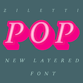 [MyFonts]
[More] ⦿
|
aphoria
|
 Designer at FontStruct in 2008 of Interest (dot matrix), Order (constructivist), Attica, Continuum (rounded bold), Fairway (+Slab, +Serif), Slant (techno), Cowboy (2008, Western-themed), Lights in the sky, Olymia Bold, Solida (psychedelic), Digi (pixel face), Villa (heavy slab serif) and Olympia Light. In 2009, he added Versional, Crown, Vend, Reed (Slab, Sans, both octagonal), Spaced Out (Bold, Italic, Regular), Jingle, ReMix (kitchen tile), Squire (3d face), Garage Sale (stencil), Signage, Futility (blackletter), Expearemint, Textual, Callout, tweedie, Embolden, Clipped, Economical, Emphasis, Vessel, Honest, Union (+Flat, +Sans, +New), Interest (pixel/dotted face), Venus Sans, Minanim, Diner (rounded), Lights in the Sky (De Stijl-like font), Opine, Charmer (+Inverse), Tweedle, Textual, Solida (ultra round), Slant, Slant, Villa (heavy slab serif), Versional, Vend, Union, Union Sans, Union New Sans, Union New Flat, Paperclip, Poofy, Steel (+Outline: octagonal), Crown, Diner (rounded), Solemn Bold, Solemn, reed Sans Mono (octagonal).
 Fonts from 2010: Full Deck (playing card font), Scrollboard, Power Up (piano key face), Groovy Fu, Formality, Union New (+Sans, +Flat), Angle Tutorial, Aurora Light (elliptical monoline sans), Pushpins, Aurora Light, Scrawl (marker face), Evity (a grotesk face), Altipen (upright script). Fonts from 2011: Obleak (oblique techno face), Likea (a heavy mechanical sans), Uptake (elliptical). Fonts from 2012: Omit (a bilined stencil face). Fonts from 2013: Emblazoned. Typefaces from 2014: Game Over, Aurora Light, Flowidity, Oxquad (textured, octagonal). [Google]
[More] ⦿
|
Architaraz Type (or: Kassymkulov Design)
[Zhalgas Kassymkulov]

|
 Architaraz Type (Kassymkulov Design) is located in Shanghai, China, and Taraz, Kazakhstan. Its type designer, Zhalgas Kassymkulov, was born in 1986 in Kazakhstan. His initial type designs were all done with the help of FontStruct. In 2013, he went commercial as Architaraz Type.
 He made a gridded modular typeface called Targeted (2011). Sliced (2011) is a counterless stencil face. Discostructed (sic) (2011) is a texture face. Mono Dot (2011) is a thin dot matrix face. Mono Hor (2011) is a horizontally striped version of it, Mono Ver (2011) a vertically striped version, and Mono Bold (2011) a bold version. Promo (2011) is purely geometric. Semiz (2011) and Semiz Light (experimental) are partly art deco. Audio (2011) is based on the logo of audiojelly. Arro (2011) has letters with arrowed terminals. Hexa (2011) is hexagonal. Happi (2011) is a fat finger face. Semiz Black (2011) is a free fat pixel face. Creations from 2012: Pearls of Margar, Korgan, Phunni, Carbo, Carbo ii, Lenta, Phunni, Jambul, Extraterrestrial (sci-fi), Rap My Hip-Hop, Armada 1991 (monospaced), Venus (white on black), Garage Garbage (bold avant-garde design), WHAQ, Extra Fontestrial, Algae, A Tasbaqa, Salem (rounded bold typeface), Thaiana Jones, Salem (fat rounded face), Audio 2012, Balapan, Dalmat, Bonn (an art nouveau army stencil face), Mgla, Teris (white on black), Degoratix (curly), Barney Stencil (a fantastic brushy stencil), Lentalicious, Blackway Str, Schengbers (a great piano key stencil family), Tramcar Typo, Mgia, Brushure (a fat curvy display face), Extralien, Serrific Terif, Missinger, Tolkyn, Murt, Twisture, Soliture, Threedure, Antillic, Garage Garbage, Arro, Happi, Schengbergs Hi. Typefaces from 2013: AT Dombra (psychedelic typeface after Motter Ombra), AT Hoppy (fat letters), AT Liniya (blackboard bold), AT Karagai, Hed Kandi (techno face), AT Traffa Stencil, AT Schema, Naation, AT Nayman, AT Roughin, AT Rooktura Stencil, AT Duba, AT Archistency, AT Liena, AT Bombarda (fat stencil face), AT Sulfur ii, AT Mad Pilot, AT Tasbaqa, Vaia Con Dios, Betaport, Mooltyashka, AT Stincel (a lively stencil font), Millio, Tamshy, Offelia, Jalgas (retro script: a winner in the FontStruct Connected Script Competition), Laffa (connected stencil script), Dlinalys, Diagona, Kitara (psychedelic), Archtitalic, Bonn (bony stencil), Teka 1, Teka 2, Unknownim, Khara (ultra-heavy slab face), Shlab (slab serif), Unknownim (slab serif), Archtalic, Argyn, Linea Runde, Mechatraps (+Plain), Eliksir, Drilliant, Katamaran (art deco), Lagman, Neurojet (experimental), Jazzure (bullet hole display face), Diagon, Aroth, Pharaoh's Delight (piano key / art deco typeface), Cocomi, AT Burshak, AT Sulfur, AT Taspa, AT Affina. Commercial typefaces done in 2013: KD William, William Shakespears, AT Archistency (piano key stencil face) AT Bombarda (piano key stencil face), AT Audio, AT Argyn. Typefaces from 2014: AT Sudoku (each letter is actually a sudoku puzzle!), AT Tactica (tic tac toe voard), AT Sudoku+, AT Pixtensans, AT Ayna, AT Kerey, AT Giveaway, AT Lagman, AT Asotika, AT Tugan, AT Yertegi, AT Nudgera, AT Diagona, AT Golovkin (stencil typeface named after middleweight boxer Gennady GGG Golovkin), AT Arachis (stencil), AT Tugan (fat rounded sans), AT Baktera, AT Jumpa Jumpa (stencil), AT Nudgera, AT Digitta, AT Archaus, AT Ladya (ball terminal stencil), AT Yin Yang, At Keste, AT Yazyk (rounded stencil), AT Sulfurian (techno stencil), AT Fasten Your Seatbelts (diagonally cut stencil), AT Buckle Up (like AT Fasten Your Seatbelts), AT Droppix, AT Knitka (knitting font), AT Sagat, AT Wild Archid (african theme font), AT Steglo. Typefaces from 2015: ATAday, ATArchistruct, ATAttache, ATBogomol, ATCastleryRock, ATChaperon, ATKitay (oriental simulation), ATQuba, ATRaushan, ATRoyal, ATShlanga, ATSkos, ATTrassa, AT Giveaway 4, AT Sherit, AT Ribborn. Typefaces from 2016: ATArchaus2, ATArchistructOutline, ATDornach, ATDrogo, ATEnschede, ATExtrema, ATGiveawayNo5, ATGiveawayNo6, ATHadamard, ATTwelve, Windows Icon Font. Typefaces from 2017: ATBals, ATBevelour, ATEsrever, ATHitchook, ATImagiro, ATLauda, ATMigdalia, ATRozalla, ATUniversiade, ATYangster, ATZabor, ATThinnetry. Typefaces from 2018: KD Eight, KD Tramcar, KD Algae Brush, Forza Juve (inspired by Juventus FC's logo), KD Hachure (a multiline typeface family), KD Half Arc, KD Space Band, KD Hachure (+Inline, +Outline), KDAnniversary, Armiya (army stencil), KD Baba Yaga (multiline). Typefaces from 2019: KD Para, KD Pempo (a multiline art deco font). Typefaces from 2021: KD Ziberia (based on Antonio J. Morata's Ziberia typeface from 2011), KD Dekorat (a modular labyrinthine or Maya genre set of capital letters). FontM link. Behance link. FontStruct link. [Google]
[MyFonts]
[More] ⦿
|
Ardyana Putra
[Ardyana Types]

|
[MyFonts]
[More] ⦿
|
Ardyana Types
[Ardyana Putra]

|
Bali-based designer (b. 1989) of Neon Absolute (2018: Sans, Script), Brusthy (2018: a brush script), Rafttel Script (2018), Tiffany Script (2018), Tiffany Sans (2018), First Script (2017), Jovanka (2018) and Hamilton (2018, a signature script). Typefaces from 2019: Kallimata Script, Himsomnia, Hollows (a dripping paint horror font), Doogle (a fat finger font), Moonline or Moonllime (a heavy monoline script), Sweet Candy (a monoline script), Domillion Brush, Rosewell Font Collection (script, black, standard, mono), Rapha Talia, Hamillton Two, Just Do It, Bosthon Brush, Fontania (brush), The Brown Wall (cursive script). Typefaces from 2020: Fomtage Script, Holla Monday (a marker pen font), Paper Works (an all caps cartoon font), Lover Bunny, Bana Chiips, Cathrine, The Domillion, Hello Bunny, Mount Hotham, Lovely, Molitha, Naughty Monster, Romello. Typefaces from 2021: Fontanio (a 7-style psychedelic font family with reverse stress), Ropers (a warm bold serif in the Windsor genre), Eleganto Sans (a 6-style fashion mag sans), Pumpkin Island (a Halloween font), Classical Romance (a 12-style decorative serif with many swashy alternate glyphs), The Sunmora (a decorative serif with elephant feet; 12 styles), Arabilla Signature, Boldoy (a bold decorative typeface), Moontok (a vernacular script), Breadley Serif, Breadley Sans (a Peignotian sans), Balivia (a 13-style display serif), Kintamani Script (formal calligraphy), Rolling Bold. Typefaces from 2022: Negaroa (an 8-style slightly wavy display serif), Crabs (a 9-style chunky sans), Austen Aesthetic (an 8-style decorative serif with flared terminals), Ottine Slab. [Google]
[MyFonts]
[More] ⦿
|
Ari Koivunen
[Curvy Fonts]

|
[MyFonts]
[More] ⦿
|
Art Nouveau
|
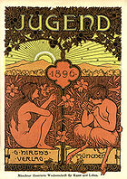 Quoting the wiki: Art Nouveau is an international movement and style of art, architecture and applied art-especially the decorative arts-that peaked in popularity at the turn of the 20th century (1890-1905). The name Art nouveau is French for new art. It is also known as Jugendstil, German for youth style, named after the magazine Jugend, which promoted it. A reaction to academic art of the 19th century, it is characterized by organic, especially floral and other plant-inspired motifs, as well as highly-stylized, flowing curvilinear forms. Art Nouveau is an approach to design according to which artists should work on everything from architecture to furniture, making art part of everyday life. Art Nouveau's fifteen-year peak was strongly felt throughout Europe-from Glasgow to Moscow to Spain-but its influence was global. Hence, it is known in various guises with frequent localized tendencies. In France, Hector Guimard's metro entrances shaped the landscape of Paris and Emile Gallé was at the center of the school of thought in Nancy. Victor Horta had a decisive impact on architecture in Belgium. Magazines like Jugend helped spread the style in Germany, especially as a graphic artform, while the Vienna Secessionists influenced art and architecture throughout Austria-Hungary. Art Nouveau was also a movement of distinct individuals such as Gustav Klimt, Charles Rennie Mackintosh, Alfons Mucha, René Lalique, Antoni Gaudí and Louis Comfort Tiffany, each of whom interpreted it in their own individual manner. Although Art Nouveau fell out of favor with the arrival of 20th-century modernist styles, it is seen today as an important bridge between the historicism of Neoclassicism and modernism. Furthermore, Art Nouveau monuments are now recognized by UNESCO on their World Heritage List as significant contributions to cultural heritage. The historic center of Riga, Latvia, with "the finest collection of art nouveau buildings in Europe", was inscribed on the list in 1997 in part because of the "quality and the quantity of its Art Nouveau/Jugendstil architecture", and four Brussels town houses by Victor Horta were included in 2000 as "works of human creative genius" that are "outstanding examples of Art Nouveau architecture brilliantly illustrating the transition from the 19th to the 20th century in art, thought, and society." It later influenced psychedelic art that flourished in the 1960s and 1970. [Google]
[More] ⦿
|
Arty Type
[James Marsh]

|
 James Marsh Art&Design (or Arty Type) is a visual arts and illustration company located in Hythe, UK, founded by James Marsh in 2010.
 His typefaces are often modular, and include Somaskript Tall (2012), Origami Incised (2012), Groovy (2012, +Inline: sixties face), Dropout (2012), Rough Diamond (2012), Thorny (2012), Tangent (2011, a geometric monoline sans), Scroll (2010), Marsh Scroll (2011), Tulip (2011, modular, heavy, and counerless), Somatype (2011, über-organic; +Skwosh), SomeSkript and SomaSkript Incised (2012, organic), and Nutcase (2010). In 2013, he published Soma Slab, Soma Slab Tall, Angleface, Anglepoise (a paper clip typeface family) and Mortice (octagonally cut). In 2014, he designed Sanzibar (a decorative sans), Sliced, Sliced Open, Omni (a minimalist organic monoline sans) and its companion, Omni Serif, and Tangential Semiserif, Tangential Rounded, and Tangential. Typefaces from 2015: Storybook (informal script), Sliced, Sliced Open, Sanzibar Schreef (swashy typeface), Galerie, Galerie2. Typefaces from 2016: Polke, Avocado Sans, Cyclic Uncial, Cyclic Serif. The Cyclic series was extended in 2018 to include Cyclic Sans. Typefaces from 2017: Troika (monoline display typeface), Caché. Typefaces from 2018: Sanzibar Script, Cyclic Sans. Typefaces from 2019: Sanzibar Script. Typefaces from 2021: Cyclic Eclipse (art deco), Bodonieqsque (a decorative didone), Cyclic Elite (a stylish sans). View James Marsh's typefaces. [Google]
[MyFonts]
[More] ⦿
|
Ashley Evan Pond
[AEP (or: An Elektrum Press)]
|
[More] ⦿
|
Atasi Studio (or: Atasi Type)
[Rizka Prayuda]

|
Medan, Indonesia-based designer of the handcrafted typefaces Winter Girl (2018), Clawblood (2018), Beauty Pearl (2018), Yellow Honey (2018) and Lonic (2018), and the modular typeface Musk Night (2018). Typefaces from 2019: Cumisans, Kaperta, Cosans (font duo), Hasiant, Elliana, Brushill, Shakila Yasmin, Rockbrush, Kazasttan (calligraphic), Zafira (script). Behance link for Atasi Type. Typefaces from 2020: Ceuphoria (a magic mushroom font), Gensino (a soft serif), Genorict (display serif), Hot Cream, Gillphong, Black Milk, Mack Wilson, Kancaqu, The Meshroom (groovy, handcrafted). Typefaces from 2021: Heylova Script, Adyta (an elegant display typeface). [Google]
[MyFonts]
[More] ⦿
|
BA Graphics
[Robert Alonso]

|
 Bob Alonso (b. Bronx, NY, 1946, d.2007), the founder of BA Graphics in 1994, was a prolific American type designer. With 33 years of experience at NewYork's Photo Lettering, he specialized in calligraphic script typefaces, but not exclusively so. BA Graphics was located in Chester, NY, and later in Toms River, NJ, and now sells its fonts through MyFonts. Many of its fonts published after Alonso's death in 2007 were completed by John Bomparte.
 John Bomparte wrote this obituary: Throughout his career at the legendary Photo-Lettering, Inc. (one that spanned four decades), Bob created original typefaces and tailored type by modifying, revising and filling out families, fashioning pieces of type for hand-lettered jobs, as well as being involved with the updating of a number of well-known logotypes. Bob was blessed with natural teaching abilities; and those in social and professional circles who had the good fortune to know him considered him not just a type designer but a mentor and a friend. As one such person close to him put it, he was a graphic technician [...] back when computers were not even in site for graphic arts, he would take on any intricate&complex graphic project that others would shy away from and come up with a solution that achieved a masterpiece. I'll always remember someone saying "this can't be done" and Bob saying let me see it and a short time later, there it was---done&perfect. I would like to think that attitude rubbed off on me. Along with this gift for teaching and explaining the complex, Bob exhibited a level of professionalism that was unsurpassed. A number of years ago when the need came to make the transition from the traditional to digital way of creating fonts, he rose to the challenge admirably. Towards the last few years of Photo-Lettering, Bob played a vital role in the conversion to digital, of many of the typefaces within the collection, notably those fonts that carry the prefix PL. More recently, Bob Alonso released several fonts through ITC, Adobe and his independent foundry, BA Graphics. Bob was on the cutting edge of his best work, and in the circumstance of his untimely passing, left a measure of unfinished designs. However, the spirit of his typographic talents and his fine sense of humor lives on through the many much-loved, and popular fonts he has left us: fonts such as Cookie Dough, Equate, Elephant Bells and Pink Mouse, to name a few. Alonso created these typefaces: FontShop link. Klingspor link. View Bob Alonso's typefaces. View the BA Graphics typeface collection. An alphabetic listing of Alonso's typefaces. [Google]
[MyFonts]
[More] ⦿
|
Bastarda Type (was: No Name Type Foundry)
[Sebastian Castellanos De La Hoz]
|
 Bogota, Colombia-based outfit, est. 2017 by Jason Guzman, Sebastian Castellanos and Federico Parra. Type designers associated with Bastardatype in 2022 included Oscar Guerrero, Julian Moncada and Fer Cozzi. Sebastian Castellanos graduated from the MATD program at the University of Reading in 2015. His graduation project was Orca (2015). It covers Latin, Greek and Thai: Orca was inspired by alcoholic beverage labels. It is constructed of a blend of sharp serifs and brush out-strokes which create a dynamic combination of angular lines and curves.
 The list of type designs: - Orca and Orca Display (by Sebastian Castellanos and Jason Guzman). The semi-stencil Orca Display won an award at Tipos Latinos 2018. Orca was inspired by alcoholic beverage labels. It is characterized by sharp serifs, a large x-height, moderate ascenders and descenders, and wide proportions. It covers Latin, Greek and Thai.
- Magma (Federico Parra). A psychedelic all caps typeface.
- Central. A handcrafted American gothic custom-designed for Central Cevicheria in Bogota.
- BT Barbara (2018). A flared typeface done with Fernanda Cozzi.
- BT Brutman (2020). An angular text typeface inspired by brutalist architecture.
- BT Orca and BT Orca Display.
- BT Lamina (2019).
- BT Salsa (2019).
- Kiffo Sans (2019), later called BT Kiffo.
- Stewar Variable (2022). Unknown designer.
- Gregor (2021, Oscar Guerrero). A hybrid sans serif typeface family with two variants, Upright and Slanted. The design is inspired by some advertising graphic designs used in the United States during the 60's and 70's.
- Super BT (2022). Unknown designer.
Old URL. [Google]
[More] ⦿
|
Beckii Adel
|
Montreal-based designer. During her studies at Concordia University, she created the free floriated caps typeface Floralism (2013), a font whose glyphs are shaped like in Novecento, one of the "in" typefaces of early 2013. Its decoration is inspired by art nouveau and psychedelia from he 1960s. Behance link. [Google]
[More] ⦿
|
Ben Balvanz
[Fontalicious]

|
[MyFonts]
[More] ⦿
|
Bernard Jacquet

|
 American type designer who created the retro deco phototype Jackson (1971, Mecanorma), which can be bought from Linotype and URW. For a revival, see Jackson Regular (2019, Nick Öhlo).
 Still at Mecanorma, he created the (phototype) flower power font Spring, which was revived at Canada Type as Jojo (2005, Rebecca Alaccari). Klingspor link. Fontshop link. [Google]
[MyFonts]
[More] ⦿
|
Bj Cabaltera
|
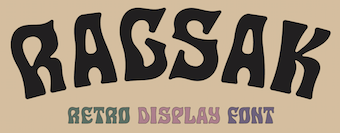 Hailing from the northern coastal town of Santa, Philippines, graphic designer Bj Cabaltera currently works in Manila. He designed these typefaces:
 - Ragsak (2021). A psychedelic typeface.
- Nalinak (2021). A free rounded vintage serif typeface family.
- Dagsen (2020). A free octagonal and rounded octagonal typeface family.
[Google]
[More] ⦿
|
BluHead Studio LLC
[Steve Zafarana]

|
 Type design studio located in Norwood, MA, est. 2005. Fonts can be bought at MyFonts.
 BluHead Studio LLC was founded in 2005 by a group of type designers, including Steve Zafarana, who founded Tail Spin Studio in 1999, also in Norwood, MA. Steve Zafarana was senior type designer at Bitstream from 2006-2012 and at Monotype from 2012 onwards. BluHead Studio was filling out the character sets and digitizing the font designs of New Zealand designer Joseph Churchward. These include the psychedelic Ta Tiki CW (2006) and Conserif CW, Design CW (2006, geometric). Creations by Tallulah Bluhead include Soylent Blu BH (2006: a bouncy cartoony wedge serif)) and Conference Call BH (2006). Roy Preston published the Prenton RP humanist sans family in 2006 and the comic book style families Comixed RP and Roy Hand RP in 2007. Between 2006 and 2008, several hand-printed typefaces were published. These include Barbara Script BH (2007, after the hand of Barbara Bemiss), Ciof Script BH (2008, a felt tip pen font after Susan Ciofolo Antico), Sally Script BH (2006, after Sally Muspratt), and Joanne Script BH (2007, by Joanne Paul). Sparkle Bluff BH (2007) is a ball and stick font for children. Notebook BH (2008) is a block letter face. In 2007, BluHead started publishing fonts by Joseph Churchward: Churchward Asia, Churchward Brush, Churchward Chinatype, Churchward Heading, Churchward Lorina (2014---the original by Churchward goes back to 1996), Churchward Maori, Churchward Maricia, Churchward Ta Tiki, Churchward Conserif, Churchward Design Lines, Churchward Freedom, Churchward Isabella (2015, a sans), Churchward Marianna (bubblegum face), Churchward Montezuma (2012, based on an Aztec-inspired design), Churchward Newstype (2008), Churchward Samoa, Churchward Supascript, Churchward Typestyle (2022; a 12-style sans). FontShop link. Creative Market link. Klingspor link. View the BluHead typeface library. [Google]
[MyFonts]
[More] ⦿
|
Bob Newman

|
 British graphic and type designer, most famous for his Data Seventy (1970, Esselte/Letraset), a display typeface that emulates the shapes of the early computer types [see Data EF at Elsner and Flake, and for a free knock-off, Westminster]. A cyrillization of Data70 was done in 1976 by Victor Kharyk.
 Other designs by Newman include Penny Farthing (1974, Letraset), Odin (1972), Frankfurter (1970, Letraset, with Alan Meeks and Nick Belshaw), Linotype Horatio, the psychedelic typeface Turtle (1971, Letraset), and Pump (EF and Linotype versions). On Frankfurter: a lowercase was done by Alan Meeks in 1978. FrankfurterHighlight (by Nick Belshaw) followed in 1978. An inline was added in 1981. Among the revivals, we mention Rafael Nascimento's Choripan (2020), Yorlmar Campos's RNS Baruta Black (2004), Scangraphic's Frankfurter, Linotype's Frankfurter, Infinitype's Farnham, SoftMaker's F821 Deco, and Castcraft's OPTI Frankfurter. See also the film type Frankfurter by Robert Trogman at Fotostar. Turtle saw a contemporary interpretations in 2011 by Nick Curtis as Turtellini NF, and in 2025 by Raphaël de la Morinerie and Ethan Nakache at Written Shape Type Foundry, called Reptil. Zach Whalen analyzes Data Seventy in his 2008 thesis and states that Data Seventy is the first full alphabet based on the MICR font E-13B, since it includes both upper and lower case letters. [Google]
[MyFonts]
[More] ⦿
|
Bobby Satria
[Oui Studio]

|
[MyFonts]
[More] ⦿
|
Bogdan Balatchi
[DePlictis Type (was: ESS Fonts)]

|
[MyFonts]
[More] ⦿
|
Brad O. Nelson
[Brain Eaters Font Co.]
|
[More] ⦿
|
Brain Eaters Font Co.
[Brad O. Nelson]
|
BrainEaters is Brad O. Nelson's font outfit in Salt Lake City, Utah (formerly in Orem, UT). Current fonts (mostly commercial, some free) include: BEBlob, BECROSS, Bingo Star, BubbleMan, DecayingAlternate, Decaying, EvilOfFrankenstein, PlasmaRain, SinsofRhonda, Witless, Blood Of Dracula (1.1), Blood Feast (1.1), Cat Women of the Moon, Cat Boxed, Channel Tuning, Demon Night (1.2), EddieFisher (1.4) (early 60's beatnik style sharp serif face), EddieFisher's Brothers (1.1), FrankenTOHO (1.1), H-Man (1.2), H-Man Part 2 (1.1), Keep on truckin (2003, psychedelic), Musicals (psychedelic), Psychatronic (2.0), Psychatronic Two Caps, Shiver (1.1), Spooky One (1.1), Stencil Gothic, Two-Face, Strange Planet, UmAbort, Old Witch, Sinister Urge, Haunted Hillbilly, Shiver, Sinbad 7, Trauma, Ghetto Dan, Burn in Hell, Unmanned Mission, Bloodytronic, A Weird Party (curly!), Amhole, BE Marker, Brain Invaders, Cat Women, KuntryHog&Joe, Matchbook, Space Immortalizer, BE Streetwalker, Butch Wax, Oh My Word, A Weird Party, Amhole, Prosy Script, Ramsesfuad, PsychTest, Circusized, Marker Money FW and CV (2005, an irregular hand), Witless (2008), Xerker, Robot Games, Space Blasterm Hyper Drive, Prosy Script, Ramsesfuad, PsychTest, Circusized, Space Immortalizer, Matchbook, Be Streetwilaker, Butch Wax, Oh My Word, Strange Planet, Um Abort, Mysterian, Old Witch, Sinister Urge. Dafont link. Fontspace link. Link at FontDiner. Another Fontspace link. [Google]
[More] ⦿
|
Break Maiden (or: Stable)
|
 Break Maiden (St. Petersburg, FL) is creatively led by Kenny Coil and Marc Berenguer, who, separately and together, have worked with a number of brands. In 2021, they designed these typefaces:
 - The incised all caps poster typeface Vacation Display: [It] was inspired by psychedelic posters of the 60s and 70s, Hawaiian matchbook advertisements, and our curious love for the Trader Joe's logo.
- Nellie Display. A hippie / psychedelic font with bubblegum contours and peace symbols.
- Vicente. A vintage all caps typeface: The Vicente Family hails from Tampa's Latin Quarter, Ybor City. This bold set of headline fonts were inspired by cigar boxes, factory facades, bootlegger bottles, and bolita balls.
[Google]
[More] ⦿
|
Brenden C. Roemich
[Digital Graphic Labs]
|
[More] ⦿
|
Brenners Template
[Ryul Davidson]

|
 Korean designer of these typefaces:
 - Metaverse Display (2021). a squarish family.
- Aleesya Rose (2021). A fashion mag font family in 14 styles. This led to Aleesya Serif by 2022.
- Kymer Awon (2021). A stylish all caps display typeface.
- Tilaa (2021, sans and serif). A 4-style mini-serif and sans typeface pair in which many adjacent letters are connected by hairline threads.
- Amonos Display (2021). An 18-style circle-based sanswith truncated descenders.
- Gernsheim (2021). An 18-style condensed sans for logos and headlines.
- Along Sans Rasoe, Along Slab Work, Along Sans Rounded (a fat rounded monoline sans), Along Serif BSC (a contrast-rich serif family in 18 styles) and Along Slab, all released in 2020. Along Sans Grande (an ultra-condensed sans in 18 styles) followed in 2021.
- Ensley (2020). A serif font in 18 styles.
- Claudia Fiesta (2020). A high contrast fashion mag style typeface.
- Belong Sans (2020).
- The script typefaces Minnesota (Solid, Brush; almost in Treefrog style), Caminode (a wild script), Lewis Script and Blessing (a dry brush script in OpenType SVG format), all released in 2020.
- Along Sans (2019). An organic and geometric sans family designed for headlines and logos. It is characterized by a wind-swept ascender on the k.
- Quenbach (2019). A 36-style sharp-edged geometric sans.
- Reost (2021). An 18-style monolinear organic circle-based sans.
- Zenoa (2022). A 14-style luxuriant hipster serif.
- Gibeon (2022). In 27 styles. A unicase display family characterized by its tall x-height, psychedelic traits and hipster era curves.
Creative Market link for Ryul Davidson (2021). [Google]
[MyFonts]
[More] ⦿
|
Brethren Design Co
|
 Designers of vintage display typefaces including many psychedelic and signpainting fonts. Their catalog in 2021 showed Beat Cop, Brotherly Love, Brush Fire, Buzzkill, Cherry Bomb, Chronic Sans, Chronic Sans, Cocktail Lounge, Courtesy Diner, Crust Punk, Dubba Hubba (bubblegum type), Fat Camp, Funk Ranch, Good Book, Killer Snakes (spurred), Lucky Charmer, Mystic Charmer (Victorian), Night Caps, Pig Roast, Royal Smokes, Soda and Poppers, Switchblade, and Xtra Funk.
 Typefaces from 2022: BDC Curb Wax, Clean Freak, BDC Drugstore Cowboy (Western). [Google]
[More] ⦿
|
Burhan Afif
[HansCo]

|
 [MyFonts]
[More] ⦿
|
Burnhaus Studios
[Jason Burnhaus]
|
Creator of these typefaces in 2012: Monogram (octagonal), Phys Ed Dept (athletic lettering), Wild Modern (spurred Far West face), and Queens Bridge (bubblegum, psychedelic). Jason lives in New York city. All the fonts can be downloaded from his site (Burnhaus Studios), but three of the four downloads do not work. Behance link. Personal web site. [Google]
[More] ⦿
|
Burntilldead
[Eric Kurniawan]

|
 Eric Kurniawan (or Burntilldead, b. 1986) is located in Bali, Indonesia. He created the vintage script typeface The Goldsmith Vintage (2015).
 Typefaces from 2016: Lazarus (a brush font), Bestters Supply (signage script), The Wild Hammers, Ramblin Script, Ramblin Sans, Angeline Vintage (brush typeface), Victorian Deco (more Victoriana), Steelworks (letterpress), Angeline (swashy brush script), La Petitenget, Azarus (brush style), Victorian Parlor (Victorian). Typefaces from 2017: Dandeleon, American Whiskey, Vulturemotor (with Gusti Ngurah Widiantara), Sandglow (signage script). Typefaces from 2018: Renaissance Garden (vintage), Victorian Fonts Collection (which consists of King Edward (Edwardian) and Queen Victoria (Victorian)), Billyforges (weathered letterpress style; with Ade Meida and I Gusti Widiantara). Typefaces from 2019: Victorian Decade (18 fonts: +Gradient, +Outline, by Eric Kurniawan and Ade Meiada). Typefaces from 2020: Alocasia (Sans, Script and Serif), Victorian Supremacy (an 11-style ornate Victorian / blackletter typeface family), Galactus (sci-fi), Prestissimo Classy (Serif and Script: the Script features copperplate calligraphy), Historium and Historia (a weathered vintage typeface), Sportage (a squarish sports font). Typefaces from 2021: Mashbro, Barones (a vintage label font), Arterium (a vintage Victorian label font family), Veinline (a vintage script font), Bonitalia (script), Alota (funky and groovy 1970s font), Energize (techno), Metalsmith (a weathered all caps typeface), Bower (an early computer emulation font), Broto, Celestic (a decorative partly psychedelic serif), Dellucion (an art nouveau serif), Glitcher (a great art nouveau typeface), Greta, Lazarus, Racer Boy (a techno family), Silly Kids, The Sitcom (a retro script). Typefaces from 2022: Mooners (a spurred Victorian liqueur font), Morvem (an 18-style psychedelic typeface). [Google]
[MyFonts]
[More] ⦿
|
burodestruct (or: Typedifferent.com)
[Lorenz Lopetz Gianfreda]

|
 Lorenz Lopetz Gianfreda's foundry in Bern, Switzerland, est. 1994, called Burodestruct and Typedifferent.com.
 Free fonts include(d) the gorgeous GalaQuadra (by Angela Pestalozzi, 1999), Eject Katakana (1998), Dippex (1995, grunge font), Ticket (1995), Rocket 70 (1996), Ratterbit (1995, pixel font), Plakatbau (1995), Lodel Fizler (1996), Flossy (1995), Faxer (1995), Console Remix (1998), Cravt (1998, by "Katrin"), Stereotype (1998, by M. Brunner), Brockelmann (1995, free), Kristallo (1997, very original display face) and Billiet (1996). Other fonts: Acidboyz (1998), Alustar (1999), BD Asciimax (1999, ascii art font), BD Billding, Bdr_mono (1999), Brick (1996, like Kalendar), Cluster (1996), Console (1997), Doomed (1998), Eject (1998), Electrobazar (1995), Elside (1995), Globus (1996), Fazer (1996), Lofi (1997), Medled (1995), Paccer (1995), Solaris (1998), Spicyfruits_brush_rmx (1998, a nice high-contrast face), Spicyfruits_rmx, Wurst (free, by Heiwid, 2000), Relaunch (2000), Relaunch Katakana (2000, free), Rainbow (2000), DeLaFrance (2000, free, by Heiwid), Electronic Plastic (2000), Colonius (2001), Cash (2001), Cashbox (2001), Bilding (2001), Meter (2001), Mustang (2001), Bankwell (2001), BD Alm (2001), Balduin (2001), Tatami (2001, oriental look font), Hexades (2001, free), Nippori (2002, techno), Jura (2002), Bonbon (2002, free), Band (2002, free), Navyseals (2002, kitchen tile font), Ritmic (2002), BDR Mono (1999, OCR-like font), Mann (2003, ultra fat stencil), Aroma (2003), Zenith (2003), Nebraska (2003), BD Equipment (2004), BD El Autobus (2004), BD Unexpected (2004), BD Wakarimasu (2004, free kana face), BD Bernebeats (2004, futuristic), BD Deckard (2004), BD Spinner (2004), BD Victoria (2004), BD Designer (2004), BD Kalinka (2005, a curly ultra-fat display face), BD Equipment (2004), BD El Autobus (2004), BD Unexpected (2004), BD Varicolor (2005, stencil), BD Chantilly (2005), BD Memory (2005), BD Emerald (2005, beveled), BD Kalinka (2005, Cyrillic simulation), BD Extrwurst (2005), BD Aquatico (2005), BD Mandarin (2005), BD Polo (2005), BD Beans (2005), BD Tiny (2005, pixel face), BD Times New Digital (2006), BD Panzer (2006), BD Jupiter, BD Jupiter Stencil (2006), BD Pipe (2006), BDR Mono 2006 (2006), BD Fimo Outline (2007, free, by Nathalie Birkle), BD Bermuda (2007, experimental and geometric), BD Smoker (2007, psychedelic), BD Radiogram (2007), BD Mother (2007, exaggerated black Egyptian), BD Fimo Regular (2007, free), BD Demon (2007), BD Reithalle (2007, free), BD Halfpipe (2007, free), BD Broadband (2008, free; not to be confused with the much older fonts BroadbandICG or FLOP Design's Broadband), BD Viewmaster and BD Viewmaster Neon (2008), BD Electrobazaar (2008), BD Motra (2008, stencil), BD Virtual (2008), BD Spacy 125 (2008), BD AsciiMax, BD ElAutobus (2004), BD Equipment (2004), BD Ramen (2003), BD Retrocentric (2009), BDR A3MIK (2009, virile Latin and Cyrillic slab), BD HitBit (2009), BD Unicorse (2010, unicase and techno), BD Telegraph (2011), BD Schablone (2012, stencil face), BD Pankow (2013, stencil), BD Algebra (2014), BD Hiragana Kuro (2014), BD Qualle (2014, a fat poster typeface), BD Tribler (2015, a tribal font). Alphabetical listing of their pre-2015 free typefaces: Algebra, Alm, Apotheke, AsciiMax, Baldrian, Band, Bankwell, Bardust, Beans, Billding, Billiet, Bonbon, Brockelmann, Burner, Cash, Cashbox, Chantilly, Circo, Console, Console Remix, Cravt, Delafrance, Designer, Destination, Dippex, Eject Katakana, ElAutobus, Elmax, Elside, Equipment, Faxer, Fazer, Fimo, Flossy, Fluke, Galaquadra, Geminis, Halfpipe, Hexades, Hiragana Kuro, Jayn Fonta, Kristallo, Lodelfizler, Lofi, Medled, Meter, Mustang, Outline, Paccer, Pipe, Plakatbau, Plankton, Polo, Ragout, Ramen, Ratterbit, Reithalle, Relaunch, Relaunch Ktna, Rocket70, Sirca, Sirca Rmx, Solaris, Spacy125, Spicyfruits, Spinner, Stella, Stencler, Stereotype, Ticket, Times New Digital, TinyFont, Tribler, Unfold, Wakarimasu. Alphabetical listing of their pre-2015 commercial typefaces: A3mik, Acidboyz, Alustar, Aquatico, Aroma, Balduin, BDR Mono 2006, Bermuda, Bernebeats, Breakbeat, Brick, Broadband, Calamares, Central, Cluster (Corporate), Colonius, Deckard, Demon, Discount, Doomed, Edding850, Eject, Electrobazar 2008, Electronicplastic, Elk, Emerald, Endless, Extrawurst, Fontabello, Globus, Good Wood, Hell, Hitbit, Jupiter, Jura, Kalinka, Kameron, Kinski, Las Palmas, Mandarin, Mann, Memory, Mother, Motra, Naranino (2012: a children;s script), Navyseals, Nebraska, Nippori, Nokio, Orlando, Pankow, Panzer, Qualle, Radiogram, Rainbow, Retrocentric, Ritmic, Robotron, Schablone, Showlong, Smoker, St.Moritz, Stalker, Stonehenge, Sweethome, Tatami, Telegraph, Unexpected, Unicorse, Varicolor, Victoria, Viewmaster, Virtual, Wotka, Wurst, Wurst Directors Cut, Zenith. In 2015, Gianfreda designed BD Barbeaux (a condensed typeface with the fashionable chic of the French art nouveau or film noir). Typefaces from 2016: BD Kickrom Mono (LED emulation type). Typefaces from 2018: BD Westwork. Typefaces from 2020: BD Aubergin (an experimental poster font with Bauhaus elements), BD Microna (a pixelish variable font), BD Micron Robots (dingbats). Typefaces from 2021: BD Supper (a food packaging sans), BD Roylac (a stylish poster font that evokes modern furniture), BDRmono 2021 (hipster style techno). Alternate URL. Dafont link. Behance link. View the Typedifferent typeface library. [Google]
[MyFonts]
[More] ⦿
|
Cabarga type (was: Flashfonts)
[Leslie Cabarga]

|
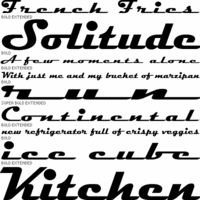 Flashfonts was Zavier Leslie Cabarga's Los Angeles-based foundry. Leslie Cabarga is a baby boomer from New Jersey and author of The Lettering and Graphic Design of F.G. Cooper, the Illustrator/Fontographer/Fontlab resource book, Logo Font&Lettering Bible (2004), and Learn Fontlab Fast (2004, with Adam Twardoch). He ran Leslie Cabarga Design and Cabarga Type in Los Angeles. In 2021, Cabarga Type joined The Type Founders. His lettering prowess is apparent in this drive-in sign for "Betty Boop's Drive-In" (which inspired Nick Curtis to make Drive-Thru NF), FontShop link. MyFonts link.
 Leslie Cabarga's typefaces: - Raceway (1995), a famous retro script.
- Casey (2007), a fat-bottomed script at Font Bureau.
- Streamline. Another fifties diner or Chevrolet grille font.
- Kobalt and Kobalt Kartoon (at Font Bureau), great for displays.
- Ojaio, a beautiful art deco font.
- Central Station, an original display face.
- The retro script Magneto.
- Neon Stream (1995, Font Bureau). Connected retro nightclub letters.
- Peace: an original psychedelic 60s font based on an alphabet copyright 1997 by Wes Wilson, creator of the classic 1960s Fillmore Poster Lettering style; see here.
- Saber (2002), a mix of uncial, Fraktur, gothic and Exocet.
- Love, a psychedelic 60s font also based on Wes Wilson's lettering. In Solid, Open and Stoned styles. At Font Bureau, 1997.
- Esselte's Cabarga Cursiva. Cabarga Cursive was jointly designed in 1982 by Leslie Cabarga and his father Demetrio.
- Cocoanut, Grassy Knoll, Straight Light, Straight Medium, Rocket (1995), Progressiv, Cymbal Regular, Dotcom Medium, Generik Regular, Graffiti Regular, Angle, Badtyp, Haarlem (2000), Margarete, Primitiv, Progressiv, Rocket, Rocket Gothic, Straight, Bellbottom, Hihat, Baseball. Jo the Webmistress on Cabarga.
Abstract Fonts link. [Google]
[MyFonts]
[More] ⦿
|
Canada Type
[Rebecca Alaccari]

|
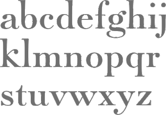 Foundry in Canada, est. 2004 by Rebecca Alaccari in Toronto, and run by her and Patrick Griffin. Interview with Rebecca. Her typefaces can be bought via MyFonts: Storyville (2015, a curly script), Centennial Script (2007, a revival of an 1874-1876 high-contrast calligraphic script by Hermann Ihlenburg), Valet (2006, superb art deco face), Freco (2006, an art deco typeface loosely based on designs and letters of Fré Cohen), Silk Script (2006, based on 1956 Helmut Matheis script called Primadonna), Dominion (2006, based on an early 1970s film type called Lampoon), Johnny (2006, an art nouveau poster typeface that revives the Harem/Margit typeface by Phil Martin, 1969), Guillotine (2007), Mayfair (2006, a calligraphic typeface based on Mayfair Cursive by Middleton, 1932), Happy Birthday (2006, script), Geronimo (2005, brush style poster font), Rostrum (2005, a revival and expansion of a type called Oleander, designed in 1938 by Julius Kirn for the Genzsch&Heyse foundry in Hamburg), Apricot (2005; based on A.R. Bosco's Romany for ATF, 1934, but a major extension with many ligatures), Heathen (2005), Cougar (2004, a digital version of Martin Wilke's 1968 handwriting typeface Konzept), Puma (2004, brush typeface based on Herbert Thannhaeuser's 1954 Kurier), Big Brush (brush), Diva (connected script), Odette (a high ascender display typeface after the Morris Fuller Benton 1918 American classic, Announcement Roman), Crucifix (2004, a severe octagonal face), Fore (2004, a bullethole face), Formula, Gamer (2004), Formula (2004), Kofi, Platoon (2004, a stencil face), Verso (2004), Secret Scrypt (2004, a handwriting face), Bluebeard (2004, blackletter by Patrick Griffin), Bolero (2004), Janice (2004, psychedelic), Jimi (2004, also psychedelic), Scroll (2004), Dominique (2004, upright script), Moxie (2004, a fat display family which includes a stencil), StockA (2004), StockB (2004, a fat stencil face), Stalker (2004, a destructionist face), Scroll (2004), Jonah (2005, a hippie typeface based on an early 1970s film type from Franklin Photolettering called Urban). MyFonts page. Phil Rutter and Patrick Griffin made Coffee Script (2004), the digital version of R. Middleton's Wave design for the Ludlow foundry, circa 1962. Phil Rutter and Rebecca Alaccari designed Almanac (2004), a script typeface based on Imre Reiner's London Script (1957) (and Rebecca did a subsequent redigitization in 2007 that led to Reiner Hand), Tiger Script (2004, based on Georg Trump's wild brush script Jaguar done in 1967 for C. E. Weber), and Ali Baba (2004), an Arabic simulation typeface originally designed by Georg Trump as Palomba (1955, C.E. Weber foundry). Patrick Griffin made Leather (2005, after Imre Reiner's 1933 blackletter face), Secret Scrypt (2005), Skullbats (2005), Slang (2004, a blood scratch face), Bluebeard (2004), Expo (2004, an octagonal family), and Dancebats (2004). Simone Wilkie designed Boyscout (2004) after the handwriting of her son. Helmut Matheis' Contact (1963, flowing script/brush) was digitized by Rebecca in 2004 as Bruschetta. Rebecca also made Steiner Special (2007, a revival of Swing, a film type by Peter Steiner, 1974), Genesis (2007, a digitization and extension of Grayda, a 1939 calligraphic script of Frank H. Riley at ATF), Evolver (2006, futuristic family), Redwood (2007, a calligraphic script based on Willard T. Sniffin's Raleigh Cursive (1929, ATF)), Orotund (2005, after the 1970s typeface Eight Ball; this was extended again in 2006 in her art nouveau typeface Huckleberry, which is a revival of the 1973 typeface of Gustav Jaeger called Mark Twain), Pendulum (2005, a fantastic flowing script based on Nebiolo's Americana, 1945), Jojo (2005, a flower child typeface after Spring, by Bernard Jacquet), Mascara (2004), Gala (2004, after Neon (1935, Giulio da Milano at Nebiolo)) and Bella Donna (2004, after a script made by Alessandro Butti in 1948, called Rondine).
 Typefaces made in 2005: Jazz Gothic (Patrick Griffin), Showboat, Hunter (a revival of Imre Reiner's brush script Mustang, 1956), Quanta (stencil), Quiller (a script typeface based on J.J. Sierke's 1964 typeface Privat), Rhino (revival of Mobil, a 1960 typeface by Helmut Matheis for Ludwig&Mayer), Dominique (donated to FontAid), Secret Scrypt (donated to FontAid), Jackpot (2005, Western typeface remotely based on Cooper Playbill which in turn is related to Cooper Black, but it also has hippy 1968 influences), Sincerely (handwriting typeface based on Karlgeorg Hoefer's 1968 Elegance), Fontella (a digitization of Novarese's calligraphic script Elite), Boondock (digitization of Imre Reiner's Bazaar from 1956), Gumball (digitization of Papageno, a 1958 bubblegum font by Richard Weber for Bauer), Runway, Gamer, Dominique (OpenType handwriting face), Sterling Script (2005, by Alaccari and Griffin: a 7-weight digitization and extension of Stephenson Blake's 1952 clean copperplate script Youthline Script), Vox (2007, a 24-style monoline sans family done with Patrick Griffin), Vox Round (2013, a softer version), Swan Song (2006: a calligraphic typeface based on the hand of Alexander Nesbitt. A later document states that it is based on work by British artist Rachel Yallop from 1986), Evolver (2006, a 9-style futuristic family), Ambassador Script (2007, an Alaccari-Griffin revival of the angle-reduced calligraphic script Juliet by Nebiolo, 1955). In 2005, Philip Bouwsma joined Canada Type, and designed a great calligraphic blackletter-inspired family, Torquemada. He designed many other typefaces for Canada Type in subsequent years. VIP (2007, Rebeca Alaccari) is a humanist sans serif uppercase (and figures) combined with a freshly redrawn revival of the classic VGC Constanze initials originally designed by Harry Brodjian in 1970, and even further back, the Constanze Initials by Joachim Romann (1954-1956, Stempel). Chopper (2007, by Rebecca Alaccari) is a revival of Venture (a 1972 typeface for VGC by Harry Villhardt). Walter (2007, Rebecca Alaccari) is a digitization of Heritage (1952, ATF, a calligraphic script by Walter H. McKay). Celebrity (2007, Rebecca Alaccari) revives and extends the retro/techno typeface Latus (Willy Wirtz, 1971). Sympathique (2008, Alaccari) is an ultra-thin and ultra-tall typeface in the mold of Bernhard Fashion and other era poster or film typefaces (they say that it is rooted in the film typefaces Hairstreak and Mossman). Mullen Hand (2008) is a revival of Repro Script (1953, Jerry Mullen, ATF). Filmotype Giant (2011, a condensed sans) and its italic counterpart, Filmotype Escort (2011) were both co-designed with Patrick Griffin. In 2020, they released the variable informal sans typeface Bananas: Bananas was sourced from multiple American film era faces, all from 1950s and 1960s, when the casual sans genre was at its popular peak. Headliners' Catalina and its very similar cousin, Letter Graphics' Carmel, served as initial study points. Catalog of its typefaces. Klingspor link. [Google]
[MyFonts]
[More] ⦿
|
Carine Farhat
|
Designer (b. 1992) of a psychedelic font in 2015. [Google]
[More] ⦿
|
Carly Plaskett
|
Carly Plaskett (Carly Lane Design, San Francisco, CA) created the late art deco typeface Fillmore (2012). Behance link. [Google]
[More] ⦿
|
Carolina Rodríguez
|
Mexican designer of Hendrix (psychedelic) and Iyul (an Arabic simulation face), mentioned here. [Google]
[More] ⦿
|
CAT Design Wolgast
[Peter Wiegel]
|
 Wolgast-based type designer Peter Wiegel (b. 1955) runs CAT Design Wolgast. Designer of these free fonts:
 - In 2019: Kufi Pattern.
- In 2018: Aurach Tri (a trilined typeface), Googee (monoline circle-themed sans), Gianna (medieval script), Hamburger Schwabacher.
- In 2017: Eyechart (heavy slab serif), Border Control (inline), Espresso Dolce (rounded sans), Gotisch Weiss, Halt (a dry brush typeface after Walter Hoehnisch's Stop from 1939), Kanzler, Llewie (rounded sans), Schulze Werbekraft (expressionist, after Arthur Schulze, 1926).
- In 2016: Ronaldson Gothic (after a MacKellar, Smiths & Jordan Co original), Vorgang (a great 1920s geometric sans), 5by7 (LED pixel font), BP 12-22 (industrial sans), u DIN 1451 Mittelschrift, Flubby, Gaeilge (Irish / uncial), Junior CAT (after Hans Heimbeck, 1936), CAT Liebing Gotisch (after Kurt Liebing), Tippa (an old typewriter font based on Adler Tippa 1).
- In 2015: Nuernberg (blackletter), CAT Schmalfette Thannhaeuser (blackletter), Offenbacher Reform (a revival of Offenbacher Reform, a blackletter typeface by Roos & Junge), Autobahn (blackletter), Barloesius Schrift (after Georg Barloesius's Barlösius Schrift, 1906), CAT-Franken-Deutsch (after Alfons Schneider, 1936), Fuckin Gwenhwyfar, CAT Kurier (a script after Herbert Thanhaeuser's Kurier from 1939), CAT Linz, CAT Rhythmus (a sharp-edged black grotesk after a Schriftguss AG original), DIN Schablonierschrift (DIN-based stencil), CAT North Licht, Feronia, Fette National Fraktur (after Walter Hoehnisch, 1934), Grobe-Plakat-Fraktur, CAT Childs (fifties style cursive typeface), Jena Gotisch (decorative caps), Kabinett Fraktur (after Johann Friedrich Unger, 1793-1794), Wattauchimma (heavy hipster sans), Friedolin (blackletter), Lorem Ipsum, Symphonie (a calligraphic script, reviving Imre Reiner's Symphonie (1938), also called Stradivarius (1945)), Power (a retro techno typeface), Krugmann Brush, Omega.
- In 2014: BernerBasisschrift1, BernerBasisschrift2 (school script), Berolina, Brausepulver (after Brause & Co., 1912), Fette Mikado (psychedelic style oriental look), Germanica, Gloria, HentimpsCirclet (blackletter), Hofstaetten (blackletter), Kleinsemmering, KuenstlerGotisch (blackletter), LacledeCAT (psychedelic), NeptunCAT, Neue Zier Schrift (a mischievous curly script), Pommern Gotisch, Reclame, CAT Report (retro brush script), Rueck-Italic, Rueck, RueckLeft, RueckLicht, RundschriftCAT (hairline ronde), Standard Graf (German expressionist and hexagonal typeface), Teutonic, VerzierteFavorite, VictoriaCAT, AdmiralCAT (a retro script), Dynamo (poster font), Des Malers Fraktur, Kanzleyrath (blackletter), Ober-Tuerkheim (art nouveau), PopplFrakturCAT (blackletter), Rundkursiv, Modeschrift (fifties script), Biedermeier Kursiv, Ehmcke Federfraktur (after a 1935 font by F.H. Ehmcke), Wernicke Schwabacher (after an original by Emmi Wernicke), Gotische Missalschrift, Hand Textur (after a 1935 font by F.H. Ehmcke), Renata (after a 1914 bastarda by Bauersche Giesserei), Rundgotisch Rauh (possibly after a Schelter & Giesecke design from 1903), Offenbacher Schwabacher (after Kurt Wanschura's bastarda from 1900), Incopins Clusters (multilined typeface), BadGong, Bernardo Moda (Bold, Semibold, Moda, Contrast: modeled after Lucian Bernhard's Bernhard fashion), CAT-Hohenzollern (after a 1902 art nouveau font by Bauersche), CATNorth, CATNorthLicht, CATNorthShadow, CAT Zentenaer Fraktur UNZ1 (a blackletter after a 1937 original by F.H.E. Schneidler), Coggers-Tariqa, EirikRaude, Fabrik (a geometric sans), Grobe Deutschmeister (German expressionist face), Harry Piel (or Piehl--a tattoo font), Kanalisirung, Klaber-Fraktur, Peter Obscure, Rumburak (a fat retro script), Flottflott (retro script), Indira K, Regent UNZ (a Schwabacher), Postamt, TGL 0-1451 Engschrift (a DIN-like font).
- In 2013: Spartakus (+Round), Cut Me Out (white on black sans), 5by9 (dot matrix face), Tartlers End (high-contrast ball terminal face), Alpha 54 (rounded flared script face), Chunk Five Ex (slab serif; he writes: With permission of Meredith Mandel, the original author of the ASCII-Font Chunk Five, I have extended Chunk Five Ex to a full featured unicode font with all figures used in Latin and Cyrillic writing), Simple Print (simple sans), Fette Bauersche Antiqua (a didone fat face), Manuskript Gothisch (after Manuskript Gotisch (1899, Bauersche), which was modeled after Wolfgang Hopyl's 1514 Textura), Quast (hairy font).
- Still in 2013, he published a number of school scripts, including Neue Rudelskopf, Deutsche Normalschrift, Imrans School, Rastenburg (German school font), and Bienchen.
- In 2012: Hardman (connected fifties script), Immermann (a quaint slab serif), Quast (grunge), Fundamental Brigade (sans family), DiffiKult (a bilined face), Men Nefer (a Memphis lookalike), Fette Unz Fraktur (like Fette Fraktur), Mutter Krause (for the reconstruction of the 1929 silent movie "Mutter Krausens Fahrt ins Glück", where it is used for intertitles, that where missing. The font is redrawn from the original intertitles), Youbilee (a font with laurels).
- In 2010: Alfabilder (dingbats), Gondrin (athletic lettering with a 3d effect), Helvetia Verbundene (making Helvetica into a school script? The original typeface was by Carl Albert Fahrenwaldt 1901), Proletarsk (a grotesk face), Vis-à-vis (great idea--a double-storied serif face), ApolloASM (Victorian), BertholdrMainzerFraktur, Doergon-Regular (license plate font), DoergonBackshift, DoergonShift, Eureka (Victorian, ornamental face), GoeschenFraktur (1880-style Fraktur used in Sammlung Göschen books), Makushka, MakushkaKontura, MakushkaQuadriga, MakushkaSecunda, Moderne3DSchwabacher, ModerneGekippteSchwabacher, StrassburgFraktur, TGL0-16 (same as DIN 16), TGL0-17 (same as DIN 17), TGL0-17Alt, Tank (emblems of gas companies), EricaType-Bold, EricaType-BoldItalic, EricaType-Italic, EricaType-Regular (typewriter), ErikaOrmig, Fibel Vienna (2012, a high-legged sans), GreifswalderTengwar-Regular, GreifswalerDeutscheSchrift (German Schreibschrift), Midroba-Regular (a strong mechanical octagonal face), MidrobaSchatten, MMX2010 (futuristic), Präsent60, Rotunda Pommerania (blackletter), TengwarOptime, TengwarOptimeDiagon, cbe-Bold, cbe-BoldItalic, cbe-Italic, cbe.
- In 2009: 18thCenturyInitials, 18thCenturyKurrent-Regular, 18thCenturyKurrentAlternates, German writing from the 18th century), CentreClaws, CentreClawsBeam1, CentreClawsSlant, Cöntgen Kanzley Regular (blackletter), Cöntgen Kanzley Aufrecht (2009), ElficCaslin, H1N1, Loxembourg1910Shadow (an art nouveau-influenced stencil face), Luxembourg1910, Tschichold, VarietScala (an art deco sans family), Varietee, VarieteeArtist, VarieteeCabaret, VarieteeCascadeur, VarieteeCasino, VarieteeCirque, VarieteeColege, VarieteeConferencier, VarieteeFolies, VarieteeIkarier, VarieteeJongleur, VarieteeMirage, VarieteeRevue, VarieteeTheatre, KochFetteDeutscheSchrift (blackletter), MoradoFelt-Regular (upright connected script), MoradoMarker (2009), MoradoNib, PreussischeVI9 (DIN-like family), PreussischeVI9Linie, PreussischeVI9Schatten-Linie, PreussischeVI9Schatten, SchatternvonPreussischeVI9, Stage (art deco), Ring Matrix (dot matrix), Nathan, Amptmann Script (2009, upright connected script), Cat Shop, Blankenburg (blackletter), Murrx (arched face), Schwaben Alt (1988, bastarda), Vrango, 14LED (Regular, Phattt-Heavy, Rised-Black), 24LED (+Bright, +Grid, +Modul), DIN1451fetteBreitschrift1936-Regular, FibelNord (basic sans family with an architectural twist), FibelSued (family), PaneuropaBankette, PaneuropaCrashbarrier-Black, PaneuropaFreeway, PaneuropaHighway, PaneuropaRoad, PaneuropaStreet, PaneuropaWrongWay, Quirkus (family), RingMatrix (dot matrix family), RingMatrix3D, RingMatrixTwo, DiscipuliBritannica (connected script), GruenewaldVA-Regular (connected school script), Rudelskopfdeutsch-Aufrecht, WiegelLatein (connected school script), WiegelLateinMedium (2009), Morado, Moebius Bicolor (art deco), Elbaris (sans), ElbarisOutline, Nomitais (multiline face), RostockKaligraph, Waschkueche, WaschkuecheGrob-Ultra, WiegelKurrent (traditional German school script), WiegelKurrentMedium, XAyax, XAyaxOutline (2009), Kaufhalle (squarish), Quimbie (art deco), CasaSans-Regular, Elb-Tunnel, MeyneTextur (blackletter), Yiggivoo, TGL 31034-1 (futuristic sans), Beroga (a simple organic sans).
- Before 2009: Xayax, PreussischeIV44Ausgabe3 (2006, a severe sans), Utusi Star (1989, very condensed all-caps face), Avocado (2006, script face), CbeNormal (2006, script face), Leipzig Fraktur (+Bold) (2006), Berlin Email (2006, a condensed sans family, followed in 2009 by Berlin Email Serif), MaassslicerItalic (2006, a futuristic typeface made for Rudolf Maass + Partner GmbH), Powerweld (a gorgeous avant-garde typeface made for OPTI Pumpen und Technik GmbH), WolgastScript (2005), WolgastTwo (2006, connected script), WolgastTwoBold, ZeichenDreihundert-Regular, ZeichenHundert-Regular, ZeichenVierhundert-Regular, ZeichenZweihundert-Regular (2006, traffic dingbats), Djerba simplified (Arabic font, Computer and Technologie, Hamburg, 1995; it can be downloaded here), Titus FrakturBaltic (1998), TITUS FrakturEast Normal (1998), and TITUS FrakturWest Normal (1998) [which used to be downloadable here; these fonts were retired and the Titus name dropped; most of the glyphs made it to Schwaben Alt].
Dafont link. One more URL. Fontspace link. Yet another URL. Font Squirrel link. Fontsy link. The list of his truetype and opentype typefaces as of 2011: 18thCenturyInitials, 18thCenturyKurrentStart, 18thCenturyKurrentText, Alfabilder, AlteDIN1451Mittelschrift, AlteDIN1451Mittelschriftgepraegt, AmptmannScript, ApolloASM, Avocado, Barnroof, BerlinEmail, BerlinEmail2, BerlinEmailBold, BerlinEmailBold, BerlinEmailHeavy, BerlinEmailHeavy, BerlinEmailOutline, BerlinEmailOutline, BerlinEmailSchaddow, BerlinEmailSchaddow, BerlinEmailSemibold-Bold, BerlinEmailSemibold-Bold, BerlinEmailSerif, BerlinEmailSerif, BerlinEmailSerifSemibold, BerlinEmailSerifSemibold, BerlinEmailSerifShadow, BerlinEmailWideSemibold, BerlinEmailWideSemibold, Beroga, Beroga, BerogaFettig-Bold, BerogaFettig-Bold, BertholdMainzerFrakturUNZ1A-Italic, BertholdMainzerFrakturUNZ1A, BertholdrMainzerFraktur, Blankenburg-Regular, BlankenburgUNZ1A-Italic, BlankenburgUNZ1A, CasaSans-Regular, CasaSans, CasaSansFettig-Bold, CatShop, CentreClaws, CentreClawsBeam1, CentreClawsSlant, ChunkFiveEx, CntgenKanzley-Regular, CntgenKanzleyAufrecht, DIN1451fetteBreitschrift1936-Regular, DiscipuliBritannica, DiscipuliBritannicaBold, Doergon-Regular, DoergonBackshift, DoergonShift, DoergonWave-Regular, Elb-Tunnel, Elb-TunnelSchatten, Elbaris, ElbarisOutline, ElficCaslin, EricaType-Bold, EricaType-BoldItalic, EricaType-Italic, EricaType-Regular, ErikaOrmig, Eureka, FibelNord-Bold, FibelNord-BoldItalic, FibelNord-Italic, FibelNord, FibelNordKontur, FibelSued-Bold, FibelSued-BoldItalic, FibelSued-Italic, FibelSued, FibelSuedKontur, GoeschenFraktur, GoeschenFrakturUNZ1A-Italic, GoeschenFrakturUNZ1A, Gondrin, GreifswalderTengwar-Regular, GreifswalerDeutscheSchrift, GruenewaldVA-Regular, GruenewaldVA1.Klasse, GruenewaldVA3.Klasse, H1N1, HelvetiaVerbundene, KochFetteDeutscheSchrift, KochFetteDeutscheSchriftUNZ1A-Italic, KochFetteDeutscheSchriftUNZ1A, LeipzigFrakturBold, LeipzigFrakturHeavy-ExtraBold, LeipzigFrakturLF-Bold, LeipzigFrakturLF-Normal, LeipzigFrakturNormal, LeipzigFrakturUNZ1A-Bold, LeipzigFrakturUNZ1A-BoldItalic, LeipzigFrakturUNZ1A-Italic, LeipzigFrakturUNZ1A, Luxembourg1910, Luxembourg1910Contur, Luxembourg1910Ombre, MMX2010-Regular, Maassslicer3D, Maassslicer3D, MaassslicerItalic, MaassslicerItalic, Makushka, MakushkaKontura, MakushkaQuadriga, MakushkaSecunda, MeyneTextur, MeyneTexturUNZ1A-Italic, MeyneTexturUNZ1A, Midroba-Regular, MidrobaSchatten, Moderne3DSchwabacher, ModerneFetteSchwabacher, ModerneFetteSchwabacherUNZ1A-Italic, ModerneFetteSchwabacherUNZ1A, ModerneGekippteSchwabacher, MoradoFelt-Regular, MoradoMarker, MoradoNib, MoradoSharp-Regular, Murrx, Nathan-CondensedRegular, Nathan-ExpandedRegular, Nathan-Semi-expandedRegular, Nathan, NathanAlternates-CondensedRegular, NathanAlternates-ExpandedRegular, NathanAlternates-Semi-expandedRegular, NathanAlternates, Nomitais, Nomitais, Numikki, Numukki-Italic, Numukki-Italic, Numukki, Powerweld, PreussischeIV44Ausgabe3, PreussischeIV44Ausgabe3, PreussischeVI9, PreussischeVI9Linie, PreussischeVI9Schatten-Linie, PreussischeVI9Schatten, Proletarsk, Prsent60, Quimbie, Quimbie3D, QuimbieShaddow, QuimbieUH, Quirkus-Bold, Quirkus-BoldItalic, Quirkus-Italic, Quirkus, QuirkusOut, QuirkusUpsideDown, RostockKaligraph, RotundaPommerania, RotundaPommeraniaUNZ1A-Italic, RotundaPommeraniaUNZ1A, Rudelskopfdeutsch-Aufrecht, SchatternvonPreussischeVI9, Schulfibel-Nord-Linie-2, SchwabenAlt-Bold, SchwabenAltUNZ1A-Italic, SchwabenAltUNZ1A, Stage, StrassburgFraktur-Regular, TGL0-16, TGL0-17, TGL0-17Alt, TGL31034-1, TGL31034-1, TGL31034-2, TGL31034-2, Tank, TengwarOptime, TengwarOptimeDiagon, TitilliumMaps29L-1wt, TitilliumMaps29L-400wt, TitilliumMaps29L-800wt, TitilliumMaps29L-999wt, TitilliumText22L-1wt, TitilliumText22L-250wt, TitilliumText22L-400wt, TitilliumText22L-600wt, TitilliumText22L-800wt, TitilliumText22L-999wt, TitilliumTitle20, UtusiStar-Bold, UtusiStar, VarietScala, Varietee, VarieteeArtist, VarieteeCabaret, VarieteeCascadeur, VarieteeCasino, VarieteeCirque, VarieteeColege, VarieteeConferencier, VarieteeFolies, VarieteeIkarier, VarieteeJongleur, VarieteeMirage, VarieteeRevue, VarieteeTheatre, Via-A-Vis, Vrng, Waschkueche, Waschkueche, WaschkuecheGrob-Ultra, WaschkuecheGrob-Ultra, WiegelKurrent, WiegelKurrent, WiegelKurrentMedium, WiegelKurrentMedium, WiegelLatein, WiegelLateinMedium, WolgastScript, WolgastScript, WolgastTwo, WolgastTwo, WolgastTwoBold, WolgastTwoBold, XAyax, XAyax, XAyaxOutline, XAyaxOutline, YiggivooUnicode-Italic, YiggivooUnicode-Italic, YiggivooUnicode, YiggivooUnicode, YiggivooUnicode3D-Italic, YiggivooUnicode3D-Italic, YiggivooUnicode3D, YiggivooUnicode3D, ZeichenDreihundert-Regular, ZeichenDreihundertAlt, ZeichenHundert-Regular, ZeichenHundertAlt, ZeichenVierhundert-Regular, ZeichenZweihundert-Regular, ZeichenZweihundertAlt, cbe-Bold, cbe-BoldItalic, cbe-Italic, cbe, kaufhalle, kaufhalle, kaufhalleblech, kaufhalleblech, moebius. His type 1 fonts as of 2011: Avocado, BerlinEmail, BerlinEmail2, BerlinEmailBold, BerlinEmailHeavy, BerlinEmailOutline, BerlinEmailSchaddow, BerlinEmailSemibold-Bold, BerlinEmailSerif, BerlinEmailSerifSemibold, BerlinEmailSerifShadow, BerlinEmailWideSemibold, Beroga, BerogaFettig-Bold, CasaSans, Elb-Tunnel, Elb-TunnelSchatten, Maassslicer3D, MaassslicerItalic, Numukki-Italic, Numukki, Powerweld, PreussischeIV44Ausgabe3, Quimbie, QuimbieUH, RostockKaligraph, TGL31034-1, TGL31034-2, UtusiStar-Bold, UtusiStar, Waschkueche, WaschkuecheGrob-Ultra, WolgastScript, WolgastTwo, WolgastTwoBold, YiggivooUnicode-Italic, YiggivooUnicode, YiggivooUnicode3D-Italic, YiggivooUnicode3D, cbe-Bold, cbe-BoldItalic, cbe-Italic, cbe, kaufhalle, kaufhalleblech. A list of typefaces in alphabetical order, with descriptive comments provided by Reynir Heidberg Stefansson from Iceland: 18th Century Kurrent (Kurrent-style handwriting, Wiegel-coded), Alfabilder (Alphabetic picture font for the German alphabet), Amptmann Script (Partly-connected, upright writing, used on Prussian Railways pattern drawings), ApolloASM (Jugendstil, vaguely resembling an ornate Bocklin), Avocado (Handwriting, broad-nib pen-style), Berlin Email (Narrow sans-serif, based on emailled signage; Wiegel-coded), Berlin Email Serif (Narrow serif, based on emailled signage; Wiegel-coded), Beroga (All-minuscule, rounded marker-style sans-serif with ca. 8° slope), Berthold Mainzer Fraktur (Fraktur in Wiegel (Regular only) and UNZ1(A) coding), Blankenburg (Semicondensed Tannenberg in Wiegel (Regular only) and UNZ1(A) coding), Casa Sans (Squarish, broad-nib pen-style block writing), CatShop (Serif, soft of an acid-washed didone), cbe Normal (Sans-serif, narrow, somewhat cuneiform), Centre Claws (Sans-serif, Art Deco display, a bit like Broadway), Cöntgen Kanzlei (Cöntgen Kanzley) (Fraktur-based calligraphy by Heinrich Hugo Cöntgen, Wiegel coding), DiffiKult (Sans-serif, display, no horizontal lines), DIN 1451 fette Breitschrift 1936 (The now-withdrawn Wide version of DIN 1451 traffic font), Discipuli Britannica (UK school handwriting), Doergon (Slab-serif, narrow-ish, all majuscule), CAT Eckmann, Elabris (Elbaris) (Sans-serif, caps/smallcaps, shades of DIN1451 Engschrift), Elb-Tunnel (Sans-serif, based on signage in the old Elbe tunnel in Hamburg), Elbic Caslon (Elfic Caslon, Elfic Caslin) (a Caslon for the Queen Galadriel), Erika Type (Erica Type) (Slab-serif, typewriter, comes from Wiegel's old Erika typewriter), Eureka (Serif, caps/smallcaps, Art Deco/Jugendstil), Fibel Nord (2009, sans-serif, based on German school primer), Fibel Sued (2009, sans-serif, based on German school primer), Fibel Vienna (Sans-serif, based on Austrian school primer), Fundamental Brigade (Sans-serif, geometric, some UNZ1 ligatures), Göschen Fraktur (Goeschen Fraktur) (Fraktur with a biblical feel, Wiegel (Rg only) and UNZ1 coding), Gondrini (Gondrin) (Sans-serif, geometric, display, shaded outlines, cookie-cutter), Greifswalder Deutsche Schrift (Handwriting, based on Rudolf Koch's Offenbacher Kurrent, Wiegel coding), Greifswalder Tengwar (Tengwar handwriting in Offenbach style), Gruenewald VA (Latin-style schoolhand, Wiegel coding), H1N1 (Heavy display typeface made of parallel wavetrains), Hardman (Heavy, wide, squarish logotype with connecting letters), Helvetia Verbundene (Swiss handwriting), Immermann (Display, resembles a seriffed Radio/Rundfunk, UNZ1 coding), Kaufhalle (Display, recreation of HO Kaufhalle logotype), Koch Fette Deutsche Schrift (Very plain fraktur, Wiegel (Rg only) and UNZ1 coding), Leipzig Fraktur (Fraktur for bread text, Wiegel coding), Leipzig Fraktur UNZ1A (Fraktur for bread text), Luxembourg 1910 (Sans-serif, Jugendstil display typeface from old spice drawers), Maass Slicer (Maassslicer) (Sans-serif, oblique display face, orig. logotype), Makushka (Sort-of an Elabris with minuscules, looks overlayable), Men Nefer (Slab-serif, geometric, UNZ1 coding), Midroba (Spur-serif, display, all-majuscule, heavy, octal), MMX2010 (Sans-serif, display, caps/smallcaps, TV game machine feel), Moderne Schwabacher (Heavily reworked, Wiegel coding), Moderne Fette Schwabacher UNZ1A (Heavily reworked, Wiegel coding), Möbius (moebius) (Sans-serif, display, bicolour (u/c = non-spacing fills, l/c = spacing outlines)), Morado (Connected handwriting with nib or marker pen), Murrx (Heavy display typeface made from ellipsoids on NE-SW axis), Mutter Krause (Serif, slanting, Jugendstil-feel), CAT Neuzeit and CAT Neuzeit Schatten (2012-2014), Nathan (Slab-serif, hand-drawn.), Nomatais (Nomitais) (Elabris with multiple levels of outlines), Numukki (Conlang, knotted-line, good for separators and scenebreaks), Powerweld (Sans-serif, Bauhaus style, all-minuscule), Präsent 60 (PI font with various East German logos), Preussische IV 44 (PreussischeIV44Ausgabe3) (Repro of Prussian Railways pattern type IV 44 version 3), Preussische VI 9 (Repro of Prussian Railways pattern type VI 9 version 2), Proletarsk (Sans-serif, monoline, doubled-up questionmark), Quast (Brush type, all-majuscule, very rough outline), Quimbie (Sans-serif, all-majuscule, resembles Amelia), Quirkus (Sans-serif), Ring Matrix (LED matrix with ring LEDs, solid LEDs and ring LEDs with shadow), Rostock Kaligraph (Very round calligraphy, resembles rotunda), Rotunda Pommerania (Rotunda style, Wiegel-code (Regular only) or UNZ1-coded), Rudelskopf deutsch (Sans-serif, based on Kurrent-style letterforms), Schwaben Alt (Schwabacher in Wiegel- (Rg only) or UNZ1-coding.), Stage (Sans-serif, narrow, Art Deco, fleeting taste of Broadway), Strassburg Fraktur (Handwritten fraktur, ornate majuscules, Wiegel-coding), Tank (PI font with (gas/petrol) tank station logos), TengwarOptime (Optima for Tengwar), TGL 0-16/0-17 (East German versions of DIN 16 and DIN 17 blueprint types), TGL 31034-1, TGL 31034-2 (East German versions of DIN 6776 / DIN EN ISO 3098 blueprint types), Utusi Star (Sans-serif, slight resemblance with Rundfunk), Varieté (Sans-serif, all-majuscule or caps/smallcaps), Vis-A-Vis (Serif, all-majuscule, split in middle), Volk Redis (Kurrent handwriting, anno 1930-1941), Vrångö (LED matrix type like Ring Matrix), Waschküche (Serif, resembles Antykwa Torunska), Wiegel Kurrent (Kurrent-style handwriting), Wiegel Latein (Latin-style handwriting), Wolgast Script (Sloppy-looking handwriting with a broad-nib pen), Wolgast Two (Latin/Cyrillic handwriting), XAyax (Serif, Jugendstil, narrow, all-majuscule), Yiggivoo Unicode (Sans-serif, wide, tall x, board game packaging feel), Youbilee (PI font with various jubilee laurels), Verkehrszeichen (Zeichen) (PI fonts with traffic signs (in layers)), Verkehrszeichen alt (Zeichen Alt) (PI fonts with old traffic signs (in layers)). Abstract Fonts link. Dafont link. Kernest link. Klingspor link. CAT Fonts link. Fontesk link. [Google]
[More] ⦿
|
Christine Sejean
|
Christine Sejean (Reims, France) made a psychedelically-lettered poster entitled Paul McCartney (2012). [Google]
[More] ⦿
|
Churchward Type
[Joseph Churchward]

|
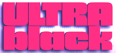 Joseph Churchward (b. Apia, Samoa, 1933) grew up in Samoa, and moved to New Zealand, where he founded a design studio in Wellington. He lived in Hataitai. He died in 2013 [Obituary by Jack Yan].
 His early type designs were released as photolettering through Berthold. In 2000, in partnership with Chank, his fonts are finally being converted to the standard electronic formats. In 1984, he won a Silver Prize at the Morisawa Awards competition. In 2009, he was made a life member of The New Zealand Designers Institute DINZ. MyFonts writes: Churchward Type started in 1962 as Joseph Churchward's freelance lettering service. Within six months he had generated enough work to move from his job as Senior Artist into setting up Churchward International Typefaces, which became one of the largest typesetting companies in New Zealand. In 1969 Joseph was asked to submit alphabet designs to Berthold Fototypes and saw immediate success. He later went on to sign distribution agreements with D.Stempel AG, Dr Böger Photosatz GmbH/Linotype, Mecanorma-Polyvroom B.V and Zipatone. He self-published a handful of original fonts in 1978 becoming the first and only company in New Zealand to publish original photo-lettering. Churchward International Typefaces was forced to close in June 1988 but Churchward Type lives on with a fresh set of independent releases. David Buck has taken on the role of digitisation. Joseph continues to draw alphabets and now has a stockpile of over 300 unique alphabets to his name. Catalog of Joseph Churchward's typefaces: - Chank sells ChurchwardHeading, ChurchwardSamoa, Churchward Maori, ChurchwardDesign5Line, ChurchwardBrush. See also Churchward Roundsquare (2002), which reminds me of Apostrophe's Toolego.
- At Berthold, he published Churchward 69 (1969, a fat face), Blackbeauty (1972; this psychedelic type inspired Nick Curtis's 2009 font, Strollin NF), and Churchward 70 (1970, a Bauhaus-style sans family).
- MyFonts sells Churchward Alien (2012), Churchward Maori (2004, frilly), Churchward Marianna (1969, an obese bubblegum typeface; Nick Curtis's Proud Mary NF (2010) is derived from it), Churchward Ta Tiki (2003), Churchward Asia (2003), Churchward Samoa (2003, 6-weight sans family), Churchward Maricia (a Western-style face), Churchward Brush (2006; copied by SoftMaker as Josephs Brush Pro), Conserif CW (2006, BluHead Studio), Churchward Heading (2007), Churchward Supascript (2007), Design CW (2006, BluHead Studio), Freedom CW (2006, BluHead Studio), Ta Tiki CW (2006, BluHead Studio), Churchward Newstype (2008, 8 styles, BluHead Studio), Churchward Chinatype (2008, 5 styles of oriental simulation glyphs), Churchward Heading (2011), Churchward Brush (2009, BluHead Studio), and Churchward Design Lines (1970, a prismatic multiline face), Churchward Montezuma (2012, an Aztec-inspired design digitized by BluHeadStudio), Churchward Legible.
- Churchward Tua (2014). A Western typeface published posthumously. Similarly, BluHeade published Churchward's 1996 geometric sans typeface Churchward Lorina in 2014.
- Churchward Isabella (2015). A geometric sans.
- Churchward 69 (2015, BluHead Studio). Churchward 69 is a ten-weight typeface family originally designed during the late 1960's, but published in 2015 by BluHead Studio.
- Churchward Typestyle (2022). By Bluhead Studio.
Klingspor link. View Joseph Churchward's typefaces. [Google]
[MyFonts]
[More] ⦿
|
Constanza Damiana Lledó Veloso
|
 Chilean designer of the psychedelic typeface Completo (2009, Tipos de Cartagua). She studied type design at the University of Chile. [Google]
[More] ⦿
|
Corey James
|
 New York City-based designer who is originally from Perth, Australia. Designer of these typefaces: Vinum (2014: a gothic psychedelic typeface inspired by Electric Wizard's "Dopethrone" album), Inflated (2015, an oily bubblegum typeface), and 375 (2015: a striped experimental typeface in 3 weights, Window, Facade and Earthquake). Behance link. Old URL. [Google]
[More] ⦿
|
Counterpoint Type Studio
[Jason Anthony Walcott]

|
 Established in 2013 by Hollywood, CA-based Jason Walcott (formerly operating as JAW Fonts and as Jukebox Type), b. 1971, Michigan, Counterpoint Type Studio started marketing fonts in that same year. The first batch included India Ink (2013), Raspberry Jam (a delightfully curly vampire script), Profiterole (a feminine pastry shop script), and Califunkia (pure psychedelia), and Domani CP (a faithful digital revival of an old photo-typositing typeface called ITC Didi. Originally designed by Herb Lubalin and Tom Carnese, Domani brings to life a font that has been somewhat neglected by the digital era until now).
 In 2014, he added Swashington. In 2015, he designed Plectrum CP (a Peignotian sans typeface family with very large x-height). Later in 2015, he set up Jukebox Collection. Typefaces from 2016: Schmalfette CP. He writes: SchmalfetteCP is the result of another collaboration between designers Jason Walcott and Rob King. King suggested that Walcott revive this wonderful and somewhat forgotten sans serif typeface from the mid 1950s. Originally designed by Walter Haettenschweiler in 1954, Schmalfette Grotesk was used for many years in the German magazine Twen. The typeface was notoriously hard to acquire at the time and graphic designers in the USA often resorted to cutting letters from the Twen magazines and reusing them in their own designs. Later, when digital type came along several typefaces very similar were created that claimed to be digital revivals of Schmalfette Grotesk. However, they are actually only loosely based on the original. The proportions are different and in some cases a lower case was added. The original font was all caps. [Google]
[MyFonts]
[More] ⦿
|
Craft Supply
[Nazzar Saputra]

|
 Kediri, Indonesia-based designer of the monoline script and sans typeface Quetty (2017), the rhythmic script font Quitman (2017), the geometric sans typeface Francy (2017), the signage script font Danilla (2017), the all caps sans typeface family Stockport (2017), Stockport Rounded (2017) and the great creamy super-heavy signage script typeface Kidding Script (2017).
 Typefaces from 2018: Rustelyn (script), Sweet Buttermilk (Script, Sans), Lucylane (a monoline script), Blusty Script, Riffle (a skyline typeface), Melvis, Deluce (a luxury serif), Dutchy, Aguero (a luxury serif font), Finland, Finland Rounded (rounded monoline sans), Coldiac (an all caps luxury serif), Tigreal (a vintage slab serif), Road Race, Road Race Extra, Logam (sans), Houston Sports (spurred), Studly (a layered font), Morning Gold, Houston Italic, Comodo (sans), Rainly (brush SVG), Offlander (condensed sans), Offlander Rough (free), Salvalyn, Bafora (dry brush SVG font), the sans typeface Bondie Condensed, Bondie Extrude, Troye Serif (display didone), Troye Sans, Troye Script, Boardley Script (layerable retro signage font), Rotterin (a free signage script), Giveny (caps only fashion serif), CS Mulan (Victorian), Pastelyn, Belgium (a distinguished all caps sans), Finland (sans), Rickies (brush), Bravely, Houston (a semi-octagonal font by Wahyu Hadi Yuana), Pommel (a free script by Wahyu Hadi Yuana), Prestage (condensed all caps sans), Prestage Outline, Lovelyn (display serif), Espoir (a Peignotian font by Wahyu Hadi Yuana and Nazzar Saputra), Espoir Serif, CS Juicy (a color font), Retrocycles (monoline display sans), Fadelyn (script and sans), CS Gordon, CS Harley (sans), CS Maria, CS Nancy (sketched), CS Rocky, CS Roger, CS Rosalia, CS Sandreas. Typefaces from 2019: Giroud (a free copperplate font), Cattus, Rovey, Vendeur, Colbiac, Angelic Bonques Script, Angelic Bonques Sans (a formal sans), Railly (dry brush), Gold Coast (vintage, all caps), Gold Coast Rough, Souther (brush script), Passtyn (Script, Sans), Larissa, Duskey (a weathered vintage typeface by Wahyu Hadi Yuana and Trio Nazzar Saputra), Rolves, Kitten Days, Jadyn Maria (signature script), Betty Rose, Fenord (a heavy sans), Adelya, Groce, Qualey, CS Nancy Inline, Manyland, Marques (wedge serif), Jocker (a vintage layered spurred typeface family), Nordin (sans), Masitha (script), Croco (Peignotian sans). Typefaces from 2020: Marques Vintage, Monocole (all caps sans), Mondeur, Espano (all caps, serif), Celine Peach (Sans, Script), Marlyn. Typefaces from 2022: Funkley (funky and psychedelic). [Google]
[MyFonts]
[More] ⦿
|
Creative Media Lab
[Kadek Adi Mahardika]

|
 Bali, Indonesia-based designer (b. 1983) of Baruna (2018: vintage decorative font), Brotherley (2018), the hilarious Chef Characters Icons (2018), the sans typeface Drupadi (2018), the ball terminal typeface Cameo Sweet Gothic (2018), the handcrafted typefaces Miyake Signature (2018), Kiddo Handwriting (2018), Puralova Script (2018) and Children Alien (2018).
 Typefaces from 2019: Jollin, Jollin Family, Popstick (an ultra-smooth popart style rounded sans), Yellost (blackletter), Chalk and Pamor, Little Pea, Tropiello (Tuscan, Victorian), Pink Shark, Molga, Othelie (swashy and medieval), Brume, Little Pea, Kuashe (monoline), Lordish (blackletter), Blue Angel, Black Cameo (spurred), Puralova, Milova (a great calligraphic typeface). Typefaces from 2020: Zolina (a decorative sans, with a variable font added), Black Mango (a chic 10-style display sans with some flared stems; +a variable font), Mesdag, Prettywise (a decorative serif), Loubag (an elegant short-ascender vintage display typeface in ten styles), Kooka (a variable width stylish exaggerated wedge serif family), Belle Story (a high contrast display serif), Losta Masta (a decorative serif), Matterdi (a fashion mag family with an extremely large x-height), Popstone (psychedelic, with a variable font), Carpellon (a tattoo font), Dorris (a swirly psychedelic font), Losta Masta, Mavera (a modular display font), Rajjah Famillia (a blackletter), Allaina (a Victorian serif), Kaoly (a stylish bold serif), Cattedrale (blackletter). Typefaces from 2021: Losta Bonita (psychedelic), Black Mango (Kadek Mahardika) (display sans), Naskle (psychedelic), Reggy (psychedelic), Losta Frida (a curvy display serif), Parka (a decorative saber-edged stencil typeface in nine styles), Missy Voya (a decorative serif), Greyst (a fashion mag display typeface), Skinny Joe (revisiting the bell bottom 1980s in a wonderful wide display family), Morgy (intestinal), Magrit (an ultra-fat high-contrast display typeface), Pretty Boy (a decorative serif family), Catavalo (a 6-style fashion mag typeface), Voire (a swirly lachrymal serif family consisting of 18 fonts), Viva Kaiva (an intestinal and perhaps psychedelic typeface), Pink Crestelle (a ten style display typeface, and a variable font), Benoa (a 7-style decorative serif). Typefaces from 2022: Losta Nova (11 styles), Mango Style (10 styles; a stylish wide display sans with straight terminal endings: +a variable font), Cobya (a variable fashion mag family in 28 styles, influenced by ocean waves and liquids), Missy Voya (a stylish display serif), Losta Nova. [Google]
[MyFonts]
[More] ⦿
|
Creativeqube Design
[Lucy Chugg]
|
 Hamilton, Victoria, Australia-based designer of Torquay Hotel (2015, a great dry brush typeface), Tropical Nights Script (2015), Blitzen (2015, a scribbly outlined typeface), White Snowfall Script (2015), Third Storey (2015, +Brush, +Regular, +Marker), Twisted Willow (2015, a connected exaggerated script), Saltywaters (2015, an attractive brush script), Operation 22 (2015), Sideline Bold (2015), Sideline Hollow (2015), Juicy Brush (2015), Blushingly (2015, a brushy wedding script font), Thystle Leaf (2015), La Bambiny (2015: painted Treefrog style script), Sweet Dreamer Script (2015, children's hand), the fat brush typeface Coalface (2015) and the curly fat brush scripts Wonderlicious (2015) and Rumpledrop (2015).
 Typefaces from 2016: Boltis, Tantrums, Favoured (rough brush), Goatfish, Odd Socks, Passion Fruits, Boom&Farrow, Blissfully, Snowblown (a chunky marker font), Loganberry, Roll Off, Shakeoff (dry brush), Grainger, Irish Brogue, Saltie Sea, Gorgeously You, Yellow Gold, Seriously Rad (brush font), Sorrella Script, Woodend retro, Roamfest Brush Script, Doctors Scrawl script, Needle & Thread, Rabbit Fur (brush type), Moonlit harvest, Quickly Script, Multiculture, Lusciously, Listless, Lemony Zest, Liberty & Love, Lemonade Fizzo, Illabarook Script, Humongous, Hot Chips, Going Slow, Aberfoyle Park Script, Strike One, Lovers Avenue, Glen Thompson, Sing Aloud, Berry Shortcake, Yellow Taxi, Shopwreck (dry marker font), Faithful True, Flattering, Zombie Zone, Feathertop, Jellybeans, Show+Tell, Swizzlesticks, Label Marker, Hello Journal, School Blackboard, Life+Laughter, Holiday Chaos, Silverwaves, Bjorn Rider (marker font), Affectionate Brush (crayon font). Typefaces from 2017: Soundbound, Trescott, Tyndust Script, Wallower Script, Berry Merry, Beautiful Lights Script, Song of the River Script, Oh Mistletoe Script, Holiday Joy, Jingle Joy, Holiday Coffee Script, Cheerful Elf Script, Journey's Inn (brush), Ice Castle, Frosted Cupcake, Oh Surrender Script, Moonlight Sailing Script, Justify Brush Script (dry brush), Just Maria Script, Falling Pumpkins Script, Bright Soul Script, Blossomie Script, Joy Flight Script, Loving Saskia (watercolor brush), Blue Liquid, Lemons Soda Script, Southerner (dry brush script), Theodoria Script (tall swashy calligraphic typeface), Highline, Southfall Script (formal calligraphy), Serial Catch, Travelling Abroad, Warrenson Script, Saturday Rock, Indulgence Script, Cottage Gardens Script, Spoonfull Script, Pattersonville Script (signature font). Typefaces from 2019: Abiding Love, Lightheartedly (a signature script), Bright Glow Script, Bloom of Life, Enjoying Life, KindSoul SVG Script & Serif, Quest, Roverback, Route Nine Script, Cozi Glow, Consequat, Quick Scrawl Script, Abiding Love, Darling Rosie (font duo), Fernando Willow Heart, Gather Collector's Edition, Greater Things, Isle of Skye Script, Oakwood Beach Script, Ross Creek (a dry brush script), Santiago Vincent, South & North, Studio Baked, Surfers Paradise, Terminal Four Modern, Wonderful Time Script. Typefasces from 2020: Vintage Stylist. Typefaces from 2021: More Aloof (psychedelic), Bourdeilles France (script), Ello (+floral patterns), Emilia-Romagna Script, Olive Branch, Quanta La Oranj (an ink bleed display serif), Rainger Serif. [Google]
[More] ⦿
|
Cristian Lunfardo
|
Designer (b. 1989) of ShadesRech0 (2010), an all caps "almost psychedelic" face. [Google]
[More] ⦿
|
Cruz Fonts
[Ray Cruz]

|
 Cruz Fonts was established in Oakland, NJ, in 2004 by Ray Cruz (Ramon Cruz), who was a designer of custom lettering and custom typefaces to major ad agencies, publishers and corporate clients in the New York City area for almost 30 years. Ray Cruz (b. Ponce, Puerto Rico, 1943) died at his home in Lewes, Delaware, in 2025. His obituary read: Ray Cruz, beloved husband, father, grandfather, celebrated graphic artist, and military veteran, died peacefully at his home in Lewes, Delaware, on March 26, 2025. He was 81. Born in Ponce, Puerto Rico, on August 31, 1943, Ray was a lifelong student and teacher of design. A graduate of New York City's High School of Art & Design, he honed his craft in several of the city's top custom lettering studios before rising to prominence in the graphic arts world. His career spanned more than five decades, during which he left a lasting mark on advertising, publishing, package design, and corporate identity. In the 1980s, Ray was commissioned to create corporate typefaces and logos for the United States Postal Service—iconic designs still seen on mail trucks today. After co-founding and leading Cruz & Slowik Associates, Ray served as Type Director at the renowned Young & Rubicam advertising agency, his sharp typographic eye elevated countless national campaigns. His work earned him more than 30 awards from the Type Directors Club, AIGA, ADC, and other respected art associations. Ray was also a dedicated educator, serving as an adjunct professor at Parsons School of Design, FIT, Kean University's Robert Busch School of Design, County College of Morris, and Marywood College. He believed in a "Learn by Doing" approach, favoring hands-on exploration. His students remember him not only for his technical knowledge but for his passion, clarity, and mentorship. He was a member of several professional organizations including the Type Directors Club, Society of Typographic Aficionados (SoTA) and the Association Typographique Internationale (ATypI). Ray lived for two things: graphic arts and his family. He was also an active and energetic man who loved the gym, tennis, skiing, boating, fishing, music, and working with wood---pursuits that reflected his creativity, craftsmanship, and love for the outdoors. He is survived by his wife, Janet; his sons David and wife Jamie Lynn, Jamie and wife Hermilyn; and their sons, Daniel and wife Melany and Matthew and wife Marilyn. He is also survived by his grandchildren Avery, Hyland, Ardyn, Talyn, and Cornelia. He is reunited with two grandchildren, Reign and Parker, and his mother, Carmen, in peace.
 Cruz created many display typefaces for Agfa/Monotype, Bitstream, Phil's Fonts and Garage Fonts. Presently Ray Cruz is working as Type Director at Y&R NY, and is an adjunct professor at FIT and Kean University teaching type design. Bio at Garagefonts. His oeuvre: - Garagefonts: Cruz Grafica (1999), Cruz Grafica Inline, Troubadour.
- Agfa/Monotype: Bandolera, Bandolero, Cruz Handy (2001) and Cruz Swinger. Swinger, in fact, was produced in film type for the John Schaedler Studio in New York in the 1970s. Also, Elegante, Romantica (didone).
- Bitstream: CruzCanteraBT (2003, a stylish informal sans family), Homeland BT (2004, a text typeface with a large x-height), Vera Cruz (2003, a playful display serif), and Fat Albert (2004).
- Cruz Fonts: Satchmo (2016), Cruz Handy (2004), Troubadour (2004), Cruz Stencil (2012), Cantina, Bandolero, Cruz Swinger (fat semi-psychedelic signage face), Bandolera, Romantica Pro (2013, a condensed didone), Dot Script (2013, dot matrix face), Cruz Script Pro (2013: original from 2005), Bouncing Checks Layers (2014, octagonal and layered; includes 40 dingbats by Seymour Chwast).
- P22: P22 Cruz Ballpoint, P22 Cruz Calligraphic, P22 Cruz Brush.
- BarracudaPlain.
- Custom typefaces for Camel Cigarettes, Estee Lauder (1994), New York Life Insurance, The NFL Detroit Lions, Pella Windows, USPS, and Xerox.
Bio at Garagefonts. P22 link. FontShop link. PDF catalog. View Ray Cruz's typefaces. Klingspor link. [Google]
[MyFonts]
[More] ⦿
|
Curvy Fonts
[Ari Koivunen]

|
Turku, Finland-based designer, b. 1962, who founded Curvy Fonts. His typeface include the semi-psychedelic typeface Whimple Whomple (2018) and the hippie fonts Ari Cube Spiro (2019) and Ari Cube (2019). [Google]
[MyFonts]
[More] ⦿
|
Cyril Kimmerlin
|
During his studies, Habsheim, France-based Cyril Kimmerlin designed the free expressive typeface Cognitype (2017) that was inspired by OpenDyslexic (by Abelardo Gonzalez) and Montreuil (by Julien Priez). In 218, he designed the free psychedelic typeface DDouglas Regular. Cargocollective link. [Google]
[More] ⦿
|
Damelev Studio (was: Logo Labs, Tanziladd, Rawi Project)
[Nyapa Tanzil]

|
 Yogjakarta, Indonesia-based type foundry, est. 2016, whose designer is Nyapa Tanzil, who also used the alias Tanzil Adduha (b. 1991), who operated as Logo Labs before changing the name to Damelev Studio.
 Their first typefaces include Fadillah (2016, brush script), Raya (2016, spurred Victorian style), and Cabe Brush (2016). Typefaces from 2017: Candelion, Audrey Script, Mentkent (monoline connected script), Jansky Script (signage brush font), Bandalaka Script (connected brush script). In 2018, he designed Malbrock (or Malbrouck Script: a classic calligraphic penmanship script), Nayland Script, Avital (font duo), Windpeak Script, Andamar (Script, Serif), Montante (calligraphic), Adamantine, Caernarfon, Diandra (signature script) and Quinshawna. Typefaces from 2019: Behofeel (a gorgeous crisp calligraphic script), Marmoreal (formal calligraphic), Munchen Script (script font), Chasmophile (a formal calligraphic script). Typefaces from 2020: Daizen Script, Alqaisumah Script (formal calligraphy), Brandoneir Signature, Elika Gorica, Bornice (a decorative serif), Broger Display (hipster meets arabesque, The Herera (a baseball script), Roberston Display (intestinal style), Armies Display, Dalglish (a display serif with clean lines), Anaximander (a condensed swashy fashion mag wedge serif typeface), Herschel (font duo), Gorga, Fringland (calligraphic), Almerian (a monoline script), Milestone (a signage script). Typefaces from 2021: Naguboty (art nouveau), Bayanaka, Noeran (a dashing display serif with exaggerated ink traps), Avaunt, Merson, Claude, Rokurou, Reinhart Script, Monfem, Gunsan Serif and Script (an art nouveau-inspired font duo), Northway (a dramatic bold display typeface), Ardmore Display (psychedelic). [Google]
[MyFonts]
[More] ⦿
|
Dan Ciobanu
|
 For a truly fun psychedelic lettering application, check out Scartihstan (2012) by Dan Ciobanu, a senior designer in Timisoara, Romania. [Google]
[More] ⦿
|
Dan M. Zadorozny
[Iconian Fonts]
|
 [More] ⦿
|
Dan X. Solo: Digitizations by Dick Pape
[Dick Pape]
|
Dick Pape based the following digitizations (2008-2010) of blackletter, art deco, Celtic, initial caps, and other ornamental typefaces shown by Dan X. Solo in his Dover books: DXSAlphaMidnight, DXSAlphaTwilight, DXSBeansBold, DXSBlackline (prismatic, art deco), DXSBoboBold, DXSBrusselsInitials, DXSBuckinghamInitials, DXSBust, DXSCharger, DXSCheckmate, DXSCorral, DXSDevon, DXSDevonian, DXSDudleyPNarrow, DXSFatCat, DXSFestival, DXSFrankfortInitials, DXSFuturaInline, DXSGrooviestGothic, DXSGuildhall, DXSHessNeobold, DXSHotline, DXSHuntingtonInitials, DXSJoyceBlack, DXSKupferInitials, DXSLampoon, DXSLeipzigInitials, DXSLeister, DXSLowenbrau, DXSMonogramStencil, DXSMonumentBold, DXSNottinghamInitials, DXSOrbit, DXSOttoHuppInitials, DXSPickfair, DXSPolly, DXSPotsdamInitials, DXSPrismaniaC, DXSPrismaniaP, DXSQuote, DXSRegalBlack, DXSRhythmBold, DXSRickyTick, DXSRoco (art deco), DXSSansSouci, DXSShadyDeal, DXSSheetSteel, DXSSilverShadowBlack, DXSStuttgartInitials, DXSTester, DXSThedaBara (counterless geometric art deco), DXSTulo, DXSTuxedo, DXSUrban (psychedelic), DXSVeronica, DXSWestmorland, DXSWienText, DXSYagiBold.bmp DXSYagiDouble, DXSYorkshireInitials, DXSZany, DXSZephyr. Images: DXSBlackline, DXSBust, DXSDudleyPNarrow, DXSGrooviestGothic, DXSJoyceBlack, DXSMonogramStencil, DXSPrismania'P', DXSRickyTick, DXSRoco, DXSSheetSteel, DXSTulo, DXSUrban, DXSYagiDouble, DXS Alpha Twilight, DXS Brussels Initials, DXS Kupfer Initials, DXS Lowenbrau, DXS Otto Hupp Initials, DXS Theda Bara, DXS Urban. Download page. [Google]
[More] ⦿
|
Daniel Eriksson
|
Designer of Aerosmith (1999), a psychedelic font for the music group. [Google]
[More] ⦿
|
Dave Cohen
[Sideshow]
|
[More] ⦿
|
Dave Coleman
|
 Dave Coleman is a type designer and lettering artist in Sydney, australia. He is involved in The Australian Graphic Supply Co, a design studio that began in Sydney, launched in Ovideo, Spain, and is currently operating out of the Blue Mountains, Australia. It is run by Dave and Laura Coleman. During a summer course called Type@Paris (2015), Dave Coleman created the mischievous typeface Buffon that is characterized by reversed (Italian) contrast---the horizontal strokes are thicker than the vertical ones.
 At Type@Paris 2016, Dave Coleman designed the typeface family Wentworth in Caption, Text and Display styles. At Future Fonts, he published the spooky wavy typeface Danse Macabre (2018) and the psychedelic bell bottom typeface Funkford (2021). Future Fonts link. [Google]
[More] ⦿
|
Dave West

|
 Type designer of the photolettering era (1960s) whose work is slowly but surely being digitally revived by Nick Curtis, and by Photo-Lettering, the House Industries subsidiary that bought the PhotoLettering Inc type collection. FontShop link. His typefaces:
 - The slightly psychedelic typeface West Banjo. Nick Curtis's Fiddle Sticks (2007) is based on this typeface. For another digital revival, see Plinc Banjo (2017, Mitja Miklavcic at House Industries.
- Elephant Gothic, a fat deco face. Remade by Nick Curtis as Elephunky NF (2011).
- Nick Curtis believes that Stymie Black Flair may also be due to him, and he based his Tutti Paffuti NF (2007) on the latter face.
- African Queen was revived by Curtis as Djibouti NF (2007), a minimalist tribal African alphabet.
- Nickelodeon. Revived by Curtis as Lily Hilo NF (2008).
- Barnum Block (Western face), done in 1960 at PhotoLettering Inc. This became Cg BarnumBlock at Compugraphics. The Compugraphics collection is now sold by Monotype. See also PL Barnum Block.
- Behemoth (1960, PhotoLettering): a slab serif. This too became a Compugraphics face, Cg Behemoth Semi Condensed. See also PL Behemoth Semi Condensed.
- Bubble Gum (late 1960s). This bubblegum / cartoon font was finally digitized in 2011 by Jess Collins for House Industries, and is now called Plinc Bubblegum (2021).
- Futura Casual inspired Nick Curtis to draw Occidental Tourist NF (2010).
- Walnetto Casual (Photolettering) is another psychedelic face. For a digitization, see Nick Curtis's Jackalope NF (2010). West Barnum Ultra, designed by Dave West and digitized by Ben Kiel&Adam Cruz at House Industries in 2011, was film no. 5494 in the original Photo-Lettering archive.
- West Thud.
- West Kerpow, a comic book typeface, late 1960s. This was digitized in 2011 by Allen Mercer at House Industries as Plinc Kerpow.
- West Italiano, or simply Italiano. A Bodoni-style italic. In 2015, Steve Ross and Ken Barber at House Industries digitally revived this typeface as Plinc Italiano.
- West Emperor Script. A connected didone script.
- West Nouveau Compact (Pyschedelitype 5619 in the PLINC collection of 1968). See, e.g., Pyschedelitypes (Alphabet Directions No. 8), Photo-Lettering, Inc., 1968. In the Curvy Block Lettering style of Viennese secessionist Alfred Roller. The same face appears in Castcraft's Encyclopedia of Phototype Styles (1978) as Cetus Black.
- West Fifth Dimension (1971), an Alfred Roller-inspired psychedelic typeface that was shown in PLINC's Alphabet Thesaurus Vol. 3 (1971).
[Google]
[MyFonts]
[More] ⦿
|
David Buis
[Naan Type Studio]
|
[More] ⦿
|
David Clegg
[The 1477 Font Foundry]
|
 [More] ⦿
|
David Cohen

|
 Squid (aka Dave Cohen) is a font designer, sculptor, illustrator and musician. He has executed hundreds of prototypes for the toy, ceramics and gift industries, such as tiki mugs. Squid's fonts are published exclusively by Sideshow Foundry. You can see his other musings at SquidArt. Google Font Directory link. With Stuart Sandler, he created the wooden plank look font Bamboozle (2008, Sideshow), the whacky comic book typefaces Goofball (2008), Weird Bill (2008, with Stuart Sandler), Weirdbats (2008, with Stuart Sandler), Doinky, Doinky Inline (multiline version of Doinky) and Doinkbats (2008), Zombie Rot (2010, with Stuart Sandler), Squidtoonz (2010, a comic book typeface done with Stuart Sandler), Motobats (2010, with Stuart Sandler), Skritchy (2010, a sketch font done with Stuart Sandler), Kitchenbats (2010, with Stuart Sandler), Beachcomber (2009, a wooden plank style face; with Stuart Sandler), Beachbats (2010, with Stuart Sandler), Office Blogger (2010, with Stuart Sandler, hand-printed), Western Dressing (2010, with Stuart Sandler), Canned Corn (2010, with Stuart Sandler).
 In 2010, as Wisconsin-based Sideshow, he placed a number of free fonts at the Google Directory, all mostly hand-drawn typefaces: Walter Turncoat, Unkempt, Sunshiney, Slackey, Kranky (blackboard bold), Irish Growler (comic book style), Irish Grover, Chewy (bubblegum face), Rock Salt. Faces from 2011 at Sideshow: Rancho Deluxe (with Stuart Sandler), Creepster Pro (with Stuart Sandler), Permanent Marker Pro, Rochester (a Victorian upright connected script). In 2012, David Cohen and Stuart Sandler published these typefaces at Neapolitan: Irish Grover Pro (2010, a bouncy face), Satisfy Pro (2011, a connected retro script face), and Slackey Pro (2010, a paper cut out style face). Typefaces made in 2012: Mystery Quest (a curly Victorian and/or psychedelic typeface that is free at Google Web Fonts), Seaweed Script (Google Web Fonts), Griffy (spooky face, Google Web Fonts), Skranji (Google Web Fonts). Typefaces made in 2013: Impala Script (retro script; with Stuart Sandler), Fuzzbox (a funky typeface; with Stuart Sandler), Ramparts (funky font, with Stuart Sandler), Seaweed Script Pro, Griffy Pro, Blinky (chalky, hand-drawn). Typefaces from 2014: Tradewinds Pro (with Stuart Sandler), Flavors Pro (with Stuart Sandler), Flavors Pro Spicy (with Stuart Sandler), Oyster Shore, Rumpus Room Filled (with Stuart Sandler), Rumpus Room (with Stuart Sandler). Typefaces from 2015: Mystery Quest Pro (wacky, wobbly, funky, offbeat and groovy), Frijoles (with Stuart Sandler, at Neapolitan), Snackbar (an 18-style fifties diner script family by David Cohen and Stuart Sandler). Typefaces from 2019: Grannys Greenhouse (a beatnik font by David Cohen and Dathan Boardman). Klingspor link. Fontspace link for some free fonts. [Google]
[MyFonts]
[More] ⦿
|
David Harris

|
 British lettering artist based in Exeter who specializes in the medieval versal cadel (or cadeau) letter. He created these typefaces:
 - Alexei Copperplate (1982, Letraset). A copperplate calligraphic script.
- Chromium One (1983, Letraset, and later ITC). A decorative neon-light all caps typeface.
- Becka Script (1985, ITC).
- Julia Script (1983, psychedelic).
Author of The Art of Calligraphy (Dorling Kindersley), Calligraphy: Inspiration, Innovation, Communication (Anaya), and The Calligrapher's Bible (A&C Black). FontShop link. Klingspor link. Linotype link. Behance link. [Google]
[MyFonts]
[More] ⦿
|
Decorative Caps&Leo's Icon Archive
|
Decorative caps archive (gifs!), and some original or modified caps by Leo Doerr: Freehand Purple, Gold Blade, Shining Flemish, Golden Zallman, Blue Carrick, Crazy, Ice, Psychedelic, Red Christensen, Green Becker. All gifs of course. [Google]
[More] ⦿
|
Dennis Ludlow
[Sharkshock]

|
 [MyFonts]
[More] ⦿
|
DePlictis Type (was: ESS Fonts)
[Bogdan Balatchi]

|
 Graphic designer Bogdan Balatchi (DePlictis Type, and before that, ESS Fonts) graduated in 2004 from the Faculty of Arts of West University in Timisoara, Romania. Most of his work is inspired by old Slavic calligraphy.
 Bogdan created the display sans typeface Facebook Letter Faces (2011) and the medieval lettering typeface Kogaion ESS (2011), which are both free. Klauss (2011) and Pain in the sky (2011) are commercial soft techno typefaces. In 2012, Bogdan created the groovy typeface Best Party Of The Week-End. In 2020, he released BlinkHead (a modular typeface), Damasquine (an art deco-ish Greek enulation font), and Architype AD-2014. In 2021, he published Greuceanu (a decorative archaic typeface), Areon Flux (a modular typeface), Squadzone (an urban techno font) and the medieval font Monasterka (for Latin, Greek and Cyrillic). [Google]
[MyFonts]
[More] ⦿
|
Device Fonts
[Rian Hughes]

|
 Rian Hughes studied at the LCP in London before working for an advertising agency, i-D magazine, and a series of record sleeve design companies. Under the name Device he now provides design and illustration for the advertising, entertainment, publishing, and media industries. He works from Richmond, UK, as a comic book artist, letterer and typefounder---his foundry is called Device. He creates mostly display type. List of fonts. Interview. Review by Yves Peters. Monotype Imaging page. Interview by Die Gestalten. Various (overlapping) font listings, still unorganized.
 - Dingbats: Pic_Format, Mastertext Symbols, MacDings, RiansDingbats, Autofont.
- FontFont fonts: Identification (1993), Revolver, Rian's Dingbats, LustaOneSixtySans, Knobcheese, CrashBangWallop, and Outlander.
- [T-26] fonts: English Grotesque (1998), Data90 (2003; a free FontStruct typeface that is virtually identical to Data90 is Bitrate by Kummaeno (2010)), Flak Heavy (2003, stencil), Flak (2003, stencil), Freeman (2003), Klaxon (2003, kitchen tile font), Cordite, Substation (2003), September (2003), West Way (2003), Egret (2003), Paralucent Complete (2003), Paralucent Condensed, Paralucent Stencil (2003), Mercano Empire (2003), Iconics (2003), Cantaloupe (2003), Gravel (2003), Acton (blocky screen font, 2002), Ainsdale, Amorpheus, Anytime Now (alarm dingbats), Bingo, Blackcurrant (Blackcurrant Cameo (1997) is free), Bordello, Elektron, Haulage (U-Haul lettering, 2002), WexfordOakley, Telecast, Terrazzo, Transit, Untitled, Scrotnig, Skylab (2002), Silesia (1993), SlackCasual, Ritafurey, Reasonist-Medium, Regulator, GameOver, Novak, Quagmire, PicFormat, Jakita Wide (2000, techno font), Metropol-Noir, Motorcity, Mastertext, Mystique (2002), MacDings, Lusta, Laydeez, Sinclair, Paralucent (sans serif), Judgement, Bullroller, Zinger (a fifties font), Citrus (2002), Popgod (2003), Range (2000, a futuristic font), Hounslow, Jemima, Griffin, GranTurismo, Gargoyle, Foonky, DoomPlatoon, Darkside ("remixed" by FontStructor Kummaeno in his Ubangi (2011)), Kallisto (2010), Kallisto Lined (2010), Cyberdelic, Contour, and the very original Stadia Outline family (Stadia is a kitchen tile font).
- List of all fonts by Rian Hughes, as of 2004: Acton, Ainsdale, Amorpheus, Anytime Now, Bingo, Blackcurrant, Bordello, Bull Roller, Chascarillo, Contour, Cottingley (1992), FF CrashBangWallop, Cyberdelic, Darkside, Data90, Doom Platoon (1996), Elektron, English Grotesque, Flak, Foonky, Freeman, Game Over, Gargoyle, Gran Turismo, Griffin, Haulage, Hounslow, Iconics, FF Identification, Jakita, Jemima, Judgement, FF Knobcheese, Laydeez Nite, Lusta (big family), Mac Dings, Mastertext, Men Swear, Metropol Noir, Motorcity, Mystique, Novak, FF Outlander, Paralucent, Pic Format, Platinum, Quagmire, Range, Reasonist, Register (A and B), Regulator, FF Revolver, FF Rian's Dingbats, Ritafurey, Scrotnig, September, Silesia, Sinclair, Skylab, Slack Casual, Space Cadet, Stadia, Substation, Telecast, Terrazzo, Transmat, Untitled One, Vertex, Westway, Wexford Oakley, Why Two Kay, Zinger.
- At Veer, in 2005, these Device fonts were published: Gentry, Gridlocker, Valise Montreal, Custard, Box Office (moviemaking letters), Sparrowhawk, Monitor, Moonstone, Miserichordia, Yolanda (a great playful medieval text typeface in three styles: Duchess, Princess, Countess), Gusto, Dauphine, Rogue, Ritafurey, Dynasty, Radiogram, Xenotype, Roadkill (grunge), Payload (stencil family comprising Regular, Outline, Spraycan, Narrow, Narrow Outline, Wide, Wide Outline), Catseye, Electrasonic, Absinthe (psychedelic style), Straker, and Chantal (brush).
- In 2006, Veer added these: Profumo, Ironbridge, Cheapside, Battery Park (grunge), Forge, Shenzhen Industrial, Hawksmoor (grunge), Coldharbour Gothic, Wormwood Gothic (grunge), Chase (grunge), Diecast, Roadkill Heavy, Tinderbox (fuzzy blackletter), Dazzle (multiline face), Nightclubber (art deco), Klickclack (2005, comic book or cartoon caper typeface), Vanilla (art deco), Wear it's at (grunge), Diecast, Drexler, Box Office (movie icon font).
- Fonts from 2007: DF Conselheiro (2007, grunge), DF Glitterati (2007), Indy Italic (script), DF Apocrypha (2006, rough outline), DF Quartertone (2007), DF Lagos (2007, rough stencil), DF Pulp Action, DF Reliquary #17 (2006, grunge didone), DF Dukane (2007, octagonal grunge), DF Strand (2007, striped stencil), DF Rocketship from Infinity (2006, futuristic), DF Appointment with Danger (2006), DF Las Perdidas (2006, grunge stencil), DF Kelly Twenty (2007, grunge stencil), DF Heretic, DF Roadkill, DF Ironbridge, DF Forge, DF Shenzhen Industrial, DF Hawksmoor, DF Cheapside, DF Battery Park, DF Saintbride, DF Profumo, DF Coldharbour Gothic, DF Wormwood Gothic, DF Tinderbox, DF Flickclack, DF Vanilla (multiline art deco face), DF Chase, DF Nighclubber (art deco jazz club face), DF Diecast, DF Dazzla, DF Zond Diktat (grunge), DF Yellow Perforated, DF Mulgrave (grunge), DF Ministry B, DF Ministry A (with a hairline weight), DF Gridlocker, DF Gentry, DF Valise Montréal (grunge), DF Custard, DF Box Office, DF Roadkill, DF Payload Wide, DF Payload Narrow, DF Catseye Narrow, DF Catseye, DF Yolanda, DF Xenotype, DF Telstar, DF Straker, DF Sparrowhawk, DF Rogue Serif, DF Rogue Sans Extended, DF Rogue Sans Condensed, DF Rogue Sans, DF Ritafurey B, DF Ritafurey A, DF Radiogram, DF Pitshanger, DF Payload (stencil), DF Outlander Nova, DF Moonstone, DF Monitor, DF Miserichordia, DF Interceptor, DF Gusto, DF Glitterati, DF Galicia (2004), DF Galaxie, DF Electrasonic, DF Dynasty B, DF Dynasty A, DF Drexler, DF Dauphine, DF Chantal, DF Absinthe, DF Register Wide B, DF Register Wide A, DF Register B, DF Register A, DF Quagmire B, DF Cordoba (2007, grunge), Mellotron (2004, stencil), Seabright Monument (2007), Charger (2007, grunge).
- T-26 releases in 2007: Klickclack, Hawksmoor (grunge), Heretic, Ironbridge (old letter simulation), Battery Park (grunge), Chase (grunge), Cheapside (grunge), Dazzle (multiline art deco), Diecast (grunge), and Forge (grunge).
- T-26 releases in 2008: Automoto (fat multiline deco face), Straker (organic). Also from 2008: Mission Sinister (grunge), Gonzalez (grunge).
- FontBros release in 2009: Filmotype Modern. Other Filmotype series fonts include Filmotype Miner (2012), Filmotype Manchester (2012), Filmotype Meredith (2012), Filmotype Marlette (2012), Filmotype Mansfield (2012), Filmotype Power (2012) and Filmotype Major (2012: this is based on a typeface used as the titling font for the popular children's book by Dr. Seuss entitled One Fish Two Fish Red Fish Blue Fish, 1960). Other 2009 fonts: Degradation (grunge).
- Creations in 2010: Pod (2010, fat round stencil), Korolev (2010, a 20-style monoline sans family based on communist propaganda from 1937), DF Agent of the Uncanny (2010, brush face), DF Destination Unknown (2010, Kafkaesque brush), DF Maraschino Black (a sleek, sophisticated high-contrast swash capital font).
- Creations in 2011: DF Capitol Skyline, DF Capitol Skyline Underline and DF Capitol Skyline Capitals (a multi-weight all-caps pair that epitomizes Streamline Moderne), DF Korolev (a 20-weight sans serif family based on lettering by an anonymous Soviet graphic designer who did the propaganda displays at the Communist Red Square parade in 1937. Named in honor of Sergey Pavlovich Korolyov, or Korolev, considered to be the father of practical astronomics). In 2018, Korolev was expanded to Korolev Rounded and Korolev Rough.
- Typefaces from 2012: Ember (informal script), Kane (based on the Batman logo), Glimmer Glossy, Glimmer Mate, Galleria (avant-garde caps), Clique (flared sans).
- Typefaces from 2013: Wulf Utility (grungy), Charterhouse (an aggressive black sans), Filmotype Melon (after a 1959 original, this is an offbeat Googie era doo-wop typeface), Filmotype Melody (similar to Melon), Filmotype Mellow (also similar to Melon), Raw (worn wood type), Cadogan (a rhythmic connected script), Whiphand (brush face), Steed (heavy codensed masculine sans inspired by the titles of the Avengers TV show), State Stencil (Clean and Rough: in the style of Futura Black), Korolev Military Stencil (named after Sergei Korolev, father of Soviet astronautics, and based on signs from the Red Army parade of 1932), Armstrong (a 1950s automobile font).
- Typefaces from 2015: 112 Hours (numerals font).
- Typefaces from 2016: Typex (an angular yet rounded monospaced typewriter or OCR-style typeface based on the lettering used on Alan Turing's and Tutte's famous code-breaking machine at Bletchley Park, the Bombe, and the subsequent British answer to the German Enigma machine, the Typex), Serenity (a legible sans family).
- Typefaces from 2017: Pitch (a heavy block sans in chrome and solid variants), Shard (originally commissioned for Nickelodeon's 3D reboot of the Teenage Mutant Ninja Turtles franchise), Championship Inline, Mood (a great liquid deco font), Grange, Grange Rough, Dazzle Unicase, Urbane (sans), Urbane Rounded, Albiona (a modern take on Clarendon; includes Albiona Heavy Stencil), Albiona Soft (a rounded version of Albiona), Pact (a modular geometric font).
- Typefaces from 2018: Rutherford, Salvation (a potato cut font), Kano (inspired by the work of Dutch furniture designer and architect Gerrit Rietveld, one of the principal members of the Dutch artistic movement De Stijl), Rogue Sans Nova, Fairtrade (rough-edged font), Goddess (Victoriana), Neuropa (a five-weight semi-extended sans that projects a muscular corporate authority), Worthington Arcade (a caps-only lapidary typeface), Zeno (a piano key stencil typeface), Vektra (an experimental crosshatch-textured typeface), Recon (a quartz display font), Kinesis (Kinesis is inspired by the work of Dutch furniture designer and architect Gerrit Rietveld, one of the principal members of the Dutch artistic movement De Stijl. It is a modular headline font, constructed from white, black and grey overlapping rectangles), Freehouse (Freehouse is a reinterpretation of the well-remembered Watney's logo, a brewery and pub chain infamous for its poor quality beer and brutalist decor.), Zipline (a great multiline typeface), Argent Sans, Craska (a multiline font), Panther Black, Carilliantine (art nouveau with many interlocking letter pairs), Regulator Nova, Broadside, Bubblegum Pop, Heft (a heavy slab serif), Faction (stencil style), Metaluna (techno, engineering), Magnetron (futuristic), Urbane Rough, Urbane Adscript (a monoline semi-linking sans), Revolver (original from 1992), Albiona Inked (a Clarendon).
- Typefaces from 2019: Gerson Rand, Gravesend Sans (an all caps sans family based on the unique typeface used for the iconic grass-green signage for the now-defunct Southern Railway in England).
- Other: Customised Foonky Starred, Altoona, DfAncestorITC, DfAttitudesPlain, HotRod (2002).
- Typefaces from 2020: Breach (a display typeface with partitioned capital letters), Epiphany (stencil), Aurore Grotesque (an elegant geometric art deco sans family with small x-height), Faculty (a geometric sans with large x-height), Fathom (a flared serif typeface), Atomette (a stylized comic book typeface family), Conquera (a stylish extended caps-only font in five weights plus an inline), Dare (a tape font, that borrows a pinch of the hand-drawn swagger of Bauer's Cartoon (designed in 1936 by H. A. Trafton), used as Dan Dare's signature logo in the British boy's comic Eagle, and also the upward-pointing serifs of machine-moderne typefaces such as Dynamo (designed by K. Sommer for Ludwig & Mayer in 1930), Urbane Condensed.
- Typefaces from 2021: Maximum (a blocky techno or sports font), Paralucent Slab (a monolinear slab serif), Guildhall (a 10-style strong-willed mechanical font family), Broadside Text (14 styles), Cynosure (a 14-style elliptical sans), Valvolina (a geometric display typeface inspired by Italian Futurismo), Chassis (a sci-fi or computer game font), Fomalhaut (a space exploration font), Disclosure (a grungy font), Sheffield Fiesta (a squarish font based on the brutalist concrete landmark nightclub in Sheffield, now the Odeon Cinema), Grange Text (a 14-style sans), Wilko (a fat rounded poster typeface), Farthing (a 5-style wedge serif).
- Typefaces from 2022: Bradbury Five (a vernacular / bubblegum / supermarket / cartoon typeface in 18 styles), Tracker (an inline space-age disco font from the 1960s or 1970s, reminiscent of the Mexico City olympics font), Salient (a 12-style didone).
FontShop link. Klingspor link. [Google]
[MyFonts]
[More] ⦿
|
Dharma Sahestya (or: Dharmas Studio)
[Ahmad Jamaludin]

|
 Aka Dharmas. Malang, Indonesia-based designer (b. 1998) of the handcrafted and script typefaces Serenity (2018: monoline script), Monatia (2018), Real Kindly (2018), Just Sunday (2018), Olivia (2018: a monoline script), Roselyne Script (2018), Youthness (2018), Effort (2018: calligraphic), Aprils Sans (2018: free), Rhesmanisa (2018) and Shefilla (2018). Other fonts include the monoline display typeface Brotherhood (2018).
 Typefaces from 2019: Average (a sharp-edged text typeface), George, Simplicity Angela, Bottomland, Pamella, Audrey and Reynold (calligraphic, as for weddings), Rotterdam, Grandiose (script), The Britney (calligraphic), Germany Script, Germany Sans, Magenta (a signature font), Effort (calligraphic script), Aprils, Calorie, Setting Fires (a monoline script by Dharma Sahestya). Typefaces from 2020: Cyrano (all caps, art deco), Mattire (a stylish bold display typeface), Margin (a chubby serif font), Just Sunday (a lively upright script), Bargie (a chubby decorative serif), Transcity (a swashy display serif), Senja Mentari. Typefaces from 2021: Nambya (a display typeface with angles reminiscent of Gothic cathedrals), Etnyca (a groovy reverse stress display typeface), Gunydrops (a groovy psychedelic typeface), Nighty (a plump display typeface), Bright (a display serif), Bon Foyage (a decorative serif). Typefaces from 2022: Kelpo (a groovy retro typeface), Stager (a boudoir font), Salty Mussy (intestinal), Seraya (decoration gone wild, with an unrecognizable lower case f). [Google]
[MyFonts]
[More] ⦿
|
Dick Pape
[Dan X. Solo: Digitizations by Dick Pape]
|
[More] ⦿
|
Digital Graphic Labs
[Brenden C. Roemich]
|
Brenden C. Roemich's Winnipeg-based foundry. They sold fonts at 10 to 20 USD a shot, but made them free starting in 2003, when they quit the font foundry business. The entire collection, mostly dated 1998: ALSScript (knock-off of Shelley Script Andante by Matthew Carter), Aberration, AngleterreBook, Aramis, AramisItalic, ChanceryCursive, Dichotomy, Eddie, EnterSansmanBold (heavy serious sans), EnterSansmanBoldItalic, FLWScript, Fanzine (ransom note face), GlassHouses, Gunmetal, ILSScript, Incite, KellsUncialBold, KellsUncialBold, LDSScriptItalic, MICREncoding, Misbehavin', NinePin, NobilityCasual, Overmuch (fat rounded), PinchDrunk, Protestant, PunchDrunk, RamseyFoundationalBold, RocketPropelled, SNCScriptItalic (a knock-off of Nuptial Script), ShagadelicBold (psychedelic), Spirit, StaticAgeFineTuning, StaticAgeHorizontalHold (textured like a bad TV signal), Symbolix, TempsNouveau, TitleWave, TypeWrong-Smudged-Bold, VinylTile, VulgarDisplay, Whimzee, WhizKid, alsscripttrial, bitwise (LED face), holyunion, overmuchtrial. Direct download. Dafont link. Fontspace link. Local download. [Google]
[More] ⦿
|
Dimitris Foussekis

|
 Famous Greek illustrator, who studied geology and paleontology and worked as a specialist designer for archeological findings. Among his influences are Edmund Guy and Philip Burke. His designs appear weekly in magazines and often in advertising campaigns. He has designed several typefaces for Parachute such as PF Cosmonut Pro (2002 a retro futuristic typeface), PF Wonderland Pro (2003-2006, a curly/angular typeface with fantastic dingbats, a font for fairy tales), PF Psychedelia (2003), PF MyWay, PF ManicAttack, as well as Da Vinci Script Pro (2001-2006, with Panos Vassiliou, covers Latin, Greek and Cyrillic). [Google]
[MyFonts]
[More] ⦿
|
Dmitry Rodionoff
|
 Moscow-based graphic designer and photographer. During his studies at the British Higher School of Design in Moscow, he created the Latin/Cyrillic packaging script typeface Convienta (2013), the psychedelic typeface Jimmi Hendrix (2013), and the blackletter poluustav hybrid typeface Frakstav (2013, Latin and Cyrillic). Behance link. [Google]
[More] ⦿
|
Doni Purwoko
[Zeenesia Studio]

|
[MyFonts]
[More] ⦿
|
Donna Hall
|
Graduate of York College, UK, who lives in York. She created a psychedelic lettering cat poster called Gilmore in 2013. Behance link. [Google]
[More] ⦿
|
Double Alex Team
[Alexei Chekulayev]

|
 Cyrillic type outfit, whose fonts were mostly designed by Alexey Chekulaev in the mid 1990s as extensions of Latin fonts. Double Alex stands for Alexey Gunin and Alexey Chekulaev. The list of fonts, all in Cyrillic and many in Latin as well:
 - Decorative: Angelica (1996), Apostol, Arabskij (1993, Arabic simulation typeface based on an artwork of designer Oleg Snarsky), ArtScript, Blagovest (a series of Old Slavonic types), BorjomiDecor, CalipsoCyrillic, CalligraphRuss, Camerton, CooperDAT, CoventryCyr, Demosfen, Drops, E2, E4, Electronica, ElectronicaS, Eskiz, 1, Eskiz, 2, FavoritTraf, Finist, Hitman, Inicial, Italiansky, Jokey, Josephine, KeyFont, Kisty, Manuscript, Mistica, Mobul, Nelma, Ottisk, Petrovsky, PresentDAT, Radius, Repriza, SansDecor, Strob, SuvenirRus, TabloFont, Triline, Verbena, Vodevile.
- Sans serif: Acsioma (1996), AcsiomaNext, Apical (1995, based on Agfa Aurora; Apical Bold is identical to Bitstream's Aurora Bold Condensed; for another version, see Castcraft's OPTI-Aurora Grotesk No. 9), Bastion, BastionKontrast (1992; co-designed with Alexey Gunin, and based on Helvetica), Blits, Block A, Block B, Bloknot, CyberCyr, Ecyr, Eurofont, Favorit, Favorit, Condensed, Freestyle, Kekur, Mania, MetRonom, Normalize, Orenburg, PaperGothic, Pinta, Plastica, Positiv, Pravda, Priamoj, PriamojProp, Regina, Rostislav, Rotonda, Rubrica, Sistemnyj, TornadoCyr.
- Serif: Adamant, Alliance (1995, based on Berkeley Old Style by Frederic W. Goudy, 1938), APCCourier, APCGaramond, BaskervilleDAT, Bodoni Cyrillic (1970), Borjomi, ClassicRuss, Coliseum, Diet Didot (2006, published by Paratype in 2014 as DietDidot), Egypetskij, Grand, Grenader, Ideal, Jargon, Laguna, Latinskij, Legenda, Madrigal, Metropol, Shakula (1996, a heavy slab serif by Alexey Chekulaev, based on Monotype's Rockwell), Surpriz (1993, by Alexey Chekulaev, based on ITC Souvenir by Benguiat), Talisman, Vacansia.
- Special: Interfont, Plumb.
Alexei Chekulayev is the Russian designer of Rubrica (1996, Double Alex Font Studio), Angelica (1996, Double Alex Font Studio), Acsioma (1996, Double Alex Font Studio) and Alliance (1995, Double Alex Font Studio, a Cyrillic version of Goudy's Berkeley Oldstyle). He worked on these Linotype families: Univers, Sabon, Wiesbaden Swing, Stencil (1997, after the 1937 original by Gerry Powell), San Marco, and Linotype Bariton (1997: a great poster typeface in the Zeitgeist of the 1930s). In 2014, he designed these typefaces at Paratype: Suvenir Rus (inspired by (psychedelic) artwork of Grigory Klikushin; the original at Double Alex is from 1994), Demosfen (Greek simulation font). Still in 2014, Chekulaev and Akira Kobayashi (Monotype) won a Granshan 2014 award for the Cyrillic typeface SST. Typefaces from 2021: Ice Cream (a supermarket font), Altruiste (a ten-style decorative slab serif), Postulat (a 16-style geometric slab serif). Linotype link. Klingspor link. Another MyFonts link. Paratype link. View Alexey Chekulayev's typefaces. [Google]
[MyFonts]
[More] ⦿
|
Dreamline
|
A typeface created by an unknown designer for Mecanorma in 1969. It is in the popular Curvy Blocked Lettering style that was initiated by Viennese secession artist Alfred Roller in 1902 and revived by Dave West in 1968 in his West Nouveau Compact (1968, PLINC). Phototype adaptations include Hunter (in Typeshop Selection, c. late 1970s) and Memory (in Typony 1, c. 1980). Digital revivals include the free font Flames (2017, Humberto Gillan). [Google]
[More] ⦿
|
Drutten&Krokodilen Co
|
Makers of Happy Days (1997, 1970s lettering). [Google]
[More] ⦿
|
Dustin Lee
[RetroSupply Co]
|
 [More] ⦿
|
Dynamo Ultima Studio
|
Designer of the psychedelic typeface Lava Lamp (2021). [Google]
[More] ⦿
|
Edward A. Capen
[Empire Wood Type Co.]
|
[More] ⦿
|
Edward Benguiat

|
 Born in New York in 1927, Ed grew up in Brooklyn. He died in 2020. Ed was once a very prominent jazz percussionist playing in several big bands with Stan Kenton and Woody Herman, among others. He has created a large number of typefaces between 1970 and 1995. About his career, he once said: I'm really a musician, a jazz percussionist. One day I went to the musician's union to pay dues and I saw all these old people who were playing bar mitzvahs and Greek weddings. It occurred to me that one day that's going to be me, so I decided to become an illustrator. He designed more than 400 typefaces for PhotoLettering. He played a critical role in establishing The International Typeface Corporation (or ITC) in the late '60s and early '70s. Founded in 1971 by designers Herb Lubalin, Aaron Burns, and Ed Ronthaler, ITC was formed to market type to the industry. Lubalin and Burns contacted Benguiat, whose first ITC project was working on Souvenir. Ed became a partner with Lubalin in the development of U&lc, ITC's famous magazine, and the creation of new typefaces such as Tiffany, Benguiat, Benguiat Gothic, Korinna, Panache, Modern No. 216, Bookman, Caslon No. 225, Barcelona, Avant Garde Condensed, and many more. With Herb Lubalin, Ed eventually became vice-president of ITC until its sale to Esselte Ltd.
 Ed Benguiat taught at SVA in New York for more than fifty years. Ed is a popular keynote speaker at major type meetings, including, e.g., at TypeCon 2011, where he entertained the crowd with quotes such as I do not think of type as something that should be readable. It should be beautiful. Screw readable. His typefaces---those from PhotoLettering excepted: - ITC Avant Garde Gothic (1971-1977, with Andre Gurtler, Tom Carnase, Christian Mengelt, and Erich Gschwind).
- ITC Modern No. 216 (1982: a didone text family). The Softmaker versions are called M791 Modern and Montpellier. Ed writes: It's a revival of the classic British Modern design. I tried to capture the dignity and grace of the original designs, but not make it look stuffy. Moderns were often numbered to distinguish different versions. 216 East 45th street was where I worked when I drew the ITC Modern No. 216 font.
- Modern No. 20, after the Stephenson Blake original from 1905. [Image by Kristen Cleghorn]
- ITC Barcelona (1981). Ed writes: I was one of the design consultants for the 1992 Olympics in Barcelona, Spain. What could be more appropriate then to design a typeface for the event? The design of the ITC Barcelona font family, with its soft triangular serifs set the mood for the soft-spoken Catalan people.
- ITC Bauhaus (1974-1975). ITC Bauhaus was co-designed with Victor Caruso. The Softmaker versions are called R790 Sans and Dessau. The Infinitype version is Dessau. The Bitstream version is Geometric 752.
- ITC Benguiat (1977) and ITC Benguiat Gothic (1977-1979). This eponymous comic book (or art nouveau style) typeface family appeared in the 1980s on the covers of Stephen King novels and Choose Your Own Adventure books, in the copyright notice at the beginning of all Paramount Pictures' VHS tapes and in title sequences for Quentin Tarantino's films, the Next Generation series of Star Trek films in the mid-to-late '90s, and the recent Netflix series Stranger Things. It was revived as Benjamin and Benjamin Gothic on the SoftMaker MegaFont XXL CD (2002). Softmaker also has fonts called B693 Roman and B691 Sans that are identical. Benguiat Pro ITC was published in 2008.
- Benguiat Roman (1960s).
- PL Bernhardt (Photo-Lettering, 1970), modeled after a 1930-1931 design by Lucian Bernhard.
- ITC Bookman (1975). See B791 Roman on the SoftMaker MegaFont XXL CD (2002).
- Calendar (1960s).
- ITC Caslon 224 (1983). In 1960, he added Benguiat Caslon Swash, and in 1970, Caslon 223 followed. See C790 Roman on the SoftMaker MegaFont XXL CD (2002), and Caslon CP (2012, Claude Pelletier). Christian Schwartz and Bas Smidt at House Industries digitized Benguiat Caslon.
- ITC Century Handtooled (1993).
- ITC Cheltenham Handtooled (1993).
- ITC Edwardian Script (1994).
- ITC Garamond Handtooled.
- ITC Korinna (1974): after a 1904 typeface called Korinna by Berthold. Michael Brady thinks it is very close to the Berthold original.
- Laurent (1960s).
- Lubalin Graph (1974, ITC). By Herb Lubalin, Ed Benguiat, Joe Sundwall, and Tony DiSpigna.
- ITC Panache (1987-1988). Ed writes: I put my heart, soul, sweat and tears into the design of the ITC Panache font family. I was striving to create an easy to read, legible typeface. I know in my heart that I accomplished what I set out to do. Not only is it easy to read, it's also sophisticated.
- Scorpio (1960s).
- ITC Souvenir. Kent Lew: Benguiat revived Benton's Souvenir for ITC in the '70s and that was well-received for a while. On the other hand, look what happened after that. Souvenir in the ATF 1923 catalog looks really nice, IMO. Souvenir in the '70s seems cliché now. Souvenir these days would be downright dorky. Souvenir was done by Benguiat in 1967 at PhotoLettering. Morris Fuller Benton's original model was from 1914. It was described by Simon Loxley as follows: Souvenir is a typeface that is intractably rooted in style to a particular era, although one a half-century after its creation. It is a quintessential late 1960s and 1970s typeface, informal, with full rounded character shapes and rounded serifs, a laid-back Cheltenham. The Bitstream version of ITC Souvenir was called Sovran.
- ITC Tiffany (1974), a fashion mag typeface family. Adobe says that it is a blend of Ronaldson, released in 1884 by the MacKellar Smiths&Jordan foundry, and Caxton, released in 1904 by American Type Founders.
- PL Torino (1960, Photo-Lettering), a blackboard bold didone-inspired typeface.
- In 2004, House Industries released five typefaces based on the lettering of Ed Benguiat: Ed Interlock (1400 ligatures---based on Ed's Interlock, Photolettering, 1960s), Ed Roman (animated bounce), Ed Script, Ed Gothic and Bengbats.
- He did logotypes for many companies, including Esquire, New York Times, Playboy, Reader's Digesn, Sports Illustrated, Look, Estée Lauder, AT&T, A&E, Planet of the Apes, Super Fly.
- Lesser known Photolettering typefaces include Benguiat Bounce, Benguiat Boutique, Benguiat Bravado, Benguiat Brush, Benguiat Buffalo (+Ornaments: a western wood type font), Benguiat Century, Benguiat Cinema, Benguiat Congressional, Benguiat Cooper Black, Benguiat Cracle, Benguiat Crisp, Benguiat Debbie, (Benguiat) Montage (a fat face didone revived in 2018 at House Industries by Jess Collins and Mitja Miklavic), Benguiat Roman. Scorpio, Laurent and Charisma, all done in the 1960s, are psychedelic types. In 2021, Donald Roos digitized Plinc Buffalo for House Industries.
Links: Linotype, CV by Elisa Halperin. Daylight Fonts link (in Japanese). Catalog by Daylight, part I, part II. Pics harvested from the web: Portrait With Ilene Strivzer at ATypI 1999. One more with Strivzer. With Jill Bell at ATypI 1999. In action. At TypeCon 2011 with Matthew Carter and Alejandro Paul. At the same meeting with Carole Wahler and with Roger Black. FontShop link. Klingspor link. View Ed Benguiat's typefaces. Ed Benguiat's fonts. [Google]
[MyFonts]
[More] ⦿
|
Eko Nur Cahyo
[Kulo Kale Studio]

|
 [MyFonts]
[More] ⦿
|
Empire Wood Type Co.
[Edward A. Capen]
|
American wood type manufacturer in New York City, est. 1901 by Edward A. Capen. In 1936, the holdings were sold to American Wood Type Co., which was also in New York City. Examples of typefaces: Bulletin Script (1870, back slanted, a simulated psychedelic brush face). [Google]
[More] ⦿
|
enStep Software
[Fritz Richard]
|
Clip art and brush script fonts at this Beaverton, OR-based outfit run by Fritz Richard. From the web page: The ImageFonts UltraPak (CD) features over 600 one-of-a-kind typefaces for Windows and Macintosh. ImageFonts come in four flavors, Mac TrueType, Mac Postscript, Windows TrueType and PC Postscript. Some claim that the fonts are rehashed public domain fonts. The enStep font collection found mostly on archives (such as here) is dated 1997. It is largely worthless, though. As an exercise, see if you can recognize which original fonts are were used to obtain these enStep fonts: Casmira, Ellis, Excess, Justice. Free at Dafont: Radagund (script face), Puppylike (psychedelic). Dafont link. Old (dead) link. [Google]
[More] ⦿
|
Ergibi Studio
[Riyadh Rahman]

|
 Watampone, South Sulawesi-based designer (b. 1995) of the script typefaces Maghrib (2019), Westline (2019), Billistone (2019), Zakiyah Script (2019), BeaQueen Script (2019: monoline), Athika (2019), Holmes Signature (2019) and Claudya (2019), the dry brush typeface Grotters (2019), the monoline script American Lemon (2019), the creamy display typeface Quacker (2019), the vintage typeface Brattlies (2019), and the modular monoline display sans typeface Holmes (2019).
 Typefaces from 2020: Golden Ballpoint, Arfelick Feather (a heavy brush script), Dream Glory (a font duo), Fireclay, Nerut (a decorative all caps serif), Southmore (a wild script), Poetry Darling (wild calligraphy), Jushley Shine (a brush script), Spartwell (dry brush script), Roaring Jungle, Quacker (a creamy display serif), Patrick Cleo, Osaka Chips (a supermarket signage font), Leonardo da Vincen, Hazard (a brush font), Garloise (a vintage monoline script), South Signature, Peach Cuties, Chocolate Crispy, Cluisher Brush (a fantastic street art brush typeface), Vanrott Destroy, Sultan, Arfellion, Leonardo da Vincen, Hazard, Krasty (a creamy signage or baseball script), Vanrott, Emirose, Summer Sans, Mount Hills (a decorative display serif), Summer South (a font duo). Typefaces from 2021: Mishelia (a fashion mag serif with hairline connectors), The Jagret (a rounded bold display serif), Zaystack (a dry brush script), Costyle (script), Luxury Modish (a wild inky calligraphic font), Callient (an inky script), Lostar (a wavy, almost intestinal, font), Vigran Maroll (an all caps decorative serif), Jungle Mask (a stylish flared decorative serif), Wangi (a stencil typeface with ball terminals), Bramz (intestinal art nouveau caps), Cheorcy (a monolinear unicase typeface), Glow Better (a font dup featuring interlocking and sword terminals), Brams (a psychedelic display serif), Quick Sillent (a brush script), Madinah Authentic (script), Hillshort (a vernacular brush typeface for supermarkets), Noctura Georgia (a brush script and sans font duo), North Zone (an urban brush), British Castilla (serif and script duo), Billbreak (a smooth brush script). Typefaces from 2022: Brams (psychedelic). [Google]
[MyFonts]
[More] ⦿
|
Eric Kurniawan
[Burntilldead]

|
 [MyFonts]
[More] ⦿
|
Ernst Völker

|
 German designer of the titling typeface Vineta (1972 or 1973, VGC), an inline shaded Clarendon. A digital version of this was made by Bitstream called Vineta BT. Other photo-era typefaces by Völker: Voel Beat (a 3d-face, Berthold, 1978), Voel Bianca (a psychedelic typeface related to Motter Ombra; Berthold, 1978) and Voel Kars (a multiline electronic circuit board simulation face; Berthold, 1978).
 Fontshop link. Klingspor link. [Google]
[MyFonts]
[More] ⦿
|
Erwin Poell

|
 Swiss type designer. As Canada Type puts it, Tuba started with a reconceptualization of a somewhat flawed '72 alphabet idea by Swiss graphic designer Erwin Poell. During the back-and-forth of the custom project, other ideas seeped into the design, mostly from other Canada Type fonts, like Fab, Jonah, Jojo and Teaspoon. The end result was what the client called a "sugar circuit trigger alphabet". This now is the retail version of that project. Tuba has art nouveau influences. [Google]
[MyFonts]
[More] ⦿
|
Ethan Nakache
|
 French type and graphic designer who graduated has a Bachelor's degree in graphic and type design from ENSAV La Cambre, Brussels (2019), and who is based in Paris. He did internships with Sebastien San Filipo and Black Foundry and has worked with eavyweight Type, Fatype, Frere Jones, DJR, Blast and TDF.
 Designer of Sprat (2020), an 18-style variable font with two axes (width and weight) that was inspired by Eric Gill. It features long sharp serifs and high contrast between thin and thick. Free download. Other typefaces from 2019 and 2020 include the architecturally inspired Structa and the decorative text typeface Talona, which is rooted in Didot. At Blaze Type, he designed Niances and Homie. At WrittenShape Type Foundry, Raphaël de la Morinerie and Ethan Nakache co-designed Reptil (2025), a contemporary interpretation and extension of the psychedelic typeface Turtle (1971, Bob Newman ay Letraset). Interview in 2025 by Giacomo Checcucci. Github link. Type Department link. Fontsquirrel link. Use Modify link. [Google]
[More] ⦿
|
Evgeniy Bobrov
|
 Designer of HandDrawn Cute Funky (2016), Glitch (2016), Glossy Golden Metal (2016), Black Newspaper Letters (2016), Colorful Newspaper Letters (2016, ransom note font), Isometry (2016), Hand-Drawn Dirty Ink Font (2015), Lighting Bulb Pixel (2015) and Retro Type Grunge Font (2015). In 2016, he published Bright Red Neon Letters, Bright Realistic Neon Letters (vector format), Decorative Red Font (EPS format) and Transparent Letters With Long Shadow (vector format).
 Typefaces from 2017: Medieval Inventor Sketches, Braille, Vintage Hippie Alphabet, Sign Language Interpreter Font, Blueprint Style. [Google]
[More] ⦿
|
Fabrika de Typos
[Marcio Hirosse]

|
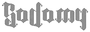 Fabrika de Typos is a Brazilian fondry run by Marcio Hirosse (b. 1969) in Sao Paulo. He made Destroyer (2007, splatter grunge), Helena (2007), Boogaloo (2006), Casual (2006), Expedito (2006), Impresso (2006), Club (2006), Qualque Coisa (2006), Pig (2006), Boogaloo, Casual, Error (2006), Sherley XXX (2006), Thailandesa (2006, Thai simulation face), Expedito, Impresso, Club (2006, stencil), Ferrugem (2006, grunge), Qualque Coisa (2006), Saco de Pao (2006, grunge), Clean (2006, experimental), Poesie Noire (2006, a great multiline calligraphic face), Fuck You Las Vegas (2005), Serial Killer (2004, bloodied Arial), Tragedia (2004), Font Macabra (2004), Font Abuso (grunge), Font Cartaz (2004, stencil face), and Font Mexicana. He created Ballom (psychedelic), Anarchy, Macabra, Cartaz, Crash, Tragedia, Abuso, Estragou de novo (1999), Sucata Special, Brother Bear, Floppy Disk, Punk Dingbats (2004-2005, destructionist typefaces), Swiss AntiNormal (2005), Jooy (2007, grunge), Deusdeti (2007, double script), Deux ex Machina (2007, blackletter-inspired), Comunista (2007, constructivist), BONDAGE-DEMO-VERSION (2007), CASULO-DEMO (2007), D-E-S-T-R-O-Y-E-R-D-E-M-O-V-E-R-S-I-O-N (2007), GARTEN-VON-DORNEN-BLACK---DEMO-VERSION (2007), GARTEN-VON-DORNEN-DEMO-VERSION (2007), Load (2007, grunge), LYSSA-DEMO-VERSION (2007), MUMIA-DEMO-VERSION (2007), OFF-SET---DEMO-VERSION (2007, grunge), Pig (2006, rough stencil typeface), PLEASURES-DEMO-VERSION (2007), Querencia-Army-DEMO-VERSION (2007), TETARIA (2007), FDT Sodomy (2008, blackletter), FDT Carreto (2008), all freely downloadable.
 In 2017, he created the colored Memphis-style typeface Denoise. Commercial typefaces: Circus de Terror, Rapariga (curly), Indiana, Hard Core, Iemanjai, Disorder, Joy, Deusdeti, Deux ex Machina, Comunista, Destroyer, Off Set, Pleasures Poesie Noire, Helena, Base, Clean, Casulo, Serial killer. Creations in 2012: Big Pig, Suicidal Tendencies. In 2015, he made FDT Wonderland. Dafont link. Yet another URL. Behance link. [Google]
[MyFonts]
[More] ⦿
|
Face Photosetting
|
Photo era foundry set up in the 1960s by John McConnell and Chris Dubber in London. I could only find Pluto Outline, the art nouveau typeface Desdemona (a digital version was created in 1992 by David Berlow at Font Bureau and in 1994 by Richard Beatty; Letraset showed Desdemona in its 1981 and 1986 catalogs; the original is from the late 19th century by Karl Brendler&Soehne, Vienna), Stack, and Oxford (a multiline face) on-line. Steve Jackaman worked in the studio in Newman Street and Hanway Place, and recalled El Paso (a Western/Mexican simulation face) when he created El Paso Pro (2011, Red Rooster). In 2017, Steve Jacakaman (Red Rooster) designed Lodestone Pro, which is based on Marvin (1969, by Michael Chave). According to Wes Wilson's web site, Face Photosetting led the way by launching a number of Art Nouveau revivals which were taken from Ludwig Petzendorfer's "A Treasury of Authentic Art Nouveau Alphabets". A selection of these, which included Arnold Böcklin, Edel Gotisch and Eckmann Schrift, were made more widely available when Letraset produced them for their dry transfer product. They published a number of books and catalogs, ca. 1976-1977: Face headline catalogue [1981/82] (1977), Specimens of Delittle's wood type, Face book of typefaces, Type catalogue (1976). Some of the typefaces were Cyrillicized, such as Bullion Shadow (1970; Cyrillic version by Victor Kharyk, 1978). Bully Pulpit Plain NF (2014, Nick Curtis) is a revival of Bullion Shadow. [Google]
[More] ⦿
|
Fernanda Campolina
|
Graphic designer in Belo Horizonte, Brazil. She created a psychedelic font tentatively called Hippie (2012). [Google]
[More] ⦿
|
Fernando Haro

|
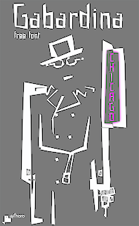 Las Palmas de Gran Canaria, Ampuero and Laredo, Spain-based designer (b. 1971) who set up deFharo. Creator of the monoline sans typeface Depez (2011), Fabada (2011), and the free monoline geometric sans typeface La Chata (2011). La chatte, in French? Maybe not.
 In 2011, he made the monoline organic sans typeface Lerótica (free at OFL). In 2012, he created Nabatea (stone chisel typeface), V de Vacia (a grungy outline face), Sabática (organic), the straight-edged data style typeface Gabardina, the grotesk typeface A Bebedera, the shadow typeface B de Bonita, D Puntillas, and the deconstructed Qebrada. In 2013, he designed Yacarena Ultra, H.H. Agallas, Nacimiento (a dymo label font), J Airplane Swash (a psychedelic typeface named after Jefferson Airplane), CA Garrutas (grunge), CA Gatintas (grunge), I Am Telefono (the largest phone dingbat and scanbat typeface on earth), Wach Op-Art (kaleidoscopic icons), K.O. Activista, I Am Hueca, X Template (stencil), H.H.Samuel (rounded sans), U2 Metalona (a beautiful white-on-black display face), M F Plexus Italic, J.M. Nexus Grotesque (an "thin inline" fat grotesque), Wachinanga, Tabaquera, Pabellona (grunge), El Pececito (video game font), the poster typeface Hobby of Night (OFL), H2O Shadow (outline version of Fabada), Zabatana Poster (a didone-inspired poster font), Oaxaquena Tall, Yacimiento (wood style wedge serif), and Rabanera. Typefaces from 2014: Babalusa Cut, A Cuchillada, Sabandija (a plump round display typeface), F2 Tecnocratica, F1 Secuencia Quad (pixel face), La Pejina FFP (bilined), Tabaiba Wild, Gabachita (ultra-condensed rounded sans). Typefaces from 2015: Tabarra Pro (Swiss style sans family for Latin, Cyrillic and Greek), A Sogra Ruth (ultra-condensed art deco), Gaban (an outline version of Tabardo), Tabardo (a heavy blocky font), Wacamoler Caps (a Tuscan typeface inspired opening credits of the Western movie Winchester '73 directed by Anthony Mann in 1950), Ubicada (condensed geometric sans), Rabiosa (neurotic font), Zacatecas (condensed shaded sans), F3 Secuencia Round, La Babaca (a powerful black condensed sans in the style of Impact), Obcecada Sans + Serif (condensed with almost disappearing descenders), Eacologica Round Slab (a nice commercial font with an incomplete set of numerals), Palim Script (curly), Vacaciones (signage face), de La Cruz. Typefaces from 2016: Yugoslavia (calligraphic), Love Box (stencil), Cienfuegos (connected retro script named after the Cuban her Camilo Cienfuegos), Gaitera Ball (round fat script), The Black Box (a retro banner font), Durum Kebab (shadow sans), Jolgoria In Town (script), Yerbaluisa (signage script), Escobeta One (brush script), Posteratus Rex, Bastardilla (a cursive font), Rotulona Hand, The Juke Box (retro juke box lettering), Angelique Rose (connected monoline script), Promenades, Bucanera (a swashbuckle font), Lucemita, Panama Road (a casual calligraphic font), Deslucida, Disoluta, Sucesion Slab, Tabarra Pro Round, Qebab Pro Shadow, Monserga (white on black), Indulta SemiSerif. Typefaces from 2017: Partizano Serif (a retro poster font; free demo), Jack Stanislav (a great condensed movie poster font), Fontanero (rounded fat sans), Yonky (fat slab serif), Zigzageo, Libertatus (manual serif fonts based on a Czech poster from 1935), Libertatus Duas (slab serif), Flamante Sans, Flamante Serif, Flamante (Round, SemiSlab, Stencil, Seca, Cairo, Roma), Seisdedos Dead (rough stencil fonts), Neo Latina (stencil), Carta Magna (blackletter), La Sonnambula (signature script), Bola Ocho (an eightball font), Clandestina (textured, layered), Acratica (signage script), Penitencia Inline, Autarquica (outlined vernacular style), Caminata One (shaded signage typeface), Sin Razon (wedge serif), Glotona Black and White (a layered tattoo style font duo), Glotona Dots (the textured versions of Glotona), 6th Aniversario, Tribal Box (squarish sans, with tattoo ornaments and a great environment for borders), Candy Pop (bubblegum font), Sargento Gorila (army stencil font), Libertinas + co (a curly calligraphic script; the free version has no numerals). Typefaces from 2018: Gudariak (a free color SVG font: Vicente Ballester Marco (Valencia 1887-1980) was a graphic designer and Valencian poster artist affiliated with the CNT (Confederacion Nacional del Trabajo) who created political propaganda posters of clear modernist and post-cubist influence during the Spanish Civil War. The Gudariak typeface is inspired mainly by one of the posters he made for the Government of Euskadi and also in others where the author continues to explore this particular typographic style. ), Farisea Fraktur, Octuple Max (techno), Ordeal Eroded, Panfleta Stencil, Secuela (free), Fragua Pro (condensed sans family), Getho (a geometric semi-sans), Cowboya Tuscan (a curly Tuscan circus font), Txuleta Deco (a striped art deco typeface), Coltan Gea (slab serif), Getho Semi Sans, Cowboys (a Tuscan typeface), Drystick Geo Grotesk, Diezma, Grifa Slab, Coltan Gea (slab serif family), Paloseco (geometric and grotesk), Stoica (a color SVG font), Letrera Caps (a rounded square style layered and color font that pays homage to the sans serif inline genre), Enagol Math (a condensed rounded slab serif based on carefully applied mathematical ratios), Heptal, Velocista, Octagen Condensed, Octagen Black, Sextan Serif, Sextan Cyrillic, Quickat (signage script), Octagen (condensed sand with short descenders), Wolframia Script (flowing handwriting), Pentay Slab, Pentay Sans, Pentay Book, Cuatra, Judera (Flat and Ring: monospaced, unicase and totally sqaurish), Quotus (slab serif), Tripleta Grotesk (a 16-style geometric sans family). Typefaces from 2019: Pervitina Dex (sci-fi), Megalito Slab, Obesum Caps, Jane Roe (sans), Icons Opentype, Felona (stencil: a variable font), Neo Fobia, Bocartes Fritos (food icons), Red Thinker (a squarish monoline sans), Pena Caldaria (blackletter). Typefaces from 2020: Anoxic (a squarish monoline sans). Typefaces from 2021: Humato (a sturdy font for weightlifters), Probeta (a squarish techno sans family in 42 styles), Speeday (a speed emulation sans). Creative Market link. OFL link. Behance link. Dafont link. Devian tart link. Abstract Fonts link. Fontspace link. [Google]
[MyFonts]
[More] ⦿
|
Fikri Rahman
[Revork Lab (or: Revork Labs; was: Fikri Ar)]
|
[More] ⦿
|
Fillmore
|
 The Fillmore poster lettering style initiated by Alfred Roller in 1902 and revived by Wes Wilson in the 1960s (also called Curvy Blocked Lettering by Matthijs Herzberg) is representative of the psychedelic era. Some digital typefaces in this style are showcased in this page. They include Psychedelic-Fillmore West (Jeff Bortniker, T26), Psychedelic-Fillmore East (Jeff Bortniker, T26), Jonah (Canada Type), Roller Poster HiH), Mojo (Jim Parkinson for Adobe), Butterfield (1993, Scriptorium), Melrose Modern SG (Spiece Graphics), Moon Star Soul (Flat-it), Tambourine (Transkrypt), Illuminata (Scriptorium), Churchward (BluHead), Psychedelic (T-26), Rebel Train Goes (Flat-it), Guillotine (Canada Type), Flat20 Hippies (Flat-it), Churchward Ta Tiki (Churchward Type), Earthpig (Scriptorium). Flower Children JNL (Jeff Levine). [Google]
[More] ⦿
|
Fiodor Sumkin
|
Byelorussian illustrator who fled his country when he was 18 years old. He sold paintings in Moscow and now lives in Amsterdam. His drawings are straight out of the 19th century, ornamental and playful. He is also inspired by the psychedelic lettering of the 1960s. Discussion of his work by Coles. Typefaces, all made or drawn in 2006-2007: Rodopi, Fashion Condensed, Farringdon, Hopkins, Rondell (Western style face), Abramesque (ornamental caps), Mansard Trimmed (19th century emulation), Wedlock, Silverado, Shimmer Wide (cyrillic), Mona (extra-wide slab serif), Flirt Chloe (more 19th century ornamental glyphs), Jubilee (constructivist Cyrillic lettering), Big Cyrillic pixels (many great pixelized alphabets), Cuba, Gingerbread (Victorian), and St. Clair. Alternate URL. Check out his gorgeous country maps designed for the aeroflot in-flight magazine in 2008. [Google]
[More] ⦿
|
Flatface (was: Shoulder Studio)
[Andi Ibrahim]
|
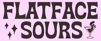 Designer of these display typefaces in 2020: Flatface Sours (a psychedelic display font inspired by 70's gig posters), FF Prill (all caps sans), Tired (hand-drawn). In 2019, he designed Embro. [Google]
[More] ⦿
|
Flemming Bau
[Oct 22 2025]
|
Danish designer of the circle-based font Bau (1972, Mecanorma), which won an award in 1972. He wrote: I was the head designer at Moesgårdd Museum in Aarhus, working as an exhibition designer and illustrator with archaeological and ethnographic themes---exhibitions, posters, book design, and artifact drawings. For this museum, I created the Bau font, and after that, I designed the entire alphabet for Mecanorma. In a letter to them, I wrote: "The Bau type is created for rather small spacing. The type is a new, harmonious, compact type, combining psychedelicflowing elements and strict geometric construction". Bau was revived and renewed in 2023 by Benoit Brun and Raphaël de la Morinerie at WrittenShape Type Foundry as Naive. [Google]
[More] ⦿
|
Fontalicious
[Ben Balvanz]

|
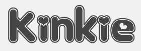 Original fonts by Ben Balvanz from Cedar Rapids, Iowa (b. Cedar Rapids, 1975), who now lives in South California. His original Fontalicious domain ceased in 2005 but was repurchased in 2007 with the help of Font Bros. Some fonts can be downloaded here and here. The list: Topanga (2017), Coney Island (2002), Cheeseburger (2002), Tabletron (2002, LCD font), Senor Pooglins, Plush (2001), Slide, Discotech, Galaxy, Pacfont, Rusty, PinniePoker, Geeves (tall letters--great), Moonpie Cadet, Fidelle, FontTwelve, Mister Easy, Mister Dope, Frosty, Chankenstein, Discotech, VintageVacation, Dazzler, Joinks!, Cyberwhiz, Swinkydad, Sonic Superpowers, Mikey Jax, Klink-o-mite, Caveman, Gloo Gun, Skylab 600, Cyberpop, Cyberjimmy, Smartie Capos, Jenkins, Earwax, Pimpbot 5000, Dreamy, Quinkie, Milkfresh, DateRape (great), SpaceAce, GirlieLeslie, Groovalicious Tweak, Porky's, International Chunkfunk, SuperTrooper, Chachie, Zodiastic, Great Head (dingbats), Chick (sassy!), the Eight Track family, Speedfreek, the Odyssey family, AlphaStep, Alpha Clown, dopenakedfoul, Lounge Bait, SpaceBeach, Jubie, Bean Town, Funkotronic, UndieCrust, and Poppycock, Pornhut, Robokid, Kinkie (Valentine's Day font), BorderMon (dingbat), Technicolor, Tennis (stencil), Moloky, JabbieJunior, Rave Queen, Alpha Niner, Croobie, Wednesday, Populuxe, the nice BoozeBats, Geekbats, Garage Sale, Arcade, Glamocon Retrobats, Fontalicious Thingbats, Good Head, Baby Kruffy, Kruffy, Fine-O-Mite, Disco Inferno, Jokewood, Toggle, Swinger, SurfSafari, OmegaMax, Pogo, Elvis, Trendy University (stencil), Hoedown, Fat, Atomic, Rocket, 12 Good, Moonpie Cadet Good, Dynomite, Superstar DJ (dingbat), Kravitz, Kravitz Thermal, hungrumlaut, Sporto, Sabadoo, Snappy, Chickabiddies (geek dingbats), Mandingo (1999, buncy hand-printed style), Heartbreaker, Smilage, 52 Pickup, Return of the Retrobats (wow!), Wunderland, Omega, Great Head, Air, Blackjack, BlackjackRollin, Borneo, CharlesAtlas, Cheri, CheriLiney (2001, Valentine's Day theme), DeejaySupreme, DigitCube, DigitLoFiShift, DigitLoFi, Digit, DimitriSwank, Dimitri, DiscoInferno, DunebugAlternates45MPH, DunebugAlternates, Dunebug, Dunebug45MPH, Freestyle, Garanimals, Gas, GleeClub, Jenkinsv20, Jenkinsv20Thik, JenkinsKeepinitReal (1998), KravitzExtraThermal, Moderna, MoogSchmoog, Moog, PussycatSassy, PussycatSnickers, Queer, Redensek, Sanka, Schmotto, SchmottoPlotto, Squarodynamic01 through 10 (pixel fonts), Stretch, SupervixenHoneyedOut, Digit, Digit Cube, Supervixen, TheKids (1999), TrendyUniversity, UltraSupervixenHoneyedOut, UltraSupervixen, WeLoveCorey, Manchester (great), Weltron (stencil font), Weltron Power, Mullet, Rolloglide, Planet, Gravity, Alba, BilloDream (2001), Stretch, Pasteris (based on the handwriting of Matthew Pasteris), PornStarAcademy (sports shirt lettering), Mullet, SuperStars (stars), Krupke (2002), Fresh Bionik, Stoney Billy (2001, not free), Hustle (2001, not free), Rustler (2001, Western font, not free).
 At T-26: Marshmallow (2001, rounded monoline geometric face), Superfly (2002, a Western font), Thursdoo (2002), Pacfont Good (2002), Thug (2002), Dokyo (2002, a free competitor of Futura Extra Black and Folio Extra Bold), Supreme (2002), Fresh (2002, at Chank's place), Juice (2002), Pinball (2002, not free), RunTron1983 (2002), Pixel Pirate (2002), Odysseus (2002). Rascal Miniatures, Wonderkid, Smilage Regular, Milk with Peanut Butter and Barnaby Candy machine are 2009 comic book style creations. Other 2009 fonts include Gringo Enchilada, Brute Strength, Blonk and Sparkle, Cheri Liney, Metroflex, Weltron (techno family), Sanka, Rolloglide (multiline), Pussycat, Poppycock, Pasteris, Moog Schmoog, Moog Synthesizer, Magnum, Krupke, Joinks, Jabbie, Hustle, Hungrumlat, Gravity, Fresh, FineOMite, Dunebug 45mph, Coney Island, Blackjack, Atomic, Air Regular, Shatner, Pixel Pirate, Munkeyshine, Thursdoo, Swinkydad, Surf Safari, Supreme, Stoney Billy, Speed Freaks, Bike Riding Chopper (Tuscan), Popcorn Loaded (ultra fat), Malibu Oceanside, Snafurter (Sinaloa?), Der Weiner Stentzel (stencil), Wordworth Byte, Blingo Diamond and Tiger Roams Jungle (art deco chic). Fonts from 2014: Blonk, Kangaroo, Giant, Jingles, Rascal, Coopman, Sinafurter (Sinaloa meets Frankfurter), Supergum (bubblegum font), Tiger, Popcorn, Der Weiner Stentzel (rounded stencil), Milk, Plague (scary font), Wonder (popart), Globitron (art deco), Death Squad (brush face), Spring Break, Tigra (stencil),Tigra (stencil), Fantastic, Parker (signage script) and the vector sets Mid Century Patterns, Banners (01, 02, 03, 05), Campus (01, 02, 03, 04: athletic lettering), Chickabiddles, Holiday 03, Jewelry, Lip Service 03, Optical Illusions, Seals, On The Radio, Viva, Hipster, Geometric Patters (+02). Interview. Alternate URL. Dafont link. Yet another URL. And another one. Many fonts sold since 2007 by Font Bros (see here for the announcement). URL from 2005-2007. Behance link. [Google]
[MyFonts]
[More] ⦿
|
Fontfabric
[Svetoslav Simov]

|
 Fontfabric is the foundry of Svetoslav Simov, a visual designer who is located in Sofia, Bulgaria, b. 1984. They design highly innovative typefaces that have lots of style and flair. Most fonts cover both Latin and Cyrillic. Until 2022, their fonts were sold through MyFonts, but gradually they switched to their own independent shop.
 - Typefaces from 2008: Cubic (3d face), Clou (cloud-like letters), Colo (double-lined and geometric), Snail, Blou (very thick and counterless letters).
- Typefaces from 2009: Uni Sans (first called United Sans), Kare (psychedelic), File (fat face), Zag (7-style monoline sans with tear drop terminals; it include Zag Drps and Zag Deco), Clou (cloudy letters), Facet (Black and Ultra: paper fold typefaces), Noveu (psychedelic, art nouveau), Pastel (brush face), Rolka (round ultra-fat and curly lettering), Val (rounded fat), Kvant (severe and octagonal), Duplex (fat techno), Avatar (ultra fat black), Dovde (bubbly, co-designed by Maria Karkova), LOT (fat art deco), MOD (ultra-fat), Oval (rounded sans), Quad (octagonal outline), Portal Strips and Portal Black (hyper-experimental geometric typefaces), Prisma (more ultra-fat experimentation) and Wigan (Wigan Thin and Bold of this paperclip typeface appeared in 2014).
- Creations in 2010: Hero (free sans family), Null (ultra fat, free), Aston (a modern high-contrast rounded display face), DAN (free piano key font; Dan Pro is not free though), Solomon (headline sans family) [Images of Solomon: i, ii, iii, iv, v, vi, vii, viii], Dox (ultra fat geometric poster face), Sudoku (a geometric display family with several biline and triline styles, done with Fontan2), VAL Stencil (a stencil in which repeating letters makes them tilt the other way; free), Code (2010, a fantastic monoline sans family; images: i, ii, iii, iv, v), Dekar (techno), Clipdings Web, Clipdings Travel, Clipdings Graphic Arts, Babydings, Artdings, Reader (Light, Bold: avant garde sans), SAF2010 (comic book/signage: well, Jan Erasms, the designer in 2006 of Menyaka for FIFA WC 2010 is not happy, calling SAF a blatant imitation), Age Free (free fat organic face), GOTA (a free fat finger sans face).
- Typefaces from 2011: Gabriel Sans (grotesk family), La Boheme (signage face), Qero Mite (an organic monoline sans), Code Pro (caps only clean sans headline family), Solomon Sans (a headline monoline sans family).
- Typefaces made in 2012: Nexa (a geometric sans in 16 styles), Nexa, Rex (free octagonal family for Latin and Cyrillic), Hagin (free), Intro (26-style superfamily in the Futura style) and Intro Inline (free Futura-style family for Latin and Cyrillic). Intro Condensed was created in 2014.
- Typefaces from 2013: Nexa Slab, Nexa Slab XBold, Nexa Slab Bold, Nexa Slab Book, Nexa Slab Light. [Recognize the typeface by the a and the g (an 8 with a small piece missing).
- Typefaces from 2014: Nexa Rust (a weathered letterpress emulation family of 83 typefaces by Radomir Tinkov, Ani Petrova, Svetoslav Simov and Vasil Stanev).
- Typefaces from 2015: Bronn Rust, Bronn Script and Bronn Rust Extras is a handcrafted collection of 22 typefaces created on the coat tails of the hugely popular Nexa Rust and other typefaces in the grungy worn letterpress and layering vogue. The roundish tightly set broad-ranged sans typeface family Panton is sure to make waves for years to come---it is the typeface for mobile devices. Sensa (2015, Radomir Tinkov and Svetoslav Simov) is a handcrafted 21-style family divided into the subfamilies Sensa Brush, Sensa Pen, Sensa Wild, Sensa Sans, Sensa Serif and Sensa Goodies.
View Fontfabric's typefaces. In 2015, Ani Petrova, Svetoslav Simov and Radomir Tinkov co-designed the 214-style mammoth font system Intro Rust, a rough version of Fontfabric's Intro. The fonts are partitioned over Intro Rust, Intro Script, Intro Head and Intro Goodies. Still in 2015, we find Nexa Script. In 2017, Plamen Motev and Svetoslav Simov co-designed Uni Neue, a total remake of Fontfabric's earler typeface Uni Sans (2009). Svetoslav Simov, Plamen Motev and the Fontfabric team (Vladislav Jordanov, Stan Partalev, Mirela Belova, Jacklina Jekova, Nikolay Petroussenko) produced Zing Rust, Zing Sans Rust and Zing Script Rust in the same year: it consists of 521 handmade typefaces. In 2018, Mirela Belova and Svetoslav Simov co-designed the 20-style geometric sans typeface family Mont. Svet Simov and Svetlin Balezdrov co-designed the humanist sans family Squad, and Simov published the free all caps flared terminal font Colus in 2018. Gilam was designed in 2018 by Ivan Petrov, Plamen Motev and Svetoslav Simov---it is based on DIN, but is more geometric and has obliquely cut terminals. In 2019, Svet Simov, Radomir Tinkov and Stan Partalev designed the 72-strong Noah family of geometric sans typefaces, which is partitioned into four groups by x-height from small (Noah Grotesque) to medium (Noah and Noah Text) to large (Noah Head). Codesigner of Mozer (2019, by Svetoslav Simov, Ani Petrova, Mirela Belova and Nikolay Petrousenko: a condensed headline sans family that covers Latin, Greek and Cyrillic; Mozer SemiBold is free). In 2021, Svetoslav Simov and Vika Usmanova dusted off the 18-style update of Mont called Mont Blanc. It has very short descenders and medium-sized ascenders, two variable styles, and some redesigned glyphs. Its biggest problem will be the name---surely, the famous Swiss pen maker Mont Blanc will complain sooner or later about its trademark. I am puzzled about MyFonts, which did not catch this problem when they announced the typeface. In 2021, Simov also co-designed Code Next (a 20-style geometric sans by Svetoslav Simov, Mirela Belova and Stan Partalev; it includes two variable fonts). Fontsquirrel link. [Google]
[MyFonts]
[More] ⦿
|
Fontoville (was: Fresh Media)
[Raymond Brekelmans]

|
 Raymond Brekelmans (Fresh Media) is the Dutch designer in Eindhoven of fonts such as Fame&Fortune, GoodDoggy, 7chipmunks, Hairy60, Elvisinstereo (2002), Gforgiraffe, GrndmsterB, Highheeledsneakersnormal, HighheeledsneakersThin, Itsmartinitime, JohnnyBbad, Kickpunchblock, MrMustage, OrpheusBoldItalic, OrpheusBold, OrpheusItalic, OrpheusLightItalic, OrpheusLight, Orpheus, Quatrodeadmosquitos (see also the Fontomas CD), Rudisrevenge, Sirsheep, Thebends, TheDukesGeneralLee, TheDukesLuke, TheDukesBo, BeebopalulaOneLiner, BeebopalulaFillItUp, BeebopalulaDoubleOrNothing, freekisgek-#5, freekisgek-#5_inverse_italic, freekisgek-#5_italic, Zothezebra, CiaoMonkey, Hot Rod Ford, Naughty Farmergirl, Typing With Rudolf, Anything But Sue, Font-o-ville At Night, Snails&Sausages. All these fonts were made in 2001-2002 and are free.
 Additions in 2005: Caramba, Surfing Bird, Vertigo (nice retro poster font!), Mufoefoe, Reverbb, Fasto (octagonal, free). Elvis in Stereo (2002, Cape-Arcona) and Address Unknown (Cape Arcona, grunge) are commercial. Prozaque is a groovy face. Direct downloads. Mac downloads. Font Bros link. Dafont link. Klingspor link. [Google]
[MyFonts]
[More] ⦿
|
Fontscape: Secession
|
Fontscape lists digital Viennese Secession style fonts: - From Flashfonts: Love (Solid, Open, Stoned)---these are more psychedelic, really.
- From Adobe / Letterperfect: Kolo.
- From JM Fonts: Poster (Solid, Inline).
- From ITC: Willow, ITC Stoclet.
[Google]
[More] ⦿
|
Fontschmiede
[Frank Baranowski]

|
 Obsolete German foundry, est. 2010 by Michel M and Frank Baranowski (b. Altenmedingen, 1960), and located in Neuenkirchen, where he runs the graphic design studio Cylex. Baranowski studied Graphic Design at the Hochschule fuer Bildende Kuenste in Braunschweig, Germany. His fonts:
 - Alphabutts Initials (2004-2008). Letters to fit into circles.
- Clayborn (2004). A massive font.
- Concrete (2004-2010).
- Destroya (2005-2008).
- Dodgy Ultra (2009). A blocky font.
- Elemenz Initials (2004).
- Funtype (2008-2010). A handcrafted typeface.
- Journal74 (2012). A retro font family.
- Kaleido (2004).
- Karoline (2005). A backslanted script.
- Line44
- Monumental (2009).
- MrsBeasley+ (1995-2010). Psychedelic.
- Musical (2004).
- NewTelegraph (2011, +Arrows).
- Patchwork (2005). A beatnik font family.
- Phoenikia (1998). Greek emulation.
- Silverblade (2010). A decorative, perhaps medieval, family.
- Sputnik (2010). An oriental simulation face.
- Superia (2006-2010).
- Tambourine (2004-2010). Art nouveau.
- Und4.
Some of Baranowski' fonts are released under the label Transkrypt. Open Font Library link. [Google]
[MyFonts]
[More] ⦿
|
François Boltana
|
 French type designer based in Toulouse, b. 1950, d. 1999. He was an early graduate of Scriptorium de Toulouse (1972). In his lifetime, Boltana achieved a great deal of success, including the Morisawa Prize in 1990. From 1975 until 1997 he was also a freelance graphic designer. Brief CV. Read his article in Cahiers GUTenberg, Ligatures&calligraphie assistée par ordinateur (1995). Fontshop link. Frank Adebiaye wrote François Boltana et la naissance de la typographie numérique together with Suzanne Cardinal in 2012.
 His fonts: - Aurore (1993): a calligraphic copperplate script typeface. For a free revival, see Claude Pelletier's Maratre (2013).
- The typewriter font Capitole (1974).
- Champion (1989): a wonderful copperplate calligraphic font inspired by the models of Joseph Champion (1754-1759).
- Frédéric.
- Geneviève (1969, Hollenstein Phototypo).
- Girus.
- Lineameca (1970, Hollenstein Phototypo).
- Messager (1991); in two styles, Romain and Tradition.
- Oscar.
- Prosper.
- Rabelais (1997): for this effort, he obtained the Meilleur Ouvrier de France en 1997 award.
- Toscan.
- Toulouse.
- Stilla (1973): a modern psychedelic high-contrast ornamental didone display typeface with many ball terminals. In 1990, Elsner&Flake published Stilla EF. It is also in the Scangraphic collection as Stilla SH. Linotype too has a version of Stilla. Softmaker's version is called Salmon Pro. Stilla is often incorrectly credited to Middleton.
[Google]
[More] ⦿
|
Frank Baranowski
[Fontschmiede]

|
[MyFonts]
[More] ⦿
|
Franklin Photolettering
|
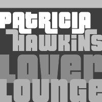 Photolettering foundry in the 1970s, located at 211 43rd Street, New York City 10017. One of my correspondents explains: Franklin Photolettering was the smaller film type joints catering to the major publishing and advertising industries in New York City in the 60s and 70s. They started out with a few originals to get into the game, but within a year or so they started putting out copies or slight modifications of existing stuff from Photolettering and VGC (you can see how that happens---someone comes in for some ad copy in Barker Flare, for example, and he asks if they have something like Eightball, so they say "sure, we can do that"). Even though they did have a bit of original stuff, they didn't have not enough to stand out like PL, Mecanorma, VGC or Letraset---also the sheer number of film fonts available on the market by the mid-70s meant that unless you dumped a lot of money on marketing, big-time design would ignore you----so not much room was left for smaller film type houses.
 Their catalog is published in binder form in Film Alphabet Compendium Franklin Photolettering. In 1974, Paul E. Kennedy published Modern Display Alphabets: 100 Complete Fonts Selected and Arranged from the Franklin Photolettering Catalogue (Dover). Typefaces by them included - Barker Flare, one of their early 1970s retro typefaces. Digitally revived as Plywood (2007, Patrick Griffin, Canada Type).
- Pinto Flare. Digitized as Jazz Gothic (2005) by Patrick Griffin at Canada Type.
- Urban (early 1970s), a Curvy Blocked Lettering typeface in the Alfred Roller / Wes Wilson style popular in the hippie era. Digital revivals include Rebecca Alaccari's Jonah (2005) at Canada Type.
- Viola Flare. Digitized as Omaha Bazoo NF in 2007 by Nick Curtis and in 2005 by Canada Type as Tomato.
[Google]
[More] ⦿
|
Fritz Richard
[enStep Software]
|
[More] ⦿
|
From Parts Unknown
[Steven Waring]
|
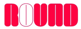 Manchester, UK-based designer of these typefaces, often experimental and exploratory:
 - The free 1970s style headline typeface Kayfabe (2015) that combines Americana, love, paranoia and psychedelia in a fantastic package. Styles include Block, Block Outline, Round and Round Outline.
- The Flo Headline family: Typeface creation that began life as a few letters for a Mexican Hotel logotype. The initial reference was Mayan symbology, however was unused for its initial intention. The project became more personal as it developed and various incarnations of the typeface ensued.
- In 2017, he designed the free 13-weight modular typeface family Nona and the experimental typeface Ephemera.
- The Leat Sans (2017). A bespoke stencil typeface family for wayfinding.
[Google]
[More] ⦿
|
Galdino Otten
|
 Cartoonist from Recife, Brazil, b. 1966, whose sense of humor and artsistic prowess shine in his dingbat fonts. Dafont link. Fontsy link.
 Creator of the experimental Almost Sanskrit (2009), Zodiac Nice (2009, astrological symbols), Xilo in Zodiac (2009), Xilo-Cordel-Literature (2009, dingbats), Cordel Circo Mambembe (2010), Inside Issue (2009), Stretched Signature Flex (2009), Action of the time (2009, grunge), the dingbat typeface Ugly Cars (2010), the grunge typeface Capitão Galdino (2008), the grunge typeface Saltpeter-N-Fungus (2010), Texture Road (2010, more grunge), BSB DF 50 (2010, grunge), Fine Serif (2009), and the nice dingbat typeface Ochent Silibrina (2009). Fonts made in 2010: Sport 4 Ever (dingbats for Olympic Games), 60sPop (multiline face), DotSpot (dot matrix), IRON H METAL (tattoo, gothic), IngaStoneSigns (stone age glyphs), Ode2PasteUp (hand-printed), WideSquare (pixelish), ActionoftheTimeNewUL, BSBDF50, Haus-Sweet-Haus, INSIGHT-ISSUE-NEW, Movie Filmstrip, SquareChalk, Action Of The Time New (grunge), CordelValentine (dingbats), IngaStoneSigns (petroglyphs), SustainableAmazon, VeryDamaged (grunge), ParkTechCG (letters as in wired circuits), kidSWritten, Iron H MetallLight, LaceNice (knitted look), Ode2PasteUp, TextureRoad (grunge). Fonts from 2011: Booklet Cordel (sketched), Cordel Encarnado, Nuclear Accident (texture face), Noncircular (techno), Old Press (grunge), Old Typography (grunge). Fonts made in 2012: New Press (condensed sans family, +Eroded), Sketch Wall, Comic Gibi, Own Written, Comica BD (comic book shadow font), Cartoon Relief (a 3d cartoon typeface), Riscada Doodle (scratchy hand), Sketch Nice, Needlework Good (a stitching font), Biscuit Made, Just Skinny, Crazy Style, After Cheret (hand-drawn 3d shaded outline face), Spots in the mirror, TNT Xplosion, Escrita Toska (curly script), Cordel Movies (moviemaking dingbats), Fine N Tall, Cordel Groteska, From Street Art (free graffiti font), Sketch College (sketched athletic shirt font), Thin Press (grungy vernacular type), Sketch Serif, Relief BD, Maxxi Serif (very heavily slabbed serif face), Semi Cursive Gut, Sketch Coursive (sketch face), Salt Pet Non Eroded, Advanced Architecture, Very Fine Serif (a monoline Egyptian), Sketch Nothing, Freehand Nothing, Shark Attack (curly), Do Doodle, Maybe Pollock (dust texture face), Xilo Prosa (grunge), Thin Design, Amazon Palafita (hand-drawn 3d outline face), Snow Times, Snow Traces, USSR Army (rough army stencil with a Russian feel), Needlework US (stitch font), Old Scribe (Greek lapidary face), Nickel Bumpy, Soviet Style (stencil face), Top Modern (heavy slab serif), Lettering Set New, Carton East, Not Tuned TV (sketch font), Scar Bleed (scary font), Maxxi Dots (texture face, +Shadows), Dots Land Gotika (grungy blackletter), Stefanie Dots (textured letters), Karamuruh (textured caps), Broken Type (grunge: a glaz krak font), Touppeka (a Kafkaesque, tribal or painter's font), Old Dreams (grungy), Bad King (sketched typeface), False 3D (hand-printed 3d outline typeface), True2D, I Wrote All, Resistance Until The End. Typefaces from 2013: Serifa Comica (comic book slab), Press Style Serif (letterpress style), Press Style Large, Triatlhon In (sic: a Greek simulation face), Go 2 Old Western (grungy wood type), Old Serif Gut, Press Style (letterpress style typeface), Dust Serif, Thing Press, Thin Grotesk Serif, Before Collapse (glaz krak face), Stencil Style New (a military stencil), Damaged Serif, Press Serif Cool, Press Feeling, Sketch Toska, Link Parties, Almost Cartoon, Cartoon Toy, Toy Toy Toon, Fine Style (didone caps), Fine Sans (Peignotian), Beyond Blackboard, Forgotten Junk (grunge). Typefaces from 2014: Simply Rounded, Cartoon 2 Packages, Pain N Bleed, Yummy Lollipop, Hippie Movement, Rotunda Geo, Old Figaro Cursive, Cute Cartoon, Sketch Gothic School (sketched blackletter), Fine College (hatched athletic lettering face), Press Felling Eroded (letterpress emulation), School Book New (sketched), Stencil Cargo Army (military stencil), Fine Eroded, Grunge Poster, Education Is A Way, Cartoon Blocks, Cartoon Bones, Cursive Option, Odd Press (letterpress emulation), Cartoon Tunes, From Cartoon Blocks (3d), Hippie Movement, Yummy Lollipop, Needlework Perfect, Press Gutenberg (blackletter), Unic Calligraphy, Roundfed Eroded, Children's Book (outlined), Neon 2 News, Good Choice (shaded letterpress emulation), Cartoon 2 Us, O 10 Type, Dust West (grungy Western style), Comic Balloon, Caligraf 1435 (pirate era script), No Name Sans, Top Secret Stamp (grungy stencil), Fine Blackboard (blackboard bold, inline), Press Style Extra L (letterpress), Sounds Good (geometric sans), Sounds Eroded (shaded letterpress font), Cartoon Blocks Christmas, Street 2 Art (graffiti font). Typefaces from 2015: Snaps Taste (a grocery store or comic book font), Snaps Taste Christmas, Calligraphy Hand Made, Silly Aliens (dingbats), Sketch Match (3d, sketched), Cartoon 4 Sports (dingbats), Kids Book, Almost Japanese (oriental simulation font, +Comic, +Cartoon), Inga Stone Redesigned, Money Money Plus (engraved money font emulation), Thin Cool, Old N New Media (dingbats), Thinkers World (scanbats of famous intellectuals), Magical Cord, Quick Writing, Eroded 2 Much, Stencil Army WW I (military stencil), Stencil WW II (military stencil), D-Day Stencil (military stencil), Western Bang Bang (weathered Western font), Modern Serif, Modern Serif Eroded, Money Money (handcrafted engraved currency font), Almost Japanese Smooth (oriental simulation typeface), Write Righ, Ease Christmas (dingbats), Sketch Script Cool, Ficticcia College. Typefaces from 2016: Doodle Cafe Scents (dingbats), Christmas Cookies, Coffee Written, Soft Marshmallow, Niagra Faults, Sketch Toronto, Sketch Fine Serif, Sketch Handwriting, Typewriter Press, Typewriter Style, Sketch 3D, Maple 3 Cartoon (snow-covered letters). Typefaces from 2017: Crazy Krabs, Old Barbwire, Gregory Packaging, Ghost Army Stencil, Old Wise Sketch (sketched blackletter), Packaging Funny, Blackboard Restaurant, Kavernosa (bony typeface), Little Kid. Typefaces from 2018: 1927 Epoque, Cartoon Toy Turbo, Old Wise Lord (blackletter), Handmade Memories, Silly Cartoon, Old Press Original, Pet Shop, Cute Script, Dust West College (hatched), New Comic BD. Typefaces from 2019: Eco Bamboo (Cartoon, Fun), Karamuruh Turbo (all caps with a quilted texture), Cordel Junina, Cordel de Mangai (240 dingbats), Cordel Rustika. Typefaces from 2020: Beach Party Cartoon. [Google]
[More] ⦿
|
GautFonts
[J.F.Y. Daniel Gauthier]
|
 J.F.Y. Daniel Gauthier (GautFonts) was born in Montreal in 1964, and lives in Hamilton, Ontario. His fonts from 2005 and before include BarrelOfMonkeys, ChainFontOpen, ChangChang, ChangChangWoodcut, DirtyDarren, FireStarter, GriffinDucks, Jenna Myles, LollipopLettering, Lymphnodes, PooCorny, PooSmooth, Quake3ArenaBats (scanbats), SapphireSativa (2005), ZappaBats, Judas Priest (2004), Caviar Rancid (2004), BackPage (2003), BatFont (2003), MagicCatalog (2003), Samdan (2003), The One Ring (2003), The 3 Stooges (2003), Yahoo Font (2003), BikerBones, CBGBFont, Cortesia, DryGulchBlack, DryGulchOpen, FlyLegs, Frank, MissingLink, PotLand, Punk, SheCreature, SweetLeaf, ThaiPedicure, TypoNegative, VectorBlack, VoodooDollLetters, VoodooDolls, VoodooDollsPinned, ZappaBats, Griffin (2002), GriffinBold (2002), HeadHunter (2002), Montezuma (2002), MontezumaAncient (2002), MrBubbleFont (2002), PhoenixOne (2002), PhoenixTwo (2002), Spliffs (2002), SteelTown (2002), TattooLettering Black (2002), TattooLettering Open (2002), VladDraculBats (2002), Beatnik Hayseed (2002), ChangChang (2002, oriental lookalike), Crumb (2002), GearBox (2002), Happening (2002), LogFont (2002), Piranha (2002), Sardines (2002), Tilt-A-Whirl (2002), ChineseWatchShop (2002), DickVanDyke (2002), Göt (2002), KamikazeBats (2002), Springfield Tablets, AlphabetFridgeMagnets, Beethoven, BeethovenRough, BeethovenRougher, Bicycle (outlined), BicycleFancy, BoobToob, Burris (Old West font), BurrisGhostTown, BurrisShootOut, CBGB (pearly letters), Chain Font Black, CheapSign, ChickenFarm, CornFed, CrappyDan, CrappyDanLowercase, DimWitGauche, DimWitRight, Eastwood, FantasticFont, Fear, FearlessVampireKillers, FeltCrappyDan, FrootStand, GassyGaut, GauFontExposition (trilined), Gauts, GautsMotelLowerLeft, GautsMotelLowerRight, GautsMotelUpperLeft, GautsMotelUpperRight, Gearbox (geary alphading face), Göt (blackletter), HoaryGaut, Houdini, IncantationOne, IncantationTwo, IrwinAllen, JackOLantern, Jagged, JoeJack, KathleenLowercase, KathleenUppercase, KentuckyFriedFont, KentuckyFriedChickenFont (2004, signage), LeadType, LeadTypeBoldInked, MadScience, Moscoso (morphed Western titling font, psychedelic), OogieBoogie, OrganDonorGuts, OrganDonorSkin, PinkCandyPopcornFont, PooCorny, PooSmooth, Potland (marihuana alphadings), Punk, RapaNuiLetters, RapaNuiMoaiBats, RapaNuiMoaiFont, RedStar (2004, pretty handwriting based on the pen of Linda Cappel), RedStarBold, RockFont (Flintsones font?), Sasquatch, Sea Creature, Shaman, ShermlockMadstyle, ShermlockSolid, Shock, ShockThick, SpookyMagic, StagTickets, StartlingFont, TattooParlour (2004, scanbats), ToOsamaLoveGeorge, TypewriterKeys, Vector, WebPress, WebPressBold, Weird, WereWolf, ZootAllures. He has some comic book fonts, some dingbats, and several fonts around the theme of magic.
 Interview. Fontspace link. Dafont link. Klingspor link. [Google]
[More] ⦿
|
Gérard Mariscalchi

|
 Montrealer who designed ITC Redonda (1998, an upright ronde script), Baylac (a psychedelic font fdirst done at Agfa, and then at ITC) and the Comic Strip family. Planned are the calligraphic font Herald (for Font Bureau), the protest font Infamy, and Robin Hood. He created the following Agfa Creative Alliance fonts: Evita (1998, now an ITC font: an organic roundisch script), Baylac, Link, Lineale, Iona, Marnie and Toots (1997, based on calligraphy by Villu Toots). He designed the great calligraphic font Scrivener in 2000 (I guess the Herald project at Font Bureau must be dead then).
 FontShop link. Klingspor link. Alternate link. View Gérard Mariscalchi's typefaces. [Google]
[MyFonts]
[More] ⦿
|
Georgina Llados
|
Designer in Barcelona, who published a small booklet enttled Sixties and Type. [Google]
[More] ⦿
|
Giuseppe Salerno
[Resistenza]

|
 [MyFonts]
[More] ⦿
|
Gleb Guralnyk

|
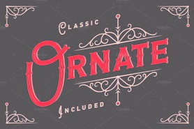 Dnipropetrovsk, Ukraine-based designer of these typefaces in 2015: Odd Times (a vintage blackletter typeface), Brandy Label (a layered Victorian signage font), Smoking (a great Western layered poster font), Traveller, Letterhead (steampunk, vintage, Victorian), Age, Nataly Temper, Vintage Auto (a retro chrome automobile font), Golden Dust (a lava lamp font), Rusty Phoenix, Phoenix, the Victorian signage typeface Whiskey, Spirals, Biker (spurred inline font), the oily signage font Pin Up.
 In 2016, he designed Far Kingdoms (Victorian), Brass Heart (steampunk / Victorian), Big City Light (a vintage movie theater typeface), Lostamp (a weathered vintage rough stencil script), Kexman (calligraphic script), Loftype (creamy brush script), Shoelaces (monoline script), Tobacco Box (Victorian), Humblest, Whiskey Label (a great vintage Victorian headline font), Insane Fear (spurred), Falchion Edge (Victorian display typeface), Inside The Box (techno), Amber Taste (a layered Victorian beer label font; see also Amber Taste Pro (2020)), One Thin Line (a paperclip font), Bald Eagle (Victorian), Autumn Feel (brush script), Dirty Cartoon, Magic Curls, Winery, Bite Hard (beveled caps), Lovebus (psychedelic style), Column (layered Victorian), Golden Brush, Marine Fairytale (Victorian), and Old Story (handcrafted). Typefaces from 2017: Goodwine, Daub (EPS format brush alphabet), Rusted Bevel, Dirty Cartoon (a layerable cartoon font), Bald Eagle (vintage), La Belman (Victorian; see also La Belman Pro in 2020), Bright (creamy calligraphic), Winery, Magic Curls, Black Queen (Victorian style), Little Mess (dry brush), Lovebus (psychedelic), Bite Hard, Fiver (prismatic style), Sweet Rum (vintage), The Freaky Circus (Western circus font), Biker New (spurred), Flex Wire, Agress (graffiti style), Old Story, Rusted Brushpen (dry brush), Mosaic Pool, Ranch (vintage style with layered textures), Golden Dust, Letter Head, Limber (dry brush script), Patina, Craft Beer (a layered beer label font), Droptune (Victorian), Chimera Tail, Hardwatt (dry brush), Megawatt (signage script), Jamish (a handcrafted blackboard bold typeface), Oak Lumber, Odd Times (blackletter), Gunshot (an art nouveau display typeface), Bootleggers (a vintage label typeface), Brandy Label (vintage layered font), Smoking Typeface (vintage Western style, with layering). Typefaces from 2018: Shining Night (a marquee font), Scratches, Candy Shop (a multiline titling typeface), Nataly Temper (a crayon font), Anise Seeds, Lostamp (a great stamp font), Hicksons (retro signage script), Loftype (creamy script), Far Kingdoms (spurred vintage typeface), Predators Cuspid, Sweet & Fresh, Frantic (a vintage car typeface), Affair (Victorian), Falchion Edge (spurred vintage style), Lost in Space, Traveler (an interlocking vintage Tuscan display typeface), True Black, Late Frost, Inside The Box (an interesting double-width font), Magic Garden (curly style), Skater Girl (retro script). Typefaces from 2019: True Black (Tuscan), Nature Force, Sweettooth (script: 2018-2019), Rusted Bevel, Rusted Bevel, Fishermans Knot (a vintage label font started in 2018), Skater Girl (a heavy upright script), Cidrella, Western Shooter, Little Mess (a dry brush calligraphic script), Spirit Board (pure Victoriana), Ranch Vintage (shadowed, textured, vintage), Forged Fence (an ironwork font), Long Ride (an octagonal license plate font), Chimera Tail Rough, Patina. Typefaces from 2020: Sweet Ponch, Natural Heap (letters in laurels), Street Rush, Cally (a decorative Tuscan typeface), Sunny Bay, Harietta (a retro monoline script), Cheer Inside (a vintage font), Frizzy (a vintage label font), Asia Impact (simulating an oriental brush calligraphy), Exa Metline (an inline font), Hallie (a curly display typeface), No Rules, Parallax, Golden Treasure (a vintage ironwork font), Squidink, Bushman (an organic sans), Florry (a display sans), Propeller, Spirit Board (a layered circus font family), Lord Grayson (Victorian), Grayson (a tall gloomy monoline sans), Grayson Rough, Kaipara (a patterned all caps font), Classic Heritage (a Victorian or steampunk signage typeface), Anise Seeds (vintage softly spurred Tuscan caps), Candy Shop (vintage trilined caps), Plop, Practish (an experimental slab serif family), Everleigh (a stylish thin typeface), Everleigh Duo, Love Affair (vintage, perhaps art nouveau), Lost in Space (sci-fi), Sweet and Fresh. Typefaces from 2021: Dusky Rough (a Western or saloon font), Dusky Pub (a Western typeface with Tuscan features), Dusky Slab (a reverse stress Western font), Humblest Pro (an all caps display sans), Giftbox (a vintage label font). Typefaces from 2022: Simply Royal (layerable vintage caps with an engraved money look), Go Pop (pop art). [Google]
[MyFonts]
[More] ⦿
|
Gonzalo Murillo
|
Santiago, Chile-based designer of the Latin / Cyrillic display typeface Velove (2017), which takes inspiration from the 1970s. In 2011, Gonzalo Murillo and Sebastian Hanson co-designed the psychedelic typeface Copihue for a school project. [Google]
[More] ⦿
|
Gustav Jaeger

|
 Designer (b. 1925) who studied at Werkkunstschule Offenbach and worked at Bauersche Giesserei. All his fonts were published at Berthold with the exceptions explicitly mentioned:
 - Aja (1981): a calligraphic font
- Becket LL (1980, Linotype).
- Bellevue (1986): a ball terminal script
- Catull (1982, Berthold): a modern typeface. Google logo was made by Ruth Kedar based on a slight modification of Catull.
- Chasseur (1988).
- Cornet (1989).
- Cosmos (1982).
- Jaeger Daily News (1976), or just Daily News BQ. Some sources mention the date 1982. The font has been used in Italy Daily, a supplement of the International Herald Tribune. See D650 Roman on the SoftMaker MegaFont XXL CD, 2002). A small design flaw: the capital O hovers above the baseline instead of dipping below it.
- Delta (1983).
- Donatus (1986).
- Epikur (1986).
- Jaeger-Antiqua (1984).
- Jersey (1985).
- Jumbo (1973). Not a Berthold font, I think.
- Komet (1976, Berthold AG).
- Mark Twain (1973): an art nouveau / psychedelic typeface created in reaction to VGC Eightball, and digitized in 2006 as Huckleberry by Canada Type. Not a Berthold font.
- Osiris (1984: see O830 Roman on Softmaker's XXL CD (2002).
- Pinocchio (1973, Berthold). A psychedelic typeface in the style of Alfred Roller and Wes Wilson. Revivals: P732 Deco (SoftMaker), Pinocchio (2012, SoftMaker), Pinocchio (Dieter Steffmann), OPTI Pulaski (Castcraft), Pinwheel (FontBank, 1990-1993) and Pinocchio (TypeShop, 1994).
- Prado (1990) and Prado Swash (1990).
- Sacher (1973, Berthold).
- Semin Antiqua (1976, Berthold).
- Seneca (1977). See S691 Roman on the SoftMaker MegaFont XXL CD, 2002.
Apparently, the former (now bankrupt) Berthold bankruptcy lawcourt administrator transferred in 1993 all Jaeger design rights from Berthold back to Gustav Jaeger. Thus, the "new" Berthold versions, sold by Linotype since 2008, are all rip-offs sold without Jaeger's consent. FontShop link. Klingspor PDF file. Linotype link. Pic. [Google]
[MyFonts]
[More] ⦿
|
Gustian Agung Asprilla
[Rillatype]

|
[MyFonts]
[More] ⦿
|
Günter Jäntsch
|
 Designer of the clownesque semi-psychedelic font Pierrot (1973). It was published in digital form by Linotype. [Google]
[More] ⦿
|
Gyrl Friday Fonts
[Heather Daniels]
|
Original fonts by Heather Daniels (Gyrl Friday): 21Heads, ArmyBoy, BadBlackCat, CaveGyrl, Denigrated, Dragoon, FitofTears, GyrlFriday, GyrlLovesBoy, Hubbly, LittleCity2000, Luftwanker, MmmmCoffee, PsychedelicSauce, Pukisaka, ScrapedKnee, ScrewyMeltedWax, ShowerFlower, SingleGyrl, TinyTube, VineyTimes, WaterToy, WebDotDing, Wilhomena, WiquedT, ZebraParade. See also here. Dafont link. Another URL. [Google]
[More] ⦿
|
Handpik Design
[Muhammad Nurapik]

|
Bandung, Indonesia-based type designer, b. 1999. Creator of the decorative serif typefaces Aicho (2020: almost psychedelic) and Wondershine (2020). Typefaces from 2021: Astrella (a bold display serif), Brunhilde, Nobles Ville, Million Harmony (a formal calligraphic script), Anasya (script), Smoanes, Gorgonite, Meiland, All in (a greeting card display font), Mechta (a display serif that comes close the fat didones of the 1980s), Alletha, Aurallia, Beauty Nigella, Chleona (a decorative serif), Glenite Elegante, Madami, Morgenlicht, Morise, Sabana, Tanjiro. Typefaces from 2022: Belgan Aesthetic (a display serif). [Google]
[MyFonts]
[More] ⦿
|
HansCo
[Burhan Afif]

|
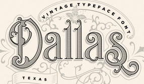 Yogyakarta, Indonesia-based designer (b. 1988) of the font duo Nesans and Nesans Signature (2019), the script fonts Sweet Love (2019: upright), Mondena (2019), The Bellinda (2019: calligraphic), Austin Capittal (sic) (2019: monoline script), Bread Store (2019) and Wrongler (2019), and the vintage (often, Victorian) display typefaces Blue Spirits (2019), Bandits (2019), Sonia (2019), Belgia (2019), Berlina (2019) and Berlin (2019).
 Typefaces from 2020: Blue Spiris, Grapine (Victorian), Ricasto (a signage script), Grizlie (an octagonal sports font), Madanira (a semi-formal script), Amellisa Ink, Anstec (a techno / sports font), Razen (a techno / sports font), Sourta (a speed emulation sports font), Abigile (an upright script), Off Side (all caps, brush), Bastina Sindey (a dry brush script), Bread Store, Feeling Blessed (an upright rabbit ear script), Meristmas, Mosteri (a fantasy font), Ateros (a sci-fi typeface), Aloner (a sci-fi font), Nucleo (a sci-fi font), Roline (prismatic), Tahu Bullats (a creamy signage script), Valentiqu (a curly upright script), Magic Funk (a psychedelic script), Letter Magic (a decorative serif), Craft Lovers, Magzo (a decorative serif), Belights, Cute Meow, Baking Pastry, Sweet Butter, Feeling Blessed, Baby Bunny Script, Misteri Caps, Carglos (blackletter), Traditian, Genta (a rounded bold all caps typeface), Beyond Stars, Off Side (brush), Santoriu, Hi Panda, Crows (a curly serif), Zeniq (a stencil font), Nucleo, Abigile, Blaster, Botania, Crunchy, Femina, Graphite, Holly Days, Hot Sauce, Just Swirls, La Fiesta, Lets Espresso, Little Baby, Magic Sparkle, Ricota, Secillia, Shinesy, Skid Rock, Stripline, The Englands, The Spectre, USA Nation, Magzo (a display serif indeed for food packaging and logos), Stabillo (a food logo brand typeface), Austina Capitton, Kora Kora, Mosherif (Regular, Tall, Short), Golden Stanbury (a signature script font duo), Risolla Calisto (a wild calligraphic typeface), Wild Wolf (brush), Balistone (a wild script), Glastia Monoline, Amorista (a rabbit ear script), Eastblue, Crimmy (a dry brush script), Buchery, Castel, The Begundals, Sambal Pedas (a dry brush script), Blastoic (a dry brush script), Queen Sea, Skid Rock, Platinum Signature, Sonita (a condensed decorative serif typeface). Typefaces from 2021: Bastro (a great obese short-necked retro display typeface), Romantic Serif, Pastel Orange (an elegant artsy ligature serif), Romantic Serif, Sunroll (fashion mag caps), Romla (a wide display serif), Magic Retro (a heavy magic mushroom typeface), Holingston (a dry brush script), Gopetter, Ballomont (handwriting), Astopher, Restoe Bumi (a handwriting font), Rotenfold (a script), Halima Sofira, Anastia Buttery (an inky signature script), Belighta (wild calligraphy), Bittle Birdy (an irregular typeface that will cause psychological damage), Magic Sparkle (a decorative all caps serif), Notted (an exaggerated fashion mag font loaded with smooth ligatures and featuring surprise gyhphs such as a lower case a that is a mirror of the lower case e). HansCo Studio. [Google]
[MyFonts]
[More] ⦿
|
Hatf Type
[Rendi Rochimah]

|
Indonesian designer of the script typefaces Jakarta Night, Matsuyama (2020: brush style), Summer Vacation (2020), Senopathi (2020: wild calligraphy), Safetread (2020). Typefaces from 2021: Fast Drift (a cartoon font), Night Action (bold informal caps), Ohayou Christmas (a comic book font), Nosy Ghost (bouncy caps), Santa On Duty (bouncy caps), Christmas Candy (textured), Classic Christmas (a bean font), Family Prosperity (script), Christmas Dream (textured for Christmas), Furious Night (a horror font), Loli Pop (bouncy capital letters), Santa Day (beatnik caps0, Xmas Bells. Typefaces from 2022: Ghost Place (a Halloween font), Valentine Street (a Valentine's day graffiti font), Hell Plants (a hellish typeface), Arts Glory (a graffiti font), Happy Sunshine (groovy, psychedelic), Missing Soul (a grungy font), Monster Inside (eerie), Parkour King (a graffiti font), Heart Memory (with heart-themed texture), Blank Idea (dancing caps), Funky Hype (a graffiti or Flintstone font), Love Live (a display typeface with heart-themed texture), New Year Page (dancing letters). [Google]
[MyFonts]
[More] ⦿
|
Hayrullah Yorganci
|
Creator of a psychedelic typographic poster called Typographic classic cars (2012). [Google]
[More] ⦿
|
Heather Daniels
[Gyrl Friday Fonts]
|
[More] ⦿
|
Heather Loeb
|
Original fonts by Florida-based Heather Loeb (aka Heather Daniels or as Gyrl Friday): 21Heads, ArmyBoy, BadBlackCat, CaveGyrl, Denigrated, Dragoon, FitofTears, GyrlFriday, GyrlLovesBoy, Hubbly, LittleCity2000, Luftwanker, MmmmCoffee, PsychedelicSauce, Pukisaka, ScrapedKnee, ScrewyMeltedWax, ShowerFlower, SingleGyrl, TinyTube, VineyTimes, WaterToy, WebDotDing, Wilhomena, WiquedT, ZebraParade. Time Digital piece on her: When Heather Loeb started college in Florida two years ago, she had never even been on the Internet, let alone made a font. She was planning to be a nursing student. That changed when she got her first computer. "It was just a progression," she says. "I liked making websites and playing with graphics, and eventually I couldn't find fonts I wanted, and I started to make my own. I saw other people were doing it, so I thought, why not?" Loeb's fonts are witty and fanciful: letters appear silhouetted against the side of a long, snaky dragon, or inside tiny cartoon television sets. At first she found the learning curve steep, but the font community came to the rescue. "People are pretty friendly. When they make fonts, it's because they love fonts, and they'll help you out." Now Loeb has a Web-design business on the side, for which she designs her own alphabets under the nom de font Gyrl Friday. [Google]
[More] ⦿
|
Helena Öhman
[Studio Indigo]

|
 [MyFonts]
[More] ⦿
|
Henaris R
|
During her studies at EASD, Valencia, Spain-based Henaris R designed the psychedelic typeface Slaughterhouse (2018). [Google]
[More] ⦿
|
Hendra Pratama
[HP Typework (was: Mikrojihad Inc.)]

|
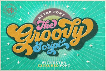 [MyFonts]
[More] ⦿
|
Hendry Juanda
[Letterhend Studio (or: Magang Letterhend)]

|
 [MyFonts]
[More] ⦿
|
Henry Cohn
|
 UK-based FontStructor who made these typefaces in 2014: Stencil Class, Stencil Funk, Formal Dragon, Casual Dragon, Gothic Hand (blackletter), Slice, Font, Cheap Spaceship, Dickson, Katholikes (Greek simulation), Grotesque Italic, Clunky Gadget, Hirschfeld (ultra-condensed, based on the signature of one of cartoonist Al Hirschfeld), Strange Square, Traianus Scvlpta, Odd Oval, Traianvs, Canary, Canary Demi, Double Trouble, Metropolis (constructivist: based on Boris Bilinsky's poster for the 1927 film Metropolis), Albrecht, Fittin Justice (+Bold), Serif Ultra, Confessions of a Sinner (Cohn writes: A replica of the lettering I carved into a linocut book cover that I made for my favourite book: The Private Memoirs and Confessions of a Justified Sinner by James Hogg), Fake Kitsch, 1 Brick Letters, Gainst The Wind, Top Serif, Suggestion (+Bold: art deco).
 In 2015, Cohn created Stencil Funk (psychedelic style). Typefaces from 2016: Fittin Justice Bold (letters fit together through the middle), Seeing Double. Dafont link. Creative Market link. [Google]
[More] ⦿
|
Henta Zakharia
|
Kediri, Indonesia-based designer of the free display typeface Brique (2021) and the psychedelic Stone Come On (2021), and the icon set Shape Pack (2021). [Google]
[More] ⦿
|
Herzberg Design
[Matthijs Herzberg]
|
 Aka BaronHerzberg. Illustrator, letterer and type designer, who was born in the Netherlands, moved to New Orleans in 2013, and set up Herzberg Design, a commercial type foundry, in 2019. His typefaces include:
 - Libido (2021). A funky unicase psychedelic typeface based upon Wes Wilson's style. It has a traditional smooth or curvy style, and a ragged style with only straight edges, and is designed in variable format with a width axis and an optical size axis.
- Bonkus (2020). A six-style geometric sans-serif typeface with a funky touch that was inspired by similar wide open organic typefaces from the 1970s such as Blippo and Ronda.
- Wanchy (2020). A psychedelic typeface.
- Yardbird (2020). A stencil typeface.
- Cloisterfuch (2019). A blocky modern blackletter.
- Psychblock (2020). A variable art nouveau font with two axes (width and optical size), inspired by the psychedelia of Wes Wilson. For Latin and Cyrillic.
[Google]
[More] ⦿
|
Hippie Art
|
Aka 70s Design Tools and Illo. Illustrator and lettering artist in Baltimore, MD. In 2021, he released the psychedelic typeface Psychedelic Bubble. [Google]
[More] ⦿
|
HP Typework (was: Mikrojihad Inc.)
[Hendra Pratama]

|
 Banten or Serang, Indonesia-based designer (b. 1985) of Brookline (2020: sans), Hardome (2020: script), Sketsa Ramadhan (2020: Arabic emulation), Hoffermond (2020: script), Harvey Script (2020: monoline), Brotherline (2020: an upright monoline script), Shopie (2020), Sticky Notes (2020), Hugheid (2020: script), Rawk Brush (2020: dry brush style), Autography (2020: a signature font), Crossover, Sticky Notes (2020), Gillimore (2020: script), Nuchelle (2020: script), Bigfat Script (2020), Lovely Script (2020), Rottersand (2020), Birthland (2020), Quicklamb (2020), Alifia (2020), Rutheride (2020), Cartagena (2019: a dry brush script), Hisyam Facelift (2019), Hassanah (2019), Broderick (2019), Reactive (2019: a stencil font), Bellarina (2019: script), Sherlina (2019: script), Brushwell (2019: a dry brush script), Election Script (2019: monoline), Billgates (2019: brush script), Phallains (2019: a monoline script), Michland (2019: script), Blacktroops Stencil (2019), Hangover Brush, Colgneries, Spagheti (sic), Charmline Script (2019), Retrofunk (2019: a baseball script), Quick Signature (2019), Ramadhan Karim (2019: Arabic simulation font), Silent Fighter (2019), Groovy Script (2018, psychedelic signage script), Hisyam Script (2018), the free Barista Script (2018), the monolinear neon font Lazy Ride (2018), the free brush pen calligraphic typeface Azkia Script (2017), Knight Brush (2017), The Black Veil (2017, spurred), Hijrnotes (2016, connected script published at Aring), Banten Unfamous 2 (2016), Raven Script (2016, tattoo font), Nouradilla Script (2016), Bukhari Script (2015), Ababil Script (2015, tattoo script), Granada (2015, a wedge serif titling typeface), Al Ghifari (2015, brush script), MJ Zhafira (2015, a signage script; free demo font), Blacktroops (2015, a military typeface family with Basic, Rough, Inline and Stencil styles), Scriptonite (2015), Barber Kills (2015), Alisandra Script (2015, a brush pen signage script), Bukhari Script (2015, a free bold monoline cursive font), The Blackfat Script (2015, fat signage typeface), Granada (2015, spurred typeface), Fadli Script (2015), Jibriel (2015, ominous spurred vintage typeface), Umar (2014, a free spurred constructivist typeface), Aisha (2014, a spurred signage script), Rodja (2014, an Arabic simulation typeface), Banten Unfamous (2014), The Wahhabi Script (2014, free), The Black Veil (2014, a spurred font), Khadija Script (2014, free connected baseball script; +Khadija Spurs). Umar (2014) is an all caps font family that includes a stencil style and many athletic lettering styles. Dafont link. Home page. Behance link. Creative Market link. Fontspace link. Creative Fabrica link. Behance link for HP Typework. Dafont link for Hendra Pratama. [Google]
[MyFonts]
[More] ⦿
|
Humberto Mondaca Gillan
[OutsideInside Fonts (was: Psychedelic Type)]
|
[More] ⦿
|
Hydric Design
|
Bali, Indonesia-based designer in 2020 of the brush typefaces Sweet Jennys and Rawmon, and the script of handcrafted typefaces Avery, Bitter Twerty, Bumbumbunny Chroma, Dellancy, Inner Autumn, Lily Of Holy, Mistaltoe, Rosetta, Sunshine Berry, Suvillian (horror font), The Maggie Nut (a psychedelic script), Twig Alleric (horror font), Vultures (horror font), Wolfa (horror font), Zaba Zoo. [Google]
[More] ⦿
|
Iconian Fonts
[Dan M. Zadorozny]
|
 Born in Philadelphia and a resident of McKinney, Texas, Dan Zadorozny's creations at Iconian. He is a prolific type designer who specializes in techno and sci-fi typefaces. Dafont link. Fontsy link. Abstract Fonts link. Font Squirrel link. His fonts in alphabetical order:
 - #44 font (2002), 00Starmap (2001, pixel font), 1968 Odyssey (2016), 1st Cav (2008), 1st Enterprises (2017), 2-Tech, 21 Gun Salute (2013), 2nd Amendment (2007, guns), 2nd Amendment 2050 (2009, more gun silhouettes), 2Toon, 300 Trojans (2008, comic book family), 4114 Blaster (2008, futuristic), 5th Agent (2008, techno), 7th Service (2002), 8th Element (2013), 911Porscha, 98 Bottles of Beer (2016).
- Achilles, Action-Men (2008), Action Women (2008, female outlines), Aegis (2010, Greek simulation family), Aetherfox (2013), AirCobra (2002), Aircruiser (2011, trekkie family), AirForce (planes and copters), Airstrike (2013), Airstrip One (2003), Aldo's Moon, Aldo's Nova, Alexis (2001), Alien League, Alpha Century (2020), Alpha Men (2015), Alpha Sentry, Alpha Taurus (2007, octagonal, athletic lettering), Amalgam, American Kestrel (2019), Americorps (2012), Ampire (2019), Anakefka (2009, ultra-fat family), Annapolis (2016), Antietam (2015), Antikythera (2013, Greek simulation face), Antilles (2009, sans family), Arctic Guardian (2019), Argosy, Arilon (2008), Armed Lightning (2017), Army Rangers (2013, octagonal), Assassin Nation (2015, scary and perhaps referring to the "tradition" of school shootings in the USA), Astro Armada (2020: sci-fi), Astropolis (2009), Atlantia (2012, futuristic), Avenger (2008, futuristic).
- Babes&Bond (2009, erotic silhouettes), Babe-alicious (2002, erotic outlines), Bad Axe (2017), Bad Robot (2007, computer game look), Bal-Astaral (2016, octagonal), Bamf (2011, techno family), Banjin (2016), Banshee Pilot (2016), Barcade (2018), Battlefield, Battleworld (2016), Beam Rider, Beam Weapon (2015), Beastian (2011), Behemoth (2018), Ben Zion (2008, Hebrew simulation), Berserker (2008, grunge), Beta Biergärten (2008), Big Blue Bug (2021), Bio-disc, Bio-discSolid, Bio-discThin, Bionic Comic (2002), Bionic Type (2002), Birds of a Feather (2007, dingbats), Black Bishop (2015), Black Gunk (2016), Blade Singer (2021), Blizzard Shaft (2020), Block, Blood Crow (2009), Blood Drenched (2020), Bloodlust (2011, dripping blood face), Blue Cobra (2020), Blue July (2009), Body Swipers (2014, Halloween font), Bog Beast (2013), Bomber Escort (2020), Boomstick (2015), Borgsquad (2014, mechanical/octagonal), Bretton (2018), Brin Athyn (2008, uncial/Celtric), Broken Cyborg (2019), Bronic (2004), Bubble Butt (2014, bubblegum typeface), Buchanan (2016), Buddy Champion (2015), Bummer (2007, octagonal), Bushido (2008, oriental simulation), Butch and Sundance (2013), Buttons the Bear (2008, children's hand), Byte Police.
- Camp Justice (2018), Capella (2011, a wide techno family), Capricus (2018), Captain Canaveral (2019), Carnival Corpse (2016), CasperComics, Centaurus (2015), Chardin Doihle (2008), a useful informal handprinting family), Charlemagne, Charlie's Angles (2018: octagonal), Charmling (2019), Cheyenne Hand (2008), Chicago Express (2016), Christendom, Classic Cobra (2016), Clubber Lang (2013, grungy), Cobalt Alien (2015), C.O.D.E.R. (2012), Coffin Stone (2019: a stone age font), College Collage (2017), Colony Marines (2017), Colossus (2011, old chipped stone look), Combat Droid (2019), ComicBookCommando, ComicFX, Commonwealth, Concielian, Concielian Break (2015), Concielian Classic (2018), Concielien Jet (2015), Contour of Duty (2016), Corinthian, Count Suckula (2015, horror font), Covert Ops (2012, army stencil), Coyote Deco (2007, art deco), Crappity-Crap-Crap (2007), Crazy Ivan (2017: constructivist), Creepy Crawlers (2015, horror font), Crime Syndicate (2013), Crixus (2011, a squarish sans that includes an athletic lettering style), Cro-Magnum (2003), Cruiser Fortress (2016), CryUncial, Cyberdyne (2016), Cyberia (like Soviet: neat Russian imitation letters), Cyborg Rooster (2015), Cydonia Century (2017), Cyrus The Virus (2012, grungy, hand-printed).
- DS Man, Daedalus (2008), Daemonicus (2012), Dagger Dancer (2020), Dameron (2016), Dangerbot (2016), Danger Flight (2015), Dan Stargate (2008), Dan'sHand, Dark Alliance (2014), Dark Dominion (2019), Dark Hornet (2020: a great blocky mechanical typeface family), Dark Horse (nice brush font), Darklighter (2018), Darkwind, Dassault (2013), Deathblood (2014, Halloween font), Deathshead (2019: a metal band font), Deceptibots (2019: stencil), Defcon Zero (2016), Dekaranger (2015), Delta Phoenix (2019), Delta Ray, Demon Priest (2013), Department-K, DepartmentH, Deranian (2008), Devil's Tongue (2019), Detonator, Devil Summoner (2014), DiegoCon (2004), Digital Desolation (2014), Ding-o-saurs (2007), Direktor (2008, Cyrillic simulation techno), Dire Wolf (2013), Disco-Dork, Disco Deck (2005), Disco Duck, Discotechia (2015), Dodger, Dokter Monstro (2017: a great fat hand-painted typeface), Domino Jack (2016, an octagonal stencil typeface), Domino Mask Condensed (2016), Dotcom (2002), Drafting Board (2008), Drafting Table (2008), Dragon Order (oriental simulation), Dread Ringer (2015), Drid Herder (2002), Drive (2015, techno font), Droid-Lover (2008), Drone Tracker (2016), Drosselmeyer (my favorite), Dusk Demon (2020: grungy).
- Eagleclaw (2009), Eaglemania, Eagle Strike (2015), Early Warning (2021), Earth Orbiter (2016), Earthrealm (2013), Earthshake (2013), Earth's Mightiest (2002), East West (2015, constructivist), Echo Station (2017), Eco-files, Edge Racer (2917), Egg Roll (2016, oriental simulation), Elastic Lad (2020), Eldebaran (2012), Elder Magic (2009), Election Day (2009), Elephant Gun (2021), Elite Danger (2017), Emissary (2014, sci-fi), Empire Crown (2011, blackletter), Enduro, Ensign Flandry, Ephesian (2007), Eridanus (2015, octagonal / mechanical), Erin Go Bragh (2009, Celtic/uncial), Escape Artist (2015), Eskindar (2013), Eternal Knight (2013), Eurofighter (2015), Eva Fangoria (2018: a dripping blood font), EverettSteele'sHand, Excelerate, Excelsior, Excelsior Comics, Exedore (2008), Exoplanet (2013, techno), Extechchop (2005), Eyes Only (2018).
- Factor (2016), Falconhead, Falcon Punch (2015), Famous Spaceships (2007), Famous Spaceships 2 (2019), Fanfare Ticket (2018: dot matrix family), FantasticCreatures, Fantazian (2003), Fantom (2009, bad handwriting), Federal Blue (2019), Federal Escort (2014), Federal Service (2011), Federapolis (2008, octagonal techno face), Fedyral (2019), Fedyral-II (2019), Feldercarb (2003, octagonal font), Ferret Face (2013), Fiddler's Cove (2012), Fight Kid (2009), Final Front (2019), First Order (2001), Flash Rogers (2016), Flesh Eating Comic (2013, grunge), Flight Corps (2008, techno/pixelish), FlyingLetaherneck (2002), Force Commander (2019), Force Majeure (2016), Foreign Alien (2020), Foucault (2014, uncial), Fox on the Run (2018), Fox on the Run Academy (2018: athletic lettering), Frank-n-Plank (2013, a wooden plank font), Freakfinder (2014: Halloween font), Free-Agent (2008), Freedom Fighter (2013, stencil), From Bond With Love (2014: military stencil), Front Runner (2019), Frost Giant (2019), Frozen Crystal (2016, LED font), Funk Machine (2016, a great ultra-black techno family of typefaces), FunnyPages, Furiosa (2019), Future Forces (2015), Futurex Grunge (2005).
- Galactic Storm (2014), Galant, Galaxy-1 (2008), Galaxy Far Far Away (2009, futuristic dingbat font), Galaxy Force (2014), Galga (2008, futuristic), Gamma Sentry, Gemina (2011, sci-fi / techno family), Gemina2 (2013), Generation Nth, Gentleman Caller (2014), GeoBats (2007), Gearhead (2013, octagonal), Ghost Clan (2014), GI Incognito (2012), Global Dynamics (2014), Globe Trekker (2021), Goalie (2008, hockey mask alphading), Goblin Creek (2016: Halloween font), Gods of War, Gotharctica (2015, blackletter for horror flicks), Governor (2017), Graffiti Street (2019), Grand National (2015), Grand Sport (2015), Graymalkin (2011, trekky), Grease Gun (2012), Grendel's Mother, Grim Ghost (2013), Ghoulish Intent (2016: Halloween font), Grimlord (2009), Groovy Smoothie (2018), Guardian (2008), Guardian-Laser (2008), Guardian-Pro (2008), Guardian-Shadow (2008), Gunner Storm (2015), Gunrunner (2016: techno), Gunship, Gunship V2 (2002), Gypsy Killer (2013), Gyrfalcon.
- Hadriatic (2008, roman lettering), Half Elven (2013), Halfshell Hero (2013), Hall of Heroes (2007), Halo, Hanging Tree (2019: a wood print emulation font), Han Solo (2013), Hard Science (2019), Harrier (2002), Hawkmoon (2011), Head Human (2021), Heavy Copper (2020), Heavy Falcon (2019), Hello Copters (2013: helicopter dingbats), Hemogoblin (2017: spooky font), Heorot (2009, stone age fonts), Hermetic Spellbook (2017: alchemic), Heroes Assemble (2011), Heroes Assemble Dingbats (2014: all Avenger characters), Hero Worship (2021), Hexgon (2018), Hexkey (2020), Highrise Heaven (2007, city skyline dingbats), Hip Pocket (2014: psychedelic), Hitchblock (2017), Hollow Point (2015), Holly Dingle (2015), Holy Empire, Home Base (2020), Homemade-Robot, Holo Jacket (2016), Homebase (2020: heavy, octagonal), Homelander (2020), Homeworld (2003), Homeworld Translator (2003), Hong Kong Hustle (2015), Horroroid (2015), Horroween (2013, Halloween font), Hot Kiss (2017: paint splatter font), Howlin Mad (2017), Hula Hoop Girl (2019), Hulkbusters, Hydronaut (2019), Hydro Squad (2014), Hyper Vyper (2019: octagonal), Hypno Agent.
- Iapetus (2014, sci-fi), Icebox Art (2012), iChrono (2018),
 IWantMyTTR!, Iconian (2002), Iconified, iDroid (2020), Illuminati, Illumino (2016), Imaginary Forces (2008, mythical dingbats), Imperial Code (2003, Startrek style face), Imperium, Incubus, Incubus-Italic (2008), Incubus-Shadow (2008), Indigo Demon (2017), Infinity Formula (2003, super techno), Infobubble, Inhumanity (2014), I-House Edition (2014), Inspector General (2020), Instand Zen (2016: Halloween font), Inter Bureau (2019), Interceptor (2008), Interdiction (2012), Intergalactic (2017), International Super Hero (2002), Intrepid, Iron-Cobra (2008), Iron Forge (2012). IWantMyTTR!, Iconian (2002), Iconified, iDroid (2020), Illuminati, Illumino (2016), Imaginary Forces (2008, mythical dingbats), Imperial Code (2003, Startrek style face), Imperium, Incubus, Incubus-Italic (2008), Incubus-Shadow (2008), Indigo Demon (2017), Infinity Formula (2003, super techno), Infobubble, Inhumanity (2014), I-House Edition (2014), Inspector General (2020), Instand Zen (2016: Halloween font), Inter Bureau (2019), Interceptor (2008), Interdiction (2012), Intergalactic (2017), International Super Hero (2002), Intrepid, Iron-Cobra (2008), Iron Forge (2012). - Jack's Candlestick (2013), Jackson, Jannisaries, Jedi Special Forces (2012), Jeebra (2018), Jerusalem (1999, Hebrew font simulation)[see also here], Jetta, JettaTech, Jetway (2012, a stencil face), Johnny Torch (2012), Joy Shark (2018), Judge, Judge Hard, Jugger Rock (2018), Justice (2009), Jumpers (2017), Jumptroops (2003-2015), Justinian.
- Kahless, KameraDings (2009), Kangaroo Court (2018), KarateChop (2009), Kartoons (2008), Katana, Kaylon (2019), Kennebunkport (2013, script), Keystone (pixel font), Khazad-Dum (2011), Kid Cobalt (2008, comic book face), Kinex, King Commando (2011), King's Ransom, Kinnihuman (2020: dingbats), Knievel, KnightsTemplar, Kittrick (2019: a heavy octagonal type), Knock Furious (2003, dingbats), Kobold (2008, futuristic), Kondor (2013), Kountry Kodes (2008, international license plate lettering), Kovacs (2018), Kovacs-Spot (2016), Kreature Kombat (2018), Kreeture (2002), Kubrick (2008).
- Lamprey (2012, techno family), LandShark (2001), LandWhale (2001), Laredo Trail (2013, a Western face), Laser Corps (2020), Laserian, Laser Wolf (2018), Law and Order (2005, dingbats), League Wars (2013, sci-fi stencil), Leatherface (2013), LED Sled (2016, LED font), Left-Hand Luke (2016), Legacy Cyborg (2019), LegalTender, Legion, Legionnaires (2017: silhouettes), Legio Sabina (2017), Lethal (2014), Liberty Island (2013, sci-fi), Liberty Legion (2015), Lifeforce (2018), Light Brigade (2018), Lightsider (2011, Star Trekkish family), Lincoln Lode, Livewired (2015, sci-fi), Lionel (2009), Low Gun Screen (2008, a totally square screen type family), Lincoln Chain, Lionheart, Lobo-Tommy (2008), Lord of the Sith, Loveladies, Low Gun Screen (2008, screen face), Lux Contra Tenebras (2018: a fat Textura typeface).
- Machiavelli, Mad Marker, Magic Beans (2007), Major Force (2016), Mandalore (2019: squarish), Marathon-II, Marathon, Marsh Thing (2014, Halloween font), Masked Marvel (2002), Master Breaker (2017), Masterdom (2004), Merri Christina (2015, children's hand), Metal Storm 3D (2008), Metronauts (2013), Metroplex, MetroplexLaser, MetroplexShadow, Michaelmas, Michigan (2015), Milk Bar (2003), Micronian (2008, extensive pixel-based family), Military-RPG (2008), Mindless Brute (2015), Miracle Mercury (2017), Missile Man (2002, futuristic), Miss Amanda Jones (2004, brush style), Mister Twisted (2018), Mobile Infantry, Modi Thorson (2013, techno), Monsterama (2011, scary face), Monster Hunter (2017), Montroc (2015: squarish and varsity style), Moon Dart (2008), Moon Runner (2016), Morse Kode, MorseNK, Motorama (2018: car maker icons), Movie Gallery (2008, dingbats), Mrs. Monster (2013, Halloween brush font), Mystery Mobile (2015), Mystic Singler (2008, rough brush face).
- Nathan Brazil (2013, art deco), National Express (2003), Native Alien, Navy Cadet (2016), Nemesis Enforcer (2013), Neo-Geo (like the letters on the Neon cars), Neo Navy (2015), Neuralnomicon, Neuralnomicon (2018), Neutron Dance (2020), New Come Title (2016), New Mars (2015), New York Escape (2015), Nextwave (2014), NGC 292 (2020), Nick Turbo (2001), Nicomedia (2020), NifeFite, NifeFiter, NifeFites, Nightchilde (2013), Nightmare Alley (2016: Halloween font), Nightrunner (2008, sci-fi), Night Traveler (2020), Nightwraith (2011, techno family), Ninja Garden (2018), Ninjas (2002), Nobody's Home (2014: poster font), NoloContendre, Northstar (2014), Nostromo, Nuevo Passion (2013), Nyet (2002, Soviet letter simulation).
- Oberon, Oberon-Deux, Obsidian Blade (2020), Obsidiscs (2003, dingbats), Oceanic Drift (2013), October Guard (2013, Cyrillic simulation face), Odinson (2007, runes), Oh Mighty Isis (2014, Greek simulation family), Olympic Carrier (2017), Olympicons (2003), Omega 3 (2010, futuristic), Omega Flight (2020), Omega Force (2013, octagonal / mechanical), Omega Sentry, Omni Boy (2019), OmniGirl (2003, techno), Opilio (2012), Opus Magnus (2013, metal band font), Opus Mundi (2015), Oramac (2004), Ore Crusher (2013), Oubliette (2020), Outlands-Truetype (2001), Outrider (2013), Overstreet Bible (2014, hand-printed), Ozda (2011, a fat techno family with several horizontally striped styles), Ozymandias.
- Psyonic VII (2012), Paladins (2015), Pandemonious Puffery (2002), Parker's Hand (2002, handwriting), Peace & Houston (2019: squarish), Pepperland (2019), Perdition, Peregrine, Phantacon (2017), Phaser Bank (2008, techno), Philadelphia, Philly Dings (2003), Phoenicia (2015), Piper Pie (2007), Pistoleer (2011), Planet N (2016), Planet S, Planet X, Player 1 Up (2012: architectural family), Pocket Ball (2016, dot matrix style), Pocket Monster (2016), Police Cruiser (2013), Postmaster, Power Lord (2011), Predataur (2019), Presley-Press (2007), Press Darling (2012), Procyon, Prokofiev (2009, rounded and squarish), Promethean (2008), Protoplasm, Prowler (2013), Pseudo Saudi (1999, Arabic simulation), Psycho Butcher (2014, ransom note font), PuffAngel, Pulsar Class (2018), Pulsar Class Solid (2018), Pulse Rifle (2009), Punch (2020), Pyrabet.
- QTs (2013: erotic silhouettes), Quake-&-Shake, Quantum of Malice (2013), Quark Storm (2013), Quarrystone (2015), Quartermain (2002), Quasar Pacer (2018), Quasitron (2009, futuristic), Quatl (2002, an Inca font), Queen&Country (2009), Quest Knight (2009), Questlok, Quicken (2013, horizontal stencil), Quickening (2014), QuickGear (2019), Quickmark (2004), Quick Quick (2019), Quick Strike, QuickTech, Quill Sword (2016: soft blackletter style).
- RCMP, Racket Squad (2017), RadZad, Radio-Space, Raider Crusader (2016), Raise Your Flag (2013), Range Paladin (2018), Ranger Force (2020), Realpolitik, Rebecca, Rebel Command (2012, Star Trek family), Redcoat (2008, blackletter), Red Delicious (2019), Redline (2015), Red Rocket (2011, techno), Red Undead (2016: Halloween font), Regulators, Renegado (2014), Replicant, Repulsor (2013, pixelish), Rhalina (2011, a nice upright script), Rhinoclops (2019), Righteous Kill (2009), Right Hand Luke (2016), Robo Clone (2018), Robotaur (2008), Rocket Junk, Rocket Pop (2016), Rocket Type (2002), Rockledge (2019: an eroded stone look font), Rogue-Hero, Roid Rage (2003), Ro'Ki'Kier (2008), Rosicrucian (2009, stone age font), Royal Samurai (2018), Rubber Boy (2013, poster font family), Rumble Tumble (2020: a rough military stencil), Rune Slasher (2019).
- Sable Lion (2002), Sagan (2008, futuristic), Samurai Terrapin (2018: blocky), Scarab, ScarabScript, Sci-Fi (2008), SDF (2013), Sea-Dog, Searider-Falcon (2008), Secret Files (2011), Sever, Shablagoo (2015: thick creamy poster font), Shining Herald (2013), Shogunate (2019: a heavy octagonal typeface), Singapore Sling (2014), SisterEurope, Skirmisher (2014), Sky Cab (2017), Skyhawk (2014), Sky Marshal (2015), Sky Ridge (2020), Snubfighter (2009, sci-fi), Soldier (2011), Soloist (2018), Sound FX (2003), Soviet, Space Cruiser, Space Junker, Space Ranger (2013), Space Runner (2019), Spartaco (2016), Speed Phreak (2020), Speedwagon (2015), SPQR (2008, grunge roman), Spy Agency (2012), Spy Lord (2001), Starcruiser (2019), Starduster (2011), Star Eagle (2014), Star Fighter (2017), Star Guard (2019), Star Navy (2009: dingbats), Star Nursery (2018, fat stencil), Stranger Danger (2014: grunge), Strike Fighter (2017), Strikelord (2011, trekkie family), Stuntman, Subadai Baan (2013), Super Commando (2015), Super Soldier (2014, silhouettes), Super Submarine (2017: stencil), SuperUltra911, Superago (2002), Swordtooth (2017).
- Talkies (2008, dingbats), Tarrget (2013, based on the Tekken "Tag Tournament" logo), Taskforce (2008), Tauro (2012), Team America (2014), Team Galaxy (2020), Tele-Marines, Tempest Apache (2018), Terra Firma, Terran, Terror Babble (2017), Texas, Texas2, The Immortal (2019), TheRifleman, The Shire (2009), The Shooter (2012: gun dingbats), Texas Ranger (2014: Western font), Thundergod, Thundergod II (2013), Thunder-Hawk (2011, an aviation techno face), Thunderstrike (2016), Thunder Titan (2017), Thunder Trooper (2017: stencil), Tigershark (2013), Timberwolf (2011), Time Warriors (2007), Tokyo Drifter (2016), Tool (2012, dingbats of tools), Toon Town Industrial (2005, comic book font), Tower Ruins (2014: stencil), Tracer (2015), Trajia (2008, a techno/stencil/athletic lettering family), TransAmerica (2015), Traveler (2008), Travelicons (2009), Travesty (2003, scrawly handwriting), Trek Trooper (2008, Startrek font), Trigger Man (2013, octagonal and mechanical), Trireme (2011, Star trek family), Tristram (2008, uncial), Troopers (2011, futuristic), Trueheart (2009, Celtic), Turbo Charge (2016), Turtle Mode (2020: heavy octagonal), Tussle (2002), Typeecanoe (hand-printed), Typhoon (2013).
- Uberholme, Uberholme Lazar (2001), UFO Hunter (2009), Uglier Things (2018), Ultra 911, Ultramarines (2013), Underground Rose (2014, connect-the-dots), Union Gray (2015), Unisol, United Palanets (2014), UniversalJack, Uno Estado (2009, constructivist), Urban Defender (2019), U.S.A., US Angel (2017), USArmy, US Army II (2013), US Marshal (2012), US Navy (2007), U.S.S. Dallas (2008), Usuzi.
- Valerius (2009, uncial), Valiant Times (2021), Valkyrie (2008), Valley Forge (2008), Vampire Bride (2016: Halloween font), Vampire Games (2001), VariShapes (2001), Viceroy of Deacons (2016), Vicious Hunger (2014, grunge), Victory Comics (2017), VideoStar, Vigilante Notes (2003), Viking Squad (2015, stencil), Villain Team-Up (2020: a fat finger font), Vilmos Magyar, Vindicator (2012, techno), Virgin Hybrid (2014), voxBOX, Voortrekker Pro (2009: octagonal and athletic lettering family), Vorpal (2012: sci-fi stencil face), Vorvolaka (2013), Voyage Fantastique (2013), VX Rocket (2014, fat octagonal face), Vyper (2008, futuristic stencil).
- War Eagle (2009), Warlock's Ale (2014), War Machine, War Priest (2012), Warp Thruster (2013: military or Star Trek stencil), Warrior Nation (2011), Wars of Asgard (2009), Watchtower (2012), Weaponeer (2008, military lettering), Ween Dings (2918: Halloween dingbats), Were-Beast (2008), Westdelphia (2015, blackletter), Western Rail (2015), Wet Works (2013, grungy stencil), Whatafont, Ensign Flandry (2003), Whiskey Bravo (2003), Whovian (2015, scanbats of all Dr. Who characters owned by the British Broadcasting Corporation), Wiccan Ways (2020: alien writing), Wicker Man (2017), Wildcard (2011, Star trek family), Wimp Out (2004), Winter Solstice (2016), Wolf Brothers (2015), Wolf's Bane (+II, +Super-Extended, 2013), Woodgod (2013), Worldnet (great), Worm Cuisine (2016), Write Off, Writer's-Block, WyldStallyns.
- Xaphan (2003), XBones (2018), XCryption (1999, a hacker face), X-Fighters (2014), XPED, Xcelsion (2002), Xeno Demon (2017), Xenophobia, Xephyr, Xeppelin (2005, zeppelin dingbats), X-Grid (2008), Xiphos (2007), Xmas Xpress (2013), Xoxoxa, X-Racer (2012).
- Yahren, Yamagachi 2050 (2019), Yama Moto (2009: oriental simulation), Yankee Clipper (2011), Yay USA (2013), Year 2000, Year3000 (2001), Yellow Jacket (2002), Yeoman Jack (2021), Y-Files (2016), Yiroglyphics (2004), Yorstat (oriental simulation), Younger Brothers (2014), Younger Blood (2017), Young Frankenstein (2013), Young Patriot (2019: squarish), Youngtechs (2008, futuristic), Yukon Tech, Yummy Mummy (2018).
- Za's Vid (2001, pixel font), Zado (2002, dot-matrix font), Zakenstein (2011, caps only grunge), Zamboni Joe (2002, hand-printed)), Zealot (2008), Zee Lance, Zen Masters (2002, pixelish), Zero Prime (2019), Zeta Reticuli (2019), Zeta Sentry (2009, techno/futuristic), Zirconian (2021), Zollern (2013), Zombie Control (2013: a bloody paint drip face), Zone Rider, Zoologic (2009, animal dingbats), Zoomrunner (2016), Zounderkite (2017), Zyborgs, Zymbols.
[Google]
[More] ⦿
|
Ikiikowrk
[Andhika Pradana]

|
 Surabaya, Indonesia-based type designer who set up Ikiikowrk in 2020. Typefaces from 2021: Afrocultures (script), Akira (a zenbrush script), Arka Heritage, Bachroque, Beach Sound (a retro font), Bluntype, Brooklyn Pirates (a baseball script), Brownie Fox, Cameo Sans, Camera Obscura, El Mariachi, Eleanore, Felicidade, Fielke (between serif and script), Hellofolks Monoline, Kaivalya, Kooltura (psychedelic), Le Cirque, Lebron Slab Little Ribbon, Maxmillion (a brush that emulates the 1980s), New Kids Crew, Newaves (Signature), Sailor Vito, Silvercrush (a brush font), Southern Clan, The Archies Typeface (an unconnected creamy supermarket script), The Athens (script), The Cleopatras Typeface The Rascals Tjoekil Kajoe, Tropicalismo (script), Wolfgang Krauss (blackletter).
 Typefaces from 2022: Athens (a meaty condensed script), Camera Obscura (bold display type), Cleopatras (a mini-serifed vintage display font), El Mariachi (a stocky gunslinger slab serif), Kaivalya (described by the author as a cultural type), Le Cirque (a Tuscan circus font), Little Ribbon (a stocky script), Newkids Crew (a marker font), Afrocultures (a script with personality), Maxmillion (a retro script), Southern Clan (script), Tropicalismo (a handwriting font with some contrast), Brooklyn Pirates (a baseball script), Brownie Fox (a fat finger script), Fielke, Nevermine (wavy). [Google]
[MyFonts]
[More] ⦿
|
Ilham Herry

|
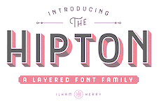 Bandung, Indonesia-based designer (b. 1990) of the free Victorian typeface Pilar (2013). With Ezza Adhreza, he created Libre (2013).
 In 2014, he created the commercial Victorian typefaces Handter, Vigneta, Splandor, Bhavers (art nouveau) and Brilant (sic). In 2014, together with Panji Nugraha and Maghrib Lab, he started Flavor Type. In 2015, he made the brush typefaces Messy Script (with Maghrib Lab) and Wild Youth, Rusty ColaPen, the Victorian typefaces Fictoria and Artisan Display and the swashy watercolor script typeface Afecta (followed by Afecta Clean in 2018). Typefaces from 2016: Herchey (baseball signage script), The Hipton (layering typeface), Quite Hustle (a brush face done with Maghrib Lab). Typefaces from 2017: Balford (vintage or label typeface). Typefaces from 2018: Bilcase, Adelios (layerable and art deco), Caniste, Stoneburg (a free athletic lettering font family), Stoneburg Condensed, Caniste (Victorian). Typefaces from 2019: Samtom, Moister (calligraphic signage type based on old beer labels), Fontcise, Borest (a luxurious flared sans by Ilham Herry and Maghrib Lab), Fulgate (by Ilham Herry and Adam Fathony). Typefaces from 2020: Ephemera Bullsmith, Ephemera Wristen, Genty (a creamy retro signage script typeface by Ilham Herry and Adam Fathoni Haris), Glaw (a psychedelic font by Ilham Herry and Adam Fathoni Haris), Ephemera Kingsford (vintage), Budge (a layerable retro signage script by Ilham Herry and Adam Fathoni Haris), Muray House (a bold swashy bathroom towel typeface by Ilham Herry and Adam Fathoni Haris), Esteric (a playful tapered font by Ilham Herry and Adam Fathony). Typefaces from 2021: Monvar (a layerable Cooper Black style typeface by Ilham Herry and Adam Fathoni Haris), Rische (a 6-style dis[play serif with huge counters and an enormous x-height; by Ilham Herry and Adam Fathoni Haris). [Google]
[MyFonts]
[More] ⦿
|
imagex
|
 Frenchman (b. 1957) who started making fonts in 2010, after a career in illustration, comics, and video games. In 2010, he created the free fonts BabyJo (pixel face), Bayday, Chrom (beveled face), LaPresse (grunge), Muffaroo, Poppy, Poppydot, Spacecard, Strokewith, Strokeless, ToonLand (comic book lettering), ToonLandBlack, ToonLandShad, TrashToys (grunge), WorldColors (3d face).
 In 2011, he published Francobelge (comic book face), Freepress (grunge), Gamix (Western titling face), Inmyroom (dingbats), Majestrick (calligraphic), Onomatopaf (comic book dings), Outerzone, OuterzoneB, Starz (dingbats), Stenstreet (grunge), Tram, Tramix (texture face), TrashToys02, War-Lettersn, Mixagex, Massive Dynamite (grunge), Not Well (grunge), Actu, Blck, Gling (texture face), HeRioz (silhouettes), Brightoon (cartoonish brush face), Muzo (ink spill face), Sharpy, Space Shop (dingbats), Pulp Dance (hand-printed), Essef (art deco), Retro Sign (grunge), Labo (grunge), Exhausted, Komikoz, Puzzled, Toonimals (dings), Penstriped (sketch face), Cashier (grungy), Dan Hand, Hardwell (grungy caps), Colleged (athletic lettering), Goodjean (jeans texture face), Seaside Things (dingbats), Real Tek (techno), Zou (3d hand-printed caps), Painter, Border Line (grunge), Handout (grunge), Tract (grunge), Pulpatone (grunge), Logos I Love, Pal Antic (chancery hand), Twent (fat rounded display face), DoodFlow (dingbats), Afro Add (texture face), Crump (grunge), Big White, Dark Room (grunge), Manifesto (grunge), Tacketil (a FontStruct font), Otto Land (sketch face), Over (outline face), Under (brush dings), Baskertown (grunge), Nursery Tale, Panic (texture face), BlackNDot (ink spill face), Beyond (striped display face), Advert, Car Crash (grunge), Heartz, Starsteel, Smart Faces, Blackflag (a brushed blackletter), Dock 51 (grungy stencil), Lead (3d face). In November 2011, he created a number of texture typefaces: Hotöcop, Pal Mod, Speedy (sketch face), Thirties Gold, Sunset GP. Further 2011 typefaces: Poptivi, Shadow Mole, Super Modern Black. Faces from 2012: Remanence, Winter Days (dingbats), Nowharehouse (grunge), Snuff (grunge), Cup of Tea (3d shadow face), Talk of the wall. Typefaces from 2012: Egirlz (dingbats), Art Post (white on black poster lettering), Volutes (copperplate calligraphic script), From me 2 you (curly script), PS I Love You, Kolossal (caps only), Kraash, Alexandre (3d engraved headline face), Monstres de poche (dingbats), Alternate (grunge), Warning, Dreams (brush face), Headline Crack, Bump Pad (textured typeface), Carton (grungy white-on-black stencil face), Maybe maybe Not, Frames n Riboons (sic), Blackboard (sketched face), Logotronik (a 3d techno face), Big Bad Dogs (dingbats), Libre Expression (engraved copperplate typeface), Mecagothix (textured blackletter face), Destroy, Destroy Helpers, Buy More, Things we said (curly face), Lost Saloon (Tuscan), Salon de Coiffure (beveled), Brighton Pier (grunge), Motel Vacancy (grunge), Bates Shower (dripping blood typeface), Venus Furs (texture typeface), Showmen, True Men Tattoos (dingbats), Quicker (sketch font), Romanum Est (grungy Trajan face), Also (scratchy letters), Lazy Day (3d font), Pusher, Hard Dumb, The Idiot, Overflowing (grunge), Fast Foont (sketched), Melange (grunge), Jumbo Parade (circus font), Happy Monsters, Zozox (experimental), Magic Sound (packaging typeface), Arena Mascaras (dingbats), Top View (3d face), Flagadoum, Last King Quest, Rhythm n Blacks (textured face), Troll Sketched, Superpoz (a 3d painted typeface of exceptional beauty), HalloCuties (Halloween font), Gothik Steel (circus font), Silvestre Relief (3d titling face), Just Like That (comic book face), Numero 10 (athletic lettering), Tet de Mor (skulls), Facelook, Xmas Dad, Instant Marker, Ragtimer, Punk Dots (textured face), Onomato Vlam (comic book balloons), 8th Cargo (textured mechanical octagonal face), Zu Kabarett (creepy curly German expressionist face), Unusual Day One, Happy New One (party font), Xmas Doods, Xmas Doods 2, Higher, Usual Day One, Team 401 (athletic lettering), Doonga (comic strip letters), Killer's Move. Typefaces from 2013: Them (fat brush), Ghost Code, Tiny Heroes (figurines), Over There (sci-fi), Higher than High, Abandon (sketched face), Broken Hearts, True Stories, A wolf at the door (wood style poster face), Elo Hand, Bots n Droids (dingbats), Toonimals 2 (dingbats), Halftoned Backup (textured face), Novlang (textured poster face), Come With Us, Ptits Pirates (pirate figurines), Board Dudes (skateboard dingbats), Big Bro's Watch (grungy), Doonga Slash (comic book face), Round About, Signz, Lethal League (grungy athletic lettering), Dark Times, Dandy Hat Trick, tardots (textured typeface), Dinoz (dinosaur dingbats), Big Surprise (fat script), Comix Loud, Arlequin, Fanzine Title, Scotch Taped, Phoenix (dingbats), Rock's Death (grunge), Tuamotu (textured), Trees Friends (dingbats), King Arthur Legend (blackletter), Fairy Strange, Flame On, Mystery, Money Go Round (ransom note font), Seven of One, Captain's Talk, Peaches en Regalia (sketch font), Wrong Board (textured or crayon typeface), Subito (comic book face), Extra Sales (signage face), Gimme Danger (grunge stencil), Alphabet City (graffiti font), Raleigh Rock, Rysky Lines, Splash, Good Vibers (comic book figurines), Tequilla Sunrise (3d shadow face), Graphers Blog, Star Waves, Splash, Action Comics, Wild Trails (wood plank typeface), Tiki Club (dingbats), Bad Striped (sketched face), Come With Me (paint drip face), Famous Oldies (textured face), Girly Toons (dingbats), Eshop Advert, Full Pack 2025, Dickson's Tale (a great grungy caps face), Hand Typewriter, Campus Relief (athletic lettering), ZalienZ (dingbats), Manga Style (oriental brush), Journal du Soir (letterpress emulation), Royal Delight (3d sketched face), Gothix Fate, Lettrisme (a letterpress ransom note font), NYC Zone 123 (graffiti face), Tedz (teddy bear dingbats), Merry Xmas, Last Day On Earth (textured typeface). Typefaces from 2014: Dite Alla Giovine (flared cursive script), Heavy Gothik (textured blackletter), Comix Bubbles, King of Scotland (textured), Lazy Sketch, Arabica Export (coffee bag texture), Scream Again, Season of the Witch, Soul Festival, Back Ride 342, Cheap-Potatoes, Nine-Feet-Under (grunge), Remingtoned-Type, Search'n-Destroy, Starz-2, Vanished, On The Roof (or: On The Tops), Mad Groove Blast, Another Brick (textured face), Destination Future, Perversionist, Dex's Jobs (Treefrog-style typeface), Ptit Coeur d'Amour, Mickey's School (athletic lettering), One Way or Another (a hand-drawn poster typeface), Californian Cars (license plates), Building State Empire, Back on Lime (shadow face), Next Ups (graffiti face), PatchFun (textured face), Railway to Hells, Shut'em Down, Misunderstanding, Another Brick (textureface), Perversionist (grunge), Destination Future, Linographer, Polish Posterisation, For Girls Only, Half Price 4 You (sketched typeface), Secret Agency (bad ink grunge), Player One (a grungy baseball Script), Raw Notice, Home Mad Popsters, No Silly Walk There, Bad Coma (lovely grunge), Dark Net Warrior (grunge), Cowboy Movie (Western font), Palm Beach (textured typeface), Search n Destroy (textured), Carnaval de mai, Variations (textured), Black Jeans (weathered font), City of Light, Santa's Air Mail (snow-capped letters), Cheap-Potatoes, Nine-Feet-Under, Remingtoned-Type, Search'n-Destroy, Starz-2, Vanished. Typefaces from 2015: Snake Jacket, Big Campus (athletic lettering), Penball Wizard, When The Eagles Dare, Urban Brush Zone (graffiti font), Wild West Pixel, World Black Shadow, Next Custom, Irresponsible Direction (grunge), Doodle Gum (textured), Posthuman (textured), Red Zone (glaz krak face), Smasher 312 (graffiti font), Columbine (dripping blood font), Tarentula's Web, Just Like This (retro funk), Eastern Brush (oriental brush typeface), Pulp Headlines (grungy typeface), War is Over (letterpress emulation), Thirties Relief, Flowers Power (sic) (floral caps), Direct du Gauche (inky brush), Jackpot (3d, sketched), Numero 10 Clean (athletic lettering), Lace Dreams (textured), Right Chalk (chalky crayon font), Lazy Sketch Black, Golden Age (shaded pixel font), Swamp Death (textured), Astounding News, Heavy Metal Rocking, Fifties Movies, Grunge Strokes 01, Cosmik Orchestra, Paysley Sports (sandy athletic lettering), No Safety Zone (grungy stencil), Quicksands (textured), Break It Down (glaz krak font), Naughty Cartoons, Mad Groove Clean (athletic lettering), Outlaw Stars (grungy Western face), Space Comics, Dirty Bowl 86 (athletic lettering), Cheap Potatoes Black (imitating pototo printing?), ExtraBlur (textured), Backside Air, Megalopolis, Curse of the Zombie, After the Goldrush, Avantgardiste 1934, Easy Fashion (textured), Free Thinking's Murder (textured), Phantom Zone (zombie texture), Snake In The Boot, Checkpoint Charlie (grungy stencil), For Girls Only Bold, Playing In The Mood (piano key face), Intergalactik Airlines, Les Mystères de Paris, Season of the Witch Black (blackletter), Resistance Is Futile (a great textured mechanical typeface), On The Tops Lights (matinee signage), Strawberry Fields, Serif of Nottingham, OnomatoBom (cartoon smaks). Typefaces from 2016: Dynamix (a shaded comic book typeface), Black Santa (snowy letters), Astral Delight, Mr. Headlines (titling sans), Sister Spray, Shaka Pow (cartoon font), Jack in the Box, Glitter Campus (athletic lettering), Ghost Crazy (heavy brush), Prezident, Flowers Kingdom (psychedelic), Galaxy Corps (octagonal stencil), Stitchn School, Brown Shoes, Armagedon (dry brush), Smasher 312 (graffiti style), Bad Stories, Master Droid, Heavy Metal Box (grungy letterpress), Outerspace Shoping (sic), Extros Backstage (squarish), Jelly Crazies (jellybean font), Black and White Banners, Ballad of Dwight Frye (grungy), Crazy Sixties, SciFi Movies, Maximum Strength (athletic lettering), Evanescente (sketched typeface), Urban Ghost, Vif Argent (watercolor brush script), Demolition Crack (textured), How to Disappear, Public Market, Pyjama Party, Magician Rings (modular sans), Pale Blue Eyes (brush script), All The Mad men (sketched), Dixociative (white-on-black), White Flame (octagonal typeface), Asian Delight (oriental brush emulation), Candy Shop, Barb Wire Club, Super Weird, My Socks Line. Typefaces from 2017: Scoubidou Rap, Good Morning (cartoon font), Graphik Arts (textured), Danger Zone Warning, Love The One You're With, Are You Hung Up (textured), Keys of Paradise, Mr Headlines Fancy, Game of Brush, Powerful, Ghost Shadow, Quick Menu Boards, Urban Fresh Air, Cheer Lace Leader (textured), Cracked Code (grunge), Very Simple Chalk, Fluo Gums, Very Popular, Personal Service, Blind Signature (crayon font), Blood n Guts, Quarterback Fight (octagonal athletic lettering), Supersonic Rocketship, Reboot Crush, Strange Path (dry brush font), Heroes Legend, Cache-Tampon, Championship (a great horizontally striped typeface), Silver Age Queens, Strange Tales. Typefaces from 2018: Play With Fire, Scrunched, Megalomaniac Headliners, Craps of Paper (white on black), All Things Must Pass (textured), Presque Normal, Interfearence, Pop of the Tops, Universal Knowledge, Digital College, Cold Turkey (a handcrafted horror font), Strange Magic, Grandissimo, Best Prices (sketched), Magician's Daughter, Children's Theater (textured), Magnifico, Lethal Slime, Pop of the Pops, Slow Death, Folk Festival, Strange Marvel, Strong Impact (octagonal), Heavy Metal Blight, Mango Slice, Are You Jimmy Carl Black, Strange Clowns, Mechanical Animals, Fast Forward, Spanish Castles, Vintage Warehouse, Swamp Black, Pixelmania, Enigma key, Vlump (wooden plank font), Guns n Flash Comix, Black Streamer, East Border (military stencil), Bot Craftshop, Super Quick, Don't You Know?, Return of the Flash, Only The Strong (weathered athletics font), Hands Up, Strange Shadow, White on Black, Ed Wood Movies. Typefaces from 2019: Inner Mounting Flame, Playtimes, Game Commands (white on black), Magic Spots (with a spotted texture), Vanishing (with a halftone effect), State Secret (squarish), All My Stitches (a hospital font), Lightyear Design, Ancient Ad, African Style (textured with African patterns), Secret Planet (sci-fi), Universal Ignorance, Give Peace a Chance, Hard Punk Gothic, Vraoum (speed emulation font), Galaxy Travels, Megapoliscape, Red Signal, Perfect Mystery (dry brush), Many Years Ago (mechanical, octagonal), Vintage Display (textured caps), Space Sport (textured, octagonal), Dancing Days, Steam Punk, Splatch (comic book font), Rear Defender (octagonal, stencil), Ghost Factory, Kids Magazine. Typefaces from 2020: Bright Star (sci-fi), Fiesta Rumba (a matinee font), Sergeant Rock (a stencil typeface), Tricky Hearts (a vampire font), Organic Brand, Campus Riot (grungy), Crazy Love Song, Shiny Signature, Evil Highway, Slightly Eroded, Lightyear Shadow, City Player (graffiti), Night of the Deads (a horror font), Ka Blam (an all caps cartoon font), Unforgettable, Corrupted File (grungy, pixelish), Urban Heroes (a dripping paint font), Victorian Art Magic Remains, Kid Games, Restricted Area (a dripping paint stencil), Dark Poestry, Platinum Sign, Tacos de Tijuana (a Mexican party font), Retro Shine, Lower East Side (a graffiti font), Holidays Homework (a chalk font), Deep Shadow, Finger Printed, Crushed (a glaz krak typeface), Bing Bam Boum, Stars Fighters (a Star Trek font). Typefaces from 2021: Baby Party, Shadow Of The Deads, Big Bad Bugs, Boldfinger (bold caps), Paperback Writer (sketched), Comics Tricks, Charming Sixties, Squarely, Mad King Games, Back to School (a varsity font), Youtube Star (an oily typeface), Silver Medal (beveled), Cosmic Blaster. [Google]
[More] ⦿
|
Inês Mendes
|
 Maria Inês Magelháes Mendes studied graphic design, photography and video at ESAD---Escola Superior de Artes e Design in Portugal. Based in Porto, she created the slightly psychedelic Groove Type (2012). [Google]
[More] ⦿
|
Iza Wilma Lima Peixoto

|
 Iza W is a Brazilian type designer who works with Paulo W at intellecta Design. Klingspor link. She created Kocham (2008, an art deco geometric typeface with dots centered in all letters), Orchis (2006, Intellecta Design), an art deco famliy in the style of Broadway. Other fonts, done with Paulo W at Intellecta Design in 2006: Advantage, Biza, Elegancy, Estiliza, Frompac. She designed DeutschePosterSteinschrift, Alta (5 styles), Apolo Decorative (Victorian era caps), Ariana, Black, Cresciesco (roman times lettering), Drianh (late 19th century styles), Easy Callig, Evangeliaire Uncial, Geodec N9 (high contrast sans family), Glaciana (decorative caps), Grid, Half Flower 2, Laureatus (Lombardic), Malvinna, Paola Decorative (caps), Passo Borgo (the ultimate spiky dungeon family), Schneider Kontrast (a 15-style art deco and ornamental family based on F.H. Ernst Schneidler's Kontrast (1930, Weber)), and Questy (semi-slab serif) in 2007.
 Productions in 2008: Basilissa (flowery caps), Calligraphia Latina Soft, Chyrllene (curly Victorian family), Clea (caps), Fridha (undrerstated and 3d calligraphy), Hostetler Kapitalen 2, Litho Romana Inland (a caps family), Ogden (calligraphic), Olivetti Typewriter (5 styles), Syl (frilly Victorian caps), Tissot (2008, fine caps), Triball (headline blackletter family), TTF TATTOEF 8 (tattoo dings). MyFonts says The mysteriously-named Iza W shares most of the development activities at Intellecta Design with Paulo W. She specializes in revivals of historic advertising types, specifically metal and wood display types of the Americas, from the early 19th to mid 20th century. and lists these fonts at the end of 2008 as having been designed by her: Advantage, Agua (2007, an extension of Heinrich Maehler's 1931 font, Salut), Alta, AltDeutsch, Anatomy, Antiqua Shaded, Apolo Decorative, Ariana, Basilissa, Biza, Black, Boliche, Bruce Borders, Bruce Flourished, Bruce Hairline, Bruce Miscelania, Bruce Ornament, Cadels, Calligraphia Latina Soft, Catania, Centennial Script Fancy (+Three), Chancelaresca Spanola, Chyrllene, Clea, Cleo (Lombardic ornamental caps), Cresciesco, Deco Experiment 2, Deco Experiment 3, Deco Experiment 4, Deco Experiment 5, Deco Experiment 6 (2007), Deco Experiment 7, Deutsche Poster Steinschrift, Donald, Drianh, Easy Callig, Egipcia, Elara (2009), Elegancy, Engel, Estiliza, Evangeliaire Uncial, Faroeste, Feosa, Figgins Brute, Fin Fraktur, Flower Essences, Flower Jars, Fofucha (2007, a psychedelic typeface modeled after Seymour Chwast's Artone from 1968), Frames 1, Francesco Decorative, Fridha, Frompac, Fry's Alphabet, Furniet Roman (2008, after Fournier), Gans Animals, Gans Carmen Adornada, Gans Cornucopia, Gans Gotico Globo, Gans Italiana, Gans Royality, Gans Sport Club, Gans Titania, Gans Titular Adornada, Gans Transportation, Gans Vessels Fishes, Geodec Bruce Ornamented (2006, a tribute to George Bruce), Geodec Minuskel, Geodec N9, Geodec Petras Enhanced, Glaciana, Gloo Biloo (2010, spooky alphading face), Gothic Handtooled Bastarda, Gotische, Gotische Frame, Gottar (blackletter), Gradl Initialen, Grid, Grissom (insect dingbats), Grolier (caps), Grolier Beveled (2011, free at Dafont), Half Flower, Hannover, Hostetler Kapitalen, Imperio Romano (2009, roman heads), Intellecta Bodoned (+Two, +Trash), Intellecta Borders, Intellecta Crowns (royal crowns), Intellecta Grotesca Compacta, Intellecta Slab Bold, Intellecta Square, Intellecta Typewriter, Intellecta Typewriter 2, Japonesa (2010, oriental simulation), Julisa Script, Kocham, Latinish, Laureatus, Lettering Deco (2008, art deco, +Shadow), Litho Romana Inland, Littler Serifada, Magro, Majestade, Malvinna, Manuscript XIV Century, Merona, Missal, Monograms Soft (2010, with Paulo W), Naturella (2009, leaf and grape dingbats), Neretta (2008, +Italic), Numbers, Ogden, Olivetti Typewriter, Orchis, Palermo, Paola Decorative, Peloponeso, Porcupine, Questy, Remington Elite Typewriter, Samuello, Schneider Kontrast, Schneidler Zierbuchstablen, Schwandner Versalia (2010, ornamental caps based on an alphabet by Austrian penman Johann Georg von Schwandner), Schwandner Black Fleurons (2010), Schwandner Ornaments (2010), Selena, Sinfonia, Southern Flight, Speedball, Standard Typewriter, Suciellid, Sunamy (oriental simulation, after lettering by Ross F. George), Surrey (2008), Syl, Tissot, Tondella, Triball, TTF TATTOEF 4, TTF TATTOEF 6, TTF TATTOEF 7, TTF TATTOEF 8, Tuska, Underwood Typewriter (+Underscore), Uthan, Versatile Initials, Victorian Exotical Capitals, Warp, Woodball, Yanna, Zooth. From 2009: Calligraphia Latina Soft3, Cantate (+Beveled), Remington Weather (old typewriter), Xyla (caps), Polen, Polen Two (2007), Arrius (calligraphic), Catilina, Pentagraph (upright connected script), Renania (calligraphic), Renania Double Line (free), Samantha (caps), Silius Engraved (caps), Stencil Intellecta (+Trash), Tatooyn, Urszula (caps), Victorio (caps), Elfort (formal calligraphy after Poppl Exquisite, a typeface by Friedrich Poppl), Pretoria Gross (2009), Holy Church (2009, blackletter), Holy Church Fleurons (2009), Single Silhouettes (2009). Typefaces done in 2010: Penabico (a calligraphic script; with Paulo W), Baltimore Typewriter (a great typewriter family, with a black-on-white typewriter keys style added), Izouda (an art deco Broadway-style beauty), Bernardo (an italic family, with swash initials thrown in, named after Lucian Bernhard), Netuno, Supermarket (shop signage family), Bruce Influence (interpretation of Great Primer Ornamented No. 30, from the Bruce's TypeFoundry 1869 catalog), Pretoria Gross (a Victorian family done with Paulo W), Reliant (2010, with Dmitrij Greshnev: a free interpretation of Bernhard Schönschrift (Lucian Bernhard) and Liberty, which was designed by W.T. Sniffin for ATF in 1927, following the original designs by Lucian Bernhard), Reliant Limited (2012, free version). Gostosinhos (2010) are hilarious faces put together in a dingbat font. Centennial Onaments (2010) was done with Paulo W. Calligraphic Birds is pure penmanship.  Fonts done in 2011: Ambrose Bierce Daned Font (ornamental caps), Menina Carinhosa (floriated caps), Menina Formosa (floriated caps), Menina Espinhosa (2011), Menina Graciosa Ornaments (2011, +Two), Menina Poderosa Ornaments (2011), Azalleia (floriated caps), Azalleia Ornaments, Naoko (a fantastic oriental simulation face), Bestiario (calligraphic penmanship dingbats based on the work of English writing master John Seddon, 1644-1700), Seddon Penmans Paradise Capitals (elaborate caps along the lines of Bestiario), Dolphus-Mieg Monograms (after a 1901 book by the Dollfus-Mieg company), Imprenta Royal Nonpareil, Dia de los muertos (2011), Naive Ornaments (2011), Eingraviert Dutch Capitals (2011). Fonts done in 2011: Ambrose Bierce Daned Font (ornamental caps), Menina Carinhosa (floriated caps), Menina Formosa (floriated caps), Menina Espinhosa (2011), Menina Graciosa Ornaments (2011, +Two), Menina Poderosa Ornaments (2011), Azalleia (floriated caps), Azalleia Ornaments, Naoko (a fantastic oriental simulation face), Bestiario (calligraphic penmanship dingbats based on the work of English writing master John Seddon, 1644-1700), Seddon Penmans Paradise Capitals (elaborate caps along the lines of Bestiario), Dolphus-Mieg Monograms (after a 1901 book by the Dollfus-Mieg company), Imprenta Royal Nonpareil, Dia de los muertos (2011), Naive Ornaments (2011), Eingraviert Dutch Capitals (2011).
Creations in 2012: Spirulina, Promotion Script, Soft Ornaments (+Two, +Three, +Four, +Five, +Six, +Seven, +Eight, +Nine, +Ten, +Eleven, +Twelve, +Thirteen, +Fourteen, +Fifteen, +Sixteen, +Seventeen, +Eighteen, +Nineteen, +Twenty, +21), Soft Garden (ornaments), The Black Shapes, Sabor Words, Sabor Digital (textured), Sabor Rasgos Escritura (upright connected script), Floreart (floral dingbats), Mirella Script (French bastarda penmanship script), Soft Flowers, Derriey Vignettes (after Charles Derriey), Gracious Azaleas (flowery dings). Design from 2013: Bruce Ornaments Collection, Invitation Script (after the calligraphy of Andrade de Figueiredo, 1722), Mirella Initials Ornamentals (a swashy calligraphic script done with Paulo W), Menina Graciosa (ornamental caps), Menina Gostosa (Loira (caps), Morena (calligraphic), Ornamentos (floral)), Alien Trees. [Google]
[MyFonts]
[More] ⦿
|
J. Welde
|
FontStructor who created Psychadelic (2010), a psychedelic poster font. [Google]
[More] ⦿
|
James Marsh
[Arty Type]

|
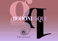 [MyFonts]
[More] ⦿
|
James Moore
|
James Moore (Portland, OR) created a psychedelic lettering poster of a sheep in 2013. Behance link. [Google]
[More] ⦿
|
Jasmin Meier
|
Modern day illustrator in Sydney, Australia, who uses psychedelic lettering in her posters, ca. 2013. Behance link. [Google]
[More] ⦿
|
Jason Anthony Walcott
[Jukebox Collection]

|
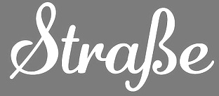 [MyFonts]
[More] ⦿
|
Jason Anthony Walcott
[Counterpoint Type Studio]

|
 [MyFonts]
[More] ⦿
|
Jason Anthony Walcott
[JAW Fonts (Jukebox Type)]

|
 [MyFonts]
[More] ⦿
|
Jason Burnhaus
[Burnhaus Studios]
|
[More] ⦿
|
Jason Carne

|
 Owner and Creative Director at Lettering Library, Wentworth Institute of Technology, Saylorsburg, PA. Head honcho, with Drew Melton, at Carmel Type. In 2015, Jason Carne and Drew Melton co-designed the large condensed titling typeface family Skyward and wrote: Robust, towering, and geometrically refined, Skyward is a surefire classic cocktail of equal parts utility and elegance. They also cooperated on the wood style Western typeface Lumber Co (2015) and the nostalgic Railroad Co (2015; inspired by the iconic ultra-extended letter styles that lined the exteriors of many early 20th century passenger train cars).
 Typefaces from 2016: Mosler (a Fort Knox slab serif in four styles: Safe, Strongbox, Vault, Fortress), Alchemist (with Drew Melton). Typefaces from 2017: Motor City, Sundown (Jason wries: Designed with the gig poster in mind, Sundown is a throwback to the Fillmore West golden age of psychedelic rock and summertime fun.). Typefaces from 2019: Capstone, Botanist (Victorian: at Typeverything). Typefaces from 2020: Reverb (Jason writes that with the gig poster in mind, Reverb is a throwback to the Fillmore West golden age of psychedelic rock and summertime fun). Behance link. Creative Market link. Jason Carne's home page. [Google]
[MyFonts]
[More] ⦿
|
JAW Fonts (Jukebox Type)
[Jason Anthony Walcott]

|
 JAW Fonts (and before that, JAW Arts Fonts, and Jukebox Type) was founded by Jason Walcott (b. Trenton, MI, 1971) from Hollywood, CA. Jason grew up in New Jersey, and now resides in Southern California. He graduated from Kean College of New Jersey (now Kean University) in 1997 with a BFA in illustration. JAW Fonts features many elegant calligraphic and comic book style typefaces. JAW Fonts ceased operation in 2003 and Jason reintroduced his collection of fonts in a revised form under the new name of Jukebox Type.
 The original list of typefaces includes Acroterion JF (2002, formal script), Adage Script JF (2002, formal script), Alpengeist, Andantino (2003), AnnabelleJF (2002, a formal script), Baileywick Curly, Baileywick Festive, Baileywick Gothic, Baileywick Happy Grams (star dingbats), Baroque Text JF (2003, a great Fraktur font based on a hand-lettered alphabet drawn by Ross George), Boxer Script, Bronson Gothic, Buena Park (2001, Victorian vintage type influenced by Clarendon), Cathexis (2010, a heavy poster font), Cavetto, CharadeJF (2001, informal script), Debonair, Fairy Tale, Fanfare (2004, a bouncy serif family), Fenway Park, Friki Tiki, Geometric Soul (2004, an art deco all caps face), Gypsy Switch, Holiday Times, Hucklebuck (2003, upright connected signage face), Jeffriana, John Andrew JF, KonTiki (a family published in 2002 containing Aloha, Enchantment, Hula, Kona, Lanai, Lounge and Trader), Lady Fair, Luxury Royale (2003), Manual Script JF (2002), Martini (2004, a brush script), Mary Helen, Opulence JF (2002, formal script font), Peregroy, Periwinkle (2006), Cabernet (2006, frilly didone), Polynesian (2004, Hawaiian-look typeface that could also pass for an oriental simulation face), Primrose JF (2002, formal script), Rambler Script, Randolph, Retro Repro (2002, based on a script by Jerry Mullen from 1953), Saharan, Scriptorama (Hostess, Markdown and Tradeshow), Shirley Script JF (2003), Southland, Spaulding Sans, Stanzie, Stella Ann (2005), Stephanie Marie JF (2003), Tamarillo (2005), TwisterJF (2003), Valentina Joy, Varsity Script, Viceroy, Walcott Gothic (Fountain, Hollywood and Sunset), Groovin (2005, Umbrella Type), Wonderboy. The fonts of this West Hollywood, CA-based foundry can be bought at MyFonts.com. In 2003, he started Jukebox Type and started offering his fonts at Veer. In October 2003, Veer acquired Jukebox Type outright. In 2005, they added Rootin Tootin (Western style), Dulcimer (soft script), Block Party, Dandelion, Marmalade (idyllic script). In 2006, he created Jukebox Bookman, a 6-weight family, and the brush script typeface Stephanie Marie. In 2007, he added Hellenic Wide (after a 19th century ATF font), GiggleScript JF, Savoir Faire (after a handlettered slogan in 1940 for Chesterfield cigarettes), Lollipop. 2008 additions: Hogwash (paintbrush face), Antiquities Technobaby. 2009 additions: Cynthia June (calligraphic). Typefaces from 2010: Eloquent (a didone in the style of Pistilli). Counterpoint Type Studio was established by Walcott in 2013. In 2013, Jason designed the psychedelic typeface Califunkia and the calligraphic script typeface Profiterole. Domani CP (2013, CounterPoint)) is a faithful digital revival of an old photo-typositing typeface called ITC Didi. Originally designed by Herb Lubalin and Tom Carnese, Domani brings to life a font that has been somewhat neglected by the digital era until now. This is the list of fonts sold by MyFonts in 2015. It is just a subset of the fonts made by Walcott: Jukebox Type has these typefaces: Klingspor link. View the Jukebox Type typeface library. View the JAW Fonts typeface library. [Google]
[MyFonts]
[More] ⦿
|
Jean-Antoine Alessandrini

|
 Type designer, graphic designer and illustrator, born in Marseille in 1942. Allessandrini (sometimes spelled Alessandrini in various publications) used to work at Paris Match, Lui and Elle. His typefaces: Akénaton 1969 (Hollenstein Phototypo) (1975, VGC??), Alias 1977 (Hollenstein Phototypo), Allessandrini 7 1972 (Hollenstein Phototypo), Anarchiste (Mécanorma), Andronique 1984 (Mécanorma), Astronef 1976 (Hollenstein Phototypo), Circus World, (Mécanorma), Cléopatre 1984 (Mécanorma), Combinat 1976 (Hollenstein Phototypo), Éclipso 1982 (Mécanorma), Electric-Type 1977 (Hollenstein Phototypo), Futuriste 1977 (Hollenstein Phototypo), Germain 1969 (Hollenstein Phototypo), Grand Dadais 1977 (Hollenstein Phototypo), Grand Large 1977 (Hollenstein Phototypo), Graphic Man 1973 (Hollenstein Phototypo), Grossium 1977 (Hollenstein Phototypo), Gyptis 1977 (Hollenstein Phototypo), Hypnos 1969 (Hollenstein Phototypo: a psychedelic face), Legitur, Mikado 1977 (Mécanorma: oriental simulation), Mirago 1970 (Hollenstein Phototypo), Priam 1976 (Hollenstein Phototypo), Showbiz 1969 (Hollenstein Phototypo), Sigle (Mécanorma), Technos 1984 (Mécanorma), Trombinoscope 1964, Vampire 1969 (Hollenstein Phototypo), Wotan, (Mécanorma).
 Inventor of the classification system Codex 1980 that provoked heated responses from luminaries such as Vox, baudin, Blanchard and Mendoza. Author of Typomanie / Jean Alessandrini; préface de Massin (Paris: La Noria, DL, 1977). In 2013, David Rault wrote the monograph Jean Alessandrini Le poète de la lettre. Klingspor link. [Google]
[MyFonts]
[More] ⦿
|
Jeff Bortniker
[Vitatype Digital Fonts]

|
 [MyFonts]
[More] ⦿
|
Jeff Levine

|
 Prolific type designer in Florida, b. New York, 1952. His fonts were originally free and consisted largely of dingbats. Around 2005 he went commercial, and now sells his work (over 350 fonts as of 2009) via MyFonts. He has branched out into several font styles, with a soft spot for stencil fonts, fonts for signage, art deco, and fonts for advertising. Born in New York, his family moved to Florida in 1963, where he has been ever since.
 An interview. Alternate URL. Yet another URL with his early free fonts. My pages on him. Dafont link. Abstract Fonts link. MyFonts link. Klingspor link. [Google]
[MyFonts]
[More] ⦿
|
Jeff Levine
[Jeff Levine: Groovy -- Psychedelic typefaces]

|
[MyFonts]
[More] ⦿
|
Jeff Levine: Groovy -- Psychedelic typefaces
[Jeff Levine]

|
Psychedelic typefaces by Jeff Levine start with the free typeface he did with Brad Nelson (Brain Eaters) called Action Is. This was based a title page for a commemorative photo album of images from the 60's TV music show Where the Action Is, formerly hosted by Jeff's employer at the time, singer-writer-producer Steve Alaimo. Brad Nelson gave Jeff his blessing to re-work and take Action Is into the realm of commercial type. Newly improved and re-released as Groovy Happening JNL, it became one of Jeff's better selling type designs. A simplified version is called Groovy Summer JNL, both done around 2005. In 2010, he published Groovy 3D Caps JNL, and in 2015 Endless Sixties JNL (inspired by a poster for a surfing movie entitled Planet Aura). Hippie Freak JNL (2016) is based on the title card for Tod Browning's Freaks. Trippy Hippie JNL (2021) is from a German lettering book 50 Alphabete für Techniker und Fachschulen by Eric-Jean Müller. [Google]
[MyFonts]
[More] ⦿
|
Jessica Darnell
|
American designer of the free hand-printed typefaces Humble Beginnings (2013) and Seriously Delirious (2013). Groovy Baby (2013) is a throwback to the psychedelic sixties. Wide Open Spaces (2013) is a tattoo script. Fontspace link. [Google]
[More] ⦿
|
Jessica Wonomihardjo
|
Designer of the psychedelic typeface Fillmore during a workshop at Type Paris 2019. Fillmore is a variable serif font with eight different weights. The original brief she had was to create a font for Kitsunél Musique, a French electronic/indie pop rock music record label. For Fillmore, she drew inspiration for the psychedelic 1970s. [Google]
[More] ⦿
|
Jetsmax (was: Riljs, or: Typograph Pro)
[Khairil Anwar Husain]

|
Khairil Anwar Hussein (or Ril Anwar, b. 1996) is the Makassar, Indonesia-based founder of Jetsmax in 2018. Designer of these typefaces in 2020: - Carefour (2020). A signature script.
- Celebes Signature (2020).
- Desolator (2020). A free variable sans typeface.
- The upright script Fillpattern (2020).
- Halgonak (2020). A handcrafted typeface by Novia Lorenza.
- The handcrafted typefaces Halo Emak (2020) and Qawber Pro (2020).
- Hiromaru Script (2020).
- Hundred Wars (2020). An octagonal stencil cybertech typeface.
- Huntsville (2020).
- The display sans Massedi (2020).
- The squarish Meja Block (2020).
- Nekofie (2020). A 2-style sans.
- Ryujin Attack (2021). A dry brush typeface.
- Sirukota (2020). A free rounded sans typeface.
- The stretchable futuristic typeface Stretch Pro (2020).
Typefaces as of 2021: Alternative Rock, Amulman, Balmonde Script, Carefour Signature, Cinematica, City Series, Coojertown, Craftsman Work, Creative Designer, Delmano Morelli, Erangel Field, Gellato, Halgonak, Hundred Wars, Hunian, Huntsville, Hynole, Javanesia (psychedelic), Just Bubble (a bubblegum typeface), Jx Tabe (a chamfered techno font in 54 styles), Kaidomaru, Kingdom Storia, Lagosi (a 15-style lava lamp typeface), Lylac, Malino Candy, Marcondensed, Markisa, Melt Fuji, My Leaf, Nimora, Nordille, Obstacle, Pixelated Display, Priska, Ryujin Attack, Sirukota, Stretch Pro, Studio Grotesk (a 5-style techno font), Summer Vacation, Taki, Veztro, Wanderism, Wedding Song. Creative Fabrica link. Jetsmax home. Fontsquirrel link. [Google]
[MyFonts]
[More] ⦿
|
J.F.Y. Daniel Gauthier
[GautFonts]
|
[More] ⦿
|
Jim Lyles
[Stiggy & Sands]

|
 [MyFonts]
[More] ⦿
|
Jim Parkinson
[Parkinson Type Design]

|
 [MyFonts]
[More] ⦿
|
Jim Zook
|
 Designer of the shareware Hippystamps dingbats (1995-1996), based on 1960's style rubber stamps. Illustrator and graphic designer.
 Personal page. Dafont link. [Google]
[More] ⦿
|
Joan Marti Mas
[TypePhases (was: vigital tipografia)]

|
 [MyFonts]
[More] ⦿
|
Joanna Durkalec

|
Canadian designer of Chelsea Girls (2019), which is a display sans serif inspired by 1970s New York City. In 2020, she designed the hippie display font Sunfleur. [Google]
[MyFonts]
[More] ⦿
|
John Moore

|
 Born in 1951, John Moore is a Venezuelan type designer. He studied graphic design in the Institute of graphic design Neumann from 1972 until 1976. In 1980 he took a workshop with Milton Glaser and since 1983 he has worked as an art director and creative director in many advertising agencies. He designs type since 1976.
 His typefaces Gordis (a fattish comic book family) and Tepuy won awards at Tipos Latinos 2008 in the non-text and experimental typeface categories, respectively. At Tipos Latinos 2010, he won twice in the display category, for Victorina and Radio Time. His typefaces: (New) Maracay (2013, a large layered Victorian signage family), Fine Art OT (2013, brushy typeface), Roadline Italic (2013, a retro script), JMTF Robin (2013, a layered post-modernist display family), Virgin Script (2013), Radio Time (2013, fat retro signage script), Radio Time Icons (2013), Palaima (2013, an aboriginal style face), Factor (2012, a layered geometric font), Onda (2012, a wavy psychedelic face), Blockee (2012), Aliykit Open (2012, a multiline typeface), VE Inconexa (2006, outline architectural face), VE Makiritare (2006, a double labyrinthine script that is based on symbolisms used by the Makiritare or Yecuana, river people who live in the village of Santa Maria de Erebato in the Venezuelan jungle on the border with Brazil), VE Moho (2006; or simply Moho in 2014), VE Palaima (2006, futuristic, Amazonian), Radio Time (fifties style script, with Alejandro Paul at Sudtipos), Fruta (stencil, influenced by Glaser?), Glaser Stencil Round, Gothike (sharp-edges), Aqua (ultra round), Club, Caracas (sans; +Caracas Pro, 2015; see also Caracas Stencil Pro, 2015), Factor (hookish), Space Lab (futuristic family), Robin (headline), Victorina (multiline Victorian poster typeface which won an award at Tipos Latinos 2010), Victorina Black Shadow (2011), Waterman (2010, a flowing undulating script family), Spacelab (2010, futuristic) and RobinBienalII (2005). Sudtipos sells these fonts of his via MyFonts: Makiritare (bilined, based on woven baskets), Palaima (experimental, runic), Precolombino (petroglyphs), Tepuy (rounded version of Makiritare), Roadline (2009, fifties diner font), Sacred Geo (2011, a geometric dingbat font that won an award at Tipos Latinos 2012), DeCoro (2011, art deco family), Sacred Geo Tiling (2011), Primate (2012, an African look typeface family), Morenita (2012, a connected fifties or school script), Takox (2012), Petroglifos (2012), Xtencil (2012, a rounded stencil influenced by Milton Glaser; followed by Xtencil LC and UC in 2013 and Xtencil Pro in 2015). Typefaces from 2014: Moho Sport Pro (layered athletic lettering typeface family), Scripta Pro and Gothic (40s-style lettering typeface inspired by the style of L.H. Copeland), InkArt Labels, Moho (named after Laszlo Moholy-Nagy), MohoBis Pro (a multilined version of Moho), Moho Condensed, Moho Script, Duvall (named after Edward J. Duvall, who published Modern Sign Painting in the late 1940s; Duvall won an award at Tipos Latinos 2014). In 2015, the Moho series continued with Moho Style. He also made Arthaus (2015, a fantastic Bauhaus font family inspired by Herbert Bayer's universal alphabet), MyCard (a techno type), NeoScript Pro and Hierra (after a font by Dan Solo) in 2015. In 2016, he designed Artime (a sci-fi font), Virtual. Typefaces from 2017: FunFont (cartoon style). Klingspor link. MyFonts link. Behance link. Poster. View John Moore's typefaces. [Google]
[MyFonts]
[More] ⦿
|
John Schaedler
|
 John N. Schaedler was an old school New York type designer, who had his own studio in the city. In the 1970s, Schaedler published Swinger, a film type by Ray Cruz. Around the same time, the psychedelic typeface Loose New Roman was designed. In 2010, Nick Curtis revived the latter typeface as Loo Snoo Roman NF.
 Tabasco and Paprika, geometric oddities with Paprika being the bilined variant, were revived in 2010 by SoftMaker as Tabasco and Tabasco Twin, respectively. Download Tabasco Twin here. Hiroshi Yamashita's Alpha Midnight (ca. 1969) was revived by Alan Jay Prescott as APT New Alpha Midnight. [Google]
[More] ⦿
|
Jonathan Stephen Harris
[Tattoo Woo (or: JSH Creates, or: Smokewire)]

|
 [MyFonts]
[More] ⦿
|
Jonathan Waterworth
[The Forge Type Co]
|
[More] ⦿
|
Jorge Kavicki
|
Sao Paulo, Brazil-based designer of the psychedelic typeface Slime Type (2014). [Google]
[More] ⦿
|
Jorge Moron
|
Spanish designer of these free fonts in 2017: JMH Alfabeto Petiso, JMH Moreneta Dingbats, JMH Cajita, JMH Elixir, JMH Mariana Blanca (fun children cartoon font), JMH Paz, JMH Strigoi II, JMH Carrera, Vortice, JMH Crypt, JMH Tales, JMH Linart Caps II, JMH Bamboo Caps (oriental simulation font), JMH Lee West, JMH Mejana, Tuscan Caps, JMH Katan (based on the titling in the Katan comics), JMH Noreneta (Lombardic), JMH Ado, JMH Eeerie Dingbat, JMH Eeerie Out, JMH Eeerie, JMH Horror, JMH Harry Dickson Subs, JMH Memorias Dingbats, JMH Memorias SH One, JMH Select Terror, JMH Harry Dickson One, JMH Harry Dickson Two, Monsters Among Us Dingbats. Typefaces from 2018: JMH PR (a cartoon font family), JMH Halloween 2017, JMH Pulp Paperback (comic book font), JMH Typewriter (+Mono, +Dry Bold, +Thin), JMH Jezail, JMH Wolfa (dry brush), JMH Beda, JMH Sindbad, JMH Euryale, Julidoodles 3yrs (doodles by his 3-year old daughter), JMH Holy Bible, JMH Celaeno, JMH Extra Wide, JMH Arkham, JMH Moreneta Divine (heavy blackletter), JMH Cthulumbus, JMH Mummy, JMH Belicosa, JMH Canasta, JMH Saloon, JMH Extra, JMH Super Science, JMH Shadow. Typefaces from 2019: JMH Poudre, JMH Rodeo Caps 3, JMH Rodeo Cies Caps II, JMH Comics, JMH Espinosa (+Ornaments), JMH Typewriter Sans, JMH Ava, JMH Sherlock Dingbats, JMH Espinosa Ornaments, JMH Espinosa Bold, JMH Pets Caps, JMH Robotus, JMH Alien Sound, JMH Elixir Shadow, JMH Abedesa, JMH Moreneta Caps II (Lombardic). Typefaces from 2020: JMH Korak (a stone age font). It appears that some fonts (now removed from my list) were rip-offs. These included JMH Psychedelic Caps, which is a blatant copy of Keith Bates's Wes Wilson. [Google]
[More] ⦿
|
Joseph Churchward
[Churchward Type]

|
[MyFonts]
[More] ⦿
|
Joshua Durham
|
 Teacher and designer in Dallas, TX. Graphic designer at the Frisco Independent School District in Frisco, TX. In 2017, he designed the (fantastic!) bubblicious semi-psychedelic interlocking letter poster typeface Jackerton. Aka noggindoodle. [Google]
[More] ⦿
|
Joshua M. Smith
[Legacy of Defeat]
|
 [More] ⦿
|
Jukebox Collection
[Jason Anthony Walcott]

|
 This is the new foundry of Hollywood, CA-based Jason Walcott, who formerly ran JAW Fonts, Jukebox Type, and Counterpoint Type Studio. JAW Fonts ceased operation in 2003 and Jason reintroduced his collection of fonts in a revised form under the new name of Jukebox Type. Established in 2015, Jukebox Collection started out with these typefaces, which are mainly remastered and recycled typefaces from JAW Fonts and Jukebox Type with original designs going back to the period 2001-2007, roughly spaeking:
 View the Jukebox Collection typeface library. [Google]
[MyFonts]
[More] ⦿
|
KA Designs
[Kaitlynn Albani]
|
KA Designs is Kaitlynn Albani's shop on the web. She created these handcrafted typefaces in 2018: Earthy, Beautiful Awakening, Gingerbread Cookies, Mink Beach (SVG font), Grateful, Chic, Jellyfish, Haunted House, Cozy, Harvest, Winter Wonderland, Literally, Jingle Bells, Iced Coffee, November, Animal Crackers, All the Thangs, Country Market, Scarecrow, Hayride, Superstitious, Sweet Dreams, Pinecone, Autumn Sky, Cake Batter, Birthday Cake, Sprinkled Donut, Handwritten Monogram, lackout, Mimosa, Safari, Frosting, Timeless, Creep it Real, Sloth Life, Halloween, Fragments, Sky, Starfish, Blueberry Lemonade, Snicker, Mademoiselle, Effortless, Seashore, Beach Shop, apple Cider, You Gon Learn, Apple Pie, Pumpkin Season, Winter Wishes, Little Bird, Sunshine, Oatmeal, Kandi, North Pole (a doodle font), Bamk (a cartoon font), Fall Fun, Sassy, Country Farmhouse, Skipjack, Sidewalk, Boardwalk (textured, almost tattoo style), Chalkboard, Maryland, Mishap, Kashing, Adventure (doodles), Pink Flamingos, Charming, Skeleton, Cloudy, Kiwi Smoothie, Whaley Fun, Lemondrop, Ghost Tales, Karrilee, Ladybug, Saturday, Honeydew, Floaties, Dream (floral caps), Cookie Monster, Nora, Sailboat, Bearly, Fall Breeze, Ocean, BlueberryShake, Calm, Wishful, Summertime, Fairytale, Dotty, Spring, The Park, Farm House, Going Camping, Bright Lights, Vanilla Cupcake, The Bakery, Cheesecake, Kate Johnson (signature script), Foxtrot, Dotty, Dairytale, Wishful, Bonfire, Calm, Cats+Dogs, Spring Sunshine, Mason, Water Park, Lumineuse (a nice art deco typeface), Raspberry, Forest Friends, Alpine Forest, Everlasting, One Teaspoon, Bonfire, Blushed, Farmhouse, Twigs, Summer Break, Fanactus (cacti), Sophisticated Outfit, Koalifications, Whimsy, Cookie Jar, Unicorn Wishes, Lots of Love, Believe, Tropical (dingbats), Alpaca My Lunch, Very Berry Smoothie, Valentine (dingbats), Tuesday, Spring Fling (doodle font), Gingerbread, Calm, Baked Goods, Park, Bearly Awake, Moonwake, Grateful, Blooming, Friday, Lakehouse, Beautiful Awakening, Sophisticated, SaltWater, Serendipity, All the Things (doodles), Monday Blues, Sunday Morning (fat finger font), Silence, Pink Lemonade, Lemonade, Hoptrot, Blueberry Shake, Lynchburg, Alpenglow, Darlington Park, The Lighthouse, Extraordinary, In Lust. Typefaces from 2019: Absolutely, Amsterdam, Arrows, Asteroid, Beautiful Disaster, Believe, Birthday Cake, Black Kitten, Bloomy, Builder, Bunny Ears, Butterflies, Cinnamon, Cloud Nine, Dandy Dandelions, Day Dreamer, Fairytales, Fancactus, Friendship (comic book font), Grapefruit, Guilty, Guilty, Handwritten Font Bundle Harvie, Hey Style, Hi Valentine, Island Tea, Joy & Hugs, La Vie (dry brush), La Vie, Little Bear, Little Kitty, Little Reindeer, Logan Ann, Lovebirds, Lucky Charm, Marvelous, Melon, Merry and Bright, Mintsy, Molly & Elroy, One Wish, Pink Polka, Pink, Sassy, Saturday, Sky, Snickerdoodle, Starburst, Sugar Cupcake, Sugar and Nutmeg, Sweet Dreamer, Sweetheart, The Scarlett, The Shaker, Things (dingbats), Ultimately, Unlikely Friends, Valencia Font, Valentine's Day Font, Walking on Mars, Washington, Wildflowers, Wink (cartoon font), Wonderful (cartoon font). Typefaces from 2020: Silverway. Typefaces from 2021: Harlots (a thin monoline script and sans font duo), Magic Charm. Typefaces from 2022: The California (decorative serif), Like Totally (psychedelic), Limited Edition (psychedelic), Moonstone Style (script), Alysar (calligraphic), Barley (a scrapbook script), Moonshire (a scrapbook script), Wild Mango (a modern display serif). [Google]
[More] ⦿
|
Kadek Adi Mahardika
[Creative Media Lab]

|
 [MyFonts]
[More] ⦿
|
Kairon Sarri
|
Digital artist from Ribeirao, Brazil. He created the fat and semi-psychedelic outline typeface Sarry's Rounded (2011) and the outlined display typeface Valar (2014). Behance link. [Google]
[More] ⦿
|
Kaitlynn Albani
[KA Designs]
|
[More] ⦿
|
Karito
[Karol Giraldo]
|
Karol Giraldo (b. 1985, Colombia), aka Karito, lives in Cali. She designed the beautiful rounded caps typeface Summer of Love in 2013 for which she drew inspiration from the hippie movement. [Google]
[More] ⦿
|
Karlo Wagner
|
Phototype designer. He created the psychedelic / art nouveau phototype typeface Fortunata (1971, Berthold). That typeface was revived by Kevin Allan King and Patrick Griffin as Spadina (2010, Canada Type). [Google]
[More] ⦿
|
Karol Giraldo
[Karito]
|
[More] ⦿
|
Katherine Suazo
|
Based in La Libertad, El Salvador, Katherine Suazo designed the psychedelic typeface Hang Loose in 2014. [Google]
[More] ⦿
|
Katie Kerrigan
|
Newport, RI and Stamford, CT-based student, letterer and graphic designer. Creator of an ornamental caps face (2011) and a nice psychedelic typography poster in 2009. Behance link. [Google]
[More] ⦿
|
Kazuyoshi Ishikawa
|
Japanese creator in 2002 of the oriental simulation typefaces typefaces KZBLADERUNNER1 and KZBLADERUNNER2, the 3d typefaces KZCUBIStSKELEtON, KZCUBIStSOLID, the techno typefaces KZEXCELALP and KZWEDNESDAYAL, the psychedelic typeface KZGRAVItY, and the display faceKZtURBO. He lives in Tochigi and was born in 1969. Dafont link. [Google]
[More] ⦿
|
Keith Bates
[K-Type]

|
 [MyFonts]
[More] ⦿
|
Kelsey McLaughlin
|
Tallahassee, FL-based creator of a psychedelic music festival poster in 2013. [Google]
[More] ⦿
|
Kenji Enos
|
 West Sacramento, CA-based designer of the rounded sans Simplex (2012), the tall-legged Twiggy Display (2012), the sans family Locksmith Display (2012, an experiment on inline), the arched shadow headline typeface Architype (2012), the bicolored geometric typeface El Grito (2012), Squirrel Display (2012), the geometric layered typeface Chunky Display (2012), and the Western slab typeface Slabtastic Display (2012).
 Typefaces from 2013 include Samuel Display (+Clean, +Ruff), Industry Display (+Raised, +Inline, +Lined: an octagonal typeface family), Winter Display (a spurred typeface), Delilah Display, Wellington Display. The Condensed weight of this family is tweetware. Rockefeller Display has mini-slabs characteristic of copperplate. Barker Display is a condensed straight-edged typeface. Elizabeth Display has so many different crazy terminals that it must be classified as high-Victorian. Typefaces from 2014: Euclid Display (octagonal, free), Cornelius Display (weathered slab serif), Quentin Display. Typefaces from 2015: Magnolia Display (free), Bear Display (a heavy octagonal typeface), Mable Display (spurred vintage typeface). Typefaces from 2016: Bear (modular and squarish), Rosemary Display (a great slab serif family), Magnolia Display, Quentin Display v.2, Ember Display (a high-contrast didone), Elder Display (a free transitional style typeface). Typefaces from 2018: Kenjiboy Village Plus (reverse stress psychedelia). Behance link. Creative Market link. [Google]
[More] ⦿
|
Kernclub
|
A font vendor specializing is funky, vernacular and groovy display type. The presentation and style goes hand in hand with the famous Filipino jeepneys. Their catalog in early 2021: acid bleach, acme hand, anva hell, battle hammer, beebosloth, boned, broken saddle, bubble serif, cheatin snakes sans, chinatown market, club neon, cobra hand, cold english, corpse bride, dagsen, darthaniel, distressed unrest, dj hi-jacker, drag race, earth alien, elderly english, envoyer, executioner, found , funk wagon, future funk, gangster sans, gangster script, golden trail, graffiti cringe, heavy crown, heirobrick, heisman, ill hand, kato bubble, kato hand, kern hotel, kern mansion, kernageddon, kernicus, kerninator, leisure park, liquid, lisa hand, luxury label, magic hand, maui wowie, merlot bevel, monroe, monroe serif, nalinak, neoglyph, obsessed compressed, old dinglish, old kernish, orale sans, painted hand, pixel hand, power slam, psycho serif, purple cat, radio sans, ragsak, rattle hand, rod iron, round up, rude life, sanctum of snakes, shadofax condensed, shopslumpscontactlicense simple sans, sketchy burger, soggy centers, starflower, stone cold fox, striker sans, tall english, tallboy, temple of sorrow, thrash blade, thumper, topia, trip serif, tropic sign, uppercut, upright casual, warlord, wax museum, wonky tonk, wookie script, zacher brush. [Google]
[More] ⦿
|
Kevin Allan King

|
 Kevin Allan King is from Toronto. He designed fonts for Canada Type from 2010 until 2017. In 2018, he graduated from the University of Reading's MATD program.
 In 2010, he co-designed Robur and Wagner Grotesk, Slinger (an art nouveau face) and Sol Pro (a 20-style monoline sans family based on the classic Sol design by Marty Goldstein and C.B. Smith, published by VGC in 1973) with Patrick Griffin at Canada Type. Still with Griffin at Canada Type, he revived a psychedelic / art nouveau typeface called Fortunata (1971, Karlo Wagner) and called it Spadina (2010). He also has a Facebook group on type crimes called TCI: Typographic Crime Investigators. Wagner Grotesk is the elaborate digital version of Edel Grotesque Bold Condensed (also known as Lessing, Reichgrotesk, and Wotan Bold Condensed), a 1914 typeface by Johannes Wagner, which was later adopted by pretty much every European type foundry, exported into the Americas, and used on war propaganda posters on either side of the Atlantic. In 2011, he and Patrick Griffin published the refined Orpheus Pro family, which was based on the elegant Orpheus by Walter Tiemann (1926-1928, Klingspor), and its Italic which was called Euphorion (Walter Tiemann, 1936). Their enthusiastic description: The Orpheus Pro fonts started out as a straightforward revival of Tiemann's Orpheus and Euphorion. It was as simple as a work brief can be. But did we ever get carried away, and what should have been finished in a few weeks ended up consuming the best part of a year, countless jugs of coffee, and the merciless scrutiny of too many pairs of eyeballs. The great roman caps just screamed for plenty of extensions, alternates, swashes, ligatures, fusions from different times, and of course small caps. The roman lowercase wanted additional alternates and even a few ligatures. The italic needed to get the same treatment for its lowercase that Tiemann envisioned for the uppercase. So the lowercase went overboard plenty alternates and swashes and ligatures. Even the italic uppercase was augmented by maybe too many extra letters. Orpheus Pro has been a real ride. Images of Orpheus: i, ii, iii, iv, v. In 2011, Griffin and King co-designed Walter Script, a calligraphic script that revives Troubadour (1926, Wagner&Schmidt). Still in 2011, King and Griffin completed work on an exceptionally beautiful revival, Ratio Modern (the original by F.W. Kleukens is from 1923). This is a didone family with a refined humanist trait. Still in 2011, he and Patrick Griffin created the 18-style sans family Recta, a considerable extension of Novarese's Recta. And they also completed Kumlien Pro, a revival and expansion of a beautiful transitional typeface designed in 1943 by Akke Kumlien. King Tut (2011) is a restoration and expansion of the original Egyptian Expanded, a single bold typeface cut in 1850 by Miller&Richard. Libertine (done with Patrick Griffin) is an angular calligraphic script inspired by the work of Dutchman Martin Meijer (1930s): This is the rebel yell, the adrenaline of scripts. Paganini (with Patrick Griffin) is another jewel in Canada Type's drawers: Designed in 1928 by Alessandro Butti under the direction of Raffaello Bertieri for the Nebiolo foundry, Paganini defies standard categorization. While it definitely is a classic foundry text typeface with obvious roots in the oldstyle of the Italian renaissance, its contrast reveals a clear underlying modern influence. Patrick Griffin and Kevin Allan King did a revival called Paganini in 2011. The year 2012 starts out with a bang. King and Patrick Griffin published Wonder Brush (partly based on a signage brush script called Poppl Stretto (1969) by Friedrich Poppl), Wagner Script (a revival of Troubadour (1926, Wagner&Schmidt)), Spade (a super-heavy slab face, done with Patrick Griffin; based on Farmer and Little's Antique No2 from 1867), and Louis (a faithful digital rendition and expansion of a design called Fanfare, originally drawn by Louis Oppenheim in 1927, and redrawn in 1993 by Rod McDonald as Stylus). King Wood (2012) is an octagonal flared wood type family with a set of dingbats, King Wood Extras. Monte Cristo (2012) is a grand type family with five styles and 1630 characters with many swashes and ways of connecting the calligraphic glyphs---it is the ultimate wedding font. The last joint project of King and Griffin in 2012 was Pipa, a pseudo-psychedelic groovy bellydancing font: Originally made for a health food store chain we cannot name, Pipa is the embodiment of organic display typography. In 2013, Kevin Allan King and Patrick Griffin revived Georg Trump's transitional typeface Mauritius (1967, Weber). In 2014, they designed the psychedelic typeface Jingo: This is the digital makeover and major expansion of a one-of-a-kind melting pot experiment done by VGC and released under the name Mardi Gras in the early 1960s. It is an unexpected jambalaya of Art Nouveau, Tuscan, wedge serifs, curlycues, ball endings, wood type spurs and swashes, geometry and ornamental elements that on the surface seem to be completely unrelated. His graduatiuon type at MATD in 2018 was Mazina, a multi-script typeface system developed for complex literary texts. It supports Arabic, Latin, and several Canadian aboriginal scripts. In 2022, he released eight fonts for Canadian Syllabics at Typotheque. At the same time, he published the extensive article Syllabics typographic guidelines. [Google]
[MyFonts]
[More] ⦿
|
Khairil Anwar Husain
[Jetsmax (was: Riljs, or: Typograph Pro)]

|
[MyFonts]
[More] ⦿
|
Khoir
[Muhammad Romzul Khoir]

|
Jepara, Indonesia-based designer (b. 1996) of the decorative caps typeface Karakter (2017), the monoline script Suprats (2017), the culturally inspired Jepara Carving Font (2017), the script typeface Cahyati (2017), and the free fat finger font Romzul Sans (2017, Letterhend Studio). Typefaces from 2018: Delova, Domco (an art deco sans), The Cheryl (a Victorian label font), Elma (display sans), Boven (display sans; caps only), Randusary, Almairah, Antenna, Massali (signature script). Typefaces from 2019: Milona, The Houls, Bromtone, Panerah, Benaco (art nouveau-inspired), Syailendra, Nieel, Gram (spurred), Wolver (a luxurious high-contrast typeface), Bodbug (1970s style balloon type), Caravan (a free display font). Typefaces from 2020: Givani (a decorative serif), Sila (a decorative serif), Rolih (a decorative serif), The Maulo (a decorative serif), Sila, Antonia (display), Virago (display), The Alpan (a bold semi-psychedelic display typeface), Dovika (Victorian), Chinta. Typefaces from 2021: La Penina, Qulio (a sharp-edged display serif), Carafia (a stylish black display serif), Sadila (a stylish black sharp-edged display serif), The Britin. Typefaces from 2022: Trimo (a wide extreme contrast display serif). [Google]
[MyFonts]
[More] ⦿
|
Kirjatehnika
[Andree Paat]
|
 Kirjatehnika is the type design practice of Andree Paat in Tallinn, Estonia. Their typefaces as of 2020:
 - Alloy Grotesk Heavy.
- Alloy Slab Heavy. Alloy Slab is an old-timerly slab-serif based on the charming clunky Great-Primer Antique (George Bruce & Co.,1848).
- Bougie Regular. An exaggerated didone.
- Frukt Heavy. Psychedelic and puffy.
- Goofy Bold. Goofy is a soft and playful reverse-contrast typeface based on the phototype era font Global by Aldo Novarese (1978).
- Ladna Sans Medium.
- Libre Office Sans (2016). A free font drawn in the open-source program Libre Office. No punctuation.
- Maxi (2020, Dinamo). An experimental hipster-inspired gemetric sans family designed by Dinamo (Johannes Breyer and Fabian Harb) and Andree Paat).
- Metropol Black. A revival attempt of the original by Aldo Novarese (1966).
[Google]
[More] ⦿
|
K-Type
[Keith Bates]

|
 K-Type is Keith Bates' (b. 1951, Liverpool) foundry in Manchester, UK, est. 2003. Keith works as an Art&Design teacher at a Salford High School. They custom design type, and sell some of their own creations.
 Commercial typefaces: - Adequate (2012). A basic geometric monoline sans family.
- Adventuring (2010, comic book style)
- Alan Hand (2005, based on some blobby lettering, handwritten by printer and mail artist, Alan Brignall)
- Alex (2002-2004)
- Alright (2004, cursive script)
- Anna (2002-2007).
- Argot (2019). Characterized by square counters, this typeface family exhales brutalism and industrialism. See also Argot Machine (2019).
- Artist Hand (2019).
- Axis
- Bank of England (2012, blackletter): Bank of England is loosely based on blackletter lettering from the Series F English twenty pound banknote introduced in 2007. The font also takes inspiration from German Kanzlei (Chancery) typefaces and the 17th century London calligrapher, John Ayres.
- Banks & Miles (2018). Inspired by the geometric monoline lettering created for the British Post Office in 1970 by London design company Banks & Miles, a project initiated and supervised by partner John Miles, which included Double Line and Single Line alphabets. The new digital typeface is a reworking and extension of both alphabets.
- Barbica (2015). A glyphic typeface.
- Bricola (2020).
- Brush Hand New (2013): Brush Hand New is a full font based on a copy of Flash Bold called Brush Hand marketed by WSI in the 1990s and more recently distributed through free font sites. Brush Hand was an anonymous redrawing of Flash which simplified, slightly lightened, smoothed out ragged edges, and improved the legibility of the original classic created by Edwin W. Shaar in 1939.
- Building&Loan (2007, engaved face)
- Bigfoot (2005, a Western font based on the slab capitals used by Victor Moscoso in his 1960s psychedelic rock posters)
- Bolshy (2009)
- Bolton750 (2003, a mechanical typeface done with John Washington).
- Chancery Lane (2021). An italic text typeface that is based on chancery scripts.
- Charles Wright (2016). A set of fonts based on the UK license plate fonts.
- Chock (2009)
- Circa (geometric sans)
- Cloudbuster (2019). Inspired by Imre Reiner's Corvinus Skyline of 1934.
- Club.
- Coinage Caps (2017). Coinage Caps is a trilogy of small caps fonts based on the roman lettering used for the designs of British coinage. Coinage Caps Eric Gill is a regular weight, spur serif style drawn by Eric Gill for silver coin designs in the 1920s which were rejected by the Royal Mint. Coinage Caps Humphrey Paget is a medium weight serif based on the lettering of Thomas Humphrey Paget, designer of the Golden Hind Halfpenny first struck in 1937. This font simulates the soft, slightly rounded corners of the minted letterforms. Coinage Caps Kruger Gray is a glyphic, flare serif font typical of the bold style engraved by George Kruger Gray for numerous British and Commonwealth coins during the 1920s and 30s. This font also simulates the slightly rounded corners of the minted letterforms.
- Collegiate (2009)
- Component (2012). A font for lost civilizations and dungeon rituals.
- Context (experimental)
- Credit Card (2010, font for simulating bank cards)
- Curwen Sans (2018). A monoline sans from the early 1900s originally created for in-house use at the Curwen Press in London.
- Cyberscript (2006, connected squarish face)
- Deansgate (2015). Deansgate and Deansgate Condensed are based on the clearest and most distinctive of the sans-serif letterforms used on Manchester street nameplates, and easily identified by a pointy Z and pointed middle vertices on M and W.
- Designer
- Digitalis
- English
- Enamela (2013). Keith writes: Enamela (rhymes with Pamela) is based on condensed sans serif lettering found on vitreous enamel signage dating from the Victorian era and widely used in Britain for road signs, Post Office signs, the plates on James Ludlow wall postboxes, railway signs, direction signs and circular Automobile Association wayfinding plaques throughout the first half of the twentieth century. The original model goes back to Victorian times, ca. 1880.
- Engravia (2018). Engravia is a didone display typeface supplied in three varieties of engraving---Inline, Shaded and Sawtooth---plus a plain basic font.
- Example (2017). A workhorse neo-grtesque typeface family.
- Excite
- Flip (2011), a western grotesk billboard face.
- Flyer (2009, techno)
- Frank Bellamy (2009, an all-capitals family based on the hand lettering of English artist Frank Bellamy, who is most famous for his comic art for Eagle and TV21, and his Dr Who illustrations for Radio Times)
- Future Imperfect
- Gill New Antique (2003)
- Greetings
- Helvetiquette
- Hapshash (2010): an all capitals font inspired by the 1960s psychedelic posters of British designers Hapshash and the Coloured Coat (Michael English and Nigel Waymouth), in particular their 1968 poster for the First International Pop Festival in Rome. A dripping paint font.
- Irish Penny (2016). An uncial typeface based on the lettering from Percy Metcalfe's influential pre-decimal coinage of Ireland, the Barnyard Collection.
- Ivan Zemtsov (2009)
- Kato (2007, oriental simulation face)
- Keep Calm (2015). A geometric sans inspired by a British war poster from 1939.
- Keith's Hand
- Klee Print (2010, Klee Print is based on the handwriting of American artist Emma Klee)
- Latinate (2013). A vintage wedge serif wood style typeface, and a rough version.
- Lexie (an improved or "adult" version of Comic Sans) and Lexie Readable (2006, modified in 2015). Keith writes: Lexie Readable (formerly Lexia Readable) was designed with accessibility and legibility in mind, an attempt to capture the strength and clarity of Comic Sans without the comic book associations. Features like the non-symmetrical b and d, and the handwritten forms of a and g may help dyslexic readers.
- Licencia (2016). A blocky typeface inspired by the tall, soft-cornered lettering on vehicle licence and registration plates world-wide.
- Londinia (2016).
- Matchbox
- Max
- Ming
- Modernist Stencil (2009).
- Monterey Pop (2020). A psychedelic / popart typeface based on Tom Wilkes's poster lettering for the Monterey International Pop Festival in June 1967.
- Mythica (2012). A slightly condensed lapidary roman with copperplate serifs.
- Modulario (2010): a contemporary sans.
- New Old English (2010, blackletter)
- Norton (2006)
- Nowa (2004, a play on Futura)
- NYC (octagonal)
- Openline (2008, an art deco pair)
- Oriel Chambers Liverpool: A Lombardic small caps font based on the masonry lettering on Peter Ellis's 1864 building, Oriel Chambers, on Water Street in Liverpool.
- Pentangle (2008, based on album lettering from 1967)
- Pixel
- PixL (2002-2004)
- Plasterboard (2004-2005)
- Pop Cubism (2010) is a set of four texture fonts, combining elements of cubism and pop art.
- Poster Sans (2006). A wood type family based on Ludlow 6 EC. See also Poster Sans Outline.
- Rick Griffin (2006, more psychedelic fonts inspired by a 1960s Californian artist)
- Rima (2020). A stencil typeface with heavy slabs.
- Roundel (2009, white on black)
- Runestone (2010, runic).
- Sans Culottes (2008, grunge)
- Serifina
- Solid State (2008, art deco blocks)
- Solus (2004, a revival of Eric Gill's 1929 typeface Solus which has never been digitized; read about it here)
- Stockscript (2008, down-to-earth script based on the pen lettering of the writer, Christopher Stocks)
- Susanna (2004)
- Ticketing (2011): pixelish.
- Total and Total Eclipse (2004, squarish display typefaces based on the four characters of Jaroslav Supek's title lettering for his 1980s mailart magazine, Total)
- Transport New (2009: a redrawing of the typeface designed for British road signs. In addition to the familiar Heavy and Medium weights, Transport New extrapolates and adds a previously unreleased Light weight font originally planned for back-lit signage but never actually applied. Originally designed by Jock Kinneir and Margaret Calvert beginning in 1957, the original Transport font has subtle eccentricities which add to its distinctiveness, and drawing the New version has involved walking a tightrope between impertinently eliminating awkwardness and maintaining idiosyncrasy.)
- Union Jack (octagonal)
- Victor Moscoso (2008, psychedelic)
- Wanda (2007, art nouveau)
- Waverly
- Wes Wilson (2007, psychedelic, inspired by 1960s psychedelic poster artist Wes Wilson).
- 3x5
- Zabars (2001): a Western face.
His free fonts: - Blue Plaque (2006: a distressed font based on English heritage plaques)
- Blundell Sans (2009)
- Celtica (2007) has Celtic influences
- Dalek (2005, stone/chisel face: Dalek is a full font based on the lettering used in the Dalek Book of 1964 and in the Dalek's strip in the TV21 comic, spin-offs from the UK science fiction TV show, Doctor Who. The font has overtones of Phoenician, Greek and Runic alphabets). See also Dalek Pinpoint (2018).
- Designer Block (2006)
- Flat Pack (2006)
- Future Imperfect (2006, grunge)
- Gommogravure (2005)
- Greetings (2006), Greetings Bold (2006)
- Insecurity (2005, experimental) won an award at the 2005 FUSE type competition.
- International Times (2006, inspired by the masthead of the International Times underground newspaper of the 1960s and 1970s)
- Keep Calm (2011). Related to London Underground.
- Kindersley Sans (2017). A modernized version of David Kindersley's 1950s type used for many street name plates in Britain, about which Bates writes: Kindersley Sans is a humanist sans-serif that conserves the Gill-inspired character and some of the calligraphic qualities of Kindersley's lettering, it retains the Roman proportions and its Britishness, but traditional prettiness and intricacy are discarded in favour of a clean modernity.
- Klee Capscript (2005: based on the handwriting and capitals drawn by artist Emma Klee (USA) for her Color Museum Mail Art invitation. The upper case is based on Emma's capitals and the lower case is freely adapted from her script)
- Lexia and Lexia Bold (2004)
- MAGraphics (2004)
- Magical Mystery Tour (2005, outlined shadow face), Magical Mystery Tour Outline Shadow (2005), Magica (2015, a serifed titling typeface family).
- Mailart (2004), Mailart Rubberstamp (2004), Mailart Rubberstamp Sans (2018).
- Mandatory (2004, a UK number plate font based on the Charles Wright typeface used in UK vehicle registration plates).
- McKnight Kauffer (2021). A retro poster font in the style of poster artist Edward McKnight Kauffer.
- Motorway (2015), a companion typeface to Transport, the British road sign lettering. This is an extension of an original design by Jock Kinneir and Margaret Calvert: The Motorway alphabet was created for the route numbers on motorway signage, and is taller and narrower than the accompanying place names and distances which are printed in Transport. However, for Motorway Jock Kinneir and Margaret Calvert created only the numbers 0 to 9, the capitals A, B, E, M, N, S and W, ampersand, slash, parentheses and a comma. So, although the lettering made its first appearance on the Preston bypass in 1958, K-Type Motorway is the first complete typeface and contains all upper and lower case letters, plus a full complement of punctuation, symbols and Latin Extended-A accented characters. As with the Transport alphabet the starting point was Akzidenz Grotesk, Motorway taking inspiration from condensed versions. Changes were mainly driven by a quest for legibility, resulting in some reduced contrast between horizontal and vertical strokes, and Gill-esque straight diagonal limbs on the 6 and 9, and high vertex for the M.
- Penny Lane (2014). A a sans serif derived from twentieth-century cast-iron signs displaying Liverpool street names.
- Possible (2020). A 10-style mini-serif typeface.
- Provincial (2014). A Victorian set of outline fonts.
- Ray Johnson (2006-2008)
- Roadway (2005, based on New York roadside lettering).
- Romanica (2017). A humanist sans.
- Sam Suliman (2020). A condensed squarish typeface which was inspired by lowercase lettering on a Sarah Vaughan album cover designed by Sam Suliman in 1962. Suliman was born in Manchester, England in 1927. After working for McCann Erikson in London, he moved to New York where he took on freelance work designing album covers, particularly celebrated are his striking minimalist designs for jazz records. He moved back to England in the early 1960s, designing many book jackets, film titles and fabrics, also working in Spain and India before settling in Oxford in the 1980s.
- Savor (2011). An art nouveau family.
- Sgt Peppers Lonely Hearts Club (2014).
- Sinkin Sans (2014, free) and Sinkin Sans Narrow (2015, commercial). Open Font Library link.
- Soft Sans (2010)
- Subway Ticker (2005)
- Taxicab (2016). A squarish style.
- This Corrosion (2005).
- Toppler (2018). A modern and full range top-heavy cartoon font family that includes a Popdots style. Bates was striving to improe on 1990s clasics such as Baby Kruffy (Ben Balvanz), Comix Heavy (WSI) and Startling (Dave Bastian).
- Wildcat (2016). An athletics typeface family.
- Zinc (2018). A monoline sans with diagonal nubs.
- Colnage Caps Kruger Gray (2018). Coinage Caps is a trilogy of lapidary small caps fonts based on the Roman lettering used for the designs of British coinage.
- Dalek Pinpoint (2018). Based on Dalek comic book lettering from the 1960s.
- Icky Ticket Mono (2018). IckyTicket Mono is a monospaced font based on the coarsely printed numbering from 1960s bus tickets.
- Sexbomb (2018). A psychedelic typeface family.
- Mancunium (2019). A monoline sans family.
- Straight Line (2020). An outlined font with chamfered corners and straight edges, possibly useful as a blackboard bold type.
- We The People (a blackletter font based on the peamble of the American constitution).
- Bowdon (2021). A six-style warm, Bodoni-inspired English Modern, influenced by the 1930s lettering of designer Barnett Freedman.
- Oxford Street (2021). A condensed grotesque with horizontal and vertical stem terminals; it is a street a signage font that began as a redrawing of the capital letters used for street nameplates in the borough of Westminster, which in turn were designed in 1967 by the Design Research Unit using custom lettering based on Adrian Frutiger's Univers 69 Bold Ultra Condensed.
Custom / corporate typefaces: With Liverpool-based art director Liz Harry, Bates created a personalized font, loosely based on Coco Sumner's handwritten capitals, for the band I Blame Coco. Medium and Semibold weights of Gill New Antique were commissioned by LPK Design Agency. Stepping Hill Hospital and Bates created Dials, a pictorial font to help hospital managers input data about improvements. A custom font was designed for Bolton Strategic Economic Partnership. Abstract Fonts link. View Keith Bates's typefaces. Dafont link. Yet another URL. Fontspace link. Fontsy link. Behance link. [Google]
[MyFonts]
[More] ⦿
|
Kulo Kale Studio
[Eko Nur Cahyo]

|
 Surabaya, Indonesia-based designer of the display typefaces Karimun (2019) and Mogena (2019).
 Typefaces from 2020: Bugaki (a heavy decorative serif), Resgak (a 20-style display serif), Sergio Trendy (a plumpish display serif), Moranke, Golden Metafor, Michegar, Kyoda Ascher, Reikna (a bold display serif), Sedhayu (a bold display typeface with Latin warmth), Foldnick (a vintage Victorian signage script). Typefaces from 2021: Geska Rolling (psychedelic, groovy), Kylie Boga, Grace Tokyo, Examors (a tall condensed sports font), Noorge Karlos (a display serif), Kafkey (a reverse stress slab serif, perhaps a Western font), Regysca (an elegant flared all caps typeface), Block Marys (blocky caps), Sake Moru (an experimental display font), Ramose (a tall hipster serif), Regas, Aeroxys (an ultra-condensed sans), Phoska Dangers (techno), Regista Grande (a stylish serif), Bustor Rhikan (a slab serif), Ageya (a display typeface with thorny serifs), Heroxy (a rounded squarish typeface), Sebian (a hipsterized serif), Melian Kingsley (a display serif), Geakosai (a condensed sans in the style of Impact), Bronke Evander (a plump decorative serif), Marishka Roseville (a tall Victorian all caps typeface), Kaftus (a decorative serif), Melian Kingsley (a decorative serif), Aveghia (a creamy serif typeface), Awesome Lathusca (a decorative serif with strong flaring), Milgran (a ten-style decorative sans). Typefaces from 2022: Geska Rolling (a plump supermarket font), Alexia Rody (art deco), Rakushi. [Google]
[MyFonts]
[More] ⦿
|
Kummaeno
|
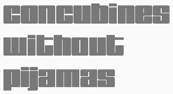 Kummaeno calls himself an art director, graphic stuntman and fontstructor. He lives in Sweden where he works at Infobahn Reklambyra. He "fontstructed" the pixel/stencil family Soft Cell (2010), and the squarish typefaces Samizdat (2010, his remix of the constructivist T-26 font "Revolution" by Douglas Carter, 1994), Gearbox (2010), FS Crude (2010, a heavy typeface inspired by 224MKSD Black by Masayuki Sato), Manifesto (2010, influenced by Donald Beekman's FF Tsunami) and Aegis (2010; think ITC Bolt Bold). Modicum (2010) is a pointy severely angled black sans. Bonfire (2011) is a semi-blackletter face. Soft Cell (2010) is an LED font. About the MICR font MegaSpacer (2010), he says: Inspired by the fantastic "MICR" font set. And the Solaris font design from the nineties by Büro Destruct (ah, those were the days). Old but good ideas brought to Fonstruct. Fun and easy as pie. Basking (2010) looks like Martin Wenzel's FF Marten. Aerostyle (2010) is a techno / Eurostile typeface inspired by Masayuki Sato&Tsuyoshi Nagae at Maniackers Design. Kuiper (2010) is a remix of the techno typeface Straker by Rian Hughes. Gamepad (2010) is an angry fat display face. Piquance (2010) and Quanted (2010) are ultra-fat decorative typefaces. Jacobine (2010) is a bellbottom face. Bitrate (2010) is a carbon copy (in his words) of Data 90 (Rian Hughes).
 FontStructions from 2011: Bayonet is a high-contrast art deco display face. Arbour is a piano key face. Pugilista is a fat boxy face. Pistolera is where the West meets psychedelia. About Syncope he says: You have seen the likes before ("FF HardSoul Ultra" by Donald Beekman or "Loudine" at pintassilgoprints.com). Constructivism with extreme bulk. Ultra-fat retro letter shapes. Ubangi is a hip "remix" of Rian Hughes's Darkside. FS Space Opera is party art deco. FS Rasterbator is a dotty raster halftone exercise. [Google]
[More] ⦿
|
Ladyfingers
[Anette Schmidt]

|
 Ladyfingers was established in 2010 by Anette Schmidt (b. 1976, Denmark), a Danish designer who obtained an MA in typeface design from The University of Reading (2009), based on Anglaise, which is a display face with influences from the psychedelic era and stencil typefaces, and uses lots of ball endings.
 Klingspor link. [Google]
[MyFonts]
[More] ⦿
|
Legacy of Defeat
[Joshua M. Smith]
|
 This web site, related to Joshua Smith's Hydro 74 foundry in Orlando, FL, offers original creations, both free and commercial. They specialize in vintage signage type, display type, the Western look, scary typefaces, art nouveau, tattoo type, psychedelic and Victorian styles. The catalog as of 2011: Anarchy Script, Aphex Script, Apocalypse, Avante, Black Mail Sect, Black Mamba, Black Plague (blackletter), Burial Black, Cadaver Ink (tattoo font), Cadaver Script, Calypso, Catalyst, Cortez, Dayton Black, False Idols, Golden Age, Heresy, Hood Black, Hydro Script, Imperial Black, Iron Fist, Kremlin Ink, Kustom Style, La Calavera Catrina, La Santsima Muerte, Le Venom, Lucky's Flash, Martyr Black, Muerte Black, Napalm Vertigo, Nue Black, Nue Goth, Norway Black, Razor Black, Royal Baron, Sacred Black, Sailor Jerry, Salem Witch Hunt, Sentry Black, Spitfire, Skid Row, Thai Black, The Clique, The Thickness, Thunder Script, Tramp Stamp, Tyranny Gothic, Uber Black, Vahalla, Venice Black, Viper Black, War Machine, West Coast Soul, Wolfstien Electro, Working Class Hero, Zombie Allegiance, Zombie Attack, Slash Black, Suture Set, Corpse, Czar, Proclivity, Uber Black Caps.
 Free and commercial typefaces from 2013: Pricks, Ocelot Piss, The Witches, Wizard Tit, Wizard Dick, Riverside, Dirty Sanchez, Corpus Delicti, Warlock, Ghetto Wolves, Spitfire, Cheap Deal, Shwarma (Arabic simulation), Alderaan (alchemic), Surplus (spurred), Goth Bitch (blackletter), Siberian Vodka (alchemic), Scalliwag (2015, a fat brush), Zombie Headshot (2015), Counter Strike (2015), Bitch Please, Dirty Whore (brush script), Skeleton Key (EPS), Old School (EPS), Forty Thieves (EPS; Arabic simulation), Conquest (EPS), The Sailors Creed (EPS), Achilles (constructivist), Gold Chain (EPS), Bootleggers (Western), Blood Clot (dripping blood face), Hernandez (Latino style), The Order (spurred), Kuso, Pinche Muerte, Chingon, Nomad, Major Jackov, Sinner, Mayhem, Outlaw (Western), Absinthe, Zombie Headshot, Black Diamond, Alcazar, Eastern Star, El Librador (Cuban colonial style), Monniker, Her Majesty, Kobra, Dishonor, Ghetto Hawk, Kings Wrath, Fraternal, Wizard Taint, Rinzler (inspired by TRON), Dream Weave. Behance link. Creative Market link. [Google]
[More] ⦿
|
Leonardo Toscano
|
Mexico City-based designer of the psychedelic display typeface Axida Groove (2016). [Google]
[More] ⦿
|
Leslie Cabarga
[Cabarga type (was: Flashfonts)]

|
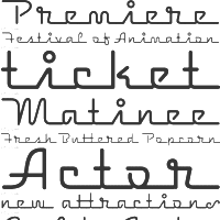 [MyFonts]
[More] ⦿
|
LetterGraphics
[Marc Jones Barry Kimbrough]
|
 Photolettering foundry run by Marc Jones Barry Kimbrough in Culver City, CA. Russell Bean worked for the Los Angeles studio of Lettergraphics International in charge of lettering, logo design and converting type designs to film fonts. It was at this time (1973) that the Washington family (digital version at Type Associates, Russell Bean's present company) was completed. The company ceased operations in the mid-1980s.
 The 1968 catalog of Lettergraphics featured typefaces like the psychedelic Mod Poster in Alfred Roller's Viennese secession style. The 1974 catalog of Lettergraphics shown in ULC 1974 includes these typefaces: - House styles: Virginia, Vantage, Grading, Joe, Heritage, Chaparral, Radius, Nectar, JoJo, Dojo, Harvey, Spatz, Mamoru, Wellington, Sebastian, Belden, Parquet, Della, Nippy, Hess, Totemic, Ruby, Big Fat, Simoes Classic, Serendipity, Kiwi, Angelo, Bethany, Right-On Neon, Klein Lined, McGrath, Fitzner Caps, Skidoo Outline, Plastic.
- By Joseph Churchward: Twenties, Churchward Sans, Churchward Roman, Churchward Lined.
- By Marlene Steen: Steen Sans.
- By Michael Di Canzio: Di Canzio Sans.
- By Donald Carboni: Carboni.
- By Patrick Collins: Arlenette.
- By Edston J. Detrich: Detrich Sans.
- By Martha A. Rowland: Rowland Grotesk.
- By John E. Lorish: Lorish Shadow.
- By Alfted Guerra: Times Square.
- By Reynolds M. Roberts: Roberts Square.
- By Peter Solly: Colescombe.
- By Robert F. Brightman: Streak, Brightman.
- By Robert L. Cooley: La Grange, La Grange Black.
- By Herbert L. Frager: Frager Punch.
- By Anthony Liliefeldt: Padua.
- Ray L. Herness: Herness Script.
- Robert E. Gotsch: Botsch Glob, Botsch Toe.
- Donald L. Vernon: Chrome.
Digital revivals: - Latitude Sans (2019, Stiggy & Sands). A heavy sans based on Lettergraphics' Free.
- Mushmouth PB (2019, Phil Bracco). A revival of the comic book font Albert.
- Nudity PB (2018, Phil Bracco) revives Ad Shadow as a layerable font.
- Wintermint (2018, Phil Bracco) revives and extends the flared almost psychedelic typeface Lori.
- Boilermaker (2018, Stiggy&Sands) is a revival of the tall condensed sans LetterGraphics typeface Flair G100.
- The psychedelic (art nouveau inspired) typeface called Cantini (1972) was digitally revived and expanded by Patrick Griffin as Salome (2007, Canada Type).
- Intrigue is a Lettergraphics film typeface that was digitized, revived and expanded to a large octagonal / mechanical typeface family, Contraption, by Phil Bracco (Pink Broccoli).
- Scrwby (2013, Phil Bracco) is a revival of Surf.
- Virginia (2008, Russell Bean) is a digitization of an old avant garde typeface by Bean himself from ca. 1970 that won a Lettergraphics typeface competition. It was extended by two weights and redrawn in 2016 as Virginia Neo.
- Rebecca Alaccari (Canada Type) designed Goudy Two Shoes in 2006, an expansion of the film typeface Goudy Fancy by Lettergraphics.
- Good Grief PB (2015, Phil Bracco) started out as a revival of Carmel (or Karmel).
- MardiKrewePB (2015, Phil Bracco) started as a digitization of a (psychedelic) film typeface called MardiGras by Lettergraphics.
- Maile was digitized and extended by Stiggy & Sands as Husk in 2018.
- Gene Eidy's Sukiyaki (1968, Lettergraphics) was eventually digitized (without permission) by Jonathan Smith as Hirosh (1993). In 2020, Steve Harrison did a proper digital revival giving full credit to Eidy---his free typeface is also called Sukiyaki.
- Laurel was revived and extended/modified by Stiggy & Sands in 2019 as Lorette.
- Rackem PB (2019, Phil Bracco) is a beatnik font that started as a digitization of the LetterGraphics film typeface Eightball. There are other Eightball film fonts of a very different look elsewhere, so that name is a bit confusing.
- The bullethole typeface Circue Solid was revived by Phil Bracco as Blackhole PB (2019).
- Wood Grotesk. This font was revived and expanded in 2020 by Stiggy & Sands as Bugleboy. Berkshire Pro (a plump display typeface).
- Caren. A great stencil font revived in 2021 by astigmatic One Eye as Rinzler AOE Pro.
[Google]
[More] ⦿
|
Letterhend Studio (or: Magang Letterhend)
[Hendry Juanda]

|
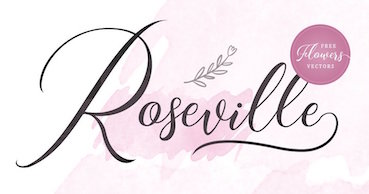 Hendry Juanda runs Letterhend Studio in Yogyakarta, Indonesia. He designed the signage script typefaces Redoura (2016) and Kadisoka (2016), and the accompanying Redoura Serif (2016) and Kadisoka Monoline (2016). Hendry also designed the handcrafted typefaces Signerella Script (2016, +Sans), Motherline (2016), Motherline Sans (2016), Mukadua (2016: a beatnik serif and a script), Sakra (2016) and Sakra Script (2016).
 Typefaces from 2017: Kaylar Script (formal calligraphy), Keylar Serif, Legion, Hipsterious (signage script), Megattor, Dear Jane (a signature script), Wonder Stark (a rhythmic script), Kingbirds (monoline script), Mandatory (Sans+Script), Modesta Script, Romzul Sans (a fat finger font by Muhammad Romzul Khoir), Kanuda (by Galih Prasetyo), Aamonoline (by Ageng Jatmiko), Fad Script, Ageng Sans (by Ageng Jatmiko), Anisa Sans, Morsel, The Lentigo, Quinible, Storytella, Rose Colored, Swiftone, Antone (letterpress family), Retrology (monoline script), Claytonia, Pipetton (brush Script and Sans), Marttabuck (retro), Gloriant Signature Script, Jouska, Brooklyn (dry brush), Holiday, Take Easy (dry brush), Larizo (brush script), Vanillate (monoline retro script). Typefaces from 2018: Sabatons, Autogate (font duo), Sharon Baker, Blue Phantom Script, Dologan, Bolica, Jaceline, Youther (brush script), The Goldies, Carllosta (curly), Black Space (brush style), Anjani Script, Melania Monoline, Calasans (retro layered), Arlington (spurred, Tuscan), Pastelle (SVG brush font), Diana Webber, Caligor (a vintage headline typeface), Greatly, Belymon Script (a great signage script), Majestika Script (signage script), Nagoya (monoline script), Charlotta Script, Stronger (vintage style), Vanillate (connected monoline script), Pipetton (script), Roseville (calligraphic: by Hendry Juanda and Sarid Ezra), Rupture, Gustolle (a great watercolor brush font in OpenType SVG format), Riverside (monoline script), Bulgaria Script, The Majority (calligraphic script), Blacklite (signage script), Athalia Script, West Hood (Western), Fort Collins (font duo, by Sarid Ezra at Letterhend), Flanders Script (a signage script), Thirdlone (a monoline script), Bigstorm, Melania Script (named after the first golddigger), Motherline, Harsey (a 16-font toolbox of signage scripts and dingbats), Dearday Script, Dearday Sans, Blodders, Callonsky Script, Kulon, Quicken, Reklase, Skizzle, Storytella, Brighter. Typefaces from 2019: Shockbar (a Halloween font), Chanide Script, Girly Moods, Padlock (a great retro script), The Rouged (monoline script), Karatone, Kingdrops, William Letter Signature, Billskates, Dorothy Clark, Chord Brights (a Victorian typeface), Sequents, LS Olive 01 Script, Bargitta (an SVG brush script font by Hendry Juanda and Sarid Ezra), Hellone Script, Sharon Baker (by Hendry Juanda and Sarid Ezra), Daniella Evans (a display serif by Hendry Juanda and Sarid Ezra), Leafstar, Righton (a signage script by Hendry Juanda and Sarid Ezra), Lotustail (by Henry Juanda and Sarid Ezra), Radicals, Seriously (a display sans), Rupture, North Avellion, Majestika Script, Palmbell (a signature font by Hendry Juanda and Sarid Ezra), Fokers (Victorian), Frankest (Script, Serif; with a Victorian feel), Danielle Harris, Callonsky Script, Murphy Script, Lanoline Script, Bittergrace Script (by Hendry Juanda and Sarid Ezra), Bordemile (a copperplate calligraphic script by Henry Juanda and Sarid Ezra), Daybird Script, Amerta Misty, Wonderstory, Kingbirds Rough (monoline), Rupture Stamp (for signage), Gorgone (a one-style didone by Henry Juanda and Sarid Ezra), Stomper, Caligor, Asterone (a wide all caps sans), Venettica Script (a signature script), Hougbon Script, Philomena Script, Cephalonia, Birmingham Script (calligraphic), Hillstown (Sans and Script). Typefaces from 2020: Billrocks (a condensed all caps sans), Greybridge (a fine retro script), Lava Cookies, Just Because, Moraline Script (a baseball signage script), Lemonade Peach, Mayburn (a retro signage script), Fillerglad (a signature script), Breadfast, Della Brian (script), Sailritme (wild, calligraphic), Stacylia, Stacylia, Salty Unicorn (a monolinear marker pen font), Super Giants, Gingerly, Creeplens, Donthank (a fat finger font), The Viperion, Blantika, Maritosca (wild, calligraphic), Thirtylane Script, Winland (a brush script), Ballmarks (wild, calligraphic), Mellodate, Braleno (a shaky font), Siregar, Camie (a wedge serif), Hugiller (a high contrast ball terminal fashion mag serif), Mildistance (a tall calligraphic script), Midgeto (a casual all caps typeface), Crimson Black (a brush typeface), Duke Charming (a decorative serif), Lucky Spark, Blue Jones, Sunshine Valley, Hello Christine (a rough-edged script), Revalina (a wild calligraphic script), Ranshell (a chalky script), Malliandra Script (a wild calligraphic script), Vistaria Notes (a wide flowing calligraphic script), Achiever, Bullgine (blackletter), Billion Reach (a signature script), The Randi (a monoline script), Yorkson (a signage script), Laverty Castaroza (all caps, art nouveau), Kandani (a creamy signage script), Fragtude (a creamy script), Quick Counters, Kaeliwritten, Heaven Wanders (a lively vintage hand-printed typeface), Chillday Script, Redberries, Foretelling Script, The Stegris (a decorative serif), Bayland (a signage script), Darthon, Caligonia, Deluge (a heavy script), Laterlocks (a display typeface), Baille Simpson (a dry brush script), Kanote (an all caps cartoon font), Black Ground, Franceur, The Wanters, Alburgone (an all caps quaint shop front lettering typeface), Annette Bradford, Winstreak (a brush font), Madegra (a decorative serif), Samrose (a dry brush font), Dehors (a Tuscan circus font), Compania (a wild script), Neography (a formal script), Shakuro Brush (oriental brush), Rascals, Wednesdom, Chirpy, Altia (Script, Sans, Slab Serif, Signature, Hand, Brush, Dingbats), Stargation, Buttoni, Radgrows, Linkgray, Monday Bay, Brown Chunkers (a vintage label font), Squiborn (a hand-drawn athletics font), Brilliantly, Holystone, Detroit (a handcrafted slab serif), Spring Note, Bigtown (a heavy hand-lettered slab serif), Naville (a 6-style all caps sans family), The Proactive (script), Wardrum Pro (a wide sans) and Wardrum, Kinderline Script (monoline), Kingdrops, The Kogles Script (retro), Conseration (a condensed sans). Hopkins Angela, Blue Phantom, Gladiolus Script, Calvous (spurred and weatheed), Fort Smith (penmanship calligraphy), Ramdone (a creamy signage script), Devilion (a signage script), Cortair (a vintage typeface), Kingbirds (a monoline script), Purefell Script, Rangkings (serif), The Holloway (Victorian), Roquen (a rustic typeface), Gloriant. Typefaces from 2021: The Riskeys (a tall stylish serif), Brandice (blackletter), Carllosta (a Victorian font), Dountyland (a monoline script), Garten House (Victoriana), Hello Sierra Sans (a child's hand), Marla Griselda (a formal script), Nachinta (script), Winter Rosetta (a curly script), Distoniare (a thin calligraphic script), The Moon Milter (a vintage all caps display font), Asper Crown (a nature park display font), Delgian (script), Astropicks (a marker bpen font), Cerlistine (a fat finger script), Fintbar (a fat all caps display font with an oversized chin), Madre Rose (a stylish unicase typeface), Norvin (vintage caps), Roundkind, Sentra (a wide hand-crafted display font), Stone Masher (script), Beast Party (a Halloween font), Hollow House (a Halloween font), Blowsters (a dry brush mural font), Rumble Born (a bean font), Stano Sans (rounded), Amillia Rochete (a delicate signature script), Shopie Minclair (a fine pencil script), Sign Paintoh (a sign painter's font), Wednesday Island (script), Sinister Mind (a horror font), Divine Stone (a brush font), Pinsmalle (a signage script), Radnick (a plumpish retro font), Wackets, The Royal Chambers (decorative caps, with a hint of art nouveau), Shopie Minclair (a refined script), The Morshine (Victorian), Beauty Culture (an angled calligraphic script), Allarmante (a horror font), Billanta (a retro signage script), Galpike (a 9-style sans with modulated stems), Magnitude (a stylish display sans with large x-height), Romans Story (stylish caps), Stay Strong (a dry brush script), Cardila (a monoline retro signage script), Explore Magic (hand-printed), Kingslayer (a graffiti font), Marina Bullock (a flowing rabbit ear script), Dustland (a retro signage script), Haystack (script), Sakura Town (Japanese brush emulation), Boldistrike (a retro signage script), Maleryan (a delicate formal calligraphic script), Sellina Word (a calligraphic script with irregular line thickness), Servegin (a display serif), Shelbie Roger (Victorian), Stumble (a signage script), Foresight (a vintage script), Cordoba Sans (vintage caps), Badgear (a monoline script), Edellyn Script (tall and elegant), Glorify Sans (an 8-style decorative sans), Wellytonia Package (a scrapbook script), Turesco (a creamy caps typeface), Black Space (a horror brush SVG font), Slime Yogurt (a fat finger font), Black Hymned Script, Pompano (a lively almost vernacular headline sans), California Quotes (brush script), Rosterine (a vintage condensded display font), Between Days (a display serif), Crescent Slim (a stylish display serif), Captivate (script), Flumbery White (a thin tilted script), Modern Prestige, Olive Vine (a lively brush script), Graystera (an elegant script), Morning Glints (a marker pen font), Native Roast (a vintage layered typeface), Menleader (script), Neophyte (a flared vintage typeface), Dankfield (condensed, squarish), Sogate (a bold script), Hollow Sky (a thin script), Boosley (a condensed supermarket script), Killviners (blackletter), Chenile Deluxe (a vernacular supermarket font) Silvestern (a vintage display font), Arnette Script (a calligraphic script), Margoline (an elegant formal calligraphic script), Pinmold (a geometric stencil font), Eligated (all caps, vintage), Garmouth Display (a Victorian era advertizing font), Bugheds (blackletter), Candleton, Riotous, Baverley Astone (script), Belmistate (a fine rhythmic brush script), Hulberk (an all caps slab serif), Mogaster (a monolinear script), Black Rockets (a dry brush script), Glady Script (a bold signage script), Yesternight (a bottom heavy script), Welroseltone (a stylish calligraphic font), Bold Garage (an inky unusually elegant typefacre), Bright Clones (hand-printed) Grand Wilson (a font duo), Merodine (calligraphic), Appears (a decorative serif), Mounties (tall caps with flared terminals), Quatro, Ground Castle (a display serif), Linestay (a signage script), Alessia Harvey (a signature font), Caramel Chestnut, Londers (an upright bold script), Hubstone (a brush font), Oversouth (vintage, hand-drawn), Bright Gesture (a lachrymal font), Center Voyage (an all caps display typeface), Asteria Royalty, Georude (hand-printed), Raksana (a bold upright script), Aesthetic Notes, Broadley (a vintage font duo), Chopader (a vintage font duo), Wimp Stars (a beatnik font), Brown Holmes, Mortina (a vintage font duo), Dustown (a rounded handcrafted sans), Holymore, Lamberds (a rhythmic script), North Mountain (a decorative flared typeface), Butter Slices, Portalica (an all caps italic font with plenty of ball terminals), Evening River (an optimistic and playful script), La Graziela (formal copperplate calligraphy), Metro Capitals, Davenvale, Earthgate (a vintage penmanship font), Vindale (a retro reverse stress script), Better Hobby (a layerable cutout font), Bouldster (a bottom-heavy psychedelic script), Melorist (a display sans), Benorante, Millgrove (a condensed spurred typeface), Asterluck (a fat finger font), Boinger (wide, octagonal), Rimeland (calligraphic), Ansylia, Mantaray. Typefaces from 2022: Arturico (a frivolous art deco font), Calmine Font Duo (a bold vintage script), Foresight, Penster Bross, Mayhome (script), Rivervale (flared hand-crafted caps), Rontage (a late 19th century-style display typeface), Bert Watson (a tall thin upright script), Honnie (Greek emulation), Livemono (6 styles), Caldeisa (a creamy script), Coral Candy Regular Slant (a blocky plump unicase typeface), Hanstone (script), Hintown Slant (arts and crafts era caps), Liviatica (a wavy display serif), Rosie Brown (a font duo), Growline (an all caps display sans), Lion Parade (a vintage apothecary script), Praysire (a sharp-edged display serif), Bashiton (a monolinear script), Crainzel (notched caps), Garetra (a stylish serif), Moon Slayer (a scrapbook brush font), Growlies (a fat finger script), Ridge Cliff (a massive slab srif), The Bristers Sans (a font duo), Augify (a hipsterish display serif), Dustyland (a monoline script), Primore Castle (hand-crafted), Merry Brook (script), Monstroux (a brush font), Blue Carousel (an informal brush script), Bastinson (a thin monoline script), Happy Sparkle (an inky treefrog script), Arinkoln, Backdown (script), Krostenia (a monoline script), The Bardian (script), Black Rocket (hand-printed), Kaglia (script), Cyberion (sci-fi), Groovy Friends (hand-printed), Calfine (a bold condensed poster typeface with small wedge serifs), Fountencil (a blackletter stencil), Logirent (a minimalist logo font), Logirent, Hermush (art nouveau caps). Aka Magang Letterhend. Behance link. Dafont link. Graphicriver link. Dafont link. Creative Market link. Fontesk link. [Google]
[MyFonts]
[More] ⦿
|
Letterkraft
|
Designers at T26 of PsychedelicAvalonA (1994), TheWall and Psychedelic-FillmoreWest in 1994. [Google]
[More] ⦿
|
Lindsay Amerault
[RAD works Studio]
|
[More] ⦿
|
Lody Gigliola Choque Gutierrez
|
Designer at Cuchi qué tipo, a foundry based in Jaén, Spain, of the salmon-textured typeface Rosa Salmon (2016) partly inspired by psychedelia. In 2021, she released an icon set called Artesanias Jaen. [Google]
[More] ⦿
|
London Stokes
[London's Letters (was: Kitten's Korner)]
|
[More] ⦿
|
London's Letters (was: Kitten's Korner)
[London Stokes]
|
 London Stokes is a Utah-based designer who made mostly alpha dings. First her pages were called Kitten's Korner, and now they are just London's Letters. A partial font list: Birthday-Balloons, Conradasaur, Cat-Treats, Conrad's-Cows, Christmas-Cardinals, Cuddle-Cats, David's-Ducks, Hound-Dog, Jeremy's-Rigging, LondonBugs, Merry-Go-Round, PokeDex, Ringling-Brothers, Rykers-Pram, Stalking-Kitten, Tin-Soldiers, Toy-Soldier, Ty-Babies, Under-An-Acacia-Tree, Baby Egg, Helpful Hunnybee, Irish Beer, Pill Toad, Pokemon Master, SunshineMoonshine, Christmas Lights, LMS-HeroesAmongTheAshes, LMS-Beach-Wedding, LMS-Beautiful-Butterfly, LMS-Boyton-Alphabet, LMS-Calla-Lily, LMS-Darren's-Delight, LMS-Darren's-Diversion, LMS-Loves-Me, LMS-Tulips, Utah Welcomes The Olympics, LMS-Becca's-Wedding, LMS-Hogle-Zoo-Flutterbys, LMS-Inside-My-Claddah, LMS-Kat's-Cat, LMS-Lazy-Dayz, LMS-Oh-Canada, LMS-Rose, LMS-She-Shells, LMS-Summer-Camp-Love, LMS-Sunflowers-for-Jodie, LMS-Traci's-High-Flying-Hubby, LMS-A-Berry-Nice-Baby, LMS-Back-To-School, LMS-Bed-of-Ivy-and-Ribbons, LMS-Bloodsucker-Proxy, LMS-Comedy-of-Tragedies, LMS-Coral-Colt, LMS-Costume-Party, LMS-Friendly-Skys, LMS-God-Save-The-Queen (on the theme of the union jack), LMS-Hippy-Chick (flower power typeface), LMS-I-Wanna-Be-A-Superhero, LMS-Lights,-Camera,-Action, LMS-New-Cheerleader, LMS-Pumpkin-Pal, LMS-School-Spirit, LMS-The-Sorcerer's-Font, LMS-We-Love-To-Fly, Candle Lit, Collections Specialist, Daisy Days, Deck The Font, Everlasting, Festival of Lights, He Filled Both Stockings, Holly Jolly Christmas, Jazz Fan, Jolly Holiday, Let It Snow, Tropical Island Dream, Saint Nick, Snail Mail, You Better Watch Out, You've Got Mail, LMS-Just-A-Little-Pacers-Fan, LMS-Peppermint-Twist, LMS-Survive-Africa, LMS-Survive-The-Island, LMS-Survive-The-Outback, LMS-You-Are-My-Sunshine, LMSTyBears, Canadian Olympic Spirit, Charismatic Care Bears, Picnic Parade, Spring Lily, We're the chipmunks, By The Power of Grayskull, Pretty Baby Pony, Pretty Pony, Zoorific, LMS Zoo and aquarium Life, LMS-A-Berry-Nice-Baby, LMS-A-Berry-Nice-Font, LMS-A-Berry-Nice-Girl, LMSASnailsPace, LMSAliciasHorses, LMS-America-LSF, LMS-Anniversary-Dinner, LMS-Baby-Egg, LMSBabyHaydensShoes, LMS-Back-To-School, LMS-Beach-Wedding, LMS-Beautiful-Butterfly, LMS-Becca's-Wedding, LMS-Bed-of-Ivy-and-Ribbons, LMSBettyandVeronica (two women posing), LMSBeyondInfinity, LMSBirdWatching, LMS-Birthday-Balloons, LMSPebblesandBamBam, LMSScoobyDoo, LMSScrapPaper, LMSTheTruthIsOutThere, MS Circus Bugs, LMS Cut It Out, LMS Monday Night Football, LMS Paper Work, LMS Pigglet's Prize, LMS Rugrats Need Love Too, LMS Bloody Brujah (Treefrog-lookalike).
 Fontspace link. Dafont link. [Google]
[More] ⦿
|
Lo-ol Type foundry
[Loris Olivier]
|
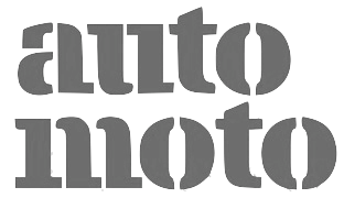 Talented type and graphic designer based in Morgin and/or Grand-Lancy, Switzerland. After obtaining a BFA from the Academy of Art University of San Francisco, he started a Masters in the TypeMedia program at KABK in Den Haag, graduating in 2015. After the KABK, he started working from Geneva on editorial identity, branding, editorial, graphic and type design. His spouse, Noheul Lee, is also a type designer. Loris's typefaces:
 - Animax (2016). A lineale geometric consisting of text and display.
- Aragon (2014). A transitional serif for display.
- Arancia (2016). A lineale geometric consisting of text and display.
- Bachus (2016). A heavy brush script.
- Brienz (2019).
- Chablaix (2015). A neo-textura.
- Civilitate (2016-2018). A blackletter with roots in Robert Granjon's Civilité..
- Cozette (2016). A didone.
- Fanny (2014). An exquisite display family.
- Fournier (2014). A revival.
- Gloubi (2019). A psychedelic font.
- Groo (2013). A lineale neo-grotesk for text and display.
- Kartel (2014). A lineale neo-grotesk for text.
- Katchka (2014). An all caps typeface for Latin and Cyrillic.
- Lemanic (2015). His graduation typeface at KABK. This large transitional text typeface family Lemanic is accompanied by a decorative blackletter typeface. Loris writes: The different weights and styles are made for magazine or newspaper environements. The entire family is constructed in order to decrease the usage of images next to the text. The shapes of the book weights and its inspiration are taken from the fluidity and the rhythm of the work of Fournier and certain shapes of the Romain du Roi.
- McQueen Superfamily (2020). A 20-style sans family in Display and Grotesque subfamilies by Loris Olivier, Noheul Lee and Katja Schimmel, realeased by Fontwerk.
- Medley (2015). A transitional serif for display.
- Merle (2016). A slab serif.
- Milwaukee (2014). A text typeface, + Stencil Bold.
- Misc (2013). A serif, sans and script trio.
- Moritz (2015). A slab serif.
- Orniere (2016). A lineale humanist sans, slightly flared and lapidary, for text and display.
- Phantom (2016). A transitional monospace serif (text and display).
- Phily (2015). A lineale geometric consisting of headline and display.
- Rouka (2015). A lineale neo-grotesk stencil typeface.
- Saudade (2013). A transitional serif in text and display versions.
- Scarpelli (2012). An étude in ball terminals.
- Soprana (2014). A transitional serif in text and display versions.
- Susanfe (2016). A sans typeface.
- Tuilots (2014). A gorgeous calligraphic text typeface.
- Tweelo (2014). A garalde.
- Volpe (2015). A transitional serif for display.
- Wicht (2016). A humanist serif.
Home page. Future Fonts link. Fontwerk link. [Google]
[More] ⦿
|
Lorenz Fidel Huchthausen
|
 Lorenz Fidel Huchthausen (aka Tylo at FontStruct) is a young graphic designer and artist from Berlin. At FontStruct, he created the 2d and 3d outline typefaces Solidblock, Solidblock 3D, Smoveblock and ZigNZag in 2010. Further typefaces made in 2010 include FS Stein (counterless), FS Jaze (angular face), Nareaves (modular kitchen tile face), FS Above Ferrofluid (texture face), Riss (white on black stone chisel face), Blockage, Blockswosh, AB CD, Handot (dotted), Zirc (circular), FS Zig n Zag, FS Blaze (counterless, geometric), Rabina Stripe (rounded slab), Swulsh (psychedelic), FS Zeta B (futuristic industrial face), FS Lehev, FS One Brick Pixel Font, FS Cushi, FS Karo (texture face), FS Raunpe, Elmant, FS Jasemone, FS Mortalers (texture face), FS Papier 3D, and Pseudobraille (dot matrix face).
 FontStructions from 2011: FS Fluze, FS Hommage a Frodo (3d face), FS Pixel Portrait (ultra-fat), FS Rinali (wavy), FS Gritta (a great stacked 3d face). [Google]
[More] ⦿
|
Lorenz Lopetz Gianfreda
[burodestruct (or: Typedifferent.com)]

|
 [MyFonts]
[More] ⦿
|
Lorenzo Martinez
|
Filipino designer of display typefaces. These include the following typefaces made in 2021: Saphion (linearly flared), Mamshie Taba (a poster font), Matalihim, Galactech (sci-fi; slab serif), Jeeprox (funky), Obra Letra (all caps). [Google]
[More] ⦿
|
Loris Olivier
[Lo-ol Type foundry]
|
 [More] ⦿
|
Lorvad (or: Printers Devil)
|
 Free font outfit, active from 1991 until 2008. They made Bellbottom Laser (1991, from the hippie days), Spatz (1993, Tuscan), Medusa (1991, like Arnold Boecklin), Bodidly Bold (2008), CartWright (1991, Western face), Judas Caps (spiky letters), OxNard, Black Forest (blackletter), Oswald Black, Albatross, Get A Grip, Down Wind, Inka Bod, and Loop de Loop. [Google]
[More] ⦿
|
Love Letters
[Sebastien Sanfilippo]
|
 Sebastien Sanfilippo founded Love Letters in Brussels, Belgium, under the motto Single-handedly drawing letters for world peace. He designed these open source typefaces:
 - Polsku Regula (2010).
- Reglo (2009). Free at OSP and at Open Font Library).
- Bagnard (2016). A wedge serif typeface inspired by the graffiti of an anonymous prisoner of the Napoleonic wars. The sans serif version, Bagnard Sans (2016), was developed jointly by Sebastien Sanfilippo, Doug Thomas, Chris Fodge and May Kim. Github link.
- Cotham Sans (2016). A grotesque typeface. Github link.
- Grotex (2018).
- Kvetch (2018): Monospace extended is the new reverse contrast. Kvetch is named after the Yiddish word for being a pain in the you know what. Initially started as a bit of a joke, this monospaced and extended typeface combines two unlikely ideas. Brutish but with calligraphic roots, Kvetch is Frankenstein in a ballerina costume. A commercial font family.
- Agrippa (2019). A playful ultra-fat stencil typeface.
- Blimey (2019). Intended to become a 2-axis variable font, Blimey is inspired by art nouveau and psychedelia. Variable font version. Future Fonts link.
- Mint Grotesk (2019) and its sturdy, no-nonsense sans-serif companion, Mint Book (2022).
- Tatras and Tatras Shaded (2021). These typefaces pay homage to eastern European design and its socialist heritage. The typeface takes its inspiration from the lettering that is emblematic of mid-century design in Hungary, Poland, Czechia, Slovakia and the Balkans.
Behance link. Personal home page. Git repository. Future Fonts link. [Google]
[More] ⦿
|
Lucy Chugg
[Creativeqube Design]
|
 [More] ⦿
|
Luke Lucas
|
 Art director, illustrator, designer and typographer from Melbourne, Australia, but who is now located in Sydney. Creator of these typefaces for Lifelounge Magazine in 2008: Aeroplane, Halen Roek (thunderbolt face), Inline Hell, Lightning Rock, Lukano (after Mekano), Miami Nice (multilined), Mother Nature bilined), Snag, Superfine (minimalistic), Tight Fade, Type (headline serif), Sneaky and Future Deco (multilined). In 2009, still for Lifelounge, he created Love& Unicorns (psychedelic). Of course, this Melbourne-based photographer may be best known for his "interesting" applications of type in posters such as Dirty Type (2008), Tits and Type and Swing City (2008).
 Home page. HypeForType link (where one can buy his typefaces). Klingspor link. Behance link. [Google]
[More] ⦿
|
Maayan Schorr
|
Haifa, Israel-based designer of a decorative caps typeface (2015) that celebrates the hippie days from the 1960s. [Google]
[More] ⦿
|
Maniackers Design (or: MKS)
[Masayuki Sato]
|
 About 150 free original fonts by Masayuki Sato (from Futaba and/or Takasaki, Japan), over half of them pixel fonts. Maniackers designers started in 1995. For most fonts, he has a Latin alphabet (denoted by AL) and a katakana alphabet (denoted by KT). Some also have a hiragana version (denoted by HR). All fonts were made between 1998 and 2009.
 - By Masayuki Sato&Tsuyoshi Nagae: Merumo-AL, KT, PonyPony-AL, KT, HR, Topo-AL, TM Extended-AL / 2Type, MinnanoUta-AL, KT, HR, Seele-AL / 2Type, Robin-AL, Peco-AL, KT, Honey-AL, Blur-AL.
- By Masayuki Sato&Eri Nagae: Stitch-AL.
- By Masayuki Sato&T. Waka: Chihuahua-AL, KT, HR / 3Type.
- By Masayuki Sato&Mami Kobayashi: Alphabet Man, Detroit Type City-AL, Foood-AL, KT, Pokupoku-AL, KT, HR, Ball2-AL, Box2-AL, Button2-AL, Xtal-AL, KT, HR, Ikaho-AL, KT, MD Radiogram-KT, HR, Nepon-AL.
- By Mami Kobayashi: Ikaho-HR, TypeCantabile-KT, Kotodama-KT, Sandy-AL / 2Type, Yonimofushigina-AL, KT, Cloooud-AL, Yonimofushigina-HR, Timber-AL,KT, HR, Sunday-AL / 3Weight, Hyonnakotokara-AL, KT, HR.
- By Eiji Sunaga: Tanrei 2.0-KT.
- By Junya Yamada (Channel 67): Drip-KT, Bobo-AL.
- By Masayuki Sato&Junya Yamada: Maniac 2-AL, KT.
- By Atsushi Moda: Angle.
- By Shinji Naka: Typobokan katakana (at least, the graphics of this comic book style font were by Shinji Naka).
- By Masakazu Fukushima: Lucha-doll mask (a fantastic mask dingbat font).
- By Atsuko Onozato: Pazool.
- By Malte Haust of Bionic Systems: DorisOrange.
- By André Nossek: Collage Rmx-AL, Hard Rmx-AL.
-
- By Masayuki Sato&Hiroko Takiguchi: Holiday Bitmap14-AL, Holiday Ultra-AL, KT, HR, Holiday Bold-AL, KT, HR, Holiday-AL, KT, HR, Holiday-illust, Holiday Tategaki-KT, HR, Holiday-MDJP03 / 2Byte, Holiday-MDJP02, Ribbontic 2.0-AL.
- By Masayuki Sato and Masashi Kato: Pico (2009, rounded comic book style).
- By Masashi Kato&Mayucco: Yakitori-AL, KT, HR / 2Byte.
- By Masayuki Sato&Ryo Asoda: Wallpainting-AL, Cosmic-AL, Bellows-AL, KT.
- By Masayuki Sato&Kaori Inada: Sennin-AL.
- By Masayuki Sato&Shizuka Yamazaki: SwingingBird-AL, KT, HR.
- By Masayuki Sato&Junichi Omi: Omiyage-AL, KT, HR.
- By Masayuki Sato&Rollingcradle: Poranger-AL, Lucha doll-mask.
- By Masayuki Sato&Omnikono: Gt informat-AL, KT.
- By Masayuki Sato: Donki-KT (2010), Cherry-Cherry KT (2010), 239 Schablone-AL (2010), RBIO-AL (2010), FSB08 Klang-AL (2010), 224 MKSD-AL (2010), 223 MKSD-AL (2010), 235MKSD (2009, thin octagonal), Nepon-KT, Nepon-HR, Monday-AL / 3Type, Childish-AL, KT, HR, Volt-AL, KT, HR, Gavadon Ultra-KT, Building 2-AL, KT, Gachapon 2-KT, CinemaMa-AL, KT, HR, Skinny-AL, Magatama-AL, Astro 3.0-AL, KT, 160MKSD-AL, KT, TypoBokan-KT (3DCG), Lunch-KT, HR, Partner-AL / 3Type, Pico Super Ultra Bold-AL, 096MKSD-Synapse-AL, Millennium 5lines-AL, Tekuteku Round-AL, Warp-AL, Cherry Cherry-KT, Donki-KT, 078MKSD Medium Con-AL, Poco-AL, Temporary Extra-AL, 071MKSD Medium-AL, KT, 071MKSD Bold-AL, KT, Paco-AL, Collage-AL, Zerozero Nine-AL, KT, HR, Finger Five-AL, Electronica Nine-AL, Drifter Five-AL, Ultra Seven-AL / 3Type, Thaitype Ten-Thai, AL, KT, Gogo Five 2.0-AL, System Seven-AL / 7Type, 201MKSD-AL / 4Type, Fluorescent-AL / 2Type, FSB07 Astra-AL, KT, HR / 4Type, Nihonbashi 2.0-AL, KT, 176MKSD-AL, Continue-AL, Spaghettini-AL / 3Type, Pinponpan2, 3, 4-HR / 3Type, Pico-AL / 2Type, Kokecco2-KT, Charakyoro-AL, Coppepan-AL, KT, HR, Sardinen-KT, HR, Hachipochi Eight-AL, KT, Janis Heavy-AL, Futaba-KT, April Fool-AL, KT, HR, Arawasu-KT, Airline-AL, KT, HR, Astro 2.0-KT, Snail-AL, KT, Akachan-AL, KT, HR (Flop Design), Dorisorange-AL, KT (T26), Parade20-AL, KT, UFOnt-51silhouette, Rabbit35-silhouette, Dog30-Silhouette, Coil-AL, KT / 3Type, Frankfurter Custum Black-AL, COLOR-AL, Fivemani-AL, KT, Astroro-AL, KT, Puco-AL, 184MKSD Omnibus-AL, Alfadental-AL, FSB08 Klang-AL, KT / 3Type, TDA140607-AL, Shotaro V3-AL, KT, Colopocle-AL, KT, Melt-AL / 3Type, Tekuteku-AL, Crayon-AL, Digits-AL, Performar-AL, Pinponpan-HR, Airplane 2.0-AL, KT, Button-AL, Ball-AL, Box-AL, OLD CUBE-AL, Elekitel-HR, Retroket-AL, MKS Dot-AL, RikuKaiKu-Illust, Angle-AL, FontRemix 02 (36-kanji dingbat font). Font Pavilion sells these fonts: Building, Gavadon (kata), Volt (romaji, kata), Colopocle (katakana, romaji), Shotaro (katakana, romaji). Typo Bokan, Sennin, Snail. At Digitalogue, he published the screen font series Zerozero in 2000.
- Between 2009 and 2011 he designed 232 MKSD Round.
Abstractfonts link. Fontspace link. Artistic rendering of a kanji character. Behance link. [Google]
[More] ⦿
|
Marc Clancy
|
Melbourne-based type and graphic designer who made these (free) typefaces: Powdah (sans), Schwish, Bison, Pseudolux (2000, psychedelic), Polydiscous (2001), Minidib, Bloodwax (2001), Depictor (2000), Bored (2001, dot matrix). Justin Bauer made Pro Bulbous (2001), a pixel font. His site used to be called Pseudoroom. Alternate URL. Dafont link [no longer valid]. [Google]
[More] ⦿
|
Marc Jones Barry Kimbrough
[LetterGraphics]
|
[More] ⦿
|
Marcio Hirosse
[Fabrika de Typos]

|
[MyFonts]
[More] ⦿
|
Mark Fenlon
|
During his studies at the Liverpool School of Art & Design, Mark Fenlon created the psychedelic typeface 6EHD (2013). [Google]
[More] ⦿
|
Martype Co (was: Tyfrography)
[Umar Farouq]

|
Umar Farouq or Umar Al-Farouq or Mohammed Bendoel Kazar. Yogyakarta or Sleman, Indonesia-based designer (b. 1998) of these typefaces: - In 2021: Pop Krinks (a 7-style text family that includes a variable font and a coathanger lower case f), Bropella (a meaty display typeface with with a coathanger lower case f), Callgest (a sharp-edged display serif with a trendy coathanger lower case f), Thick Thinks (a plump display typeface), Huntsville (a monoline script), Moftein Sough (+Dingbats; a tall condensed serif with hipster traits such as a coathanger lower case f), Glofters (a German expressionist blackletter typeface), Behover (octagonal), Robuck (a condensed all caps sans), Gafiton (a reverse contrast display sans), Wonkids (a chunky retro font with a bit of psychedelia), Garyford (a vintage serif typeface with a Basque capital A).
- In 2020: Stanley (a signage script), Grandmaid, Micaroline (all caps, art deco), Parginer, Labroses, Melburch, Sondote.
- In 2019: Brewisten.
- In 2018: Houstoner Script (a formal monoline script), Bearbone Sans, Chillvornia (font duo), Fresh Meat (vernacular), Courager, Calderock, Stanley (signage script), Routen Lightning and Routen Inky (monoline script) and Barthon.
- In 2017: Montharo (sans), The Dodger and Blockers.
[Google]
[MyFonts]
[More] ⦿
|
Masayuki Sato
[Maniackers Design (or: MKS)]
|
[More] ⦿
|
Match Fonts
[Michel Bujardet]

|
 Match Fonts is the West Hollywood, CA-based foundry led by Michel Bujardet (b. Bordeaux, France, 1951), who is Mike Budge on alt.binaries.fonts. They make and sell interesting font paks. A particular favorite of mine is the Calligraphic Fonts Pack 2, which has the beautiful medieval-look typeface Rodolphe (2001), together with the Chancellerie family, the blackletter font SquareText, and a few Uncial fonts called Oncial. Free demos. Cursive Handwriting is a 6-font pak for teaching handwriting. Also offering a handwriting and signature font service. Among free offerings, check Le Blackmail (ransom font). Also, commercial fonts for these languages: Armenian, Bulgarian, Croatian, Czech, Estonian, Greek, Hawaian, International Phonetic (IPA), Hebrew, Hieroglyphs, Hungarian, Japanese, Latvian, Lithuanian, Macedonian, Marshallese, Polynesian, Polish, Romanian, Russian, Serbian, Slovak, Turkish, Ukrainian, Yiddish.
 Interesting typefaces: Boulon (letters with bolts), Bujardet Freres (French restaurant type), Calebasse (1997, semi-psychedelic), Chinoiseries (Chinese look-alike), Cristolikid (LCD), Diodes Light, Grecques, Halloween, Malabars, Metroplitain (art nouveau), Monogram, Octogone, Osselets (bones), Parador, Ruban Dis-Moi, SilBooettes, TSF et Compagnie, Venitienne, Yiddilatin, Zebrues, and the dingbats Dinosotype, Alphabetzier, Nahkt Hieroglyphics, Norman Prince (children's handwriting), Angelots, Sceaux, Seraphiques, Talismans, La Main Guided, La Main Solid (both children's tracing fonts), Bordini, Bordofixed, BoumBoum, ChapClerk, Dactylographe (nice!), Halotique (sans serif), Tortillon (2001, art deco), Normographe (great too!), Normafixed, Oloron, Parlante (serif family), Presse (typewriter), Technicien. Plus handwriting fonts Skrypta, Skryptaag (upright and connected), Willegha. a Morse Code font. The Halloween pack includes Coulures, Halloween, Osselets and SilBooettes. Fixed width fonts include Dactylographe, Oloron, Bordo, Norma. Direct access. Interview and photo. Alternate URL (in French), with many more fonts, such as the handwritten Pierre, Mariette. MICR E13 B font. Fontspace link. [Google]
[MyFonts]
[More] ⦿
|
Matthijs Herzberg
[Herzberg Design]
|
 [More] ⦿
|
Matyas Machat

|
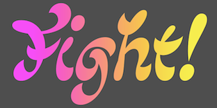 Born in Jablonec and Nisou, Czech Republic, 1992, Matyas Machat created Sandokan in 2014. Sandokan is a brush script font with that conjures up oriental calligraphy, art nouveau and psychedelic flower power.
 In 2017, he designed BC Brief (Briefcase Type). In 2018, Vojtech Riha and Matyas Machat co-designed Slavia and Slavia Press + Repress. The former is a socially awkward 1910-era grotesque, and the latter two typefaces are letterpress style cousins. In 2021, he released the nine-style sans Civil at Superior Type. At Brieface Type, he published BC Eric Machat (Machat's interpretation of Eric Gill's humanist typeface Gill Sans), BC Eric Machat Headline and BC Eric Machat Script (based on Eric Gill's handwriting). [Google]
[MyFonts]
[More] ⦿
|
Mauricio Vico
[Tipos de Cartagua]
|
[More] ⦿
|
Maximiliano Sproviero
[Sproviero Type (was: Lián Types)]

|
 [MyFonts]
[More] ⦿
|
Megan Gutman
|
Rockport, MA-based designer of Anedda (2011), a psychedelic typeface done at Endicott College. [Google]
[More] ⦿
|
Michael Coulthard
[Shaky Kane]

|
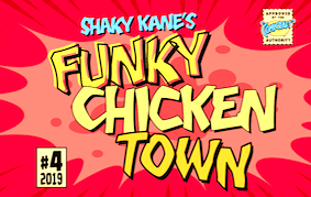 [MyFonts]
[More] ⦿
|
Michel Bujardet
[Match Fonts]

|
[MyFonts]
[More] ⦿
|
Mihail Mihaylov
|
Graphic designer, illustrator and art director in Sofia, Bulgaria, who is now based in Rotterdam, The Netherlands. Creator of Funkadelic (2009) and Quotes Alphabet (2009). Behance link. [Google]
[More] ⦿
|
Milton Glaser

|
 Milton Glaser (b. 1919, New York, d. 2020) was an important American graphic designer who founded Push Pin Studios (in 1954) in New York where he worked with Seymour Chwast. He left in 1970 and founded Milton Glaser Inc in New York in 1974. He taught classes at SVA, where according to Michael Samuel he said to his students: There are three responses to a piece of design---yes, no, and WOW! Wow is the one to aim for. One of his most iconic designs is the New York City logo from 1977 set in ITC American Typewriter. Glaser designed type on art boards. In the 1973 monograph Milton Glaser Graphic Design, George Leavitt is credited for lettering execution. Author of Sketch & Finish: The Journey from Here to There (2020, Princeton architecural Press). Glaser's typefaces:
 - Baby Teeth (1968, Photolettering). Milton Glaser's inspiration for his Babyteeth typeface came from a hand-painted advertisement for a tailor he saw in Mexico City. He was inspired by that E drawn as only someone unfamiliar with the alphabet could have concieved. So he set about inventing a completely legible alphabet consistent with this model. Available in the grapevine as BabyTeats. Cyrillically extended by Alexey Kustov (1993, TypeMarket) as Bebit. For a variation of Glaser's psychedelic Baby Teeth Baroque, see Nick Curtis's Aint Baroque NF (2009). Other digital versions include OPTI Buford (Castcraft: after Baby Teeth Ajar) and Baby Teeth (2009, Daylight). Drew Maughan's Wisdom Teeth (2020) is a modern and personal take on the original Baby Teeth, made in response to the large number of hideously bad clones of Baby Teeth (in Drew Maughan's own words). Finally, in 2021, Richard Kegler at P22 published P22 Glaser Babyteeth. Kegler writes: In 2019, P22 Type Foundry met with Milton Glaser to initiate the official digital series of typefaces designed by Glaser in the 1960s and 70s. P22 Glaser Babyteeth is the first family released in the series. P22 Glaser Babyteeth was based on original drawings and phototype proofs from the Milton Glaser Studios archives. Over the years there have been many typefaces that borrowed heavily from the Glaser designs, but these are the only official Babyteeth fonts approved by Milton Glaser Studio and the Estate of Milton Glaser. The solid and open versions are designed to overlap for two-color font effects and can even be mixed and matched for multi layer chromatic treatments.
- Glaser Stencil (1967, avant-garde typeface available at URW, Elsner&Flake, Linotype, and Apply Interactive). The Cyrillic version is due to A. Kustov (1993). For another digital version, see F37 Glaser Stencil by Rick Banks (2015). Glaser Stencil is sometimes referred to as Neo Futura and Futura Stencil.
- Hologram (1970). For a revival see Capital Ideas NF (2012, Nick Curtis).
- Baby Fat (1964). Glaser's first typeface. Digitized by Nick Curtis as Keepon Truckin NF (2007) and Baby Curls, and by Richard Keglet at P22 as P22 Glaser Babyfat (2021), which introduces six additional variations to allow the user to easily colorize the type as Glaser envisioned: Keyline, Fill, Glyph, Left, Right, and Down.
- Test (1996, a Braille simulation face).
- Houdini (1964). Milton Glaser commented about this type family: The typeface is called Houdini after the famous American magician. I wanted to produce a letterform that would gradually disappear as one line after another was removed. For a digital revival, see Richard Kegler's layerable family P22 Glaser Houdini (2021).
- Kitchen or Big Kitchen (1976), an art deco shadow caps face. It was digitally revived by Nick Curtis as Coochie Nando NF (2011) and by Richard Kegler as P22 Glaser Kitchen (2021).
- Einstein (1970s).
- Film Sense (1968, Photolettering, with Seymour Chwast). This typeface was digitized and extended by Adrian Candela in 2013 as Newsense.
- Sesame Place (1980).
Musings about life (dead link). Linotype link. FontShop link. A brief tour of Milton Glaser's typography. [Google]
[MyFonts]
[More] ⦿
|
Mitsutoshi Nobusawa
[Nobufont (was: Honey and Death)]
|
 [More] ⦿
|
MogrifyMagick
|
Dead link. We used to have here a 9MB gunzip file with about 500 fonts. Included were the Roger White font collection (1993-1994, about 100 fonts in all), most David Rakowski fonts, many fonts by Reasonable Solutions (a cheap CD maker?), as well as the following fonts by individuals: AlexAntiquaBook (Carlos Alexandre, 1992), Alexandria (Hank Gillette, 1990), Alpine (Bill Horton, 1989), ArenskiLengyar (A. Mendoza, modified by M. Kloczewiak), Artlookin (Stephen Moye, 1991), Ashley (Peter Jensen, 1991), BlackChancery (Douglas Miles Jnr, not be confused with the famous Black Chancery font), Blockboys (Robert Schenk, 1994), Brassfield (Sterling Court Publishing, 1991), Charlie Chan (Ronnie R. Higgins Jnr), Chesslaer (Tom C. Lai, 1991), ChopinOpenFace (A. Mendoza), Cló Gaelach (Colum Twomey, 1993), Crystal (Jerry Fitzpatrick, 1995), Debussy (A. Mendoza), Deusex (Francis X. Mahoney Jnr), DominoEffect (David Rakowski, 1989), Faktos (Cory Maylett, 1992), FletcherGothic (Alan Carr), Fleurons (Stephen Moye, 1991, based on A Suite of Fleurons by John Ryder), Goethe (Allen R. Walden, 1993), GoodCityModernPlain (A.S.Meit, 1991, a Fraktur font based on J. Gutenburg's 42 line Bible), GraphicLight (Richard Mitchell), Greenowic-Narrow (Jim Fordyce, 1993), Gregorian-HTNormal (Ronnie R. Higgins, Jr, 1989), Gregorian-HollowNormal (Ronnie R. Higgins, Jr, 1994), HTEBasicCyrillicNormal (Ted Holden, 1991), HandwriteInkblot (Icon Design, 1991), Kellnear (Stephen Moye, 1991), KennonItalic (Sterling Court Publishing, 1991), KhachaturianCapitals (A. Mendoza), LED-FontHC (Peter S. Bryant, 1994), LSCScriptMedium (Leroy Chen, 1992), Lichtner (Stephen Moye, 1991), Lightpainter Richard Mitchell, 1994), LiquidCrystal (Peter Jensen, 1991), LombardoBeneventan (George Williams, 1988), LombardocMedium (A.S. Meit, 1991), Musgrave (Futhark runes by Michael Everson, 1994), Neon-Lights (Allen R. Walden, 1994), Old-Bold (Sterling Court Publishing, 1991), Paganini Lengyar (A. Mendoza, modified by M. Kloczewiak), Palladam (a Tamil font by T. Govindaraj, 1990), ParsZiba (Tooraj Enayati, 1993), Partridge-Thin (Sam Wang, 1994), Pheasant (Neil R. Manausa, 1992), PsychedelicSmoke (Walter Kafton-Minkel, 1990), RunesOfPower (Tarry A. Higgins), Sapir (Eric Schiller, 1991), Schneller (Tom C. Lai, 1991), ShalomScript (Jonathan Brecher, 1992), Silicon-Valley (Jim Ratliff, 1991). [Google]
[More] ⦿
|
Molly Suber Thorpe

|
 Calligrapher and lettering artist from Los Angeles who graduated from The American University of Paris and UCLA's Design Communication Arts program (class of 2009). Today, Molly lives in Athens, Greece. She wrote these books:
 - Modern Calligraphy: Everything You Need to Know to Get Started in Script Calligraphy (St. Martin's Press, 2013).
- The Calligrapher's Business Handbook (2017).
- Mastering Modern Calligraphy (St. Martin's Griffin, 2019).
In 2019, she designed the monoline script font Cantaloupe. In 2020, she released the handcrafted Outside Voice, the monoline script Honeydew, the monolinear all caps ligature-rich art deco typeface Lempicka for Latin and Greek, and the Tuscan typeface Wiley. In 2021, she designed Very Matcha (a retro serif) and Charlot (a vintage all caps typeface). Releases from 2022: Magritte (a surrealist serif; dreamy and slightly psychedelic). [Google]
[MyFonts]
[More] ⦿
|
Morgan-lee Roser
|
Brisbane, Australia-based designer of the psychedelic typeface Electric Kool (2017). [Google]
[More] ⦿
|
Mott Jordan
[Mysterylab]

|
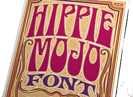 [MyFonts]
[More] ⦿
|
Muhammad Nurapik
[Handpik Design]

|
[MyFonts]
[More] ⦿
|
Muhammad Romzul Khoir
[Khoir]

|
[MyFonts]
[More] ⦿
|
Muhammad Zamroni Hamzah
[Sensatype (was: Sunshine Design)]

|
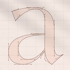 [MyFonts]
[More] ⦿
|
Murray Fuchs
|
Creator of phototype typefaces at VGC, such as Accant (1978) and Erwin (a comic book / psychedelic style face). Erwin was digitized by Nick Curtis and extended to Nerwyn NF (2010). At Photo Lettering (New York), he designed Erwin, Joanie, Off Beat (beatnik style), Space Age, Space Age A and Space Age Outline B. [Google]
[More] ⦿
|
Mussyayin
[Vermilione (or: Say Studio)]

|
[MyFonts]
[More] ⦿
|
MyFonts: Psychedelic type
|
MyFonts hit list for psychedelic typefaces from the good old 1960s. [Google]
[More] ⦿
|
MyFonts: Typefaces from the sixties
|
A list of digital typefaces that emulate the sixties. [Google]
[More] ⦿
|
Mysterylab
[Mott Jordan]

|
 American designer at ITC of the stern strong sans serif typeface ITC Verkehr (1996) and the open typeface ITC Hornpype (1997).
 In 2019, he set up Mysterylab just around the time that Quentin Tarantino released the Sharon Tate murder spoof Once Upon A time In Hollywood. He promptly designed the great collection of 1960s psychedelic fonts Psych Handlettering (layerable), Hippie Mojo, Summer of Love. Typefaces from 2020, still nostalgic of the 1960s and 1970s: Aerodyne (in 14 styles; mini-serifed), Maxos (a poster typeface that celebrates big ball terminals), Falkirk Script (a calligraphic signage script), Lotus Petal (psychedelic), Kaleidoscope (psychedelic, art nouveau), Sixties Flashback (psychedelic and wavy), Magnetic Script (a great baseball script), Psychotropic Experience (psychedelic). Typefaces from 2021: Big Sur (a 6-style Western slab serif), Carnaby Street (psychedelic), Klangfarbe Script (a delightful script; Mott writes that it is a true chameleon and is very much at home with a variety of looks: from a reimagining of kitschy 1950s scripts, to analog retro-tech, to steampunk, to high-fashion futuristic logos and beyond), Pure Psychedelia, Longshanks (a sharp-serifed condensed serif display font with low waist blade-like strokes, and small x-height, meant for titling use or to evoke fantasy worlds), Wavelength (a 10-style sans serif with oomph, characterized by a Euro-like lower case e). Typefaces from 2022: Afiche Script (a wonderful almost upright rounded signage script), Good Vibes (a whimsical circus announcement font). FontShop link. Linotype link. [Google]
[MyFonts]
[More] ⦿
|
Naan Type Studio
[David Buis]
|
Designer of the magic mushroom or arabesque revival font Mathis (2020). [Google]
[More] ⦿
|
Nami Studio
[Sahirul Iman]

|
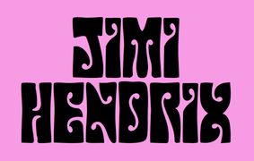 Demak, Indonesia-based designer of Starlight (2017), Petunia (2017, connected script), Barbarossa (2017, a spurred pirate font), Cogs & Crank (2017), Shobaru (2017, handcrafted comic book font), Bloobee (2017), Sambala (2017, marker script), Bratt Ralleigh (2017: dry brush script) and Ascendia (2017: handcrafted).
 Typefaces from 2018: Ginuks, Arthos, Galaradja (a macho octagonal typeface), Tintco, Kathullist (a monoline script), Weimbo, Hendrix Groove (psychedelic), Gorge & Ash (handcrafted), Turqoise (sic), Dagestan (modular), Xander (modular). Typefaces from 2019: Berm Creek, El Durango (Western), Survivor (a tribal or jungle font), Florentina, Ramones (an interlocking letter font with straight edges). Typefaces from 2020: Cup of Joe (a chunky typeface). [Google]
[MyFonts]
[More] ⦿
|
Nancy Nystrom
|
During her graphic design studies at Ringling College of Art and Design in Sarasota, FL, Nancy Nystrom created Hybrid (2012), a lava lamp typeface based on a crossing of Universe and Cooper Black. [Google]
[More] ⦿
|
Nauli Creative (or: Naulicrea Type, or: Nauli Type)
|
Creator of these typefaces in 2019: Monster Squad (for Halloween), the script fonts Coquettish, Marlissa, and Fussion, the signature font Carlantans, the blackletter typeface Tendencious, the brush font Hecklers, the children's book fonts Anima, Suga Rush and Planet Love, the oriental simulation font Kyoto, and Pattrious. In 2020, he designed Marco Valmory (2020: a psychedelic / art nuveau signage script) and Bali (2020: a display typeface). [Google]
[More] ⦿
|
Nazzar Saputra
[Craft Supply]

|
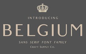 [MyFonts]
[More] ⦿
|
Ngene
[Wachid Ristiyanto]

|
 Yogyakarta, Indonesia-based designer of these vintage display and script typefaces in 2019: Crowlen Script, Boorani Thampil (+Script), Paradiso Script (signage), Almerian Script (monoline), Beastline Script, Fringland Script, Gorgeous Script, Gunstone Script, Harrison (Sans, Script, Illustration), Herschel (Sans, Script), Horseman (a monoline sans and script pair), Ironhead, Juliette (Sans, script), Milestone (retro signage script), Narmada (signage script), Portland (Sans+Script: monolined), Rampsey Script, Roosevelt, Shinola (script), Sultrans (Victorian, with ornaments), The Hometown.
 Typefaces from 2020: Sanur, Eiutneck Script (psychedelic), Sceageus (a wavy display font), Emillont, Nolian script (calligraphic), Wentworth (vintage label font dup in Serif and Script versions), The Brone (a decorative display script), Sankes (a signage script). Typefaces from 2021: Cartoen (a refinement of Horseman Sans), The Sgone. [Google]
[MyFonts]
[More] ⦿
|
Nick Curtis

|
Nick Curtis (b. Chicago, 1948) lived in Texas from 1952-1997, and lives since 1997 in Gaithersburg, MD and Alexandria, MD. From ca. 1990 onwards, he has been designing fonts, first for free, and then commercially. He had a great reputation as a "revivalist" type designer, with a particular interest in retro fonts and art deco types. In 2003, his site had become too popular and too expensive to maintain, and thus he went commercial as Nick's Fonts. In 2013, he stopped making fonts, and donated his collection of rare books and type material to the University of Virginia. Interview. Complete list of names and other info, maintained by Sander de Voogt. Interview in which we learn about his fondness for Corel Draw as a type design tool. Near the end of 2012, he posted this comment on his web site: Fifteen years ago, I embarked on a wonderful voyage of discovery, when I created my very first font with Fontographer 3.15. My maiden voyages were, frankly, rather clunky and amateurish, but I have been told that they showed promise. Well, sure enough, thanks to the diligent (and patient) efforts of Ilene Strizver, I polished up my craft enough to sell my humble efforts---first as a sideline business and, since 2006, as my full-time job. In total, I have produced over eleven hundred fonts---almost five hundred of them freeware fonts, which I conservatively estimate have been downloaded and enjoyed by over three million people worldwide. Unfortunately, this past year has brought a series of unanticipated setbacks, culminating in the loss of my wife's beautiful mind and soul to the scourge of alcoholism. In an effort to generate extra income to cover the expenses for her long-term care, I have proposed a number of, I believe, innovative ways to revamp the online font business; unfortunately, those efforts have fallen flat, primarily due to the professional font community's abject fear of crossing the $165 million Elephant in the Room. I even offered a special discount rate of 75% off retail price for full-time students of Typohile Forum. To date, there have been zero takers. Hell: even the webfont kit of one of my own fonts which I purchased from myfonts.com turned out to be an empty folder. Talk about a run of bad luck. Which leaves my with you, dear readers. If you or someone you know has had fun or made a buck from my humble efforts throughout the years, please donate whatever you can---even a lousy dollar would help---to help me out. I would greatly appreciate it. Home page. Dafont link. FontShop link. Klingspor link. Abstract Fonts link. View the typefaces designed by Nick Curtis. [Google]
[MyFonts]
[More] ⦿
|
Nick Curtis
[Nick Curtis: Psychedelic typefaces]

|
[MyFonts]
[More] ⦿
|
Nick Curtis
[Nick Curtis: Commercial typefaces]

|
[MyFonts]
[More] ⦿
|
Nick Curtis
[Nick Curtis: Typefaces from 2015]

|
[MyFonts]
[More] ⦿
|
Nick Curtis: Commercial typefaces
[Nick Curtis]

|
Nick Curtis (b. Chicago, 1948) lived in Texas from 1952-1997. Since 1997, he is in Gaithersburg, MD and Alexandria, MD. Since the 1990s, he has been designing fonts, first for free, and then commercially. He had a great reputation as a "revivalist" type designer, with a particular interest in retro fonts and art deco types. In 2003, his site had become too popular and too expensive to maintain, and thus he went commercial as Nick's Fonts. Interview. Free downloads at TypOasis. Complete list of names and other info, maintained by Sander de Voogt. Interview in which we learn about his fondness for Corel Draw as a type design tool. Home page. His free fonts are listed elsewhere. On MyFonts, he says this about himself: Nick's Fonts is a modest little foundry dedicated to the preservation of our rich typographic heritage. Most of the foundry's designs are based on authentic historical sources, gleaned from the massive collections of the Library of Congress. If you are looking for a font that captures the essence of the Wild West, the Gay Nineties or the Jazz Age, look here first: if it is not in the catalog, it will be soon. [Google]
[MyFonts]
[More] ⦿
|
Nick Curtis: Psychedelic typefaces
[Nick Curtis]

|
 Psychedelic era typefaces by Nick Curtis:
 [Google]
[MyFonts]
[More] ⦿
|
Nick Curtis: Typefaces from 2015
[Nick Curtis]

|
 Typefaces made by Nick Curtis in 2015:
 - Bothas Ruhm NF. After Blockschrift (1897, Genzsch and Heyse).
- Chiselle NF. A revival of Rustikalis, a typeface designed for the VGC Phototypositor in the 1960s. See Rustikalis DT (1=2007, Malcolm Wooden) for the revival of the bolder version.
- Coins Coupes NF. Modeled after Chamfer, a 19th-century octagonal typeface by Barnhart Bros & Spindler.
- Doright Black NF. Based on Dudley Upright (Dan X. Solo, 1960s).
- Feedbag NF. Based on Horse Tank (Fotostar).
- Inland Edwards NF. Based on Nicholas J. Werner's Edwards (1895, Inland Type Foundry).
- Millrich Grange NF. A revival of the 19th century font Grange by Miller & Richards.
- Mitchell NF. A digital revival of the grotesque all-caps typeface Mitchell (1906, Inland Type Foundry), the bold version of Blair (1900, Inland Type Foundry).
- Newfangle NF. A Victorian typeface based on Newfangle (1892, Hermann Ihlenburg).
- Page Five Fifteen NF. After William H. Page.
- Retrorocket NF. An art deco typeface after D. Duvillé, 1934.
- Rockwall NF. After Aldine by William H. Page.
- Telecomm NF.
- Versacrum NF. A psychedelic / art deco typeface inspired by the lettering of Alfred Roller for the Ver Sacrum magazine in 1903.
- Old Number Ten NF. A revival of a typeface Gothic Number Ten by the Cincinnati Type Foundry.
- Terranova NF. A prismatic typeface based on Earth (Dan X. Solo).
[Google]
[MyFonts]
[More] ⦿
|
Nine Club Studio
|
Boyolali, Indonesia-based designer (b. 1995) of the psychedelic typeface Astro World (2020) and the tall signature script typeface Jakarta (2020). [Google]
[More] ⦿
|
Nirmana Visual
[Sigit Dwipa]

|
Or Sgt. Nirmana. Denpasar, Bali-based designer (b. 1989) of the script typefaces Classy Beautiful (2018), Ballistick (2018), Britson (2018) and Absolute Neon Script (2018), the brush typefaces Raskhal (2018), Marker Brush (2018), Raskhal (2018) and Khalif Irsyad (2018), Halowen (sic) (2018), Corona (2018: Victorian), and Neon Absolute (2018). Typefaces from 2019: Sharoe (brush), Loveyou (script), Club Style (a fat finger font), Halentine (script), The Absolute, The Absolute Brush, The Prestige Signature, Helowen Monsta, Naibacarte, Jabetta, Antreh (a brush font), Mellurack, Laryo (script), Jokowi Prabowo, Ralisto (signature script), Urban Retro, Brashio, Diary Kidies, Bakusho (a dry brush typeface), Bigarus (a rough brush type), Summer Kidoza (a marker pen font), Rikabrush, Sabrva (free; hyper-ornamental, Victorian), Retroholic, Yavato (a great all caps dry brush), David Elika (brush type), Fatye (signature script), Hesrat (rough brush font), Angel Bilsh (a curly vampire font), Artistik (a painter's font), Brushot, Retro Type (post-psychedelic), Angel Brish, The Rustic (or Rusteak). Typefaces from 2020: Retro Signature, Summer Magic, Lovely Girl, Gatkins (a signature script), Shettricka, Star Light, Rustgia (script), Kallisha, Gilas (wild calligraphy), Belagia (a sweeping script), Gelathy (script), Bentho (wild calligraphy), Playfull, Ramadhan (Arabic emulation font), Craft Holic, Awesome Brush, Blooms, Crafter, Hiromi (calligraphic), Sketchy. Typefaces from 2021: Vako Mave (a display serif with a coathanger f), Airthay, Regist Bong (all caps, hand-drawn). Typefaces from 2022: Handsta Signature, Retro Boldy (a vintage bold display serif accentuated by deep penetrating inktraps). [Google]
[MyFonts]
[More] ⦿
|
Nobufont (was: Honey and Death)
[Mitsutoshi Nobusawa]
|
 Honey and Death offers free fonts designed by Mitsutoshi Nobusawa: The list: BlackoronAlp (2003), BlackoronKat, BlindfaithB (2003, experimental), BlindfaithBO, BlindfaithL, BlindfaithLO, BlindfaithO, BlindfaithR, BlindfaithRB, BlindfaithRBO, BlindfaithRL, BlindfaithRLO, BlindfaithRO, BlindfaithRR, ConnectlinePlains (2003, upright connected script), ConnectlineRail, ConnectlineSta, Constellation (2003, a planar graph), CooberBlackKat (2004, named after Cooper Black), CooberBlackOblKat, Dotline (2007, dotted line face), DotlineBold, DotlineHeavy, DotlineKat, DotlineLight, Dotline Slim (2017), FatfontInline (2004, psychedelic), FatfontOutline, FatfontSolid, GalaxyfaceAno (2003, experimental), GalaxyfaceHirAno, GalaxyfaceHirReg, GalaxyfaceKatAno, GalaxyfaceKatReg, GalaxyfaceReg, Griffinize (2003), HoneycombOut (hexagonal), HoneycombReg (2004), HoneycombSol, Ironbeadsfont (2005), Judaslike (2006), JudaslikeBegin, JudaslikeEnd, Keymaps (2004, a dot font), KnitfontA (2005), KnitfontB, LayerfaceOutline (2003, comic book style), LayerfaceSolid, LayerfaceUnion, Lightningvolt (2005), Lovedrops (2004), MakestencilAlp (2004), MechamaruAlp (2006), MechamaruKat, Paddleface (2003, Western), RyusenHir (2003), RyusenKat, Saigi, SeizaHir (2003), SeizaKat, Skateandfont (2003), Spacy (2003, letters made of bubbles), Sparkling (2003, another planar graph), Strongcil (2003, octagonal stencil), TansanHir (2003), TansanKat, TapefontAlp (2004), TapefontAlt, TapefontKat, Westerner (2006, Western face), Zigzag (2003). Direct download of the type 1 fonts and the truetype fonts. Fontspace link. [Google]
[More] ⦿
|
No-Fi Software
|
Free Rugby font for the Mac: " Rugby Font RugbyFont is a typeface based upon the lettering style used by the British psychedelic/drone band Spacemen 3 for their first couple of albums from 1986-1989." [Google]
[More] ⦿
|
Nurron Shodiqin
[Nurrontype (was: Neuron Neuron, or: Neuron Type)]

|
 [MyFonts]
[More] ⦿
|
Nurrontype (was: Neuron Neuron, or: Neuron Type)
[Nurron Shodiqin]

|
 Bandung, Indonesia-based designer of the tuxedoed art deco typeface Marcopolo (2019), the fashion mag typeface Prague Display (2019), the ball terminal extravaganza Brand (2019) and the inline Victorian typeface Larson (2019).
 In 2020, he designed the Victorian display typeface Migaela, the decorative serif typeface Nakilla, the curly decorative serif typeface Brasika Display, the Victorian typeface Sign Shop (with Pieter Bielous), Gentlemen Revival, the decorative didone typefaces Glinde and Lastone, and the octagonal typeface Mars Outline. Typefaces from 2021: Barbra (reverse stress, psychedelic), Longstride (a flared almost uncial typeface), Longstride (a flared almost uncial typeface), NT Tonight Show (a 12-style flared display family; in this font, Shodiqin attempted to instill a showbiz atmosphere as he admits being a fan of David Letterman's Tonight Show), Aschere (a psychedelic display typeface), Molen (a decorative serif), Molenilo (a medieval display typeface). Typefaces from 2022: NT Brick Sans (pixelish). Type Department link. [Google]
[MyFonts]
[More] ⦿
|
Nyapa Tanzil
[Damelev Studio (was: Logo Labs, Tanziladd, Rawi Project)]

|
 [MyFonts]
[More] ⦿
|
Oct 22 2025
[Flemming Bau]
|
[More] ⦿
|
Okara Harvey
|
As a student at QUT in Brisbane, Australia, Okara Harvey designed the psychedelic typeface Hei Matatu (2017). [Google]
[More] ⦿
|
Olga Vasik
|
Designer of the art nouveau / psychedelic typeface Psycho, which was developed during a workshop at Type Paris 2019. [Google]
[More] ⦿
|
Open City Design
[Phil MacIsaac]
|
 Charlottetown, Prince Edward Island-based designer of the free rounded retro typeface Narwhal (2018), the expressionist blackletter typeface Krautrock (2018), the free blackletter typeface Scotland (2018) and the free handcrafted typeface Soviet League (2018).
 Free typefaces from 2019: Norilsk, Chernobyl (Cyrillic simulation), Kaiser (a rounded blackletter), Campaign, Revolucion (constructivist), Oligarchy, Contraband (a free monoline script), Viking, Myrkvior (rune emulation), Vintage74, Art Nuvo (psychedelic, art nouveau). Typefaces from 2020: Vanity (a free German expressionist typeface), Nordic Club (a national park typeface), Shogun (a gaspipe font), Contraband (a monolinear font duo), Pariah (a rounded heavy blackletter). Dribble link. Open City Design link. [Google]
[More] ⦿
|
Othmar Motter

|
 Austrian graphic and type designer (b. 1927, Austria, d. 2010, Hard, near Bregenz) who set up Vorarlberger Graphik Studio in 1951 in the town of Hard am Bodensee (Lake Constance) after graduating in 1950 from a graphic arts academy in Vienna. He specialized in poster design, and in the late 1960s, early 1970s, he turned to logo and type design. His typefaces:
 - At Berthold and Letraset, he made his first set of typefaces, all phototypes: Motter Tektura (1975; used for the original Apple logo and the corporate typeface for Reebok; see also the free FontStruct font by Gene Buban called Motternasl (2011)), Motter Ombra (1972, a famous and popular psychedelic face; for revivals or extensions, see Zombra EyeFS (2013) by Antonio J. Morata, RL Lyra (2017) by Jozef Ondrik and AT Dombra (2014) by Zhalgas Kassymkulov), Motter Alustyle (1972; revival by Steve Harrison in 2019), and Motter Femina (early 1970s, a headline face; see MotterFemD (URW, 1994)).
- ITC: ITC Motter Sparta (1997), ITC Motter Corpus Bold. ITC Motter Corpus (1993, + Condensed) was turned by Adobe staff into a multiple master family. A free outlined typeface based on ITC Motter Corpus is Nick Curtis's Toyland NF.
- Fontshop: FF Motter Festival (2000).
- At Motter Design, in chronological order: Motter Danubia, Motter Ornata (psychedelic), Motter Ductus, Motter Forte, Motter Ferrum (octagonal), Motter Austriana, Motter Bodan, Motter Alustyle, Motter Sans Book, Motter Neo-Tech (fat octagonal), Motter Teak, Motter Tektura, Motter Factum (1998), Motter Air (2009, techno, by Siegmund Motter).
- At Motter Fonts: Motter Ombra, Motter Factum, Motter Femina, ITC Motter Sparta, Motter Regatta (1999), Motter Air, ITC Motter Corpus, Motter Bregenz (1970), Motter Pretiosa (1990), and Motter Festival (2000).
Linotype link. FontShop link. The web site Motter Fonts is managed by Othmar's grandchildren, Peter and Siegmund. An excerpt from his obituary at FontShop: Motter was the first Austrian designer who managed to establish his type designs on the international scene. In the early 70s four of his headline typefaces were produced by Berthold and Letraset: the striking ornate display sans Motter Ombra; the aforementioned Motter Tektura, a constructed sans; the striking geometric all lowercase typeface Motter Alustyle; and the curvaceous bold display script Motter Femina. In the following years the all-round graphic designer interrupted his type design activities, profiling himself through international assignments as a logo designer, winning several competitions. View Othmar Motter's typefaces. [Google]
[MyFonts]
[More] ⦿
|
Oui Studio
[Bobby Satria]

|
Bandung, Indonesia-based husband and wife team that designs display typefaces. Their catalog in 2021 showed these fonts: Coaction (a reverse stress high contrast script), Glitar (a psychedelic font), Quessera (a stylish font), Wickedelic (psychedelic), Aromanis (+Shadow), Blooming Time, Elora, Pottery, Spooky Forest, Tobias (a display font with psychedelic tendencies), Wolfie (a cartoon font family in 30 styles). [Google]
[MyFonts]
[More] ⦿
|
OutsideInside Fonts (was: Psychedelic Type)
[Humberto Mondaca Gillan]
|
Humberto Mondaca Gillan started the free font foundry Psychedelic Type in Mexico City. He designed the psychedelic fonts Psychedelia HM, 1960s Hippie and 1960s Symbols in 2009. In 2010, he created the bellbottom typeface Iron Butterfly HM, as well as Butterly Bleu HM. Some time later, he set up OutsideInside Fonts. His typefaces there include Flames (2017: a revival of Mecanorma's Dreamline of 1969), Village (2017), and Dogsmoke (2019; a revival of Seymour Chwast's Artone (1964) that is partly based on Nick Curtis's Loose Caboose NF; it looks identical to Iron Butterfly HM (2010)). Dafont link. Alternate URL. Home page. Another URL. Open Font Library link. [Google]
[More] ⦿
|
Panji Nugraha
[Storic Type (or: Flavor Type, or: Flavortype)]

|
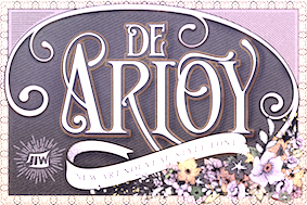 [MyFonts]
[More] ⦿
|
Panos Vassiliou
[Parachute]

|
 [MyFonts]
[More] ⦿
|
Paper Moon Type & Graphic Supply
[Scott Banks]

|
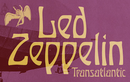 Scott Banks (Atlanta, GA) specializes in digital fonts with a printed letterpress or hand-lettered look and feel. In 2022, he released PM Doorbuster Casual, PM Doorbuster Plug (a supermarket font), PM Doorbuster Script, PM Eckmann Initials (a chromatic / layered version of Otto Eckmann's famous art nouveau font Eckmannschrift Initial Caps), PM Eckmannschrift (an art nouveau typeface; after Otto Eckmann's Eckmannschrift, 1900), PM Endora (a rough-edged curly vampire script), PM Showman (a layerable sans based on vintage hand-painted sign writing from the 1900s through the 1960s), PM Eckmore (psychedelic, art nouveau: after Otto Eckmann's Eckmann Schrift, 1900), PM Orchid (art nouveau), PM Alcorn (an all caps beatnik font) and PM Outpost (a national park font). [Google]
[MyFonts]
[More] ⦿
|
Parachute
[Panos Vassiliou]

|
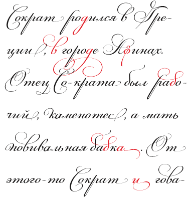 London, UK, and Athens and Kifissia, Greece-based type foundry started in 2001 by Panos Vassiliou. It specializes in fine multilingual (usually Latin, Greek and Cyrillic) typeface families. He is a graduate of the University of Toronto, Canada with a major in Applied Science and Engineering. Following his University of Toronto graduation, he studied Graphic Communications at Ryerson University. Panos Vassiliou has conducted numerous seminars for Canadian companies such as Bank of Nova Scotia, Royal Bank and Sony Canada. He graduated from the University of Toronto/Canada, where he studied Applied Science and Engineering. He has been Creative Director for the Canadian design firm AdHaus, former Publisher of the monthly magazine DNA (Greece) and Secretary-General for the Hellenic Canadian Congress (Ontario, Canada). He has been designing typefaces since 1993, including commercial fonts as well as commissions from Vodafone, Nestlé, Ikea and National Geographic. He started Parachute in 2001 setting the base for a typeface library that reflected the works of some of the best contemporary Greek designers, as well as creatives around the world obsessed with type. Apart from its commercial line of typefaces, Parachute offers bespoke branding services for corporate typefaces and lettering. Customers include Bank of America, the European Commission, UEFA, Samsung, IKEA, Interbrand, National Geographic, Financial Times, National Bank of Greece, Alpha Bank and many others.
 Myfonts link. Behance link. Other type designers at Parachute include Kanella Arapoglou, Alexandros Papalexis, Dimitris Foussekis, Aggeliki Skandalelli, Helen Gabara, Babis Touglis, Vangelis Karageorgos, George Toumbalis, Eva Karapidaki, Charis Tsevis, Pavlos Levendellis, Panos Vassiliou, and George Lygas. At Granshan 2010, Vassiliou won Second Prize in the Greek text typeface category for PF Encore Sans POro, and First and Second Prizes in the display typeface category for PF Regal Pro and PF Champion Script Pro, respectively. Typefaces: - Adamant
- PFAgora Pro: Agora Sans, AgoraSerif, AgoraSlab.
- Amateur
- PF Archive Pro (2004). He received a design award for his typeface Archive at the E AWARDS 2004. It has special typographic features and multilingual support for all European languages including Greek and Cyrillic.
- Armonia
- Astrobats
- Bague Universal and Bague Sans (2014). A geometric grotesk that dares to be different. Accompanied by Bague Slab Pro (2014), PF Bague Inline Pro (2014), and PF Bague Round Pro (2014).
- Baseline
- Beatnick
- Beau Sans (2011). Inspired by Bernhard Gothic.
- A custom didone font for Greece's Benaki Museum (2020-2021).
- PF Benchmark Pro (2014).
- Bodoni Script (2009).
- PF Brummell (2016). A sans characterized by sharp angled terminals and a diamond dot on the i.
- Bulletin Sans (2000-2005)
- Centro (Centro Sans, Centro Serif, Centro Slab) a typeface originally developed for the redesign of the Financial Times Deutschland. PF Centro Pro family (Sans, Serif, Slab, a trillion styles) won an European Design Award in May 2008 in Stockholm and at Paratype K2009. It was completed by PF Centro Serif Compressed, PF Centro Sans Condensed and PF Centro Sans Compressed in 2015. In 2016, he published PF Centro Slab Press.
- PFChampion Script Pro (2004-2008). A much lauded connected calligraphic script that is based on a calligraphic script by Joseph Champion, 1709-1765. Winner at Paratype K2009 and Granshan 2010. Images: i, ii iii, iv, v. The 4245-glyph family comprises Cyrillic, Latin and Greek subfamilies.
- Cosmonut (sic) (2002). A retro futuristoc typeface made by Dimitris Foussekis.
- PF Das Grotesk Pro (2014). Panos writes: Das Grotesk was inspired by earlier nineteenth-century grotesques, but it is much more related to American gothic designs such as those by M.F. Benton.
- DaVinciScript (2001-2006). A Treefrog-style script typeface by Vassiliou and Dimitris Foussekis.
- PF Dekka (2014). This solid elliptical sans family was influenced by Monaco's outline version called MPW. It includes PF Dekka Mono.
- PF DIN (2010): PF DIN Display (2002-2005), PF DIN Mono, PF DIN Serif (2016; this great serif version of DIN---a first---contains a wealth of goodies: just look at the great weather icons; it won an award at Granshan 2016), PF DIN Stencil Pro (2010), PF DIN Stencil, PF DIN Stencil B (2016), PF DIN Text Pro, PF DIN Text Condensed, PF DIN Text Compressed, PF DIN Text Arabic, and PF DIN Text Universal. With Latin, Cyrillic and Greek coverage, each font has about 1300 glyphs. The designs go back to the lettering of the Prussian railways around 1900. In 2013, PF Din Text Pro was published. In 2021, the three-axis (weight, width, italic) variable type system PF DIN Max saw the light.
- Eco Park. A 3d outline face.
- PF Encore Sans (2009). A rich and versatile sans family supporting Greek, Latin and Cyrillic.
- PF Fuel Pro
- PF Fusion Sans (1996-2006)
- PF Garamond Classic.
- PF Goudy Intials and PF Goudy Ornaments. A winner at Paratype K2009.
- PF Grand Gothik (2019). A large grotesque typeface family with three subfamilies and a variable font option. He writes: Grand Gothik is a postmodern, multiscript, multifaceted and variable type system which shines at its heavier extended versions with its hip, expressive, almost brutal energy. Grand Gothik's design space includes 3 axes for weight, width and one for italics. It is available as a variable font or as five separate opentype families---compressed, condensed, normal, wide and extended. Each family comes with 9 weights spanning from Extra Thin to Black plus italics.
- PF Handbook (2005-2007, sans family)
- HausSquare
- HellenicaSerif. Chiseled look, Greek simulation face.
- PF Highway Sans (2001-2015). Highway Sans Pro is based on the standard typefaces used for highway signs and other byways open to public travel in the United States. These standards were established by the US Federal Highway Administration in 1966 following several studies which were conducted at the California Department of Transportation in the 1940s. It covers Latin, Greek and Cyrillic.
- House Square. A Bank Gothic lookalike.
- PF Isotext (2005). Meant for technical documentation, it is modeled after Isonorm.
- Kids, KidsStuff
- Libera
- Lindemann and PF Lindemann Sans (2012).
- PF Marlet (2019). A sharp-edged humanist sans family fit for fashion mags: Marlet Titling, Marlet Finesse, Marlet Swash, Marlet Display, Marlet Text. PF Marlet, collected three awards one after the other, a year after appearing on Luc's best-of-2019 list. First, the coveted TDC Certificate of Typographic Excellence 2020 (at 23RDC), followed by another one from European Design Awards, a third distinction from Tokyo TDC and a fourth crown, Red Dot Award 2020, all in 2020.
- Mechanica A and B, 2002-2006. Octagonal families.
- PF Mellon (2019). A modernist variable grotesque influenced by nineteenth and early twentieth century condensed sans serif typefaces such as Stephenson Blake's Grotesque No.77 and ATF's Alternate Gothic.
- PF Monumenta (2002-2006). A majestic lapidary roman family.
- Muse
- Online (One, Two and Three). Pixelish family.
- PF Ornamental Treasures (2008). Byzantine ornaments and borders.
- PF Pixelscript
- Playskool
- Psychedelia (2003, Dimitris Foussekis). A psychedelic typeface.
- Regal Pro and Regal Finesse Pro: Award-winning high fashion display didone families, 2010-2012, originally designed for the Grazia magazine. Awards include Red Dot Awrd 2012, Communication Arts Annual Competition 2012, Creative Review Type Annual 2011, European Design awards 2011, EBGE awards 2011, Granshan Awards 2010. See also PF Regal Swash and PF Regal Stencil.
- PF Reminder Pro (2003). A hand-printed typeface.
- Scandal
- PF Spekk (2020). A simple versatile geometric sans for Latin, Greek and Cyrillic.
- PF Square Sans Pro, PF Square Sans Condensed Pro (2013).
- PF Stamps (2002-2006). A grungy stencil typeface by Panos Vassiliou and George Lygas.
- PF Synch Pro (2006). An industrial strength slab-serif typeface.
- PF UEFA Super Cup (2013).
- PF Uniform
- PF Venue (2017). Semi art deco, and free-spirited, a great poster typeface family.
- VideoText
- PF Wonderbats (2003). Funky and strange animals.
- Wonderland (2006). By Dimitris Foussekis.
Their type blog is called Upscale typography. Catalog. View all typefaces designed by Parachute. Klingspor link. MyFonts interview. [Google]
[MyFonts]
[More] ⦿
|
Parkinson Type Design
[Jim Parkinson]

|
 Jim Parkinson's Parkinson Type Design was based in Oakland, CA. This prolific type designer was born in 1941 in Richmond, CA, and lived in Oakland, CA. After a long struggle with Alzheimer's, he died on June 26, 2025 at his home in Oakland. Originally, a letterer, he went digital in 1990. His Keester and Azuza typefaces won awards at the TDC2 Type Directors Club's Type Design Competition 2002. MyFonts on Jim Parkinson and on his Parkinson Foundry. His impressive output:
 - Typefaces at the Parkinson Foundry: Fresno (2001, inline gothic), Hotel (2001, inline caps), Azuza (2001, a Latin serif family designed for newsprint; some italics were based on Dwiggins' Electra), Amboy (2001, inline like for signpainting), Chuck (2004, a display titling face), Richmond (2003, a geometric sans family in the spirit of Dwiggins' Metro, Erbar by Jakob Erbar and the Underground type of Edward Johnston), Modesto (2001, strikingly similar to John Downer's Panatela, even though both admit that this an unbelievable coincidence; Parkinson's copperplate gothic evolved from Parkinson's lettering on the famous Ringling Bros. and Barnum&Bailey Circus logo), Balboa (2001, a 19th century style condensed sans; extended to a wonderful chromatic layering typeface family in 2015 as Balboa Plus), Sutro (2003, a 19-style slab serif family), Wigwag (2003, a display family inspired by the mid-twentieth century Speedball lettering of Ross George and the work of Samuel Welo and Cecil Wade), Amador (2004, blackletter), Cabazon (2005, blackletter), Avebury (2005, blackletter based on types from the Caslon Foundry), and the lovely Benicia (2003, influenced by GoldenType). He writes about Azuza: In the 1990s I drew a text face for the San Francisco Chronicle. It was based on W. A. Dwiggins's Electra and incorporated many features of the Linotype Legibility Series: More compact, with a taller lowercase X-height, etc. That type was called Electric and it was the Chronicle's text face for nearly a decade, surviving several redesigns. From that, I made Azuza, a more detailed and sensitive style.
- At ITC (now Linotype), he designed ITC Bodoni, ITC Bodoni Twelve, ITC Bodoni Seventy Two, ITC Roswell Two, ITC Roswell Four (1998) and ITC Roswell Three (1998).
- His typefaces at Font Bureau include Antique Condensed Two, Buster, Comrade (1998, nice poster font, after the constructivist lettering by Belgian artist Jozef Peeters), El Grande (1991, fat display face), Parkinson (1994), Poster Black (1993), Showcard Gothic (1997), Showcard Moderne.
- At the Agfa Creative Alliance, he published Showcard Moderne, Antique Condensed Two, Bonita, Commerce Gothic (1998), Diablo (1996), Dreamland (1999, retro-futuristic), Fancy Stuff (1999), Generica Condensed (1994, grotesk), Industrial Gothic (1997), Mojo (1996; psychedelic, in the lettering style that was popularized by 1960s San Francisco artists Wes Wilson and Rick Griffin), Pueblo (1998).
- At Adobe, one can find Montara, his striking and psychedelic Mojo, and the gorgeous Jimbo.
- At FontFont, we have the FF Moderne Gothics series [FF Motel Gothic (1996), FF Matinee Gothic (1996), FF Goldengate Gothic (1996)] and FF Catch Words (1996).
- At Chank, he created Keester (2001).
- He designed the 4-weight family Electric for the San Francisco Chronicle (it was close to Dwiggins' Electra), but the Chronicle is no longer using it.
- Parkinson Electra (also based on Dwiggins's type) was published by Linotype in 2010.
- Typefaces from 2012: Meatball (fat lettering-style typeface), Hoosier Daddy (Western font).
- The list of newspapers and magazines using his fonts: Activa, Atlanta Journal, Birkenstock, Boston, Brownsville Herald, The Daily Cardinal, Charlotte Observer, Charleston Post&Courier, Chicago Tribune, The Citizen, Journal of Comm, Cromos, Daily Californian, Dallas Morning News, Rochester D&C, Financial Morgen, Design Magazine, Detroit Free Press, Editor&Publisher, El Graphico, National Enquirer, Entrepreneur, Esquire, SF Examiner, The New Examiner, Fast Company, New Fast Company, Montreal Gazette, Hamilton Spectator, Herman Miller, Ilta=Sanomat, InStyle, Kathemerini, Las Vegas Life, Newsweek.
- Typefaces from 2014: Sutro Deluxe (a layered chromatic wood type emulation font family that extends his 2003 font, Sutro).
- Typefaces from 2017: Sutro Initials (a chromatic layered pair of fonts), Aluminia (a revival of Dwiggins's Electra) designed exclusively for use in Bruce Kennett's book on W.A. Dwiggins.
MyFonts interview. FontShop link. More FontShop material on him. Klingspor link. View Jim Parkinson's typefaces. Obituary by Stephen Coles. [Google]
[MyFonts]
[More] ⦿
|
Patrick Burnens
|
Patrick Burnens designed the psychedelic typeface Groovy (1990) with CorelDraw. There used to be some description in French of the design process to help others. Dafont link. Fontspace link. [Google]
[More] ⦿
|
Patrick Griffin

|
 Type designer at Canada Type. Wikipedia tells us that Patrick Griffin had been locked away in a mental institution by Carter and Barbara, after he walked in on his mother performing oral sex on Jackie Gleason. He had a nervous breakdown and was sent to a mental hospital, where he came to the conclusion that Gleason was evil because he was fat, leading him to hate fat people. However, that is a different Patrick Griffin. The real Patrick Griffin, a graduate of York University, lives and works in Toronto, where he founded Canada Type and made it the most successful Canadian type foundry. His work is summarized in this 2009 interview by MyFonts. It includes lots of custom work for banks, TV stations, and companies/groups like New York Times, Pixar, Jacquin's, University of Toronto, and the Montreal Airport. His retail fonts include the following.
 - Ambassador Script (2007): a digital version of Juliet, Aldo Novarese's 1955 almost upright calligraphic (copperplate style) connected script, with hundreds of alternates, swashes, ends, and so forth. Done with Rebecca Alaccari.
- Autobats (2005).
- Ballantines Twelve (2014). A custom typeface for Allied Domecq Spirits & Wine Limited, the brand owner of Ballantine's Scotch Whisky.
- Bananas (2020). An 18-style informal sans.
- P22 Barabajagal (2018): P22 Barabajagal is a unique take on the display fat face by way of doodling fun. Somewhat informed by the shapes of an uncredited 1960s film type called Kap Antiqua Bold, this font's aesthetic is the stuff of boundless energy and light humour. This is the kind of font that makes you wonder whether it was drawn with rulers, protractors and compasses, or just by a mad doodler's crazy-good free hand.
- Bigfoot (2008), the fattest font ever made (sic).
- Blackhaus (2005), an extension of Kursachsen Auszeichnung, a blackletter typeface designed in 1937 by Peterpaul Weiß for the Schriftguss foundry in Dresden.
- Blanchard (2009): a revival and elaborate extension of Muriel, a 1950 metal script typeface made by Joan Trochut-Blanchard for the Fonderie Typographique Française, that was published simultaneously by the Spanish Gans foundry under the name Juventud.
- Bluebeard (2004), a blackletter face.
- Book Jacket (2010): this is a digital extension of the film type font Book Jacket by Ursula Suess, published in 1972.
- Boondock (2005): a revival of Imre Reiner's brush script typeface Bazaar from 1956.
- Borax (2011-2021). An ode to the typography scene of New York City and Chicago in the late 1970s.
- Broken (2006): grunge.
- Bunyan Pro (2016, Patrick Griffin and Bill Troop). Bunyan Pro is the synthesis of Bunyan, the last face Eric Gill designed for hand setting in 1934 and Pilgrim, the machine face based on it, issued by British Linotype in the early 1950s---the most popular Gill text face in Britain from its release until well into the 1980s.
- Chalice (2006). Religious and Cyrillic influences.
- Chapter 11 (2009): an old typewriter face.
- Chikita (2008): an upright ronde script done with Rebecca Alaccari, and rooted in the work of 1930s Dutch lettering artist Martin Meijer.
- Clarendon Text (2007). A 20-style slab serif that uses inspiration from 1953 typefaces by Hoffmann and Eidenbenz and the 1995 font Egizio by Novarese.
- Classic Comic (2010).
- Coconut and Coconut Shadow (2006). Great techno pop typefaces.
- Coffee Script (2004): the digital version of R. Middleton's Wave design for the Ludlow foundry, circa 1962. Designed with Phil Rutter.
- Colville (2017). A set of sans headline typefaces based on letters used by Canadian painter Alex Colville.
- Comic book typefaces: Caper or Caper Comic (2008), Captain Comic (2007), Classic Comic (2010), Collector Comic (2006, a comic balloon lettering family), Common Comic (2013).
- Counter (2008): A futuristic beauty with a double-lined cursive thrown in. Available exclusively from P22. This typeface was based on the idea for an uncredited film typeface called Whitley, published by a little known English typesetting house in the early 1970s.
- Cryptozoo (2009): Late director of design for VANOC, the Vancouver 2010 Olympic Committee, Leo Ostbaum, commissioned Canada Type to make a typeface for the Vancouver Winter Olympics. Patrick Griffin came up with a rounded signage font called Cryptozoo, whose Notice reads Concept and design by Leo Obstbaum, VANOC Brand & Creative Services. Additional character data and technical production by Canada Type. Copyright 2007 VANOC Brand&Creative Services.
- Dads Handwriting (2014, custom typeface).
- Dancebats (2004).
- Davis (2016, a slab serif) and Davis Sans (2016). Typeface families designed for precision-engineered corporate use. All proceeds will go towards higher education expenses of design graduates.
- Dokument Pro (2014). This is a reworking of a typeface made in 2005 by the late Jim Rimmer: Jim Rimmer aptly described his Dokument family as a sans serif in the vein of New Gothic that takes nothing from News Gothic. Dokument Pro is thoroughly reworked and expanded, with different widths still in the pipeline.
- Dominion (2006). Based on an early 1970s film type called Lampoon. Dominions severely geometric shapes are a strange cross between early Bauhaus minimalism and later sharp square typefaces used for instance in Soviet propaganda posters.
- Doobie (2006). 60s psychedelic style.
- Driver Gothic (2008): based on the typeface used for Ontario license plates. Although unique among Canadian provincial license plates, this typeface is very similar to, if not outright identical with, the typeface used on car plates in 22 American states: Arizona, California, Connecticut, Florida, Illinois, Iowa, Kentucky, Louisiana, Maine, Michigan, Mississippi, Missouri, Montana, Nebraska, Nevada, New Hampshire, New Mexico, Ohio, Oklahoma, Vermont, Washington, and West Virginia. Ideal for license plate forgers.
- Expo (2004): an octagonal family.
- Fab (2007). A tube-design family reminiscent of the 1980s. Ricardo Cordoba writes: Fab reminds me of leafing through my first Letraset catalog in the mid-1980s all those decorative typefaces with rounded ends and tubular shapes, trying to imitate the look of neon signage. But Fab, with its contemporary twist on that aesthetic, and its unicase characters, manages to look like a cross between Cholla Bold and Frankfurter Highlight. Its handtooled, narrow shapes are perfectly suited to pop subject matter and bright colors. Fab Trio can be used to create layered chromatic effects, but its components can stand alone, too. The Seventies sure aint drab in Patrick Griffin's hands.
- Fantini (2006). An update of the curly art nouveau typeface Fantan, a film type from 1970 by Custom Headings International.
- Feather Script (2012). A revival of an old Lettering Inc font from the 1940s, known then as Flamenco.
- Fido (2009) is the official font of dog owners everywhere. Has Saul Bass influences.
- Filmotype fonts: Filmotype Ace (2015; based on a Filmotype script from 1953), Alice (2008, a casual hand-printed design based on a 1958 alphabet by Filmotype), Filmotype Arthur (2015; based on a Filmotype script from 1953), Athens (2014), Filmotype Brooklyn (2009, a casual script based on a 1958 Filmotype font), Filmotype Candy (2012), Filmotype Carmen (2012), Filmotype Hemlock (2013, a retro signage script), Hickory (2014), Filmotype Homer (2014, a brush signage script), Filmotype Hudson (1955, based on a 1955 original), Filmotype Jessy (2009, a flowing upright connected script based on a 1958 design by Filmotype), Filmotype Jupiter (2015; based on a Filmotype brush script from 1958), Filmotype Kellog (2013), Filmotype Lakeside (2013, a retro signage typeface), Filmotype Leader (2013), Filmotype Liberty (2015; based on a Filmotype brush script from 1955), Filmotype Giant (2011, a condensed sans done with Rebecca Alaccari) and its italic counterpart, Filmotype Escort (2011, done with Rebecca Alaccari), Filmotype Keynote (2013, a connected bold advertising script), Filmotype Lacrosse (2013, a retro script from the 1950s sometimes used in department store catalogs of that era), Filmotype LaSalle (2008, based on a 1952 retro script by Ray Baker for Filmotype), Filmotype Harmony (2011, original from 1950 by Ray Baker), Filmotype Kentucky (a 1955 original by Ray Baker), Filmotype Kingston (a 1953 original by Ray Baker), Filmotype Lucky (2012, based on a font by Ray Baker), Filmotype Hamlet (a 1955 original by Ray Baker), Filmotype Panama (2012, a flared casual serif typeface based on a 1958 original), Filmotype Prima (2011, with Rebecca Alaccari), Filmotype Quiet (2010, based on a 1954 military stencil typeface by Filmotype), Filmotype Yale (2012, a wedding invitation script based on a 1964 original by Filmotype), Filmotype York (2014).
- Flirt (2005). Based on an art deco typeface found in a Dover specimen book.
- P22 Folkwang Pro (2017, at P22). A revival of Hermann Schardt's Folkwang (1949-1955, Klingspor).
- Fuckbats (2007).
- Fury (2008): an angry techno family.
- Gala (2005, expanded in 2017). By Griffin and Alaccari. Gala is the digitization of the one of the most important Italian typefaces of the twentieth century: G. da Milanos 1935 Neon design for the Nebiolo foundry. This designs importance is in being the predecessor - and perhaps direct ancestor - of Aldo Novareses Microgramma (and later Eurostile), which paved the worlds way to the gentle transitional, futuristic look we now know and see everywhere. It is also one of the very first designs made under the direction of Alessandro Butti, a very important figure in Italian design.
- Gallery (2004): art deco.
- Gamer (2004-2006), by Griffin and Alaccari: modeled after a few 1972 magazine advertisement letters, the origin of which was later identified as a common film type called Checkmate.
- Gaslon (2005): a modification of A. Bihari's Corvina Black from 1973.
- Gator (2007). A digital version of Friedrich Poppl's Poppl Heavy (1972), which in turn was one of the many responses by type designers to Cooper Black.
- Genie (2006): a psychedelic typeface based on a 1970s film type called Jefferson Aeroplane.
- Gibson (2011, with Kevin King and Rod McDonald). This 8-style humanist sans family is a revival of McDonald's own Monotype face, Slate. It was named to honour John Gibson FGDC (1928-2011), Rod's long-time friend and one of the original founders of the Society of Graphic Designers of Canada. All the revenues from its sale will be donated by Canada Type to the GDC, where they will be allocated to a variety of programs aiming to improve the creative arts and elevate design education in Canada.
- Go (2005): a techno face.
- Goudy Two Shoes (2006): a digitization and expansion of a 1970s type called Goudy Fancy, which originated with Lettergraphics as a film type.
- Gumball (2005). A bubblegum font modeled after Richard Weber's 1958 font, Papageno.
- Hamlet (2006): medieval. Based on an old type called Kitterland.
- Happy (2005). Happy is the digital version of one the most whimsical takes on typewriters ever made, an early 1970s Tony Stan film type called Ap-Ap. Some of the original characters were replaced with more fitting ones, but the original ones are still accessible as alternates within the font. We also made italics and bolds to make you Happy-er.
- Heathen (2005). A grunge calligraphic script: The original Heathen was made by redrawing Phil Martin's Polonaise majuscules and superposing them over the majuscules of Scroll, another Canada Type font. The lowercase is a superposition of Scrolls lowercase atop a pre-release version of Sterling Script, yet another Canada Type font.
- Hortensia (2009): a semi-script Victorian typeface modeled after Emil Gursch's Hortensia (1900). Codesigned with Rebecca Alaccari.
- Hunter (2005). A revival of a brush script by Imre Reiner called Mustang (1956).
- Hydrogen (2007, a rounded geometric unicase family.
- Informa (2009): a comprehensive 36-style sans serif text family based on traditional lettering. He says: While some typefaces classified as such exhibit too much calligraphy (like Gill Sans, Syntax and Optima), and others tend to favor geometric principles in rhythm and proportion (like Agenda, Frutiger and Myriad), Informa stays true to the humanist ideology by maintaining the proper equilibrium between the two influences that drive the genre, and keeping the humanist traits where they make better visual sense.
- Jackpot (2005): The idea for Jackpot came from a photo type called Cooper Playbill, which as the name implies was simply a westernized version of Cooper Black. The recipe was simple: Follow Mr. Coopers big fat hippy idea, cowboy it with heavy slabs, give it true italics, then swash away at both for beautiful mixture. And there you have the bridge between groovy and all-American. There you have the country lover shaking hands with the rock and roll enthusiast. There you have your perfect substitute for the very overused Cooper Black.
- Jazz Gothic (2005): an expansion of an early 1970s film type from Franklin Photolettering called Pinto Flare. Image.
- Jezebel (2007).
- The psychedelic typeface Jingo (2014, with Kevin Allan King): This is the digital makeover and major expansion of a one-of-a-kind melting pot experiment done by VGC and released under the name Mardi Gras in the early 1960s. It is an unexpected jambalaya of Art Nouveau, Tuscan, wedge serifs, curlycues, ball endings, wood type spurs and swashes, geometry and ornamental elements that on the surface seem to be completely unrelated.
- Johnny (2006): with Rebecca Alaccari; based on Phil Martin's Harem or Margit fonts from 1969.
- Jupiter (2007): based on Roman lettering.
- P22 Klauss Kursiv (2018). A revival, at P22, of Karl Klauss's crisp fifties script typeface Klauss Kuriv (1956-1958, Genzsch & Heyse).
- Latex (2015). A layered all caps decal typeface.
- Leather (2005): an expansion of Imre Reiner's blackletter typeface Gotika (1933).
- Libertine (2011). Libertine (done with Kevin Allan King) is an angular calligraphic script inspired by the work of Dutchman Martin Meijer (1930s): This is the rebel yell, the adrenaline of scripts.
- Lionheart (2006). A digitization and extension of Friedrich Poppl's neo-gothic typeface Saladin.
- Lipstick (2006): handwriting. Plus Lipstick Extras.
- Louis (2012). A faithful digital rendition and expansion of a design called Fanfare, originally drawn by Louis Oppenheim in 1927, and redrawn in 1993 by Rod McDonald as Stylu.
- Maestro (2009) is a 40 style chancery family, in 2 weights each, with 3350 characters per font, co-designed with calligrapher Philip Bouwsma. This has to be the largest chancery/calligraphy family on earth.
- Magellan (2014). A custom stencil typeface.
- Martie (2006). Done with Rebecca Alaccari. Based on the handwriting of Martie S. Byrd.
- Marvin (2010): a fat cartoon typeface that recalls older Looney Tunes and Merrie Melodies lettering.
- In 2013, Kevin Allan King and Patrick Griffin revived Georg Trump's transitional typeface Mauritius (1967, Weber).
- Memoriam (2009): An extreme-contrast vogue display script which was commissioned by art director Nancy Harris for the cover of the 2008 commemorative issue of the New York Times magazine. He also did the typography and fonts for the 2010 issue. This became an unbelievably successful family, and was extended in 2011 with headline, Outline and Iline variants.
- Merc (2007). Based on an all-cap rough-brush metal typeface called Agitator, designed by Wolfgang Eickhoff and published by Typoart in 1960.
- Messenger (2010), a calligraphic script. Patrick Griffin writes about Messenger (2010, Canada Type): Messenger is a redux of two mid-1970s Markus Low designs: Markus Roman, an upright calligraphic face, and Ingrid, a popular typositor-era script. Through the original film typefaces were a couple of years apart and carried different names, they essentially had the same kind of Roman/Italic relationship two members of the same typeface family would have. The forms of both typefaces were reworked and updated to fit in the Ingrid mold, which is the truer-to-calligraphy one.
- Middleton Brush (2010): a redigitization of R.H. Middleton's connected brush typeface Wave, ca. 1962; see also an early Canada Type face, Coffee Script.
- Miedinger (2007). Created after Max Miedinger's 1964 face, Horizontal. Canada Type writes: The original film typeface was a simple set of bold, panoramically wide caps and figures that give off a first impression of being an ultra wide Gothic incarnation of Microgramma. Upon a second look, they are clearly more than that. This typeface is a quirky, very non-Akzidental take on the vernacular, mostly an exercise in geometric modularity, but also includes some unconventional solutions to typical problems (like thinning the midline strokes across the board to minimize clogging in three-storey forms). This digital version introduces a new lighter weight alongside the bold original..
- Militia (2007). An octagonal and threatening stencil.
- Militia Sans (2007).
- Monte Cristo (2012, with Kevin Allan King) is a grand type family with five styles and 1630 characters with many swashes and ways of connecting the calligraphic glyphs---it is the ultimate wedding font.
- Neil Bold (2010): an extension of the fat typeface Neil Bold (1966, Wayne J. Stettler).
- Nightlife (2005): inspired by a pre-desktop publishing grid design by L. Meuffels.
- Nuke (2005): a fat stencil grunge weith pizzazz.
- In 2011, he and Kevin Allan King published the refined Orpheus Pro family, which was based on the elegant Orpheus by Walter Tiemann (1926-1928, Klingspor), and its Italic which was called Euphorion (Walter Tiemann, 1936). Their enthusiastic description: The Orpheus Pro fonts started out as a straightforward revival of Tiemann's Orpheus and Euphorion. It was as simple as a work brief can be. But did we ever get carried away, and what should have been finished in a few weeks ended up consuming the best part of a year, countless jugs of coffee, and the merciless scrutiny of too many pairs of eyeballs. The great roman caps just screamed for plenty of extensions, alternates, swashes, ligatures, fusions from different times, and of course small caps. The roman lowercase wanted additional alternates and even a few ligatures. The italic needed to get the same treatment for its lowercase that Tiemann envisioned for the uppercase. So the lowercase went overboard plenty alternates and swashes and ligatures. Even the italic uppercase was augmented by maybe too many extra letters. Orpheus Pro has been a real ride. Images of Orpheus: i, ii, iii, iv, v.
- Outcast (2010): a grunge family.
- Oxygen (2006): a great grid-based design.
- Paganini (2011,(with Kevin Allan King) is another jewel in Canada Type's drawers: Designed in 1928 by Alessandro Butti under the direction of Raffaello Bertieri for the Nebiolo foundry, Paganini defies standard categorization. While it definitely is a classic foundry text typeface with obvious roots in the oldstyle of the Italian renaissance, its contrast reveals a clear underlying modern influence.
- The last joint project of King and Griffin in 2012 was Pipa, a pseudo-psychedelic groovy bellydancing font: Originally made for a health food store chain we cannot name, Pipa is the embodiment of organic display typography.
- Player (2007). An 11-style athletic lettering family.
- Plywood (2007): a retro typeface based on Franklin Typefounders's Barker Flare from the early 1970s.
- Press Gothic (2007). A revival of Aldo Novarese's Metropol typeface, released by Nebiolo in 1967 as a competitor to Stephenson Blakes Impact.
- Quanta (2005, stencil). Two weights, East and West.
- In 2011, Kevin Allan King and Patrick Griffin completed work on an exceptionally beautiful revival, Ratio Modern (the original by F.W. Kleukens is from 1923). This is a didone family with a refined humanist trait.
- Rawhide (2006): a bouncy Western saloon font based on cover page lettering of the Belgian comic book series Lucky Luke.
- Recta (2011, with Kevin King). This is eighteen-stye sans family that extends Novarese's Recta.
- Rhino (2005): a revival of the informal typeface Mobil (1960, Helmut Matheis, Ludwig&Mayer).
- Normandia (2021, by Patrick Griffin and Hans van Maanen). A digital revival of the fatface typeface Normandia by Alessandro Butti at Nebiolo (1946-1949).
- Noteworthy (2009). A font commissioned for the Apple iPad. It is based on Griffin's earlier revival typeface Filmotype Brooklyn.
- Ronaldson Regular (2008, with Rebecca Alaccari), a 17-style oldstyle family based on the 1884 classic by Alexander Kay, Ronaldson Old style (MacKellar, Smith&Jordan). Griffin reconstructed this family from the metal typeface and from many scans from rare documents provided by Stephen O. Saxe, Philippe Chaurize and Rebecca Davis.
- Roos (2009): A 10-style revival of Sjoerd Hendrik de Roos's De Roos Romein (1948), created in cooperation with Hans van Maanen.
- Robur (2010): Done with Kevin King, this set of two fonts revives Georges Auriol's Robur Noir from 1909.
- Runway (2004): racetrack lettering.
- Rush (2005): futuristic.
- Sailor (2005): digital rendition of West Futura Casual (late 1970s film type).
- Salden (2019, by Hans van Maanen and Patrick Griffin). A grand effort to collect the lettering of Dutch book and book cover designer Helmut Salden in a series of typefaces.
- Salome (2008). Done with Rebecca Alaccari, this is a revival and expansion of a photolettering era typeface called Cantini (1972, Letter Graphics).
- Santini (2004): Bauhaus-inspired architectural lettering.
- One of Heinz Schumann's unpublished typefaces from the early 1960s was revived in 2017 by Patrick Griffin and Richard Kegler at P22 as P22 Schumann Pro.
- Screener (2006): an extensive octagonal family, including Screener Symbols.
- Sears Social (2014). A custom typeface family that includes Sears Social Monocase.
- Secret Scrypt (2004): four shaky script styles done for a New York restaurant. With Alaccari.
- Semplicita Pro (2011). A grand revival of Alessandro Butti's Futura-like Semplicità, executed between 2009 and 2011 by Patrick Griffin and Bill Troop. Image of the Medium weight.
- Shred (2010): an octagonal heavy metal face.
- Siren Script (2009-2010): Done with Rebecca Alaccari, this six-style script family is based on the metal typeface Stationers Semiscript (BBS, 1899).
- Skullbats (2005).
- Serial Killer (2005): bloody.
- Slang (2004): a blood scratch face.
- Slinger (2010): a flared art nouveau face.
- Social Gothic (2007). After Tom Hollingsworth's Informal Gothic, a squarish unicase grotesk done in 1965. Followed by Social Stencil (2011-2012) and Social Gothic 2 (2014).
- Soft Press (2012). A rounded version of Canada Type's Press Gothic.
- Sol Pro (2010): a 20-style revival and extension of the monoline sans typeface Sol by Marty Goldstein and C.B. Smith (1973, VGC), done with Kevin Allan King. Griffin writes: This is not your grandfather's Eurostile. This is your offspring's global hope, optimism, and total awareness.
- Spade (2012). A super-heavy slab face, done with Kevin King.
- Spadina (2010): a psychedelic / art nouveau revival with Kevin Allan King of Karlo Wagner's Fortunata (1971, Berthold).
- Sterling Script (2005): done with Rebecca Alaccari. Sterling Script was initially meant to a be digitization/reinterpretation of a copperplate script widely used during what effectively became the last decade of metal type: Stephenson Blake's Youthline, from 1952. Many alternates were added, so this is a virtually new type family.
- Sultan: a Celtic-Arabic simulation typeface after "Mosaik" (1954) by Martin Kausche.
- Stretto (2008) is a revival and expansion of the reverse stress font Sintex 1 (Aldo Novarese, Nebiolo and VGC, 1973), a funky nightclub face. It was used as the basis of Cowboy Hippie (2010, CheapProFonts). Similar typefaces include ITC Zipper (1970) and Berthold Beat Star (1972).
- Symposium Pro (2011). This Carolingian family was drawn by Philip Bouwsma. Patrick helped with the production.
- Tabarnak (2012) and its shaded version, Tabarnouche (2012). Lovingly named to attract business from Quebec, this is a packaging or signage pair of fonts.
- Taboo (2009) is a geometric display typeface that was inspired by lettering by Armenian artist Fred Africkian in 1984.
- Testament (2010): a calligraphic uncial family done with Philip Bouwsma.
- Tomato (2005): done with Rebecca Alaccari, this is the digitization and quite elaborate expansion of an early 1970s Franklin Photolettering film type called Viola Flare.
- Treasury (2006): a huge type family based on a calligraphic script by Hermann Ihlenburg from the late 19th century. Canada Type writes: The Treasury script waited over 130 years to be digitized, and the Canada Type crew is very proud to have done the honors. And then some. After seven months of meticulous work on some of the most fascinating letter forms ever made, we can easily say that Treasury is the most ambitious, educational and enjoyable type journey we've embarked upon, and we're certain you will be quite happy with the results. Treasury goes beyond being a mere revival of a typeface. Though the original Treasury script is quite breathtaking in its own right, we decided to bring it into the computer age with much more style and functionality than just another lost script becoming digital. The Treasury System is an intuitive set of fonts that takes advantage of the most commonly used feature of todays design software: Layering.
- Trump Gothic (2005): a revival and expansion of two different takes on Signum (1955, Weber), Georg Trumps popular mid-twentieth-century condensed gothic: Less than one year after Signum, the Czech foundry Grafotechna released Stanislav Marso's Kamene, a reinterpretation of Signum. The differences between the two were quite subtle in most forms, but functionally proved to offer different levels of visual flexibility. Marso changed a few letters, most notably the wonderful a and g he added, and also made a bold weight. Trump Gothic West is a revival of Trump's original Signum, but in three weights and italics for each. Trump Gothic East is a revival of Marso's Kamene, but also in three weights and corresponding italics.. In 2013, Patrick Griffin redrew and optimized these condensed and ultra-economical typefaces in his Trump Gothic Pro and the rounded version, Trump Soft Pro.
- Trump Script (2010) revives the African look script by Georg Trump called Jaguar (1962). An improvement on an earlier Canada type family called Tiger Script.
- Tuba (2010).
- Valet (2006): inspired by an uncredited early 1970s all-cap film type called Expression.
- Veronica Polly (2005).
- Vintage Deco (2017).
- Vox (2007): a 24-style monoline sans family done with Rebecca Alaccari. This was followed in 2013 by a softer version, Vox Round.
- Wagner Grotesk (2010): a sturdy grotesk, after a typeface from the Johannes Wagner foundry. Kevin King is also credited.
- Wagner Script Pro (2011). Done together with Kevin King, this is a revival of Troubadour (1926, Wagner&Schmidt).
- King and Patrick Griffin published Wonder Brush in 2012. This is partly based on a signage brush script called Poppl Stretto (1969) by Friedrich Poppl.
- Opentype programming help for several fonts by Michael Doret, such as Deliscript (2009), Dynascript (2011) and Steinweiss Script (2010). Deliscript (a winner at TDC2 2010) is an upright connected script with accompanying slanted version. Steinweiss Script is a 2200-glyph curly script typeface called Steinweiss Script (2010), which captures a lot of the spirit of Steinweiss's album covers from the late 1930s and 1940s.
- HWT Tangent (2021, at P22). This revives a Morgans & Wilcox wood typeface known as Tangent in the Hamilton Manufacturing collection (after Hamilton took over Morgans & Wilcox).
- Patrick Griffin did the final mastering in 2021 for P22 Underground Pro, which was developed over the years by Richard Kegler (1997), Paul D. Hunt (2007) and finally, Dave Farey (2021) and James Todd (2021). This comes close to being thee ultimate implementation of Johnston's Underground.
- Filmotype Andrew (2021). A bold and wide extension of the retro casual script font Filmotype Athens.
- Ronaldson Pro (2021). A revision and extension of Griffin's 2006 font, Ronaldson Old Style. It now has four weights and two variable fonts.
Klingspor link. [Google]
[MyFonts]
[More] ⦿
|
Paul D. Hunt
[Pilcrow Type]

|
 [MyFonts]
[More] ⦿
|
Paulina Llamas
|
Art director in Mexico City. She created the psychedelic / pop art typeface Bubble Pop (2012). [Google]
[More] ⦿
|
Pete Joison
[Uddi Uddi fonts]
|
[More] ⦿
|
Peter Rosenfeld
[Profonts]

|
[MyFonts]
[More] ⦿
|
Peter Steiner

|
Painter and designer, b. Lochen, Germany, 1926, Graduate under Walter Brudi of the Akademie der bildenden Künste in Stuttgart. He taught at that school from 1962 until his retirement. Designer of these typefaces: - The slightly psychedelic art nouveau film typeface Swing (1974, Bertghold AG). This typeface was revived and expanded in 2007 as Steiner Special (2007, Rebecca Alaccari, Canada Type).
- Alpine (1974, Berthold AG).
- Black Body (1973, Berthold AG). Revived and extended by Jonathan Hill as Mekon in 2010.
- Black Pepper (1972). Florian Hardwig wrote that Black Pepper was exclusively available from Anton Herkner Graphisches Atelier, a phototype studio in Stuttgart, Germany.
- Dektiv Double (1975, Berthold AG).
- Jockey (1974, Berthold AG).
[Google]
[MyFonts]
[More] ⦿
|
Peter Wiegel
[CAT Design Wolgast]
|
 [More] ⦿
|
Phil Bracco
[Pink Broccoli]

|
 [MyFonts]
[More] ⦿
|
Phil MacIsaac
[Open City Design]
|
 [More] ⦿
|
Pilcrow Type
[Paul D. Hunt]

|
 Type and graphic designer from Joseph City, AZ. His first degree was from Brigham Young University. He was a type designer at P22/Lanston from 2004-2007. In 2008, he obtained an MA in typeface design from the University of Reading where he designed the typefaces Grandia and Grandhara (Indic). In January 2009, he joined Adobe just after Thomas Phinney left. He lives in San Jose, CA. His talk at ATypI 2014 in Barcelona was entitled The history of non-Latin typeface development at Adobe.
 He created Howard (2006, a digitization of Benton's Sterling), P22 Allyson (2006, based on Hazel Script by BB&S; a winner at Paratype K2009), the P22 FLWW Midway font family (2006-2018: Midway One, Two and Ornaments; based on the lettering found on the Midway Gardens working drawings of Frank Lloyd Wright from 1913---tall-legged and casual), Kilkenny (2005, P22), a Victorian-style font based on the metal types named Nymphic and Nymphic Caps which were designed by Hermann Ihlenburg in 1889. This typeface has almost 1000 glyphs and comes in OpenType format. It includes Cyrillic characters. Check the studies here and here. For another revival of Nymphic Caps, see Secesja by Barmee. Designer of the display typefaces Seventies Schoolbook (2004) and Interlocq (2004). Hunt also digitized Goudy's Village (2005). Village was originally designed by Fredric Goudy in 1903 for Kuppenheimer & Company for advertising use, but it was decided it would be too expensive to cast. It was later adopted as the house face for Goudy's and Will Ransom's Village Press. The matrices were cut and the type cast by Wiebking. The design was influenced by William Morris's Golden Type. This Venetian typeface was digitized by David Berlow (1994, FontBureau) and by Paul D. Hunt (2005). Hunt's version was eventually released in 2016 by P22/Lanston as LTC Village. He revived Hazel Script (BB&S), which he renamed Allyson (2005). Still in 2005, he created a digital version of Sol Hess' Hess Monoblack called LTC Hess Monoblack. In 2006, he published a nice set of connected calligraphic script fonts, P22 Zaner. Bodoni 175 (2006, P22/Lanston) is a revival of Sol Hess' rendition of Bodoni. He was working on Junius (2006), a revival/adaptation of Menhart Antiqua. Frnklin's Caslon, or P22 Franklin Caslon, was designed in 2006 by Richard Kegler and Paul Hunt in collaboration with the Philadelphia Museum of Art. This slightly eroded font set includes faithfully reproduced letterforms digitized directly from images of impressions made by Benjamin Franklin and his printing office circa 1750. It comes with a set of ornaments. In 2007, he used Goudy's 1924 typeface Italian Old Style in the development at P22/Lanston of LTC Italian Old Style. That typeface was remastered and extended to cover several languages by James Grieshaber in 2011. In 2014, Paul Hunt finished work on the wood type revival font HWT Bulletin Script Two (P22 & Hamilton Wood Type). This backslanted psychedelic typeface can be traced back to the wood type manufacturers Heber-Wells (Bulletin Condensed, No. 5167), Morgans and Wilcox (Bulletin Script No. 2, No. 3184), Empire Wood Type (1870: Bulletin Script), Keystone Type Foundry (1899: Bulletin Script), Hamilton (117), and Wm. H. Page & Co (No. 111 through No. 113). Free fonts at Google Web Fonts: Source Sans Pro (2012; Source Sans Pro for the TeX crowd), Source Code Pro (2012, a companion monospaced sans set by Paul D. Hunt and Teo Tuominen). Source Serif Pro, its Fournier-style relative, was developed at Adobe by Frank Grießhammer. They can also be downloaded from CTAN and Open Font Library. Fun creations at FontStruct in 2008-2009: Possibly (a stencil loosely based on the Mission Impossible series logo), Probably (same as Possibly but not stenciled), Med Splode, Arcade Fever, negativistic_small, New Alpha_1line, New Alpha_4line, New Alpha_bit, New Alpha_dot [dot matrix font], New Azbuka [after Wim Crouwel's New Alphabet from 1967], positivistic, slabstruct_1, slabstruct_too, structurosa_1, structurosa_bold, structurosa_bold_too, structurosa_caps, structurosa_faux_bold, structurosa_leaf, structurosa_script, structurosa_soft, structurosa_tape, structurosa_too, structurosa_two, Slabstruct Too Soft, Structurosa Clean Soft, Structurosa Script Clean, Structurosa Clean, Structurosa Clean Too, Structurosa Clean Leaf, Structurosa Boxy, Stucturosa Script Heavy. In 2010, he designed he programming font Sauce Code Powerline. Well, this is probably a renaming of Source Code by some hackers. Just mentioning that sauce Code is on some Github pages. Klingspor link. Google Plus link. [Google]
[MyFonts]
[More] ⦿
|
Pink Broccoli
[Phil Bracco]

|
 Foundry located in Westbury, NY, and run by Phil Bracco (b. 1981, Big Horn, MT), a graduate of the Pratt Institute. Creator of the festive signage fonts Charming Charlie PB (2009), Hip Hopper PB (2008, inspired by the lettering on an art poster by Patrick Owsley for the cartoon character Hoppity Hooper), Fat Rhino PB (2008) and Pink Broccoli PB (2008). Hideaway (2008) is a light-hearted comic flare serif typeface inspired by a 1964 Speedy Gonzalez cartoon title. More comedy in Chop Phooey (2008), Astronaut Jones (2008), Lil Rhino PB (2008), Houseguest PB (2008), Spidertoes PB (2009) and Tiny Butler (2008). Chorizo PB (2008) is inspired by some of the wild lettering of comic creator Paul Coker, Jr. Houndcats PB (2008) is a comic book sans based on a 1972 cartoon called Houndcats. Manic Mood PB (2008), Kid Captain PB (2009), Bear Club PB (2009), Hot Streak PB (2009) and Suited Horse PB (2008) have more comic book lettering. Suited Horse PB (2009) is a chalkboard font inspired by the title screen of a 1968 Walt Disney film titled, The Horse in the Gray Flannel Suit. Monster Fiesta PB (2009) is a curly display typeface. Chop Chop PB (2009) is an oriental brush simulation face. Fathoms BB (2009) is a crazy sans serif font based on the titling from one of ABC's Movie of the Week series from 1969 called Daughter of the Mind. Dead Rite PB (2011) and Whipsnapper (2013) are oddball cartoon typefaces.
 In 2012, Bracco published Mister Rii PB. In 2013, Phil Bracco designed Screwby (offbeat retro style that started out as a digitization of the film typeface Surf by Lettergraphics) and Contraption (an octagonal typeface family that started out as a digitization of a film typeface called Intrigue by Lettergraphics). Typefaces from 2014: Wonderbear PB (a cartoon typeface based on the title screens and comic books of the Hair Bear Bunch), Sackem PB (Bracco explains: Sackem started as a digitization of a singular film typeface called Benman Jumbo by Lettergraphics. From there, this mechanical typeface was expanded into a giant family of playful widths and obliques: from the condensed Slim style to the original Jumbo style). Typefaces from 2015: Beaucoup PB (Beaucoup started as a digitization of a film typeface called Bippie by Facsimile Fonts), Luckmeister PB (offbeat, retro and cartoonish, from the vintage record cover, Music from MR. Lucky, composed and conducted by Henry Mancini), Good Grief PB (which started out as a digitization of a film typeface called Carmel by Letter Graphics), MardiKrewe PB (funky psychedelic letters, described by Phil as delightfully insane; it started as a digitization of a film typeface called MardiGras by Lettergraphics). Typefaces from 2016: Cat Burglar PB (inspired by the titling of a 1961 Looney Tunes cartoon called "The Pied Piper of Guadalupe"), Birthday Wish PB (beatnik style), Flawless Flygirl PB (beatnik style), Jus Hangin PB (children's script inspired by the lettering on the cover of the 1999 Counting Crows album "This Desert Life"). Typefaces from 2017: Roadie PB. Typefaces from 2018: Roadie PB, Chilidog PB, Cattleprod PB, Varmint PB (an offbeat flared serif font inspired by the titling of the early 1970s Yosemite Sam & Bugs Bunny comics from Gold Key), Nudity PB (a revivo the film font Ad Shadow by LetterGraphics as a layerable font), Wintermint (a revival and extension of the flared almost psychedelic typeface Lori by LetterGraphics). Nudity PB, Wintermint, Patsy PB (beatnik style). Typefaces from 2019: Ridiculous PB (beatnik), Troubled PB, Blackhole PB (a digitization of a bullethole psycjedelic film typeface known as Circue Solid by LetterGraphics), Stacked Deck PB (a retro font), Mushmouth PB (based on Lettergraphics' cartoon font Albert), Rackem PB (a beatnik font that started as a digitization of a film typeface known as Eightball by LetterGraphics). Typefaces from 2020: Jughead PB (inspired by Cooper Black and Archie Comics). Typefaces from 2021: Uncanny Cat PB (a beatnik font), Goondocks PB (octagonal; a faithful recreation of the titling font from 1985 film, The Goonies), Friday Freak PB (a beatnik all caps typeface inspired by the 1976 Disney movie Freaky Friday), Soulfinger PB (a psychedelic and beatnik hybrid). View Phil Bracco's typefaces. [Google]
[MyFonts]
[More] ⦿
|
Pompo
|
Ismailia, Egypt-based designer of the Victorian typefaces Black Scava (2017) and Black Cupio (2017) and the psychedelic layered font Easy Way (2017). [Google]
[More] ⦿
|
Prio Nurokhim Aji
[Prioritype]

|
[MyFonts]
[More] ⦿
|
Prioritype
[Prio Nurokhim Aji]

|
Kebumen, Indonesia-based designer (b. 1997) of these typefaces in 2020: Arkaedos (a creamy script), Amtera (a fat finger font), Takidos (children's letters), Merilland, Tamword, Terasu Brush (a dry brush script), Chalk Perio (a chalk font), Diltoon (a cartoon font), , Savattera, Pecattes (a very dry brush script), Dhecalovia (a fat finger font), Launsela (a fat finger font), Super Love Christmas, Bevalonia, Butter Spoky, Super Love Christmas, Merilland, The Bonbon, Annila Script, Kagatsun, Frangstton, Sophomore, Reacter, Oliotton, Many Cheeks, Keyrannha (monoline script), Chatalisa, Dhecca House (a monoline script), Ligotra (all caps, Victoriana), Fagetone (a retro signage script), Gangsoka (an angry serif), the script font Meltinghones and the monoline script typefaces Caligendings and Frangstton. Typefaces from 2021: Flower Glory (a counterless kindergarten font), Delichan (a calligraphic script), Smile Darling (a decorative stencil), Fondest (a Peignotian sans with a hipster f), Mintage (a retro serif), Klender (a descendant of Cooper Black), Charming Smile (a plump painted font), Hey Tiny (a fat finger font that emulates a child's hand), Central Display, Street Ruins (a graffiti font), Bruskest (a bold dry brush script), Klemer Display (a flat top display typeface), Nectarine (a plump almost psychedelic font), The Burcey (a casual cutout typeface), Relation De Luxe (a rounded all caps sans characterized by many interlocking pairs), Qochy (a display font with elephant feet serifs), Urban Starblues (a graffiti font duo), Urban Java (a reverse stress Western font), Brugty (a bold display typeface in the Cooper Black / Windsor genre), Organic Peach (a fat finger font), Kosans (all caps), Magilio (in the trendy Windsor / Cooper Black style), Elkoga (an 8-style rounded wedge serif), Onedrips (a dripping paint font), Bilground (script), Dassie (an all caps display font), Sugar Smile, Roti Bakar (a sans with swirls), Dripping Drops (a dripping paint font), Apple Slices (a font duo), Dialog Anila, Goodwin Geraldine, Tropical Blooming (a scrapbook script), Bomb Da Gone (graffiti lettering), Fillings Urban (a plumpish graffiti font), Tratags (graffiti), Johny Palkons (letterpress emulation), Kickcore (a brush font), Lonely Girl (a fat finger font), Malistiona, Bittermoon (a fat finger script), Demilton (a heavy script). Typefaces from 2022: Amila Cuties, Cansetras (a tattoo blackletter), Codigra (a liquid serif), Distant Neighbors, Employed, Favorite Notification (a hipster serif), Getrok, Glemor (font duo), Niblick, Olasthy Script (a loopy script), Peach More, Pink Punk (a death metal font), Red Royale (blackletter), Shining Youth (ornamental caps with flowery texture), Sunday Bloom (a hand-drawn serif), Ditsa Calista (script), Brume Matinale (a sharp-edged display serif). [Google]
[MyFonts]
[More] ⦿
|
Profonts
[Peter Rosenfeld]

|
 Profonts is Peter Rosenfeld's German foundry in Norderstedt near Hamburg, est. 2005, and closely associated with URW++. Dr. Jürgen Willrodt is the other cofounder. The in-house designers as of 2013 are Volker Schnebel, Ralph M. Unger, Jörn Oelsner and Ivana Koudelkova.
 Typefaces include Frau Becker (2011, hand-printed typeface by Daniel Henry Bastian and Volker Schnebel), Gallegos Pro (2011, a classic pen-drawn uopright script family), Manuskript Antiqua (2010, an angular Czech design), Charade (2009, psychedelic era style family), Balladeer (2009, formal script with imperfect connections), HH Sonora (2005, comic book or signpainting style script) and HH Valentine (2005, formal script). Link at MyFonts, where one can buy these script fonts: Adagio Pro (2006, a copperplate wedding script by Karl Krauß), Sonora (2005), Eurobrush Pro (2007, by Ralph M. Unger), Euroscript Pro (2006, a school script by by Ralph M. Unger), Civilite (2008), Ballerina Pro (2006), Laredo Pro (2010), Arabella Pro (2006, a calligraphic script typeface sold at URW; Arabella was originally designed by Arnold Drescher around 1936/1939 for Johannes Wagner), Chaweng (2006, an oriental simulation typeface by Ralph M. Unger) and Laramie Pro (2006, a free form script family). In 2007, the Montauk Pro family of casual (comic book style) scripts was added, despite the fact that there already exists a similarly named script font since 1992 made by Sylvester A. Cypress. It can be had from URW. Other 2007 designs: Iova Nova (based on Jowa Script by J. Wagner, 1967), Concerto and Sonata Pro (calligraphic scripts, co-designed with Jürgen Willrodt), Symphony Pro (calligraphic with lots of alternates; for a knock-off, see Opti Sybaris, Castcraft, 1990-1991), and Veltro Pro (based on a 1931 Nebiolo design by that name). Designs from 2008: the signage family Santa Fe, the connected monoline script typeface Energia Pro (by Ralph Unger), and the blackletter typeface Peter Schlemihl (by Ralph Unger). Designs from 2011: Northport (a casual upright non-connecting script face). About Rosenfeld, taken from his CV: Peter Rosenfeld started, after finishing his business studies in 1980, his first position in the font production department at Dr. Hell in Kiel, a once well-known company in the area of CRT/laser composing and scanning systems. It was there where he first got in touch with digital type, (still in bitmap form at that time). Peter joined URW in Hamburg in 1982 and a little later he became the manager of the URW font studio. He says, 'All I am in this small font business, and all I know about font technology, I owe to Peter Karow. I had the luck to work very closely for and with this visioneer and pioneer of our industry for more than a decade.' Roughly ten years later Peter became Managing Director of URW++ and the company has established itself in the graphic design industry by continually developing and marketing innovative font and software products. URW++ is particularly successful in the area of corporate type development and production, as well as a supplier of so-called world or global fonts for OEM customers. Speaker at ATypI 2011 in Reykjavik. Behance link. Showcase of the most popular Profonts typefaces. View all Profonts typefaces. [Google]
[MyFonts]
[More] ⦿
|
Psychedelia: FontShop selection 2010
|
 FontShop compiled its list of psychedelic typefaces from its attic of fonts: in the Jimi Hendrx category, we have Mojo (Jim Parkinson), Novak (Rian Hughes), FF Stoned, and ITC Cruz Swinger. The art nouveau influence shines through in Sanctum Sanctorum OT (Comicraft), Elsewhere (Comicraft), and Absinthe (Rian Hughes). Other selections: ITC Bottleneck, Kalligraphia, Stilla (F. Boltana), Acid Queen (Garage), Pierrot (Günter Jäntsch), ITC Candice Com (Alan Meeks), Hobo OT (Bitstream), Lazybones D OT (URW or Linotype, based on a 1972 design by Letraset), Motter Femina OT (URW), ITC Baylac (Gerard Mariscalchi), and Bollocks (Garage). [Google]
[More] ⦿
|
Psychedelic types: Origins
|
Nick Curtis on the origins of psychedelic types: his old hippie's take is that the recognized masters of the art--such as Rick Griffin, Stan Mouse, Victor Moscoso and Wes Wilson--hand-lettered their posters, which were sometimes printed offset and sometimes silk-screened. At the tail end of the phase, commercial typesetters like Photo-Lettering Inc. got into the mix. As far as origins go, I would opine that Push Pin Studios was probably a strong influence. Their brash revivals of Art Deco probably prompted a look at other style of the past, notably Art Nouveau, which heavily influenced psychedelic poster work. Another typophile added that the British had their own pioneers, Michael English and Nigel Weymouth. [Google]
[More] ⦿
|
Psychedelitypes
|
A phototype book published in 1968 by Photo-Lettering. Images by Stephen Coles. [Google]
[More] ⦿
|
Putra Cetol Studio
[Putra Novembria Candra Kusuma]

|
 Karanganyar, Indonesia-based designer, b. 1989, of these typefaces in 2018:
 - Oriental simulation fonts: Japanese Emperor (2022: emulating Japanese).
- The spurred typeface Darkrise.
- The circus font The Circus Show.
- The futuristic typeface Digitechno.
- The curly script typeface Valentijn.
- The monoline poster typeface Revalate.
- The monoline cursive script typefaces Simplyline, Cinta Cantik, Antiqueline, The Beautyline, Aiushtya, Skywave, Simbok Pudjie and Yesie.
- The vintage typeface Nuri.
- The retro signage script typeface Vintage Party.
- The tall octagonal typeface Armor.
- The display typefaces Ratigk, Deco Tech, Horstail and Murai.
- Playlines.
- The tiki font Tikiland.
- The script typefaces Jofi, Beauty Love, Bigfun, and Rhonde (a free swashy calligraphic typeface).
- The upright scripts Shathika, Sweetyhearts and Shaquilla.
- The brush typefacesAuthorfun and Pax Suyud.
- The weathered condensed Therlalu.
- The color fonts Garis Lengkung and Circuitra.
- The textured typeface Quiltrix.
- The poster typeface Audrey.
Typefaces from 2019, mainly calligraphic except if specified otherwise: Attaira (art deco and script), Arshaka (a great vampire blackletter font), Honey Berry, Vanetta, Safiar (font duo), Havina, Eurolite (a modular sans), Florita (font duo), Silky Candy, Ultimate Slayer (brush), Zahiya (a ronde), Networld (a mesh font), Stranger Creature, Amella, Grimscy, Visaka (a tall spurred wedge serif), Micayla, Rougher (brush), Slatter, Rygid (a straightened script), Mixy Missy (an oily script), Qunky (a formal script), Marceila (upright script), Glamoury (calligraphic), Thicxer, Madhen (script), Secret Darling, Keshia, Mahaputra (a spurred swashy Victorian typeface), Busther (brush style), Sherley, Shanela, Rotters (script), Sweety Lovers (script), Aliyah, Laureta, Tashia, Smash Wall (a glaz krak typeface), Delacruz (techno), Elvino (techno), Crava (a vintage display typeface), Bornena (curly script), Vintage Queens (for vintage signage), Kanaya, Yuanita, Daysha, Thickline, Maze Line (labyrinthine), The Doctor (a signature font), West Kingdom (fat signage script), Pixel Bit, Barstrip, Arjunka, Waffle Latte (monoline and connected), Strip Deco (Broadway style), Corlita Script, Fathur (signature script), Royal King (inline, vintage), Boldest (an oily fat font), High Mount (titling sans), Stasya, Ultimate Class (a thin monline script), Hai Eisya (geometric sans), Dirty Rock (grunge), Hello Eisya, Boldline, Dvorak (dry brush), Ayana, Bigdot, Ghaya, Scary Night, Keytip (Victorian), Melodious Script, Lusya, Nachelle. Typefaces from 2020: Techno Board (a circuit font), Happy Christmas Party, Roadstone (a signage script), Cavilay Script (wild calligraphy), Urban Sketart (a fine mural art font), Shecarea, Rose Thorns, Retroparty (a bold script), Lovely Couple, Macrosty (a bold script), Amarithe, The Bold Street (a fat graffiti font), Rahaely (script), Nightcrow (a fiery font), Vintage King (a grungy vintage signage script), Vintage Party (a signage script), Gayesha, Water Splash, Clarinta (a wide hairline calligraphic script), Kinghawk, Audrena (a monoline script), Royal Queen, Headbrush, Coldcoast (script), Mahacara, Goldenlife (an upright signage script), Lyodra (a monoline script), Mayla (wild inky calligraphy), Faylake (a fat finger font), Grandmora (monoline script), Qonitya, Clowney (an inky script), Shafiqa (a rabbit ear script), Spirly (curly, Victorian), Quentara, Roxer, The Excited (signature script), Street Road (modular), Rasputia (a calligraphic script), Retroking. Typefaces from 2021: Antique Vignette (a stylish script with extreme contrast), Love Paradise (a scrapbook font), Vintage Reclame (an upright retro advertizing script), Bulky Book (in the piano key genre), Scarf Bandana, Double Pineapple, Lychee Farmland, Single Tangelo (a cuddly casual typeface), Grandtown (a bold retro script), Dizzy Fence (a beatnik font), Cheesy Bread (a bold supermarket font), Roughpen, The Night Lamp (a horror brush font), Monokind Script (a monoline script), Cristaloak (a script with a weathered outline), Cute Love Story (a scrapbook font), My Love Letter (a monoline scrapbook script), Feldberg (a dynamic display typeface), Morrello (a rounded wide display serif), Quaker Ladies (Victorian), Spooky Monsta, Abstract Style (a geometric solid typeface), Ballsye (a fat finger font), Burning Hammer (a font with flaming letters), Falsetto Signature, Kharinniswa (a bold and wide serif typeface), Roshmary (a condensed monolinear sans), Unpredictable (a condensed display sans), Surprise Spring (script), Handaru (a wide script), Queen Veronica (a monolinear script), Strong Grandpa (a bold retro signage font), Rahardian (a signage script), Candrika (a vintage spurred typeface), Euphoria Party (a psychedelic font), Spookies Identity (this is what a font infected with pestilence or leprosy would look like), Alvarisky, Springate (script), The Knight (script), Hello Audrey (an upright script), Winslet (a bold script), Hello Audrey (an upright script), Winslet (a bold script), My Beautiful Story (an inky script), Romantic Dates (calligraphic), Blossom Heart (script), Happy New Year Party. Typefaces from 2022: Japanese Emperor (emulating Japanese), Binlay (script), Child Krafter, Fresh Spring (a scrapbook script), Our Infinity Love (a wonderful connected script with a warm rhythm), East Aurora (a bold slab serif), Heathfield (a bold vintage serif). Creative Fabrica link. [Google]
[MyFonts]
[More] ⦿
|
Putra Novembria Candra Kusuma
[Putra Cetol Studio]

|
 [MyFonts]
[More] ⦿
|
RAD works Studio
[Lindsay Amerault]
|
American design studio run by Lindsay Amerault. Behance link. Creator of the marihuana smoke typeface Paisley (2011). [Google]
[More] ⦿
|
Raphaël de la Morinerie
[WrittenShape Type Foundry]
|
[More] ⦿
|
Ray Cruz
[Cruz Fonts]

|
 [MyFonts]
[More] ⦿
|
Ray Larabie
[Typodermic]

|
 [MyFonts]
[More] ⦿
|
Raymond Brekelmans
[Fontoville (was: Fresh Media)]

|
[MyFonts]
[More] ⦿
|
Rebecca Alaccari
[Canada Type]

|
 [MyFonts]
[More] ⦿
|
Remco Blom
|
Den Haag, The Netherlands-based designer of the monospaced Psychedelica (2016). Behance link. [Google]
[More] ⦿
|
Rendi Rochimah
[Hatf Type]

|
[MyFonts]
[More] ⦿
|
Resistenza
[Giuseppe Salerno]

|
 Giuseppe Salerno (aka Resistenza.es) is an Italian graphic designer, specializing in web design. He lived in Torino, Amsterdam, Madrid, and Valencia, and currently works in Valencia, Berlin and Turin. Studio Resistenza was cofounded by Giuseppe Salerno and Paco Gonzales.
 In 2010, he made the circular multiline face Afrobeat (+Light), the fat counterless typeface Vito Sans (2010), Wonderwall (2010, like a skeletal construction), the high-contrast art deco typeface Zaza (2010), and the pure Italian vintage art deco face Luxx (futurism). Other work: an art deco poster. Direct links to his fonts: Zaza, Afrobeat, Vito Sans, Luxx, Wonder Wall, Afrobeat Light. Creations from 2011: Ratatan, Bodoni At Home (a handpainted Bodoni), Arcanotype (2011, delicate caps, individually drawn using Chinese ink on Japanese calligraphy paper), Babushka (2011), Dolce Caffe (2011), Adelaida (hand-printed poster face), Monella (octagonal). Production in 2012: Ampersanders (a font with many ampersands), BLAQ (an ornamental blackletter caps typeface inspired by Henry W. Troy), The Bay (hand-printed all caps poster face), Bratislove (an artsy hand-drawn typeface), Modernissimo (decorative modern art-inspired caps), Clementina (hand-printed caps), Afrobeat Gothic (angular multiline face). Typefaces from 2013: Glob (bubblegum face), Archivio (slab serif family with very open counters), Mina (connected script), Monster Hand (brush script), Berliner Fraktur (a flat brush fraktur inspired by Rudolf Koch), The Luxx (a redesign of the 2010 art deco sans typeface Luxx---a comparable typeface is Mostra Nuova by Mark Simonson), Starburst (calligraphic gestural light script), Caramello Script, Copperlove (copperplate script), Yma Italic (retro script), Sonica Brush. Typefaces from 2014: Stencil Creek, Elastica (handcrafted typeface family), Elastica (hand-drawn poster family), Nautica (copperplate script, extended in 2018 to Nautica Sottile and the monoline version Nautica Line), Ingles (copperplate script), Peperoncino Sans (a decorative sans serif font system designed with a marker), Attica RSZ (inspired by Caslon Italian and Novarese's Estro), Montana (poster family, +Icona), Superb (a yummy creamy script, co-designed with Paco Gonzalez), Dolce Caffe 3D, Coming Home (a hairline curly script based on a childish handwriting), Rachele (a monoline connected script with a large x-height), The Crashed Fonts (a glaz krak family), Newland (inspired by Rudolf Koch's Neuland), Two Fingers (a funky hand-drawn family that includes, e.g., Two Fingers Bodoni, Two Fingers Courier, Two Fingers Poster [blackboard bold] and Two Fingers Script). Typefaces from 2015: Modern Love (brush script), Mela (a gorgeous pointed brush / walnut ink typeface), Turquoise (a calligraphic serif type influenced by capitalis romana; not to be confused with Ahmet Altun's Turquoise typeface from 2011; co-designed with Paco Gonzalez, it was extended in 2019 in Turquoise Inline, and a new version was added in 2021, Turquoise Tuscan), Mina Chic (a wide connected calligraphic fashion mag script), Natura (connected fountain pen script, with accompanying Notebook, Icons and Stamps (initial caps) styles), Stencil Creek (inspired by Akzidenz Grotesk and influenced by street signs of the North West Pacific), Quaderno (monoline upright signage script). Typefaces from 2016: Xmas Wishes, Gianduja (2016, a chocolate box script typeface family co-designed with Andrea Tardivo and Paco Gonzalez). Apero (a handcrafted emulation of sans and slab styles; the sans serif was inspired by vintage local liquor labels), Respect (a brush script sign painting typeface), Mentha (a calligraphic connected script typeface). Typefaces from 2017: Peperoncino Vintage, Shabby Chic (wide signature script), Merendina (rounded sans family), Adore You (dry brush script), Quaderno Slanted (monolinear connected script), Love Wins (a collection of signage type phrases), Beach Please (watercolor brush), Timberline (dry brush script), Orbita (stencil shadow), Modern Love Slanted (brush style), Gessetto (a chalk lettering family). Typefaces from 2018: Pesto Fresco (a wonderful 28-font layerable font family for use in hand-lettered posters), Instamood (a casual script), Auster (an unconventional flared and reverse contrast sans; followed in 2019 by Auster Rounded by Paco Gonzalez and Giuseppe Salerno, and in 2020 by Auster Variable), Smoothy (brush script), Voguing (a multiline typeface inspired by the movement and glamour of the 80�s and New York ballrooms scene), Beach Please Vintage, La Bodeguita (calligraphic), Contigo (with Paco Gonzalez; see also Contigo Vintage ), Story Tales (folklore style, with many choices of textures and possibility of layering), DreamTeam (multilined). Typefaces from 2019 co-designed by Paco Gonzalez and Giuseppe Salerno: the brush typefaces Pando Script and Parkour, the Tuscan family Royale, the chalk font Dolce Caffe Chalk, the brush script Batticuore, the bry brush script typeface Blue Jeans, the layered handcrafted sans typeface Dolcissimo, and the font duo Sunday Morning. Typefaces from 2019 by Giuseppe Salerno: SmoothyPro (with Paco Gonzalez), Auster Slab (a reverse stress slab). Typefaces from 2020: Vermouth (a layerable font based on Italian signs from the 1960s), Big Mamma (a hand-printed slab serif by Giuseppe Salerno and Paco Gonzalez), Suerte (a reverse contrast display type, inspired by Aldo Novarese's Estro; with Paco Gonzalez), Norman (a fashion mag typeface by Paco Gonzalez and Giuseppe Salerno), Royale Italic (Tuscan; with Paco Gonzalez), Groupie (a psychedelic delight), Hello Fresh (with Paco Gonzalez), Nostalgia and Nostalgia Flowers (with Paco Gonzalez), Tresor (a romantic flared sans; with Paco Gonzalez), Pesto Fresco Italic (with Paco Gonzalez). Typefaces from 2021: Industria Serif (54 styles; by Giuseppe Salerno and Paco Gonzalez), Guess What (hand-printed), Little Boxes (a fat finger font), Notes (a notebook script family), Annuario (an 48-style sans initially created for a calendar), Norman Stencil, Norman Variable, Videomusic (script), Norman Fat (a decorative high-contrast razor-sharp serif). Typefaces from 2022: Oddity (a stylish calligraphic script). His type blog is called It's Not My Type. Behance link. Creative Market link. Klingspor link. Creattica link. [Google]
[MyFonts]
[More] ⦿
|
RetroSupply Co
[Dustin Lee]
|
 Dustin Lee (RetroSupply Co, Portland, OR, and before that, Palo Alto, CA) sells RetroType, an add-on for Illustrator to make text appear retro. After setting up RetroSupply in 2013, he made the handcrafted poster fonts Roaster (2015) and Wild Fire (2015), the bold octagonal typeface Authority (2015, in standard, rounded and distressed sub-styles; inspired by public transport typefaces from the 1970s; with Scott Fuller), the monoline connected script typeface Palm Canyon Drive (2015: inspired by California in the 1940s and 1950s), the cartoon font Nincompoop (2015; we find this note: Nincompoop was designed by award-winning illustrator, designer, teacher and author Von Glitschka. Until now, this font was part of Von's personal collection of resources. Now you can have this hand crafted typeface for your personal arsenal), the multiline logo font family Solid 70 (2015), and the semi-blackletter typeface Unlucky (2015).
 Typefaces from 2016: Night Hawk (art deco), Over Easy (art deco), Leutner (multilined: the text is unclear whether Dustin designed this himself, or whether Aaron Sechrest is the designer), Transistor (super-condensed, retro), Komrade (a layered constructivist font), Firebox (a western typeface co-designed with Scott Fuller). Typefaces from 2017: Blockprint, Machine Shop. Typefaces from 2021: Lovestruck (psychedelic). Behance link. Creative Market link for Dustin Lee. [Google]
[More] ⦿
|
Revork Lab (or: Revork Labs; was: Fikri Ar)
[Fikri Rahman]
|
Bandung, Indonesia-based designer of the display typeface Everdite (2015), he groovy Venta Bold (2019), the cartoon typeface Wogiedo (2020), and the great all caps sans family Overgrow (2020), which includes Striped, HalfStriped, Rounded, CutOff, Outline and other styles. [Google]
[More] ⦿
|
Rian Hughes
[Device Fonts]

|
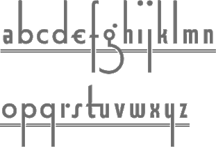 [MyFonts]
[More] ⦿
|
Richard William Mueller
|
 Designer from Elkader, IA (or is he from Garnavillo, IA?), b. 1956. No web page, but the fonts, mostly made in the early 1990s, were collected by CybaPee at TypOasis for your downloading pleasure. His typefaces:
 - AdvertMF, AdvertMFItalic. Ultra-heavy brush lettering.
- AkashiMF (1993). Oriental simulation font.
- AltenglischMF
- AmbrosiaMF (1995). Art nouveau.
- AndreasPenMF, AndreasPenMFBold
- AnglesMF. Beveled letters.
- ApolloMF-Shadow, ApolloMF (1994-1997). Victoriana.
- ArgosMF
- AtlantisMF
- BaileyMF (1997).
- BlackCastleMF. A rounded blackletter.
- BodieMFFlag, BodieMFHolly (1995). An American flag font.
- BolideMF. A brush font.
- BrandyMFScript (1993).
- BravoMF (1994). A script typeface inspired by a 1945 font by E.A. Neukomm.
- BurntMF. Halftone textured letters.
- CamelotMF, CamelotMFBold (1995).
- CarnivalMFOpen, CarnivalMFOpenShadow, CarnivalMFRimmed
- Casual-Regular, CasualContactMF, CasualMarkerMF (1994). Marker pen fonts.
- CignoMF. A delicate script.
- Cinema-Regular
- ClubMF
- CoffeeTinMFInitials. Western circus font.
- CreditCards. Dingbats.
- GFCristateMF (1997). Borders and dingbats, published by Garagefonts.
- DaisyMF
- DipperMF, DipperMFDemiBold
- DirectionsMF (1995).
- DragonflyMF
- EarthquakeMF. Broken letters.
- EddaMF. Art nouveau.
- EdisonMF (1995). Pure Victoriana.
- ElectMF (1997).
- FanfareMFFancy. Art nouveau.
- FantasticMFInitials, FantasticMFModern
- FarleyMF (1994).
- FlamesMF
- FleetingMF
- FranconiaMF (1994).
- GingerMF (1997). Late Victorian, early art nouveau.
- GrangeMF
- GreetingsMF
- GuttenbergMF (1995). Victorian.
- HayStackMFWide
- HeeHawMF
- HoffmanMF
- InkHighlight
- Knockout-Regular, KnockoutMFInitials
- KompaktMF
- LavaMF (1994).
- LegrandMF
- LongEarsMF
- MaizeMF
- MamaMF
- MantelMF
- MeltdownMF
- MercuriusMF
- NewDayMFScript
- OceanViewMFInitials
- OmegaMF-Bold, OmegaMF (1994).
- PaintPeelMFInitials
- ParchmentMF
- PenMarkMFBold (1995).
- PinewoodMF
- PlymouthMF
- PollockMF (1995). Marble-filled artsy display letters.
- PoloBrushMF (1993).
- PosturesMFInitials
- Primitive
- ProtestSignMF (1995).
- QuaintMF
- RaggedMF (1996).
- ReefMF (1994).
- SantaMonciaMF
- Sexy-MF
- SixtiesMF (1993). A psychedelic font.
- SophieMF (1995). Art nouveau.
- SpeedlineMF
- SpiritsMF
- StarshineMF
- StereoMF
- SteveMF (1997).
- StowawayMF
- SwingtimeMF (1995).
- TamboScriptMF
- TarantellaMF. An insect-themed decorative typeface.
- TitaniaMF
- TolkienUncialMF
- TomahawkMF (1995).
- TradingPostMFBold
- TumbleweedMF
- TuscanMFNarrow
- UncleBobMF-Shadow, UncleBobMF (1993).
- VassarMF
- VeronaScriptMF
- WaverlyMF
- WetPaintMF (1996).
- WindsweptMF
- WishMF (1997). Art nouveau.
- WizardryMF-Contour, WizardryMF (1997). Art nouveau.
Abstract Fonts link. Klingspor link. Dafont link. Fontspace link. [Google]
[More] ⦿
|
Rick Griffin
|
Richard Alden Griffin (1944-1991) was a Californian artist and one of the leading designers of psychedelic posters in the 1960s. He died on his Harley Davidson in an accident. He indirectly inspired many digital typefaces. For example, Nick Curtis's Ponsonby NF is based on a 1967 poster by Rick Griffin. This poster from 1984 inspired Nick Curtis to make the futuristic typeface Circuit Bored NF. Rick Griffin (2010) by Jasmin Roslan is also based on Rick's lettering. And so is the psychedelic typeface Rick Griffin (2006) by Keith Bates. [Google]
[More] ⦿
|
Ricky Rinaldi
[Aiyari]

|
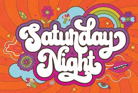 [MyFonts]
[More] ⦿
|
Rillatype
[Gustian Agung Asprilla]

|
Indonesian designer of the handcrafted or script typefaces The Warlock (brush script) (2020), Pantaleone (2020), Stereography (a heavy all caps brush typeface) (2020), The Kindamana (a hand-printed typeface) (2020), Tahnia (2020), The Greyhound, Romain SVG, Hazel Clouds, Birdspring Signature (2020), Scarious (2020), Bandira Script (2020), Superbia (2020), Kaluna Script (2020), Payland (2020: monoline script), Darkwell (2020), Bromrose Sands Signature (2020) and Greyspark (2020). He also designed the 10-style sans / serif /stencil family Ravager (2020), the all caps sans typeface Reliva Sans and the decorative serif typeface Dayanara in 2020. Typefaces from 2021: Crimson Queen (an all caps display typeface), The Vaguer (a monoline script), Altaria Miguel (a stylish display sans), Taniesha (script), Dark Witches (script), Karline (a reverse contrast script), Materniva (a script), Athina (an all caps display serif), Ballistic (a bold brush script), Gilhampton (a vintage label font), Southville (a bold carpenter's font), Diamond Lake (a sturdy slab serif), Syarilla (a tall script), Moyshire, Gamata (script), Easthallow (an inky script), Farland (a bold psychedelic script). Typefaces from 2022: Gremio (stencil), Redmayne (a headline typeface), South Montana (a rough font midway between a Western and a national park font), Biomorph (ultra-condensed sans caps; 7 styles), Daymore (a font duo), Quentin Sonata (a font duo), Reliva Sans (an attractive national park sans), Saint Capital (script), Dirchave (Victorian caps, with copperplate serifs). Gustian Agung Asprilla also ran Papercrown. [Google]
[MyFonts]
[More] ⦿
|
Riyadh Rahman
[Ergibi Studio]

|
 [MyFonts]
[More] ⦿
|
Rizka Prayuda
[Atasi Studio (or: Atasi Type)]

|
[MyFonts]
[More] ⦿
|
RM WD
[Antonio Vignali]

|
 Graphic designer designer, b. 1959, Parma, Italy. He studied at the Art Institute in Parma. After graduation in 1983 from the Urbino ISIA Academy, Antonio spent 20 years working as Senior Art Director and Creative Director for various international advertizing agencies in Milan (Pirella Lowe, Armando Testa, Young & Rubicam).
 In 2016, he designed the calligraphic typeface Gerolinda. This OpenType-feature-laden typeface family, at 1900 glyphs per weight for six weights, leaves all other calligraphic typefaces from the past decade in the dust. It is as if the Italian penmen from the renaissance period are being reborn through Antonio's hand. In fact, he intended something very specific---the recreation of an Italian gentlewoman's hand (his own words). One of his projects was inspired by the Italian Futurismo artists in the early 1900s whose style is close to Italian art deco. Typefaces in the project include Italiano Doc (2018), Italiano Fushion Color (2021: the color version of Italiano Fushion) and Italiano Fushion New (2021: all caps). Typefaces from 2018: Ziletti Pop (a layerable pre-psychedelic font influenced by Girolamo Ziletti (1552-1583) in Venice) and Eletric Lady (a light copperplate calligraphic script). In 2020, he published Parmesan Revolution (a didone with mirrored letters, perhaps in the hope of emulating Cyrillic), Venice Revolution, Jannson Map (a wonderful 18th century map font about which Antonio writes: This font is inspired by Johannes Janssonius, well known as Jan Janszoon or Jan Janssonius (b. Arnhem, 1588, d. Amsterdam, 1664), a Dutch cartographer, publisher and engraver who was married to Hondius's daughter. He authored many masterpieces of cartography just like Willem Blaeu and Hondius). [Google]
[MyFonts]
[More] ⦿
|
Robert Alonso
[BA Graphics]

|
 [MyFonts]
[More] ⦿
|
Robert Dvoklik
|
Croatian designer of the psychedelic typeface Blow (2010). [Google]
[More] ⦿
|
Roy Carvajal
|
San Jose, Costa Rica-based designer of the handwriting typeface Royfont (2005), the rune font Odisea Astral (2007) and the psychedelic typeface Hurt Me (2007). Behance link. Dafont link. [Google]
[More] ⦿
|
Ryan H
|
UK-based FontStructor (student at Bristol UWE) who created Hippie Mark (2009, psychedelic), Freddie Shadow (2009, an LED face) and Altered Sound (2009, an unfinished art deco face). [Google]
[More] ⦿
|
Ryul Davidson
[Brenners Template]

|
 [MyFonts]
[More] ⦿
|
Sahirul Iman
[Nami Studio]

|
[MyFonts]
[More] ⦿
|
Sam Wang
|
 Clemson, SC-based designer of Partridge-Thin (1994), the Art Nouveau fonts Sarah Caps (1992), Ambrosia Caps (1992), Greeting (1992), ArgosANouveau (1992), Edda Caps (1993), Isadora Caps (1993) and Gismonda (1992, after an original phototype font by Geoff Nicholson from 1971), Maidstone Script (1992), Handsign (1993, Irish sign language font---not ASL), Harrington (1991, Victorian), Mira, Lampoon Brush (1992), Libby Script (1992), Uncio Gothic (2008, Lombardic), Thalia (2008), Arctic (1992), Celtic (1992), Fatso Caps (1992, psychedelic), Inkwell (1992), Arctic2, Columbus (1992, Victorian), Handwriting, Hokusai (brush script, 2008), LampoonBrush2, Partridge-ThinOblique, Saki Script (2008, faux oriental), Sumibrush (2008), Sycamore Sans (2008, draftsman style), New Hand (1995), Tamarind (1999).
 See also here. Fontspace link. [Google]
[More] ⦿
|
Sancrea Studio
[Ade Santani]

|
Tangerang, Indonesia-based designer (b. 1993) of the script or signature typefaces Just Marsha (2019), Aurelle Script (2019), Rhamonic (2019: a monoline script), Piersa (2019), Kingsley Roman (2019), Belatina (2019), Maveline (2019) and Sadwell (2019), and the all caps typefaces Baroneys Textured (2019), Junar (2019), Veltic (2019) and Modric (2019). Typefaces from 2020: Forestside (weathered), Blessed Friday (script), Holyriver (an inline font), Britney (script), Beauty Honey, Space Garden, Sweety Sunshine (curly, monolinear), Rosskey (a brush script), Monster Pumpkin (for Halloween), Antique Cable (a psychedelic script), Starfight, [Google]
[MyFonts]
[More] ⦿
|
Sara Hayat
[A Thousand Shipwrecks]
|
[More] ⦿
|
Sarid Ezra

|
 Yogyakarta, Indonesia-based designer of the handcrafted typefaces Sakra (2016, a script published at Letterhend), Sarid Ezra (2017), Retrology (2017), King Birds (2017), Megattor Script (2017), Dear Jane Script (2017: a signature script by Hendry Juanda), Wonder Stark (2017: by Hendry Juanda), Mandatory (2017), Modesta Script (2017), Antone (2017), Better Red (2017), Madgue (2017, monoline script), Beautiful Holiday (2017: monoline script), Dear Disya (a chalk script) (2017), Shutter Stone (2017, signature script), Hello Stranger (2017), Vanillate (2017: monoline script), Gloriant Signature (2017), Signerella Script (2017, signature font), Claytonia (2017, by Hendry Juanda), Rose Colored (2017), Quinible (2017), Mukadua (2017: a beatnik font by Hendry Juanda), The Lentigo (2017), Morsal (2017: free).
 Other typefaces from 2017 include Bitter Rose (free), Suddenly (signature script), Historia Sky and Billenia. Typefaces from 2018: Roseville Script (calligraphic: by Hendry Juanda and Sarid Ezra), Daytonia, Carrol Wild, Royalite, Historia Sky, Headley (monoline font duo), Scarlette Script, Bellatrone (script), Edinburgh (SVG brush font), Carrol Standard (sans), Richardson Script (a signature font), Audacity (font duo), Daviton (SVG brush by Sarid Ezra), Rossie Kelly (SVG brush), Sirens, Magdaline, Stephen Gillion (an inky script), Allison Style (font duo), Black Mountage (dry brush font), Merova (serif), Rotrude Sans (in 16 styles), Aurelie Smith (a signature script, and ornaments), Soredime (a great rabbit ear signature font), Hughson (a monoline script), Morriles (SVG brush), Strong Heart (font duo), Auckland Script (signage font), Camilla (signature font), Big Reputation (font duo), Briberra (a brush script) (free version), Carrol Sans, Kaylar, Brighter, Hipsterious (signage font: by Hendry Juanda). Typefaces from 2019: Fokers (Victorian), Bargitta (an SVG brush script font by Hendry Juanda and Sarid Ezra), Gorgone (a one-style didone by Henry Juanda and Sarid Ezra), Sharon Baker (by Hendry Juanda and Sarid Ezra), Daniella Evans (a display serif by Hendry Juanda and Sarid Ezra), Lotustail (by Henry Juanda and Sarid Ezra), Palmbell (a signature font by Hendry Juanda and Sarid Ezra), Bittergrace Script (by Hendry Juanda and Sarid Ezra), Bordemile (a copperplate calligraphic script by Henry Juanda and Sarid Ezra), Loverica (a tall elegant titling typeface), Wonderstory (a dry brush script), Point Panther (all caps, display), Dua Rosé, Black Mountage (brush script), Quirkily, Callistera Script, Fort Collins (font duo, by Sarid Ezra at Letterhend), Seriously (at Letterhend), Callistera Script (a signature script), Troyline, Marquis, Elaine Hanks (script and dingbats), Katherine. Typefaces from 2020: Briberra (a brush script), Bitter Rose (a brush font), Swifted (a stylish sans), Pearlone (a stylish stencil), Cloudster (an all caps titling sans), Carrol (a 16-style unkerned all caps sans), Carentro, Lindsay Brown, Karelle (decorative serif), Beautifull Weakness (a wild inky script), Augillion (a bold decorative serif), Bread Crumbs, Troyline (a retro script), South Louisville (a painter's script), Shutter Stone, Sirens (a bold headline sans), Shutter Stone, Crooked Hooks (a brush font), Headley (a monoline script), Mister London (a monoline script and sans duo), Roller Cores (a roller paint typeface), Scary Things (all caps, wedge serif), Quinstar, Lequire (a logotype), Routhers (a creamy signage script), Chequers, Lindsay Brown, Audrey Mirages (a decorative serif), Mandalika (a display serif), Branders, The Postgates (a calligraphic script), Louise Walker (Serif, Script), Fragilly, Bombalurina (a script), Goldbrick (wild calligraphy), Dropgray (a stylish sans), Mandalika. Typefaces from 2021: Billy Magie (a smooth stencil typeface), Broken Drive (grunge), Future History, Krafika (a modern display typeface), Vierra Moon (a fat finger script), Lighters (a minimalist sans), Duarose (a vintage all caps font), Klopers (a display typeface), Planet Gamers, Freaky Story (a horror font with pointy dagger terminals), Freaky Story (a horror font with pointy dagger terminals), Consent (a playful display font derived from didone caps), Desira (a decorative art gallery serif), Proxemic (a bold sans intended for use in logos), Fireside (a techno logo font), Psyche Lover (psychedelic), Baligo (a fat finger font), Retrips (a bold rounded display serif), Blink Twice (a wavy font), Holybuck (a signature script), Diamond Bridge (a stylish display serif), Adoria (a sci-fi logo font), Folklore Story (script), Strong Girls (an all caps display serif), Space Boards (a sci-fi font), Hisquins (a diamond-themed all caps typeface), Herkings (an all caps display typeface), Collingar (a lachrymal serif), Claire Murphy (a stylish italic serif), Daviton (an SVG brush font), Cherions (a rough brush font), Sertona (a bold display typeface), Daisy Lovers, Louise Walker (a meaty display serif), Carrol Wild (a vintage all caps sans), Edinburgh (a dry brush font), Redrains (a decorative serif), Designors (hand-printed, all caps), Hello Friday Vector (a grungy handcrafted typeface), Angel Charms, Blackpast (a notched all caps sans), Hillray (a stylish bold sans), Love Board (an all caps typeface with some ink run), Cloudy Aurora (font duo), Duarose Serif, Reminder Notes, Explore Wonders (a watercolor font), Shaping Heart (a decorative typeface with hairline serifs), Cronera (handcrafted), August Stories (a display serif), Brolink (tech, sci-fi), Laginchy (a quirky decorative serif), Argue (a decorative serif adoned with hipsterish lower case f and t), New Orleans (an inky script), Glendale (a variable width all caps sans), Ezra (italic), Coachella (a soft serif), Burgundy (a sans with ball terminals and swashes), Cherish Today (a cutout font), Blank Moment, Saphira (a smooth display typeface), Slightly Marker (a brushed marker pen font). Typefaces from 2022: Crazy Party (hand-crafted reverse stress caps), Philosophy (a feminine display typeface), Maglite (a lachrymal display serif), <,a href="https://www.myfonts.com/fonts/sarid-ezra/winder/">Winder (a pure display font), Black Point (a stencil / script font duo), Daily Spark (a font duo), Maginors (starry, all caps), Nefilt (a wavy display serif), Stay Tuned (a crayon font), Bodwars (techno logo). Behance link. Dafont link. Creative Market link for Letterhend. Creative Market link for Sarid Ezra. Graphicriver link. [Google]
[MyFonts]
[More] ⦿
|
Scholtz Fonts
[Anton Scholtz]

|
 Scholtz Fonts was started by Anton Scholtz (b. Durban, 1941) in 1997. This South African design company is located in Durban, where the Zulu culture of the region has greatly influenced Anton's font design. Klingspor link
 Scholtz sells a fine selection of display types that ooze African themes. An alphabetical list: - Aarde (2005), Aarda Brush
- Ability (2009). Calligraphic
- Affable (2008). Calligrahic
- African Elegance
- African Gold (2007)
- African Jazz (2005)
- African Jungle (2007)
- African Patchwork (2008)
- African Pattern (2004)
- African Shield (2005). Patterned after the cow-hide shields of the Zulu tribe. Made by Anton and Merle Scholtz
- Afrimod
- AfroFlare
- African Textile (2007)
- Ala Kazam (2015)
- Always (2010). A fantastic swashy calligraphic face, and its multiline sister, Filigree, 2010
- Amaboxi (2007) or Amabokhisi. White on black
- Amanzi (1999)
- Aplomb (2008)
- Aqua Casual (2008)
- Arabesque (2009). A flowing calligraphic typeface
- Archivo (2011)
- Art Nouveau SCF (2008)
- Asakire (2006)
- Assegai (2007)
- Bad Girl (2008). Grunge
- Bakuba
- Baluba and Baluba Snake
- Banquet SCF (2007). Brush script
- Baobab
- Black Tie (2007)
- Blackout SCF (2008)
- Blythe (2009). Connected script
- Bongo
- Bongani (2008)
- Brazza (2008). Brush
- Brillig (2008). Informal hand
- Button (2008)
- Buzz (2008)
- Camy (2009). Hand-printed
- Carve (2008). Chiseled look
- Catholic Girls (2008). Script
- Centric (2007). Zebra-striped, or op art
- Certificate (2008). Calligraphic
- Collette (2007). After an art deco font called "Independant" designed in 1930 by Collette and Dufour
- Comical (2007)
- Coral (2008) and Coral Pro (2012)
- Crime Inc
- Crostini
- Debs (2013). Hand-printed
- Deco Doni (2011)
- Delikat (2010). A script, followed in 2013 by Thaun
- Doorn (1998), Doorn Body, Doorn Display
- DragonFyre (2008). Calligraphic
- Dufour (2011). After an art deco font called "Independant" designed in 1930 by Collette and Dufour
- Dusk Til Dawn (2012). Art deco
- Elegance SF (2005). Art deco
- Estravaganza (2012)
- Et Cetera (2015). A classy breezy connected script
- Excalibur SCF (2007). A beautiful rough-edged hand
- Fable (2007). A type family for wizards
- FadedRose
- Figment (2008)
- Filigree
- Fracture (2008). Glaz krak style
- Fragrance
- Gatsby SF
- Genevieve (2007). Calligraphic
- Genial (2009). A flowing connected script
- Giraffe Skin (2007)
- Girl Script (2008). Curly hand
- Girltalk (2008). Curly script
- Gladly (2016). A 17-style decorative and romantic typeface
- Gossamer (2011). A wedding script
- Greek (2008). Chiseled
- Groom (2007). A connected brush type
- Grunge Formal (2007), Grunge Piazza (2007), Grunge Standard (2009)
- Hard Rain (2007)
- HiTone. Niely handcrafted
- Hobi (2008). A ghastly script
- Honeybird (2011)
- Hoofer (2014). A mega family of retro scripts
- Iliad (2007)
- Inja
- Jazz
- Jolie (2015). A connected calligraphic script for romance and weddings
- Josephine (2007). Art deco
- Kassena (2006)
- Kau (2016)
- Klatter (2007)
- Kuba (2007). A tribal stencil
- Kunjani (2008). African look
- Lagos
- Leah (2008). Handwriting
- LeopardSkin (2005)
- Lovers Pro (2011). A fantastic calligraphic hand---ready for red carpet treatment
- Lualaba Snake (2007)
- Lumina (2008)
- Madrigalle (2011). A calligraphic wedding script
- Mafuta (2006)
- Makonde (2007)
- Manhattan Midnight
- Margaux (2013). A vintage 1900s script
- Martini Script (2011)
- Maypole (2007)
- Melodica (2012)
- Miss Donna (2009). A script typeface
- Mtwane (2009)
- Nocturne (2012). An art deco family based on work from the 1920s by Paul Carlyle and Guy Oring
- Noobia (2013). An inky pen font
- Nordika
- Oxamu (2009). A wonderful angular African-themed font
- Pacific Script (2011). A font inspired by an alphabet created by Howard Trafton in the 1930s
- Palm Court (2007). A Bauhaus typeface by Merle Scholtz
- Parchemin (2008). Parchment look
- Phat Chance (2008). Organic
- Piazza (2007)
- Proper (2008)
- Qotho (2010). An almost architectural sans family, done with Merle Scholtz
- Queen (2008). Nice handwriting
- Quirky and Quirky Kurlz (2013). A spidery script based on a book of etchings by British artist Graham Clarke
- Refresh A 1950s script
- Riposte (2009). A dynamic script
- Romi (2008). A thin calligraphic typeface
- Rondalia (2008)
- Sage Sage (2008). Brush script
- SandWriting (2007)
- Sangoma (2007)
- Scratch SCF (2007). A scratchy hand
- Scrittura (2011). Calligraphic. +Antiqua, +Fantasia
- Shapely (2010). Swashy calligraphic typeface
- Silken (2009). Calligraphic
- Siyabonga
- Silver Dagger (2007)
- Smart Casual (2007). An artsy architectural typeface by Merle Scholtz
- Sondela (2007)
- Spaza (2007). African look
- Sprig (2010). A signpainting typeface
- Stoan (2008)
- StoneWash (2008). Grunge
- Tabwa (2007) Inspired by Koch's Neuland, but on an African theme
- Tamboti
- Tertius (2008). Also, Tertius Romantic and Tertius Crenellated (2008). Scripts based on the Carolingian hand
- Thaun (2013)
- Thought (2009)
- Thystle (2010)
- Tokoloshe (2008)
- Toulouse (2007). Art nouveau handcrafted typeface
- Tshikona (2005). Hand-crafted
- Tsotsi (2007)
- Ubuvila (2004)
- Umkhonto (2003)
- Umoya (2009). Organic
- Utshani (2000). African theme
- WildSong (2010). A calligraphic script
- Woodcarve.
- Write Now (2008). Connected script
- WriteHand (2008)
- Yseult (2009). Script
- Zaire SF (2007)
- ZebraSkin (2007)
- Zest (2007)
- Zim (2007). Octagonal
View the typefaces designed by Anton Scholtz. [Google]
[MyFonts]
[More] ⦿
|
Scott Banks
[Paper Moon Type & Graphic Supply]

|
 [MyFonts]
[More] ⦿
|
Scott Hultgren

|
Californian designer who made Optical Dillusion (2011, psychedelic druggie multiline font), Miterra (T-26, 2000, pixel family) and Love (2011). Behance link. [Google]
[MyFonts]
[More] ⦿
|
Scriptorium: psychedelic fonts
|
 Scriptorium (David Nalle) writes: Poster lettering in the 60s was heavily influenced by the Art Nouveau movement of the late 19th century, but the most imaginative poster designers took those basic ideas of full, somewhat fabulous lettering to an entirely new level. While you can see the influence of Mucha and other Art Nouveau poster artists in the work of designers like Wes Wilson and David Singer, there's something more in their poster designs - what might be called the 'free spirit' of the 60s. Its collection tries to be comprehensive and includes these typefaces:
 - Pantagruel: the quintessential bridge between Art Nouveau and 60s era design. It is based on an Art Nouveau style which was enormously influential in the 60s and often duplicated directly by 60s artists like Greg Irons and Randy Tuten.
- Harbinger and Sprite are also examples of styles commonly used by many poster artists of the period who drew on Art Nouveau designs for inspiration. However, they are not really psychedelic as we now understand it.
- Earthpig and Bad Acid are based on original poster lettering characteristic of the outrageously spurred and flourished designs favored by many artists of the 60s.
- Butterfield is based on poster lettering from posters for rock shows at the Fillmore in the 1960s. Influenced by the lettering of Wes Wilson, this is "psychedelic" at its smoky best.
- Quicksilver and Illuminata were developed from small samples of unique lettering and are most influenced by the designs of David Singer.
- Hendrix: Like the lettering on Jimi Hendrix albums.
[Google]
[More] ⦿
|
Sean Coady
[Vintage Type Co]

|
 [MyFonts]
[More] ⦿
|
Sebastian Castellanos De La Hoz
[Bastarda Type (was: No Name Type Foundry)]
|
 [More] ⦿
|
Sebastian Hanson
|
In 2011, Gonzalo Murillo (Santiago, Chile) and Sebastian Hanson (Santiago, Chile) co-designed the psychedelic typeface Copihue for a school project. [Google]
[More] ⦿
|
Sebastien Sanfilippo
[Love Letters]
|
 [More] ⦿
|
Sensatype (was: Sunshine Design)
[Muhammad Zamroni Hamzah]

|
 Indonesian designer who specializes in ligature-laden display serif fonts. Creator of the curvy display typefaces Emirates (2019) and Michael (2019), the cartoon font Wonder Boys (2019), the stylish ligature-rich Abigail (2019) and Giveaway (2019: a classic, almost Trajan, roman caps typeface), and the stylish sans typeface Meganté (2019).
 Typefaces from 2020: Vintage (a rounded display serif), John Mayer (a ligature font), Bruney (an elegant titling font with tons of ligatures), Angle (yet another ligature font), Reborn, Richy, Charming, Malibu (almost psychedelic), Diamond, Knockout (a sports sans), Baby School (a rounded sans), Catchy Mager (a decorative serif), Saudagar, Sparkling Moscow Script (a rabbit ear script and a fashionable serif). Typefaces from 2021: Satisfy (a sharp-edged typeface), Ginger (a stylish sans), Regards (a warm display serif), Famous (a stylish feminine sans), Ginkgo (a stylish serif), Runalto (a luxury serif). Typefaces from 2022: Noah (a flared display serif), Santiago (a stylish serif). [Google]
[MyFonts]
[More] ⦿
|
Serif Studio
|
 Design studio in Mexico City. In 2007, they designed the psychedelic typeface Hendrix. In 2010, the poster typeface Bunker Font followed. Behance link. [Google]
[More] ⦿
|
Seymour Chwast

|
 Graphic designer born in New York in 1931, who worked with Milton Glaser at Push Pin Studios in New York from 1954 onwards. Many of his fonts were sold by Photo Lettering.
 He designed - Chwast Buffalo Black Condensed (1981, Linotype). Not my favorite black-weight face, oddly serifed. Chwast Buffalo provided the inspiration for Lackawanna Weed (2007, Nick Curtis).
- Artone (1968, PhotoLettering Inc: psychedelic lettering). Artone was digitaly revived as Loose Caboose NF (2007, Nick Curtis), Fofucha (2007, Iza W) and Dogsmoke (2019, Humberto Gillan).
- Blimp (1970, from issue c84 of Push Pin Graphic). Blimp was the inspiration for Weedy Beasties NF (2007, Nick Curtis) and Weedy Beastless NF (2007, Nick Curtis).
- Film Sense (1969, Photolettering: with Milton Glaser). Revivals include Newsense by Adrian Candela (2013).
- In Ray Cruz's font Bouncing Checks Layers (2014), we find 40 fun hand-drawn dingbats by Seymour Chwast.
FontShop link. Klingspor link. Linotype link. [Google]
[MyFonts]
[More] ⦿
|
Shaky Kane
[Michael Coulthard]

|
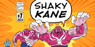 Michael Coulthard is a British writer and psychedelic artist who best known for his work as a comic and graphic artist under the pseudonym Shaky Kane, as well as Shaky 2000. Notabe works include A-Men and The Bulletproof Coffin. Co-designer with John Roshell at Comicraft of the comic book and cartoon fonts Funky Chicken Town (2020) and Shaky Kane (2014). [Google]
[MyFonts]
[More] ⦿
|
Sharkshock
[Dennis Ludlow]

|
 Dennis Ludlow (Sharkshock Productions, Raleigh, NC) started making mostly free fonts in 1999. On August 28, 2001, Dennis announced that he would stop producing fonts, forever. To prove himself wrong, he became more prolific trhan ever, and ultimately started designing retail fonts as well.
 His early typefaces include Hot Pizza (2001), Hawaiian Punk, Royal Acidbath, Little Caesar, Subway, Holiday India, Mobsters, Dallas Cowboys (Western look, 2004), Dark Crystal, Queen of Camelot (2015), Green Eggs and Spam (2015), Ludlow Strong Ale (2015, German beer label font), Space Angel (2014), Electrox, Cowboys, Dolphins, Viking Stencil, Lexust (2002), Padaloma (2002), Fujita Ray (2002), Willy Wonka, Hursheys, Grinched (a Halloween or beatnik font), Honda, Busch Gardenz, Holiday India (2000), Simpsons, Blockbusted, IHOP, Chicken Fool A, Playtoy (2000: like the masthead of Playboy), Cowboys (2001), Dreamscar (2001, has a Cyrillic version), Mr. Goodbaur, Dr. Peppers, Oreos, Air Millhouse, Fruitopia, Raiders, TGI Friday, Jolly-Raunchy, Mouser, Pirate-Keg, Fujita Ray (2015), Modeccio (2015, art deco), Wendyville (2015, Western), Vonique 64 (2015, avant-garde style), Your Royal Majesty (2015, a unique blackletter-inspired vampire script), Hackney Block (2015), Thunder Lord (2015, an outlined variant of Raiderfont), Republica Minor (2015), News of the World (2015: a news headline font), TH3 Machine (2015), Funkrocker (2015, inky, grungy), Tiki Tropic (2015: a tiki font), TypoGraphica (2015, a strong geometric sans), Vonique 92 (2015, circle-based fashion sans), Reisenberg (2015, a black titling sans; v2.0 dates from 2018). There is also a medium-sized categorized archive, with subsections such as cartoon fonts and movie fonts. Typefaces from 2016: Twiddlestix, Konigsberg (rounded sans), Wicked Mouse (looney tunes typeface), Heathergreen (a tall condensed sans), Wonderbar (psychedelic), College Block (athletic lettering), Death Star, Ring of Kerry (uncial style), Blockletter (octagonal), Café Françoise, Cronus (round monoline sans), Suissnord (a wide sans display typeface), Grinched 2.0 (an update of Grinched), Red Seven (futuristic), Enchanted Land (derived from the blackletter genre), Freakshow (ornamental ransom note font), Deutschlander (a condensed sans for movie credits and similar applications). Typefaces from 2017: Lemonade Stand, Dark & Black, Hennigar (a heavy compact sans in the spirit of Impact), Durango Western, Banbury (a heavy display didone), United Kingdom (techno), Goldoni, Kingsmen. Typefaces from 2018: Bloomsburg (a 6-style organic sans; +Cyrillic), Stupid Meeting (an all caps display typeface), Medusa Gothic, Carson (tall grotesque), Collegeblock 2 (an octagonal varsity font), Medusa Gothic, Royal Crescent (sans), Praetoria, Papaya Sunrise, Helmswald Post (blackletter). Typefaces from 2019: Deutschlander 2.0 (an organic monoline sans, with coverage of Cyrillic and Greek), Zanzabar (a genie lamp or Arabic emulation typeface), Vonique 43 (an organic fashion mag sans), Delacorso Outlines (tall decorative caps), Kwixter Sketch (for Latin and Cyrillic). Typefaces from 2020: Stupid Meeting (an all caps sans with a comic book feel, appropriately named to describe most COVID era Zoom work sessions), Toyster (a plumpish typeface), Wonderbar 2 (psychedelic, all caps), Boldstrom (a tightly spaced heavy industrial sans), Reisenberg, Snicker Snack, Crosshatcher (a sketched font), Czesko (a skyline font), Storybook Ending (a mix of uncial and Tuscan), Toyster (a bubblegum font). Typefaces from 2021: Kamryn (a display serif), Mouser (an organic geometric sans in six styles), Dottingham (a Victorian typeface), Tempestua (a sharp bold display sans), Lemonade Stand, Brontoburger (a vernacular typeface). Typefaces from 2022: Jumbalo (a bubblegum font). Abstract Fonts link. Creative Fabrica link. [Google]
[MyFonts]
[More] ⦿
|
Sideshow
[Dave Cohen]
|
 Company whose fonts can be bought via Stuart Sandler's Font Bros. They include mostly playful display typefaces: Bamboozle, Blackcat Chopper, Blackcat Fever, Cocktail Shaker, Creaky Wiggling Fingers, Creaky Frank Wiggling, Creaky Tiki Wiggling, Snoiplash Bold, Sniplash Quacker, Toylab Mechanical, Derekbats, Doinkbats. At Google Font Directory, we learn that the designer is Dave Cohen. A free font there is the brush script typeface Satisfy (2011). He also posted Creepster Caps (2011) at Google Web Fonts just in time for Halloween.
 Typefaces made in 2012: Grilled Chicken (angular hand-printed typeface), Mystery Quest (a curly Victorian and/or psychedelic typeface that is free at Google Web Fonts), Seaweed Script (Google Web Fonts). In 2015, they published Jazznik (a sixties beatnik typeface family with accompanying dingbat fonts Jazznik Rhythms and Jazznik Riffs). Klingspor link. Google Plus link. [Google]
[More] ⦿
|
Sigit Dwipa
[Nirmana Visual]

|
[MyFonts]
[More] ⦿
|
Sproviero Type (was: Lián Types)
[Maximiliano Sproviero]

|
 Argentinian foundry located in Buenos Aires, est. in 2008 by Maximiliano Sproviero (b. 1987, Buenos Aires) as Lian Types (old link), mainly specializing in gothic, uncial, script and handwriting typefaces. Rennamed Sproviero Type, his typefaces can be licensed since 2021 via The Type Founders.
 Sproviero graduated from FADU, University of Buenos Aires in 2008 with a script thesis typeface called Colofon. His fonts from 2008 include Devil Kalligraphy, Pumba (great futuristic rounded look), Tobogan (retro), Kiwi Sans Serif, School Rainbow, Suave Calligraphy, Tonika (handwriting), Goddess (handwriting), Cursivessca (calligraphic; 4 styles), Friendship (6 styles), Chechelo Lawyer (modern italic condensed), Quijote Italic (calligraphic with tall ascenders and descenders), Miscelanea (arabesques), Lunga (a condensed hairline family consisting of Real Ligada, Exacta, Versalita and Extras), Mabela (a rounded fat display font), Red Wagon (ultra-condensed), Valeria Script (swashy), Kalligrand (2008, a tall calligraphic face), Intima Script One, Two and Three (described by him as a sensual calligraphic script family), and Paradise Script (96 styles, all calligraphic). Creations from 2009: Kaligrafia, Galana, Mon Amour Script (hyper-calligraphic), Oh Lara (also hyper-calligraphic), and Quijot sauvage (a 7-style calligraphic feat). In 2010 he made these typefaces: Parfait Script (a high-contrast calligraphic script), Kanikama, Breathe Pro (calligraphic with didone serifs), Boston Script. Creations from 2011: Reina (a curvaceous didone family, +Engraved). He updated this in 2021 to the 45-style Reina Neue. At Tipos Latinos 2012, Maximiliano Sproviero won awards in the display type category for Aire (2012, a thin curly didone family), Breathe Pro, and Reina. At TDC 2013, he won an award for the copperplate script Erotica. Erotica also won an award at Tipos Latinos 2014. Typefaces from 2013: String (a hairline Spencerian script), Brand (a signage script family), Agile Pro (a hairline swashy calligraphic family), Bird Script (which an award at Tipos Latinos 2014), Live Pro. Typefaces from 2014: Selfie (connected monoline signage script), Heroe (a script that takes Lubalin and Caslon to the extreme), Dream Script (a chancery script that won an award at Tipos Latinos 2016), Dream Caps (Trajan capitals), Beatle (a Spencerian script with psychedelic touches). Typefaces from 2015: Seventies (a funkadelic typeface), Indie (a signage script family that won an award at Tipos Latinos 2016), Model (a hairline fashion mag calligraphic script family). Typefaces from 2016: Lubaline (decorative caps inspired by Herb Lubalin), Skill (signage type: winner at Tipos Latinos 2018 of a type design award). Typefaces from 2017: Posh (a fat didone), Fluire and Fluire Caps (a greeting card font pair), Preta (almost psychedelic script), Vinyle (a remarkable monoline decal script). Winner at Tipos Latinos 2018 of a type design award for Lubaline, Posh and Preta. Typefaces from 2018: Burger (a fast food slab serif bonanza), Fleur (inspired by some lettering in Palais Garnier in Paris---Sproviero calls this the Napoleonic style), Pantera (a lively pointed brush calligraphic typeface family), Girasol (based on sketches by Susana Maurette), Rafaella (all caps---described by Sproviero as coquette). Typefaces from 2019: Hot Script (monoline), Elipses (a Peignotian sans family in 7 styles), Fabulous Script, Breathe Neue. Typefaces from 2021: Selfie Neue Rounded (40 styles), Selfie Neue Sharp (39 styles), Ballet VF (Maximiliano Sproviero: a variable Spencerian penmanship font with optical sizing from 16pt to 72pt---a technical feat accomplished with the help of Eduardo Tunni and the Omnibus team; free at Google fonts; Github link), Klingspor link. Behance link. Interview by MyFonts in 2014. [Google]
[MyFonts]
[More] ⦿
|
Steve Ferrera
|
Designer of Tango (2010), King Luau (2007, oriental brush face), Sunshine State (2011), Reno Casino (2010), Christmas Mouse (2009, dingbats that include snow crystals), Buka Bird (2009, inspired by the characters seen on "Lilo&Stitch" movie and "Stitch's Great Escape" attraction at Walt Disney World), Mouse Tags (2009: inspired by icons seen at Disneyland and Walt Disney World), Haunted Mouse (2009, Halloween font), Space Encounter (2008, inspired by the font seen at WDW Stitch's Great Escape), Space Encounter (2008, inspired by the font seen at WDW Stitch's Great Escape), Spaceship Bullet (2008, inspired by the font seen at WDW Stitch's Great Escape), Kringle Castle (2007), Kringle Castle Night (2007), Empire State Deco (2006), Pieces of Eight (2006, a degraded pirate era font, inspired by the characters on the attraction poster "Pirates of the Caribbean"), Frosty's Winterland (2006), TS Curly (2006), Dharma Initiative Logos (2006), TS Block (2006), Market Deco (2006, sans in the style of Neutraface), Star Trek Annual Magazine (2006), Aero Font One (2006, psychedelic), Mouse Deco (2006, geometric sans), Island of Misfit Toys (2006), Airline Logos Past (2006), Wrestling Logos (2006), AndersonTheMysterons (2006), AndersonTheSecretService (2006), Anderson-Four-Feather-Falls (2006), AndersonSpace1999Dings (2006), AndersonUFO (2006), FederationStarfleetHull23rd (2006), AndersonStingray (2006), AndersonThunderbirdsAreGO! (2006: Western), AndersonTorchyTheBatteryBoy (2006), Anderson Fireball XL5 (2006, brush face), Anderson Supercar (2006, display sans), Anderson Captain Scarlet (2005), Jonny Quest Classic (2005, connected 50s script seen in the Hanna-Barbera cartoons from 1964) and Anderson Dings 1, 2 and 3 (2005-2006). Anderson refers to Gerry Anderson's Supermarionation. The full list of fonts: Aero Font One Swash, Aero Font One, Airline Logos, Anderson Dings 1, Anderson Dings 2 v2, Anderson Dings 3 (v2), Anderson Fireball XL5, Anderson Four Feather Falls, Anderson Space1999 Dings, Anderson Stingray, Anderson Supercar (v3.1), Anderson The Mysterons, Anderson The Secret Service, Anderson Thunderbirds Are GO!, Anderson Torchy The Battery Boy, Anderson UFO Ding, Anderson_Captain_Scarlet, Anderson_Fireball_XL5_Shadow, Buka Bird, Christmas Mouse, Dharma Initiative Logos, Empire State Deco, Federation_Starfleet_Hull_23rd, Haunted Mouse Alt, Haunted Mouse Shadow Alt, Haunted Mouse Shadow, Haunted Mouse, Island of Misfit Toys Alt, Island of Misfit Toys, Jonny_Quest_Classic, King Luau, Kringle Castle Night, Kringle Castle, Market_Deco, Mouse Tags, Mouse_Deco, Pieces of Eight Alt, Pieces of Eight, Pro_Wrestling_Logos, Reno Casino, Space Encounter , Spaceship Bullet, Sunshine State, TS Block Bold, TS Curly, Tango Chips, Tango Regular, Trek Disruptor Blast. Aka Supercarguy. Fontsy link. [Google]
[More] ⦿
|
Steve Zafarana
[BluHead Studio LLC]

|
[MyFonts]
[More] ⦿
|
Steven Waring
[From Parts Unknown]
|
 [More] ⦿
|
Steven Wittens
|
Belgian designer of the fat psychedelic display typeface ExtraLard (2003). [Google]
[More] ⦿
|
Stiggy & Sands
[Jim Lyles]

|
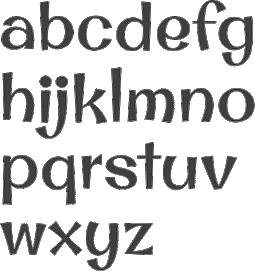 Stiggy & Sands is the Arvada, CO-based type foundry of Brian "Stiggy" Bonislawsky and Jim "Sands" Lyles, est. 2013. Their first commercial typefaces, all jointly designed, are Sante Pro (2013, a tall upright connected script), Rum Raisin (2013, inspired by the lettering from a vintage Kellogg's Raisin Bran cereal box), Maiden Orange (2013), Luckiest Softie Pro (2013, a rounded comic book typeface that was inspired by hand-lettered vintage 1950s advertisement), Smokum Pro (2013, a Western typeface), Carioca Script Pro (2013, inspired by the lettering on the RCA Records Stereo Action Series in the 1960s), Uncial Antiqua Pro (2013), Spicy Rice Pro (2013: psychedelic or disco), Ultra Pro (2013: a Clarendon or wood style slab serif), Quintessential Pro (2013: calligraphic), Bruno Ace Pro (a techno/automoive font, followed in 2018 by Bruno Ace Pro Rounded), Aclonica Pro (2013), Special Elite Pro (grungy typewriter), Audiowide Pro (2013: organic techno face), Peralta Pro (2013: a bouncy cartoon font), Englebert (2013: inspired by the title screen of the 1930s film Der Blaue Engel starring Marlene Dietrich), McLaren Pro (2013: comic book style), Galindo (2013: a comic book typeface with square counters), Margarine Pro (2013), Righteous Pro (2013), Mouse Memoirs Pro (2013, cartoonish), Risque Pro (2013, funky style), Luckiest Guy Pro (a fat comic book font based on vintage 1950s ads), Original Surfer Pro (2013, an an offbeat sans serif font bursting at the seams with lively personality. Inspired by a vintage advertisement for the California Cliffs Caravan Park, this font exudes all of the fun of a summer vacation anytime of the year), and Marcellus Pro (a flared roman inscriptional typeface with both upper and lower case, originally published in 2012 by Astigmatic; CTAN page).
 Typefaces from 2014: Purple Purse Pro (an offbeat didone based on a vintage Ivory Soap ad from the fifties). Typefaces from 2015: Shojumaru (an oriental simulation font inspired by a movie poster for the 1957 film titled Sayonara, starring Marlon Brando), Sacramento (connected script), Bazaruto (a decorative set of typefaces inspired by wrought iron, Letters and Lettering by Carlyle and Oring, and didones), Maiden Orange Inline Pro. Typefaces from 2016: Syncopate Pro (unicase), Kapture (a great romantic script), Stint Pro (slab serif spanning condensed to expanded widths), Grand Hotel Pro (upright connected script), Ribeye Pro, Shojumaru Pro (oriental style), Freckle Face Pro. Typefaces from 2017: Dear Sans (rounded sans family), Glorious Song (a display serif typestyle that was inspired by the poster lettering for the 1948 movie Words and Music), Montez Pro. Typefaces from 2018: Croft (a revival of Lewis Buddy III's ATF classic, Roycroft, 1912), Navarone (a Greek simulation font inspired by the titling sequence of the 1962 movie "The Guns of Navarone"), Distressed Telegraph (based on the typewriter font Large Elite Type No. 44), Gimbel Script (a tall monolinear upright vintage script), Bigelow Rules Pro (a beatnik font), Eagle Lake Pro, Husk (a digitization and extension of a film typeface called Maile by LetterGraphics), Boilermaker (a digitization and extension of a film typeface from LetterGraphics dubbed Flair G100), Eagle Lake (calligraphic), Bruno Ace. Typefaces from 2019: Fascinate Pro (a soft-shelled art deco typeface), Artisinal (an art deco typeface that revives John W. Zimmerman's Cubist Bold from 1928). Modulate (a blocky modular typeface), Lorette (based on the film font Laurel from LetterGraphics), Quandor (based on the Lettergraphics film font Impacta), Magnate (a digitization of the film typeface Wilshire from LetterGraphics), Toastie (based on the film font Flair 312 by Lettergraphics), Latitude Sans (a heavy sans based on Lettergraphics' Free). Typefaces from 2020: Bugleboy (this font family revives and expands the film font Wood Grotesk by LetterGraphics), Berkshire Pro (a plump display typeface), Mervale Script Pro (a brush script originally done in 2012 at astigmatic One Eye). Typefaces from 2021: Huerto (a geometric angular sans), Pennyroyal Pro (an elephant feet font with irregular outlines), Pennyroyal (an elephant foot almost cutout font). Typefaces from 2022: Pardner (a hand-painted spaghetti Western font). MyFonts link. [Google]
[MyFonts]
[More] ⦿
|
Storic Type (or: Flavor Type, or: Flavortype)
[Panji Nugraha]

|
 Flavor Type was an Indonesian design studio located in Bandung in which Panji Nugraha, Ilham Herry and Maghrib Lab were involved. In 2017, Panji Nugraha set up Storic Type.
 Panji Nugraha is the Bandung, Indonesia-based designer of Caferus (2014), Murmers (2014, Victorian), Bonerica (2014, a Victorian typeface), Vanderchalk (2014) and Glowist (codesigned in 2014 with Ilham Herry and Maghrib Lab at Flavor Type). In 2015, he made My Dear Script (penmanship script), Hava Shine (Victorian signage face), Lovile, La Chalk (chalk writing emulation), Carneval (a fun hand-drawn typeface family with a possibility of layering), To Dear (brush script typeface), Allic (brush typeface), Vidiz (a swashy slab serif poster typeface), Levitte Script, Leila, Holisun (brush face), Vacamous, Summerica, Callalily, Vicent (watercolor brush), Morning Sugar (brush script), Blacky, Lonssa (hand-drawn type, with ornaments), Heartwell (a wonderful brushy poster script), Noside (a splashy brush), Toxine and Fruty. Typefaces from 2016: Enlighten (bouncy sans), Bite Chalk, Stay Alive (Victorian), Dafodil (Western), Vercha, De Arloy (art nouveau), Herald Bouncy, Mon Cheri (signage script). Typefaces from 2017: Relove (Victorian), Floresh, Chester (a layered spurred vintage typeface), Recipe Daily (free), Glandish, Moody Blue (a curly Victorian typeface), Reborn (ornamental Victorian typeface), Recipe Diary. Typefaces from 2018: Limit Corner (Victorian), Bride Chalk (sans and serif). Typefaces from 2019: Borest (a luxurious flared sans by Ilham Herry and Maghrib Lab), Fulgate (by Ilham Herry and Adam Fathony). Typefaces from 2020: Muray House (a bold swashy bathroom towel typeface by Ilham Herry and Adam Fathoni Haris), Esteric (a playful retro jazz typeface). Flavortype's catalog in 2022 showed these typeface families: - Barlon (2022). Art nouveau, modernized. By Ilham Herry and Adam Fathony Haris.
- Borest (2019). A luxurious flared sans by Ilham Herry, Adam Fathony Haris and Maghrib Lab.
- Budge (2020). A layerable retro signage script.
- Bumsy (2021). A bold display serif by Ilham Herry and Adam Fathoni Haris.
- Esteric (2020). A playful tapered retro jazz font. By Ilham Herry and Adam Fathony Haris.
- Fulgate (2019). A luxury display family by Ilham Herry and Adam Fathony Haris.
- Genty (2020). A creamy retro signage script typeface by Ilham Herry and Adam Fathoni Haris.
- Glaw (2020). A psychedelic font by Ilham Herry and Adam Fathoni Haris.
- Monvar (2021). A layerable Cooper Black style typeface. By Ilham Herry and Adam Fathony Haris.
- Muray House (2020). A bold swashy bathroom towel typeface. By Ilham Herry and Adam Fathony Haris.
- Rische (2021). A 6-style display serif with huge counters and an enormous x-height. By Ilham Herry and Adam Fathony Haris.
Creative Market link for Flavor Type. Another Behance link. Behance link. Another Behance link. Another Creative Market link. [Google]
[MyFonts]
[More] ⦿
|
StoryType
|
 Kota Cirebon, Indonesia-based designer of these decorative serif or display typefaces in 2021: Abigate Desgo, Aftesto, Agata, Aimstesa, Akila, Aletriat, Alika, Amarta, Arolse Belmonteria, Avigea, Bagisko, Blue Ocean, Brow Volky, Bagola, Begika, Behila, Belianty Elesha, Belinda, Belisha, Bergante, Berossla, Bolinger, Bontias, Branding Aliskaje, Bulgeria, Chelon, Castle Begale, Diego, Dalime, Degila, Deraga, Devitta, Display, Elinga, Florals, Fogsta, Garges, Gento Dream, Gabriela Spark, Gisrida, Glamour Karlina, Heritage Dreams, Hagona, Hegam, Histeria, Hochagi, Kakuro, Kegisiko, Kivaera, Kolgimba, Lebagof, Literacy, Mariana, Melisa, Madela, Magistral Honesty, Magkon, Magofah, Masvis, Megasta Signateria, Megiska, Megistica Dreams, Megistica, Meglona, Meliska, Milgnite, Narifah, Negoka, Porto Qastelo, Qalisha, Qalisso, Qandile, Qegor, Qelista, Quihk, Ragasta, Raliha, Rebori, Relyagih, Relyagih, Richardo Flacky, Safira, The Historical Marliana The Mondela Catalisa, The Pablo Meganta, The Wobliy, Venezula, Vestovia, Viollen, Wagstaf (slab serif), Wakile, Yesterday.
 Typefaces from 2022: Adoha, Albegos, Alishia Mekayla, Aloka Gikairo, Amegap, Aurora (a sharp-edged display serif with some Victorian spirals), Basdela (a decorative serif), Big Bang (Western), Captain Meredith, Charley (psychedelic), Danver Bridget, Goergiano (a vintage display serif), Gerald, Gibroma, Giorando, Grozery (a decorative serif), Hagista Melagon, Kara, Koaliba (a decorative serif), Letbrigor, Lost Castedral, Lumphong (slab serif), Magistan (a monolinear slab serif), Mahgin (a display serif), Maistro (a star-tittled display typeface), Mallory (a curvy display serif), Mechago (a ligature-rich serif), Megphis, Monster of Fantasy, Morfeta Gealmord (a display serif), Priko Star (retro futuristic), Quella, Rahgbok, Richard Samuels, Rilderta Hellgest, Sheal Thon Slab, Rondos (a poster typeface; caps only), Shomething, Submarine (spurred). [Google]
[More] ⦿
|
Studio Indigo
[Helena Öhman]

|
 Helena Öhman (Studio Indigo) is a Swedish illustrator and graphic designer based in Stockholm. Gipsy Alphabet (2013) is an italic engraved alphabet with lower case letters inspired by a cigarette ad found in Modern Publicity 1934/35. It is not a real digital font.
 Creator of some handlettered pieces in 2012, including a psychedelic Christmas tree, a Valentine's Day card, and an Easter Egg. She also made a geometric typeface in 2012. In 2013, she created the typefaces Ribbon and Studio. In 2014, she worked on Shrimp, a free text typeface. Typefaces from 2016: Belle Helene (script), Karolina. This calligraphic text font is inspired by Edward Johnston's foundational hand and roman capitals. The name Karolina refers to the carolingian style that influenced Johnston. Typefaces from 2018: Celadon Script, Stitching Love. Typefaces from 2019: Fairlady (script), Cerulean Love. Typefaces from 2021: Figuratika (a geometric art deco stencil typeface), Stitch It Up (a cross stitch font). [Google]
[MyFonts]
[More] ⦿
|
Svetoslav Simov
[Fontfabric]

|
 [MyFonts]
[More] ⦿
|
Tan Type
|
 Designer specializing in exquisite decorative display typefaces. Typefaces from 2020 include Garland, Aegean, Mon Cheri, Luna Negra, Kindred, Pearl, Vivre Libre, Astoria (wavy, intestinal), Nightingale, Ashford, Angleton, St. Canard, Giok, Variety, The Whistling, Jambore and the rounded decorative serif display typefaces Tangkiwood and Harmoni.
 Typefaces from 2021: Liebe (art nouveau / intestinal), Aesop (a reverse stress art nouveau-style display typeface), Daisy (a groovy typeface with deep soft cuts), Gardenia (a hipster style display serif), Egret (a condensed display serif), Headline, Twinkle (a fashion mag typeface), New York (a plump blackletter-inspired display typeface), Meringue (like a font for impressionist painters), Nimbus (psychedelic), Summers (an informal sans), Belgravia (a display serif), Clementine (a decorative teardrop https://github.com/MonicaRizzolli/Tomorrowserif), Winston (flared), Magnolia, Moon Light (art nouveau, psychedelic), Spring (wavy), Rosebud (an intestinal typeface with a daring name), Mignon (a stylish display serif), Buster (art nouveau-inspired capitals), Parfait, Grandeur (Belle epoqyue style), Songbird (a soft serif), Cinema Paradiso (a great art nouveau initials typeface). Typefaces from 2022: Waverly Display, Alder (wavy), Algiers (a display typeface). [Google]
[More] ⦿
|
Tattoo Woo (or: JSH Creates, or: Smokewire)
[Jonathan Stephen Harris]

|
 Tattoo Woo (or: Smokewire) is American tattooist Jonathan Harris. He also runs JSH Creates.
 In 2011, he created the curly gothic tattoo typefaces Hot Chocolate Latte, League of Ages, Royal Inferno, Tribal Times and Tribal Dragon, and the spiky typeface Quasari (2011). He also made Jelly Swirls (curly), Highway to hell, What a mess (grunge), Pixie Moon, Sword Thrasher, Starship XXXII (Star Trek face), Christmas Snow (art nouveau snowcapped glyphs), and Jazzy Caveman (a stone age face). Typefaces created in 2012: Bright Star Tonight, Harristoon, a crayon series (Crimes Times Six, Colored Crayns, XXX Dirty Jokes XXX, Harris Wear, Black Crayon), Alien Mutations Begin, Vineyard Magazines, Forbidden Land (scratchy face), Way Gardens (flowery script), Pencil Shading, Cartoon Shadow, Heart Shapes, Sassy Stark, Back to School, Black Eye Peas, Silly People, Street Art (a great ink splatter font), Heartbroken, Jen Luves Ben Forever, Heart Broken, Catalina, Anywhere but home, Holly Christmas, Kringley Christmas (dingbats), Seasons Greetings, Cheese Cake, Abraham Heights, Call me maybe (sketch font), Lydia Puente (calligraphic script), Tribal Script, The Daily Bread (a beautiful ronde), Naughty Nights, a set of four Asian brush style typefaces (Japanese Style, All Yoko, Chinese Asian Style, Chinese Takeaway), Hey Cutie, Zing Easy (brush), Kids Play, Keep It Simple (loopy script), Standing Tall (anguished Kafkaesque typeface), The Abandoned Treasure (brushy caps face), The Mocking Bird, Nighty Nights, Road Trip, Been Hanging Around, Divided Nations, Dodger Gear, The Best Night (brush), Stencil Brush (brush), Quite Chocolatey, Round About (stitch font), Physics Teacher, Madman Howling, Love Sequel, Cross Out, My Mistake, Colours of Autumn, Da Streets (graffiti face), Hard Fox (stencil brush), You Are Precious (curly script), The Blue Oasis, Dysfunctional Family (brush face), Lovely Excuse (brush family), No Fear (brush face), Dead End, The Art Show (brush face), Comical Smash, The Quick, The Lost Paintings, Stone Age, Eyeliner Tattoo, Sketch Pad, Art Class (spilled paint face), Ink Studio, Stay Holy Okay, Water Park (bubblegum face), Urban Jungle, Geez Seriously (curly typeface), Crazy Weekend, Slimeball, Real People, A Brush No, Beware of the Hogs (blood drip typeface), Definitely Maybe, Draw Freehand, Bloodthirsty (blood drip font), Zombie Slayer (blood drip font), Your Bloody Choice (blood drip font), Barn Animals, Comic Strip, Scribble Fun (textured face), Boom Shanker, Girly Punk, Pucky, Spray Break, Font Insane, Fairground, Last Breath (2012), Follow Your dreams, Together Again, Drawing Guides, Death Branch, Panda Spots, Fuzzy Bear, Threadz Needle, Homeboy, Hairs Dens Bag, Primitive Alien, Bonney Lass, Cake Nom (3d and shaded), Headshop (psychedelic), Tribal Butterflies (dings), Tribal Dragons Tattoo Designs, Tribal Animals Tattoo Designs, Abstract Alien Symbols, Jewelry Design Shapes, Wander Ball, Love Hue, The Fat Store, Chooka Zoon (bubblegum face), Happy Roxy, Hearts and Stars, Arcade Book, Teaspoon Display (swashy calligraphic face), Ready Black (another swashy calligraphic face), The Lodger Rang (gothic script), Sketch Book, Sketchline, Drafting, Last Breath (tattoo font), Drawing Pad, Child's Play, Design Bubble, A Stitch Plus Nine, Ming in Bling (comic book shadow face), You Are Something (curly script), Hot Pink, How To Do Something (comic book face), I Love What You Do, Get Wet. Typefaces from 2013: Seaside Heights, Falling Rain, Ace Records, Today People, Night Adder, Squicky (curly font), No Messin (scratchy brush), Wrong Tracks, Postcard From Mars, Aluminum Trucks (script), Life Azures, The Waddys, The Angels, Oliver Richards (brush face), Arabic Magic, Messenger, Anxiety Management, Basterds, Beep Beep, Suburban Legends, Street Wild, Abreviater, Snowmania, Yak Shamash, Booday, Everyday Mayhem, Mega Team, Beaty Pagent (sic), Monster Unleashed, Hopeless Place, Alley Cat, The Lovers, Crazy Rascals, Golden Star, Gimme Your Love, Every Freakin Night (a sketched poster face), Big Top, Hopeless Place, The Lovers, Alley Cat, Queenie Beebie, Swirly Shirley (curly script), Dark World (scratchy face), Fun House (sketched face), Ultimate Chaos, Wake Me Up, Find A Way, Fat Tats (signage script), Big Winks, Nothing To Lose (blood drip typeface), Art Brewery (brush font), Holiday Blues (scratchy brush), Punked Out, The Jolly Rancher, Quite Mighty, Smudgie Crayon, Squiggley Brown, Morning Star (brush face), No Talking Allowed, Butter Finger (scratchy typeface), Mad Beef (thin script), Dinosaur, Reed of Love (a textured script face), First Grader, School Holiday (brush script), Spin Head (sketched face), Russian Roulette, Blah (brush face), Eating You Alive (brush face), Christians United (brush face, same as Blah), Beginning of Summer (brush face), Something Strange (blood drip font), Messy Script, Broken Ink, Car Wash, Head Case (a very curly script), Barn Owl, Ruff Ruff, Shadow Jumper, Barn Oil, Phantom Ghost, Tardy Kid, Scrapbooking, Fiesta Time, Science Project, Oh No Not Again, Oh Shit (brushy), Teaser Houses, Eternal Fascination (connected script), Shades of Black, Bingo Bangos (brushy script), Street Fighter, Marker Pen (brush), Home and Away (brush), Spring Cleaning, Scribble Table, Sound Heart, Imagination Station (a heavy brush face), Teddy Bear, Good Day, Easy Rider (retro script), Silent Reaction, Today is the Oldest and Youngest (tall condensed script), Brush Strokes, Texas (brush), Messing About (scratchy hand), Kindergarten (hand-printed), Oh No (dusty typeface), Art Studio, Crazy Horse (great grungy brush), Time Machine, Strings and Things (sketched typeface), Twisted Brother, Big Easy, Egyptian Nights, Demolished, Lazy Girls, Angels Message (pixie dust script), Medieval Queen, Kings and Queens (swashy script), Admiration Pains, Confetti Stream, Hill Billies (signage face), Sweet Heart, Manhunter, Beware of the dog, Kiss Me Quick (Valentine's Day script), Atomic Number (a chalky dusty typeface), Potted Balls, The Boatman (graffiti font), Dead Island (brush face), Age to Age (swashy brush), Sticky Things (brush face), Lasting Love, Beware of the Zombies, Skyscraper, Coffee House, Rough Rider (fat brush face), The Green Life, National Cartoon (sketched 3d face), True Lies (brush face), Heron's Nest (sketched), Freaky Friday, Be There Soon, Praying Angel, Leap of Faith (graffiti brush), Beginning Yoga (brush script), Tims Grocery Store, Biogalaxy, Funga Donga Binge, Sketchbook Challenge, Arsonist, Say No to Drugs, Frizzled Planet, Decayed in Sixty Seconds. Typefaces from 2014: Believer Fever (tattoo script), Millennium (sketched font), Everything Holiday (tattoo script), Angel Warriors, Ghetto Master, Going Rogue (3d, hand-printed), Times Are Hard (brush), Oliver Twist (fat brush), Story Book (brush face), Rockers, Berty Script, Broken Promise (textured all caps typeface), Paranoid Freak (a great scratchy typeface), Nitya HK (or: Drawing Practice: a sketch font), Early Bird, British Quest, Crazy Thoughts (fat brushy script), Teenage Dreams, Renegades (hairy, grungy), The Pits (crayon font), Always Beside You (tattoo script), Greed (fat brush), Sea Reef, Sandy Bay, Fun Crayon, Mother in Law (caryon brush), Asylum Mansion (fat brush), Taking Notice, Basquiat, The Beach, Open Hours, Paranoia (brush typeface), Beast of Avalon, Motives, The Hit, Air Heads, Painted Lady (brush script), Born Wild (fat brush), Rebel Beat, Across the Road (script), Zentaiges (script), Fearing Madness (tattoo font), Rags to Riches (a great brush face). Typefaces from 2015: Merry Christmas Tree, Christmas Trees Celebration, Fun Christmas Trees, Ocean Rotation, Street Sound (thick brush), Without Notice (thick brush font), Slowed Down (brush font), Girlfriend (sketched shaded beauty), The Others Are Here (scary brush font), Government Torment (brush font), Love Rock, Skid (charcoal brush), Redrum (grungy brush), Charcoal, Home School (textured), Mona Shark (textured 3d typeface), Cookie Dough, Minimum Loss, Moonstreet, Friday Lovers, Broken Dreams, Cutie Pie, Freedom Fighters, Cooperation Nest, Magic Pies (rough brush script), Rain Tax. Typefaces from 2016: Loads of Love, Personal Delinquent, The Right Thing, Devastated (scratchy style), Broken Ground, Slimed, Cartoon Madness (sketched), Anything For You, Sketchy Script, Beautiful Vampires (scratchy), Think Nothing, Barn House (paint or blood drip typeface), Thready Bear, Get Richer, Bedrock, Chocolate Smoothie, Running Scared, Truly Yours, Coffee Mocha, Abrahams Wish, Dicey Slices, Forbid Nothing, Cartoon Freak, The Oyster Bar, Nowadays, Rough Script, Messy Artist, Fun Things, Bubble Bash (grungy), Yeti Fety (dry brush script), Kahuna Island (a tropical island font), Dancing on the Beach, Consistency Measures, Dead Wood (dry brush), Regent Way, Last Feast, Steppers, Oily. Typefaces from 2017: Wishing Well, Darkside of the Morning, From Nowhere, Wreak Havoc, Rocky Bottoms, Shock Horror, Signatures, Elyse, Stew Tuesdays (brush script), Majestic Mansion, Chasing Magnolia. Typefaces from 2018: Queens Perfume, Shiny Pimple, Belly Queens, Martian Vacation, School's Out (sketch font), Brush Pains (dry brush), Death Valley (dry brush), Steady Rain (crayon font), Blinkets, Trap Beats, Chicken Fajitas, Knackers, Regal Eagle. Typefaces from 2019: Sketchy Night (a dry brush font), Royal Riot (dry brush), Questionary (a chalk font), Holly Hood, Squiggles, Pirate Scripts, Mutation Patient, Futures Past, Monster Reading (sketched), Metal Head, Ghosting, Wear and Tear, Rain Shower (textured), Ring Master, Yellow Rose, Splat Attack, Crazy Hearts (dingbats), Margarita, Black Brush, Ghost Story, Chalk Stick, Spiritual Ritual (textured), Farty Breath, When in Rome (brush), Crazy Metro, Swirly Tops (curly). Typefaces from 2021: Crimes Times Six (a dry brush font), Sticky Pops. Fontspace link. Dafont link. Abstract Fonts link. Fontspace link for Smokewire. Link to Smokewire. Fontspace link for Jonathan harris. [Google]
[MyFonts]
[More] ⦿
|
Tegh Co
[Teguh Kharyanda]
|
Indonesian designer of these typefaces in 2020: Rugrats Display (psychedelic), Rugrats sans, Coolumbus (an all caps fashion mag titling typeface), Skandinavia Display. [Google]
[More] ⦿
|
Teguh Kharyanda
[Tegh Co]
|
[More] ⦿
|
Terry Wüdenbachs

|
 Snowboarder from Liechtenstein, who designs typefaces at P22 and its descendant foundries such as HWT. The list:
 - His first font was the whacky P22 Catalan (2003), which was inspired by Antonio Gaudi, Joán Miro and Salvador Dali.
- In 2004, he created BlancoNeg, Mexican Relics (100 dingbats from pre-Columbian Mexico), Sniplash (a 60s cartoon face) and Durer Caps (after Dü'rer's 1525 original).
- In 2005, he added P22 Mystic (art nouveau).
- The curly P22 Festiva and P22 Huffer Pro (comic book face) followed in 2009.
- In 2010, he designed two revivals of Nebiolo work, P22 Nebiornaments, and P22 Slogan (after the 1957 brush font by the same name by Aldo Novarese).
- In 2012, he created P22 CoDependent, a set of two art deco typefaces that revive of the Independant typeface from 1930 created by Dutch designer Johannes Nicolaas Coenraad Collette along with Jos Dufour from Belgium.
- In 2012, Terry joined forces with Richard Kegler and published the multilayered Western circus font HWT American Chromatic at Hamilton Wood Type. American Chromatic was originally created by Wm. H. Page & Co. circa 1857-59.
- In 2013, he designed HWT Arabesque for Hamilton Wood Type. This art nouveau / psychedelic typeface was originally produced by the Morgans & Wilcox Co. and the Wm. Page Co. as almost identical designs. Both manufacturers were acquired by Hamilton and offered briefly by Hamilton as design #618. William Page Arabesque was first shown in 1872 and after the Page purchase by Hamilton in 1891, it was renamed to No. 618. Similarly, the Morgans & Wilcox Arabesque was first shown in 1884, but after Morgan's purchase by Hamilton, it was renamed to No. 3189.
- HWT Showcard Script (2020). Described as an extended script type that lends itself well to fine fashion, ready-to-wear and all quality merchandise in a marketing blurb that pitched Beaufont by the Morgan Sign Machine Company of Chicago for their Line-O-Scribe sign printing system. This advertising script font was originally manufactured exclusively for Morgan Sign under license by the Hamilton Wood Type Manufacturing Company.
- In 2020, the Bixlers and P22 jointly published the ornamental typeface LTC Bixler Ornaments. The digital version is due to Terry Wudenbachs.
- P22 Snowflakes (2020). By Richard Kegler and Terry Wüdenbachs.
Klingspor link. View Terry Wüdenbachs's typefaces. [Google]
[MyFonts]
[More] ⦿
|
The 1477 Font Foundry
[David Clegg]
|
 Founder of Atelier Zero Ltd and The 1477 Font Foundry in London. In 2012, he designed the squarish typeface Voona 1. He also drew several beautiful caps typefaces including the frilly Age of Decadence.
 Typefaces from 2018: Blow Ted, Prim & Proper, More Say Ache, Reubenesqueish, Into Minds, Stay The Sway, Whoa Van, Hurley Curley, Blow Red, Surfer Zoil, Organic Too, Splish Splosh, Triffids Day Off, Slab Square Rounded, Game of Stones, Dark Ages (a handcrafted Lombardic typeface), Not Quite Wright, Globular, InGrid, Magna Sea, And Gloves Axe On, Big Bold Chunky, Boing The Dots, Made Evil (decorated textured caps), Big Chunk, Jiggery Shrubbery, Re Twig, Pet Redish, Rub Her Side Lamp, Eye Wood Knot (wooden plank font), Jabby Rocky (Flintstone font), Phat Belle (plump psychedelia), Sir Riff Rough (curly), Stripe Bend, Stripe Bend Finesse, All Over The Shop, Not My Indent. [Google]
[More] ⦿
|
The Flying Type

|
 Brazilian type foundry set up in 2021 by the people who started Pintassilgo Prints two decades earlier, Erica Jung and Ricardo Marcin. Their typefaces:
 - Allotropic (2022). An art nouveau font that loosely draws inspiration from an untitled alphabet drawn in 1914 by J.M. Bergling.
- Aquatronik (2022). A reto-futuristic typeface.
- Acid Green (2021). A post art nouveau and partly psychedelic typeface based on a 1914 alphabet by J.M. Bergling.
- Chorine (a bottom-heavy psychedelic font) (2021).
- Lunatique and Lunatique Rounded (2021). A revival and extension of the semi-psychedelic typeface Lucky, which was designed in 1972 by André Pless for the Mecanorma type contest, and later released by Mecanorma in their Letter-Press transfer sheets.
[Google]
[MyFonts]
[More] ⦿
|
The Forge Type Co
[Jonathan Waterworth]
|
Sydney, Australia-based designer of Steindale (2019: a beer label font), Dirt & Vines (2019), Smoke Stack (2019) and Drifter (2018). In 2019, he released the free all caps sans typeface Lonely Peaks, and the display typefaces Upsurge and Crosscurrent in his Coastal Fever package. Typefaces from 2020: Kombi Spirit (psychedelic), Open Springs (a font trio, with dark Valley and Lonely Peaks the two other fonts), Steady Hands (a font duo). Typefaces from 2021: Broad Alley, Roadside Pines. [Google]
[More] ⦿
|
Thomas Vree
|
Dutch type designer, b. 1967, Amsterdam, who now works in Dundas Valley, Ontario, Canada, in pre-press and the print trade. He has had wonderous encounters with other type designers. He made 47 digital typefaces. As far as I can tell, no sales, and no downloads. Behance link. A partial list: - Amazon (1996). Most letters are didone, but some serifs are Bodoniesque.
- Amsterdam: A compendium of experimental typefaces done starting in 1988. He writes: My initial forays into type consisted of hacking Letraset, distorting it on photocopiers, playing around with it on stat cameras, then adding to that with tech pens, etc. Then in early 88 I started drawing type on the computer. I was doing fanzines, gig posters, logos, tape covers, etc. and I knew instinctively that I wanted to use typefaces other than the ones I had at my disposal. My choices at the time were very limited, and nothing I had access to accurately conveyed the look I thought would be appropriate for say an experimental electronic combo. So I started drawing my own typefaces.
- Bass Bin (1997). A first hint of grunge.
- Boloni (1996). A Bodoni face.
- Cosmodrome (1992).
- Cryptonym (1995). A mishmash of fonts reconstructed to give something magical.
- Dirigible (1993). A slightly convex display face.
- Dread (1991). In the style of Kisman's Fudoni and Makela's Dead History.
- Engravers Initials 2 and 3 (2011). These are Victorian über-ornamental semi-blackletter typefaces based on designs found in Dan X. Solo's Gothic and Old English Alphabets from Dover Publications.
- Faith. Thomas writes: Back in 94, 95 Paul Sych of Faith asked me to do the production work on a typeface package he was going to release through Thirstype. I created the analphabetic, accented characters, set up the kerning tables, and in some cases, created variants (italic, bold, outline, etc.) One of the typefaces was Wit, which was inspired by the experimental typography of Kurt Schwitters. The set of typefaces Thomas did included Wit, Fix Plain Mix, Fix Sin Mix, Fix Ram Hog Mix, and USeh.
- Freddy. A digital version of an art nouveau typeface that Morgan Press had been using in the 1960s [those psych typefaces were mostly inspited by art nouveau].
- Gyrosol (1997).
- Jarkko. Based on old sign painter lettering.
- Lucas: a sans family.
- Lucifah: comic book lettering.
- Mau Gothic: a bold weight of W.A. Dwiggins's Gothic, on commission for Bruce Mau Design.
- Nephilim (1996).
- Penetralia (1990). An ultra-condensed face.
- Percolator. An organic face.
- Poser (1995): A comic book face.
- Puffage (2010): a typeface made up of pot leaf elements.
- Ray Gun: a type done for a Ray Gun flyer.
- Reklame. With hints of Avant Garde.
- Snug Industries Font (a logotype done with Tony Elston).
- SubRosa (1992). A squarish condensed face.
- Thornaments. A set of symmetric ornamental symbols.
Behance link. [Google]
[More] ⦿
|
Tim Biskup
|
American artist, b. Santa Monica, CA, 1967. His work is influenced by psychedelic art, tiki type, and popart. House Industries is rumoured to be making typefaces based on Tim Biskup's work. In 2016, Ana Palacios designed Tim Biskup, also based on his work. Wikipedia link. [Google]
[More] ⦿
|
Tipos de Cartagua
[Mauricio Vico]
|
Free font cooperative in Chile related to the 2009 type design class of Mauricio Vico at the University of Chile in Santiago. Another URL. We find these fonts, classified per designer: - Adolfo Alvarez: Rumbo (2009, blackboard font).
- Marcela Antipan: Paila Marina.
- Romina Castillo: Tagua (2009, script).
- Coni Constanza Corvolan: Estival (2009, calligraphic).
- Jorge Encina: Oferton (2009, thick comic book style).
- Dai-Liv Fuentes: Bahia Chica (2009, rounded, hand-printed).
- Camila Gonzalez: Frititas (2008, fat comic book and signage face).
- Mariluz Guerra: Menu (hand-printed).
- Constanza Lledo: Completo (2009, sixties, psychedelic).
- Maria Luisa Madrid: Playa Chica (2009, script).
- Antonio Munoz: Panaderia (2009, signage face).
- Natalia Munoz: Michagua (2009).
- Riccardo Ossandon: Chacarera (2009).
- Diego Quintana: Hetilica (2009, fat comic book face).
- Andrea Rosero: Roux (2009, comic book face).
- Gabriel Silva: Ovoido (comic book face).
- Felipe Solari: Calefont (comic book style).
- Angelica Tapia: Buffonta (angular comic book style).
[Google]
[More] ⦿
|
Tokokoo Studio
|
 Malang, Indonesia-based designer of these free fonts in 2020: Jungle Adventurer, Fun Blob, Pure Joy, Saikyo (oriental simulation), Okashi (oriental emulation), Chubby and Groovy (psychedelic), Your Groovy Font (psychedelic), Flowerista, Sasha Play (beatnik), Quirky Scandi (beatnik), Happy Hints, Your Doodle Font, The Bomb Sound (octagonal), Black Knight (a horror font), Enigmatic (futuristic), Ethnique (patterned), Gameria (paper cutout), Karl Zone (modular), La Pirata, Monocoque (squarish), Organico, Quincy Jhons (brushed), Sunrize (oriental emulation), Ungai (oriental emulation), White Pearl (spurred), Woody Wood (a plank font).
 Commercial fonts from 2020: Boho Lifestyle, Chuckle Some (a cartoon font), Fifth Grader, Gumdrop, Monstarize, Scary & Spicy, Sharp Shooter (a stencil font), Tricky Jimmy, Sgt John O (a military stencil), Tharwat (Arabic emulation), Rakhisa. Catalog as of 2021: Attack of Monster, Aye Matey, BLACK KNIGHT, BRAZIE, Big Shout Bob, Blobber (a children's book font), Boho Lifestyle, BoldenVan, Bowreghul, Bronson, CEDRIC, CHINGCHAY, CHUCKLESOME, Cartoo, Cartos, Chibold, Child Dream, Chubby and Groovy, Clint Marker, Cocola (a plump children's book font), Cotton Cloud, Crestone, Cute Dolphin, DJADOEL, Dale Adventure, Dankosaurus, EL PIRATOS, ENIGMATIC, ETHNIQUE, El Durango, FUZION, Feeling Good, Fifth Grader, Frisky Puppy, Fun Blob, GAMERIA, Girly Minnie, Green Tea, Gruesome, Gruvilicious (psychedelic), Guava Candy, HOT GRILL, Hakuno, Happy Hints, Hey June, JUGGLER, Jagatraya, Jungle Adventurer, Kartooni (a cartoon font), Kiddy Play, Knuckle Ball, LUPINES, La Pirata, Light and Airy, MALIBU, MAUIKEA, Military Kid (a military stencil for children's books), Miss Nelly, Monstarize, Mummified, Munsteria, Nordic Light, OKASHI, PAMPARAY, POPKORN, Party Kids, Phataya, Pitchfork, Pure Joy, Quirki Scandi, RAMONES, RETRO BADGER, Rakhisa (Arabic emulation), Rebel Nation, River Adventurer, Rock Boulder, Rocky Age (a 3d Flintstone font), SAIKYO, SGT. Jhon O, SHARKBIT, SOPHIA, STARBLASTER, SUNRIZE, Sasha Play, Scary And Spicy, Scary Feet, Scrubland, Sharpshooter, Shockwave, Skreeble, Smithsonian, Snowy Season, Southpaw, Spicy Tuna, Spotnik, Starlight, Street Ruler, Stupendous Jack, TRAVELNESIA, Terbaang, Tharwat, The Bomb Sound, The Flesh, The Hound (a black display typeface), The Outskirts (a double-width font), The Tide, Tingee, Tree D Wannabe, Tricky Jimmy, UNGAI, Vintagio Classico, White Pearl, Wizardry Night (beatnik), Wolfskin, Wooden Log, Woodpecker, Woody Wood, Your Doodle Font, Your Groovy Font, Zombified, Zoombieland. [Google]
[More] ⦿
|
Tomas Venturelli
|
During his studies at UBA in Buenos Aires, Tomas Venturelli designed the psychedelic typeface LSD (2017). [Google]
[More] ⦿
|
Tony Wenman

|
 Designer of these Letraset phototype fonts:
 - Camellia (Linotype), orignial design from 1972. In digital form also at Elsner&Flake, or at URW, where it is called Camellia D (1994).
- Bottleneck SH (Scangraphic Digital Type Collection), ITC Bottleneck (ITC, 2001), Bottleneck (Linotype), a psychedelic typeface from 1972.
- Buster (Linotype), original design from 1972. A 3d display typeface with shadows.
- Stripes (1972): an 8-line typeface made available by Letraset for dry-transfer lettering as part of Letragraphica 11 in 1973. It was undoubtedly influenced by Lance Wyman's famous striped font for the 1968 Mexico City olympics. Digital revivals and extensions: Stripes (Thinkdust, 2009), Stripes (Ralph M. Unger, profonts, , 2006), Octothorpe (Ivan Moreno, Pampa Type, 2000) and the free font family Stripes (Steve Harrison, 2021). [Google]
[MyFonts]
[More] ⦿
|
Twelve Times two
[Yiorgos Yiacos]

|
 Graphic designer in Athens whose studio is Twelve Times Two. Yiorgos studied visual communication at the Kent Institute of Art & Design in the UK. He co-founded the PoorDesigners creative studio in Athens.
 Creator of the round psychedelic and trendy Rubber B for Latin and Greek (2009). In 2013, Yiorgos Yiacos and Dimitris Kanellopoulos co-designed the custom sans and inline typeface family Free Cinematica for Free Cinema. In 2017, he designed the blackboard bold typeface family Comeback. [Google]
[MyFonts]
[More] ⦿
|
[Deduk Suandana]
 [MyFonts]
TypePhases (was: vigital tipografia)
[Joan Marti Mas]

|
 Joan Marti Mas' dingbats and fonts. Joan Mas is a Catalan type designer, illustrator and graphic designer in Palma, who offers free and commercial fonts. His free fonts include Cu-tbo-rough (2004, handwriting), Dalicanya (2004), Pero Jefe (2004), Corbatins (2004), Cartelia (2004), Carusses (heads), Ataques, Scroonge (grunge), Tooman (tribal dingbats), Kinky Boots (2004), Viatge Quimic (2004, psychedelic face), Kool Aid Acid Text (2004), CU-TBO (2004, comic book family), Psychopaths (2002), CapsBats (2002), Plantiya (1999), Illustries (2000), Illustrisms (2000 and 2012: vintage scanbats), Amano (handwriting, 2000), DeskSpace dingbats, Bruegheliana, Fazzes, Whimsies (2000), Defora (grunge), Antypepatics (great facial caricatures, some even Picasso-esque), Honcho, Ataques, Taques au gogo, Scroonge, Lletraparits, Collbats (named after the cartoon artist Josep Coll, 1924-1984), Homoningos (2002-2004, human figures), Viatge Quimic (2002, lettering based on ideas of Austrian designer Alfred Roller from the early 20th century), Mandicho (child's hand), Sinky (comic book), Tipejos (human figure outlines), Embrush.
 Commercial fonts: Merry Mob (2020), Genteta I, II and III, Absurdies (mad men dingbats), The Joy of Reading (2001), Fontorio (handwriting), Simpa (handwriting), Entestats (2004, dingbats of heads), Incipials 1, Deaf Crab, Racana, Emplomada, Phalopha, Feedback, DaMarka, Bizarries, Brrrush, Threedee, Capsbats 1,2&3 (very original: human heads with things in them), Manualita (handwriting), Ombres 2&3. He (note: Joan is a man's name in Catalonia) also has a sub-page on font creation and typography. [Google]
[MyFonts]
[More] ⦿
|
Typodermic
[Ray Larabie]

|
 Ray Larabie (b. 1970, Ottawa, Canada) ran Typodermic in Mississauga, ON, which opened in the Fall of 2001. In 2006, it moved to Vancouver, BC, and in 2009 it moved on to Nagoya, Japan. Dafont page. Ray Larabie has been making fonts since 1996, but those early fonts were freeware. His pre 2001 fonts are grouped under the label Larabie Fonts. In 2001, he set up Typodermic. Latest additions.
 The Typodermic fonts: - 2022: Biphoton (a monospaced sans with the same proporions as Letter Gothic 12), Valve (an industrial muffler shop font), Deception (a sub-pixel typeface with ten captivating effects---Deception Array (wide blocks), Deception Bars (text viewed through lenticular glass), Deception Blocks (as in heavy JPEG degradation), Deception Diamonds, Deception Lines (for a grayscale effect), Deception Particles, Deception Plusses, Deception Process (simulates grayscale LCD text or a thermal printer on the fritz), Deception Scanline (television picture tube text rendering), Deception System (1-bit dithering gone haywire)), Monofonto (a monospaced sans), Encercle Draft (permitting users to create numbers in borders), Encercle Sans, Heavy Heap (a groovy psychedelic typeface with a scorching look, reminiscent of 1960s hot-rod culture and die-cast toy vehicles), Ggx89 (a 48-style tightly spaced Swiss style sans family).
- 2021: Quadrillion (a 12-style rounded monoline sci-fi family), Mochon (a wall writing or chalk font based on the lettering of Donald Mochon, dean of the RPI School of Architecture until 1966; the Mochon samples were provided by an ex-student of Mochon, Karl A. Petersen), Steelfish Hammer (a subtly rustic version of Larabie's most popular typeface, Steelfish), Wavetable (sci-fi), Xyzai (an LED emulation font, described by Ray Larabie as a hardcore, Y2K-style techno typeface), Geoparody (a 12-style squarish typeface inspired by a late 1960s font called Anonymous), Typewriter Spool (122 fonts, modeled after the Underwood No. 5 typewriter font).
- 2020: Gravtrac (a 56-style condensed to crushed slab serif family inspired by mid-twentieth century classics like Univers 59 Ultra-Condensed, Helvetica Inserat and Compacta; +Greek, +Cyrillic), Vinque Antique (a rustic handcrafted blackletter in eight styles).
- 2019: Dealerplate (17 license plate styles for various states and provinces in the USA and Canada, current as of 2019; included are California, New York, New Jersey, Ohio, Illinois, Pennsylvania, Florida, Maryland, Michigan, Wisconsin, Massachusetts, Missouri, Washington, North Carolina, Virginia, Quebec, and Ontario), Kenyan Coffee Stencil, Good Timing, Steelfish Rounded, Bitcrusher (a consumer electronics / techno font), Galderglynn 1884 (a nineteenth-century style sans-serif typeface that exp[ands his Galderglynn Esquire).
- 2018: Cybermontage, Crack Man (a pac man font), Propaniac (a 1980s-style postmodern typeface inspired by a Pointer Sisters record sleeve which was designed by Shoot That Tiger Creative Services), Zelega Zenega, Spectrashell.
- 2017: Minicomputer (MICR style), Squirty, PCTL9600, PCTL4800 (retro techno), Ultraproxi (semi-monospaced and influenced by the high speed computer printers from the 1950s to 1970s), Toxigenesis (techno sans), Venus Rising, Vanchrome (a compact sans-serif headliner with chromatic layers), Krait (a layered geometric typeface designed for architectural display), Xylito (a layered font for chromatic or 3d effects).
- 2016: Refuel (octagonal, based on military aircraft markings), Expressway Soft (a sans-serif font family inspired by the U.S. Department of Transportation's FHWA Series of Standard Alphabets, also known as Highway Gothic), Conthrax (squarish, techno), Cornpile (cartoonish), Electric, Evensong (art deco), Fledgling (a very tall typeface), Gymkhana (sans), Remissis (sans), Sunday Evening (a reverse contrast typeface), Meloche (Meloche is a unique grotesque sans-serif typeface influenced by hand-painted French signs of the late nineteenth century. It's available in 7 weights and obliques).
- 2015: Canada 150 (a custom font for the Canadian government; see here, here, this coverage regarding the Inuktitut part of the font, and this reaction by the curmudgeons in Toronto who complain that Ray did this work for free), Autoradiographic (sans family), Built Titling (for compact headlines), Chickweed Titling (cartoon titling font), Cardigan Titling (flared headline face), Bench Grinder Titling, Kleptocracy Titling, Palamecia Titling (rounded black comic book typeface), Quasix Titling, Galderglynn Titling (all caps sans family from hairline to black), Mixolydian Titling, Stormfaze (a sci-fi font started in 1996 and finished in 2015), NK57 Monospace (a 60-style programmer typeface), Gargle, Athabasca (a sans family designed for the rugged Canadian oil patch).
- 2014: Mesmerize (a large free sans family), Kingsbridge (a large slab serif family with sharp points on the A, M, N, V and W), Manbow (a layered geometric art deco display font which includes solid, clear, stripe, polka-dot and screen patterns), Breamcatcher (an all caps art deco font inspired by the piano sheet music for With Every Breath I Take which was featured in the Bing Crosby/Kitty Carlisle musical comedy film, Here is my Heart), Kilsonburg (Dutch deco based on an old Vogue magazine cover), Uchiyama (poster typeface), Goldsaber (art deco design), Vexler Slip (unicase), Rakesly, Dacquoise, Pretender, Rimouski (a rounded geometric font family), Nulshock (techno), Recharge (techno/industrial font), Interrogator Stencil, Strange Alphabets (arts and cratfs font), Angerpoise Lampshade (free).
- 2013: Numbers With Rings, Shookup (funky cartoon font), Pastrami on Rye (cutout comic book style), Chickweed, Built (a condensed headline sans), Fluctuation (a softly rounded elliptical sans family), Astrochemistry (sci-fi, techno with rounded edges), Snasm (sci-fi).
- 2012: Engebrechtre (2000-2012), Die Nasty (1999-2012: free), Strasua (1999-2012), Planet Benson (1997-2012), Husky Stash (1998-2012), Barbatrick (1999-2012: a speed emulation font), Zero Hour (1997-2012), Urkelian (1998-2012: very condensed), Zolasixx (inspired by the video game Zaxxon), Ampacity (neon font), Chromakey (a space deco headline font inspired by box art classic video games including Matrix Marauders and Magical Chase), Disassembler (1980s style bitmap font), Zerbydoo (a dot matrix family), Superego (a geometric-techno font inspired by the cabinet graphics for the 1981 Stargate arcade game), Rukyltronic (a set of dot matrix typefaces), Nerdropol (pixel family), Gulkave (rounded pixel font), Cyclopentane, Palamecia (a fat finger poster face), Gameness (a 1990 retro industrial deco font), Camulogen (headline face), Color Basic (a pixel typeface inspired the by TRS-80 Color Computer), Triac Seventy One (a funky face), Acroyear (retro all-caps headline font), Troll Bait, Strenuous (unicase), Permanence (a retro=futuristic font based on Alvin Toffler's cover of Future Shok, 1970), Clockpunk (octagonal and quaint), Battlemaze (trekkie face), Mixolydian (industrial sans).
- 2011: Ugocranis (a brutalist typeface), Clipwave, Wheaton (MICR-inspired), Mango Scribble, TRS Million (dot matrix face), Ugogranis (constructivist), Gomoku (paper cut face), From The Internet.
- 2010: Cranberry Gin (2010, octagonal), Restore (all caps, geometric sans), From The Stars (an elliptical techno family done with Chikako Larabie), Thrusters (space age face), Dream Orphanage, Dream Orphans (2000-2012), Kengwin (rounded slab serif), Gleaming The Cube (Greek simulation face), Vectipede (a slab serif family), Great Escape (an elliptical sans family), Subrocs (connected script), Hackensack (with Chikako Larabie), Polarband (bilined stackable headline face), Naked Power, Special Forces (a great macho slab serif headline face---watch for awards to roll in), Warugaki (handpainted), Warmer, Honfleur (art deco; with Chikako Larabi), Voivode (a headline typeface done with Chikako Larabie), Hachimitsu (Asian look face, done with Chikako Larabie), Kadeworth (rounded retro look sans, done with Chikako Larabie), Gnuolane Jump (2010, with Chikako Larabie), Markerfield (brush), Board of Directors (Bank Gothic style family, done with Chikako Larabie), GGX88 (a Swiss sans family), Body Goat, Reversal, Gord (techno), Computechnodigitronic (LED, LCD geek-look font), Bench Grinder, Inklea (a bubbly face), Skygirls (retro brush script), Gloss (a paint brush typeface based on Champion, 1957, G.G. Lange), Galderglynn Esquire.
- 2009: Maqui (an industrial headline sans family), Zingende (art deco family: caps only), Misadventures, Gaz (large retro sans family), Acrylic Brush, Enamel Brush (a digitization of Catalina, 1955, Emil J. Klumpp), DDT (neutral sans), Thump (fat, casual), Desperate Glamour, Pricedown (an update of his free 1990s font, patterned after the lettering on The Price Is Right show), Mitigate (monoline and slabbed; has some typewriter styles), Catwing, Walken (slab serif stencil), Silicone (soft rounded sans family), Movatif (sans), Gunplay (a stencil family inspired by the poster for the 1972 Steve McQueen/Ali MacGraw film The Getaway), Fragile Bombers (octagonal), Forgotten Futurist (techno sans, 19 styles), Bullpen (slab serif), Coolvetica (35 styles), Duality, Good Times, Strenuous, Shlop (paint-drip style), Dirty Baker's Dozen (stencil), Junequil (VAG Rounded style), Owned (graffiti), Domyouji, Threefourtysixbvarrel (stencil), Enacti, Uniwars (futuristic, 16 styles).
- 2008: Madawaska (a rugged slab serif), Ebenezer (grunge), Gnuolane Stencil, Raincoat, Report School (avant garde sans), Jesaya, Carouselambra (art nouveau), Debusen (rounded), Barge (military font), Renju (2008, potato or rubber stamp print face), Otoboke (handlettered), Hit (informal hand), R6 D8 (futuristic sans family), Rexlia (an octagonal machinistic family), Hybrea (a display sans with TV screen rounding), Sweater School, Tussilago (2008, a neutral sans family), Presicav (extended sans), Hover Unit, Addlethorpe (grunge), Scheme (rounded sans), Usurp (bouncy poster lettering), Negotiate (technical sans family), Divulge, Sewn, Gnoulane (condensed sans), Moja, Teeshirt (old typewriter face), Pound (art deco marries grunge), Graveblade (heavy metal font), Synthemesc (psychedelic anti-Starbucks font), Chysotile (white on black grunge), Cardigan (sans), Gurkner (balloon style), Reagan (grunge).
- 2007: Tight (a copy of Dean Morris's 1976 Letraset chrome font Quicksilver), Headlight, Meloche (a 3-style grotesk), Octin Spraypaint (grunge stencil), Octin Vintage (grunge), Bouffant (script), Octin Prison (stencil), Octin Sports (octagonal), Octin College (octagonal, for sports jerseys), Octin Stencil (free octagonal font family), Burnaby Stencil (stencil), Superclarendon, Conceal, Ohitashi, Stud (grunge), Bristles (grunge), Skirt, Cotton (grunge), Kelvingrove (a bit of copperplate gothic, rounded and shaved), Augustine, Containment, Snowa, Veriox, Scrubby, Transmute, Sheaff, Injekuta (techno), Rinse (grunge), Polyflec, Domyouji (square sans), Winthorpe (old style), Cutiful (script), Flyswim (grunge), Dirtstorm (spray-painted stencil), Shnixgun (grunge), Neuzon (grunge), Oxeran (old typewriter), PRINTF (grunge all caps monospaced), Akazan (sans), Nyxali (a metal tag face), Nesobrite (25 styles of Bank Gothic lookalikes), Meloriac (a heavy headline sans inspired by Futura), Walnut (graffiti face), Gnuolane (a narrow superelliptical sans), Edifact (a damaged computer font), Darkheart, Stampoo (squarish), Raymond (rough script), Hayate (oriental look), Telephoto. The entire Octin series is free at DaFont.
- 2006: Octynaz (grunge), Paltime (ornamented), Jolie Ecriture Desard (children's hand), Mango (comic book face), Desard (child's hand), Bulltoad, Lerku (eroded serif), Charbroiled (also eroded), Ceroxa (eroded stencil), Nagomi (a chiseled-look Asian font based on calligraphy of Chikako Suzuki from Nagoya), Whiterock, Yellande, Chilopod (a futuristic typeface inspired by the logo from the 1980s videogame, Atari Centipede), Order, Goldburg (based on a typeface by George Bowditch, 1957), Laserjerks (2006, brutalist), Milibus (futuristic), Bonobo (serifed), Ohitashi, Sarasori (TV-tube shaped typeface in the style of Oban), Structia (an octagonal family), Betaphid (octagonal), Gendouki (futuristic stencil), Slugger (athletic lettering), Marianas (a gorgeous art deco face), Lineavec (octagonal), Corzinair (serif family), Buxotic (a great caps face), Cinecav X (for closed caption TV and DVD), Salsbury (comic book face), Lonsdale (loosely based on a font called Parkway Script, which was designed by Emil Hirt in 1964), Alepholon (futuristic), Kwokwi, Mikadan (a tribute to Stephenson Blake's Verona from 1948, which was in turn based on William Dana Orcutt's Humanistic from 1904), Marion (2012: a beautiful transitional family adopted as a standard Mac OS X font), Quasix (hookish), Skraype (grunge stencil), Bleeker (casual lettering), Linefeed (monospaced line printer font), Draculon (a casual typeface inspired by the letterforms of William Orcutt's humanist font from 1904 which was in turn based on an Italian manuscript from 1485), Mahavishnu (a mix between 1970s psychedelics and art nouveau), Doradani (a corporate identity sans family), Korotaki (futuristic).
- 2005: Beat My Guest, Kadonk (a Halloween face), Report (a VAG-Rounded style face), Croteau (a poster face), Heroid (ook face), Barrista (informal script), Wyvern (sans serif), Wubble (like puddles of water), Caryn (casual script), Folder (a rigid sans family), Venacti (a futuristic family), Xenara (a keyboard lettering family), Emory (a destructionist sans family), Ligurino (neat sans&serif family), Biondi (update of Copperplate Gothic; followed in 2010 by Biondi Sans; these copperplate style typefaces are in the style of AT Sackers), Byington (Trajan column lettering), Sayso Chic, Expressway (28 weights, a highway signage family), Algol (pixel type), Meposa (fat display face), Tandelle (condensed), Vigo, Maychurch, Mecheria, Vactic (dot matrix), Zosma, Topstitch, Windpower, Llandru, Soap (a creative extension of Cooper Black, with dingbats), Kleptocracy (1999-2005), Owned, Rimouski (sans), Burnstown Dam (2005, a wooden plank font), Sinzano (sans with opentype ligatures galore; compare, e.g., House Ed Interlock), Zamora.
- 2004: Affluent, Threefortysixbarrel (stencil face), Tank, Telidon (dot matrix face), Funboy, Neuropol X, Neuropol Nova, Mufferaw (comic book face), Larabiefont, Zekton (techno), Strenuous 3D, Silentina (advertised as "a silent movie font"), Amienne (brush script), Fenwick Outline (free), Betsy Flanagan (1998, a keyboard face), Boopee (children's handwriting), Pirulen (in the general Bank Gothic style), Zalderdash.
- 2003: Zupiter, Blue Highway.
- Before 2002: the dot matrix family Telidon, Telidon Ink, Butter Belly, Almonte (1999), the architectural font Jillican (octagonal), Snowgoose, Bomr, Pakenham, Neuropol, Nasalization, Fenwick, Kleptocracy DLX, Sui Generis, Dirty Bakers Dozen (faded stencil), Minya Nouvelle, Asterisp, Chinese Rocks, Jillsville (great artsy Courier), Ulian, Wevli (including Wevli Dingbats), Sappy Mugs (funny mugshots), Sofachrome (1999, inspired by Pontiac car emblems), Eden Mills (1999).
MyFonts interview. Fontspace link. Fontspring link. Catalog of the typefaces in the Larabie Fonts collection. Klingspor link. Catalog of the Typodermic library in decreasing order of popularity. Extensive (large page warning) Typodermic catalog. Font Squirrel link. Creative Fabrica link. Fontsquirrel link. Fontdaily link. [Google]
[MyFonts]
[More] ⦿
|
Uddi Uddi fonts
[Pete Joison]
|
 Fonts made by the Uddi Uddi team in Melbourne---Gorden Clarke and Pete Joison---ca. 2000 include Dubbem, HastyPudding, Herbert, Larson, Pickabilly, Wiffles, Buttercrumb (a hacker font), Bungnipper, Andover, FustyLuggs, Gaggers, Glimstick, Captain Podd (sci-fi face), DraggleTail, Druillet, HuckleBuff, Inkburrow (their most successfil, an easy-to-recognize script face), Huckle Buff, RumBubber (psychedelic), Staggering Bob, Whoobub, Olli Compolli, Hasty Pudding, Staggering Bob (grunge), Spider Shanks, Scrubadoo, Jobbernole, Running Smobble, Aragones and Botherums.
 Abstract Fonts link. Old URL. [Google]
[More] ⦿
|
Umar Farouq
[Martype Co (was: Tyfrography)]

|
[MyFonts]
[More] ⦿
|
Vermilione (or: Say Studio)
[Mussyayin]

|
Malang, Indonesia-based designer of Puffy Chips (2022: a psychedelic font). [Google]
[MyFonts]
[More] ⦿
|
Victor Furtado
|
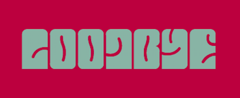 Fortaleza, Brazil-based designer of the psychedelic typeface Oczy (2018). [Google]
[More] ⦿
|
Viktor Nübel

|
 Freelance graphic designer in Berlin, b. 1977. In 2005, he graduated from the Design Akademie Berlin with a thesis entitled Type Attack. His typefaces:
 - The stencil-inspired PTL Attack (2006, Primetype).
- Ostblock (pixelish).
- Modul72. A modular typeface in the spirit of Meek's FontStruct). Modul22 and Ostblock were heavily inspired by events and lettering in former East Germany.
- The decorative Oliva (2009), which has a hint of psychedelica.
- Viktor Nübel and Hendrik Möller created some hand-printed fonts with two glyphs for each letter, to better simulate reality.
- The large PTL Attention sans serif typeface family (2013, Primetype).
- Babetta (2013). An all-caps typeface (with an inline called Babetta Neon) that was inspired by an illuminated vintage shop sign at Karl-Marx-Buchhandlung in Berlin. It has some elements of art deco.
- FF Attribute Mono (2017) and FF Attribute Text (2017). These FontFont typefaces emualte typewriter and programming types.
MyFonts link. Behance link. Viktor Nübel foundry. Klingspor link. Fontspring link. Volcano Type link. Fontshop link. [Google]
[MyFonts]
[More] ⦿
|
Vincent Pacella

|
 American lettering artist and type designer from New York. Creator of ITC Cushing (1982) and ITC Pacella (1987). MyFonts.com hints that he may have died. According to Linotype, ITC Cushing has a long history. The font was originally designed [for ATF] by J. Stearns Cushing [in 1897], a Boston-based book printer, and famous American type designer Frederic Goudy expanded it to include an italic weight [in 1904]. These early ATF typefaces became known as Lining Cushing Oldstyle No. 2 and Italic. ATF also brought out a Lining Cushing No. 2 and Italic, Cushing Antique, and Lining Cushing Monotone 553.] A Ludlow version featured narrow capitals and an oblique crossbar on the lowercase t. A Monotype version in one weight of roman and italic had small, inclined serifs, wide capitals, short ascenders and descenders. In 1901, Lanston Monotype introduced Cushing Oldstyle, a slightly condensed typeface with large bracketed serifs and fairly uniform weight. It has little relationship to the ATF and Monotype Cushing.
 Under a special license from the American Type Founders, Vincent Pacella modified the design for ITC and added some additional weights. ITC Cushing is slightly condensed with large, bracketed serifs. Pacella changed the capital letters to better complement the lower case and replaced the sloping serifs of the italics to linear type serifs to produce ITC Cushing. ITC Pacella was fashioned in the tradition of Century Schoolbook, Corona and Nimrod, accordung to Linotype. In the 1970s, he made a Photolettering Egyptian headline typeface called Blackjack, which was digitized in 2007 by Nick Curtis as Flap Jacks NF. His 1970s semi-psychedelic typeface Carousel became Nick Curtis's Vinnie Culture NF (2007). His Pacella Vega Extended 10 (Photolettering, 1960s) was digitized by Nick Curtis as Palo Pinto NF (2010). MyFonts also credits Pacella with AT Stratford Bold, a thick slab serif. His PhotoLettering fonts Pacella Barrel and Pacella Colossus inspired Nick Curtis to create the beautiful ultra fat western slab serif Earmark NF (2009). The Western poster font Pioneer was revived by Nick Curtis as Trailblazer NF (2010). Bingham (done for PLINC) led Nick Curtis to design the angular octagonal typeface Binghamton NF (2010). Designer of Plinc Goliath, a fat slab serif, based on Film No. 6206 in the PhotoLettering archive. Originally drawn in 1970 by Pacella, Goliath was digitized by Ben Kiel with Adam Cruz in 2011 for House Industries. [Google]
[MyFonts]
[More] ⦿
|
Vintage Type Co
[Sean Coady]

|
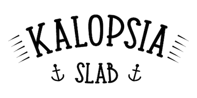 Graphic designer from Summerside and/or Charlottetown, Prince Edward Island, Canada, who was located first in Edmonton, Alberta, and then in Moncton, NB, then in Toronto, and finally in halifax, Nova Scotia. He runs SRC Designs and founded Vintage Type Co in 2015 (not to be confused with Susan Townsend's Vintage Type, a company set up in the 1990s). Creator of the free sans titling typeface family Municipal (2013) and of the hand-printed typeface Fruit Sale (2013).
 In 2014, he created Shifty Sailor (spurred), Hofmann (psychedelic typeface), Kalopsia Slab (a condensed slab serif family with an arts-and-crafts flair). One weight is free---the others can be bought here. He also created free User Interface Icons in 2014. Typefaces from 2015: Jackal Display, Anaheim Gothic, Alehouse (vintage connected script), Dorchester Display (vintage Victorian typeface), Huxley (brush script), Drone Ranger (octagonal dystopian type), Authentico (vintage poster typeface in eight styles), Firefly (free poster font), Highbinder (an eroded vintage typeface), Adventurous Script (watercolor brush), Nomad Icon Font, Arctic Express (handcrafted capitals). Typefaces from 2016: VTC Numeric (free), Grindstone (vintage), Grindstone Script, Grindstone Sans, Midnight Owl, Southbank (free), Planet Rouge, Life Is Jazz Script, Mystery Tour (+Sans) (a layered Americana or circus font), Sugar Boats, Navy Queen (a nice free font influenced by vintage nautical posters). Typefaces from 2017: Virgo Antique, Virgo Display, PressBox (letterpress and Americana emulation), Merchant Street Sans (eight stackable fonts), Old Spirits (spurred Victorian style), Prizefighter (art deco sans), Andre's Diner, Artisans Script (signature script), Milton Grotesque (a free all caps American grotesque), Queen Street (a layerable family). Typefaces from 2018: Grindhaus Sans (geometric), Drone Ranger Pro (octagonal). Typefaces frm 2019: VTC Bloke (a revival of Miller&Richard's Egyptian Expanded, a wide typeface reminiscent of the Egyptian wood types), VTC Horoscope. Typefaces from 2020: VTC Elmwood (a modernized blackletter font family), Fellbaum Grotesk, VTC Fellbaum Grotesk. Typefaces from 2021: Chocolate Chipped (a condensed woodblock emulation typeface family). Vintage Type Co. Dafont link. Behance link. Another Behance link. Creative Market link. Home page. Creative Market link for Vintage Type Co. [Google]
[MyFonts]
[More] ⦿
|
Vitatype Digital Fonts
[Jeff Bortniker]

|
 Jeff Bortniker from Overland Park, KS, designed Psychedelic Fillmore East, Psychedelic Fillmore West and Psychedelic Avalon at T-26 in 1995. The irregular hand The Walls (1994, T-26) is also due to him. He set up Vitatype to make retail and custom typefaces in the 1990s. Other typefaces from the 1990s at Vitatype included Bodhisattva, Woolly Bully, and Lost Dog Good Dog.
 Klingspor link. [Google]
[MyFonts]
[More] ⦿
|
Viva Kaiva
|
An intestinal or psychedelic typeface made in 2021 by Creative Media Lab. [Google]
[More] ⦿
|
Vjordan
|
FontStructor who made Vjordan (a psychedelic face), Vjordan 3 (grunge dot matrix face) and Vjordan4 (white on black dot matrixface) in 2010. [Google]
[More] ⦿
|
Wachid Ristiyanto
[Ngene]

|
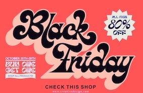 [MyFonts]
[More] ⦿
|
Walter Kafton-Minkel
|
 Walter Kafton-Minkel was an active member of the Portland Macintosh Users Group. Designer of the old shareware font Lumparsky (a comic book font available in most archives), Benjamin (1991, based on the wood type Ben Franklin; revived in 2000 by Dieter Steffmann as Benjamin Franklin), Grooovvelic (essentially identical to PsychedelicSmoke), PostCrypt (1993; a dripping blood font based on Crypt from MacroMind Inc), Psychadelic (1992) and PsychedelicSmoke (1990, in various weights).
 Author of Subterranean Worlds: 100,000 Years of Dragons, Dwarfs, the Dead, Lost Races and Ufos from Inside the Earth (Loompanics Unlimited, 1989). [Google]
[More] ⦿
|
Web420
|
Psychedelic font archive having 26 free fonts. [Google]
[More] ⦿
|
Weknow
[Wino Sutarmin Kadir]

|
 Weknow is the foundry of Indonesian type designer Wino Sutarmin Kadir (b. 1979), who is based in Bogor, Jakarta. Weknow produced a large collection of free fonts from 2009 until 2012. He started making commercial fonts in 2012.
 Creator of the unicase sans typeface Weknow (2009) and the roundish MisstyPoland (2009). From 2010: Helenfont (2010), Dennis Vallera (2010), Kasumichan, Karitza, Mozzie, Wings, Sharon, Noakatz, dearladysandra, arachnidlove, Alexandra, Monica (2010), Natalie, Wayner 8088, Anime Queen (2010, pixelized), Nano (2010, pixel face), Glover (2010, circular face), Frozen Pandaman (geometric), Joenine (circular), Fun Record (geometric), Gembira (circular), Gabrielle, Solgas (circular), lifeforfun (2010), znowwhite (2010), Snowmask (2010), Nine (2010), Znowwhite (2010), Cecile (2010, experiment with triangles), Coreldraw (2010, geometric, monoline), DennisVallera (2010, inspired by the vector art of Canadian Dennis Vallera), Helenfont (2010). Designs from 2011: Michelle (circle-based), Emmilia (circle-based), Raynaliz, Polysoup, Seba, Selfregion (concentric glyphs), Wings of the dragons (octagonal), Spider, The Training Artist, Chewed Kandi, Sandra, Saintfighteraqua (geometric), Alexey (circle-based), Kristina (circle-based), Graphic Dream, Crystalcore (techno), Dominique (fat rounded), Formalart, Henderson (circle-based), Intanputripratiwi (circle-based), Kioshima (geometric), Gitchgitch (geometric), Justta, Dismecha, Self Region (labyrinthine), Alberto (monoline geometric), Abstrasctik (rounded and experimental), Nicole, Robotoc, Laggastic, Masterpanda, Mohr, Maruciel, Gabrielle, Carlos (a circle-based face), Life For Fun (geometric monoline sans), Lois Cesarano (hexagonal), Heather Thomas (circles and lines), Picaee (modular and leafy), Owaikeo (a circle and arc face), Celeste, The World, Future, Lanitta, Earthearth, Basic, Beautiful, Internationalist (monoline rounded sans caps face), Midnight Show, Plastic, Victory, Perfect, Superpower, Katarzyna, Invasion, Block, Wonderfull, Sweetest, Direction, Funrecord, Eternal Flame, Coreldarw, James Glover (circle-based), Superstar, Inside, Parallel, Million, Ocean, Never Ending Maze, Silverbend, Dragon Fly, Whatever You Want, Swinging Swan, Funatic, Soulmate, Superhero, Zetland, Letting The Cable Sleep, Weknow World, Universalisme, Ocean, Smiley Turtle, Family&Friend, Flower in the window, You&Me&Everyone Else, Astonishing, Grass Hopper, Merpati Putih, Extra Hot, Trees of Happiness, Blowing Bubble, Brain Storm, Good Morning, Flower Lover, Honestly, Jaguar, Modern Aristocrat, Pure and Simple Everytime, Ride the lightning, Proffesional (sic), Flight Stewardess, Antique Retro, Natural Technologies, Ethereal Sky, Conversation, Earth Heart. Free typefaces from 2012: Serta Kayu (multiline script), Emerald, Sweater (texture face), Fish Bone, Delicious Ketchup. The Dark Knight, String and Wire, Little Ant, Xtrapower, Standard International, Nice dream come true, Bavaria, Queen of the modern age, Science Fiction, Greatest View, Queen of the Modern Age, Made in earth, Arabian Knight, Emperor of Japan, Bill Gates Windows, Maximum Kilometer, Mineral Oil Resources, Motorcycle (curly caps), Eskimo and Polar Bear, Gladiator Sport, Aero Dynamic, Optical Fiber, High Logic, Generation (a nice all-caps shadow face), My Heart, Play Ground (multiline face), Cartoon Character, Windows in Japan, Quantum Leap (dymo label face), Computer Love, Electric City, and Copper, Valentine In Love, Weknow Windows, Punk, Graphic Design, Billy Jean Style, LMAO (rounded bold sans face), Take and Give, Indonesia Tanah Air, Swimmer Browser, Diamonds are forever (hexagonal and rounded), Tortoise, My Dear, Get Ready, Export Import, Miracle, Digital Ninja, Funtastic Million Moment, Funny and Cute, Samurai in UK, Bookmark, Once Upon A Time, Bird Feather, Respect, Aruna Aira Jasmine, Extra Cheese, Beauty and the beast, Kung Fu Master (oriental simulation typeface), Game Player (art deco), Modern Building, Trade and Mark, Grovy (sic) Kind of Life, King of Font and Typography, ABC (comic book face), Metro City (extended monoline typeface), The Art, Sprout and the bean, Scooter experiment, Sundown Sunrise (a rounded monoline sans), Art Heart, WindowsObject, Authentic Love, Dolphin Ocean Wave, British Pop Music, Master (sci-fi), Sneak Peeks, Like This, Crumble, Zebra Cross, Star Constellation, Water and Gasoline, Autumn, Aviator, So Cute, Crow Chief (bow and arrow font), Beard Rider, Skateboard, Panel, Swallow Sky Night, Hotel Motel (fat finger face), Techno Various, Zooming Track, Robo Cop, Dance Fever, West Java, Ivory Culture, Push The Button (art deco), Highway Patrol (blocked black typeface), Sausage, Little Atom, Mick Jagged, Life Is Final (copperplate), Total Hammer, Cybertooth, Modern Craft, Riding The World, Boarder (counterless), Essential Arrangement, Sensation, Helmet, Smile, Little Think Big Impact, Airplane, Young and Free, The Futurist, Creative Mind, House Builder, Falling in love, My Font (a rounded monoline oblique sans), Proffesional (sic) Edition, Young Forever, Brown Fox, We Know, Prehistoric, Frankenstein Monster, Great Adventure, You Makes Me Happy, The One and Only Me, Wireframe (3d face), Ceramic (3d face), Winner, The Amazing Me, Cycle, Asia Pacific, Written on the hand, Love is blind, Luxurious Sexy, Robotic, Nano (dot matrix face), King Of The World, Roller Blade, Antelope Run, Elemental, Champion Coffee Cup, Bandit, Arcade, Zetland, The Training Artist, Technique, Neon Glow, Fruit Vegetable, Archieve, Experiment Butterfly, French Fries, Remember Memory, Rocksteady, Electro Static Rain, Science Channel (stencil face), Surfing and Play, Umbrella, The Wizard, Great Leader, Bare Knuckle Fight, The Wizard of One Click, Extra Large, Stabilo Spidol, Onion Rings, Strawberry, Lets Do It Again, Modern Script, Amazing Symphony, Psychedelic, Jump Street, The Earth (modular), Brigade Army, Extraordinary, Cobra on Coconut Tree, Natural Beauty, Anything Mean Everything, Smoke on the water, Write A Letter, Everybody, Together, Planting And Seeding, Savior Light Our Way, All Around The World, Think More For Solution, Yesterday, Techno Tech, Prudent, Metamorphosys, Keep quite and simple (sic), India Hair Style, Catalyst, Bamboo Shoot, Global Capitalism, Water Drop, Thunder Jagger, The Science Archaeologist, The Happy Face Smile, Pyramid Inverted, Jailbreak, Game of Life, Fun Raiser, Athletic, Android Robot (sci-fi), Croissant Sandwich, Ocean Free, Thursday, Crochet Pattern, Firework, Futuristic, Pocket (rounded bold sans), Entertainment, Technology (bubblegum face), So This Is It (inline caps face), Everything (circle-based font), Auto Mobile, Futurism, Rhinoceros Break, Enormous (angulat headline face), The Quick (octagonal), Over The Mountain (wavy face), Frame Work, Interplanetary, Antariksa (rounded sans), Airwaves, Strong in the Heart, Pure And Simple Everytime (rounded organic sans), Gitchgitch (rounded organic sans), Monica, The Lazy Dog (grunge), True Self Reliant, Think Techno, Street, Symbol (constructivist), Post Rock, Moon Light (plump and round), Jumping Running, Green Avocado, Bunga Melati Putih, Bizzare, World Word, Little Rainy Day (dot matrix), Animaline (animal dingbats), Smart Watch, At Most Sphere, Sweet Lollipop (curly), Painting The Light, Flattered, Earth Aircraft Universe, Daydreamer, Earth Aircraft Universe, Flattered, Welcome to Planet Earth, People Quark, Friendly Robot, Biological, Splashing, Freezer, Ragatnia Clara (a nice script), The Happy Face Return. Typefaces from 2013: Cat Eyes, Stay True, Where Wolf, The Sound, Royal Jelly, Grumpy Cat, Aku Cinta Kamu, Yellow, Innovation, Invisible Man, Archieve, Electro Magnet, Bamboo Chopsticks, Valentine's Day, True Love, Club Golf, Your Smile, Guitar On Stage, Karate (oriental simulation), Recognition, Sleeping Beauty (plump lettering), Gelombang Radio, Frozen Ice, Sport Center, Reflection, Enjoy The Time, Fillet O Fish (brushed caps), Artistic, Flower Generation (psychedelia), Heart Shaped, Adore You, Jelang (textured typeface), Stargazer, Army Of Me, Xtreme Bike, Atomic, Fancy Curly, Mastermind, Scientist, Brother, Bahasa Indonesia (sans), Cyber, Photography, Super Creative, Black Stallion (script), Cartoon, Exposure (shadow face), The Ticket, Mercury (retro-futuristic), Agriculture (lava lamp typeface), Electronic, Transformation, The Night (gothic typeface), King Cobra, Bionic Heart, Goddess of Fortune, Guitar Acoustic, Magenta Flower, Java Island (lava lamp typeface), Ready Steady Go, Cute Monster, High Speed, Machine Gun, Random Face 1 (dingbats), Dear Diary, Shinobi Ninja, Stranger (octagonal), Discovery, Translation, Japan (oriental simulation), Digital Gothic, Techno, Butterfly (lava lamp typeface), Candlelight (eax drip face), Maverick, Movie Script Ending, Monochrome, Japan, Chunky Bar, The Greatest High (blackboard bold), Featured, Random Thing 1 (cartoon dingbats), Straw Hat, Where Are You, Plant On Lawn, The Innocent Face, Beat of Drum, ASDFA, Creamy Butter, Monster Rock, Plumbing, Mexicano Chili Sauce, Air Show (bubblegum face), This Is True, Fresh Mint, Laser Gun, My Game, Black Mamba, Drako Heart, Children Stories, Play The Game (with a McDonald's M), Let it be, Everlasting Song, Logotype, Blessing Son, Wino Sutarmin Kadir, Bad Boy, Bold and Blue, Quantum (sci-fi face), Oceanography, Elementary, Sailorman, Heart And Love, High Thin Light, Vintage Postcard (spurred), The Bartender (spurred), Inside The Boxes (rhombic type), Herbalism, Happy Home (lava lamp typeface), Wave Zone, Market Leader, The Monkey, Engine Power, Gamer, Story Telling (lava lamp typeface), High Flagship, Back to Nature, The Quick Motorcross (bilined, caps only, with a McDonalds M), Fisherman (lava lamp typeface), Step Forward, King of Pirate (art nouveau caps), Heritage, High in Love, Thin Decorative (spurred typeface), Little Cowboy, What The Fun, Aha Experience, Glitch (pixel face), Portable. Typefaces from 2014: Enjoy The Show (bubblegum font), Right Power, Xerxes, Selamat Hari Raya, Sincere Heart, Thermometer, My Angle (fat script), Restaurant, Life is font, Material Science, Wave Zone, Everything is a test, The kind of feeling, The President, Blue Ocean, Heavy Metal Gaze, Air-Planet, FOREST-THING (a black poster font), Here-Comes-The-Sun, VICE-VERSA, Wajah-mu-Malaikat, The Miracle, Over The Sky, Eternal Love, Under Stand, Lets Get It On, Salute, Please Forgive Me, Forest Jump. Dayak Shield, Golden Bar (piano key stencil face), Life To Find, Make Peace, Rocket Brothers, Space Truckin, Silver Knight, Zeppelin, Banana Split, Funny Sport, Material Science, Cinta Adalah Perhatian, Love is Attention, Philosophy, Swampthing, Something, Great Job, I Love You, Baby Metal, Millenium 3, White Sock, Liberate, Life Is Font, Chasing Tail, Listening, Sghining Pearl, Hall of Fame, The Good Life, Funky Claw, Pretty Clever, Breath, Continue, Eyes Believer, Samurai Sword, About, God is Watching us, Smile at face, Guitar Rumble, Si Cantik, She is Beautiful, Joker Shoes, Welcome to the jungle (brush face), Maximum High Tension, First Love, Great Heart, Computer Robot, Question of Science, Book Shelves, Billy The Kid (Western font), Times New Romance, Techno Capture, Chemistry, City Shine, Samurai and Blade, Hexagonal. Typefaces from 2015: Brigade of Love, Creative Culture, Axe For Warrior (dingbats), Bogor, Teleport Machine, Construction, Architecture, Underground (octagonal), King will be king, Knight of Light (medieval), Barbarian, Every Day, Thumbs Up, Defragmented (pixel face), Garden of Rose, House Music, Giant Universe, Element (a connect-the-dots typeface), Kingdom of Heart, Smart Talk, Take On Me, Symbolism, The Happiness, Dark Empire, Space of Time, Game Robot, Made in Indonesia, Morning Sunshine (art deco), Gravity Relationships, All About Love, City of Rock, Dear Baby, My Pleasure, Dear Lovely, Drea Reality, Charming Prince, Warehouse Project (geometric solids), Stone Rock, Script Machine, Pray Boy, Copy Paste, Baby Cuttie, Treasure Island, Impulse of Heart (fat rounded stencil), Extraordinary Craft, Brand New Colony (connected script), Digital Handmade, Learning, Aero Glass, Rainbow In Love, Catatan Harian, Sky Liner, A Lot of Love, Take Me Home, Shake It Off, Everything More, Qualified Good, We are the Word, Tshirt, Valuable, Weknow, Metal Kingdom, Phytoplankton, Kissing The Rain, Sunset Beach, Jazz Music, Dear Lovely, Dream Reality, My Pleasure, Boarder, Entertaintment-Show, Guardian, Indonesia, This-is-internet, Picture-of-you. Typefaces from 2016: Big Burger, Blues Melody, Kangaroo Punch, Dark, Amazing Day Everyday, Delicious Choice (lava lamp script), Panda Robot, Wijaya Fresh, Megapolitan Jakarta, Chalk Board, Mother Father, Knowledge Power, Singing Bird, Extra Machine (stencil), Airwave (rounded sans), Human Alter Ego (octagonal), Grand Prix, Serat Kayu, Daniel, Greatest Map, Jazz Sound, Amazing Sound, Algorithm (techno), Brother Army (upright connected script), Cannon Ball, Senorita Spain, Billionaire, Most Famous, The Innocent Army, Guitar Electric, Bracelet, Batman, Phenomenon, Arabian Prince, Taring Serigala, Happy Everydays Day, Coffee Time, Revolver (Western style), Space Object, Black Arrow, Candle-Light, Evergreen, Green Tea (foliate typeface), Harley Queen, Masquerade. Typefaces from 2017: Red Light Special, The Brain, Entrance, Auto Bots, Alive in Science Fiction, Harmonic Vibration, Hydraulics System, Mountain Dew, Flying Bird, Next Century (outlined), Read Book (trilined), Just Do Good, Purpose, Kasih Dan Sayang, Tobacco (scratchy typeface), Baby Superhero, Life in Digital Age, Black Star, Start Revolution, Artistic, Army of Me, Anything Mean Everything, Antariksa, Animaline Dingbats, Android Robot, Amazing Symphony, A Lot of Love, All Around The World, All About Love, The Ugly Font, Switch System, Across The Night, I Am A Robot, Polygon Star, The Creation, Amazing Day Everyday, A Lot of Love, Western Eastern (Far West font), Gangsters, Armored, All Around The World, Great Britain, Chintya Awuy, King and Queen, City of Rain, Sub Urban City, Spicy Paprika, King of Everything, Pondok Ratu Intan, Celestial Love, After Party, Underground 2. Typefaces from 2018: Age of Science and Technology, Autopilot, Age of Awakening. Typefaces from 2019: Primitive Heart. Typefaces from 2020: Thefotosintesis. Alternate URL. Behance link. Dafont link. Fontspace link. Klingspor link. Fontm link. Creative Market link. [Google]
[MyFonts]
[More] ⦿
|
Werner Affolter
[Affolter und Gschwind AG]
|
 [More] ⦿
|
Wes Wilson
|
Robert Wesley Wilson is a psychedelic era poster artist, b. Sacramento, CA, 1937. He now lives in Aurora, MO. Colin Brignall writes: His most favoured form of lettering developed as a direct influence of Alfred Roller's lettering for an exhibition of Secessionist design in 1903. This lettering was generally rectangular in form and therefore ideally suited for Wilson whose work often involved wrapping words around predetermined, free-flowing areas in order to fill up space. White space being considered bete noire to the psychedelic poster designer whose style of work was intended as a reaction to the prevailing clean Swiss style of typography! Colin concludes: Wes Wilson disappeared from the San Francisco scene as quickly as he and his contemporaries and their highly individual art form breezed in, heading for the Ozark mountains in Missouri in the early 1970s to live, apparently, a reclusive lifestyle. [...] His legacy though is an incredible art form that forty-five years on is revered as truly classic of its time. Wilson's style is also known as the Fillmore Poster lettering style. Several typefaces were made that are based on Wes Wilson's lettering. These include Wes Wilson (2007, Keith Bates), Mojo (1996, Jim Parkinson, Adobe), Butterfield (1993, David Nalle), Genie (2006, Rebecca Alaccari, Canada Type), Jonah (2005, Rebecca Alaccari, Canada Type), Roller Poster (2006, HiH: named after Alfred Roller), and Peace and Love Solid by Leslie Cabarga. View some of the digital typefaces that are based on Wes Wilson's work. Facebook link. [Google]
[More] ⦿
|
Wilson Thomas

|
 Designer (aka Funk King, b. Fort Knox, KY) who lives in Orlando, FL, and/or Apopka, FL. He used FontStruct in 2008-2009 to make over 550 decorative fonts, and became one of the world's top experts on FontStruct, FontShop's on-line font editor. Most of his fonts were withdrawn in 2012. He did a few commercial typefaces at his commercial foundry, Funk King. His creations include
 - A Bit Eccentric.
- Alphabots
- Alphadings: Picnic Basket (2014), Rat Race (2014), Pod Invasion (2014), On Hangers (2012, a commercial series that includes Pants on Hangers, etc), Dog Tag, Black Bird, Easter Egg Dots, Ser Egghead T. handlebar, Ovoidotta (now called Sniff), Play Book, BuddhaBuddha, Swizzle Sticks, Computer Backplate, Milky Way, Sprout, Football, Clapboard (for movie makers), Teed Off, Book Stack, Speaker Box, Ant Farm, Sound and Vision, Speaker Grill, Tom Tom, Caged Type, Conga Lounge, Spinal, Add Van, Frostruct, Picket Fence, Regatta, Cranestruct, Impossible Alphabet, Igloo Village, Mortar Board, Jack, Marionette, Golden Gate (+Short, +Solid), Crossed, Eff U ("the finger"!), Tall Big Top, Jackpot, Skulls&Cross Bones Redux, Crosshairs, Drama Club, Good Day Sunshine, Butterfly, Steps and Windows, Heartbroken, O Christmas Tree, Christmas Lights, Candle, Supper Time (alphadings of plates), Sands of Time (alphadings of hour glasses), Fishbones (commercial since 2012), Handy (alphading with hands), Hang Ten (feet alphadings) and High Five (hand alphadings), Armade and Ghost Ship Armada (ship alphadings), Cut Here (stitching alphadings), Schematic (electric circuit alphading), Masquerade, Mortar Board, Gear Bits, Gearswork, Hi-Lo Gears, Gears, Resistor, Gear Shift, Castle, Castle with Flags, Antique Keys, Rounded Keys, Pods, Piano Keys (+Alt, +Correct), Framework, Dixieland Jazz, Spats, and City of New Orleans (the last three are alphdings based on the same Victorian alphabet), Saturn, Piggy Bank, Voodoo Doll, Dice, Fist Bump.
- Antennas, Antennas Outline
- Antiquity
- Arcostellati, Arcostellato, Arcangolo, Arcontorno (2011): a blackletter family.
- Architect, Ruled, Gridworks, Blueprint (Solid, Dashed), Quadular (+Serif), Isometric Modified (+Light, +Bold Outline), Isometric (a 3d gridded family: +Basic Latin, +Basic Latin Lite, +More Latin, +Bold, +Black).
- Art deco: Arc Neuvo (rounded letters), Arc Nuevo (2012, commercial), Toneelschuur (based on the letterhead created for the Theatre Toneelschuur Haarlem), Shift (bold), Eye Spy (this says Peter Sellers), Mod Squad.
- Atomic.
- Avenue, Avenue Alphabet (white on black).
- Badge
- Ball And Chain (neat), Ball Bearings.
- Balls and Bats
- Banjo (2012).
- Barber Shop
- Barcoded
- Basket
- Beachwear (horizontally striped)
- Beat Block, Beat Box.
- Beatnik.
- Beltway.
- Birdseye
- Birdsteps
- Bitten
- Blackletter: Abbey
- Blanket Serif Caps, Blanket Sans Serif
- Block Inline Block
- Block Mosaic (great gridded letters)
- Blockheads
- Blood Sweat&Tears
- Bolla Fratturato (2011): outlined blackletter face.
- Bolt, Bolted
- Bon Mots.
- Break, Balance Beam, After Party (2010).
- Bubble Zwrap (2010).
- Build A Bridge
- Buzz Kill
- Cafe Fumante.
- Carp Black, Carp Blanc
- Caterpillar, Tall Caterpillar.
- Cattails
- Chain Gang, Krazy King
- Channel
- Check Mate (checkered flag font).
- Cherry Bomb.
- Chubby
- Cinder Block (2010): a 3d typeface with texture thrown in.
- Circuit Board Solid, Circuit Board Outline, Circuit Board Outline Numbers, Circuit Board Simple, Micro Clean, Microcircuitz, Circuit Board Simple, Schematode (2013).
- Circus Maximus Outline
- Cirquela (2012). a non-FontStruct font, this is his first hand-printed typeface.
- Clean
- Cobblestones
- Code Hijack (2014).
- Compass (+Plain)
- Connected scripts: Cruise, Jet Cruise (2009), Notched Script (upright, connected), Rough Script (italic, connected), square Script (pixelish, connected).
- Computer Backplate, Milky Way.
- Contempole
- Crimped Pincushion (2010).
- Crispy Inline (classy)
- Crooked Marker, Marker
- Crop Circles
- Crownbar.
- Curls And Twirls
- Cut Here
- Daisies (nice rounded square letters with painted daisies)
- Decoscriptic, Decoish.
- Diamonds Are Forever, Liberty (dot amtrix fonts)
- Didactic fonts: Back to School.
- Digital, Digital Whimsy (gorgeous fonts in which the meat of the glyphs is made up of 0's and 1's), Digital Italics, Digital Non-italics.
- Dingbats: Digital Biz Bitz (2012), Capitalist Pictograms (2012), Kapitalist Kit (2011), Weather System (2011), Twelve Days of Christmas (2010), Learning For Business (2010), Calder Symbols (2010), Mad Aliens (2010), FSEmoticons, Maven Pictograms, Temp (weather dings), Sports Wave, Bullet Arrows
- Dinner at 8
- Diode
- Directional
- Ditier Cycles (2010): a grunge version of J. Hughes's Dirt Cycles.
- Disco Ball, Disco Salvation.
- Doggie Tracks (2010).
- Dollars and Cents.
- Domestic Bliss (+Solid), Blissful Hearts (Valentine's Day alphadings).
- Domino, Dominodot
- Dot matrix fonts: Belly Button (2013), Fandangle (2013), Trace Remains (2013), Billiards (2013), Pome (2013), Cow Poke (2013), Rouletto (2014), Crawler (2014), Zephyrelli (2012), Yoyo (2012), Carousel (2011), Corsivo Punti (2011), Wisp (2011), Amusement (2011), Menagerie (2011), Junk (2011), Iphont (white on black dot matrix face), Lyrical (dot matrix script), Petits Pois, Elli, Industrial Magic, Wind Chime, Domestic Bliss (2010, +Serif, +Sans Serif), Ying Yang (2009)
- Double Decker
- Eau de Kerning.
- Efficiency (2010).
- Eiffel family: mechanical.
- Electrifunkified (2013).
- Emergency
- eq Regular, eq Radio Waves, eq Tight.
- Erector Set (2010).
- Extension Cord
- Fairy Tale (curly)
- Fantastic
- Fast Cars, Fast Lane, Fast Forward
- Fifty Famous Fairy Tales (bi-lined and bejeweled)
- Flair Ornate, Flaired Script, Flair, Flaired
- Floor Plan
- Flash (gridded face)
- Folk Art (wooden plank simulation)
- Font Troll
- Fractal, Wireframe, Hemisphere, Origami (now Mummification): experiments in glyph partitioning.
- Funk, Funky palms
- Gancio (2014). Hand-drawn.
- Gemstone (letters in a mosaic)
- Glyphs made from broken objects: Broken Combs, Broken Glasses
- GI Joe
- Grain
- Graphont
- Grid1, Grid2, Pas De Grille Pli Isométrique (+Plombé), Grille Noir Pli Isométrique (+Plombé), Grille Intrépide Pli Isométrique (+Plombé), Grille Facile Pli Isométrique (+Plombé).
- Grunge typefaces: Feather (2010).
- Gummy (2010).
- Happily Ever After (2010).
- Heath Robinson (gorgeous mechanical font).
- Hexcavated (2010).
- High Anxiety.
- High Wire (dotted).
- Honeycomb Black (hexagonal).
- Horizontally Phased (like IBM logo from afar), Vertically Phased, Field Goal.
- Hot Diggity Dog (2010): a monoline rounded sans.
- Void.
- Inline: Hi-Fi Deco, Track (+Filled), Crispy Inline
- Imperfect Optical Experiment.
- Ironside, Ironworks.
- Isomixed (+Inline, +Inverted, +Light, +Inline Light), Isomixerd Moire (nine textured styles).
- Jacks (2010): a stitching font.
- Jeannie
- Jelly Bean series: I's, Wide, O's, Split
- Jetsons (futuristic).
- Jolly Swash 9+Tall, +Tall Wide Tail).
- Kaleidoscope, Kaleidoscope Solid
- Kitchen tile typefaces: MadisonAveAvenue (2010), Edgar Fernhout (2012).
- Lace
- Ladder
- Last Days Of Summer, Endless Summer, Beach.
- Lattice, Lattice Black
- Lean
- Leaves
- l-e-display
- Little Miss Muffet.
- Loom.
- Love, Love Letters
- Martini
- Metroliner and Metroliner Deluxe.
- MICR fonts: Wedge Solid.
- Mike
- Mitered, Zietgeist: striped 3d typefaces.
- Modal.
- Modern Ancient (chiseled font imitation)
- Molecular (+Complex, +Complex 1), Dense Molecular Complex (1 through 5), Molecular Architecture, Tessellation 1 (+Continuous), Tessellation 2.
- Monkey Bars.
- Montreal (+Italics)
- Monumental, Less Monumental,
- Mortar Booted (+Thick, Separated, Mission, Booted Mission).
- Mouthy
- Music fonts: Fret Full (2010), Fret Station (2010).
- MyBlock
- Mystere (2012, grunge).
- Necklace
- Ninja.
- Oblique
- Octovision Remix
- Open&Shuttered Day, Open&Shuttered Night
- Oriental simulation/look: Shoji Pixel, Shoji Stage&Screen Soapbox, Chinese Democracy, Asian Influence.
- Origami City (2010): formerly Simply Elevated Black. Simple Elevation (2012) is in the same family.
- Outline Habitat
- Ozmosis (2014), Ozian (2014), Cardinal (2014), Emblem (2014), Oblio (2014), Hollow Branch (2014)
- Pallina (2010, + Stampino, +Diluente).
- Palm, Tall Palm
- Paperclip typefaces: Neue Werner Paperclip (2012).
- Patterns
- Pavers
- Piccadilly (2010).
- Pipes
- Pisa.
- Pixel Dust, Pixels Dusted, Zogg Domination (video game font)
- Plaid
- Pop Arc (2010). In the same style: Conveyor Belt, Milk Bottle, Cookie Cutter, Erector Set (2010).
- Popsicle Sticks (nice vertically striped glyphs).
- Playbook (2010).
- Power Grid, Power Gridlocked
- Process This (2010) and Flowcahrt (2010): based on graphs of computer programs.
- Pump Boys (2010).
- Puzzle
- Quagmire (2010)
- Radio Waves
- Razorback Block
- Receipt (2012): a dot matrix face.
- Regular Habitat
- Relativity
- Remixintag (2011, a clone of Wallachia by Intaglio).
- Repeat
- Ribbodini (2010, ribbon font).
- Riveted
- Road Trip
- Sausalito Nautica (2011).
- Say What? (Exaggerated ink trap face)
- Scaffoldini (2010): a 3d gridded face. Followed by Scaffo (2012), Scaffoldini Senza Griglia (2010), Scaffoldini Ascendente Contrario SG, Scaffoldini Ascendente Senza Griglia, Scaffoldini Contrario Senza Griglia, Scaffoldini Ascendente, Scaffoldini Contrario, and Scaffoldini Ascendente Contrario, Scaffoldini Prospettico (+Contrario, +SG).
- Scichosis.
- Scripts: Diode (+Dioded, Diodoubled, Diodocked, Diodedocked, Diodiced), Scherzando, Fontstitution, Rough Script, Scriptilicious, Whipped Cream, 45 Degrees, Script Town (2013), Aloha (2013), Sinal Strength (2013), Ink Well (2013).
- Skulls, Skully
- Slice N dice
- Skyscraper.
- Small Wonder, Small World
- Snowflake (2010).
- Soap.
- Sole
- Soma (2009): 3d letters mades from cubes.
- Spooky Eyeballs (2009).
- Squiggles
- Stained Glass, Stained with Cross
- Starburst
- Stencil fonts: GI Joe (2012, military), Kid's Stencil (white on black), Black Tie, Matchstick, Stensei, Stencillated, Tri-Fold, Tri-Fold Cut, Tri-Fold Rounded, Stencil, Stencil Plate, Stencil Face, Semi Stencil, Psuedo Stencil, Psychedelic Stencil.
- Stitching fonts: Cross Worded (2013), Cut Here (2014), Sampler
- T-Shirts on a Clothesline
- Swamp Frog and Tadpole: artsy fat letters
- Swamp Funk, Mojo (curly letters)
- Swatches.
- Tabular
- Tall Habitat
- Techno look: Technified, Slick, Tangential (2010).
- Tanqueray (2010): octagonal face.
- Teepee (wood look)
- Tennis themed: Racket, Net Ball, World Cup.
- Tetrominoes Black (2010): a 3d typeface cloned from TP2 Marriott's Tetrominoes.
- Textile
- Texture fonts: Global (2011, globes), SS Half Tone (One, Two, Three), SS Watermark, SS Silk Screen (2010). These brush texture typefaces were cloned from Swifted Strokes by Mike Lee. Tramarada (2011) has a stunning woven look.
- Thalistic.
- The Adventure of the Dancing Men (2011, dingbats).
- The Big Top
- The Real McCoy
- Tiki.
- Time
- Timpani, Timpaniless, Timpaniblok, Alien Crop Circles (outer space face).
- Toothpaste (2011): imitating oozing toothpaste.
- Trapezoidot, Zoidot, Dotz (dotted typefaces).
- Upright connected scripts: Madie (2009)
- Valentine's fonts: Hearts and Flowers, Hearts and Arrows, Keys to your Heart, Bed of Hearts
- Vapors and Mirage: evaporating glyphs.
- Vibration (2010). This multiline typeface was followed by Echo (2010).
- Victorian fonts: Alouette, Swamp Funk
- Void.
- Waveform
- WPA Household Arts Stripes, WPA Household Arts Chex, WPA Household Arts (poster stencil face)
- Wee The People, Small World.
- Werner Paperclip (2009), Paperclip (2010): paperclip typefaces after a 1974 original by Ad Werner.
- Western fonts: Bolo (2010), Bow Tie (2010), Bowl (2010), Western Doodle, Sparky, Buckaroo, Diamond Buckaroo, Saloon and Desert Rose. Western style alphadings: Cart Before The Horse, Wagon Train
- Weird
- White on black typefaces: Tabs, Dot Keys, Rounded Keys, Block Keys, Keys.
- Wiggles
- Wim Crouwel-related fonts: Unknown Crouwel #1, Edgar Fernhout (2012: a Wim Crouwel tribute font in kitchen tile style taken from a 1963 poster), Kalender 1976 Letters (octagonal based on a Wim Crouwel calendar from 1976), Kalender 1976, Brusselmans (based on a Wim Crouwel poster), Rabobank (based on a Wim Crouwel poster), Brabant (based on a Wim Crouwel poster)
- Woodcut, Woodcut Recut, Woodcut Banjo.
- Woven.
- Wrenched
- Yay Team
- Zebeast (Zebra-striped letters)
- Zodiac Block
In 2012, he added these fonts at MyFonts: Architect, Black Tie, Carousel, Check Mate, Cobblestones, Cruise, Dog Tag, Edgar Fernhout (2012), Fifty Famous Fairy Tales, Fratturato Digitale (pixelish blackletter face), Ghost Town, Jackpot, Jelly Bean, Keyboard, Kingdom (a castle font), Lagniappe (Victorian), Lyrical, Madie, Matchstick, Menagerie, Q Typ, Scaffo, Sprinkle, Stained Glass, Stencillated, Stensei (stencil), Sweet Valley, Toothpaste, Vibration MF, Yoyo, Zephyrelli. Typefaces from 2013 (no longer freely downloadable!): Pome (dot matrix), Cow Poke (dot matrix), Sausalito Nautica, Cut Here (stitching typeface), Belly Button (dot matrix face), Rouletto (bejeweled typeface), Picnic Basket (alphadings), Fandangle (dot matrix), Trace Remains (dot matrix), Billiards (dot matrix), Cross Worded, Script Town, Schematode (connect-the-dots), Electrifunkified, Aloha, Signal Strength, Ink Well, Satellite, Supper Time (alphadings), Mike (alphadings), Licorice, Conga Lounge OF, Monkey Bars, Daisies, Fractal OF (textured face), Saloon OF, Ball and Chain, Say What. Typefaces from 2014: the multilined or inline typefaces Ozmosis, Ozian, Cardinal, Hollow Branch, Emblem, and Oblio. The alphading typefaces Rat Race and Picnic Basket. The pearly dot matrix typeface Rouletto and Crawler. The video game typefaces Pod Invasion and Zogg Domination. The stitching typeface Cut Here. The pixelized typeface Code Hijack. Klingspor link. Dafont link. Fontspace link. Additional URL. Myfonts link. MyFonts foundry link. View Wilson Thomas's commercial typefaces. [Google]
[MyFonts]
[More] ⦿
|
Wino Sutarmin Kadir
[Weknow]

|
 [MyFonts]
[More] ⦿
|
WrittenShape Type Foundry
[Raphaël de la Morinerie]
|
WrittenShape is a Paris-based typefoundry set up by Raphaël de la Morinerie. It specializes in neutral modern sans serif typefaces, 1970s-style display typefaces and renaissance-era serif typefaces. As of 2025, its type catalog included - Reptil (2025, Raphaël de la Morinerie and Ethan Nakache): a contemporary interpretation and extension of the psychedelic typeface Turtle (1971, Bob Newman ay Letraset). Interview in 2025 by Giacomo Checcucci.
- Naive (2023, Benoit Brun and Raphaël de la Morinerie): a free interpretation of the circle-based psychedelic font Bau, (Flemming Bau, 1970s).
- Gaya (2021, Raphaël de la Morinerie and Philipp Herrmann, consultant): a blurry typeface with warm organic shapes that offer comfort to the eye. This soft serif typeface was first designed at Out of the Dark.
- Adapt (2023, Raphaël de la Morinerie): in their words, a neo-grotesque typeface defined by its calm and meticulously crafted shapes, inspired by Swiss modernist typography, designed with everyday use and precise text compositions in mind.
- Craft (2023, Benoit Brun and Raphaël de la Morinerie): a narrow wood type.
- Kateka (Raphaël de la Morinerie): an original creation that borrows some baroque details from the characters of 18th-century Dutch typographer Johan Michaël Fleischmann, this full typeface family is ideal for classical texts with some embedded rigor.
Raphaël de la Morinerie is a French type and graphic designer who has a Bachelor's degree in graphic and type design from ENSAV La Cambre, Brussels (2019), and who is based in Paris. [Google]
[More] ⦿
|
Yiorgos Yiacos
[Twelve Times two]

|
 [MyFonts]
[More] ⦿
|
Yuji Oshimoto
[04 extra]
|
[More] ⦿
|
Zeenesia Studio
[Doni Purwoko]

|
This Purbalingga, Indonesia-based designer (b. 1994) uses the names Abu Rumaisha Doni and Doni Purwoko. His typefaces: Farm Bluster (2020), Hay Billy (2020), Classic Blody (2020), Maron American (a fat finger font) (2020), The Hungry (a supermarket script) (2020), Madista Calligraphy (2020), Kid Candy (2020), Romantica Story (2020: a monolinear script), Adhellia (2020), Fresh Pineapple (2020), Hello Agatha (2020), Catterpillar (a fat finger font) (2020), Jalliestha (a monoline script) (2020), Rumaisha (2020), Beauty Butterfly (2020: a decorative serif), Menthari (2020), Honey Batterfly (2020: a heavy display sans by Abu Rumaisha Doni), and Rebahan (2020: modular caps). Typefaces from 2021: Better Delight (script), Dream to Berich (a bold curvy almost psychedelic display serif in the Cooper Black genre), Magical Signature (a sharp-edged display serif), Boldblaster (a creamy signage script), Bolderist (a bold wedge serif display typeface), Chocoladine (a creamy dessert font), Faither (script), Kalyant (an unpretentious 6-style sans), Neo Alcatraz (sci-fi), Satnight (a dry brush script), Vince (art deco), Willpower (a 10-style slab srif), Willond (a fat finger font), Baskuline (a grungy script), Gatinlose (a dry brush script), Sathiresa (a dry brush script), The Gaston Swisea (a brush script), Bromo Plateau (a stylish script and serif font duo), Hexi (an 18-style serif, seemingly identical to Sign Studio's Hexi), Magic Romance (a plump display serif that features many ball terminals), Beauty Hamida (a thin monoline script), Butter Carney (script), Hello Molarine (a scrapbook script), Simple Pen (art deco), Cherry Blossoms Script, Lemonilla (a fat finger font), Dream Miracless (a scrapbook script), Golden Blast (a fat finger font), Reds Aglonema (an informal monolinear typeface), Marwah Signature, Battle Bingo (a casual font), Choco Candy, Ice Cream Grande (an ice cream store or comic book font), Lovely Forever, Sintyabelinda (a monolinear signature script), Amsterland, Chikybard (an upright display serif), Little Humble (a scrapbook font), Queen Emirates (all caps, copperplate serifs). Typefaces from 2022: Bright Melody (a bouncy bold display typeface), Bulgaria Script (a bold calligraphic upright script), Silkstone, Silkstone (script), Kedira Signature, Amore Dreaming (a font duo). [Google]
[MyFonts]
[More] ⦿
|
Zet Design (or: Afredo.fk, or: Seventype)
[Ahmad Zulfikar Ali]

|
 Surabaya, Indonesia-based designer (b. 1988) of the brushed font Carocks (2019), the children's book font Kidplay (2019, at Zet Design), the 3d sketched font Doodletoon (2019), the futuristic typeface Allegias (2019, at Zet Design), the curly typeface Chattelyne (2019), the leafy font Green Nature (2019) and Arrowman (2019: gothic).
 Also, as there are perhaps two Zulfikar Ali's, the Aceh, Indonesia-based designer (b. 1990) of these script typefaces in 2017: Cumtbum (or Camtbum), Vathina Script (calligraphic), Alif Script. In 2018, he designed the signage script typefaces Dealova, Parent, Norty, Alongtime Script, and Alakita, as well as the decorative typeface Singel Parent Serif and the thin script Van Basten. In 2019, he designed the creamy brush scripts Insting, Camping and Wanita, the modular typeface Batavia Glamore, the wooden plank font Woodyssey, the horror brush script Realiztix, and the monoline scripts Daddy Doctor, Batavia Glamore Script and Dirgantara. Typefaces from 2020: Resolve, Khansa (an inky signature script), Hino Nagata, Roster, Estika (a brush script), Queen Mestalla (ornamental, Tuscan), Birthy (a decorative serif), Willgive (a display family), Alterous Display, Alterous Text (a bold, perhaps threatening, vintage typeface), Queenzy, The Brothers (exaggerated decorative), Funboo (a Halloween font), Restrick (a heavy decorative serif), Scratoon (a scratchy font), Pentoon, Doodletoon Pencil (3d, sketched), Aquaboy, Cartoonic (a bold monoline cartoonish font), Justheros (a bold display typeface), Quinlophe (a Valentine's Day font), Goodbees (a retro signage script), Radhistone (a florally decorated serif), Magnitudo (a signage script), Cute Frog, Kachong, Sakalangkong, Madina, Online. Typefaces from 2021: Wedef (a creamy signature script), Broost (a groovy script), Nugetto (a curly magic mushroom font), Quegos (a lava lamp font), Blastand (a techno typeface), Racesky (a speed font), Qoutiens (a signature script), Scratchman (a sketched font), Gerush (a fingerprint font), Grandix (a fat finger font). Typefaces from 2022: Stellafox (a stylish brush font). [Google]
[MyFonts]
[More] ⦿
|
Zhalgas Kassymkulov
[Architaraz Type (or: Kassymkulov Design)]

|
 [MyFonts]
[More] ⦿
|


 [
[ Adam Fathony (or Adam Fathoni Haris; AF Studio, Bandung, Indonesia) created the vintage typeface Grandesa (2014), the signage typeface Magnifika (2014) and the Victorian typeface Marema (2014).
  Werner Affolter ran a phototype and printing company in Basel, Switzerland, called Affolter und Gschwind AG, Fotosatz&Reprotechnik. In 1981, Affolter published an extensive catalog entitled Letterama that showed over one thousand alphabets. Few of those were original, so I suspect he acted as a vendor of sorts, but at least a couple seemed original, or were claimed to be original or exclusive:
  Bandung, Indonesia-based designer (b. 1988) of the modular display typeface
  Pottstown (Philadelphia)-based designer and PostScript font hacker who ran Prescott Design and now Alan Jay Prescott Typography, but was also involved in other ventures such as the Black Walnut Winery. Originally from Greenfield, MA, he graduated from Saddleback College, and worked for some time as a typesetter in New York. He advertizes himself as a leader in PostScript Open Type Font development specializing in the revival of print-only letterforms into digital typographic materials. He operates as APT and more recently as AJPT. In 2019, he announced that he would stop making typefaces altogether. His work can be partitioned into time periods. For this reason, Prescott's oeuvre is split over several pages:
  [
[ Graphic designer and illustrator from Barcelona who has an MA from Central Saint Martins, and works in London since 2009. His typefaces:
  [
[ Russian designer of typefaces who collaborates with Ivan Zeifert and specializes in revivals, cyrillizations and beautiful digitizations, some of them done with Anatole Gophmann. There have been complaints about her practice of borrowing fonts from type designers without asking. One typophile writes: I have cracked open fonts she claims as hers, Bolero, Bickham and others, she has copied and pasted glyphs, copyright data, added Cyrillic and changed the copyright string. As an example, Angelica is a copy of Alejandro Paul's Miss Fajardose. Alejandro has drawn the numerals in his font in 2004 to accompany the letters found in an old catalog of alphabets. There is no other source of the numerals, and Angelica has them. Michael Clark writes: I initiated a battle with the illustrious Alexandra "Bitch" from Russia who has renamed Pouty (FontBureau) and copyrighted [it as] Bolero. She and her partner Anatoly shithead. Available on Fonts101.com for anyone who wants it free. The ass's site, Jagdesh, is in Pakistan and we cannot touch him. 260+ viewings and 140+ downloads. Let's see that is 1400$ I will never see! Others have complained as well about her practice of taking and extending fonts without permission. Anyway, her "fonts" are:
  [
[ Austrian graphic designer, painter and lettering artist during the secessionist period, who lived from 1864 (b. Brünn, Mähren) until 1935 (d. Vienna). He was one of the founding members of the influential Vienna Secession for whom he designed
  A graduate of Institut Seni Indonesia Denpasar Bali who is based in Denpasar, Bali, Alit Suarnegara (Gurita Hitam, b. 1986, Denpasar) created these typefaces:
  [
[ Allen graduated from Delcastle Vocational and Technical High and continued his education at Temple University's Tyler School of Art. Upon returning from studying abroad in 1993, he was invited to partner in founding House Industries. After graduating from Tyler with honors in 1994, Allen became House Industries' third stockholder. Allen Mercer is chief operator, design technician and janitor of Alive Fonts located in Petofibanya Hungary. Alive Fonts is specialized in handrafted typography. As a previous partner at House Industries, he created fonts such as Funhouse, the Street Van collection and the infamous House Gothic. In 1998 Allen gave up his partnership with House Industries to become a full-time Christian missionary with his wife Sharon in Hungary. Allen has been handcrafting fonts for over 20 years.
  [
[ [
[
 [
[ [
[ Antonio J. Morata (Almeria, Spain, b. 1968) is a FontStructor (aka elmoyenique) who used FontStruct to make several modular typefaces starting in 2010. The typeface names start with z. We list them alphabetically:
 [
[ Designer at FontStruct in 2008 of Interest (dot matrix), Order (constructivist), Attica, Continuum (rounded bold), Fairway (+Slab, +Serif), Slant (techno), Cowboy (2008, Western-themed), Lights in the sky, Olymia Bold, Solida (psychedelic), Digi (pixel face), Villa (heavy slab serif) and Olympia Light. In 2009, he added Versional, Crown, Vend, Reed (Slab, Sans, both octagonal), Spaced Out (Bold, Italic, Regular), Jingle, ReMix (kitchen tile), Squire (3d face), Garage Sale (stencil), Signage, Futility (blackletter), Expearemint, Textual, Callout, tweedie, Embolden, Clipped, Economical, Emphasis, Vessel, Honest, Union (+Flat, +Sans, +
 Architaraz Type (Kassymkulov Design) is located in Shanghai, China, and Taraz, Kazakhstan. Its type designer, Zhalgas Kassymkulov, was born in 1986 in Kazakhstan. His initial type designs were all done with the help of FontStruct. In 2013, he went commercial as Architaraz Type.
  Quoting the wiki: Art Nouveau is an international movement and style of art, architecture and applied art-especially the decorative arts-that peaked in popularity at the turn of the 20th century (1890-1905). The name Art nouveau is French for new art. It is also known as Jugendstil, German for youth style, named after the magazine Jugend, which promoted it. A reaction to academic art of the 19th century, it is characterized by organic, especially floral and other plant-inspired motifs, as well as highly-stylized, flowing curvilinear forms. Art Nouveau is an approach to design according to which artists should work on everything from architecture to furniture, making art part of everyday life. Art Nouveau's fifteen-year peak was strongly felt throughout Europe-from Glasgow to Moscow to Spain-but its influence was global. Hence, it is known in various guises with frequent localized tendencies. In France, Hector Guimard's metro entrances shaped the landscape of Paris and Emile Gallé was at the center of the school of thought in Nancy. Victor Horta had a decisive impact on architecture in Belgium. Magazines like Jugend helped spread the style in Germany, especially as a graphic artform, while the Vienna Secessionists influenced art and architecture throughout Austria-Hungary. Art Nouveau was also a movement of distinct individuals such as Gustav Klimt, Charles Rennie Mackintosh, Alfons Mucha, René Lalique, Antoni Gaudí and Louis Comfort Tiffany, each of whom interpreted it in their own individual manner. Although Art Nouveau fell out of favor with the arrival of 20th-century modernist styles, it is seen today as an important bridge between the historicism of Neoclassicism and modernism. Furthermore, Art Nouveau monuments are now recognized by UNESCO on their World Heritage List as significant contributions to cultural heritage. The historic center of Riga, Latvia, with "the finest collection of art nouveau buildings in Europe", was inscribed on the list in 1997 in part because of the "quality and the quantity of its Art Nouveau/Jugendstil architecture", and four Brussels town houses by Victor Horta were included in 2000 as "works of human creative genius" that are "outstanding examples of Art Nouveau architecture brilliantly illustrating the transition from the 19th to the 20th century in art, thought, and society." It later influenced psychedelic art that flourished in the 1960s and 1970. [

 Bogota, Colombia-based outfit, est. 2017 by Jason Guzman, Sebastian Castellanos and Federico Parra. Type designers associated with Bastardatype in 2022 included Oscar Guerrero, Julian Moncada and Fer Cozzi. Sebastian Castellanos graduated from the MATD program at the University of Reading in 2015. His graduation project was
  American type designer who created the retro deco phototype
  Hailing from the northern coastal town of Santa, Philippines, graphic designer Bj Cabaltera currently works in Manila. He designed these typefaces:
  Type design studio located in Norwood, MA, est. 2005. Fonts can be bought at
  British graphic and type designer, most famous for his
  Break Maiden (St. Petersburg, FL) is creatively led by Kenny Coil and Marc Berenguer, who, separately and together, have worked with a number of brands. In 2021, they designed these typefaces:
  Korean designer of these typefaces:
  Designers of vintage display typefaces including many psychedelic and signpainting fonts. Their catalog in 2021 showed Beat Cop, Brotherly Love, Brush Fire, Buzzkill, Cherry Bomb, Chronic Sans, Chronic Sans, Cocktail Lounge, Courtesy Diner, Crust Punk, Dubba Hubba (bubblegum type), Fat Camp, Funk Ranch, Good Book, Killer Snakes (spurred), Lucky Charmer, Mystic Charmer (Victorian), Night Caps, Pig Roast, Royal Smokes, Soda and Poppers, Switchblade, and Xtra Funk.
  [
[ Eric Kurniawan (or Burntilldead, b. 1986) is located in Bali, Indonesia. He created the vintage script typeface The Goldsmith Vintage (2015).

 Foundry in Canada, est. 2004 by Rebecca Alaccari in Toronto, and run by her and Patrick Griffin.
  Wolgast-based type designer Peter Wiegel (b. 1955) runs CAT Design Wolgast. Designer of these free fonts:
 Chilean designer of the psychedelic typeface
  New York City-based designer who is originally from Perth, Australia. Designer of these typefaces: Vinum (2014: a gothic psychedelic typeface inspired by Electric Wizard's "Dopethrone" album), Inflated (2015, an oily bubblegum typeface), and 375 (2015: a striped experimental typeface in 3 weights, Window, Facade and Earthquake).
  Established in 2013 by Hollywood, CA-based Jason Walcott (formerly operating as
  Kediri, Indonesia-based designer of the monoline script and sans typeface Quetty (2017), the rhythmic script font Quitman (2017), the geometric sans typeface Francy (2017), the signage script font Danilla (2017), the all caps sans typeface family Stockport (2017), Stockport Rounded (2017) and the great creamy super-heavy signage script typeface Kidding Script (2017).
  Bali, Indonesia-based designer (b. 1983) of Baruna (2018: vintage decorative font), Brotherley (2018), the hilarious Chef Characters Icons (2018), the sans typeface Drupadi (2018), the ball terminal typeface Cameo Sweet Gothic (2018), the handcrafted typefaces Miyake Signature (2018), Kiddo Handwriting (2018), Puralova Script (2018) and Children Alien (2018).
  Hamilton, Victoria, Australia-based designer of Torquay Hotel (2015, a great dry brush typeface), Tropical Nights Script (2015), Blitzen (2015, a scribbly outlined typeface), White Snowfall Script (2015), Third Storey (2015, +Brush, +Regular, +Marker), Twisted Willow (2015, a connected exaggerated script), Saltywaters (2015, an attractive brush script), Operation 22 (2015), Sideline Bold (2015), Sideline Hollow (2015), Juicy Brush (2015), Blushingly (2015, a brushy wedding script font), Thystle Leaf (2015), La Bambiny (2015: painted Treefrog style script), Sweet Dreamer Script (2015, children's hand), the fat brush typeface Coalface (2015) and the curly fat brush scripts Wonderlicious (2015) and Rumpledrop (2015).
 Yogjakarta, Indonesia-based type foundry, est. 2016, whose designer is Nyapa Tanzil, who also used the alias Tanzil Adduha (b. 1991), who operated as
  For a truly fun psychedelic lettering application, check out
  Dave Coleman is a type designer and lettering artist in Sydney, australia. He is involved in
  Type designer of the photolettering era (1960s) whose work is slowly but surely being digitally revived by Nick Curtis, and by Photo-Lettering, the House Industries subsidiary that bought the PhotoLettering Inc type collection.
  [
[ Squid (aka Dave Cohen) is a font designer, sculptor, illustrator and musician. He has executed hundreds of prototypes for the toy, ceramics and gift industries, such as tiki mugs. Squid's fonts are published exclusively by Sideshow Foundry. You can see his other musings at
  British lettering artist based in Exeter who specializes in the medieval versal cadel (or cadeau) letter. He created these typefaces:
  [
[ Graphic designer Bogdan Balatchi (
 Rian Hughes studied at the LCP in London before working for an advertising agency, i-D magazine, and a series of record sleeve design companies. Under the name Device he now provides design and illustration for the advertising, entertainment, publishing, and media industries. He works from Richmond, UK, as a comic book artist, letterer and typefounder---his foundry is called
  Aka Dharmas. Malang, Indonesia-based designer (b. 1998) of the handcrafted and script typefaces Serenity (2018: monoline script), Monatia (2018), Real Kindly (2018), Just Sunday (2018), Olivia (2018: a monoline script), Roselyne Script (2018), Youthness (2018), Effort (2018: calligraphic), Aprils Sans (2018:
  Famous Greek illustrator, who studied geology and paleontology and worked as a specialist designer for archeological findings. Among his influences are Edmund Guy and Philip Burke. His designs appear weekly in magazines and often in advertising campaigns. He has designed several typefaces
  Moscow-based graphic designer and photographer. During his studies at the British Higher School of Design in Moscow, he created the Latin/Cyrillic packaging script typeface
  Cyrillic type outfit, whose fonts were mostly designed by
  [
[ Born in New York in 1927, Ed grew up in Brooklyn. He died in 2020. Ed was once a very prominent jazz percussionist playing in several big bands with Stan Kenton and Woody Herman, among others. He has created a large number of typefaces between 1970 and 1995. About his career, he once said: I'm really a musician, a jazz percussionist. One day I went to the musician's union to pay dues and I saw all these old people who were playing bar mitzvahs and Greek weddings. It occurred to me that one day that's going to be me, so I decided to become an illustrator. He designed more than 400 typefaces for PhotoLettering. He played a critical role in establishing The International Typeface Corporation (or ITC) in the late '60s and early '70s. Founded in 1971 by designers Herb Lubalin, Aaron Burns, and Ed Ronthaler, ITC was formed to market type to the industry. Lubalin and Burns contacted Benguiat, whose first ITC project was working on Souvenir. Ed became a partner with Lubalin in the development of U&lc, ITC's famous magazine, and the creation of new typefaces such as Tiffany, Benguiat, Benguiat Gothic, Korinna, Panache, Modern No. 216, Bookman, Caslon No. 225, Barcelona, Avant Garde Condensed, and many more. With Herb Lubalin, Ed eventually became vice-president of ITC until its sale to Esselte Ltd.
  [
[ Watampone, South Sulawesi-based designer (b. 1995) of the script typefaces
  [
[ German designer of the titling typeface
  Swiss type designer. As
  French type and graphic designer who graduated has a Bachelor's degree in graphic and type design from ENSAV La Cambre, Brussels (2019), and who is based in Paris. He did internships with Sebastien San Filipo and Black Foundry and has worked with eavyweight Type, Fatype, Frere Jones, DJR, Blast and TDF.
  Designer of HandDrawn Cute Funky (2016), Glitch (2016), Glossy Golden Metal (2016), Black Newspaper Letters (2016), Colorful Newspaper Letters (2016, ransom note font), Isometry (2016), Hand-Drawn Dirty Ink Font (2015), Lighting Bulb Pixel (2015) and Retro Type Grunge Font (2015). In 2016, he published Bright Red Neon Letters, Bright Realistic Neon Letters (vector format), Decorative Red Font (EPS format) and Transparent Letters With Long Shadow (vector format).
  Fabrika de Typos is a Brazilian fondry run by Marcio Hirosse (b. 1969) in Sao Paulo. He made
  Las Palmas de Gran Canaria, Ampuero and Laredo, Spain-based designer (b. 1971) who set up deFharo. Creator of the monoline sans typeface
  The Fillmore poster lettering style initiated by Alfred Roller in 1902 and revived by Wes Wilson in the 1960s (also called Curvy Blocked Lettering by Matthijs Herzberg) is representative of the psychedelic era. Some digital typefaces in this style are showcased in this page. They include
  Designer of these display typefaces in 2020: Flatface Sours (a psychedelic display font inspired by 70's gig posters), FF Prill (all caps sans), Tired (hand-drawn). In 2019, he designed Embro. [
 Original fonts by Ben Balvanz from Cedar Rapids, Iowa (b. Cedar Rapids, 1975), who now lives in South California. His
 Raymond Brekelmans (Fresh Media) is the Dutch designer in Eindhoven of fonts such as Fame&Fortune, GoodDoggy, 7chipmunks, Hairy60,
  Obsolete German foundry, est. 2010 by Michel M and
  French type designer based in Toulouse, b. 1950, d. 1999. He was an early graduate of Scriptorium de Toulouse (1972). In his lifetime, Boltana achieved a great deal of success, including the Morisawa Prize in 1990. From 1975 until 1997 he was also a freelance graphic designer.
  Photolettering foundry in the 1970s, located at 211 43rd Street, New York City 10017. One of my correspondents explains: Franklin Photolettering was the smaller film type joints catering to the major publishing and advertising industries in New York City in the 60s and 70s. They started out with a few originals to get into the game, but within a year or so they started putting out copies or slight modifications of existing stuff from Photolettering and VGC (you can see how that happens---someone comes in for some ad copy in Barker Flare, for example, and he asks if they have something like Eightball, so they say "sure, we can do that"). Even though they did have a bit of original stuff, they didn't have not enough to stand out like PL, Mecanorma, VGC or Letraset---also the sheer number of film fonts available on the market by the mid-70s meant that unless you dumped a lot of money on marketing, big-time design would ignore you----so not much room was left for smaller film type houses.
  Manchester, UK-based designer of these typefaces, often experimental and exploratory:
  Cartoonist from Recife, Brazil, b. 1966, whose sense of humor and artsistic prowess shine in his dingbat fonts.
  J.F.Y. Daniel Gauthier (GautFonts) was born in Montreal in 1964, and lives in Hamilton, Ontario. His fonts from 2005 and before include BarrelOfMonkeys, ChainFontOpen, ChangChang, ChangChangWoodcut, DirtyDarren, FireStarter, GriffinDucks, Jenna Myles, LollipopLettering, Lymphnodes, PooCorny, PooSmooth, Quake3ArenaBats (scanbats),
  Montrealer who designed
  [
[ Dnipropetrovsk, Ukraine-based designer of these typefaces in 2015: Odd Times (a vintage blackletter typeface), Brandy Label (a layered Victorian signage font), Smoking (a great Western layered poster font), Traveller, Letterhead (steampunk, vintage, Victorian), Age, Nataly Temper, Vintage Auto (a retro chrome automobile font), Golden Dust (a lava lamp font), Rusty Phoenix, Phoenix, the Victorian signage typeface Whiskey, Spirals, Biker (spurred inline font), the oily signage font Pin Up.
  Designer (b. 1925) who studied at Werkkunstschule Offenbach and worked at Bauersche Giesserei. All his fonts were published at Berthold with the exceptions explicitly mentioned:
  Designer of the clownesque semi-psychedelic font
  Yogyakarta, Indonesia-based designer (b. 1988) of the font duo
  [
[ [
[ [
[ UK-based FontStructor who made these typefaces in 2014: Stencil Class, Stencil Funk, Formal Dragon, Casual Dragon, Gothic Hand (blackletter), Slice, Font, Cheap Spaceship, Dickson, Katholikes (Greek simulation), Grotesque Italic, Clunky Gadget, Hirschfeld (ultra-condensed, based on the signature of one of cartoonist Al Hirschfeld), Strange Square, Traianus Scvlpta, Odd Oval, Traianvs, Canary, Canary Demi, Double Trouble, Metropolis (constructivist: based on Boris Bilinsky's poster for the 1927 film Metropolis), Albrecht, Fittin Justice (+Bold), Serif Ultra, Confessions of a Sinner (Cohn writes: A replica of the lettering I carved into a linocut book cover that I made for my favourite book: The Private Memoirs and Confessions of a Justified Sinner by James Hogg), Fake Kitsch, 1 Brick Letters, Gainst The Wind, Top Serif, Suggestion (+Bold: art deco).
  Aka BaronHerzberg. Illustrator, letterer and type designer, who was born in the Netherlands, moved to New Orleans in 2013, and set up Herzberg Design, a commercial type foundry, in 2019. His typefaces include:
  Banten or Serang, Indonesia-based designer (b. 1985) of Brookline (2020: sans), Hardome (2020: script), Sketsa Ramadhan (2020: Arabic emulation), Hoffermond (2020: script), Harvey Script (2020: monoline),
  Surabaya, Indonesia-based type designer who set up Ikiikowrk in 2020. Typefaces from 2021: Afrocultures (script), Akira (a zenbrush script), Arka Heritage, Bachroque,
  Bandung, Indonesia-based designer (b. 1990) of the free Victorian typeface
  Frenchman (b. 1957) who started making fonts in 2010, after a career in illustration, comics, and video games. In 2010, he created the free fonts BabyJo (pixel face), Bayday, Chrom (beveled face), LaPresse (grunge),
  Maria Inês Magelháes Mendes studied graphic design, photography and video at ESAD---Escola Superior de Artes e Design in Portugal. Based in Porto, she created the slightly psychedelic
  Iza W is a Brazilian type designer who works with Paulo W at intellecta Design.
  Fonts done in 2011:
  [
[ [
[ [
[ [
[ Owner and Creative Director at Lettering Library, Wentworth Institute of Technology, Saylorsburg, PA. Head honcho, with Drew Melton, at
  JAW Fonts (and before that, JAW Arts Fonts, and
  Type designer, graphic designer and illustrator, born in Marseille in 1942. Allessandrini (sometimes spelled Alessandrini in various publications) used to work at Paris Match, Lui and Elle. His typefaces:
  Prolific type designer in Florida, b. New York, 1952. His fonts were originally free and consisted largely of dingbats. Around 2005 he went commercial, and now sells his work (over 350 fonts as of 2009) via
  [
[ [
[ Designer of the shareware
  [
[ Born in 1951,
  John N. Schaedler was an old school New York type designer, who had his own studio in the city. In the 1970s, Schaedler published Swinger, a film type by Ray Cruz. Around the same time, the psychedelic typeface Loose New Roman was designed. In 2010, Nick Curtis revived the latter typeface as
  [
[ Teacher and designer in Dallas, TX. Graphic designer at the Frisco Independent School District in Frisco, TX. In 2017, he designed the (fantastic!) bubblicious semi-psychedelic interlocking letter poster typeface Jackerton. Aka noggindoodle. [
 [
[ This is the new foundry of Hollywood, CA-based Jason Walcott, who formerly ran
  [
[ [
[ West Sacramento, CA-based designer of the rounded sans
  Kevin Allan King is from Toronto. He designed fonts for Canada Type from 2010 until 2017. In 2018, he graduated from the
  Kirjatehnika is the type design practice of Andree Paat in Tallinn, Estonia. Their typefaces as of 2020:
 Surabaya, Indonesia-based designer of the display typefaces
  Kummaeno calls himself an art director, graphic stuntman and fontstructor. He lives in Sweden where he works at
  Ladyfingers was established in 2010 by
  This web site, related to Joshua Smith's Hydro 74 foundry in Orlando, FL, offers original creations, both free and commercial. They specialize in vintage signage type, display type, the Western look, scary typefaces, art nouveau, tattoo type, psychedelic and Victorian styles. The catalog as of 2011: Anarchy Script, Aphex Script, Apocalypse, Avante, Black Mail Sect, Black Mamba, Black Plague (blackletter), Burial Black, Cadaver Ink (tattoo font), Cadaver Script, Calypso, Catalyst, Cortez, Dayton Black, False Idols, Golden Age, Heresy, Hood Black, Hydro Script, Imperial Black, Iron Fist, Kremlin Ink, Kustom Style, La Calavera Catrina, La Santsima Muerte, Le Venom, Lucky's Flash, Martyr Black, Muerte Black, Napalm Vertigo, Nue Black, Nue Goth, Norway Black, Razor Black, Royal Baron, Sacred Black, Sailor Jerry, Salem Witch Hunt, Sentry Black, Spitfire, Skid Row, Thai Black, The Clique, The Thickness, Thunder Script, Tramp Stamp, Tyranny Gothic, Uber Black, Vahalla, Venice Black, Viper Black, War Machine, West Coast Soul, Wolfstien Electro, Working Class Hero, Zombie Allegiance, Zombie Attack, Slash Black, Suture Set, Corpse, Czar, Proclivity, Uber Black Caps.
  [
[ Photolettering foundry run by Marc Jones Barry Kimbrough in Culver City, CA. Russell Bean worked for the Los Angeles studio of Lettergraphics International in charge of lettering, logo design and converting type designs to film fonts. It was at this time (1973) that the Washington family (digital version at Type Associates, Russell Bean's present company) was completed. The company ceased operations in the mid-1980s.
  Hendry Juanda runs Letterhend Studio in Yogyakarta, Indonesia. He designed the signage script typefaces
  London Stokes is a Utah-based designer who made mostly alpha dings. First her pages were called Kitten's Korner, and now they are just London's Letters. A partial font list: Birthday-Balloons, Conradasaur, Cat-Treats, Conrad's-Cows, Christmas-Cardinals, Cuddle-Cats, David's-Ducks, Hound-Dog, Jeremy's-Rigging, LondonBugs, Merry-Go-Round, PokeDex, Ringling-Brothers, Rykers-Pram, Stalking-Kitten, Tin-Soldiers, Toy-Soldier, Ty-Babies, Under-An-Acacia-Tree, Baby Egg, Helpful Hunnybee, Irish Beer, Pill Toad, Pokemon Master, SunshineMoonshine, Christmas Lights, LMS-HeroesAmongTheAshes, LMS-Beach-Wedding, LMS-Beautiful-Butterfly, LMS-Boyton-Alphabet, LMS-Calla-Lily, LMS-Darren's-Delight, LMS-Darren's-Diversion, LMS-Loves-Me, LMS-Tulips, Utah Welcomes The Olympics, LMS-Becca's-Wedding, LMS-Hogle-Zoo-Flutterbys, LMS-Inside-My-Claddah, LMS-Kat's-Cat, LMS-Lazy-Dayz, LMS-Oh-Canada, LMS-Rose, LMS-She-Shells, LMS-Summer-Camp-Love, LMS-Sunflowers-for-Jodie, LMS-Traci's-High-Flying-Hubby, LMS-A-Berry-Nice-Baby, LMS-Back-To-School, LMS-Bed-of-Ivy-and-Ribbons, LMS-Bloodsucker-Proxy, LMS-Comedy-of-Tragedies, LMS-Coral-Colt, LMS-Costume-Party, LMS-Friendly-Skys,
  Talented type and graphic designer based in Morgin and/or Grand-Lancy, Switzerland. After obtaining a BFA from the Academy of Art University of San Francisco, he started a Masters in the
  Lorenz Fidel Huchthausen (aka Tylo at
  [
[ [
[ Free font outfit, active from 1991 until 2008. They made
  Sebastien Sanfilippo founded Love Letters in Brussels, Belgium, under the motto Single-handedly drawing letters for world peace. He designed these open source typefaces:
  [
[ Art director, illustrator, designer and typographer from Melbourne, Australia, but who is now located in Sydney. Creator of these typefaces for
  About 150 free original fonts by Masayuki Sato (from Futaba and/or Takasaki, Japan), over half of them pixel fonts. Maniackers designers started in 1995. For most fonts, he has a Latin alphabet (denoted by AL) and a katakana alphabet (denoted by KT). Some also have a hiragana version (denoted by HR). All fonts were made between 1998 and 2009.
  Match Fonts is the West Hollywood, CA-based foundry led by Michel Bujardet (b. Bordeaux, France, 1951), who is Mike Budge on alt.binaries.fonts. They make and sell interesting font paks. A particular favorite of mine is the
  [
[ Born in Jablonec and Nisou, Czech Republic, 1992, Matyas Machat created
  [
[ [
[ Milton Glaser (b. 1919, New York, d. 2020) was an important American graphic designer who founded Push Pin Studios (in 1954) in New York where he worked with Seymour Chwast. He left in 1970 and founded Milton Glaser Inc in New York in 1974. He taught classes at SVA, where according to
  [
[ Calligrapher and lettering artist from Los Angeles who graduated from The American University of Paris and UCLA's Design Communication Arts program (class of 2009). Today, Molly lives in Athens, Greece. She wrote these books:
  [
[ [
[ American designer at
  Demak, Indonesia-based designer of Starlight (2017), Petunia (2017, connected script), Barbarossa (2017, a spurred pirate font), Cogs & Crank (2017), Shobaru (2017, handcrafted comic book font), Bloobee (2017), Sambala (2017, marker script), Bratt Ralleigh (2017: dry brush script) and Ascendia (2017: handcrafted).
  [
[ Yogyakarta, Indonesia-based designer of these vintage display and script typefaces in 2019: Crowlen Script, Boorani Thampil (+Script), Paradiso Script (signage), Almerian Script (monoline), Beastline Script, Fringland Script, Gorgeous Script, Gunstone Script, Harrison (Sans, Script, Illustration), Herschel (Sans, Script),
  Psychedelic era typefaces by Nick Curtis:
  Typefaces made by Nick Curtis in 2015:
  Honey and Death offers free fonts designed by Mitsutoshi Nobusawa: The list: BlackoronAlp (2003), BlackoronKat, BlindfaithB (2003, experimental), BlindfaithBO, BlindfaithL, BlindfaithLO, BlindfaithO, BlindfaithR, BlindfaithRB, BlindfaithRBO, BlindfaithRL, BlindfaithRLO, BlindfaithRO, BlindfaithRR,
  [
[ Bandung, Indonesia-based designer of the tuxedoed art deco typeface Marcopolo (2019), the fashion mag typeface Prague Display (2019), the ball terminal extravaganza Brand (2019) and the inline Victorian typeface Larson (2019).
  [
[ Charlottetown, Prince Edward Island-based designer of the
  Austrian graphic and type designer (b. 1927, Austria, d. 2010, Hard, near Bregenz) who set up Vorarlberger Graphik Studio in 1951 in the town of Hard am Bodensee (Lake Constance) after graduating in 1950 from a graphic arts academy in Vienna. He specialized in poster design, and in the late 1960s, early 1970s, he turned to logo and type design.
  [
[ [
[ Scott Banks (Atlanta, GA) specializes in digital fonts with a printed letterpress or hand-lettered look and feel. In 2022, he released
  London, UK, and Athens and Kifissia, Greece-based type foundry started in 2001 by
  Jim Parkinson's Parkinson Type Design was based in Oakland, CA. This prolific type designer was born in 1941 in Richmond, CA, and lived in Oakland, CA. After a long struggle with Alzheimer's, he died on June 26, 2025 at his home in Oakland. Originally, a letterer, he went digital in 1990. His Keester and
  Type designer at Canada Type.
  [
[ [
[ [
[ [
[ Type and graphic designer from Joseph City, AZ. His first degree was from Brigham Young University. He was a type designer at
  Foundry located in Westbury, NY, and run by Phil Bracco (b. 1981, Big Horn, MT), a graduate of the Pratt Institute. Creator of the festive signage fonts Charming Charlie PB (2009), Hip Hopper PB (2008, inspired by the lettering on an art poster by Patrick Owsley for the cartoon character Hoppity Hooper),
  Profonts is Peter Rosenfeld's German foundry in Norderstedt near Hamburg, est. 2005, and closely associated with URW++. Dr. Jürgen Willrodt is the other cofounder. The in-house designers as of 2013 are Volker Schnebel, Ralph M. Unger, Jörn Oelsner and Ivana Koudelkova.
  FontShop compiled its
  Karanganyar, Indonesia-based designer, b. 1989, of these typefaces in 2018:
  [
[ [
[ [
[ [
[ Giuseppe Salerno (aka
  Dustin Lee (RetroSupply Co, Portland, OR, and before that, Palo Alto, CA) sells RetroType, an add-on for Illustrator to make text appear retro. After setting up RetroSupply in 2013, he made the handcrafted poster fonts Roaster (2015) and Wild Fire (2015), the bold octagonal typeface Authority (2015, in standard, rounded and distressed sub-styles; inspired by public transport typefaces from the 1970s; with Scott Fuller), the monoline connected script typeface Palm Canyon Drive (2015: inspired by California in the 1940s and 1950s), the cartoon font Nincompoop (2015; we find this note: Nincompoop was designed by award-winning illustrator, designer, teacher and author Von Glitschka. Until now, this font was part of Von's personal collection of resources. Now you can have this hand crafted typeface for your personal arsenal), the multiline logo font family Solid 70 (2015), and the semi-blackletter typeface Unlucky (2015).
  [
[ Designer from Elkader, IA (or is he from Garnavillo, IA?), b. 1956. No web page, but the fonts, mostly made in the early 1990s, were collected by CybaPee at TypOasis for your downloading pleasure. His typefaces:
  [
[ [
[ Graphic designer designer, b. 1959, Parma, Italy. He studied at the Art Institute in Parma. After graduation in 1983 from the Urbino ISIA Academy, Antonio spent 20 years working as Senior Art Director and Creative Director for various international advertizing agencies in Milan (Pirella Lowe, Armando Testa, Young & Rubicam).
  [
[ [
[ Clemson, SC-based designer of Partridge-Thin (1994),
  Yogyakarta, Indonesia-based designer of the handcrafted typefaces
 [
[ Scriptorium (David Nalle) writes: Poster lettering in the 60s was heavily influenced by the Art Nouveau movement of the late 19th century, but the most imaginative poster designers took those basic ideas of full, somewhat fabulous lettering to an entirely new level. While you can see the influence of Mucha and other Art Nouveau poster artists in the work of designers like Wes Wilson and David Singer, there's something more in their poster designs - what might be called the 'free spirit' of the 60s. Its collection tries to be comprehensive and includes these typefaces:
  [
[ [
[ [
[ Indonesian designer who specializes in ligature-laden display serif fonts. Creator of the curvy display typefaces Emirates (2019) and Michael (2019), the cartoon font Wonder Boys (2019), the stylish ligature-rich Abigail (2019) and Giveaway (2019: a classic, almost Trajan, roman caps typeface), and the stylish sans typeface Meganté (2019).
  Design studio in Mexico City. In 2007, they designed the psychedelic typeface
  Graphic designer born in New York in 1931, who worked with Milton Glaser at Push Pin Studios in New York from 1954 onwards. Many of his fonts were sold by Photo Lettering.
  Michael Coulthard is a British writer and psychedelic artist who best known for his work as a comic and graphic artist under the pseudonym Shaky Kane, as well as Shaky 2000. Notabe works include A-Men and The Bulletproof Coffin. Co-designer with John Roshell at Comicraft of the comic book and cartoon fonts
  Dennis Ludlow (Sharkshock Productions, Raleigh, NC) started making mostly free fonts in 1999. On August 28, 2001, Dennis announced that he would stop producing fonts, forever. To prove himself wrong, he became more prolific trhan ever, and ultimately started designing retail fonts as well.
  Company whose fonts can be bought via Stuart Sandler's Font Bros. They include mostly playful display typefaces:
  Argentinian foundry located in Buenos Aires, est. in 2008 by
  [
[ Stiggy & Sands is the Arvada, CO-based type foundry of Brian "Stiggy" Bonislawsky and Jim "Sands" Lyles, est. 2013. Their first commercial typefaces, all jointly designed, are
 Kota Cirebon, Indonesia-based designer of these decorative serif or display typefaces in 2021: Abigate Desgo, Aftesto, Agata, Aimstesa, Akila, Aletriat, Alika, Amarta, Arolse Belmonteria, Avigea, Bagisko, Blue Ocean, Brow Volky, Bagola, Begika, Behila, Belianty Elesha, Belinda, Belisha, Bergante, Berossla, Bolinger, Bontias, Branding Aliskaje, Bulgeria, Chelon, Castle Begale, Diego, Dalime, Degila, Deraga, Devitta, Display, Elinga, Florals, Fogsta, Garges, Gento Dream, Gabriela Spark, Gisrida, Glamour Karlina, Heritage Dreams, Hagona, Hegam, Histeria, Hochagi, Kakuro, Kegisiko, Kivaera, Kolgimba, Lebagof, Literacy, Mariana, Melisa, Madela, Magistral Honesty, Magkon, Magofah, Masvis, Megasta Signateria, Megiska, Megistica Dreams, Megistica, Meglona, Meliska, Milgnite, Narifah, Negoka, Porto Qastelo, Qalisha, Qalisso, Qandile, Qegor, Qelista, Quihk, Ragasta, Raliha, Rebori, Relyagih, Relyagih, Richardo Flacky, Safira, The Historical Marliana The Mondela Catalisa, The Pablo Meganta, The Wobliy, Venezula, Vestovia, Viollen, Wagstaf (slab serif), Wakile, Yesterday.
  Helena Öhman (Studio Indigo) is a Swedish illustrator and graphic designer based in Stockholm.
  [
[ Designer specializing in exquisite decorative display typefaces. Typefaces from 2020 include Garland, Aegean, Mon Cheri, Luna Negra, Kindred, Pearl, Vivre Libre, Astoria (wavy, intestinal), Nightingale, Ashford, Angleton, St. Canard, Giok, Variety, The Whistling, Jambore and the rounded decorative serif display typefaces Tangkiwood and Harmoni.
  Tattoo Woo (or: Smokewire) is American
  Snowboarder from Liechtenstein, who designs typefaces at P22 and its descendant foundries such as HWT. The list:
  Founder of Atelier Zero Ltd and The 1477 Font Foundry in London. In 2012, he designed the squarish typeface
  Brazilian type foundry set up in 2021 by the people who started Pintassilgo Prints two decades earlier, Erica Jung and Ricardo Marcin. Their typefaces:
  Malang, Indonesia-based designer of these free fonts in 2020: Jungle Adventurer, Fun Blob, Pure Joy, Saikyo (oriental simulation), Okashi (oriental emulation), Chubby and Groovy (psychedelic), Your Groovy Font (psychedelic), Flowerista, Sasha Play (beatnik), Quirky Scandi (beatnik), Happy Hints, Your Doodle Font, The Bomb Sound (octagonal), Black Knight (a horror font), Enigmatic (futuristic), Ethnique (patterned), Gameria (paper cutout), Karl Zone (modular), La Pirata, Monocoque (squarish), Organico, Quincy Jhons (brushed), Sunrize (oriental emulation), Ungai (oriental emulation), White Pearl (spurred), Woody Wood (a plank font).
  Designer of these Letraset phototype fonts:
  Graphic designer in
  Joan Marti Mas' dingbats and fonts. Joan Mas is a Catalan type designer, illustrator and graphic designer in Palma, who offers free and commercial fonts. His free fonts include Cu-tbo-rough (2004, handwriting), Dalicanya (2004), Pero Jefe (2004), Corbatins (2004), Cartelia (2004), Carusses (heads), Ataques, Scroonge (grunge), Tooman (tribal dingbats), Kinky Boots (2004), Viatge Quimic (2004, psychedelic face), Kool Aid Acid Text (2004), CU-TBO (2004, comic book family), Psychopaths (2002), CapsBats (2002), Plantiya (1999), Illustries (2000),
  Ray Larabie (b. 1970, Ottawa, Canada) ran Typodermic in Mississauga, ON, which opened in the Fall of 2001. In 2006, it moved to Vancouver, BC, and in 2009 it moved on to Nagoya, Japan.
  Fonts made by the Uddi Uddi team in Melbourne---Gorden Clarke and Pete Joison---ca. 2000 include Dubbem, HastyPudding, Herbert, Larson, Pickabilly, Wiffles, Buttercrumb (a hacker font),
  Fortaleza, Brazil-based designer of the psychedelic typeface Oczy (2018). [
 Freelance graphic designer in Berlin, b. 1977. In 2005, he graduated from the Design Akademie Berlin with a thesis entitled Type Attack. His typefaces:
  American lettering artist and type designer from New York. Creator of
  Graphic designer from Summerside and/or Charlottetown, Prince Edward Island, Canada, who was located first in Edmonton, Alberta, and then in Moncton, NB, then in Toronto, and finally in halifax, Nova Scotia. He runs SRC Designs and founded Vintage Type Co in 2015 (not to be confused with Susan Townsend's Vintage Type, a company set up in the 1990s). Creator of the free sans titling typeface family
 [
[ Walter Kafton-Minkel was an active member of the Portland Macintosh Users Group. Designer of the old shareware font Lumparsky (a comic book font available in most archives), Benjamin (1991, based on the wood type Ben Franklin; revived in 2000 by Dieter Steffmann as
  Weknow is the foundry of Indonesian type designer Wino Sutarmin Kadir (b. 1979), who is based in Bogor, Jakarta. Weknow produced a large collection of free fonts from 2009 until 2012. He started making commercial fonts in 2012.
  [
[ Designer (aka Funk King, b. Fort Knox, KY) who lives in Orlando, FL, and/or Apopka, FL. He used FontStruct in 2008-2009 to make over 550 decorative fonts, and became one of the world's top experts on FontStruct, FontShop's on-line font editor. Most of his fonts were withdrawn in 2012. He did a few commercial typefaces at his commercial foundry, Funk King. His creations include
  [
[ [
[ Surabaya, Indonesia-based designer (b. 1988) of the brushed font Carocks (2019), the children's book font
  [
[