| | |
100 Beste Schriften aller Zeiten
|
 German FontShop-sponsored site listing the hundred best fonts of all times, compiled by a jury in 2007. There is a lot of good information about each of the fonts mentioned. PDF file compiled by the jury: Stephen Coles, Jan Middendorp, Veronika Elsner, Roger Black, Ralf Herrmann, Claudia Guminski (FontShop) and Bernard Schmidt-Friderichs. Visualization of the list. The list:
 - (1) Helvetica
- Garamond
- Frutiger
- Bodoni
- Futura
- Times
- Akzidenz Grotesk
- Officina
- Gill Sans
- Univers
- (11) Optima
- Franklin Gothic
- Bembo
- Interstate (1993, Tobias Frere-Jones)
- Thesis
- Rockwell
- Walbaum
- Meta
- Trinité
- DIN
- (21) Matrix
- OCR A und B
- Avant Garde
- Lucida
- Sabon
- Zapfino
- Letter Gothic
- Stone
- Arnhem
- Minion
| | - (61) Blur
- Base
- Bell Centennial
- News Gothic
- Avenir
- Bernhard Modern
- Amplitude
- Trixie
- Quadraat
- Neutraface
- (71) Nobel
- Industria, Insignia, Arcadia
- Bickham Script
- Bank Gothic
- Corporate ASE
- Fago
- Trajan
- Kabel
- House Gothic 23
- Kosmik
- (81) Caecilia
- Mrs Eaves
- Corpid
- Miller
- Souvenir
- Instant Types
- Clarendon
- Triplex
- Benguiat
- Zapf Renaissance
| - (91) Filosofia
- Chalet
- Quay Sans
- Cézanne
- Reporter
- Legacy
- Agenda
- Bello
- Dalliance
- Mistral
| Follow-up in English. Credit for some images below: Danielle West. [Google]
[More] ⦿
|
38 Lineart Studio (or: Grayscale, or: Fontsources)
[Muhammad Ridha Agusni]

|
 Architect and designer in Banda Aceh, Indonesia, b. 1980, who set up Grayscale, then 38 Lineart, and finally Fontsources.
 In 2018, he released the hexagonally-patterned color font Space, the nervous monoline display typeface Barcelona, the monoline script Brandy, the tattoo and metal band blackletter font Amstha, Twinkle (hexagonal texture), Premium Quality, Hightide (signage script), Ashley Pages, Bold Grunge (a wood style Western font), Rabbit House, Strongbold (brush style), Onthel (a rhythmic signage script), Cafeine, Seulanga (calligraphic), Sweet Bubble, Downhill, Architecture (technical writing font), Wisethink (rough brush), Emerald, Ghotic, Oakland (signage script), Parthenon (signage script), Strawberry Night (script), the formal calligraphic font Beauty Athena, the inline font Epicentrum, and the signature font Attitude in 2018. Typefaces from 2019: Ghoust (a marker font done at Cititype), Diamant Handwriting (a signature font), Utrecht (with Siti Saribanon Nurjannah), Exhibitionist (a fine rhythmic script), Holimount, Prague Metronome (a thin signature script), Allegroost (a brush typeface), Anisha (script), Kyoto Northern, ChiQuel (a Victorian display typeface that can be layered), Hillstone (a dry brush script), Malique, Ginchiest (a retro signage script), Kid Knowledge, Haghia, Khatija Calligraphy, Bernound, Graffity, Brandy Script (monoline), Downhill, Concept (sketched, blueprint font), Konya (signature script), Blacksmith, Curve Calibration (condensed sans). Typefaces from 2020: The Pallace (a great natural inky signature script by Muhammad Ridha Agusni and Siti Saribanon Nurjannah), Chipen (inline, all caps), Jakarta (a flowing inky script by Muhammad Ridha Agusni and Siti Saribanon Nurjannah), Rhode White (a great signature script by Muhammad Ridha Agusni and Siti Saribanon Nurjannah), Bailamore (a creamy signage script), Vogie (a sporty / techno sans family of 72 fonts, plus a variable font), Rollingtime (a brush script jointly designed by Muhammad Ridha Agusni and Siti Saribanon Nurjannah), Piedmont (a heavy connected handwriting script advertized as a masculine signature font), Whiplash (an all caps dry brush font), Aceh (a 36-style geometric sans), Youthink, Sacred Letter (a vintage weathered script), Serif Sketch (by Muhammad Ridha Agusni and Siti Saribanon Nurjannah), Corinthiago, Smart Chameleon (a handcrafted typewriter font by Muhammad Ridha Agusni and Siti Saribanon Nurjannah), Hiroshima Gyoshi (a brush font inspired by Japanese calligraphy), Roughmarker (dry marker font), Brotherhood, Blugie (a fat finger font), Rome Ionic (an all caps roman typeface), Black Orchestra (a great horror or black metal font), Black Orchestra (a horror font). Typefaces from 2021: Magreb (an 8-style renaissance serif typeface), Toxide (calligraphic; Celtic; uncial), Redtone (a 14-style geometric sans), Moula (an 18-style geometric sans for Latin, Greek and Cyrillic), Zouk (blackletter), Zagreb (an inky signature script by Muhammad Ridha Agusni and Siti Saribanon Nurjannah), Alsace (Victorian), Backbone (a black metal blackletter typeface), Roundkey (a 24-style condensed, but not round, sans), Wordwalker (a marker pen font by Muhammad Ridha Agusni and Siti Saribanon Nurjannah for Cititype), Sweet Bubble (a bubblicious font), Souljah (an elegant inky calligraphic script). Creative Fabrica link. Another Fontbundles link. [Google]
[MyFonts]
[More] ⦿
|
Aboutype
[Joffre LeFevre]
|
 Aboutype (est. 1991) was Joffre LeFevre's small Boston-based foundry and custom font bureau. LeFevre (b. 1945, Muskegon, WI, d. 2022, Proctorsville, VT) has been making typefaces since about 1970. He studied Fine Arts (illustration) at Kendall College of Art and Design and Fine Arts (graphic design) at Grand Valley State University. He also received an honorary Masters in Fine Arts from Babson College. For twenty years serving as principal type designer and type product designer for Compugraphic/Agfa Corporation before founding Aboutype Associates, Inc., a type design studio and custom digitizing service in 1989. He retired to Vermont in 2009. Joffre LeFevre's 1997 Volkswagen font series is floating around in web space however. As he says, The Volkswagen fonts were hand-drawn by me to a specification based on a long neglected display version of Futura that was developed by a photo composition type foundry in the early seventies. Similar to the type used in the introduction of the first VW Beetle.
 LeFevre's fonts include Antique Central (shop sign font), Bitters, Boot Stitch, Capital, Crombury (2006, elegant high-ascendered display family), Cullens Shoes, Downtown, Elongated Roman, Erasurehead, Everett Mill, Free Zone (2001, geometric sans), Granger (2007), Hemmings, Hunter (2001, a slab serif family in the style of Beton), Hunter Poster, Mac Sans Outline Poster, Max Stitch, Merchant, Minernil (2006, slab serif family), Mulsanne (race car font), New Horizon (inscriptional, Trajan), New Horizon Titling, New Prairie (2001, transitional family), Pemberton, Pitch Pipe (2001, modern, bold), Putney (shop sign font), Ravenna, Rays Cafe, Redeye (2001, a religiously condensed and quite unreadable face), Redeye Sans, Revenue, Saloon, Sparrow (2007), Vanquish (2001, geometric sans), Wade Vernacular, Whitingham, and Zone. Some fonts now sold through MyFonts: Antique Central, Bitters, Boot Stitch, Capital, Crombury, Cullens Shoes, Downtown, Elongated Roman, Erasurehead, Everett Mill, Free Zone, Hemmings, Hunter, Hunter Poster, Max Stitch, Merchant, Mulsanne, New Horizon, New Prairie, Pemberton, Pitch Pipe, Putney, Ravenna, Rays Cafe, Redeye, Redeye Sans, Redeye Serif, Revenue, Saloon, Vanquish, Wade Vernacular, Zone, Sydney, Charles, Merrimac, Willem, Float, Proceed, Salonika. Klingspor link. View Aboutype's typefaces. Obituary. [Google]
[MyFonts]
[More] ⦿
|
Adobe Trajan
|
A discussion on the Type Design list and the Typophiles regarding Adobe Trajan (by Carl Twombly) and Father Edward M. Catich (d. 1979), of St. Ambrose University in Davenport, Iowa, who created many of the forms and did much of the research on which Trajan was presumably based. [Google]
[More] ⦿
|
Alam
|
An orphaned Trajan capitals typeface dating back to 2014. [Google]
[More] ⦿
|
Alan Meeks
|
 Prolific type designer, b. London, 1951. Alan started working in 1970 for Graphic Systems as a lettering artist. In 1975, he joined Letraset as the Senior Type Designer and Studio Manager where he was responsible for all the artwork produced by the Letraset studio. During his tenure at Letraset, he designed over 40 popular typefaces, including Bramley, Candice, Bickley Script and Belwe. Most of these typefaces also showed up in the Scangraphic collection. Together with type director Colin Brignall, Alan contributed to the success of Letraset. All the original typographic artwork produced at Letraset was produced by hand cutting the fonts in Rubylith, a highly-skilled technique known as stencil cutting. Alan was responsible for training the entire Letraset studio in this art. Most of the original Letraset artwork has now been archived at St. Brides Printing Library, London. Today, Alan works independently, specializing in all facets of corporate identity including type design, typography, packaging, and development of logos and symbols.
 His oeuvre (sold via MyFonts) includes: - Letraset: Aardvark (with Colin Brignall, 1969). Also see Aargau (Softmaker).
- Font Factory: Chalfont (2003: similar to Antique Olive), Brigade (classic roman), Fairway (curly sans), Copacabana (italicized roman).
- Elsner&Flake fonts: Bramley, Cabaret, Candice, Chesterfield, Einhorn (1980, Scangraphic, a revival of a 1931 typeface by Heinrich Maehler called Salut), Frankfurter (1978-1981, with Nick Belshaw and Bob Newman; for digital versions, see Farnham by Infinitype and F821 Deco by SoftMaker), Galadriel (1975; specimen; another specimen), Glastonbury, Knightsbridge, Plaza, Princetown (athletic lettering font done in 1981 based on Princetown by Dick Jones at Letraset), Rialto, Shelley, Tarragon (1981, art nouveau).
- ITC fonts: Algerian Condensed, Ambrose, Belwe Mono, Bertie, Bickley Script, Burlington (1985), Cabaret, Campaign (stencil), Cancellaresca Script (1982), Champers, Claude Sans, Dynamo Shadow (1977), Fashion Compressed (1986, Letraset: a fashion mag didone typeface), Flamme (1993), Follies (1991), Frankfurter (1978-1981, with Nick Belshaw), Glastonbury (1979), Inscription, Jazz, Lightnin' (1994), Limehouse Script (1986), Locarno (1986), Malibu (1992), Plaza, Ragtime, Regatta Condensed, Savoye, Shelley, Tannhauser (1988), Varga (1991), Waterloo Bold (1987).
- Letraset fonts: Aachen, Ambrose (1985), Belwe Mono (1989), Bertie (1985, a Mexican simulation face), Bickley Script, Burlington (1985), Campaign, Champers, Claude Sans (1988), Fashion Compressed, Flamme, Follies, Inscription, Jazz (1992, art deco), Lightnin, Limehouse Script, Locarno, Malibu, Ragtime, Regatta Condensed, Savoye (1992), Tannhauser, Varga, Waterloo Bold.
- Linotype fonts: Aachen, Algerian, Belwe Mono, Bertie, Bickley Script (1986), Bramley, Burlington, Cabaret (1980), Campaign, Cancellaresca Script, Candice, Champers (1991), Chesterfield, Claude Sans, Dynamo, Einhorn, Fashion, Flamme (script), Follies, Frankfurter, Galadriel, Gill Display Compressed, Glastonbury, Inscription (1994), Jazz (1992), Kestrel (1985, a connected signage script at Letraset based on Commercial Script; Ralph Unger's 2011 typeface Faulkner Pro is based on Kestrel; see also Kestrel Script (2010), Meeks's own digital version, its informal version Falcon Script (2013), and Subflux's Ballpark Weiner), Knightsbridge, Lightnin, Limehouse Script, Locarno, Malibu, Plaza (1975), Plaza, Ragtime (1987), Regatta Condensed, Rialto, Savoye, Shelley, Tannhauser, Tarragon, Varga.
- Typefaces from 2011: Dublin (a Celtic typeface), Chalky.
- Typefaces from 2014: Pinot Grigio Modern (a modern rounded multi-style update of Peignot, originally designed in 1937 by A. M. Cassandre), Falcon Script.
- Typefaces from 2015: Park Lane (a classicitalic roman).
- Typefaces from 2017: British Empire (a colonial typeface).
- Typefaces from 2018: Arequipa (a titling font), Independence Script (a cursive script loosely based on the Declaration of Independence; co-designed with calligrapher Satwinder Sehmi), Witchcraft. A classic roman.
- Typefaces from 2019: Aquitania Script (calligraphic).
- Typefaces from 2020: Bodoni Elegant. An 8-style family in Bodoni's style with oh so slight curves thrown in.
- Typefaces from 2021: Pantomime (a heavy monolinear script).
- URW++ revivals: Glastonbury (2009).
- Allan Meeks collection (Cedars, PA): Astoria (2006, miniserifed family based on Gill Sans), Astoria Sans (2011), Astoria Classic (2016), Astoria Classic Sans (2017, with a Peignotian feel), Brigade (2003, serif family), Copacabana (2004, based on Goudy Old Style Italic), Vatican (2005, a calligraphic typeface characterized by the sharp edge style of Arthur Baker), Colosseum (2008, a sans based on Trajan roman and influenced by Friz Quadrata), Chalfont (2003, a News Gothic style typeface with thinned strokes near the bottom---strange and somewhat unattractive), Fairway (2003, a quirky sans), Chalfont Roman (2020), Spartacus (2014), Winterfell (2019).
- Custom type: Benson&Hedges, Lilt, The Woolmark Company, Somerfield, Tarmac, Clearstream.
Galadriel, Kornelia and Sparky are floating around freely in cyberspace. FontShop link. Linotype link. View Alan Meeks's typefaces. Yet another page with Alan Meeks's typefaces. Klingspor link. [Google]
[MyFonts]
[More] ⦿
|
Alaric Garnier
|
 Educated as a sign painter, he now poractices type and book design. Creator at Production Type of Mars Extended and Mars Condensed (2018) and the high-contrast inscriptional typeface family Kessler (2013-2019) which is a revival of a bespoke type commissioned in 1905 by Harry Kessler. Kessler won an award at 23TDC.
 In 2020, he published the text family Big Daily at Production Type, which writes: Big Daily is inspired by daily newspaper typefaces---not ubiquitous headline display fonts, but the small copy. At its best in small point sizes from 6pt - 12pt, its contrast is both significant and sturdy, avoiding the clunky, zoomed-in nature of many fonts designed for this size. . [Google]
[More] ⦿
|
Albert Christoph Auspurg
|
 German type designer, b. Frankfurt am Main, 1868, d. Leipzig, 1943. His oeuvre:
 - At C.E. Weber: Start (1934).
- At Ludwig&Mayer: Aristokrat (1912), Miracle (1931, a script face), Rasse (1924), Schöndeutsch (1934), Reklame-Fraktur (1914; revived in 2016 by Ralph M. Unger as Reklame Fraktur), the gorgeous long-legged Mona Lisa (1930; digital version by Pat Hickson, 1992), the blackletter typeface Deutsche Kraft (1915), Brigitte (1935), the display roman typeface Krimhilde (1933-1934; with Schwabacher-style capitals, though).
- At Schriftguss: Lido (1936, script face) and Miami (1934). Digital revivals of Krimhilde were done by Ralf Herrmann (as Krimhilde, 2018) and Klaus Burkhardt (also as Krimhilde). Rick Banks's F37 Attila was inspired by Krimhilde. Miami was revived in 2020 by Ralph M. Unger as Elbflorenz.
- At Benjamin and Krebs: Brentano Fraktur (1915-1916), Federzug Antiqua (1913), Nürnberger Kanzlei (1906), Schönbrunn (1928), Trajan Versalien (1928).
- At Genzsch&Heyse, he did Hans Sachs Gotisch (1911, revived in 2005 by Petra Heidorn; the typeface also appeared at Ludwig & Wagner, where some date the Initialen style at 1902---Hans Sachs Gotisch was named after Hans Sachs from Nürnberg, 1494-1576, who was a master singer and songwriter), Domina (1929), Souverän (1913).
- At Haas: Castor (1924), Pollux (1925).
- At Trennert: Trocadero Kursiv (1927, a script font with flourished capitals). In 2010, it was extended and revived by Ralph Unger as Trocadero Pro.
- At Berthold: the peculiar Messe Grotesk family (1921-1927) and the shaded titling typeface Vesta (1926, a Mexican simulation face; for a digitization, see Visillo Adornado (2006, Nick Curtis) or Venezuela RR (2000, Pat Hickson at Rabbit Reproductions Type foundry, aka Red Rooster)). The Messe Grotesk design was revived by Nick Curtis as Troglodyte NF (2006-2011) and by Paul Hickson as Messe Grotesk (1997, Red Rooster).
- At AG für Schriftgiesserei in Offenbach: the blackletter typefaces Apart (1911) and Fraktur-Kursiv (1923).
- At Schelter & Gisecke: Kolibri (1915; for a digital version of this multiline open typeface caps face, see Trochilida NF (2012, Nick Curtis)).
- At Berling: the italic open capitals typeface Berling Kortversaler.
- At Lettergieterij Amsterdam: Albert or Select (ca. 1936). Revived by Paul Hickson as Honduras RR at Red Rooster.
[Google]
[MyFonts]
[More] ⦿
|
Albrecht Dürer
|
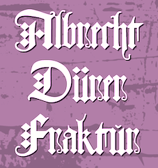 Born and died in Nuremberg, Germany, 1471-1528. Painter, wood carver and copper engraver extraordinaire, famous for many great geometrical and structured capitals and proportioned designs, carried out with compass and ruler. Example from 1524. Another example, ca. 1500. Best known for the books on the geometry of letters, Unterweysung der Messung [A Course on the Art of Measurement] [or: Of the Just Shaping of Letters], published in 1525. See here.
 Images of his work: his famous set of German Renaissance Capitals (1525), Gothic Capitals, German Minuscule, his famous rhinoceros (1515) and his blackletter type Dürerfraktur (1519). Digital typefaces based on Duerer's work: - Terry Wüdenbachs at P22: P22 Durer Caps (2004).
- MichelM at URW++: Hands on Albrecht (2005).
- Amy E. Conger: Duerer (2006).
- SoftMaker: Albrecht Duerer Fraktur Pro (2016). A revival of Duerer's ornamental blackletter.
- Christopher Adams: Just Letters (2012, blackletter). This was based on Albrecht Duerer's Of the Just Shaping of Letters (1525).
- Alan Hoenig: The Computer Duerer fonts (1990). A set of Metafont typefaces.
- Dieter Steffmann: Duerer Gotisch (2001).
- Jeff Jackson: JGJDurerGothic (1997).
- Gilles Le Corre: 1525 Durer Initials (2010).
- David nalle: Albrecht Durer Gothic.
- Martin Lorenz and Joan Pastor: VLNL TpDuro (2019). A blackletter.
- Manfred Klein. The geometrical overlays reminiscent of Duerer are another recurrent theme in Manfred Klein's work. Fonts directly or indirectly related to Duerer's compass-and-ruler constructions made by Manfred Klein include DancingVampyrish, GrafBoldBold, GrafCirculum, GrafCirculumBricks, GrafObliqueItalic, GrafRoundishMedium, GridConcreteDue, GridConcreteLogoable, OldConstructedCaps, RodauButtons, RodauButtonsInverse, RodgauHeads, RodgauerFisheyes, RodgauerOne, RodgauerOneRoundMedium, RodgauerThree, RodgauerThreeRoundedMedium, RodgauerTwo, RodgauerTwoRounded-Medium, RomanGridCaps, SketchesByDuerer-Inverse, SketchesByDuerer, TheRoots, XPCrazy-Light, XPFourTwoContourMedium, XperimentypoFS, XperimentypoFSBlack, XperimentypoFSWhite, XperimentypoFourBRound, XperimentypoFourCRoundInvers, XperimentypoFourRound, XperimentypoNr1, XperimentypoNr1Oblique, XperimentypoStripes-One, XperimentypoStripes-Two, XperimentypoThree-B-Square, XperimentypoThree-C-Square, XperimentypoThree-Crazy, XperimentypoThreeSquares, XperimentypoTwo, XperimentypoTwoCrazy, XperimentypoTwoStripes. Download page. Download all these fonts in onze zip file.
[Google]
[MyFonts]
[More] ⦿
|
Alejandra Rodriguez
|
Bogota, Colombia-based creator of Montaga (2012), a free font published at Google Web Fonts. Montaga is a roman font in the Trajan style, with a lower case added. In 2014, she designed the grid-and-circle-based typeface Risk. Old Behance link. [Google]
[More] ⦿
|
Alex Trochut
|
 Brooklyn, NY-based grandson of Joan Trochut of Super-Veloz fame, b. 1981, Barcelona. After completing his studies at Elisava Escola Superior de Disseny in Barcelona, Alex established his own design studio in Barcelona before relocating to New York City.
 He is the codesigner with Andreu Balius of SuperVeloz (2005, TypeRepublic), a digital version of his grandfather's typeface. It won an award at the TDC2 2005 type competition. Balius says about this typeface originally created by Joan Trochut from 1920-1980: Super-Veloz could be considered as an Ornamental type design, but in its core it is an experimental typeface based on a set of modular features that, with the combining of its modules, a great range of typefaces, ornaments ---even illustrations---, could be made. That is perhaps the most interesting experiment in early modern type design ever made in Spain during the immediate years after the War. The lecture, considering the borders between type design and ornament design, will introduce the context where Joan Trochut's Super-Veloz was produced (from sketches to published brochures and speciments) in 1942. Also will explain how Super-Veloz works. It is really a "type-ornament" design that could be considered on the edge of what we call type design. Alex has created design, illustration and typography for a diverse range of clients: Nike, Adidas, The Rolling Stones, Katy Perry, BBC, Coca-Cola, Pepsi, The Guardian, The New York Times and Time Magazine. Alex Trochut's lettering must be seen to be believed---it has to be genetic transmission. Recurring themes include adorned initials and modular types. His numerical all-caps alphabet for British Airways is phenomenal and pushes the bling-bling to the fashionable extreme. Stunning dollar sign drawn by him in 2007 for Acido Surtido. In 2009, he published Neo Deco at HypeForType. Noteworthy type treatments of that year include Nixon and the Futurecraft logo. In 2012, he designed Trojan Font (like Trajan). He also did some stunning multiline alphabet for V Magazine. Also noteworthy is a swashy calligraphic logo for Wiz Khalifa and Atlantic Records. Typographic picture by TDC55. In 2013, Barcelona-based creative agency, Herraiz Soto commissioned Alex Trochut to create an original typeface collection titled Raw for Notegraphy. In 2017, he made the color font Megazero at Fontself in Opentype SVG format. In 2018, Alex Trochut and Sudtipos cooperated on Utopian and Dystopian. Utopian is a color font family based on primary colors and pure geometric shapes, influenced by Bauhaus and De Stijl. Dystopian, its black and white companion with square features of Renner's original Futura drawings, emits a darker look and evokes Trumpian gloom and doom. Behance link. Debutart link. Klingspor link. [Google]
[MyFonts]
[More] ⦿
|
Alexander Ricachov
|
Saint Petersburg, Russia-based designer of Art Font (2016), Rustica (2015, calligraphic alphabet), Rust Cursiv (2015), Antiqua Cvadrato (2015), Capitalis Roman (2014, a calligraphic alphabet), Futurista (2015). In 2016, he designed the hand-drawn typeface Krita. [Google]
[More] ⦿
|
Alexandr Galuzin
[Alexandr Galuzin (was: Tangramus)]
|
 [MyFonts]
[More] ⦿
[MyFonts]
[More] ⦿
|
Alexandr Galuzin (was: Tangramus)
[Alexandr Galuzin]
|
 Pavlodar, Kazakhstan-based designer (b. 1987) of the medieval calligraphic typeface Square Capitals (2014, Latin and Cyrillic), the uncial typeface Uncial (2015) and the Trajan typeface Capitalis Monumentalis (2015). In 2015, he designed the angular and angry straight-edged typeface KZ Kirpich, the tangram-inspired German expressionist typeface Tangramus, and the Latin / Cyrillic deco typeface Kvadrat.
 In 2015, he set up the commercial type foundry Alexandr Galuzin. His first commercial typeface is Golovolomka (a modern blackletter). In 2017, he designed the fat stenci typeface Growling. Typefaces from 2020: AG Bambook (a condensed sans family). [Google]
[MyFonts]
[More] ⦿
|
Alien Valley
|
 Studio in Cluj-Napoca, Romania. Creator of the curly script typeface Violet Night (2015) and the poster typeface Hornhill (2016, Sans and Serif).
 Typefaces from 2019: Whitefield, Alterwave (a sans family), Greenmark (Peignotian), Günterhaus (a didone), AfterOne, Bluristy, Archelaos, Finnmark, Quinlee, Glitterino, Commodus, Exophis, Klausen (inspired by Trajan caps0, Osmund (a clean bold gemetric sans), Multiberry, Helmwick (a signature script), Benfield (wild calligraphy), Clocksmith (a piano key typeface), Westboy. [Google]
[More] ⦿
|
Amanda Busch
|
Glen Spey, NY-based designer of a hand-drawn roman caps alphabet that was finished in Illustrator in 2013. In 2011, as abusch1 at FontStruct, she created the squarish typeface Mr. Roboto during her studies at York College in Pennsylvania. [Google]
[More] ⦿
|
Andrey Kudryavtsev
[Andrey Kudryavtsev Type Foundry (or: AKTF)]
|
 [MyFonts]
[More] ⦿
[MyFonts]
[More] ⦿
|
Andrey Kudryavtsev Type Foundry (or: AKTF)
[Andrey Kudryavtsev]
|
 Foundry in Irkutsk in Siberia.
 Andrey Kudryavtsev designed Spacexplorer (2012), Necromant (2012), Flexy Sans (2011), Otrada (2011, signage script), Micronica (2008), a font shaped like old TV screens, Karlson (2009), Imperator (2010, a Trajan face), Alter (2010), Sommelier (2011), Alebarda (2009), Rubicon (2009) and Flexy Sans (2009). Typefaces made in 2012 include the macho slightly flared Antey (Latin and Cyrillic) and the strong display sans typeface Tambov. In 2013, AKTF published Softipen Script. In 2014, he created Qwincey FY (a high-contrast slightly flared almost Peignotian sans family, published by FontYou), Warren Narrow and Achille II Cyr FY (together with the Fontyou team of Alisa Nowak and Gregori Vincens). Typefaces from 2015: Smile Pro (a fat multi-style handcrafted poster family of exceptional beauty; together with Rodrigo Araya), Ardilla Small (a rounded small x-height sans done together with Rodrigo Araya; inspired by the children's show Peppa Pig), Plumps, Antey, Crisper. Typefaces from 2016: Pequena Pro Cyrillic (Rodrigo Typo), Robest (unicase). Typefaces from 2017: AK Sans, Hatter Cyrillic Display (a Halloween font), La Pica (by Rodrigo Araya and Andrey Kudryavtsev), Fairystory (curly typeface), Kreker (a rounded poster sans), Stickout (comic book style). Typefaces from 2018: Czarevitch (a Cyrillic and Cyrillic simulation pair), Skaz (a psychedelic type inspired by the Victorian typeface Ringlet), Sitari, Dozer, Squick (a comic book / children's font family by Franco Jonas, Andrey Kudryavtsev and Rodrigo Araya), Freept (a free marker font), Nightelf, Ingot (a condensed rounded blackletter), Insolenta. Ding (2018) is a great fattish cartoon font that was co-designed by Rodrigo Araya Salas, Andrey Kudryavtsev and Franco Jonas. See also its extensions, Ding Pro (2019) and Ding Extra (2019). Typefaces from 2019: Clarence Alt (a an almost bubblegum children's book sans by Franco Jonas, Rodrigo Araya Salas and Andrey Kudryavtsev). Typefaces from 2020: La Pica Bonus (a vernacular or supermarket style font and dingbat family by Andrey Kudryavtsev and Rodrigo Araya Salas), Ancoa Slanted (an angular display family in 15 styles; by Andrey Kudryavtsev, Rodrigo Araya Salas and Franco Jonas Hernandez), Skippie (a comic book family by Andrey Kudryavtsev, Rodrigo Araya Salas, Bruno Jara Ahumada and Franco Jonas, and four sets of dingbats including Skippie Monster Lucha Libre and Skippie Monster Halloween), Ancoa (an angular 19-style layerable typeface by Andrey Kudryavtsev, Rodrigo Araya Salas and Franco Jonas Hernandez). Typefaces from 2022: Chessnota (a chess font). Behance link. Creative Market link. Myfonts link. Klingspor link. View the typefaces made by AKTF. Patreon link. [Google]
[MyFonts]
[More] ⦿
|
Andy Budd
|
Managing Director of Clearleft in Brighton, UK. He has a blog, where people were prompted for the names of type families, if they could only buy six of them. Continued here and here. The totals are tallied for you: - Akzidenz Grotesk (2 votes): Akzidenz Grotesk is the classic alternative to its dowdy and overused relation, Helvetica. If you ever feel the need to use Helvetica, resist the urge and try Akzidenz instead.
- Avenir or Avenir Next (2 votes): Futura is a wonderful typeface, although is can feel slightly sterile at times. Adrian Frutiger set about humanizing Futura and created Avenir in 1988. Avenir is a beautiful typeface but is restricted to just 12 weights. In 2004 the typeface was completely revised and Avenir Next was released with a stunning 96 weights. If you are looking for a modern sans, you need look no further.
- Neutraface (2 votes): Designed by Christian Schwartz for House Industries, Neutraface captures the 1950s stylings of architect Richard Neutra in a beautiful typeface meant for application on the screen, in print, and in metalwork. If you are ever in need of a classy retro face, they don't get any more polished than this. [...] Tired of Futura and Gill Sans? Neutraface is a beautiful art-deco alternative. Modern yet retro, this typeface comes with loads of ligatures and 7 beautiful figure styles. If this typeface was a drink it would be a Vodka Martini, shaken, not stirred.
- Engravers Gothic: For a period of about two years, I attempted to inject this font into every single project I worked on. Even if I couldn't fit it into the main scene, I screened it back somewhere in the distance just to feel better about myself. For a brief time, I was actually creating design projects for the sole purpose of using Engravers Gothic in them. It was at this point that I sought professional help.
- Myriad: Its quite simply the most readable sans-serif typeface ever invented for print at least. On the web, that'd be Lucida Grande, but thanks to Apple, I don't really have to buy that now, do I?
- Meta: Like a good mullet, this typeface has something for everyone. Its clean lines make it ideal for logotype, headings, and other professional applications, but its curvy flourishes keep it from looking sterile or uptight.
- Agency: Originally designed in 1932, and then expanded to multiple weights and widths in the 1990s by David Berlow, this typeface can be made to look futuristic or retro. Im partial to flexible typefaces, and Agency is second-to-none in this regard. Use it for old movie posters. Use it for your pathetic Star Trek Convention flyers. Agency feels at home in any environment.
- Palatino: Also abused in both web and print work, Palatino is undeniably versatile and (imho) a much better option overall than Times.
- Proxima Nova: I am counting down the minutes until this typeface is available. No joke.
- Dynasty Light: Someone please give me an excuse to use this in my next project. I take that back: no excuse needed.
- Trajan Pro: I am a sucker for classic Roman letterforms, and it doesn't get much better than Trajan.
- Warnock Pro Light Italic: I stumbled across this gorgeous typeface just recently, and its one of the hottest italics I have had the pleasure of using in recent months.
- Frutiger: Originally designed for the signage at Charles De Gaulle Airport in Paris, Frutiger is a beautifully fluid and legible typeface. Without doubt the most influential typeface in the past 30 tears, Frutiger has been the inspiration for many amazing fonts including the excellent Myriad Pro.
- DIN Schriften: DIN stands for Deutsche Industrie-Norm, the German industrial standard. Originally used for German road signage, this typeface was the darling of 90s graphic designers, and like FF Meta, is starting to make a comeback. With its wide open letter forms DIN is am extremely clear and legible typeface, great at any size.
- Mrs Eaves: If I had to choose one serif typeface it would be Mrs Eaves. Named after John Baskervilles wife, this stylised version of Baskerville is loved by graphic designers around the world. Mrs Eaves is a modern serif that retains an air of antiquated dignity. Playful without being too scripty, its a fully featured typeface with a beautiful collection of ligatures.
[Google]
[More] ⦿
|
Andy Voelkle
|
Stone carver from Houston, Texas, who designed a full roman alphabet in 2001 as an alternative for Trajan for stone carvers. Ray Larabie then created Texhenge (2001) according to Andy's specifications, while Andy tested the font out on real marble. In Andy's own words: I approached Ray Larabie by email in early 2001 and asked him to produce a "texhenge" font for our project here in Texas, to build the first full-size stone circle in over 2000 years. I wanted a modern font to replace Trajan as the ideal stonecarving font for our age. He and I labored over the design of the three special symbols (dagger, double dagger, per mille sign) for several months until Ray's final design, represented in these two fonts, which are in my opinion beautiful and perfect. The main stone was to be a smooth limestone, but in 2001 I began laying out a test in six inch high lettering on carrara marble, a text of Ray's perfect Latin and "et" sign, and a tribute to my lovely wife Kathy. The test was interrupted and postponed until 2008 when I carved it. The bench sits outside our home, just off the sidewalk. It is a popular resting spot for us senior citizens, and we have seen young lovers enjoying a moment alone in quiet conversation. I am honored to have this font, and to have carved it first. Much more is planned for the font as the Texhenge.com stone circle project progresses over the years. The bench in which "Kathy and Andy" is carved is dedicated by Andy to Kathy McKee. Download these fonts here: Texhenge-Bold, Texhenge-Tight. Or go to this dedicated directory. [Google]
[More] ⦿
|
Antonio Conklin
|
American designer of a couple of display typefaces in 2018, including Conkurves (a geometric sans) and Tredecim (a roman inscriptional typeface). [Google]
[More] ⦿
|
Approximate Type
[Kasper Pyndt Rasmussen]
|
 Danish graphic and type designer in Copenhagen, who studied at The Royal Danish Academy of Fine Arts, School of Design (2010-2016) and The Royal Academy of Art, The Hague (2014-15). In 2020, he set up Approximate Type. His typefaces:
 - He made various typefaces in 2010, including a monoline sans caps face, a Peignotian high-contrast caps face, a paper fold face, and the geometric typeface Ottoman, which was part of the visual identity made for a nightclub named Ottoman, located at Dunkel in the heart of Copenhagen. Wondair (2011) is a rounded monoline logotype made for a fictituous airline. Gemini (2011) is a bilined geometric art deco typeface.
- In 2012, Pyndt designed the soft neo-grotesque Husaar, which has subtle, sharp ink-traps.
Dalat (2013) is a typeface inspired by Vietnamese visual culture. I believe that at some point it was called Kieu. He writes about Dalat: Dalat is a typeface that looks back on Vietnam's visual history and attempts to form a synthesis of style. As French Art Deco and Russian Constructivism have been prominent actors in Vietnam, the letters are constructed in a similarly geometric way. By contrast, the soft serifs are derived from Vietnamese calligraphy whose brush strokes tend to thicken and pool towards the end. - Clerk (2015) is a stencil display typeface based on a sign type (most likely) drawn by Samuel de Clerq in the 1920s for the savings bank of The Hague. This uppercase-only font features, among other things, an array of 'O'-ligatures as well as a flat-top '8'.
- Aguzzo (2016). A roman capitalis typeface loosely based on Aldo Novarese and Alessandro Butti's Augustea (1951).
- Celebrating the 100-year anniversary of Danish furniture design legend Hans Wegner, Tønder Museum asked Pyndt to visually interpret his work, which led to Pyndt's Wegner Alphabet depicting chairs.
- Edwin (2016?) is a text typeface drawn from the simple notion of replacing the ball-terminal with a square. A font that retains character despite its functional merits.
- Reply (2020). A neutral sans family with nearly monolinear strokes and large open counters.
- The bespoke sans typeface family Shed (2021).
Behance link. Home page. [Google]
[More] ⦿
|
Asier Fernandez Huesca
|
Illustrator and graphic designer in Sevilla, Spain, who created the lapidary roman caps typeface Cartuja in 2015. Inspiration came from a tomb in the Monasterio de la Cartuja de Sevilla. [Google]
[More] ⦿
|
Astigmatic One Eye
[Brian J. Bonislawsky]
|
 Astigmatic One Eye (AOE) has lots of nice original fonts by Brian J. Bonislawsky (b. 1973, Pittsburgh, PA). Many are free, others are not. AOE joined Font Brothers Inc in 2006. Brian Bonislawsky currently lives in Las Vegas, NV.
 Fontsquirrel link. Dafont link. Fontspace link. A partial list of the AOE fonts made in 2011: Engagement (2011, a free brush script at Google Web Fonts), Fascinate (2011, an art deco typeface at Google Web Fonts; +Inline), Original Surfer (2011, a free Google Web Font inspired by a vintage advertisement for the "California Cliffs Caravan Park"), Smokum (2011, a Western / Italian face), Yellowtail (2011, signage face), Redressed (2011), Special Elite (2010, a free old typewriter face), Aclonica (2011). Typefaces from 2008 or before: Horseplay AOE (2008, Western style), Cake and Sodomy AOE (2008), Good Eatin AOE (2008), Paradiso AOE (2008, inspired by logotype of the Paris Resort and Casino in Las Vegas), Montelago AOE (2007, a script inspired by the logotype of the Mirage Resort and Casino in Las Vegas), Jack Chain AOE (2007), Henhouse (2007), Schnitzle (2007), Luxurian AOE (2007, inspired by the logo of the Luxor Hotel&Casino in Las Vegas), Digital Disco AOE (2007), Mighty Tuxedo AOE (2007), Makeshift AOE (2007), Clarity AOE (2007, slab serif headline; + grungy version), Red Pigtails AOE (2007), Run Tron 1983 (2002), Eyeliner AOE (2006, Tekton-like), Mother Hen (2007), Gloversville (2007, comic book style), Mighty Tuxedo AOE (2007, condensed sans), Quick Handle AOE (2007), Surfing Bird (2007), Hydrogen (2004), Hardliner (2004, fifties diner style), Big Ruckus (2004), SS Antique No. 5 (2004), Europa Twin (2003), EuroMachina (2003, techno), Lord Rat (2003: papercut sans), Love Anxiety (2003), BuzzSaw (2003), Skullbearer (2003, skull dingbats), Beatnick Blue (2002), Geisha Boy (2002), Mardi Party (2002), Midcrime (2002), Ocovilla (2002), Ruthless (2002), Saltie Doggie (2002), Whiskers (2002), Royal Gothic, Family, Eggit, Jericho, Wild Monkeys (2002), 5FingeredGothSW, AlienArgonautAOE, AlphaMackAOE, AmphibiPrint, AngiomaAOE, AntiChristSuperstar, AntiChristSuperstarSW, AstigmaSolid, BigLimboAOE, BigLimbodOutAOE, BoneRollAOE, BoneRollAOEBold, BoundAOE, BrailleAOE, BulletBallsAOE, ButterflyChromosome, ButterflyChromosomeAOE, ButtonButton, ButtonButtonAOE, CType, CTypeAOE, CelticLionAOE-Bold, CelticLionAOE-BoldItalic, CelticLionAOE-Italic, CelticLionAOE, CharailleAOE, ChickenScratch, ChickenScratchAOE, ClunkerAOE, ClunkerAOE-Bold, CropBats, CropBatsAOE, CropBatsIIAOE, DarkNightAOE, DeadGrit, DeliveryMatrixAOE, DetourAOE, DigitalDiscoAOE, DigitalDiscoAOEOblique, DingleBerries, DoggyPrintAOE, DraxLumaAOE, DungeonKeeperII, DungeonKeeperIIBold, DungeonKeeperIIItalic, EggItAOE, EggitAOE-Italic, EggitOutlineAOE, ElectricHermes, ElectricHermesAOE, ElectricHermesAOECharge, FearAOE, FilthAOE, FishyPrintAOEOne, FishyPrintOneAOE, FishyPrintTwoAOE, FutharkAOE, FutharkAOEInline, FutharkAOEInline, GateKeeperAOE, Ghoulish Fright AOE (2006), GlagoliticAOE (1999, grungy glagolitic), GorgonCocoonAOE, Gotik, GreyAlienSW, HAL9000AOE, HAL9000AOEBold, HAL9000AOEBoldItalic, HAL9000AOEItalic, HandageAOE, HandageAOEBold, HauntAOE, HybridLCDAOE, IDSupernovaSW, IslanderAOE, JokerWildAOE, KillMeCraig, KillMeCraigAOE, Kinderfeld, KittyPrint, KittyPrintAOE, Kornucopia, KornucopiaAOE, LinusFace, LinusFaceAOE, LinusPlayAOE, LinusPlaySW, Lochen, LovesickAOE, Manson, MasterPlan, Mervale Script Pro (2012: a brushy script based on the 1940's Fawcett Publications Mary Marvel comic), Microbe, MooCowSW, MotherlodeLoadedAOE-Italic, MotherlodeLoadedAOE, MotherlodeStrippedAOE-Italic, MotherlodeStrippedAOE, MysterioSWTrial, NightmareAOE, OrnaMental, Pantera, PapaManoAOE, PenicillinAOE (described as a bacterial stencil typeface), PixelGantryAOE, PixelGantryAOEBold, PixelGantryAOEBoldItalic, PixelGantryAOEHeavy, PixelGantryAOEHeavyItalic, PixelGantryAOEItalic, PixelGantryHiliteAOE, PixelGantryHiliteAOEItalic, PoppyAOE, PoseidonAOE, Prick, QuiltedAOE, QuiltedAOEBlack, QuiltedTrial, RippleCrumb, RippleCrumbUltraCon, ROCKY, ROCKYAOE, RustedMachineSW, SSExpAntiqueAOE, Schizm, Schrill, SchrillAOE, SchrillAOEOblique, Scrawn, ScrawnAOE, ScrawnCyrAOE, ScrawnKOI8AOE, ScrewedAOE, ScrewedAOEOblique, ScrewedSW, SeaweedFireAOE, SenthAOE, ShampooSW, ShottyTransferTrial, SkinnerAOE, SlurCrumb, SpatCrumb, SpikeCrumbGeiger, SpikeCrumbSwizzle, SpikeCrumbSwollen, SteelcapRubbingTrial, StruckSW, StrutterAOE, SunspotsAOE, SurferComicTrial, TRANSHUMANALPHABET10, TRANSHUMANKATAKANA20, TannarinAOE, TannarinAOEOblique, TibetanBeefgardenAOE, TibetanBeefgardenAOE, TouristTrapAOE, TransponderAOE, TransponderGridAOE, UglyStickAOE, VanguardIIIAOE-Bold, VanguardIIIAOE-BoldOblique, VanguardIIIAOE-Oblique, VanguardIIIAOE, Ventilate, VentilateAOE, Y2KPopMuzikAOE, Y2KPopMuzikOutlineAOE, YoungItchAOE, ZeichensSW, ZenoPotionAOE, Zombie, BeatnikBlueAOE, BeatnikBlueFillAOE, GeishaBoyAOE, MardiPartyAOE, MindCrimeAOE, OcovillaAOE, PolynesianTouristAOE, RuthlessAOE, SaltyDoggieAOE, SpruceAOE, WhiskersAOE-Oblique, WhiskersAOE, WhiskersAltCapsAOE-Oblique, WhiskersAltCapsAOE (2002), Habitual, Automatic (techno), Bitrux, Filth (an eerie brush script), Cake&Sodomy, Gulag, Bad Comp, Detour, Alien Argonaut, Dark Night, GateKeeper (Halloween font), Gargamel Smurf, Invocation, Neuntotter, Geisha Boy, Saratoga Slim, Gobe, Stingwire, Lavatype, Tapehead, Islander, Clunker, Digelectric, Gargamel, Krulo-Tag, Krelesanta, SurferComic, Bound, Culture Vulture, Intruder, Cavalier, Anoxia, Synchrounous (IBM logo style lettering), Luna, Data Error, Lunokhod, Jericho. There are many techno and gothic fonts. Kill Me Craig is the first 26 death scene dingbat font (scenes by Craig Dowsett). KittyPrint takes the LinusFace font concept to more realistic cat head dingbats. Krelesanta (not free) is a funky font inspired by the band Kreamy Electric Santa. The free ButtonButton is useful for making buttons. Lovesick AOE is a scrawly, lovelorn typeface, i's dotted with hearts. Strutter AOE is based on the KISS logo. Senth AOR is a runic font. Charaille is one of the many dot matrix fonts. Cavalero is inspired by the logotype of the Chevy Cavalier. At Bitstream in 2001, AOE published Cavalero, Stingwire and Tannarin. And in 2002, he published the comic book font Big Limbo, Euro Machina BT and Islander there. Bio at Bitstream. In 2005, Bonislawsky and Sandler realeased 500 fonts, via Bitstream and MyFonts, under the label Breaking The Norm. In 2006, Astigmatic published their typewriter collection, which includes Military Document, Bank Statement, State Evidence Small Caps, State Evidence, Urgent telegram, Library Report, Overdrawn Account, Customs Paperwork, Incoming Fax and Office Memorandum. From the bio and various pieces of information, one is led to believe that Brian was born in Poland, and now lives in Miami, but that may be wrong. In 2010, he placed a free font at the Google Directory, Syncopate. Along the same lines, we find the derived square serif typeface Stint Ultra Condensed (2011, Google Web Fonts) and Stint Ultra Expanded (2012). In 2011, several other typefaces followed there, like Ultra (fat didone), Maiden Orange, Special Elite (2010, a free old typewriter face), Just Another Hand, Crushed, Luckiest Guy (comic book face), Aclonica, Redressed, Montezuma (a curly connected upright script), Devonshire (brush script), Fondamento (calligraphic lettering), Yellowatil (connected retro script), Righteous (free at Google Web Fonts: inspired by the all capitals letterforms from the deco posters of Hungarian artist Robert Berény for Modiano), Ribeye and Ribeye Marrow> (cartoon and/or tattoo style lettering---free at Google Web Fonts), Spicy Rice (2011, free festive display typeface at Google Web Fonts). Contributions in 2012: Marcellus (2012, Trajan, flared roman, at Google Fonts and CTAN), Eagle Lake (a free calligraphic font at Google Web Fonts), Uncial Antiqua, Jim Nightshade (2012, free at Google web fonts), Dynalight (2012, a retro script inspired by a vintage luggage tag for the Southern Pacific 4449 Daylight steam locomotive), Yesteryear (a retro script loosely based on the title screen from the 1942 film The Palm Beach Story), Parisienne (Google Web Fonts: casual connected script based on a 1960s ad for bras), Shojumaru (Google Web Fonts: an oriental simulation typeface inspired by a poster for the Marlon Brando movie Sayonara), Berkshire Swash (Google Web Fonts), Audiowide (Google Web Fonts), Romanesco (Google Web Fonts: a narrow calligraphic style), Galindo (Google Web Fonts), Oregano (Google Web Fonts: based on cartoon style lettering of calligrapher and logo designer Rand Holub. This style of hand lettering adorned many retro brochures and advertisements of the late 40's through the 1960's), Peralta (Google Web Fonts: an Egyptian comic book face), Eagle Lake (Google Web Fonts: calligraphic), McLaren (Google Web Fonts: comic book style alphabet), Freckle Face, Hanalei Fill, Hanalei [Polynesian bamboo or tiki lettering], Purple Purse, Margarine, Risque, Clicker Script [image], Stalemate [a gracious script, by Jim Lyles for AOE], Mouse Memoirs, Quintessential [Google Web Fonts: chancery hand], Bigelow Rules, Englebert [Google Web Fonts: from the title screen of the 1930's film titled Der blue Engel, starring Marlene Dietrich], Sacramento [Google Web Fonts: connected script]. Typefaces from 2013: Freckle Face (grunge), Grand Hotel, Purple Purse (Purple Purse draws its inspiration from a vintage Ivory Soap ad from the 1950's. Somewhat of a cross between Bodoni and Pixie, this font finds that it never truly takes itself seriously). Stiggy & Sands is the American type foundry of Brian Bonislawsky and Jim Lyles, est. 2013. Their first commercial typefaces, all jointly designed, are Luckiest Guy Pro (a fat comic book font based on vintage 1950s ads) and Marcellus Pro (a flared roman inscriptional typeface with both upper and lower case, originally published in 2012 by Astigmatic). Typefaces from 2014: Franken Jr AOE Pro (inspired by the title screen from the 1966 Hanna Barbera cartoon Frankenstein Jr), Good Eatin Pro AOE (inspired by the title screen from the 1942 Warner Bros. cartoon Dog Tired), Ghostkid AOE Pro (comic letter style). Typefaces from 2015: Shanks Antique 5 AOE (after the newspaper typeface Memorial (1865, Stevens, Shanks & Sons)), Reliquaire AOE (a somber blackletter typeface inspired by Memorial (1881, Boston Type Foundry)). Typefaces from 2016: Mailuna Pro AOE (a gothic sans), Kentish AOE Pro (art deco). Reardon AOE (a digitization of a film typeface called Joyce Black by LetterGraphics), Berkmire AOE (1970s style robot-inspired techno font), Blackheath Pro AOE (this typeface started as a digitization of a film typeface called Roberts Square by LetterGraphics), Delaware Pro AOE (art deco), Rutland AOE (a futuristic font that is a digitization of a film typeface called Maccaro by LetterGraphics). In 2016, Brian J. Bonislawasky and Jim Lyles published the rugged octagonal mega typeface family Tradesman at Grype. In 2017, they added the art deco typeface Cowling Sans AOE (which is based on alphabet from "Lettering for Commercial Purposes" by Wm. Hugh Gordon). In 2018, they published the letterpress emulation typeface Prison Pro, Pink Sangria (50s style movie font), Manic Tambourine, Motenacity (a Martian cartoon font), the old typewriter font Office Memorandum Pro, and the Flintstone font Strongman. Typefaces from 2021: Klutz AOE Pro (a condensed all caps beatnik font), Data Error AOE Pro (based on early dot matrix printers), Customs Paperwork AOE Pro (based on the NuMode Type No. 61 vintage typewriter), Rinzler AOE Pro (a great stencil font that revives LetterGraphics' Caren), Restraining Order AOE Pro (an old typewriter font), Brazarri AOE Pro (an Aztec emulation font based on MacKeller, Smiths and Jordan's Bizarre from 1884). View Astigmatic's typeface library. View the typefaces made by Brian Bonislawsky. Fontsquirrel link. Dafont link. Fontspace link. Creative Market link. [Google]
[MyFonts]
[More] ⦿
|
Attak Fonts
[Peter Korsman]
|
Attak is a two-headed graphic design firm formed in 2004 by Peter Korsman (b. 1982) and Casper Herselman. It is based in 's-Hertogenbosch, The Netherlands. In May 2016, Peter Korsman left Attak to start Autograph. Attak has some free and some commercial typefaces. Behance link. Their fonts, ca. 2009: AT AK-47, AT Babyfat, AT Blaser, AT Concours, AT Dienstuhr, AT Discipline, AT FFW, AT Helix, AT Hide and Seek, AT Hieronymus, AT Janus Kiep, AT Kerremus, AT Klaxon, AT Korsakopf, AT Litewriter, AT Mepper, AT Mohawk, AT Moker, AT Monoload, AT Muntel, AT Peetroleum, AT Praktikum, AT Promille, AT Ramseier, AT Riot, AT Sirca, AT Sirca alternate, AT Slyper, AT Snotnose, AT Streeep, AT Tabak, AT T'Atteljeej, AT TCB, AT Timeline, AT Trash Bold, AT Willi, AT With Machines, AT Zippora. Notable products: AK-47 simulates Cyrillic; Helix is a stencil face; Muntel and Concours are fat art deco typefaces; Practicum and Tabak are octagonal; Riot leaks blood; Sirca is based on arcs of circles; Streep is a multiline font. I presume that Peter is the main font designer in the team, as he already made fonts as early as 2003 for Burodestruct (see, e.g., BD Burner, BD El Max, BD Sirca, and BD Bardust, downloadable here). By 2017, their catalog includes AT AK-47, AT Baballero, AT Babyfat, AT Blaser, AT Concise, AT Concours, AT De Palm, AT Dienstuhr, AT Discipline, AT El Muerte, AT Falten, AT FFW, AT Ginn, AT Helix, AT Hide and Seek, AT Hieronymus, AT Hindenburg, AT Imperiale, AT Janus Kiep, AT Kerremus, AT Klaxon, AT Korsakopf, AT Kuhn, AT Litewriter, AT Mepper, AT Mohawk, AT Moker, AT Monoload, AT Muntel, AT Peetroleum, AT Praktikum, AT Promille, AT Ramseier, AT Riot, AT Sang Noir, AT Sirca, AT Sirca alternate, AT Slyper, AT Snotnose Heavy, AT Streeep, AT Syndicate, AT Tabak, AT tAtteljeej, AT TCB, AT Timeline, AT Trash Bold, AT Willem II, AT Willi, AT With Machines, AT Zippora, BD Bardust, BD Burner, BD El Max, BD Sirca. A more detailed breakdown per designer: - Tim van de Kimmenade: AT AK-47 (2005), AT Helix (2004), AT Trash Bold (2003).
- Peter Korsman: AT Babyfat (2006), AT Concours (2005), AT Korsakopf (2004), AT Ramseier (2004), AT Streeep (2005), AT TCB (2005), AT With Machines (2004).
- Casper Herselman: AT Blaser (2005), AT FFW (2004), AT FFW Stencil (2004), AT Mepper (2005, old typewriter font), AT Mohawk (2006), AT Praktikum (2004), AT Promille (2005), AT Riot (2004, blood drip font), AT T'Atteljeej (2008).
- Rutger Paulusse: AT Discipline (2008).
- Rens vanden Berge: AT Hide and Seek (2006, a great poster font).
Typefaces not listed here include AT Baballero (2013, Western), AT De Palm (2012, logo font for Café De Palm), AT Dienstuhr (2010), AT Ginn (2012), AT Imperiale (2012, a hipster font), AT Timeline (2010, Trajan) AT Sirca (2005), AT Sang Noir (2012, blackletter), AT Muntel (2005, Dutch art deco), AT Snotnose (2010, ink splatter script). [Google]
[More] ⦿
|
Attila Suto
|
 Attila Sütö is a graphic designer in Eger, Hungary. He created the modular display typeface Azidhor (2017), the cosmic typeface Lauronos (2017), and the compass-and-ruler roman caps typeface Imperiem (2017). Behance link. [Google]
[More] ⦿
Attila Sütö is a graphic designer in Eger, Hungary. He created the modular display typeface Azidhor (2017), the cosmic typeface Lauronos (2017), and the compass-and-ruler roman caps typeface Imperiem (2017). Behance link. [Google]
[More] ⦿
|
Auras Design
[Rob Sugar]
|
Silver Spring, MD-based makers of the billboard typeface Au Dorsey (1990) and of Au Bauer Text Initials (1990, a Trajan typeface after F.H.E. Schneidler's Schneidler Initialen, Bauersche Giesserei, 1937). The company's blurb: Robert Sugar is the president and creative director of Auras Design. A graduate of American University, he taught publication design there for nine years. Early positions working with printers and typesetters gave him an expanded perspective on the designer's role in producing print publications. Typography and prepress skills helped Auras become a pioneer in electronic design and prepress. He committed the studio completely to digital design by 1992, and has constantly expanded the technology, skills and capabilities of the studio. [Google]
[More] ⦿
|
Autobahn
[Maarten Dullemeijer]
|
Dutch company run by Jeroen Breen, Maarten Dullemeijer and Rob Stolte, who all graduated from Utrecht School of the Arts (HKU). Autobahn designs special graphical projects, often with an illustrative and typographical angle. They offered these free fonts made with tomato paste, toothpaste and other things: Autobahn-Gelvetica, Autobahn-Heldentica, Autobahn-Tomatica (2008). Autobahn Grafisch Ontwerp is based in Utrecht, The Netherlands. The designers are Jeroen Breen (b. 1981), Maarten Dullemeijer (b. 1982) and Rob Stolte (b. 1981). Their house fonts are Air Light (techno) and LEF. In 2010, they produced the exquisite typeface Petronius, which is based upon a typeface designed by surrealist Joop H. Moesman (1909-1988). The Alphabet in stone typeface by Dom Hans van der Laan, a Dutch monk who lived from 1904 until 1991, was digitized in 2011, and the project can be seen here. Contributors include Willem Noyons, Maarten Dullemeijer and Rob Stolte. This typeface is based on the proportions found in Trajan. In 2017, they created the typeface Jakobus for the identity of 1N, an old church that was reshaped into living space by Zecc Architects. The typeface cmes close to Dutch deco. In a project called Hacking Habitat (2015), they combined Arial Black and Times into a hybrid typeface. Behance link. [Google]
[More] ⦿
|
Bean & Morris
[Keith Morris]
|
 Lettering artist Keith Morris (b. Sydney) ran Keith Morris Logo&Type Design in Sydney, Australia until his retirement in 2022. Keith has designed and completed typefaces for clients for corporate and branding use. He also designs general logos and brand logos although a good deal of his work is commercial lettering for Australian and International Design and Advertising Agencies mainly in FMCG. He created the bouncy Morris Freestyle (ITC).
 Via MyFonts, where he is listed under Bean&Morris (a collaboration of two prolific personalities in Australian lettering, logo design and typography, Russell Bean and Keith Morris), one can buy his typefaces, such as Lilianesque (2012), Libran (2009), Rumo Script (2009), Empire Display (2010), Shire Script (2010) and Waratah Gothic (2010). Typefaces from 2012: Emporia Roman (a Trajan column typeface with a delicate roman). See also Emporia OT (2016), which includes an italic. Typefaces from 2016: Aysiano. Klingspor link. View the typefaces of the Bean & Morris foundry. [Google]
[MyFonts]
[More] ⦿
|
Benjamin Krebs
[Benjamin Krebs]
|
 German foundry established in 1816 by Benjamin Krebs (1785-1858) and based in Frankfurt, which grew out of Schriftgießerey der Andreäischen Buchhandlung. Many of its shares were acquired by D. Stempel in 1933. A list of the typefaces:
 - By Franz Riedinger: Merian Fraktur (1910), Phänomen (1927), Riedingerschrift (1903), Riedinger Mediäval (1929), Riedinger Kursiv (1929), Ideal Schreibschrift (Franz Riedinger, 1927) Ideal I (Krebs staff, 1903), Brentano Fraktur Schmalfett (1917), Archiv Kursiv (1907), Altschwabacher (Werkschrift 1917, Schmalfett 1922, Mager 1923), Epoche (1912), Rohrfeder Fraktur (1909), Rediviva (1905-1907, blackletter in halbfett and schmalfett; also called Deutsche Werkschrift Rediviva), Altschwabacher Werkschrift (1918).
- By A. Auspurg: Brentano Fraktur (1916), Federzug Antiqua (1913), Nürnberger Kanzlei (1906), Schönbrunn (1928), Trajan Versalien (1928).
- By P.E. Lautenbach: Epoche (1912), Frankfurter Buchschrift (1906).
- By L. von Hohlwein: Hohlweinschrift (1907).
- By W. Grosz: Künstler Gotisch (1900).
- Hartwig Poppelbaum: Hartwig-Schrift (1928), Hartwig Werkschrift (1927).
- By the staff: Faksimile (1898 script face), Eureka, Oceana, Robusta, Ideal Schreibschrift (1903; kräftige, also called Ideal II, was added in 1909), Katalog Antiqua (1911), Komet (1907, an art nouveau typeface revived by Dimitriy Horoshkin in 2017 as DXKometa), Latina (1922: a heavy roman with tall ascenders; identical to ATF's Avil), Pompadour (1911), Reklame Elzevir (1896), Xylo (1924: for a digital version, see Xylo by ITC), Bureaukrat (1918), Buchschrift, Alte Schwabacher (1914), Karten-Gotisch (1903), Reform (1903), Viktoria Gotisch, Viktoria-Ornamente (1903), Archiv-Antiqua (+halbfette) (1908), Archiv-Kursiv (1908). [Reichardt attributes some of these to Riedinger]
Krebs published Handbuch der Buchdruckerkunst in 1827, a 830 page monster. Type specimen books started appearing in 1885 under the name Benjamin Krebs, Nachfolger (successor). An 1890 publication identifies this successor as Hartwig Poppelbaum. In 1916, Gustav Mori published a book on the foundry, Die Schriftgiesserei Benjamin Krebs Nachf., Frankfurt a.M. Ein Beitrag zur Geschichte des Frankfurter Schriftgiesser-Gewerbes. They were taken over by Ludwig&Mayer, and then Klingspor and finally Stempel (in 1933). Hans Reichardt's PDF file on Krebs. [Google]
[MyFonts]
[More] ⦿
|
Benjamin Krebs
[Benjamin Krebs]
|
 [MyFonts]
[More] ⦿
[MyFonts]
[More] ⦿
|
Bill Bogusky
[Bogusky2]
|
[MyFonts]
[More] ⦿
|
Bill Horton
[Foster and Horton]
|
[More] ⦿
|
Bogusky2
[Bill Bogusky]
|
Bill Bogusky runs the design studio Bogusky 2 in Miami, together with his brother. He created Gonzo Bruno, Gonzo Monza and Gonzo Grosso (2007), Sundial (2006, Trajan lettering), Condo (2006, condensed), Ar Deco 1, 2, 3 and Deep (2006), Technia 1 and 2 (2006, athletic lettering or MICR applications), Sport (2006, dingbats), Macarena (2005: art deco), Zanzibar (2006: decorative), 42nd Street (2005: Broadway style lettering), Boffo (2005), Bronco Rose (2005, Wild West style), Decora (2005), Switchback (2005, a computerish face), Capzule (2005, a condensed black face), Tulip (2005, a decorated stencil face), Kondor (2005), Mah Jongg (2005, with many ornaments), Metro (2005, LCD face), Squircle (2005), Zeke (2005, artsy display font), Baby Blox (2005), Kurly (2005), Pipeline (2005), Dealer's Choice (2005), Stencille (2005), Terra, GogoBig and GogoSquat (were free at FontFreak site), Nouville (2006, art deco sans), Back Fence (2005, comic book face), Gogo Latin (2005, condensed), Zandakas (2006), Ameche Pisa (2005), Gogo Serif (2005), Bolo (2005), Hyline (2005), Compado (2005), Ameche Padua (2005), Tera (2005), Xtera (2005), Tudor New (2005), Boffo (2005), Byline (2005), Quazar (2005), Grafo Graffiti (2005), Acid Bath (2005), Benz (2005), Hulk (2005). These fonts are now commercial and can be obtained at MyFonts.com. A graduate of the School of Industrial Arts in New York City, he worked as an industrial designer in New York before moving to Miami, FL, where he opened Studio Bogusky 2. Dixie Bogusky designed Esquimaux Graphics (2006). [Google]
[MyFonts]
[More] ⦿
|
Brian J. Bonislawsky
[Astigmatic One Eye]
|
 [MyFonts]
[More] ⦿
[MyFonts]
[More] ⦿
|
Brian Schorn
|
Brian Schorn was a design student at Cranbrook. For his thesis, he made a font called AddMorph based on drawings of Trajan as found in the book The Alphabet by Frederic Goudy. The digital version of the font was created using proprietary drawings of Adobe Trajan digitized by Carol Twombly. He wanted to publish AddMorph with Emigre, but Adobe, when contacted, denied Emigre the right to use Adobe's digital version of Trajan. To this date AddMorph has not been released. [Google]
[More] ⦿
|
Bureau Borsche
[Mirko Borsche]
|
Bureau Borsche, a graphic design studio in München, Germany, was founded in 2007 by Mirko Borsche. They made almost exclusively bespoke typefaces. These include: - Isar, Tush Extra (2012: a flared typeface), Archive and Alston (2012, The Entente) for Tush Magazine.
- A custom typeface for Tunica Magazine.
- Tweety for Korakrit Arunanondchai.
- Super Paper Grotesque for Super Paper.
- Moroi (2013, by Galle Renaudin) for (R)evolution by Danton Denk Raum.
- Libreville (2012: derived from Libre Baskerville) for SEPP Magazine.
- Felipe (by Geoffrey Pellet) for I Iz Felipe Fanzine.
- Muenchen Regular (2012, by Bureau Borsche and Tobias Weber: a Trajan caps typeface). For the Bavarian State Opera.
- Harial for the Bavarian State Opera.
- Andri3000 for BR Orchestra.
- Dalhem for Bjoern Dahlem Theorie des Himmels.
- Sumatra for Mickey Mao book (ECAL).
- Dorothy for Horst Magazine.
[Google]
[More] ⦿
|
California Type Foundry (21st century)
[Dave Lawrence]
|
 This type foundry was started in 2019 by Dave Lawrence, perhaps to honor and revive the California Type Foundry from the 20th and 19th centuries. Their typefaces:
 - CAL Bodoni Casale (2019). This typeface has been painstakingly crafted from hi-res scans of 4 original Bodoni printings. It is a splendid reproduction, although the ear of the lower case g is too small with respect to the overhangs on the lower case a and r.
- CAL Bodoni Terracina (2020). An italic didone family.
- CAL Bodoni Palazzo (2020). An exact reproduction of Bodoni's largest display caps typeface.
- CAL Bodoni Ferrara Origin (2020). A spectacular display serif.
- Hermanz Titling (2021). A chiseled capitalis monumentalis titling font in Trajan style based on inscriptional caps drawn by Hermann Zapf.
- Oceanwide (2021). He describes this revival of one of Frutiger's forgotten geometric sans designs: Back in 1968, Frutiger was approached by Pentagram to make a design for British Petroleum. They wanted a "new version of Futura". However, they wanted him to make a couple adjustments. First, they felt that Futura was "too fiddly." By this, they meant that it narrowed too much at the joins. (Joins are for example where the round and straight parts of the 'd' meet.) This is something that is necessary for small print text (to prevent ink clogging), but is not necessary at large sizes. Second, they wanted it to be entirely geometric, using the circular shape with minimal optical corrections. Unfortunately this font was not even used very consistently in the BP brand. A haphazard mix of Futura and Frutiger's BP font ensued. It was then replaced by another font design very soon after. My design is different in several ways. First, the commas and quotes are a more modern style. I tried his original commas, but these just didn’t work to 21st century eyes. Second, in his drawings, Frutiger went for a more standard u with a downstroke on the right. However, Oceanwide has a simpler u. Third, I made more optical adjustments. At the direction of his employer, Frutiger reluctantly put no font optical corrections into the letters. So I think my optical adjustments are similar to what Frutiger would have wanted. Fourth, I extended the weight into the light and extra light ranges. Fifth, the rest of the font I created according to the principles of Adrian Frutiger, but with no sources for inspiration. Here is Frutiger's design philosophy, in his own words: "If you remember the shape of your spoon at lunch, it has to be the wrong shape. The spoon and the letter are tools; one to take food from the bowl, the other to take information off the page... When it is a good design, the reader has to feel comfortable because the letter is both banal and beautiful." The words about the spoon were the ones I kept in my mind as I tried to make the curves ultra smooth, and the shapes ultra simple.
[Google]
[MyFonts]
[More] ⦿
|
Carol Twombly
[Trajan typeface]
|
 [More] ⦿
|
Carol Twombly
|
 Born in 1959 in Concord, Carol Twombly studied at the Rhode Island School of Design and under Charles Bigelow at Stanford, and joined the Bigelow&Holmes studio for four years. In 1988, she joined Adobe and started designing typefaces. She was featured in 5 American Type Designers by Spurius Press. In 1994, she won the Prix Charles Peignot. In 1999, she retired from type design.
 Linotype link. FontShop link. Typophile link. A book about Twombly by Nancy Stock-Allen (Oak Knoll Press, Newcastle, 2016): Carol Twombly: Her Brief But Brilliant Career in Type Design. Her typefaces: - FB Californian (1987-1994, with David Berlow and Jane Patterson).
- Adobe Caslon (1990). Poster by Rachel McKay.
- Chaparral (1997).
- Charlemagne (1989).
- Lithos (1989, the famous stone-cut look face).
- Mirarae (1984). This typeface with its characteristic mid-eighties oversized x-height won her the Morisawa Gold Prize.
- Myriad (1992, with Robert Slimbach), Myriad Wild, Myriad Sketch, and Myriad Tilt.
- Nueva (1994, +Extended).
- Trajan (1989, Adobe).
- Viva (1993).
- The Western typefaces Pepperwood (1994), Rosewood (1994), Ponderosa (1990) and Zebrawood, all co-designed with Kim Buker Chansler and Carl Crossgrove. Pepperwood was patterned after a 1877 wood type by Vanderburgh, Wells and Company. [Caution: Some say that she did *not* co-design these typefaces, contradicting MyFonts and other sources.]
View the typefaces made by Carol Twombly. [Google]
[MyFonts]
[More] ⦿
|
Castle Type
[Jason Castle]
|
 Designs by Jason Castle from San Rafael, CA, who studied psychology at Dominican University of California. He does custom font design and sells commercial typefaces through MyFonts and FontShop. Blog. These include:
 - A: AfrikaBorders, Afrika Motifs, Agency Open (M. F. Benton, 1934, revival Jason Castle), Agency Gothic Inline, Ampersands, Azbuka (2005, a heavy slab serif).
- B: Brasileiro (2007, an art deco face).
- Carisma (2007, a clean geometric sans), Carlos (art deco inspired by Elektra), Castle Fleurons, Chinoise (2008, based on hand lettering that is reminiscent of a style of ancient Chinese square-cut ideograms), Cloister Black, Copperplate Script, Cradley (2015, a Caslon titling family with Greek and Cyrillic, named after the birthplace of William Caslon).
- D: Deko Initials (1993, discontinued in 2007; based on NADA0 drawn in 1972 by Marcia Loeb), Dionisio (2008, didone).
- E: Eden (Bold, Light; originally designed by Robert H. Middleton in 1934).
- F: Fat Freddie, Futura CT and Futura CT Inline (2007, based on Futura ND, but discontinued after only a few weeks).
- G: Goudy Lombardy (Lombardic), GoudyStout, Goudy Text, Goudy Trajan (1994-2010, free; +alternates).
- H: Handsome (2002, nice finger dingbats, aka fists).
- J: Jensen Arabique (left field art deco, based on work of Gustav Jensen, 1933).
- K: Koloss (art deco).
- L: Latin CT (2008, 6 styles), Latin Wide, Laureat, Lise Informal (2008, hand-printed), Lombardy.
- M: Maximilian CS (Rudolf Koch, 1917), Metropolis Bold and Shaded (based on the 1932 Stempel cut as designed by W. Schwerdtner), Minotaur (2008, an original monoline design based on an Oscan votive inscription from the second century BC; looks like simulated Greek).
- N: Norberto (2009, an all-caps Bodoni; +Stencil).
- O: Ogun (2008, inspired by an Egyptian-style Russian block alphabet and useful for athletic lettering; formerly named Azbuka).
- P: Plantain (2002, a digital version of Plantin Adweight, a 1913 typeface by F. H. Pierpont), Plantain Stencil (2009), Progreso (2010, a condensed, unicase, serif gothic type design inspired by the hand-lettering on Russian posters from the 1920s).
- R: Radiant, Radiant Extra Condensed CT (both Radiants are revivals of Roger Middleton's typeface by that name, 1940), Ransahoff (2002, ultra condensed didone), Rudolf (1992, based on Rudolf Koch's German expressionist work such as Neuland).
- S: Samira (2008, art nouveau style; based on Peter Schnorr's Schnorr Gestreckt, from 1898), Shango (1993, based on Schneidler Initials by F.H.E. Schneidler (1936), and including a digital version of Schneidler Cyrillic (1992); extended in 2007 to Shango Gothic and in 2008 to a 3-d shadow version, Shango Chiseled, and in 2009 to Shango Sans), Sculptura (2005, an all caps typeface based on Diethelm's Sculptura from 1957), Sencia (2008, based on Spanish art deco stock certificate lettering from 1941), Sonrisa (2009, art deco family---Sonrisa Thin is free), Standard CT (a neo-grotesque family), Standard CT Stencil (2012: free).
- Tambor (Light, Black, Inline, Adornado) (1992) (note: Jason claims that it was remotely based on Rudolf, which in turn was based on calligraphy of Rudolf Koch), Trio (an art deco sansserif), Trooper Roman (discontinued).
- V: Vincenzo (2008, a slabby didone), Warrior (2009, a 3d font based on Ogun; +Shaded).
- X: Xavier (art deco family based on Ashley Crawford by Ashley Havinden, 1930, revival by Jason Castle in 1992).
- Z: Zagora, Zamenhof (2011: an all caps poster face with constructivist ancestry, named after the inventor of Esperanto), Zuboni Stencil (2009, Latin and Cyrillic, constructivist and perhaps even military).
Klingspor link. Behance link. View Jason Castle's typefaces. [Google]
[MyFonts]
[More] ⦿
|
Caterina Scardillo
|
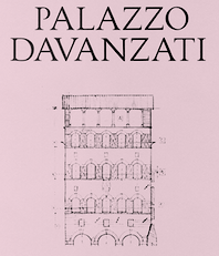 Graphic designer and calligraphy teacher at LABA, Free Academy of Fine Arts, in Firenze, Italy. In 2016, she designed the drop-dead gorgeous typeface Davanzati for Palazzo Davanzati, Museo della Casa Fiorentina. Davanzati has elements of Bembo (like the nose in the e) and Trajan. [Google]
[More] ⦿
Graphic designer and calligraphy teacher at LABA, Free Academy of Fine Arts, in Firenze, Italy. In 2016, she designed the drop-dead gorgeous typeface Davanzati for Palazzo Davanzati, Museo della Casa Fiorentina. Davanzati has elements of Bembo (like the nose in the e) and Trajan. [Google]
[More] ⦿
|
Charles Mazé
|
 Charles Mazé is a graduate of the Type and Media program at KABK, 2009. There, he designed a didone typeface (Bat Font) that has more warmth than classical didones in the hope of making scientific texts set in modern typefaces less boring. He did this by fattening up the italics. After graduation he moved to Brussels but now he is back in Paris.
 In 2009, he started a revival of Mercator, a sanserif typeface by Dick Dooijes and G. W. Ovink designed in 1959 at the Amsterdam Type Foundry. He set up Cataloged in Brussels with Coline Sunier. In 2012, Stéphanie Vilayphiou, Alexandre Leray, Coline Sunier and Charles Mazé co-designed the readable typeface Dauphine Regular, which can be downloaded from Github and Open Font Library. See it in action on the web site of ESAD (Ecole Supérieure d'Art et de Design). Dauphine is a sans-serif font inspired by lettering in late 19th and early 20th century maps. Github link for Dauphine. He works with Coline Sunier since 2009. They were fellows at the French Academy in Rome's Villa Medici in 2014 and 2015, and are now graphic designers in residency at Contemporary Art Center CAC Brétigny. Charles is part of the teaching staff of Atelier National de Recherche Typographique (ANRT) in Nancy, France. At Abyme, he published two typefaces: - Mercure (2010-2021). He writes in 2021: Mercure, designed by Charles Mazé, is the result of an inquiry into Latin epigraphy and the typographic forms associated with that discipline. Epigraphy is the study of écritures exposées (exposed writings), typically ancient or classical inscriptions engraved in stone or metal. The developments in mid-nineteenth century Latin epigraphy required new methods to transcribe classical inscriptions into print, which in turn required and inspired new typefaces. The Caractères Augustaux of 1846, produced by the printer Louis Perrin and the punchcutter Francisque Rey in Lyon, was the first typeface specifically designed for the transcription of the Roman capitalis monumentalis, used for the first time in 1854 in Alphonse de Boissieu's Inscriptions antiques de Lyon. It was soon followed by the Latins épigraphiques of the Imprimerie Nationale (Paris, 1854) and Ferdinand Theinhardt's Monumental (Berlin, 1863). At the same time, in reaction against the use of the prevalent Didot style, some French printers and publishers turned their attention to other typographic sources. While they found suitable models for the lowercase in typefaces produced during the French and Dutch Renaissance, the regain of interest for Roman inscriptions would provide a template for the uppercase. Around 1858, Théophile Beaudoire, sous-directeur of the Fonderie Générale in Paris, published his Elzévir (after the Dutch Renaissance printers Elsevier), one of the first typefaces to define this pattern. Mercure, which is based in part on Beaudoire's Elzevir, also goes back to the epigraphic origins of Perrin's Augustaux. Its Regular and Italic styles are completed by an additional fixed-width style, Transcript, a set of signs and symbols for the transcriptions of Latin inscriptions into print with fragmented, false, broken or missing letters. Mercure Transcript is included with any license of Mercure Regular or Italic. A study of the first three typefaces for Latin epigraphy in France and Germany, written by Charles, will soon be published in the Abyme Revue.
- Berthe (2011-2018). Berthe is designed after another typeface called Série no. 16, whose first cuts were produced at the end of the nineteenth century by the Parisian type foundry Deberny & Peignot. It was engraved by Constant and Auguste Aubert under the direction of Charles Tuleu, the adoptive son of Alexandre Deberny whose mother, Laure de Berny, had bought from her lover Honoré de Balzac the printing house he didn't manage to transform in a profitable company. Série no. 16 quickly became a popular choice among printers and found its way into many editions of classic and popular texts. Review by Hrant Papazian, who wrote that it presents a congenial evolution of the theatrical Didone style of type. Lower contrast, fluid structures, humane proportions. It is like a Didot or Bodoni taking leave of the catwalk and relaxing among friends.. Author of the related article Abîmées (2021).
[Google]
[More] ⦿
|
Christian Schwartz
|
 Christian Schwartz was born in 1977 in East Washington, NH, and grew up in a small town in New Hampshire. He attended Carnegie Mellon University in Pittsburgh, Pennsylvania, where he graduated in 1999 with a degree in Communication Design. After graduation, he spent three months as the in-house type designer at MetaDesign Berlin, under the supervision of Erik Spiekermann. In January 2000, he joined Font Bureau. Near the end of 2000, he founded Orange Italic with Chicago-based designer Dino Sanchez, and left Font Bureau in August 2001 to concentrate full-time on developing this company. Orange Italic published the first issue of their online magazine at the end of 2001 and released their first set of typefaces in the beginning of 2002. Presently, he is an independent type designer in New York City, and has operated foundries like Christian Schwartz Design and Commercial Type (the latter since 2009). He has designed commercial fonts for Emigre, FontShop, House Industries and Font Bureau as well as proprietary designs for corporations and publications. In 2005, Orange Italic joined the type coop Village.
 His presentations. At ATypI 2004 in Prague, he spoke about "The accidental text face". At ATypI 2006 in Lisbon, he and Paul Barnes explained the development of a 200-style font family for the Guardian which includes Guardian Egyptian and Guardian Sans. FontShop's page on his work. Bio at Emigre. At ATypI 2007 in Brighton, he was awarded the Prix Charles Peignot. Jan Middendorp's interview in October 2007. Speaker at ATypI 2009 in Mexico City, where he announced his new type foundry, simply called Commercial. FontShop link. Font selection at MyFonts. A partial list of his creations: - FF Bau (2001-2004): Art direction by Erik Spiekermann. Released by FontShop International. He says: Bau is based on Grotesk, a typeface released by the Schelter&Giesecke type foundry in Leipzig, Germany at the end of the 19th century and used prominently by the designers at the Bauhaus. Each weight was drawn separately, to give the family the irregularity of the original, and the Super is new.
- Neutraface (2002, House Industries) and Neutraface Condensed (2004). Art directed by Ken Barber and Andy Cruz. MyFonts offers Neutraface Slab Text, Neutraface Slab Display, Neutraface Display and Neutraface Text. Schwartz states: Neutraface was an ambitious project to design the most typographically complete geometric sans serif family ever. We didn't have many actual samples of the lettering that the Neutras used on their buildings, so it ended up taking a lot of interpretation. There was no reference for the lowercase, so it's drawn from scratch, looking at Futura, Nobel, and Tempo for reference. Stephen Coles reports: Reminiscent of the recent FB Relay and HTF Gotham, Neutraface is an exaggerated Nobel with nods to Bauhaus and architectural lettering. Yes, and maybe Futura? Maggie Winters, Ioana Dumitrescu, Nico Köckritz, Nico Kockritz and Michelle Regna made great Neutraface posters.
- Neutraface No. 2 (2007), discussed by Stephen Coles: By simply raising Neutrafaces low waist, most of that quaintness is removed in No. 2, moving the whole family (which is completely mixable) toward more versatile, workhorse territory. This release is surely Houses response to seeing so many examples of Neutraface standardized by its users. Also new is an inline version. Who doesn't love inline type? It so vividly recalls WPA posters and other pre-war hand lettering. There are other heavy, inlined sans serifs like Phosphate, but one with a full family of weights and text cuts to back it up is very appealing. A typophile states: Designed by Christian Schwartz for House Industries, Neutraface captures the 1950s stylings of architect Richard Neutra in a beautiful typeface meant for application on the screen, in print, and in metalwork. If you are ever in need of a classy retro face, they don't get any more polished than this.
- At House Industries, Christian Schwartz, Mitja Miklavcic and Ben Kiel co-developed Yorklyn Stencil.
- Farnham (2004, Font Bureau) and Farnham Headline (2006, Schwartzco). Commissioned by Esterson Associates and de Luxe Associates. Winner of an award at TDC2 2004. Based on work by Johannes Fleischman, a German punchcutter who worked for the Enschedé Foundry in Haarlem in the mid-to-late 1700s. Schwartz: Truly part of the transistion from oldstyle (i.e. Garamond) to modern (i.e. Bodoni) Fleischman's romans are remarkable for their energy and "sparkle" on the page, as he took advantage of better tools and harder steel to push the limits of how thin strokes could get. In the 1800s, Fleischman's work fell into obscurity as tastes changed, but interest was renewed in the 1990s as digital revivals were designed by Matthew Carter, the Hoefler Type Foundry, and the Dutch Type Library, each focusing on a different aspect of the source material. I think the DTL version is the most faithful to the source, leaving the bumps and quirks inherent to metal type untouched. I've taken the opposite approach, using the source material as a starting point and trying to design a very contemporary text typeface that uses the basic structure and character of Fleischman without duplicating features that I found outdated, distracting, or unttatractive (i.e., the extra "spikes" on the capital E and F, or the form of the y).
- FF Unit (2003-2004, Fontshop, designed with Erik Spiekermann). A clean and blocky evolution of FF Meta intended as a corporate typeface for the Deutsche Bahn (but subsequently not used).
- Amplitude (2001-2003, Font Bureau), Amplitude Classified and Amplitude Headline. A newspaper-style ink-trapped sans family, unfortunately given the same name as a 2001 font by Aenigma. Winner of an award at TDC2 2004. The typeface selected by the St Louis Post Dispatch in 2005. One of many agates (type for small text) successfully developed by him. This page explains that they've dumped Dutch 811 and Bodoni and Helvetica and Franklin Gothic and News Gothic (whew!) for various weights of Amplitude, Poynter Old Style Display and Poynter Old Style Text. AmplitudeAubi was designed in 2002-2003 by Schwartz and Font Bureau for the German mag AutoBild.
- Simian (2001, House Industries): SimianDisplay-Chimpanzee, SimianDisplay-Gorilla, SimianDisplay-Orangutan, SimianText-Chimpanzee, SimianText-Gorilla, SimianText-Orangutan. Designed at Font Bureau. Art Direction by Ken Barber and Andy Cruz. Schwartz: "Although Simian's roots are in Ed Benguiat's logos for the Planet of the Apes movies, Simian wound up veering off in its own direction. The display styles look very techno, and we really went nuts with the ligatures, since this was one of House's first Opentype releases."
- Publico (2007): A predecessor of Guradian Egyptian. Schwartz writes: During the two year process of designing the typeface that would eventually become Guardian Egyptian, Paul Barnes and I ended up discarding many ideas along the way. Some of them were decent, just not right for the Guardian, including a serif family first called Stockholm, then renamed Hacienda after the legendary club in the Guardian's original home city of Manchester. Everyone involved liked the family well enough, but it didn't fit the paper as the design evolved, and several rounds of reworking left us more and more unsure of what it was supposed to look like. In the summer of 2006, Mark Porter and Esterson Associates were hired to redesign Publico, a major Portuguese daily newspaper, for an early 2007 launch. He asked us to take another look at Hacienda, to see if we might be able to untangle our many rounds of changes, figure out what it was supposed to look like in the first place, and finish it in a very short amount of time. Spending some time away from the typeface did our eyes a world of good. When we looked at it again, it was obvious that it really needed its "sparkle" played up, so we increased the sharpness of the serifs, to play against softer ball terminals, and kept the contrast high as the weight increased, ending up with an elegant and serious family with some humor at its extreme weights. As a Spanish name is not suitable for a typeface for a Portuguese newspaper, Hacienda was renamed once more, finally ending up as Publico. Production and design assistance by Kai Bernau. Commissioned by Mark Porter and Esterson Associates for Publico
- Austin (2003): Designed by Paul Barnes at Schwartzco. Commissioned by Sheila Jack at Harper's&Queen.
- Giorgio (2007): Commissioned by Chris Martinez at T, the New York Times Sunday style magazine. Small size versions produced with Kris Sowersby. Not available for relicensing. A high contrast condensed "modern" display typeface related to Imre Reiner's Corvinus. Ben Kiel raves: Giorgio, like the fashion models that it shares space with in T, the New York Times fashion magazine, is brutal in its demands. It is a shockingly beautiful typeface, one so arresting that I stopped turning the page when I first saw it a Sunday morning about a year ago. [...] Giorgio exudes pure sex and competes with the photographs beside it. The designers at T were clearly unafraid of what it demands from the typographer and, over the past year, kept on finding ways to push Giorgio to its limit. Extremely well drawn in its details, full of tension between contrast and grace, it is a typeface that demands to be given space, to be used with wit and courage, and for the typographer to be unafraid in making it the page.
- Empire State Building (2007): An art deco titling typeface designed with Paul Barnes for Laura Varacchi at Two Twelve Associates. Icons designed by Kevin Dresser at Dresser Johnson. Exclusive to the Empire State Building.
- Guardian (2004-2005): Commissioned by Mark Porter at The Guardian. Designed with Paul Barnes. Not available for relicensing until 2008. Based on an Egyptian, this 200-style family consists of Guardian Egyptian (the main text face), Guardian Sans, Guardian Text Egyptian, Guardian Text Sans and Guardian Agate.
- Houston (2003): Commissioned by Roger Black at Danilo Black, Inc., for the Houston Chronicle. Schwartz: As far as I know, this typeface is the first Venetian Oldstyle ever drawn for newspaper text, and only Roger Black could come up with such a brilliant and bizarre idea. The basic structures are based on British Monotype's Italian Old Style, which was based on William Morris's Golden Type. The italic (particularly the alternate italic used in feature sections) also borrows from Nebiolo Jenson Oldstyle, and there is a hint of ATF Jenson Oldstyle in places as well.
- Popular (2004): Commissioned by Robb Rice at Danilo Black, Inc., for Popular Mechanics. An Egyptian on testosterone.
- Stag (2005): Commissioned by David Curcurito and Darhil Crooks at Esquire. Yet another very masculine slab serif family. Schwartz writes I showed them a range of slab serifs produced by French and German foundries around 1900-1940, and synthesized elements from several of them (notably Beton, Peignot's Egyptienne Noir, Georg Trump's Schadow, and Scarab) into a new typeface with a very large x-height, extremely short ascenders and descenders, and tight spacing. Also, we find Stag Sans (2007, Village) and Stag Dot (2008, Village).
- Plinc Hanover (2009, House Industries). A digitization of a blackletter font by Photo Lettering Inc.
- Fritz (1997, Font Bureau). Schwartz: "Fritz is based on various pieces of handlettering done in the early 20th century by Ozwald Cooper, a type designer and lettering artist best known for the ubiquitous Cooper Black. Galapagos Type foundry's Maiandra and Robusto are based on the same pieces of lettering."
- Latino-Rumba, Latino-Samba (2000, House Industries). Art Direction by Andy Cruz. Designed with Ken Barber. Jazzy letters based on an earlier design of Schwartz, called Atlas (1993).
- Pennsylvania (2000, FontBureau). A monospaed family inspired by Pennsylvanian license plates. Schwartz: "Thai type designer Anuthin Wongsunkakon's Keystone State (1999, T26) is based on the exact same source."
- Plinc Swiss Interlock (by Christian Schwartz and Adam Cruz for House Industries). Based on originals by PhotoLetteringInc.
- Luxury (2002, Orange Italic, co-designed with Dino Sanchez). Gold, Platinum and Diamond are the names of the 1930s headline typefaces made (jokingly) for use with luxury items. The six-weight Luxury family at House Industries in 2006, contains three serif text weights called Luxury Text, as well as three display typefaces, called Platinum (art deco), Gold, and Diamond (all caps with triangular serifs).
- Los Feliz (2002, Emigre). Based on handlettered signs found in LA.
- Unfinished typefaces: Masthead, Reform, Bitmaps, Bilbao, Boyband, Addison, Elektro, Sandbox, Vendôme, Bailey.
- Fonts drawn in high school: Flywheel (1992, FontHaus), Atlas (1993, FontHaus, a "a fairly faithful revival of Potomac Latin, designed in the late 1950s for PhotoLettering, Inc"), Elroy (1993, FontHaus), ElroyExtrasOrnaments, Hairspray (1993, "a revival of Steinweiss Scrawl, designed in the mid-1950s by Alex Steinweiss, best known for his handlettered record covers": HairsprayBlonde, HairsprayBrunette, HairsprayPix, HairsprayRedhead), Twist (1994, Precision Type and Agfa), Zombie (1995, Precision Type and Agfa), Morticia (1995, Agfa/Monotype), Gladys (1996, an unreleased revival of ATF's turn-of-the-century Master Script).
- Ant&Bee&Art Fonts (1994-1995): three dingbat fonts, Baby Boom, C'est la vie, and Raining Cats&Dogs, based on drawings by Christian's aunt, Jill Weber. Released by FontHaus.
- Digitizations done between 1993-1995: Dolmen (Letraset), Latino Elongated (Letraset), Regatta Condensed (Letraset), Fashion Compressed (Letraset), Jack Regular (Jack Tom), Tempto Openface (Tintin Timen).
- Hand-tuned bitmap fonts: Syssy, Zimmer's Egyptian, Elizzzabeth, Newt Gothic, Trags X, Tibia, Fibula, Tino, Digest Cyrillic (based on Tal Leming's Digest). Free downloads of the pixel typefaces Newt Gothic, Tibula and Fibia here.
- At Village and Orange Italic, one can get Local Gothic (2005), now in OpenType, a crazy mix of Helvetica Bold, Futura Extra Bold, Franklin Gothic Condensed and Alternate Gothic No. 2. It is a collection of alternates one can cycle through---thus a for of randomization.
- FF Oxide (2005), a Bank Gothic style stencil family. FF Oxide Light is free!
- Graphik (2008), a sans between geometric and grotesk made for thew Wallpaper mag. Kris sSwersby writes: In a sweltering typographic climate that favours organic look-at-me typefaces bursting with a thousand OpenType tricks, Graphik is a refreshing splash of cool rationality. Its serious, pared-back forms reference classic sans serifs but remain thoroughly modern and never get frigid. Any designer worth their salt needs to turn away from the screen&pick up the latest copy of Wallpaper magazine. There you will find one of the most beautiful, restrained sans serifs designed in a very long time. See also Graphik Wide (2018).
- In 2011, he created a 22-style revival of Helvetica called Neue Haas Grotesk (Linotype), which offers alternates such as a straigt-legged R and a differently-seriffed a. It is based on the original drawings of Miedinger in 1957.
Schwartz also made numerous custom fonts: [Google]
[MyFonts]
[More] ⦿
|
Cláudio Rocha
|
 Cofounder of Now Type, Cláudio Rocha is an Italian Brazilian illustrator and designer (b. 1957) who was first based in sao Paulo, then in Treviso, Italy, and currently in The Netherlands. Now Type is jointly run with his son Lucas Franco (b. 2001). He edited Tupigrafia, a magazine dedicated to typography and calligraphy in Brazil. Partner of Oficina Tipografica Sao Paulo. His typefaces include:
 - ITC Gema (1998: a felt tip pen font) and ITC Underscript (1997, a grungy fat script).
- Cashew (2000-2020). Cashew is a rounded squarish sans serif font, originally created as a logotype for Tupigrafia magazine (2000). In its 2020 iteration, done together with Lucas Franco, it is a variable font with one axis, from Regular to Extended.
- Tenia.
- Viela Regular (Claudio Rocha & Lucas Franco, 2008-2019). A great thick-and-thin typeface.
- Unidin (sans display face).
- Rock Regular (slab face). Rock Titling (1998-2019).
- Old Future (a brush version of Futura).
- Chacal Pixel.
- Persplextiva (2001-2002, a bouncy hand-drawn 3d face done in the lettering style of Brazilian cartoonist Millor Fernandes).
- Liquid Stencil (1998-2000). A brush stencil.
- Feijoada Light.
- Akrylicz Grotesk (2002, brush/paint face).
- Sampa (1999-2019). An informal brush script.
- Genova (2008-2020). A reinterpretation of Paganini typeface, lauched by Nebiolo type foundry in 1928 for hand composition and developed by Alessandro Butti under the supervision of Raffaello Bertieri.
- Stampface (2006-2018, by Claudio Rocha and Lucas Franco). Based on a Headline Gothic metal type sample found in a reference book, which was designed by Morris Fuller Benton in 1936 for American Type Founders.
- Pieces Stencil (2016). Think piano key or Futura Stencil.
- Antonio Maria (2017): Antonio Maria, a font by Claudio Rocha and Lucas Franco, takes its shapes from the lettering found in the cover of Afixação Proibida (Display Prohibited), a book by the Portuguese poet Antonio Maria de Lisboa (1928-1953). In fact, Antonio Maria was the leader-writer of Afixação Proibida, a collective manifesto from 1949, that initiated the surrealist movement in Portugal. It is an inverted-contrast typeface with 150 ligatures and a large character set.
- Rudolf Antiqua and Rudolf Initials (2018). A faithful revival of Rudolf Koch's Koch Antiqua (1922). Followed by Rudolf Text (2017-2020, Lucas Franco and Claudio Rocha).
- Mefistofele. A revival in 2018 by Claudio Rocha and Lucas Franco of the modular stencil typeface Mefistofele (1930, Reggiani foundry).
- Rudolf Titling (Lucas Franco and Claudio Rocha), a typeface that won an award at Tipos Latinos 2018.
- Agora Titling Extra Light (2018).
- Pieces Stencil (2016-2019). Pieces is a piano key typeface built on a modular system with emphasis on diagonal endings.
- Moreira Serif (2019). A slab serif version of Morris Fuller Benton's art deco typeface Broadway (1927). In the 1930s, the Portuguese graphic artist Antonio Moreira Junior added serifs to Broadway's letterforms and marketed it under a new name. Moreira Serif revives that typeface.
- Scarpa Titling (2019, Claudio Rocha and Lucas Franco). An all caps typeface based on a nameplate found on the front door of a shoemaker in Treviso, Northern Italy.
- Anton (2020, by Claudio Rocha and Lucas Franco). An art deco typeface modeled after a Dutch deco type seen on the Anton Antonius Kurvers's cover of Wendingen in 1927.
- Esperanca Sans (2019). A Peignotian sans by Claudio Rocha & Lucas Franco.
- Jaguaribe (2020). In Unicase and Serif versions, by Claudio Rocha. A squarish sans and serif pair based on the of letterforms drawn by Brazilian artist Gil Duarte.
- Spinface (2020). An experimental turned letter font by Claudio Rocha and Lucas Franco.
- Werner (2020-2021). A revival of A.D. Werner's famous deco inline typeface Dubbeldik (1972).
- Densa (2020). Emulating 19th century wood types. Densa typeface was based on the Fantastic Voyage movie title in the 1966 poster
- Tegel (2020-2021). Tegel is a layer font that emulates the ceramic tile letters found on a school façade in Delft.
- Etna Futurist (2020, Claudio Rocha & Lucas Franco). Digital interpretation of Etna, a wood type produced by the Italian type foundry Xilografia Meneghello & Belluzzo, in the 1920s.
- Cassiano (2020). A super-fat octagonal typeface based on letters found on a book cover by the Brazilian artist Belmonte (1896-1947).
- Fortunato (2020). A digital interpretation of the lettering work done by the Italian Futurist genius Fortunato Depero (1892-1960) for advertising and editorial design. A pure Italian art deco typeface. The lowercases were developed from scratch.
- Jurriaan (2021). A square block typeface.
- Hendrik (2021, by Claudio Rocha & Lucas Franco). A revival of Simplex (Sjoerd Hendrik de Roos, 1937).
- Martin (Swing, Straight) (2020). A beatnik typeface based on the letters found in the jazz record albuns designed by David Stone Martin (1913-1992).
- Tesoura (2020). A paper-cut typeface.
He published the books "Projet Tipográfico" (Ed. Rosari), "Trajan e Franklin Gothic" (Ed. Rosari), and "Tipografia Comparada" (Ed. Rosari). Claudio now lives in Treviso, Italy, from where he launched the type magazine Tipoitalia in 2009. FontShop link. Klingspor link. [Google]
[MyFonts]
[More] ⦿
|
Clarissa Bolettieri
|
During their studies at Politecnico di Bari, Clarissa Bolettieri, Dora Riondino and Elena Maroccia designed the roman inscriptional typeface Helias (2016). This typeface is based on rubbings taken from inscriptions dating back to 1105 in Bari's Saint Nicholas Cathedral. [Google]
[More] ⦿
|
Claude Médiavilla
|
 French type designer (b. 1948) who was born in the South of France. He studied typography, calligraphy and painting at the School of Fine Arts in Toulouse. He received the Prix Charles Peignot in 1982. In 1992, the President of France invited him to design the inscriptions for the royal tombs in the Basilique Saint Denis in Paris. He published Calligraphie (Imprimerie Nationale, 1993). Author of Calligraphy (Wommelgem, Belgium, 1996) and Histoire de la calligraphie française (Albin Michel, 2006; examples here). In 2009, with the help of Atelier des Signes, he created a typeface for the signage at Chateau de Fontainebleau. Additional URL. In 2010, Mediavilla cofounded Media type Foundry with Sonia Da Rocha and Joel Vilas Boas in Paris.
 His typefaces: - Galba: an elegant roman titling face, done at Mecanorma in 1987.
- Media Script (Mecanorma, 1985).
- Mediavilla (CCT, 1976).
- Mediavilla Script (Graphitel, 1986).
- Palazzo (Mecanorma, 1984).
- Tory (1991).
Examples of calligraphic alphabets drawn by him and shown in his Histoire de la calligraphie française (2006): Bastarda, Cancellaresca, Carolingian, Cursive gothic 1410, Luxeuil, Roman Capitals, Roman cursive 1st century, Roman cursive 4th century, Rustica 1st century, Textura 14th century, Textura 15th century, , Tourneure 15th century, Uncial 4th century. Klingspor link. [Google]
[MyFonts]
[More] ⦿
|
Corradine Fonts
[Manuel Eduardo Corradine]
|
 Manuel Eduardo Corradine Mora was born in Bogotá in 1973. He graduated from the School of Graphic Design of the National University of Colombia in 1996, and became a graphic designer. He started by custom-designing fonts and by making typefaces for his own company, Casa Papelera El Cedro (The Cedar Papermaking House), for printing invitation cards. With other designers like Carlos Fabián Camargo, John Vargas and César Puertas he formed Tipográfico in 2007 to strengthen the type discipline in Colombia. Corradine Fonts is Manuel Corradine's own foundry in Bogotá, Colombia, founded in 2006. Today, he is one of Colombia's principal type designers. He also teaches at Universidad Piloto de Colombia in Bogota.
 Fonts from 2007: Kidwriting (a family which includes Kidwriting Dingbats 1 and 2), Garabata (a fantastic handwriting face), Garabata Dingbats, Hexagona Digital, Quadrat (grunge), Quadrat Old (grunge), Quadrat Dirty (grunge), Quadrat Broken, Quadrat Ugly, Neogot (experimental, 8 styles). Fonts from 2008: Mucura (handwriting), Prissa (handwriting), Salpicon (a script), Cuento Serif (a bouncy hand-printed family), Memoria (brush script), Charco, Happy Day (comic book family with Happy Day Dingbats), Espectro (a swinging script with swashes and a Dingbats style), Furia (handwriting), Candelaria (based on house signs in the La Candelaria neighborhood of Bogotá), Old Village (1600's style), Old Village Ornaments, Rapidda (a successful simulation of quick handwriting), Hueca (an outline children's script), Antigua (an old swashbuckler family), Colegial (a great-looking hand script), Pincel (a fantastic paint brush family with accompanying splatter dingbats), Trazo (Corradine's handwriting), Arcos (a techno family), Caveman (a primitive stone-look type family), Rumba (two styles; an elegant flowing brush script), Parche (graffiti family), Elegance Monoline (a greeting card script typeface that won an award at Tipos Latinos 2008), Abuelito (script). Fonts from 2009: Helga (flowing script), Mussica (+Swash, +Antiqued: a delicate Victorian typeface; followed in 2017 by Mussica Italic), Guarapo (hand-printed), Toxic (futuristic stencil), Emotion (comic book face), Bloque 3D, Rock and Cola, Betco's Hand, Telefante (comic book family), Nancy's Hand (more comic book hand-printing), Alambre (multiline/paperclip), Sensual (calligraphic hand), Zape (in the style of Tekton), Antrax Tech (grunge), Masato (handwriting), Hu Kou (oriental simulation). Fonts fgrom 2010: Miel (a curly script), Oferta (a signage script), Corradine Handwriting (and Corradine Handwriting Italic, 2015), Alberto (connected hand), Changua (hand-printed). Fonts from 2011: Plebeya (2011, connected hand), Mimi's Hand Connected, Legendaria (an extensive connected calligraphic family). Fonts from 2012: Tecna (a techno family co-designed with Sergio Ramirez), Neuron (a fantastic 16-style rounded elliptical sans family created together with Sergio Ramirez), Bucanera Soft (blackletter), Bucanera Antiqued (grungy blackletter), Official (a simple monoline sans family), Almibar (a connected calligraphic Spencerian script), Eterea (a roman all-caps family), Eterea LC (the lower case set), Canciller (an italic roman, done with Sergio Ramirez), Quarzo (2012, a formal copperplate script done with Sergio Ramirez). Typefaces from 2013: Neuron Angled (still with Sergio Ramirez), Alianza Slab (a great-looking slab family), Alianza Italic and Alianza Script (a packaging font), all made jointly by Manuel Eduardo Corradine and Sergio Ramirez. Typefaces from 2014: Whisky (a large blackletter family with inlines and fills for layering co-designed with Sergio Ramirez; related to German expressionism, it won an award at Tipos Latinos 2016), Whisky Italics, Beauty Script (with Juan Sebastian Rincon), Emblema and Emblema Headline (tall-legged art deco sans family by Duvan Cardenas), Wild Pen (a 1200-glyph set of typefaces that can be used to simulate handwriting thanks to smart replacements in Opentype), Sinffonia (a thin informal typeface with oodles of choices for swashes). Typefaces from 2015: Be Creative (a vintage display typeface), Typnic (a varied handcrafted layered and script typeface family; rhymes with picnic), Typnic Headline Slab. Typefaces from 2016: Naugles (thick display face based on the Naugles logo), Scrans (a modern signage script), Bloque (heavy slab family), Bloque Italic. Typefaces from 2017: Cristal (layered, triangulated and beveled font family, including exquisite Cristal Dingbats and Cristal Frames), Almibar Pro (connected calligraphic script). Typefaces from 2018: Tierra Script, Pueblito (rustic style). Typefaces from 2019: Austera Text (a comfortable workhorse serif). Typefaces from 2020: Kidwriting Pro. Klingspor link. Behance link. Creative Market link. MyFonts link. Fontspring link. Font Squirrel link. View Corradine's typefaces. [Google]
[MyFonts]
[More] ⦿
|
Creative Ultra (was: Creative Whoa, Symufa, or Creative Tacos)
[Syed Faraz Ahmad]
|
 Lucknow, India-based designer who started out as Symufa, and then as Creative Whoa. Designer of the handcrafted Rushda (2016), Papercutting (2016), Aiza Shine Serif (2016), Holiday Craft Girly (2016, by Aiza Fatima), Christmas Script (2016), Emily Gold Awesome (2016), Slim Taco (2016) and Ibrat (2016), the fat brush script font Usama (2016) and the brush typeface Symufa Flow (2016).
 Typefaces from 2017: Damean, Candace, Christmas Script, Ulyssa, Hanma, Carla, Abasalom, Amidala, Vanett, Kaayla, Habel, Cabales, Barden, Zayley, Ceica, Maleah Sans, Vannah, Ireene Serif, Jerrick, Perkin, Talissa, Stay Wanderer, Immani, Acacio serif, Charlton, Earwyn Serif, Catheryn, Ailish (free), Adney, Ackley, Lisandro, Janecia Serif (angular style), Hagito Serif, Abiah Sans, Hadwin Serif, Erynn Serif, Ethan (wedge serif), Alodie, Ainsley Sans, Adyson Sans, Jesusa Serif, Jerricca Serif, Chrys Sans, Cartland Serif, Brydon Serif, Orrick Slab Serif, Adenn Sans, Dayleen Sans, Cordaro Sans, Carra Serif, Adriell Sans, Diedra Serif, Cleantha Serif, Cordaro Serif, Carra Serif, Birtle Serif, Axell Serif, Ahijah, Aderes Serif, Achazia Serif, Brycen Serif, Jaavon (fashion mag serif typeface), Cheston Slab Serif, Treyton, Shaaron, Severn Sans, Darrion (slab serif), Naava (slab serif), Tabner, Garvin (slab serif), Jotham, Sumer, Sharis serif, Jerrad, Orrick (slab serif), Ethan (wedge serif), Zack Thin, Abril, Haytham Slab Serif (free), Khwaja, Jennet Brush, Asma (curly script), Jaraad Script, Yessica Sans, Rockley (sans), Cason, Carita (text typeface), Glennda, Starlyn, Hommer (mini-serifed), Adouliss Mag (a great angular design), Wrenn Sans, Medric Serif, Erica Script, Timm Serif (high contrast fashion didone), Veera Serif, Sondra Serif (lapidary, flared), Abira Sans, Montrell Serif, Spark Serif, Jassmine Hand Written, Berton Sans, Beacher (sans), Varina, Mercuric Fancy, Deron Sans, Edina Sans, Adley (sans), Aariel (sans), Hurst (sans), Azel, Aaliyah (fashion font), Barnes Serif, Zimra Serif, Zisel (sans), Bethan (sans), Abner, Abed Serif, Aludra (serif), Myron Serif, Aster Slab Serif, Anaan (sans), Aara Serif, Zack Serif, Alex Sans, Vengeance (sans), Aaron (sans), Aaron Serif, Adon, Alex, Maaz Serif, Thomas Mag (fashion mag family), Zahra, Zack, Aagaz, Barden, Erica, Asbah, Aiden, Anzil, Zahra, Alayna, Aaminah, Atifa Serif, Barkat, Adouliss, Amirah, New Year 2017, Dr. Usama, Yadon (a fashionable Peignotian), Tyra, Abell (an angular typeface family), Akiva. Typefaces from 2018: Saarah Fresh, Pierson, Moisses, Wensley (roman caps), Cammron Serif (roman caps), Enrique Sans, Zevida, Aimen Serif, Aarianna, Farhan, Nasya, Mahlon, Jadrien, Ahsan, Gayora Slab, Haana Slab, New Year 2018 Brush, Carolin, Galvin Slab Serif, Sharoon, Bellinor, Fonzy, Hacca, Abeetha. Typefaces from 2019: Adrina, Solomon, Qanaya, Yarelli, Edingu, Eadita, Daecca, Cansu, Madelin, Caelan, Banquo, Haddie, Aabel, Hyman, Maiah, Walcot, Hyogo, Fabyen, Gerard, Hadasa, Yafeu Sans, Benett, Yahir, Raanan, Geldwine, Karlton, Abrasha, Linnett (a geometric sans), Cador (a fashion mag font), Daaron (sans), Yessica, Ammar, Eadfrid, Boulia, Stay Writer, Soulmarker, Dusty Chalk, Xantheus, Adallyn, Badrick, Paulose, Labor Union Serif. Aka Symufa. Creative Market link. Dafont link. Home page. Aka Creativewhoa. Creative Fabrica link. [Google]
[More] ⦿
|
Cuong Truong Van
[iTypeface (or: Exfont)]
|
[More] ⦿
|
Dan Ro
|
Ho Chi Minh City, Vietnam-based designer of the Trajan typeface Achilles (2015). [Google]
[More] ⦿
|
Daniel Pouzeot
|
Graphic designer from Pavlodar, Kazakhstan. He created the octagonal typeface Furore (2009), as well as Trajan Pro Cyrillic (2009). He cyrillicized Yanone Kaffeesatz in 2009. Typetype link. [Google]
[More] ⦿
|
Daniel Vorobyov
|
Almaty, Kazakhstan-based designer of the free squarish typeface Furore (2018), and of Cyrillic styles of Yanone Kaffeesatz (2018: free) and Trajan Pro (2018). Note: the Furore he claims as his is in fact made in 2009 by Daniel Pouzeot and Jovanny Lemonad, so there is an unexplained conflict. Also, his Behance name is Pouzeot, so probably it's a question of two aliases for the same designer---welcome to the web's chaos. [Google]
[More] ⦿
|
Dave Lawrence
[California Type Foundry (21st century)]
|
 [MyFonts]
[More] ⦿
[MyFonts]
[More] ⦿
|
David Fleming Nalle
[Scriptorium (Ragnarok Press, Fontcraft)]
|
 [MyFonts]
[More] ⦿
[MyFonts]
[More] ⦿
|
David Lafourcade
|
 During his graphic design studies in Lyon, France, David Lafourcade created the constructivist typeface Rus 35 (2014), the Trajan typeface Oedipe Antique (2014) and the Fraktur typeface Dornach (2014).
 In 2015, he made the crazy arts-and-craftsy typeface Whaye, the geometric script typeface Fibule (which has starter, middle and end glyphs), and the hacker typeface Gaio. Typefaces from 2016: Aldgate (inspired by London transport signs), Dragonfly, Rallonge (a circle-based typeface designed to be stretched). [Google]
[More] ⦿
|
David Rudnick
|
 Born in 1986, David Rudnick is a graphic designer in the UK. He created quite a number of typefaces ca. 2013. These include:
 - Sans: Caszius Caps (titling sans, +Hebrew), Caszius Hallow, Zoa (+Zoa Wassenaar, a sans after Piet Zwart), Amos, Poptimo Blast (heavy and condensed beauty), Ezekiel, J Smith (named after signwriter and typographer Percy J. Smith, 1882-1948).
- Grotesks: Clinic Grotesk, Erhard Grotesk (after Nuremberg-based woodcutter Erhard Schön, 1491-1592), Erbar Grotesk Light (after Jakob Erbar).
- Avant garde sans: Specter.
- Rune simulation: Jerusalem (straight-edged).
- Geometric display types: KapilDev.
- Lapidary / flared: Neu Symbol (after Philip Bouwsma's Neuhengen), Alsatian.
- High contrast fashionable sans: Arcelor.
- Octagonal/techno: F Type.
- Trajan: Petrus.
- Blackletter: Hyperzeit (2013).
- Pixelish: Eclipser (2020).
Typefaces not listed above: Alastor, Etude, Ezekiel, HyperTerra, HyperZoa, Kala Light, ManMake, Mandem, Marathon, Tranz Mono, Unity Terminal, Verseau. [Google]
[More] ⦿
|
Dennis Ortiz-Lopez
|
 Prolific NY-based designer (born in East Los Angeles) who specializes in faithful revivals of old masters and logotype, in Latin and Hebrew. He made over 500 fonts including. He is also a translator and illuminator of Biblical period Hebrew and Aramaic. His clients include The Vatican (Pope John Paul II's Holocaust commemerative CD) and Hadassah, the Women's Zionist Organization of America. His specialties are translations worded in the language and style of the period in which the Biblical text was composed. His translation and enumeration of kabbalistic writings, otherwise known as Hebrew Mysticism and numerology, demonstrate the mathematical base of Biblical miracles.
 MyFonts wrote this analysis of his work: Dennis Ortiz-Lopez is a hugely talented New York type designer. lettering artist&typographer, with around 600 typefaces to his credit. Typographic quality in the magazine market doesn't get much better than Rolling Stone magazine---well, guess who was their typographer (as well as InStyle, Sports Illustrated, People, etc.). Dennis made a successful transition to the digital era around 1989, keeping up his prodigious output. Dennis is also known by his Hebrew name, Siynn bar-Diyonn. Dennis follows the footsteps of great American type designers such as Morris Fuller Benton and Herb Lubalin. And he likes contrasts, too: his typefaces are very narrow or very wide, very thin or very fat. If you love Franklin Gothic but always felt like it's not fat and wide enough. try [Google]
[MyFonts]
[More] ⦿
|
Dino Sanchez
|
 Chicago-based industrial designer who cofounded Orange Italic in 2000 with Christian Schwartz. Together, they have collaborated on logos, illustrations, and typefaces. The six-weight Luxury family (2006, House Industries; but as early as 2002 at Orange Italic) contains three serif text weights called Luxury Text, as well as three display typefaces, called Platinum (art deco), Gold, and Diamond (all caps with triangular serifs). They were designed by Christian Schwartz and Dino Sanchez.
 In 2014, Christian Schwartz and Dino Sanchez co-designed the roman inscriptional typeface Gravitas. The name was already in use by Riccardo de Franceschi (since 2011), Laura Eames (since 2013) and Keith Tricker (since earlier in 2014), so there may be some emails flowing between these type designers. They write: The primary inspiration for Gravitas was Augustea Nova, Aldo Novarese's quirky and spiky Latin interpretation of the Roman inscriptional caps for the Nebiolo Type Foundry, released in a single weight in the 1950s. It's fairly common to see Augustea Open these days, but his lowercase apparently didn't survive the transition to phototype. Many designers have tackled the problem of matching a lowercase to the classical Roman capitals, with decidedly mixed results. The Bold Italic was drawn by Jesse Vega. Future web site. Typedia link. [Google]
[More] ⦿
|
Dmitrij Greshnev
[Green Type]
|
 [MyFonts]
[More] ⦿
[MyFonts]
[More] ⦿
|
Dmitry Arakelov
[Fontop]
|
 [MyFonts]
[More] ⦿
[MyFonts]
[More] ⦿
|
Dom Hans van der Laan
|
 Dom Hans van der Laan (Leiden, 1904-1991) was a Dutch architect and Benedictine monk. After a few years of architectural studies, van der Laan developed a system of principles for proportions. Using this theory Dom Hans van der Laan designed buildings and even created a typeface, the Alphabet in stone. This typeface is based on the Roman carved stone capitals that were used in the first century AD. Designed using strict 3d rules (which he called the Plastic Number), his lettering can be found at the abbeys of Oosterhout and Mamelis.
 The Alphabet in stone typeface was digitized in 2011. That project can be seen here. Contributors include Willem Noyons, Maarten Dullemeijer and Rob Stolte. The font family can be bought from the Dutch foundry Autobahn. [Google]
[More] ⦿
|
Dukom Design
|
 Design studio in Nis, Serbia. Their Latin / Cyrillic typeface Minaid (2014) is advertized as a strong masculine typeface suitable for sports and logo design. I think that it is quite appropriate for the signage in gulags. Partin (2014, FontStruct) is a free basketball typeface. Constantine (2014) is a roman caps typeface for Latin and Cyrillic. Constantine Bold and Outline (2014) are free.
 Behance link. Dafont link. Fontspace link. [Google]
[More] ⦿
|
Edward Catich
|
The late Father Edward Catich was a talented and productive calligrapher who has published several fine books on the making of Roman inscriptions. He researched the Trajan inscriptions on the Trajan column in Rome, and is known for his clear and classy calligraphic "Petrarch Script". [Google]
[More] ⦿
|
Edward Cross
|
 Leeds, UK-based designer of the classical roman caps typeface Contrast Roman (2016). [Google]
[More] ⦿
Leeds, UK-based designer of the classical roman caps typeface Contrast Roman (2016). [Google]
[More] ⦿
|
Elena Maroccia
|
During their studies at Politecnico di Bari, Clarissa Bolettier, Dora Riondinoi and Elena Maroccia designed the roman inscriptional typeface Helias (2016). This typeface is based on rubbings taken from inscriptions dating back to 1105 in Bari's Saint Nicholas Cathedral. [Google]
[More] ⦿
|
Elena Suzuki
|
During her studies at Tokyo University of the Arts, Elena suzuki created Blur Lines (2014), an all caps typeface that consists of horizontally striped letters based on Trajan. [Google]
[More] ⦿
|
Eloise Barbanera
|
 Roman designer of the Trajan typeface Traiano (2014). [Google]
[More] ⦿
Roman designer of the Trajan typeface Traiano (2014). [Google]
[More] ⦿
|
Emanuela Conidi
|
 Conidi obtained an MA in typeface design from the University of Reading in 2008, and a PhD from the same university a few years later. Her graduation typeface is Nabil, a hookish serifed typeface that covers Latin and Arabic. It won a bronze medal at the 2009 EDAwards. She also holds a Masters degree in Design and Visual Communication from the Polytechnic University in Milan
 Emanuela joined Fontsmith in 2008: With a background in Graphic Design, experience in hot-metal type hand composition and letterpress printing, she is passionate about typographic history, 19th century typefaces and Arabic typography. In 2009, Mitja Miklavcic, Jason Smith and Emanuela co-designed the slab serif family FS Rufus, which was described by them as benevolent, quirky, peculiar, offbeat, jelly beans and ice cream, a retro eco warrior. She co-designed the legible sans family FS Me with Mitja Miklavic, Phil Garnham, Jason Smith and Fernando Mello (Fontsmith). Designer of FS Albert Arabic, FS Rome (with Mitja Miklavcic: an all caps Trajan typeface) and FS Blake (a sans with some inherent tension) at Fontsmith. Speaker at ATypI 2018 in Antwerp on the topic of Arabic type history. [Google]
[MyFonts]
[More] ⦿
|
Emrah Yildirim
|
Art director in Dubai and/or Istabul, who created the pixel typeface Borderless in 2016. In 2018, Halilcan Cayan and Emrah Yildirim designed the roman caps / romain du roi style typeface Murmillo. [Google]
[More] ⦿
|
Engravers
|
 Engravers is a particularly elegant family at Agfa/Monotype, consisting of Burin Sans (wide and almost monoline) and Burin Serif, Solid Antique Roman, Artisan Roman, Burin Roman, Light Classic Roman, Classic Roman (stone cut look), Handle Oldstyle, Light Roman, and Medium Roman. The Engravers series is related to the Sackers series. [Google]
[More] ⦿
Engravers is a particularly elegant family at Agfa/Monotype, consisting of Burin Sans (wide and almost monoline) and Burin Serif, Solid Antique Roman, Artisan Roman, Burin Roman, Light Classic Roman, Classic Roman (stone cut look), Handle Oldstyle, Light Roman, and Medium Roman. The Engravers series is related to the Sackers series. [Google]
[More] ⦿
|
Enrika Ernestsone
|
Riga, Latvia-based art director. During a workshop at Type Paris 2018, she designed Ome, a typeface that was inspired by the Trajan inscriptions, and that she intends to use on her grandmother's gravestone. [Google]
[More] ⦿
|
ETC Type
[Mateo Broillet]
|
 Geneva, Switzerland-based graphic and type designer, b. 1990, who studied at ECAL in Lausanne. Designer of the Trajan column-inspired display serif typeface Nero Alto (2019, published by Typeverything).
 Mateo also designed the free fonts Seymaz (2020; a variable condensed octagonal sans family inspired by the Grecian wood type style from the 19th century) and Sabir Mono (2018; a monospaced programming font with support for Latin, Greek, Cyrillic and Hebrew developed as a student project). Fontesk link to his free typefaces. Github link for ETC Type, where one can also download some of his typefaces. [Google]
[More] ⦿
|
Eti Vassileva
|
Graphic designer and illustrator in Sofia, Bulgaria. Creator of Capitalis Monumentalis (2017, a Cyrillic version of the roman capital style) and Penta Type (2017, an octagonal typeface---unclear why the name refers to a pentagon). [Google]
[More] ⦿
|
Eurotypo
[Olcar Alcaide]
|
 Institute in Benalmadena, Spain (was: Santa Severa), where one can take 4-week courses at 1450 Euros a shot on the Etruscan alphabet, Trajan, Cuadrata and Rustic Roman Capital letters, and related subjects. They also organize lettering tours in Italy and guided tours in various musea. The teachers are Alberto Di Santo (Professor of the visual communication, Tor Vergata University, Rome; Professor of Graphic Design, Istituto Europeo di design, Rome; Professor of editorial design, La Sapienza University, Rome; Professor of Typography, C.F.P. Sinalunga, Siena) and Olcar Alcaide (b. 1952, Argentina, Professor of Graphic and Typography Design, University of Buenos Aires; Professor of Typography, University of Lanús, and Professor of Graphic Design, Marbella Design School, Spain). Type link jump page.
 Eurotypo is also the foundry of Olcar Alcaide. Catalog of Olcar Alcaide's typefaces. In 2010, he published the text family Antium and the warm signage typefaces Mijas Ultra and Lila Pro Heavy. Typefaces from 2011 include Lila pro, Atenea (a humanist sans family), Agerola Script (a fat flowing signage face), Teja (signage face), Zalea (yet another signage face), and Nabu Pro (a connected signage script). Equalis (2011M, with Juan Lavalle) is a monoline slab typeface with a huge x-height and wide open counters. It was followed by Equalis Stencil (2011). Ravel (2011) is a fat signage script face. Atenea Egyptian (2011) is a solid slab serif family. Berta (2011) is a signage brush typeface with connected and unconnected versions. Optic Art (2011) is an ornamental typeface with building blocks that can be used for overlays. Creator of Eurotypo Bodoni Bold (2011). Typefaces from 2012: Cubus (dingbats), Saxo Deco (art deco), Moliere (2012, an elegant didone family with outspoken ball terminals), Melon Script (a fat curvy signage script family), Riky (comic book family), Chipa (a signage and package design script), Heket (an expressive curly script), Lenga (a slab serif typeface family), Mikal (brush script). Duktus is a 1940s style script in the style of Donatello (1935, Wagner & Schmidt), Troubadour (1927, Wagner & Schmidt), Liberty Script (1927, Willard T. Sniffin), Trafton Script (1933, Howard Allen Trafton), and Coronet (1937, R.H. Middleton). Picture. Typefaces from 2013: Dignus (influenced by Bank Gothic and Eurostile), Bague (old Dutch style with little contrast, in the style of Jan Van Krimpen), Lugo (a heavy signage or advertising script), Brittes (copperplate script), Talis (contrast-rich sans family), Fiesole (display family with an awkward back-curled lower case d), C Duflos (after a bâtarde coulée by Claude Duflos, a French engraver who was acitve around 1690). Typefaces from 2014: Talks (creamy signage script), Fiume (calligraphic script), Predy, Daevon (copperplate script), Beily (letterpress style), Ritts (a heavy script-like display family), Ritts Cursive (in the style of the brush signage scripts descending from Robert E. Smith's Brush Script for ATF in 1942). Typefaces from 2015: Valentia (a semi-copperplate calligraphic script followed by Valentia Condensed in 2016), Stabia, Digatte Quill (connected script), Digatte (connected monoline cursive script). Typefaces from 2016: Duero (signage script), Turia (calligraphic script), RRollie (a lapidary typeface based on the roman inscriptions), Valentia Nit (a copperplate typeface enriched with swashes and extensions). Typefaces from 2017: Citix (a great calligraphic / penmanship script), Citix Two Condensed, Alfabetica (humanist sans), Merick. Typefaces from 2018: Fortezza (a stiifened didone), Portoluce, Hotdogger (a cursive brush font family), Hotdogger Extras (dingbats), Favarotta, Vikive (a grotesque family), Aretino (a renaissance text typeface), Mirabella, Lectio. Typefaces from 2019: Palio (a condensed tall didone), Fractus (blackletter), Blackduck (blackletter), Sgraffio (copperplate script). Typefaces from 2020: Eolia A (a 12-style low contrast grotesque typeface), Breda (a 12-style geometric sans), Breda Two (six additional condensed styles), Marcus Traianus (in the Trajan style, with lowercase included as well), Eurotypo Sans, Eurotypo SII, Eurotypo BKL (a Baskerville-inspired family), Cannoli (a retro brush lettered signage script). Typefaces from 2021: Zornale (a 7-style text family inpsired by the Zornale, an original manuscript that contains a daily record of the books acquired by the Venetian bookseller Francesco de Madiis, between 1481 and 1488), Alacant (a 14-style slab serif with elliptical shoulders), Tre Giorni (a carefully designed script in solid and outline styles), Due Giorni (a rhythmic calligraphic script), Sagasti (a text typeface with straight serifs), Calcis (a 10-style sans), Rufolo (an 8-style lapidary typeface influenced by Robert Hunter Middleton's Stellar (1929), William A. Dwiggins' Albertus (1932) and Hermann Zapf's Optima (1952)). Typefaces from 2022: Zornale Title. Creative Market link. Klingspor link. [Google]
[MyFonts]
[More] ⦿
|
Fabio Milito
[Fabio Milito Design (or FMD)]
|
[MyFonts]
[More] ⦿
|
Fabio Milito Design (or FMD)
[Fabio Milito]
|
 Foundry in Rome run by Fabio Milito. Creator of the gridded typeface Tangra (2009). In 2016, Fabio Milito and Nouchka Huijg co-designed the vernacular street art brush font Nouch.
 In 2018, he published the traditional all caps roman typeface Romolo. Home page. [Google]
[MyFonts]
[More] ⦿
|
Feliciano Type Foundry
[Mário Feliciano]
|
 Feliciano Type was established in 2001 by Mario Feliciano. The foundry's main design studio in Lisbon, Portugal, with two additional offices, in Povoa de Varzim, Portugal, and in The Hague, Netherlands. Mário Feliciano (b. 1969, Caldas da Rainha, Portugal). Feliciano studied graphic design at IADE, Lisbon, and began working as a graphic designer at Surf Portugal magazine in 1993, where he stayed as art director until 2000. In 1994 he founded the design studio Secretonix in Lisbon. He has been heavily involved in type design since. In 2005, he joined the type coop Village. John Berry reviews Mario's oeuvre. His gorgeous creations include the following:
 - Escrita ([T-26], a great calligraphic font), Gazz (1997, in Regular, Paint and Stencil styles), MexSans (1997, [T-26]), Aurea Ultra (1997, [T-26]), Bronz (1997, [T-26]), Cepo, Tpac family (1996, [T-26], under the name Mariachi Fontexperience), Strumpf (1994, comic book font family at Adobe), Caligrafia Debula (1997, PsyOps).
- Geronimo (2010, Enschedé; not to be confused with an earlier 2005 font at Canada Type called Geronimo) was started in 1997. He says: Geronimo is a historical revival, a digital interpretation of the types cut by Geronimo Gil in Spain in the eighteenth century. In fact it is not only the first digital version, but as far as I can tell it is also the first typeface family ever designed using Gil's types as a model. Working in Madrid, Geronimo Gil produced an enormous collection of very interesting and idiosyncratic types that can be found in Muestras de los Nuevos Punzones y Matrices para la Letra de Imprenta executados por Orden de S.M. y de su Caudal destinado a la Dotacion de su Real Biblioteca, a specimen from 1787. It shows titling and text typefaces both in italic and roman styles. His typefaces are not only very Spanish but they are also very sophisticated when compared to the ones of contemporaries such as Eudald Pradell and Antonio Espinosa. Geronimo's typefaces have a sense of modernism but they are not modern in a Bodoni or Didot kind of way. Yet they are actually very old style---particularly the lowercase letters--but with reduced contrast and a generous x-height. Even in the bigger cuts, ascenders and descenders are not long but appear to be even shorter than in text sizes. This creates a kind of rolling effect while reading.
- He is working on Espinosa, and Eudaldo (a typeface in the style of and apparently predating the successful Pradell by Andreu Balius Planelles).
- MyFonts sells BsLandscope, BsMonofaked (octagonal), BsKombat (1998), BsLooper (stencil), BsArchae, BsRetchnov (constructivist), BsMandrax (octagonal).
- Stella (2001, a humanist sans family with 26 weights). FTF Stella 2 is a 2005 upgrade of this family.
- The 14-weight Rongel serif family (1998-2004, updated in 2005 as FTF Rongel V2) is his best work. Feliciano states: an interpretation of the types showed in eighteenth century's Spanish catalogue: "Muestras de los Punzones y Matrices de Letra que se funde en el Obrador de la Imprenta Real, Madrid, Ano de 1799", and titled with the name Rongel, whom I suppose, cut them. Another example of these types can be found in "Las Eroticas, y Traduccion de Boecio" by Villegas and printed by António de Sancha in Madrid, 1774.
- Atanasia. Based on a 1771 example by Antinio Espinosa. That same semi-calligraphic example was also used by Carlos Winkow in his famous Elzeviriano Ibarra at Richard Gans's foundry.
- Salustiana. Based on a 1772 type by Antonio Espinosa. Ibarra used that typeface to print Salustio in 1772.
- Monteros (1998-). Based on a 1799 type at Imprenta Real in Madrid.
- In 2003, he won an award for the extensive FTF Morgan family at the TDC2 2003 competition (subfamilies have suffixes Avec, Sans, Sans Condensed, Big, Poster, Poster Avec and Tower). Morgan Sans was originally developed in 2001 with 44 weights. Each version of Morgan has multiple weights as well---for example, Morgan Big (2001) is a 12-weight titling family. Avec denotes Slab Serif.
- FTF Grotzec Headline Condensed (1998, created for Surf Portugal magazine), Grotzec More.
- FTF Merlo (1998-2009): an interpretation of the 18th century Spanish types cut by Ismal Merlo.
- FTF Flama (2002, a neutral sans in 50 styles). Flama is used, along with Greta Text and Sunday Times Modern, by the Sunday Times.
- FTF Garda Titling (1998-2005): an exceptional caps only family with both serifed and sans inscriptional (Trajan) letters.
- Eudald News (1998-2009, Vllg).
- Sueca (2009): a new typeface for the Swedish newspaper Svenska Dagbladet, which writes: Sueca is a family of serif, slab, sans serif, text typeface and typeface for listing. The idea behind Sueca is to be able to talk with the same clear voice but be able to change the tone of voice in different section. During the work with developing Sueca, SvD had help from the design consultants Palmer Watson from Edinburgh, Scotland as the second opinion.
- Villeneuve (2010-2017).
- Marcin Antique and Marcin Typewriter (2017, Vllg). A slightly modulated contrasted, almost Peignotian, pair of typefaces, based on types shown in Gustave Mayeurs's 1894 and 1912 catalogs.
- Mazagan (2019, Vllg). Mazagan gets its inspiration from Marocaines, a novelty type reproduced in the Fonderie Mayeur Type Specimen (Paris, 1912). The face is also featured in other specimen books of the same period, including the FTF (Fonderie Typographique Française) specimens that show a narrower version.
- Crisol (2019). An art deco stencil influenced by Futura Black (1929) and Braggadocio (1930).
- Parnaso (2019), classified as neo-Elzevir.
- Optional (2020-2021). A contemporary elliptical high contrast sans serif available in five weights.
- Hiper Sans (2021). A wide sans in four styles.
- Korrodi (2020). A monolinear version of Otto Weisert's art nouveau typeface Arnold Böcklin (1904), named after Portuguese (Swiss-born) architect Ernesto Korrodi (1870-1944).
- Miletus Grotesk (2021). A contemporary grotesque inspired by Standard Gothic (Keystone Foundry, circa 1906).
- Parafina (2021). An art deco sans remotely inspired by a hand-lettered display-sized alphabet dating back to the mid-20th century by Spanish letterer Miguel Pedraza.
- Penina (2021). A single weight elegant and delicate serifed typeface that is based on some of the work of William Hugh Gordon (1860s-1920). Penina comes in three contrast grades: Small, Medium and High Contrast, plus a variable font.
- Rotep (2020; in Alvor and Bornes versions). A ten-style collection of all-caps typefaces inspired by the lettering used through the ROTEP (Roteiro Turistico e Economico de Portugal) map collection, a mid-century Portuguese map collection of almost 300 maps published for almost two decades.
- Grosa and Grosa Mono (2020-2021). A 12-style modernist sans serif designed originally as the main typeface for Feliciano's website.
- Sebenta (2020-2021). A take on bthe Clarendon genre.
Feliciano designed custom typefaces for the Portuguese weekly newspaper Expresso [a font called Expresso], for the Swedish newspaper Svenska Dagbladet [a font called Sueca], for the Spanish newspaper El Pais [a font called Majrit] and for Banco Espirito Santo [a font called BesSans]. Klingspor link. FontShop link. MyFonts interview. View Mario Feliciano's typefaces. [Google]
[MyFonts]
[More] ⦿
|
Filip Karaga
[Typofactura]
|
[MyFonts]
[More] ⦿
|
Finaltype
[Hans Heitmann]
|
 Hans Heitmann or Hans-Richard Heitmann. Typography teacher (b. 1951) at the Fachhochschule Augsburg, Germany. Designer of the Fraktur-Roman hybrid font Fraktoer (1996). He also made the lapidary sans family Galathea (1990, Berthold).
 After he set up Finaltype, he released these fonts: - Geoso (2019). A 47-style low-contrast geometric sans family.
- Monoflow (2019). By Hans Heitmann and Johannes Ammon. Monospaced and perhaps useful for programmers.
- Romis (2020). In the Trajan style.
- Byzan (2020). A heavy brush font.
- Distel (2019). An uncial font.
- Benedikt (2021). a 14-style sans and serif display family.
- Legit Sans (2021). A very legible sans text typeface family. Followed by Legit Sans Soft, Legit Serif and Legit Serif Soft in 2021.
Fontsquirrel link. [Google]
[MyFonts]
[More] ⦿
|
Flanker (or: Studio di Lena)
[Leonardo Di Lena]
|
 Flanker, or Studio Di Lena, is the foundry of Italian type designer Leonardo Di Lena (b. 1975, Rome). Initially, it offered fresh free designs of classics. In 2012, it went commercial. Their fonts:
 - Bodoni Flnk.
- CNR lineare: athletic lettering.
- Didot Flnk.
- Doppio Senso: inspired by the 1992 traffic signal typeface in Italy, Transport D.
- Elettra (2013). A transitional typeface with extra long serifs and several didone traits. For display work.
- Flanker: classical roman face.
- Flanker Garaldus (2012). Based on a 1956 font by Aldo Novarese.
- Griffo Flnk: A multistyle family after typefaces like Bembo.
- Imperator: a classical roman face.
- Italian Typewriter (2012). A family of monospaced typewriter typefaces based on Italian typewriters of the thirties and forties.
- Lello: another classical roman face.
- Magnificat (2011): after Friedrich Peter's ornamental font from 1975. Free download at Dafont.
- Marantz: fat art deco face, after the logo of the sound system company.
- Marlboro Flnk: ultra condensed and tall.
- Poliphili (2017). This is a serious attempt at a revival of the elegant typeface used in Hypnerotomachia Poliphili (1499, publ. Aldus Manutius) that was cut by Francesco da Bologna. That roman font in turn was a revised version of the type used in 1496 for Pietro Bembo's De Aetna.
- Flanker Ruano (2013). Based on a chancery typeface by Raffaelo Bertieri (1926).
- Selene (2013). A monoline sans. Followed by Selene Book (2021: a 14-style geometric sans with art deco influences in some styles).
- Semplicità (2014-2015): a remake of the art deco sans by Butti and Novarese in 1930.
- Shock to the system: an original in the cyberpunk style.
- Sony: after the Sony logo letters.
- Flanker Tanagra (2022). Leonardo writes about this condensed vintage serif: In order to give new imput to the art of typeface design in Italy, Nebiolo Company held, in March 1910, an artistic competition for a new alphabet conception, so the best-ranked design would be transformed into a real new typeface. 42 competitors participated and, although the first prize was not technically awarded, "Ancora" resulted as the best typeface, created by the designer-typographer Natale Varetti of Turin. Nonetheless, the new alphabet was transformed into a full-fledged metal typeface in 1924, renamed "Tanagra" in honor of the Greek city in the center of Boeotia.
- There's nothing money can't buy: a sans.
- Titano: an original art deco sans family.
- Total Eclipse: futuristic.
- Traiano: Trajan column style.
- Travertino: a sans workhorse family.
The outfit was known as JFDooM Flanker's Fonts, between 2001 and 2004. The fonts then were slightly different. They included BodoniFlnk, BodoniFlnkCor, BodoniFlnkCorGrass, BodoniFlnkGas, CNRLineare, DidotFlnk, DidotFlnkCorsivo, DidotFlnkCorsivoGrassetto, DidotFlnkGrassetto, Emblema-della-Repubblica-Italiana, Frantisek, GaramondFlnkNormale, GaramondFlnkCorsivo, GaramondFlnkCorsivoGrassetto, GaramondFlnkGrassetto, GriffoFlnkCorsivo, GriffoFlnkCorsivoGrassetto, GriffoFlnkGrassetto, GriffoFlnknormale, Lellocorsivobold, Lellocorsivo, Lello, MarlboroFlnk, Magnificat, There's-nothing-money-can't-buy, Poker, ShocktothesystemCorsivo, ShocktothesystemVuoto, Sony, Bjork-Isobel, Imperator, Traiano, Rdclub. Most fonts have Greek and Cyrillic letters as well. View Leonardo Di Lena's typefaces. [Google]
[MyFonts]
[More] ⦿
|
Fontop
[Dmitry Arakelov]
|
 Russian designer based in Turkey. Creator of these typefaces in 2017: Roadster Script, North Star, North Script, Phonema (a stylish display sans), Synopsis (a condensed fashion mag serif), Tropical Script (a gorgeous Treefrog style curly script), Okelani Script (another gorgeous Treefrog style curly script), Roadster (a decorative script), Follow Script (a wide connected calligraphic script), Construct (layered, beveled), Defocus.
 In 2017, at YWFT, he published YWFT Sugar. He also designed Constructor (a layered, beveled typeface), Presto Script, Synopsist and Paramaribo (a delicate upright hand-lettered typeface) that year. Typefaces from 2018: Cutcut (a party time paper cutout typeface), Bon Ami, Good Day (a delicate handcrafted coffeeshop typeface), Turkuaz (a comic book family), Episode (an ultra-condensed tall poster typeface), Skyscraper (a tallcondensed hexagonal typeface). Typefaces from 2019: QSansPro (a workhorse sans), Legatum (a classical roman font inspired by the old inscriptions in Rome). Typefaces from 2020: Avayo (a 9-style modern sans), Sansmatica (38 condensed techno fonts), Formatica, Ascent Pro (a geometric sans), Factum (a didone hybrid with high contrast styles culminating in some stencil types). Typefaces from 2021: Uplift (a 6-style font characterized by mechanical notches and a certain blue collar appeal), Hygge Sans (a 34-style simple sans). [Google]
[MyFonts]
[More] ⦿
|
Fontsmith
[Jason Smith]
|
 Jason Smith is the British corporate typeface designer who founded Fontsmith in 1997, where he retailed his own designs from his office in London. He has created a typographic identity for the Post Office in the UK. Phil Garnham was one of the in-house type designers. In January 2020, Fontsmith was acquired by Monotype.
 Smith's custom typefaces include Casey, Seat, Tractebel, PPP Healthcare, Powergen, Allied Irish Bank, UUnet, Channel 4, and Saudi Aramco, Champions (2009: for the UEAFA Champions League), Colgate Ready (2014: for Colgate, covering Latin, Cyrillic, Eastern European, Devanagari and Thai), More4 (2005, for the Channel 4 Adult Entertainment channel), ITV (2006, for the ITV network), BBC ONE (2006, for the BBC), Post Office Sans (2003), Severstal (2009), and Moto GP (2020: a custom techno / sports font). Vernon Adams and Fontsmith got into a quarrel about Vernon's Mako, which was submitted and rejected by Fontsmith, which published its own similar typeface Lurpak a few weeks later. Most of Jason Smith's typefaces are now at MyFonts, after Monotype's take-over in 2020: - FS Albert (2002). A soft-edged sans family by Jason Smith, Mitja Miklavcic and Phil Garnham. Followed by Emanuela Conidi's FS Albert Arabic. In 2007, Jason Smith designed the custom typeface Xerox Sans (+Condensed) as a modification of his FS Albert, to which Greek and Cyrillic alphabets were added as well.
- FS Aldrin (2016). A rounded sans by Phil Garnham.
- FS Alvar (2007, Jason Smith and Phil Garnham). A modernist utilitarian headline font family inspired by the work of Alvar Aalto.
- FS Benjamin (2018). A flared sans serif by Stuart De Rozario.
- FS Blake (Emanuela Conidi). A sans with some inherent tension.
- FS Brabo (2015, Fernando Mello). Named after Brabo in Antwerp, FS Brabo was inspired by the Plantin Moretus museum and the garalde styles (Bembo, Garamond, Plantin). FS Brabo won an award at Tipos Latinos 2016.
- FS Clerkenwell (2004, Jason Smith and Phil Garnham). A slab serif.
- FS Conrad (2009). A multiline display face by Phil Garnham.
- FS Dillon. Influenced by the Bauhaus quest for simplicity.
- FS Elliot (2012). By Nick Job.
- FS Emeric (2013, Phil Garnham). A large humanist slightly angular sans family. Dedicated web site.
- FS Hackney. An assertive sans typeface family by Nick Job.
- FS Industrie (2018). A 70-style techno / mechanical sans family by Fernando Mello and Phil Garnham.
- FS Ingrid. A humanist sans family by Jason Smith.
- FS Irwin (2017). An incised typeface inspired by New York, FS Irwin is a sans serif with calligraphic roots.
- FS Jack (2009, Jason Smith and Fernando Mello). A confident sans family that was awarded at Tipos Latinos 2010.
- FS Joey (2009, Jason Smith and Fernando Mello). An organic sans typeface family.
- FS Kim (2018). A joyful display typeface family by Krista Radoeva.
- FS Kitty (2007, Jason Smith and Phil Garnham). In the Japanese kawaii style.
- FS Koopman (2018). A sans family designed by Andy Lethbridge and Stuart De Rozario. A hybrid sans workhorse that takes inspiration from Swiss grotesks, American gothics and early British grotesques
- FS Lola (2006). Originally designed for Wechsler Ross&Portet by Phil Garnham, it is advertised by Fontsmith as a transgender type.
- Lost + Foundry (2018, Pedro Arilla and Stuart de Rozario). The Lost & Foundry family of seven fonts includes FS Berwick, FS Cattle, FS Century, FS Charity, FS Marlborough, FS Portland and FS St James. The campaign was developed by Fontsmith, M&C Saatchi London and Line Form Colour. The crumbling typefaces of Soho were recovered to be sold online as a collection of display fonts, to fund the House of St Barnabas's work with London's homeless. Fontsmith's designers Stuart de Rozario and Pedro Arilla worked with M&C Saatchi London to develop the fonts.
- FS Lucas (2016). A geometric sans by Stuart de Rozario.
- FS Maja. A curvy display typeface.
- FS Matthew. A sans family.
- FS Me. Mencap, a British company that works with people with a learning disability, asked Smith to design a font, FS Mencap (also known as FS Me), for the learning disabled---easy to read, yet elegant. Codesigned by Jason Smith, Mitja Miklavcic and Phil Garnham.
- FS Meridian (by Kristina Jandova). A rhythmic geometric sans family with circular forms.
- FS Millbank (2015). A wayfinding typeface family by Stuart de Rozario.
- FS Neruda (2018, by Pedro Arilla). A transitional storytelling text family named after Chilean poet Pablo Neruda.
- FS Olivia (2012). An angular poetic text typeface family by Eleni Beveratou.
- FS Ostro (2018, Alessia Mazzarella). A modern typeface family in text and display versions. It brings warmth and fresh air to the cold Italian didones. Its more subdued and less contrasted text version was influenced by Scotch romans. There are also genetic elements of Spanish display types.
- FS Pele (2007). An ultra fat typeface by Jason Smith and Phil Garnham.
- FS Pimlico (2011, Fernando Mello). A humanist display sans.
- FS Rigsby (2005). A sans.
- FS Rome (Mitja Miklavcic and Emanuela Conidi). An all caps Trajan typeface.
- FS Rufus (2009). A slab serif by Mitja Miklavcic, Jason Smith and Emanuela Conidi. Described by them as benevolent, quirky, peculiar, offbeat, jelly beans and ice cream, a retro eco warrior.
- FS Sally (Jason Smith and Phil Garnham). FS Sally Pro won an award at Granshan 2016.
- FS Sammy (Satwinder Sehmi, Jason Smith). A script typeface.
- FS Shepton (2015). A calligraphic brush script by Andy Lethbridge.
- FS Siena (2016). A luxurious fashion mag typeface given a new life in 2016 by Krista Radoeva. Jason Smith had started drawing Siena 25 years earlier. It is delicate, oozes style, and shows touches of Peignot in its contrast.
- FS Silas Sans (2008, Jason Smith, Bela Frank, Fernando Mello and Phil Garnham).
- FS Silas Slab (2015, Bela Frank).
- FS Sinclair (2007-2008). A rounded octagonal typeface by Jason Smith and Phil Garnham.
- FS Sophie (2004). A feminine sans typeface.
- FS Split Sans and FS Split Serif (2019, Jason Smith and Fernando Mello). Has a variable type option.
- FS Truman (2012, Jason Smith and Fernando Mello). A sans family.
- FS Untitled (2016, Jason Smith and Fernando Mello). Developed for screens.
[Google]
[MyFonts]
[More] ⦿
|
Forum Title
|
 A caps only typeface designed by Frederic Goudy in 1911. D.J.R. Bruckner: This elegant capital face was based on inscriptions Goudy had made rubbings from on Trajan's column and the Arch of Titus in Rome in 1910. It was a favorite of Sir Francis Meynell and Bruce Rogers, among others.
 Mac McGrew: Forum or Forum Title was designed by Frederic W. Goudy in 1911, originally intended for headings in a book to be set in Kennerley. The letters are based on rubbings Goudy had made during a visit to Rome the previous year; some of these were on the Arch of Titus in the Roman Forum, hence the name. This is a font of capitals only, as lowercase letters were not in existence for several hundred years after Roman times, but they reflect inscriptional lettering at its classic best. Also see Kennerley, Beacon. For digital versions see LTC Forum Title (Lanston Type Company), Forum Titling (Pat Hickson for Red Rooster Collection), OL Forum Titling (Dennis Ortiz-Lopez), Quay (1985, David Quay), Goudy Twenty (by John Nolan), or Goudy Forum Pro (2009, Tom Ricker for Ascender). [Google]
[More] ⦿
|
Foster and Horton
[Bill Horton]
|
Bill Horton designs fonts at Foster and Horton, a foundry which sells through Atomic Type: BARNDOOR, BENKREBS, BOLERO, CAROUSEL, CAVALIER, CHAMPLEVE, Castaway-Normal, Chancery-Italic, Chappel-Italic, Chappel, CoffeeCan-Normal, Constantia-Italic, Constantia, Cursiva, DERVISH, ELFINSONG, Erasmus-Italic, Erasmus-Medium, Findhorn, Foho-Mod, FohoMod-Italic, GOETHENormal, Heidelberg94-Regular, JAMESCROW-Regular, JAMESCROW-inside, JCROW-Regular, Mendocino, Menhart-Italic, Menhart-Regular, MonasticINITIALS, NewSylph-Medium, NightshadeCaps, RIMSKY, Requiem, SIXTEENTHCENT, Sevilla, Trajanus-BoIdItal, Trajanus-Bold, Trajanus-Italic, Trajanus-Roman, Trident. Mac postscript fonts. Sold by Universal Fount Co. Some free fonts on the web include MacHumaine (1992, uncial). Fontspace link. [Google]
[More] ⦿
|
Frank E. Bailey
[ZETAFonts]
|
[More] ⦿
|
Frederic William Goudy
|
 One of the great type designers of the twentieth century, 1865-1947. Born in Bloomington, IL, he made over 125 typefaces. He founded the Village Press with Will H. Ransom at Park Ridge, IL, in 1903. From 1904 until 1906, it was in Hingham, MA, and from 1906-1913 at 225 Fourth Avenue, New York City, where a fire destroyed everything except the matrices on January 10, 1908. From 1913 until 1923, it was located in Forest Hill Gardens, Long Island, and from 1923 until his death in 1947 at Deepdene, in Marlborough-on-Hudson, NY. He was an art consultant for Lanston Monotype from 1920-1940.
 His life's work and his ideas on typography can be found in his great book, Typologia, Studies in Type Design \& Type Making (1940, University of California Press, Berkeley), but his views are already present in Elements of Lettering (1922, The Village Press, Forest Hill Gardens, New York). His own work is summarized, shown and explained in his last book, A Half-Century of Type Design and Typography 1895-1945, Volume One (1946, The Typophiles, New York). See also Frederic Goudy by D.J.R. Bruckner for Harry N. Abrams Publishers, New York. In 1936, Frederic Goudy received a certificate of excellence that was handlettered in blackletter and immediately stated, Anyone who would letterspace blackletter would steal sheep. He also wrote: All the old fellows stole our best ideas, and Someday I'll design a typeface without a K in it, and then let's see the bastards misspell my name. His 116 fonts include - Camelot (1896, Dickinson Type Foundry). He sold another design in 1897 to that foundry, but it was never published. McGrew writes: Camelot or Camelot Oldstyle was the first typeface designed by Frederic W. Goudy. He offered it to Dickinson Type Foundry (part of ATF) in Boston, which accepted it and sent him $10, twice what he had modestly asked for it. This was in 1896; it was apparently cut and released the following year as drawn, without lowercase. In February 1900 a design patent was issued in the names of Goudy and Joseph W. Phinney, and assigned to ATF. Phinney was a well-known designer for Dickinson-ATF, and apparently it was he who added the lowercase alphabet. Its success encouraged Goudy to make a distinguished career of type designing, and this typeface was included in ATF specimen books as late as 1941. Compare Canterbury.
- De Vinne Roman (1898)
- Copperplate (1901): See Copperplate Gothic Hand (2009, Gerd Wiescher), Copperplate URW, or Copperplate EF (Elsner&Flake).
- Pabst Roman (1902)
- Village (1902). Some say 1903. Village was originally designed by Frederic Goudy in 1903 for Kuppenheimer & Company for advertising use, but it was decided it would be too expensive to cast. It was later adopted as the house face for Goudy's and Will Ransom's Village Press. The matrices were cut and the type cast by Wiebking. The design was influenced by William Morris's Golden Type. This Venetian typeface was digitized by David Berlow (1994, FontBureau), by Paul D. Hunt (2005), and by Steve Matteson (2018), who simply called his revival Village. Hunt's version was eventually released in 2016 by P22 as LTC Village. Ivan Louette (Belgium) is working on a fine version of Village as well.
- Bertham (1936), his 100th typeface, named for his wife, Bertha.
- Copperplate Gothic (ATF, 1905): The Bitstream version was done by Clarence Marder.
- Goudy Old Style (ATF, 1914-1915): A 15% heavier weight was made by Morris Fuller Benton in 1919. Bitstream and URW++ sell that as Goudy Catalogue. See also Goudy Catalogue EF (Elsner&Flake), Bitstream's Goudy Old Style, Scangraphic's Goudy Old Style SB (2004), Infinitype's Goudy Old Style, Bitstream's Venetian 522, and Softmaker's G790.
- ATF Cloister Initials (1917-1918). This was revived digitally by several foundries: Alter Littera did Initials ATF Cloister (2012). Group Type created Cloister Initials (2006).
- Goudy Handtooled (1916): A decorative font. Elsner&Flake and Bitstream have a digital version. The Bitstream version used to be called Venetian 523.
- Goudy Modern (Lanston, 1918): Goudy Modern MT is the Agfa-Monotype version. Adobe's version is confusingly called Monotype Goudy Modern.
- Hadriano (1918): Agfa-Monotype has a digital version, as does Adobe.
- Goudy Heavyface (ATF, 1925-1932): Created as a possible competitor of Cooper Black. Bitstream has a digital version.
- Goudy Newstyle (1921): additional letterforms are provided to distinguish different pronunciations. This legible semi-Venetian typeface was cut by Wiebking and recut in 1935. It was sold to Monotype in 1942. Revival by Steve Matteson in 2018 as Newstyle.
- Italian Oldtyle (+Italic) (ca. 1925): made after Dove, Monotype's president, prompted Goudy to make a Venetian typeface to compete with ATF's Cloister Old Style.
- Venezia Italic (1925), to accompany Venezia. George W. Jones of the English Linotype company had it made by Linotype.
- Aries (1925-1926): a kind of blackletter typeface in the style of Subiaco done for Spencer Kellogg for his new private press (he never used it).
- Goudy Dutch: based on handwriting on an envelope from Holland. Goudy lost the drawings.
- Companion Old Style and Italic
- Deepdene (1927). See D690 Roman on the SoftMaker MegaFont XXL CD, 2002. Deepdene became a Berthold font, and at Berthold it was digitized and refreshed by G.G. Lange from 1982-1983. URW also has a Deepdene family. But above all, one could pick up a free two-style revival by Barry Schwartz, Linden Hill (2010, OFL). View various Deepdene implementations.
- Goudy Text (1928). Based on the textura blackletter types of by Johann Gutenberg in the fifteenth century, Goudy Text has a narrow, ordinary lowercase. It can be used in display advertising and on certificates and invitations. Goudy Text is a "blackletter" type first used in 1928 by Goudy in a Christmas card from type cast at his own foundry. Among the digital versions, see LTC Goudy Text (P22 and Lanston; by Paul D. Hunt; this family includes LTC Goudy Text Lombardic Caps) and Goudy Text CT (Jason Castle).
- Kaatskill (1929, Lanston Monotype): a beautiful old style figures font originally done for an edition of Rip van Winkle. Mac McGrew: Kaatskill is a private typeface designed and cut by Frederic W. Goudy for use in an edition of Rip Van Winkle which he made for The Limited Editions Club, in 1929. Goudy says that what he had in mind was merely to design a type "as simple, legible, vigorous, clear, and effective in detail as could, and which would at the same time show no note of strangeness in the mass. ...I feel that Kaatskill owes nothing in its design to any existing face. and the type therefore is as truly an American type as anything so hidebound by tradition as type can be." It is named for the Catskill mountains, which were the locale of Goudy's home and workshop as well as of the story. See Trajan Title.
- Remington Typewriter (1929)
- Kennerley (1930) (see his book A Novel Type Foundery for specimens). The Berthold foundry, where the types can now be bought in digital form, mentions the dates 1911-1924.
- Ornate Titling (1931). See LTC Goudy Ornate (Lanston) and Goudy Ornate (2002, Ascender).
- Kennerley Bold and Bold Italic, and Kennerley Open Caps, to accompany Kennerley Old Style.
- Goudy Heavy Face (+Italic), made to please Harvey Best, the successor of Dove at Lanston Monotype.
- Marlborough (1930s): a typeface whose design was sold in 1942 to Monotype, but nothing came of it.
- Tory Text (1935). A blackletter typeface inspired by the lettre batarde used by Geoffroy Tory in his Champs Fleury.
- University (of California) Old Style (1938). Also called Californian (1938). A commercial version of this is ITC Berkeley Oldstyle by Tony Stan (1983). Font Bureau published FB Californian (1994, Carol Twombly, David Berlow, Jane Patterson).
- Bulmer (1939)
- Goudy Sans: ITC Goudy Sans (1986), LTC Goudy Sans (2006, Colin Kahn), Goudy Elegant (SoftMaker), Moon Cresta (Ray and Chikako Larabie, 2010) and Goudy Sans EF (now gone?) are digital revivals of Goudy's Goudy Sans family from 1929. GoudySorts MT, an Agfa Monotype font consisting of beautiful ornaments.
- Goudy Thirty. Mac McGrew: When Monotype suggested that Goudy design a type that that company might bring out after his death, to be called Goudy Thirty (from the newspaper term for the end of a story), he thought of a design he had started for a western college. That commission had fallen through, so the design was unfinished. Then, as Goudy relates, "This design struck me as particularly adapted to the purpose. As I worked on it I had determined to make it, as far as I was able, my last word in type design, a type in which would give my imagination full rein, and a type by which as a designer would be willing to stand or fall." Completed in 1942, it was kept under cover by Monotype and not released until 1953-long after his death in 1947. But he designed several types after this one, so it was not the last one from his hands. Goudy Thirty is a fine recreation of a fifteenth-century round gothic, excellent for period pieces. For digital versions, see LTC Goudy Thirty (Lanston, now P22 Lanston) and Goudy Thirty (a free font by Dieter Steffmann).
- Nabisco (1921).
- Garamont (1921).
- Goudy Initials. These are floriated caps.
- New Village Text (1938). A hybrid consisting of the capitals of Tory Text and the lower case of Deepdene.
Several foundries specialize in Goudy's types. These include P22/Lanston, which has an almost complete digital collection, Ascender Monotype, and Castle Type, which offers Goudy Trajan (2003), Goudy Text, Goudy Stout and Goudy Lombardy. WTC Goudy was digitized ca. 1986 by WTC. Links: Bio by Nicolas Fabian. Alternate URL. Andrew R. Boone's article on Goudy in Popular Science, 1942. Goudy's typefaces listed by Paulo W. Obituary, May 13, 1947, New York Times, Time Magazine, November 6. 1933, Amy Duncan's thesis at BSU entitled "Howdy Goudy: Frederic W. Goudy and the Private Press in the Midwest", A 2009 lecture on Goudy by Steve Matteson (TypeCon 2009, Atlanta), Melbert B. Cary Jr. collection of Goudyana. Wikipedia: List of typefaces designed by Frederic Goudy. Linotype link. FontShop link. [Google]
[MyFonts]
[More] ⦿
|
Frederic William Goudy
[Goudy's typefaces]
|
[More] ⦿
|
Frederick Lee
|
 At University of the Arts, Philadelphia, PA, Frederick Lee created the all caps fashion mag style typeface Claire (2014), which is named after his mother. In 2015, he created the geometric sans typeface Kano. Behance link. [Google]
[More] ⦿
At University of the Arts, Philadelphia, PA, Frederick Lee created the all caps fashion mag style typeface Claire (2014), which is named after his mother. In 2015, he created the geometric sans typeface Kano. Behance link. [Google]
[More] ⦿
|
Free Movie Themed Fonts
[Tober Welsh]
|
Tober Welsh (a freelancer in Tacoma, WA) rounds up 50 free movie-themed fonts: 007 GoldenEye, 28 Days Later, Wolf's Bane (Wolverine Font), Squealer (AC DC Font, by Ray Larabie), Blade Runner Movie Font, Aurabesh (Star Wars Symbols Font), Han Solo (Star Wars Font), SF Fedora (Indiana Jones Font), Back To The Future 2002, Batman Forever, Due Date (COPS Font), CNN, Fight This (Fight Club Font), Friday13 (Friday the 13th Font), Grinched (How the Grinch Stole Christmas Font), Ringbearer (Lord of the Rings Font), Elvish Ring NFI (Lord of the Rings - Elvish), Aniron (Lord of the Rings - Alternative Font), Matrix, Nightmare Before Christmas, Planet of the Apes, The Ring, Sin City, Trek (Star Trek Font), Harry P (Harry Potter Font), Lumos (Harry Potter Book Font), SF TransRobotics (Transformers Font), Waltograph (Walt Disney Font), Final Fantasy, Halo3, Army of Darkness, Blade 2, Beynkales Demo (Corpse Bride Font), Trajan-Regular (The Movie Font), Red Right Hand (Hellboy Font), Homoarakhn (Spiderman and PS3 Font), Scream Real (Scream Font), An Unfortunate Event (Lemony Snicket's Font), Fiddums Family (Addams Family Font), Battlestar Galactica, Alien League (Alien Font), Adam Warren 0.2 (300 Font), AVP (Alien VS Predator Font), Timepiece (A Clockwork Orange Font), Metrolox (Enemy of the State Font), The Godfather, Impossible (Mission: Impossible Font), InvisibleKiller (Predator Font), Resident Evil, Terminator Real NFI (Terminator Font). [Google]
[More] ⦿
|
Frere Jones Type
[Tobias Frere-Jones]
|
 After his break-up with Jonathan Hoefler, Tobias Frere-Jones set up shop as Frere Jones Type in Brooklyn, NY, in 2015, and joined Type Network in 2020. His first typeface in his new skin is the sans typeface Mallory (2015: contributions by Graham Bradley, Erin McLaughlin, Aoife Mooney and Tim Ripper). Mallory is an all-purpose font but is motivated by small mobile devices. It is legible on screen and in print. It includes currencies for countries that have released new symbols like the Indian rupee and Turkish lira.
 In 2016, he published the sans family for screen, mobile app and desktop, Retina, in seven weights, three widths and two sizes. Retina's MicroPlus styles are engineered to occupy the same space in any weight. To remain legible, deep notches and exaggerated carefully studied ink traps are applied. The Museum of Modern Art has recognized Retina as a milestone in type design, and acquired it for its Architecture and Design Collection. Retina was designed by Tobias Frere-Jones, with contributions by Graham Bradley, Nina Stössinger, Tim Ripper, Dave Foster, Octavio Pardo, Ksenya Samarskaya and Colin Ford. Exchange (2006-2017) was designed by Tobias Frere-Jones, with contributions by Nina Stössinger, Fred Shallcrass, Tim Ripper and Graham Bradley: Originally designed for newspaper text, Exchange strives for clarity and efficient copyfit across multiple platforms. Its strategy relies on an unorthodox collection of historical references, from nineteenth-century Britain to Depression-era America. The strategy for word shape coherence comes from the early Ionic style of slab serifs, while Bell Gothic offers a lesson in reinforcing the individual identities of letters. Sure-footed sobriety, inherited from Victorian text faces, runs throughout. The deep notches and amplified details make Exchange a kind of cousin to Retina, bringing the same defensive strategy to more traditional text settings. Early inspiration came from the British Ionic style of slab serif, Lynn B. and M.F. Benton's Century Expanded, and C.H. Griffith's Bell Gothic. In 2018, Tobias Frere-Jones and Nina Stössinger co-designed the modernized roman inscriptional typeface Empirica Headline (with contributions by Fred Shallcrass). It has original lower case letters and italics, and is largely based on Louis Perrin. Conductor (2018, Tobias Frere-Jones and Nina Stoessinger) is originally based on the delicate, blocky numerals from vintage Bulgarian lottery tickets. It also incorporates elements of vernacular shopfront lettering and mid-century type design. Conductor has power and pizzazz in all of its four widths, from condensed to wide. Custom typefaces: Sixty Thirty (for Cooper Hewitt), Donors Choose (with Nina Stössinger), TD Ameritrade Sans, Culver (for Hyperakt), Bosca, Essex Market (with Nina Stössinger), ACLU, Tableau (with Tim Ripper; for Tableau Software), AdAge (for OCD), Mallory Condensed (for Academy Sports), Topic (a piano key typeface), MSL Elzevir (for Martha Stewart Weddings). In 2021, Tobias Frere-Jones, Nina Stössinger and Fred Shallcrass designed Seaford for use in Microsoft's Office. They write: Seaford is a robust, versatile sans serif that evokes the familiarity and comfort of old-style seriffed type. With everyday Office users in mind---professionals typing up reports or correspondence, preparing school handouts or corporate presentations---we designed Seaford to be inviting, engaging, and effortlessly readable. A good font family for a miserable piece of software. At Frere Jones / Type Network, one can buy Tobias's older typefaces: Armada, Asphalt, Cafeteria, Citadel, Epitaph, Garage Gothic, Grand Central, Griffith Gothic, Hightower, Interstate, Interstate Mono, Interstate Pi, Niagara, Nobel, Pilsner, Reiner Script, Stereo. [Google]
[More] ⦿
|
Friedrich Hermann Ernst Schneidler
|
 Type designer, teacher, publisher and calligrapher, b. Berlin (1882), d. Gundelfingen (1956). He worked initially with J.G. Schelter&Giesecke in Leipzig and C.E. Weber in Stuttgart. In the 1930s, he published his type designs with Bauer. He studied at the school for applied arts in Düsseldorf under F. H. Ehmcke and Peter Behrens. From 1920 until 1948, he was head of the graphics division of the Akademie der bildenden Künste Stuttgart, where his students included Albert Kapr, Imre Reiner and Lilo Rasch-Naegele. His oeuvre resides now in the Klingspor Museum in Offenbach. He is famous for his Amalthea, Zentenar Fraktur, Schneidler Antiqua, Schneidler Mediaeval and Legende. In general, due to his calligraphic tendencies, his types have great rhythm. In his era, he was at the top of his craft (in my view). A list and samples of his work. His typefaces, by foundry:
 - C.E. Weber: Deutsch Römisch (1923; Berry et al give the date 1926 for this old face; the A has a flat apex; the M has thin slab serif; Q has the tail outside the bowl; in the lower case the round letters are condensed; f is narrow; g has an oval-like bowl and wide tail), Kontrast (1930, an art deco collection which was revived in 15 styles in 2007 by Iza W as Schneider (sic) Kontrast and which saw another revival, RMU Kontrast, by Ralph M. Unger in 2021), Bayreuth (1932: this blackletter font was remade from a scan by Petra Heidorn in 2003 as Bayreuth-Black; for a variation, see Manfred Klein's Bayreuther-BlaXXL (2005); see also the free orphaned typeface Bayreuth), Suevia-Fraktur.
- J.G. Schelter&Giesecke: Schneidler Schwabacher (1912-1913; revival in 2004 by Petra Heidorn and Manfred Klein), Schneidler Schwabach Initials (digitized by Manfred Klein in 2004 as SchneidlerSchwabachInitials), Buchdeutsch (1923; a blackletter revived in 2021 by Ralph Unger as Werbedeutsch), Buchdeutsch halbfett (1926), Schneidler-Deutsch [a blackletter revived in 2009 by Intellecta Design as Schneidler Halb Fette Deutsch], Schneidler Fraktur (1914-1916), Schneidler Kursiv (1921).
- Schneidler Latein, released in 1916, the bold version in 1920 and the italics in 1921. This typeface was first revived and extended by Lena Schmidt in 2019 as Schneidler Latein. Lena writes: Schneidler Latein is a sharp and elegant Antiqua based on the ductus of the broad edged pen with a strong character. Running perfectly in paragraph text giving it something quite special and being effortlessly legible at the same time, Schneidler Latein works great in headings as well. Each glyph is a piece of art ready to be used in branding and blowup combining beauty and personality in a kick-ass blend. It is absolutely new to the digital world as it never has been digitized before.
- Bauersche Giesserei: Ganz Grobe Gotisch (1930): this was revived by Ralph Unger as (FontForum) Ganz Grobe Gotisch (2006, URW), by Dieter Steffmann as Ganz Grobe, by Manfred Klein as TypoasisBoldGothic (2003), by Mars Attacks as Grobe Hand (2012, free), by Paulo W as Schneidler Grobe Gotisch (2008), and by Petra Heidorn as Bayreuth.
- Bauersche Giesserei: Graphik (aka Herald, 1934).
- Bauersche Giesserei: Schneidler Old Style (or Bauer Text), 1936.
- Bauersche Giesserei: Zentenar Fraktur (1937). So called to honor the 100th anniversary of Bauersche, est. 1837: Peter Wiegel (CAT Zentenar Fraktur, 2014), Delbanco (DS Zentenar Fraktur), Ralph M. Unger (Zentenar Fraktur mager, halbfett, 2010), Softmaker (2016) and Dieter Steffmann each have digital versions. See also Z690 Blackletter on the SoftMaker MegaFont XXL CD, 2002. Followed by Zeichen Zentenar Fraktur (1937; see also the 2007 digitization of the caps by AR Types entitled Zentenar Initialen).
- Bauersche Giesserei: Zentenar Buchschrift (1937-1938). Digital version by Delbanco.
- Bauersche Giesserei: Schneidler Mediaeval (1936). See URW Schneidler Mediaeval (2011).
- Bauersche Giesserei: Schmalfette Gotisch. Revived as SchmalfetteGotisch in 2004 by Petra Heidorn and Manfred Klein, and extended by Manfred Klein to SchmaleGotischMK, also in 2004.
- Bauersche Giesserei: Schneidler Initials (1937, a Trajan face). See the 2004 revival by Petra Heidorn as Schneidler Initialen, and Shango (1993, Castle Type), and Shango Gothic (2007, Castle Type), the free font Au Bauer Text Initials (1990, Auras Design), OPTI Bauer Text Initials (Castcraft), and the 1994 revival by GroupType as Schneidler Initials. Schneidler Initials is in fact originally known as Schneidler-Mediaeval mit Initialen.
- Schneidler Amalthea (1936). See A770 Roman on the SoftMaker MegaFont XXL CD (2002), OPTI Schneidler Swash by Castcraft, Stempel Schneidler by Bitstream, Amalthea SH by Scangraphic, Amalthea SB by Scangraphic, and URW Schneidler Amalthea (2011, URW).
- Bauersche Giesserei: Legende (1937). A faux Arabic script font digitized at Profonts/URW++ by Ralph M. Unger in 2002, by Brendel (as Legend) in 1990, by SoftMaker (as Legende Script) in 2012, By SoftMaker as L690 Script, and by Ari Rafaeli in 2006. Elsner and Flake published the script font Graphis (1934, revival by Jürgen Brinckmann).
- Bauersche Giesserei: Schneidler (1936). It was published in digital form by Bitstream, Adobe, and Elsner&Flake.
For Schneidler, the best source is the book by Max Caflisch, Albert Kapr, Antonia Weiss, and Hans Peter Willberg entitled F.H. Ernst Schneidler Schriftentwerfer Lehrer Kalligraph SchumacherGebler, München, 2002. FontShop link. Klingspor link. View F.H. Ernst Schneidler's typefaces. [Google]
[MyFonts]
[More] ⦿
|
Ganton
|
A metal typeface by Stephenson Blake (1927). Berry, Johnson and Jaspert write: A set of inscriptional capitals and ranging figures. The serifs are fairly large and shaped. E and F are narrow; the variation of stress in O and Q is oblique. P has the bowl unclosed. U has the lower-case design. [Google]
[More] ⦿
|
Garrett Boge
|
 Seattle-based type designer (b. 1951, Spokane, WA) who founded LetterPerfect Fonts in 1986. He designed many wonderful typefaces, and specializes in particular in classical roman (renaissance, Trajan) typefaces. Creator of a revival of Free Roman, designed by Ross George, or the fun handwriting font Bermuda LP (1996), the wonderful wonderful wonderful Spumoni (1990, possibly based on a Speedball example; similar to Art Department JNL made in 2011 by Jeff Levine), the original jungle family Kolo (with Paul Shaw, 1996; an Adobe face), the OldClaude family (with Paul Shaw, 1993, 1997, also at Adobe; named after Claude Garamond), ChevalierLP (great caps!), DidotLP (1995, now at Adobe), Longhand (handwriting, 1998), Spring (clean script, 1990), DeStijl (1990), Hardwood (1990), Hadrian Bold (1990), Koch (1990), Longhand (1998), Roslyn (1990), Silhouette (1990), Tomboy (1990), Visage (1990), Wendy (1990, 1997, also at Adobe), Uppsala (with Paul Shaw, 1998), Manito (1990), Florens, Pontif (a Trajan font done with Paul Shaw, 1996), Cresci (with Paul Shaw, 1996), Catacomb, Philocalus, Sabina, Stockholm (1998, with Paul Shaw), Göteborg, Kryptic, Binney, Pietra (with Paul Shaw, 1996), Donatello (with Paul Shaw, 1997), Ghiberti (with Paul Shaw, 1997), Beata (with Paul Shaw, 1997). All of these fonts are available at LetterPerfect. He has made others too, such as Creme (1990), InkjetNine, InkjetSeven (1992, for ReadersDigestInkjetFonts). Unclear if he also made NYCaslon in 1990 for Monotype. At Letterperfect, Kathy Schinhofen, Garrett Boge and Myron McVay together designed the whimsical curly connected script family Jackalope LP (2011).
 After a fontmaking hiatus, he released these fonts in 2020: - Boge Text.
- Bramante LP. An original all caps Trajan-style display font modeled after a fifteenth-century inscription in the church of Santa Cecilia in Trastevere, Rome. The name is a tribute to the pre-eminent Renaissance architect Donato Bramante, whose Tempietto (1502, San Pietro in Montorio) marked the beginning of the High Renaissance in Rome.
FontShop link. Bestselling typefaces at MyFonts. Klingspor link. View Garrett Boge's typefaces. [Google]
[MyFonts]
[More] ⦿
|
Garrett Boge
[LetterPerfect]
|
[MyFonts]
[More] ⦿
|
Gary Munch
[MunchFonts]
|
[MyFonts]
[More] ⦿
|
Gert Wiescher
[Wiescher Design]
|
 [MyFonts]
[More] ⦿
[MyFonts]
[More] ⦿
|
Giovanni Francesco Cresci
|
Or Gianfrancesco Cresci. Milanese calligrapher who worked in Rome during the later 16th century, and became the Vatican's scriptor. Author of Essemplare (1560) and Il Perfetto Scrittore (Venice, 1569-1570), and influential Italian writing master. The full title of the book is II perfetto Scrittore Di M. Gio. Francesco Cresci Cittadino Milanese Doue se veggono i veri Caratteri & le natural forme di tutte quelle sorti di lettere che a vero scrittor si appartengono. Con alcun'altre da lui nuouamente ritrouate : Et i modi che deue tenere il mastro per ben insegnare. BibliOdyssey describes a type scandal from that era: Gianfrancesco Cresci heralded the onset of the Baroque by categorically rejecting what he considered were the useless adornments to some of the alphabets produced in the 1540s by the master calligrapher, Giambattista Palatino. Palatino responded by adopting letterforms similar to Cresci's (whose first work was published in 1560 in Essemplare) only to be accused by Cresci of lacking the necessary skills to produce the set himself, instead hiring an engraver for the work. It was quite the calligraphy/typography scandal of the 16th century. I believe the modern scholarly consensus, from manuscript comparisons, vindicates Palatino. Some images of his alphabets: Italian Gothic Capitals (1570), Italian Initials (1570), Italian Minuscule (1570). Another minuscule from 1570. Digital fonts directly based on his work include the Trajan all-caps typeface Cresci LP (1997, Garrett Boge). Pictures of his roman capitals. Images from Il Perfetto Scrittore. [Google]
[MyFonts]
[More] ⦿
|
Goudy's typefaces
[Frederic William Goudy]
|
 List of Goudy's typefaces, with dates, compiled by Paulo W.
 - 1896 Camelot.
- 1897 Unnamed, A Display Roman.
- 1898 DeVinne Roman.
- 1902 Pabst Roman.
- 1903 Pabst Italic, Powell, Village.
- 1904 Cushing Italic, Boston News Letter, Engravers Roman.
- 1905 Copperplate Gothics, Caxton Initials, Globe Gothic Bold, Caslon Revised.
- 1908 Monotype No. 38-e, Monotype No. 38-e Italic.
- 1910 Norman Capitals.
- 1911 Kennerley Old Style, Kennerley Open Caps, Forum Title.
- 1912 Sherman, Goudy Lanston.
- 1914 Goudy Roman.
- 1915 Klaxon, Goudy Old Style, Goudy Old Style Italic.
- 1916 Goudy Cursive, Booklet Old Style, National Old Style (often used in silent movies), Goudy Type.
- 1917 Advertisers Roman, An Unnamed Design.
- 1918 Kennerly Italic, Cloister Initials, Hadriano Title, Goudy Open, Goudy Modern.
- 1919 Collier Old Style, Goudy Modern Italic, Goudy Open Italic, Goudy Antique.
- 1921 Nabisco, Lining Gothic, Garamont, Garamont Italic, Goudy Newstyle. Mac McGrew: National Oldstyle was designed by Frederic W. Goudy for ATF in 1916. It is based on lettering he had done about fifteen years earlier for National Biscuit Company, hence the name. It was moderately popular for a while for publication and advertising display work, and for titles for silent motion pictures. Compare Nabisco.
- 1924 Goudy Italic, Italian Old Style, Italian Old Style Italic, Kennerly Bold, Kennerley Bold Italic.
- 1925 Goudy Heavy Face, Goudy Heavy Face Italic, Marlborough, Venezia Italic.
- 1926 Aries [image by Nikolas Matses].
- 1927 Goudy Dutch, Companion Old Style, Companion Old Style Italic, Deepdene, Record Title, Goudy Uncials.
- 1928 Deepdene Italic, Goudy Text.
- 1929 Strathmore Title, Lombardic Capitals, Sans Serif Heavy, Kaatskill, Remington Typewritter.
- 1930 Inscription Greek, Trajan Title, Sans Serif Light, Mediaeval, Hadriano Lower-case, Advertisers Modern, Goudy Stout, Truesdell.
- 1931 Truesdell Italic, Deepdene Open Text, Deepdene Text, Ornate Title, Sans Serif Light Italic, Deepdene Medium.
- 1932 Goethe, Franciscan, Deepdene Bold, Mostert, Village No. 2, Quinan Old Style, Goudy Bold Face, Goudy Book.
- 1933 Goudy Hudson, Goethe Italic, Deepdene Bold Italic.
- 1934 Saks Goudy, Saks Goudy Italic, Saks Goudy Bold, Hadriano Stone Cut, Village Italic, Hasbrouck.
- 1935 Tory Text, Atlantis, Millvale.
- 1936 Bertham, Pax, Mercury, Sketches Unnamed, Sketches Unnamed.
- 1937 Friar.
- 1938 University of California O.S., University of California Italic, New Village Text, Murchison.
- 1939 Bulmer.
- 1941 Scripps College Old Style.
- 1942 Goudy Thirty.
- 1943 Spencer Old Style, Spencer Old Style Italic.
- 1944 Hebrew, Scripps College Italic, Marlborough Text.
[Google]
[More] ⦿
|
Green Type
[Dmitrij Greshnev]
|
 Green Type is the foundry of creative Russian type designer Dmitrij Greshnev (b. 1975, Lengingrad). Still based in Leningrad, Dmitrij received a TypeArt 05 award for the display family Multicross (2003-2004), which can be bought at ParaType. He will win many more awards.
 His typefaces include Stopwatch (2010, LED face), Sokol (Old Slavonic Latin simulation face), Slavica (2010), Reliant (2010, with Iza W at Intellecta Design), Reliant Beveled (2012, free), Logistica (2010, army stencil), Danger (2010, another army stencil), Dusk Thin (2010), and Multicross (2003-2004, stitching font). Typefaces from 2011: Zoo300 (techno sans; +Shadow, +yrillic). Behance link. In 2012, he created Patriciana (a Peignotian typeface for Latin and Cyrillic) and Directo. Typefaces from 2013: Finch, Hypermarket (dirty typewriter). Typefaces from 2014-2015: Trali-Vali (a children's book or party font family), Moveo Sans (with Condensed and Extended subfamilies, 80 fonts in all covering Latin, Greek and Cyrillic), Artica Pro (a flared all-caps typeface family for Latin, Greek, and Cyrillic that is based on classical roman (Trajan) letterforms) and Artica Rough Pro (2015). Typefaces from 2016: Festa (a brush typeface for Latin, Greek and Cyrillic). Typefaces from 2017: Festa Classica (a happy all caps hand0crafted typeface family), Normative Pro (a neutral techno sans with glyphs tending towards the rectangular), Normative Lt. Typefaces from 2018: Streetline. Typefaces from 2019: Hubba (a modular squarish typeface family; has a variable font). Typefaces from 2020: Danger Neue (a military stencil). Typefaces from 2021: Fason (a flared fashion mag typeface family). Typefaces from 2022: Esquina Rounded (an octagonal typeface), Esquina College (an octagonal varsity typeface), Esquina Outline, Esquina Stencil (12 styles). Behance link. Creative Market link. Hellofont link. MyFonts link. Klingspor link. View Dmitry Greshnev's typefaces. [Google]
[MyFonts]
[More] ⦿
|
Gregory Falconi
|
 Graphic designer in Philadelphia, who created a Trajan typeface in 2014. Behance link. [Google]
[More] ⦿
Graphic designer in Philadelphia, who created a Trajan typeface in 2014. Behance link. [Google]
[More] ⦿
|
Grosse Pointe Group LLC
[Mark Solsburg]
|
 The Grosse Pointe Group LLC is located in Westport, CT, and is run by Mark Solsburg, who also owns Group Type, ansd who was involved in or ran FontHaus and TypoBrand. Under the Grosse Pointe label, we find a digital font called Stradivarius (1992), named after Imre Reiner's 1938 formal script font Symphonie (Bauer; renamed Stradivarius in 1945). At Group Type or the other outfits of Solsburg, we find these fonts: Carpenter (a 1995 revival of an old connected ATF script by James West), Aquiline (an absolutely wonderful 16th century script), Bank Gothic (1994, a revival of Morris Fuller Benton's original---see also Bank Gothic BT), Aries (a 1995 revival of a lapidary by Eric Gill), Schneidler Initials (a 1995 revival of Friedrich Hermann Ernst Schneidler's Trajan-style typeface), Raleigh Gothic (a 1995 typeface based on Morris Fuller Benton's design. See also Raleigh Gothic RR for a different revival), Ovidius Script (a medieval simulation script, dated 2006, designed by Thaddeus Szumilas; in Light, Demi and Bold weights), Metro Sans (2006, a great Bauhaus style sans family based on William Addison Dwiggins' Metro #2), Corvinus Skyline (1991; a revival of a condensed modern family by Imre Reiner by the same name, 1934), Cloister Initials (2006, a revival of an illuminated caps typeface by Goudy), Regular Joe (2006, an out-of-place childish handwriting font), and Caslon Antique (1993; based on an original by Bernd Nadall). [Google]
[More] ⦿
The Grosse Pointe Group LLC is located in Westport, CT, and is run by Mark Solsburg, who also owns Group Type, ansd who was involved in or ran FontHaus and TypoBrand. Under the Grosse Pointe label, we find a digital font called Stradivarius (1992), named after Imre Reiner's 1938 formal script font Symphonie (Bauer; renamed Stradivarius in 1945). At Group Type or the other outfits of Solsburg, we find these fonts: Carpenter (a 1995 revival of an old connected ATF script by James West), Aquiline (an absolutely wonderful 16th century script), Bank Gothic (1994, a revival of Morris Fuller Benton's original---see also Bank Gothic BT), Aries (a 1995 revival of a lapidary by Eric Gill), Schneidler Initials (a 1995 revival of Friedrich Hermann Ernst Schneidler's Trajan-style typeface), Raleigh Gothic (a 1995 typeface based on Morris Fuller Benton's design. See also Raleigh Gothic RR for a different revival), Ovidius Script (a medieval simulation script, dated 2006, designed by Thaddeus Szumilas; in Light, Demi and Bold weights), Metro Sans (2006, a great Bauhaus style sans family based on William Addison Dwiggins' Metro #2), Corvinus Skyline (1991; a revival of a condensed modern family by Imre Reiner by the same name, 1934), Cloister Initials (2006, a revival of an illuminated caps typeface by Goudy), Regular Joe (2006, an out-of-place childish handwriting font), and Caslon Antique (1993; based on an original by Bernd Nadall). [Google]
[More] ⦿
|
Group Type
[Mark Solsburg]
|
 Mark Solsburg's outfit located in Westport, CT. Before GroupType, Solsburg worked at ITC, which he left in 1989 to start FontHaus. Later he started TypoBrand and Grosse Pointe Group LLC. Solsburg headed the Type Directors Club for a few years. He is presently located in Ann Arbor, MI. He is President / CEO of DsgnHaus (1989-present), and partner in TypoBrand LLC (2004-present), a specialized typographic consulting firm founded by type designer, Mark van Bronkhorst; former type designer for Adobe, Linnea Lundquist, and Mark Solsburg. It seems that the FontHaus collection is now being marketed under the Group Type label at MyFonts. Group Type does technology consultation in the field of providing software and type typeface fonts for designers, publishers and typographers, related to the selection, purchase and use of design software and type typeface fonts for use in graphic, industrial, interactive and communications design. They specialize in revivals. Their fonts include
 - Aquiline. An absolutely wonderful 16th century script.
- Arbor Brush (2012). A brush font that seems almost painted.
- Aries. A 1995 revival of a lapidary typeface by Eric Gill.
- Bank Gothic (1994). A revival of Morris Fuller Benton's original---see also Bank Gothic BT. Now also Bank Gothic Distressed.
- Bristol (1994). In Adornado and Solid substyles. Based on a design by Stevens Shanks.
- Broadway Poster.
- Carpenter Script (1995). Revival of an old connected ATF script by James West.
- Caslon Antique (1993). Based on an original by Bernd Nadall.
- Cloister Initials (2006). A revival of an illuminated caps typeface by Goudy.
- Cooper Poster.
- Corvinus Skyline (1991). By Ann Pomeroy. A revival of a condensed modern family by Imre Reiner by the same name.
- Craw Modern (2012). A revival of Craw Modern by Freeman Craw (1958, ATF).
- Diane Script.
- Fortis (2012), formerly Atlas. In the wood style of Latin Wide, with heavy sharp triangular serifs.
- Girder Poster.
- Gotico Black. A blackletter.
- Grosse Pointe Metro (2006-2009). A great Bauhaus style sans family based on William Addison Dwiggins' Metro #2). See also Detroit Metro.
- Grotesca (1995).
- Laughin. Andrew Smith contributed his Laughin, which was earlier at FontHaus.
- Maxim.
- Ovidius Script. A medieval simulation script, dated 2006, designed by Thaddeus Szumilas. Comis in Light, Medium and Bold.
- Poster Gothic.
- Raleigh Gothic (1995). A typeface based on Morris Fuller Benton's design. See also Raleigh Gothic RR for a different revival.
- Regular Joe (2006). An out-of-place childish handwriting font.
- Ronde Script (2012). This ronde comes from the French side. Group ype says that it was modeled after Parisian Ronde by the Chappelle foundry in Paris, but its roots go back to Nicolas Gando.
- Schneidler Initials (1995). Revival of Friedrich Hermann Ernst Schneidler's Trajan-style typeface.
- Sitcom. Ann Pomeroy contributed Sitcom.
- Spire. By Ann Pomeroy. A condensed didone family heavily based on Sol Hess's Spire (Lanston).
- Stradivarius.
View the Group Type typeface libary. [Google]
[MyFonts]
[More] ⦿
|
Guillermo Vizzari
[Yaniguille]
|
 [MyFonts]
[More] ⦿
[MyFonts]
[More] ⦿
|
Gulshan Kumar
|
Dehradun, India-based creator of Metal Alphabets (2011), a Trajan all caps face. [Google]
[More] ⦿
|
Halilcan Cayan
|
Designer in Istanbul, Turkey, who designed the experimental typeface Rudder in 2017. In 2018, Halilcan Cayan and Emrah Yildirim designed the roman caps / romain du roi style typeface Murmillo. [Google]
[More] ⦿
|
Hannah Ahn
|
New York City-based creator of a watercolored roman capital set of letters in 2014. This was done during her studies at the School of Visual Arts. [Google]
[More] ⦿
|
Hans Heitmann
[Finaltype]
|
 [MyFonts]
[More] ⦿
[MyFonts]
[More] ⦿
|
Henry Cohn
|
 UK-based FontStructor who made these typefaces in 2014: Stencil Class, Stencil Funk, Formal Dragon, Casual Dragon, Gothic Hand (blackletter), Slice, Font, Cheap Spaceship, Dickson, Katholikes (Greek simulation), Grotesque Italic, Clunky Gadget, Hirschfeld (ultra-condensed, based on the signature of one of cartoonist Al Hirschfeld), Strange Square, Traianus Scvlpta, Odd Oval, Traianvs, Canary, Canary Demi, Double Trouble, Metropolis (constructivist: based on Boris Bilinsky's poster for the 1927 film Metropolis), Albrecht, Fittin Justice (+Bold), Serif Ultra, Confessions of a Sinner (Cohn writes: A replica of the lettering I carved into a linocut book cover that I made for my favourite book: The Private Memoirs and Confessions of a Justified Sinner by James Hogg), Fake Kitsch, 1 Brick Letters, Gainst The Wind, Top Serif, Suggestion (+Bold: art deco).
 In 2015, Cohn created Stencil Funk (psychedelic style). Typefaces from 2016: Fittin Justice Bold (letters fit together through the middle), Seeing Double. Dafont link. Creative Market link. [Google]
[More] ⦿
|
Hermann Zapf
|
 Prolific master calligrapher and type designer, born in Nuremberg in 1918. Most of his life, he lived in Darmstadt, where he died in 2015. He is best known for Palatino, Optima, Melior, Zapf Dingbats, Zapfino, and ITC Zapf Chancery. He created alphabets for metal types, photocomposition and digital systems.
 He studied typography from 1938 until 1941 in Paul Koch's workshop in Frankfurt. From 1946 until 1956, he was type director at D. Stempel AG type foundry, Frankfurt. In 1951 he married Gudrun von Hesse. From 1956 until 1973, he was consultant for Mergenthaler Linotype Company, Brooklyn and Frankfurt. From 1977 until 1987, he was vice president of Design Processing, Inc., New York (which he founded with his friends Aaron Burns and Herb Lubalin), and professor of Typographic Computer Programs, Rochester Institute of Technology, Rochester, New York. Students at RIT included Kris Holmes and Charles Bigelow, who together created the Lucida type family. Other prominent students include calligrapher/font designer Julian Waters and book designer Jerry Kelly. From 1987 until 1991, he was chairman of Zapf, Burns&Company, New York. He retired in Darmstadt, Germany, but consulted on many font projects until a few years before his death. In the 1990s, Zapf developed the hz program for kerning and typesetting. It was acquired by Adobe who used ideas from it in InDesign. Awards: - 1969 Frederic W. Goudy Award, Rochester Institute of Technology, Rochester, New York.
- 1973 Gutenberg Prize, City of Mainz.
- 1975 Gold Medal, Museo Bodoniano, Parma.
- 1985 Honorary Royal Designer for Industry, Royal Society of Arts, London.
- 1987 Robert Hunter Middleton Award, Chicago.
- 1994 Euro Design Award, Oostende.
- 1996 Wadim Lazursky Award, Academy of Graphic Arts, Moscow.
- 1999 Type Directors Club award for Zapfino (1998), New York.
- 2010 Bundesverdienstkreuz 1. Klasse.
Some publications by Hermann Zapf: Feder und Stichel (1949, Trajanus Presse, Frankfurt) About Alphabets (1960) Manuale Typographicum (1954 and 1968). Only 1000 copies were printed of the original. Typographic Variations (1964), or Typografische Variationen (1963, Stempel), of which only 500 copies were printed. Orbis Typographicus (1980) Hermann Zapf and His Design Philosophy (Chicago, 1987) ABC-XYZapf (London, 1989) Poetry through Typography (New York, 1993) August Rosenberger (Rochester, NY, 1996). Alphabet Stories (RIT Cary Graphic Arts Press, Rochester, 2008). Review by Hans Hagen and Taco Hoekwater. My collaboration with Don Knuth and my font design work [just an article], TUGboat 22:1/2 (2001), 26-30. Local download. List of his typefaces: - Alahram Arabisch.
- Arno (Hallmark).
- Aldus Buchschrift (Linotype, 1954): Italic, Roman. Digital version by Adobe.
- Alkor Notebook.
- Attika Greek.
- Artemis Greek.
- Aurelia (1985, Hell).
- AT&T Garamond.
- Book (ITC New York). Samples: Book Demi, Book Demi Italic, Book Heavy, Book Heavy Italic, Book Medium Italic. The Zapf Book, Chancery and International fonts are under the name Zabriskie on the SoftMaker MegaFont XXL CD, 2002.
- Brush Borders.
- Comenius Antiqua (1976, Berthold; see C792 Roman on the SoftMaker MegaFont XXL CD, 2002).
- Crown Roman and Crown Italic (Hallmark).
- Chancery (officially called ITC Zapf Chancery): Bold, Demi, Italic, Light, Liht Italic, Mediu Italic, Roman.
- Civilité (Duensing). Mac McGrew on the Zapf Civilité: Zapf Civilite is perhaps the latest typeface to be cut as metal type, having been announced in January 1985, although the designer, Hermann Zapf, had made sketches for such a typeface as early as 1940, with further sketches in 1971. But matrices were not cut until 1983 and 1984. The cutting was done by Paul Hayden Duensing in Kalamazoo, Michigan. The first Civilité typeface was cut by Robert Granjon in 1557, based on a popular French handwriting style of the time. Other interpretations have been made from time to time, notably the Civilité (q.v.) designed by Morris Benton in 1922 for ATF. The new Zapf design has the same general character but with a more informal and contemporary feeling. A smooth flow between weights of strokes replaces the stark contrast of thick-and-thin in older interpretations. There are several ligatures, and alternate versions of a number of characters, including several terminals. Only the 24-point Didot size is cut or planned.
- Charlemagne (Hallmark).
- Digiset Vario (1982, Hell): a signage face.
- Edison (Hell), Edison Cyrillic. Scans: Bold Condensed, Book, Semibold Italic, Semibold, Book Italic.
- Euler (American Mathematical Society). Zapf was also consultant for Don Knuth on his Computer Modern fonts. In 1983, Zapf, Knuth and graduate students in Knuth's and Charles Bigelow's Digital Typography program at Stanford University including students Dan Mills, Carol Twombly, David Siegel, and Knuth's computer science Ph.D. students Scott Kim and John Hobby, completed the calligraphic typeface family AMS Euler for the American Mathematical Society (+Fraktur, Math Symbols, +script). Taco Hoekwater, Hans Hagen, and Khaled Hosny set out to create an OpenType MATH-enabled font Neo-Euler (2009-2010), by combining the existing Euler math fonts with new glyphs from Hermann Zapf (designed in the period 2005-2008). The result is here. The Euler digital font production was eventually finished by Siegel as his M.S. thesis project in 1985.
- Firenze (Hallmark).
- Festliche Ziffern (transl: party numbers).
- Frederika Greek.
- Gilgengart Fraktur (1938, D. Stempel). Some put the dates as 1940-1949. It was released by Stempel in 1952. Revivals include RMU Gilgengart (2020, Ralph M. Unger), and Gilgengart by Gerhard Henzel.
- Heraklit Greek (1954). A digital revival was first done by George Matthiopoulos, GFS Heraklit. Later improvements followed by Antonis Tsolomitis and finally in 2020 by Daniel Benjamin Miller.
- Hunt Roman (1961-1962, Pittsburgh). A display typeface exclusively designed for the Hunt Botanical Library (Hunt Institute for Botanical Documentation since 1971), situated on campus of Carnegie Mellon University in Pittsburgh, to accompany their text typeface Spectrum. Review by Ferdinand Ulrich.
- International (ITC, 1977). Samples: Demi, Demi Italic, Heavy, Heavy Italic, Light, Light Italic, Medium, Medium Italic.
- Janson (Linotype).
- Jeannette Script (Hallmark).
- Kompakt (1954, D. Stempel).
- Kalenderzeichen (transl: calendar symbols).
- Kuenstler Linien (transl: artistic lines).
- Linotype Mergenthaler.
- Melior (1952, D. Stempel; see Melmac on the SoftMaker MegaFont XXL CD, 2002). Samples: Bold, Bold Italic, Italic, Roman.
- Michelangelo (1950, D. Stempel, a roman caps face; a digital version exists at Berthold and at The Font Company).
- Marconi (1975-1976, Hell; now also available at Elsner&Flake and Linotype; according to Gerard Unger, this was the first digital type ever designed---the original 1973 design was intended for Hell's Digiset system; Marconi is a highly readable text face).
- Medici Script (1971).
- Musica (Musiknoten, transl: music symbols; C.E. Roder, Leipzig).
- Magnus Sans-serif (Linotype, 1960).
- Missouri (Hallmark).
- Novalis.
- Noris Script (1976; a digital version exists at Linotype).
- Optima (1955-1958, D. Stempel--Optima was originally called Neu Antiqua), Optima Greek, Optima Nova (2002, with Akira Kobayashi at Linotype, a new version of Optima that includes 40 weights, half of them italic). Samples: Poster by Latice Washington, Optima, Demibold Italic, Black, Bold, Bold Italic, Demibold, Extra Black, Italic, Medium, Medium Italic, Regular, Italic. Digital clones: Zapf Humanist 601 by Bitstream, O801 Flare on the SoftMaker MegaFont XXL CD (2002), Opus by Softmaker, Columbia Serial by Softmaker, Mg Open Cosmetica, Ottawa by Corel, October by Scangraphic, CG Omega by Agfa compugraphic, Chelmsford by URW, Classico by URW and Optus by URW.
- Orion (1974).
- Palatino (1948, D. Stempel; the original font can still be found as Palazzo on Softmaker's XXL CD, 2002), Palatino Nova (2005, Linotype), Palatino Sans (2006, Linotype, with Akira Kobayashi), Palatino Greek, Palatino Cyrillic. Palatino was designed in conjunction with August Rosenberger, In 2013, Linotype released Palatino eText which has a larger x-height and wider spacing. Palatino samples: black, black italic, bold, bold italic, italic, medium, roman, light, light italic. Poster by M. Tuna Kahya (2012). Poster by Elena Shkarupa. Poster by Wayne YMH (2012). Zapf was particularly upset about the Palatino clone, Monotype Book Antiqua. Consequently, in 1993, Zapf resigned from ATypI over what he viewed as its hypocritical attitude toward unauthorized copying by prominent ATypI members.
- Phidias Greek.
- Primavera Schmuck.
- Pan Nigerian.
- Quartz (Zerox Corporation Rochester, NY).
- Renaissance Antiqua (1985, Scangraphic). Samples: Regular, Bold, Book, Light Italic, Swashed Book Italic, Swash Italic.
- Saphir (1953, D. Stempel, see now at Linotype).
- Sistina (1951, D. Stempel).
- Scriptura, Stratford (Hallmark).
- Sequoya (for the Cherokee Indians), ca. 1970. This was cut by Walter Hamady and is a Walbaum derivative.
- Linotype Trajanus Cyrillic (1957).
- Textura (Hallmark).
- URW Grotesk (1985, 59 styles), URW Antiqua, URW Palladio (1990).
- Hallmark Uncial (Hallmark).
- Virtuosa Script (1952, D. Stempel). Zapf's first script face. Revived in 2009 as Virtuosa Classic in cooperation with Akira Kobayashi.
- Venture Script (Linotype, 1966; FontShop says 1969).
- Winchester (Hallmark).
- World Book Modern.
- ITC Zapf Dingbats [see this poster by Jessica Rauch], Zapf Essentials (2002, 372 characters in six fonts: Communication, Arrows (One and Two), Markers, Ornaments, Office, based on drawings of Zapf in 1977 for Zapf Dingbats).
- Zapfino (Linotype, 1998, winner of the 1999 Type Directors Club award), released on the occasion of his 80th birthday. This is a set of digital calligraphic fonts. Zapfino Four, Zapfino Three, Zapfino Two, Zapfino One, ligatures, Zapfino Ornaments (with plenty of fists). Poster by Nayla Masood (2013).
Books and references about him include: - Hermann Zapf: A Life in Letters (2016, Julian Waters).
- What Our Lettering Needs: The Contribution of Hermann Zapf to Calligraphy & Type Design at Hallmark Cards (2011, Rick Cusick, RIT Cary Graphic Arts Press, Rochester).
- Hermann Zapf and the World He Designed: A Biography (2019, Jerry Kelly, The Grolier Club, New York).
- Laudatio for Professor Hermann Zapf (Frank Mittelbach). TUGboat 22:1/2 (2001), 24-26. Local download.
- Book review: Hermann Zapf and the World He Designed: A Biography, by Jerry Kelly (Barbara Beeton). TUGboat, Volume 40 (2019), No. 3.
Pictures of Hermann Zapf: with Lefty, with Rick Cusick, in 2003, with Frank Jonen, with Jill Bell, with Linnea Lundquist and Marsha Brady, with Rick Cusick, with Rick Cusick, with Stauffacher, a toast, with Werner Schneider and Henk Gianotten, with Chris Steinhour, at his 60th birthday party. Pictures of his 80th birthday party at Linotype [dead link]. Linotype link. Klingspor link. [Google]
[MyFonts]
[More] ⦿
|
Hrant H. Papazian
[The MicroFoundry]
|
[MyFonts]
[More] ⦿
|
Hunt Brothers
[Walter Bernard "Ben" Hunt]
|
 Walter Bernard "Ben" Hunt (b. 1888, Greenfield, WI, d. 1970) was an American artist, outdoor educator and author. His books covered native American arts, woodworking, scouting, pioneering, jewelry making, metalworking, and calligraphy. Quoting wikipedia: Hunt was born in Greenfield, Wisconsin and grew up in a log cabin. He attended Milwaukee's South Division High School, but did not graduate, dropping out to become lithographic engraver at the Bruce Publishing Company. Hunt moved to Hales Corners, Wisconsin with his wife, Laura, in 1920. In 1924, Hunt, along with his father-in-law and his brother, Edwin C. Hunt, built a log cabin behind his home. The cabin, a 16x28-foot structure, made of tamarack logs, was the subject of Hunt's first article, How We Built Our Log Cabin. During the late 1930s, Hunt began to study the work of Native American artists. As part of his research, Hunt met with artists and leaders such as Nick Black Elk, Frank Smart (or Chief Gogeoweosh), and James F. "Buck" Burshears. Hunt shared his knowledge of "Indian lore" with Milwaukee's boy scout leaders and, in 1942, Hunt started writing articles for Boy's Life. He became a regular member of its staff, ultimately writing over 1,000 articles. Hunt's work for Boy's Life, led him to serve on the staff of the National Boy Scout Jamboree in 1950, 1953, 1957, and 1960.
 Edwin and Ben Hunt published Fifty Alphabets (1931), Lettering of Today (1935, revised in 1941), 60 Alphabets (1935, Bruce Publishing), and 101 Alphabets (1954, 1958). Several digital typefaces resulted from those publications. Grouped by type designer: - Pablo Mateu: HFF Hunts Deco (2012). Based on an alphabet designed by the Hunt Brothers in Lettering of Today.
- Nick Curtis: Moonshine Script NF (2004). A casual connected script patterned based on 60 Alphabets (Hunt Brothers, Bruce Publishing, 1935).
- Dick Pape created 11 fonts in 2012 that are based on 101 Alphabets, all named HuntBros101Plate followed by a plate number. Plate 02 is a Trajan typeface. Plate 5 is a Trajan face. Plate 6 is an art nouveau face. Plate 7 is a flared caps typeface. Plate 10 is a textured poster typeface. Plate 11 is an ornamental caps face. Plate 13 is a condensed caps face. Plate 14 could be considered as a Mexican vernicular typeface. Plate 18 is an antique italic face. Plate 25 is an upright script. Plate 26 Brush is fifties brush signage at its best. Plate 29 (octagonal), Plate 46 (Celtic), Plate 52 (German expressionist), Plate 54 Blackletter, Plate 56 (Lombardic), Plate 62 (uncial), Plate 63 Script, Plate 65 (Victorian ornamental caps), Plate 66 (Western typeface), Plate 74 (Mexican fiesta font), Plate 68 (Arabic simulation), Plate 71, Plate 76 (architectural lettering), Plate 77 (inline caps) and Plate 83 (stencil face) complete the collection.
Download some typefaces based on the latter publication. Flickr site sith images of 101 Alphabets, courtesy of Diane Zerr. Local download of 101 Alphabets. Download link for Pape's typefaces. [Google]
[More] ⦿
|
Iakov Georgievich Chernikhov
|
A Russian architect and artist, Iakov Chernikhov was born in 1889 in Pavlograd, Yekaterinenskav Gubernia, Ukraine (now Dnepropetrovskay Oblast). He died in 1951 in Moscow. He studied at the Odessa Art School, a branch of the St. Petersburg Academy of Arts. In 1914, having graduated from the Art School, he moved to St. Petersburg and entered the Academy of Arts. In 1916 Chernikhov transferred from the painting faculty to the architecture department and graduated in 1925. He became a successful architect, and taught at the Leningrad Institute of Transportation Engineers (after 1933 LIIZhT) in the school of architecture (1928-45), at the Industrial Academy (NKTP) in the course for factory and plant construction (1930-32), at the Stalin Transportation Academy (NKPC) (1930-32), and at the Institute of Engineers of Water Transportation (1929-31). He published Fundamentals of Modern Architecture (1929-1930), Construction of Architectural and Machine Forms (1931), and Architectural Fantasies. 101 Compositions (1933). These classics are all about architectural fantasies. The last work of Iakov Chernikhov, which remained uncompleted, was the book An Analysis of the Construction of Classical Typeface (written in 1945-1951). It was published in 1958, seven years after his death. Iakov Chernikhov used for construction of the types some principles taken from the theory of architectural forms having much in common with the type forms that obey the same regularities. Some of his work looks like the early attempts at regularization by Duerer and Tory, or as found in the Romain du Roi. In 2009, Dmitry Yakovlevich Chernikhov (editor), Uta Keil (German translation) and Heike Maria Johennig (English translation) published the Russian / German / English text Graphic masterpieces of Yakov Georgievich Chernikhov : the collecton of Dmitry Yakovlevich Chernikhov (DOM Publishers, Berlin). Wiki page. Scans: I, II, III, IV. Image of his Cyrillic Trajan (1945-1951). [Google]
[More] ⦿
|
Ian Lynam
[Wordshape]
|
 [MyFonts]
[More] ⦿
[MyFonts]
[More] ⦿
|
Identity Letters
[Moritz Kleinsorge]
|
 Moritz Kleinsorge (Düsseldorf, Germany) studied at Rhine-Waal University. He attended the Expert Class Type Design in Antwerp and completed his Master in Communication Design at Peter Behrens School of Art in Düsseldorf. After graduating, he was mentored by Pilar Cano from LetterJuice via the Alphabettes mentorship program while developing his first retail font, Bw James (2017, Branding With Type), a 14-style sans typeface family that introduces many elements from handwriting and features subdued ball terminals.
 In 2018, he designed the geometric typeface Flink, the Peignotian typeface Bw Vivant (with Alberto Romanos), the fresh grotesque typeface Klainy, and the humanistic "upright italic" sans typeface Campuni. Typefaces from 2019: Faible (a soft and friendly sans), Kisba (a wedge serif workhorse). Typefaces from 2020: Compiler (a 32-font family that consists of 16 sans styles and 16 proportionally spaced typewriter or programming styles), Leifa (a flared serif in 16 styles), Glance Slab (an almost stencil style), Allrounder, Allrounder Antiqua (Granjon inspired) and Allrounder Monument (inspired by ancient inscriptions on columns, monuments and buildings in Rome), Allrounder Grotesk (from a hairline Air weight up to a strong Black). Typefaces from 2021: Baghira (an 8-style text family with sharp teeth by Christian Gruber and Moritz Kleinsorge), Kisba Nova (a wedge serif), Werksatz (a 20-style family inspired by early grotesque typefaces such as Akzidenz Grotesk and Venus, this evergreen grotesque ages like fine wine), Werkdruck (a Scotch roman), Glance Sans (14 styles; a sans that tries to decide if it wants to be a stencil font). I Love Typography link. [Google]
[MyFonts]
[More] ⦿
|
Igor Armiach
[Snoosmumrik (was: Demosthenes' Voice)]
|
[More] ⦿
|
Ilenia Rizza
|
 Graphic designer in Rome who made the roman caps typeface Rile (2012). [Google]
[More] ⦿
Graphic designer in Rome who made the roman caps typeface Rile (2012). [Google]
[More] ⦿
|
Ilia Gruev
[Moire]
|
[More] ⦿
|
Ilya Naumoff
|
 Also Ilya Naumov, b. Russia. Paris-based graphic and type designer, whose typefaces are fabulous. His typefaces:
 - During a summer course called Type@Paris (2015), Ilya Naumov designed a contemporary redesign of Caslon called Belka (+Stencil,+Italic).
- Kawai is a modern serif typeface started by Ilya at the University of Reading in 2014 under the supervision of Gerry Leonidas and Gerard Unger.
- Vesterbro (Jeremie Hornus, Alisa Nowak, Ilya Naumoff, Black Foundry, 2017) is a high-contrast Latin / Cyrillic typeface with a Viking feel that won an award at Granshan 2017.
- Troy (2017), Troy Sans (2017). A pair of inscriptional all caps roman typefaces published in 2019 by Indian Type Foundry.
- Clother (Jeremie Hornus, Julie Soudanne, Ilya Naumoff, 2017, at Black Foundry). This geometric sans workhorse covers also Cyrillic, Hebrew and Arabic.
- Ekster (2018). A geometric sans typeface family.
- Ulm Grotesk (2018, Indian Type Foundry). A simplified almost futuristic geometric sans typeface family. Ilya explains the name Ulm: In the 1950s and 1960s, The Ulm School of Design was hailed as a successor to the Bauhaus, and it set important impulses for international graphic and product design. These Ulm aftershocks were felt for the next several decades.
- In 2019, Ilya Naumoff and Benjamin Blaess co-designed the variable font Grtsk at Black Foundry. Its three axes, weight, width and slant, combine for 126 styles, that are all captured in one variable font. Mini-site.
- Screen Sans (2020). A 14-style sans by Jérémie Hornus and Ilya Naumoff published by Indian Type Foundry.
- Stravinsky (2020). This is an experiment in fashionable contrast. Ilya writes: The typeface fuses the 18th century Didot vertical contrast and squarish counters with the contemporary sans-serif Grotesk form.
- Factor A (2020). A variable geometric sans typeface at Type Tomorrow.
- Supreme (2016-2021, by Jérémie Hornus and Ilya Naumoff at Fontshare). A 14-style engineering sans with straight-sided almost monolinear letters.
Type Tomorrow link. [Google]
[MyFonts]
[More] ⦿
|
ImageServe Typefaces
|
Images of great historic types by Alberti, Amphiarea (1572), Caslon, Cresci, Feliciano (1463), Grandjean (the Grandjean&Alexandre Roman type, dated 1693), Torniello (1517), and Vicentino (1522). Also, pics of the letters on Trajan's column in the Forum (113). [Google]
[More] ⦿
|
Insigne Type Design Studio (was: Dooley Type)
[Jeremy Dooley]
|
 Insigne Type Design Studio (est. 2006) is run by Jeremy Dooley, b. Columbia, SC, 1981, who received a masters in graphic design at Savannah College of Art and Design in 2005. He lived in Atlanta, GA, and is now in Knoxville, TN. From 2004 until 2006, he ran Dooley Type in Greenville, SC. Behance link. Klingspor link. Font squirrel link. Creative Market link. MyFonts interview. His fonts:
 - 44th President (2009, based on Obama's handwriting).
- Aberlyth (2006). An informal script face.
- Ainslie (2014), Ainslie Slab (2014), Ainslie Sans (2014) and Ainslie Contrast (2020: a 42-style sans).
- Antigen (2007) is futuristic.
- Arendahl (2007) is a connected but irregular handwriting font.
- Ashemore (2012). Production assistance for Ashemore was provided by Lucas Azevedo and Marcelo Magalhaes. Followed by Ashemore Softened (2012).
- Avaloc (2006) is an expanded sans.
- The Aviano superfamily. Aviano Wedge (2012), Aviano Slab (2007), Aviano Serif (2008), 2009 Aviano Didone (2009), Aviano Flare (2010), Aviano Sans (2010), Aviano Future (2011), Aviano Contrast (2012), Aviano Gothic (2013), Aviano Sans Layers (2013), Aviano Copper (2018), Aviano Didone (2019). Aviano Titling (2007) is inspired by Trajan. Aviano Silk (2015) is a bilined decorative titling typeface. Aviano Royale followed in 2016.
- Barcis (2013). An organic sans family.
- Beastias (2006). An informal script face.
- Belda (2017). An elegant serif family of fonts that grew from the ancient roman capital. Followed by the 54-style Belda Didone (2020). A 54-style didone family without ball terminals.
- Biortec (2004).
- Biscuit Boodle (2008) is a fun and crazy script from Portland Studios illustrator Justin Gerard. Biscuit Boodle Ornaments (2009, dingbats).
- Blue Goblet (2005) is a Treefrog-style script developed for the pending illustrated childrens book from Portland Studios, The Blue Goblet. It was co-designed by Cory Godbey of Portland Studios and Jeremy Dooley. In 2011, Cory Godbey added Blue Goblet Christmas Ornaments.
- Boncaire Titling (2012) was iInspired by the type elements of 17th century map of Curacao made by Dutch cartographer Gerard Van Keulen.
- Brigette (2007) is an ink-splattered calligraphic script.
- Cabrito (2013). A typeface for children's books. Followed by Cabrito Inverto (2014) for reversed stroke stress---some of its heavier styles have a Western appearance. In 2014, Cabrito Sans was added to the set. Cabrito Semi followed in 2015, the playful Cabrito Didone in 2016, Cabrito Contrast in 2018, and Cabrito Flare and Cabrito Serif in 2019.
- Caridade.
- Carta Marina is a family of medieval map text typefaces and dingbats (2007).
- Cartes (2020). A charming 54-style family with chancery ascenders, and a roaring twenties handcrafted appeal.
- Cavole Slab (2011).
- Celari Titling (2014).
- Chatype is a geometric slab serif typeface family designed in 2012 for the city of Chattanooga, TN, by Robbie de Villiers and Jeremy Dooley.
- Chennai and Chennai Rounded (2007) are playful display sans typefaces. Chennai Slab (2009).
- Chypre (2017). A techno sans family.
- Civane (2017). A flared inscriptional typeface family.
- Coegit (2012). A sans family that offers Compressed, Compact and Condensed subsets.
- Cohort (2010, elliptical sans).
- Coupe (2003).
- Dever (2015) is a 107-style family of rough and weathered letterpress typefaces with industrial octagonal skeletons.
- Dienstag (2008, 8 styles).
- Daito (2018). A welcoming soft slab serif typeface family.
- Donnerstag (2010, extended slab serif).
- Dulcian (2017). A bright open sans family.
- Eigerdals (2010, rounded sans family).
- Enocenta (2013). A penmanship typeface family done with Cecilia Marina Pezoa.
- Enzia (2009, an elegant sans family).
- Evalfey (2021). Formal calligraphic.
- Fizgiger (2006). An informal script face.
- Florencia (2007) is a vintage script.
- Foverdis (2010, a calligraphic family that includes a hairline).
- Gineso (2016). A set of 48 slightly condensded and squarish headline typefaces. Followed by Gineso Titling (2016) and Gineso Soft (2018).
- Grayfel (2015). A 42-style sans typeface family characterized by flush horizontal or vertical terminal endings.
- Grenale (2013). A flashy in-your-face didone family from Thin to Heavy. Grenale #2 (2013) is a curvy sans that is almost a monoline. In 2015, Dooley launched Grenale Slab.
- Haboro (2016). A 54-font strong didone family with wedge serifs replacing the standard rectangular ones. It has no ball terminals. Followed by Haboro Slab (2016), Haboro Soft (2016), Haboro Serif (2016), Haboro Sans (2016), Haboro Contrast (2017), and Haboro Slab Soft (2020).
- Honeydrop (2017). A brush script.
- Insigne Abstractions (2007) and Insigne Fleurons (2008) are dingbats.
- Jon Cary (2004, the handwriting of John Kerry).
- Kairengu (2007) is a comic book family.
- Kasuga (2008) and Kasuga Brush (2009) are fresh new scripts with oriental undertones.
- Kidela (2007) is a sassy scrapbook family. Kidela Sketch (2009).
- Kochi (2015). A 54-font rounded organic sans typeface family.
- Le Havre (2008) is a gorgeous 8-style geometric art deco sans with tall ascenders. In 2010, the Le Havre Sketch family was added. We also have Le Havre Rough (2014, a bit of letterpress feel thrown in), Le Havre Rounded (2009), Le Havre Titling (2012), Le Havre Layers, Le Havre Hand (2015) and Le Havre Width (2017).
- Look (2015). In Sans, Script, and Serif subfamilies, this super-collection blends a bit of vernacular signage with weathered letterpress.
- Lorelei (2007, Insigne) is a bouncy script family.
- Lourdes (2007) is an informal script.
- Madeleine (2007) is a basic handwriting face.
- Madurai (2012). A simple monoline sans superfamily. Madurai Slab (2013) has 54 styles.
- Mahalia (2008) is a retro script.
- Majidah and Majidah Potens (2006) are medieval scripts.
- Mandrel (2017). A typeface with sharp serifs. Followed by Mandrel Didone (2021: a 54-style didone).
- Marintas (2012).
- Maris (2015). A curly script.
- Massif (2008) is an aggressive sans family.
- Metairie (2018). A connected high-contrast script.
- Mirantz (2019). A 54-style text typeface family.
- Mittwoch (2009, organic serif).
- Montag (2007) is a casual rounded sans family in six styles.
- Mr Darcy (2015). A Tuscan all-caps typeface.
- Mynaruse Flare (2018). An update of Mynaruse (2010), which is a roman inscriptional titling family---it is characterized by skinny flared serifs.
- Nanumunga (2007) is a comic book style face.
- Natalya (2007) is a connected calligraphic script. Natalya Monoline (2007). Natalya Swashes (2009, calligraphic).
- Newcomen (2008) is a 4-style roman titling face.
- Obline (2004, sans).
- Oita (2014). An octagonal typeface family.
- Olidia (2008) is calligraphic.
- Orewelia (2004, grunge face).
- Pauline Didone (2011, a curly didone family). Pauline Script (2008) is a monolinear retro script.
- Pershal (2021). A 54-style family, described as an oddball sans.
- Plathorn (2014). Inspired by the Wild West, this generous typeface family uses flaring in a thousand ways to recreate the feel of that era.
- Promethian (2005, futuristic).
- Quarca (2013). A 36-font sans family with a sturdy rounded square look.
- Quatie (2013). A curvaceous family: Quatie draws much of its inspiration from the industrial brawn of the railroad and the unique characteristics of Cherokee letterforms, giving it an atypical form not usually found in an industrial slab (accring to Dooley).
- Questal (2007) is a unicase serif face.
- Qurillian (2006, legible sans).
- Radona (2021). A 54-style geometric sans described as the typeface version of Synthwave.
- Ranelte (2016). A condensed sans series with techno or DIN appeal. The textured versions are collected in Ranelte Deco (2017).
- RendtPhysic (2006).
- Ript Cure (2005).
- Sabler Titling (2016). An all caps typeface family with tapered flared strokes.
- Sancoale (2011, an organic sans family, from Thin to Black). Sancoale Narrow (2011). Sancoale Softened (2012). Sancoale Slab (2012). Sancoale Slab Soft (2013), Sancoale Gothic (2022: 48 styles; a subdued and calming version of Sancoale, with quiet futurism).
- Sangli (2015). A 54-style rounded organic sans typeface family.
- Savigny (2011). Images: Savigny Black Extened, Savigny Regular Condensed.
- Savory Paste (2007). Grunge.
- Schorel (2019). A 54-style Scotch roman.
- Senlot (2018). A 54-strong sans family. In 2019, Senlot Sans and Senlot Serif (2019) were added. Senlot Didone followed in 2021.
- Serofina (2010, a calligraphic face).
- Shrike2003 (2003).
- Sildetas (2010, a high-contrast script typeface with tear drop terminals).
- Sociato (2022). A 54-style baroque text family with didone roots. The typeface was inspired by a declaration published during the French Revolution that extolled the development of a new religion, the cult of the Supreme Being.
- Solitas (2015). A rounded 42-style geometric sans family. Followed by Solitas Slab (2015), Solitas Serif (2017) and Solitas Contrast (2021; a 42-style display sans family described as sensual by Jeremy Dooley).
- The sans family Sommet (2008; see also Sommet Rounded (2008), Sommet Slab, 2010, and Sommet Serif (2011, a wedge serif family)) is futuristic. Sommet Slab Rounded (2011).
- Sophima (2021). A weathered script family.
- Soprani (2020). A 54-font set with considerable flaring and thorny serifs, based on a vintage plaque from the 1920s.
- Sovba (2009, upright italic).
- Steagal (2013). A geometric sans with a 1930s American feel.
- Steam Court (2015). A combination of steam punk and blackletter.
- Stefania (2007) has two calligraphic/chancery styles. Its aged version is called Stefania Antique (2008).
- Stratham (2007) is a medium to black family of legible sans typefaces.
- Terfens (2007) is an informal and quite rounded sans serif with inspiration from chancery scripts like Stefania. Terfens Contrast (2021) is an 48-style sans with calligraphic traits.
- Torcao (2013). An elliptical anthroposophic typeface family.
- Ultine (2016), an utilitarian sans family.
- Valeson (2020). A vintage display typeface with a kneeling art nouveau lower case n.
- Valfieris (2006). Valfieris Aged (2007) imitates medieval printing.
- Varidox (2019). A variable font with a roundish slab serif design.
- Verao (2018) and Verao Ornaments. A calligraphic script.
- Vergils (2021). A 54-style sans that tries to instill the spirit of the eighties and electronic music genres like Synthview.
- Waialua (2019). A script typeface with a variable font option.
- Waimea (2019). A variable script font produced with the help of Lucas Azevedo.
- Winsel (2019). A flared typeface influenced by British nostalgia, vintage signage and typographic ancestors like Edward Johnston and Eric Gill. Perfect for typesetting speeches by Winston Churchill.
- Wreath (2016). A script typeface family.
- Xalapa (2008) is a grunge family.
- Yevida and Yevida Potens (2006, scripts).
- Yorkten (2015): 54-style monoline sans family. See also Yorkten Slab (2017).
- Youngblood (2008, +Youngblood Antique, 2010) is non-connected.
Catalog of their typefaces. View Jeremy Dooley's font library. View Jeremy Dooley's typefaces. Adobe link. [Google]
[MyFonts]
[More] ⦿
|
iTypeface (or: Exfont)
[Cuong Truong Van]
|
Or Binh Ngo Thi, b. 1987. Hanoi, Vietnam, and now Canberra, Australia-based designer. I am not sure if she made all the fonts on her multiple web sites, so take the list below with a grain of salt. Thus, creator (?) of the free connected script font Beacon (2015). In 2016, she created Pateglamt Script (calligraphic), Aring (a gorgeous Treefrog style calligraphic brush script), Akita (avant garde), Akita Air (art deco style), Amery Brush, Dakota, Easy Brush, Purdue Script, Beach Brush Font, and Beautiful (thick brush script). Typefaces from 2017: Traveling, Rebli, Asmae, Cinderella Script, Merthy Script, Bodega Script, Gorgeous Script (watercolor brush), Le Beaune (roman capitals; a free font with a reference to a 2010 typeface by Damien Gautier), Restaurants Script, IT Encore Sans, Brook, Theage (script). In 2021, she released the scripot typeface Overwatch. Dafont link. Behance link. Creative Market link. Dafont link. Another Creative Market link. Newest Behance link. Gumroad link. Defonts link for Exfont. [Google]
[More] ⦿
|
Jason Castle
[Castle Type]
|
 [MyFonts]
[More] ⦿
[MyFonts]
[More] ⦿
|
Jason Smith
[Fontsmith]
|
 [MyFonts]
[More] ⦿
[MyFonts]
[More] ⦿
|
Jeremie Spangrude
|
Art director in Simi Valley, CA. Creator of the roman caps typeface Louie (2014). Behance link. [Google]
[More] ⦿
|
Jeremy Dooley
[Insigne Type Design Studio (was: Dooley Type)]
|
 [MyFonts]
[More] ⦿
[MyFonts]
[More] ⦿
|
Jim Lyles
[Stiggy & Sands]
|
 [MyFonts]
[More] ⦿
[MyFonts]
[More] ⦿
|
Jim Lyles
|
 Type designer (b. 1955, Indiana) who lives in Michigan City, IN. While living in NYC, he began working for Mergenthaler Linotype, learning the craft of letter drawing and typeface design. For the next 32 years, Jim worked in the Type group at both Linotype and Bitstream. When Monotype acquired Bitstream early 2011, Jim chose to go solo by founding Stiggy & Sands together with Brian Bonislawsky. He is also a partner at BluHead Studio, where he digitizes old photo fonts by Joseph Churchward. Jim is also active in Stuart Sandler's Filmotype project, where he has resurrected several typefaces, including Filmotype Reef and Filmotype Jade.
 At Bitstream, he did in-house work, and had his signature on Candy Bits (1996, an M&M simulation font), Prima Sans (1998), Prima Serif (1998), Prima Sans Monospace (Bitstream, with Sue Zafarana, 1998) and Bitstream Vera (2003). According to Lyles, Bitstream Vera is actually a detuned Bitstream Prima. Gnome asked that we modify some of the characters in the monospace, particularly for coding legibility. We added a center dot to the zero and modified the lcase l to distinquish it from the figure one. Although I designed Vera (Prima), it was actually Sue Zafarana who adapted it to a mono version, at times a very challenging task. The Vera fonts are also here. Vera Sans is at the basis of Menlo (2009), a Snow Leopard system font, about which Apple writes: Apple's Menlo is based upon the Open Source font Bitstream Vera and the public domain font Deja Vu. He revived some Filmotype fonts from the 1950s: Filmotype Jade (2012, based on an original connected script typeface from 1955), Filmotype Reef (2011), Filmotype MacBeth (2007), and Filmotype Austin (2009, brush face). In 2012, he created a gracious upright script face, Stalemate, which can be downloaded from Google Web Fonts. The upright connected script Grand Hotel (2012, Google Web Fonts, with Brian Bonislawsky for Astigmatic) finds its inspiration from the title screen of the 1937 film "Cafe Metropole" starring Tyrone Power. The free Rum Raisin was published at Astigmatic One Eye. Stiggy & Sands is the American type foundry of Brian Bonislawsky and Jim Lyles, est. 2013. Their first commercial typefaces, all jointly designed, are Luckiest Guy Pro (a fat comic book font based on vintage 1950s ads) and Marcellus Pro (a flared roman inscriptional typeface with both upper and lower case, originally published in 2012 by Astigmatic; CTAN link). At Hamilton Wood Type, he designed HWT Roman Extended Fatface (2014), which is based on 19th century didone wood styles. In 2016, Brian J. Bonislawasky and Jim Lyles published the rugged octagonal mega typeface family Tradesman and the techno typeface Offroad at Grype. In 2018, he published the connected script typeface Michiana Pro at BluHead Studio. Another MyFonts link. Klingspor link. P22 link. [Google]
[MyFonts]
[More] ⦿
|
Jim Spiece
[Spiece Graphics]
|
 [MyFonts]
[More] ⦿
[MyFonts]
[More] ⦿
|
Joel Chase
|
During his graphic design studies at University of the Arts in Philadelphia, PA, Joel Chase created the compass-and-ruler roman caps typeface Allen (2014). [Google]
[More] ⦿
|
Joffre LeFevre
[Aboutype]
|
[MyFonts]
[More] ⦿
|
John Hudson
[Tiro TypeWorks]
|
 [More] ⦿
|
John Stevens
|
 Calligrapher and letterer in Winston-Salem, North Carolina, who occasionally designs logo type and is involved in calligraphic-looking custom type. Since he started in 1983, he has published three books on the subject.
 In 2011, John Stevens and Ryuichi Tateno combined forces to publish the four-font calligraphic brush series Stevens Titling at Linotype. It comprises Stevens Titling Boar Brush, Wolf Brush, Sable Brush and Badger Brush styles, all based on the Trajan style. Cargo collective link. Behance link. [Google]
[MyFonts]
[More] ⦿
|
John Studden
|
 Sign artist in Burbank, CA who runs L.A. Signs and Graphics on E. Verdugo Avenue there. MyFonts link. All his fonts are commercial, and can be bought from Letterhead Fonts (LHF). He specializes in signage and retro typefaces. Perhaps his best-selling typeface is Classic Caps (2002). Other typefaces: Casablanca (2003), LHF Ephemera (2002, calligraphic), LHF Ballpark Script (2001, connected signage script), Goldsmith (2003), New Trajan (2002, based on Roman lettering found on buildings), Aristocrat (2002, inspired by a 1930s ad for swallow motorcycles), Big Top (2002, a circus headline font), Bulldog, Burbank (modeled after fire truck lettering), Classic Roman, Light Face Roman (2003), Fairground, Havana, Hertford, Corrie (2004, a roman titling face), The Bat (2004, inspired by lettering of Al Imelli), Pullman Train (2003), Labelle (2003, inspired by a Peace Time cigar label), Stetson (2004, an elegant all-caps display face), Brough Superior (2004), Classic Caps (2006, for Western style signs), Diploma (2006), Watrin (2006), Hamilton Ornate (2006, late 19th century ornamental style), Mackinlay (2006), Hamilton Nailhead (2006), Palms Bold (2006, wood type), Square Block (2006), Bank Note (2006, all-caps pair of typefaces that includes an outline), Gilmore (2006, wood type), Booth (2006, an artsy modern-serifed headline face), LHF Citizen (2007), LHF Prince (2007), LHF Vienna (2007), LHF Victoria (2007, art deco), LHF Roebuck, LHF Quaker (2007, elegant and artsy), LHF Prince (2007, inspired by the old "Farmer's Deposit National Bank" stock certificates), LHF Gilmore (2007), LHF Jumbo (2007, heavy Egyptian), LHF Conservatory (2008, a tall serif face), LHF Iron Horse (2008) and Shopfront (2002).
 In 2014, John Studden and Dave Parr co-designed the Victorian display typeface family LHF Blackstone and the retro script LHF Heller's Script. Studden also finished LHF Iron Knight in 2014. In 2011, J.M. Bergling's work (early 1900s) inspired the development of LHF Monogram Circle, LHF Monogram Diamond, and LHF Monogram Oval. In 2015, John Studden designed the Western Tuscan typeface LHF Nugget. [Google]
[MyFonts]
[More] ⦿
|
Josep Pep Patau i Bellart
[Tipo Pepel (was: Antaviana Typeface Division, or: Astramat)]
|
 [MyFonts]
[More] ⦿
[MyFonts]
[More] ⦿
|
J.P. Bender
|
 For a project at the University of the Arts in Philadelphia, J.P. Bender designed the all caps art nouveau typeface Navetteur (2017) and the Trajan caps typeface Voyager (2017). [Google]
[More] ⦿
For a project at the University of the Arts in Philadelphia, J.P. Bender designed the all caps art nouveau typeface Navetteur (2017) and the Trajan caps typeface Voyager (2017). [Google]
[More] ⦿
|
Juan Casco
|
 Designer from from Puyo, Ecuador, b. 1991, known as Darko Juan. He made numerous free fonts.
 Creator of these typefaces: - Amazonica (2009) is a curlified roman face.
- Artesanias (2011).
- Básica (2010, an organic octagonal sans done with FontStruct) and Básica Unicode (2010).
- Black Audio (2010): gridded.
- Bohemia (2010): grunge face.
- Borracho (2009).
- Bosque Encantado (2010).
- Cabaret (2011).
- Chave (2010) and Gato (2010) are hand-printed typefaces.
- Colonial (2010).
- Cuneiforme (2010): cuneiform simulation face.
- The scary gothic typefaces La Flama y La Espina, Pasión Acústica (2009), Dark Pix (2010, FontStruct), Goth Stencil (2009, blackletter stencil), Goth Stencil Premium (2009), Ming Imperial (2009) and Ming Gothic (2009, was Chino Gotico before that). The latter two typefaces have an Asian look. Pasion Gotica (2010, FontStruct).
- Fam Fuerte (2011, grungy).
- Furia&Venganza (2011). A tattoo face.
- Hangul Love2 (2010).
- La Rosa Muerta (2010).
- Lejana (2010): a curly script.
- Linexter (2013). A vintage typeface.
- Luismi Murder (2009).
- Magical Dreams (2011).
- Mobile Sans (2015).
- Narn Font (2011). Inspired by The Chronicles of Narnia.
- Ninja Turtles (2014) and Guardians of the Galaxy (2014). Sci-fi typefaces.
- No Hubo Tiempo (2009) is a timid handwriting face.
- PercanceFatal (2009).
- Pixel typefaces: Code 7x5 (2015) and Code 8x8 (2016), Trium (2010), DarkPix (2009, done with FontStruct).
- The blackletter typefaces Por Siempre Gótica (2011), Artesanias (2011), Fraktura (2011), Neue Goth (2011), Estilographica (2011).
- The curly scribbly typefaces One Wild Line (2012), Romance Fatal 2.0 and 3.0 (2009, based on his own hand), Romance Fatal Pix (2010), Romance Fatal (2009, +Serif), Romance Fatal Goth (2009), Romance Fatal Sans (2011), Romance Fatal Serif Pro (2017).
- Rounded Sans (2014).
- Scars Before Christmas (2010).
- Schindler's Font (2011). Inspired by the movie.
- Sucker Font (2011). A metal band face.
- Tatida Versal (2009), Tatida Rocking (2009).
- Tattoo Sailor (2010).
- A custom font for Teller Of Tales: A Fib Fit For A King, a 2011 movie by Woody Lindsey.
- The Fire Regular (2011).
- Tipófila (2010).
- Valle Lejano (2010, FontStruct).
- Verde Amazonico (2011).
- Versal-Gothic (2009).
- Xefora (2011). A spindly blackletter.
- Schindler's Font (2011). Based on the movie sequence.
- Frozen Font (2014) is also movie-inspired.
- Viaje Script (2015).
- The Marauders (2015). A pirate typeface.
- Camomila (2015). A feminine script.
- Jupiter Serif (2015). Based on the titling of the movie Jupiter Ascending.
- Symphony Script (2015).
- Erie Roman (2014). A roman caps typeface.
- Ancient War (2015). Inspired by the movie War Craft.
- Guayaba Sans (2016).
- Letra Hipster (2016). A signage script.
- Slim Chef (2016).
- Verde Sans Neue (2017).
- Legends of Tomorrow (2017) and Legends Sans (2017). Sci-fi style.
- Ragnarok Serif (2017).
- Ecuador Handscript (2018).
- Herradura (2021).
Behance link. Devian tart link. Home page. Dafont link. Old home page. Fontspace link. Abstract Fonts link. Creative Market link. [Google]
[More] ⦿
|
Juan Kafka
|
 Originally from Peru, Juan Kafka graduated from the Type@Cooper Extended Program in 2014. His typefaces:
 - Gregorio (2014: a sturdy text typeface).
- Horacio (2014: derived from roman capitals, this a great book typeface family).
- Flatbush Grotesk (conceived in Flatbush Brooklyn).
- Porter Gothic (an exploration on vernacular NYC typography).
- Motto. A revival of Morris Fuller Benton's Motto (ATF, 1915).
[Google]
[More] ⦿
|
Julian Waters
|
Son of the famous calligrapher Shelley Waters who lives in Gaithersburg, MD. He taught at the Rochester Institute of Technology and the Corcoran School of Art. Adobe wrote: In 1997, renowned lettering artist Julian Waters embodied his classical calligraphic roman capitals in a breathtakingly graceful 2-axis multiple master typeface, aptly named Waters Titling, which was modeled after Roman monumental inscription forms. Images: Waters Titling, Waters Titling Pro Lt. Author of Hermann Zapf: A Life in Letters (2016). Chapters include: First Steps in Calligraphy, The Wartime Sketchbooks, Pen and Graver, Das Blumen ABC, Early Calligraphic Typefaces, Palatino, Optima, Gudrun Zapf von Hesse, Manual Typographicum (1955 & 1968).Typographic Variations, Book Design, Graphic and Calligraphic Art, Hallmark Film: The Art of Hermann Zapf, Hallmark Lettering Manual, Rotring Calligraphy Manual, Hallmark Typefaces, Hunt Roman, Zapf Civilité, Non-Latin Scripts, Orbis Typographicus, Designs for ITC, Early Digital Types, Zapf Renaissance, Zapfino, Scraffitto. Bio. Alternate URL. Klingspor link. [Google]
[MyFonts]
[More] ⦿
|
Jumbo Design
[Peter Olexa]
|
 Designer of these (mostly vintage display or Victorian) typefaces:
 - In 2021: Almanac (spurred), Aston (spurred), Atlantis Serif (art deco), Cassanova (a hand-drawn slab serif), Halfmoon, Havana (a bold art deco typeface), Inspiron, Lavenda, Melcoinda, Monopoly, Scorpio, Vaganza.
- In 2020: Wagoon.
- In 2019: Construction Kit 3D, Coconut Inline Grunge, Umbrella, Roman Black, Dories.
- In 2018: Stela, Balques, Futu, Amadeus Inline, Quadro, Ocean, Amadeus, Forest.
- In 2017: Noxa, AmaDeust, Goliath, Arbatosh, Queen, Jewel, Savana, Tron, Starla, Brisk (multiline art deco typeface), Brodo (art deco), Castile, Billionaire (art deco), Cube, Valeria, Strife, Rhino Font (fat slab), Ruas, Maroon, Green Light, Giant, Atlantis, Octopus (spurred), Alter, Atari (Trajan caps, with grunge substyles).
- In 2016: Zora, Watson, Urban, Plasma (art deco), Wagoon, Evolve, Pineapple, The Crow, Magneto, Legacy (athletic lettering style), Mocca, Jimny, Hurley (vintage style), Royal, Pirate, Amora Script, Rocket (Victorian), Hydrant, Boston, Stella (pure Victoriana), Tracker (blackletter family), Murray, Nomura (upright connected script), Salada, Vultron (spurred Victorian typeface), Flamingo (a Victorian set of fonts), Blue North (Western font), Safi (upright connected script), Phoenix, Demonius, Holiday (baseball script), Timor, spurred vintage style), Shelby, Jibril (Victorian signage typeface), Atara (grungy spurred vintage style), Atara Inline.
- In 2015: Almanac (grunge style), Rolla (a grungy multiline all caps typeface), Speed Hunter, Square Space (athletic lettering font).
[Google]
[More] ⦿
|
Kaloyan Kanchev
|
Bulgarian designer of the extended headline typeface Elada (2011) and of the Trajan caps typeface Anna (2012). [Google]
[More] ⦿
|
Kasper Pyndt Rasmussen
[Approximate Type]
|
 [More] ⦿
|
Katherine Khimenets
|
 During her studies at Accademia Delle Arti e Nuove Technologie in Rome, Italy, Katherine Khimenets (b. Belarus) created the Trajan typeface Laurentia (2015). Behance link. [Google]
[More] ⦿
During her studies at Accademia Delle Arti e Nuove Technologie in Rome, Italy, Katherine Khimenets (b. Belarus) created the Trajan typeface Laurentia (2015). Behance link. [Google]
[More] ⦿
|
Keith Bates
[K-Type]
|
 [MyFonts]
[More] ⦿
[MyFonts]
[More] ⦿
|
Keith Morris
[Bean & Morris]
|
[MyFonts]
[More] ⦿
|
Klaus-Peter Schaeffel
[KPS Fonts]
|
 [More] ⦿
|
KLIM (or: Klim Type Foundry)
[Kris Sowersby]
|
 KLIM is a type and graphic design studio run by Wellington, New Zealand-based designer Kris Sowersby, now affiliated with Village. Interview. Behance link. Klingspor link. Views on engineered geometry. His creations:
Retail - Feijoa (2007, a serif family for text, Village).
- National (2007, a sans serif family, Village). This type family won an award at TDC2 2008. Duncan Forbes: National is slightly mannered, which becomes more apparent in the heavier weights yet it still remains simple, subtle and serious. [...] It has a human charm that gives such warmth and learned beauty to text.
- FF Meta Serif (2007, Serif counterpart of FF Meta, with Erik Spiekermann and Christian Schwartz).
- Galaxie Copernicus (2009) is a large x-height serif family done at Village in cooperation with Chester Jenkins. It was inspired (from very far) by Plantin's types. Another outgrowth of Plantin is Tiempos (2018), in Fine, Headline and Text subfamilies, which has both Times New Roman and Copernicus Galaxie as its parents.
- Domaine Text and Display, in 48 styles (2013). Wedge serif on a didone skeleton. The Domaine Sans Display and Domaine Sans Fine subfamilies are exquisite fashion mag typefaces.
- Founders Grotesk (2010). Roughly based on Miller&Richard Grotesque (No. 4, No. 7, No. 3), from a 1912 Miller&Richard specimen book. The proportions are just right---I will place my bets on this one for several best of 2010 award lists. The Condensed and X-Condensed are from 2011, and Founders Grotesk Text was published in 2013. Founders Grotesk Mono followed in 2014.
- Metric (2011). A sans family with hints of art deco in the heavier weights. It is paired with Calibre (2011). Sowersby writes: Metric&Calibre are a pair of typefaces that share a fundamental geometry yet differ in the finish of key letterforms. Metric is a geometric humanist, sired by West Berlin street signs. Calibre is a geometric neo-grotesque, inspired by the rationality of Aldo Novarese's seldom seen Recta. They were conceived as a pair but function independently of each other. In a clever twist, Metric offers vertical stroke endings and Calibre horizontal ones in a selected number of glyphs.
- Tiempos Text and Tiempos Headline (2010). Named for Times New Roman, this type has influences from the Egyptian Galaxie Copernicus, which is based on Plantin, as well as from Times New Roman.
- FF Unit Slab (2007, with Erik Spiekermann and Christian Schwartz).
- Newzald (2007), an economical text serif based on rough lettering found in New Zealand. Review of Newzald at Typographica.
Custom - Pitch (2011). A typewriter face.
- Hardys (2008), an elegant serif typeface custom designed for Australia's Constellation Wines. Hardys won an award at TDC2 2009. Hardys reviewed at Typographica.
- Serrano (2008): a sans family designed for the Bank of New Zealand. It will be available for licensing starting in October 2013. In addition, it won an award at TDC2 2009.
- Eliza (2003).
- NZ Rugby Chisel (2006, The All Blacks Typeface).
- Hokotohu (2007, a typeface for the Moriori).
- Victoria Sans and Serif (2007, custom typefaces for Victoria University).
- Methven Flow.
- Rewards (2006). A serif family designed with Chester Jenkins for American Express.
- Financier (2014). A corporate typeface done for Financial Times.
- The blackletter pixel font Pixel Fraktur (2002).
- The pixel script font Nobody came to class (2003).
- Pixel uncial (2003).
- Luca Titling (2003, an ancient roman titling typeface based on inscriptions from 1590).
- Mono, Mono Pre (2003).
- Kilbernie Sans (2003), Kilbirnie Serif (2004).
- Klim Sans (2004).
- A Slabb (2004, a slab serif), Slabb (nice slab version of Klim Sans).
- Karv (2005, alternative for Trajan), Karv Sans.
- National Condensed and National Compressed (2007).
- Aperture (2007), a sans for small sizes.
- Valencia (2007), a warm didone.
- Salamanca (2005).
- Sevilo (2005).
- Zinc (2005).
- Elegantia (2005, based on Polyphilus).
- Karbon, Karbon Serif (2006: raves from the typophiles!). Karbon is an open, geometric sans serif with a contemporary spartan finish. It is an exploration of Paul Renner's reductionist Futura concept channelled through the proportions of Eric Gill's eponymous sans, with a slight nod towards Jan Tschichold's Uhertype sans-serif. Includes seven weights in roman and italic.
- The Italian (negative stress) typeface Maelstrom (2018). Review by Bethany Heck.
- In 2015, the custom octagonal typeface Pure Pakati was developed at Whybin TBWA Auckland for Tourism New Zealand. Its design team comprised Philip Kelly (design director), Karl Wixon (Maori design consultant), Kris Sowersby (type designer) and Rangi Kipa (Maori carver). Pure Pakati blends the traditions of wood type with the traditional indigenous carving style of Aotearoa (New Zealand) in a hand-carved and digital fonts. It won an Nga Aho Award from the Designers Institute of New Zealand and Nga Aho Inc in 2015.
- Domaine Sans (2014, with Dave Foster) won an award in the TDC 2015 Type Design competition.
- Stern Metric (2011).
- The monospaced / typewriter typeface family Pitch Sans (2018).
- Geograph (2017-2018) was designed by Kris Sowersby and engineered by Noe Blanco. Panos Haratzopoulos designed Greek versions. The Geograph fonts are currently licensed for the exclusive use of National Geographic. It is a comprehensive replacement of several typefaces that National Geographic had been using such as Verlag and Neue Haas Grotesk. Free download.
- Heldane (Text, Display) (2018), designed by Kris Sowersby and engineered by Noe Blanco: Heldane is a contemporary serif family inspired by the renaissance works of Hendrik van den Keere, Claude Garamont, Robert Granjon and Simon de Colines. Rather than emulating a specific font, Heldane amalgamates the best details from these sources into a cohesive whole. The classical typographic foundations of Heldane are refined with rigorous digital drawing. I consider Heldane a third generation garalde typeface drawn from secondary sources. The first generation are 16th century works from the likes of Van den Keere, Garamont, Granjon and De Colines. The second generation are 20th century conscious metal revivals. By conscious, I mean the concerted effort to revive a specific style, whether the source was accurate---like Stempel Garamond; or not---like American Type Foundry Garamond No.3. The third generation are those made since 1955, after the re-discovery of the Plantin-Moretus archives and subsequent scholarship. These are types like Sabon, Galliard, Adobe Garamond and Renard. The designers of these faces skilfully exploit modern scholarship, disambiguation of punchcutters, and trace accurate lines to their primary sources. Heldane won an award at the Type Directors Club's Type Design Competition 2019.
- The Future Mono (2018). A superb take on Futura, which Kris describes as follows: Imagine if Paul Renner moved to Japan and Kyota Sugimoto asked him to adapt Futura to a typewriter. A mono version of Futura thanks to a great plastic surgeon. the Future Mono v0.2 was released at Future Fonts in 2020.
- Soehne or Söhne (2019). Superlatives fail me. This complete sans family in Normal, Mono, Schmal, and Breit subfamilies is described by Sowersby as follows: Söhne is the memory of Akzidenz-Grotesk framed through the reality of Helvetica. It captures the analogue materiality of Standard Medium used in Unimark's legendary wayfinding system for the NYC Subway.. Engineered by Noe Blanco, and with help from Dave Foster and Tim Kelleher.
- Signifier (2019). A digital remake of the Fell types. Sowersby calls his own attempt brutalist. The outcome is sharp-edged and very much 21st century stuff.
- Manuka (2019-2021, by Dave Foster and Noe Blanco). Award winner at 25 TDC in 2022. Compressed typefaces for large sizes. Described by Klim Type: With deviant details pilfered from Teutonic timber type, Manuka grafts a contemporary antipodean aesthetic onto 19th century German root-stock. Tight spacing, closed apertures and sharp joins make a compelling texture, like sunlight sparkling through a forest canopy.
- Untitled Sans and Untitled Serif (2020). Klim writes that they are quotidian typefaces: Untitled Sans is a plain, neogrotesk sans validated by the ideas of Jasper Morrison and Naoto Fukasawa's Super Normal project. Untitled Serif is drawn from the old-style genre of typefaces: the post-Caslon, pre-Times workhorses offered by almost every metal type foundry of the time. Untitled Sans and Untitled Serif are related neither by skeleton nor a traditional aesthetic connection, but by concept only.
- Epicene Text & Display (2021, by Dave Foster and Noe Blanco). Award winner at 25 TDC in 2022. These are baroque typeface families inspired by the work of 18th century masters J-F. Rosart and J.M. Fleischmann. AIGA describes the result as a baroque typeface celebrating ornamental idiosyncracy.
In 2020, he started writing the text The Art of Letters. [Google]
[MyFonts]
[More] ⦿
|
KPS Fonts
[Klaus-Peter Schaeffel]
|
 Swiss calligrapher in Basel who made and sells various medieval and historically important script fonts. Dedicated page. These included the paleographic (PAL) series and the KPS series. He lives in Ühlingen--Birkendorf, Germany. His fonts are uniformly of high quality and are usefl for illustrating historical alphabets.
 His early commercial collection: KPS Anglaise (calligraphic script), KPS Antiqua (+Kapitälchen), KPS Capitalis (classic Trajan caps), KPS Cicero, KPS Epona (calligraphic), KPS Fein (hand-printed), KPS Hand (calligraphic), KPS Horaz (calligraphic), KPS Iris (calligraphic), KPS Petit (calligraphic), KPS Plinius, KPS Spitzfelder, KPS Vitruv (calligraphy), PAL Bastarda, PAL Cancellaresca, PAL Carolina, PAL Gotisch, PAL Humanistica, PAL Lombarden, PAL Quadrata, PAL Rotunda, PAL Rustica, PAL Textura, PAL Uncialis, PAL Uncialis Roemisch, Weissranken Initialen, Ranken Initialen (Celtic capitals). Since September 2013, all of his fonts are free. They were renamed and have conveniently the date of original creation in the font name. The fonts dated in the 1990s and 2000s are new typefaces or creative revivals by Klaus-Peter. The list of revivals: 0100DeBellisMacedonicis [Pre-uncial letters from the fragment "de bellis macedonicis", ca. 1st century], 0300Petros [Greek hand from the oldest surviving copies of St. Peter's epistles, dated 3th / 4th century], 0362Vitalis [Roman Minuscule Cursive from the so called Vitalis letter, written before 362 on papyrus (Strasburg)], 0480VergiliusRomanus [Capitalis Rustica from the Vergilius Romanus written in Rome, ca. 480], 0500VergiliusSangallensis [Capitalis Quadrata from the Vergil fragments in Stiftsbibliothek St.Gallen], 0512Dioskurides [Greek Uncials from the Vienna Dioskurides (about 512)], 0746Beda [from Beda Venerabilis: Historia ecclesiastica gentis Anglorum, Northumbria, dated 746], 0800Kells [Half Uncials from the Book of Kells], 0800Remedius [So called "Lombardic-Raetic Minuscule" from Codex 348 of the Stiftsbibliothek St. Gallen], 0800 Theophanes [Greek Hand after a 9th century Theophanes manuscript], 0850CarolinaTours [Carolingian Minuscule], 0850Carolinaundulata [Carolingian Minuscule from the Scriptorium of Tours], 0864Folchart [St. Gall Carolingian from the Folachart Psalter], 1012Otto [Late Carolingian Minuscule from the Perikopes of Heinrich II, written at the Reichenau, donated to the dome of Bamberg in 1012], 1258FridericusII [Gothic Rotunda from the falcon book of Emperor Friedrich II, Southern Italy 1258-1266], 1400Wenzel [Bohemian Textura from Vienna], 1450Sebastos [Humanistic Greek hand from Homer, Ilias, Vatican Library], 1455GutenbergB42 [Gothic Textura types from the 42 line Gutenberg Bible], 1458GutenbergB36 [Gothic Textura types from the 36 line Gutenberg Bible], 1470Jenson [an antiqua by Nicolas Jenson], 1475HumanisticaCursiva [Humanistic Cursive of the kind Bartolomeo Sanvito of Padua wrote, after Cod. Pal. Lat. 1508], 1480Humanistica [Humanistic Book Hand from Valerius Maximus: Facta et dicta memorabilia, ca. 1480-1485. The calligraphy is attributed to Antonio Sinibaldi from Florence and the titling capitals to Bartolomeo Sanvito from Padua], 1483Koberger [Incunabula type from the Koberger Bible, printed in Nuremberg in 1483], 1485Grueninger [Incunabula type from the Grueninger Bible, printed in Strasburg in 148], 1493SchedelRotunda [Incunabula type from the Latin edition of Hartmann Schedel's World Chronicles, printed by Koberger at Nuremberg in 1493], 1501Manutius [First printed Italic Antiqua by Aldus Manutius (Venice 1501)], 1513Gebetbuch [Fraktur from Emperor Maximilian's Prayer Book, printed in Augsburg in 1513], 1517Gilgengart [Fraktur type from Emperor Maximilian's 1517 private print "Gilgengart"], 1517Teuerdank [Fraktur type from Emperor Maximilian's "Teuerdank", printed at Augsburg in 1517], 1519NeudoerfferFraktur [Fraktur alphabet from a woodblock model in Johann Neudoerffer the Elder's Calligraphy book "Fundament", Nuremberg 1519], 1739Bickham [Copperplate or running hand after models from "The Universal Penman" by George Bickham, printed in London 1743], 1741Bickham [Bickham's round hand from Universal Penman], 1782Thurneysen [Baroque Antiqua Type of J. Jacques Thourneysen fils, Basel 1782]. Original versions by Schaeffel, with date of design in the font name: 1999Anglaise1, 1999Anglaise2, 1999Cancellaresca, 1999Carolina (Carolingian minuscule), 1999Livius, 1999LiviusBold, 1999LiviusItalic, 1999LiviusSmC, 1999LiviusTitel, 1999Ovidius, 1999Stylus, 1999Textualis, 2000Bastarda, 2000Cicero, 2000Humanistica, 2000Plinius, 2000PliniusItalic, 2000Seneca-Italic, 2000Seneca, 2000TextualisFormata, 2000Uncialis, 2001RotundaFormata, 2002Cato, 2002Horatius, 2002Vitruvius, 2003Epona, 2003Lombarden, 2004CapitalisQuadrata, 2004CapitalisRustica, 2004Iris, 2004UncialisQuadrata, 2004UncialisRomana, 2008-Noeuds-1 [for making Celtic knots], 2008-Noeuds-2, 2008-Noeuds-3, 2009Xenophon, 2010Filigrane, 2010Gouttes, 2010Labyrinthe [squarish], 2010Pointu [a calligraphic blackletter], 2010Vergilius [a great calligraphic face]. Old URL. [Google]
[More] ⦿
|
Kris Sowersby
[KLIM (or: Klim Type Foundry)]
|
 [MyFonts]
[More] ⦿
[MyFonts]
[More] ⦿
|
K.T. Kristian Möller
[KTKM]
|
 [MyFonts]
[More] ⦿
[MyFonts]
[More] ⦿
|
KTKM
[K.T. Kristian Möller]
|
 Karl Thomas Kristian Möller's foundry in Stockholm, est. ca. 2010, is called KTKM. He did a revival called Baskerville Old Face KTKM (2010), which aims to improve over the old Stephenson Blake version, about which Jan Tschichold wrote: The so-called Baskerville Old Face of the type foundry Stephenson Blake&Co. of Sheffield [...] is probably not immediately linked to Baskerville, but it is very much influenced by it. It is one of the most beautiful types of which the mats still exist; it has an incomparably different spirit than the streamlined re-cuts of today's Baskerville. Even keeping the general restraint extremely expressive. According to Berthold Wolpe (Signatures No. 18), the punches were cut and shown in samples in 1776 by Isaac Moore, who came from Birmingham to Bristol.
 Corporate typefaces by him include Quality Arrows (pictograams for Quality Hotel park in Södertäje, Sweden) and Hemköp Hand (for a grocery store). Unpublished typefaces: KM Caslon Antiqua (based on the Haas version), KM Caslon Kursiv, KM In Pectore (a display version of Bembo), KM Minerva (after a Linotype typeface by Reynolds Stone), KM Philatelie (an original antiqua), KM Ratio Latein Text (after Friedrich Wilhelm Kleukens's famous typeface Ratio Latein, 1925), KM Signwriter (a Trajan typeface after Eric Gill's instructions for the W.H. Smith bookstore), KM Universalitet. In 2013, he created Volunta Roman and Italic (a didone typeface). [Google]
[MyFonts]
[More] ⦿
|
K-Type
[Keith Bates]
|
 K-Type is Keith Bates' (b. 1951, Liverpool) foundry in Manchester, UK, est. 2003. Keith works as an Art&Design teacher at a Salford High School. They custom design type, and sell some of their own creations.
 Commercial typefaces: - Adequate (2012). A basic geometric monoline sans family.
- Adventuring (2010, comic book style)
- Alan Hand (2005, based on some blobby lettering, handwritten by printer and mail artist, Alan Brignall)
- Alex (2002-2004)
- Alright (2004, cursive script)
- Anna (2002-2007).
- Argot (2019). Characterized by square counters, this typeface family exhales brutalism and industrialism. See also Argot Machine (2019).
- Artist Hand (2019).
- Axis
- Bank of England (2012, blackletter): Bank of England is loosely based on blackletter lettering from the Series F English twenty pound banknote introduced in 2007. The font also takes inspiration from German Kanzlei (Chancery) typefaces and the 17th century London calligrapher, John Ayres.
- Banks & Miles (2018). Inspired by the geometric monoline lettering created for the British Post Office in 1970 by London design company Banks & Miles, a project initiated and supervised by partner John Miles, which included Double Line and Single Line alphabets. The new digital typeface is a reworking and extension of both alphabets.
- Barbica (2015). A glyphic typeface.
- Bricola (2020).
- Brush Hand New (2013): Brush Hand New is a full font based on a copy of Flash Bold called Brush Hand marketed by WSI in the 1990s and more recently distributed through free font sites. Brush Hand was an anonymous redrawing of Flash which simplified, slightly lightened, smoothed out ragged edges, and improved the legibility of the original classic created by Edwin W. Shaar in 1939.
- Building&Loan (2007, engaved face)
- Bigfoot (2005, a Western font based on the slab capitals used by Victor Moscoso in his 1960s psychedelic rock posters)
- Bolshy (2009)
- Bolton750 (2003, a mechanical typeface done with John Washington).
- Chancery Lane (2021). An italic text typeface that is based on chancery scripts.
- Charles Wright (2016). A set of fonts based on the UK license plate fonts.
- Chock (2009)
- Circa (geometric sans)
- Cloudbuster (2019). Inspired by Imre Reiner's Corvinus Skyline of 1934.
- Club.
- Coinage Caps (2017). Coinage Caps is a trilogy of small caps fonts based on the roman lettering used for the designs of British coinage. Coinage Caps Eric Gill is a regular weight, spur serif style drawn by Eric Gill for silver coin designs in the 1920s which were rejected by the Royal Mint. Coinage Caps Humphrey Paget is a medium weight serif based on the lettering of Thomas Humphrey Paget, designer of the Golden Hind Halfpenny first struck in 1937. This font simulates the soft, slightly rounded corners of the minted letterforms. Coinage Caps Kruger Gray is a glyphic, flare serif font typical of the bold style engraved by George Kruger Gray for numerous British and Commonwealth coins during the 1920s and 30s. This font also simulates the slightly rounded corners of the minted letterforms.
- Collegiate (2009)
- Component (2012). A font for lost civilizations and dungeon rituals.
- Context (experimental)
- Credit Card (2010, font for simulating bank cards)
- Curwen Sans (2018). A monoline sans from the early 1900s originally created for in-house use at the Curwen Press in London.
- Cyberscript (2006, connected squarish face)
- Deansgate (2015). Deansgate and Deansgate Condensed are based on the clearest and most distinctive of the sans-serif letterforms used on Manchester street nameplates, and easily identified by a pointy Z and pointed middle vertices on M and W.
- Designer
- Digitalis
- English
- Enamela (2013). Keith writes: Enamela (rhymes with Pamela) is based on condensed sans serif lettering found on vitreous enamel signage dating from the Victorian era and widely used in Britain for road signs, Post Office signs, the plates on James Ludlow wall postboxes, railway signs, direction signs and circular Automobile Association wayfinding plaques throughout the first half of the twentieth century. The original model goes back to Victorian times, ca. 1880.
- Engravia (2018). Engravia is a didone display typeface supplied in three varieties of engraving---Inline, Shaded and Sawtooth---plus a plain basic font.
- Example (2017). A workhorse neo-grtesque typeface family.
- Excite
- Flip (2011), a western grotesk billboard face.
- Flyer (2009, techno)
- Frank Bellamy (2009, an all-capitals family based on the hand lettering of English artist Frank Bellamy, who is most famous for his comic art for Eagle and TV21, and his Dr Who illustrations for Radio Times)
- Future Imperfect
- Gill New Antique (2003)
- Greetings
- Helvetiquette
- Hapshash (2010): an all capitals font inspired by the 1960s psychedelic posters of British designers Hapshash and the Coloured Coat (Michael English and Nigel Waymouth), in particular their 1968 poster for the First International Pop Festival in Rome. A dripping paint font.
- Irish Penny (2016). An uncial typeface based on the lettering from Percy Metcalfe's influential pre-decimal coinage of Ireland, the Barnyard Collection.
- Ivan Zemtsov (2009)
- Kato (2007, oriental simulation face)
- Keep Calm (2015). A geometric sans inspired by a British war poster from 1939.
- Keith's Hand
- Klee Print (2010, Klee Print is based on the handwriting of American artist Emma Klee)
- Latinate (2013). A vintage wedge serif wood style typeface, and a rough version.
- Lexie (an improved or "adult" version of Comic Sans) and Lexie Readable (2006, modified in 2015). Keith writes: Lexie Readable (formerly Lexia Readable) was designed with accessibility and legibility in mind, an attempt to capture the strength and clarity of Comic Sans without the comic book associations. Features like the non-symmetrical b and d, and the handwritten forms of a and g may help dyslexic readers.
- Licencia (2016). A blocky typeface inspired by the tall, soft-cornered lettering on vehicle licence and registration plates world-wide.
- Londinia (2016).
- Matchbox
- Max
- Ming
- Modernist Stencil (2009).
- Monterey Pop (2020). A psychedelic / popart typeface based on Tom Wilkes's poster lettering for the Monterey International Pop Festival in June 1967.
- Mythica (2012). A slightly condensed lapidary roman with copperplate serifs.
- Modulario (2010): a contemporary sans.
- New Old English (2010, blackletter)
- Norton (2006)
- Nowa (2004, a play on Futura)
- NYC (octagonal)
- Openline (2008, an art deco pair)
- Oriel Chambers Liverpool: A Lombardic small caps font based on the masonry lettering on Peter Ellis's 1864 building, Oriel Chambers, on Water Street in Liverpool.
- Pentangle (2008, based on album lettering from 1967)
- Pixel
- PixL (2002-2004)
- Plasterboard (2004-2005)
- Pop Cubism (2010) is a set of four texture fonts, combining elements of cubism and pop art.
- Poster Sans (2006). A wood type family based on Ludlow 6 EC. See also Poster Sans Outline.
- Rick Griffin (2006, more psychedelic fonts inspired by a 1960s Californian artist)
- Rima (2020). A stencil typeface with heavy slabs.
- Roundel (2009, white on black)
- Runestone (2010, runic).
- Sans Culottes (2008, grunge)
- Serifina
- Solid State (2008, art deco blocks)
- Solus (2004, a revival of Eric Gill's 1929 typeface Solus which has never been digitized; read about it here)
- Stockscript (2008, down-to-earth script based on the pen lettering of the writer, Christopher Stocks)
- Susanna (2004)
- Ticketing (2011): pixelish.
- Total and Total Eclipse (2004, squarish display typefaces based on the four characters of Jaroslav Supek's title lettering for his 1980s mailart magazine, Total)
- Transport New (2009: a redrawing of the typeface designed for British road signs. In addition to the familiar Heavy and Medium weights, Transport New extrapolates and adds a previously unreleased Light weight font originally planned for back-lit signage but never actually applied. Originally designed by Jock Kinneir and Margaret Calvert beginning in 1957, the original Transport font has subtle eccentricities which add to its distinctiveness, and drawing the New version has involved walking a tightrope between impertinently eliminating awkwardness and maintaining idiosyncrasy.)
- Union Jack (octagonal)
- Victor Moscoso (2008, psychedelic)
- Wanda (2007, art nouveau)
- Waverly
- Wes Wilson (2007, psychedelic, inspired by 1960s psychedelic poster artist Wes Wilson).
- 3x5
- Zabars (2001): a Western face.
His free fonts: - Blue Plaque (2006: a distressed font based on English heritage plaques)
- Blundell Sans (2009)
- Celtica (2007) has Celtic influences
- Dalek (2005, stone/chisel face: Dalek is a full font based on the lettering used in the Dalek Book of 1964 and in the Dalek's strip in the TV21 comic, spin-offs from the UK science fiction TV show, Doctor Who. The font has overtones of Phoenician, Greek and Runic alphabets). See also Dalek Pinpoint (2018).
- Designer Block (2006)
- Flat Pack (2006)
- Future Imperfect (2006, grunge)
- Gommogravure (2005)
- Greetings (2006), Greetings Bold (2006)
- Insecurity (2005, experimental) won an award at the 2005 FUSE type competition.
- International Times (2006, inspired by the masthead of the International Times underground newspaper of the 1960s and 1970s)
- Keep Calm (2011). Related to London Underground.
- Kindersley Sans (2017). A modernized version of David Kindersley's 1950s type used for many street name plates in Britain, about which Bates writes: Kindersley Sans is a humanist sans-serif that conserves the Gill-inspired character and some of the calligraphic qualities of Kindersley's lettering, it retains the Roman proportions and its Britishness, but traditional prettiness and intricacy are discarded in favour of a clean modernity.
- Klee Capscript (2005: based on the handwriting and capitals drawn by artist Emma Klee (USA) for her Color Museum Mail Art invitation. The upper case is based on Emma's capitals and the lower case is freely adapted from her script)
- Lexia and Lexia Bold (2004)
- MAGraphics (2004)
- Magical Mystery Tour (2005, outlined shadow face), Magical Mystery Tour Outline Shadow (2005), Magica (2015, a serifed titling typeface family).
- Mailart (2004), Mailart Rubberstamp (2004), Mailart Rubberstamp Sans (2018).
- Mandatory (2004, a UK number plate font based on the Charles Wright typeface used in UK vehicle registration plates).
- McKnight Kauffer (2021). A retro poster font in the style of poster artist Edward McKnight Kauffer.
- Motorway (2015), a companion typeface to Transport, the British road sign lettering. This is an extension of an original design by Jock Kinneir and Margaret Calvert: The Motorway alphabet was created for the route numbers on motorway signage, and is taller and narrower than the accompanying place names and distances which are printed in Transport. However, for Motorway Jock Kinneir and Margaret Calvert created only the numbers 0 to 9, the capitals A, B, E, M, N, S and W, ampersand, slash, parentheses and a comma. So, although the lettering made its first appearance on the Preston bypass in 1958, K-Type Motorway is the first complete typeface and contains all upper and lower case letters, plus a full complement of punctuation, symbols and Latin Extended-A accented characters. As with the Transport alphabet the starting point was Akzidenz Grotesk, Motorway taking inspiration from condensed versions. Changes were mainly driven by a quest for legibility, resulting in some reduced contrast between horizontal and vertical strokes, and Gill-esque straight diagonal limbs on the 6 and 9, and high vertex for the M.
- Penny Lane (2014). A a sans serif derived from twentieth-century cast-iron signs displaying Liverpool street names.
- Possible (2020). A 10-style mini-serif typeface.
- Provincial (2014). A Victorian set of outline fonts.
- Ray Johnson (2006-2008)
- Roadway (2005, based on New York roadside lettering).
- Romanica (2017). A humanist sans.
- Sam Suliman (2020). A condensed squarish typeface which was inspired by lowercase lettering on a Sarah Vaughan album cover designed by Sam Suliman in 1962. Suliman was born in Manchester, England in 1927. After working for McCann Erikson in London, he moved to New York where he took on freelance work designing album covers, particularly celebrated are his striking minimalist designs for jazz records. He moved back to England in the early 1960s, designing many book jackets, film titles and fabrics, also working in Spain and India before settling in Oxford in the 1980s.
- Savor (2011). An art nouveau family.
- Sgt Peppers Lonely Hearts Club (2014).
- Sinkin Sans (2014, free) and Sinkin Sans Narrow (2015, commercial). Open Font Library link.
- Soft Sans (2010)
- Subway Ticker (2005)
- Taxicab (2016). A squarish style.
- This Corrosion (2005).
- Toppler (2018). A modern and full range top-heavy cartoon font family that includes a Popdots style. Bates was striving to improe on 1990s clasics such as Baby Kruffy (Ben Balvanz), Comix Heavy (WSI) and Startling (Dave Bastian).
- Wildcat (2016). An athletics typeface family.
- Zinc (2018). A monoline sans with diagonal nubs.
- Colnage Caps Kruger Gray (2018). Coinage Caps is a trilogy of lapidary small caps fonts based on the Roman lettering used for the designs of British coinage.
- Dalek Pinpoint (2018). Based on Dalek comic book lettering from the 1960s.
- Icky Ticket Mono (2018). IckyTicket Mono is a monospaced font based on the coarsely printed numbering from 1960s bus tickets.
- Sexbomb (2018). A psychedelic typeface family.
- Mancunium (2019). A monoline sans family.
- Straight Line (2020). An outlined font with chamfered corners and straight edges, possibly useful as a blackboard bold type.
- We The People (a blackletter font based on the peamble of the American constitution).
- Bowdon (2021). A six-style warm, Bodoni-inspired English Modern, influenced by the 1930s lettering of designer Barnett Freedman.
- Oxford Street (2021). A condensed grotesque with horizontal and vertical stem terminals; it is a street a signage font that began as a redrawing of the capital letters used for street nameplates in the borough of Westminster, which in turn were designed in 1967 by the Design Research Unit using custom lettering based on Adrian Frutiger's Univers 69 Bold Ultra Condensed.
Custom / corporate typefaces: With Liverpool-based art director Liz Harry, Bates created a personalized font, loosely based on Coco Sumner's handwritten capitals, for the band I Blame Coco. Medium and Semibold weights of Gill New Antique were commissioned by LPK Design Agency. Stepping Hill Hospital and Bates created Dials, a pictorial font to help hospital managers input data about improvements. A custom font was designed for Bolton Strategic Economic Partnership. Abstract Fonts link. View Keith Bates's typefaces. Dafont link. Yet another URL. Fontspace link. Fontsy link. Behance link. [Google]
[MyFonts]
[More] ⦿
|
Lance Hidy
|
 Lance Hidy (b. 1946, Portland, Oregon) studied art at Yale in 1964. After Yale, he studied calligraphy with Lloyd Reynolds and printing with Leonard Baskin and Harold McGrath at Gehenna Press before co-founding the publishing house David R. Godine (Brookline, MA) in 1969. Art director for the Harvard Business Review. He designed monographs of the work of Ansel Adams and Arnold Newman. He also made some postage stamps and silk screen posters. A resident of Merrimac, and of Newburyport, MA, he is a freelance designer of posters and books.
 Designer of the Adobe multiple master font Penumbra (1994). In its four styles, from Penumbra sans to Penumbra Flare, Penumbra Half Serif and Penumbra Serif, we see a gradual interpolation between a geometric sans and a Trajan-like classical roman serif headline face. Discussion by Phinney. MyFonts link. [Google]
[MyFonts]
[More] ⦿
|
Lazar Dimitrijevic
[Posterizer KG]
|
 [MyFonts]
[More] ⦿
[MyFonts]
[More] ⦿
|
L.C. Evetts
|
Author of Roman Lettering (1938). [Google]
[More] ⦿
|
Lé Bruneau
|
During her studies in Paris, Lé Bruneau designed a roman capitals typeface, capitale Romaine (2016). [Google]
[More] ⦿
|
Leon Sam Hugues
|
 British/French type and graphic designer currently who started his MFA studies in type design at Ecole Estienne in Paris in 2020. In 2018, he interned at Typofonderie (Zecraft). In 2019, he obtained a BA degree in type design from Ecole Estienne. In 2020, he joined Neil Summerour's Positype Flourish.
 His typefaces: - Bill. Pixelish.
- Brick
- Candone. Partly inspired by Didot.
- Dagobert
- Dorset. A script with elements of chancery.
- In 2021, Tim Vanhille, Léon Hugues and Matthieu Salvaggio co-designed the blackletter font Emeritus at Blaze Type.
- Illume. Mismatched---almost a glitch font.
- Jemmapes
- Joly Text. A text family in the Dutch style, published by Blaze Type in 2020. Followed by Joly Display and Joly Headline. Type Network link.
- Romane. Roman (Trajan) capitals.
- Sigurd (2021, by Léon Hugues and Matthieu Salvaggio). A 21-strong decorative roman inspired by old German sagas and feudal armours.
- Stratos (Mono, Sans). A monospaced typewriter font and a related sans typeface.
- Thorn (2020). A sharp-edged text and/or display typeface family.
Home page. Type Department link. [Google]
[More] ⦿
|
Leonardo Di Lena
[Flanker (or: Studio di Lena)]
|
 [MyFonts]
[More] ⦿
[MyFonts]
[More] ⦿
|
LetterPerfect
[Garrett Boge]
|
Established in Seattle in 1986 by Garrett Boge: Since 1986, LetterPerfect has supplied carefully-crafted, original display fonts to designers and desktop publishers. We now offer over 50 unique designs in 2 distinctive lines: Viva la Fonts&Legacy of Letters. Many fonts were inspired by Trajan roman lettering and by the great Italian renaissance artists. Letter Perfect's typefaces include Catacomb, Philocalus, Sabina, Beata, Donatello, Ghiberti, Cresci, Pietra, Pontif, Stockholm, Göteborg, Uppsala, Didot LP, Kolo, Visage, Bermuda, Old Claude, Wendy, Tomboy, Spumoni, Spring, Silhouette, Roslyn, Longhand, Manito, Kryptic, Koch, Hardwood, Hadrian Bold, Florens, DeStijl, Chevalier Light, Binney. View Garrett Boge's typefaces. [Google]
[MyFonts]
[More] ⦿
|
Lewis McGuffie
|
 British graphic designer and sign painter who was at some point in Tallinn, Estonia. Graduate of the MATD program at the University of Reading, class of 2019.
 Old German Baltic maps gave him the inspiration for the signage family Livo Display (2014). Other typefaces, all done in 2015: Imperija Roman (2015, an impressive Trajan typeface for posters and editorial use; Lewis explains: The original letters were drawn from a memorial engraving in Ljubljana, Slovenia), Trout Beer (display type), Andra Roman (a humanist sans based on a letter sample dated around 1920 found in the Estonian History Museum), Cream (an Italian western type based on an original wood type), Gauss (a pointy stencil type), Heath Egyptian (based on Caslon's Two-Line Egyptian: a custom type for London-based craftsman Daniel Heath), Poison, Titanik Tuleva, Hebden (a grotesque and incised pair inspired by the original signs at Hebden Bridge train station in Yorkshire). Typefaces from 2016: Fleischer Display, Bobik (a sans / slab / wedge serif triplet of fonts initially developed based on basic principles described in Jean Alessandrini's Codex 80), Cindie Mono (four monospaced fonts of widely varying widths), Cenotaph Titling (a free engraved titling typeface influenced by Eric Gill's inscriptions). Typefaces from 2017: Osselian Demi (lapidary), Borough Grotesk (free; updated to Pro in 2018), Tusker Grotesk (a headline grotesk in the tradition of Haettenschweiler, Impact and Helvetica Inserat; influences include Inland Type's Title Gothic No.8 and Stephenson Blake Elongated Sans No.1), Gardner Sans. Typefaces from 2018: Chicken Shop Gothic (a condensed grotesk published by Typeverything: partly inspired by Benguiat's 1968 sample book Psychedelitype and part-nod to the stretched tacky stick-on-vinyl lettering on the windows of late-night takeaways, Chicken Shop is a variable font with a super-size height axis), Zierde Grotesk (a take on early advertising, small-copy grotesks of the late 19th/early 20th century, and is largely inspired by Miller & Richard's own range of grotesques. The ornaments were inspired by J.G Schelter & Giesecke's 1913 type specimen book Die Zierde). Sortie Super (Italian stress Western font). During his studies at Ecole Estienne (Paris), Manuel de Lignières (Montpellier, France) published Waba (2018) with Lewis McGuffie. Inspired by woodblock types and art nouveau, Waba is a bit of love letter to Estonia, the Baltics and the visual history of Eastern Europe. The free variable font Waba Border (2018) was added by Lewis McGuffie. Find Waba at Typeverything. Typefaces from 2019: Cham (heavy, octagonal, based on fascia lettering from 1875 in Liverpool; released by Typeverything), Chicken Shop Gothic (a condensed poster sans, with a variable type option), Columba (a variable font done for his graduation at MATDi with Latin, Greek, Cyrillic & Hebrew coverage and optical size and weight axes; Grand Prize winner at Granshan 2019). Typefaces from 2020: Salford Sans (an 8-weight headline sans family; a collaboration between Lewis McGuffie (Latin, Greek, Cyrillic), Dave Williams of Manchester Type (Latin, Arabic) and Elsa Baussier (symbols)), Jooks Script (in the style of Kurrent and Sütterlin; reviving Walter Höhnisch's Werbeschrift), Auroc (a flared incised petite-serif), Cindie 2 (an extension of Cindie Mono, this family has 26 monospaced widths). Typefaces from 2021: Tekst (a Latin / Greek / Cyrillic font family based on Literaturnaya---a book type popular in the Soviet Union; it comprises ekst A (Analog for print), Tekst D (Digital for screen) and Tekst M (M for Mono)). Typefaces from 2022: Mushy (a soft-edged joining script display type with four substyles, Cheese, Butter, Yoghurt and Cream), Rulik (unicase, uncial), Narwa (a wonderful all caps poster typeface). Future Fonts link. Type Department link. [Google]
[MyFonts]
[More] ⦿
|
L.Harl Copeland
|
 Phototype era American type designer. Jeremy Mickel created a digital version his (prismatic, beveled, roman caps) Trillium typeface in 2011 at the new digital PhotoLettering / House Industries. Copeland's original Trillium was done at Photo-Lettering, Inc. in 1960. He also designed Copeland Milo (a connected script) at PhotoLettering Inc.
 John Moore says that Copeland's style inspired him when he made Scripta Pro in 2014. [Google]
[More] ⦿
|
Lipton Letter Design
[Richard Lipton]
|
 Calligrapher, sign painter, and graphic and type designer from Milton, Mass., who was born in New York, studied design and photography at Harpur College there (graduating in 1975), did some lettering in Syracuse until 1977, worked for Bitstream in Boston from 1983-1991, and made a career afterwards as a staff type designer at Boston's Font Bureau. In 2016, he joined Type Network, where his fonts can be bought. Since 2021, Richard Lipton is senior type designer at The Type Founders in New York. MyFonts page. MyFonts interview in which his modesty comes to the fore. His typefaces:
 - Alhambra: a calligraphic typeface.
- Apotek: based on lettering on old medicine bottles seen in Oslo.
- Arrus BT (Bitstream, 1991). This is a serif typeface with heavy calligraphic influences. The capitals are roman inscriptional. More typefaces in this style are to come, he promised in 2010.
- Avalon (1995, calligraphic): based on the calligraphic writing of Austrian artist Friedrich Neugebauer.
- Bennet Text, Bennet Display (36 styles: a wedge serif news text family), Bennet Banner (36 styles). This high contrast didone-themed superfamily (but for the wedge serifs) can't shed that "look at me" vibe. The initial idea for Bennet came from Moth Design's logotype and stationery system for the North Bennet Street School in Boston.
- Benton Modern Display (2008, co-designed with Richard Lipton at Font Bureau: Benton Modern Text was first prepared by Font Bureau for the Boston Globe and the Detroit Free Press. Design and proportions were taken from Morris Fuller Benton's turn-of-the-century Century Expanded, drawn for ATF, faithfully reviving this epoch-making magazine and news text roman. The italic was based on Century Schoolbook.). See also here.
- Bickham Script (1997, Adobe): The 2004 OpenType Pro version has hundreds of ligatures and substitute forms. See also Bickham Script 3 (2014). Review of Bickham by Timothy Rolands. Bickham Script is based on examples from Bickham's The Universal Penman. Poster by Fernanda D'Andrea (2013). Bickham Script 3 won an award at Modern Cyrillic 2014.
- Bodoni FB (1992, Font Bureau, a headline bold based on Benton's 1933 Ultra Bodoni).
- Bremen (Bitstream), Bremen (1992, Font Bureau). This German art deco face was influenced by the poster lettering of Ludwig Hohlwein in 1922. Munich is an angular version of Bremen.
- Bureau Grot. One of Font Bureau's bestsellers.
- Canto (2011, Font Bureau) is a 32-style roman family that started out from the Trajan inscriptions via a few styles called Canto Brush to smooth and delicate styles such as Canto Pen. New styles were added in 2017.
- Cataneo BT (Bitstream, 1993; with Jacqueline Sakwa): an elegant chancery cursive based on the calligraphic work of the 16th-century writing master Bernardino Cataneo.
- Ecru
- Escrow Banner (2016). An extension of Cyrus Highsmith's Scotch Roman, Escrow (2006).
- Hoffmann (1993): a display family that is based on lettering by Lothar Hoffmann.
- Meno (1994, Font Bureau). Lipton explains his oldstyle design: the romans gain their energy from French baroque forms cut late in the sixteenth century by Robert Granjon, the italics from Dirk Voskens' work in seventeenth-century Amsterdam. In 2016, he extended Meno to a 78-style superfamily. In 2021, MyFonts released Meno Text and in 2022 Meno Display (36 styles) and Meno Banner (36 styles).
- Miller Banner (2010, Font Bureau): a completion of Matthew Carter's Scotch family Miller, that has banner and titling styles, and adds styles with extreme contrast and hairline serifs.
- Moderno FB
- Munich.
- Nutcracker.
- Rocky (2008, Font Bureau, with Matthew Carter).
- Savanna Script (2013). A connected tightly spaced calligraphic script in three weights.
- Shimano: an industrial geometric font.
- Shogun (with Margo Chase, 1995).
- Sloop Script (a penmanship script, 1994), inspired by the lettering of Raphael Boguslav. Sloop Script won an award at Modern Cyrillic 2014. Type Network published Sloop Script Pro in 2018. MyFonts relesed Sloop Script Pro in 2021.
- Talon
- Tangier (2010, Font Bureau): a Spencerian calligraphic family that was part of the 2008 redesign of Glamour Magzine.
A redesign of Matthew Carter's Postoni (1997), called Stilson (2009, with Jill Pichotta and Dyana Weissman): Since 1997, The Washington Post's iconic headlines have been distinguished by their own sturdy, concise variation on Bodoni, designed by Matthew Carter. For the 2009 redesign, Richard Lipton, Jill Pichotta, and Dyana Weissman expanded the family with more refined Display & Condensed styles for use in larger sizes. Originally called Postoni, the fonts were renamed in honor of The Post's founder, Stilson Hutchins. - Delaney (2016).
- Collier (2018). A 150+-style lapidary flared stem typeface family ranging from Compressed to Extra Extended widths.
- Englewood (2022). A script whose inspiration for Englewood came from the calligraphic hand of Philip Grushkin.
I Love Typography link. Klingspor link. FontShop link. Type Network link. MyFonts interview. View Richard Lipton's typefaces. [Google]
[MyFonts]
[More] ⦿
|
Lucas Benjamin Sharp
[Sharp Type]
|
 [MyFonts]
[More] ⦿
[MyFonts]
[More] ⦿
|
Luiz da Lomba
|
Luiz da Lomba is the Agfa/Monotype type designer of Le Chat Noir, Le Petit Trottin, Moulin Rouge Solid, Pierre Bonnard, Theatre Antoine, Toulouse Lautrec (now also at T-26) and Toulouse-LautrecOrnaments (1995). He also made the Trajan typeface LombaBK (1993, [T-26]). FontShop link. [Google]
[MyFonts]
[More] ⦿
|
Mário Feliciano
[Feliciano Type Foundry]
|
[MyFonts]
[More] ⦿
|
Maarten Dullemeijer
[Autobahn]
|
[More] ⦿
|
Manfred Klein
[TypOasis 2004]
|
 [MyFonts]
[More] ⦿
[MyFonts]
[More] ⦿
|
Manfred Klein
[Manfred Klein: Decorative caps and initials]
|
[MyFonts]
[More] ⦿
|
Manfred Klein: Decorative caps and initials
[Manfred Klein]
|
 Capitals are a favoritre playground for illustrators, drawers, and artists. They go beyond just mere type. So, to no one's surprise, Manfred Klein has created well over one hundred initial caps typefaces: AlkoInitials, AlkoInitialsFramed, AnarchoCaps, Arabuttons, Archeologicaps, ArtNouveauCaps, BreezedCapsBoldOblique, BrokenSansCaps, CapitalisTypOasisMedium, CapsMKS, CapsRandomish, CapsRandomishBricks, CassandraTwo, ChaosStripesCaps, ChristianInitials, CircleInitialsFreeshape, ClassiCapsBricksBlack, ClassiCapsC, ClassiCapsShields, ClassiCapsXmas, ClassicRomanCaps, ClassicaCaps, ClownNormal, ConstrAccident, ConstruCaps, CorrodetClassicaps, CorrodetInitials, CrazyConstructor, CuneateCaps, CuxInitials, CuxhavenInitialsRound, DeKonitials, DeconstructionCaps, DelitschInitialen, DelitzschCaps, DevilsAlphabets, DirtyHatchCaps, DodgesCaps, DolbyFraxCaps, DotCapsMK, DotsCapsTwo, DrunkenConstructor, DuodezInitialen, EaglesButtons, ErikGCapsSkInvers, ErikGCapsSketches, Ermir-Normal, FatFloralphabetXperimental, FifthCenturyCaps, FilledABC, FloRaTialen, FlorAlphabet-Bold, Florabetic, FloralOne, FloralTwo, FloralalphaLight, FloraliaCaps, FlowerPower, FlowerPowerRound-Medium, ForJeffTwo, FragmentCaps-Cross, FragmentCapsRound-Medium, FrakturInitials07, GaraNitials, GaraNitialsFramed, GaranitialRings, Glitter, GlitterOblique, GoticCaps, GoticaCaps, GotikaButtonsDrei, GotikaButtonsOne, GotikaButtonsTwo, GoudamentBricks, GriffosSCapsFont, HansSachsCaps, HansSachsCapsTwo, HansSchoensCapsInGrid, ImresCorrodetCaps, ImresCorrodetCapsInvers, Incunitials, InitialenFramedMK, JahnsCaps, JahnsCapsRound50, JugendstilCaps, JuliusCaesarBlack, KaiserRotbartOneCaps, KaiserRotbartTwoCaps, KleinFeodoraCaps, KleinsWrittenCaps, KlungerCaps, KochsLongCapsSquares, LambordicCaps, LeiterplattenSans, LetterBuildings, LetterBuildingsTHREE, LettersAnimales, LettersBats, LinoCapsA, LinoCapsAR, LinocapsB, LinocapsBR, LombardInitials, LombardiCaps-Round, LombardiCaps, LucaPacioliCaps, LucaPacioliRough, MKapitalisRusticaMedium, MKapsMixed, MKidge, Magyarish, MammothishCaps, ManFont, MaximilianAntiquaSmallCaps, Mighty-Normal, MightyContour-Black, MightyShadowBlack, MightySpecial-Normal, MightyWindyBlack, MonAmourCapsAprilFraktur, MultiCapsOne, MultiCapsTwo, NeoPanFrames, NeudoerfferScribbleQuality, NoisyButtons, OldConstructedCaps, OldiesButGoodies, OrnamentalInitial, OrnamentalInitialButtons, OszillCapsSecond, OszilloCapsFirst, ParmaInitialenMK, PetitFleurLight, PetitFleurNormal, PixCaps, PixCapsRound, PixCapsShadow, PixCapsWinding, PreRomanCaps, QuaNauticale_Initials_No1, QuaNauticale_Initials_No2, QuaNauticale_Initials_No3, QuadratZiffernNegativ, QuadrataRoma-MediumOblique, QuasimodoCaps, ReliefCaps-Italic, ReliefCaps, RememberCassandre, RememberManhattanBolkd, RememberManhattanSeptember, RememberScribbledTypes, RodGauApesInitials, RodgauCaps, RomanGridCaps, RomanaCapsClassicSquares, SaltoOne-Normal, SaltoTwo-Normal, SchneidlerSchwabachInitials, SchnoerkelCaps, SchoenspergerCaps, Schraffura, SerifsCaps, SilvestreInitials, SilvestreInitialsSquares, SnowCupsCaps, Solitaire, Solitaires, SomeCapsStories, StoneCapsIngrid, TangoMacabre, Tangoasis, TokayMK, TokayOSeven, ToleCaps, TornielloInitials, Torynitialen, TorynitialenInversed, TorysToolsFS, ToscanButtons, ToskanaCapsRound, TrajanSmallCaps, TrajanusBriX-Invers, TrajanusBricks, TrajanusBricksXtra, TwilightCaps, TypOasisInitials, TypoGhosts, VForVictory, VariationsForImre, VaticanianInitials, VenetianBlind, VenetianBlindInverse, VespasianCaps, VespasiansFlorials, VictorianInitialsOne, WalNussCaps, WeimarCaps, WieynkCapsRound, WindyCityCaps, ZagzagCaps, ZebralCaps, ZebralSketchedCapsItalic, ZierCaps.
 Download page. Download all these fonts in onze zip file. [Google]
[MyFonts]
[More] ⦿
|
Manuel Eduardo Corradine
[Corradine Fonts]
|
 [MyFonts]
[More] ⦿
[MyFonts]
[More] ⦿
|
Manuel Markov
|
Veliko Turnovo, Bulgaria-based photographer who drew a Trajan Latin/Cyrillic typeface called Handmade in 2014. [Google]
[More] ⦿
|
Manuel Silva
|
Alcobaca, Portugal-based designer of Trajolitico (2016), a Trajan-related display typeface. [Google]
[More] ⦿
|
Marcelo Quiroz Duarte
|
 Chilean type designer, who contributes to Latinotype. Revista (2015, Paula Nazal Selaive, Marcelo Quiroz and Daniel Hernandez) is a typographic system that brings together all the features to undertake any fashion magazine-oriented project. It has Revista Script (connected style), Revista Stencil, Revista Dingbats, Revista Inline and the didone Revista all caps set of typefaces. Revista won an award at Tipos Latinos 2016.
 In 2017, he designed Diplome Script (a copperplate calligraphic script published by Latinotype). In 2020, he released the 18-style semi-calligraphic semi-Trajan typeface family Emperator at Latinotype. [Google]
[MyFonts]
[More] ⦿
|
Mariagrazia Marino
|
During her studies at Accademia delle Arti e Nuove Tecnologie, Rome, Italy, Mariagrazia Marino designed the free Trajan-style all caps typeface Cathedral (2014). [Google]
[More] ⦿
|
Mariya Sokil
|
Type designer from the Ukraine. In 2013, together with Lukyan Turetskyy at 2D Typo, she created the roman caps typeface Hopferian, which is based on engravings by German artist Daniel Hopfer (1470-1536). [Google]
[MyFonts]
[More] ⦿
|
Mark Solsburg
[Group Type]
|
[MyFonts]
[More] ⦿
|
Mark Solsburg
[Grosse Pointe Group LLC]
|
[More] ⦿
|
Mateo Broillet
[ETC Type]
|
 [More] ⦿
|
Matheus Mendes
|
 Art director in Barcelona, who designed the classical roman typeface BRVTS in 2016 for a project of his Master's Degree in Advanced Typography at EINA. It was intended for a men's magazine. Still in 2016, he designed the custom all caps typeface Pilecco King Display. Behance link. [Google]
[More] ⦿
Art director in Barcelona, who designed the classical roman typeface BRVTS in 2016 for a project of his Master's Degree in Advanced Typography at EINA. It was intended for a men's magazine. Still in 2016, he designed the custom all caps typeface Pilecco King Display. Behance link. [Google]
[More] ⦿
|
Matthew Roop
|
During his studies at The University of the Arts, Philadelphia, PA-based Matthew Roop designed the roman caps typeface Prima Serif (2016). [Google]
[More] ⦿
|
Mattia Bonanomi
[MTT]
|
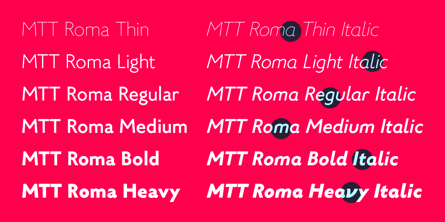 [MyFonts]
[More] ⦿
[MyFonts]
[More] ⦿
|
Maximiliano Sproviero
[Sproviero Type (was: Lián Types)]
|
 [MyFonts]
[More] ⦿
[MyFonts]
[More] ⦿
|
McCall Keller
|
Salt Lake City, UT-based designer of Alter Roma (2018), a roman inscriptional typeface altered to includesome elements from Norse runes. [Google]
[More] ⦿
|
Mecanorma
|
 French graphics lettering company initially involved in instant lettering (made by Trip Productions), and some original typeface designs. From 1989 until 1994, Mecanorma worked with another Dutch company Visualogik to create digital versions of their typefaces, all having MN in their names. Monotype licensed and digitized some of Mecanorma's typefaces. In 1995, Mecanorma got out of graphics and stepped into home decoration. In 1999, Trip Productions, a Dutch Company located in Lisse, purchased the Mecanorma brand and what was left of the company. In 2004, International TypeFounders from Cedars, PA, licensed the typefaces from Trip Productions and released them as the Mecanorma Collection. Since 2021, there also is a Mecanorma Collection at The Type Founders.
 Their collection includes some great fonts: Access, Artdeco, Artworld, BalloonMN, Brio, BusoramaMN, Campus, CardCamio, Carplate, CaslonAntiqueVL, ChocMN, CircusMN, ComicStripMN, DynamoMN, Galba, Globe-Gothic-Outline, Glowworm, Jackson, LibraMN, MtPlacard, Ortem, Renault, RoslynMN, Sayer, SayerScriptMN, SquashMN, Sully-Jonquieres, Watch-Outline. You can also buy through Atomic Type. Projected new URL, which I am afraid will never be activated because in 1999, the company was bough by the Dutch company Trip Productions. MyFonts sells these typefaces: Access, American Uncial, Anatol, Arnold Bocklin (art nouveau), Artdeco, Artworld (an embossed font), Aster, Balloon (brush font), Blippo Black, Brio, British Inserat, Brush, Bulletin Typewriter, Caligra (blackletter), Campus (athletic lettering), Cardcamio, Carplate, Caslon Antique, Celtic (in the style of University Roman), Chicago (dot matrix / marquee typeface), Chinon, Choc (brush script), Circus (Western font), Classic Script (a copperplate calligraphic script), Comic Strip, Commercial Script, Contest, Cooper Black, Dubbeldik, Dynamo, Egyptienne, Estro (Western font), Eurostile, Forelle, Fumo Dropshadow MN, Galba (Trajan typeface), Globe Gothic, Glowworm (a bubblegum font), Gothique (blackletter), Hansson Stencil, Hillman, Hotel (multilined art deco), Isonorm, Jackson, Jubilee Lines (an engraved money font), Latina, Leopard, Libra (uncial), Michelina (anthroposophic), Milton, Mistral, Normalise Din, Old Style, Olive, Orator, Organda, Ortem, Polka (a brush typeface), Renault, Rondo (retro script), Roslyn, Sayer Interview (old typewriter font), Sayer Script, Sayer Spiritual, Squash, Stencil, Stop (stencil typeface), Studio, Swaak Centennial (pure art nouveau), Tzigane, Viant, Vivaldi, Voel Beat (beveled), Watch Outline (LED font), Windsor, Zambesi (African look font). Designers include Albert Boton, J.H. Crook, Jan van Dijk, J. Dresscher, Roger Excoffon, U. Fenocchio, L. Fumarolo, William Gillies, N. Glason, Lennart Hansson, B. Jaquet, K. Kochnowicz, J. Larcher, C. Mediavilla, José Mendoza y Almeida, L. Meuffels, Aldo Novarese, Georges Renevey, F. Robert, Manfred Sayer, M. Schmidt, J.P. Thaulez, J. Werner and Bogdan Zochowski. The Western slabby font Figaro MT (2004) is ascribed to Mecanorma. A list culled from the web: AccessMN-Bold, AccessMN-Medium, AmericanUncialMN, AnatolMN, ArnoldBocklinMN, ArtdecoMN, ArtworldMN, AsterMN-Demi, AsterMN-Roman, BalloonMN-Bold, BalloonMN-ExtraBold, BlippoBlackMN, BrioMN, BritishInseratMN, BritishInseratMNCondensed, BrushMN, Bulletin-Typewriter, BusoramaMN-Bold, CaligraMN, CampusMN, CardcamioMN, CarplateMN, CaslonAntiqueVL, CelticMN-Bold, CelticMN-Italic, CelticMN, CenturyMNCondensed-BoldItalic, CenturyMNCondensed-Bold, CheltenhamMN-Book, CheltenhamMN-BookItalic, CheltenhamMN-Ultra, ChicagoMN, ChinonMN, ChocMN, CircusMN, ClassicScriptMN, ComicStripMN-Italic, ComicStripMN, CommercialScriptMN, ContestMN, Cooper-Black-Italic, Cooper-Black-Outline, CooperBlackMN, CushingMN-Book, CushingMN-Heavy, CushingMN-HeavyItalic, CushingMN-Medium, DubbeldikMN, DynamoMN-Bold, DynamoMN-Medium, DynamoMN-Shadow, EgyptienneMNCondensed-Bold, ElanMN-Extended, ElanMN-Light, ElanMN-Medium, EnrouteVL, ErasMN-Book, ErasMN-Demibold, ErasMN-Ultra, ErasMN, EstroMN, EurostileMN-Extended, EurostileMN-ExtendedBold, EurostileMN-Medium, FidelioMN, FolioMN-Bold, FolioMN-Extrabold, ForelleMN, FranklinGothicMN-Book, FranklinGothicMN-BookItalic, FranklinGothicMN-Heavy, FrizQuadrataMN-Bold, FrizQuadrataMN, Fumo-DropshadowMN, FuturaBlackMN, GalbaMN, Gillies-Gothic-Bold, Gillies-Gothic-Light, Gillies-Gothic-Ultra-Shadow, Gillies-Gothic-Ultra, GlobeGothicMN-Bold, GlobeGothicMNCondensed-Bold, GlobeGothicMNOutline, GlowwormMN, GlowwormMNCompressed, GorillaVL-Bold, GothiqueMN, HanssonStencilMN-Bold, HanssonStencilMN, HillmanMN, HillmanMNCondensed, HotelMN, IrishUncialVL, IsonormMN, Italia-Bold, Italia-Book, Italia-Medium, JacksonMN, JubileeLinesMN, LatinaMN, LeopardMN, LibraMN, MRunic-Condensed, MSwingBold, MachineMN-Bold, MachineMN, MichelinaMN, MiltonMN-Demibold, MistralVL, MtPlacard-Condensed, NormaliseDinMN, OklahomaState, OliveCompactMN, OliveMNBold, OliveNordMN, OratorMN, OrgandaMN-Bold, OrgandaMN, OrtemMN, PascalMN, PolkaMN-Bold, PolkaMN, PopplExquisitMN, PopplExquisitMN-Alternative, RenaultMN, RenaultMNBold, RondoMN, RoslynMN-Bold, RoslynMN-Bold, RoslynMN-Outline, RoslynMNMedium, SaphireMN, SayerMN-Interview, SayerScriptMN-Black, SayerScriptMN-Bold, SayerScriptMN-Light, SayerSpiritualMN-Italic, SayerSpiritualMN, SloganMN, SquashMN-Outline, SquashMN, StencilAntiqueMN, StencilAntiqueVL, StencilMN, StencilMNOutline, StopMN, StudioMN, SullyJonquieresMN-Bold, SullyJonquieresMN, SwaakCentennialMN, Syntax-Bold, Syntax-Roman, ToucheVL, TziganeMN, ViantMN-Bold, VivaldiMN, VoelBeatMN, WashSymbolVL-Light, WatchMN-Outline, WindsorMN, WindsorMNElongated, ZambesiMN. MyFonts link. View Mecanorma's typefaces. [Google]
[MyFonts]
[More] ⦿
|
Michael Jacoby
|
Riverside, NJ-based designer of the dot matrix font Kivos (2013). In 2016, he published the all caps typeface family Vitruvia titling, which is based upon the compass-and-ruler alphabet first proposed by Geoffroy Tory in Champleury (1529). In 2018, he published the sans typeface Steersman. [Google]
[More] ⦿
|
Michael Scarpitti
|
 Mike graduated from Ohio State University with a degree in philosophy. Prolific Columbus, OH-based designer (b. Columbus, OH) whose fonts are mainly available through Scriptorium. Many of his fonts were influenced by roman inscriptional or Trajan types. These include Caesario (1993, a Trajan column font based on Goudy's drawings from 1936), Minerva (1993), Falconis and Vespasiano. Other typefaces with ancient origins include DeBellis, Pomponianus, Praitor, Jerash (1993, with Nalle), Macteris Uncial (1993), Antioch (1993), and Corbei Uncial.
 He prepared a set of fonts based on a medieval Latin British manuscript (Pontifica, 1999) and another one called Orlock (1993), a linocut style typeface based on the lettering in a poster for the German German expressionist silent film Nosferatu. Pontifica was redesigned in 2009 based on the source manuscripts from the Papal Archive. He writes: Pontifica is an example of protogothic calligraphy, a style developed at the monestery of St. Gall in the 12th century to replace Carolingian minuscule with a more efficient and compact system of lettering. Ultimately it became the progenitor of the gothic lettering styles of the late Medieval period. View Michael Scarpitti's typefaces. [Google]
[MyFonts]
[More] ⦿
|
Miguel Bernardino
|
 Lisbon, Portugal-based designer of the roman capitalis cmpass-and-ruler font Manoel Display (2016), which covers Latin and Greek. Manoel is named after Manoel de Andrade de Figueiredo (1670-1735), a royal penman and calligrapher who wrote Nova escola para aprender a ler, escrever, e contar (Lisboa Ocidental, 1722). [Google]
[More] ⦿
Lisbon, Portugal-based designer of the roman capitalis cmpass-and-ruler font Manoel Display (2016), which covers Latin and Greek. Manoel is named after Manoel de Andrade de Figueiredo (1670-1735), a royal penman and calligrapher who wrote Nova escola para aprender a ler, escrever, e contar (Lisboa Ocidental, 1722). [Google]
[More] ⦿
|
Mirko Borsche
[Bureau Borsche]
|
[More] ⦿
|
Mitja Miklavčič
|
 Slovenian designer who lives in Postojna. His typefaces:
 - He created Gf H2O Sans in 2005 font at Gigofonts. This is a humanist sans done with Matevz Medja.
- Tisa is a slab-serif inspired text family that won an award at TDC2 2007. It has useful features such as ink traps and uiformized math symbol and number widths across all styles in the family. In fact, the Latin/Cyrillic type family Tisa was his project at the University of Reading, where he graduated in 2006. He wrote a nice essay on the history of Clarendon (2006). In 2008, he published Tisa as FF Tisa at FontFont. Tisa won a TDC award. In 2012, he added the superfamily FF Tisa Sans (FontFont).
- Mitja worked full-time at Fontsmith and now continues to collaborate with the team on some type design projects. His Fontsmith cooperation led to these typefaces:
- FS Rufus (2009). A slab serif by Mitja Miklavcic, Jason Smith and Emanuela Conidi. Described by them as benevolent, quirky, peculiar, offbeat, jelly beans and ice cream, a retro eco warrior.
- FS Me (2009). A sans family designed for readers with a learning disability. It was co-designed by Mitja Miklavcic, Jason Smith, Emanuela Conidi, Fernando Mello and Phil Garnham. FS Me was researched and developed in conjunction with---and endorsed by---Mencap, the UK's leading charity and voice for those with learning disability. Mencap receives a donation for each font licence purchased.
- FS Albert (2002). A soft-edged sans family by Jason Smith, Mitja Miklavcic and Phil Garnham. FS Albert supports 60 languages, including Greek, Cyrillic and Latin.
- FS Rome (Mitja Miklavcic and Emanuela Conidi). An all caps Trajan typeface.
- At House Industries, Jess Collins and Mitja Miklavic revived Ed Benguiat's great fat face didone typeface (Benguiat) Montage in 2018. In 2014, House Industries, Christian Schwartz, Mitja Miklavcic and Ben Kiel co-designed Velo Serif Text and Velo Serif Display. In 2017, he revived Dave west's 1960s classic at PhotoLettering Inc, Banjo, as Plinc Banjo. Still at House Industries, Christian Schwartz, Mitja Miklavcic and Ben Kiel co-developed Yorklyn Stencil.
- In 2020, he published the experimental modular typeface Trico Script at Fleha Type.
- Davison Spencerian (at House Industries, by Mitja Miklavcic, Ben Barber and Ken Kiel). A digital revival of Dave Davison's 1946 Spenerian script Davison Spencerian.
[Google]
[MyFonts]
[More] ⦿
|
Moire
[Ilia Gruev]
|
 Moire (Ilia Gruev) is a small graphic design studio in Sofia, Bulgaria, specialized in visual identity, graphic design, typography and type design. Their work is quite delicate and refreshing. I particularly like their type family Moderato (Latin, Cyrillic), which was presented over at Behance in 2011. It contains serif, sans (in both grotesk and humanist sub-styles), roman (Trajan style) and slab serif in many weights. See this book cover Kiril Zlatkov, based on Moderato. [Google]
[More] ⦿
Moire (Ilia Gruev) is a small graphic design studio in Sofia, Bulgaria, specialized in visual identity, graphic design, typography and type design. Their work is quite delicate and refreshing. I particularly like their type family Moderato (Latin, Cyrillic), which was presented over at Behance in 2011. It contains serif, sans (in both grotesk and humanist sub-styles), roman (Trajan style) and slab serif in many weights. See this book cover Kiril Zlatkov, based on Moderato. [Google]
[More] ⦿
|
Moritz Kleinsorge
[Identity Letters]
|
 [MyFonts]
[More] ⦿
[MyFonts]
[More] ⦿
|
MTT
[Mattia Bonanomi]
|
 MTT is the commercial type foundry of Mattia Bonanomi (b. 1985, Brescia) in Milan, Italy, est. 2013. In 2010, Mattia graduated from Central Saint Martins College in London.
 He writes about the elegant ten-style sans typeface family MTT Milano (2013): MTT Milano is a font inspired by the Milanese typographic heritage and the Futurist movement that developed it. Drawn from scratch, it features ascendants and descendants slightly taller than what can usually be found in similar typefaces, in order to improve its elegance. In 2016, MTT published MTT Roma, a humanist sans inspired by the Trajan capitals, as is apparent from the razor sharp terminals. It is designed to re-create the atmosphere of the city of Rome of the 21st century. In 2014, he set up Type Firm in Milan, and republished his successful MTT Milano and MTT Roma there in 2016. [Google]
[MyFonts]
[More] ⦿
|
Muhammad Ridha Agusni
[38 Lineart Studio (or: Grayscale, or: Fontsources)]
|
 [MyFonts]
[More] ⦿
[MyFonts]
[More] ⦿
|
Muhammad Zamroni Hamzah
[Sensatype (was: Sunshine Design)]
|
 [MyFonts]
[More] ⦿
[MyFonts]
[More] ⦿
|
MunchFonts
[Gary Munch]
|
 Gary Munch (born 1953) is the Stamford, CT-based principal of MunchFonts. He teaches at Norwalk Community College and at the University of Bridgeport Shintaro Akatsu School of Design.. His typefaces:
 - GMAhuramazda (runes).
- Calligraphic.
- Candara (2005), a flared typeface done for Microsoft's ClearType project. Candara received a TypeArt 05 award.
- GMChanceryModern.
- Munch produced three new Cherokee fonts in 2011 in response to a request by Joseph Erb, of language technology and education services at the Cherokee Nation: Chancery Modern ProCherokee (a sleek sans serif semi-cursive font), Neogrotesk Cherokee (a multipurpose workhorse design), and Munch Chancery Cherokee (a calligraphic font that resembles handwriting). The Cherokee Nation is using Munch Chancery at its Cherokee Immersion School.
- GMClavier.
- GMDuomo.
- Linotype Ergo.
- The 8-weight didone font family GMFidelio is my favorite.
- Finerliner (linked handwriting).
- GMGlobe.
- GMHieroglyphic.
- GMHyperspace.
- GMLondinium (1993, a blackletter face), and GM Londinium Versals (a Lombardic face).
- GMMage.
- GMMedallion. An architectural writing font made in 1997.
- GMMeter.
- GMMunchfonts.
- GMMunchies.
- GMNanogram.
- GMPepRally.
- GMPrentice.
- Linotype Really (1997). An almost-didone family with Cyrillic and Greek extensions for which he received an award at the TDC2 2001 competition, and obtained third prize at the 3rd International Digital Type Design Contest by Linotype Library. It was updated to Really No2 in 1999.
- GM SPQR. A Trajan type family.
- UrbanScrawlButtah, UrbanScrawlChill, UrbanScrawlDown, UrbanScrawlFly.
- GM Wodensday.
Klingspor link. FontShop link. Linotype link. Old home page. Showcase of Gary Munch's fonts. [Google]
[MyFonts]
[More] ⦿
|
MyFonts: Capitalis
|
MyFonts hit list for Capitalis typefaces, i.e., roman inscriptional typefaces. [Google]
[More] ⦿
|
MyFonts: Classical Roman typefaces
|
Classical Roman typefaces at MyFonts. [Google]
[More] ⦿
|
MyFonts: Roman capitals
|
View some digital typefaces that contain a set of roman capitals. [Google]
[More] ⦿
|
MyFonts: Trajan
|
 MyFonts hit list for Trajan typefaces, i.e., roman typefaces as modeled after the inscriptions found on the Trajan column in Rome. See also here, here and here and here. [Google]
[More] ⦿
MyFonts hit list for Trajan typefaces, i.e., roman typefaces as modeled after the inscriptions found on the Trajan column in Rome. See also here, here and here and here. [Google]
[More] ⦿
|
Natanael Gama
[Ndiscover (or: DISCOVER, or Ndiscovered; was: Natenine Type)]
|
 [MyFonts]
[More] ⦿
[MyFonts]
[More] ⦿
|
Nathan Dawdy
|
 Lincoln, NE-based designer of the serif display typeface Volere Bene (2017), the tweetware squarish typeface Diotima (2017) and the free sans display typefaces Lysis (2017) and Milk (2017).
 In 2018, he designed Chocolate Milk, the gaspipe typeface Nebraska, Eames, Maybach, Warehouse, the bilined typeface Symposium, JS Sans (free), the squarish Love, the roman caps typeface Asthenia, and the free typeface Trolly Dodgers Condensed. [Google]
[More] ⦿
|
Ndiscover (or: DISCOVER, or Ndiscovered; was: Natenine Type)
[Natanael Gama]
|
 DISCOVER, Ndisvover, Ndiscovered (and before that, Natenine Type) is Natanael Gama's site in Lisbon (earlier, in Caldas da Rainha), Portugal. He joined The Type Founders in 2021.
 Born in 1988, Natanael's first font is Chumbo (2010). Joana Correia joined forces in Ndiscovered. In 2011, Natanel Gama designed Intimacy and Exo (free at Google Web Fonts). Free download. Exo is a rounded techno font family in 9 styles. See also Exo2 at Google Web Fonts, Open Font Library, and Fontspace. In 2015, he added the futuristic slab serif Exo Slab Pro and the beautiful rounded elliptical Exo Soft. A custom version of Exo2 was developed for Dutch Tv Channel BNNVARA in 2017. The free Ezarion (2018) completes the Exo2 family. In 2012, he added the roman inscription style typeface family Cinzel, classic, well-proportioned and just drop dead gorgeous. And free. See also Google Web Fonts and the CTAN site. There is also the Cinzel Decorative subfamily, and a flowery decorative caps version of this by Nguyen Luan (2018). Typefaces from 2013: Genica (a tweetware signage script). Typefaces from 2014: Genica Pro, Mangerica, Mangerica Italic. Definitely, a very Latin sans, described by Natanael as follows: This design incorporates different styles into a consistent look. A pinch of script, a little of geometric and some humanist shapes as well create a very distinguishable sans-serif. Typefaces from 2015: Taylor Sans (free at Open Font Library). In 2016, Joana Correia and Natanael Gama co-designed the Latin / Tamil typeface Arima Madurai (free at Google Fonts). Their Arima Koshi (2016) covers Tamil, Malayalam and Latin. In 2016, Joana Correia and Natanael Gama co-designed the connected typeface Tidy Script at Indian Type Foundry. Typefaces from 2017: Bruta Pro (Natanael Gama), Bruta Global (Natanael Gama), Artigo Global (a Venetian typeface by Joana Correia), Artigo Pro (a Venetian typeface by Joana Correia). Typefaces from 2018: Opake (an experimental typeface in which the outlines are made with a single continuous looping curve), Feltro (brush script), Mastro Sans, Square Grotesk (free at Open Font Library), Point (a great geometric sans), Nazare. Typefaces from 2019: Worker 3D, Ribbon Generator (free), Nazare Exuberant, Point Soft (a rounded sans family), Worker (an industrial all caps font family). Typefaces from 2020: Thrillers (a display typeface for crime novel titles), Gluy (a 20-style almost geometric sans family that has a splendid hairline weight and a vigorous black style), Mastro (a 72-style text family with optical sizing). Typefaces from 2021: Sinete (interlocking monograms), Fastpen (a monoline script). Fontsquirrel link. Fontspace link. Behance link. Creative Market link. Another Behance link. [Google]
[MyFonts]
[More] ⦿
|
Nicholas Sedlazek
|
During his studies at Savannah College of Art and Design in Savannah, GA, Nicholas Sedlazek created a roman caps typeface (2011). [Google]
[More] ⦿
|
Nick Curtis
[Nick Curtis: Typefaces from 2004]
|
[MyFonts]
[More] ⦿
|
Nick Curtis
[Nick Curtis: Typefaces from 2005]
|
 [MyFonts]
[More] ⦿
[MyFonts]
[More] ⦿
|
Nick Curtis
[Nick Curtis: Typefaces from 2006]
|
 [MyFonts]
[More] ⦿
[MyFonts]
[More] ⦿
|
Nick Curtis
[Nick Curtis: Typefaces from 2007]
|
 [MyFonts]
[More] ⦿
[MyFonts]
[More] ⦿
|
Nick Curtis
[Nick Curtis: Typefaces from 2008]
|
[MyFonts]
[More] ⦿
|
Nick Curtis
[Nick Curtis: Typefaces from 2009]
|
 [MyFonts]
[More] ⦿
[MyFonts]
[More] ⦿
|
Nick Curtis
[Nick Curtis: Typefaces from 2010]
|
 [MyFonts]
[More] ⦿
[MyFonts]
[More] ⦿
|
Nick Curtis
[Nick Curtis: Typefaces from 2011]
|
 [MyFonts]
[More] ⦿
[MyFonts]
[More] ⦿
|
Nick Curtis: Typefaces from 2004
[Nick Curtis]
|
 Typefaces made by Nick Curtis from 2004, not listed elsewhere on these pages. Bayern Handschrift, De Rigueur NF, Refugio Rustic WBW, Refugio Refined WBW, Ponte Vecchio NF, Brazzaville NF (based on Congo, a 1910 font by Barnhart Brothers \& Spindler), Moonshine Script NF (a casual connected script patterned after an offering from the 1930s chapbook 60 Alphabets by The Hunt Brothers), West Coast Antics (based on a showing from Carl Holmes' 1950s book, ABC of Lettering), Nanki Poo NF (based on Mikado from the Boston Type Foundry), Picture Postcard NF (a Broadway style typeface based on work by lettering artist Alf Becker), Curly Shuffle NF (described as a mix of Alf Becker's style and Leslie Cabarga's), Hardy Har Har NF (based on Samoa from BB&S, 1900), Krazy Kracks NF (based on the so-called California style of lettering used extensively in travel posters of the 30s to the 50s. This version is based on its interpretation by Carl Holmes in a Walter T. Foster artbook entitled ABC of Lettering), Whoa Nelly NF (a comic book face--based on Dan X. Solo's Funhouse), Bushwacked, Cressida (triline face), New Boston (far West typeface of the "italian" kind), Rumble Seat, Kartoon Kutz 3&4 NF, Magic Twanger NF, Snoodle Toons NF, Beanie Kopter NF, Delysian NF (based on Greeting card from the 1923 catalog of BB&S), Mazurka NF (based on Swagger Capitals and Gothic Novelty title from the 1923 catalog of BB&S), Jungle Holiday Cuts NF (based on holiday ornaments by Carl S. Junge, 1929), Stone Soup NF (based on lettering for a 1925 Buster Keaton movie), Tintern Abbey NF (based on the lettering for a 1905 poster for the Austrian National Highway by artist Gustav Jahn), Period Borders NF, Parsnip and Parsnip Outline (Will Ransom designed the exemplar for this series for Barnhart Brothers&Spindler in the early 1900s---the typeface was originally named Parsons (1918), after the advertising director of a Chicago department store), Wurstwagen (suggested by a poster for beer, designed by German artist Ludwig Hohlwein around 1920), Jackson Park NF (1920s style), Kenosha Antique NF (from the 1903 Racine typeface of Barnhart Brothers&Spindler), Catty Wumpas (based on lettering of Ross F. George). [Google]
[MyFonts]
[More] ⦿
Typefaces made by Nick Curtis from 2004, not listed elsewhere on these pages. Bayern Handschrift, De Rigueur NF, Refugio Rustic WBW, Refugio Refined WBW, Ponte Vecchio NF, Brazzaville NF (based on Congo, a 1910 font by Barnhart Brothers \& Spindler), Moonshine Script NF (a casual connected script patterned after an offering from the 1930s chapbook 60 Alphabets by The Hunt Brothers), West Coast Antics (based on a showing from Carl Holmes' 1950s book, ABC of Lettering), Nanki Poo NF (based on Mikado from the Boston Type Foundry), Picture Postcard NF (a Broadway style typeface based on work by lettering artist Alf Becker), Curly Shuffle NF (described as a mix of Alf Becker's style and Leslie Cabarga's), Hardy Har Har NF (based on Samoa from BB&S, 1900), Krazy Kracks NF (based on the so-called California style of lettering used extensively in travel posters of the 30s to the 50s. This version is based on its interpretation by Carl Holmes in a Walter T. Foster artbook entitled ABC of Lettering), Whoa Nelly NF (a comic book face--based on Dan X. Solo's Funhouse), Bushwacked, Cressida (triline face), New Boston (far West typeface of the "italian" kind), Rumble Seat, Kartoon Kutz 3&4 NF, Magic Twanger NF, Snoodle Toons NF, Beanie Kopter NF, Delysian NF (based on Greeting card from the 1923 catalog of BB&S), Mazurka NF (based on Swagger Capitals and Gothic Novelty title from the 1923 catalog of BB&S), Jungle Holiday Cuts NF (based on holiday ornaments by Carl S. Junge, 1929), Stone Soup NF (based on lettering for a 1925 Buster Keaton movie), Tintern Abbey NF (based on the lettering for a 1905 poster for the Austrian National Highway by artist Gustav Jahn), Period Borders NF, Parsnip and Parsnip Outline (Will Ransom designed the exemplar for this series for Barnhart Brothers&Spindler in the early 1900s---the typeface was originally named Parsons (1918), after the advertising director of a Chicago department store), Wurstwagen (suggested by a poster for beer, designed by German artist Ludwig Hohlwein around 1920), Jackson Park NF (1920s style), Kenosha Antique NF (from the 1903 Racine typeface of Barnhart Brothers&Spindler), Catty Wumpas (based on lettering of Ross F. George). [Google]
[MyFonts]
[More] ⦿
|
Nick Curtis: Typefaces from 2005
[Nick Curtis]
|
 Typefaces made by Nick Curtis from 2005, not listed elsewhere on these pages. Chantilly Lace NF (2005: uppercase letters by Bergling and lowercase letters by Roland W. Paul), Edda MorganaNF (medieval English), Gnarly Dude NF (rough script based on material of Ross F. George), Whirled Peas NF (based on a typeface called Whitestone Scrawl by Dan X. Solo in his "Showcard Alphabets"), Cool Cat Jim NF (based on a 1953 headline by Jim Flora in Park East Magazine), Sulphur Springs WBW (bone font), Grand Rapids (based on a typeface named Archer from the 1905 specimen book from Barnhart Brothers&Spindler), Hasta La Pasta (designed after a typeface from a pre-1900 specimen book from the Central Type Foundry of St. Louis, called Spiral), La Coupole (based on lettering on a 1927 menu by prominent poster artists Razzia), Shadowlands (this is like Wilcox Initials from the 1992 Solotype Catalog), Possum Saltare NF (a Trajan column style caps face), Pismo Clambake NF (a connected formal script typeface after a Richard Gans handwriting typeface from 1933, Gloria), Ransom Clearcut NF (an extension of Will Ransom's 1920s caps-only typeface Clearcut Shaded Caps for BBS), Almost Heaven (sold in the early 1900s as Perfection), Goodbye Crewel World (stitching font), Jimbatz NF (dingbats inspired by album cover artist Jim Flora), Bad Dookie NF (from The Advertising Cartoon Clip Art Book, 1971), Maple Leaf Rag NF (revival of Nova Bold by Continental Typefounders), Surely You Jest NF (called Arbor in the 1890's type specimen catalog from Farmer, Little&Co), Merry Old Soul NF (a display typeface discovered in one of the many books on sign writing produced by Eric Matthews), Funky Tut NF (205; the caps are based on J.M. Bergling's Morocco (1914), and the lower cases on Bergling's Kermaic Text (1914)), Groove Thang NF (based on a font called Dado), Novadam Obese (geometric black modern typeface based on a logotype by the same name of Joan Trochut Blanchard, ca. 1940s), Smackeroo NF (2005, engraved US dollar-bill style typeface based on Steelplate, a monocase typeface from ca. 1900 by Barnhart Brothers&Spindler), Snooty Fox NF (an elegant typeface found in Pen&Brush Lettering and Practical Alphabets, Blandford Press, Ltd., London, 1929), Chez Nous (based on Card Italic from a 1930s Mergenthaler Linotype Company specimen book), Slapdash Deco NF (2005, based on a showcard alphabet presented by Cecil Wade in his Manual of Lettering), Rockin Roman NF (from Blandford Press' Pen&Brush Lettering and Practical Alphabets), Kunstgewerbe NF (artsy typeface after work by J.M. Bergling, 1914), Details Details NF (a geometric design from Pen and Brush Lettering and Practical Alphabets), Escondido NF (inspired by an Austrian travel poster designed by Johann Süssenbek in the 1930s), Ballyhaunis NF (based on Celtic lettering by Laurence Schall, early 1900s), Inglenook Corner NF (based on art nouveau lettering by Laurence Schall, early 1900s), Mohair Sam NF (caps based on letters of Samuel Welo, and lower case based on ATF's Romany Script), Partenkirchen NF (a Basque style display face), Helena Handbasket NF (after Antique Light, found in the 1888 edition of the James Conner & Sons United States Type Foundry specimen book), Kudos Kaps NF (2006: five nice ornamental caps and associated alphabet and border sets, including a Lombardic set, an engraved set; they are based on typefaces from Ludwig&Mayer). [Google]
[MyFonts]
[More] ⦿
Typefaces made by Nick Curtis from 2005, not listed elsewhere on these pages. Chantilly Lace NF (2005: uppercase letters by Bergling and lowercase letters by Roland W. Paul), Edda MorganaNF (medieval English), Gnarly Dude NF (rough script based on material of Ross F. George), Whirled Peas NF (based on a typeface called Whitestone Scrawl by Dan X. Solo in his "Showcard Alphabets"), Cool Cat Jim NF (based on a 1953 headline by Jim Flora in Park East Magazine), Sulphur Springs WBW (bone font), Grand Rapids (based on a typeface named Archer from the 1905 specimen book from Barnhart Brothers&Spindler), Hasta La Pasta (designed after a typeface from a pre-1900 specimen book from the Central Type Foundry of St. Louis, called Spiral), La Coupole (based on lettering on a 1927 menu by prominent poster artists Razzia), Shadowlands (this is like Wilcox Initials from the 1992 Solotype Catalog), Possum Saltare NF (a Trajan column style caps face), Pismo Clambake NF (a connected formal script typeface after a Richard Gans handwriting typeface from 1933, Gloria), Ransom Clearcut NF (an extension of Will Ransom's 1920s caps-only typeface Clearcut Shaded Caps for BBS), Almost Heaven (sold in the early 1900s as Perfection), Goodbye Crewel World (stitching font), Jimbatz NF (dingbats inspired by album cover artist Jim Flora), Bad Dookie NF (from The Advertising Cartoon Clip Art Book, 1971), Maple Leaf Rag NF (revival of Nova Bold by Continental Typefounders), Surely You Jest NF (called Arbor in the 1890's type specimen catalog from Farmer, Little&Co), Merry Old Soul NF (a display typeface discovered in one of the many books on sign writing produced by Eric Matthews), Funky Tut NF (205; the caps are based on J.M. Bergling's Morocco (1914), and the lower cases on Bergling's Kermaic Text (1914)), Groove Thang NF (based on a font called Dado), Novadam Obese (geometric black modern typeface based on a logotype by the same name of Joan Trochut Blanchard, ca. 1940s), Smackeroo NF (2005, engraved US dollar-bill style typeface based on Steelplate, a monocase typeface from ca. 1900 by Barnhart Brothers&Spindler), Snooty Fox NF (an elegant typeface found in Pen&Brush Lettering and Practical Alphabets, Blandford Press, Ltd., London, 1929), Chez Nous (based on Card Italic from a 1930s Mergenthaler Linotype Company specimen book), Slapdash Deco NF (2005, based on a showcard alphabet presented by Cecil Wade in his Manual of Lettering), Rockin Roman NF (from Blandford Press' Pen&Brush Lettering and Practical Alphabets), Kunstgewerbe NF (artsy typeface after work by J.M. Bergling, 1914), Details Details NF (a geometric design from Pen and Brush Lettering and Practical Alphabets), Escondido NF (inspired by an Austrian travel poster designed by Johann Süssenbek in the 1930s), Ballyhaunis NF (based on Celtic lettering by Laurence Schall, early 1900s), Inglenook Corner NF (based on art nouveau lettering by Laurence Schall, early 1900s), Mohair Sam NF (caps based on letters of Samuel Welo, and lower case based on ATF's Romany Script), Partenkirchen NF (a Basque style display face), Helena Handbasket NF (after Antique Light, found in the 1888 edition of the James Conner & Sons United States Type Foundry specimen book), Kudos Kaps NF (2006: five nice ornamental caps and associated alphabet and border sets, including a Lombardic set, an engraved set; they are based on typefaces from Ludwig&Mayer). [Google]
[MyFonts]
[More] ⦿
|
Nick Curtis: Typefaces from 2006
[Nick Curtis]
|
 Typefaces made by Nick Curtis from 2006, not listed elsewhere on these pages: Magic Lantern NF, Duly Noted NF (after an ATF typeface from 1912 called Freeahand), Got That Bling NF (a connected script based on the work of Al Mack, from his Lettering: Brush&Pen in the Single Stroke), Haarlem Nights NF (based on a 1920 Dutch poster for Public Placement Services by Johan Dijsktra), Architectuur NF (based on De Stijl type lettering by H. Th. Wijdeveld, 1925), Gandy Dancer NF (a revival of Tabard, ca. 1912, ATF), Pomfrit Dandy NF (based on Frys Ornamented No. 2 by Stephenson Blake), Smith Premier (Clean and Schmutzy) NF (a typewriter pair after the letters of the Smith Premier No. 3), ed Hot Mama NF (2006), Jumbo Mumbo NF (a revival of Independant done in 1930 by Collette and Dufour), Union Telegraph NF (2006), Major Production NF (which was followed in 2009 by Major Pro Extras NF), Teeny Boppin NF (gleaned from Schrifti Alphabeti, a book of Cyrillic alphabets published in Kiev in 1979), Rutin Tutin NF (based on Wild West lettering found in Schrifti Alphabeti, 1979), Jampact NF (2006, an ultra fat headline face), Beagle Boyz NF (a bouncy typeface based on a Cyrillic alphabet presented in the book Schrifti Alphabeti, 1979), Midtown Tessie NF and Downtown Tessie NF (mosaic tile typefaces), Scary Scrimshaw (based on a 1968 poster for a Doors concert), Speedball No1, Speedball No2 SW (2001), Speedball No3 (2001), Bellagio NF (an interpretation of Robert Wiebking's 1917 font Advertisers Gothic, designed for BB&S), High Society NF (2006, a fashion mag typeface based on an alphabet found in Lettering for the Commercial Artist by Blandford Press, 1946), Osiyo Dohitsu NF (based on letterforms in the Cherokee Syllabary, reputedly devised by Sequoyah in the early nineteenth century; it has petroglyphs as well), Micro Manager NF (pixel face), Paper Caper NF (2006), Shady Grove (a condensed version of Thorne Shaded), American Pi NF (2006: ATF ornaments from the catalogs between 1913-1934, including some designed by Will Bradley, Frederic Goudy and George Trenholm), The Donald NF (a hyper-curly decorative face), Boo Meringue NF (a Halloween font based on Lithotint (1897, ATF)), Lesser Arcana (a mystical type), Zyklop NF (2006), Deux Chasses NF (based on ATF's Thermotype), Bon Mot NF (based on Barnhart Brothers&Spindler's Engravers Upright Script), Munchkin Land NF (based on a work called Thor, issued by Frederic Wesselhoeft Ltd of London in the 1930s), Didgeree Doodle NF (2006, a curly cursive originally released as Bernhard Heavy Antique Cursive by the Bauersche Giesserei by Lucien Bernhard), Kudo Kaps One, Two, Three and Four NF (a total of eight classical initial caps typefaces), Crane Titling NF (medieval-inspired uppercase letters drawn by famed book illustrator Walter Crane with charming, if somewhat quirky, lowercase letters by J. W. Weekes), DecimoSexto NF (+italic) (includes Spanish Roman letters and Griffo style italics, both hand-drawn by Francisco Lucas in Madrid, 1577), Visillo Adornado (a caps typeface based on the typeface Vesta, originally designed by Albert Auspurg for H. Berthold AG, Berlin in 1926), Edsel Font, Deco Dingbats. [Google]
[MyFonts]
[More] ⦿
Typefaces made by Nick Curtis from 2006, not listed elsewhere on these pages: Magic Lantern NF, Duly Noted NF (after an ATF typeface from 1912 called Freeahand), Got That Bling NF (a connected script based on the work of Al Mack, from his Lettering: Brush&Pen in the Single Stroke), Haarlem Nights NF (based on a 1920 Dutch poster for Public Placement Services by Johan Dijsktra), Architectuur NF (based on De Stijl type lettering by H. Th. Wijdeveld, 1925), Gandy Dancer NF (a revival of Tabard, ca. 1912, ATF), Pomfrit Dandy NF (based on Frys Ornamented No. 2 by Stephenson Blake), Smith Premier (Clean and Schmutzy) NF (a typewriter pair after the letters of the Smith Premier No. 3), ed Hot Mama NF (2006), Jumbo Mumbo NF (a revival of Independant done in 1930 by Collette and Dufour), Union Telegraph NF (2006), Major Production NF (which was followed in 2009 by Major Pro Extras NF), Teeny Boppin NF (gleaned from Schrifti Alphabeti, a book of Cyrillic alphabets published in Kiev in 1979), Rutin Tutin NF (based on Wild West lettering found in Schrifti Alphabeti, 1979), Jampact NF (2006, an ultra fat headline face), Beagle Boyz NF (a bouncy typeface based on a Cyrillic alphabet presented in the book Schrifti Alphabeti, 1979), Midtown Tessie NF and Downtown Tessie NF (mosaic tile typefaces), Scary Scrimshaw (based on a 1968 poster for a Doors concert), Speedball No1, Speedball No2 SW (2001), Speedball No3 (2001), Bellagio NF (an interpretation of Robert Wiebking's 1917 font Advertisers Gothic, designed for BB&S), High Society NF (2006, a fashion mag typeface based on an alphabet found in Lettering for the Commercial Artist by Blandford Press, 1946), Osiyo Dohitsu NF (based on letterforms in the Cherokee Syllabary, reputedly devised by Sequoyah in the early nineteenth century; it has petroglyphs as well), Micro Manager NF (pixel face), Paper Caper NF (2006), Shady Grove (a condensed version of Thorne Shaded), American Pi NF (2006: ATF ornaments from the catalogs between 1913-1934, including some designed by Will Bradley, Frederic Goudy and George Trenholm), The Donald NF (a hyper-curly decorative face), Boo Meringue NF (a Halloween font based on Lithotint (1897, ATF)), Lesser Arcana (a mystical type), Zyklop NF (2006), Deux Chasses NF (based on ATF's Thermotype), Bon Mot NF (based on Barnhart Brothers&Spindler's Engravers Upright Script), Munchkin Land NF (based on a work called Thor, issued by Frederic Wesselhoeft Ltd of London in the 1930s), Didgeree Doodle NF (2006, a curly cursive originally released as Bernhard Heavy Antique Cursive by the Bauersche Giesserei by Lucien Bernhard), Kudo Kaps One, Two, Three and Four NF (a total of eight classical initial caps typefaces), Crane Titling NF (medieval-inspired uppercase letters drawn by famed book illustrator Walter Crane with charming, if somewhat quirky, lowercase letters by J. W. Weekes), DecimoSexto NF (+italic) (includes Spanish Roman letters and Griffo style italics, both hand-drawn by Francisco Lucas in Madrid, 1577), Visillo Adornado (a caps typeface based on the typeface Vesta, originally designed by Albert Auspurg for H. Berthold AG, Berlin in 1926), Edsel Font, Deco Dingbats. [Google]
[MyFonts]
[More] ⦿
|
Nick Curtis: Typefaces from 2007
[Nick Curtis]
|
 Typefaces made by Nick Curtis from 2007, not listed elsewhere on these pages: Dundee Castle NF (based on lettering by Harvey Hopkins Dunn, 1930), Sheik Of Araby NF (2007), Aethelred NF (a unicase typeface, with alternate characters in several of the lowercase positions, is patterned after Mosaik, designed by Martin Kausche for Schriftgiesserei Stempel in 1954; Sultan (2005, Canada Type) is also based on Mosaik). Cerulean NF (a sans based on Lining Gothic No. 71 (BBS and ATF, 1907)), Rimshot NF (script), Jaunty Gent NF (based on the upright connected script Forelle, aka Rheingold Kräftig, by Erich Mollowitz in 1936-1937 for the Hamburg foundry of J. D. Tennert&Sohn), Baby Cakes NF (a bubblegum face based on a 1974 release by Karlgeorg Hoefer at the Ludwig&Mayer foundry called Big Band), Amper Sans NF (after Hobby, a script designed in 1956 by Werner Rebhuhn for Schriftgießerei Genzsch&Heyse), Wacky Duck NF (2007), By George Titling NF (inspired by silent movie lettering), Dinky Rink NF (partially based on Steile Futura), Fuller Brush NF (a bouncy signage script from The New Lone Pine ABC of Showcard and Ticketwriting by Australian author C. Milnes), Tiddly Winks NF (2007), Iraan (a stars and stripes typeface based on the ATF typeface Rodeo), Haut Relief (a 3d typeface based on a 1960s typeface called Sculpture), Fiddle Sticks (based on West Banjo (Dave West, 1960s)), Djibouti (an African theme font modeled after African Queen (Dave West, 1960s), Wacky Duck NF (2007), Turing Car NF (2007, a monospaced typeface based on a lineprinter font from the 1960s, the Unisys 0776), Route 66 NF (based on the typefaces used on U.S. Highway signs from the 1930s to the 1950s), Anna Nicole NF (2007, based on the upright semiscript Mirabelle (1926, Wagner&Schmidt); Nick Curtis: Round, firm and fully-packed, it is sure to get attention anywhere it is used.), Keynote Speaker NF (an awkward blocky typeface patterned after Bloomsbury (1920s, P. M. Shanks&Sons)), Twitty Bird NF (2007, an architectural drawing font based on Dan X. Solo's Conway), Balder Dash NF (the caps are based on Breda-Gotisch (1928, H. Berthold AG) and the lowercase on Goudy Text)), Outer Loop NF (2007), Tutti Paffuti NF (after Stymie Black Flair by Dave West for Photolettering), Weedy Beasties NF (after a variation of Seymour Chwast's Blimp), Bully Pulpit NF (2007), Keepon Truckin NF (a 3d typeface based on Milton Glaser's Baby Fat). In the 1970s, Vincent Pacella made a Photolettering Egyptian headline typeface called Blackjack, which was digitized in 2007 by Nick Curtis as Flap Jacks NF. ITC Jeepers and Woodley Park (based on Naudin) won awards at the TDC2 Type Directors Club's Type Design Competition 2002. Artone (Seymour Chwast, 1968) was revived as Loose Caboose NF (2007). Edwin Sisty's upright curly semiscript Belcanto (1970s, Photolettering) was revived in 2007 by Nick Curtis as Glissando NF. F.W. Kleukens' Kleukens Antiqua (1910) was digitized by Nick as Kleukens Antiqua NF (2007). Holo Fernes NF (2007) is based on Christian Heinrich Kleukens' Judith Type (1923), a hookish hell-inspired face. Pudgy Puss (2007) is an ultra-fat modern display type based on Fat Face (Herb Lubalin, Tom Carnase). Omaha Bazoo (2007) is patterned after Viola Flare, issued by Franklin Photolettering in the 1970s. Lateral Incised NF (2007) is an engraved old style typeface originally released in 1929 as Gravure by the London foundry of C. W. Shortt. Tall Scrawl NF (2007) is an original Curtis hand-printed font. Alfred Riedel's Domino (Ludwig&Mayer, 1954) was revived as Idle Fancy NF (2007). Boxcar Willie NF (2007) is a quaint curly face. [Google]
[MyFonts]
[More] ⦿
Typefaces made by Nick Curtis from 2007, not listed elsewhere on these pages: Dundee Castle NF (based on lettering by Harvey Hopkins Dunn, 1930), Sheik Of Araby NF (2007), Aethelred NF (a unicase typeface, with alternate characters in several of the lowercase positions, is patterned after Mosaik, designed by Martin Kausche for Schriftgiesserei Stempel in 1954; Sultan (2005, Canada Type) is also based on Mosaik). Cerulean NF (a sans based on Lining Gothic No. 71 (BBS and ATF, 1907)), Rimshot NF (script), Jaunty Gent NF (based on the upright connected script Forelle, aka Rheingold Kräftig, by Erich Mollowitz in 1936-1937 for the Hamburg foundry of J. D. Tennert&Sohn), Baby Cakes NF (a bubblegum face based on a 1974 release by Karlgeorg Hoefer at the Ludwig&Mayer foundry called Big Band), Amper Sans NF (after Hobby, a script designed in 1956 by Werner Rebhuhn for Schriftgießerei Genzsch&Heyse), Wacky Duck NF (2007), By George Titling NF (inspired by silent movie lettering), Dinky Rink NF (partially based on Steile Futura), Fuller Brush NF (a bouncy signage script from The New Lone Pine ABC of Showcard and Ticketwriting by Australian author C. Milnes), Tiddly Winks NF (2007), Iraan (a stars and stripes typeface based on the ATF typeface Rodeo), Haut Relief (a 3d typeface based on a 1960s typeface called Sculpture), Fiddle Sticks (based on West Banjo (Dave West, 1960s)), Djibouti (an African theme font modeled after African Queen (Dave West, 1960s), Wacky Duck NF (2007), Turing Car NF (2007, a monospaced typeface based on a lineprinter font from the 1960s, the Unisys 0776), Route 66 NF (based on the typefaces used on U.S. Highway signs from the 1930s to the 1950s), Anna Nicole NF (2007, based on the upright semiscript Mirabelle (1926, Wagner&Schmidt); Nick Curtis: Round, firm and fully-packed, it is sure to get attention anywhere it is used.), Keynote Speaker NF (an awkward blocky typeface patterned after Bloomsbury (1920s, P. M. Shanks&Sons)), Twitty Bird NF (2007, an architectural drawing font based on Dan X. Solo's Conway), Balder Dash NF (the caps are based on Breda-Gotisch (1928, H. Berthold AG) and the lowercase on Goudy Text)), Outer Loop NF (2007), Tutti Paffuti NF (after Stymie Black Flair by Dave West for Photolettering), Weedy Beasties NF (after a variation of Seymour Chwast's Blimp), Bully Pulpit NF (2007), Keepon Truckin NF (a 3d typeface based on Milton Glaser's Baby Fat). In the 1970s, Vincent Pacella made a Photolettering Egyptian headline typeface called Blackjack, which was digitized in 2007 by Nick Curtis as Flap Jacks NF. ITC Jeepers and Woodley Park (based on Naudin) won awards at the TDC2 Type Directors Club's Type Design Competition 2002. Artone (Seymour Chwast, 1968) was revived as Loose Caboose NF (2007). Edwin Sisty's upright curly semiscript Belcanto (1970s, Photolettering) was revived in 2007 by Nick Curtis as Glissando NF. F.W. Kleukens' Kleukens Antiqua (1910) was digitized by Nick as Kleukens Antiqua NF (2007). Holo Fernes NF (2007) is based on Christian Heinrich Kleukens' Judith Type (1923), a hookish hell-inspired face. Pudgy Puss (2007) is an ultra-fat modern display type based on Fat Face (Herb Lubalin, Tom Carnase). Omaha Bazoo (2007) is patterned after Viola Flare, issued by Franklin Photolettering in the 1970s. Lateral Incised NF (2007) is an engraved old style typeface originally released in 1929 as Gravure by the London foundry of C. W. Shortt. Tall Scrawl NF (2007) is an original Curtis hand-printed font. Alfred Riedel's Domino (Ludwig&Mayer, 1954) was revived as Idle Fancy NF (2007). Boxcar Willie NF (2007) is a quaint curly face. [Google]
[MyFonts]
[More] ⦿
|
Nick Curtis: Typefaces from 2008
[Nick Curtis]
|
Typefaces made by Nick Curtis from 2008, not listed elsewhere on these pages: Dave West's Nickelodeon was revived by Curtis as Lily Hilo NF (2008). Funky Rundkopf NF (2008) is an adaptation of an LED simulation font of Ray Larabie, called Dignity of Labour. Daffadowndilly NF (2007-2008) is based on art work by Alf Becker from the 1940s. Babes In Toyland NF (2008) has some of the Rennie Mackintosh charm and is based on "Sheet music for Babes in Toyland, USA, 1903". Anagram Shadow NF (2008) is based on handlettering from a 1928 poster for a steamship line by renowned British artist Austin Cooper. Kandinsky NF (2008) is based on shapes found on Kandinsky's painting Succession (1935). An experimental typeface by Jeremy Pettis, illustrating the concept of kangaroo, inspired Pal Joey NF (2008). One of René Knip's experiments, a unicase typeface with an Arabic feel, was digitized by Nick Curtis as Turban Hey NF (2008). Calamity Jane (2008) is a stylish Edwardian script based on a 1930s logotype for the Theatre Moderne in Paris. Orion Radio NF (2008) is a 1930s style display typeface on an African theme. Quinceanera NF (2008) is a a new take on an old dry-transfer standard from the 70s named Barrio. Jobber Wacky NF (2008) is a bouncy handlettering font based on designs of Alan Denney found on greeting cards in the 1950s and 1960s. Franciscan Caps (2008) is based on a 1932 typeface by Frederic Goudy called Franciscan. Morning Glory (2008) is a simple display typeface that goes back to the Cleveland Type Foundry, 1893. Tickety Boo (2008) is a take on Goudy Fancy (or: Goudy Black Elongated Swash). Yo Quiero Taquitos uses letters taken from Rotalución Decorativa (Barcelona, 1940s), Disco 79 (2008, multiline), Eclectic Crumpany (2008, multiline monocase neon or paperclip typeface based on The Electric Company TV Show), Fire Down Below (2008, block gothic), Joufflou NF (2008, very fat), Bala Cynwyd NF (2001) is an Arts&Crafts style poster typeface inspired by lettering of Dard Hunter. Csiszarz Latein NF (2008) recreates an old typeface (ca. 1910) of J.V. Csiszarz. Owah Tagu Siam NF (2008) is a faux Thai font. Langoustine Rouge NF (2008) is based on Dan Solo's Sorbonne. Cecil Wade again provided inspiration for Bloc Party NF (2008). My Little Eye NF (2008) is an elegant piano key font. Roundabout NF (2008) is rounded octagonal. Neubank NF (2008) is Nick Curtis's take on Bank Gothic. Warp Three NF (2008) is a Bank Gothic-style family with an uppercase as in Agency Gothic (1932-1933, Morris Fuller Benton) and a lowercase from Square Gothic (1888, James Conner). [Google]
[MyFonts]
[More] ⦿
|
Nick Curtis: Typefaces from 2009
[Nick Curtis]
|
 Typefaces made by Nick Curtis from 2009, not listed elsewhere on these pages: Society Page NF (semi-script based on Morris Fuller Benton's Announcement, 1916), Glyphix One NF (dingbats), Glyphix Two NF (dingbats), Velveteen Round NF (based on Vellvé's only font, 1971), Steno Stout NF (the venerable Underwood Victoria typewriter on steroids), Diosa Rubia NF (condensed headline face), Mono Amono NF (octagonal), Turista Flaca NF (based on Baltimore Type Foundry's Tourist Extra Condensed), Boop Boop NF (based on handlettering found on Hallmark Studio Cards of the 1950s), Samosata NF (based on Bernhard Gothic), Waddem Choo NF (based on Tschichold's Transito from 1931), Jane Plain NF (architectural blueprint style), Hacky Sack NF (a zany typeface based on Ross F. George's Stunt Roman), Free Holeys NF (after the 1972 Letraset font Beans by Dieter Zembsch), Kingstown NF (semiscript), Kudos Kaps NF (2006: five nice ornamental caps and associated alphabet and border sets, including a Lombardic set, an engraved set; they are based on typefaces from Ludwig&Mayer), Melvin Eustace NF (handlettered), Weekly Bazaar NF (based on Harpers by the Central Type Foundry), Really Big Shoe NF (after a Cleveland Type Foundry typeface called Oxford), Bellwether Antique NF (after a 1913 typeface by Georg Belwe), Garmisch Rund NF (inspired by Rundgotisch, Emil Rudolf Weiss, 1937), Whitefriars NF (based on a font from the Blackfriars Type Foundry in London), Society Page NF (a curly serif typeface based on Morris Fuller Benton's Announcement Roman, designed for American Type Founders in 1917), USA Resolute NF (a unicase headline typeface based on Morris Fuller Benton's Eagle, ATF, 1934), Saturday Morning Toast (2001, based on the logotype font of the Saturday Evening Post from the 1920s), Examiner NF (based on Dwiggins' Metro from the 1930s). Hans Lijklema's Free Font Index has a CD which contains AirstreamNF-Italic, CalamityJaneNF-Bold, CalamityJaneNF, DaddyLonglegsNF, HamburgerHeavenNF, HeavyTrippNF, HutSutRalstonNF (2001), OrionRadioNF, ParkLaneNF, PhattPhreddyNF, RhumbaScriptNF (a silent movie font), Riot Squad NF (2000, after Otto Heim). [Google]
[MyFonts]
[More] ⦿
Typefaces made by Nick Curtis from 2009, not listed elsewhere on these pages: Society Page NF (semi-script based on Morris Fuller Benton's Announcement, 1916), Glyphix One NF (dingbats), Glyphix Two NF (dingbats), Velveteen Round NF (based on Vellvé's only font, 1971), Steno Stout NF (the venerable Underwood Victoria typewriter on steroids), Diosa Rubia NF (condensed headline face), Mono Amono NF (octagonal), Turista Flaca NF (based on Baltimore Type Foundry's Tourist Extra Condensed), Boop Boop NF (based on handlettering found on Hallmark Studio Cards of the 1950s), Samosata NF (based on Bernhard Gothic), Waddem Choo NF (based on Tschichold's Transito from 1931), Jane Plain NF (architectural blueprint style), Hacky Sack NF (a zany typeface based on Ross F. George's Stunt Roman), Free Holeys NF (after the 1972 Letraset font Beans by Dieter Zembsch), Kingstown NF (semiscript), Kudos Kaps NF (2006: five nice ornamental caps and associated alphabet and border sets, including a Lombardic set, an engraved set; they are based on typefaces from Ludwig&Mayer), Melvin Eustace NF (handlettered), Weekly Bazaar NF (based on Harpers by the Central Type Foundry), Really Big Shoe NF (after a Cleveland Type Foundry typeface called Oxford), Bellwether Antique NF (after a 1913 typeface by Georg Belwe), Garmisch Rund NF (inspired by Rundgotisch, Emil Rudolf Weiss, 1937), Whitefriars NF (based on a font from the Blackfriars Type Foundry in London), Society Page NF (a curly serif typeface based on Morris Fuller Benton's Announcement Roman, designed for American Type Founders in 1917), USA Resolute NF (a unicase headline typeface based on Morris Fuller Benton's Eagle, ATF, 1934), Saturday Morning Toast (2001, based on the logotype font of the Saturday Evening Post from the 1920s), Examiner NF (based on Dwiggins' Metro from the 1930s). Hans Lijklema's Free Font Index has a CD which contains AirstreamNF-Italic, CalamityJaneNF-Bold, CalamityJaneNF, DaddyLonglegsNF, HamburgerHeavenNF, HeavyTrippNF, HutSutRalstonNF (2001), OrionRadioNF, ParkLaneNF, PhattPhreddyNF, RhumbaScriptNF (a silent movie font), Riot Squad NF (2000, after Otto Heim). [Google]
[MyFonts]
[More] ⦿
|
Nick Curtis: Typefaces from 2010
[Nick Curtis]
|
 Typefaces made by Nick Curtis from 2010, not listed elsewhere on these pages.
 Typefaces made in 2010: Conners Corners NF (2010: gleaned from the 1888 specimen books of James Conner's Sons United States Type Foundry), Tumbling Dice NF and Banner Year NF (both were done after scroll typefaces featured in the 1869 MacKellar Smiths and Jordan specimen book), Standing Room Only NF (after Broadway, designed by Morris Fuller Benton for ATF in 1928, originally named Broadway Poster), Proud Mary NF (a plump typeface based on Joseph Churchward's Marianna), Slapsie Maxi NF (based on a Carl Holmes alphabet found in Holmes's ABC of Lettering), Umbriago NF (trying to do a Cooper Black Swash Italic), Picaro NF (based on Harlequin), Palo Pinto NF (based on Pacella Vega Extended 10, a 1960s typeface by Vincent Pacella), Cartella NF (a 3d beveled shadow typeface based on a Morris Fuller Benton 1934 offering for American Type Founders called Poster Gothic), Pracht Antiqua NF (a faithful rendering of the cuddly headline script typeface Pracht Antiqua Schmallfett, which was designed by Carl Pracht for the Norddeutsche Schriftgießerei in 1942), Gitfiddler NF (a futuristic oblique typeface based on the lettering on a package of Gibson guitar strings from the 1950s), Seta Reta NF (after Walter Diethelm's 1965 VGC typeface Arrow), Kleukens Kursiv NF (after Kleukens Scriptura, 1926 by F.W. Kleukens), Kallilu NF (a display face, after George Piscitelle's VGC typeface Thomac from the 1960s), Occidental Tourist NF (an avant-garde sans inspired by Dave West's Futura Casual), Schelter Grotesk NF (after Schelter's Breite Grotesk, 1886), Vuvuzela NF (a casual, almost sign-painted, and nearly African display face), Block Party NF (2008, a 3d face), Cromwell NF (a faithful digitization of Cromwell, 1913, Morris Fuller Benton, ATF), Liguria NF (2010, after a typeface found in a Nebiolo specimen book, ca. 1900), Pony Express NF (2010, after Palmer and Rey's Courier from 1885), Linndale Square NF (a beefed up version of Geometric, 1885, Cleveland Type Foundry---a typewriter style face), Binghamton NF was inspired by the wedge-serifed angular typeface Bingham (Vincent Patella, PLINC). Albert Kapr designed Faust in 1959, so Nick's derived sans typeface is called Kaprice NF. Double D NF (2010, +Fill, +Outline) is a 3d beveled typeface based on Dave Davison's Dimensional from the 1970s. Old Softy NF (2010) is a rounded typeface based on Round Gothic (Keystone Type Foundry, 1884 catalog). [Google]
[MyFonts]
[More] ⦿
|
Nick Curtis: Typefaces from 2011
[Nick Curtis]
|
 Typefaces made by Nick Curtis from 2011, not listed elsewhere on these pages: Jersey City NF (modeled after Times Gothic (1905, ATF)), Petty Despot NF (2011, also modeled after Times Gothic, and possibly renamed from Jersey City NF after Berthold---yes, the same Berthold again---complained about the name Jersey since one of its fonts by Gustav Jaeger was named Jersey. This is my educated guess..., and two thumbs up to Nick for picking the appropriate name Petty Despot NF). Olde Megrat NF is patterned after Antikva Margaret, designed by Zoltán Nagy for VGC in the mid-60s. Herkimer Bunrab NF is an upright scriptish typeface with bunnyears that is based on Hercules (1926, Amsterdam Type foundry). Blackbarry NF (2011) is a faithful revival of Deutsch Black (1966, Barry Deutsch, VGC), a unicase piano key typeface. Bindlestiff NF (2011), which won the 2011 Devroye Memorial Medal for funniest typeface name, revives Schmallfette Binder Style (1959, Joseph Binder, Stempel AG), a squarish tightly set headline face. Decked Out NF (2011) is a fat inline typeface modeled on Dektiv in Homage to the Alphabet. Bazoo Tow NF (2011) is a fun fattish headline typeface that is a faithful reroduction of Basuto (1927, Stanley Baxter for Stephenson Blake). Are You Shaw NF (2011) is an all-caps blackboard bold typeface inspired by Pygmalion, a typeface found in Homage to the Aplhabet. Hoodoo U NF (2011) is a roly-poly romp through the alphabet, based on Jürgen Riebling's irrepressible Mr. Big from the 1970s. Big, bold, bubbly and a little brash, it's a natural choice for happy headlines. The handlettered Mikeys Roman NF (2011) has an uppercase based on the work of Mike Stevens, and a lowercase based on the work of Alf Becker. Outgribe NF (2011) is a rough, raw typeface that is based on the lettering in Ben Shahn's iconic poster protesting the execution of Nicolo Sacco and Bartolomeo Vanzetti in 1927. Nellie Kay NF (2011) is a monoline script face, based on an example by Ross F. George. Shaq Attack NF (2011) is a wooden plank style or brushy typeface inspired by an alphabet of Alf R. Becker. Relampago NF (2011) revives Hans Möhring's bilined typeface Elegante Lichte (1928). Squirrely Shirley NF (2011) is a bouncy typeface based on Phoenix (unknown creator) in Schriftatlas. Spread Out NF (2011) is modeled after Ross F. George's Split Caps. Salzburger Plakat NF (2011) is based on an Austrian winter sports festival poster from 1907 by Swiss poster designer Otto Baumberger (1889-1961). Rightly So NF (2011) is a squarish typeface based on Geometric Gothic (1884, Palmer and Rey)---it is hard to imagine that this almost pixelish style was around at that epoch. Kenotaph NF (2011) is a condensed headline slab serif modeled after Stymie Obelisk (1930s, Morris Fuller Benton). Vasari NF (2011) is based on Ancient Gothic (1891, William W. Jackson, Keystone Type Foundry). Moslem (Boston Type Foundry) was revived as Suffiya NF (2011). Looky Cookie NF (2011) has eyes placed on the glyphs. Iago NF (2011) is a powerful headline sans inspired by two ATF typefaces from the 1880s, Othello and ATF Black Caps. Big Bag NF (2011) is called an industrial-strength titling face by Nick Curtis---it has design elements of Hans Eduard Meier's Syntax Antiqua. Highpoint Gothic NF (after Morris Fuller Benton's 1932-1935 typeface Raleigh Gothic Condensed). Fernburner NF is an all caps shadow face, modeled after Hans Bohn's 1929 typeface Orplid. Planscribe NF is based on types used by the Leroy Automatic Lettering Machine, a tool for architects. [Google]
[MyFonts]
[More] ⦿
Typefaces made by Nick Curtis from 2011, not listed elsewhere on these pages: Jersey City NF (modeled after Times Gothic (1905, ATF)), Petty Despot NF (2011, also modeled after Times Gothic, and possibly renamed from Jersey City NF after Berthold---yes, the same Berthold again---complained about the name Jersey since one of its fonts by Gustav Jaeger was named Jersey. This is my educated guess..., and two thumbs up to Nick for picking the appropriate name Petty Despot NF). Olde Megrat NF is patterned after Antikva Margaret, designed by Zoltán Nagy for VGC in the mid-60s. Herkimer Bunrab NF is an upright scriptish typeface with bunnyears that is based on Hercules (1926, Amsterdam Type foundry). Blackbarry NF (2011) is a faithful revival of Deutsch Black (1966, Barry Deutsch, VGC), a unicase piano key typeface. Bindlestiff NF (2011), which won the 2011 Devroye Memorial Medal for funniest typeface name, revives Schmallfette Binder Style (1959, Joseph Binder, Stempel AG), a squarish tightly set headline face. Decked Out NF (2011) is a fat inline typeface modeled on Dektiv in Homage to the Alphabet. Bazoo Tow NF (2011) is a fun fattish headline typeface that is a faithful reroduction of Basuto (1927, Stanley Baxter for Stephenson Blake). Are You Shaw NF (2011) is an all-caps blackboard bold typeface inspired by Pygmalion, a typeface found in Homage to the Aplhabet. Hoodoo U NF (2011) is a roly-poly romp through the alphabet, based on Jürgen Riebling's irrepressible Mr. Big from the 1970s. Big, bold, bubbly and a little brash, it's a natural choice for happy headlines. The handlettered Mikeys Roman NF (2011) has an uppercase based on the work of Mike Stevens, and a lowercase based on the work of Alf Becker. Outgribe NF (2011) is a rough, raw typeface that is based on the lettering in Ben Shahn's iconic poster protesting the execution of Nicolo Sacco and Bartolomeo Vanzetti in 1927. Nellie Kay NF (2011) is a monoline script face, based on an example by Ross F. George. Shaq Attack NF (2011) is a wooden plank style or brushy typeface inspired by an alphabet of Alf R. Becker. Relampago NF (2011) revives Hans Möhring's bilined typeface Elegante Lichte (1928). Squirrely Shirley NF (2011) is a bouncy typeface based on Phoenix (unknown creator) in Schriftatlas. Spread Out NF (2011) is modeled after Ross F. George's Split Caps. Salzburger Plakat NF (2011) is based on an Austrian winter sports festival poster from 1907 by Swiss poster designer Otto Baumberger (1889-1961). Rightly So NF (2011) is a squarish typeface based on Geometric Gothic (1884, Palmer and Rey)---it is hard to imagine that this almost pixelish style was around at that epoch. Kenotaph NF (2011) is a condensed headline slab serif modeled after Stymie Obelisk (1930s, Morris Fuller Benton). Vasari NF (2011) is based on Ancient Gothic (1891, William W. Jackson, Keystone Type Foundry). Moslem (Boston Type Foundry) was revived as Suffiya NF (2011). Looky Cookie NF (2011) has eyes placed on the glyphs. Iago NF (2011) is a powerful headline sans inspired by two ATF typefaces from the 1880s, Othello and ATF Black Caps. Big Bag NF (2011) is called an industrial-strength titling face by Nick Curtis---it has design elements of Hans Eduard Meier's Syntax Antiqua. Highpoint Gothic NF (after Morris Fuller Benton's 1932-1935 typeface Raleigh Gothic Condensed). Fernburner NF is an all caps shadow face, modeled after Hans Bohn's 1929 typeface Orplid. Planscribe NF is based on types used by the Leroy Automatic Lettering Machine, a tool for architects. [Google]
[MyFonts]
[More] ⦿
|
Nikola Djurek
[Typonine]
|
 [MyFonts]
[More] ⦿
[MyFonts]
[More] ⦿
|
Nina Stössinger
[Typologic]
|
 [MyFonts]
[More] ⦿
[MyFonts]
[More] ⦿
|
Nobi Kashiwagi
|
In 1995, Nobi Kashiwagi moved to Brooklyn, New York City, from Japan to study photography at Parsons School of Design where he graduated with a Bachelors in Fine Art. Nobi has been working at the acclaimed fashion-advertising agency AR New York, where he has managed several advertising, branding and design projects. His experience at AR includes editorial design of Influences Magazine which received a Typographic Excellence at TDC and Distinctive Design merit at ADC. Nobi also holds a black belt in Brazilian Jiu-jitsu. His design studio, Endash Space, is based in Brooklyn. He designs mostly commissioned typefaces, such as a rounded sans typeface for Art Asia Pacfic Magazine (2013), Didot Sans (2017), and Carl Fischer Font (2016). In 2014, he designed a lowercase for Trajan. In 2017, he tweaked Avant Garde and called it Avant Garde Grotesque. In 2018, he published the text typeface family Wintour, and in 2019 the text typefaces Saggio and France. [Google]
[More] ⦿
|
Olcar Alcaide
[Eurotypo]
|
 [MyFonts]
[More] ⦿
[MyFonts]
[More] ⦿
|
OpenType fonts at Adobe
|
 Adobe has converted its type 1 library to OpenType. The first fonts ever published by Adobe in OT format included Myriad Pro (30 fonts), Tekton Pro (18 fonts by David Siegel), Warnock Pro (30 fonts by Robert Slimbach), Lithos Pro (5 fonts by Carol Twombly), Chaparral Pro (40 fonts by Carol Twombly), Adobe Jenson Pro (40 fonts by Robert Slimbach, based on Nicolas Jenson's roman and Ludovico degli Arrighi's italic typeface designs), Calcite Pro (3 fonts), Adobe Garamond Pro (6 fonts by Robert Slimbach), Adobe Caslon Pro (6 fonts by Carol Twombly), Moonglow (12 fonts by Michael Harvey), Organica (1 font by Gabriel Martinez Meave), Silentium Pro (two fonts by Jovica Veljovic) and Trajan Pro (2 fonts by Carol Twombly). [Google]
[More] ⦿
Adobe has converted its type 1 library to OpenType. The first fonts ever published by Adobe in OT format included Myriad Pro (30 fonts), Tekton Pro (18 fonts by David Siegel), Warnock Pro (30 fonts by Robert Slimbach), Lithos Pro (5 fonts by Carol Twombly), Chaparral Pro (40 fonts by Carol Twombly), Adobe Jenson Pro (40 fonts by Robert Slimbach, based on Nicolas Jenson's roman and Ludovico degli Arrighi's italic typeface designs), Calcite Pro (3 fonts), Adobe Garamond Pro (6 fonts by Robert Slimbach), Adobe Caslon Pro (6 fonts by Carol Twombly), Moonglow (12 fonts by Michael Harvey), Organica (1 font by Gabriel Martinez Meave), Silentium Pro (two fonts by Jovica Veljovic) and Trajan Pro (2 fonts by Carol Twombly). [Google]
[More] ⦿
|
Paul Harpin
|
 British designer who worked for Condé Nast in the 1980s. Paul Harpin created his first typeface, Laura---a twelve-weight typeface family--in 2014, assisted by Paul Hickson. It is named after his niece Laura, who died of cancer, and has Display, Stencil, Ribbon and Regular styles. In 2017, he co-founded London Type. At London Type he published these typefaces:
 - LDN Mammoth Woodblock and LDN Mammoth (2019), which is based on a hand drawn letterpress style headline typeface by artwork expert Peter Taylor.
- LDN CircleLine (2019), with single, double and triple line typefaces. He writes: LDN CircleLine is an eclectic slab serif in eight overlapping styles [...] to work well on their own or as stackable layers. Paul drew inspiration from several sources; the Post Office Double Line typeface designed by John Miles (Banks & Miles), the simplicity of the London Underground symbol, and by Lance Wyman's designs for the 1968 Olympic Games.
- London Hoxton Square (2019). An extra black, slab serif headline font, where every character is the same width and fits into a square for alignment purposes.
- The high contrast fashion mag typeface Kondon Modern (2019).
- London Mixed (2019). Three styles, from a humanist sans to slab.
- London Grace Roman (2019). A roman inscriptional caps typeface.
- LDN Southbank (2020). A sturdy slab serif inspired by London during the Festival of Britain era. Accompanied by its art school and more experimental cousin LDN Northbank (2020).
- LDN Queenstown (2020). A single weight slightly quirky ultra light monolinear typeface that takes inspiration from a sketch of an early sans by the Victorian calligraphic artist John Vinycomb Esq. Paul writes: Vinycomb was probably about 120 years ahead of the game, and Queenstown faithfully retains some of the charmingly unusual letterforms of JV's early modern sans serif. Characters of note include a gorgeous pince-nez letter g and a long tailed cap Q, one of four Q alternates.
[Google]
[More] ⦿
|
Paul Shaw
[Roots of the Classical Roman Capitals]
|
[More] ⦿
|
Paul Shaw
|
Paul Shaw's choice of 100 best typefaces of all times: - 1-10: Gutenberg's B-42 type, Nicolas Jenson's roman, Francesco Griffo's italic, Claude Garamond's roman, Firmin Didot's roman, Akzidenz Grotesk, Gebetbuch type, Cheltenham family, Helvetica, Aldus Manutius' roman.
- 11-20: William Caslon IV's sans serif, William Caslon's roman, Pierre-Simon Fournier's italic, Futura, Times Roman, Chicago, Bell, Ludovico Arrighi da Vicenza's italic, Univers, Romain du Roi.
- 21-30: Johann Michael Fleischmann's roman, Clarendon, ATF Garamond, Giambattista Bodoni's roman, Century Roman, Nicolas Kis' roman, Minion multiple master, Unger Fraktur, John Baskerville's roman, Lucida.
- 31-40: Ionic, Golden Type, Robert Thorne's fat typeface roman, Wolfgang Hopyl's textura, Vincent Figgins' antique roman (Egyptian), Johnston's Railway Sans, Optima, Bauer Bodoni, Adobe Garamond, Breitkopf Fraktur.
- 41-50: Bell Gothic, Courier, Trajan, Mistral, Doves Type, Scotch Roman, Syntax, Snell Roundhand, Memphis, Robert Granjon's civilité.
- 51-60: Fette Fraktur, Ehrhard Ratdolt's rotunda, Romanee, ITC Stone family, Trinité, ITC Garamond, Avant-Garde Gothic, Oakland, Deutschschrift, Hammer Uncial.
- 61-70: Beowolf, Meta, OCR-A, Sabon, ITC Novarese, Zapf Chancery, Rotis, Base Nine and Base Twelve, Peter Jessenschrift, Excelsior Script.
- 71-80: Bitstream Charter, Peignot, Erbar, Cancellaresca Bastarda, Joanna, Dead History, Behrensschrift, Eckmannschrift, Poetica, Marconi.
- 81-90: PMN Caecilia, Stadia, Imprint, Souvenir, Thesis, Apollo, Penumbra, Melior, Neuland, Flora.
- 91-100: Element, Walker, Remedy, Template Gothic, Digi-Grotesk Series S, Compacta, Antique Olive, Bodoni 26, Evans and Epps Alphabet, WTC Our Bodoni.
[Google]
[More] ⦿
|
Paul Shaw
|
 Paul Shaw (b. Ann Arbor, MI, 1954) is a calligrapher, type historian, writer and typographer working in New York City, where he runs Paul Shaw/Letter Design, and teaches calligraphy and typography at Parsons School of Design; and history of graphic design and history of type at the School of Visual Arts. He has created custom lettering and logos for many companies, including Avon, Lord&Taylor, Rolex, Clairol and Estée Lauder. In 2012 Shaw was appointed editor in chief of Codex magazine.
 On Ocober 15, 2018, he was attacked in New York City and severly injured. There is a GoFundMe site to help him pay his extensive medical bills. Designer of the Kolo LP art nouveau family (with Garrett Boge) in 1996 at Letterperfect Design. He was inspired by the lettering of Koloman Moser, Gustav Klimt, Alfred Roller, and other members of the Secession, Vienna's turn-of-the-century Art Nouveau movement, in the design of Kolo. Garrett Boge and Paul Shaw made the fun handwriting font Bermuda LP in 1996. At LetterPerfect (which he started with Garrett Boge in 1996), he co-designed Kolo (1996), Tomboy, Beata, Donatello, Ghiberti, Pietra, Pontif (roman capitals), Cresci (roman capitals), Old Claude LP and Uppsala LP (1998) with Garrett Boge. At Agfa/Monotype, you can buy his calligraphic fonts Göteborg LP (1998), Stockholm LP (1998, with Garrett Boge), and Uppsala. His books: - Coauthor with Peter Bain of Blackletter: Type and National Identity (1998).
- Editor of The Eternal Letter Two Millennia of the Classical Roman Capital (2015, MIT Press, Cambridge, MA).
- A Black Letter Primer (1981).
- Letterforms (1986).
- The Calligraphic Tradition in Blackletter Type (2001).
- Helvetica and the New York City Subway System (2009).
At ATypI in Rome in 2002, he spoke about the revival of the roman capital in the 15th century, and lettering in fascist Italy. At ATypI 2017 in Montreal, he spoke on the evolution of Dwiggins's Electra. Paul Shaw has been honored with the 2019 SOTA Typography Award. FontShop link. [Google]
[MyFonts]
[More] ⦿
|
Paulo Goode
|
 English designer in West Cork, Ireland. In 2014, he designed the classical roman caps typeface Carrig---not Trajan, but still influenced by stone carving. He also created the similar typefaces Carrig Roman (2015), Carrig Italic (2015), Carrig Refined (2015), Carrig Rough (2016), Carrigeen (2014), and Carrig Pro (2017). Woodford Bourne (2015, 8 weights for 16 fonts in all, from Hairline to Black) is a 19th century grotesque typeface that pays homage to the historic stone cast type in the building façades of the former Woodford, Bourne & Co. in Cork City, Ireland. It was imprioved and extended in 2016 as Woodford Bourne Pro. Arundel (2015) is a beveled medieval typeface.
 Typefaces from 2016: Didonesque (didone headline typeface characterized by a large x-height and slightly curved v, w and y), Fnord (a serif family designed with a mischievous streak), Fnord Display (in Engraved, Inline and Woodcut styles), Eponymous (an experiment with chunky serifs), Pseudonym (a subtly falred sans with interlocking and unicase features). Typefaces from 2017: Didonesque Ghost (a stylish very contrasted didone typeface family), Banjax (humanist sans, followed in 2018 by Banjax Notched), Faded Grandeur (inspired by stone engravings that have withered and decayed over time), Torus (a rounded monoline organic sans; see also Torus Variations (2018): Torus Notched, Torus Inline, Torus Outline and Torus Biline), Meccanica (an intoxicating nuts and bolts-style engineering typeface). Typefaces from 2018: Eurocine (this is in the wide elliptical sans genre: This typeface attempts to capture the mood of movie credits from European Cinema in the 1970s, with a focus on Giallo films in particular. In terms of style, Eurocine sits somewhere between Walter Baum and Konrad Friedrich Bauer's Folio, and Aldo Novarese's Eurostile), Polyphonic (a 60-font slab serif family), Majesty (flared, incised), Verbatim (a 60-font sans family that was inspired by the best (and worst) of 1970s science fiction TV shows and movies, and aims to extract the essence of futuristic type from that era). Typefaces from 2019: Didonesque Script, Modica (an 18-style geometric sans that came from Technica), Technica (a more conservative rounded geometric sans / techno family than his earlier Meccanica), Rhetoric (a semi-cursive typeface), Quorthon (blackletter, in Black, Dark and Grey substyles), Yolk (a sans family based on the shape of an egg yolk), Transcend (an all caps titling typeface), Ergonomique (a humanist sans in 18 styles), Eloquence (a renaissance font family), Didonesque Stencil. Typefaces from 2020: Rodia (an 18-style oddball (sic) geometric typeface inspired by the iconic RADIO signage that was once in place at 5041, Pico Boulevard, Los Angeles in 1985), Arise (an 18-style text typeface family characterized by hooked terminals), Slabber (a slab serif inspired by 19th century wood type), Audacious (a 20-style decorative serif), Cream (a warm text family, with the heavier weights leaning towards Cooper Black), Sqwared, Logik (sci-fi). Typefaces from 2021: Evoque (a 36-style contrast-rich text typeface; followed in 2022 by the 16-style family Evoque Text which includes two variable fonts), Sienna (14 styles and two variable fonts; a warm soft serif with some angular design elements that make it a great choice as a text typeface), Torus Pro, Harmonique (a 32-style incised serif). Creative Market link. MyFonts link. Fontsquirrel link. [Google]
[MyFonts]
[More] ⦿
|
PB Types (was: Handmadetypes)
[Peter Becker]
|
German designer (now based in Paris) who started out specializing in logotypes, and then spent a few years at URW in Hamburg in the type production department, before moving to Paris as a freelance designer. In 2018, he set up PB Types. His (mostly script) typefaces: - The beautiful calligraphic brush script typeface Meroe Pro (2012, Linotype).
- The free Jensonian typeface Vinta (2014).
- Rena. An old style typeface.
- Treveris. A Trajan font.
- Manus Scripts.
- Whiskas.
[Google]
[MyFonts]
[More] ⦿
|
Pedro González Jorquera
[PeGGO]
|
 [MyFonts]
[More] ⦿
[MyFonts]
[More] ⦿
|
PeGGO
[Pedro González Jorquera]
|
 Type designer graphic designer, calligrapher and illustrator from Chile, who graduated in graphic design in 2005 from the Universidad del Bío-Bío., b. 1977, Santiago de Chile. Aka PeGGO, a foundry established in 2002. MyFonts link. PeGGO designed some commercial fonts, such as:
 - Farola (2008, a curly Victorian face; +Farola Simple, without curls).
- PAI Fashion Font (2011).
- Legan (2008, a mini-serifed Trajan face).
- Thörtl (an angular display face).
- Gothric (gothic).
- Claramaria (sans).
- Claramaria Mega Black, Claramaria Extra Light (hairline version).
- Fonton (a fat elliptical face; images i, ii, iii, iv, v, vi, vii, viii, ix, x). I can't understand why Fonton has not won any major awards. Even in this popular genre, it stands on a pedestal all by itself.
- Cuadrada (2010, angular).
- Lighton Extra Light (2011). An elliptical hairline sans.
- Trianglery (2010, calligraphic).
- Politic (+ExtraLight, +ExtraBlack: a slabbed family).
- Bolta.
- Minesmall (hand-printed).
- SP-Font (squarish).
- Halcön (2008, blackletter).
- Krämfark (2008, blackletter).
- Milica (2013). A squarish severe poster typeface family.
- Hexaround (2013) is a dotted hexagonal matrix font.
- Latinisiert Hebraica Schrift (2014). A Hebrew simulation typeface.
- Double Trase Latinsiert Fraktur Schrift (2014) is a calligraphic blackletter alphabet.
- Limonada (2015). An organic semi-serif typeface.
- Ironbrick (2015). Pure techno futurism.
- Sharka (2015). A mechanical high impact display typeface family ranging from Normal to Compressed widths.
- Globa (2016). Globa is a low contrast round sans typeface family.
- Niva (2016). A 60-style display sans typeface family advertized for use in scientific documents.
- Primaria (2018). A great school script and print typeface family.
- The commissioned decorative typeface family Roijer (2016), and Roijer Ornaments, Roijer Dingbats, and Roijer II (2017). This absolutely stunning display typeface family evolved from a branding exercise in which each letter was developed as typographic jewelry, a bond between classical and creative freedom concepts with Lombardic and art nouveau touches, Röijer puts a dual capital model in your hands---a classic Roman and a contemporary alternative.
- LeBrush (2016). A contemporary humanist serif Roman typeface based on real brush lettering, in ten styles ranging from Thin to Extra Dark, inspired by the classical Roman proportions of the Capitalis Monumentalis of the Trajan Column. It comes with several dingbat fonts and a set of ornaments. The family could be appropriate for movie titling.
- Animals LeBrush Extras (2016): a set of hand drawings of wild mountain and sea animals done for book covers, magazines and posters.
- Geometrica (2017, Latinotype). Geometrica is a low contrast rounded geometric Sans with a mid 19th/early 20th century simplicity air yet it remains modern and minimalist. Geometrica has ten weights.
- Caprina (2017). A geometric sans family with the flat squarish tops that characterize the original Futura and the work of Max Bill.
- In 2018, Pedro Gonzalez and Marcela Aguilera co-designed Orqquidea and Orqquidea Garden (dingbats).
- Rationell (2020). Classifying it as neo-grotesk, Pedro writes: Rationell is a functional multipurpose corporate typeface, based on classic 1950's Swiss rationalism, subtly tuned on a XIX century didonesque modernist structure, a contemporary interpretation with the eyes of the Latin idiosyncrasy. Rationell's great weight range stretches from hairline to extra black, with rounding in the heavier weights.
- Geometrica (2019). A low contrast geometric sans family.
- PGF Now (2020). A 22-style Latin American humanist sans family.
- PGF Strange (2021). A thorny layerable display serif family in eight styles.
- PGF Caprina Pro (2021). An audacious geometric sans in 20 styles with some of Renner's early ideas of surprising squarish glyphs.
- PGF Americas (2021). A 15-style family inspired by Rudolf Koch's carved lettering; this family includes ornaments, dingbats, boxed initials, inline styles, and an array of sans display typefaces.
Calligraphic works include L'Ecole d'Fine Arts (2009), Latinisiert Fraktur Neue (2014), Paradise Duck, Eclesiastes (based on "La Rueda" of Sheila Waters, 1981). Creative Market link. Behance link. MyFonts foundry link. Klingspor link. [Google]
[MyFonts]
[More] ⦿
|
Peter Becker
[PB Types (was: Handmadetypes)]
|
[MyFonts]
[More] ⦿
|
Peter Korsman
[Attak Fonts]
|
[More] ⦿
|
Peter Langpeter
|
 German illustrator, cartographer, calligrapher, and logo and typedesigner who has his own studio, LP Design, since 1995. Designer of the classical script typeface LP Pinselschrift (2009, URW++), the bush script LP Pinsel Satt (2013, URW++), and the signage / bamboo script typeface LP Bambus (2009, URW++).
 LP Saturnia (2013, URW++) and LP Saturnia Sans (2017, URW++) is a roman antiqua typeface: The aim was to create a modern interpretation of the classical Roman letters (Capitalis Monumentalis or Trajan by Carol Twombly), avoiding the archaic look of these letter forms. LP Philharmonia (2014; +Outline in 2017) is a one-style didone typeface. In 2015, he designed the Peignotian typeface family LP Lazise (Regular, Lapidar, SemiSerif, Serif), and published it in the URW Fontforum collection. In 2016, still at FontForum URW++, he published LP Hand Eins and the slightly tapered lapidary typeface LP Cervo. Typefaces from 2017: LP Harmonia (calligraphic). LP Horizont Caps. Klingspor link. [Google]
[MyFonts]
[More] ⦿
|
Peter Olexa
[Jumbo Design]
|
[More] ⦿
|
Peter R. Wilson
[Trajan]
|
[More] ⦿
|
Peter Rempel
[PR Fonts]
|
[MyFonts]
[More] ⦿
|
Posterizer KG
[Lazar Dimitrijevic]
|
 Lazar Dimitrijevic, who set up the foundry Posterizer KG, was born in 1981 in Bajina Basta, Serbia, and lives in Kragujevac, Serbia. He obtained a Master of Graphic Design from the Department of Graphic Design, FILUM Kragujevac, Serbia. Presently, he is art director at Design Studio BOX.
 His first font, Art Decor (2009), is a brush typeface in the style of Treefrog. Koma Latin (2009) is a roughly outlined script face. Bajka (2010) is a wonderfully entertaining Baskerville family (Latin, Cyrillic, dingbats, ornamental caps) made for children's fairy tale books. Scarface (2010) is a sublime scratchy hand ideal for torture movies. Kaligraf Latin (2010) is a rough-edged calligraphic face. In 2012, he published Collage BB (hand-drawn didone), the heavy Egyptian typeface Posterizer KG at DizajnDesign. This font was created for Celebration of 5 years anniversary of Design Studio Box from the city of Kragujevac (KG), the industrial city of Serbia. Posterizer KG (+Rounded) contains all the Latin and Cyrillic glyphs. Posterizer KG Inline and Posterizer KG Rough (a letterpress emulation version) were added in 2013. Posterizer KG Sketch followed in 2015. Still in 2012, he designed the ink splatter typeface Oops, and the calligraphic typefaces Cal Humanistic Cursive (a renaming of Cal Humanist Corsiva, posibly under pressure from Monotype), Cal Humanist Minuscule and Cal Humanist Corsiva. He also creates stunning calligraphic works. Cal Roman Capitals (2012) is a Trajan typeface. In the same calligraphic series, we find Cal Rustic Capitals (2012), Cal Square Capitals (2012), and Cal Uncial (2012). Typefaces from 2013: Posterizer KG Sketch, Cal Expressive, Cal Bakerly (calligraphic script in the style of Arthur Baker), Cal Cursive Roman, Cal Rustic Black, Cal Neuland Bold (after the German expressionist typeface Neuland by Rudolf Koch), Cal Gothic Bastard, Cal Gothic Fraktur, Cal Fraktur Modern, Cal Rotunda, Cal Gothic Textura, Cal Carolingian Minuscule, Cal Carolingian Gothic, Cal Insular Minuscule, Cal Insular Majuscule, Cal Beneventan Minuscule. Typefaces from 2014: Cal Neuland Shadow, Mozzart Sketch (a decorative hand-sketched version of Mozzart Sans, a slightly rounded, neo-Grotesque corporate font, that was originally created for the Belgrade-based company Mozzart DDO; followed in 2015 by Mozzart Rough). In 2015, he designed Drina (brush typeface), My Way (a TreeFrog style handwritten face). Typefaces from 2016: Bali Beach (brush script), Omorika (a rustic handcrafted sketched serif typeface). Typefaces from 2017: Workshop Brush (dry brush), Workshop Marker, Workshop Pencil. Typefaces from 2018: Miro (after the lettering in Joan Miro's art), Ernest (based on the hand of Ernest Hemingway), Natron (rounded condensed sans; +Pictograms). Typefaces from 2019: My Tara (a thick brush script), Natron Rough, Kalli Hand, Kalli Sketch. Typefaces from 2020: Panorama KG (based on the principle nothing below the baseline), Hubble (a rhythmic display typeface with thorny serifs), Liceum (a rhythmic calligraphic script for Latin and Cyrillic), Cal Fraktur Brush, Cal Roman Black, Cal Roman Modern, Cal Uncial Rough. Typefaces from 2021: PKG Roman Capitals (Trajan capitals with a hand-drawn finish, for Latin and Cyrillic), Monodia (a slab serif and its glitched version). [Google]
[MyFonts]
[More] ⦿
|
PR Fonts
[Peter Rempel]
|
 Peter Rempel (b. 1958) is a Winnipeg-based calligrapher. Nice graphic about classical roman types. He designed some exquisite shareware fonts: PR Uncial Creepy (2010), PR Agamemnon Bold (2008), PR-Uncial (2003), PR-UncialAltCapsExtended, PR-UncialAlternateCapitals (1998), Demo-ofGabrielCondensed, Demo-ofGabrielRegular, Demo-version:Gabrielextended, PR-CelticNarrow (1998), Magickal Signs, PR Runes (2000), PR Rune Stones (2000), Pi Rho Runestones (1998), PR Astrological (1998), PR Compass Rose (2007), PR Viking (2007; +Alternates) and Pirho Herakles (1998, an Etruscan-style or Greek simulation font). In preparation: PR Alchemyst, PR Snaggly, PR Monk's Holiday.
 He writes about himself: educated in music composition and visual design. In his family home, there were many wall plaques with German Bible verses, rendered in a variety of gothic and fraktur lettering styles. In the 1980s he discovered the art of calligraphy, first through the speedball lettering textbook, and later by joining the calligraphers Guild of Manitoba. He has studied a variety of lettering styles, but his strongest interest is in the letter styles of the Middle Ages, starting with the German Fraktur styles he knew from childhood, and extending back, into uncials, runic shapes, and the Classical Roman Letter. The Chancery cursive, or Italic hand, which to many people is synonymous with calligraphy, never held much interest for him. He released his first shareware fonts in 1996. In 2010, he went partially commercial. His first pay font is PR Pointers (2010, an arrows font). In 2011, he designed the commercial typefaces PR Mapping and PR Stars. In 2012, he published PR Arco (arcs for framing curved lines of text, in a style common on Victorian posters and almanac covers) and PR Hydra (a Greek simulation font). Typefaces from 2013 include PR Snowflakes 01, PR Bramble Wood 1 and 2, PR Valendoodle 01 (Valentine's Day ornaments), PR Swirlies (in series numbered 01 through 13), PR Swirlies Frames, PR HallowDoodles (Halloween dingbats), PR Nouveau Ornaments (art nouveau), PR Viking (a rune simulation face), PR Foxtail 01, PR Foxtail 02, PR Scrolls 03, 04 and 05 (2014), PR Sprucewood (2014), PR Swells One (2014), PR Xmas Doodles (2014), PR Hearts Take Wing 01, PR Mysticon 01 (star dingbats), PR Pointers 01 (arrows), PR Valknut (Norse god symbolism), PR Scrolls, PR Uncial (1998), PR Dim Sum (brush face), PR Columban (a Celtic uncial, named after Irish monk Columbanus), PR Columbian. Typefaces from 2014: PR Cauldron (a scary Celtic style font), Vanaheim (a flared display typeface influenced by Nordic runes). Typefaces from 2015: PR Hallow Doodles 03, PR Ex Cathedra (Trajan capitals). MyFonts link. MyFonts foundry link. Klingspor link. Fontsy link. Dafont link. Castles&Crypts link. [Google]
[MyFonts]
[More] ⦿
|
Ray Larabie
[Typodermic]
|
 [MyFonts]
[More] ⦿
[MyFonts]
[More] ⦿
|
Richard Lipton
[Lipton Letter Design]
|
 [MyFonts]
[More] ⦿
[MyFonts]
[More] ⦿
|
Rob Stolte
|
Dutch typefounder at Autobahn (Utrecht, The Netherlands), b. 1981. The Alphabet in stone typeface by Dom Hans van der Laan, a Dutch monk who lived from 1904 until 1991, was digitized in 2011, and the project can be seen here. Contributors include Willem Noyons, Maarten Dullemeijer and Rob Stolte. This typeface is based on the proportions found in Trajan. [Google]
[More] ⦿
|
Rob Sugar
[Auras Design]
|
[More] ⦿
|
Robbie de Villiers
[Wilton Foundry]
|
 [MyFonts]
[More] ⦿
[MyFonts]
[More] ⦿
|
Robert Kolben
|
German artist. Designer of the font Linotype Venezia Initiale (1997), a caps font based on the classic forms of Roman writing in the 1st and 2nd centuries found chiseled on many Roman buildings. [Google]
[MyFonts]
[More] ⦿
|
Robert Slimbach
|
 After a start at Autologic in Newbury Park in 1983, this prolific American master craftsman (b. Evanston, IL, 1956) helped pioneer digital type design at Adobe (which he joined in 1987) and created
 - ITC Slimbach (1987).
- ITC Giovanni Book (1988).
- Adobe Garamond (1989-1991).
- Adobe Jenson (1996) and Adobe Jenson Pro. Combining Nicolas Jenson's roman designs with Ludovico degli Arrighi's italics.
- Utopia (1989-1991) [Utopia Opticals was released in 2002].
- Minion (1990-1991): Minion was first released in 1990, and became later the first Adobe Opentype font. It has support for Greek and Cyrillic, including polytonic Greek. Minion Cyrillic is from 1992. By 2021, this text typeface featured 32 styles, and was published as Minion3.
- Myriad (1992, with Carol Twombly). Myriad Arabic and Myriad Hebrew were first published in 2011.
- Poetica (1992). In 2010, Paulo Heitlinger compared Poetica, in its smooth perfection, with P22 Operina, which is closer to the original chancery models of the 20th century, and he thinks Poetica lacks the vigor and dynamism of the originals (and P22 Operina does not).
- Sanvito (1993).
- Caflisch Script (1993, not my favorite script).
- Cronos (1996). Image by Jamie Groenestein). modeled after Kuester's Today Sans. Image of Cronos Pro Display.
- Kepler (1996).
- Warnock Pro (2000), which won an award at the Type Directors Club (TDC2) 2001 competition.
- Brioso (2002). A calligraphic/renaissance family comprised of over 40,000 glyphs. Images of Brioso: A poster by Kristina Reinholds, a poster by Nick di Stefano.
- Garamond Premier Pro (2005), based on originals found in the Plantin Museum in Antwerp. Weights include GaramondPremPro-BdItalic, GaramondPremPro-Bold GaramondPremPro-Italic, GaramondPremPro-Medium, GaramondPremPro-MediumIt, GaramondPremPro-Regular, GaramondPremPro-SbIt, GaramondPremPro-Semibold. Greek, Latin and Cyrillic are covered.
- Arno Pro (2007: typophile discussion) is in the style of Adobe Jenson Pro. Review by Typographica Thomas Phinney: Arno is what you might call a modernized Venetian oldstyle. I think of it as having the same relationship to Adobe Jenson that Minion has to Garamond Premier.
- Adobe Clean (2009). David Lemon: After more than 25 years in the type development business, Adobe decided to have its own corporate typeface family. The Creative Suite uses were early versions of a family designed by Robert Slimbach. Now that it has been officially adopted at Adobe, I can tell you about our latest design, called Adobe Clean. There is no plan to make it available for licensing, but you will be seeing more of it in Adobe materials and products as time goes on. Our initial question was "Why not just keep using Myriad Pro and Minion Pro?" These typefaces were designed to be timeless, and they are among our most popular families. But that second part points to the catch in this situation: Myriad, in particular, is used to represent many other companies, including businesses close to Adobe's (such as Apple and Verizon). Adobe wanted a fresh look that could remain unique. While some typeface designers do much of their work for corporate clients, this area was new to us. Robert&I met with the leaders of Adobe's Experience Design and Brand teams to develop a design brief. They wanted a 21st-century feel combined with an earnest readability. As the project grew, Christopher Slye led regular follow-up meetings with the client teams to keep them up to date and tease more input out of them. Robert's accustomed to aiming his work at the more general case, so it was an interesting challenge to have a very specific set of design goals. What he produced is as classic as all his other designs, but with an uncharacteristic blend of contemporary touches for on-screen rendering and a more progressive feel.
- Adobe Text (2010), a transitional family included in the standard font set for Adobe Creative Suite 5. Adobe Text won an award at Modern Cyrillic 2014.
- Adobe Hand (2012). Adobe Hand also won an award at Modern Cyrillic 2014.
- Trajan Pro 3 (2011, with Carol Twombly) and Trajan Sans (1989). The Trajan Sans family comprises six weights, ranging from Extra Light to Black (matching the weight range in Trajan Pro 3), with language coverage for Pan-European Latin, Cyrillic, and Greek. Maxim Zhukov advised on the design of the Cyrillic portion of the family, and Gerry Leonidas advised on the Greek, while Frank Grießhammer provided technical production support. Trajan Sans won an award at Modern Cyrillic 2014.
- Ryoko Nishizuka designed Ten Mincho (2017), a Japanese typeface in the Adobe Originals collection. Ten Mincho also features a full set of Latin glyphs, collectively known as Ten Oldstyle and designed by Robert Slimbach.
- Pelago (2017). A semi-formal sans family that won an award at TDC Typeface Design 2018.
- Acumin. A 90-style neo-grotesque typeface family.
For Warnock Pro, he got an award at the Type Directors Club (TDC2) 2001 competition. In 1991, he received the Prix Charles Peignot for excellence in type design. Minion Pro Greek, Minion Pro Cyrillic&Greek and Brioso Pro won awards at the TDC2 Type Directors Club's Type Design Competition 2002. At TDC2 2006, he won an award for Garamond Premier Pro. Arno Pro won an award at the TDC2 2007 competition. In 2018, he received the Frederic W. Goudy Award for Typographic Excellence at Rochester Institute of Technology. Bio at Linotype. Minion Pro now ships with Acrobat Reader and covers all European languages, including Greek and Cyrillic. View Robert Slimbach's typefaces. FontShop link. [Google]
[MyFonts]
[More] ⦿
|
Roger White
|
Type designer from Staffs, UK. His 114 free creations, all done between 1992-1998, include AmertonOutline, AmertonOutlineItalic, Cambridge (a copy of University Roman), Cardiff, CardiffBold, CardiffBoldItalic, CardiffItalic, Carolus, CarolusItalic, Circled, Colton, ColtonSmallCapitals, Curborough, CurboroughBold, CurboroughBoldItalic, CurboroughItalic, Derrington, Dresden, Dublin, DublinBold, DublinHollow, Dunstall (art nouveau), Fradley, FradleyBlack, FradleyBold, FradleyBoldItalic, FradleyExtended, FradleyExtendedItalic, FradleyItalic, FradleyNarrow, FradleyNarrowItalic, FrysOrnamented, GloucesterOpenFace, Gresham, Hanch, HanchBold, HanchBoldItalic, HanchItalic, HanfordScript, Jana, Jarrow (uncial), KeeleDecorated, Lancaster (blackletter), Libra, LongdonDecorative, Loxley, Lydian, Milford, MilfordBlack, MilfordBold, MilfordBoldItalic, MilfordCondensed, MilfordCondensedBold, MilfordCondensedBoldItalic, MilfordCondensedItalic, MilfordHollow, MilfordItalic, MilfordLight, MilfordLightItalic, Milwich (Lombardic), NationalFirstFont, NationalFirstFontDotted, NationalPrimary, NationalPrimaryDotted, Newborough, NewportGothic, NewportGothicItalic, Newtown, NewtownBold, NewtownBoldItalic, NewtownItalic, Orgreave, OrgreaveBold, OrgreaveBoldItalic, OrgreaveExtendedBold, OrgreaveExtendedBoldItalic, OrgreaveExtendedItalic, OrgreaveExtendedNormal, OrgreaveItalic, Oxford, Plymouth, QueensPark, QueensParkBold, QueensParkBoldItalic, QueensParkItalic, Rochester, Rosart, StoweOpenFace, StoweTitling, StoweTitlingItalic, SudburyBook, SudburyBookBold, SudburyBookBoldItalic, SudburyBookItalic, SudburyLight, SudburyLightItalic, Swansea, SwanseaBold, SwanseaBoldItalic, SwanseaItalic, TamworthGothic, Telford, TelfordHollow, TelfordHollowItalic, TelfordItalic, Tiverton, TrajanusRoman, Tutbury (blackletter), TutburyBold, TutburyBoldItalic, TutburyItalic, Typewriter, TypewriterBold, WrexhamScript, WrexhamScriptLight, Yoxall, YoxallBold, YoxallBoldItalic, YoxallItalic. Many of these are text families, both sans (like Milford) and serif (like Fradley). The collection is largely a revival or an extension of historic typefaces. Specialty styles covered by him include blackletter (Derrington, Lancaster, Rochester), ornamental caps (Dresden), calligraphic scripts (Hanford Script, Wrexham Script), uncial (Libra) and medieval (Milwich). Fontspace link. Dafont link. Abstract Fonts link. [Google]
[More] ⦿
|
Roman Gornitsky
[Temporary State (was: Abstrkt)]
|
[MyFonts]
[More] ⦿
|
Ron Ruedisueli
[Sed4 Type Foundry (or: Sed4tives)]
|
 [More] ⦿
|
Roots of the Classical Roman Capitals
[Paul Shaw]
|
In his book, The Eternal Letter (MIT Press, 2015), Paul Shaw gives a useful timeline for the roots of the classical roman capitals: - THE ROOTS OF THE CLASSICAL ROMAN CAPITALS
- 770 BC First evidence of Greek writing in Italy.
- 750 BC First Etruscan inscriptions.
- 740 BC The Dipylon inscription (Athens) and the Nestor Cup (Pithekoussai); earliest known Greek inscriptions in Greece.
- 753 BC Legendary founding of Rome by Romulus; though ancient sources give dates ranging from
- 814 BC to 729 BC.
- 625-600 BC Tita inscription (Gabii) and Vendia inscription (Rome?); pottery with the first examples of epigraphic Latin letters.
- 580-570 Be Duenos vase inscription (Rome); yet to be deciphered.
- 575-550 BC Forum Cippus, Roman Forum; oldest extant Latin inscription in stone; written in boustrephedon (bidirectional) style.
- 550-525 BC Castor and Pollux dedicatory inscription (Lavinium) in Latinized Greek.
- 550-500 BC Lapis Niger inscription (Rome); written in boustrephedon style.
- 525-500 BC Tufa inscription (Tivoli); written in serpentine style of the Sabines.
- 510 BC Beginning of Roman Republic and of Roman expansion in Italy.
- 500 BC Lapis Satricanus inscription (Satricum) in Archaic Latin; important for comparative Indo-European grammar.
- Before c. 500 BC Latin inscriptions show considerable diversity of letterforms and direction of writing. Most writing is left to right in the late 7th c. BC but right to left in the 6th c. BC.
- 5th C. BC Modular Greek inscriptions (stoichedon) using chisel width as stroke length.
- 312 BC Construction of the Appian Way.
- 334 Be Dedication of the Temple of Athena Polias (Priene) by Alexander the Great; first Greek inscription with serifs.
- Late 4th c. BC Late 4th c. BC Ardea Krater (now in Museo Nazionale Romano, Terme di Diocleziano) with overpainted inscription of uncertain interpretation.
- 264 BC First Punic War between Rome and Carthage begins.
- After 259 BC Epitaph (in Musei Vaticani) of Lucius Cornelius Scipio (consul of Rome and grandfather of Scipio Africanus) in sans serif capitals.
- 250 BC According to Plutarch, letter G created by Spurius Carvilius Ruga, founder of the first private elementary school in Rome; Roman alphabet fixed at 21 letters.
- 221 BC Hannibal begins conquest of Hispania (Spain).
- 218-203 BC Second Punic War. Scipio Africanus defeats Hannibal at Zama (now Sers, Tunisia).
- 167 BC Early Latin inscription with serifs (Delphi; now in Musei Vaticani).
- 1st C. BC Temple of Vesta (Tivoli) inscription.
- 73-71 BC Slave revolt led by Spartacus.
- 50 BC Tomb of Publius Gessius family inscription (Viterbo; now in Museum of Fine Arts, Boston). Arco
- 50 BC dei Gavi (Verona) built by architect Vitruvius.
- 50-20 BC Tomb of Marcus Vergilius Eurysaces (the Baker's Tomb) (Rome).
- 44 BC Julius Caesar assassinated.
- 44-30 BC Roman civil wars.
- 43 BC First extant Roman inscription in "Imperial" style
- 32-30 BC Final War of the Roman Republic; Octavian defeats Antony and Cleopatra.
- 28 BC Tomb of Caecelia Metella (via Appia, Rome).
- 27 BC Octavian becomes Caesar Augustus, first Roman Emperor.
- 17 BC Theatre of Marcellus (Rome).
- 27 BC -14 AD Reign of Augustus.
- 14 AD Augustus dies.
- 25 Pantheon built by Agrippa.
- 41-54 Reign of Claudius. Rome invades Britain. Claudius introduces three new letters to the alphabet, but they do not survive his reign.
- 51 Arch of Claudius dedicated.
- 69-79 Reign of Vespasiano.
- 79-81 Reign of Titus. Pompeii and Herculanum destroyed by eruption of Mt. Vesuvius.
- 79 Arch of Titus dedicated; Colosseum completed.
- 98-117 Reign of Trajan.
- 106 Trajan defeats Dacians.
- 112 Trajan Forum dedicated.
- 113 Trajan column dedicated along with inscription.
- 117-138 Reign of Hadrian.
- 122 Hadrian's Wall built across northern Britain.
- 130 Wroxeter inscription (Forum Viroconium, Britannia---England).
- 161-180 Reign of Marcus Aurelius.
- 2nd c. Tomb of family of Sextus Pomponius (via Appia, Rome).
- 193-211 Reign of Septimius Severus; Roman Empire a military dictatorship.
- 203 Arch of Septimius Severus dedicated.
- 311-337 Reign of Constantine I.
- 313 Edict of Milan ends persecution of Christians.
- 315 Arch of Constantine dedicated.
- 359 Constantinople becomes the capital of the Roman Empire.
- 366-384 Papacy of Damasus; commissioned inscriptions, carved by Furius Dionysius Philocalus, honoring Christian martyrs.
- 395 Roman Empire divided by Theodosius into Eastern and Western Empires.
- 4th c. Vatican Virgil (Vat. lat. 3225); written in capitalis rustica (rustics).
- 4th c. Codex Augusteus (Georgics of Virgil) (Vat. lat. 3256); written in capitalis quadrata (square capitals).
- 476 Fall of Roman Empire in the West; Romulus Augustulus deposed by Odoacer.
- 5th c. Codex Sangallensis (works of Virgil) (St. Gall, Stiftsbibliothek 1394); written in capitalis quadrata (square capitals).
- THE REJUVENATION OF THE CLASSICAL ROMAN CAPITAL
- 795 Epitaph of Pope Hadrian I commissioned by Charlemagne.
- 800 Charlemagne crowned Holy Roman Emperor by Pope Leo III.
- 830-834 Latin Vulgate Bible (Abbey of St. Martin, Tours; now Munich, Bayerische Staatsbibliothek CLM 12741); Carolingian versals.
- 834-843 Moutier-Grandval Bible (Tours, now British Library, Add. MS. 10456); written in Carolingian minuscules.
- 871-877 Second Bible of Charles the Bald (Paris, Bibliotheque Nationale, Ms. Lat. 2); Carolingian versals with classical Roman proportions.
- 963-984 Benedictional of Aethelwold; its versals are the basis for Adobe Charlemagne typeface.
- Early 11th c. The Trinity Gospels (Trinity College, Cambridge, Ms. B.10.4 (215).
- THE REDISCOVERY OF THE CLASSICAL ROMAN CAPITAL
- 1403 Poggio sent classical inscriptions from Rome to Coluccio Salutati in Florence.
- 1409 Sylloge Signorilliana; first collection of classical Roman inscriptions.
- 1412-1416 Statue of John the Baptist (Orsanmichele, Florence) by Ghiberti; inscription with humanist majuscules.
- 1417-1431 Revival of Rome under papacy of Martin V.
- 1424 First visit of Ciriaco di Ancona to Rome to study inscriptions.
- 1425 Tomb of anti-Pope John XXIII (Battistero, Florence) by Donatello and Michelozzo.
- 1431-1437 Cantoria (Florence) by Luca della Robbia; inscription is basis for Donatello typeface.
- 1432-1433 Second visit of Ciriaco di Ancona to Rome to study inscriptions.
- 1439-1440 Shrine of St. Zenobius (S. Lorenzo, Florence) by Ghiberti; inscription in lettere antiche.
- 1440 Giovanni Marcanova begins collecting epigraphs.
- 1447-1452 Tempio Malatestiano (Rimini) by Alberti with monumental inscription on facade (1453).
- 1447-1455 Continued revival of Rome under papacy of Nicholas V.
- 1449-1452 Funerary monument to Leonardo Bruni (S. Croce, Florence) by Bernardo Rossellino.
- 1450 Chronicle of Eusebius (Biblioteca Marciana, Lat. IX.1 = 3496) by Biagio di Saraceno; first manuscript with epigraphic capitals.
- 1453 Fresco of St. James (Ovetari Chapel, Padua) with inscriptions in epigraphic capitals.
- 1453 Constantinople sacked by Ottoman Turks; end of Byzantine Empire (eastern portion of Roman Empire).
- 1455 Tomb of Pope Nicholas V (Grotte Vaticane).
- 1455 42-line Bible completed by Johannes Gutenberg.
- 1453 First manuscript by Paduan scribe Bartolomeo Sanvito.
- 1459 Strabo Geographia (Bibliotheque Municipale, Albi, MS 77) with epigraphic initials.
- 1460 Alphabetum Romanum (Vat. lat. 6852) by Felice Feliciano; first constructed alphabet.
- 1460 Livy (Biblioteca Nazionale e Universitaria di Torino, J.II.5) by Sanvito; one of first manuscripts with a monumental frontispiece.
- 1464 Felice Feliciano, Mantegna, Samuele da Tradate and Giovanni Antenori search for Roman inscriptions near Lake Garda.
- 1465 Second Marcanova recension of collection of epigraphs completed.
- 1465 Tomb of Cardinal Ludovico d'Albret (S. Maria in Aracoeli, Rome) by Andrea Bregno.
- 1467 Cappella Rucellai (Florence) by Alberti.
- 1468 Pescheria (Verona) inscription attributed to Feliciano.
- 1468-1476 House of Lorenzo Manilio (Rome) with facade incorporating mix of antique and imitation antique inscriptions.
- 1470 Facade inscription on S. Maria Novella (Florence) by Alberti.
- 1470 Roman typeface by Nicholas Jenson.
- 1471-1484 Papacy of Sixtus IV led urban revival of Rome; associated with revival of Roman capitals.
- 1471 Capitoline Museum established by Pope Sixtus IV.
- 1473 Tomb of Cardinal Niccole Forteguerri (S. Cecilia in Trastevere, Rome) by Andrea Bregno and Mino da Fiesole.
- 1475 Ponte Sisto inscriptions attributed to Sanvito.
- 1470s Pomponio Leto began collecting epigraphs.
- 1475-1477 Latin and Greek libraries created at Vatican.
- 1478 1478 First redaction of Fra Gioconda silloge.
- 1479-1483 Libellus Inscriptionum printed by Jacopo Zaccaria.
- 1480 Constructed alphabet by Chicago Anonymous.
- 1480 Codice Barberiniano (Barb. Lat. 4424) by Giuliano Sangallo; contains drawings of Roman inscriptions and monuments.
- 1482 Inscription in courtyard of Palazzo Ducale, Urbino.
- 1483 Constructed alphabet by Damiano Da Moylle.
- 1484-1499 Construction of the Cancelleria (Rome).
- 1490-1516 Taccuino Senese di Giuliano Sangallo (Biblioteca Comunale degli Intronati, S.IV.8); includes complete alphabet of Roman capitals.
- 1491-1509 Codex Escurialensis (Codex 28.11.12) by Domenico Ghirlandaio; includes drawings of Tomb of Cecelia Metella, Trajan's Column and alphabet of Roman capitals.
- THE REJUVENATION OF THE CLASSICAL ROMAN CAPITAL
- 1509 DiVina Proportione by Luca Pacioli published in Venice; contains alphabet of constructed Roman capitals.
- 1517 Opera del mondo defare le littere maiuscole antique by Francesco Torniello.
- 1523 Il Modo Temperare de le Penne by Ludovico degli Arrighi da Vicenza.
- 1524 Lo presente libro Insegna La Vera arte by Giovannantonio Tagliente.
- 1525 Vnderweysung der Messung [Of the lust Shaping of Letters] by Albrecht Düer.
- ~1527 Luminario by Giovambaptista Verini; alphabet of constructed Roman capitals.
- 1529 Champ Fleury by Geoffroy Tory; contains alphabet of constructed Roman capitals.
- ~1530 First roman typeface by Claude Garamont.
- 1540 Libro nuovo d'imparare a scrivere by Giovambattista Palatino.
- 1540 On Antiquities by Sebastiano Serlio, second of his "Seven Books."
- 1548 Un novo modo d'insegnare a scrivere by Vespasiano Amphiareo.
- 1554 Sette Alphabeti di uarie lettere by Ferdinando Ruano.
- 1560 Essemplare di piu sorti lettere by Giovanni Francesco Cresci.
- 1570 II Perfetto Scrittore by Giovanni Francesco Cresci.
- 1535-1589 Papacy of Sixtus V; responsible for the systematization of Rome with the creation of new arteries and plazas marked by the erection of obelisks on Roman bases; and the restoration of the Acqua Alessandrina (renamed Acqua Felice, 1 586).
- 1587 Alphabeto Delle Maiuscole Antiche Rornane by Luca Horfei da Fano.
- 1589 Varie iscrittioni del santiss.... by Luca Horfei da Fano; designs for program of graphic exposition to accompany urban restoration under Sixtus V.
- 1638 De Caratteri by Leopardo Antonozzi.
- THE DECLINE OF THE CLASSICAL ROMAN CAPITAL
- 1692-1745 Romain du Roi; first designed typeface; first printed appearance 1702.
- 1725 First typeface by William Caslon.
- 1738 Excavations of Herculanum begun.
- 1748 Excavations of Pompeii begun.
- 1754 John Baskerville type specimen.
- ~1760-1840 Industrial Revolution.
- 1766 Fry's Baskerville cut by Isaac Moore.
- 1784 First type by Firmin Didot.
- 1788 Serie di maiuscole by Giambattista Bodoni.
- 1789 French Revolution.
- 1804-1815 Napoleon Emperor of the French.
- 1818 Manuale Tipografico by Giambattista Bodoni; printed posthumously.
- THE RESURRECTION OF THE CLASSICAL ROMAN CAPITAL
- 1846 Lyons Titling (Caractères Augustaux) by Louis Perrin; revived antique Roman capitals.
- 1872 Cast of base of Trajan's Column made for Victoria & Albert Museum.
- 1894 The American School of Architecture in Rome (the American Academy in Rome, after 1897) opened; championed by architect Charles Follen McKim.
- 1895 Boston Public Library (McKirn, Mead and White) completed.
- 1906 Writing & Illuminating, & Lettering by Edward Johnston published.
- 1906 Eric Gill visits Rome for first time.
- 1911 Forum Title by Frederic W. Goudy.
- 1914 Centaur by Bruce Rogers. (Released by Monotype, 1929.)
- 1914-1918 World War I.
- 1916 Goudy Old Style (American Type Founders) by Frederic W. Goudy.
- 1918 Hadriano Title by Frederic W. Goudy.
- 1919 Bauhaus (Weimar) opened.
- 1922 Fascist March on Rome; Mussolini become prime minister of Italy.
- 1927 Futura (Bauer) by Paul Renner.
- 1927 Kabel (Klingspor) by Rudolf Koch; promotional material included constructed capital diagrams.
- 1927 John Stevens Shop (est. 1705) purchased by John Howard Benson.
- 1927 Open Capitals (Enschedé) by Jan van Krimpen.
- 1928 Die neue Typographie [The New Typography] by Ian Tschichold published.
- 1925-1930 Perpetua (Monotype) by Eric Gill.
- 1930 Trajan Title by Frederic W. Goudy.
- 1931 Four Gospels printed by Golden Cockerel Press; with type, illustrations, lettering, and ornaments by Eric Gill.
- 1933 Bauhaus (Weimar) closed by the Nazis.
- 1934 Felix Titling (Monotype) based on constructed capitals of Felice Feliciano.
- 1935-1939 First trip to Rome by Father Edward M. Catich.
- 1936 David Kindersley sets up as independent lettercarver.
- 1937 Schneidler Initials [Bauer Text] (Bauer) by F. H. E. Schneidler.
- 1938 Roman Lettering by L.C. Evetts published.
- 1938-1940 Res Gestae Divi Augusti inscribed on wall of the building housing the Ara Pacis (Rome) as part of Fascist celebration of Augustan Bimillenary; letters based on Trajan capitals.
- 1939 Palazzo degli Uffici dellnte'E Autonomo (Rome) completed; facade bears inscription announcing Terza Roma; bas relief depicts Mussolini as direct descendent of Roman consuls and emperors
- 1939-1945 World War II.
- 1943 Palazzo della Civilita Italiana (the Square Colosseum) (Rome) completed.
- 1946 Jan van Krimpen designed numeral stamps for the Dutch post office.
- 1950 Michelangelo (Stempel) by Hermann Zapf. Sistina (Stempel) by Hermann Zapf.
- 1951 Augustea (Nebiolo) by Alessandro Butti and Aldo Novarese.
- 1951 Columna (Bauer) by Max Caflisch.
- 1955 Rhythm and Proportion in Lettering by Walter Kaech published.
- 1956 National Monument on the Dam square (Amsterdam) with inscription designed by Jan van Krimpen.
- 1957 Castellar (Monotype) by John Peters.
- 1957 Univers (Deberny & Peignot) by Adrian Frutiger.
- 1957 Neue Haas Grotesk (Haas) [later Helvetica (Stempel)] by Max Miedinger and Eduard Hoffmann.
- 1958 Optima (Stempel) by Hermann Zapf.
- 1960s David Kindersley designs alphabet for Cambridge, England street signs; modeled on classical Roman capitals.
- 1961 John E. Benson takes over the John Stevens Shop.
- 1961 Letters Redrawn from the Trajan Column in Rome by Father Edward M. Catich published.
- 1964 John F. Kennedy Memorial, Arlington Cemetery carved by John E. Benson and John Hegnauer.
- 1964 Father Edward M. Catich makes polyester cast of Trajan inscription.
- 1957 Printing and the Mind of Man catalogue (based on London exhibition, 1963) with title page engraved by Reynolds Stone.
- 1968 The Origins of the Serif by Father Edward M. Catich published.
- 1976 Lida Lopes Cardozo begins collaboration with David Kindersley; eventually becomes partner in Cardozo Kindersley Workshop.
- 1982 A Constructed Roman Alphabet by David Lance Goines published.
- 1989 Lithos, Trajan, and Charlemagne (Adobe) by Carol Twombly.
- 1991 Arrus (Bitstream) by Richard Lipton.
- 1993 Mantinia (Carter & Cone) by Matthew Carter; based on the engraved lettering of Mantegna.
- 1993 Nicholas Benson takes over ownership of the John Stevens Shop.
- 1994 Penunbra (Adobe) by Lance Hidy
- 1996 Cresci, Pontif, and Pietra (LetterPerfect) by Garrett Boge.
- 1997 Franklin Delano Roosevelt Memorial, National Mall, carved by John E. Benson.
- 1998 Waters Titling (Adobe) by Julian Waters.
- 1999 Capitolium by Gerard Unger; inspired by capitals by Cresci. Requiem (Hoefler & Frere-Jones) by Jonathan Hoefler, based on capitals by Arrighi.
- 2003 Senatus (Berthold) by Werner Schneider.
- 2004 National World War II Memorial, National Mall, carved by Nicholas Benson.
- 2011 Stevens Titling (Linotype) by John Stevens and Ryuichi Tateno.
- 2012 Trajan Pro 3 and Trajan Sans (Adobe) by Robert Slimbach. The original Trajan Sans is from 1989.
[Google]
[More] ⦿
|
Ross F. George
[Ross F. George: Speedball 10 (1927)]
|
 [More] ⦿
|
Ross F. George: Speedball 10 (1927)
[Ross F. George]
|
 Ross F. George's book Speedball 10, published by C. Howard Hunt Pen Co. in Camden, NJ in 1927, was scanned in 2014 by Lee Littlewood, a signpainter in Portland, OR, who runs Lee's Better Letters [2915 NE 21st A, Portland, OR 97212]. The PDF file [59 MB] is made available with his permission. I extracted some useful images from that file. For further information on Ross F. George, see here. [Google]
[More] ⦿
Ross F. George's book Speedball 10, published by C. Howard Hunt Pen Co. in Camden, NJ in 1927, was scanned in 2014 by Lee Littlewood, a signpainter in Portland, OR, who runs Lee's Better Letters [2915 NE 21st A, Portland, OR 97212]. The PDF file [59 MB] is made available with his permission. I extracted some useful images from that file. For further information on Ross F. George, see here. [Google]
[More] ⦿
|
Samuel Carmona Rincon
|
Designer in Sevilla, Spain, who created the roman titling typeface Cartuja in 2015. It is based on the lettering for the gravestone of the dukes of Ribera de la Isla de la Cartuja. [Google]
[More] ⦿
|
Schrift-Klassifikationen
|
Type classification at typografie.info. By Ralf Hermann. Interesting to get used to the German terminology, so here we go: - Venezianische Renaissance-Antiqua (ca. 1470): Venetians such as Berkeley Old Style, Centaur, Deepdene, Horley Old Style, Kennerley Old Style, Trajanus, Schneidler-Mediaeval, Seneca.
- Französische Renaissance-Antiqua (ca. 1540, humanist): Garamond, Aldus-Buchschrift, Bembo, Berling, Diethelm-Antiqua, Goudy, Palatino, Sabon-Antiqua, Trump-Mediäval, Weiss-Antiqua.
- Barock-Antiqua (1750, transitional): Baskerville, Caslon, Imprimatur, Janson-Antiqua, Poppl-Antiqua, Tiffany, Times-Antiqua.
- Klassizistische Antiqua (1800, didone, modern): Bodoni-Antiqua, Didot, Madison-Antiqua, Torino, Walbaum-Antiqua.
- Serifenbetonte Linear-Antiqua (1850, slab serif) Egyptienne: American Typewriter, Beton, City, Lubalin Graph, Memphis, Rockwell, Serifa, Stymie.
- Serifenbetonte Linear-Antiqua Clarendon: Clarendon, Impressum, Melior, Volta.
- Serifenbetonte Linear-Antiqua Italienne: Figaro, Hidalgo, Memory, Old Towne, Pro Arte.
- Serifenlose Linear-Antiqua (1850, sans): Akzidenz-Grotesk, Avant Garde Gothic, Avenir, Berthold Imago, Franklin Gothic, Frutiger, Futura, Folio, Gill Sans, Helvetica, Kabel, Meta, Neuzeit-Grotesk, Rotis Sans, Stone Sans, Syntax, Univers.
- Antiqua-Varianten: Arnold Böcklin, Blur, Eckmann, Exocet, Mambo Bold, Moonbase Alpha, Revue.
- Schreibschriften: Ariston, Ballantines, Berthold-Script, Commercial Script, Diskus, Englische Schreibschrift, Künstlerschreibschrift, Lithographia, Mistral, Slogan.
- Handschriftliche Antiqua: Arkona, Delphin, Dom Casual, Express, Impuls, Justlefthand, Poppl-College, Post-Antiqua, Vivaldi.
- Gebrochene Schriften (blackletter): Gotisch (Fette Gotisch, Wilhelm-Klingspor-Gotisch), Rundgotisch (Tannenberg, Wallau, Weiss-Rundgotisch), Schwabacher (Alte Schwabacher, Renata), Fraktur (Fette Fraktur, Neue Fraktur, Unger-Fraktur, Walbaum-Fraktur, Zentenar-Fraktur), Fraktur-Varianten (Breda-Gotisch, Breite Kanzlei, Rhapsodie).
[Google]
[More] ⦿
|
Scott Calo
|
 FontStructor, aka truth14ful, who made these pixelish typefaces in 2010: Ball Point, Symbol Sans, Balance sans, Tetris, Math, Marquee, Spacewave, Math, Evening (a stencil based on the EVE logo). In 2011, he made the flared serif typefaces Sophistry Serif Compact and Sophistry Serif Modular, the pixel typefaces fs Gaux 7px Bold (2011), fs Gaux 9px, fs Gaux 7px, and fs Gaux 5px Bold, as well as the avant-garde style Plato Sans, fs Salted Library (2011, a headline font based on the old Union Pacific logo) and Lindenmayer Dingbats (based on IFS fractals---looks like a Sierpinski triangle). FS Greener Grass V2 (2011) is a grotesque headline typeface that imitates FS Greener Grass by Agent Demonic Ladybug. fs Pincoya (2011) and its renamed version, fs Pink Oil (2011) imitate Pincoya Black (Daniel Hernandez). fs Schultasche (2011) is a grotesque face. fs Hudson (2011) is a fat display typeface named after Walter Hudson, one of the heaviest people who ever lived. fsCentury Humanist (2011) is a condensed sans. fs Kaputt (2011) is a pixel face.
 Typefaces from 2012: fs Off The Chain, fs Halo, fs Liberty, Sukai Tsuri (tall condensed face), fs Lesen (perfectly square white on black typeface), fs Washington One, fs Schultasche, fs Savant garde (pixel face), fs Mechanuscript (Trajan caps; +Celtic), fs Gaux (+Ambigram, +9px: pixel typefaces), fs Hard Times (high contrast didone face), Avica, fs Torvalds, fs Titanium, fs Neuron, fs Inception, fs OffTheChain. Typefaces from 2013: Dragon Slayer FS. Typefaces from 2014: Turnin Two, Down with Jezebel FS, FET Title 2014, fs Messenger, Klein Bottle, Amohat New, ECDb. One of my favorites in this collection is fs Hällvetyka 2011), a tall display typeface for posters and murals. [Google]
[More] ⦿
|
Scriptorium (Ragnarok Press, Fontcraft)
[David Fleming Nalle]
|
 Dave Nalle was born in Beirut on March 19, 1959, and died on February 13, 2021 from COVID in his home town of Manor, Texas. From his wiki page: Dave Nalle is a political writer, game author and font designer who was active in the early history of the development of the internet. Nalle was at one time Chairman of the Republican Liberty Caucus, a group that promotes libertarianism within the Republican Party, Senior Politics Editor at Blogcritics online magazine, and was the CEO of Scriptorium Fonts. Obituary [PDF] by Steve Jackson at the Daily Illuminator. Obituary by Shannon Appelcline at RGG Net. Obituary [PDF] at Dungeon Master Magazine.
 A creative and prolific designer, he has made hundreds of beautiful (often historic) fonts. His outfit, Scriptorium (based near Austin, TX, est. 1989), also does custom font and logo design. At some points, Scriptorium was also known as Ragnarok Press and Fontcraft. It specializes in artsy and ancient typefaces. Some subset of the fonts is made by Michael Scarpitti. Free font demos. Images of his best selling fonts. Special subpages: - Three free fonts: Onuava (a mini-serifed hybrid fixed-width font), Divona (sans), Sirona (based on Lombardic calligraphy).
- Lombardic: Aneirin, Benevento (8th century Lombardic), Cymbeline, Fabliaux, Formidable, Locksley.
- Decorative initials such as the 20th century sign lettering initials set Pencraft Initials (2009), New Saxon Initials (2016, based on work by F.G. Delamotte), Delamotte Initials One (2016), Delamotte Initials Two (2016), Holly Initials (2010, based on Real PenWork (1880s, Knowles and Maxim), Vyones (2010), Vergennes (2001), Cascade (2009), Bergling (2010; based on initials by John M. Bergling).
- Steampunk typefaces: Clockwork, Gearhead, Gears, Verne, Draughtwork, Belgravia, Boetia, Blackthorn, Linthicum, Good-fellow, Necromantic, Mephisto.
- Wild West fonts: Academy, Alcalde, Atkinson Boomtown (2009, after the lettering of Frank Atkinson), Atkinson Eccentric (2009), BigIron, Cibola, Del Norte, Lachesis, Perdido, Plowright, Primer, Riudoso, Niederwald, San Lorenzo (2011, with a Mexican and Tuscan look), Stonehouse, Manquo, Rochambeau, Purcell, Vaquero.
- Arabic simulation fonts: Samaritan is based on the poster lettering of Alphons Mucha from his poster for the play La Samaritan. Serendib and Waziri are based on the hand lettering of René Bull from his edition of the Arabian Nights. Caliph (1993) is derived from Ernst Schneidler's classic Legende font, with variant characters based on his original lettering. Also: Satampra, Jerash, Samarkand, Isfahan.
- Celtic fonts: the fonts include Constance, Durrow (1993, traditional rendering of Insular Minuscule calligraphy), Malvern, Glendower (based on the most common lettering in the Book of Kells), Knotwork (caps based on Celtic knots), Alba Text (modernized text font based on Celtic uncial lettering), Lindisfarne (based on a square uncial style), Stonecross (1997, derived from Celtic cross and gravestone inscriptions), Celtic Spirals (dingbats), Celtic Borders font (lets you combine key strokes to form decorative borders; many frames and borders are original Celtic designs by Arts&Crafts period artists like Evelyn Paul and Louis Rhead), Spiral Initials, Brigida (based on Rudolph Koch's interpretation of a squared uncial), Macteris Uncial, Coverack (heavy non-traditional uncial), Dahaut (modernized uncial), Dunsany, Glendower, Morgow (1999, spiral uncial), Teyrnon (elaborate spurred uncial), Padstow (heavy uncial), Vafthrudnir (2011, uncial), Sualtim and Columba (decorative initials based on characters found in the Book of Kells), Albemarle (2001).
- Oriental simulation fonts: Yoshitoshi (2003, based on the 1900-style writing by Yoshi Toshi.
- Gothic fonts, including Alt Gothic, Koch Gothic, Barnabas (2011), Sternhagen (2014), Montgisard (2010, roman capitals with blackletter lower case), Serenissima, Gelderland, Alcuin, Monumental, Goldwork, Waldeck, Roncesvalles, Montressor (2010, ornamental blackletter capitals), T4C Beaulieux (1998, a free copy here), Bastarda (2011), Burgundian, Cadeaulx, Collins Old English, Courtrai, Descant, Ereshkigal, Faustus, Franconian (1993, a Schwabacher), Froissart (2000), Ghost Gothic, Katisha, Koch Gothic, Ligeia, Magdeburg, Magdelena, Melusine, Pyle Gothic, Rheingold, Sanctum, Stuttgart Gothic (2010), Textura, Theodoric, Yngling (2002).
- German expressionist: Dromon.
- Renaissance fonts: Monumental Gothic, Caswallon (a Caslon family), humanist cursive (Palmieri, Castiglione and Hanes Italic), quirky Italian cursives (Fiorenza and Alleghieri), a Roman style hand-lettered font (Rudolfo and Rudolfo Swash), a Trajan-style Roman lettering (Hadrianus), a classic flourished cursive (Trinculo) and a set of floral intials from the Quattrocento (Fraticelli).
- Modern poster fonts: Ascelon, Bilitis, Cosmic Dude, Dromon, Ducatus Rough, Eglantine (after Central Type Foundry's Quaint Roman), Ekberg (2002, based on Samuel Welo's posters), Fortinbras, Hamilton, Jambon, Oblivion, Posada (2008, based on the poster lettering of Mexican artist José Guadalupe Posada), Squiffy, Suspicion, Magnin (2003).
- Mapmaker fonts: building elements are available in Basilica; Ortelius is a map dingbat font; Queensland (based on lettering by artist and calligrapher Eric Sloane), is bold, hand-drawn and reminiscent of medieval writing on maps. There are also Brandywine, Daresiel, Hesperides, Longhorne, Windlass (1996), and Cityscape. Orford (2008) is based on samples of hand lettering from a 1693 manuscript collected by Lewis Day in his classic book on historical paleography, Alphabets Old and New.
- Calligraphic fonts: Albemarle (2001), Azariel, Moncrief (2011, based on the calligraphy of J.M. Bergling), Pavane, Rasael (2009), Abdiel (2005), Roncesvalles, Gazardiel (2003, connected script), Spoonbill (2003, arts and crafts), Macteris (Roman uncial font), Antioch Uncial (Roman uncial font), Burgundian (Classic black letter font), Franconian (993, a classic black letter font), Castiglione (Attractive Renaissance lettering), Cicero (Roman Rustica font), Formidable (1993, very bold late medieval / Lombardic style), Collins Old English (Classic Old English style gothic), Corbei Uncial (Roman uncial font), Cymbeline (late medieval lettering), Durrow (Standard insular minuscule uncial font), Theodoric (Classic black letter font), Gazardiel, Ghost Gothic (Unusual gothic font), Glendower (Uncial font based on Book of Kells), Gloriana (Interesting hand lettering style), Folkard (from the hand-lettering of Charles Folkard), Offenbach Chancery, Ranegund Merovingian Courthand, Benevento (8th century Lombardic), Hesperides.
- Art deco typefaces: Imperatore (2018: based on a hand lettered design from California art deco master designer Pedro de Lemos in the 1920s), Speakeasy (2018), Gates of the West (2018), Lyceum (2014), Borealis (2009), Criterion (2011), Illuminata, Madding (2009, a bold poster font that grew out of Aventine), Alexandrine (2009), art Deco Stencil (2009, based on samples of Art Deco stencil lettering by Pedro Lemos), Falmouth.
- Art nouveau typefaces: Acadian, Agravain (2009), Amphitryon (2009), Ariosto, Asphodel, Averoigne, Beaumains (2011, based on J.M. Bergling's lettering), Beauvoir, Belgravia (based on J.M. Bergling), Bernhardt (based upon the lettering of the Czech art-nouveau artist Alphonse Mucha), Bentham, Berenicia, Boetia (2003, based on J.M. Bergling's lettering), Bruges, Bucephalus (1993), Burd Ellen (2009), Butterfield (1993; in Alfred Roller's style), Cafe Society (2018), Curetana, Damariscotta, Elsene (2011, based on lettering by early 20th century illustrator Clara Elsene Peck), Elysian, Exotique, Flaubert, Gaheris, Ganelon, Gehenna, Goodfellow, Grammophon (2019: a bold Jugendstil poster font), Harbinger, Huyot (2016, after Georges Auriol's types), Jugendstil Kunsthand (2003), Lysander, Maginot (1993; after Peter Schnorr, 1898), Munich (after the Munchner Jugend magazine), Norumbega, Odeon, Ormandine (2010), Pantagruel, Phaeton, Reggio, Rochmbeau, Rockne (2009), Rudolfo, Setebos, Sprite, Summerisle, Sylphide (2005), Undine, Valentin (2008), Vambrace (2010), Walhal, Wendingen (2016), Wormwood (2018), Zeitschrift (2016, based on the Ver Sacrum magazine).
- Modern poster fonts: Field Day (2003), Ascelon, Bilitis, Cosmic Dude, Dromon, Ducatus Rough, Eglantine (after Central Type Foundry's Quaint Roman), Ekberg (2002, based on Samuel Welo's posters), Fortinbras, Hamilton, Jambon, Oblivion, Squiffy.
- Constructivist fonts: Krasny Mir (2009), Vrubel, Structura (1997).
- Futuristic fonts: Alecto, Angelus, Circuit, Culdrose, Gearhead, Ironclaw, Parika, Sanhedrin, Semiramis (1997), Slither, Structuro, Yazata, Adastra (dings).
- Borders and ornaments. These include New Arets and Crafts Borders (20912, based on The Calendar of Golden Thoughts (Barse and Hopkins Publ, 1911).
- Boneyard fonts: Undertaker (2014), Antrobus (2010), Sepultura (2002), Halloweenies, Dementia, Boneyard, Skull and Bones, Malagua (1999-2013), Paleos (2002, from titling of B movies in the cave girl genre), Carmilla, Abaddon, Black Cow (1998), Valdemar, Cuede, Ligeia, Mayhem, Mephisto, Golgotha, Sanguinary, Ironworks, Moravia, Gehenna, Nosegrind (2005, graffiti), Corpus, Ghostly.
- School fonts: Schoolhand (2010).
- Arts and Crafts movement (late Victorian period, 19th century), based on work and lettering by Walter Crane, William Morris, Charles Rennie Mackintosh and Elbert Hubbard. The Arts&Crafts movement was enormously influential on the works of designers, artists and architects of the 20th century, and inspired the Art Nouveau and Art Deco movements. Fonts include William Morris' Kelmscott (based on Morris' Troy type), and True Golden, fonts from the Glasgow branch of the movement like Chelsea Studio (1997), which is based on Charles Rennie Mackintosh's lettering, fonts from the Roycrofters of New York like Semiramis and Ganelon, fonts based on Walter Crane's work such as Crane Gothic, Pencraft Initials (2009) and Walter Crane, and even fonts from the California Arts&Crafts period of the early 1900s like Coloma. Other typefaces: Jesse M. King (refreshed in 2015, and based on hand lettering from a frontispiece design by Glasgow-based Jessie King who was known for her lavish book covers), Aylward, Palmyra (based on work by the Roycrofters, a design community founded by Elbert Hubbard), Aylward (2010, Victorian), Hyacinth Initials, Spoonbill, Adresack (1996: inspired by the arts and crafts lettering styles of designers like Charles Rennie MacKintosh and Jessie M. King), Brandywine, Changeling (2009, based on lettering by fairy artist Fanny Railton), Goddard, and Advertising Gothic (2003), Valentin, Gaheris, Agravain (2009). Delaguerra (2001-2009) is based on a lettering style originating in the California Arts&Crafts period commonly associated with Mission Style. It is still in common usage in signage at historical sites in California.
- Victorian: Beaumarchais, Berenicia, Bilibin, Brandywine, Brigidis, Curetana, Durendal, Elphinstone, Flaubert, Folkard, Gjallarhorn, Gloriana, Hermia, Ironclaw, Magnus.
- Typewriter: Fontcraft Courier.
- Anthroposophic: Ekberg (2002, based on a sample of poster lettering by Samuel Welo).
- Medieval fonts of Scriptorium, critiqued by Marc Smith, page 65: Batwynge is based on lettre gffe by Geofroy Tory (1529), and not on an illuminated manuscript of the tenth century as claimed by Scriptorium. Perigord (1993) is based on a Carolingian alphabet drawn by Ernst Bentele in 1952. Allencon is a calligraphic font based on an interpretation of 6th century Ostrogothic Italian calligraphy.
Some selected fonts: Finchley (psychedelic), Captain Kidd (2012, an original font design based on the title lettering from the classic pirate movie starring Charles Laughton), Aerobrush (2011), Fondry Ornament (2009), Atkinson Egyptian (2008, after the lettering of Frank Atkinson), Verne (2008: remade in 2020 into Covid19), Goldwork (almost blackletter), BigBlok (2010), LetterpressGothic (2010), Plymouth (2010, in the style of Cooper Bold), Broadley (2008, an architecturally inspired script based on lettering by British architect and designer C.F.A. Voysey), Locksley (2004, medieval lettering), Tuscarora (curly lettering), Fiorenza (Renaissance calligraphy), Hesperides (old colonial calligraphic script), Angelus (beautifully printed monospaced script), Esperanza (1996, connected medieval handwriting), Ithuriel (2002), Alleghieri (2002), Hamilton (2002), Spiral Initials, Zothique (great font, based on hand lettering from a map of Clark Ashton Smith's fantasy world of Zothique), Reynard (semi-Celtic), Daresiel (elegant script), Caliph (1992, Arabic simulation), Bassackwards, Rosalinde (1999, handwriting), Arakne (2000, connected handwriting), Falconis (by Michael Scarpitti), Asrafel (semi-Celtic), Swithin (2004), Tyrfing (Art Nouveau/Fraktur, 1999), Waldeck (2008, blackletter), Woburn Initials, Stampwork, Draughtwork, Roughwork (a codex font derived from Nalle's own True Golden which is based on a=n earlier typeface by arts and crafts master William Morris), Melusine (gothic calligraphy), Corbei (uncial), Niederwald (hand lettering), Gjallarhorn (great uncial), Gaiseric (early medieval uncial), Taranis (1987, an uncial first drawn as a font for the cover of the old Ysgarth roleplaying system), De Bellis (roman era, by Michael Scarpitti), Engravers Gothic, Monimental Initials, Sanhedrin (Enemy of the State font), Vespasiano (roman capitals, by Michael Scarpitti), Bilitis, Hendrix (2002), Collins OE (old English), Samedi, Praitor, Evadare (1993, based on a character set which was hand calligraphed by Rudolf Koch), Koch Fantasie (1993), Black Cow (1998). Zothique, Ruritania, Mariner (2004, based on hand lettering originally done by Willy Pogany), Trinculo (a swinging cursive font), Texas Star (2002), Octavian (antique demi-serif font), Ruffian (antique type font), Ascelon (thin sans serif font), Munich (title lettering from Munchner Jugend magazine), Necromantic (bizarre bold titling font), Titania (romantic decorative lettering font), Oberon (bold romantic font), Knotwork, Guede (1993), Pullman, Purcell (Victorian circus poster style font), Allegheny, Carmilla, Malagua (1999-2013), Ardenwood, Platthand, Buccaneer, Cochin Archaic (2010), Boswell (1994), Guilford (based on lettering by artist and calligrapher Eric Sloane), Death Ray (2012, constructivist), Alecto (futuristic), Candlemas (2003), Bridgeport (2003, based on lettering by artist and calligrapher Eric Sloane), Medieval Tiles (2003), Linthicum (2003), Draughtwork (2003), Yngling (Fraktur, 2003), Rheingold (elaborate Fraktur: Music Hall Text elsewhere; see also Teuton Text, Cincinnati Type Foundry, 1877), Kidd (2003), Belgravia (2004), Peck Shields (2004), Scrawlies (2000, handcrafted), Albrecht Durer Gothic (2004), Orpheus (2004), InduXtrial (2004, a grunge face), Yoshitoshi (2003), Veronique (2004), Veneto (2006), Vidilex (1993, monospaced), Abelarde (2006), John Speed (1993: a mapmaker font), Furbelow (2006), Estoril (2006), Tangle, Aventine (sans), Texas Star (2002), Groningen (Bauhaus design), Nevins Hand, Scrapple (2011, Victorian, ornamental), Leodegar (2011, based on samples of 7th century Frankish hand lettering), Candlemass (2012). Fonts from 2013: Doge (a Venetian font based on a J.M. Bergling revival), Original Django (after the titling font in Quentin Tarantino's movie Django Unchained). Fonts from 2014: Highball, Carillon (based on a typeface by Samuel Welo), Edifice (based on lettering by J.M. Bergling). Fonts from 2015: Gods of Mars (an inline sci-fi typeface), Rykov (based on a 1930s Ukrainian constructivist style; Latin and Cyrillic), Vie Moderne (French art deco), Dahlgren, Grand Concours (art deco), Tantalus, Power Tie (art deco), Marquis Greeking. Fonts from 2016: Ekberg Modern (based on lettering samples by Samuel Welo from poster designs of the 1920s), Knuckleduster, Tzaphkiel, Sarandiel, Primrose Initials, Elizabethan Script (chancery style), Zeitschrift (an art nouveau font based on the Ver Sacrum magazine), Wendingen (Dutch deco), Memento Mori (Tuscan), Rounders (art deco). Fonts from 2017: Buzzmill (wooden plank font), Pumpkin Patch Initials, Talinn, Reliquary, Nopalito, Scattershot (script). Typefaces from 2018: Marionettas (a Mexican horror movie poster font), Fascination, Architextura, Santa Sangre, Glyphos. Typefaces from 2019: Cafe Corso (art nouveau), Comic Classix. Fnts released in 2020: Epigramatic (based on lettering by Dard Hunter for the Roycroft Press in the early 1900s), Cryptos (graffiti). Klingspor link. Abstract Fonts link. Dafont link. View David Nalle's typefaces. Scriptorium's library. [Google]
[MyFonts]
[More] ⦿
|
Sebastiano Serlio
|
 Italian Mannerist architect, engraver and painter of the sixteenth century, who designed some of the most refined variants of the classic Roman letters---the prototypical Italian Renaissance roman alphabet, also known as Serlio's alphabet. Born in Bologna in 1475, he died in 1554. He was part of the Italian team building the Palace of Fontainebleau. An excellent model for constructing the Roman capitals in a standard form can be found in the geometric compass-and-ruler adaptation by A. R. Ross from an alphabet of capitals drawn by Sebastiano Serlio, an Italian architect, engraver and painter of the sixteenth century, who devised some of the most refined variants of the classic Roman letter. Author of On Antiquities (1540).
 There are a few roman capital fonts in the digital age. These include Serlio (1990, Linotype), Sentian (Novel Fonts) and Opti Serlio (Castcraft). [Google]
[More] ⦿
|
Sed4 Type Foundry (or: Sed4tives)
[Ron Ruedisueli]
|
 Dutch professional music producer and audio engineer who founded his own record label. He also makes (mostly free) fonts. His work:
 - A FontStruct series called STF Letters op Maat, which attempts to recreate all alphabets designed by Dutch Bauhaus designer Jurriaan Schrofer (1926-1990). That list: STF Cutout 1985 (+Solid), STF JS Bevel (+Fill), STF Grafisch, STF Etage Aanduiding (17x17-Inline 1, 17x17-Inline 2, 17x17-Medium Fill, 17x17-Multiline, 17x17-Full Fill, 5x5 Matrix, Hi-res) [op-art, prismatic], STF Gemeentereiniging, STF Berlage (after the letters Schrofer originally designed for The "Beurs Van Berlage", a commodity market building located in the centre of Amsterdam. Later it was also digitalized and used to for the Dutch passport), STF Elevated (3d shadow typeface), STF Semiotica (Incised Outline, Incised, Book, Regular, Title), STF Sater, STF Sans Severe (Light, Heavy, Outlined, Multilines), STF Sans Rounded, STF Avant-Garde i10, STF Schrofer Modular Blocks, STF Social Human Trends (Outlined, Solid, Fill Isolated, Outined Isolated), STF Girokantoor, STF Marx (Solid, Striped), STF Squared Sans, STF Onleesbaar Alfabet (Stroke, Solid, Outlined), STF Bols Jaarverslag, STF Bredero (for the Bredero Bouwbedrijf), STF A.S.C. Communications, STF Connaissance et Langage, STF Paspoort, STF Last Warning (v1), STF Connected Squares (+Fill, +v2 Headline, +v2 Fill, +v2 Outline).
- Other FontStruct typefaces, now over 180 in all, made in 2017-2018. Included are STF Down Vote, STF Slab Inn (a Western font), STF Polygon Window (hexagonal), STF Kalender (based on a 1976 calendar with octagonal letters by Wim Crouwel), STF See You in 2019 (a tiled font), STF Uni (a varsity font), STF Geo Gothique, STF Tegel (a kitchen tile font), STF Don't Count on Me, STF Hyster (a modernist stencil), STF Der Zyklus, STF Scriptorium (blackletter), STF Paradox, STF Sutoraipu Origami Multiline, STF Sutoraipu Origami Filled Stencil, STF Futureline, STF Frescher (Escher-inspired), STF Whiskey-A-Go Go, STF Labrat (op-art, prismatic), STF Tranziztor, STF Otto Font Schirach (mosaic lettering), STF BFG (condensed piano key style), STF Ace of Maze, STF Amsterdam School, STF Neon Flux, STF Wendingen 1922 (based on a old brochure by Wendingen for the Internationale Theater Tentoonstelling Amsterdam 1922; letters designed by Hendricus Theodorus Wijdeveld (1885-1987)), STF Van Nelle (based on an early 1900's poster ad for Van Nelle coffee), STF Purple Maze, STF Militia Stencil, STF Idiocracy (stencil), STF Rode Draad, STF Praesens (based on the lettering found in the second issue of Polish avant garde architectural magazine Praesens), STF Fabricon (a De Stijl stencil; +Outline, +CrossSection), STF Defrag, STF Trilineae, STF Bolsjewie (constructivist), STF Kraftwerk (a tiled typeface; after a 2015 poster by Chuck Sperry for Kraftwerk), STF De Stijl, STF Portfolio Peeters (a tribute to Belgian modernist artist Jozef Peeters (Antwerp, 1895-1960), based on the folder art for his 1921 linocut portofolio), STF Sector 7 (military stencil).
- Pax Romana. Based on the capitalis monumentalis seen at the base of Trajan's Column.
- STF Espionaje. Inspired by the lettering found on a vintage sheet music cover art for "La Java bousculée" (1924).
- STF Oudvreugde's Ontwaken. Based on the Dutch deco lettering of Dutch graphic designer Frederika Sophia (Fré) Cohen (1903-1943). The letters were taken from a book cover design for the "Arbeiders-jeugdcentrale Amsterdam" which was published in 1924.
- Typefaces from 2019: STF Blauhaus (Bauhaus-inspired), STF Type O Negative, STF Bodidone, STF Textualis Batavicum (blackletter), STF Alhambra Blvd, STF Type O Negative, STF Ein Berliner, STF Geo Grotesque (in the style of TT Norms and LL Circular), STF Innercity (art deco), STF Photonia (futuristic), STF Square Grylls, STF Mizollen (labyrinthine), STF Mr Bob Doubalina, STF Plateau Disco (groovy), STF Uncialis Modularis (uncial).
- Typefaces from 2020: STF Schlanke Schöne, STF Care Sensitive.
FontStruct link. [Google]
[More] ⦿
|
Sensatype (was: Sunshine Design)
[Muhammad Zamroni Hamzah]
|
 Indonesian designer who specializes in ligature-laden display serif fonts. Creator of the curvy display typefaces Emirates (2019) and Michael (2019), the cartoon font Wonder Boys (2019), the stylish ligature-rich Abigail (2019) and Giveaway (2019: a classic, almost Trajan, roman caps typeface), and the stylish sans typeface Meganté (2019).
 Typefaces from 2020: Vintage (a rounded display serif), John Mayer (a ligature font), Bruney (an elegant titling font with tons of ligatures), Angle (yet another ligature font), Reborn, Richy, Charming, Malibu (almost psychedelic), Diamond, Knockout (a sports sans), Baby School (a rounded sans), Catchy Mager (a decorative serif), Saudagar, Sparkling Moscow Script (a rabbit ear script and a fashionable serif). Typefaces from 2021: Satisfy (a sharp-edged typeface), Ginger (a stylish sans), Regards (a warm display serif), Famous (a stylish feminine sans), Ginkgo (a stylish serif), Runalto (a luxury serif). Typefaces from 2022: Noah (a flared display serif), Santiago (a stylish serif). [Google]
[MyFonts]
[More] ⦿
|
Sergey Shanovich
|
Designer at Type Market (Moscow) of the Cyrillic fonts Fita_church (1994), Fita_Poluustav (1995), Fita_Vjaz (1995), HeliosCond (1993), OpiumNew (1996), Palladium-Bold (1994), Romul (1995: after Carol Twombly's Trajan Pro), Secretary (1996, based on ITC American Type Writer). See also here. Klingspor link. [Google]
[More] ⦿
|
Sharp Type
[Lucas Benjamin Sharp]
|
 Lucas Sharp is a designer (b. 1986, San Francisco) set up Sharp Type in Brooklyn, NY, and later in New York City proper. Before that, Lucas Sharp was involved with Typeslashcode in New York. In 2011, he and Juan Carlos Pagan set up Pagan&Sharp in Brooklyn, NY, but they split a few years later. In 2015, Lucas Sharp and Chantra Malee [at Sharp Type, Malee handles business, brand management, marketing, graphic design and sales] started Sharp Type in New York City. In 2020, the collaborators and type designers included Josh Finklea, Connor Davenport, Marc Rouault, My-Lan Thuong, Calvin Kwok, and Justin Sloane. Lucas Sharp's typefaces:
 Type catalog, 2010. [Google]
[MyFonts]
[More] ⦿
|
Sidney Bowhill
|
Designer of the compressed western font Townsend, and of Trajan. [Google]
[More] ⦿
|
Snoosmumrik (was: Demosthenes' Voice)
[Igor Armiach]
|
Las Cruces, NM and Israel-based designer (b. 1991) of Elite, a grunge version based on Adobe's Trajan. Creator of the Hebrew fonts Groovy Cursive (2014) and Shakked Pirate (2014). [Google]
[More] ⦿
|
Spiece Graphics
[Jim Spiece]
|
 James R. Spiece (b. 1946, Wabash, IN) attended Culver Military Academy and graduated from Wabash High School in 1964. Jim attended Indiana University and graduated with a B.S. in 1969 after serving two years in the US Army stationed in Germany. Based in Fort Wayne, IN, he liked to revive old type designs. Ji died in 2021 in Green Valley, AZ. Obituary.
 The typefaces made Jim Spiece: - Adonis Old Style SG (2004): a connected upright script modeled after a little stationery and greeting card typeface developed for American Type Founders in 1930 by Willard T. Sniffin.
- Anthology SG (2005).
- Arched Gothic Condensed: another Victorian type, developed around 1885 by the James Conners&Son Foundry (New York).
- Ark Monogram SG: Ark is a combination monogram set based on the ATF Virkotype designi from the 1930s.
- Asteroid Primo SG (2009).
- Astoria Antique (2003): 19th century style ornamental face.
- Aviator SG (1995), aka Ventura Slim, based on an old 1930s lettering style popularized by Carl Holmes in his book.
- Bernhard Brushscript SG: based on an extremely heavy informal script was created in the early 1920s by Lucian Bernhard.
- Bernhard Gothic SG
- Beverly Shores Script SG (2004).
- Birdlegs SG (1991).
- Cactus Flower SG (2006): a Wild West family based on lettering by Ross F. George.
- California Poster SG (1996).
- Centric Geo SG (1996) and Centric Serif SG (1996). These are squarish slab typefaces.
- Concerto Rounded SG: revival of some 1920s Lucian Bernhard lettering.
- Edison Swirl: A frilly Victorian blackletter typeface based on a design by Hermann Ihlenburg from ca. 1900.
- El Castillo SG (2008): an old style newsprint family.
- Epicerie One&Two SG (2008): a signage family.
- Eva SG. Eva Antiqua SG is an exquisite family based on the 1922 Klingspor model by German designer Rudolf Koch (known as Koch Antiqua or Locarno). It also includes Eva Paramount SG, which is a revival of a 1928 typeface, also flared, by Morris Fuller Benton called ATF Paramount. The Castcraft incarnation is called OPTI Eve.
- Frisco Antique Display SG (2004): based on a woodtype display typeface from the 1880s by Bruce Type Foundry.
- Gable Antique Condensed (2002): based on a Bauer Type Foundry art nouveau face.
- Gambit Nouveau SG (2004): art nouveau.(2004): art nouveau.
- Grand Slam SG (2002): based on an old cardwriting style known as Poster Gothic.
- Headline Helpers One SG and Headline Helpers Two SG (2009). Followed by Headline Helpers Three SG (2017), Headline Helpers Four SG (2017), Headline Helpers Five SG (2017).
- Hollywood Deco SG (1994): based on a Willard T. Sniffin deco-inspired original from 1932.
- ITC Blair (1997). Blair has its roots in the Inland Type Foundry, ca. 1900.
- ITC Deli Deluxe and ITC Deli Supreme (1999)
- ITC New Winchester
- Ironman SG (2002): art deco poster font.
- Kingsbury Condensed SG (1992): 1930s style art deco face.
- Kolinsky Sable SG (2004): a brush display typeface due to Charles P. Bluemlein, 1944.
- Little Brown Frog SG (2007).
- Melrose Modern SG (2005): art deco family.
- Memorandum SG (1992): a sans text family.
- Metropolis SG: revival of a long-legged 1932 classic design by W. Schwerdtner for the Stempel Foundry.
- In 1895, Julius Schmohl and Max Rosenow published an upright script with BBS. This ronde typeface was originally known as Oliphant and renamed Advertisers Upright Script in 1925. In 2014, Spiece Graphics created a digital version of it, Milroy Upright SG.
- Mingo Gothic SG (1991-1992).
- Narcissus SG (Open and Solid): Narcissus Open is a heavy typeface designed by Walter Tiemann in 1921 for the Klingspor Foundry in Germany.
- Newport Classic Basic SG and Newport Classic SG: based on an extra condensed art deco typeface designed by Willard T. Sniffin for American Type Founders in 1932.
- Nicolas Jenson SG: a large text family about which Spiece writes: It was the original work of fifteenth century designer Nicolas Jenson that formed the basis for this roman serif style developed by Ernst Detterer in 1923. Similar in spirit to other early twentieth century revivals such as Centaur, Cloister Old Style, and Italian Old Style, Nicolas Jenson is distinguished by its pristine and delicate nature. A gifted young apprentice to Detterer, Robert Hunter Middleton, greatly expanded the family. And by 1929, bold, italic, and open were part of the Ludlow Foundry's beautiful Nicolas Jenson Series. It was reintroduced under a new name, Eusebius, in 1941.
- Nova Script Recut One SG (2011): based on Nova Script (1937, George F. Trenholm).
- Pacific Clipper SG (1991): a mix between Koch's kabel and ATF's Novel Gothic (1929, Morris Fuller Benton and Charles H. Becker).
- Panorama SG (1995): art deco family, based on an old 1930s lettering style popularized by Carl Holmes is his wonderful book on the subject.
- Quaint Gothic: Arts&Crafts face.
- Replica Rough SG (2018). A grungy typeface.
- Samson Classic SG: a heavy display typeface based on a 1940 design by Robert Hunter Middleton for the Ludlow Foundry.
- San Remo Casual SG: a fifties style connected script.
- Sheridan Gothic SG: an art nouveayu face, ca. 1910, known as Grant Antique.
- Speedway SG (1992-1993): connected upright 1950s diner script.
- Stellar Classic SG (1997): Stellar was originally designed by by Robert Hunter Middleton in 1929 as a serifless roman well before Hermann Zapf's Optima, released in 1958.
- Stratosphere SG (1993).
- Telepod SG (2002): based on an old Speedball lettering style and has a very retro look.
- Thumbnail Text SG (2005).
- Travel Kit SG (2004): art deco.
- Tribunus SG: roman Trajanus style family, originally designed in 1939 by Warren Chappell for Stempel.
- Tweed SG (1992): handlettering.
- Ultramodern Classic SG: a marquee lettering font family in the style of Broadway. Based on a 1928 design by Douglas C. McMurtrie, Aaron Borad, and Leslie Sprunger.
- Valentina SG (1991-1992): a plump comic book style script.
- Veranda Poster SG: derived from a European art supply manufacturer's logotype done in the Vienna (Wien) Austria style, which was used by artists such as Julius Klinger and Willy Willrab in the 1920s.
- Wellsbrook Initials SG: based on the 1920s work at Bauer of the German graphic designer Emil Rudolf Weiss.
- Zinc Italian SG (2002): 19th century style curly ornamental face, aka Zinco in the Victorian era. Based on Zinco (1891, Hermann Ihlenburg for Mackellar, Smith & Jordan).
MyFonts link. Klingspor link. View Jim Spiece's typefaces. Listing of Jim Spiece's fonts. [Google]
[MyFonts]
[More] ⦿
|
Sproviero Type (was: Lián Types)
[Maximiliano Sproviero]
|
 Argentinian foundry located in Buenos Aires, est. in 2008 by Maximiliano Sproviero (b. 1987, Buenos Aires) as Lian Types (old link), mainly specializing in gothic, uncial, script and handwriting typefaces. Rennamed Sproviero Type, his typefaces can be licensed since 2021 via The Type Founders.
 Sproviero graduated from FADU, University of Buenos Aires in 2008 with a script thesis typeface called Colofon. His fonts from 2008 include Devil Kalligraphy, Pumba (great futuristic rounded look), Tobogan (retro), Kiwi Sans Serif, School Rainbow, Suave Calligraphy, Tonika (handwriting), Goddess (handwriting), Cursivessca (calligraphic; 4 styles), Friendship (6 styles), Chechelo Lawyer (modern italic condensed), Quijote Italic (calligraphic with tall ascenders and descenders), Miscelanea (arabesques), Lunga (a condensed hairline family consisting of Real Ligada, Exacta, Versalita and Extras), Mabela (a rounded fat display font), Red Wagon (ultra-condensed), Valeria Script (swashy), Kalligrand (2008, a tall calligraphic face), Intima Script One, Two and Three (described by him as a sensual calligraphic script family), and Paradise Script (96 styles, all calligraphic). Creations from 2009: Kaligrafia, Galana, Mon Amour Script (hyper-calligraphic), Oh Lara (also hyper-calligraphic), and Quijot sauvage (a 7-style calligraphic feat). In 2010 he made these typefaces: Parfait Script (a high-contrast calligraphic script), Kanikama, Breathe Pro (calligraphic with didone serifs), Boston Script. Creations from 2011: Reina (a curvaceous didone family, +Engraved). He updated this in 2021 to the 45-style Reina Neue. At Tipos Latinos 2012, Maximiliano Sproviero won awards in the display type category for Aire (2012, a thin curly didone family), Breathe Pro, and Reina. At TDC 2013, he won an award for the copperplate script Erotica. Erotica also won an award at Tipos Latinos 2014. Typefaces from 2013: String (a hairline Spencerian script), Brand (a signage script family), Agile Pro (a hairline swashy calligraphic family), Bird Script (which an award at Tipos Latinos 2014), Live Pro. Typefaces from 2014: Selfie (connected monoline signage script), Heroe (a script that takes Lubalin and Caslon to the extreme), Dream Script (a chancery script that won an award at Tipos Latinos 2016), Dream Caps (Trajan capitals), Beatle (a Spencerian script with psychedelic touches). Typefaces from 2015: Seventies (a funkadelic typeface), Indie (a signage script family that won an award at Tipos Latinos 2016), Model (a hairline fashion mag calligraphic script family). Typefaces from 2016: Lubaline (decorative caps inspired by Herb Lubalin), Skill (signage type: winner at Tipos Latinos 2018 of a type design award). Typefaces from 2017: Posh (a fat didone), Fluire and Fluire Caps (a greeting card font pair), Preta (almost psychedelic script), Vinyle (a remarkable monoline decal script). Winner at Tipos Latinos 2018 of a type design award for Lubaline, Posh and Preta. Typefaces from 2018: Burger (a fast food slab serif bonanza), Fleur (inspired by some lettering in Palais Garnier in Paris---Sproviero calls this the Napoleonic style), Pantera (a lively pointed brush calligraphic typeface family), Girasol (based on sketches by Susana Maurette), Rafaella (all caps---described by Sproviero as coquette). Typefaces from 2019: Hot Script (monoline), Elipses (a Peignotian sans family in 7 styles), Fabulous Script, Breathe Neue. Typefaces from 2021: Selfie Neue Rounded (40 styles), Selfie Neue Sharp (39 styles), Ballet VF (Maximiliano Sproviero: a variable Spencerian penmanship font with optical sizing from 16pt to 72pt---a technical feat accomplished with the help of Eduardo Tunni and the Omnibus team; free at Google fonts; Github link), Klingspor link. Behance link. Interview by MyFonts in 2014. [Google]
[MyFonts]
[More] ⦿
|
Stefan Penezic
|
 Uzice, Serbia-based designer of the (partial) Trajan typeface Roma (2017), which was finished during his studies at Politehnika Beograd. Behance link. [Google]
[More] ⦿
Uzice, Serbia-based designer of the (partial) Trajan typeface Roma (2017), which was finished during his studies at Politehnika Beograd. Behance link. [Google]
[More] ⦿
|
Stephen G. Moye
|
 Designer from Cranston, Providence, RI, b. 1947, who made these free typefaces:
 - Architext (1991). An octagonal typeface. Artlookin (1991) and Trooklern (1991) are identical.
- CiviRegular (a free version of Civilite by Moye and Beatty).
- Fleurons A (1991-1993). Based on A Suite of Fleurons by John Ryder.
- Goudy Hundred (1999). A rendering of Goudy's Bertham font, which in turn was named after Goudy's wife Bertha. The drawings and matrices were lost in a fire in 1939.
- Hook Read (1991).
- Kellnear (1991).
- Koch (1991). A rendering of Rudolf Koch's Antiqua.
- Lichtner (1991). Livia (1991) is identical. A Trajan pair of typefaces.
- Paddington (1997, a simulation of Edward Johnston's writing for the London Transport in 1918).
Author of Fontographer: Type by Design (MIS Press, 1995), a book set in Livingston, a font Moye designed himself. Moye was saddened by the demise of Fontographer at the hands of Macromedia, and elated by its resurrection at FontLab in 2005. He also wrote Tex TypeSpec [free PDF at CTAN]. Dafont link. Abstract Fonts link. [Google]
[More] ⦿
|
Stiggy & Sands
[Jim Lyles]
|
 Stiggy & Sands is the Arvada, CO-based type foundry of Brian "Stiggy" Bonislawsky and Jim "Sands" Lyles, est. 2013. Their first commercial typefaces, all jointly designed, are Sante Pro (2013, a tall upright connected script), Rum Raisin (2013, inspired by the lettering from a vintage Kellogg's Raisin Bran cereal box), Maiden Orange (2013), Luckiest Softie Pro (2013, a rounded comic book typeface that was inspired by hand-lettered vintage 1950s advertisement), Smokum Pro (2013, a Western typeface), Carioca Script Pro (2013, inspired by the lettering on the RCA Records Stereo Action Series in the 1960s), Uncial Antiqua Pro (2013), Spicy Rice Pro (2013: psychedelic or disco), Ultra Pro (2013: a Clarendon or wood style slab serif), Quintessential Pro (2013: calligraphic), Bruno Ace Pro (a techno/automoive font, followed in 2018 by Bruno Ace Pro Rounded), Aclonica Pro (2013), Special Elite Pro (grungy typewriter), Audiowide Pro (2013: organic techno face), Peralta Pro (2013: a bouncy cartoon font), Englebert (2013: inspired by the title screen of the 1930s film Der Blaue Engel starring Marlene Dietrich), McLaren Pro (2013: comic book style), Galindo (2013: a comic book typeface with square counters), Margarine Pro (2013), Righteous Pro (2013), Mouse Memoirs Pro (2013, cartoonish), Risque Pro (2013, funky style), Luckiest Guy Pro (a fat comic book font based on vintage 1950s ads), Original Surfer Pro (2013, an an offbeat sans serif font bursting at the seams with lively personality. Inspired by a vintage advertisement for the California Cliffs Caravan Park, this font exudes all of the fun of a summer vacation anytime of the year), and Marcellus Pro (a flared roman inscriptional typeface with both upper and lower case, originally published in 2012 by Astigmatic; CTAN page).
 Typefaces from 2014: Purple Purse Pro (an offbeat didone based on a vintage Ivory Soap ad from the fifties). Typefaces from 2015: Shojumaru (an oriental simulation font inspired by a movie poster for the 1957 film titled Sayonara, starring Marlon Brando), Sacramento (connected script), Bazaruto (a decorative set of typefaces inspired by wrought iron, Letters and Lettering by Carlyle and Oring, and didones), Maiden Orange Inline Pro. Typefaces from 2016: Syncopate Pro (unicase), Kapture (a great romantic script), Stint Pro (slab serif spanning condensed to expanded widths), Grand Hotel Pro (upright connected script), Ribeye Pro, Shojumaru Pro (oriental style), Freckle Face Pro. Typefaces from 2017: Dear Sans (rounded sans family), Glorious Song (a display serif typestyle that was inspired by the poster lettering for the 1948 movie Words and Music), Montez Pro. Typefaces from 2018: Croft (a revival of Lewis Buddy III's ATF classic, Roycroft, 1912), Navarone (a Greek simulation font inspired by the titling sequence of the 1962 movie "The Guns of Navarone"), Distressed Telegraph (based on the typewriter font Large Elite Type No. 44), Gimbel Script (a tall monolinear upright vintage script), Bigelow Rules Pro (a beatnik font), Eagle Lake Pro, Husk (a digitization and extension of a film typeface called Maile by LetterGraphics), Boilermaker (a digitization and extension of a film typeface from LetterGraphics dubbed Flair G100), Eagle Lake (calligraphic), Bruno Ace. Typefaces from 2019: Fascinate Pro (a soft-shelled art deco typeface), Artisinal (an art deco typeface that revives John W. Zimmerman's Cubist Bold from 1928). Modulate (a blocky modular typeface), Lorette (based on the film font Laurel from LetterGraphics), Quandor (based on the Lettergraphics film font Impacta), Magnate (a digitization of the film typeface Wilshire from LetterGraphics), Toastie (based on the film font Flair 312 by Lettergraphics), Latitude Sans (a heavy sans based on Lettergraphics' Free). Typefaces from 2020: Bugleboy (this font family revives and expands the film font Wood Grotesk by LetterGraphics), Berkshire Pro (a plump display typeface), Mervale Script Pro (a brush script originally done in 2012 at astigmatic One Eye). Typefaces from 2021: Huerto (a geometric angular sans), Pennyroyal Pro (an elephant feet font with irregular outlines), Pennyroyal (an elephant foot almost cutout font). Typefaces from 2022: Pardner (a hand-painted spaghetti Western font). MyFonts link. [Google]
[MyFonts]
[More] ⦿
|
Syed Faraz Ahmad
[Creative Ultra (was: Creative Whoa, Symufa, or Creative Tacos)]
|
 [More] ⦿
|
Tae Kim
|
Philadelphia, PA-based designer of a Trajan caps typeface in 2015. [Google]
[More] ⦿
|
Tagir Safayev
|
 Tagir Safayev is a Russian type and graphic designer. He created more than one hundred fonts, among which ITC Stenberg (1997, Cyrillic simulation face), which was originally called Rodchenko (a stencil font). Tagir Safayev is also active in book design and advertising. From 1991 until 2003 he worked as a type developer for ParaType. In 1995 he received the Rodchenko Award of the Society of Designers of Russia for Rodchenko typeface [look for Rodchenko here (italic version) and here, or for the ParaType family (1996-2002)]. He is a member of the Moscow Artists Union and of the Association Typographique Internationale (ATypI), and a co-founder of the Type Designers Association, Moscow. He won an award at Bukvaraz 2001 for Serp'n'Molot (2001, meaning hammer and sickle; forms inspired by lettering of Sergey Chekhonin (1878-1936)). Professor of the National Design Institute of the Designers Union of Russia. Teacher at the Higher Academic School of Graphic Design in Moscow. Currently staff designer at ParaType in Moscow. Faces: Bloc (designed at ParaType in 1997 by Tagir Safayev for advertising and display typography; based on Block of H. Berthold, 1908 by Heinz Hoffmann), Black Grotesk (1997, based on Gasetny Chorny ("Newspaper Black"), of the O.I. Lehmann foundry, St.Petersburg, 1874, and Kompakte Grotesk (Haas)), PT Courier (1990, ParaGraph), PT Courier Monotonic Greek (1990), PT Courier Polytonic Greek (1990), PT DIN Condensed (1997), Birch (1995, handwriting, ParaGraph), PT FreeSet (1991-2000, based on the Frutiger typeface family), LEF Grotesque (1999), PT Epsilon (1995, handprinting), Etienne (Kremlin Pro (2010, Paratype), PT Hermes (1993; Based on Placard MT Condensed typeface (Hermes Grotesk by Wilhelm Woellmer, 1911) of the Lange type foundry (St.-Petersburg), an adaptation of Hermes Grotesk, of the Woellmer type foundry (Berlin, 1911). This sans serif with its old-fashion stability looks well in advertising and display typography), Bitstream Humanist Cyrillic 521 (1999), PT Plain Script (1995, comic book lettering), PT Irina (1995, caps-only comic book face), ITC Kabel Cyrillic (1993, after the Original Kabel, 1976, Vic Caruso), Frutiger (1992, after the 1976 original), Meta+ Cyrillic (2000), Mirra (1999), ITC New Baskerville Cyrillic (1993, ParaGraph), ITC Banco (2000: the Cyrillic version of the font by Phill Grimshaw, 1997, which in turn was based on Roger Excoffon's Banco at Fonderie Olive in 1952), Bank Gothic (1997: a Cyrillic version of the 1930-1933 original by Morris Fuller Benton at ATF), ITC Officina Sans Cyrillic (1995), PT Proun (1993, a Cyrillic version of Choose One/Ten), PT Rodchenko (1996), ITC Stenberg (1997), ITC Stenberg Inline (1997), Swift Cyrillic (2002), PT Yanus (1999, originally created as a corporate identity for Aeroflot), PT Unovis (2001, inspired by the Russian avant garde of the 1920s), this unfinished Cyrillic version of Trajan (1994-1996), and Serp n'Molot (2001). At ATypI 2008 in St. Petersburg, he spoke about the various Cyrillic adaptations of Cheltenham done in the last century, prior to his own Cyrillic extension for NYTimes Cheltenham, done in 2008.
 View Tagir Safayev's typefaces. [Google]
[MyFonts]
[More] ⦿
|
Talina Salimbayeva
|
Kuala lumpur, Nalatysia-based designer of a Trajan typeface (2014). [Google]
[More] ⦿
|
Temporary State (was: Abstrkt)
[Roman Gornitsky]
|
 Moscow, and before that, St. Petersburg, Russia-based foundry, first called Abstrkt, and later extended to The Temporary State. All fonts are by Roman Gornitsky (b. 1986, Leningrad). In 2020, the foundry was located in Leipzig, Germany. Roman's fonts:
 - Krisis Sans (2008).
- Lawyer Gothic (2008).
- Littera Plain (2008) and Littera Text (2008). An interpretation of the most popular sans family in Russia.
- Proto Sans (2008). A 42-style constructivist family.
- Vremena (2009) and Vremena Grotesk (2009) each have eight styles, and are their interpretation of Times and Arial, respectively. See also Nowie Vremena (2011). Vremena was extended in 2016-2017 to the free typeface Wremena.
- Fun City (2010). An extensive family of typefaces designed for multi-layered use. Each letter is designed on the same grid, so overlays can create great effects.
- The Stroke Sans (2010).
- Differentura (2010). A grotesk.
- Lineatura (2011). A great art deco-meets avant garde family.
Twentytwelve (in styles Slab N, Sans R, Sans C, Serif C, Sans G, Sans). Created in 2011-2012 at the Jan van Eyck Academy in The Netherlands, and inspired by Paul Renner's original designs for Futura. Extended in 2017 as Five Years Later. - Manege (2016). Manege was initially designed for the celebration of 200 years of Manege Central Exhibition Hall in Moscow: The shapes of the typeface are heavily influenced by monumental typefaces of late 1950s Stalinist architecture, as well as hand-drawn title pages of Soviet books of the same period and typefaces like Telingater, Lazurski, Trajan and even some Romain du Roi. Initially designed for all caps typesetting, Manege tries to combine in itself monumentality with clumsiness, a particular mixture of feelings one often gets from looking at old stone-carved inscriptions.
- Panama and Panama Monospace (2017). A text typeface in the style of Century.
- Soyuz Grotesk (2017). This free almost experimental sans is based on a Cyrillic version of Helvetica made by two students of the Moscow print Institute in 1963, Yuri Kurbatov and Maxim Zhukov.
- Steinbeck (2018). A playful sans.
- Gramatika (2020). Initially developed as a Helvetica-like typeface for Experimental Jetset's new visual identity of V-A-C Foundation (Moscow/Venice), it became a retail font (with some additions and changes) in 2020. Special attention was paid to spacing and multi-language diacritics, as well as dingbats that include arrows, chess symbols and weather icons.
- Pressuru (2020). A compact sans.
[Google]
[MyFonts]
[More] ⦿
|
The MicroFoundry
[Hrant H. Papazian]
|
From the Center for Digital Innovation at UCLA, Hrant Papazian designs and works with type, and is a specialist of Armenian. He has even done multiple master fonts for Armenian. Born in 1968 in Beirut, Hrant specializes in Armenian fonts and legibility issues in general. Designer of Linotype Maral. Founder of The Microfoundry, where he practices type design for Latin, Arabic, Cyrillic, Hebrew, Armenian and Georgian. The company is located in Glendale, CA. Latin typefaces: Harrier, TMF Daam (with sub-version Domination, Brutaal and Cristaal, all useful as dungeon typefaces), TMF Paphos, TMF Patria (serif). Armernian fonts: Linotype Maral, TMF Arasan (see here for a download), TMF Roupen. Georgian: TMF Akhalkalak. Other fonts: Brutaal, Cristaal, Trajic NotRoman (unpublished, a destructured version of Trajan, submitted to and rejected by Emigre), and DominationAvailable. In 2004, he joined Ultra Pixel Fonts, where he made the pixel typeface Mana. An entertaining speaker and all-round type boulevardier, he will be remembered for many of his insightful and entertaining quotes. He invented the word Helvomita, and once replied this to a poster: I will now Fartura in your general direction. Bio at MyFonts.com. Bio at Linotype. Bio at ATypI. Interview by Daidala. He won an award at Granshan 2008. Speaker at ATypI 2009 in Mexico City. FontShop link. Speaker at ATypI 2010 in Dublin. [Google]
[MyFonts]
[More] ⦿
|
Thomas A. Rickner
|
American type designer, born in Rochester in 1966, who has worked for various foundries including Monotype. He graduated from the Rochester Institute of Technology. He lives in Madison, WI, and is currently employed by Monotype, after a short period at Ascender. He co-designed a revival of W.A. Dwiggins' beautiful Eldorado family, Amanda (1996), Hamilton, the Western font Buffalo Gal (1992-1994, TTGX variations font done while he was at Apple). He worked at Monotype from 1994 onwards, where he hinted Carter's Georgia, Tahoma, Nina and Verdana fonts, for example, commissioned by Microsoft. While employed by Apple Computer, Tom oversaw the development of the first TrueType fonts to ship with Apples System 7. He worked on a freelance basis for Font Bureau for the last 12 years. He has worked on custom font solutions for companies such as Adobe Systems, Apple Computer, Hewlett-Packard, IBM, Lexmark, Lotus, Microsoft and Nokia. His custom fonts include a revival of Bodoni to serve Lexmark as their new corporate typeface. His experience with non-Latin scripts is broad, having designed fonts for the Greek, Cyrillic, Hebrew, Thai, Thaana and Cherokee scripts. Tom also played a key role in the development of fonts for Agfa Monotype's proprietary stroke font format. In his own words, However I did the bulk of the drawing for Siegel's Graphite, and I did about 1/2 of the Tekton MultipleMaster (with Jill Pichotta and Tobias Frere-Jones on the other half of the masters) while in Palo Alto. In 2004, he co-founded Ascender Corporation, where he published - Arial Mono (Ascender).
- Buffalo Gals (1992 and 2016): Buffalo Gals is one of the very first variable fonts, originally made in 1992 for an Apple TrueType GX developer CD. It was intended to push the boundaries on the number of stylistic axes in a font, with 6 axes in total, none of them being weight or width. Based upon wood type of the late 1800s, Buffalo Gals enables control over features with names like Cookies, Fringe, Hooves, Concavity and Bracketing. It offers 144 distinct combinations of these attributes, and seemingly infinite intermediate interpolations as well. Free download here.
- Circus Poster Shadow (2005): based an 1890s Tuscan style wood type.
- Goudy Borders (2009) and Goudy Forum Pro (2009), a revival and expansion Frederic W. Goudy's "Forum Title" (1911, inspired by Roman inscriptions on the Trajan's column monument).
- Hamilton (Ascender). A wood type face.
- Rebekah Pro (2006): a revival of ATF's Piranesi family, the regular being designed by Willard Sniffin, and the remaining weights designed by Morris Fuller Benton. Tom Rickner first revived Benton's Italic for use in his wedding invitations for his marriage to Rebekah Zapf in 2006. He completed the character set in 2009.
Will-Harris interview. Agfa bio. Ascender Corporation bio. FontShop link. MyFonts link. Klingspor's PDF. [Google]
[MyFonts]
[More] ⦿
|
Thomas W. Lincoln
|
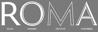 Graphic designer and lettering artist, born in 1939 in Eugene, OR. He studied with Douglas Lynch at the Museum Art School in Portland and later apprenticed with Lynch. Lincoln studied calligraphy with Lloyd Reynolds and Arnold Bank at Reed College in Portland, OR. After a stint as an agency art director producing national ads for Pendletons womens fashions, Lincoln moved to New York City, where he joined the studio of Herb Lubalin. In NYC he continued his involvement with academia, exploring film at The New School and an intensive workshop with Milton Glaser. Eventually Lincoln started his own studio (occupying the space on east 32nd Street where New York Magazine was born), combining a design practice with teaching at New Yorks School of Visual Arts. Lincoln has served as Art Director at TCA (Benton & Bowles) in Westport, CT, as Creative Director, Redington, Inc., Stamford, CT, as Principal, Thomas Lincoln Design & Motion Graphics Communication, Westport, CT, as Freelance in residence Art Director, Baden & Co., Eugene, OR, and in 1992 returned to consulting and design through his own design office, Lincoln Design, based in Eugene/Springfield, OR.
 Creator of typefaces at VGC, such as Lincoln Gothic (1965), which won the National Typeface Competition. His clients over the years include Acoustic Sciences Corporation, AT&T, Continental Packaging Co., The Ford Foundation, GE, IBM, PepsiCo, RCA, Showtime, Abrams, Colliers, Harpers Magazine, Macmillan, McGraw-Hill, Random House, Harcourt/ Brace, New York Times, Simon and Schuster, and Viking Press. In 2006, Bitstream published New Lincoln Gothic, a 24-weight family starting with a hairline weight. This digital version was made in Fontographer from the old typositor strips by Lincoln himself. In 2011, Canada Type and Thomas Lincoln cooperated in the production of the roman sans family Roma. This typeface was published in 2012 at P22. Lincoln himself tells the story: My intention in designing Roma was to create a definitive, contemporary sans serif expression of the classic Roman majuscule as depicted in the Trajan Inscription at the base of the Trajan Column in Rome. The Capitalis Monumentalis letter forms of the Trajan Inscription, which date to 113 Ad, have been described by the noted type scholar, calligrapher and historian, Father Edward Catich, as "the best roman letter designed in the western world, and the one which most nearly approaches the alphabetic ideal." And in the 1902 publication, "The Practice of Typography", Edmund F. Strange stated: "No single designer, or the aggregate influence of all the generations since has been able to alter the form, add to the legibility, or improve the proportion of any single letter there in." Mr. Strange's pronouncement was true in 1902 and it is true today. Through the years various type designers have been inspired by the Trajan Roman to offer their own interpretations. Most notably, perhaps, Frederick Goudy's Trajan Title (1930), Warren Chappell's Linotype Trajanus (1940) and more recently, Carol Twombly's literal rendition of Adobe Trajan (1989) and John Stevens' spirited Stevens Titling (2011). There have been many other nice interpretations by other contemporary designers, yet it may still be said that none has improved the form, the legibility or the proportion of any single letter---though it can be said that the letters J, K, U, W, Y and Z, nonexistent in the ancient alphabet, have been added. Less common has been the interpretation of Trajan in sans serif form. Hermann Zapf's Optima (1953), Sumner Stone's ITC Stone (1987) and Ronald Arnholm's Legacy Sans (2000), among other nice sans serifs, reflect characteristics of Trajan but seem influenced by other factors as well, including fonts such as Gill Sans and Syntax. And, while I don't presume to speak for their designers, none of these typefaces seem designed specifically with Trajan in mind. My own Lincoln Gothic (1965), and its subsequent expansion as New Lincoln Gothic (2006), was a deliberate attempt to interpret the particular characteristics of the Trajan majuscule in a contemporary sans serif face. The most significant change in the later version was the addition of a lower case; a challenge that had simmered on my personal bucket list for several years. Roma, though, differs from Lincoln Gothic in one significant way: while the terminals of Lincoln Gothic are flat, in Roma the vertices of letters such as A,M,N,V and Z are pointed. I believe this change is the critical difference that moves Roma closer to my objective of honoring the original Trajan. As with Lincoln Gothic, Roma's strokes have an almost imperceptible entasis that terminate in a subtle flare; a vestige of the serif. The importance of this feature is that it imbues the font with a humanist quality. The serif, as Father Catich points out in his book, "The Origin of The Serif", almost certainly derives from a combination of the flat brush and the human hand; it is what ties the letterform directly to human anatomy and craftsmanship, integrating it in a fundamental way with the nature of man---as distinct from the machine. In 2020, he released Lincoln Electric at Canada Type. Lincoln Electric started its life as an in-house experimental film type Thomas Lincoln drew shortly after concluding his work as part of Herb Lubalin's famed crew in the late 1960s. The master alphabet was drawn on illustration boards using pen and ink and press-type lines. The digital retooling of this Bifur-style typeface (after Cassandre's Bifur from 1929) was done by Patrick Griffin. Klingspor link. FontShop link. [Google]
[MyFonts]
[More] ⦿
|
Tim Girvin
|
Principal of GIRVIN / Strategic Branding&Design, Seattle, involved in branding for the entertainment industry (e.g., the movie The Matrix). He studied calligraphy with Lloyd Reynolds at Reed College in Portland, Oregon. Speaker at ATypI in Rome in 2002. He designed many custom typefaces, some of which with the creative director at Girvin Seattle, Chie Sharp Masuyama. A partial list of Girvin's commissioned typefaces: - 1201 Third Ave. A typeface for a neo classicist skyscraper in Seattle. Done with Jon Runstad, this is a roman caps typeface for a building by Kohn Pedersen Fox.
- 48 Hours. A titling font done for CBS.
- Bardessono. A curvy deco typeface.
- Castalia.
- Girvalia. Girvin's in-house corporate font.
- Girvenza. A font for FIFA's posters.
- Girvpetua. An lapidary typeface based on the stone-cutting style of Eric Gill's Perpetua.
- A custom typeface for Kettie Brand.
- A roman display typeface for Nordstrom.
- Projetto Italiano. One of several campaign fonts for windows, shopping bags, merchandising and print advertising at Nordstrom.
- A custom typeface for Travel & Leisure. This was done with his long time collaborator in the early part of his career, Bob Ciano at Life Magazine.
- A custom techno / speed typeface for Viathon.
- Vignelli: a custom type (with Massimo Vignelli and Michael Bierut) for a building.
[Google]
[More] ⦿
|
Tim Rolands
[Tim Rolands Digital Studio (was: TR Typographic Services, Phont Typographics, Stylus Digital Typography, Studio Renaissance)]
|
[MyFonts]
[More] ⦿
|
Tim Rolands Digital Studio (was: TR Typographic Services, Phont Typographics, Stylus Digital Typography, Studio Renaissance)
[Tim Rolands]
|
 Tim Rolands (b. St.Louis, MO, 1970, based in Kirksville, MO and London, UK, but also in Stevens Point, WI) is an independent digital type developer, producing TrueType and Postscript typeface families for MacOS and Windows. He founded Tim Rolands Digital Design in 2001. Other names for his company include TR Typographic Services, Phont Typographics, Stylus Digital Typography, Studio Renaissance. His fonts can be bought at MyFonts.
 Tim's creations include Orlando (free), Anvil (also available in OpenType), Valor (2006, an experimental modern typeface that combines geometry and mediaeval Lombardic ideas), Miranda (an Aldine, roman caps family: Pro version appeared in 2012), Aegis, Prospero (1997, inspired by the early Romans of Nicolas Jenson; see Prospero Pro (1997-2008)), Illiad, Kimberly, Timotheus, Envoy (2001, garalde family), Odyssey (2001, classical Roman caps; see Odyssey Pro in 2017), Alexander, Runik Futhark (based on the earliest Germanic-Norse runes, known as the Elder Futhark). View Tim Rolands's typefaces. [Google]
[MyFonts]
[More] ⦿
|
Tipo Pepel (was: Antaviana Typeface Division, or: Astramat)
[Josep Pep Patau i Bellart]
|
 Antaviana Typeface Division is a Catalan foundry, est. ca. 2002. It went also under the name Astramat and was also known as ANTAVIANA SERVEIS INTERACTIUS, SCCL. Located in Lleida, it is run by Josep Patau i Bellart (b. 1971, Les Borges Blanques, Lleida). Patau i Bellart offered free fonts, as well as commercial fonts. He has emerged as one of the most talented contemporary Spanish type designers. In 2011, he started Tipo Pepel [MyFonts link] in Les Borges Blanques. Josep Patau's typefaces:
 - Free typefaces: Lletraferida (2011, a didone), Negrona (2011, a revival of Lucian Bernhard's Bernhard Negro, 1930), Perolet, Lango, Gimenells, Arbeka, Rosango, Antaviana, FoxScript (1996, old typewriter), Unregistered, and FistroRatted (grunge).
- At Astramat, one could download these fonts: Anmari (2002), Antaviana (1996), Arbeka (2002), FAXADA (2001, by Cel Tico Petit), FoxScriptNormal (1996, old typewriter), Gastada (2001, another grunge font by Cel Tico Petit), Gimenells (2001, pixel font), Gorchs (2007, script font), Klander (1999, pixel font), Lang (2001, pixel font family), Masterfly (2007, T-26), Omellons (2001, pixel font family), Perolet (2001, Bauhaus style), Pixelade (2001, pixel font), Rosango (1996), Tiquet (2001, grunge font by Cel Tico Petit), Ultrafat (2007, T-26), Fistro Ratted. Fontspace link for Astramat.
- T-26 fonts: the screen typeface PixScript (2004), the screen icon dingbat font Pixelade Icons (2003), the art nouveau headline font Gisele (2003, angular art deco titling face), Masterfly (2007), Gopal (2004), Gourmet (2004, based on a type from the 1923 ATF catalog), Confetti (2006, connected fifties style face based on a 1930 type called Escritura Maravilla and Escritura Energica by the José Iranzo foundry in Barcelona), the pixel family Bit Kit (2003), Houdini Icons (20 pixel web icon dingbat typefaces, 2004).
- At ATypI 2009 in Mexico City, he explained the typographic work of the goldsmith Manuel Peleguer: The aim of this paper is to give an account of the project Peleguer, the recovering and digitialization of the work of the goldsmiths Manuel Peleguer, both father and son, who cut some printing characters between 1780 and 1784 in response to an order of the "Real Sociedad Económica Valenciana de Amigos del Pais". The result was a modern transitional typeface, with good legibility and neoclasical forms, equal in quality to those made by the Real Press (Imprenta Real) in Madrid by Pradell, Espinosa or Gerónimo Gil. Peleguer founded a press and a font foundry in 1784. Patau Bellart created a type family based on Peleguer's work called Peleguer (2009, + Ornaments).
- Anduaga, a calligraphic typeface from the 18th century, won the Laus Prize (said to be the Spanish equivalent of the type Oscars). Anduaga is the interpretation of the script that Joseph of Anduaga proposed for teaching the first letters in the 1780 book Arte de escribir por reglas y sin Muestras ...
- Valliciergo (2011) is a 100+-glyph calligraphic / copperplate script font that is inspired by samples from Caligrafía inglesa published in Madrid in the late nineteenth century by Spanish calligrapher Vicente Fernández Valliciergo.
- Dafont page, where one can download Ventura Edding (2008, hand-printed).
- Kids Script (2011). An upright connected school script.
- Trajana Sans (2011) is a sans-serif typeface family based on the shapes and proportions of the characters on the Trajan Column in Rome.
- Farrerons Serif (2011) is a very readable family with angular and humanist underpinnings.
- Chupada (2012) is an ultra-condensed font family noted for their exaggerated x-height, which consists of five different weights.
- Chopped Black (2012) was inspired by the font Pabst Heavy, designed by Chauncey Hawley Griffith in 1928 for Linotype. It was Linotype's version of ATF's popular Cooper Black.
- Paralex (2012) is a 12-style geometric slab typeface family.
- Boxed (2013) is an 18-weight squarish sans family. Followed in 2017 by Boxed Round.
- Cinta (2013). A large humanist sans family with a full range of weights starting with hairline. It also has Cyrillic.
- Bridone (2013), for British didone. A didone family that inherits some features from Victorian era British slab serif typefaces. Fashionable, beautiful, and useful.
- Sisco (2014) is an 18-style elliptical techno family with large x-height.
- Book Cover (2014) is a fat headline typeface.
- Tiquet (2014). A dot matrix typeface.
- Milio (2014). A ten-style wedge-serif transitional typeface family for newsprint and magazines.
- Naste (2014). A sixteen-style geometric sans family that adds details and character to the classical geometric sans typefaces such as Futura. It is a bit wider than usual and covers Cyrillic.
- Pobla (2015). A text serif with angular, almost fractured.
- Dupla. A large multilingual sans family.
- Trepa (2015). A stencil family with various choices of textures, which was inspired by commercial signs and the 1960s French art movement Graphie Latine.
- Itaca (2016). A 48-style sans family with very open counters.
- Mario (2017). A typeface family for arcade games and children.
- Werdet Script (2017). A calligraphic penmanship script which is named after calligrapher Jean-Baptiste Werdet who was a penman in Bordeaux in 1809 and later a professor at Ecole Normale Superieure in Paris.
- Geo Deco (2019). A geometric art deco sans family.
- Frontis (2019). A transitionl roman typeface family inspired by the roman lettershapes that Asensio y Mejorada drew in 1780.
- Kongress (2019). An elliptical sans family for corporate identities.
- Labernia (2019). A large didone family based on the font used in Diccionari de la Llengua Catalana (1864, by Pere Labernia, Barcelona): Labernia and Labernia Titling are characterized by ball terminals that are turned inwards.
- Indecise (2020). A nostalgic 50-style sans family that reminds us of type designs by Enric Crous-Vidal and José Mendoza y Almeida.
- Frenchute (2020). A great 36-style garalde family inspired by the type used in the 1727 text Le Chemin Royal de la Croix.
- Gina (2020). A great readable 16-style humanist sans family. Sixteen styles including a hairline.
- Samplex (2020). Bellart's take on the neutral Swiss sans genre.
- Bauen (2020). A Bauhaus-inspired geometric sans typeface family.
- Bazinga (2020). A display typeface family characterized by square counters. Perhaps a children's book font.
- Romulo (2020). A 12-style transitional roman typeface.
- Kheops (2020). A 14-style slab serif.
Additional links: Dafont. MyFonts page. Alternate URL. Fontspace link. Fontfreak page. Patau Bellart is also involved in the type information site Unos Tipos Duros. Klingspor link. Abstract Fonts link. Interview by Unostiposduros. Fontspring link. [Google]
[MyFonts]
[More] ⦿
|
Tiro TypeWorks
[John Hudson]
|
 John Hudson and Wm. Ross Mills, the co-founders of Tiro Typeworks in 1994, design wonderful top-of-the-line fonts in Vancouver. Their commercial typefaces can be bought from I Love Typography since 2020. From the Tiro web page: Tiro Typeworks is an independent digital type foundry developing&marketing high quality typeface families for PC and Mac platforms. Our commitment is to continuing the independent tradition of typography, as it has existed for more than five hundred years, free from the influence of fashion and novelty. Tiro is increasingly involved in font technologies, and are avid advertisers for OpenType and work often with Microsoft and Linotype on projects. John has created or collaborated on typefaces for Arabic, Bengali, Burmese, Cyrillic, Devanagari, Ethiopic, Greek, Gurmukhi, Hebrew, IPA, Javanese, Kannada, Latin, Odia, Sinhalese, Soyombo, Telugu, Thai, and other writing systems. He is an expert contributor to Unicode, and a member of the W3C Web Fonts Working Group. Interview in 2008 by Hiba Studio. Tiro's typefaces:
 - Academia (1997, by Mills).
- The titling and display typeface Aeneas based on classical Roman capitals. This incomplete typeface was created by John Hudson based on glyphs drawn by an Austrian designer.
- 1530 Garamond (one of the most beautiful and faithful revivals of Claude's creations), by Mills.
- Manticore (John Hudson's own absolutely magnificent brainchild).
- Plantagenet (by Mills).
- Sylfaen was designed for Microsoft in 1998 by John Hudson and Wm. Ross Mills of Tiro Typeworks, and Geraldine Wade of Monotype Typography. Sylfaen is a Welsh word meaning "foundation"; an apt name since the font stemmed from research into the typographic requirements of many different scripts and languages. Sylfaen supports the WGL4.0 character set, for Pan-European language coverage. In addition to Latin, Greek and Cyrillic letterforms, the font contains the characters necessary for support of the Armenian and Georgian languages. [Download site, see also here].
- Hudson also does corporate identity work, such as HeidelbergGothicOsF (done for Heidelberger based on NewsGothic). Other clients included Microsoft, IBM and Apple.
- In 2001, Mills developed Pigiarniq (Download site), a multiscript typeface for native American languages. This project was commissioned by the government of Nunavut, a new Canadian territory. Note: please visit the page on James Evans' type cutting methods: it was this missionary who developed the Cree writing system which was later adapted for use with Inuktitut.
- Winner with Mamoun Sakkal and Paul Nelson at the TDC2 2003 competition for Arabictype.
- In 2003, he is publishing unicode-compliant fonts called SBL Greek, SBL Hebrew and SBL Latin, at the Society for Biblical Literature.
- In 2004, winner of an award at TDC2 2004 with Nyala, an Ethiopic text face, which has a nice Latin component as well.
- Hudson and Mills have, to date, designed and built fonts for the Arabic, Cherokee, Cyrillic, Ethiopic, Greek, Hebrew, Inuktitut (Canadian Aboriginal Syllabics), extended Latin, and Ogham scripts. These include, for example, Adobe Hebrew (2000-2008).
- Constantia (2004, a beautiful OpenType family made for Microsoft's ClearType project).
- Helvetica Linotype (2004), for which he received a TypeArt '05 award for the Cyrillic component.
- Vodafone Hindi (2007, with Tim Holloway and Fiona Ross) won an award at TDC2 2008.
- Gabriola (2008) is a script font by Hudson done for Microsoft---it is included in some Windows packages---see, e.g., here. It has many swashes and special ligatures, but it is not connected.
- Athena Ruby (2012), a winner at the TDC 2013 competition. Client: Dumbarton Oaks Research Library & Collection, Washington DC.
- Brill (2011, John Hudson, Alice Savoie, Paul Hanslow and Karsten Luecke) and Brill Greek (2021), Brill Cyrillic (2021) and Brill Latin (2021), all by the same foursome. This classic text typeface family was a winner at the TDC 2013 competition. Client: Koninklijke Brill NV, Leiden, The Netherlands.
- Slabo 27px and Slabo 13px (2013) are free Google Web Fonts. Optimized to be used at 27px and 13px, respectively, these fonts were created for use in online advertising.
- Codesigner with Eben Sorkin, Joshua Darden, Maxim Zhukov, and Viktoriya Grabowska, of Omnes Cyrillic.
- In 2018, Paul Hanslow, Ross Mills and John Hudson co-designed the free STIX Two family, which is based on Times Roman.
- Castoro (2020). Hudson writes: Castoro is a libre font family released under the SIL Open Font License. Castoro is a specific instance of an adaptive design developed for Tiro Typeworks' internal use as a base from which to generate tailored Latin companions for some of our non-European script types. The instance that has been expanded to create the Castoro fonts was initially made for the Indic fonts that we produced for Harvard University Press. In the Castoro version, we have retained the extensive diacritic set for transliteration of South Asian languages, and added additional characters for an increased number of European languages. The parent design here presented as the Castoro instance began as a synthesis of aspects of assorted Dutch types from the 16th through 18th Centuries. Castoro roman was designed by John Hudson, and the italic with his Tiro colleague Paul Hanslow, assisted by Kaja Slojewska. It is named Castoro after the busy beaver, a real workhorse in the Canadian forests. Google Fonts link. Followed in December 2020 by John Hudson's roman capitalis monumentalis typeface Castoro Titling.
- Clairvo (2021): Clairvo is a proof-of-concept font that uses OpenType Layout to implement the number system developed by Cistercian monks in the 13th Century. The number system records each number from 1 to 9999 as a unique sign based on encoding units, tens, hundreds, and thousands in quadrants: top-right, top-left, bottom-right, and bottom-left respectively. The Clairvo font uses OpenType glyph substitution to handle mirroring of the shapes in each quadrant, but relies mostly on contextual GPOS anchors to shift the glyphs around the quadrants. This means that all 9999 numbers can be represented my a minimal number of glyphs.
- Skeena (2021). A humanist sans typeface by John Hudson and Paul Hanslow developed for Microsoft for use as one of the default fonts in Office apps and Microsoft 365 products.
Klingspor link. [Google]
[More] ⦿
|
Tober Welsh
[Free Movie Themed Fonts]
|
[More] ⦿
|
Tobias Frere-Jones
[Frere Jones Type]
|
 [More] ⦿
|
Tom Kemp
[Twice Publishing]
|
[More] ⦿
|
Too much Trajan
|
A movement to retire Trajan sprung up in 2007. Check Kirby Ferguson's video clip on the ubiquity of Carol Twombly's Trajan on movie posters and movie title sequences. And the tedium. Almost simultaneously, Arjen Noordeman published a blog entirely dedicated to the overuse of Trajan in movies. [Google]
[More] ⦿
|
Trajan
[Peter R. Wilson]
|
Peter R. Wilson's metafont code (1999) for Trajan. "The trajan package provides fonts based on the capitals carved on the Trajan column in Rome in 114 AD. Many typographers think these rank first among the Roman's artistic legacy." In 2005, type 1 versions were created as well: Trajan-Roman, Trajan-Slanted. [Google]
[More] ⦿
|
Trajan Alphabet
[Wolfgang Beinert]
|
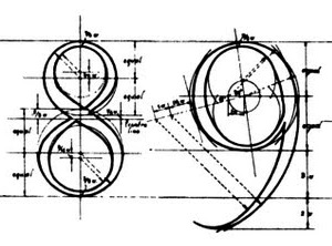 Wolfgang Beinert's piece in German on the Trajan all-caps alphabet (without H, J, K, U, W, Y, Z) created by Syrian engineer Apollodoros from Damaskus for the Roman Emperor Marcus Ulpius Traianus (53-117). The Trajan Column near the Basilica Ulpia in Rome dates from 113. People inspired by the elegant lettering include Fernando Ruano, Vespasiano Amphiarea, Wolfgang Fugger, Geoffroy Tory, Albrecht Dürer, Francesco Torniello, Luca Pacioli, Damiano da Moile, Leonardo da Vinci, Felice Feliciano, Claude Garamond, Jan Tschichold (see his book Meisterbuch der Schrift, Otto Maier Verlag, Ravensburg 1952), Günter Gerhard Lange (see his book Die römische Kapitalschrift, Jahresgabe der Typographischen Gesellschaft München, München 1983), and Carol Twombly (who made a digital font called Trajan at Adobe in 1989). [Google]
[More] ⦿
Wolfgang Beinert's piece in German on the Trajan all-caps alphabet (without H, J, K, U, W, Y, Z) created by Syrian engineer Apollodoros from Damaskus for the Roman Emperor Marcus Ulpius Traianus (53-117). The Trajan Column near the Basilica Ulpia in Rome dates from 113. People inspired by the elegant lettering include Fernando Ruano, Vespasiano Amphiarea, Wolfgang Fugger, Geoffroy Tory, Albrecht Dürer, Francesco Torniello, Luca Pacioli, Damiano da Moile, Leonardo da Vinci, Felice Feliciano, Claude Garamond, Jan Tschichold (see his book Meisterbuch der Schrift, Otto Maier Verlag, Ravensburg 1952), Günter Gerhard Lange (see his book Die römische Kapitalschrift, Jahresgabe der Typographischen Gesellschaft München, München 1983), and Carol Twombly (who made a digital font called Trajan at Adobe in 1989). [Google]
[More] ⦿
|
Trajan Title
|
A typeface designed by Frederic Goudy in 1930. D.J.R. Bruckner: The face derives from an inscription at the base of Trajan's Column in Rome, which Goudy had seen twenty years earlier. He had made some letters based on it for the Limited Editions Club Rip Van Winkle. Later he was asked to design a capital font for a list of subscribers to the building of the Community House in Forest Hills Gardens, and he made the Trajan. Mac McGrew: Trajan Title was designed by Frederic W. Goudy in 1930 to fulfill a commission to print a list of subscribers to the building of the community house in his old home town of Forest Hills Gardens, Long Island. The previous year, Goudy had lettered the principal line on the title page of a limited edition of Rip Van Winkle, for which he had designed the typeface Kaatskill (q. v.). Now he completed that alphabet, feeling that it would be ideal for this purpose. Goudy calls this one of his favorite designs, and it is indeed an impressive inscriptional style of letter. It is based on letters inscribed at the base of the Trajan Column at Rome, erected about 114 A.D., but not copied slavishly. He cut several sizes, and states that it has been widely used. English and Continental rights were sold to the English Monotype Company. No digital versions are known, but compare with LTC Form Title (Lanston), which is based on Goudy's other Trajan typeface, Forum Title (1911). [Google]
[More] ⦿
|
Trajan typeface
[Carol Twombly]
|
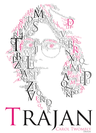 Wikipedia: Trajan is an old style serif typeface designed in 1989 by Carol Twombly for Adobe. The design is based on the letterforms of capitalis monumentalis or Roman square capitals, as used for the inscription at the base of Trajan's Column from which the typeface takes its name. Since the inscription and its writing form manifests in only one case, Trajan is an all-capitals typeface. Instead, small caps are commonly used, and a more complete set of glyphs contained in Trajan Pro (a 2001 update of the original typeface) includes a lower case of small caps. Although Twombly was the first to do a very literal translation of the Trajan inscription into type, a number of interpretations (with added lowercase alphabets) predate Twombly's, particularly Emil Rudolf Weiss' "Weiss" of 1926, Frederic Goudy's 1930 "Goudy Trajan," while Warren Chappell's Trajanus of 1939, while having similar forms for capitals has a markedly medieval lowercase. There are also numerous prominent typefaces that are not revivals, but owe a very clear debt to the Trajan letterforms, most notably Hermann Zapf's 1955 Optima.
 We learn also that Trajan is the font used on the Trojan brand of condoms. It is not a surprise, then, to see that it was adopted as the official font of Columbia University, Rice University, the University of Bologna, the University of the District of Columbia, the University of Kansas and the University of Rhode Island. It is also ubiquitous in the movie industry. John Berry discusses Trajan Pro 3 (a 2011 extension of Twombly's Trajan) and Trajan Sans (1989). Poster by Jorge Martinez (2013). [Google]
[More] ⦿
|
Tri Shiba
|
Ho Chi Minh City, Vietnam-based designer of a codex-style Trajan column-inspired roman capital alphabet in 2017. Behance link. [Google]
[More] ⦿
|
Twice Publishing
[Tom Kemp]
|
Tom Kemp on "Formal Brush Writing", which also is the title of his wonderful book on this technique, building on the work of father Edward Catich regarding Roman inscriptions in general and Trajan letterforms in particular. [Google]
[More] ⦿
|
Typedia: Typeface classification
|
The classification from the Typedia community: - Blackletter
- Fraktur: A German form of Blackletter with broken strokes. Classic example: Fraktur.
- Old English: The English blackletter style. Classic example: Cloister Black.
- Rotunda: A Blackletter style featuring wider lowercase with more rounded strokes.
- Schwabacher: A German form of Blackletter with simplified, rounded strokes.
- Textura: A Blackletter style featuring tall, narrow lowercase made mostly of straight strokes.
- Calligraphic
- Chancery: A script style of calligraphy made with a broad-point pen with slightly sloping, narrow letters that are the basis for italics in serif typefaces. Capitals may or may not have flourishes. Originated during the Renaissance. Classic example: Zapf Chancery.
- Etruscan: An early Roman form of calligraphy drawn with a flat brush held at a steep angle. Caps only, as lowercase had not been invented yet. Classic example: Adobe Pompeii.
- Uncial: A Celtic style of calligraphic script with forms created by a broad-nibbed pen at an almost horizontal angle, but sometimes more tilted in later variants. Roman lowercase is derived from Uncial forms. There is only one case in pure Uncial designs. Used during the middle ages. Classic example: American Uncial.
- Inscriptional---Roman Inscriptional: Stone-cut serif style from the late Roman Empire. The basis of modern roman capitals. Classic example: Trajan.
- Non-alphanumeric
- Dingbats
- Ornaments
- Pictorial
- Ornamented, Novelty
- Art Deco: A geometric display typeface style popular in the 1920s and 1930s. Classic example: Broadway.
- Art Nouveau: Display typefaces with a flowing, organic style popular in the early 20th Century. Classic example: Arnold Bocklin.
- Comic Strip Lettering: A style meant to look like the hand-drawn letters associated with comics or cartoons. This style is usually san serif, often having a loose, informal structure and is sometimes based on brush lettering. Classic example: Balloon.
- Dot Matrix: A style whose characters are composed of a pattern of dots used mainly for low-resolution impact printers, or to simulate the look of the output of such printers. Classic example: FF Dot Matrix.
- Futuristic: A style meant to suggest a futuristic theme. Often cold, brutal and geometric with a machine aesthetic and simplified construction. Classic example: Stop.
- Machine Readable: A style designed to be read by machine. These fonts are usually san serif and often feature unusual character shapes to make them more distinguishable from one another. Classic example: OCR-B.
- Pixel: A style whose characters are composed of pixels (usually represented as squares) used mainly for low-resolution computer display. Outline fonts are sometimes made to look like Pixel Fonts. Classic example: Silkscreen.
- Pseudo Foreign Script: A style intended to mimic non-Western letters. For example, a font that looks like Chinese, but is actually composed of Latin characters. Faux Chinese/Arabic/Hebrew. Classic example: Bruce Makita.
- Victorian: A whimsical, eclectic display style popular in the late 19th Century. Classic example: Skjald.
- Sans Serif
- Gothic: A sans serif style with moderate stroke contrast and modern proportions particular to the U.S. Usually features a two-story lowercase g, angled strokes on C and S, and a sloped, non-cursive italic. Classic example: Franklin Gothic.
- Grotesque: A sans serif style with moderate stroke contrast and modern proportions particular to the U.K. Usually features a two-story lowercase g, closed strokes (usually curving in slightly) on C and S, and a sloped, non-cursive italic. Classic example: Bureau Grot.
- Geometric Sans: A sans serif style made with rigidly geometric forms and little to no stroke contrast. Classic example: Futura.
- Grotesk: A sans serif style with low stroke contrast and modern proportions. Usually features a one-story lowercase g, closed or angled strokes on C and S, and a sloped, non-cursive italic. Classic examples: Akzidenz Grotesk, Helvetica.
- Humanist Sans: A sans serif style with proportions modeled on old-style typefaces. Characterized by open strokes on characters like C and S. Italics of this style often are more cursive in appearance, rather than a simple slanted version of the roman. Often has more slightly stroke contrast than other sans serifs. Classic examples: Gill Sans, Frutiger.
- Square Gothic: A sans serif style composed mainly of straight or nearly straight lines and (often) curved corners. Stroke contrast is usually low. Classic example: Bank Gothic.
- Swiss Gothic: A sans serif style with noticeable stroke contrast, straight sides on round characters, modern proportions, and large x-height. Usually features a one-story lowercase g and closed strokes on C and S. Classic example: Jay Gothic.
- Script
- Brush Script: Typefaces modeled after lettering made with a brush. Strongly associated with advertising in the mid-20th Century on. Classic example: Brush Script.
- Casual Script: Typefaces based on a style of lettering characterized by informal appearance, somewhat like handwriting, but more refined. Similar to Brush Script or Sans Serif. Classic example: Murray Hill.
- English Roundhand: A connecting-script style of calligraphy made with a flexible tipped pen. The characters are usually steeply sloped and capitals are often very elaborate. Popular in the 18th and 19th Century. Sometimes called Copperplate Script. Classic example: Bickham Script.
- French Roundhand: A connected-script style of calligraphy, sometimes with upright characters, a high stroke contrast and decorative capitals. Used in France in the 17th through 19th Century. Also called Civilité. Classic example: Typo Upright.
- Handwriting: A script style based on ordinary handwriting. Characters may or may not be connected. Classic example: Felt Tip Roman.
- Rationalized Script: A script style with sans serif qualities, low stroke contrast, and a formal appearance. Characters may or may not connect. Associated with 20th Century commercial design. Classic example: Gillies Gothic.
- Serif
- Grecian: A typically heavy display typeface with octagonal shapes where curves are normally used. Also known as Chamfered or Beveled. Popular in the 19th Century for wood types. Classic example: Acropolis.
- Latin: A serif style with large triangular or wedge-shaped serifs. Stroke contrast is medium to low. Popular in the 19th Century for wood types. Classic example: Latin.
- Modern: A serif style with high stroke contrast and vertical stress. Classic example: Modern No. 20.
- Didone: A serif style with high stroke contrast and vertical stress. Serifs are usually unbracketed. Classic examples: Bodoni (Italian), Didot (French).
- Scotch Modern: A serif style with medium to high stroke contrast and vertical stress, known for large serifs and tiny aperture. Serifs are usually bracketed. Classic examples: Modern No. 20, Scotch Modern.
- Old Style: A serif typeface with relatively low stroke contrast, angled stress, angled serifs. Classic example: Bembo.
- Antique: A serif style with moderate stroke contrast, bracketed serifs and usually vertical stress. Serifs are angled as in Old Style. Popular in the 19th Century. Classic example: Bookman.
- Dutch Old Style: A serif style with somewhat angled stress, bracketed serifs, and medium to high stroke contrast. Characteristic of Dutch and English types of the 18th Century. Classic examples: Caslon, Plantin, Times Roman.
- French Old Style: A serif style with angled stress on rounds; usually features a small eye on the lowercase e; soft, bracketed serifs and moderate stroke contrast. Classic example: Garamond.
- Spanish Old Style: A serif style with soft, bracketed serifs, medium to high stroke contrast, and often highly angled stress. Classic example: Rongel.
- Venetian Old Style: A serif style with angled stress on rounds; usually a tilted crossbar on the lowercase e; usually has somewhat low stroke contrast. Serifs are sometimes unbracketed. This style is associated with very early printing (Incunabula) in the West. Classic example: Jenson.
- Slab Serif: A serif style with serifs equal to or nearly the same thickness of the main strokes. Main strokes usually have low contrast. Classic example: Rockwell.
- Clarendon: A slab serif style with heavy, bracketed serifs, modern proportions and construction, low stroke contrast. Classic example: Clarendon.
- Egyptian: A serif style with heavy, unbracketed serifs, modern proportions, low stroke contrast. Basic construction is similar to Modern, but with low stroke contrast. Sometimes called Antique. Classic example: Egiziano.
- French Clarendon: A serif style with reverse stress (horizontal strokes thicker than vertical strokes) and slab serifs, sometimes bracketed, usually condensed. Popular in the 19th Century. Classic example: Playbill.
- Geometric Serif: A serif style made with rigidly geometric forms. Usually features slab serifs. Classic example: Stymie.
- Spur Serif: A serif style with very small serifs. Usually similar in design to san serif typefaces, except for the serifs. Usually very little stroke contrast. Classic example: Copperplate.
- Transitional: A serif style which, historically, bridges the gap between Old Style and Modern. Stroke contrast is stronger than old style, but less than modern. Bracketed serifs. Stress is mainly vertical. Characteristic mainly of English types around 1800. Classic example: Baskerville.
- Scotch Roman: A serif style with medium contrast and vertical stress, medium-sized bracketed serifs. Classic examples: Miller, Caledonia.
- Tuscan: A serif style with splayed or ornate serifs. Classic example: Thunderbird.
[Google]
[More] ⦿
|
TypOasis 2004
[Manfred Klein]
|
 Manfred Klein's typefaces from 2004: Bauernschrift (the original Bauernschrift, published in 1911 by Bauersche Gießerei, had a Jugendstil form and a classical gothic form), ArthritishSpringtime, Declared, DigitsCarpet, FraktKonstruct, GalleriaGeometricaA, GalleriaGeometricaB, Logotrainer, MKLatin-Bold, MKLatin-BoldOblique, MKLatinLight, MkLatinLight-Oblique, OldiesButGoodies, RomaMonumentalBC, SportSatyre-Medium, Uncitronica-Medium, Nasenbear, CircusEarth, FolksXXHeavy, PoliticiansWorking, AlkoInitialsFramed, AlkoInitials, CutAwayOne, FragmentBO4, FragmentF, LetterSoupMainz, MKaos-Regular, Menschenskinder, RodGauApesInitials, StoneCapsIngrid, TangramBlack, TangramWhiteBlack, TixBats, TypoApish, Ubahn-Light, Ubahn, UltraCondensedSansSerif, WalbaumTorsoThree-Regular, ArrowFaces, Associations, AssociationsBirds, DotCapsMK, FrakturaFonteria, GuernicaMemories, MultiCapsOne, MultiCapsTwo, Schwabach, SketchesOfSpain, DotsCapsTwo, KleerikaleConBlack, ManiaK, MonksWriting, MonospaceTypewriter, PablosChildren, RuebenNosesFour, SometimesSmiley, TherapeuticApplications, TraditionellSans-Bold, TraditionellSans-Normal, VForVictory, EuroGyptians, Fabeltiere04, GiambattistaDueMille-Oblique, GiambattistaDueMille, KlillLightCondensed, PhonebookFont, PreColumbus, StrokeBorn-Bold, StrokeBorn, TracesOfKandinsky, Amputation, EarthquakeTypewriter, HandwrittenSlim, MyPrivateZoo, PotatoMonsters, RoundOpArt, Sansumi-DemiBold, Sansumi-Regular, Sansumi-UltraLight, Santana-Black, Santana-BlackCondensed, Santana-Bold, Santana-RegularCondensed, Santana, SantanaXtraCondensed, WacObats, Warlord, AfterAtomWar, AnAlphaBetIsmXtreme, AnalphabetismBats, Eulenspiegel, FlyingWomen, FraktalConPablos, KleinsTypen, Napoleodoni, BackgroundBricks, Decreations, Faustant, Faustitalic, GeoGraphics, GuantanamoHumanism, LipoDVectorized, MKritzeleien, Napoleodoni-Bold, ReadingRailroad3D, ReadingRailroad, SchoenspergerCaps, StageGlyphs, StageGlyphsTwo, CarneVale, Cock-Bold, Cock-Italic, Cock (high ascender face), FranklySpokenTwo, GenManipulated, GenManipulatedRounded, KarlasAndManfreds, Lipsiantiqua-Regular, PostConstructivism, PostConstructivismInvers, SketchedCassiusBroken, SpaceGarbage, WinterCoat, Artistiques-Bricks, DoubleBrokenTextura, GoetheGothic, GoetheGothicBold, GoetheGothicOblique, PabloSansCaps, PreRomanCaps, RodgauHeads, ScribblesCalligraphique, SomeParts, SomePartsAlphabet, WomanWithDoveTwo, WritersFont, Russian, SpikyBrush, TechnoMK, Bastarda-K, LuFraktorso, OldGreekButtons, SchwabachScribbles, ToscanButtons, TrajanusBricks, Couples, LookForLeonardo, Morphes, NanaBallett, Rocky, BeastlyBats, ChildrenSketchings, CloseUp, IdenOfMarch, OrnaRosettes, StrangePeople, SurReal, TrajanSmallCaps, Aprilapril, Confuseyecons, Cucumbers, DuererUnd, Exhumations, MankBalloons, MankZieglers, OptimusPrinceps, OptimusPrincepsSemiBold (roman Trajan style), SlabRomana-Bold, SlabRomana-BoldOblique, SlabRomana-Oblique, SlabRomana, CapsRandomish, CapsRandomishBricks, CondensansPaneurope-Medium, CondensansPaneurope-MediumOblique, CondensansPaneurope-Oblique, CondensansPaneurope, HansSchoenspergerRandomish, HelloSirPeter, MankSans-Medium, MankSans-MediumOblique, MankSans-Oblique, MankSans, StencilBricksMK, StencilBricksRandom, AfriquArtes, EggsOne, EggsTwo, EggsnPills, FaceToFace, KarlasWelt, LookBrokenTypes, Schablonski-LessFat, Schablonski (stencil), BlaxxOnGrid, DancingVampyrish, EmkaSansCondensed-Bold, EmkaSansCondensed, Othermil, OwlsNOtherWitches, PrisonBricks, Renaiss-Italic, Runners, VignettSketches, AbsoluteImprovisations, Aparta, BlackLiving, Blowing, BullerBuPapercut-BoldOblique, BullerBuPapercut, CryArgentina, EnFace, EyeBeings, KidsPhantasies, Klats, Linearus, LinearusCentSix, Monofred-UltraLight, Pabloesques, Planless-Bold, Planless, ScribbleDichFrei, SilhouettesAnimalish, Spontifex, Spontifex, TokyoFrankfurtRound, XamStern, BlackSplinters, Linolphabet, Tomahawked, Typobricks, AmericanInhabitants, HypocriSymbols, LastWit, MK-Symbols, StrokesFonds, ThinkBats, UseBats, Klimes, MonoSpatial, Architypogra, CaslonDadaesque, Cuneate, CuneateCaps, MauMauKlein, FatGrafCalliKlein, CavePaint, Goblins, NudesSilhous, RainyDay, AidaSerifaShadow, BodonisBulemy, SuperSansCondLight, Adonis-Bold, Batmania, CactusBlossom, CrazyCrazySans, Eyeballs, FacesAndCaps, FigaroFigaro, FraxBricKs, LaughBajazzo, M-sKetches, MKGrotesque, MoreMonK, NextGeneration, Orcas, PragRoman, RomanGridCaps, StrangeCharacters, TypoTracesOne, Typotraces-Cinque, Typotraces-Four, Typotraces-Three, Typotraces-Zwo, UmDieEckePlus, Vampyrish, VespasianCaps, VespasiansFlorials, Wacofaces04, ZagzagHeads, Klexalfabeta, GotischeMajuskel, PompejiPetit, Birrrdds, Spontcomic, SprayersSujets, TypoElements, WacoMusish, BemBolz, BrokenRoman-Bold, MarinumBreezed, SansFat, Africaans, AllHands, AlwaysPeople, BauAHaus-Black, DeconstructaWide-ExpandedUltra, GrafFittyPunk, LeArchitect, MiszellenKOne, MiszellenTwo, OhLauri, Shamanbats, TrajanusBriX-Invers, TrajanusBricks, TrajanusBricksXtra, Wenceslas-Oblique, Wenceslas, Monofred Ultralight Update, GenotypiPrototype, VivaBodoni, WhatsHappened, Cancellereska, JuniusIrish, LombardPlattfuß, SketchesDuererInvers, TornielloInitials, Birds-Relaunch, KoeppHeads, MiszellenThree, ImperiumCond, KleinsWrittenCaps, SigismundoDiFanti, Zwiebelfisch, ChildWritten, KleinKallig, GoGo, FantasyBats, KarlasMiszellen, LosAngelesBold, MiszCinque, MiszellenQuattro, MouseTraps, LittleRock, Dinotiqua-Heavy, MountFirtree, FarmFont, Karlas704, MesoFaunaBats, PhaistosAlphabet, Quicktypes, AbstractBats, AztecBats, BienMaya, ForefathersSketches, HumanDeformations, MiszellenJuly, NativeAmericans, OldEgyptGlyphs, PeoplesParts, RainmansWeatherreport, SheAndHe, MKlimesCondensed, SansBlack, WinterthurCondensed, MonoSerifBased70, Rehacles, RustiCalligraphia, ScrapDealer, Vampyriqua, Zebraesq, FracturiaSketched, FracturiaSketchedCaps, OrnamentInitials, CavePeoplePainting, FontBetaOne, HierobatsSketches, PrehistFantasies, Roundlings, VampyrBats, WacoheadsTwo, Cybatiqua, HassianUncial, PittoresqJugendstil, BonFood, PoeticRound, ReligionSpirituality, Running Gnomes, WesternPastHeroes, WritersReaders, AdAstra, Practiqua, DistroyA, DottyShadow, QuickMary, QuickMax, StrokeyHand, EasterIslandsToday, EthnicReconstructions, MotherAfrica, Scherenschnitt, Napoleon, Newspaper, RoundSlabSerif, DisPropBold, FishHooks, VariationsForImre, GoticaBastarda, ImresFraktur (modeled after a blackletter by Reiner), ToskanaCapsRound, KidsStuff, MKDingBats, Offbeats, PeopleSketches, StrangeTypes, WeatherBats, MoldauQua, Postertypes, ThinManGiambattista, AnimalTypeFaces, DoubleFaces, ItalianEvolution, TodayRunes, BeachBats, MiszellenEight, PrettyPeople, ZeroPoints, Scherenschnitt, ScissorThree, Crosses, MayanMexican, MKarlasBats, LimesCondensed, SkiCargo, MonogramsToolbox, SerifCaps, SpaceDreams, TaxTaxation, ArrowsCompetition, Damaged, TypewriterCondensed, AfricanAngels, AfricanArtifacts, AfricanQueens, CaviarBats, CircusClowns, Hands, HelloDoc, MedicoBats, ModernPeace, SchoolStuff, LatinumTall-X, LucaPacioliCaps, LucaPacioliRough, UnclassicQuill-Condensed, ChildrenBats, Sketched, Egypt, SlimSans, WeekdaysRomanSlant, AbcariFond, Gastronom, HalfEnough-Bold, HelloweeniA, Mkristall, Stoerung, WildQuill, Artests, Burlesque, Exercises, FacesFaces, MenFiftyTwo, MSkizzen, BradbOGilvy, Centuriqua-Ultra, Ogirema, Africain, Angelinos, Assoziazione, BadCircumstances, FacesTypes, Gymnastics, HalloweenTwo, KidsStuffAdded, Proportions, Roaring29, ToyToy, WellnessBoom, WoodcutsOne, WoodcutsTwo, Bamboo, SansBlackSmall, FilledABC, FolksInCubes, SprayersTypes, JoeCaxton04, AfricEggs, BusinessPeople, DueMillePix, EarlyMidage, Musicus, NiceBoys, Sculpturs, SilhouettA, WildAnimalsOne, WoodcutAnimals, RomanSerif, RomanSerifOblique, DiskO-LightInverse, GreeKish, BatsDa, Djungle, E-Motions, EyesTests, HalloweensUfos, OldEgyptOne, OldEgyptTwo, RareClothes, SeeItInMuseum, SFAliens, Shamanish, TrafficVehicles, Users, Sansibar-CXCondensed, KidsFirstABC, KleinsKrempelTypes, QuasimodoCaps, VisitCard, ZigZagThree, QuadrataRomaMediumOblique, Climbers, EmkaBats, Homunculus, ReligiousSymbols, Schoolish, GrotesqueBoldTallX, RightSo, RomanWoodcut, Diogenes, HappyBirdsday, ProthesisBlack, StylosCapitale, Kinderkram, ReallyAnimalishOne, ReallyAnimalsTwo, VoteMe, JoaoCond-Light, JoaoImprovisations, LeiterplattenSans, ProthesisCaribiqu, ArmadaPirata, Bikers, DancingPeople, DeepSwimmers, Engel, MusicMuseal, PiratesOne, PiratesTwo, PiratesThree, PiratesSymbols, PreColumbats, RohrschachEtcetera, SciencesBats, Swimming Beautys, TrialNError, TwelveYearsAfter, WintersAbstract, WoodcutsAgain, YoungScene, UglyQua, SchneidlerSolitaires, Bibelschrift (with Petra Heidorn), CircusAir, FreeLife, Mirodish, Pixelsoup, PrositBats, Sports, Unlucky, WorkingClassHero, XmasOne, Zoobats, GeosansLightOblique, HoffmanFL, HamletOrNot (with Petra Heidorn), AstroCalligraphs, AstroDingbats, AtHome, BiblishPictures, BusyPeople, FamousBuildings, Landscapes, MoreDancing, Neighbours, RomansAntePortas, Seefahrer, Shopping, TheaterSymbols, Callimundial, OgiremaSlab, Delitsch Initialen, HartzVier, Hingehudelt, Hingeschludert-Black, MatisseThree, MrKlein, RemiDur, Burgfest, DelitschInitialen, UncialeOrnamentale, UncialeXpressLight, AbermalsAnimals, Buddhism, BuyMe!, LifeEyecons, LifeIcons, Tourists, Wintersports, FourEarsArrows, MensFriends, MKartoonsHeads, OetzisTimesWillCome, SportsTraining, XmasBatzz, ClassicBats, FramesAnd, HistoricMoments, OldFramesSymbols, PabloInTown, RomanArchitectura, Sleep, VeryBusy, BrokenHand, Burtinomatic (blackletter based on Burte Fraktur), MonumentA, Athena, DisPropSans, Zyprian, MiscellenDec04, MiszellenK, MoreBusy, OldTestament, ScienceFictions, Taucher, XmasOnMoon, Weiß Fraktur (with Petra Heidorn), DeutscherSchmuck (with Petra Heidorn, based on Schmuck für Deutsche Druckschrift by E. Ege, 1922), SchmaleGotischMK (after type by Ernst Schneidler), SchmalfetteGotisch (with Petra Heidorn, again based on Ernst Schneidler), SchneidlerSchwabachInitials, Serpentina, Schooltime, HistoricPeople, WYSIWYG, MK-Signatures, TheManyMKFaces. [Google]
[MyFonts]
[More] ⦿
Manfred Klein's typefaces from 2004: Bauernschrift (the original Bauernschrift, published in 1911 by Bauersche Gießerei, had a Jugendstil form and a classical gothic form), ArthritishSpringtime, Declared, DigitsCarpet, FraktKonstruct, GalleriaGeometricaA, GalleriaGeometricaB, Logotrainer, MKLatin-Bold, MKLatin-BoldOblique, MKLatinLight, MkLatinLight-Oblique, OldiesButGoodies, RomaMonumentalBC, SportSatyre-Medium, Uncitronica-Medium, Nasenbear, CircusEarth, FolksXXHeavy, PoliticiansWorking, AlkoInitialsFramed, AlkoInitials, CutAwayOne, FragmentBO4, FragmentF, LetterSoupMainz, MKaos-Regular, Menschenskinder, RodGauApesInitials, StoneCapsIngrid, TangramBlack, TangramWhiteBlack, TixBats, TypoApish, Ubahn-Light, Ubahn, UltraCondensedSansSerif, WalbaumTorsoThree-Regular, ArrowFaces, Associations, AssociationsBirds, DotCapsMK, FrakturaFonteria, GuernicaMemories, MultiCapsOne, MultiCapsTwo, Schwabach, SketchesOfSpain, DotsCapsTwo, KleerikaleConBlack, ManiaK, MonksWriting, MonospaceTypewriter, PablosChildren, RuebenNosesFour, SometimesSmiley, TherapeuticApplications, TraditionellSans-Bold, TraditionellSans-Normal, VForVictory, EuroGyptians, Fabeltiere04, GiambattistaDueMille-Oblique, GiambattistaDueMille, KlillLightCondensed, PhonebookFont, PreColumbus, StrokeBorn-Bold, StrokeBorn, TracesOfKandinsky, Amputation, EarthquakeTypewriter, HandwrittenSlim, MyPrivateZoo, PotatoMonsters, RoundOpArt, Sansumi-DemiBold, Sansumi-Regular, Sansumi-UltraLight, Santana-Black, Santana-BlackCondensed, Santana-Bold, Santana-RegularCondensed, Santana, SantanaXtraCondensed, WacObats, Warlord, AfterAtomWar, AnAlphaBetIsmXtreme, AnalphabetismBats, Eulenspiegel, FlyingWomen, FraktalConPablos, KleinsTypen, Napoleodoni, BackgroundBricks, Decreations, Faustant, Faustitalic, GeoGraphics, GuantanamoHumanism, LipoDVectorized, MKritzeleien, Napoleodoni-Bold, ReadingRailroad3D, ReadingRailroad, SchoenspergerCaps, StageGlyphs, StageGlyphsTwo, CarneVale, Cock-Bold, Cock-Italic, Cock (high ascender face), FranklySpokenTwo, GenManipulated, GenManipulatedRounded, KarlasAndManfreds, Lipsiantiqua-Regular, PostConstructivism, PostConstructivismInvers, SketchedCassiusBroken, SpaceGarbage, WinterCoat, Artistiques-Bricks, DoubleBrokenTextura, GoetheGothic, GoetheGothicBold, GoetheGothicOblique, PabloSansCaps, PreRomanCaps, RodgauHeads, ScribblesCalligraphique, SomeParts, SomePartsAlphabet, WomanWithDoveTwo, WritersFont, Russian, SpikyBrush, TechnoMK, Bastarda-K, LuFraktorso, OldGreekButtons, SchwabachScribbles, ToscanButtons, TrajanusBricks, Couples, LookForLeonardo, Morphes, NanaBallett, Rocky, BeastlyBats, ChildrenSketchings, CloseUp, IdenOfMarch, OrnaRosettes, StrangePeople, SurReal, TrajanSmallCaps, Aprilapril, Confuseyecons, Cucumbers, DuererUnd, Exhumations, MankBalloons, MankZieglers, OptimusPrinceps, OptimusPrincepsSemiBold (roman Trajan style), SlabRomana-Bold, SlabRomana-BoldOblique, SlabRomana-Oblique, SlabRomana, CapsRandomish, CapsRandomishBricks, CondensansPaneurope-Medium, CondensansPaneurope-MediumOblique, CondensansPaneurope-Oblique, CondensansPaneurope, HansSchoenspergerRandomish, HelloSirPeter, MankSans-Medium, MankSans-MediumOblique, MankSans-Oblique, MankSans, StencilBricksMK, StencilBricksRandom, AfriquArtes, EggsOne, EggsTwo, EggsnPills, FaceToFace, KarlasWelt, LookBrokenTypes, Schablonski-LessFat, Schablonski (stencil), BlaxxOnGrid, DancingVampyrish, EmkaSansCondensed-Bold, EmkaSansCondensed, Othermil, OwlsNOtherWitches, PrisonBricks, Renaiss-Italic, Runners, VignettSketches, AbsoluteImprovisations, Aparta, BlackLiving, Blowing, BullerBuPapercut-BoldOblique, BullerBuPapercut, CryArgentina, EnFace, EyeBeings, KidsPhantasies, Klats, Linearus, LinearusCentSix, Monofred-UltraLight, Pabloesques, Planless-Bold, Planless, ScribbleDichFrei, SilhouettesAnimalish, Spontifex, Spontifex, TokyoFrankfurtRound, XamStern, BlackSplinters, Linolphabet, Tomahawked, Typobricks, AmericanInhabitants, HypocriSymbols, LastWit, MK-Symbols, StrokesFonds, ThinkBats, UseBats, Klimes, MonoSpatial, Architypogra, CaslonDadaesque, Cuneate, CuneateCaps, MauMauKlein, FatGrafCalliKlein, CavePaint, Goblins, NudesSilhous, RainyDay, AidaSerifaShadow, BodonisBulemy, SuperSansCondLight, Adonis-Bold, Batmania, CactusBlossom, CrazyCrazySans, Eyeballs, FacesAndCaps, FigaroFigaro, FraxBricKs, LaughBajazzo, M-sKetches, MKGrotesque, MoreMonK, NextGeneration, Orcas, PragRoman, RomanGridCaps, StrangeCharacters, TypoTracesOne, Typotraces-Cinque, Typotraces-Four, Typotraces-Three, Typotraces-Zwo, UmDieEckePlus, Vampyrish, VespasianCaps, VespasiansFlorials, Wacofaces04, ZagzagHeads, Klexalfabeta, GotischeMajuskel, PompejiPetit, Birrrdds, Spontcomic, SprayersSujets, TypoElements, WacoMusish, BemBolz, BrokenRoman-Bold, MarinumBreezed, SansFat, Africaans, AllHands, AlwaysPeople, BauAHaus-Black, DeconstructaWide-ExpandedUltra, GrafFittyPunk, LeArchitect, MiszellenKOne, MiszellenTwo, OhLauri, Shamanbats, TrajanusBriX-Invers, TrajanusBricks, TrajanusBricksXtra, Wenceslas-Oblique, Wenceslas, Monofred Ultralight Update, GenotypiPrototype, VivaBodoni, WhatsHappened, Cancellereska, JuniusIrish, LombardPlattfuß, SketchesDuererInvers, TornielloInitials, Birds-Relaunch, KoeppHeads, MiszellenThree, ImperiumCond, KleinsWrittenCaps, SigismundoDiFanti, Zwiebelfisch, ChildWritten, KleinKallig, GoGo, FantasyBats, KarlasMiszellen, LosAngelesBold, MiszCinque, MiszellenQuattro, MouseTraps, LittleRock, Dinotiqua-Heavy, MountFirtree, FarmFont, Karlas704, MesoFaunaBats, PhaistosAlphabet, Quicktypes, AbstractBats, AztecBats, BienMaya, ForefathersSketches, HumanDeformations, MiszellenJuly, NativeAmericans, OldEgyptGlyphs, PeoplesParts, RainmansWeatherreport, SheAndHe, MKlimesCondensed, SansBlack, WinterthurCondensed, MonoSerifBased70, Rehacles, RustiCalligraphia, ScrapDealer, Vampyriqua, Zebraesq, FracturiaSketched, FracturiaSketchedCaps, OrnamentInitials, CavePeoplePainting, FontBetaOne, HierobatsSketches, PrehistFantasies, Roundlings, VampyrBats, WacoheadsTwo, Cybatiqua, HassianUncial, PittoresqJugendstil, BonFood, PoeticRound, ReligionSpirituality, Running Gnomes, WesternPastHeroes, WritersReaders, AdAstra, Practiqua, DistroyA, DottyShadow, QuickMary, QuickMax, StrokeyHand, EasterIslandsToday, EthnicReconstructions, MotherAfrica, Scherenschnitt, Napoleon, Newspaper, RoundSlabSerif, DisPropBold, FishHooks, VariationsForImre, GoticaBastarda, ImresFraktur (modeled after a blackletter by Reiner), ToskanaCapsRound, KidsStuff, MKDingBats, Offbeats, PeopleSketches, StrangeTypes, WeatherBats, MoldauQua, Postertypes, ThinManGiambattista, AnimalTypeFaces, DoubleFaces, ItalianEvolution, TodayRunes, BeachBats, MiszellenEight, PrettyPeople, ZeroPoints, Scherenschnitt, ScissorThree, Crosses, MayanMexican, MKarlasBats, LimesCondensed, SkiCargo, MonogramsToolbox, SerifCaps, SpaceDreams, TaxTaxation, ArrowsCompetition, Damaged, TypewriterCondensed, AfricanAngels, AfricanArtifacts, AfricanQueens, CaviarBats, CircusClowns, Hands, HelloDoc, MedicoBats, ModernPeace, SchoolStuff, LatinumTall-X, LucaPacioliCaps, LucaPacioliRough, UnclassicQuill-Condensed, ChildrenBats, Sketched, Egypt, SlimSans, WeekdaysRomanSlant, AbcariFond, Gastronom, HalfEnough-Bold, HelloweeniA, Mkristall, Stoerung, WildQuill, Artests, Burlesque, Exercises, FacesFaces, MenFiftyTwo, MSkizzen, BradbOGilvy, Centuriqua-Ultra, Ogirema, Africain, Angelinos, Assoziazione, BadCircumstances, FacesTypes, Gymnastics, HalloweenTwo, KidsStuffAdded, Proportions, Roaring29, ToyToy, WellnessBoom, WoodcutsOne, WoodcutsTwo, Bamboo, SansBlackSmall, FilledABC, FolksInCubes, SprayersTypes, JoeCaxton04, AfricEggs, BusinessPeople, DueMillePix, EarlyMidage, Musicus, NiceBoys, Sculpturs, SilhouettA, WildAnimalsOne, WoodcutAnimals, RomanSerif, RomanSerifOblique, DiskO-LightInverse, GreeKish, BatsDa, Djungle, E-Motions, EyesTests, HalloweensUfos, OldEgyptOne, OldEgyptTwo, RareClothes, SeeItInMuseum, SFAliens, Shamanish, TrafficVehicles, Users, Sansibar-CXCondensed, KidsFirstABC, KleinsKrempelTypes, QuasimodoCaps, VisitCard, ZigZagThree, QuadrataRomaMediumOblique, Climbers, EmkaBats, Homunculus, ReligiousSymbols, Schoolish, GrotesqueBoldTallX, RightSo, RomanWoodcut, Diogenes, HappyBirdsday, ProthesisBlack, StylosCapitale, Kinderkram, ReallyAnimalishOne, ReallyAnimalsTwo, VoteMe, JoaoCond-Light, JoaoImprovisations, LeiterplattenSans, ProthesisCaribiqu, ArmadaPirata, Bikers, DancingPeople, DeepSwimmers, Engel, MusicMuseal, PiratesOne, PiratesTwo, PiratesThree, PiratesSymbols, PreColumbats, RohrschachEtcetera, SciencesBats, Swimming Beautys, TrialNError, TwelveYearsAfter, WintersAbstract, WoodcutsAgain, YoungScene, UglyQua, SchneidlerSolitaires, Bibelschrift (with Petra Heidorn), CircusAir, FreeLife, Mirodish, Pixelsoup, PrositBats, Sports, Unlucky, WorkingClassHero, XmasOne, Zoobats, GeosansLightOblique, HoffmanFL, HamletOrNot (with Petra Heidorn), AstroCalligraphs, AstroDingbats, AtHome, BiblishPictures, BusyPeople, FamousBuildings, Landscapes, MoreDancing, Neighbours, RomansAntePortas, Seefahrer, Shopping, TheaterSymbols, Callimundial, OgiremaSlab, Delitsch Initialen, HartzVier, Hingehudelt, Hingeschludert-Black, MatisseThree, MrKlein, RemiDur, Burgfest, DelitschInitialen, UncialeOrnamentale, UncialeXpressLight, AbermalsAnimals, Buddhism, BuyMe!, LifeEyecons, LifeIcons, Tourists, Wintersports, FourEarsArrows, MensFriends, MKartoonsHeads, OetzisTimesWillCome, SportsTraining, XmasBatzz, ClassicBats, FramesAnd, HistoricMoments, OldFramesSymbols, PabloInTown, RomanArchitectura, Sleep, VeryBusy, BrokenHand, Burtinomatic (blackletter based on Burte Fraktur), MonumentA, Athena, DisPropSans, Zyprian, MiscellenDec04, MiszellenK, MoreBusy, OldTestament, ScienceFictions, Taucher, XmasOnMoon, Weiß Fraktur (with Petra Heidorn), DeutscherSchmuck (with Petra Heidorn, based on Schmuck für Deutsche Druckschrift by E. Ege, 1922), SchmaleGotischMK (after type by Ernst Schneidler), SchmalfetteGotisch (with Petra Heidorn, again based on Ernst Schneidler), SchneidlerSchwabachInitials, Serpentina, Schooltime, HistoricPeople, WYSIWYG, MK-Signatures, TheManyMKFaces. [Google]
[MyFonts]
[More] ⦿
|
Typodermic
[Ray Larabie]
|
 Ray Larabie (b. 1970, Ottawa, Canada) ran Typodermic in Mississauga, ON, which opened in the Fall of 2001. In 2006, it moved to Vancouver, BC, and in 2009 it moved on to Nagoya, Japan. Dafont page. Ray Larabie has been making fonts since 1996, but those early fonts were freeware. His pre 2001 fonts are grouped under the label Larabie Fonts. In 2001, he set up Typodermic. Latest additions.
 The Typodermic fonts: - 2022: Biphoton (a monospaced sans with the same proporions as Letter Gothic 12), Valve (an industrial muffler shop font), Deception (a sub-pixel typeface with ten captivating effects---Deception Array (wide blocks), Deception Bars (text viewed through lenticular glass), Deception Blocks (as in heavy JPEG degradation), Deception Diamonds, Deception Lines (for a grayscale effect), Deception Particles, Deception Plusses, Deception Process (simulates grayscale LCD text or a thermal printer on the fritz), Deception Scanline (television picture tube text rendering), Deception System (1-bit dithering gone haywire)), Monofonto (a monospaced sans), Encercle Draft (permitting users to create numbers in borders), Encercle Sans, Heavy Heap (a groovy psychedelic typeface with a scorching look, reminiscent of 1960s hot-rod culture and die-cast toy vehicles), Ggx89 (a 48-style tightly spaced Swiss style sans family).
- 2021: Quadrillion (a 12-style rounded monoline sci-fi family), Mochon (a wall writing or chalk font based on the lettering of Donald Mochon, dean of the RPI School of Architecture until 1966; the Mochon samples were provided by an ex-student of Mochon, Karl A. Petersen), Steelfish Hammer (a subtly rustic version of Larabie's most popular typeface, Steelfish), Wavetable (sci-fi), Xyzai (an LED emulation font, described by Ray Larabie as a hardcore, Y2K-style techno typeface), Geoparody (a 12-style squarish typeface inspired by a late 1960s font called Anonymous), Typewriter Spool (122 fonts, modeled after the Underwood No. 5 typewriter font).
- 2020: Gravtrac (a 56-style condensed to crushed slab serif family inspired by mid-twentieth century classics like Univers 59 Ultra-Condensed, Helvetica Inserat and Compacta; +Greek, +Cyrillic), Vinque Antique (a rustic handcrafted blackletter in eight styles).
- 2019: Dealerplate (17 license plate styles for various states and provinces in the USA and Canada, current as of 2019; included are California, New York, New Jersey, Ohio, Illinois, Pennsylvania, Florida, Maryland, Michigan, Wisconsin, Massachusetts, Missouri, Washington, North Carolina, Virginia, Quebec, and Ontario), Kenyan Coffee Stencil, Good Timing, Steelfish Rounded, Bitcrusher (a consumer electronics / techno font), Galderglynn 1884 (a nineteenth-century style sans-serif typeface that exp[ands his Galderglynn Esquire).
- 2018: Cybermontage, Crack Man (a pac man font), Propaniac (a 1980s-style postmodern typeface inspired by a Pointer Sisters record sleeve which was designed by Shoot That Tiger Creative Services), Zelega Zenega, Spectrashell.
- 2017: Minicomputer (MICR style), Squirty, PCTL9600, PCTL4800 (retro techno), Ultraproxi (semi-monospaced and influenced by the high speed computer printers from the 1950s to 1970s), Toxigenesis (techno sans), Venus Rising, Vanchrome (a compact sans-serif headliner with chromatic layers), Krait (a layered geometric typeface designed for architectural display), Xylito (a layered font for chromatic or 3d effects).
- 2016: Refuel (octagonal, based on military aircraft markings), Expressway Soft (a sans-serif font family inspired by the U.S. Department of Transportation's FHWA Series of Standard Alphabets, also known as Highway Gothic), Conthrax (squarish, techno), Cornpile (cartoonish), Electric, Evensong (art deco), Fledgling (a very tall typeface), Gymkhana (sans), Remissis (sans), Sunday Evening (a reverse contrast typeface), Meloche (Meloche is a unique grotesque sans-serif typeface influenced by hand-painted French signs of the late nineteenth century. It's available in 7 weights and obliques).
- 2015: Canada 150 (a custom font for the Canadian government; see here, here, this coverage regarding the Inuktitut part of the font, and this reaction by the curmudgeons in Toronto who complain that Ray did this work for free), Autoradiographic (sans family), Built Titling (for compact headlines), Chickweed Titling (cartoon titling font), Cardigan Titling (flared headline face), Bench Grinder Titling, Kleptocracy Titling, Palamecia Titling (rounded black comic book typeface), Quasix Titling, Galderglynn Titling (all caps sans family from hairline to black), Mixolydian Titling, Stormfaze (a sci-fi font started in 1996 and finished in 2015), NK57 Monospace (a 60-style programmer typeface), Gargle, Athabasca (a sans family designed for the rugged Canadian oil patch).
- 2014: Mesmerize (a large free sans family), Kingsbridge (a large slab serif family with sharp points on the A, M, N, V and W), Manbow (a layered geometric art deco display font which includes solid, clear, stripe, polka-dot and screen patterns), Breamcatcher (an all caps art deco font inspired by the piano sheet music for With Every Breath I Take which was featured in the Bing Crosby/Kitty Carlisle musical comedy film, Here is my Heart), Kilsonburg (Dutch deco based on an old Vogue magazine cover), Uchiyama (poster typeface), Goldsaber (art deco design), Vexler Slip (unicase), Rakesly, Dacquoise, Pretender, Rimouski (a rounded geometric font family), Nulshock (techno), Recharge (techno/industrial font), Interrogator Stencil, Strange Alphabets (arts and cratfs font), Angerpoise Lampshade (free).
- 2013: Numbers With Rings, Shookup (funky cartoon font), Pastrami on Rye (cutout comic book style), Chickweed, Built (a condensed headline sans), Fluctuation (a softly rounded elliptical sans family), Astrochemistry (sci-fi, techno with rounded edges), Snasm (sci-fi).
- 2012: Engebrechtre (2000-2012), Die Nasty (1999-2012: free), Strasua (1999-2012), Planet Benson (1997-2012), Husky Stash (1998-2012), Barbatrick (1999-2012: a speed emulation font), Zero Hour (1997-2012), Urkelian (1998-2012: very condensed), Zolasixx (inspired by the video game Zaxxon), Ampacity (neon font), Chromakey (a space deco headline font inspired by box art classic video games including Matrix Marauders and Magical Chase), Disassembler (1980s style bitmap font), Zerbydoo (a dot matrix family), Superego (a geometric-techno font inspired by the cabinet graphics for the 1981 Stargate arcade game), Rukyltronic (a set of dot matrix typefaces), Nerdropol (pixel family), Gulkave (rounded pixel font), Cyclopentane, Palamecia (a fat finger poster face), Gameness (a 1990 retro industrial deco font), Camulogen (headline face), Color Basic (a pixel typeface inspired the by TRS-80 Color Computer), Triac Seventy One (a funky face), Acroyear (retro all-caps headline font), Troll Bait, Strenuous (unicase), Permanence (a retro=futuristic font based on Alvin Toffler's cover of Future Shok, 1970), Clockpunk (octagonal and quaint), Battlemaze (trekkie face), Mixolydian (industrial sans).
- 2011: Ugocranis (a brutalist typeface), Clipwave, Wheaton (MICR-inspired), Mango Scribble, TRS Million (dot matrix face), Ugogranis (constructivist), Gomoku (paper cut face), From The Internet.
- 2010: Cranberry Gin (2010, octagonal), Restore (all caps, geometric sans), From The Stars (an elliptical techno family done with Chikako Larabie), Thrusters (space age face), Dream Orphanage, Dream Orphans (2000-2012), Kengwin (rounded slab serif), Gleaming The Cube (Greek simulation face), Vectipede (a slab serif family), Great Escape (an elliptical sans family), Subrocs (connected script), Hackensack (with Chikako Larabie), Polarband (bilined stackable headline face), Naked Power, Special Forces (a great macho slab serif headline face---watch for awards to roll in), Warugaki (handpainted), Warmer, Honfleur (art deco; with Chikako Larabi), Voivode (a headline typeface done with Chikako Larabie), Hachimitsu (Asian look face, done with Chikako Larabie), Kadeworth (rounded retro look sans, done with Chikako Larabie), Gnuolane Jump (2010, with Chikako Larabie), Markerfield (brush), Board of Directors (Bank Gothic style family, done with Chikako Larabie), GGX88 (a Swiss sans family), Body Goat, Reversal, Gord (techno), Computechnodigitronic (LED, LCD geek-look font), Bench Grinder, Inklea (a bubbly face), Skygirls (retro brush script), Gloss (a paint brush typeface based on Champion, 1957, G.G. Lange), Galderglynn Esquire.
- 2009: Maqui (an industrial headline sans family), Zingende (art deco family: caps only), Misadventures, Gaz (large retro sans family), Acrylic Brush, Enamel Brush (a digitization of Catalina, 1955, Emil J. Klumpp), DDT (neutral sans), Thump (fat, casual), Desperate Glamour, Pricedown (an update of his free 1990s font, patterned after the lettering on The Price Is Right show), Mitigate (monoline and slabbed; has some typewriter styles), Catwing, Walken (slab serif stencil), Silicone (soft rounded sans family), Movatif (sans), Gunplay (a stencil family inspired by the poster for the 1972 Steve McQueen/Ali MacGraw film The Getaway), Fragile Bombers (octagonal), Forgotten Futurist (techno sans, 19 styles), Bullpen (slab serif), Coolvetica (35 styles), Duality, Good Times, Strenuous, Shlop (paint-drip style), Dirty Baker's Dozen (stencil), Junequil (VAG Rounded style), Owned (graffiti), Domyouji, Threefourtysixbvarrel (stencil), Enacti, Uniwars (futuristic, 16 styles).
- 2008: Madawaska (a rugged slab serif), Ebenezer (grunge), Gnuolane Stencil, Raincoat, Report School (avant garde sans), Jesaya, Carouselambra (art nouveau), Debusen (rounded), Barge (military font), Renju (2008, potato or rubber stamp print face), Otoboke (handlettered), Hit (informal hand), R6 D8 (futuristic sans family), Rexlia (an octagonal machinistic family), Hybrea (a display sans with TV screen rounding), Sweater School, Tussilago (2008, a neutral sans family), Presicav (extended sans), Hover Unit, Addlethorpe (grunge), Scheme (rounded sans), Usurp (bouncy poster lettering), Negotiate (technical sans family), Divulge, Sewn, Gnoulane (condensed sans), Moja, Teeshirt (old typewriter face), Pound (art deco marries grunge), Graveblade (heavy metal font), Synthemesc (psychedelic anti-Starbucks font), Chysotile (white on black grunge), Cardigan (sans), Gurkner (balloon style), Reagan (grunge).
- 2007: Tight (a copy of Dean Morris's 1976 Letraset chrome font Quicksilver), Headlight, Meloche (a 3-style grotesk), Octin Spraypaint (grunge stencil), Octin Vintage (grunge), Bouffant (script), Octin Prison (stencil), Octin Sports (octagonal), Octin College (octagonal, for sports jerseys), Octin Stencil (free octagonal font family), Burnaby Stencil (stencil), Superclarendon, Conceal, Ohitashi, Stud (grunge), Bristles (grunge), Skirt, Cotton (grunge), Kelvingrove (a bit of copperplate gothic, rounded and shaved), Augustine, Containment, Snowa, Veriox, Scrubby, Transmute, Sheaff, Injekuta (techno), Rinse (grunge), Polyflec, Domyouji (square sans), Winthorpe (old style), Cutiful (script), Flyswim (grunge), Dirtstorm (spray-painted stencil), Shnixgun (grunge), Neuzon (grunge), Oxeran (old typewriter), PRINTF (grunge all caps monospaced), Akazan (sans), Nyxali (a metal tag face), Nesobrite (25 styles of Bank Gothic lookalikes), Meloriac (a heavy headline sans inspired by Futura), Walnut (graffiti face), Gnuolane (a narrow superelliptical sans), Edifact (a damaged computer font), Darkheart, Stampoo (squarish), Raymond (rough script), Hayate (oriental look), Telephoto. The entire Octin series is free at DaFont.
- 2006: Octynaz (grunge), Paltime (ornamented), Jolie Ecriture Desard (children's hand), Mango (comic book face), Desard (child's hand), Bulltoad, Lerku (eroded serif), Charbroiled (also eroded), Ceroxa (eroded stencil), Nagomi (a chiseled-look Asian font based on calligraphy of Chikako Suzuki from Nagoya), Whiterock, Yellande, Chilopod (a futuristic typeface inspired by the logo from the 1980s videogame, Atari Centipede), Order, Goldburg (based on a typeface by George Bowditch, 1957), Laserjerks (2006, brutalist), Milibus (futuristic), Bonobo (serifed), Ohitashi, Sarasori (TV-tube shaped typeface in the style of Oban), Structia (an octagonal family), Betaphid (octagonal), Gendouki (futuristic stencil), Slugger (athletic lettering), Marianas (a gorgeous art deco face), Lineavec (octagonal), Corzinair (serif family), Buxotic (a great caps face), Cinecav X (for closed caption TV and DVD), Salsbury (comic book face), Lonsdale (loosely based on a font called Parkway Script, which was designed by Emil Hirt in 1964), Alepholon (futuristic), Kwokwi, Mikadan (a tribute to Stephenson Blake's Verona from 1948, which was in turn based on William Dana Orcutt's Humanistic from 1904), Marion (2012: a beautiful transitional family adopted as a standard Mac OS X font), Quasix (hookish), Skraype (grunge stencil), Bleeker (casual lettering), Linefeed (monospaced line printer font), Draculon (a casual typeface inspired by the letterforms of William Orcutt's humanist font from 1904 which was in turn based on an Italian manuscript from 1485), Mahavishnu (a mix between 1970s psychedelics and art nouveau), Doradani (a corporate identity sans family), Korotaki (futuristic).
- 2005: Beat My Guest, Kadonk (a Halloween face), Report (a VAG-Rounded style face), Croteau (a poster face), Heroid (ook face), Barrista (informal script), Wyvern (sans serif), Wubble (like puddles of water), Caryn (casual script), Folder (a rigid sans family), Venacti (a futuristic family), Xenara (a keyboard lettering family), Emory (a destructionist sans family), Ligurino (neat sans&serif family), Biondi (update of Copperplate Gothic; followed in 2010 by Biondi Sans; these copperplate style typefaces are in the style of AT Sackers), Byington (Trajan column lettering), Sayso Chic, Expressway (28 weights, a highway signage family), Algol (pixel type), Meposa (fat display face), Tandelle (condensed), Vigo, Maychurch, Mecheria, Vactic (dot matrix), Zosma, Topstitch, Windpower, Llandru, Soap (a creative extension of Cooper Black, with dingbats), Kleptocracy (1999-2005), Owned, Rimouski (sans), Burnstown Dam (2005, a wooden plank font), Sinzano (sans with opentype ligatures galore; compare, e.g., House Ed Interlock), Zamora.
- 2004: Affluent, Threefortysixbarrel (stencil face), Tank, Telidon (dot matrix face), Funboy, Neuropol X, Neuropol Nova, Mufferaw (comic book face), Larabiefont, Zekton (techno), Strenuous 3D, Silentina (advertised as "a silent movie font"), Amienne (brush script), Fenwick Outline (free), Betsy Flanagan (1998, a keyboard face), Boopee (children's handwriting), Pirulen (in the general Bank Gothic style), Zalderdash.
- 2003: Zupiter, Blue Highway.
- Before 2002: the dot matrix family Telidon, Telidon Ink, Butter Belly, Almonte (1999), the architectural font Jillican (octagonal), Snowgoose, Bomr, Pakenham, Neuropol, Nasalization, Fenwick, Kleptocracy DLX, Sui Generis, Dirty Bakers Dozen (faded stencil), Minya Nouvelle, Asterisp, Chinese Rocks, Jillsville (great artsy Courier), Ulian, Wevli (including Wevli Dingbats), Sappy Mugs (funny mugshots), Sofachrome (1999, inspired by Pontiac car emblems), Eden Mills (1999).
MyFonts interview. Fontspace link. Fontspring link. Catalog of the typefaces in the Larabie Fonts collection. Klingspor link. Catalog of the Typodermic library in decreasing order of popularity. Extensive (large page warning) Typodermic catalog. Font Squirrel link. Creative Fabrica link. Fontsquirrel link. Fontdaily link. [Google]
[MyFonts]
[More] ⦿
|
Typofactura
[Filip Karaga]
|
 Type designer in Croatia. His typefaces include Novantico (2018). Novantico is a lapidary all capitals typeface, influenced mainly by roman inscriptional capitals and renaissance typefaces. It features a roofed Basque capital A. [Google]
[MyFonts]
[More] ⦿
Type designer in Croatia. His typefaces include Novantico (2018). Novantico is a lapidary all capitals typeface, influenced mainly by roman inscriptional capitals and renaissance typefaces. It features a roofed Basque capital A. [Google]
[MyFonts]
[More] ⦿
|
Typologic
[Nina Stössinger]
|
 Graphic, multimedia and type designer from Basel, Switzerland, b. 1978. Her first degree was from Burg Giebichenstein HKD Halle (Germany). She was a freelance graphic and multimedia designer in Basel. Graduate of the Type & Media program at KABK in Den Haag in 2014, were her graduation typeface was Mica. She set up Typologic in Den Haag, The Netherlands, and started working as senior designer at Frere Jones Type in Brooklyn in the summer of 2016. She teaches at Yale School of Art.
 Nina Stoessinger designed her first font in 2001, and obtained a degree in multimedia design in Halle, Germany, in 2008. She created a family of bitmap typefaces called Svenja (2004). Blog. Her funny FF Legato illustration. Speaker at ATypI 2010 in Dublin. In 2010, she and Hrant Papazian set up Armenotype. In 2011, Nina published FF Ernestine (extensions by Hrant Papazian), and writes: FF Ernestine was born from the search for a versatile monoline text typeface that would feel warm yet serious, feminine yet rigid, charming yet sturdy. Its rather large x-height and wide, open shapes enable it to work well down to small sizes; ligatures, stylistic and contextual alternates, a selection of arrows, and two sizes of small caps enrich its typographic palette. Nina Stössinger first drew the Roman as a study project at the postgraduate Type Design programme in Zurich, and the Italic in dialogue with Hrant Papazian's Armenian design. Both the Roman and the Italic (which doubles as a harmonious companion to the Armenian component) are available in four individually drawn weights. In 2013, she published the free dotted typeface Sélavy together with Paul Soulellis: Sélavy is the result of a serendipitous collaboration with Paul Soulellis. For his project Library of the Printed Web, Paul was looking for a dotted typeface reminiscent of the punched-out caps on Marcel Duchamp's 1934 Green Box. As he could not find a typeface close enough, I [Nina] was spontaneously tempted to make one. This is it. Sélavy (named after Duchamp's pseudonym Rrose Sélavy) is a dotted typeface that does not follow a non-dotted model. Mica (2014, KABK) is an attempt to create a serif text typeface with horizontals that are thicker than the verticals. It later was renamed Nordvest, which was published in 2016 by Monokrom and won third prize in the TDC Typeface Design competition in 2017. With Tobias Frere-Jones, she designed Conductor. In 2018, Tobias Frere-Jones and Nina Stössinger co-designed the modernized roman inscriptional typeface Empirica Headline (with contributions by Fred Shallcrass). It has original lower case letters and italics. In 2021, Tobias Frere-Jones, Nina Stössinger and Fred Shallcrass designed Seaford for use in Microsoft's Office. They write: Seaford is a robust, versatile sans serif that evokes the familiarity and comfort of old-style seriffed type. With everyday Office users in mind---professionals typing up reports or correspondence, preparing school handouts or corporate presentations---we designed Seaford to be inviting, engaging, and effortlessly readable. A good font family for a miserable piece of software. Home page. Keynote speaker at TypeCon 2018 in Portland, OR. Interview in 2021. [Google]
[MyFonts]
[More] ⦿
|
Typonine
[Nikola Djurek]
|
 Typonine was founded in 2005 in Croatia and The Netherlands by Nikola Djurek. Djurek was born in Croatia, and studied in The Netherlands at postgraduate master course Type and Media at Royal Academy of Art in The Hague (2004-2005), he later earned his PhD degree in the graphic and type-design field. Nikola is a partner at Typotheque, and teaches at Art Academy DVK, University of Split and University of Zagreb. He lives in Zabok, Croatia.
 Typotheque link. MyFonts page. Alternate URL. FontShop link. Behance link. Speaker at ATypI 2013 in Amsterdam and at ATypI 2014 in Barcelona. In Amsterdam, he presented a system that weds Latin and Cyrillic scripts. The chronology of his typefaces: - 2002. He created the gorgeous gorgeous gorgeous stencil family Jan (T-26), the 4-weight screen font family Makro (T-26), the computer simulation font Bronika, and Escom (T-26).
- 2003. At Stereo Typehaus, he published the Tribeca, Magasine, Soho and Novella families. At Garagefonts, he published the sans serif family Tera. New fonts being planned then included the serif family Albeka, the octagonal family Hetra, and the sans families Patagonia.
- 2006. Porta (a 130-weight serif family, now available as DTL Porta: it is advertised as type for the tabloids), Typonine Stencil (or T9 Stencil, aka SeeMore), and Tribeca. At OurType, he published the serif type Amalia (2005-2006).
- 2007-2008. Tempera Sans, Tempera Biblio, Tempera Rose, Typonine Sans (+Mono, +Hairline, +Condensed), Typonine Stencil, Tesla Dynamo (fat rounded), Sablona, Greta Display (Typotheque), Fedra Display (Typotheque), Brioni Text (Typotheque, a promising slab serif family, with a large number of glyphs), Marlene (book face). Marlene is accompanied by Marlene High, Marlene Stencil and Marlene Display.
- 2009. Nota. A curvy and very readable sans.
- 2010. The Plan Grotesque family (Typotheque; +Stencil, Condensed, Condensed Stencil, Italic).
- 2011. Delvard (Typotheque). This sans family was followed in 2022 by Delvard Serif (Display, Text, Subhead), which has a large x-height and a generous width.
- 2012. Thema (2012) is a high-contrast display typeface with pointy serifs. With Marija Juza (Babushke Studio, Zagreb) Djurek co-designed Balkan, a Latin / Cyrillic sans / stencil type system that won an award at TDC 2012.
- 2013: Nocturno (+Display, +Stencil). A play on contrasts. Lumin (for editorial work, including Sans, Sans Condensed and Display subfamilies: see Typotheque). DTL Porta (Text and Display, Dutch Type Library) and DTL Porta News.
- 2014: Valter (Typotheque). A variable contrast Peignotian sans inspired by pointed-pen writing. Valter won an award in the TDC 2015 Type Design competition.
- In 2016, Peter Bilak, Nikola Djurek and Hrvoje Zivcic published the Uni Grotesk typeface family at Typotheque. It is based on Grafotechna's 1951 typeface Universal Grotesk, which in turn is based on 1934 design by Vladimir Balthasar. Tremolo (Typotheque, 2015) won an award at TDC 2016.
- In 2016, Nikola published Bara at Typotheque in three optical sizes, Text, Display and Grande. He writes: Bara is inspired by the carved, incised metal types of the Dutch Golden Age. It is not a historical revival, but a loose interpretation of a typeface found in "The steadfast tin soldier" by Joh. Enschedé en Zonen (Haarlem, published by Spectatorpers in 1992), hand-set by Bram de Does in so-called Schefferletter, also known as Enschedé English-bodied Roman No6. The origins of this historical typeface are unclear, probably dating to early 16th century.
- Francis Gradient (2016, Typotheque): is a capital-only Sans-serif typeface with with high contrast of thick and thin strokes, ideal for creating strong headlines. Francis draws its inspiration from an early 20th century lettering style often seen in European advertising, but also from the rational geometry that lends a rhythm to the typeface in text. [...] The typeface dynamically increasing or decreasing character widths. These remarkable text patterns are possible because each Gradient style contains 2,690 glyphs that are selected automatically using OpenType's Contextual Alternates feature.
- Gordian (2017, Typotheque). A monoline rounded sans family with irresistible charm. Followed in 218 by Gordian Knott and Gordian Kapitalen.
- The Plotter techno superfamily in these styles: Regular, Mono, Hand, Display, Wave, Stencil, Liner, Line Mono, Liner Mono Stencil, Liner Display, Liner Stencil, and Mono Stencil.
- Diurnal (2017: Text and Display). Diurnal Mono (2022): a humanist monospaced typeface with calligraphic traits.
- The Brenner superfamily, which comes in Display, Sans, Script, Sans Condensed, Serif, Slab and Mono versions.
- Murtaugh and Riggs (2020, Typotheque).
- Tremolo Sans (2020).
- Maro (2021). A stencil typeface published by Typotheque. It includes a variable font.
View Typonine's typefaces. MyFonts page. Alternate URL. FontShop link. Behance link. Klingspor link. [Google]
[MyFonts]
[More] ⦿
|
Uwe Borchert
|
 German type designer and software expert who offers his fonts for free. He is mostly doing revivals, and started in 2010. His typefaces:
 - Neu5Land (2018). Based on the Schmale Erbar Grotesk (Jakob Erbar, 1922ff) that was very popular on signs in the former German Democratic Republic / Deutsche Demokratische Repubik.
- Bstyle (2013). A squarish typeface family, perhaps a revival of Binder Style which Joseph Binder cut for the Stempel foundry ca. 1959.
- Schilder Grotesk (2012). Based on the old handlettered road signs in Karlsruhe.
- ST37K and ST32K (2010). Based on Stahl by Rudolf Koch (1933). Other digital versions of Stahl, but inadquate according to Borchert, include CG Lisbon and Lydian.
- Saarland (2010). Based on hand-lettered typefaces on factory walls and propaganda posters from the 1930th in Germany and Czechia. In this genre, see also Iwan Reschniev (2008, Sebastian Nagel), Teuton (Storm), Stahlbeton (2005, Patric Schwarz), Stahlbetonträger (2008, Nils von Blanc), Urban Constructed (Nils von Blanc) and Nonstop (Jakob Fischer).
- Plakative Grotesk (2010). A geometric poster face. In this style, see also Pilsen Plakat (Dieter Steffmann), Steelfish (Ray Larabie) and Placard MT Condensed. Uwe Borchert added Sturkopf Grotesk in 2013.
- Grabstein Grotesk (2010). A geometric poster face. In this style, see also Iwan Reschniev (2008, Sebastian Nagel), and Teuton (Storm).
- Mops Antiqua (2010). Or Pug Serif. A quaint serif typeface for menus. Similar typefaces include Chesterfield Antique (Alan Meeks), Chelsea (Dieter Steffmann) and Cheboygan (Christine Mauerkirchner and Rainer Grunert Schwalbach).
- Fabrik (2012). A grotesk family based on Beteckna by Johan Mattsson. He calls it a real Deutsche Grotesk of the 1920s, with many influences of Bauhaus like Paul Renner's Bahnhofsfutura (1924), Erbar Grotesk, Drescher Grotesk BT, and Dr. Klein's numbers for the German highways. Similar typefaces include Verlag (Hoefler), Drescher Grotesk (Arno Drescher), and Universalis ADF (by Arkandis).
- Jakob (2010). A grotesk inspired by Jakob Erbar's typeface Erbar Grotesk and the first versions of DIN Fette Engschrift. Similar typefaces include Verlag (Hoefler), Avenir (Adrian Frutiger), Erbar Grotesk (Jakob Erbar), Drescher Grotesk (Arno Drescher), and Universalis ADF (by Arkandis).
- Tattoo U (2012).
- Capitalis Minimalis (2012). A Trajan caps face.
Klingspor link. Abstract Fonts link. Open Font Library link. [Google]
[More] ⦿
|
Vanessa Serka
|
 Zagreb, Croatia-based designer of the ultra-fat typeface Rockflick (2015), Pirate Glyphicons (2015), and the Roman capitals typeface Dafnis (2015). [Google]
[More] ⦿
Zagreb, Croatia-based designer of the ultra-fat typeface Rockflick (2015), Pirate Glyphicons (2015), and the Roman capitals typeface Dafnis (2015). [Google]
[More] ⦿
|
Veronica DF
|
 As a student in Catania, Italy, Veronica DF designed either a revival of or a poster for Trajanus Roman in 2016. [Google]
[More] ⦿
As a student in Catania, Italy, Veronica DF designed either a revival of or a poster for Trajanus Roman in 2016. [Google]
[More] ⦿
|
Vic Viper
|
Creator of the roman capitals font v_Trajan Republic Bold (2011). [Google]
[More] ⦿
|
Walter Bernard "Ben" Hunt
[Hunt Brothers]
|
[More] ⦿
|
Walter Käch
|
Teacher of Adrian Frutiger, b. 1901, Ottenbach, Switzerland. Pic. Here, you can find wonderful advice for making well-adjusted alphabets. In this wikipedia, we read: At the age of 16, Frutiger was apprenticed as compositor to a printer in the nearby town of Interlaken for four years and attended classes at the Zürich School of Arts and Crafts. (Rauri) Under the tutelage of Walter Käch from 1949 to 1951, students learned type design by rubbing forms from Roman inscriptions. The students then applied the knowledge learned from these ancient letterforms to their own type creations. The students came to realize that the way the inscriptions were made was an outline applied with a pen, and then chiseled into the rock. When students were first learning to design typefaces, they used pens to create flowing letterforms. Then students moved on to work with pencil. No instruments, such as rulers were used- everything was done by eye, and corrections had to be made by scraping the markings off with a knife. Frutiger respected Käch, and felt he was a fine teacher who allowed many different views to be prevalent. However, the young student disagreed with his teacher on how technical and defined forms should be. Käch was a calligrapher, and thought because punch cutters used a grid their forms were too harsh and technical. His typefaces are all dated 1949 and were published by ZHdK Zurich: Author of the lettering manual Schriften/Lettering/Ecritures (1949), which, according to Peter Bain, establishes a conversation between typeface designers, typefounders, and those who were drawing letters in a typographic age. [Google]
[More] ⦿
|
Warren Chappell
|
 Born in Richmond, VA, 1904, d. Charlottesville, VA, 1991. Typographer, illustrator, letterer, and type designer. He made two type families:
 - Trajanus (1939-1940, for Stempel). McGrew on Trajanus: Trajanus was designed by Warren Chappell, New York illustrator and letterer, in 1939, and cast by Stempel in Germany. It has the basic form of classic Venetian letters, but with a nervous, pen-drawn, contemporary quality. Ascenders are fairly long but descenders are short. The narrow italic lowercase shows a calligraphic quality in particular. There is an extra little flick of the pen at the end of crossbars of f and t; caps M and N have no serifs on their apexes; and cap U is lowercase in form. Trajanus is named for the Roman emperor whose accomplishments are immortalized in classic letters on the Trajan column. The three versions are also made by German Linotype, but have not received much attention in America. For revivals, see Tribunus SG by Jim Spiece and Linotype Trajanus (probably close to the original design as Linotype absorbed Stempel).
- Lydian (1938, ATF) and Lydian Cursive (1940). McGrew writes: The Lydian series is a brilliant and popular calligraphic style designed by Warren Chappell for ATF. The lighter weight and italic were designed in 1938; bold and italic in 1939. They have the appearance of being lettered with a broad pen held at a 45-degree angle, but the ends of vertical strokes are square, improving legibility and stability. This is probably the most popular thick-and-thin serifless letter of American origin, though the concept is more popular in Europe. Oldstyle figures were made for these four Lydians, but were fonted separately and very rarely used. These four typefaces were copied by Intertype in an unusually large range of sizes for a slug machine, and from these matrices some suppliers cast fonts of type for handsetting. Lydian is named for the designer's wife, Lydia. Compare Czarin, Stellar, Radiant, Optima, Samson, Valiant. Lydian Cursive was drawn by the same designer in 1940. Although it gives the appearance of having been drawn with the same sort of pen as the regular series, it is much freer and more calligraphic, with a style unmatched by any other American script or cursive face. Lydian Bold Condensed was designed in 1946, also by Chappell, but not marketed until 1949. It has the general character of the earlier typefaces, but with much more emphasis on the vertical strokes. This gives the lowercase a suggestion of the effect of a simplified German blackletter. Digital versions:
- Lydian and Lydian Cursive by Bitstream. The early versions of Lydian and Lydian Cursive were called Granite, Lisbon, Granite Cursive and Lisbon Cursive.
- Lydian and Lydian Cursive by Tilde. These are identical to the Bitstream fonts.
- Monotype Lydian.
- Manofa (2018, Mariya Pigoulevskaya for The Northern Block). This bold family was inspired by Lydian.
- MPI Sardis (2013). By mpressinteractive. Inspired by Lydian.
- Beorcana Pro (2006, Carl Crossgrove). A distant relative of Lydian.
- Libris ADF. A free family by Arkandis.
- Lydia Bold Condensed (2013, Benjamin Critton).
- OPTI Lydian Cursive (Castcraft).
Chappell studied under Koch in 1931-1932 and worked briefly for him afterwards. This page states that he designed a font called Eichenauer (for Gustav Eichenauer, who cut the type in lead) in 1955, but it was never manufactured and released. This face, tentatively named Eichenauer, was shown in Chappell's book A Short History of the Printed Word. Klingspor file on him (PDF). FontShop link. View Warren Chappell's typefaces. [Google]
[MyFonts]
[More] ⦿
|
We make POGO
|
Pogo is a Buenos Aires-based design and art boutique established in 2008 by Ardi and Pampa. Creators of Know Type (2009, experimental), Zombienation (2009, graffiti), Primavera (2009, geometric experiment), Know Type (2010, geometric), Bufallo Type (2010), and Departure Type (2009, runic), Moonwalker (2010). Soko is an independent online magazine entirely designed and illustrated by POGO. Scumbag (2011) is a Victorian wedge serif face. Typefaces from the latter part of 2011 and the first half of 2012: Unicenter, Sailor, Rudy, Powa, Mery (Trajan caps), Lotus Flower, Liberty, Aquarius Bold (Trajan caps). [Google]
[More] ⦿
|
Wiescher Design
[Gert Wiescher]
|
 Gert Wiescher was born in Braunsbach am Kocher, Germany, in 1944. Based in München, Gerd Wiescher designed many classy and classic Bodoni families, as well as New Yorker Type (1985). All of his typefaces are carefully fine-tuned and balanced. Wiescher founded first Munich Type and then Wiescher Design and Autographis. He is known as a hard, fast and prolific worker. His exquisite typefaces can be bought at MyFonts. Catalog of his bestselling typefaces. Interview in 2008. Wikipedia page. Creative Market link. List of typefaces:
 - Scripts: Prima Script (2017: for menus and cookbooks), Marmelade (2015, +Fruits, a set of dingbats), Triana (2014, a thin monoline penmanship script named after a Spanish sailor on the Pinta who in 1492 was the first to see America---in this case the Bahamas), Floral Script (2014, copperplate style script), Sherlock Script (2014: this comes with Sherlock Stuff (fingerprints) and Sherlock Stuff Dots (ink stains)), Felicita (2013, a swashy copperplate script), Vividangelo (2013, after the handwriting of a real person), Dreamline (2013, connected monoline cursive wedding scripts in A, B and C styles), Fiorentina (2012, a renaissance style script with 650 characters), Excelsia Pro (2012), Delicia Pro (2012, a fat brushy signage script), Nono (2011, formal swashy calligraphic family), Dyane (2011), Penn (2011), Lettera (2011, hand-drawn formal face), Tosca (2010, a high-contrast calligraphic typeface with 730 glyphs), Grandcafe (2010), Loulou (2010, curly and of extreme contrast), Schoolblock (2010, hand-printed school font), Grandezza (2010, calligraphic family; +Xtra), Sixtra (2010, a curly didone script), English Script (2010, classic Spencerian calligraphic script), Savage Initials (2009), Morning News (2009), Revolte (2009, a brush script for demonstration signs), Estelle (2009), Scriptofino (2008, 4 calligraphic styles to give Zapfino a run for its money), Exprima (2008), Daiquiri (2008), Lisa Bella, Lisa Fiore and Lisa Piu (2008, connected and calligraphic), Tati (2008), Movie Script (2007), Cake Script (2007), Eddy (2007, grungy calligraphy), Pointino (2007), Bohemio (2007, a great oriental-brush script), Artegio (2007, two calligraphic scripts), Xylo (2006, in the tradition of the 18th-century English calligrapher George Bickham and the 19th-century American calligrapher Platt Rogers Spencer), Tamara (2005, art-deco script based on some initials for Semplicita made in the 1930s by the Nebiolo foundry), Tecon, Ellida (2005, inspired by the elaborate scripts of 18th-century English calligrapher George Bickham, with additional influences from 19th-century American calligrapher Platt Rogers Spencer), Eloise (2009, a high-contrast version of Ellida), Nadine Script (2005, an elegant script inspired by a set of initials the French designer and artist Bernard Naudin drew for Deberny&Peignot in the 1920s), Royal Classic (2005, unbelievable script based on a design that has initially been comissioned by King Ludwig I of Bavaria for in-house-use), DesignerScript, Filzer Script (1995, handwriting), Futuramano-Condensed-Bold, Futuramano-Condensed, Futuramano-Plain, Futuramano-Thin, Giambattista, Scriptissimo-Plain, Scriptissimo-Forte, Scriptissimo-Swirls, Squickt (1989), Konstantin A, B and C (2005), Konstantin Forte (2005), MyScript, GrocersScript, Swanson (2006). Scriptissimo (2004) has versions named Start, Middle and End, tweaked for their position in the word, and there are plenty of ligatures. Check also Bodoni Classic Chancery (2007) and Bodonian Script (2012).
- Sans: Brute Sans (2018), Xpress (2018), Xpress Rounded (2019), Classic Sans (2017, a revival of Theinhardt Grotesk), Classic Sans Rounded (2017), Maxi (2017), Nic (2017), Azur (a large almost geometric sans famly with 1950s Roger Excoffon-style French flavours, called a Medterranean grotesk by Wiescher himself), Royal Sans (2017, after Theinhardt's Royal Grotesk---the forerunner of Akzidenz Grotesk--- from 1880), Docu (2016, a workhorse elliptical sans family), Viata (inspired by Bauhaus), Noticia (2016, in the Bauhaus tradition, with very pointy v and w, and a bipartite k; not to be confused with the 2011 Google Web Font Noticia Text by José Solé; followed in 2019 by Noticia Rounded), Avea (2015), Aramis, Nota Bene (2015: squarish, narrow, technical), Nota (2015, technical and cold: the rounded version, Nota Rounded, followed in 2019), Dylan Condensed (2014), Dylan Copperplate (2014), Supra (2013, grotesk: Supra Thin is free. See also Supra Condensed (2013), Supra Mezzo (2013, between regular and condensed), Supra Extended (2013), Supra Rounded (2015), Supra Classic (2014), and Supra Demiserif (2013, slab serif derived from Supra)), Dylan (geometric sans), Franklin Gothic Raw (2013, like Franklin Gothic but with raw, not rough, outlines, only visible at very large sizes), Blitz (2012, a flared family), Blitz Condensed (2012), Contra Sans (2011, which led to Contra Slab, Contra Condensed and Contra Flare), Vedo (2011, a Bauhaus style family that include a hairline weight), Germania (2011, a useful and beautiful monoline sans family), Geometa (2011, +Rounded, +Rounded Deco, +Deco: all based initially on Renner's Futura), Geometra Rounded (2011, a rounded family based on Futura and "much less boring than DIN"), Bombelli (2010, ultra-wide architect's hand), Bluenote Demi (2010, a grungy Franklin Gothic Condensed), Perfect Sketch (2010, sketched grotesque), Unita (2009), Antea (2009), Eterna (2009, sans with a swing), Pura (2008, an uncomplicated grotesk family), Purissima (2010, a decorated extension of Pura; +Bold), Copperplate Gothic Hand (2009, after a 1901 design by Goudy), Copperplate Alt (2011), Copperplate Wide (2011), FranklinGothicHandDemi (+Shadow), Franklin GothicHandCond (2009), Franklin Gothic Condensed Shadow Hand (2010), and Franklin Gothic Hand Light (2009, a hand-drawn version of Franklin Gothic), Papas (2005, sturdy, slightly curly), Julienne (2005, a condensed sans family; see the new versions Moanin and Julienne Piu, 2017), Cassandra (1996, an art deco style after Adolphe Mouron Cassandre), Futura Classic (2006), Cassandra Plus (2012), Ela Sans (2005, a large family), Mondial-Bold (2004), Mondial-Demi, Mondial-Light, Mondial-Medium, Mondial-Normal, Mondial-XBold, Monem-Bold, Monem-Medium, Monem-Normal, Monem-Roman.
 Serif: Imperia (2011, a Trajan column caps face), Monogramma (2012, a Trajan family for monograms), Imperium (2005, a precursor of Imperia with a Relief shadow style included), Hard Times (2011), Fat Times (2011, retraced Times), Elegia (2011, slightly Victorian family), Breathless (2010, a spiky family, inspired by nouvelle vague movie posters), Bodoni Classic 1, Bodoni Classic 2, Bodoni Classic 3, BodoniClassic-Condensed, BodoniClassic-Handdrawn, BodoniClassic-Swashes, BodoniClassic-Text, Bodoni Classic Deco, Bodoni Classic Swirls (2009), Bodoni Classic Pro (2011), Bodoni Classic Inline (2012), Bodoni Classic Fleurs (2014, ornamental caps), Bodoni Comedia (2010, one of my favorites: a funny "live one day at a time" curly Bodoni cocktail), Bodoni Classic Swing (2010), Bodoni Classic Free Style (2010, curly), Bodoni Classic Ultra (2010), La Bodoni Plain (+Italic, 2008), Take Five (2005, a jazzy take on Bodoni Classic), DonnaBodoniAa, DonnaBodoniBe, and DonnaBodoniCe (three scripts named after Bodoni's wife, Margharita dell'Aglio, who published his complete works, the Manuale Tipografico, in 1818, five years after his death), Edito, Robusta. A great series, some of which were originally published at Fontshop, see, e.g., FFBodoniClassic (1994). MyFonts: When the first of Wiescher’s Bodoni Classic fonts came out in the 1993, there was nothing like it. Up to then, virtually all Bodoni revivals had been given clear-cut forms and square serifs. But Bodoni’s originals from the late 1800s were never as straight and simplistic as is often assumed: they had rounded serifs and slightly concave feet. Wiescher digitized a wide range of Bodoni letterforms, including a wonderful script-like family called Chancery and a nice series of Initials. Having accomplished his mission twelve years later, he began making personal additions to the family, such as the more decorative Bodoni Classic Swashes. Recently a useful little family was added to the clan: LaBodoni is sturdier and less optically delicate than most Bodonis, and therefore more usable as a text face. Wiescher made Metra Serif (2009), Principe (2008) and Paillas (2009). Prince (2009) is a curlified didone. Serif: Imperia (2011, a Trajan column caps face), Monogramma (2012, a Trajan family for monograms), Imperium (2005, a precursor of Imperia with a Relief shadow style included), Hard Times (2011), Fat Times (2011, retraced Times), Elegia (2011, slightly Victorian family), Breathless (2010, a spiky family, inspired by nouvelle vague movie posters), Bodoni Classic 1, Bodoni Classic 2, Bodoni Classic 3, BodoniClassic-Condensed, BodoniClassic-Handdrawn, BodoniClassic-Swashes, BodoniClassic-Text, Bodoni Classic Deco, Bodoni Classic Swirls (2009), Bodoni Classic Pro (2011), Bodoni Classic Inline (2012), Bodoni Classic Fleurs (2014, ornamental caps), Bodoni Comedia (2010, one of my favorites: a funny "live one day at a time" curly Bodoni cocktail), Bodoni Classic Swing (2010), Bodoni Classic Free Style (2010, curly), Bodoni Classic Ultra (2010), La Bodoni Plain (+Italic, 2008), Take Five (2005, a jazzy take on Bodoni Classic), DonnaBodoniAa, DonnaBodoniBe, and DonnaBodoniCe (three scripts named after Bodoni's wife, Margharita dell'Aglio, who published his complete works, the Manuale Tipografico, in 1818, five years after his death), Edito, Robusta. A great series, some of which were originally published at Fontshop, see, e.g., FFBodoniClassic (1994). MyFonts: When the first of Wiescher’s Bodoni Classic fonts came out in the 1993, there was nothing like it. Up to then, virtually all Bodoni revivals had been given clear-cut forms and square serifs. But Bodoni’s originals from the late 1800s were never as straight and simplistic as is often assumed: they had rounded serifs and slightly concave feet. Wiescher digitized a wide range of Bodoni letterforms, including a wonderful script-like family called Chancery and a nice series of Initials. Having accomplished his mission twelve years later, he began making personal additions to the family, such as the more decorative Bodoni Classic Swashes. Recently a useful little family was added to the clan: LaBodoni is sturdier and less optically delicate than most Bodonis, and therefore more usable as a text face. Wiescher made Metra Serif (2009), Principe (2008) and Paillas (2009). Prince (2009) is a curlified didone. - Romain du roi: In 2008, Wiescher designed the two-style Royal Romain, which is based on the Romain du Roi of Philippe Grandjean, which was completed in 1745 after Grandjean's death by Grandjean's successor Jean Alexandre and Louis Luce. Wiescher: The Romain du Roi was for the exclusive use of the Louis XIV. It was never sold or given to any other king or government. The king of Sweden tried to scrounge a set, but the king refused. This font is the basic design for such famous fonts as the Fournier and Bodoni. Just so the Romain du Roi doesn't get lost in the digital turmoil I set out to redesign it in 2004 and finished now in early 2008. I did a lot of research in France's National Library. A good excuse to visit Paris is always welcome!!!
- Engravers: Dylan Copperplate (2014), Cavaliere (2010), Guilloche A (2009), Guilloche B (2013, op-art borders), CopperplateClassic-Plain, CopperplateClassic-Round, CopperplateClassic-Sans, Copperplate Classic Light Floral (2009), Cimiez-Bold, Cimiez-Roman (2004), Ela-Demiserif, Ela-Sans (2004), Eleganza (2008).
- Blackletter/Fraktur: Renais (2011, renaissance initials), Flipflop (2011), Fraktura and Fraktura Plus (2008), Royal Bavarian (2004, based on a typeface commissioned by King Ludwig 1st of Bavaria about 1834), Royal Blossom (2009), Royal Bavarian Fancy (2004), Bold Bavarian (2010, a heavy version of Royal Bavarian), Monkeytails (2008), Fat Fritz (2006, rounded endings), Ayres Royal (2005, blackletter typeface based on drawings of London's calligrapher John Ayres, ca. 1700; to be used with RoyalBavarian; followed in 2010 by BoldAyres).
- Slab serif: Slam Normal (2017), Slam Rounded (2017), Suez (2017: with extra tall ascenders and descenders), Egyptia (2010), Egyptia Rounded (2010).
- Typewriter: Lettera (2014), Lectra (2011), QuickType-Bold, QuickType-Plain, QuickType-Sans.
- Decorative: Tric (2017, art deco), Franklin Gothic Raw Semi Serif (2015), Frank Woods (2013, letterpress simulation based on Franklin Gothic Heavy), Ohio Bold (2012, a rough headline type in the tradition of Louis Oppenheim's Lo-Type from 1913), Viking Initials (2012), Cannonball (2012, a psychedelic typeface derived from a jazz record-sleeve for Cannonball Adderley), Byblos (2011, derived from the logo of St. Tropez's famous Hotel Byblos), Blockprint (2013, early 1900 German expressionist grunge face, renamed Bannertype after 24 hours), Ferrus (2010, inspired by Cassandre's Acier Noir, 1936), Petite Fleur (2009, flowery embellishments and the capitals of his redesigned Royal Romain, which in turn is based on the famous romain du roi), Glass Light (2012, a decoirative art nouveau type family based on Glass Light by Franz Paul Glass, 1912), Penstroxx (2009, 5 fonts that are based on the powerful, expressive Traits de plume (penstrokes) designed in Paris around 1930 by Alfred Latour), Liquoia A, B and C (2008, decorative scripts), Modernista (2008, an art nouveau headline face, based on an 1898 sample by Peter Schnorr), Ornata A, B, C, D, E, F and G (2008-2009: ornaments), Fleuraloha (2008), Floralissimo (2008: flowery ornaments), Frank Flowers (2011), Scrolls A (2010, penman's dingbats), Bacterio (2007), Alpha Bravo, Alpha Charlie, Alpha Echo (2006), Barracuda, Cacao (2005, fifties style), Cassandre Initials (2004, Elsner&Flake, after the 1927 original by Adolphe Mouron Cassandre), Contype, Fleurie (2005), Fleurons Two (2006), Fleurons Three (2006), Fleurons Four (2006), Fleurons Initials (2007), Fleurons Six (2008), Fleuron Labels (2008), HebrewLatino, Julius, Lunix (2006), MyHands, NewYorkerType (1985; extended in 2011 to NewYorker Plus, and in 2020 to New Yorker Type Classic and New Yorker Type Pro; after Rea Irvin's well-known typeface for The NewYorker), Venice Initials (2006, after a 15th century find, but Wiescher added about half of the caps), Ventoux, Vivian (2005), Woody.
- Pixel and/or futuristic: Nexstar (2013: this octagonal typeface is also useful or athletic lettering), Alpha Fox (2007), Alpha Juliet (2010), Alpha Papa (2010), Alpha Square (2010), Alpha Jazz (2010), Alpha Papa (2010, LED meets stencil).
- Stencil typefaces: Dripps (2010, handpainted, perhaps brutalist), Red Tape Plus (2014).
- Comic book fonts or brush fonts: Breezy (2015), Caboom (2014).
- Dingbats: Wayside Ornaments (2012), XX Century Ornaments (2012), Thistle Borders (2012), Greenaway Mignonettes (2012, after Kate Greenaway (1846-1901), author and illustrator of childrens books), Collins Florets (2012), Flourishes A (2010), Jingle Doodles (2010).
- Art deco: Trix (2017), Zelda (2017, named after F. Scott Fitzgerald's wife).
- Commissioned and special typefaces include a version of the logotype for the Munich's newspaper Abendzeitung, Maxi (variable width sans), NIC Grotesk, Tric (art deco), a Cyrillic version of Bodoni Classic for Vogue Moscow, a special Bodoni Classic for Ringier Publishers in Zurich, and Red Tape, a typeface that is on permanent exhibition at the German National Library in Leipzig.
- Typefaces from 2019: Elita (a condensed sqaurish typeface), Artis Sans, Sigma Condensed and Sigma (simplified readable sans families), Cosma (an elegant high-contrast text family with tapered upstrokes and crossbars, but otherwise didone roots), Quincy (a bebop typeface that started from some letterutouts), Phoebe (an elliptical techno family), Phoebe Rounded, Polygon A, Polygon I, Polygon X.
- Typefaces from 2020: Bullets Bannertype, Alpha One (a counterless experiment), Exec (a 14-style sans family), Exec Corners, Exec Demiserif, Penta (a grotesque family with large counters that make the ExtraLight style quite striking), Penta Rounded.
Author of many books, including Zeitschriften & Broschüren (Systhema-Verlag, München, 1990), Schriftdesign (Systhema-Verlag, München, 1991), and Blitzkurs Typografie (Systhema-Verlag, München, 1992). The following text was excerpted from his wikipedia page: At 14 years of age, Wiescher went to Paris to study fine art. He financed his stay by doing portraits on the Place du Tertre on Montmartre. In the sixties Wiescher studied graphic design at the Berlin Academy of Fine Arts. (Since November 2001, Berlin University of the Arts.) He financed his studies by sidewalk painting and drawing portraits. While doing sidewalk paintings, he met the typeface designer Erik Spiekermann, who inspired his love of this branch of design. After two years he quit his studies, and went to Barcelona where he worked at the offices of Harnden & Bombelli, for whom he designed the OECD-Pavilion of the 1970 Osaka World Expo. In 1972 he moved on to Johannesburg working as an art director at Grey and Young advertising . In 1975, he returned to Germany, working first for DFS+R-Dorland, and then for the "Herrwerth & Partner" ad agency. At Herrworth, he was involved in introducing IKEA into the German market. In 1977 he became a creative partner in the Lauenstein & Partner ad agency, creating mainly campaigns for large German retail chains. In 1982 he started his own design office, creating work for editors (Markt & Technik, Systhema and Langen-Müller-Herbig), computer companies (House of Computers, FileNet) and he worked for Apple Computers designing their publications (Apple-Age and Apple-LIVE). View Gert Wiescher's typefaces. Wikipedia link. [Google]
[MyFonts]
[More] ⦿
|
William Leverette
|
 FontStruct artist who in 2008 created Jaguarundi and Jaguarandi Scanline, two African look fonts. He also made the slab serif typeface Instruct Serif and its sans brother Instruct Sans, Block Bottom, and the stylish typefaces Asgard Annarr, Asgard Oldstyle, Asgard Titling Small Caps, Asgard Elongated, Asgard Small Caps, Billy Baud, Asgard, Asgard Ultra, Asgard Titling and Asgard Heavy. He also started the bulldog-jawed slab family Slabgard (+SmallCaps). His latest experiments are with the 3-d metal look, as in Cool Iron, Hot Lead and Hot Iron. His tiled typefaces Tic Tac Toast and Digital Dust are also great. He also made Structurosa Shadow, Squarely, StarStruct and the creative pixel series Med Led 1.1, Med Asylum, Med All, Med Lsd, Med Ish, Private Pixels Italic. Check also his tall piano key fonts Coltrane Compressed, Coltrane Display and Coltrane Gothic. He added a scary ghost series Medula, Medula Black and Med Yeti and variations on Structurosa called Structurosa Neo and Neo II. Leaf Ultra, Leaf Poister, and Leaf Poster Dashed use leaves to form letters. Designer in 2009 of Zingaling (kitchen tile), Slubscript, More Latin Trajedy (+Titling Capitals). Allegorica (2009) is what a medieval stencil might have looked like. Jettletter (2009) is a blackletter face. As Will I, he made these typefaces in 2009: More Latin Trajedy (pixel typefaces), Djangogh (2009, a piano key face; see also Djangogh Unpenned, 2013, and Djangogh 2x, 2011) and Starfokker.
 Fonts made as Will I in 2010 include Slab, Asgard Annarr, Slubscript, Jettletter, Zingaling LC, MiniMallow, LitBit, WPA Go Thin (nice mechanical typeface cloned from Stephen Coles' WPA Gothic), Spark Bit, Fat Bit, Frosty Bit, Esau, iChip (pixel face), Allegorica 2.0b, Spark Bit, Stampede (Western face). Creations from 2011: Sketch Bit (grunge), fs Kronos (angular), Geodoni Extra Black Condensed (in the piano key genre), Archly Gothic, Zingaling LC (art deco kitchen tile typeface cloned from Intaglio's Zingaling), W Stripes The Font (texture face), Polygonal ii (octagonal and counterless), Ohm Run Slab, fs Cogni (bike chain font), fs Cognate (similar), fs Pythagoras, fs Rondeau. In 2012, he revised RM Uncialic (by Ray Meadows) to RMUncialic+, and added fs Light (white on black), fs Galactica and fs Isthmus (piano key stencil family in several styles). In 2013, he published fs Floresta, fs UnStruct, fs Fermat (roman lettering), fs Alhambra, fs Radiata and 1/8ish center square (gridded). [Google]
[More] ⦿
|
Wilton Foundry
[Robbie de Villiers]
|
 The Wilton Foundry, which started out in Wilton, CT, but is now in Chattanooga, TN), was founded in 2003 by Robbie de Villiers. It published the semi-stencil typeface EM (2018), Brew (2018), Context Regular (2017: a condensed inline typeface), Målestok (an octagonal logo font family), Yotta (2017, a thin monoline sans specially designed for the fashion retail industry), Werk Serif (2017), Clareza (2016, a clean geometric sans), Leuk (2016, a playful sans), Maker (2015, a fresh rectangle-studded techno-display typeface), Saluzzo (2015, a contemporary calligraphic stencil interpretation of Bodoni), Twine (2014, a warm rounded stencil type inspired by the Plantin typeface which in turn is based on Robert Granjon's Gros Cicero of the 16th century), Cielo (2012, a sans family with some contrast), Marcus (2012, a roman type family in the Trajan style), Typetonic (2011, techno), Skript (2011, a stencilish script), Vallassina (2011, like a child's hand), Bellezza (2010), Pagina (2010, humanist sans), Rijk (2010, calligraphic), Saycheez (2009), Chamber (2009, serif face), Ciseaux (2009), Terzo (2009, calligraphic), Werk (2009, 12-style sans family), Velouté (2008, script), Diario (2009, blackboard script), Carnegie Classic (2009, calligraphic), Ziro (2008, almost a comic book font), Suzie Q (2007, hand-printed), Brasserie (2007, connected script), Chateau (2007, calligraphic script), Pointe (2007, a blackboard script), Atto Sans (2007), Santa Cruz (2007, a serifed headline face), Marzipan (2007, a whimsical script), Spark (2007), Fete (2006, formal script), Flax (2006), Portfolio (2005), Cyan (2006, a compact serif typeface reminiscent of Trajan; updated in 2016 as Cyan Neue), Ceres (2009, related to Cyan), Cyan Sans (2006), Petronella (2006, medieval script), Pezzo (2006, calligraphic script), Canette (2006, calligraphic script), Vecta Serif (2005), Vecta (2005, sans family; also published in 2006 as Vecta DT (DTP Types)), Cinnamon (2005, children's handwriting), Cilantro (2005, fun handwriting, and its niece Hanna (2008)), Misspink (2005, stone-age simplicity), Brown Fox (2005, script), Celsius (2005, felt tip face), Plumage (2007, formal high contrast calligraphy), Plato (2005, faded roman caps), Diplomat (2006, calligraphic), Duet (2004, calligraphic; also published in 2006 as Duet DT (DTP Types)), Spark (2005), Anno Rex (2005), Hampton, SCelsius, Gluestick, Duet Bold (2005, calligraphic), Duet-Flourishes (2004), Duet2Deux, Duet-Regular (2005), Nobodi Bodoni (2005), About Face (2004, script), Benjamin (2003, a geometric sans), Paella (2005), Boondoggle (2005, curly face), Monotonose (2004), Password (2004), LoosieGoosie (2004), Pippin (2005, transitional serif), Carnegie (2004, calligraphic), LatextBold (2003), ModusBoldItalic (2003), Nantucket (2004), Nicolas (2005), Oslo (2005, a legible sans family), Sepia (faded look), Belair.
 Chatype is a geometric slab serif typeface family designed in 2012 for the city of Chattanooga, TN, by Robbie de Villiers and Jeremy Dooley. Unio (2012) is a rounded slab family designed to be sturdy and legible. In 2017, Wilton Foundry published Yotta, Marcus, Chateau, Pagina, Plato, Beurre, Vecta Serif, Cyan Neue, Buckle, Suzie, Unio, Attic Sans, Blau (hand-chiseled, angular text typeface) and Taglio, a contemporary calligraphic interpretation of incised or inline engraving or carving. Typefaces from 2018: Chartre, EM, Mijne, Brew, De La Croix (a stencil sans inspired by the works of Eugène Delacroix, leader of the Romantic School) , Halla (a light monoline sans). Typefaces from 2019: Kular (monospaced), Zentral (an awesome 2-style sculptural font with the angularity of old Czech masters such as Preissig and Menhart). Typefaces from 2020: Obo Regular (a diamond-studded display typeface), Rito (monospaced). Home page. View Robbie de Villiers' typefaces. Home page. [Google]
[MyFonts]
[More] ⦿
|
Wolfgang Beinert
[Trajan Alphabet]
|
[More] ⦿
|
Wordshape
[Ian Lynam]
|
 Commercial fonts at this boutique type foundry and publisher operating in Tokyo, jointly run by Ian Lynam and Thien Huynh. Ian Lynam is a New Yorker who studied Graphic Design at Portland State University (B.S.) and California Institute of the Arts (M.F.A.). He is professor at Temple University Japan, as well as at Vermont College of Fine Arts. He operates the Tokyo design studio Ian Lynam Design and the hybrid publishing imprint and type foundry Wordshape. MyFonts link. Images of most of Ian Lynam's typefaces.
 - Cern (2013). A sans family based on Helvetica, Akzidenz Grotesk and Univers, with large x-heights.
- Vaud (2013). Ian writes: Vaud is a family of 40 weights of neutral, yet formally nuanced grotesk typefaces that takes inspiration from Helvetica, Akzidenz Grotesk, Univers and the original metal types from Switzerland, yet had a slightly larger x-height for more pronounced legibility.
- Plural (2013). A futuristic sans family.
- Sketch Caslon Italic (2013).
- Raffish (2013). This is an ornamental caps typeface based on Henk Krijger's Raffia typeface.
- Entity (2012). A basic sans family with slightly rounded corners.
- Okojo (2012), Okojo Slab (2012) are geometric sans and slab serif typefaces influenced by the type designs of Paul Renner and Herb Lubalin. They were followed by Okojo Slab Display (2012) and Okojo Display (2012). In 2016, he rebundled everything as Okojo Pro and Okojo Slab Pro, Okojo Pro Stack and Okojo Slab Pro Stack.
- Pompeian Cursive (2010). An elegant calligraphic script based on the original drawings by Oswald Cooper for BBS in 1927.
- His Cooper series. Cooper Swash Italic Traditional & Cooper Swash Italic Custom, Cooper Italic (2010, after Cooper's original from 1924), Boul Mich (2010, after Oswald Cooper's 1927 art deco typeface), Cooper Initials (2010), Cooper Old Style (2010), Cooper Capitals (2010), Cooper Text (2010), Cooper Black Condensed (2010), Cooper Black Swash (2010), Cooper Screamers (2010, oversized exclamation points), Cooper Black Italic Pro (2013), Cooper Italic Pro (2013), Cooper Fullface Italic Pro (2013).
- Cruller (2010). A spidery display typeface that is based on lettering from a 1910 German lettering book.
- Hanger (2004).
- Rubber Vloeren. A geometric display typeface adapted from an alphabet used by Piet Zwart in the Netherlands for a series of advertisements for rubber flooring.
- Ensenada is a typeface designed based on hand-cut lettering that adorns businesses throughout the city of Ensenada in Baja California in Mexico.
- Clobber Grotesk (2010) is a grotesk typeface designed for readability at very small sizes. It is accompanied by a nice stencil style.
- International Blackletter (2010) is a collaborative display typeface designed for fun, together with Simon Gane and Selena Hoy.
- Devil's Advocate is a digital version of the heavy blackletter typeface Cathedral Text found in the 1934 ATF typeface from the American Specimen Book of Type Styles (by ATF).
- Sandberg Honorarium (2003) is inspired by the work of Dutch typographer Willem Sandberg.
- Inversion (2010) is an uncial face.
- Designer with Eli Carrico of the heavy stencil typeface Black-Out (2010, Wordshape) and the paperclip family Interno (2004), which was based on Walter Ballmer's logo for Olivetti in 1960.
- Neuerland (2010) is an update of Rudolf Koch's Neuland.
- Dorsal (2011) is a splendid versal lettering typeface that cries Absinthe Overload.
- Off Broadway (2011) is a casual art deco face related to Oz Cooper's Boul Mich and to Nubian (ATF).
- Cinta Adhesiva (2011, done with Mexican designer One Eye) began as a typeface designed for the masthead of a graffiti fanzine called Free Copy---the monumental letters painted by L.A.-based graffiti writers Crae and Hael greatly influenced the feel of the typeface.
- Maat (2011) is a modular geometric stencil piano key face. It is a loose interpretation of a handlettered alphabet by the late Dutch designer Jurrian Schrofer called Sans Serious which was included in Wim Crouwel's publication Letters of Maat. It is inflected with a bit of influence from British designer Ken Garland's similar lettering form the cover of his textbook, The Graphics Handbook.
- Effete (2011) is a tall stylish typeface similar in weight and proportion to fonts like Imre Reiner's skyline typeface Corvinus.
- Adora (2011) is a typeface similar to Walter Tracy's AdSans.
- Kihachiro Swash Italic (2011) has garalde forms but Caslonian curved terminals and weighty serifs. Kihachiro Geometric (2011) recalls Antique Olive and Futura.
- Kirimomi Swash (2011) is a pair of garalde typefaces. Kirimomi Geometric (2011) is a humanist sans.
- Kommisar (2012) is Lynam's version of the Trajan capitals alphabet.
- Smythe Sans (2012) is a contemporary geometric sans serif family that is quite readable on-screen and in print.
- Stebl Grotesk (2012) and Stebl Slab (2012) are workhorse typefaces for sturdy jobs.
- Raker (+Stencil) and Raker Display (+Stencil) is a 40-style octagonal typeface family published in 2015. It was inspired by science fiction and space travel.
- Iggy (2015) is based on the lettering of Australia-based Oklahoman artist, animator and lifelong skater Darin Bendall.
- Stamen (2016). A 12-style sans typeface lost in time.
- Smythe Sans Pro (2016) and Smythe Soft Pro (2016).
- Biwa and Biwa Display (2017). A grotesk family by Ian Lynam and James Todd.
- Glot (2019). A 10-style flared terminal sans family by James Todd and Ian Lynam. See also Glot Round from 2020.
Speaker at ATypI 2019 in Tokyo on the topic of From Bijin-ga to Brutus, in which he explains the work of graphic designers Hokuu Tada (1889-1948) and Seiichi Horiuchi (1933-1987). [Google]
[MyFonts]
[More] ⦿
|
Yaniguille
[Guillermo Vizzari]
|
 Guille Vizzari is the Argentinian designer of the gorgeous experimental pixel-script typeface Beautiful Pixel (2006). He also created the equally gorgeous connected copperplate script typeface Ragazza Script (2012, Latinotype). His graduation work in 2012 at FADU-UBA (University of Buenos Aires) is the Trajan / roman caps typeface Esmeralda.
 In 2013, he published the lapidary flared serif typeface Esmeralda Pro at Sudtipos. Esmeralda Pro won an award at Tipos Latinos 2014. In 2014, Yani Arabena and Guille Vizzari published Abelina Pro at Sudtipos. It is based on Yanina's thesis project in 2011-2012 at FADU/UBA simply called Abelina, which was mentored by Ale Paul and Ana Sanfelippo. Abelina won an award at Tipos Latinos 2016. For the 3rd edition of Masticar (2014), an Argentine Gourmet fair, an exclusive hand-drawn poster typeface was developed by Yani Arabena and Guille Vizzari for use in the identity of the fair. In 2015, Alejandro Paul, Yani Arabena and Guille Vizzari combined forces in the signage script typeface Quotes (Script+Caps) (2015, Sudtipos). Envelove (2017) is a script typeface family consisting of Script, Icons, and Caps, designed at Sudtipos by Yani Arabena, Guille Vizzari, and Alejandro Paul. Winner at Tipos Latinos 2018 of a type design award for Envelove. Still in 2017, Guille Vizzari designed the great Moleskine notebook-inspired typeface family Proprietor at Sudtipos. Proprietor comes in Script, Icon, Deco, Wide, Open and Roman styles. Co-designed with Alejandro Paul, it won an award at Tipos Latinos 2018. In 2018, Yani Arabena and Guille Vizzari published the lively vernacular signage typeface family No Molestar, which won an award at the Type Directors Club's Type Design Competition 2019. Typefaces from 2019 include Buddies, a retro brush lettering font released by Sudtipos. Designer of the vintage handcrafted typeface Espiritu (2021, Sudtipos), together with Agus Pizarro Maire. Typefaces from 2022 by Yaniguille: Maison Maioli Text (a custom typeface for a floral boutique in London). Old URL. Facebook page. Behance link (joint page with Yani Arabena). Joint web page with Yani Arabena. [Google]
[MyFonts]
[More] ⦿
|
Yves Michel
|
 Koksijde, Belgium-based designer of the roman titling typefaces Via Appia (2019: beveled) and Pompei (2019, accompanied by decorative caps), the tuxedoed art deco typeface Valentino (2019), the cursive script typeface Coxyde (2019) and the connected script typefaces Cursyves (2019) and Abecedary (2019, +Stencil). Typornament Prague (2019) is a pure Victorian typeface based on an alphabet seen in Milan Kopriva's book Typoornamenty (1991, Pluto Publishers, Prague).
 Typefaces from 2020: Carl Larsson (a script based on the handwriting of famous Swedish painter Carl Larsson, 1853-1919), Clipangle, Claroscuro (striped caps), Virgule, Juneasvik (handcrafted). [Google]
[More] ⦿
|
ZETAFonts
[Frank E. Bailey]
|
ZETAFonts, run by Frank E. Bailey, is located in Johannesburg, South Africa. His typefaces include Bloxxx Extra Bold (2010), Caligula Dodgy (2010: a Trajan caps face), Neil Normal, Shoom Vertical, Roller Bollocks, FreakE Beta, Reservoir Grunge (1999, a digital version of Aurora Grotesk), Rund Marker (2010: a felt tip font), Feena Casual, Shoom Vertical (2010: a monoline techno squarish sans). Dafont link. [Google]
[More] ⦿
|

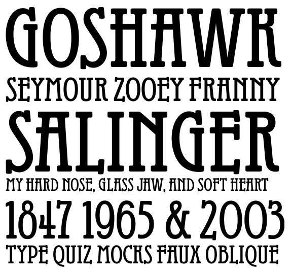
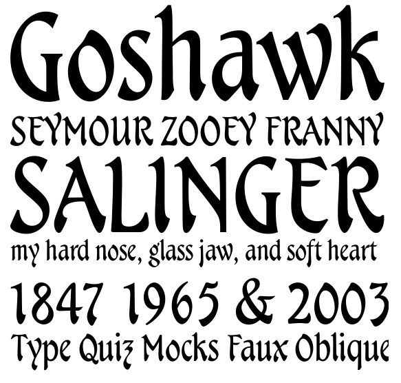
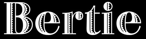
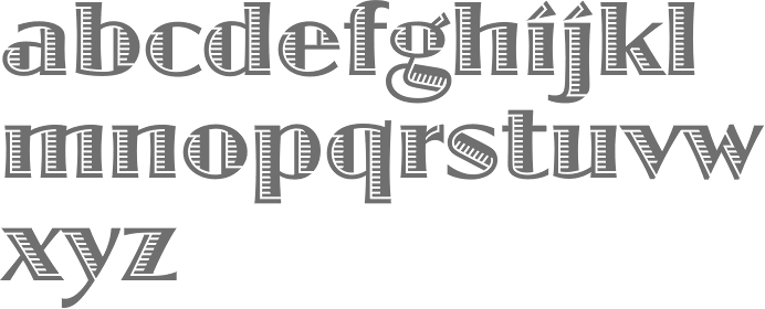
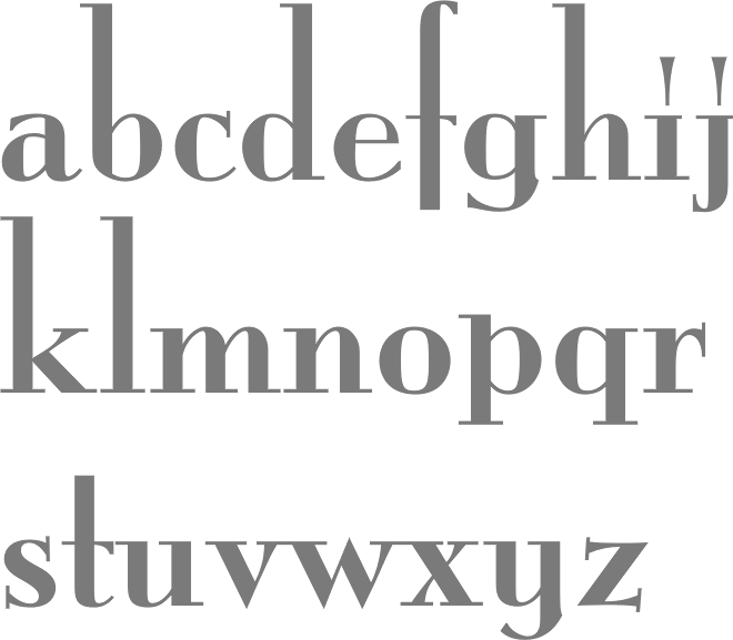
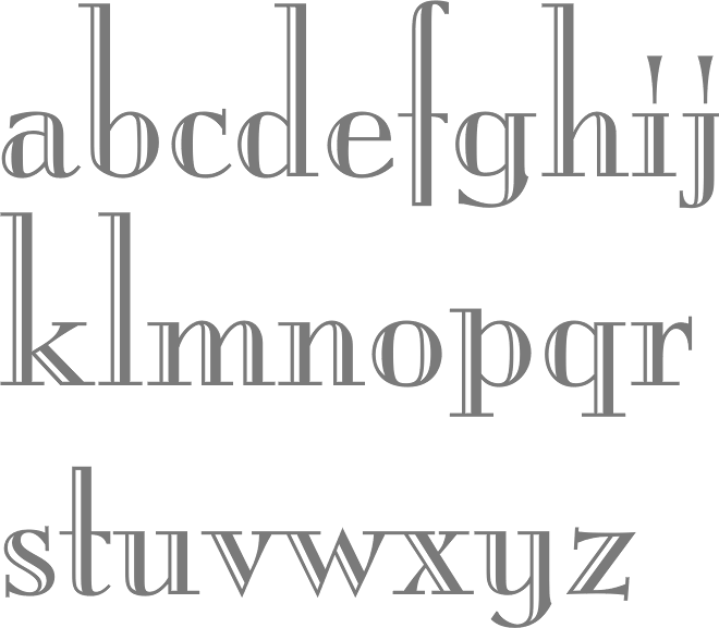
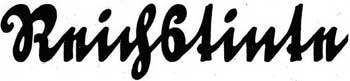
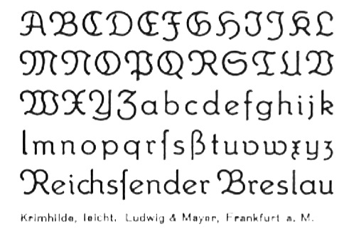
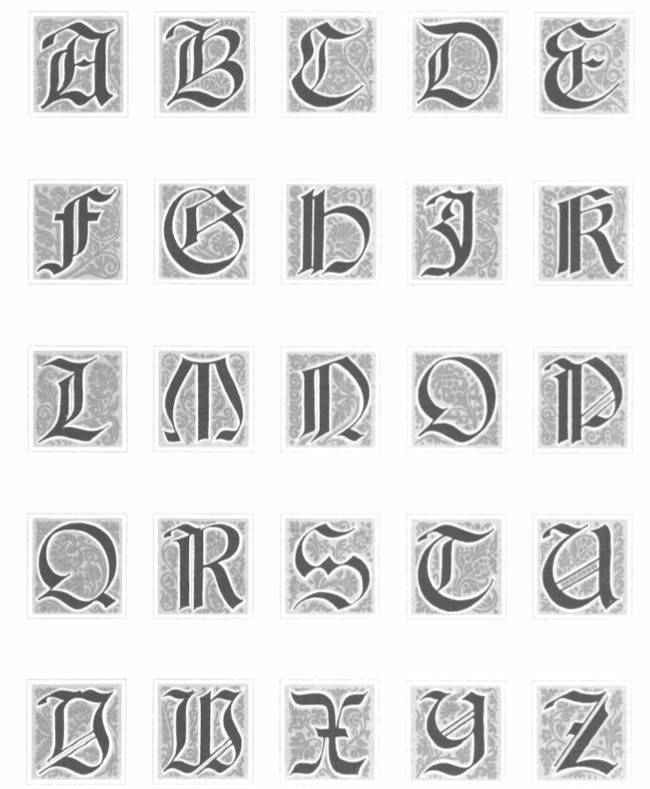
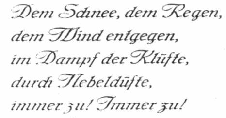
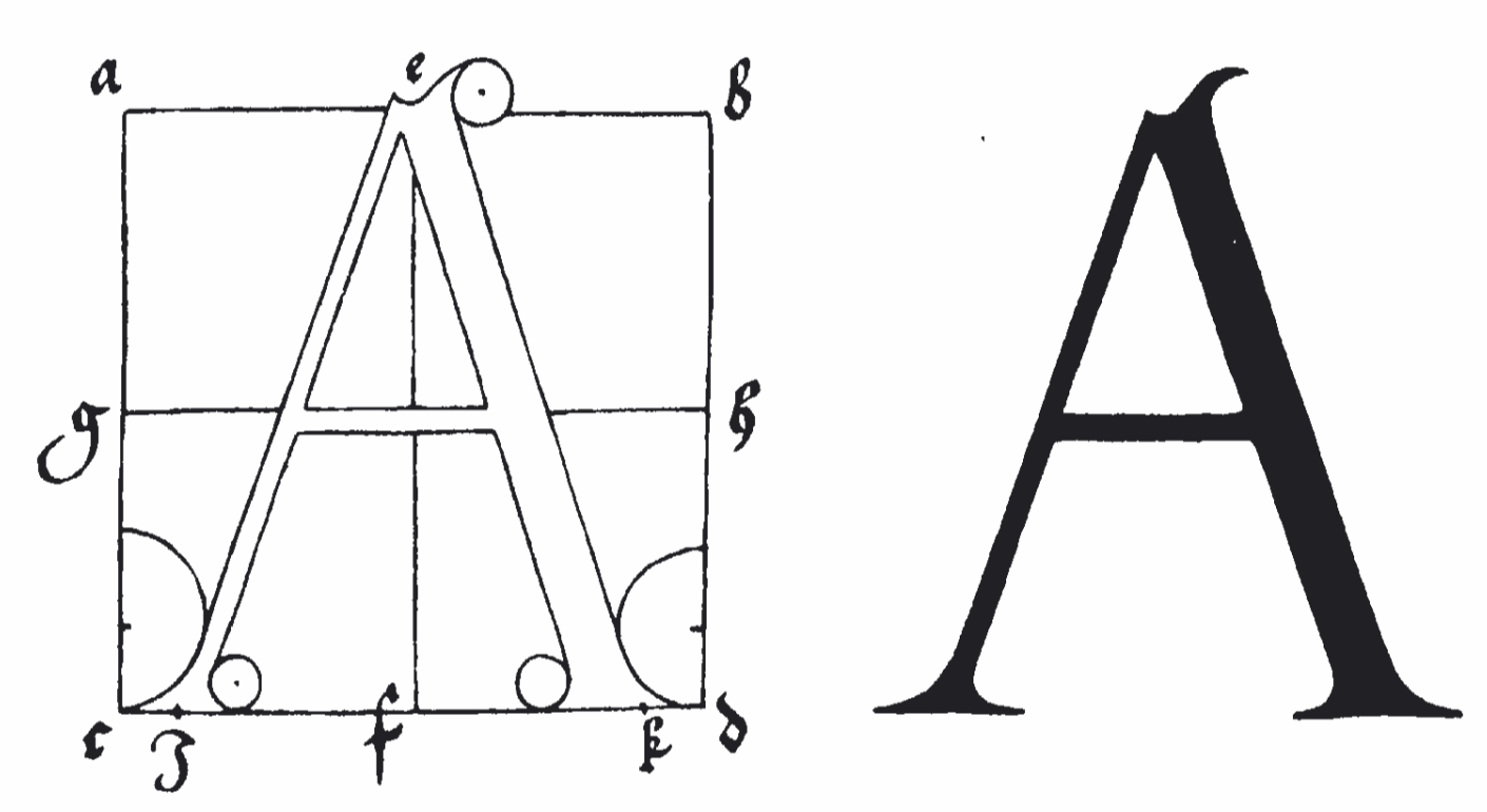
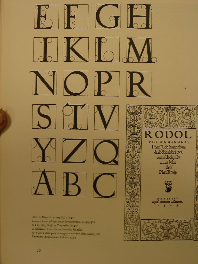
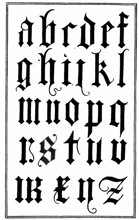
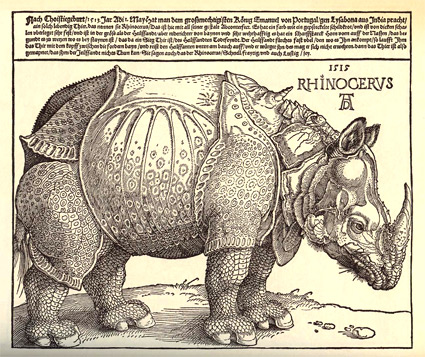
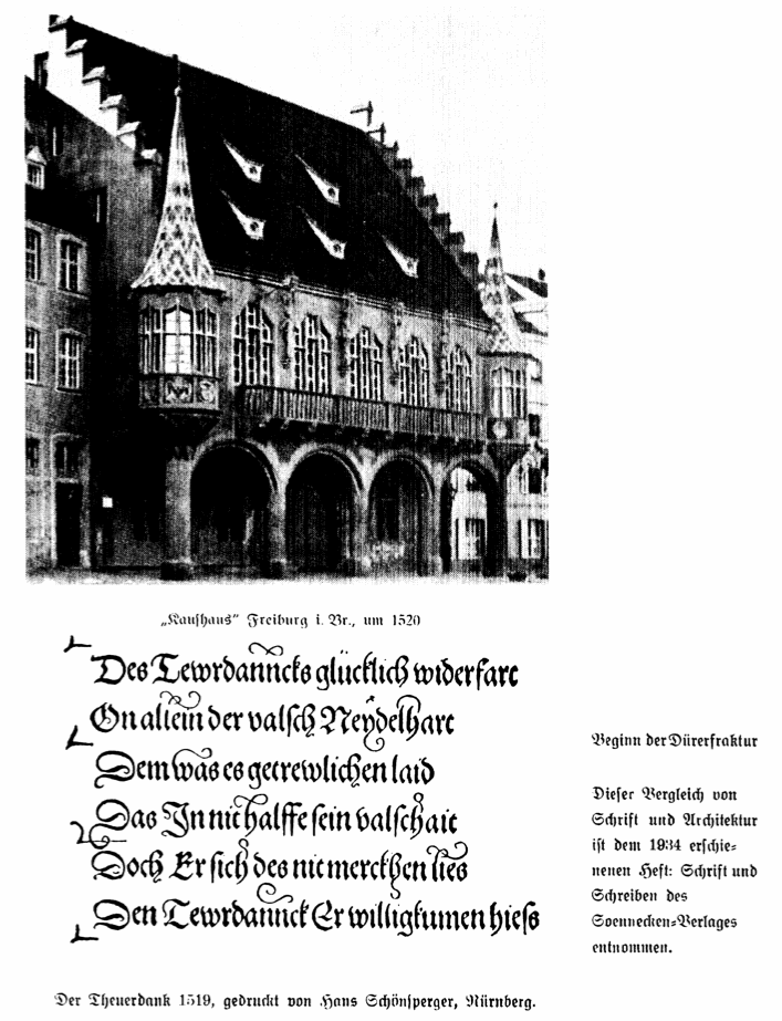
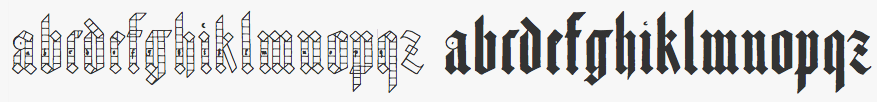
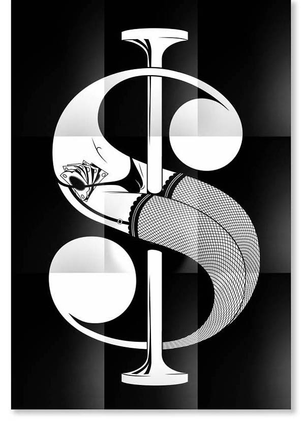
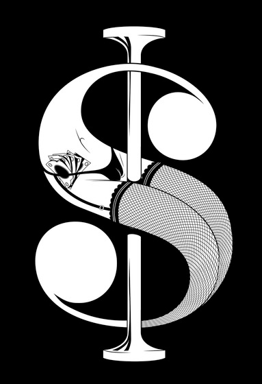
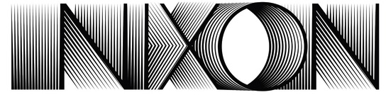
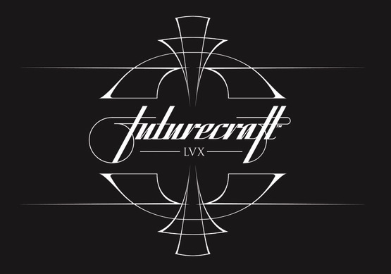
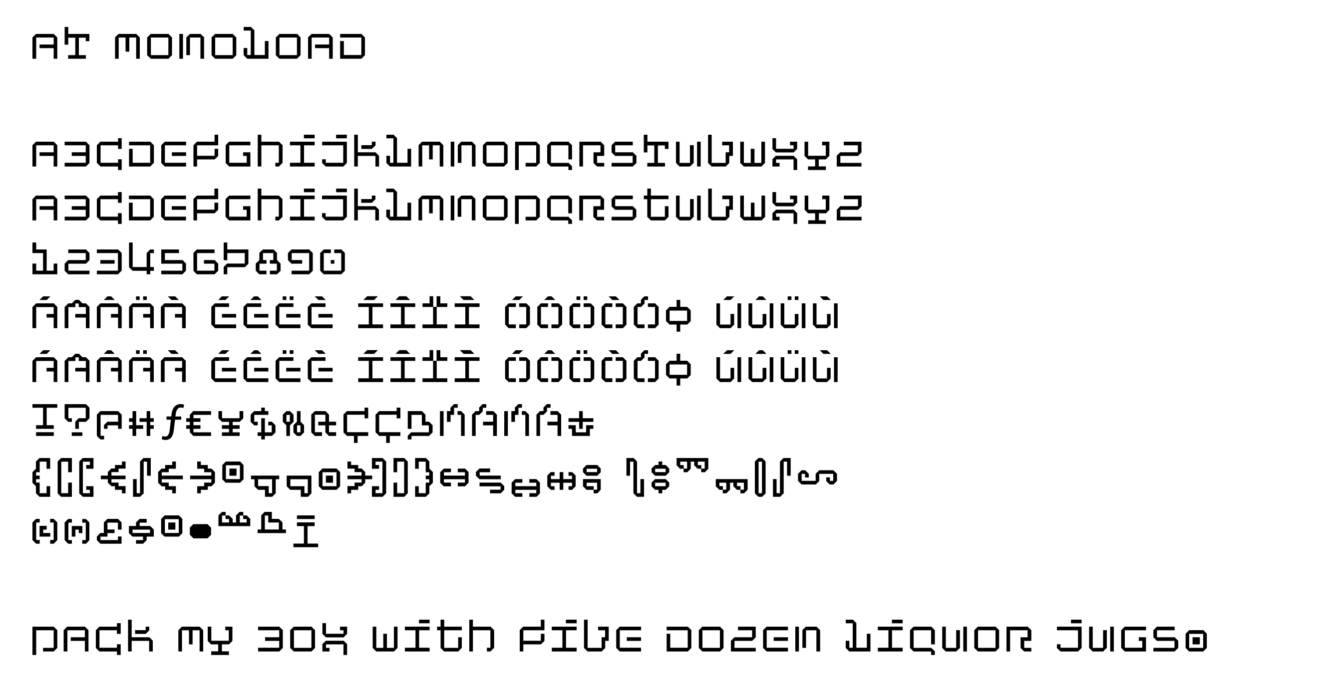
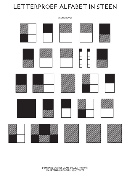
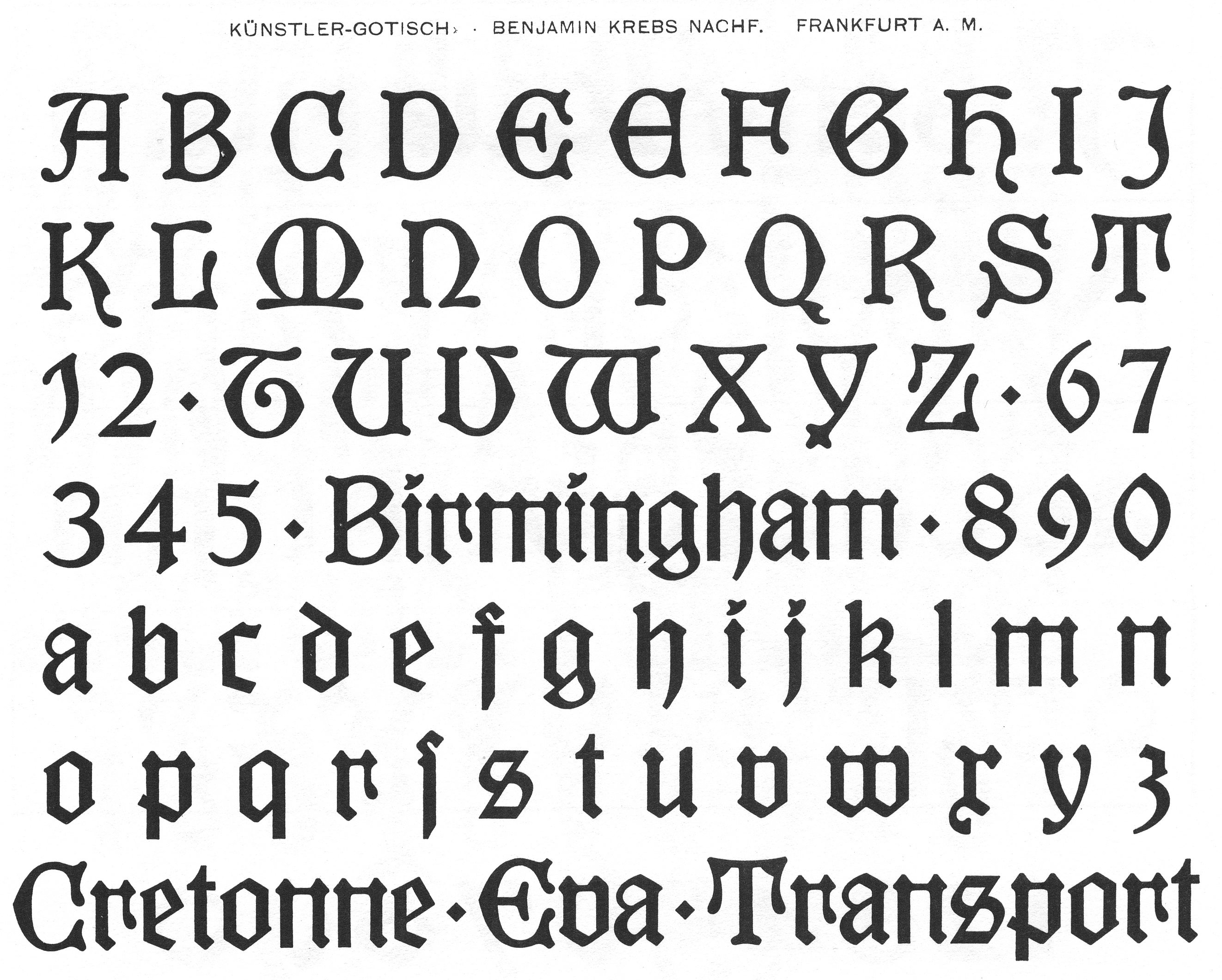
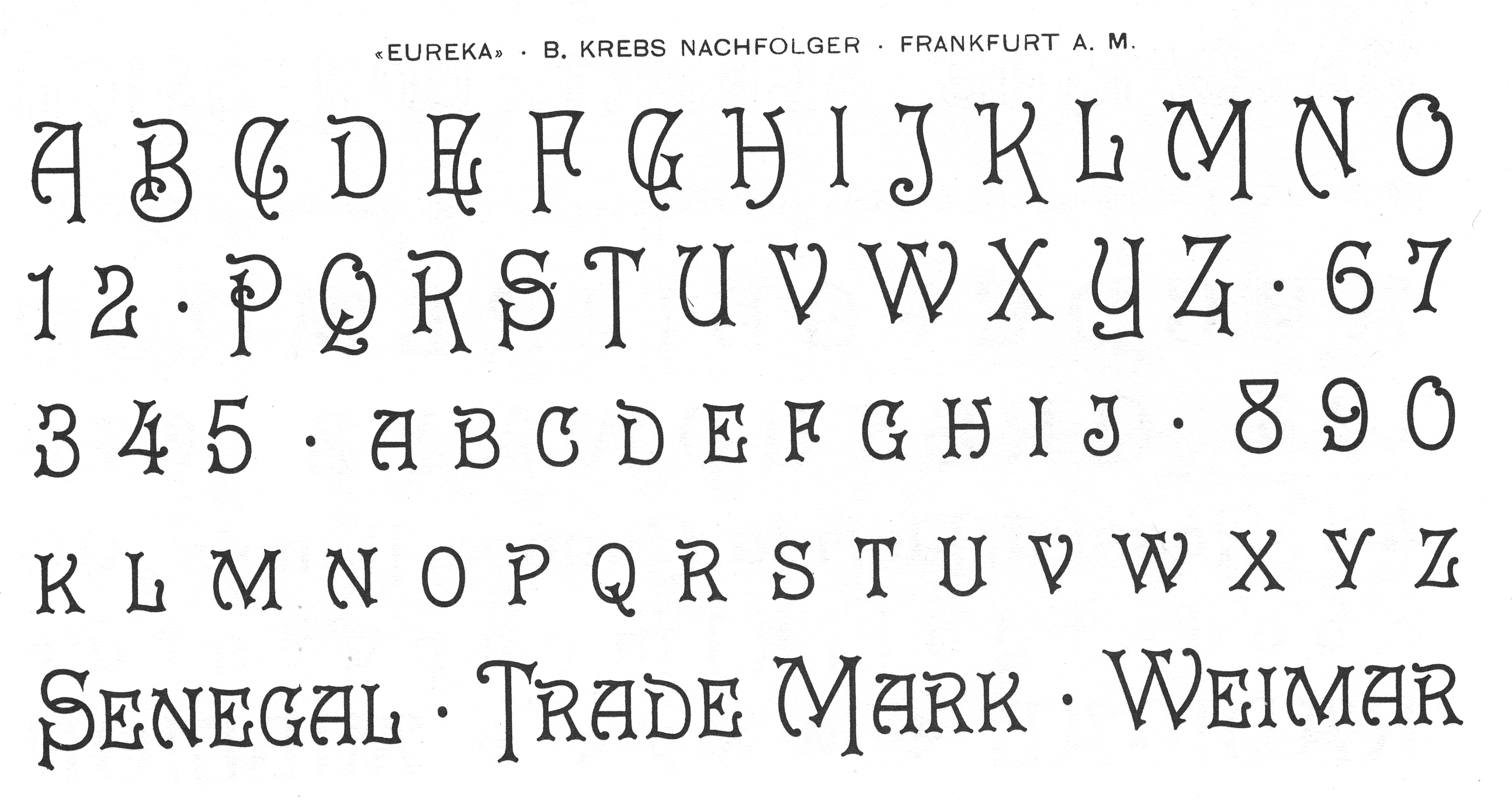
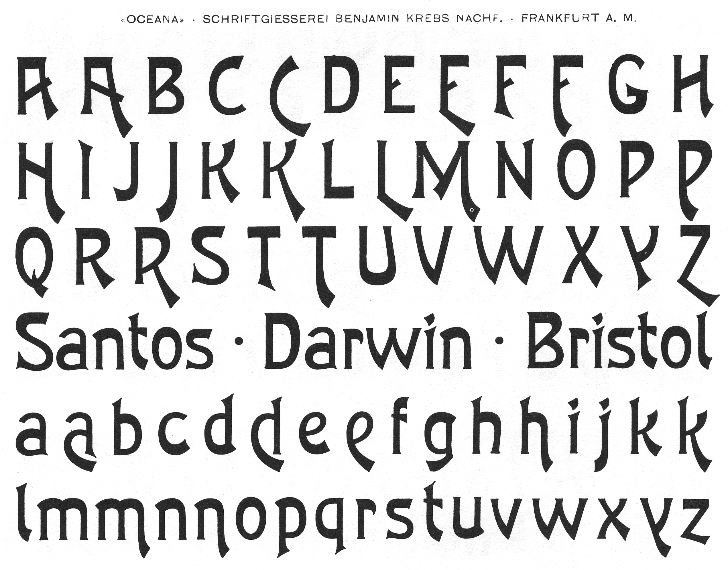
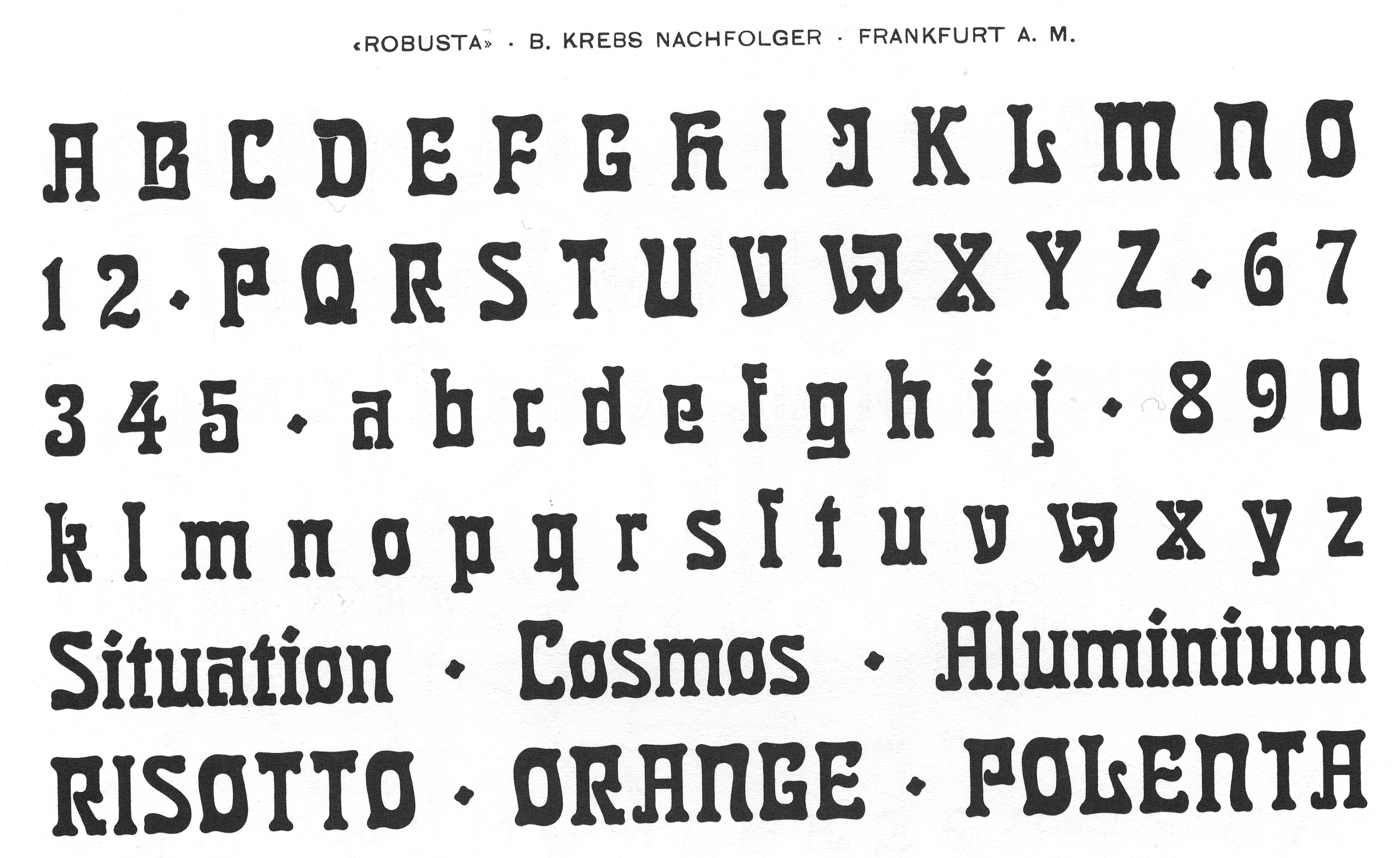
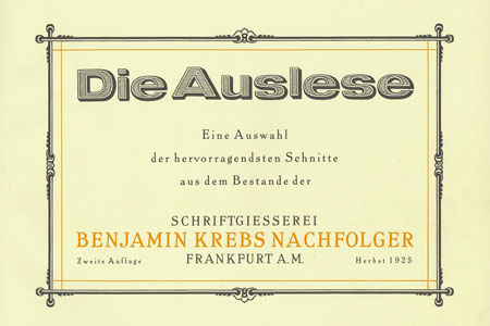
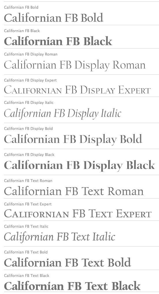
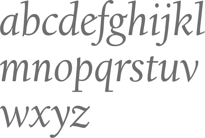
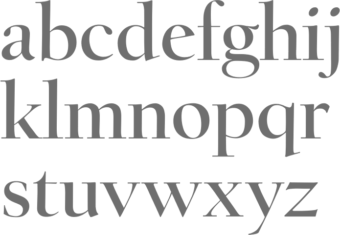
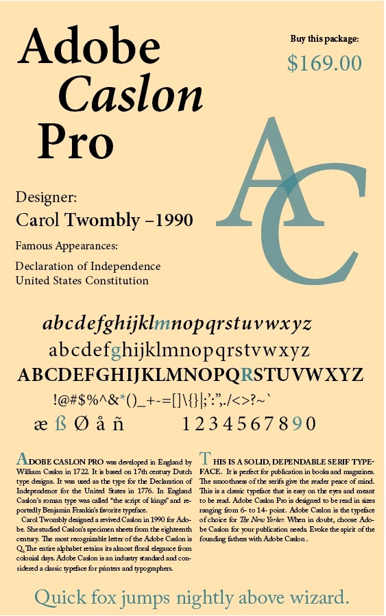
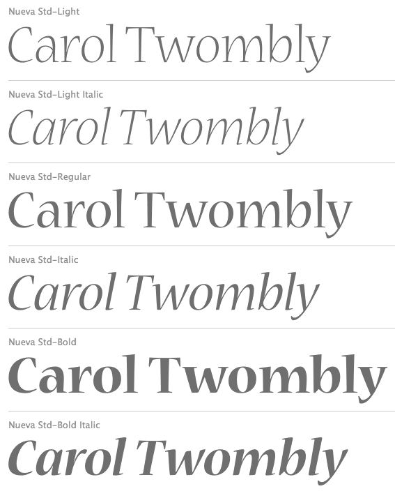
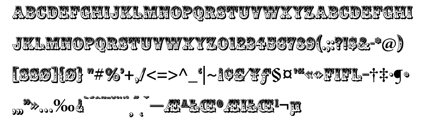
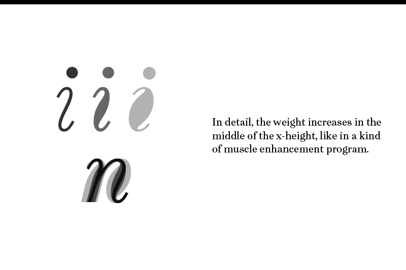
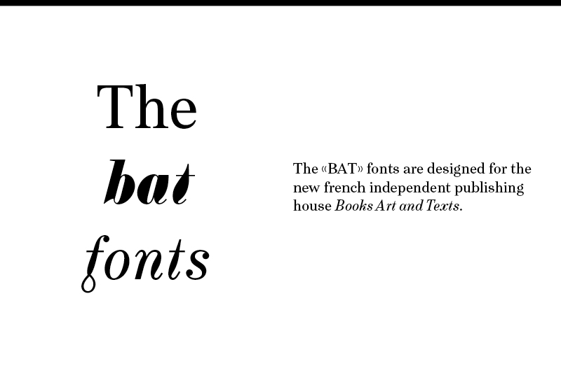
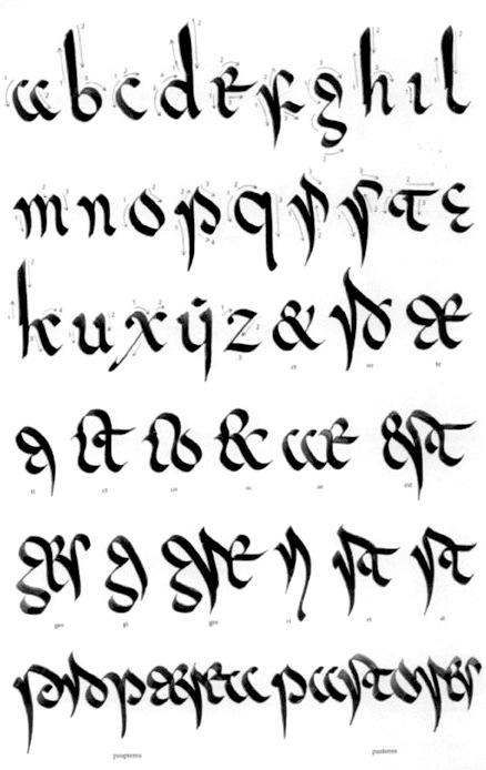
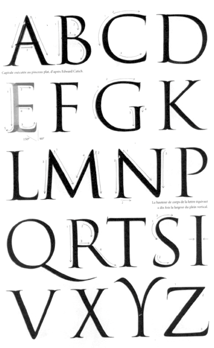
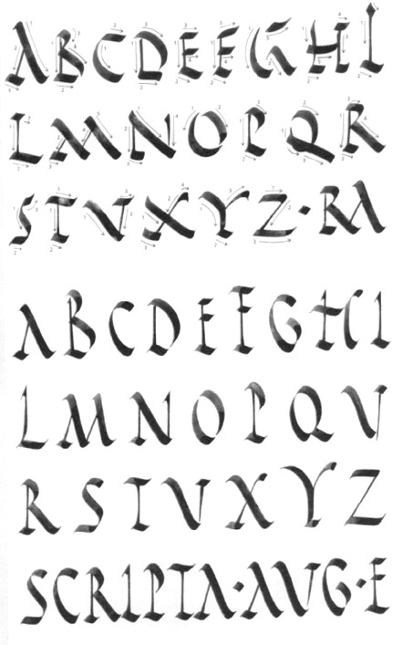
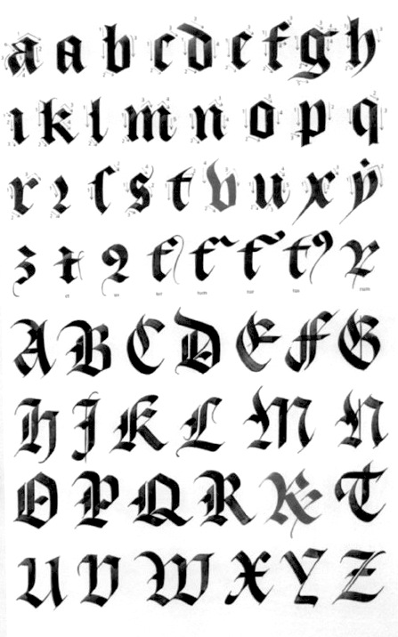
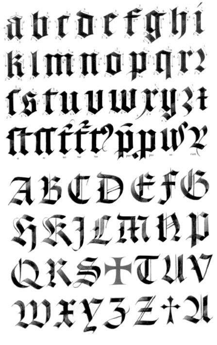
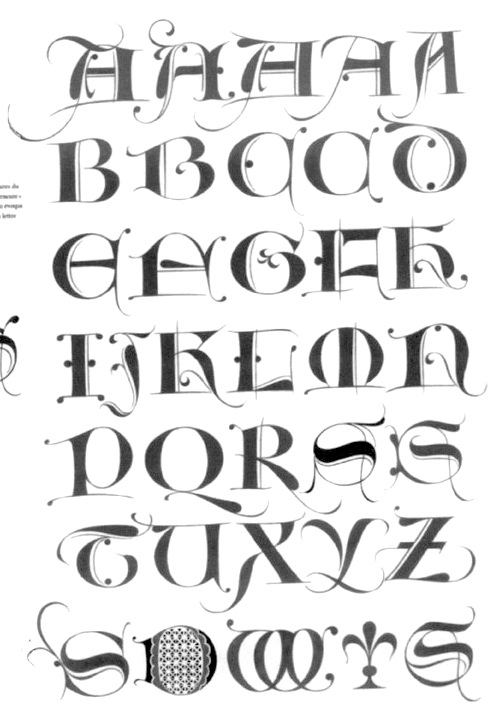
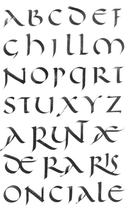
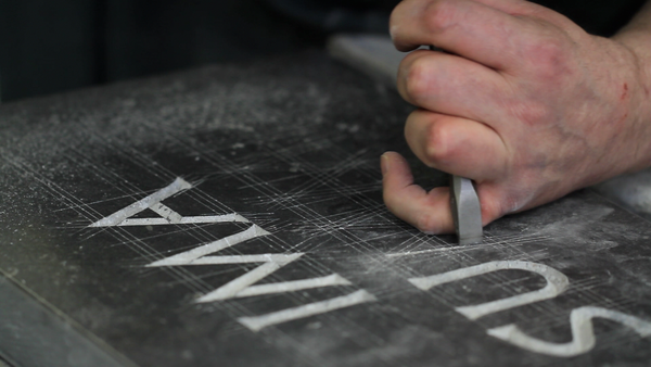
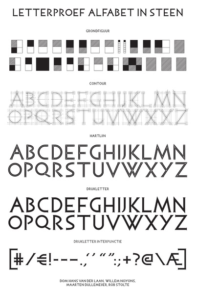
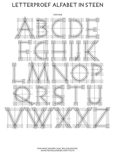
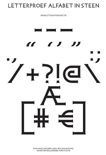
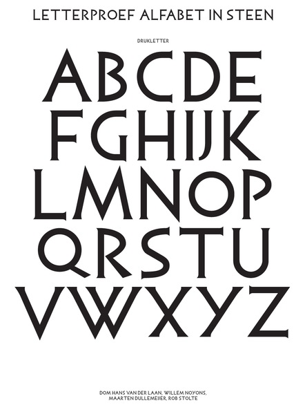
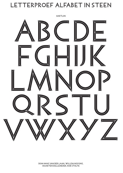
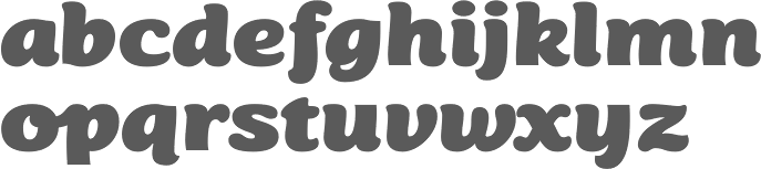
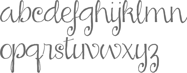
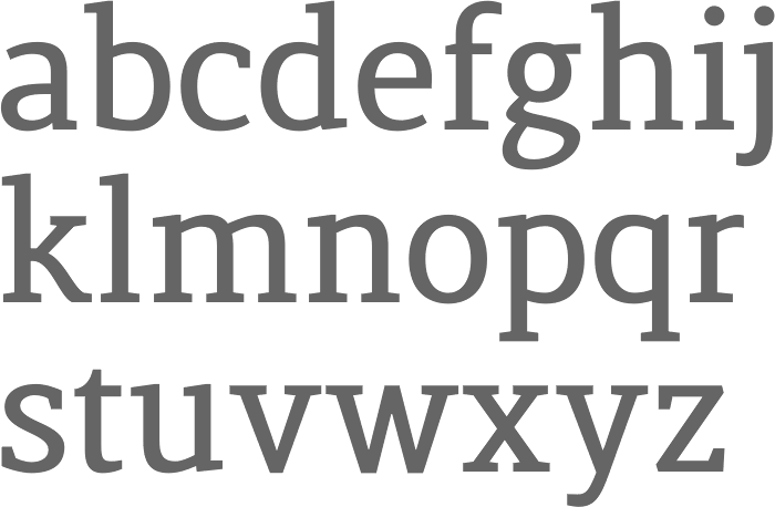
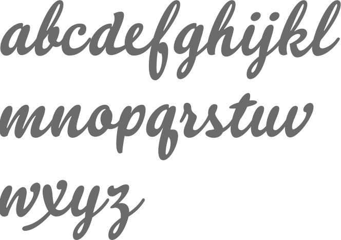
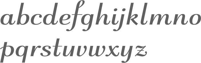
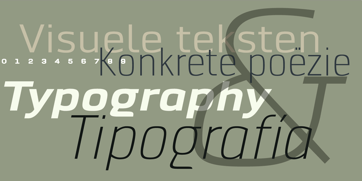
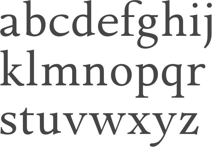
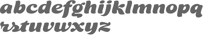
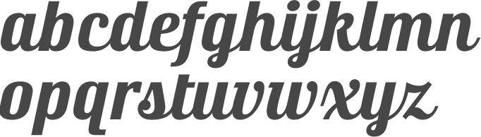
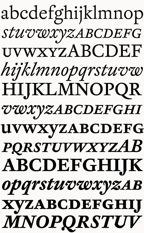
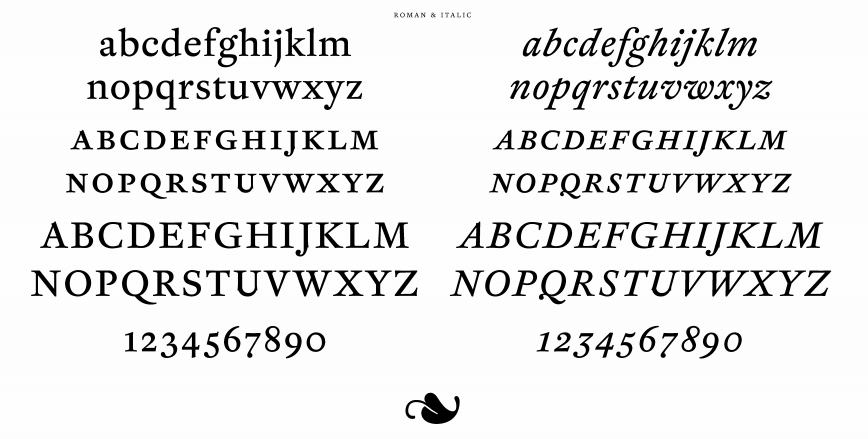
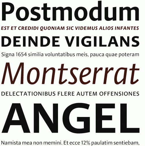
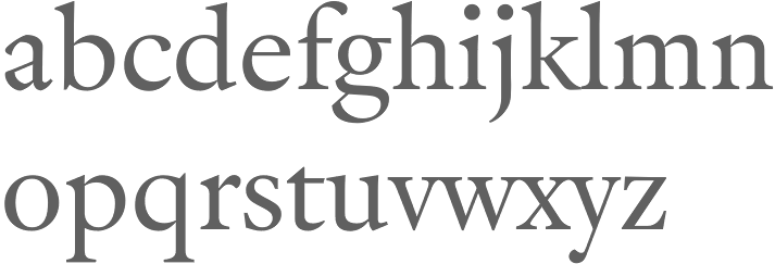
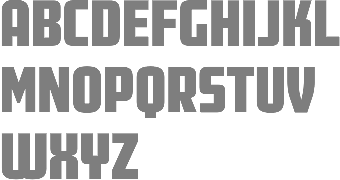
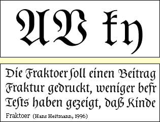
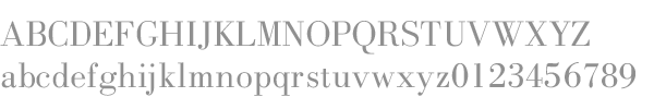
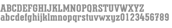
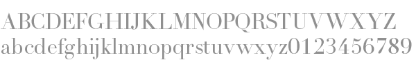
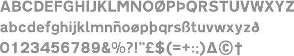
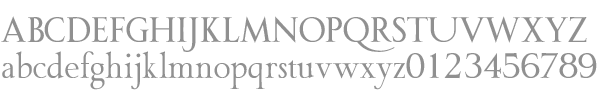
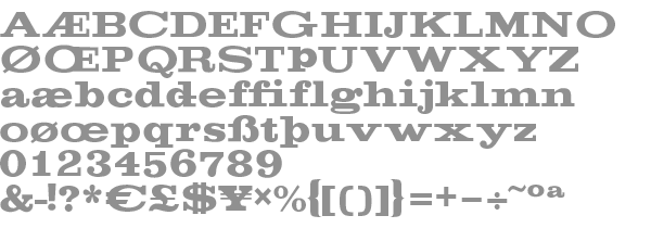
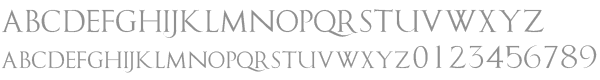
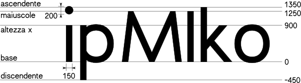
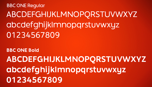
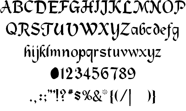
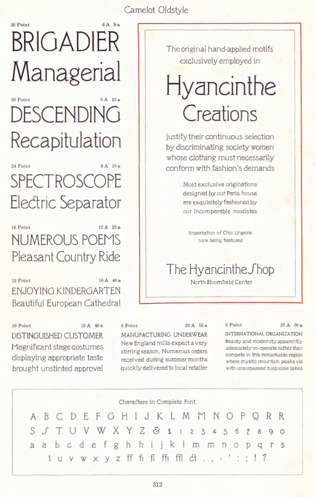
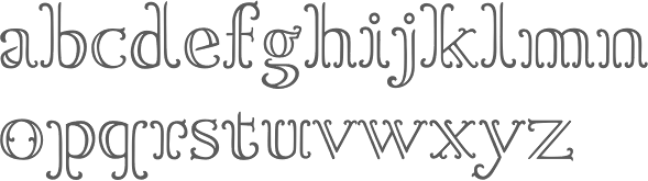
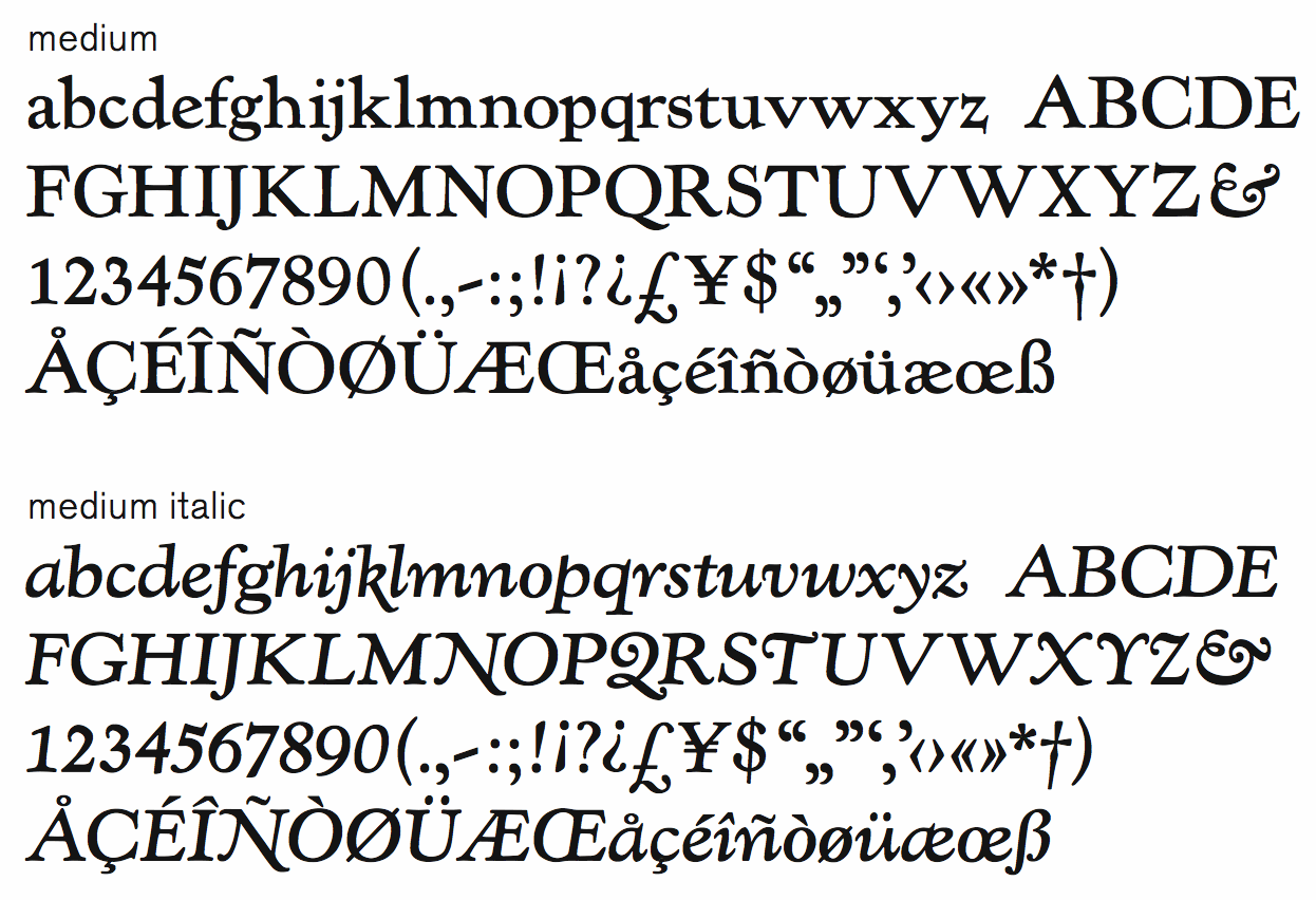
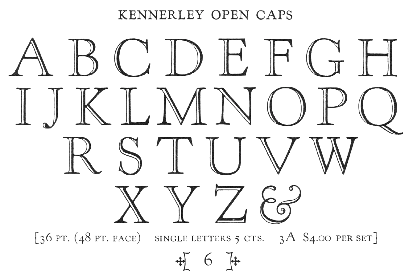
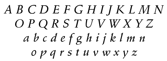
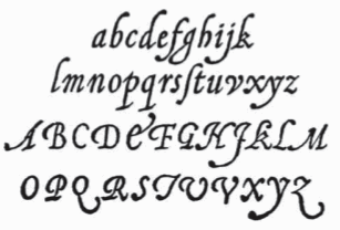
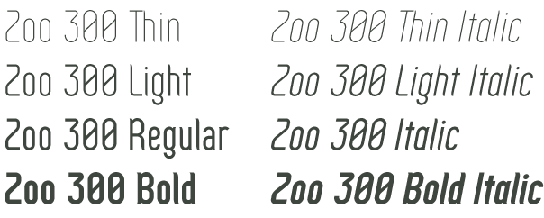
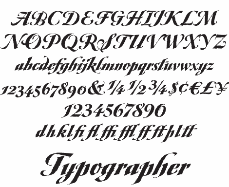
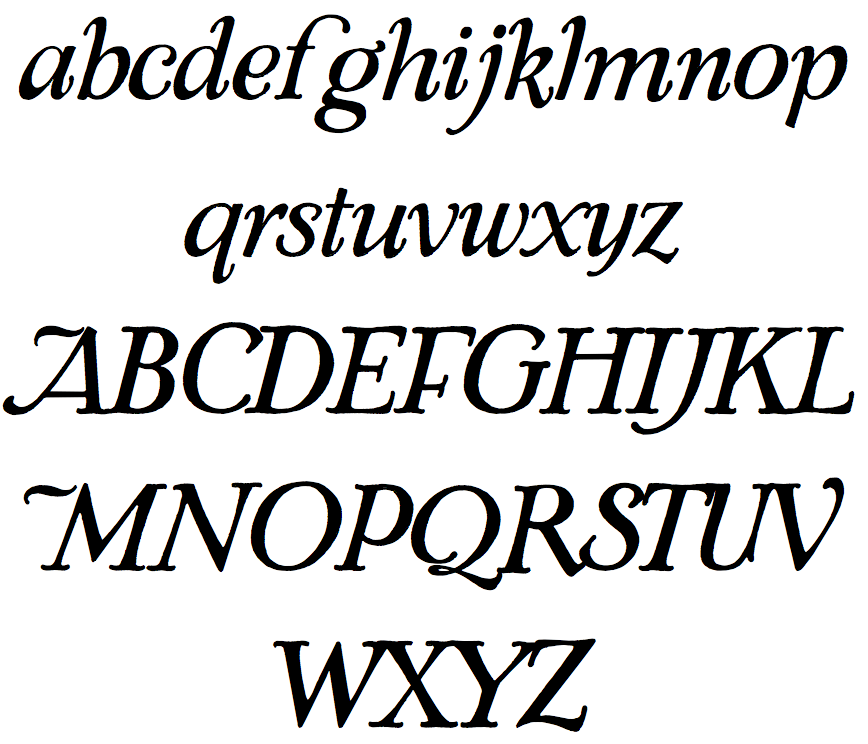
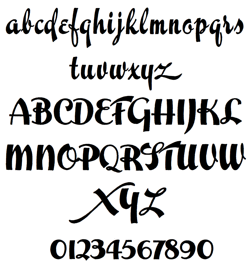
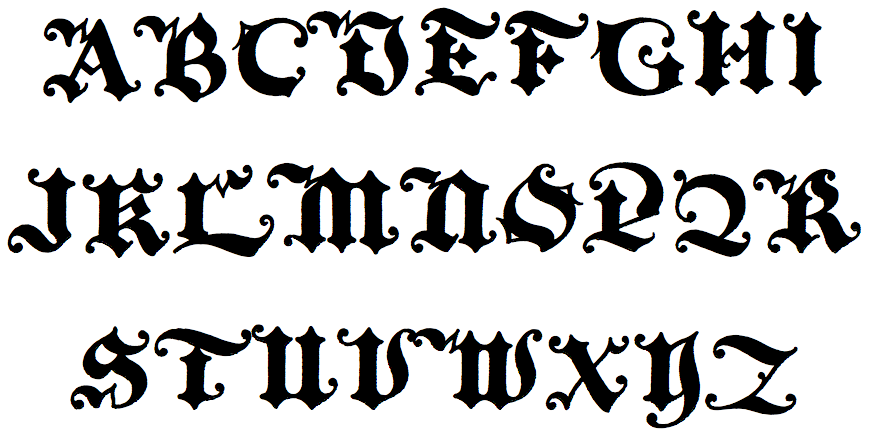
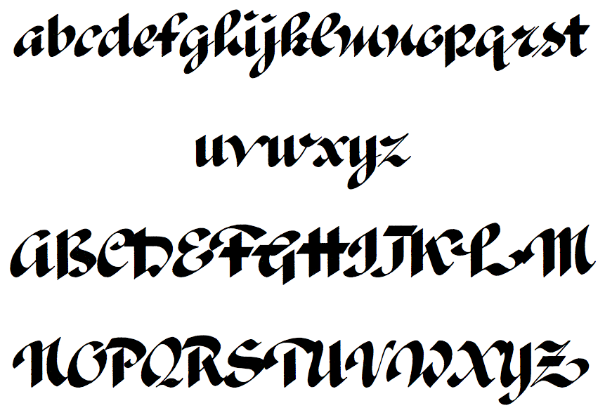
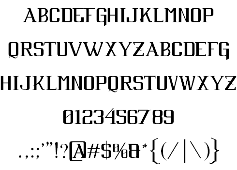
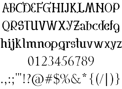
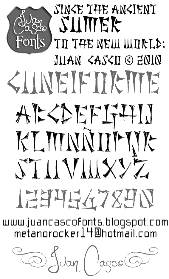
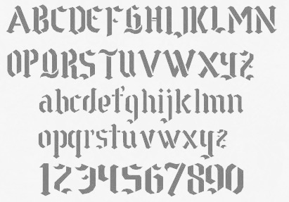
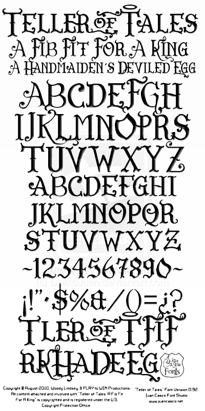
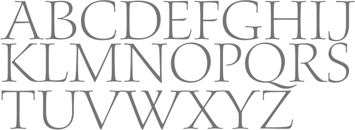
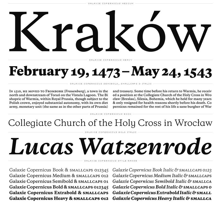
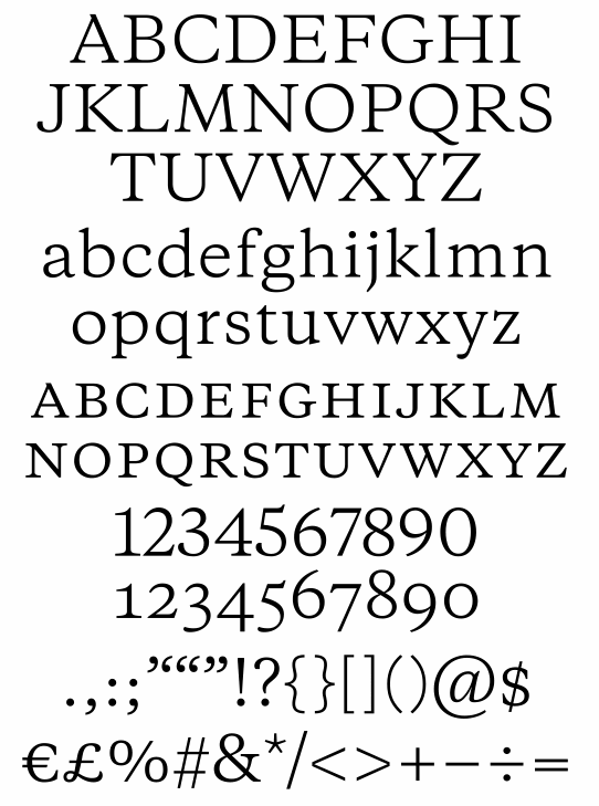
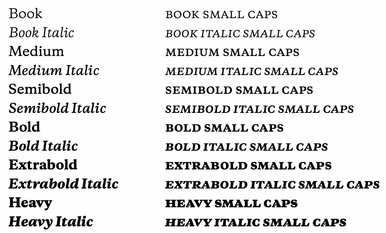
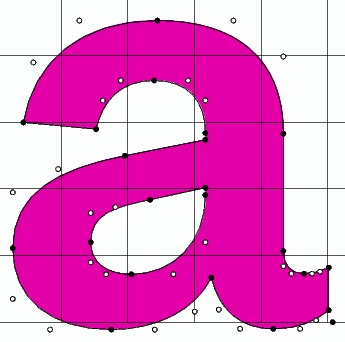
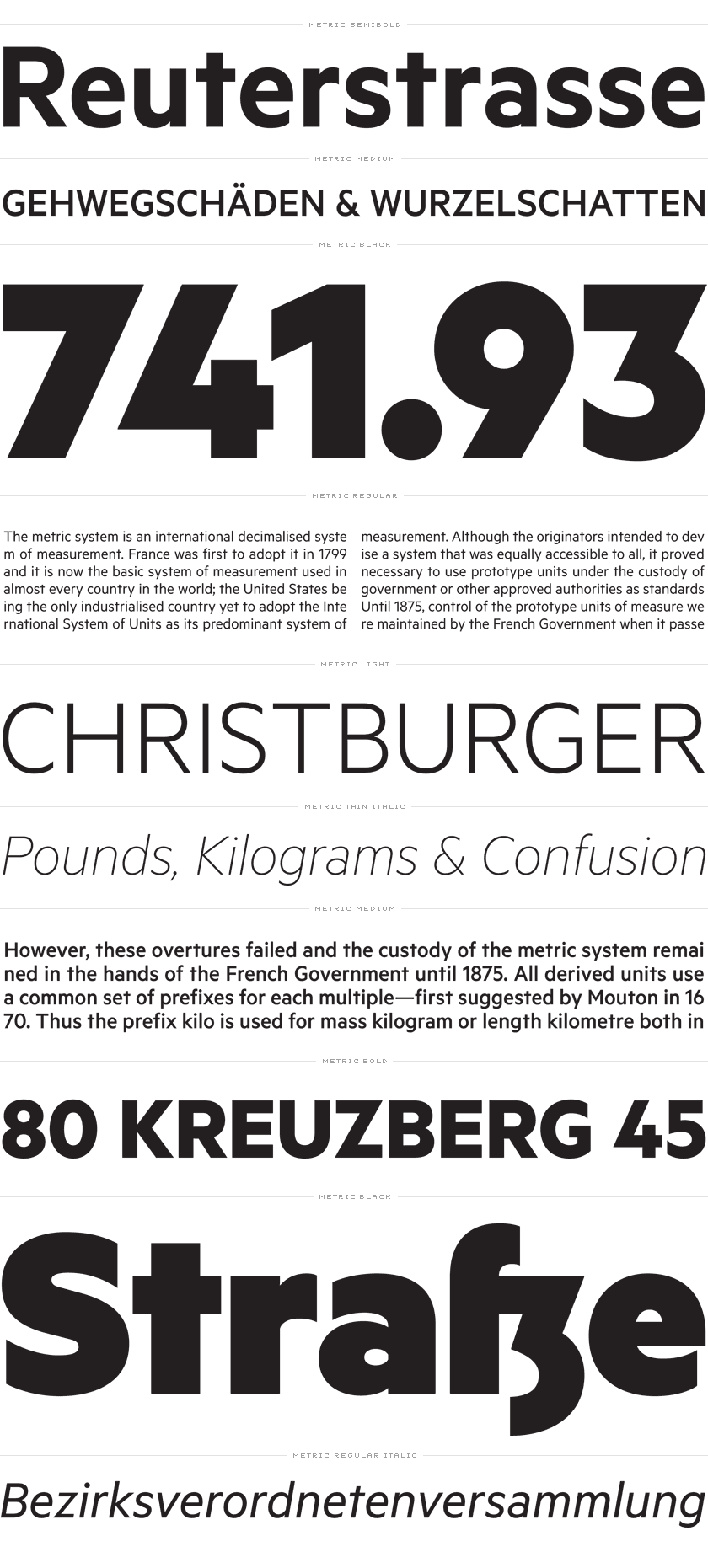
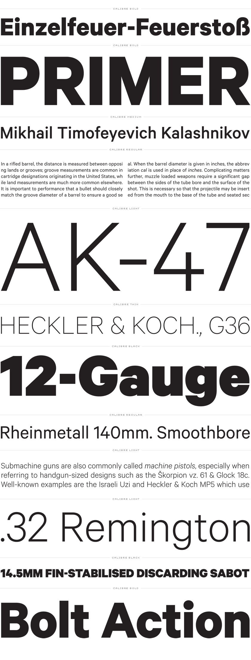
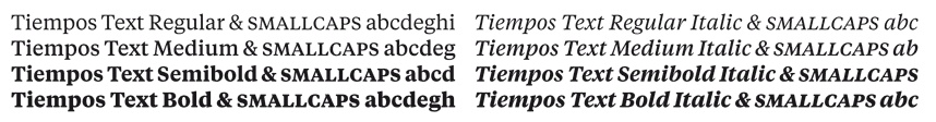
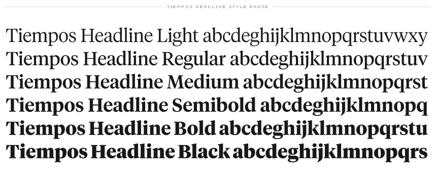
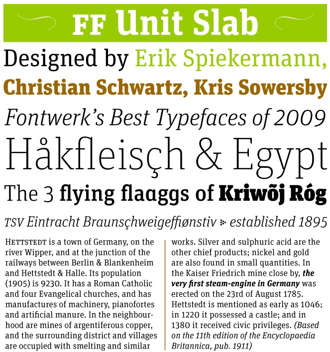
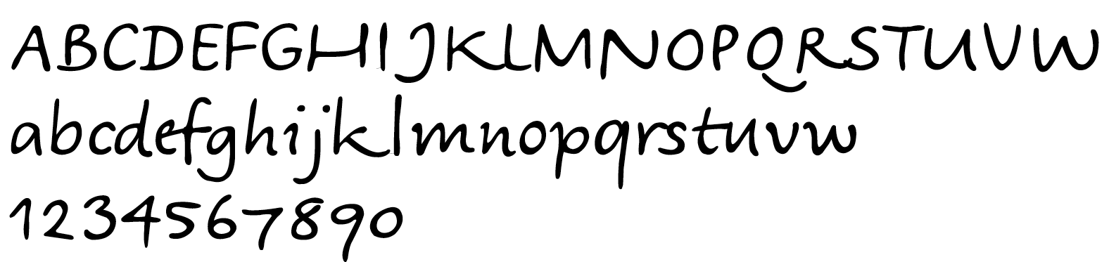
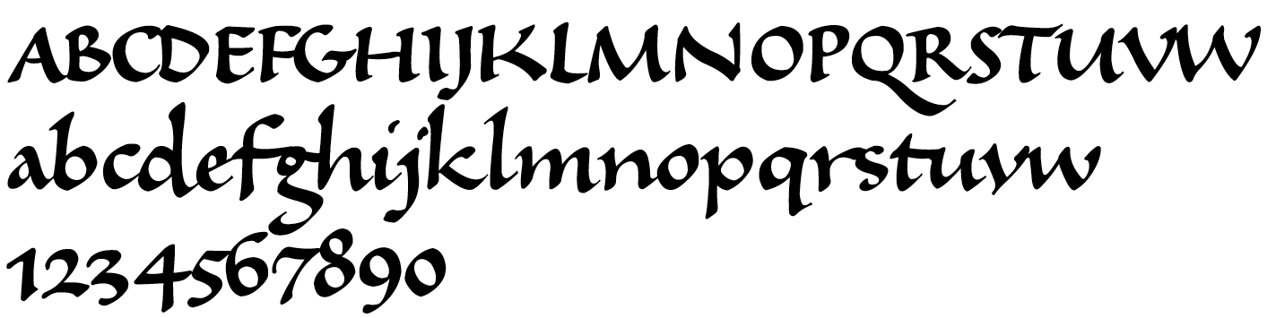
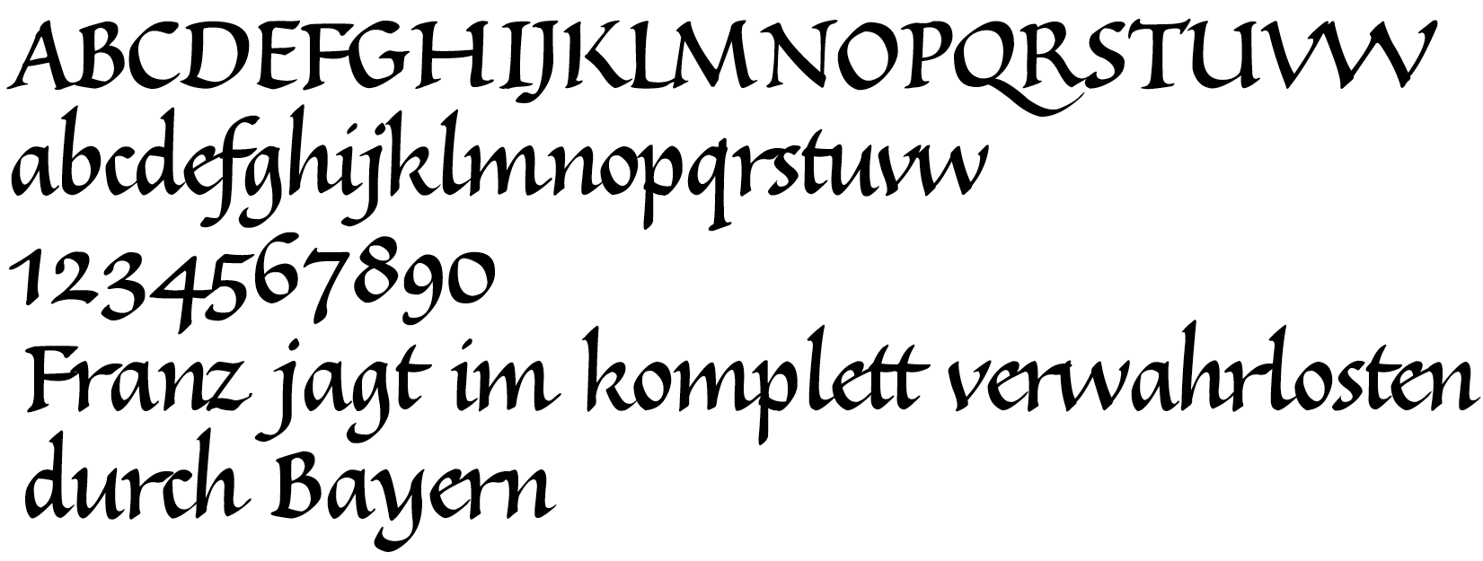
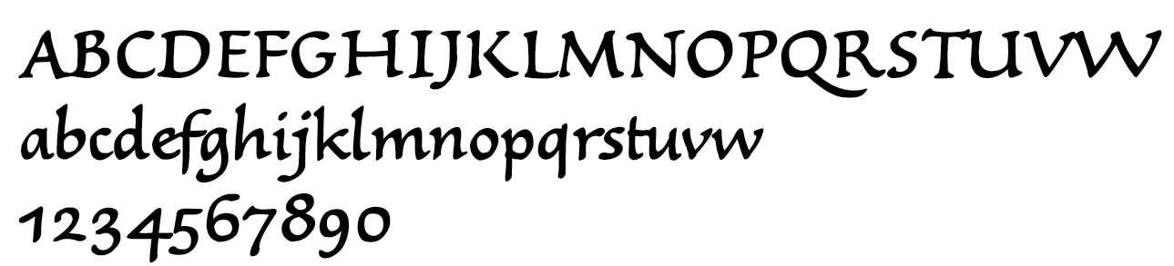
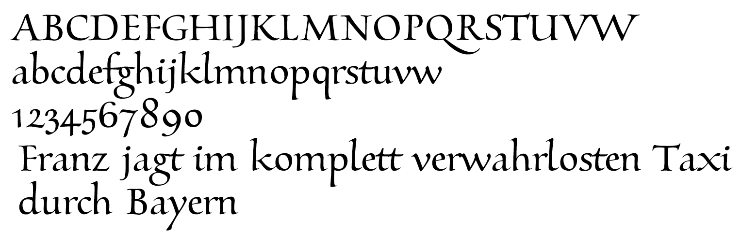
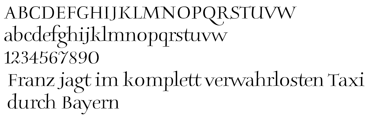
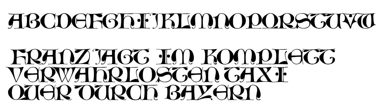
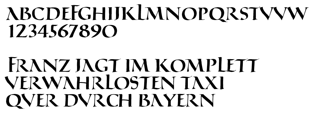
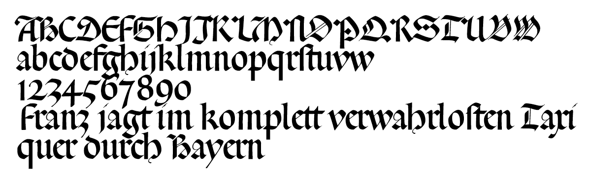
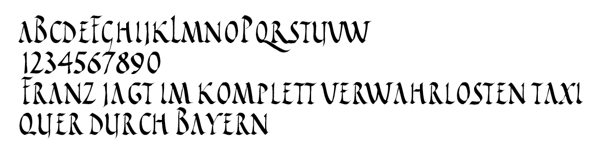
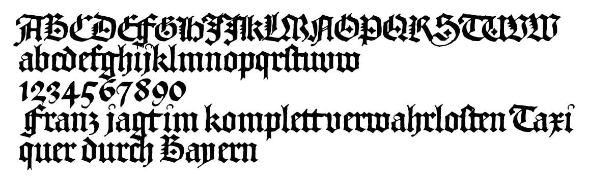
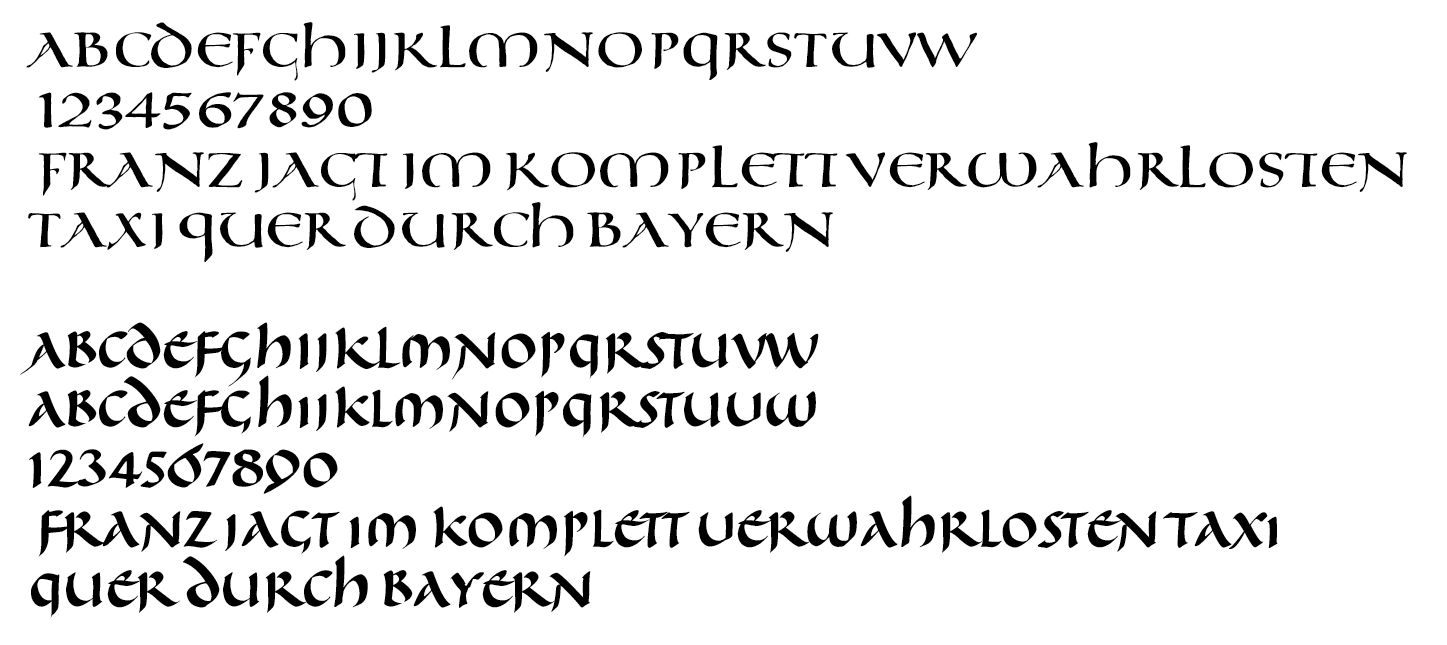
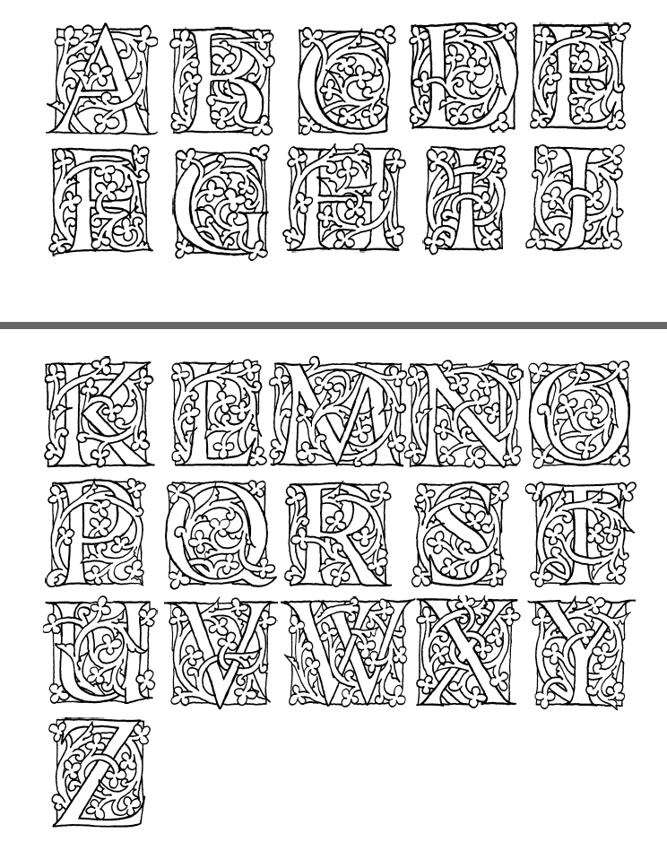
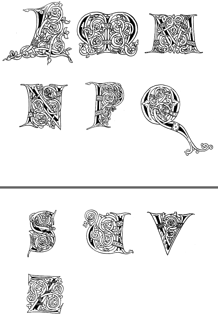
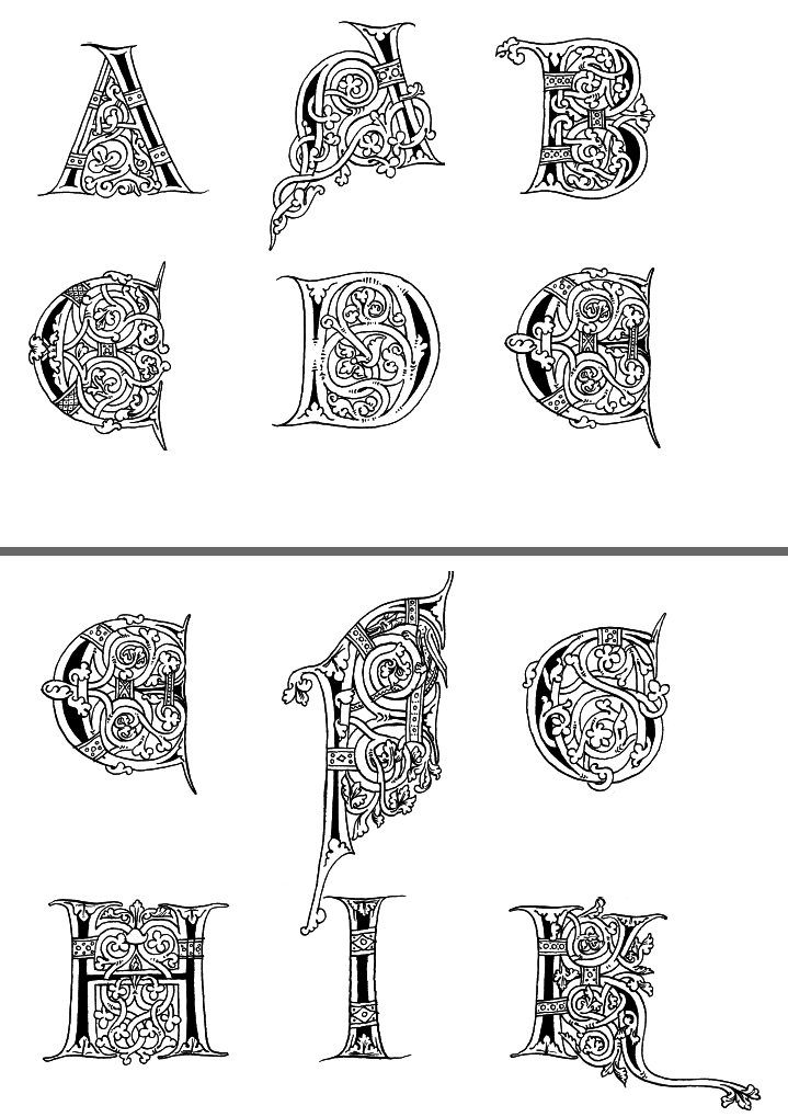
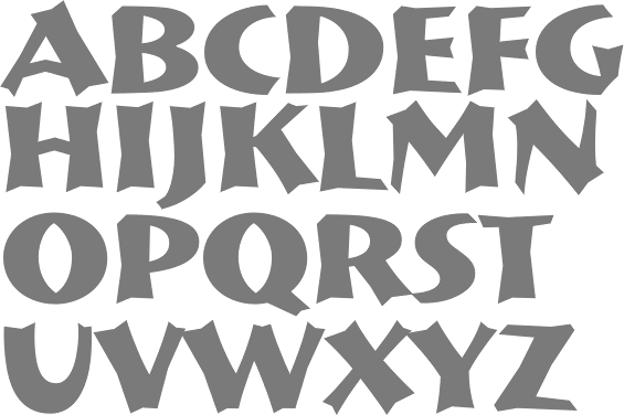
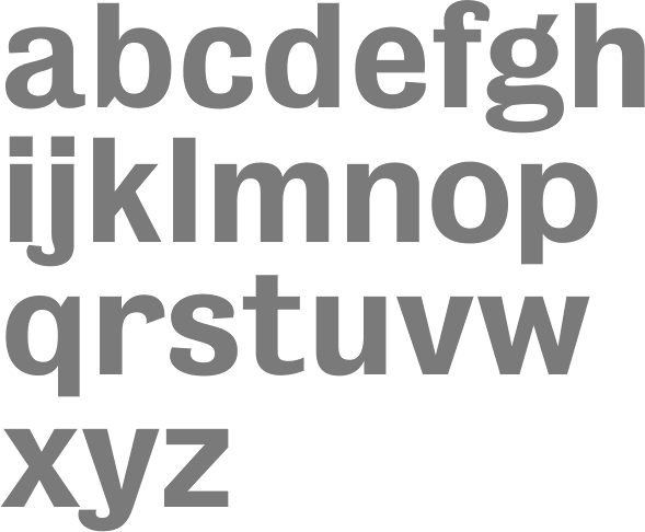
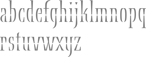
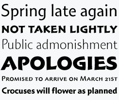
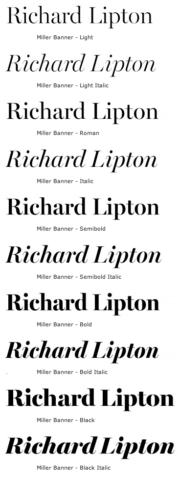
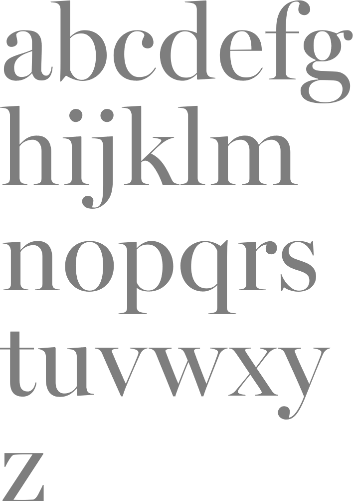
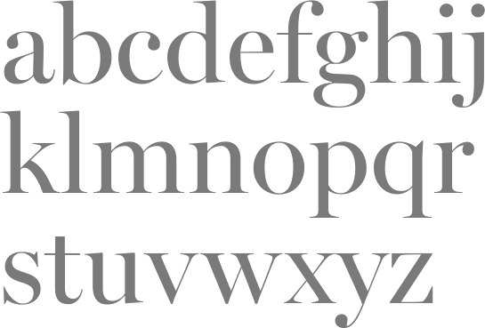
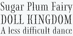
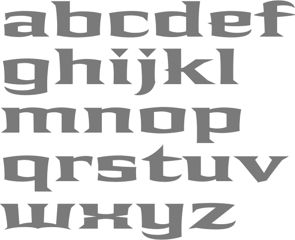
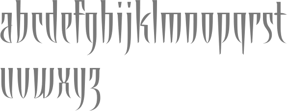
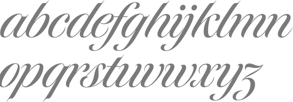
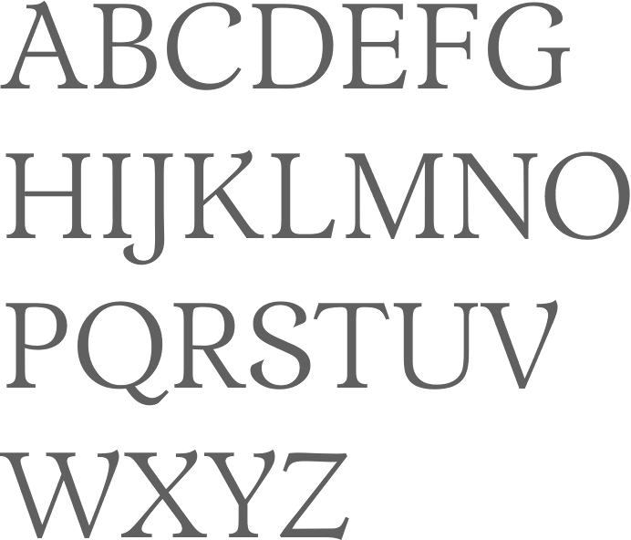
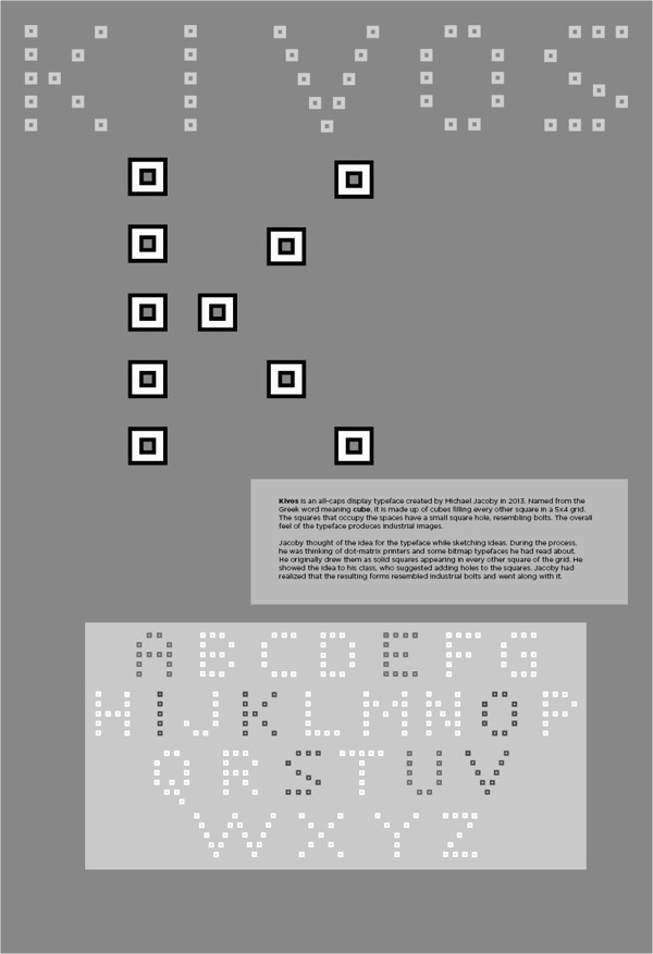
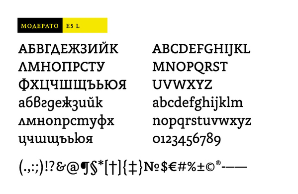
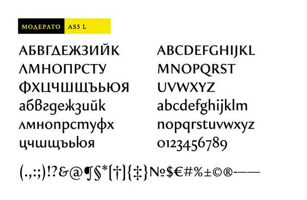
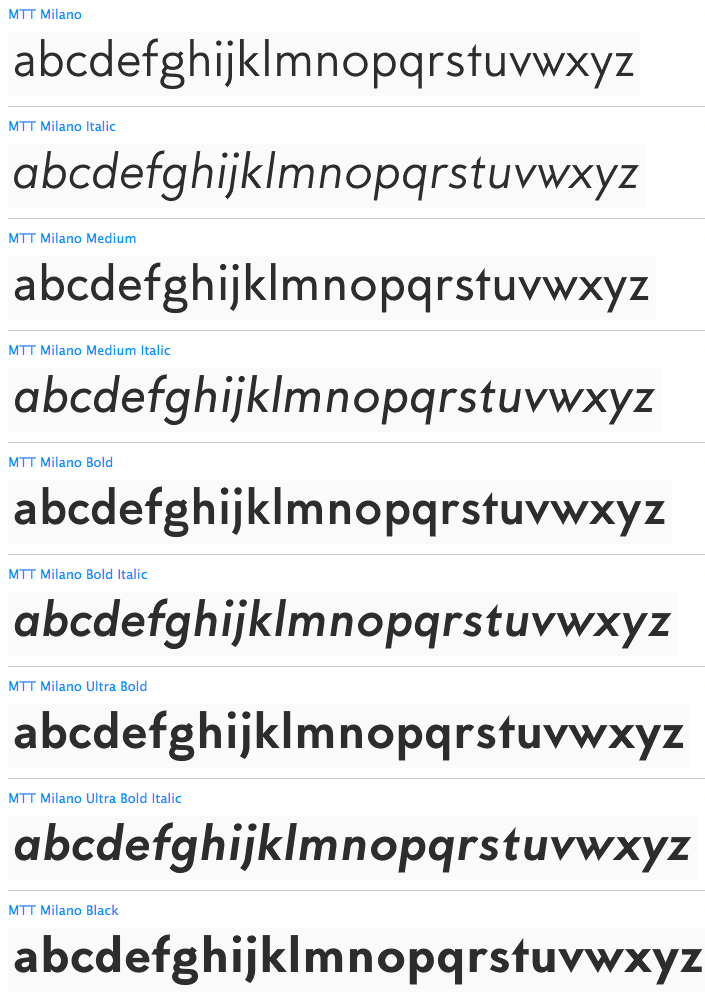
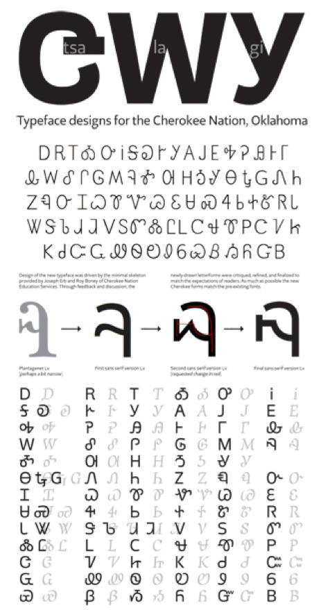
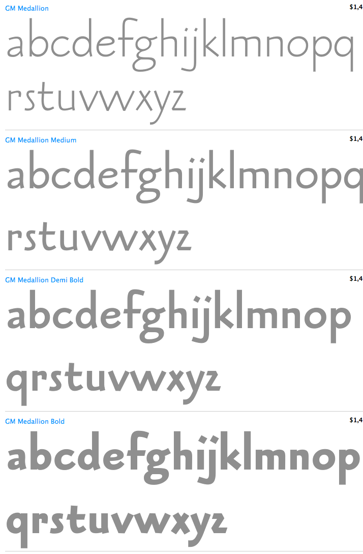
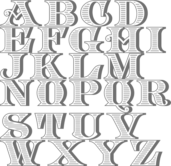
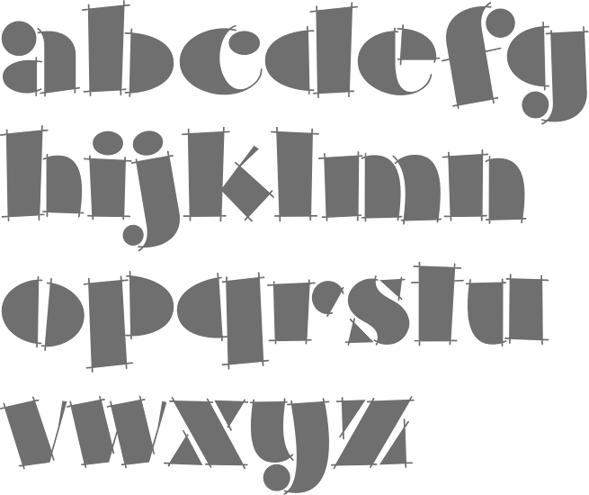
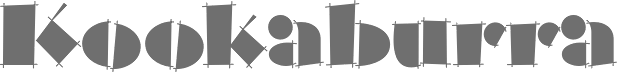
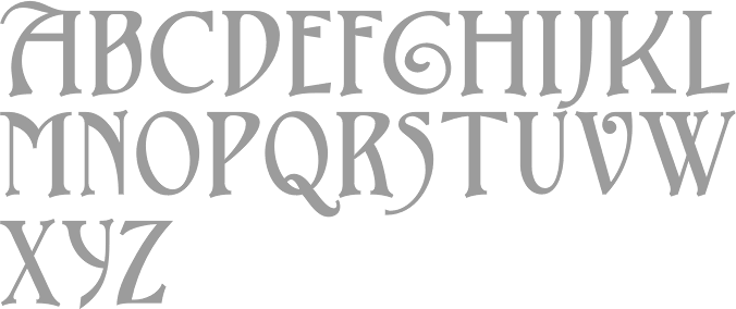
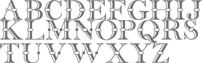
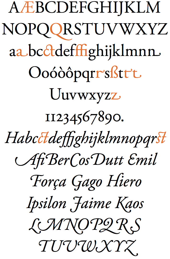
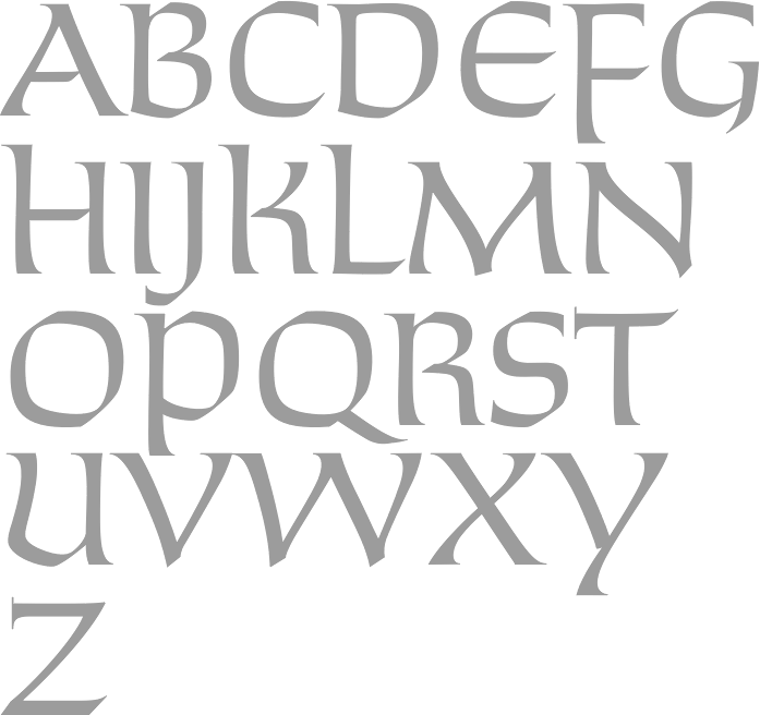
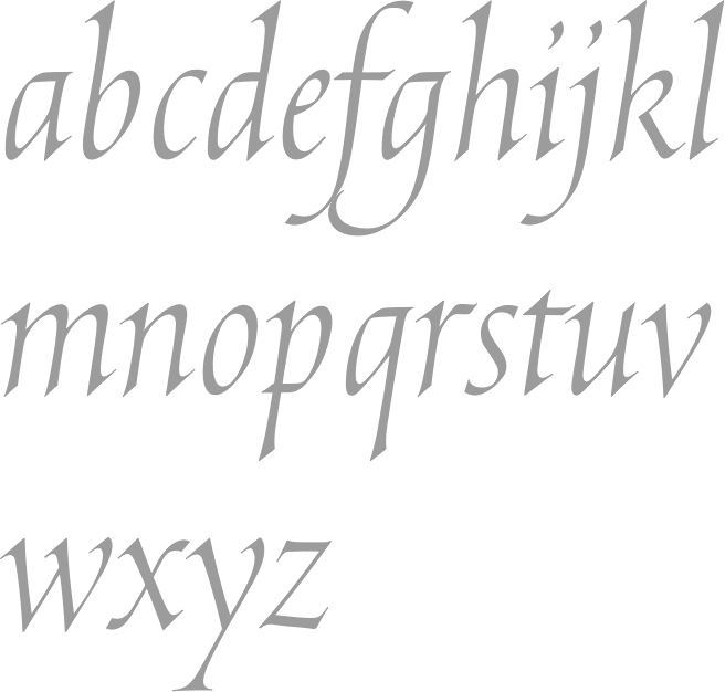
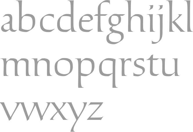
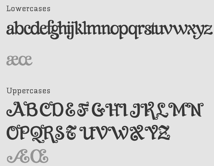
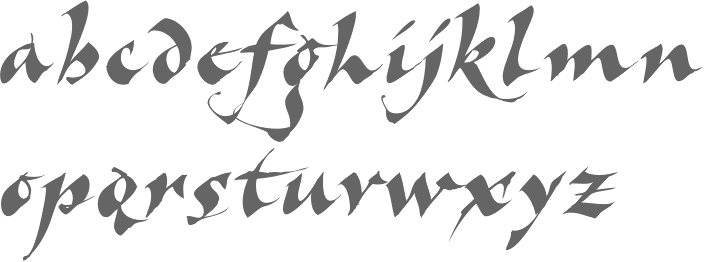
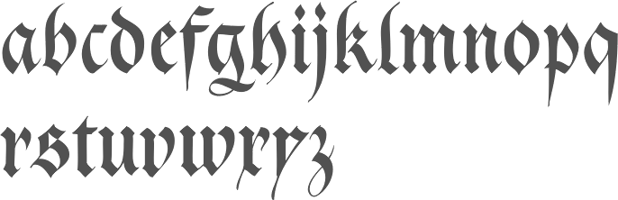
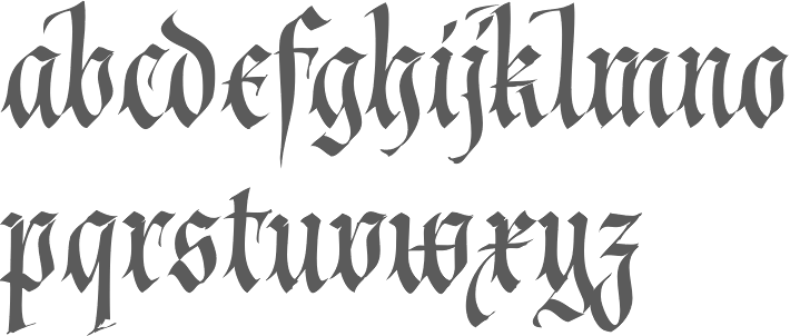
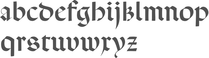
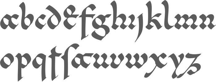
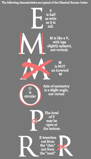
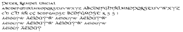
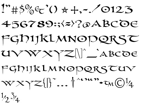
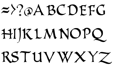
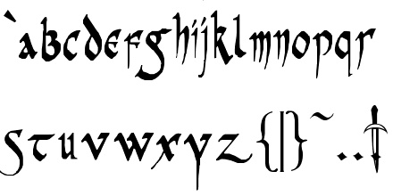
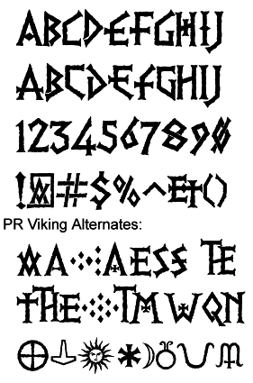
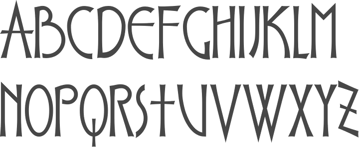
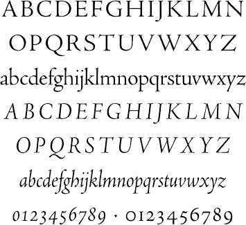
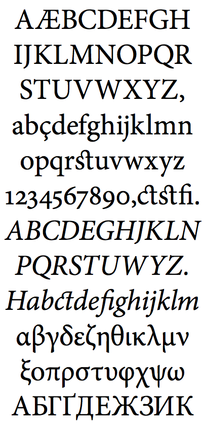
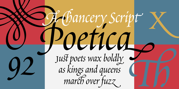
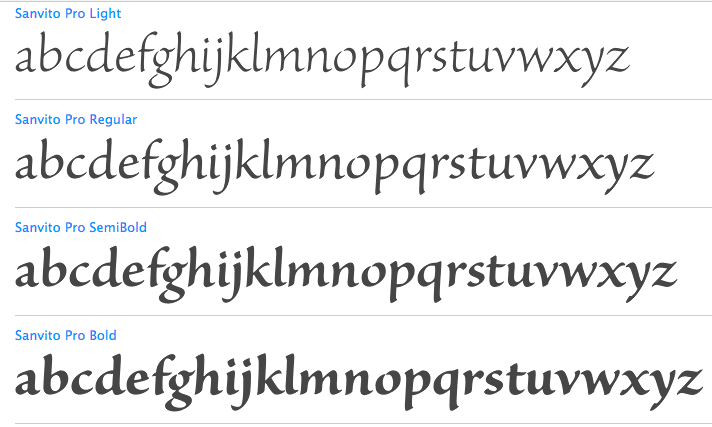
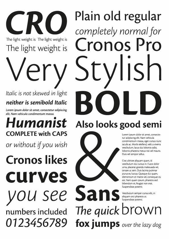
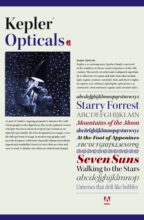
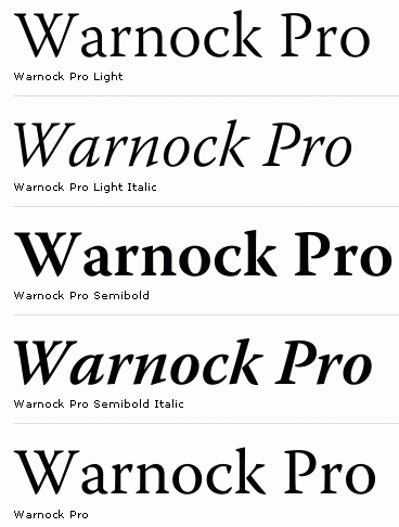
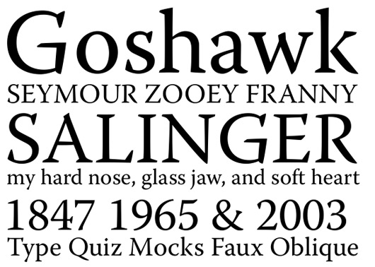
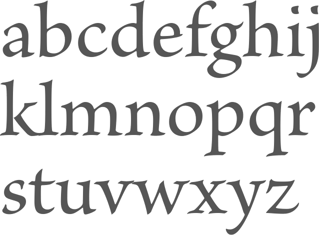
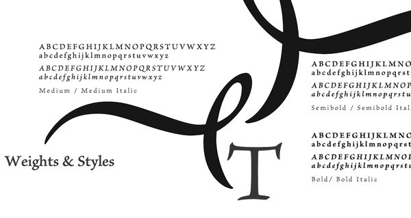
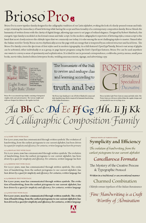
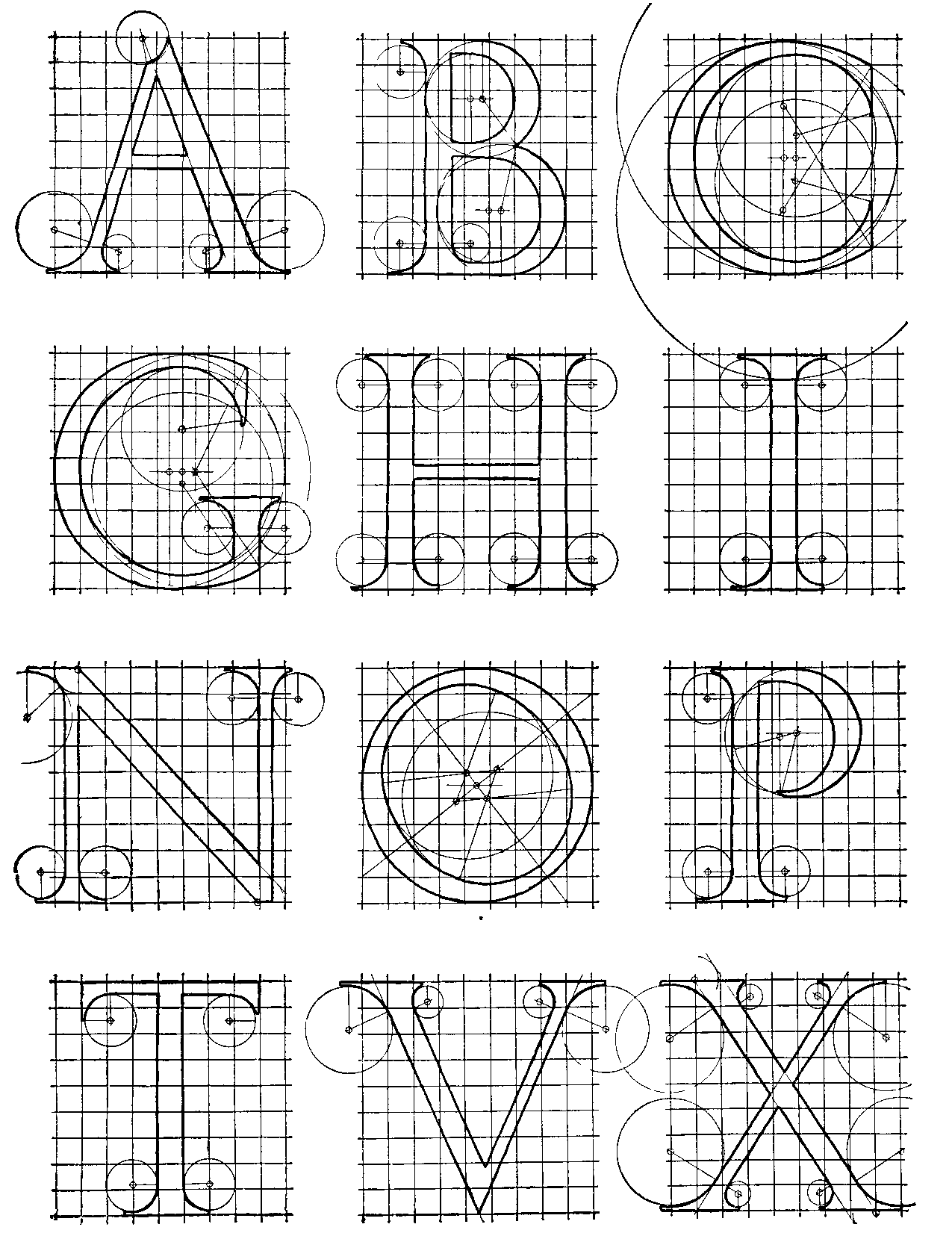
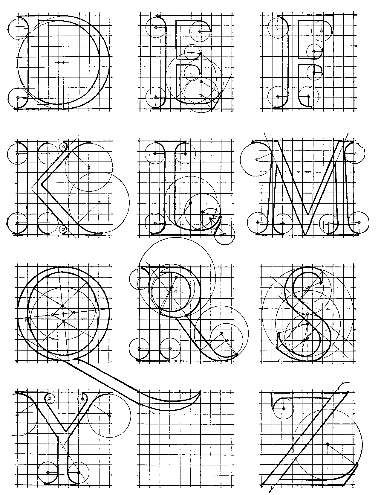
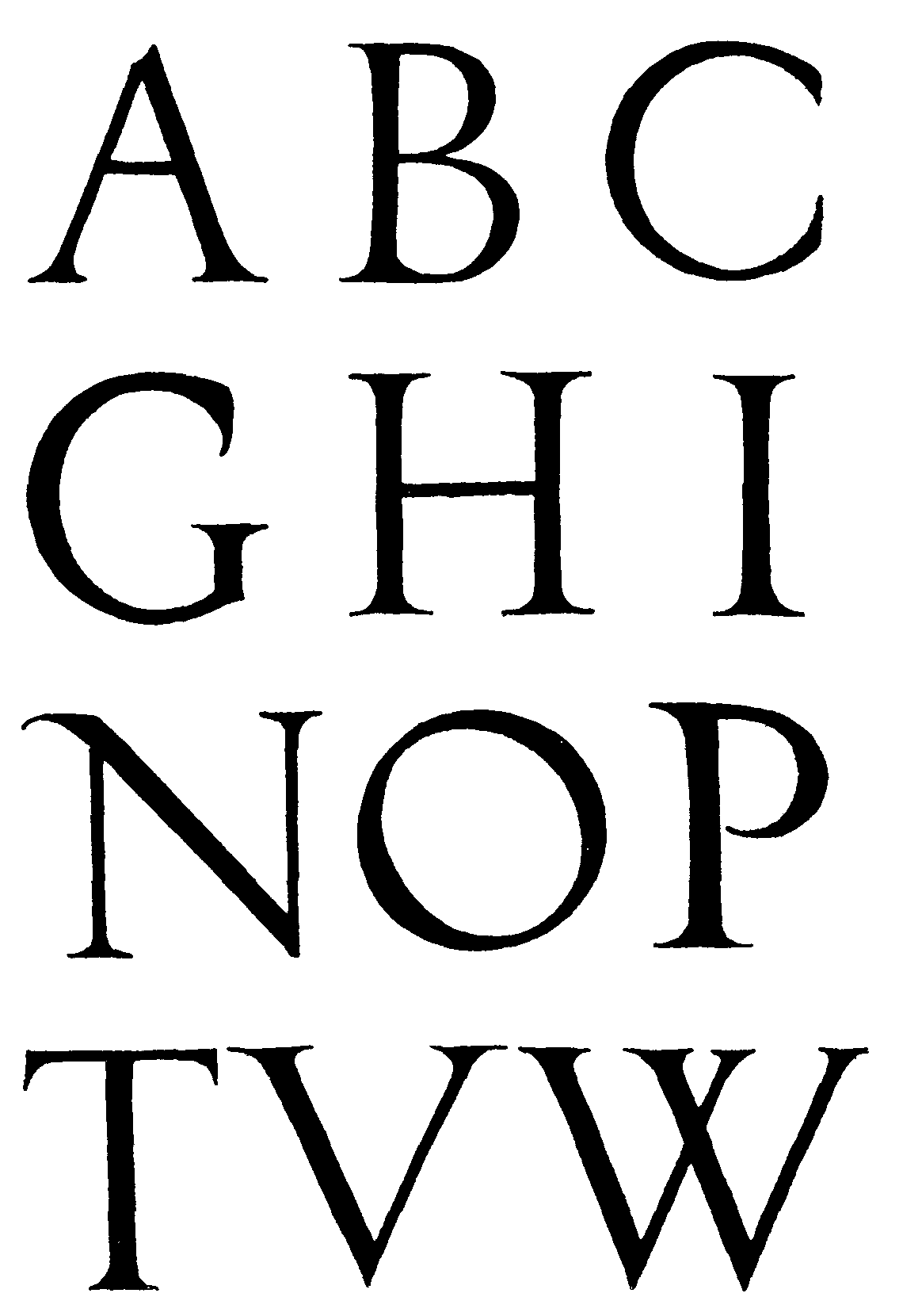
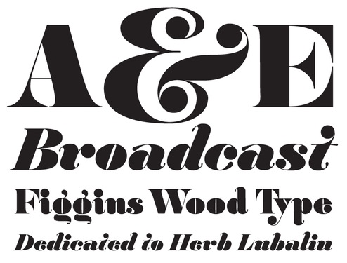
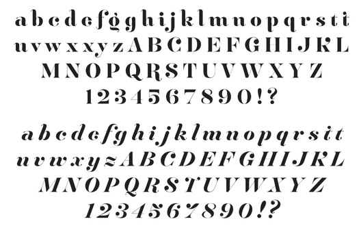
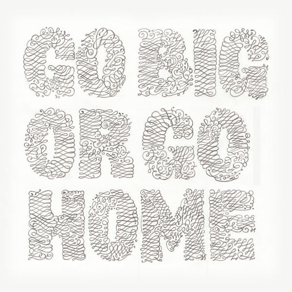
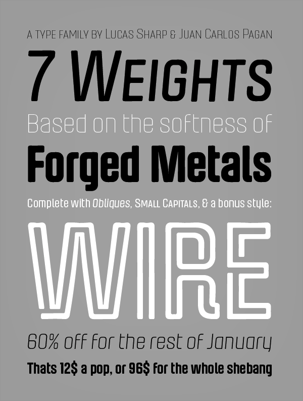
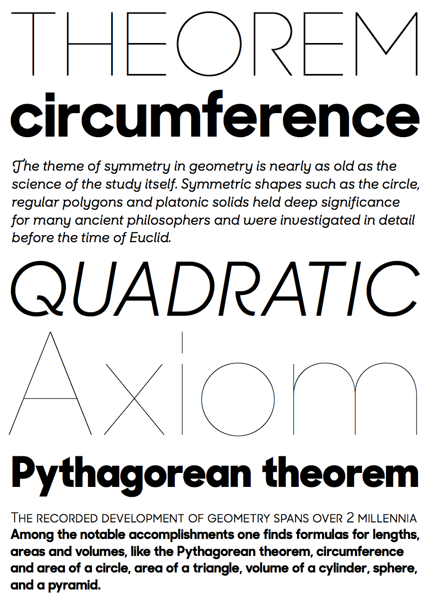
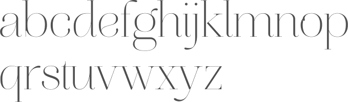
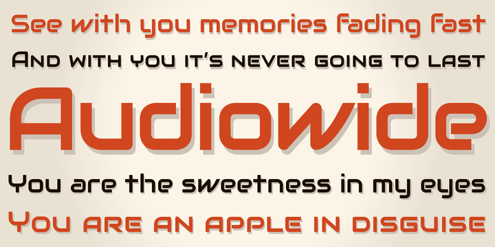
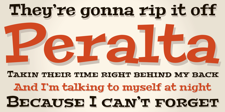
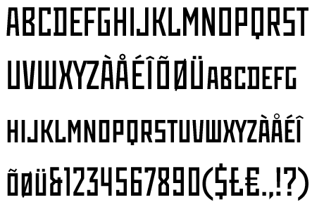
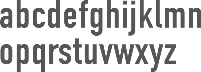
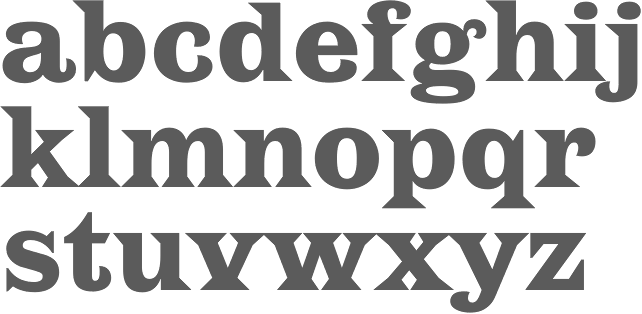
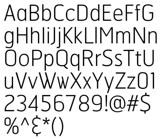
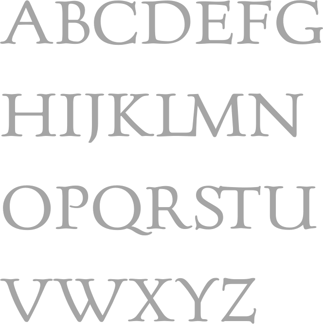
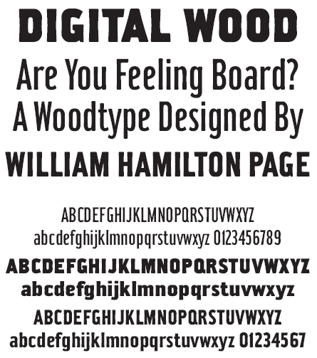
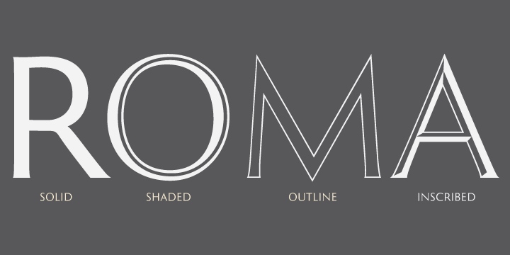
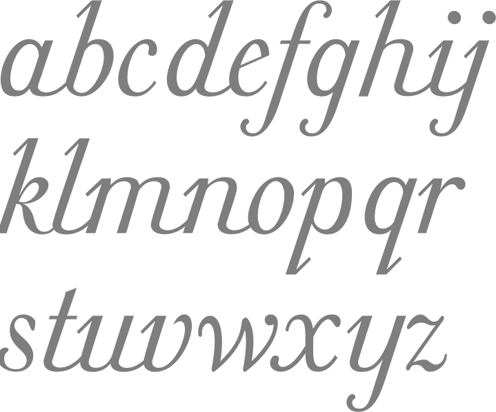
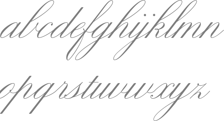
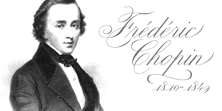
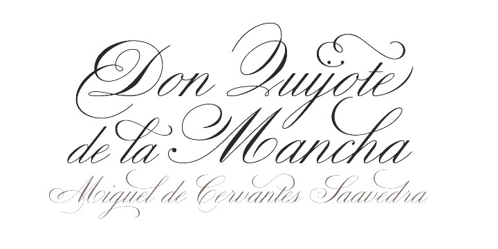
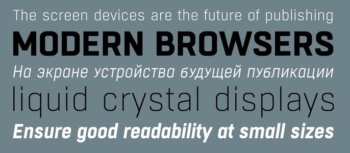
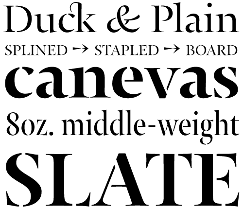
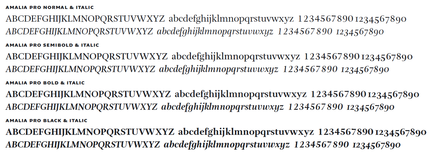
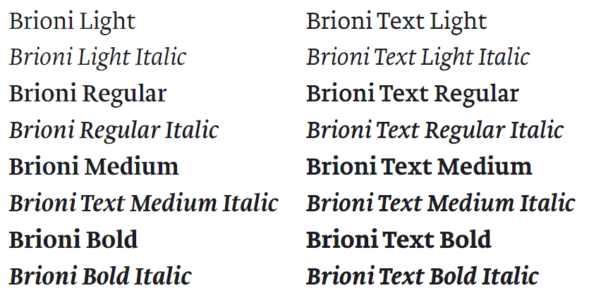
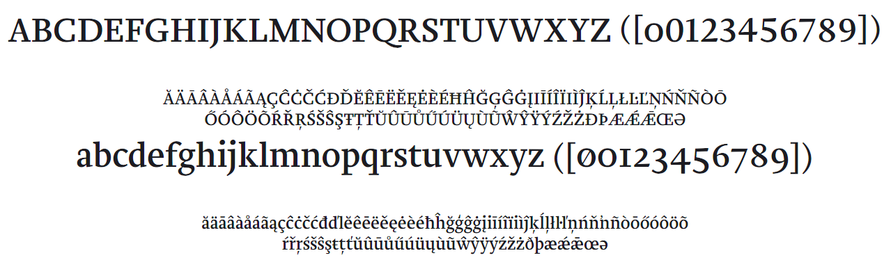
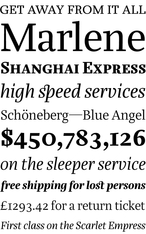
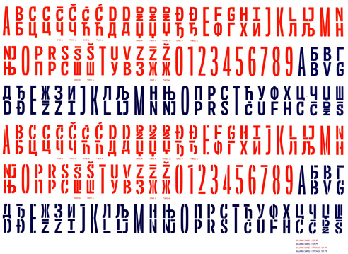
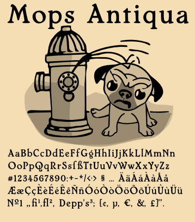
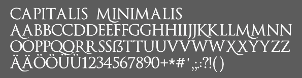
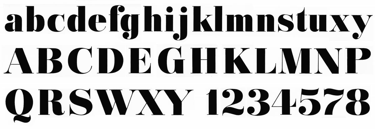
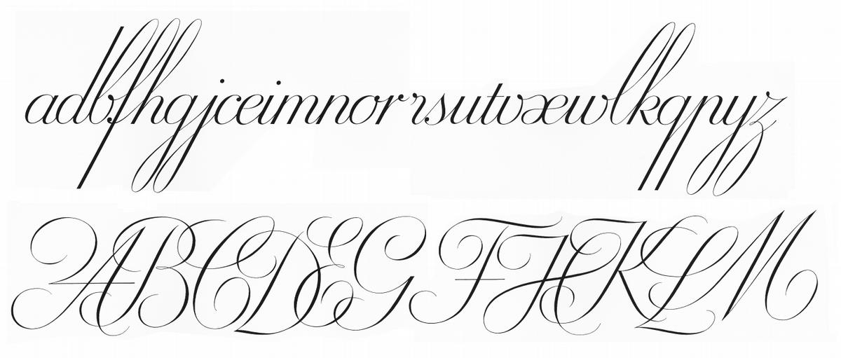
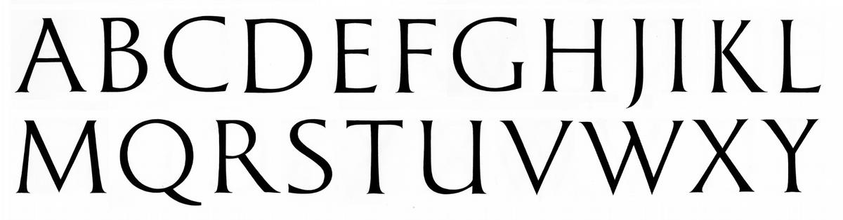
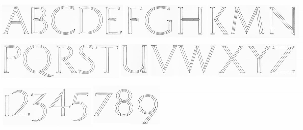
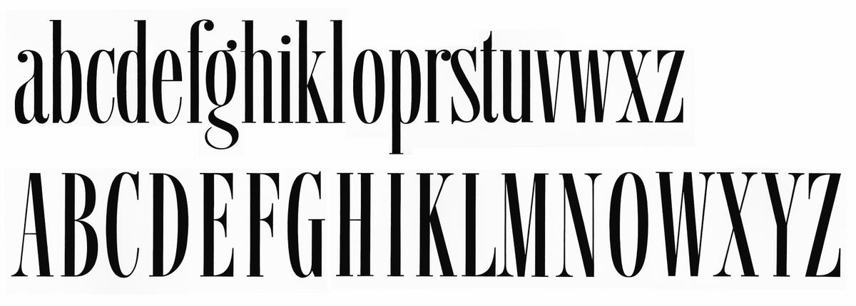
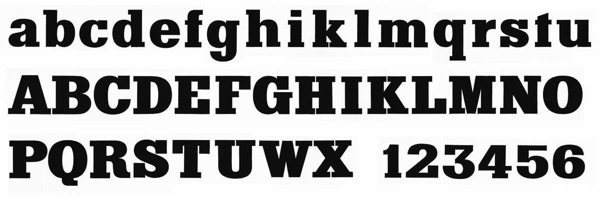
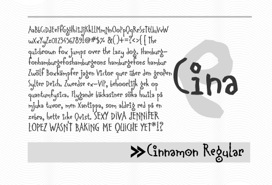
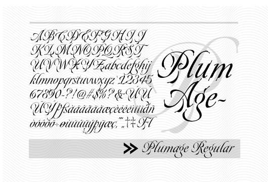
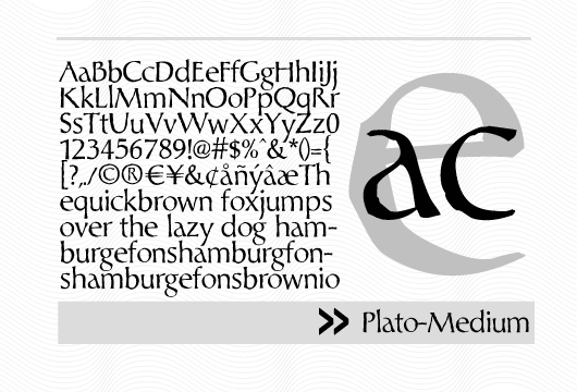
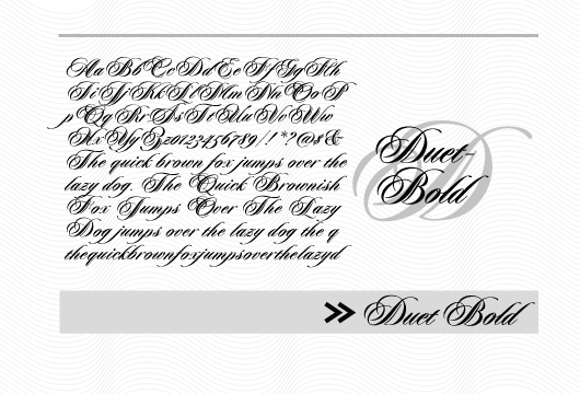
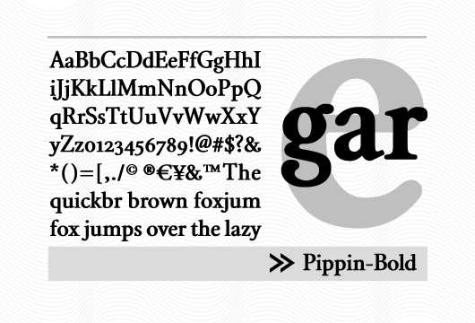
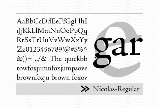
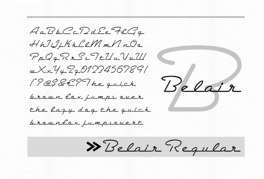
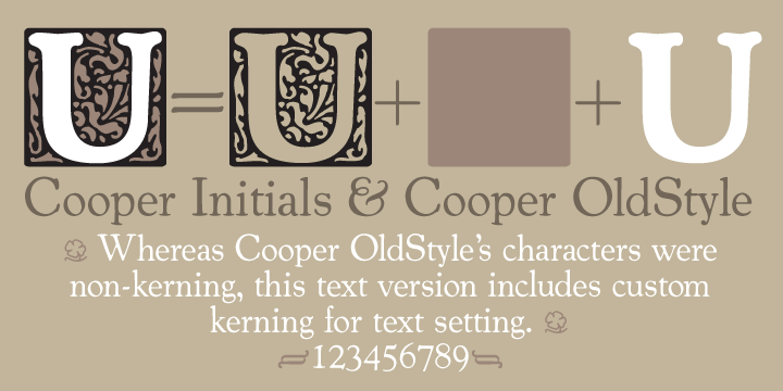
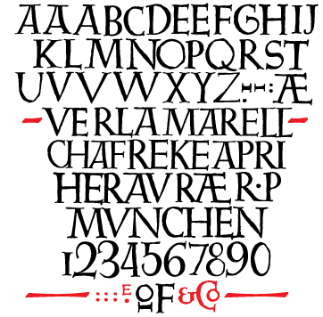
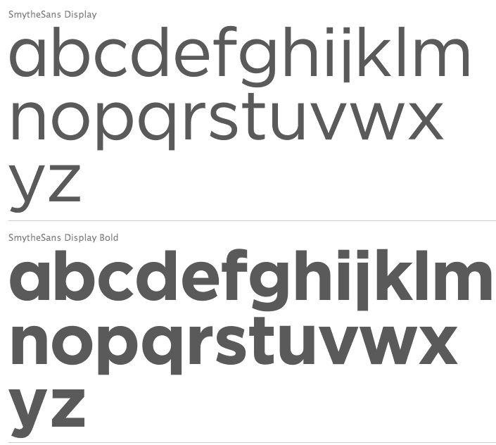