TYPE DESIGN INFORMATION PAGE last updated on Thu Apr 16 21:44:43 EDT 2026
FONT RECOGNITION VIA FONT MOOSE
|
|
|
|
|
Type design in Italy | ||
|
|
|
|
SWITCH TO INDEX FILE
Type foundry from the early part of the 20th century, located in Turin, Italy. [Google] [More] ⦿ | |
ABC ETC INC
|
|
Florence, Italy-based designer of the mini-serifed typeface Herm (2018). [Google] [More] ⦿ | |
One of the preeminent Italian Rationalist architects of the 1930s and 1940s. See also here. In 1938 he edited the book "Manuale pratico per il disegno dei Caratteri", in which he proposed a rationalist view towards type design. The Landi stretto typeface he proposed comes with all measurements explicitly spelled out. Alternate URL. [Google] [More] ⦿ | |
Roman printer, d. 1475. Some think he is the same as Adam(o) de Ambergau, a contemporary printer in Venice, but others refute that. Rot used a proto-roman typeface in Rome to print Dominicus de Sancto Geminiano's Lecturae super secunda parte sexti Decretalium in 1471 and used it until 1474. A digital revival was undertaken by Alexis Faudot and Rafael Ribas in 2016 at a type design workshop at HBK Saar and Bibliothèque municipale de Metz, Sarrebrücken. That typeface is Rot 102R by Faudot and Ribas. [Google] [More] ⦿ | |
ADB Studio
| Florence, Italy-based designer of the free calligraphic typeface Perale (2016) and the fun Peignotian typefaces LH Stan and LH Ollie (2017), where LH stands for Laurel and Hardy. In 2017, he published the text typeface family Audrey H. Behance link. Creative Market link. [Google] [More] ⦿ |
Type foundry, aka Adlertype, from the middle part of the 20th century, located in Pavona, Italy. Their 1978 catalog includes these typefaces: Forma (sans), Impressum, Times, Modulario, Sirio (sans), Esperia (sans), Victoria, Ionic, Excelso, Bodoni, Aulico, some dingbats, and Akkad (simplified Arabic). [Google] [More] ⦿ | |
Codesigner with Francesco "Mistico" Canovaro at Zetafonts / Studio Kmzero in Firenze of the simple bold sans families Duepuntozero Pro (2006-2008) and Arista (2006-2008). He also made Cibreo, Sugo (2006). Dafont link. [Google] [MyFonts] [More] ⦿ | |
Fano, Italy-based designer of the decorative multi-colored geometric caps typeface Afivez (2015). Behance link. [Google] [More] ⦿ | |
| |
Agnese Addone graduated in Medieval History and post-graduated in Paleography and Archival studies in Rome. In 2021, she was a Ph.D. candidate in Computer Science. She has been a member of the cooperative Italian type foundry CAST since 2020, specializing in epigraphy and signs. [Google] [More] ⦿ | |
During her studies, Rome-based Agnese Tisi designer the display sans typeface Hetic (2019). [Google] [More] ⦿ | |
Designer in Udine, Italy, who touched me with her beautifully lettered logo design La Tetta di Giulietta (2012). [Google] [More] ⦿ | |
| |
Italian designer in Trieste of the hand-printed typeface Akina (2011). Her name is Elena. [Google] [More] ⦿ | |
| |
Albert Pinggera
| |
Milan-based graphic designer and graphic artist. He created the 3d typeface Platform (2009) and Century Funky (2009, after Century Gothic; free). Behance link. Abstract Fonts link. [Google] [More] ⦿ | |
The 24-font Casagrande was designed in 2020 by the Italiantype Team (Manuel Alvaro, Valentino Coppi and Mario De Libero), working in close collaboration with Alberto Casagrande, and with help from the Zetafonts Team (Francesco Canovaro, Andrea Tartarelli and Cosimo Lorenzo Pancini). The final product has six display families with styles varying from the thirties-inspired Antifascista and Deco, to the modernist Casabau, to the geometric Grind, to the vintage script families Reclame and Casatiello. The collection is complemented by a two-color icon set font, Casagrande Ornaments. [Google] [More] ⦿ | |
Alberto Larizza
| |
Italian designer of the horror movie font Maleficio (2015). [Google] [More] ⦿ | |
| |
Photographer and graphic designer in Monza, Italy. In 2014, he designed the calligraphic blackletter typeface AM Gotisch. Behance link. [Google] [More] ⦿ | |
Grosseto, Italy-based designer (b. 1973) of the Etruscan simulation font AM False Etruscan (2003). Klingspor link. [Google] [MyFonts] [More] ⦿ | |
Cofounder with Piero Di Biase, of studio TWO in Udine, Italy. His typefaces include Cross Sans (2007), Corsivo (2015) and the neutral sans typeface family Studio Pro (2015-2018). [Google] [More] ⦿ | |
Jean Loize also wrote on Tallone in 1951: i, ii, iii, iv, v, vi. A letter of Bianca Tallone, dated 1982. Samples of the Tallone typeface (1951): I, II, III, IV, V. Photograph. Klingspor link. [Google] [More] ⦿ | |
Rome, Italy-based designer of the free Tuscan spaghetti Western font New Mexico Bold (2015). [Google] [More] ⦿ | |
Italian photographer who works in London. He created the alchemic typeface Universe (2013), a custom typeface made for Feel Good Inc. Collective in Genoa, Italy. [Google] [More] ⦿ | |
| |
Alfa Beta is a text book written by Aldo Novarese in 1964. It is especially useful to learn for the first time about the differences between typefaces and about type classification. [Google] [More] ⦿ | |
Kevin Steele explains in 1996: Some sources cite the publication of Cardinal Bembo's De Aetna as 1493 or 1495. And in fact, the design continued to evolve until the 1499 publishing of the spectacular Hypnerotomachia Poliphili. Let's not split hairs. Let's celebrate 500 years of Bembo! In the mid fifteenth century printing quickly spread to Italy from Germany, and by the 1470's Venice had became the center of the printing industry, home to over 100 printing companies. Pioneers such as Erhard Ratdolt and Nicolas Jenson had already begun working on adapting the roman alphabet for metal type by the time Aldus Manutius established his press in 1494, with the intention of publishing all the Greek classics. Aldus Manutius (1450-1515) was a printer, entrepreneur, a great ego, and publisher of over 1200 titles. Among the many contributions of Aldus was the popularization of small, portable books. His expensive beautiful books were far from today's paperbacks, mind you. One of the many great talents working for Aldus was Francesco Griffo, a gifted type designer. Griffo created many innovative type designs that are still admired for their beauty and readability. Their collaboration broke up over a copyright dispute, primarily over the ownership of the cursive type typeface that Griffo developed under the direction of Aldus. Although Aldus even had a papal decree to protect this style of alphabet, it was as difficult then as it is now to protect a typeface design. The alphabet was widely copied, and the style is known as italic, after its country of origin. Digital typefaces derived from his work: 1501 Manutius (2001) by Klaus-Peter Schäffel. Selection of fonts based on Manutius's work. [Google] [MyFonts] [More] ⦿ | |
Graphic designer in Concepcion, Chile, who created, together with Valentina Aufiero, Leo Colalillo, Francesca Sperti, and Natale Ventre at Politecnico di Milano, the hybrid typeface Gill Trump (2012). Behance link. [Google] [More] ⦿ | |
| |
Florence, Italy-based designer of Albe Font (2014, imitating calligraphy), and a few experimental typefaces. [Google] [More] ⦿ | |
During her studies at Accademia delle Arti e Nuove Tecnologie in Rome, Alessandra Daniele designed the pop art typeface Shape (2013). [Google] [More] ⦿ | |
Illustrator and digital artist in Rome who created the display typeface New Generation in 2013. [Google] [More] ⦿ | |
Italian digital art director in the Pesaro Urbino area. Creator of the stylish and frivolous adaptation called Stile Bodoni (1994). [Google] [More] ⦿ | |
He created these typefaces:
At ICTVC 2007, he spoke about 20th century Bodonians. Typophile link. Alessandro's page with hundreds of useful links. Behance link. Klingspor link. Home page. PDF file with samples of his fonts. [Google] [MyFonts] [More] ⦿ | |
Italian designer of the pay pixel typefaces iPix (2008) and Pixies (2009). [Google] [More] ⦿ | |
Alessandro Becagli
| |
| |
Aka Nova Sama. During his studies in Venice, Italy, Alessandro Caminiti (b. 1995) designed the free typeface Hexagon Cup (2018). Dafont link. [Google] [More] ⦿ | |
His typefaces include:
Speaker at ATypI 2013 in Amsterdam: Forma, Dattilo, Modulo. Nebiolo's last effort to produce a 'universal' typeface. Organizer of ATypI 2017 in Montreal. Speaker at ATypI 2018 in Antwerp. [Google] [MyFonts] [More] ⦿ | |
Milan, Italy-based designer of the free wavy font Liquido (2014). [Google] [More] ⦿ | |
| |
Milan-based designer of the display sans titling typeface Destiny (2013, together with Nivi Jasa). Behance link. [Google] [More] ⦿ | |
Alessandro Da Corte
| |
At the Academy of Fine Art of Urbino, Italy, Alessandro Dattola (Reggio di Calabria, Italy) created the modular comic book titling typeface Cinecomics (2015, with Laura Arcangeli). Behance link. [Google] [More] ⦿ | |
Rome-based designer of the modular typeface Console Sans (2015) and of Icon Font (2015). [Google] [More] ⦿ | |
Italian architect and graphic designer, b. 1974. He obtained a degree with a thesis on Neue Tipografie and is studying towards a PhD at the University of Palermo (Italy) where he studies countemporary type design, in collaboration with the Department of Typography of the University of Reading. Speaker at ATypI 2007 in Brighton: New professional identity of type designer. [Google] [More] ⦿ | |
Alessandro Fulciniti (Axel or Alex Fulton) is the designer at FontStruct in 2008 of Digg (based on the Digg.Com logo), SmartShop, Triple-X, Last Brick (3d brick face), Last Brick Neon, Bubble Gum, Maxxell, Pico (pixel face), Omino (dingbats of men), jelly_fish_1, pixel_runner, red_light_district (dot matrix face), three_am. Son of Statement and Statement are heavy block fonts. Other typefaces: Acchooga (condensed), Dottic (2008, pixel face), Headshop (2008), Three AM (2008), Red Light District (2008, dot matrix face) and Fat Bit Lova (2008, pixel face), Brooklin Bros (2008, octagonal), Absurd, Dottic (pixel face), Hybrid Boost, Five AM, Futuristica (Bank Gothic-inspired), HeadShop, Americana (American flag-themed glyphs), Elevator (lightbulb signage font), Bombay (Indic simulation), Regent (octagonal, between two horizontal lines), Spaceman (pixel meets kitchen tile), Faster Baby, Fontharrt, Subpixel, Promises, Best-before-end (horizontal stripes), Weekend (fat headline face), Predator's Alphabet, Futures, Magnus (constructivist), Zeppa (great---Far West meets LED), Wide Horizon, Pixelity, Wide Horizon Rounded, Snipers' Font, Gunny (heavy metal stencil), Pinball Special 5, Gallop, Horizon Condensed, Western Zappa (Far West font), Wide Horizon Rounded, Nano Spaceman (nice fat kitchen tile style), Black Sheep, Best-before-end, Black-Sheep, Bubble-Gum, Crazy-Pixel, Faster,-baby!, Gallop, Horizon-Condensed, Last-Brick, Little-Spaceman, Magnus, Pinball-Special-5, Promises, Teenage-Mutant-Ninja-Font, Weekend, Zeppa, maxxell, pic. Born in 1975 in Northern Italy, he is a columnist for the Italian web design portal html.it since 2003, who has written extensively on CSS, javascript and web design. Web site. [Google] [More] ⦿ | |
Italian graphic designer. Creator (aka Vic) of the iFontMaker font Schizofrenia (2010, scratchy hand-printed face). [Google] [More] ⦿ | |
| |
Italian designer of the handcrafted typeface Brizel (2018). [Google] [More] ⦿ | |
Italian designers of the sans typeface with diagonal endings called Lino as part of their thesis in 2006. The design was based on an early 1900's type from the Milanese foundry Urania, which was later acquired by Nebiolo. [Google] [More] ⦿ | |
Alessandro Pascoli
| |
Alessandro Segalini
| |
Alessandro Tartaglia
| |
Creative Italian designer who managed to draw letters with water (2010). [Google] [More] ⦿ | |
Italian dog fanatics Alessandro and Katiusha made a font called "Dalmatian" from BookmanITCbyBT-Demi. [Google] [More] ⦿ | |
Alessia Mazzarella
| |
Italian medical doctor with a PhD in neurology and neurophysiology. She currently works as a clinical neurophysiologist at Charing Cross Hospital in the UK and is also involved in academic research into the autonomic and peripheral nervous systems. Together with Bruno Maag she researches the physiological emotional impact of different type styles. At ATypI Sao Paulo 2015, her talk, together with Dalton Maag, is entitled Busting the Dyslexia Myth. As the master communicator of type design, Dalton Maag shows that nearly all dyslexia type research in the past was ignorant. Witness the abstract of the Nicotra / Maag talk at ATypI: There have been a number of fonts in recent years which claim to improve reading for people with dyslexia. Many of these designs have a handwritten quality, similar to Comic Sans. Often, the designers of these fonts claim to understand what is required to design a dyslexic font, simply by virtue of being dyslexic themselves. There may be some design merit to these fonts but the claim that they are favourable to dyslexics is misleading, and shows a complete lack of understanding what dyslexia is. The presentation will critique the designs that claim to be "the font for dyslexia", based on a scientific overview of dyslexia, and how dyslexia is dependent on language and other factors. It will also highlight the ignorance of design institutions that have awarded MAs and PhDs for fonts designed in the name of dyslexia. The talk was forceful, entertaining and convincing, based on an analysis of various pathways in the brain. For one thing, opaque languages (i.e., with a very tentative connection between what is written and spoken, as in English) have a higher population density of dyslexia. Italian and German are notr opque and thus fare better. Alessia also spoke at ATypI 2014 in Barcelona. Speaker at ATypI 2016 in Warsaw: Bruno Maag and Alessia Nicotra review a selection of studies published in regards to the emotional and functional qualities of typefaces since Poffenberger in 1927. The presentation investigates the methodologies employed and questions the results in the cultural and technological contexts of their time, and provide guidance as to their relevance today. [Google] [More] ⦿ | |
During her studies at NABA (Nuova Accademia di Belle Arti) in Milan, Alessia Pettinari designed Alfabeto Fantasia (2011), an art deco display typeface developed on the basis of Linea. [Google] [More] ⦿ | |
Thiene, Italy-based designer of Geometric (2019). [Google] [More] ⦿ | |
| |
| |
Milan, Italy-based designer of the spurred modular typeface Kramer (2019) and the free spurred handcrafted typeface Pirate K (2019). [Google] [More] ⦿ | |
Torino, Italy-based creator of a poster typeface in 2014. Behance link. [Google] [More] ⦿ | |
| |
He created some typefaces such as Corso (2013, text family) and New Banco (2013, after Roger Excoffon's Banco from 1951). In 2007, he co-designed Saffran with Erasmo Ciufo and published it at CAST in 2015. Saffran is a stencil sans with squarish letterforms. His graduation typeface at KABK in 2016 is the 9-12 point text typeface Laica, which is characterized by tall-hat terminals on glyphs like the 4, the a and the t. Like Trump's politics, Laica surprises---no glyph is what one would expect. It won an award in the TDC Typeface Design competition in 2017. Laica A sports chiseled transitions that guarantee good rhythm and balance from small-sized text use to eye-catching billboard applications. Laica B has straight transitions at its joints and therefore an overall more simplified, elegant tone. Laica was released by Dinamo in 2020, where Alessio was supported by Franziska Weitgruber, Igino Marini (kerning) and Chi-Long Trieu (font engineering). In 2017, he designed the sans typeface Juventus Fans. [Google] [More] ⦿ | |
In 2017, he designed the commercial typefaces Lagu Sans and Lagu Serif, which feature large x-heights and open counterforms. Typefaces from 2020: Pani Sans (which takes inspiration from Italian rationalist and art deco genres, and includes variable types). Open Font Library link. Fontspring link. Fontown link. [Google] [MyFonts] [More] ⦿ | |
Alessio Leonardi
| |
In 2018. they developed PVF Display for the identity of Palazzo Vertemate Franchi. In 2019, they designed Grotta, and wrote: Grotta is an irreverent contemporary neo-grotesk typeface with strong geometric accent and sharp contrast in its form. Characterized by tight apertures and an overall dynamic feeling it is suited for both display and text sizes. It is our interpretation of the 21st century grotesk, exuberant, irruptive and [...] winks at [...] Venus-Grotesk and Monotype Grotesque. It shows influences of hipstertism in the way strokes are joined in the 1, N, M, V, W, and other letters. The semi-pixel typeface Analo Grotesk was codesigned in 2019 by Alessio Pompadura and Massimiliano Vitti. In 2020, he released Decay White: Decay is a modern serif that brings the idiosyncratic philosophy of Decadent Movement into our darkest future, mixing sinuous curves with eccentric pointed serifs and drastic ligatures between multiple and single letters. A typeface on the border between irrational aesthetics and rational function. | |
Communication designer in Milan, Italy, who created the honeybee-themed typeface Picnic in 2017. [Google] [More] ⦿ | |
During his studies at Politecnico di Milano, in James Clough's class, Alessio Sciascia created the display typeface Decora (2013) in Regular and Ombra styles. [Google] [More] ⦿ | |
Avezzano, Italy-based creator of the poster headline typeface family Linestoorb (2015). Behance link. [Google] [More] ⦿ | |
Italian creator of the experimental geometric typeface Covenant (2009). [Google] [More] ⦿ | |
Alex Passi from the University of Bologna created an elegant Sanskrit font in 1998 called Vinayaka. He has a Mac version. The PC truetype version is here. [Google] [More] ⦿ | |
Graphic designer in Rome, who created the display typeface Momo (2013). [Google] [More] ⦿ | |
Saluzzo, Italy-based designer of the modular sci-fi typeface Interstellar (2017), which was finished during his studies at IAAD in Torino. [Google] [More] ⦿ | |
Alex Valentina is a graphic designer from Italy who graduated from KHIB, Bergen, Norway, and is based in London, UK. A musician, music producer and video director, he also occasionally designs typefaces. At The Designers Foundry, he released the fairytale font Goliagolia in 2019, and the spindly lava lamp font GabyGaby in 2020. [Google] [More] ⦿ | |
Roman graphic designer. Creator of these typefaces in 2012: Lounge Curve (a wide monospaced techno sans), World Fashion Channel (ornamental caps), ASN (ornamental caps), and Polytype. [Google] [More] ⦿ | |
Alfa-Beta
|
In addition, the project aims to revive Also Novarese's Nova Augustea (1964), which in turn was based on Alessandro Butti's Augustea. That revival will be done by Studio 23.56. [Google] [More] ⦿ |
AlfaType
|
His typefaces:
|
Milano, Italy-based designer of the display typeface Iceberg (2018). [Google] [More] ⦿ | |
Behance link. [Google] [More] ⦿ | |
Milano, Italy-based student-designer of the squarish typeface Iceberg (2019). [Google] [More] ⦿ | |
Foundry, est. in Milan by Alice Tebaldi in 2011. Calligraphic Griffo (2011) is her interpretation of the style of Francesco Griffo. Fontspring link. [Google] [MyFonts] [More] ⦿ | |
Graduate of the KABK in Den Haag in 2008. Originally from Italy, she created the subdued Pomme family of serif typefaces as a student at KABK. [Google] [More] ⦿ | |
Alphabeta Linguarum Orientalium: typia congregationia de propag. fide | Collection of texts published between 1629 and 1789 in Rome. Digital versions: here, here. Local downloads: Part I, part II. [Google] [More] ⦿ |
Alphabet&Type
|
He also has an interest in Startrekkery because he designed the typefaces Transformers Movie (2009) and Star Trek Future (2009). All these typefaces are free at Dafont and/or Fontspace. Alternate URL. In 2010, he did the free brush typeface Fronte del Porto, which is based on the Elia Kazan movie with Marlon Brando entitled On The Waterfront. There is also a commercial side of Alphabet&Type: In 2010, they published the angular family Antares, the bold organic typeface Minardi (+Collage), and the curly family Vannucci Antico. Metropolis (2010) is an angular typeface based on the titling of Fritz Lang's movie Capolavoro. Sabrina (2010) is taken directly from the Best movie by Billy Wilder, with Audrey Hepburn and Humphrey Bogart. An American in Paris (2010, or: UnAmericanoAParigi) is based on the font used in the movie by Vincente Minnelly, with Gene Kelly and Leslie Caron. Cleopatra (2011) is a chisel font with a Greek look, based on Cleopatra, the movie by Joseph L. Mankiewkz, starring Liz Taylor and Richard Burton. Il Grinta (2011) is the wedge serif titling font of True Grit, Henry Hathaway's movie starring John Wayne. The beautiful inline typeface Singapore (2011) after the titling in John Brahm's movie featuring Ava Gardner. Strade di Fuoco (2011) is based on the movie Streets of Fire by Walter Hill, with Diane Lane. Flash Gordon (2011) is based on the famous movie by Mike Hodges, starring Max Von Sydow. Amazing Spider Man (2011) is based on the Spiderman movie by Marc Web which featured Andrew Garfield. Captain America (2011) is based on the movie by Joe Johnston, with Chris Evans. Twilight New Moon (2009) is based on the Twilight movie. Electric Dreams (2011) is based on steve Barron's movie. Tintin (2011) is a comic book typeface based on Steven Spielberg's 2011 movie. Fantastic Four (2011) is a StarTrek style family that is based on the Tim Story movie. Faelorehn (2011) is a vampire script. Creations from 2012: Sherlock Holmes, Watson (based on Guy Ritchie's movie), Lucky Luke (after the successful Western comic book series by Morris and Goscinny), Danger Diabolik, Ghost Rider (based on the movie by Mark Steven Johnson, starring Nicolas Cage), Notorious (a brush font based on Notorious, a movie by Hitchcock starring Cary Grant and Ingrid Bergman), Cullen, Flower Header, Dorian Gray (from the movie by Oliver Parker starring Ben Barnes), Snow White (from Rupert Sanders's movie Snow White and The Huntsman). Typefaces made in 2013: Beastly (based on the David Barnz movie featuring Vanessa Hudgens), Top Gun (an octagonal typeface based on the movie with Tom Cruise), Manhattan (from Woody Allen's movie), Assassin (based on a Ubisoft video game). Typefaces from 2014: Dylan Dog (based on Kevin Munroe's movie starring Brandon Routh). [Google] [MyFonts] [More] ⦿ |
Alphan Typefaces
| Roberto Baldassari shows and discusses the fonts used in Space: 1999, from Data 70 (Esselte, 1970), to Futura Black, Futura Medium, Microgramma, and Eurostile Bold Extended to Countdown (an LCD font by Esselte, 1965). [Google] [More] ⦿ |
Amarpreet Singh
| |
Masters degree communication design student at Politecnico di Milano. Behance link. Creator of the (imaginary) traffic and signage family Mantuarcade (2008-2009) for the city of Mantova, which was inspired by its many arches. This was a project led by Professor Braccaloni. [Google] [More] ⦿ | |
Graduate of Academy of Fine Arts in Urbino, Italy, BA class of 2020. Cartoceto, Italy-based graphic designer, video editor, photograper and motion designer. Creator of the grotesque typeface Anthropocene (2020). [Google] [More] ⦿ | |
Ampersand (or: Vladocar)
|
Typefaces from 2016: Urban Stencil, Slab Classico, Slab Lungo. Typefaces from 2020: Barista (handcrafted, blackboard bold), Alphabet and Letters, Autumn Leaves SVG, Azzurro SVG, Blue Orange Color SVG, Bold Unicorn, Branch, Bubble Letter (a bubblegum font), Christmas Stars, College Sport, Color Cubes, Color Dots, Color Hearts, Color Stars, Comic Next, Crazy Brush Neue, Dashed Line, Dino World, Dog Paw, Doodle Classic, Dripping Zombie Halloween, Galactica Grid, Grigio 3D SVG Color, Halloween Monster, Hammer, Hand Drawn, Hipster Hand Drawn, Jungle Zoo, Love Stencil 3D, Milan Stencil, Moustache, Old School 80s, Old West, Pumpkin Halloween, Retro 3D SVG, Santa Ugly Sweater, Slab Forte, Snowflakes Christmas, Space Slab, Star Slab, Stitched Letters SVG, Stitched Line, Swiss Cheese, Turquoise Brush SVG, Urban Brush SVG, Zombie Attack Halloween. [Google] [More] ⦿ |
In 2017, Ana Hoxha and Julian Hoxhaj co-designed the free techno font Shkoder 1989. Dribble link. [Google] [More] ⦿ | |
Typefaces from 2016: Prosto (a handcrafted Latin / Cyrillic typeface), Sofia (thick brush. free), Astrid (hipster style), Giglio (paperclip style). Typefaces from 2017: Palma Nana (script). Typefaces from 2019: Module (a monoline display typeface), Unmoor (an outlined and color rope font). Typefaces from 2020: Katrin Sketch, Be My Candy.nastasiiaMacaluso-Module-2019 [Google] [More] ⦿ | |
Aka Lhotse. Rome-based designer of various sets of icons (Adventure, Stupid, Sugar) and the monoline sans typeface Sweet Snow (2017). Behance link. [Google] [More] ⦿ | |
Andrea Amato
| |
Andrea Amoretti
| |
Italian designer (b. 1990) of the pixel typeface Super Effective (2012). [Google] [More] ⦿ | |
Creative director of BasileADV who is based in Bonito, Italy. In 2021, Giuseppe Salerno and Andrea Basile co-designed a wayfinding typeface and icon set for Univerest. [Google] [More] ⦿ | |
Milan-based creator of the handmade experimental typeface Tracce (2012). [Google] [More] ⦿ | |
Graphic designer in Milan, b. 1990, Thiene, Vicenza, who graduated from IED in Milan. Creator of Bax 01 (2012) and the geometric typeface Tracce (2012). [Google] [More] ⦿ | |
Andrea Bergamini
| |
Andrea Biagi
| |
| |
Turin-based creator of the hand-printed typeface Irreality Mark 01 (2012, iFontMaker). [Google] [More] ⦿ | |
Andrea Braccaloni
| |
Or Andreas Brogiottus. Author of Indice de'caratteri con l'inventori et nomi di essi esistenti nella stampa Vaticana et Camerale (1628, Stampa Vaticana). Local download. [Google] [More] ⦿ | |
Andrea Carrer
| |
Andrea Cerboneschi
| |
Behance link. [Google] [More] ⦿ | |
Italian graphic designer and illustrator in Berlin, who created the shaded display typeface Pomodorino in 2013 for a restaurant identity. One Have To Coma Again (2013) is an angular display sans typeface. Behance link. [Google] [More] ⦿ | |
Bachelor in Science of Design at IAAD Istituto d'Arte Applicata e Design, Italy, class of 2013. Graphic designer in Vercelli, Italy, who created the multiline typeface Forty-Four (2015) and the deco typeface Parmigiano Reggiano (2018). Behance link. [Google] [More] ⦿ | |
Graphic designer in Rome, b. 1989. Creator of the modular octagonal typeface Italic (2012). [Google] [More] ⦿ | |
Cormano, Italy-based designer of Palazzo Sans (2011), an ink trap typeface created for the city of Mantova. [Google] [More] ⦿ | |
In 2017, he designed the sans titling family Font For Fighting. In 2017, he designed the grunge typeface Fingermade. Dafont link. [Google] [MyFonts] [More] ⦿ | |
His beautiful typeface Grypho (2012) is based on an italic by Francesco Griffo. [Google] [More] ⦿ | |
Roman brand designer Andrea Laureti's Stop The Oil logo (2012) is full of visual typographic punch. [Google] [More] ⦿ | |
Naples, Italy-based of the techno sans typeface Plegma (2010-2011, with Raffaele Casaburi at ABA Napoli, Italy). Behance link. [Google] [More] ⦿ | |
Aka Big Macca. Italian FontStructor who made Big Macca (2010, a macho mechanical face). Dafont link. [Google] [More] ⦿ | |
In 2013, he designed Xylophone (an experimental 3d font) and Siick Nocive. Behance link. [Google] [More] ⦿ | |
Italian painter and engraver (b. Vicenza or Padova, 1431, d. Mantua, 1506). Fonts named after him include Mantegna (Philip Bouwsma at ITC) and Mantinia (1993, Matthew Carter). Typedia link. [Google] [MyFonts] [More] ⦿ | |
Milan-based creator of the hexagonal typeface Slight (2012), the thin experimental typeface Rim (2012) and the thin straight-edged Linea (2012). He studies at NABA University in Milan. In 2013 he designed the alchemic typeface Alter. Behance link. [Google] [More] ⦿ | |
Andrea Marino (Marino Design, Firenze, Italy) created the contrasted experimaental typeface Didetica in 2014. [Google] [More] ⦿ | |
Information designer in Rome. Creator of the geometric typeface Tri Font (2013). [Google] [More] ⦿ | |
Italian designer of Faia (2021, at Type Department). Faia is a display typeface characterised by floral details and high contrast. It was inspired by folklore from the Piemonte region in Italy. He writes: Faia is inspired by Art Nouveau aesthetics, which it combines with a gentle, humanist structure. It [...] considers its frivolity a virtue. [Google] [More] ⦿ | |
Torino, Italy-based designer of the retro futuristic typeface Future Banco (2018). [Google] [More] ⦿ | |
Italian designer, b. 1981. Creator of Elektrodisiac (2005). His web page makes Mozilla/UNIX and Firefox/MacOSX hang. Dafont link. [Google] [More] ⦿ | |
| |
Andrea Rauch
| |
Graphic designer in Arezzo, Italy. Creator of several experimental all caps typefaces in 2018. [Google] [More] ⦿ | |
| |
| |
| |
| |
At a workshop at ENSAD in Paris in 2015, Andrea Vendetti (Urbino, Italy), Delphine Bereski and Jussi Kantonen co-designed Appalachian Cherokee. [Google] [More] ⦿ | |
Architect and visual designer in Puglia, Italy. In 2021, he designed the free experimental modular typeface Hofmann, which was inspired by the work of Swiss designer Armin Hofmann. [Google] [More] ⦿ | |
Andrea Zanchetta
| |
Andrea Zucca (Livorno, Italy) created the kitchen tile typeface Looz (2012) and the modular circle-based typeface Spikkio (2012). [Google] [More] ⦿ | |
Graphic designer in Entroncamento, Portugal. In 2019, he published the monoline display typeface Hermo. [Google] [More] ⦿ | |
Marseille (2017) is co-designed by Louise Fili, Nicholas Masani and Andy Anzollitto. It is an art deco-inspired letterform that is based on Louise Fili's cover design for the Marguerite Duras novel The Lover. [Google] [MyFonts] [More] ⦿ | |
Florence, Italy-based designer of the free Latin / Cyrillic geometric sans display typeface Rostov (2017), named after the city he hails from, Rostov-on-Don. [Google] [More] ⦿ | |
Graphic designer in Maiori, Italy, who created the thin script typeface Calpa (2015). [Google] [More] ⦿ | |
In 2017, Tatiana Gancedo and Angelica Baini co-designed the free modular typeface Renasci. Behance link. Cargo Collective link. You Work For Them link. [Google] [More] ⦿ | |
Graphic designer in Rome. Creator of the Peignotian typeface Clavecin Capital Serif (2012). [Google] [More] ⦿ | |
Florence-based Anna Bulycheva designed Deconstruction in 2015 for a school project. She took inspiration from Mondrian's paintings. For another school project she created the doctor's handwriting typeface Lefty (2015). [Google] [More] ⦿ | |
Milan-based designer of Mantua (2009-2012, a sans and serif pair of typefaces) and Odita (2012, a geometric art deco news and fashion magazine made for a university project at Politecnico di Milano). [Google] [More] ⦿ | |
| |
Anna Ronchi
| |
In Gio Fuga's type design class in Milan, Annalinda Ruocco created the cool techno display typeface Deggy (2014). [Google] [More] ⦿ | |
Author of "Le maître de Garamond" (Editions Stock, 2002), a beautiful book on the life and death of Antoine Augereau, who was Claude Garamond's teacher and mentor. Anne Cuneo was born in 1936 in Italy and lives in Zürich. Comment by Guy Schockaert: Le 24 décembre 1534, place Maubert, accusé d'hérésie, Antoine Augereau est pendu, son corps et ses mains brûlées. Homme de lettres, érudit, théologien, Antoine Augereau était un grand imprimeur, éditeur et graveur de caractères typographiques. Il modela ceux dont nous nous servons encore aujourd'hui, et avec Clément Marot, inventa l'usage des accents et de la cédille. La publication du Miroir de l'âme de Marguerite de Navarre lui coûtera la vie. La Sorbonne, gardienne jalouse d'une orthodoxie figée, désapprouve la pensée de la soeur de François Ier, mais ne peut la condamner. Antoine Augereau paiera pour elle. Racontée par le plus célèbre de ses disciples, l'histoire passionnante et émouvante d'un humaniste prêt à mourir pour défendre ses idées. UN livre à lire absolument et à offrir. [Google] [More] ⦿ | |
Parisian designer. Creator of a commissioned typeface, Uni Type (2012) for the annual report of Unicancer. [Google] [More] ⦿ | |
Pesaro-based printer. For his typefaces, see Nuovo saggio di caratteri e vignette della tipografia di Annesio Nobili in Pesaro (Pesaro, 1834). [Google] [More] ⦿ | |
Graphic design studio in Bologna, Italy, run jointly by Veronica Bassini, Massimo Pastore, Luca lattuga and Roberto Malpensa. Their interest in wood and old lead types in relatively unknown Italian print shops led to a wonderful (wood) type catalog started in 2011, Catalogo Caratteri in Piombo e Legno. That book covers these companies: Tipografia Girasole (Inzago), Tipografia Nazionale (Piacenza), Tipografia Co.Ba (Massa Finalese), Tipografia Artigiana (Vignola), Tipografia Artestampa (Corinaldo), Tipografia Tade (Empoli), Tipografia Riva (Solara di Bomporto Tipografia Sociale (Arezzo), Tipografia Minetti (Rossiglione), Tipografia Aldo Sacco (Vercelli), Tipografia STEM Mucchi (ex Soliani) (Modena Tipografia Nuovagraf (ex Perfecta) (Roma Tipografia Il Dado (ex Pivetti) (Mirandola Tipografia Golinelli (Mirandola), Tipografia Lugli (Rolo), Tipografia Bagnoli (Pieve di Cento), Tipografia La Commerciale (Fidenza), Tipografia Galeati (Imola), Tipografia Perini (Rovigo), Tipografia La Fiorentina (Grosseto), Tipografia Tiferno (Citta di Castello), Tipografia Bottega della Stampa (Sansepolcro Tipografia Montagna (Voghera), Tipografia Artigiani Tipografi (Voghera), Tipografia Emiliana (ex Amici) (Castel San Giovanni Tipografia Valvassori (Vigevano), Tipografia FG (Vicchio), Tipografia Greco Remo (Sorbara), Tipografia Adriatica (Cervia), Tipografia Valpadana (Brescello), Centro Stampa (Poviglio), Tipografia Zanichelli (Sassuolo), Tipografia ArteGrafica 91 (Castellarano), Tipografia Caiti (Reggio Emilia), Tipolitografia Moderna (Reggio Emilia), Grafiche La Comasina (Senna Comasco), Tipografia RD (Medicina), Tipografia Conti (Bologna), Unione Tipografica Operaia (Macerata), Tipografia La Tipografica (Poggibonsi), Tipografia Pesatori (Milano), Tipografia 2000 (Pesaro), Tipografia Antonio La Grotteria (Roma), Tipolito Lugli (Novellara), Tipografia Rossi (San Pietro in Casale), Litotipografia M.P.P. (Modena), Tipografia Lecchese (ex Adda) (Lecco), Tipografia Ghibaudo (Cuneo), Tipografia Botalla (Biella), Tipografia BC (Bologna), Tipografia Olmo (Clusone), Tipografia Fanti (Formigine), Tipolito Ennio Cappetta (Foggia), Tipografia Valgiusti (Bagni di Romagna), Tipografia Guidi (San Piero in Bagno), Tipografia Croppi (Forli), Tipografia Zoli (Forli), Tipografia Pontone (Cassino), Artigrafiche Franco Antoni (Mesagne), Tipolito Valprint (Grezzana), Grafica Sestrere (Sestri Levante), Tipografia Scaletta (Ravenna), Tipografia Uggeri (Cremona), Tipografia Brigati & Molinari (Castel San Giovanni), Tipografia Aldo Sacco (Vercelli), Tipografia Grassigli (San Giovanni in Persiceto), Tipografia Banina (San Colombano al Lambro), Tipografia Reggiana (Reggio Emilia), Tipografia Segreti (Porto San Giorgio), Poligrafico Silva (Parma), Tipografia La Rapida (Mantova), Tipografia E Comelli (Garessio), Tipografia Artegrafica Sociale (Cittadella), Tipografia Boni (Sassuolo), Tipolitografia Savino (Gambolo), Tipografia Bramante (Loreto), Tipografia Martini (Ostiglia), SCIA (Bologna), Grafiche Malvezzi (ex Pennaroli) (Fiorenzuola), Tipografia SMA (Cogoleto), Tipografia Sciocchetti (San Benedetto del Tronto), Tipografia Demetri e Crepaldi (Polesella), Tipografia G. Palermo (Adrano), Tipografia BEMA (Belletti Alberto E C.) (Bellaria), Tipografia SIACA (Cento), Tipografia FD (Bologna), Tipografia F.lli Tine (Floridia), Tipografia Anigoni (Reggio Emilia), Grafiche Vianello (Treviso). [Google] [More] ⦿ | |
| |
| |
| |
Some Italian wood types shown in Catalogo Caratteri in Piombo e Legno by Anonima Impressori (Bologna, Italy). The styles covered here represent modern slab serifs: Egizio Lubalin, Italo, Landi, Landi Echo, Nilo. [Google] [More] ⦿ | |
Some Italian wood types shown in Catalogo Caratteri in Piombo e Legno by Anonima Impressori (Bologna, Italy). The styles covered here represent graziati antichi: Bodoniano, Claredonia, Elzeviro, Garaldus Corsivo, Graziato, Intestazione elzevire, Raffaello Neretto, Romano Largo. [Google] [More] ⦿ | |
| |
| |
Some Italian wood types shown in Catalogo Caratteri in Piombo e Legno by Anonima Impressori (Bologna, Italy). The styles covered here represent scripts: Appennino, Calvi, Corsivo a Pennello, Corsivo Fantasia, Display, Leandro, Ritmo, Scalpellato, Signal, Slogan, Veltro, Vulcano. [Google] [More] ⦿ | |
Several such types came out Nicolas Jenson's printing workshop set up by nicolas Jenson in 1468. That first antiqua typeface was used in De Evangelica Praeparatione in 1470. Jenson died in 1480 at the age of 60, but many would take up that style between 1470 and 1600. The Venice connection led quite naturally to the other name for the type style, Venetian. Occasionally, the name old style is also used but that refers to a later style, the aldine or garalde. Well-known Venetian typefaces include ITC Berkeley Oldstyle, Brioso Pro, Centaur, (Adobe) Jenson, Hightower, Kennerly, Schneidler, Nicolas Jenson SG, Phinney Jenson, Stempel Schneidler, Verona, Abrams Venetian, Lutetia, Jersey, Lynton, Spira. It is easy to recognize Venetian types, not just from the uniform thickness and semi-calligraphic look, but also by the small x-height, small counters, tall ascenders, overly wide HMN, sloped cross-bar on the "e", negative axis on the "o", and two roof serifs on the M. Additional literature: Martin Silvertant's history of type, from which the analytic image is borrowed. [Google] [More] ⦿ | |
| |
Basoli (1774-1848) was born in Bologna, where he studied at the Accademia di Belle Arti, thereafter gradually making a name for himself as a specialist decorator and scene-painter. Basoli did a great deal of scene-painting and production design for the Teatro Comunale in Bologna. Beginning in 1803, he taught at the Accademia in Bologna where he had studied, and was appointed Professor of Ornament there. He published an ornamental architectural alphabet in Bologna in 1839 called Alfabeto Pittorico, ossia raccolta di pensieri pittorici composti di oggetti comincianti dalle singole lettere alfabetiche (Pictorial Alphabet, or, a collection of pictorial thoughts composed of objects beginning with the individual letters of the alphabet). Each letter in this fantastic lithographic alphabet features a surreal architectural form. [Google] [More] ⦿ | |
Italian printer working in Rome from 1515 to 1567. He got the italic type by Arrighi, the revival of which is Monotype Blado, by Stanley Morison (1923). [Google] [MyFonts] [More] ⦿ | |
Speaker at Typecon 2012 in Milwaukee. His blog from Reading. Unger's Workshop at Reading. Flickr link. Speaker at ATypI 2018 in Antwerp. [Google] [More] ⦿ | |
Antonio Cerri
| |
Antonio Del Bino
| |
| |
| |
Italian creator (b. 1991) of the condensed octagonal techno font First (2013). [Google] [More] ⦿ | |
Antonio Moro
| |
| |
Margherita di Savoia, Italy-based graphic designer who created the squarish typeface Modular in 2015. [Google] [More] ⦿ | |
Linotype link. FontShop link. [Google] [MyFonts] [More] ⦿ | |
Italian web and graphic designer based in Benevento, who studied at Accademia delle Arti e Nuove Tecnologie (AANT) in Rome. In 2015, he designed an elliptical monoline sans typeface. Behance link. [Google] [More] ⦿ | |
Italian scribe from Perugia, who published Opera Dianto Nella Quale Vedrete Molte Caratteri di Lettere ca. 1600-1615 in Perugia. See also Columbia University's site. Scans: I, II. [Google] [More] ⦿ | |
Digital typefaces based on his work:
| |
Antonio (Tony) DiSpigna
| |
Antonio Vignali
| |
Venice-based foundry headed by Antonio Zatta, 1757-1797. Their work can be found in Caratteri e vignette, o sieno, Fregi della nuova fonderia di Antonio Zatta e Figli tipografi, calcografi, e libraj veneti (A. Zatta, Venezia, 1793). That book shows elegant garalde families listed by size as Testin, Garamoncin, Garamoncino, Garamon, Filosofia, Silvietto, Silvio, and Test d'Aldo. For further typefaces, see Saggio dei caratteri, segni celesti, di matematica, algebra, numeri tagliati, ed altro / della nuova fonderia di Antonio Zatta q:m Giacomo tipografo, calcografo, e librajo veneto. N.\2070 III (1799). [Google] [More] ⦿ | |
Aka Panda Ryuji. Born in Rome in 1995, Arcangelo created the simple hand-printed typeface Arcangelo's Words (2012). Dafont link. [Google] [More] ⦿ | |
Archivio Grafica Italiana is a project conceived and produced by Nicola-Matteo Munari in 2015. It is the first online archive dedicated to the entire Italian graphic design heritage. [Google] [More] ⦿ | |
Archivio Tipografico
| Archivio Tipografico is a letterpress printshop in Torino, Italy, which also has a collection of metal typefaces, letterpress machines and type specimens and catalogues. It is maintained and managed by Gabriele Fumero, who graduated from ECAL in Lausanne, class of 2017. At ECAL, he designed the flared typeface Opale (2017). Historically, Archivio Tipografico was the main type design and typography magazine in Italy from 1889 until 1933. Dalmazzo Gianolio (1863-1926), printing department foreman, launched an industry journal, Archivo Tipografico, in 1889 at Nebiolo. Produced regularly until 1933, it included type specimens, advertising, and industry news along with articles on printing arts and technologies. It was printed and directed by Societa Nebiolo under the direction of Dalmazzo Gianolio. [Google] [More] ⦿ |
Based in Rome, Arianna Valentini designed the sans typeface Duncombe (2017). She took as a model the nscriptions on Charles Duncombe's grave in the Testaccio cemetery in Rome, dating back to 1819. [Google] [More] ⦿ | |
Ariel Graphics
| Italian designer of the free font Ariel Insular (2017). [Google] [More] ⦿ |
Nicholas Fabian on Pannartz. Catholic Encyclopedia. Literature: Burger: The Printers and Publishers of the XV Century (London, 1902); Fumagalli: Dictionnaire géogrique d'Italie pour servir à l'histoire de l'imprimerie dans ce pays (Florence, 1905); Löffler: Sweinheim und Pannartz in Zeitschrift für Bücherfreunde, IX (Bielefeld, 1905), and Die ersten deutschen Drucker in Italien in Historisch-politische Blätter, CXLIII (Munich, 1909). Revivals of their typefaces, blends between humanist and blackletter, include:
| |
An Italian graphic designer in Paris, b. 1983. Creator of Arnold (2009, outline face). Another link. Dafont link. [Google] [More] ⦿ | |
Author of Luminario: an introduction to the Italian writing books of the 16th and 17th centuries (Nieuwkoop, 1972). This book surveys the Italian writing-manuals, 1514-1660. He also wrote Mercator. A Monograph on the Lettering of Maps, etc. in the 16th century Netherlands. With a facsimile and translation of Ghim's Vita Mercatoris (London, 1969). [Google] [More] ⦿ | |
| |
Behance link. [Google] [More] ⦿ | |
Verona, Italy-based designer of the geometric solid color font Loxi (2018) [Google] [More] ⦿ | |
Brescia, Italy-based designer of the free squarish typeface Efesto (2017). [Google] [More] ⦿ | |
Italian designer at the graphic design studio Tipiblu in Milan. Her typefaces include:
Behance link. [Google] [More] ⦿ | |
Visual artist in Rome who created the display typeface Alpha in 2017. [Google] [More] ⦿ | |
Autograff
| AutoGraff is a research project aimed at computationally modelling the perceptual and dynamic processes involved in the production of graffiti art and calligraphy. The purpose of the study is to develop computer graphics and robotic systems that are capable of generating traces, letters, and patterns that are similar to the ones made by an expert human artist. The project is driven by Daniel Berio and Frederic Fol Leymarie at the University of London. Daniel Berio is a researcher and artist from Florence, Italy. Since a young age Daniel was actively involved in the international graffiti art scene. In parallel he developed a professional career initially as a graphic designer and later as a graphics programmer in video games, multimedia and audio-visual software. In 2013 he obtained a Masters degree from the Royal Academy of Art in the Hague, where he developed drawing machines and installations materializing graffiti-inspired procedural forms. In 2021, Daniel obtained a PhD at Department of Computing Goldsmiths, University of London under the supervision of Frederic Fol Leymarie. Daniel Berio's PhD thesis is entitled AutoGraff: Towards a computational understanding of graffiti writing and related art forms. The abstract of this spectacular work that mixes art and mathematical modeling: The aim of this thesis is to develop a system that generates letters and pictures with a style that is immediately recognizable as graffiti art or calligraphy. The proposed system can be used similarly to, and in tight integration with, conventional computer-aided geometric design tools and can be used to generate synthetic graffiti content for urban environments in games and in movies, and to guide robotic or fabrication systems that can materialise the output of the system with physical drawing media. The thesis is divided into two main parts. The first part describes a set of stroke primitives, building blocks that can be combined to generate different designs that resemble graffiti or calligraphy. These primitives mimic the process typically used to design graffiti letters and exploit well known principles of motor control to model the way in which an artist moves when incrementally tracing stylised letterforms. The second part demonstrates how these stroke primitives can be automatically recovered from input geometry defined in vector form, such as the digitised traces of writing made by a user, or the glyph outlines in a font. This procedure converts the input geometry into a seed that can be transformed into a variety of calligraphic and graffiti stylisations, which depend on parametric variations of the strokes. Co-author of StrokeStyles: Stroke-based Segmentation and Stylization of Fonts (ACM Transactions on Graphics, vol. 41 (3), pp. 1-21, 2022). In this paper by Daniel Berio (Goldsmiths, University of London), Frederic Fol Leymarie (Goldsmiths, University of London), Paul Asente (Adobe Research, San Jose, CA), and Jose Echevarria (Adobe Research, San Jose, CA), the authors develop a method to automatically segment a font’s glyphs into a set of overlapping and intersecting strokes with the aim of generating artistic stylizations. The segmentation method relies on a geometric analysis of the glyph’s outline, its interior, and the surrounding areas. It uses the medial axis, curvilinear shape features that specify convex and concave outline parts, links that connect concavities, and seven junction types. We show that the resulting decomposition in strokes can be used to create variations, stylizations, and animations in different artistic or design-oriented styles while remaining recognizably similar to the input font. [Google] [More] ⦿ |
Graphic designer in Milan. Italian designer of Charles Stencil (2007), which was created during the advanced Type Design course at PoliDesign (Politecnico di Milano). [Google] [More] ⦿ | |
Italy-based designer of the fat finger font Martina (2020). [Google] [More] ⦿ | |
Italian designer of the hand-printed typeface Another Sunday (2013). [Google] [More] ⦿ | |
Bartolomeo Sanvito (1435-1518) was a scribe from Padua, Italy, who was trained in Rome. A master of the humanist italic script, his style is characterized by wquare capital letters alternating colored and gold. Books on Sanvito include Bartolomeo Sanvito: the Life and Work of a Renaissance Scribe (A.C. de la Mare and Laura Nuvoloni, Paris: Association internationala de Bibliophilie, 2009) and The Script of Humanism: Some Aspects of Humanistic Script 1460---1560 (James Wardrop: Oxford University Press, 1963). Many digital typefaces were modeled or named after Sanvito. These include
| |
Battle Fonts
| Florence, Italy-based graphic designer who released the 16-style creamy decorative large x-height serif typeface Queens Pro in 2020. In 2022, he designed the 112-style Swiss style sans family Enotria (for Latin, Cyrillic and Greek), that is characterized by Calbrian quirks such as an overreaching r and a perky ear on the g. [Google] [MyFonts] [More] ⦿ |
| |
Brescia, Italy-based designer of the techno typeface Network (2014). [Google] [More] ⦿ | |
| |
Italian designer of Iki Mono (2020, at CAST) Iki Mono is a multifaceted monospaced typeface designed for publishing and coding. It has two variable styles. [Google] [MyFonts] [More] ⦿ | |
| |
Graphic designer in Bologna, Italy, who designed the decorative caps typeface Creative (2014). [Google] [More] ⦿ | |
London, UK-based designer of the floriated caps typeface Naturale (2018), which was created during a course taught by the Riccardo Olocco at the University of Bolzano, Italy. [Google] [More] ⦿ | |
For a school project at Iade Creative University in Lisbon, Portugal, Beatrice Tonon (Treviso, Italy) designed the didone variant Wire Font (2016). [Google] [More] ⦿ | |
Graphic designer in Brescia, Italy. Behance link. She created an expressive typographic portrait of Beethoven in 2012. [Google] [More] ⦿ | |
Belle Lettere is the hub for calligraphy in Italy. [Google] [More] ⦿ | |
Bellini Studio
| Savio Bellini (Bellini Studio, Capua, Italy) designed the free monoline sans typeface Inprimis (2016) and the informal typeface Sgriffo (2016). In 2018, he designed the semi-stencil typeface Omologo and the ampersand typeface Etaday. In 2019, he designed the handcrafted typeface Impreciso. [Google] [More] ⦿ |
Terni, Italy-based creator the monospaced alchemic typeface Chroma (2013). Behance link. [Google] [More] ⦿ | |
BelTypo
| Sergio Lelli designed the Mozart (italic) and StravinskijCondensed (sans serif) families. Based in Bologna, Italy. [Google] [More] ⦿ |
View various digital versions of Monotype Bembo. View digital versions of Bembo. Compare digital versions of Bembo. [Google] [More] ⦿ | |
As a member of the Italian open source font cooperative Collletttivo, Benedetta Bovani designed the polygonal typeface Ortica Bold (2019) and the thin display serif typeface Ortica Light (2019). Ortica Bold takes inspiration from the work of Czech designer Vojtech Preissig. [Google] [More] ⦿ | |
Italian creator of the techno typeface Pronto (2009), which was designed while he was studying at the Politecnico in Milan. [Google] [More] ⦿ | |
Writing Master at the University of Siena, Italy, ca. 1544-1560. The only known surviving exemplars of his writing are twenty vellum leaves bound in a manuscript copybook, dated 4 February 1545, dedicated to Edward Raleigh, an Englishman (Signor Odoardo Ralyg Gentilhuomo). Handwriting instructions (by James Pickering) based on Cataneo's work. [Google] [More] ⦿ | |
Bia Andrade
| |
Biagio Di Stefano (Salerno, Italy) designed the organic circle-based sans typeface family Negg in 2016 and the handcrafted typeface Diabolik in 2017. Behance link. [Google] [More] ⦿ | |
Gorizia, Italy-based designer of Furious (2015), a typeface based on the handwritten book Orlando Furioso by Ludovico Ariosto. Behance link. [Google] [More] ⦿ | |
During her graphic design studies in Prato, Italy, Bianca Vagnoli created a decorative caps Imaginary Alphabet (2014). [Google] [More] ⦿ | |
Bibliologia: An International Journal of Bibliography, Library Science, History of Typography and the Book is published by Istituti Editoriali e Poligrafici Internazionali in Pisa under the editorship of Fabrizio Serra. The first volume appeared in 2006. About 64 Euros per year subscription. [Google] [More] ⦿ | |
One can view Bodoni's work here. The sample images are small and basically useless. No PDF downloads. [Google] [More] ⦿ | |
Biroakakarati
| Milan, Italy-based designer of Marins Perdus (2019, inspired by graffiti in Marseilles) and Casper Marker (2019). Typefaces from 2020: Horror Graffiti Cholo (based on Los Angeles' cholo lettering from the 1970s as represented by Charles "Chaz" Bojorquez). Typefaces from 2021: Dynamic Block (a stencil typeface), Dynamic Block (a stencil font), Bulaa (a comic book font). [Google] [MyFonts] [More] ⦿ |
Italian designer of the primitive hand-printed typeface BKappa93. [Google] [More] ⦿ | |
Blackmoon Foundry (was: La Letteria, or: Anatole Type Foundry)
|
At the Rencontres de Lure 2005, she spoke about OpenType and Latin characters. Her typefaces:
Alternate URL. MyFonts link. Behance link. Klingspor link. Google Plus link. [Google] [MyFonts] [More] ⦿ |
Blazrdsky
| Italian designer, b. 1998, of the free handcrafted typeface Niscript (2017) for Latin and Cyrillic. Typefaces from 2020 include Ranch CMX Sans, QVR Sharp (a squarish typeface) and Primova Display (a tuxedo font). [Google] [More] ⦿ |
In 1964 he won, together with Franco Albini and Franca Helg, the Compasso d'Oro, the most prestigious Italian award for design, for the Milan Metro station design. The typeface used for the Milan metro was called Noorda. Noorda is a modification or optimization of Helvetica. Several other subway systems later used his typeface, including the entire New York City subway system in the 1960s, as well as other subway signage projects for Noorda in Sao Paulo, Naples and the regional train network in Lombardy. In 1965, Noorda and fellow Milan-based designer Massimo Vignelli were among the seven founders of Unimark International, an American design firm with offices around the world, including Chicago and Milan. Noorda is best known in the United States for Unimark's work with New York's Metropolitan Transportation Authority. These wayfinding fonts were revived in 2017 by Gabriel Ruiz as New York City Metro Font. Noorda was a professor in graphic design at Societa Umanitaria in Milan, ISIA Urbino and IED in Milan. From 1996 to 2001 he was a professor of visual communication at Politecnico di Milano. Additional link. [Google] [More] ⦿ | |
Boba Fonts
| Star Wars fonts: all made by Boba Fonts (Davide Canavero, Italy) in 1998-1999: Aurek-BeshHand, EPISODE-I, ShadowofXizor, Star Logo fonts (3 kinds), StarJediSpecialEdition, StarJedi, StarJediHollow, StarJediOutline, StarJediLogoDoubleLine1, StarJediLogoDoubleLine2, StarJediLogoMonoLine, TIEWing, Aurek-Besh, Bumbazoid (bubblegum and balloon font). Alternate URL. Dafont link. Skyje link. [Google] [More] ⦿ |
View various Bodoni Antiqua / Bodoni Old Face typefaces. [Google] [More] ⦿ | |
BohFonts
|
|
Firenze-based foundry. Their work can be found in Campione dei caratteri, fregi e vignette della fonderia tipografica dei fratelli Boyer e c. stabilita in Firenze (Firenze : Dai torchj di Gregorio Chiari e figlj, 1832). [Google] [More] ⦿ | |
Italian designer of Yagiza (2001, techno face), which can be downloaded here. [Google] [More] ⦿ | |
Marquette, Michigan-based creator (b. Italy) of the spurred typeface Storico (2013). [Google] [More] ⦿ | |
Rome, Italy-based designer of the modulated sans typeface Segmento (2017) and the display typeface Zeronine (2017). In 2018, he designed the pixel typeface Mhtirogla, in 2019 the knife-edged Okkur, and in 2020 Danzante and Okkur. [Google] [More] ⦿ | |
Italian designer at T-26 who made the Cubica and Orgasmia families in 2000. Klingspor link. [Google] [MyFonts] [More] ⦿ | |
Bruce Rogers
| |
Bruce Rogers: Italian Printers in Venice
| An essay by Bruce Rogers on Italian printers in Venice in the renaissance period. [Google] [More] ⦿ |
Brumale
|
Typefaces from 2019: Osmica. Typefaces from 2021: Desta (a squarish family in 18 styles, with some styles branded neon), Agosto (a dry brush script with calligraphic roots). Blog. Typefaces from 2022: Valerio (a high contrast boutique serif). [Google] [More] ⦿ |
Roman graphic designer and landscape architect who created the fun display typeface Amaro (2014). [Google] [More] ⦿ | |
Bruno Capezzuoli
| |
In 2015, at Zetafonts, Cosimo Lorenzo Pancini designed CocoBikeR (2015) to celebrate the hipster and bike cultures. Bruno La Versa did the illustrations for that project. CocoBikeR (for Latin, Greek and Cyrillic) is part of the successful Coco Gothic typeface family. [Google] [More] ⦿ | |
Forma was revived by Tankboys as Forma Nova. The PhD thesis of Alessandro Colizzi at the University of Leiden deals with Bruno Munari's graphic design work. See also Colizzi's talk at ATypI 2013 in Amsterdam on Munari's legacy. Several typefaces have been made tio honor his work. These include Munari (2013, Dori Novotny). Dolcevita link. Munart: dedicated web site. [Google] [More] ⦿ | |
| |
BrushScriptX-Italic
| Maurizio Loreti's type 1 brushscript font, BrushScriptX-Italic, with all files needed to use it in TeX. It was slightly modified by Barta karoly (2010), with updates here. [Google] [More] ⦿ |
| |
Bunker
| Marco Comastri (Bunker) is located in Modena, Italy. His design studio does some custom font work, among many other things. He created the sans typeface Laulkìtere (2007). Spaghetti Grafica poster. During studies at ISIA Urbino, he co-designed the futuristic typeface Syntellect (2002-2003) with Alessia Travaglini, Denis Imolesi Faraoni and Luca Piraccini. [Google] [More] ⦿ |
BuyMyFonts (or: BMF)
|
In 2002 he founded Buy My Fonts that produces typefaces for corporate applications and also for standard use. Speaker at ATypI in Rome in 2002. In 2004 he published his book From the Cow to the Typewriter: the (true) History of Writing. The Alberobanana project tries to suggest an alphabet that could have been. In 2007, he started the pixel font project BMF Elettriche. Available from MyFonts, it includes 648 styles. Speaker at ATypI 2007 in Brighton. Linotype link. Typefaces.de site. His fonts include
FontShop link. Klingspor link. [Google] [MyFonts] [More] ⦿ |
Cagil Aygen
| |
Daniel Quinn's calligraphy shop in Firenze shows nice examples of these hands (names in Italian): Onciale, Maiuscola Insulare, Minuscola Insulare, Carolina, Gotico Antico, Textura Quadrata, Capitali Gotiche, Beneventana, Rotunda, Capitali Rotunda, Bastarda Cancelleresca, Batarde Français, Fraktur Tedesca, Capitali Bastarde, Cadel, Capitali Longobarde, Foundational. [Google] [More] ⦿ | |
Cameron Moll is a type specialist. He writes extensively on type design and typography. He sells EPS format glyphs based on the work of master Italian calligrapher M. Giovambattista Palatino (ca. 1515–1575), as featured in Libro di M. Giovambattista Palatino Cittadino Romano, published in Rome around 1550 AD. [Google] [More] ⦿ | |
As a student, Camilla Bertoni (Cuneo, Italy, b. 1995) created the free black counter typeface Linestones (2016), the free script typeface Honey Llama (2016), the free the handcrafted typeface Moody Spaghetty (2016) and the cursive typeface Yellow Llama (2016). Dafont link. Home page. [Google] [More] ⦿ | |
Designer in Milan. Behance link. Creator of the Stapler Font (2012, experimental). [Google] [More] ⦿ | |
Titillium Web at Google Fonts. [Google] [More] ⦿ | |
Caratteri
| Exposition on type and symbolism in type, by Marco Anelli, held from November 6, 2008 until June 31, 2009, in Hlam Design, Milan. [Google] [More] ⦿ |
Graphic designer in Rovato, Brescia, Italy, b. 1976. She cofounded Studio Charlie with Gabriele Rigamonti and Vittorio Turla, with whom she co-designed the futuristic Stereotype family (2005). [Google] [MyFonts] [More] ⦿ | |
| |
Italian foundry in Torino. Scan of a specimen book cover, 1872. [Google] [More] ⦿ | |
Photographer in Genova, Italy. In 2017, he used the golden ratio when he designed the free vector format slab serif typeface OC1. Behance link. [Google] [More] ⦿ | |
From 1998 to 2001 he taught History of Visual Communication and Contemporary Art History at Naples' Istituto superiore di design. At ATypI in Rome in 2002, he spoke about "The new typography and Campo Grafico; the debate on typography in Italian magazines in the 1930s". [Google] [More] ⦿ | |
Roman graphic designer, b. Paris, who studied at the Accademia delle arti e nuove tecnologie. Creator of the droopy-serifed New Forty Five (2012), the bubblegum font Gummy (2014). Behance link. [Google] [More] ⦿ | |
Milan, Italy-based designer of Amore (2020), a female breast dingbat typeface. [Google] [More] ⦿ | |
Francavilla Fontana, Italy-based designer of the adventure fonts Pyramid Round (2016) and Cubic Round (2016). [Google] [More] ⦿ | |
During her studies at IAAD (Istituto di Arte Applicata e Design), Turin-based Carola Baiotti designed the octagonal typeface Optagon (2016). [Google] [More] ⦿ | |
Visual designer at Sesame Workshop in New York City, who created Brandless Typeface in 2012. [Google] [More] ⦿ | |
Graphic designer in Milan, Italy, who created the custom typeface Musa (2015) for the museum magazine Musa. [Google] [More] ⦿ | |
Rome, Italy-based designer of Giotto (2016), a school project typeface based on the Angela di Giotto mosaic. [Google] [More] ⦿ | |
| |
Graphic designer in Milan, Italy, who created the creamy typeface Chocolate Drop (2015). [Google] [More] ⦿ | |
| |
cb fonts
| From 1997 until 1999, Turin-based Claudio Beccari created his cb fonts (metafont) for Greek by adapting Silvio Levy's Greek fonts. The cb-fonts are now the official fonts for the Greek option of the BABEL package. They are very complete and highly recommended. Type 1 versions here. In 2004, he added the CB Coptic family (metafont), which was based on files created in 1995 by Serge Rosmorduc. The type 1 fonts were made by using TeXtrace and pfaedit by Apostolos Syropoulos. The fonts: glic0700, glic0800, glic1000, glic1200, glic1382, glic1659, glic1991, glic2389, glic2866, glic3440, glic4128, glii0700, glii0800, glii1000, glii1200, glii1382, glii1659, glii1991, glii2389, glii2866, glii3440, glii4128, glin0700, glin0800, glin1000, glin1200, glin1382, glin1659, glin1991, glin2389, glin2866, glin3440, glin4128, glio0700, glio0800, glio1000, glio1200, glio1382, glio1659, glio1991, glio2389, glio2866, glio3440, glio4128, gliu0700, gliu0800, gliu1000, gliu1200, gliu1382, gliu1659, gliu1991, gliu2389, gliu2866, gliu3440, gliu4128, gljc0700, gljc0800, gljc1000, gljc1200, gljc1382, gljc1659, gljc1991, gljc2389, gljc2866, gljc3440, gljc4128, gljn0700, gljn0800, gljn1000, gljn1200, gljn1382, gljn1659, gljn1991, gljn2389, gljn2866, gljn3440, gljn4128, gljo0700, gljo0800, gljo1000, gljo1200, gljo1382, gljo1659, gljo1991, gljo2389, gljo2866, gljo3440, gljo4128, glmc0700, glmc0800, glmc1000, glmc1200, glmc1382, glmc1659, glmc1991, glmc2389, glmc2866, glmc3440, glmc4128, glmi0700, glmi0800, glmi1000, glmi1200, glmi1382, glmi1659, glmi1991, glmi2389, glmi2866, glmi3440, glmi4128, glmn0700, glmn0800, glmn1000, glmn1200, glmn1382, glmn1659, glmn1991, glmn2389, glmn2866, glmn3440, glmn4128, glmo0700, glmo0800, glmo1000, glmo1200, glmo1382, glmo1659, glmo1991, glmo2389, glmo2866, glmo3440, glmo4128, glmu0700, glmu0800, glmu1000, glmu1200, glmu1382, glmu1659, glmu1991, glmu2389, glmu2866, glmu3440, glmu4128, gltc0700, gltc0800, gltc1000, gltc1200, gltc1382, gltc1659, gltc1991, gltc2389, gltc2866, gltc3440, gltc4128, gltn0700, gltn0800, gltn1000, gltn1200, gltn1382, gltn1659, gltn1991, gltn2389, gltn2866, gltn3440, gltn4128, glto0700, glto0800, glto1000, glto1200, glto1382, glto1659, glto1991, glto2389, glto2866, glto3440, glto4128, glwc0700, glwc0800, glwc1000, glwc1200, glwc1382, glwc1659, glwc1991, glwc2389, glwc2866, glwc3440, glwc4128, glwi0700, glwi0800, glwi1000, glwi1200, glwi1382, glwi1659, glwi1991, glwi2389, glwi2866, glwi3440, glwi4128, glwn0700, glwn0800, glwn1000, glwn1200, glwn1382, glwn1659, glwn1991, glwn2389, glwn2866, glwn3440, glwn4128, glwo0700, glwo0800, glwo1000, glwo1200, glwo1382, glwo1659, glwo1991, glwo2389, glwo2866, glwo3440, glwo4128, glwu0700, glwu0800, glwu1000, glwu1200, glwu1382, glwu1659, glwu1991, glwu2389, glwu2866, glwu3440, glwu4128, glxc0700, glxc0800, glxc1000, glxc1200, glxc1382, glxc1659, glxc1991, glxc2389, glxc2866, glxc3440, glxc4128, glxi0700, glxi0800, glxi1000, glxi1200, glxi1382, glxi1659, glxi1991, glxi2389, glxi2866, glxi3440, glxi4128, glxn0700, glxn0800, glxn1000, glxn1200, glxn1382, glxn1659, glxn1991, glxn2389, glxn2866, glxn3440, glxn4128, glxo0700, glxo0800, glxo1000, glxo1200, glxo1382, glxo1659, glxo1991, glxo2389, glxo2866, glxo3440, glxo4128, glxu0700, glxu0800, glxu1000, glxu1200, glxu1382, glxu1659, glxu1991, glxu2389, glxu2866, glxu3440, glxu4128, gmmn0500, gmmn0600, gmmn0700, gmmn0800, gmmn0900, gmmn1000, gmmn1095, gmmn1200, gmmn1440, gmmn1728, gmmn2074, gmmn2488, gmmn2986, gmmn3583, gmmo0500, gmmo0600, gmmo0700, gmmo0800, gmmo0900, gmmo1000, gmmo1095, gmmo1200, gmmo1440, gmmo1728, gmmo2074, gmmo2488, gmmo2986, gmmo3583, gmtr0500, gmtr0600, gmtr0700, gmtr0800, gmtr0900, gmtr1000, gmtr1095, gmtr1200, gmtr1440, gmtr1728, gmtr2074, gmtr2488, gmtr2986, gmtr3583, gmxn0500, gmxn0600, gmxn0700, gmxn0800, gmxn0900, gmxn1000, gmxn1095, gmxn1200, gmxn1440, gmxn1728, gmxn2074, gmxn2488, gmxn2986, gmxn3583, gmxo0500, gmxo0600, gmxo0700, gmxo0800, gmxo0900, gmxo1000, gmxo1095, gmxo1200, gmxo1440, gmxo1728, gmxo2074, gmxo2488, gmxo2986, gmxo3583, gomc0500, gomc0600, gomc0700, gomc0800, gomc0900, gomc1000, gomc1095, gomc1200, gomc1440, gomc1728, gomc2074, gomc2488, gomc2986, gomc3583, gomi0500, gomi0600, gomi0700, gomi0800, gomi0900, gomi1000, gomi1095, gomi1200, gomi1440, gomi1728, gomi2074, gomi2488, gomi2986, gomi3583, gomn0500, gomn0600, gomn0700, gomn0800, gomn0900, gomn1000, gomn1095, gomn1200, gomn1440, gomn1728, gomn2074, gomn2488, gomn2986, gomn3583, gomo0500, gomo0600, gomo0700, gomo0800, gomo0900, gomo1000, gomo1095, gomo1200, gomo1440, gomo1728, gomo2074, gomo2488, gomo2986, gomo3583, gomu0500, gomu0600, gomu0700, gomu0800, gomu0900, gomu1000, gomu1095, gomu1200, gomu1440, gomu1728, gomu2074, gomu2488, gomu2986, gomu3583, goxc0500, goxc0600, goxc0700, goxc0800, goxc0900, goxc1000, goxc1095, goxc1200, goxc1440, goxc1728, goxc2074, goxc2488, goxc2986, goxc3583, goxi0500, goxi0600, goxi0700, goxi0800, goxi0900, goxi1000, goxi1095, goxi1200, goxi1440, goxi1728, goxi2074, goxi2488, goxi2986, goxi3583, goxn0500, goxn0600, goxn0700, goxn0800, goxn0900, goxn1000, goxn1095, goxn1200, goxn1440, goxn1728, goxn2074, goxn2488, goxn2986, goxn3583, goxo0500, goxo0600, goxo0700, goxo0800, goxo0900, goxo1000, goxo1095, goxo1200, goxo1440, goxo1728, goxo2074, goxo2488, goxo2986, goxo3583, goxu0500, goxu0600, goxu0700, goxu0800, goxu0900, goxu1000, goxu1095, goxu1200, goxu1440, goxu1728, goxu2074, goxu2488, goxu2986, goxu3583, grbl0500, grbl0600, grbl0700, grbl0800, grbl0900, grbl1000, grbl1095, grbl1200, grbl1440, grbl1728, grbl2074, grbl2488, grbl2986, grbl3583, grmc0500, grmc0600, grmc0700, grmc0800, grmc0900, grmc1000, grmc1095, grmc1200, grmc1440, grmc1728, grmc2074, grmc2488, grmc2986, grmc3583, grmi0500, grmi0600, grmi0700, grmi0800, grmi0900, grmi1000, grmi1095, grmi1200, grmi1440, grmi1728, grmi2074, grmi2488, grmi2986, grmi3583, grml0500, grml0600, grml0700, grml0800, grml0900, grml1000, grml1095, grml1200, grml1440, grml1728, grml2074, grml2488, grml2986, grml3583, grmn0500, grmn0600, grmn0700, grmn0800, grmn0900, grmn1000, grmn1095, grmn1200, grmn1440, grmn1728, grmn2074, grmn2488, grmn2986, grmn3583, grmo0500, grmo0600, grmo0700, grmo0800, grmo0900, grmo1000, grmo1095, grmo1200, grmo1440, grmo1728, grmo2074, grmo2488, grmo2986, grmo3583, grmu0500, grmu0600, grmu0700, grmu0800, grmu0900, grmu1000, grmu1095, grmu1200, grmu1440, grmu1728, grmu2074, grmu2488, grmu2986, grmu3583, grxc0500, grxc0600, grxc0700, grxc0800, grxc0900, grxc1000, grxc1095, grxc1200, grxc1440, grxc1728, grxc2074, grxc2488, grxc2986, grxc3583, grxi0500, grxi0600, grxi0700, grxi0800, grxi0900, grxi1000, grxi1095, grxi1200, grxi1440, grxi1728, grxi2074, grxi2488, grxi2986, grxi3583, grxl0500, grxl0600, grxl0700, grxl0800, grxl0900, grxl1000, grxl1095, grxl1200, grxl1440, grxl1728, grxl2074, grxl2488, grxl2986, grxl3583, grxn0500, grxn0600, grxn0700, grxn0800, grxn0900, grxn1000, grxn1095, grxn1200, grxn1440, grxn1728, grxn2074, grxn2488, grxn2986, grxn3583, grxo0500, grxo0600, grxo0700, grxo0800, grxo0900, grxo1000, grxo1095, grxo1200, grxo1440, grxo1728, grxo2074, grxo2488, grxo2986, grxo3583, grxu0500, grxu0600, grxu0700, grxu0800, grxu0900, grxu1000, grxu1095, grxu1200, grxu1440, grxu1728, grxu2074, grxu2488, grxu2986, grxu3583, gsma0500, gsma0600, gsma0700, gsma0800, gsma0900, gsma1000, gsma1095, gsma1200, gsma1440, gsma1728, gsma2074, gsma2488, gsma2986, gsma3583, gsmc0500, gsmc0600, gsmc0700, gsmc0800, gsmc0900, gsmc1000, gsmc1095, gsmc1200, gsmc1440, gsmc1728, gsmc2074, gsmc2488, gsmc2986, gsmc3583, gsme0500, gsme0600, gsme0700, gsme0800, gsme0900, gsme1000, gsme1095, gsme1200, gsme1440, gsme1728, gsme2074, gsme2488, gsme2986, gsme3583, gsmi0500, gsmi0600, gsmi0700, gsmi0800, gsmi0900, gsmi1000, gsmi1095, gsmi1200, gsmi1440, gsmi1728, gsmi2074, gsmi2488, gsmi2986, gsmi3583, gsmn0500, gsmn0600, gsmn0700, gsmn0800, gsmn0900, gsmn1000, gsmn1095, gsmn1200, gsmn1440, gsmn1728, gsmn2074, gsmn2488, gsmn2986, gsmn3583, gsmo0500, gsmo0600, gsmo0700, gsmo0800, gsmo0900, gsmo1000, gsmo1095, gsmo1200, gsmo1440, gsmo1728, gsmo2074, gsmo2488, gsmo2986, gsmo3583, gsmu0500, gsmu0600, gsmu0700, gsmu0800, gsmu0900, gsmu1000, gsmu1095, gsmu1200, gsmu1440, gsmu1728, gsmu2074, gsmu2488, gsmu2986, gsmu3583, gsxa0500, gsxa0600, gsxa0700, gsxa0800, gsxa0900, gsxa1000, gsxa1095, gsxa1200, gsxa1440, gsxa1728, gsxa2074, gsxa2488, gsxa2986, gsxa3583, gsxc0500, gsxc0600, gsxc0700, gsxc0800, gsxc0900, gsxc1000, gsxc1095, gsxc1200, gsxc1440, gsxc1728, gsxc2074, gsxc2488, gsxc2986, gsxc3583, gsxe0500, gsxe0600, gsxe0700, gsxe0800, gsxe0900, gsxe1000, gsxe1095, gsxe1200, gsxe1440, gsxe1728, gsxe2074, gsxe2488, gsxe2986, gsxe3583, gsxi0500, gsxi0600, gsxi0700, gsxi0800, gsxi0900, gsxi1000, gsxi1095, gsxi1200, gsxi1440, gsxi1728, gsxi2074, gsxi2488, gsxi2986, gsxi3583, gsxn0500, gsxn0600, gsxn0700, gsxn0800, gsxn0900, gsxn1000, gsxn1095, gsxn1200, gsxn1440, gsxn1728, gsxn2074, gsxn2488, gsxn2986, gsxn3583, gsxo0500, gsxo0600, gsxo0700, gsxo0800, gsxo0900, gsxo1000, gsxo1095, gsxo1200, gsxo1440, gsxo1728, gsxo2074, gsxo2488, gsxo2986, gsxo3583, gsxu0500, gsxu0600, gsxu0700, gsxu0800, gsxu0900, gsxu1000, gsxu1095, gsxu1200, gsxu1440, gsxu1728, gsxu2074, gsxu2488, gsxu2986, gsxu3583, gttc0500, gttc0600, gttc0700, gttc0800, gttc0900, gttc1000, gttc1095, gttc1200, gttc1440, gttc1728, gttc2074, gttc2488, gttc2986, gttc3583, gtti0500, gtti0600, gtti0700, gtti0800, gtti0900, gtti1000, gtti1095, gtti1200, gtti1440, gtti1728, gtti2074, gtti2488, gtti2986, gtti3583, gttn0500, gttn0600, gttn0700, gttn0800, gttn0900, gttn1000, gttn1095, gttn1200, gttn1440, gttn1728, gttn2074, gttn2488, gttn2986, gttn3583, gtto0500, gtto0600, gtto0700, gtto0800, gtto0900, gtto1000, gtto1095, gtto1200, gtto1440, gtto1728, gtto2074, gtto2488, gtto2986, gtto3583, gttu0500, gttu0600, gttu0700, gttu0800, gttu0900, gttu1000, gttu1095, gttu1200, gttu1440, gttu1728, gttu2074, gttu2488, gttu2986, gttu3583. [Google] [More] ⦿ |
| |
Behance link. [Google] [More] ⦿ | |
Italian calligrapher who drew a few calligraphic and brush alphabets in 2013. Behance link. [Google] [More] ⦿ | |
During his studies, Bassano del Grappa, Italy-based Cesar Bourgeois created the ruler-and-compass typeface Process (2015). [Google] [More] ⦿ | |
Rome-based designer of the free circle-themed sans typeface Equos (2020). [Google] [More] ⦿ | |
Champagne Design
| Viareggio, Italy-based designer who has a degree in graphic arts from Accademia delle belle Arti Carrera, class of 2020, and attended IED Florence as well. In 2022, he released Tritone, an art nouveau font which was inspired by the facade of a bathing establishment. [Google] [MyFonts] [More] ⦿ |
Chef Studio
|
Behance link. Andrea Biagi's home page. Igor Biagi's home page. [Google] [More] ⦿ |
Visual designer in Milano, who created the (virtual) type and identity for Agfa in 2012 starting from their old logo. Around the same time, Mirko Landi, another designer in Milan, did a similar thing. I wonder if they were not doing a school assignment. In 2014, she created the lapidart sans typeface Xanto. Behance link. [Google] [More] ⦿ | |
| |
| |
| |
Graphic designer in Milan, who graduated from the Politecnico. In 2011, she showed her techno typeface Aspes on Behance. It was made a few years earlier during her studies. I am a bit confused as this photograph shows a typeface called Aspes designed by Bisiac, Caroni and Comelli during their studies at ISIA Urbino from 2003 until 2004. [Google] [More] ⦿ | |
Cagliari, Italy-based designer of the free art deco display typeface CS Blocks (2012). Behance link. [Google] [More] ⦿ | |
Italian creator of the pixel script typeface Graphicavita (2010). Chiara lives in Venice. [Google] [More] ⦿ | |
| |
Chicks and Types, aka Sketch This Out, is a virtual artist in Firenze, Italy. He created a few posters in 2012, such as Isabelle & Times New Roman, Heather & Museo, and Carla & Din. [Google] [More] ⦿ | |
| |
Behance link. [Google] [More] ⦿ | |
Italian type and graphic designer who graduated in 2005 from the Università La Sapienza in Rome (under Silvana Amato and Giovanni Lussu) with a thesis that developed a new text type family, Sinus, comprising Sinus Normal, Sinus Italic and Sinus Maiuscoletto. This type family was designed for small print. [Google] [More] ⦿ | |
Italian designer (b. 1984) of Hobbit Script (2005), based on a font used in the Lord of the Rings movie trilogy. [Google] [More] ⦿ | |
Civico13
| Italian free font outfit based in Torino headed by Politecnico di Torino graduate Andrea Zanchetta. Their creations include Fetta di Polenta Extra Narrow (2008) and Sweetest (2008), both based on lettering used by architects on drawings, and made by Andrea Zanchetta. Linkedin link. [Google] [More] ⦿ |
He published the books "Projet Tipográfico" (Ed. Rosari), "Trajan e Franklin Gothic" (Ed. Rosari), and "Tipografia Comparada" (Ed. Rosari). Claudio now lives in Treviso, Italy, from where he launched the type magazine Tipoitalia in 2009. FontShop link. Klingspor link. [Google] [MyFonts] [More] ⦿ | |
Creator (b. 1989, Italy) of Claire's Hand (2012) and Claire's Hand 3 (2012). [Google] [More] ⦿ | |
Florence, Italy-based designer of the free squarish typeface Geoglyph (2015). [Google] [More] ⦿ | |
Graphic designer in Milan, Italy. CZ Invicta is a layered hipster typeface family created for her final graduation project at the master of Communication Design, at Politecnico di Milano Behance link. [Google] [More] ⦿ | |
During their studies at Politecnico di Bari, Clarissa Bolettieri, Dora Riondino and Elena Maroccia designed the roman inscriptional typeface Helias (2016). This typeface is based on rubbings taken from inscriptions dating back to 1105 in Bari's Saint Nicholas Cathedral. [Google] [More] ⦿ | |
Italian designer of the sans typeface Cliché (2020), which is based on Museo Sans. [Google] [More] ⦿ | |
Italian graphic designer who is based in Fragagnano. In 2013, she designed the cursive typeface Female and the display typeface Oskar Kokoschka. Behance link. [Google] [More] ⦿ | |
During her studies, Verona, Italy-based Claudia Cattelan designed the beveled typeface Cretecon (2018). [Google] [More] ⦿ | |
Claudia Ripanti (Bologna, Italy) used the outlines of DIN Black to make the ornamental Flowers typeface in 2011. [Google] [More] ⦿ | |
During her studies at Politecnico di Torino, Italy, Claudia Rolletto designed the pixel typeface LED (2015) and the dot matrix typeface Dotspot (2015). [Google] [More] ⦿ | |
Claudio Beccari
| |
Claudio Beccari
| |
Roman designer of the squarish monoline sans typeface Milonga (2013). [Google] [More] ⦿ | |
Claudio Gomboli
| |
During his studies at Politecnico di Milano, Claudio Parisi created the grid-based typeface Safari (2013). Later, as a visual designer at M&C Saatchi in Milan, he published his free graduation typeface Rubik Sans (2013), which is based on Zuzanna Licko's bitmap font Oakland (1980s), and was co-designed with "Raffele" and "Marco". Behance link. [Google] [More] ⦿ | |
Type designer from Modena, Italy, b. 1969. Designer of these fonts:
| |
Italian digital artist who made the sans display typeface Etrusca (2011). Behance link. [Google] [More] ⦿ | |
Claudius Marcus
| |
During his studies in Siena, Italy, Clément Thévenoux designed the modular multicolor typeface Drama Queers (2017). [Google] [More] ⦿ | |
Art director at Studio B C in Amiens, France, and at Mirage Studio in Rome, Italy. In 2014, Clio Chaffardon and Benjamin Dennel co-designed the ink-trapped typeface Calico Monospace. In 2018, she designed the basic monoline sans typeface Bosatlas (2018). [Google] [More] ⦿ | |
Italian open source font cooperative, based in Milan. Members include Jules Durand, Marco Condello, Luca Marsano, Matteo Maggi, Sara Lavazza, Benedetta Bovani, Ethan Nakache, Alberto Casagrande, Ruggero Magri, Nunzio Mazzaferro, Luigi Gorlero and Davide Montesano. [Google] [More] ⦿ | |
Trieste-based printer. For their typefaces, see Saggio di caratteri, fregi e vignette della stamperia di Colombo Coen (Trieste, 1858). [Google] [More] ⦿ | |
Examples of the great use of typography in advertizing. The web site "Italian Ways" presents and discusses Davide Campari's contributions through artists invited to design posters for him, mainly in the interbellum period. [Google] [More] ⦿ | |
Motion graphics designer in Mona, Italy, who created the signage typeface Makita (2013), which he calls a power tool font. It was made during for a type design class at Politecnico di Milano. Behance link. [Google] [More] ⦿ | |
| |
Italian graphic designer. Alternate URL. Creator of the simple hand-printed font Student F3 (2007) and the informal caps typeface cippo xc (2008). [Google] [More] ⦿ | |
The handwriting of Lord Byron led Pancini to develop the brush script typeface Byron (2013, Zetafonts). MyFonts credits him with the rounded avant garde sans family Antipasto (2007), but elswhere we read that this typeface is made by Matteo di Iorio, so there is some confusion. It was extended in 2017 by Pancini as Antipasto Pro. In 2014, Cosimo Lorenzo Pancini and Francesco Canovaro co-designed Amazing Grotesk (+Ultra). He also designed the calm bold geometric rounded sans typeface Cocogoose (2014; replaced by Cocogoose Pro in 2017) and the stylish deco font Offensive Behaviour. Cocogoose Letterpress is free. Cocogoose is part of the Coco Gothic family, a collection of twelve typefaces each inspired by the fashion mood of every decade of last century, named after fashion icon Coco Chanel. Cocogoose is Coco Gothic for the 1940s. See also Coco Gothic Pro (2021). In 2015, Pancini published the grand family Coco Gothic. This Latin / Greek / Cyrillic typeface family features a small x-height and sligghtly rounded corners to make the avant garde and geometric sans typefaces in vogue in the 1970s come alive again, ready for 21st century fashion magazines. It comes with substyles that recreate many moods, including art nouveau and arts and crafts (Cocotte), Italian propaganda style and Italian deco (Cocosignum), hipster style (CocoBikeR), or Bauhaus (Cocomat). Coco Gothic was initially developed as a corporate font for Lucca Comics & Games Festival 2013. The rounded geometric sans family Cocomat (by Cosimo Lorenzo Pancini, Deborah Manetti and Francesco Canovaro) was inspired by the style of the twenties and the visions of Italian futurists like Fortunato Depero, Giacomo Balla and Antonio Sant'Elia. Updated in 2019 as Cocomat Pro. Still in 2015, Cosimo and Zetafonts published the connected creamy baseball script Bulletto, the grungy handvetica Neue, and the calligraphic wedding typeface Hello Script. In 2015, at Zetafonts, Cosimo Lorenzo Pancini designed CocoBikeR (2015) to celebrate the hipster and bike cultures. CocoBikeR (for Latin, Greek and Cyrillic) is part of the successful Coco Gothic typeface family. In 2017, Pancini designed the 1930s Italian art deco typeface families Cocosignum Maiuscoletto and Cocosignum Corsivo Italico. In 2021, he published the 48-style (+variable) font family Coco Gothic Pro. This is a redrawn and expanded set of fonts: Inspired by a biography of Coco Chanel and trying to capture the quintessential mood of classical fashion elegance, Cosimo Lorenzo Pancini designed Coco Gothic looking for the effect that the first geometric sans typefaces (like Futura, Kabel or the italian eponyms like Semplicita) had when printed on paper. The crisp modernist shapes acquired in printing charme and warmth through a slight rounding of the corners that is translated digitally in the design of Coco Gothic. [...] A distinguishing feature of Coco Gothic Pro is the inclusion of ten alternate historical sets that allow you to use the typeface as a true typographic time machine, selecting period letterforms that range from art deco and nouveau, to modernism and to eighties' minimalism. Equipped with such an array of historical variants, Coco Gothic Pro becomes an encyclopedia of styles from the last century. There is also attention to Darkmode and there is coverage of Cyrillic and Greek. Typefaces from 2016: Adlery (a curly brush script), Kitten (Fat, Swash, Swash Monoline, Slant, Bold: signage script family), Adlibitum (a blackletter typeface by Cosimo Lorenzo Pancini and Francesco Canovaro), Morbodoni (a display didone by Cosimo Lorenzo Pancini and Francesco Canovaro). In 2016, Cosimo Lorenzo Pancini, Andrea Tartarelli, Giulia Ursenna Dorati and Andrea Gaspari co-designed the 1940s vintage brush script typeface Banana Yeti, which is based on an example by Ross George shown in George's Speedball 1947 Textbook Manual. The Zetafonts team extended the original design to six styles and multilingual coverage. The ExtraBold is free. Still in 2016, Pancini designed Calligraphunk, an experimental typeface that mimicks polyrythmic calligraphy, by alternating two sets of lowercase letters to emulate handwriting. In 2016, Cosimo Lorenzo Pancini, Matteo Chiti, Luca Chiti and Andrea Tartarelli co-designed the retro connected brush script font family Advertising Script, which is based on an example from Ross George's Speedball 1947 Textbook Manual. Beatrix Antiqua (2016, by Francesco Canovaro, Cosimo Lorenzo Pancini and Andrea Tartarelli). This humanist sans-serif typeface is part of the Beatrix family (Beatrix Nova, etc.) that takes its inspiration from the classic Roman monumental capital model. Its capitals are directly derived from the stone carvings in Florence's Santa Croce Cathedral. Beatrix keeps a subtle lapidary swelling at the terminals suggesting a glyphic serif, similar to Hermann Zapf's treatment in Optima. Amazing Grotesk (2016) is based on a logo designed by Francesco Canovaro. Studio Gothic (2017, by Francesco Canovaro, Cosimo Lorenzo Pancini and Andrea Tartarelli) is an 8-style geometric sans family based on Alessandro Butti's geometric sans classic, Semplicita. Hello Script and Hello Sans can be used for layering and coloring. The Christmas-themed version is Hello Christmas. Pancini designed the 64-strong typeface family Body Grotesque and Body Text in 2017-2018, together with Andrea Tartarelli. It was conceived as a contemporary alternative to modernist super-families like Univers or Helvetica. In 2017, Cosimo Lorenzo Pancini and Andrea Tartarelli co-designed the sans typeface family Kabrio, which gives users four different corner treatment options. Anaphora (2018). Anaphora is a contemporary serif typeface designed by Francesco Canovaro (roman), Cosimo Lorenzo Pancini (italic) and Andrea Tartarelli. It features a wedge serif design with nine weights from thin to heavy. Its wide counters and low x-height make it pleasant and readable at text sizes while the uncommon shapes make it strong and recognizable when used in display size. Anaphora covers Latin, Greek and Cyrillic. Canovaro's Arista served as a basis for the 29-style monolinear rounded sans typeface family Aristotelica (2018) by Cosimo Lorenzo Pancini and Andrea Tartarelli. See also Aristotelica Pro (2020). In 2018, he designed the italics for Cosimo Lorenzo Pancini's Domotika typeface family. Between 2018 and 2021, Cosimo Lorenzo Pancini and Andrea Tartarelli developed the 8-weight humanist sans typeface Domotika for Latin, Cyrillic and Greek, further into the 18-style Domotika Pro (2021). In 2018, he published Radcliffe, with Andrea Tartarelli, a Clarendon revival with Text and Casual subfamilies. Radcliffe (a Clarendon revival by Cosimo Lorenzo Pancini and Andrea Tartarelli), and added the layerable condensed Cocogoose Narrows to the Cocogoose family. Codec (2018) by Cosimo Lorenzo Pancini, Francesco Canovaro and Andrea Tartarelli is a geometric sans typeface family in which all terminal cuts are horiontal or vertical. See also Codec Pro (2019). His Double Bass (2018) is a jazzy 4-style typeface family that pays tribute to Saul Bass's iconic hand lettering for Otto Preminger's The Man with the Golden Arm film title sequence and other movies, Bass's vibrating, almost brutal cut-out aestethics, and the cartoonish lettering and jazzy graphics of the fifties. In 2018, he published the sharp wedge serif typeface Blacker to pay homage to the 1970s. In 2019, that was followed by Blacker Pro (Cosimo Lorenzo Pancini and Andrea Tartarelli, who write: Blacker Pro is the revised and extended version of the original wedge serif type family designed by Cosimo Lorenzo Pancini and Andrea Tartarelli in 2017. Blacker was developed as a take on the style that Jeremiah Shoaf has defined as the "evil serif" genre: typefaces with high contrast, oldstyle or modern serif proportions and sharp, blade-like triangular serifs). Still in 2018, he designed the swooping polyrhythmic calligraphic typeface Calligraphunk. In 2018, Cosimo Lorenzo Pancini and Andrea Tartarelli designed Holden, a very Latin cursive sans typeface with pointed brush aesthetics and fluid rhythmic lines. In 2019, Cosimo Lorenzo Pancini, Francesco Canovaro and Andrea Tartarelli published the monolinear geometric rounded corner amputated "e" sans typeface family Cocogoose Classic, the sans family Aquawax Pro, and the condensed rounded monoline techno sans typeface family Iconic. In 2019, Cosimo Lorenzo Pancini, Andrea Tartarelli and Maria Chiara Fantini at Zetafonts published a slightly calligraphic Elzevir typeface, Lovelace. In 2019, the lapidary typeface family Beatrix Antiqua (Francesco Canovaro) was reworked by Cosimo Lorenzo Pancini together with Andrea Tartarelli and Maria Chiara Fantini into a 50-style type system called Monterchi that includes Text, Serif and Sans subfamilies. Monterchi is a custom font for an identity project for a famous fresco in Monterchi, developed under the art directorship of Riccardo Falcinelli. Tarif (2019) is a typeface family inspired by the multicultural utopia of convivencia---the peaceful coexistence of Muslims, Christians and Jews in tenth century Andalusia that played an important role in bringing to Europe the classics of Greek philosophy, together with Muslim culture and aesthetics. It is a slab serif typeface with a humanist skeleton and inverted contrast, subtly mixing Latin zest, calligraphic details, extreme inktraps, and postmodern unorthodox reinvention of traditional grotesque letter shapes. The exuberant design, perfect for titling, logo and display use, is complemented by a wide range of seven weights allowing for solid editorial use and great readability in body text. Matching italics have been designed with the help of Maria Chiara Fantini and Cosimo Lorenzo Pancini, while Rania Azmi has collaborated on the design of the arabic version of Tarif, where the humanist shapes and inverted contrast of the Latin letters find a natural connection with modern arabic letterforms. Late in 2019, Cosimo Lorenzo Pancini released the fun typeface family Hagrid at Zetafonts, which writes: Crypto-typography---the passion for unknown, weird and unusual character shapes---is a disease commonly affecting type designers. Cosimo Lorenzo Pancini has celebrated it in this typeface family, aptly named Hagrid after the half-blood giant with a passion for cryptozoology described by R. K. Rowling in her Harry Potter books. Extreme optical corrections, calligraphic counter-spaces, inverted contrast, over-the-top overshoots: all the inventions that abound in vernacular and experimental typography have been lovingly collected in this mongrel sans serif family, carefully balancing quirky solutions and solid grotesque design. In 2020, Pancini released Stinger (2020, a 42-style reverse contrast family by Francesco Canovaro, Cosimo Pancini, Andrea Tartarelli and Maria Chiara Fantini) and Boring Sans (a typeface family designed along two variable axis: weight and weirdness). As part of the free font set Quarantype (2020), Cosimo Lorenzo Pancini designed Quarantype Embrace, Quarantype Hangout, Quarantype Hopscotch, Quarantype Joyride, Quarantype Sackrace, and Quarantype Uplift (with Maria Chiara Fantini). In 2020, Cosimo Lorenzo Pancini and Mario De Libero revived Nebiolo's Carioli (1928) as Cairoli Classic and Cairoli Now at Italian Type / Zetafonts. They extended the original weight and width range and developing both a faithful Classic version and a Now variant. The Cairoli Classic family keeps the original low x-height range, very display-oriented, and normalizes the design while emphasizing the original peculiarities like the hook cuts in curved letters, the high-waisted uppercase R and the squared ovals of the letterforms. Cairoli Now is developed with an higher x-height, more suited for text and digital use, and adds to the original design deeper inktraps and round punctuation, while slightly correcting the curves for a more contemporary look. Cairoli Variable has a weight and width axis. In 2020, Cosimo Lorenzo Pancini and Mariachiara Fantini---with the help of Solenn Bordeau---released Erotique at Zetafonts. Erotique evolved from Lovelace, an earlier Zetafonts typeface. Zetafonts describe this evil serif as follows: it challenges its romantic curves with the glitchy and fluid aestethic of transmodern neo-brutalist typography. Late in 2020, they added Erotique Sans, the sans version of Erotique, also designed by Cosimo Pancini and Maria Chiara Fantini. Late in 2020, he co-designed the 46-style font family Eastman Grotesque together with Francesco Canovaro and Andrea Tartarelli. This monolinear sans with a tall x-height comprises an interesting Eastman Grotesque Alternate subfamily with daring and in-your-face glyphs. The typeface evolved from Zetafonts' earlier Bauhaus-inspired typeface Eastman (2020). Later fonts in this family include Eastman Condensed (2021, by Francesco Canovaro, Cosimo Pancini and Andrea Tartarelli). In 2020, Cosimo Pancini, Andrea Tartarelli and Mario De Libero drew the 60-style Cocogoose Pro Narrows family, which features many compressed typefaces as well as grungy letterpress versions. Sunshine Pro (2020, Zetafonts) was designed by Cosimo Lorenzo Pancini and Solenn Bordeau expanding the original Sunshine design by Francesco Canovaro, part of the Quarantype collection (2020), which in turn was designed as a typeface for good vibes against Covid-19. Sunshine Pro is an experimental Clarendon-style font with variable contrast along the weight axis---contrast is reversed in light weight, minimized in the regular weight and peaks in the bold and heavy weights. Coco Sharp (2021) is a 62-style sans feast, with two variable fonts with variable x-height, by Francesco Canovaro, Cosimo Pancini and Andrea Tartarelli. Co-designer of Heading Now (2021), a 160-strong titling font (+2 variable fonts) by Francesco Canovaro, Cosimo Pancini, Andrea Tartarelli and Mario De Libero that provides an enormous range of widths. Keratine (2021, Cosimo Pancini, Andrea Tartarelli and Mario De Libero). A German expressionist typeface that exists in a space between these two traditions, mixing the proportions of humanistic typefaces with the strong slabs and fractured handwriting of blackletter calligraphy. Pancini, its main designer, writes that it explores the impossible territory between antiqua and blackletter. Geppetto (2021) is a frivolous Tuscan font that started out as a revival of a condensed Tuscan wood type family appearing in the 1903 Tubbs Wood Type catalog and which was probably derived from an 1859 typeface by William Hamilton Page. Pancini built a variable font on top of it and calls it a font for fake news. In 2021, Pancini added Coco Tardis as a variable font with a time travel slider to the Coco Gothic family. Millard Grotesque (2021) is a true "grot" in the Akzidenz Grotesque sense of the word. This typeface family was designed by Cosimo Lorenzo Pancini and Andrea Tartarelli. Pancini's Descript (2021) is a variable script font with two axes, slant and speed of writing. Milligram (2021) is a very tightly set grot by Cosimo Pancini and Andrea Tartarelli. [Google] [MyFonts] [More] ⦿ | |
Cosimo Torsoli (Florence, Italy) created Codryceps (2012), a caps typeface that was inspired by a video from the BBC called Planet Earth. [Google] [More] ⦿ | |
Italian designer (b. 1991) of the fat finger font Ebrinnas Candy (2014). Dafont link. [Google] [More] ⦿ | |
Roman designer of the circle-based monoline logotype font Diadema (2012), the squarish techno typeface Vanadio (2013), and of the bilined typeface Arianna (2013). His fonts can be bought at Chrisworks. [Google] [More] ⦿ | |
Graphic designer from Bologna. Creator of the experimental typeface Zothik Bold (2011). [Google] [More] ⦿ | |
Cristina Guareschi (Loving Lettering Design, Parma, Italy) created the outlined sketched typeface Retro Italian in 2017. Creative Market link. [Google] [More] ⦿ | |
Cristina Pagnotta
| |
Milan, Italy-based graphic designer. During Typeclinic 11th International Type Design Workshop, she created the typeface Salvatore Serif (2015). Behance link. [Google] [More] ⦿ | |
Cristina Pi
|
|
CRR TNN
|
In 2011, he made Labyrinthus, a multilined all caps family: inspect each glyph and note that there is one point of entrance and one exit. Still in 2011, the decorative family Atlantide and the futuristic all caps typeface Silver Chisel appeared. In 2012, he designed the techno family Steel. Typefaces from 2013: Firebird (techno, automotive, speed font family). In 2014, he made Luna Crescente, a layered multicolor 3d typeface. Typefaces from 2016: Xandra (script), Xova (a 5-layer techno/logo font), Xova Rounded, Maria Script (heavy signage script). Typefaces from 2020: Bilya Layered, Xova Layered, Labyrinthus Rounded. Typefaces from 2021: Astralys (futuristic caps), Labyrinthus Pro (labyrinthine). |
Graphic designer in Milan, Italy (was: Cordoba, Argentina), who created the ink-trapped sans typeface Gris in 2017, and the stylish thin typeface mantra in 2019. Behance link. [Google] [More] ⦿ | |
Dadakool
| Dadakool (or DK) was founded by Parisian Gregory Flajszer and Padovan Alex Mazzuccato Mezzoccoli in 2005, after they met each other during their studies in Paris. They created the 3d experimental typefaces DK01 (2005) and DK Stencil (2006). [Google] [More] ⦿ |
Italian designer of the handcrafted typeface Dufus Doodle (2017). Dafont link. [Google] [More] ⦿ | |
| |
During his studies, Carrara, Italy-based Damiano Cenderelli designed the free squarish typeface Monocr (2018). [Google] [More] ⦿ | |
Catania-based creator of the ornamental caps alphabets Fattidarte Pills (2012) and Ich Bin Ein Berliner (2012). Behance link. [Google] [More] ⦿ | |
Italy-based designer of an experimental set of fonts called Wired (2016). [Google] [More] ⦿ | |
Daniel Berio
| |
Italian illustrator. In 2017, he designed the handcrafted typeface Rust Paint sans. Creative Market link. [Google] [More] ⦿ | |
Milan-based designer of Double Chocolate Brownie (2012, hand-printed, available from Ten Dollar Fonts). Klingspor link. [Google] [More] ⦿ | |
Graphic designer and illustrator in Genoa, Italy, who created the comic book / marker pen typefaces Primo (2018) and Boldone (2018). [Google] [More] ⦿ | |
Creator of the typewriter / keyboard typefaces Mela+Tipo and Mela+Tondo (2010), which were executed while she was studying at the Politecnico in Milan. [Google] [More] ⦿ | |
As a graphic design student in Rome, Daniele Bruno designed the alchemic typeface family I Shut My Eyes In Order To See (2013). [Google] [More] ⦿ | |
Daniele Capelli
| |
Italian architect in Viterbo who is interested in typography. He studied at the Faculty of Architecture at the University of Firenze. He collaborates with Arci Viterbo in the communication of their social and cultural initiatives and has a contract assignment for the graphic design course at the Disucom of the Universita della Tuscia. He specializes in font engineering and training for engineers. He has been a member of the cooperative Italian type foundry CAST and is its type engineer since 2016. In 2009, he tried to design a typeface and called it Pince-Nez. He was working on Guido (2010), a free typeface based on the Italian gothic letterforms (roughly speaking, a blend between blackletter and chancery), or gotica corsiva (used in the fourteenth century for books such as Dante's Divine Comedy). Flickr page. Capo studied at the Faculty of Architecture at the University of Firenze. [Google] [More] ⦿ | |
| |
Digital and graphic artist in Bologna, Italy, who runs DNDesign. He created an Escher-inspired alphabet called Impossible (2010). Flickr page. [Google] [More] ⦿ | |
Freelance graphic designer in Cisterna di Latina, Italy. Creator of the foliate typeface Leave (2014). [Google] [More] ⦿ | |
| |
Italian designer of the free sans caps typeface Michelucci (2013). He says it was made from photos made in the Firenze Santa Maria Novella station: The station was designed in 1932 by a group of architects known as the Gruppo Toscano (Tuscan Group) of which Giovanni Michelucci and Italo Gamberini were among the members; the building was constructed between 1932 and 1934. [Google] [More] ⦿ | |
A native of Italy, Daniele Politini graduated from the Politecnico di Milano with a degree in Design of Visual Communication in 2001. Currently, he is a graphic designer living and working in NYC, where he works as Design Director at FutureBrand New York. Creator of Lady First (2010, an informal sans typeface developed at Bauer School in Milan). Behance link. [Google] [More] ⦿ | |
Rome-based designer of the experimental typeface Positive (2013) and the art deco typeface Dark Side (2015). Behance link. [Google] [More] ⦿ | |
Vicenza, Italy-based designer of the prismatic typeface Cerchi (2013). [Google] [More] ⦿ | |
Italian guy, b. 1992, who lives in Civitavecchia near Rome. He used FontStruct to make Skydon (2010), an artificial language face. [Google] [More] ⦿ | |
Florence, Italy-based designer of the Cymatics dingbat series (216) and the sans typeface Straya (2016), which is based on iconic Australian shapes. [Google] [More] ⦿ | |
In 2017, he designed the free wayfinding sans typeface Agané, which is based on Adrian Frutiger's Frutiger and Avenir, FF Transit by Erik Spiekermann and Bob Noorda's Noorda. With Giulia Gambino, he co-designed the free icon font Agane Icons. In 2018, Danilo De Marco and Giulia Gambino codesigned the free blackboard bold typeface K95 for K95, a communication and graphic agency based in Catania, Italy. In 2019, De Marco designed the didone display typeface family Herbert, which is named after Herbert Lubalin. Herbert Regular is free. Still at K95, he published Points & Lines (2019). Still in 2019, he also designed the free geometric color typeface Huber Alphabet, which is named in honor of Max Huber. [Google] [More] ⦿ | |
Italian llustrator rom Fermignano. Graduate of Istituto Tecnico Commerciale Giovanni Calo (Francavilla Fontana, 2008) and Accademia di Belle Arti di Urbino (2015), who is currently (in 2017) based in Geneva, Switzerland. Designer of the free textured typeface Materia (2016). Behance link. [Google] [More] ⦿ | |
| |
| |
Dario Quadri
| |
| |
During his studies at IED in Firenze, Italy, Dariusz Jasak designed the experimental typeface Morse (2016), which is supposed to teach Morse to its users. He also designed the handcrafted typeface Heniek (2017). [Google] [More] ⦿ | |
Student in Torino, Italy, whose first font is the geometric monoline sans typeface Cosmic Sans (2012). Behance link. [Google] [More] ⦿ | |
David Terzano
| |
Creator of the minimal sans typeface Albertino (2008), and the monoline sans typeface Giorgino (2011). Fontspace link. [Google] [More] ⦿ | |
Art director in Rome, Italy. Creator of the alchemic typeface Carma (2014). Behance link. [Google] [More] ⦿ | |
Rome, Italy-based designer of the free dry brush script typeface Perfetto (2017). [Google] [More] ⦿ | |
Graphic designer in Varese, Italy, who created the stackable artsy typeface family Fork (2015). [Google] [More] ⦿ | |
Davide Canavero
| |
Italian designer (b. Rome) of the free art deco typeface True Love (2013). It has a blackboard bold outline version. Davide runs the design studio Davelab. Dafont link. [Google] [More] ⦿ | |
Italian creator of Davide China (2011, iFontMaker), a scratchy hand-printed face. [Google] [More] ⦿ | |
Davide Di Mattina
| |
As a member of the Italian open source font cooperative Collletttivo, Davide Francesco Montesano designed the geometric sans typeface Porpora (2019). [Google] [More] ⦿ | |
Italian designer of the handwriting fonts Rusty Battersea (2005, based on AF Battersea), mmfh30 (2004), Malamela (2003), Malamela's Old Typewriter no12004, based upon an old Olivetti), Photocopied Futura (2005), Stamped Palatino (2005), and Malamela Freehand 3.0 (2004). [Google] [More] ⦿ | |
During his studies in Trento, Italy, Davide Giovanni Steccanella designed the neo deco typeface Adelante (2017). Behance link. Creative Market link. [Google] [More] ⦿ | |
Italian designer of Futuro (2016), the sharp-edged typeface Arctic Explorer (2016), the frivolous sci-fi font Sonic Boom (2016), and the constructivist typeface Hammerhead (2016). [Google] [More] ⦿ | |
During his studies, Caserta, Italy-based Davide Laudati designed the display typeface Kexo (2017). [Google] [More] ⦿ | |
Art director in Milan, b. 1986. He created the droplet-themed sans typeface Amsdam in 2015. He has been participating in the communication activities of the cooperative Italian type foundry CAST since 2018. [Google] [More] ⦿ | |
Italian designer of Singularity Type (a 4-style geometric sans) (2021). [Google] [MyFonts] [More] ⦿ | |
Davide Melotti
| |
Italian type and graphic designer in Genova. His first typeface is Hono (2012), the final project of the Corso di Alta Formazione in Type Design at the Politecnico in Milan. Hono is a 4-font open source system that includes Hono Mono, Hono Sans, Hono Serif and Hono Display. [Google] [More] ⦿ | |
Italian designer from Trento, b. 1986, now in Milan. Creator of Material Sans (2008, sans based on Luciano Perondi's Zotico and an itsy bitsy on Eric Olson's Klavika), Graphic Line (2009, a severe slab serif). Behance link. Flickr site. [Google] [More] ⦿ | |
Student in Rome who designed the free brutalist sans poster typeface Fondamenta (2019). [Google] [More] ⦿ | |
Davide Paoletti (Fossano, Italy) created the geometric typeface Ballons (2013). [Google] [More] ⦿ | |
Based in Milan, Italy, Davide Piscitelli created the futuristic compass-and-ruler typeface Trnk in 2016. Behance link. [Google] [More] ⦿ | |
After majoring in industrial design at the University of Palermo (Sicily) Davide Romita became a graphic designer with a particular interest in visual and corporate identity. In 2014 he set up romdesing in Sicily. In 2017 he moved to Treviso where he joined the HEADS collective, where he worked on the visual identity of the FIS Alpine World Ski Championships Cortina 2021, designing the symbol of the shield logo. In 2022, he released the modernized blackletter typeface Trisquare. [Google] [MyFonts] [More] ⦿ | |
Graphic designer in Rome (and before that, Milan), b. 1987, Ascoli Piceno. Creator of the hipster font Pentothal (2013). [Google] [More] ⦿ | |
San Marino-based designer (b. 1981) of the hand-drawn caps typeface Damagrafik Script (2013) and the modular octagonal typeface Moduldama (2013). Dafont link. [Google] [More] ⦿ | |
Davide Tomatis
| |
Typefaces from 2014 include Schelling, Friedrich (blackletter) and Youngzarro (hipster face). [Google] [More] ⦿ | |
Student of Academy of Fine Arts of Bologna, who was born in Trento, Italy. He is heavily into sup-fitting geometric experimental typefaces that flirt with the optical limits. One example is his NMTCS typeface. [Google] [More] ⦿ | |
Arsenale White and ArsenaleBlue (2009) are children's hands, done by Cosimo Lorenzo Pancini, Francesco Canovaro, Andrea Mi, Debora Manetti, Katiuscia Mari and Jonathan Calugi. At Kmzero and Zetafonts, she designed the hand-printed Panforte family in 2011. Panforte Serif is free at Dafont. The rounded geometric sans family Cocomat (2015, Zetafonts, by Cosimo Lorenzo Pancini, Debora Manetti and Francesco Canovaro) was inspired by the style of the twenties and the visions of Italian futurists like Fortunato Depero, Giacomo Balla and Antonio Sant'Elia. Updated in 2019 as Cocomat Pro. She also co-designed the successful Cocogoose and Coco Gothic typefaces in 2015. Designer of Jamscript (2015). In 2018, Debora Manetti and Francesco Canovaro designed the brush handwriting font Freehand Brush. Behance link. Studio Kmzero link. Dafont link for downloading some of her fonts. [Google] [More] ⦿ | |
Design Buero
| Albert Pinggera, who runs Design Buero in St. Leonhard in Passeier in Italy, is a Tirolian-Italian type designer (b. 1971). He created FFLetterGothic (Text and Mono) and FF Strada (2002) at FontFont. A graduate of the Royal Academy of Fine and Applied Arts, he currently runs a type and design shop in Italy. In 2003, FF Strada won an award at the TDC2 2003 competition. Klingspor link. FontShop link. [Google] [MyFonts] [More] ⦿ |
Design Lab SRL, Milan
|
|
Design.it
| Design.it is the graphic design company of Stefano Meriggi in Milan. Creators of Genova (1997, sans), Type Studio 01 (2000, techno), Desroches (1987, techno), Design.it (2000, liquid), SAT (2000, monoline sans). No sales or downloads. [Google] [More] ⦿ |
Milan-based motion graphics studio with a side interest in typography. One of their typefaces is the squarish tecno typeface Hodino (2011). [Google] [More] ⦿ | |
DF Type (or: Fischbachpresse)
|
Rialto won an award at the TDC2 Type Directors Club's Type Design Competition 2002. Soon to release a sans serif family called Linea. [Google] [More] ⦿ |
| |
During his studies at Isia Urbino (Italy), Diego Massaro (Imola, Italy) designed the display typeface Residua (2019) and the Japanese emulation typeface Fukuro (2019). In 2020, he puvblished the stylish modern serif typeface Angustina. [Google] [MyFonts] [More] ⦿ | |
Diego Ornato (DOD Creative, Napoli, Italy) created the thin display typeface Fiber (2013). Behance link. [Google] [More] ⦿ | |
Diego works as a graphic designer in Rome. Behance link. [Google] [More] ⦿ | |
This company published an unbelievable 900-page catalog in 1920 entitled "Campionario Caratteri e Fregi Tipografici". Gerald Lange on Typo-L wrote this: "Makes you weep. The decorative devices and ornamental initials are unbelievable, many of which I have never seen anywhere before. Almost 900 pages worth of salivating." [Google] [More] ⦿ | |
DJ Andrea Esu
| |
Italian designer of the connected car logi script font Alfaowner Script (2003). The font info says that the font is the copyright of Google] [More] ⦿ | |
Typefaces from 2013 include Bolognese Sans, Moor (multilined art deco family), Bobber Script, and Bread & Milk Sans. Genplan (2013) is a great free layered inline typeface for Latin and Cyrillic that is based on 1930s Soviet poster types. See also TT Genplan Pro (2014). Cittadino Symbols (2013) is a free rounded city traffic icon font related to a Milan subway project. In 2013, this was replaced, still for the Milan metro maps, by Meneghino Wayfind, a tweetware typeface that was influenced by PT Sans Caption. In 2015, Goloub created Ardent: Ardent is my Sergey Chekhonin-inspired typeface. Ardent is an attempt to prove that the bizarre Cyrillic letterforms of 20s are still decent for use in modern design, even in Latin script. It is highly ornamental and lapidary. Still in 2015, he designed the sans typeface family Intersans (a multilingual Swiss army knife sans), which supports Extended Latin, Extended Cyrillic (including Bulgarian and Serbian Cyrillic), Polytonic Greek, Armenian (Asomtavruli, Nuskha-khutzuri, Mkhedruli, Mkhedruli Mrglovani), Georgian and Hebrew. It also includes true italics, small caps, small caps italics and a lot of pictograms. Typefaces from 2020: Grrr (at Paratype, with Alexandra Korolkova: a techno family characterized by an oversized lower case f). Dmitry Goloub's home page. [Google] [MyFonts] [More] ⦿ | |
Italian designer from Naples of Leftist Mono Sans and Serif (2005) and Twentytwelve Slab (2012). Dafont link. [Google] [More] ⦿ | |
Aka D128 design. Italian creator (b. 1996) of the scratchy pencil font Domenico 128 (2012) and of Warrior's Destiny (2012), Splash 180 (2012, grunge), Heart (2012), Art4 Symbian Handwriting (2012), Breaking Time (2012, a glaz krak face), Triangular HD (2012) and No Name (2012, graffiti font). In 2018, he designed the upright script Stefania and the logo typeface Vaporwave. Fontspace link. [Google] [More] ⦿ | |
Student at NABA (Nuova Accademia Belle Arti) in Milan. Creator of the elegant bilined typeface Jadore (2012) and of the rune simulation / hipster font Quarz 974 (2012). In 2012, he started his own foundry. In 2013, he published the alchemic typefaces Blazer and Quarz 974 Light (a free font). Hellofont link. [Google] [MyFonts] [More] ⦿ | |
Domina Fidanzati (Milan) created the display typeface Domina 89 (2013). [Google] [More] ⦿ | |
Behance link. [Google] [More] ⦿ | |
Sciacca, Italy-based designer of Stazione Centrale (2016), an industrial era typeface that adorned the train station of Palermo since 1862. [Google] [More] ⦿ | |
Florence-based designer who proposed an identity for the city of Rome in 2011 which included a minimalist typeface. [Google] [More] ⦿ | |
| |
Tarmsaft and DincType archives. Plus a tutorial in Italian on font creation via Photoshop and Fontographer. [Google] [More] ⦿ | |
du2
| Davide Di Mattina (b. 1980) lives in Milan and runs du2 design. He created the fat hand-printed outline font called Dudufont (2008). [Google] [More] ⦿ |
Dubbio Gusto
| Italian designer of the fat display typeface DG Zanardini (2020) and the curvy rebellious display sans typeface Arqua (2020; in Goodboy and Badboy styles). [Google] [MyFonts] [More] ⦿ |
Graphic and type design studio in Perugia, Italy, founded by Massimiliano Vitti and Alessio Pompadura. They co-designed the grid-based stencil typeface Nodo in 2017. In 2018. they developed PVF Display for the identity of Palazzo Vertemate Franchi. In 2019, they designed Grotta, and wrote: Grotta is an irreverent contemporary neo-grotesk typeface with strong geometric accent and sharp contrast in its form. Characterized by tight apertures and an overall dynamic feeling it is suited for both display and text sizes. It is our interpretation of the 21st century grotesk, exuberant, irruptive and [...] winks at [...] Venus-Grotesk and Monotype Grotesque. It shows influences of hipstertism in the way strokes are joined in the 1, N, M, V, W, and other letters. In 2021, they added the pixel font Analo Grotesk. Type Department link. [Google] [More] ⦿ | |
| |
Paul Haeberli's free C code (1989) for transforming mouse positions into dynamic (and calligraphic) strokes. A free port to OpenGL and GLUT (and Mac OSX) by Nicholas Zambetti is here. Zambetti lives in Ivrea, Italy. [Google] [More] ⦿ | |
Easy Reading
| Federico Alfonsetti designed the highly legible font family Easy Reading in 2009. It is used on many web sites, including at the University of Turin, and is recommended by the designer for use by dyslexics. A comparative study was carried out by Dr. Christina Bachmann that showed the value of the font. [Google] [More] ⦿ |
Creator of a beautiful Day of the Dead postcard series in 2009. He says: The Tzompantli, or wall of skulls was another element taken from the Aztec culture. These racks were built to display the sacrificial victims or those deceased at wars. The grin. In all these characters the grin is related to Mictlantecuhtli’s mocking smile. Some anthropologist say that this enigmatic gesture, depicted in one sculpture, seems to smile or mock ironically of those who typeface or will typeface him one day. Three posters were created as well, for silkscreen painting. The skulls in the postcards were designed using an ornamental and illustration style called DIDOQUE, which emulates the baroque ornamentation and is constructed on whole letters and pieces, signs, glyphs of the DIDOT typography. Didoque, is a portmanteau word and concept result of the words Didot and Baroque. The Didoque illustrations he Published in 2014 were based on HTF Didot. IN 2014, Olivaswas based in Milan. Home page. Behance link. [Google] [More] ⦿ | |
Designer at Monotype in 1927 with Francesco Pastonchi of Pastonchi, a beautiful humanist text typeface with small bracketed serifs. Pastonchi MT is available from Monotype. The Monotype version of Pastonchi is due to Robin Nicholas. Author of Origine della Scrittura e Derivazione Morfologica dell'Alfabeto (Turin, Regio Scuola Tipgrafica, 1917). [Google] [More] ⦿ | |
Artist in Torino, Italy who created the free Adobe Illustrator format artsy display typeface Cine in 2015. [Google] [More] ⦿ | |
Edoardo Santamato
| |
Art director at Leo Burnett in Milan. Creator of the ornamental caps typeface Ritheart (2012). [Google] [More] ⦿ | |
The late Father Edward Catich was a talented and productive calligrapher who has published several fine books on the making of Roman inscriptions. He researched the Trajan inscriptions on the Trajan column in Rome, and is known for his clear and classy calligraphic "Petrarch Script". [Google] [More] ⦿ | |
Italian designer of the nice scratch font Psychotika (2007). Dafont link. [Google] [More] ⦿ | |
Behance link. [Google] [More] ⦿ | |
FontStructor in Bolzano, Italy, who created Eastwave (2012). [Google] [More] ⦿ | |
| |
Elena Albertoni
| |
Milan-based designer of an experimental typeface derived from Helvetica Neue in 2013. Behance link. [Google] [More] ⦿ | |
During their studies at Politecnico di Bari, Clarissa Bolettier, Dora Riondinoi and Elena Maroccia designed the roman inscriptional typeface Helias (2016). This typeface is based on rubbings taken from inscriptions dating back to 1105 in Bari's Saint Nicholas Cathedral. [Google] [More] ⦿ | |
Italian graduate of ISIA Urbino, Italy (M.Sc. in Communication and Design for Publishing and a Bachelor's in Graphic Design and Visual Communication). Graduate of the MATD program at the University of Reading in 2012. Her graduation typeface at Reading was the multi-script Dr. Jekyll and Miss Hyde (2012), created for Latin, Greek and Armenian. My first reaction is that the curviness and roundness of the Latin part is due to the desire to harmonize with the two other scripts. All styles are flared out near the top, which gives the result a comic book feel. In fact, Elena mentions that children's books was one of the main motivations. Elena Papassissa (Greek) collaborated with Akira Kobayashi and Monotype Studio on the Greek and Armenian parts of Avenir Next World (2021). She is pursuing a PhD at the University of Reading on the history of Armenian type design under Fiona Ross. At ATypI 2013 in Amsterdam, she discusses the current state of Armenian type design. Speaker at ATypI 2017 Montreal. [Google] [More] ⦿ | |
Italian graphic designer and illustrator in London. She created Feather Sans (2011), a sans family with calligraphic influences. [Google] [More] ⦿ | |
| |
Designer in Reggio nell'Emilia, Italy, who created the paint brush typeface From Scratch (2015, free download). Behance link. [Google] [More] ⦿ | |
Florence, Italy-based designer of Joan Miro Font (2015). [Google] [More] ⦿ | |
Born in Modena, graphic designer Elisa Bavieri now lives in Rome. She created the display typeface Chance in 2012. [Google] [More] ⦿ | |
Florence, Italy-based designer of the experimental typeface Monocle (2015), which represents Elisa's eyes---the left part is sharp, while the right side is blurred. In 2015, she also designed the hairline avant garde typeface Flamingo. [Google] [More] ⦿ | |
Torino, Italy-based designer of the modern stencil typeface Kaigo (2018, with Marta Cagno). [Google] [More] ⦿ | |
Italian designer who created a great circle and compass-based monogram in 1998-1999 at ISIA Urbino. See here. [Google] [More] ⦿ | |
In 2014, Natan Sabatello (Rome, Italy) and Elisa Lucaccini (Rome) co-designed the tattoo font Epoca. [Google] [More] ⦿ | |
Elisa Marsigliante is based in Lecce, Italy. Designer of the display typeface Dielis (2014). [Google] [More] ⦿ | |
During her studies in Torino, Italy, Elis Rastello designed a balcakletter typeface that was inspired by Behrensschrift (1902, Peter Behrens). [Google] [More] ⦿ | |
Morbeno, Italy-based designer of the op-art deco typeface Line Font (2017). [Google] [More] ⦿ | |
Cesano Maderno, Italy-based designer of the original display typerface Asile (2017). [Google] [More] ⦿ | |
Graphic designer in Rome. She created the condensed typeface Humoral (2012). [Google] [More] ⦿ | |
Graphic designer in Milan, Italy, who created a colorful all caps collage alphabet in 2017. [Google] [More] ⦿ | |
Italian archiver of these death-themed fonts: Death Font (designer unknown), 05 ZZ Death Note (by ZeZa J. Sirapot) and deathnote (by Namazuirimo). [Google] [More] ⦿ | |
| |
Graphic and web designer in Bergamo, Italy, who created the slinky typeface Circle (2013). [Google] [More] ⦿ | |
Emanuela joined Fontsmith in 2008: With a background in Graphic Design, experience in hot-metal type hand composition and letterpress printing, she is passionate about typographic history, 19th century typefaces and Arabic typography. In 2009, Mitja Miklavcic, Jason Smith and Emanuela co-designed the slab serif family FS Rufus, which was described by them as benevolent, quirky, peculiar, offbeat, jelly beans and ice cream, a retro eco warrior. She co-designed the legible sans family FS Me with Mitja Miklavic, Phil Garnham, Jason Smith and Fernando Mello (Fontsmith). Designer of FS Albert Arabic, FS Rome (with Mitja Miklavcic: an all caps Trajan typeface) and FS Blake (a sans with some inherent tension) at Fontsmith. Speaker at ATypI 2018 in Antwerp on the topic of Arabic type history. [Google] [MyFonts] [More] ⦿ | |
During her studies in Bologna, Italy, Emanuela Drei designed the origami typeface Kitano (2013). [Google] [More] ⦿ | |
Graphic designer in Rome, Italy, who created the all caps sans typeface Unpointed (2016). He also made a fun set of pictograms for cults and sects. [Google] [More] ⦿ | |
Italian designer who has an MA from the London College of Communication. He created the sheared grid typeface Trius (2013). [Google] [More] ⦿ | |
Emanuele Fabrizioli
| |
Roman graphic designer who created the signage typeface Fonticoli (2012). [Google] [More] ⦿ | |
Graphic designer, b. 1988, who is in the Masters program in Communication Design at Politecnico di Milano in 2012. In 2012, he created Indian Nocturne and Null:Eins (a horizontally-striped typeface family). Null:Eins was originally designed for the cover of Diego De Silva's book I did not understand nothing. [Google] [More] ⦿ | |
Italian art director in Amsterdam who designed the elegant free hipster sans typeface Elianto (2016). [Google] [More] ⦿ | |
| |
Dafont link. [Google] [More] ⦿ | |
Salerno, Italy-based graphic designer and digital artist. Creator of VXY (2011). [Google] [More] ⦿ | |
Graphic and information designer. Emilio Grazzi focuses on typography issues related to music notation and representation. After his graduation in Cello at Conservatorio G. Rossini in Pesaro, in 2012, he completed the editorial design course at ISIA Urbino with a dissertation about parametric type design applied to music notation. Since then, Emilio Grazzi continued his activities in this multidisciplinary field, co-supervising thesis projects, and promoting layout and design solutions for music notation. [Google] [More] ⦿ | |
Additions in 2009: Chauncey, Sixto (ultra fat octagonal typeface made at FontStruct; obese geometry in his own words), Proclama (a cold war font), Lamina. Fonts from 2010: Bromance (upright connected script), Oliva (open typeface style), Podio (3d), Thuring (athletic lettering), Budino and Budino Kiri (fat counterless), Escaptionist (pixel), Riba (2010, a ribbon font). Fonts from 2011: Arancito (upright connected script). | |
| |
| |
| |
Bologna, Italy-based designer of the free octagonal typeface Grotk (2017). Behance link. [Google] [More] ⦿ | |
Italian designer (b. Rome, 1973) who studied Industrial Design and Visual Communication at Rome University. He works sometimes in Paris. For the magazine 2A+P, he created the monospaced font 2A+P (2000) which evokes robots and synthesized voices. Mènil (1999) is a fluid informal sans family. He also made Jollymusic. Solid Script and Streetfont were made in 2004 for the French mag Worldsigns. [Google] [More] ⦿ | |
San Benedetto del Tronto, Italy-based graphic designer. Behance link. Creator of an experimental typefaces Jellymorph (2012) and No IS (2011), which use the Perlin random number generator and trigonometric functions to create glyph outlines. [Google] [More] ⦿ | |
Graduate in Graphics from the ISIA in Urbino with a thesis titled Graphica Programmata. From 1999 to 2002 he collaborated as designer with Nofrontiere Design in Vienna. Lives and works in Vienna, Austria. He spoke at ATypI 2005 in Helsinki on Ortho-Type, a type project about 3d typefaces. His collaborators on that project were Mikkel Crone Koser and Paolo Palma. [Google] [More] ⦿ | |
Graphic designer in Padova, Italy, who created a bilined display typeface called La Ligne (2012). Behance link. [Google] [More] ⦿ | |
Graphic and web designer in Rome, who created the angry angular typeface Realizzazione (2011). [Google] [More] ⦿ | |
Born in Sicily, Enzo Lo Re is the Milano, Italy-based designer of the decorative caps typeface Escher (2016). [Google] [More] ⦿ | |
Italian graphic designer. Codesigner with Mariarosaria Digregorio in 2007 of the techno typeface FF3300 Type and in 2004 at the Politecnico di Bari of Perbacco, an organic sans designed under the supervision of Giovanni Lussu, Luciano Perondi and Nino Perrone. [Google] [More] ⦿ | |
Epta
| Sardinia and Milan, Italy-based designer of the enigmatic typeface Epta (2019). [Google] [More] ⦿ |
Erasmo Ciufo
| |
Ergisto Reggiani
| |
Italian pair of designers based in Florence. Their free fonts from 2017 include the brush typeface Colpa Tua (created by Giulia Ursenna Dorati for Ergonauth in 2000), Mr. Caponata, the script typeface Scrivimi, the sans typeface Wilmina, and Wilmina BDD. Dafont link. [Google] [More] ⦿ | |
Born in 1992 in Siracusa, Sicily, Erika Bordonali first studied in Rimini (class of 2015) and then settled as a graphic designer in Osimo. Creator of Oxygen (2015), a monoline typeface whose glyps are absed on two circles. [Google] [More] ⦿ | |
Graphic designer in Milan of Norwegian roots. In 2016, he created the thick rounded monoline set of digits called Cloudy Numbers. [Google] [More] ⦿ | |
Italian type foundry which had a wood type collection in the 1940s. [Google] [More] ⦿ | |
Naples, Italy-based designer of the handwriting typeface Egon (2016), which is inspired by the signature of the Viennese expressionist painter Egon Schiele. [Google] [More] ⦿ | |
| |
Sicilian studio in Catania. Behance link. The purely experimental typeface Catania (2011) is meant to be readable no matter in which direction the paper is held. [Google] [More] ⦿ | |
Behance link. Dafont link. [Google] [More] ⦿ | |
During his studied, Bologna, Italy-based Eugenio Pancaldi designed Pelerin (2020), a revival of a dadaist sans typeface found inside of the French church's Almanach du Pélerin (1955). In 2019, he published Hot Tiles, which is a variable font designed at a workshop with ABCDinamo Studio at ISIA Urbino. [Google] [More] ⦿ | |
Eurotypo
|
Eurotypo is also the foundry of Olcar Alcaide. Catalog of Olcar Alcaide's typefaces. In 2010, he published the text family Antium and the warm signage typefaces Mijas Ultra and Lila Pro Heavy. Typefaces from 2011 include Lila pro, Atenea (a humanist sans family), Agerola Script (a fat flowing signage face), Teja (signage face), Zalea (yet another signage face), and Nabu Pro (a connected signage script). Equalis (2011M, with Juan Lavalle) is a monoline slab typeface with a huge x-height and wide open counters. It was followed by Equalis Stencil (2011). Ravel (2011) is a fat signage script face. Atenea Egyptian (2011) is a solid slab serif family. Berta (2011) is a signage brush typeface with connected and unconnected versions. Optic Art (2011) is an ornamental typeface with building blocks that can be used for overlays. Creator of Eurotypo Bodoni Bold (2011). Typefaces from 2012: Cubus (dingbats), Saxo Deco (art deco), Moliere (2012, an elegant didone family with outspoken ball terminals), Melon Script (a fat curvy signage script family), Riky (comic book family), Chipa (a signage and package design script), Heket (an expressive curly script), Lenga (a slab serif typeface family), Mikal (brush script). Duktus is a 1940s style script in the style of Donatello (1935, Wagner & Schmidt), Troubadour (1927, Wagner & Schmidt), Liberty Script (1927, Willard T. Sniffin), Trafton Script (1933, Howard Allen Trafton), and Coronet (1937, R.H. Middleton). Typefaces from 2013: Dignus (influenced by Bank Gothic and Eurostile), Bague (old Dutch style with little contrast, in the style of Jan Van Krimpen), Lugo (a heavy signage or advertising script), Brittes (copperplate script), Talis (contrast-rich sans family), Fiesole (display family with an awkward back-curled lower case d), C Duflos (after a bâtarde coulée by Claude Duflos, a French engraver who was acitve around 1690). Typefaces from 2014: Talks (creamy signage script), Fiume (calligraphic script), Predy, Daevon (copperplate script), Beily (letterpress style), Ritts (a heavy script-like display family), Ritts Cursive (in the style of the brush signage scripts descending from Robert E. Smith's Brush Script for ATF in 1942). Typefaces from 2015: Valentia (a semi-copperplate calligraphic script followed by Valentia Condensed in 2016), Stabia, Digatte Quill (connected script), Digatte (connected monoline cursive script). Typefaces from 2016: Duero (signage script), Turia (calligraphic script), RRollie (a lapidary typeface based on the roman inscriptions), Valentia Nit (a copperplate typeface enriched with swashes and extensions). Typefaces from 2017: Citix (a great calligraphic / penmanship script), Citix Two Condensed, Alfabetica (humanist sans), Merick. Typefaces from 2018: Fortezza (a stiifened didone), Portoluce, Hotdogger (a cursive brush font family), Hotdogger Extras (dingbats), Favarotta, Vikive (a grotesque family), Aretino (a renaissance text typeface), Mirabella, Lectio. Typefaces from 2019: Palio (a condensed tall didone), Fractus (blackletter), Blackduck (blackletter), Sgraffio (copperplate script). Typefaces from 2020: Eolia A (a 12-style low contrast grotesque typeface), Breda (a 12-style geometric sans), Breda Two (six additional condensed styles), Marcus Traianus (in the Trajan style, with lowercase included as well), Eurotypo Sans, Eurotypo SII, Eurotypo BKL (a Baskerville-inspired family), Cannoli (a retro brush lettered signage script). Typefaces from 2021: Zornale (a 7-style text family inpsired by the Zornale, an original manuscript that contains a daily record of the books acquired by the Venetian bookseller Francesco de Madiis, between 1481 and 1488), Alacant (a 14-style slab serif with elliptical shoulders), Tre Giorni (a carefully designed script in solid and outline styles), Due Giorni (a rhythmic calligraphic script), Sagasti (a text typeface with straight serifs), Calcis (a 10-style sans), Rufolo (an 8-style lapidary typeface influenced by Robert Hunter Middleton's Stellar (1929), William A. Dwiggins' Albertus (1932) and Hermann Zapf's Optima (1952)). Typefaces from 2022: Zornale Title. Creative Market link. Klingspor link. [Google] [MyFonts] [More] ⦿ |
Printer in Venice of books such as De Praepartione Evangelico (1470). [Google] [More] ⦿ | |
Type events in Italy. Not updated since 2010. [Google] [More] ⦿ | |
Commercial site (Evolution Publishing and Manufacturing, Huntingdon Valley, PA) offering four old Italian Scripts: Etruscan, Oscan, Umbrian, Volscian. 15 USD per font. Mac only. [Google] [More] ⦿ | |
Fabian Pfeifhofer
| |
From Verona, Italy, Fabio Corubolo's free Kitch Liebe font is a mix of letters from various places. [Google] [More] ⦿ | |
Graphic designer in Portogruaro, Italy. Creator of the geometric sans typeface called BAC (2012), and of the heavy octagonal typeface C-Alphabet (2013, collaboration with Roberto Duse), which was named after Wim Crouwel. Behance link. [Google] [More] ⦿ | |
Roman who made the techno typeface Nando (2010). [Google] [More] ⦿ | |
At the Politecnico di Milano, Fabio Matteo Dozio (Lecco, Italy) designed an almost-copperplate typeface called Indie Dozoo (2012). [Google] [More] ⦿ | |
Fabio Milito
| |
Fabio Milito Design (or FMD)
|
In 2018, he published the traditional all caps roman typeface Romolo. Home page. [Google] [MyFonts] [More] ⦿ |
| |
In 2019, he released the free all caps angular headline wedge serif typeface Amagro Bold. The Cyrillic part of that font was designed by Raphael Alegbeleye. Fontsquirrel link. [Google] [More] ⦿ | |
Art director at M&C Satchi in Milan. Creator of the high-contrast fashion mag typeface Penguin (2013). [Google] [More] ⦿ | |
Fabio Viola (Blinkimp) is the Bologna-based Italian designer (b. 1986) of the dot matrix typeface Ballplay (2012). [Google] [More] ⦿ | |
Milanese cofounder with Denis Dulude of the Montreal-based type foundry 2Rebels in Montreal, at the zenith of the grunge era. Montreal-based designer whose fonts may be bought from 2Rebels in Montreal. Some creations: Angry (1998, grunge), Babbio (1995), Boggle, Carbon, Hanbuhrs, Manesca, Nonlinear, Nunavik (1995: Inuktitut simulation typeface), Scritto Politto Freako (1996), Toxin, Duchamp-Dirty (2001), DV9 (with Marie-France Garon). 2Rebels was absorbed into / bought by FontHaus. FontShop link. Klingspor link. View Fabrizio Gilardino's typefaces. [Google] [MyFonts] [More] ⦿ | |
Art director in Martina Franca, Italy, who created the minimalist typeface Narcisi (2014). [Google] [More] ⦿ | |
Italian creator of the futuristic family Nuvolari (2009), which was designed while he was studying at the Politecnico in Milan. Pastori is based in Bareggio. [Google] [More] ⦿ | |
Fabrizio Schiavi
| |
Fabrizio Schiavi Design (or: FSD)
|
Bio at FontFont where he made FF Mode 01, FF 0069, FF GeabOil, FF9600, FF Trade 01, FF Steel Mix, FF Steel Ring, FF Steel Jones. [T-26] designer of D44 (1994), Lithium (1994, dingbats), Moore895 (1994), Moore899 (1994), Sidewalker (1994), Exit (1988). Many of his typefaces are grungy such as Washed (1994). Some are minimalist, such as Monica Due (1999), Monica (1999), and Eco (2001, developed from a logo in the 70s for Ageco). The latter three fonts are very geometric in nature. Other fonts: Washed (1994), Parakalein, Aurora Nintendo (1995), Aurora CW (1995), Mode01 (1995), GeabOil (1995), 9600/0069 (1995), Fontology (1995), CP Company (2000: a corporate sans), FSDItems (2001), FSDforMantraVibes (2001), Pragmata (2001, monospace, designed for programs), PragmataFlash (2002, a pixel font), Pragmata Pro (2011, still monospaced), Sys (2002), SysFlash (2002, a pixel font), Sys 2.0 (2012, a condensed sans designed for very small print), Virna (2003, a multiline typeface for Italian MTV, discussed here). The Pragmata and Sys series were optimized for screen usage. In addition, Sys has many ink traps, so it prints well at small sizes, and is more legible than Verdana. He does some custom typeface design, such as the innovative sans serif family called CP Company (2000). Other clients include Al Hamra Complex Kuwait, Nike, MTV, YU, Beretta, Abitare magazine, Ferrari and Philip Morris. In 2007, he produced a stencil and signage font, Siruca (see also here), for the Al Hamra Complex, one of highest skyscrapers in the world, located in Kuwait. Siruca Pictograms (2008) is free. In 2015, he followed that up by a non-stencil rounded sans called Sirucanorm: Designed using golden ratio formulas, it's inspired to DIN and Isonorm typeface. In 2013, he published Sys Falso, Abitare Sans (30 weights, originally commissioned by the group Rizzoli Corriere della Sera. Abitare is an Italian magazine). Typefaces from 2014: Nove (a German expressionist typeface inspired by B movie typography: Nove freshly reworks exploitation film era movie poster lettering, refitting the genre to a contemporary audience. The expressive typeface was done for a Nike Italy spoof campaign featuring 1970s cult film director Enzo Castellari and a recently found film reel from his archives, featuring several current Italian athletes and American basketball star Kobe Bryant). The rounded sans typeface Widiba Bank (2015) was co-designed with Jekyll & Hyde in 2015 for the brand identity of the new bank of Gruppo Monte dei Paschi di Siena. In 2016, he designed the custom corporate typeface R&M in art nouveau style. In 2020, he released the (variable) retail version of CP Company called oook. In 2021, he released Nure (a 54-style sans font family that includes a three-axis (weight, optical, width) variable font). At ATypI in Rome in 2002, he spoke about the need for more fonts. Hellofont link. FontShop link. Font Squirrel link. Showcase of Fabrizio Schiavi's typefaces. [Google] [MyFonts] [More] ⦿ |
Author of Regole editoriali, tipografiche & redazionali (Publishing, Typographical & Editorial Rules) (Istituti Editoriali e Poligrafici Internazionali, Pisa - Roma, 2004), with a Preface by Martino Mardersteig and a Postscript by Alessandro Olschki. Professor at the Istituti Editoriali e Poligrafici Internazionali, Pisa - Roma. [Google] [More] ⦿ | |
Fabrizio Torchia
| |
At Istituto Europeo di design (IED), Fabrizio Torchia (Oristano, Italy) designed the hipster typeface Graven (2018). [Google] [More] ⦿ | |
Fatih Günes
| |
Italian stencil font producer, active between 1913 and 1940. Paolo Cadeddu digitized several of them in 2021, including Architettura, Cubitale 900, Imperiale, and Duo. [Google] [More] ⦿ | |
Italian foundry in Genoa and Milan. Their catalog were published from the 1930s until the 1950s. [Google] [More] ⦿ | |
Behance link. [Google] [More] ⦿ | |
Roman designer of the squarish typeface Lyoko (2014). [Google] [More] ⦿ | |
During his studies in Naples, Italy, Federica Ciotola created the didone titling typeface Dido (2015) that was influenced by deco and could be used in fashion mag applications. [Google] [More] ⦿ | |
During her studies in Milan, Federica Colombo created the bold monoline sans typeface Casacca (2014). [Google] [More] ⦿ | |
As a student at the International school of Comics in Naples, Italy, Federica Moscariello designed the deco sans typeface Scriba (2016). [Google] [More] ⦿ | |
Graphic designer in Milan (b. 1990, Anzio), who created the informal typeface Funny Round (2013). Behance link. [Google] [More] ⦿ | |
In 2011, for a course taught by James Clough and Riccardo De Franceschi at Politecnico of Milan, Federica Pezzuto designed the fashionable sans typeface Gabrielle, which was inspired by Coco Chanel. [Google] [More] ⦿ | |
Torino, Italy-based designer of the cursive script typeface Mr. Moustache (2015) and the all caps sans typeface Without (2015). [Google] [More] ⦿ | |
Federico Alfonsetti
| |
Federico Galvani
| |
Federico Landini and Jonathan Calugo cooperated on Chinotto Regular (2012), a sans typeface custom designed for the Pistoia Underground Festival. In 2018, he designed the MICR font Code 2020. [Google] [MyFonts] [More] ⦿ | |
| |
Designer in Cagliari, Italy. In 2013, with Simon Becker, he created a versatile octagonal multiline display family, Vasarely, named after optical artist Victor Vasarely. Behance link. [Google] [More] ⦿ | |
Italian designer (b. 2000) of the outlined shadow font Oreo (2021). [Google] [More] ⦿ | |
Italian architect, b. 1979, Oristano. Creator of the hand-printed typefaces Taccuino (2011, iFontMaker), Pivas (2011, iFontMaker), and Sardine (2011, iFontMaker). [Google] [More] ⦿ | |
| |
Codesigner of Eye of Goat (2005, Molotro, medieval ornaments) with Luciano Perondi and Valentina Montagna. [Google] [More] ⦿ | |
Born in Verona, 1433, died in Rome in 1479. Fifteenth century calligrapher, composer of alchemical sonnets, and expert on Roman antiquity, especially inscriptions on stone. Author of a geometrically constructed compass-and-ruler roman capitals alphabet in Alphabetum Romanum (1463). About these letters, he wrote: I, Felice Feliciano, have revived this in the antique manner after ancient marble tablets such as are to be found in Rome and elsewhere. People credit him with the first ruler-and-compass construction of letterforms. Typefaces that are based on his original from 1463 include Monotype's Felix Titling (1934). Berry, Johnson and Jaspert write: A titling based on the inscriptional letters designed by Felice Feliciano of Verona in 1463. The manuscript is in the Vatican Library and was reproduced in the Italian periodical La Bibliofilia in 1935 and in an edition by Dr. Giovanni Mardersteig entitled Alphabetum Romanum published in 1960 at Verona. Note the angle of stress in the O and the open bowl of the P. [Google] [MyFonts] [More] ⦿ | |
Vatican calligrapher who created Lettera Cancellaresca Formata. This inspired Raffaelo Bertieri at Nebiolo to cast the typeface Ruano in 1926. The chancery typeface was finally digitized in 2013 by Leonardo Di Lena as Flanker Ruano. [Google] [More] ⦿ | |
Rome-based designer of a modular alphabet in 2017. [Google] [More] ⦿ | |
FF3300
|
Mariarosaria Digregorio and Enzo Ruta are the creators in 2007 of the techno typeface FF3300 Type. FF3300 is also an independent and freely downloadable pdf magazine about graphic design, typography, architecture and design, illustration, photography, street art and writing. Tartaglia's typefaces include minimalist experimental types such as Valdrada (2007), Ipazia (2007) and Zoe (2007), as well as ISIA (custom-made for ISIA in Urbino; slabbed and slabless simple glyphs) and Handwriting (a commissioned grunge typeface for the Pollofriabile magazine in Rome). FF3300 created the Divenire typeface for the Italian Democratic Party. The weights are Divenire Roman, Divenire Italic and Divenire Mono (2012-2013). Subpage. Another subpage. Blog. Story of FF3300. Facebook link. [Google] [More] ⦿ |
During his studies, Filippo Dalla Fina (Vicenza, Italy) designed an untitled 3d typeface (2014). [Google] [More] ⦿ | |
Italian creator (from Fratta Polesine) of the information design typefaces Solari Mono Fermo and Solari Mono Remigio (2009), which were designed while he was taking a course at the Politecnico in Milan. [Google] [More] ⦿ | |
Rome, Italy-based designer of the modular sci-fi typeface Gopale Sans (2015). [Google] [More] ⦿ | |
Behance link. [Google] [More] ⦿ | |
Graduate of ISIA Faenza, Italy. Imola, Italy-based creator of the art deco typeface Italian Football (2010) and the Hebrew and Arabic simulation typeface Ryja (2015). [Google] [More] ⦿ | |
ECAL (Lausanne) graduate Filippo Pellini (b. Italy) used to run Alberto Claudia Type. At ECAL in 2014, he designed the fat sans typeface Claudia Shouter. His other typefaces include Alberto Editor, Claudia Columnist and Claudia Insider. [Google] [More] ⦿ | |
Filippo Tommaso Marinetti
| |
Borgomanero, Italy-based designer of the circle-themed typeface Quando (2016). [Google] [More] ⦿ | |
Flanker (or: Studio di Lena)
|
The outfit was known as JFDooM Flanker's Fonts, between 2001 and 2004. The fonts then were slightly different. They included BodoniFlnk, BodoniFlnkCor, BodoniFlnkCorGrass, BodoniFlnkGas, CNRLineare, DidotFlnk, DidotFlnkCorsivo, DidotFlnkCorsivoGrassetto, DidotFlnkGrassetto, Emblema-della-Repubblica-Italiana, Frantisek, GaramondFlnkNormale, GaramondFlnkCorsivo, GaramondFlnkCorsivoGrassetto, GaramondFlnkGrassetto, GriffoFlnkCorsivo, GriffoFlnkCorsivoGrassetto, GriffoFlnkGrassetto, GriffoFlnknormale, Lellocorsivobold, Lellocorsivo, Lello, MarlboroFlnk, Magnificat, There's-nothing-money-can't-buy, Poker, ShocktothesystemCorsivo, ShocktothesystemVuoto, Sony, Bjork-Isobel, Imperator, Traiano, Rdclub. Most fonts have Greek and Cyrillic letters as well. View Leonardo Di Lena's typefaces. [Google] [MyFonts] [More] ⦿ |
Flash Design
| Alberto Larizza (Flash Design, and now Era Ora Studio, Winston-Salem, North Carolina) created Deco Font (2011). In 2010, he created the poster font Era Ora. Alberto was born in Tuscany, Italy, in 1985. Behance link. Linkedin link. Home page. [Google] [More] ⦿ |
Italian designer of Vintage (2007). Fontsy link. [Google] [More] ⦿ | |
Flavia Isk
| |
Italian foundry in Torino, est. 1908 by the merger of Nebiolo (Torino) and Urania (Milano). Soon after that, it comprised / absorbed fourteen foundries, Nebiolo, Urania, Paolo Albé and son, Filippo Fiazza, Carlo Radaelli, Francesco Rizzi, F. Zappa, Wilmant L., Baccigaluppi&C., Ferdinando Negroni, Rayper&C, Fratelli Alessandri, Cucco&Gorigli and Dell'Orto. Scan of a specimen book cover, ca. 1914, and ca. 1909. [Google] [More] ⦿ | |
Italian foundry in Milano. Scan of a specimen book cover, ca. 1914. [Google] [More] ⦿ | |
Italian foundryo. Scan of a specimen book cover, ca. 1930, showing the type family Impero. [Google] [More] ⦿ | |
Fonderia Reggiani
|
They published the avant-garde font Triennale in 1933, a typeface that set the tone for the institutionalized graphics imposed by the Italian fascists. Some of the posters of that era are here. A scan of Campionario Caratteri da Stampa e per Contorno (Enrico Reggiani Foundry, Milan, 1937). See also Campionario Caratteri Fonderia Tipografica Enrico Reggiani (1937). Digital revivals by Now Type (Lucas Franco and Claudio Rocha) include Ciclope and Mefistofele. TIF Balilla is a custom digital revival for Tipoteca Italiana Fondazione and not available for licensing. The original was Serie Balilla. [Google] [More] ⦿ |
Fonderia Serena
|
|
Or FTC. Foundry established in Milan in 1886 by merging 37 private Italian foundries (originally under the name Fonderia Tipografica Panfilo Castaldi). It remains in existence today, and its last type director was Umberto Fenocchio. Faces produced include Linea (a grotesque face), Sigla (a transitional face designed by Umberto Fenocchio), Brio, and Armonia. Not involved in digital typography. Today, they mainly sell typesetting machines. [Google] [More] ⦿ | |
| |
Font & Co
|
In 2021, he released Timbro (Italian for rubber stamp), an all-caps, decorative display typeface with flared terminals based on lettering from old Land Registry records. [Google] [MyFonts] [More] ⦿ |
Font Ale
| Italian designer of DS Greta (2021), a hand-crafted typeface advertized as dyslexic-friendly). [Google] [MyFonts] [More] ⦿ |
Fontikon
|
Her Symbolikon set (2020) contains over 800 symbols / icons from the following cultures: Adinkra, Africa, Alchemy, American Native Rock Art, Ashtamangala, Asia, Astrology, Aztec, Buddhism, Celtic, Central America, Central Europe, Chakra, Christianity, Egyptian, Flowers, Greek Mythology, Hopi, Inca, Islam, Lakota Sioux, Latvian, Lovecraftian Mythos, Maori, Mapuche, Maya, Mu, Norse, Norse Runes, North America, North Europe, Pacific Area, Sacred Geometry, Slavic, South America, South Europe, Taino, Tarot Major Arcana. [Google] [More] ⦿ |
Typefaces from 2016: Forever 7eventy (textured disco typeface), Daily, Matildas Grade School Hand (children's script), Dream American Diner (retro script), Gasoline (grungy), Nice Love The Simple Font, Manual (a grungy dymo label font), Charming Normal (script). Typefaces from 2017: Merry Christmas (dingbats), Freaky Halloween (dingbats), Carpe Diem Mark (an inline typeface), carpe Diem Middle. Typefaces from 2018: Carpe Diem Luxury (textured), Happy Valentine's Day, Happy Easter. Typefaces from 2019: Matildas Back to School, Nice Picture (dingbats). Typefaces from 2020: Comic Boom (Bubble, Elements). [Google] [More] ⦿ | |
Fonts Lab became Fontscafe, located in Milan. Production in 2012: Making Lettering Tall, Universal College (grungy athletic letters), Marmellata Jam (connected script), Marmellata Jar 01 and 02 (connected fat signage scripts), Henry Rodeo Circus (Western face), Scrappy-Looking, Contribute Free Version (connected fountain pen script), Basically Serif, I'm Fashionista, Sign Handwriting, Chalk Hand Lettering, Chalk Hand Lettering Shaded, Voluptate (retro connected script), Retroactive (a great connected script face). Around June 2012, something happened---possibly a complaint from the FontLab software people---, and the name changed from Fonts Lab to Fontscafe. In the same year, a commercial foundry was started via MyFonts. Typefaces from 2013: Free Sketching, Hand Printing Press [in ten styles such as Meshed, Scraped, Normal, Stencil, Stamps, and Eroded], Egregio Script (retro script), Hand Shop Typography A20 (an 8-style poster font set that includes shadow and inline typefaces), Hand Shop Typography C30, and many more in the Hand Shop Typography pack, including the frame font Hand Shop Elements. In 2014, we find Hand Christmas Doodle, My Valentines Love (heart dingbat font) and Bold Pressing (vintage letterpress typeface family, with ornaments). Typefaces from 2016: Handwriting Draft (a great sketched font that shouts Leonardo da Vinci), Universal College (a grungy athletic lettering font, updated from an earlier 2011 version). Typefaces from 2017: Hot Varsity Team, Hot National Team, Back To School Elements, Hot Winner Team, Ultimate College Team (athletic lettering), Display of Character. Typefaces from 2018: Publishing Draft Script, Publishing Script, Ottanio Pack, Advertising Master, HandPrinting Press Eroded, Making Lettering, Hot Legend Team. Fontspace link. Dafont link. Abstractfonts link. Behance link. [Google] [MyFonts] [More] ⦿ | |
In 1927, he published the monograph Depero Futurista, aka The Bolted Book, because it is famously bound together by two large industrial aluminum bolts. In 2016, a kickstarter movement was started to publish a new facsimile edition of this groundbreaking book. In 1928, Depero moved to New York City, where [acccording to Wikipedia] he experienced a degree of success, doing costumes for stage productions and designing covers for magazines including MovieMaker, The New Yorker and Vogue, among others. He also dabbled in interior design during his stay, working on two restaurants which were later demolished to make way for the Rockefeller Center. He also did work for the New York Daily News and Macy's, and built a house on 23rd Street. In 1930 he returned to Italy. In the 1930s and 40s Depero continued working, although due to futurism being linked with fascism, the movement started to wane. The artistic development of the movement in this period can mostly be attributed to him and Balla. One of the projects he was involved in during this time was Dinamo magazine, which he founded and directed. After the end of the Second World War, Depero had trouble with authorities in Europe and in 1947 decided to try New York again. This time he found the reception not quite as welcoming. In New York, he published So I Think, So I Paint, a translation of his autobiography initially released in 1940, Fortunato Depero nelle opere e nella vita. From the winter of 1947 to late October 1949 Depero lived in a cottage in New Milford, CT. His host was William Hillman, an associate of the then-President, Harry S. Truman. After New Milford, Depero returned to Rovereto. In August 1959 Galleria Museo Depero opened. Depero died in 1960 a bout of diabetes and spending the last two years unable to paint due to hemiparesis. Alan Kegler at P22 created a typeface, P22 Futurismo (1996) and P22 Futurismo Extras, based on Depero's work. P22 link. A second digital typeface is based on his work, Emporium NF by Nick Curtis. It is based on this poster by Fortunato Depero (1927). [Google] [MyFonts] [More] ⦿ | |
His mathematically constructed capitals (1497) were made into a font called Pacioli by Matthew Desmond in 2007. Giovanni Mardersteig also made a font based on Pacioli's caps. Other implementations include LucaPacioliCaps (2004, Manfred Klein), Pacioli (2005, by Alessandro Segalini for Accademia Editoriale in Rome) and Pacioli (1999, a metafont by Peter Wilson). [Google] [MyFonts] [More] ⦿ | |
Italian designer in Naples of Fran's Handwriting (2011). Aka Pupazzoso. [Google] [More] ⦿ | |
Graduate of the KABK in Den Haag in 2008. Originally from Italy, she was at Spiekermann Partners in Berlin for two years, working closely with Erik Spiekermann for clients such as Birkhauser, Bosch, Messe Frankfurt, and FontShop. After Den Haag, she moved to London where she works as a graphic and type designer, and worked for Dalton Maag. She created the heavily serifed Kina family as a student at KABK. That was followed by the quite original alphabet Python, the feminine transitional family Duchesse. The last typeface is a revival of this typeface from a French book dating from 1908. About this mysterious face, Hrant Papazian writes: That font looked familiar to me, and I immediately looked at my copies of Audin's books, since that's such a singular repository for funky old French stuff. The roman is shown in figure 125 of volume 3 as "Type Beaudoire" #2 (the #1 is actually even more fascinating). The italic is a few pages down in figure 141, shown as the font "XXe Siècle" by Mayeur. I remember from the time I translated Ponot's article about Perrin that there's a connection between Perrin, Beaudoire and Mayeur (and Marquet). IIRC one of them swiped a design from one other, with the help of another, or something. In 2011, she and Miles Newlyn created Frank, a 5-style humanist sans family. In 2017, Francesca Bolognini and Selma Losch co-designed the ribbon calligraphy font Volina at Dalton Maag. [Google] [MyFonts] [More] ⦿ | |
As a self-proclaimed studentessa in Turin, Italy, Francesca Bruzzone designed the display typeface Zigota (2016). [Google] [More] ⦿ | |
| |
Bologna-based designer, who created Bononia (2012). [Google] [More] ⦿ | |
Graphic designer in Naples, Italy, who created a graffiti alphabet and a handcrafted asrological alphabet, Zodiaco, in 2016. [Google] [More] ⦿ | |
Art director in Sondrio, Italy, who created the fun circle-based typeface Dropfont (2014). [Google] [More] ⦿ | |
Rome, Italy-based multimedia graphic designer. In 2020, she created the roman caps font Fidentia. [Google] [More] ⦿ | |
Bari, Italy-based graphic designer. In a type design class of Gio Fuga, she created the copperplate typeface Singer (2012). [Google] [More] ⦿ | |
Italian graduate of the Politecnico di Milano. Her signage style typeface Fiorucci (2011) is based on the logo of the Italian company Fiorucci. [Google] [More] ⦿ | |
Francesca Spinicci (Obostudio) is a graphic designer in Pistoia, Italy. Creator of a decorative caps typeface, Obofont (2013), which is useful for logos and monograms. Its design was inspired by the wind. Behance link. [Google] [More] ⦿ | |
Graduate of the London College of Communication, class of 2013. London-based designer (b. 1989, Alba, Italy) of the fat-stroke rounded stencil typeface MyVoice (2013). Behance link. [Google] [More] ⦿ | |
Aka Mocon. Italian designer (b. 1987) of the futuristic typefaces Ultras (2010) and the free Rounded (2010, foliate design). Later typefaces include Klavier (2018) and Baba (2012). [Google] [More] ⦿ | |
| |
Graphic designer and illustrator in Trento, Italy, who created the floral caps typeface Sprout (2016). [Google] [More] ⦿ | |
Firenze, Italy-based designer (b. 1971) of Yana (2013, hand-printed) and Matias (2014, outline font). [Google] [More] ⦿ | |
During his studies at Accademia di Belle Arti Santa Giulia di Brescia, Italy, Francesco Corberi created the bipolar experimental typeface Lettereal (2015). [Google] [More] ⦿ | |
Naples, Italy-based designer of the squarish typeface Monoframe (2016). Behance link. [Google] [More] ⦿ | |
Francesco Faviano (Tsuji Design, Milan) created some typefaces such as the slabby Fuvert (2009). [Google] [More] ⦿ | |
Francesco (Felice) Polanzani (1700-1783) entered into an engraving apprenticeship in Venice under the tutelage of Giovanni Pitteri before settling in Rome in 1742. The following 20 years are regarded as Polanzani's most active professional years, with the majority of his engraving and etching output being modelled after paintings by the Masters (see, for instance, this web set at Thorvaldsens Musem in Denmark). While in Rome, Polanzani became a friend---and/or student---of the renowned architectural illustrator, Giovanni Battista Piranesi. Polanzani is perhaps best remembered for his eccentric portrayal of Piranesi. La Penna da Scrivere (The Writing Pen) (1768, Rome) was designed by Felice Polanzani and published by P&G Samonati. This copybook consists of a title page and nineteen engraved plates featuring alphabets and writing samples reflecting contemporary business and letter styles. [Google] [More] ⦿ | |
Francesco Filigoi (Udine, Italy) designed the soft stencil typeface Olivia (2009) while taking a type design course at Consorzio Poli.Design in Milan. [Google] [More] ⦿ | |
Italian designer of the (imaginary) AS Velasca soccer font (2016). He writes that it has been designed for the most artistic football club in the world, the A.S. Velasca. The typeface respects the proportions, the curves and the morphology of the Velasca Tower in Milan. The structuralistic appearance is studied not to bother the clarity of the letters both form closed and far reading. [Google] [More] ⦿ | |
Illustrator in Conegliano, Italy. He created the free modular typeface Rounded (2012) and Baba (2012, glyphs inspired by mosques). [Google] [More] ⦿ | |
Talented Italian information designer who worked for The Intelligent Lifestyle Magazine and La Repubblica and its magazine, Robinson. Examples of his work: Bicchiere ragionato (2011), Infografica (2011), Information Design. Author of Designer Quotidiano, re-designer.org. Flickr page. [Google] [More] ⦿ | |
Francesco Gianesini
| |
Italian designer of Coated Sans (2007) and Zwart (2007-2008). His web site is called Uncoated. [Google] [More] ⦿ | |
Roman graphic designer. Creator of Slender (2011). [Google] [More] ⦿ | |
Born and died in Bologna, ca. 1450-1518. Also called Francesco da Bologna. He was a Venetian punchcutter, who worked for Aldus Manutius cutting early italics, music types and romans. Under the surname Griffo, he designed and cut all types for the Aldine Press. The "Aldine" typeface was recreated by Monotype in 1929. In 1990, the Monotype staff digitized 24 weights of Francesco Griffo's Bembo family, which was originally created in 1496---however, read on below regarding the date. The Bitstream version is called Aldine 401. Bembo is a typeface that is not compact, with its wide letters and ample spacings, so its use must be carefully weighed. Interesting detail about the end of his life: after the death of Manutius in 1515, Griffo returned to Bologna where he printed some of his own editions until his own death in 1518 or 1519, when it is thought he was hanged for killing his brother-in-law. Kevin Steele explains in 1996: Some sources cite the publication of Cardinal Bembo's De Aetna as 1493 or 1495. And in fact, the design continued to evolve until the 1499 publishing of the spectacular Hypnerotomachia Poliphili. Let's not split hairs. Let's celebrate 500 years of Bembo! In the mid fifteenth century printing quickly spread to Italy from Germany, and by the 1470's Venice had became the center of the printing industry, home to over 100 printing companies. Pioneers such as Erhard Ratdolt and Nicolas Jenson had already begun working on adapting the roman alphabet for metal type by the time Aldus Manutius established his press in 1494, with the intention of publishing all the Greek classics. Aldus Manutius (1450-1515) was a printer, entrepreneur, a great ego, and publisher of over 1200 titles. Among the many contributions of Aldus was the popularization of small, portable books. His expensive beautiful books were far from today's paperbacks, mind you. One of the many great talents working for Aldus was Francesco Griffo, a gifted type designer. Griffo created many innovative type designs that are still admired for their beauty and readability. Their collaboration broke up over a copyright dispute, primarily over the ownership of the cursive type typeface that Griffo developed under the direction of Aldus. Although Aldus even had a papal decree to protect this style of alphabet, it was as difficult then as it is now to protect a typeface design. The alphabet was widely copied, and the style is known as italic, after its country of origin. Fontdeck link. Linotype link. FontShop link. Nicholas Fabian on Griffo. Agustina Cabal's poster of Bembo. [Google] [MyFonts] [More] ⦿ | |
Italian graphic and web designer in Vicenza. His Bruciamo Le Gondole (2011) is an ultra-black display typeface modeled after Mostra. Behance link. [Google] [More] ⦿ | |
Italian designer, b. Stefanaconi, Calabria, who studied at La Sapienza in Rome, where he currently works. He created the squarish display logo typeface Mamut (2012) and Modular (2012). In 2013, he created the circle-based typeface AlphabetMod Tondiccio. Behance link. [Google] [More] ⦿ | |
| |
Francesco Messina
| |
Francesco Mistico Canovaro
| |
| |
Roman creator of the poster typeface Sabrina (2013). Dafont link. [Google] [More] ⦿ | |
Francesco Paolo Lo Galbo
| |
Francesco Paolo Siniscalco
| |
Francesco Paolo Siniscalco Typefounders
| Naples-based foundry. Their work can be found in Saggio di caratteri della fonderia di proprietà di Francesco Paolo Siniscalco e c. (Napoli, Dalla stamperia di Salvatore de Marco, 1846). That book shows a modern family, some Fraktur families such as Gotico Tedesco and Gotico Inglese, a Rondo, an Inglese connected writing face, the frilly caps typeface Toscano, flared caps typefaces called "Chinese", and a few minor families grouped under generic names such as Ornato, Egiziano, Ombrato, Americano, Bislunche and Grasso. [Google] [More] ⦿ |
| |
Graphic designer in Matera, Italy, who is now located in Lièlge, Belgium. In 2014, he created the weathered typeface Mater, and wrote: The Mater typeface represents the global identity of the ancient city of Matera, its history, morphology and culture. Behance link. [Google] [More] ⦿ | |
Italian calligrapher and scribe whose Cancellaresca moderna from 1610 in Sienna influenced 1610 Cancellaresca (2008, Gilles Le Corre). [Google] [More] ⦿ | |
Designer in Orte, Italy. Creator of the sans typeface Flexicool (2012). [Google] [More] ⦿ | |
Borgo (2015) is a half square serif typeface family designed by Francesco Scotti at the Sintesi Studio for Il Borgo di Ischia Ponte as part of their overall identity. Tony Di Spigna was a consultant. Borgo is very sturdy and can be read at very small point sizes. Behance link. [Google] [More] ⦿ | |
Italian designer of the scratchy typeface Drunk Gentleman (2018). [Google] [More] ⦿ | |
Francesco Simoncini
| |
In 2022, Roberto Perrino and Francesco Terragin co-designed the (free) bold confident aerospace sans font Airone. [Google] [More] ⦿ | |
Italian lettering artist famous for his geometrical constructions. See here. Author of the treatise L'Alfabeto (1517). Pictures of the geometric construction of the capitals are here. Fonts named after him include GFT Torniello by Gio Fuga. [Google] [More] ⦿ | |
Florence, Italy-based illustrator. Designer of Ovo (2014), a font designed to be used for the cultural institutions of the town of Montevarchi, Italy. Its shapes are influenced by the architecture of the medieval town, and is based on arcs and a grid. Behance link. [Google] [More] ⦿ | |
Designer at Nebiolo (b. 1908, Pavia, d. 1999, Milan). He was part of a team (with Giancarlo Illiprandi, Bruno Munari, Ilio Negri, Till Neuburg, Luigi Oriani and Pino Tovaglia) that designed the lineale family Forma from 1966-1970 under the direction of Aldo Novarese. Forma was revived by Tankboys as Forma Nova. Sergio Polano writes: Alone master, the Italian visual designer, painter and photographer Franco Grignani, born in Pieve Porto Morone (Pavia) in 1908, trained as architect at the Polytechnic School of Turin (1929-1933); after being part as painter of the late, second futurism, his artistic research came across the European abstract avantgarde movements, and developed a strong interested in the perception psichology of form, that results from the Fifties in his dinamic kind of OpArt, years before it: the mastering of perception rules is expressed by his visual experiments on virtual movement, optical illusion, subperceptions, distortions, moirés, dilatations, flous and so on, applied, with no breaks, from painting to graphic design, through pictures, images, patterns, signs and words. From the Thirties he works in the field of graphic design, collaborating a with Borletti, Breda Nardi, Cremona Nuova, Dompé, Domus, Mondadori, Montecatini, Spi, Triennale; his artistic direction for Alfieri&Lacroix printing firm is particularly interesting, as it shows an exceptional integration of words (wrtitten by himself) and images. Very well known, his trademark for Lambswool is a paradigmatic example of his approach to sign design. For 26 years he has been art director of Pubblicità in Italia, a magazine devoted to Italian advertising and visual design. He wrote many essays on design and arts, and lectured in Europe and USA. [Google] [More] ⦿ | |
Naples, Italy-based architect and graphic designer. Creator of the experimental typeface Autovelox (2007) and the connect-the-dots typeface Link City (2017). Behance link. [Google] [More] ⦿ | |
Venezuelan-born graphic designer in Rome. Designed Franklin Romano. See also here (Mac only). [Google] [More] ⦿ | |
Franko Luin
| |
During her studis in Bolzano, Italy, Franziska Purucker designed the arc-based typeface Perugia (2014). [Google] [More] ⦿ | |
Franziska created the text typeface Porta Serif and the science journal text typeface Sphera in 2014. Her graduation typeface at KABK in 2016 is the expressionist Kaligari. It comes in six styles---in its genre, it is the best digital German expressionist typeface published to date. In 2018, Michael Hochleitner, Christoph Schütz, Simon Liesinger and Franziska Weitgruber co-designed Gretel Script at Typejockeys. This optically sized three-style typeface is based on the hand of calligrapher Natascha Safarik. Still in 2018, she published Gig at Future Fonts. Gig is monolinear retro felt pen script in the style of Roger Excoffon's Banco. Typefaces from 2019: Antonia (a crisp variable headline text typeface by Franziska Weitgruber and Michael Hochleitner at Typejockeys; a 64-style font family with optical sizing from headline H1, H2, and H3 to Text, with a variable font added to the mix), Roba (a typeface family in which Franziska experiments with stress and counter-stress, form and counter-form), Nikolai (an elegant display family released at Fontwerk). Nikolai started out as a revival of Nebiolo's Jenson but became a sharp-edged hyper-modernized version of that Venetian type. Future Fonts link. [Google] [MyFonts] [More] ⦿ | |
Fratelli Amoretti
| Parma, Italy-based type foundry. The Amorettis (San Pancrazio Parmense, 18th and 19th centuries) are a family of type engravers, printers, and crafted blacksmiths of the Duchy of Parma. They were friends and pupils of Giambattista Bodoni, from whom they detached in 1791 in order to establish their own printing house and type foundry as competitors of their master. Andrea Amoretti, firstborn of Pancrace, helped his uncle James to engrave the punches and both worked in the type foundry of the Royal Printing House. He autonomously cut a big deal of Bodoni's punches, including the "Parma" size, the smallest font Bodoni ever proposed and used. Their work can be found in Nuovo saggio de'caratteri e fregi della fonderia dei Fratelli Amoretti, incisori e fonditori in Parma (Parma, 1830) and in Saggio de caratteri e fregi della fonderia dei fratelli Amoretti incisori e fonditori in San Pancrazio presso Parma (1811). Local download of the 1811 book. The brothers Andrea, James and Peter fell out with Bodoni, who did not like the new competition from his ex-pupils. The son Joseph Amoretti held the company until 1863, when his son-in-law Ferdinand Negroni was called to guide it. In 1880 he remained sole owner and definitely changed brand name in Negroni. The company was absorbed by the enterpises Nebbiolo of Turin at the beginning of the 20th century and ceased in 1924. [Google] [More] ⦿ |
Italian designer at FontStruct in 2008 of cialix. [Google] [More] ⦿ | |
Fregio Mecano is a modular font of Italian origin created in the 1920s composed of 20 different modular elements. The designer is unknown. Section Bold Condensed (Creative Alliance) is a digital version of the font. [Google] [More] ⦿ | |
Fresko Design
| Fresko Design is a Firenze, Italy-based design group, which made the free grotesque monospace typeface Fresko (2010), and the bold techno typeface Peppermint (2010). In 2011, they made Diamante, Opificio, Tape Rail, and Square Block (octagonal). Fresko Design is Andrea Cerboneschi, Giada Bargellini and Katiuscia Mari. In this group, Katiuscia Mari (a graduate of the Accademia di Belle Arti di Firenze) seems to be the type design specialist. Filetto (2009) is a sans modeled after DIN 1451 done with Debora Manetti and Francesco Canovaro. Katiuscia Mari is the partner of Andrea Cerboneschi in Monocromo, an Italian design studio in Firenze. She created Quaderno Bianco (2016, handcrafted), Diamante (2011, a sans typeface with a condensed feel) and Peppermint (2011, a techo face). [Google] [More] ⦿ |
Florence, Italy-based creator of a multilayered geometric typeface in 2012. [Google] [More] ⦿ | |
Located in Mottola, Italy, this design studio created several logotypes, as well as a full-fledged font, Pandora (2013). Behance link. [Google] [More] ⦿ | |
Milan and Los Angeles-based studio, aka Fukstudio and Fukstudiola. In 2017, they published Rodeo (2017, an angry angular typeface family), Ultra Boost (unorthodox), Uncaged, Mocha, Prima Donna Script, Antica Roma (handcrafted), Maxfield (a script inspired by Rick Owens), Vittorie, Castello (blackletter font) and Merch (weathered blackletter). Towards the end of 2017, all typographic activity ceased, and the say to have jumped to retail clothing. Instagram link. Graphicriver link. Creative Market link. [Google] [More] ⦿ | |
In 2010, he made Cutoff Pro (URW++, +Bold), a serif family with serifs cut off in odd ways, and which covers all European scripts, including Cyrillic and Greek. One could say that it is a hyper-organic typeface. Typefaces from 2014 include Vertebrata. Behance link. Logo. Klingspor link. [Google] [MyFonts] [More] ⦿ | |
Creator of the free octagonal display font WikiMhu (2006). [Google] [More] ⦿ | |
Italian creator of the Morse code font Morse (2012). [Google] [More] ⦿ | |
Futurismo
|
|
| |
Gabriel Figueiredo
| |
Italian designer of the free hand-printed font A Day in Autumn (2012) and of Trattopenlife (2012). [Google] [More] ⦿ | |
Gabriele Bellanca
| |
Designer who studied at the Instituto Europeo di Design, Milan, Italy. Creator of this experimental typeface, called New International. [Google] [More] ⦿ | |
Gabriele Fumero
| |
Italian designer (b. 1972, Brescia) of The B.O.M.B. (2004, dingbats), Distopia Black Outlines (2011, a dymo label face), and Steiner (2006, monoline geometric sans). Dafont link. Another URL. [Google] [More] ⦿ | |
Gabriele Malaspina, also known as Zeno, was born in Reggio Calabria, Italy, in 1986. He is an environmental engineering student. Designer of Fat Block (2009, FontStruct). Alternate URL. [Google] [More] ⦿ | |
Graphic designer in Rovato, Brescia, Italy, b. 1976. He cofounded Studio Charlie with Carla Scorda and Vittorio Turla, with whom he co-designed the futuristic Stereotype family (2005). [Google] [MyFonts] [More] ⦿ | |
Milan, Italy-based designer of the dashing all caps alphabet called Love Type (2021). [Google] [More] ⦿ | |
Trieste, Italy-based designer of Hoenir Text (2017), an experimental typeface that combines Hoefler Text and Avenir. [Google] [More] ⦿ | |
In 2017, Gaiata Verriti posted the free typeface Cookies and Cream on Dafont, but the font infor says that it was made by Nicky Laatz in 2014. [Google] [More] ⦿ | |
Florence, Italy-based graphic designer who created an ornamental caps typeface in 2013 at Accademia Italiana. Behance link. [Google] [More] ⦿ | |
George Antony
|
|
Creator (b. 1982, Italy) of the pixelish typefaces Sung (2012) and Fox Line (2012). Liner (2012) is a bilined typeface. [Google] [More] ⦿ | |
George Katticaran
| |
Italy-based type designer, who won an award at Granshan 2016 for the display typeface Let's Play. [Google] [More] ⦿ | |
Rome, Italy-based designer of the monoline display typeface Absolute Blonde (2017). [Google] [More] ⦿ | |
| |
Vicenza, Italy-based designer of Italy calligram (2017). [Google] [More] ⦿ | |
Italian copper engraver and publisher (1550-1620), who in 1596 published a human form alphabet largely influenced by similar alphabets of Peter Flötner in Germany. A font based on this was made by Ulrich Stiehl: GiacomoFranco (download link). [Google] [More] ⦿ | |
Venice, Italy-based designer (b. 1994) of the tangram typeface Pangraph (2014). Dafont link. [Google] [More] ⦿ | |
Italian author of a suite of ornamental letters known as Grotesque Alphabet in Mythological Landscapes (16th century). Scans of some letters in this alphabet: A, B, C, D, F, H, I, M, N, O, Q, R, S, T, V, Z. [Google] [More] ⦿ | |
Milan-based designer of the bamboo stick typeface Tipo Canneto (2014). [Google] [More] ⦿ | |
Giacomo Urgeghe
| |
Italian creator (from Jesolo) of the ink trap techno face Lumina (2009), which was designed while he was studying at the Politecnico in Milan. It was intended for applications such as illuminated dashboards of cars and planes. [Google] [More] ⦿ | |
Giaime Del Bello
| |
Giaimefontz
| Italian designer specializing in handwritten and hand-cratfed fonts. In 2020, he released the monoline upright school script typeface Dear Penpal Script. [Google] [MyFonts] [More] ⦿ |
The early modern attempts at recreating his type are due to ATF (ATF Bodoni by Morris Fuller Benton, 1907-1915), Mergenthales Linotype Bodoni (1914-1916), Haas Bodoni (1924-1939), Bauer Bodoni (by Louis Hoell, 1924), and Berthold Bodoni (1930). Today, Linotype lists 114 weights/versions/faces of Bodoni. Some find Bodoni too severe, but I like its proud upright strong and mathematically exact look. Links: The story of Bodoni Open. Bio by Nicholas Fabian. Another URL for that piece by Fabian. Another bio. FontShop link. MyFonts link. Wiki. Another wiki. Giambattista Bodoni, génie ou assassin? (2007, Jonathan Perez's thesis at Estienne). Linotype link. Klingspor link Pink poster below created by Michael Robinson (Raleigh, NC). [Google] [MyFonts] [More] ⦿ | |
Giambattista Bodoni
| |
Giambattista Bodoni
| |
Italian creator (b. 1992) of the sharp-edged techno typeface Im Not Lazy (2013). [Google] [More] ⦿ | |
| |
Mysterious type designer. I foud only one instance in which his name popped up, namely in the Copyright Notice of the CarlingOpti-Light font (1991-1992, castcraft Software Inc), where we learn that Bubola has "redesigned" this font for Castcraft. [Google] [More] ⦿ | |
Vicenza, Italy-based creator of the minimalist sans display typeface Arcado Sans (2013). Behance link. [Google] [More] ⦿ | |
| |
Italian artist. Designer of Linotype Graphena (1997), a very aesthetic architectural font. FontShop link. Linotype link. [Google] [More] ⦿ | |
Art director in naples who designed the 2-weight sans typeface Jalne in 2016 during his studies at International School of Comics in that city. [Google] [More] ⦿ | |
Designer at Nebiolo. He was part of a team (with Franco Grignani, Bruno Munari, Ilio Negri, Till Neuburg, Luigi Oriani and Pino Tovaglia) that designed the lineale family Forma from 1966-1970 under the direction of Aldo Novarese. Forma was revived by Tankboys as Forma Nova. [Google] [More] ⦿ | |
| |
Graphic designer in Milan, Italy. Creator of the avant garde typeface Atype (2014). Behance link. [Google] [More] ⦿ | |
Giangiorgio Fuga
| |
Creator of the free graffiti typeface Y-Yo Tags (2012). Giangiuseppe (b. 1993) lives in Galtelli on the island of Sardinia. [Google] [More] ⦿ | |
Gian Carlo Petracco is the Italian designer of the squarish typeface Square iMM (2015) and Immune (2017). [Google] [More] ⦿ | |
Italian creator in Milan of the free techno typeface Black Caps (2011). Dafont link. Devian Tart link. [Google] [More] ⦿ | |
Italian airline pilot. Designer of the free Slavonic emulation font Tesserale Ecclesiastica (2016, iFontMaker). See also Tesserale Duro and Tesserale Qomfort. In 2017, he designed the rounded monospaced typewriter typeface Typetypo. [Google] [More] ⦿ | |
Graphic designer in Rome who created the ultra-hipster typeface TO in 2015. [Google] [More] ⦿ | |
Behance link. [Google] [More] ⦿ | |
| |
Graphic designer in Verona, Italy, who created the free all caps typeface Plaza (2018) and the fun colored all caps children's book alphabet Animalfabeto (2018). [Google] [More] ⦿ | |
Italian-Venezuelan designer who grew up in both countries, graduated from The American School of Milan (ASM) in Milan (2009), and currently enrolled in the BFA program at Otis College of Art and Design. With James Kenneally, she designed the free fun informal typeface Reacoo (2012). [Google] [More] ⦿ | |
Gianni Marcolongo
| |
Gianni Sinni
| |
Typographer and food historian who lives in London. She is the author of the National Gallery cookbook, and is currently working on the Oxford Companion to Italian Food. At ATypI in Rome in 2002, she spoke about the connection between the works of Renaissance Humanist scholars and the food they enjoyed eating. [Google] [More] ⦿ | |
Graphic and webb designer in Priverno, Italy. Creator of the monospaced sci-fi typeface HAL 9000 (2013). [Google] [More] ⦿ | |
Graphic designer in Milan who created the techno typeface Finnair (2012) based on the lettering in the Finnair logo. [Google] [More] ⦿ | |
Giò Fuga Type
|
|
Italian designer of LollyandJoys (a hand-printed font) (2020). [Google] [MyFonts] [More] ⦿ | |
During his studies at ISIA Urbino, Giordano Cruciani designed the display typeface Flamingo (2016). [Google] [More] ⦿ | |
Roman creator of BBB (2012), a typeface created with compass and ruler. [Google] [More] ⦿ | |
| |
| |
Sicilian designer of the pixel typeface Graphic Pixel (2007). Lives in Palermo. [Google] [More] ⦿ | |
Italian graphic design student at the University for the Creative Arts in Farnham, UK. He created the modular geometric typeface Wirdem (2011) during his studies. [Google] [More] ⦿ | |
Florence, Italy-based graphic and print designer who made the experimental LineType (2009), the fat grotesk typeface Vince Nkarawi (2011), and the ultra-fat Ovalian (2009). [Google] [More] ⦿ | |
Italian graphic designer, b. 1969, whose comic book company is called Giorgio Espen Fumetti. In 20-20, he released the free handcrafted typefaces Espen Halloween and Espen Comics. [Google] [More] ⦿ | |
Born in 1938 in Udine, Italy, Giorgio Giaiotto studied architectural design with Carlo Magnani, and then worked in newspaper typography and finally moved to cartoon design. Creator of typefaces at VGC, such as Giorgio (1966, wood type style). [Google] [More] ⦿ | |
Calligrapher and writing master in Italy, who drew this and this in one stroke. [Google] [More] ⦿ | |
Pisa, Italy-based designer of the thin tall display typeface Iconik Roze (2019). [Google] [More] ⦿ | |
Giovambattista Palatino
| |
| |
Palatino is also the name of a famous typeface designed in 1948 by Hermann Zapf at Linotype. Akira Kobayashi, the Palatino typeface family was expanded. Linotype released the Palatino Nova in 2005 and Palatino Sans and Palatino Sans Informal in 2006 as a joint effort of Hermann Zapf and Akira Kobayashi. Copies or near-copies of Zapf's Palatino include Book Antiqua (by Monotype, distributed by Microsoft---this typeface did not have Zapf's blessing and may well have led Zapf to resign from ATypI), URW Palladio L (on which Zapf collaborated), TeX Gyre Pagella (free), Zapf Calligraphic 801 (by Bitstream, approved by Zapf), Zapf Renaissance Antiqua (by Scangraphic), Paltus (URW), Palladium (Compugraphic), Palm Strings (Corel), Parlament (Scangraphic), Patina (Alphatype), pal (GoScript), Palladio (by SoftMaker), palazzo (by SoftMaker), and FPL Neu (based on URW Palladio L). View various digital implementions of Zapf's Palatino. [Google] [MyFonts] [More] ⦿ | |
Professor of Visual Design at the Faculty of Design and Arts of University IUAV of Venice. At ATypI in Rome in 2002, he was supposed to speak about monograms and images, but did not show up. [Google] [More] ⦿ | |
| |
Link to his human figure alphabet. Digitization of his Bizzarie di varie figure include Bracelli Geometric Human Forms (Dick Pape, 2010). Dick Pape writes: Giovanni Battista Braccelli's Bizzarie di varie figure contains a suite of 50 etchings that celebrate the human figure in geometric forms. (1624) Squares, triangles, circles, and parallelograms take the place of muscle, bone, and tissue, defining the body in a new visual vocabulary. Braccelli's designs are unique in the history of book illustration. They represent a high point in the Mannerist style of etching that flourished in the 17th century. Mannerism incorporated the techniques of the Renaissance but rejected the classical imagery and harmonious style that is the hallmark of much 15th- and 16th-century European art. Braccelli's work had considerable influence on later generations of artists. His figures were adopted, for example, during the 20th century by the Surrealists, who lavished praise on his geometric forms and his ability to invest mechanical images with graceful, human qualities. Some of the etchings portray human emotion, as when figures dance across the page or struggle with one another in mortal combat. [Google]
[More] ⦿
| |
Bologna-based foundry. His work can be found in Saggi dei caratteri, fregi, e sgraffe della nuova fonderia di Giambattista Sassi tipografo (Bologna. Con approvazione. 1797). [Google] [More] ⦿ | |
Behance link. [Google] [More] ⦿ | |
Rialto won an award at the TDC2 Type Directors Club's Type Design Competition 2002. Soon to release a sans serif family called Linea. From 1995 until 2001, he taught calligraphy and typography at the College for Communication and Media Design in Pöchlarn, Vienna and St. Pölten, Austria. He cuts letters in stone. At ATypI in Rome in 2002, he spoke about Rialto. Working on df Stilo (2006). [Google] [MyFonts] [More] ⦿ | |
Giovanni de Faccio
| |
Or Gianfrancesco Cresci. Milanese calligrapher who worked in Rome during the later 16th century, and became the Vatican's scriptor. Author of Essemplare (1560) and Il Perfetto Scrittore (Venice, 1569-1570), and influential Italian writing master. The full title of the book is II perfetto Scrittore Di M. Gio. Francesco Cresci Cittadino Milanese Doue se veggono i veri Caratteri & le natural forme di tutte quelle sorti di lettere che a vero scrittor si appartengono. Con alcun'altre da lui nuouamente ritrouate : Et i modi che deue tenere il mastro per ben insegnare. BibliOdyssey describes a type scandal from that era: Gianfrancesco Cresci heralded the onset of the Baroque by categorically rejecting what he considered were the useless adornments to some of the alphabets produced in the 1540s by the master calligrapher, Giambattista Palatino. Palatino responded by adopting letterforms similar to Cresci's (whose first work was published in 1560 in Essemplare) only to be accused by Cresci of lacking the necessary skills to produce the set himself, instead hiring an engraver for the work. It was quite the calligraphy/typography scandal of the 16th century. I believe the modern scholarly consensus, from manuscript comparisons, vindicates Palatino. Some images of his alphabets: Italian Gothic Capitals (1570), Italian Initials (1570), Italian Minuscule (1570). Another minuscule from 1570. Digital fonts directly based on his work include the Trajan all-caps typeface Cresci LP (1997, Garrett Boge). Pictures of his roman capitals. Images from Il Perfetto Scrittore. [Google] [MyFonts] [More] ⦿ | |
Pistoia, Italy-based designer (aka Il Papyrus) of the Celtic knot font Celtic101 (2002) and the Greek font families Atene (1995) and Naxos (1995). GBL edizioni is his company. [Google] [More] ⦿ | |
Firenze, Italy-based designer (b. 1984) of the display typeface Game (2020). [Google] [More] ⦿ | |
Born in Rome in 1944, Lussu is a graphic designer who teaches Graphic Design in the Course in Industrial Design of the Politecnico di Milano since its opening in 1993. He also teaches at LaSapienza in Rome. Cofounder of the magazine Calligrafia. At ATypI in Rome in 2002, he spoke about the shape of language (is typography the ultimate means of communication?). Author of G. Lussu, A. Perri, and D. Turchi: "Scritture. Le forme della communicazione" (AIAP Edizioni, 1997). Author of G. Lussu: "La lettera uccide" (Stampa Alternativa&Graffiti, 1999; also Nuovi Equilibri, Viterbo 1999). He is one of the founders of the magazine "Calligrafia". Editor of the series "Scritture" published by Stampa Alternativa, where volumes by Adrian Frutiger, R. O. Blechman, Roy Harris and James Mosley appeared. He created a Roman lettering font, Scipio, in 1998 for 8mm-high letters to be carved out on the path from the Pantheon to the Trevi Fountain in Rome. This roman type was based on the lettering found on the Sepolcro degli Scipioni (2nd century before Christ). [Google] [More] ⦿ | |
In 1967, Monotype published The Work of Giovanni Mardersteig with 'Monotype' Faces (London). This text was set in Monotype Dante and printed by Stamperia Valdonega Verona. It contains an insert with an advance specimen of the Monotype Dante Series no. 592, designed by Hans Mardersteig. [Google] [MyFonts] [More] ⦿ | |
Firenze-based printer. For his typefaces, see Saggio de' caratteri e fregi della tipografia di G. Marenigh (Firenze, 1813). [Google] [More] ⦿ | |
During his studies in Rome, Giovanni Mei designed the black metal font Thug Type (2013). [Google] [More] ⦿ | |
Italian typographer. Imre Reiner shows and compares the earliest fleurons, including one by Aldus Manutius (1500), Giovanni Padovana (1528), Dolet (1540) and Egenolff (1590). Close-up. [Google] [More] ⦿ | |
Graphic and web designer in Aversa, Italy, who created the compass-and-ruler typeface Digrin in 2016. [Google] [More] ⦿ | |
Giovanni Roccabianca, co-founder of DarkMotoStudio in Verona, Italy, designed Pazzerello (2016), a digital revival of a wood font found in an old printing shop in Verona. Behance link. Behance link for DrkMotoStudio. [Google] [More] ⦿ | |
Industrial designer in andria, Italy, who created the art deco typeface Bellica in 2019. [Google] [More] ⦿ | |
Italian designer who created the sans typeface Centralissimo (2008) during his studies. [Google] [More] ⦿ | |
Wikipedia link. Link to The Sketchbook of Giovannino de Grassi. [Google] [More] ⦿ | |
Girgio Coraglia
| |
Graphic designer in Lecco, Itay, who made a type-based portrait of Bodoni in 2009. [Google] [More] ⦿ | |
During her studies in Rome, Giulia Belcastro created the modular typeface Negative Circle (2014). [Google] [More] ⦿ | |
Typefaces from 2022: Galgo Condensed (free), Fabio (+XM, +XF, _XS, +Brut). [Google] [More] ⦿ | |
Florence, Italy-based designer of Universo (2015), a connect-the-dots typeface inspired by the Braille grid. [Google] [More] ⦿ | |
During her industrial design studies, Giulia José Conte (Torchiarolo, Italy) created the stitching font Diaz (2013). [Google] [More] ⦿ | |
Giulia De Grazi (Verona, Italy) used only circular arcs and straight lines in the construction of her circular font called Alphabet (2011). [Google] [More] ⦿ | |
Illustrator, graphic designer, photographer, model and self-declared Berliner based in Vicenza, Italy. In 2019, she designed an alphabet called Mondrian (2019). [Google] [More] ⦿ | |
Designer in Catania, Italy. In 2018, Danilo De Marco and Giulia Gambino codesigned the free blackboard bold typeface K95 for K95, a communication and graphic agency based in Catania, Italy. In 2017, Danilo De Marco and Giulia Gambino codesigned the free icon set Agane Icons to accompany De Marco's free sans wayfinding typeface family Agane. [Google] [More] ⦿ | |
Designer in Rome of the sharp-serifed typeface Settembre (2016), which is inspired by the work of the stonemasons of the monument to the Bersagliere at Porta Pia in Rome. [Google] [More] ⦿ | |
Graphic designer in London (b. 1990, Italy) who created the connect-the-dots typeface Constellatio (2015). [Google] [More] ⦿ | |
Creator of the hand-drawn typefaces Ordinario Super and Chloe (2014) and of the rounded monoline organic sans typeface Mode G (2014). Typefaces from 2015: Pennellino (brush script), Wilmina (sans). In 2016, Cosimo Lorenzo Pancini, Andrea Tartarelli, Giulia Ursenna Dorati and Andrea Gaspari co-designed the 1940s vintage brush script typeface Banana Yeti, which is based on an example by Ross George shown in George's Speedball 1947 Textbook Manual. The Zetafonts team extended the original design to six styles and multilingual coverage. The ExtraBold is free. Other fonts from 2016 by her include Glitchy, Scrivimi (for love letters) and Whitewasher (brush typeface). Typefaces from 2018: Fletcher. Typefaces from 2019: Radcliffe Hand (with Cosimo Lorenzo Pancini). [Google] [MyFonts] [More] ⦿ | |
Graphic designer in Rome. Creator of the ornamental typeface Louis XIV (2012). [Google] [More] ⦿ | |
Graduate of Quasar Design University who is based in Rome, Italy. Giulio Battelli's Kenya (2014) is a light all caps typeface created during his studies as a hybrid situated between Avenir Next Ultra Condensed (Adrian Frutiger) and Adobe Caslon Pro. [Google] [More] ⦿ | |
During his graphic design studies in Milan, Giulio Bertolotti created the display sans typeface Hill House (2013). [Google] [More] ⦿ | |
Milan-based graphic designer who made the display typeface Amie Sans (2011), about which he says: Amie Sans is an obscene font. It's all about friendship, love, sex and casual relationships between glyphs. Behance link. [Google] [More] ⦿ | |
An ex-student of the IUAV (the University Institute of Architecture of Venice), where he wrote a thesis on the theory and history of type classification. At ATypI in Rome in 2002, he spoke about Italian typeface atlases and classifications. [Google] [More] ⦿ | |
| |
Giulio Galli obtained a BA at the ISIA in Urbino on the topic of tactile typefaces. In 2021, he graduated with an MA in Typeface Design from the University of Reading. He started working closely with the coopperative Italian type foundry CAST in 2018. His typefaces include the reverse contrast book typeface family Capraia (2019, CAST). Capraia has a big x-height, medium contrast and wide bracketed serifs [Google] [More] ⦿ | |
Based in Verona, Italy, this graphic designer and art director created the typeface Swan (2009) and the avant garde typeface Architecta (2009, Happycentro). In 2015, he designed the condensed piano key typeface Clexidra 8. In 2016, he designed the data typeface No Fly Zone, and the airport signage typeface Terminale. Typefaces from 2018: Ragazi Fugazi, Sabotage (experimental), Abracadabra (condensed and modular), Nultras (a free all caps monoline and monospace typeface). [Google] [More] ⦿ | |
Italian designer of the handwriting font Amyie (2000). [Google] [More] ⦿ | |
Graphic designer, b. 1989, Italy. For a school project at Escuela de Arte in Madrid, he created a font called Dynamich. This is pure experimentation, based on Malevich's paintings. [Google] [More] ⦿ | |
Giuseppe Cunsolo
| |
Giuseppe de Cesare
| |
Italian author of Vita del cavaliere Giambattista Bodoni: tipografo italiano, e catalogo cronologico delle sue edizioni, Volume 1 (1816), a biography of Giambattista Bodoni, and a catalog of his work. Local download. [Google] [More] ⦿ | |
Communications designer in Naples, who created Symbol Alphabet (2013) and the dot matrix typeface Mobitypes (2013). [Google] [More] ⦿ | |
Prolific Italian designer of the futuristic monoline typeface GE Mezzano (2008) and the futuristic sans GE Futuribile (2008). He also made the wonderful ink splash connected handwriting typeface ITC Santangeli (2009). Other typefaces: GE Cadeau, GE Elena, ITC Mattia, GE Martora, ITC Ludwig (2001-2002, distressed), GE WM, GE Quest (grunge). Klingspor link. [Google] [MyFonts] [More] ⦿ | |
Giuseppe Fierro (Benevento, Italy) created the retro grotesk typeface Macondo (2012). [Google] [More] ⦿ | |
Taranto, Italy-based designer of custom types such as The Cube Bar (2019: free rounded hexagonal type). [Google] [More] ⦿ | |
Giuseppe Levi from Perugia designed AnecdoteCaps in 1993. [Google] [More] ⦿ | |
Naples-based typographer and calligrapher who created the straight-edged typeface Broderie Armen (2013). [Google] [More] ⦿ | |
Italian graphic artist, 1634-1718. In Le Collezioni DArte della Cassa di Risparmio in Bologna, Le Incisioni - Volume 1, he showed many figurative alphabets, such as the bizarre Alfabeto in Sogno (Dream Alphabet), dating from 1683. [Google] [More] ⦿ | |
Giuseppe Salerno
| |
As a student, Giuseppe Stillitano (Reggio di Calabria, Italy) designed the free basic sans typeface Simple (2016). [Google] [More] ⦿ | |
Gizem Evci
| |
Calabria, Italy-based designer of the signature typeface Signeton (2017) and the brush typeface Nuks Script (2017). Creative Market link. Behance link. Behance link for Entiri in Pizzo, Italy. [Google] [More] ⦿ | |
Desenzano del Garda, Italy-based designer of the squarish typeface Good Idea (2014). [Google] [More] ⦿ | |
Gorgeous web page in which Gottlieb Stalder offers his calligraphic script "Gottlieb Stalder Schrift " in font format (truetype and type 1, Mac and PC): capitals and numbers only. [Google] [More] ⦿ | |
Grafici senza frontiere (graphic designers without borders) is based in Milan. They created a piano key Bauhaus-inspired typeface called Archiquadro (2012). [Google] [More] ⦿ | |
Grafici Senza Frontiere (was: Tomaso Typo Baj Fonts)
|
Another URL. [Google] [More] ⦿ |
Grafisticceria
| Originally from Turin, Italy, Claudio Gomboli now lives in Osaka. He set up Grafisticceria. Claudio created a commercial icon font called World Outside in 2012. Creative Market link. [Google] [More] ⦿ |
Italian designer based in Urbino who created the pixelish facial dingbat typeface Funky Beheadz in 2020. [Google] [More] ⦿ | |
Italian designer who specializes in decorative or display fonts. His/her typefaces:
| |
Gravitype
|
|
Torino, Italy-based designer of the display typeface Kung Fu (2018). [Google] [More] ⦿ | |
Gregorio Manetti
| |
Gregory Flajszer
| |
| |
Born in 1987, and living in Reggio Emilia, Greta Silvi created the surrealistic typeface Fusion (2009). [Google] [More] ⦿ | |
Vicenza, Italy-based designer of the modular Armenian simulation typeface Uruk (2014). [Google] [More] ⦿ | |
Graphic designer and co-founder in 1989 of the design firm Industrial&Corporate Profiles Srl. He lives and works in Milan, Italy. At ATypI in Rome in 2002, he spoke about the corporate types he designed: Wally and Cordenons. [Google] [More] ⦿ | |
Type designer who collaborated with the Reggiano Type foundry in Milan on modernist typefaces in the 1930s. His typefaces include Ciclope, which was launched during the 1930s by the Fonderia Tipografica Reggiani, a type foundry based in Milan. The typeface has a strong and bold look, characteristic of the Italian art deco style. For a modern revival, see Now Type's Ciclope (2017). At Reggiani he also published the all caps art deco typeface Triennale (1933). Astigmatic's Righteous (free at Google Web Fonts) is inspired by the all capitals letterforms from the deco posters of Hungarian artist Robert Berény for Modiano. [Google] [More] ⦿ | |
Florence, Italy-based designer of the children's script typeface Miraal (2016) and the free techno typeface Boxtrap (2016). Behance link. [Google] [More] ⦿ | |
Milan, Italy-based designer of the display typefaces Junktown (2016) and Lamp (2016). [Google] [More] ⦿ | |
Designer of the italic semi-stencil typeface Resolut (1937, Nebiolo). This typeface has seen two revivals:
| |
Happycentro
| Happycentro is a creative studio based in Verona, Italy. Members include Federico Galvani, Giuliano Garonzi, Roberto Solieri, Giulio Grigollo, Andrea Manzati, and Federico Padovani. Behance link. They made various experimental types. Federico Galvani and Sebastiano Boni drew the caps typeface ProtoType by hand. Giulio Grigollo made the avant garde typeface Architecta (2009). [Google] [More] ⦿ |
Happyloverstown
|
A follower of Calugi writes: Jonathan is a young illustrator hailing from Pistoia, Italy. It's nearly impossible to not recognize his signature style: what at first appears to be a child-like doodling, a closer look will reveal a world of intricate, carefully crafted patterns and eccentric geometric forms. Hellofont link. Behance link. Dafont link. [Google] [More] ⦿ |
Behance link. [Google] [More] ⦿ | |
During her studies in Rome, Haru Graphic created the curly typeface Swirl (2013). [Google] [More] ⦿ | |
Canberra-based graphic designer. During a course at the European Institute of Design in Florence, Italy, Hayley Parsons created the connected script typeface Cavale (2013). In 2014, she is finishing her studies at the University of Canberra, Australia. Behance link. [Google] [More] ⦿ | |
Milano, Italy-based creator of the squarish typeface Chair (2013). [Google] [More] ⦿ | |
Castrovillari, Italy-based designer of the counterless sans typeface Sofia (2017). Behance link. [Google] [More] ⦿ | |
Hederae Creative (or: Hederae Type Foundry)
|
Typefaces from 2016: Pervinca (a sharp-edged tall-legged display typeface with wedge serifs that is influenced by didones), Chamfort (12-style sans), Carnot (a slightly rounded partially hipster grotesk titling typeface), Lorano (a typeface inspired by the rationalist and minimalist movements), Marinaio (a handcrafted poster typeface family inspired by rubber stamps), Fibon Neue (a 32-style modern sans family with Low contrast), Cuciniere (a fun handcrafted typeface with interlocking ligatures and food icons), Regime Grotesk (influenced by the fascist era in Italy), Scritto Sans, Monique (monospaced and monoline), Abside (a geometric sans), Esther (a handcrafted antiqua), Fibon Sans and Zenzero Grotesk (tribal and unexpected). Typefaces from 2017: Liber Text (a geometric sans with circular ink traps), Liber Grotesque (a futurismo sans influenced by Futura and Avenir). Typefaces from 2018: Montagna LTD (inspired by early twentieth century Italian Arte Nuova and Stile Liberty). [Google] [MyFonts] [More] ⦿ |
| |
Hellotype
|
His typefaces include Tura (2008), Rapida (2008), Inspiration (2006, free), Regolo, Saffran (2007, with Alessio D'Ellena; published in 2015 by CAST as a commercial typeface family) and Minutron. Saffran is a stencil sans with squarish letterforms. In 2019, he designed the ten-style forceful sans family Arkit at CAST. [Google] [MyFonts] [More] ⦿ |
Robecchetto-based Italian graphic designer (b. 1986), who created Zodiac (2007), Old Skull Hellron (2007, skulls), Thorn (2007), Hellphabet (2007, hand-printed), and Dazed and Confused (2007, grunge face). Dafont link. [Google] [More] ⦿ | |
Italian designer (b. Bologna, 1976) of some deconstructivist fonts such as Kill Your Neighborhood (2000, knife dingbats and scanbats of typefaces), and the broken stencil font Metal Meltdown (2001). In 2000, he co-founded the magazine Pressure, dedicated to graffiti art. [Google] [More] ⦿ | |
History of printing in Venice. Exemplary web pages. Pieces on Jean and Wendelin de Spira, Nicolas Jenson, Erhard Ratdolt, and Aldus Manutius. [Google] [More] ⦿ | |
| |
Designer in Faenza, Italy, who created some nice typographic posters in 2012. [Google] [More] ⦿ | |
Italian copper engraver who lived in the 16th century. Around 1570, he created intricate initial caps, with each letter telling a story (the R in the link shows Romulus and Remus in Rome). His inspiration comes from mythology, and often involves angels, mermaids, snakes, and fruits. Spamula shows three letters of his alphabet, each letter encapsulating a mythological episode from the Methamorphoses of Ovid. [Google] [More] ⦿ | |
Graduate of the Accademia delle Arti e Nuove Tecnologie, Roma, who lives in Rome. Behance link. In 2012, AIEMM created the informal sans typeface Dear Santa Claus. Free for those who ask. Carbonmade link. [Google] [More] ⦿ | |
Iara Principe (aka illustrissima) is a French-Brazilian-Italian freelance illustrator and graphic designer who resides in Paris. She drew a fat roundish face, ABC (2011). [Google] [More] ⦿ | |
Naples, Italy-based designer of Eclectida (2016), a versatile art deco typeface family that was constructed by using rectangles and circles. [Google] [More] ⦿ | |
Igino Marini
| |
Google Directory link where one can download IM Fell DW Pica SC, IM Fell French Canon, IM Fell English SC, IM Fell Great Primer SC, IM Fell Double Pica, IM Fell French Canon SC, IM Fell Great Primer, IM Fell English, IM Fell Double Pica SC, IM Fell DW Pica. In 2015, Mark van Bronkhorst set up TypoBrand LLC in Berkeley, CA. As part of TypoBrand, he published several typefaces that are modern digital reinterpretations of ATF typefaces. The collection is published by TypoBrand LLC under the names ATF Type or American Type Founders Collection. Igino Marini co-designed, sometimes with others, classics such as ATF Alternate Gothic (2015), ATF Brush (2015), ATF Egyptian Antique (an expansion of Schraubstadter's Rockwell Antique by Mark van Bronkhorst, Igino Marini, and Ben Kiel), ATF Garamond (2015), ATF Headline Gothic (2015), ATF Livermore Script (by Mark van Bronkhorst, Igino Marini, and Ben Kiel), ATF Poster Gothic (2015) and ATF Wedding Gothic (2015), ATF Railroad Gothic (2016). In 2019, Marini participated in the development of ATF Franklin Gothic (Mark van Bronkhorst, Igino Marini, and Ben Kiel). A broad and multi-weight interpretation of Morris Fuller Benton's classic from 1905, Franklin Gothic, which only had bolder weights. For the lighter styles, the designers were inspired by Benton's Monotone Gothic. Klingspor link. Dafont link. Abstract Fonts link. [Google] [MyFonts] [More] ⦿ | |
Igino Marini's kerning program, which is better than InDesign's Kernus according to the examples on Igino's page. He will even kern your fonts for you! The program was tested on a collection of revivals of Fell types developed by Igino, an Italian engineer. [Google] [More] ⦿ | |
iKern
| iKern is a service for autospacing and autokerning digital typefaces based on a mathematical model and programs developed by Italian civil engineer Igino Marini since 2002. [Google] [More] ⦿ |
Rimini, Italy-based designer of the friendly roundish sans typeface Garbino (2019). [Google] [More] ⦿ | |
Roman creator of the minimalist organic sans typeface Modular Sans (2013). [Google] [More] ⦿ | |
| |
| |
| |
| |
| |
Designer at Nebiolo. He was part of a team (with Giancarlo Illiprandi, Bruno Munari, Franco Grignani, Till Neuburg, Luigi Oriani and Pino Tovaglia) that designed the lineale family Forma from 1966-1970 under the direction of Aldo Novarese. Forma was revived by Tankboys as Forma Nova. [Google] [More] ⦿ | |
"IMPRINT (The Newsletter of Digital Typography) is a free newsletter devoted to digital typography and typesetting." Edited by Robert A. Kiesling. [Google] [More] ⦿ | |
Indieground Design (was: Optimistic Designs)
| Poster artist Roberto Perrino (Optimistic Designs, Vicenza, Italy) created the script typeface family Gracia in 2014. In 2020, Roberto Perrino and Francesco Terragin co-designed the retro 80s and synthwave inspired typeface Coubra, and the sturdy octagonal typeface Nuport (2020). In 2021, they added the all caps geometric sans titling font Newake, the condensed octagonal titling typeface Atlantico, the Japan-inspired octagonal typeface Dujitsu and the 1970s techno font Radwave. In 2021, Indieground Design released the blocky stencil typeface Narse and Ransom Note Letters. Still in 2021, Roberto Perrino and Francesco Terragin co-designed the free brush font Blaster. In 2022, Roberto Perrino and Francesco Terragin co-designed the (free) bold confident aerospace sans font Airone. [Google] [More] ⦿ |
Invasione Creativa
|
In 2017, Edoardo Santamato designed the experimental typefaces Capitals Tokyo and Capitals New York. Behance link. [Google] [More] ⦿ |
Irene Torresi (Arezzo, Italy) created Fluid Font in 2012. Behance link. [Google] [More] ⦿ | |
| |
In 2016, she published the fun Egyptian typeface family Napo (Zetafonts) which is partly free. Leon is the accompanying sans family. Both are named after Napoleon Bonaparte. | |
ISIA Urbino
|
In 2009, this was followed by another open source type family, Titillium, a clean organic sans that became quite popular. This huge typeface family made it to Google Web Fonts in 2012. The team says: The aim of the project is the creation of a collective fonts released under OFL. Each academic year, a dozen students work on the project, developing it further and solving problems. Any type designer interested in the amendment or revision of Titillium is invited to co-operate with us, or develop their own variants of the typeface according to the terms specified in the Open Font license. Besides Luciano Perondi, people involved in the direction of the project include Marcello Signorile, and Manuel Zanettin. Diego Gusti developed the first prototype of Titillium. ISIA Urbino used to hold type design workshops. Examples: a monogram done in 1997-1998 by Michela Beccacece, another monogram from 1997-1998, the techno outline face Oracle (2002-2003) by Daniele Frattolin, Annamaria Mileo, Laura Testasecca, and Violetta Troina, Broderbund (2002-2003) by Laura Agostinelli, Francesca Ballarini, Elvira Pagliuca, and Alice Silvestri, the slab typeface Vivitar (2003-2004) by Alessandra Bicchi, Claudio Collina, Cinzia Quaglia, Margherita Vecchi, Dario Volpe, and Diego Zappelli, the futuristic typeface Syntellect (2002-2003) by Alessia Travaglini, Denis Imolesi Faraoni, Luca Piraccini, and Marco Comastri, the techno typeface Aspes (2003-2004) by Bisiac, Caroni and Comelli, the StarTrek typeface Fieldcrest (2002-2003) by Alessandra Schweiggl, Cornelia Hasler, Luca, and Giovanni Munari, the heavy display caps typeface Sharp (2003-2004) by Caterina Fattori, Marta Lettieri, Antonella Lorenzi, Alice Piazzi, and Roberta Paolucci, the typeface Canon (2002-2003) by Sonia Cattaneo, Sivia Pignat, Giulia Rizzini, and Claudia Stefanelli that was based on the logotype for Canon, the futuristic typeface Air New Zealand (2002-1003) by Chiara Cardascia, Giovanni Munari, Elisa Pellacani, and Susanna Tosatti. Fontsy link. Font Squirrel link. Fontspace link. [Google] [MyFonts] [More] ⦿ |
Isik Chic
| Florence, Italy-based designer of script typefaces. In 2018, Isik made Santa Barbara script, Lost and Wonder Script, Maliziosa Script, Oleisia script, Velvet Sky (brush script), Jalapenow (brush script), Mammasita Script [Google] [More] ⦿ |
Italian type foundry located in Milan, active in the twentieth century. [Google] [More] ⦿ | |
This is now called Università Iuav di Venezia. It has three faculties, Architecture (since 1927), Design and Arts, and Urban Planning. A good place to study typography in Venice. The professorial staff includes Sergio Polano and Giovanni Anceschi. [Google] [More] ⦿ | |
Italian foundries from the 1860s through 1890 include Zatta (Venice), Alessandri (Florence), Ameretti (Parma), Paganino (Parma), Negroni (Bologna) and Wilmant (Milan). In their thesis "Questioni di carattere", Manuela Rattin and Matteo Ricci write that these foundries were frought with alignment problems in the production, and had few original typefaces. It was a mediocre era in Italian typography. [Google] [More] ⦿ | |
Nice set of articles by Gio Fuga on some Italian penmanship books from the late 19th and 20th centuries---see also here and here. He discusses
| |
| |
italic 1.0
| "Italic 1.0 Il disegno di caratteri contemporaneo in Italia Contemporary Type Design in Italy" is an English-Italian book edited by Paola Lenarduzzi, Mario Piazza and Silvia Sfligiotti and published by AIAP in 2002. It summarizes the state of typography in Italy in 2002. [Google] [More] ⦿ |
Italic 2.0 is an Italian blog and type project, very central to all that is happening on the type scene in Italy. There is also a book by the same title, dated 2008, edited by Marta Bernstein, Luciano Perondi, and Silvia Sfligiotti, with articles by Giovanni Lussu, James Clough, Antonio Cavedoni, Marta Bernstein, Luciano Perondi, Giangiorgio Fuga, and Silvia Sfligiotti. [Google] [More] ⦿ | |
Italian type tour, showing pictures of found type, with maps and commentary. Part of Social Design Zine. For example, one is called Bodoniana. The other subpages are grouped around themes as well. [Google] [More] ⦿ | |
Itomi
| Antonio Moro is a professional designer in Italy, who has been at it since 1999. His typefaces include Aldo Sans (2004) and Vinca Stencil (2004). Another URL. Dafont link. [Google] [More] ⦿ |
Ivan Favalezza (Verona, Italy) designed the experimental geometric typeface Snowflakes Display (2013). [Google] [More] ⦿ | |
Ivana Concilio (Salerno, Italy) created the experimental CMD font (2012). What, how, why? She also made the wall-writing typeface Ribbonpop (2013) and the graffiti typeface FloWell (2014). [Google] [More] ⦿ | |
Calligrapher, typographer and architect. She is onere of three partners at RTT (Ronchi Tubaro Thom), an outfit in Milan, Italy, involved in typography, graphic design and calligraphy. [Google] [More] ⦿ | |
Designer-entrepreneur who learned the craft of typesetter at the Istituto Pavoniano Artigianelli and founded Imagine, a book publishing company. At ATypI in Rome in 2002, he spoke about his experiences at the laboratory of type design at the Faculty of Industrial Design of Politecnico di Milano. [Google] [More] ⦿ | |
Izmir University of Economics
| Type design projects (June 2007) by Alessandro Segalini's students at Izmir University of Economics:
|
Florence, Italy-based designer of the free octagonal hipster typeface Swegatan (2015). Behance link. [Google] [More] ⦿ | |
Jacques de Sanlecque the elder
| |
Graphic designer in Padova, Italy, who created the typeface Orb (2013). Behance link. [Google] [More] ⦿ | |
Venice, Italy-based designer of the display typeface Premier Padmini (2016). [Google] [More] ⦿ | |
Original free font foundry in Italy that offers the same free fonts as Typografia Leone Sas. These typefaces include:
| |
James Clough co-founded the ACI (Associazione Calligrafica Italiana). He is a member of the Nebiolo History Project, and has been CAST's editor and adviser since its inception in 2013. In 2015, James Clough and Chiara Scattolin coauthored Alphabets of Wood: Luigi Melchiori & the history of Italian wood type (Tipoteca Italiana, Cornuda, Italy). David Wolske writes: Alphabets of Wood is the most recent and arguably the most beautiful addition to the new wave of wood type scholarship. It is also important because it is the first publication to seriously examine the historical and cultural significance of Italian wood type manufacturers. In the first part of the book, James Clough calligrapher, writer provides a broad historical overview of wood block printing, from fourteenth- and fifteenth-century hand carved imagery and text through the nineteenth-century American origins of moveable wooden type. In Chapter 6 Clough introduces us to Luigi Melchiori, a skilled designer and manufacturer of wood type, active during the late nineteenth and early twentieth centuries in the Veneto Region of Italy. Through beautifully paced layouts, sumptuous photography, and a richly textured typographic palette, Melchiori's life, work, and legacy are situated in the context of other Italian wood type manufacturers. In the second part of Alphabets of Wood, Chiara Scattolin digs deep into the archive of wood type fonts, specimen books, tools, and documents held by Tipoteca Italiana. Detailed testimonies from peers help to humanize "the Bodoni of wood type," making it easy for contemporary typographers, graphic designers, letterpress printers, and artists to recognize themselves in the pride and craftsmanship Melchiori brought to his work. Every chapter of the book is illustrated with stunningly handsome antique wood type specimens. Two eight-page letterpress inserts on a toothy, soft-white paper stock provide an arrestingly modern counterpoint. The Stamperia of Tipoteca Italiana printed all sixteen frame-worthy pages using original wood type from Tipoteca's Wood Type Archive. Typographically the book echoes the best of Italian design, finding a harmonious balance between industrial sharpness and sensuous fluidity. He also wrote Signs of Italy (2015, Lazy Dog Press). [Google] [More] ⦿ | |
James Mosley
| |
Senior brand designer in Milan, Italy. His typefaces:
| |
Milan-based designer of a variable typeface in 2019 with geometric and tone of voice axes. [Google] [More] ⦿ | |
Author of the essay entitled Copyright&Fonts In The Age of Cyber Space. Jane Patterson designed or co-designed
View Jane Patterson's typefaces. [Google] [MyFonts] [More] ⦿ | |
Jane Patterson
| |
Jérémy Ruiz
| |
Italian graphic designer. She created the lively display typeface Lenoxx (2011). [Google] [More] ⦿ | |
Taranto, Italy-based graphic designer (aka Jean Grphx) who made the free brush typeface Ciao (2010) and the grungy Anconventional (2012). Dafont link. Old URL. [Google] [More] ⦿ | |
Italian company which offers a free 500-set font package, of which five were made by Lecce, Italy-based Jecko (b. 1990), according to their web site: Jecko Legacy, JD LCD Rounded, JD Familla, JD Stars, JD Rings. FontStructor who designed the dot matrix typeface JD LCD Rounded (2011). Fontspace has several fonts made in 2011: JD LED 3 (dot matrix face), JD Scarabeo (white on black face for Scrabble tiles, +Light), JD Erica Regular (octagonal), Jecko Legacy, JD Jessica Regular (dot matrix face), JD Garden Regular (octagonal outline face), JD LCD Rounded, JD Eugeni (octagonal, white-on-black), JD Gina Regular, JD Star Regular, JD Rings Regular, and JD Nadia Regular, JD Brush, JD Stefania, JD Jerk, JD Hands, JD LED3 (dot matrix face), JD Familla, JD Treasure (hand-printed), JD Rossella (hand-printed), JD Fabiola (hand-printed), JD Techno (hand-printed), JD Teresa (hand-printed), JD Lecce (octagonal), JD Eugenia (white on black), JD Code (octagonal), JD Stars. Fonts from 2012: JD Lucrezia, JD Digital Regular. Fonts made in 2013: JD Melted, JD Carnival, JD Royal, JD Tuline (bilined), JD Digisquare (textured typeface), JD Glare, JD Pictura, JD Talk (a multiline typeface), JD Rosaria, JD LED 7, JD Vega, JD Teresa, JD Stefania, JD Gina (octagonal), JD Arrow Up, JD drip, JD LED 5, JD Wave, JD Fynx, JD Tyr, JD Fantasy (stitched font), JD Neos (octagonal). Typefaces from 2014: JD Belt, JD Gems (FontStruct), JD Lovers (FontStruct), JD Bagues, JD Cloverleaf (dot matrix style), JD RevLED, JD Irregutype, JD Quadz, JD Cereus, JD Stripex, JD Din (scribbly hand), JD Alessandra (curly script), JD Sophara, JD Equinox, JD Estrellas. Typefaces from 2015: JD Sketched, JD Vortex (dot matrix), JD Persegi (dot matrix), JD Raw Script, JD Ducky (curly script). Abstract Fonts link. Fontspace link. Dafont link. FontStruct link. [Google] [More] ⦿ | |
Jekyll&Hyde
|
Behance link. [Google] [More] ⦿ |
Graphic design student at the Academy of Fine Arts Brera in Milan, who was born in 1985 in Gemona del Friuli. She created a semi-stencil rounded typeface in 2012. [Google] [More] ⦿ | |
Joana Teles Rodrigues Pais is originally from Portugal, but lives in Milan. In 2009, she obtained a masters degree from the Scuola Politecnica di Design SPD in Milan. She made an experimental typeface called Small Urban Disasters (2011). [Google] [More] ⦿ | |
During his Masters studies at IED in Firenze, Italy, Joao Celio Caneschi created the display typeface Miscela (2015) and the experimental geometric typeface Vetrate (2015). Behance link. [Google] [More] ⦿ | |
| |
For her thesis project at Accademia di Belle Arti di Palermo, Italy, Johanna Lo Bosco designed the text typeface Jolly NS (2019), which was inspired by Perpetua and Baskerville, and the warm 9-style sans typeface Ponyo (2020), [Google] [More] ⦿ | |
First printer of Venice. Died in 1469. [Google] [MyFonts] [More] ⦿ | |
Filipino-Italian designer in Milan who created a decorative alphabet in 2014. [Google] [More] ⦿ | |
Jonathan Calugi
| |
He created the Vasinto Sans family as a student at KABK. In 2013 Bistro Studio designed a new identity and typeface concept for Mediterranea 16. Implementation done by Jonathan Pierini. Together with Riccardo Olocco, Jonathan Pierini reinterpreted Bodoni's work in 2014. Their Parmigiano Typographic System, which is named after Parma, the city where Giambattista Bodoni (d. 1813) established his printing house, attempts to revive, interpret and boldly extend Bodoni's work. There is not a single official original Bodoni---Bodoni's Manuale Tipografico contains many slightly different examples---, and so, the first challenge was to create coherent relationships between various optical sizes (Piccolo, Caption, Text, Headline) and weights. Besides the Parmigiano Serif family, Olocco and Pierini also developed the creative extension Parmigiano Sans. There are also Stencil, Typewriter, Egyptian styles, to name a few. The Parmigiano Typographic System was published in 2014 by Typotheque, but was developed a few years before that. In 2014, Leonardo Sonnoli and Jonathan Pierini developed the bespoke typeface family Mast for the MAST Foundation in Bologna. His Ovo typeface (2014) is a restyling of the custom font originally designed for the multifunctional center Ginestra, Fabbrica della Conoscenza based in Montevarchi (Arezzo). Behance link. [Google] [MyFonts] [More] ⦿ | |
Joseph Miceli
| |
| |
As a member of the Italian open source font cooperative Collletttivo, Frenchman Jules Durand designed the free Times-related font Sneaky Times (2019) and the half uncial typeface Sinistre (2020). At Themtyp.es, he published the sharp-serifed typeface Yamas (2020). [Google] [More] ⦿ | |
Julia
|
|
Milan-based (Albanian) designer (b. 1989) of the free techno font Shkoder 1989 (with Ana Hoxha). Dafont link. [Google] [More] ⦿ | |
Aka Jules Pascin, 1885-1930, a painter born of an Italian Serbian mother and a Spanish Jewish father, in Bulgaria. Around 1910, he designed the rather primitive and light-hearted Pascin Alphabet. [Google] [More] ⦿ | |
Jury Zambon
| |
Just Bia
|
|
During his studies in Milan, Justin Paul Villa created the display typeface Volt (2014). [Google] [More] ⦿ | |
K Projects
|
Simone wiorks as graphic and type designer He also designed the octagonal Antique Angles (2009), the counterless Simple Pop (2010), Xetra (2009), Alfabeto (2010) and the 3d shadow typeface Shadow45 (2010). In 2012, he created the Italian wood style typeface East Wood, and a beautiful rounded suarish mionospaced typeface called Monocolo. This typeface family comes with an icon and emoticon set. In 2014, Kprojects published the monospaced monoline programming font Monocolo and the Italian / Western typeface Rockwood. Behance link. [Google] [MyFonts] [More] ⦿ |
KAF Design
|
|
Kaktus
| Art drector in Milan, Italy, who made Kaktus (2020). [Google] [More] ⦿ |
Italian design studio in Reggio nell Emilia, est. 1996. Behance link. Creators of the BEE family (2011, fat and counterless). [Google] [More] ⦿ | |
Auckland, New Zealand-based designer of Elegant Ink Font (2014). [Google] [More] ⦿ | |
| |
Katiuscia Mari
| |
| |
Kidstudio
|
In 2014, Kidstudio published the lapidary all caps typeface Vexilla. Behance link. [Google] [MyFonts] [More] ⦿ |
Web designer in Corato, Italy, who created Helvetica Numbers Bored Me (2013), an experimental set of numbers. [Google] [More] ⦿ | |
Nicholas Fabian on Pannartz. Catholic Encyclopedia. Literature: Burger: The Printers and Publishers of the XV Century (London, 1902); Fumagalli: Dictionnaire géogrique d'Italie pour servir à l'histoire de l'imprimerie dans ce pays (Florence, 1905); Löffler: Sweinheim und Pannartz in Zeitschrift für Bücherfreunde, IX (Bielefeld, 1905), and Die ersten deutschen Drucker in Italien in Historisch-politische Blätter, CXLIII (Munich, 1909). Revivals of their typefaces, blends between humanist and blackletter, include:
| |
Italian designers of the handwriting typefaces KoRnNet.too.it (2003) and Sick Font (2004). Alternate URL. [Google] [More] ⦿ | |
Graphic designer in Florence, Italy, who created a pixelish typeface in 2016. [Google] [More] ⦿ | |
Graphic designer in Florence, Italy, who created the dashed stroke typeface Dirichlet (2015), which is named after the Dirichlet function. The pearl-studded handcrafted Cascine typeface (2015) was created for Parco delle Cascine in Florence, Italy, a park founded in the XVIth century by the Medicis. [Google] [More] ⦿ | |
| |
La Operina
|
|
Italian designer of the handwriting typeface LaSuSiNaCLaSSiC (2008). [Google] [More] ⦿ | |
Italian engineer-inventor, engraver, cabinet maker, 1809-1878. He designed the decorative caps Alfabeto Figurato (ca. 1860). [Google] [More] ⦿ | |
London-based designer (b. 1985, Rome) of the display caps typeface Funplastic (2013). [Google] [More] ⦿ | |
Lasagner
|
|
Laura Addari (Venice) created Positive Negative (2013). [Google] [More] ⦿ | |
Milan, Italy-based designer of Abecedario del Falso Libro (2019). [Google] [More] ⦿ | |
Type historian. Author of these articles (in Italian):
| |
Designer in Florence, Italy, who created the circuit font Circuit Chords (2016). [Google] [More] ⦿ | |
Milan-based designer of the connect-the-dots typeface Parisienne (2016). [Google] [More] ⦿ | |
Rome, Italy-based designer of the pixelish / gridded typeface Streyes (2018). [Google] [More] ⦿ | |
| |
LCD Graphics
|
|
Palermo, Sicily-based designer of the modular squarish typeface Soffo (2014). [Google] [More] ⦿ | |
Visual designer in Amsterdam. Designer of the elliptical typeface Yon (2010), a typeface designed during a course at Politecnico in Milan where he studied under Gio Fuga. Leandro is from Belo Horizonte, Brazil. Other typefaces:
Behance link. [Google] [More] ⦿ | |
Leftloft
|
In 2014, Leftloft published the semi-techno wayfinding typeface family LFT Iro Sans at Type Together. It has a unicase set of styles. In 2020, he released the flared humanist sans typeface LFT Arnoldo at TypeTogether. Klingspor link. [Google] [MyFonts] [More] ⦿ |
His early typefaces include the hand-printed Peake, Grill Trump (2012: a typeface derived from Gill Sans together with Valentina Aufiero, Francesca Sperti, Natale Ventre and Alejandra Sepulveda at Politecnico di Milano), BetaQin, and the heavy angular display typeface Grosser (2013), which was earlier called Größe (2012). This octagonal typeface covers Greek and is loaded with opentype features. In 2018, he designed the ultra-condensed blackletter typeface Guglia. In 2020, he released the all caps anthroposophic / lapidary typeface Caudine. It was inspired by the Oscan alphabet used by the Samnites, an pre-roman Italic culture from south-central Italy. Home page. [Google] [MyFonts] [More] ⦿ | |
Leonardo Di Lena
| |
At IUAV Design Venice, Leonardo Gava designed the titling sans typeface Spinosa Sans (2019). [Google] [More] ⦿ | |
Bologna, Italy-based creator of a clean hand-printed typeface in 2013. [Google] [More] ⦿ | |
| |
As a student based in Venice, Leonardo Guerra designed the monoline Scandinavian sans typeface Raal (2016). [Google] [More] ⦿ | |
Graduate of IED in Rome in 2012. Cofounder in 2012 with Matteo Brogi of Studio Polpo. Together with Matteo Brogi, Leonardo Maltese (Rome) created the vintage signage typeface Forno (2013). Behance link. [Google] [More] ⦿ | |
Born in Trieste in 1962, and a partner in CODEsign in Rimini with Vetta (who died in 2003) and Tassinari. From 1990 to 2002 he has been art director at the Dolcini associati office in Pesaro. At ATypI in Rome in 2002, he spoke about the pieces letters are made of. Creator of the militaristic geometric experimental typeface Corva Salto (1993). In 2014, Leonardo Sonnoli and Jonathan Pierini developed the bespoke typeface family Mast for the MAST Foundation in Bologna. [Google] [More] ⦿ | |
Italian graphic designer who graduated from the European Institute of Design in Rome. For his final project in 2012, he designed a typeface on the surface of a regular 3d polyhedron. [Google] [More] ⦿ | |
Italian penman, who wrote De Caratteri in 1638 in Rome. A facsimile was published in 1971 by Nieuwkoop. [Google] [More] ⦿ | |
During her studies at the Academy of Fine Arts in Venice, Trento, Italy-based Letizia Depedri designed the geometric art deco typeface Triple (2015). [Google] [More] ⦿ | |
Roman designer who created the Curly typeface in 2012. [Google] [More] ⦿ | |
Type workshop held on November 17, 2007 in Lugano. Speakers: Andreu Balius, Patrick Thomas, Alessandro Segalini, Tarek Atrissi. [Google] [More] ⦿ | |
Company that (re?)made the soccer lettering font Puma Pace in 2007. This was used by the Italian soccer team during the 2006 World Cup. Download here. [Google] [More] ⦿ | |
Illustrator in Milan who designed a starry typeface in 2018. [Google] [More] ⦿ | |
Italian publishing house specializing in type. Edited by Stampa Alternativa / Graffiti and led by Giovanni Lussu. Titles include:
| |
Libro di M. Giovambattista Palatino cittadino romano
|
|
L'Ile Foundry
| Jérémy Ruiz is a French graphic designer living and working in Milan, who also lived in Rome, Berlin and Barcelona. During his studies in Visual Communication at ESMA in Montpellier, he completed an internship at Charlie Hebdo in Paris, as a layout designer. He worked for several years as a freelance graphic designer. In 2021, he released the wavy typeface families Kuma, Kuma Rounded and Kuma Square. Typefaces from 2022: Ekko (an interlocking sans). [Google] [MyFonts] [More] ⦿ |
Born in 1989 in Treviso, Italy. Creator of Lilith Script (2012, hand-printed). Aka Fatum Path. Dafont link. [Google] [More] ⦿ | |
Italian designer of the free handcrafted typeface Linda Sciutto (2017). [Google] [More] ⦿ | |
Rome-based designer (b. Vietnam) of the thin art deco typeface Mumbai Cinemas Type (2017). Behance link. [Google] [More] ⦿ | |
Milan, Italy-based graphic designer, illustrator and photographer, who created the beveled typeface Tetra (2016) and the neo-grotesque typeface Kita (2017). Creative Market link. [Google] [More] ⦿ | |
Linotype&Linotipisti
| Pages by Giorgio Coraglia on Ottmar Mergenthaler and Linotype. As he himself puts it: "It is a site open to the testimonies of all those whom have dedicated a life of labor to a mythical profession: to the Linotype operator&typographers&= journalists throughout the world. To remember&to remind." [Google] [More] ⦿ |
| |
Italian designer (b. 1983, Bologna) who studied graphic design and visual communication at ISIA in Urbino and illustration at Escola Massana in Barcelona. She currently lives in Toulouse, France. Creator of the free font Ethnic ABC (2015; this font was digitized by Philippe Petitpas). Blogspot link. Dafont link. Behance link. [Google] [More] ⦿ | |
| |
Graduate of RUFA (Rome University of Fine Arts). Milan, Italy-based designer of the display typefaces Supera (2019) ans Monstrum (2019). [Google] [More] ⦿ | |
Rome-based designer of the free font Ozneo (2014), a geometric sans-serif that is inspired by neon signs. [Google] [More] ⦿ | |
In 2017, Stefano Torregrossa and Lorenzo Ballarini (Verona, Italy) co-designed the custom sans typeface Salvagnini for the sheet metal company by that name. [Google] [More] ⦿ | |
| |
| |
Graphic artist, illustrator, and web designer who lives and works in Parma, Italy, and studied at the European Institute of Design in Milan. He says to be inspired by the work of Belgian comic artist Hergé, Georges Remi, creator of the popular comic character, Tintin. Designer of the innovative display font Orchestra (2003, Bitstream), which has letters made up from instruments. Home page. Alternate URL for home page. Yet another URL. FontShop link. [Google] [More] ⦿ | |
Designer in Ferrara, Italy. In 2018, Lorenzo Miola, Luca Pedali and Lorenzo Richetta co-designed the didone stencil typeface Affettato for a school project. [Google] [More] ⦿ | |
Italian designer of the DIN / Franklin Gothic style sans sans typeface P4 (2017). [Google] [More] ⦿ | |
Designer in Brandizzo, Italy. In 2018, Lorenzo Miola, Luca Pedali and Lorenzo Richetta co-designed the didone stencil typeface Affettato for a school project. [Google] [More] ⦿ | |
| |
Naples, Italy-based designer of Jack Sans (2019). [Google] [More] ⦿ | |
Lovink
| Italian designer of Gummy Gum (2019) and Flower Power Script (2019). [Google] [MyFonts] [More] ⦿ |
LR Type foundry
| Italian communication designer, now based in London. Creator of the slab serif pixel typeface Invader Regular (2013). Behance link. [Google] [More] ⦿ |
Italian graphic design blog with a subpage on typography. [Google] [More] ⦿ | |
He has shown some complete, mostly calligraphic, alphabets that I suspect have never been fonted. These include the calligraphic brush set ABC Narrow (2008), a blackletter demo, and Dry Brush Fraktur (2010). Pic. [Google] [More] ⦿ | |
Italian calligrapher and programmer who splits his time between Spain and Italy. He writes that he is inspired by the classical Italic hand, as exemplified by Fairbanks and Lloyd Reynolds and that his fonts strike a balance between the freshness of the pen and the rigidity of the digital medium. Typefaces from 2021: Italiko (a calligraphic typeface family; see also his Github page on Italiko). [Google] [MyFonts] [More] ⦿ | |
Graphemica is the work of Luca Bresolin, an Italian graphic designer currently based in London and Zagreb. He created typefaces such as Mio Display (2016) and OCR-A Extended (2016, which covers English, Greek, Cyrillic, Arabic and Hindi). Behance link. [Google] [More] ⦿ | |
| |
| |
Illustrator in Milan, Italy, who designed Canada (2018). [Google] [More] ⦿ | |
Pozzomaggiore, Italy-based designer of the pointy metal band typeface Hellblaze (2018). [Google] [More] ⦿ | |
Milan-based designer who created the Buckeye typeface in 2013. [Google] [More] ⦿ | |
Art dieector in Villa di Serio, Italy. Creator of the school project font Filorosso (2010) during his studies at Polidesign, Politecnico di Milano, Italy. [Google] [More] ⦿ | |
Torino, Italy-based designer of the free font Romanjo (2016). He writes: Font created for the cover of BUJO#07. The font is inspired by certain lettering observed during a trip to Romania within several religious structures indentifiable with the Neo-Romanian and the Brancovenesc architectural style. Dafont link. [Google] [More] ⦿ | |
Located in Milan, Luca Ferrario designed the fat finger typeface Supergrass (2013) which is based on the Supergrass Festival logotype. Free download. Patricia Fraktur (2013) is based on the logo of the Uruguayan Patricia beer. Behance link. Hellofont link. [Google] [More] ⦿ | |
Caserta, Italy-based designer of Helvetica Destroy (2017). [Google] [More] ⦿ | |
Aldeno, Italy-based designer of the simple sans typeface GRMZ (2016). [Google] [More] ⦿ | |
As a member of the Italian open source font cooperative Collletttivo, Luca Marsano designed the (free) wide sans and wedge serif typeface pair Messapia (2019). [Google] [More] ⦿ | |
Milan-based creator of the hairline sans typeface Fibo (2013). [Google] [More] ⦿ | |
Italian designer in Udine. Creator of the modular futuristic typeface Space Paranoid (2010). [Google] [More] ⦿ | |
Italian web, graphic and type designer who lives in Brescia. Behance link. His free typefaces: Evereverse (2010), Fatty Joy (2005, an art deco cum organic typeface), Ica3 (2006), Evereverse (2007) and wwwar (2005, pixel face). He also experimented with the iPhone BBD app for making typefaces. Abstract Fonts link. [Google] [More] ⦿ | |
Luca Ricci
| |
Luca Romeo
| |
Graphic designer at Unknown Studio in Novate Milanese, Italy. Creator of the heavy poster typeface UT Mammut (2014). Behance link. [Google] [More] ⦿ | |
Aka Graphic Worlds. Italian designer of Sunray Script (2016), Sister (2016), Sister Sans (2016), Pink Nightingale Script (2016) and Love Bugs (2016). Creative Market link. [Google] [More] ⦿ | |
| |
| |
Italian designer of the hand-printed typeface AndNow Hand (2013). Dafont link. [Google] [More] ⦿ | |
Lucas Franco
| |
About me link. [Google] [More] ⦿ | |
Luciano Perondi
| |
Luciano Perondi
| |
Luciano Quaranta
| |
Rome, Italy-based designer of the compass-and-ruler logotype Bartorelli (2017). Behance link. [Google] [More] ⦿ | |
Senior Italian designer who is based in London. Basik home page. His typefaces include Bass It Up (squarish), Privacy (modular), and Wellvetica (+Bold). [Google] [More] ⦿ | |
Italian woodcutter, typographer and publisher. He teaches lettering and graphic arts history in Milan. At ATypI in Rome in 2002, he spoke about the current state of calligraphy in Italy and the achievements of the ACI (Associazione Calligrafica Italiana) since its inception in 1991. [Google] [More] ⦿ | |
During her graphic design studies in London, Lucy Denning created a decorative extension of Lucinda Handwriting called Iced Circulus (2013). [Google] [More] ⦿ | |
| |
Graphic designer and illustrator in Milan, who created a new style of stencil typeface in her Beagle Stencil (2011). [Google] [More] ⦿ | |
During his studies in Rome, Ludovico Cesetti created the alchemic typeface Rigel (2013). [Google] [More] ⦿ | |
| |
Roderick Cave writes in his The Private Press: The first part of this was printed entirely from wood blocks, but the second part, Il Modo di Temperare le Penne, contains several pages printed in a very fine italic typeface modeled on the cancellaresca formata hand. The type was fairly obviously derived from the hand used by Arrighi himself; it seems likely that the punches were cut by his partner, who can with reasonable certainty be identified as Lautizio de Bartolomeo dei Rotelli, of whose skill as an engraver of seals Benvenuto Cellini speaks with respect in his Autobiography. He started printing in 1524 and designed his own italic typefaces for his work, which were widely emulated. His letterforms were revived in the 20th century by designers such as Plumet (1925), Stanley Morison (Monotype Blado (1923, Stanley Morrison) is based on Arrighi's lettering---it was unfortunately named after the printer Antonio Blado who used the type in the 1530s; the name Monotype Arrighi would have been more appropriate), Frederic Warde (in his Arrighi Italic, 1925), Robert Slimbach (one could say that his memory lives on through fonts like Adobe Jenson Multiple Master), Ladislav Mandel (Cancellaresca), Willibald Kraml (Vicentino, 1992), Paulo W (as Volitiva), Gunnlaugur S.E. Briem (Briem Operina), James Grieshaber (P22 Operina), Michelle Dixon (Arrighi Copybook), Gilles Le Corre (1522 Vicentino, 2011) and Jonathan Hoefler (Requiem Text). Arrighi's last printing was dated shortly before the sack of Rome (1527), during which he was probably killed. Sample pics: Fantastic ornamental capitals (1522), roman capitals (1522), Italian capitals, Italian minuscule. [Google]
[MyFonts]
[More] ⦿
| |
Ludovico Vicentino degli Arrighi
| |
| |
Designer at Nebiolo. He was part of a team (with Giancarlo Illiprandi, Bruno Munari, Ilio Negri, Till Neuburg, Franco Grignani and Pino Tovaglia) that designed the lineale family Forma from 1966-1970 under the direction of Aldo Novarese. Forma was revived by Tankboys as Forma Nova. [Google] [More] ⦿ | |
Designer who studied at the Instituto Europeo di Design, Milan, Italy. Creator of this experimental typeface. [Google] [More] ⦿ | |
LXfonts
| A collection of free metafont and type 1 fonts made in 2008 by Turn-based Claudio Beccari designer for mathematical slide presentations. These are genealogically related to Knuth's Computer Modern fonts. The fonts: lcmbsy8, lcmex8, lcmmi8, lcmmib8, lcmsy8, leclb8, lecli8, leclo8, leclq8, llasy8, llasyb8, llcmss8, llcmssb8, llcmssi8, llcmsso8, lmsam8, lmsbm8, ltclb8, ltcli8, ltclo8, ltclq8. [Google] [More] ⦿ |
Bologna, Italy-based designer of a squarish modular typeface in 2016. [Google] [More] ⦿ | |
| |
Rome, Italy-based designer of the modular display typeface Cloitre Modular (2016). Behance link. [Google] [More] ⦿ | |
Italian author of The pleasure of showing and looking at words, an essay, ca. 2007, on the roots of calligraphy. [Google] [More] ⦿ | |
Lecce, Italy-based designer of the handcrafted typeface Aster (2016). [Google] [More] ⦿ | |
Manuale Tipografico: 1818 (full)
| In 1788, Giambattista Bodoni published his masterpiece, the Manuale Tipografico (look at it here), which contained 291 alphabets, and teemed with ornaments and borders. In 1818, 5 years after his death, his wife Margherita Dall'Aglio published a second edition, which contained 373 alphabets. He was influenced by Fournier and Firmin Didot. All images of the 1818 book are here. [Google] [More] ⦿ |
Manuale Tipografico: 1818 (partial)
| In 1788, Giambattista Bodoni published his masterpiece, the Manuale Tipografico (look at it here), which contained 291 alphabets, and was full of ornaments and borders. In 1818, 5 years after his death, his wife Margherita Dall'Aglio published a second edition, which contained 373 alphabets. He was influenced by Fournier and Firmin Didot. Some images of the 1818 book are in this page. [Google] [More] ⦿ |
Italian type designer who grew up in Reggio Calabria and now lives and works in Florence, Tuscany. Associated with Italian type Foundry, he designed the compressed font Jonio (2021), which took inspiration from a typeface by Fonderia Tipografica Reggiani. Interview in 2021 by MyFonts. [Google] [More] ⦿ | |
During his studies, Paese, Italy-based Manuel Lazzarin created Alfabeto (2014). [Google] [More] ⦿ | |
Milan, Italy-based designer of the display typeface Honey (2019). [Google] [More] ⦿ | |
Authors of a thesis entitled Questioni di Carattere: La tipografia in Italia dal 1861 agli anni Settanta (1997, Stampa Alternativa&Graffiti). It surveys the history of Italian typography and type design. [Google] [More] ⦿ | |
Manuele Mascheroni
| |
| |
Italian page that explains about typographic marks that were used principally between 1457 and 1700. [Google] [More] ⦿ | |
Marcello Della Puppa
| |
Italian artist, architect, industrial and graphic designer, 1887-1969. After graduating from the Accademia di Belle Arti of Parma in 1913, he worked as a draughtsman in Milan until World War I. The influence of futurism and Fortunato Depero influenced his later work. He was the chief designer for Olivetti for many years and was responsible for the Olivetti typewriter Lexicon 80 (1948) and the iconic Lettera 22 portable typewriter (1950). Nizzoli's style inspired Nizzoli (2017, Luciano Vergara for Los Andes), a modular, almost sci-fi, sans typeface family. [Google] [More] ⦿ | |
Italian designer of the pixel font Pexel Grotesk (2020, at Supernulla). [Google] [More] ⦿ | |
Marcelo Omegna, who seems to be Italian, designed the round signage typeface Patronato 21 (2010). [Google] [More] ⦿ | |
Milan-based and Sao Paulo-born designer of Rolo (2013), a typeface that was inspired by Sao Paulo's pixacao style. Hellofont link. [Google] [More] ⦿ | |
Marcloud
| During his studies in Rome, Marcloud, or Claudius Marcus (b. 1990), designed the unicase typeface The Copenhagener (2013). Dafont link. Behance link. [Google] [More] ⦿ |
Marco Anelli
| |
| |
Italian designer in Torino (b. 1984) who studied at Universita del Piemonte Orientale (class of 2010) and Universita di Torino (with a Masters degree, in 2012). Co-founder in 2014 of Pop Com, he is based in Torino, Italy. Designer of the free handcrafted typeface Johnson Script (2014), the sans typeface Hasta Grotesk (2015), the rounded geometric sans typeface Menulis (2015), the hand-printed typeface Wicked Child (2014) and of Antraste (2015, a rounded geometric all caps sans), Vulpes (2015, a bold geometric sans), Easy Skyline (2015, dingbats), Danae (2015) and Bellerophon (2015, a rounded slab serif). In 2016, he designed the sketchy handcrafted typeface Houndville, the sans typefaces Voras and Gotu, and the free brush typeface Remisso. In 2017, he designed the free text typefaces Novar and Bludhaven, and the vernacular typeface Potatoes And Peas. In 2018, he added the fat finger font Johnson Script. Dafont link. Behance link. [Google] [More] ⦿ | |
Marco Battaglia
| |
Italian designer of the refined display typeface Jent (2011), which is fit for a gentleman's fashion mag. Home page. [Google] [More] ⦿ | |
During his studies in Milan, Italy, Marco Biraghi designed the poster typeface Rocoe (2015). [Google] [More] ⦿ | |
Marco Campardo
| |
Marco Comastri
| |
Torino, Italy-based designer of Pietre (2013), a stencil typeface inspired by stone slabs. As a member of the Italian open source font cooperative Collletttivo, he designed the free monospaced typeface Necto Mono (2016) and writes: Necto Mono is an aseptic, neutral font designed for any kind of visual mutiny.. [Google] [More] ⦿ | |
Milan-based graphic designer. Creator of Ottotipo (2010, grotesque). Behance link. [Google] [More] ⦿ | |
Italian youngster, b. 1992. Creator of the comic strip scanbat typeface KakuDingbatsOnePieceArtOnePieceArea (2008), DirtyFemaleFeet (2009, scanbats), Knives (2009, scanbats), Karyna Feet (2009), The Comedian Dingbats (2009, scanbats) and PipBoyWeaponsDingbats (2009). Aka Skulls, or The Fetish Press. [Google] [More] ⦿ | |
Marco de Luca Gaetani
| |
Italian designer Marco Fornasier studied at Universita IUAV di Venezia (2008) and became a professor at IUAV San Marino University in 2010. He set up branding and design studio Huge in Padua in 2007. He writes about type and typography in articles such as these: Max Bill is not a type designer, Scrivee con la macchina: prologo, Scrivere con la macchina: como funziona and Scrivere con la macchina: scenari. Linkedin link. [Google] [More] ⦿ | |
Italian (b. 1997, Cesena) who designed the sketched typeface Sketchetik (2011)---at least that is the information given by Dafont. I believe that they are wrong and that Sketchetik, the typeface posted by Dafont, belongs to Hiekka Graphics. Home page. [Google] [More] ⦿ | |
Padova, Italy-based designer of the sans typefaces MG Una (2017), MG Fixat (2016, monospaced), MG Primo (2016, grotesk) and MG Motan (2016). He also designed several sets of icons, such as Autumn Icons, Audio Icons, and Christmas Icons. In 2017, he published the text typeface MG Sera. Behance ink. [Google] [More] ⦿ | |
Talented illustrator and graphic designer in Milan, Italy, who works for the Italian version of Wired Magazine. Behance link. Examples: a bike poster called Hand Made With Love (2011), and an illustration called Firenze (2011). Creator of the fun free font GRN Burgy (2011), which was created for massive headlines, posters and fast food logos. It takes inspiration from the earliest American graffiti and from fast food culture. [Google] [More] ⦿ | |
Illustrator in Milan, Italy. Together with Valentina Casali, he runs the studio Sunday Büro. In 2019, Sunday Büro released the hexagonal / octagonal typeface Thndrbolt, which was co-designed by Valentina Casali and Marco Goran Romano. They explain: In 2017 we had the honour to work, under the art direction of Francesca Pignataro, on the restyling of Il Mucchio Selvaggio Magazine, the oldest (and boldest) Italian music magazine. A brand new font for titling was designed, aiming to represent the new soul of the magazine, its modern look, its freshness. The result is an overbearing typeface inspired from the typography of 70s / 80s music fanzine like Damaged Goods, Punkture or some openings of ZIG ZAG. [Google] [More] ⦿ | |
Marco Greppi
| |
Marco Innocenti
| |
In 2016, he designed Pactim, a sans typeface influenced by Impact. He also published the tweetware squarish typeface Disorder and the taped font Grunge. Old home page. [Google] [More] ⦿ | |
Udine-based designer of a nice typographic logo, Pinna (2012). [Google] [More] ⦿ | |
During his graphic design studies in Palermo, Sicily, Marco Marciano created the display typeface Panzer (2013). [Google] [More] ⦿ | |
| |
Aosta, Italy-based designer of the pixel typeface Talk to the Three-headed Monkey (2020). [Google] [More] ⦿ | |
Marco Molteni
| |
During his graphic design studies, Marco Napoletano (Bari, Italy) created the sans titling typeface Octavia (2015). [Google] [More] ⦿ | |
Typefaces from 2014: Freschezza, Milano (a free sans typeface). Typefaces from 2017: Friki (a free geometric solid style font). Behance link. Hellofont link. Additional URL. [Google] [More] ⦿ | |
Marco Pezzotta
| |
| |
Graphic designer in Milan, Italy, who published Brutaype in 2019, where the name refers to brutalism. [Google] [More] ⦿ | |
Marco Santinelli (Rome, Italy) created the circle-based modular typeface Bounce in 2014. Behance link. [Google] [More] ⦿ | |
| |
Italian creator of the artsy stencil typeface Essedicom (2009). Home page. [Google] [More] ⦿ | |
Creator of the geometric sans typeface Biko (2013), which is named after South African anti-apartheid activist Steve Biko. See also Biko Light (2013). Buy Biko from Monofonts. Obtain a free copy from Dafont. In 2014, he designed the masculine sans typeface Coluna Condensed Bold (also free at Dafont, this family includes Rounded, Outlined, and Sketched styles). Behance link. [Google] [More] ⦿ | |
Marco Virgillito
| |
Jekyll&Hyde is an Italian studio founded in Milan in 1996 by Marco Molteni and Margherita Monguzzi. Mainly involved in corporate logos, this studio also produced some typefaces, notably Contaminato, Pop (2001, geometric letters consisting of very few atomic elements), and Apocalisse (1996, grunge). These are not on their interesting but useless web page. They made the interesting hairline octagonal typeface Otto (2008). [Google] [More] ⦿ | |
Born in Venice in 1984, Margherita Rubini studied industrial design at the IUAV. In 2013, she created the 3d "industrial look" typeface Block. Behance link. [Google] [More] ⦿ | |
During her studies in Rome, Maria Bruno created the semaphore style typeface square Font (2015) and the thin circle-based font Infinito (2016). [Google] [More] ⦿ | |
Kitsch (2019, Francesco Canovaro, Andrea Tartarelli and Maria Chiara Fantini) mixes angular medieval elements and old style letterforms. In 2019, the lapidary typeface family Beatrix Antiqua (Francesco Canovaro) was reworked by Cosimo Lorenzo Pancini together with Andrea Tartarelli and Maria Chiara Fantini into a 50-style type system called Monterchi that includes Text, Serif and Sans subfamilies. Monterchi is a custom font for an identity project for a famous fresco in Monterchi, developed under the art directorship of Riccardo Falcinelli. Tarif (2019) is a typeface family inspired by the multicultural utopia of convivencia---the peaceful coexistence of Muslims, Christians and Jews in tenth century Andalusia that played an important role in bringing to Europe the classics of Greek philosophy, together with Muslim culture and aesthetics. It is a slab serif typeface with a humanist skeleton and inverted contrast, subtly mixing latin zest, calligraphic details, extreme inktraps, and postmodern unorthodox reinvention of traditional grotesque letter shapes. The exuberant design, perfect for titling, logo and display use, is complemented by a wide range of seven weights allowing for solid editorial use and great readability in body text. Matching italics have been designed with the help of Maria Chiara Fantini and Cosimo Lorenzo Pancini, while Rania Azmi has collaborated on the design of the arabic version of Tarif, where the humanist shapes and inverted contrast of the Latin letters find a natural connection with modern arabic letterforms. In 2020, she released Quieta at Italian Type. Quieta is a 12-style humanist serif typeface inspired by the aesthetics of Italian Renaissance and by the empowering history of the painter Artemisa Gentileschi, first woman to be admitted to an Academy of Fine Arts in Italy. Fantini used sharp flat-nib calligraphic strokes to make the letters come alive. Still in 2020, she co-designed Stinger (2020, a 42-style reverse contrast family by Francesco Canovaro, Cosimo Pancini, Andrea Tartarelli and Maria Chiara Fantini). As part of the free font set Quarantype (2020), Maria Chiara Fantini designed Quarantype Uplift (with Cosimo Pancini). In 2020, Cosimo Lorenzo Pancini and Mariachiara Fantini---with the help of Solenn Bordeau---released Erotique at Zetafonts. Erotique evolved from Lovelace, an earlier Zetafonts typeface. Zetafonts describe this evil serif as follows: it challenges its romantic curves with the glitchy and fluid aestethic of transmodern neo-brutalist typography. Late in 2020, they added Erotique Sans, the sans version of Erotique, also designed by Cosimo Pancini and Maria Chiara Fantini. In 2021, Maria embarked on a project to create a font based on Antonio Sinibaldi's calligraphic material in Libro d'Ore di Lorenzo de Medici, now in possession of the Biblioteca Medicea Laurenziana di Firenze. Her first rough font was called Antonio. She also studied Raffaello Bertieri's Sinibaldi font done in 1928 at the Nebiolo Type Foundry when she designed her own digital version of Sinibaldi (2021). The latter font was regularized and smoothed in her final typeface in this project, Magnifico (2021). [Google] [MyFonts] [More] ⦿ | |
Italian designer of the hand-printed typeface Effe (2012, +New Version). Dafont link. [Google] [More] ⦿ | |
Graphic designer in Crotone, Italy. Designer of the compass-and-ruler typeface Trado (2014). [Google] [More] ⦿ | |
Communication design student at Politecnico di Milano, who is from Mantova. She created Pasticcio Storico (2011). [Google] [More] ⦿ | |
Frequent contributor to the Italian design magazine Doppiozero. Author of a research paper on Aldo Novarese entitled Aldo Novarese: il più grande creatore di font (Doppiozero, 2020). [Google] [More] ⦿ | |
Maria Lyng (Copenhagen, b. 1983) created the flowing sans typeface Favonio (2012). Behance link. [Google] [More] ⦿ | |
Firenze-based designer of the sans totling typeface Modam (2013). [Google] [More] ⦿ | |
Maria Pirogova (Simple Design, Italy) created these typefaces in 2017: Gentle Script, Double Font, Fragola Script, Rachel (handcrafted brush style). [Google] [More] ⦿ | |
Graduate of the Fine Arts Academy of Rome. During her studies at Accademia delle Arti e Nuove Tecnologie, Mariaelena Caputi designed Eklettica (2015). Behance link. [Google] [More] ⦿ | |
During her studies at Accademia delle Arti e Nuove Tecnologie, Rome, Italy, Mariagrazia Marino designed the free Trajan-style all caps typeface Cathedral (2014). [Google] [More] ⦿ | |
| |
Roman designer of the free angular chiseled typeface Incise (2014). [Google] [More] ⦿ | |
Firenze-based printer, 1803-1877. For his typefaces, see Saggio dei caratteri della Tipografia Galilejana : e per incidenza cenni sull'origine della stampa : storia di detta tipografia e catalogo delle opere stampate fin qui dalla medesima (Firenze, 1853). [Google] [More] ⦿ | |
Italian graphic designer (b. Bari, 1983) who studied at the Politecnico di Bari with people such as Luciano Perondi, Giovanni Lussu, Nino Perrone and Daniele Turchi. Her work includes a nice set of emoticons for moods, and a typeface called Perbacco (2004, codesigners at the Politecnico di Bari of this organic sans: Davide Cantatore and Enzo Ruta; teachers: Giovanni Lussu, Luciano Perondi and Nino Perrone). She lives in Colle, Bari. She got her degree in Disegno Industriale at Politecnico di Bari in 2006, and is doing a Masters in Comunicazini Visive e Multimediali at Università IUAV di Venezia. Codesigner with Enzo Ruta in 2007 of the techno typeface FF3300 Type. [Google] [More] ⦿ | |
Mariia Parkhomenko (Milan and before that, Turin, Italy) created the mechanical typeface just called Alphabet (2012) for a book game. Behance link. [Google] [More] ⦿ | |
Italian designer of the bubblegum typeface Cookies Lover (2020) and the pixel typeface Televideo (2020). [Google] [More] ⦿ | |
Or Marina Neta. As a student in Milan, Marina Castro designed the great circle-based display typeface Truck (2015). [Google] [More] ⦿ | |
| |
Art director and illustrator in Milan, who created the arts and crafts display typeface Pesto (2013). [Google] [More] ⦿ | |
| |
During his graphic design studies, Mario Macca (Caserta, Italy) designed the hexagonal typeface Exans (2013). Free download. [Google] [More] ⦿ | |
Italian graphic designer (b. 1954) and architect who published La Grafica su Marte 2000 (Milan,1996), Universo Balan (Milan, 2001) and Progettare il marchio (Turin, 2001). In 1996, he founded the 46xy studio in Milan. He also teaches graphic design at the Politecnico in Milan. Since 1992, he is the president of AIAP, the Italian Visual Communications Design Association. At ATypI in Rome in 2002, he spoke about contemporary type design in Italy. [Google] [More] ⦿ | |
Italian designer of an ultra-fat outline face in 2012. [Google] [More] ⦿ | |
Mark Tamagnini
| |
| |
| |
Torino, Italy-based designer of the modern stencil typeface Kaigo (2018, with Elisa Iadicicco). [Google] [More] ⦿ | |
| |
Originally from Milan, she is currently Associate Creative Director at Studio Matthews (Seattle, WA), developing EGD and wayfinding systems. Graduate of the Type and Media program at KABK, 2009. There, she designed the serif family Alice, specifically for magazines. She is working on Bolano in 2010 about which she writes: It is based on my brush calligraphy, tamed down to a book typeface. Marta Bernstein is a partner at TM (Tiemme Studio), an architecture and design studio based in Seattle. She has a decade long experience in developing identities across various media, and designing wayfinding and signage systems. Marta is an adjunct professor in Typography at Milan's Polytechnic, visiting professor in Architecture and Design at University of Navarra and regular lecturer for the Interior Design master at Tongji University, Shanghai. In 2014, Marta Bernstein was a founding partner in the new CAST type foundry. She was associated with LS Design in Milan. She wrote A Hundred Years of Type 1813-1908 Typefounders and Printers in Italy from Bodoni's death to the foundation of Augusta company in Turin (Master degree dissertation developed with Emanuela Conidi. Supervisor: Prof. James Clough at Politecnico di Milano, July 2006; in Italian: Cento Anni di Caratteri 1813-1908). Cargo Collective link. Speaker at ATypI 2018 in Antwerp. [Google]
[More] ⦿
| |
| |
| |
Graphic designer in Milan, who created the serif typeface Gloria in 2013. [Google] [More] ⦿ | |
Marta Rusconi (Lecco, Italy) created PiGreco (2013), a circle and arc-based display typeface. [Google] [More] ⦿ | |
In 2011-2012, Martina Casonato studied at Universita degli Studi di Venezia, Politecnico di Milano and the London College of Communication. Her Hono typeface (2012) is designed for small print. It was developed in collaboration with Diego Savalli, Paola Dus, Manuel Rigo and Tommaso Vidus Rosin, under the direction of Marta Bernstein and Andrea Braccaloni at Politecnico di Milano. She works as a graphic designer in London. In 2013 she createc a blackletter typeface called Origami. | |
Italian designer of the curly hand-printed Romantic Font (2007). [Google] [More] ⦿ | |
Type design student of J. Clough at Politecnico in Milan in 2011. She created the sans typeface City (2011). [Google] [More] ⦿ | |
Milan, Italy-based designer of a funny all caps decorative alphabet called Typefaces (2016). [Google] [More] ⦿ | |
Industrial designer in Lucca, Italy, who created the techno font Adic (2013) and the free experimental typeface Leliel (2013). [Google] [More] ⦿ | |
At Politecnico di Milano, Martina Giordano designed the modular typeface San Francisco (2017). [Google] [More] ⦿ | |
| |
Italian designer (b. 1994) of the free hexagonal / rhombic typeface Romb (2014). [Google] [More] ⦿ | |
Son of Giovanni Mardersteig, born in 1941. At nineteen he started setting type by hand at the Officina Bodoni under the guidance of his father. He studied at the Akademie für Graphische Gewerbe in Munich and joined the Stamperia Valdonega in Verona. Since 1974, he is the owner of Stamperia Valdonega. At ATypI in Rome in 2002, he spoke about traditional typography. [Google] [More] ⦿ | |
Italian designer of the hand-printed Seth New (2001), Max Andersson (2002), Ponchione (2007) and Clowes (2001). [Google] [More] ⦿ | |
Massimiliano Frangi
| |
Italian designer who used FontStruct in 2009 to make Sulcus, a pixelish design inspired by Sulcus, a work of the minimalist artist Carl Andre. [Google] [More] ⦿ | |
In 2018. they developed PVF Display for the identity of Palazzo Vertemate Franchi. In 2019, they designed Grotta, and wrote: Grotta is an irreverent contemporary neo-grotesk typeface with strong geometric accent and sharp contrast in its form. Characterized by tight apertures and an overall dynamic feeling it is suited for both display and text sizes. It is our interpretation of the 21st century grotesk, exuberant, irruptive and [...] winks at [...] Venus-Grotesk and Monotype Grotesque. It shows influences of hipstertism in the way strokes are joined in the 1, N, M, V, W, and other letters. The semi-pixel typeface Analo Grotesk was codesigned in 2019 by Alessio Pompadura and Massimiliano Vitti. In 2020, he released Slack Light, a sharp-edged serif typeface. Typefaces from 2021: Lay Grotesk (a neutral family following in the footsteps of Helvetica, Neue Haas Grotesk and Folio). Type Department link. [Google] [More] ⦿ | |
Soccer enthusiast in Verona, Italy. During his studies at Politecnico di Milano in 2014, he created font proposals for FC Inter and AS Roma. In 2015, he created NBA Basketball Font and a proposalfont for Chelsea FC. [Google] [More] ⦿ | |
Teacher (b. 1964) of Visual Communication at the Politecnico di Milano and of Tools and Techniques of Graphic Design at the Rome University, La Sapienza. In 1995 he founded the Vitamina studio with Aldo Buscalferri, where he does graphic design work, calligraphy, photography, and illustration for industrial clients. In 2002, he became the creative director at Landor Associates in Milan. He is the vice-president of BEDA. His clients include MTV, Heineken, Onyx, Sony, Mediaset (TV network) and Blu (an Italian mobile phone company), for whom he created a company typeface, Blutype. He also made a hip version of Agenda, called Diario. Founder of Pitis e Associati, a design and consultancy studio based in Milan and Paris, and art director for Wired Italia. At ATypI in Rome in 2002, he spoke about type for branding and communication. [Google] [More] ⦿ | |
| |
He dismissed Emigre as a garbage pail of design. Famous for his designs and opinions, he once said that a designer should only use these five typefaces: Bodoni, Helvetica, Times Roman, Century and Futura. Another quote along the samne lines: In the new computer age, the proliferation of typefaces and type manipulations represents a new level of visual pollution threatening our culture. Out of thousands of typefaces, all we need are a few basic ones, and trash the rest. In his Vignelli Canon (free PDF book on design), he mentions these six: Garamond (1532), Bodoni (1788), Century Expanded (1900), Futura (1930), Times Roman (1931) and Helvetica (1957) [However, in that booklet he uses 8 different type families: the above six, and Gill Sans and Univers]. Yves Peters' reaction: Massimo Vignelli clearly hasn't got a clue. It's not the first time a quote of his makes me cringe. I hope you appreciate I'm trying real hard to stay polite. Frankly, if I ever heard anyone say: "a music lover should only listen to 5 artists: Elton John, Celine Dion, Billy Joel, Whitney Houston and Luciano Pavarotti" I'd go to great lengths to ridicule the billy sastard. Nevertheless, in the eyes of many designers, he is a role model and an icon. Vignelli published New York City Transit Authority Graphics Standards Manual (1970, New York, as Unimark International). Famous quotes:
Discussion of his work by the typophiles. Report of his presentation at ATypI 2006 in Lisbon. Wikipedia link. FontShop link. Klingspor link. [Google] [More] ⦿ | |
Italian designer (b. 1981), who lives in Como. Creator of Estro (2008), a geometric sans face. See also here. [Google] [More] ⦿ | |
Milano, Italy-based creator of an arc-based experimental typeface in 2014, during her communication design studies. [Google] [More] ⦿ | |
Italian artist who, with the help of Cosimo Lorenzo Pancini at Zetafonts, designed the chalky typeface Berton(2017). [Google] [MyFonts] [More] ⦿ | |
Matteo Billia
| |
Italian designer of the condensed typeface Opt (2013). [Google] [More] ⦿ | |
Designer of the free sans typeface Rabbit Fount (2015), Maria (2016, free: a typeface for stoners), and the blobby Ink (2016; a free typeface done for La Rivoluzione delle Seppie). Behance link. [Google] [More] ⦿ | |
Matteo Bologna
| |
Cofounder in 2012 with Leonardo Maltese of Studio Polpo. Together with Leonardo Maltese, Matteo Brogi (Rome) created the vintage signage typeface Forno (2013). Matteo designed the ornamental caps typeface Fishes (2013). Behance link. [Google] [More] ⦿ | |
During his graphic design studies in Milan, Matteo Carraturo created the hairline display typeface Agita Pro (2013). [Google] [More] ⦿ | |
| |
(Italian?) [T-26] designer of Nedian (a 1998 caps family in the style of Bank Gothic). Klingspor link. [Google] [MyFonts] [More] ⦿ | |
Graduate of the Academy of Belle Arti in Milan. Deshio and Milano, Italy-based designer of Simplego (2017), the free plump sans typeface Fluf (2017), the free hipster display typeface family Angoli (2017), the free display typeface Eclisse Sans (2017) and the zebra-striped hexagonal Legno (2017: free demo). Typefaces from 2018: Bianco (a thin script), Fluf Line (a free heavy rounded sans). [Google] [MyFonts] [More] ⦿ | |
Milan-based creator of the 1960s style modular computer font Quadro (2013). [Google] [More] ⦿ | |
Gradate of the European Institute of Design, class of 2012. Graphic designer based in Rome, who created the elementary sans typeface Babel (2014) and the poster typeface Wilder (2016). Behance link. [Google] [More] ⦿ | |
Treviso, Italy-based designer (b. 1989, Forlimpopoli, Italy) of the monoline rounded avant garde sans typeface Antipasto (2007, Zeta Fonts). Antipasto Pro (+Icons) was published in 2017. Behance link. [Google] [More] ⦿ | |
Matteo Federico Bologna
| |
Graphic designer in Rome. He created a semi-octagonal typeface for logotypes and advertising called Tumentu (2012). [Google] [More] ⦿ | |
Jacopo Atzori (Milano), Vicky Chinaglia (Roma) and Matteo Giordano (Alessandria) co-designed Anatomia in 2013-2014 during their studies at Politecnico di Milano (Italy) under the guidance of professors Marta Bernstein, Michele Patané and Andrea Braccaloni. It is a grotesk with peculiarities (such as the terminals on a and t) inherited from the Scotch Roman model found in the 1930 book by Giulio Chiarugi, Anatomia dell'Uomo. Behance link. [Google] [More] ⦿ | |
Bari, Italy-based designer (b. 1993) of the cursive typeface Cinquecento Italic (2020). [Google] [More] ⦿ | |
As a member of the Italian open source font cooperative Collletttivo, Matteo Maggi, who is based in Milan, designed Halibut Serif (2019). [Google] [More] ⦿ | |
During his studfies in Syracuse, Italy, Matteo Milone created the high-contrast didone typeface Saluzzo (2013), which was named after Bodoni's birthplace. [Google] [More] ⦿ | |
Udine, Italy-based creator of Genoa Regular (2013, sans) and Genoa Stencil (2013). [Google] [More] ⦿ | |
Dafont link. [Google] [More] ⦿ | |
Avellino, Italy-based designer of the free blocky experimental typeface Sedici (2010, FontStruct). [Google] [More] ⦿ | |
During his studies in Turin, Italy, Matteo Piana created the outline typeface La Haine (2015) and the typewriter typeface Crafted (2015). [Google] [More] ⦿ | |
| |
Roman designer who created a typeface in 2011. [Google] [More] ⦿ | |
Mattia Bonanomi
| |
Mattia Bonanomi
| |
Ascea, Italy-based designer of Gaviria Sans (2018). [Google] [More] ⦿ | |
Mattia Compagnucci (b. 1984), Simone Iocco, Claudio Fina, Emanuele Serra and Marino Bressan cooperated on the Hono Sans typeface in 2011 while studying at the Accademia delle Arti e Nuove Tecnologie in Rome. Mattia lives in Milan. Behance link. [Google] [More] ⦿ | |
Inspired by old Western railway stations, Mattia Gabellini designed the typeface Railroad 88 (2018) in Radim Pesko's type design course at ISIA Urbino. [Google] [More] ⦿ | |
Italian designer of the pixel font ProtoPixel1 (2020). [Google] [More] ⦿ | |
Milan, Italy-based designer of the free font Maze (2019). [Google] [More] ⦿ | |
Behance link. [Google] [More] ⦿ | |
Italian page. Maurizio Boscarol's introduction to typography. [Google] [More] ⦿ | |
| |
Maurizio Loreti
| |
In 1995, Maurizio Osti reconstructed and redesigned Ben Shahn's Folk Alphabet, which was originally created as lettering in 1940, with the consent and approval of Mrs. Bernarda Shahn and the Estate of Ben Shahn, under license from VAGA (New York). FF Folk (2003) is the only authorized and officially endorsed digital version of Shahn's well-known lettering. FontShop link. FontShop link. Klingspor link. [Google] [MyFonts] [More] ⦿ | |
Maurizio Pagnozzi (Naples, Italy) created the Strabilio font in 2013 during his studies at ILAS Design School. [Google] [More] ⦿ | |
Graduate of the type design program at Consorzio Poli.design di Milano. His graduation project involved the stencil typeface Fi (2009). [Google] [More] ⦿ | |
Mauro's graduation thesis in Rome was about the development of the Sady typeface, wg=here Sady stands for Sabon Dyslexic. He took Tschichold's Sabon and broke the smooth Beziers up to increase the angular aspect of each glyph. In addition, attention was paid to the spacing and global word shapes (or Boumas). [Google] [More] ⦿ | |
Born in Rimini in 1965, studied in Ravenna, and lived in Milan. He designed BabyMine (1997) and EctoPlasm (2001) at T-26 and Orbit Light (2002), Bioplasm (2002), Glass Flag (2002), Water Flag (2002), and Arab Stroke (2002) at Linotype. Mauro is a freelancer in New York. Before that, he and Stefano Domizi co-founded Limbo, a graphic design studio in which they worked mainly for fashion and furniture companies. At ATypI in Rome in 2002, he spoke about the fluidity of the typographic process. [Google] [MyFonts] [More] ⦿ | |
Roman designer of the striped optical illusion font Kwerk (2010). [Google] [More] ⦿ | |
Roman graphic designer who made an exquisite "generative" skeletal alphabet, VX (2010). Cercles (2011), Nebula (2011) and Tangle (2011) are further experimental typefaces with mind-boggling details. I reproduce his "About" blurb because it is wonderful in its modesty---rare indeed, today: I didn't discover America. I am not an artist with a world-famous name. I don't solve political problems and what I write, never gets published. I have never supervised meetings. I have plans for my future, as a spiteful mouse from a famous cartoon. I don't smoke weed and I don't do coke. I can be someone or be no one at all. I do not have five figure number of friends, but there are some that are real and close to me. I'm not self-obsessed and probably never will be. And you shouldn't even to try to understand me... I'm only a design lover. [Google] [More] ⦿ | |
| |
Italian artist who drew Alfabeto di Lettere Iniziali (ca. 1730), ornamental caps with scrolls and flourishes and then inhabited by satyrs, mermaids, Medusa heads, birds, cats, dogs, snakes, and other creatures. The letters were designed by Poggi, drawn in ink by Andrea Bimbi, and engraved by Lorenzo Lorenzi. A digital version was done by Jose Jimenez in 2010 called Mauro Poggi Ornamental Caps. [Google] [More] ⦿ | |
Rome-based graphic designer (b. 1953, Rome), who spoke at ATypI in Rome in 2002. A paleographer and calligrapher, he is the author of Calligrafia. Fondamenti e procedure (Stampa Alternativa). He adores old Roman lettering, and has become one of the world's specialists on the topic. He teaches graphic design at the Università per Stranieri (University for Foreigners) of Perugia and at the Carlo Urbany Professional High School in Rome. His typefaces include
| |
Firenze, Italy-based designer of the techno sans typeface Prime (2012). Behance link. [Google] [More] ⦿ | |
Italian designer in Rome, b. 1988. She created the informal typeface Just For Fun (2012). [Google] [More] ⦿ | |
MCP Typefaces
| Graphic and type designer based in Venice, Italy, specializing in display type. His typefaces in 2021 include Yondu, Booq, Doghebi (an intestinal typeface), Arigo, Amon, Shikara, and Delftia. [Google] [More] ⦿ |
Claiming to be born in 1989 and hailing from Vatican City, this designer created the blackletter typeface Scaenarium Unus (2008). [Google] [More] ⦿ | |
Firenze, Italy-based designer of a pixel font in 2017. [Google] [More] ⦿ | |
Graphic designer and illustrator in Brescia, Italy, who created the counterless typeface Sohri in 2013. In 2014, he added the sci-fi typeface Ski-Fi. Behance link. [Google] [More] ⦿ | |
Italian esigner of the kitchen tile font Calendra (2019). [Google] [More] ⦿ | |
Italian designer of the handwriting font Breakfast at Michy's (2009, Fontcapture). She is a freelance web designer in Viareggio. [Google] [More] ⦿ | |
As a student at ISIA Firenze, Michela Fagnocchi designed the stylish sans typeface Grammo (2016). [Google] [More] ⦿ | |
Italian creator of 32 Cupcakes (2016), the free Valentine's Day font Heart Explosion (2016), the free Halloween font Fluffy Ghost Ding (2014) and Fluffy Hearts Ding (2015, for Valentine's Day), Ink and Bones (2015), Flower Explosion (2015), Ice Lolly Ding (2015), Oh Christmas Ding (2015), and Christmas People Ding (2015). Her studio is called Me Creativa. Dafont link. [Google] [More] ⦿ | |
Michela Graziani
| |
Typotheque link. [Google] [More] ⦿ | |
Michele Cricco (Todi, Italy) is a graphic designer who runs Crimic Design Studio in Todi, Umbria, Italy. He designed Weltam (2003, an experimental alphabet that makes frequent use of rotated letters; his thesis project at ISIA di Urbino in 2002) and Eidos (2004, another experimental font on the same theme). The studio does identity design for companies. Behance link. [Google] [More] ⦿ | |
Italian designer (b. 1952) of the minimalist rounded sans typeface Pianaforma (2018). [Google] [More] ⦿ | |
Michele Meggiolan
| |
From 2012 until 2019, he worked for Dalton Maag. Professor of type design at Poli Design in Milan (between 2007 and 2011) and in the Typeface Design master programs at the University of Reading, UK, and at ECAL in Lausanne, Switzerland. With Riccardo Olocco, Michele co-designed the caps typefaces Cordial Bloom (2009) and Cordial Cherry (2009). In 2018, he published Malden Sans at Monotype and wrote: Malden Sans is a mischievous humanist sans serif with charming details that gives designers a solid typographic voice. It was originally designed as part of a type system for cinema magazines, and embodies the devil-may care attitude of the silver screen. Cinetype (London, UK) is Michele's own type foundry. In 2020, Michele released the utilitarian perky-eared sans family Fabbrica. [Google] [More] ⦿ | |
| |
Milan-based designer of a heavy rounded typeface that is based on Hansen's logo (2017). [Google] [More] ⦿ | |
Graphic designer in Bologna, Italy. Creator of Trasimeno (2012, modular typeface). Behance link. [Google] [More] ⦿ | |
| |
Graphic designer and photographer in Firenze, Italy, who created the geometric monoline sans typeface MFont in 2013. [Google] [More] ⦿ | |
Mintea.org
| Masters degree student (b. 1983) at the Politecnico di Milano, who specializes in signage, wayfinding and information design. He researches traffic system fonts and typography. His Flickr page has scans of the Italy's Codice della Strada which dictates street type in Italy, and features his world map which shows the origin and the different "routes" taken by the two main typefaces used in world signs: the American Highway Gothic, published by the traffic engineer Ted Forbes in 1945 and the British Transport type by Jock Kinneir and Margaret Calvert, published in 1963. He also has photographs of traffic signs. Creator of the free family Flaminia (The League of Movable Type, 2009; see also here). He writes: Flaminia is a 2008 opensource project started as a Master Degree Thesis by Andrea Bergamini, an Italian graphic designer annoyed by the chaotic and poorly designed road signage system in his country. The leading idea was that tests taken in real-life conditions are the only way to validate the design of a font to be used for signage and that the final solution should always come from all of the modifications derived by those experiments. These considerations led to the design of Flaminia, a typographical system that allows its users and its future designers to quickly morph (through the use of Multiple Master axes) different variants of the glyphs. By allowing minimal changes of only one variable in the letter shapes, Flaminia also provides a tool to study which are the most relevant factors in the process of reading signs, and can be used free of charge for further researches in this field. [Google] [More] ⦿ |
Graphic designer in Florence, Italy. In 2017, he created the brushy display typeface Full Pac. [Google] [More] ⦿ | |
Mirko Camia is an independent illustrator and digital artist based in Milan, Italy. Typefaces created by him include Vectory (2013, free hexagonal typeface), Magma (2013), Happy Scan (2013, pixelish). Behance link. Hellofont link. [Google] [More] ⦿ | |
| |
Canosa di Puglia, Italy-based designer of the potato print typeface Cruda (2015). Behance link. [Google] [More] ⦿ | |
Or Mikhail Vlasov. Verona, Italy-based designer of these typefaces:
| |
| |
Molotro
|
He was appointed associate professor of Design at the IUAV Venice in 2018 and he is also a member of the Alpaca cooperative of designers. From 2003 until 2007 he ran the Molotro studio. From 2005 until 2013 he was on the editorial board of the Italian design magazine Progetto Grafico. He has lectured in many Italian universities. From 2013 until 2016, he was the Director of the ISIA Urbino. In 2012 Stampa Alternativa published his book on non-linear writing, Sinsemie: scritture nello spazio. In 2013, he became a member of the cooperative foundry CAST, and is now its chief designer. At ATypI 2005 in Helsinki, he spoke about How does the irregularity of letters affect reading? His type designs include
|
Italian FontStructor who designed the curvy stencil typeface Sakura (2016). [Google] [More] ⦿ | |
Italian co-designer, with Riccardo Olocco, of the school fonts Italica Basic and Italica Next (2015). [Google] [More] ⦿ | |
Great scribbly font Mochi! Windows and Mac. [Google] [More] ⦿ | |
Monofonts
| Monofonts was founded by Katiuscia Mari, Andrea Cerboneschi and Marco Ugolini. Monofonts is the Font Foundry related to Monocromo Creative Digital Agency based in Florence, Italy. Valentino Coppi is the Italian designer (b. Firenze) of the free typeface family Aron Grotesque (2016, Monocromo), which is named after French intellectual Raymond Aron. Typefaces from 2017: Joe Stamp (monospaced roundish children's book type), Abuse (a blackletter font in the calligraffiti style), Sweetheart Script. Creative Market link. Behance link. Dafont link. Behance link. Behance link for Monofonts. [Google] [More] ⦿ |
Monofonts (or: Monocromo Creative Factory)
|
Creators of Fresko (2010), and the custom corporate sans family Opificio (2011, Andrea Cerboneschi) for a fashion and crafts company by the same name. It was followed in 2014 by the more organic, but still geometric, Opificio Neue. Cerbetica (2011, Andrea Cerboneschi) is a reworked Helvetica. Diamante (2011, Katiuscia Mari) is a sans typeface with a condensed feel. Peppermint (2011, Katiuscia Mari) is a techno face. Tape Rail (2011) overlays straight edges and looks like an oriental simulation face. Square Block (2011) is octagonal. Fonts from 2012: Halfmoon. In 2013, they published Opificio Serif and Vintage Straps (a thin monoline sans). Typefaces from 2014: San Frediano (sans family), Zeronero (an artsy art deco geometric sans), Malandrino. Typefaces from 2016: Aron Grotesque (by Valentino Coppi; named after French intellectual Raymond Aron), Emily the Brush (connected brush script), Quaderno Bianco, Monohipster. Fonts from 2017: Sweetheart Script. Fonts from 2018: Lazy Dog. Creative Market link. Behance link. Dafont link. Old URL. Behance link for Monofonts. [Google] [More] ⦿ |
| |
| |
MTT
|
He writes about the elegant ten-style sans typeface family MTT Milano (2013): MTT Milano is a font inspired by the Milanese typographic heritage and the Futurist movement that developed it. Drawn from scratch, it features ascendants and descendants slightly taller than what can usually be found in similar typefaces, in order to improve its elegance. In 2016, MTT published MTT Roma, a humanist sans inspired by the Trajan capitals, as is apparent from the razor sharp terminals. It is designed to re-create the atmosphere of the city of Rome of the 21st century. In 2014, he set up Type Firm in Milan, and republished his successful MTT Milano and MTT Roma there in 2016. [Google] [MyFonts] [More] ⦿ |
MTT Type Firm (was: Type Firm)
| Type foundry, est. 2014 by Mattia Bonanomi in Milan. In 2016, Bonanomi published the modernist grotesque Anti, which is characterized by a meat hook lower case f. He republished his successful MTT Milano (2013) and MTT Roma (2016) there in 2016. [Google] [MyFonts] [More] ⦿ |
Mucca Design (or: Mucca Typo)
|
His typefaces include Food Mucca, Hair Updown, Littoria, Filo Mucca, Mirra Mucca (gorgeous lettering), Mongo Mucca, Rigid Mucca, Rubens Mucca, Vox Mucca, Egizio Mucca, Latina Mucca, Joung Mucca and Pravda (cyrillic simulation font). Free fonts: Geo Mucca, Fax Mucca, Melt Mucca, Updown Mucca, Pepina Mucca (curly lettering). Mucca Design custom-designed Balazs, Decora, Moranda Serif and Grotesque, One Atlantic (a slabbed Garamond done by Joshua Darden), Faux Cyrillic (done for Manhattan's Pravda restaurant), Victoria's Secret Logotype. At iFontMaker, he did ItalianoAMano, and ItalianoAManoPieno. In 2015, he created the industrial squarish vernacular typeface NoExit. Originally designed for the Chicago Athletic Association Hotel, its inspiration was an old sign that said STAIRWAY found the hotel's old building. In 2017, Mucca Design (via Schriftlabor) created the custom typeface Sephora (Sans, Serif). [Google] [More] ⦿ |
Mucca Typo
|
Free typefaces at Muccatypo include the useless grunge typefaces Fax Mucca, Geo Mucca, Pepina Mucca, Melt Mucca and Up Down Mucca. In 2014, Matteo Bologna served as President of Type Directors Club. He is an associate faculty member at the School of Visual Arts and Kean University. [Google] [MyFonts] [More] ⦿ |
Murid Rahhal
| |
My Mummy's Font
| Italian designer of the hand-crafted typeface My Mummy's Font (2021). [Google] [More] ⦿ |
| |
| |
| |
Nadia Abate (Turin) designed the paperclip font Clips in 2010 during a workshop led by Piero De Macchi. She graduated from ISIA in Urbino in 2010, and designed the outline typeface Naa there. Nadia created the flowing script typeface Female (2013). Behance link. [Google] [More] ⦿ | |
Nadja Kargruber
| |
During her studies at IED in Firenze, Nagla Gaafar, who hails from Cairo, created a poster typeface called Fiesole (2013). [Google] [More] ⦿ | |
Nana Kar
|
|
| |
Italian designer of Tanagra (1924), which in 1910-1911 won an award sponsored by the Fonderia Augusta. It appeared in 1924 in the publication "Archivio Tipografico", and was produced by Nebiolo in Turin. Varetti was a teacher at the Regio Scuola Tipografica in Turin. In 2022, Leonardo di Lena released a digital revival called Flanker Tanagra. [Google] [More] ⦿ | |
Graphic designer in Milan, who during a course at Politecnico di Milano in 2012, co-created the hybrid typeface Gill Trump with Alejandra Sepulveda, Valentina Aufiero, Leo Colalillo, and Francesca Sperti. Behance link. [Google] [More] ⦿ | |
Arona, Italy-based designer of several ornamental caps typefaces in 2014. [Google] [More] ⦿ | |
In 2014, Natan Sabatello (Rome, Italy) and Elisa Lucaccini (Rome) co-designed the tattoo font Epoca. He also created Like Oncial that year. [Google] [More] ⦿ | |
Nazareno Crea
| |
Nebiolo was not averse to copycat design. Christian Schwartz writes: The Etruschi from the Nebiolo specimen is an exact copy of Schelter&Giesecke's Grotesk, specifically the Halbfette weight (what we would call Medium). This typeface first appeared in the late 1890s and was shown in S&G's specimens at least until 1918. Schwartz refers to Etrusco or Etruschi from ca. 1920. That typeface was revived and expanded as Etrusco Now in 2020 by Cosimo Pancini and Mario De Libero at Italian Type. Cairoli was originally cast by Italian foundry Nebiolo in 1928, as a license (?) of a design by Wagner & Schmidt, known as Neue Moderne Grotesk. Its solid grotesque design (later developed as Aurora by Weber and Akzidenz-Grotesk by Haas) was extremely successful---it anticipated the versatility of sans serif superfamilies thanks to its range of weights and widths, while still retaining some eccentricities from end-of the century lead and wood type. In 2020, Cosimo Lorenzo Pancini and Mario De Libero revived Nebiolo's Carioli (1928) as Cairoli Classic and Cairoli Now at Italian Type / Zetafonts. They extended the original weight and width range and developing both a faithful Classic version and a Now variant. The Cairoli Classic family keeps the original low x-height range, very display-oriented, and normalizes the design while emphasizing the original peculiarities like the hook cuts in curved letters, the high-waisted uppercase R and the squared ovals of the letterforms. Cairoli Now is developed with an higher x-height, more suited for text and digital use, and adds to the original design deeper inktraps and round punctuation, while slightly correcting the curves for a more contemporary look. Cairoli Variable has a weight and width axis. Caratteri Nebiolo (ca. 1956) is one of their last specimen books--we list all the types found in it. Specimen book from 1928: Societa Nebiolo Torino Caratteri e Fregi Tipografici. This file by Klingspor shows all the types ever made by Nebiolo. Catalog of digital typefaces that were made by various foundries based on Nebiolo designs. Another digital catalog of commercial Nebiolo typefaces. Another page with digital typefaces based on Nebiolo. [Google] [MyFonts] [More] ⦿ | |
His work inspired Carlos Camargo Guerrero to create the Escheresque font Denedo (2001-2007). According to Camargo, Denedo is a font based in one of the impossible alphabets created by the Italian graphic designer Nedo Mion Ferrario during the 60's and 70's in Caracas, Venezuela, South America. Michael Parson designed the prismatic typeface Nedo in 2013 based on Ferrario's work. Klingspor link. [Google] [MyFonts] [More] ⦿ | |
Niccolo Agnoletti
| |
Milan, Italy-based designer of the free brushy Hosp Script (2017) and the monoline script Calligro (2017). In 2020, he released the script typeface Lerof. [Google] [More] ⦿ | |
During his studies, Nick Öhlo (Vicenza, Italy) designed Jackson Regular (2019), a revival of Bernard Jacquet's Jackson MN (1971, Mecanorma). Nick says that his typeface is a tribute to the retro style of Albert Boton. [Google] [More] ⦿ | |
Milan-based designer. Creator of the squarish typeface Sticks (2017). [Google] [More] ⦿ | |
Italian graphic designer. His brand identity for Onychos (2011) has many nice typographic elements. [Google] [More] ⦿ | |
Located in Milan, Italy, this graphic artist is the author at Behance of Bodoni tree (2009). [Google] [More] ⦿ | |
Type expert in Sassuolo near Modena, Italy. [Google] [More] ⦿ | |
Milan-based creator of the connect-the-dots typeface Concept (2012). Behance link. [Google] [More] ⦿ | |
Italian creator (b. Taranto) of the informal family Daimo For Kids (2009), which was designed while he was studying at the Politecnico in Milan. [Google] [More] ⦿ | |
Nicola Manzari
| |
| |
Italian creator of the free hand-printed typeface Pittorifamosi (2013). Fontspace link. [Google] [More] ⦿ | |
Jenson's typefaces influenced many new alphabets:
Brief bio by The Cotsen Institute of Archaeology of UCLA. Linotype link. FontShop link. Klingspor link. [Google] [MyFonts] [More] ⦿ | |
Milano, Italy-based designer of a unicase typeface in 2015. [Google] [More] ⦿ | |
Graphic designer in Milan who was born in 1990 in Ancona, Italy. In 2011, he made a grid and compass-based geometric typeface called Le Tour Eiffel. At Politecnico in Milan, Nicolo Arena and Claudia Consiglieri did research under Marta Bernstein on the use of typefaces in the music field. Nicolo Arena designed the compass and ruler-based typeface Tour Eiffel (2012). Behance link. [Google] [More] ⦿ | |
Graphic designer who was born and grew up in Milan. In 2011, he created The Fresh Sans. Behance link. [Google] [More] ⦿ | |
Graphic designer in Torino, Italy. In 2014, he created the grid-based sans typeface Slimfit. [Google] [More] ⦿ | |
| |
Italian designer of the rolodex style typeface Remigio (2009), a face designed during a course at Politecnico in Milan. In 2008, he designed the Peignotian typeface Claire. Behance link. [Google] [More] ⦿ | |
Niklas Design
|
|
Niklas Johnson
| |
Pisa-based foundry whose work can be seen in Campione dei caratteri, fregi e vignette della tipografia dei fratelli Nistri (Pisa, 1839). [Google] [More] ⦿ | |
Milan-based designer of the display sans titling typeface Destiny (2013, together with Alessandro Crippa). [Google] [More] ⦿ | |
| |
NodeBox is a Mac OS X application that lets you create 2D visuals (static, animated or interactive) using Python programming code and export them as a PDF, an image or a Quicktime movie. NodeBox is free and well-documented. Examples include this thesis at Politecnico di Milano in 2007 that gives a Python script for creating illuminated letters. [Google] [More] ⦿ | |
| |
| |
| |
Now Type
|
|
Nues Design
| Olbia, Italy-based designer of Zefir script (2019). [Google] [More] ⦿ |
As a member of the Italian open source font cooperative Collletttivo, Nunzio Mazzaferro designed the wide sans typeface Mattone (2019). [Google] [More] ⦿ | |
Obostudio is a Florence-based design studio specialised in brand development. They created OBO Font in 2012 and write: "Typefaces are like clothes. They either make us look good or bad. They also indicate what kind of character we want to portray." OBO Font is a new typeface inspired by the wind. OBO Typeface should be used for logo design, monograms and other creative fields feeling moved by the wind. [Google] [More] ⦿ | |
Officine Simoncini
|
FontShop link. Klingspor link. MyFonts catalog. Digital typefaces based on Simoncini's fonts. [Google] [MyFonts] [More] ⦿ |
Italian creator of a nice type poster called The Baseline Grid (2011). She is based in Rome. [Google] [More] ⦿ | |
Olcar Alcaide
| |
Oldschool Designer Co (or: Design Dukkan, or: Font Art)
|
In 2016, Fatih designed Magnificent, Yellow Shoes, Tweety Sweety Script and Brother, the calligraphic scripts Sunshine Rose and Japille Script, the brushy Las Vegas, the scribbly Habgost Script, William Kidmon (signature script), Sunshine Rose, Ravishing (brush script), Stemle, Specific (a techno sans), Harley Quinzel, Lemonade Script, Xandek (signage script), Antony Bradshaw Script, Roseline Script (brushy), Yusuf Kral Artistica Font, Lustinmal Script, Twister Script and Amsterdam Script. Typefaces from 2017: Garrett Russol (signature script), Rarrettant, Kind Smithen, Midnight Blue Brush, Ramsterink Script, Bob Husk Brush, Justinot Infinity (marker script), Wild Kogsit (dry artistic brush), Waterlife, Harmony Script, Bluejeans (dry brush), Alice Blue (brush lettering), Sparkling, Hellocity (dry brush), Livingstone, Zombies (free dry brush font), Northshine (dry brush font), Jack's Adventure Book (curly vampire script that could also work as a children's book font), Jasmine (brush script), Specific (squarish), Saturday (brush script), Majestic (brush script), Relative Script, Kensington, Sandy Brown (script). Aka Design Dukkan and as FontArt. The free Hand-Crafted Font Collection of 2017 includes Angela's Hopes, April, Belongsto (dry brush), Black, BobRaeal, December (dry brush), Fevhil, Hemlok, Jaguar, Jungle (very dry brush font), Kitchen, La Alorta, La Rose, Permanent, Ramses, Relax (textured), San Francisco, Saturday, Snake, Tools, Witness (textured). Typefaces from 2018: Avelia, Abelia, Waton Kattuk, Gatasuunk (a lovely dry brush script), Kasterl Rom Script, Gold Mastey, Famous Bristol (watercolor brush), Christmas Icons. Behance link. Another Behance link. Creative Market link. Old URL. Behance link for FontArt. Creative Market link for Design Dukkan. Creative Market link for Oldschool Designer. Fontart link. See also Fontart, Font Art, or Son of Art. [Google] [MyFonts] [More] ⦿ |
Its typewriters included the Olivetti M40 (1930, by Camillo Olivetti and Gino Levi Martinoli) and the Lettera 22 (1950, by Marcello Nizzoli). In 1959, it bought one of its competitors, the Underwood Typewriter Company. In 2015, Maria Ramos Silva wrote the following comprehensive dissertation at the University of Reading: Type design for typewriters: Olivetti. Type designers who were commissioned to design typefaces for Olivetti include
Olivetti had many in-house typefaces. These include these, grouped by style:
Digital revivals include
| |
Founded in 1908 by electrical engineer Camillo Olivetti (1868-1943), this manuacturer of typewriters, computers, tablets, smartphones, printers and other business products is headquartered in Ivrea near Turin, Italy. In 2015, Maria Ramos Silva wrote the following comprehensive dissertation at the University of Reading: Type design for typewriters: Olivetti. The following partial list of Olivetti typewriters with their designers is mostly adapted from her thesis.
| |
An ex-student of the IUAV in Venezia, where she wrote a thesis on road signage. At ATypI in Rome in 2002, she almost spoke about road signs and pictograms but her talk was canceled to to the birth of her child. [Google] [More] ⦿ | |
| |
Omnibus Typographi
|
His typefaces, all at Linotype:
|
Milano, Italy-based designer of the free icon font Payment Webfont (2014), which contains the logos of Mastercard, Maestro, Visa, Visa Electron, American Express, Postepay, Cartasì, Diners Club, Discover, Union Pay, Electronic Cash, TrustE, Amazon, JCB, Google Wallet, Stripe, Square, Ogone, VeriSign, and Bitcoin. Behance link. [Google] [More] ⦿ | |
Enrico Bravi's 3-d type project. Bravi graduated in Graphics at the ISIA in Urbino with a thesis titled Graphica Programmata. From 1999 to 2002 he collaborated with Nofrontiere Design in Vienna. He now lives and works in Vienna, Austria. Speaker at ATypI 2005 in Helsinki. [Google] [More] ⦿ | |
During her graphic design studies in London, Ottavia Alieri (b. Italy) created several typefaces (2013). [Google] [More] ⦿ | |
Or Ottaviano dei Petrucci. Quoting wikipedia: Ottaviano Petrucci (born in Fossombrone on 18 June 1466; died on 7 May 1539 in Venice) was an Italian printer. His Harmonice Musices Odhecaton, a collection of chansons printed in 1501, is commonly misidentified as the first book of sheet music printed from movable type. Actually that distinction belongs to the Roman printer Ulrich Han's [de] Missale Romanum of 1476. Nevertheless, Petrucci's later work was extraordinary for the complexity of his white mensural notation and the smallness of his font, and he did in fact print the first book of polyphony using movable type. He also published numerous works by the most highly regarded composers of the Renaissance, including Josquin des Prez and Antoine Brumel. A total of 61 music publications by Petrucci are known. The most prolific period of his life for publishing music was the period between 1501 and 1509, during which he published three volumes of chansons (the Odhecaton being the first), sixteen books of masses, five books of motets, eleven anthologies of frottole and six books of music for lute. The last publication is dated 1520. [Google] [More] ⦿ | |
Ottaviano Scoto of Monza (or Ottaviano Scotus) headed a distinguished family of Venetian printers. Born of a noble family of Monza, he went to Venice at the age of 35 and operated a press there between 1479 and 1484. He continued as an editor until 1499 whereupon his heirs, including his brothers and nephews, undertook their own activity (1499-1532). His blackletter types were in the style of Anton Koberger's. Based on his etters, Paulo W made the typefaces ScotoKobergerFrakturN11 (2007) and ScotoKobergerFrakturN9 (2007). [Google] [MyFonts] [More] ⦿ | |
Oven Foundry
| Manuele Mascheroni is a freelance designer and founder of Oven Foundry, born in 1988 with Italian and Belgian origins. While based in Bologna for his MA degree in Design Management, he designed the German expressionist typeface Weiss (2013) and Explorer (2013: a grotesk). Earlier, he created the interesting blackboard bold typeface Lione (2010, free at Dafont). Other typefaces include Bitto, Clemens, Meander, Norma, Occupied, Oven, Wildness. |
Italian outfit which made the sexy high-contrast fashion mag typeface Cut Font (2010). Bewhance link. [Google] [More] ⦿ | |
Creators of the fashion mag typeface Cut (2010), which was part of a project called Paper Cut Fold. [Google] [More] ⦿ | |
Behance link. [Google] [More] ⦿ | |
Pacioli
| Peter R. Wilson's metafont code (1999) for Pacioli. The pacioli package provides fonts designed by Fra Luca de Pacioli in 1497. The font is uppercase letters together with punctuation and some analphabetics; no lowercase or digits. [Google] [More] ⦿ |
Italian designer (b. 1980) of the experimental typeface Speci.ALE (2009) and the geometric paper cut typeface Diamond D (2009). She is related to the Ludiko site. [Google] [More] ⦿ | |
Pamela Orrico
| |
Panos Voulgaris (b. 1983) is an architectural student in Venice, Italy. He lists his place of residence as Thessaloniki, Greece. Creator at FontStruct (under the alias Rotweiler83) of the modular techno typeface Raptor Sans (2009). [Google] [More] ⦿ | |
Pansa Studio
|
|
In 2010, Paola Berardelli finished her Bachelors Degree in Communication Design at Politecnico di Milano. In 2011, she created the organic typeface Kihon. [Google] [More] ⦿ | |
Paola Gallo (Lecco, Italy) created a wonderful logotype to express suffocation, called Soffocato (2012). It is a set in a warm plump type, as well as in an Ed Benguiat Interlock style compositionC, created during a course at Politecnico di Milano in 2011 with Giangiorgio Fuga. [Google] [More] ⦿ | |
Roman designer of a few display typefaces in 2014. [Google] [More] ⦿ | |
| |
Small archive by Paolo Batori, who is the Italian designer (b. 1976) of the artsy octagonal typeface Batho (2007). Dafont link. Another URL. [Google] [More] ⦿ | |
Paolo Beraldo (b. 1984) of zero8production in Italy designed a battery of pixel typefaces, all called Pixel Berry. I cannot find download buttons, but one of the fonts, Pixel Berry 08/84 (2003) is free at Dafont where he is known as zero8. [Google] [More] ⦿ | |
Paolo Cadeddu
| |
Italian type designer. The Farfa typeface (2008, designed together with Mauro Zennaro) was developed for the city of Fara in Sabina. This typeface, with historical and Carolingian roots, was published at Eurotypo. [Google] [MyFonts] [More] ⦿ | |
Italian designer of the slightly inflated sans family Monkey (2008). [Google] [More] ⦿ | |
| |
Italian designer (b. Fermignano, 1973) of the experimental font Elise (2000). He lives in Fermignano. At the School of Graphic Design in Urbino, he wrote a thesis on Wim Crouwel. As a result, his fonts are expertimental and geometric: Zen (2002, looks like lego blocks), Eroi (2001, artistic stencil font), Rainbow Type (2001, dot matrix font), CuboType (2001), Paradise (2001, fonts nailed to the wall), Ale (2000, only circles and lines, a cross between a kitchen tile and a Codex font). [Google] [More] ⦿ | |
Born in Trieste in 1955, he has been active in Italy in visual design and corporate identity. With Vetta, he runs CODEsign in Trieste since 2000. At ATypI in Rome in 2002, he spoke about typographical architecture. [Google] [More] ⦿ | |
Paolo Vannucci
| |
| |
| |
Patchpo Graphics
|
Dafont link. Creative Market link. MyFonts link. [Google] [MyFonts] [More] ⦿ |
Italian codesigner with Andrea Braccaloni (Leftloft) of the extreme didone titling typeface LL Officiel (or: L'Officiel Titles) for French fashion magazine L'Officiel. [Google] [More] ⦿ | |
Paolo Cancello Tortora (or Paul Gatedove) is the Italian creator of the logo font Movies and Games (2012). [Google] [More] ⦿ | |
Paul Henry Robb
| |
Italian creator of the counterless typeface Paula (2011). [Google] [More] ⦿ | |
Paulfalco
| Italian designer who researches classical Italian typefaces, designs related digital fonts, and writes books about his findings. His typefaces include
Author of L'Italia nascosta---Oggetti, grafica e caratteri usi e costumi (2022) (translated: Hidden Italy---Graphic objects and typefaces, uses and customs). This book tells the story of Alessandro Butti's Titano font and other types derived from the shapes of the 1930 italian stencils. [Google] [More] ⦿ |
Illuminator who created the Alphabet of Paulini (1570). Beinecke Library writes: "Nothing is known of Paulini, the designer and engraver of this Mannerist alphabet--not even his first name. Each letter is a fantastic composite of human figures, botanical and marine specimens, landscapes or cityscapes, with a frame of arabesques, grotesques, putti, antique statuary, and the like. No two frames are identical. Each letter encapsulates a mythological episode from Ovid, A for Actaeon, B for Bacchus, C for Cadmus, etc. The Ovidian episode is illustrated behind each letter, and printed captions identify the figures." [Google] [More] ⦿ | |
Pavan Orfeo
| |
Pavlov Design
| Pavlov Design offers free Mac typefaces by Emanuele Fabrizioli: Spraygun (stencil), Sushimix, Blackblock (techno font reminiscent of Wim Crouwel's lettering), Molecola, Pseiko (LCD font), Puerto Plata Market (stencil, inspired by a typeface made by Leonardo Sonnoli for the Biblioteca San Giovanni). [Google] [More] ⦿ |
Colombian artist. Designer, with Cosimo Lorenzo Pancini at Zetafonts, of the signage script typeface family Atlantica (2017). [Google] [MyFonts] [More] ⦿ | |
Peqpe
|
Creator of the scratchy sketched typeface Alabama (2009). Originally, his fonts were free, but later he established the commercial outlet Peqpe. |
PerSeo Design
| Art director in Florence, Italy, who created the blocky experimental typeface Geometry in 2016 and the free pixelish typeface Minimetric (2016). In 2017, he designed the modular stencil typeface family Linea4. Newest Behance link. [Google] [More] ⦿ |
Peter R. Wilson
| |
In 2014, he designed the beveled typefaces Vernacolare, Prism Rounded, Prism, and Old Prism, and the circle-based display typeface Neo Quadrata. Terzo (2014-2017) is a delightfully excentric compass-and-ruler typeface. Modula (2014) is a minimalist modular typeface. Behance link. Flickr page, where one can find more experimental types, like AbstractMin (2010), AbstractStruct (2010). Home page. [Google] [More] ⦿ | |
In 2013, he published the 4-style headline sans typeface family Alto. In 2014, he finished Bahn Pro Rough (a constructivist version of Bahn), Pire (a 1930s style grotesk family) and Haus Sans (Bauhaus style sans in six weights). Hellofont link. [Google] [More] ⦿ | |
Latina, Italy-based designer of an unnamed modular display typeface in 2013. Behance link. [Google] [More] ⦿ | |
| |
In 2012, he created the free monoline octagonal typeface Segmentum, and the poster typeface Sportiva. Grottangeles (2014) is possibly named after the cholo graffiti style practiced in Los Angeles. He also designed a set of wayfinding icons in 2014. Other typefaces: Ballphabet (2015, an experimental circle-based typeface family), El Santo (2014, a hipster typeface). Pierfrancesco's logo and typography work includes beauties such as a fish called Aperitivo (2011), and a foot illustration called Walking (2011). Behance link. [Google] [More] ⦿ | |
Italian co-designer (from Bari) with Roberto Brunetti of the funny dingbat fonts Toon in Time and Muscles (in Poptics style) both at Garagefonts, 1999. [Google] [More] ⦿ | |
Caserta, Italy-based designer of the 1920s style sans typeface Unisono (2016) and the derived typeface Unisono Ink (2018). [Google] [More] ⦿ | |
De Macchi's company, De Macchi Progetti Grafici, is located in Torino. Klingspor link. [Google] [More] ⦿ | |
| |
Born in Trieste in 1955, d. 2003). He was active in Italy in visual design and corporate identity. With Tassinari, he ran CODEsign in Trieste since 2000. At ATypI in Rome in 2002, he spoke about typographical architecture. [Google] [More] ⦿ | |
| |
Or Pietro Raheem. Florence, Italy-based designer of the condensed sans typeface The Block (2019). [Google] [More] ⦿ | |
| |
Art director in Rome who works as Senior UI Designer for Fifth Beat. In 2018, he published an open-source font called Aldone after attending a course in Type Design at CFP Bauer in Milan. Github link. [Google] [More] ⦿ | |
Pimpa Gerroc
|
|
| |
Designer at Nebiolo, b. Milan, 1923, d. Milan, 1977. One of the leading exponents of the Swiss School in Italy, he was part of a team (with Giancarlo Illiprandi, Bruno Munari, Ilio Negri, Till Neuburg, Luigi Oriani and Franco Grignani) that designed the lineale family Forma from 1966-1970 under the direction of Aldo Novarese. Forma was revived by Tankboys as Forma Nova. [Google] [More] ⦿ | |
Information and user interface designer at Designr.it in Florence. His diary on the web is exquisitely typeset. He has tens of useful tips for web typography. [Google] [More] ⦿ | |
Pixel Orchestra
| Bruno Capezzuoli (Pixel Orchestra, Rome) created the typefaces Glitch (experimental) and Ettore (alchemic) in 2013. [Google] [More] ⦿ |
Designer in Perugia, Italy, who created the free typeface Bokeh (2012). Dafont link. [Google] [More] ⦿ | |
Great place in Italy for studying typography. Teachers in the Dipartimento di Industrial Design, delle Arti, della Comunicazione e della Moda include Giovanni Anceschi (who is now at IUAV in Venice) and Mario Piazza. Pictures at Flickr. The impressive staff includes James Clough (history), Giangiorgio Fuga (type metrics and introduction), Piero De Macchi (type design), Michele Patanè (FontLab), Andrea Braccaloni and Luciano Perondi (thesis projects). The hosts are Mauro Zennaro and Claude Marzotto. Students in 2007: Bellucci Carmine, Casanova Lorenzo, Debenedetti Chiara, Viggiano Cira, Ciufo Erasmo Alessandro, Capo Daniele, Dugo Marco, Magni Fabio Ambriogio, Marchi Ilaria, Jannello Ludovica, Pezzotta Marina, Olocco Riccardo, D'Alessandro Paola, Pasqualicchio Carlo, Belli Pietro, Pini Azzurra, Rui Chiara, Tassi Roberta, Scalia Veronica, Tomietto Anna, Laurora Nicola. [Google] [More] ⦿ | |
Polystudio
| Francesco Messina (b. 1952, Udine) is a graphic designer and principal of Polystudio in Tricesimo, Udine. He is the creator of Bomfield, a semi-serif version of Fairfield and Bodoni, created in his "Bompiani graphic project". Quite interesting! |
These people made some poor quality ransom note fonts out of ZurichBT-BlackExtended and FuturaBT-Light: Personals01 through 05, dated 1999. [Google] [More] ⦿ | |
Protofonts (and Loosy Design)
|
Free fonts from 2006 until 2007: Blabloosy (grunge), bubbles bubbles (grunge), Loosydings, LoosydingsExpert, UntitledRegular, Freestyle-pictos, loosy-Italic, loosy-regular, mashen-Semi-expanded-Bold, ruculus-Semi-expanded-ExtraBold, ruculus (rounded futuristic face), Skirules-Sans2 (grunge), skirules-Sans-Expanded-Medium (grunge), skirules-Sans-Expanded-Medium, spikes, staccato, wing. Typefaces from 2008: the grungy Dinstik. As Loosy Design, he also made the grunge typeface Malle (2007), Ambo Thin (2012: a monoline hipster script), loosydings-extended (2008) and the pixel typeface Blockline (2008). Creations in 2009: Slutotronic (dripping paint font), Illoosy (grunge), Training (dingbats), Camera (dings), Haloa-Heavy, Minuscula (uncial). Dafont link. Another URL. Link at Devian Tart. Loosy Design link. [Google] [More] ⦿ |
Design studio in Naples, Italy, that created the sharp-edged sans typeface Sisyphus in 2014. Behance link. [Google] [More] ⦿ | |
Free UNIX program for making a PostScript program into an HTML file. By Alessandro Agostini, Daniele Andreuccetti and Stefano Cerreti at the Florence Research Area and Electromagnetic Research Institute of National Research Council in Florence, Italy. [Google] [More] ⦿ | |
Psy Tech
| Roman, b. 1969. Home page called Psy Tech. With Luca de Bellis, he designed the upright script HandScript-LCase4LR (2009). He also made LR Talisman (2011). [Google] [More] ⦿ |
Pugnax
| Bologna, Italy-based cartoonist and graphic designer. Creator of the comic book font Pugnax (2019). [Google] [MyFonts] [More] ⦿ |
| |
| |
Graphic artist in Firenze (and soon London). She made Blackout (2010, a geometric face), and Pac (2010, a circular face, inspired by Pacman). Behance link. [Google] [More] ⦿ | |
| |
Milan-based designer of the Bauhaus-style stencil font WRD Sans (2013). [Google] [More] ⦿ | |
| |
| |
| |
Other typefaces by Rania Azmi include the stencil typeface Genoa (2019) and the free display typeface Hela Ho Revolution (2019). [Google] [MyFonts] [More] ⦿ | |
Rauch Design
| Rauch Design is an Italian corporate identity company with an impossible web page. They made the heavy rounded shadow typeface Ombratonda (2008). The experimental stencil typeface Creabc (2007) was designed by Andrea Rauch and Sephora Laghi (Rauch Design) and digitally optimized by Gianni Sinni (LCD) for the signs and identity of the Festival della Creatività in Firenze, October 2007. Andrea Rauch is an Italian graphic designer who made a custom type for the city of Siena, drawing inspiration from fifteenth century inscriptions of Francesco di Giorgio Martini. Sergio Polano writes: The Graphiti office operates since 1983 in Florence, the less than half-a-million people capital of Tuscany, one of the extraordinary Italian towns of art. The work of the partners Andrea Rauch, Stefano Rovai, Walter Sardonini ranges from visual to book design, from exhibition to stage design but keeps his roots (as for Dolcini Associati) in the experiences of the grafica di pubblica utilità. The variegate poster production of Graphiti in the 1990s confirm and deepens the diverging approaches of office founders Rauch and Rovai, that instead seem trying to cohabit in the Sardonini works. The calli-graphic, illustrative, self-indulgent hand of Rauch is clearly recognizable in pen-and-ink drawings, on very simple backgrounds; while the photo-graphic eye of Rovai likes the perceptive complication and the image fragmentation, ending in syncopated montages of pictures and words. [Google] [More] ⦿ |
Raul Di Bert (RDB Studios, Gonars or Udine, Italy) created these display typefaces in 2015: Redistributed, Symptoms, Bocelli, Overmuch, Momentum, Cocktails, Reykjavik, Pentecost, OptionAlt (techno), XYZ, Equalfork, Imbalance, Quattuor, Foreign (blackletter), Umbrellaman. Typefaces from 2017: Arab, Equalfork, Milky way (counterless), Frost (blackletter), Freshaw (blackletter), Black Sheep (blackletter), the US presidential series (Wilson, Fillmore, Nixon, Lincoln), Fresh Script, Super Nova (headline sans), Nemo, Gladio (inline, beveled). Typefaces from 2018: Super Nova 2.0. Typefaces from 2019: Fimbulwinter (blackletter). [Google] [More] ⦿ | |
Ray Oranges (b. 1983, Firenze, Italy) pushed modular constructions to the limit in his experimental typeface A Quarter Of Cake (2012). [Google] [More] ⦿ | |
Italian site which shows various comic book typefaces for a comic strip called Recreo. The site is managed by Marzia Lorusso and Alessandro Micheli in Bologna. Faces on the page are by Seth, James Sturm, Adrian Tomine, Daniel Clowes, Igor Tuveri, and Max Andersson. Additional typefaces by unknown designers: Norma, Ochs, Recreo, Resistance. [Google] [More] ⦿ | |
Resistenza
|
In 2010, he made the circular multiline face Afrobeat (+Light), the fat counterless typeface Vito Sans (2010), Wonderwall (2010, like a skeletal construction), the high-contrast art deco typeface Zaza (2010), and the pure Italian vintage art deco face Luxx (futurism). Other work: an art deco poster. Direct links to his fonts: Zaza, Afrobeat, Vito Sans, Luxx, Wonder Wall, Afrobeat Light. Creations from 2011: Ratatan, Bodoni At Home (a handpainted Bodoni), Arcanotype (2011, delicate caps, individually drawn using Chinese ink on Japanese calligraphy paper), Babushka (2011), Dolce Caffe (2011), Adelaida (hand-printed poster face), Monella (octagonal). Production in 2012: Ampersanders (a font with many ampersands), BLAQ (an ornamental blackletter caps typeface inspired by Henry W. Troy), The Bay (hand-printed all caps poster face), Bratislove (an artsy hand-drawn typeface), Modernissimo (decorative modern art-inspired caps), Clementina (hand-printed caps), Afrobeat Gothic (angular multiline face). Typefaces from 2013: Glob (bubblegum face), Archivio (slab serif family with very open counters), Mina (connected script), Monster Hand (brush script), Berliner Fraktur (a flat brush fraktur inspired by Rudolf Koch), The Luxx (a redesign of the 2010 art deco sans typeface Luxx---a comparable typeface is Mostra Nuova by Mark Simonson), Starburst (calligraphic gestural light script), Caramello Script, Copperlove (copperplate script), Yma Italic (retro script), Sonica Brush. Typefaces from 2014: Stencil Creek, Elastica (handcrafted typeface family), Elastica (hand-drawn poster family), Nautica (copperplate script, extended in 2018 to Nautica Sottile and the monoline version Nautica Line), Ingles (copperplate script), Peperoncino Sans (a decorative sans serif font system designed with a marker), Attica RSZ (inspired by Caslon Italian and Novarese's Estro), Montana (poster family, +Icona), Superb (a yummy creamy script, co-designed with Paco Gonzalez), Dolce Caffe 3D, Coming Home (a hairline curly script based on a childish handwriting), Rachele (a monoline connected script with a large x-height), The Crashed Fonts (a glaz krak family), Newland (inspired by Rudolf Koch's Neuland), Two Fingers (a funky hand-drawn family that includes, e.g., Two Fingers Bodoni, Two Fingers Courier, Two Fingers Poster [blackboard bold] and Two Fingers Script). Typefaces from 2015: Modern Love (brush script), Mela (a gorgeous pointed brush / walnut ink typeface), Turquoise (a calligraphic serif type influenced by capitalis romana; not to be confused with Ahmet Altun's Turquoise typeface from 2011; co-designed with Paco Gonzalez, it was extended in 2019 in Turquoise Inline, and a new version was added in 2021, Turquoise Tuscan), Mina Chic (a wide connected calligraphic fashion mag script), Natura (connected fountain pen script, with accompanying Notebook, Icons and Stamps (initial caps) styles), Stencil Creek (inspired by Akzidenz Grotesk and influenced by street signs of the North West Pacific), Quaderno (monoline upright signage script). Typefaces from 2016: Xmas Wishes, Gianduja (2016, a chocolate box script typeface family co-designed with Andrea Tardivo and Paco Gonzalez). Apero (a handcrafted emulation of sans and slab styles; the sans serif was inspired by vintage local liquor labels), Respect (a brush script sign painting typeface), Mentha (a calligraphic connected script typeface). Typefaces from 2017: Peperoncino Vintage, Shabby Chic (wide signature script), Merendina (rounded sans family), Adore You (dry brush script), Quaderno Slanted (monolinear connected script), Love Wins (a collection of signage type phrases), Beach Please (watercolor brush), Timberline (dry brush script), Orbita (stencil shadow), Modern Love Slanted (brush style), Gessetto (a chalk lettering family). Typefaces from 2018: Pesto Fresco (a wonderful 28-font layerable font family for use in hand-lettered posters), Instamood (a casual script), Auster (an unconventional flared and reverse contrast sans; followed in 2019 by Auster Rounded by Paco Gonzalez and Giuseppe Salerno, and in 2020 by Auster Variable), Smoothy (brush script), Voguing (a multiline typeface inspired by the movement and glamour of the 80�s and New York ballrooms scene), Beach Please Vintage, La Bodeguita (calligraphic), Contigo (with Paco Gonzalez; see also Contigo Vintage ), Story Tales (folklore style, with many choices of textures and possibility of layering), DreamTeam (multilined). Typefaces from 2019 co-designed by Paco Gonzalez and Giuseppe Salerno: the brush typefaces Pando Script and Parkour, the Tuscan family Royale, the chalk font Dolce Caffe Chalk, the brush script Batticuore, the bry brush script typeface Blue Jeans, the layered handcrafted sans typeface Dolcissimo, and the font duo Sunday Morning. Typefaces from 2019 by Giuseppe Salerno: SmoothyPro (with Paco Gonzalez), Auster Slab (a reverse stress slab). Typefaces from 2020: Vermouth (a layerable font based on Italian signs from the 1960s), Big Mamma (a hand-printed slab serif by Giuseppe Salerno and Paco Gonzalez), Suerte (a reverse contrast display type, inspired by Aldo Novarese's Estro; with Paco Gonzalez), Norman (a fashion mag typeface by Paco Gonzalez and Giuseppe Salerno), Royale Italic (Tuscan; with Paco Gonzalez), Groupie (a psychedelic delight), Hello Fresh (with Paco Gonzalez), Nostalgia and Nostalgia Flowers (with Paco Gonzalez), Tresor (a romantic flared sans; with Paco Gonzalez), Pesto Fresco Italic (with Paco Gonzalez). Typefaces from 2021: Industria Serif (54 styles; by Giuseppe Salerno and Paco Gonzalez), Guess What (hand-printed), Little Boxes (a fat finger font), Notes (a notebook script family), Annuario (an 48-style sans initially created for a calendar), Norman Stencil, Norman Variable, Videomusic (script), Norman Fat (a decorative high-contrast razor-sharp serif). Typefaces from 2022: Oddity (a stylish calligraphic script). His type blog is called It's Not My Type. Behance link. Creative Market link. Klingspor link. Creattica link. [Google] [MyFonts] [More] ⦿ |
Italian designer of the free typeface Bubble Sharp (2007). [Google] [More] ⦿ | |
| |
Google Plus link. [Google] [More] ⦿ | |
During his graphic design studies in Italy, Riccardo Fissore created the experimental circle-based typeface Kuplat (2013) for an imaginary bubbly underwater world. Behance link. [Google] [More] ⦿ | |
Aka Ricky Thump. Milan-based creator of Ottoplus 8 (2013, a display sans typeface) and Catafraktor (2013, alchemic typeface). [Google] [More] ⦿ | |
Type and graphic designer in Rome. In 2020, he released the transitional text typeface Hybrida as part of his thesis project at Sapienza University of Rome. [Google] [More] ⦿ | |
MATD University of Reading graduate, class of 2013. He created the excellent typeface Agosto for his graduation thesis. Agosto covers Latin, Korean and Greek. [Google] [More] ⦿ | |
Vienna, Austria-based designer of the free thin monoline sans typeface family Curvy (2017). [Google] [More] ⦿ | |
Graphic designer in Milan, who made Vintage Font (2012). [Google] [More] ⦿ | |
Riccardo writes on type design and type history. Besides his ongoing investigation into Francesco Griffo's roman types, his research with James Clough on Bodoni's types will be published by Codex. He is also a member of the Nebiolo History Project. Designer, with Michele Patanè, of the commercial caps typefaces Cordial Bloom (2009) and Cordial Cherry (2009). Together with Jonathan Pierini, Olocco reinterpreted Bodoni's work in 2014. Their Parmigiano Typographic System, which is named after Parma, the city where Giambattista Bodoni (d. 1813) established his printing house, attempts to revive, interpret and boldly extend Bodoni's work. There is not a single official original Bodoni---Bodoni's Manuale Tipografico contains many slightly different examples---, and so, the first challenge was to create coherent relationships between various optical sizes (Piccolo, Caption, Text, Headline) and weights. Besides the Parmigiano Serif family, Olocco and Pierini also developed the creative extension Parmigiano Sans. There are also Stencil, Typewriter, Egyptian styles, to name a few. The Parmigiano Typographic System was published in 2014 by Typotheque, but was developed a few years before that. In 2014, he was a founding partner in the new CAST type foundry in Bolzano. His typefaces at CAST include
Speaker at ATypI 2018 in Antwerp on the topic of Nicolas Jenson's roman type. [Google] [MyFonts] [More] ⦿ | |
In 2015, he created the typeface family Native for the graphic novel Indian Tales by Passenger Press, for cover and chapter headings. Sub-styles are Wisakedjak (alchemic), Croatoan (like wood carvings), and Wendigo. Typefaces from 20165: Spike (a monospaced spurred typeface). [Google] [More] ⦿ | |
Italian designer (b. 1974) of the modular typefaces Slim Slashy (2020), The Team (2020) and Spacenoid (2020), and the LED emulation font 7 Segments (2020). [Google] [More] ⦿ | |
RM WD
|
In 2016, he designed the calligraphic typeface Gerolinda. This OpenType-feature-laden typeface family, at 1900 glyphs per weight for six weights, leaves all other calligraphic typefaces from the past decade in the dust. It is as if the Italian penmen from the renaissance period are being reborn through Antonio's hand. In fact, he intended something very specific---the recreation of an Italian gentlewoman's hand (his own words). One of his projects was inspired by the Italian Futurismo artists in the early 1900s whose style is close to Italian art deco. Typefaces in the project include Italiano Doc (2018), Italiano Fushion Color (2021: the color version of Italiano Fushion) and Italiano Fushion New (2021: all caps). Typefaces from 2018: Ziletti Pop (a layerable pre-psychedelic font influenced by Girolamo Ziletti (1552-1583) in Venice) and Eletric Lady (a light copperplate calligraphic script). In 2020, he published Parmesan Revolution (a didone with mirrored letters, perhaps in the hope of emulating Cyrillic), Venice Revolution, Jannson Map (a wonderful 18th century map font about which Antonio writes: This font is inspired by Johannes Janssonius, well known as Jan Janszoon or Jan Janssonius (b. Arnhem, 1588, d. Amsterdam, 1664), a Dutch cartographer, publisher and engraver who was married to Hondius's daughter. He authored many masterpieces of cartography just like Willem Blaeu and Hondius). [Google] [MyFonts] [More] ⦿ |
Robert Granjon
|
The Gothic italic typeface Civilité (1566; some say 1557) is also due to him. The first book in this typeface was Dialogue de la vie et de la mort by Ringhieri (1557). The first modern metal version of Civilité is due to Morris Fuller Benton (1922, ATF). Among the digital versions, Ralph M. Unger's Civilité (Profonts / URW++) is noteworthy. W.A. Dwiggins' Eldorado (1953) was based on an early roman lowercase of Granjon. Font Bureau's Eldorado (1993-1994), developed by David Berlow, Jane Patterson, Tobias Frere-Jones and Tom Rickner for Premiere Magazine, was a far-reaching extension of that. Brigitte Schuster did a revival of Monotype Plantin at KABK in 2010. In 1578, he moved to Rome, where he worked on types for Oriental characters needed by the Catholic missionaries: Armenian (1579), Syriac (1580), Cyrillic (1582), and Arabic (1580-1586). He collaborated with Giambattista Raimondi, the scientific director of the Stamperia Medicea Orientale, and Domenico Basa, the technical director of the Stamperia Vaticana, and contributed the earliest printed editions in certain Oriental languages. He also created a Greek typeface, Parangonne Grecque. The Linotype Granjon typeface designed by George W. Jones in 1928 is a Garamond though---Jones used Granjon's work as a model for his italic---, and the name seems to suggest that Granjon created the model for this garamond, which is not the case. Image of Linotype's Granjon. For related typefaces, see ITC Galliard (1978, Matthew Carter). In 2020, Aad van Dommelen released his 4-style revival of Granjon's Ascendonica as Romaine at Fontwerk. He writes: There are two digitizations of Granjon Ascendonica available: the previously mentioned Granjon LT [by Linotype: it deviates too much from the original and shows some inconsistencies] and Matthew Carter's ITC Galliard. Carter's version is quite rightly very popular and widespread, but he allowed himself significantly more freedom, especially with the italic. The fine details of the template led to a special feature of Romaine. While all other digital Garamonds or Granjons have rounded or cut serifs, Romaine has sharp ends. In 2021, Juanjo Lopez published his Graveur, which was based on original artifacts by Granjon kept in the Plantin-Moretus Museum in Antwerp. Also noteworthy is the Granjon-inspired text family Allrounder Antiqua (2020) by Moritz Kleinsorge, who was able to experience first-hand Granjon's work in the Plantin Moretus Museum in Antwerp. References include Maurits Sabbe and Marius Audin: Die Civilité-Schriften des Robert Granjon in Lyon: und die flämischen Drucker des 16. Jahrhunderts. [This is Vol. 3 of Bibliotheca Typographica, 1929]. Images of digital typefaces that descend from Granjon's work. FontShop link. Klingspor link. [Google] [MyFonts] [More] ⦿ |
Spillo (2013) is a typeface created by Roberta Cipriani during a course at the Accademia delle Arti e Nuove Tecnologie in Rome. This geometric monoline sans has a inline and solid styles. [Google] [More] ⦿ | |
Graphic designer in Bergamo, Italy. In 2010, she designed Nervo Ottico 2, a typewriter typeface that was inspired by Courier New. It was part of Roberta's type design course project at Politecnico di Milano, done under the guidance of Andrea Braccaloni. Nervo Ottico 1 was made by co-sdtudent Yuri Ferrari. [Google] [More] ⦿ | |
Designer in Florence, Italy. She created a font based on old Bulgarian lettering in 2011. [Google] [More] ⦿ | |
As a student at the Free University of Bolzano / Bozen in Italy in 2013, Roberta Leoni (based in Amsterdam, The Netherlands) designed the calligraphic stencil font Quarzo (2015). [Google] [More] ⦿ | |
Italian graduate of the Typemedia program at KABK, class of 2016. After his graduation, he became a lecturer at ISIA Urbino, Italy. His KABK graduation typeface is Brugola, which is crafted to be used with CNC technolgy. Github link. [Google] [More] ⦿ | |
Italian designer (b. 1971) who graduated from the Art Institute of Parma. He is currently the main designer for MTV Italia. He created the gothic font Grimoire, first as a logo for the group Barbie Car and later for some MTV titles. [Google] [More] ⦿ | |
Roberto Baldassari
| |
Italian creator of the free font Brivido (2011, OFL). [Google] [More] ⦿ | |
Born in 1965, Roberto studied at Accademia di Belle Arti (Bari), 1984-1998, and works in Bari, Italy, at Studio Mirizzi, Brunetti, Associati. Co-designer with Pierluigi Portolano of the funny dingbat fonts Toon in Time and Muscles (in Poptics style) both at Garagefonts, 1999. He also designed the fifties diner style font Inhumaine (Garagefonts) and Petrologos. In 1994, he was awarded first prize in a Linotype type design contest in the category experimental pi fonts. Klingspor link. FontShop link. [Google] [More] ⦿ | |
Based in Naples, Italy, Roberto Cacace did some interesting hand-drawn lettering in 2013. Behance link. [Google] [More] ⦿ | |
Treviso, Italy-based creator (b. 1975) of the original experimental typeface Aierbazzi (2008), in which letters are placed on top of each other to make combinations. He also made the free dingbat typeface Bagarozz (2010). Home page. Font Squirrel link. Fontsy link. Abstract Fonts link. [Google] [More] ⦿ | |
Roberto F
| |
Rome, based-creator of a set of numerals for 10 Magazine (2015). [Google] [More] ⦿ | |
Italian designer of the free pixel font Dogica (2020) and the Braille emulation font family Braille HC (2020). Open Font Library link. Home page. [Google] [More] ⦿ | |
Roberto Perrino
| |
Vicenza, Italy-based designer of the free sans typeface Momobo (2015). [Google] [More] ⦿ | |
During his studies at IED in Firenze, Italy, Roberto Ruoli designed the circle-based typeface Zeround (2016). [Google] [More] ⦿ | |
Digital photographer and graphic designer in Bergamo, Italy. Creator of the ornamental caps typeface AlfaBasura (2012), which was based on garbage. [Google] [More] ⦿ | |
Roberto Sofi
| |
Roberto Tifi
| |
Designer of the informal script typeface WGraf (2010), a typeface designed during a course at Politecnico in Milan. [Google] [More] ⦿ | |
Graphic designer in Torino, Italy. Creator of Regolo (2014 Ten Dollar Fonts), a fun display typeface inspired by Cuisenaire Rods. Behance link. [Google] [More] ⦿ | |
Graphic designer in Rome who made the pixelish monospace display typeface The Only Person (2013). Behance link. [Google] [More] ⦿ | |
Designer in Rimini, who made a nice typographic poster called Party and Bullshit (2011). [Google] [More] ⦿ | |
Rock Art (Guspini, Italy) created the modular circle-based typeface Rock One (2014). [Google] [More] ⦿ | |
Ronchi Tubaro Thom
| RTT is Ronchi Tubaro Thom, an outfit in Milan, Italy, involved in typography, graphic design and calligraphy. Its principals are Anna Ronchi, Ivana Tubaro and Stuart Thom. Born in 1962, Anna Ronchi is primarily a calligrapher. She studied visual design at the Politecnico in Milan, and lives in that city. She co-founded the Italian Calligraphy Association and has taught many calligraphy courses via that Association. Her typefaces include Etruria (2000, an archaic lapidary font made for "La Operina", the association's magazine), Baby (1999, a Flintstone font created for the launch of Baby Martini), Serate (2001, a swashy face) and Mulino Bianco (1999, a calligraphic font done for a Barilla ad campaign). [Google] [More] ⦿ |
| |
Typefaces from 2017: Koara (hand-ccrafted), Marek Slab. Typefaces from 2018: Scorno (geometric sans). Typefaces from 2019: Maraka (a painted font), Zachar (a lapidary roman caps font designed for horror or thriller games). Typefaces from 2020: Chamy (a vernacular or supermarket typeface), Osaca (a 6-style display sans with square counters). Typefaces from 2022: Thima (a fluid display typeface). Behance link. Newest Behance link. [Google] [MyFonts] [More] ⦿ | |
Turin-based typographer and illustrator. The Corporation font (2011) is a geometric experiment. [Google] [More] ⦿ | |
Roman graphic designer who created a modular counterless alphabet in 2012. [Google] [More] ⦿ | |
Digital descendants include Larisch (2007, HiH), an all-caps handlettered design based on the title page of Beispiele Kunstlerischer Schrift (1903). Samples of his work: an outline capitals alphabet, an art nouveau piece entitled Moderne Architektur. In 1995, Harald Suess wrote about him in die Deutsche Schrift, Nr. 117, volume 4: A | B | C | D | E. Klingspor link. [Google] [MyFonts] [More] ⦿ | |
Ruggero Magri (Catania, Italy) studied graphic design and art direction at the Nuova Accademia di Belle Arti in Milan. He is still based in Milan. Magri developed an interest in typography, which led him to pursue courses in calligraphy sign painting, and lettering. During a workshop at Type Paris 2018, he designed the experimental interpolative typeface Cimer. He is now working on projects at Typofonderie with Jean François Porchez, and for AlfaType Fonts in Italy. In 2019, he published a set of Tuscan capitals. Recipient of the 2019 SOTA Catalyst Award. As a member of the Italian open source font cooperative Collletttivo, he released the free font Ignazio (2018: Text, Display). Ignazio Sans is a humanistic sans serif designed for the signage of Catania's underground. Born from the epigraphs and the signage that characterized the city across the centuries, the typeface has two optical sizes. Graduate of the TypeMedia program at the Royal Academy of Art (KABK) in Den Haag, The Netherlands, class of 2020. His graduation typeface was called Gesto. [Google] [More] ⦿ | |
Italian designer of the free elliptical titling typeface Fat Font (2011). In 2012, he made the ultlined caps typeface Grande Andretti. Web site. Additional URL. Dafont link. [Google] [More] ⦿ | |
Rumors Foundry
|
Typefaces from 2021: Adverb Mono (influenced by OCR-A (1966, American Type Founders) and Frutiger's OCR-B; developed for a masterclass at IED Florence in 2020), Gerucht 2.0 (a 6-style grotesk originally designed in 2019). Typefaces from 2022: Jungler (a comic book font). [Google] [MyFonts] [More] ⦿ |
Runikh Art
| Brescia, Italy-based designer of the brush font Zenoo (2019), the free multiline labyrinthine typeface Daidalos (2016), some free weather icons (2015), and the free squarish typeface Efesto (2017). Behance link. [Google] [More] ⦿ |
S6 Foundry
| Italian designer of these typefaces:
|
| |
Sabin Bik (b. 1998) is based in Rome. He created the angular outline typeface Looking Like Diamonds (2016). [Google] [More] ⦿ | |
Italian graphic designer who lives in Rome. Creator of the display typeface Rain (2013). Dafont link. [Google] [More] ⦿ | |
| |
Fontspace link. Fontsy link. Klingspor link. Dafont link. [Google] [More] ⦿ | |
At Brera Academy of Fine Arts in Milan, Italy, illustrator Sama designed the display typeface Levante Nel Caos (2017). [Google] [More] ⦿ | |
Illustrator in Rome, Italy. Together with Sabina Alcaraz, she created the alchemic display typeface Pintadera (2013). She also created an experimental watercolor typeface in 2013. Behance link. [Google] [More] ⦿ | |
Illustrator and animation designer in London. Behance link. She seems to have designed the flared serif typeface Jin (2009, Politecnico de Milan). [Google] [More] ⦿ | |
| |
Graphic designer and calligrapher in Vicenza, Italy, who drew some calligraphic alphabets in 2013. [Google] [More] ⦿ | |
In 2017, he designed the sharp-serifed Syrah and the sans typeface Halifax. [Google] [More] ⦿ | |
| |
At the Accademia di Belle Arti di Roma, Saoirse Nat developed her first typeface, Strip Font (2014), which appears to be a multicolored set of vector format letters. [Google] [More] ⦿ | |
During her studies in Torino, Italy, Sara Andrini designed the modular octagonal typeface Edges (2017) and Weather Icons (2017). [Google] [More] ⦿ | |
Web and graphic designer in Venice, Italy, who created the display typeface Triangle (2013). [Google] [More] ⦿ | |
Naples, Italy-based designer (b. 1994) of a fat modular typeface in 2017. [Google] [More] ⦿ | |
Born in Lecco in 1990, Sara is a student at ISIA Urbino since 2009. During a course with Albert Pinggera, she designed the angular typeface family Ieri (2011). [Google] [More] ⦿ | |
As a member of the Italian open source font cooperative Collletttivo, based in Milan, Sara Lavazza designed the wide display typeface Coconat Ext Bold (2019). [Google] [More] ⦿ | |
Creator of the round organic monoline typeface Castiglioni (2011). She lives in Florence, Italy. [Google] [More] ⦿ | |
For Albert Pinggera's course at Isia Urbino, Bologan, Italy-based Sara Neri designed the handcrafted typeface Without Name (2016). [Google] [More] ⦿ | |
Graduate of the Complutense University of Madrid. Rome-based designer of Spanish Alphabet (2018, decorative caps). Behance link. [Google] [More] ⦿ | |
As a student, Palermo, Italy-based Sara Panepinto designed the adaptive signage typeface More (2016). [Google] [More] ⦿ | |
Architect in Venice who created Cromic (2013), a thin geometric display typeface. [Google] [More] ⦿ | |
Designer from Naples, b. 1988, who created the hand-printed typefaces New Comic Age (2012) and Calligrafia Sara (2012). | |
Montignoso, Italy0based designer of the hipster typeface Body (2019). [Google] [More] ⦿ | |
| |
Savio Bellini
| |
Savoydoor
| Padua, Italy-based designer of the free display typeface Atreides (2021). [Google] [More] ⦿ |
Scilla Corbelli
| |
Padova-based calligrapher who produced some calligraphic alphabets, ca. 1604. See also his Book on lace with Antonello Bertozzi, also 1604. Examples: I, II, III, IV, V, VI, VII, VIII. [Google] [More] ⦿ | |
Turin, Italy-based designer of the geometric sans typeface Flaud (2015). [Google] [More] ⦿ | |
Partner of Jane Patterson in the Milan-based Design Lab type foundry. [Google] [MyFonts] [More] ⦿ | |
There are a few roman capital fonts in the digital age. These include Serlio (1990, Linotype), Sentian (Novel Fonts) and Opti Serlio (Castcraft). [Google] [More] ⦿ | |
The Associazione Culturale Calligrafia e Lettering in Torino, Italy, organizes workshops and courses on a variety of topics, some of which are related to calligraphy and the history of type. For example, from 14-15 March 2009, there was a course on Gothic Textura. [Google] [More] ⦿ | |
Graphic designer in Milan who created the Escher-style typeface family Illuso (2015). There is a free demo. [Google] [More] ⦿ | |
Rauch Design is an Italian corporate identity. They made the heavy rounded shadow typeface Ombratonda (2008). The experimental stencil typeface Creabc (2007) was designed by Andrea Rauch and Sephora Laghi at Rauch Design and digitally optimized by Gianni Sinni (LCD) for the signs and identity of the Festival della Creatività in Firenze, October 2007. [Google] [More] ⦿ | |
Graphic designer in Rome, who created the thin squarish typeface Minia in 2013. [Google] [More] ⦿ | |
Graduate of Politecnico di Milano. Vignate, Italy-based designer of Olivetti (2016), which is an extemsion of the famous logo for Olivetti made by Walter Ballmer in 1960. [Google] [More] ⦿ | |
Sergio Lelli
| |
Professor of Aesthetics, Architecture Faculty, IUAV University in Venice, b. 1950. At ATypI in Rome in 2002, he spoke about the state of art in type design in Italy and the history of Italian type design in the twentieth century. He wrote extensively on Aldo Novarese: "Aldo Novarese: Letters Are Things" (Emigre, Sacramento, vol. 26, spring 1993, pp. 30-37), "Aldo Novarese. Progettare l'alfabeto" (Arte|Documento|, Udine, vol. 7, 1993, pp. 339-344), "So long, Aldo!" (TypeLab Gaczeta, Barcelona, Sept. 1995, vol. 3, p. 2), "Aldo Novarese letterista 1920-1995" (Casabella, Milano, vol. 632, March 1996, pp. 46-49), "Alfa-beti: sintesi di scrittura e figura" (sintesi, Perugia, vol. 8, March 2000). See also here. Also known as Poison Galore. [Google] [More] ⦿ | |
Milan, Italy-based designer of the hipster typeface zero (2016). Dafont link. [Google] [More] ⦿ | |
Sezione Aurea
| Italian design studio in Perugia founded in 2002 by Alessandro Pascoli and Daniele Paoletti. Pascoli created the experimental geometric typeface Riccini Aureo in 2005. It was a brand typeface for Riccini in Perugia to replace Blippo, totally conceived on the basis of geometric patterns as in the days of Dürer. [Google] [More] ⦿ |
Sfaranda
| Murid Rahhal (aka Sfaranda) works in UAE and in Messina, Sicily. He used a grid and circles in the design of Geometry Font (2010, originally free but since 2012 commercial). Behance link. [Google] [MyFonts] [More] ⦿ |
Rome, Italy-based designer of the crystal-like typeface Infinitype (2017). [Google] [More] ⦿ | |
Italian mathematician and astronomer from Ferrara. He published Theorica et Practica de modo scribendi fabricandique omnes litterarum species (Venice: Giovanni Rosso, 1514). In 1535, he published the penmanship book Thesauro de scrittori: opera artifisiosa laquale con grandissima arte si per pratica come per geometria insegna a scrivere diversa sorte littere.... Quoting this site: Fanti published this work so that secretaries, copyists, merchants, and artisans could learn techniques of applying geometry to the construction of letterforms. These woodcuts of the capital letters "D" and "E" are examples of how Fanti used geometric patterns in the design of his letters. The circle and the square, the building blocks of classical architecture and the basis for letter designs that appeared in Luca Pacioli's Divina proportione, published in Venice in 1509, provide a starting point for Fanti. He, however, pushed past the limits of Pacioli's theory of proportion by applying principles of geometry to extend the lines of his letterforms beyond the limits imposed by the proportionality of the circle and the square. [Google] [More] ⦿ | |
Communication design student at Politecnico di Milano, who lives in Modena. She designed Liquid Stencil (2010). [Google] [More] ⦿ | |
Silvia Bargelli is a graphic designer in Livorno, Italy. She created a set of line-based geometric typefaces called Linja (2013). [Google] [More] ⦿ | |
During his studies in Monza, Italy, Silvia Boracchi created a compass-and-ruler typeface (2015). [Google] [More] ⦿ | |
Italian fine artist, illustrator and graphic designer. In 2016, she created the watercolor brush font Brushy Dreams. Creative Market link. [Google] [More] ⦿ | |
Italian creator of a monoline geometric display typeface called Impara L'Arte (2013), which was developed during her studies in Rome. [Google] [More] ⦿ | |
Designer who studied at the Instituto Europeo di Design, Milan, Italy. Creator of this children's handwriting face. [Google] [More] ⦿ | |
Communication designer in Lissone, Italy, who created the display typeface family Galerie (2015). She explains: Galerie is a new family of typefaces for the National Gallery in Prague I designed during my six-months Erasmus in the typography studio UMPRUM (2012). The National Gallery in Prague is composed of seven buildings, each of which focuses on different art periods or styles in Czech Republic: the seven galleries don't have a unitary typographic design. The aim of the project is to create a new institutional image, which keeps a unique typographical structure for all the buildings, but also differs according to each artistic content. The family has a simple and thin shape as basis, and a different set of extrabold serifs for each building. Four up to seven were designed: the Medieval, Classical, Baroque and Cubist typefaces. [Google] [More] ⦿ | |
Silvia Porcu
| |
Silvia Sfligiotti
| |
Teacher of editorial design at the Accademia di Comunicazione in Milano, and coauthor of "La grafica in Italia". Partner in Studio Bianca and in Studio Alizarina. At ATypI in Rome in 2002, she spoke about contemporary type design in Italy. Her talk was a summary of "Italic 1.0 Il disegno di caratteri contemporaneo in Italia Contemporary Type Design in Italy", an English-Italian book edited by Paola Lenarduzzi, Mario Piazza and Silvia Sfligiotti and published by AIAP in 2002. Silvia teaches at the Scuola Politecnica di Design in Milan. Alternate URL. [Google] [More] ⦿ | |
Italian designer who lives in Turin. Silvia made a few rounded typefaces, both in the sans genre (Draghettico, 2011) and in the slab style (Nardello, 2011). She also created the dingbats Icons GQ Italia (2011) and Icons (2011, for web site usage). She created the rounded display typeface Narello (2012) and the moustache-themed blackboard bold typeface Mousta (2012). Behance link. [Google] [More] ⦿ | |
Silvio Cocco (Torino, Italy) created Bub Font (a dot matrix typeface) in 2013. [Google] [More] ⦿ | |
Italian designer of the informal sans typeface Claus (2010). Developed with the help of Nino Perrone and Michele Colonna, it is based on inscriptions in the San Nicola church in Bari. Free download. [Google] [More] ⦿ | |
Illustrator and motion graphics artist in Milan, who made the constructivist typeface 1983 (2010). Vimeo link. [Google] [More] ⦿ | |
Simon Laudati (Nssfactory, a social media factory in Milan) created D-Type Font (2012), a paper-fold typeface. Behance link. [Google] [More] ⦿ | |
Italian creator of Vipera Cattiva (2011, iFontMaker), a hand-printed face. She also made the curly typeface Vipera Buona (2011, iFontMaker). [Google] [More] ⦿ | |
Links: Simoncini Garamond (Linotype), Simoncini Garamond (Adobe), Garamond Simoncini EF (Elsner+Flake), Garamond Simoncini SH (Scangraphic Digital Type Collection), Garamond Simoncini SB (Scangraphic Digital Type Collection), Italian Garamond (Bitstream), Garamont Amsterdam EF (Elsner+Flake), Garamond No 9 (URW++), Sabon (Linotype). Compare various Simoncini Garamond typefaces. A listing of various digital typefaces related to Simoncini Garamond. [Google] [More] ⦿ | |
Graphic designer in Brescia, Italy, who created the pearly caps typeface Capilettera (2013). [Google] [More] ⦿ | |
Carate Brianza, Italy-based scientist who was born in 1978 and graduated from the University of Milan. Creator of Simon's Marker (2011, iFontMaker), a hand-printed face. [Google] [More] ⦿ | |
Roman graphic designer who created the bilined display typeface Renew Serif in 2013. [Google] [More] ⦿ | |
During his communication design studies in Milan, Simone Costagliola created the circle-based typeface Eksit (2015). [Google] [More] ⦿ | |
Simone Giorgio
| |
Fantastic web page about kanji and Japanese language software. Includes the following fonts: SimonRad, BlabyNewRoman, Japanese&Sanskrit. [Google] [More] ⦿ | |
Italian designer of the free pixel font Legendaria (2018). [Google] [More] ⦿ | |
Graphic designer in Rome, who used Roger Penrose's Penrose tiling in the construction of a set of ornamental numbers in 2013. For the Order Of Architects, P.P.C. of Rome and Province and the Order Of Engineers of Rome, he created a prismatic caps typeface called Seventeen Lines (2012). [Google] [More] ⦿ | |
A set of illustrations called Chicks&Wheels: i, ii, iii, iv, v, vi, vii. The calendar: i, ii, iii, iv, v, vi, vii, viii, ix, x, xi, xii. In 2013, he published a sequel, Chicks and Types Volume 2. Chicks and Types link. [Google] [More] ⦿ | |
Milan-based designer. His typefaces include Pestifero (2021). He writes that the idea of Pestifero started from a book, Informatione del pestifero et contagioso morbo (1576), which describes another pandemic. Pestifero's shapes are also influenced by the Renaissance works of different masters. [Google] [More] ⦿ | |
Italian graphic designer and illustrator who made the monoline mini-stenciled typeface Stycky (2011). [Google] [More] ⦿ | |
Milan-based designer of Square (2013), a paper-fold typeface. [Google] [More] ⦿ | |
Simone Wolf, born in Germany, now lives and works in Italy from where she runs her studio typevents Italy. She has worked in the graphic arts field since 1999, specializing in marketing, consultancy and PR. She also organizes seminars, conferences and events. She has been a visiting professor at universities in Milan and Florence. [Google] [More] ⦿ | |
| |
A brief genealogy of Societa Nebiolo, up to 1930: Societa Nebiolo was established in 1918, and gre out of Societa Augusta, a holding company founded in 1908 as a merger of the older Nebiolo and Urania (est. 1906). Urania in turn was a large foundry in Italy that was formed by joining many smaller foundries between 1903 and 1906, around the same time ATF was formed in the United States by joining many local foundries there, notably P.&F/ Albè (Milan), F. Negroni (Bologna), C. Redaelli (Milan), L. Wilmant (Milan), F. Fiazza (Milan), F. Rizzi (Milan), Cucco&Gariglio (Rome), Alessandri (Florence) and F. Zappa (Milan). It had offices in Milan, Bologna, Rome and Florence. The original Urania foundry in Milan in 1903 evolved from G. Commoretti (est. 1838). [Google] [More] ⦿ | |
Italian type foundry located in Rome. Its typefaces included Caesar (an imitation of Nebiolo's Nova Augustea) and Pubblistyle (an imitation of Nebiolo's Slogan). [Google] [More] ⦿ | |
Italian type foundry located in Turin. In 1878, Giovanni Nebiolo bought a foundry from Giacomo Narizzano. In 1889, the Levi brothers joined this venture to form Nebiolo&Co. After 1899, several other foundries were absorbed by Nebiolo, and for some time (1908-1917), the company was called Società Augusta Torino, but it reverted to Nebiolo&Co in 1917. [Google] [More] ⦿ | |
| |
Milan-based designer of the cursive typeface Sophie (2018). [Google] [More] ⦿ | |
Rovigo, Italy-based student-designer (at Istituto Design Palladio) of the multiline typeface Mexico Olympics (2018) and the modular foliate typeface Leaf Road (2018). [Google] [More] ⦿ | |
At NABA in Milano, Italy, student Sofia Norgaard Manara drew several alphabets in 2018 and 2019. [Google] [More] ⦿ | |
Italian creator of the serifed curly monospaced typewriter typeface Gilda Typewriter (2009), which was designed while she was studying at the Politecnico in Milan. Home page at Venti Zero Nove, which Sonia runs with partner Nicola Iannibello in Milan. Behance link. [Google] [More] ⦿ | |
Graduate of the type design program at Consorzio Poli.design di Milano. Her graduation project involved the stencil / architectural face Primo Nomografo (2009). [Google] [More] ⦿ | |
Italian graphic design company in Correggio. At Google] [More] ⦿ | |
Souldavid (or: Wrktag, or: Work It)
| Genova, Italy-based designer of the free fonts Werktag (2012, graffiti font) and Ecliptic (2012). Dafont link. [Google] [More] ⦿ |
Designer based in Rome, b. 1989. Designer of reNOISE (2007, fat futuristic all caps display face). [Google] [More] ⦿ | |
Graphic designer and illustrator in Milan, Italy, who was born in 1992 in India, where he worked in Pune, Mumbai, Ahmadabad and Gangtok. In 2020, he published the octagonal typeface Machine Made. [Google] [More] ⦿ | |
History of typography and type design (in Italian): "Il carattere da stampa e sua evoluzione stilistico-progettuale", by Andrea Marconi and Franco Marinelli. Main page entitled Stamperia e Caratteri. [Google] [More] ⦿ | |
Turin-based printer. For their typefaces, see Saggio dei caratteri e fregi della Stamperia di compositori-tipografi (Torino, 1866). [Google] [More] ⦿ | |
Parma-based printshop. For their typefaces, see Saggio di caratteri, e fregi (Torino, 1780) and Saggio di caratteri (Torino, 1770). [Google] [More] ⦿ | |
Stef Elmrabet Mustapha is the Casablanca / Rabat, Morocco, and now Bari, Italy-based designer of The King (2014, free calligraphic script), Branco Script (2014) and Lonely Brush (2014). He also designed some icons in 2014. In 2015, he created the script typeface Alia and the brush script Siviana. Behance link. Aka Stefano, as Stef El Mrabet, and as TOP Design. [Google] [More] ⦿ | |
| |
During her studies at Scuola Internazionale di Comics in Firenze, Italy, Stefania Pizzichi created SpizzyFont (2011). Behance link. [Google] [More] ⦿ | |
Italian graphic designer based in Edinburgh, Scotland. In 2016, she designed the free FontStruct typeface Eidyn (Citype). [Google] [More] ⦿ | |
Italian designer of Mr. Whippy (2011), a fluffy typeface inspired by ice cream and whipped cream. He studied at Politecnico di Milano. [Google] [More] ⦿ | |
| |
He used Fontifier to design the handwriting typeface whitesteve (2004). See also here. [Google] [More] ⦿ | |
| |
During his studies at Libera Universita di Bolzano in Bolzano, Italy, Stefano Ciri designed a skeletal monoline typeface in 2016. [Google] [More] ⦿ | |
Based in Artegna, Italy, Stefano Corradetti created the angular typeface Artichoke (2013). Behance link. [Google] [More] ⦿ | |
In 2014, Stefano Ferraro and co-student Tommaso Vecchi co-designed the Escher or Penrose-style impossible typeface family Believe. Stefano is based in Bassano del Grappa, Italy. [Google] [More] ⦿ | |
During his studies at La Sapienza in Rome, Stefano Finocchi (Latina, Italy) created the grid-based typeface Geometrica (2013). [Google] [More] ⦿ | |
Graphic designer in Milan who created the broken line display typeface Cusack (2012), the counterless geometric octagonal typeface Rectagon (2012) and the piano key font Proof (2012). [Google] [More] ⦿ | |
Stefano Giliberti
| |
Creator of Liquor Jug Font (2012), Boxkämpfer (2012) and Speed Freak Font (2012). [Google] [More] ⦿ | |
Stefano Meriggi
| |
Graphic and editorial designer in Milan. In 2010 he designed a large type family, Tremila. He writes: Tremila is a typographic system designed for the city of Genoa. It has been conceived to give the Italian seaport a strong and bold identity, in order to improve all tourism-related communication. While the rounded terminations give Tremila a young and playful feel, its large x-height and open forms make the typeface ideal for official documents and signage too. The system consists of two main fonts, Tremila Sans and Tremila Unicase. [Google] [More] ⦿ | |
Stefano Perrone graduated in 2008 in Industrial Design from the Politecnico of Milan and has a Masters degree in Art Direction in 2010 from IED of Milan. He currently works at Saatchi & Saatchi in Milan. Creator of the octagonal typeface Factory (2012) and the artistic experimental typeface Lucio (2013). [Google] [More] ⦿ | |
A web portal for phy and design. It has beautiful typographic posters too. [Google] [More] ⦿ | |
Art director in Rome who created Craver Medium in 2014. Behance link. [Google] [More] ⦿ | |
Italian designer who lives in Milan. He has made an "Arabian funky fraktur font" (sic) in 2009. [Google] [More] ⦿ | |
Italian designer of the sans typeface Std This (2005) and Std Brixia (2006), which includes the hairline typeface Std Brixia Thin. [Google] [More] ⦿ | |
Rimini, Italy-based graphic designer. In 2021, he released the organic monolinear sans typeface Boboli. [Google] [MyFonts] [More] ⦿ | |
Stefano Torregrossa is a creative director in Verona, Italy, who is associated with Onice Design. In 2017, Stefano Torregrossa and Lorenzo Ballarini co-designed the custom sans typeface Salvagnini for the sheet metal company by that name. Behance link. [Google] [More] ⦿ | |
Author of Di un patetico saggio di caratteri tipografici (Firenze, Sansoni, 1960). I haven't seen that book yet, but with such an intriguing title, I will make it a must for my next trip to Harvard. [Google] [More] ⦿ | |
Graphic designer Stella Musi (Milan) graduated from Politecnico di Milano. She created a circle-based typeface that was inspired by the Olympic rings in 2013. [Google] [More] ⦿ | |
The students at Politecnico in Milan designed many sans serif fonts during the 1997-1998 academic year: OPTIFOUR was made by Luca Cenerelli, Elisa De Luca, Simona Di Liddo, Alberto Lavadini, Federico Muratori, Andrea Muzzini and Wladimir Testa. PHONEFONT is due to Annalisa Biffi, Paolo Brambilla, Lucia Caccia, Simona Carena, Daniela Casiraghi, Daniela Cipriani, Erik Ciravegna, Lorenzo Cocola, Annalisa Migliazza, and Guido Nava. PHONET was made by Luca Arrigoni, Matteo Astolfi, Annalisa Baga, Gian Luca Balzerano, Liborio Biancolillo, Matteo Capitini, Francesca Castagnetti, Fabio Cardano, Stefano Carrozza and Cristian Confalonieri. [Google] [More] ⦿ | |
Italian antiquarian type bookseller run by sara Bassi in Mantova, Italy. [Google] [More] ⦿ | |
Fonts sold by MyFonts: the DIN-inpired 6-style sans family Superbastone (2006), the futuristic Stereotype family (2005), the skull dingbat font Catacumbes (2006), the ransom note font Cavillus (2006), the dog dingbat font Charliedog (2006), the leafs dingbat font FontFoliae (2006), the Stencil G family (2006) and the rounded octagonal family Pied de Poule Text (2006) were co-designed by all three founders. In 2007, they added Insects (dingbats), Design We Like (dingbats), MyFace (an award-deserving collection of typefaces), Friz Biz (simple children's hand), Washing Machine (dingbats), Superbastone (sans family), Superclosed, Supersquared, Superstarlike, and Superwood. In 2008, we saw the publication of Retrofont, a very condensed high contrast sans. In 2009, the dot matrix typeface Superpois saw the light. Behance link. [Google] [MyFonts] [More] ⦿ | |
Studio Cheste (est. 1995) is a Venice-based project by Peppe Clemente who is involved in editorial, identity and corporate design. Cooperators include Isabella Zegna, Paola Fortuna, Dario Serio, Gioia Stocco, Enrica Cavarzan, Francesco Zambello, Laura Scala, Elisabetta Cassin, and Arnel Heljia. Creators of the modular organic sans typeface GAT (2012), where GAT stands for Giovani a Teatro. [Google] [More] ⦿ | |
Behance link. [Google] [More] ⦿ | |
Behance link. [Google] [More] ⦿ | |
Studio Variabile
| Firenze, Italy-based designer of the octagonal / mechanical sans serif typeface Rucker (2018), which is inspired by Pick-up Basketball, by basketball signs and by road and industrial signs of the early 20th century. The font is available on demand at Studio Variabile. [Google] [More] ⦿ |
Studio Volk
|
|
Sunday Büro
| Studio in Jesi, Italy, run by Valentina Casali (Jesi) and partner partner Marco Goran Romano (Milano). In 2019, Sunday Büro released the hexagonal / octagonal typeface Thndrbolt, which was co-designed by Valentina Casali and Marco Goran Romano. They explain: In 2017 we had the honour to work, under the art direction of Francesca Pignataro, on the restyling of Il Mucchio Selvaggio Magazine, the oldest (and boldest) Italian music magazine. A brand new font for titling was designed, aiming to represent the new soul of the magazine, its modern look, its freshness. The result is an overbearing typeface inspired from the typography of 70s / 80s music fanzine like Damaged Goods, Punkture or some openings of ZIG ZAG. Home page of Valentina Casali. Behance page of Valentina Casali. [Google] [More] ⦿ |
Supernulla is the creative studio of Marcello Raffo, Nicolo Tromben and Marco Venturi, based in Italy. Their typefaces include
| |
Designer of the rolodex / horizontal stencil style face Halfont (2010), a face designed during a course at Politecnico in Milan. [Google] [More] ⦿ | |
Tankboys
|
|
Italian designer of the calligraphic nibbed pen vector format typeface Sunset ABC (2016). [Google] [More] ⦿ | |
Creator of the experimental caps typefaces Faber (2012) and NSWE (2012). Behance link. [Google] [More] ⦿ | |
| |
Milan-based graphic designer who made an untitled studded display typeface in 2013. In 2014, she published Posso Haveri. Behance link. [Google] [More] ⦿ | |
Italian designer of Ultras Liberi (2008), an experimental display face. Alternate URL. Home page. [Google] [More] ⦿ | |
The Words Face
| Italian graphic designer and illustrator. In 2021, he designed the simple monolinear sans typeface Simpatico, which invites and calms its readers by virtue of its large open counters. [Google] [MyFonts] [More] ⦿ |
The Worst Truetype Font
| This very original free handwriting font is simply called "The Worst", but in my view, a better name is "The Best". Its author is Roberto F (b. Torino, Italy, 1967). [Google] [More] ⦿ |
| |
Thinstroke
|
DiSpigna's typefaces:
FontShop link. Another MyFonts link. Logo. Klingspor link. Linotype link. [Google] [MyFonts] [More] ⦿ |
Claudio Piccinini's type pages for critiques and showcasing. [Google] [More] ⦿ | |
Graphic design studio in Milan that only uses hues of blue on its site. Their typefaces:
| |
Tipiblu
| Andrea Amato graduated from the Politecnico di Milano with a thesis on the history of sanserifs, and went on to work with Matteo Thun & Partners and Massimo Pitis. He is art director of That's Contemporary, which keeps an eye on contemporary art in Milan. He founded and runs the Tipiblu Studio with Aurora Biancardi. He is a contract professor at Raffles Milano and teaches lettering at the Accademia Belle Arti Santa Giulia in Brescia. He has been a member of the cooperative Italian type foundry CAST and is its art director since 2018. His typefaces include Frusino (2015), the official font of the county of Frosinone, near Lazio. Together with Aurora Biancardi, he designed Sempione at Tipiblu Studio. [Google] [More] ⦿ |
Letterpress and type foundry located in Firenze, Italy, est. 1950. At Dafont, and on their home page, they offer the free font Typography Times (2013), which is like Times, but with sharper edges and corners---the dagger and harpoon look. The same harpoon theme returns in the free sans typeface Leo Arrow (2013). Urban Elegance (2013), Typography Ties (2013) and America Faster (2013) are display typefaces. Romanesque Serif (2013) is a copperplate typeface. Carved Rock (2013) is a serifed typeface. Wind Sans Serif (2013) has angled cut terminals. Typefaces from 2014: Downtown Elegance, Paris in Love, Signoria (sans family), Clocker, Christmas Sounds, Dream Love Valentine, Dalmata Dream. They also set up a parallel free font foundry, Jambo Fonts. Dafont link. Fontspace link. Open Font Library link. [Google] [More] ⦿ | |
Firenze, Italy-based designer (b. 1979) of Victoria Serif (2016) and Royal Serif (2016). Dafont link. [Google] [More] ⦿ | |
Bilingual (Italian/English) type magazine launched in 2009 by Claudio Rocha (editor-in-chief) and Simone Wolf (managing editor). The editorial board consists of Sandro Berra, James Clough, Giada Coppi, Giangiorgio Fuga, Piero de Macchi and James Mosley. As a teaser, issue 1 (2009) has articles on lettering on letter boxes, the Dante typeface, Nebiolo specimens, covers of the Campo Grafico magazine, Piero de Macchi, and "The Italian monstrosity" (by James Clough). [Google] [More] ⦿ | |
Initiated by Claudio Rocha and published by the Tipoteca Italiana, the third issue of Tipoitalia (2015) is entirely dedicated to 20th-century Italian typography. Fourteen contributors collaborated with the editorial team, made up of Sandro Berra, Massimo Gonzato, Riccardo Olocco and Claudio Rocha. The cover of TipoItalia 3 and letterpress-printed insert by Archivio Tipografico are dedicated to Alessandro Butti. Traces of his personality and work appear in the articles by Enrico Tallone and Alessandro Colizzi, but his name also reappears on many other pages of this issue. It is hinted at in Lucio Passerini's overview of twentieth-century Italian type, in Michele Patanè's critique of digital versions of a few Nebiolo typefaces, as well as in Riccardo De Franceschi's piece on Veltro. And it pops up again in the pages written by James Clough (followed by Akira Kobayashi's contribution on the genesis of Eurostile Next), which compares Novarese's Eurostile with Microgramma and its other somewhat squarish predecessors. For this issue of TipoItalia Clough also covers an extraordinary selection of Fascist-era wall texts in an excerpt from his recent book Signs of Italy. Our journey through twentieth-century Italy also features Fortunato Depero's bolted book, Carlo Frassinelli's graphic design revolution, the vicissitudes of Francesco Simoncini's foundry (now forty years after his death), and the rationalist saga of modular type, with texts by Gianluca Camillini, Carlo Vinti, Alessio D'Ellena, and Luciano Perondi. Type design and rationalism are also discussed in Mauro Chiabrando's article on Reggiani and his foundry, whose special series of typefaces included Triennale. Claudio Rocha, in addition to the graphic design, is also the author of a reconsideration of vintage typographic decorations and ornaments. [Google] [More] ⦿ | |
Italian type museum in Cornudo (Treviso), also called Museo del Carattere e della Tipografia. It has a printshop, library and archive, and it organizes casting workshops. The museum has some section devoted to Italian type designers and Italian type. The following types are exhibited:
| |
Naples, Italy-based designer of the logo font Starwoman (2019). [Google] [More] ⦿ | |
Tiziana Alocci (Milan) created an interesting parametric font in 2012 called Trapezifont. She writes: Trapezifont is a parametric font created in FontLab through the programming language Python. The glyphs were not drawn in a traditional way, with the Bezier curves but writing the codes inside the edit macro of FontLab. Trapezifont works according to one variable included between 0 and 100 that can be set at will. Once set the script the font is re-drawn as to the variable given changing the value of the tapering of each glyph. She is pursuing a masters degree in Communication Design at the Politecnico of Milan. [Google] [More] ⦿ | |
Rome-based designer of Racing Font (2014). [Google] [More] ⦿ | |
Roman graphic designer. He created a condensed geometric typeface for Digital Art Magazine (2011) based on a carefully planned hexagonal grid. [Google] [More] ⦿ | |
| |
Tomaso Baj
| |
Florence, Italy-based (co?)designer of Antipasto (2017), Cinematografica (2017), and Florentia (2017). Unclear what Tommaso's role was in these Zetafonts designs. [Google] [More] ⦿ | |
Behance link. [Google] [More] ⦿ | |
Behance link. [Google] [More] ⦿ | |
| |
Behance link. Dafont link. Home page. Another Behance link. [Google] [More] ⦿ | |
Milan-based art director who studied at the New Academy of Fine Arts (N.A.B.A.) in Milan. Creator of The Finger Font (2012) and The Hipster Font (2012, a paper-fold face). [Google] [More] ⦿ | |
Monza, Italy-based designer of the paper-fold typeface Carta (2012). [Google] [More] ⦿ | |
Italian designerr of the handcrafted typeface Tom Script (2015). [Google] [More] ⦿ | |
Venice-based graphic designer who created a great calligram called Moka in 2012. Behance link. [Google] [More] ⦿ | |
Toni Pecoraro was born in Favara (Agrigento) Italy in april 1958. In 1977 he graduated from the Agrigento Institute of Art. From 1977 to 1981 he studied decoration at Florence Fine Arts Academy. From 1985 to 1990 he taught Engraving Techniques at Macerata Fine Arts Academy. At present he is teaching Engraving Techniques at Bologna Fine Arts Academy, and lives in Montefiore Conca. On his web site, he placed a reedited version of Giovanni Antonio Tagliente's 1530 book published in Venice. [Google] [More] ⦿ | |
Trini Testi
| |
TrueBlue
|
|
The Tsolyani Modern Typeface is derived from the notes in the Empire of the Petal Throne gamebook. Made by Roger Pearsei in 1995. Shareware. [Google] [More] ⦿ | |
In 2013, they published the clean nearly (but not quite) monoline slightly tapered 6-style sans typeface family Larsseit. Typefaces from 2014: Sailec (a neutral sans), Elysio (a condensed minimalist humanist sans, with weights ranging from Hairline to Black), Celias (a geometric sans with sharp corners), Revisal (humanist sans), Predige (a modular sans family promoted for use in scientific publications), Predige Rounded, Sarine (a technical sans family), Lasiver (a sans family from Hairline to Black). [Google] [MyFonts] [More] ⦿ | |
Type foundry: Italian writing masters and calligraphers of the 16th and 17th centuries
| James Mosley researched the names of all the calligraphic writers, mostly professionals, working in Italy between 1501 and 1700, whose names have been recorded:
|
Typecampus is an initiative by Zetafonts, a type foundry based in Florence, Italy. It intends to cooperate with design schools on a range of didactic activities. [Google] [More] ⦿ | |
Typeland
|
For her graduation program, she created the typeface family Prakashan for Odia (Oriya) and Latin. The Latin comes in a low-contrast Light and a quite striking and lively high-contrast Black. Prakashan won an award at Granshan 2014. Other typefaces by her include SMN (a display typeface that is based on metal letters located in Florence's Santa Maria Novella train station) and Xstitch (a multi-layered typeface designed as part of the One Day Font project while studying at Central Saint Martins, London). In 2014, she created Rossella Hairline. In 2015, with Jonathan Hill of The Northern Block, she designed Monsal Gothic, a modern gothic sans which was influenced by News Gothic, Benton and Whitney. In 2016, she published the free angular Latin/Gurmukhi typeface Langar at Google Fonts. Github link. FS Ostro (2018, at Fontsmith) is a modern typeface family in text and display versions. It brings warmth and fresh air to the cold Italian didones. Its more subdued and less contrasted text version was influenced by Scotch romans. There are also genetic elements of Spanish display types. In 2020, she co-designed Marble with Vaibhav Singh at URW. Marble is part of Asterisk Type Collection by URW Type Foundry. Marble is a modern sans serif with a distinct character and comes in 108 styles plus variable fonts. Behance link. Home page. Github link. [Google] [MyFonts] [More] ⦿ |
Typeoca
|
In 2014, he set up his own commercial type foundry, Typeoca, in Belo Horizonte, Brazil. His first typeface at Typeoca is Pixel Reto (2014). It was followed by the fist-only typeface The Dada (2015). In 2018, he designed Grauna, a revival with smoother outlines of Block Heavy (by Hermann Hoffmann, 1908). Typefaces from 2021: Ferpa (an angular industrial strength typeface consisting of straight lines). Fontown link. [Google] [MyFonts] [More] ⦿ |
Tour of Italian typography, as found on the streets, buildings, and in daily life. [Google] [More] ⦿ | |
History of type. Specially detailed pages on historical type in Toulouse and Venice, and by Balzac and Gutenberg. Musea. [Google] [More] ⦿ | |
Typomilan
| Italian designer of the hairline sans Prestinée Sans (2007), which has an excellent hairline weight. [Google] [More] ⦿ |
Italian designer (b. 1978) who used FontStruct in 2008 to create Crystal-Lightning, a lightbulb-signage font. Dafont link. [Google] [More] ⦿ | |
Ugo da Carpi (b. ca. 1455, d. ca. 1523) was an Italian painter and printmaker who worked in woodcut. Author of the handwriting book Thesauro de Scrittori (1535). This book was republished in 1968 by Nattali and Maurice (London). An alphabet. [Google] [More] ⦿ | |
Ulises Chacon (b. Merida, Venezuela) studied at the University of the Andes. Noww based in Ravenna, Italy, he designed the text typeface Garmendia (2018). [Google] [More] ⦿ | |
Designer of the pen script font Grafico (Cooperativa, 1965), characterized by a large x-height, the grotesque family Linea (Cooperativa, 1966-1969), Calligrafia, Armonia (calligraphic) and Brio (script typeface at Mecanorma). He has worked with Aldo Novarese and Pietro De Macchi at Nebiolo in Turin, and was afterwards artistic director at Fonderia Tipografica Cooperativa di Peschiera Borromeo, where he designed Linea, Sigla, as well as Arabic and Hebraic alphabets. Linea, in particular, is his major type design oeuvre---it contains weights called Linea Tonda Chiara, Linea Tonda Neretta, Linea Corsiva Neretta, Linea Nera, Linea Nerissima, Linea Neretta Stretta, Linea Nera Stretta, Linea Nerissima Compatta and Linea Profil. He also designed Sigla. From 1974 until 1996, he was professor of typography and calligraphy at the Istituto Statale Isia di Urbino, while from 1969-1998, he taught lettering at the Scuola Politecnica di Design di Milano. In 1996, he became professor of calligraphy and lettering at NABA, the Nova Academia di Belli Arti in Milan, Italy. PDF of his work by Hans Reichardt. Gio Fuga's info on him. Klingspor link. [Google] [MyFonts] [More] ⦿ | |
Creator of Brace (2009), a type based on curly braces. [Google] [More] ⦿ | |
Italian illustrator and graphic designer. Creator of Charpentier (2009, script face). [Google] [More] ⦿ | |
Unio Creative Solutions
|
Typefaces from 2016: Essenziale (a tall minimalist sans), Gutenberg (an all caps grungy chic typeface), Yummy (a tall handcrafted sans family), Sailors Grave (a spurred and unspurred tattoo font pair done as a tribute to Norman Keith Collins also known as Sailor Jerry, who influenced the art of modern tattooing), Metropolis (free demo; inspired by the original 1927 Fritz Lang movie). Typefaces from 2017: Vision (a compass-and-ruler hipster geometric sans). Typefaces from 2018: Belvedere (a monoline script font duo). Typefaces from 2019: Monolith (an almost monolinear sans), Lets Jazz (referring to Saul Bass graphics), Distopia (sans), Venice Serif (a legible lightweight open-counter text typeface family). Typefaces from 2020: Plastic Sans (a wavy typeface), Argon (a minimalist grotesk by Bruno Pierini and Nicola Manzari), Kinetica (a wide sans in four styles), Moshi Moshi (with rough outlines, this all caps typeface is inspired by Japanese street posters). Typefaces from 2021: Rosebay (a slab serif by Bruno Pierini and Nicola Manzari). Macaw (an 8-style text family based on early 1900s Italian newspaper type; with Bruno Pierini), Opificium Sans (a tall and simple condensed serif in six styles). Typefaces from 2022: Aeternus (a tall condensed variable sans by Bruno Pierini and Nicola Manzari). [Google] [MyFonts] [More] ⦿ |
| |
Unknown Studio
| Marco Virgillito (Unknown Studio, Milan, Italy) created the great super-sized poster typeface UT Amen (2014). Marco lives in Bollate, Italy. Luca Sabatini (Unknown Studio) created the fat poster typeface UT Mammut (2014). Behance link. Behance link for Unknown Studio. [Google] [More] ⦿ |
UP Comunicazione
| UP Comunicazione (Mark Tamagnini, Reggio nell Emilia, Italy) created the elliptical sans typeface family UP TM and the corporate branding typeface Aquila Italiana in 2013. Behance link. [Google] [More] ⦿ |
Upper Type Foundry
| Italian designer of the art deco sans typeface Modern M (2012). Dafont link. [Google] [More] ⦿ |
Type foundry in Milan, active in the early part of the 20th century. It grew out of G. Commeretti in 1903. After absorbing many smaller foundries between 1903 and 1906 (notably, P.&F/ Albè (Milan), F. Negroni (Bologna), C. Redaelli (Milan), L. Wilmant (Milan), F. Fiazza (Milan), F. Rizzi (Milan), Cucco&Gariglio (Rome), Alessandri (Florence) and F. Zappa (Milan)), it became Italy's largest type foundry. It was headed by Alberto Lobetti-Bodoni (a descendant of Giambattista Bodoni) and Angelo Albè. Their typefaces include many versions of existing fonts, and a sprinkling of original fonts. Examples include Columbia (1909), based on Hermann Ihlenburg's Columbus (1890). In 1908, the type scene in Italy was shaken by the merger, in one holding, of its two main typefoundries, Torino's Societa Nebiolo and Milan's Urania, into one new entity called Societa Augusta, now headed by Lazzaro Levi (who comes from the Nebiolo side) and Alberto Lobetti-Bodoni (from the Urania aisle). I wonder if Urania is somehow related to the company that produced the lettering for the Urania typewriter in 1926. [Google] [More] ⦿ | |
Utilitype
| Matteo Billia (Utilitype) is the Italian designer of the free heart-textured Valentine's Day font Moltissimo Hearted Borders (2013). [Google] [More] ⦿ |
Turkish designer, who, during his studies in Firenze, Italy, created the technical typeface Civelek (2013). Behance link. [Google] [More] ⦿ | |
Paris-based Italian type designer (b. 1972) who designed Estrella (1996), a Basque font based on research she did at L'école Estienne (1996) on Basque lapidary engravings in cemeteries. Her mentor there was Gérard Blanchard. Rustica (1996), also done during her studies, is based on Latin calligraphy from the Vth century. Valérie taught typography for a while at Beaux-Arts de Rennes, but is now a freelance designer in Paris. Behance link. [Google] [More] ⦿ | |
For a course at Politecnico in Milan, Valentina Aufiero, Leo Colalillo, Alejandra Sepulveda Hernandez and Francesca Sperti co-designed Gill Trump in 2013. [Google] [More] ⦿ | |
Valentina Casali
| |
Rome, Italy-based designer of the shadow typeface Daniel (2019). [Google] [More] ⦿ | |
Rome, Italy-based designer of the molecular modular typeface Cubase (2014), possibly created with FontStruct, and the fashion glasses-inspired typeface Pasolini (2014), which is named after (the glasses of) one of the world's most depressing film directors, Pier Paolo Pasolini. [Google] [More] ⦿ | |
Runs Molotro in Italy with Luciano Perondi and Stefano Minelli. She co-designed the medieval ornaments font Eye of Goat (2005) with Perondi and Federico Zerbinati. [Google] [More] ⦿ | |
As a student in Bolzano, Italy, Valentina Moroni designed a Fetish Alphabet (2016). [Google] [More] ⦿ | |
Bari, Italy-based designer of the display typeface Ghilion (2019). [Google] [More] ⦿ | |
Salerno, Italy-based student-designer of the signage script typeface Brainy D (2015). [Google] [More] ⦿ | |
Valentino Coppi
| |
| |
Graphic designer in Milan, Italy, who created the decorative typeface Never (2016). Behance link. [Google] [More] ⦿ | |
Valeria Necchi (Milan) graduated in Design Communication at Politecnico di Milano. She is preparing her doctoral thesis on social communication. She was inspied by street signs in the city of Trento when she created the informal family De Trentum (2011). [Google] [More] ⦿ | |
Rome, Italy-based designer of the free typeface Oriental (2017). Behance link. [Google] [More] ⦿ | |
Valeria Santarelli (Milan, Italy) designed the free layered rounded typeface family UGO (2014). This is among the top layered typeface families available today. Behance link. [Google] [More] ⦿ | |
Valerio Barba (Valerio Barba Design, Rome, Italy) created Dada Font in 2015. Behance link. [Google] [More] ⦿ | |
Valerio Dell'Edera
| |
Valerio Di Lucente
| |
At Politecnico di Milano, Valerio Ghirardani designed the italic typeface Franc (2018). [Google] [More] ⦿ | |
As a student at Istituto Tecnico per Geometri Guarino Guarini in Modena, Italy, Valerio Poltrini (b. Modena) designed the modular monoline sans typeface VP Fredersen (2013). [Google] [More] ⦿ | |
During her studies in Rome, Vanessa Farano created Coquet (2013), a thin sans display typeface. [Google] [More] ⦿ | |
Velvele Design Community
|
|
Italian comic book site. Creator of the free comic book caps font Vermi Di Rouge (2012). Dafont link. [Google] [More] ⦿ | |
| |
During her graphic design studies in Rome, Veronica di Biasio created the free all caps typeface Aenea (2014). [Google] [More] ⦿ | |
Italian designer of the modular typeface series Rand (2019). [Google] [More] ⦿ | |
Art director in Milan. Creator in 2013 of a typeface that extends the Pelikan fountain pen logo. [Google] [More] ⦿ | |
Rome-based designer of the circuit typeface Zodiac (2014). [Google] [More] ⦿ | |
Graphic designer in Rome. Creator of the round black typeface Paped (2012). [Google] [More] ⦿ | |
| |
| |
Jacopo Atzori (Milano), Vicky Chinaglia (Roma) and Matteo Giordano (Alessandria) co-designed Anatomia in 2013-2014 during their studies at Politecnico di Milano (Italy) under the guidance of professors Marta Bernstein, Michele Patané and Andrea Braccaloni. It is a grotesk with peculiarities (such as the terminals on a and t) inherited from the Scotch Roman model found in the 1930 book by Giulio Chiarugi, Anatomia dell'Uomo. [Google] [More] ⦿ | |
| |
Napoli, Italy-based designer of the geometruc sans typeface Ulio (2015). [Google] [More] ⦿ | |
Milan, Italy-based designer of the free circle-based sans typeface Biscia sans (2015). [Google] [More] ⦿ | |
Typefaces from 2017, when he set up his own foundry, Crisafulli: Jasmin (a tribute to the ancient stories of The Thousand and One Nights), Retrospectif (a gorgeous tall condensed monoline sans with shadow versions, in the style of the 1930s and 1940s). In 2020, he designed Bella Copia (an upright monoline school script) and Noahs Ark. [Google] [MyFonts] [More] ⦿ | |
Italian creator of the free figurine fonts Preston Blair Skip (2015), Preston Blair Run (2015) and Preston Blair Walk (2015), which permit animations. [Google] [More] ⦿ | |
Italian type foundry located in Naples, active in the twentieth century. [Google] [More] ⦿ | |
Creative designer from Naples who is based in Bristol, UK. At Behance, one can enjoy his semi-industrial typeface NeoEnz (2009). [Google] [More] ⦿ | |
Italian designer in Russi. Home page. Creator of Eros Simboli and Eros Simboli Simboli (2009). [Google] [More] ⦿ | |
Palermo, Italy-based designer of Morse (2014) and Mancino (2014). Behance link. [Google] [More] ⦿ | |
Cupertino, CA (was: Palermo, Sicily)-based designer of Gravity, a compass-and-ruler font that is going to be used as an official font by Accademia di Belle Arti Palermo. He created the free experimental type family Mun (2012). He graduated from the MATD program at the University of Reading in 2015. His graduation project was Ruota (2015). Ruota is a superfamily is designed for the digital era, and intends to harmonize Latin, Greek, Cyrillic, Thai and Arabic. Behance link. Graphicbox link. Dafont link. Behance link. [Google] [More] ⦿ | |
Virag Nobile (Milan, Italy) created the Bauhaus stencil / piano key typeface ComuniGó (2012). [Google] [More] ⦿ | |
In 2012, Cecilia Negri and Virginia Nardelli, both located in Milan, took the Fiat logo, and set out to design a full (condensed, octagonal) alphabet by extrapolation, called the Fiat Typeface. Virginia is a designer and illustrator. [Google] [More] ⦿ | |
Graphic designer and illustrator in Milan. In 2009, he made a Mexican fiesta--meets Russian industry typeface called Vibskov. Behance link. [Google] [More] ⦿ | |
Graphic designer in Rovato, Brescia, Italy, b. 1975. He cofounded Studio Charlie with Carla Scorda and Gabriele Rigamonti, with whom he co-designed the futuristic Stereotype family (2005). [Google] [MyFonts] [More] ⦿ | |
Vladimir Carrer
| |
Rome-based designer of the text typeface Volantina (2019). [Google] [More] ⦿ | |
Florence, Italy-based designer of the straight-edged typeface Caesar Cipher (2016). At Istituto Europeo di Design (Firenze, Italy), she created the fat bilingual (Devanagari and Latin) typeface Gol Matol (2016). [Google] [More] ⦿ | |
His free---mostly hand-drawn---fonts, shown in 2013 on Dafont, include Catena (connect-the-dots), Ludico, Mussati, Asilum, Anoressic, and Cancello. Other early typefaces include Cubi (2011: constructivist), Linotype Graphema (1997), Mause and Orale (dingbats consisting of mouths). Typefaces in 2017: Normograph (architectural drawing sans), Fibra (fibre-textured), Angoletta (script). Typefaces from 2018: Chirone (a connect-the-dots font). Fontshop link. [Google] [MyFonts] [More] ⦿ | |
French-Italian graphic designer who made an experimental star-studdedc typeface in 2011. Behance link. [Google] [More] ⦿ | |
Xilografia Adige
| Italian wood (and plastic!) type foundry (xilografia means woodcut) located in Verona. Some extracts from their catalogs: Flickr. [Google] [More] ⦿ |
Florence, Italy-based designer of the piano key typeface Quik (2019). [Google] [More] ⦿ | |
Graphic design student at Shenkar Collage in Israel, who says he is from Italy on his Behance site. Flickr page. Creator of the Hebrew typeface Urbanica (2010). [Google] [More] ⦿ | |
Graphic designer in Lecco, Italy. In 2010, he designed Nervo Ottico 1, a (free) sans typeface that was inspired by Herb Lubalin's Avant Garde. It was part of Yuri's type design course project at Politecnico di Milano, done under the guidance of Andrea Braccaloni. Nervo Ottico 2 was made by co-sdtudent Roberta Donatini. [Google] [More] ⦿ | |
Florence-based designer of the octagfonal typeface Zeta Squared (2013). She also created Fairytale Icons (2013). [Google] [More] ⦿ | |
Rome-based designer of Foody (2016), a handcrafted typeface that was insoired by a menu in Rome. [Google] [More] ⦿ | |
Florence, Italy-based designer of the neuron network-inspired typeface Neuron (2016). She also created an ugaritic-style Persian font (2016) and a Bauhaus-inspired Latin sans typeface (2016). Behance link. [Google] [More] ⦿ | |
Born in Beirut, Lebanon in 1986, Zeina graduated in 2008 from NDU (Notre Dame University Lebanon). Presently she is a print and media designer in Florence, Italy. Creator of the Arabic simulation typeface Gibran (2012), which was created for Lebanese author Gibran Khalil. Behance link. [Google] [More] ⦿ | |
Baku, Azerbaijan and Florence, Italy-based designer of Carpet Font (2014) and Alchemical Font (2014). Behance link. [Google] [More] ⦿ | |
Zetafonts is a font foundry created by Francesco Canovaro, Cosimo Lorenzo Pancini and Debora Manetti. Almost all of these fonts were created as part of the design process for logos and printed materials. Many were created for the experimental magazine ego[n]. Foundry in Florence, Italy, although the Behance page places them in the United States. [z]fonts is the font development section of Studio Kmzero, a Florence (Italy) based Design and Communication Agency. Studio Kmzero is an Italian design firm in Firenze consisting of three graphic designers, Francesco Canovaro, Debora Manetti, and Cosimo Lorenzo Pancini. Also called ZeroFont. Francesco Canovaro and Adolfo Monti are the designers of the simple bold sans typeface Arista (2007). They also made the basic sans typefaces Cibreo, zProzak-Bold, zProzak and zProzakLight in 2006, and Sugo in 2007. We also find Antipasto (2007, clean elegant sans, by Matteo Di Iorio), Arsenale White and ArsenaleBlue (2009, children's hands, done by Cosimo Lorenzo Pancini, Francesco Canovaro and Jonathan Calugi), Bistecca (2005, a bellissima extra-condensed serif font created for ego[n] 5 and for the cover of ego[n] 4), Braciola (2006; monospaced and octagonal, with stencil styles added), Bubblebody, Byron (2006, handwriting), Delizioso (2008, art deco), Docporn (comic book style), Duepuntozero Pro (2006-2008), Handvetica (2005, arched), Happyfruhzero, Modulo3 (2008, an artsy beauty), New Romantic (curly grunge), Prozak (2006), Sala de Fiestas (2005-2006, by Debora Manetti, free download at OFL), Senzacuore, Square80 (2009), Sugo, Taller Evolution (2009, geometric sans), Taller, Tallest (2009, ultra-condensed), Targa Monospace (inspired by license plate lettering), Targa (2002), TargaMS (2002), TargaMSHand (2002), Tutor (2006, rectangular, pixelish---what I call a piano key font), Toller (2009, ultra-condensed), Filetto (2009, a sans modeled after DIN 1451 done with Francesco Canovaro and Katiuscia Mari). In 2014, Cosimo Lorenzo Pancini and Francesco Canovaro co-designed Amazing Grotesk (+Ultra). The free font Amazing Infographic was published in 2016. View the Zetafonts library. [Google] [MyFonts] [More] ⦿ | |
Zetafonts (or: Studio Kmzero, or: ZeroFont)
|
Corporate typefaces were designed for Lucca Comics and Games, Digitalic Magazine, Kair, Unicoop, and Istituto Europeo di Design. Behance link. Zetafonts home page. View the Zetafonts library. Abstract Fonts link. I Love Typography link. MyFonts link. Type Department link. [Google] [MyFonts] [More] ⦿ |
|
|
|
|

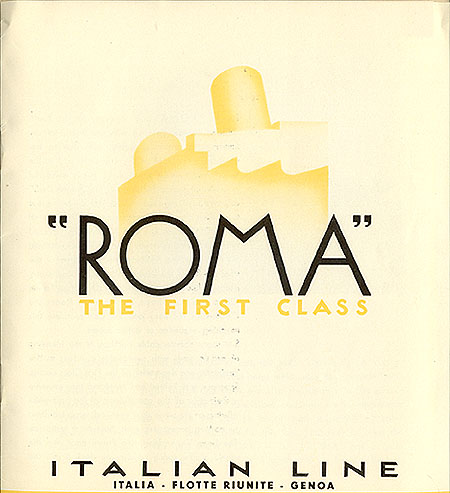
 ABC ETC INC. is a font and logo design service (est. 2018) based in New York City, run by Nazareno Crea. Nazareno Crea (b. Cinquefrondi near Reggio Calabria, 1983) is a Brooklyn, NY-based book and type designer, who studied at ECAL/University of Art and Design Lausanne (class of 2006) and the Royal College of Art in London (class of 2010). His typefaces:
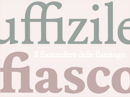 Italian graphic designer. At
 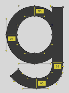 During his studies at University of Lower Silesia in Wroclaw, Poland, Ahmed Tarek designed the monoline and rigorously geometric sans typeface Abo (2018). [
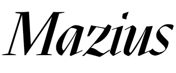 Italian lettering artist, illustrator and calligrapher. As a member of the Italian open source font cooperative
  Graphic designer in Milan, Italy. Creator of the
 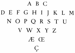 Italian typographer, type designer and printer (b. Bergamo, 1898; d. Alpignano, 1968) who created the garalde typeface
  Italian designer, 1920-1995, who designed most of his typefaces at Nebiolo in Turin. Until 1975, he made about 30 families at Nebiolo, and after 1975, he produced about 70 further families of fonts. With weights included, he created about 300 fonts.
 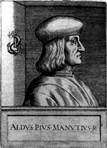 Late 15-th century Venetian scholar and printer, b. 1449, Bassiano, d. 1515, Venice. He founded the Aldine Press in 1495.
  Genova, Italy-based designer of the bilined art deco typeface
  Freelance Italian graphic designer, b. near Piacenza, 1976, who graduated with an M.S. in Industrial Design in 2004 from
  Italian designer and teacher (b. Turin, 1893, d. Turin, 1959), who spent most of his life designing type at Nebiolo, where he was also art director. He headed Studio Artistico della Nebiolo from 1936-1952.
 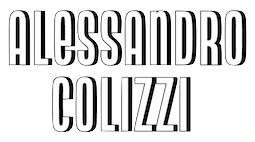 Alessandro Colizzi (b. Rome, 1966) is associate professor at Milan's Politecnico, Department of Design, where he teaches graphic design history, typography, and type design. He was professor at the Ecole de design of UQAM (Montreal) from 2005 to 2019, and visiting professor at the Design Academy Eindhoven (2014/15). He holds a PhD from the University of Leiden (with a thesis on Bruno Minari), an MA in Type Design from The Hague's
  Cagliari, Italy-based designer of the masculine octagonal typeface Qatsi (2014) and the wedgy sans typeface Mezzana (2015). Mezzana is a
  During his Masters studies at Politecnico di Milano, he spent a year in Berlin where he designed the blackletterish typeface The Raven (2015) in a course taught by Luc(as) de Groot at Fachhochschule Potsdam. Earlier, in 2012, he created the condensed octagonal typeface Fiat that is based on Fiat's logo. Fiat was a school project completed with Cecilia Negri and Virginia Nardelli. [
 [
[ Web designer based in Rome. Creator of
  Milan, Italy-based graphic and type designer, who studied at Universidad Politecnica de Valencia (Spain) and Politecnico di Milano His ultra-black
  During his studies at Istituto Vittorio Emanuele III di Palermo, in sicily, Alessio d'Amico created the stencil typeface Just Me (2015). He also designed the absolutely wonderful experimental typeface Morse Code in 2015. [
 Originally from Lazio, Italy, Alessio d'Ellena (b. 1985, Frattocchie, Rome) graduated from ISIA Urbano (Italy) with a thesis entitled Tipografia Parametrica e Matematica (2012). Graduate of the
  Graphic designer in Lisbon, Portugal (was: Dublin, Ireland), who studied at ISIA Roma in 2013. Creator of the
  The
The 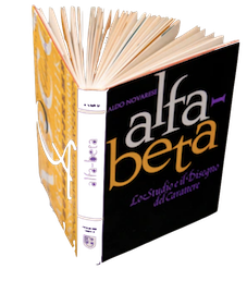 Davide Tomatis of Archivio Tipografico in Turin, Italy, is curating the reissue of Alfa-Beta, a book by the Italian type designer Aldo Novarese, originally from 1964 and out of print since a long time. The Alfa Beta team is collaborating with Novarese's family, namely his second daughter Federica, and his granddaughter Francesca Faro (daughter of Gabriella Novarese), to republish it, after having found all the original films. The book will be translated by Alta Price. The first edition of Alfa-Beta (published in 1964 by Progresso Grafico and distributed by G.B. Paravia) reviewed the evolution of writing systems and typography from their advent up to the present day.
  Graduate of the Rietveld Academie in Amsterdam. Born in Syracuse, Sicily, he spent half of his life in New York City, and studied for four years in The Netherlands. He worked in Lithuania with a group called Alfa60, and is now based in Turin.
  Graphic designer in London, UK. While still in Milan in 2012, she created a
  Paolo Vannucci (Alphabet&Type, b. 1969, Punta Marina Terme) created the curly handwritten Halloween typefaces
  Verona, Italy-based web and type designer. In 2015, he made the commercial typefaces Hand Drawn Font, Monster Font and Hammer Font (spurred vintage style).
  Milan, Italy and Tirana, Albania-based designer of Juan Miro Typeface (2012), a school project that was finished in EPS vector format.
 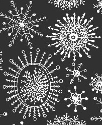 A freelance artist and illustrator based in Palermo, Italy, and born in Russia, Anastasiia Macaluso created various handcrafted typefaces in 2015, including a mummy-themed font, a bloody font, a bubblegum font, a couple of crayon typefaces and watercolor and dry brush types. In 2015, she started selling her work, such as the vampire script font Rodion, the crayon typeface Carbon Script, and a drop-dead gorgeous set of vector format snowflakes.
 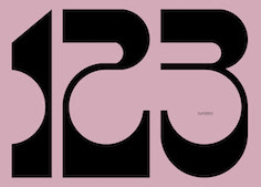 Graduate of the European Institute of Design (IED) in Milan. Visual designer in New York and Milan, Italy, who revived the bullet hole typeface Lucky (André Pless, Mecanorma, 1973) in 2019. His version, also called Lucky, is
  [
[ Milan-based creator of typefaces such as
  Art director Milan who studied in Firenze, Italy. In 2016, Cosimo Lorenzo Pancini, Andrea Tartarelli, Giulia Ursenna Dorati and Andrea Gaspari co-designed the 1940s vintage brush script typeface
 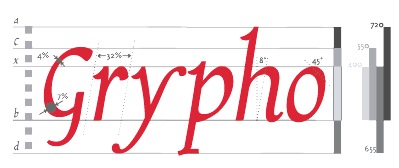 Graduate in Communication Design from Politecnico di Milano.
 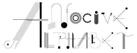 Andrea Malpede (Nocive Laboratory, Naples, Italy) works in London. He created the ornamental alphabet called
  During his studies, Torino-based Andrea Prina designed the
 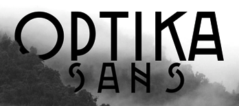 Graphic designer in Rome, who created the great hipster typeface Optika Sans (2015). [
 Italian codesigner, with Giuseppe Salerno and Paco Gonzalez, of the chocolate box script typeface family
  Andrea Tartarelli studied at the Academy of Fine Arts of Carrara and worked as a marble sculptor before turning to graphic and type design. He continued his studies at the Plantin Institute at Antwerp, and now teaches type design at IED Florence. He designed Tarif (selected by Fontspring.com among the Best fonts of 2019), Malik (shortlisted for the Communication Arts Typography awards 2021) and has been co-designer on dozens of typefaces at Zetafonts including the award winning Blacker (selected by Myfonts as one of the best new families of 2019), Monterchi (CA typography award 2020, Myfonts hidden gem 2019) and Stinger (CA typography award 2021). He works and lives in Pietrasanta (Tuscany, Italy). His graphic design outfit is called Surface Studio. Tartarelli's typefaces:
 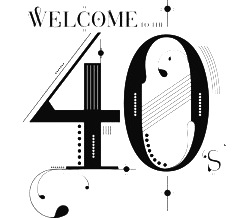 Andrea Unali (Zone 13 Studio, Milan, Italy) created a great-looking lettered poster to illustrate the 1940s (2014). [
 In 2017, Louise Fili, Nicholas Misani and Rachel Michaud co-designed the art nouveau typeface
  Angelica Baini was born in Castiglion Fiorentino, Italy in 1990. During her studies at the New World School of the Arts in Miami, FL, she designed the blackletter typeface
  Roman creator of the information design / rolodex / horizontal (almost) stencil
  Some Italian wood types shown in Catalogo Caratteri in Piombo e Legno by Anonima Impressori (Bologna, Italy). The styles covered here represent the art nouveau era. They comprise Amalia, Aurora Arcaico, Barnum, Bastone Stretto Fiat, Cenisio, Desdemona, Iris, Libellula, Liberty, Titania, Uranio. [
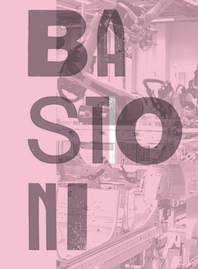 Some Italian wood types shown in Catalogo Caratteri in Piombo e Legno by Anonima Impressori (Bologna, Italy). The styles covered here are bastoni (plural bastone: stick styles). They include Arenzano, Aurora, Block, Grottesca, Linea, Bastone, Cairoli, Etruria, Grottesca, Hastile, Linea, Macchinato, Simplex. [
 Some Italian wood types shown in Catalogo Caratteri in Piombo e Legno by Anonima Impressori (Bologna, Italy). The styles covered here represent classical slab serifs, also called Egizio (Egizi in plural). [
 Some Italian wood types shown in Catalogo Caratteri in Piombo e Legno by Anonima Impressori (Bologna, Italy). The styles covered here represent decorative syles: [
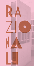 Some Italian wood types shown in Catalogo Caratteri in Piombo e Legno by Anonima Impressori (Bologna, Italy). The styles covered here are razionali (sans styles, including art deco and Futura). They comprise Alessandria, Balilla, Bastone Tondo Corsivo, Corsiva Razionale, Deco Nerissimo, Fantasia con Capolettera, Futura, Geometrico Tondo, Rapallo, Razionale, Semplicita and Triennale. [
 In the late 1400s, blackletter was replaced by a type style that mimicked handwriting. It was of uniform thickness, and thus appeared quite dark on paper. The humanist writing of Italian scholars of the Renaissance served as a model for what is now known as the Antiqua style.
  Padova-based
  Italian designer from Sassuolo, Modena (b. 1979). He obtained an MA in typeface design from the University of Reading (2009), based on his Latin / Cyrillic typeface Enquire and his dissertation on the work of the Officine Simoncini. After Reading, he started an internship and eventually worked as a full-time employee in the type group at Apple in Cupertino, CA. He left Apple in September 2016 and is now working on his own typefaces in Milano, Italy.
  Graphic and brand designer in Turin, Italy. His typefaces include the black geometric sans typeface Filo Black (2021) and the
  Calabria, Italy-based graphic and type designer. In 2020, he released the wide monolinear rounded titling sans family
  Milano-based designer who used the Ray-Ban logo to create a creamy connected typeface (2015). [
 Italian designer of these typefaces:
  Late fifteenth century Italian renaissance era calligrapher who was based in Florence, and who was famous for his florentine style of antiqua and cancellaresca. His alphabets inspired many typefaces, such as Petrarch (ATF), Sinibaldi (1926, Raffaello Bertieri) and Bologna (1946, Stephenson Blake).
 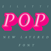 [
[ German printer (b. Köln, d. 1476), who left Mainz with Conrad Sweynheym to establish Italy's first printing press, in the monastery of St. Scholastica at Subiaco. There, they published three books, Cicero's De Oratore, the Opera of Lactantius, and St. Augustine's De Civitate Dei. In 1467, they set up a press in the De Massimi palace in Rome, from where they published 50 more books.
  Studio in Turin, Italy.
 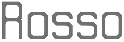 Graphic designer who is originally from Cyprus. During his Masters studies at IED in Firenze, Italy, he created the octagonal typeface
  Dutch type designer, b. 1987, currently located in Italy. Graduate of LUCA School of Arts, Ghent, Belgium, class of 2012. In 2015, with Theo van Beurden, he set up
  Beatrice Caciotti is an art director based in Rome, Italy. In 2021, she published the intestinal typeface Bumpy at
  Bio copied from
  Bembo is the name given in 1929 by Stanley Morrison to his revival of type in use in 1495 Venice by the printer Aldus Manutius. Textism (now defunct) decried Monotype's digital version of this font. Textism: Monotype Bembo, released in 1929, was a brilliant revival of type in use in 1495 Venice by the printer Aldus Manutius. In its metal version, Bembo is my favourite thing to read; with acknowledged subjectivity, it is the most beautiful and readable text typeface of all. The tragedy is that its digital incarnation is sloppy in comparison: thin, wispy, it falls apart and its character evaporates unless used at sizes too large to be practical. Because of licensing and ownership of the design, this is the Bembo we are stuck with.
 Italian graphic designer, b. Amsterdam, 1927, d. Milan, 2010. He lived and worked in Milan from 1954 until his death. Noorda attended the Instituut voor Kunstnijverheidsonderwijs (now the Gerrit Rietveld Academie), graduating in 1950. He moved to Milan in 1954. In Italy, Noorda gained fame for his design in the late 1950s and early 1960s for posters and advertisements for Pirelli where he also served as art director.
 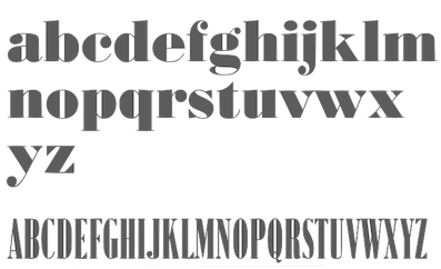 Dave Farey's great essay on the history and implementations of Bodoni. All Bodoni typefaces published today have genetic material from Giambattista Bodoni's original. Below are various implementations:
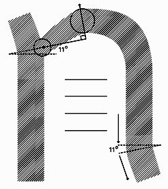
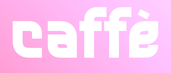 Salerno, Italy-based designer of these typefaces in 2018: Sonica (a rounded techno sans), Giordano (a geometric sans), Sauro (techno family), Deciso (octagonal / mechanical / brutalist:
  Graphic designer from Catania, Italy. He created the ultra-geometric typeface
 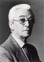 Italian artist, writer, designer, architect, graphic designer, educator, and philosopher, who proposed one font, Essential, in 1935, consisting of the minimum parts of letters needed for readability. His principles were lucidity, leanness, exactitude and humor. He was part of a team at Nebiolo (with Giancarlo Illiprandi, Franco Grignani, Ilio Negri, Till Neuburg, Luigi Oriani and Pino Tovaglia) that designed the lineale family Forma from 1966-1970 under the direction of Aldo Novarese. Born in 1907 in Milan, he died there in 1998.
 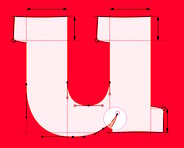 Italian type designer who co-designs typefaces with Nicola Manzari at Unio Creative Solutions:
  Designers of very original and semi-experimental commercial display typefaces that appeal to avant-garde designers and the capuccino crowd: Trash (2019), Ockham (2019), Monor (2018). [
 [
[ This is a multi-year project at Accademia di Belle Arti di Urbino (Italy) which has workshops and ateliers, and occasionally goes into type design. The type design activities, such as the free open source type family
  Padova-based graphic designer, teacher of advertising art at the Istituto Statale d'Arte Michele Fanoli in Cittadella Padova, Italy. Organiser of the international calligraphy award Belle Lettere (1997). The resulting publication Belle Lettere won the Fedrigoni Prize for graphic excellence. At ATypI in Rome in 2002, he
  CAST, or Cooperativa Anonima Servizi Tipografici (est. 2014, Bolzano, Italy) is a digital type foundry dedicated to the production and marketing of high quality fonts catering to specific needs, especially in the areas of branding and publishing. Their typefaces:
  Graphic designer and calligraphy teacher at LABA, Free Academy of Fine Arts, in Firenze, Italy. In 2016, she designed the drop-dead gorgeous typeface Davanzati for Palazzo Davanzati, Museo della Casa Fiorentina. Davanzati has elements of Bembo (like the nose in the e) and Trajan. [
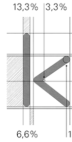 During her studies at Politecnico in Milan, Italy, Cecilia A. Nuñez created the rounded organic sans typeface Kurve (2012). [
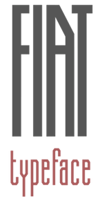 Cecilia (b. Trento, Italy) is a designer and illustrator based in Trento, Italy, who studied at ISIA Urbino. In 2012, Cecilia Negri and Virginia Nardelli, who where then both located in Milan, took the Fiat logo, and set out to design a full (condensed, octagonal) alphabet by extrapolation, called the
 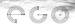 Chef Studio is located in Pietrasanta, Lucca, Italy. Its founders are Igor Biagi and Andrea Biagi (b. 1988, Pietrasanta). Andrea graduated from LABA University (Libera Accademia di Belle Arti) in Firenze, Italy, class of 2012. Designer of the counterless modular typeface
 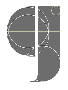 Merate, Italy-based designer of the fashion mag piano key typeface Muscle (2015). [
 During her studies at Accademia delle Arti e Nuove Tecnologie, Chiara Picano (Formia, Italy) designed the striking flared roman caps typeface Stygius Light (2014:
  During his studies in Milan, Chiara Quaggia created the signage typeface
  Art director in Rome who created the display typeface Neomerovis (2015) during a course at l'Accademia delle Arti e Nuove Tecnologie. In 2019, Chiara Virdis and Ilario Strazzullo co-designed the art deco sans typeface Gravo. [
 Graphic designer in Milan, Italy, who ceated the geometric sans typeface Spatial in 2018. [
 American graphic designer from Baltimore, MD, who studied in SVA;'s Masters program in Rome in 2012. Roman signage inspired her in the creation of four alphabets in 2012:
  Cofounder of Now Type,
  Andrea Braccaloni, James Clough, Piero De Macchi, Giangiorgio Fuga and Luciano Perondi, together the "who is who" in type design in Italy today, offer a high level type design course from September 15 until October 10, 2008, at Poli.design, Consorzio del Politecnico di Milano. A similar course was organized there in 2007 as well. [
 Born in Firenze in 1969. Cofounder with Francesco Canovaro and Debora Manetti of the Italian design firm in Firenze called Studio Kmzero. He co-designed some typefaces there such as
  Italian art directore designer in London who created the futuristic typeface Space, the modern geometric sans typeface King Lear, and the
  Antonio Cerri (b. 1972, Catania, Italy) freelances in web, graphic and motion design from San Giovanni La Punta, Sicily. He created some typefaces in 2010, such as the futuristic CRR NTN (+
 Bergamo, Italy-based designer of Dalila Garamond (2015), a hybrid of Garamond and Bodoni/Didot targeted for use in fashion mags. Dalila Garamond was a student project. [
 Roman graphic and web designer who has degrees from La Sapiena University in Rome, the Rome University of Fine Arts (RUFA) and Politecnico in Milan. She teaches graphic and type design at IED, the Istituto Europeo di Design (Rome).
  Italian art ditrector, graphic designer and visual artist. In 2022, he published the colourful Artphabet, which was inspired by Ettore Sottsass and the Memphis movement, as well as by artists such as Peter Blake, Alighiero Boetti, Robert Brownjohn, Fortunato Depero, Milton Glaser, Alessandro Mendini, Piet Mondrian, Bruno Munari and Piet Zwart. [
 Art director in Dublin, Ireland (was: Milan, Italy). In 2020, he designed the
  Web designer in Milano, Italy (and before that, Lugano, Switzerland, and Catania, Sicily), who created the didone typeface Rachel and the
  Graphic designer in Monza, Italy, who created the oriental simulation typeface Zen (2015). [
 As a student at AANT (Accademia delle Arti e Nuove Tecnologie, Rome), Rome-based Dario Sepe created the free diodone font Blasone HC (2015). I could not figure out where the download link would be, but it is nevertheless claimed to be free. [
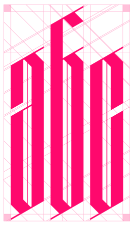 Davide Zomer (Bologna, and before that, Trento, Italy) created the modular typeface
 Jane Patterson founded Design Lab SRL in Milan, Italy. She is a partner in
 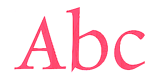 DF Type is the Austrian foundry of Giovanni de Faccio and Lui Karner. Giovanni de Faccio (a calligrapher born in Venice in 1966) and Lui Karner made the very classy text family called
  Digital artist from Milan who graduated from Politecnico in Milan. She created a branding and wayfinding type family for the city of Genova in 2010. This includes
  Born in 1987 in Santander, Spain, Diego Quijano Sanchez created Metatipografia Modular in 2012 for his graduation project. This is a modular type system in which keys on the keyboard are used to compose letters and icons. This fascinating project, and other ones called Metatipografia Monerd and Metatipografia Coordinate (pixel typeface) are conceptually related to Robert Meek's FontStruct.
  Russian type foundry, est. 2014 by Dmitry Goloub, the Moscow-based codesigner with Lucas Perdidaão of the
  During her studies in Firenze, Italy,
  During his studies in Bologna, Italy, Drako Mallafoglia designed the foliate typeface Leafont (2014), the art deco typeface Security (2016), Dots (2016), and the upright ornamental copperplate-inspired didone typeface Cupcake (2016). [
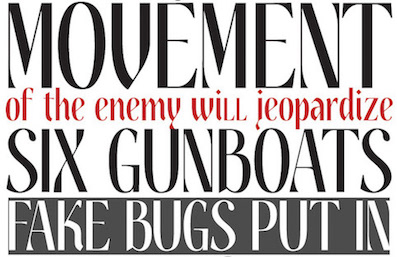 Milan, Italy-based designer of Poster Antique (2018), and Hambia (2014: a gothic dome-shaped font). [
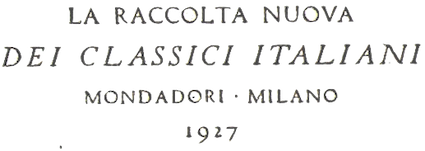 Italian art nouveau painter, lettering artist and type designer, 1871-1940. Around 1898, a photomechanical engraving studio for zinc, copper, and wood engravings was established under the supervision of Edoardo Cotti at nebiolo.
  Italian graphic designer, b. Puglia. He studied at the European Institute of Design in Rome, and works in Rome. His typefaces:
  A Garamond custom-designed for Italian publisher Einaudi. The closest digitally available typeface is
  [
[ During her design studies in Politechnico di Milano, Eliana Dedda created the stylish blackboard bold typeface
  Roman designer of the Trajan typeface Traiano (2014). [
 Conidi obtained an MA in typeface design from the University of Reading in 2008, and a PhD from the same university a few years later. Her graduation typeface is Nabil, a hookish serifed typeface that covers Latin and Arabic. It won a bronze medal at the 2009 EDAwards. She also holds a Masters degree in Design and Visual Communication from the Polytechnic University in Milan
  Salerno, Italy-based designer of the circle and grid-based sans typeface Kreion (2015).
  Born in 1977, Emilie Rollandin, an architect, lives in Val d'Aosta, Italy. Her company is Studio Archistico. She created the sketched typeface
  Roman designer at FontStruct in 2008 of Mango (ultra fat, rounded),
  Italian designer of the fat display typeface Prendotempo (2007). He has addresses in Ravenna and Rotterdam. He co-designed the monospaced typewriter typeface
  Brescia, Italy-based designer of a set of ten type typefaces in 2015 that represent ten different type styles. [
 Italian designer (b. Prato, near Florence, 1959) of
  During her studies at Politecnico di Milano, Ester Valorio designed the sketched typeface
  Graphic designer in Rome (b. 1990) who studied at the Accademia delle Belle Arti, Naples, from 2009 until 2010, and at the Accademia delle Arti e Nuove Tecnologie, Rome, from 2011 until 2012. His typefaces include
  Institute in Benalmadena, Spain (was: Santa Severa), where one can take 4-week courses at 1450 Euros a shot on the Etruscan alphabet, Trajan, Cuadrata and Rustic Roman Capital letters, and related subjects. They also organize lettering tours in Italy and guided tours in various musea. The teachers are Alberto Di Santo (Professor of the visual communication, Tor Vergata University, Rome; Professor of Graphic Design, Istituto Europeo di design, Rome; Professor of editorial design, La Sapienza University, Rome; Professor of Typography, C.F.P. Sinalunga, Siena) and
  Foundry in Rome run by
  During his studies at IAAD in Turin, Italy, Fabio Rovere created Forwell (2014). [
 Co-founder of
  [
[ Fabrizio Schiavi was born in Ponte dell'Olio in the Piacenza province in 1971. FSD Fabrizio Schiavi Design in Piacenza was opened in 1998. With Alessio Leonardi, he co-founded Fontology. He also co-launched the experimental graphics magazine Climax in 1994.
  [
[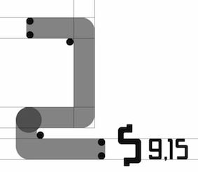 Milan-based creator of the condensed retro typeface
 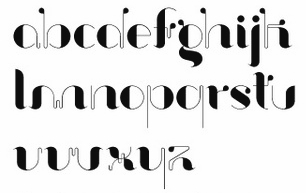 Designer in Pistoia and Firenze (and before that, Barcelona) who was born in 1982 in Pistoia, Italy. He created the ultra fat counterless typeface
  Graduate of the Politecnico of Milan, 2009-2012. Now a graphic designer in Mariano Comense, Italy, he created the quaint
  For a branding project for BIG4 streetball, a 3x3 basketball tournament based in La Spezia/East Coast Liguria, Federico Salesi (Florence, Italy) designed the cool custom font Big 4 Streetball (2018). [
 Italian design studio run by
 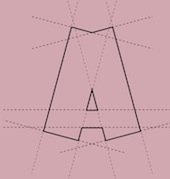 Venice-born graduate of the San Marco Institute of Graphic Arts and Multimedial Communication in Mestre, Venice. During his studies at IUSVE-STC University (Scienze e Tecniche della Comunicazione Grafica e Multimediale), Mestre, he created the grid-based stonecarving simulation and cartoon typeface
  Flanker, or Studio Di Lena, is the foundry of Italian type designer Leonardo Di Lena (b. 1975, Rome). Initially, it offered fresh free designs of classics. In 2012, it went commercial. Their fonts:
  Or Fonderia Tipografica Enrico Reggiani. Italian foundry in Milan, started by Enrico Reggiani in Milan in 1883. The business was taken over by his son Ergisto Reggiani (1888-1964). Reggiani published a bulletin in the 1930s entitled Tipografia (in which we find contributions of Edoardo Persico and the typographer Guido Modiano). It shows 44 very modernist typefaces, such as Reggiani, Macchina, Bodiniana, Jenson, Mascotte, Zaza, Mignon, Tosca, Manon, Mimi, Fedora, Butterfly, Fanciulla West, Turandot, Norma, Fornarina, Parisina, Isabeau, Fiammetta, Licia, Gioconda, Beatrice, Laura, Francesca, Asteria, Rosmunda, Minnie, Rossana, Mirandolina, Saida, D'Annunzio, Sansone, Nerone, Van Dyck, Olimpo, Olimpia, Olimpionica, Rubria, Ottocento, Pre Italica, Italia Nova, Era Nova, Vittoriale, Vittoriosa, Eia, Alala, Ardita, and Asse d'Acciao. Standout art deco designs included Ciclope and Mefistofele.
  Venice, Italy-based designer of the monoline script typeface
 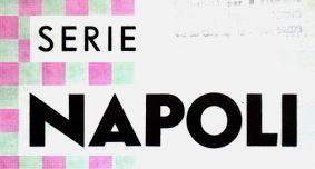 Italian type foundry located in Naples. Their typeface Adriatico Corsivo is a copy of Lettergieterij Amsterdam's ATF Garamond. [
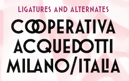 Font & Co. is an independent type foundry established in 2017 by Francesco Gianesini, co-founder and Creative Director of Gianesini Design, a multidisciplinary design studio based in New York City. He started Gianesini Design with his wife Tina in 1994. In 2018, he published
  Rome, Italy-based designer. In her Fontikon font project (2020), ishe has produced eight fonts, each with letters and culture symbols: Alchemy Complex, Adinkra Wisdom, Aztec Empire, Celtic Iron, Lovecraftian Neue, Japan Kamon, Viking Norse, Slavian Ustav.
  Italian creator of Broken Depth (2015, a shadow font), Fuzzy (2015), Dark Place (2015, scary font), Whispers Calligraphy (2015), Vintage College Dept Worn (2015), Peacock (2015), the free handcrafted typeface Old Sydney (2015) and the vintage typeface Old Bob Junior (2015).
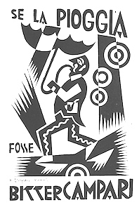 Fortunato Depero (1892-1960) was an Italian futurist painter, writer, sculptor and graphic designer. Born in Fondo/Malosco, Depero grew up in Rovereto serving as an apprentice to a marble worker. On a 1913 trip to Florence that he discovered a copy of the paper Lacerba and an article by one of the founders of the futurism movement, Filippo Tommaso Marinetti. In 1914, Depero moved to Rome and met fellow futurist Giacomo Balla. In 1915, Depero and Balla coauthored the manifesto Ricostruzione futurista dell universo. In the same year he was designing stage sets and costumes for a ballet. In 1919 Depero founded the Casa d'Arte Futurista in Rovereto, which specialised in producing toys, tapestries and furniture in the futurist style. In 1925 he represented the futurists at the Exposition Internationale des Arts Décoratifs et Industriels Modernes (International Exposition of Modern Industrial and Decorative Arts).
  Italian letter artist (b. 1445, d. ca. 1514) who constructed his characters geometrically, as early as 1509. He practiced mathematics and was a Franciscan friar. A Franciscan monk, he is mentioned several times in the notebooks of Leonardo da Vinci. His Summa di Arithmetica, Geometria, Proportioni e Proportionalità appeared in 1494. Continuing his work on proportion, he published
  Como-based student at Politecnico di Milano. During the course of Professors Iliprandi and Pavesi in 2011, she designed an
  Roman art director and illustrator who makes typographically interersting pieces such as one socialist revolution-inspired illustration called Apostrophe (2014) and a poster for the Still Three Jazz Trio (2006). [
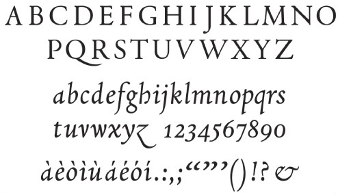 Italian designer of
  [
[ Roman designer of the modular grid-based typeface
  Designer (b. Riva Ligure 1875-d. Torino 1953) at Monotype in 1927 with Edoardo Cotti of
  [
[ Graphic designer at
  Based in Vienna, Austria, and/or Latsch, Italy, Franziska Weitgruber received her Bachelor's Degree in Graphic Design with a focus on type from the New Design University (NDU) Sankt Pölten, Austria in 2014. She also studied in the
  Italian illustrator and designer from Torino (b. 1970) who made Antitled, a sans serif family at
  Futurismo (
 Italian foundry in Milano.
  [
[ Florence, Italy-based designer of the fun poster typeface Croca (2017) and an unnamed hexagonal typeface (2017). [
 For a school project at Politecnico di Milano---Bovisa, Giacomo Bonomi (Monza, Italy) designed the sans typeface Hylki in 2016. Designed in the shadow of Futura, it shows more curvature and roundness. [
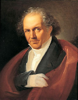 Italian typographer and type designer, b. Saluzzo (1740), d. Parma (1813). Bodoni began his career as a typesetter at the Vatican's Propaganda Fide printing press in Rome before setting up a Royal Press (Stamperia Reale) for the Duke of Parma. In 1782, he was appointed court typographer for Charles III of Spain and opened his own printing press, Tipi Bodoni. Bodoni designed hundreds of fonts in his lifetime. In 1788, he published his masterpiece, the
  Graphic and
  Bolzano, Italy-based designer of the modular ball terminal-laden display typeface
  Marostica, Italy-based art director who created Juventus Font in 2015 for the jerseys of Juventus Torino.
  During his studies in naples, Italy, Gianluca De Vivo created the display typeface
  An Italian type foundry by Milan-based type designer Giangiorgio Fuga, ATypI member, teacher of typography at the Istituto Europeo of Milan, Politecnico of Milan, Italy and Unisinos of Porto Alegre, Brasil. His great
  Graphic designer and photographer in Rome. She created the display typeface
  During a course at cfp Bauer, Parma, Italy-based Giorgia Pinotti created the black slab serif typeface Titolo (2015). [
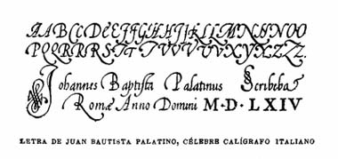 [
[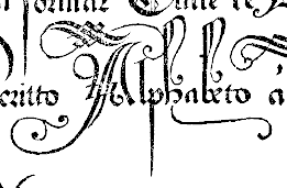 Or Giovanni Antonio Tagliente. Calligrapher and writing master, born in Venice, 1468-1527. Author of
  Landi writes about his company, GBL: GBL is a digital fonts foundry operating in Italy from 1994. We can create fonts or elaborate existing font. We have created Pineider's lithographic fonts from ancient metallic lithographic masters. Designer of the free ornamental caps typeface
 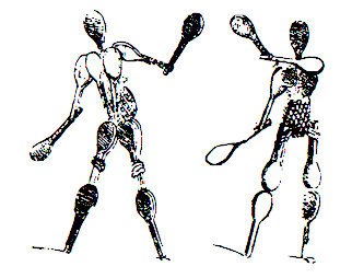 Giovanni Battista Braccelli (ca. 1600, d. before 1650) was an Italian engraver and painter of the Baroque period, who was active in Firenze. He is best known for his book of prints, Bizzarie di Varie Figure [a variety of human shapes], published in 1624 in Livorno, and dedicated to Don Pietro Medici. It contains wonderful futuristic engravings. Wikipedia: In this book, he engraves baroque experiments recalling Arcimboldo, engaging in a rarified set of conceits. Some of the figures are composed of boxes or raquets or curlicues. He published a second collection of prints entitled Figure Con Instrumenti Musicali E Boscarecci. Finally, he created
  Bologna, Italy-based creator (b. Como) of the
  Italian calligrapher and type designer from Venice who lives in Austria. Giovanni de Faccio (b. San Donà di Piave, Venezia, 1966) and Lui Karner run the Austrian foundry DF Type (or: Fischbachpresse). They made the very classy text family called
 Medieval miniaturist and painter, who died in 1398, probably in Milan. He was one of the first ones to show (painted) letters of an alphabet containing drawings of birds, animals and ladies (around 1390). This alphabet is known as The Bergamo Alphabet.
  Italian web designer based in London who sells her fonts via
  Designer in Firenze, Italy, b. 1991, who works as Gud, and who studied industrial design at ISIA Firenze. She heads
  [
[ [
[ Gironico, Como, Italy-based designer of the retro sans all caps typeface Aero Club Como (2013-2014). In 2012, he created Archiquadro, a Bauhaus style piano key stencil face.
  Italian designer who released these headline sans typefaces in 2021:
  At Politecnico di Milano, Greta Bassanese designed the text typeface Karmina (2014) and the experimental Alvin Lustig typeface (2014). [
 Very talented Pistoia, Italy-based designer (b. 1982). His typefaces:
  During his graphic design studies in Florence, Italy, Harendra Kapur designed the ultra-condensed typeface
  Talented visual designer in Bari, Italy. Creator of the handcrafted poster typefaces Neretto Sans (2015, thick and black), Organic Tobacco (2015) and Sensi Bold (2015), and the elegant rubber stamp-inspired Marinaio (2015).
  Italian graphic designer, b. 1931. He was Max Huber's assistant from 1950 until 1954, and joined Massimo Vignelli's Unimark in 1967. In 1974, he founded the studio Signo. He heads the visual design program at Politecnico di Milano. [
 Italian graphic designer and art director Erasmo Ciufo (b. 1982, Milan) graduated in 2004 in Communication Sciences at Milan University and obtained an MA in Visual and Graphic Design at the Scuola Politecnica di Design (SPD), Milan, in 2006. He founded Lettergram, a graphic design studio specialising in branding and type design, based both in Milan and New York. He also ran Fontinspiration and participated in
  In Marta Bernstein's class at Politecnico di Milano, Hugh T. Gilmore created Nimble (2014), a humanist typeface based on his own calligraphic work.
  Igino Marini (b. 1964) is an Italian civil engineer based in Osimo. He teaches mathematics for design at ISIA Urbino, and runs
  Graphic designer in Lecco, Italy, who created the wide techno font
  Graduate in Communication Design from Politecnico of Milan. For her studies, she created a system of
  Graphic designer in Milan. She created a beautifully delicate flared semi-serifed face,
  During his studies at Accademia delle Arti e Nuove Tecnologie, Ilario Strazzullo (Rome, Italy) created the
  Graphic designer in Rome who made the roman caps typeface
  During her studies at Escola d'Art i Superior de Diseny de Valencia, EASD, Isa Lloret (Trieste, Italy) created a geometric solid alphabet that was inspired by the Bauhaus work of Josef Albers, and colored it according to Kandinsky's paradigm of relating color to shape.
  During her visual communication studies at IED Firenze, Livorno (and/or irenze-)-based Isabella Ahmadzadeh created the Indic simulation typeface
  Italian Institute with type classes led by Luciano Perondi. Aka Accademia di Belle Arti di Urbino. In 2008, they made the typewriter typeface Lekton (free), about which they write: The typeface has been designed at Isia Urbino by the students Luna Castroni, Stefano Faoro, Emilio Macchia, Elena Papassissa, Michela Povoleri, Tobias Seemiller, and the teacher Luciano Perondi (aka galacticus ineffabilis). Lekton is inspired by some of the typefaces used on the Olivetti typewriters. We thank Gianmaria Capello for his precious support. This typeface has been designed in 8 hours.
  Italian Type Foundry was created in 2019 as a spinoff of Florence-based Zetafonts Type Foundry in order to promote young Italian type designers. Their typefaces:
  [
[ James Clough (b. 1947, London) studied typographic design at the London College of Printing. In 1971 he moved to Milan to work as a designer, typographer and calligrapher. Since 1990, he has been teaching the theory and history of typography and visual communication at various institutions including the Milan Polytechnic University (since 2002) and the ISIA of Urbino. He lectures on many aspects of calligraphy, type design and the history of typography in Italy, Britain and Switzerland. Recent essays of his research for English and Italian publications include a study of the various editions of the Hypnerotomachia Poliphili (first printed by Aldus Manutius in 1499), types used by the earliest printers in Milan and Venice, the 20th century revivals of Bodoni's types and a study of historical and contemporary script types. In 2005 he curated the Mondovì Museum of Printing. He is on the scientific board of
  An American type designer and President of Design Lab SRL (in partnership with
  Jekyll&Hyde is an Italian studio founded in Milan in 1996 by Marco Molteni and Margherita Monguzzi. Mainly involved in corporate logos, this studio also produced some typefaces, notably Contaminato (1997),
 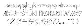 During his studies at IED in Firenze, Italy, Joao Pucci, who hails from Brazil, designed
  [
[ Type and graphic designer from Italy, who he holds a BA in graphic design and visual communication from the ISIA Urbino and an MA in Type and Media from the Royal Academy of Arts (
 During her studies at Anderson University, Josie Maszk (Charleston, SC) created the inscriptional roman typeface Sancro (2014), which is based on a 13th century inscription in the basilica of Santa Croce in Florence, Italy. The typeface is intended for the church's use on signs, tickets, and other material.
  Julia is Valerio Di Lucente (Italy), Erwan Lhuissier (France) and Hugo Timm (Brazil). They met at the Royal College of Art in London having come from different professional backgrounds in editorial design, web and art direction. The studio Julia was founded in 2008 upon their graduation. Together, they work on books, typefaces, posters, websites, identities and exhibition design. They teach as visiting lecturers at Kingston University. Typefaces:
  Bia Andrade (b. Brazil) has a degree in South American literature. She moved to Europe, where she settled near the Lago di Como in Italy. In 2020, she published the hand-printed fonts
  Simone Giorgio (K-Projects, Varese, Italy; b.1985) is a
  Uber-talented designer from Turkey who studied at iED in Firenze, Italy. She created several display typefaces in 2014, including Mohocey (2014). [
 During her studies at Accademia Delle Arti e Nuove Technologie in Rome, Italy, Katherine Khimenets (b. Belarus) created the Trajan typeface Laurentia (2015).
  International non-profit type design and typography conference held in Faenza, Italy, on June 5 and 6, 2014. Speakers include Jessica Hische, Ellen Lupton, Erik van Blokland, Frank Chimero, Elliot J. Stocks, incent Connare, Ellen Lupton, Simone Wolf, Francesco Franchi, and Jan Middendorp. Calligrapher Luca Barcellona held a workshop. [
 Kidstudio (Firenze, Italy) was founded in 1997 by Luca Parenti and Marco Innocenti (b. Firenze). In 2013, Innocenti co-designed
  Type foundry in Torino, Italy, with offices in Milano, Roma, Genova and Napoli. Their typefaces are all named after Italian cities with a few exceptions: Bassano, Rovigo, Chioggia, Tolmino, Como, Rovereto, Trento, Roma, Velletri, Viterbo, Bernina, Casale, Garda, Lodi, Piacenza, Modena, Biologna, Remington, Remington Chiaro. Credit for the images below, taken from their 1929 catalog:
  Full e-text of the first book on writing, La Operina (Ludovico Vicentino degli Arrighi, 1522), a 32-page book about Arrighi's calligraphic lettering. Comments by G. Briem. Briem writes: The author was a copyist, papal scribe, publisher and type designer. He called himself Ludovico Vicentino, and wrote the name eight times into his short text. Yet we know him as Arrighi, a name that appears nowhere in the book. Operina shows great handwriting on every page. It is more than a set of model sheets, however. It describes Arrighi's underlying forms and two basic entry movements. It covers the spacing of lines, words and letters. It deals with slant and joins. Operina is a slim volume of 32 pages. It teaches italic handwriting and is still essential reading. Each page was printed from a separate woodcut by Ugo da Carpi, who is best known as a master of chiaroscuro engraving.
  Bergamo, Italy-based designer, b. 1998, who, as a student at S.Giulia Academy in Brescia, created the bold condensed sans typeface Build (2018). [
 Based in Corbetta, Italy, Laura Sansotera created a typeface that is based on Coppertone's logo. It was a school project in 2009 at Politecnico di Milano. Designer of the retro typeface
  LCD Graphics has an impossible page. It is a company founded in 1982 by
  Leftloft is a visual communications studio in Milan, founded in 1997 by graphic designer Andrea Braccaloni (b. Bologna, 1973), Francesco Cavalli, Bruno Genovese and David Pasquali. The studio is mainly engaged in corporate identity, and now also has an office in New York. Andrea Braccaloni teaches visual communication at the III Faculty of Architecture/Design at the Politecnico di Milano. At
  Milan, Italy-based type designer who graduated from IED in 2007 and attended the Master of Type Design program at Politecnico di Milano. He has been working in the world of visual communication since then for clients such as Chianti Classico, Moretti, Amnesty International and UAAR. In 2019, he started teaching at IED (Istituto Europeo di Design) in Rome.
  [
[ During his studies at Accademia delle Arti e Nuove Tecnologie in 2014, Leonardo Gubbioni (Terni, Italy) created Building (2014), a masculine condensed haedline sans that takes no prisoners.
 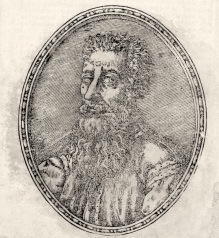 This jewel of a book was published in 1550 by Antonio Blado asolano in Rome. It is now available on the web and contains of complete alphabets, from chancery scripts, to blackletter and roman. There are also Greek, Hebrew, Cyrillic, Syrian, Arabic and other alphabets.
  Or Elisabetta Borriello. Rome, Italy-based designer of the sci-fi typeface Blade Stencil (2015), a modular type created for a school project in Bolzano. In 2016 she designed the decorative bicolored typeface Flamingo. [
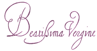 Italian writing master, b. Bologna, d. Roma 1617. Examples of his work date from 1582 and 1588. Author of II Cancelliere di Ludovico Curione ornato di lettere corsiue et d'altre maniere di caratteri vsati a scriuersi in Italia. Libre Quarto (Roma, 1609). [
 Graduate of the Art Institute of Trento (2008-2013). Trento, Italy-based designer of the
 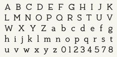 Graphic designer in Milan. During a 5-week type design course at Politecnico di Milano, he created the extraordinary mid-20th century display typefaces
  During his studies, Lecco, Italy-based Lorenzo Rigamonti designed the very original oriental simulation typeface Kana (2017), which comes wth wayfinding icons. [
 Celebrated Milan-based calligrapher, letterer and illustrator. Examples of his lettering include
  Milan-based graphic designer. Creator of
  Italian type designer at Zetafonts. In 2016, Cosimo Lorenzo Pancini, Matteo Chiti, Luca Chiti and Andrea Tartarelli co-designed the retro connected brush script font family
 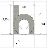 As a student at IUSVE, Verona, Italy-based Luca Taddeo created Universal Regular (2016), which is an extension of Herbert Bayer's Universal, and is---obviously--a compass-and-ruler typeface.
  Florence, Italy-based designer of the squarish typeface setto (2016). At Italian Type, he published
  Rome-based creator of
  [
[ Italian art cooperative in Omegna, where one can download the nice hand-printed Ave Giulio (2009). Other fonts viewable via
 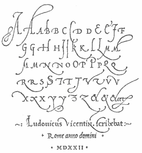 Influential Italian printer, writing master and calligrapher, b. ca. 1475-1480, d. 1527, aka Ludovico Vicentino (degli Arrighi), or Ludovico il Vicentino. Around 1510 he was a bookseller in Rome. He was employed as a scribe at the Apostolic Chancery in 1515. Author in
  As a member of the Italian open source font cooperative
  Graduate of the Escuela Superior de Diseño de Murcia, Spain. .During her studies at Politecnico di Milano, Maje Navarro created the curvy organic typeface Ardini (2014).
  Designer in Castellanza, Italy. In Giangiorgio Fuga's type design class at Politecnico di Milano, Alessandro Asgari, Leonie Buch, Misha Faridani, Laurent Ferrante, Mara Giurgola, Nicolás Morales co-designed the signage script typeface Chang Beer New Chang (2014). [
 Italian calligrapher from the late 16th century, who created several sets of beautiful initials.
  Aka Marco Inve. Graphic designer in London (b. Milan, 1991). In 2013, he created the ransom note style
 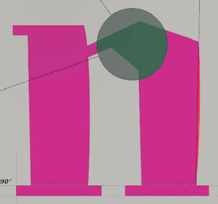 Marco Marzoli (b. 1986, near Florence, Italy) created the angular and quite readable (
 [
[ Freelance designer and illustrator in Milan, now based in Laveno. Creator of
 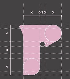 Chiavenna and/or Milano, Italy-based designer of Rodili Garamond (2014) and Roxi (2015, designed for logos and ads). [
 Graphic designer in Milan who made the flare-serifed heavy all caps typeface
 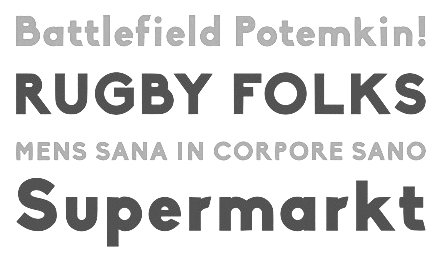 Italian visual artist based in Amsterdam and Berlin. In 2005 he graduated with a bachelor's degree in visual communication from ISIA (Florence, Italy) and Bauhaus University (Weimar, Germany). He continued his studies at the Sandberg institute of the Rietveld Academy, Amsterdam, where he obtained a Master's degree.
 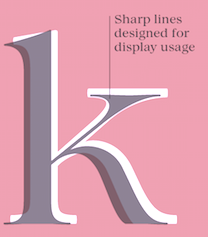 Maria Chiara Fantini is a graphic designer and letterer in Florence, Italy. In 2019, Cosimo Lorenzo Pancini, Andrea Tartarelli and Maria Chiara Fantini at Zetafonts published a slightly calligraphic Elzevir typeface,
  Italian graphic designer. Creator of the spurred typeface
 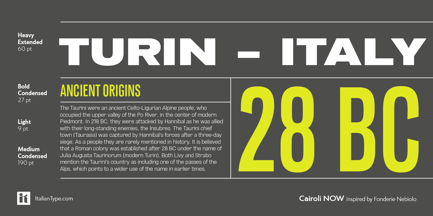 Italian type designer whose typefaces include:
  Mark van Leeuwen (or Marco van Luijn), a designer and letterer in Berlin, Germany (and before that, in Milan, Italy), created these typefaces:
  During her studies at Politecnico di Milano, Marta Ambrosetti (Varese, Italy) designed the grid and compass-based art deco stencil typeface
  During her studies in 2013 at the Accademia delle Arti e Nuove Tecnologie di Roma, Marta Coppola designed
  During her studies at IED Florence, Marta Hofer (Monza, Italy, b. 1992) designed the squarish typeface Berlin (2014), which is inspired by the architecture of the city. [
 Marta Isabella Reina obtained a PhD at Politecnico di Milano in 2018 with a thesis entitled Communication design for gender cultures. Models and tools to explore gender issues in design education. She is currently a lecturer at the University of Greenwich, UK. In addition, she works as a visual artist and illustrator in Bristol, UK. In Gio Fuga's class at Politecnico di Milano, Marta Isabella Reina created the signage script typeface Campbell (2009), which is modeled after the lettering on Campbell's soup tins. [
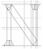 Martina Zanini lives in Lodi, Italy. While studying in 2010-2011 with James Clough at the Politecnico di Milano, she created the
  Famous Turin-based calligrapher with a great web presentation of his work. The type community is eagerly awaiting his first calligraphic font! Calligraphic workshop coordinator at ATypI 2015 in Sao Paulo. [
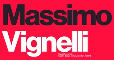 Famous Italian typographer and graphic designer, b. 1931, Milan, d. 2014. Designer, with Tom Carnase, of WTC Our Bodoni (1989). In 1966, he set up Unimark International in New York City, which became the largest disign firm of its day. He left Unimark in 1971, to set up Vignelli Associates in New York City with his wife Lelli.
  Como, Italy-based designer of the
  [
[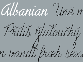 Italian type designer at Zetafonts. In 2016, Cosimo Lorenzo Pancini, Matteo Chiti, Luca Chiti and Andrea Tartarelli co-designed the retro connected brush script font family
  [
[ Catanzaro-based Italian designer (b. 1985) of
 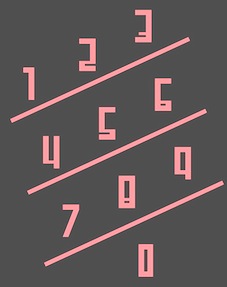 Roman designer of the modular semi-octagonal almost art deco typeface Skyline (2014).
 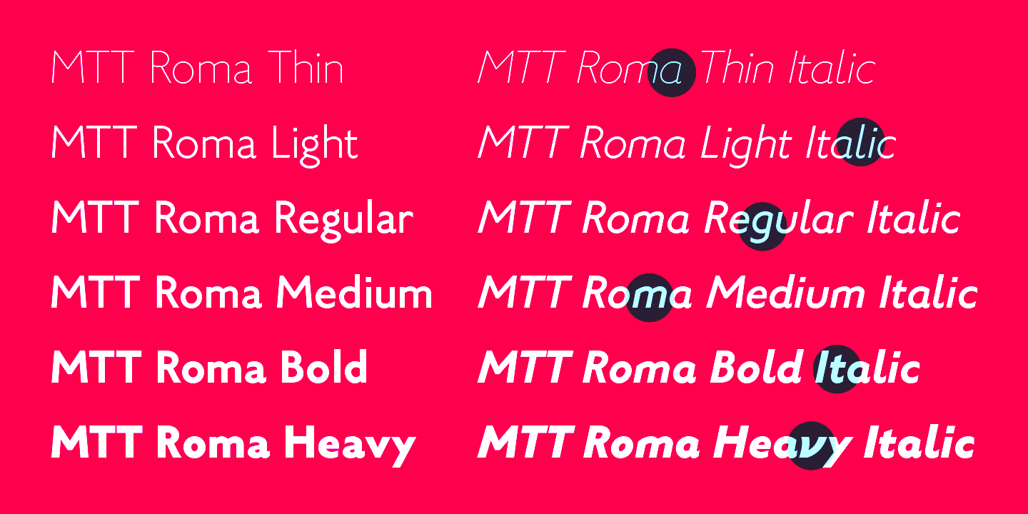 [
[ Senior art director in Milan. Designer of the
  Bologna, Italy-based designer of
  Artist, teacher, graphic and web designer, born in Sasso Marconi, a small town outside Bologna, Italy. Since 1978 Osti has taught courses in Special Graphic Techniques and recently also the course of Progettazione Grafica, at the Accademia di Belle Arti. He works as an art director. In 2009 he received the Premio Marconi for Multimedia Art.
  Italian illustrator in Venice, CA, who designed the fun
  Michelangelo Nigra is a graphic designer, type designer and illustrator based in Turin, Italy. Graduate of the
  Graduate of Politecnico di Milano with a study on type and legibility, and of the
  Italian designer of these typefaces in 2021:
 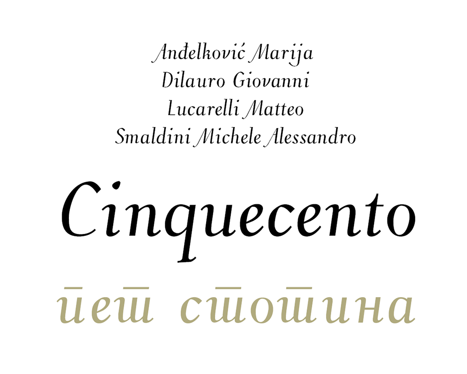 Cinquecento is a
  Visual designer in Milano, who created the (virtual)
  Graphic design and fashion outfit in Verona, Italy.
  Monofonts is the font foundry of
  Italian designer of the thorny text typeface Rondospino (2017). [
 MTT is the commercial type foundry of Mattia Bonanomi (b. 1985, Brescia) in Milan, Italy, est. 2013. In 2010, Mattia graduated from Central Saint Martins College in London.
  Born in Milan in 1965, Matteo Federico Bologna emigrated to the United States, where he founded Mucca Design in 1999, a company involved
  Established in 2005, Muccatypo's is a group of three type designers that form a subgroup of Mucca Design in New York:
 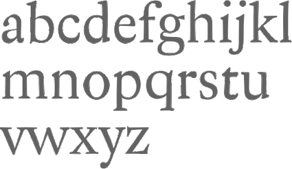 The main
  Eurostile (Aldo Novarese and Alessandro Butti, Nebiolo) and its derived typefaces, as selected from the MyFonts library.
  MyFonts hit list for Trajan typefaces, i.e., roman typefaces as modeled after the inscriptions found on the Trajan column in Rome. See also
  Nadja Kargruber (Nana Kar, Reykjavik, Iceland) was born in Italy and grew up in Tesido in northern Italy. She graduated from the Accademia Leonetto Cappiello in Florence in 2014 before moving to Iceland. She designed these typefaces in 2014: Aventa (human figurines) and Allure (ultra-condensed thin sans).
  Creators of the free dingbat typeface
  In 1878, Giovanni Nebiolo bought a foundry from Giacomo Narizzano. In 1889, the Levi brothers joined this venture to form Nebiolo&Co. After 1899, several other foundries were absorbed by Nebiolo, and for some time, the company was called Società Augusta Torino, but it reverted to Nebiolo&Co in 1917. Based in Turin, type design started in the 1930s, first under the direction of painter Giulio da Milano, then from 1936 under Alessandro Butti, and from 1952 under the guidance of Aldo Novarese. It was Italy's premier foundry of the 20th century. It closed its typography department in 1975, and went bankrupt in 1978, when Fiat took over. In 1990, the foundry was taken over by Fruttiger AG in Münchenstein. Their most famous font families include Eurostile (1962), Microgramma (1952), Torino (1908) and Stop (1971). Others worth mentioning are Vittorio (before 1920), Neondi (1935, da Milano), Resolut (1937, Brünnel),
  Designer and artist, b. Milan, 1926, d. Caracas, 2001. From MyFonts: Several Venezuelan generations had acquired very strong design, typographic and drawing knowledge due to the historical and artistic heritage left by Master Nedo Mion Ferrario. He spent big part of his life teaching and working on design. His passion for impossible figures and geometric optic illusions were the most valuable characteristics of his work. Most of his knowledge was obtained from his father, Emilio Mion Vianello, who dedicated his life to wood carve, a high profile job those day in Italy. Emilio studied in the Brera Academy in Milan and Nedo studied in the Commercial and Technical Institute of Milan between 1936 and 1940, and then in the Fine Arts Academy in the same city. At the end of the Second Word War, both of them decided to leave Italy due to the political situation in those days. Encouraged by the immigration Venezuelan politics they arrived in Caracas in 1950.
  [
[ Nicola Serradimigni (b. 1972, Bologna) lives and works in Modena, Italy. Creator of
  Or Nicholas Jenson. French printer and artist born in Sommevoire, France in 1420. He worked mostly in Venice as a printer, type designer, punch cutter, and engraver from 1468 until his death in Venice in 1480. In 1475 he was made a papal count by Pope Sixtus IV. He produces his first roman type in Cicero, Epistolae ad Brutum (1468), which is described as perfect and unequaled. A Greek typeface which is used for quotations was made in 1471. In 1473, he creates a blackletter typeface which he uses in books on medicine and history. In 1475, he founds his first book trading company, Nicolaus Jenson sociique, whose partners include the Frankfurt businessmen Peter Ugelheimer and Johann Rauchfass. In 1480, his second book trading company is launched under the name Johannes de Colonia, Nicolaus Jenson et socii.
  Italian designer of the extended hipster sans typeface Sandro Grottesco (2020) at Supernulla. [
 Swedish graphic designer, b. 1991, who obrained a Masters degree at IED in Florence, Italy. He is currently based in Stockholm. His typefaces:
  Italian studio based in Naples. It created
  Designer in Milan, who created the informal typeface Branch in 2014.
  Italian designer of Alchemion (2019), an old style Venetian book typeface based on sixteenth century alchemical treatises. [
 Firenze, Italy-based designer of the compass-and-ruler typeface Fat Font (2014). [
 Brazilian type foundry run by Lucas Franco (Italian Brazilian, b. 2001), his father Claudio Rocha (Italian Brazilian, b. 1957) and his mother, Milena Mainieri (Italian Brazilian, b. 1969), which is currently based in The Netherlands. Their typefaces:
 [
[ Fatih Günes, an art director in Milan and/or Bursa, Turkey, extended Lukasz Dziedzic's free Lato font (2010) for Turkish, in his Lato TR (2013). In 2015, he made the rounded slightly elliptical sans typeface family
  Founded in 1908 by electrical engineer Camillo Olivetti (1868-1943), this manuacturer of typewriters, computers, tablets, smartphones, printers and other business products is headquartered in Ivrea near Turin, Italy. In 2003, it became part of the Telecom Italia Group. Camillo's son, Adriano Olivetti (1901-1960), developed the company internationally.
  Freelance illustrator in Turin who drew an erotic alphabet in 2017. [
 Fonts designed by talented Swedish designer Franko Luin (born in Trieste, Italy in 1941, to Slovenian parents). Luin immigrated to Sweden in 1961. After studying at the Grafiska Institutet during the 1960s, Franko Luin spent two decades as a print designer for Ericsson before becoming independent. In the 1990s he was involved in multimedia and typeface design. In 1996, he founded his own typographic studio, Omnibus Typografi. At some point, he led a course in Web Typography at the Berghs School of Communication in Stockholm. Franko Luin passed away on September 15, 2005, in Tyresö, Sweden.
  Pablo de Mello is a graphic designer in Rio de Janeiro. He made the
  Pansa Studio is a brand, design and animation studio in Stockholm, which was founded in 2013 in Verona, Italy, by Rodrigo Nasta (b. 1986, Montevideo, Uruguay), and Trini Testi (b. 1990, Rome). In 2013, Trini Testi designed the elegant tall-legged, almost Peignotian, typeface Funkadeli. Trini has an MA in graphic design from IED.
  Born in Lombardia in 1979, Paola Vecchi studied in Milan before moving to Spain, where she works as a graphic designer in Sevilla from 2010 onwards. In 2017, she designed the decorative caps alphabet Memento Mori.
  Paolo Daniele Corda was born in Milan in 1975. He is currently operations room coordinator of the Central Briefing Office for the national air traffic services of northern Italy. Stefania Cantù and Paolo Daniele Corda coauthored
  [
[ Italian art director in London, who designed the layerable customizable spurred typeface Mermaid in 2016.
  Italian type designers Riccardo Olocco and Jonathan Pierini reinterpreted Bodoni's work in 2014. Their
  Designer and video maker based in London, Florence and Cagliari, Sardinia. Designer of the handcrafted typefaces Bambo (2016), Scrabionau (2016), Agattau (2016), the fantastic brush script typeface
  Naples-based designer, b. 1981.
  French graphic designer who lived in Perugia, Italy, and is now in Nantes, France. I would call him an experimental typographer. He likes experimenting, for example, with modular typeforms, as is apparent from his typefaces called
  Pier Francesco Martini (b. 1984), a graphic designer in Prato / Firenze, Italy, designs and sells typefaces. He created
  Florence, Italy-based type foundry that was active in the 20th century. It was taken over by Azzaro in Rome. Pierallini & Turchi had a large catalog, that included the Trento series, an imitation of Inkunabula by Nebiolo:
  Freelance graphic designer in Grottaglie, Italy. Stones inspired Pierfrancesco Annicchiarico to design the experimental typeface Secco (2009). The Cà brùtta building by Giovanni Muzio in Milan got him to design the
  Italian type designer born in Turin in 1937. Designer at Nebiolo from 1956-1959. Freelancer and writer since 1971 at his own De Macchi graphic design studio. Most of his typefaces were commissioned by corporations. In 1992 he set up the calligraphic association Dal Segno alla Scrittura. His typefaces:
 Italian classical scholar, who lived from 1470 (b. Venice) until 1547 (d. Rome). He was well-connected and knew the famous Medicis. Above all, he had an affair with Lucrezia Borgia. He influenced the development of the Italian language and established the madrigal as the most important secular musical form of the 16th century. He was made cardinal in 1539. Monotype gave his name to their typeface Bembo of 1929. The design is based on type cut by Francesco Griffo for the Aldine Press of Aldus Manutius, and first used in Bembo's work De Aetna (1495-1496). Allan Haley writes: In February 1496, Aldus [Manutius] published a rather insignificant essay by the Italian scholar Pietro Bembo. The type used for the text became instantly popular. So famous did it become that it influenced typeface design for generations. Posterity has come to regard the Bembo type as Aldus's and Griffo's masterpiece. Pietro Bembo himself had no connection to or influence on the typeface that carried his name. [
 Florence, Italy-based designer. In 2021, he published these typefaces: the
  Milan, Italy-based graphic designer. While studying at Milan Polytechnic, Pimpa Gerroc created the rounded sans typeface family
  Graphic designer in Milan, Italy. In 2015, he created the sans typeface Cus Cus, which is based on some numbers found on a wall at CUS (Centro Universitario Sportivo) in Idroscalo, in Milan.
  Fabian Pfeifhofer is an Italian/Tirolian designer, b. 1984. Creator of Ugloosy (2007, grunge), Loosydings Extended (2008),
  Torino, Italy-based designer of the colorful decorative caps typeface Mousta (2013). [
 Italian designer of
  It is well-known that a Didot or Bodoni without serifs turns into a high-contrast sans comparable to Peignot. I call these Peignotian typefaces. A real beauty in this genre was created in this manner by Milan, Italy-based designer Raffaella Isidori in 2011 entitled
 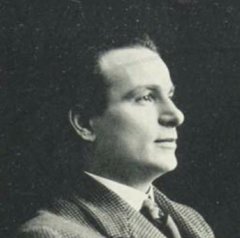 Type designer from Florence, 1875-1941. Bertieri held the position of artistic consultant of the Nebiolo Foundry for most of his life. He made or supervised the production of these typefaces:
  Italian foundry located in Milan. Their work is shown in
  Graphic designer in Florence, Italy. Creator of the arabic version of
  Giuseppe Salerno (aka
  Milan, Italy-based designer of the
  Italian graduate from the type design program at the
  Designer and digital artist in Florence, Italy. He created the ornamental caps typefaces
  Graphic designer designer, b. 1959, Parma, Italy. He studied at the Art Institute in Parma. After graduation in 1983 from the Urbino ISIA Academy, Antonio spent 20 years working as Senior Art Director and Creative Director for various international advertizing agencies in Milan (Pirella Lowe, Armando Testa, Young & Rubicam).
  Born in Rome, Robert Granjon (1513-1589) worked for various printers in Lyon, Paris, Frankfurt, Antwerp, and Rome. In Lyon, he was active as librarian, printer, and engraver of typefaces. Granjon is an exponent of the French renaissance. Granjon's designs live on in the balanced Plantin family, designed by Frank Hinman Pierpont in 1913 at Monotype, and available at Linotype (and elsewhere).
  Rome-based designer of the breast-striped logotype iKode (2015). [
 Naples-based designer of the connect-the-dots typeface
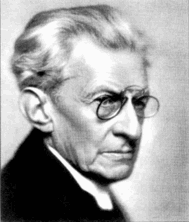
 Rumors Foundry was set up in 2020 by Palermo, Sicily-based graphic designer Gabriele Bellanca. In 2020, he released the 5-style sans family
  Turin-based Italian designer of Modena (2009, a modular experimental face) and
  Italian designer of the Saul Bass-style typeface Bravi Ragazzi (2021). [
 Designer from Ragalna, Italy, b. 1976. Creator of the comics book font
  Bologna, Italy-based designer of the socialist movement dingbat font Mai 1968 (2018). [
 Udine, Italy-based designer in 2016 of the geometric solid typeface Moon and Diamonds (created to celebrate Aretha Franklin), Bazar (a sans loosely based on Mark van Bronkhorst's Conduit designed in 1997), Woman Serif, Man Sans (avant garde), and HausNCo (inline Bauhaus style).
 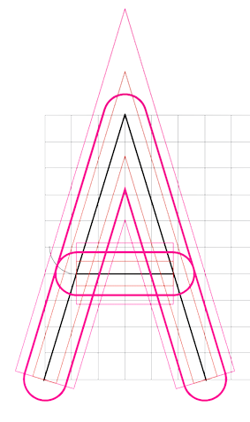 Santino Calvo (ES Factory, Rome, Italy, b. Sicily) created the
 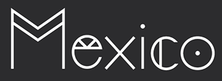 During her graphic design studies in Florence, Italy, Sarah Sellars created Tea (2014: a foliate typeface) and Hikuri Sans (2014: a hipster typeface). She writes: Hikuri is the Huichol name for the Peyote cactus found in the desert of Northern Mexico. Given its halucinogenic properties the Hikuri cactus is a central religious resource. [
 Italian Mannerist architect, engraver and painter of the sixteenth century, who designed some of the most refined variants of the classic Roman letters---the prototypical Italian Renaissance roman alphabet, also known as
  [
[ Great Italian illustrator in Firenze.
  Italian creator of the round geometric sans typeface
  London-based graphic designer. His fonts
 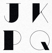 Creative designer from Milan, who co-founded
  [
[ Graphic designer in Turin, Italy.
  Italian graphic design group headed by
  Studio FM Milano (Barbara Forni, Cristiano Bottino and Sergio Menichelli) designed the blackletter typeface
  Studio Polpo was founded in 2012 by Matteo Brogi and Leonardo Maltese in Rome. Its typefaces include
  Graphic design and art direction studio run by Enrico Bonafede in Rome. DJ Andrea Esu created the monoline stencil typeface VT Esulation (2009). [
 Tankboys is a design studio based in Venice, Italy, founded in 2005 by Marco Campardo and Lorenzo Mason. In 2015, they published the geometric / grotesk sans typeface TT Gigi, a custom typeface done for Maikii, and mention that Aldo Novarese's Recta has served as inspiration. Earlier, they created Forma Nova (after the 1965 Nebiolo typeface, Forma) and Kant (2012), yet another sans. [
 London-based designer who is originally from Italy.
  For a project for AANT, Rome-based Teresa Ancona created the display typeface Kandy (2015), which is inspired by and named after Kandinsky. [
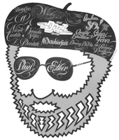 Italian type designer, b. 1943, Forio d'Ischia, Italy, who emigrated to the USA. Di Spigna graduated from from New York City Community College in 1964 and then from Pratt Institute in 1967. His first design job was at Bonder&Carnase. In 1969, he joined Lubalin Smith Carnase Inc. He founded his own studio, Tony DiSpigna Inc in 1973. DiSpigna taught typography at the Pratt Institute, the School of Visual Arts and the New York Institute of Technology. In 2009, Tony Di Spigna and Bill Hilson (a colleague at Pratt) founded
  Tom Oc, an art director in Rome, Italy, created the streamlined display typeface
  Tommaso Bovo (Florence, Italy) created
  Milan, Italy-based designer of several beveled 3d typefaces in 2014. For his thesis project, he created five gothic / blackletter typefaces, including Voelkisch XXI (2015, with Davide Zomer). In 2014, he designed the display typefaces Joys Verso, Ferro, Otaris (hipster style), Maroquein Grand Prix (spurred vintage style), Blandus, A, H, Ghost, Gang (octagonal and spurred), MNL Party (multilined), Mexican Muffia, Monogram Basic, Blegius, S (constructivist), Sans Squared, Manolino, Bandelo, Manolo Condensed, SS, SuperBold, Blandolen Wald, Modern Matusalem, Marielo Sans Modern, Wild West, Bandolo Sans, Basic Rounded, Manolo, AG, RS. [
 Graphic designer in Bologna, Italy, b. 1987, who created the hipster typeface Panique (2014), which can be bought
  Located in Canegrate, Italy, TrueBlue is the foundry of
  Swiss and/or Italian foundry, est. 2013, located in Campione d'Italia, Italy. Their 14-style sans family,
  Italian-born graduate of the
  Brazilian graphic designer and illustrator who worked in Torino, Italy.
  This Italian web marketing company, co-founded by Bruno Pierini and Nicola Manzari, published the hand-drawn typefaces Carosello (a 1950s marker font), Feels Good, Fastback (vintage sketched and handcrafted family), Ottanta, Tangerine, String Bean, Raffaello and FatSlim in 2015. They also made Venice Serif (2015) and the rounded sans typeface Novanta (2015).
  Italian branding company which in 2008 created the logotype
 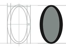 During her studies at Accademia delle arti e nuove tecnologie, Valeria Conte (Fondi, Italy) created the
  [
[ [
[ Milan, Italy-based design group that published these fonts, which unless mentioned otherwise, are all by Cagil Aygen, a Turkish graphic designer (who is also based in Milan):
 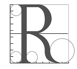 As a student in Catania, Italy, Veronica DF designed either a revival of or a poster for Trajanus Roman in 2016. [
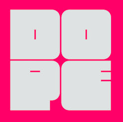 Strassoldo, Italy-based designer of Cherub Mono (2019), the fat blocky typeface Boldie (2019), the minimalist modular sans typeface Bumblebee (2019) and the stencil typeface A Cool Lemonade (2019). [
 16th century Franciscan scribe and calligrapher (1501-1563), known for his 1554 writing manual Opera di Frate Vespasiano Amphiareo da Ferrara ... nella quale si insegna a scrivere varie sorti de lettere (Venice, 1554), the first place where one can find a Bastarda. Typefaces based on
  New Delhi, India and Treviso, Italy-based designer of the elliptical sans typeface Boho Sans (2008). [
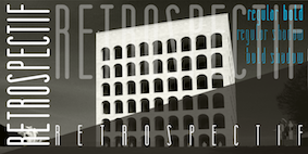 Italian designer of LST (2011, octagonal, at T26), of the beautiful stencil font
  Italian designer who set up his own studio, Raptus, in 1993. Creator of the dingbat font
  Italian design firm in Firenze consisting of three graphic designers,