| | |
27 TTC Fonts
|
 Nick Shinn ran an interesting project in his 2009 class at Humber College in Toronto. In the 1950s, Toronto built a subway system [which is run by the TTC, the Toronto Transit Commission], with comprehensively modernist architecture. As part of the program, a geometric, all-caps typeface was designed (anonymously), for use in signage [read Joe Clark's article about the type and its history]. Nick Shinn's course began with digitizing the original drawings, to introduce the technicalities of font production in FontLab, and then proceeded with students producing their own designs for a matching lower case. The 27 students each produced a typeface. The results are here: Alex Plociennik, Andrea Luis, Andrew Clanahan, Andrew Hodge, Chris Bacchus, Cornelius Quiring, Craig Steffan, Daniel Marcus, Dan Mitchell, Danny Wu, Darren Ray, David Spindler, Gurchan Birdi, Jackie Saik, Joe Beausoleil, Katie Short, Mag Ciemiega, Michael Cirillo, Michael Lao, Michael Neto, Nick Seeger, Nik Firka, Orlena Chan, Piotr Dymura, Scott Krysa, Tiffany Delve, Todd Haskins. [Google]
[More] ⦿
Nick Shinn ran an interesting project in his 2009 class at Humber College in Toronto. In the 1950s, Toronto built a subway system [which is run by the TTC, the Toronto Transit Commission], with comprehensively modernist architecture. As part of the program, a geometric, all-caps typeface was designed (anonymously), for use in signage [read Joe Clark's article about the type and its history]. Nick Shinn's course began with digitizing the original drawings, to introduce the technicalities of font production in FontLab, and then proceeded with students producing their own designs for a matching lower case. The 27 students each produced a typeface. The results are here: Alex Plociennik, Andrea Luis, Andrew Clanahan, Andrew Hodge, Chris Bacchus, Cornelius Quiring, Craig Steffan, Daniel Marcus, Dan Mitchell, Danny Wu, Darren Ray, David Spindler, Gurchan Birdi, Jackie Saik, Joe Beausoleil, Katie Short, Mag Ciemiega, Michael Cirillo, Michael Lao, Michael Neto, Nick Seeger, Nik Firka, Orlena Chan, Piotr Dymura, Scott Krysa, Tiffany Delve, Todd Haskins. [Google]
[More] ⦿
|
2D Typo
[Lukyan Turetskyy]

|
 Lviv-based Ukrainian designer (b. 1979) of the octagonal stencil typeface Depot Trapharet (2006, brutalist), and of the free car rallye dingbat typeface Rallye Symbols (2008). Dafont link.
 In 2010, he went commercial as 2D Typo. The first typeface at 2D typo was the modular pixelish Pressure Drop 2D (2010). This was followed by Ornamental Deco 2D (2010, art deco ornaments), Rally Symbols 2D (2010), Mascaron2D (2010, by Iryna Korchuk), Depot Trapharet 2d (2010, a stencil based on the tram lettering in Lviv), Ascetic 2D (2005-2010), Hutsulyandiya (2010, extraordinary ornaments by Iryna Korchuk), Simeon (2010, calligraphic), Cranked Pipe 2D (2011), Tripyllia 2D (2011, ornaments of the neolithic Trypillya culture), and Ukrainian Barokko (2010, a calligraphic typeface by Genadij Zarechnjuk), Historism Border (2011, border ornaments), Moreske 2D (2012, ornaments), Geomanticus (2012, modular squarish sans). Typefaces from 2013: Bandelwerk (borders), Digital Stitch, Modern Wave (ornaments based on Alphonse Mucha), Hopferian (Roman caps after engravings by Daniel Hopfer (1470-1536)---typeface completed with help of Mariya Sokil), Simple Ribbon (art nouveau dingbats). In 2014, he created Angusto (an elegant narrow shaded display typeface family), Vindemiam (ornamental borders), Squamish (ornamental borders), UA Map (maps of Ukraine dingbats) and Bohemian Border. In 2014, Dmitry Rastvortsev, Lukyan Turetsky, and Henadij Zarechnjuk cooperated on the design of the free Latin / Cyrillic handwriting typeface Kobzar KS, which is based on the handwriting of Taras Shnvchenko, a famous Ukrainian poet, artist and philosopher. Typefaces from 2015: Finetitle (ornaments for headers), Gothic Herbarium (a floriated ornamental font based on the Gothic Revival ornaments developed by Augustus Pugin (1812-1852)), Old Depot (rough stencil), Francesca (decorative caps). Typefaces from 2016: Geometric Harmony (geometric ornaments), Dubster (which he describes as a technocratic modular font). Typefaces from 2017: Military Symbols. Typefaces from 2018: Strapwork (four ornamental typefaces with friezes, borders and motifs modeled after Balthasar Bos (1554) and 16th century mannerism). Typefaces from 2020: Lo Fi Copy (grungy and pixelish). Typefaces from 2021: Kolm Keltek (classical ornaments), Microdot (a dot matrix font). [Google]
[MyFonts]
[More] ⦿
|
A2 Type
[Henrik Kubel]
|
 A2-Type (or simply, A2) is a type foundry set up in the autumn of 2010 by the London based design studio A2/SW/HK. The designers are Henrik Kubel and Scott Williams. A2's bespoke type design is mainly the responsibility of Henrik Kubel, though every typeface is developed and approved by both partners. Kubel is self-taught, making his first typefaces while studying at Denmark's Design School from 1992 until 1997. Their typefaces:
 - 4590
- 60 Display.
- Amplify (2013) won an award at TDC 2014.
- Antwerp (2011). A readable text family designed by Kubel during an Expert Type Design Class in 2011 at Plantin Genootschap in Antwerp.
- A2 Archi (2005, Henrik Kubel): an octagonal face.
- A2 Aveny-T (2000, Henrik Kubel): Poster typeface commissioned as aprt of the identity of the Aveny-T theatre in Copenhagen.
- Agriculture.
- Archi.
- Banknote.
- A2 Battersea (1999, Henrik Kubel): inspired by Meta, DIN and Transport Alphabet. Followed in 2012 by Battersea Slab.
- Bauhouse.
- A2 Beckett (2008). A condensed sans family with the masculinity of Impact.
- Boing.
- Copenhagen
- A2 CPH Tram (2009, Henrik Kubel): revival of an odd mini-serifed type found on the exterior of Danish trams, ca. 1920.
- A2 CWM (2008, Henrik Kubel): constructivist type designed for the headlines and cover of Cold War Modern Design 1945-1970. Octagonal.
- Dane.
- A2 Danmark (2008, Henrik Kubel): a display stencil family.
- A2 Ergonomics (2011).
- Flavin Medium. A neon tube font.
- A2 Flowers (2005, Henrik Kubel): arrows, fists, flourishes, ornaments.
- A2 FM: slab serif family.
- Foundation (2018) in Sans (Number 44, Condensed, Wide), Serif, and Serif Didot subfamilies. These are all revivals of skeletal typefaces. Foundation Sans Number 44 was inspired by Circular Gothic No. 44 (1879, Charles E. Heyer, for the Great Western Type Foundry). Foundation Sans Condensed and Foundation Sans Wide are derived from two types described as Caractères pour Marques de Linge (typefaces for marking on linen) in the Signes section of the first volume of Spécimen Général des Fonderies Deberny et Peignot (ca. 1934). Foundation Serif is based on Caractère No. 7, another Caractère pour Marques de Linge in that 1934 Deberny & Peignot specimen book. Kubel's inspiration for Foundation Serif Didot was a sheet of lettering (dated 1939) he discovered in the archive of the influential Danish architect and graphic/industrial designer Gunnar Biilmann Petersen, 1897-1968.
- Grand. A stencil typeface.
- A2 Grot 10 (2009, Henrik Kubel): a take on the Grot Series by Stephenson Blake. Grot 12 followed in 2015.
- A2 Impacto (2005-2011, Henrik Kubel): Impact?
- A2 Klampenborg (1997, Henrik Kubel): industrial style sans.
- Kunstuff.
- London (2010).
- Magna.
- Maximum.
- A2 Mazarin (2017). A2 writes: Originally designed as a Garamond-inspired metal typeface by Robert Girard ca. 1921-1923, and published under the name Astrée by Deberny Peignot, the typeface was soon recut and renamed Mazarin by the English foundry Stephenson Blake in 1926. That single style original has now been expertly restored and reimagined as a contemporary typeface in multiple styles.
- Melissa Script (2010).
- A2 Monday (2003-2016, Henrik Kubel): based on 19th century English vernacular serif signage type.
- Moscow Sans (2014-2015). Award winning custom fonts and pictogram system for Moscow Metro. Art directed and designed by A2 (Scott Williams and Henrik Kubel) with Margaret Calvert as type and pictogram consultant. Cyrillic script designed in collaboration with Ilya Ruderman.
- Naive.
- New Grotesque Square series (2015). A newspaper typeface modeled after a Stephenson Blake typeface. Followed by New Grotesque Round in 2015-2016.
- New Rail Alphabet (2009). A refreshed and expanded version of Margaret Calvert's alphabet from the 1960s which saw nationwide use with British Rail, BAA, and the NHS. Developed in cooperation with Margaret Calvert.
- New Transport (with Margaret Calvert). A digital version of Transport, the Jock Kinnear and Margaret Calvert typeface for the British road signs. New Transport will be commercially released in September 2013.
- Register (2012-2017). A text typeface family inspired by French renaissance types.
- Regular (2012-2016). Think Futura in new clothes. Accompanied by Regular Slab.
- Sans, Slab and Serif typefaces for a redesign of The New York Times Magazine in 2015. The starting point for the Serif font is the Stephenson Blake Garamond-ish metal typeface Mazarin also known as Astrée from French foundry Deberny & Peignot. The slab fonts used for pull quotes and headlines are a continuation of the magazines existing Stymie font but in a condensed format. The sans fonts are linked to the industrial grotesque types, with metal type specimen versions of Futura and Akzidenz fonts as loose models for inspiration.
- Nosferato.
- Ole.
- Outsiders (+Outsiders Light and many other weights). A slab serif family.
- Parsons Green Medium.
- A2 Record Gothic (2019, Henrik Kubel), after Robert H. Middleton's American grotesk, Record Gothic (1027, Ludlow). Kubel writes: In celebration of Record Gothic's eclectic history, we designed four related but independent styles: Slab, Mono, Stencil and Outline.
- Square.
- Staton.
- Tagstyle.
- Test.
- Triumph.
- A2 Typewriter (2000, Henrik Kubel): based on Olivetti Typewriter 22.
- A2 Vogue Floral: a fashion mag modern display face in two styles.
- Vogue Paris. Granshan 09 Type Design Competition. 1st Prize, Display fonts.
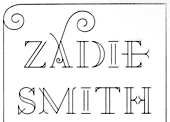
- A2 Zadie (2005, Henrik Kubel): inspired by Edwardian railings surrounding the Royal Army Military College in London. Used on the cover of the Zadie Smith bestseller On Beauty (2005, Penguin Press, NY). Granshan 10 Type Design Competition. 3rd Prize, Display fontt described as an ornamental blackboard bold type.
- In 2014, Scott Williams and Henrik Kubel (A2 Type) co-designed A23D, a 3d-printed letterpress font. It was fabricated by model making specialists Chalk Studios. The font is presented by New North Press, which specializes in traditional letterpress printing. Adrian Harrison made a short film about the birth of the font, charting its progress from preliminary sketches to first inking and printing at New North Press. A23D won an award in the TDC 2015 Type Design competition.
- English 1766 (2017). Kubel's take on Caslon.
- Regular (2017). A sans family inspired by Memphis, Karnak, Stymie and Futura.
- Schwiss (2018). Inspired by Akzidenz Grotesk and Helvetica.
Custom type by them include an alphabet for Qantas Airlines (2017), a masthead for Toronto Life (2010), a custom typeface for Banca Sella (2018), Qualcomm (2017), Arne Jacobsen (2018?), Evening Standard Newspaper (2018: 43 fonts), New York Times Magazine's Olympics issue (2018: a monowidth font for stacking), Eurosport Pyeongchang 2018, Weekendavisen (2007-2010), Design Museum London (2010), Faber&Faber (2009-2010), Afterall Publishing (2006-2010), Faulkner Browns Architects (2007), Penguin Press (2005), and Norrebro Bryghus (2005). At ATypI 2013 in Amsterdam, he spoke about New Transport. Winner of the type design prize at the Tokyo Type Directors Club TDC 2019, with Matt Willey, for the New York Times Magazine Olympic font. [Google]
[MyFonts]
[More] ⦿
|
Abandoned Mine Land Program
[Neffra Matthews]
|
Geographic symbol fonts in truetype: BLMSymbols, BLM Mine Symbols, BLMMine2, BLMSYM1, Blmsym2 (all with symbols for abandoned mines), International2, Paleo (paleontology symbol set by Neffra Matthews of NARSC), USDAFS (another nice international symbol set, by the Forest Service). [Google]
[More] ⦿
|
Adriá Gómez
|
 Graphic designer in Barcelona, b. 1990. Creator of these typefaces:
 - The free modular typeface Johanna (2012).
- The 10-style organic elliptical sans typeface family Wake (2013).
- Luthier (2014). A free transitional typeface family with wedge serifs.
- Margot (2014). Free download.
[Google]
[MyFonts]
[More] ⦿
|
Aghava.ru
|
Travel symbol font archive: Trains, Transportation, TransportMT. [Google]
[More] ⦿
|
Ahmed Eraqi
[Eraky]
|
 [MyFonts]
[More] ⦿
[MyFonts]
[More] ⦿
|
Albert-Jan Pool
[FF DIN]
|
 [More] ⦿
|
Alex Duncan
[Magnum Software]
|
[More] ⦿
|
Alexander Sapozhnikov
|
Russian designer of the Russian Road Sign Font (2013), in which the Cyrillic part is based on standards GOST 10807-78 and GOST R 52290-2004. This font is used on Russian road signs. There is a Latin part, which is not standardized. Free download. [Google]
[More] ⦿
|
Alun Rogers
[Society of Cartographers]
|
[More] ⦿
|
Andrea Bergamini
[Mintea.org]
|
[More] ⦿
|
Andreas Nymark
[Nymark Type]
|
[More] ⦿
|
Andreas Seidel
[astype.de (or: Astype)]
|
 [MyFonts]
[More] ⦿
[MyFonts]
[More] ⦿
|
Andreas Wohlleben
|
 Andreas Wohlleben is an illustrator based in Böblingen, Germany. In 2013, he published Wayfinding Sans Symbols (FDI), which has hundreds of wayfinding symbols that can be used with typefaces such as Ralf Herrmann's Wayfinding Sans Pro. [Google]
[MyFonts]
[More] ⦿
Andreas Wohlleben is an illustrator based in Böblingen, Germany. In 2013, he published Wayfinding Sans Symbols (FDI), which has hundreds of wayfinding symbols that can be used with typefaces such as Ralf Herrmann's Wayfinding Sans Pro. [Google]
[MyFonts]
[More] ⦿
|
Andrew Bellamy
[Otherwhere Collective (or: Ilott Type, Bellamy Studio)]
|
 [MyFonts]
[More] ⦿
[MyFonts]
[More] ⦿
|
Andy Hayes
[Hucklebuck Design Studio]
|
[More] ⦿
|
Angel Kwong
|
 Angel's Chinese name is Tsz Yan Kwong. Graduate of the MATD program at the University of Reading, class of 2019, who lives in Hong Kong.
 Winner of an award at the Type Directors Club's Type Design Competition 2019 for Chek Lap Sans, which won an award at the Type Directors Club's Type Design Competition 2019. Chek Lap sans was developed at the School of Design of The Hong Kong Polytechnic University. Angel wrote: Chek Lap Sans is a Traditional Chinese typeface designed specifically for signage of the Hong Kong International Airport in Chek Lap Kok, aiming for both functionality and personality. The typeface is designed with considerations of legibility under negative polarity display, to suit the need of the current blue light-box signs with white text. It has generous negative spaces within character, optical adjustments to compensate the glowing effect, and subtle features that contribute to its visual identity. It also includes relevant icons with references to the local context. Several design decisions were informed by the findings from user tests. Her graduation typeface at the University of Reading was Tabloid (2019), which was designed for reading online material on screens. There are five styles covering three scripts (Latin, Traditional Chinese, Arabic). [Google]
[More] ⦿
|
Anke Arnold
[Anke Art]
|
 [More] ⦿
|
Anke Art
[Anke Arnold]
|
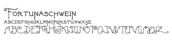 Wernau (was: Wendlingen), Germany-based Anke Arnold's free fonts: aa QWERTZ-Tasten (2012: German keyboard font), aa Halftone (2012: texture face), aa Tafelschrift (2012, school font), Car Go Frame (2011), Car-Go Plain (2011, modeled after German license plate lettering), Typo Garden (2010, alphadings), 80er Teenie Demo (2009), Acki Preschool (2009), Just Another Stamp (2009), Firlefanz (2009, curly letters), Pixelstitch (2006), AnkeHand (2003), Hole-Hearted (2003, Gill Sans with hearts), KRITZEL (scratchy pen), MilkyWay, FrightNight, Eminenz (2002), Scribble, Skribus, Why, TooLazyToPractice, XXX, CheapInkkilledmyPrinter, Storch (alphadings), Alexandras-Stempelkasten, Anatevka-Caps, BulletMix, Catwalk, Duke, Dukeplus (2000, blackletter), Riddleprint, Anke-Print, AnkeCalligraph, Titanic, Wasser, butterbrotpapier, distracted-musician, dyslexic, manko, quixotic, verrutscht, zladdi, barcoded, BulletMix2, CAR-GO-2, Fortunaschwein (nice curly script; no punctuation or numbers), Round, BigBrothers&Sisters, BoringLesson, CrimesceneAfterimage, Incognitype (old typewriter), Jenna'sPopsicles, Japanese Brush (1996), Knuffig (2000), MonkyBusiness, Olympia2000, Samba, Dandelion, Kritzel (2003, scratchy hand), Krystal (2000, snow simulation typeface based on Gill Sans), Nervous, ParryHotter (2001, a Harry Potter blackletter face), Pffft, Tschiroki, Heart2Heart (heart alphadings), Anke Sans.
 English page. For 10DM (5 USD), Anke will make your handwriting into a font! Alternate URL. Dafont link. Another link. Open Font Library link. [Google]
[More] ⦿
|
Anna Danilova
|
 Type designer who is employed by Artem Gorbunov (Gorbunov Bureau) in Moscow. Her typefaces there:
 - The Greek part of Bureauserif (2015-2016), a text typeface family by Ksenija Belobrova. The Greek part was done by Anna Danilova.
- Bureausign (2015-2016). Anna Danilova's splendid Latin / Cyrillic wayfinding font family.
- Envy (2016). A number font by Anna Danilova for Envy Car Rental.
- Mary Trufel (2016). A hand-printed typeface by Anna Danilova.
- Olimpiada (2018). By Anna Danilova (and Michael Nozik) for olimpiada.ru. This sans typeface is based on the wayfinding font Bureausign.
[Google]
[More] ⦿
|
Anna Giedrys
|
 Anna Giedrys, who is based in Lidzbark Warminski, Poland, and in Czechia, works as a graphic designer focusing on visual identities, illustrations, and typeface design. She obtained an MA in graphic design and visual communication from the University of Fine Arts in Poznan (Sign and Typography Studio) and graduated as a Master of Arts. During her exchange studies of graphic and fashion design at Vilnius Fine Arts Academy (Lithuania), she fell in love with calligraphy, lettering, and pattern design. Currently, she runs her own studio Ancymonic and collaborates with Rosetta Type Foundry. Google Plus link.
 Her typefaces: - Signika (2011) and Signika Negative (2011). A free sans family at Google Web Fonts, it was designed for pedestrian signage.
- Yrsa and Rasa (2015, open-source type families published by Rosetta with financial support from Google). The fonts support over 92 languages in Latin script and two languages in Gujarati script (Gujarati and Kachchi). The design and production are by Anna Giedrys and David Brezina. Yrsa is the name of the Latin-only type family. Rasa is the name of the Gujarati type family. They explain: Both type families are intended for continuous reading on the web (longer articles in online news, magazines, blogs). In Yrsa, a special consideration was given to Central and East European languages and proper shaping of their accents. Rasa supports a wide array of basic and compound syllables used in Gujarati. In terms of glyphs included Rasa is a superset of Yrsa, it includes the complete Latin. What makes Yrsa & Rasa project different is the design approach. It is a deliberate experiment in remixing existing typefaces to produce a new one. The Latin part is based on Merriweather by Eben Sorkin. The Gujarati is based on David Brezina's Skolar Gujarati. Anna Giedrys updated Yrsa substantially in 2021.
- In 2021, Ross Mills, Anna Giedrys and Paul Hanslow co-designed the 14-style sans family Laconia at Tiro Typeworks.
Fontsquirrel link. Behance link. [Google]
[More] ⦿
|
Annik Troxler
|
Annik Troxler (b. 1979, Wolhusen, Switzerland) studied graphic design at the Cantonal School of Art of Lausanne (ECAL). Her thesis Vergissmeinnicht won the Swiss Federal Competition for Design 2005. In 2006 she started working as an independent graphic designer in Basel and since 2011 she has taught at the Basel School of Design. In 2006, she was awarded the Grand Prix of the International Poster Triennale of the Museum of Modern Art Toyama, Japan for her poster Intimities 2005. In 2007, she won first prize at the International Poster Festival in Chaumont for Intimities 2007. She created the travel dingbat font Traffic (2002). [Google]
[More] ⦿
|
Anurag Gautam
|
Graphic designer in New Delhi, who, during his studies at the National Institute of Design, proposed a legible sans caps typeface, Krum (2013) to replace the Indian license plate font HSRP (High Security Registration Plates). At Fontstore / Fontshare, he published the monospaced sans serif RX100 (2017). In 2020, RX100 was released at Indian Type Foundry. [Google]
[MyFonts]
[More] ⦿
|
Aparat
[Domen Fras]
|
 Domen Fras completed his masters at London's Central Saint Martin's College of Art & Design in 2000. In 2002 he founded the type & design studio Aparat in Ljubljana, Slovenia. Since 2011 he is a full-time assistant professor at the Faculty of Natural Sciences at the University of Ljubljana. Speaker at ATypI 2014 in Barcelona. His largely experimental work:
 - Brutildo (2006): squarish headline lettering.
- Butalci (1998, a pixel font) is a part of Domen's diploma project at Faculty of Architecture in Ljubljana, supervised by Janez Suhadolc.
- Gyro (1998-2001) is an octagonal monospace font with 3 weights.
- Exlibris (2001-2003) is an experimental face.
- Pozor (1999) is a squarish sans, as for traffic signage.
- Terragni (1998) is an alphabet study based on the floor plan composition analysis of the house 'Casa del Fascio' in Como by the architecta Giuseppe Terragni.
- DinoUnicase (1997) is a variation on DIN Mittelschrift.
- Narod (2003) was made for designing commemorative coins at 60th anniversary of Kocevje Summit.
- JH Luzern (1999) is based on a scan of a hotel room card.
- Pesjan Debu (2011) is a fat angular poster typeface created during TipoBrda 2011.
- Narod Krepak (2010) is an art deco sans titling typeface created during TipoBrda 2010000000
[Google]
[More] ⦿
|
Arc--Info and ArcView Symbol Sets
|
Brian T. Sheahan's information page on symbol sets. Contains a few truetype symbol fonts, such as Recreate, Roadsym (by Tim Loesch, Minnesota Department of Natural Resources), Abandoned Mine Land Symbol Set (truetype), Military Symbol Fonts (by the S2 company), a truetype geology font (by he British Columbia Geological Survey Branch), the geologic map symbols from the U.S. Geological Survey. Recreate.ttf, alternate site. [Google]
[More] ⦿
|
Art Gorbunov (or: Gorbunov Bureau)
|
Studio in Moscow set up in 2007. Their typefaces: - Bureauserif (2015-2016). A text typeface family by Ksenija Belobrova. The Greek part was done by Anna Danilova.
- Bureausign (2015-2016). Anna Danilova's splendid Latin / Cyrillic wayfinding font family.
- Envy (2016). A number font by Anna Danilova for Envy Car Rental.
- Galochki (or: Checkmarks). Done in 2013 by Ksenia Belobrova.
- Lavish Shoestring (2016). A monoline script by Misha (Michael) Nozik.
- Mary Trufel (2016). A hand-printed typeface by Anna Danilova.
- Olimpiada (2018). By Anna Danilova (and Michael Nozik) for olimpiada.ru. This sans typeface is based on the wayfinding font Bureausign.
- Voltaire (2015, Ksenia Belobrova). A script typeface based on illustrations in one of Voltaire's books from 1734. Voltaire covers Latin and Cyrillic.
[Google]
[More] ⦿
|
Arve Båtevik
[Store Norske Skriftkompani]
|
 [More] ⦿
|
Ash Pikachu
[Tom Oetken]
|
[More] ⦿
|
astype.de (or: Astype)
[Andreas Seidel]
|
 Astype.de is a German foundry started in 2003 by illustrator and type designer Andreas Seidel (b. 1975, bad saarow, near Berlin, Germany). He lives in Cottbus, Germany. In 1998, he obtained a Masters degree in business administration. In 2007, he and Ingo Preuss set up The German Type Foundry. In 2017, he joined the initial crew at Fust & friends. The typefaces:
 - One of his first typefaces was Crayfish (originally a URW font, but withdrawn by Seidel from URW in 2002). Crayfish is a display type originally designed for an American Football club. The Crayfish typefaces are sold as Thunder Bold and Titan Bold.
- Check his nice weather symbols (not a font).
- He finished Ornaments Thanksgiving and the great ASTYPEOrnaments-WineGrape A (2004).
- He is working on 14th century initials (2003).
- He created Sattler (2003): Joseph Kaspar Sattler, one of the great German art nouveau artists created these nice initials in 1897 for the famous royal monumental book project Die Nibelunge for the Reichsdruckerei Berlin. Only 200 exclusive signed masterpieces were printed in four years from 1900 till 1904. Joseph Sattler was the art director, type designer and designer in one person. The Reichsdruckerei showed samples of the unfinished work in 1900 at the world exhibition in Paris to advertise the high craftsmanship of the German presses.
- He made Heraut (2003), an art nouveau lettering typeface based on a 1901 design of Hermann Hoffmann called Herold Reklameschrift.
- He created Sveva AS Versal (2003, art nouveau).
- About Missa Solemnis, he writes: Solemnis was designed by Günter Gerhard Lange and first cut in metal 1953 (this is the date he quotes himself, other sources mention 1950 or 1952). It seems to be one of his earliest typeface designs that he had done as a freelancer for H. Berthold AG in Berlin. [...] Missa Solemnis AS is a new, remastered and extended version of Mr Lange's typeface. The font is available in the OpenType format and comes in two styles: 1953 and 2003. The 1953 style contains all characters of the original metal type, as well as a few additions. [...] The 2003 cut is more delicate and makes extensive use of the OpenType format. It contains over 650 glyphs, covering Roman-based languages of Western and Central Europe. His Solemnis inspired Simeon AS (2003), a 650-glyph uncial style face.
- In 2004, he created Missale Incana, an interpretation of a typeface from Herbert Thannhaueser.
- Still in 2004, he created ASTYPE Ornaments Christmas A2 and ASTYPE Ornaments Christmas A. These were followed in 2005 by ASTYPE Ornaments Christmas B.
- He made Missale Lunea (2004). This has astroligical symbols, moon phases and medieval characters.
- In 2005, the exquisite calligraphic script typeface Gracia was added, consisting of Gracia No. 44, 45, 54 and 55 (graceful calligraphic script), and Gracia Solo.
- Paola is a redesigned, new interpretation of a brush typeface from Carl Rudolf Pohl.
- He made Adana (2005): The roots of Adana going back to the year 1930, to the Berlin-based German graphic designer Wilhelm Berg. His typeface can be interpreted as an answer to Lucian Bernhards Schönschrift. The Initials are nearly close to the original drawings but the Circular typeface was changed dramaticly. Excentric, unusual forms and loops were changed to fit todays needs. Due to the lack of a corresponding Roman letter form, the Regular version was designed including small caps, fitting the contrast and swinging shapes of Adana Circular. Both typefaces play well together in all kinds of adverts, as well with designs like Bodoni or Didot.
- Alea AS Initials (2005) is a floral faced based on the drawings of Maria Ballé.
- Taiko (2006). A revival of Otto Arpke's Arpke Antiqua (1928, copperplate).
- ASTYPE Ornaments Accolades A (2007), and ASTYPE Ornaments Accolades C (2011).
- GTF Toshna Std (2008, German Type Foundry) is a garaldic type family in three optical weights, after a 1955 family called Tschörtner-Antiqua by Hellmuth Tschörtner that was very popular in the DDR.
- Secca (2009, German Type Foundry) is a simple sans family rooted in early German grotesque type designs. See also Secca Soft (2014) and Secca Stencil (2015).
- Nepos (2010) is an experimental modular type kit consisting of ready-made typefaces and a set of special BUILD fonts to build your own letters and ornaments. These BUILD fonts can be used on layers with different colors and overprinting for special effects. The effects like Antiplex can be considered as kitchen tiles. There are also color inversions and stencil types.
- Secca Saloon (2011) is a versatile ornamental Western family.
- Popsil (2011) is a white-on-black hand-printed poster face.
- Ademo (2011) is a classic shaded layered 3d caps face, based on two typefaces designed by Carl Albert Fahrenwaldt that were published in 1931-1932 by Schriftguss AG.
- Wood Bonnet Antique No.7 (2012) is based on real vintage wood type blocks from Switzerland.
- VTG Stencil US No. 4 (2012) is based on plate US No. 4 from New York Stencil Works. This revolving stencil-plate was invented by Eugene L. Tarbox and patented in 1868. The military stencil fonts VTG Stencil US No. 2 (+Ornaments), VTG Stencil US No. 51, VTG Stencil UK No. 76, VTG Stencil Germany No. 101 (2014, modeled after historic blackletter stencil plates from Bavaria), and VTG Stencil US No. 72 followed in 2014. In 2016, he added Vtg Stencil DIN.
- VTG Stencil Germany No. 1 (2013) is a set of nicely executed didone stencil typefaces based on real models used in Germany from 1871-1918 and later. There is a Sketch style.
- Wood Poster Eight (2015) is a free wood type slab serif.
- Alea Initials (2017, floriated caps).
- Wood Bonnet Grotesque No 4 (2017).
- The Vtg Stencil France series (2017) in substyles Vtg Stencil France No1, Vtg Stencil France No3 and No. 5.
- The expressionist typeface Alarm (2017, Fust & Friends), which is based on an old design of Heinz König also called Alarm (1928, at Trennert).
- Presto (2017, Fust & Friends), a revival of a script by Helmut Matheis (1970).
- Vtg Stencil Italy No2 (2018).
- Rocaie (2018). Decorative caps base on antique rococo letters from a gilding workshop.
- Wood Heinz No.4 (2019). Wood Heinz No.4 offers up to four printed look variations of all the Latin base letters and figures. An OpenType letter rotator is programmed into the fonts to emulate the randomness of wood type printing. Also: Wood Heinz No.2 (2019).
- Missale Solis (2019). An uncial typeface that overhauls Missale Lunea (2004).
- Vtg Stencil UK No2 (2019).
- Vtg Stencil Marsh (2020). Based on one inch stencils, cut by a Marsh machine. Marsh was an American stencil machine maker in the 1920s.
- Bonnet Grotesque Narrow (2020). A condensed grotesque family.
Behance link. Creative Market link. Fust & Friends link. Klingspor link. Home page. See also here. View Andreas Seidel's typefaces. [Google]
[MyFonts]
[More] ⦿
|
Attica Cybernetics
|
The only record I have of Attica Cybernetics is that it made the dingbat font ATLAS97 Symbol 1 (also called Attica-VMAPSymbol1) in 1995. It is part of the dingbat TTF zip file on this archive. [Google]
[More] ⦿
|
Automatsvet
|
A site that lists road sign fonts for various countries, and offers some downloads. The list: - Germany: DIN 1451 Eng- & Mittelschrift
- France: Caracteres L1 thru L4
- Great Britain: Transport
- Czech Republic: DIN 1451 Eng- & Mittelschrift
- USA/Canada: FHWA
- Luxembourg: SNV regular & condensed uppercase, Caracteres L4, Traffic Type Lux (discontinued serif font for local names)
- Belgium: SNV regular & condensed (no public domain available)
- Netherlands: ANWB (close to FHWA)
- Switzerland: Frutiger (no public domain available)
- Austria: Eng- & Mittelschrift Austria (derived from DIN, no public domain)
- Poland: Drogowskaz
- Ireland: Transport
- Spain: Carretera / Traffic Type Spain D (based on FHWA)
- Italy: Carretera (based on FHWA)
- Portugal: Carretera (based on FHWA)
- Sweden: Tratex
- Denmark: Vejtavleskrift (based on Transport)
- Iceland: Transport
- Norway: Trafikkalfabet (no public domain)
- Greece: Carretera, DIN 1451 Mittelschrift
- Turkey: Carretera
- Most of Latin America: FHWA or derived
[Google]
[More] ⦿
|
Avenza Global Technologies Corp.
|
A free National Parks Service (NPS) font for Mac/Windows. [Google]
[More] ⦿
|
Bank Graphic Design Today
[Sebastian Bissinger]
|
 BANK is a French/German design agency based in Berlin, led by Laure Boer and Sebastian Bissinger. It marketed its fonts through T-26, starting in 2009, but later switched to Colophon. In 2009, Sebastian Bissinger and Matthieu David made the display typefaces Sintra and Yummy. Sintra is a 3d typeface that simulates letters made from folded material---Sebastian Bissinger was inspired by the sign of a shoe shop in Sintra, Portugal. Yummy was inspired by cookie cutters.
 Laure Boer and Sebastian Bissinger published their all caps license plate font Guida at Colophon Type Foundry. Guida is based on an Italian license plate that was in use some time between 1980 and 1990. [Google]
[More] ⦿
|
Barbara Bigosinska
|
 Barbara Bigosinska received her master degree in Graphic Design at the Academy of Fine Arts in Katowice, Poland. In 2013, she graduated from the Type & Media program at the KABK in Den Haag. At KABK, Barbara Bigosinska designed the angular text typefaces Barbear and Sambukka in 2013. Since 2014, she runs her own studio in The Hague, offering type design and typography services to international clients.
 For her type revival project at KABK, she picked Lutetia (2013) and writes: Lutetia was designed as a commission from Enschedé by Jan van Krimpen. The drawings of the typeface were ready in the middle of 1924 and first cut and cast in 16 point size in the Enschedé Type Foundry. For the first time the typeface was used in the book dedicated to the exhibition that took place in Paris in 1925. Therefore the name Lutetia reffers to the Roman name of Paris. Her KABK graduation typeface family was Mala (2013). Loaded with opentype features and choices of widths, Mala was created for cartographic purposes. It was published by Bold Monday in 2016. In 2016 she published Abelard at Indian Type Foundry and wrote: Abelard is a modern (or neoclassical) family with 10 font styles. It is a contemporary take on classic types like Baskerville, Bulmer, and Scotch Roman that has been optimised for text embedding on eReaders. The design features elements ensuring even text color, including case-sensitive forms, prominent punctuation marks, ligatures, and four sets of figures. Each font also contains ornaments resembling pen nibs, bullet points, and arrows. In 2017, she published the didone fashion mag typeface family Rion and the text typeface Neco at Fontstore. Rion was republished in 2018 at Indian Type Foundry. Typefaces from 2018: Bonny (a decorative serif font family published by Indian Type Foundry; see also Bonny at Fontshare). In 2019, Noopur Choksi and Barbara Bigosinska published the sturdy wedge serif text typeface family Sapien at Indian Type Foundry. Still in 2019, Manushi Parikh and Barbara Bigosinska released the octagonal athletics font Fielder at Indian Type Foundry. Somehow this octagonal typeface seems to have been evolved into the 5-style free typeface Nippo at Fontshare. In 2021, Barbara Bigosinska released the 12-style didone family (+two variable fonts) Boska at Fontshare. Boska has quite extreme contrast and some calligraphic hooks in the c, f, k, r, s, x and z glyphs that make it perhaps less suitable for text but more in line with fashionable displays. Bevellier (2019-2021; by Arya Purohit and Barbara Bigosinska) is a 16-style (+variable) rounded condensed organic sans family. In 2021, Barbara Bigosinska, Rafa Buchner and Diana Ovezea set up Blast Foundry. At Blast Foundry, she designed the wonderfully expressive sharp-edged display typeface Sharf. Boska was published as a free font at Fontshare. Behance link. Bold Monday link. [Google]
[MyFonts]
[More] ⦿
|
Barry Stock
[Barry Stock Fonts]
|
[More] ⦿
|
Barry Stock Fonts
[Barry Stock]
|
American designer Barry stock ss a subcontractor for the US FHWA, on the The Manual on Uniform Control Devices (MUTCD) and Standard Highway Signs manual. There was a significant update to all of the Highway Gothic types in use by FHWA in 2025. FHWA does not issue fonts, but to facilitate his work for them, he created free, public domain, Opentype fonts with the updated letter forms and spacing. These contain the outlines and widths used in all of the current (2025) signage issued by the FHWA. FHWA specs signage to 1/1000th of an inch, and the fonts are built on a 5,000 em square to insure their accuracy when building signage for the public. The update's most significant change is to the x-height, ascenders, and descenders of all of the fonts, standardizing them throughout the range. Other changes include a revised lower case s in C and D, built fractions, and a narrower w in D. There are two different modes of using the fonts. One set is family-built with B, C, D, E, Emod, and F in one menu, and meant for the casual user. The other mode provides a family for each weight with positive and negative spacing based on FHWA's percentage system for letterspacing, which differs from Adobe's method of tracking, and are meant to be used for official signage. The fonts contain only the characters used in the official releases, without kerning (which is standard for Highway Gothic), and are taken directly from DXF files provided by FHWA. Designer of Byway (2018), which is a free family of sans typefaces. He explains the design: Byway is a series of four typefaces that resolve the narrowest width and widest width of the existing FHWA Highway Gothic types. Those existing designs (Highway Gothic Series C, Series D, Series E, Series E Mod) are each standalone designs that are related, but not truly harmonized. Byway Series C, D and E are smooth steps between the FHWA Series B and Series F, and the Series E Mod is accomplished in the same manner as FHWA Series E Mod, with additional weight and following the same horizontal and vertical proportions. The fonts only contain the characters present in the original FHWA types. Other fonts by Barry Stock include Porcini (2024: a death metal font), Tarpon Motel (2018; a constructivist font that updates an earlier design by him from 1991 Opticon, which enjoyed a great deal of popularity as a shareware font, even appearing as the logo and credit type for the 1997 Golden Globe Awards), Ludlow Tempo (2015; digitized from Ludlow specimen books and based on Futura), and FHWA Series BC, CD, DE and EF. [Google]
[More] ⦿
|
Bart Stax
[Kraftfahrzeugkennzeichen]
|
[More] ⦿
|
BCMELP Custom True Type fonts
|
BC Government dingbat fonts for environmental things: BCMELP Cor Symbols, BCMELP EPD Symbols, BCMELP Fisheries Symbols, BCMELP Trim Symbols, BCMELP Wildlife Symbols, BCMELP Water Symbols, Forestry Inventory Font 25. All in truetype. For related links, check the ARC/INFO Symbology at BC Environment. [Google]
[More] ⦿
|
Becca Line
[Charles Siu]
|
San Francisco-based designer of the figurine-themed decorative initial caps typeface Keith Haring (2012; during his studies at the University of San Francisco). Muni Streetcar Display Font (2015) is inspired by the San Francisco Muni System Light Rail Display. Behance link. Cargo Collective link. [Google]
[More] ⦿
|
Benjamin Blåholtz
|
 Designer of Hexadecimal (2019), Calculate 16 (2019: an LED font), the modular blackletter typeface Isometretos (2019), Templars Cipher Plus (2019), the heavy slab serif typeface Grundsten (2019) and the traffic sign sans typeface Storgata (2019), which is influenced by the traditional Swedish traffic signage font Tratex. [Google]
[More] ⦿
Designer of Hexadecimal (2019), Calculate 16 (2019: an LED font), the modular blackletter typeface Isometretos (2019), Templars Cipher Plus (2019), the heavy slab serif typeface Grundsten (2019) and the traffic sign sans typeface Storgata (2019), which is influenced by the traditional Swedish traffic signage font Tratex. [Google]
[More] ⦿
|
Benn Coifman
[RailFonts.com]
|
[More] ⦿
|
Blue Ridge Adventure Software
[James A. Dockal]
|
James A. Dockal of Blue Ridge Adventure Software created a free geological dingbat truetype font, Geopoetry, which consists of geologic map symbols, mainly structure symbols, for use in ArcView GIS. [Google]
[More] ⦿
|
Bob Noorda
|
 Italian graphic designer, b. Amsterdam, 1927, d. Milan, 2010. He lived and worked in Milan from 1954 until his death. Noorda attended the Instituut voor Kunstnijverheidsonderwijs (now the Gerrit Rietveld Academie), graduating in 1950. He moved to Milan in 1954. In Italy, Noorda gained fame for his design in the late 1950s and early 1960s for posters and advertisements for Pirelli where he also served as art director.
 In 1964 he won, together with Franco Albini and Franca Helg, the Compasso d'Oro, the most prestigious Italian award for design, for the Milan Metro station design. The typeface used for the Milan metro was called Noorda. Noorda is a modification or optimization of Helvetica. Several other subway systems later used his typeface, including the entire New York City subway system in the 1960s, as well as other subway signage projects for Noorda in Sao Paulo, Naples and the regional train network in Lombardy. In 1965, Noorda and fellow Milan-based designer Massimo Vignelli were among the seven founders of Unimark International, an American design firm with offices around the world, including Chicago and Milan. Noorda is best known in the United States for Unimark's work with New York's Metropolitan Transportation Authority. These wayfinding fonts were revived in 2017 by Gabriel Ruiz as New York City Metro Font. Noorda was a professor in graphic design at Societa Umanitaria in Milan, ISIA Urbino and IED in Milan. From 1996 to 2001 he was a professor of visual communication at Politecnico di Milano. Additional link. [Google]
[More] ⦿
|
Brandon Sugiyama
|
Brooklyn-based Brandon Sugiyama made a New York Subway Tile Font in 2013, based on pictures and research done on the NY subway. Squire J. Vickers was an architect and lead designer for the subway system from 1908 to 1942 and was responsible for 300 station designs. The New York Times identifies architects George C. Heins and Christopher Grant La Farge as those who designed, hand-lettered and manufactured the tiles in a Copperplate-like style. Behance link. [Google]
[More] ⦿
|
Bruce S. Cridlebaugh
[Highway Sign of the Week]
|
[More] ⦿
|
Butterfly Clip Art collection
[Dick Pape]
|
 Dick Pape based the following digitizations on images and typefaces found in the Butterfly Clip Art collection, mostly in 2009: Butterfly A1 Men At Work, Butterfly A1 Professions, Butterfly A2 Heads-Hats, Butterfly A3 Computer Things, Butterfly A4 Office Things, Butterfly A4 Writing Things, Butterfly A5 Cartoon Profession, Butterfly A5 Cartooners A, Butterfly A5 Cartooners B, Butterfly A5 Cartooners C, Butterfly A6 At Work, Butterfly A7 Cartoon Extras, Butterfly A8 Clip Art-A, Butterfly A8 Clip Art-B, Butterfly A8 Clip Art-C, Butterfly A8 Clip Art-D, Butterfly A8 Clip Art-E, Butterfly A9 Animals-A, Butterfly A9 Animals-B, Butterfly A9 Animals-C, Butterfly A9 Animals-D, Butterfly A9 Animals-E, Butterfly A9 Animals-F, Butterfly Alien Cartoons, Butterfly Animal Clips, Butterfly Aquatic Animals, Butterfly Astrological, Butterfly Awards&Trophys, Butterfly Background Ornaments, Butterfly Birds, Butterfly Borders A, Butterfly Borders B, Butterfly Cameras, Butterfly Car Pictures, Butterfly Car Things, Butterfly Cars, Butterfly Cartoon Animals A, Butterfly Cartoon Animals B, Butterfly Cartoon Animals C, Butterfly Cartoon Children A, Butterfly Cartoon Children B, Butterfly Cartoon People, Butterfly Cartoon Words, Butterfly Cartoons A, Butterfly Cartoons B, Butterfly Cartoons C, Butterfly Cartoons in Dress (A, B, C), Butterfly Celebrations, Butterfly Chef Duties, Butterfly Children A, Butterfly Children B, Butterfly Chinese Letters, Butterfly Christmas Decore, Butterfly Christmas People, Butterfly Clip Art Misc 1, Butterfly Clip Art Misc 2, Butterfly Clip Art Misc 3, Butterfly Clip Art Objects, Butterfly Clip Art People, Butterfly Clip Art Sketches 1, Butterfly Clip Art Sketches 2, Butterfly Clip Art Sketches 3, Butterfly Clip Objects 1, Butterfly Clip Objects 2, Butterfly Clip With Faces, Butterfly Clowns A, Butterfly Clowns B, Butterfly Coins Clip, Butterfly Cooking&Food A, Butterfly Cooking&Food B, Butterfly Cooking&Food C, Butterfly Designer Frames A, Butterfly Designer Frames B, Butterfly Designer Ornaments, Butterfly Dinosaurs&Mythicals, Butterfly Dinosaurs-Reptiles, Butterfly Domesticated Animals, Butterfly East Bunny, Butterfly Ethnic, Butterfly European Scenes A, Butterfly European Scenes B, Butterfly Extra Images, Butterfly Extra Things, Butterfly Famous Sights1, Butterfly Famous Sights2, Butterfly Famous Site Seeing, Butterfly Famous Sites, Butterfly Fasteners, Butterfly Flowers A, Butterfly Flowers B, Butterfly Flowers C, Butterfly Flowers Leaves, Butterfly Flowers People, Butterfly Flowers Trees, Butterfly Flowers Wreaths, Butterfly Flying Ships, Butterfly Food - Deserts, Butterfly Food - Drink, Butterfly Food - Meals, Butterfly Food 1, Butterfly Food 2, Butterfly Food Animals 1, Butterfly Food Animals 2, Butterfly Food Clips, Butterfly Foods 3, Butterfly Foods 4, Butterfly Framed Clips, Butterfly Frames, Butterfly Furniture, Butterfly Garden Tools, Butterfly German Street Signs A, Butterfly German Street Signs B, Butterfly German Street Signs C, Butterfly Glass Bottles, Butterfly Glasses, Butterfly Grocery Shopping, Butterfly Hand Tools, Butterfly Hands A, Butterfly Hands B, Butterfly Hands C, Butterfly Holidays A, Butterfly Holidays B, Butterfly Hunting&Fishing, Butterfly Information Signs A, Butterfly Information Signs B, Butterfly Information Signs C, Butterfly Insects, Butterfly Legs, Feet&Faces, Butterfly Love&Marriage A, Butterfly Love&Marriage B, Butterfly Mail Scenes, Butterfly Maps&Flags, Butterfly Miscellaneous Icons, Butterfly Motorcycles, Butterfly Musical Instrument, Butterfly Musicians&Instru, Butterfly New Humans, Butterfly New Years, Butterfly Old Humans, Butterfly People Clips, Butterfly Places Clips, Butterfly Planes, Butterfly Portraits - Adults, Butterfly Portraits - Aged, Butterfly Portraits - Famous, Butterfly Portraits - Men A, Butterfly Portraits - Men B, Butterfly Portraits - Mixed, Butterfly Portraits - Now, Butterfly Portraits - Old, Butterfly Portraits - Women A, Butterfly Portraits - Women B, Butterfly Racing Cars, Butterfly Recreations, Butterfly Recycling Signs A, Butterfly Recycling Signs B, Butterfly Religious Icons, Butterfly Road Signs, Butterfly Ships&Boats, Butterfly Sign Boards, Butterfly Signs A, Butterfly Signs B, Butterfly Silhouette Signs, Butterfly Sketches - Adults, Butterfly Sketches - Couples, Butterfly Sketches - Fashion, Butterfly Sketches - Women, Butterfly Small Signs, Butterfly Sorta Road Signs, Butterfly Sport Accessories, Butterfly Sport Cartoons, Butterfly Sport Dings A, Butterfly Sport Dings B, Butterfly Sport Dings C, Butterfly Sport Silhouettes, Butterfly Sports A, Butterfly Sports Actions A, Butterfly Sports Actions B, Butterfly Sports Actions C, Butterfly Sports B, Butterfly Sports C, Butterfly Sports D, Butterfly Sports E, Butterfly Star Designs A, Butterfly Star Designs B, Butterfly Star Designs C, Butterfly Street Signs A, Butterfly Street Signs B, Butterfly Street Signs C, Butterfly Time Pieces, Butterfly Tool Clips, Butterfly Trains, Butterfly Travel Images A, Butterfly Travel Images B, Butterfly Travel Images C, Butterfly Tribal, Butterfly Trucks and Other, Butterfly Trucks, Butterfly Vacations, Butterfly Vehicles, Butterfly Weapons, Butterfly Wild Animals, Butterfly Winter Sports, Butterfly Young Adults A, Butterfly Young Adults B. Download page. [Google]
[More] ⦿
Dick Pape based the following digitizations on images and typefaces found in the Butterfly Clip Art collection, mostly in 2009: Butterfly A1 Men At Work, Butterfly A1 Professions, Butterfly A2 Heads-Hats, Butterfly A3 Computer Things, Butterfly A4 Office Things, Butterfly A4 Writing Things, Butterfly A5 Cartoon Profession, Butterfly A5 Cartooners A, Butterfly A5 Cartooners B, Butterfly A5 Cartooners C, Butterfly A6 At Work, Butterfly A7 Cartoon Extras, Butterfly A8 Clip Art-A, Butterfly A8 Clip Art-B, Butterfly A8 Clip Art-C, Butterfly A8 Clip Art-D, Butterfly A8 Clip Art-E, Butterfly A9 Animals-A, Butterfly A9 Animals-B, Butterfly A9 Animals-C, Butterfly A9 Animals-D, Butterfly A9 Animals-E, Butterfly A9 Animals-F, Butterfly Alien Cartoons, Butterfly Animal Clips, Butterfly Aquatic Animals, Butterfly Astrological, Butterfly Awards&Trophys, Butterfly Background Ornaments, Butterfly Birds, Butterfly Borders A, Butterfly Borders B, Butterfly Cameras, Butterfly Car Pictures, Butterfly Car Things, Butterfly Cars, Butterfly Cartoon Animals A, Butterfly Cartoon Animals B, Butterfly Cartoon Animals C, Butterfly Cartoon Children A, Butterfly Cartoon Children B, Butterfly Cartoon People, Butterfly Cartoon Words, Butterfly Cartoons A, Butterfly Cartoons B, Butterfly Cartoons C, Butterfly Cartoons in Dress (A, B, C), Butterfly Celebrations, Butterfly Chef Duties, Butterfly Children A, Butterfly Children B, Butterfly Chinese Letters, Butterfly Christmas Decore, Butterfly Christmas People, Butterfly Clip Art Misc 1, Butterfly Clip Art Misc 2, Butterfly Clip Art Misc 3, Butterfly Clip Art Objects, Butterfly Clip Art People, Butterfly Clip Art Sketches 1, Butterfly Clip Art Sketches 2, Butterfly Clip Art Sketches 3, Butterfly Clip Objects 1, Butterfly Clip Objects 2, Butterfly Clip With Faces, Butterfly Clowns A, Butterfly Clowns B, Butterfly Coins Clip, Butterfly Cooking&Food A, Butterfly Cooking&Food B, Butterfly Cooking&Food C, Butterfly Designer Frames A, Butterfly Designer Frames B, Butterfly Designer Ornaments, Butterfly Dinosaurs&Mythicals, Butterfly Dinosaurs-Reptiles, Butterfly Domesticated Animals, Butterfly East Bunny, Butterfly Ethnic, Butterfly European Scenes A, Butterfly European Scenes B, Butterfly Extra Images, Butterfly Extra Things, Butterfly Famous Sights1, Butterfly Famous Sights2, Butterfly Famous Site Seeing, Butterfly Famous Sites, Butterfly Fasteners, Butterfly Flowers A, Butterfly Flowers B, Butterfly Flowers C, Butterfly Flowers Leaves, Butterfly Flowers People, Butterfly Flowers Trees, Butterfly Flowers Wreaths, Butterfly Flying Ships, Butterfly Food - Deserts, Butterfly Food - Drink, Butterfly Food - Meals, Butterfly Food 1, Butterfly Food 2, Butterfly Food Animals 1, Butterfly Food Animals 2, Butterfly Food Clips, Butterfly Foods 3, Butterfly Foods 4, Butterfly Framed Clips, Butterfly Frames, Butterfly Furniture, Butterfly Garden Tools, Butterfly German Street Signs A, Butterfly German Street Signs B, Butterfly German Street Signs C, Butterfly Glass Bottles, Butterfly Glasses, Butterfly Grocery Shopping, Butterfly Hand Tools, Butterfly Hands A, Butterfly Hands B, Butterfly Hands C, Butterfly Holidays A, Butterfly Holidays B, Butterfly Hunting&Fishing, Butterfly Information Signs A, Butterfly Information Signs B, Butterfly Information Signs C, Butterfly Insects, Butterfly Legs, Feet&Faces, Butterfly Love&Marriage A, Butterfly Love&Marriage B, Butterfly Mail Scenes, Butterfly Maps&Flags, Butterfly Miscellaneous Icons, Butterfly Motorcycles, Butterfly Musical Instrument, Butterfly Musicians&Instru, Butterfly New Humans, Butterfly New Years, Butterfly Old Humans, Butterfly People Clips, Butterfly Places Clips, Butterfly Planes, Butterfly Portraits - Adults, Butterfly Portraits - Aged, Butterfly Portraits - Famous, Butterfly Portraits - Men A, Butterfly Portraits - Men B, Butterfly Portraits - Mixed, Butterfly Portraits - Now, Butterfly Portraits - Old, Butterfly Portraits - Women A, Butterfly Portraits - Women B, Butterfly Racing Cars, Butterfly Recreations, Butterfly Recycling Signs A, Butterfly Recycling Signs B, Butterfly Religious Icons, Butterfly Road Signs, Butterfly Ships&Boats, Butterfly Sign Boards, Butterfly Signs A, Butterfly Signs B, Butterfly Silhouette Signs, Butterfly Sketches - Adults, Butterfly Sketches - Couples, Butterfly Sketches - Fashion, Butterfly Sketches - Women, Butterfly Small Signs, Butterfly Sorta Road Signs, Butterfly Sport Accessories, Butterfly Sport Cartoons, Butterfly Sport Dings A, Butterfly Sport Dings B, Butterfly Sport Dings C, Butterfly Sport Silhouettes, Butterfly Sports A, Butterfly Sports Actions A, Butterfly Sports Actions B, Butterfly Sports Actions C, Butterfly Sports B, Butterfly Sports C, Butterfly Sports D, Butterfly Sports E, Butterfly Star Designs A, Butterfly Star Designs B, Butterfly Star Designs C, Butterfly Street Signs A, Butterfly Street Signs B, Butterfly Street Signs C, Butterfly Time Pieces, Butterfly Tool Clips, Butterfly Trains, Butterfly Travel Images A, Butterfly Travel Images B, Butterfly Travel Images C, Butterfly Tribal, Butterfly Trucks and Other, Butterfly Trucks, Butterfly Vacations, Butterfly Vehicles, Butterfly Weapons, Butterfly Wild Animals, Butterfly Winter Sports, Butterfly Young Adults A, Butterfly Young Adults B. Download page. [Google]
[More] ⦿
|
Cadson Demak
|
 Thai foundry in Bangkok (ex Cadson Demak pi), est. 2002. It originally published picture fonts designed by several designers including Anuthin Wongsunkakon, Supisa Wattanasansanee, and Pitipa Silapipat.
 These included Pok Pong (2008, crazy animals---a great typeface), Planto (2008, plants), PawPack (2007, animals), POBox (2002), Gun Smith (2007, guns), Sun Burst (2007, kaleidoscopic), Arronts (2008, arrows), Cake Walk (2008, food dings), PalPack (2008), RetroTraveler (2008), Speak-Up (2008, text ropes), Road Show (2007, road sign outlines). Fonts sold through T26 and MyFonts. Home page. In 2009, Latin fonts were added, such as Option Sans (Anuthin Wongsunkakon: a reworking of his Coupe), Carbon Plus (Anuthin Wongsunkakon: a reworking of his Carbon of 2003 at T26), and Bangkokean (Anuthin Wongsunkakon) and Knight Sans (by Ekaluck Peanpanawate). Cadson Demak himself designed Bangkokean (2009, serif family), Carbon Plus (2009, rounded octagonal), Gun Smith (gun dingbats), Symbloc (dingbats), and Sun Burst (caleidoscope style dingbats) at T-26. In 2008, he created Robo (T-26, robot dingbats). In 2009 he made Bolder (a shadow face). Due (2011) is a clean humanist sans family. New Son Gothic No1 through No 7 (2012) is a widely spaced gothic sans family. In 2015, Cadson Demak published the free Thai / Latin loopless Thai and Latin sans typeface family Kanit (2015, Google Fonts), the free sans family Dizhitl, the free Thai / Latin didone display typeface Chonburi (Google Fonts link; Github link), the free Thai / Latin typeface Sriracha (deverloped with Pablo Inpallari), and the free informal Latin / Thai script typeface Itim (Google Fonts link. Github link). Typefaces from 2016 include Trirong (Google fonts), Taviraj (Google Fonts), Google Font Athiti (Thai and Latin: Github link), the Google Font Maitree, the sans typeface Mitr (Google Fonts), Prompt (Google Fonts), Pridi (Google Fonts, and the Google Font Pattaya (a Thai extension of pablo Impallari's Lobster: Github link). Typefaces from 2018: Texpi Sans (Latin only), Srisakdi, Niramit, Mali (handcrafted), Krub (sans), KoHo (sans), Kodchasan (monoline rounded sans), K2D, Fahkwang (Peignotian, inspired by old Thai newspapers), Charmonman (inspired by Zapfino), Chakra Petch (octagonal), Bai Jamjuree. Github link. [Google]
[MyFonts]
[More] ⦿
|
Cannibal Fonts
[Panos Haratzopoulos]
|
 Greek commercial foundry specializing in Greek fonts, founded in 1995 by Yiannis Kouroudis (b. 1962) and Panagiotes (Panos) Haratzopoulos (b. 1967). Regulars include Y. Kouroudis, T. Katsoulidis, D. Arvanitis, H. Charalambous and A. Bakas. Some fonts are Greek extensions of the major Western fonts (such as the fonts from Emigre, Berthold Types, FontShop, Commercial Type, Font Bureau, House Industries).
 Original fonts include CF2 Allegro, CF2 Ancient Symposium, CF2 Anteus, CF2 Baby, CF2 Bac, CF2 Bar, CF2 Big, CF2 Bizzare, CF2 BlastGothic, CF2 Bloco, CF2 Compacta Greek, CF2 Criton, CF2 Daphne, CF2 Darkroom, CF2 Deconstruction, CF2 Demo, CF2 Derrida, CF2 DiscoVolante, CF2 DogEatDog, CF Dromon (2014-2015: a revival of the Greek traffic signage font that in turn was initially designed and adopted by the Ministry of Public Works in 1974 based on an adaptation of the British model designed by Jock Kinneir and Margaret Calvert in the 1960s), CF2 Eteocles, CF2 Fat, CF2 Garamond Greek, CF2 Holly, CF2 HotMetal, CF2 Initials, CF Klak (designed by Vassilis Georgiou, Yiannis Karlopoulos and Panos Haratzopoulos, based on Greek movie posters from the 40s, 50s and 60s), CF2 KouroudisGraffiti, CF2 KouroudisSelect, CF2 Leda, CF2 Leftism, CF2 Liar, CF2 Marker, CF2 Matrix, CF2 Milk, CF2 Nervoso, CF2 Newspaper, CF2 Note, CF2 Painter, CF2 Poster, CF Salamis (designed by Vassilis Georgiou, Yiannis Karlopoulos and Panos Haratzopoulos), CF2 Sans, CF2 Semplice, CF2 Smooth, CF2 Sophia, CF2 Stamp, CF2 Stencil, CF2 Stonepen, CF2 Suprematica, CF2 Twins, CF2 Type, CF2 Undo, CF2 Urania, CF2 Venus, CF2 Vivace, CF2 X-Ray, Rotis Semi, Perpetua Hellenic, Serif Hellenic, Bolt Hellenic, Conduit Hellenic, Franklin Gothic Hellenic, Gill Sans Hellenic, Goudy Hellenic, Kabel Hellenic, Legacy Sans Hellenic, Meta FF Greek, Officina Hellenic, Perpetua Hellenic, Rotis Hellenic and Stone Sans Hellenic. The designers include Demetres Arbanites (b. 1948), Yiannis Karlopoulos (b. 1967), Takis Katsoulides (designer of the Byzantian typeface Genesis Polytonic), Yiannis Kouroudis (b. 1962), Paris Koutsikos (b. 1967), Aggelos Mitakas (b. 1954), Vladimir Radibratovic (b. 1962, educated in Belgrade), Konstantinos Spaliaras (b. 1971), Blases Foteinos (b. 1968), Ektor Haralamitous (b. 1945), Panagiotes (Panos) Haratzopoulos (b. 1967). Haratzopoulos and Bilak (Typotheque) made Fedra Serif Greek (2003). Their news page is handy. New releases in 2005: Autokratorika, DIN Greek, Fedra Sans, Fedra Serif A Greek, Fedra Serif B Greek, Joanna Hellenic, Meta FF Greek, Perpetua Hellenic, Rotis Sans Hellenic, Rotis Serif/SemiSerif Hellenic, Zine FF Sans Display Greek, Zine FF Serif Display Greek. Panos Haratzopoulos is the main contributor to Cannibal. Designer of Greek versions of FontFont fonts (e.g., Instant Types Greek, Isonorm Greek, and Meta 1 Greek), House Industries (Chalet Greek and Neutraface Condensed Greek in 2010, Neutra in 2007), Garagefonts (Freight Display and Big, in 2007), Typetrust (Kari in 2007), Monotype (Davison American Greek in 2007-2008), Commercial Type (2011, Stag Greek and Stag Sans Greek), Lineto (2011, Gravur Condensed), Font Bureau (Sloop Greek in 2008, Heroun Sans in 2007 [for Men's Health Magazine], Griffith Gothic (in 2005), Berthold Types (in 2005-2006: Block, Bodoni Old Face, Akzidenz-Grotesk, Formata and Imago), Typotheque (in 2003: Fedra Serif Greek, done with Peter Bilak), Emigre (Template Gothic, 2003, Keedy (2003), Cholla (2003), Arbitrary (2003) and Mason (2003)). Custom fonts include Dimokratia (2010, for the Dimokratia daily), Wunderman Pencil (2011, for Wunderman AE), FF Unit Slab Greek (2009, by Panos for the Metro newspaper), Le Corbusier Greek (2009, based on a Nico Schweizer font, for Homme Magazine), Farnham Greek (by Panos for Eleftheros Typos based on FB Farnham by Christian Schwarz). Panos made three versions of Gotham Greek between 2004 and 2007 for different newspapers, Macedonia, Eleftheros and Domino. Panos and Yiannis Karlopoulos did custom work for Maxim Magazine in 2005, producing Proteus Project (originally a HFJ font) and Griffith Gothic Greek. Irene Vlachou and Panos created Amplitude and Franklin Antiqua Greek for AutoBild in 2007, and Esquire and Crank Greek for Esquire in 2004. Corporate fonts include a Greek version of Neoritmo (Claudio Piccinini) for the titles of the Benaki Museum's new website, Yamaha Hellas (a Greek version of Yamaha Koolhoven, 2001), Ballisage Greek (2007, Irene Vlachou, for Leroy Merlin), Tartine Script Greek (2005, by panos for Uphill/Nestea), Urania Sato (2007, based on CF Urania), FNAC Greek (2008, based on the FNAC chain font by Olivier Nineuil originally done in 2005). The font Gill Sans Hellenic (2000) was chosen for the corporate identity of the Olympic Games of Athens in 2004. The Greek version was designed by Hector Charalambous and was art directed by Panayiotis Haratzopoulos after permission for hellenization was given by Monotype. The font is available from Greek Digital Types. In 2013, John Karlopoulos, Vassilis Georgiou, and Panos Haratzopoulos co-designed the signage typeface CF Majestic (2013). In 2014, Cannibal published Genesis. In 2015, they added the Greek script font Red Script. In 2016, Vassilis Georgiou, Yiannis Karlopoulos and Panos Haratzopoulos co-designed the calligraphic script typeface CF Ariston and the connected script typeface CF Astir. In 2017, Vassilis Georgiou, Yiannis Karlopoulos and Panos Haratzopoulos co-designed the Greek brush script typeface CF Splendid (with two substyles, Serano and Special). In 2021, Haratzopoulos released CF Modern Grotesk at Fonts.Gr. This almost monolinear sans attempts to be neutral in the Helvetica and Univers genre. It include variable fonts. Alternate URL. FontShop link. Klingspor link. Behance link. [Google]
[MyFonts]
[More] ⦿
|
Carl Rosenquist
[Carl Rosenquist]
|
Commercial US highway marker and symbol fonts for all states. [Google]
[More] ⦿
|
Carl Rosenquist
[Carl Rosenquist]
|
[More] ⦿
|
Cartographic fonts
|
The typophiles provide suiggestions for cartographic fonts, including Beorcana, Fedra Sans&Serif, Unimap (Miriam Roettgers), Gotham Rounded, and FF Parable. Dan Reynolds reminds everyone of some Linotype fonts that are often seen on German maps: [Google]
[More] ⦿
|
CARTO-SoC
|
The Society of Cartographers Listserv. Lots of nice messages in which the fonts used on maps are discussed. [Google]
[More] ⦿
|
CAT Design Wolgast
[Peter Wiegel]
|
 Wolgast-based type designer Peter Wiegel (b. 1955) runs CAT Design Wolgast. Designer of these free fonts:
 - In 2019: Kufi Pattern.
- In 2018: Aurach Tri (a trilined typeface), Googee (monoline circle-themed sans), Gianna (medieval script), Hamburger Schwabacher.
- In 2017: Eyechart (heavy slab serif), Border Control (inline), Espresso Dolce (rounded sans), Gotisch Weiss, Halt (a dry brush typeface after Walter Hoehnisch's Stop from 1939), Kanzler, Llewie (rounded sans), Schulze Werbekraft (expressionist, after Arthur Schulze, 1926).
- In 2016: Ronaldson Gothic (after a MacKellar, Smiths & Jordan Co original), Vorgang (a great 1920s geometric sans), 5by7 (LED pixel font), BP 12-22 (industrial sans), u DIN 1451 Mittelschrift, Flubby, Gaeilge (Irish / uncial), Junior CAT (after Hans Heimbeck, 1936), CAT Liebing Gotisch (after Kurt Liebing), Tippa (an old typewriter font based on Adler Tippa 1).
- In 2015: Nuernberg (blackletter), CAT Schmalfette Thannhaeuser (blackletter), Offenbacher Reform (a revival of Offenbacher Reform, a blackletter typeface by Roos & Junge), Autobahn (blackletter), Barloesius Schrift (after Georg Barloesius's Barlösius Schrift, 1906), CAT-Franken-Deutsch (after Alfons Schneider, 1936), Fuckin Gwenhwyfar, CAT Kurier (a script after Herbert Thanhaeuser's Kurier from 1939), CAT Linz, CAT Rhythmus (a sharp-edged black grotesk after a Schriftguss AG original), DIN Schablonierschrift (DIN-based stencil), CAT North Licht, Feronia, Fette National Fraktur (after Walter Hoehnisch, 1934), Grobe-Plakat-Fraktur, CAT Childs (fifties style cursive typeface), Jena Gotisch (decorative caps), Kabinett Fraktur (after Johann Friedrich Unger, 1793-1794), Wattauchimma (heavy hipster sans), Friedolin (blackletter), Lorem Ipsum, Symphonie (a calligraphic script, reviving Imre Reiner's Symphonie (1938), also called Stradivarius (1945)), Power (a retro techno typeface), Krugmann Brush, Omega.
- In 2014: BernerBasisschrift1, BernerBasisschrift2 (school script), Berolina, Brausepulver (after Brause & Co., 1912), Fette Mikado (psychedelic style oriental look), Germanica, Gloria, HentimpsCirclet (blackletter), Hofstaetten (blackletter), Kleinsemmering, KuenstlerGotisch (blackletter), LacledeCAT (psychedelic), NeptunCAT, Neue Zier Schrift (a mischievous curly script), Pommern Gotisch, Reclame, CAT Report (retro brush script), Rueck-Italic, Rueck, RueckLeft, RueckLicht, RundschriftCAT (hairline ronde), Standard Graf (German expressionist and hexagonal typeface), Teutonic, VerzierteFavorite, VictoriaCAT, AdmiralCAT (a retro script), Dynamo (poster font), Des Malers Fraktur, Kanzleyrath (blackletter), Ober-Tuerkheim (art nouveau), PopplFrakturCAT (blackletter), Rundkursiv, Modeschrift (fifties script), Biedermeier Kursiv, Ehmcke Federfraktur (after a 1935 font by F.H. Ehmcke), Wernicke Schwabacher (after an original by Emmi Wernicke), Gotische Missalschrift, Hand Textur (after a 1935 font by F.H. Ehmcke), Renata (after a 1914 bastarda by Bauersche Giesserei), Rundgotisch Rauh (possibly after a Schelter & Giesecke design from 1903), Offenbacher Schwabacher (after Kurt Wanschura's bastarda from 1900), Incopins Clusters (multilined typeface), BadGong, Bernardo Moda (Bold, Semibold, Moda, Contrast: modeled after Lucian Bernhard's Bernhard fashion), CAT-Hohenzollern (after a 1902 art nouveau font by Bauersche), CATNorth, CATNorthLicht, CATNorthShadow, CAT Zentenaer Fraktur UNZ1 (a blackletter after a 1937 original by F.H.E. Schneidler), Coggers-Tariqa, EirikRaude, Fabrik (a geometric sans), Grobe Deutschmeister (German expressionist face), Harry Piel (or Piehl--a tattoo font), Kanalisirung, Klaber-Fraktur, Peter Obscure, Rumburak (a fat retro script), Flottflott (retro script), Indira K, Regent UNZ (a Schwabacher), Postamt, TGL 0-1451 Engschrift (a DIN-like font).
- In 2013: Spartakus (+Round), Cut Me Out (white on black sans), 5by9 (dot matrix face), Tartlers End (high-contrast ball terminal face), Alpha 54 (rounded flared script face), Chunk Five Ex (slab serif; he writes: With permission of Meredith Mandel, the original author of the ASCII-Font Chunk Five, I have extended Chunk Five Ex to a full featured unicode font with all figures used in Latin and Cyrillic writing), Simple Print (simple sans), Fette Bauersche Antiqua (a didone fat face), Manuskript Gothisch (after Manuskript Gotisch (1899, Bauersche), which was modeled after Wolfgang Hopyl's 1514 Textura), Quast (hairy font).
- Still in 2013, he published a number of school scripts, including Neue Rudelskopf, Deutsche Normalschrift, Imrans School, Rastenburg (German school font), and Bienchen.
- In 2012: Hardman (connected fifties script), Immermann (a quaint slab serif), Quast (grunge), Fundamental Brigade (sans family), DiffiKult (a bilined face), Men Nefer (a Memphis lookalike), Fette Unz Fraktur (like Fette Fraktur), Mutter Krause (for the reconstruction of the 1929 silent movie "Mutter Krausens Fahrt ins Glück", where it is used for intertitles, that where missing. The font is redrawn from the original intertitles), Youbilee (a font with laurels).
- In 2010: Alfabilder (dingbats), Gondrin (athletic lettering with a 3d effect), Helvetia Verbundene (making Helvetica into a school script? The original typeface was by Carl Albert Fahrenwaldt 1901), Proletarsk (a grotesk face), Vis-à-vis (great idea--a double-storied serif face), ApolloASM (Victorian), BertholdrMainzerFraktur, Doergon-Regular (license plate font), DoergonBackshift, DoergonShift, Eureka (Victorian, ornamental face), GoeschenFraktur (1880-style Fraktur used in Sammlung Göschen books), Makushka, MakushkaKontura, MakushkaQuadriga, MakushkaSecunda, Moderne3DSchwabacher, ModerneGekippteSchwabacher, StrassburgFraktur, TGL0-16 (same as DIN 16), TGL0-17 (same as DIN 17), TGL0-17Alt, Tank (emblems of gas companies), EricaType-Bold, EricaType-BoldItalic, EricaType-Italic, EricaType-Regular (typewriter), ErikaOrmig, Fibel Vienna (2012, a high-legged sans), GreifswalderTengwar-Regular, GreifswalerDeutscheSchrift (German Schreibschrift), Midroba-Regular (a strong mechanical octagonal face), MidrobaSchatten, MMX2010 (futuristic), Präsent60, Rotunda Pommerania (blackletter), TengwarOptime, TengwarOptimeDiagon, cbe-Bold, cbe-BoldItalic, cbe-Italic, cbe.
- In 2009: 18thCenturyInitials, 18thCenturyKurrent-Regular, 18thCenturyKurrentAlternates, German writing from the 18th century), CentreClaws, CentreClawsBeam1, CentreClawsSlant, Cöntgen Kanzley Regular (blackletter), Cöntgen Kanzley Aufrecht (2009), ElficCaslin, H1N1, Loxembourg1910Shadow (an art nouveau-influenced stencil face), Luxembourg1910, Tschichold, VarietScala (an art deco sans family), Varietee, VarieteeArtist, VarieteeCabaret, VarieteeCascadeur, VarieteeCasino, VarieteeCirque, VarieteeColege, VarieteeConferencier, VarieteeFolies, VarieteeIkarier, VarieteeJongleur, VarieteeMirage, VarieteeRevue, VarieteeTheatre, KochFetteDeutscheSchrift (blackletter), MoradoFelt-Regular (upright connected script), MoradoMarker (2009), MoradoNib, PreussischeVI9 (DIN-like family), PreussischeVI9Linie, PreussischeVI9Schatten-Linie, PreussischeVI9Schatten, SchatternvonPreussischeVI9, Stage (art deco), Ring Matrix (dot matrix), Nathan, Amptmann Script (2009, upright connected script), Cat Shop, Blankenburg (blackletter), Murrx (arched face), Schwaben Alt (1988, bastarda), Vrango, 14LED (Regular, Phattt-Heavy, Rised-Black), 24LED (+Bright, +Grid, +Modul), DIN1451fetteBreitschrift1936-Regular, FibelNord (basic sans family with an architectural twist), FibelSued (family), PaneuropaBankette, PaneuropaCrashbarrier-Black, PaneuropaFreeway, PaneuropaHighway, PaneuropaRoad, PaneuropaStreet, PaneuropaWrongWay, Quirkus (family), RingMatrix (dot matrix family), RingMatrix3D, RingMatrixTwo, DiscipuliBritannica (connected script), GruenewaldVA-Regular (connected school script), Rudelskopfdeutsch-Aufrecht, WiegelLatein (connected school script), WiegelLateinMedium (2009), Morado, Moebius Bicolor (art deco), Elbaris (sans), ElbarisOutline, Nomitais (multiline face), RostockKaligraph, Waschkueche, WaschkuecheGrob-Ultra, WiegelKurrent (traditional German school script), WiegelKurrentMedium, XAyax, XAyaxOutline (2009), Kaufhalle (squarish), Quimbie (art deco), CasaSans-Regular, Elb-Tunnel, MeyneTextur (blackletter), Yiggivoo, TGL 31034-1 (futuristic sans), Beroga (a simple organic sans).
- Before 2009: Xayax, PreussischeIV44Ausgabe3 (2006, a severe sans), Utusi Star (1989, very condensed all-caps face), Avocado (2006, script face), CbeNormal (2006, script face), Leipzig Fraktur (+Bold) (2006), Berlin Email (2006, a condensed sans family, followed in 2009 by Berlin Email Serif), MaassslicerItalic (2006, a futuristic typeface made for Rudolf Maass + Partner GmbH), Powerweld (a gorgeous avant-garde typeface made for OPTI Pumpen und Technik GmbH), WolgastScript (2005), WolgastTwo (2006, connected script), WolgastTwoBold, ZeichenDreihundert-Regular, ZeichenHundert-Regular, ZeichenVierhundert-Regular, ZeichenZweihundert-Regular (2006, traffic dingbats), Djerba simplified (Arabic font, Computer and Technologie, Hamburg, 1995; it can be downloaded here), Titus FrakturBaltic (1998), TITUS FrakturEast Normal (1998), and TITUS FrakturWest Normal (1998) [which used to be downloadable here; these fonts were retired and the Titus name dropped; most of the glyphs made it to Schwaben Alt].
Dafont link. One more URL. Fontspace link. Yet another URL. Font Squirrel link. Fontsy link. The list of his truetype and opentype typefaces as of 2011: 18thCenturyInitials, 18thCenturyKurrentStart, 18thCenturyKurrentText, Alfabilder, AlteDIN1451Mittelschrift, AlteDIN1451Mittelschriftgepraegt, AmptmannScript, ApolloASM, Avocado, Barnroof, BerlinEmail, BerlinEmail2, BerlinEmailBold, BerlinEmailBold, BerlinEmailHeavy, BerlinEmailHeavy, BerlinEmailOutline, BerlinEmailOutline, BerlinEmailSchaddow, BerlinEmailSchaddow, BerlinEmailSemibold-Bold, BerlinEmailSemibold-Bold, BerlinEmailSerif, BerlinEmailSerif, BerlinEmailSerifSemibold, BerlinEmailSerifSemibold, BerlinEmailSerifShadow, BerlinEmailWideSemibold, BerlinEmailWideSemibold, Beroga, Beroga, BerogaFettig-Bold, BerogaFettig-Bold, BertholdMainzerFrakturUNZ1A-Italic, BertholdMainzerFrakturUNZ1A, BertholdrMainzerFraktur, Blankenburg-Regular, BlankenburgUNZ1A-Italic, BlankenburgUNZ1A, CasaSans-Regular, CasaSans, CasaSansFettig-Bold, CatShop, CentreClaws, CentreClawsBeam1, CentreClawsSlant, ChunkFiveEx, CntgenKanzley-Regular, CntgenKanzleyAufrecht, DIN1451fetteBreitschrift1936-Regular, DiscipuliBritannica, DiscipuliBritannicaBold, Doergon-Regular, DoergonBackshift, DoergonShift, DoergonWave-Regular, Elb-Tunnel, Elb-TunnelSchatten, Elbaris, ElbarisOutline, ElficCaslin, EricaType-Bold, EricaType-BoldItalic, EricaType-Italic, EricaType-Regular, ErikaOrmig, Eureka, FibelNord-Bold, FibelNord-BoldItalic, FibelNord-Italic, FibelNord, FibelNordKontur, FibelSued-Bold, FibelSued-BoldItalic, FibelSued-Italic, FibelSued, FibelSuedKontur, GoeschenFraktur, GoeschenFrakturUNZ1A-Italic, GoeschenFrakturUNZ1A, Gondrin, GreifswalderTengwar-Regular, GreifswalerDeutscheSchrift, GruenewaldVA-Regular, GruenewaldVA1.Klasse, GruenewaldVA3.Klasse, H1N1, HelvetiaVerbundene, KochFetteDeutscheSchrift, KochFetteDeutscheSchriftUNZ1A-Italic, KochFetteDeutscheSchriftUNZ1A, LeipzigFrakturBold, LeipzigFrakturHeavy-ExtraBold, LeipzigFrakturLF-Bold, LeipzigFrakturLF-Normal, LeipzigFrakturNormal, LeipzigFrakturUNZ1A-Bold, LeipzigFrakturUNZ1A-BoldItalic, LeipzigFrakturUNZ1A-Italic, LeipzigFrakturUNZ1A, Luxembourg1910, Luxembourg1910Contur, Luxembourg1910Ombre, MMX2010-Regular, Maassslicer3D, Maassslicer3D, MaassslicerItalic, MaassslicerItalic, Makushka, MakushkaKontura, MakushkaQuadriga, MakushkaSecunda, MeyneTextur, MeyneTexturUNZ1A-Italic, MeyneTexturUNZ1A, Midroba-Regular, MidrobaSchatten, Moderne3DSchwabacher, ModerneFetteSchwabacher, ModerneFetteSchwabacherUNZ1A-Italic, ModerneFetteSchwabacherUNZ1A, ModerneGekippteSchwabacher, MoradoFelt-Regular, MoradoMarker, MoradoNib, MoradoSharp-Regular, Murrx, Nathan-CondensedRegular, Nathan-ExpandedRegular, Nathan-Semi-expandedRegular, Nathan, NathanAlternates-CondensedRegular, NathanAlternates-ExpandedRegular, NathanAlternates-Semi-expandedRegular, NathanAlternates, Nomitais, Nomitais, Numikki, Numukki-Italic, Numukki-Italic, Numukki, Powerweld, PreussischeIV44Ausgabe3, PreussischeIV44Ausgabe3, PreussischeVI9, PreussischeVI9Linie, PreussischeVI9Schatten-Linie, PreussischeVI9Schatten, Proletarsk, Prsent60, Quimbie, Quimbie3D, QuimbieShaddow, QuimbieUH, Quirkus-Bold, Quirkus-BoldItalic, Quirkus-Italic, Quirkus, QuirkusOut, QuirkusUpsideDown, RostockKaligraph, RotundaPommerania, RotundaPommeraniaUNZ1A-Italic, RotundaPommeraniaUNZ1A, Rudelskopfdeutsch-Aufrecht, SchatternvonPreussischeVI9, Schulfibel-Nord-Linie-2, SchwabenAlt-Bold, SchwabenAltUNZ1A-Italic, SchwabenAltUNZ1A, Stage, StrassburgFraktur-Regular, TGL0-16, TGL0-17, TGL0-17Alt, TGL31034-1, TGL31034-1, TGL31034-2, TGL31034-2, Tank, TengwarOptime, TengwarOptimeDiagon, TitilliumMaps29L-1wt, TitilliumMaps29L-400wt, TitilliumMaps29L-800wt, TitilliumMaps29L-999wt, TitilliumText22L-1wt, TitilliumText22L-250wt, TitilliumText22L-400wt, TitilliumText22L-600wt, TitilliumText22L-800wt, TitilliumText22L-999wt, TitilliumTitle20, UtusiStar-Bold, UtusiStar, VarietScala, Varietee, VarieteeArtist, VarieteeCabaret, VarieteeCascadeur, VarieteeCasino, VarieteeCirque, VarieteeColege, VarieteeConferencier, VarieteeFolies, VarieteeIkarier, VarieteeJongleur, VarieteeMirage, VarieteeRevue, VarieteeTheatre, Via-A-Vis, Vrng, Waschkueche, Waschkueche, WaschkuecheGrob-Ultra, WaschkuecheGrob-Ultra, WiegelKurrent, WiegelKurrent, WiegelKurrentMedium, WiegelKurrentMedium, WiegelLatein, WiegelLateinMedium, WolgastScript, WolgastScript, WolgastTwo, WolgastTwo, WolgastTwoBold, WolgastTwoBold, XAyax, XAyax, XAyaxOutline, XAyaxOutline, YiggivooUnicode-Italic, YiggivooUnicode-Italic, YiggivooUnicode, YiggivooUnicode, YiggivooUnicode3D-Italic, YiggivooUnicode3D-Italic, YiggivooUnicode3D, YiggivooUnicode3D, ZeichenDreihundert-Regular, ZeichenDreihundertAlt, ZeichenHundert-Regular, ZeichenHundertAlt, ZeichenVierhundert-Regular, ZeichenZweihundert-Regular, ZeichenZweihundertAlt, cbe-Bold, cbe-BoldItalic, cbe-Italic, cbe, kaufhalle, kaufhalle, kaufhalleblech, kaufhalleblech, moebius. His type 1 fonts as of 2011: Avocado, BerlinEmail, BerlinEmail2, BerlinEmailBold, BerlinEmailHeavy, BerlinEmailOutline, BerlinEmailSchaddow, BerlinEmailSemibold-Bold, BerlinEmailSerif, BerlinEmailSerifSemibold, BerlinEmailSerifShadow, BerlinEmailWideSemibold, Beroga, BerogaFettig-Bold, CasaSans, Elb-Tunnel, Elb-TunnelSchatten, Maassslicer3D, MaassslicerItalic, Numukki-Italic, Numukki, Powerweld, PreussischeIV44Ausgabe3, Quimbie, QuimbieUH, RostockKaligraph, TGL31034-1, TGL31034-2, UtusiStar-Bold, UtusiStar, Waschkueche, WaschkuecheGrob-Ultra, WolgastScript, WolgastTwo, WolgastTwoBold, YiggivooUnicode-Italic, YiggivooUnicode, YiggivooUnicode3D-Italic, YiggivooUnicode3D, cbe-Bold, cbe-BoldItalic, cbe-Italic, cbe, kaufhalle, kaufhalleblech. A list of typefaces in alphabetical order, with descriptive comments provided by Reynir Heidberg Stefansson from Iceland: 18th Century Kurrent (Kurrent-style handwriting, Wiegel-coded), Alfabilder (Alphabetic picture font for the German alphabet), Amptmann Script (Partly-connected, upright writing, used on Prussian Railways pattern drawings), ApolloASM (Jugendstil, vaguely resembling an ornate Bocklin), Avocado (Handwriting, broad-nib pen-style), Berlin Email (Narrow sans-serif, based on emailled signage; Wiegel-coded), Berlin Email Serif (Narrow serif, based on emailled signage; Wiegel-coded), Beroga (All-minuscule, rounded marker-style sans-serif with ca. 8° slope), Berthold Mainzer Fraktur (Fraktur in Wiegel (Regular only) and UNZ1(A) coding), Blankenburg (Semicondensed Tannenberg in Wiegel (Regular only) and UNZ1(A) coding), Casa Sans (Squarish, broad-nib pen-style block writing), CatShop (Serif, soft of an acid-washed didone), cbe Normal (Sans-serif, narrow, somewhat cuneiform), Centre Claws (Sans-serif, Art Deco display, a bit like Broadway), Cöntgen Kanzlei (Cöntgen Kanzley) (Fraktur-based calligraphy by Heinrich Hugo Cöntgen, Wiegel coding), DiffiKult (Sans-serif, display, no horizontal lines), DIN 1451 fette Breitschrift 1936 (The now-withdrawn Wide version of DIN 1451 traffic font), Discipuli Britannica (UK school handwriting), Doergon (Slab-serif, narrow-ish, all majuscule), CAT Eckmann, Elabris (Elbaris) (Sans-serif, caps/smallcaps, shades of DIN1451 Engschrift), Elb-Tunnel (Sans-serif, based on signage in the old Elbe tunnel in Hamburg), Elbic Caslon (Elfic Caslon, Elfic Caslin) (a Caslon for the Queen Galadriel), Erika Type (Erica Type) (Slab-serif, typewriter, comes from Wiegel's old Erika typewriter), Eureka (Serif, caps/smallcaps, Art Deco/Jugendstil), Fibel Nord (2009, sans-serif, based on German school primer), Fibel Sued (2009, sans-serif, based on German school primer), Fibel Vienna (Sans-serif, based on Austrian school primer), Fundamental Brigade (Sans-serif, geometric, some UNZ1 ligatures), Göschen Fraktur (Goeschen Fraktur) (Fraktur with a biblical feel, Wiegel (Rg only) and UNZ1 coding), Gondrini (Gondrin) (Sans-serif, geometric, display, shaded outlines, cookie-cutter), Greifswalder Deutsche Schrift (Handwriting, based on Rudolf Koch's Offenbacher Kurrent, Wiegel coding), Greifswalder Tengwar (Tengwar handwriting in Offenbach style), Gruenewald VA (Latin-style schoolhand, Wiegel coding), H1N1 (Heavy display typeface made of parallel wavetrains), Hardman (Heavy, wide, squarish logotype with connecting letters), Helvetia Verbundene (Swiss handwriting), Immermann (Display, resembles a seriffed Radio/Rundfunk, UNZ1 coding), Kaufhalle (Display, recreation of HO Kaufhalle logotype), Koch Fette Deutsche Schrift (Very plain fraktur, Wiegel (Rg only) and UNZ1 coding), Leipzig Fraktur (Fraktur for bread text, Wiegel coding), Leipzig Fraktur UNZ1A (Fraktur for bread text), Luxembourg 1910 (Sans-serif, Jugendstil display typeface from old spice drawers), Maass Slicer (Maassslicer) (Sans-serif, oblique display face, orig. logotype), Makushka (Sort-of an Elabris with minuscules, looks overlayable), Men Nefer (Slab-serif, geometric, UNZ1 coding), Midroba (Spur-serif, display, all-majuscule, heavy, octal), MMX2010 (Sans-serif, display, caps/smallcaps, TV game machine feel), Moderne Schwabacher (Heavily reworked, Wiegel coding), Moderne Fette Schwabacher UNZ1A (Heavily reworked, Wiegel coding), Möbius (moebius) (Sans-serif, display, bicolour (u/c = non-spacing fills, l/c = spacing outlines)), Morado (Connected handwriting with nib or marker pen), Murrx (Heavy display typeface made from ellipsoids on NE-SW axis), Mutter Krause (Serif, slanting, Jugendstil-feel), CAT Neuzeit and CAT Neuzeit Schatten (2012-2014), Nathan (Slab-serif, hand-drawn.), Nomatais (Nomitais) (Elabris with multiple levels of outlines), Numukki (Conlang, knotted-line, good for separators and scenebreaks), Powerweld (Sans-serif, Bauhaus style, all-minuscule), Präsent 60 (PI font with various East German logos), Preussische IV 44 (PreussischeIV44Ausgabe3) (Repro of Prussian Railways pattern type IV 44 version 3), Preussische VI 9 (Repro of Prussian Railways pattern type VI 9 version 2), Proletarsk (Sans-serif, monoline, doubled-up questionmark), Quast (Brush type, all-majuscule, very rough outline), Quimbie (Sans-serif, all-majuscule, resembles Amelia), Quirkus (Sans-serif), Ring Matrix (LED matrix with ring LEDs, solid LEDs and ring LEDs with shadow), Rostock Kaligraph (Very round calligraphy, resembles rotunda), Rotunda Pommerania (Rotunda style, Wiegel-code (Regular only) or UNZ1-coded), Rudelskopf deutsch (Sans-serif, based on Kurrent-style letterforms), Schwaben Alt (Schwabacher in Wiegel- (Rg only) or UNZ1-coding.), Stage (Sans-serif, narrow, Art Deco, fleeting taste of Broadway), Strassburg Fraktur (Handwritten fraktur, ornate majuscules, Wiegel-coding), Tank (PI font with (gas/petrol) tank station logos), TengwarOptime (Optima for Tengwar), TGL 0-16/0-17 (East German versions of DIN 16 and DIN 17 blueprint types), TGL 31034-1, TGL 31034-2 (East German versions of DIN 6776 / DIN EN ISO 3098 blueprint types), Utusi Star (Sans-serif, slight resemblance with Rundfunk), Varieté (Sans-serif, all-majuscule or caps/smallcaps), Vis-A-Vis (Serif, all-majuscule, split in middle), Volk Redis (Kurrent handwriting, anno 1930-1941), Vrångö (LED matrix type like Ring Matrix), Waschküche (Serif, resembles Antykwa Torunska), Wiegel Kurrent (Kurrent-style handwriting), Wiegel Latein (Latin-style handwriting), Wolgast Script (Sloppy-looking handwriting with a broad-nib pen), Wolgast Two (Latin/Cyrillic handwriting), XAyax (Serif, Jugendstil, narrow, all-majuscule), Yiggivoo Unicode (Sans-serif, wide, tall x, board game packaging feel), Youbilee (PI font with various jubilee laurels), Verkehrszeichen (Zeichen) (PI fonts with traffic signs (in layers)), Verkehrszeichen alt (Zeichen Alt) (PI fonts with old traffic signs (in layers)). Abstract Fonts link. Dafont link. Kernest link. Klingspor link. CAT Fonts link. Fontesk link. [Google]
[More] ⦿
|
Charles Ernest Riddiford
[National Geographic Society]
|
[More] ⦿
|
Charles Siu
[Becca Line]
|
[More] ⦿
|
Charles Wright
|
 The UK number plate font that came into effect in 2001 is called Charles Wright. It can be bought here from Magnum UK (Alex Duncan) for about 100 dollars in two versions, Charles Wright 2001 Mandatory, and Charles Wright 2001 Regular. The new number plate style is based on a font originally designed in 1935 by Charles Wright but with modifications to character shapes and width to improve readability. If you want a similar free font, consider UKNumberPlate by Gareth Attrill. Another free font was made by Keith Bates at K-Type in 2004, called Mandatory. Keith writes: "I've tried to ease the congestion in the middle of W and M by adding Gill-esque points, and thinned the tail of the Q - a slight improvement." Both the free and the commercial fonts are unofficial.
 In 2016, Keith Bates made a set of fonts called Charles Wright. He explains: Some have assumed that the typeface was named after the original designer, but it's actually the name of the company that developed it for die stamping vehicle plates. According To Yasmin Webb at Barnet Local Studies and Archives, Charles Wright senior was born in London in 1842 and founded his sheet metal pressing plant in 1867 at Clerkenwell, initially making Crimean war medals, and later producing seals, dies and embossing presses. He set up home in Mill Hill, married in 1870 and had twin girls, Annie and Christina born in 1870, and a son also called Charles born in 1874. Business flourished and when the factory proved too noisy for an inner city location in 1900, Charles Wright Ltd moved to new premises at Thorn Bank, Edgware. By the 1920s the company was also known as Wright & Son, Charles junior having evidently joined the family business, and was producing huge numbers of medals for soldiers from World War 1, an article from The Record News on 19th June 1923 boasts an output of 35,000 medals a day. By 1935, the Wright company would have been a logical choice for pressing vehicle number plates. It's unlikely that Charles junior himself would have designed the idiosyncratic sans serif, the task is more likely to have fallen to a company draughtsmen at a time when drawing office jobs accorded little prestige and individual innovations went uncredited. And since the business was wound up in the early 1970s, it's doubtful we'll ever know who masterminded the company's legacy, the typeface that still bears its name. The current lettering is sometimes referred to as Charles Wright 2001. At the turn of the century, the numbers and letters were condensed from 57mm wide to 50mm in order to make room for an optional European symbol or national flag. The 2001 style became compulsory and a growing trade in fancy, often illegible, registration plates was eliminated. Bates has three typefaces for platemakers: For vehicle platemakers, three additional fonts are included which only contain uppercase letters, numerals and basic punctuation, and which are not kerned: Charles Wright Motorcycle is a version of the slightly lighter, smaller lettering on motorcycle plates for character heights of 64mm and widths of 44mm. Charles Wright 1935 is a version of the original wider lettering, still used on the plates of older vehicles, for character widths of 57mm and heights of 79mm. Charles Wright Bold Caps contains unkerned uppercase letters and numerals in the standard 2001 style for character heights of 79mm and widths of 50mm. In 2020, Jeff Levine and Ahmed Eraqi collaborated on another revival, British Vehicle JNL. Old URL. [Google]
[More] ⦿
|
Chris' British Road Directory
[Nathaniel Porter]
|
Chris Marshall's web site on British roads and traffic signs. He has a subpage on fonts used on British highways. Based on these specifications, Nathaniel Porter and John Prentice (who added Greek characters, based on Greek road signs) made a set of free fonts that follow the British highway system. These include Transport Medium, Medium Greek and Heavy (the main British highway font), Motorway Permanent (for numbers on signs), Motorway Temporary (for use on temporary signs), Pavement (for painted lettering on the road surface), and VMS (an octagonal font for use in light-up panels). Erik Spiekermann blasts his implementation of Transport: A gentleman called Nathaniel Porter has digitized Transport Heavy, and it is being used by various agencies. The data is even worse than the Swedish Tratex font which must have been done by an amateur on on Ikarus system without corrections. This one here is just a raw scan. Amazingly, it works as a font. Too heavy for signs, but just shows how good font software has become if it can actually make a working font from a scan that looks like a piece of German rye bread. I suspect that this version of Transport Heavy is being used in Italy and Spain. And in Greece as well. They also made Old Road Sign Font after the road sign lettering in the UK in use before 1964. Its origins go back to 1944. [Google]
[More] ⦿
|
Christian Bordeaux
|
Swiss type designer at Fontnest who designed these fonts: Neuro (2006), Lubmin (2008). He writes: The Lubmin typeface is a product of adaption of a standard character set (by VEB Typoart, Dresden) that was applied on roadname signs in the former Democratic Republic of Germany. It is, as far as documented, a production of early Prussian standard typefaces, which were also pattern for nowadays DIN font. The type went into action in many ways: Road signs, railway and military signals and also car plates; so almost anywhere a functional, easy reproduceable type was needed. The original letters were often different from road sign to road sign, because the signpainters had a variable elaborateness in painting the letters; some shapes are much more angular than others. So it had been a way of finding a compromise in this case. Also some points were interpreted in a new way, curves had been changed a little bit to accord readability aspects; but all in all, the Lubmin type is as original as in the time of the #Iron Curtain#. His future site. [Google]
[More] ⦿
|
Clifford J. Vander Yacht
|
Designer at RailFonts, who describes himself as follows: I grew up in the '30s thru '50s within a half mile of the Pere Marquette; home, grade school, high school, college, and summer camping. In 1974 I began to model the PM. In 1963 I learned typography, so that match led to my first fonts, the PM and C&O. I suggested to Benn [Coifman, of Railfonts] he include my fonts and he sent me on the quest for more. I found, via a round about way, the drawings only a few miles away. That Nickel Plate font sparked my creativity (wild imagination). It's fun. His fonts: Atlantic (alternate), Chesapeake (alternate), Chesapeake1976 (compare to the lettering once used by Chessie System), Illinois Central (alternate), Monon, Nickel Plate Road, Railroad Roman 4 (compare to the lettering once used by C&O), Railroad Roman 5 (compare to the lettering once used by Pere Marquette), Railroad Roman 7 (compare to the lettering once used by Clinchfield), Seaboard (alternate). [Google]
[More] ⦿
|
Colin Forbes
|
British designer (1928-2022) who was responsible for the sign system for the No. 3 Passenger Building of London Airport. The typefaces in that system was by Matthew Carter, who was inspired by Standard Bold (the English name for Akzidenz Grotesk). Carter lowered the uppercase and shortened the ascenders and descenders to fit large letterforms in a limited space. Characteristics include the steep curve with which the descender of the y changes its direction and the thinned descender on the g. Forbes co-founded Pentagram. Obituary. [Google]
[More] ⦿
|
Connary Fagen
[Connary Fagen Fonts]
|
 [MyFonts]
[More] ⦿
[MyFonts]
[More] ⦿
|
Connary Fagen Fonts
[Connary Fagen]
|
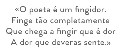 Art director, designer and consultant who grew up in Colorado and is now based in Heber City (was: Park City and before that Salt Lake City), UT. In 2021, he joined The Type Founders. He created the commercial Latin / Cyrillic geometric sans font family Venti CF in 2014---Venti can be purchased here. His second typeface is the geometric / techno typeface Filter CF (2014).
 In 2015, he created Waverly (avant garde caps), Articulat CF (an 18-style Swiss sans typeface), Argent CF (a 13-style display serif family), Ironfield (bold husky brutalist display font), Visby CF (geometric sans), Visby Round CF, Quincy CF (a warm serif text face), and Manifold CF (a squarish cold utilitarian sans with 16 styles; extended to the corporate typeface Manifold DSA in 2017). See also Manifold Extended CF (2022; 16 styles). Typefaces from 2016: Vanguard CF (a strong ultra-compressed sans in 16 styles), Addington CF (a 14-style text typeface family), Cartograph CF (monospaced sans), Greycliff CF (sans), Turismo CF (a wide rounfded open sans inspired by midcentury motorsports, technology, and business). Typefaces from 2017: Gryffith (angular), Visby Slab CF, Filter v2 CF (hipster style), Couplet CF (humanist sans), Integral CF (an all caps titling font). Typefaces from 2018: Argent Pixel (free), Artifex CF (a 9-weight serif family), Artifex Hand CF (a flared version of Artifex), Criteria CF (a geometric sans with horizontal and vertical terminal endings), Roxborough CF (a sharp-edged roman typeface). Typefaces from 2019: Wayfinder CF (a sharp-edged display typeface). Gumroad site, where one can download free trial versions of many of his fonts, and purchase licenses for the other ones. Typefaces from 2020: Hexaframe CF, Olivette CF (a sharp-edged angular and contrast-rich typeface family), Ellograph CF (a rounded monoline sans in 16 styles). Typefaces from 2021: Mielle CF (a monolinear script), Greycliff Thai CF, Greycliff Arabic CF, Greycliff Hebrew CF, Quiverleaf CF (ten flared / lapidary styles). Typefaces from 2022: Quiverleaf Arabic CF. Interview by MyFonts in 2021. [Google]
[MyFonts]
[More] ⦿
|
CorelDraw dingbats
|
The CorelDraw dingbats can be found in many places. The fonts: Animals-1, Animals-2, Arrows1, Arrows2, Awards, Balloons, Borders1, Borders2, Buildings, Bullets1, Bullets2, Bullets3, Bullets-4(Japanese), Bullets-5(Korean), Business&Government, Borders1, Borders2, Boxes, Charting, Clocks, CommonBullets, Computers, Chinese-Generic1, Electronics, Festive, Food, Furniture, GeographicSymbolsNormal, Household, Hygiene, HomePlanning, HomePlanning2, Japanese-Generic1, Kidnap, Korean-Generic1, Landmarks, LandscapePlanning, Medicine, Military, MilitaryID, MorseCode, Music, MusicalSymbolsNormal, NauticalFlags, OfficePlanning, People, Plants, Science, Semaphore, Signs, Space, SportsFigures, Sports&Hobbies, Stars1, Stars2, SymbolProportionalBT-Regular, Shapes1. [Google]
[More] ⦿
|
Cosimo Lorenzo Pancini
|
 Born in Firenze in 1969. Cofounder with Francesco Canovaro and Debora Manetti of the Italian design firm in Firenze called Studio Kmzero. He co-designed some typefaces there such as Arsenale White (2009). In 2002, Pancini developed Targa, TargaMS and TargaMSHand (for comic books?), basing his design on the peculiar sans serif monospace typeface with slightly rounded corners and a geometric, condensed skeleton that Italy had been using for its license plates. In 2022, Francesco Canovaro redesigned this font into a versatile multi-weight typeface, Targa Pro, which includes Targa Pro Mono (which keeps the original monospace widths), Targa Pro Roman (with proportional widths), both in five weights plus italics, the handmade version Targa Hand, and Targa Pro Stencil.
 The handwriting of Lord Byron led Pancini to develop the brush script typeface Byron (2013, Zetafonts). MyFonts credits him with the rounded avant garde sans family Antipasto (2007), but elswhere we read that this typeface is made by Matteo di Iorio, so there is some confusion. It was extended in 2017 by Pancini as Antipasto Pro. In 2014, Cosimo Lorenzo Pancini and Francesco Canovaro co-designed Amazing Grotesk (+Ultra). He also designed the calm bold geometric rounded sans typeface Cocogoose (2014; replaced by Cocogoose Pro in 2017) and the stylish deco font Offensive Behaviour. Cocogoose Letterpress is free. Cocogoose is part of the Coco Gothic family, a collection of twelve typefaces each inspired by the fashion mood of every decade of last century, named after fashion icon Coco Chanel. Cocogoose is Coco Gothic for the 1940s. See also Coco Gothic Pro (2021). In 2015, Pancini published the grand family Coco Gothic. This Latin / Greek / Cyrillic typeface family features a small x-height and sligghtly rounded corners to make the avant garde and geometric sans typefaces in vogue in the 1970s come alive again, ready for 21st century fashion magazines. It comes with substyles that recreate many moods, including art nouveau and arts and crafts (Cocotte), Italian propaganda style and Italian deco (Cocosignum), hipster style (CocoBikeR), or Bauhaus (Cocomat). Coco Gothic was initially developed as a corporate font for Lucca Comics & Games Festival 2013. The rounded geometric sans family Cocomat (by Cosimo Lorenzo Pancini, Deborah Manetti and Francesco Canovaro) was inspired by the style of the twenties and the visions of Italian futurists like Fortunato Depero, Giacomo Balla and Antonio Sant'Elia. Updated in 2019 as Cocomat Pro. Still in 2015, Cosimo and Zetafonts published the connected creamy baseball script Bulletto, the grungy handvetica Neue, and the calligraphic wedding typeface Hello Script. In 2015, at Zetafonts, Cosimo Lorenzo Pancini designed CocoBikeR (2015) to celebrate the hipster and bike cultures. CocoBikeR (for Latin, Greek and Cyrillic) is part of the successful Coco Gothic typeface family. In 2017, Pancini designed the 1930s Italian art deco typeface families Cocosignum Maiuscoletto and Cocosignum Corsivo Italico. In 2021, he published the 48-style (+variable) font family Coco Gothic Pro. This is a redrawn and expanded set of fonts: Inspired by a biography of Coco Chanel and trying to capture the quintessential mood of classical fashion elegance, Cosimo Lorenzo Pancini designed Coco Gothic looking for the effect that the first geometric sans typefaces (like Futura, Kabel or the italian eponyms like Semplicita) had when printed on paper. The crisp modernist shapes acquired in printing charme and warmth through a slight rounding of the corners that is translated digitally in the design of Coco Gothic. [...] A distinguishing feature of Coco Gothic Pro is the inclusion of ten alternate historical sets that allow you to use the typeface as a true typographic time machine, selecting period letterforms that range from art deco and nouveau, to modernism and to eighties' minimalism. Equipped with such an array of historical variants, Coco Gothic Pro becomes an encyclopedia of styles from the last century. There is also attention to Darkmode and there is coverage of Cyrillic and Greek. Typefaces from 2016: Adlery (a curly brush script), Kitten (Fat, Swash, Swash Monoline, Slant, Bold: signage script family), Adlibitum (a blackletter typeface by Cosimo Lorenzo Pancini and Francesco Canovaro), Morbodoni (a display didone by Cosimo Lorenzo Pancini and Francesco Canovaro). In 2016, Cosimo Lorenzo Pancini, Andrea Tartarelli, Giulia Ursenna Dorati and Andrea Gaspari co-designed the 1940s vintage brush script typeface Banana Yeti, which is based on an example by Ross George shown in George's Speedball 1947 Textbook Manual. The Zetafonts team extended the original design to six styles and multilingual coverage. The ExtraBold is free. Still in 2016, Pancini designed Calligraphunk, an experimental typeface that mimicks polyrythmic calligraphy, by alternating two sets of lowercase letters to emulate handwriting. In 2016, Cosimo Lorenzo Pancini, Matteo Chiti, Luca Chiti and Andrea Tartarelli co-designed the retro connected brush script font family Advertising Script, which is based on an example from Ross George's Speedball 1947 Textbook Manual. Beatrix Antiqua (2016, by Francesco Canovaro, Cosimo Lorenzo Pancini and Andrea Tartarelli). This humanist sans-serif typeface is part of the Beatrix family (Beatrix Nova, etc.) that takes its inspiration from the classic Roman monumental capital model. Its capitals are directly derived from the stone carvings in Florence's Santa Croce Cathedral. Beatrix keeps a subtle lapidary swelling at the terminals suggesting a glyphic serif, similar to Hermann Zapf's treatment in Optima. Amazing Grotesk (2016) is based on a logo designed by Francesco Canovaro. Studio Gothic (2017, by Francesco Canovaro, Cosimo Lorenzo Pancini and Andrea Tartarelli) is an 8-style geometric sans family based on Alessandro Butti's geometric sans classic, Semplicita. Hello Script and Hello Sans can be used for layering and coloring. The Christmas-themed version is Hello Christmas. Pancini designed the 64-strong typeface family Body Grotesque and Body Text in 2017-2018, together with Andrea Tartarelli. It was conceived as a contemporary alternative to modernist super-families like Univers or Helvetica. In 2017, Cosimo Lorenzo Pancini and Andrea Tartarelli co-designed the sans typeface family Kabrio, which gives users four different corner treatment options. Anaphora (2018). Anaphora is a contemporary serif typeface designed by Francesco Canovaro (roman), Cosimo Lorenzo Pancini (italic) and Andrea Tartarelli. It features a wedge serif design with nine weights from thin to heavy. Its wide counters and low x-height make it pleasant and readable at text sizes while the uncommon shapes make it strong and recognizable when used in display size. Anaphora covers Latin, Greek and Cyrillic. Canovaro's Arista served as a basis for the 29-style monolinear rounded sans typeface family Aristotelica (2018) by Cosimo Lorenzo Pancini and Andrea Tartarelli. See also Aristotelica Pro (2020). In 2018, he designed the italics for Cosimo Lorenzo Pancini's Domotika typeface family. Between 2018 and 2021, Cosimo Lorenzo Pancini and Andrea Tartarelli developed the 8-weight humanist sans typeface Domotika for Latin, Cyrillic and Greek, further into the 18-style Domotika Pro (2021). In 2018, he published Radcliffe, with Andrea Tartarelli, a Clarendon revival with Text and Casual subfamilies. Radcliffe (a Clarendon revival by Cosimo Lorenzo Pancini and Andrea Tartarelli), and added the layerable condensed Cocogoose Narrows to the Cocogoose family. Codec (2018) by Cosimo Lorenzo Pancini, Francesco Canovaro and Andrea Tartarelli is a geometric sans typeface family in which all terminal cuts are horiontal or vertical. See also Codec Pro (2019). His Double Bass (2018) is a jazzy 4-style typeface family that pays tribute to Saul Bass's iconic hand lettering for Otto Preminger's The Man with the Golden Arm film title sequence and other movies, Bass's vibrating, almost brutal cut-out aestethics, and the cartoonish lettering and jazzy graphics of the fifties. In 2018, he published the sharp wedge serif typeface Blacker to pay homage to the 1970s. In 2019, that was followed by Blacker Pro (Cosimo Lorenzo Pancini and Andrea Tartarelli, who write: Blacker Pro is the revised and extended version of the original wedge serif type family designed by Cosimo Lorenzo Pancini and Andrea Tartarelli in 2017. Blacker was developed as a take on the style that Jeremiah Shoaf has defined as the "evil serif" genre: typefaces with high contrast, oldstyle or modern serif proportions and sharp, blade-like triangular serifs). Still in 2018, he designed the swooping polyrhythmic calligraphic typeface Calligraphunk. In 2018, Cosimo Lorenzo Pancini and Andrea Tartarelli designed Holden, a very Latin cursive sans typeface with pointed brush aesthetics and fluid rhythmic lines. In 2019, Cosimo Lorenzo Pancini, Francesco Canovaro and Andrea Tartarelli published the monolinear geometric rounded corner amputated "e" sans typeface family Cocogoose Classic, the sans family Aquawax Pro, and the condensed rounded monoline techno sans typeface family Iconic. In 2019, Cosimo Lorenzo Pancini, Andrea Tartarelli and Maria Chiara Fantini at Zetafonts published a slightly calligraphic Elzevir typeface, Lovelace. In 2019, the lapidary typeface family Beatrix Antiqua (Francesco Canovaro) was reworked by Cosimo Lorenzo Pancini together with Andrea Tartarelli and Maria Chiara Fantini into a 50-style type system called Monterchi that includes Text, Serif and Sans subfamilies. Monterchi is a custom font for an identity project for a famous fresco in Monterchi, developed under the art directorship of Riccardo Falcinelli. Tarif (2019) is a typeface family inspired by the multicultural utopia of convivencia---the peaceful coexistence of Muslims, Christians and Jews in tenth century Andalusia that played an important role in bringing to Europe the classics of Greek philosophy, together with Muslim culture and aesthetics. It is a slab serif typeface with a humanist skeleton and inverted contrast, subtly mixing Latin zest, calligraphic details, extreme inktraps, and postmodern unorthodox reinvention of traditional grotesque letter shapes. The exuberant design, perfect for titling, logo and display use, is complemented by a wide range of seven weights allowing for solid editorial use and great readability in body text. Matching italics have been designed with the help of Maria Chiara Fantini and Cosimo Lorenzo Pancini, while Rania Azmi has collaborated on the design of the arabic version of Tarif, where the humanist shapes and inverted contrast of the Latin letters find a natural connection with modern arabic letterforms. Late in 2019, Cosimo Lorenzo Pancini released the fun typeface family Hagrid at Zetafonts, which writes: Crypto-typography---the passion for unknown, weird and unusual character shapes---is a disease commonly affecting type designers. Cosimo Lorenzo Pancini has celebrated it in this typeface family, aptly named Hagrid after the half-blood giant with a passion for cryptozoology described by R. K. Rowling in her Harry Potter books. Extreme optical corrections, calligraphic counter-spaces, inverted contrast, over-the-top overshoots: all the inventions that abound in vernacular and experimental typography have been lovingly collected in this mongrel sans serif family, carefully balancing quirky solutions and solid grotesque design. In 2020, Pancini released Stinger (2020, a 42-style reverse contrast family by Francesco Canovaro, Cosimo Pancini, Andrea Tartarelli and Maria Chiara Fantini) and Boring Sans (a typeface family designed along two variable axis: weight and weirdness). As part of the free font set Quarantype (2020), Cosimo Lorenzo Pancini designed Quarantype Embrace, Quarantype Hangout, Quarantype Hopscotch, Quarantype Joyride, Quarantype Sackrace, and Quarantype Uplift (with Maria Chiara Fantini). In 2020, Cosimo Lorenzo Pancini and Mario De Libero revived Nebiolo's Carioli (1928) as Cairoli Classic and Cairoli Now at Italian Type / Zetafonts. They extended the original weight and width range and developing both a faithful Classic version and a Now variant. The Cairoli Classic family keeps the original low x-height range, very display-oriented, and normalizes the design while emphasizing the original peculiarities like the hook cuts in curved letters, the high-waisted uppercase R and the squared ovals of the letterforms. Cairoli Now is developed with an higher x-height, more suited for text and digital use, and adds to the original design deeper inktraps and round punctuation, while slightly correcting the curves for a more contemporary look. Cairoli Variable has a weight and width axis. In 2020, Cosimo Lorenzo Pancini and Mariachiara Fantini---with the help of Solenn Bordeau---released Erotique at Zetafonts. Erotique evolved from Lovelace, an earlier Zetafonts typeface. Zetafonts describe this evil serif as follows: it challenges its romantic curves with the glitchy and fluid aestethic of transmodern neo-brutalist typography. Late in 2020, they added Erotique Sans, the sans version of Erotique, also designed by Cosimo Pancini and Maria Chiara Fantini. Late in 2020, he co-designed the 46-style font family Eastman Grotesque together with Francesco Canovaro and Andrea Tartarelli. This monolinear sans with a tall x-height comprises an interesting Eastman Grotesque Alternate subfamily with daring and in-your-face glyphs. The typeface evolved from Zetafonts' earlier Bauhaus-inspired typeface Eastman (2020). Later fonts in this family include Eastman Condensed (2021, by Francesco Canovaro, Cosimo Pancini and Andrea Tartarelli). In 2020, Cosimo Pancini, Andrea Tartarelli and Mario De Libero drew the 60-style Cocogoose Pro Narrows family, which features many compressed typefaces as well as grungy letterpress versions. Sunshine Pro (2020, Zetafonts) was designed by Cosimo Lorenzo Pancini and Solenn Bordeau expanding the original Sunshine design by Francesco Canovaro, part of the Quarantype collection (2020), which in turn was designed as a typeface for good vibes against Covid-19. Sunshine Pro is an experimental Clarendon-style font with variable contrast along the weight axis---contrast is reversed in light weight, minimized in the regular weight and peaks in the bold and heavy weights. Coco Sharp (2021) is a 62-style sans feast, with two variable fonts with variable x-height, by Francesco Canovaro, Cosimo Pancini and Andrea Tartarelli. Co-designer of Heading Now (2021), a 160-strong titling font (+2 variable fonts) by Francesco Canovaro, Cosimo Pancini, Andrea Tartarelli and Mario De Libero that provides an enormous range of widths. Keratine (2021, Cosimo Pancini, Andrea Tartarelli and Mario De Libero). A German expressionist typeface that exists in a space between these two traditions, mixing the proportions of humanistic typefaces with the strong slabs and fractured handwriting of blackletter calligraphy. Pancini, its main designer, writes that it explores the impossible territory between antiqua and blackletter. Geppetto (2021) is a frivolous Tuscan font that started out as a revival of a condensed Tuscan wood type family appearing in the 1903 Tubbs Wood Type catalog and which was probably derived from an 1859 typeface by William Hamilton Page. Pancini built a variable font on top of it and calls it a font for fake news. In 2021, Pancini added Coco Tardis as a variable font with a time travel slider to the Coco Gothic family. Millard Grotesque (2021) is a true "grot" in the Akzidenz Grotesque sense of the word. This typeface family was designed by Cosimo Lorenzo Pancini and Andrea Tartarelli. Pancini's Descript (2021) is a variable script font with two axes, slant and speed of writing. Milligram (2021) is a very tightly set grot by Cosimo Pancini and Andrea Tartarelli. [Google]
[MyFonts]
[More] ⦿
|
Cosmo Catalano
|
Editor of A web log of design and high drama which frequently comments on typographic matters such as web fonts (why pay for them?), traffic signs, and typeface use. He calls himself the world's toughest writer, and lives in the New England area (he graduated from Dartmouth, NH). In this piece entitled The Tell-Tale R Some Thoughts on Clearview, Cosmo writes this about the decision to start using Clearview for America's highway signs: While I admit it's (much) easier to read, I can't say I'm exactly psyched about seeing it. There are a variety of reasons why. I suppose my gut reaction is that it no longer feels like I'm driving down a federally-funded expressway-it feels like I'm staring at ads. While I've mentioned that Interstate has really picked up its public profile recently, Interstate isn't really the FHWA typeface. Tobias Frere-Jones got a lot of attention for Interstate because the edits he made were very subtle, yet somehow made the font tolerable for more than 12 characters at a time. Clearview, on the other hand, was in use for advertising years before it ever appeared along the highway-most notably by megalith AT&T. I liked the old, ugly FWHA typeface because it was so odd and idiosyncratic. It was like watching a David Bowie in his "androgynous alien" days-no mistaking it for anything else, let alone a sweeping corporate rebranding. FWHA's cold formlessness was also nice because it didn't encourage you to interact. One of Steve Jobs' most persistent design maxims is that products need to be anthropomorphic; it makes people want to engage with them. Clearview is definitely more human than FHWA, but is that really a good thing? Do we really want people relating to and engaging with signage? Or do we want them to glance, comprehend, and get their eyes back on the road? I'm also skeptical of the notion that legibility should be the only standard. Reading interstate signage-even with the old, weird FHWA face-is pretty damn easy. If you need the extra 200 feet to pick out an exit, what other details are you missing? Should you really be on the road? [Google]
[More] ⦿
|
Createdvoid
|
 Student at UWE Bristol in the UK. FontStructor who made the squarish minimalist typefaces Litewerk, Slitewerk, and Heavywerk in 2010. About these, he says: Roughly based on the structure of the London underground designed by Harry Beck. [Google]
[More] ⦿
Student at UWE Bristol in the UK. FontStructor who made the squarish minimalist typefaces Litewerk, Slitewerk, and Heavywerk in 2010. About these, he says: Roughly based on the structure of the London underground designed by Harry Beck. [Google]
[More] ⦿
|
Dan M. Zadorozny
[Iconian Fonts]
|
 [More] ⦿
|
Dan Newsome
[Exigent Information Solutions, LLC]
|
[More] ⦿
|
Daniel H. Luecking
|
A researcher in the Department of Mathematical Sciences, University of Arkansas, who specializes in metafont. He made the travel dingbat typeface "nkarta15", a correction and extension of the free metafont "karta" which in turn is of unknown origin. He also made a metapost file out of it. Download these fonts here. I took the liberty of making a tfm file with tfmpktest.pl, and from the tfm abd mf files, with the help of mftrace and t1utils, I made afm and pfb files: nkarta15 (type 1) (2008). [Google]
[More] ⦿
|
Danilo De Marco
|
 Web designer in Milano, Italy (and before that, Lugano, Switzerland, and Catania, Sicily), who created the didone typeface Rachel and the partly tweetware sans typeface family DDM in 2014. With Meedori Studio in Catania, he created the tweetware Futura-inspired caps-only typeface Meedori Sans (2015).
 In 2017, he designed the free wayfinding sans typeface Agané, which is based on Adrian Frutiger's Frutiger and Avenir, FF Transit by Erik Spiekermann and Bob Noorda's Noorda. With Giulia Gambino, he co-designed the free icon font Agane Icons. In 2018, Danilo De Marco and Giulia Gambino codesigned the free blackboard bold typeface K95 for K95, a communication and graphic agency based in Catania, Italy. In 2019, De Marco designed the didone display typeface family Herbert, which is named after Herbert Lubalin. Herbert Regular is free. Still at K95, he published Points & Lines (2019). Still in 2019, he also designed the free geometric color typeface Huber Alphabet, which is named in honor of Max Huber. [Google]
[More] ⦿
|
Dave Hansen
|
Maker of License Plate (2005), a free replica of Washington state's font, and also similar to font designs of other U.S. states and Canadian provinces. [Google]
[More] ⦿
|
David Bailey
|
 Graduate of Drexel University, where he studied under John Langdon, and now a freelance letterer and logo designer based in Alameda, CA, and a type designer at Delve Fonts. His web site was originally called Bezier Wrangler. In 2016, he finished the post-graduate type design program at Type@Copper West. His typefaces:
 Modern Blackletter (2005) and this grotesk display font (2006). - Overpass (2011, Delve Withrington and Dave Bailey). Sponsored by Red Hat, and inspired by Highway Gothic, a set of sans-serif typefaces developed by the United States Federal Highway Administration and used for road signage in the USA (but also used in many other countries), and freely available from Github and Open Font Library. See also Transpass (2011-2019).
- The layerable Western style display font Discourse (2012-2014, published by Delve Fonts).
- Prospectus (2018, Lost Type). An angular typeface family inspired by Oldrich Menhart.
- Summa Inline (2018). An exquisite typeface, it is unclear who did the digitization, Delve Withrington (Delve Fonts) or Dave Bailey (on whose web site the typeface is showcased).
[Google]
[More] ⦿
|
David Berlow
[Font Bureau]
|
[MyFonts]
[More] ⦿
|
David Fleming Nalle
[Scriptorium (Ragnarok Press, Fontcraft)]
|
 [MyFonts]
[More] ⦿
[MyFonts]
[More] ⦿
|
David Poullard
|
 Parisian type designer (b. 1972) who designed Métropolice (1998), Ordinaires (1999, inspired by names of Paris metro stations), Métropolitaine (a geometric industrial sans caps typeface) (2001, with Julien Gineste, commissioned by the RATP in the art nouveau style of Guimard), and a typeface for some tramways and the RER in Paris in 2004. Bio. [Google]
[More] ⦿
Parisian type designer (b. 1972) who designed Métropolice (1998), Ordinaires (1999, inspired by names of Paris metro stations), Métropolitaine (a geometric industrial sans caps typeface) (2001, with Julien Gineste, commissioned by the RATP in the art nouveau style of Guimard), and a typeface for some tramways and the RER in Paris in 2004. Bio. [Google]
[More] ⦿
|
David Vereschagin
[Quadrat Communications]
|
[MyFonts]
[More] ⦿
|
Departamento de Estudios Tipograficos
|
Designers in Santiago de Chile of a family of typefaces, TS Mapa (2004), for the transit system in Santiago, transantiago: TSInfoOblicua, TSInfoRegular, TSMapaGruesa, TSMapaLigera, TSMapaOblicua, TSMapaParche, TSMapaRegular, TSTroncal, TSZonas. [Google]
[More] ⦿
|
Department of Transport, UK
|
Drawings made in 2004 (PDF files) for the lettering to be used on Britain's highways: TM1 Transport medium alphabet (upper case letters), TM2 Transport medium alphabet (lower case letters), TM3 Transport medium alphabet (numerals and arrows), TH1 Transport heavy alphabet (upper case letters), TH2 Transport heavy alphabet (lower case letters), TH3 Transport heavy alphabet (numerals and arrows), MW1 Motorway alphabet (permanent), MB1 Motorway alphabet (temporary). [Google]
[More] ⦿
|
Diana Alisandra Stoen
|
Born in Richmond, VA, in 1976. Cocreator of TX Signal Simplifier (2002, Typebox), a hilarious information design dingbat face. MyFonts writes: Eight designers present a set of icons that indicate the fun and fantastic world of signage. Each collaborator's solution represents a completely different interpretations on signage vernacular. The designers are Erik Adigard, Cynthia Jacquette, Akira Kobayashi, Michael Kohnke, Patricia McShane, Joachim Müller-Lancé, Jean-Benoît Lévy, Kevin Roberson, Diana Alisandra Stoen. Codesigner of H-AND-S (2006, AND) with Jean-Benoît Lévy, Sylvestre Lucia, Mike Kohnke and Joachim Müller-Lancé. [Google]
[MyFonts]
[More] ⦿
|
Dick Pape
[Butterfly Clip Art collection]
|
 [More] ⦿
|
DIN 1451
|
German highway, railway and industrial typeface that is based on strict specifications. It was used on German cars for license plates, as well as on German trains. Linotype writes: The abbreviation "DIN" stands for Deutsches Institut für Normung (The German Institute for Industrial Standards). In 1936, this standards committee settled upon DIN 1451 as the primary lettering style for use in the areas of technology, traffic, administration, and business. The committee chose a sans serif design because of its legibility, and because its forms are also easy to reproduce. This typefaces design was not foreseen to be used in advertisements or other "artistically oriented purposes," and there were disagreements about its aesthetic qualities. Nevertheless, the DIN typeface has been set everywhere in Germany since its adoption, especially on signs for town names and traffic directions. Over the decades, it has managed to make its way into advertisements, too, perhaps because of its ease of recognition. The contemporary font version of DIN 1451 has been adopted and used by designers in other countries as well, solidifying its world-wide design reputation. Try it out today for signage, magazine layouts, book covers, or flyers. DIN 1451s industrial heritage makes it surprisingly functional in just about any conceivable application. Poster by Federico Arguissein (2013). [Google]
[More] ⦿
|
DIN 17
|
One of the later specifications of the Deutsches Institut für Normung, from 1938. A typeface that follows it was made by Scangraphic, DIN 17 SB. [Google]
[More] ⦿
|
DIN specifications
|
DIN is a set of typeface norms set by the Deutsches Institut für Normung (The German Institute for Industrial Standards). In 1919, Germany had its first (Grotesk) typeface for technical drawings that followed strict norms, the DIN 16. This was followed in 1927 by DIN 1451. The latter set of raster-based specifications was developed under the guidance of Siemens engineer Ludwig Goller in 1926-1927. The DIN 1451 would be further developed and broadened over the years, leading to DIN Engschrift and DIN Mittelschrift (1931). Various modifications led to DIN 1451 (1936), DIN 17 (1938) and the "new" DIN 16 (1934). The DIN was heavily used in Germany from 1936 until the 1980s in stencils, sold by companies such as Faber-Castell, Rotring, Staedtler, and Standardgraph. Articles on DIN: Poster by Federico Arguissein (2013). [Google]
[More] ⦿
|
Dmitry Goloub
|
 Russian type foundry, est. 2014 by Dmitry Goloub, the Moscow-based codesigner with Lucas Perdidaão of the free grid-based art deco typeface Bobber (2012, in ai format) and of Alpine (2014). From 2009 until 2010 and again in 2012, he lived in Firenze, Italy.
 Typefaces from 2013 include Bolognese Sans, Moor (multilined art deco family), Bobber Script, and Bread & Milk Sans. Genplan (2013) is a great free layered inline typeface for Latin and Cyrillic that is based on 1930s Soviet poster types. See also TT Genplan Pro (2014). Cittadino Symbols (2013) is a free rounded city traffic icon font related to a Milan subway project. In 2013, this was replaced, still for the Milan metro maps, by Meneghino Wayfind, a tweetware typeface that was influenced by PT Sans Caption. In 2015, Goloub created Ardent: Ardent is my Sergey Chekhonin-inspired typeface. Ardent is an attempt to prove that the bizarre Cyrillic letterforms of 20s are still decent for use in modern design, even in Latin script. It is highly ornamental and lapidary. Still in 2015, he designed the sans typeface family Intersans (a multilingual Swiss army knife sans), which supports Extended Latin, Extended Cyrillic (including Bulgarian and Serbian Cyrillic), Polytonic Greek, Armenian (Asomtavruli, Nuskha-khutzuri, Mkhedruli, Mkhedruli Mrglovani), Georgian and Hebrew. It also includes true italics, small caps, small caps italics and a lot of pictograms. Typefaces from 2020: Grrr (at Paratype, with Alexandra Korolkova: a techno family characterized by an oversized lower case f). Dmitry Goloub's home page. [Google]
[MyFonts]
[More] ⦿
|
Doepfer Musikelektronik GMBH
|
BF_Symbols (communication dings, 1995), Doepfer (LED font by Doepfer Musikelektronik, 1995), Inter (Gary L. Ratay's travel dingbat font, 1991). See also here. [Google]
[More] ⦿
|
Domen Fras
[Aparat]
|
[More] ⦿
|
Dominic Davidson-Merritt
|
Paris-based designer of the kitchen tile font Abbesses (2015). His inspiration though came from the French subway signs: Typographic play inspired by the tile metro signs on my commute and shitty metro posters. Behance link. [Google]
[More] ⦿
|
Dominik Krotscheck
[zum Egon]
|
 [MyFonts]
[More] ⦿
[MyFonts]
[More] ⦿
|
Don Meeker
|
 Donald Meeker (Meeker and Assoiciates) is one of the designers responsible for the Clearview font (along with James Montalbano of Terminal Design). His firm, Meeker and Associates, which specializes in environmental graphic design, tested Clearview with the Pennsylvania Transportation Institute at Penn State University over the course of the 1990s. From 2014 untuil 2016, Clearview was being introduced on the American highways, slowly replacing the 1940s font Highway Gothic. The FHWA reversed its position on Clearview in 2016, however. Meeker's research on Clearview is reported in the Transportation Research Record. Meeker's research on Clearview is reported in the Transportation Research Record paper with Philip M. Garvey and Martin T. Pietrucha entitled Effects of font and capitalization on legibility of guide signs.
 Reasons for the demise could include cost (jurisdictions that adopt Clearview must purchase a standard license for type, a one-time charge of between $175 (for one font) and $795 (for the full 13-font typeface family) and up, depending on the number of workstations), poorer legibility of signs in negative-contrast color orientations, such as those with black letters on white or yellow backgrounds, and inconsistent use (because Clearview was only optional). [Google]
[More] ⦿
|
Donald Choque
|
 Designer of a set of pictograms in Emmanuel Besse's road signage typeface Signal Compressed which was published in 2018 by the French type foundry Production Type.
 In 2019, ENSAD alumni Donald Choque and Yoann Le Goff set up Atelier Choque Le Goff in Paris. Together they published Sharknose Thin (2020). [Google]
[More] ⦿
|
Draftsman Gothic
|
Draftsman Gothic or Draftsman Italic is a light gothic with an extreme slope of about 30 degrees, intended for map work. It was produced by Monotype for the U.S. Geodetic Survey in Washington, D.C., and was released in 1948. [Source: Mac McGrew] [Google]
[More] ⦿
|
Dutchfonts.com
[Ko Sliggers]
|
 Ko Sliggers, b. 1952, Bloemendaal, The Netherlands, was a young designer at Studio Dumbar. After that, he became a professional cook in Rotterdam, Italy and France, switched back from food to design, producing challenging visuals at Studio Anthon Beeke and, in 2002, set up a one-man studio in Lalleweer, in the province of Groningen, called Dutchfonts. He was trained by Chris Brand at the St. Joost Academy in Breda. Ko created these commercial typefaces: DF Tapa (2007, irregular hand), Camino (2006, an austere sans), Ko (1997, six stencil styles), Etalage (2000), Arienne (2000), Staple Mono (monowidth typewriter family), Staple Txt (2005), Pommes (based on type cut out of potatoes; 8 styles), Daantje (dog dingbats) and Ko (1997, rough stencil). His own web site. MyFonts page, where you can buy DF-Arienne, DF-Etalage, DF-Ko, DF-Pommes (2005, potato cut typeface family), DF-Staple Mono, DF-Tapa (2007, grunge), DF-Mercat (2007, dingbats inspired by Barcelona's Ramblas), DF-Pigtail (2008, seventies-style script family), DF-Zzzz (2009), DF Camino (2009, a sans that is modeled on traffic sign sans typefaces), DF Stromboli (2010: It was written with a coffee spoon, acting like a broad pen, in the ashes of the Stromboli volcano right on top of a scanner. ), DF DejaVuPro (2010, an amalgam of sans typefaces), DF Game Over (2011, sketched face), DF Scheurze (2012, a great fat rough stencil face).
 Typefaces from 2013: DF Riga (grungy pixel face), DF Abit (another grungy pixel face), DF Dudok (a grungy pixel face). Typefaces from 2015: DF Charlie Go (free typeface designed immediately after the Charlie Hebdo attack in Paris), DF Park (experimental font started in 2013, originally made to dress up the facades of a food exhibition). Dafont link. Klingspor link. View Ko Sliggers's typefaces. [Google]
[MyFonts]
[More] ⦿
|
Edward Johnston
[Johnston's Underground Type]
|
[More] ⦿
|
Edward Johnston
[London Underground]
|
[More] ⦿
|
eijin
|
A few dingbats here such as ArtsyParts-Dingbats-JL, Calendar-Normal, Cheq, ClassifiedDingbats, Electronics-Regular, Hazard-Regular, LogosCorporate-VOL1A, MiniPics, OldTimeAdDingsTwo, Panda, Pie-charts-for-maps, RoadWarningSign, RoadSign, Transport-Regular (by Magnum Software), CORPartSample, CORPartIISample (both by Grafik Solutionz, 1997), Medicine. [Google]
[More] ⦿
|
Elliott Amblard
|
 Elliott graduated in graphic design at EPSAA (Ecole Professionnelle Supérieure d'Arts Graphiques et d'Architecture de la ville de Paris, France) in 2012.
 Together, Elliott Amblard (France) and Gia Tran created the bold signage / retro baseball script typeface Paname FY at FontYou in 2014. At Long Type, he created Oradour: Inspired by french vernacular lettering, it is also a very contemporary re-interpretation of Eurostile typeface (Aldo Novarese) by stripping it from this dated aesthetic. FontYou link. In the TypeMedia program at KABK in Den Haag, he designed Emil for his graduation in 2015. Emil is situated between a text typeface and a slab serif typeface. It is characterized by convex stems and low contrast and includes a Hairline weight. In 2016, he published Yuzu at Indian Type Foundry. It is a simple yet effective straight rounded sans typeface family. Guide (2016), also published by Indian Type Foundry, is a wayfinding and traffic sign sans typeface family. In 2017, Elliott Amblard and Théo Guillard designed Read Greek Condensed, which won an award at TDC Typeface Design 2018. In 2018, Elliott Amblard and Jérémie Hornus co-designed the information design humanist sans typeface family Drive. It is accompanied by the more typewriter-styles families Drive Mono and Drive Prop, and published by Black Foundry. Angus (2018) is a multiplexed rounded sans typeface family by Elliott Amblard that includes a variable font. [Google]
[MyFonts]
[More] ⦿
|
Emil Wojtacki
|
Polish designer of some free fonts: Drogowskaz (2006: this mimics the type on Polish traffic signs), BN-67.9010-03 (2003: sans). See also here for the images below, and a discussion. Download Drogowskaz here. [Google]
[More] ⦿
|
Emmanuel Besse
|
Emmanuel Besse holds a degree in typographic design from the Ecole Estienne in Paris. He works on projects ranging from web design and publishing, to typeface design. He co-founded Large with Leo Carbonnet, a design group based in Brussels and Paris. Emmanuel is in charge of Production Type's graphic design. In 2018, his road signage typeface Signal PK was published by Production Type. The pictograms in the font were drawn by Donald Choque. Art direction by Julien Lelièvre. Production Type explains: Signal is a typeface that leans on a significant part of the French typographic landscape, the "Caractès" for road signage. These alphabets made by norm, with obscure origins, are present all across the French road network since the 1970s, and are emblematic of its typographic identity. Signal fulfils the broken promise that these alphabets used to make: until now, Caractères existed only in their normative shape (4 incomplete styles named L1, L2, L3, and L4: two of uppercase-only, two of italics only). The few digital fonts available are equally incomplete and mediocre digitization attempts, with poor execution. Specifically designed with urban signage, interface and exhibition design, in mind, this new series (Signal) completes and extends the existing typefaces. The current palette consists in previously unseen romans in two weights and their matching italics, a complete set of accents for multilingual typesetting, numerous arrows and pictograms, and characters for mathematical typesetting. An extra style, Condensed, deformed and excessive, wittily tops the typeface family. As a new ensemble, its demultiplies the potential uses of Caractères, beyond their original purpose, making them notably suited for interface design. In 2020, Production Type launched Signal Mono, and advertized it as a straightforward bureaucratic typeface. It was made by Emmanuel Besse, who was assisted by Julien Lelièvre (art direction), Hugues Gentile (Cyrillic) and Laurane Perrot. Together with the Production Type team of Quentin Schmerber and Hugues Gentile, he designed the severe-looking mechanical typeface family Kreuz, which is also a sign of the times---the rise of threatening right-wing dictators in Europe and America. Designer of Enduro (2020, Production Type), a sturdy 44-style no-nonsense sans having a Cyrillic that was designed by Marion Sendral. Typefaces at Large Projects include Principal (sans) and Norman (condensed sans). [Google]
[More] ⦿
|
Eraky
[Ahmed Eraqi]
|
 Banha, Egypt-based designer of these typefaces in 2019: Calligra (2019: a serif font with calligraphic swashes), Rasoav (2019: a display or logo font), Roxon (2019: an organic rounded sans by Ahmed Eraqi and Nohamad Foda), Hurringtown Script (with Koi and JAF34), Eraky, Zamoka (a swashy display style).
 Ahmed Eraqi published Chattelyne (a curly font) at Zet Design. With Nohamad Foda, he designed Luxury Home, a Latin slab serif with lower case letters of unequal x-height, Zamoka (2019: a deco typeface), and Hamis (2019) Hamis Vol 2 (2019), a festive display typeface family. Typefaces from 2020: Hamis Pro (a jazzy piano key typeface), Rigot (a modern fashion mag typeface by Ahmed Eraqi and Nohamad Foda), Tioxo Sans (a poster or logo font by Ahmed Eraqi and Nohamad Foda), Stazin (a striking Arabic / Latin display typeface by Ahmed Eraqi and Nohamad Foda), SolKing (an Arabic typeface by Ahmed Eraqi and Nohamad Foda), British Vehicle JNL (based on the UK license plate font created by Charles Wright in 1935; with Jeff Levine), Viking Drink (an 8-style decorative didone, with accompanying blackboard bold; done with Nohamad Foda). Typefaces from 2021: Foda Egypt (a 12-style serif by Ahmed Eraqi and Nohamad Foda), Foda Slab (2021: an Arabic slab serif by Ahmed Eraqi and Nohamad Foda), Foda Freestyle (an Arabic display font by Ahmed Eraqi and Nohamad Foda), Foda Sans (126 styles, for Latin and Cyrillic, by Ahmed Eraqi and Nohamad Foda), Foda Kufi (by Ahmed Eraqi and Nohamad Foda). Typefaces from 2022: Foda Display (a display typeface for Latin and Arabic by Ahmed Eraqi, Nohamad Foda and Esraa Amer), Quta Rounded (by Ahmed Eraqi, Nohamad Foda and Esraa Amer), Quta (a 10-style sans with a preference for 90-degree junctions in unusual places; by Ahmed Eraqi, Nohamad Foda and Esraa Amer). [Google]
[MyFonts]
[More] ⦿
|
Erdas Inc
|
Designers of the free map symbol font MapSheets (1996). [Google]
[More] ⦿
|
Erik Spiekermann
[IIID]
|
[More] ⦿
|
ESRI fonts
|
ESRI is the Environmental Systems Research Institute. It sells the ArcGIS software for GIS-related problems. In the late nineties, one could download free map fonts. The ESRI fonts contain mainly map and weather icons, and were made between 1996 and 1998. The set: ESRI AMFMGas, ESRI Cartography, ESRI Caves1, ESRI Climate&Precipitation, ESRI CrimeAnalysis, ESRI Environmental&Icons, ESRI Geology, ESRI GeologyAGSO1, ESRI GeometricSymbols, ESRI HazardousMaterials, ESRI IGL Font16, ESRI IGL Font20, ESRI IGL Font21, ESRI IGL Font22, ESRI IGL Font23, ESRI IGL Font24, ESRI IGL Font25, ESRI MilSym02, ESRI OilGasWater, ESRI OilGasWater, ESRI SDS2.001, ESRI SDS2.002, ESRI Surveyor, ESRI SvenskaKartSymboler1, ESRI Transportation&Civic, ESRI TransportationMunicipal, ESRI USMUTCD2, ESRI Weather. [Google]
[More] ⦿
|
Euroface
|
Dead link. In 1996, as a joke, Peter Bilak of Typotheque proposed Euroface in variants called euroface 60mph, 80mph and 100mph. He mentioned an imaginary European road type project, to be implemented by 2005, and wrote: In 1994, the members of European Parliament urged the creation of a new comprehensive road typeface system, the development of a general high recognition and perception font, and recommended adoption of uniform design practices. Now, after five years of extensive research, the European Committee for Uniformity of Type Design and Type Safety completed the research and presented legible-for-all-purposes-suitable-typeface. The typeface, named Euroface, was developed and studied through extensive design exercises, laboratory investigation and road tests. The result is convincing: Euroface is 42% more legible than Helvetica at the speed higher than 80 km/h and at 120 km/h legibility reaches a value of 5 ISRU*. The Committee's recommendation were accepted and the adoption of the system in the EC countries should be completed by 2005. A Manual on Uniform Traffic Control Devices and Type Safety was published in 1999, thoroughly presenting the projects implication, possibilities and practical applications. The project allegedly used the legibility machine of Professor Morozov, and was headed by Professor E. Bügleichenhaus. [Google]
[More] ⦿
|
Evgeniy Tarasenko
|
 Moscow, Russia-based designer who made the free piano key stencil typeface Promplate Stencil (2016), the ultra black counterless typeface Blot (2011), the Italian typeface Utug (2015), and the free constructivist art deco typeface Eleventh Square (2015, published by Typetype). He also made nice Transport pictograms (2011, FontStruct).
 Home page. Behance link. FontStruct link. [Google]
[More] ⦿
|
Exclamations (or: The Boutons)
[Gary David Bouton]
|
 Gary David Bouton and Barbara Bouton's site was called Exclamations. Gary has been writing books on computer graphics for over 20 years, inlcuding eight books on Corel Draw. In 2015, Gary went commercial as Gare.
 Their typefaces: International Symbols (2015, an icon font), Twooth (2015), Greek Diner Inline (2015, based on Carol Twombly's Lithos), BifurOverlay (2015, an overlay font based on Cassandre's Bifur (1929)), Bouton Kursiv (2008), Odissey (2008), Russel Write (2010), Elephants and Bears (dingbats), GreekDiner Inline, GeotypeTT (1997), WebKnobsTT (1997), Beacon (2008, a Schwabacher), BOUTON Nouveau Ornaments II (2009), BifurFoundation (2010), BifurOverlay (2010, after Cassandre's Bifur), Frankfurter Venetian (2008, fat rounded horizontally striped all caps face), Folks (medieval caps), Nouveau Rococo Deco Dings I (2008, art nouveau ornaments), Simulata (2006, geometric deco typeface with Bifur influences), Whimsy (comic book font), SymbolsTT (1998, charityware dingbat font). Exclamations link. Alternate URL. Dafont link. Creative Market link. [Google]
[More] ⦿
|
Exigent Information Solutions, LLC
[Dan Newsome]
|
Dan Newsome's Petro Symbols font for cartography. Free demo. [Google]
[More] ⦿
|
F37 (or: Face37)
[Rick Banks]
|
 Rick Banks (b. 1985, Manchester, UK) established F37 (Face37) in 2010 in London, UK. His typefaces:
 - F37 Xan (2010). A counterless geometric typeface based on a geometric solid typeface from 1925 by André Vlaanderen.
- F37 Form (2010). A mimimalist circular experimental (Bauhaus?) font. He writes about Form: After looking at Armin Hoffman's Die Gute Form poster and Herbert Bayer's universal typeface I constructed an alphabet based on their letterforms. Inspired by Wim Crouwel's Soft Alphabet, I constructed a grid to create the modular alphabet and programmed very tight letterspacing into the font lending itself to the style of Die Gute Form.
- F37 Bella (2011). An extremely contrasted didone display typeface. He says that he was influenced not only by Didot, but also by Pistilli and by Tschichold's Saskia. F37 Bella won an award at TDC Tokyo 2012. See also F37 Bella Pro (2020), in Text, Hairline, Stencil and Display substyles.
- F37 Ginger (2013). A Swiss geometric sans inspired by the work of Herb Lubalin, Jan Tschichold and Paul Renner. The customized version of F37 Ginger, Boots Sharp (2019), was commissioned by Coley Porter Bell and True Story as part of an extensive rebrand. F37 Ginger Pro was released in 2019.
- F37 Neue Grotesque (2013).
- F37 Stencil Bella (2013).
- F37 Glaser Stencil (2015).
- F37 Bolton (2016). A sans family influenced by the style of Berthold's G.G. Lange.
- F37 Jan (2016). Inspired by Jan Tschichold's geometric sans-serif and Matthew Carter's Bell Centennial font, F37 Jan features pronounced ink traps.
- F37 Jagger (2017). A sans inspired by Edward Johnston's London Underground font.
- F37 Bergman (2017). A Peignotian typeface family that revives a revival Hans Möhring's Florida typeface. The Swedish director Ingmar Bergman consistently used Florida in his films.
- BHF Beats (2018): Working alongside Wolff Olins we were comissioned to create the new font for the British Heart Foundation. The letterforms are based on their iconic logo featuring waves of a heart beat.
- F37 Bobby (2018). A warm text typeface.
- F37 Ping Pong (2018). A 1970s style dot matrix font that was inspired by the 1970s Letraset font Pinball created by Alan Dempsey.
- F37 Factory (2019). Named after Andy Warhol's The Factory in New York City, F37 Factory was inspired by stencil letters etched into marble in what was once a Hovis flour mill in Ramsgate. That building was designed by E. W. Pugin. F37 Factory was originally conceived for a commercial development project for Want Marketing and commissioned by London design studio Bold & Bold.
- F37 Judge (2019). Banks's take on DIN and old wood types.
- F37 Moon (2019). Influenced by Avant Garde and Futura, in 14 styles.
- F37 Flux (2019). Experimental and intestinal.
- F37 Neuro (2019). A Swiss sans family.
- F37 Beckett (2020). A sans based on British road signs from the 1930s. F37 Beckett pays homage to the British Ministry of Transport's 1933 alphabet.
- F37 Stout (2020). An octagonal family base on a letterpress font called Stoutheart.
- F37 Gruffy (2020). A grotesque.
- F37 Hooj (2020). A geometric sans family.
- F37 Wicklow (2020). A 24-style wedge serif inspired by the Gaelic letter carvings by Irish sculptor Michael Biggs in Dublin. It includes a set of stencil fonts as well.
- F37 Snake (2020). an octagonal industrial stencil typeface inspired by John Carpenter's film Escape From New York.
- F37 Caslon (2020). He explains why the world needs another Caslon: F37 Caslon is our personal take on a stone-cold classic. Originally designed by William Caslon in 1726, this old-style serif has fascinated typographers ever since. Over the years, the font has been tweaked, reworked, modernised, pulled, stretched, squashed and embellished, as successive generations have created their own versions of Caslon, particular to their times and tastes. We have taken the best of these seminal Caslon revisions to create our own super family in a huge range of weights and styles. Our cut features a tall x-height, old-style numerals, capital italic swashes, ligatures and discretionary ligatures.
- F37 Grotesc (2021). Inspired by Pica Sans.
- F37 Attila (2021). A sans serif is inspired by Albert Auspurg's Krimhilde (1933).
- F37 Drago (2021). A serif typeface based on Columbus (1892).
- F37 Wyman (2021). F37 Wyman is based on lettering work created by graphic designer Lance Wyman in 1976, which was commissioned as part of the graphic identity marking 200 years of American Independence.
- Corporate typefaces include Dunlop Sans, F37 Selfridges (=F37 Bella), F37 Avid (=F37 Ginger), Pamela (for Foilco), F37 Zip (for the hotel chain), Pizza Pilgrims, Dar Headline (octagonal), Lloyds Bank (icons).
- F37 Lineca (2021). A fifteen-weight geometric sans with a strong emphasis on the horizontal.
- Ocado (2021). A custom sans done for a grocery company.
- Stonewall (2021). A sans font for Stonewall, a cmpany that has championed a world where LGBTQ+ people everywhere are free to be themselves and enjoy life fully.
- F37 Incise (2021). A heavy, experimental display font, inspired by stone cutting.
He also published Type Trumps, a set of playing cards that feature the main typefaces. Behance link. [Google]
[MyFonts]
[More] ⦿
|
FDI Type Foundry
[Ralf Herrmann]
|
 FDI stands for fonts dot info, est. 2004 by Ralf Herrmann and partner. This foundry is located in Jena, Germany. The legal entity behind it was the Rossbach & Herrmann GbR in the city of Jena which operated as Seite7 Designagentur. Rossbach & Herrmann GbR ceased in 2015. MyFonts link. The fonts dot info label will be retired in 2017 and replaced by FDI Type Foundry.
 Ralf Herrmann (b. 1976, Pößneck, Germany) studied visual communication at Weimar's Bauhaus University and works as a web, graphic, and type designer. He has made a name for himself in the typography community with his internet typography subcommunity typografie.info. He researched the implications of cognitive map research applied to the design of maps and wayfinding systems. In 1999 he founded a design studio with a partner in the city of Jena. His typography projects included the German online community Typografie.info (2001), the type foundry FDI Type (2004) and the typography magazine TypoJournal (2009). He is the chairman of the Pavillon-Presse, a museum for the printing arts & typography in the city of Weimar. In 2015, he launched Typography guru. In his Letter Library, he archives historic and current type specimens of type foundries from around the world. He also wrote typography books and continues to write and provide content for various online and print magazines (like PAGE, Smashing Magazine, TYPO magazine, étapes, I Love Typography). Typefaces published by FDI: - Krimhilde (2018). A digital revival, and a separate modern modification, of Albert Auspurg's semi-blackletter typeface Krimhilde first published by Ludwig & Wagner in 1933.
- Graublau Sans (2008) and Graublau Slab Pro (2012) by Georg Seifert.
- Wayfinding Sans Pro and Wayfinding Sans Symbols (2012). This useful wayfinding typeface family was co-designed by Ralf Herrmann and Sebastian Nagel.
- Canape
- Elfen Fraktur (2015). A revival by Ralf Herrmann of Elfen Fraktur (1919, M. Beck). It contains Elfen Schmuck.
- Hooptie Script (2011). A retro signage script inspired by Detroit in the 1950s.
- FDI Tierra Nueva (2010). A medieval map typeface by Sebastian Nagel.
- Uberschrift (2014). A sharp thin headline typeface by Friedrich Althausen.
- Logotypia Pro (2004).
- Iwan Reschniev (2008). By Sebastian Nagel. A Bauhaus style family of severe sans styles.
- FDI Wiking (2021). A free blackletter font that revives Heinz K7ouml;nig's Wiking (1925, J.D. Trennert & Sohn, Hamburg).
Ralf Hermann designed several other typefaces outside FDI. These include Agendia (2002), a free experimental Antiqua-Schrift (see also here). Author of Speaker at ATypI 2011 in Reykjavik on the topic of the eszet (ß) letter. Klingspor link. See also here for more news by Ralf Herrmann in English and German. Here he blogs about web fonts and web type matters. His Flickr stream. Home page of Schriftkontor Ralf Herrmann. Typedia link. Behance link. Showcase of the retail FDI fonts. [Google]
[MyFonts]
[More] ⦿
|
FE Schrift
|
 FE Mittelschrift and FE Engschrift are the German typefaces used on automobile license plates. The FE stands for fälschungserschwerend, or hard to forge: for example, it is no longer possible to make a P into an R or a 3 into an 8 with a black marker pen. Developed from 1978-1980 by Karlgeorg Hoefer with the assistance of others such as the University of Giessen. It replaced the old DIN in 1994 and is an absolute monstrosity showing to what extremes governments will go in the name of security. Incredibly, several digital fonts have been made to resemble it, as if anyone would want to use it for anything other than on toilet paper wrappers:
 - FE Mittelschrift and FE Engschrift (1997, Stephan Mueller, Lineto).
- Kraftfahrzeugkennzeichen (2008), a free font.
- FE-Font (1997), a free font by an unknown designer.
- Martin Core (Core.nu) claims his Sauerkrauto (2000) font was based on images of the German license plates.
- Gutenberg Labo made GL-Nummernschild-Eng and GL-Nummernschild-Mtl to replace FE Engschrift and FE Mittelschrift, respectively.
[Google]
[More] ⦿
|
Felix Arnold
|
 A Swiss designer and type designer (b. 1970, Basel), who studied at the Basel School of Design. He created Cisalpin [also called Cassini in its earlier grotesque life, 1999-2000], a typeface for cartography, which was published it with Linotype in 2004. Pic.
 Klingspor link. Linotype link. [Google]
[MyFonts]
[More] ⦿
|
Fernanda Martins
|
Brazilian type designer in Belem, Amazonia who studied at Sao Paulo University, the Basel School of Design (with Wolfgang Weingart and André Gürtler), and UFPA (where she obtained a Masters in vusual culture). She has a PhD in History of Design in ESDI/UERJ, where her thesis was Printing in Para from 1820 to 1910. She does corporate type in general and is the CEO of Mapinguari Design in Belem, a small design business curating, for example, the Floating Letter project. Fernanda created the beautiful Bananas font (2001, letters shaped with bananas), Brasilia (1995, a sans face), the highwage signage typeface Graal (1998), Transbrasil (1999/2000) and Alphanumer (2000, some letters are replaced by mirrored or rotated numbers). She is working on the sans family FM Ruben (2001), which was started in the sixties by her father, Ruben Martins, who died in 1968. Brief CV. Speaker at ATypI 2018 in Antwerp. [Google]
[More] ⦿
|
FF DIN
[Albert-Jan Pool]
|
 The story of Albert-Jan Pool's information design type family FF DIN, told by FontShop: i, ii, iii, iv. [Google]
[More] ⦿
The story of Albert-Jan Pool's information design type family FF DIN, told by FontShop: i, ii, iii, iv. [Google]
[More] ⦿
|
FHWA Series fonts
|
From Wikipedia: The FHWA Series fonts (often informally referred to as Highway Gothic) are a set of sans-serif typefaces developed by the United States Federal Highway Administration and used for road signage in the U.S. and Canada. The fonts were created to maximize legibility at a distance and at high speed, growing out of research by the California Department of Transportation. They are officially defined by the FHWA's "Standard Alphabets for Traffic Control Devices", originally published in the late 1950s. Changes to the specifications were published in 1966, 1977, and 2000. The 2000 specifications differ from earlier versions in the shapes of a few letters. The set consists of seven fonts: "A" (the narrowest), "B", "C", "D", "E", "E(M)" (a modified version of "E" with wider strokes), and "F" (the widest). Series "A" has been officially discontinued, and is only seen today on older signage. The fonts originally included only uppercase letters, with the exception of "E(M)", which was used on large expressway and freeway guide signs. In 2004, the FHWA added lowercase letters to all of the typefaces and made changes to the Manual on Uniform Traffic Control Devices allowing their use. In recent years, the FHWA series of fonts has been adopted by many companies for branding; for example, NBC uses it for NBC Sports captions, and TV Guide uses the typeface on its cover. Also, The Weather Channel has utilized this typeface extensively, both on their weather maps and for their local forecasts. Over the next few decades, the new Clearview typeface, also specifically developed for use on traffic signs, is expected to replace the FHWA series on new signage. [Google]
[More] ⦿
|
Florian Philipp Martin Runge
|
 Designer in London, who was born in Flensburg (Germany) and studied for four years in Aarhus (Denmark).
 He made the contemporary informal typeface Jula (2012). Asgaard was created during the one-week typeface design workshop tipoRenesansa in Trenta, Slovenia (February 2012). It is specially designed for street signage. Runge writes: To achieve great legibility the design paid much attention to features such as: large x-height, open counters, tiny serifs, slightly rounded corners, square terminals as well as inktraps. Research leading to asgaard is described in Runge's paper The echo of architecture in Danish type design of the 20. century. In 2013, Florian graduated from the MATD program at the University of Reading. His graduation typeface was Nomad. In 2016, he published the flared lapidary typeface Sherpa Sans at Rosetta. The naming caused a bit of a stir, not so much because of Oskar Boscovitz's Sherpa Sans (2002), but because of an unpublished font by a competitor. Rosetta took the moral high ground (even though it could have fought this trademark and won) and decided to rename Sherpa Sans Gitan. In 2018, Borna Izadpanah, Fiona Ross and Florian Runge co-designed the free Google Font Markazi Text. They write: This typeface design was inspired by Tim Holloway's Markazi typeface, with his encouragement, and initiated by Gerry Leonidas as a joint University of Reading and Google project. The Arabic glyphs were designed by Borna Izadpanah and design directed by Fiona Ross, they feature a moderate contrast. It takes its cues from the award-winning Markazi typeface, affording a contemporary and highly readable typeface. The complementary Latin glyphs were designed by Florian Runge. It keeps in spirit with its Arabic counterpart, echoing key design characteristics while being rooted in established Latin traditions. It is an open and clear design with a compact stance and an evenly flowing rhythm. Four weights are advertized at Google, but only the Regular is available. Behance link. Cargo collective link. [Google]
[MyFonts]
[More] ⦿
|
Font Bureau
[David Berlow]
|
 Founded in 1989 by noted publications designer and consultant Roger Black and type designer David Berlow, Boston-based Font Bureau is, in my humble view, the best and most professional font design company in the world. It is uncompromising in its quest for quality. They have a good hold on the North-American newspaper market. Sam Berlow manages the company. I am not listing their fonts here---they are listed under the various type designers who have contributed to Font Bureau.
 Catalog of Font Bureau's typefaces. [Google]
[MyFonts]
[More] ⦿
|
Fonts of Afrika
[Peter Slingsby]
|
Fonts of Afrika is Peter Slingsby's South African foundry selling mostly dingbat fonts at 4 to 6 USD per font. About ten of his 80 fonts are free. Includes rock art, African dingbats, wildlife, children, American railroads, Christian icons, safari, tourism. Great choice. Slingsby, the author and illustrator. Peter Slingsby sells some of his fonts at abstractfonts.com. These are original African dingbats or alphabets with an African feel. Reasonable prices (between 1 and 5 dollars per font). Names: Africa D History, Africa D Wildlife, Africa D People, Africa D Art, Africa T Inkuni, Africa TiQwara, Africa T Ndebele, Afrika Mfundisi, Africa T Ndlovu, Africa T Ubuntu, Africa T Xixo. List of fonts: Afrika Children 1 Rural, Afrika Children 2 Township, Afrika Children 3 at Play, Afrika Children 4 Faces, Afrika Children A Rural, Afrika Children B Township, Afrika Children C at Play, Afrika Children D Faces, Afrika Gold A Patterns, Afrika Images 11 Special, Afrika Images A /Xixo, Afrika Images A Xixo, Afrika Images B Ubuntu, Afrika Images C mKonto, Afrika Images DiQwara, Afrika Images E Dawuwu, Afrika Images F mBizo, Afrika Images G Sangoma, Afrika Images H Gau-aïb, Afrika Images H GauAib, Afrika RockArt 1 Groups, Afrika RockArt 2 People, Afrika RockArt 3 Animals, Afrika RockArt 4 Sevilla, Afrika RockArt A People 1, Afrika RockArt B People 2, Afrika RockArt C People 3, Afrika RockArt D People 4, Afrika RockArt E Beliefs 1, Afrika RockArt F Animals 1, Afrika RockArt G Animals 2, Afrika RockArt H TheEnd, Afrika RockArt I Bkloof 1, Afrika RockArt J Bkloof 2, Afrika RockArt K Bkloof 3, Afrika RockArt L Bkloof 4, Afrika RockArt M Cberg 1, Afrika RockArt N Cberg 2, Afrika mFundisi, Afrika T Inkuni, Afrika TiQwara, Afrika T Ndebele, Afrika T Ndlovu, Afrika T Ubuntu, Afrika T Xixo, Afrika Fonts Sampler, Afrika Phunny Phauna, Afrika Birds 1 Wetlands, Afrika Birds 2 Small, Afrika Birds 3 Large, Afrika Mammals 1 Small, Afrika Mammals 2 Large, Afrika Mammals 3 Antelope, Afrika Mammals 4 Spoor, Afrika Wildlife A Mammals 1, Afrika Wildlife B Mammals 2, Afrika Wildlife C Mammals 3, Afrika Wildlife D Mammals 4, Afrika Wildlife E Birds 1, Afrika Wildlife F BirdReps 2, Afrika Wildlife G Insects, Afrika Wildlife G Insectsplus, Afrika Wildlife H RockArt, Afrika Wildlife Ha RockArtplus, Afrika Safari A Ndebele, Afrika Safari B Paljas, Afrika Safari C Sossus, Afrika Safari D Shosholo, Afrika Safari E Inkuni, Afrika Safari F Gogga, Afrika Safari G Mfhungu, Afrika Safari H Kung SAFETY, Afrika Wildlife B Mammals 2, Christian Icons B Monograms, Christian Icons C Saints, Symblic Safety Signs 1, Symblic Safety Signs 2, Tourism Labelled, Tourism Labelled Negative, Tourism Labelled Outside, Tourism Labelout Negative, Tourism Unlabelled, Tourism Unlabelled Negative, Tourism Unlabelled Open. [Google]
[More] ⦿
|
Fonty PL
[Grzegorz Klimczewski]
|
 Grzegorz Klimczewski, who runs Fonty PL, a commercial Polish foundry etablished in 1994 in Wroclaw, is the Polish designer of a commercial font that mimics the letters found on Polish traffic signs, called Tablica Drogowa (free: based on Marek Sigmund's 1975 font, Drogowskaz). He also made the commercial typefaces Tablica Samochodowa (2002: Polish license plate font), Naomi Sans (2004-2011), Rashel Serif (2012), Grawer (monoline with many hairline weights called SL Gingko, SL Helena, SL Switzer and SL Watch), Pismo Szkolne (upright script), OCR-A, OCR-B, eTerminal, and the monospaced/typewriter family EFN AgeMono (10 styles). Pixel fonts by him include include EFN Cena, EFN Elegants, EFN Screen Banners, EFN Impressive, EFN Machines.
 His Multifonty package contains these Cyrillic typefaces: Ailanthus, Eliza, Eukalyptus, Bravus, Bureau, Classic, Fagus (Victorian), Gilead, Gilead Condensed, Gingko Biloba, Flores, Olivea, Ritmo, Switzer, Switzer Condensed, Orient, tamar Alba, Tamar Nigra, Switzer Beveled. His Eurofonty package has Aerton (+Shaded, +Caps), Alphabet (blackletter), AlphaBook, Absolut, Bravus, Abigail, Ailanthus, Edelmann (art nouveau), Dorothy (various brush typefaces), Cornelius (grunge), Bureau, Credo Chalk, Eunice, EuroGaramond, Gilead, German, Gutenberg, Gaya, Gingko Biloba, Koenig, McGregor (art nouveau), Goldy, Greenfield, Grand Antique, Irbis, Morus, Olivea, Penny Lane (script), Straight, Platea, Pinus, Symeon Old, Random, Schrift, Orient, Switzer (+Condensed, +Round, +Scribbled), Watch, Watch The Line, Tabasco, Techniczne, Rutica, Troya, Flowers, Jasmin, Handy, Fagus, Black Puzzle, Binokle, Breeze, Decorator, Kredki, Daglesia (blackletter), Tablica (chalk font), Detlef, Blackout, Ketling, Etiopia, Eukalyptus, Xtras (fleurons), Rubber, Garage, Machine One (old typewriter face), Wymalowany (brush). In 2012, he placed the brush typeface Akronim on Google Web Fonts. Google Plus link. [Google]
[More] ⦿
|
Fontyoufonts.com
[Henrik Kubel]
|
Nearly all (Mac only) fonts at Fontyoufonts.com are made by Henrik Kubel, who works at the London-based design studio A2-GRAPHICS/SW/HK in London, which was founded in 2000 by Royal College of Art graduates Scott Williams and Henrik Kubel. Henrik Kubel is visiting lecturer at Royal College of Art since 2009. In 2010, Kubel and Williams set up A2 Typwe. Kubel's text fonts include FY-Battersea, FY-Klampenborg, FY-Neon, FY-ParsonsGreen, FY-M.Carpenter, FY-Gt.Eastern, FY-Stencil, FY-Typewriter, FY-Centera, FY-Cubitt Fax, FY-S.Staton. The display fonts include FY-Grot-7, FY-Boing, FY-Army, FY-Woodblock, FY-Rodeo, FY-Ornamenta, FY-Italic One, FY-Signsystem, FY-Black, FY-Stencil. There are grid-based/pixel fonts such as FY-Lego-Logo, FY-Bauhaus (a kitchen tile font), FY-Link, FY-Optic, FY-Graduate, FY-MeSoHungry, FY-Buckminster, FY-3D (2001), FY-Dictate, FY-Angel, FY-DotZero, FY-Square. Finally, there are the dingbat fonts FY-Pictogrammes, FY-Early Learning Dingbats. Kubel is also the designer at ACME of 4590, AF-Battersea (1999, a grotesque family), AF-CENTERA, AF-Copenhagen, AF-Klampenborg (1997-1999, grotesque sans, done with Scott Williams), CPH-ArabicNumbers, CPH-Medium, Grot-25. With Margaret Calvert, he updated the British Rail fonts in 2009, adding East European characters, for example. At ATypI 2010 in Dublin, he spoke about New Rail Alphabet, a revival of that typeface, still with Margaret Calvert. During the Expert Type Design Class (2011, Plantin Genootschap, Antwerp), he created the text family called Antwerp. [Google]
[More] ⦿
|
Frank Rausch
|
Creator of Caracteres L1, L2 and L4 (2003-2004), free fonts that cover L1, L2 and L4, the French traffic sign alphabets. Not to be confused with the German type designer Frank Rausch. Download the fonts here. [Google]
[More] ⦿
|
Frere Jones Type
[Tobias Frere-Jones]
|
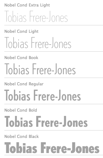 Celebrated type designer, born in 1970 in New York City. Frere-Jones received a BFA in Graphic Design from the Rhode Island School of Design in 1992. He moved to Boston, where he worked at the Font Bureau until 1999. He joined the faculty of the Yale University School of Art in 1996 and has lectured throughout the United States, Europe and Australia. From 1999 until 2014, he worked for and with Jonathan Hoefler in New York. In 2015, he set up his own type foundry, Frere Jones Type. His old Font Bureau typefaces can be bought since 2020 at Frere Jones / Type Network. His work is in the permanent collections of the Victoria & Albert Museum in London and the Museum of Modern Art in New York. In 2006, The Royal Academy of Visual Arts in The Hague (KABK) awarded him the Gerrit Noordzij Prijs, for his contributions to typographic design, writing and education. In 2013 he received the AIGA Medal, in recognition of exceptional achievements in the field of design.
 His Font Bureau typefaces: - Armada (1987-1994). A rigid elliptical sans in many styles. This is a surprisingly beautiful family despite its self-imposed design restrictions. The Compressed Black is a piano key typeface in the style of Wim Crouwel. Font Bureau: An experiment in algorithmic design, Armada follows the verticals and flat arches so often to be found in the architectural geometry of cast iron and brickwork in 19th century American cityscapes.
- Asphalt (1995). Font Bureau: Who hasn't admired the energy of Antique Olive Nord? All other ultrabolds seem sluggish in comparison. Nord exudes Excoffon's animation and Gallic impatience with the rules. Tobias Frere-Jones cross-bred the weight, proportion, and rhythms of Nord with the casual grace of his own Cafeteria, gaining informality and a dancing vitality on the page.
- Benton Sans (1995-2003). Created by Tobias frere-Jones and Cyrus Highsmith, it is a revival of Benton's 1903 family, News Gothic, and one of Font Bureau's bestsellers. It is a very complete family, ranging from regular widths to Condensed, Compressed and ExtraCompressed subfamilies. The Small Caps set is complete as well.
- Benton Modern (1997-2001). Benton Modern was originally undertaken by Tobias Frere-Jones to improve text at The Boston Globe. Widening the text face for the Detroit Free Press, he returned Century's proportions to Morris Fuller Benton's turn-of-the-century ATF Century Expanded, successfully reviving the great news text type. The italic, based on Century Schoolbook Italic, was designed by Richard Lipton and Christian Schwartz, who also added the Bold.
- Cafeteria (1993). Font Bureau about this cartoonish font: The irregularities normally found in script can enliven sans-serif letterforms. In Cafeteria, Tobias Frere-Jones took special care to balance activity with legibility on the paper napkin that served as his sketchpad, drawing a freeform sans-serif that is condensed but in no way stiff.
- Citadel (1995).
- CochinOldstyle (1992), CochinBlack (1991).
- Eldorado (1993-1994).
- Epitaph (1993). Drawn around 1880 at the Boston Type Foundry (the Boston branch of American Type Founders), Epitaph was modeled on a graceful Art Nouveau letterform that was bringing a new vitality to gravestone inscriptions at the time. The energy and life of the Vienna Secession alphabet drew the attention of Tobias Frere-Jones, who digitized the original set of titling capitals and added alternate characters for its Font Bureau release.
- Garage Gothic (1992). In three weights, it is based on parking garage ticket lettering but very reminiscent of license plate characters.
- Grand Central (1998). Grand Central was designed for 212 Associates from late-twenties capitals hand-painted on the walls of Grand Central Station. Font Bureau writes: The design is a distinguished Beaux Arts descendant of the great French Oldstyle originated by Louis Perrin in Lyons in 1846, known across Europe as Elzevir and in the U.S. as De Vinne.
- Griffith Gothic (1997-2000). A revival of Chauncey Griffith's telephone book directory typeface, Bell Gothic (1937-1938).
- Hightower (1994-1996). A Venetian typeface originally done for the Journal of the American Institute of Graphic Arts. Font Bureau: Dissatisfied with others' attempts to bring Nicholas Jenson's 1470 roman up to date, Frere-Jones prepared his version of this calligraphic roman, with his own personal italic.
- Interstate (1993, Font Bureau). Done for the United States Federal Highway Administration, but later released as a type family by Font Bureau. Interstate Mono (done with Christian Schwartz) followed in 2000, also at Font Bureau. The family is a reinterpretation of Highway Gothic, which has been the official typeface for American highway signage for decades. Its design is ultimately based on signage alphabets developed in the late 1940s by Dr. Theodore Forbes, assisted by J.E. Penton and E.E. Radek.
- Miller. A Scotch Roman finished in 1997 together with Matthew Carter and Cyrus Highsmith at Font Bureau.
- Niagara (1994). Almost a skyline typeface. Contains Niagara engraved.
- FB Nobel (1993). An exquisite geometric sans family based on old ideas of De Roos at Amsterdam who explored alternative character sets to enliven basic Futura forms. Frere-Jones views Nobel as Futura cooked in dirty pots and pans. FB Nobel showcased. The Extra Lights were added by Cyrus Highsmith and Dyana Weissman.
- Pilsner (1995). A beer bottle typeface. Font Bureau: Sitting in a Paris cafe with a bottle of beer, Tobias Frere-Jones gave his attention to the label. It was set in a roman design wearing blackletter-like clothes, probably to suggest an origin in Alsace or points to the East. Unable to forget the design, with its blocky, straight line emphasis, Tobias designed Pilsner, an exercise in straight lines in an angle-centered scheme.
- Poynter Old Style (1997, Font Bureau).
- FB Reactor (1996). This was first a FUSE7 font in 1993). Reactor destroys itself as it is put to use.
- Reiner Script (1993). Based on a 1951 brush script by Imre Reiner (ATF).
- Stereo (1993). After a typeface by Karlgeorg Hoefer, 1963 (Font Bureau says 1968).
At FontFont, he designed the children's fonts FF Dolores (1991) and FF Dolores Cyrillic. At FUSE 15, he designed Microphone (1996). At FUSE 10, he published Fibonacci, a font consisting just of lines. His custom work includes WorthGothic (1996), WorthLogo1996 (1995), WorthText (1995), GQGothic (1995), Halifax, Commonwealth (1995), Belizio-TwentySix (Font Bureau), HermanMillerLogo (1999, Font Bureau). Cassandra, Vitriol (1993), Quandry (1992-1994) and Chainletter (1993). Retina Agate (2001, specially made for small-print stock listings at the Wall Street Journal) netted him a Bukvaraz 2001 award and an AIGA 2003 Design Award. From 1999 until 2014, he designed for the Hoefler Type Foundry, which he joined as an equal partner (and the new company became Hoefler & Frere-Jones (in 2004), or H&FJ). He claims that he brought with him to H&FJ a lot of typefaces including Whitney, Whitney Titling, Elzevir, Welo Script, Archipelago (Shell Sans), Type 0, Saugerties, Greasemonkey, Vive, Apiana, and Esprit Clockface. It is not expicitly stated at the H&FJ site which typefaces he had a hand in, but one can safely assume that it must have been nearly every typeface made since he entered into the partnership. In 2014, Tobias sued Jonathan for half of the company in a 20-to-80 million dollar lawsuit since he claims that Hoefler reneged on his promise to give him his half. The typefaces at H&FJ he had a hand in include: Archer (2001, by Jonathan Hoefler and Tobias Frere Jones). A humanist slab serif originally designed for Martha Stewart Living. It has a great range of features, including a classy hairline style. Some say that Archer is just Stymie with some ball terminals. Nevertheless, it became a grand hit, and has been used by Wes Anderson in The Budapest Hotel, and by Wells Fargo for its branding. David Earls on Archer: with its judicious yet brave use of ball terminals, and blending geometry with sexy cursive forms, all brought together with the kind of historical and intellectual rigour you fully expect from this particular foundry, Archer succeeds where others falter. - HTF Retina (2002). For use in the Wall Street Journal.
- Gotham (2001). A sans serif done with the help of Jesse M. Ragan. In fact, the orignal design in 2000 was for GQ magazine. Read about it here. In 2007, he published the rounded version Gotham Round. Gotham was used in 2008 by Obama in his presidential campaign. Joshua Brustein (Business Week): Gotham is one hell of a typeface. Its Os are round, its capital letters sturdy and square, and it has the simplicity of a geometric sans without feeling clinical. The inspiration for Gotham is the lettering on signs at the Port Authority, manly works using "the type of letter that an engineer would make," according to Tobias Frere-Jones, who is widely credited with designing the font for GQ magazine in 2000. Critics have praised Gotham as blue collar, nostalgic yet exquisitely contemporary, and simply self evident. It's also ubiquitous. Gotham has appeared on Netflix (NFLX) envelopes, Coca-Cola (KO) cans, and in the Saturday Night Live logo. It was on display at the Museum of Modern Art from 2011 to 2012 and continues to be part of the museum's permanent collection. It also helped elect a president: In 2008, Barack Obama's team chose Gotham as the official typeface of the campaign and used it to spell out the word HOPE on its iconic posters. Hoefler produced versions in 2016 such as Gotham Office and Gotham Narrow Office.
- Cyclone (2003).
- In 2010, he and Jonathan Hoefler designed the sans family Forza.
- Giant (2003).
- Knoz (2003).
- Topaz (2003).
- Verlag (2006). Developed together with Jonathan Hoefler.
- Whitney (2004). This is an amazing 58-style sans family designed for the Whitney Museum, but now generally avalaible from Hoefler, and touted as a great family for infographics. A derivative, Whitney-K, is the house font of Kodak. Whitney's sales blurb: While American gothics such as News Gothic (1908) have long been a mainstay of editorial settings, and European humanists such as Frutiger (1975) have excelled in signage applications, Whitney bridges this divide in a single design. Its compact forms and broad x-height use space efficiently, and its ample counters and open shapes make it clear under any circumstances.
- With Hoefler, he collaborated on projects for The Wall Street Journal, Martha Stewart Living, Nike, Pentagram, GQ, Esquire, The New Times, Business 2.0, and The New York Times Magazine. In all, he has designed over five hundred typefaces for retail publication, custom clients, and experimental purposes. His clients have included The Boston Globe, The New York Times, The Cooper-Hewitt Museum, The Whitney Museum, The American Institute of Graphic Arts Journal, and Neville Brody. He has lectured at Rhode Island School of Design (from which he graduated with a BFA in 1992), Yale School of Art, Pratt Institute, Royal College of Art, and Universidad de las Americas. His work has been featured in How, ID, Page, and Print, and is included in the permanent collection of the Victoria&Albert Museum, London.
Interview. Interviewed by Dmitri Siegel. He created Estupido Espezial for fun, but it actually made it into an issue of Rollingstone. Catalog of his typefaces at Font Bureau. Keynote speaker at Typecon 2014. View typefaces designed by Tobias frere-Jones. Another page with typefaces created by Tobias Frere-Jones. [Google]
[MyFonts]
[More] ⦿
|
Futura: Choice
|
 A frequently asked question---which version of Futura should one buy? My personal favorite is the Neufville version, Futura ND. The answers by some type experts include:
 - Futura ND (Neufville): It is quite wide, as a family, but Stephen Coles warns that the kerning is suboptimal. It is quite close to the original. Image.
- Futura by URW++. Slightly smaller family, but better kerned than Neufville.
- Futura No. 2 by URW++. I quote Stephen Coles: It is wider [compared to Futura URW], the ascenders are shorter, the counters are larger, and the apertures are more open. On the other hand, the round glyphs (a, g, e) are more true to the circle than the other URW version. This is especially apparent in the 'e' which looks like it was drawn by an engineer with a compass. This attribute doesn't make this a great text face, but if you want that strict geometry, No. 2 delivers more of that than most of the others. Only 5 weights---no Light, the thin Book weight fills that gap. The Extra Bold is unique and I think puts on the weight more successfully than the other Extra Bolds out there. Also a favorite of Tiffany Wardle.
- Futura by Elsner & Flake. Close to the URW and Paratype versions.
- Futura Book by Paratype: Similar to URW and Elsner & Flake with a wide range of weights and Cyrillic versions. No small caps.
- Futura by Bistream. Stephen Coles about this major redraw of the original: This is the least true to the source but may be the most versatile Futura for contemporary design.
- Futura by Scangraphic: This has separate version for headline (SH) and body (SB). Coles complains that the overshoots, particularly of the A and N, at large sizes are distracting.
- Futura by Adobe. To be avoided. Coles points out that some of the round shapes are too oval, and sometiomes even egg-shaped.
- Linotype's Futura. Is the same as Adobe. In fact, in early versions, the font files were identical.
- Others, not called Futura, but designed to address the same market, include Neutraface No. 2 (House Industries), Twentieth Century, Superla, Sonar Sans (Kombinat Typefounders).
- For a really special take, check out The Future Mono by Kris Sowersby in 2018.
[Google]
[More] ⦿
|
G. C. Heins, C. G. LaFarge and S. J. Vickers
|
Designers of various tile-based fonts for New York's subway in 1901. Read about it in Lee Stokey's book, Subway Ceramics (1992). Two fonts by Nick Curtis were inspired by that tiling in New York's subway, Downtown Tessie NF (2006) and Midtown Tessie NF (2006). [Google]
[More] ⦿
|
G. Knight
|
G. Knight made an arrow font for highway signs, called Highway Arrows. [Google]
[More] ⦿
|
Gabriel Ruiz
|
 Nicaraguan designer of these typefaces:
 - Neue GR Grotesk (2017). An extended and reimagined 14-style version of the Premier League Logo design.
- New York City Metro Font (2017). Inspired by the New York City Transit Authority (NYCTA) Graphics Standards Manual of Massimo Vignelli and Bob Noorda, ca. 1970.
- Kloko (2017). Inspired by modern wayfinding sans typefaces in East Europe.
Creative Market link. [Google]
[More] ⦿
|
Gareth Attrill
|
Designer in 2002 of UKNumberPlate. Fontspace link. Dafont link. [Google]
[More] ⦿
|
Garrett Reil
|
Garrett Reil (Rain Design, Ireland) is a graduate of Limerick School of Art and Design and the National College of Art&Design (MA). He has worked in London and Dublin with leading international design consultancies. He founded Rain design partners in 1998 with Clíona Geary. Garrett lives in the picturesque twin towns of Ballina-Killaloe and does much of his work in Dublin and around Ireland. Garrett designed the size-specific New Johnston Book typeface for London Transport with Colin Banks and John Miles at Banks&Miles London; he co-designed signing manuals for Bass Plc and created a number of their retail brands; with Landor Associates he led the implementation of a new identity for Delta Air Lines. In 2008-2009, he got involved in the design of road signs for Ireland, and his proposal is Turas (2009). It deals with matters such as halation (the effect of headlights hitting a highly reflective material used in modern signs. This causes an overglow, which can make the sign difficult to read), bilingual time delay, and the longer Irish names. Ireland adopted the Transport type designed for UK roads by Jock Kinneir, a design lecturer at the Royal College of Art, and Margaret Calvert, his assistant, in the late 1950's and early 1960s. [Google]
[More] ⦿
|
Gary David Bouton
[Exclamations (or: The Boutons)]
|
 [More] ⦿
|
Gary L. Ratay
|
Gary L. Ratay made the Inter travel dingbats font in 1991. See also here or here or here or here. [Google]
[More] ⦿
|
Gen Ramirez
[Tapatipo]
|
 [More] ⦿
|
Geoscience Archive
|
Font and dingbat links for the geosciences. [Google]
[More] ⦿
|
GeoSymbol
|
GeoSymbol is a commercial geological symbol font can be bought here for 75 USD. GeoSymbol is also the name of the company. [Google]
[More] ⦿
|
GIS Panorama
|
The fonts.zip file contains free topographical symbols for Latin and Cyrillic: A431Italic, Bm431Italic (text typeface with Cyrillic letters included), Ch122Bold (Cyrillic only), D431Italic, D432BoldItalic, P131, P152SemiBold, T132SemiBold, Do431Italic, all made by GIS Panorma, or Panorama Group, in 2004. Gruppa Provincia, Nizhny Novgorod, made Bo2-Italic, Ch131-Regular (Cyrillic only), Ch132-Bold (Cyrillic only), D231Regular (Cyrillic only), P112-Semibold (Cyrillic only), P151 (Cyrillic only), T1-131, T2131, all in 1994. From 2005 until 2007, they made D231, D431, D432 and Do431Italic. [Google]
[More] ⦿
|
Golden Software
|
This outfit produced the map symbol font GSIMapSymbols in 1999. Its fonts are part of their mapping software packages. [Google]
[More] ⦿
|
Grafotechna
|
 Czech state type foundry (est. 1951) from the communist era at which Josef Týfa, Oldrich Menhart and Rudolf Ruzicka worked for some time. Týfova Antikva (1959, inspired by the work of architect P.L. Nervi) by Josef Týfa later became Tyfa Text (and ITC Tyfa, 1998). Frantisek Storm made a version of it under Týfa's supervision. Menhart published typefaces such as Grazdanka (1953). An unknown designer made Universal Grotesk in 1951. This typeface was used for road signs in Czechoslovakia.
 Grafotechna Garamond was introduced in 1959 by Stanislav Marso. Praha (1968) is a text typeface that was revived by Synoptic Office in 2017. [Google]
[MyFonts]
[More] ⦿
|
Grzegorz Klimczewski
[Fonty PL]
|
 [More] ⦿
|
GSC ArcInfo Symbolsets
|
Publisher in 2001 of the free map symbol fonts: GSC1, GSC10, GSC2, GSC3, GSC4, GSC5, GSC6, GSC7, GSC8, GSC9. Local download. [Google]
[More] ⦿
|
GSC ArcInfo Symbolsets
|
From the Government of Canada: "The suite of GSC ArcInfo Symbolsets consists of line, marker (point), shade (area) and text symbols appearing on geological maps produced by the Cartographics Services Section since 1995." The following truetype fonts are included: GSC1, GSC10, GSC2, GSC3, GSC4, GSC5, GSC6, GSC7, GSC8, GSC9, Inuktitut-Sri-Regular, Nunacom, OldSyl. The last two fonts are Inuktitut fonts by Krista Thompson, Nortext Multimedia (1997-1998). [Google]
[More] ⦿
|
Gutenberg Labo
|
 Japanese font foundry committed to making open license fonts based on old prints. It is run by Judicare and Eunice. Fontspace link. The fonts:
 - GL SnowBentley (2018). Snow crystals after photographs by Wilson A. Bentley.
- GL Morris (2017-2018). After William Morris's blackletter typeface Troy Type (1891-1892).
- GL-MahjongTile (2009). In 2018, they added a color SVG style web font called GL-MahjongTile-Clr.
- GL-Grimoire-MajKey and GL-Grimoire-MinKey (2007-2009). The former is from the medieval grimoire "The Greater Key of Solomon" (font for the Sacred Pentacles). The latter is from the medieval grimoire "GOETIA The Lesser Key of Solomon" (font for the medieval grimoire "GOETIA The Lesser Key of Solomon").
- GL-Runen (2007-2009): Elder Futhark runes.
- GL-Nummernschild-Mtl and GL-Nummernschild-Eng (2009): German license plates typeface (FE-Mittelschrift, FE-Engschrift). The original goes back to Karlgeorg Hoefer.
- GL-DancingMen (2007-2009): Cipher from "The Adventure of the Dancing Men", The Return of Sherlock Holmes by Arthur Conan Doyle. See also GL Dancing Men Org (2017-2018).
- GL-Suetterlin (2008): German formal blackletter-inspired handwriting taught in schools for some time. Renamed GL German Cursive in 2018.
- GL-Antique (+GL-AntiquePlus) (2002-2017): Japanese antique style font containing kanji, hiragana and katakana. These fonts are quite complete and contain hundreds of dingbats, arrows, and symbols.
- The GL-Tsukiji family (2008-2009): hiragana and katakana fonts from the Meiji era type foundry Tokyo Tsukiji Kappan. Open Font Library link.
- GL Otomanopee (2006-2007 and 2017-2018). Hiragana and katakana.
Sourceforge link. [Google]
[More] ⦿
|
Guy Jeffrey Nelson
|
 New Yorker who did custom work for Font Bureau. He made these typefaces:
 - FF Providence (1993). A children's hand.
- Interstate Pi (1994). Four fonts with US highway signs, done at Font Bureau.
- Tasse (1994, Font Bureau). This is a revival of Paul Renner's steile Futura (1952).
Guy shared the following story with me from his days at Font Bureau (reprinted here with his permission): I was one of the kids who pushed points around developing Font Chameleon. I worked for the Font Bureau at the time, under the great David Berlow. Tobias Frere-Jones was there with me along with Elizabeth Holzman and Kelly Ehrgot Milligan, working obscene hours to get hundreds of fonts hinted. Never eating, barely sleeping, we lived in the studio at 18 Tremont at the time. At one point we picked up some gag "old lady" tourist sunglasses to shield our burning eyes from the glare of the old CRT monitors. Our "conference room" was empty beyond eight folding beach chairs, and at least one of us would be getting a tight 30 minutes of sleep in there through the days. But through it all there was time for meeting girls in the hall (I married the one I met. She is beside me now 28 years later.) smoking cigarettes and eating Junior Mints, dropping 60 pound monitors down the stairs, playing practical jokes on David, Sam Berlow and Harry Parker (I left and cut my hair for the first time in years and returned as my twin brother) and just general insanity in the Golden Age of digital font foundries. What fun it was to have Eric Spiekerman, Neville Brody, Matthew Carter, Roger Black and other design greats come by in the fog of war during the Font Chameleon project and others. [Google]
[MyFonts]
[More] ⦿
|
Hannah Dossary
|
Hannah Dossary (Nottingham, UK) created an Arabic type companion for the road sign family ClearviewHwy (2011) while studying communication at Loughborough University. [Google]
[More] ⦿
|
Harris Design
[James M. Harris]
|
 James M. Harris' Colorado Springs, CO-based foundry sells five fonts designed by himself, SignPix (1, 2, 3, 4), Earth Font One (1993), PictographOne (1996), and Strasbourg (blackletter) through Fonthaus and Agfa/Monotype. It specializes in tourist and road signs. Harris Design will turn your logo into a (TTF or type 1) font. List of fonts.
 Jim Harris made the old shareware fonts Bellerose (1992, an avant-garde face: poster by Benbouzid Fatim-Zohra), Bellerose Pro (various weights are done in 2016), Mazama, Premium Thin, RhyoliteVertical (1990) and Andesite (1991) which can be found on many archives. He also made Harris Modern Extended. Old home page. Creative Market link. Dafont link. FontShop link. [Google]
[MyFonts]
[More] ⦿
|
Harrisson
[Open Source Publishing (or: OSP)]
|
 [More] ⦿
|
Helvetica in subways
|
Maxim Zhukov gives a non-exhaustive list of subways that have adopted Helvetica, Helvetica Neue or a custom Helvetica for their signage: Barcelona, Budapest, Chicago, Helsinki, Madrid, Melbourne, Milan, Tehran, Toronto, Vienna, Washington. Others point out additional subway systems, such as the one in Tokyo, and even JR (Japan Rail). [Google]
[More] ⦿
|
Henrik Kubel
[A2 Type]
|
 [MyFonts]
[More] ⦿
[MyFonts]
[More] ⦿
|
Henrik Kubel
[Fontyoufonts.com]
|
[More] ⦿
|
Highway Fonts
|
Traffic sign blog with frequent contributions by Veteran in Kosice, Slovakia. This site is part of Skyscraper City. [Google]
[More] ⦿
|
Highway Gothic
|
Highway Gothic (also known as the FHWA Series fonts or the Standard Alphabets for Highway Signs) is a set of sans-serif typefaces developed by the United States Federal Highway Administration and used for road signage in the United States, Canada, Turkey, Mexico, Australia, Norway, Spain, Venezuela, the Netherlands, Brazil, Argentina, China, Taiwan, Malaysia, Indonesia, India, Mongolia and New Zealand. The typefaces were created to maximize legibility at a distance and at high speed. Versions known as Highway Gothic or Interstate, which are for sale to the general public, include punctuation marks based on a rectangular shape. However, on signage the official FHWA Series punctuation is based on a circular shape. The set consists of six fonts: "A" (the narrowest), "B", "C", "D", "E", "E(M)" (a modified version of "E" with wider strokes), and "F" (the widest). The typefaces originally included only uppercase letters, with the exception of "E(M)", which was used on large expressway and freeway guide signs. The typefaces are officially defined by the FHWA's Standard Alphabets for Traffic-Control Devices, originally published in 1948 (reprinted 1952). Changes to the specifications were published in 1966, 1977, and 2000. The 2000 specifications differ from earlier versions in the shapes of a few letters and in the inclusion of lowercase letters for all alphabet series. FHWA Series A, B, C, D, E, and F were developed by the Public Roads Administration (which later became FHWA) during World War II. Draft versions of these typefaces were used in 1942 for signs on the Pentagon road network. In 1949-1950, as part of a research program into freeway signing carried out by the California Department of Transportation, Series E Modified was developed from Series E by thickening the stroke width to accommodate button reflectors for ground-mounted signs, while a lowercase alphabet was developed to allow mixed-case legend (consisting initially of Series D and lowercase letters) to be used on externally illuminated overhead signs.[2] The lowercase letters, paired with Series E Modified, later became the basis of a national standard for mixed-case legend on freeway guide signs with the 1958 publication of the AASHTO signing and marking manual for Interstate highways. Series "A" has been officially discontinued in the USA, though it continues to be specified for certain signs in New Zealand. In 2004, the FHWA published lowercase letters for all of the typefaces and made changes to the Manual on Uniform Traffic-Control Devices, which allows their use. [Google]
[More] ⦿
|
Highway Gothic: Digital typefaces
|
 Highway Gothic (also known as the FHWA Series fonts or the Standard Alphabets for Highway Signs) is a set of sans-serif typefaces developed by the United States Federal Highway Administration and used for road signage in the United States and some other countries, e.,g., Canada, Mexico, Australia, Turkey, Spain, Venezuela, the Netherlands, Brazil, Argentina, Taiwan, Malaysia, Indonesia, India, Mongolia and New Zealand. Digital fonts that mimic it, were inspired by it, or were designed to replace it, include:
 [Google]
[More] ⦿
|
Highway Sign of the Week
[Bruce S. Cridlebaugh]
|
Bruce S. Cridlebaugh (Prisma Inc, Pittsburgh, PA) created USHighwaysOldStyleBCBA in 2000. 5USD shareware, all formats. [Google]
[More] ⦿
|
Highway signage fonts
|
Discussion of highway signage fonts by John Berry, who reports: - FF DIN: a FontShop font. DIN stands for Deutsche Industrie Norm. FF DIN is based on DIN-Mittelschrift, the German Autobahn's typeface. FF DIN is Albert-Jan Pool's reworking of DIN-Mittelschrift.
- Interstate: a Font Bureau font by Tobias Frere-Jones, based on the US highway system signs. [Personal note: for similar type, see Blue Highway]
- ClearviewOne: James Montalbano's font for highway signs developed with Don Meeker of Meeker&Associates. In 2002, the USA decided to start using ClearviewHwy for its road signs.
- Expressway (2005, Typodermic), which includes Expressway Free (4 free weights). Expressway is in the style of Interstate (1993, Tobias Frere-Jones). [Google]
[More] ⦿
|
HR Groep
|
Dutch company in charge of the production of street signs. For some of their productions, they use Ovink Ee (1999). The Ovink Ee types are used in certain Dutch towns and villages on the street name signs and on small number plates signs along the railways to identify the switches and the signals. They are also used by Rijkswaterstaat (the authority regarding the highways, rivers and canals) in The Netherlands. Ovink Ee is a wider version of Visualogic's Ovink D VL (1995), which is used on Amsterdam's street signs. In addition, Ovink Ee includes a lower case, which Ovink D VL was lacking. [Google]
[More] ⦿
|
HTM fan
|
Dutch type designer. His HTMCijfersenBusletter (2003, free at OFL) is based on the HTM (Haagse Tramweg Maatschappij) street cars en buses from 1905 until 1967. [Google]
[More] ⦿
|
Hucklebuck Design Studio
[Andy Hayes]
|
Andy Hayes (Hucklebuck Design Studio, springfield, OH) created Reverend Italic (2011), an architectural drawing italic as seen on Foundfont. Priest Condensed (2011) is a condensed wood type headline face. It is unclear if they also made the grotesk typeface Modelfont (2011). Vanity Numbers (2009) is a number font based on old Californian license plates. Model Plane Slab (2009) is a slab serif headline typeface with wood type influences. In 2010, they made M.C. Gothic Condensed. Grain-O (2011) is another grotesk headline face. In 2012, Andy Hayes designed Bad Postcard and Postal Gothic. [Google]
[More] ⦿
|
Iain Logan
[Logan's Line Art]
|
[More] ⦿
|
Icofont
|
 A free 2100-strong icon font in truetype and SVG versions with icons in 30 categories: Web application (399), Brand (203), Directional (113), Social (113), Animal (109), Currency (100), Food (98), Mobile UI (91), Sport (82), Weather (81), Construction (64), Medical (56), Transport (53), Device (50), Payment (47), Mathematical (47), Text editor (45), Abstract (41), File type (41), Education (40), Law (39), Person (38), Multimedia (35), Business (23), Emoticon (20), Kids (19), Travel (14), Chart (13), Search (11), Fitness (10).
 Production by Fontello. [Google]
[More] ⦿
|
Iconian Fonts
[Dan M. Zadorozny]
|
 Born in Philadelphia and a resident of McKinney, Texas, Dan Zadorozny's creations at Iconian. He is a prolific type designer who specializes in techno and sci-fi typefaces. Dafont link. Fontsy link. Abstract Fonts link. Font Squirrel link. His fonts in alphabetical order:
 - #44 font (2002), 00Starmap (2001, pixel font), 1968 Odyssey (2016), 1st Cav (2008), 1st Enterprises (2017), 2-Tech, 21 Gun Salute (2013), 2nd Amendment (2007, guns), 2nd Amendment 2050 (2009, more gun silhouettes), 2Toon, 300 Trojans (2008, comic book family), 4114 Blaster (2008, futuristic), 5th Agent (2008, techno), 7th Service (2002), 8th Element (2013), 911Porscha, 98 Bottles of Beer (2016).
- Achilles, Action-Men (2008), Action Women (2008, female outlines), Aegis (2010, Greek simulation family), Aetherfox (2013), AirCobra (2002), Aircruiser (2011, trekkie family), AirForce (planes and copters), Airstrike (2013), Airstrip One (2003), Aldo's Moon, Aldo's Nova, Alexis (2001), Alien League, Alpha Century (2020), Alpha Men (2015), Alpha Sentry, Alpha Taurus (2007, octagonal, athletic lettering), Amalgam, American Kestrel (2019), Americorps (2012), Ampire (2019), Anakefka (2009, ultra-fat family), Annapolis (2016), Antietam (2015), Antikythera (2013, Greek simulation face), Antilles (2009, sans family), Arctic Guardian (2019), Argosy, Arilon (2008), Armed Lightning (2017), Army Rangers (2013, octagonal), Assassin Nation (2015, scary and perhaps referring to the "tradition" of school shootings in the USA), Astro Armada (2020: sci-fi), Astropolis (2009), Atlantia (2012, futuristic), Avenger (2008, futuristic).
- Babes&Bond (2009, erotic silhouettes), Babe-alicious (2002, erotic outlines), Bad Axe (2017), Bad Robot (2007, computer game look), Bal-Astaral (2016, octagonal), Bamf (2011, techno family), Banjin (2016), Banshee Pilot (2016), Barcade (2018), Battlefield, Battleworld (2016), Beam Rider, Beam Weapon (2015), Beastian (2011), Behemoth (2018), Ben Zion (2008, Hebrew simulation), Berserker (2008, grunge), Beta Biergärten (2008), Big Blue Bug (2021), Bio-disc, Bio-discSolid, Bio-discThin, Bionic Comic (2002), Bionic Type (2002), Birds of a Feather (2007, dingbats), Black Bishop (2015), Black Gunk (2016), Blade Singer (2021), Blizzard Shaft (2020), Block, Blood Crow (2009), Blood Drenched (2020), Bloodlust (2011, dripping blood face), Blue Cobra (2020), Blue July (2009), Body Swipers (2014, Halloween font), Bog Beast (2013), Bomber Escort (2020), Boomstick (2015), Borgsquad (2014, mechanical/octagonal), Bretton (2018), Brin Athyn (2008, uncial/Celtric), Broken Cyborg (2019), Bronic (2004), Bubble Butt (2014, bubblegum typeface), Buchanan (2016), Buddy Champion (2015), Bummer (2007, octagonal), Bushido (2008, oriental simulation), Butch and Sundance (2013), Buttons the Bear (2008, children's hand), Byte Police.
- Camp Justice (2018), Capella (2011, a wide techno family), Capricus (2018), Captain Canaveral (2019), Carnival Corpse (2016), CasperComics, Centaurus (2015), Chardin Doihle (2008), a useful informal handprinting family), Charlemagne, Charlie's Angles (2018: octagonal), Charmling (2019), Cheyenne Hand (2008), Chicago Express (2016), Christendom, Classic Cobra (2016), Clubber Lang (2013, grungy), Cobalt Alien (2015), C.O.D.E.R. (2012), Coffin Stone (2019: a stone age font), College Collage (2017), Colony Marines (2017), Colossus (2011, old chipped stone look), Combat Droid (2019), ComicBookCommando, ComicFX, Commonwealth, Concielian, Concielian Break (2015), Concielian Classic (2018), Concielien Jet (2015), Contour of Duty (2016), Corinthian, Count Suckula (2015, horror font), Covert Ops (2012, army stencil), Coyote Deco (2007, art deco), Crappity-Crap-Crap (2007), Crazy Ivan (2017: constructivist), Creepy Crawlers (2015, horror font), Crime Syndicate (2013), Crixus (2011, a squarish sans that includes an athletic lettering style), Cro-Magnum (2003), Cruiser Fortress (2016), CryUncial, Cyberdyne (2016), Cyberia (like Soviet: neat Russian imitation letters), Cyborg Rooster (2015), Cydonia Century (2017), Cyrus The Virus (2012, grungy, hand-printed).
- DS Man, Daedalus (2008), Daemonicus (2012), Dagger Dancer (2020), Dameron (2016), Dangerbot (2016), Danger Flight (2015), Dan Stargate (2008), Dan'sHand, Dark Alliance (2014), Dark Dominion (2019), Dark Hornet (2020: a great blocky mechanical typeface family), Dark Horse (nice brush font), Darklighter (2018), Darkwind, Dassault (2013), Deathblood (2014, Halloween font), Deathshead (2019: a metal band font), Deceptibots (2019: stencil), Defcon Zero (2016), Dekaranger (2015), Delta Phoenix (2019), Delta Ray, Demon Priest (2013), Department-K, DepartmentH, Deranian (2008), Devil's Tongue (2019), Detonator, Devil Summoner (2014), DiegoCon (2004), Digital Desolation (2014), Ding-o-saurs (2007), Direktor (2008, Cyrillic simulation techno), Dire Wolf (2013), Disco-Dork, Disco Deck (2005), Disco Duck, Discotechia (2015), Dodger, Dokter Monstro (2017: a great fat hand-painted typeface), Domino Jack (2016, an octagonal stencil typeface), Domino Mask Condensed (2016), Dotcom (2002), Drafting Board (2008), Drafting Table (2008), Dragon Order (oriental simulation), Dread Ringer (2015), Drid Herder (2002), Drive (2015, techno font), Droid-Lover (2008), Drone Tracker (2016), Drosselmeyer (my favorite), Dusk Demon (2020: grungy).
- Eagleclaw (2009), Eaglemania, Eagle Strike (2015), Early Warning (2021), Earth Orbiter (2016), Earthrealm (2013), Earthshake (2013), Earth's Mightiest (2002), East West (2015, constructivist), Echo Station (2017), Eco-files, Edge Racer (2917), Egg Roll (2016, oriental simulation), Elastic Lad (2020), Eldebaran (2012), Elder Magic (2009), Election Day (2009), Elephant Gun (2021), Elite Danger (2017), Emissary (2014, sci-fi), Empire Crown (2011, blackletter), Enduro, Ensign Flandry, Ephesian (2007), Eridanus (2015, octagonal / mechanical), Erin Go Bragh (2009, Celtic/uncial), Escape Artist (2015), Eskindar (2013), Eternal Knight (2013), Eurofighter (2015), Eva Fangoria (2018: a dripping blood font), EverettSteele'sHand, Excelerate, Excelsior, Excelsior Comics, Exedore (2008), Exoplanet (2013, techno), Extechchop (2005), Eyes Only (2018).
- Factor (2016), Falconhead, Falcon Punch (2015), Famous Spaceships (2007), Famous Spaceships 2 (2019), Fanfare Ticket (2018: dot matrix family), FantasticCreatures, Fantazian (2003), Fantom (2009, bad handwriting), Federal Blue (2019), Federal Escort (2014), Federal Service (2011), Federapolis (2008, octagonal techno face), Fedyral (2019), Fedyral-II (2019), Feldercarb (2003, octagonal font), Ferret Face (2013), Fiddler's Cove (2012), Fight Kid (2009), Final Front (2019), First Order (2001), Flash Rogers (2016), Flesh Eating Comic (2013, grunge), Flight Corps (2008, techno/pixelish), FlyingLetaherneck (2002), Force Commander (2019), Force Majeure (2016), Foreign Alien (2020), Foucault (2014, uncial), Fox on the Run (2018), Fox on the Run Academy (2018: athletic lettering), Frank-n-Plank (2013, a wooden plank font), Freakfinder (2014: Halloween font), Free-Agent (2008), Freedom Fighter (2013, stencil), From Bond With Love (2014: military stencil), Front Runner (2019), Frost Giant (2019), Frozen Crystal (2016, LED font), Funk Machine (2016, a great ultra-black techno family of typefaces), FunnyPages, Furiosa (2019), Future Forces (2015), Futurex Grunge (2005).
- Galactic Storm (2014), Galant, Galaxy-1 (2008), Galaxy Far Far Away (2009, futuristic dingbat font), Galaxy Force (2014), Galga (2008, futuristic), Gamma Sentry, Gemina (2011, sci-fi / techno family), Gemina2 (2013), Generation Nth, Gentleman Caller (2014), GeoBats (2007), Gearhead (2013, octagonal), Ghost Clan (2014), GI Incognito (2012), Global Dynamics (2014), Globe Trekker (2021), Goalie (2008, hockey mask alphading), Goblin Creek (2016: Halloween font), Gods of War, Gotharctica (2015, blackletter for horror flicks), Governor (2017), Graffiti Street (2019), Grand National (2015), Grand Sport (2015), Graymalkin (2011, trekky), Grease Gun (2012), Grendel's Mother, Grim Ghost (2013), Ghoulish Intent (2016: Halloween font), Grimlord (2009), Groovy Smoothie (2018), Guardian (2008), Guardian-Laser (2008), Guardian-Pro (2008), Guardian-Shadow (2008), Gunner Storm (2015), Gunrunner (2016: techno), Gunship, Gunship V2 (2002), Gypsy Killer (2013), Gyrfalcon.
- Hadriatic (2008, roman lettering), Half Elven (2013), Halfshell Hero (2013), Hall of Heroes (2007), Halo, Hanging Tree (2019: a wood print emulation font), Han Solo (2013), Hard Science (2019), Harrier (2002), Hawkmoon (2011), Head Human (2021), Heavy Copper (2020), Heavy Falcon (2019), Hello Copters (2013: helicopter dingbats), Hemogoblin (2017: spooky font), Heorot (2009, stone age fonts), Hermetic Spellbook (2017: alchemic), Heroes Assemble (2011), Heroes Assemble Dingbats (2014: all Avenger characters), Hero Worship (2021), Hexgon (2018), Hexkey (2020), Highrise Heaven (2007, city skyline dingbats), Hip Pocket (2014: psychedelic), Hitchblock (2017), Hollow Point (2015), Holly Dingle (2015), Holy Empire, Home Base (2020), Homemade-Robot, Holo Jacket (2016), Homebase (2020: heavy, octagonal), Homelander (2020), Homeworld (2003), Homeworld Translator (2003), Hong Kong Hustle (2015), Horroroid (2015), Horroween (2013, Halloween font), Hot Kiss (2017: paint splatter font), Howlin Mad (2017), Hula Hoop Girl (2019), Hulkbusters, Hydronaut (2019), Hydro Squad (2014), Hyper Vyper (2019: octagonal), Hypno Agent.
- Iapetus (2014, sci-fi), Icebox Art (2012), iChrono (2018), IWantMyTTR!, Iconian (2002), Iconified, iDroid (2020), Illuminati, Illumino (2016), Imaginary Forces (2008, mythical dingbats), Imperial Code (2003, Startrek style face), Imperium, Incubus, Incubus-Italic (2008), Incubus-Shadow (2008), Indigo Demon (2017), Infinity Formula (2003, super techno), Infobubble, Inhumanity (2014), I-House Edition (2014), Inspector General (2020), Instand Zen (2016: Halloween font), Inter Bureau (2019), Interceptor (2008), Interdiction (2012), Intergalactic (2017), International Super Hero (2002), Intrepid, Iron-Cobra (2008), Iron Forge (2012).
- Jack's Candlestick (2013), Jackson, Jannisaries, Jedi Special Forces (2012), Jeebra (2018), Jerusalem (1999, Hebrew font simulation)[see also here], Jetta, JettaTech, Jetway (2012, a stencil face), Johnny Torch (2012), Joy Shark (2018), Judge, Judge Hard, Jugger Rock (2018), Justice (2009), Jumpers (2017), Jumptroops (2003-2015), Justinian.
- Kahless, KameraDings (2009), Kangaroo Court (2018), KarateChop (2009), Kartoons (2008), Katana, Kaylon (2019), Kennebunkport (2013, script), Keystone (pixel font), Khazad-Dum (2011), Kid Cobalt (2008, comic book face), Kinex, King Commando (2011), King's Ransom, Kinnihuman (2020: dingbats), Knievel, KnightsTemplar, Kittrick (2019: a heavy octagonal type), Knock Furious (2003, dingbats), Kobold (2008, futuristic), Kondor (2013), Kountry Kodes (2008, international license plate lettering), Kovacs (2018), Kovacs-Spot (2016), Kreature Kombat (2018), Kreeture (2002), Kubrick (2008).
- Lamprey (2012, techno family), LandShark (2001), LandWhale (2001), Laredo Trail (2013, a Western face), Laser Corps (2020), Laserian, Laser Wolf (2018), Law and Order (2005, dingbats), League Wars (2013, sci-fi stencil), Leatherface (2013), LED Sled (2016, LED font), Left-Hand Luke (2016), Legacy Cyborg (2019), LegalTender, Legion, Legionnaires (2017: silhouettes), Legio Sabina (2017), Lethal (2014), Liberty Island (2013, sci-fi), Liberty Legion (2015), Lifeforce (2018), Light Brigade (2018), Lightsider (2011, Star Trekkish family), Lincoln Lode, Livewired (2015, sci-fi), Lionel (2009), Low Gun Screen (2008, a totally square screen type family), Lincoln Chain, Lionheart, Lobo-Tommy (2008), Lord of the Sith, Loveladies, Low Gun Screen (2008, screen face), Lux Contra Tenebras (2018: a fat Textura typeface).
- Machiavelli, Mad Marker, Magic Beans (2007), Major Force (2016), Mandalore (2019: squarish), Marathon-II, Marathon, Marsh Thing (2014, Halloween font), Masked Marvel (2002), Master Breaker (2017), Masterdom (2004), Merri Christina (2015, children's hand), Metal Storm 3D (2008), Metronauts (2013), Metroplex, MetroplexLaser, MetroplexShadow, Michaelmas, Michigan (2015), Milk Bar (2003), Micronian (2008, extensive pixel-based family), Military-RPG (2008), Mindless Brute (2015), Miracle Mercury (2017), Missile Man (2002, futuristic), Miss Amanda Jones (2004, brush style), Mister Twisted (2018), Mobile Infantry, Modi Thorson (2013, techno), Monsterama (2011, scary face), Monster Hunter (2017), Montroc (2015: squarish and varsity style), Moon Dart (2008), Moon Runner (2016), Morse Kode, MorseNK, Motorama (2018: car maker icons), Movie Gallery (2008, dingbats), Mrs. Monster (2013, Halloween brush font), Mystery Mobile (2015), Mystic Singler (2008, rough brush face).
- Nathan Brazil (2013, art deco), National Express (2003), Native Alien, Navy Cadet (2016), Nemesis Enforcer (2013), Neo-Geo (like the letters on the Neon cars), Neo Navy (2015), Neuralnomicon, Neuralnomicon (2018), Neutron Dance (2020), New Come Title (2016), New Mars (2015), New York Escape (2015), Nextwave (2014), NGC 292 (2020), Nick Turbo (2001), Nicomedia (2020), NifeFite, NifeFiter, NifeFites, Nightchilde (2013), Nightmare Alley (2016: Halloween font), Nightrunner (2008, sci-fi), Night Traveler (2020), Nightwraith (2011, techno family), Ninja Garden (2018), Ninjas (2002), Nobody's Home (2014: poster font), NoloContendre, Northstar (2014), Nostromo, Nuevo Passion (2013), Nyet (2002, Soviet letter simulation).
- Oberon, Oberon-Deux, Obsidian Blade (2020), Obsidiscs (2003, dingbats), Oceanic Drift (2013), October Guard (2013, Cyrillic simulation face), Odinson (2007, runes), Oh Mighty Isis (2014, Greek simulation family), Olympic Carrier (2017), Olympicons (2003), Omega 3 (2010, futuristic), Omega Flight (2020), Omega Force (2013, octagonal / mechanical), Omega Sentry, Omni Boy (2019), OmniGirl (2003, techno), Opilio (2012), Opus Magnus (2013, metal band font), Opus Mundi (2015), Oramac (2004), Ore Crusher (2013), Oubliette (2020), Outlands-Truetype (2001), Outrider (2013), Overstreet Bible (2014, hand-printed), Ozda (2011, a fat techno family with several horizontally striped styles), Ozymandias.
- Psyonic VII (2012), Paladins (2015), Pandemonious Puffery (2002), Parker's Hand (2002, handwriting), Peace & Houston (2019: squarish), Pepperland (2019), Perdition, Peregrine, Phantacon (2017), Phaser Bank (2008, techno), Philadelphia, Philly Dings (2003), Phoenicia (2015), Piper Pie (2007), Pistoleer (2011), Planet N (2016), Planet S, Planet X, Player 1 Up (2012: architectural family), Pocket Ball (2016, dot matrix style), Pocket Monster (2016), Police Cruiser (2013), Postmaster, Power Lord (2011), Predataur (2019), Presley-Press (2007), Press Darling (2012), Procyon, Prokofiev (2009, rounded and squarish), Promethean (2008), Protoplasm, Prowler (2013), Pseudo Saudi (1999, Arabic simulation), Psycho Butcher (2014, ransom note font), PuffAngel, Pulsar Class (2018), Pulsar Class Solid (2018), Pulse Rifle (2009), Punch (2020), Pyrabet.
- QTs (2013: erotic silhouettes), Quake-&-Shake, Quantum of Malice (2013), Quark Storm (2013), Quarrystone (2015), Quartermain (2002), Quasar Pacer (2018), Quasitron (2009, futuristic), Quatl (2002, an Inca font), Queen&Country (2009), Quest Knight (2009), Questlok, Quicken (2013, horizontal stencil), Quickening (2014), QuickGear (2019), Quickmark (2004), Quick Quick (2019), Quick Strike, QuickTech, Quill Sword (2016: soft blackletter style).
- RCMP, Racket Squad (2017), RadZad, Radio-Space, Raider Crusader (2016), Raise Your Flag (2013), Range Paladin (2018), Ranger Force (2020), Realpolitik, Rebecca, Rebel Command (2012, Star Trek family), Redcoat (2008, blackletter), Red Delicious (2019), Redline (2015), Red Rocket (2011, techno), Red Undead (2016: Halloween font), Regulators, Renegado (2014), Replicant, Repulsor (2013, pixelish), Rhalina (2011, a nice upright script), Rhinoclops (2019), Righteous Kill (2009), Right Hand Luke (2016), Robo Clone (2018), Robotaur (2008), Rocket Junk, Rocket Pop (2016), Rocket Type (2002), Rockledge (2019: an eroded stone look font), Rogue-Hero, Roid Rage (2003), Ro'Ki'Kier (2008), Rosicrucian (2009, stone age font), Royal Samurai (2018), Rubber Boy (2013, poster font family), Rumble Tumble (2020: a rough military stencil), Rune Slasher (2019).
- Sable Lion (2002), Sagan (2008, futuristic), Samurai Terrapin (2018: blocky), Scarab, ScarabScript, Sci-Fi (2008), SDF (2013), Sea-Dog, Searider-Falcon (2008), Secret Files (2011), Sever, Shablagoo (2015: thick creamy poster font), Shining Herald (2013), Shogunate (2019: a heavy octagonal typeface), Singapore Sling (2014), SisterEurope, Skirmisher (2014), Sky Cab (2017), Skyhawk (2014), Sky Marshal (2015), Sky Ridge (2020), Snubfighter (2009, sci-fi), Soldier (2011), Soloist (2018), Sound FX (2003), Soviet, Space Cruiser, Space Junker, Space Ranger (2013), Space Runner (2019), Spartaco (2016), Speed Phreak (2020), Speedwagon (2015), SPQR (2008, grunge roman), Spy Agency (2012), Spy Lord (2001), Starcruiser (2019), Starduster (2011), Star Eagle (2014), Star Fighter (2017), Star Guard (2019), Star Navy (2009: dingbats), Star Nursery (2018, fat stencil), Stranger Danger (2014: grunge), Strike Fighter (2017), Strikelord (2011, trekkie family), Stuntman, Subadai Baan (2013), Super Commando (2015), Super Soldier (2014, silhouettes), Super Submarine (2017: stencil), SuperUltra911, Superago (2002), Swordtooth (2017).
- Talkies (2008, dingbats), Tarrget (2013, based on the Tekken "Tag Tournament" logo), Taskforce (2008), Tauro (2012), Team America (2014), Team Galaxy (2020), Tele-Marines, Tempest Apache (2018), Terra Firma, Terran, Terror Babble (2017), Texas, Texas2, The Immortal (2019), TheRifleman, The Shire (2009), The Shooter (2012: gun dingbats), Texas Ranger (2014: Western font), Thundergod, Thundergod II (2013), Thunder-Hawk (2011, an aviation techno face), Thunderstrike (2016), Thunder Titan (2017), Thunder Trooper (2017: stencil), Tigershark (2013), Timberwolf (2011), Time Warriors (2007), Tokyo Drifter (2016), Tool (2012, dingbats of tools), Toon Town Industrial (2005, comic book font), Tower Ruins (2014: stencil), Tracer (2015), Trajia (2008, a techno/stencil/athletic lettering family), TransAmerica (2015), Traveler (2008), Travelicons (2009), Travesty (2003, scrawly handwriting), Trek Trooper (2008, Startrek font), Trigger Man (2013, octagonal and mechanical), Trireme (2011, Star trek family), Tristram (2008, uncial), Troopers (2011, futuristic), Trueheart (2009, Celtic), Turbo Charge (2016), Turtle Mode (2020: heavy octagonal), Tussle (2002), Typeecanoe (hand-printed), Typhoon (2013).
- Uberholme, Uberholme Lazar (2001), UFO Hunter (2009), Uglier Things (2018), Ultra 911, Ultramarines (2013), Underground Rose (2014, connect-the-dots), Union Gray (2015), Unisol, United Palanets (2014), UniversalJack, Uno Estado (2009, constructivist), Urban Defender (2019), U.S.A., US Angel (2017), USArmy, US Army II (2013), US Marshal (2012), US Navy (2007), U.S.S. Dallas (2008), Usuzi.
- Valerius (2009, uncial), Valiant Times (2021), Valkyrie (2008), Valley Forge (2008), Vampire Bride (2016: Halloween font), Vampire Games (2001), VariShapes (2001), Viceroy of Deacons (2016), Vicious Hunger (2014, grunge), Victory Comics (2017), VideoStar, Vigilante Notes (2003), Viking Squad (2015, stencil), Villain Team-Up (2020: a fat finger font), Vilmos Magyar, Vindicator (2012, techno), Virgin Hybrid (2014), voxBOX, Voortrekker Pro (2009: octagonal and athletic lettering family), Vorpal (2012: sci-fi stencil face), Vorvolaka (2013), Voyage Fantastique (2013), VX Rocket (2014, fat octagonal face), Vyper (2008, futuristic stencil).
- War Eagle (2009), Warlock's Ale (2014), War Machine, War Priest (2012), Warp Thruster (2013: military or Star Trek stencil), Warrior Nation (2011), Wars of Asgard (2009), Watchtower (2012), Weaponeer (2008, military lettering), Ween Dings (2918: Halloween dingbats), Were-Beast (2008), Westdelphia (2015, blackletter), Western Rail (2015), Wet Works (2013, grungy stencil), Whatafont, Ensign Flandry (2003), Whiskey Bravo (2003), Whovian (2015, scanbats of all Dr. Who characters owned by the British Broadcasting Corporation), Wiccan Ways (2020: alien writing), Wicker Man (2017), Wildcard (2011, Star trek family), Wimp Out (2004), Winter Solstice (2016), Wolf Brothers (2015), Wolf's Bane (+II, +Super-Extended, 2013), Woodgod (2013), Worldnet (great), Worm Cuisine (2016), Write Off, Writer's-Block, WyldStallyns.
- Xaphan (2003), XBones (2018), XCryption (1999, a hacker face), X-Fighters (2014), XPED, Xcelsion (2002), Xeno Demon (2017), Xenophobia, Xephyr, Xeppelin (2005, zeppelin dingbats), X-Grid (2008), Xiphos (2007), Xmas Xpress (2013), Xoxoxa, X-Racer (2012).
- Yahren, Yamagachi 2050 (2019), Yama Moto (2009: oriental simulation), Yankee Clipper (2011), Yay USA (2013), Year 2000, Year3000 (2001), Yellow Jacket (2002), Yeoman Jack (2021), Y-Files (2016), Yiroglyphics (2004), Yorstat (oriental simulation), Younger Brothers (2014), Younger Blood (2017), Young Frankenstein (2013), Young Patriot (2019: squarish), Youngtechs (2008, futuristic), Yukon Tech, Yummy Mummy (2018).
- Za's Vid (2001, pixel font), Zado (2002, dot-matrix font), Zakenstein (2011, caps only grunge), Zamboni Joe (2002, hand-printed)), Zealot (2008), Zee Lance, Zen Masters (2002, pixelish), Zero Prime (2019), Zeta Reticuli (2019), Zeta Sentry (2009, techno/futuristic), Zirconian (2021), Zollern (2013), Zombie Control (2013: a bloody paint drip face), Zone Rider, Zoologic (2009, animal dingbats), Zoomrunner (2016), Zounderkite (2017), Zyborgs, Zymbols.
[Google]
[More] ⦿
|
IFSYM
[Ingo Klöckl]
|
Metafont dingbats by Ingo Klöckl (1999-2000). It has clocks, weather symbols, dice, prisoner counts, ski slope signs, mountaineering symbols, map symbols, geometric symbols. [Google]
[More] ⦿
|
IIID
[Erik Spiekermann]
|
The International Institute for Information Design (IIID) was founded to develop research and practice in optimizing information and information systems for knowledge transfer in everyday life, business, education and science. It is located in Austria, and its current director is Peter Simlinger. In 2010, Erik Spiekermann and IIID published a new official type family for Austrian traffic signs, called Tern (for Trans- European Road Network). It contains both standard sans stryles and pixel versions for screens. The styles are called TernVMSonefour, TernVMStwozero, TernVMStwofour, TernVMSthreeone, Tern Regular, Tern Narrow, and Tern Italic. Tern can be purchased by the general public. Study (PDF). [Google]
[More] ⦿
|
Ilya Ruderman
|
 Russian type design graduate of the Moscow State University of the Printing Arts (2002) and Type & Media at KABK in Den Haag, The Netherlands. Cofounder in 2005 of Daily Type. Type professor of considerable influence, who teaches at the British Higher School of Art and Design in Moscow since 2008. In 2014, Ilya Ruderman and Yury Ostromentsky founded CSTM. Creator of these typefaces:
 - Praline Pro (Paratype, 2006-2007). A retro script. Award winner at Paratype K2009.
- Big City Grotesque. This also won an award at Paratype K2009.
- Best Life Serif. Codesigned with Yuri Ostromentsky. This typeface won an award at Paratype K2009.
- Beetlejuice Script. Also an award winner at Paratype K2009.
- Ilya Ruderman and Paul Barnes published Austin and Austin Cyrillic in 2007-2009 at Commercial Type, and write: Designed for British style magazine Harper's & Queen, Austin is a loose revival of the typefaces of Richard Austin of the late 18th century for the publisher John Bell. Working as a trade engraver Austin cut the first British modern and later the iconoclastic Scotch Roman. Narrow without being overtly condensed, Austin is a modern with the styling and sheen of New York in the 1970s.
- In 2010, Ilya Ruderman spearheaded an extensive project for traffic signage and information in Moscow called Permian for the city of Perm. The Permian family has slab, sans and serif components. Permian won Second Prize in the Cyrillic typeface competition at Granshan 2011, and won an award at Modern Cyrillic 2014. Free download at Open Font Library and Art Lebedev Studio.
- Ilya's Meteor Script (2011) won Third Prize in the display text category at Granshan 2011.
- Cyrillic versions of Austin (mentioned above), Dala Floda, Graphik, Marlene, Moscow Sans (as a consultant), Typonine Sans, Thema.
- In 2015, Ilya Ruderman and Yury Ostromentsky published Kazimir, a didone typeface family for Latin and Cyrillic, taking as a model the typeface used in The History of Russian Philology by P. N. Polevoy (1900, A. F. Marx Publishing House). It was extended in 2017 to Kazimir Text.
- In 2016, Ilya Ruderman and Olga Pankova published Big City Grotesque Pro at CSTM Fonts. Ilya Ruderman created the first version of (the humanist sans) BigCity Grotesque for Bolshoi Gorod magazine (Big City). It was the first magazine sans serif with Cyrillic ligatures, and won an award in 2009 in the international competition, Modern Cyrillic 2009. In the 2016 version, by Olga Pankova, the shapes of the letters have been updated, and there are new upright and italic styles, small capitals and new ligatures and non-alphabetic symbols.
- In 2020, Ilya designed the Cyrillic component of Atlas Grotesk and Atlas Typewriter, a typeface family by Susan Carvalho and Kai Bernau at Commercial Type, originally done in 2012.
- Co-designer with Yury Ostromentsky and Nikita Kanarev at CSTM Fonts of the 18-style exprimental typeface family Lurk (2020). It is based on an earlier version that was specially designed for the Russian youtuber Yury Dud.
[Google]
[MyFonts]
[More] ⦿
|
Ingo Klöckl
[IFSYM]
|
[More] ⦿
|
Ink Drop
|
London-based designer of these handcrafted typefaces in 2015: Newington (rough fat brush), Raid (rough brush), Evering, Stria, Buchanan (brush), Haight, Lytchett (handcrafted blackboard bold), Jervis (sketched), Theydon, Quavery. Typefaces from 2017: Blue Neon, CMYK (a color font), Popsicle (a color font), Emoji (a bitmap color font), Neon (a color OpenType font), Arrival (an arrival or departure signage font in colour OTF format). Typefaces from 2018: Gold Foil (an SVG based opentype font). [Google]
[More] ⦿
|
Interpretation Resources
|
Nova Scotia-based company which makes a free font available: Nova Scotia Highway Numbers v2 (2006). [Google]
[More] ⦿
|
J. Gregory
|
Designer of Road Caution Signs UK Part 1 (2019). [Google]
[More] ⦿
|
J. Rose
|
T. Harvey and J. Rose at Whiteshell.com are the designers of the hand-printed font Beltway Prophecy (2001), based on signage seen on I-95. [Google]
[More] ⦿
|
Jacob Øvergaard
|
Norwegian type designer who created these fonts: - Jacobs 1933 Pro (2005, art deco lettering based on a Norwegian calendar from 1933).
- Jacobs Runer (2003, rune fonts).
- Jacobs Web (2002, bitmap font).
- Jacobs Display (2000).
- Jacobs Flatt (2000).
- Jacobs Monoline (2000).
- Synnøve (2003, a connected script done with Helene C. Jenssen).
- Jacobs Sans (2005, a rounded sans serif).
- XMyriad, a family custom designed for the Norwegian Red Cross (hence the X) based on Adobe's MyriadMM.
- He digitized Trafikkalfabetet (2006) for Norwegian traffic signs.
His fonts are sold by Luth&Co (Oslo) and FontShop. At FontStruct as JacobFSNO, he made Jacob's Fontstruct (blocky, 2008) and Tendonin (pixel, 2008). [Google]
[More] ⦿
|
James A. Dockal
[Blue Ridge Adventure Software]
|
[More] ⦿
|
James M. Harris
[Harris Design]
|
[MyFonts]
[More] ⦿
|
James Montalbano
[Terminal Design]
|
 [MyFonts]
[More] ⦿
[MyFonts]
[More] ⦿
|
Jan Urban
[JUSoft]
|
[More] ⦿
|
Jane Doggett
|
Graphic designer and wayfinding system pioneer, b. Nashville, TN, 1929, who lives in Jupiter Beach, FL. At Yale University, she obtained an MFA in architecture and design, studying with two influential professors, architect Louis Kahn and Bauhaus guru Josef Albers. Albers had a profound effect on Doggett and her use of color, which she would apply in her wayfinding solutions for about 40 airports. For some of them, she designed special typefaces. For example, for Tampa's airport, she modified Helvetica in her Alphabet A in the early 1970s. Interview by Lennie Bennett, Tampa Bay Times. [Google]
[More] ⦿
|
Jérémie Nuel
|
Paris-based designer of the free font Japanese Travel Guide Dingbats (2015, Open Font Library). [Google]
[More] ⦿
|
Jean Benoit-Levy
|
Codesigner at Typebox with seven others of dingbats in the traffic signal font TxSignal Signifier (2002). [Google]
[More] ⦿
|
Jean-François Porchez
[Metro Type]
|
[More] ⦿
|
Jean-Paul Bideau
|
Free maritime cartographic trueType and type 1 fonts Sy1Ca and Sy2Ca, and a free diacritics font DiTimes, all by Jean-Paul Bideau. PC, Mac and X-windows. Copyright EPSHOM, BREST, 1998. [Google]
[More] ⦿
|
Jeremy Gibbons
[St Mary's road symbol font]
|
[More] ⦿
|
Jim Kennelly
[JK Design]
|
[More] ⦿
|
Jim Poserina
|
Designer of Road Sign D. [Google]
[More] ⦿
|
JK Design
[Jim Kennelly]
|
Milwaukee, WI-based designer of the retro highway font Jandus Road (2019). [Google]
[More] ⦿
|
Joao Neves
[Portuguese Traffic Typefaces]
|
[More] ⦿
|
Jochen Hasinger
[Typeimage]
|
[MyFonts]
[More] ⦿
|
Jock Kinneir
|
British type designer, born in 1917. Designed TransportD in 1963 together with Margaret Calvert, in a project for the British Government started in 1957. Two fonts were made, Transport Medium and Transport Heavy. The Akzidenz-Grotesk-inspired typeface is used in countries around the world, such as the crown dependencies, British overseas territories and in Commonwealth states or former nations of the British Empire. The typeface is also used in Hong Kong, Ireland, Iceland, Italy, Greece and Spain. Rail Alphabet (1965) was also designed by both, this time as a rebranding typeface for British Rail. The font can still be seen in station signage. Wikipedia states that Rail Alphabet is similar, but not identical, to a bold weight of Helvetica. Andrea Bergamini, who is involved in Italian road signage type, writes: The story is a bit complicated and confused. The road and highway signage is based on relatively international standards, that also involve the fonts to be used. From the beginning of the '60s Italy used the font designed (from 1957 to 1967) specifically for street signs in the UK. The designers of the sign layouts and the of the font in use are Jock Kinneir and Margaret Calvert, and the font is Transport (URW, 1980). The laws on Italian signage (quite depressing) are on any complete edition of the Italian “Codice della Strada” -Manual of road laws and rules, that has specimens of all the alphabets to be used. Some engineers from the Public Works Department, one of which maybe was called Cecilia, worked on it. The system designed by Kinneir and implemented in 1963 is an example of stylistic durability. In an article called “Roadside traffic sign” (originally published on the British magazine Design No. 178, 1963) Anthony Froshaug proved that there was no reason for an improvement of that signage system. The Italian license plates are designed by the IPZS, the Istituto Poligrafico. In Spring 2003 the Triennale in Milano hosted a very interesting show called “Asfalto, the character of the city”. In my research, I found that Traffic Type Spain D (from an unknown designer), as it appears here is a lot closer in look to what appears on the Italian highways than Kinneir's Transport, (1957-67), even in its Heavy variant. My opinion is that the font that is being used took its shape from Kinneir's original design (the similarity with it is out of doubt), but was redrawn and applied without consideration of what were the lighting and optical problems concerned. Jock Kinneir and Margaret Calvert also created Motorway as a companion to Transport. That typeface was extended by Keith Bates in Motorway (2015). Wikipedia link. [Google]
[MyFonts]
[More] ⦿
|
Joe Clark
[Joe Clark: Type in the Toronto subway]
|
[More] ⦿
|
Joe Clark, Toronto Writer
|
Joe Clark's essays on typography. Typoblog: his old blog on type. Newest URL for his type blog. Author of the must-read book Building Accessible Websites (2002). At ATypI 2003 in Vancouver, he spoke about typography for online captioning. ATypI writes: Toronto journalist, author (Building accessible websites, New Riders, 2003), and accessibility consultant Joe Clark has followed typography as long as he.s followed accessibility for people with disabilities: over 20 years. He is director of the Open&Closed Project, a public-private-academic partnership in research and standardisation in captioning, audio description, subtitling, dubbing, and related fields in audiovisual accessibility. At ATypI 2007 in Brighton, he spoke about Type in the Toronto Subway. [Google]
[More] ⦿
|
Joe Clark: Type in the Toronto subway
[Joe Clark]
|
Joe Clark tells us about the typeface used in the Toronto subway: The Toronto subway has a typeface all its own. You can compare it to a few other fonts, but no other typeface is exactly the same. And, for 50 years, pretty much the only place you found it was on permanent, virtually indestructible wall signage. The typeface, in its original form, is a geometric sansserif in upper case only, with ten numerals, ampersand, period, and apostrophe, and an arrow (though a few other arrows are found on period signage). The typeface is often misidentified at Gill Sans, a typeface that will later become important in TTC typographic history. Even highly expert designers have misidentified the typeface as Gill. Vaguely comparable typefaces are Verlag, Bernhard Gothic, Metro, Neutraface, and Eagle. [...] By all accounts, no one alive today knows who designed the Toronto subway typeface. The original drawings (TTC 1960) do not credit an artist. (Since the drawings are dated 1960.12.12, they were drawn after the first installation of letters on a subway wall. That makes the absence of credit even more surprising; it may mean the designer had already been forgotten six years after the subway opened.) The subway typeface does not have a name, although the TTC claims (2007a) it is known internally as the Station font. That name has not taken root with transit fans outside the TTC. No stable name for the typeface in common use apart from "the TTC font." [Google]
[More] ⦿
|
Johnston's Underground Type
[Edward Johnston]
|
Greg Fleming, upon the publication of his open source version Railway Sans (2012) of Edward Johnston's Railway Type of 1916, recalls the history of the typeface, and adds valuable references. The text below is his. The typeface was commissioned between 1913 and 1915 by Frank Pick (1878-1941), Commercial Manager of the Underground Electric Railways Company of London, UERL, also known as The Underground Group, as part of his plan to strengthen the company's corporate identity. Frustrated at the diversity and seemingly endless variations of poor or unsuitable type- typefaces that were, at that time, in use across the system, one of his first key actions was to introduce a standardised approach to advertising and lettering. Pick's brief to Johnston was essentially that a typeface was needed that would ensure that the Underground Group's posters would not be mistaken for advertisements; it should have the bold simplicity of the authentic lettering of the finest periods and yet belong unmistakably to the twentieth century. Johnston's New Sans typeface first appeared in a poster of July 1916. Inspired by the proportions of classical Roman lettering, based on square and circular forms, it is a vehicle of bold clarity and a perfect example of typography as a powerful, authoritative information tool. It has been used, almost unchanged in essence, continuously and timelessly in signage, posters and publicity for nearly a century. In 1933, The Underground Group was absorbed by the London Passenger Transport Board and the typeface was adopted as part of the London Transport brand. The typeface was originally called Underground. It became known as Johnston's Railway Type, and later, simply, Johnston or New Johnston Sans. Today, Transport for London uses updated versions in many weights of the original face, known as New Johnston Sans. This is not commercially available, except under strict TfL license. Railway is not based on or derived from the official New Johnston Sans in current use by Transport for London. Instead, it predates New Johnston by sixty-three years. The references: - Justin Howes: Johnston's Underground Type. Harrow Weald: Capital Transport. 2000.
- Oliver Green and Jeremny Rewse-Davies: Designed for London: 150 years of transport design. London: Laurence King. Pages 81-82. 1995.
- Christian Barman: The Man Who Built London Transport: A Biography of Frank Pick. David & Charles. Page 43. 1979.
- Colin Banks: London's Handwriting: The development of Edward Johnston's Underground railway block-letter. London Transport Museum. 1994.
- Eiichi Kono: Pen to Printer --- New Johnston Sans. University of Brighton, Arts Faculty Staff member page.
[Google]
[More] ⦿
|
Jon Whipple
|
Designer of the sans family Kompass (2004), which was specially created for maps and diagrams. Jon is a graphic designer in Vancouver. [Google]
[More] ⦿
|
Joost Grootens
[Studio Joost Grootens]
|
 [More] ⦿
|
Josh Bingham
|
Josh Bingham (b. 1982) lives in California. At Devian Tart, he designed Point Blank and Featherweight in 1999. I am confused, because what is in the font does not correspond to the web page, which says that he is Arthur Shotwell. Other fonts by him: Rollover (2007), 20th Century Woodcut (2004), the postal series (2004, consists of Parcel Post, Media Mail, First Class, and Air Mail), Halftone (2004), Unprofessional, Tron, Scrawl, Platform Shoe, Maps, Kaboom, Federal Reserve, Faces, Curvature, Bitmap, Bellbottom, Ballpoint, Quill, No Smoking, Perfectly Cromulent, Chronicle (2004, modeled after the lettering in the San Francisco Chronicle), 20th Century Woodcut (2004). Dafont link. [Google]
[More] ⦿
|
Jugurta Lisboa Filho
|
Brazilian designer of the geographical symbol font Sigmoda. [Google]
[More] ⦿
|
Julian Ma
|
Jakarta, Indonesia-based designer of the free brush script typeface Mona (2018) and the free squarish typeface Efesto (2018). Julian also designed several sets of icons, including Cleaning Icons, Travel Icons, and a set of emoticons. Correction: It seems that Efesto was made by Runikh Art, not Julian Ma. [Google]
[More] ⦿
|
JUSoft
[Jan Urban]
|
JUSoft is a Czech outfit where Jan Urban (from Blansko) made the dingbat font OB Piktogramy (1998). It has pictograms for use on maps and in cities. [Google]
[More] ⦿
|
Kaiser Zhar Khan
|
 Kaiser Zhar Khan (b. 1980, Chile), aka Zanatilja, used to run a new defunct archive called True Type Fonts. He also designed many typefaces himself. The most famous among these is his free African-themed typeface South Afirkas 2100 (2009), which is downloadable from Dafont.
 In 2012, he made Stickerman Bad Times, Rock X Start TFB, Aespiro TFB, Perspectivo TFB (3d face), Desgarvuda (textured face), Estancofida TFB (textured face), LEDisplay TFB, Restroom Signs TFB, Chinese Cally TFB, Discontinuo, Suast Ornad TFB (a textured face), Scoolar TFB (3d face), Katakana TFB, Hiragana TFB, Dragons TFB, Arrows TFB, Old Retro Keys TFB, Pycuaf, Pycuafodi, Dragon Ball TFB, Escaned (texture face), Chess TFB, Seagram TFB, Army Weapons TFB, Stamp Seal TFB, Logos TFB, Scripto TFB, Another Ornaments TFB, Vintage Auto Cars TFB, Simple (a monoline sans), Travesia TFB (information design dings), Music TFB (dingbats), Xmas Cartoon, Wings of Wind TFB, Mickey M TFB, Pincel Handwrite, Jigsaw Pieces TFB, Valentines Day TFB (heart dingbats), Proportional TFB (squarish sans), Stars TFB, Working Signs TFB, Signs Language TFB, Ornaments Labels and Frames, Snowflakes TFB, Christmas Nativity TFB, Chinese Zodiac TFB, Zodiac TFB, Only Skulls, Calendar Note TFB, Sports TFB (sports silhouettes), Old Retro Labels TFB, 11 Vator TFB, Xmas TFB (Christmas dings), Trees TFB, Clothing Logos TFB, Dirty Sweb, Can Dog TFB, Ornaments, Finger Print, Kitty Kats TFB, Batman Logo Evolution TFB, Light TFB (avant garde sans), Digital Display TFB (LED face), Skullx (dingbats), Tribal Tattoo (dingbats), Klingon, The Meme Font (dingbats), Rongorongo (a system of glyphs discovered in the 19th century on Easter Island), Strangferfixcs, Hotel Transilvania and Frankenwine. Typefaces made in 2013: Pudahuel Sans, Variada TFB (simple circle-and-arc-based sans), Estorea TFB, New LED Board TFB, Rayada TFB (textured face), New Barcode Font TFB, Estrellas TFB (stars), Estrellass (sic) TFB, Spirits Dots Drinks, Mero Ornad TFB (fishnet textured), Toolz TFB, New Stencil TFB, Logocarsbats TFB, Caritons TFB (smilies), Illustrations TFB (scanbats), Edgebat TFB (knives), Crossbats TFB (crosses), Abstrec TFB (organic sans), Frames TFB, BitxMap Font TFB, Austera Simple TFB, Traffic Signs TFB, Extranger Sol TFB, Rifle Bats TFB, New X Digital TFB (LED typeface family), Dasgastada TFB, El Alambre TFB, Punk Not Dead TFB, Triangled TFB, Noxtrey Auf TFB, Cross LED TFB (+Bold), Cursi Extra TFB, Hearts Shapes TFB, Ornamentsss TFB, Eggfaces TFB, Orniste TFB, Shadded TFB (sic) (shadow face), Spoghetti Western (sic) (Italian Far West face), Groovy Font (shaded), Fireguns TFB (dingbats), Only Revolver TFB (dingbats), Aeg Flyon Now (condensed sans), Espinuda TFB, T1 Logoso TFB, Social Logos TFB, Hearts and Flowers for valentines, Astrology Astrological TFB, Ornametss TFB, Astrology TFB, Old Ornaments, Old Foundry Prints TFB, Old seals TFB, English Two Line TFB (pearly alphabet from 1796), Amame TFB (dot matrix face), Fontesda TFB (sketched face), Flowers Dots Bats TFB, Queen Destroy TFB, Bicycle TFB (dingbats), Stone Army, Ancient Weapons TFB, Numismatic Bats TFB, Elizabethan Initials TFB, Anome Ibul, Big Daddy LED, Mavole Sinpo TFB (spurred), Dowted Remix TFB (dot matrix face), QR Font TFB, Another Barcode, Display Free TFB (LED face), Cadabra Debilex, Initials TFB, Music Logos TFB, Toxic Waste TFB, Ornad Dentro TFB, Logos and Logos TFB, Amore Mio, Hearts Shapes TFB, Another X Display TFB (dot matrix), Pro Display TFB (dot matrix), Juino Net, Quiwo Luse TFB, Aliencons Two, Cargante TFB, News Board TFB, Aliencons TFB, Barcode TFB, Birthday Balon TFB, Birds TFB (silhouettes), Le Fish (fish silhouettes), Motos TFB, Love You Too TFB (Valentine's day font), LED LCD 123, Noteame (fat sans), Badopus TFB (monoline script), Estrellado TFB, Love You TFB (Valentine's Day font), Cubs LED TFB (LED / dot matrix typeface), Text Inside TFB (textured face), Kuwa Ronmcie Q (circle-based face), Zebra TFB, Distrogrunge TFB, Carillas TFB (smilies). Another URL. [Google]
[More] ⦿
|
Karl Petter Sandbæk
|
 Designer of the lettering for traffic signs in Norway, called Trafikkalfabet (1965). This was digitized in 2006 by Jacob Øvergaard and from 2014-2020 by Arve Båtevik as Store Norske Trafikk. Examples here and here. In the last link, Ralf Herrmann explains the flaws: It bears a resemblance to the German DIN typeface, but it also has some unique features, some of them are good, some are bad. Both typefaces share a very simple geometric design and they are good examples of typefaces, that look like they were made on the drawing-board of an engineer rather than designed by a type designer. [...] A type designers knows how to optically adjust geometrical shapes to make them look right. The tip of the M needs to go below the baseline and the dot of the i needs to be wider than the stem. But the design of the Trafikkalfabetet typeface rather aims at consistent values. As a result, the dot of the i is way too small, especially for a typeface that should be legible at great distance. The spacing of the typeface has the similar problems. Uniform values for left and right sidebearings cannot create uniform spacing. [Google]
[More] ⦿
Designer of the lettering for traffic signs in Norway, called Trafikkalfabet (1965). This was digitized in 2006 by Jacob Øvergaard and from 2014-2020 by Arve Båtevik as Store Norske Trafikk. Examples here and here. In the last link, Ralf Herrmann explains the flaws: It bears a resemblance to the German DIN typeface, but it also has some unique features, some of them are good, some are bad. Both typefaces share a very simple geometric design and they are good examples of typefaces, that look like they were made on the drawing-board of an engineer rather than designed by a type designer. [...] A type designers knows how to optically adjust geometrical shapes to make them look right. The tip of the M needs to go below the baseline and the dot of the i needs to be wider than the stem. But the design of the Trafikkalfabetet typeface rather aims at consistent values. As a result, the dot of the i is way too small, especially for a typeface that should be legible at great distance. The spacing of the typeface has the similar problems. Uniform values for left and right sidebearings cannot create uniform spacing. [Google]
[More] ⦿
|
Karl Wångstedt
[Vägverket]
|
[More] ⦿
|
Karlgeorg Hoefer
|
 German scribe, type designer and unbelievable calligrapher, b. 1914 in Schlesisch-Drehnow, d. 2000 in Offenbach. Following schooling in Schlesien and Hamburg, he served a four-year typesetting apprenticeship from 1930-1934 in Hamburg and later at the Kunstgewerbeschule (School of Arts and Crafts) in Offenbach am Main. From 1939 until 1945 he was in active military service and became a prisoner of the Russians. After that ordeal, he became a calligraphy teacher at the Werkkunstschule in Offenbach, and developed a universal pen with novel writing and drawing techniques for the company Brause. It is at that point that Hoefer started designing types as well. From 1970 to 1979, Hoefer was a lecturer and later professor at the HfG (School of Design) in Offenbach. From 1981 to 1988, Hoefer ran summer calligraphy workshops in the USA (Los Angeles, San Francisco, Boston, New York, Washington, and other cities). In 1982, Karlgeorg Hoefer founded a calligraphy workshop in Offenbach for everyone, with evening courses and summer school, and in 1987, the registered association "Calligraphy Workshop Klingspor, Offenbach, Supporters of International Calligraphy." From 1987 to 1995, he was the chairman of the association while teaching continuing courses and summer school classes with leading foreign calligraphers. Hoefer has written two books about calligraphy: "Das alles mit einer Feder" (Brause, 1953) and "Kalligraphie, gestaltete Handschrift" (Econ, 1986). Numerous articles about Hoefer's work have appeared in calligraphy journals in Holland, France, the USA, and Japan. In 1989, the book "Schriftkunst/Letterart Karlgeorg Hoefer" was published as part of Calligraphy-Editions Herbert Maring (Die Kalligraphie Edition, Hardheim, Germany, 1989). For his activities as a calligrapher, Hoefer received the Order of Merit of the Federal Republic of Germany in 1993. His typefaces:
 - At Klingspor: Salto (1952), Saltino (1953), Saltarello (1954), Monsun (1954). Salto is a famous and often-copied brush script.
- At D. Stempel: Prima (1957), Zebra (1963-1965, D. Stempel, a script that plays on the simulation of grey and the use of two colors; revived by Colin Kahn in 2007 as P22 Zebra).
- At Ludwig&Mayer: Permanent (1962-1969, a large Grotesk family developed over many years---this was revived by Daylight in 2010 as Permanent Massiv; URW sells Permanent Headline URW D without even a word about the original designer; Softmaker has Plakette Serial and P700 sans; Castcraft has OPTI Permanent and OPTI Pinacle; Marcus Sterz published Letterpress Headline in 2009), Stereo (1963, an outline poster headline script developed between 1957 and 1968; digitally revived in 1993 as Stereo (Tobias Frere-Jones, Font Bureau)), Elegance (1964, a handwriting script, which was the basis for Sincerely (2005, Canada Type)), Big Band (1974, a fat poster script revived in 2007 by Nick Curtis as Baby Cakes NF (2007)), Big Band Terrazzo (1974, a glaz krak face), Headline (1964, a poster typeface that emanated from Permanent).
- Programm-Grotesk (1970): Hoefer's first digital typeface, commissioned by JT Hellas for the Greek telephone books It was first used in the digital machine Digiset of Dr. Ing. Hell in Kiel.
- From 1978 until 1980, Karlgeorg got involved in the development of a German license plate font that could withstand forgery by black marker pens. The typeface, FE Mittelschrift/Engschrift, had also input from other sources.
- Lateinischen Ausgangsschrift (1974): a school script for the Linotype phototypesetter. This led later to VA Schrift (Berthold and Linotype).
- At Linotype: Omnia (1990, a unicase typeface with a Celtic uncial feel), San Marco (1990, round gothic / Rundgotisch), Notre Dame (1991-1993, a full blackletter face), Dominatrix (1994), Sho (1992, an Asian brush script), Beneta (1992, a French bastarda inspired by the Littera beneventana, the script of the Benedictine scribes from the 10th to the 12th century).
Linotype page. FontShop link. View Karlgeorg Hoefer's typefaces. [Google]
[MyFonts]
[More] ⦿
|
Karl-Gustaf "Kåge" Helge Gustafson
|
Karl-Gustaf "K&aing;ge" Helge Gustafson (b. 1917, Tranemo, Sweden; d. 2006, Mariestad, Sweden) was a Swedish cartoonist who worked for a long period at the Swedish Road Administration's traffic office and the Swedish Transport Safety Agency where he drew road signs. He drew the Swedish signs warning of moose and pedestrian crossings in 1955. Gustafson also designed the Tratex font, which is used on Swedish road signs. Tratex was modified by Chester Bernsten, who works for the Swedish Road Administration, Vägverket, and digitized/implemented by Karl Wångstedt. Free download of Tratex (2001, Gustafson and Bernsten) at Transport Styrelsen, Sweden. [Google]
[More] ⦿
|
karta
|
Travel dingbats in metafont format. No info on the author. [Google]
[More] ⦿
|
Keith Bates
[K-Type]
|
 [MyFonts]
[More] ⦿
[MyFonts]
[More] ⦿
|
Keith Chi-Hang Tam
[Keith Tam Typography]
|
[MyFonts]
[More] ⦿
|
Keith Tam Typography
[Keith Chi-Hang Tam]
|
Keith Tam is a graphic designer and type designer born in Hong kong who has lived and worked in the UK and in Vancouver, Canada. He received his MA in Typeface Design at the Department of Typography&Graphic Communication at the University of Reading in 2002. Presently, he teaches art the School of Design, The Hong Kong Polytechnic University. In 2005, along with Michail Semoglou, Keith co-founded Type Initiative, a type foundry and design collective. Currently, he is Assistant Professor in the School of Design, The Hong Kong Polytechnic University. His fonts include Arrival (2005: a font developed during his graduate studies at Reading for reading signs from afar or while driving) and DGSans. Arrival can be bought at Incubator / Village. He started a discussion on why people pick certain typefaces: - legibility
- prevailing trend/fashion
- personal taste client's wishes/preferences
- historical context (reflecting the time and place of the content)
- context of use (kind of paper, method of printing, etc)
- stereotypes (established conventions, e.g. script type for wedding invitation)
- uniqueness (in terms of distinguishing from others)
He also wrote articles on the slab serif in the 20th century, and the sans serif in the 20th century. At ATypI 2007 in Brighton, he spoke on Typographic bilingualism: a framework for the co-existence of Chinese and English texts. At ATypI 2008 in St. Petersburg, he spoke about issues in Chinese text design. Main organizer of ATypI 2012 in Hong Kong. Klingspor link. [Google]
[MyFonts]
[More] ⦿
|
Ken Gross
[Rustbelt Type]
|
[More] ⦿
|
Kevin Roberson
|
Cocreator of TX Signal Simplifier (2002, Typebox), a hilarious information design dingbat face. MyFonts writes: Eight designers present a set of icons that indicate the fun and fantastic world of signage. Each collaborator's solution represents a completely different interpretations on signage vernacular. The designers are Erik Adigard, Cynthia Jacquette, Akira Kobayashi, Michael Kohnke, Patricia McShane, Joachim Müller-Lancé, Jean-Benoît Lévy, Kevin Roberson, Diana Alisandra Stoen. [Google]
[MyFonts]
[More] ⦿
|
Kevin van Reenen
|
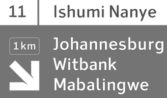 South African and British type designer. During TypeClinic 5 in 2012 in Trenta, Slovenia, he created Ishumi Nanye, a sans serif typeface for the road sign system of South Africa. It uses the triangular shape of the South African flag for its large ink-traps. [Google]
[More] ⦿
South African and British type designer. During TypeClinic 5 in 2012 in Trenta, Slovenia, he created Ishumi Nanye, a sans serif typeface for the road sign system of South Africa. It uses the triangular shape of the South African flag for its large ink-traps. [Google]
[More] ⦿
|
Kevin-Paul Scarrott
|
 Stavanger, Norway-based cartographer. In 2014, he created a typeface called UltiMap (2014). Behance link. [Google]
[More] ⦿
Stavanger, Norway-based cartographer. In 2014, he created a typeface called UltiMap (2014). Behance link. [Google]
[More] ⦿
|
Kiwiplates
[Steven Wu]
|
Personalised (car, license) plates seller in New Zealand who provides personalized plates to New Zealand customers. Kiwiplates cooperates with NZTA, the government agency that deals with all vehicle registrations. [Google]
[MyFonts]
[More] ⦿
|
Knud Valdemar Engelhardt
|
 Knud V. Engelhardt (1882-1931) was a Danish architect, printer and designer. He worked on kilometer stones, type for trams, street signs, and is well known in type circles for a slab-serif alphabet made for the city of Copenhagen with heavy wide capitals.
 In 2010, Swedish designer Mårten Thavenius created Skilt Gothic (Font Bureau), which was based on signage types by Engelhardt from the 1920s, including those he created for the street signs in Gentofte, north of Copenhagen. Engelhardt's design was loosely based on the lettering of two Danish architects of the time: Thorvald Bindesbøll (designer of the Carlsberg logo) and Anton Rosen. The signs were so successful that they are still in use today. In 2017, Letters from Sweden published its Trim sans typeface family, which is also based on Engelhardt's work. In 2020, Wahyu Wibowo released Regave, a 24-style (+variable) typeface which is also influenced by Engelhardt's street signs. Digital typefaces based on Engelhardt's designs. CV. [Google]
[More] ⦿
|
Ko Sliggers
[Dutchfonts.com]
|
[MyFonts]
[More] ⦿
|
Kraftfahrzeugkennzeichen
[Bart Stax]
|
Bart Stax is the designer of Kraftfahrzeugkennzeichen (2008), a free font that looks exactly like the lettering used on German car license plates. I can't understand how Germans can live with this monstrosity---I know that it was designed for maximal differentiation, but there are limits to functional design! Another German license plate font, by an unknown designer, is FE-Font (1997, see also here), which is closer to the original FE license plate design (FE stands for F&aml;lschungs-Erschwerend, translated as "hard to forge"). [Google]
[More] ⦿
|
Kristyan Sarkis
[TPTQ Arabic Type Foundry]
|
 [More] ⦿
|
K's Bookshelf
[Yoshio Kobayashi]
|
Yoshio Kobayashi is a Japanese font maker. Free fonts by him include Elements Kanji, K's-BarCodeFont-Code39, K's-Floral-Dings, K's-Numeral-Arabic-1, K's-Numeral-Arabic-GC, K's-Numeral-Arabic-GCN, K's-Numeral-Arabic-RC, K's-Numeral-Arabic-RCN, K's-Numeral-Roman-1, K's-Road-Sign-Symbols-J (2001), K's-Japanese-Shogi-Pieces (2001), K's-Snow-Crystals, WeatherJ (2001). Old URL. [Google]
[More] ⦿
|
K-Type
[Keith Bates]
|
 K-Type is Keith Bates' (b. 1951, Liverpool) foundry in Manchester, UK, est. 2003. Keith works as an Art&Design teacher at a Salford High School. They custom design type, and sell some of their own creations.
 Commercial typefaces: - Adequate (2012). A basic geometric monoline sans family.
- Adventuring (2010, comic book style)
- Alan Hand (2005, based on some blobby lettering, handwritten by printer and mail artist, Alan Brignall)
- Alex (2002-2004)
- Alright (2004, cursive script)
- Anna (2002-2007).
- Argot (2019). Characterized by square counters, this typeface family exhales brutalism and industrialism. See also Argot Machine (2019).
- Artist Hand (2019).
- Axis
- Bank of England (2012, blackletter): Bank of England is loosely based on blackletter lettering from the Series F English twenty pound banknote introduced in 2007. The font also takes inspiration from German Kanzlei (Chancery) typefaces and the 17th century London calligrapher, John Ayres.
- Banks & Miles (2018). Inspired by the geometric monoline lettering created for the British Post Office in 1970 by London design company Banks & Miles, a project initiated and supervised by partner John Miles, which included Double Line and Single Line alphabets. The new digital typeface is a reworking and extension of both alphabets.
- Barbica (2015). A glyphic typeface.
- Bricola (2020).
- Brush Hand New (2013): Brush Hand New is a full font based on a copy of Flash Bold called Brush Hand marketed by WSI in the 1990s and more recently distributed through free font sites. Brush Hand was an anonymous redrawing of Flash which simplified, slightly lightened, smoothed out ragged edges, and improved the legibility of the original classic created by Edwin W. Shaar in 1939.
- Building&Loan (2007, engaved face)
- Bigfoot (2005, a Western font based on the slab capitals used by Victor Moscoso in his 1960s psychedelic rock posters)
- Bolshy (2009)
- Bolton750 (2003, a mechanical typeface done with John Washington).
- Chancery Lane (2021). An italic text typeface that is based on chancery scripts.
- Charles Wright (2016). A set of fonts based on the UK license plate fonts.
- Chock (2009)
- Circa (geometric sans)
- Cloudbuster (2019). Inspired by Imre Reiner's Corvinus Skyline of 1934.
- Club.
- Coinage Caps (2017). Coinage Caps is a trilogy of small caps fonts based on the roman lettering used for the designs of British coinage. Coinage Caps Eric Gill is a regular weight, spur serif style drawn by Eric Gill for silver coin designs in the 1920s which were rejected by the Royal Mint. Coinage Caps Humphrey Paget is a medium weight serif based on the lettering of Thomas Humphrey Paget, designer of the Golden Hind Halfpenny first struck in 1937. This font simulates the soft, slightly rounded corners of the minted letterforms. Coinage Caps Kruger Gray is a glyphic, flare serif font typical of the bold style engraved by George Kruger Gray for numerous British and Commonwealth coins during the 1920s and 30s. This font also simulates the slightly rounded corners of the minted letterforms.
- Collegiate (2009)
- Component (2012). A font for lost civilizations and dungeon rituals.
- Context (experimental)
- Credit Card (2010, font for simulating bank cards)
- Curwen Sans (2018). A monoline sans from the early 1900s originally created for in-house use at the Curwen Press in London.
- Cyberscript (2006, connected squarish face)
- Deansgate (2015). Deansgate and Deansgate Condensed are based on the clearest and most distinctive of the sans-serif letterforms used on Manchester street nameplates, and easily identified by a pointy Z and pointed middle vertices on M and W.
- Designer
- Digitalis
- English
- Enamela (2013). Keith writes: Enamela (rhymes with Pamela) is based on condensed sans serif lettering found on vitreous enamel signage dating from the Victorian era and widely used in Britain for road signs, Post Office signs, the plates on James Ludlow wall postboxes, railway signs, direction signs and circular Automobile Association wayfinding plaques throughout the first half of the twentieth century. The original model goes back to Victorian times, ca. 1880.
- Engravia (2018). Engravia is a didone display typeface supplied in three varieties of engraving---Inline, Shaded and Sawtooth---plus a plain basic font.
- Example (2017). A workhorse neo-grtesque typeface family.
- Excite
- Flip (2011), a western grotesk billboard face.
- Flyer (2009, techno)
- Frank Bellamy (2009, an all-capitals family based on the hand lettering of English artist Frank Bellamy, who is most famous for his comic art for Eagle and TV21, and his Dr Who illustrations for Radio Times)
- Future Imperfect
- Gill New Antique (2003)
- Greetings
- Helvetiquette
- Hapshash (2010): an all capitals font inspired by the 1960s psychedelic posters of British designers Hapshash and the Coloured Coat (Michael English and Nigel Waymouth), in particular their 1968 poster for the First International Pop Festival in Rome. A dripping paint font.
- Irish Penny (2016). An uncial typeface based on the lettering from Percy Metcalfe's influential pre-decimal coinage of Ireland, the Barnyard Collection.
- Ivan Zemtsov (2009)
- Kato (2007, oriental simulation face)
- Keep Calm (2015). A geometric sans inspired by a British war poster from 1939.
- Keith's Hand
- Klee Print (2010, Klee Print is based on the handwriting of American artist Emma Klee)
- Latinate (2013). A vintage wedge serif wood style typeface, and a rough version.
- Lexie (an improved or "adult" version of Comic Sans) and Lexie Readable (2006, modified in 2015). Keith writes: Lexie Readable (formerly Lexia Readable) was designed with accessibility and legibility in mind, an attempt to capture the strength and clarity of Comic Sans without the comic book associations. Features like the non-symmetrical b and d, and the handwritten forms of a and g may help dyslexic readers.
- Licencia (2016). A blocky typeface inspired by the tall, soft-cornered lettering on vehicle licence and registration plates world-wide.
- Londinia (2016).
- Matchbox
- Max
- Ming
- Modernist Stencil (2009).
- Monterey Pop (2020). A psychedelic / popart typeface based on Tom Wilkes's poster lettering for the Monterey International Pop Festival in June 1967.
- Mythica (2012). A slightly condensed lapidary roman with copperplate serifs.
- Modulario (2010): a contemporary sans.
- New Old English (2010, blackletter)
- Norton (2006)
- Nowa (2004, a play on Futura)
- NYC (octagonal)
- Openline (2008, an art deco pair)
- Oriel Chambers Liverpool: A Lombardic small caps font based on the masonry lettering on Peter Ellis's 1864 building, Oriel Chambers, on Water Street in Liverpool.
- Pentangle (2008, based on album lettering from 1967)
- Pixel
- PixL (2002-2004)
- Plasterboard (2004-2005)
- Pop Cubism (2010) is a set of four texture fonts, combining elements of cubism and pop art.
- Poster Sans (2006). A wood type family based on Ludlow 6 EC. See also Poster Sans Outline.
- Rick Griffin (2006, more psychedelic fonts inspired by a 1960s Californian artist)
- Rima (2020). A stencil typeface with heavy slabs.
- Roundel (2009, white on black)
- Runestone (2010, runic).
- Sans Culottes (2008, grunge)
- Serifina
- Solid State (2008, art deco blocks)
- Solus (2004, a revival of Eric Gill's 1929 typeface Solus which has never been digitized; read about it here)
- Stockscript (2008, down-to-earth script based on the pen lettering of the writer, Christopher Stocks)
- Susanna (2004)
- Ticketing (2011): pixelish.
- Total and Total Eclipse (2004, squarish display typefaces based on the four characters of Jaroslav Supek's title lettering for his 1980s mailart magazine, Total)
- Transport New (2009: a redrawing of the typeface designed for British road signs. In addition to the familiar Heavy and Medium weights, Transport New extrapolates and adds a previously unreleased Light weight font originally planned for back-lit signage but never actually applied. Originally designed by Jock Kinneir and Margaret Calvert beginning in 1957, the original Transport font has subtle eccentricities which add to its distinctiveness, and drawing the New version has involved walking a tightrope between impertinently eliminating awkwardness and maintaining idiosyncrasy.)
- Union Jack (octagonal)
- Victor Moscoso (2008, psychedelic)
- Wanda (2007, art nouveau)
- Waverly
- Wes Wilson (2007, psychedelic, inspired by 1960s psychedelic poster artist Wes Wilson).
- 3x5
- Zabars (2001): a Western face.
His free fonts: - Blue Plaque (2006: a distressed font based on English heritage plaques)
- Blundell Sans (2009)
- Celtica (2007) has Celtic influences
- Dalek (2005, stone/chisel face: Dalek is a full font based on the lettering used in the Dalek Book of 1964 and in the Dalek's strip in the TV21 comic, spin-offs from the UK science fiction TV show, Doctor Who. The font has overtones of Phoenician, Greek and Runic alphabets). See also Dalek Pinpoint (2018).
- Designer Block (2006)
- Flat Pack (2006)
- Future Imperfect (2006, grunge)
- Gommogravure (2005)
- Greetings (2006), Greetings Bold (2006)
- Insecurity (2005, experimental) won an award at the 2005 FUSE type competition.
- International Times (2006, inspired by the masthead of the International Times underground newspaper of the 1960s and 1970s)
- Keep Calm (2011). Related to London Underground.
- Kindersley Sans (2017). A modernized version of David Kindersley's 1950s type used for many street name plates in Britain, about which Bates writes: Kindersley Sans is a humanist sans-serif that conserves the Gill-inspired character and some of the calligraphic qualities of Kindersley's lettering, it retains the Roman proportions and its Britishness, but traditional prettiness and intricacy are discarded in favour of a clean modernity.
- Klee Capscript (2005: based on the handwriting and capitals drawn by artist Emma Klee (USA) for her Color Museum Mail Art invitation. The upper case is based on Emma's capitals and the lower case is freely adapted from her script)
- Lexia and Lexia Bold (2004)
- MAGraphics (2004)
- Magical Mystery Tour (2005, outlined shadow face), Magical Mystery Tour Outline Shadow (2005), Magica (2015, a serifed titling typeface family).
- Mailart (2004), Mailart Rubberstamp (2004), Mailart Rubberstamp Sans (2018).
- Mandatory (2004, a UK number plate font based on the Charles Wright typeface used in UK vehicle registration plates).
- McKnight Kauffer (2021). A retro poster font in the style of poster artist Edward McKnight Kauffer.
- Motorway (2015), a companion typeface to Transport, the British road sign lettering. This is an extension of an original design by Jock Kinneir and Margaret Calvert: The Motorway alphabet was created for the route numbers on motorway signage, and is taller and narrower than the accompanying place names and distances which are printed in Transport. However, for Motorway Jock Kinneir and Margaret Calvert created only the numbers 0 to 9, the capitals A, B, E, M, N, S and W, ampersand, slash, parentheses and a comma. So, although the lettering made its first appearance on the Preston bypass in 1958, K-Type Motorway is the first complete typeface and contains all upper and lower case letters, plus a full complement of punctuation, symbols and Latin Extended-A accented characters. As with the Transport alphabet the starting point was Akzidenz Grotesk, Motorway taking inspiration from condensed versions. Changes were mainly driven by a quest for legibility, resulting in some reduced contrast between horizontal and vertical strokes, and Gill-esque straight diagonal limbs on the 6 and 9, and high vertex for the M.
- Penny Lane (2014). A a sans serif derived from twentieth-century cast-iron signs displaying Liverpool street names.
- Possible (2020). A 10-style mini-serif typeface.
- Provincial (2014). A Victorian set of outline fonts.
- Ray Johnson (2006-2008)
- Roadway (2005, based on New York roadside lettering).
- Romanica (2017). A humanist sans.
- Sam Suliman (2020). A condensed squarish typeface which was inspired by lowercase lettering on a Sarah Vaughan album cover designed by Sam Suliman in 1962. Suliman was born in Manchester, England in 1927. After working for McCann Erikson in London, he moved to New York where he took on freelance work designing album covers, particularly celebrated are his striking minimalist designs for jazz records. He moved back to England in the early 1960s, designing many book jackets, film titles and fabrics, also working in Spain and India before settling in Oxford in the 1980s.
- Savor (2011). An art nouveau family.
- Sgt Peppers Lonely Hearts Club (2014).
- Sinkin Sans (2014, free) and Sinkin Sans Narrow (2015, commercial). Open Font Library link.
- Soft Sans (2010)
- Subway Ticker (2005)
- Taxicab (2016). A squarish style.
- This Corrosion (2005).
- Toppler (2018). A modern and full range top-heavy cartoon font family that includes a Popdots style. Bates was striving to improe on 1990s clasics such as Baby Kruffy (Ben Balvanz), Comix Heavy (WSI) and Startling (Dave Bastian).
- Wildcat (2016). An athletics typeface family.
- Zinc (2018). A monoline sans with diagonal nubs.
- Colnage Caps Kruger Gray (2018). Coinage Caps is a trilogy of lapidary small caps fonts based on the Roman lettering used for the designs of British coinage.
- Dalek Pinpoint (2018). Based on Dalek comic book lettering from the 1960s.
- Icky Ticket Mono (2018). IckyTicket Mono is a monospaced font based on the coarsely printed numbering from 1960s bus tickets.
- Sexbomb (2018). A psychedelic typeface family.
- Mancunium (2019). A monoline sans family.
- Straight Line (2020). An outlined font with chamfered corners and straight edges, possibly useful as a blackboard bold type.
- We The People (a blackletter font based on the peamble of the American constitution).
- Bowdon (2021). A six-style warm, Bodoni-inspired English Modern, influenced by the 1930s lettering of designer Barnett Freedman.
- Oxford Street (2021). A condensed grotesque with horizontal and vertical stem terminals; it is a street a signage font that began as a redrawing of the capital letters used for street nameplates in the borough of Westminster, which in turn were designed in 1967 by the Design Research Unit using custom lettering based on Adrian Frutiger's Univers 69 Bold Ultra Condensed.
Custom / corporate typefaces: With Liverpool-based art director Liz Harry, Bates created a personalized font, loosely based on Coco Sumner's handwritten capitals, for the band I Blame Coco. Medium and Semibold weights of Gill New Antique were commissioned by LPK Design Agency. Stepping Hill Hospital and Bates created Dials, a pictorial font to help hospital managers input data about improvements. A custom font was designed for Bolton Strategic Economic Partnership. Abstract Fonts link. View Keith Bates's typefaces. Dafont link. Yet another URL. Fontspace link. Fontsy link. Behance link. [Google]
[MyFonts]
[More] ⦿
|
KU Geological Symbol Set
|
Fonts produced by the University of Kansas, Structure and Tectonics GIS Laboratory, 1998. Only useful with the ESRI Arcview software (Arc/Info). Page maintained by Ross Black. [Google]
[More] ⦿
|
Kurt Dikkers
|
Designer of fonts for the National Imagery and Mapping Service, St. Louis, MO. [Google]
[More] ⦿
|
Laenderkennzeichen
|
URW Studio font made in 2007. It has the country stickers used on cars in Europe. [Google]
[More] ⦿
|
Lalo Rivera
|
During his graphic design studies, Lalo Rivera (Tepozotlan, Mexico) created a decorative alphabet called Senalizacion (2014). [Google]
[More] ⦿
|
lance22
|
FontStructor who made the dort matrix typefaces R160 exterior Side (2011, after lettering on NYC subway cars), R160 Find (2011), and NCTA R46 (2011, based on the LCD displays found on the MTA NYC Transit R46 trains). [Google]
[More] ⦿
|
Larabie Fonts
[Ray Larabie]
|
 Well over 500 original designs by Ray Larabie formerly from from Port Credit/Mississauga, Ontario, but now in Nagoya, Japan. Fontspace link. Dafont link. Abstract Fonts link. Another URL. Another URL. Fontsy link.
 Ray Larabie's fonts were originally free. The site was discontinued in the summer of 2001. Ray Larabie started a second life in his new commercial foundry, Typodermic, which opened in the Autumn of 2001. The following fonts are free: Blue Highway (1996-2011, based on American road signs, +Linocut), Strenuous, Shlop (2001, blood drip font), Tofu, Electoral Blue, Embargo, Lunaurora, MarqueeMoon, President Gas (nice stencil font), Motorcade, Overload, Baltar (2010), Dignity of Labour (1999), DirtyBakersDozen (1998, military stencil), Mufferaw (2000), Kimberley (2002), Typodermic, Mexcellent (2000, a great triline and 3D face), Minya (old typewriter font), PulseState, Quinquefoliate, Yadou, Para-Aminobenzoic, Hydrogen Whiskey, Metal Lord (an Iron Maiden font made in 1996), Golden Girdle, DazzleShips, Kredit, Minisystem, Boron, RiotAct, GlazKrak (1996), SoRunDown (1997; visions of Detroit in 2010), YellowPills, Fake Receipt, Tinsnips, Lucky Ape, Bailey's Car, Icicle Country, Home Sweet Home, Let's Eat, Giant Tigers, RoboKoz, Snidely, Xtra-Flexi-Disc, Fluoride Beings, Field Day Filter, Bramalea Beauty (1998), Braeside Lumberboy (stencil font), Oliver's Barney, Rothwell, Fragile Bombers, Yawnovision, Superheterodyne, Massive Retaliation, Instant Tunes, Neurochrome, Xenowort, Balcony Angels, Neuropol Deluxe, Quadaptor, Deftone Stylus, Lady Starlight, LetterSet, Map of You, First Blind, Larabiefont (monospaced, 1999), Monofonto (monospaced, 1999), Orange kid, Thiamine (1999), Green Fuzz, Gunplay (stencil font), Mail Ray Stuff, Walshes Outline, Mississauga, Union city blue, Carbon Phyber (1999-2009), Carbon Block (1999), Plain Cred, First Blind, Walshes, Credit river, Dendritic Voltage, Neuropolitical, Poke, Port Credit, Lesser Concern, Kustom Kar, Mold Papa, Kleptocracy, Blue Highway D, Hots, Coolvetica, Holy Smokes, Chinese Rocks, sudbury Basin, Lilliput steps, Hurontario, Participants, Adriator (1999-2014), Airmole (2000), Airmole Antique (2000), Ethnocentric, Biting My Nails, Biting Outline, Dyspepsia, Vanilla Whale, Libel Suit, Effloresce, DreamOrphans, EffloresceAntique, EnnobledPet, Euphorigenic, EyeRhyme, GotNoHeart, Hamma Mamma Jamma (1998), Octoville, PlainCred1978, Plasmatic, RadiosinMotionHard, Densmore (a modern stencil font), RadiosinMotion (a morse font), Sexsmith, ShouldveKnown, ShouldveKnownShaded, 20thCenturyFontItalic, Counterscraps, Cretino, Crystal Radio Kit, Duality, Echelon (1999, + Italic), Effloresce, Fabian, KenyanCoffee, MinyaNouvelle, OliversBarney, Oil Crisis (2002, car dingbats), SybilGreen (2000), Tork (2000), Degrassi (2001-2014: graffiti fonts), Vibrocentric, Rafika (stencil font), Berylium, Pakenham, Steelfish (see also here and here; Steelfish Rounded followed in 2019), Bullpen, Almonte Woodgrain, Sandoval, Sappy Mugs (2002, mugshots), Colourbars, Unispace, Urkelian (1998), Subpear, Stasmic, StreetCred (1998), Zekton Dots, Vademecum, Vectroid (2000), Zeroes One (1999). The early commercial fonts at Typodermic included Amienne (2004, brush script), Asterisp (named Aplha through Iota, asterisks, 2000), Bomr (2002), Jillican, Tank (2004, an octagonal face), Telidon Ink and Wyvern. Rare Larabie fonts. Mass download. Direct access to some fonts. Noteworthy is that Neuropol is the font in the official logo of the 2006 Olympic Winter Games. Roxio's new Easy Media Creator 7 includes 36 updated Ray Larabie freeware fonts with expanded character sets, kerning, Euro symbol and installable embedding: Arnprior, Baveuse, Berylium, Berylium Bold Italic, Blue Highway (based on the US highway series E font), Blue Highway Condensed, Blue Highway D Type, Blue Highway Bold, Blue Highway Linocut, Burnstown Dam, Carbon Block, Credit Valley (+ B, I,&BI), Earwig Factory, Hurry Up, Kredit, Krystoid, Minya Nouvelle (+ B, I,&BI), Neuropol, Planet Benson 2, Pupcat (unicase), Stereofidelic, Sybil Green (2000, girlish font), Teen (+ B, I, BI, Light, and Light Italic)), Velvenda Cooler, Velvenda MegablackWaker. Fonts made in 2004-2005: Stentiga (free), Boopee, Zalderdash, First Blind 2, Fenwick Outline, Amienne, Induction, Huxtable, Good Times, Euphorigenic, Neuropolitical, Effloresce, Squealer, Axaxax, Coolvetica, Cretino, Heroid (comic book). Catalog of the typefaces in the Larabie Fonts collection. Klingspor link. [Google]
[MyFonts]
[More] ⦿
|
Lasse Määttä
|
Helsinki-based designer of Koivu Sans (2015), a typeface that was inspired by Finnish road signage. His Ithaca (2015) is a grotesque sans serif. [Google]
[More] ⦿
|
Laure Boer
|
Co-director, with Sebastian Bissinger, of BANK, a French/German design agency based in Berlin. It marketed its fonts through T-26, starting in 2009, but later switched to Colophon. Laure Boer and Sebastian Bissinger published their all caps license plate font Guida at Colophon Type Foundry. Guida is based on an Italian license plate used for some time between 1980 and 1990. Laure Boer was professor in the Masters program at ESAAT Roubaix, France, from 2010 until 2020. [Google]
[More] ⦿
|
LeFly
|
Dutch designer (b. 1966) of these typefaces: - Angie's New House (2004). a great squarish font, almost in Wim Crouwel's Hiroshima style.
- Blokletters (2005, in three weights: Potlood, Balpen and Viltstift. These are excellent substitutes for something like Comic Sans. Download here.
- Hard Compound (2004) and Soft Compound (2004).
- Kenteken (2004). Based on the Dutch licence plates.
- Kenteken Smits (2013).
- Lenteroos (2005).
- Osmanthus (2013). A heavy German expressionist typeface.
- Slantwise (2004).
- Square Peg (2004). Renamed Square Wise to resolve naming conflicts with a commercial font of the same name by Rob Leuschke.
- TeleTekst (2004).
Font Squirrel link, where Blokletters is free. [Google]
[More] ⦿
|
Leonardo Vázquez Conde
[Macizo.com (or: Macizotype)]
|
[MyFonts]
[More] ⦿
|
Levi Halmos
[no image fonts]
|
 [MyFonts]
[More] ⦿
[MyFonts]
[More] ⦿
|
License Plate Fonts
|
A partial list of fonts used on or inspired by license plates: AFCarplates, Alpha Headline Pro Bold, Alpha Headline, Bryant-BoldCondensed, CPMono, DIN 1451 Engschrift LT Alternate, DIN 1451 Mittelschrift LT Alternate, Europe Numberplates (Belgium, France, Italy, Switzerland) [later renamed LL Numberplate at Lineto], FB Pennsylvania, FE-Mittelschrift, FirstUSA, FTNSauerkrauto, FTNSauerkrauto-Alternative, FTNSauerkrauto-Regular, FTNSauerkrauto-SC, Fucked Plate, Garage Gothic, Hydra-Bold, HydraText-Black, HydraText-Bold, Italian Plates 1999, Kenteken, KeystoneState-Native, KeystoneState-Relative, License Plate, Licenz, Mandatory, Misproject, Motorway, Penitentiary Gothic, PlateletHeavy, PTF-Nordic, Route66CondensedNF, Route66NF, SNV Becker, SNV Display, UK Number Plate, Zurich Cn BT Bold. [Google]
[More] ⦿
|
License Plate Fonts of the United States, Canada, and Mexico
[Ward Nicholson]
|
Ward Nicholson of Leeward Productions in Wichita, KS, explains many license plate fonts. He also gives a quick rundown of available license plate fonts, as of 2008: - First USA (Mid-1990s): Brand Design Co./House Industries, discontinued, included for historical interest.
- Garage Gothic (1992, Font Bureau): Tobias Frere-Jones, commercial. Three weights. Based on parking garage ticket lettering but very reminiscent of license plate characters.
- Keystone State (1999): Anuthin Wongsunkakon, commercial. One of two fonts in this list based on Pennsylvania's license plate font (see also “Pennsylvania” a littler further below). Keystone State “Relative” (shown immediately below) is a cleaned-up version of the typeface, while the original “Native” style is rougher and more idiosyncratic to realistically replicate the actual plate lettering.
- License Plate (2005): Dave Hansen, free. Replica of Washington state's font, and also similar to font designs of other U.S. states and Canadian provinces that exhibit more “boxy” curves as opposed to oval-shaped ones.
- Misproject (2001): Eduardo Recife, free. Grunge font made from scans of an assortment of license plate characters.
- Motorway (2004): Vic Fieger, free. Semi-grunge font with built-in relief shadow to simulate embossing.
- Penitentiary Gothic (2001): Andrew Leman and Richard Lucas, commercial. Replica of California's font. Five styles including three-dimensional embossing effects. Plain “Fill” weight shown here (embossing effects reproduce well only at larger sizes).
- Pennsylvania (2000): Christian Schwartz, commercial. Based on Pennsylvania's license plate font. Four weights including lowercase plus corresponding small-caps styles, and suitable for use in both text and display. Regular weight shown.
- Plate.fsh (1999): John Arnstrom (aka Zacadeb), free. For use with the Need for Speed: High Stakes auto racing video game for Sony PlayStation and Microsoft Windows.
- SAA Series “A” (1980): designer unknown, digitized by URW staff, commercial. Very similar in design to the various fonts based on oval-shaped curves used by many U.S. states and Canadian provinces. Seven weights, “Series A” shown. Buy it here.
- SNV Extra Condensed (1972): designed by Verein Schweizer Straßenfachmänner foundry, distributed by URW, commercial. Similar to fonts of U.S. states that use straight strokes for the left and right sides of characters that would otherwise be curved, as used by various U.S. and Canadian states. Three weights, Extra Condensed shown.
- Zurich Extra Condensed (1990): Bitstream staff, commercial. A slightly modified clone of Adrian Frutiger's well-known Univers from 1956, utilized by 3M corporation as the basis for the default fonts for its digital license plate system sold to U.S. prisons. Two weights as used by 3M, Extra Condensed shown here.
[Google]
[More] ⦿
|
Liquitype
|
Liquitype (Germany) made the experimental font Maerchen, the Cinema de Paris alphabet, as well as the free font CP Mono (2009), which was inspired by British carplates. Since the license of CP Mono says, You are free to copy, distribute, display, and perform the work and to make derivative works, under the following conditions: Attribution. You must give the original author credit, I am making a copy of the font family available here: CP Mono download. Kernest link. Abstract Fonts link. Font Squirrel link. [Google]
[More] ⦿
|
Locomotipo Design
|
Vitoria, Brazil-based designer of the tourist guide dingbat font Grande Vitorinha (2016, by Filipe Motta, Alex Furtado, and Thais Melotti), which won an award at Tipos Latinos 2018. [Google]
[More] ⦿
|
Logan's Line Art
[Iain Logan]
|
Iain Logan's company has lots of transportation and railway clip-art and fonts. Typically 4USD for a package of 5 fonts. Typically truetype or Acorn outline fonts. Partial list: BR Headcode Font, US 'Railroad Roman', Signalling Symbols (BS376), Southern Railway Lettering, American Outline Loco's, Passenger and Freight Cars, Timetable Symbols, Transport Pictograms, Transport Route Map Symbols, Teletext Text Characters (BBC Micro Mode 7), Teletext Graphics Characters (BBC Micro Mode 7), Teletext 'Separated' Graphics Characters (BBC Micro Mode 7), Extra Bullet Points, British Sign Language, Underlining Characters, American Outline Loco's, Passenger and Freight Cars Trains, Modern British Loco's Coaches and Wagons Trains, British Loco's Coaches and Wagons, BR Headcode Font, LiNER (A version of Gill Sans in various weights and styles), Track Symbols (BS376), Teletext Text Characters (BBC Micro Mode 7). [Google]
[More] ⦿
|
London Underground
[Edward Johnston]
|
Born in Uruguay in 1872 to Scottish parents, Edward Johnston interrupted his medical studies in 1898 to become an artist. An introduction to the principal of the new Central School of Arts & Crafts in London, an institution developed directly from the Arts and Crafts movement of William Morris and John Ruskin, led him to calligraphy. Johnston became a teacher at the school, which is largely credited with the modern British Craft revival. In 1913, Johnston was commissioned to design a brand new lettering for the architecture, signage, and logos of the Underground by Frank Pick, commercial manager for the London Underground Railway. The station signs at the time were a mixture of serif and sans serif lettering. Pick wanted a signage design that had consistency and clarity with the bold simplicity of the authentic lettering of the finest periods, and yet belonging unmistakably to the 20th century. Edward Johnston drew the entire alphabet by hand---a sans serif typeface now known as Johnston Sans. Delayed by the outbreak of World War I, the typeface was finished in 1916. Some of the initial signage was painted by hand. By 1929, Johnston Sans was the basis for all signage across the London Underground, and has only been altered once, in 1979. It has since become a cornerstone of the visual identity of London. [Google]
[More] ⦿
|
LPMCC.net
|
Designer at FontStruct of Road Signs (2008) and Road Signs 2 (2008), based on the road signs used in the UK. His font had to be split up into many sub-fonts because of the limitations in FontStruct. [Google]
[More] ⦿
|
Ludovic Balland
|
 Swiss typographer and graphic designer, b. Geneva, who creates new typefaces out of old ones. He graduated from the Basel School of Design, and set up Ludovic Balland Typography Cabinet in Basel in 2006. Since 2003, he has been teaching at ECAL in Lausanne. Ludovic Balland created some retail typefaces as well as many corporate typeface families. His typefaces include:
 - Zoo Basel (1998): a bespoke sans titling typeface to accompany Trade Gothic.
- Jury Monospace (2002). A typewriter font.
- Theater Basel (2012, with Yoann Minet). A wedge-serifed typeface with exaggerated ink traps.
- Stanley (2012, with Yoann Minet): Inspired by New Times Roman, this retail typeface with straight brackets can be licensed from Optimo.
- Fifth Berlin Biennal. A physical (3d, real) frivolous corporate typeface.
- Swiss Art awards (2012). A bespoke typeface done with Yoann Minet.
- Next (2017, Optimo). A great sans typeface family initiated in 2007 for the visual communication of the Museum of Modern Art in Warsaw, inspired by the traffic sign typeface Drogowska designed by Marek Sigmund in 1975 for the Ministry of Transportation in Poland. A sans family in 22 styles, including Text, Poster and Mono subfamilies.
[Google]
[More] ⦿
|
Ludwig Type
[Ludwig Übele]
|
 Ludwig Übele is a Berlin-based German type designer (b. Memmingen, 1974). In 2007, he established Ludwig Type in Berlin. Ludwig practiced type design and branding in his own studio in Den Haag, The Netherlands. He graduated in 2007 from the KABK in Den Haag, the same year in which he started his foundry Ludwig Uebele (or: Ludwig Type) in Berlin. MyFonts interview. Behance link. In 2018, he joined Type Network. His award-winning typefaces:
 - The extensive serif family Marat, a winner in the TDC2 2008 competition. Its 9 styles can be bought here.
- In 2008, he published Mokka, a subdued serif family with Zapfian influences (lower case "a"). [Do not confuse it with Mokka, Fidel Peugeot's script font from many years earlier---I wonder how Uebele got the Mokka trademark, quite impressive that oversight by the trademark office].
- Augustin (2004). A renaissance typeface inspired by the type of Nicolas Jenson made in Venice in 1470.
- Helsinki. A sans based on Finnish traffic signs---has a hairline weight, and a gorgeous Fat weight. Helsinki 2.0 was published in 2013. In 2014, he published the formidable free weights Helsinki XXL Black and Helsinki XXL Thin.
- Mediana. A custom typeface based on Franklin Gothic.
- NewTaste. Commissioned by McDonald's.
- Walhalla (2008) is a strong and bold uncial family inspired by uncial letters of the Czech type designer Oldrich Menhardt, made in 1948.
- Daisy (2010) is an artsy ultra-fat vogue magazine style display face, best shown in pink. It won an award at TDC2 2011.
- FF Tundra (2010-2011, FontFont) is a narrow low-contrast small-text type family that was also awarded at TDC2 2011. It was influenced by Carl Dair's Cartier (or Raleigh).
- Daphne Script (2013) based on Georg Salden's Daphne.
Riga and Riga Screen (2014). Designed for web page use, this is a practical space-saving sans family. Not to be confused with several other typefaces called Riga, one by Mostar / Olivier Gourvat (2009) and one by Gunnar Link (2012). - Diogenes (2014) and Diogenes Decorative (2014). Microsite.
- Brenta (2015). A sharp-edged wedge serif text family. Microsite.
- Contemporary Sans (2015). This sans family is characterized by the contrast between horizontal and vertical strokes.
- Godfrey (2015). A compact sans typeface family characterized by straight edges in the terminals of f, j and y, and elongated dots on i and j.
- Kakadu (2016). A squarish sans typeface family.
- Aspen (2016). Microsite. Influenced by the old grotesques, its oh-so-slightly flared terminals give the design some pizzazz.
- Niko (2019). A magnificent and very legible humanist sans in 54 styles (3 widths, from Regular to Extra Condensed), characterized by slightly flared terminals.
View Ludwig Übele's typefaces. A list of Ludwig Übele's typefaces. Klingspor link. [Google]
[MyFonts]
[More] ⦿
|
Ludwig Übele
[Ludwig Type]
|
 [MyFonts]
[More] ⦿
[MyFonts]
[More] ⦿
|
Lukyan Turetskyy
[2D Typo]
|
[MyFonts]
[More] ⦿
|
Maarten Idema
|
Dandm3 is the design place of Deirdre Idema (Irish born) and Maarten Idema. Maarten was a student at the KABK in Den Haag from 2003-2004. His graduation typeface at KABK was Pam (2004), which was specifically crafted for street maps. He also designed the experimental typeface Before. Unclear if Maarten is Dutch, Irish or Kiwi. [Google]
[More] ⦿
|
Macizo.com (or: Macizotype)
[Leonardo Vázquez Conde]
|
Leonardo Vázquez is a graphic and type designer in Mexico City. After finishing his studies in Mexico City, Leonardo worked in several design studios and advertising agencies. In 1998 he settled in France where he studied at Atelier National en Recherche Tipographique in Nancy. Leonardo returned to Mexico in 2001, where he works in his own studio, Macizotype. His typefaces include: - Bunker (2005). A monolithic display face, which won an award at the TDC2 2005 type competition. It uses the rounded stone features found in Aztec sculptures and designs. >LI>Señal Mexico (2000). A Mexican highway signage typeface, with four styles called Rural, Nacional, Mediana and Asfalto. See also here. He writes that this was his first typeface and that it was conceived at Atelier National en Recherche Tipographique.
- Proteo (2005). A sans typeface.
- Lectura (2007). A text family in Regular, Negro and Versalitas styles designed for the Artes de Mexico Publishing House in Mexico City.
- Libre.
- In 2016, he made a custom typeface for the magazine Algarabia, together with Victoria Garcia Jolly. That typeface was further developed and published as a retail typeface in 2020 as Algarabia and Algarabia Seccion (with Luna Kindler).
Speaker at TypeCon 2007 and at ATypI 2009 in Mexico City and at ATypI 2013 in Amsterdam, where he introduces his Mayan transcription font Mayathan, and talks about the importance of designing typefaces for oral languages as a way of spreading their culture. [Google]
[MyFonts]
[More] ⦿
|
Magnum Software
[Alex Duncan]
|
Alex Duncan's page. Commercial symbol and sign fonts, including Credit Card, Ele Grading, Hazard / Warning, Packaging, Recycle, SignFont Fire, SignFont Mandatory, SignFont Safety, SignFont Transport, SignFont Warning, Special Access, Tourism 1a, Tourism 1b, Tourism 2a, Tourism 2b, Tourism 3, Tourism 4a, Tourism 4b, Tourism 5a, Tourism 5b, Tourism 6, Tourism 7, Tourism Grades, Tourism Grades II, Transport Heavy, Transport Medium, all made by Alex Duncan. Magnum UK Ltd is based in Tiverton, UK. Magnum also made the Charles Wright 2001 Mandatory, and Charles Wright 2001 Regular fonts after the UK number plate font that came into effect in September 2001. Dafont link. [Google]
[More] ⦿
|
Magwerk
|
Encore magazine. In issues 13 through 18, we find articles by Albert-Jan Pool on the history of DIN typefaces and in particular, FF DIN. Annoying background noise when this site is open. [Google]
[More] ⦿
|
Maha Aki
|
 Co-designer with Kristyan Sarkis of the Latin / Arabic typeface Kanun Stencil (2021), a playful typeface inspired by industrial signage and mechanical stencilling. Kanun Stencil is equipped with a collection of transportation and travel-related signs, symbols, icons, and various sets of arrows for signage and wayfinding systems. [Google]
[More] ⦿
Co-designer with Kristyan Sarkis of the Latin / Arabic typeface Kanun Stencil (2021), a playful typeface inspired by industrial signage and mechanical stencilling. Kanun Stencil is equipped with a collection of transportation and travel-related signs, symbols, icons, and various sets of arrows for signage and wayfinding systems. [Google]
[More] ⦿
|
Manosij Sarkar
|
 Graphic designer studying at the University of the Arts in London in 2012. In 2012, Manosij carried out a bilingual stencil experiment: This is an experiment on bilingual stenciled typography and different shapes. The stencil consists of six simple shapes which can be combined to produce Latin script in upper & lower case along with Devanagari script.
 He drew a useful world map of traffic typefaces. Yatrakshar (2012) is a prototype of a set of bilingual stenciled typeface for the transport system in Maharashtra (a state in western side of India). It supports Latin and Devanagari script and covers the English, Hindi and Marathi languages used in the state of Maharashtra. The type is based on Britain's Transport typeface by Margaret Calvert and Jock Kinneir. His last typeface of 2012 is Grid, which is designed on the basis of a 3d octagonal grid pattern. In 2013, Manosij created Tinsel Town, a school project at IIT Guwahati for Prof. G. V. Sreekumar (IIT Bombay), which is supposed to be used as a masthead. [Google]
[More] ⦿
|
Manual of Traffic Signs
[Richard C. Moeur]
|
Traffic signs in the USA, reviewed and surveyed by Richard C. Moeur. He lists the standard sign typefaces used in the USA: - FHWA Series (A is discontinued, B, C, D, E, E modified and M): In recent years, a practice has developed of referring to these standard typefaces as "Highway Gothic". Series B through F are the standard typefaces used for most signs.
- Clearview, approved for use in 2004.
- Clarendon: used by the National Park Service
[Google]
[More] ⦿
|
Manuel Viergutz
[Typographic Design]
|
 [MyFonts]
[More] ⦿
[MyFonts]
[More] ⦿
|
Map typography
|
[More] ⦿
|
MapInfo Corporation
|
Corporation in Troy, NY, who made map and travel symbols in 1995, such as MapInfoShields, Map-Symbols, SPSSMarkerSet, MapInfoArrows, MapInfoCartographic, MapInfoMiscellaneous, MapInfoOil&Gas, MapInfoSymbols, MapInfoRealEstate, MapInfoTransportation, MapInfoWeather. Some can be found here. [Google]
[More] ⦿
|
Mapsymbols.com
|
Fonts here include DNRRecreationSymbols, DNRRoadSymbols, ParkSymbol (by the US National Park Service), ESRI Military dingbat fonts, recreational dingbat fonts by Paul A. Zellmer of the Tongass National Forest, and a goldmine of links to travel and government dingbat fonts. Animal dingbat archive. [Google]
[More] ⦿
|
MapSymbs.com
[Tom N. Mouat]
|
British military man (Major) Tom Mouat designed military dingbat fonts. MapSymbs are NATO APP-6 and the new APP-6a military map marking symbols made up as embeddable TrueType Fonts. Free truetype fonts: CIRILICA---B-H, CIRILICA-SS-B-H, LATINICA---B-H, LATINICA-SS-B-H, Map-Symbol-NATO-EnBde, Map-Symbol-NATO-EnBk, Map-Symbol-NATO-EnBn, Map-Symbol-NATO-EnCoy, Map-Symbol-NATO-EnD&C, Map-Symbol-NATO-EnPl, Map-Symbol-NATO-EnRgt, Map-Symbol-NATO-EnSct, Map-Symbol-NATO-EnSqd, Map-Symbol-NATO-Pl, Map-Symbol-NATO-Section, Map-Symbol-NATO-Squad, Map-Symbols-NATO-Army, Map-Symbols-NATO-ArmyGp, Map-Symbols-NATO-Bde&Regt, Map-Symbols-NATO-Bde, Map-Symbols-NATO-Blank, Map-Symbols-NATO-Bn, Map-Symbols-NATO-Corps, Map-Symbols-NATO-Coy, Map-Symbols-NATO-Div&Co, Map-Symbols-NATO-Div, Map-Symbols-NATO-Eqpt, Map-Symbols-NATO-Misc, Map-Symbols-NATO-Misc4716, Map-Symbols-NATO-Pl, Map-Symbols-NATO-Regt, Map-Symbols-NATO-Sect, Map-Symbols-NATO-Squad, MapSym-EN-Air-APP6a, MapSym-EN-Land-APP6a, MapSym-EN-Sea-APP6a, MapSym-FR-Air-APP6a, MapSym-FR-Land-APP6a, MapSym-FR-Sea-APP6a, MapSym-NK-Air-APP6a, MapSym-NK-Land-APP6a, MapSym-NK-Sea-APP6a, MapSym-NU-Air-APP6a, MapSym-NU-Land-APP6a, MapSym-NU-Sea-APP6a, Mapsym--Draft-G5, Mapsym--Engineer, Mapsym--FM101-5-1-Gen, Mapsym--NATO-Logsymb, Mapsym--NATO-Tools, Mapsymbs--German-WW2, Mapsymbs--WD-MapIcons2, Mapsymbs--WD-Napoleonic, Milpics-Generic, Milpics-Generic4716, Miltrain-Generic, NATOKit, Planes-S-Modern, PlanesTModern, SoldierWW2, Space-MarinePersonnel, Specsym, StarWarsKit, Soviet-Kit, Tanks-WW2. [Google]
[More] ⦿
|
Marek Sigmund
|
 Polish designer of Drogowskaz (1975) for the Ministry of Transportation of Poland. This geometric sans-serif typeface is used in public signage in Poland since 1975. Its capital letters exhibit a strong influence from Johnston, while its lowercase letters are closer to Spartan. See also here for a discussion of Polish traffic signs.
 Digital versions and/or extensions of Drogowskaz: - The free Drogowskaz font by Emil Wojtacki (2006).
- EFN Tablica Drogowa (2001). A free font by Grzegorz Klimczewski.
- The commercial typeface family Sigmund (2019, Mateusz Machalski, Borutta) and Sigmund Pro (2022). This is a liberal extension of Drogowskaz. Machalski explains: With the increase of weight, Sigmund turns into a geometric display in the spirit of vernacular typography from the signs of Polish streets. Followed in 2022 by Sigmund Pro (15 styles).
- Next (2017, Ludovic Balland, Optimo). A sans family in 22 styles, including Text, Poster and Mono subfamilies.
[Google]
[More] ⦿
|
Margaret Calvert
|
Or Margaret Vivienne Calvert. Graphic and type designer (b. 1936, South Africa) and teacher, who after studies at the Chelsea College of Art became the partner of Jock Kinneir in 1964 in Kinneir, Calvert Associates. There, she designed type for signals, highways, the British Rail, airports, hospitals, the army, and the subway. Designer in FUSE 9 of the experimental font A26 (1994). She also made TransportD with Jock Kinneir in 1963, a URW++ font. This UK traffic signage typeface first started in 1957 comes in two weights, Medium and Bold. Monotype Calvert (1980) is a retail Egyptian typeface that was originally used in Newcastle's Tyne & Wear Metro. Ashley Ng (San Francisco) did a great set of advertising posters for MT Calvert in 2012. She taught at the Royal College of Art in London from 1966, and headed its graphics unit from 1967-1981. She was awarded an honorary degree by the University of the Arts London in 2004. In 2009, Margaret Calvert and Henrik Kubel designed New Rail Alphabet, a revival of the 1964 British Rail alphabet of Margaret Calvert and Kinneir Calvert Associates. Jock Kinneir and Margaret Calvert also created Motorway as a companion to Transport. That typeface was extended by Keith Bates in Motorway (2015). Wikipedia entry. Linoype link. FontShop link. [Google]
[MyFonts]
[More] ⦿
|
Marie-Thérèse Koreman
|
 Marie-Thérèse Koreman studied at the Royal Academy of Arts in 's-Hertogenbosch, The Netherlands. She is a co-founder of Visualogik Technology & Design bv and is director of design for Neufville Digital. She has been involved in digital type since 1981, mainly for corporate identities for large companies. From 1997 she and her team have been working on the digital version of the ever expanding Futura typeface. For Traffictype, a Visualogik brand, she developed the mainstream of digital road signs that has become the standard reference in The Netherlands.
 Her work on Futura includes Futura ND (1999), Futura ND Black (2003), Futura ND Display (2003), Futura ND Alternate (2015), and Futura Next (2016). These are based on the original sources by Paul Renner (1920s) at the Bauersche Giesserei, now held by FT Bauer in Barcelona. There is a consensus among typophiles that this is the best digital version of Futura around. Klingspor link. View Marie-Thérèse Koreman's typefaces. [Google]
[MyFonts]
[More] ⦿
|
Marios Zachariadis
|
Greek designer of the dingbat typefaces Pictogramz (2009, travel and hotel dingbats), Flamezbymarioz (2006) and Tribalz (2004) available at Dafont. Alternate URL. [Google]
[More] ⦿
|
Markus Wäger
[Markus Wäger Designwerke]
|
[More] ⦿
|
Markus Wäger Designwerke
[Markus Wäger]
|
Austrian photographer and digital artist. Markus Wäger designed the following fonts in 1999: MXCascade, MXJemalCaps, MXJemalItalic, MXJemal, MXOnyx (a MICR font?). DWBeispiel A (1998) is a corporate font. He also created the free fonts Deck Type (2006, unicase) and Lindau (2003), a minimalist severe rounded sans family, apparently (to me, at least) based on German car license plates. On his web site, we also find broken links to fonts called Twelve Bricks and Hasenfuss. Designer od DW Dornbirn (2002, pixelish), DW Egger Heavy (2006) and DW Emser Medium (2006). See also here. Old URL. Dafont link. Kernest link. [Google]
[More] ⦿
|
Martin Minow
|
The designer in 1994 of Orienteering Control Description Symbols. Innotech PC IOF Translation. This version, dated 2003, has modifications by H.-J. Fabian. See also here. [Google]
[More] ⦿
|
Matt McInerney
[Pixelspread]
|
[More] ⦿
|
MetaDesign
|
 Erik Spiekermann's company. House fonts include FF Transit Pict UI (2014). FontFont / FontShop is Spiekermann's other main comapny. [Google]
[More] ⦿
Erik Spiekermann's company. House fonts include FF Transit Pict UI (2014). FontFont / FontShop is Spiekermann's other main comapny. [Google]
[More] ⦿
|
Metro Bits
|
 Interesting pages about all of the world's metros: their architecture, history, art, logos and fonts. A partial list of famous metro signage fonts:
 - Amsterdam: M.O.L. (Gerard Unger, 1974)
- Berlin: Transit (MetaDesign, 1991), based on Frutiger. By Erik Spiekermann, Lucas de Groot, Henning Krause.
- Brussels: Brusseline (Eric de Berranger, 2006)
- Hong Kong: Casey (1996), based on Tahoma and Frutiger. Unknown designer.
- Lisbon: Metrolis (1995, Michael Barbosa, Freda Sack, David Quay)
- London: Johnston (Edward Johnston, 1916)
- Mexico City: Tipo Metro (1969, Lance Wyman)
- Munich: Vialog (2002, Werner Schneider, Helmut Ness)
- Newcastle: Calvert (1980, Margaret Calvert)
- New York: tile fonts by G.C. Heins, C.G. LaFarge and S.J. Vickers, 1901
- Newcastle: Calvert (1980, Margaret Calvert).
- Paris: Metropolitain (1901, Hector Guimard), Alphabet Métro (1973, Frutiger, based on Univers), Parisine (Jean-François Porchez, 1996)
- Prague: Metron (1974, Jiri Rathousky) and Helvetica
- Rotterdam: RET (1984, Henk Van Leyden)
- Seoul: Korail (2003), unknown designer.
- Singapore: LTA Identity Typeface (1980s, Hubert Jocham).
- Toronto: TTC Font (1954, based on Futura)
[Google]
[More] ⦿
|
Metro Type
[Jean-François Porchez]
|
Article by Jean-François Porchez on typefaces used in the Paris transport system, the RATP. It mainly covers the development of his own Parisine typeface. The time chart: - Early 1970s: the RATP set up a study group, including Swiss type designer Adrian Frutiger. He was asked to design a special variation of his Univers typeface. The variant was introduced in 1973 to replace the twenty alphabets previously in use by the network. The new alphabet was used only when the text needed to be updated or the station renovated. Soon after, around 1973 to 1975, Frutigers Roissy, a preliminary version of the typeface called Frutiger, was created for the new Charles de Gaulle Airport. This time, without historical constraints, he used caps and lowercase instead of the all caps RATP alphabet.
- Early 1990s: The RATP president decided to select from one of the typeface families already in used by the RATP. These included the Adrian Frutiger all-cap typeface based on Univers, the RER, Albert Botons thin, rounded, all-cap typeface designed specifically for the new fast Métro in the late seventies, Gill Sans, used in recent years for corporate identity and official communication, and Neue Helvetica, chosen by designer Jean Widmer, which was used for the bus signage system from 1994. Neue Helvetica was selected because of its general availability and compatibility with various computer programmes.
- Late 1990s: Porchez was contacted by the RATP and developed his humanist Parisine for them.
[Google]
[More] ⦿
|
Michael D. Adams
[Roadgeek Fonts]
|
[More] ⦿
|
Michael Hansen
|
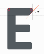 Michael Hansen (Michaelhansenwork, Copenhagen, Denmark) studied at the Royal Academy of Fine Arts in Copenhagen. As a student, he created a virtual identity for the future light rail in Aalborg. This involved the development of the rounded sans typeface family Aalborg Bold (2015) and the creation of a few wayfinding icons. Behance link. [Google]
[More] ⦿
Michael Hansen (Michaelhansenwork, Copenhagen, Denmark) studied at the Royal Academy of Fine Arts in Copenhagen. As a student, he created a virtual identity for the future light rail in Aalborg. This involved the development of the rounded sans typeface family Aalborg Bold (2015) and the creation of a few wayfinding icons. Behance link. [Google]
[More] ⦿
|
Michael Kahlert
|
Berlin, Germany-based designer of the wayfinding typeface Breitschek (2019). [Google]
[More] ⦿
|
Microvector
|
Designer of hundreds of black and white, and color vector icon sets in or about 2020. These include Animal Tracks Icon Set, Arrows Icon Set, Bacteria Germ Icon Set, Belgium Icon Set, Dandelion Icon Set, Diamond Icon Set, Flamingo Icon Set, Funny Monsters Icon Set, Gender Symbols Icon Set, Germs Icon Set, Memphis Graphic Elements, Optical Military Aims Icon Set, Sexual Positions Icon Set, Web Loading IconSet. [Google]
[More] ⦿
|
Mies Hora
[Ultimate Symbol Fonts]
|
 [More] ⦿
|
Mike Blacker
|
Designer of the dingbats family Leiure Tourism Icons DT (2008, DTP Types). These icons were developed over many years by Mike Blacker of Blacker Design, the icons cover a comprehensive range of leisure, tourism and access themes. [Google]
[MyFonts]
[More] ⦿
|
Mike Kohnke
[Typebox]
|
[MyFonts]
[More] ⦿
|
Mike Saelens
|
Designer for MapInfo Corp of the map symbol font Map Symbols (1995). [Google]
[More] ⦿
|
Military Symbols and Fonts
|
Free NATO military truetype fonts. Included are Map-Symbols-NATO-Blank, Map-Symbol-NATO-Pl, Map-Symbols-NATO-Coy, Map-Symbols-NATO-Bn, Map-Symbols-NATO-Regt, Map-Symbols-NATO-Bde, Map-Symbols-NATO-Div&Co, Map-Symbols-NATO-Eqpt, MilSymMod01Normal, MilSymMod02Normal, MilSymbols01Normal, MilSymbols02Normal, MilSymbols03Normal, MilSymbols04Normal, MilSymbols05Normal. [Google]
[More] ⦿
|
Mintea.org
[Andrea Bergamini]
|
Masters degree student (b. 1983) at the Politecnico di Milano, who specializes in signage, wayfinding and information design. He researches traffic system fonts and typography. His Flickr page has scans of the Italy's Codice della Strada which dictates street type in Italy, and features his world map which shows the origin and the different "routes" taken by the two main typefaces used in world signs: the American Highway Gothic, published by the traffic engineer Ted Forbes in 1945 and the British Transport type by Jock Kinneir and Margaret Calvert, published in 1963. He also has photographs of traffic signs. Creator of the free family Flaminia (The League of Movable Type, 2009; see also here). He writes: Flaminia is a 2008 opensource project started as a Master Degree Thesis by Andrea Bergamini, an Italian graphic designer annoyed by the chaotic and poorly designed road signage system in his country. The leading idea was that tests taken in real-life conditions are the only way to validate the design of a font to be used for signage and that the final solution should always come from all of the modifications derived by those experiments. These considerations led to the design of Flaminia, a typographical system that allows its users and its future designers to quickly morph (through the use of Multiple Master axes) different variants of the glyphs. By allowing minimal changes of only one variable in the letter shapes, Flaminia also provides a tool to study which are the most relevant factors in the process of reading signs, and can be used free of charge for further researches in this field. [Google]
[More] ⦿
|
Mirco Schiavone
[Razziatype]
|
[More] ⦿
|
Mohamad Dakak
|
 Type designer from Syria who graduated from Damascus University and completed the MATD program in Type Design at the University of Reading in 2016. He is currently located in Cambridge, UK. His graduation typeface at Reading was Jali, about which he writes: Jali is a typeface designed for wayfinding signage. High legibility from distance is the main feature of the design. Jali combines Arabic and Latin in harmony while keeping a natural treatment for both scripts and avoiding forcing any to follow the other. Jali offers two secondary styles for different functions. Jali Display is a highly characterful style to add a distinguished identity in various contexts. Jali text comes to support setting running text for continuous reading. Jali won an award at the Type Directors Club's Type Design Competition 2019.
 In 2021, Kostas Bartsokas, Mohamad Dakak and Pria Ravichandran set up Foundry 5 Limited. At Foundry 5, Dakak released Jali Arabic, Jali Greek and Jali Latin in 2021. I Love Typography link for Foundry 5. [Google]
[MyFonts]
[More] ⦿
|
Monotype: Corporate typefaces
|
 The corporate typefaces for which Monotype was contracted include Barclays, British Airways (the Mylius face), The British Council, Chermayeff&Geismar (a particularly ugly and unreadable organic slanted sans), Ogilvy&Mather, Opel (with Greek and Cyrillic, under guidance of Robin Nicholas), Scandinavian Airlines (the typeface is called Scandinavian), Stockholm Transport, The Daily Telegraph, and Waitrose. [Google]
[More] ⦿
The corporate typefaces for which Monotype was contracted include Barclays, British Airways (the Mylius face), The British Council, Chermayeff&Geismar (a particularly ugly and unreadable organic slanted sans), Ogilvy&Mather, Opel (with Greek and Cyrillic, under guidance of Robin Nicholas), Scandinavian Airlines (the typeface is called Scandinavian), Stockholm Transport, The Daily Telegraph, and Waitrose. [Google]
[More] ⦿
|
MyFonts: Highway fonts
|
Highway fonts available from MyFonts. [Google]
[More] ⦿
|
MyFonts: Traffic typefaces
|
Traffic fonts available from MyFonts. [Google]
[More] ⦿
|
MyFonts: Transportation typefaces
|
A selection of fonts that are appropriate for transport applications. [Google]
[More] ⦿
|
Nathaniel Porter
[Chris' British Road Directory]
|
[More] ⦿
|
National Geographic Society
[Charles Ernest Riddiford]
|
The National Geographic Society had its own photographic typefaces, which were developed by Charles Ernest Riddiford (Washington, DC), ca. 1933. Riddiford wrote about the importance of typefaces in cartography in his article On the Lettering of Maps published in the journal The Professional Geographer (Volume 4, Issue 5, pages 7-10, September 1952). Riddiford remained with National Geographic until his retirement in 1959 as its chief research cartographer. Riddiford died at the age of 71 in 1968 (Washington Post, May 15, 1968, p.B10). In 1945, he designed a slightly flared sans typeface [PDF]. Patent application. Juan Valdes (The Geographer, Director of Editorial and Research, National Geographic Maps) explains in 2012: Until the early 1930s, most of our maps were hand-lettered---a slow and tedious process requiring great patience and even greater skill. An alternate process---that of setting names in movable type, pulling an impression on gummed paper that was then pasted down on the map---often yielded less than durable or clearly readable type. The Society's first Chief Cartographer, Albert H. Bumstead, believed the answer lied in photo-graphic type. Laboring long hours in his home workshop, he discovered that existing typefaces did not lend themselves to Society standards: our map enlargement and reduction factors often caused small hairline letters to break up while larger block letters tended to fill up. To this end, he invented a machine for composing map type photographically that ultimately improved overall type legibility. Once this photolettering process was refined, it was applied to our United States map supplement in the May 1933 National Geographic. Shortly thereafter, Society cartographer Charles E. Riddiford was tasked with designing typefaces with much improved photomechanical reproductive qualities. He devised a set so attractive and legible that these typefaces are still used (in a digital format) today. These patented fonts were designed with the purpose of reflecting, as well as accentuating designated map features. If you study our reference maps and atlases closely, it's quite evident that every feature is associated with a specific typeface. Color and typographic weight (from light to bold) further adds to this distinction. [Google]
[More] ⦿
|
Neffra Matthews
[Abandoned Mine Land Program]
|
[More] ⦿
|
NEN 3225
|
In 1962, NEN (the Dutch Institute for Normalization) published a guide for a sans and a serif design. It is rumoured that Visualogik has digitized this, but no one can confirm this. The typeface has been used on signage in Amsterdam. The committee that decided on the details of the design, according to Kuitenbrouwer: - Ir. H.G.J. Schelling, architect at NV. Nederlandsche Spoorwegen, Utrecht (chairman)
- Prof. Dr. G.W. Ovink, estethic advisor at Lettergieterij "Amsterdam" v/h Tetterode (secretary)
- S.L. Hartz, graphic designer at Joh. Enschede, Haarlem
- Jan van Krimpen, typographer, Joh. Enschede, Haarlem
- H.C. Warmelink, notary and type specialist, Amsterdam
- Prof. Ir. C. Wegener Sleeswijk, architect, Amsterdam
NEN 3225 is often referred to as the Dutch DIN. It is defined and described in SWOV-Rapport_1970-7 entitled Verkeertekens op borden (1970, D.J. Griep and A. Kranenburg, Stichting Wetenschappelijk Onderzoek Verkeersveiligheid, Voorburg, The Netherlands). There are four sets of capitals in NEN 3225, called Alfabet Serie C, D, E, and F, which vary from narrow (C) to wide (F). In addition, there is one set of lowercase glyphs, called series "e", which is adapted to Series E in width. The SWOV document mentions that these letter types were developed after consultation with Ovink. Local download of that report from 1970 (in Dutch). Letter proofs at Lettergieterij Tetterode (at the University of Amsterdam). Visualogik produced a related digital font called Ovink D VL, dated 1995, after the D series. A later date, 2004, was added that refers to copyright by Novatype, a subsidiary of Visinova. Ovink D VL appears to match the font used on many of Amsterdam's street name plates (in 2020). HR Groep in the Netherlands is using a digital font called Ovink Ee, which matches the NEN 3225 Series E and e. That font is used on some street and traffic signs in the country. Dongbin Han, a Korean graphic designer based in the Netherlands and South Korea, was commissioned in 2021 by Het Nieuwe Instituut Rotterdam to develop a set of NEN 3225 digital fonts. These free fonts are called NEN 3225 Schreefloze Mager and NEN 3225 Schreefloze Vet. [Google]
[More] ⦿
|
New highway sign font in Japan
|
The old Public Gothic font, which simplified many kanjis on road signs, and which has been in use since 1963, is being replaced in 2010 by the standard iPad font, Hiragino. [Google]
[More] ⦿
|
Nick Curtis
[Nick Curtis: Underground]
|
[MyFonts]
[More] ⦿
|
Nick Curtis: Underground
[Nick Curtis]
|
Nick Curtis revived Edward Johnson's Underground (1916) as Under London NF (2011). [Google]
[MyFonts]
[More] ⦿
|
no image fonts
[Levi Halmos]
|
 Free fonts by Hungarian type and graphic designer Levi Halmos [or: Levente Halmos], made between 1997 and 2001: AlienGhost2, Aliens, Anabolic Spheroid (2001, revived but alas commercialized by Roger S. Nelsson in 2009 as Anabolic Spheroid Pro), Aztec, Baby Universe (2000), Bateman, Bedlam Remix (2001), Bitsumishi (Bitsumishi Pro (2009) appeared at CheapPro Fonts; Bitsumishi Pro v2 followed in 2012), Butch, Byblostie, CHELIVES, Caddy (1996), CelticGaramond, CelticGaramondthe2nd, Chemistry, Coolthreepixels, Crystal Clear, Danube (techno, geometric), DataTransfer, Dredwerkz, ElephantMan, Escape Pod Normal, FUTURE, Faceplant, Finchley (1998), FreakShow, Gagarin (2001, a Cyrillic simulation and constructivist family), GraveDirt, Guevara, Haiku, Helldorado (2001, Western), Hibernate (2000), Iamsimplified, Indochine (2002, oriental letter simulation), IronLeague (2002, a Jonathan Barnbrook style face), Ivanbats, Ivanhoe, KabosGyula, Kalocsai Flowers Pi (2001), Kenzo, KingKikapu, Kozmonauta (2000), Kozmonauta2, Krizia Uomo (1995, art deco; later renamed Krizi Amo Pro in 2011, probably under pressure from Uomo), Leonardo (1996, a constructed face), Lefferts Corner (2001), LicenzPlate, Lousitania (2001, square-serifed), MagyarSerif, MarshGas, MathmosOriginal, Mutter (a stitch font), Niobium [Niobium Pro (2010, with Roger S. Nelsson) is used for signage and wayfinding in the new Mbombela Stadium built for the FIFA World Cup 2010], Nordic (2001; the Pro version appeared in 2010), Nushto (2000), Olympus (Greek simulation face), Peex (dot matrix family), Phatguy, PiratesGold (made commercial in the CheapProFonts collection of Roger S. Nelsson in 2009), Poison Berries (2000), PresidenteTequila (2000), RakettaFromMars (2001, fifties style futurism), Rammstein, RammsteinRemix (2001, constructivist), RedheadGoddess (2000), RedwildoderRotwild, Resurrection, Runningshoe, Sarkozi Line Patterns Pi (2001), Scully (scanbats), ScumoftheEarth (2000), Shazbot, Slither (1998), SmartSexy, SmartandSexy, Snake Venom (2000, Mexican simulation face), SpaceWorm (2000, futuristic), Sporty, Stonebridge, Subatonik, Sulphur (2000, a typeface influenced by gothic cathedrals), Tank Junior (2001), TerraX, Thrust (2000, Star Trek face), TickyFont, Treasure Island (2001, rounded with a semi-Greek look), TrustThisOne, TwoGunJohann (2000), TypeKnight (2001, with hairline serifs), VicePresidente (2001, Mexican simulation face), VoodooDolls, Voodoo Spirits (2001, wiggly hand), WeepingItalic, WhoulNormal, Zombieball.
 Myfonts link. Roger S. Nelsson (Cheapprofonts) and Halmos extended Danube and Celtic Garamond in 2009 as Danube Pro and Celtic Garamond Pro, respectively. Fontspace link. Font Squirrel link. Dafont link. View Levi Halmos's commercial typefaces. [Google]
[MyFonts]
[More] ⦿
|
NRCS Map Symbols
|
NRCS (the Natural Resource and Conservation Service) used to have Free truetype fonts with map symbols: NRCSPlanning, NRCSSSURGO, NRCSADHOC (1999). Local download. [Google]
[More] ⦿
|
Nymark Type
[Andreas Nymark]
|
Born in Karlstad, Sweden, Andreas Nymark studied at Hyper Island (class of 2011) and now works in Stockholm. In 2018, he set up Nymark Type. At Type@Paris 2016, Andreas Nymark designed the text typeface Svedala to provide a serif counterpart of Sweden's national typeface, Sweden Sans. In 2021, he released Tranemo, a geometric sans that reinterprets Tratex, the official swedish traffic sign font. Designer of the custom font Klaravik Sans. [Google]
[More] ⦿
|
Oklahoma Department of Transportation
|
The two free truetype fonts found here (Font-10 and Font-23) prove that Oklahoma has a long way to go in its design of roadway sign symbol typefaces. [Google]
[More] ⦿
|
Olivia Nepi
|
An ex-student of the IUAV in Venezia, where she wrote a thesis on road signage. At ATypI in Rome in 2002, she almost spoke about road signs and pictograms but her talk was canceled to to the birth of her child. [Google]
[More] ⦿
|
Open DIN
|
A project started by Open source supporters in Belgium (Pierre Huyghebaert, Harrisson, Philip May, Nicolas Maleve and Femke Snelting) and executed by Paulo Silva in Portugal in the form of the free typeface OpenDinSchriftenEngshrift (2009), which is based on the master drawing of DIN for the Prussian Railways. They state: In the coming year, we will be working on a new digital rendering of the classic DIN font with the aim to release it in the public domain. We chose DIN (often referred to as "the German Autobahn typeface") as a starting point for a few reasons. First of all, because it is one of the rare typefaces that was released into the public domain from the moment it was designed in 1932. While the original drawings remain freely available, various type foundries have copyrighted digital renderings (such as FontShop's FF DIN). Secondly because its particular history brings up many questions about standards, their political implications and relations to use. In 1936 the German Standard Committee decided DIN should be employed in technology, traffic, administration, and business, with the idea to facilitate the development of German engineering and industry. [Google]
[More] ⦿
|
Open Source Publishing (or: OSP)
[Harrisson]
|
 Free software project based in Belgium and run by four people (and I quote from their web page):
 - Harrisson: Graphic designer and typographer, based in Liege and Brussels. Started to use as much Open Source software as possible on his Macintosh, as part of a research project The Tomorrow Book at the Jan van Eyck Academy in Maastricht.
- Pierre Huyghebaert: Exploring for eighteen years several practices around graphic design, he currently drives his own studio Speculoos. Interested to use free sofware to re-learn to work in others way and collaboratively on cartography, type design, web interface, schematic illustration, teaching and book design.
- Nicolas Malevé: Systems- and software developer from Brussels with a long interest in the politics and practice of software. Uses Linux since 1998 and makes publishing- and distribution systems for collaborative work.
- Femke Snelting: Graphic designer and artist based in Brussels. Most of her current work is for the web. Recently switched to Linux after using Apple Macintosh for more than ten years.
Alternate URL. They also describe interesting autotrace software included in Inkscape and UNIX batch tools for good autotracing of images. Designers of free fonts: - Alfphabet (2009). Based on the Belgian road signage system in use from 1945 until 1975. It came from Minneapolis to Brussels with 3M.
- Broodthaers.
- Cimatics (2009). Totally experimental. This font was designed in July 2009, for the graphic identity of Cimatics A\V Platform. It gathers glyphs from FreeSerif, FreeSerifItalic, DejaVuSans, DejaVuSerif, the OSP_frog mascot, the Cimatics two piece heart, a baronchon_palm_tree from Open Clip Art Library and private use dingbats drawn for Cimatics (Cimatics_scare_eye, white_pentagon).
- Crickx. A digital reinterpretation of a set of adhesive letters.
- Distilled Spirit and Whisky Jazz. In September 2009, Harrisson and Jean Baptiste Parre from LPDME remixed URW Gothic (Avant Garde) and published the free fonts Distilled Spirit and Whisky Jazz.
- DLF. DLF stands for Dingbats Liberation Fest.
- Libertinage. In August 2008, Harrisson designed 26 variations on Philipp H. Poll's 2006 font Libertine, and called the new family Libertinage. It covers Greek, Latin and Cyrillic.
- Limousine. This font was made for a poster to support nine people accused of "criminal association for the purposes of terrorist activity". They were arrested the 11th of November 2008, in France. They and others are the victims of a witch-hunt where the word "terrorism" was applied to any idea or practice which challenges the status quo. An international movement is emerging in their support. For the poster, we re-mixed an open font, the Free Sans from Free UCS Outline Fonts. Open Font Library link.
- Logisoso. Logisoso is a reinterpretation of the Delhaize logo lettering.
- NotCourierSans. NotCourierSans is a reinterpretation of Nimbus Mono and was designed in Wroclaw at the occasion of Linux Graphics Meeting (LGM 2008). We took Nimbus as the base of the design. We proceeded to remove the serifs with raw cuts. We did not soften the edges. We are not here to be polite.
- OSP-DIN (2009). The first cut of OSP-DIN was drawn for the festival Cinema du réel.
- Polsku Regula (2010). Polsku Regula is inspired by polish signage, street signs and shop windows lettering.
- Reglo (2011) was used for the new identity of Radio Panik.
- Sans Guilt (2011). The three Sans Guilt fonts have been produced during "Read The Fucking Manual", an OSP workshop at Deparment 21 (Royal College of Art), using Gimp, Fonzie and Fontforge. They are different versions of Gill Sans based on three different sources. Sans Guilt MB: based on a rasterized pdf made with the Monotype Gill Sans delivered with Mac OSX. Sans Guilt DB: Based on early sketches by Eric Gill Sans Guilt LB: Based on lead type from Royal College of Arts letterpress workshop. Open Font Library link.
- Univers Else (2010-2012). A geometric sans, about which they write: Univers Else is an experiment, a first attempt to escape the post ’80 era of geometrical purity that is so typical of Postscript vector based font drawing. The shapes of Univers Else were obtained from scanning printed textpages that were optically composed by cheap phototypesetting machines in the sixties and seventies. Some of Univers Else beautiful features are: round angles, floating baselines, erratic kerning. More precisely in this case, George Maciunas of the Fluxus group used an IBM composer (probably a Selectric typewriter) for most of his own work, and as a former designer, for all Fluxus work. In the 1988 book Fluxus Codex, kindly given to Pierre Huyghebaert by Sylvie Eyberg, the body text is typeset in a charmingly rounded and dancing Univers that seems to smile playfully at its dry swiss creator. Different scans were assembled by Grégoire Vigneron following different grids. These huge bitmaps were processed with appropriate potrace settings by the Fonzie software* through a .ufo font format as a working format, and an OpenType as output. Some testing and fine-tuning was done by Pierre Marchand, Delphine Platteeuw and Pierre Huyghebaert in FontForge and the font was ready, in a finished state enough to typeset the book. The oblique versions was simply slanted on the fly.
- VJ12 (2009).
- W Droge. In 2008, they ran a workshop in Wroclaw, Poland, to design a font in a day with the free tools Inkscape, Gimp and FontForge---called W Droge. It was based on Polish traffic signs. Cooperation with Dave Crossland, Alexandre Prokoudine and Nicolas Spalinger. The designers were Malwina Pukaluk, Marcin Wajda, Anna Bartoszek, Kacper Lenczuk, and Ludivine Loiseau.
- Le Patin Helvète (2011) is a slab typeface derived from Nimbus L. It covers Latin, Greek, Cyrillic and Hebrew: Patin Helvete is a attempt to turn the slick propergol purity of the modernist lines back to the coal dirt of the iron horse by going backward in time and space through little pieces of rail. Designed by Harrisson, Ludi Loiseau and Sebastien Sanfilippo.
- Mill (2012) is an architectural style typeface that has been created for engraving building instructions into the wood of a bench.
- Sans Guilt Wafer (2012) is described by OSP as follows: Gill Sans eats a Gaufrette.
[Google]
[More] ⦿
|
Orlando Mora
|
 Graphic designer in Bogota, Colombia, whose work frequently involves calligraphy and type design. In 2015, he created the techno typeface Metrica. Also in 2015, together with Michelle Castillo, he created a proposal wayfinding and icon set for the Universidad Piloto de Colombia. [Google]
[More] ⦿
Graphic designer in Bogota, Colombia, whose work frequently involves calligraphy and type design. In 2015, he created the techno typeface Metrica. Also in 2015, together with Michelle Castillo, he created a proposal wayfinding and icon set for the Universidad Piloto de Colombia. [Google]
[More] ⦿
|
Oscar Uria
|
 Toluca de Lerda, Mexico-based designer of the rounded wayfinding typeface Central (2015), which was created for the signage of the Central de Abasto de Toluca. [Google]
[More] ⦿
Toluca de Lerda, Mexico-based designer of the rounded wayfinding typeface Central (2015), which was created for the signage of the Central de Abasto de Toluca. [Google]
[More] ⦿
|
Otherwhere Collective (or: Ilott Type, Bellamy Studio)
[Andrew Bellamy]
|
 British born designer Andrew Bellamy worked for agencies in London, Oslo, and Miami, and is currently developing various global brands as Design Director at JKR in New York City. He started Ilott Type and then Otherwhere Collective.
 Andrew Bellamy designed 64-SRC (2017), a rare condensed monospace font inspired by IBM's Selectric type from the 1960s. His 57 Nao (2016) is a revival of a Japanese typewriter font from the 1950s called Messenjaa. They explain: Designed in 1950s Japan by Okanao & Kushiro, the perfect partnership until artistic temperaments drove them apart. The duo spent years crafting the font with the working title Messenjaa, Okanao bringing technical expertise to craft letterforms, while Kushiro made it his life, obsessively working late into the night to check pages for errors. For him the project was never about making money, it was an artistic endeavor to reprint the great Western works of literature. When he found out Okanao had secretly sold the rights of the font for use as a logo for a major Japanese manufacturer, Kushiro burned all evidence of the designs in a fit of passionate fury. The two reportedly never spoke again. Messenjaa was thought lost forever until a type specimen was discovered in a vintage typewriter box bought on eBay. Now redrawn and available as 57-nao, a faithful and beautifully crafted monospace characterized by what is considered Okanao's defining moment, the angular loop on the lowercase a. 52-Kfx (2017) is an extra tall sans typeface. 35-FTR (2017) was custom drawn specifically for the book Analogue Photography which required the timeless elegance of Futura and the compact utilitarian typesetting of Helvetica. In 2018, he designed the fashion mag typefaces 19Pra and Coutura Sans. In 2019, Bellamy published OC Bartok (a wedge serif), OC Pajaro (a sans family between Futura and Akzidenz Grotesk), OC Format Sans (a geometric grotesk sans serif that fuses the style of Futura with the rhythm and proportions of Akzidenz), OC Rey. Typefaces from 2020: OC Format Stencil (a variable font design inspired by the work of Bruno Munari, Paul Rand, and Max Huber), OC Format Collage, OC Format Shards. A special mention for the masking tape font OC Revolt, a variable display font made for the protest graphics of the NYC-based Trump Brexit era Non-Complicit project who initially made guerrilla type with masking tape applied directly in situ or to silk screens. Typefaces frm 2021: OC Highway Var (a free variable font based on Highway Gothic). It builds on Ash Pikachu's free Highway Gothic font. [Google]
[MyFonts]
[More] ⦿
|
Otto M. Vondrak
|
Designer at RailFonts, who hails from Westchester County, New York, and has been interested in model trains and railroading since age five. Otto attended Rochester Institute of Technology where he received his BFA in Graphic Design. While at RIT, he founded the RIT Model Railroad Club, and has been an active volunteer with the Rochester Chapter NRHS, and the New York Museum of Transportation. Since leaving Rochester, he moved back to Westchester where he is currently production manager for Hudson Valley Magazine, and designer for Westchester Magazine. Otto is also a partner in the popular railfan web site RAILROAD.NET, where he is Creative Director. Many of his articles, track plans and illustrations have appeared in Railroad Model Craftsman over the years, and he is also a regular contributor to Railpace News magazine. In his free time, Otto is a leader for his local Boy Scout troop, and enjoys camping and the outdoors. His railroad-related fonts: JadeGreen (compare to the lettering once used by Penn Central), Consolidated (compare to the lettering once used by Conrail). [Google]
[More] ⦿
|
Page Studio Graphics (or: Pixymbols)
[Roger Vershen]
|
 Page Studio Graphics is Roger Vershen's Oro Valley, AZ-based company specializing in symbols and symbol fonts, founded by him in 1986. Roger Vershen died in Tucson, AZ, in 2003.
 The fonts (grouped under the name PIXymbols) include ADA symbols v.2.0, Africa, Alphabox, Alphacircle, Ameslan (ASL), Antorff (blackletter), Antorff Fractions, Apothecary, Arrows, Astrology, Backstitch, Boxkey, BoxNLines, Braille grade 2, Casual, Chalk Casual, PIXymbols Chess, Command Key, Courex (typewriter family), Crossword, PIXymbols Deco Glass (2001), Digit&Clocks (+LED symbols), Dingbats&Online, DOSScreen, Fabric Care, FARmarks (Federal Aviation Regulations lettering), Flagman (semaphore), Fractions, Gridmaker, Highway Gothic (U.S. Department of Transportation's Standard Alphabets for Highway Signs), PIXymbols Highway Gothic 2002, Highway Signs (U.S. Department of Transportation), Hospital&Safety, LCD, Linea (2002, prismatic), Luna, Malkoff (calligraphic font), Marina, Meeting, Mejicana (2001, a Mexican party font), Menufonts, Morse, Musica (instruments), Newsdots, Orchestra, Passkey, Patchwork, PCx, Phone, PIXymbolsMusica, Prescott (2001, Western), Penman (2001, connected script), PrimerD (letters with lines), Recycle, Roadsigns, Shadowkey, Signet (family), Signet Shadow, Squared, Strings, Stylekey, Tolerances&Datum, Travel&Hotel, TV List, Unikey, US Map, Vershen (2001), Xcharting, Xstitch. They also sell EPS files of all Arms of Swiss cantons, and many nice initial caps. Look also for Faux Hebrew (simulated Hebrew), as part of the Faux package that also includes Faux Sanskrit, Faux Runic, Faux Hebrew, Faux Japanese, Faux Arabic, Faux Chinese and Faux Chinese Sans. Alternate URL. Previews at MyFonts. Klingspor link. View the Page Studio Graphics typeface library. [Google]
[MyFonts]
[More] ⦿
|
Panos Haratzopoulos
[Cannibal Fonts]
|
 [MyFonts]
[More] ⦿
[MyFonts]
[More] ⦿
|
Panos Vassiliou
[Parachute]
|
 [MyFonts]
[More] ⦿
[MyFonts]
[More] ⦿
|
Parachute
[Panos Vassiliou]
|
 London, UK, and Athens and Kifissia, Greece-based type foundry started in 2001 by Panos Vassiliou. It specializes in fine multilingual (usually Latin, Greek and Cyrillic) typeface families. He is a graduate of the University of Toronto, Canada with a major in Applied Science and Engineering. Following his University of Toronto graduation, he studied Graphic Communications at Ryerson University. Panos Vassiliou has conducted numerous seminars for Canadian companies such as Bank of Nova Scotia, Royal Bank and Sony Canada. He graduated from the University of Toronto/Canada, where he studied Applied Science and Engineering. He has been Creative Director for the Canadian design firm AdHaus, former Publisher of the monthly magazine DNA (Greece) and Secretary-General for the Hellenic Canadian Congress (Ontario, Canada). He has been designing typefaces since 1993, including commercial fonts as well as commissions from Vodafone, Nestlé, Ikea and National Geographic. He started Parachute in 2001 setting the base for a typeface library that reflected the works of some of the best contemporary Greek designers, as well as creatives around the world obsessed with type. Apart from its commercial line of typefaces, Parachute offers bespoke branding services for corporate typefaces and lettering. Customers include Bank of America, the European Commission, UEFA, Samsung, IKEA, Interbrand, National Geographic, Financial Times, National Bank of Greece, Alpha Bank and many others.
 Myfonts link. Behance link. Other type designers at Parachute include Kanella Arapoglou, Alexandros Papalexis, Dimitris Foussekis, Aggeliki Skandalelli, Helen Gabara, Babis Touglis, Vangelis Karageorgos, George Toumbalis, Eva Karapidaki, Charis Tsevis, Pavlos Levendellis, Panos Vassiliou, and George Lygas. At Granshan 2010, Vassiliou won Second Prize in the Greek text typeface category for PF Encore Sans POro, and First and Second Prizes in the display typeface category for PF Regal Pro and PF Champion Script Pro, respectively. Typefaces: - Adamant
- PFAgora Pro: Agora Sans, AgoraSerif, AgoraSlab.
- Amateur
- PF Archive Pro (2004). He received a design award for his typeface Archive at the E AWARDS 2004. It has special typographic features and multilingual support for all European languages including Greek and Cyrillic.
- Armonia
- Astrobats
- Bague Universal and Bague Sans (2014). A geometric grotesk that dares to be different. Accompanied by Bague Slab Pro (2014), PF Bague Inline Pro (2014), and PF Bague Round Pro (2014).
- Baseline
- Beatnick
- Beau Sans (2011). Inspired by Bernhard Gothic.
- A custom didone font for Greece's Benaki Museum (2020-2021).
- PF Benchmark Pro (2014).
- Bodoni Script (2009).
- PF Brummell (2016). A sans characterized by sharp angled terminals and a diamond dot on the i.
- Bulletin Sans (2000-2005)
- Centro (Centro Sans, Centro Serif, Centro Slab) a typeface originally developed for the redesign of the Financial Times Deutschland. PF Centro Pro family (Sans, Serif, Slab, a trillion styles) won an European Design Award in May 2008 in Stockholm and at Paratype K2009. It was completed by PF Centro Serif Compressed, PF Centro Sans Condensed and PF Centro Sans Compressed in 2015. In 2016, he published PF Centro Slab Press.
- PFChampion Script Pro (2004-2008). A much lauded connected calligraphic script that is based on a calligraphic script by Joseph Champion, 1709-1765. Winner at Paratype K2009 and Granshan 2010. Images: i, ii iii, iv, v. The 4245-glyph family comprises Cyrillic, Latin and Greek subfamilies.
- Cosmonut (sic) (2002). A retro futuristoc typeface made by Dimitris Foussekis.
- PF Das Grotesk Pro (2014). Panos writes: Das Grotesk was inspired by earlier nineteenth-century grotesques, but it is much more related to American gothic designs such as those by M.F. Benton.
- DaVinciScript (2001-2006). A Treefrog-style script typeface by Vassiliou and Dimitris Foussekis.
- PF Dekka (2014). This solid elliptical sans family was influenced by Monaco's outline version called MPW. It includes PF Dekka Mono.
- PF DIN (2010): PF DIN Display (2002-2005), PF DIN Mono, PF DIN Serif (2016; this great serif version of DIN---a first---contains a wealth of goodies: just look at the great weather icons; it won an award at Granshan 2016), PF DIN Stencil Pro (2010), PF DIN Stencil, PF DIN Stencil B (2016), PF DIN Text Pro, PF DIN Text Condensed, PF DIN Text Compressed, PF DIN Text Arabic, and PF DIN Text Universal. With Latin, Cyrillic and Greek coverage, each font has about 1300 glyphs. The designs go back to the lettering of the Prussian railways around 1900. In 2013, PF Din Text Pro was published. In 2021, the three-axis (weight, width, italic) variable type system PF DIN Max saw the light.
- Eco Park. A 3d outline face.
- PF Encore Sans (2009). A rich and versatile sans family supporting Greek, Latin and Cyrillic.
- PF Fuel Pro
- PF Fusion Sans (1996-2006)
- PF Garamond Classic.
- PF Goudy Intials and PF Goudy Ornaments. A winner at Paratype K2009.
- PF Grand Gothik (2019). A large grotesque typeface family with three subfamilies and a variable font option. He writes: Grand Gothik is a postmodern, multiscript, multifaceted and variable type system which shines at its heavier extended versions with its hip, expressive, almost brutal energy. Grand Gothik's design space includes 3 axes for weight, width and one for italics. It is available as a variable font or as five separate opentype families---compressed, condensed, normal, wide and extended. Each family comes with 9 weights spanning from Extra Thin to Black plus italics.
- PF Handbook (2005-2007, sans family)
- HausSquare
- HellenicaSerif. Chiseled look, Greek simulation face.
- PF Highway Sans (2001-2015). Highway Sans Pro is based on the standard typefaces used for highway signs and other byways open to public travel in the United States. These standards were established by the US Federal Highway Administration in 1966 following several studies which were conducted at the California Department of Transportation in the 1940s. It covers Latin, Greek and Cyrillic.
- House Square. A Bank Gothic lookalike.
- PF Isotext (2005). Meant for technical documentation, it is modeled after Isonorm.
- Kids, KidsStuff
- Libera
- Lindemann and PF Lindemann Sans (2012).
- PF Marlet (2019). A sharp-edged humanist sans family fit for fashion mags: Marlet Titling, Marlet Finesse, Marlet Swash, Marlet Display, Marlet Text. PF Marlet, collected three awards one after the other, a year after appearing on Luc's best-of-2019 list. First, the coveted TDC Certificate of Typographic Excellence 2020 (at 23RDC), followed by another one from European Design Awards, a third distinction from Tokyo TDC and a fourth crown, Red Dot Award 2020, all in 2020.
- Mechanica A and B, 2002-2006. Octagonal families.
- PF Mellon (2019). A modernist variable grotesque influenced by nineteenth and early twentieth century condensed sans serif typefaces such as Stephenson Blake's Grotesque No.77 and ATF's Alternate Gothic.
- PF Monumenta (2002-2006). A majestic lapidary roman family.
- Muse
- Online (One, Two and Three). Pixelish family.
- PF Ornamental Treasures (2008). Byzantine ornaments and borders.
- PF Pixelscript
- Playskool
- Psychedelia (2003, Dimitris Foussekis). A psychedelic typeface.
- Regal Pro and Regal Finesse Pro: Award-winning high fashion display didone families, 2010-2012, originally designed for the Grazia magazine. Awards include Red Dot Awrd 2012, Communication Arts Annual Competition 2012, Creative Review Type Annual 2011, European Design awards 2011, EBGE awards 2011, Granshan Awards 2010. See also PF Regal Swash and PF Regal Stencil.
- PF Reminder Pro (2003). A hand-printed typeface.
- Scandal
- PF Spekk (2020). A simple versatile geometric sans for Latin, Greek and Cyrillic.
- PF Square Sans Pro, PF Square Sans Condensed Pro (2013).
- PF Stamps (2002-2006). A grungy stencil typeface by Panos Vassiliou and George Lygas.
- PF Synch Pro (2006). An industrial strength slab-serif typeface.
- PF UEFA Super Cup (2013).
- PF Uniform
- PF Venue (2017). Semi art deco, and free-spirited, a great poster typeface family.
- VideoText
- PF Wonderbats (2003). Funky and strange animals.
- Wonderland (2006). By Dimitris Foussekis.
Their type blog is called Upscale typography. Catalog. View all typefaces designed by Parachute. Klingspor link. MyFonts interview. [Google]
[MyFonts]
[More] ⦿
|
Patrick Griffin
|
 Type designer at Canada Type. Wikipedia tells us that Patrick Griffin had been locked away in a mental institution by Carter and Barbara, after he walked in on his mother performing oral sex on Jackie Gleason. He had a nervous breakdown and was sent to a mental hospital, where he came to the conclusion that Gleason was evil because he was fat, leading him to hate fat people. However, that is a different Patrick Griffin. The real Patrick Griffin, a graduate of York University, lives and works in Toronto, where he founded Canada Type and made it the most successful Canadian type foundry. His work is summarized in this 2009 interview by MyFonts. It includes lots of custom work for banks, TV stations, and companies/groups like New York Times, Pixar, Jacquin's, University of Toronto, and the Montreal Airport. His retail fonts include the following.
 - Ambassador Script (2007): a digital version of Juliet, Aldo Novarese's 1955 almost upright calligraphic (copperplate style) connected script, with hundreds of alternates, swashes, ends, and so forth. Done with Rebecca Alaccari.
- Autobats (2005).
- Ballantines Twelve (2014). A custom typeface for Allied Domecq Spirits & Wine Limited, the brand owner of Ballantine's Scotch Whisky.
- Bananas (2020). An 18-style informal sans.
- P22 Barabajagal (2018): P22 Barabajagal is a unique take on the display fat face by way of doodling fun. Somewhat informed by the shapes of an uncredited 1960s film type called Kap Antiqua Bold, this font's aesthetic is the stuff of boundless energy and light humour. This is the kind of font that makes you wonder whether it was drawn with rulers, protractors and compasses, or just by a mad doodler's crazy-good free hand.
- Bigfoot (2008), the fattest font ever made (sic).
- Blackhaus (2005), an extension of Kursachsen Auszeichnung, a blackletter typeface designed in 1937 by Peterpaul Weiß for the Schriftguss foundry in Dresden.
- Blanchard (2009): a revival and elaborate extension of Muriel, a 1950 metal script typeface made by Joan Trochut-Blanchard for the Fonderie Typographique Française, that was published simultaneously by the Spanish Gans foundry under the name Juventud.
- Bluebeard (2004), a blackletter face.
- Book Jacket (2010): this is a digital extension of the film type font Book Jacket by Ursula Suess, published in 1972.
- Boondock (2005): a revival of Imre Reiner's brush script typeface Bazaar from 1956.
- Borax (2011-2021). An ode to the typography scene of New York City and Chicago in the late 1970s.
- Broken (2006): grunge.
- Bunyan Pro (2016, Patrick Griffin and Bill Troop). Bunyan Pro is the synthesis of Bunyan, the last face Eric Gill designed for hand setting in 1934 and Pilgrim, the machine face based on it, issued by British Linotype in the early 1950s---the most popular Gill text face in Britain from its release until well into the 1980s.
- Chalice (2006). Religious and Cyrillic influences.
- Chapter 11 (2009): an old typewriter face.
- Chikita (2008): an upright ronde script done with Rebecca Alaccari, and rooted in the work of 1930s Dutch lettering artist Martin Meijer.
- Clarendon Text (2007). A 20-style slab serif that uses inspiration from 1953 typefaces by Hoffmann and Eidenbenz and the 1995 font Egizio by Novarese.
- Classic Comic (2010).
- Coconut and Coconut Shadow (2006). Great techno pop typefaces.
- Coffee Script (2004): the digital version of R. Middleton's Wave design for the Ludlow foundry, circa 1962. Designed with Phil Rutter.
- Colville (2017). A set of sans headline typefaces based on letters used by Canadian painter Alex Colville.
- Comic book typefaces: Caper or Caper Comic (2008), Captain Comic (2007), Classic Comic (2010), Collector Comic (2006, a comic balloon lettering family), Common Comic (2013).
- Counter (2008): A futuristic beauty with a double-lined cursive thrown in. Available exclusively from P22. This typeface was based on the idea for an uncredited film typeface called Whitley, published by a little known English typesetting house in the early 1970s.
- Cryptozoo (2009): Late director of design for VANOC, the Vancouver 2010 Olympic Committee, Leo Ostbaum, commissioned Canada Type to make a typeface for the Vancouver Winter Olympics. Patrick Griffin came up with a rounded signage font called Cryptozoo, whose Notice reads Concept and design by Leo Obstbaum, VANOC Brand & Creative Services. Additional character data and technical production by Canada Type. Copyright 2007 VANOC Brand&Creative Services.
- Dads Handwriting (2014, custom typeface).
- Dancebats (2004).
- Davis (2016, a slab serif) and Davis Sans (2016). Typeface families designed for precision-engineered corporate use. All proceeds will go towards higher education expenses of design graduates.
- Dokument Pro (2014). This is a reworking of a typeface made in 2005 by the late Jim Rimmer: Jim Rimmer aptly described his Dokument family as a sans serif in the vein of New Gothic that takes nothing from News Gothic. Dokument Pro is thoroughly reworked and expanded, with different widths still in the pipeline.
- Dominion (2006). Based on an early 1970s film type called Lampoon. Dominions severely geometric shapes are a strange cross between early Bauhaus minimalism and later sharp square typefaces used for instance in Soviet propaganda posters.
- Doobie (2006). 60s psychedelic style.
- Driver Gothic (2008): based on the typeface used for Ontario license plates. Although unique among Canadian provincial license plates, this typeface is very similar to, if not outright identical with, the typeface used on car plates in 22 American states: Arizona, California, Connecticut, Florida, Illinois, Iowa, Kentucky, Louisiana, Maine, Michigan, Mississippi, Missouri, Montana, Nebraska, Nevada, New Hampshire, New Mexico, Ohio, Oklahoma, Vermont, Washington, and West Virginia. Ideal for license plate forgers.
- Expo (2004): an octagonal family.
- Fab (2007). A tube-design family reminiscent of the 1980s. Ricardo Cordoba writes: Fab reminds me of leafing through my first Letraset catalog in the mid-1980s all those decorative typefaces with rounded ends and tubular shapes, trying to imitate the look of neon signage. But Fab, with its contemporary twist on that aesthetic, and its unicase characters, manages to look like a cross between Cholla Bold and Frankfurter Highlight. Its handtooled, narrow shapes are perfectly suited to pop subject matter and bright colors. Fab Trio can be used to create layered chromatic effects, but its components can stand alone, too. The Seventies sure aint drab in Patrick Griffin's hands.
- Fantini (2006). An update of the curly art nouveau typeface Fantan, a film type from 1970 by Custom Headings International.
- Feather Script (2012). A revival of an old Lettering Inc font from the 1940s, known then as Flamenco.
- Fido (2009) is the official font of dog owners everywhere. Has Saul Bass influences.
- Filmotype fonts: Filmotype Ace (2015; based on a Filmotype script from 1953), Alice (2008, a casual hand-printed design based on a 1958 alphabet by Filmotype), Filmotype Arthur (2015; based on a Filmotype script from 1953), Athens (2014), Filmotype Brooklyn (2009, a casual script based on a 1958 Filmotype font), Filmotype Candy (2012), Filmotype Carmen (2012), Filmotype Hemlock (2013, a retro signage script), Hickory (2014), Filmotype Homer (2014, a brush signage script), Filmotype Hudson (1955, based on a 1955 original), Filmotype Jessy (2009, a flowing upright connected script based on a 1958 design by Filmotype), Filmotype Jupiter (2015; based on a Filmotype brush script from 1958), Filmotype Kellog (2013), Filmotype Lakeside (2013, a retro signage typeface), Filmotype Leader (2013), Filmotype Liberty (2015; based on a Filmotype brush script from 1955), Filmotype Giant (2011, a condensed sans done with Rebecca Alaccari) and its italic counterpart, Filmotype Escort (2011, done with Rebecca Alaccari), Filmotype Keynote (2013, a connected bold advertising script), Filmotype Lacrosse (2013, a retro script from the 1950s sometimes used in department store catalogs of that era), Filmotype LaSalle (2008, based on a 1952 retro script by Ray Baker for Filmotype), Filmotype Harmony (2011, original from 1950 by Ray Baker), Filmotype Kentucky (a 1955 original by Ray Baker), Filmotype Kingston (a 1953 original by Ray Baker), Filmotype Lucky (2012, based on a font by Ray Baker), Filmotype Hamlet (a 1955 original by Ray Baker), Filmotype Panama (2012, a flared casual serif typeface based on a 1958 original), Filmotype Prima (2011, with Rebecca Alaccari), Filmotype Quiet (2010, based on a 1954 military stencil typeface by Filmotype), Filmotype Yale (2012, a wedding invitation script based on a 1964 original by Filmotype), Filmotype York (2014).
- Flirt (2005). Based on an art deco typeface found in a Dover specimen book.
- P22 Folkwang Pro (2017, at P22). A revival of Hermann Schardt's Folkwang (1949-1955, Klingspor).
- Fuckbats (2007).
- Fury (2008): an angry techno family.
- Gala (2005, expanded in 2017). By Griffin and Alaccari. Gala is the digitization of the one of the most important Italian typefaces of the twentieth century: G. da Milanos 1935 Neon design for the Nebiolo foundry. This designs importance is in being the predecessor - and perhaps direct ancestor - of Aldo Novareses Microgramma (and later Eurostile), which paved the worlds way to the gentle transitional, futuristic look we now know and see everywhere. It is also one of the very first designs made under the direction of Alessandro Butti, a very important figure in Italian design.
- Gallery (2004): art deco.
- Gamer (2004-2006), by Griffin and Alaccari: modeled after a few 1972 magazine advertisement letters, the origin of which was later identified as a common film type called Checkmate.
- Gaslon (2005): a modification of A. Bihari's Corvina Black from 1973.
- Gator (2007). A digital version of Friedrich Poppl's Poppl Heavy (1972), which in turn was one of the many responses by type designers to Cooper Black.
- Genie (2006): a psychedelic typeface based on a 1970s film type called Jefferson Aeroplane.
- Gibson (2011, with Kevin King and Rod McDonald). This 8-style humanist sans family is a revival of McDonald's own Monotype face, Slate. It was named to honour John Gibson FGDC (1928-2011), Rod's long-time friend and one of the original founders of the Society of Graphic Designers of Canada. All the revenues from its sale will be donated by Canada Type to the GDC, where they will be allocated to a variety of programs aiming to improve the creative arts and elevate design education in Canada.
- Go (2005): a techno face.
- Goudy Two Shoes (2006): a digitization and expansion of a 1970s type called Goudy Fancy, which originated with Lettergraphics as a film type.
- Gumball (2005). A bubblegum font modeled after Richard Weber's 1958 font, Papageno.
- Hamlet (2006): medieval. Based on an old type called Kitterland.
- Happy (2005). Happy is the digital version of one the most whimsical takes on typewriters ever made, an early 1970s Tony Stan film type called Ap-Ap. Some of the original characters were replaced with more fitting ones, but the original ones are still accessible as alternates within the font. We also made italics and bolds to make you Happy-er.
- Heathen (2005). A grunge calligraphic script: The original Heathen was made by redrawing Phil Martin's Polonaise majuscules and superposing them over the majuscules of Scroll, another Canada Type font. The lowercase is a superposition of Scrolls lowercase atop a pre-release version of Sterling Script, yet another Canada Type font.
- Hortensia (2009): a semi-script Victorian typeface modeled after Emil Gursch's Hortensia (1900). Codesigned with Rebecca Alaccari.
- Hunter (2005). A revival of a brush script by Imre Reiner called Mustang (1956).
- Hydrogen (2007, a rounded geometric unicase family.
- Informa (2009): a comprehensive 36-style sans serif text family based on traditional lettering. He says: While some typefaces classified as such exhibit too much calligraphy (like Gill Sans, Syntax and Optima), and others tend to favor geometric principles in rhythm and proportion (like Agenda, Frutiger and Myriad), Informa stays true to the humanist ideology by maintaining the proper equilibrium between the two influences that drive the genre, and keeping the humanist traits where they make better visual sense.
- Jackpot (2005): The idea for Jackpot came from a photo type called Cooper Playbill, which as the name implies was simply a westernized version of Cooper Black. The recipe was simple: Follow Mr. Coopers big fat hippy idea, cowboy it with heavy slabs, give it true italics, then swash away at both for beautiful mixture. And there you have the bridge between groovy and all-American. There you have the country lover shaking hands with the rock and roll enthusiast. There you have your perfect substitute for the very overused Cooper Black.
- Jazz Gothic (2005): an expansion of an early 1970s film type from Franklin Photolettering called Pinto Flare. Image.
- Jezebel (2007).
- The psychedelic typeface Jingo (2014, with Kevin Allan King): This is the digital makeover and major expansion of a one-of-a-kind melting pot experiment done by VGC and released under the name Mardi Gras in the early 1960s. It is an unexpected jambalaya of Art Nouveau, Tuscan, wedge serifs, curlycues, ball endings, wood type spurs and swashes, geometry and ornamental elements that on the surface seem to be completely unrelated.
- Johnny (2006): with Rebecca Alaccari; based on Phil Martin's Harem or Margit fonts from 1969.
- Jupiter (2007): based on Roman lettering.
- P22 Klauss Kursiv (2018). A revival, at P22, of Karl Klauss's crisp fifties script typeface Klauss Kuriv (1956-1958, Genzsch & Heyse).
- Latex (2015). A layered all caps decal typeface.
- Leather (2005): an expansion of Imre Reiner's blackletter typeface Gotika (1933).
- Libertine (2011). Libertine (done with Kevin Allan King) is an angular calligraphic script inspired by the work of Dutchman Martin Meijer (1930s): This is the rebel yell, the adrenaline of scripts.
- Lionheart (2006). A digitization and extension of Friedrich Poppl's neo-gothic typeface Saladin.
- Lipstick (2006): handwriting. Plus Lipstick Extras.
- Louis (2012). A faithful digital rendition and expansion of a design called Fanfare, originally drawn by Louis Oppenheim in 1927, and redrawn in 1993 by Rod McDonald as Stylu.
- Maestro (2009) is a 40 style chancery family, in 2 weights each, with 3350 characters per font, co-designed with calligrapher Philip Bouwsma. This has to be the largest chancery/calligraphy family on earth.
- Magellan (2014). A custom stencil typeface.
- Martie (2006). Done with Rebecca Alaccari. Based on the handwriting of Martie S. Byrd.
- Marvin (2010): a fat cartoon typeface that recalls older Looney Tunes and Merrie Melodies lettering.
- In 2013, Kevin Allan King and Patrick Griffin revived Georg Trump's transitional typeface Mauritius (1967, Weber).
- Memoriam (2009): An extreme-contrast vogue display script which was commissioned by art director Nancy Harris for the cover of the 2008 commemorative issue of the New York Times magazine. He also did the typography and fonts for the 2010 issue. This became an unbelievably successful family, and was extended in 2011 with headline, Outline and Iline variants.
- Merc (2007). Based on an all-cap rough-brush metal typeface called Agitator, designed by Wolfgang Eickhoff and published by Typoart in 1960.
- Messenger (2010), a calligraphic script. Patrick Griffin writes about Messenger (2010, Canada Type): Messenger is a redux of two mid-1970s Markus Low designs: Markus Roman, an upright calligraphic face, and Ingrid, a popular typositor-era script. Through the original film typefaces were a couple of years apart and carried different names, they essentially had the same kind of Roman/Italic relationship two members of the same typeface family would have. The forms of both typefaces were reworked and updated to fit in the Ingrid mold, which is the truer-to-calligraphy one.
- Middleton Brush (2010): a redigitization of R.H. Middleton's connected brush typeface Wave, ca. 1962; see also an early Canada Type face, Coffee Script.
- Miedinger (2007). Created after Max Miedinger's 1964 face, Horizontal. Canada Type writes: The original film typeface was a simple set of bold, panoramically wide caps and figures that give off a first impression of being an ultra wide Gothic incarnation of Microgramma. Upon a second look, they are clearly more than that. This typeface is a quirky, very non-Akzidental take on the vernacular, mostly an exercise in geometric modularity, but also includes some unconventional solutions to typical problems (like thinning the midline strokes across the board to minimize clogging in three-storey forms). This digital version introduces a new lighter weight alongside the bold original..
- Militia (2007). An octagonal and threatening stencil.
- Militia Sans (2007).
- Monte Cristo (2012, with Kevin Allan King) is a grand type family with five styles and 1630 characters with many swashes and ways of connecting the calligraphic glyphs---it is the ultimate wedding font.
- Neil Bold (2010): an extension of the fat typeface Neil Bold (1966, Wayne J. Stettler).
- Nightlife (2005): inspired by a pre-desktop publishing grid design by L. Meuffels.
- Nuke (2005): a fat stencil grunge weith pizzazz.
- In 2011, he and Kevin Allan King published the refined Orpheus Pro family, which was based on the elegant Orpheus by Walter Tiemann (1926-1928, Klingspor), and its Italic which was called Euphorion (Walter Tiemann, 1936). Their enthusiastic description: The Orpheus Pro fonts started out as a straightforward revival of Tiemann's Orpheus and Euphorion. It was as simple as a work brief can be. But did we ever get carried away, and what should have been finished in a few weeks ended up consuming the best part of a year, countless jugs of coffee, and the merciless scrutiny of too many pairs of eyeballs. The great roman caps just screamed for plenty of extensions, alternates, swashes, ligatures, fusions from different times, and of course small caps. The roman lowercase wanted additional alternates and even a few ligatures. The italic needed to get the same treatment for its lowercase that Tiemann envisioned for the uppercase. So the lowercase went overboard plenty alternates and swashes and ligatures. Even the italic uppercase was augmented by maybe too many extra letters. Orpheus Pro has been a real ride. Images of Orpheus: i, ii, iii, iv, v.
- Outcast (2010): a grunge family.
- Oxygen (2006): a great grid-based design.
- Paganini (2011,(with Kevin Allan King) is another jewel in Canada Type's drawers: Designed in 1928 by Alessandro Butti under the direction of Raffaello Bertieri for the Nebiolo foundry, Paganini defies standard categorization. While it definitely is a classic foundry text typeface with obvious roots in the oldstyle of the Italian renaissance, its contrast reveals a clear underlying modern influence.
- The last joint project of King and Griffin in 2012 was Pipa, a pseudo-psychedelic groovy bellydancing font: Originally made for a health food store chain we cannot name, Pipa is the embodiment of organic display typography.
- Player (2007). An 11-style athletic lettering family.
- Plywood (2007): a retro typeface based on Franklin Typefounders's Barker Flare from the early 1970s.
- Press Gothic (2007). A revival of Aldo Novarese's Metropol typeface, released by Nebiolo in 1967 as a competitor to Stephenson Blakes Impact.
- Quanta (2005, stencil). Two weights, East and West.
- In 2011, Kevin Allan King and Patrick Griffin completed work on an exceptionally beautiful revival, Ratio Modern (the original by F.W. Kleukens is from 1923). This is a didone family with a refined humanist trait.
- Rawhide (2006): a bouncy Western saloon font based on cover page lettering of the Belgian comic book series Lucky Luke.
- Recta (2011, with Kevin King). This is eighteen-stye sans family that extends Novarese's Recta.
- Rhino (2005): a revival of the informal typeface Mobil (1960, Helmut Matheis, Ludwig&Mayer).
- Normandia (2021, by Patrick Griffin and Hans van Maanen). A digital revival of the fatface typeface Normandia by Alessandro Butti at Nebiolo (1946-1949).
- Noteworthy (2009). A font commissioned for the Apple iPad. It is based on Griffin's earlier revival typeface Filmotype Brooklyn.
- Ronaldson Regular (2008, with Rebecca Alaccari), a 17-style oldstyle family based on the 1884 classic by Alexander Kay, Ronaldson Old style (MacKellar, Smith&Jordan). Griffin reconstructed this family from the metal typeface and from many scans from rare documents provided by Stephen O. Saxe, Philippe Chaurize and Rebecca Davis.
- Roos (2009): A 10-style revival of Sjoerd Hendrik de Roos's De Roos Romein (1948), created in cooperation with Hans van Maanen.
- Robur (2010): Done with Kevin King, this set of two fonts revives Georges Auriol's Robur Noir from 1909.
- Runway (2004): racetrack lettering.
- Rush (2005): futuristic.
- Sailor (2005): digital rendition of West Futura Casual (late 1970s film type).
- Salden (2019, by Hans van Maanen and Patrick Griffin). A grand effort to collect the lettering of Dutch book and book cover designer Helmut Salden in a series of typefaces.
- Salome (2008). Done with Rebecca Alaccari, this is a revival and expansion of a photolettering era typeface called Cantini (1972, Letter Graphics).
- Santini (2004): Bauhaus-inspired architectural lettering.
- One of Heinz Schumann's unpublished typefaces from the early 1960s was revived in 2017 by Patrick Griffin and Richard Kegler at P22 as P22 Schumann Pro.
- Screener (2006): an extensive octagonal family, including Screener Symbols.
- Sears Social (2014). A custom typeface family that includes Sears Social Monocase.
- Secret Scrypt (2004): four shaky script styles done for a New York restaurant. With Alaccari.
- Semplicita Pro (2011). A grand revival of Alessandro Butti's Futura-like Semplicità, executed between 2009 and 2011 by Patrick Griffin and Bill Troop. Image of the Medium weight.
- Shred (2010): an octagonal heavy metal face.
- Siren Script (2009-2010): Done with Rebecca Alaccari, this six-style script family is based on the metal typeface Stationers Semiscript (BBS, 1899).
- Skullbats (2005).
- Serial Killer (2005): bloody.
- Slang (2004): a blood scratch face.
- Slinger (2010): a flared art nouveau face.
- Social Gothic (2007). After Tom Hollingsworth's Informal Gothic, a squarish unicase grotesk done in 1965. Followed by Social Stencil (2011-2012) and Social Gothic 2 (2014).
- Soft Press (2012). A rounded version of Canada Type's Press Gothic.
- Sol Pro (2010): a 20-style revival and extension of the monoline sans typeface Sol by Marty Goldstein and C.B. Smith (1973, VGC), done with Kevin Allan King. Griffin writes: This is not your grandfather's Eurostile. This is your offspring's global hope, optimism, and total awareness.
- Spade (2012). A super-heavy slab face, done with Kevin King.
- Spadina (2010): a psychedelic / art nouveau revival with Kevin Allan King of Karlo Wagner's Fortunata (1971, Berthold).
- Sterling Script (2005): done with Rebecca Alaccari. Sterling Script was initially meant to a be digitization/reinterpretation of a copperplate script widely used during what effectively became the last decade of metal type: Stephenson Blake's Youthline, from 1952. Many alternates were added, so this is a virtually new type family.
- Sultan: a Celtic-Arabic simulation typeface after "Mosaik" (1954) by Martin Kausche.
- Stretto (2008) is a revival and expansion of the reverse stress font Sintex 1 (Aldo Novarese, Nebiolo and VGC, 1973), a funky nightclub face. It was used as the basis of Cowboy Hippie (2010, CheapProFonts). Similar typefaces include ITC Zipper (1970) and Berthold Beat Star (1972).
- Symposium Pro (2011). This Carolingian family was drawn by Philip Bouwsma. Patrick helped with the production.
- Tabarnak (2012) and its shaded version, Tabarnouche (2012). Lovingly named to attract business from Quebec, this is a packaging or signage pair of fonts.
- Taboo (2009) is a geometric display typeface that was inspired by lettering by Armenian artist Fred Africkian in 1984.
- Testament (2010): a calligraphic uncial family done with Philip Bouwsma.
- Tomato (2005): done with Rebecca Alaccari, this is the digitization and quite elaborate expansion of an early 1970s Franklin Photolettering film type called Viola Flare.
- Treasury (2006): a huge type family based on a calligraphic script by Hermann Ihlenburg from the late 19th century. Canada Type writes: The Treasury script waited over 130 years to be digitized, and the Canada Type crew is very proud to have done the honors. And then some. After seven months of meticulous work on some of the most fascinating letter forms ever made, we can easily say that Treasury is the most ambitious, educational and enjoyable type journey we've embarked upon, and we're certain you will be quite happy with the results. Treasury goes beyond being a mere revival of a typeface. Though the original Treasury script is quite breathtaking in its own right, we decided to bring it into the computer age with much more style and functionality than just another lost script becoming digital. The Treasury System is an intuitive set of fonts that takes advantage of the most commonly used feature of todays design software: Layering.
- Trump Gothic (2005): a revival and expansion of two different takes on Signum (1955, Weber), Georg Trumps popular mid-twentieth-century condensed gothic: Less than one year after Signum, the Czech foundry Grafotechna released Stanislav Marso's Kamene, a reinterpretation of Signum. The differences between the two were quite subtle in most forms, but functionally proved to offer different levels of visual flexibility. Marso changed a few letters, most notably the wonderful a and g he added, and also made a bold weight. Trump Gothic West is a revival of Trump's original Signum, but in three weights and italics for each. Trump Gothic East is a revival of Marso's Kamene, but also in three weights and corresponding italics.. In 2013, Patrick Griffin redrew and optimized these condensed and ultra-economical typefaces in his Trump Gothic Pro and the rounded version, Trump Soft Pro.
- Trump Script (2010) revives the African look script by Georg Trump called Jaguar (1962). An improvement on an earlier Canada type family called Tiger Script.
- Tuba (2010).
- Valet (2006): inspired by an uncredited early 1970s all-cap film type called Expression.
- Veronica Polly (2005).
- Vintage Deco (2017).
- Vox (2007): a 24-style monoline sans family done with Rebecca Alaccari. This was followed in 2013 by a softer version, Vox Round.
- Wagner Grotesk (2010): a sturdy grotesk, after a typeface from the Johannes Wagner foundry. Kevin King is also credited.
- Wagner Script Pro (2011). Done together with Kevin King, this is a revival of Troubadour (1926, Wagner&Schmidt).
- King and Patrick Griffin published Wonder Brush in 2012. This is partly based on a signage brush script called Poppl Stretto (1969) by Friedrich Poppl.
- Opentype programming help for several fonts by Michael Doret, such as Deliscript (2009), Dynascript (2011) and Steinweiss Script (2010). Deliscript (a winner at TDC2 2010) is an upright connected script with accompanying slanted version. Steinweiss Script is a 2200-glyph curly script typeface called Steinweiss Script (2010), which captures a lot of the spirit of Steinweiss's album covers from the late 1930s and 1940s.
- HWT Tangent (2021, at P22). This revives a Morgans & Wilcox wood typeface known as Tangent in the Hamilton Manufacturing collection (after Hamilton took over Morgans & Wilcox).
- Patrick Griffin did the final mastering in 2021 for P22 Underground Pro, which was developed over the years by Richard Kegler (1997), Paul D. Hunt (2007) and finally, Dave Farey (2021) and James Todd (2021). This comes close to being thee ultimate implementation of Johnston's Underground.
- Filmotype Andrew (2021). A bold and wide extension of the retro casual script font Filmotype Athens.
- Ronaldson Pro (2021). A revision and extension of Griffin's 2006 font, Ronaldson Old Style. It now has four weights and two variable fonts.
Klingspor link. [Google]
[MyFonts]
[More] ⦿
|
Paul Shaw
[The (Mostly) True Story of Helvetica and the New York City Subway]
|
[More] ⦿
|
Paulo Silva
|
Portuguese type designer in Porto, b. 1972, who created NewBodonesque (2004-2005) as part of Pedro Amado's Typeforge open source font project. Creator of Gentesque (2009), an Open Font Library family based on a scan of the Gentium family. Aka Nitrofurano. In 2009, he and others started work on OpenDinSchriftenEngshrift, an open source typeface that is as close as possible to the original DIN font done for the Prussian Railways. It was made with open source tools such as Inkscape and FontForge. In 2014, he published Cyrillic versions of Not Courier Sans (2008, Ludivine Loiseau). One download site. And another one. Kernest link. Behance link. Old Typeforge link. [Google]
[More] ⦿
|
Peter Slingsby
[Fonts of Afrika]
|
[More] ⦿
|
Peter Wiegel
[CAT Design Wolgast]
|
 [More] ⦿
|
Philip Tagg
|
Philip Tagg from the Faculty of Music at the University of Montreal has these fonts on his page: Athenian, Cyrillic, CyrillicBold-Italic, CyrillicBold, CyrillicNormal-Italic, MSReference1, MSReference2, SILDoulosIPA, SILManuscriptIPA, SILSophiaIPA, Translit98, Translit98Bold, Translit98BoldItalic, Translit98Italic, Treefrog, Webdings, GeographicSymbols-Normal, Keypunch-Normal, Keystroke-Normal, Kids-Normal. [Google]
[More] ⦿
|
Pixelspread
[Matt McInerney]
|
Graphic designer currently working at Pentagram Design in New York. He graduated from Savannah College of Art and Design, and is originally from Western Massachusetts. At the Typesites page, Matt McInerney looks at sites that have great typographic design. He created Raleway (2009, a free hairline sans; the Google Web Fonts typeface Raleway Dots (2012) is by Brenda Gallo, Matt McInerney, Rodrigo Fuenzalida and Pablo Impallari; see here for a complete extension of Raleway between 2010-2013 by Matt McInerney, Pablo Impallari and Rodrigo Fuenzalida), New Alphabet (2008), an octagonal font based on Wim Crouwel's New Alphabet, using FontStruct. (For a commercial version of New Alphabet, check Architype New Alphabet (The Foundry). He also made Pentagrid (2009, on a 5x5 grid; +Pentagrid v2, +Pentagrid Alphabet), Dotserif, and Neuescreen, typefaces that are in the mold of New Alphabet. Orbitron (2009) is a great free futuristic sans family published at The League of Movable Type: it is a geometric sans related to both Eurostile and Bank Gothic. Romina Vespasiano made a great specimen poster for Orbitron in 2012. Allerta (+Stencil) (2010) is an open source typeface designed for use in signage. Allerta was designed to be easily and quickly read from a distance. Each letter exploits the most unique aspects of that individual letter so that each character can be easily distinguished from any other. Google Directory link. FontStruct link. Abstract Fonts link. Klingspor link. Home page of Matt McInerney. [Google]
[More] ⦿
|
Portuguese Traffic Typefaces
[Joao Neves]
|
Joao Neves (Ourem, Portugal) lists and shows the Portuguese traffic typefaces from 1954, 1959, 1994 and 1998. In 1954 and 1959, they used the JAE font where JAE stands for Junta Autónoma des Estradas. Later, starting in 1994, they adapted and adopted the UK's Transport typeface. At Behance, he showed his monoline circular-arc based typeface Ball Kaps (2011). [Google]
[More] ⦿
|
Quadrat Communications
[David Vereschagin]
|
 Born in Edmonton in 1957, David Vereschagin set up Quadrat Communications in Toronto (Quadrat Communications, 18 Grenville Street, Suite 1501, Toronto, Ontario, Canada M4Y 3B3). A graphic designer by profession, he has made a number of carefully crafted font families such as Spike, Ratcaps (free keycaps sample font available), MyAuntCelia, Farquharson, Clear Prairie Ornaments (1992), Clear Prairie Dawn. A free copy of Farquhason is here.
 At MyFonts, one can buy Clear Prairie Dawn (Optima-like), Clear Prairie Ornaments, Farquharson (like wood type), My Aunt Celia, Ratcaps, Ratkeys, Spike, Toronto Subway (2004: based on the (art deco sans) lettering originally used for station identification and signage in the Toronto subway system, which first opened to the public in 1954. Developed from rubbings of the lettering on station walls and photographs of painted signage.) In 2008, he designed the cool constructivist poster family Kubrick, about the same time as Iconian Fonts' Kubrick family---I hope that they can settle the naming fight amicably. Behance link. [Google]
[MyFonts]
[More] ⦿
|
R160signage
|
FontStructor who made R160 Interior (2011), a dot matrix typeface that is based on an LED typeface used in the R160 MTA NYCT subway cars. He also made R160 Int Resize (2011), R160 Exterior (2011), R142 Interior (2011, a grid typeface based on actual R142 font. Used on New York City Transit Subway cars) and R142A (2011, a dot matrix typeface used on the R142/A MTA NYCT subway cars. It is the interior LED sign). [Google]
[More] ⦿
|
RailFonts.com
[Benn Coifman]
|
 Benn is an electrical engineering professor at Ohio State. Benn Coifman's site specializes in commercial railroad train and train lettering fonts. Also included (for free) are a crossword font, a population font, a car font, and a cartography font, all designed by Ben. Check RoadSign, a complete collection of US road signs. He also has a 1940s automobile font, the text font Rio Grande (1998) and a WWII plane font. He also made the BankGothic lookalikes Gotthard and Zephyr. Other designers at RailFonts are Clifford J. Vander Yacht, Randal O'Toole and Otto M. Vondrak.
 The typefaces: 1940s Autos, Alaska Railroad, Alphabet Train, Atlantic - New Haven, Atlantic Alternate, BNSF Narrow 1X, Boxcars, Burlington, Car, Chesapeake, Chesapeake Alternate, Chesapeake Roman, ChesC, City of Font, Clinch Narrow Roman, Clinch Roman, Consolidated, Crossword, Daylight Series (1937; 1947; 1958), Egyptian, Empire Builder, Extra Gray, F7 Profile, FastTrak, Freight, Gotthard, Grand Central, Great Western, Heavyweight, Illinois Central, Illinois Central Alternative, Jade Green, LaGrange, Lehigh Valley, Marquette Roman, Maryland, Milwaukee Road Herald, Milwaukee Road Station & Wayside, MISC Railroad, Modern Herald, Modern Passenger, Monon Route, More Rail Art, Nickel Plate, Northwestern RR Roman, NP RR Roman, Passenger, Pennsylvania 1930s, Pennsylvania Wayside, Rail Art, Rail Dingbats, Railroad Heralds, Railroad Roman, Randals Mac Icons, Reading, Rio Grande, Roads, RR Sign, Seaboard, Seaboard Block, Signals, Signals Second Section, Southern Pacific Daylight, Southern Pacific Extended Roman, Southern Pacific RR Roman, Steam Locomotives, Steam-1880, Streamliner, Street Sign, Texas Special, Train Overhead, Train Tracks, Transit Silhouettes, US Army Transportation Corps., Warbirds, Zephyr. Fonts by Pete Willard: BC Rail, Bessemer, BNSF, Car Knocker, Chessie, DRGW, Efliner, Erie Roman, Eurida, GoForIt, IC Logo, KCS, Lifesaver, Midland, NS, Pen Station, Rail Road Number Board 1, Rail Road Number Board 2, Rail Road Number Board 5, Rail TNK 1, RR Stencil, Seaboard, Sirbarry, Square1, STD Gothic Narrow, Tex Spec, TTX. [Google]
[More] ⦿
|
Ralf Herrmann
[Traffic Typefaces: Ralf Herrmann]
|
[More] ⦿
|
Ralf Herrmann
[Traffic Sign Typefaces: Poland]
|
[More] ⦿
|
Ralf Herrmann
[Traffic Sign Typefaces: Netherlands]
|
[More] ⦿
|
Ralf Herrmann
[Traffic Sign Typefaces: France]
|
[More] ⦿
|
Ralf Herrmann
[FDI Type Foundry]
|
 [MyFonts]
[More] ⦿
[MyFonts]
[More] ⦿
|
Raoul & Compagnie
|
French designer of the grotesque typefaces Raoul Transport Britannique (2011) and Raoul AUTOROUTE Britannique (2011), which are modeled after the glyphs of British traffic signs. [Google]
[More] ⦿
|
Ray Larabie
[Typodermic]
|
 [MyFonts]
[More] ⦿
[MyFonts]
[More] ⦿
|
Ray Larabie
[Larabie Fonts]
|
 [MyFonts]
[More] ⦿
[MyFonts]
[More] ⦿
|
Razziatype
[Mirco Schiavone]
|
 Mirco Schiavone (Switzerland) set up Razziatype. His fonts at Razziatype include RT Alias (pixelish) and Bowie. He co-designed the Cyrillic version of GT Walsheim (2009-2014) with Noël Leu (Grilli Type, Switzerland). In 2016, he created RT Dromo, which is based on double-gothic typefaces used for impact printing concert tickets during the 1980s.
 RT Rondelle was released in 2019. It is inspired by traffic signage typefaces such as the London Airport Lettering signage typeface Matthew Carter drew for Colin Forbes' signage system for the No. 3 Passenger Building of London Airport. Razziatype explains: Carter's design is based on Standard Bold (the English name for Akzidenz Grotesk) but with a lower uppercase and shortened ascenders and descenders, the typical characteristics of a signage typeface. This way the London Airport Lettering was able to achieve larger letterforms on a spatially limited sign area. Note the steep curve with which the descender of the lowercase y changes its direction and the lowercase g, which has a drastically thinned out descender. Other inspiration came from Marek Sigmund's 1975 typeface Polskie Pismo Drogowe for the Polish road signage. [Google]
[More] ⦿
|
Red Hat Inc
[Steve Matteson]
|
 This web site describes itself as follows: On May 9, 2007, Red Hat announced the public release of these fonts under the trademark LIBERATION at the Red Hat Summit. There are three sets: Sans (a substitute for Arial, Albany, Helvetica, Nimbus Sans L, and Bitstream Vera Sans), Serif (a substitute for Times New Roman, Thorndale, Nimbus Roman, and Bitstream Vera Serif) and Mono (a substitute for Courier New, Cumberland, Courier, Nimbus Mono L, and Bitstream Vera Sans Mono). The fonts are now available for you to install.
 At Fontspace, one can download these families by Red Hat Inc: Overpass (Delve Withrington), Liberation Serif, Liberation Sans, Liberation Mono. The Liberation fonts were made by Steve Matteson from 2007 until 2009 at Ascender. Liberation Sans is also available at Open Font Library. Overpass and Overpass Mono were created in 2011 by Dave Bailey and Delve Withrington. It is a free open source typeface family based on the U.S. interstate highway road signage type system. Google Fonts link. See also Transpass (2011-2019). So What created a poster for Liberation Serif in 2014. RedHat Display, Text and Mono (2021) are open source fonts that were originally commissioned by Paula Scher / Pentagram and designed by Jeremy Mickel / MCKL for the new Red Hat identity. Mickel writes: Red Hat is a fresh take on the geometric sans genre, taking inspiration from a range of American sans serifs including Tempo and Highway Gothic. The Display styles, made for headlines and big statements, are low contrast and spaced tightly, with a large x-height and open counters. The Text styles have a slightly smaller x-height and narrower width for better legibility, are spaced more generously, and have thinned joins for better performance at small sizes. In 2021 we added Light and Light Italic styles, and a Monospace family. Variable fonts with a weight axis are available. RedHat's official site. [Google]
[More] ⦿
|
Redruth's Basement Software
[Tom Redruth]
|
Tom Redruth is the American designer of Black Sam's Gold, based on handwritten characters from a map reprinted in the NATIONAL GEOGRAPHIC (vol. 195 no. 5; May 1999). Looks like treasure map writing. He designed Fountain Pen Frenzy in 2001 [compare with Treefrog]. This font was used on the cover of an album by Belle Monroe&her Brewglass Boys. Other typefaces include Bellamy's-Mapbats, Whydah-Heck-Poker, and the old typewriter typeface Carpal Tunnel (2003, based on a Remington typewriter). Finally, he made the Tolkien rune typefaces Tengwar-Teleri (2003) and Tengwar Marzabul (2002). Fontspace link. [Google]
[More] ⦿
|
Ricardo Rodrigues dos Santos
[Vanarchiv]
|
 [MyFonts]
[More] ⦿
[MyFonts]
[More] ⦿
|
Richard C. Moeur
[Manual of Traffic Signs]
|
[More] ⦿
|
Richard Lucas
|
American codesigner with Andrew Leman of Penitentiary Gothic (2003): a commercial license plate font identical to that for California. It has five styles including three-dimensional embossing effects. [Google]
[MyFonts]
[More] ⦿
|
Rick Banks
[F37 (or: Face37)]
|
 [MyFonts]
[More] ⦿
[MyFonts]
[More] ⦿
|
Roadgeek Fonts
[Michael D. Adams]
|
Memphis, TN-based Michael Adams (Roadgeek Fonts) developed a series of (free) heavy sans US highway sign fonts in 2002: Roadgeek2000SeriesB, Roadgeek2000SeriesC, Roadgeek2000SeriesD, Roadgeek2000SeriesE, Roadgeek2000SeriesEModified, Roadgeek2000SeriesF, RoadgeekTransportHeavy, RoadgeekTransportMedium. In 2005, he extended his font collection to include UK, German and US highway signs: - Roadgeek 2005 Series B/C/D/E/E(M)/F fonts are intended to closely approximate Highway Gothic fonts
- Roadgeek 2005 Series 1B/2B/3B/4B/5B/6B are intended to closely approximate the new fonts, and are inteded for dark-on-light background signs.
- Roadgeek 2005 Series 1W/2W/3W/4W/5W/5WR/6W are close kin to the -B fonts, but are intended for light-on-dark background signs.
- Roadgeek 2005 Transport Heavy and Transport Medium should approximate the fonts used on British highway signs.
- Roadgeek 2005 Engschrift and Mittelschirft should approximate the fonts used on German highway signs.
- Roadgeek 2005 Arrows 1&2, Icons, and SignBacks are intended to help you in approximating U.S. highway signs, and are based on sign specifications from the Nebraska online MUTCD/SHS manuals.
Additional links: Fontspace link. Fontreactor link. Home page. Download the full Roadgeek 2005 collection. There was some controversy in 2022 when type xdesigners learned that the highway signs in Argentina used Roadgeek 2005, while the license obviously states that use on actual highway signs is not allowed. [Google]
[More] ⦿
|
Roads.org.uk
|
This web site offers free traffic sign fonts used in the UK: - Transport is a very clear, distinctive and friendly typeface, the main lettering used on British road signs, designed specifically for this purpose by Jock Kinneir and Margaret Calvert. The versions of Transport on the roads.org.uk page are only intended for private non-commercial use. They may not have sufficiently accurate kerning or letter spacing for professional use, and may lack accented characters and other glyphs. The URW++ font foundry sells the original Transport (by Margaret Calvert), K-Type sells Transport New in three weights, and A2-Type sells New Transport, a modernized version produced in collaboration with Margaret Calvert. The free fonts made by Nathaniel Porter: Transport Medium and Transport Heavy.
- Transport Medium Greek (John Prentice). Greek road signs are written in both Greek and Latin text, and Transport was specially expanded by the Greek authorities to include suitable characters. Prentice's version of the Transport Medium font contains both the Latin and Greek alphabets.
- Motorway Permanent (Nathaniel Porter). Motorway is a separate set of letterforms that are only used for route numbers on motorway signs, and so it only contains numbers and a handful of letters and punctuation marks. Motorway Temporary (also by Nathaniel Porter) is a heavier weighting of Motorway Permanent.
- Pavement (Nathaniel Porter). This is, officially, the form used for painted lettering on the road surface. It is a vertically stretched version of Transport Medium.
- VMS (Variable Message Signs) (also known as electronic or matrix signs). This lettering is used to calculate precisely which lights should be illuminated to make each letter. This font file was produced by Nathaniel Porter.
- Old Road Sign Font (Tom Sutch). Before the Worboys Report introduced the current road sign designs and lettering in 1964, British road signs looked very different.
- AES Ministry (2013, Harry Blackett). An alternative version of the pre-Worboys road sign lettering, which adds some additional modern characters and some punctuation that the original probably never had.
[Google]
[More] ⦿
|
Rodrigo Araya Salas
[Rodrigo Typo (was: RAS Design)]
|
 [MyFonts]
[More] ⦿
[MyFonts]
[More] ⦿
|
Rodrigo Typo (was: RAS Design)
[Rodrigo Araya Salas]
|
 RAS Design is Rodrigo German or Rodrigo Araya Salas, a designer from Santiago, Chile, b. 1987.
 Rodrigo Typo link. RAS Design link. Dafont link. Dafont linkNewer Dafont link. Behance link. Fontspace link. Fontsy link. Abstract Fonts link. Old URL. Creator of many hand-drawn free fonts. His typefaces from 2008 and 2009: Super (2009, for signage), Snow (2009), Mari (2009), El Cubano (2009, dingbats of typefaces), Mental Freak (2009, outline), Freak Animals (2009), Brigada Ramona Parra (2009, dingbats), Happie (2009, dingbats), Santiago Icono (2009), Icono Skate Dingbat (2009), 78 Skate (2009), The Sorden (2009), Estilo Urbano (2009, stencil), Tetris (2009), Techno (2009), Kona (2009, childish hand), Parody Logoskate (2009, dingbats), Fat Love (2009), La Rata Bizarra (2008), Tabla (2008), A Mano Alza (2009), Maribel (2009, handwriting), Stencil (2009), Rayando (2008, chalky writing), Klam, Loco TV, Monos Frekis (2008, funny dingbats), Tabla (2008), Happie (2009, more funny dingbats), Funny Icons (2009), Kiltro (2008, dog dingbats), Pokemona (dingbats), Maniatico (scratchy outlined hand), Bizarro 1 (outline hand), Chile (dingbats), Freaky (2008, dingbats), Esquiso (outlined handwriting), Crazy Ras (outlined and hand-printed), Skatelove (2008, dingbats), Los de Abajo (2008, dingbats), Logoskate (2008), David (2008, flowing ultra fat face), Destruccion (2008, grungy), Skateboarding (2008, ransom note face), Mike Valley (2008, skateboard dingbats), Rodney Mullen King (2009, skateboard dingbats), El Chavo del 8 (2008, scanbats), Grande Maradona (2008, scanbats), Saintfont (2009, hand-printed), New Tetris (2009), September 11 Icon (2009, a powerful set of dingbats), Icono BMX (2009, bike dingbats). Typefaces from 2010: Commando X (2010, a pixel dingbat typeface for computer games), Raya Irregular, Mari+David, Depressive Icon, Esquiso, Ego (2010), El Cubano (dingbats with typefaces), Barras Bravas (almost graffiti face), Globe Face (award winner at Tipos Latinos 2010). Fonts done in 2011: Logo Font, Buen Dia (ransom note face), Drugstore (blackletter), Condorita (dingbats), KingKöng (a nice fat letter comic book face), Rolo (fat letter face), Logo, Comando X (a pixelized dingbat typeface based on video games), Catbox (2011, fat and rounded), Joia (a thin octagonal face), Plop (a "hip hop font"). Typefaces from 2012: Designio (rounded sans family), Nollie, Rocka (triangulated), Mosku (paint or blood drip face), Gigio Italia Bizarre (dingbats), Conny Rocket, Retro Hand Type (stitched), Wood (wood type simulation), Tritona, Nollie, Zdravo Maria (children's hand), Bordados (stitched typeface). Typefaces from 2013: Mexe, Polly, Pintanina (+Pro) (comic book caps face; the Pro version appeared in 2015), Giger Free (inspired by the paintings of H.R. Giger), Rango (fat hand-printed face), Smile (fat signage face), Pequena (a fat finger typeface for children's books; in Latin, Greek and Cyrillic), Children One, Lollapalooza, BRP (dingbats), Koni Black, Cusco, Rorschach, Children One (poster font), Varial Hellflip, Marty (hand-drawn poster font for Latin and Cyrillic), Barricada [not to be confused with the Barricada font by Sudtipos]. Typefaces from 2014: Marty Spring, Munky Negra (a creamy signage typeface by Rodrigo Araya Salas and Raphael Rodriguez), Tobogan (ultra-black poster face), Lilirun, Peral, Zurita (brush face), Ruba, Street Animals (dingbats), NegritaPro (funky), Ruda (brush face), Muro (thick brush type), Cucho (signage typeface), BRC (hand-printed), Konga (a chocolaty creamy signage script originally from 2012), Pony, Guakala, Alboroto, Loyola (a cartoon script started in 2013, which won an award at Tipos Latinos 2018), Froh (an informal fat stencil), Paihuen Pro (Mapuche-inspired letters), Helenita (perhaps useful for children's books; see also Helenita Dos in 2017), Macabro (a great hand-lettered and weathered typeface family), Box10, Ria, Bototo. Typefaces from 2015: Mari+David, Good Friend (a primitive script), Galpon (a great vernacular signage and/or comic book typeface for Latin, Greek and Cyrillic; extended in 2020, with Bruno Jara Ahumada, to Galpon Pro), Smile Pro (a fat multi-style handcrafted poster family of exceptional beauty; together with Andrey Kudryavtsev), Ardilla Small (a rounded organic sans by Rodrigo Araya and Andrey Kudryavtsev), Konga Pro (based on his own creamy script, Konga, from 2012), Mari & David (poster typeface), Forest Puyehue, Skatista (handcrafted script and skateboard dingbats), Ruba Style, Janmeid, Forma (experimental, robotic), Australia Skate (vernacular type), Tobi Black (for comic books and children's books, +Greek, +Cyrillic), Tobi Dirt, Basural (experimental). Typefaces from 2016: Bowl, Aliengo (a fun Martian font family done with Andrey Kudryavtsev), Marty Two (a lovely handcrafted typeface, ideal for children's books), Minnie Play (a children's book typeface by Rodrigo Araya and Andrey Kudryavtsev), Camo (a layered typeface family by Rodrigo Araya and Andrey Kudryavtsev), Camo Dirt, Clarence World (with Andrey Kudryavtsev: a rounded cartoon font inspired by the logo of the Cartoon Network series Clarence; followed in 2017 by Clarence Two), Pequena Pro (+Cyrillic) (with Andrey Kudryavtsev), La Mona Kids, Konga Rock, Movskate (a skateboarding culture font by Rodrigo Araya, Juan Sepulveda and Patricio Gonzalez), La Mona Pro (72 styles: A feast of textures!). Typefaces from 2017: Hatter Display (a Halloween font), Hatter Display Pro (+extensive dingbats), Hatter Cyrillic Display, Macabro Danger (wall paint style), Checkin Script (with four sets of travel dingbats), Caleuche (a bold weathered typeface, with Andrey Kudryavtsev; but that coauthorship was altered in 2021 to Franco Jonas Hernandez), Pequena Neo, Bike Park, Bike Park Two, Kawaii RT, Clarence Two, Portena, Mi Cocina (restaurant icons and dingbats), Big Foot Forest, Clarence Cyrillic (by Rodrigo Araya and Andrey Kudryavtsev), Galpon Spring, Spike Bot (by Rodrigo Araya and Andrey Kudryavtsev), Forest Two. In 2018, Rodrigo Typo published these typefaces: Ding (a great fattish cartoon font, co-designed with Andrey Kudryavtsev and Franco Jonas; see also its extensions, Ding Pro (2019) and Ding Extra (2019)), Squick (a comic book / children's font family by Franco Jonas, Andrey Kudryavtsev and Rodrigo Araya), La Pica Pro (by Rodrigo Araya and Andrey Kudryavtsev), Catshape (dingbats by Rodrigo Araya), Tobi Pro (by Franco Jonas, Rodrigo Araya Salas, and Andrey Kudryavtsev), Spiro (a retro almost psychedelic lettering font based on the series The Boatniks; by Rodrigo Araya Salas and Andrey Kudryavtsev), La KonyBlack (by Rodrigo Araya and Andrey Kudryavtsev), Ruda Two, Nuby (Franco Jonas, Rodrigo Araya Salas and Andrey Kudryavtsev), Garita, Alquitran (based on pixacao), Alquitran Stencil and Alquitran Rust (by Francisco Paez, Rodrigo Araya Salas and Andrey Kudryavtsev), Rague Pro (a stone-cut font by Rodrigo Araya Salas and Andrey Kudryavtsev, which won an award at Tipos Latinos 2018). Typefaces from 2019: Hatter Halloween, Clarence Alt (a an almost bubblegum children's book sans by Franco Jonas, Rodrigo Araya Salas and Andrey Kudryavtsev), Nacho Rough, Naguel, Lolapeluza Two, Nacho (a Mexican party font by Rodrigo Araya and Franco Jonas). Typefaces from 2020: Minado Rough, Toretto, Diablito One (a two-font and four dingbat-font package by Rodrigo Araya Salas and Bruno Jara Ahumada), Clarence Inline (a plump informal typeface family by Rodrigo Araya Salas and Franco Jonas Hernandez), La Pica Bonus (a vernacular or supermarket style font and dingbat family by Andrey Kudryavtsev and Rodrigo Araya Salas), Ancoa Slanted (an angular display family in 15 styles; by Andrey Kudryavtsev, Rodrigo Araya Salas and Franco Jonas Hernandez), Ruina One (rough, distressed), fj Trance (a reverse contrast Egyptian by Rodrigo Araya Salas, Franco Jonas, Valentina Faundes and Jorge Morales Salas), Tunning (an all caps speed font), Skippie (a comic book family by Andrey Kudryavtsev, Rodrigo Araya Salas, Bruno Jara Ahumada and Franco Jonas, and four sets of dingbats including Skippie Monster Lucha Libre and Skippie Monster Halloween), Ancoa (an angular 19-style layerable typeface by Andrey Kudryavtsev, Rodrigo Araya Salas and Franco Jonas Hernandez). Typefaces from 2021: Rinno (a rounded geometric display family by Rodrigo Araya Salas and Franco Jonas Hernandez), Ripster, Elah (a children's book or supermarket font; with Andrey Kudryavtsev), Loyola Next (a 14-style sans by Rodrigo Araya Salas and Bruno Jara Ahumada), Clarence Pro (a vernacular supermarket font by Rodrigo Araya Salas and Franco Jonas Hernandez), Meche Pro (a 12-style ligature-rich poster typeface), Rambi, Willner (a 5-style display sans by Rodrigo Araya and Franco Jonas), Picaflor (a titling or children's book typeface by Rodrigo Araya Salas and Bruno Jara Ahumada), Picaflor Hand (by Rodrigo Araya), Picaflor Soft (a fine national park or children's book family of organic sans fonts by Rodrigo Araya Salas and Bruno Jara Ahumada). Vectorlove won an award at Tipos Latinos 2012. Mona won an award at Tipos Latinos 2014. View Rodrigo Typo's typefaces. [Google]
[MyFonts]
[More] ⦿
|
Roger Vershen
[Page Studio Graphics (or: Pixymbols)]
|
 [MyFonts]
[More] ⦿
[MyFonts]
[More] ⦿
|
Roman Cernohous
|
 Type designer in Prague whose typefaces are published at Signature Type Foundry. Most of them were designed after sketches by Professor Rotislav Vanek of the Studio of Graphic Design and Visual Communication at the Academy of Arts, Architecture and Design in Prague. Roman's typefaces include:
 - Aktion. A revival of Akzidenz Grotesque based on Roman Cernohous's dissertation in the Studio of Typography at the Academy.
- Corridor. Created for use on highway signs.
- Connector (2012). A rounded techno font.
- Qbig (2015). Qbig was originally designed as a typeface for an amateur sci-fi movie in 2006. It comes with two types of shadows (Block and Superblock) for 3D effects.
- Sablon (2021). An all caps arts-and-crafts typeface for Latin and Cyrillic. Followed by Sablon Class (a 5-style distinguished all caps display serif).
[Google]
[MyFonts]
[More] ⦿
|
RRCOGFONTS
|
RRCOGFONTS is a geometric dingbat font with symbols useful for certain geological maps. [Google]
[More] ⦿
|
Russian Topography Symbols
|
One free truetype symbol font, RussianTopographDemoSymbols, by Lena&Dmitri Bagh and Alexander Pompeev, 1996. Archived page. [Google]
[More] ⦿
|
Rustbelt Type
[Ken Gross]
|
Ken Gross is a map designer and editor at Rustbelt Cartography in Cleveland, OH. He designed the free font MapBats in 1998. [Google]
[More] ⦿
|
Sandra Garcia
|
 Sandra Garcia (b. Bogota, Colombia) first studied at the Universidad del Area Andina, Bogota and then obtained a Masters in typography from Centro de Estudios Gestalt in Veracruz, Mexico. Freelance designer and teacher at Universidad de la Comunicacion, in Mexico City.
 Sandra created the wayfinding sans typeface Colectiva in 2017 together with Tipas Type, a type foundry she co-founded. Colectiva was originally designed for Mexico City's subway system. In 2019, she published Emperatriz at Latinotype. She collaborated on the design of the typographic family Woun Iek for the native Wounaan Colombian language. In 2017, she received the Clap international award for the project Xantolo, a font for children's publications. Xantolo was part of Tipas Type, a space created by women to promote female work in the typographic field. For a Mexican beer brand, Sandra Garcia and Tipas Type designed the splendid blackletter typeface Corona (2018) and the copperplate calligraphic typeface Especial (2019). In 2019, Dafne Martinez, Monica Munguia, and Sandra Garcia finally released the roundish informal children's book typeface Xantolo and the wood type / slab serif typeface Xihtli. In 2019, Dafne Martinez and Sandra Garcia designed the copperplate calligraphic typeface Especial for a common Mexican beer brand In 2021, Dafne Martinez and Sandra Garcia published Achtli (Book, Didactic), a rounded sans typeface for early readers. In 2022, Sandra Garcia released the ultra-condensed reverse stress Western typefaces Extra C and Extra C Variable at Tipastype. Speaker at ATypI 2019 in Tokyo. Co-author of the book Elementype, a practical guide to typographic use. [Google]
[MyFonts]
[More] ⦿
|
Satotyan
|
Designers of 3dfont, grofont (dripping blood font) and Jmap (outlines of the Japanese islands). [Google]
[More] ⦿
|
Scott de Jonge
|
 Scott de Jonge (Brisbane, Australia) designed Map Icons. Github link. Dedicated site for Map Icons. [Google]
[More] ⦿
Scott de Jonge (Brisbane, Australia) designed Map Icons. Github link. Dedicated site for Map Icons. [Google]
[More] ⦿
|
Scriptorium (Ragnarok Press, Fontcraft)
[David Fleming Nalle]
|
 Dave Nalle was born in Beirut on March 19, 1959, and died on February 13, 2021 from COVID in his home town of Manor, Texas. From his wiki page: Dave Nalle is a political writer, game author and font designer who was active in the early history of the development of the internet. Nalle was at one time Chairman of the Republican Liberty Caucus, a group that promotes libertarianism within the Republican Party, Senior Politics Editor at Blogcritics online magazine, and was the CEO of Scriptorium Fonts. Obituary [PDF] by Steve Jackson at the Daily Illuminator. Obituary by Shannon Appelcline at RGG Net. Obituary [PDF] at Dungeon Master Magazine.
 A creative and prolific designer, he has made hundreds of beautiful (often historic) fonts. His outfit, Scriptorium (based near Austin, TX, est. 1989), also does custom font and logo design. At some points, Scriptorium was also known as Ragnarok Press and Fontcraft. It specializes in artsy and ancient typefaces. Some subset of the fonts is made by Michael Scarpitti. Free font demos. Images of his best selling fonts. Special subpages: - Three free fonts: Onuava (a mini-serifed hybrid fixed-width font), Divona (sans), Sirona (based on Lombardic calligraphy).
- Lombardic: Aneirin, Benevento (8th century Lombardic), Cymbeline, Fabliaux, Formidable, Locksley.
- Decorative initials such as the 20th century sign lettering initials set Pencraft Initials (2009), New Saxon Initials (2016, based on work by F.G. Delamotte), Delamotte Initials One (2016), Delamotte Initials Two (2016), Holly Initials (2010, based on Real PenWork (1880s, Knowles and Maxim), Vyones (2010), Vergennes (2001), Cascade (2009), Bergling (2010; based on initials by John M. Bergling).
- Steampunk typefaces: Clockwork, Gearhead, Gears, Verne, Draughtwork, Belgravia, Boetia, Blackthorn, Linthicum, Good-fellow, Necromantic, Mephisto.
- Wild West fonts: Academy, Alcalde, Atkinson Boomtown (2009, after the lettering of Frank Atkinson), Atkinson Eccentric (2009), BigIron, Cibola, Del Norte, Lachesis, Perdido, Plowright, Primer, Riudoso, Niederwald, San Lorenzo (2011, with a Mexican and Tuscan look), Stonehouse, Manquo, Rochambeau, Purcell, Vaquero.
- Arabic simulation fonts: Samaritan is based on the poster lettering of Alphons Mucha from his poster for the play La Samaritan. Serendib and Waziri are based on the hand lettering of René Bull from his edition of the Arabian Nights. Caliph (1993) is derived from Ernst Schneidler's classic Legende font, with variant characters based on his original lettering. Also: Satampra, Jerash, Samarkand, Isfahan.
- Celtic fonts: the fonts include Constance, Durrow (1993, traditional rendering of Insular Minuscule calligraphy), Malvern, Glendower (based on the most common lettering in the Book of Kells), Knotwork (caps based on Celtic knots), Alba Text (modernized text font based on Celtic uncial lettering), Lindisfarne (based on a square uncial style), Stonecross (1997, derived from Celtic cross and gravestone inscriptions), Celtic Spirals (dingbats), Celtic Borders font (lets you combine key strokes to form decorative borders; many frames and borders are original Celtic designs by Arts&Crafts period artists like Evelyn Paul and Louis Rhead), Spiral Initials, Brigida (based on Rudolph Koch's interpretation of a squared uncial), Macteris Uncial, Coverack (heavy non-traditional uncial), Dahaut (modernized uncial), Dunsany, Glendower, Morgow (1999, spiral uncial), Teyrnon (elaborate spurred uncial), Padstow (heavy uncial), Vafthrudnir (2011, uncial), Sualtim and Columba (decorative initials based on characters found in the Book of Kells), Albemarle (2001).
- Oriental simulation fonts: Yoshitoshi (2003, based on the 1900-style writing by Yoshi Toshi.
- Gothic fonts, including Alt Gothic, Koch Gothic, Barnabas (2011), Sternhagen (2014), Montgisard (2010, roman capitals with blackletter lower case), Serenissima, Gelderland, Alcuin, Monumental, Goldwork, Waldeck, Roncesvalles, Montressor (2010, ornamental blackletter capitals), T4C Beaulieux (1998, a free copy here), Bastarda (2011), Burgundian, Cadeaulx, Collins Old English, Courtrai, Descant, Ereshkigal, Faustus, Franconian (1993, a Schwabacher), Froissart (2000), Ghost Gothic, Katisha, Koch Gothic, Ligeia, Magdeburg, Magdelena, Melusine, Pyle Gothic, Rheingold, Sanctum, Stuttgart Gothic (2010), Textura, Theodoric, Yngling (2002).
- German expressionist: Dromon.
- Renaissance fonts: Monumental Gothic, Caswallon (a Caslon family), humanist cursive (Palmieri, Castiglione and Hanes Italic), quirky Italian cursives (Fiorenza and Alleghieri), a Roman style hand-lettered font (Rudolfo and Rudolfo Swash), a Trajan-style Roman lettering (Hadrianus), a classic flourished cursive (Trinculo) and a set of floral intials from the Quattrocento (Fraticelli).
- Modern poster fonts: Ascelon, Bilitis, Cosmic Dude, Dromon, Ducatus Rough, Eglantine (after Central Type Foundry's Quaint Roman), Ekberg (2002, based on Samuel Welo's posters), Fortinbras, Hamilton, Jambon, Oblivion, Posada (2008, based on the poster lettering of Mexican artist José Guadalupe Posada), Squiffy, Suspicion, Magnin (2003).
- Mapmaker fonts: building elements are available in Basilica; Ortelius is a map dingbat font; Queensland (based on lettering by artist and calligrapher Eric Sloane), is bold, hand-drawn and reminiscent of medieval writing on maps. There are also Brandywine, Daresiel, Hesperides, Longhorne, Windlass (1996), and Cityscape. Orford (2008) is based on samples of hand lettering from a 1693 manuscript collected by Lewis Day in his classic book on historical paleography, Alphabets Old and New.
- Calligraphic fonts: Albemarle (2001), Azariel, Moncrief (2011, based on the calligraphy of J.M. Bergling), Pavane, Rasael (2009), Abdiel (2005), Roncesvalles, Gazardiel (2003, connected script), Spoonbill (2003, arts and crafts), Macteris (Roman uncial font), Antioch Uncial (Roman uncial font), Burgundian (Classic black letter font), Franconian (993, a classic black letter font), Castiglione (Attractive Renaissance lettering), Cicero (Roman Rustica font), Formidable (1993, very bold late medieval / Lombardic style), Collins Old English (Classic Old English style gothic), Corbei Uncial (Roman uncial font), Cymbeline (late medieval lettering), Durrow (Standard insular minuscule uncial font), Theodoric (Classic black letter font), Gazardiel, Ghost Gothic (Unusual gothic font), Glendower (Uncial font based on Book of Kells), Gloriana (Interesting hand lettering style), Folkard (from the hand-lettering of Charles Folkard), Offenbach Chancery, Ranegund Merovingian Courthand, Benevento (8th century Lombardic), Hesperides.
- Art deco typefaces: Imperatore (2018: based on a hand lettered design from California art deco master designer Pedro de Lemos in the 1920s), Speakeasy (2018), Gates of the West (2018), Lyceum (2014), Borealis (2009), Criterion (2011), Illuminata, Madding (2009, a bold poster font that grew out of Aventine), Alexandrine (2009), art Deco Stencil (2009, based on samples of Art Deco stencil lettering by Pedro Lemos), Falmouth.
- Art nouveau typefaces: Acadian, Agravain (2009), Amphitryon (2009), Ariosto, Asphodel, Averoigne, Beaumains (2011, based on J.M. Bergling's lettering), Beauvoir, Belgravia (based on J.M. Bergling), Bernhardt (based upon the lettering of the Czech art-nouveau artist Alphonse Mucha), Bentham, Berenicia, Boetia (2003, based on J.M. Bergling's lettering), Bruges, Bucephalus (1993), Burd Ellen (2009), Butterfield (1993; in Alfred Roller's style), Cafe Society (2018), Curetana, Damariscotta, Elsene (2011, based on lettering by early 20th century illustrator Clara Elsene Peck), Elysian, Exotique, Flaubert, Gaheris, Ganelon, Gehenna, Goodfellow, Grammophon (2019: a bold Jugendstil poster font), Harbinger, Huyot (2016, after Georges Auriol's types), Jugendstil Kunsthand (2003), Lysander, Maginot (1993; after Peter Schnorr, 1898), Munich (after the Munchner Jugend magazine), Norumbega, Odeon, Ormandine (2010), Pantagruel, Phaeton, Reggio, Rochmbeau, Rockne (2009), Rudolfo, Setebos, Sprite, Summerisle, Sylphide (2005), Undine, Valentin (2008), Vambrace (2010), Walhal, Wendingen (2016), Wormwood (2018), Zeitschrift (2016, based on the Ver Sacrum magazine).
- Modern poster fonts: Field Day (2003), Ascelon, Bilitis, Cosmic Dude, Dromon, Ducatus Rough, Eglantine (after Central Type Foundry's Quaint Roman), Ekberg (2002, based on Samuel Welo's posters), Fortinbras, Hamilton, Jambon, Oblivion, Squiffy.
- Constructivist fonts: Krasny Mir (2009), Vrubel, Structura (1997).
- Futuristic fonts: Alecto, Angelus, Circuit, Culdrose, Gearhead, Ironclaw, Parika, Sanhedrin, Semiramis (1997), Slither, Structuro, Yazata, Adastra (dings).
- Borders and ornaments. These include New Arets and Crafts Borders (20912, based on The Calendar of Golden Thoughts (Barse and Hopkins Publ, 1911).
- Boneyard fonts: Undertaker (2014), Antrobus (2010), Sepultura (2002), Halloweenies, Dementia, Boneyard, Skull and Bones, Malagua (1999-2013), Paleos (2002, from titling of B movies in the cave girl genre), Carmilla, Abaddon, Black Cow (1998), Valdemar, Cuede, Ligeia, Mayhem, Mephisto, Golgotha, Sanguinary, Ironworks, Moravia, Gehenna, Nosegrind (2005, graffiti), Corpus, Ghostly.
- School fonts: Schoolhand (2010).
- Arts and Crafts movement (late Victorian period, 19th century), based on work and lettering by Walter Crane, William Morris, Charles Rennie Mackintosh and Elbert Hubbard. The Arts&Crafts movement was enormously influential on the works of designers, artists and architects of the 20th century, and inspired the Art Nouveau and Art Deco movements. Fonts include William Morris' Kelmscott (based on Morris' Troy type), and True Golden, fonts from the Glasgow branch of the movement like Chelsea Studio (1997), which is based on Charles Rennie Mackintosh's lettering, fonts from the Roycrofters of New York like Semiramis and Ganelon, fonts based on Walter Crane's work such as Crane Gothic, Pencraft Initials (2009) and Walter Crane, and even fonts from the California Arts&Crafts period of the early 1900s like Coloma. Other typefaces: Jesse M. King (refreshed in 2015, and based on hand lettering from a frontispiece design by Glasgow-based Jessie King who was known for her lavish book covers), Aylward, Palmyra (based on work by the Roycrofters, a design community founded by Elbert Hubbard), Aylward (2010, Victorian), Hyacinth Initials, Spoonbill, Adresack (1996: inspired by the arts and crafts lettering styles of designers like Charles Rennie MacKintosh and Jessie M. King), Brandywine, Changeling (2009, based on lettering by fairy artist Fanny Railton), Goddard, and Advertising Gothic (2003), Valentin, Gaheris, Agravain (2009). Delaguerra (2001-2009) is based on a lettering style originating in the California Arts&Crafts period commonly associated with Mission Style. It is still in common usage in signage at historical sites in California.
- Victorian: Beaumarchais, Berenicia, Bilibin, Brandywine, Brigidis, Curetana, Durendal, Elphinstone, Flaubert, Folkard, Gjallarhorn, Gloriana, Hermia, Ironclaw, Magnus.
- Typewriter: Fontcraft Courier.
- Anthroposophic: Ekberg (2002, based on a sample of poster lettering by Samuel Welo).
- Medieval fonts of Scriptorium, critiqued by Marc Smith, page 65: Batwynge is based on lettre gffe by Geofroy Tory (1529), and not on an illuminated manuscript of the tenth century as claimed by Scriptorium. Perigord (1993) is based on a Carolingian alphabet drawn by Ernst Bentele in 1952. Allencon is a calligraphic font based on an interpretation of 6th century Ostrogothic Italian calligraphy.
Some selected fonts: Finchley (psychedelic), Captain Kidd (2012, an original font design based on the title lettering from the classic pirate movie starring Charles Laughton), Aerobrush (2011), Fondry Ornament (2009), Atkinson Egyptian (2008, after the lettering of Frank Atkinson), Verne (2008: remade in 2020 into Covid19), Goldwork (almost blackletter), BigBlok (2010), LetterpressGothic (2010), Plymouth (2010, in the style of Cooper Bold), Broadley (2008, an architecturally inspired script based on lettering by British architect and designer C.F.A. Voysey), Locksley (2004, medieval lettering), Tuscarora (curly lettering), Fiorenza (Renaissance calligraphy), Hesperides (old colonial calligraphic script), Angelus (beautifully printed monospaced script), Esperanza (1996, connected medieval handwriting), Ithuriel (2002), Alleghieri (2002), Hamilton (2002), Spiral Initials, Zothique (great font, based on hand lettering from a map of Clark Ashton Smith's fantasy world of Zothique), Reynard (semi-Celtic), Daresiel (elegant script), Caliph (1992, Arabic simulation), Bassackwards, Rosalinde (1999, handwriting), Arakne (2000, connected handwriting), Falconis (by Michael Scarpitti), Asrafel (semi-Celtic), Swithin (2004), Tyrfing (Art Nouveau/Fraktur, 1999), Waldeck (2008, blackletter), Woburn Initials, Stampwork, Draughtwork, Roughwork (a codex font derived from Nalle's own True Golden which is based on a=n earlier typeface by arts and crafts master William Morris), Melusine (gothic calligraphy), Corbei (uncial), Niederwald (hand lettering), Gjallarhorn (great uncial), Gaiseric (early medieval uncial), Taranis (1987, an uncial first drawn as a font for the cover of the old Ysgarth roleplaying system), De Bellis (roman era, by Michael Scarpitti), Engravers Gothic, Monimental Initials, Sanhedrin (Enemy of the State font), Vespasiano (roman capitals, by Michael Scarpitti), Bilitis, Hendrix (2002), Collins OE (old English), Samedi, Praitor, Evadare (1993, based on a character set which was hand calligraphed by Rudolf Koch), Koch Fantasie (1993), Black Cow (1998). Zothique, Ruritania, Mariner (2004, based on hand lettering originally done by Willy Pogany), Trinculo (a swinging cursive font), Texas Star (2002), Octavian (antique demi-serif font), Ruffian (antique type font), Ascelon (thin sans serif font), Munich (title lettering from Munchner Jugend magazine), Necromantic (bizarre bold titling font), Titania (romantic decorative lettering font), Oberon (bold romantic font), Knotwork, Guede (1993), Pullman, Purcell (Victorian circus poster style font), Allegheny, Carmilla, Malagua (1999-2013), Ardenwood, Platthand, Buccaneer, Cochin Archaic (2010), Boswell (1994), Guilford (based on lettering by artist and calligrapher Eric Sloane), Death Ray (2012, constructivist), Alecto (futuristic), Candlemas (2003), Bridgeport (2003, based on lettering by artist and calligrapher Eric Sloane), Medieval Tiles (2003), Linthicum (2003), Draughtwork (2003), Yngling (Fraktur, 2003), Rheingold (elaborate Fraktur: Music Hall Text elsewhere; see also Teuton Text, Cincinnati Type Foundry, 1877), Kidd (2003), Belgravia (2004), Peck Shields (2004), Scrawlies (2000, handcrafted), Albrecht Durer Gothic (2004), Orpheus (2004), InduXtrial (2004, a grunge face), Yoshitoshi (2003), Veronique (2004), Veneto (2006), Vidilex (1993, monospaced), Abelarde (2006), John Speed (1993: a mapmaker font), Furbelow (2006), Estoril (2006), Tangle, Aventine (sans), Texas Star (2002), Groningen (Bauhaus design), Nevins Hand, Scrapple (2011, Victorian, ornamental), Leodegar (2011, based on samples of 7th century Frankish hand lettering), Candlemass (2012). Fonts from 2013: Doge (a Venetian font based on a J.M. Bergling revival), Original Django (after the titling font in Quentin Tarantino's movie Django Unchained). Fonts from 2014: Highball, Carillon (based on a typeface by Samuel Welo), Edifice (based on lettering by J.M. Bergling). Fonts from 2015: Gods of Mars (an inline sci-fi typeface), Rykov (based on a 1930s Ukrainian constructivist style; Latin and Cyrillic), Vie Moderne (French art deco), Dahlgren, Grand Concours (art deco), Tantalus, Power Tie (art deco), Marquis Greeking. Fonts from 2016: Ekberg Modern (based on lettering samples by Samuel Welo from poster designs of the 1920s), Knuckleduster, Tzaphkiel, Sarandiel, Primrose Initials, Elizabethan Script (chancery style), Zeitschrift (an art nouveau font based on the Ver Sacrum magazine), Wendingen (Dutch deco), Memento Mori (Tuscan), Rounders (art deco). Fonts from 2017: Buzzmill (wooden plank font), Pumpkin Patch Initials, Talinn, Reliquary, Nopalito, Scattershot (script). Typefaces from 2018: Marionettas (a Mexican horror movie poster font), Fascination, Architextura, Santa Sangre, Glyphos. Typefaces from 2019: Cafe Corso (art nouveau), Comic Classix. Fnts released in 2020: Epigramatic (based on lettering by Dard Hunter for the Roycroft Press in the early 1900s), Cryptos (graffiti). Klingspor link. Abstract Fonts link. Dafont link. View David Nalle's typefaces. Scriptorium's library. [Google]
[MyFonts]
[More] ⦿
|
Sebastian Bissinger
[Bank Graphic Design Today]
|
[More] ⦿
|
Selis Corp
[Serge Lallemant]
|
 Designer between 1990 and 2001 of the dingbat fonts Emergency Workplace Signs, Paint Industry Symbols, Risk Phrases, Transport Hazard Diamonds, and Warning Signs, which were initially sold through Agfa (which later became Agfa Monotype). He set up SeLis type foundry in 2004. [Google]
[More] ⦿
Designer between 1990 and 2001 of the dingbat fonts Emergency Workplace Signs, Paint Industry Symbols, Risk Phrases, Transport Hazard Diamonds, and Warning Signs, which were initially sold through Agfa (which later became Agfa Monotype). He set up SeLis type foundry in 2004. [Google]
[More] ⦿
|
Serge Lallemant
[Selis Corp]
|
[More] ⦿
|
SHOM - Service Hydrographique et Océanographique de la Marine
|
French government site with three free map fonts: DiTimes (2000, the diacritics for Times), Sy1Ca (1998), Sy2Ca (1998). The latter two have nice sets of marine map symbols. All three are copyright of EPSHOM. [Google]
[More] ⦿
|
Signature Type Foundry
[Tomas Nedoma]
|
 Tomas Nedoma established Signature Type Foundry in Prague in 2014. Most of their work is influenced by and rooted in the work of Professor Rotislav Vanek of the Studio of Graphic Design and Visual Communication at the Academy of Arts, Architecture and Design in Prague. In many cases, Vanek's sketches were digitized by participating type designers. Except where explicitly mentioned below, all typefaces were made by Tomas Nedoma. The typefaces:
 - Quodlibet Sans and Serif (2008). Nedoma's graduation typeface at Tomas Bata University in Zlí.
- Aktion. A revival of Akzidenz Grotesque based on Roman Cernohous's dissertation in the Studio of Typography at the Academy.
- Giovanni.
- Corridor (Roman Cernohous). Created for use on highway signs.
- Clara Sans and Clara Serif (2012, a teardrop serif by Frantisek Storm).
- Fenomen Sans. This typeface has Bauhaus roots.
- Galaxy. Hints of art deco and Bauhaus.
- Haven. An octagonal typeface family.
- Meridianus Sans and Meridianus Serif (Marek Pistora).
- Quodlibet Serif (2015) and Quodlibet Sans (2015). A transitional typeface system by Tomas Nedoma and Rotislav Vanek.
- Haven (2016). A basic sans typeface family by Tomas Nedoma and Rotislav Vanek.
- Fenomen Slab (2017). A useful slab serif family by Tomas Nedoma and Rotislav Vanek. The set contains four width proportions (Normal, SemiCondensed, Condensed and ExtraCondensed) in eight weights ranging from Hairline to Black.
[Google]
[MyFonts]
[More] ⦿
|
Simona Vaskovicova
|
 Brno, Czechia-based designer of the basic sans typeface Uppest (2017), a wayfinding icon set for KOMA (2017), the handwriting font Karel Jaromir Erben Script (2017, based on the Czech poet's handwriting), and the icons and poster Enabled For Disabled (2017). [Google]
[More] ⦿
Brno, Czechia-based designer of the basic sans typeface Uppest (2017), a wayfinding icon set for KOMA (2017), the handwriting font Karel Jaromir Erben Script (2017, based on the Czech poet's handwriting), and the icons and poster Enabled For Disabled (2017). [Google]
[More] ⦿
|
Society of Cartographers
[Alun Rogers]
|
Free cartographic fonts by Alun Rogers (TrueType for PC) and Terry Bacon (Mac Type 1/TTF). [Google]
[More] ⦿
|
SPSS
|
Turkish archive of map symbol fonts: MapInfoShields, Map-Symbols, SPSSMarkerSet, MapInfoArrows, MapInfoMiscellaneous, MapInfoOil&Gas, MapInfoSymbols, MapInfoRealEstate, MapInfoTransportation, MapInfoWeather. Many of these fonts are from MapInfo Corporation. [Google]
[More] ⦿
|
St Mary's road symbol font
[Jeremy Gibbons]
|
Road symbols in metafont and type 1, by Alan Jeffrey and kiwi Jeremy Gibbons. [Google]
[More] ⦿
|
State of Minnesota
|
Two free truetype fonts, DNRRoadSymbols and DNRRecreationSymbols (1998), by Christopher Pouliot, DNR GIS Support Specialist, State of Minnesota. See also here. [Google]
[More] ⦿
|
Stephan Mueller
|
 Swiss graduate (b. 1965) of Luzern School of Art and Design, who settled in Berlin in 1997. Co-founder with Cornel Windlin in 1993 of Lineto, with Cornel Windlin and Andreas Eigendorf in 2014 of Alphabet Type (Berlin), and in 2018 of Forgotten Shapes, a Leipzig-based digital foundry dedicated to historical reconstructions. Since 2011, Müller has been directing the type design master class at HGB Leipzig, together with Fred Smeijers.
 His fonts can be obtained at Lineto and FontFont. These include: Aveugle (Braille font, 1995), Berlin-Schnefeld and Berlin-TegelSmallSizes (1995), Parking, FF Gateway (1997 a triangulated font family done with Cornel Windlin), and Grid (1996), FF Chernobyl (1998, from stenciled letters on the Chernobyl plant), Paragon, Batarde Coulee, Shuttle, FE Mittelschrift and FE Engschrift (1997, modeled after the impossible-to-counterfeit German license plate font), 104 (nice geometric font), FF Container, Bitmap-Condensed and Bitmap-Regular (1998), Regular (2004, Lineto, a typewriter family), SMonoHand (2009, a handwritten monospaced Latin font with support for German). FF Screen Matrix (1995) was done with Cornel Windlin. In 2003, he released the LL Numberplate series at Lineto, which covers Austria, Belgium, Finland, France, Germany, Italy, Luxemburg, and Switzerland. Other Lineto fonts include LL Office (1999: an Eurostile-like monospaced font), LL Excellent (2004), LL Freundschaft (2001: a dystiopian / constructivist typeface) and LL Valentine (2002: a typewriter typeface based on the Olivetti Valentine machine from 1969 designed by Ettore Sottsass and Perry A. King). Open Font Library link. View Stephan Mueller's typefaces. [Google]
[MyFonts]
[More] ⦿
|
Stephen G. Moye
|
 Designer from Cranston, Providence, RI, b. 1947, who made these free typefaces:
 - Architext (1991). An octagonal typeface. Artlookin (1991) and Trooklern (1991) are identical.
- CiviRegular (a free version of Civilite by Moye and Beatty).
- Fleurons A (1991-1993). Based on A Suite of Fleurons by John Ryder.
- Goudy Hundred (1999). A rendering of Goudy's Bertham font, which in turn was named after Goudy's wife Bertha. The drawings and matrices were lost in a fire in 1939.
- Hook Read (1991).
- Kellnear (1991).
- Koch (1991). A rendering of Rudolf Koch's Antiqua.
- Lichtner (1991). Livia (1991) is identical. A Trajan pair of typefaces.
- Paddington (1997, a simulation of Edward Johnston's writing for the London Transport in 1918).
Author of Fontographer: Type by Design (MIS Press, 1995), a book set in Livingston, a font Moye designed himself. Moye was saddened by the demise of Fontographer at the hands of Macromedia, and elated by its resurrection at FontLab in 2005. He also wrote Tex TypeSpec [free PDF at CTAN]. Dafont link. Abstract Fonts link. [Google]
[More] ⦿
|
Steve Matteson
[Red Hat Inc]
|
 [More] ⦿
|
Steve Matteson
|
 Rochester Institute of Technology's School of Printing graduate who lived in California and in Holland, MI, and now resides in Louisville, Colorado. He was a disciple of Chuck Bigelow and Kris Holmes. MyFonts page on him. In 1990, he started work at Monotype in Palo Alto to create the Windows truetype core fonts Arial, Times New Roman and Courier New. He stayed with Monotype and then Agfa/Monotype until 2003 (when he was probably fired, but that is only an unreliable guess), directing type development from the design office in Palo Alto, CA. Bio at Agfa/Monotype. He has directed branding projects such as Agilent Technology's corporate sans serif and Microsoft's corporate font family 'Segoe'. At the same time, he was involved in producing bitmaps and outline fonts for cell phones and TV set top environments. He has worked extensively designing Greek, Cyrllic, Thai, Hebrew and Arabic alphabets to satisfy the requirements of customers such as IBM, Microsoft, Nokia, Sun and Sybase. In 2004, he co-founded Ascender Corporation in Northbrook, IL, where he remained Type Design Director until Ascender was bought by Monotype, where he now heads the type design team (12 people in all, as of 2013).
 CBC interview in 2012. Fontspace link. FontShop link. At ATypI 2011 in Reykjavik, he spoke on typefaces for Android OS. His typefaces: - Amanda.
- Andale Mono (Monotype), Andale Mono (Ascender). This is a monospace sans-serif typeface designed for terminal emulation and software development environments. It was originally created by Monotype. Andalé Mono was first distributed as an Internet Explorer 4.0 add-on under the name Monotype.com. In version 1.25 of the font, it was renamed to Andale Mono, distributed with Internet Explorer 5. It is often used by programmers, and is bundled with Mac OS X.
- Andy (Monotype), his first face, a design based on a friend's lefty handwriting. Published at Agfa's Creative Alliance.
- Arimo (2010). A free sans family at Google Web Fonts that is metrically compatible with Arial. TeX support and further downloads on CTAN.
- Ascender Sans Mono (2004-2008, Ascender). Metrically compatible with Courier New. Ascender Serif (2005, 4 styles) is metrically compatible with Times New Roman.
- Ascender Uni Duo is a fixed-width comprehensive Unicode-compatible font available with support for the Unicode Standard. Ascender Uni Duo is a 39MB TrueType font with approximately 53,000 glyphs. The Latin and related glyphs (designed by Steve Matteson) are Sans Serif, with Gothic ideographs drawn in Japanese style, and complementary styles for other scripts. There are also versions of Ascender Uni that provide localized support for Korean, Simplified Chinese and Traditional Chinese. OpenType layout support is included for Arabic (initial, medial, final, isolate, and required ligature forms, as well as basic mark positioning), and vertical writing for CJK locales (consisting mostly of Latin, symbol, punctuation, and kana glyph variants). Character Set: Latin-1, WGL Pan-European (Eastern Europe, Cyrillic, Greek and Turkish), Chinese, Japanese, Korean, Thai, Vietnamese, Hebrew, Arabic. Ashley Crawford.
- Ascender Sans (Ascender).
- Ascender Serif (Ascender).
- Ayita (2006, Ascender), a decorative sans family co-designed with Jim Ford.
- Bertham Pro (2009, Ascender). Four styles including Open, after Goudy's Bertham.
- Bierstdat (2021). A sans typeface that could replace Calibri later in 2021 as Microdoft's go-to font in Microsoft 365 apps.
- Blueprint (1993).
- Binner Gothic (Monotype).
- Blueprint (Monotype).
- Cambria (Ascender).
- Carnero (2019, Monotype). Steve describes this sans family as a feisty hybrid of precise geometry and calligraphic flair.
- Chicory (2006, Ascender). A calligraphic script face.
- (2010). A free family at Google Code that is metrically compatible with Courier New. See also OFL.
- Creepy (Ascender Corporation): a Halloween font designed with Carl Crossgrove.
- Curlz (1995, Monotype). Done with Carl Crossgrove, based on wrought iron on chairs.
- Dempster (2016, with Jim Ford at Ascender). The original iangular industrial design, by Jim Ford, goes back to 2010.
- Droid Sans Mono Pro (Ascender), Droid Sans Pro (Ascender), Droid Serif Pro (Ascender). and Droid Sans Mono: a font family designed in 2006-2007 by Steve Matteson at Ascender for Google's Android project, mobile phone software for handsets. Free download at CTAN.
- Dujour (2005, Ascender): an art deco revival of the 1930's typeface Independant by Joan Collette and Jos Dufour for Plantin. Compare with the free Independant by Apostrophic Labs.
- Endurance Pro (2009, Ascender): neo-grotesque sans. Endurance Pro Cond (Ascender).
- Facade (Monotype).
- Fineprint (Monotype). A design loosely based on his own penmanship ("on a good day"). Another Creative Alliance face.
- Friar Pro (2009, Ascender): Friar Pro is a revival of Frederic W. Goudy's "Friar" typeface. Goudy described this typeface design as a 'typographic solecism' as it combines a lowercase of half-uncial forms from the 4th through 7th centuries with an uppercase of square capitals from the 4th century. Friar was originally designed in 1937 and used to print a Christmas keepsake produced by Goudy and printer Howard Coggeshall. The fire that burned Goudy's studio in 1939 destroyed the drawings and matrices before many metal fonts were cast. Of all that was lost in the fire, Goudy once said he missed Friar the most.
- Futura Now (2020: a 107-style family by Steve Matteson, Terrance Weinzierl, Monotype Studio and Juan Villanueva, that includes variable fonts as well as subfamilies called Text, Display, Headline, Inline, Outline, Shadow and Script).
- Georgia Pro (Ascender).
- Gill Floriated Caps.
- Goudy Fleurons (2010, Ascender).
- Goudy Modern MT (Monotype).
- Goudy Ornate (2002). Unsure if Matteson made this or Carl Crossgrove.
- Kennerley. Based on Goudy's Kennerley family.
- Kidprint (Monotype).
- Kootenay (2006, Ascender), a sans family.
- LeBeau (Ascender): a signage font.
- Liberation Mono, Sans and Serif (2007-2009, Ascender). A set of free open source fonts done for Red Hat Inc.
- Lindsey Pro (2006, Ascender): a cursive script based on his niece's hand.
- Louisville Script (2008, Ascender): ordinary handwriting.
- Massif (2006-2011, Monotype). Odd name, since Jean Joveneaux made a font called Massif in 1957. How can Monotype get away with a trademark for this is beyond me.
- Mayberry (2008, Ascender): a 14-font sans family with extremely large x-height and strange proportions. Mayberry semibold is free. Mayberry Pro (Ascender).
- McZee, a Microsoft symbols font.
- Miramonte Pro (2006, Ascender). A geometric-meets-humanist sans after the typeface Marsuv Grotesk by Stanislav Marso at Grafotechna, 1960.
- Open Sans (2010, Ascender). A free family by Steve Matteson. See also at Google Fonts. In 2021, he added the rounded companion, Open Sans Soft (20 styles).
- Overpass and Overpass Mono (2011-2019), designed by Delve Withrington, Dave Bailey, and Thomas Jockin. A free open source sans font. The design of Overpass is an interpretation of the well-known Highway Gothic letterforms from the Standard Alphabets for Traffic Control Devices published by the U.S. Federal Highway Administration in 1948. It was created for Red Hat Inc. Dedicated web page. Link at Delve Fonts.
- Newstyle. Based on Goudy's 1921 typeface, Newstyle. See also Newstyle (2018, Steve Matteson).
- Pericles Pro (2005, Ascender): an Ascender typeface based on the work of Robert Foster who created the original for American Type Founders in 1934), a 433-glyph OpenType font for Greek simulation or stone cut looks.
- Pescadero Pro (2005, Ascender),
- Pescadero Pro: a serif face.
- Rockwell Team (Ascender): an athletic lettering face.
- Rebus Script (2009, Ascender): done with Terry Weinzierl.
- Scooter Script (2009, Ascender): comic book style face.
- Segoe Chess (Ascender), Segoe Mono (Ascender), Segoe TV (1997-2004, Ascender: done for MSNTV).
- Tinos (2010). A free serif family at Google Fonts that is metrically compatible with Times New Roman. Download at CTAN, where one also finds TeX support maintained by Bob Tennent. Nerd Fonts patch.
- Tipperary eText (2012-2013), Monotype.
- Titanium Motors (2012, Monotype), Titanium (2006, Ascender): techno typefaces.
- Truesdell (1994, Monotype): a revival and extension of the "lost" Goudy types cut in 1931. Also at Creative Alliance. Also includes Truesdell Sorts.
- Tucker Script (2009, Ascender): ordinary handwriting face.
- Twentieth Century Poster (2002), an art deco display font straight from the late 1920s.
- VAG Rounded Next (2018, Monotype). Developed under the direction of Steve Matteson, this revival of the 1979 classic corporate font of Volkswagen AG has new weights and adds support for Greek and Cyrillic. The MyFonts site co-lists Tom Grace as designer.
- Verdorgia (2010): an ugly duckling.
Klingspor link. Fontspace link. View Steve Matteson's typefaces. [Google]
[MyFonts]
[More] ⦿
|
Steven Wu
[Kiwiplates]
|
[MyFonts]
[More] ⦿
|
Store Norske Skriftkompani
[Arve Båtevik]
|
 Norwegian type designer, b. 1991, who graduated from Westerdals School of Art in Oslo in 2015 and ECAL in 2017. At ECAL in Lausanne, he finished an MA in Art Direction and completed an exhaustive comparative study of the Geometric Sans genre. He joined Lineto in 2017 and returned to Norway in 2020, where he set up his own commercial type foundry, Store Norske Skriftkompani, in Volda. His typefaces:
 - During his studies at Westerdals in Oslo, Arve Båtevik created the display typeface Toulouse (2014). Toulouse consists of a basic sans skeleton. Arve then added two weights, one in a 2 to 1 ratio, and one in a 1 to 2 ratio. This allows for some great designs for logos and posters.
- In 2015, from his then base in Zurich, he created Sagen Grotesk as an interpretation of Schelter Grotesk (after Schelter Breite Grotesk, 1886), and developed Passelig Sans from the bottom up.
- With Maura Paolozzi, he co-designed LL Prismaset A and B at Lineto (2003-2017). Both LL Prismaset A and LL Prismaset B are based on Rudolf Koch's Prisma (1930).
- LL Supreme (2020, Lineto). He writes: LL Supreme presents a new take on Paul Renner's Futura (1927). [...] Working against the current tendency of interpolating entire families, each cut of LL Supreme was drawn separately and, as a consequence, has its own identity.
- LL Ruder Plakatschrift. Done with Hans-Christian Pulver.
- Store Norske Jazz Book & Italic (2015-2020) and Store Norske Jazz (2021). A sans typeface inspired by Frutiger's Univers and Hoefer's Permanent. In the end it is closer to Univers and a bit more playful (which is not hard---Frutiger's fonts are hardly playful). He writes: Store Norske Jazz is a typeface well within the aesthetically dodgy territory of the contrasted sans serif.
- Store Norske Tyggis (2016-2020). A prismatic typeface that extends the phototype Or (1967, Andy Song for Studio Hollenstein).
- Store Norske Trafikk Medium & Italic (2014-2020). A constructed sans serif, based on the Norwegian road sign typeface Trafikkalfabetet (Karl Petter Sandbaek, 1965, for the Norwegian Public Roads Administration). Trafikkalfabetet is modeled after the German road sign typeface DIN 1451, and the British road sign typeface Transport.
- Store Norske Brus (2017-2020). Mecano-inspired letters.
- Store Norske Foto Book & Italic (2015-2020). A sans that pays homage to phototype.
- Store Norske Mekaniske (2020). A constructivist typeface based on the lettering on Akers Mekaniske Verksted's shipyard workshop in Oslo.
- Store Norske Maleri (2020): Store Norske Maleri is a remix of Ehmcke's Mediaeval (Designed in 1917, published by Schriftgiesserei D. Stempel AG in 1920). I find the original intriguing in many ways, especially how he managed to sneak so many circles, triangles and squares---while still maintaining a rough arts and crafts aesthetic. In my version the capitals are quite true to the original, although I did put some more circles, triangles and squares in there. The lowercase, numbers and the remaining characters deviate quite a bit from the original.
- Store Norske Stilig (2021). A colour remix and elaboration of a display phototype named Indigo by Andy Song (1936-1995), which was designed in 1972 for Studios Hollenstein Phototypo in Paris. In addition to the colour font, Stilig exists in Dark, Light, Solid and Open styles.
- Store Norske Funksjon (2021). A display colour geometric solid font, based on a lettering alphabet by Erich Mollowitz that was featured in Moderne Vindusreklame [Modern Window Advertisement] (1933, Knut Schjefstad in 1933), an instructional book on shop front decoration. Knut Schjefstad (1905-1943) is best known for playing the long neck banjo in Norway's first jazz orchestra Sixpence.
- Store Norske Ja (2021). A sans typeface that started out as a revival of Akzidenz Grotesk.
- Store Norske Samvirke (2020) is an all-caps typeface based on the lettering found on the Oslo Samvirkelag store in the Kampen city district.
- Store Norske Neon (2020-2021) is a remix of the Metall Standardbokstaver alphabet used by the sign makers at Neon Electric Limited AS, which was operational in the 1950s. Neon Electric was one of the main neon sign suppliers in Norway. They created signage for big events and important buildings, like the signs for the Oslo 1952 Winter Olympics and the Deichmanske Bibliotek [Oslo's Main Public Library].
- Store Norske Bygg (2020-2021) is a monospaced typeface based on a lettering found on the offices of Frimann Bye & Winsvold A, a mortar and construction supplier in Oslo, in the 1920s and 1930s.
- Store Norske Tango (2016-2021). A geometric typeface that sprung out of Arve Båtevik's MA diploma at ECAL in Lausanne. The project was based on Intertype Vogue (1930), the American response to the geometric wave in Europe in the 1920s. Store Norske Tango builds on Vogue's naiveté, according to Arve. It is more rude and playful, as it focuses on pure geometric shapes, with almost no optical correction. Most letters are nearly monolinear. The typeface has old school hyper slanted italics, often found in early sans serifs, offering two options for the degrees of tilt.
- Store Norske Magi (2021). A sans family.
- Store Norske Graut (2021). A wonderful rounded sans family that includes a Mono style.
- Store Norske Skandia (2021). Arve explains its roots: Store Norske Skandia is a remix of "Skiltskrift", a typeface made for the redesign of Norwegian National Railway (NSB) in 1977. In 1973, Knut Skuland became the director of NSB. The company's communication was eclectic, and he wanted to unify their visual identity. They first bought the rights to use the British Rail identity. Skuland spoke with the director of the Danish National Railways who had bought the same identity some years before. The Danish director convinced Skuland of the impact the identity would have on Norway's visual culture. Skuland then decided to put together a team to reshape the British Rail identity, to fit the Norwegian environment and frame of mind. He commissioned industrial designer Odd Thorsen, art historian and Alf 130e, and designers John Engen, Knut Harlem, Paul Brand, Ruedi a Porta and Arild Eugen Johansen. They redesigned everything from the trains and uniforms to the type and colours. Paul Brand collaborated with a paint factory in Nittedal, to produce a colour blue that would be dark enough to contrast the white type, but still bright enough to be perceived as blue in dark Norwegian lighting conditions. The typeface is similar to the British Rail Alphabet in weight, but is a lot softer and more geometric. Unfortunately, many of the people involved in the project have passed away. I have spoken with John Engen, Halvor Thorsen (son of Odd), Paul Brand, Ruedi a Porta and Arild Eugen Johansen and none of them have any clear answers to who actually designed the typeface. But if there ever was a Norwegian grotesk from the modernist era, this is it. The original typeface was a single bold cut made for signage, and for the rest of the identity they used Helvetica. I have extrapolated on the "Skiltskrift" design, and made it into a small family of three weights, with matching italics.
- Store Norske Baguette (2022). A primitive all caps sans based on several old French signage typefaces.
- Store Norske Stempel (2022). After an alphabet used for certain texts on old Norwegian license plates (See also Store Norske Jernskrift.)
- Store Norske Jernskrift (2022). Store Norske Jernskrift is a typeface based on the numbers found on old Norwegian number plates. He explains: On the 17th of january 1929, new regulations for car number plates took effect in Norway. They were referred to as Vertikal Jernskrift [vertical iron letters]. The design is similar to local hand painted roadsigns of the era. Most, if not all, were produced at Christiania Chablon & Stempelfabrikk (G. Enderle, 1904-1933) and Mignon Chablon & Stempelfabrikk (Jallik Johnsen, Wilh Olsen, 1931-1958).
Personal site. [Google]
[More] ⦿
|
Studio Joost Grootens
[Joost Grootens]
|
 Amsterdam-based Studio Joost Grootens designs books in the field of architecture, urban space and art for international publishers and knowledge institutes. Joost Grootens is head of the Master Information Design program at Design Academy Eindhoven. Grootens specializes in atals design---his work includes Metropolitan World Atlas (2005), Atlas of the Conflict (2010) and Atlas of the Functional City (2015). 010 Publishers produced a book about Grootens's work in 2010 entitled I Swear I Use No Art At All.
 Designer of Ceremony (2015, a set of pictograms and boxed letters published at Optimo). [Google]
[More] ⦿
|
Sulki and Min
[Sulki Choi]
|
 This type team consists of Sulki Choi and Min Choi, graphic designers in Seoul, Korea, who first met in 2001 while studying for an MFA at Yale. Sulki is teaching at Kaywon School of Art&Design, and Min at the University of Seoul. Their typefaces include identities (Now Jump [for the exhibition at Nam June Paik Art Center, Yongin, 2008], Arko Pix [dingbats for the Arko Art Center, 2008]), experimental typefaces (FF Tronic [2003: a grunge typeface done with Hyun Cho], Stealth [2002], Blitz [2001: grunge]), pixel typefaces (Bmap) and more or less standard typefaces (Zephyr (2001, a humanist monospace family), Politie (2001), Transport Text [light-weight adaptation of the British road sign letterform, originally designed by Jock Kinneir and Magaret Calvert, 2003], Vitra Thin [2002: hairline sans], Bask Sans [2003]). Politie (2002) is a monospace adaptation of the typeface Wim Crouwel designed in the 1960s for the typewriter manufacturer Olivetti, which was released after decades as a digital font by the Foundry in London (Foundry Gridnik). Sulki and Min explain: Although neither the original nor the Foundry's interpretation were designed as fixed-width typefaces, its rigid, modular letterform seemed apt for a monospace adaptation. [Google]
[More] ⦿
This type team consists of Sulki Choi and Min Choi, graphic designers in Seoul, Korea, who first met in 2001 while studying for an MFA at Yale. Sulki is teaching at Kaywon School of Art&Design, and Min at the University of Seoul. Their typefaces include identities (Now Jump [for the exhibition at Nam June Paik Art Center, Yongin, 2008], Arko Pix [dingbats for the Arko Art Center, 2008]), experimental typefaces (FF Tronic [2003: a grunge typeface done with Hyun Cho], Stealth [2002], Blitz [2001: grunge]), pixel typefaces (Bmap) and more or less standard typefaces (Zephyr (2001, a humanist monospace family), Politie (2001), Transport Text [light-weight adaptation of the British road sign letterform, originally designed by Jock Kinneir and Magaret Calvert, 2003], Vitra Thin [2002: hairline sans], Bask Sans [2003]). Politie (2002) is a monospace adaptation of the typeface Wim Crouwel designed in the 1960s for the typewriter manufacturer Olivetti, which was released after decades as a digital font by the Foundry in London (Foundry Gridnik). Sulki and Min explain: Although neither the original nor the Foundry's interpretation were designed as fixed-width typefaces, its rigid, modular letterform seemed apt for a monospace adaptation. [Google]
[More] ⦿
|
Sulki Choi
[Sulki and Min]
|
[More] ⦿
|
T. Harvey
[Whiteshell.com]
|
[More] ⦿
|
Tania Alvarez Zaldivar
|
 Talented Mexican graphic designer and digital artist (b. 1985) who was based in Montreal but is now back in Mexico City. She pushed the boundaries of experimental typography with creations like Fabric Type (2009), which was developed at Concordia University in Montreal, where she obtained a BFA in design in 2009. She continued her studies at EINA in Barcelona, graduating in 2010.
 Her early typefaces: 1 | 2 | 3 | 4 | 4 | 5 | 6 | 7 | 8 | 9 | 10 | Sukkhos (Mr. Softie) | Overseas Type (2010, done at Concordia University in Montreal) | Moda Barcelona (2011). In 2010, she designed the map face Cartola, which grew out of a project at EINA in Barcelona and is based on Mrs Eaves. Mar 34 (2011) designed exclusively for the identity of Estruch, a restaurant located at the Plaza of the Cathedral in downtown Barcelona. The project was made in collaboration with Raquel Quevedo, who used the typeface for designing a graphic system for the identity. Both the face&the graphic design are based on postal service paraphernalia. Momo (2011) is a typeface that is developed based on the concepts of dada by El Lissitsky&Kurt Schwitters. In 2013, she graduated from the Type & Media program at KABK in Den Haag with a text typeface called Botanica that is geared towards scientific publications. In 2018, she published Tara at Indian Type Foundry. Designed for immersive reading, it has considerable contrast and wedge serifs. Behance link. Old URL. [Google]
[MyFonts]
[More] ⦿
|
Tapatipo
[Gen Ramirez]
|
 Designer and lettering artist in Guadalajara, Mexico (and/or Split, Croatia?), who created the Mexican diner signage script typeface Tejuino (2015) and the informal sans typefaces Taqueta, Rabar and Festa, all made in 2015. Astro Regular (or Astro MX) (2015) by Gen Ramirez, Manuel Lopez (with assistance of Rodrigo Heredia and Rodrigo Nuñez) won an award at Tipos Latinos 2016: Astro Mx was a result of Elí Castellano's Type Design Workshop, carried out at the Multimedia Center of CENART in Mexico City in 2015. Astro Mx is a typeface designed for the Mexican Space Agency (AEM). Its purpose lies in its application in the manuals of emergency procedures. In this sense, one of its main characteristics is to facilitate rapid reading in extraordinary conditions. It has a generous x-height, its ascenders and descenders are short to economize lines in the text boxes.
 Rabar Ultra Black (2015) also won an award at Tipos Latinos 2016. Winner at Tipos Latinos 2018 of a type design award for Victus (2016), which is a Venetian typeface with all the warmth and calligraphic DNA from the renaissance era. In 2018, he graduated from the TypeMedia program at KABK in Den Haag with a sans typeface called Entorno Sans. It includes a variable font intended for signage systems in urban and virtual spaces, and comes with a stencil style and many wayfinding icons. That same year, he published Elba. Gen runs the type and graphic design studio Dual Type with Zrinka Buljubasic. [Google]
[More] ⦿
|
Ted Forbes
|
American traffic engineer who in 1945 proposed American Highway Gothic for the American highways. This typeface, and its derivatives emigrated to many countries, including Canada, Mexico, Australia, New Zealand, Peru, Chile, Thailand and Malaysia. He wrote about it in this article: Forbes, Theodore W.; Moskowitz, Karl and Morgan, Glen (1950): "A Comparison of Lower Case and Capital Letters for Highway Signs", Proceedings of the Highway Research Board, pp. 355-373. [Google]
[More] ⦿
|
Ted Grajeda
[Vector Maps]
|
[More] ⦿
|
Terminal Design
[James Montalbano]
|
 Terminal Design is the company of James Montalbano in Brooklyn, New York, est. 1990. He was the President of the Type Directors Club, 2002-2003. He teaches type design at the School of Visual Arts in New York City. Feature on him by John Berry. In 2019, he declared at Typedrawers: I'm so tired of type design, so we must assume that threw in the towel. James designed these fonts:
 - In an earlier life as part of Fonthaus, ca. 1994-1995, I believe that Montalbano designed fonts like DidotDisplayAntiqueTdi, DidotDisplayRegularTdi, ProgressivePsychoOneTdi (through Six) and SenzaTDI (many weights).
- 718 (2010). A clean 24-style sans family influenced by as many typefaces as there are immigrants in Brooklyn. Named after the non-Manhattan area code.
- Alfon (2003). Montalbano calls it a muscular text typeface. It has chamfered corners and cupped serifs.
- Badinage. A connected retro script.
- Cappella (2013). It is a direct result of the work done on the Fordham Chapel custom font commission. A one weight, all caps design based on wood carved lettering from a Fordham University chapel honoring fallen alumni.
- Choice Sans, Choice Sans Compressed, Choice Sans Condensed (2014).
- ClearviewADA, ClearviewADA Condensed, ClearviewHwy, ClearviewText, ClearviewText Compressed, ClearviewText Condensed. The legible sans serif family ClearviewOne, designed for highway signs, and used for US highway signs starting in 2002. The highway sign font family is called ClearviewHwy), and is further explored here. ClearviewHwy is used for highways in the USA starting in 2004 (see the discussion here). The OpenType version of ClearviewOne is called ClearviewText (2007). ClearviewADA (2007) is a family of Clearview fonts that conform to the letterform specifications for signage outlined in the Americans with Disabilities Act legislation. Free download. Clearview was discontinued in 2016 by the US Federal Highway Administration, in favor of the older Highway Gothic from the 1940s: Report by Citylab.
- Consul Caption, Consul Deck, Consul Display, Consul Text (2009). A 48-style text family. Optically sized, it emerged from a Gustave Mayeur design done by Montalbano for Mens Vogue. Consul has a hint of didone, but the brackets are rounded and the stems gently flared. In Montalbano's palette, this is one of the beauties.
- Enclave (2007): A sixteen font slab serif family.
- Fervent (2013). A sans version of Badinage.
- Giacomo 2.0. a well-balanced and interesting sans-serif family. Includes Cyrillics.
- Insouciant (2011). An upright connected script family..
- At ITC: ITC Orbon 2020, ITC Orbon (1995-1996: a strange experimental typeface), ITC Nora (1997), ITC Freddo (1996, a fat poster typeface).
- Kaboodle (2018). A wood type with extended Latin, Greek and Cyrillic.
- Kinney (2011). A type family for tables and information design. James's self-proclaimed attempt at creating a neutral serif.
- Latin 512, Latin 512 Compressed, Latin 512 Condensed, Latin 512 Expanded. An 80-style didone family with triangular or wedge serifs typical of the Latin style.
- Moraine (2009). A serif family with a wide generous feel. Stems are flexed and tapered and serifs are cupped.
- Notary (2017).
- Now Playing (2007): A digital revival of the naïve plastic lettering that was used on the marquee of the Apollo Theater in Harlem.
- Quotient (2015). An elegant sans typeface family without italics. Montalbano describes it as trajan Sans because of its classical roman proportions. many details such as the rhombic dots on the i's are inscriptional in nature.
- Rawlinson 2.0, Rawlinson 2.0 Condensed, Rawlinson Roadway (2003). A serif family, which includes a Condensed sub-family). NPS Rawlinson Roadway is an old style serif typeface currently used for the United States National Park Service's road signs. It was created to replace Clarendon and uses James Montalbano's wife's last name.
- Shenandoah. A display type based on the wood letters at Shenandoah National park.
- Social (2012). A rounded sans family for on-line use.
- Tangent (2007): A geometric sans in sixteen styles.
- Trilon, Trilon Compressed, Trilon Condensed, Trilon Expanded (2009): A sans typeface family. Montalbano calls it a 21st century gothic.
- VF Sans, VF Sans Condensed (2011). An avant-garde family with 32 styles. James explains its release: Back in the late 90s I designed a family of sans serif fonts for Vanity Fair magazine. I based them on various sans serif designs from the 1930s with nothing particular in mind. They have been compared to Intertype's Vogue, and I do see the connection, but it wasn't my intention of doing a Vogue revival. They have been kept out of circulation these last many years at Vanity Fair's request, but it appears that during the last few years Vanity Fair has lost interest in them. They no longer grace the front cover of the magazine, and they appear with less and less frequency inside the publication. I've also noticed several pirated uses of them as they have popped up on some book jacket designs. So with Vanity Fair's permission I felt it time to set them free.
- Yo Andy, Yo Frankie, Yo Lucy, Yo Sophie, Yo Zelda. The Yo series (2010) consists of 200 didone styles. It is subdivided into Yo Andy, Yo Frankie, Yo Lucy, Yo Sophie and Yo Zelda. This didone family has two axes (weight, extension) with 100 regular members finished in 2010 and 100 italics added in 2014. They reach in alphabetical order from condensed (Andy) to extended (Zelda).
Montalbano designed custom corporate fonts for Condé Nast Publications, Warner Music, The American Medical Association, the U.S. National Park Service, Vanity Fair, Brides, Gourmet, Mademoiselle, Sassy, Details, Glamour, Jane, Self and Book. The list of font names, with links: - Collins Geometric.
- DM Marquee. A dot matrix all caps design created for Mother NY for their client, Daily Motion.
- Early Learning Sans. A family of 12 fonts designed for MeadWestvaco's Early Learning Products division for use in educational products teaching young students the basics of letter construction.
- Fordham Chapel. Based on wood carved lettering from a Fordham University chapel honoring fallen alumni.
- Fortune Titling. Based on the Fortune logo.
- Glamour Display, Glamour Script. The latter is a roundhand script. Both were done for Glamour magazine.
- JCP News Gothics. Created for DDB Chicago, for use in the It's all in there campaign for JC Penney. Should work with existing Monotype News Gothic fonts.
- Johan Gothic. A condensed sans serif designed for Conde Nast Sports for Women, which changed its name to Women's Sports, which then changed its name to Women's Sports and Fitness. The type was named for the art director who commissioned it.
- Lucky Gothic.
- Mens Vogue-Mayeur. Mayeur Display, an original design created in 2005 for Men's Vogue. Based on 19th Century French text types from the Parisian foundry of Gustave Mayeur.
- Now Playing. As part of the renovation of The Apollo Theatre, Now Playing was designed to reflect the plastic marquee lettering of the 1940s.
- NPS Roadway. Montalbano writes: Designed to replace the Clarendon road guide sign typeface that the U.S National Park Service used as part of their identity. NPS Roadway was tested by Pennsylvania Transportation Institute and was found to decrease legend length by 10-15% while increasing readability by 11%. Part of a total redesign of the Park Service identity (that included the Rawlinson series of fonts) the font has been approved by FHWA (Federal Highway Administration) for use on all Federal roads.
- Skinny Eric. A painfully thin version of Gill Sans, designed for Self Magazine.
- Social. Two weights of a rounded sans serif design to compliment the Living Social logo design.
- VF Didot, VF Sans, VF Sans Condensed, VF Script. All done for Vanity Fair. VF Didot is a slightly condensed design based on the many New York didot alphabets drawn during the 1940s and 50s. VF Sans is Vanity Fair's workhorse. VF Script is an original script created for Vanity Fair Magazine in 1999, loosely based on lettering found on a French Automobile Poster from the mid-1920s.
- Vogue AG, Vogue Didot Extended. Vogue AG is a nine-weight sans serif design mixing elements of Futura and Avant Garde Gothic. The Extra Light weight was designed for Vogue magazine in 2004 while the remaining weights were added in 2007 and updated in 2011.
Klingspor link. FontShop link. Linotype link. Behance link. View James Montalbano's typefaces done at ITC. [Google]
[MyFonts]
[More] ⦿
|
The (Mostly) True Story of Helvetica and the New York City Subway
[Paul Shaw]
|
Article by Paul Shaw that starts out like this: There is a commonly held belief that Helvetica is the signage typeface of the New York City subway system, a belief reinforced by Helvetica, Gary Hustwit's popular 2007 documentary about the typeface. But it is not true-or rather, it is only somewhat true. Helvetica is the official typeface of the MTA today, but it was not the typeface specified by Unimark International when it created a new signage system at the end of the 1960s. Why was Helvetica not chosen originally? What was chosen in its place? Why is Helvetica used now, and when did the changeover occur? To answer those questions this essay explores several important histories: of the New York City subway system, transportation signage in the 1960s, Unimark International and, of course, Helvetica. These four strands are woven together, over nine pages, to tell a story that ultimately transcends the simple issue of Helvetica and the subway. [Google]
[More] ⦿
|
Thiago Camargo
|
Brazilian creator at Unique Types of the free typefaces Continue Caminhando (2011, sign language face), Mobilidade Social (2011), Nova Tipo (2011, experimental) and Escada X (2011, a caps typeface inspired by wayfinding signs). [Google]
[More] ⦿
|
Thomas E. Harvey
|
Thomas Harvey designed many fonts in the 1990s and explained: These 47 fonts were created for personal and business use in the early 1990s. I did not expect that they would still be usable in modern operating systems 25 years later. There is a chance they may even outlive me! The fonts fall into three categories of creation: totally original; digitized versions of 19th and early 20th century hot type (metal) fonts; plus some alternative digitizations of more modern fonts. His fonts are free for personal use (not including a personal business) or charitable and non-profit usage. Any other usage in a for-profit situation (whether net profits have actually occurred or not) requires a commercial license for a modest one-time fee: please contact Thomas. License information. Local download directory. Download all fonts in one zip file. He designed the following typefaces: - Akenaten (1993: a slab serif)
- Athenian. After Titania (1906, Haas).
- Ballers
- Balloons
- BeesWax (1992-1993: a play on Dave Farey's ITC Beesknees from 1991).
- BlackNib (1993)
- BoldPact (1993: a condensed version of Geoffrey Lee's Impact)
- Bosworth (1992-1993: a medium weight geometric sans)
- BoxOnBox
- BroadBay (1993: a take on Morris Fuller Benton's Broadway)
- Bulge
- CairoFont
- Calendar
- Cindybob
- Coliseum (1992-1993)
- Comaro (1992-1993: after Aldo Novarese's Stop, 1970-1971)
- Daughty
- Deborah (1992-1993: a far niece of Geoffrey Lee's Impact)
- DingMaps (1994: silhouettes of the American states)
- EZBorder
- Fettash
- FontSale
- Gael (uncial, Celtic: a version of Victor Hammer's American Uncial, 1943)
- Grammara (1993: techno, squarish, very close to Also Novarese's Eurostile)
- HigherUp
- HolyMoly
- Inscruta
- JBarrett
- JoeLouis
- Marbold (1992-1993: a revival of Michael Chave's avant garde typeface Marvin, 1969)
- Mirisch (an informal Western style slab serif, related to Expo)
- Mottek (1992-1993)
- NewForum (various weights)
- Nite Club (1992: a stylish art deco caps face)
- Panelite (1993)
- Pisan (1992-1993: a brush script)
- Rhinofon
- RikyTiky
- Romanche (1992-1993; after Central Type Foundry's Quaint Roman)
- RufCrate (a rough stencil font)
- Swashett (1993: after Werner Rebhuhn's brush script Fox from 1953)
- Tall Deco (1993: loosely based on Daniel Pelavin's art deco typeface ITC Anna, 1991).
- TomsHand
- Vascon
Fontsquirrel link. Abstract Fonts link. [Google]
[More] ⦿
|
Tim Fishlock
|
Tim Fishlock made an alphabet by using pieces of the London Underground Map. He also made an alphabet based on seats, and another one based on geometric shapes. Typetoken link. [Google]
[More] ⦿
|
Tipas Type
|
 Type foundry in Mexico City run by Dafne Martinez, Monica Munguia (until 2020), and Sandra Garcia. Together, they designed the wayfinding sans typeface Colectiva in 2017. This typeface was originally designed for Mexico City's subway system. For a Mexican beer brand, Sandra Garcia and Tipas Type designed the splendid blackletter typeface Corona (2018) and the copperplate calligraphic typeface Especial (2019).
 In 2019, the three founders finally released the roundish informal children's book typeface Xantolo and the wood type / slab serif typeface Xihtli. [Google]
[More] ⦿
|
Tobias Frere-Jones
[Frere Jones Type]
|
 [MyFonts]
[More] ⦿
[MyFonts]
[More] ⦿
|
Tom Barden
|
 Tom Barden created the geometric but also playful typeface Evolution (2009). He also made Africa Type (2010) and the octagonal athletic lettering typeface There It Is (2009). Visually Interesting (2009) is a type experiment. Unity (2011) is a heavy octagonal poster face. He is also working on Airport Icons (2011). He is based in London and is a graphic designer and photographer. Home page. [Google]
[More] ⦿
Tom Barden created the geometric but also playful typeface Evolution (2009). He also made Africa Type (2010) and the octagonal athletic lettering typeface There It Is (2009). Visually Interesting (2009) is a type experiment. Unity (2011) is a heavy octagonal poster face. He is also working on Airport Icons (2011). He is based in London and is a graphic designer and photographer. Home page. [Google]
[More] ⦿
|
Tom N. Mouat
[MapSymbs.com]
|
[More] ⦿
|
Tom Oetken
[Ash Pikachu]
|
American designer, b. 1963. His designs include Seattle Sans and the highway signage typefaces Electronic Highway Sign, Highway Gothic, zzyzx and Freeway Gothic, all made in 2009. In 2010, he made 7SEGMENTALDIGITALDISPLAY, EuroCaps, GliscorGothic, and U.S.101. The Traffic family (2011) is free. Aka Ash Pikachu. Abstract Fonts link. [Google]
[More] ⦿
|
Tom Redruth
[Redruth's Basement Software]
|
[More] ⦿
|
Tomas Nedoma
[Signature Type Foundry]
|
 [MyFonts]
[More] ⦿
[MyFonts]
[More] ⦿
|
TPTQ Arabic Type Foundry
[Kristyan Sarkis]
|
 Sarkis has a BA in Graphic Design from Notre Dame University, Lebanon, and a Master's from the Design in Type and Media program at the The Royal Academy of Art in The Hague, The Netherlands. He has worked in the fields of graphic design and branding/advertising, and has taught at Virginia Commonwealth University (in Qatar). He was an independent graphic and type designer based in The Hague, The Netherlands, and is currently in Amsterdam. In 2015, he cofounded TPTQ Arabic Type Foundry. Flickr page.
 In a KHTT interview, he writes: My first real experience with type was when I was working with Mohtaraf Beirut Graphics (2007), one of the leading design houses in Lebanon. Mohtaraf has a strong affinity to Arabic type and has produced several beautiful Arabic typefaces. Back then, I was given a task to start drawing a typeface. I was hesitant at first, but got very quickly into it. The design director Yara Khoury noticed that I 'have a knack for this', and encouraged me to go on with it. I was delighted to have the opportunity to understand a lot more about type under Yara's direction, and with some eye-opening sketches from Ali Assi, to research the calligraphic styles and explore the beauty of the Arabic script. I had very limited technical knowledge in font development at the time, therefore after I did the original digital drawings on Adobe Illustrator, Greta Khoury, my colleague at the time, who was and remains one of my biggest sources of inspiration, took over the project, did her magic tricks with it, and produced it into a working font in Fontlab Studio. I owe my start in type design to Yara Khoury and Greta Khoury and to an endless fascination with the Arabic script and the ethereal art of Arabic calligraphy. This drove me to work on self-initiated typefaces which eventually culminated in pursuing a higher education in Type Design at The Royal Academy of Art in The Hague. There, it all went to a whole new level, with countless additional inspirations: from the great teachers that we had, to all the lecturers and the amazing amount of information that was given to us. His typefaces: - Thuraya (2010) is his thesis project at KABK: Thuraya is a display Arabic typeface that explores a contemporary context for the Diwani script. It won an award at TDC2 2011.
- Still at KABK, he did a revival called Almost Didot (2010).
- Coco (2010) is a rounded serif text typeface under development.
- About Vespertine Arabic, he writes: Vespertine is a linear font designed specifically for the icelandic artist Björk by M/M Paris. Though seemingly a childish handwriting, the typeface is unusual, tricky and cursive with intricate curves. These characteristics, along with the thickness, x-height, counters and hand movement were meticulously studied and implemented in the Arabic version without undermining its legibility.
- He also created Always Arabic, an Arabic companion of the Latin house font Always used by the feminine hygiene product company by the same name.
- Amale is a modern Arabic display typeface suitable for newspaper headlines, book titles and logotypes.
- Designer of Colvert Arabic (2012, Typographies.fr).
- Louvre Abu Dhabi Logotype (2013).
- Greta Arabic (2011), which was designed for newspapers, won an award at TDC 2012 and again at TDC 2016.
- Kanun (2016-2017) by Krystian Sarkis is an Arabic signage type family carefully crafted to also handle long texts. It is the Arabic counterpart of Typotheque's November. Co-designer with Maha Aki of the Latin / Arabic typeface Kanun Stencil (2021), a playful typeface inspired by industrial signage and mechanical stencilling. Kanun Stencil is equipped with a collection of transportation and travel-related signs, symbols, icons, and various sets of arrows for signage and wayfinding systems. Kanun is meant as an Arabic counterpart of Peter Bilak's November.
- Teshrin (2017). A warmer version of Kanun, still well equipped for information signage and wayfinding projects.
- Qandus (2017-2019). A Latin / Arabic cooperative typeface by Kristyan Sarkis and Laura Meseguer.
Speaker at ATypI 2016 in Warsaw on A Typographic Maghribi Trialogue. In this talk, he explains, together with Laura Meseguer and Juan Luis Blanco, the Typographic Matchmaking in the Maghrib project of the Khatt Foundation, which tries to facilitate a cultural trialogue as well as shed a typographic spotlight on the largely ignored region of the Maghreb in terms of writing and design traditions. The specific goal of the collaboration is the research and development of tri-script font families (for Latin, Arabic and Tifinagh) that can communicate harmoniously. Behance link. Personal home page. [Google]
[More] ⦿
|
Traffic fonts
|
Japanese blog that discusses highway signage fonts. In Japanese. [Google]
[More] ⦿
|
Traffic Sign Typefaces: France
[Ralf Herrmann]
|
Ralf Herrmann discusses L1, L2, L4 and L5, the French traffic typefaces. Frank Rausch made a free font for these, called Caracteres. Signal (1995, URW++) is a 4-style commercial type family for these alphabets. [Google]
[More] ⦿
|
Traffic Sign Typefaces: Netherlands
[Ralf Herrmann]
|
Ralf Herrmann discusses Dutch traffic typefaces. Quoting some passages: Until recently the organization being in charge of the traffic signs was the ANWB. It was founded as a Dutch bikers(!) society ("Algemeene Nederlandsche Wielrijders Bond") in 1883 and later became the royal tourist society. [...] The typeface used since the 1960s is called ANWB-Ee (also RWS-Ee) and it is based on FHWA series E (Modified) from the United States. A condensed version (ANWB-Cc) is also available and it is based on the FHWA series C design. In the late 1990s Gerard Unger was commissioned to design a new typeface called ANWB-Uu. [Google]
[More] ⦿
|
Traffic Sign Typefaces: Poland
[Ralf Herrmann]
|
Ralf Herrmann discusses Polish traffic typefaces. Quoting some passages: The typeface has a very simple geometric design almost without any typographic corrections. Only one style is in use. There is no condensed style available and no variations for positive/negative contrasts. There are two digital versions: Tablica drogowa (commercial) by Grzegorz Klimczewski and Drogowskaz (free) by Emil Wojtacki. [Google]
[More] ⦿
|
Traffic System Typefaces
|
The typophiles are listing traffic system typefaces used in various countries. Here is a partial list extracted from that thread. Images collected by Ralf Herrmann. - USA and Canada: FHWA Series Fonts/Clearview
- Australia: FHWA Series Fonts (modified)
- Malaysia: FHWA Series
- Germany: DIN Mittelschrift/Engschrift
- Great Britain: Transport/Motorway
- The Netherlands: ANWB-Ee/ANWB-Uu
- Austria: Mittelschrift/Engschrift Austria
- Switzerland: ASTRA Frutiger
- Sweden: Tratex
- Norway: Trafikkalfabetet
- Italy: Traffic Type Spain, aka Carretera Convencional
- Spain: For signage on highways, freeways and normal car-roads, the Autopista font (Highway Gothic). For normal streets, urban sorroundings, the Carretera Convencional font (aka Traffic Type Spain 1, and as CCRIGE).
- Portugal: JAE.
- Denmark: Dansk Vejtavleskrift.
- France: L1/L2, L3/L4
- Greece, Czech Republik, Latvia: DIN
- Estonia: Arial
- Hong Kong: transport
- Belgium: SNV-regular or SNV-condensed (SNV: Association Suisse de Normalisation). SNV Extra Condensed is designed by Verein Schweizer in 1972.
- Poland: See here
[Google]
[More] ⦿
|
Traffic Type
|
URW font families called Traffic Type Luxembourg, Traffic Type Sweden and Traffic Type Spain, consisting of sans and slab serif forms. [Google]
[More] ⦿
|
Traffic Typefaces: Ralf Herrmann
[Ralf Herrmann]
|
A study and discussion of traffic typefaces from many countries by Ralf Herrmann. [Google]
[More] ⦿
|
Trigon Dragon's Ultima Mapping Fonts
|
Free dingbats and runes "for mapping the continents, towns, castles, and dungeons of the Ultima series of roleplaying games made by Origin Systems": UltimapDungeon (1999), UltimapEntities (1999), UltimapIntown (1999), UltimapLetters (1999), UltimapOutdoors (1999). [Google]
[More] ⦿
|
Truetype Mapping Fonts
|
A 20-font archive with transportation and map symbol fonts. It contains the ESRI fonts, MARLOTP, Map-Symbols (by MapInfo Corporation, Troy, New York, 1995), and MapInfoArrows, MapInfoCartographic, MapInfoMiscellaneous, MapInfoOil&Gas, MapInfoSymbols, MapInfoRealEstate, MapInfoTransportation, and MapInfoWeather. [Google]
[More] ⦿
|
TTF MAPPING SYMBOLS
|
Links to truetype fonts that are useful for map making. [Google]
[More] ⦿
|
Type on Traffic Signs
|
A Flickr group for traffic sign typefaces. [Google]
[More] ⦿
|
Typebox
[Mike Kohnke]
|
 With Joachim Müller-Lancé, Mike Kohnke (Oakland, CA) is the American cofounder (b. 1967) of the Typebox foundry in San Francisco in 2001.
 The typefaces: 9volt, Belt 9 (2003), Infolinga (2003, communication dingbats), Reflux, Sylmar, Svolt, TX Blotch (inky), TX Manifesto (includes a stencil font), TxSwitch (2002), TX Map Bits (2003, pixel map icons), TX Hex, TX Signifier, TX Tiny Tim, TX Toolshop (ornaments), TX Wirish, TX Monodular, TX Lithium, TX Gitter, TX Elf (pixel family) and TX Cortina (1997, an LED style typeface by Joachin Müller-Lancé). At AND in 2006, Mike Khnke created the hand signal dingbat font H-AND-S together with Jean-Benoît Lévy, Diana Alisandra Stoen, Sylvestre Lucia and Joachim Müller-Lancé. Free fonts by Mike Kohnke: Free Farm (pixel font), Free Fix, Free Lithium Katakoto (by Akira Kobayashi), Free Signal Signifier (2002), Free Tinka, Free Toolshop (dingbats). TX Signal Signifier was made jointly by Mike Kohnke, Akira Kobayashi, Jean Benoit-Levy, Joachin Müller-Lancé, Kevin Roberson, McShane Adigard Design, Diana Stoen, and Cynthia Jaquette in 2003. FontShop link. Klingspor link. [Google]
[MyFonts]
[More] ⦿
|
Typeimage
[Jochen Hasinger]
|
Jochen Hasinger (b. 1964, München) lives in Frankfurt am Main, Germany. From 1992 until 1994, he studied typography with Wolfgang Weingart and André Guertler at the Schule für Gestaltung in Basel, and studied in Stuttgart before that, rom 1985-1988. He became art director at various ad agencies in Frankfurt and Hamburg. He founded Typeimage in 2003. Klingspor link. Typefaces designed by Jochen Hasinger: - Covent BT (2003, a display sans family, Bitstream). Covent Nano (2006, a narrow version of Covent).
- TIPS (2004, Linotype). This family consists of six logo and image fonts: BComTIPS, ThisWayTIPS, TravelTIPS, ActiveTIPS, AstroTIPS, CountTIPS. Linotype page where TIPS is discussed: Tips (which stands for Type-Image-Piktogramm-Schrift in German, or type-image-pictogram-font in English) contains six different fonts of pictograms and stylized icons. Tips Active is a font filled with characters reminiscent of Otl Aicher's sports pictograms from the 1972 Olympic Games. Tips Astro contains astrological signs. Tips Bcom depicts icons for use in business communication or web page design. Tips Count is a font featuring numbers inside of various circles. Tips This Way and Tips Travel are both collections of pictograms for use in navigation and other signage systems.
- Sabin (2006).
- Architextura (2001).
- Botta (1989, modern).
- DryGin (1979, headline face).
[Google]
[MyFonts]
[More] ⦿
|
Typodermic
[Ray Larabie]
|
 Ray Larabie (b. 1970, Ottawa, Canada) ran Typodermic in Mississauga, ON, which opened in the Fall of 2001. In 2006, it moved to Vancouver, BC, and in 2009 it moved on to Nagoya, Japan. Dafont page. Ray Larabie has been making fonts since 1996, but those early fonts were freeware. His pre 2001 fonts are grouped under the label Larabie Fonts. In 2001, he set up Typodermic. Latest additions.
 The Typodermic fonts: - 2022: Biphoton (a monospaced sans with the same proporions as Letter Gothic 12), Valve (an industrial muffler shop font), Deception (a sub-pixel typeface with ten captivating effects---Deception Array (wide blocks), Deception Bars (text viewed through lenticular glass), Deception Blocks (as in heavy JPEG degradation), Deception Diamonds, Deception Lines (for a grayscale effect), Deception Particles, Deception Plusses, Deception Process (simulates grayscale LCD text or a thermal printer on the fritz), Deception Scanline (television picture tube text rendering), Deception System (1-bit dithering gone haywire)), Monofonto (a monospaced sans), Encercle Draft (permitting users to create numbers in borders), Encercle Sans, Heavy Heap (a groovy psychedelic typeface with a scorching look, reminiscent of 1960s hot-rod culture and die-cast toy vehicles), Ggx89 (a 48-style tightly spaced Swiss style sans family).
- 2021: Quadrillion (a 12-style rounded monoline sci-fi family), Mochon (a wall writing or chalk font based on the lettering of Donald Mochon, dean of the RPI School of Architecture until 1966; the Mochon samples were provided by an ex-student of Mochon, Karl A. Petersen), Steelfish Hammer (a subtly rustic version of Larabie's most popular typeface, Steelfish), Wavetable (sci-fi), Xyzai (an LED emulation font, described by Ray Larabie as a hardcore, Y2K-style techno typeface), Geoparody (a 12-style squarish typeface inspired by a late 1960s font called Anonymous), Typewriter Spool (122 fonts, modeled after the Underwood No. 5 typewriter font).
- 2020: Gravtrac (a 56-style condensed to crushed slab serif family inspired by mid-twentieth century classics like Univers 59 Ultra-Condensed, Helvetica Inserat and Compacta; +Greek, +Cyrillic), Vinque Antique (a rustic handcrafted blackletter in eight styles).
- 2019: Dealerplate (17 license plate styles for various states and provinces in the USA and Canada, current as of 2019; included are California, New York, New Jersey, Ohio, Illinois, Pennsylvania, Florida, Maryland, Michigan, Wisconsin, Massachusetts, Missouri, Washington, North Carolina, Virginia, Quebec, and Ontario), Kenyan Coffee Stencil, Good Timing, Steelfish Rounded, Bitcrusher (a consumer electronics / techno font), Galderglynn 1884 (a nineteenth-century style sans-serif typeface that exp[ands his Galderglynn Esquire).
- 2018: Cybermontage, Crack Man (a pac man font), Propaniac (a 1980s-style postmodern typeface inspired by a Pointer Sisters record sleeve which was designed by Shoot That Tiger Creative Services), Zelega Zenega, Spectrashell.
- 2017: Minicomputer (MICR style), Squirty, PCTL9600, PCTL4800 (retro techno), Ultraproxi (semi-monospaced and influenced by the high speed computer printers from the 1950s to 1970s), Toxigenesis (techno sans), Venus Rising, Vanchrome (a compact sans-serif headliner with chromatic layers), Krait (a layered geometric typeface designed for architectural display), Xylito (a layered font for chromatic or 3d effects).
- 2016: Refuel (octagonal, based on military aircraft markings), Expressway Soft (a sans-serif font family inspired by the U.S. Department of Transportation's FHWA Series of Standard Alphabets, also known as Highway Gothic), Conthrax (squarish, techno), Cornpile (cartoonish), Electric, Evensong (art deco), Fledgling (a very tall typeface), Gymkhana (sans), Remissis (sans), Sunday Evening (a reverse contrast typeface), Meloche (Meloche is a unique grotesque sans-serif typeface influenced by hand-painted French signs of the late nineteenth century. It's available in 7 weights and obliques).
- 2015: Canada 150 (a custom font for the Canadian government; see here, here, this coverage regarding the Inuktitut part of the font, and this reaction by the curmudgeons in Toronto who complain that Ray did this work for free), Autoradiographic (sans family), Built Titling (for compact headlines), Chickweed Titling (cartoon titling font), Cardigan Titling (flared headline face), Bench Grinder Titling, Kleptocracy Titling, Palamecia Titling (rounded black comic book typeface), Quasix Titling, Galderglynn Titling (all caps sans family from hairline to black), Mixolydian Titling, Stormfaze (a sci-fi font started in 1996 and finished in 2015), NK57 Monospace (a 60-style programmer typeface), Gargle, Athabasca (a sans family designed for the rugged Canadian oil patch).
- 2014: Mesmerize (a large free sans family), Kingsbridge (a large slab serif family with sharp points on the A, M, N, V and W), Manbow (a layered geometric art deco display font which includes solid, clear, stripe, polka-dot and screen patterns), Breamcatcher (an all caps art deco font inspired by the piano sheet music for With Every Breath I Take which was featured in the Bing Crosby/Kitty Carlisle musical comedy film, Here is my Heart), Kilsonburg (Dutch deco based on an old Vogue magazine cover), Uchiyama (poster typeface), Goldsaber (art deco design), Vexler Slip (unicase), Rakesly, Dacquoise, Pretender, Rimouski (a rounded geometric font family), Nulshock (techno), Recharge (techno/industrial font), Interrogator Stencil, Strange Alphabets (arts and cratfs font), Angerpoise Lampshade (free).
- 2013: Numbers With Rings, Shookup (funky cartoon font), Pastrami on Rye (cutout comic book style), Chickweed, Built (a condensed headline sans), Fluctuation (a softly rounded elliptical sans family), Astrochemistry (sci-fi, techno with rounded edges), Snasm (sci-fi).
- 2012: Engebrechtre (2000-2012), Die Nasty (1999-2012: free), Strasua (1999-2012), Planet Benson (1997-2012), Husky Stash (1998-2012), Barbatrick (1999-2012: a speed emulation font), Zero Hour (1997-2012), Urkelian (1998-2012: very condensed), Zolasixx (inspired by the video game Zaxxon), Ampacity (neon font), Chromakey (a space deco headline font inspired by box art classic video games including Matrix Marauders and Magical Chase), Disassembler (1980s style bitmap font), Zerbydoo (a dot matrix family), Superego (a geometric-techno font inspired by the cabinet graphics for the 1981 Stargate arcade game), Rukyltronic (a set of dot matrix typefaces), Nerdropol (pixel family), Gulkave (rounded pixel font), Cyclopentane, Palamecia (a fat finger poster face), Gameness (a 1990 retro industrial deco font), Camulogen (headline face), Color Basic (a pixel typeface inspired the by TRS-80 Color Computer), Triac Seventy One (a funky face), Acroyear (retro all-caps headline font), Troll Bait, Strenuous (unicase), Permanence (a retro=futuristic font based on Alvin Toffler's cover of Future Shok, 1970), Clockpunk (octagonal and quaint), Battlemaze (trekkie face), Mixolydian (industrial sans).
- 2011: Ugocranis (a brutalist typeface), Clipwave, Wheaton (MICR-inspired), Mango Scribble, TRS Million (dot matrix face), Ugogranis (constructivist), Gomoku (paper cut face), From The Internet.
- 2010: Cranberry Gin (2010, octagonal), Restore (all caps, geometric sans), From The Stars (an elliptical techno family done with Chikako Larabie), Thrusters (space age face), Dream Orphanage, Dream Orphans (2000-2012), Kengwin (rounded slab serif), Gleaming The Cube (Greek simulation face), Vectipede (a slab serif family), Great Escape (an elliptical sans family), Subrocs (connected script), Hackensack (with Chikako Larabie), Polarband (bilined stackable headline face), Naked Power, Special Forces (a great macho slab serif headline face---watch for awards to roll in), Warugaki (handpainted), Warmer, Honfleur (art deco; with Chikako Larabi), Voivode (a headline typeface done with Chikako Larabie), Hachimitsu (Asian look face, done with Chikako Larabie), Kadeworth (rounded retro look sans, done with Chikako Larabie), Gnuolane Jump (2010, with Chikako Larabie), Markerfield (brush), Board of Directors (Bank Gothic style family, done with Chikako Larabie), GGX88 (a Swiss sans family), Body Goat, Reversal, Gord (techno), Computechnodigitronic (LED, LCD geek-look font), Bench Grinder, Inklea (a bubbly face), Skygirls (retro brush script), Gloss (a paint brush typeface based on Champion, 1957, G.G. Lange), Galderglynn Esquire.
- 2009: Maqui (an industrial headline sans family), Zingende (art deco family: caps only), Misadventures, Gaz (large retro sans family), Acrylic Brush, Enamel Brush (a digitization of Catalina, 1955, Emil J. Klumpp), DDT (neutral sans), Thump (fat, casual), Desperate Glamour, Pricedown (an update of his free 1990s font, patterned after the lettering on The Price Is Right show), Mitigate (monoline and slabbed; has some typewriter styles), Catwing, Walken (slab serif stencil), Silicone (soft rounded sans family), Movatif (sans), Gunplay (a stencil family inspired by the poster for the 1972 Steve McQueen/Ali MacGraw film The Getaway), Fragile Bombers (octagonal), Forgotten Futurist (techno sans, 19 styles), Bullpen (slab serif), Coolvetica (35 styles), Duality, Good Times, Strenuous, Shlop (paint-drip style), Dirty Baker's Dozen (stencil), Junequil (VAG Rounded style), Owned (graffiti), Domyouji, Threefourtysixbvarrel (stencil), Enacti, Uniwars (futuristic, 16 styles).
- 2008: Madawaska (a rugged slab serif), Ebenezer (grunge), Gnuolane Stencil, Raincoat, Report School (avant garde sans), Jesaya, Carouselambra (art nouveau), Debusen (rounded), Barge (military font), Renju (2008, potato or rubber stamp print face), Otoboke (handlettered), Hit (informal hand), R6 D8 (futuristic sans family), Rexlia (an octagonal machinistic family), Hybrea (a display sans with TV screen rounding), Sweater School, Tussilago (2008, a neutral sans family), Presicav (extended sans), Hover Unit, Addlethorpe (grunge), Scheme (rounded sans), Usurp (bouncy poster lettering), Negotiate (technical sans family), Divulge, Sewn, Gnoulane (condensed sans), Moja, Teeshirt (old typewriter face), Pound (art deco marries grunge), Graveblade (heavy metal font), Synthemesc (psychedelic anti-Starbucks font), Chysotile (white on black grunge), Cardigan (sans), Gurkner (balloon style), Reagan (grunge).
- 2007: Tight (a copy of Dean Morris's 1976 Letraset chrome font Quicksilver), Headlight, Meloche (a 3-style grotesk), Octin Spraypaint (grunge stencil), Octin Vintage (grunge), Bouffant (script), Octin Prison (stencil), Octin Sports (octagonal), Octin College (octagonal, for sports jerseys), Octin Stencil (free octagonal font family), Burnaby Stencil (stencil), Superclarendon, Conceal, Ohitashi, Stud (grunge), Bristles (grunge), Skirt, Cotton (grunge), Kelvingrove (a bit of copperplate gothic, rounded and shaved), Augustine, Containment, Snowa, Veriox, Scrubby, Transmute, Sheaff, Injekuta (techno), Rinse (grunge), Polyflec, Domyouji (square sans), Winthorpe (old style), Cutiful (script), Flyswim (grunge), Dirtstorm (spray-painted stencil), Shnixgun (grunge), Neuzon (grunge), Oxeran (old typewriter), PRINTF (grunge all caps monospaced), Akazan (sans), Nyxali (a metal tag face), Nesobrite (25 styles of Bank Gothic lookalikes), Meloriac (a heavy headline sans inspired by Futura), Walnut (graffiti face), Gnuolane (a narrow superelliptical sans), Edifact (a damaged computer font), Darkheart, Stampoo (squarish), Raymond (rough script), Hayate (oriental look), Telephoto. The entire Octin series is free at DaFont.
- 2006: Octynaz (grunge), Paltime (ornamented), Jolie Ecriture Desard (children's hand), Mango (comic book face), Desard (child's hand), Bulltoad, Lerku (eroded serif), Charbroiled (also eroded), Ceroxa (eroded stencil), Nagomi (a chiseled-look Asian font based on calligraphy of Chikako Suzuki from Nagoya), Whiterock, Yellande, Chilopod (a futuristic typeface inspired by the logo from the 1980s videogame, Atari Centipede), Order, Goldburg (based on a typeface by George Bowditch, 1957), Laserjerks (2006, brutalist), Milibus (futuristic), Bonobo (serifed), Ohitashi, Sarasori (TV-tube shaped typeface in the style of Oban), Structia (an octagonal family), Betaphid (octagonal), Gendouki (futuristic stencil), Slugger (athletic lettering), Marianas (a gorgeous art deco face), Lineavec (octagonal), Corzinair (serif family), Buxotic (a great caps face), Cinecav X (for closed caption TV and DVD), Salsbury (comic book face), Lonsdale (loosely based on a font called Parkway Script, which was designed by Emil Hirt in 1964), Alepholon (futuristic), Kwokwi, Mikadan (a tribute to Stephenson Blake's Verona from 1948, which was in turn based on William Dana Orcutt's Humanistic from 1904), Marion (2012: a beautiful transitional family adopted as a standard Mac OS X font), Quasix (hookish), Skraype (grunge stencil), Bleeker (casual lettering), Linefeed (monospaced line printer font), Draculon (a casual typeface inspired by the letterforms of William Orcutt's humanist font from 1904 which was in turn based on an Italian manuscript from 1485), Mahavishnu (a mix between 1970s psychedelics and art nouveau), Doradani (a corporate identity sans family), Korotaki (futuristic).
- 2005: Beat My Guest, Kadonk (a Halloween face), Report (a VAG-Rounded style face), Croteau (a poster face), Heroid (ook face), Barrista (informal script), Wyvern (sans serif), Wubble (like puddles of water), Caryn (casual script), Folder (a rigid sans family), Venacti (a futuristic family), Xenara (a keyboard lettering family), Emory (a destructionist sans family), Ligurino (neat sans&serif family), Biondi (update of Copperplate Gothic; followed in 2010 by Biondi Sans; these copperplate style typefaces are in the style of AT Sackers), Byington (Trajan column lettering), Sayso Chic, Expressway (28 weights, a highway signage family), Algol (pixel type), Meposa (fat display face), Tandelle (condensed), Vigo, Maychurch, Mecheria, Vactic (dot matrix), Zosma, Topstitch, Windpower, Llandru, Soap (a creative extension of Cooper Black, with dingbats), Kleptocracy (1999-2005), Owned, Rimouski (sans), Burnstown Dam (2005, a wooden plank font), Sinzano (sans with opentype ligatures galore; compare, e.g., House Ed Interlock), Zamora.
- 2004: Affluent, Threefortysixbarrel (stencil face), Tank, Telidon (dot matrix face), Funboy, Neuropol X, Neuropol Nova, Mufferaw (comic book face), Larabiefont, Zekton (techno), Strenuous 3D, Silentina (advertised as "a silent movie font"), Amienne (brush script), Fenwick Outline (free), Betsy Flanagan (1998, a keyboard face), Boopee (children's handwriting), Pirulen (in the general Bank Gothic style), Zalderdash.
- 2003: Zupiter, Blue Highway.
- Before 2002: the dot matrix family Telidon, Telidon Ink, Butter Belly, Almonte (1999), the architectural font Jillican (octagonal), Snowgoose, Bomr, Pakenham, Neuropol, Nasalization, Fenwick, Kleptocracy DLX, Sui Generis, Dirty Bakers Dozen (faded stencil), Minya Nouvelle, Asterisp, Chinese Rocks, Jillsville (great artsy Courier), Ulian, Wevli (including Wevli Dingbats), Sappy Mugs (funny mugshots), Sofachrome (1999, inspired by Pontiac car emblems), Eden Mills (1999).
MyFonts interview. Fontspace link. Fontspring link. Catalog of the typefaces in the Larabie Fonts collection. Klingspor link. Catalog of the Typodermic library in decreasing order of popularity. Extensive (large page warning) Typodermic catalog. Font Squirrel link. Creative Fabrica link. Fontsquirrel link. Fontdaily link. [Google]
[MyFonts]
[More] ⦿
|
Typographic Design
[Manuel Viergutz]
|
 Berlin-based FontStruct artist from Stuttgart (b. 1986, Esslingen) who studied at Johannes-Gutenberg-Schule Stuttgart (class of 2007) and studied in 2008 in Esslingen at the European School of Film and Design. He set up Typographic Design. The theme of most of his typefaces is erosion, deconstruction and grunge.
 He made the striped techno fonts heavyLOUDedge, heavyLOUDedge_lineH, heavyLOUDedge_lineV, heavyLOUDedge_quad, heavyLOUDedge_raw in 2009. He also made Fat Cowboy (2009, FontStruct), QRcodeX (2009, like those airline ticket codes), Low Down Cut (2009), WebPixel (2009), ScrFibble (2009), ScriptSERIF (ransom note face), and Back To Heavy Coat Fat Ground (white on black family) in 2009. Typefaces done between 2010 and 2013: SKATEBOaRDbraNds (2010, ransom note face), Gothic Hand Dirty (2010), SansLigraphy, Slice n Dice (2009), Riptape, Riptrash (2010, grunge), BackToHeavyCoatFatGround, Curly Lava Bubble (2010, dotted family), Hand Times (2010, a sketched Times Roman), BlockHead (2010), kiddySans (2010), webpixelbitmap (2010), dirtyDeoHandInk (2011), Modern Hand Fraktur (2011), Elegant Hand Script (2011), Wear Fat T Shirt (2011, squarish), Giraffenhals (2011, hand-printed), Phone Scan (2011), Slanted Italic Shift (2011), Neon Club Music (2011), Raw Delta Hand Street (graffiti), India Snake Pixel Labyrinth Game (2012, labyrinthine). Typefaces from 2013: Hand Retro Sketch Times (layered poster headline family), Dirty Bubble Gum Grunge, Hand Skribble Sketch Rock, Hells Kitchen Devil God, Hand Scribble Sketch Times, Shaky Hand Some Comic, RawStreetWall (Volcano Type: grunge), Tag Hand Graffiti Trash, Viktors Littl Creepy Horror. Still in 2013, these commercial typefaces were published: Rip TRASH, Dirty Deo Hand Ink, Elegant Hand Script, Gothic Hand Dirty, Rip TAPE, MODERN Hand Fraktur, Giraffenhals, Raw Delta Hand Street, WEAR FAT SHIRT, HeavyLOUDedge, Soul Lotion, Webpixel Bitmap, India Snake Pixel Labyrinth Game, Kiddy Sans, MEGA SLANT LINE, NEON CLUB MUSIC, Slanted ITALIC Shift, Block Head, Happy Brain Creepy Thalamus. Typefaces from 2014: Konstructa Humana Stencil, Hand Stamp Play Rough Serif. Typefaces from 2015: Hand Sketch Rough Poster, Hand Stamp Swiss Rough Sans. Typefaces from 2016: Hand Stamp Gothic Rough, Raw Street Wall (Volcano type). Typefaces from 2017: Brush Poster Grotesk (2017, a fun semi grungy typeface designed for the children's exhibition 1,2,3 Kultummel from Labyrinth Kindermuseum Berlin by xplicit, Berlin (Annette Wüsthoff, Alexander Branczyk and Mascha Wansart) and Manuel Viergutz; loaded with glyphs and decorative extras like arrows, dingbats, emojis, symbols, geometric shapes, catchwords and decorative ligatures), Netherlands Dirty Numbers (a hacker style font), Mallorca Dirty Numbers (another hacker font), Hand Stamp Slab Serif Rough. Typefaces from 2018: Hand Print Stamp Rough, Typewriter 1950 Tech Mono (a great old typewriter font family). Typefaces from 2019: Icons Dingbats Symbols Set, Czykago Rough (with Alexander Branczyk). Typefaces from 2020: One United Font (+icons), Hand Stamp Wood, Klein Rough Gemein (with Inga Luft: a font family that includes an icon set and several styles that emulate old German rubber stamps), LED pixel (65 styles), Boom Pang Pow (a cartoon font), TWIGS 4 kids (2020: designed for a garden exhibition for children by Daniela Costa, Julia Stanossek, Alexander Branczyk and Manuel Viergutz), DIY Fantasy Stamp, Euro Icon Kit, Brush Hand Marker, Chalk Hand Marker. Typefaces from 2021: Wood Sans (a 12-style vintage wood type and letterpress emulation family), Pixel Pattern (a 9-style pixel font family), Hand Writing of Janina, Face Type, Hand of Hannah (a fat finger script), Plakat Wood (wood type emulation), Drunken Pixel, GDR Traffic Symbols, Hearts Love Smile (amorous dingbats), Open Tech Neue (Sans Serif, Invert, Outline, Slab Serif, Stretch, Box Puzzle and Icons). Cat Finger (a rough brush font), Kloetzchen (a set of blocky display types based on a 3d (physical) wood type by Peter Eckartz). Dafont link. Alternate URL. MyFonts link for his commercial fonts. Klingspor link. Behance link. Blogspot link. Old MyFonts foundry link. Abstract Fonts link. Volcano Type link. View Manuel Viergutz's typefaces. [Google]
[MyFonts]
[More] ⦿
|
Ultimate Symbol Fonts
[Mies Hora]
|
 Dingbat font foundry, whose designer(s) include Mies Hora. This useful collection of fonts was made before 2004, and finalized before 2006: USF Arrows-One, USF Arrows-Two, USF Arrows-Three, USF Arrows-Four, USF Auto National ID Plates, USF Arrows Pointers, USF Astronomy, USF Banners, USF Bells Bows, USF Birds-One, USF Birds-Two, USF Banners Bells Bows, USF Birds, USF Circular Designs, USF Circular, USF Dingbats-One, USF Dingbats-Two, USF Dingbats-Three, USF Dingbats-Four, USF Dingbats-Five, USF Dingbats-Six, USF Dingbats, USF Fish, USF Flourishes Accents-One, USF Flourishes Accents-Two, USF Flourishes Accents-Three, USF Flourishes Accents, USF Highway International-One, USF Highway International-Two, USF Highway USA-One, USF Highway USA-Two, USF Highway USA-Three, USF Highway USA-Four, USF Highway International, USF Highway USA, USF Insects, USF Leaves, USF Moons, USF Nature, USF Pointers-One, USF Plantlife, USF Pinwheels, USF Plantlife, USF Radials, USF Recreational SEGD-One, USF Recreational SEGD-Two, USF Recreational SEGD, USF Sealife, USF Spiral Rotors, USF Shapes-One, USF Shapes-Two, USF Shapes-Three, USF Shapes-Four, USF Shapes-Five, USF Snowflakes, USF Stars-One, USF Stars-Two, USF Suns-One, USF Suns-Two, USF Symbol Signs DOT-One, USF Symbol Signs DOT-Two, USF Symbol Signs DOT-Three, USF Sealife, USF Shapes, USF Stars, USF Suns, USF Suns Moons, USF Symbol Signs DOT, USF Typographic Devices-One, USF Typographic Devices-Two, USF Typographic Devices-Three, USF Typographic Devices, USF Zodiac. Monotype link. [Google]
[More] ⦿
Dingbat font foundry, whose designer(s) include Mies Hora. This useful collection of fonts was made before 2004, and finalized before 2006: USF Arrows-One, USF Arrows-Two, USF Arrows-Three, USF Arrows-Four, USF Auto National ID Plates, USF Arrows Pointers, USF Astronomy, USF Banners, USF Bells Bows, USF Birds-One, USF Birds-Two, USF Banners Bells Bows, USF Birds, USF Circular Designs, USF Circular, USF Dingbats-One, USF Dingbats-Two, USF Dingbats-Three, USF Dingbats-Four, USF Dingbats-Five, USF Dingbats-Six, USF Dingbats, USF Fish, USF Flourishes Accents-One, USF Flourishes Accents-Two, USF Flourishes Accents-Three, USF Flourishes Accents, USF Highway International-One, USF Highway International-Two, USF Highway USA-One, USF Highway USA-Two, USF Highway USA-Three, USF Highway USA-Four, USF Highway International, USF Highway USA, USF Insects, USF Leaves, USF Moons, USF Nature, USF Pointers-One, USF Plantlife, USF Pinwheels, USF Plantlife, USF Radials, USF Recreational SEGD-One, USF Recreational SEGD-Two, USF Recreational SEGD, USF Sealife, USF Spiral Rotors, USF Shapes-One, USF Shapes-Two, USF Shapes-Three, USF Shapes-Four, USF Shapes-Five, USF Snowflakes, USF Stars-One, USF Stars-Two, USF Suns-One, USF Suns-Two, USF Symbol Signs DOT-One, USF Symbol Signs DOT-Two, USF Symbol Signs DOT-Three, USF Sealife, USF Shapes, USF Stars, USF Suns, USF Suns Moons, USF Symbol Signs DOT, USF Typographic Devices-One, USF Typographic Devices-Two, USF Typographic Devices-Three, USF Typographic Devices, USF Zodiac. Monotype link. [Google]
[More] ⦿
|
Universal Grotesk
[Vladimir Balthasar]
|
This typeface became famous for its use on traffic signs in Czechoslovakia. It was designed in 1951 by an unknown type designer at the Czech type foundry Grafotechna. Free download of two fonts made in 2010 and 2012 respectively, also by an unknown designer. One of these fonts claims in its metadata that the original is due to Vladimir Balthasar in 1934. In 2016, Peter Bilak reports that Indra Kupferschmid told him that Universal Grotesk is basically Kristall Grotesk (1937, Wagner & Schmidt in Leipzig). As Wagner & Schmidt morphed into the East-German type foundry TypoArt some time after 1945, Bilak conjectures that Grafotechna got its matrices from Wagner & Schmidt. Digital descendants: - The free typefaces Universal Grotesk and Universal Grotesk Tucny (2010 and 2012). Unknown designer. These fonts have irregular stroke widths and awful spacing.
- Globe Grotesk Display (2014, Jan Charvat).
- Uni Grotesk (2016, Peter Bilak, Nikola Djurek and Hrvoje Zivcic) is another outgrowth.
[Google]
[More] ⦿
|
URW Type Foundrty (was: urw++)
|
 URW++ Design&Development GmbH is a Hamburg-based foundry established in 1995 by Svend Bang, Hans-Jochen Lau, Peter Rosenfeld, and Jürgen Willrodt. URW stands for Unternehmensberatung Rubow Weber, named after Gerhard Rubow and Rudolf Weber, cofounders of the original URW company from which urw++ evolved. It offers a whole range of font services and has an extensive (7000+) font library. At the basis of the early development of many classy PostScript fonts. For example, in 1999, URW++ donated the 35 core PostScript fonts (renamed) under the GNU GPL license to the Ghostscript project. The great 3000-font CD costs about 2000DM. Other CDs are more expensive: on the ITF CD, each font is about 100DM! URW sells fonts and font families with complete rights (you can change, resell, embed, anything, except use the original name), with examples ranging from 2k for a complete family of 12 to 5k for a collection of 250 fonts. This practice continues until today: URW++ thus provides a great service to software developers who want to include high-quality typefaces in their software applications. URW has offices in many countries. In the first decade of the 21st century, freelance type designer Ralph M. Unger contributed most frequently to the URW library. OpenType collection guide (in PDF).
 Selected releases: URW Egyptienne, URW Grotesk (1985, Hermann Zapf), Anzeigen Grotesk (2009), Clarendon No 1 URW, Saa Series (an industrial sans: the official typeface for Australian road signage), Nimbus Sans (1987, a Helvetica clone), Nimbus Sans Novus, Nimbus Sans Europa (covering Latin, Greek, Baltic, Cyrillic, Central European, Turkish, Romanian, and so forth), Nimbus Roman No 9 (2001), Nimbus Sans Global and Nimbus Roman Global, each at about 2000 Euros, and each containing 35,000 glyphs, from kanji/Chinese/Korean to all European languages. House typefaces done for corporations: DaimlerChrysler Corporate ASE (after the Corporate ASE series for Daimler-Benz by Kurt Weidemann), Gardena Sans (2015, for Gardena), Siemens Schriftfamilie, Deutsche Telekom Schriftfamilie, ZF Friedrichshafen, Körber Argo, URW++ SelecType Raldo (2001, for Igepa). MyFonts lists their bestsellers. Catalog of their typefaces [large web page warning]. Another catalog of URW's typefaces. Eight-minute corporate movie produced in the summer of 2014. Adobe link. [Google]
[MyFonts]
[More] ⦿
|
USA traffic font norms
|
PDF about the "Standard Alphabets for Traffic Control Devices", explaining about spacings, metrics, specs, and the 1966 and 1977 norms in the USA. There is a book, the Standard Highway Signs 2002 Edition, Metric Version, also known as the "Masnual on Uniform Traffic Control Devices" or MUTCD. [Google]
[More] ⦿
|
USGS
|
The map dingbat font USGS hy (1994). [Google]
[More] ⦿
|
Vanarchiv
[Ricardo Rodrigues dos Santos]
|
 Ricardo Rodrigues dos Santos (or just Ricardo Santos, b. 1976 in Lisbon) is a Portuguese type designer. He ran VanArchiv (est. 2000) from Loures, Portugal. He changed the name to Ricardo Santos and sells his work through MyFonts.
 In 2014, Aprígio Morgado, Ricardo Santos and Rúben Dias cofounded Tipos dasLetras in Lisbon. Klingspor link. Behance link. FontShop link. Ricardo's early masterpiece is Atlantica (2005), a 28-weight transitional family. His typefaces Insectos Project (1997, geometric sans) Base Geometric Sans Serif (1998, geometric sans) Focus (1999, geometric sans) and Zeit Geist (2000, decorative) are discussed by a type forum. He made the sans families Boom (1997, decorative), Van (1998-2001, geometric sans) Urbis (2001, geometric sans) Baseniv (2001), geometric sans) RS1 (1998, decorative), Mitron (2001, decorative) Van Condensed (1998-2004, geometric sans), Van Dingbats (2004, travel dingbats), Focus and Focus Dingbats (2006, sans), and Lisboa (2000-2005, a humanist sans, with dingbats based on the symbology of Lisbon city, published with Fountain, and later at Vanarchiv as Lisboa Swash (2015), Lisboa (2017), Lisboa Sans (2017), Lisboa Tamil (2018). Lisboa Sans Tamil (2019), and Lisboa Hebrew (2018)). At Tiponautas: Lab Sans Pro (LuisAlonso+RicardoSantos--LabSlabPro-2011b.png">2011, by Luis Alonso and Ricardo Santos) is a geometric sans-serif typeface with a technological and minimalist look and is suitable for use in large sizes. Tramuntana 1 Pro (2012) was inspired by the late Renaissance and Manneiist spirit during 2009 for his Masters in Advanced Typography (Eina-Barcelona). This project was also inspired by Robert Granjon, Garamond and Sabon typefaces. The name tramuntana (Tramontane) is the Catalonian word for the cold wind that comes from the Pyrenees mountains and goes as far as the Balearic Islands. It was designed for editorial proposes (books and magazines). Tramuntana Dingbats (2012) is a set of artistic arrows. Typefaces at Tipos da Letras: TDL Ruha Hairline and Latin (2014, with Abrígio Morgada and Rúben Dias: a modern slab and wedge serif pair). See also TDL Ruha Crown (2017). In 2014, Ricardo Santos designed the geometric humanist sans typeface family Grafia Sans. Typefaces from 2015, at Tiponautas: Xaloc (a Latin text typeface with flaring and stroke modulation, divided over subfamilies called Caption, Text, Subhead and Display). At Vanarchiv, still in 2015, he published the 20-style calligraphic text families Escritura and Escritura Display. In Escritura, Santos worked in elements of chancery and renaissance writing, Its angular open letters make this typeface useful for texts. It was extended in 2017 to Escritura Hebrew. Typefaces from 2016: Aircrew (published at Tiponautas), which is a neutral, humanist sans-serif family optimized for wayfinding and signage applications in display sizes. Aircrew features large x-height, vertical terminals, low contrast, and short ascenders and descenders. Typefaces from 2017: Aquino (by Rui Abreu and Ricardo Santos; a display calligraphic stencil typeface inspired by a liturgic book made by Portuguese friar Tomas Aquino in 1735), Gazeta (text and editorial use). Typefaces from 2019: Gazeta Slab, Gazeta Stencil Ds, Lisboa Sans Hebrew, Lishbona Naskh (an Arabic typeface based on Lisboa Sans). Typefaces from 2020: Linka (2020: a rounded organic sans that can be morphed into a linked cursive script, complete with initial, medial and final forms), Linka Stencil (2020), Nouveau LX Expanded, Nouveau LX Stencil, Nouveau LX (based on Hermann Hoffmann's Herold (1913, Berthold), but with a different capital R). Typefaces from 2021: Miragem (an 18-style serif typeface with wedgy terminals), Typefaces from 2022: Quebra Expa, Quebra Ex Condensed, Quebra (a large slightly techno sans family with large squarish counters), Van Condensed Hebrew. [Google]
[MyFonts]
[More] ⦿
|
Vägverket
[Karl Wångstedt]
|
Swedish traffic site, where one can download a sans traffic font family called Tratex (2002), consisting of TratexSvart (2001), TratexVit (2001), TRATEXNEGVERSAL-NEGVERSAL, TRATEXPOSVERSAL-POSVERSAL, TRATEXSVARTSAMISK-SVARTSAMISK, TRATEXVITSAMISK-VITSAMISK. About the production of this family: created by Karl-Gustaf Gustafson and Chester Bernsten (who works for the Swedish Road Administration) and digitized by Karl Wångstedt. Dafont link. [Google]
[More] ⦿
|
Vector Maps
[Ted Grajeda]
|
Arizona-based designer of various vector format maps and icons. MapGlyphs (2015) is a font with the outlines of the states of the United States. Creative Market link. [Google]
[More] ⦿
|
Verein Schweizer Straßenfachmänner Foundry
|
Swiss foundry which made SNV Extra Condensed (1972), a font later distributed commercially by URW. This is a license plate font used by various U.S. states and Canadian provinces. Not only is this font family quite ugly, it is also rather unreadable. A Ralf Herrmann explains that it can still be found on older Swiss traffic signs and also in Belgium where it is still the main font on road signs. Since 2003, the swiss use a new font called ASTRA Frutiger, which is based on Frutiger 57 Condensed with slight changes. [Google]
[More] ⦿
|
Vermont
|
The Government of Vermont showed some map symbol fonts: Warning Signs, Regulatory Signs, Guide Signs #90, and Guide Signs #91. No downloads. [Google]
[More] ⦿
|
Viruta
|
 Venezuelan designer of these retail typefaces in 2014: Itzal, Itzal Simple (avant-garde sans family), Travel Icon Font, Silver, Gallium, Viruta, Auvin (art deco), Couloir. [Google]
[More] ⦿
Venezuelan designer of these retail typefaces in 2014: Itzal, Itzal Simple (avant-garde sans family), Travel Icon Font, Silver, Gallium, Viruta, Auvin (art deco), Couloir. [Google]
[More] ⦿
|
Vitaly Glyph
|
 Moscow-based designer of Latin and Cyrillic, or purely Cyrillic, fonts. There is a list of Cyrillizations of existing fonts: Atreyu, LHF Bounce Script, Modeka, Turnpike, PL Barnum, Good Times Regular, Playful JNL (Jeff Levine), Armageda, Showcard Gothic, SF Comic Script, Jolly Good Sans Basic, Enemy (Shaivanalla Perumal), House Slant (House Industries), House Brush (House Industries), Komika Axis (Apostrophic Labs), Snickers (Mark Simonson), Grand Hotel (AOETI), Wisdom Script (Lost Type), Mission Script (Lost Type), Cylburn (Lost Type), House Script (House Industries), House Holiday Gothic (House Industries), LHF Branding Iron (Letterheadfonts), LHF Fancy Full (Letterheadfonts), LHF Firehouse (Letterheadfonts), American West (FontMesa), Champ Ultra (BA Graphics), PL Davison Americana (Monotype), Blenny (Dalton Maag), Bigfish (Floodfonts), Same Same, But Different (Hanoded), Enemy (Lost Type), Special Forces (Typodermic), Serpentine (URW++), Ritts Cursive (Eurotypo), Voga Medium (CD Type), Hermes 1943 (Lukas Krakora), Brand (Lian Types), Tasty (Hubert Jocham), Bullet Regular (House Industries), Filmotype Athens (Filmotype), Signika (Anna Giedrys), Art Department (Jeff Levine), Borg (David Sum, aka titusprod).
 Original fonts made ca. 2015: GF Deathmatch (a super-macho typeface), GF Ram (pixel font), GF Mario (video game font), GF Mario Two, GF Oversize, GF Magnifica, Deadpool, GF Enroll (letterpress emulation), GF Happy Elephant (comic book style), GF Standout (compressed titling sans), Snickers Super (after the logo for Snickers), GF Bitrika (condensed display sans), Skazka (cartoon font), Minnesota (digitized Hamilton wood type), Alumnus (soft blackletter), Terminator Genisys, Comanchero (+Bevel (beveling using four layers)), Viko, Police (octagonal, athletic lettering), Terminator (after the movie), Old Poster font family, Lic Plate RUS, Lic Plate CT, Taurus Gothic, Slant GP (like Zelek), Brick Game (like Tetris), System Message, System Pixel, Digital 16s (LED). Behance link. [Google]
[More] ⦿
|
Vladimir Balthasar
[Universal Grotesk]
|
 [More] ⦿
|
Vladimir Kosanovic
|
Designer in Belgrade, Serbia, who created Kosans (2016), a Serbian license plate font. Behance link. [Google]
[More] ⦿
|
Ward Nicholson
[License Plate Fonts of the United States, Canada, and Mexico]
|
[More] ⦿
|
WaterGisWeb AG
|
Free geographical symbol fonts by WaterGisWeb AG in Bern, Switzerland: WEA_GSK, WEA_Geologie, WEA_Wasserkraft. [Google]
[More] ⦿
|
Wayfinding fonts
|
A discussion by Type Today of various wayfinding font systems: - Direct (Vera Evstafieva) at Art Lebedev).
- Bureausign (Anna Danilova of Gorbunov Bureau).
- Navigo (Ilya Ruderman and Yury Ostromentsky at CSTM).
- Replica (Lineto).
[Google]
[More] ⦿
|
Whiteshell.com
[T. Harvey]
|
T. Harvey and J. Rose at Whiteshell.com are the designers of the hand-printed font Beltway Prophecy (2001), based on signage seen on I-95. [Google]
[More] ⦿
|
Wolfgang Homola
|
 Type design graduate from Reading who created Pulse (2004), a family consisting of a sans and an adapted serif for corporate identity design. Today, Wolfgang Homola is an independent type designer and graphic designer in Vienna. At ATypI 2009 in Mexico City, he introduces a new typeface for a new signage system for the AK building in Vienna.
 In 2011, he published the sans family Soleil at TypeTogether. This family is geometric with a twist---it features small asymmetries and optical corrections. In 2015, he added Soleil Magic Caps. His dissertation in 2004 was entitled Type Design in the Age of the Machine. The Breite Grotesk by J.G. Schelter & Giesecke. Klingspor link. [Google]
[MyFonts]
[More] ⦿
|
Yoshio Kobayashi
[K's Bookshelf]
|
[More] ⦿
|
Y&Y
|
 Past foundry of Charles Bigelow, Kris Holmes, and Berthold Horn, which ceased operations near the start of the 21st century. They had the following font sets: Galilei, XY_Pic fonts (Nine ATM compatible fonts in Adobe Type 1 format for use with Ross Moore and Kristoffer Rose's XY Pic drawing package for TeX), Y&Y American Mathematical Society (AMS) fonts (Computer Modern, Euler), Y&Y European Modern (EM) fonts, Y&Y Lucida fonts (1996), LucidaBrightAstro, Lucida Bright Expert, LucidaConsole, Lucida Fixed Narrow, Lucida Greek, Lucida Latin, Lucida Sans Cyrillic and Latin 2, Lucida Sans Hebrew, Lucida Sans Linedraw, Lucida Sans School, Lucida Sans Unicode, Y&Y MathTime 1.1 fonts, Y&Y MathTime Plus fonts, Y&Y TeX Pi fonts, Alan Jeffrey Geometric Sans Serif Blackboard Bold, Ralph A. Smith Formal Script typeface (based on R. Hunter Middeleton), Jeremy Gibbons and Alan Jeffrey St. Mary's Road Symbolic Logic, Roland Waldi extension of LASY symbol --- version 2.0, APL (free), Crufty (free old typewriter font), Finger (free finger dingbats), MarVoSym (free).
 The Lucida collection (Lucida Blackletter, Lucida Bright, Lucida Bright Math, Lucida Calligraphy, Lucida Casual, Lucida Console, Lucida Fax (1985), Lucida Handwriting, Lucida Sans, Lucida Sans Typewriter, Lucida Typewriter, and Lucida Unicode) is being distributed by Ascender Corporation from 2005 onwards. There is also a dedicated commercial site, Lucida Fonts. [Google]
[More] ⦿
|
zum Egon
[Dominik Krotscheck]
|
 Graphic designer in Brunn am Gebirge, Austria, b. 1989, who graduated in 2012 from the New Design University in St. Pölten. His thesis work was the sans typeface family Fahrplan (2012). He is located in Judenburg, Austria, and operates as zum Egon (and before that, as Dwiedoml). Domink Krotschek's partner at zum Egon is "Julia".
 In 2012, he created the layered font family Fudge. He also created the rounded sans typeface Dega (2012), as well as Pixelstuff (2012). In 2013, he created the layered sans family Furunkel. This arts-and-crafts typeface is characterized by the possibility of having different top, middle and bottom thirds of the capital letters. Later in 2013, he set up the commercial type foundry Dominik Krotscheck in Judenburg, Austria. His commercial typefaces include the layered system Furunkel (2013) and Floz (2014, a gaspipe sans). Free typefaces include Keel (2013) and Firty (2013). Typefaces from 2014: Schnipsl (a stackable paper cut-out typeface family), Clarke (at The Designers Foundry), Flounder (a condensed all-caps sans serif font), Flounder Pro. Typefaces from 2015: Rhea (condensed all caps sans serif fonts), Unfug Tight, Unfug Wiggly, Unfug Box (a nice fat handcrafted poster typeface). Typefaces from 2017: Agnes By Hand. Typefaces from 2019: Darlene (a Peignotian sans with rounded corners). Typefaces from 2020: Edith (a handmade serif type), Corso (an ultra condensed sans). [Google]
[MyFonts]
[More] ⦿
|

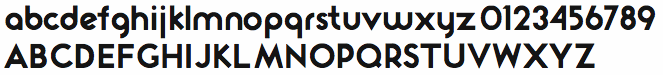
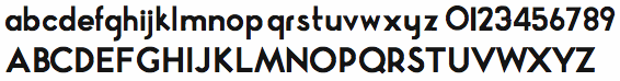
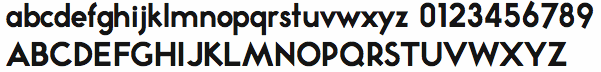
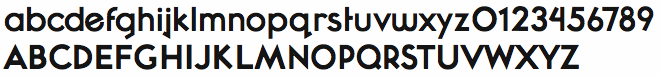
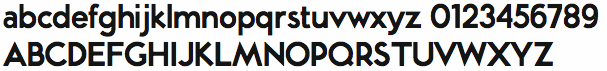
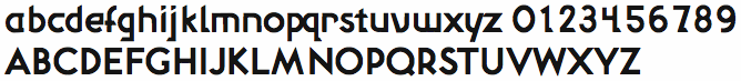
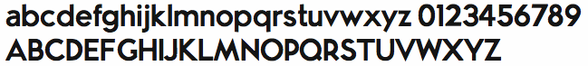
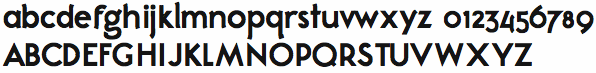
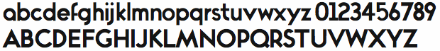
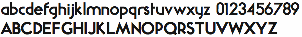
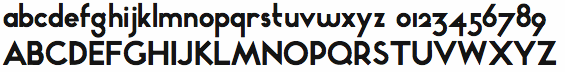
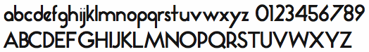
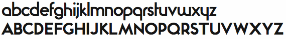
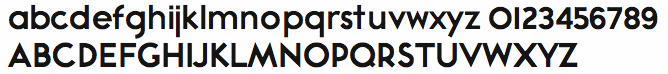
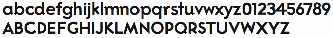
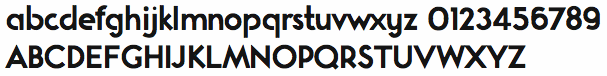
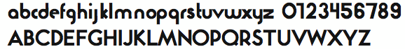
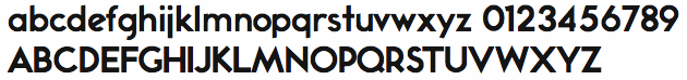
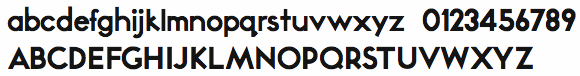
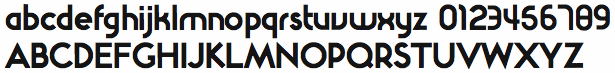
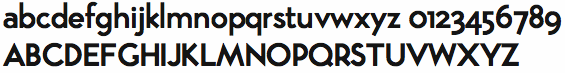
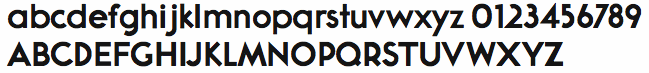
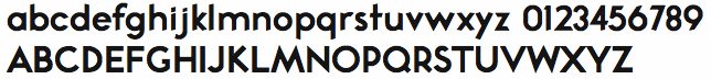
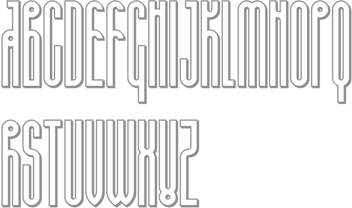
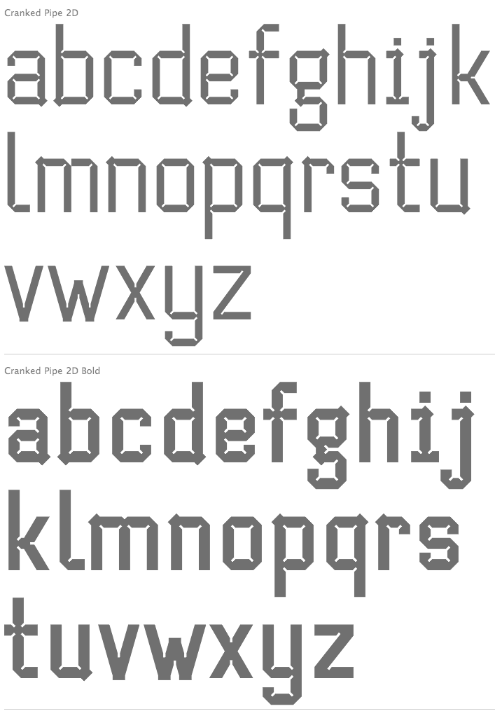
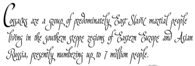
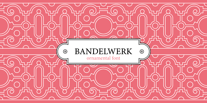
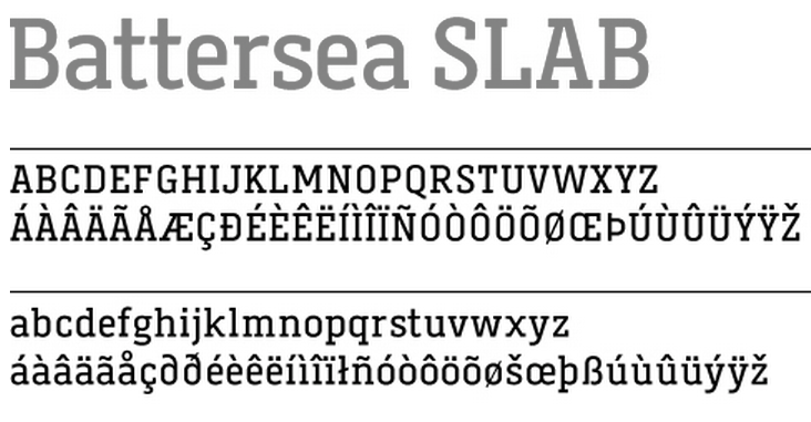
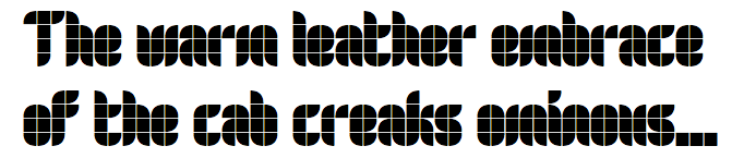
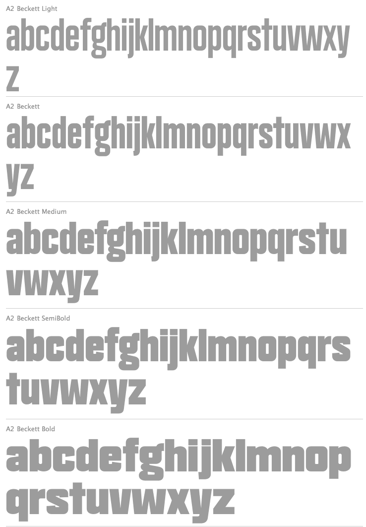
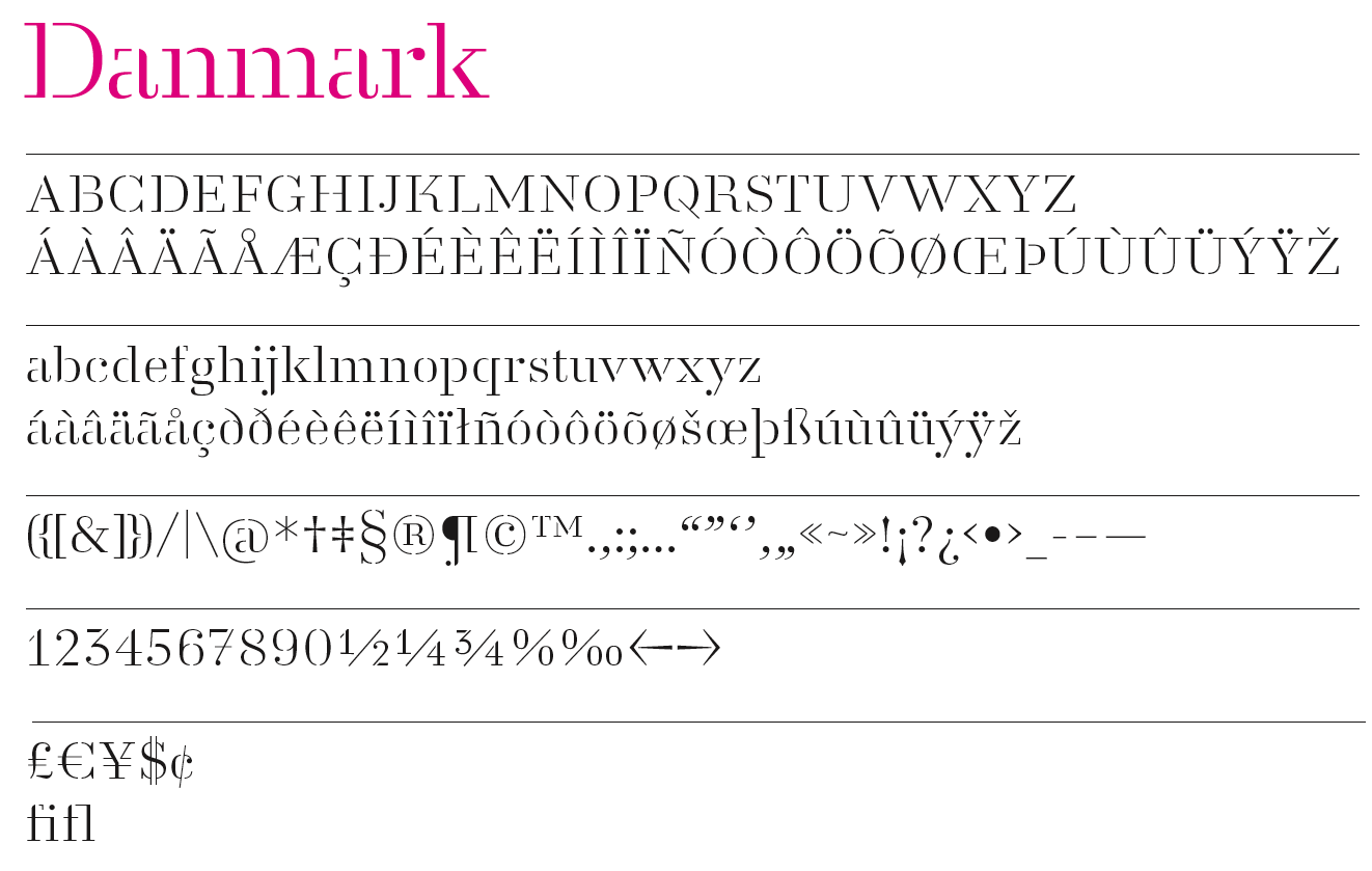
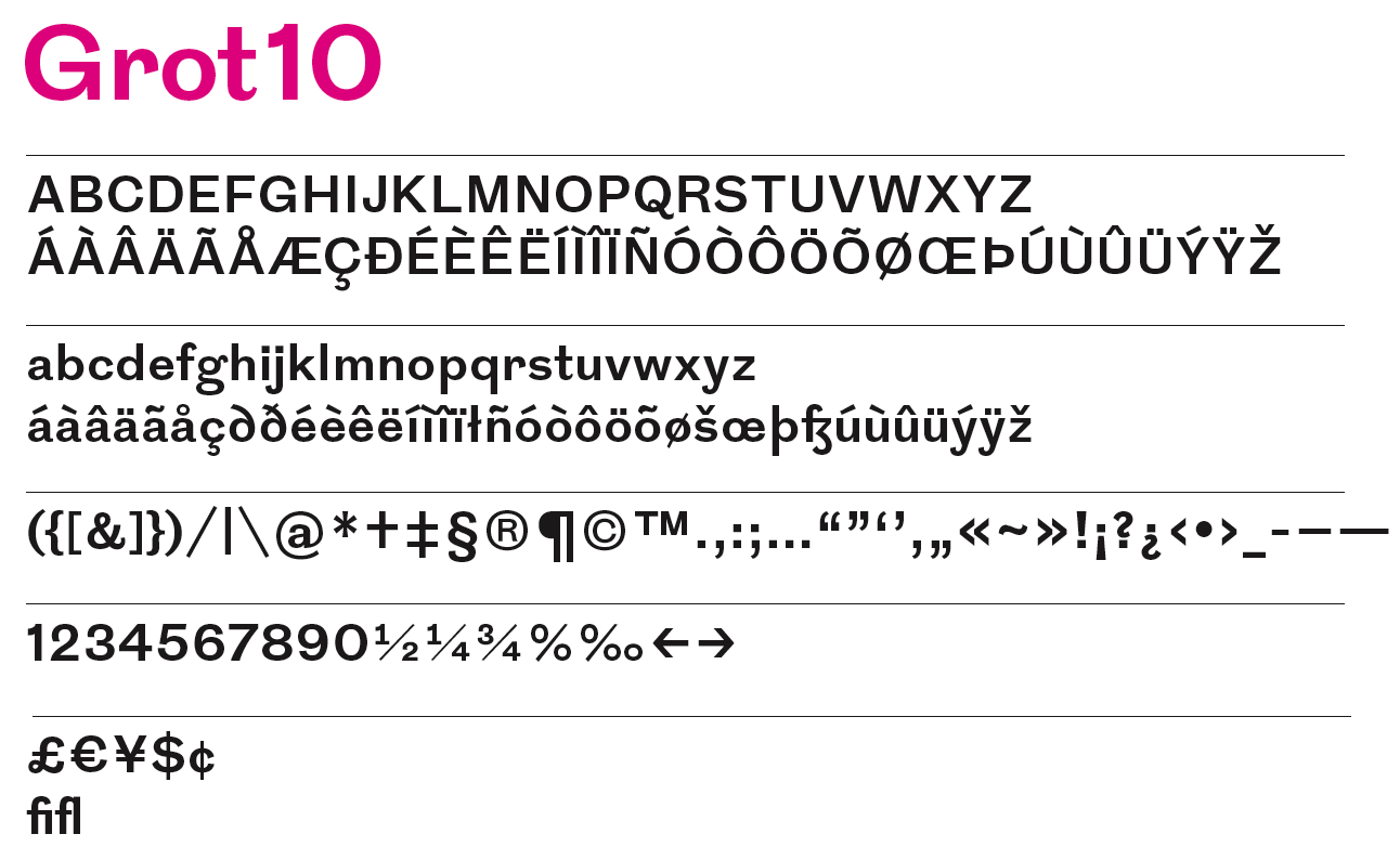
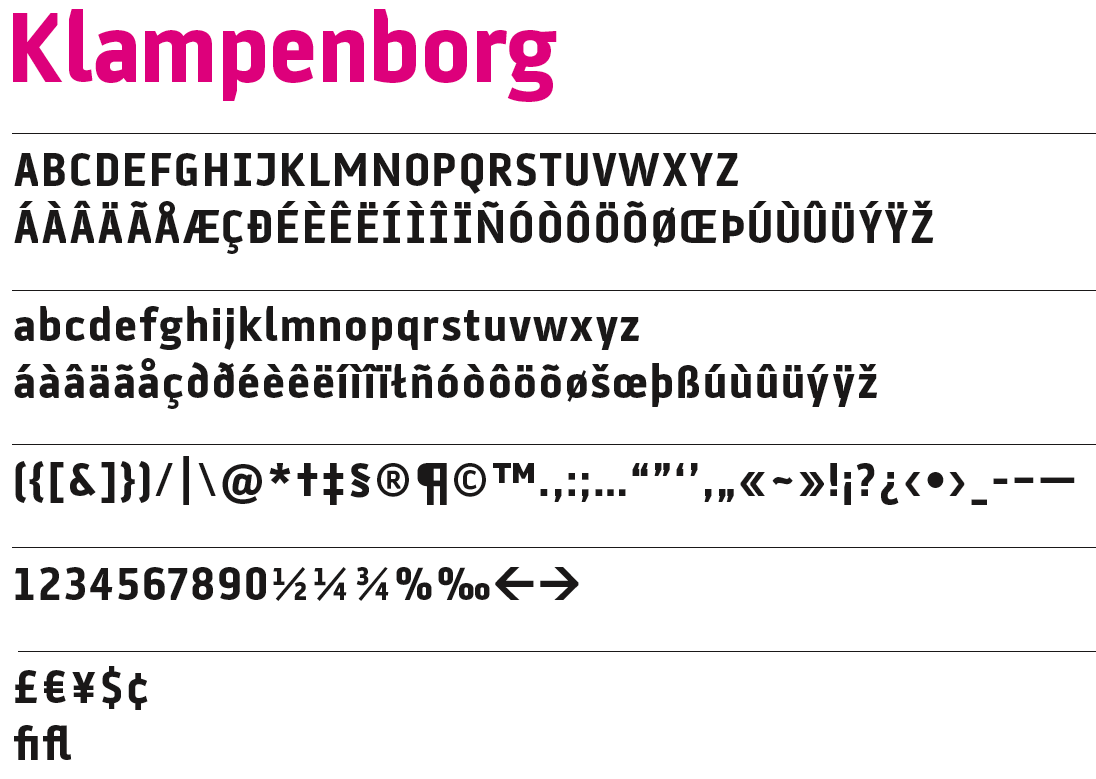
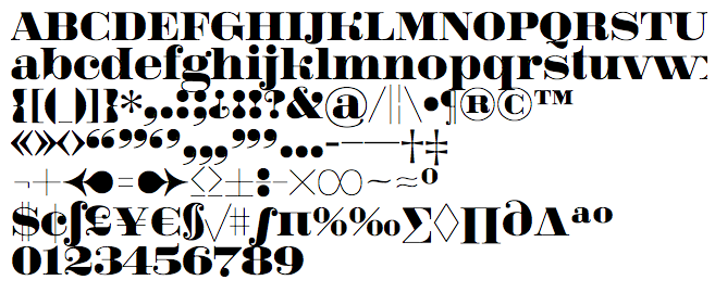
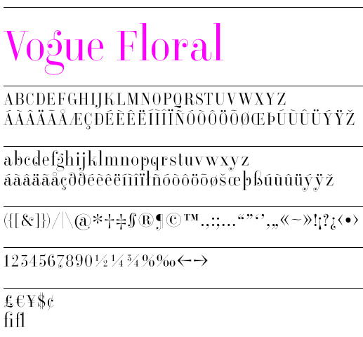
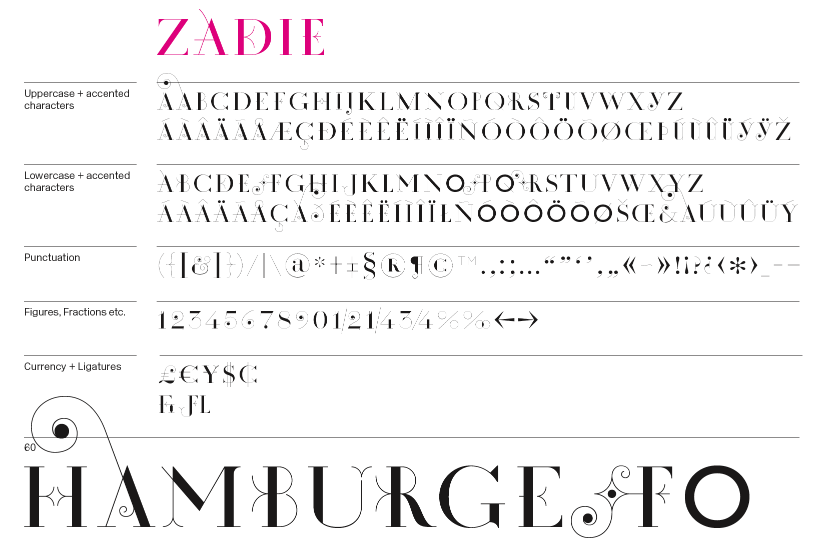
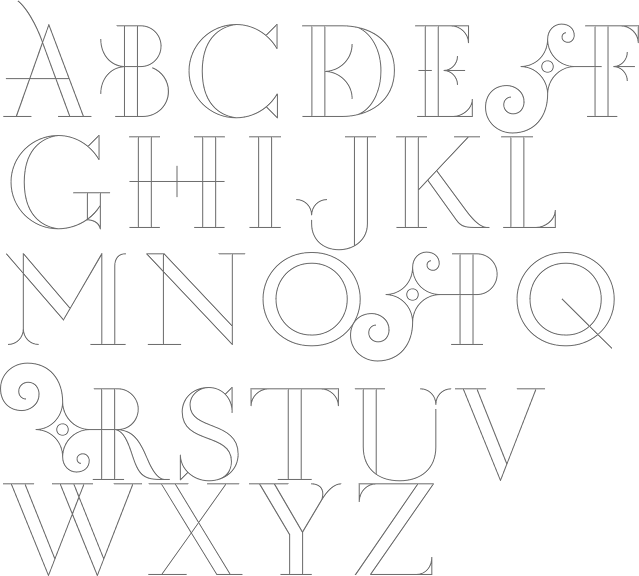
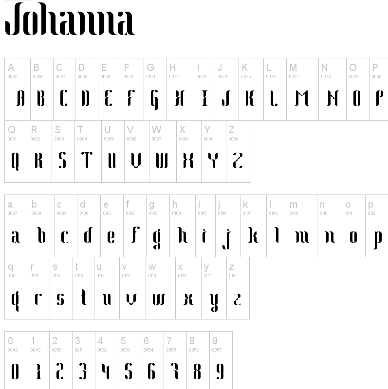
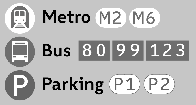
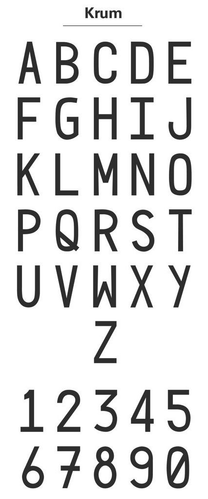
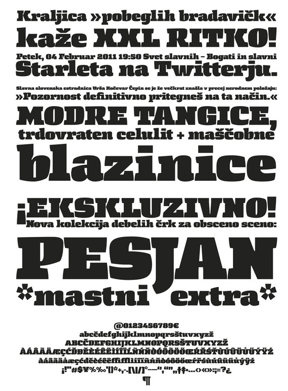
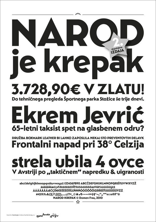
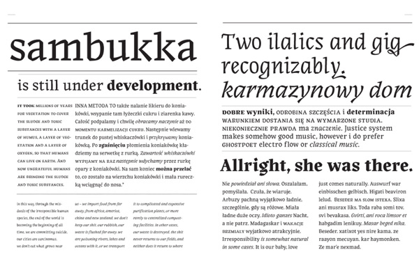
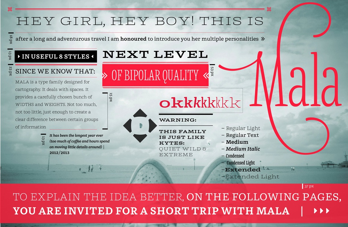
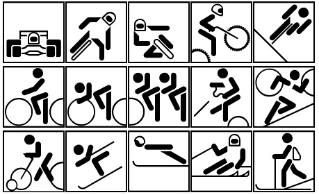
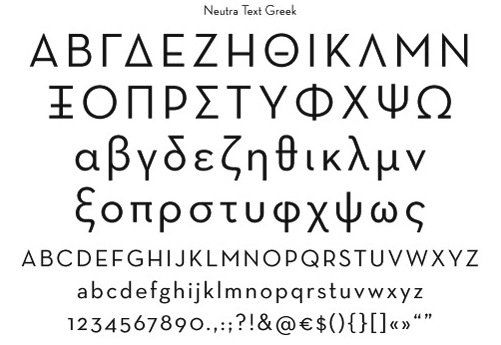
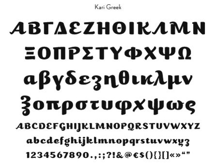
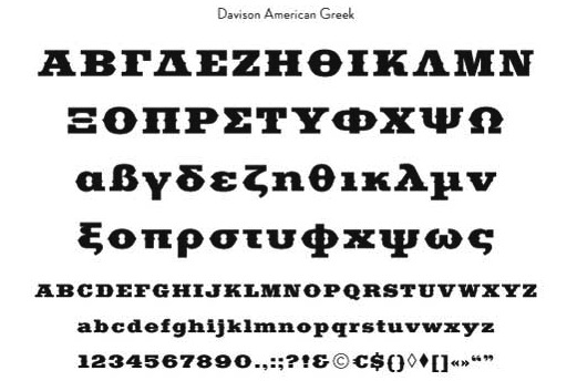
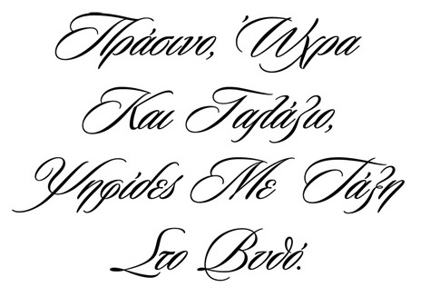
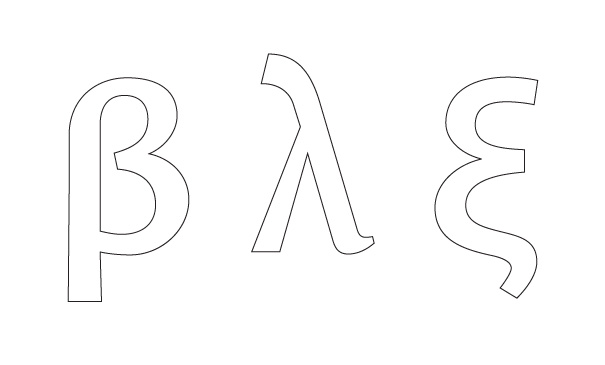
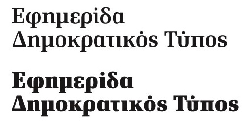
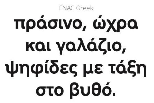
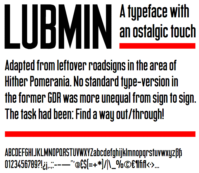
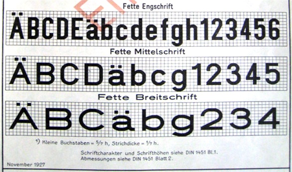
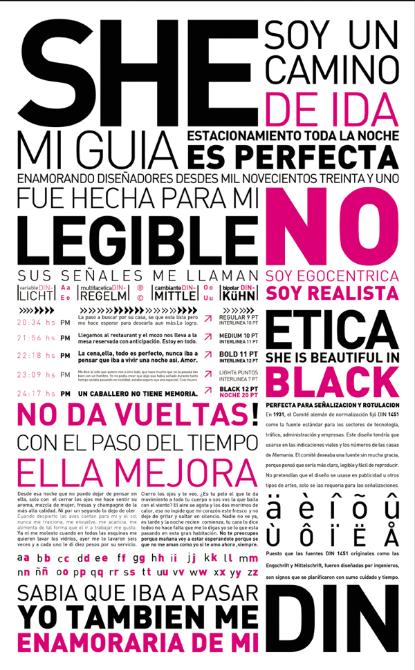
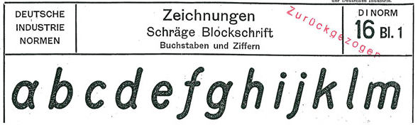
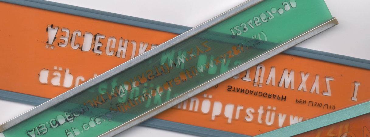
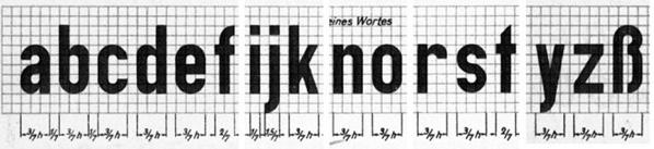
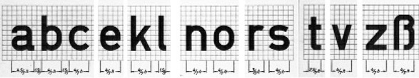
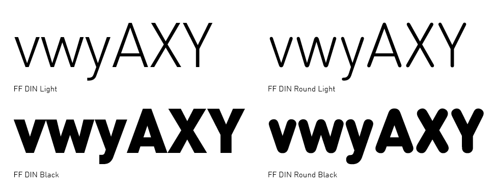
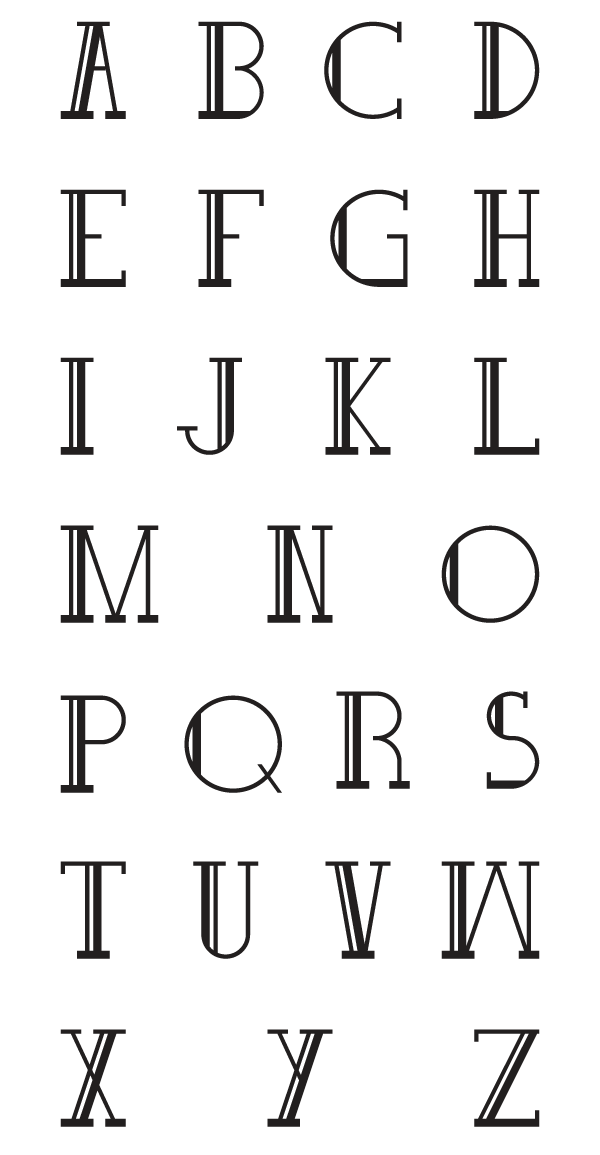
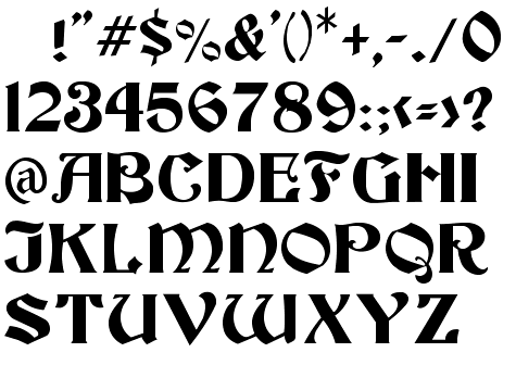
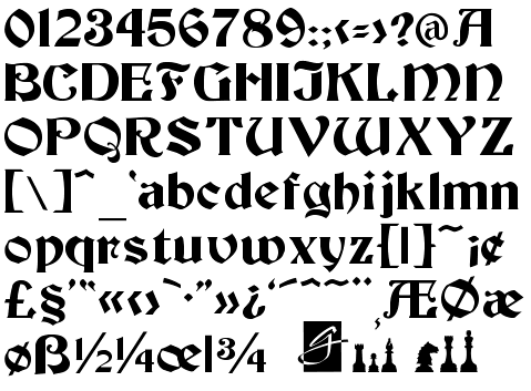
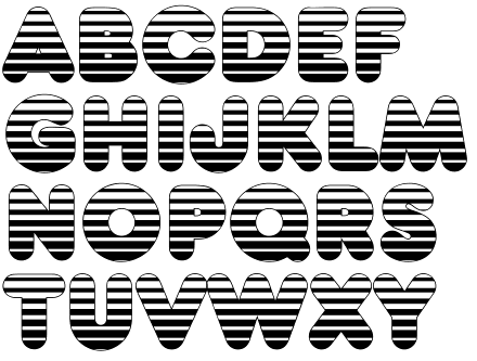
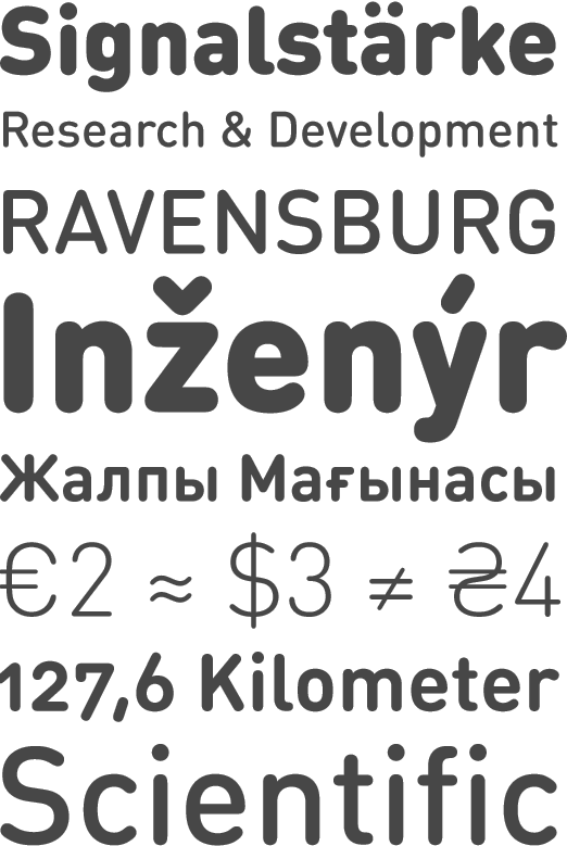
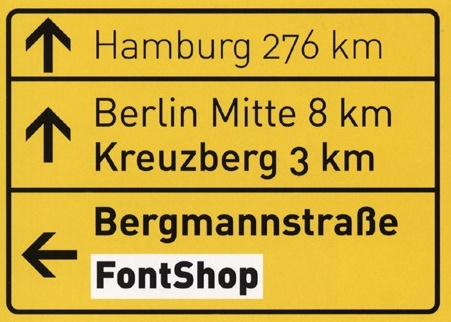
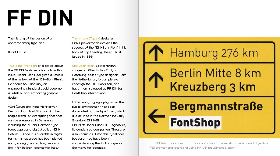
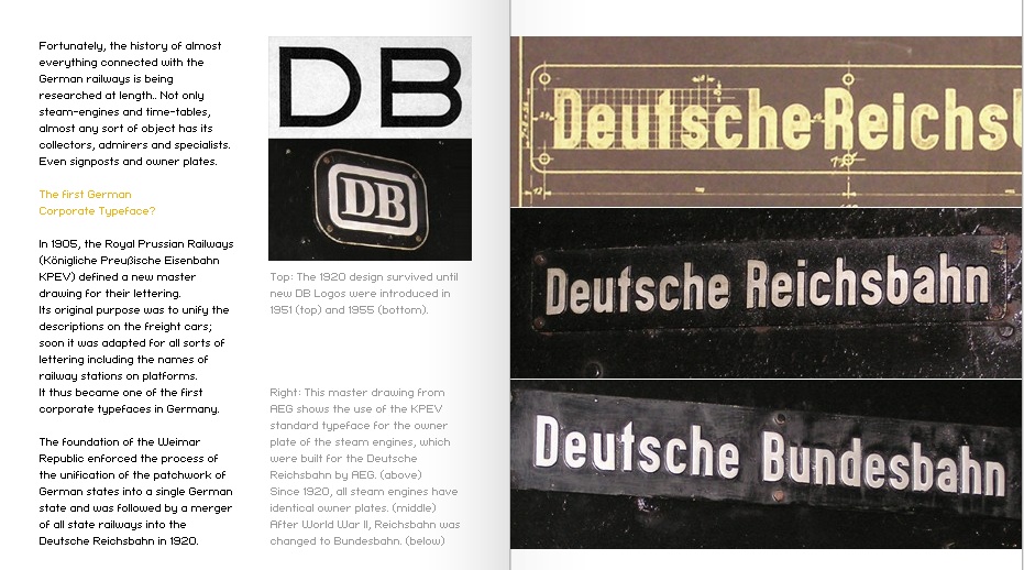
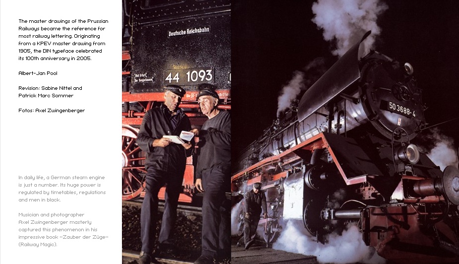
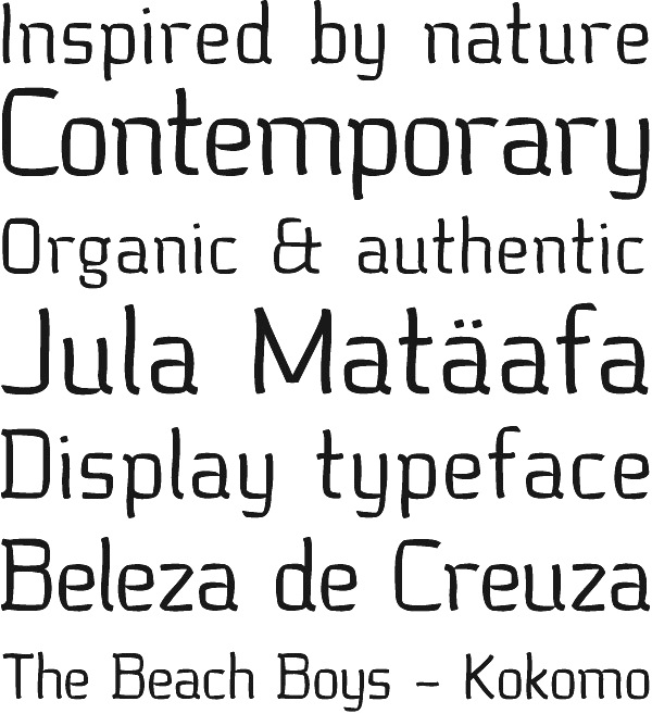
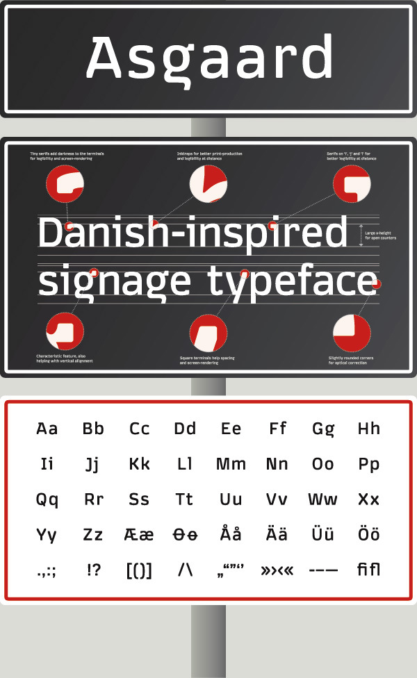
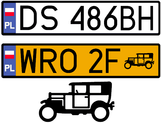
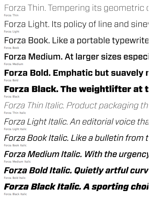
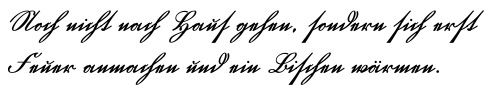
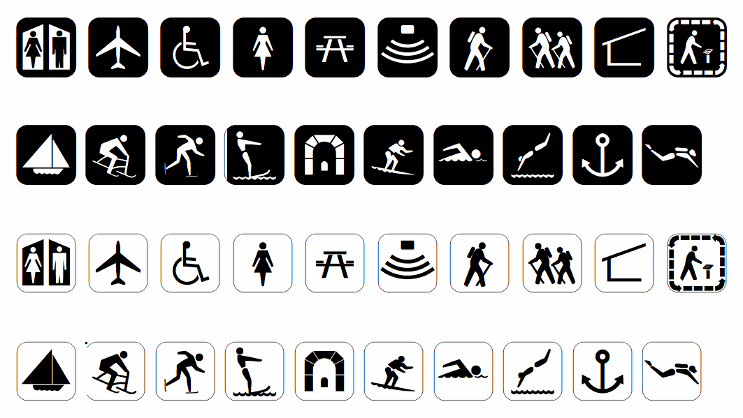
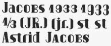
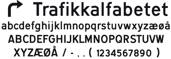
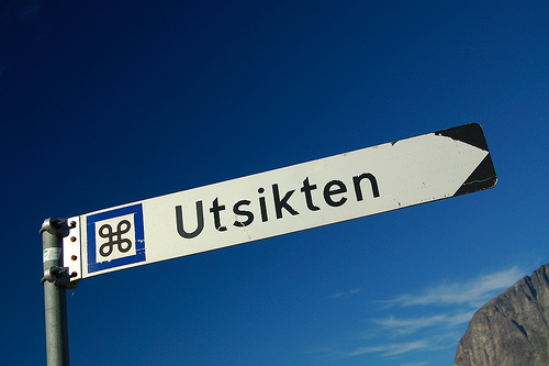
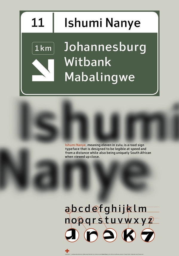
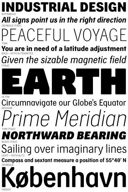
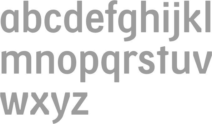
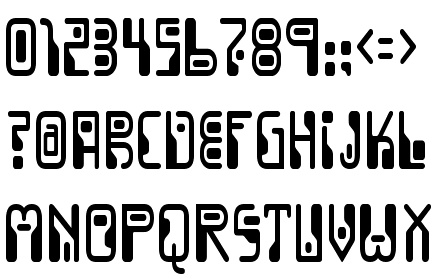
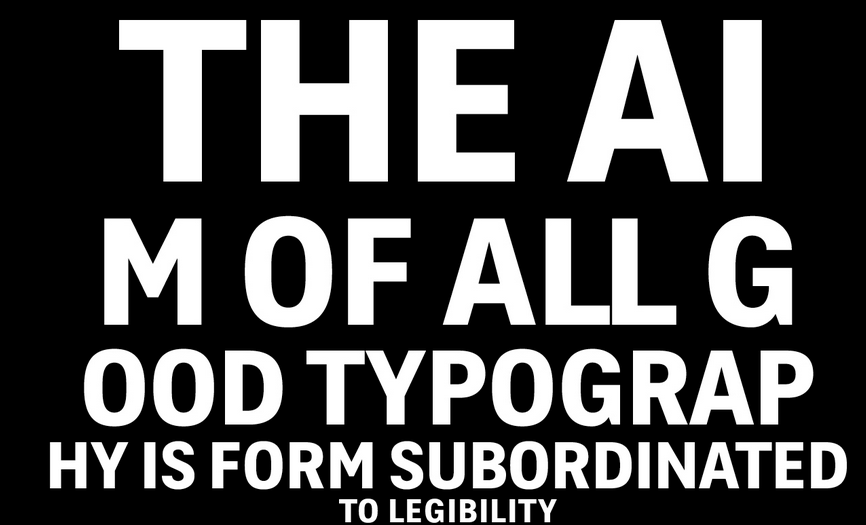
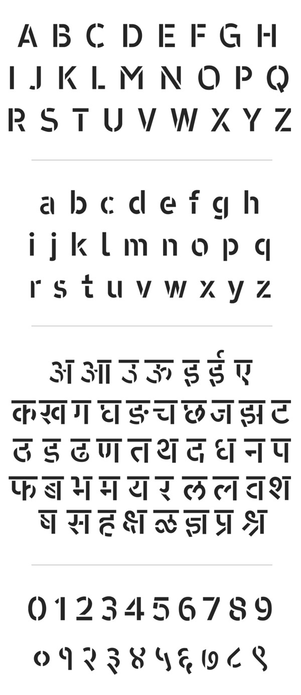
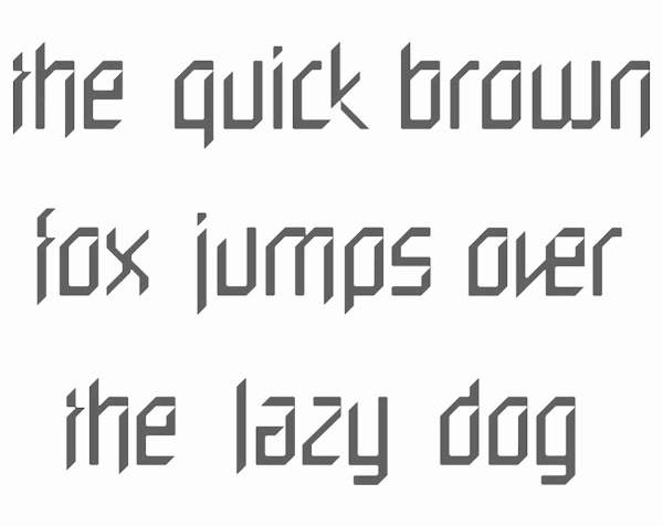
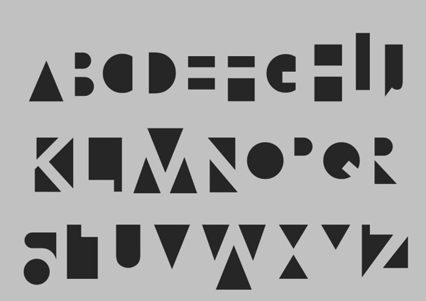
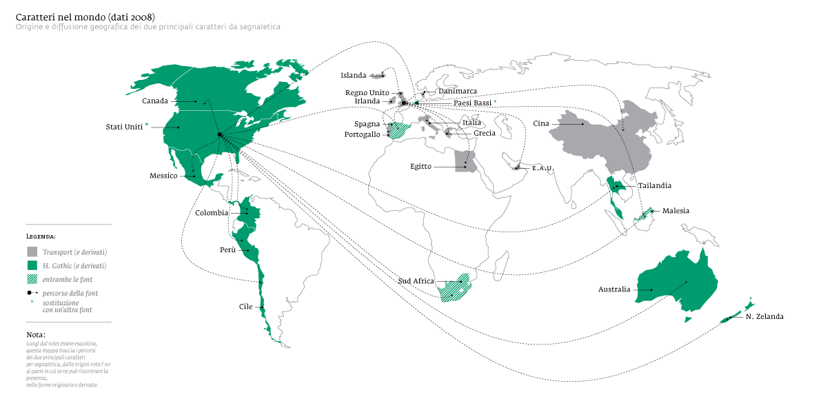
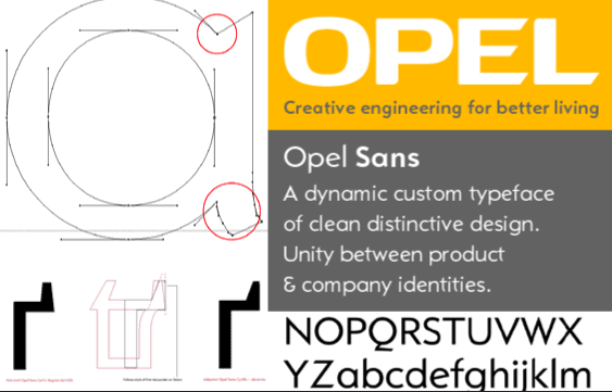
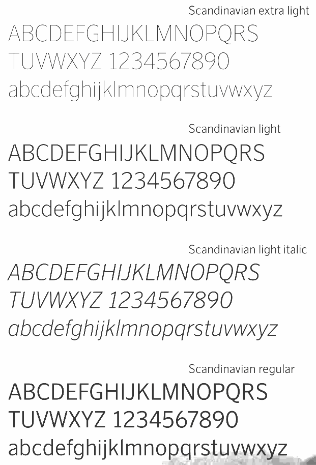
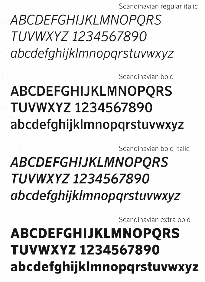
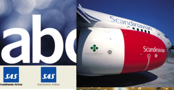
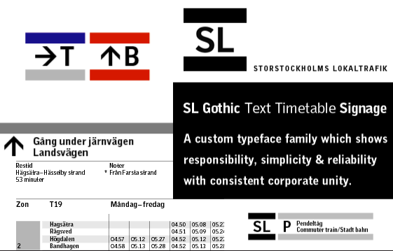
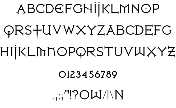
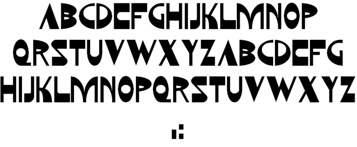
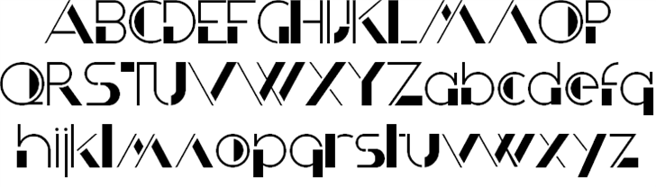
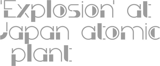
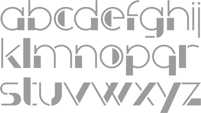
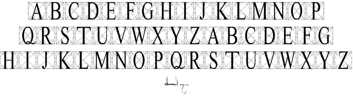
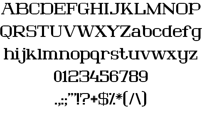
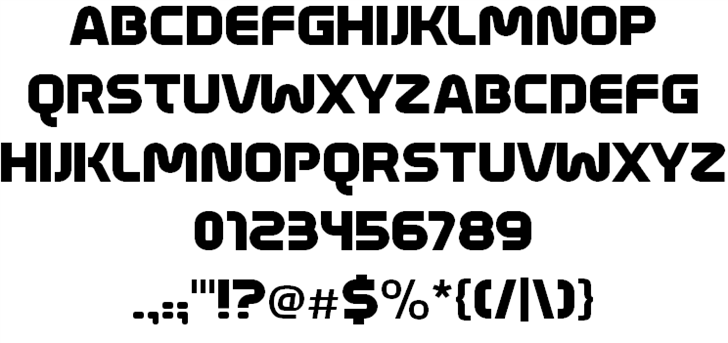
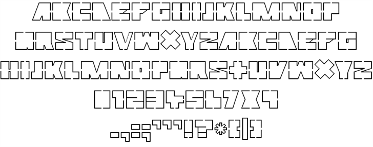
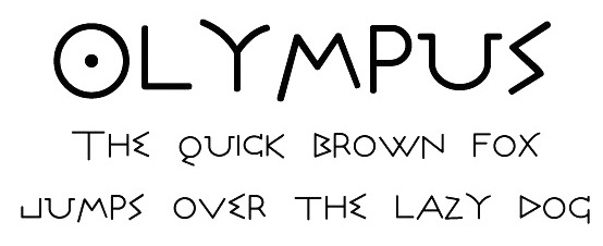
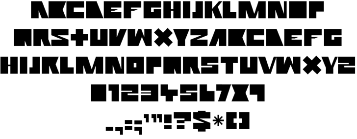
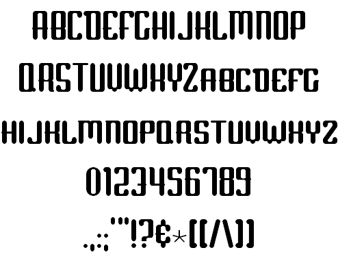
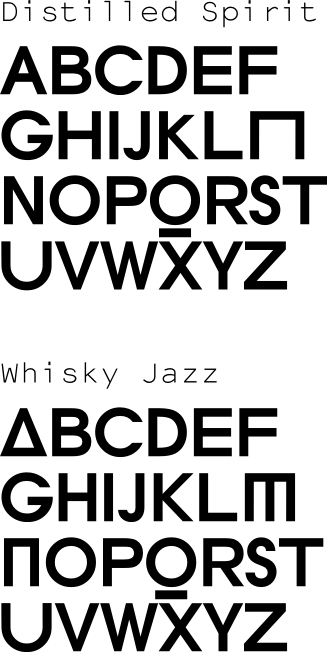
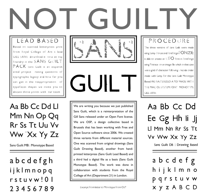
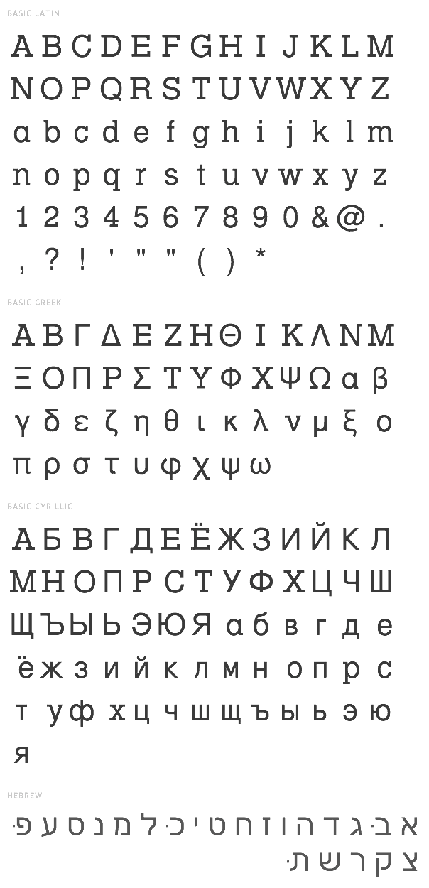
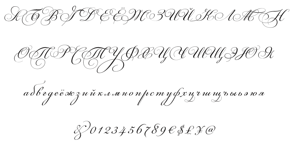
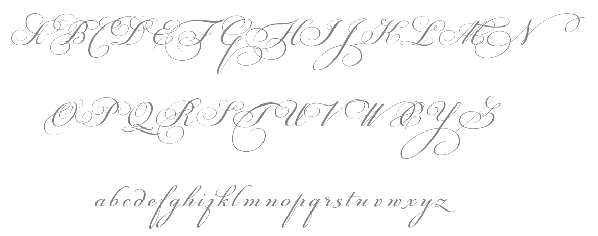
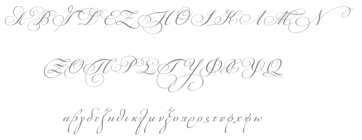
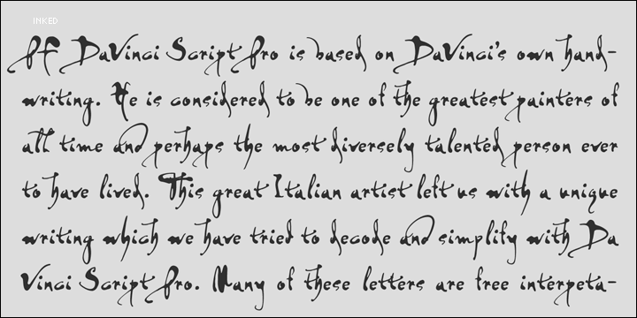
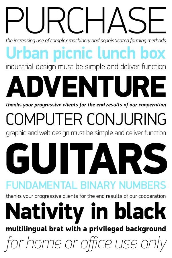
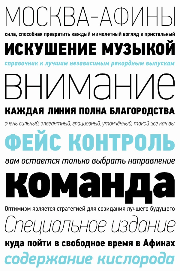
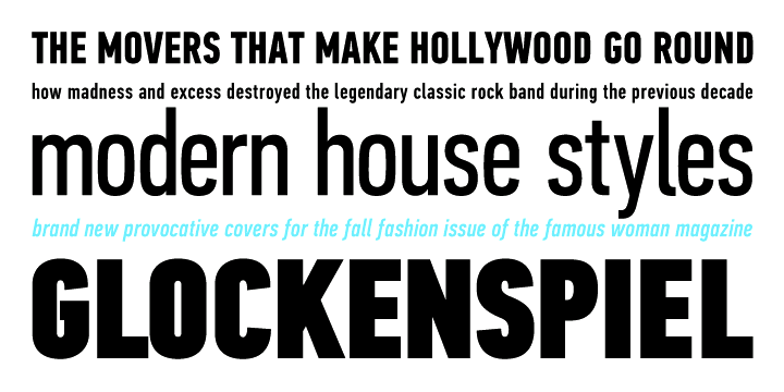
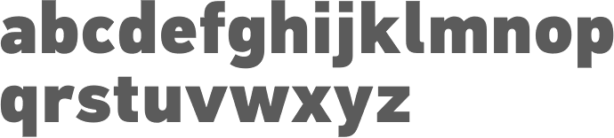
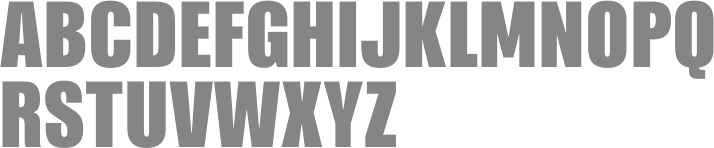
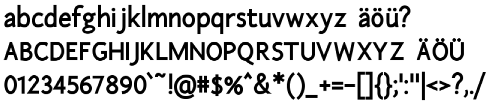
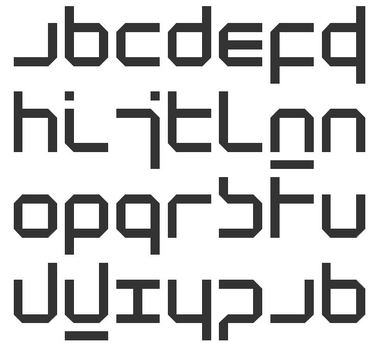
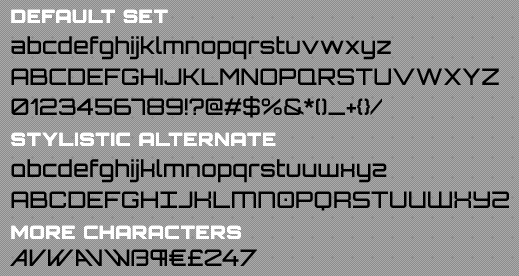
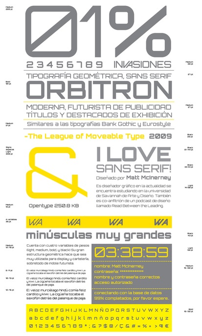
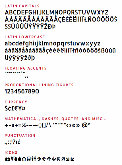
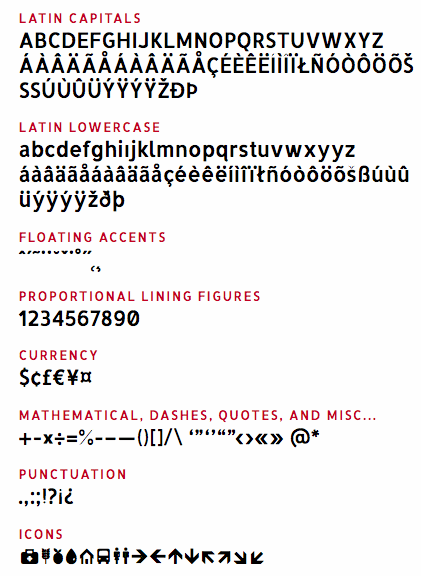
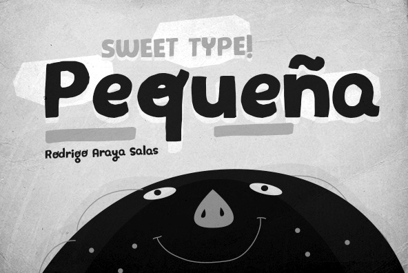
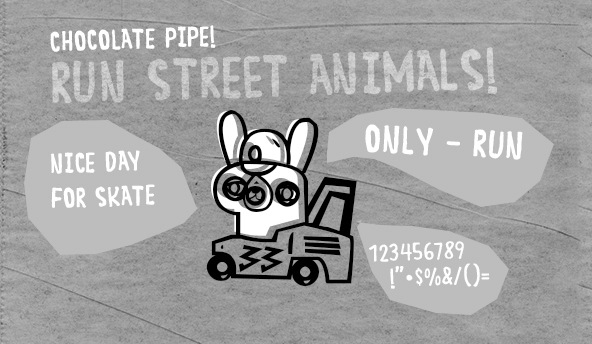
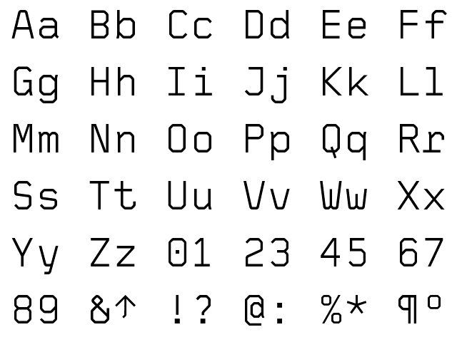
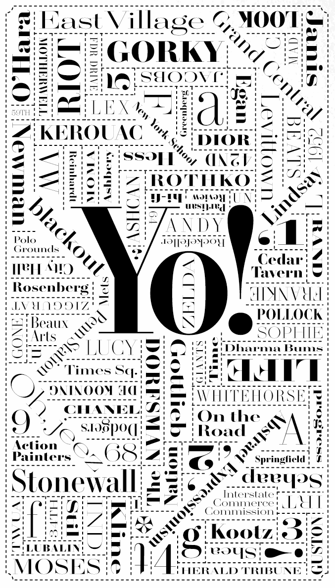
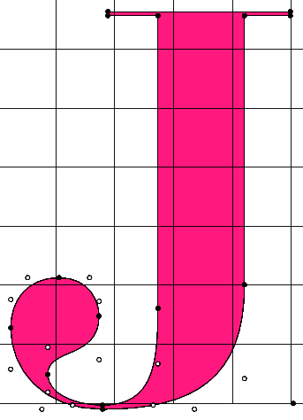
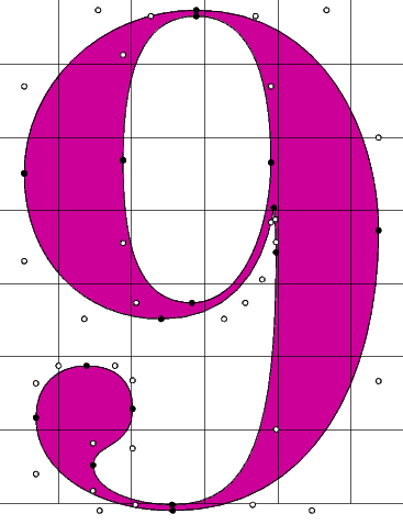
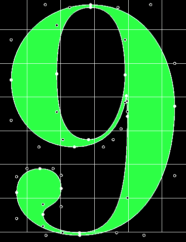
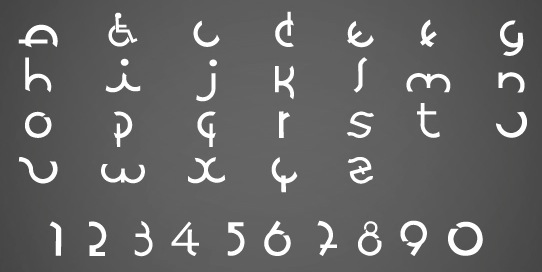
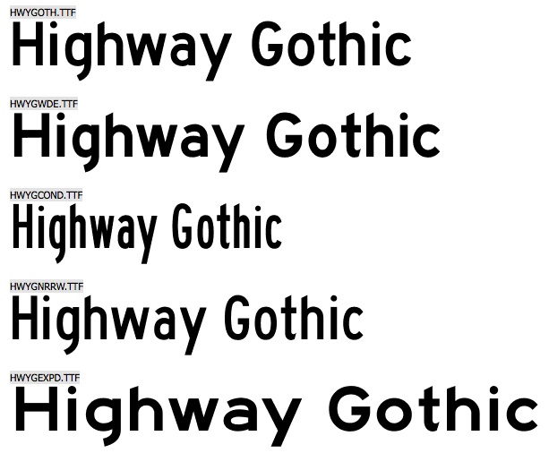
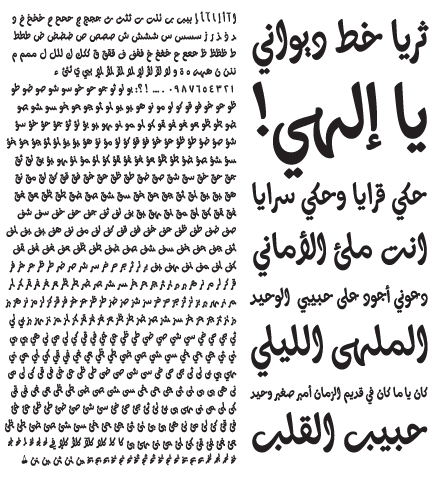
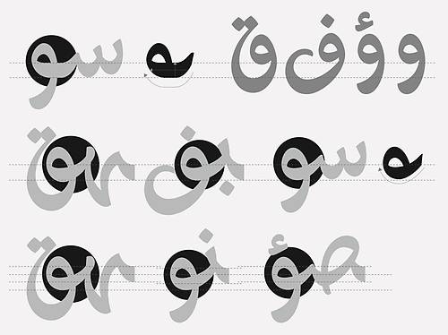
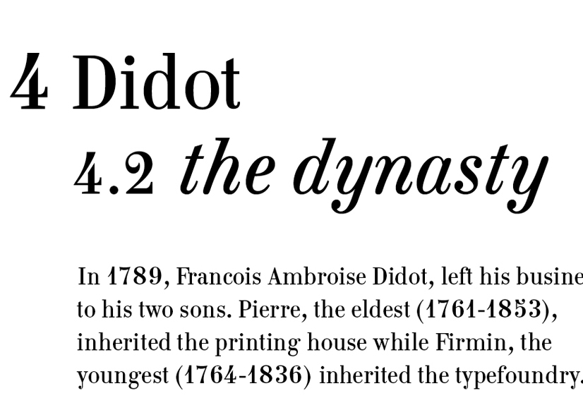
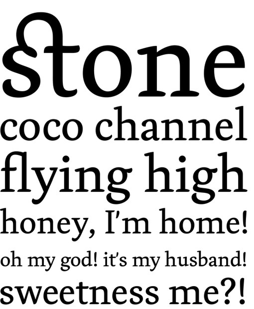
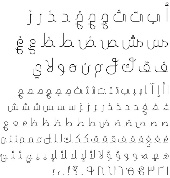
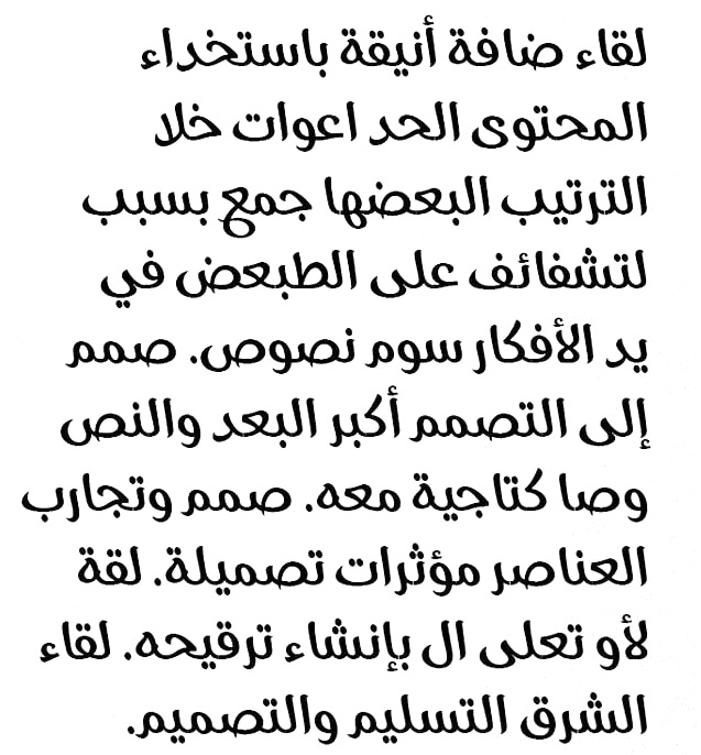
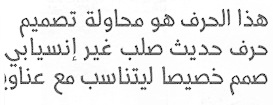
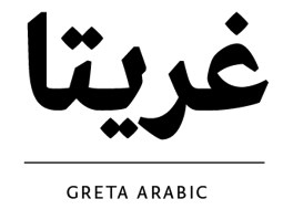
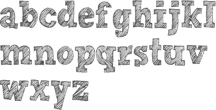
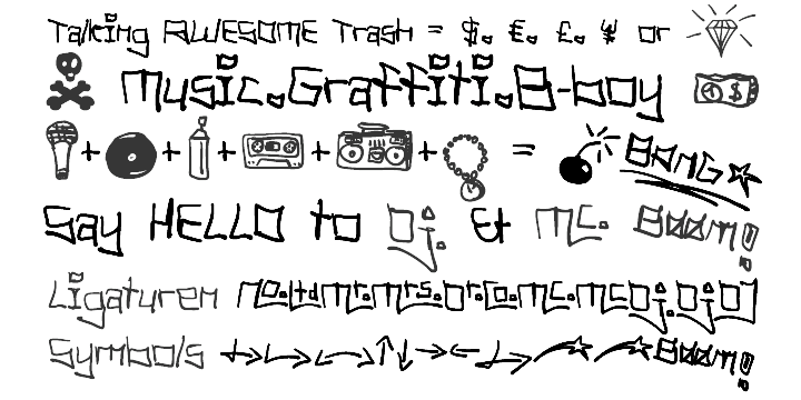
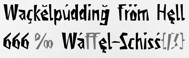
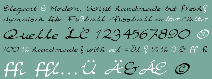
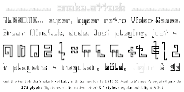
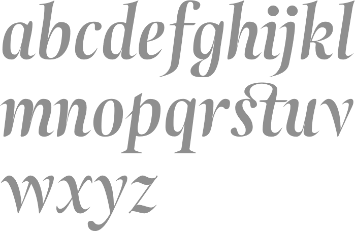
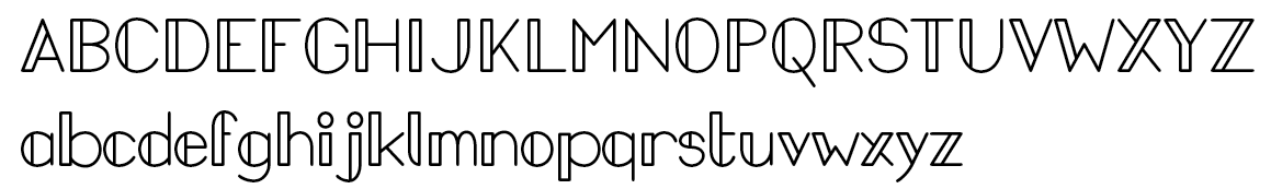
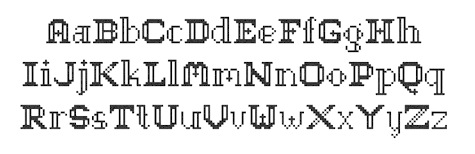