TYPE DESIGN INFORMATION PAGE last updated on Mon Jun 8 17:42:27 EDT 2026
FONT RECOGNITION VIA FONT MOOSE

|
|
|
|
|
Foundries of the 19th century | ||
|
|
|
|

SWITCH TO INDEX FILE
Bordeaux-based foundry. Their work can be found in Épreuves des caractères de la fonderie A. Laplace&cie (Paris, Bordeaux, ca. 1860) and in Épreuves des caractères de la Fonderie bordelaise. A. Laplace&comp (Bordeaux, Imp. de mad. V. Laplace, née Beaume, rue du Parlement, 19. [ca. 1850]). [Google] [More] ⦿ | |
Typefounder in Paris. His work can be found in Quelques caractères de la fonderie Pinard, rue de la Harpe, 88. Paris (Paris, ca. 1840). No full type showings in that publication, which mostly has filets, borders and vignettes. [Google] [More] ⦿ | |
Typefounder in Paris. His work can be found in Fonderie typographique A. Saintignon (Paris, 5, rue Notre-Dame-des-Champs, 1889). This small booklet has no full character sets. [Google] [More] ⦿ | |
Very Victorian in style, this 200 plus page publication showcases traditional ornaments and has about fifteen pages worth of ornamental capital alphabets. [Google] [More] ⦿ | |
Hungarian foundry/press run by Jesuits in the late 18th century. Gábor Kóthay based some of his fonts on their 1773 type specimen book. One is the 2-weight Schwabacher style Fraktur font SchwarzKopf (2002). LaDanse is based on a scan of a handwritten inventory found in that book. [Google] [More] ⦿ | |
A.D. Farmer
| |
Adam Numrich
| |
Parisian type foundry. In 1882, they published a specimen book, Spécimen des caractères de labeur de l'imprimerie typographique A.-H. Bécus. Scans: Bretonnes, normandes, initiales, initiales allongées, elzevier. [Google] [More] ⦿ | |
Aktiengesellschaft für Schriftgiesserei und Maschinenbau (or: AG für Schriftgiesserei) |
For digital revivals, see Appeal DT (2007, Malcolm Wooden, a revival of Apollo) and RMU Neptun (2021, Ralph M. Unger). [Google] [More] ⦿ |
Albert Wilhelm Kafemann
| |
| |
Foundry in Lyon. Its work can be found in Cahier d'epreuves des caractères de la fonderie d'Allegre et comp.e, à Lyon (Lyon, ca. 1860). [Google] [More] ⦿ | |
Albany-based foundry, also called Franklin Letter Foundry (not to be confused with the Franklin Type Foundry in Cincinnati). It opened in 1825 and closed in 1832 when Kinsley died. The 1829 specimen book led James Puckett to develop the beautiful ornamental didone fat typeface Sybarite (2011), which comes in many optical weights. [Google] [More] ⦿ | |
The American Presbyterian Mission was opened in Allahabad in 1836. Two missionaries were transferred to China, but it was not until 1861 that they were able to baptise the first convert. At Shanghai the extensive printing operations of the Society were carried on. These comprised not only several presses which were constantly at work, but a foundry where seven sizes of Chinese type, besides English, Korean, Manchu, Japanese, Hebrew, Greek and others were cast. A type specimen book was published in Shanghai in 1872. [Google] [More] ⦿ | |
Their specimen books are classics:
A brief history of ATF by Carol Van Houten. Reference books. View the digital typefaces that are based (fully, or in part) on ATF's typefaces. See also here, here, and here. [Google] [MyFonts] [More] ⦿ | |
Andrea Amoretti
| |
Printer in Bordeaux, France, 1767-1836. In 1808, he published Epreuves des caractères de l'imprimerie d'André Brossier à Bordeaux, rue Royale. Local download. [Google] [More] ⦿ | |
Pesaro-based printer. For his typefaces, see Nuovo saggio di caratteri e vignette della tipografia di Annesio Nobili in Pesaro (Pesaro, 1834). [Google] [More] ⦿ | |
Antonio Lopez
| |
Archibald Binny (ca. 1762-1838) was a punchcutter from Edinburgh who emigrated to Philadelphia in 1795, where he met James Ronaldson, a businessman also from Edinburgh. In 1796, they started Binny&Ronaldson, the first real American type foundry. In 1809 and 1812, they published America's first specimen books. [Google] [MyFonts] [More] ⦿ | |
Parisian foundry, which made typefaces such as Antique Old Style No.2 (1869), purchased by Stephenson Blake. [Google] [More] ⦿ | |
A.V. Haight
| |
Typefounders in Paris. Their work can be found in Spécimen des caractères de la fonderie Bailleul et cie, rue des Boucheries St.-G. 38. Premier cahier (Paris, Imprimé chez Paul Renouard, rue Garancière, n.5. [ca.1850?]). This is a very ordinary book with only text samples in the typical post-Didot style. For a digital revival, see the free didone typeface Bailleul Roman (2019) by Guillaume Litaudon. [Google] [More] ⦿ | |
Boston-based foundry dating from the 19th century. Nick Curtis made the Western billboard typeface New Boston WBW (2004) based on a 1826 Baker and Greele face. Baker and Greele were the first to cast some native Indian type. For example, in 1827-1829, they cast type for the Cherokee script, a syllabary composed of 85 unique glyphs, each representing a distinct phonetic component. This syllabary was invented by Sequoyah [or George Guess, or Gist, 1760-1843] in 1809. Of the characters finally used, only a few actually retain the original shape, or derivatives thereof. Those sharing Latinate forms may or may not have been suggested by the Rev. Samuel Worcester, who helped Sequoyah to improve and finally adapt the script for use as foundry type. Wm. Joseph Thomas from the Joyner Library of East Carolina University, Greenville, NC, writes; "I know that the American Board of Commissioners for Foreign Missions, which was also headquartered in Boston, arranged for the types to be cast, and they ordered a press to be sent to the Cherokee Nation. The first known printing in the syllabary was December 1827 in the Missionary Herald; the types and press were shipped to the Cherokee Nation in November 1827, according to letters between the ABCFM and the missionary in C.N. The Cherokees began printing their newspaper, the Cherokee Phoenix in February 1828." Harvard has an old type specimen book: "Specimen of printing types and metal ornaments, cast at the New England Type Foundry by Greele & Willis, Congress Street, Boston" (New England Type and Stereotype Foundry, Boston: Beals, Homer & Co., Printers, 1828). In this book, most specimens have imprint: Baker & Greele, Boston, some dated. [Google] [MyFonts] [More] ⦿ | |
Baltimore Type Foundry (or: Baltotype)
| Also known as Fielding Lucas, Jr., Lucas Bros., H.L. Pelouze&Son, and Chas. J. Cary&Co. Specimen may be found in Convenient Specimen Book of Type, Rules, Borders, and Electrotype Cuts from the Baltimore Type Foundry (Baltimore: Chas. J. Cary&Co., 1888. Banta Book of Types&Typographical Tips. Menasha: George Banta, 1961). The company existed until well into the 20th century, and published a catalog as late as 1957 called Type and Rule Catalogue 13, Baltotype. A selected list of typefaces:
Rich Hopkins, a printing historian, acquired Baltotype ca. 1993. Based on drawings from the 1950s in the Baltotype material, Miranda Roth at P22 designed LTC Athena, a narrow art deco typeface, in 2013. [Google] [More] ⦿ |
BB&S was purchased by ATF about 1911 and it operated independently until about 1930. Typophile page on them. Text file with a list of the typefaces in their Catalog 25 (1925). Discussion of some of their typefaces and digitizations:
Digital typefaces that descend from Barnhart / BBS. [Google] [MyFonts] [More] ⦿ | |
British type foundry active in the 19th century, located in Clare-Market. [Google] [More] ⦿ | |
| |
French typefoundry. Specimen books by them include
| |
Beaumarchais
| French editor, author, printer and typefounder (b, 1732, d. 1799) who ran a foundry in Kehl (Germany) from 1781 onwards. He had acquired the types, punches and matrices of John Baskerville (Birmingham) from John Baskerville's widow in 1775 for 3700 pounds. In 1795 the Beaumarchais foundry was partly sold to Franz Laurent Xavier Levrault (1762-1821) who ran the Levrault family print shop in nearby Strassbourg (est. 1675). Levrault in turn was sold in 1854 and became Berger-Levrault. The latter company resettled in Nancy, France, in 1873. Beaumarchais's ex-employee Jaquot continued as independent typefounder in Strassbourg. Beaumarchais was the first to print the complete work of Voltaire, best known as the Kehl edition, under the name "Imprimerie de la société littéraire typographique". The name Beaumarchais also pops up in type designs. For example, David Nalle designed a typeface called Beaumarchais. The typeface 1785 GLC Baskerville (2011, Gilles Le Corré) was inspired by one of the types sold to Beaumarchais by Baskerville's widow. [Google] [More] ⦿ |
Benjamin Krebs
|
|
Benjamin Krebs
| |
Milwaukee, WI-based typefounder active in the latter part of the 19th century. [Google] [More] ⦿ | |
Milwaukee-based foundry, also called Benton, Gove&Co., Benton, Waldo&Co., and the Northwestern Type Foundry. [Google] [More] ⦿ | |
Bertrand Loeulliet
| |
Louis-Marie-Charles Bertrand-Pottier was a printer in Bordeaux, France, 1779-18xx. In 1809, he published Epreuves des caractères de l'imprimerie de Bertrand-Pottier. Local download. [Google] [More] ⦿ | |
Binny&Ronaldson
| In 1796, Archibald Binny (ca. 1762-1838) and James Ronaldson (1769-1841 or 1842) (some say 1768-1842) started the first permanent American type foundry in Philadelphia in 1796, called Binny&Ronaldson. James, a business man from Edinburgh was the financial fhalf of the pair. In 1809 and 1812, they published America's first specimen book. The only complete copy of this book is at the Rare Book and Manuscript Library of Columbia University, and is entitled A specimen of metal ornaments cast at the letter foundery of Binny and Ronaldson (20 pages, printed by Fry and Kammerer, Philadelphia, USA, 1809) and Specimen of printing types from the foundry of Binny & Ronaldson (1812, Philadelphia, Fry and Kammerer, printers). Local download of the 1812 book. James Ronaldson published Specimen of Printing Type, from the Letter Foundry of James Ronaldson, Successor to Binny&Ronaldson; Cedar, Between Ninth and Tenth Streets, Philadelphia (Philadelphia: J. Ronaldson, 1822). Acquired by Johnson&Smith in 1833, it became L. Johnson&Co. in 1843, and finally MacKellar, Smiths&Jordan in 1867. The latter company was the largest typefounder in America when in 1892 it was amalgamated with many others into ATF. About digital typefaces that are derived: MyFonts sells Isabella, a font by ATF/Kingsley that can be traced back to Binny&Ronaldson. It also offers Really Big Shoe NF (Nick Curtis, 2009), which is based on Ronaldson's Oxford. Dick Pape published the free fonts Binny & Ronaldson English Two Line Orn (2010), Binny & Ronaldson Great Primer Two Pica (2010), and Binny & Ronaldson Primer Two Line Orn (2010). [Google] [MyFonts] [More] ⦿ |
BiViTy: Bibliothèque virtuelle de typographie
| Jacques André's site that lists all digitally available type specimen books. [Google] [More] ⦿ |
British type foundry in the late 19th century. One of its types, Blackfriars, was digitally revived by Nick Curtis as Drury Lane in 2007. [Google] [More] ⦿ | |
This firm originated as a branch of Elihu White's New York Foundry in 1817, but was sold and became the Boston Type Foundry in 1820. When stereotyping, a process which utilized printing plates made from set up type, was introduced in America, the Boston Type Foundry became a major producer of stereotype plates. Specimen book: "Specimen of Printing Types from the Boston Type and Stereotype Foundry" (Boston: Dutton and Wentwork, printer, 1828). Stephen O. Saxe edited Specimen of printing types from the Boston Type&Stereotype Foundry (New York, Dover, 1989, 184 pages). That original book dates back to 1832. [Google] [More] ⦿ | |
Boston Type Foundry
|
Free specimen books: Condensed specimen book from the Boston Type Foundry (1860, John K. Rogers&Co, Boston), Popular designs for artistic printers. Selected from the novelties manufactured by the Central type foundry, of St. Louis and Boston type foundry, of Boston. The only manufacturers of copper alloy type (1892). Digital revivals:
View digital typefaces derived from the Boston Type Foundry. [Google] [MyFonts] [More] ⦿ |
Firenze-based foundry. Their work can be found in Campione dei caratteri, fregi e vignette della fonderia tipografica dei fratelli Boyer e c. stabilita in Firenze (Firenze : Dai torchj di Gregorio Chiari e figlj, 1832). [Google] [More] ⦿ | |
New York-based foundry, also called Walker&Pelouze (set up in 1855 by Henry Lafayette Pelouze), Walker&Bresnan, and P.H. Bresnan type Foundry. [Google] [More] ⦿ | |
French foundry, located in Paris. Its work can be found in Épreuve des caractères de la fonderie de Briquet (Paris, Cloître Saint Benoît, 1757). Audin tells the story of the foundry. The senior Briquet bought a foundry in The Netherlands in 1720, but he died around 1725, leaving the business to his son. In 1728, his son became associated with Loyson, who had his own foundry since 1727, and the foundries were joined. Son Briquet died some time between 1728 and 1751, leaving behind a widow. Loyson wasted no time and married her. Loyson and the Briquet widow operated from 1751 until 1758. In 1757, they left the business to her son [note: Loyson's father-in-law was named Briquet, and his son-in-law was named Briquet...], who in 1758 left the foundry business. So, in 1758, Loyson and Veuve Briquet became Vincent Cappon (b. Carrières sous Conflans, d. 1783, Paris), who was Loyson's student. After Cappon's death in 1783, the business was run by Cappon's widow until 1785. Finally, from 1785 until 1837, the foundry was run by Pierre Louis Wafflard, apprentice of J. Gill&aeacute;. Publications include Epreuve des caractères de la fonderie de Loyson et Briquet (1751, Paris, Rue de la Parcheminerie). Local download. [Google] [More] ⦿ | |
Frankfurt-based foundry established in 1892. Many of its shares were acquired by D. Stempel in 1919. [Google] [More] ⦿ | |
Bruce Type Foundry
| Founded in New York in 1813, and acquired by ATF in 1901, this foundry made fonts such as Bruce Old Style (now Bitstream), Madisonian (now available from Présence Typo), Ornamented No. 1007 (Mac McGrew: Old Bowery is an ATF revival, in 1933 and again in 1949, of Round Shade No.2, originated by Bruce, one of its predecessor companies, about 1854, as Ornamented No. 1007.), and Old Style 7 (Linotype, Adobe). Also called D.&G. Bruce, George Bruce, George Bruce&Co., George Bruce's Son, George Bruce's Son&Co., and V.B. Munson. They published a 592-page specimen book in 1901: Bruce Type Foundry: Our Handy Book of Types, Borders, Brass Rule and Cuts, Printing Machinery&General Supplies.. In 1869, George Bruce (b. 1791, Edinburgh, Scotland; d. 1866, New York) published An abridged specimen book Bruce's New York Type-Foundry (1869), now available as a free Google book. Page with specimen of Great Primer Ornamented No. 5, Meridian Black Open (blackletter), Canon Teutonic Ornamented, Small Pica No. 2, Double Pica Graphotype, all taken from An Abridged Specimen of Printing Types Made at Bruce's New-York Type-Foundry (1868) and stolen from Luc Devroye's web site. Fists by the Bruce Foundry. Revivals: Bruce Ornamented No. 6 was digitized by Iza W from Intellecta Design in 2006 as GeodecBruceOrnamented. Gold Rush (2008, FontMesa) is a family of Western style typefaces based on a Bruce type family from 1865. FontMesa also made Belgian (2008) based on a Bruce Type Foundry design from the 1860s. Bruce 532 Blackletter (2011, Paulo W, Intellecta Design) is an excessively ornamental blackletter face. Michael Hagemann's slab serif family Gold (2011) is based on Bruce's Gold Rush (1865) after removing the shadows. RMU Bowery (2019, Ralph M. Unger revives Old Bowery). [Google] [MyFonts] [More] ⦿ |
Dresden, Germany-based foundry, est. 1894, which prospered in the 1920s. One of its most popular typefaces was the German industrial Kraftwerk font, Ohio Kraft. Brüder Butter later became Schriftguss AG, and then finally in 1951, VEB Typoart, the main type foundry in East Germany. Oliver Weiss, who has excellent digital revivals of the Ohio series called Neue Ohio (2016-2017), describes the mascot that can be seen on all of Brüder Butter's materials, the green Buttermännchen, designed by Karl Sigrist: a curious mark: a stumpy, little man in a great-coat and tapered top hat. His arms are raised, his face is cheers. [Google] [More] ⦿ | |
Buffalo-based foundry, also called Nathan Lyman&Co., N. Lyman's Sons, W.E. Lyman&Son. In 1893 the Buffalo Type Foundry joined the American Type Founders consortium, and became one of its strongest supporters. They published this specimen book: Buffalo Type Foundry, American Type Founders' Company, Specimen Book and Price List (350 pages, 1897). [Google] [More] ⦿ | |
| |
Foundry in Helsingfors, Finland, who were earlier in Jena. They acted as the foundry of the university there. The foundry stayed in Helsingfors under the leadership of one of the sons until 1924, when it was sold to Genzsch & Heyse. [Google] [More] ⦿ | |
Leipzig-based foundry founded in 1841 by book printer Karl Ph. Melzer (d. 1846). In 1871, the company became Hundertstund & Pries, and was owned by Firma August Pries. [Google] [More] ⦿ | |
Nineneteenth century San Francisco-based foundry, also called Wm. Faulkner&Son, and Painter&Co. [Google] [More] ⦿ | |
Italian foundry in Torino. Scan of a specimen book cover, 1872. [Google] [More] ⦿ | |
They also had a collection of fat faces that were popular in the first three decades of the 19th century. Books by the foundry include Specimen of Printing Types (T. Bensley, printer, 1815). [Google] [More] ⦿ | |
A brief history of the Caslon family, as summarized by Dave Forster in 2012 while he was a student at KABK [the text below quotes verbatim passages from his document entitled Another Bloody caslon].
| |
British type foundry active in the 19th century located in Hoxton. [Google] [More] ⦿ | |
| |
Printer in Paris. C.F.L. Panckoucke (b. 1780, Paris, d. Meudon, 1844) ran a printing shop (imprimerie) in Paris, succeeding his father Charles there, who had moved to Paris from Lille. [Google] [More] ⦿ | |
Publisher of the music notation font specimen book Noten- und Schriftproben der Röder'schen Officin in Leipzig (1860). [Google] [More] ⦿ | |
Designer of the blackletter font Centralschrift in 1853. Had his own foundry in Berlin. [Google] [More] ⦿ | |
Typefounder and engraver in Paris. His work can be found in Extrait du Spécimen de caractères de la fonderie Ch. Doublet, graveur (Paris, Gravure et fonderie typographiques, 60, avenue d'Orléans [1890?]). They also published Spécimen de caractères d'imprimerie (Paris, Ch. Doublet, ca. 1900, 356 pages). Scan of an art nouveau face. [Google] [More] ⦿ | |
London-based foundry, active at the end of the 19th century. Creators of the Victorian/almost art nouveau typeface Artistique Recherche. [Google] [More] ⦿ | |
Specimen books include Beaudoire & Cie., fonderie générale de caractères français et étrangers (18xx, by Théophile Beaudoire). In 2012, Parisian graphic designers Thomas Bizzarri and Alain Rodriguez co-designed Thermidor, a revival based on the work of Baudoire---it was a custom design for the Feu Sacré books. [Google] [More] ⦿ | |
Digital descendants include Derriey Vignettes (2012, Iza W), Tuscan (2016, Stefan Chirila) and Luxurious Flourishes (2013, Vincent Le Moign). [Google] [MyFonts] [More] ⦿ | |
Charles Laboulaye
| |
Cincinnati-based foundry (est. 1817), also called Oliver&Horace Wells, Horace Wells, Agant, and L.T. Wells, Agent. Among digitizations, we find French Ionic (Dan X. Solo, Solotype: quite ugly--based on an 1870 Clarendon derivative by the Cincinnati Type Foundry). Free specimen books on the web:
| |
Claude Persons
| |
Its original designs include Koster Initials and Litho (a curly Victorian typeface digitally revived by Nick Curtis in 2007 as Cleveland Litho NF; Curtis says that it comes from an 1898 specimen book but that contradicts the ATF date). Another Curtis revival, Yum Yum NF (2008) is said to be based on Mikado from an 1893 Cleveland specimen book. And in 2008, Nick Curtis continued with a revival of the geometric display typeface Morning Glory (1893), and a revival of Oxford called Really Big Shoe NF (2009). One of Central type foundry's most famous typefaces is the faux-Chinese font Chinese (1883, later called Mandarin). In 2010, Nick Curtis redid Geometric, a typewriter style face, and called it Linndale Square NF. In 2013, the Victorian capitals typeface Oxford No. 2 (from the 1893 catalog) provided the inspiration for the digital typeface MFC Damask (Brian J. Bonislawsky and Jim Lyles, Monogram Fonts Co). MFC Damask Flourish (2013) is a floriated caps typeface from the same source. [Google] [More] ⦿ | |
Typefounders in Paris. Their work can be found in this specimen book (Paris, ca. 1890). No full specimens in this publication, which has many of the useless typefaces of the late 19th century. The No. 549-553 typefaces are of the "Ronde" script style. Also standing out is No. 670, the Initiales Ornées Vénitien Romain, a very light typeface with frivolous border-like ornaments in the glyphs. [Google] [More] ⦿ | |
Philadelphia-based foundry, also called E. Starr&Son, and North American Type Foundry. [Google] [More] ⦿ | |
Trieste-based printer. For their typefaces, see Saggio di caratteri, fregi e vignette della stamperia di Colombo Coen (Trieste, 1858). [Google] [More] ⦿ | |
New York-based foundry, also agents for Inland and Keystone type foundries. Specimens of printing types, borders, ornaments, brass rules, &c. made by Conner, Fendler&Co (New York, ca. 1898). [Google] [More] ⦿ | |
| |
For a revival of a didone typeface by them, see Constantin (2017) by Miklos Ferencz. [Google] [More] ⦿ | |
Born in 1807 in Frankfurt am Main, May was one of the most famous puchcutters of his day. Like many punchcutters, he started out under Andreas Schneider, the first punchcutter of the Dreslerschen Giesserei. In 1828, he went to England, where he worked for several years at Watts (London), Stephenson, Blake & Co. (Sheffield), and Miller & Richard (Edinburgh). He became partnet of Alex. Wilson & Son in London, where he worked from 1845 until 1852, when that company stopped operations. He returned to Frankfurt in 1852 where he cut many Fraktur and Antiqua types until 1963. Coota, a foundry in Stuttgart, bought his Bourgeois-Fraktur. He returned to London in 1863, and died there in 1865. May's company was then taken over by his son F. F. May, also a punchcutter. [Google] [More] ⦿ | |
| |
Spanish foundry from the 19th century. See their specimen book Caracteres, emblemas y adornos de que está surtida la imprenta de D. Ignacio Boix (Madrid, 1833). [Google] [More] ⦿ | |
View the Stempel typeface library. [Google] [MyFonts] [More] ⦿ | |
Typefounder in Brussels. His work can be found in Épreuve des caractères de la fonderie de D. Stiasteny (Bruxelles, Rue de Cerf, no 23, son 1re. 1841). This book, sloppily put together, shows didone influences, typical of the epoch. No full type showings though. [Google] [More] ⦿ | |
Dutch printer in Amsterdam. Their first type catalog dates bac to 1802: Eerste Letterproef van de Boek-Drukkery van D. Zimmerman (1802). [Google] [More] ⦿ | |
New York-based foundry, also called Damon Peets Co., George Damon&Sons, and Damon Type Founders Co., Inc. [Google] [More] ⦿ | |
Belgian typefounder (b. Antwerp, 1815, d. Rotterdam 1864). He worked as a typefounder in Rotterdam from 1857 until about 1864, running the foundry D. J. Mensing&Co. Specimen in the Amsterdam University Library. [Google] [More] ⦿ | |
List of names of metal type available from M&H Type, Swamp Press, Barco Type, Quaker City Type Foundry, Michael&Winifred Bixler, and Harold Berliner. [Google] [More] ⦿ | |
De Passe&Menne
| Dutch foundry from 1842-1856, bought by Nicolaas Tetterode in 1856. Formerly, De Passe&Cie in 1841. Jean Baptist De Panne (b. Brussels, ca. 1806, d. Amsterdam, 1844) was a Belgian who had been a foreman of Firmin Didot in Paris. Kornelis Elix, an Amsterdam based typefounder, asked him to come to Amsterdam, where De Passe worked for him from 1837 on. In 1841, De Passe created his own foundry, only to die in 1844, a year after his first specimen was published. That specimen derived mostly from the Th. Lejeune foundry in Brussels, which was active there from 1836-1838. Specimen in the Amsterdam University Library. [Google] [More] ⦿ |
Deckersche Schriftgießerei
|
|
DeLittle
| In 2014, David Shields researched this British wood type foundry, which was founded in 1888 by Robert Duncan DeLittle as the R D DeLittle Eboracum Letter Factory. The wood type manufacturer was known for their unique production of White-Letter they named Eboracum after the Roman name for DeLittle's native city of York, England. Books by Claire Bolton: DeLittle, 1888-1988: the first years in a century of wood letter manufacture, 1888-1895 (Oxford: Alembic Press, 1988) and DeLittle: an English wood-letter manufacturer; including a brief history of the development of wood-type (Winchester: Alembic Press, 1981). Starting in 1940, DeLittle also cut wood type for Stephenson Blake, the leading type foundry in the United Kingdom. DeLittle ceased operation in 1998. Robert James "Jim" DeLittle (b. 1936), the third and last owner, died in 2014 in Fulford. The Type Museum in London now houses the archives and machinery of the firm. See also DeLittle's Wood Type Specimens, 1966, The Cary Graphic Arts Collection at the Wallace Center, Rochester Institute of Technology. Digital typeface revivals: Presswood JNL (2020, Jeff Levine: based on the title font used on the cover of a specimen book issued by the Delittle), Delittle Chromatic (Matt Braun, 2016; a revival of typeface 56/54), Sandbox (2017, Steve Jackaman, based on typeface 260 in DeLittle's catalog). [Google] [More] ⦿ |
Dickinson Type Foundry
| Boston-based foundry, also called Phelps&Dalton, and Phelps, Dalton&Co. Founded by Samuel Nelson Dickinson in Boston in 1839. They published "Specimen of type for book printing, manufactured by Samuel N. Dickinson" (Boston, 1842), "Hand-book specimen of printing type, cuts, ornaments, etc., from the foundry of Samuel N. Dickinson" (Boston, 1847), and "Point specimen book. Specimens of printing types, rules, cuts, printing material" (Boston, 1893, 457 pages). See also The General Specimen Book of the Dickinson Type Foundry, Comprising Types for Letter-Press Printing of Every Variety (Boston: Phelps&Dalton, 1856). In 1872, a fire ravaged the company, and a skilled punchcutter, Alexander Phemister, became a partner. In 1891, Dickinson became part of ATF in the great meltdown. Joseph W. Phinney and Robert W. Nelson (1851-1926) made the transition from Dickinson to ATF. Scans of typefaces shown in the 1923 ATF catalog: Roycroft Tinted, Card Mercantile (1890s). Commentary by McGrew on Card Mercantile: Card Mercantile was produced by Dickinson Type Foundry in the 1890s or earlier. Except for a few letters, it appears to be a duplicate of Extended No. 3 of Stevens, Shanks in England. In 1901 Morris Benton redesigned the two smallest sizes for ATF, successor to Dickinson, for better compatibility with the other sizes. It is a very delicate, wide, thick-and-thin style without lowercase (but the English typeface has lowercase), somewhat similar to Engravers Roman, which supplanted it in popular use. An 1899 ad said, "For imitating the work of steel engravers there can be nothing more beautiful picked from a case, and it is difficult if not impossible to imagine how anything finer ever can." Compare Engravers Roman, Brandon, Litho series. Digital revivals include Renaissant NF (2014, Nick Curtis: a Victorian typeface). Wikipedia link. [Google] [MyFonts] [More] ⦿ |
Typefounder located at 780 Craig Street in Montreal, and active in the late 19th century. They were typefounders to the government of Canada and acted as exclusive agent for the American Typefounders Company (ATF). In 1895, R.G. Starke was its president. [Google] [More] ⦿ | |
The Dresslersche Giesserei was located in Frankfurt am Main. In 1852, they published Schrift-Proben aus der Dresslerschen Giesserei. [Google] [More] ⦿ | |
19th Century foundry in France. Below is a sample of their ornamental typeface from 1837 called Pompadour. Digital revivals of their typefaces include Antiques FSL (2017) by Pierre Pané-Farré at Forgotten Shapes: Antiques FSL is the digital re-issue of Antiques advertised in "Epreuves de caracteres" by E. Tarbe & Cie. (Fonderie Generale) around May 1839 in Paris. Antiques was available in the sizes of Corps 220, Corps 252 and Corps 280. The design was the sans serif counterpart to Allongees---a condensed Egyptian display typeface. [Google] [More] ⦿ | |
London-based foundry at the end of the 19th century. Creators of Quill Pen Script, an art nouveau signage face. [Google] [More] ⦿ | |
British typefounder, d. 1835. Son of Joseph Fry, the founder of the Fry Letter Foundry in Bristol. Quoted from MyFonts: In 1784 he introduced a raised roman letter for the blind, and was awarded a prize by the Edinburgh Society of Arts. Louis Braille's system of lines and dots ultimately proved better. In 1787, he and his brother Henry took over the Fry Letter Foundry from their father. Credited with many great typefaces, including Fry's Baskerville (1768) and Fry Moxon (or Graisberry), a Gaelic typeface, Fry A Gothic Capitals (ca. 1819), an angular transitional Gaelic face, and Fry B Gaelic Capitals, a transitional Gaelic typeface (Everson mentions the date 1836, but that would be one year after his death...) and Priory Text. Mac McGrew writes: Priory Text was the blackletter of the Fry Foundry in England, with some sizes dating back to about 1600, and most sizes shown in 1785. It was revived by Talbot Baines Reed for his History of the Old English Letterfoundries in 1887, and DeVinne used it for his edition of Philobiblon in 1889. The Dickinson foundry, a forerunner of ATF, issued it as Priory Text about that time. It is very similar to Caslon Text (q.v.). BB&S made a near-duplicate type, originally called Reed Text, but later shown as Priory Black Text. Although the latter was shown as late as 1925, these typefaces had generally been replaced earlier by Cloister Black (q. v.) and other Old English typefaces with more refined draftsmanship. About the Gaelic types, Brendan Leen writes: In 1819, Edmund Fry cut a type once again commissioned by the British and Foreign Bible Society. The design of the Fry type signifies a departure from the angular minuscule toward the more rounded form of the half-uncial, a characteristic of Irish typography in the nineteenth century. Sample of Fry Irish type from The Two First Books of the Pentateuch. Author of Pantographia (1799, Cooper&Wilson, London), a work that shows the scripts of many languages [a careful digitization of some can be found in the font family Pantographia (2010) by Intellecta Design]. The full title is Pantographia; Containing Accurate Copies of All the Known Alphabets in the World; Together with an English Explanation of the Peculiar Force or Power of Each Letter: To Which Are Added, Specimens of All Well-Authenticated Oral Languages; Forming a Comprehensive Digest of Phonology. Examples from that book: Bastard, Bengallee and Berryan, Bulgarian and Bullantic, Chaldean. Local download. Author of Specimen of Printing Types by Edmund Fry, letter founder to the King, and Prince Regent, Type street, London (1816). Local download. FontShop link. [Google] [MyFonts] [More] ⦿ | |
Foundry in the 19th century, based in Magdeburg. In 1904, they published Gravir-Anstalt und Messing-Schrift-Giesserei. Stempel für Hand- und Press-Vergoldung. [Google] [More] ⦿ | |
Eduard Gustav Haenel
| |
| |
Edward Dalton Pelouze
| |
Born in 1799, died in 1876. Edward Pelouze was the second son of Edmund Pelouze, and a key figure in the Pelouze type foundry family. In 1817, he worked for the Boston Type Foundry, and later in Boston, he worked for Phelps, Dalton and Co, He moved to New York to work as a typefounder for White's (1829) and set up his own foundry, the Pelouze Foubndry, in 1830. In the central part of his life, he moved type equipment to San Francisco and set up a foundry there in 1848. But he returned to Boston, where he bought the Boston Type Foundry in 1853 with John K. Rogers, to form the John K. Rogers Foundry. His three sons, whom he had introducted to typefounding, would all become successful typefounders as well. Not to be coinfused with his son, Edward Dalton Pelouze or his grandson, Edward Craige Pelouze. [Google] [More] ⦿ | |
Edward Pelouze
| |
Typefounders in Paris. Their work can be found in Épreuves des caractères de la fonderie de E.-J. Bailly, place Sorbonne, 2 (Paris, ca. 1855). [Google] [More] ⦿ | |
Foundry in Paris. Its work can be found in Spécimen des caractères de la fonderie typographique de Émile Darmoise, 5, rue Notre-Dame-des-Champs, 5 (Paris, Imprimerie Poitevin, rue Damiette, 2 et 4 [ca.1860?]). [Google] [More] ⦿ | |
Empire Type Foundry
|
|
Budapest-based foundry acquired in 1926 by D. Stempel AG (50%) and H. Berthold AG (50%). Later it spun off from Stempel. In English: First Hungarian Type Foundry. [Google] [More] ⦿ | |
Printer and publisher in Leipzig, Germany. In 1836, it acquired Walbaum's type foundry. Friedrich Ballhorn worked there at some point. Friedrich Schoch published his Schochische Cursiv there in 1844. Cover page of their specimen book on Walbaum (Antiqua, Kursiv and Fraktur). [Google] [MyFonts] [More] ⦿ | |
Typefounder in Paris. Its work can be found in Specimen des caractères anglais, français et autres de la fonderie de mm. F. Du Closel&co (Paris, rue Petrelle, no.7. 1838). This is a rather uninteresting book. [Google] [More] ⦿ | |
Fann Street Foundry Reed&Fox (1873, London) is one of their specimen books. The Reed and Fox typefaces Viennese and Corinthian were combined in 2014 in Nick Curtis's digital typeface Genever NF. Johannes Lang and Stefan Ellmer revived Viennese in 2013 as Brevier Viennese, and Jason Wolfe reinterpreted it in 2021 in his https://www.wolfehall.com/projects/samuelbradleydam">Bradley Dam (2021). [Google] [MyFonts] [More] ⦿ | |
Farmer, Little&Co.
|
Catalogs published by Farmer include Specimens from the A. D. Farmer&Son Type Founding Co. Including Book, Newspaper and Jobbing Type, Brass Borders and Rules, with Complete Price List, &c, New York, 1897. Farmer and Little published The Reduced Price List and Latest Specimens of Printing Types Etc. (In an Abridged Form.) Cast by Farmer, Little&Co., Type Founders in New York in 1882. In 1900, A.D. Farmer & Son published Typographic specimens: illustrated catalogue. Farmer, firm, type-founders, New York, a 607-page catalog. Linotype link. [Google] [MyFonts] [More] ⦿ |
Feeling C. Foster
| |
Ferdinand Theinhardt
| |
Ferdinand Theinhardt Schriftgiesserei Berlin
|
Around 1880, he published four weights of a Royal Grotesk (in 4 styles) for the Prussian Academy of Sciences in Berlin (Königlich-Preußischen Akademie der Wissenschaften zu Berlin; see, e.g., here or here; here is a sample of his 1895 Breite Grotesk). In 1885 he sold his own type foundry---Ferd. Theinhardt Schriftgiesserei Berlin---to Brothers Mosig and Oskar Mommen. In 1908, Berthold AG bought that foundry, and published the Royal fonts under the new name Akzidenz Grotesk. Theinhardt's Royal Grotesk became internationally known as Berthold's Akzidenz Grotesk, which some call the godmother of all modern grotesque typefaces. [Note: Akzidenz Grotesk is often given the 1898 date.] Theinhardt was also known as a specialist in cutting hieroglyphs. Author with R. Lepsius of Liste de Hieroglyphischen Typen aus der Schriftgiesserei F. Theinhardt (1875, G. Vogt, Buchdrückerei der Königl. Akademie der Wissenschaften, Berlin). It lists hieroglyphic symbols available from Theinhardt's foundry. Royal Grotesk was digitally released by Berthold Types (an American company with no legal connection with the original H. Berthold) in 2009. Typedia link from which I quote: Akzidenz (sic) Grotesk was released by Berthold in Berlin in 1898, according to their own literature. It was obviously based on typefaces already offered by other foundries, some of which were later taken over by Berthold. One of the contemporaries of AG was Royal Grotesk from Theinhardt. In Berthold's specimen booklet no. 429, which was most likely released in 1954, Akzidenz Grotesk Mager (light) was still referred to as Royal Grotesk, in brackets. Berthold acquired a typeface in 1908, (when they bought Ferd.Theinhardt) which they released as Akzidenz Grotesk Halbfett (medium). They kept adding weights, some of them from other typefaces, acquired from other foundries. Every foundry had a version of that type of face, more often than not available in a few sizes only. The original series remained quite divers, individual weights showing not much resemblance but in name. It was mainly a marketing and naming success. That only changed when they cut Series 57, and then Series 58, named for the years of release. These had some sizes (but not all) recut under the direction of Günter Gerhard Lange, who was their (freelance) artistic director at the time. GG Lange always claimed that Berthold had taken some AG weights and sizes from Popplbaum in Vienna, and that is supposed to account for the release date of 1896 or 1898. Popplbaum was not bought by Berthold until 1926. Berthold did take different fonts from all the foundries they bought (and obviously also made deal without buying a foundry) and rename them until they got a family together which still showed the original influences, sometimes even from size to size. The deals between foundries (by 1924 Berthold had bought 17 foundries, in Prague, Riga, Stuttgart, Leipzig, Moscow and St. Petersburg) have never been fully researched, and neither has the complete history of Akzidenz Grotesk been written yet. Digitizations include AltDeutsch by Gerhard Helzel. The Theinhardt family (2010, Francois Rappo, Optimo) is named after Theinhardt. Credit for some images below: Danielle West. [Google] [MyFonts] [More] ⦿ |
French foundry from the late 19th century, est. 1871. A revival of a roman typeface was attempted by a group of Porchez's students at ENSAD in 2003: see here and here. [Google] [More] ⦿ | |
Fonderie de Bertrand Loeulliet
| Fonderie de Bertrand Loeulliet was a Paris-based foundry specializing in foreign languages in the 19th century. Léon de Rosny and Bertrand Loeulliet published Spécimen de caractères japonais Kata-Kana / gravés par Bertrand Loeulliet; sous la direction de Léon de Rosny in 1858. This 4-page folio is available at the Bibliothèque royale de Belgique in Brussels. [Google] [More] ⦿ |
Foundry in Paris. Its work can be found in Fonderie de E. Tarbé : successeur de Molé, rue de Madame, n. 4. Deuxieme cahier (Paris : Imprimé chez Paul Renouard, novembre 1836). This small book has nothing special to offer. [Google] [More] ⦿ | |
Fonderie de N.F. Gromort
|
|
Many specimen books were published by them. For their vignettes, see Spécimen de vignettes typographiques (Paris, Rue Visconti, 17, près le Palais des Beaux-Arts, faubourg Saint-Germain. [1870]) and Vignettes typographiques: attributs mélanges armes, médales (Paris, 1886). Early work is shown in Les créations de la fonderie typographique Deberny et cie depuis 1878 (1889) and in Les nouvelles creations de la fonderie typographique Deberny&cie (1895). Fancy type is shown in Les caractères d'affiches. Extrait du Livret typographique (Paris, 1905). Older fleurons are in Nouvelle série des fleurons de la fonderie de Laurent et Deberny (ca. 1844). Other publications by them include Album de clichés et gravures (1934), Premières épreuves du Caractère Peignot dessiné par A. M. Cassandre (Paris: 1937). Digital revivals include Sonderduck Antiqua (2008, Gerhard Helzel). Sphinx (1925) was revived by Steve Jackaman as Sphinx RR (1925), and by Douglas Olena as FFD Sphinx (1995). View the digital typeface that are descendants of Deberny. References: Wikipedia. History of Peignot, by Georges Peignot's grandson Jean-Luc Froissart. Rochester Institute of Technology: History of Deberny et Peignot [dead link]. And finally, the book L'or, l'âme et les cendres du plomb. L'épopée des Peignot, 1815-1983 (2004, Jean-Luc Froissart: Paris: librairie Tekhnê). [Google] [MyFonts] [More] ⦿ | |
Typefounder in Paris who specialized in ornaments and vignettes. Its work can be found in Specimen des vignettes et ornements typographiques de la Fonderie Deschamps et Fessin (Paris, 1839) and Vignettes / gravées par Deschamps (Paris, ca. 1839). Both publications offer very little. The owner of the foundry was C. Deschamps. [Google] [More] ⦿ | |
Fonderie Générale
| Paris-based foundry. Their work can be found in Épreuves de caractères. Aphe René&cie, successeurs de Firmin Didot, Molé, Lion, Tarbé, Crosnier, Éverat, Biesta, Pasteur, Laboulaye (Paris, Fonderie générale des caractères français et étrangers, 30, rue Madame, 30. Typographie Adrien Le Clere, 29, rue Cassette, 1858) and in Épreuves de caractères. Ch. Laboulaye&cie (Paris, Fonderie générale des caractères français et étrangers, rue de Madame, 30, Faubourg Saint-Germain, [ca.1852]; BnF Gallica mentions 1853). The foundry grew out of the fonderie de Lion et Laboulaye frères as this title suggests: Specimen des caractères de la fonderie de Lion et Laboulaye frères, rue Saint-Hyacinthe-Saint-Michel, 33 (Paris, Imprimerie de Casimir, 1838). The early "graveurs" in the foundry were Vibert, Jacquemin and Lombardat. Later, artists such as Loeillet, Porthaux and Ramé (creator of nice imitations of "caractères anglais") were added. Charles Laboulaye lived from 1813 until 1886. Several characters in Porchez's Ambroise, such as the "y" and "g", can be found here in the Neuf (or petit romain no. 5) and Onze (ou Cicéro no. 1). < [Google] [More] ⦿ |
French foundry which was started under the simple name Deberny ca. 1828 by Alexandre de Berny (1809-1881), who had been given the printing business of Honoré de Balzac by his mother, Mme. de Berny, who was Balzac's first mistress. Balzac had bought the typesetting firm of Jean-François Laurent in 1827 [funded partly by money borrowed by his mistress, and incorporated by Balzac with the help of typesetter André Barbier, who left the business in 1828 after it sank into debt due to the spendthrift of Balzac], and so, de Berny and Laurent worked together until 1840, when de Berny bought Laurent out in full. During this time, they made an extensive type library, and bought the wood-engraved letterstock of Pierre DuRouchail. De Berny changed his business name to Deberny. In 1877, Deberny associated himself with Charles Tuleu, his illegitimate son (with farmer woman). Tuleu inherited the firm in 1881 upon the death of Alexandre, and ran it until 1914. He added many fine typefaces, including a series of ancient Latins, many scripts and neo-elzeviriennes, and a collection of foreign alphabets. In 1914, a childless Tuleu proposed the merger of his business with that of the family of his wife, Jeanne Peignot, the sister of Georges Peignot, who ran Peignot et Cie, a rival type foundry. Jeanne refused to be associated with her brother and thus prevented any collaboration between the firms. Tuleu teamed up instead with an old school friend, Robert Girard. Ownership of the business passed to Girard in 1921 when Tuleu retired. The firm was renamed Girard et Cie. Talks were started with Peignot about a merger. Deberny&Peignot was incorporated on July 1, 1923. Charles Peignot now controlled Deberny's classic punches and matrices, the Peignot moderns, and two typefounding factories in Paris and Corneuve. [Google] [More] ⦿ | |
Fonderie Louis-François Clément
|
Digital descendants include Clement Numbers (2013, Pablo Impallari), which is a set of didone numbers. [Google] [More] ⦿ |
Foundry in Paris, also called La Fonderie Laval et Cie, Paris. Its work can be found in this specimen book (Paris, 1886, 201 pages). I made this scan from a catalog published in 1888. [Google] [More] ⦿ | |
Fonderie Normale
|
In 1914, Enschedé republished it with a foreword that tells the story of the Fonderie Normale: i, ii, iii. Some sample pages from that book: Ecriture, Ecriture, Fantaisies, Gothique, Gothique Ornée No. 1489, Grec, Romain, Didot. Link to the 1914 text. [Google] [More] ⦿ |
Belgian foundry in Antwerp, which was active since the 16th century. They published "Fonderie typographique Plantin, S. A.; caractères de texte modernes et classiques, ornements, filets en cuivre, initiales et vignettes. Supplément au catalogue général", a 116-page book, in Brussels in 1935. [Google] [More] ⦿ | |
In 1880, they had acquired the Fonderie Charles Derriey. The major specimen book, Spécimen général de la fonderie Turlot, Henri Chaix, gendre, et cie successeurs (1910, 508 pages) [see also here] seems to indicate that the foundry was sold to Henri Chaix in 1910. The latter book is comprehensive. The "Néo-Didot" series mentions Fonderie J.-V. Éon, Turlot, successeur. Other niceties: "signes mathématiques", signes divers, the "Javanaises" (oriental simulation fonts, p. 103), the gorgeous vignettes (ex.: hibou, Japonaise, Nénuphar, Galvanos Modernes), and the hilarious "silhouettes reclames". This book has many illustrations of the start of the art nouveau style. Finally, in 1914, they published Spécimen Général (1914, Fonderie Turlot, Henri Chaix et cie, Paris: 454 pages). Scan of the caps typeface Lettrines Renaissance. Scans from the 1885 specimen book: Elzevir No. 3, Elzevir No. 3, Filets Elzeviriens, Gothiques blanches, Initiales Elzeviriens. [Google] [More] ⦿ | |
The foundry of Gustave Mayeur, which existed from 1882 until 1919, evolved from Battenberg, starting first via a joint venture called Veuve Battenberg et Mayeur (est. 1872), and from 1880 onwards, just Gustave Mayeur. [Google] [More] ⦿ | |
Fonderie Vanderborght
|
Publications by Vanderborght:
Digital revivals of their work include Vanderposter (2014, Julien Wendé). [Google] [More] ⦿ |
In the 1930s, it published a geometric sans series called Universelles, just a few years after Renner had reaped success with his Futura. It was a French renamed version of Hans Möhring's Elegent Grotesk (1928-1938). That typeface family was digitally revived in 2013 by Matthieu Cortat (Nonpareille) as Battling. Another typeface family, inspired by Nicolas Cochin, is called Jean-Jacques. [Google] [More] ⦿ | |
Francesco Paolo Siniscalco
| |
Francesco Paolo Siniscalco Typefounders
| Naples-based foundry. Their work can be found in Saggio di caratteri della fonderia di proprietà di Francesco Paolo Siniscalco e c. (Napoli, Dalla stamperia di Salvatore de Marco, 1846). That book shows a modern family, some Fraktur families such as Gotico Tedesco and Gotico Inglese, a Rondo, an Inglese connected writing face, the frilly caps typeface Toscano, flared caps typefaces called "Chinese", and a few minor families grouped under generic names such as Ornato, Egiziano, Ombrato, Americano, Bislunche and Grasso. [Google] [More] ⦿ |
Examples of the thousands of images in this 457-page book: Aesthetic, Armenian, Art Initials, Bank Not Black Extended, Card Gothic, Chancel, Circular Script, Condensed Title No. 3, French Clarendon, French Clarendon Shaded, Hogarth, Japanesque No. 3, Latin Condensed, Moslem, Queen Bess Script, Radiant, Ringlet, St. Louis, Steel Plate, Teutonic, Title Text, Title Text Open, Trojan, Unique. Digital revivals include MFC Brass Rules Petit (2013, Monogram Fonts Co), MFC Brass Rules Grand (2015, Monogram Fonts Co: based on Franklin Type Foundry's brass rules in Convenient Book of Specimens, 1889), MFC Franklin Corners (2009, Monogram Fonts Co: based on Metal Corners from the 1889 Convenient Book of Specimens). [Google] [More] ⦿ | |
Fratelli Amoretti
| Parma, Italy-based type foundry. The Amorettis (San Pancrazio Parmense, 18th and 19th centuries) are a family of type engravers, printers, and crafted blacksmiths of the Duchy of Parma. They were friends and pupils of Giambattista Bodoni, from whom they detached in 1791 in order to establish their own printing house and type foundry as competitors of their master. Andrea Amoretti, firstborn of Pancrace, helped his uncle James to engrave the punches and both worked in the type foundry of the Royal Printing House. He autonomously cut a big deal of Bodoni's punches, including the "Parma" size, the smallest font Bodoni ever proposed and used. Their work can be found in Nuovo saggio de'caratteri e fregi della fonderia dei Fratelli Amoretti, incisori e fonditori in Parma (Parma, 1830) and in Saggio de caratteri e fregi della fonderia dei fratelli Amoretti incisori e fonditori in San Pancrazio presso Parma (1811). Local download of the 1811 book. The brothers Andrea, James and Peter fell out with Bodoni, who did not like the new competition from his ex-pupils. The son Joseph Amoretti held the company until 1863, when his son-in-law Ferdinand Negroni was called to guide it. In 1880 he remained sole owner and definitely changed brand name in Negroni. The company was absorbed by the enterpises Nebbiolo of Turin at the beginning of the 20th century and ceased in 1924. [Google] [More] ⦿ |
Typefounder in Rouen. His work can be found in Caractères de la fonderie de Marie le jeune, rue Étoupée, no 29, a Rouen (Rouen, ca. 1815). [Google] [More] ⦿ | |
Friedrich Nies
| Leipzig-based typefounder who started W. Drugulin in Leipzig in 1829. Aka Niesschen Schriftgiesserei. Drugulin later evolved into the Museum für Druckkunst. [Google] [MyFonts] [More] ⦿ |
Friedrich Nies
| |
| |
Designer of Schochische Cursiv (1844, F. A. Brockhaus, Leipzig). Schoch was also a foundry in Augsburg. [Google] [More] ⦿ | |
Fry
| Founded in 1764 in Bristol by Joseph Fry and Isaac Moore who interpreted the work of Baskerville and Caslon. Joseph retired in 1787 and left the company to his sons Edmund and Henry. The foundry moved to Type Street (now Moore Street) in London. Joseph's son Edmund sold up to the Fann Street Foundry in 1828. The foundry no longer exists. [Google] [MyFonts] [More] ⦿ |
British type foundry active in the 19th century. In 1794, they published A Specimen of Printing Types, by Fry and Steele, Letter-Founders to the Prince of Wales, Type-Street [London: T. Rickaby]]. In 1808 they released A Specimen of Modern Cut Printing Types. [Google] [More] ⦿ | |
Portuguese foundry located in Porto, active in the 19th century. Specimen published in "Specimen da Fundiçao Typographica Portuense, 1878". In 2020, Dino dos Santos and Pedro Leal designed Larga, which was inspired by the typefaces shown in the specimens of the Fundiçãao Typographica Portuense from 1874. Larga is a wide all caps family and comes with sans, serif and slab serif styles and a variable opentype format. [Google] [More] ⦿ | |
Fundicion de Antonio Lopez
| Late 19th century foundry in Barcelona, which worked mostly with types imported from France and Germany. Their work can be found in Fundicion de caractéres de imprenta y fábrica de tintas de imprimir de Antonio Lopez (Barcelona, 1869). [Google] [More] ⦿ |
Late 19th century foundry in Madrid, which worked mostly with types imported from France and Germany. [Google] [More] ⦿ | |
Late 19th century foundry in Madrid, which worked mostly with types imported from France and Germany. [Google] [More] ⦿ | |
Fundicion Tipografica de don J. Artaloitia
|
|
Typefounder in Madrid, est. 1872. Their Book of Type Specimen is dated 1890. [Google] [More] ⦿ | |
Stuttgart-based foundry active ca. 1830. Some time after 1840, it moved to Magdeburg. One of its apprentices was Christian Emil Weber. [Google] [More] ⦿ | |
Foundry in Besançon. Its work can be found in Épreuves des caractères de la fonderie de Gauthier frères et cie (1833). [Google] [More] ⦿ | |
Foundry, est. by brothers Karl and Paul Arndt in Berlin in 1874. Karl already had experience in a foundry. Paul died in 1894, aged just 49. In 1917, Karl sold the company to Otto Thefeld (b. 1868) who had been the company's manager since 1903. In 1921, the eldest son, Heinrich Thefeld, became partner in the company. One of their house types was Courante Gotisch. Gerhard Helzel has digitizations of Courante Gotisch---one based on Bauer, and another one based on the Cottasche Bibliothek der Weltliteratur (ca. 1850). [Google] [More] ⦿ | |
Some examples from the book: Double English Alhambra, Double English Calligraphic Script, Double English Condensed Shaded Black, Double English Script New Style, Double Great Primer Anglo Saxon, Double Great Primer Condensed Black, Double Great Primer Grecian Condensed, Double Pica Italian Script, Double Pica Saxon Open, Double Pica Saxon Ornate Shaded, Four Line Pica Condensed Title, Four Line Pica Italian, Four Line Pica Ornamented, Four Line Pica Ornamented No2, Full Face, Great Primer, Great Primer Heavy Face Antique, Great Primer Lutetian, Great Primer Script, Nevada Silver Mining Company, OrnamentNo16-Boston, OrnamentNo20-Boston, Pica Hairline Italic, Pica Hancock Script, Pica Ionic, Pica Round Shaded, Three Line Pica Graphotype, Two Line English German Text, Two Line English Open Condensed Shaded, Two Line English Ornamented No1, Two Line English Ornamented No4, Two Line Great Primer Caledonian, Two Line Great Primer Ornamented No8, Two Line Great Primer Saxon Ornate, Two Line Great Primer Tuscan Shaded No1, Two Line Pica Ornamented No5, Two Line Pica Runic, Two Line Small Pica. [Google] [More] ⦿ | |
St. Petersburg-based foundry acquired in 1901 H. Berthold AG. [Google] [More] ⦿ | |
George Bruce
| |
George Buxton Lothian
| |
Spanish printer in Badajoz who published Muestras de los caractéres de la imprenta de D. Gerónimo Orduña in 1851. This book is rather ordinary, but offers some nice bookplates. [Google] [More] ⦿ | |
Firenze-based printer. For his typefaces, see Saggio de' caratteri e fregi della tipografia di G. Marenigh (Firenze, 1813). [Google] [More] ⦿ | |
The Gollnersche Schriftgiesserei was active in Halle a.d.S., Germany in the 18th century. It was probably founded by Johann Georg Gollner, who lived in Jena in 1740. Taübel writes in Orthotypographischen Handbuch (1785) describes a Schreibschrift auf Textkegel by Gollner. For the book printer Joachim Heinrich Campe in Braunschweig, Gollner designed the so-called Campe-Fraktur, a simplified blackletter typeface. It was only used once, in a small poetry publication, der Einsiedler von Warkworth (Braunschweig 1790). Ernst Crous published Die Campe-Fraktur Der Einsiedler von Warkworth in 1925 in Berlin with more detals about Campe-Fraktur. In 1828, Karl Gustav Schwetschke (b. 1805, d. 1881) bought the Gollnersche Schriftgiesserei, to link it to his own print shop, Gebauer-Schwetschke Buchdruckerei, est. 1733). In 1833, Ferdinand Theinhardt started an apprenticeship with Schwetschke. In 1835, stereotying was introduced, and a specimen book, Heft einer Schriftprobe in Quart was published. The foundry continued until 1854. [Google] [More] ⦿ | |
Google patent search turns up about 8800 font patents filed with the US Patent Office in the 19th and 20th centuries. [Google] [More] ⦿ | |
Google patent search turns up about 800 font patents filed with the US Patent Office in the 19th century. One can download PDFs of all filed designs. [Google] [More] ⦿ | |
Graham Type Foundry
| John Graham (b. 1851) worked for MacKellar, Smiths&Jordan on specimen books. At night he studied drawing and letter design, bought engraving tools and taught himself type cutting. In 1882 he joined the Marder Luse Foundry in Chicago where he cut Spinner Script and Spinner Script No. 2, and some sizes of Inclined Program. He cut a minion size map font for the Illinois Type Foundry, and finally founded the Graham Type Foundry, primarily cutting borders and ornaments. Graham Type Foundry was located at 451 Belden Avenue in Chicago. [Google] [More] ⦿ |
The timeline of the foundry:
Digitizations of his work include
| |
Gustav Lorenz
| |
Gustave Mayeur
| |
Foundry in Paris. Its work can be found in Specimen des caractères de la fonderie Polyamatype de H. Didot, Legrand et cie, rue du Petit-Vaugirard, no 13 (Paris, Imprimerie de E. Duverger, rue de Verneuil, no 4. 1828). Of course, we have mostly modern typefaces in this book! [Google] [More] ⦿ | |
H. Leymarie
| |
View the Haas typeface library. See also here. [Google] [MyFonts] [More] ⦿ | |
New York-based foundry, also called Hagar&Pell, W.&H. Hagar, Wm. Hagar, Jr.,&Co., William Hagar&Co., Hagar&Sons, and Hagar&Co. Specimen in Specimens of printing types, ornaments, borders, &c. from the type foundry&printers' emporium of Wm. Hagar, jr.&co. (French&Wheat, 18 Ann street, New York, 1858), Specimens of printing types, ornaments, borders, &c. from the type and stereotype foundry of W.&H. Hagar (New York: No.38 Gold street, between Fulton and John streets, 1854), and Specimen of printing types and ornaments, from the type and stereotype foundry of William Hagar (New York, 1850). [Google] [More] ⦿ | |
| |
Heinrich Flinsch
| |
Dutch typefounder. Publisher of Verbeterde letterproef, waar in verscheide nieuwe schriften, als mede diversche bloemen en vignetten te vinden zyn, Die gegooten worden te Amsterdam, by Hendrik Bruyn en Comp., boekdrukkers en lettergieters, op het Rockin, by de Langenbrug, Volume 1 (1810). [Google] [More] ⦿ | |
Belgian typefounder (b. Brussels, 1812, d. some time after 1861). He lived in Breda in 1840, worked for some time for Tetterode in Rotterdam, and set up his own foundry in Rotterdam in de Groote Kipstraat in 1857. It lasted about ten months--at the end of 1857, he returned to Brussels to work at the Brussels type foundry Crabbe&Borremans, 1859-1861. Some specimen at the Amsterdam University Library. [Google] [More] ⦿ | |
Images of some type specimen from Henry Taylor Wyse's book of 1911: AngloSaxon, Antique Old Style, Baskerville, Black No. 4, Cheltenham, Cheltenham Bold Outline, Cheltenham Heavy Italic, Cheltenham Old Style, Cheltenham Old Style, Lining Carlton, Morland, Morland Italic, Old Face, Old Face Heavy, Old Face Italic, Original Black, Ornaments. [Google] [More] ⦿ | |
Henry L. Pelouze Foundry (or: Richmond Type Foundry)
| Richmond-based foundry, also called Henry L. Pelouze. It was established in 1859 by Henry Lafayette Pelouze (b. 1831). Later it was renamed the Henry L. Pelouze&Son Foundry in Baltimore when his son Edward Craige Pelouze joined as a junior partner. The latter foundry was sold to ATF in 1901. Henry Lafayette Pelouze (b. 1831) started out in New York City at Walker&Pelouze (1855). That company was sold to Walker&tuthill, which then became Walker&Bresnan, and then P.H. Bresnan Type Foundry. He bought the Lucas Foundry in 1880. [Google] [More] ⦿ |
Henry Lafayette Pelouze
| |
Herbert F. Czarnowsky
| |
Boston-based foundry, also called E.A. Curtis, and Curtis&Mitchell. [Google] [More] ⦿ | |
Honoré de Balzac
| |
British type foundry active in the 19th century, located in Holborn. [Google] [More] ⦿ | |
Founded by William Caslon in 1716, Caslon's was the leading English type foundry of the 18th and 19th centuries. It continued under William Caslon II. Upon the latter's death in 1778 the property was split between his wife and his son, William Caslon III. In 1792 the son sold his share to his mother and his sister-in-law to buy the foundry of their rival, Joseph Jackson, who had just died. The family of the sister-in-law kept the main Caslon foundry running until 1937, when it closed and the designs passed to Stephenson Blake (who back in 1819 had purchased the other Caslon foundry). [Google] [MyFonts] [More] ⦿ | |
Late 19th century foundry in Barcelona, which worked mostly with types imported from France and Germany. Predecessor of Fundicion Neufville in Barcelona. [Google] [More] ⦿ | |
Foundry in Paris. Its work can be found in Épreuves de caractères de la Fonderie et de l'Imprimerie de A. Fain (Paris, 1832) and in Specimen des caractères de la fonderie Polyamatype de H. Didot, Legrand et cie, rue du Petit-Vaugirard, no 13 (1828). [Google] [More] ⦿ | |
| |
French printer, est. Paris, 1618, and in Le Mans in 1751. In 1889, they published Spécimen des caractères de l'imprimerie Edmond Monnoyer (Le Mans) [Other link]. Picture of Edmond Monnoyer. Samples: Anglaise, Cover page, Elzevir, latines lithographiqes, Ronde and écossaise, Ronde and gothique. Antoine Monnoyer was master printer in Paris in 1618, and ran the print shop until 1634, when (his son?) Pierre Monnoyer took over. There is a historical hole after that, until Jean Baptiste Monnoyer (b. 1688, d. 1777, Joinville), who was a printer for the duke of Orleans in Joinville. Charles Monnoyer (b. 1720, joinville, d. 1793, Le Mans) became the printer of the king and the bishop of Le Mans, where he established himself in 1751. He headed the business until 1789. Charles II Monnoyer (b. 1758, Le Mans, d. 1811) was in charge from 1789 until 1811. Charles III Nicolas Monnoyer (b. 1793, Le Mans, d. 1860) headed the firm from 1811 until 1860, and was followed from 1860 until 1889 by Charles IV Edmond Monnoyer (b. 1829, Le Mans, d. 1899). Finally, from 1889 until 1932, the firm was in the hands of Charles V Antoine Monnoyer (b. 1868, Le Mans) and Paul Charles VI Frederic Monnoyer (b. 1903, Le Mans). [Google] [More] ⦿ | |
Imprimerie et Fonderie de J. Pinard
| Printer and typefounder at rue d'Anjou-Dauphine, No. 8, Paris, who introduced a new typeface designed by himself in 1824. That typeface is shown for the first time in the printing of Montesquieu's book Le Temple de Gnide (1824) [Monteqsuieu is Charles-Louis de Secondat, baron de La Brede et de Montesquieu (1689-1755)---the original book is from 1724]. Pinard writes about the typeface specially created for this occasion: Je n'ai rien épargné pour les caractères qui ont été employés dans cet ouvrage. M. Lombardat, auquel la gravure en a été confié, les a refaits plusieurs fois, d'après les dissins que je lui ai remis, et les observations que je lui faisais sur chaque lettre.. Le caractère italique de cet Avertissement a reçu des formes nouvelles.. Toutes les lettres des titres ont été gravées par moi. On remarquera que l'Invocation au Muses est composée avec un caractère différent, mais de même dimension. Ce caractère se distingue par quelques lettres d'un dessin nouveau introduit depuis quelques années dans l'imprimerie. Ce volume est donc en quelque sorte un specimen de quelques types de ma fonderie et de mon imprimerie. In 1826, J. Pinard published Vignettes Politypées de J. Pinard. Later, in 1827, 1829, 1833 and 1835, he introduced other type specimens (according to Bigmore & Wyman). His foundry was subsequently absorbed by other foundries. [Google] [More] ⦿ |
Imprimerie H. Balzac
| Honoré de Balzac (1799-1850), a famous author, got involved in printing in 1826 when he André Barbier (b. 1793), a typesetter, set up a printing and publishing business on the Rue de Marais-Saint-Germain in Paris. At one time, thirty workers were employed at Imprimerie H. Balzac which was funded with 70,000 Francs in borrowed money from Balzac's mother, as well as from his mistress, Laure De Berny. Link. The printing business thrived. In 1827, he bought Laurent's typesetting firm in order to extend his immediate control over all aspects of the printing business. In 1827, he published a specimen book with many Egyptian letter types. Another publication was Specimen des divers caracteres vignettes et ornemens typographiques de la Fonderie de Laurent et De Berny (now republished with a foreword by J. Dreyfus). Earlier that year, he had also bought the famous foundry of Joseph-Gaspard Gillé. See also here. Balzac spent most of his income to access the social circles of his mistress, Duchess d'Abrantès. Barbier left the business in 1828. The Imprimerie went bankrupt that same year. Luckily, Balzac's first mistress, Louise-Antoinette-Laure De Berny (1777-1836), forgave her loan and took over the print shop. As the wife of a high-ranking official in the French royal court and god-child of Queen Marie-Antoinette, Laure De Berny had sufficient financial resources. She entrusted the business to her 19 year-old son, Alexandre De Berny (1809-1881). Balzac left the type and printing business. Laurent&Deberny was born. References include Balzac: A Life (Graham Robb, 1994: New York: W. W. Norton& Company), and an article in Caractère in 1975 entitled Deberny et Peignot: La Belle Époque de la Typographie. [Google] [More] ⦿ |
In 1810, it published Epreuves des caractères français employés à l'Imprimerie impériale à l'usage des protes et correcteurs. Local download. In 1860, Julien-François Turgan (1824-1887) published the descriptive book L'Imprimerie impériale. Première partie: fabrication des caractères, gravure, fonderie, etc, dessiné par E. Bourdelin, gravé par H. Linton (Paris, A. Bourdilliat et Cie). [Google] [More] ⦿ | |
Lenny Knox reports that he only found the Indestructible Type Company in the 1895 and 1896 issues of the Chicago City Directory search for 1894-1897, and thus suspects that the company seems to have existed for only two years or less. [Google] [More] ⦿ | |
Inland Type Foundry
|
Scans of some typefaces: Becker (art nouveau), Blanchard Italic [Blanchard was revived in 2013 by Paulo W as Blanchard Inland], Commercial Script, Edwards (art nouveau), Inland, Lightface Blanchard, Matthews (1902: revived in 2019 by Chuck Mountain as Cotrell CF), Extended Studley (revived by Chuck Mountain in 2019 as Dukas CF, and by Jeff Levine in 2008 as Bayview JNL), Rogers (art nouveau), Poster French Oldstyle (1897 catalog), Poster Ionic (1897 catalog), Poster Latin Antique (1897 catalog), Pacific Bikes (ornaments, 1897 catalog), Recut Caslon (1907, as taken from the 1923 ATF catalog), Drew (1910, from the 1923 ATF catalog: a digital version called Droobie NF was created by Nick Curtis in 2014), Title Shaded Litho (1911), Litho Roman (1907), Gothic No.578 (1898), Pen Print (1911), Blair (1900; Condensed Blair was revived in 2022 by Jeff Levine as Generic Sans JNL), Mitchell (1906, a bold version of the all caps grotesque face Blair; digitally revived by Nick Curtis in 2015 as Mitchell NF), Comstock (1902), Inland Copperplate (1901), Shaw Text (1907). Commentaries by Mac McGrew on some of the typefaces:
|
Printer in St. Petersburg, ca. 1870, who ran his own foundry. [Google] [More] ⦿ | |
J. Artaloitia
| |
Nürnberg-based foundry. Types carried by them include Alte Schwabacher and Fleischmann-Antiqua. [Google] [More] ⦿ | |
J. G. Francke Nachfolger
| The type foundry J. G. Francke in Berlin was purchased in 1872 by Albert Wilhelm Kafemann and moved to Danzig and renamed Firma J. G. Francke Nachfolger. In 1872, Kafemann also bought the type foundry Christoph Richter which was based in Köln. On October 1, 1875, Franz Otto Claus---an employee at J. G. Schelter & Giesecke in Leipzig---became a partner in Kafemann's foundry. In 1882, Franz Otto Claus continued the foundry by himself still as J. G. Francke Nachfolger. This foundry produced Danziger Fraktur in 1886. This typeface was designed by eye doctor Dr. Schneller in Danzig and produced (and owned) by Kafemann. In 1895, Otto Claus, the son of Franz Otto, became a partner. The latter died in 1905. Otto Claus himself sold the foundry in 1908 to John Seyfert in Danzig. Seyfert in turn sold the company in 1912 to the company Otto Tech in Berlin. That company was partly absorbed by H. Berthold AG and partly by Emil Gursch in 1917. Footnote: Danziger Fraktur was digitally revived by Gerhard Helzel. [Google] [More] ⦿ |
| |
Stereotype foundry in Philadelphia. Specimen book: A Specimen of Metal Ornaments and Job Type, Cast, and for Sale, at the Stereotype Foundry of J. Howe, Corner of Crown and Callowhill Streets, Philadelphia (Philadelphia: Jedediah Howe, 1823). J. Howe&Co. was one of the leading nineteenth-century American stereotype foundries. Jedediah Howe outlines the advantages of stereotyping which had come under attack from traditional type founders. [Google] [More] ⦿ | |
J. Pinard
| |
Madrid-based foundry. Their work can be found in Muestrario de caractéres de imprenta de la fundicion de los Hijos de J.A. Garcia (Madrid, Imprenta, fundicion y fábrica de tintas, calle de Campomanes, número 6 [ca.1880?]). [Google] [More] ⦿ | |
Jacques André
| |
Typefounder in Paris from 1755 until 1806. Specimen book cover from 1776. [Google] [More] ⦿ | |
19th century New York-based foundry, also called the United States Type Foundry, Conner&Cooke, James Conner&Son, James Conner&Sons, and James Conner's&Sons. Only a few of its typefaces have been digitized thus far. Among those, we have AWT Connor Tuscan Italian (2013, Dick Pape), Helena Handbasket NF (2005, Nick Curtis) which was modeled after Antique Light (1888). Buffalo Bill (2007, FontMesa) revives a decorative Western style poster font from 1888. Railhead (2007, FontMesa: 4 styles) is a revival of an 1870s type style that was originally available from both Bruce's New York and James Conner's&Sons type foundries. Warp Three NF (2008, Nick Curtis) is a Bank Gothic-style font that borrows its lowercase from Square Gothic (1888, James Conner). Gunsmoke (2010) is a revival of a James Conner's Sons font that has been around the block under different names such as Extended Clarendon Shaded, Original Ornamented and Galena. Ysleta NF (2010, Nick Curtis) revives Conner's Aetna (1888), also known as Painter's Gothic. Conners Corners NF (2010, Nick Curtis) was gleaned from the 1888 specimen books of James Conner's Sons United States Type Foundry. Fists dating from 1888. [Google] [More] ⦿ | |
In 2014, Dave Foster and Paul Barnes (Commercial Type) designed Marr Sans. They write: The influence of Scotland in typefounding belies the nation's small size. Marr Sans, a characterful grotesque design, was inspired by a typeface from the 1870s found in the work of James Marr & Co. in Edinburgh. From a few lines in three sizes, and only one weight, Paul Barnes and Dave Foster have expanded the family from Thin to Bold, plus an Ultra Black weight, a wider companion to the six lighter weights. Marr revels in the individuality of the nineteenth century, and is like an eccentric British uncle to Morris Fuller Benton's Franklin and News Gothics. [Google] [More] ⦿ | |
James Ronaldson
| |
Dutch foundry based in Groningen in the early 19th century. Specimen in "Proef van letteren, bloemen, enz. der boekdrukkery van J. Oomkens J. zoon" (Groningen, 1807). [Google] [More] ⦿ | |
Jean Baptist De Panne
| |
Jean-François Laurent
| |
J.G. Schelter&Giesecke
|
The descendants of Giesecke were also involved, because we find patents filed in the USA by Georg F. Giesecke for typefaces such as Italian Renaissance (1883, blackletter), an ornamental caps typeface (1889), a boxed alphabet (1881), a Celtic caps typeface (1883), Gothic Initials (1883), Zierschrift 1328 (1889), Zierschrift 1400 (1889), Akantrea (1883, borders and ornaments), an early border typeface (1878), Silhouette Border Series 63 (1884), a Lombardic typeface (1885), some script typefaces (1887, 1892), Kartuschen Einfassung serie 72 (1887, ornaments), an ornamental caps typeface with angels (1888), Shieldface A (1881, caps), Shieldface Combinationpieces (1881, ornamental) and Toskanische Egyptienne Initialen (1889; revival by Dieter Steffmann in 2003). Typefaces include the script typefaces Hispania Script (1890, a pirate map face), Koralle (1915), Flamme (1933, brush-like script), Fanal (1933, angular blackletterish script face), Sakia (1931, by Jan Tschichold), Shakespeare Mediäval (1930), Koralle (1929; Georg Kraus mentions the date 1915, as does Nick Curtis, who based his Koralle NF (2012) and Koralle Rounded NF (2014) on this typeface; see also the recent revival Koralle RMU (2018, Ralph M. Unger)), Belwe (1929, by Georg Belwe), Gnom (1928), breite Gnom (1928), Perkeo (1928), Tauperle (1928), Kolibri (1928), Wieland (1927, Georg Belwe), Belwe Antiqua (1927, Belwe), Alt Latein (1924, modified modern), Dolmen (1923, Max Salzmann), Titan and breite Titan (1915), Watteau-Schrift and Watteau Schmuck (1913: aka Kartenschrift Watteau; a non-connected script; ornaments by artists Erich Gruner, Professor Flinzer and Louis Oppenheim), Die Zierde (1913, ornaments by F.H. Ernst Schneidler), Salzmann Antiqua (1913, Max Salzmann), Monos (1912), Salzmann Fraktur and Kräftige Salzmann Fraktur (1911, Max Salzmann), Salzmannschrift and halbfette and schmale Salzmannschrift (1910, Max Salzmann), Roland Grotesk and Roland Kursiv (1910), Rundgotisch (1909; others say 1902-1903), Mimosenzierat (1909, Heinz Keune), Meierschrift (1904-1908, C.F. Meier), Walgunde mit Zieraten (1908, Eduard Lautenbach), Schmale Anker Romanisch (1908, a German romanesque), Leipziger Lateinschrift (1908), Liane (1908), Schmale fette Schelterantiqua (1908), Kalender Vignetten (1907, Max Salzmann), Initialen zur Rousseau (1907), Fee (1907, handwriting), Fata Morgana (1907, handwriting), Schmale fette Edelgotisch und Zierat (1907), Schmale Medieäval (1840: revived in 2020 by Ralph M. Unger as Schmale Mediaeval), Akropolis Ornamente (1907), Patriz Huber Ornamente (1906, Patriz Huber), Reklameschrift Radium (1904-1906), Schelter Kursiv (1906), Schelter Antiqua (1906---and its extensions in 1907, Leipziger Lateinschrift and Tauchnitz-Antiqua; revived in 2020 by Oliver Weiss as Schelter Antiqua WF), Fafner (1905, + Schraffierte; revived by Oliver Weiss in 2020 as WF Fafner), Biedermeierzierat (1905), Rosenzierat Serien 534 und 535 (1905, Heinz Keune), Accidenz-Zierat (1902), Edelgotisch (1901, Albert Knab), Belwe Antiqua (Georg Belwe), Belwe Kursiv (Georg Belwe), Schul-Fraktur (1886, + Fette, 1890, + Schmale fette, 1918; digitization by Delbanco as DS-Schulfraktur in 2001), Gutenberg-Gotisch (1885; the original by F.W. Bauer and Th. Friebel dates from 1880; Halbfette Gutenberg-Gotisch was done in 1890), Borghese (1904, art nouveau: revived in 2015 by Ralph M. Unger as Borghese), Münster-Gotisch (1896; revived in 2009 by Paulo W as Münster Gotische; Gerhard Helzel also did a revival), Jugend-Fraktur (ca. 1900), Breite Kanzlei (1835; other publications mention 1890...), Halbfette Kanzlei (1860), Baldur (1895; for a digital revival, see Alan Jay Prescott's New Baldur APT, 1996, and Dieter Steffmann's Baldur from 2000), Moderne enge halbfette Fraktur (1886), Schmale Steinschrift (1898, Grotesk), Schlanke Grotesk (1886, Grotesk), Breite Grotesk (1886, a typeface that influenced the Bauhaus movement and that become the forefather of Helvetica; revived by Nick Curtis as Schelter Grotesk NF in 2010, and by Arve Båtevik as Sagen Grotesk in 2015), Breite Halbfette Grotesk and Breite magere Grotesk. Ornaments found in their 1902 catalog formed the inspiration for the digital family Allerlei Zierat (2008, Intellecta Design). Comments by Paul Hunt in 2005 on Schelter Antiqua (1906): Schelter & Giesecke had launched Schelter-Antiqua as their own original in-house design with very elaborate and beautiful specimens, an essay on its features, and a warning that they had protected it under German law (gesetzlich geschützt). It was intended as a very serious contender in the legibility stakes and the Schelter & Giesecke specimen contains a fascinating 4-page article on it. There is much emphasis on the care put into avoiding over-fine hairlines and achieving good spacing. Benton's 1914 ATF typeface Souvenir is a cuddly soft version of Schelter Antiqua. Ed Benguiat (Photo-Lettering) did a faithful phototypesetting revival of Benton's typeface in his Souvenir Graphic (1967) and Souvernir Balloon, and that typeface in turn evolved (and was expanded) into the digital typeface ITC Souvenir. Books: Probensammlung Schelter&Giesecke, Zweite Folge (1894), Probensammlung (1888), Type specimen book of Schelter & Giesecke (1899), Schriften und Zierat (1909), Type specimen book of Schelter & Giesecke (1912), Type specimen book of Schelter & Giesecke (ca. 1932). Scans of some typefaces: Altromanisch Kursiv, Cancellaresca, Dante, Edda (art nouveau), Edelgotisch-Initialen, Edelgotisch (art nouveau), Galathea, Hispania, Iris, Müstergotisch, Petrarka (1900, an art nouveau typeface revived in 2012 by Nick Curtis as Petrushka NF), Rundgotisch, Sylphide, (see Hispania Script, 2008, Tom Wallace), Thalia (art nouveau), Tintoretto (for digital versions, see Dieter Steffmann (2000) or Ralph M. Unger, 2009), Washington, Altromanische Antiqua, Halbfette Altromanisch Versalien, Romanische Antiqua, Romanische Kursive No 20, Schmale Halbfette Romanisch, Schmale Muenster Gotisch, Sylphide, Sylphide. View some digital typefaces that are derived from the Schelter & Giesecke library. FontShop link. [Google] [MyFonts] [More] ⦿ |
One of the family members, A.J. Enschedé, sketched the foundry's timeline in 1867:
Publications include:
| |
Johan Pehr Lindh
| |
Johann Andreä founded the Andreäische Schriftgiesserei und Buchhandlung in Frankfurt am Main in 1667. It was sold in 18816 (some say 1838) to Benjamin Krebs but continued until 1892 under the name "Andreäische Schriftgiesserei und Buchhandlung". After that, it changed its name to August Weisbrod and continued well into the 20th century. The type-foundry was particular well-known for its many Hebrew types and the great selection of delightful borders, tail- and headpieces. [Google] [More] ⦿ | |
Leipzig-based typographer who had a foundry and print shop in the late 19th century, which was located in Paunsdorf, just outside Leipzig. House typefaces include Vaterländischer Zierat (1915) and Zeitungs-Fraktur No. 8. It was entirely absorbed by H. Berthold AG in 1918. [Google] [More] ⦿ | |
Offenbach-based foundry. Elsewhere I read that it was based in Austria, and taken over in 1905 by H. Berthold AG. [Google] [More] ⦿ | |
A refererence text is Die erste Probe Didotscher Lettern aus der Schriftgiesserei J. C. L. Prillwitz zu Jena (Ernst Crous, 1926, Berlin). Digital revivals: GFS Goschen (2009, George D. Matthiopoulos: a Greek typeface named for the German publisher Georg Joachim Göschen, who, at the turn of the 19th century, saw to the creation of a new cursive type for use in an edition of the New Testament in Greek. The typeface was cut by Johann Prillwitz, and was influenced by the Greek types of Bodoni), Ingo Preuss (who says that Prillwitz's didone is from 1790, well before the first Walbaum) made a digital didone typeface called Prillwitz in 2005. This family is separately optimized for display, news print and books in styles called Prillwitz Display, Display NP and Prillwitz Book. Prillwitz Pro (Ingo Preuss) was published in 2015. Albert Kapr and Werner Schulze had earlier created Prillwitz Antiqua, Kursiv and halbfett at Typoart in 1970 and 1987. There is also a typeface family Prillwitz EF (2009, Elsner & Flake). A reference text is Die erste Probe Didotscher Lettern aus der Schriftgiesserei J. C. L. Prillwitz zu Jena (Ernst Crous, 1926, Berlin). See also Die Jenaer Schriftgiesser seit dem Jahr 1557 (H. Koch, 1956, Mainz). Ingo Preuss explains the importance of Prillwitz in typography: Johann Carl Ludwig Prillwitz, the German punch cutter and type founder, cut the first classic Didot letters even earlier than Walbaum. The earliest proof of so-called Prillwitz letters is dated 12 April 1790. Inspired by the big discoveries of archaeology and through the translations of classical authors, the bourgeoisie was enthused about the Greek and Roman ideal of aesthetics. The enthusiasm for the Greek and Roman experienced a revival and was also shared by Goethe and contemporaries. [...] All German Classics of that time kept coming back to the Greek topics, thinking of Schiller and Wieland. The works of Wieland were published in Leipzig by Göschen. Göschen used typefaces which had been produced by until then unknown punch cutter. This punch cutter from Jena created with these typefaces master works of classicist German typography. They can stand without any exaggeration on the same level as that of Didot and Bodoni. This unknown gentleman was known as Johann Carl Ludwig Prillwitz. Prillwitz published his typefaces on 12th April 1790 for the first time. This date is significant because this happened ten years before Walbaum. Prillwitz was an owner of a very successful foundry. When the last of his 7 children died shortly before reaching adulthood his hope of his works was destroyed, Prillwitz lost his will to live. He died six months later. His wife followed him shortly after. Klingspor link. [Google] [MyFonts] [More] ⦿ | |
Johann Schelter
| |
Johannes Lehmann
| |
Baltimore-based foundry, also called Monumental Type Foundry. [Google] [More] ⦿ | |
John Graham
| |
John Haddon & Co (or: Haddon-Caxton Type Foundry)
|
Most of their typefaces were designed by Phil May [information unverified]. For digital revivals, see Huntsman (2005, Dan X. Solo). John Haddon published Haddon-Caxton List of Poster Wood-Letters Ornaments and Rules at the Fleet Street location of the Haddon-Caxton Type Foundry in London in 1923. Free local PDF. That book shows these exclusive wood types: Haddon, Hawarden, Highland, Herald, and Hamlin. [Google] [More] ⦿ |
John J. Palmer
| |
Typefounder located in Baltimore, MD, which was active in the latter part of the 19th century. [Google] [More] ⦿ | |
John Stephenson
| |
John T. White
| |
American type foundry that acquired Binny & Ronaldson in 1834. [Google] [More] ⦿ | |
Joseph Fry
| |
Son and successor of Joseph Gillé, a Parisian typefounder who died in 1789. Joseph Gaspard Gillé was one of the promoters of the newer styles of ornament, and offered typographic decoration to the printers of France, in a kind of stereotype, which he felt sure was going to overthrow the aging woodcuts of the ancien r&eacurte;gime. Read about him in Fleuron 6 (pp. 167ff) and in D.B. Updike's A translation of the reports of Berlier & Sobry on Types of Gillé fils. Gillé fils was influenced by Didot in the design of his lush vignettes, borders and rules. His house specialized in ornaments, fancy letters and script letters. In September 1827 it was bought by Honoré de Balzac. Author of Receuil Des Divers Caractères, Vignettes et Ornemens [sic] de La Fonderie et Imprimerie J.F. Gillé (Paris, rue Saint-Jean-de-Beauvais, division du Panthéon, 1808). This book was selling for 18,000 Euros in 2013 and 14,900 Euros in 2016. [Google] [More] ⦿ | |
Typefounder in Paris (d. 1827) who became famous for his borders designed in the 1790s. There are folios of his from around 1808-1810 entitled "Choix de nouvelles Vignettes de la Fonderie de Gille fils, à Paris, rue Jean-de-Beauvais, no. 28". Gille started directing the Fonderie de Gille fils (his father was a famous typographer, so he distinguished himself as Gille fils) in 1789. He was influenced by Didot in the design of his lush vignettes, borders and rules.. His work can be found in Recueil de divers caractères, vignetts et ornemens de la fonderie et imprimerie de J.G. Gillé (Paris, De l'imprimerie de Gillé fils, 1808). This house specialized in ornaments, fancy letters, and script letters. In September 1827, it was bought by Honoré de Balzac. [Google] [More] ⦿ | |
J.P. Lindh
| Swedish typefounder located in Mariedal, just outside Stockholm, est. 1816. Per Adolf Norstedt, a magistrate in Örebro, acquired Johan Pehr Lindh's business in 1821, and founded P.A. Norstedt & Söner in Stockholm in 1823. Lindh continued on until 1832, when he amalgamated with the Norstedt printing works at No. 6 Riddarholmen, where Norstedt remained until it closed down. To start himself, Lindh had acquired the type foundry of Sebastian Popp in Copenhagen in 1814, together with his brother Nils Magnus Lindh. He had also purchased old typefounding equipment from Johan Georg Lange in Stockholm in 1806. [Google] [More] ⦿ |
Typographer in Valladolid, Spain in the late 19th century. He published the specimen book Muestrario de caracteres tipográficos del establecimiento de Juan R. Hernando (Valladolid, 1896, Imp. de Juan R. Hernando). [Google] [More] ⦿ | |
Jules Didot
| |
Julius Klinkhardt
| |
Julius Klinkhardt Schriftgiesserei
|
On EBay, they were selling the specimen book: See here. Their main specimen books are Gesamt-Probe der Schriftgiesserei Julius Klinkhardt in Leipzig und Wien (1885, 690 pages) and Oktav-Probe II (1890, 452 pages). See the cover of an earlier specimen book. Some type designers:
Examples from their catalog from 1890: Fette Universal, Garnitur XII and XIII, Garnitur XIV, Kurrentschrift, Verzierte Merkur Kanzlei, and Neue Cursiv Zierschrift, Antika and Italia Grotesk Versalien, drawing of a boudoir, Enge Egyptienne, Fette Cursiv, Fraktur, Halbfette Fraktur, Holz Schriften (wood type), more wood type, drawing of horses, Moderne Fette Fraktur, monograms, Neue Fette Fraktur and Victoria Gotisch, Neue Fette Fraktur, Neue Schmale Fette Egyptienne, Romanische Gotisch, Rundschrift Polytypen, Schmale Antiqua, Schmale Fraktur, Schmale Halbfette Grotesk, Schwabacher, Silhouette Initialen, Stickmuster Typen, vignetten, more vignetten, Zierschriften, more Zierschriften, Zweifarben-Schriften. [Google] [More] ⦿ |
Offenbach-based foundry taken over by Stempel in 1897. [Google] [More] ⦿ | |
Karl Brendler
| |
Karl Brendler&Söhne
| Type foundry in Vienna, active in the last part of the 19th century. Examples of their typefaces: Desdemona (art nouveau), Elefanta (art nouveau), Fette Venezia (flared display face), Venezia. About Desdemona: we find it in the 1981 and 1986 Letraset rub-down catalogs. Digital fonts include a 1992 version by David Berlow at Font Bureau and a 1994 typeface by Richard Beatty, also called Desdemona. Nick Curtis published Elefantasia NF (2012), which is based on Elefanta. [Google] [MyFonts] [More] ⦿ |
Karl Christoph Traugott Tauchnitz
| |
Karl Klingspor
| |
Karl Tauchnitz
| Leipzig-based foundry. Karl Tauchnitz (b. 1761, Grossbardau bei Grimma, Germany) set up a print shop in 1797 and a type foundry in 1800. He had studied in Leipzig. To improve the quality and reduce the costs of book production, he introdiced stereotyping in 1816, and received assistance with typefaces from punchcutter Johann Gottfried Schelter. Karl died in 1836. His son Philipp Tauchnitz (b. 1798) continued the business but declined steadily. In 1865, the printing and typefounding company fell in the hands of Friedrich Ludwig Metzger, who had worked for Tauchnitz. Philipp Tauchnitz died in 1884. He left his considerable holdings, over 41 million marks, to the city of Leipzig. Reference: Proben aus der Schriftgiesserei von Karl Tauchnitz in Leipzig (1825, Leipzig). [Google] [More] ⦿ |
Typefaces: Admiral, Ayer (Mac McGrew: Ayer was introduced by Keystone Type Foundry in 1909, which said it was "named for F. Wayland Ayer, founder of Keystone Type Foundry and the great advertising agency which bears his name." The non-kerning italic was added in 1910.), Ben Franklin, Ben Franklin Condensed, Ben Franklin Open, Bulletin, Caslon Adbold, Caslon Adbold Extended, Caslon Adbold Extra Condensed, Caslon Bold, Caslon Bold Condensed, Caslon Bold Extended, Caslon Bold Italic, Caslon Lightface, Caslon Lightface Condensed, Caslon Lightface Italic, Caslon Title Extended, Charcoal, Charter Oak (1899), Compressed Gothic, Condensed Lining Gothic, Crayonette, Elite Typewriter, Gothic Condensed No. 3, Gothic No. 102, Gothic No. 114, Harris Italic (1910), Harris Roman (1909), Herculean Gothic, Italia Condensed (1906), John Alden Decorative Initials (1906), John Hancock, John Hancock Condensed, John Hancock Extended, John Hancock Outline, Keystone Gothic, Laureate (1906: revived in 2012 by Isabel Urbina), Lining Antique [Keystone], London Gothic (1910 or earlier), New Model Remington Typewriter, Outline, Outline Condensed, Remington, Remington Typewriter, Round Gothic (1884), Skeleton Lining Gothic, Skeleton Lining Gothic No. 19, Smith Premier, Title Gothic [Title Gothic No. 9, Condensed Title Gothic No. 11], Venezia, Washington Text (1902, blackletter), Washington Text Shaded. Digital pictures I took from the Specimen Book of Type (1903): Bulletin, Keystone Bikes, Boldface Cellini, Crayonette Open, Keystone Cyclers, Encore, Lining Antique, Lining Gothic, Outing Initials, Remington Typewriter, Remus, Ronde Initials, Salem (a wedge serif revived in 2021 by Latinotype as Osbourne), Venezia, Victoria Italic, Worcester. Catalog A-C, Catalog C-P, Catalog P-Z. Digitizations:
Comments by Mac McGrew:
| |
Klingspor (or: Gebrüder Klingspor)
|
An unclassified condensed elongated Victorian fat face, Slimback-style, is Figura. No date known. View the Klingspor typeface library. [Google] [MyFonts] [More] ⦿ |
Albany-based foundry, also called the Albany Type Foundry of A.S. Gilchrist. [Google] [More] ⦿ | |
L. Johnson Type Foundry
| Philadelphia-based foundry, which evolved in 1833 from the remnants of Binny&Ronaldson, which was established in 1796. Lawrence Johnson, its founder, died in 1860, and the L. Johnson Type Foundry became MacKellar, Smiths and Jordan, also located in Philadelphia. Their work is described in the MacKellar book entitled 1796-1896: One hundred years, Mackellar, Smiths and Jordan foundry (1896). Specimens can be found in The printers' handy book of specimens, exhibiting the choicest productions of every description made at the Johnson type foundry (1876) as well as in The book of specimens of plain and fancy printing types, borders, cuts, rules, &c. manufactured at L. Johnson&company's foundry. Established 1796. Proprietors. Thos. MacKellar, John F. Smith, Richard Smith, Peter A. Jordan (1865). [Google] [More] ⦿ |
Foundry in Paris. Its work can be found in Spécimen des divers caractères, vignettes et fleurons des fonderie et stéréotypie de L. Leger, graveur, neveu et successeur de P.F. Didot (Paris, Place de l'Estrapade, no.28. [ca.1832]). This book has many Didot's (but no full sets), and many bookplates. Leger (1799-1835) was the nephew and successor of P. F. Didot. [Google] [More] ⦿ | |
La Fonderie des Frères Delemer (or: Fonderie typographique royale) | Belgian printer and typefounder in Brussels. It published Recueil des divers caractères, signes, fleurons, vignettes et ornemens de la fonderie des frères Delemer, Fonderie typographique Royale (1821). Local download. [Google] [More] ⦿ |
Lanston Monotype Machine Company
| Extinct but influential foundry from the 19th and 20th centuries. P22, the present owner of the Lanston collection, writes: The Lanston Monotype Company was founded in Philadelphia at the end of the nineteenth century by Tolbert Lanston (d. 1913). In 1887 he received his first patent for a mechanical typesetting device. Later refinements led to the Monotype casting machine and the emergence of the Lanston Monotype Company as one of the most renowned type supply companies in the world. The Monotype caster was revolutionary and along with other automated typesetting machines helped to usher in a new age of printing technology. Typesetting had, until this time, remained the same as Gutenberg's first hand-set movable type. In the late 1800s, Tolbert Lanston licensed his technology to an English sister company and became a major international force, competing with the Mergenthaler company, whose Linotype was a slightly different approach to the same problem. Both cast type from molten lead alloy on demand, fresh for each job, then recycled it. But whereas the Linotype cast whole lines (or slugs) at a time, the Monotype cast single letters, composing them into a page with an action that is a joy to behold. Lanston Monotype grew rapidly with America's pre-eminent type designer Frederic Goudy as art director from 1920 to 1947. The type library was directed by Sol Hess, who also designed some of the typefaces. The Philadelphia-based company eventually parted ways with its English counterpart. The thriving English Monotype became simply known as Monotype. By contrast Lanston went through mixed fortunes and lost ground to Mergenthaler. A long-lasting labor dispute interfered with production and servicing of the Monomatic (an absolutely incredible typesetting machine) according to the man who would later own the company, master printer Gerald Giampa. Customers were upset, and the firm was sold on several times until American Type Founders bought it in 1969. Giampa continues the story: "They stopped manufacturing casters because they had always competed with their foundry sales. Then it became a department of Hartzel Machine Works that also manufactured moulds and re-built casters. Then on to Mackenzie and Harris, a type foundry in San Francisco, then purchased by myself and re-located in Vancouver." Lanston continued supplying the American market for monotype casters until January 21, 2000, when the hot-metal component of Lanston was tragically destroyed by a tidal wave. After this time Giampa, who was one of the earliest developers of PostScript fonts, focussed much more on digitization. Under his stewardship, Lanston's classic typefaces were digitized in a style that was true to the sources, which are the brass and lead patterns from which the metal type was made. The company relocated to Finland, then back to Canada. In November 2004 P22 type foundry of Buffalo, NY acquired Lanston Type. P22 studios will re-master Lanston's fonts, including the classic designs of Frederic Goudy and Sol Hess, along with newer designs by such contemporary masters as Jim Rimmer, Dave Farey, and Gerald Giampa himself. The Monotype specimen book of type typefaces (1922, Philadelphia) is a specimen book that is now on the web. View the typefaces designed by Lanston. [Google] [MyFonts] [More] ⦿ |
Typefounder in Stockholm from 1832-1846. It was acquired / absorbed by P.A. Norstedt in 1846. In the Norstedt collection, we find NS95: Hierta's Mittel Antikva No. 1. [Google] [More] ⦿ | |
Laurent
| J. L. Duplat (d. 1823), Jean-François Laurent and Joseph Gillé (1748-1789) came together in the late eighteenth or early nineteenth century to start a typefounding enterprise. This business eventually passed to Laurent by 1827. Also in 1827, H. Balzac bought Laurent's typesetting firm only to leave typefounding in 1828, and the business was entrusted to Alexandre de Berny, who worked with Laurent until 1840 when de Berny was able to buy out Laurent's share. [Google] [More] ⦿ |
Lawrence Johnson
| |
| |
Foundry in Paris. Its work can be found in this 44-page book of specimen (Paris, 1879). Lespinasse was acquired in 1879 by A. Bertrand&Fils. [Google] [More] ⦿ | |
Lewis Pelouze
| Philadelphia-based foundry, also called Philadelphia Type Foundry, Lewis Pelouze&Son, and Louis Pelouze&Co. It was founded by Lewis Pelouze (b. 1807), after he had worked for some time at the Ronaldson Type Foundry in Philadelphia (ca. 1834). Lewis Pelouze was sold to ATF in 1892. [Google] [More] ⦿ |
Lewis Pelouze
| |
Print shop in Gent, Belgium, active ca. 1805, owned by François-Jacques Bogaert who learnt his trade under J. Begyn. In 1802 he acquires the printing material of J.F. Van Schueren and the privilege of the Gazette van Gend. He quits his profession in 1825 and dies in Gend in 1849. [Google] [More] ⦿ | |
New York-based type foundry, also called R.&J.&A.W. Lindsay, A.W. Lindsay, and Robert Lindsay&Co, active in the 19th century. Publishers of Lindsay Type Foundry Specimens of Printing Types. [Google] [More] ⦿ | |
Lorenz
| A German type foundry, est. 1834 in München by Johann David Lorenz. He designed a two-style typeface for the Codex zu Upsala. In Meyer's Gutenbergs-Album from 1840, it is called Mösogotisch. It served, in fact, as a prototype for Peter Behrens's Behrens Antiqua in 1902. In 1848, the foundry was led by Gustav Lorenz, a punchcutter, who specialized in Altdeutsche Kirchenschriften and blackletter scripts. Lorenz published a specimen book in 1855. In 1872, the foundry was sold to Josef Thoma. Gerhard Helzel's Alte Münchner Fraktur is modeled after a typeface by Gustav Lorenz from 1850. [Google] [More] ⦿ |
German type foundry based in Erfurt. J. Heinr. Chr. Lossius published Probedruck der deutschen und latteinischen Schriften in 1807. In 1837, they published specimens of a condensed Fraktur typeface. In 1838, typefounder and type cutter Joh. Gottfried Seyfarth parted ways and moved to Weimar. [Google] [More] ⦿ | |
Lothian Type Foundry
| Type foundry that operated in New York from 1829-1842, founded by the eccentric George Buxton Lothian (d. 1851), a perfectionist with an incurable temper, but also one of the finest type founders of his generation. Before 1829, he had worked with John Watts (the first stereotyper of the United States), with Collins and Hanna, in his own foundry in Pittsburgh with the help of Peter C. Cortelyou (1819-1820), with the David and George Bruce Type Foundry, and again in his own foundry, Lothar&Pell (which existed from 1822-1823, with investor Alfred Pell). The equipment of the plant was bought by Peter Cortelyou in 1850. [Google] [More] ⦿ |
Typefounder in Ixelles, Belgium, active ca. 1838. [Google] [More] ⦿ | |
Foundry in London in the 20th century. The book Ornamented types: twenty-three alphabets from the foundry of Louis John Pouchée (1993, London : I. M. Imprimit; in association with the St. Bride Printing Library) has an introduction by James Mosley. [Google] [More] ⦿ | |
Louis-François Clément
| |
MacKellar, Smiths and Jordan
| Philadelphia-based foundry, which evolved in 1860 from the Johnson Type Foundry (upon Lawrence Johnson's death that year), which in turn evolved from Binny&Ronaldson (est. 1796). The proprietors were Thomas MacKellar (1812-1899), John F. Smith, Richard Smith, and Peter A. Jordan. MacKellar became the top exporter and producer of type in the 1870s. It united with 22 competitors in 1892 to become ATF (American Type Founders Co). Faces cut by them include the garalde Ronaldson Old Style (1884), named after James Ronaldson, one of its founders, and Campanile (1879). Monotype issued its own version of this typeface in 1903 with short ascenders and capitals the size of these ascenders. Jim Spiece did a revival of a classic Victorian typeface and calls it Zinc Italian SG (2002). The Victorian decorative typeface Ornamented No.5 (1888) was digitized and extended in 2007 by Nick Curtis as Vidalia Sunshine NF. Hermann Ihlenburg was one of their main punch cutters and type designers. Michael Hagemann made a blackletter typeface Spanish Main (2009) after an 1896 typeface called Sloping Black. The 1882 blackletter typeface Borussian was digitized by Nick Curtis and is called McKellar Borussian NF (2009). Hickory (2009, Michael Hagemann) is a revival of an unnamed ornamental Western font dating back to 1852 and was sold through a few different type foundries including Bruce, MacKellar Smiths&Jordan and James Conner's Sons. Monastic (see the1892 book Compact Specimen Book, page 280) was digitized by Toto as K22 Monastic (2010). Brazarri AOE Pro (2021, Astigmatic One Eye) is a revival of the Aztec emulation font Bizarre from 1884. Lining Gothic in their 1892 catalog inspired Jeff Levine's Order Form JNL (2021). An extra condensed serif typeface from that same 1892 catalog was revived by Jef Levine as Catalog Sheet JNL (2022). Specimen books include Specimens of original printing types cast by the patentees MacKellar, Smiths&Jordan co (ca. 1890), Specimens of printing types: ornaments, borders, corners, rules, emblems, initials, &c (1892, Philadelphia), Specimens of Printing Types (1890), 20th edition of the Compact Specimen Book (1892), Specimens of printing types, borders, cuts, rules, &c. MacKellar, Smiths&Jordan (1868), Specimens of printing types ornaments, borders, corners, rules, emblems, initials, &c. (1892), and Specimens of printing types made by the MacKellar, Smiths&Jordan co., type founders and electrotypers (1889). Also worthy of exploration is 1796-1896: One hundred years, Mackellar, Smiths and Jordan foundry (1896). Study and listing of their typefaces by yours truly. [Google] [MyFonts] [More] ⦿ |
The Deberny foundry traces its origins to three men, Jean-Louis Duplat (1757-1833), Jean-Fran&cccedil;ois Laurent (1818-1823) and Joseph Gillé (1748-1789), who came together in the late eighteenth or early nineteenth century to start a typefounding enterprise. This business eventually passed to Laurent by 1827. In 1826, French writer Honoré de Balzac (1799-1850), incorporated with typesetter André Barbier (b. 1793), in a printing and publishing business on the Rue des Marais-Saint-Germain in Paris. Balzac wished to have a printing press at his disposal for his own oeuvre. At one time, thirty workers were employed at Imprimerie H. Balzac which was funded with 70,000 Francs in borrowed money from Balzac's mother, as well as from his mistress, Mme De Berny. Business started well for Balzac and Barbier who showed no discrimination in the kinds of literature that they printed. By 1827, Balzac bought Laurent's typesetting firm in order to extend his immediate control over all aspects of the printing business. If Balzac had been a prudent entrepreneur instead of a spendthrift, his venture may have succeeded. Instead, Balzac lavished much of his profits on extravagant clothing that was needed to access the social circles of another patron and mistress, the Duchess d'Abrantes. As a result of his financial neglect, his Imprimerie sank into debt. Keen to its demise, Barbier left the business in 1828. Balzac was left with approximately 100,000 Francs in debts and equipment. Fortunately, Balzac had aligned himself with a powerful ally. Louise-Antoinette-Laure De Berny (1777-1836), Balzac's first mistress whom he described as more than a friend, more than a sister, almost a mother and even more than that a sort of visible divinity, forgave her loan and took over the print shop. As the wife of a high-ranking official in the French royal court and god-child of Queen Marie-Antoinette, Mme De Berny had financial options at her disposal. She entrusted the business to her 19 year-old son, Alexandre De Berny, (1809-1881). Balzac abandoned his attempt at free-enterprise and went on to profit from his literary talents instead. [Google] [More] ⦿ | |
Short-lived foundry located in William Street and Frankfort Street in Manhattan from 1886-1890. Some say that it designed the Victorian typeface Alfereta. [Google] [MyFonts] [More] ⦿ | |
Paris-based creator of the hybrid Gaelic typeface Legrand (ca. 1836). Typefounder in Paris. His work can be found in this specimen book (Paris, 1850, 97 pages). At the Imprimerie Nationale, he was asked in 1846 to cut an arabe maghrébin (the preferred Arabic writing style in Morocco and adjacent regions). He cut anotther weight in 1850. In 2009, Franck Jalleau made a digital version of this, called Le Maghrébin. [Google] [More] ⦿ | |
A list of types will follow later, but for now, I will just mention display types such as Mandarin (an oriental simulation typeface digitized by Elsner&Flake in 1985 and available here). Images of selected typefaces and ornaments: Anglo Gothic, Antique Extended, Arcadian, Card Ornamented, Carriage and Livery Cuts, Celtic Initials, Centennial Script (1876), Clarendon Ray Black, Commercial Script, Crosier, Ecclesiastics and monastics, Eureka Text, Harlem Shade, Heading Script, Mortised for Calendar, Natural History Cuts, (another image), Norman Condensed, Payson Script, (another image), Poster Roman, Rimmed Black Ornate, Round Hand Scrtipt, Sloping Black Shaded, Text Ornate and Old Style Ornamented. Additional images: example ornament (carriage), example ornament (hippo), example ornament (zebu), Dearborn Theatre ad (1869), Newspaper subheadings. They ran a magazine with type news, called The Chicago Specimen. I leafed through most issues at Chicago's magnificent Newberry Library and took some poor quality photographs of selected passages. The Marder&Luse sale from 1871. A logo ca. 1872. Another logo. A logo from 1871. And another one from 1871. The Marder Luse building in Chicago. The sale in 18690 to Marder Luse. The Scofield Marder Toepfer building. Gossipy news about the Conner foundry. The Chicago Specimen, October 1872. The Chicago Specimen: an ad. The Chicago Specimen, January 1869. [Google] [More] ⦿ | |
Firenze-based printer, 1803-1877. For his typefaces, see Saggio dei caratteri della Tipografia Galilejana : e per incidenza cenni sull'origine della stampa : storia di detta tipografia e catalogo delle opere stampate fin qui dalla medesima (Firenze, 1853). [Google] [More] ⦿ | |
Foundry active around 1890. Original typefaces include Ringlet, Rubens and Karnac. [Google] [More] ⦿ | |
Maurice Ollière
| |
Maurice Ollière et cie
| French foundry located at 25 rue Julie in Paris. Their work can be found in Extrait du spécimen des caractères de la fonderie typographique de Maurice Ollière&cie, successeurs de Lespinasse&Ollière (Paris, 25, rue Julie, 25, Paris [1901?]) [This small booklet has no full character sets], and Spécimen: gravures&vignettes, filets&sujets (Paris : Gravure&fonderie typographiques de Maurice Ollière&Cie, 252 pages). The company designed Garamond Ollière in 1914, a typeface that was at the basis of Garalda designed in 2016 by Xavier Dupré at TypeTogether. Garamond Olliere was developed for and used in the printing of Jean Paillard's book on Garamond, Claude Garamont: graveur et fondeur de lettres: étude historique (1914). [Google] [More] ⦿ |
Mayeur Type Foundry
|
Somehow, Fonderie Mayeur evolved (in an unclear manner, to me at least) from l' ancienne Maison Battenberg, created in 1843 by Battenberg, graveur and fondeur, located in rue du Dragon, 20, Paris. Battenberg's gorgeous engravings include vignettes du moyen age, vignettes raisins, vignettes grimpantes, vignettes rubans, vignettes treillage, tetes de chapitre, culs de lampe, fleurons, titling ornaments and initials. Their specimen books have many jewels, such as this Mauresques Noires (1898). Gustave Mayeur is credited with the Wedding Plate Script typeface. Mayeur died in 1891. Allainguillaume succeeds the widow Mayeur in 1892. The company was bought by Saling in 1904 and later sold to the Fonderie Typographique Française in 1921. Mayeur's work can be found in these publications:
Most of these books are simply magnificent, if only for the splendid use of frilly ornaments and borders, initial caps, Normandes (heavy didone titling typefaces), Italiennes (Western or Egyptian style), and emblems (such as the Armoiries des villes de France). One of the publications by Allainguillaume, ca. 1904-1910, is Clichés typographiques: caractères d'imprimerie Mayeur: gravure, clichés, sujets, attributs divers, médailles (Paris). [Google] [More] ⦿ |
Chicago-based foundry, also called Creswell, Wanner&Co., and Wanner, Weber&Co. It was short-lived (1872-1883). The great Chicago fire of 1871 had wiped out nearly all printing businesses in Chicago. In 1872, Alexander Barnett (b. Ireland, 1820-d. Chicago, 1896), John Creswell, Nathan Lyman and A.F. Wanner started the Mechanics Type Foundry. Only Barnett was a well-known type founder and caster, having worked previously at A.D. Farmer and the Marder, Luse&Co (which was destroyed in the fire). In 1883, the company split into Union Type Foundry (led by Creswell and Wanner) and Barnett, Griffith&Co (led by Alexander Barnett and his son, William A.). The latter business, which used the type designs of the Boston Type Foundry, closed soon afterwards. [Google] [More] ⦿ | |
Stuttgart-based foundry founded in 1837 by the J. B. Metzlersche Buchhandlung und Buchdruckerei which existed sine 1682. In 1838 it published Proben von Kaleidoskop-Einfassungen. In 1854, near the end of its the foundry, the owners were Eugen and Alfred Druckenmüller. [Google] [More] ⦿ | |
Michel-Joseph Vanderborght
| |
Miller&Richard
|
From their 1912 catalog: Grotesque No4, Grotesque No4 Italic, Grotesque No7, Grotesque No7. Revivals:
|
Printer in St. Petersburg, ca. 1870, who ran his own foundry and stereotyping business. [Google] [More] ⦿ | |
French company that published Spécimen des caractères, vignettes et fleurons, de la fonderie de N. Gallay et Grignon (Paris: Imprimerie de Schneider et Langrand, 1 rue d'Erfurth, 1842). [Google] [More] ⦿ | |
Boston-based foundry, also called Baker&Greele, Greele&Willis, Henry Willis, Geo. A.&J. Curtis, Geo. A. Curtis, Hobart&Robbins, Bailey&Gilbert, and A.B. Packard. Its work can be seen in Specimen of Printing Types from the New England Type Foundry (Boston: Dutton&Wentworth, 1834). [Google] [More] ⦿ | |
Typefounder located at 14 Frankfort Street in New York which was active in the latter part of the 19th century. [Google] [More] ⦿ | |
Or Nicolas Gando. French calligrapher, engraver and type founder, d. ca. 1767. He acquired the types of Claude Lamesle: Épreuves générales des caracteres provenants de la fonderie de Claude Lamesle, lesquels se trouvent présentement dans celle de Nicolas Gando, l'aîné (Paris, Cloître S. Julien le Pauvre, 1758). See also Epreuve des caractères de la fonderie Gando (Paris, Cloistre Saint Julien le Pauvre, imprimerie Jacques Guerin, 1745; local download), Recueil d'ornemens qui comprennent les différentes combinaisons des vignettes de la fonderie de N. Gando (1745; local download), and Epreuves des caractères de la fonderie Gando, père et fils (Paris, Cloître Saint Julien le Pauvre, 1760). His son is Pierre-François. He was involved in music typography and wrote an angry response Observations sur le traité historique et critique de M. Fournier (1766) as a reaction to accusations of plagiarism made by Pierre-Simon Fournier in 1765 in Traité historique et critique sur l'origine et les progrès des caractères de fonte pour l'impression de la musique. A 170-page specimen book was published in 1810: Specimen des caractères de la fonderie de N.P. Gando à Paris et de son fils TH. S. Gandon à Bruxelles. [facsimile reprint in 1992 by Lane and Lommen] This shows that his son, Th. S. Gando, had set up shop in Brussels. Nicolas Gando is often associated with the upright connected script style. Digital versions of his typefaces include Gando Ronde (a formal script by H.J. Hunziker and Matthew Carter in 1970; Linotype), French 111 (at Bitstream) and Gando BT (at Bitstream). Typo Upright / Linoscript is a genetically slightly different family of rondes (compare the k's). [Google]
[MyFonts]
[More] ⦿
| |
Nicolas-François Gromort
| |
Pisa-based foundry whose work can be seen in Campione dei caratteri, fregi e vignette della tipografia dei fratelli Nistri (Pisa, 1839). [Google] [More] ⦿ | |
Typefounder in St. Joost ten Noode, Belgium, active ca. 1838. [Google] [More] ⦿ | |
Norstedt Tryckeri
| Stockholm-based foundry, est. by P.A. Norstedt. The managers of the type foundry include C. and J. Riis (Denmark) (1817, under Lindh--1849, under Norstedt), Thomas Christian Ebbesen (1849-1869), Axel Kock (1869-1920s), Ernst Jonasson (1920s-1950), and Rune Wennborn (1950-1980). A timeline:
|
Norton Photosetting Ltd
| Oxford, UK-foundry of Robert Norton (1929-2001). It produced Else NPL (1982). [Google] [MyFonts] [More] ⦿ |
Cincinnati-based foundry, also called Guilford&Jones, and Williams&Jones. [Google] [More] ⦿ | |
Typefounders in Zürich since the mid 18th century. One of its founders was the artist Johann Caspar Füssli, 1706-1782. Their work can be found in Épreuves des caractères de la fonderie de Orell, Gessner, Fueslin&compagnie. A Zuric (Zurich, 1781). This book already shows some didone influences, but its main typefaces are all Fraktur, with sizes in Sabon, Grosze Missal, Kleine Misaal, Grosze Canon, Kleine Canon, Mignone, Garmond and Petit. It offered a Garmond Schwabacher too. Publishers of Épreuves des caractères de la fonderie de Orell, Gessner, Fuessli&compagnie. A Zuric (Zurich, 1782). Local download of the 1782 book. The company still exists today, and specializes in cartography as Orell FüssliKartographie AG. [Google] [More] ⦿ | |
Ossip I. Lehmann Type Foundry
|
Revivals include Standard Poster (a Paratype font by V. Yefimov, 1992, which was based on a design from 1986 at Polygraphmash, and which in turn was inspired by the fat didone styles of the Ossip Lehmann type foundry), Chekhovskoy (2017, by Marath Salychow), Elisabethische (by Marath Salychow, 2018), and Elizabeth (Paratype). In 2013, Vasily Biryukov published the Peignotian typeface Romanovsky at Paratype: Romanovsky is a font developed on the base of samples from the catalogue of Ossip Lehmann foundry in Sankt Petersburg. Original Latin design that was used for Romanovsky can be found in Feder Grotesk by Jacob Erbar. The current digital font is not a scanned version of Lehman's samples but a newly drawn typeface that differs from the original in many details. In 2018, Albert Kapitonov and Dmitry Kirsanov revived the early 20th-century typeface Lehmann Egyptian from the Berthold and Lehmann type foundries in St. Petersburg, and published it at Paratype. Lehmann's typeface 1812 by Lehmann Type Foundry (St. Petersburg). It was created for the centenary of the French invasion of Russia, known in Russia as the Patriotic War of 1812 along the lines of decorative engraved inscriptions and ornamented typefaces of that time, presumably by the artist Alexandre Benois. It was used mainly for the decoration of luxurious elegant publications. Later, in 1917, this typeface was used on the Russian Provisional Government banknotes. In the Soviet period of time '1812' appeared to be one of the few typefaces included in the first Soviet type standard OST 1337. It was produced for manual typesetting until the early 1990s. This typeface could be seen on Soviet letterheads, forms, posters and even air tickets. It was revived and extended in 2020 by Viktor Kharyk and Konstantin Golovchenko as 1812. [Google] [More] ⦿ |
Typefounder in Paris. Their work is described in Spécimen de caractères. Petit carnet (Paris, Berthier et cie, 1882). [Google] [More] ⦿ | |
Foundry in Saint-Germain en Laye. Its work can be found in Épreuves de caractères de la fonderie de P. Digney (Imprimerie L. Toinon, Saint-Germain en Laye, ca. 1860). Digney was succeeded by Warnery Frères located at 49 et 51, boulevard Saint-Jacques, Paris. [Google] [More] ⦿ | |
San Francisco-based foundry (at 409 Washington Street), also called Hawks&Shattuck, and A.E.&W.F. Shattuck. Its work can be seen in Type Foundry Specimen Book and Price List of Printing Types Rules Borders Ornaments Machinery Tools and Supplies (1893: san Francisco) and Handy Book of Specimens (1899). In 1895, Gustave Schroeder joined the company to produce original typefaces. Typefaces and ornaments include Pacific Bikes (1895), Pacific Cubs (1895), Aldus Italic (1895, by Gustave Schroeder), Sierra (by Gustave Schroeder), Pacific Victoria Italic (1898, a version with lowercase of Nicholas Joseph Werner's Victoria Italic of 1891 at Central Type Foundry). [Google] [More] ⦿ | |
Palmer and Rey
|
Digitizations: In 2010, Nick Curtis created a digital version of their Courier, and called it Pony Xpress NF. Rightly So NF (2011, Nick Curtis) is a squarish typeface based on Geometric Gothic from the 1884 specimen book of Palmer and Rey---it is hard to imagine that this almost pixelish style was around at that epoch. Oxford was revived by Nick Curtis as Palmer Oxonian NF (2011). Octic was revived in 2012 by Nick Curtis as Easy Eights NF. Alto Rey NF (2014, Nick Curtis) revives an 1884 wedge serif design. [Google] [MyFonts] [More] ⦿ |
Patent Type Foundry (or: P.M. Shanks&Co, or P.M. Shanks and Sons)
| P.M. Shanks&Co, or the Patent Type Foundry was based in 31 Red Lion Square in London. The foundry was started 1855 by John Huffam King. It was renamed Patent Type-Founding Company in 1857. The foundry purchased a Johnson automatic typecasting machine in 1873. Known as P.M. Shanks & Co. from 1881 and finally as P.M. Shanks and Sons, Ltd. until its merger with Stevens to form Stevens, Shanks & Sons Ltd. Its Epitome Specimen Book of Printing Types Manufactured by the Patent Type Foundry (1890) offers little help--no full type showings, and no grand designs. The name "siderographic" caught my eye---they used it to name ornate and ornamental headline type. For example, Siderographic Ornate is from 1872. Scan of the Edwardian typeface Pretorian. Digital versions of Pretorian include Pretoria (2012, SoftMaker), P820 Deco (SoftMaker), Pretorian DT (1992, Ron Carpenter and Malcolm Wooden), OPTI Pretoria (by Castcraft), and Vivian (Dieter Steffmann). [Google] [More] ⦿ |
A family of typefounders, starting with Edward Pelouze in Boston in 1818 until the last of the third generation of Pelouzes sold out in September 1901 to ATF to become branch 5 of American Type Founders. The link has a reproduction of The Pelouze Family of Typefounders, an article by Steve L. Watts in PAGA, vol. 4, no. 2, pp. 29-35, 1956 and a Pelouze family tree courtesy of yours truly. [Google] [More] ⦿ | |
Pelzin et Drevon
| Printer in Lyon from the 18th century until 1810, when it became A.M. Pelzin (1810-1828), then Cl. J. Pelzin (1828-1833) and then L. Boitel (1833-1852). Léonard (or Léon) Boitel (b. 1806, Rive de Gier, d. 1855, Irigny) published some specimen books. In an 1846 book, he showed a roman alphabet that was designed by H. Leymarie and engraved on wood by Brevière. Laurent Hippolyte Leymarie (b. 1809, Lyon, d. 1844, Saint-Rambert en Bugey) was a painter, illustrator and engraver. Louis Henri Brevière, b. 1797, Forges les Eaux, d. 1869, Hyères) was an illustrator and wood engraver in Rouen and then in Paris. Boitel's printing enterprise was left to A. Vingtrinier (1852-1876), which was then passed to A. Waltener (1880-1894), and on to P. Legendre (1894-1932), to finally become Etablissements Legendre in 1932, still in Lyon. [Google] [More] ⦿ |
Per Adolf Norstedt
| |
New York-based foundry, which later became the Manhattan Type Foundry. [Google] [More] ⦿ | |
Phil May
| |
Apprentice of J. Gill&aeacute;. He took over the Briquet (or Briquet and Loyson, or Cappon, or Veuve Cappon) foundry in 1785, and ran it in Paris until 1837. Its work can be found in Épreuves des caractères anglais de la fonderie de Vafflard, à Paris (Paris, 1811). This publication shows nothing really original. Bill Troop worked at some point on a typeface called Vafflard's First Manner Type in the 1990s. [Google] [MyFonts] [More] ⦿ | |
Pierre-Augustin Caron de Beaumarchais
| |
Typefounders in Paris. Their work can be found in Spécimen de la fonderie nouvelle de Plon frères ... rue de Vaugirard, 36, à Paris (Paris, Typographie Plon frères, 36, rue de Vaugirard. 1851). This book offers ultra contrast "Lettres initiales", liquid style initials, beautiful filets (noirs, composés and ornés), a gorgeous Fraktur face, Gothique allemande Corps 36, and two nice sets of letters made of animals (called Arméniennes). [Google] [More] ⦿ | |
P.M. Shanks
| |
Barcelona-based foundry which became Fundición Typográfica Neufville in 1885. [Google] [More] ⦿ | |
Paris-based foundry that published Petit spécimen des caractères de la fonderie Réjus&cie (1884). This small book has no full type showings. The cover has another title: "Fonderie Universelle. Petit spécimen des caractères des fonderies J. Ristou de Montpellier, E. Constantin de Nancy, Réjus et cie successeurs". [Google] [More] ⦿ | |
Stereotype printers and letter founders in Philadelphia. Specimens published in 1818. [Google] [More] ⦿ | |
French typefounder based in Lyon. Publisher of Epreuves des caractères de la fonderie de Rey père et fils, graveurs et fondeurs (1812). Local download. [Google] [More] ⦿ | |
R.H. Stevens
| |
Robert James DeLittle
| |
Robert Norton
| |
German foundry established in 1886 and located in Offenbach. Acquired by D. Stempel in 1915. Typefaces include Teutonia (scan) and Offenbacher Reform (blackletter, ca. 1900). Offenbacher Reform was revived by Peter Wiegel in 2015. Teutonia is being reworked by Dan Reynolds as Teutonia Serif (2005) and/or Mountain. HiH made another revival in 2007, also called Teutonia. One of their art nouveau / Victorian typefaces, Mira, was digitized as Mira (2009, Tom Wallace). Komet is another art nouveau face, and Romanische Initialen is a decorative caps face. [Google] [More] ⦿ | |
| |
| |
Rudolf Ludwig Decker
| |
This list is extracted from the (German) text of Die Industrie Russlands in ihrer bisherigen Entwicklung und in ihrem gegenwärtigem Zustande mit besonderer Berücksichtigung der allgemeinen russischen Manufactur-Ausstellung im Jahre 1870 Industrielles Handbuch für das Gesammtgebiet des russischen Reiches, Band 1-2 (1872-1873, Friedrich Matthaï, Gera: Griesbach). The Finance Ministry reports ten foundries in 1870. A lot of type was imported from foundries like F. Flinsch (Frankfurt). The leading foundry in Russia was Osip Lehmann (founded in St. Petersburg in 1854). Also in St. Petersburg, one of the main printers there, Moritz Wolf, has started a foundry as well. There are other small foundries associated with the Academy of Sciences, with the Senate, with the Ministry of War, with the Office of the Emperor, and with the Interior Ministry, for example. Other small foundries include W. Besobrasow&Cie in St. Petersburg, and Iwan Glasunow (I presume also in that city). In Moscow can one find the oldest foundry in Russia (for Slavonic scripts), which is associated with the Sinodal printing company. Smaller foundries in Moscow include those of Ries and of Tschuksin. Mr. Steffenhagen runs a small foundry in Mietau. As Russia also comprised Poland then, we learn that Warsaw had three foundries, of which that of S. Orgelbrand (founded in 1836) was the largest and most impoortant. The other two were run by W. Schreiber and P. Swichotzki, respectively. Finally, the Alexander University in Helsingfors also had its own foundry, founded in 1842 and run by H. Hanemann. [Google] [More] ⦿ | |
Typefounders in Paris. Their work can be found in Specimen de la fonderie S. Berthier&Durey. Caractères d'affiches (Paris, 46, rue de Rennes (place St-Germain-des-Prés), 1893). Metropolitaines (1905). [Google] [More] ⦿ | |
Type foundry active ca. 1890 in Melbourne. A wood type by them was published as a Brandywine Keepsake in 1985. [Google] [More] ⦿ | |
The largest and most important foundry in Warsaw in 1870. It was founded in 1836. [Google] [More] ⦿ | |
Extinct 19th century foundry based in Moscow. One of its Cyrillic didones designed between 1826 and 1834 was digitally revived in 2020 by Vincent Lacombe (Marginal Type) in 2020 as Selivanovski. [Google] [More] ⦿ | |
Samuel Nelson Dickinson
| |
San Francisco Type Foundry
| Edward Dalton Pelouze was a typefounder, 1824-1864. Son of Edward Pelouze, Edward Dalton set up the San Francisco Type Foundry in 1853. His father had a few years before that moved type machinery to San Francisco fromn the East Coast. Edward Dalton returned to New York City in 1858 to work for James Conner. He was killed in a battle in the Civil war in 1864. The San Francisco Type Foundry was sold to Painter in 1866. [Google] [More] ⦿ |
| |
Schriftgiesserei A. Numrich & Co
| Leipzig-based type foundry, est. 1885 by Adam Numrich (who was employed by C. Kloberg at the time), taken over by Bauersche Giesserei in 1912 (or 1927?). Its first manager was Emil Moll, who was later joined by Bruno Diesel in that role. In its book Leipziger Fraktur (1906), a nice readable Leipziger Fraktur is shown in 13 weights, accompanied by four sets of Initialen. Numrich's typefaces include several sets of music notation symbols, Leipziger Fraktur (1906; see also Bauersche Giesserei, 1909), Breite Leipziger Fraktur, Universitäts-Antiqua, Romana Initialen, Chic (ca. 1909), and International (1902, blackletter). Bauernschrift (1906, also called Fritz-Reuter-Schrift) was designed by Max Fröhlich. It appeared at Bauersche Giesserei in 1911. [Google] [More] ⦿ |
Schriftgiesserei Eduard Haenel
|
Haenel-Fraktur was digitized by many, including Ralph Unger (who made Haenel-Fraktur in 2011), Walden Font (with Fette Haenel Fraktur), and Dieter Steffmann (2000; as Fette Haenel Fraktur). Haenel Antiqua was revived by Gerhard Helzel and separately, in 2020, by Ralph Unger. In 2017, Pierre Pané-Farré (Forgotten Shapes) set out to revive some poster typefaces by Eduard Haenel. These include:
References: Schriftgiesserei, Schriftschneiderei und Graviranstalt (1847, Eduard Haenel), a 490-page book of type specimens. [Google] [More] ⦿ |
Schriftgiesserei Flinsch
|
For digital revivals, see Edna Text (Reymund Schroeder, 2017) and Litfass (2021, Ralph M. Unger). Their Book of Type Specimens (1904) has 719 pages. An earlier book from 1899, Einundzwanzigstes Fortsetzungs-Heft 1899 has just 70 pages. [Google] [More] ⦿ |
Foundry located in Offenbach, ca. 1895. The foundry merged with Krebs in 1912. [Google] [More] ⦿ | |
Frankfurt-based type-foundry, founded in 1667 by Johann Andreà, Frankfurt am Main. It remained the centre for type-foundries even after the rise of Leipzig as the centre for the book and book trade in the German speaking countries. In 1816 (some say 1838) the firm was sold to Benjamin Krebs but kept its original name until 1892 when August Weisbrod took it over. The type-foundry was particular well-known for its many Hebrew types and the great selection of delightful borders, tail- and headpieces. [Google] [More] ⦿ | |
Printer in Moscow, ca. 1870, which had its own foundry. It was Russia's oldest foundry. [Google] [More] ⦿ | |
Sir Charles Reed FSA (1819-1881) was a British politician who served as Member of Parliament for Hackney and St Ives, Chairman of the London School Board, Director and Trustee of the original Abney Park Cemetery Joint Stock Company, Chairman of the Bunhill Fields Preservation Committee, associate of George Peabody, lay Congregationalist, and owner of a successful commercial typefounding business in London. He was elected a Fellow of the Society of Antiquaries, and was knighted by the Queen at Windsor Castle in 1874. As a pastime he collected autographed letters and keys. Charles' son Talbot Baines Reed (1852-1893), an author of books for boys, wrote the standard reference work on the history of typefounders in England. The family settled in the London district of Hackney where Charles was active in public and religious affairs, with a particular interest in education. He became a member, and later chairman, of the London School Board, and helped to establish the Congregational Church Board of Education. From 1868 to 1881 he was one of Hackney's MPs. He also raised a family of five sons, the third of whom, named Talbot Baines after his distinguished uncle, was born at the family home, "Earlsmead", on 3 April 1852. Over the years, Charles expanded his business interests, and by 1861 had prospered sufficiently to acquire the Thorowgood type foundry in Fann Street, City of London. The business was called Stephenson Blake & Charles Reed & Sons at one point. A few scans from Henry Taylor Wyse's book of 1911, showing types owned jointly by stephenson Blake and Sir Charles Reed of Sheffield: AntiqueRoman, Athenian, Baskerville, Black No. 3, DeVinne, DeVinne Italic, Hallamshire Old Italic, Italian Old Style, Italian Old Style, Italian Old Style Italic, Lining Modern No. 20, Lining Old Style No. 5, Lining Westminster Old Style, Winchester Bold, Winchester Old Style, Winchester Old Style Italic. [Google] [More] ⦿ | |
St. Louis-based foundry, also called George Charles&Co., A.P. Ladew, A.P. Ladew&Co., Ladew&Peers, and Ladew, Peers&Co. [Google] [More] ⦿ | |
Turin-based printer. For their typefaces, see Saggio dei caratteri e fregi della Stamperia di compositori-tipografi (Torino, 1866). [Google] [More] ⦿ | |
The Stanhope Press, founded by F.H. Gilson in 1878, was named after Charles, third Earl Stanhope, the inventor of the stereotyping process. In 1906, this Boston-based company published a 452-page book: "The book of specimens / Stanhope Press" (Boston : F.H. Gilson Co). [Google] [More] ⦿ | |
Small foundry in Mietau, Russia, ca. 1870. [Google] [More] ⦿ | |
Stephenson Blake
|
In 1996, all remaining materials (punches, matrices, specimen books) were sold to Justin Howes' Type Museum. The information in The Ancestry of British Typefounding and the complete list of the Stephenson-Blake typefaces comes from Roy Millington's Stephenson Blake The Last of the Old English Typefounders, The British Library, London, 2002. Today, Stephenson Blake continues in manufacturing only. Partial typeface list: Algerian (URW), Brittanic (Linotype), Baskerville Old Face (URW), Blackfriars (1920; a reversed-contrast Victorian typeface; digitally revied as a variable font by Roberto de Vicq de Cumptich at Delve Fonts as Tuppence), Carlton (1910s, digitized by Letraset in 1983; some say the original is F.H. Ehmcke's Ehmcke Antiqua, 1909), Chisel (an engravers typeface done in 1939 by Robert Harling; digital version at URW), Consort [the Stephenson Blake version of Clarendon], Doric Bold (Adobe), Elongated Roman (1937: a revival of the Victorian condensed and elongated fat faces, in the genre of Slimback), Fry's Ornamented No. 2 (many digitizations exist, e.g., Beffle (1991, David Rakowski)), Grotesque No 9 (URW), Impact (Linotype, Adobe), Kingston (with almost square counters and eyes), Klang (by Will Carter), Latin (URW), Latin Wide (1940), Latin Antique (1880s; a woodish typeface revived by Nick Curtis in 2011 as Indubitably NF; Monotype also had a metal version of this), Old Town No 536 (Western face, see Linotype), Playbill (a 1939 western saloon typeface by Robert Harling; digital versions at Bitstream, Linotype, and URW), Sans Serif Shaded (revived by Dieter Steffmann in 2002), Tea Chest (1939, an all-caps stencil typeface revived in 2011 by Nick Curtis as East India Company NF; Sigrid Claessens and Günther Flake revived Tea Chest Stencil in 1999 for Apply Interactive), Thorowgood, Verona (1923), Vivaldi (now at Linotype), Windsor (Bitstream, URW, Linotype, after a 1903 original by Sir William Kirkwood at Stephenson Blake), Wood Indexes (fists), Marina Script (1936, a copperplate script), Parisian Ronde (acquired from the Inland Type Foundry in 1905), Imperial Script (late 1800s formal script not unlike Firmin Didot's Anglaise, 1809), Bologna (script face, 1946), Glenmoy (script face, 1932, digitized and expanded in 2005 by Alejandro Paul as Mousse Script (Sudtipos) and in 2007 by Nick Curtis as Glengary NF, and in 2012 by Vernon Adams as Norican at Google Web Fonts), Francesca Ronde (1948), Granby (1930, a humanist sans family based on Edward Johston's types; revivals include one by Steve Jackaman and Ashley Muir called Granby Elephant (2011), and the main digital revival, from 2011, by Elsner and Flake called Granby EF), Recherché (revived by Nick Curtis as Plus de Vagues NF (2006)), Youthline Script (1952, a copperplate script for the banking and insurance industry, digitized and extended into a 7-weight family in 2005 by Rebecca Alaccari and Patrick Griffin as Sterling Script (2005)). Some type specimen, and a discussion of some typefaces, by yours truly. Scans of some old typefaces: Britannic Italic (1906), Flemish (for a digital semi-revival, see Dan Solo's Brussels), Freehand Script, Olympian. A few scans from Henry Taylor Wyse's book of 1911, showing types owned jointly by Stephenson Blake and Sir Charles Reed of Sheffield: AntiqueRoman, Athenian, Baskerville, Black No. 3, DeVinne, DeVinne Italic, Hallamshire Old Italic, Italian Old Style, Italian Old Style, Italian Old Style Italic, Lining Modern No. 20, Lining Old Style No. 5, Lining Westminster Old Style, Winchester Bold, Winchester Old Style, Winchester Old Style Italic. View digital typefaces that descend from the Stephenson Blake collection. [Google] [MyFonts] [More] ⦿ |
Stevens Shanks & Sons Ltd
| Stevens, Shanks & Sons Ltd. was an English type foundry formed in 1933 by the merger of the Figgins Foundry with P. M. Shanks (Patent Type Foundry) to form Stevens, Shanks. Sometime after 1971 the foundry ceased operations and all materials (including Figgins's punches and matrices) went to St. Bride's Printing Library. British Letterpress writes: Stevens, Shanks & Sons Ltd was based in Southwark, London SE1. During the 1950s they used Monotype equipment, with a modified heating unit and harder alloy to make their type more hard-wearing. In 1971 they moved from 89 Southwark Street to 22 Coleman Fields where they continued to cast type until the mid-1980s. They revived some very old typefaces, and held some ancient founders matrices. They did not use Monotype Thompson Casters for this work, so must have modified the matrix holders on standard Monotype machines. David McMillan notes: Millington notes that in 1928 P. M. Shanks and Sons Limited [Patent Type Foundry] discussed the sale of their company to Stephenson, Blake. No sale occurred, after four years of discussion. Millington notes that at the end of that discussion P.M.Shanks and Sons Ltd. "amalgamated" with R. H. Stevens Limited [the Figgins foundry]. The new firm was "Stevens, Shanks and Company". Moseley, Howes & Roche (p. 30) identify the date of the merger of R. H. Stevens and P. M. Shanks as 1933. They give the name of the resulting company as "Stevens Shanks & Sons Ltd". They also note that R. H. Stevens (the person) was the grandson of Vincent Figgins I, thus identifying R. H. Stevens Ltd. with the Figgins foundry. Moseley et. al. note that the firm moved in 1971, so it must have been in operation at least until then. Finally, Moseley, Howes & Roche also note that the Stevens Shanks & Sons. Ltd. materials (including Figgins' punches and matrices) went to the St. Bride's Printing Library on the dissolution of the foundry (but give no date for that). According to Jaspert, W. Pincus, W. Turner Berry and A.F. Johnson's The Encyclopedia of Type Faces (Blandford Press Lts.: 1953, 1983), these types were made by Stevens Shanks:
To this list, one can add Memorial (1865), Royal Gothic (1930s), Robur, Antique No. 3 (ca. 1860, taken over from the Figgins Foundry), Antique No. 6 (ca. 1860, taken over from the Figgins Foundry) and Antique Old Style (ca. 1860). [Google] [MyFonts] [More] ⦿ |
The Union Type Foundry
| In 1888, Chicago, IL-based Felling C. Foster designed two Victorian typefaces for The Union Type Foundry in 1888. [Google] [More] ⦿ |
typefaces attributed to him, besides Romana, include Old Roman Stephenson Blake (1878) and Elzevir (1858). Elzevir was also known as French Old Style. Berry, Johnson and Jaspert write in 1953: The upper case is derived from Louis Perrin's Lyons Capitals. Note the splayed M and the tail of the R. The type is somewhat condensed and has short ascenders and descenders. In the c and e the thickest parts of the curves are very low; the g has a steeply inclined tail and there is a tall t. The italic has a slight inclination. Linotype (London) Old Style No. 33 is similar. The scans below include Romain Elzevir (1858) and Elzevir (corps) 14 (1863, Fonderie Generale), which is a copy of Perrin's Marquet 14. As for partial revivals or descendants, we refer to Mercure (Charles Mazé at Abyme, 2010-2021). Mercure is based in part on Beaudoire's Elzévir, but also on Perrin's Augustaux. [Google] [MyFonts] [More] ⦿ | |
British typefounder Cottrell was a former employee of the original William Caslon, which had been founded in 1757 when Cottrell and Joseph Jackson were fired in a wage dispute. He introduced the sloped scripts in the copperplate tradition of the Italian hand writing in 1774 [these were later developed in France, where they became known as "anglaise" typefaces]. Thomas Cottrell is also known for introducing some fat capitals (see his 1774 Specimen of Printing Types) to fill the need of event and product advertizers in London. One of his employees was Robert Thorne. In 1794 Robert Thorne purchased the foundry of Thomas Cottrell after Cottrell's death. By 1798 Thorne had replaced all of Cottrell's types with his own designs and in 1774 was the first type founders to begin showing the so-called fat typefaces. Other typefounders joined in later, such as Caslon in the late 1770s, Edmund Fry in 1787, S&C Stephenson in 1796, Caslon & Catherwood in 1805, Vincent Figgins in 1815, and Thorowgood in 1821. [Google] [More] ⦿ | |
Hymn writer and typefounder (b. New York City, 1812, d. Philadelphia, 1889). At age 14, MacKellar entered the printing company of Harper Brothers. In 1833, he moved to Philadelphia, Pennsylvania, and joined the type foundry of Johnson&Smiths as a proofreader. He subsequently became a foreman, then a partner, in the firm, which from 1860 was known as MacKellar, Smiths and Jordan. [Google] [More] ⦿ | |
Thomas MacKellar
| |
Typefounders in Paris. Their work can be found in Fonderie en caractères de Thorey&Virey, rue de Vaugirard no 90 (Paris, Imprimé par Ducessois, 55, quai des Grands-Augustins. Lacrampe&cie, 2, rue Damiette, 1843). That publication only shows a few (incomplete) modern typefaces. One of their series is called Petit Romain and is numbered from No1 through No11. Link at Musée de l'imprimerie de Lyon. Local download of the 1843 catalog. [Google] [More] ⦿ | |
Thorowgood Foundry
|
Quoting from the wiki: In 1794 Robert Thorne had purchased the foundry of Thomas Cottrell, a former employee of William Caslon, which had been founded in 1757 when Cottrell and Joseph Jackson were fired in a wage dispute. Upon Thorne's death in 1820 the foundry was purchased at auction by William Thorowgood using money he had won in a lottery. Though he was never involved in the type founding business before this Thorowgood made the foundry initially successful by publicizing Thorne's typefaces. Many of the types identified as Thorowgood's are actually the designs of Robert Thorne. Thorowgood went on to issue new specimens and added more typefaces including Frakturs, Greeks, and Russian types which he obtained from the Breitkopf and Härtel foundry of Leipzig, Germany. In 1828 he also purchased the Edmund Fry foundry which had a large collection of foreign language types as well. Robert Besley became a partner in the firm in 1828, and on Thorowgood's retirement in 1849, Besley took over the foundry. Modern digital revivals:
|
Tolbert Lanston
| |
Weimar-based foundry. Acquired in 1918 by H. Berthold AG. [Google] [More] ⦿ | |
Palmer&Rey was a foundry in San Francisco in which Valentine J.A. Rey was a partner with John J. Palmer. Rey was involved in it from 1882 until 1892. Their work includes typefaces by Gustave F. Schroeder. [Google] [More] ⦿ | |
New York-based foundry. Examples of wood types made by them: Concave Tuscan (aka Gothic Tuscan) (1867, based on an original by Bill, Stark & Co from 1853). Revivals include Painters Roman NF (2014, by Nick Curtis, of the 1878 wood type Painters Roman). [Google] [MyFonts] [More] ⦿ | |
Bernhard Schnelle's list of historical foundries. [Google] [More] ⦿ | |
| |
Giza (Font Bureau, 1994) is a revival by David Berlow of the latter face. Among the Gaelic typefaces he designed, we mention the later transitional angular typeface called Early Figgins by Michael Everson (ca. 1815), and the Gaelic modern angular typeface Everson calls Later Figgins. The latter typeface resurfaces ca. 1913 as Intertype and Intertype Bold (designer unknown), with versions at ATF (ca. 1916) and Linotype (ca. 1916), and as Monotype Series 24a (ca. 1906, which according to Everson was recast in 1913 by Michael O'Rahilly, and digitized in 1993 as Duibhlinn). Finally, Figgins's work from 1815 and 1817 inspired Matthew Carter's Elephant (1992), also called Big Figgins and Big Figgins Open (1998). Another digitization is Figgins Antique by Tom Wallace. Scans: Sample of the Figgins type from Hardiman's "Irish Minstrelsy", Two-Line Pearl Outline (1833). Epitome of Specimens by V.&J. Figgins was published in London in 1866. Vincent Figgins Type Specimens 1801 and 1815. Reproduced in facsimile. Edited with an introduction and notes by Bernard Wolpe was published in 1967 in London by the Printing Historical Society. Digital typefaces that can be traced back to Figgins. View typefaces derived from Figgins. [Google] [MyFonts] [More] ⦿ | |
Printer in St. Petersburg, ca. 1870, who ran his own foundry. [Google] [More] ⦿ | |
German foundry established in 1800 and based in Leipzig. It became Haag-Drugulin, as ATypI explains: The Offizin Haag-Drugulin has played a significant role in publishing, printing and literary history. Its origins can be traced back to the 18th Century. 1829, when Friedrich Nies from Offenbach acquired the printing workshop, is regarded as the year of its foundation. As early as 1831, Nies had attached a type foundry to the business, which he equipped with typefaces for setting Oriental languages. Since then, the printing workshop has always been a synonym for typographic diversity and quality. At the end of the 19th Century, it was even trying to take the place of the lavishly equipped state printing works in Vienna and Paris in the field of Oriental languages. In spite of these conditions, business did not always develop smoothly. After the First World War the interest for Oriental books waned. And people no longer had any money for lavishly designed books, once a speciality of the company. In 1928 the company merged with the Haag printing house, which had moved into the area, and it has traded as Offizin Haag-Drugulin since that time. Typefaces first developed at Offizin W. Drugulin include Ehmcke Fraktur (1910, F.H. Ehmcke) and this blackletter wood type. The type division was acquired by D. Stempel in 1919. Haag-Drugulin published Anwendungsproben der schönsten Drugulin Schriften erstes heft (1932) [see here]. Hebrew typefaces in their collection include Hebraeisch II, Hebraeisch I, Maruba, Hebraeisch IV, Schreibschrift, and Rabbinische. The story of Drugulin was told by Peter Gericke and Wolfgang Hendlmeier in 1993: I, II, III, IV. [Google] [More] ⦿ | |
Fürth-based foundry in the early part of the 19th century. [Google] [More] ⦿ | |
Wagner&Schmidt was responsible for such successful Fraktur typefaces such as Allemannia-Fraktur (see also Ludwig&Mayer, Frankfurt am Main, 1908), Deutschmeister (Berthold Wolpe; the date 1927 has been suggested), Fette Fraktur (well, their own version at least, dated 1875, with present day versions by that name at Adobe and Berthold. Imitations of Fette Fraktur: Fraktur Fett (Greenstreet), Baron&Berliner (Swfte), Bauble (SSi), Luftwaffe (WSI), F692 Blackletter (SoftMaker), Fraktur (SoftMaker)). They also made the art nouveau era text typeface Rekord Antiqua (1911: revived in 2020 by Ralph M. Unger as Rekord Antiqua), the upright semiscript Mirabelle (1926, which was digitized and extended by Nick Curtis as Anna Nicole NF (2007)), Donatello (1935), Kurmark (see also Norddeutsche Schriftgießerei, Berlin, 1934), Annonce Grotesque (1914; see also Ludlow), Amanda Ronde (1939; see Stephenson Blake) and Senta (1904). Under C.E. Weber in Stuttgart, we find these additional typefaces: Colonna Antiqua (1908), Druckhaus Antiqua (1919), Druckhaus Kursiv, Ekkehard (1903), Erika (1920), Margarete (before 1927), Orient Antiqua (1914), Parlements Fraktur (1908) and Progreß Reklameschrift. In 1936-1937 the company created the Bauhaus-inspired headline sans family Kristall Grotesk, which was digitally revived in Kristall H MfD Pro (2019, Elsner & Flake). [Google] [More] ⦿ | |
The Musé de l'imprimerie de Lyon lists specimens of these typefaces: Antiques Warnery (1922), Cyrano, Didot, Egyptienne Warnery, Elzévir Warnery, Fantasques Warnery, Gauloises, Goliath, Gras Warnery, Humboldt, Jenson, Machine à Écrire, Mammouth, Mozart, Ophelia (art deco), Papyrus (rounded script), Ronsard, Récamier, Stridon, Universelles Warnery, Vautour, Vignettes Warnery, Vénitiennes, Zéphyr. Among the revivals of these typefaces, a noteworthy contribution was made in 2018 by Juliette Collin at 205TF with her Salmanazar typeface family, which is based on Antiques Warnery No. 1. [Google] [More] ⦿ | |
DC-based foundry, also called H.L. Pelouze&Son, and H.L. Pelouze&Co. [Google] [More] ⦿ | |
White's Type Foundry
| New York-based foundry, also called Farmer, Little&Co., White, Hagar&Co., John T. White, Norman T. White, and Charles T. White&Co. Farmer, Little&Co. was created in New York in 1862, and sold to ATF in 1892. John T. White existed before that, as they published "Specimen of printing types and ornaments cast by John T. White no. 45 Gold Street, New York" in 1845. [Google] [MyFonts] [More] ⦿ |
Wilhelm Gronau
| |
Wilhelm Gronaus Schriftgießerei
|
|
Darmstadt-based foundry of Wilhelm Pfnor. Designers of the blackletter typeface Canzlei Nr. 15, ca. 1830. [Google] [More] ⦿ | |
Caslon's fame stems largely from his specimen of 1734, showing types that were considered to be superior to the Dutch types that inspired them. The English reliance on Dutch types had finally come to an end. His types were just as highly regarded in America, where the Declaration of Independence was set in Caslon. His son, William Caslon II, took over the business upon his death in 1766. There are four generations of William Caslons, numbered I (1692-1766), II (1720-1778), III (1754-1833) and IV (1780-1869), who took turns running the foundry. The foundry, eventually known as H.W. Caslon&Co., passed down through various members of the family until 1937, when the rights were transferred to Stephenson Blake. Check out the free scanned version of A Specimen of Printing Types (1785, Galabin and Baker, London) by William Caslon III. A specimen of cast ornaments (1795) is by William Caslon III and Charles Whittingham (1767-1840). Recasting Caslon Old Face discusses Specimens of the original Caslon Old Face printing types, engraved in the early part of the 18th century by Caslon I (1896). A listing of some digital version/revivals of Caslon's types:
Klingspor link. FontShop link. http://www.linotype.com/348/williamcaslon.html">Linotype link. [Google] [MyFonts] [More] ⦿ | |
New York-based typefounders who published their work in Specimen of printing types and ornaments, from the type and stereotype foundry of William Hagar (New York, 1850). William Hagar was born in 1798 in Rutland, VT. He moved to New York in 1816 where he worked with Elihu White at the White Type Foundry. In 1823, he took over George B. Lothian's part of the foundry of Lothian&Pell to form Hagar&Pell, who were the first to introduce Scotch to American printersi (Hagar had asked David Bruce Jr. to cut the punches for the lightface series). This company was dissolved in 1830. Hagar's Scotch never sold well---the first successful Scotch family was credited to James Conner, who had bought the original punches and a few more cuts by Edwin Starr. In 1835 Hagar returned to typefounding to buy an interest in the foundry of his friend, Elihu White. This became White&Hagar. White died in 1836, and Hagar continued until 1839. From 1840 until 1842 he was a partner of George B. Lothian, who had a legendary temper. The company William Hagar was established a bit later thanks to the purchase by Caleb Bartlett, Hagar's friend, of the machinery of James Conner who had financial problems. In 1845 Hagar purchased his partner's interests, and he was the sole owner until 1852 when he sold the foundry to his sons, William and John. He died in 1863. The business declined due to the inexperience of the children and the mounting competition and would later become ATF. In 1887, the business was sold to three other New York typefounders. Among digital revivals of its typefaces, we cite Apple Pie (2009, William Hagemann, FontMesa), an extension of an ornate Bodoni all caps typeface by Hagar, ca. 1850. See also AWT Hagar Concave Tuscan Shade (2013, Dick Pape. [Google] [More] ⦿ | |
William Miller
| |
William Simmelkiær
| |
William Simmelkiær Skriftstøberi
| In 1873, William Simmelkiær (1849-1922) founded the type foundry William Simmelkiær Skriftstøberi, Galvanoplastik og Clichéfabrik in Copenhagen, Denmark. William had learned the craft of type founding during a vist of Schelter&Giesecke in Leipzig. In 1904 he acquired the foundry Frieses Skriftstøberi, Copenhagen (established in 1837 by Heinrich Berling), and in 1909 a little unknown foundry in Lyngby. Their 1912 specimen book entitled Skriftprover confirms that the foundry was quite active. [Flickr site for that 1912 specimen book. Another pic of that book. And another one. And another one.] After William's death in 1922, his son Svend Simmelkiær (1892-1939) took over the foundry. In 1923, Svend established Grafisk Compagni as a sales company. The old foundry continued to cast type under the original name, but now as a part of Grafisk Compagni. The main business of Grafisk Compagni was the sale of equipment to the graphic trade---types from Genzsch&Heyse, presses from F.A.G., Vandercook, Miehle and Albert Frankenthal, and typesetting machines from Linotype. After Svend's death, the company became an Inc/ Ltd in 1940. In 1982 the company closed down. All the rights to their types were acquired by Haas'sche Schriftgießerei and all mats, machines, archives and so forth were destroyed. They only cut one original face, the brushy Stafet. The typeface was designed by Kai Plet in 1937 and was only cast in 36, 48 and 60 point. The rest of their type holding were from foreign type foundries such as ATF, Berthold and Bauersche Giesserei [see, e.g., Corps 48 or Dana Bodoni]. The typeface Simmilkiær Grotesk is a special Danish version of Polar/Kristall/Saxo/Rund Grotesk cut by Wagner&Schmidt, Leipzig (1930-1937). Simmelkiær Grotesk is not 100% identical to any of the German and Swedish versions though. [Google] [More] ⦿ |
Typefounder, 1828-1903. Son of Edward Pelouze, William Starr set up the Wm Pelouze Type Foundry in 1856n San Francisco. However, after a few years he quit the typefounding business to make a fortune elsewhere. [Google] [More] ⦿ | |
William Thorowgood
|
 Chicago-based electrotypers and photo-process engravers. They published
 [
[ Foundry in Offenbach, Germany. Their main specimen book is Haupt-Probe über Schriftgiesserei-Erzeugnisse und Messing-Material (1911, Offenbach am Main). House typefaces include the blackletters
  Typefounder in Paris, ca. 1900, whose production included
  In 1892, twenty-three type foundries joined together to compete with the new typesetting machine, the Linotype [and later, the Monotype], to form ATF, which consolidated its type manufacturing facilities in a new plant in Jersey City in 1903. They were the dominant foundry in America until 1933, when ATF went bankrupt. Its collection remains intact at the American Type Founders Company Library&Museum at
  [
[ Chicago-based foundry, which grew out of The Great Western Type Foundry in 1868 when the Barnhart brothers (newspaper publishers in Iowa who came to Chicago as advertising agents) bought out the Toepfer family in 1868. They retained Herman Spindler as the foreman, since he was the only typefounder in the group. Aggressive in business, BB&S became the largest foundry in Chicago.
  Frankfurt-based foundry started in 1837 by Johann Christian Bauer. At the end of the 19th century, the new owner was Georg Hartmann. On its staff, it had designers such as Konrad F. Bauer [
 German foundry established in 1816 by Benjamin Krebs (1785-1858) and based in Frankfurt, which grew out of Schriftgießerey der Andreäischen Buchhandlung. Many of its shares were acquired by D. Stempel in 1933. A list of the typefaces:
  [
[ Boston-based foundry, est. 1817 by
  Stuttgart-based foundry
  British type foundry active in the 19th century. Caslon and Catherwood published a now famous Italian in 1821.
  Foundry from St. Louis, est. 1872. It became "Central Division of ATF" in 1893.
  Nineteenth century typefounder based in Paris. Examples of their work include
  Typefounder, punchcutter and printer in Paris, b. Moissey (in the Jura), 1808, d. Paris, 1877. His work can be found in
  Foundry in Cleveland that existed from 1875 until 1892, when it was absorbed by ATF. It was also called H.H. Thorpe Mfg. Co. They published Catalogue and Book of Specimens From the Cleveland Type Foundry. The H.H. Thorp Mfg. Co., 147 St. Clair Street, Cleveland, Ohio (176 pages, 1880),
  New York-based foundry, also called the United States Type Foundry, Conner&Cooke, James Conner&Son, James Conner&Sons, and James Conner's&Sons. [
 Foundry in Nancy run by E. Constantin, and later by his widow and later still by his son. Constantin's work can be seen in
  Typefoundry based at 349-351 dearborn street in Chicago in the late 19th century. Typefaces by shown in the 1895 Inland Printer include Shepard (a script), Crescent Old Style, Iroquois (+Condensed), Crescent Art Borders, Yost Typewriter, Alfereta. [
 Berlin-based foundry of Rudolf Ludwig Decker. Their fonts include Deckersche Fractur (1844) and an uncial Greek that was used by both Oxford and Cambridge University Press in the late 1800s. That Greek typeface was revived in 2007 by George D. Matthiopoulos as
  [
[ Typefounder in Vienna around 1900. His work includes the art nouveau post-Victorian typefaces
  The Empire Type Foundry of Delevan, New York was established in 1893 remaining active until it's demise in 1970. According to Annenberg, this foundry was not a part of, or affiliated with, The older Empire State Foundry, which apparently closed at least a year prior to the opening of The Empire Type Foundry. Even though the casters used by Empire were Monotype machines, the type produced was well formed and of a high quality. It was initially owned by Wilbur F. Persons and Claude Persons. A picture of
  Fann Street Foundry is a defunct London-based foundry, started by Robert Thorne in 1794. It specialized in display types, often Victorian in nature towards the end of the 19th century. The foundry was bought by William Thorowgood in 1820, by Robert Besley in 1849, became Reed&Fox in 1866 and closed in 1906. Its designs passed to Stephenson Blake.
  New York-based foundry, also called White's Type Foundry and A.D. Farmer Foundry. It was created in New York in 1862, and sold to ATF in 1892. Many of its typefaces were digitized in recent years, such as the art nouveau typeface Palm (1887), which resurfaced as
 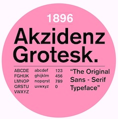 [
[ Berlin-based foundry from the 19th century, whose typefaces included
  French typefounder based in Paris, d. 1844, who published the specimen books
  The timeline of this French foundry of the 19th century and early 20th century:
  Type foundry in Brussels, Belgium, active in the 19th century. Books by them include
 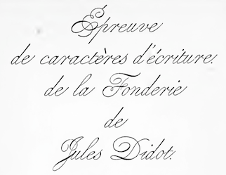 Foundry in Brussels, which published a specimen book entitled
  Big Paris-based foundry, with an extensive factory. Their work can be found in
  Type foundry in Paris, est. 1843. Maison Battenberg was located in the fashionable rue du Dragon (number 20) in Paris. They also had an office at 15, Rue Madame, in Paris. Battenberg's gorgeous engravings include vignettes du moyen age, vignettes raisins, vignettes grimpantes, vignettes rubans, vignettes treillage, tetes de chapitre, culs de lampe, fleurons, titling ornaments and initials.
  Brussels-based foundry established in 1834 by Michel-Joseph Vanderborght (1801-1870). His early goal as to make better types than the ones being imported at the time. They developed and built their own machines for this. In the last year of his life, Michel-Joseph cedes the reins of his company to his sons, Alexandre Vanderborght (1841-1918) and François Vanderborght (1844-1930), and the firm was renamed A. & F. Vanderborght. In 1901, François retires, and Alexandre joins forces with Jean Dumont (1853-1927), and the business is now called A. Vanderborght et J. Dumont.
  Foundry in Limoges. Its work can be found in
  Cincinnati-based foundry, also called Franklin Type Foundry, and Allison&Smith. Publishers of
 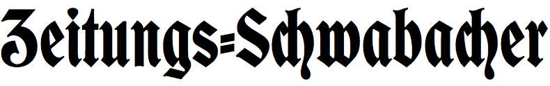 Type foundry in Regensburg, Germany. Its typefaces included Neue Kirchenschrift (ca. 1890, a typeface acquired from Bauer) and Neue Zeitings Schwabacher (ca. 1900). For digital revivals, see Gerhard Helzel's
  Mexican type foundry of the 19th century. [
 J. Artaloitia ran a foundry in Sevilla, Spain, called
  Printer in Boston who published
  Born in Troyes in 1526, Guillaume Le Bé was a bookseller, engraver and typefounder, who studied under Claude Garamont. He set up his own foundry in 1545 and ran it until his death. In 1561, he became Garamont's successor---he took over Garamont's foundry that year. He was mainly known for his Hebrew fonts, but was also praised for a roman double canon. He died in Paris in 1598. The foundry started by Le Bé kept going until well into the nineteenth century through various successions. Since Robert Estienne's foundry ceased in 1545, Marius Audin speculates, but cannot prove, that Guillaume Le Bé got his start in 1545 by taking over Estienne's foundry. Scott-Martin Kosofsky seems to contradict Audin's observation that Le Bé was Garamont's student: There is no evidence that he was a student of Claude Garamont; rather, what we do know is that he trained in the Paris workshop of Robert Estienne. He lived for some twenty years in Venice (not ten years, as stated in some modern sources), where he worked largely for the major publishers of Judaic literature. After he returned to Paris, he did much work for the Antwerp publisher Christophe Plantin, including the text Hebrews used in the renowned Polyglot Bible (Biblia Regia, 1568-1572).
 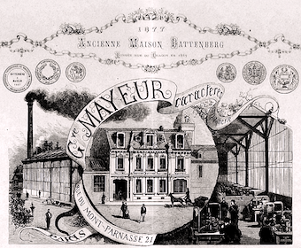 [
[ German/Swiss foundry established in 1790 (however, see timeline below) and based in Basel/Münchenstein. Many of its shares were acquired by D. Stempel in 1927. Linotype takes over Haas in 1989. Their collection includes:
  British printing company founded by
  [
[ British typefounder from the famous Caslon family. Author of
  French printer. In 1867, they published
  Small typefounder located at 491-493 Carroll Avenue in Chicago, active in the late 19th century. The Inland Printer of 1895 writes: In the column of business notices last month a description was given of a new type metal. A company to manufacture the new material has now been formed, and a license of incorporation secured. The title of the new concern is the Indestructible Type Company; capital, $100,000. The officers are: President, George N. Hall, president Citizens Bank of South Haven, Michigan; vice-president and general manager, John West; secretary, Charles W. Clingman, of Chicago; treasurer, H. B. Thomson, of Chicago. That same issue of The Inland Printer shows some border types and an upright calligraphic script called Indestructible Script.
  The Inland Type Foundry in Saint Louis was established in 1892 by the three sons of Carl Schraubstadter (1827-1897), William A. Schraubstadter (1864-1957), Oswald Schraubstadter (1868-1955) and Carl Schraubs Jr. (1862-1947). Carl had run the Central Type Foundry in Saint Louis and sold it to ATF (American Type Founders) in 1892, and the sons reacted by setting up Inland. Until 1911, Inland was one of the most successful foundries in the United States. In 1911 Inland was purchased by ATF and its equipment divided between that foundry and Barnhart Brothers and Spindler (BBS). A.V. Haight (Poughkeepsie) designed
  J. Gyles&Sons was a foundry in Clerkenwell, UK,
  Type foundry in Edinburgh, Scotland, successors to Alexander Wilson & Sons.
  Leipzig-based foundry started in 1819 by punchcutter Johann Schelter and typefounder Christian Friedrich Giesecke (1793-1850). It evolved in 1946 into Typoart in Dresden, the official East German government's press. Its early history is told in
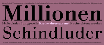 German type designer and typefounder (b. Braunschweig, 1759, d. 1810, Jena). His foundry was located in Jena. In 1790, he published a 14-style antiqua and kursiv with weights from Nonpareille up to Grobe Sabon called Proben neuerr Didotscher Lettern. In 1798, he published a specimen book entitled Didotschen 1797 Lettern that showed 33 Fraktur typefaces, 8 Schwabachers, 9 Greek typefaces, and 36 styles/weights of a didone family. His son Johann Heinrich Christian (b. 1789), also a typefounder, died a month before his father in 1810.
  [
[ [
[ London-based foundry with a sense of humour, because all their type names start with the letter H. Examples of art nouveau typefaces: Harlech, Harquil, Harrington, Hawarden Italic, Huntsman (late Victorian, pre-art-nouveau style).
  [
[ [
[ [
[ Philadelphia-based foundry, 1888-1917. The history of this short-lived foundry was told by James Eckmann in The Keystone Type Foundry, 1888-1917: a reprint [from] Printing&graphic arts, volume VI, number 1, February 1958 (Lunenburg, Vermont: The Stinehour Press, 1958). Their work appeared in Keystone Type Foundry, 1901 (362 pages),
 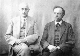 German foundry established in 1906 by brothers
  [
[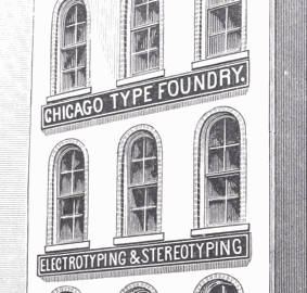 Chicago-based type foundry, 1863-1892, also called Scofield, Marder, Toepfer&Co., Scofield, Marder&Co., and the Chicago Type Foundry. In the great Chicago fire of 1871, they lost all their matrices. They were part of the big number of foundries bought in 1892 to form the American Type Foundry. They are credited with inventing the American point system, in which 12 points are a pica and 72.27 points are an inch.
  [
[ Founded by
  [
[ Foundry in St. Petersburg in the late 19th century, est. 1854. Their typefaces include
  Typefounders and printing press in San Francisco. The Miller&Richard Type Foundry of Scotland opened a branch in San Francisco in 1878, headed by John J. Palmer. This branch was sold to Palmer and Valentine J. A. Rey in 1882. In 1884, Palmer&Rey acquired the assets of the Pacific Type Foundry. The company then merged into American Type Founders in 1892. They published
  Leipzig-based publisher of the music notation typeface specimen book Noten und Schriftproben der Röder'schen Offizin in Leipzig (ca. 1860). [
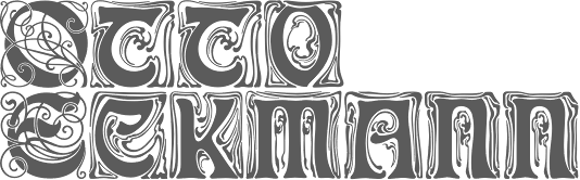 German foundry established in 1842 by Johann Peter Nees, Phillip Rudhard and Johann Michael Huck, that was located in Offenbach am Main. Carl Klingspor (1839-1903), the father, bought the Rudhardsche Gießerei in 1892. It was renamed Gebr. Klingspor in 1906. Scans of some of its typefaces:
  British foundry of Simon and Charles Stephenson in the 18th century, which later became Stephenson Blake. In 1796-1797, it published
  Schriftgiesserei Eduard Haenel is a Berlin-based foundry operational in the 1840s, run by Eduard Haenel (b. 1804, Magdeburg, d. 1856, Berlin), who was a type founder and book printer.
 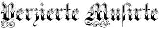 Foundry in Frankfurt am Main. House typefaces include
  Founded in 1819 in Sheffield by toolmaker
  Nineteenth century French punchcutter (1833-1903) who designed the transitional text typeface Romana with Gustave F. Schroeder (Kingsley ATF, 1860; now available at
  English punchcutter and typefounder who died in 1877. He worked at the Fann Street foundry in London and was active ca. 1820-1849. He is best known for one of the early sans serifs, Grotesque (1832) [note: that name is still in use today to refer to sans serif typefaces based on 19th century models], with a square M and equal width caps. Stephenson Blake and Monotype published a number of grotesques and numbered them as in Grotesque No. 33.
  French typefounder, born ca. 1775. Vibert, Vibert Pè et Fils, and Vibert Fils, operated a foundry in Paris from 1797 onwards. He was the Didot family's punchcutter. There is a publication in 1805 entitled Epreuves des caractères de la fonderie de Vibert et Luy, Paris (16 pages). Deberny named a didone typeface after him,
 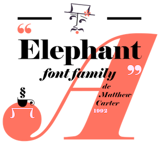 Influential typefounder, born in England, 1766-1844 (Peckham). He published several books of type specimens, and designed Gresham (1792), Old English (1815), Figgins Shaded (1816), Figgins Tuscan (1817, digitized by
  German foundry establshed in 1888 by Theodor Robert Arthur Schmidt and Ludwig Wagner in Leipzig. In 1902, Ludwig Wagner quit and joins Gundelach&Ebersbach (first founded in 1897) also in Leipzig, and then opens his own foundry, Ludwig Wagner. Schmidt stops in 1932, while Otto Schmidt takes over--the company is now called Wagner&Schmidt Nachfolger. Otto Schmidt dies in 1941, and the company is dissolved in 1942.
  Foundry in Paris that succeeded P. Digney. It was founded in 1857 in Saint-Germain-en-Laye by Digney who used to be director of the Fonderie Générale in Paris. Its work can be found in Spécimen de la Fonderie de caractères et de blancs Warnery frères (Paris, Usine et bureaux: 8, rue Humboldt, maison de vente: 6, rue Des Forges (place du Caire), June 1882 [1884]). A similarly-titled specimen was also published in 1899. More than half of their 1922 catalog consists of vignettes. In 1934, they published Catalogue Général.
  Wilhelm Gronau was a German typographer who ran the Wilhelm Gronaus Schriftgießerei in Berlin-Schöneberg from the mid 1800s until early in the 20th century. Typefaces at that foundry include
 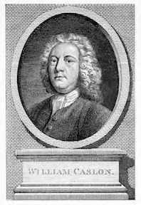 William Caslon I was born in Worcestershire in 1692. He died in London in 1766. He was a gun smith and a typefounder. His William Caslon Foundry was established by him in 1719, and would operate in London for over 200 years. His
  [
[
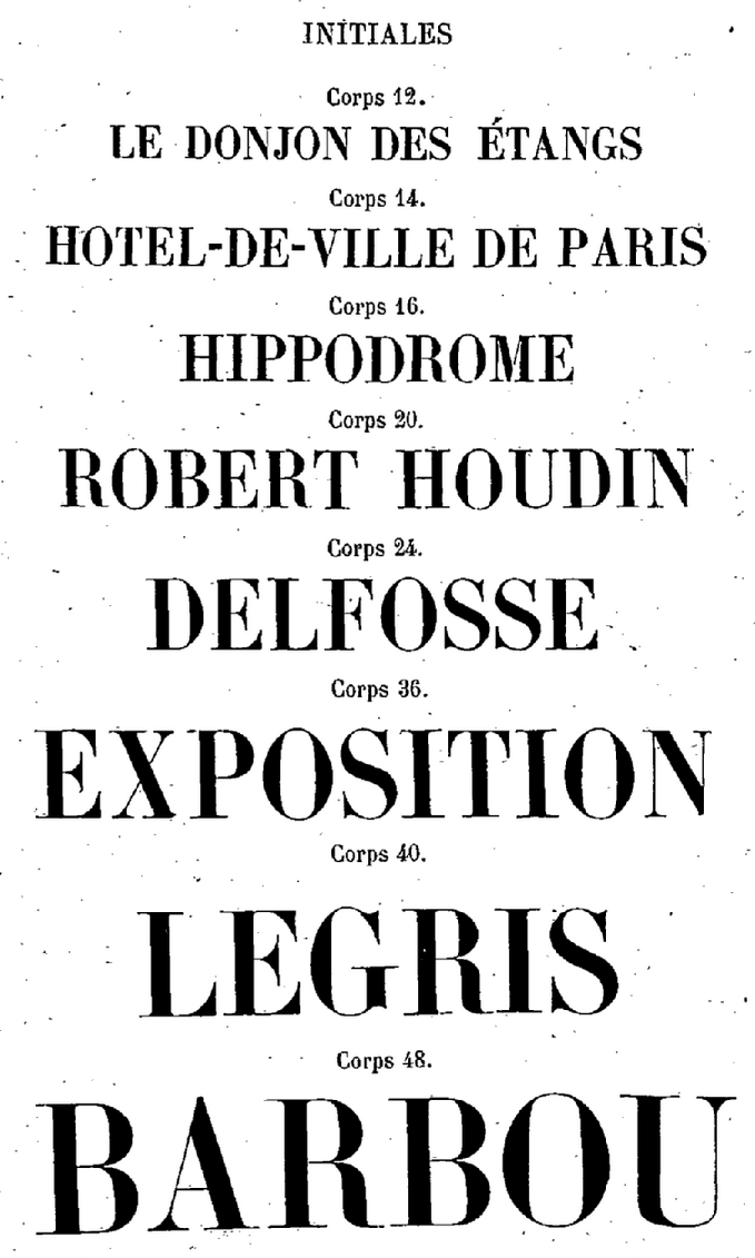
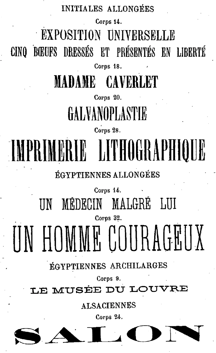
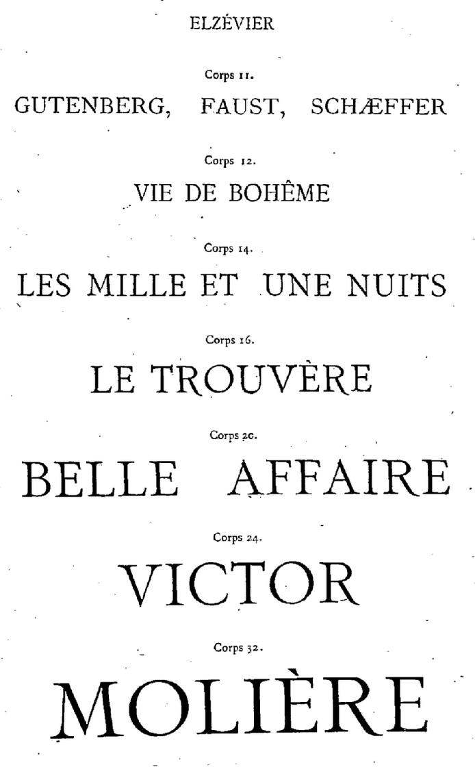
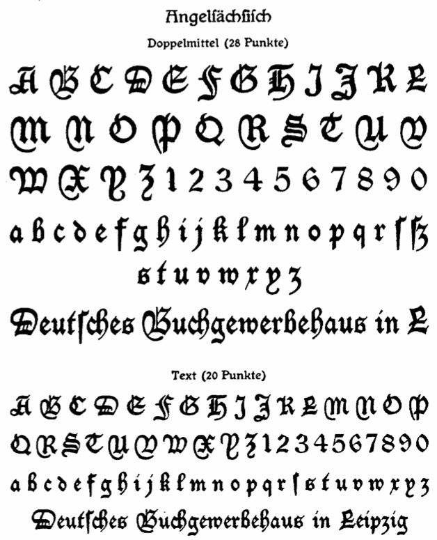
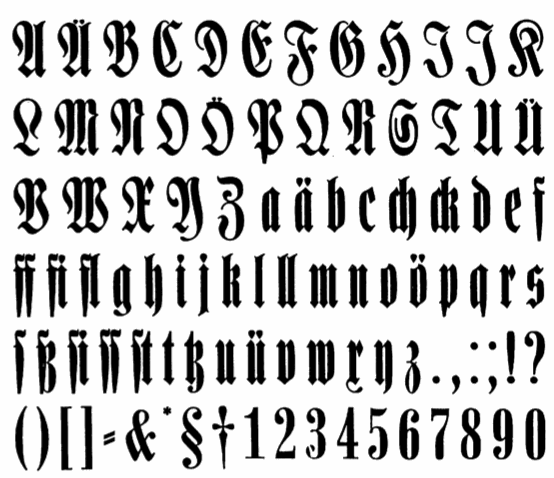
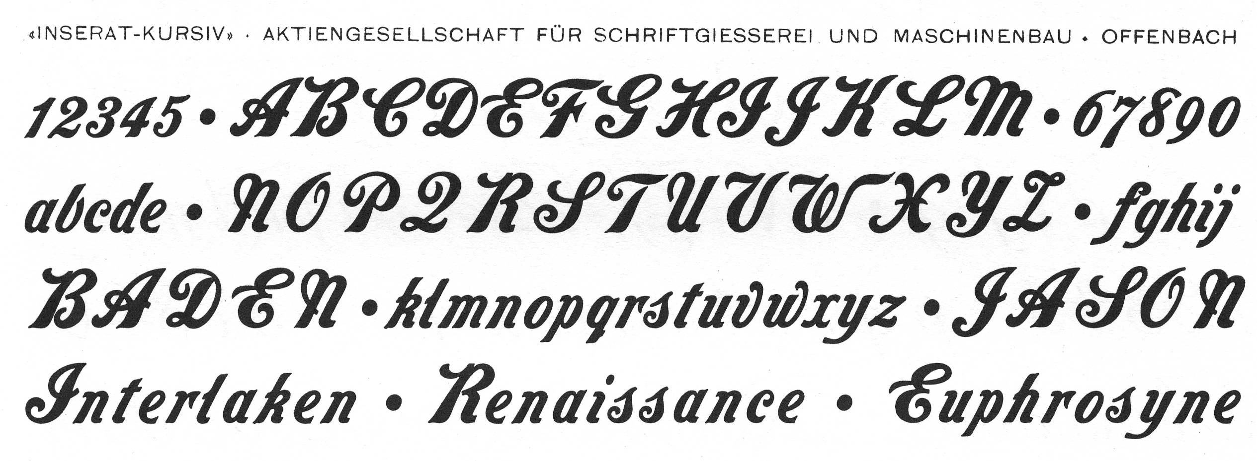
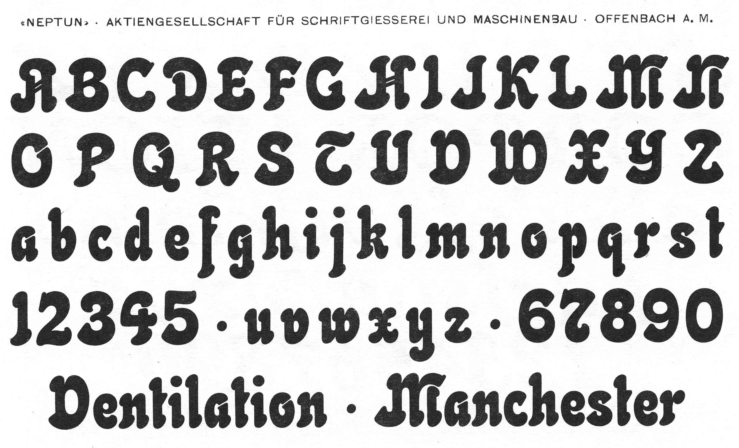
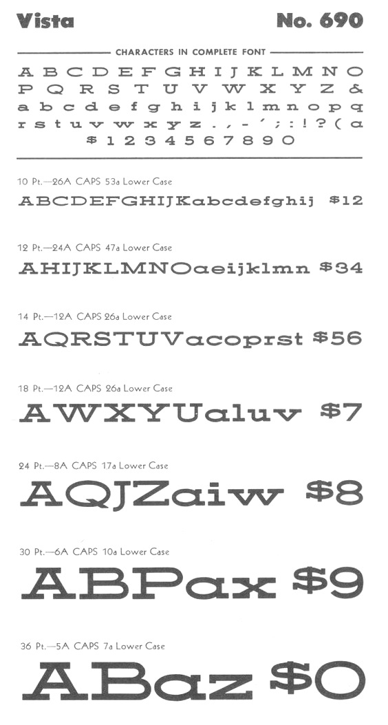
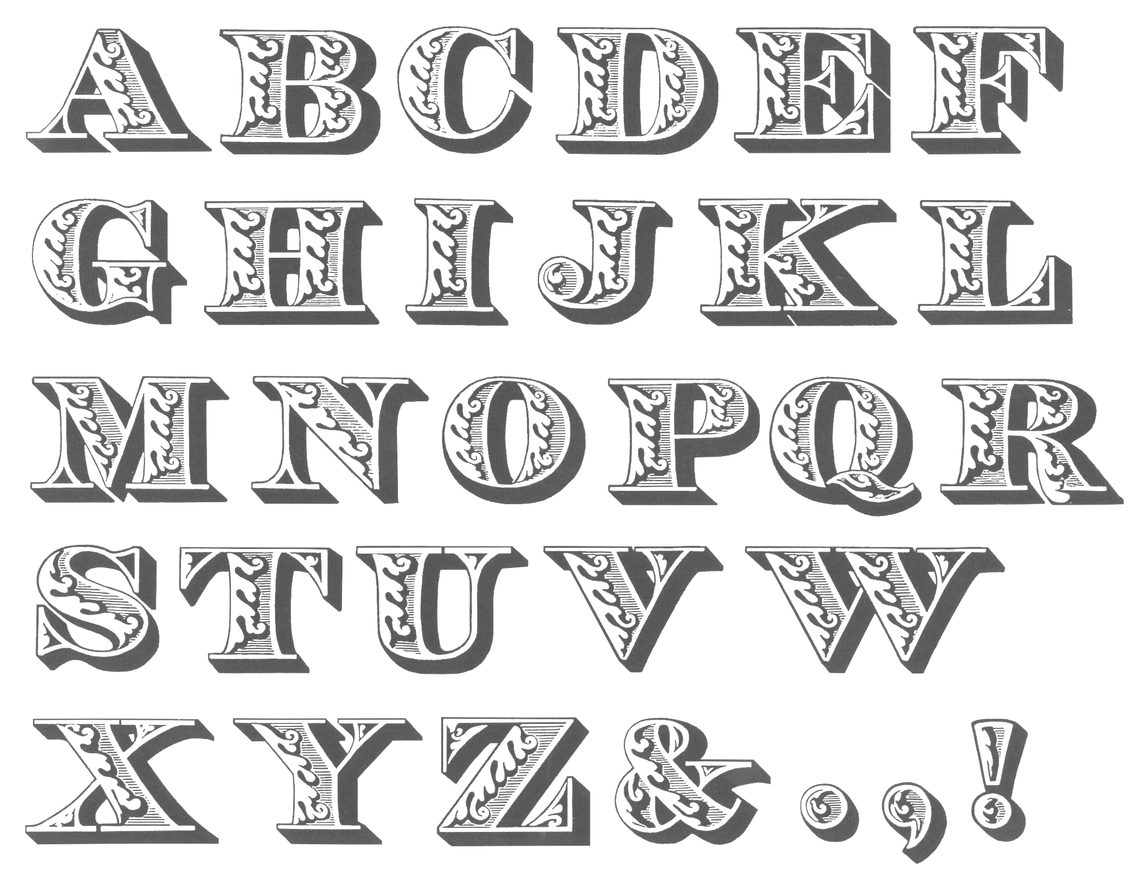
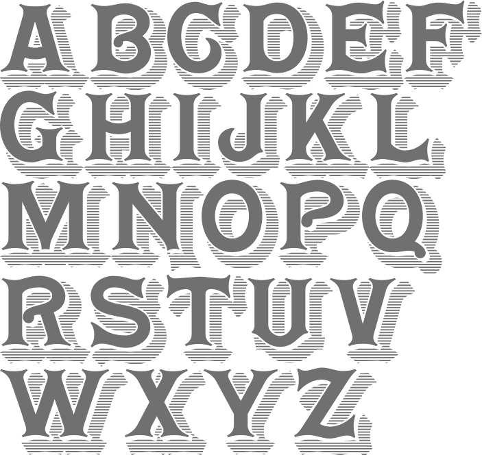
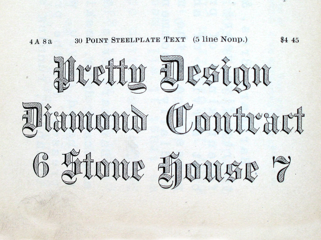
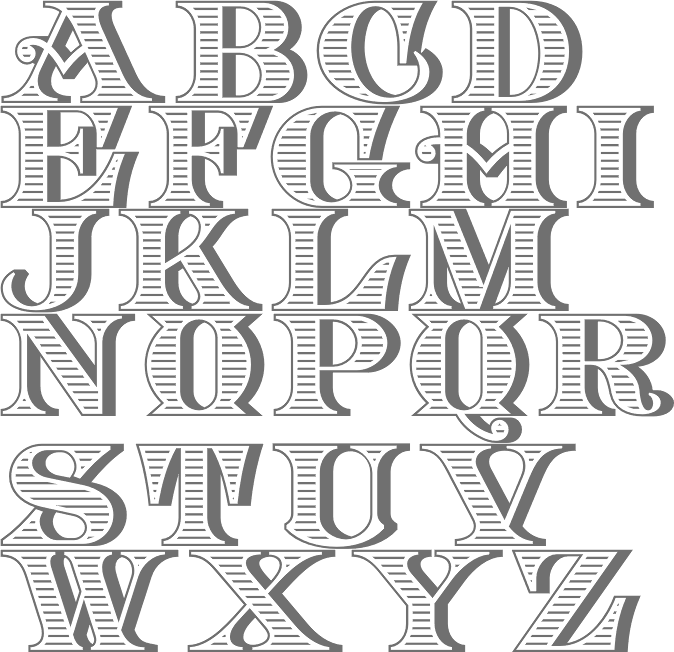
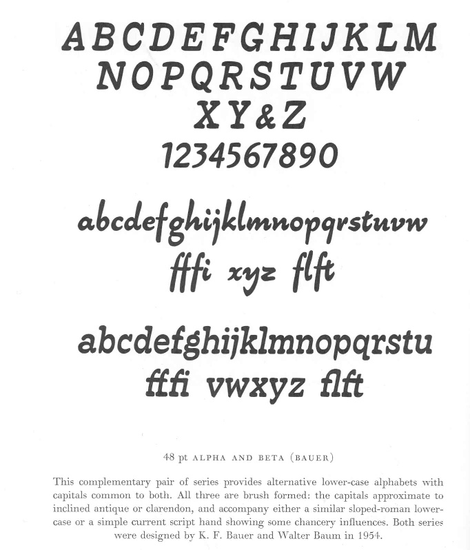
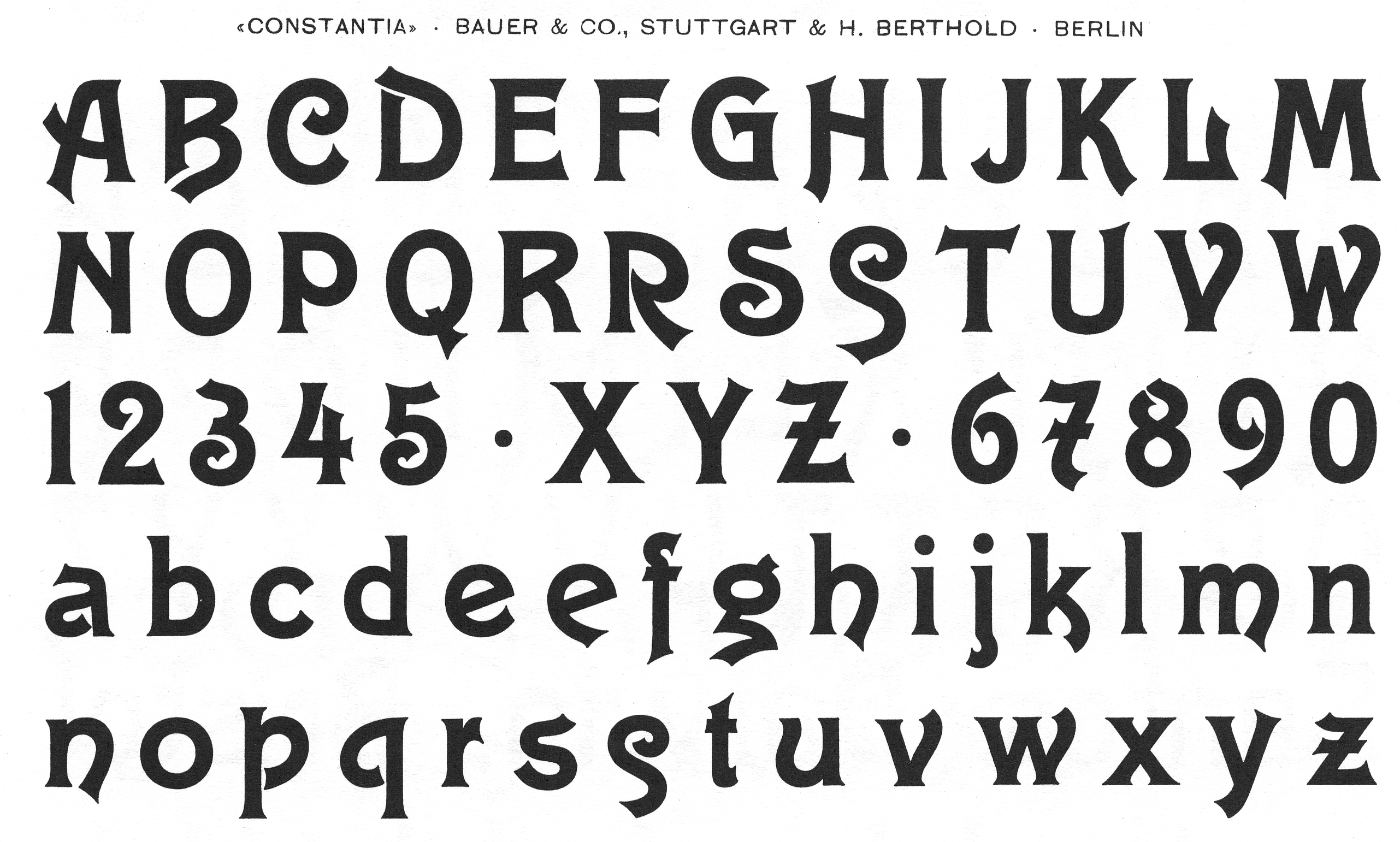
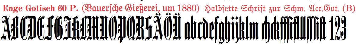
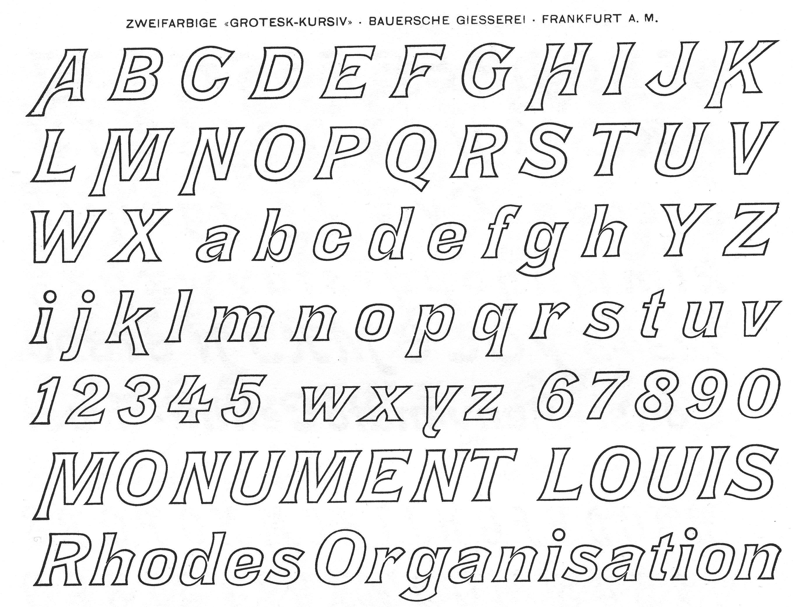
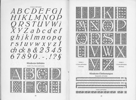
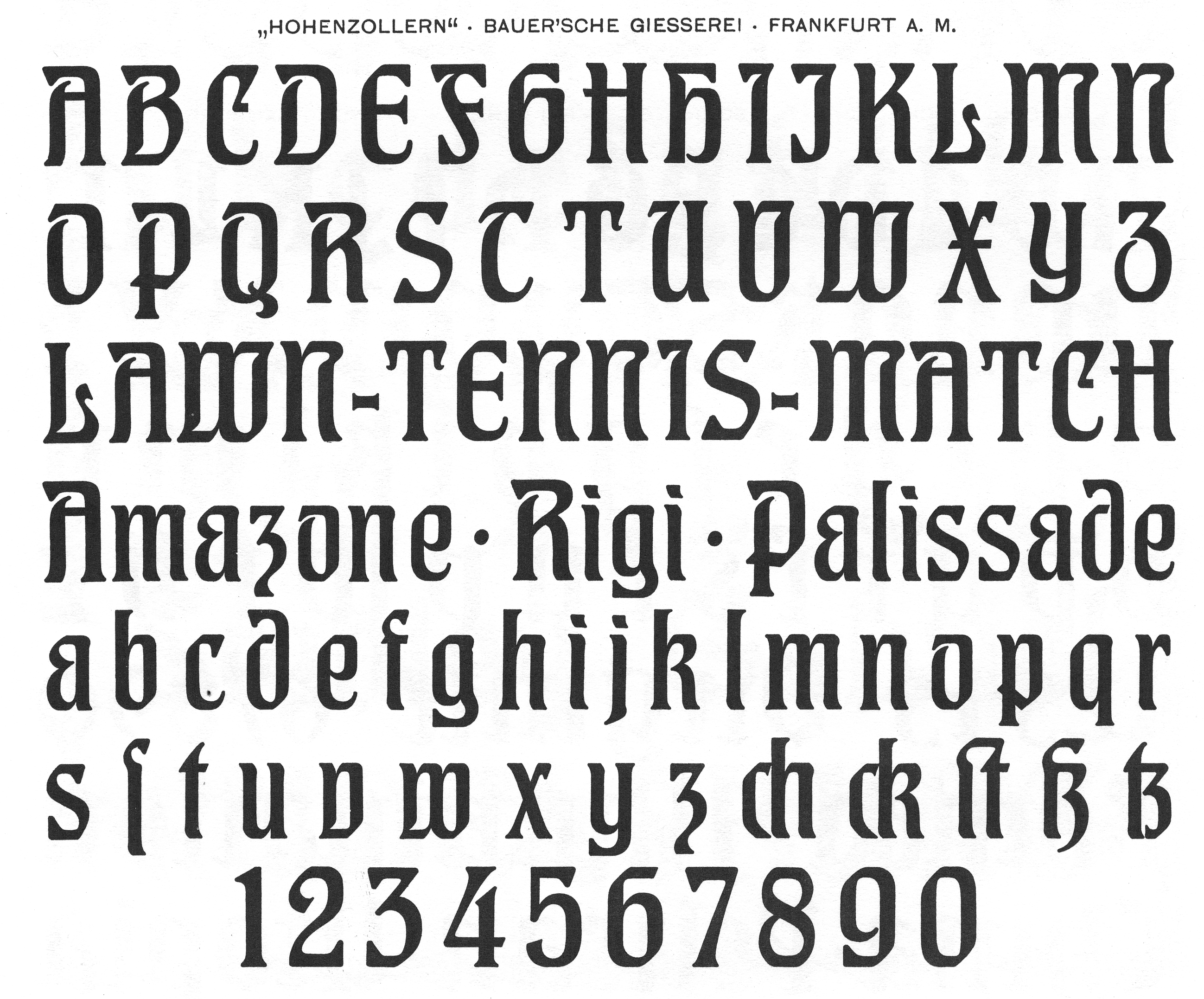
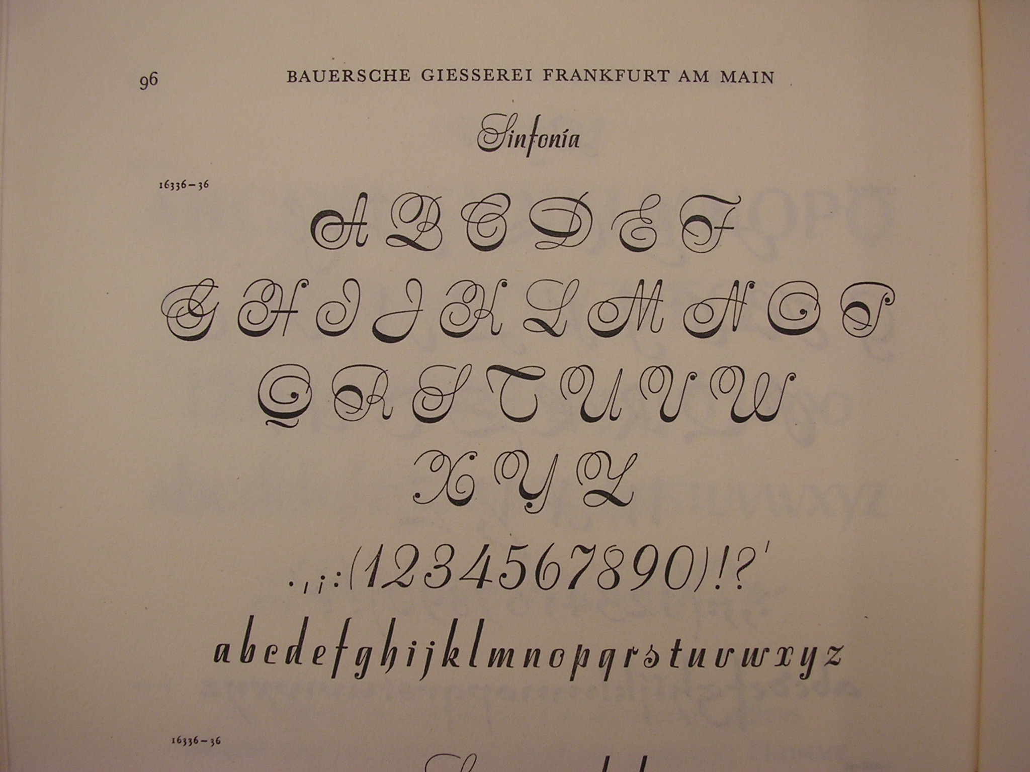
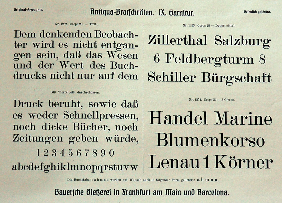
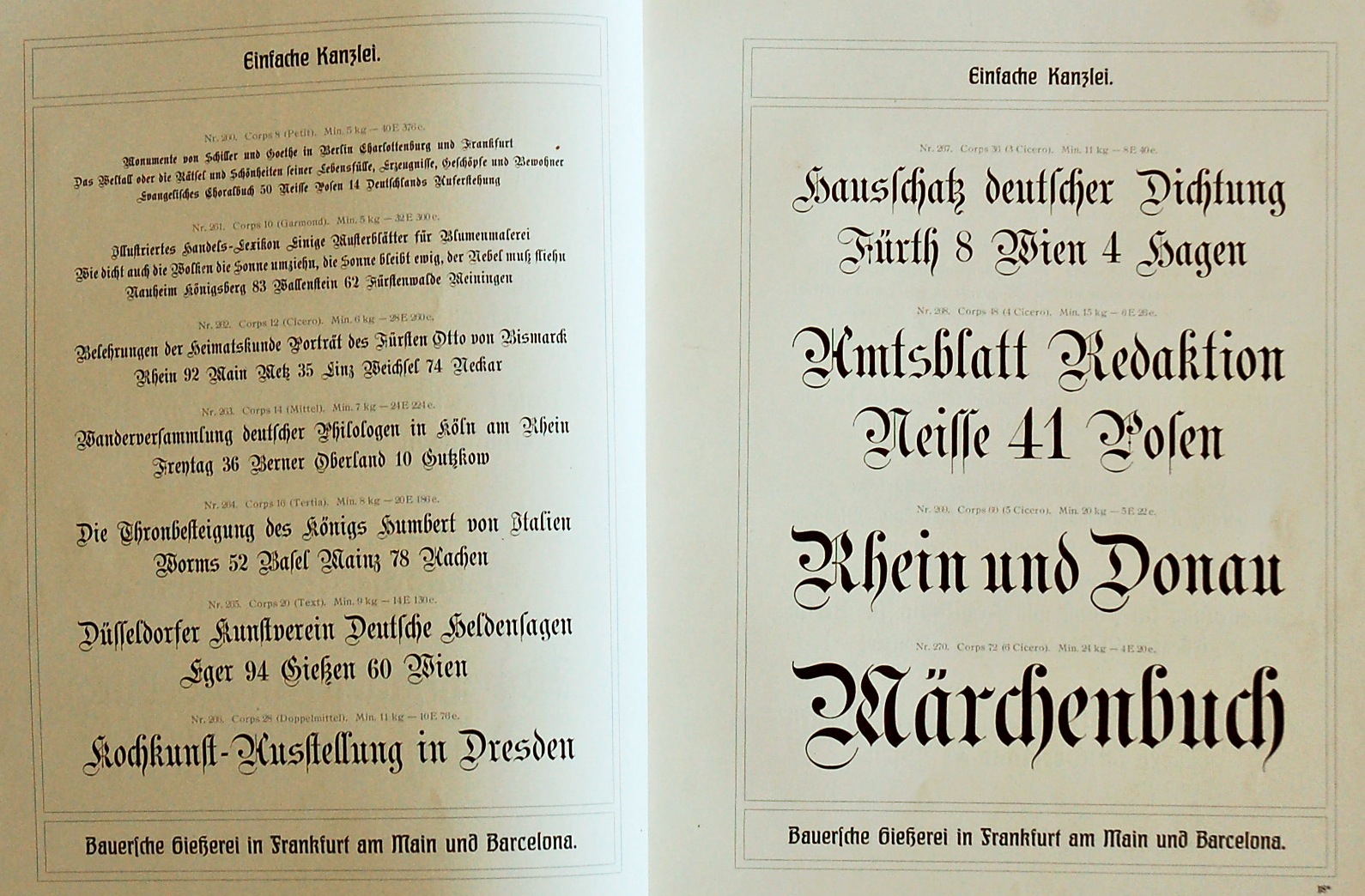
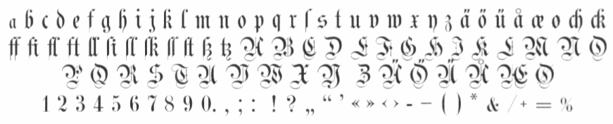
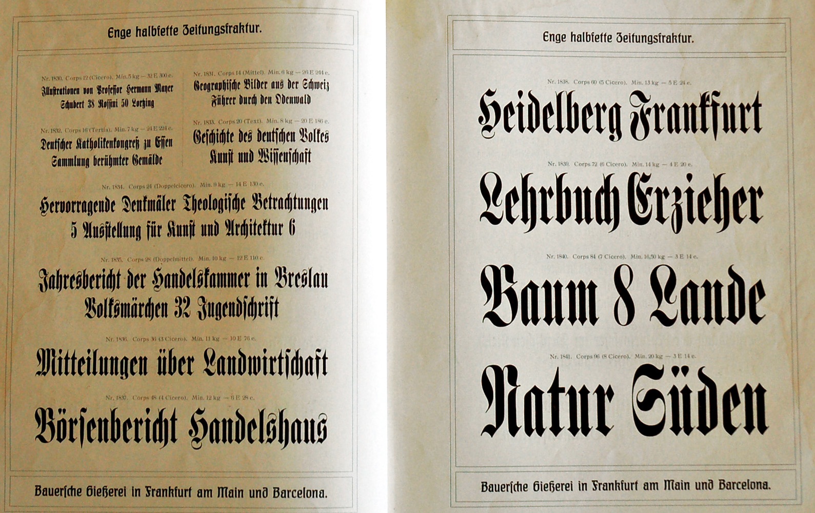
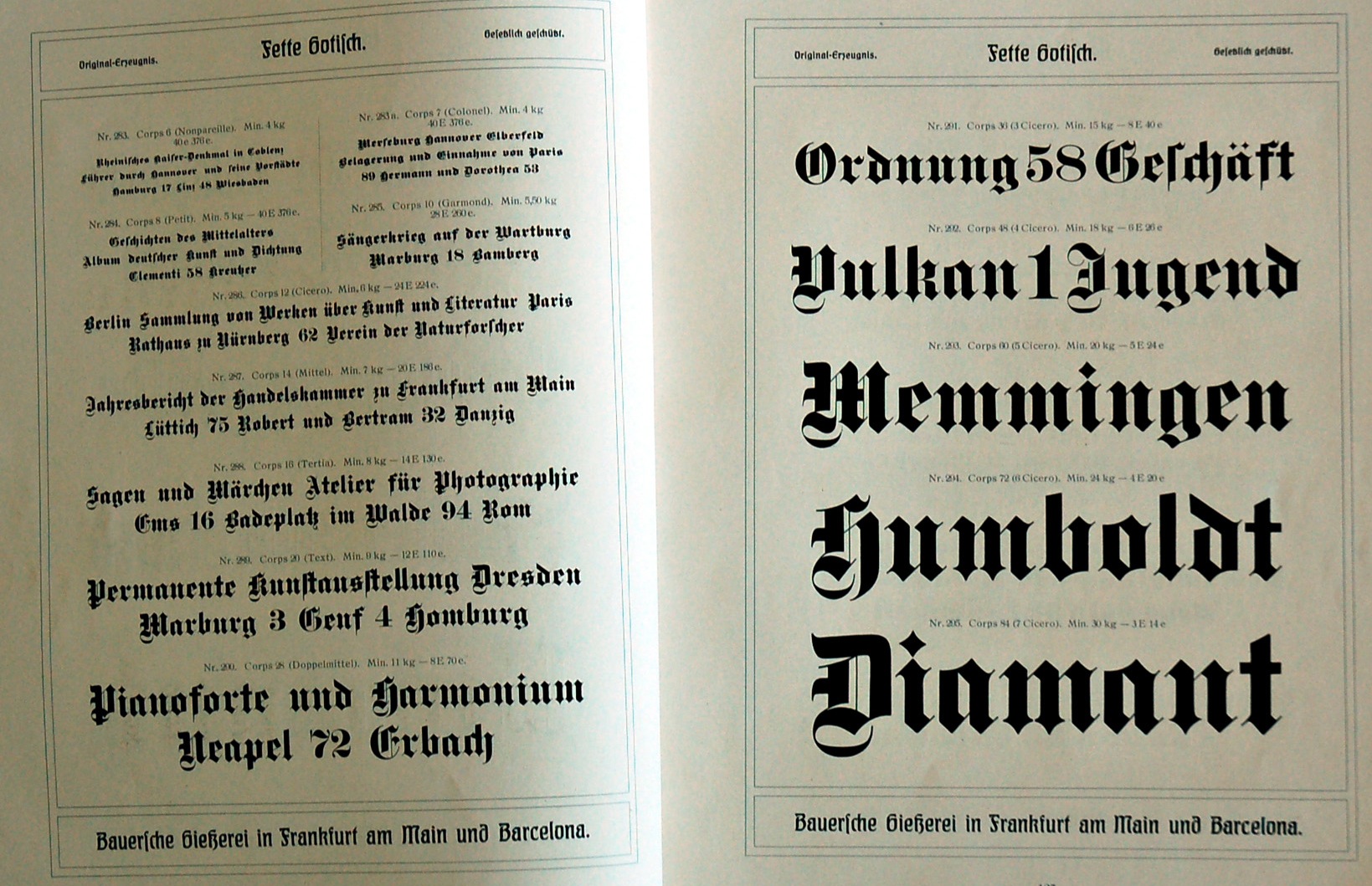
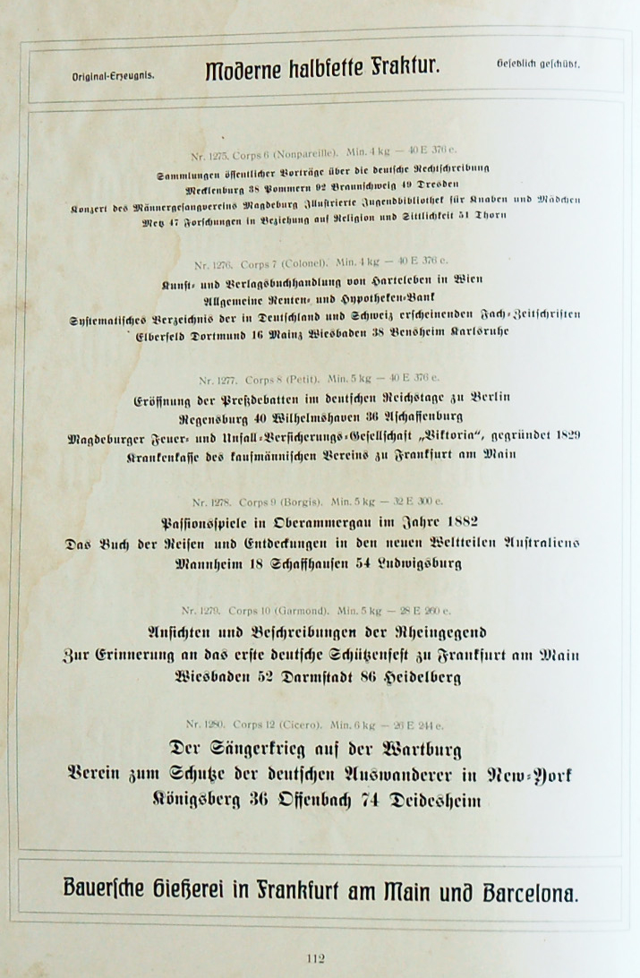
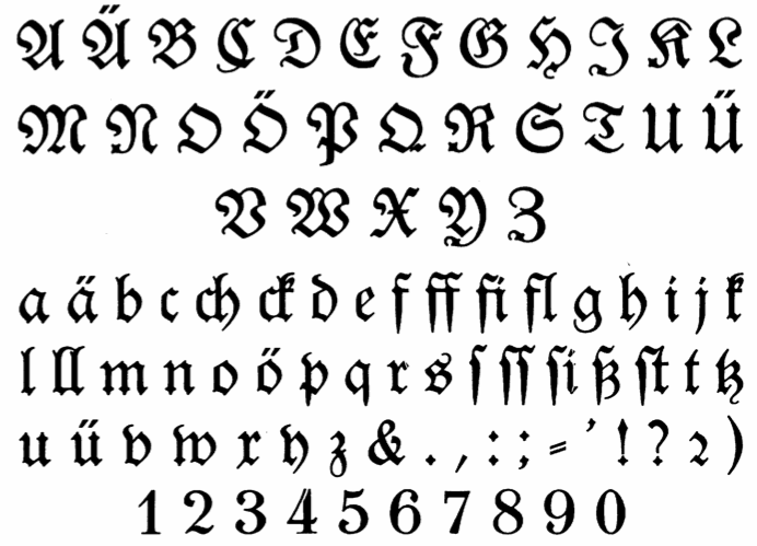
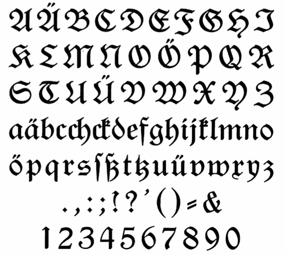
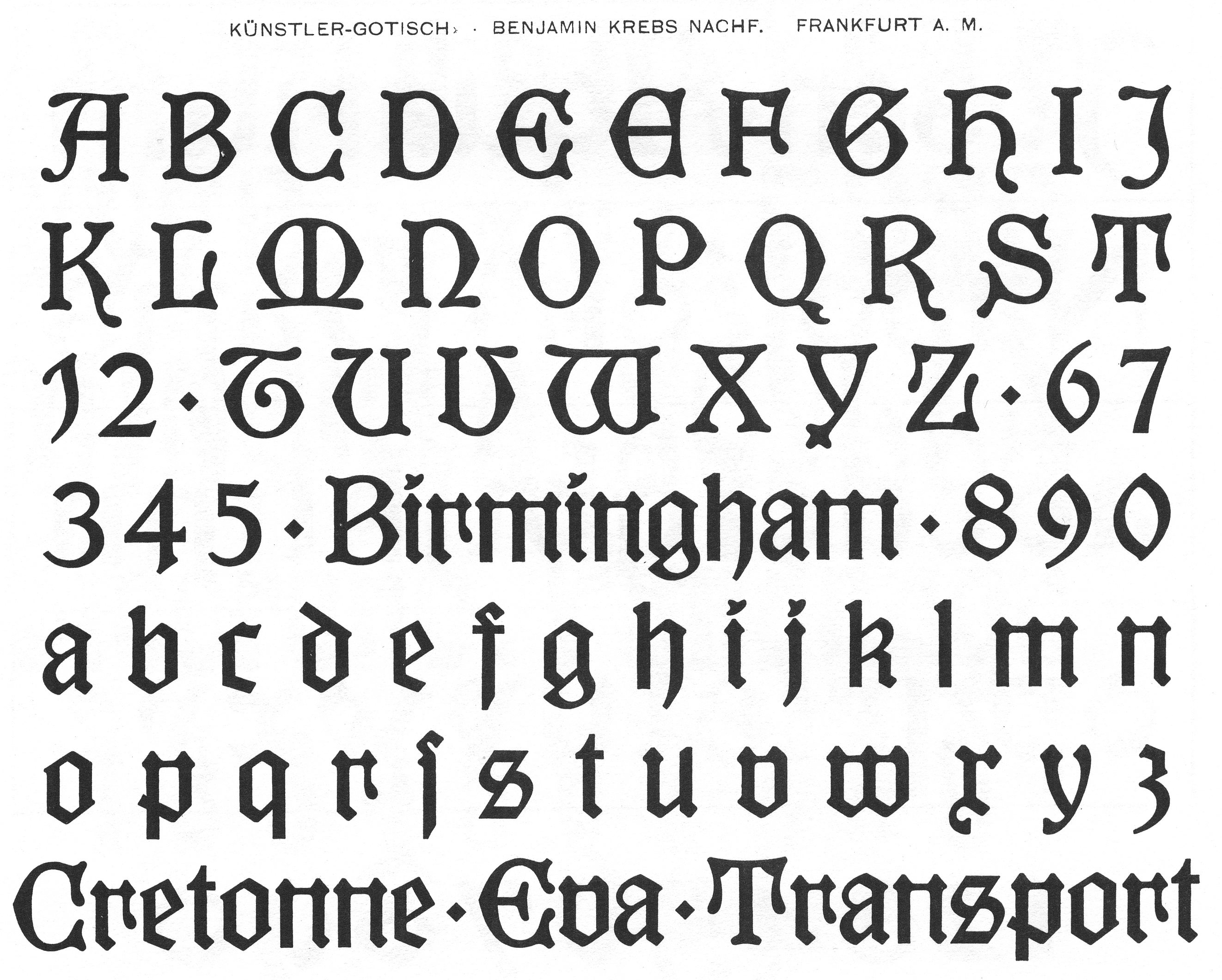
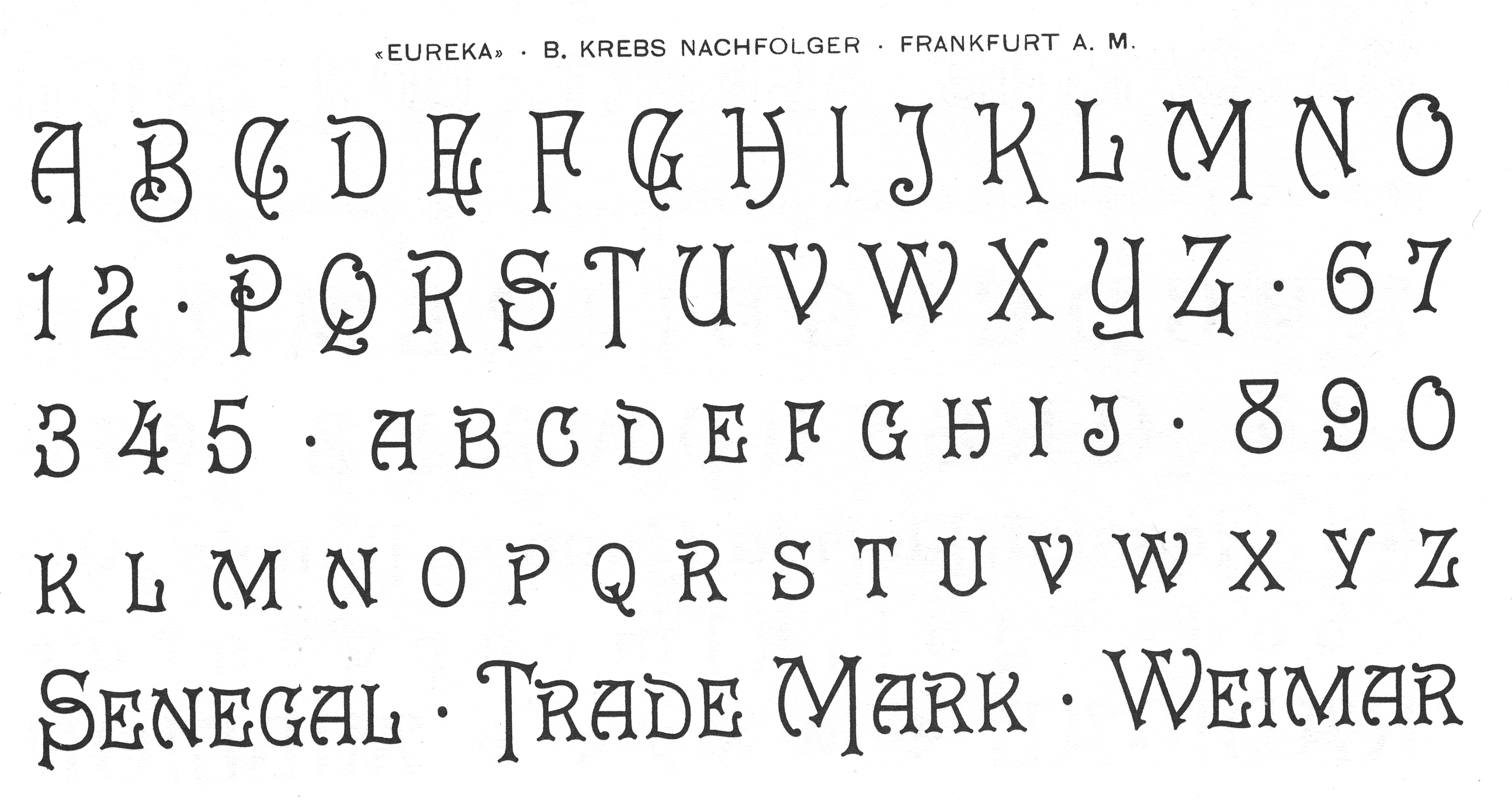
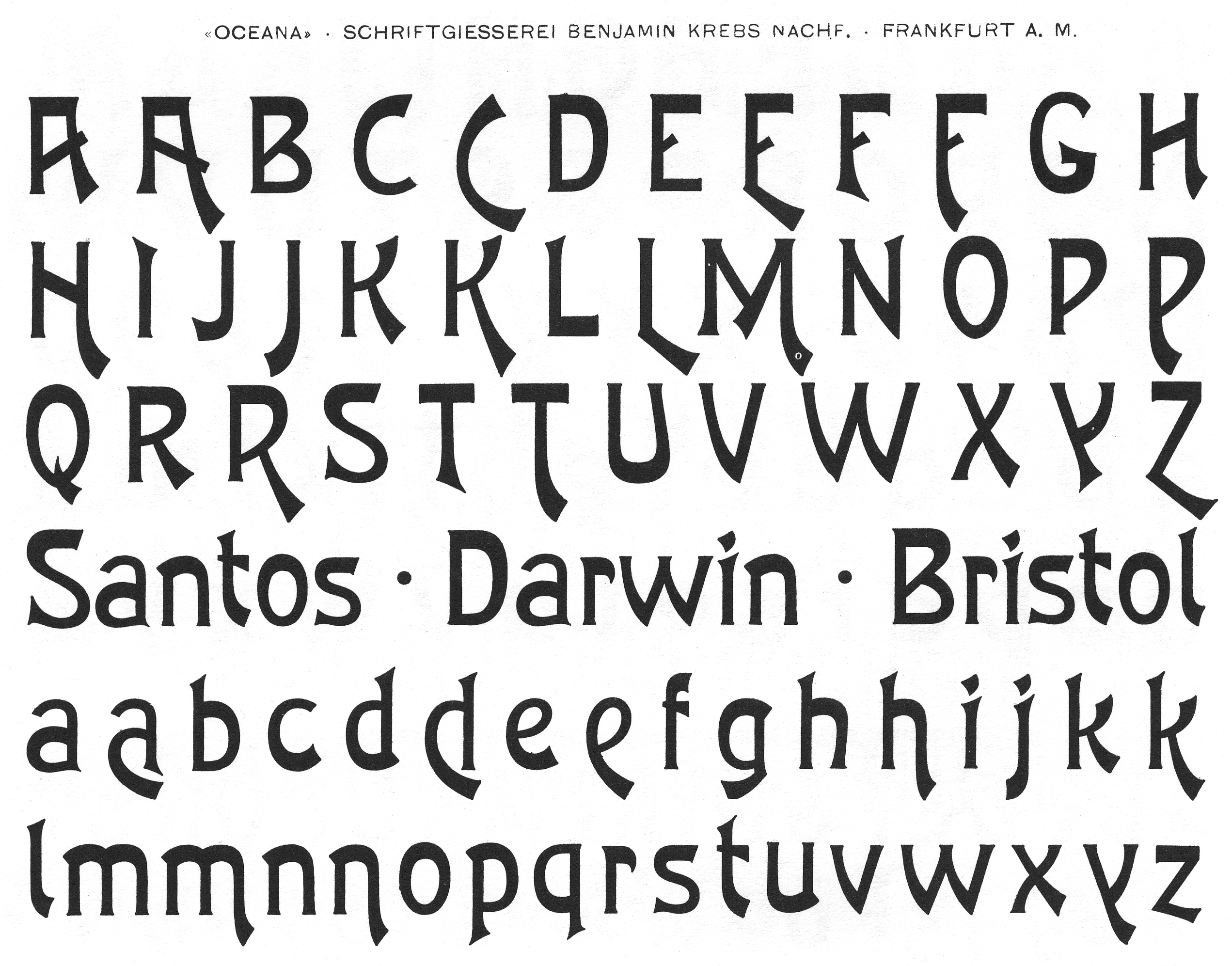
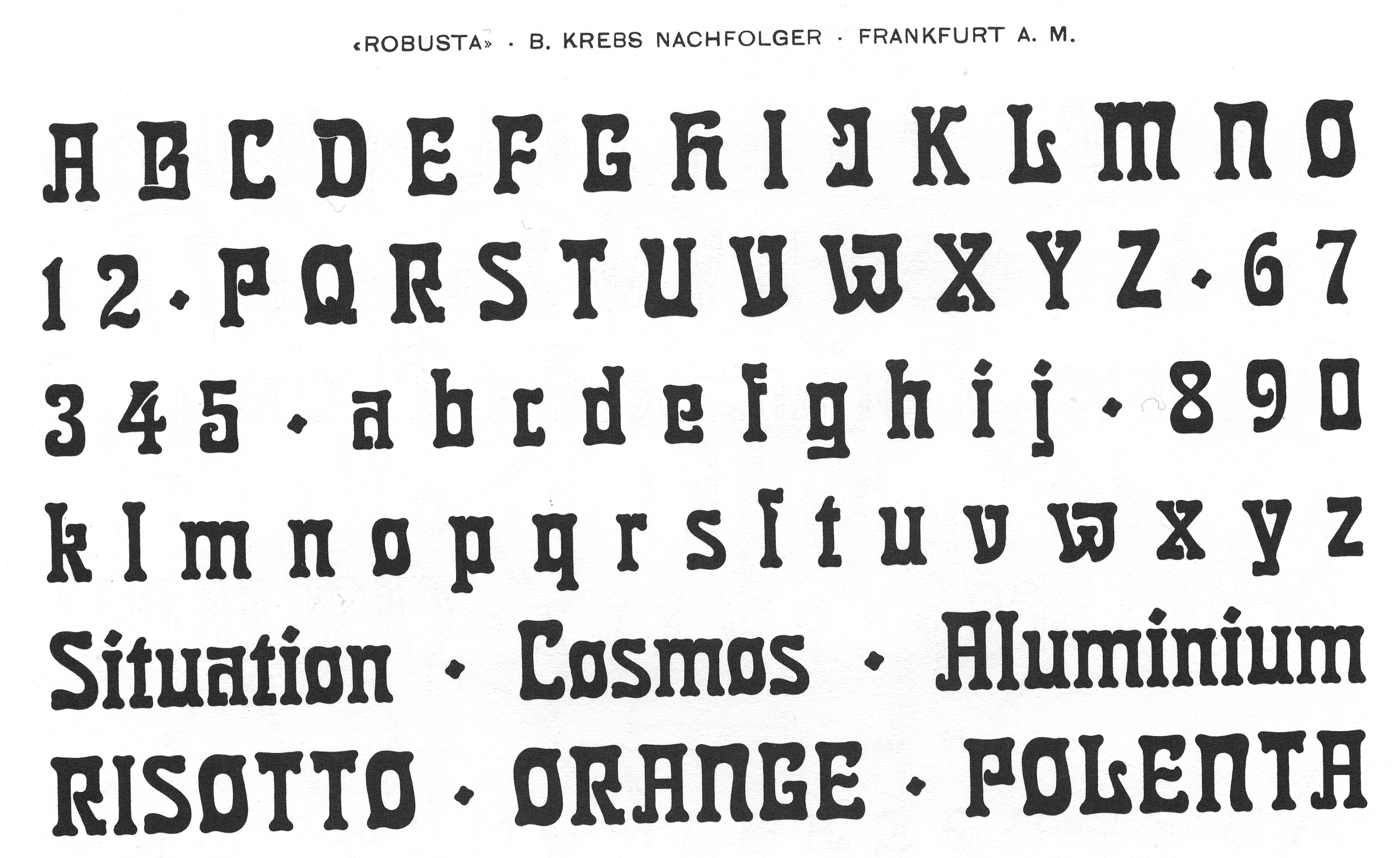
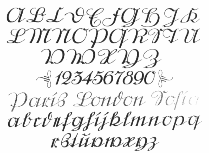
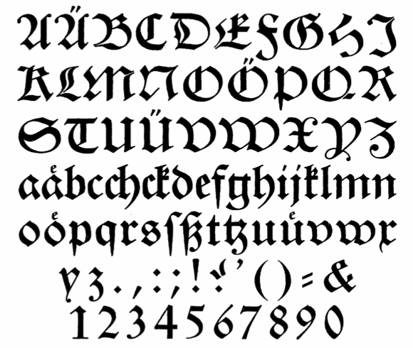
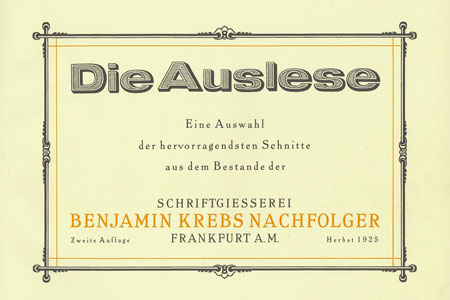
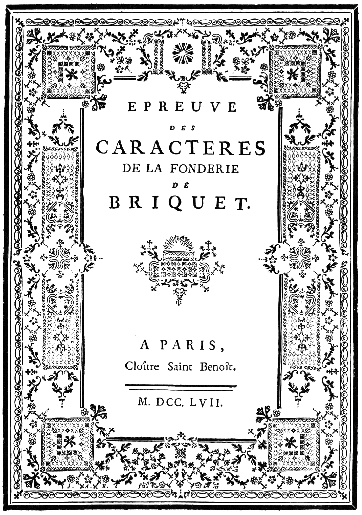
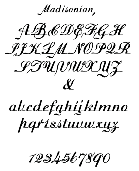
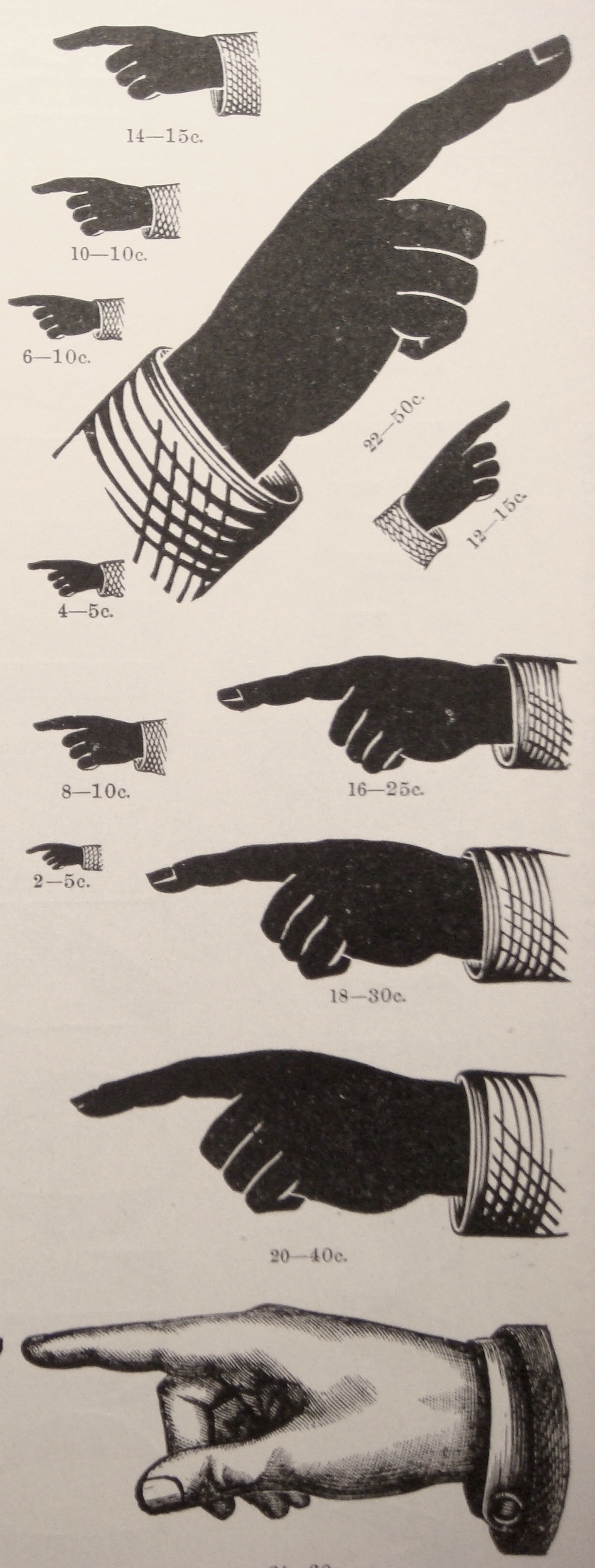
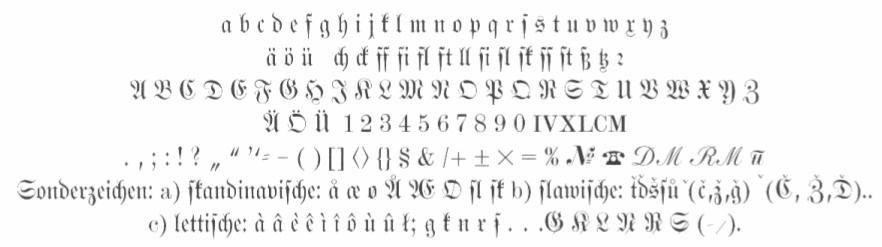
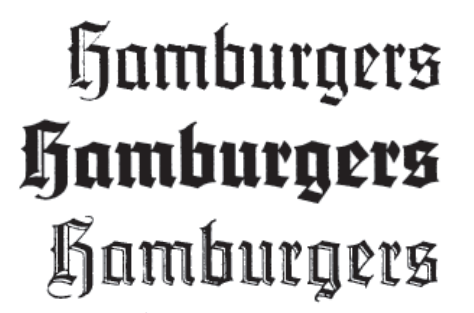
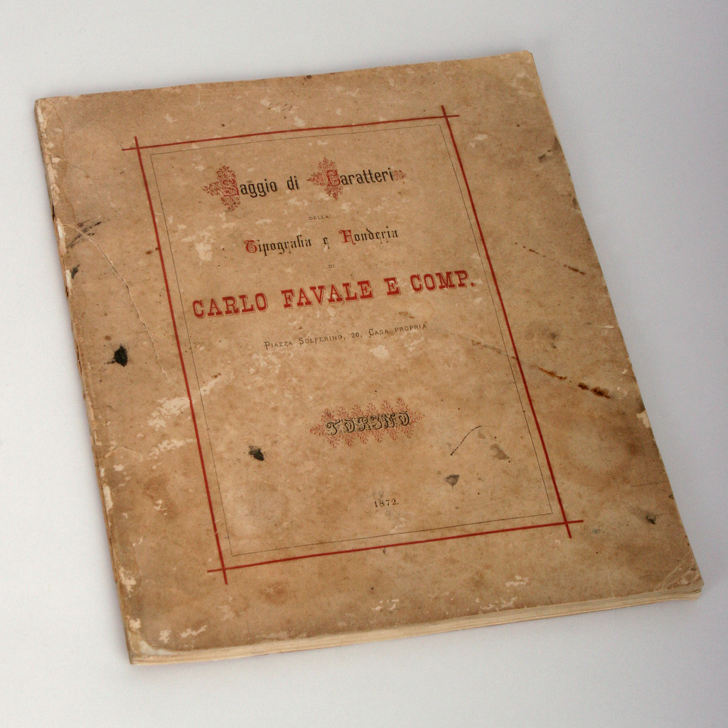
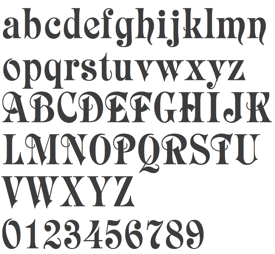
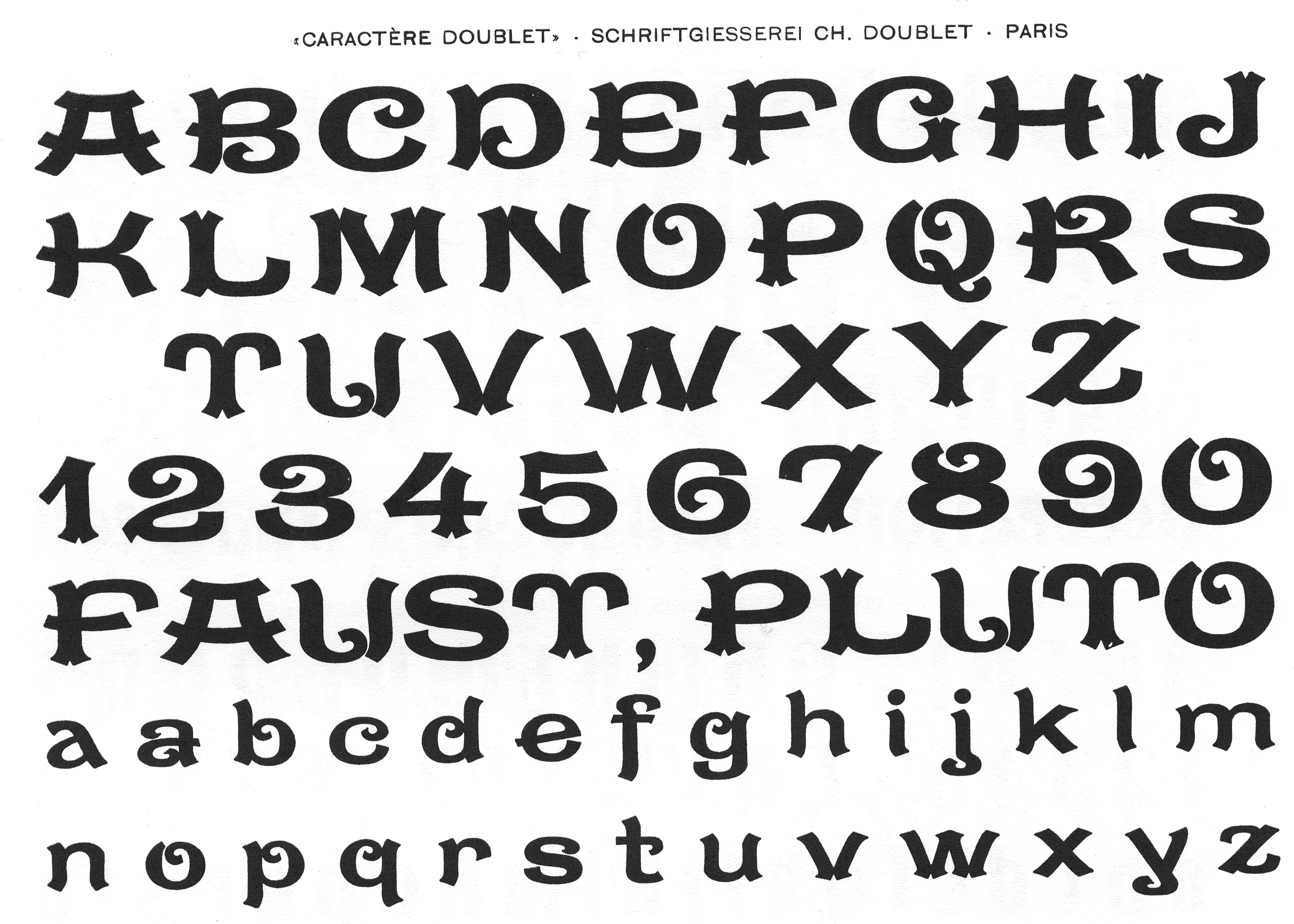
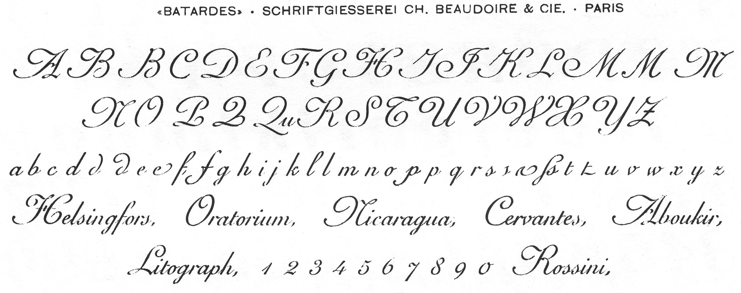
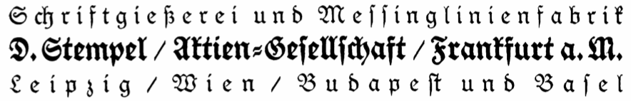
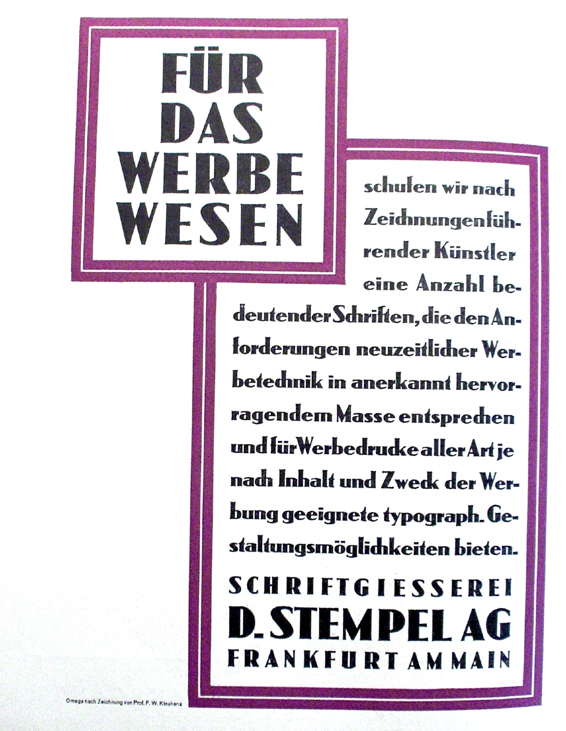
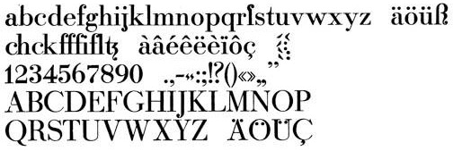
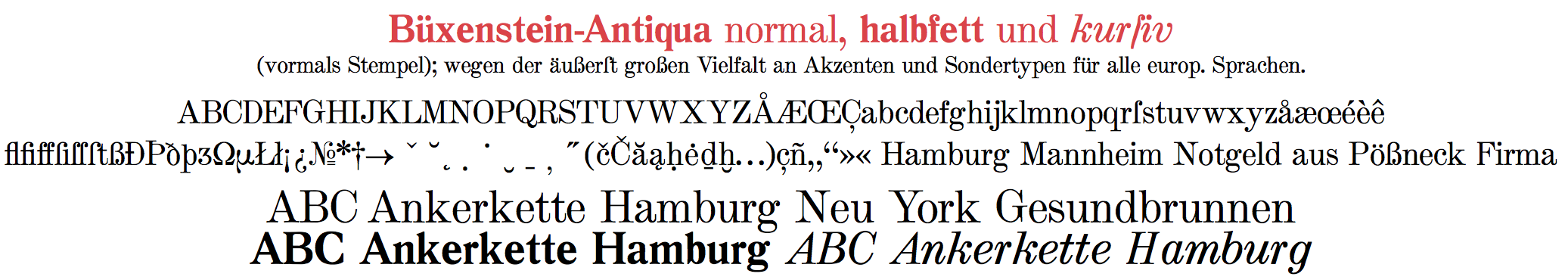
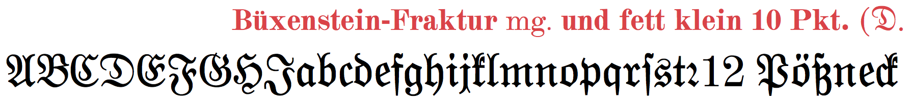
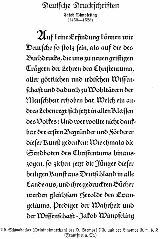
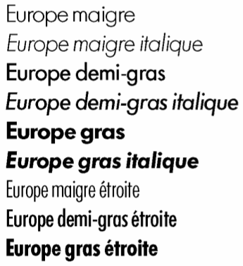
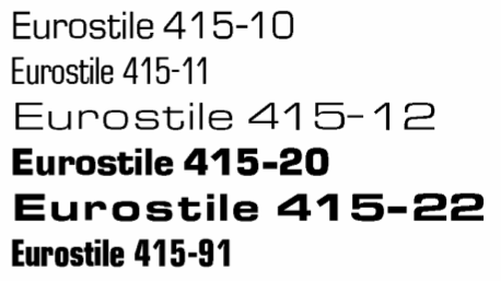
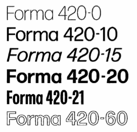
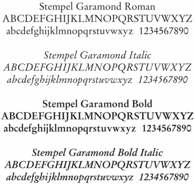
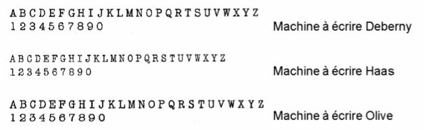
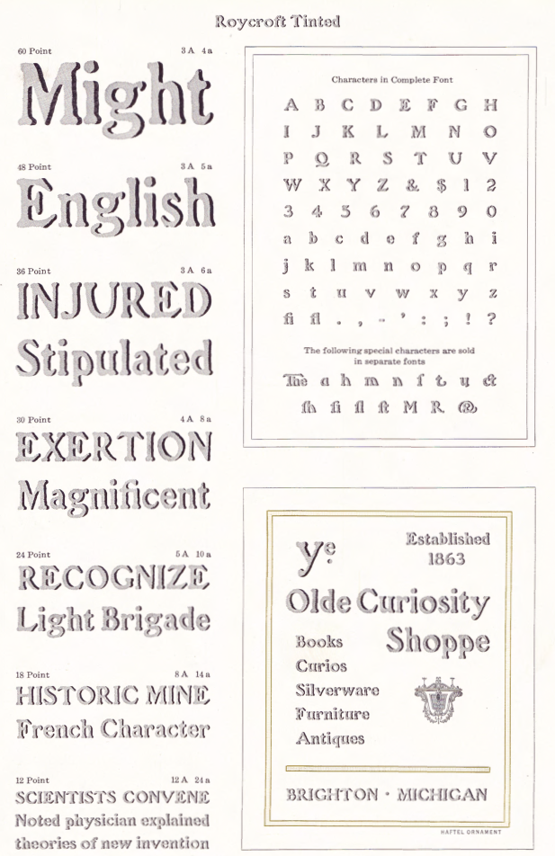
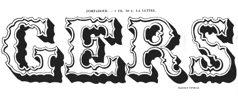
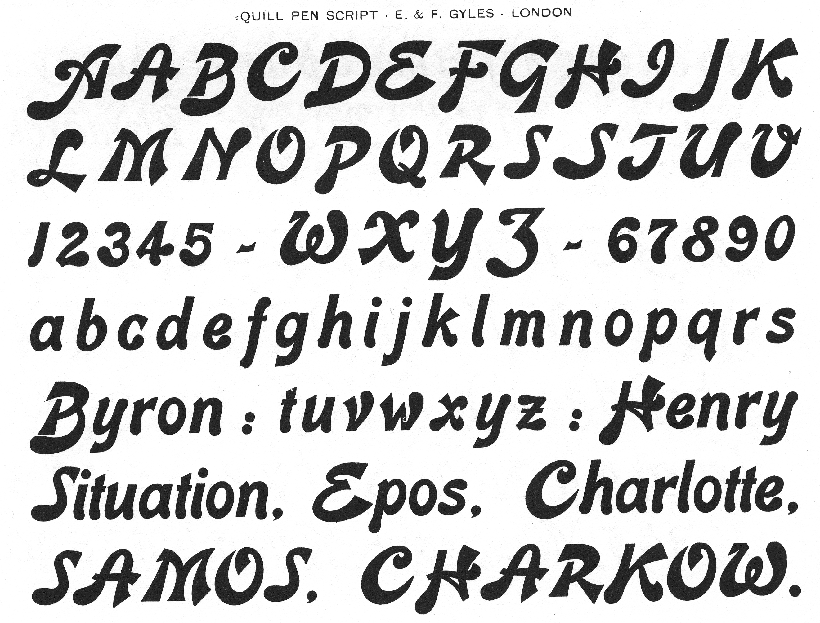
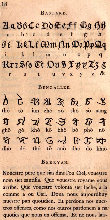
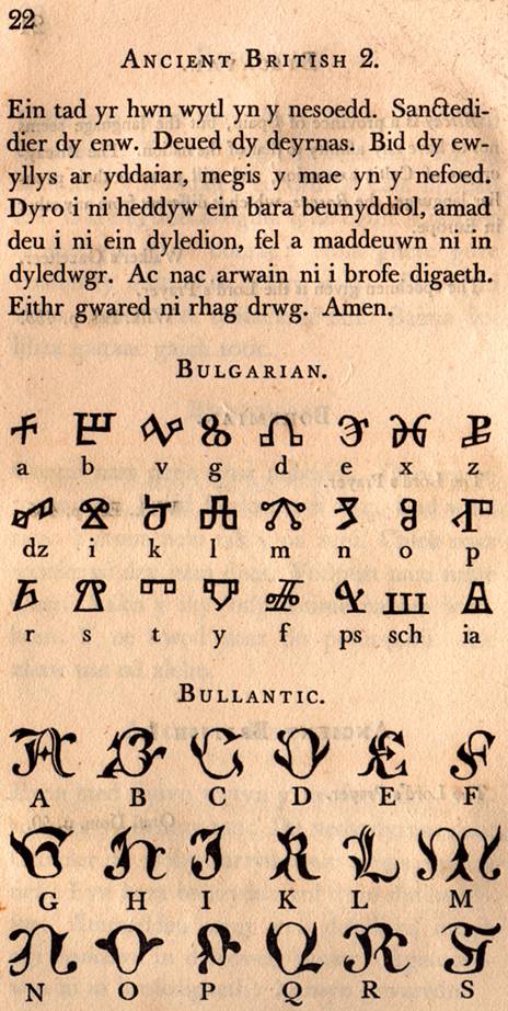
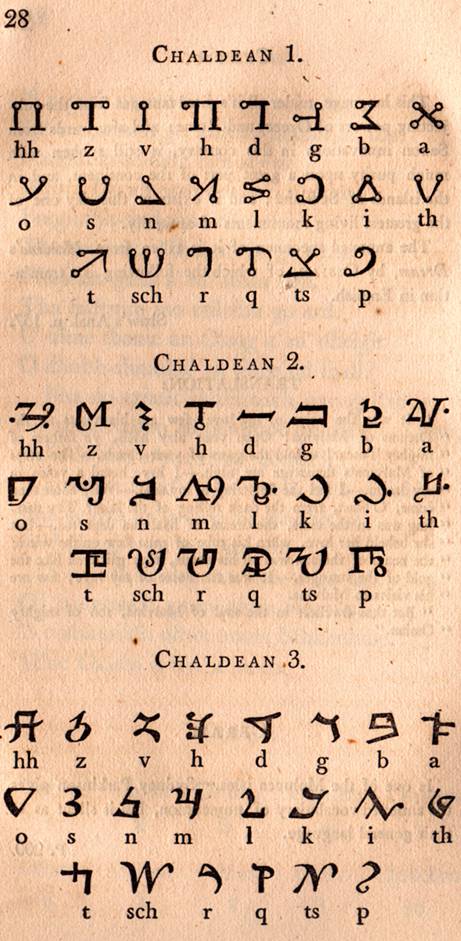
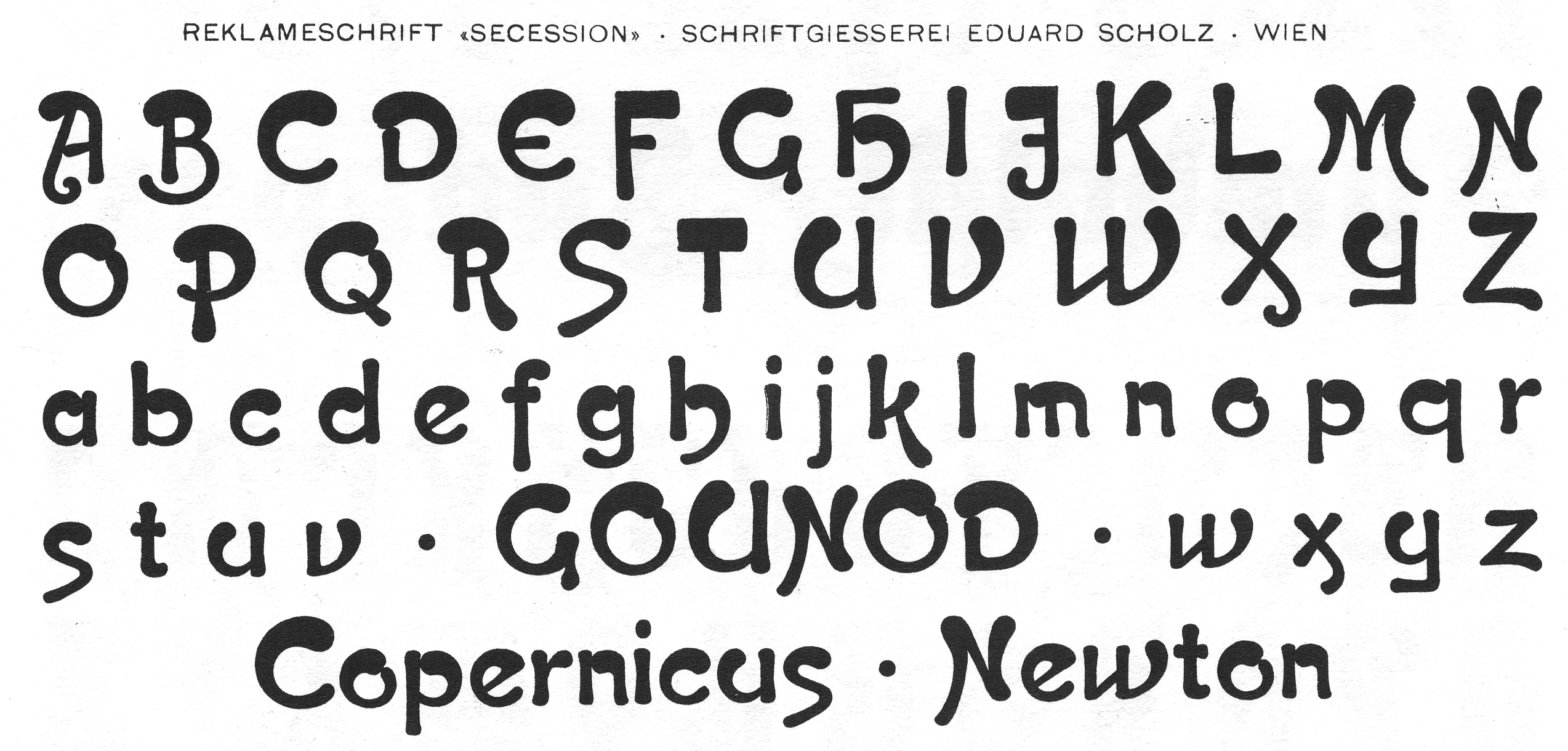
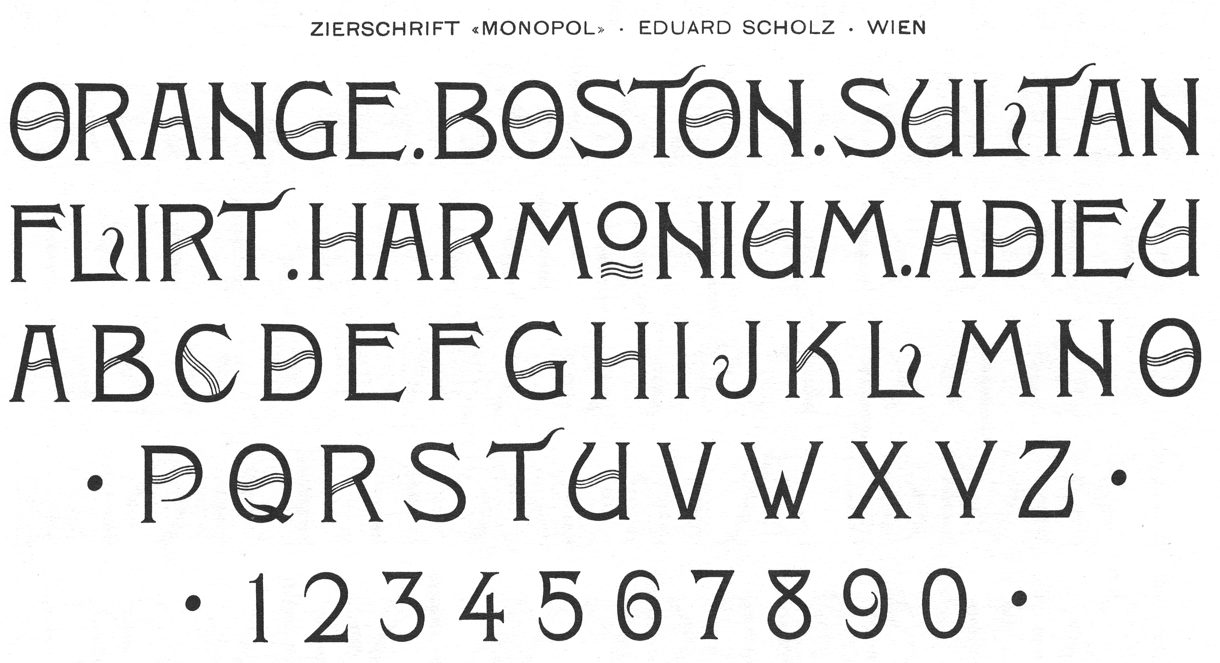
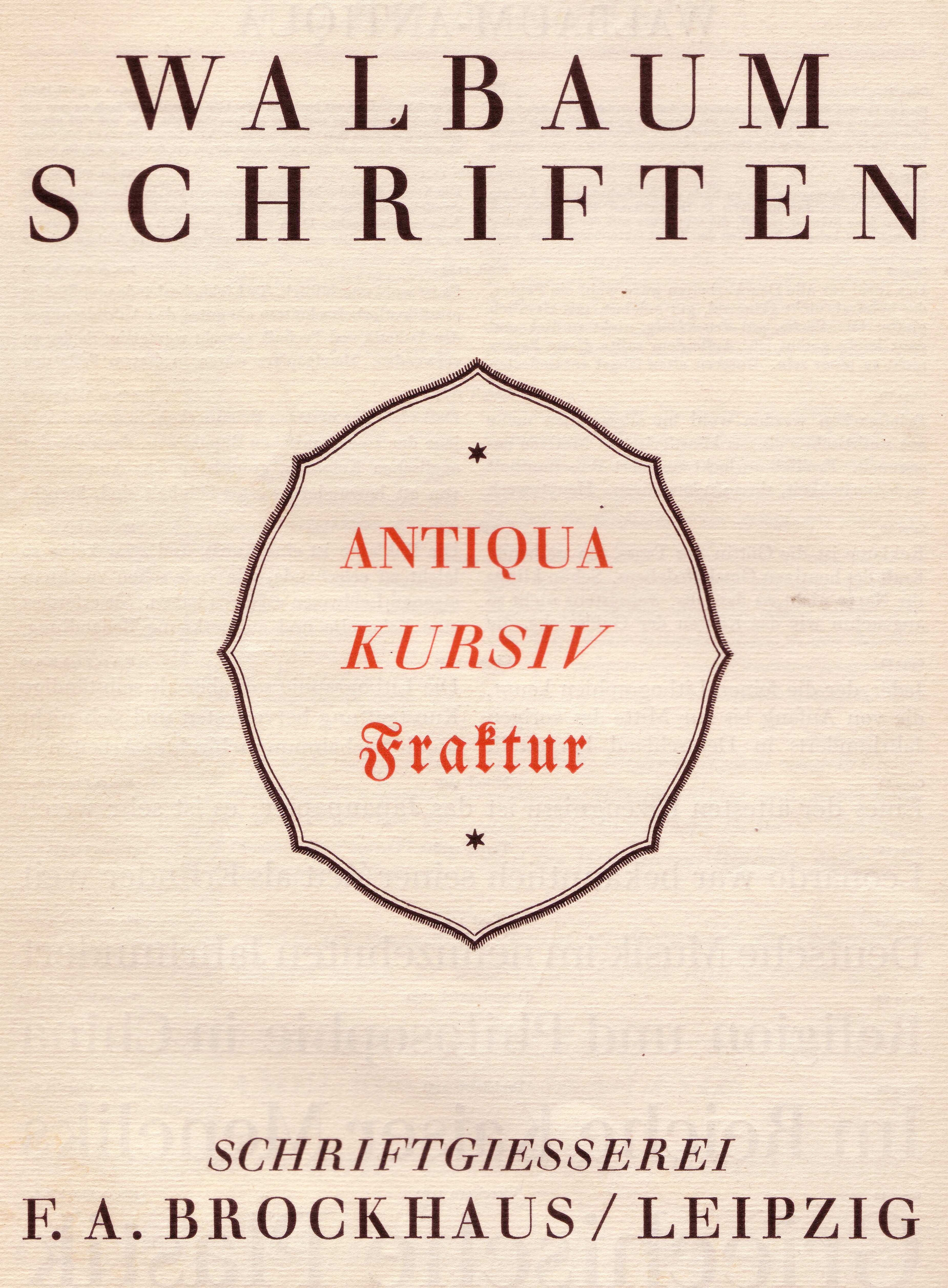
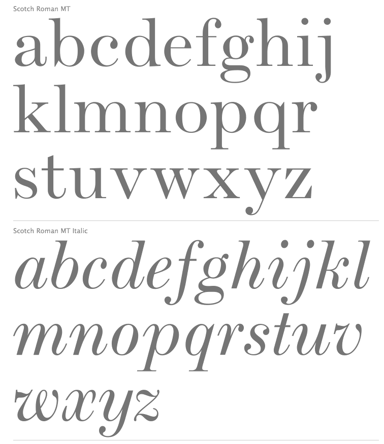
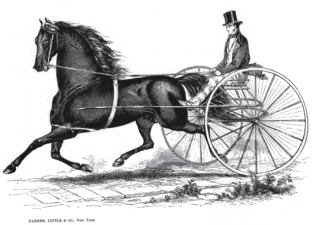
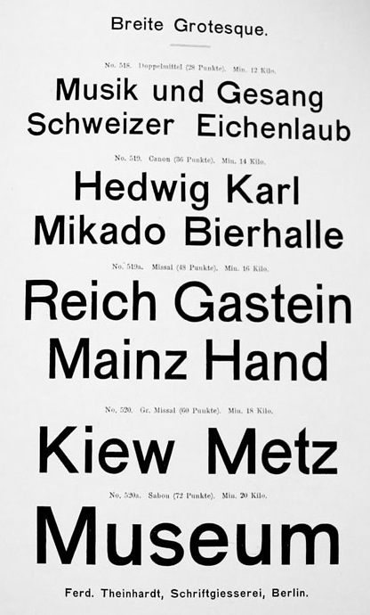
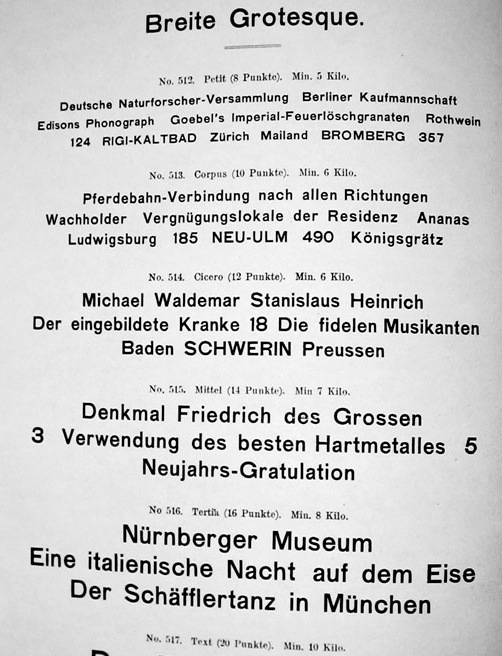
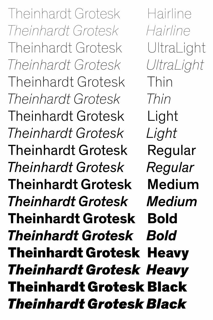
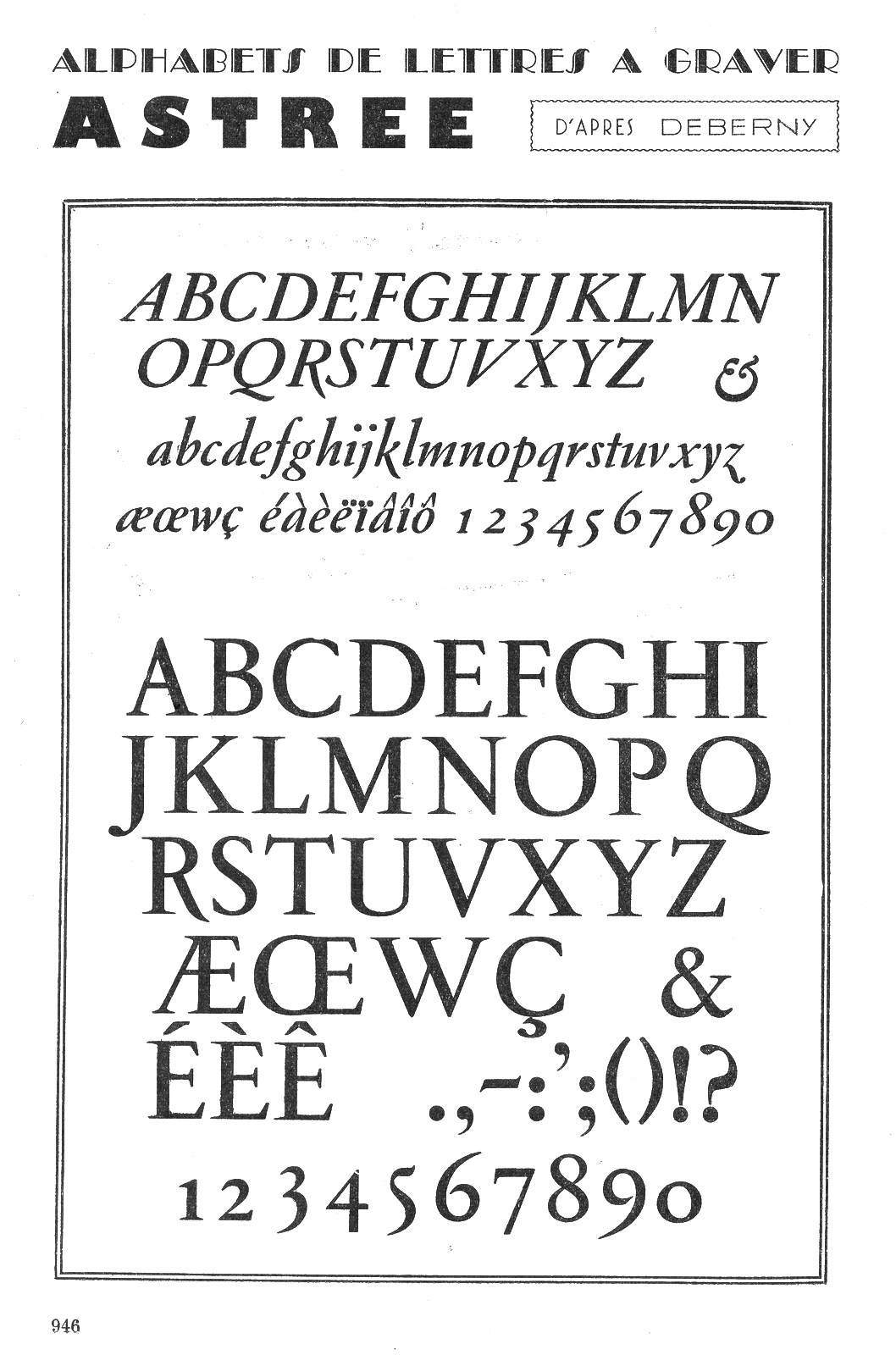
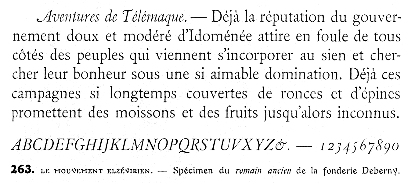
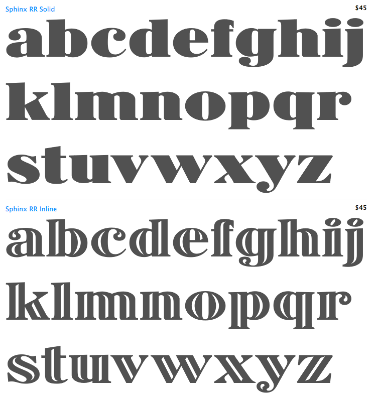
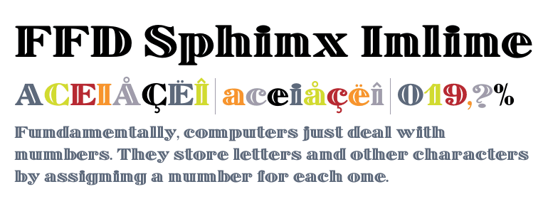
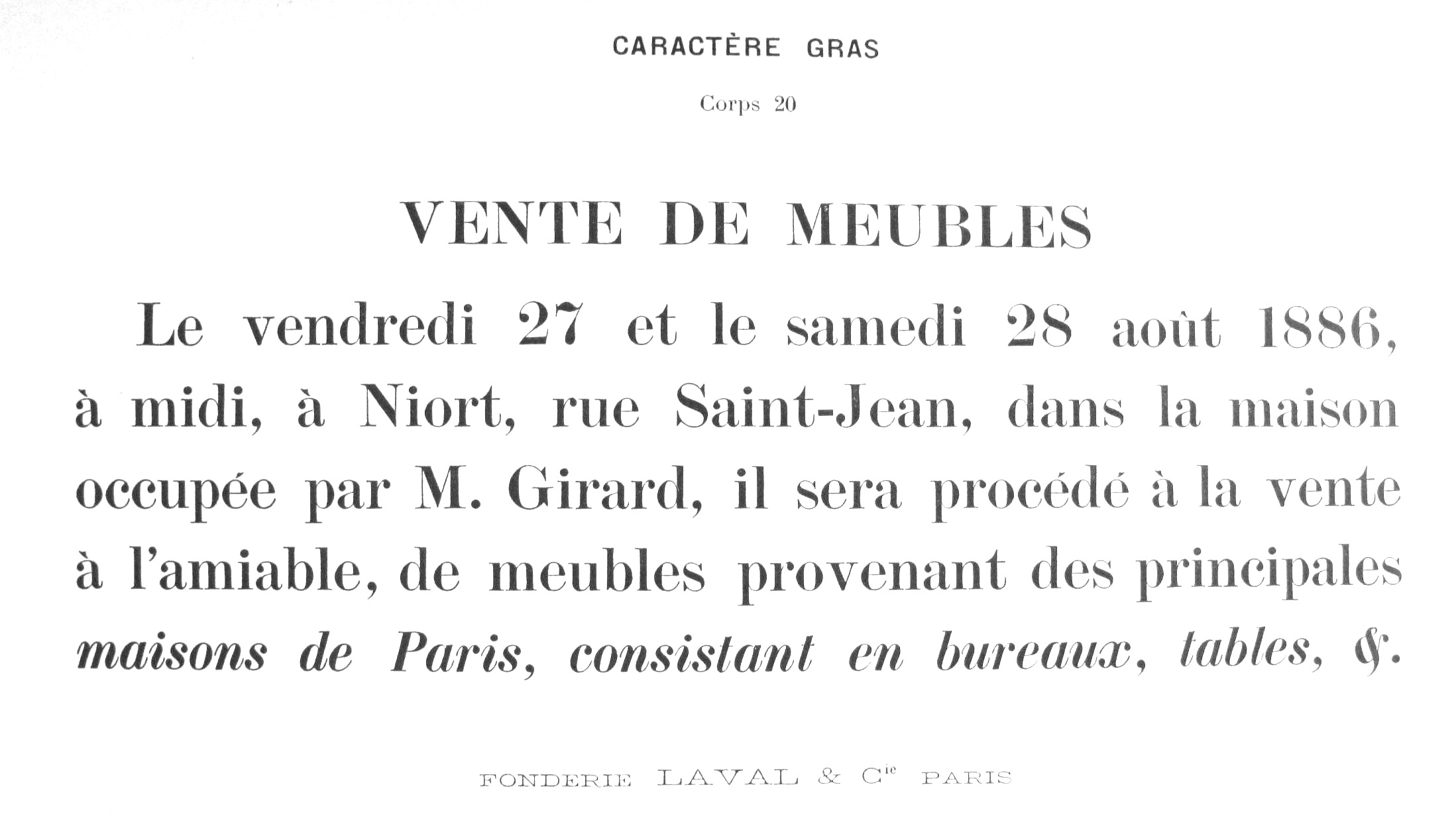
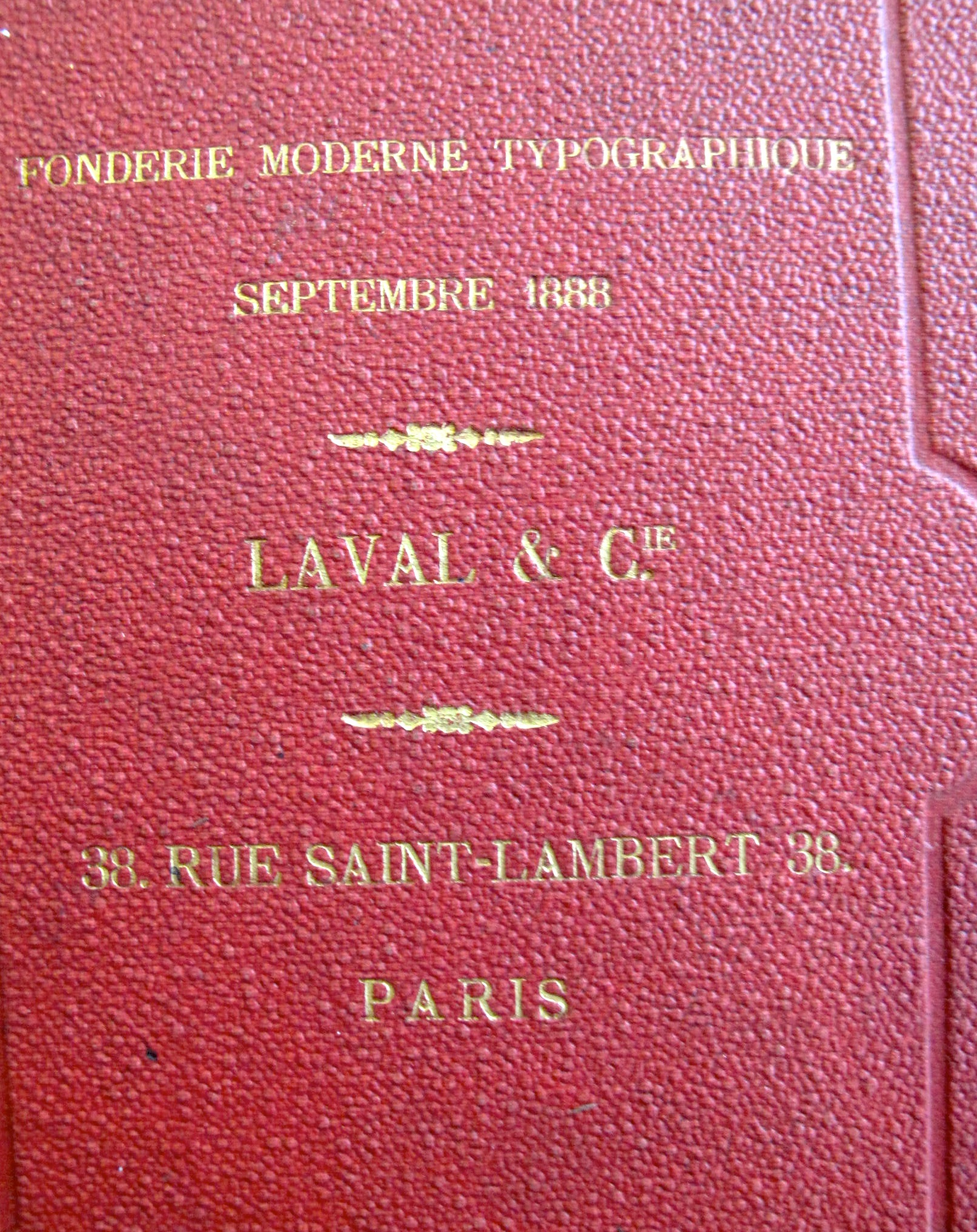
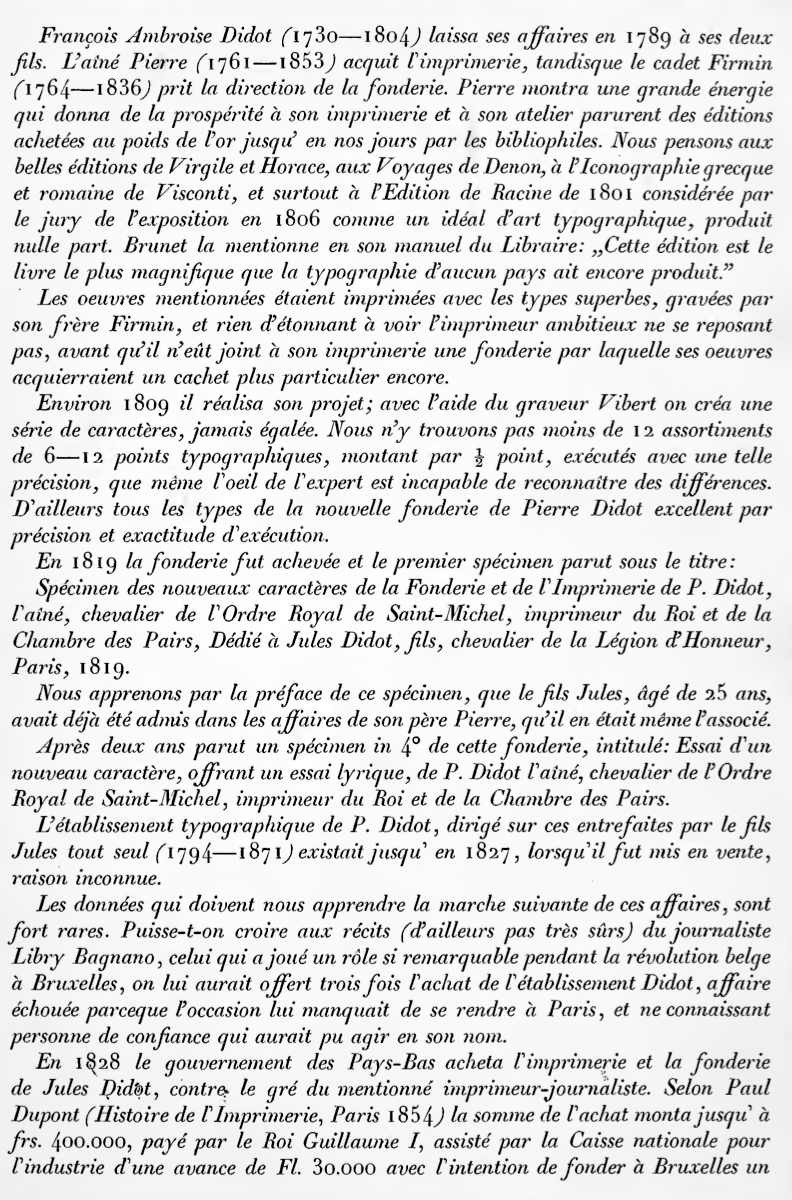
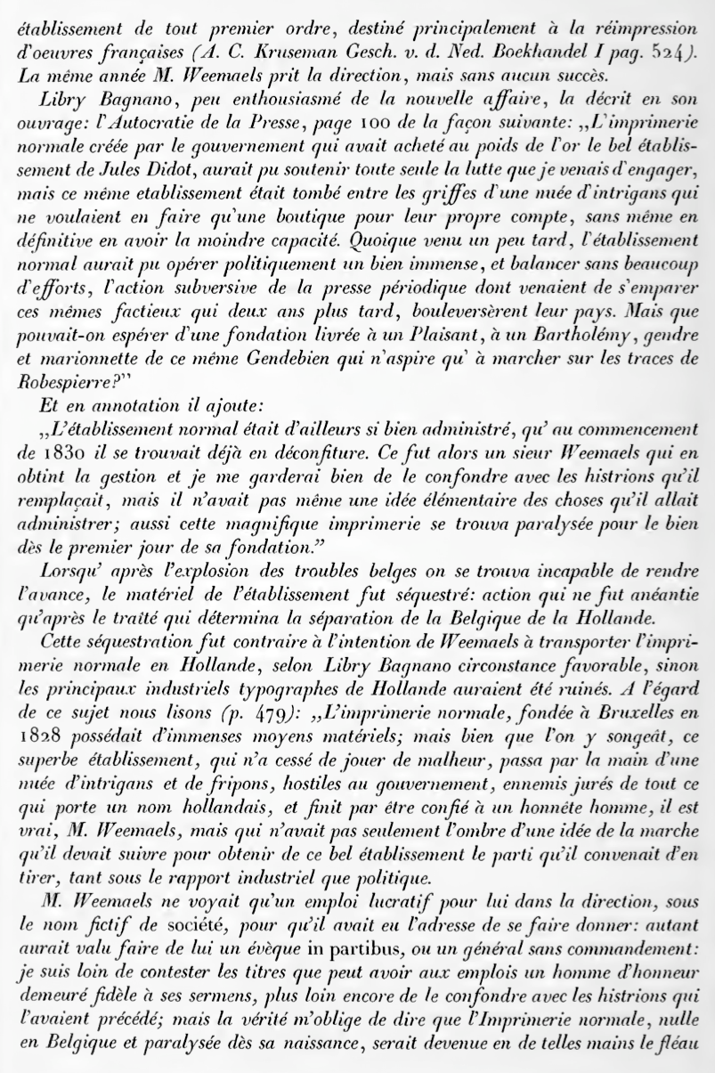
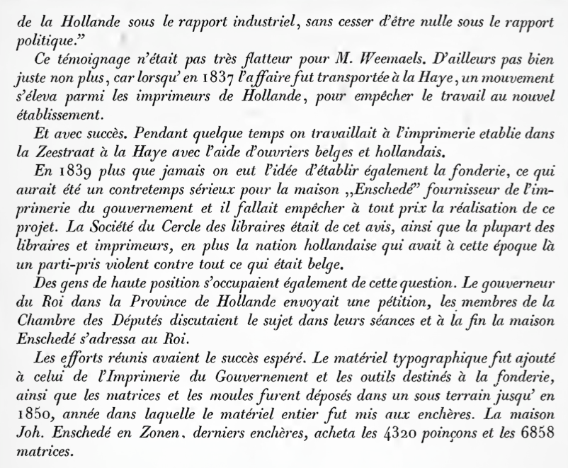
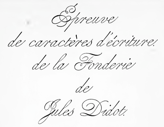
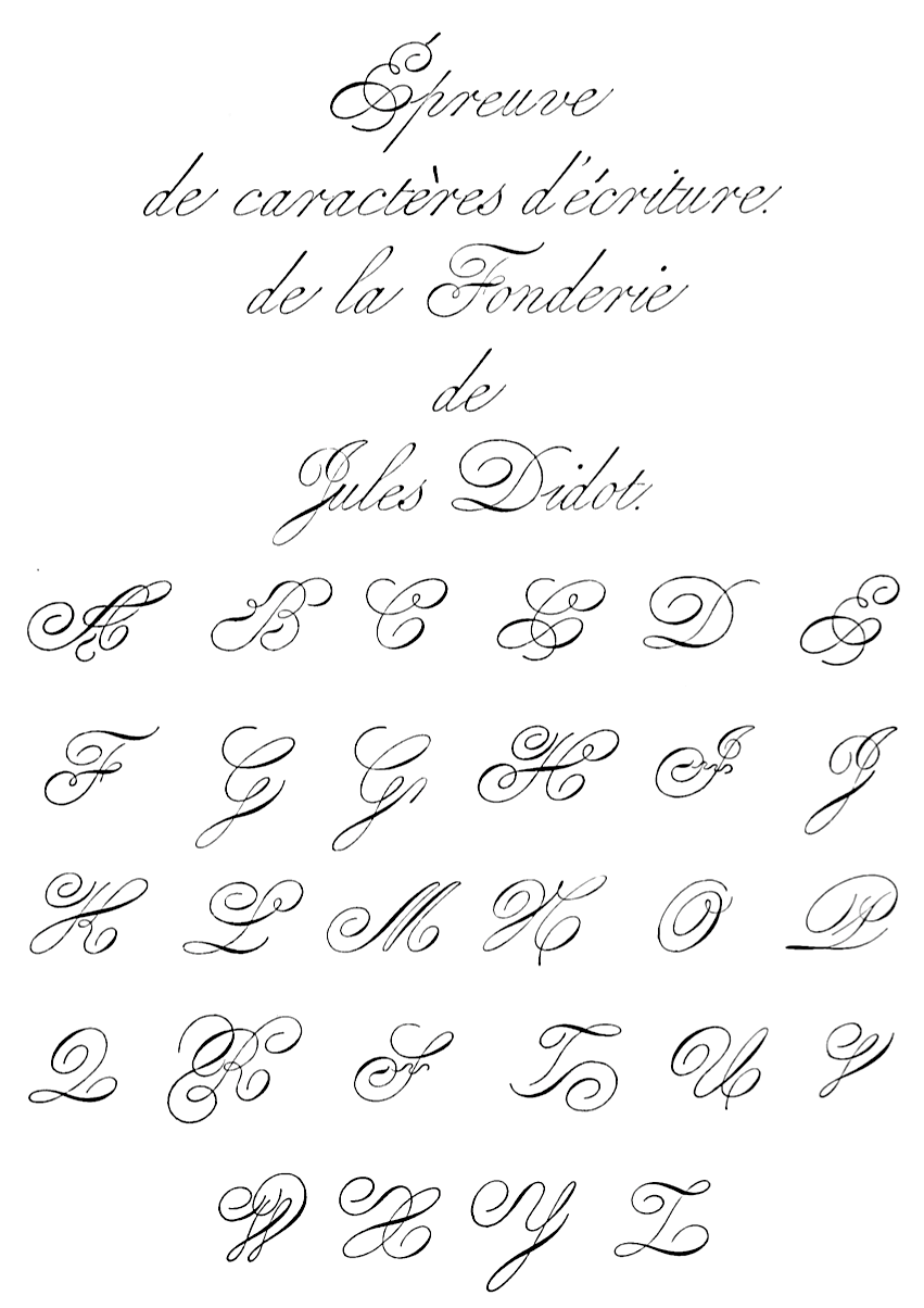
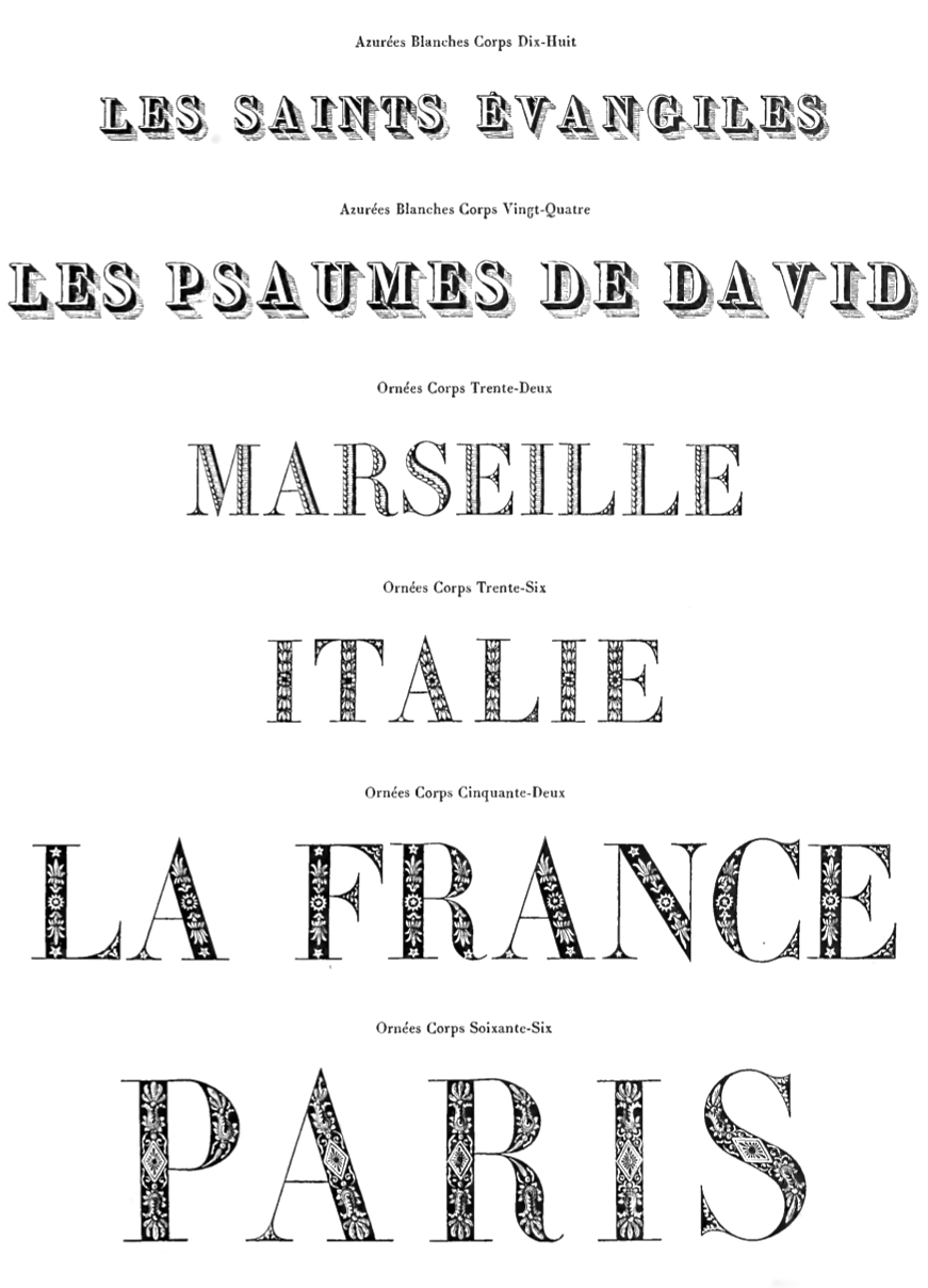
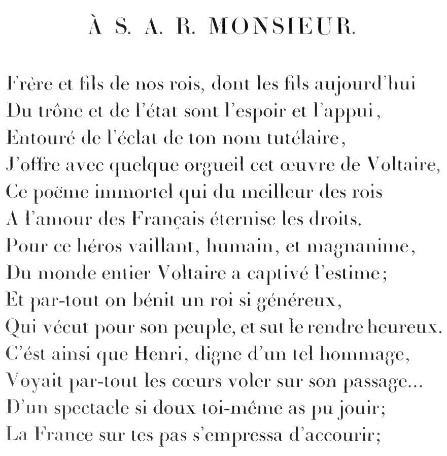
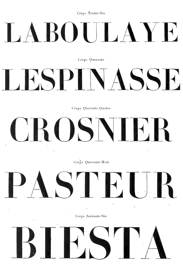
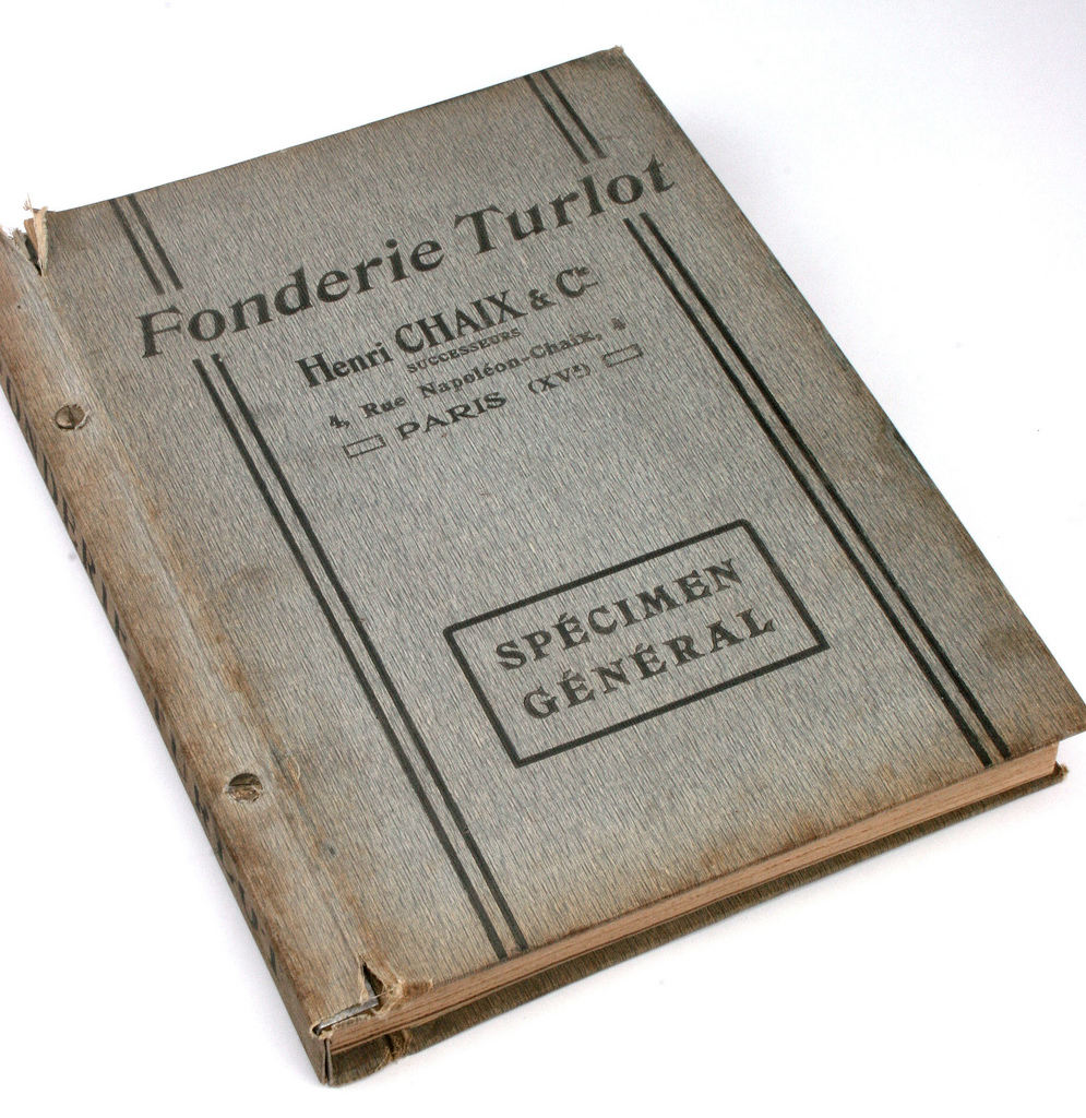
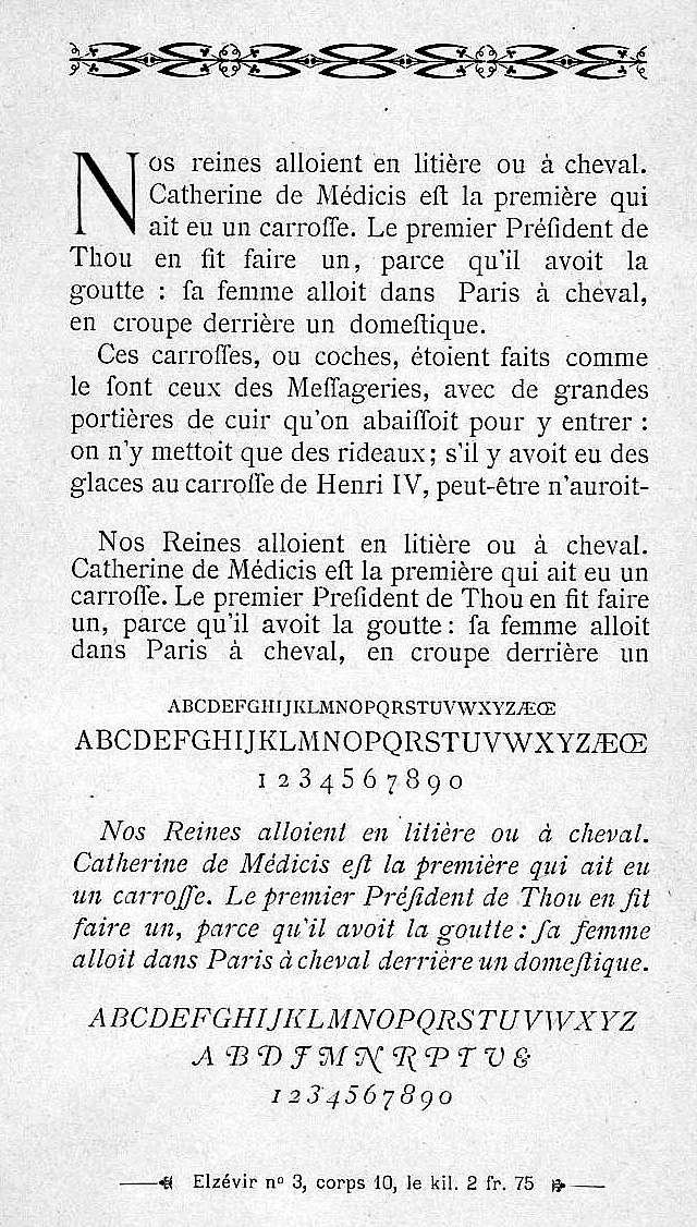
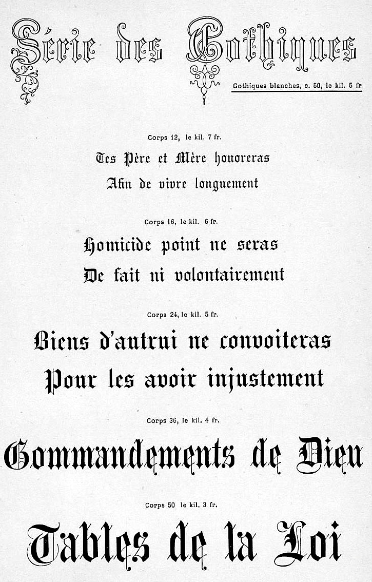
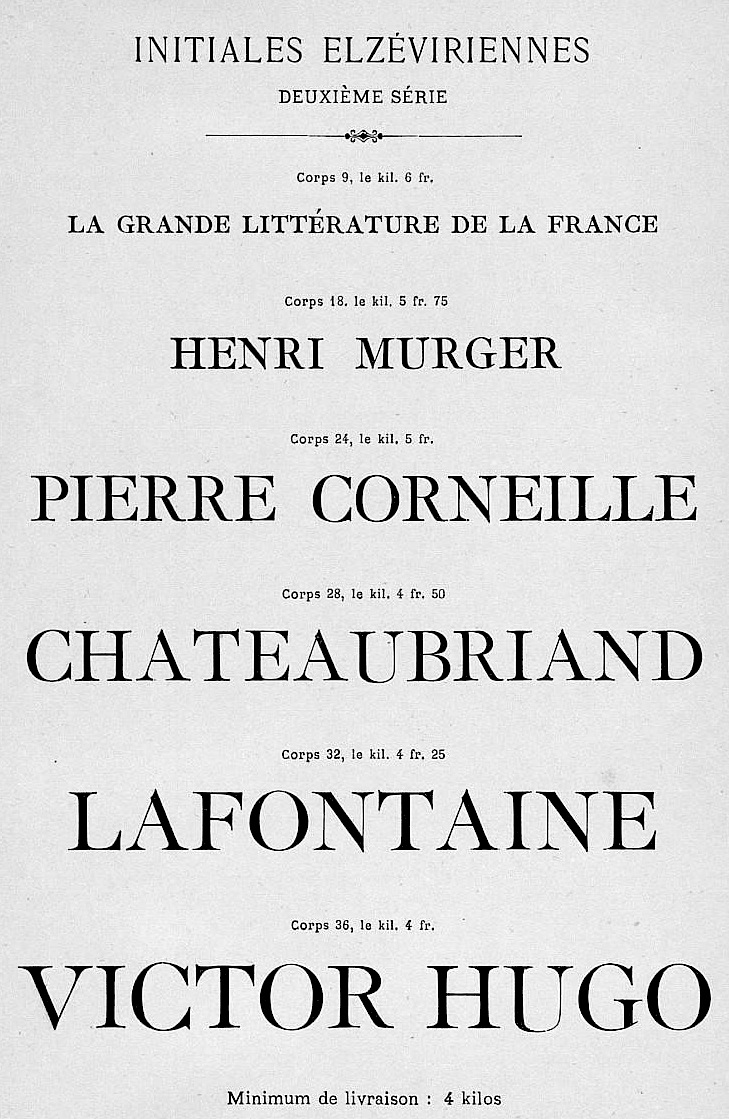
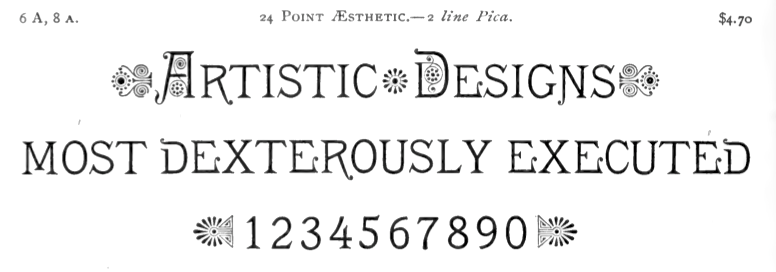
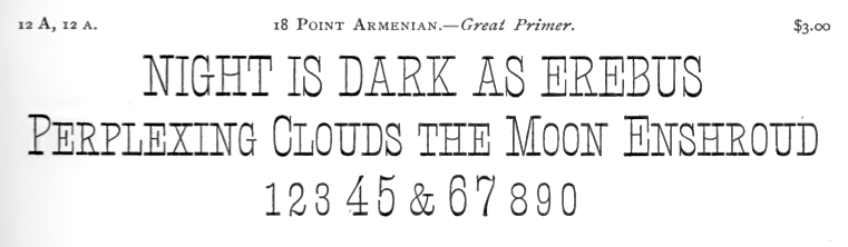
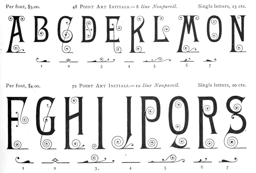
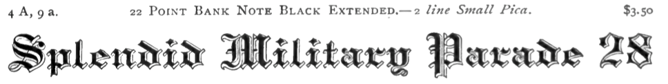
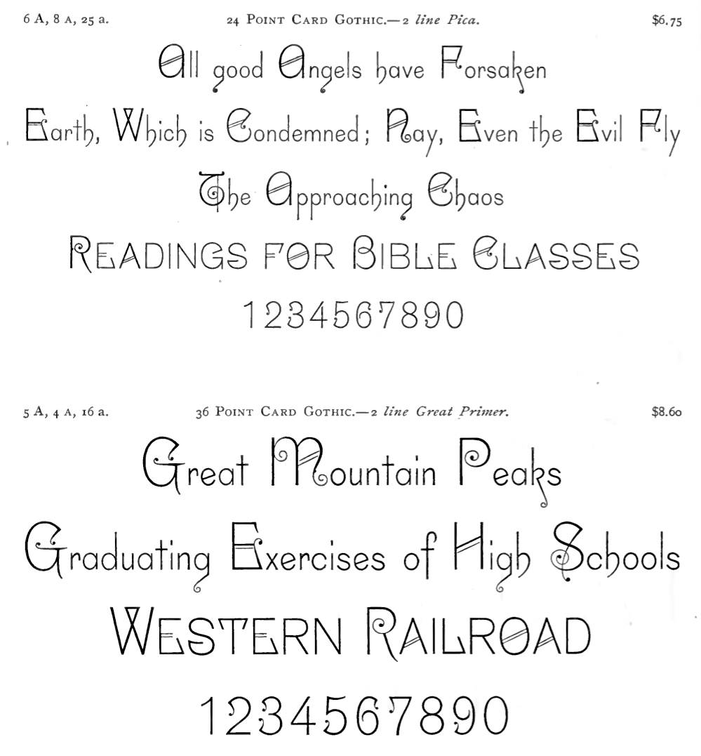
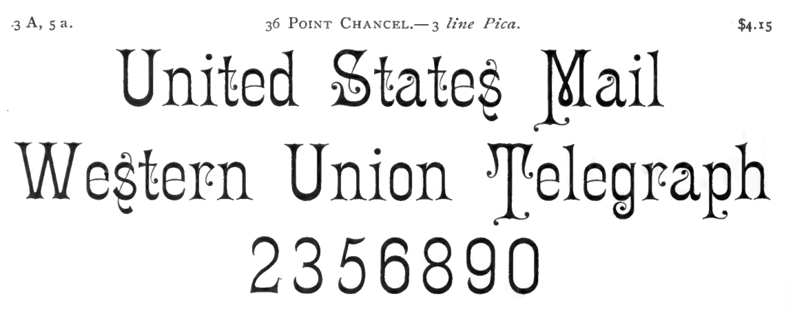
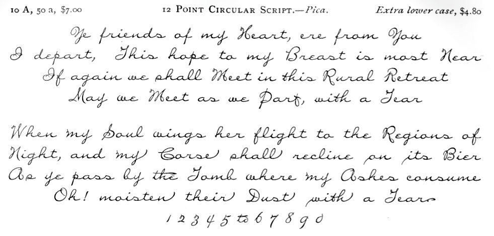
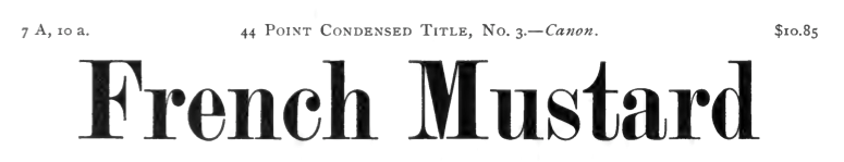
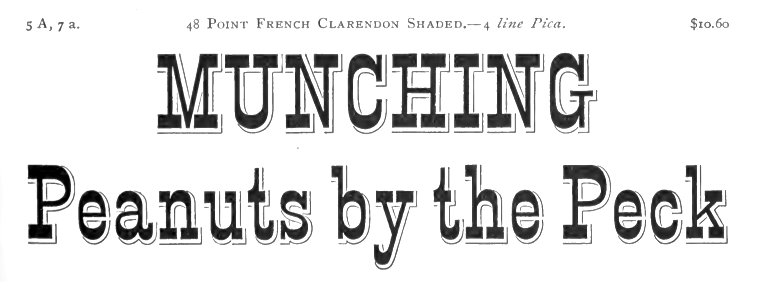
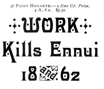
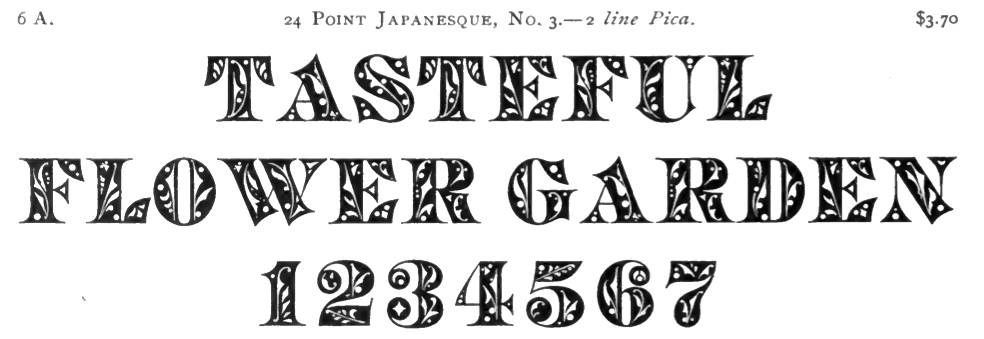
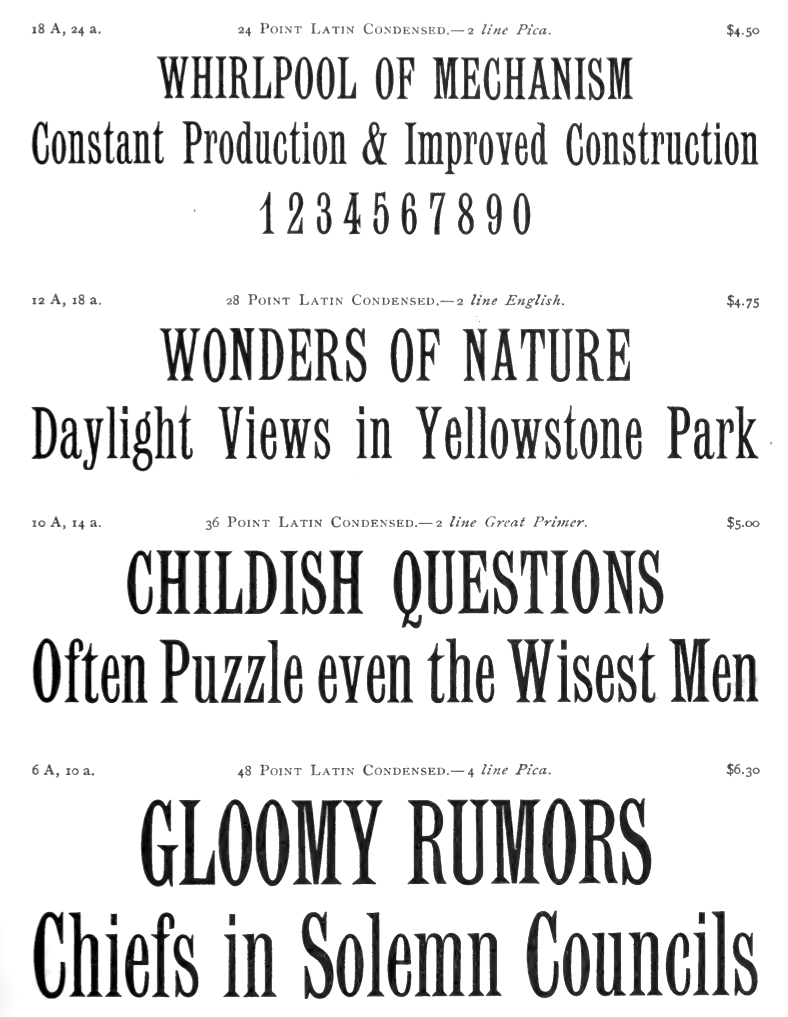
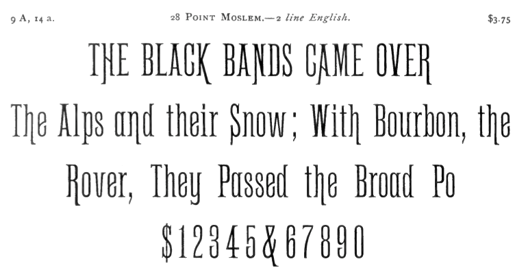
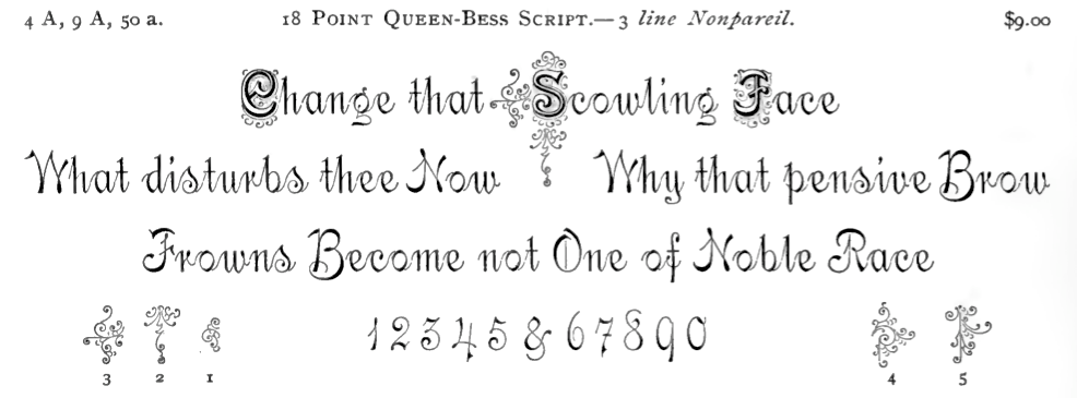
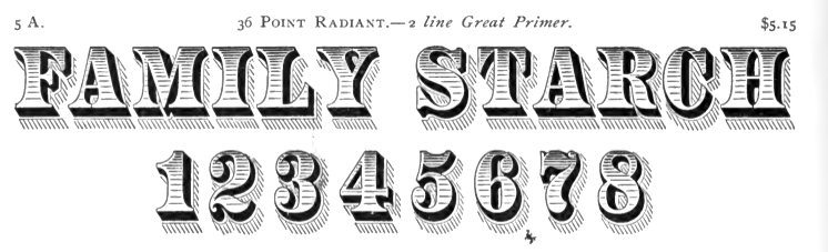
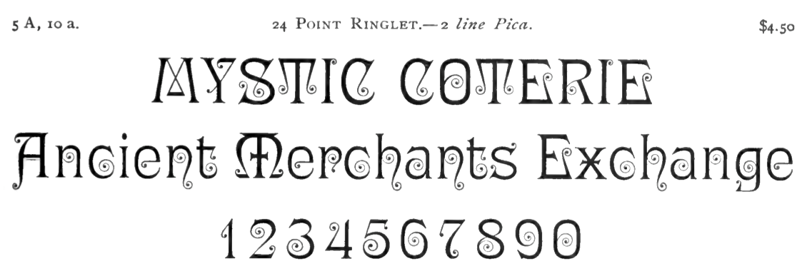
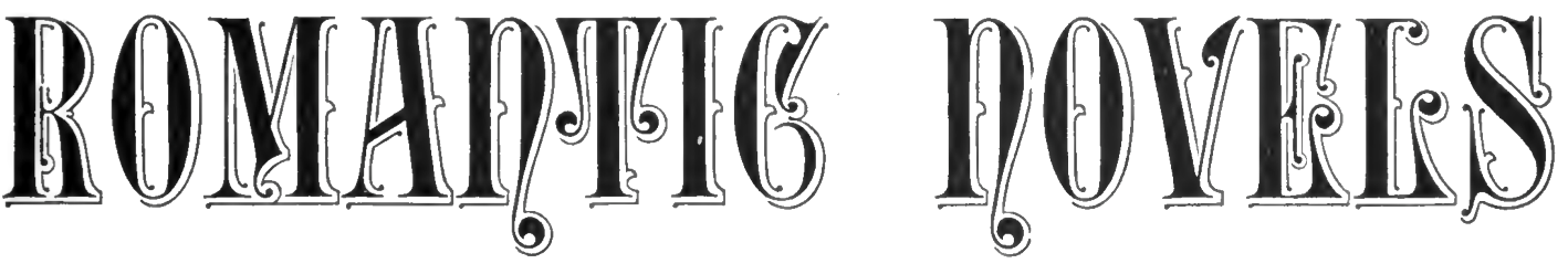
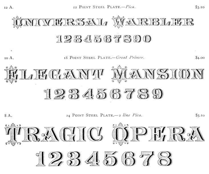
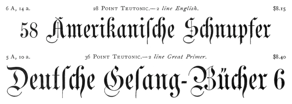
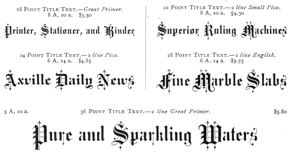
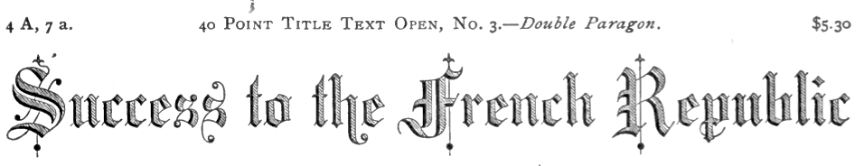
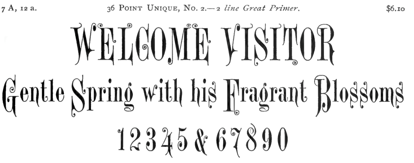
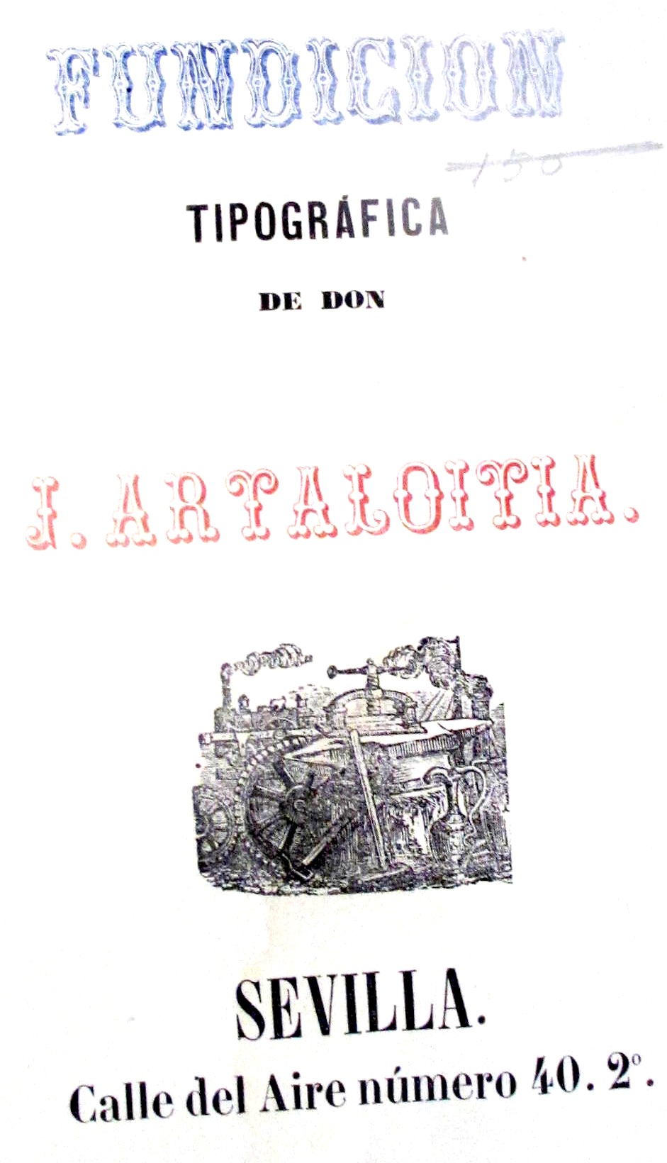
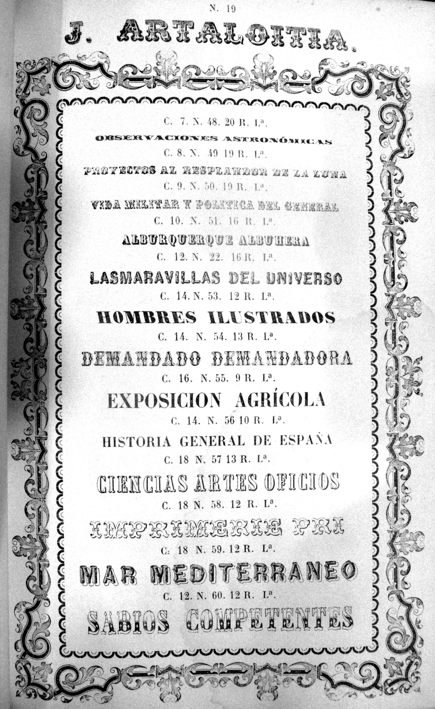
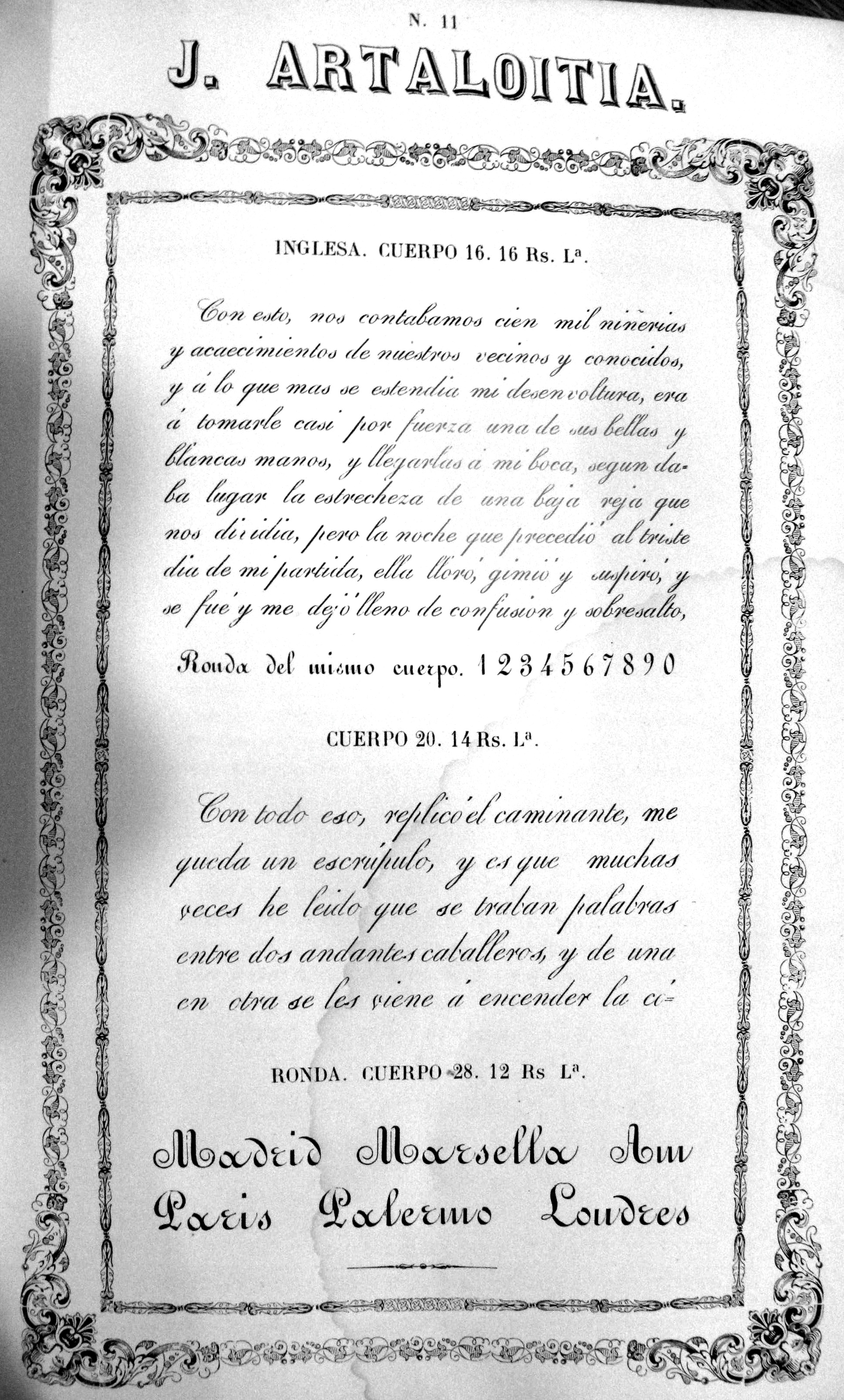
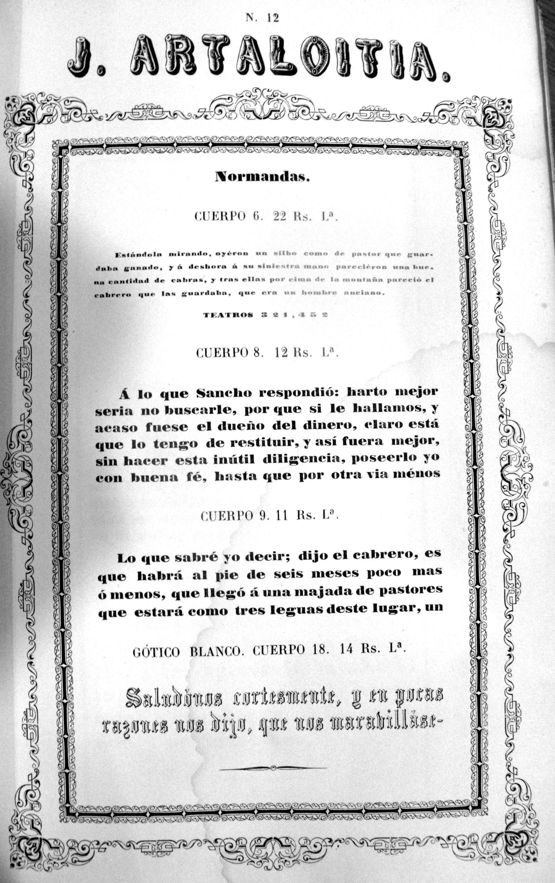
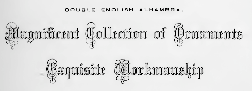
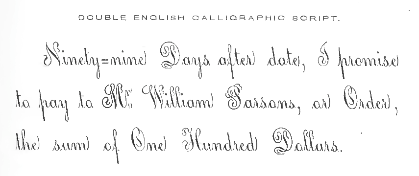
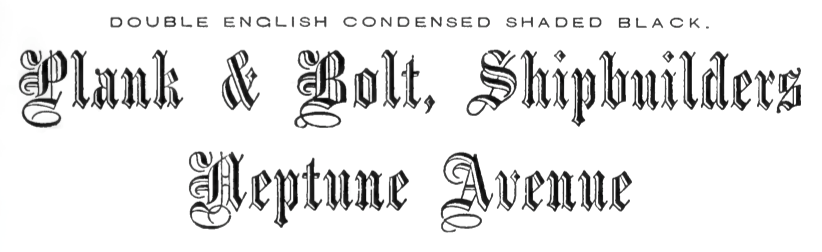
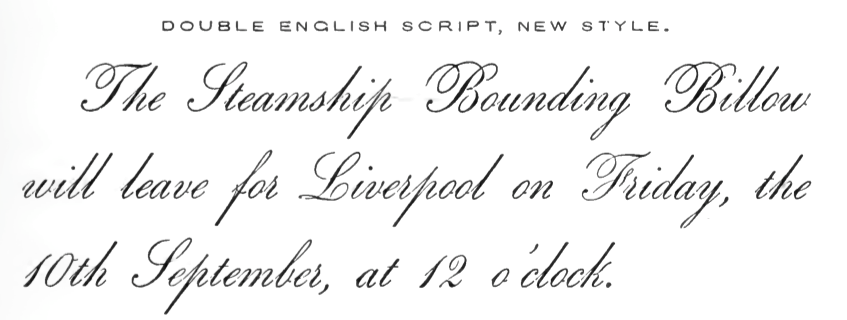
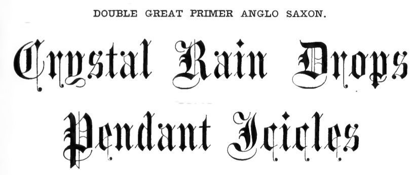
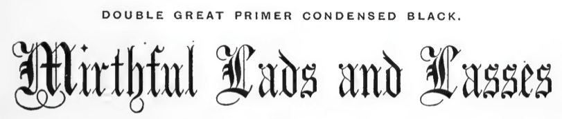
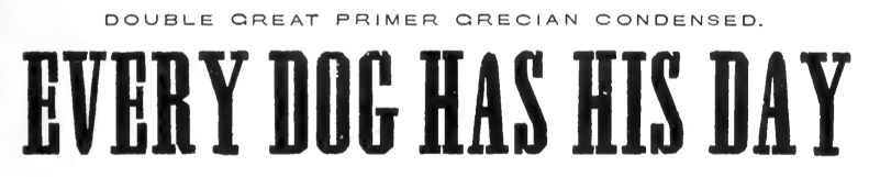
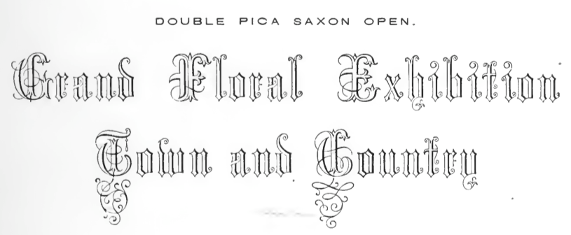
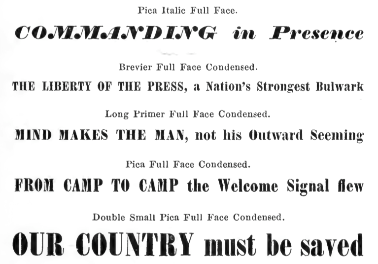
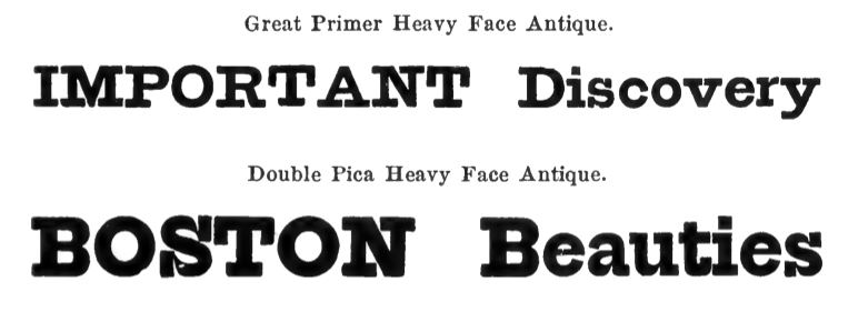
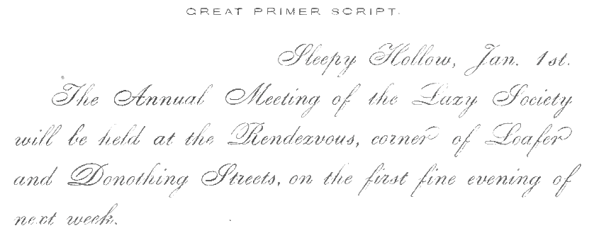
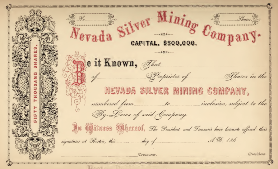
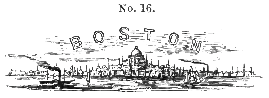
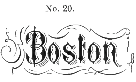
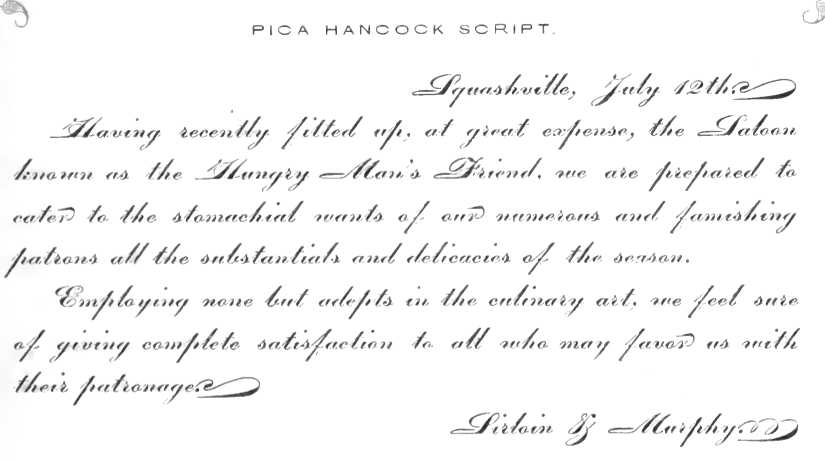
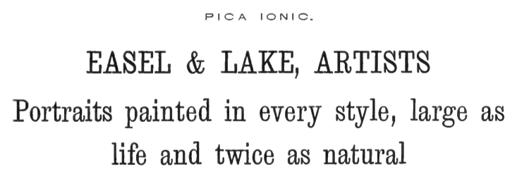
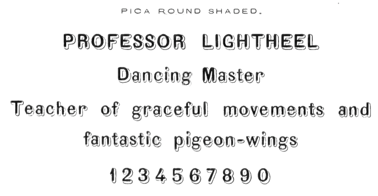
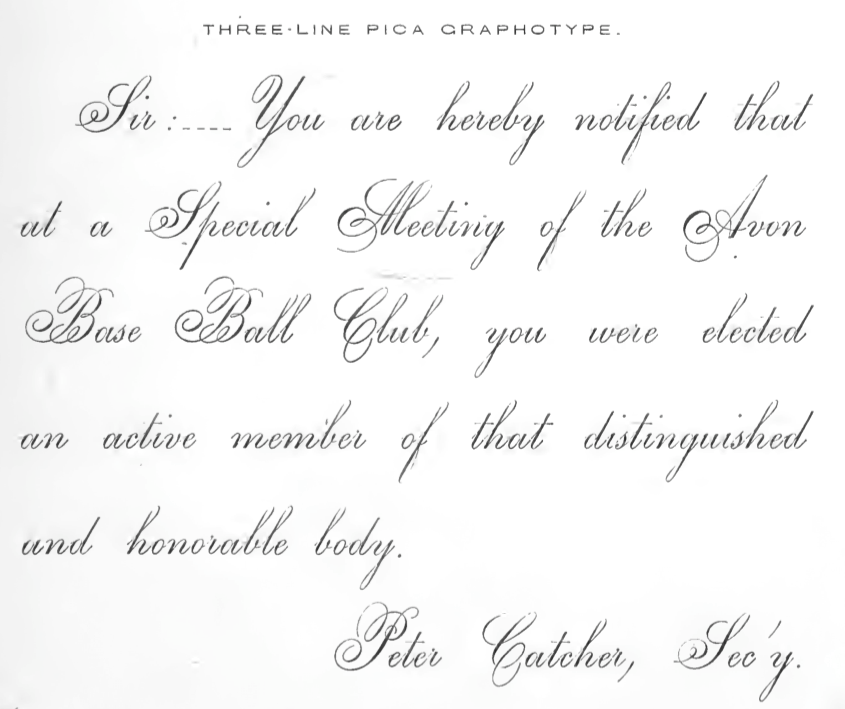
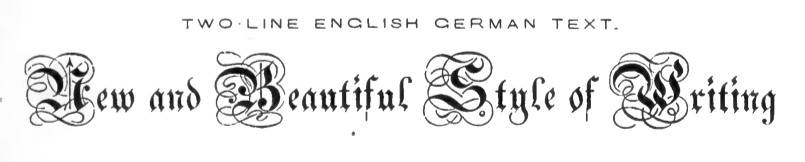
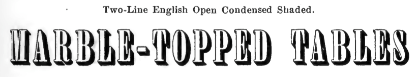
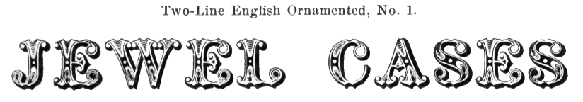
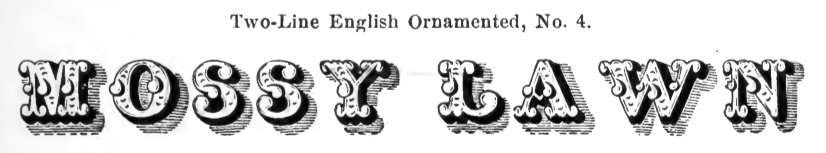
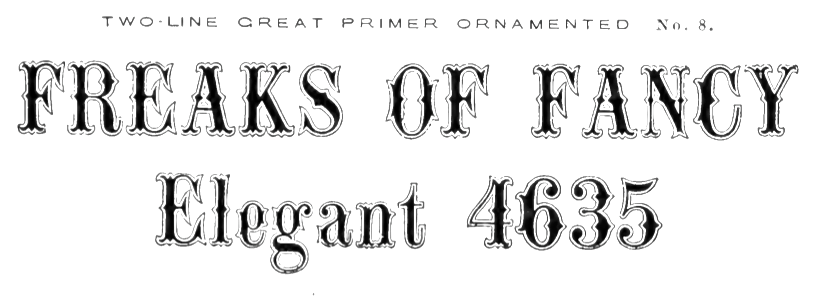
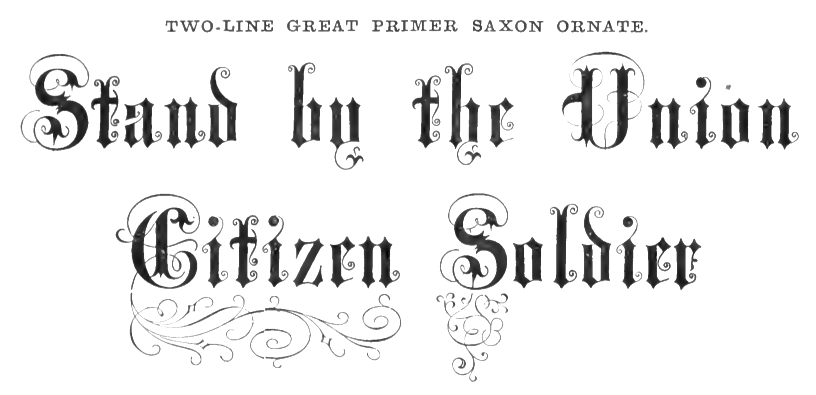
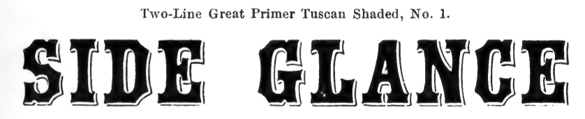
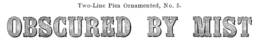
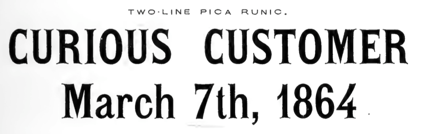
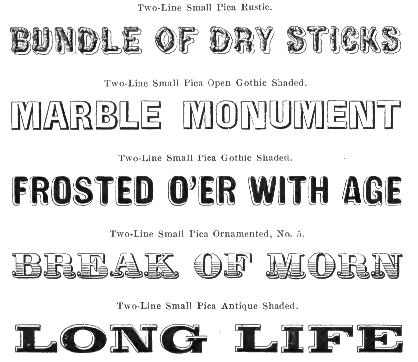
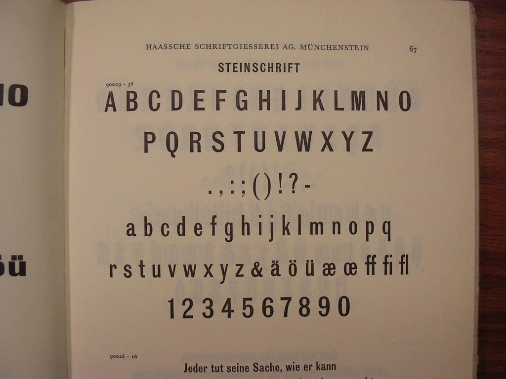
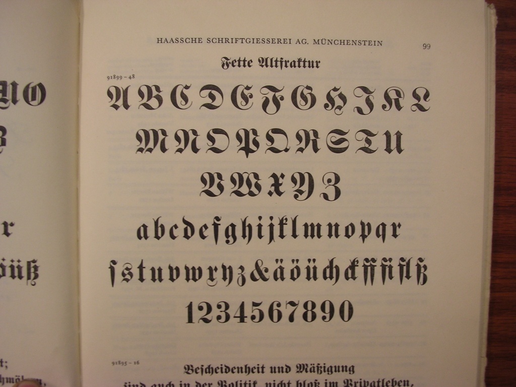
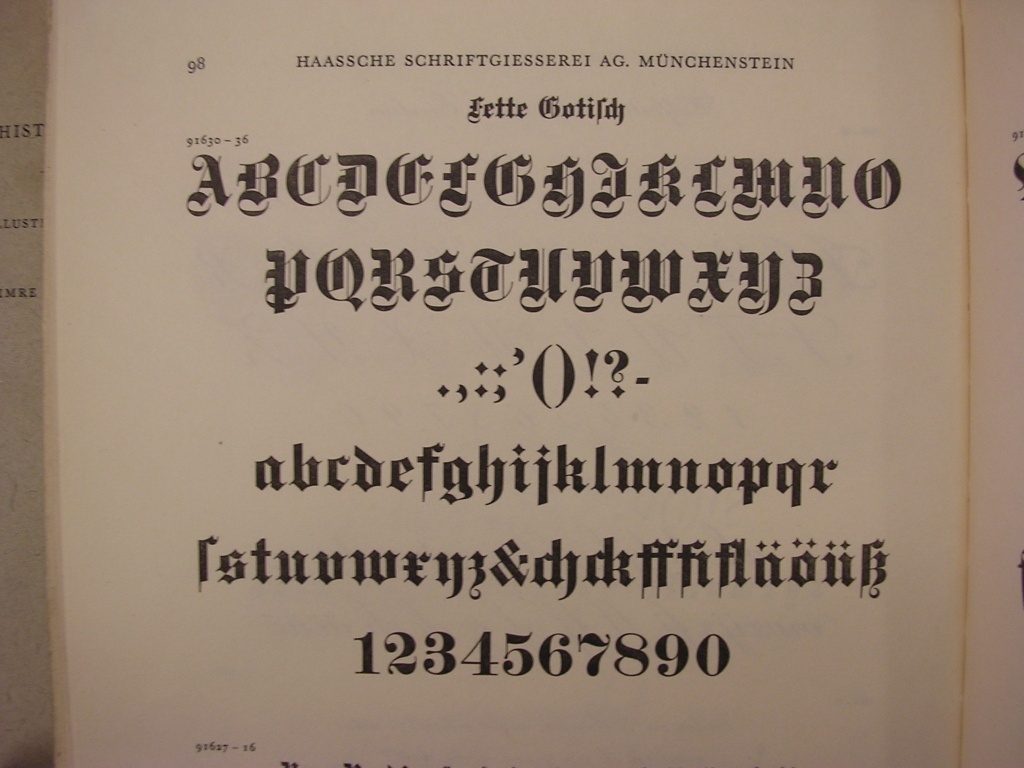
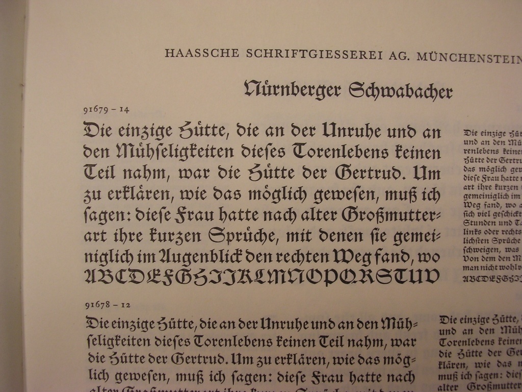
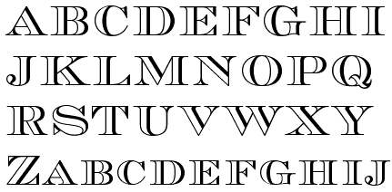
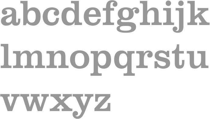
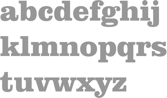
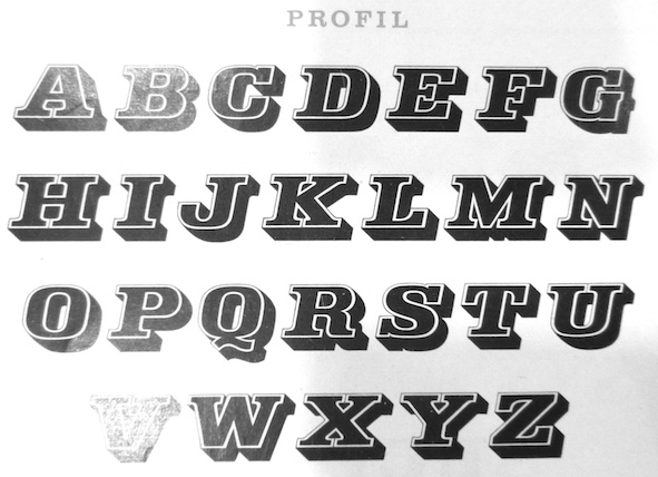
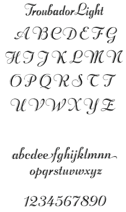
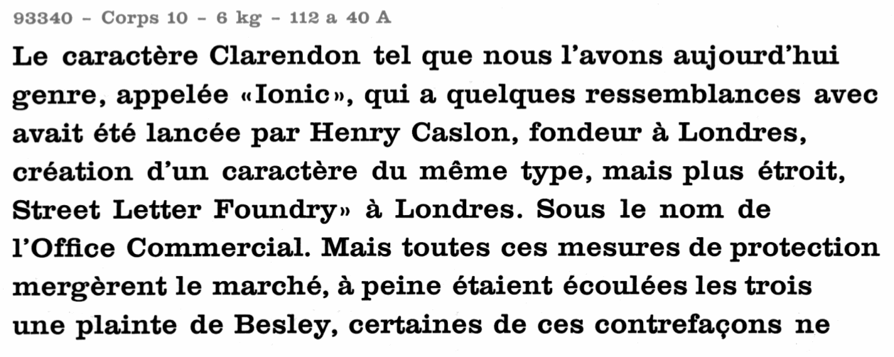
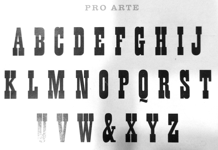
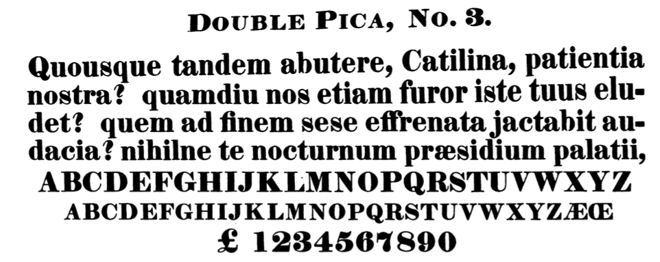
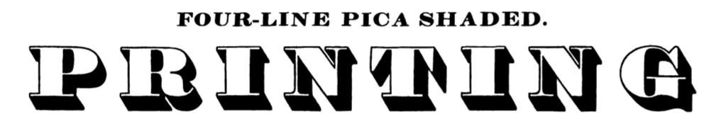
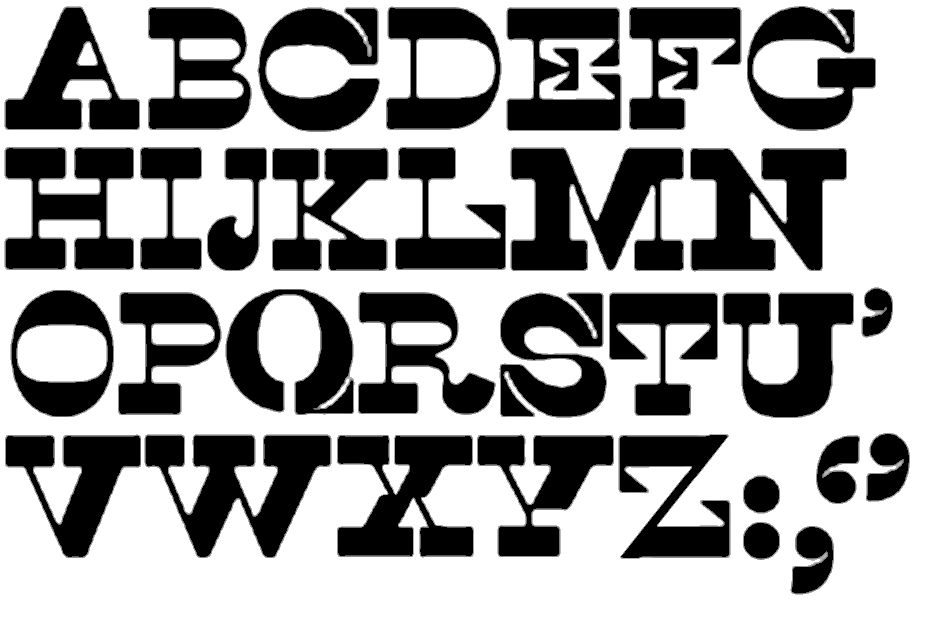
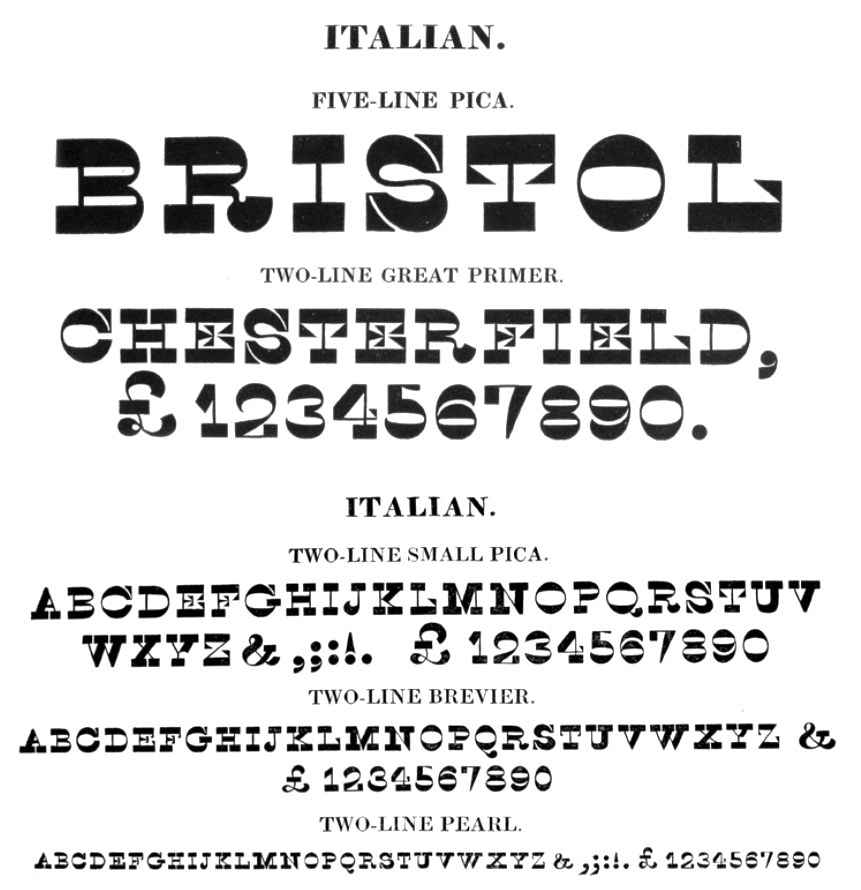
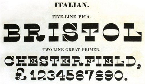
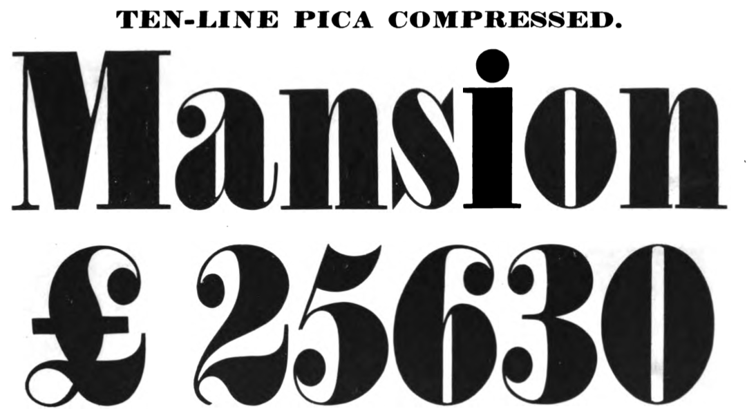
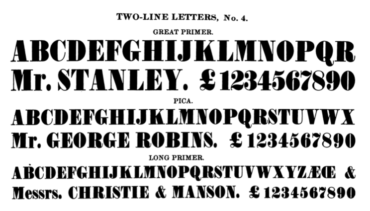
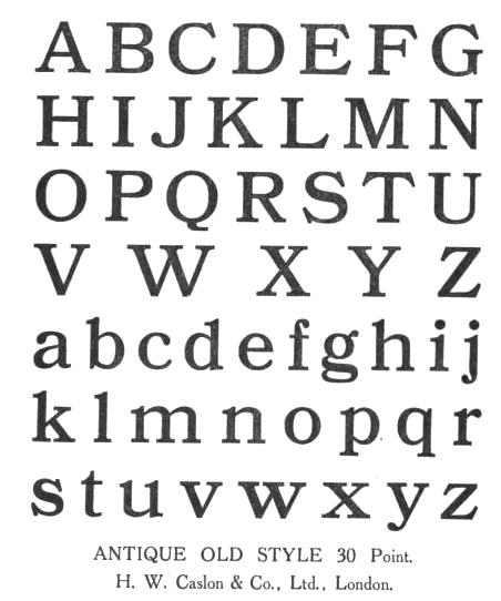
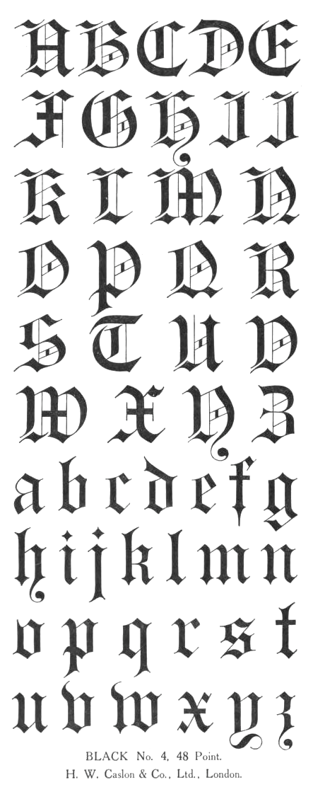
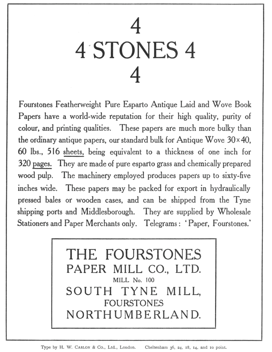
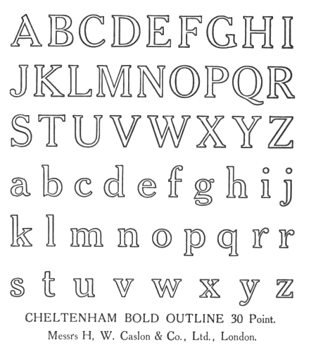
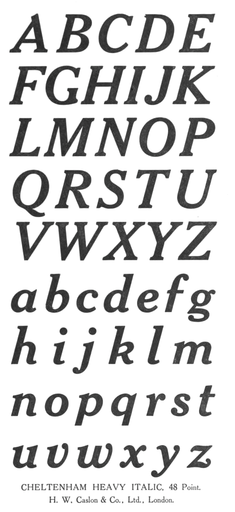
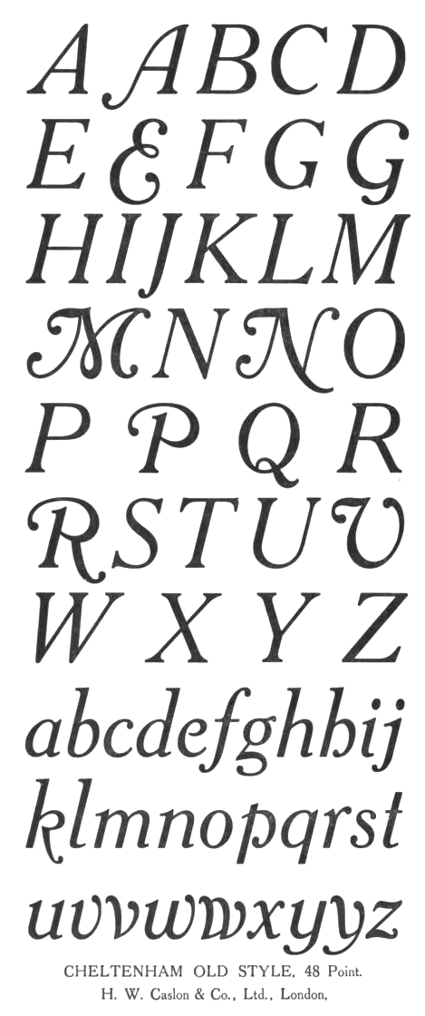
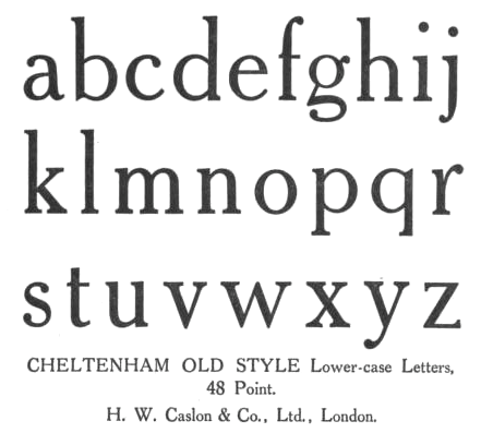
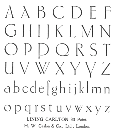
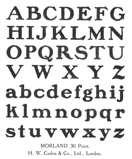
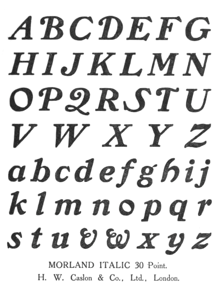
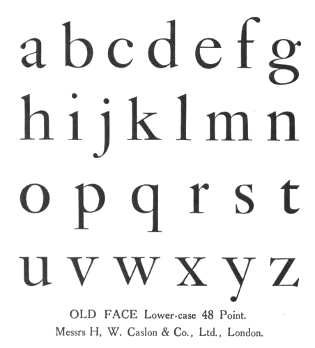
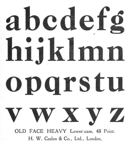
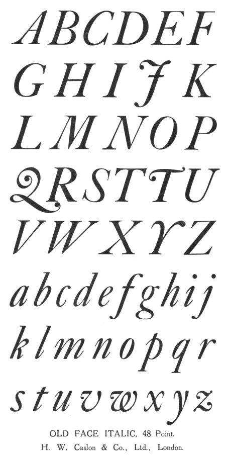
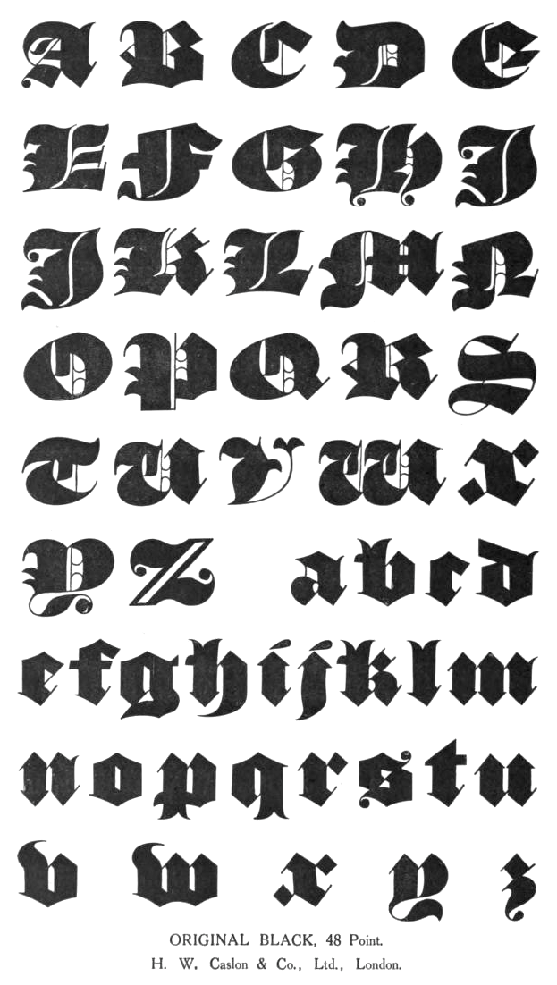
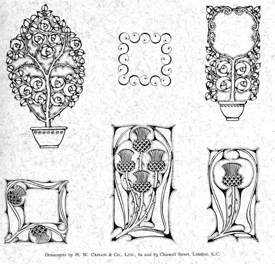
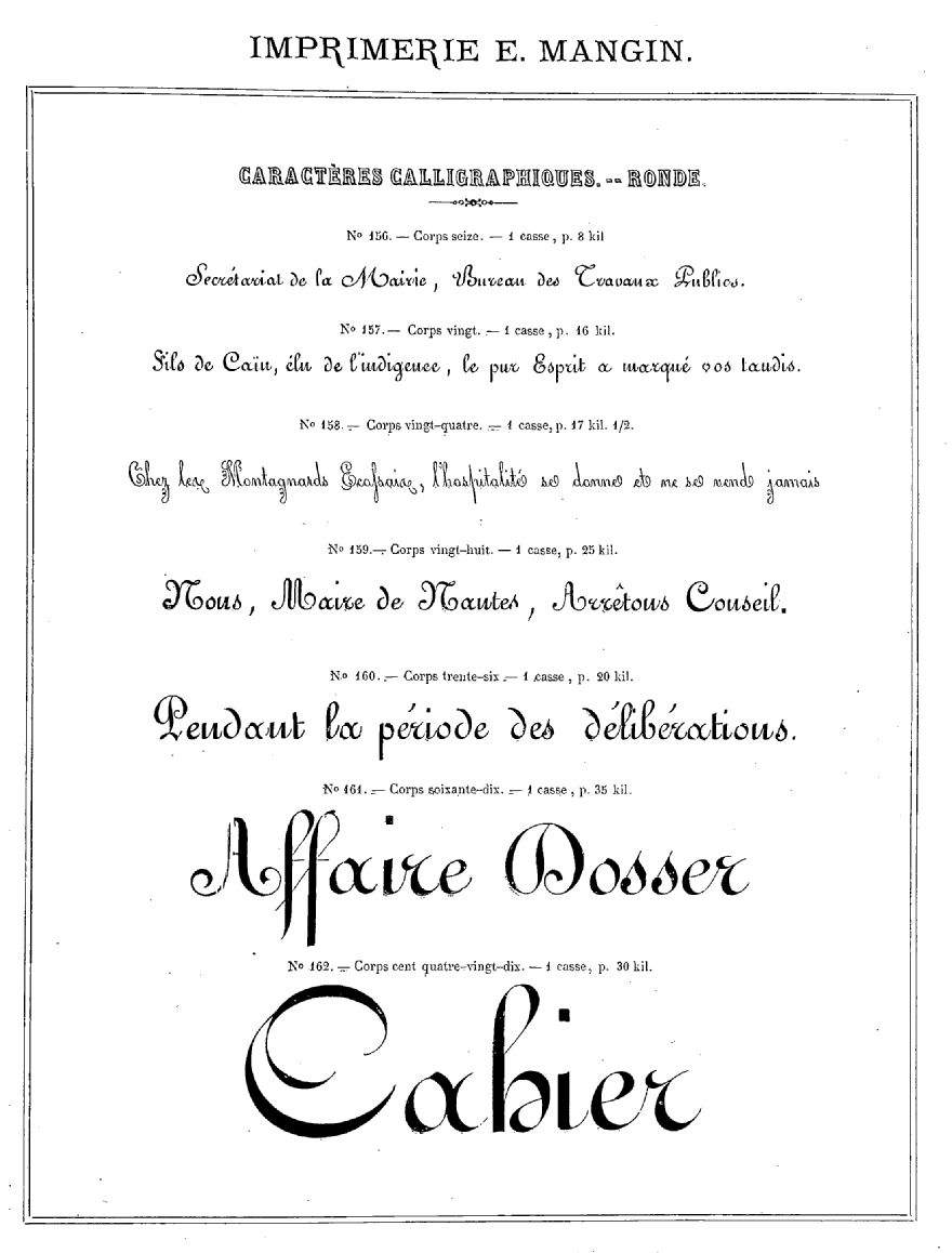
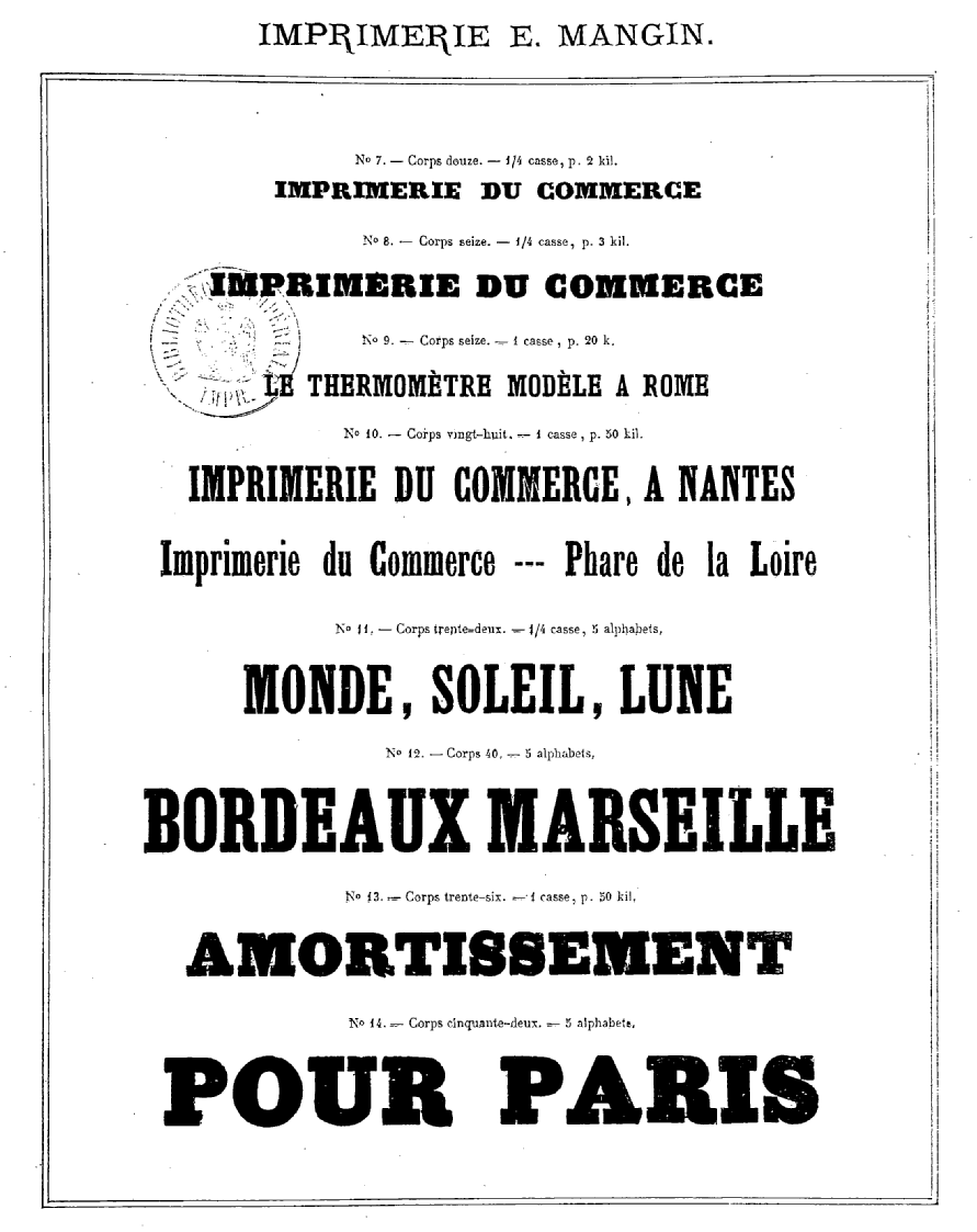
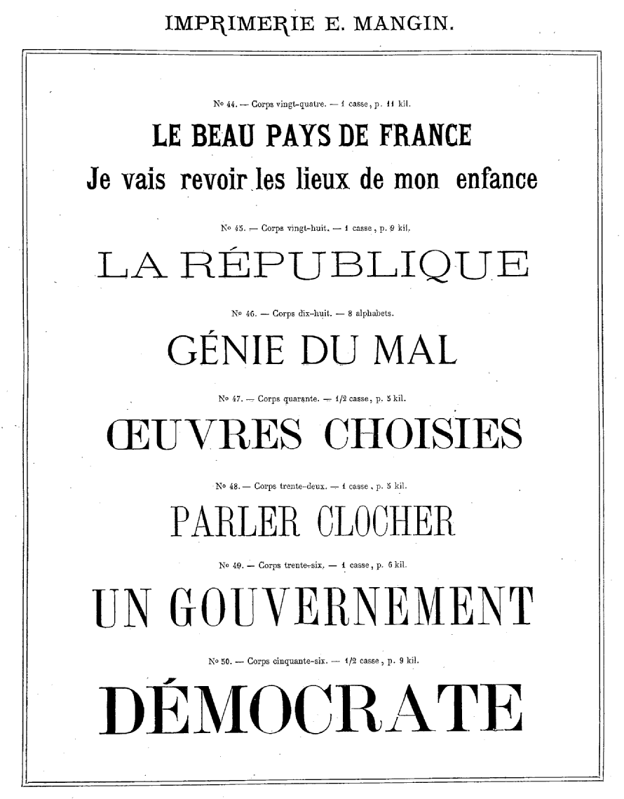
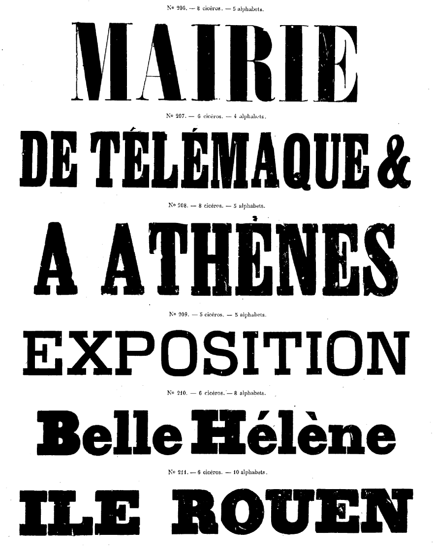
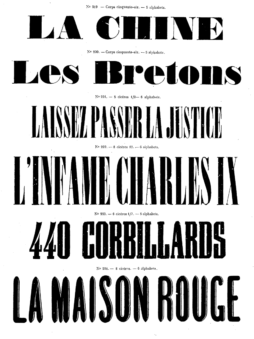
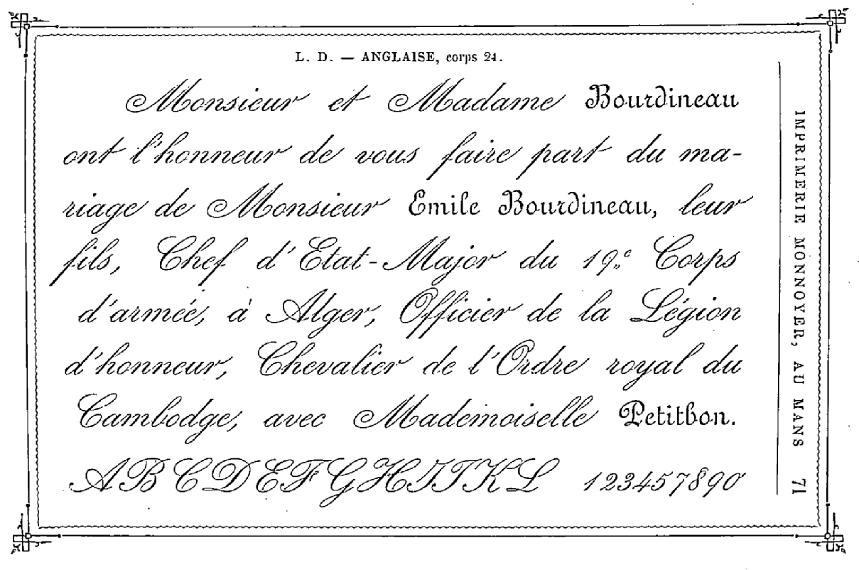
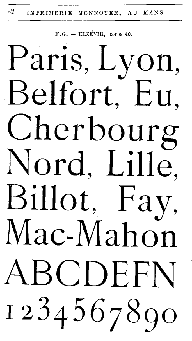
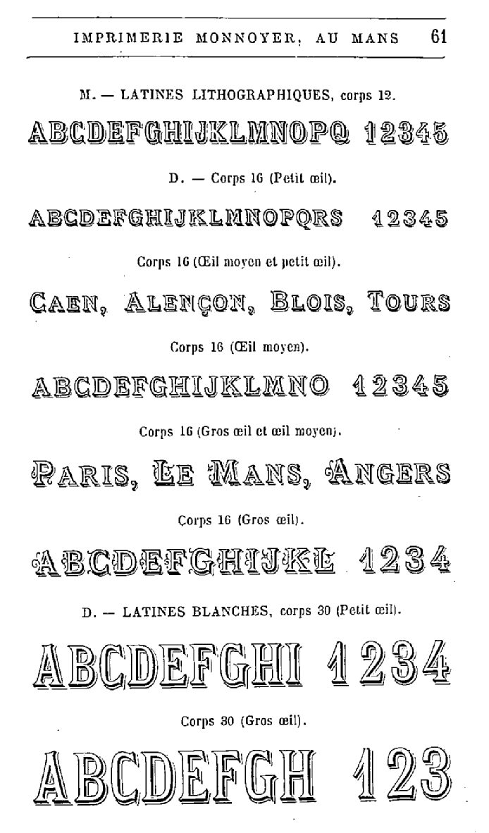
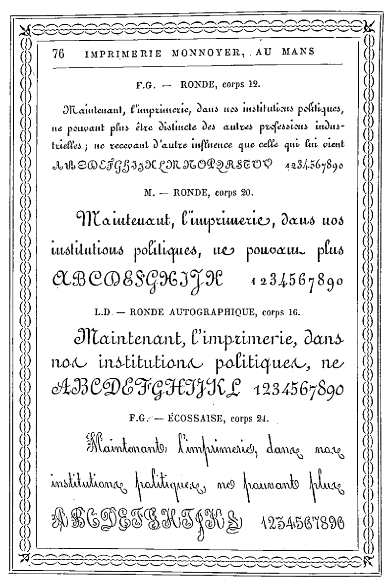
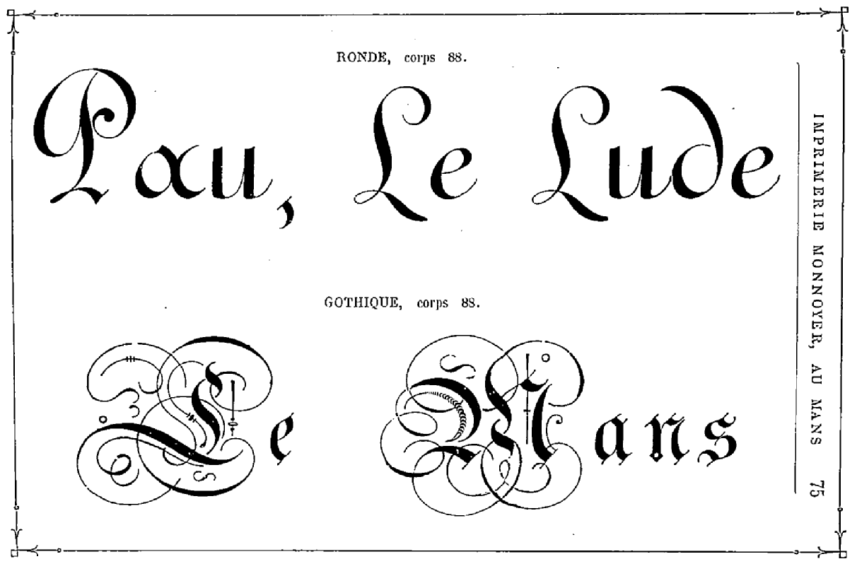
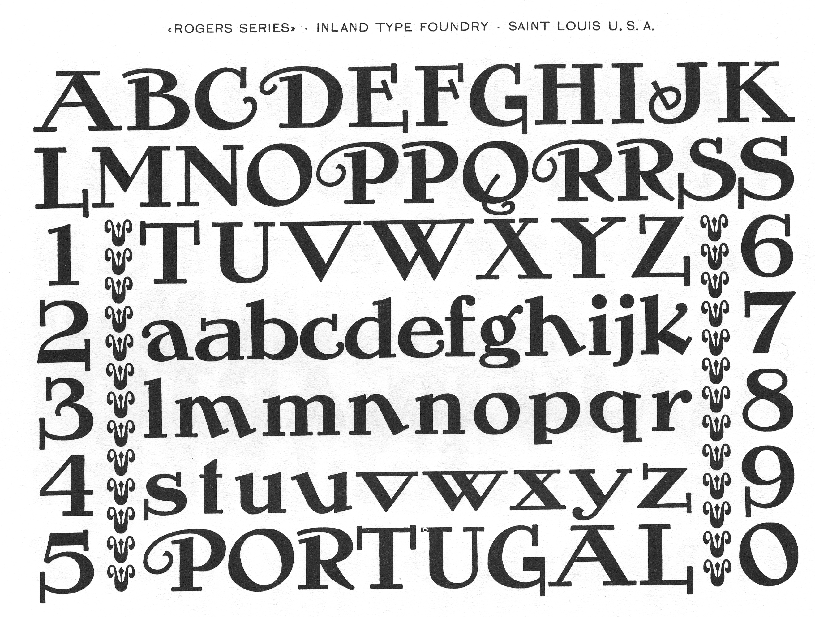
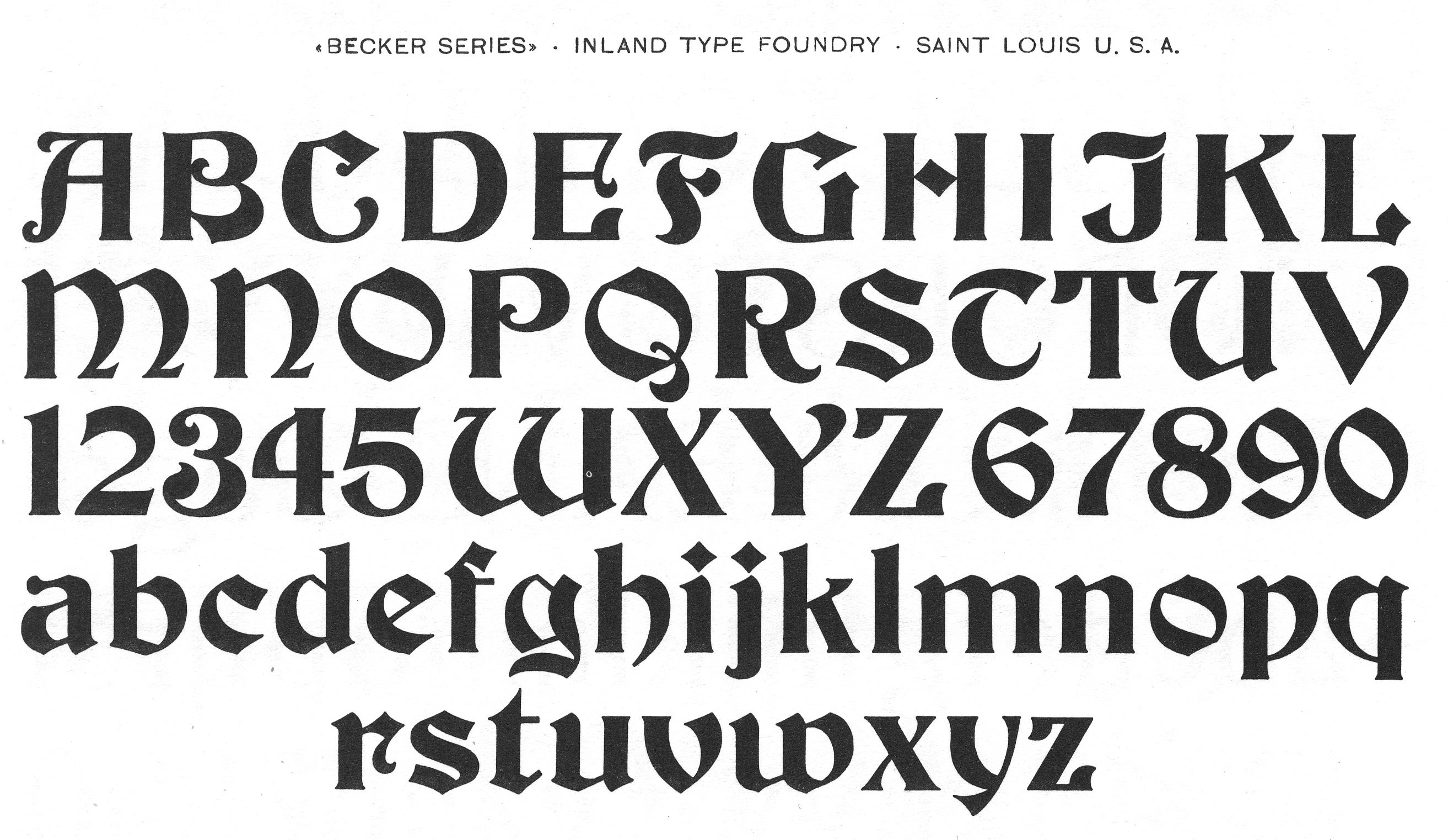
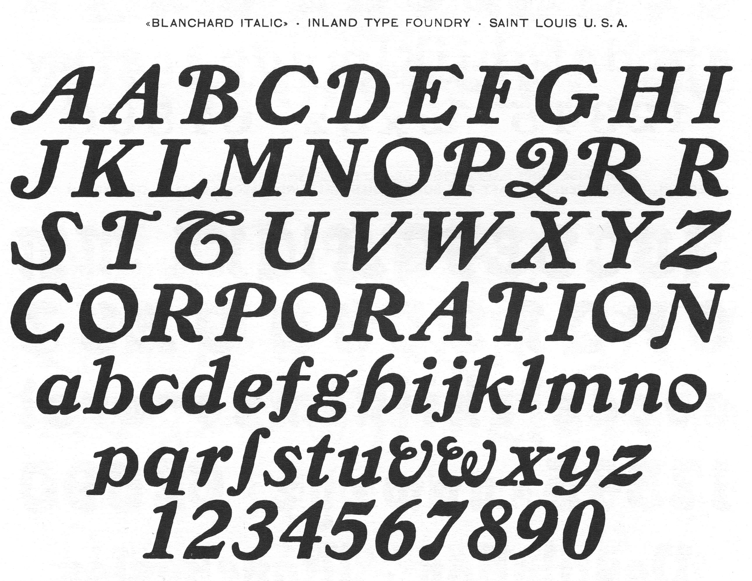
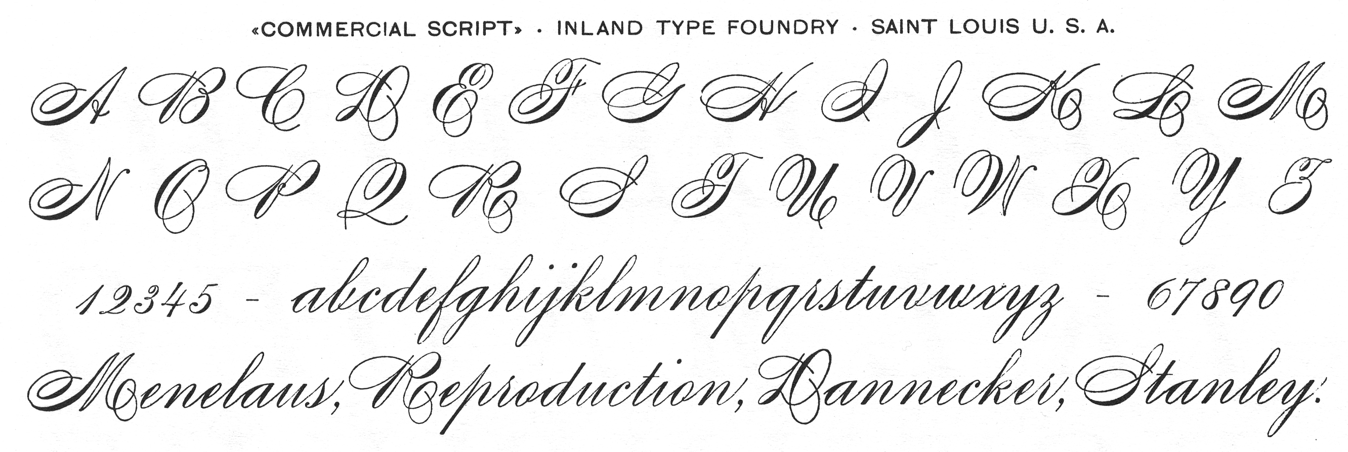
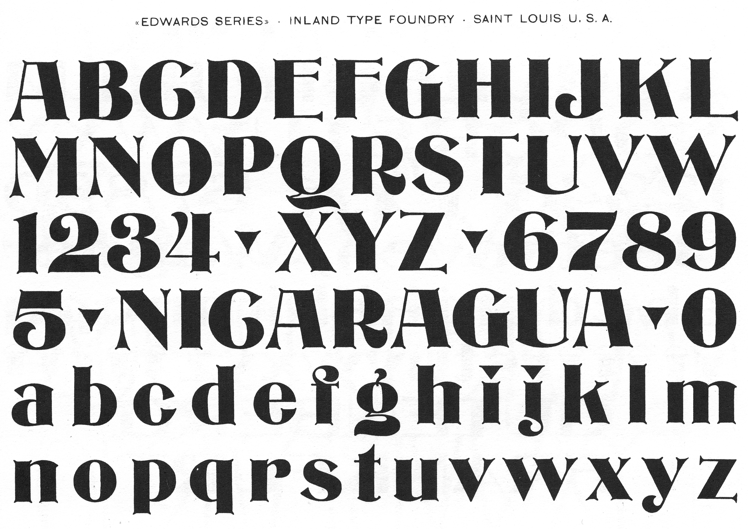
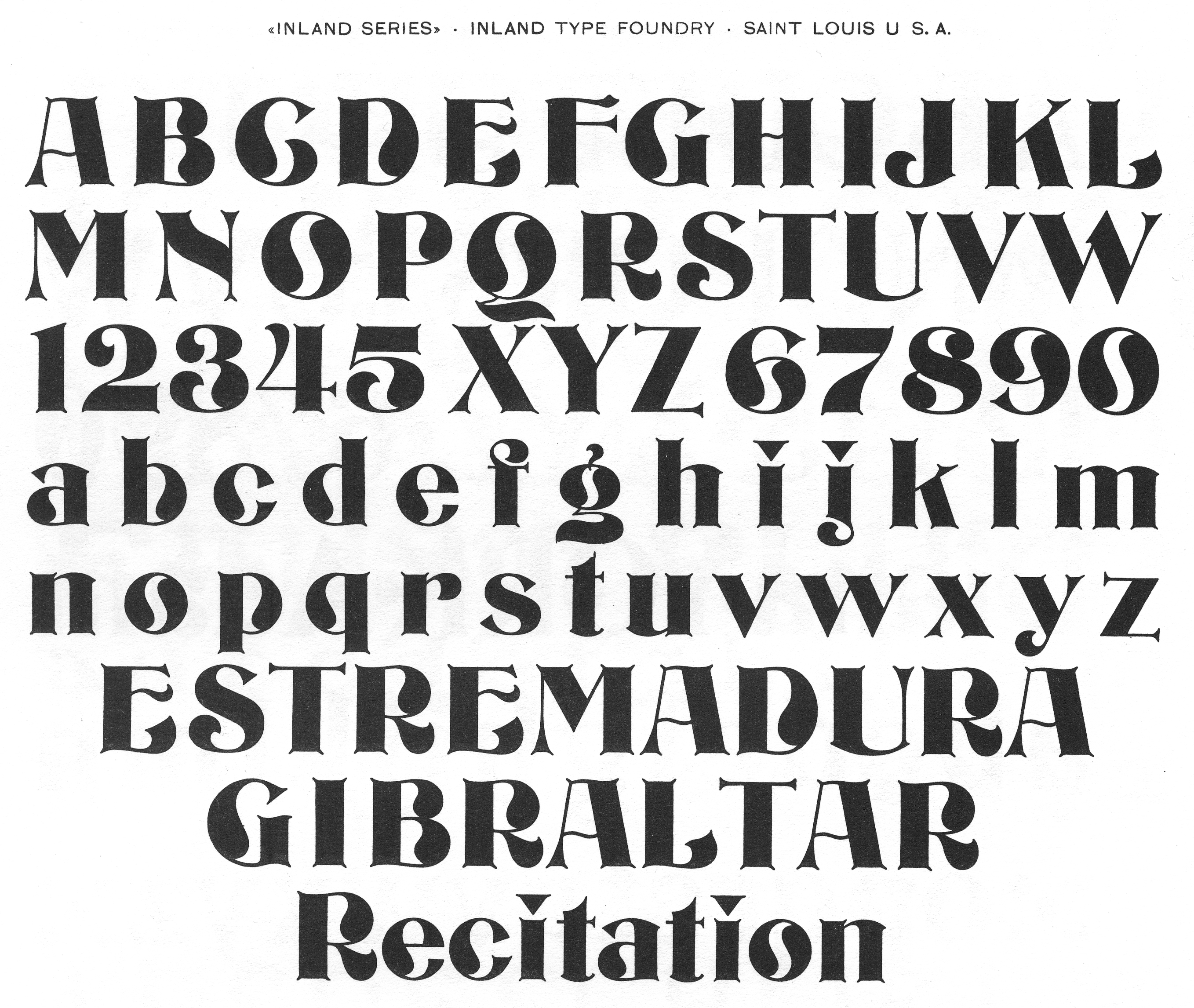
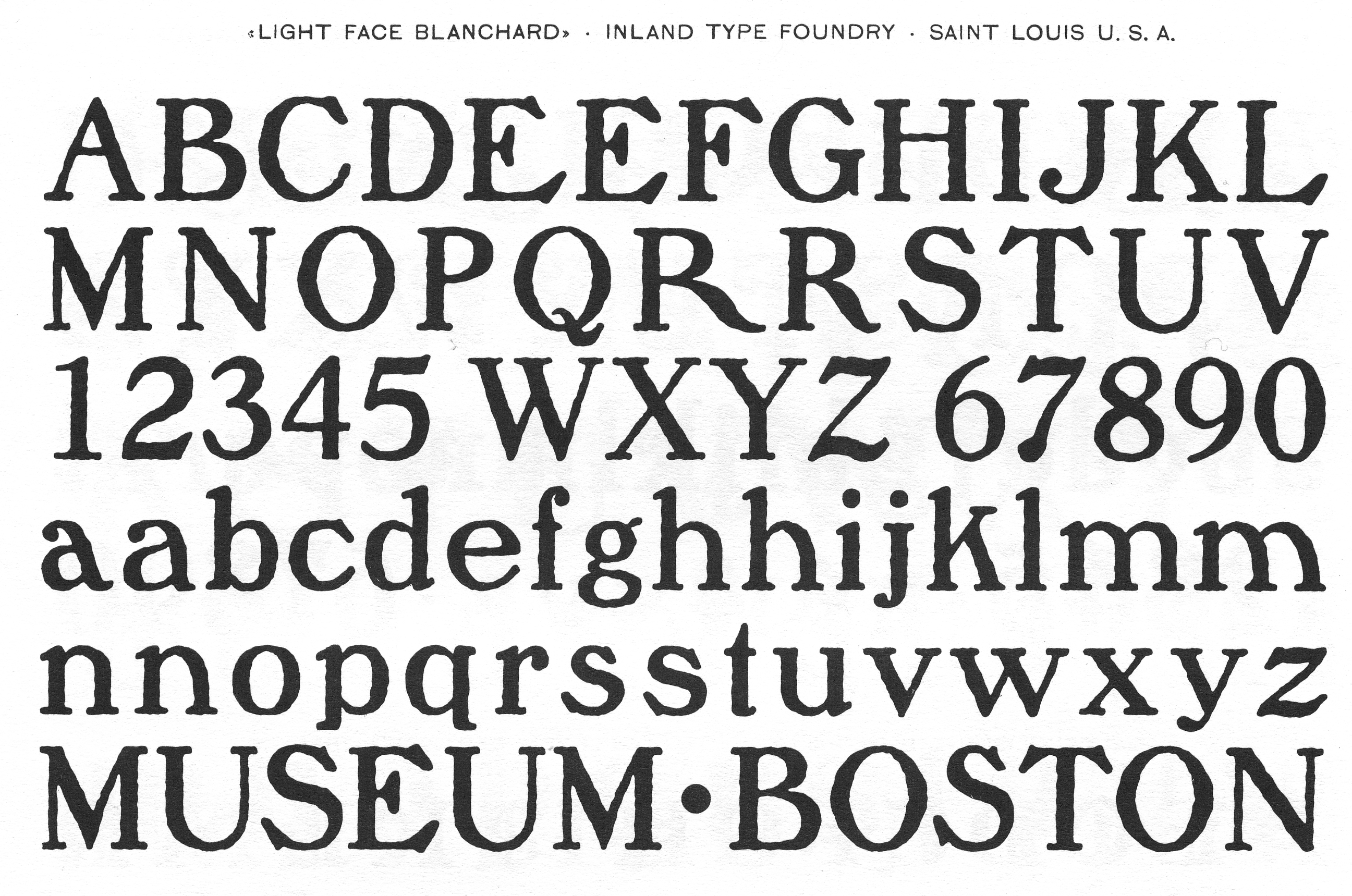
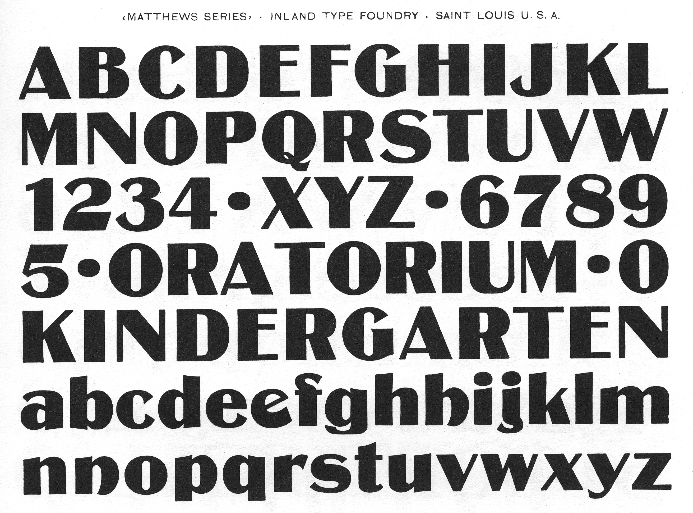
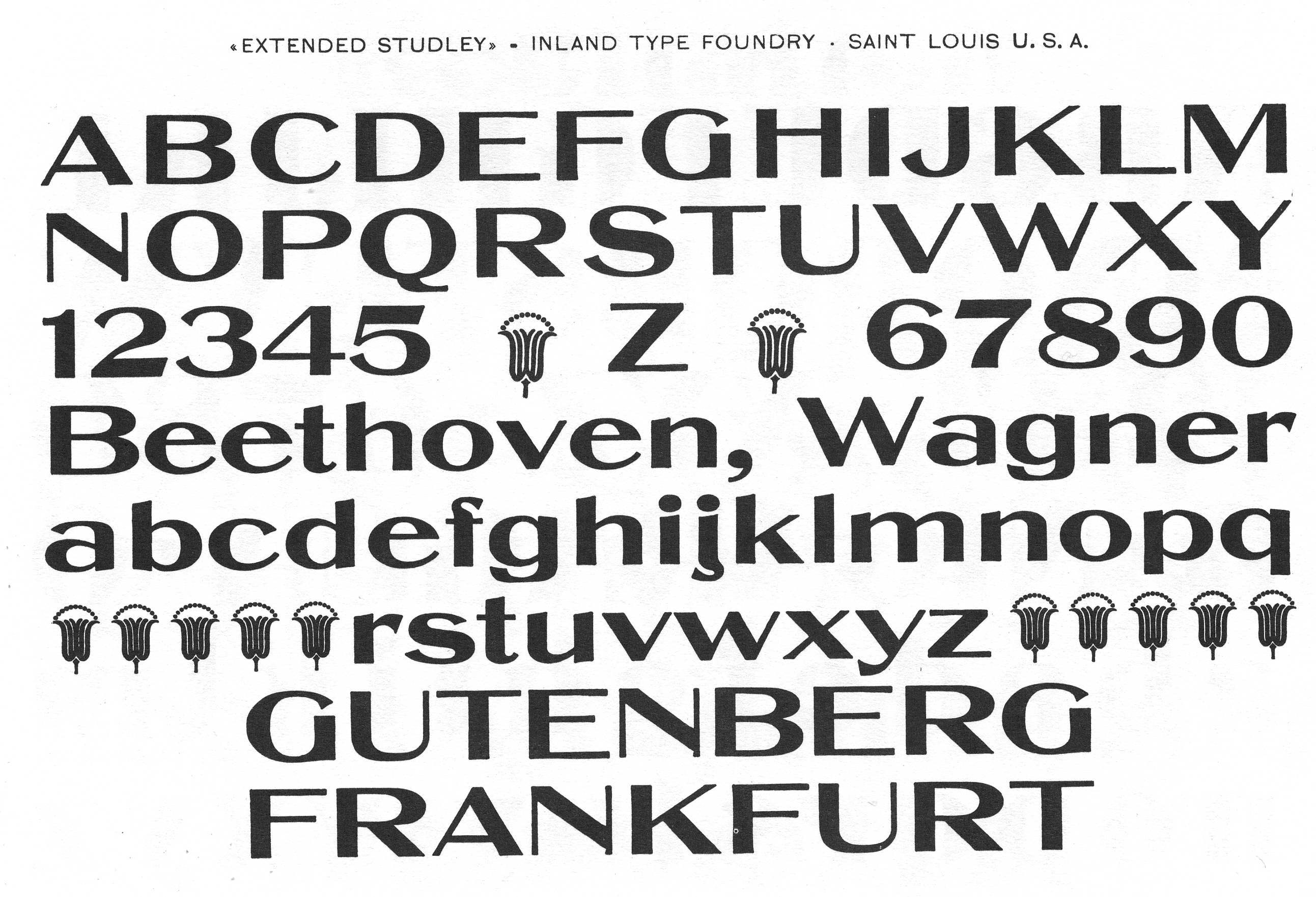
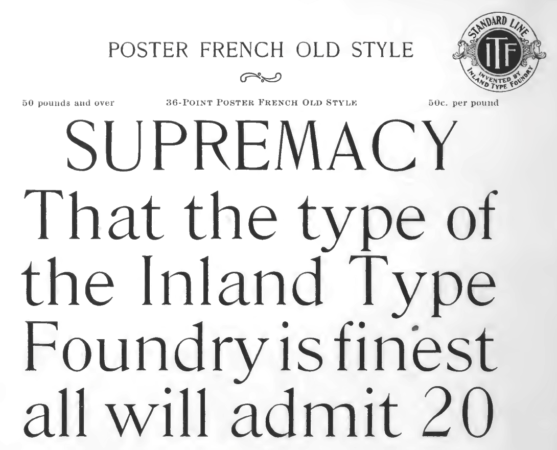
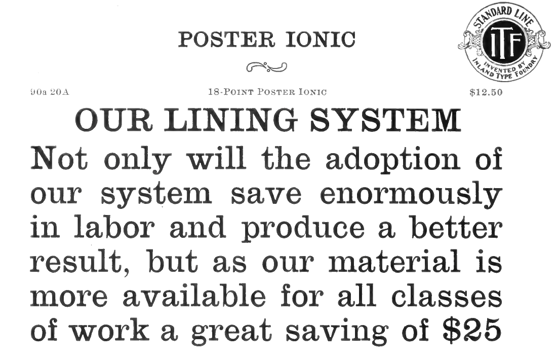
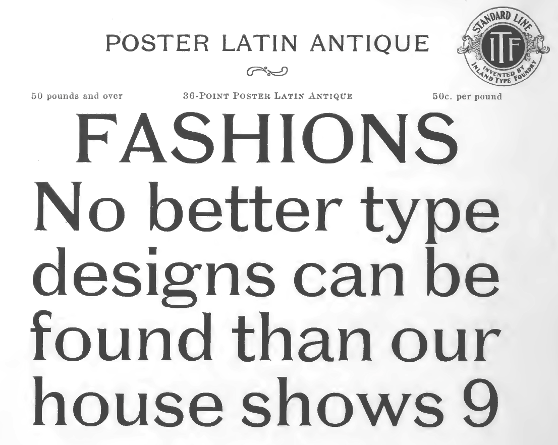
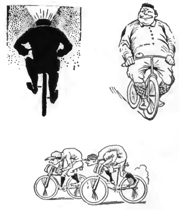
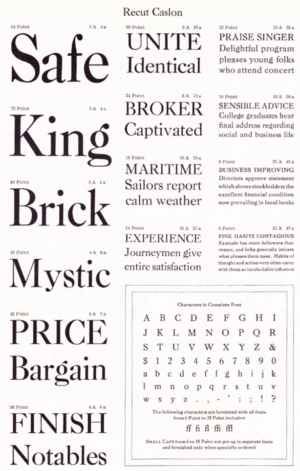
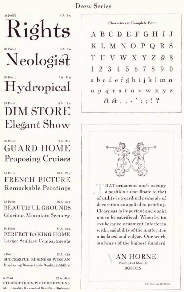
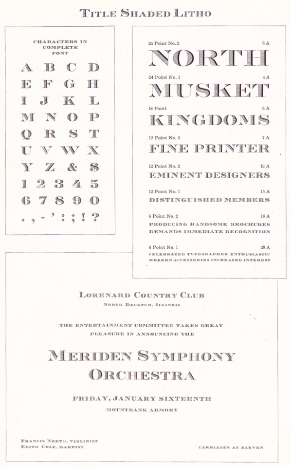
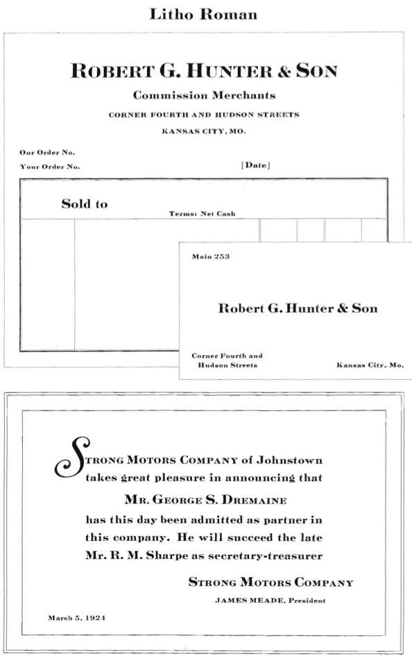
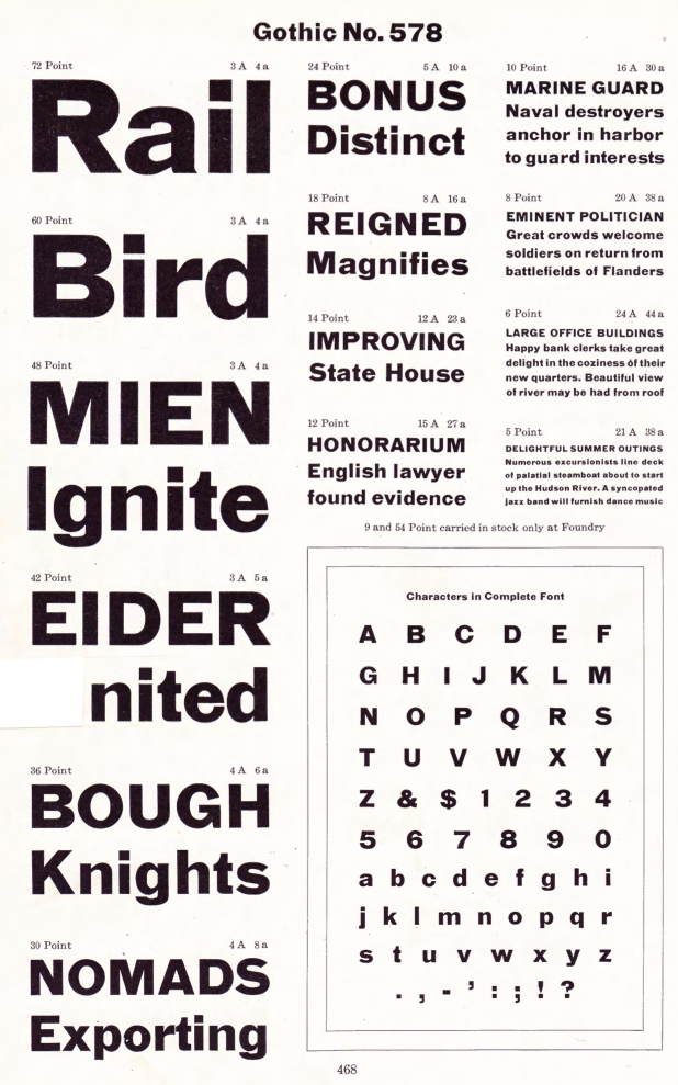
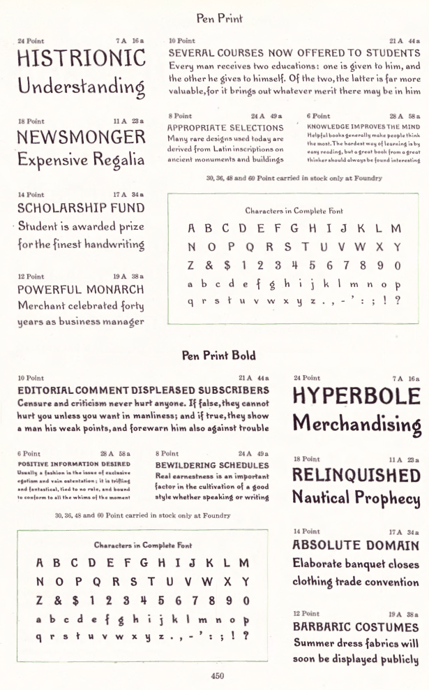
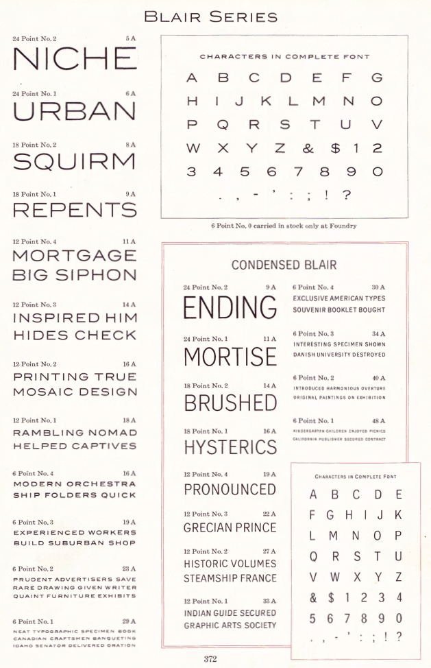
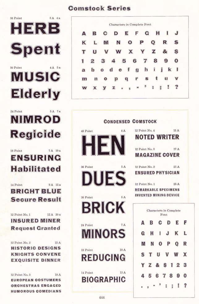
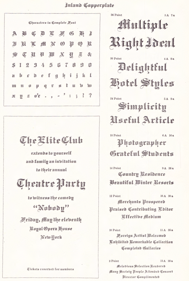
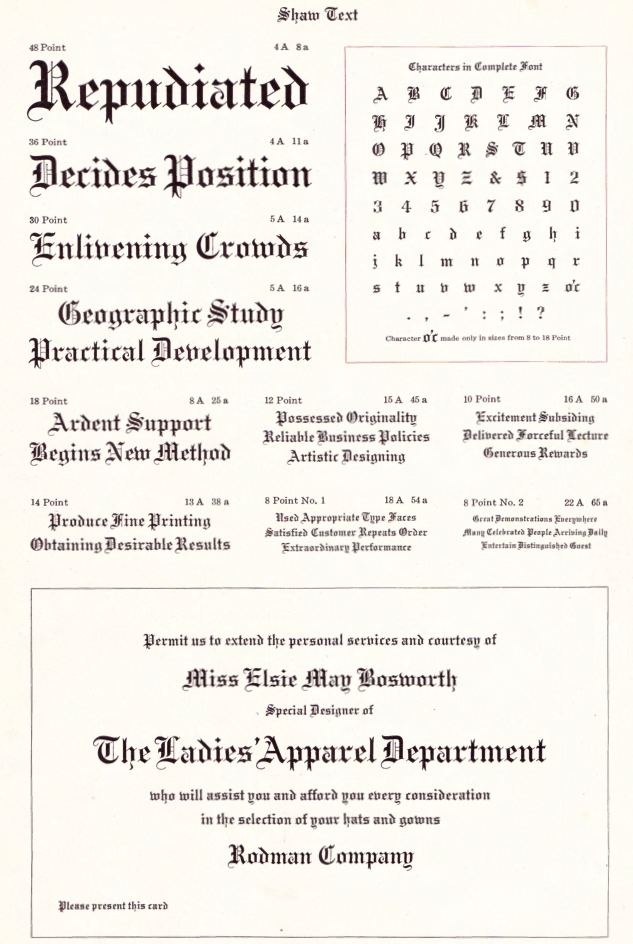
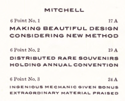
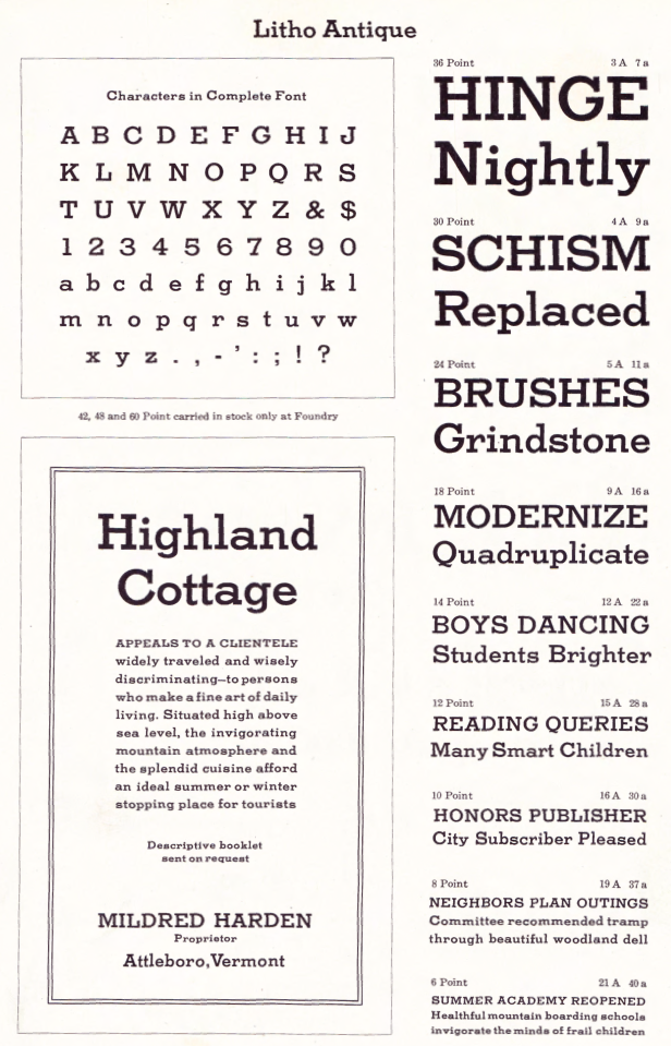
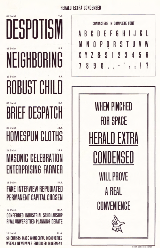
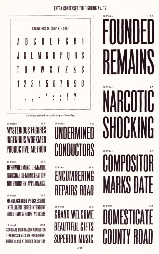
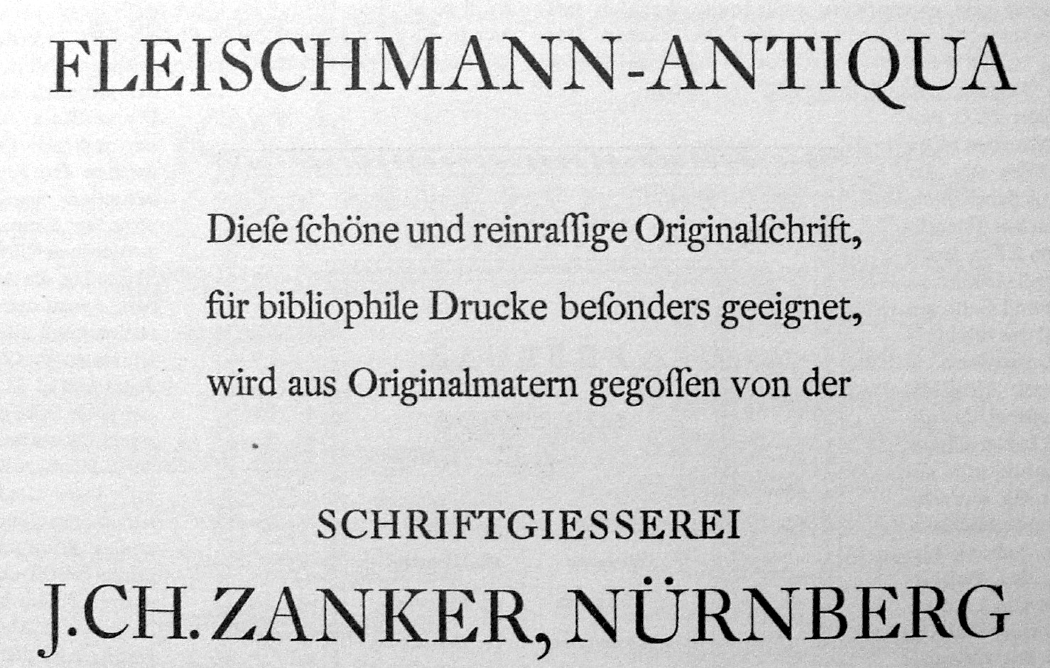
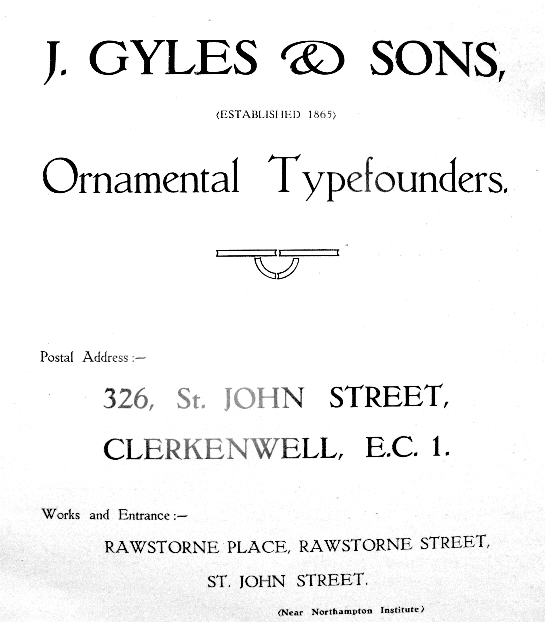
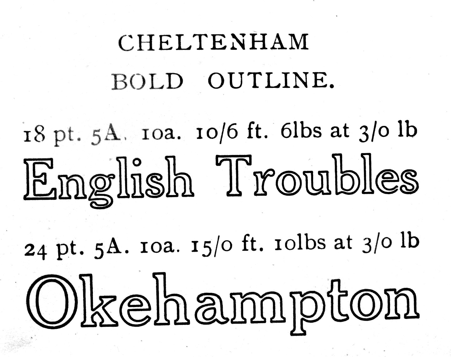
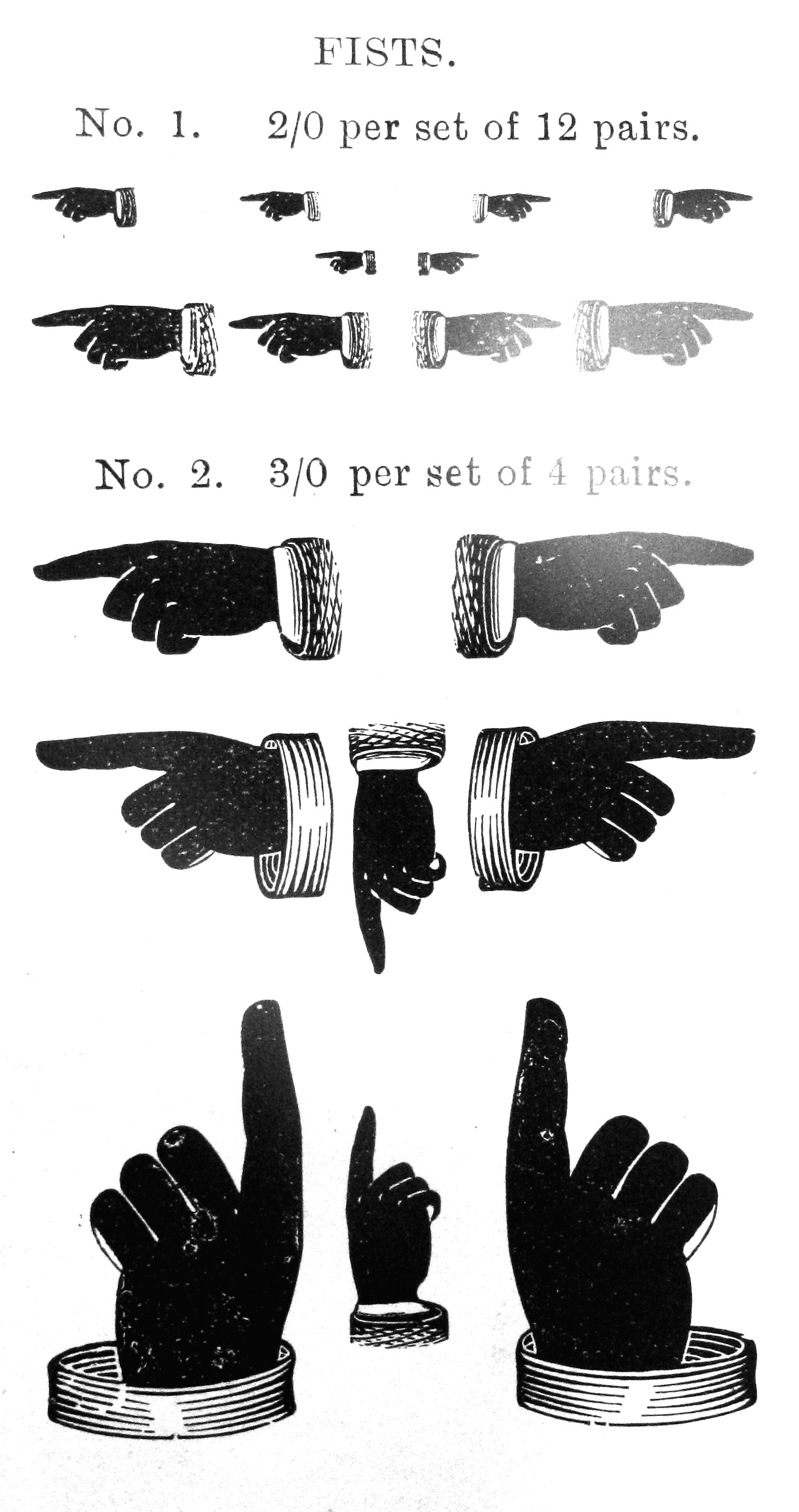
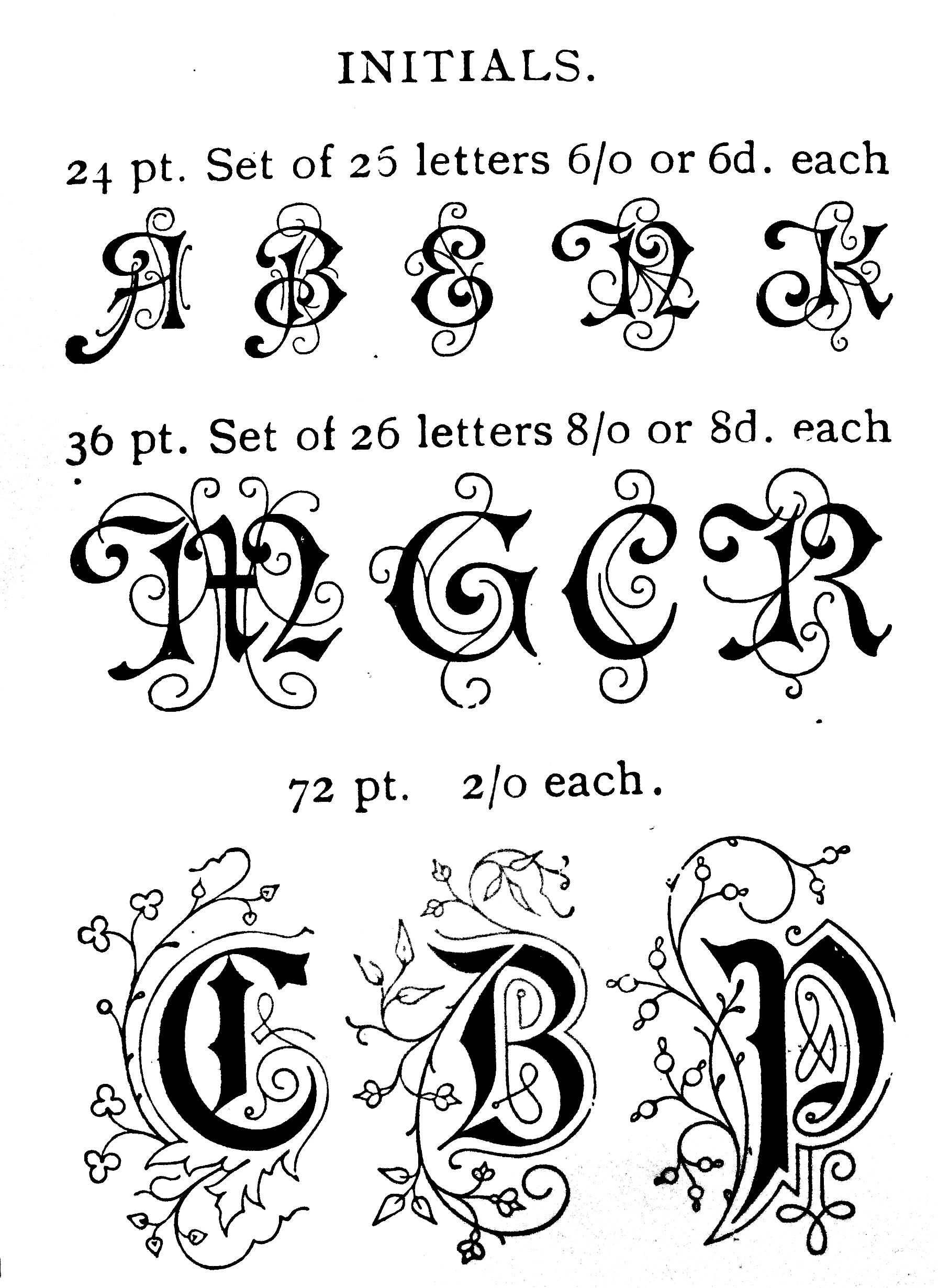
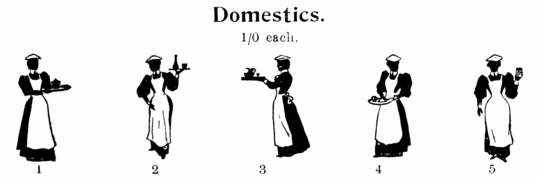
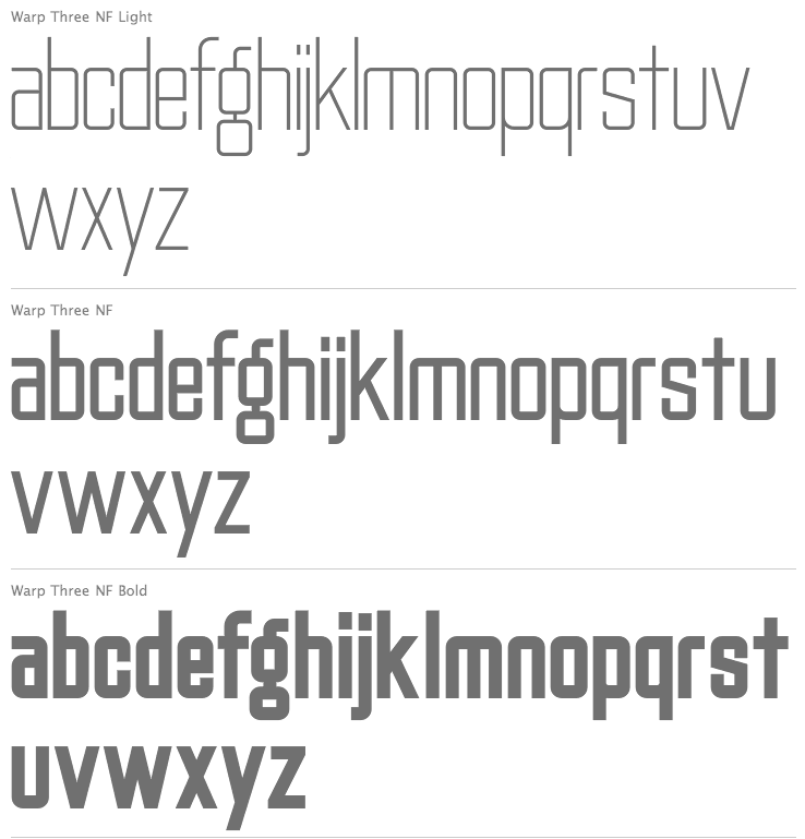
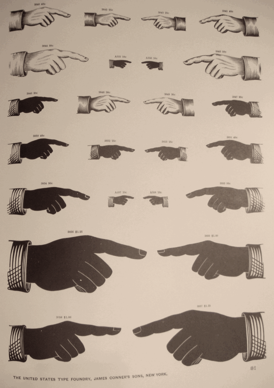
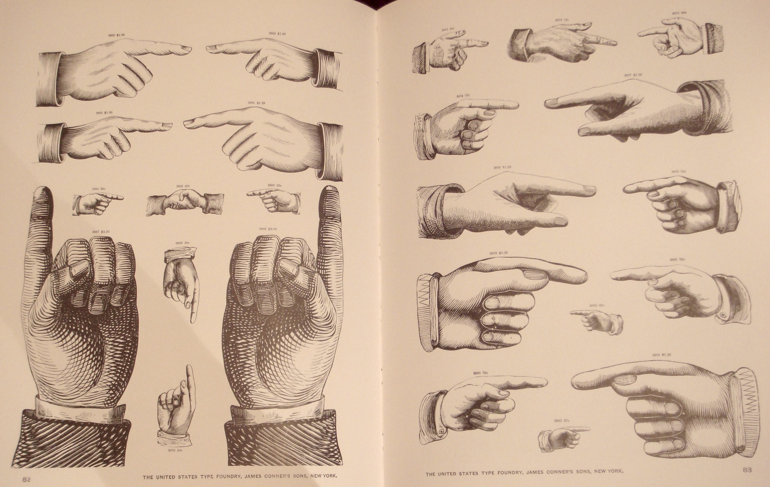
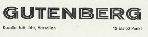
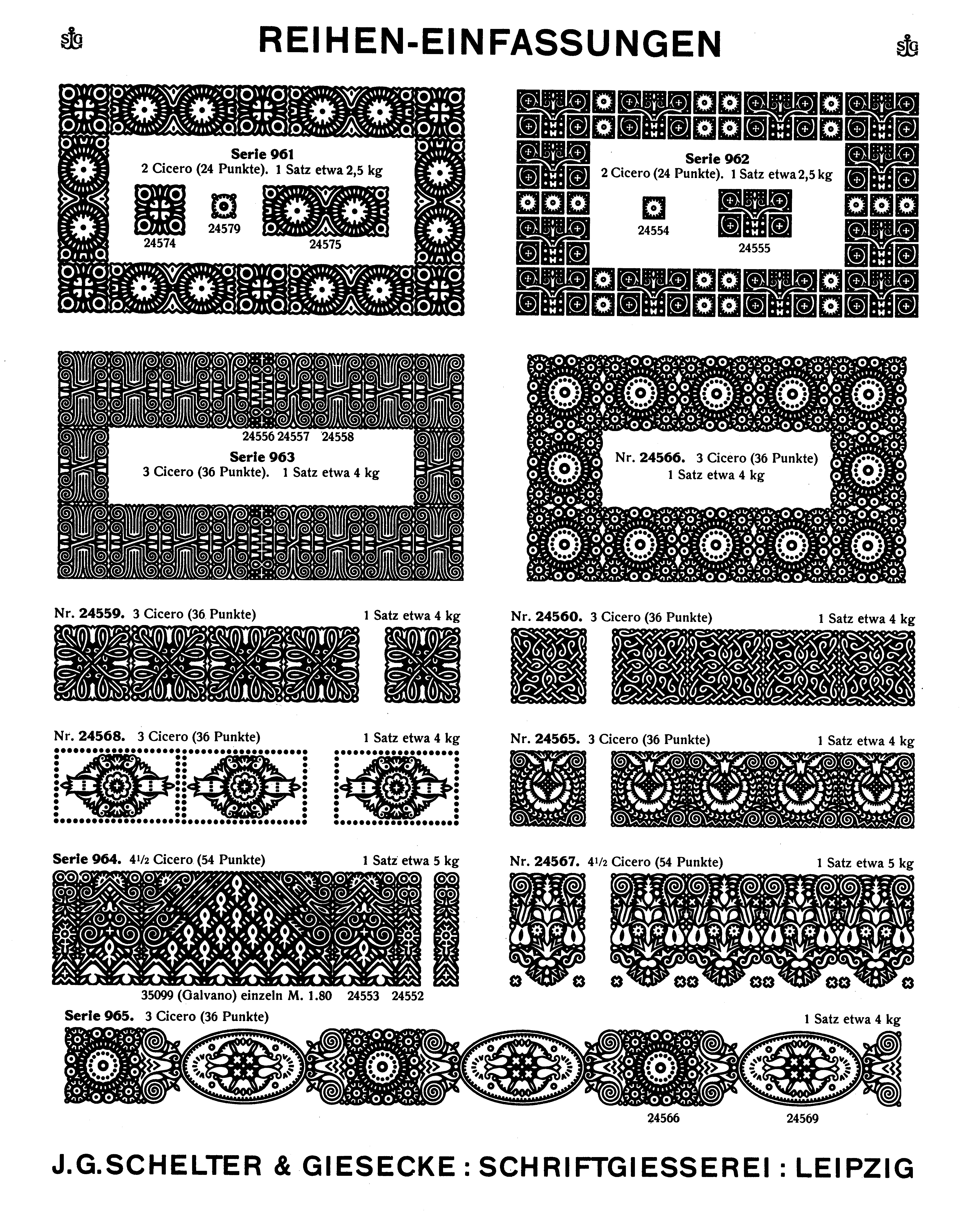
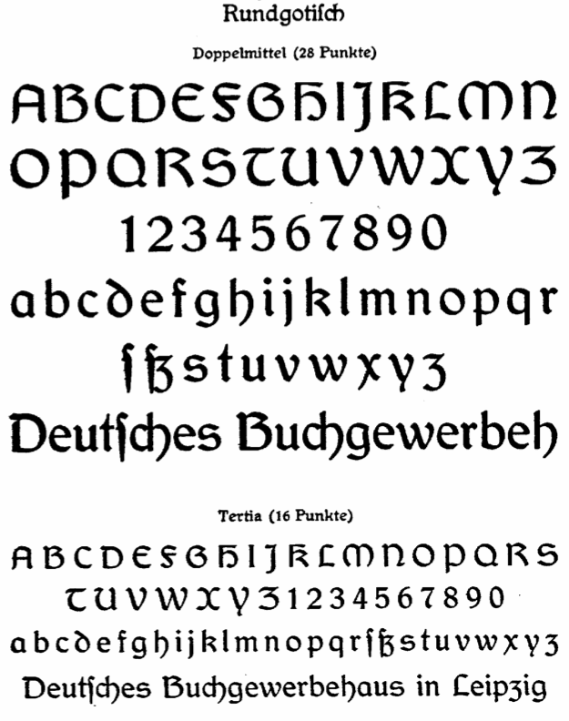
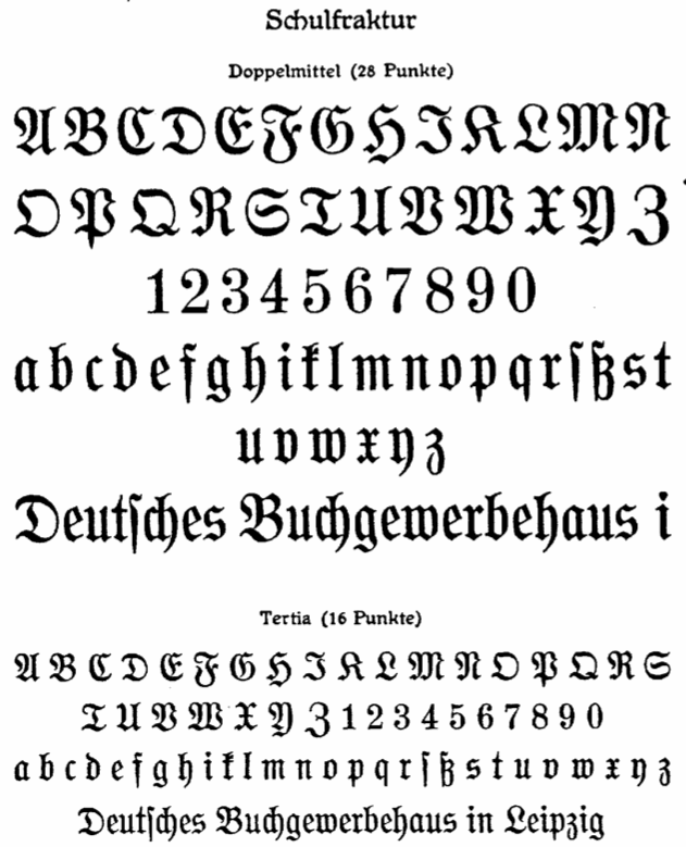
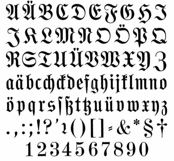
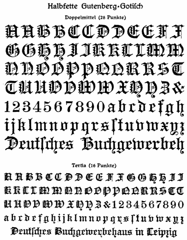
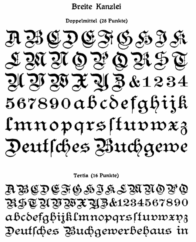
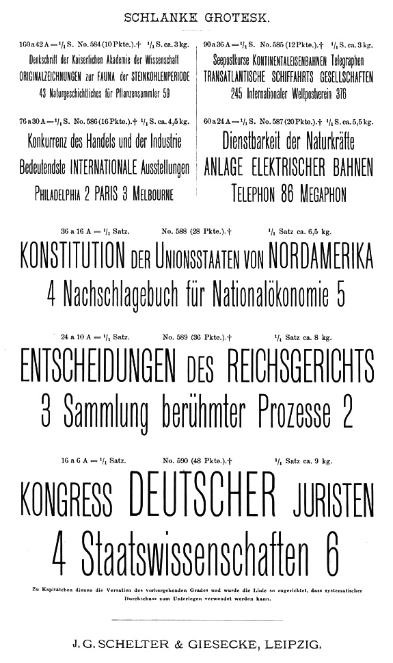
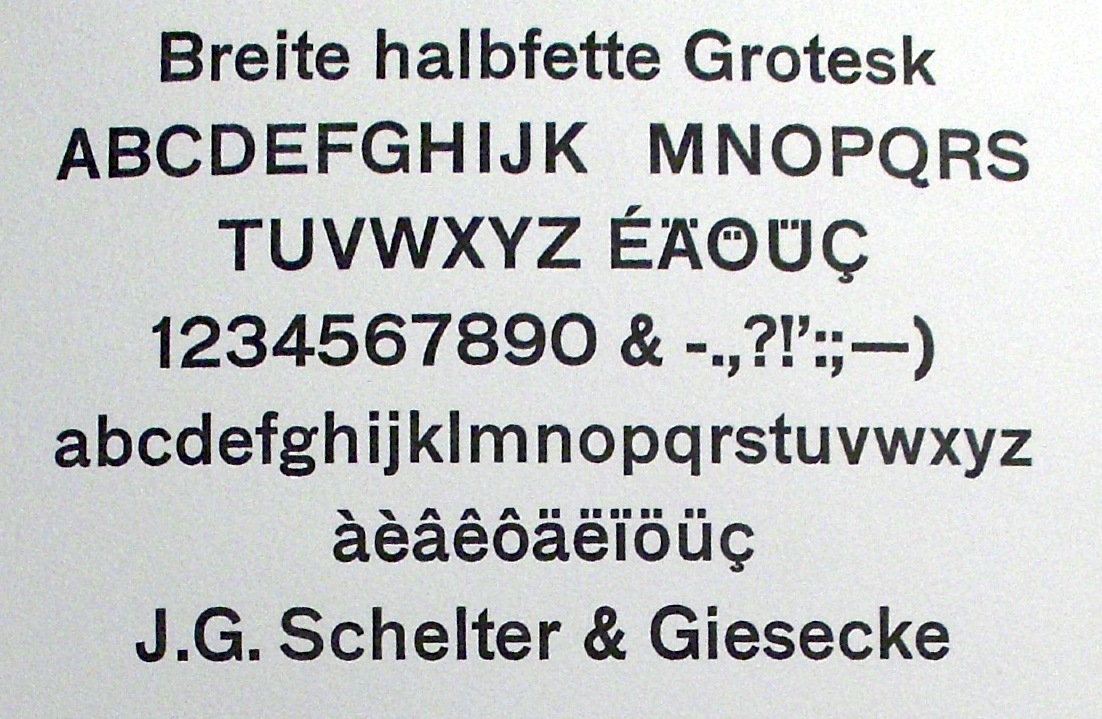
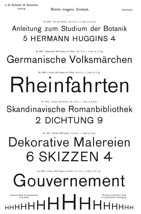
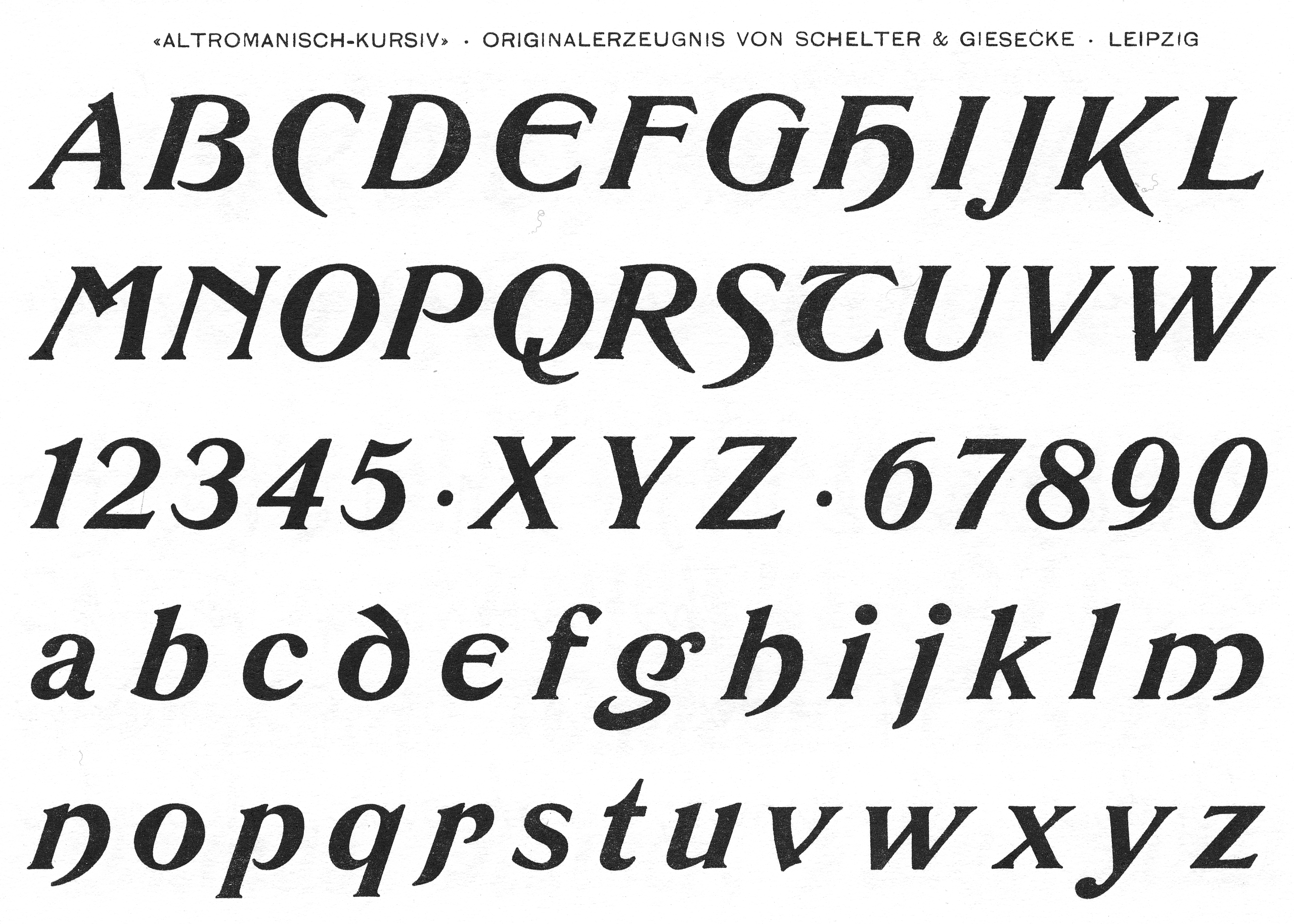
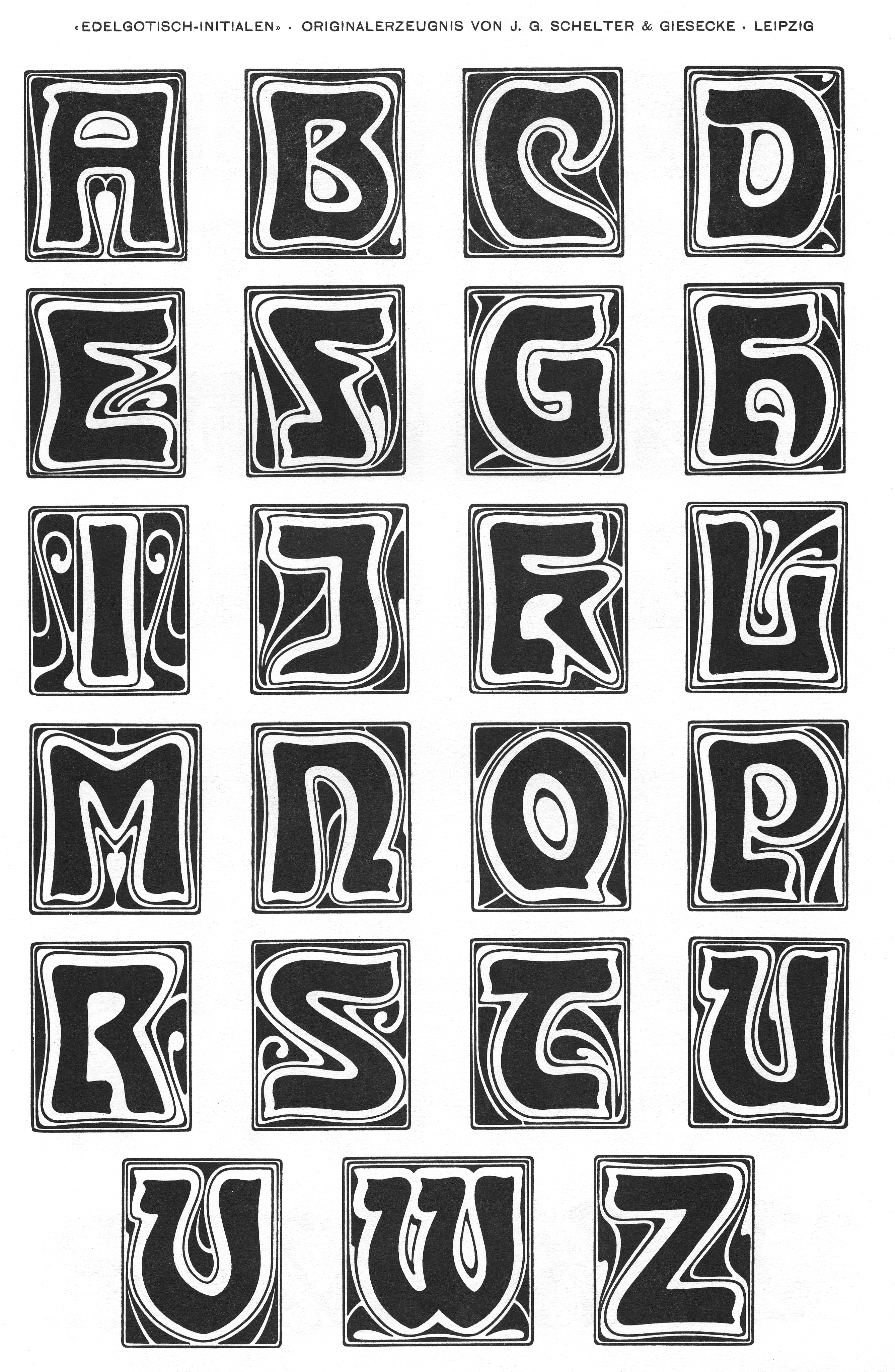
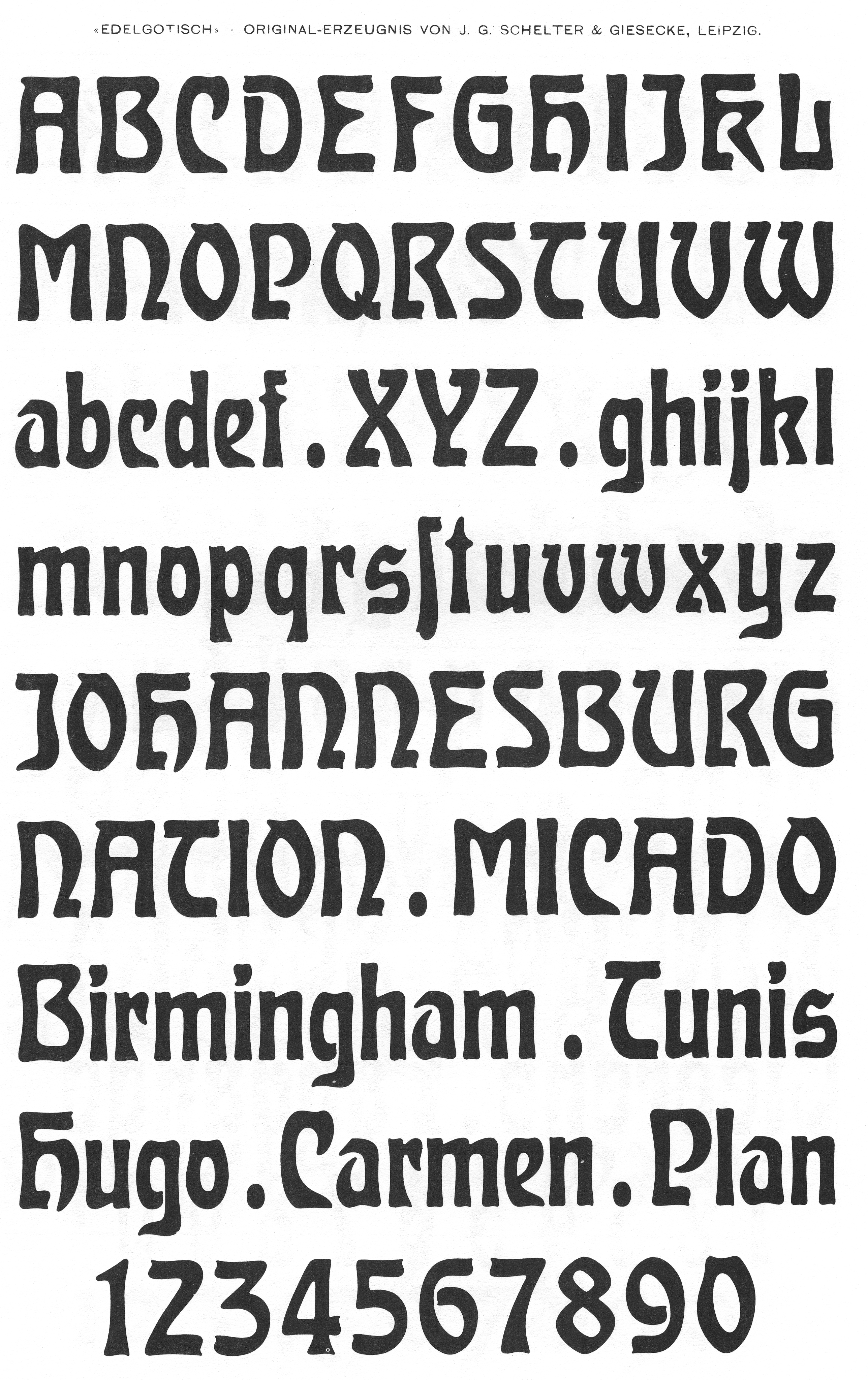
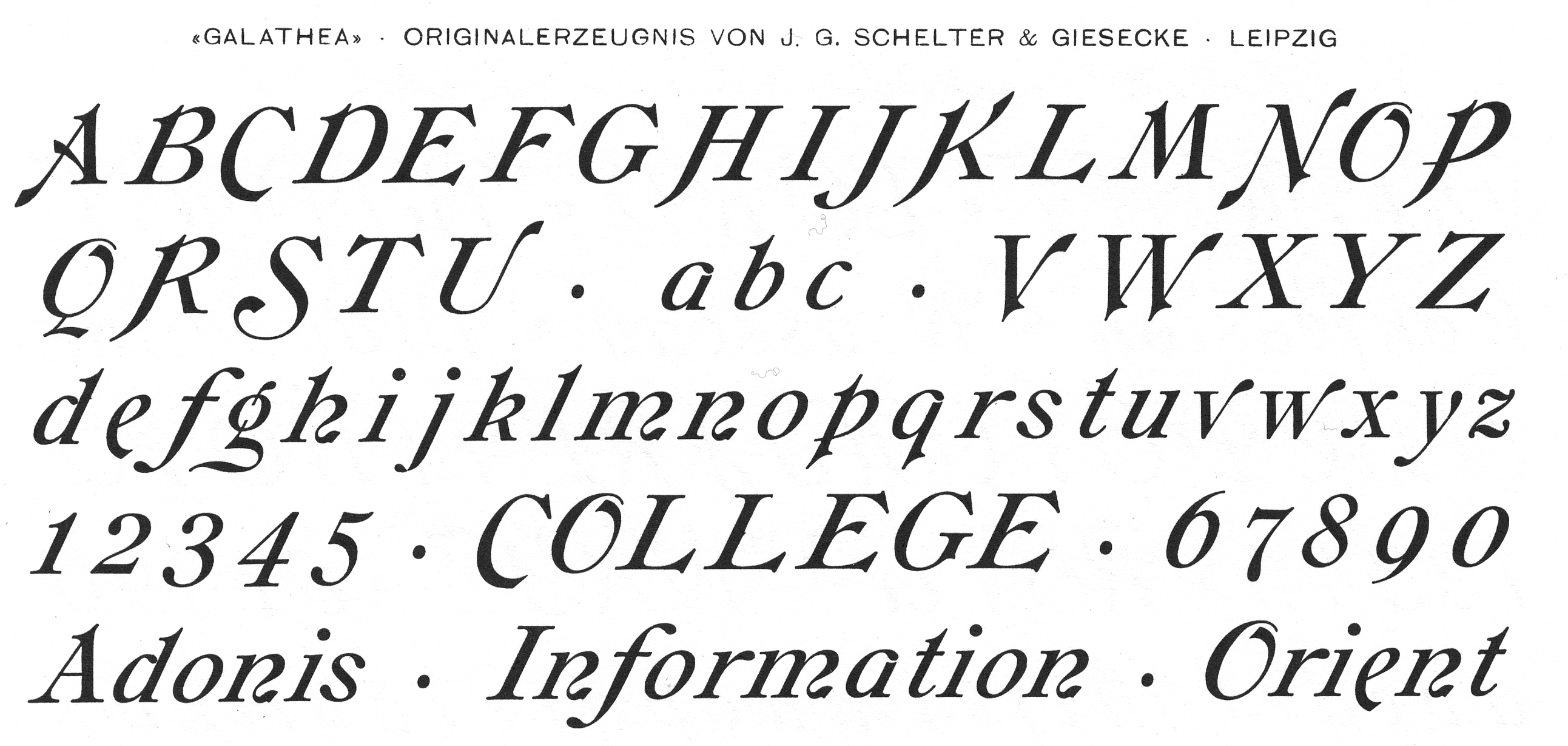
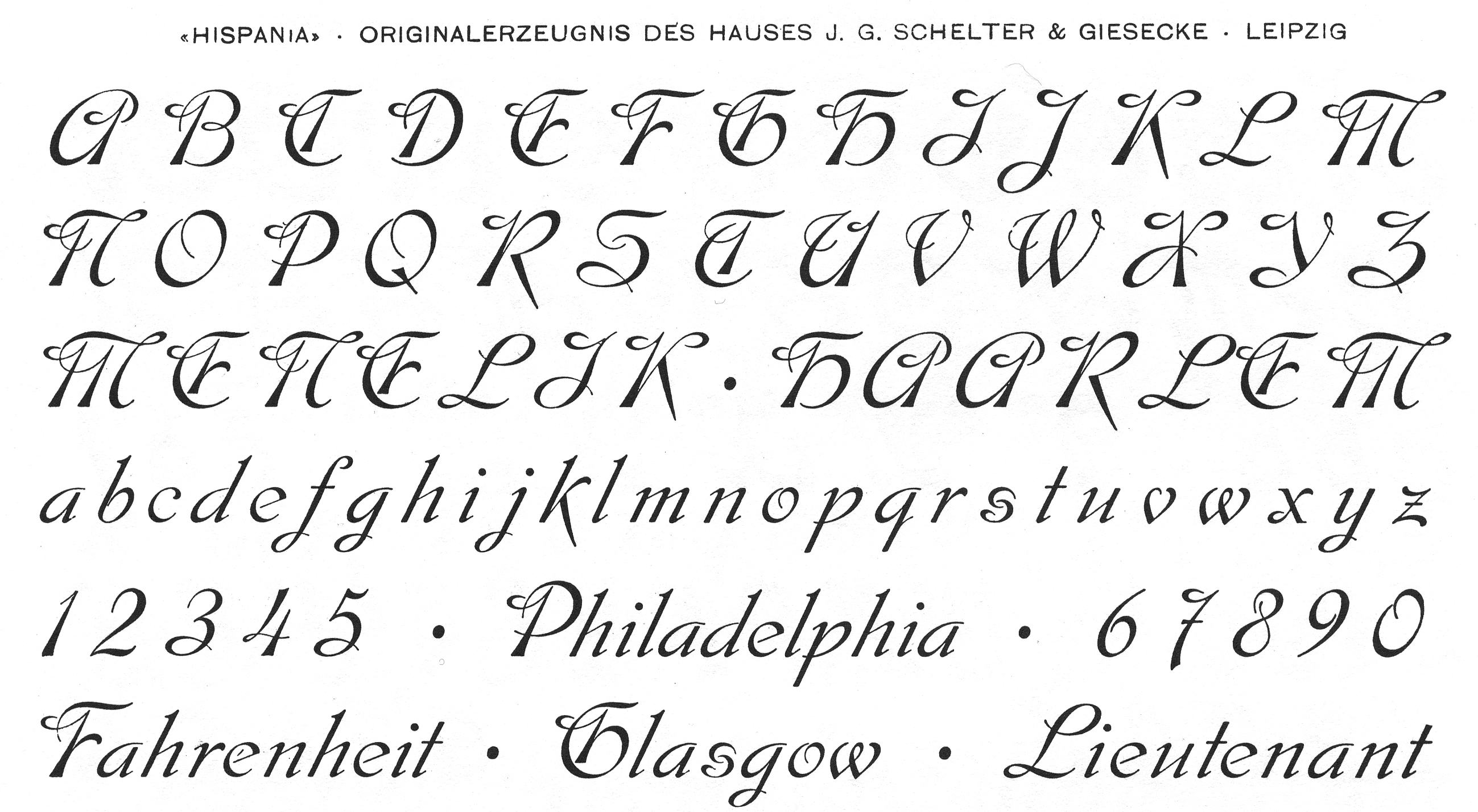
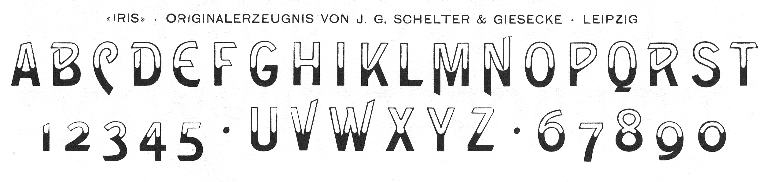
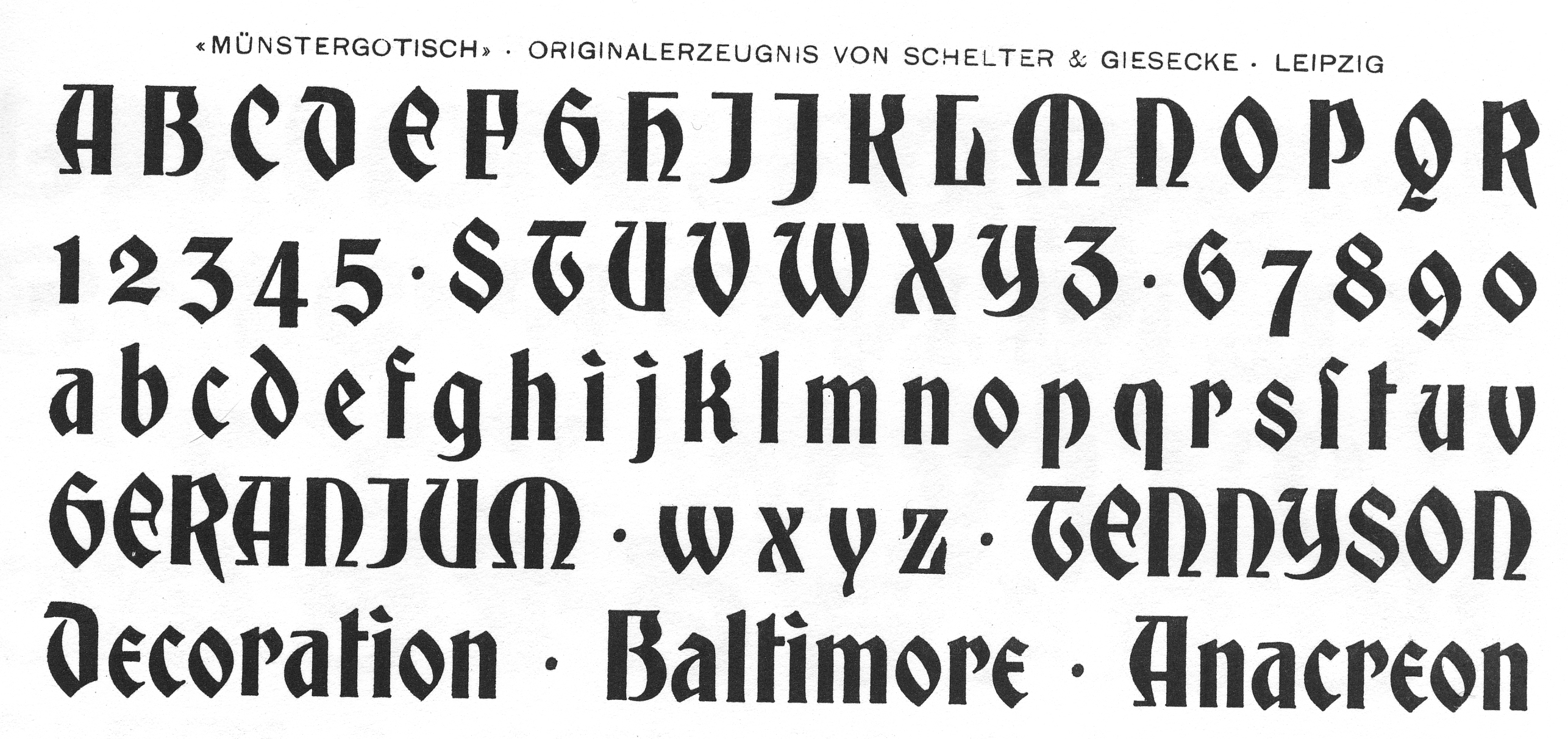
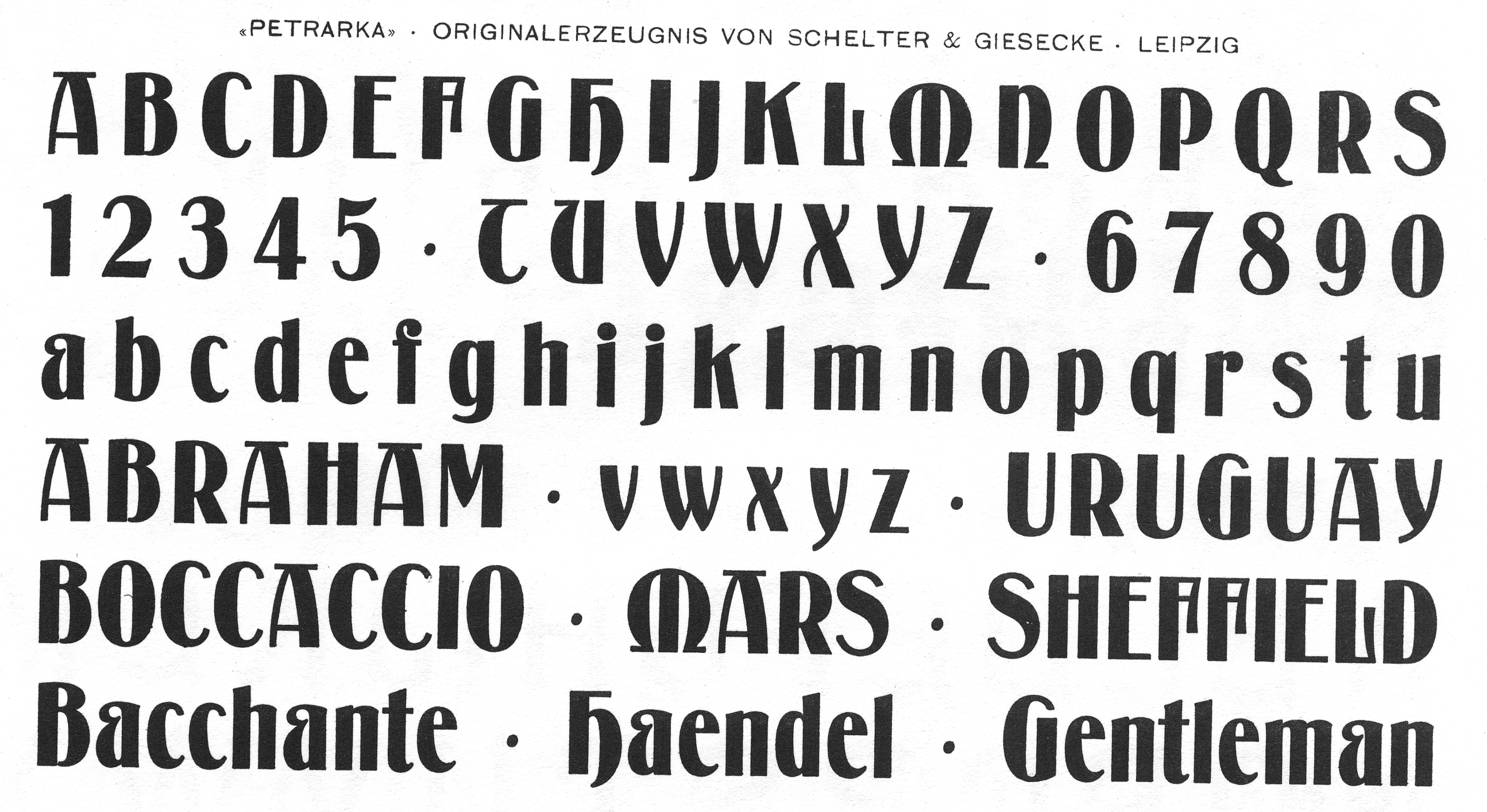
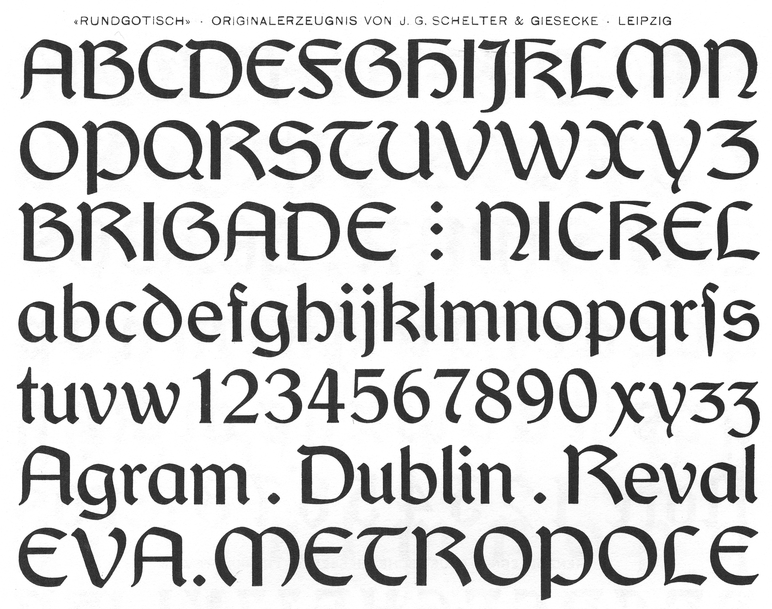
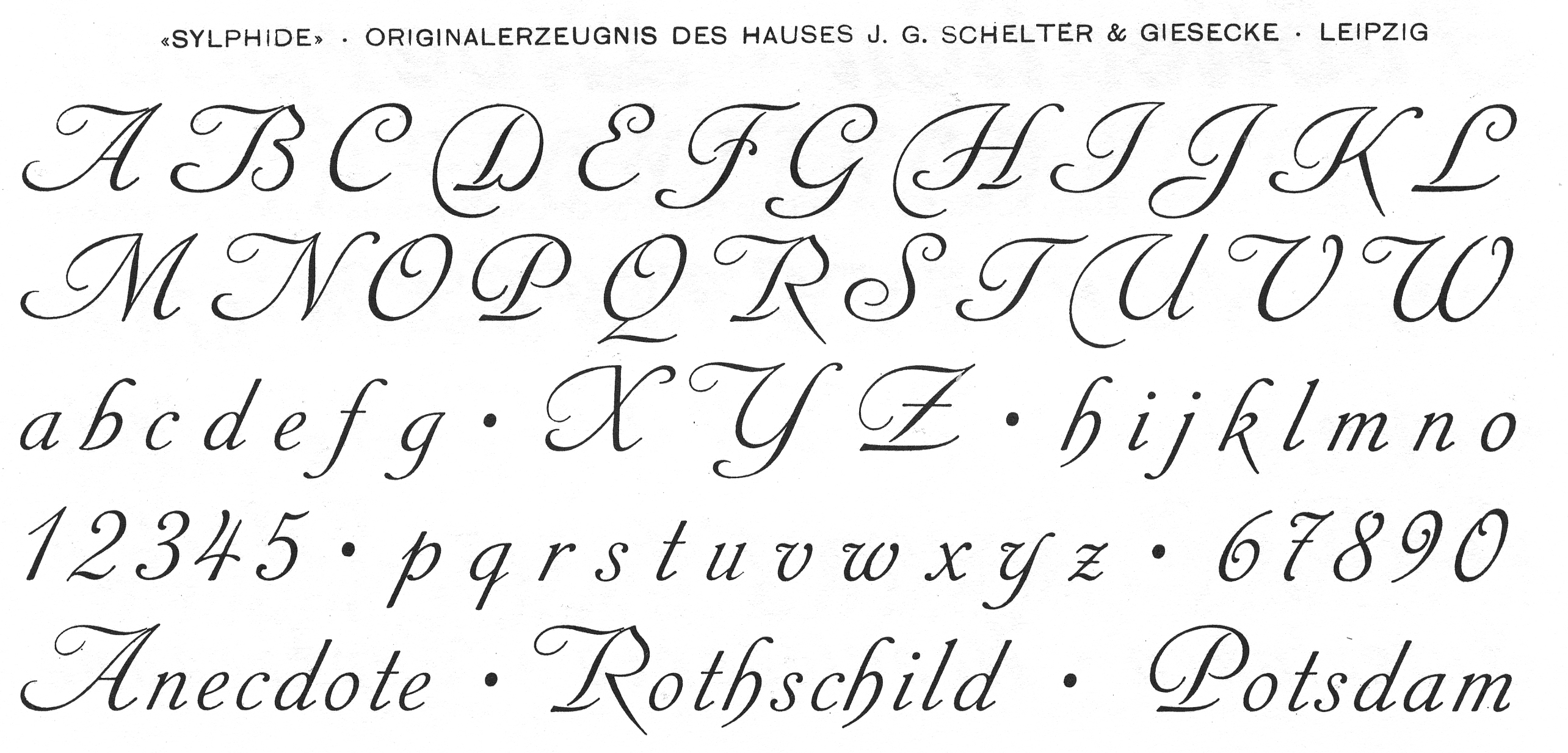
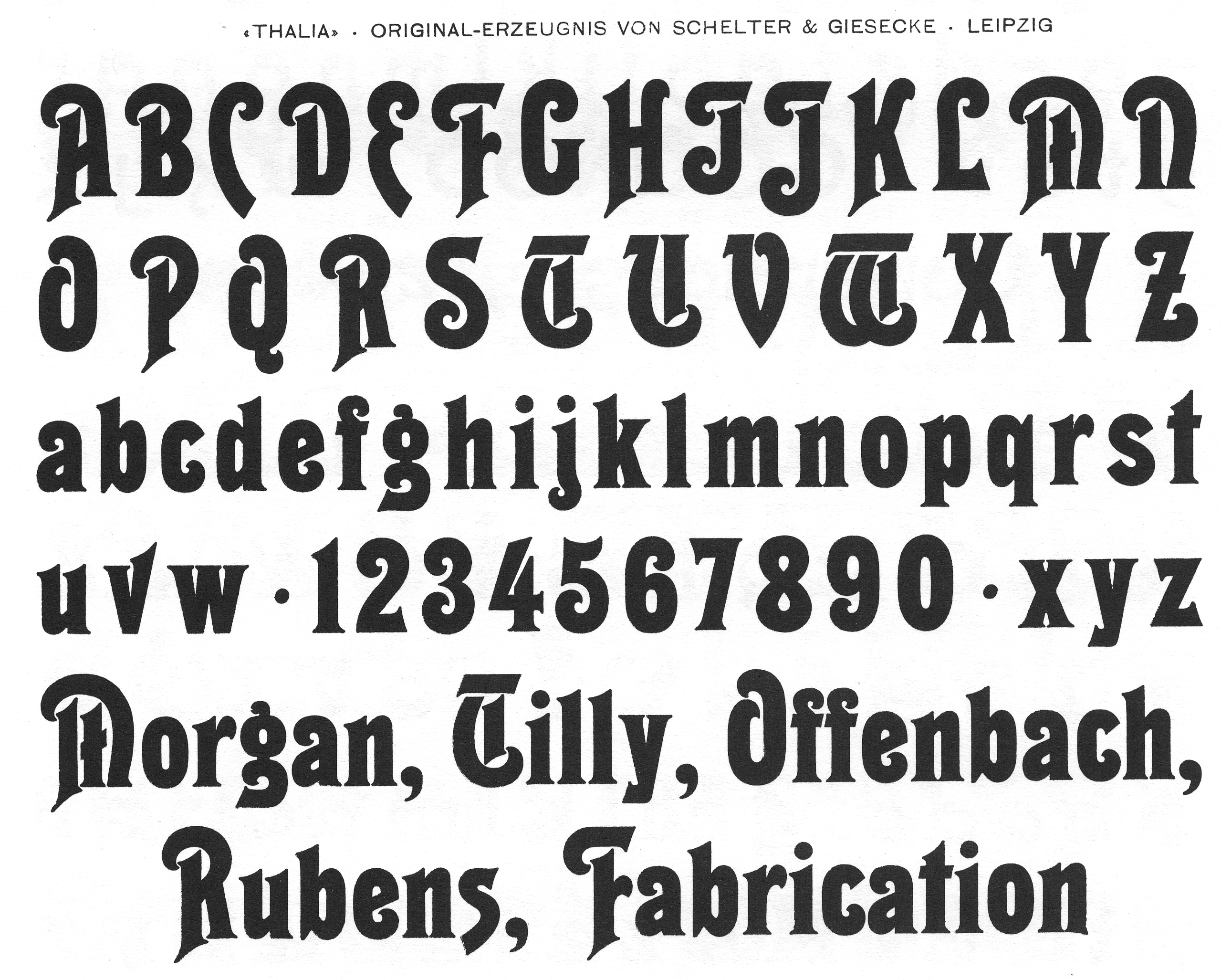
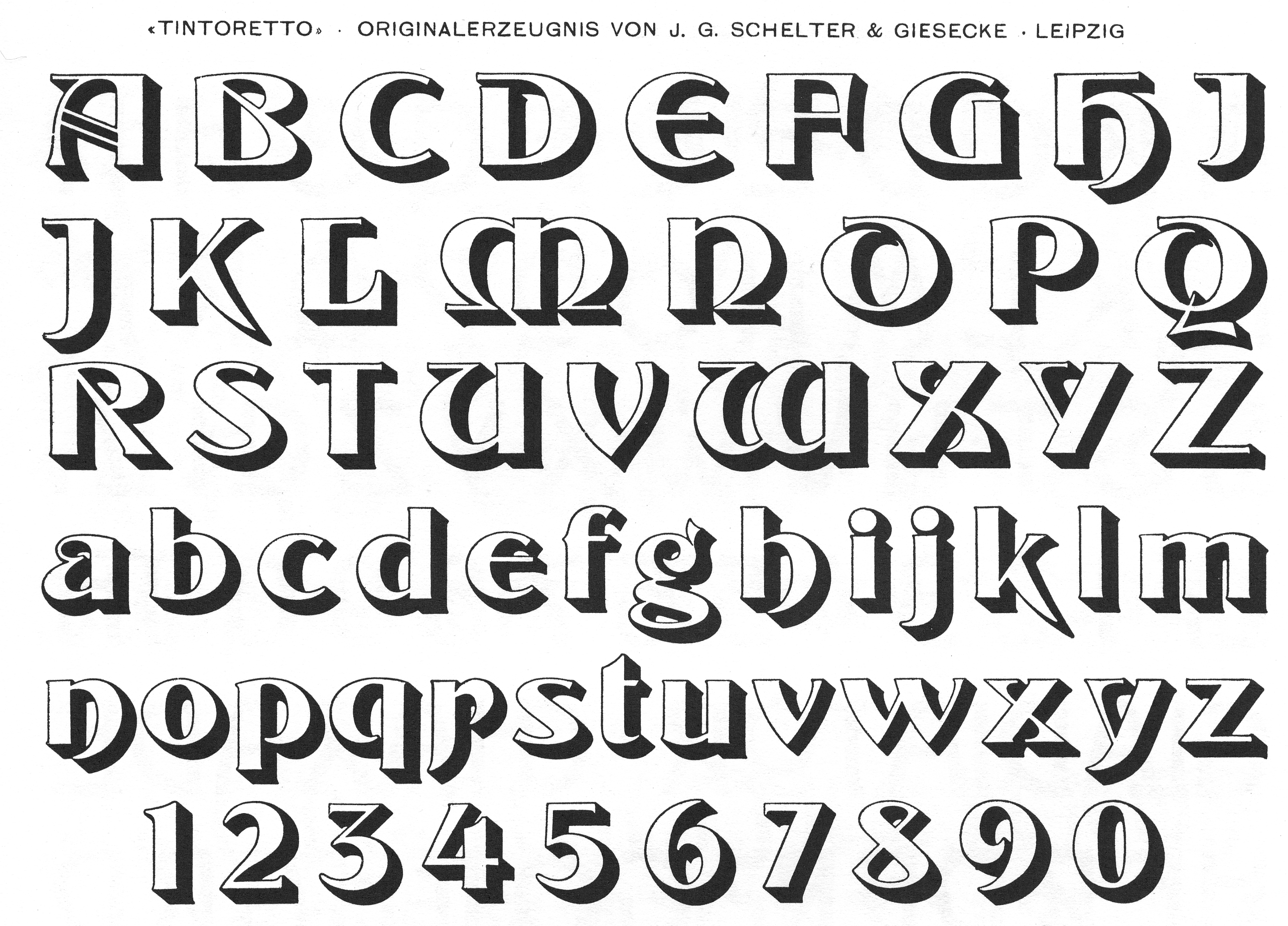
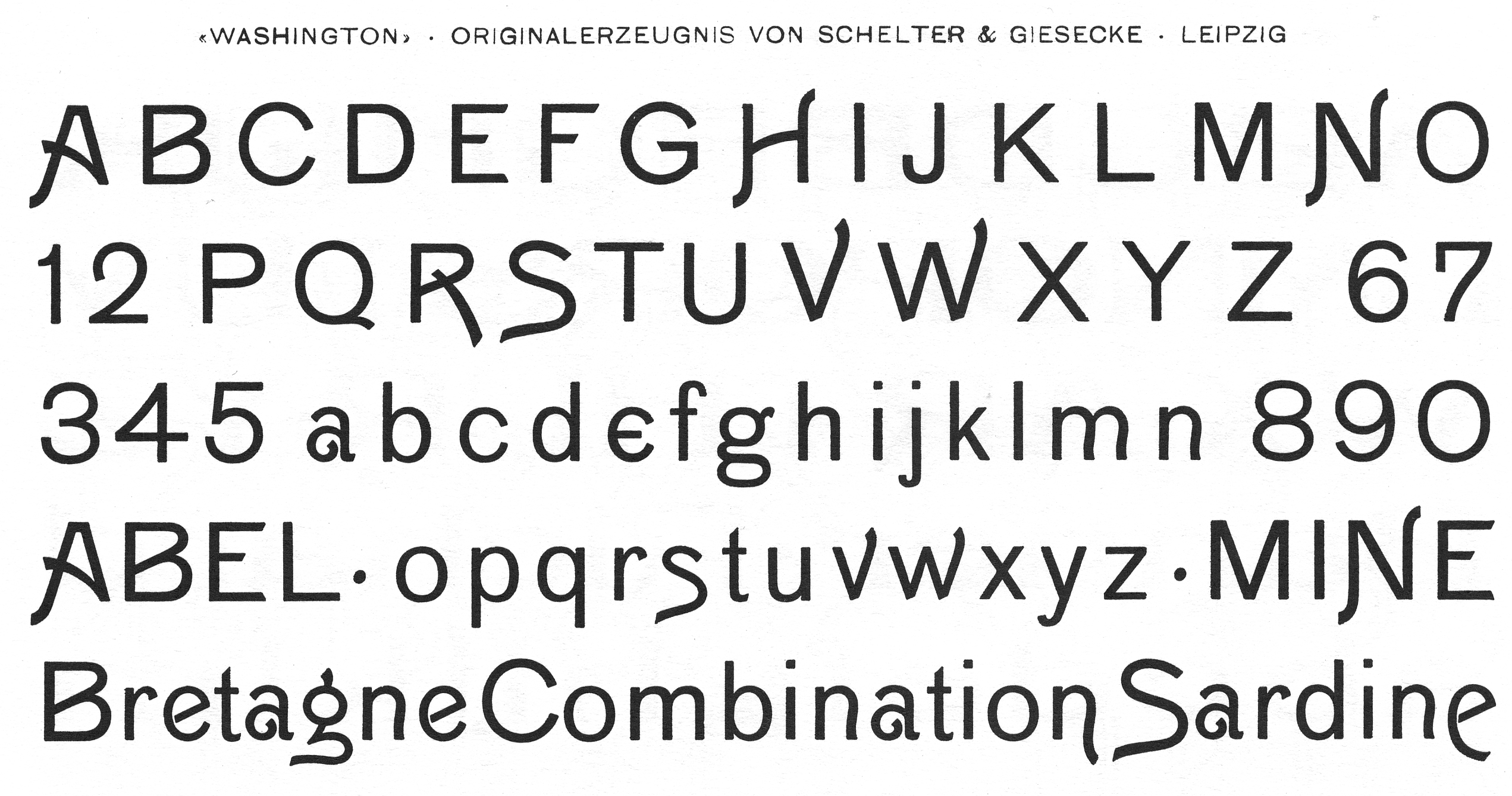
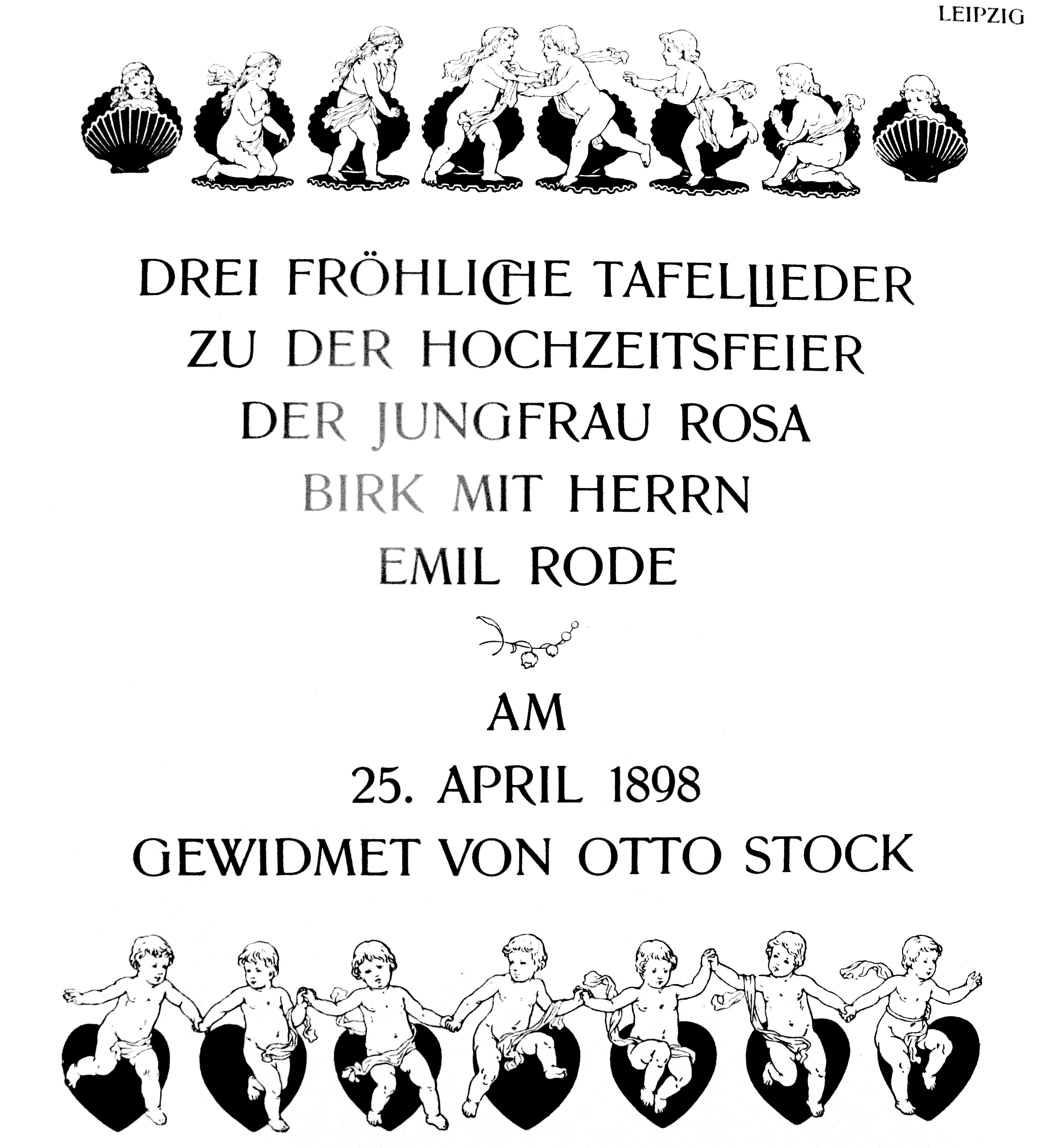
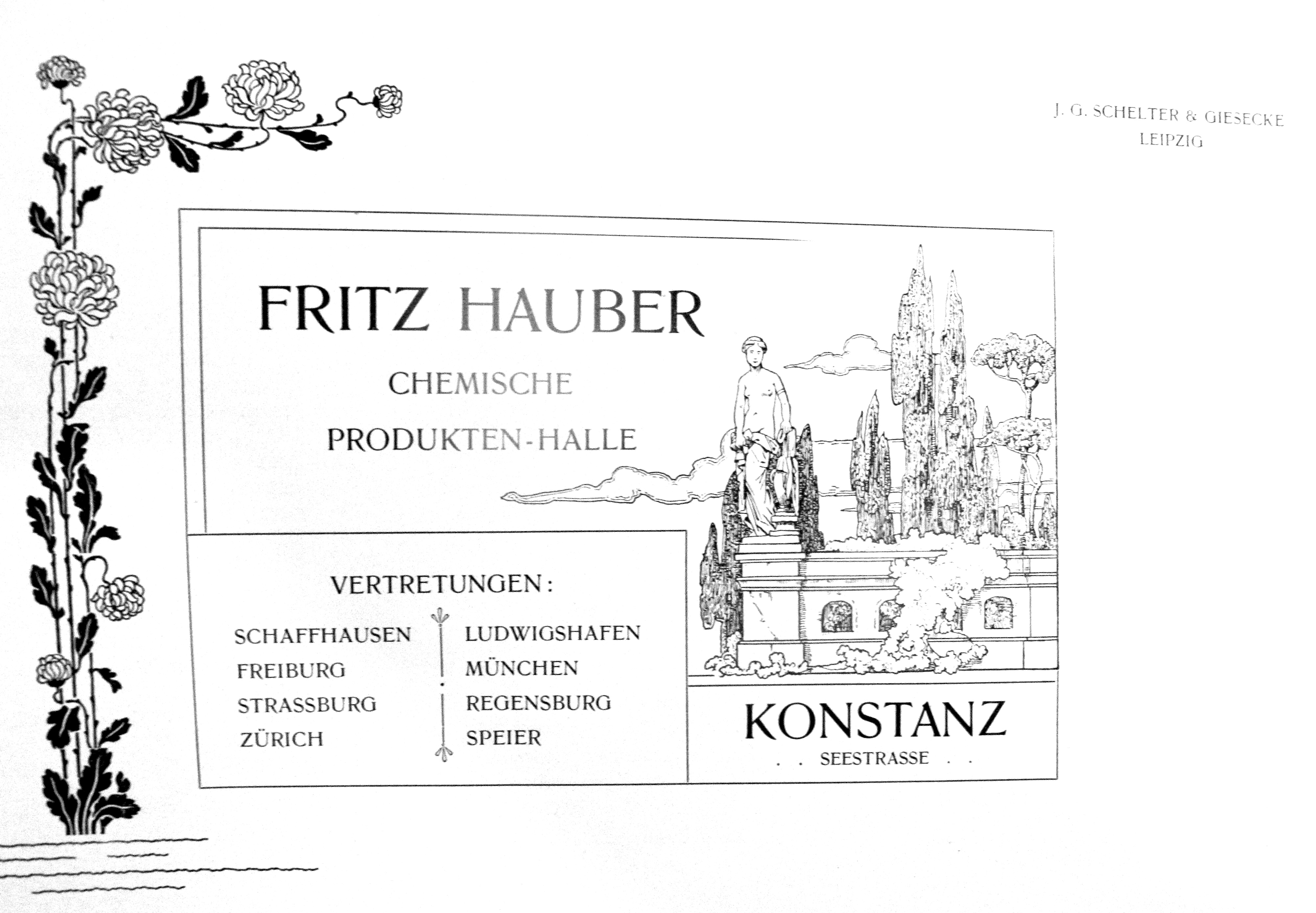
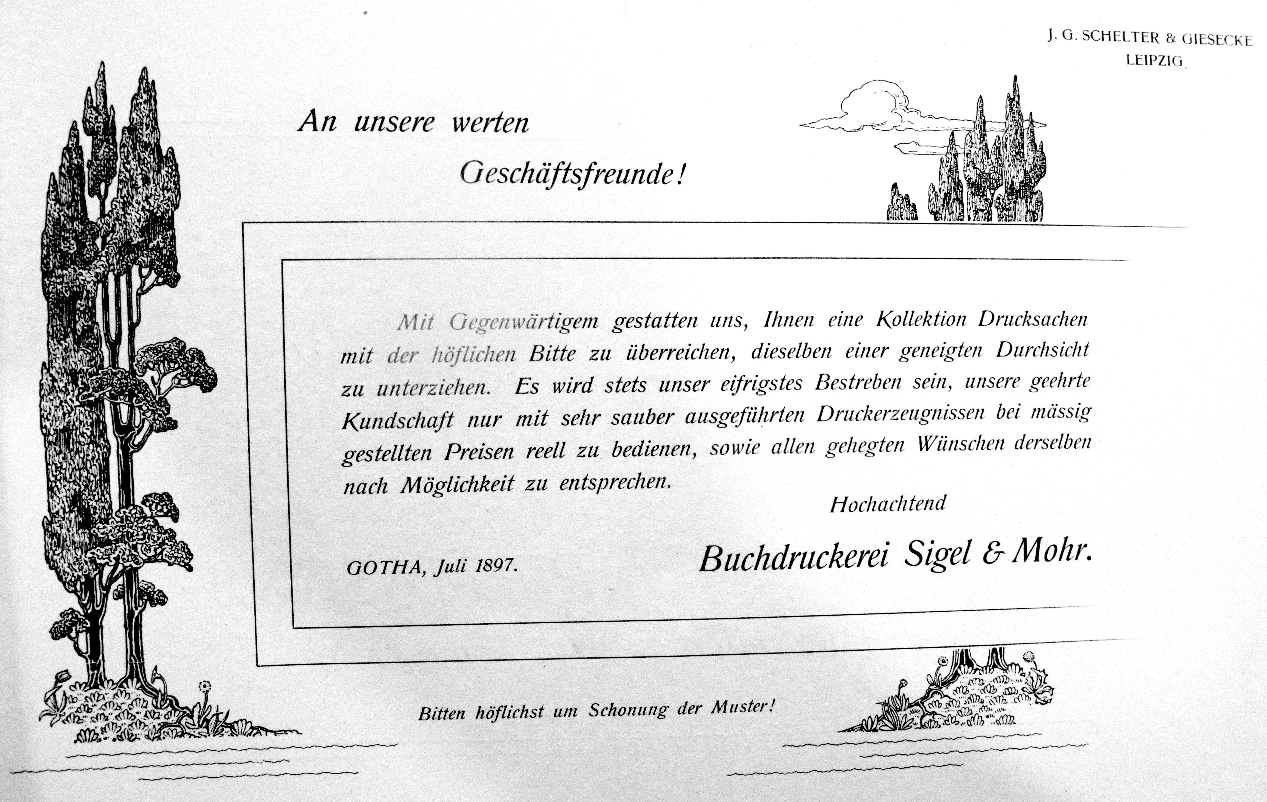
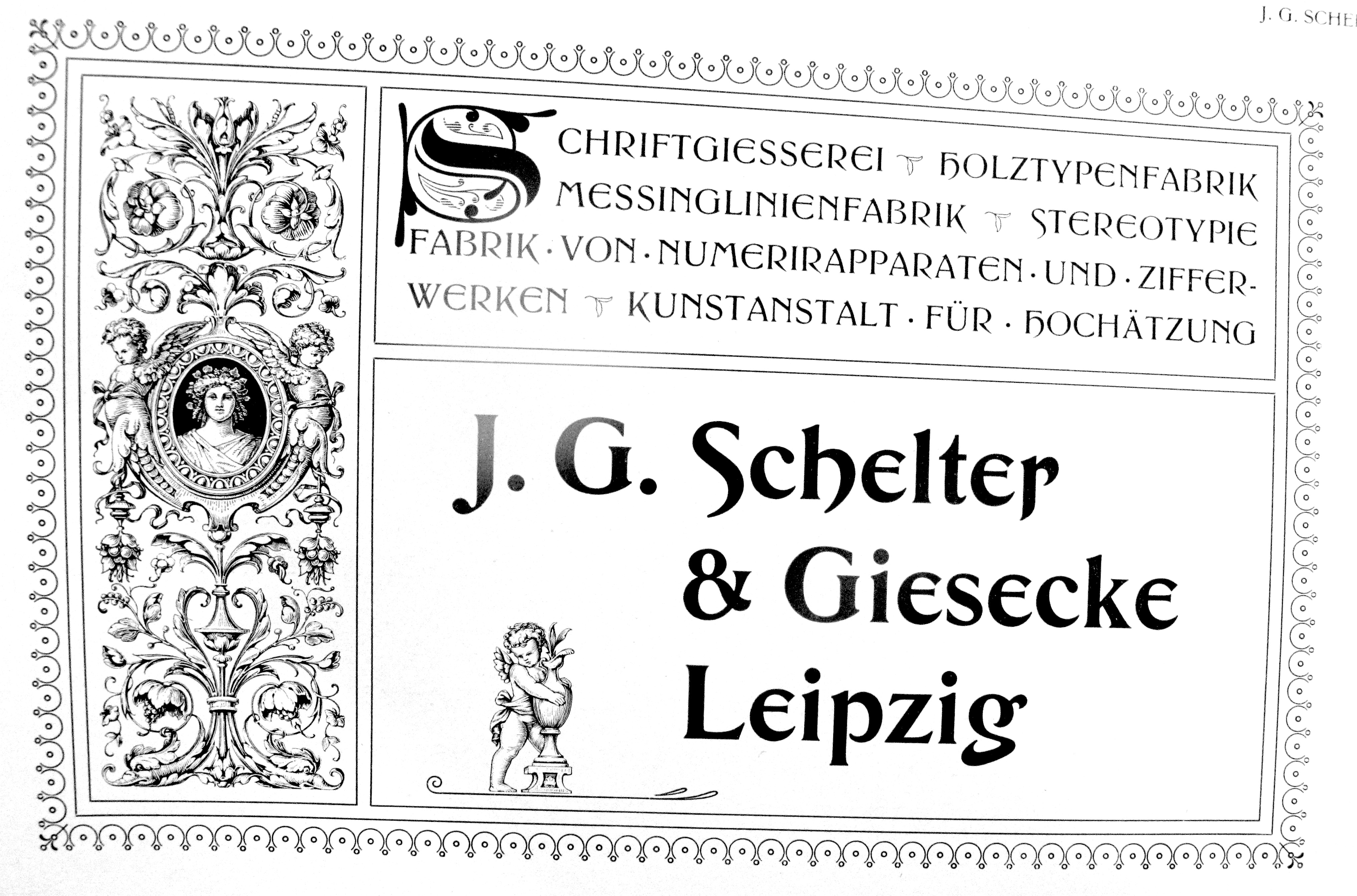
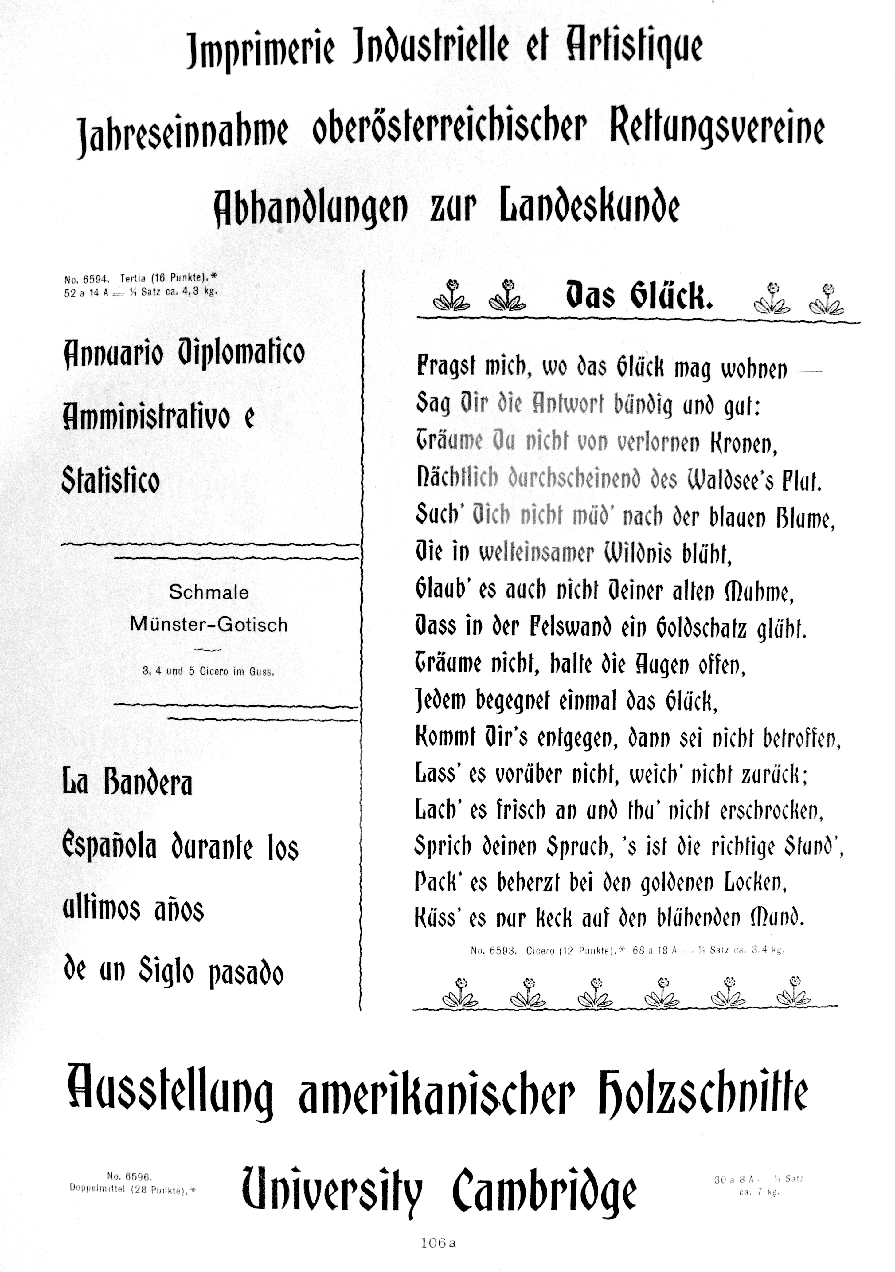
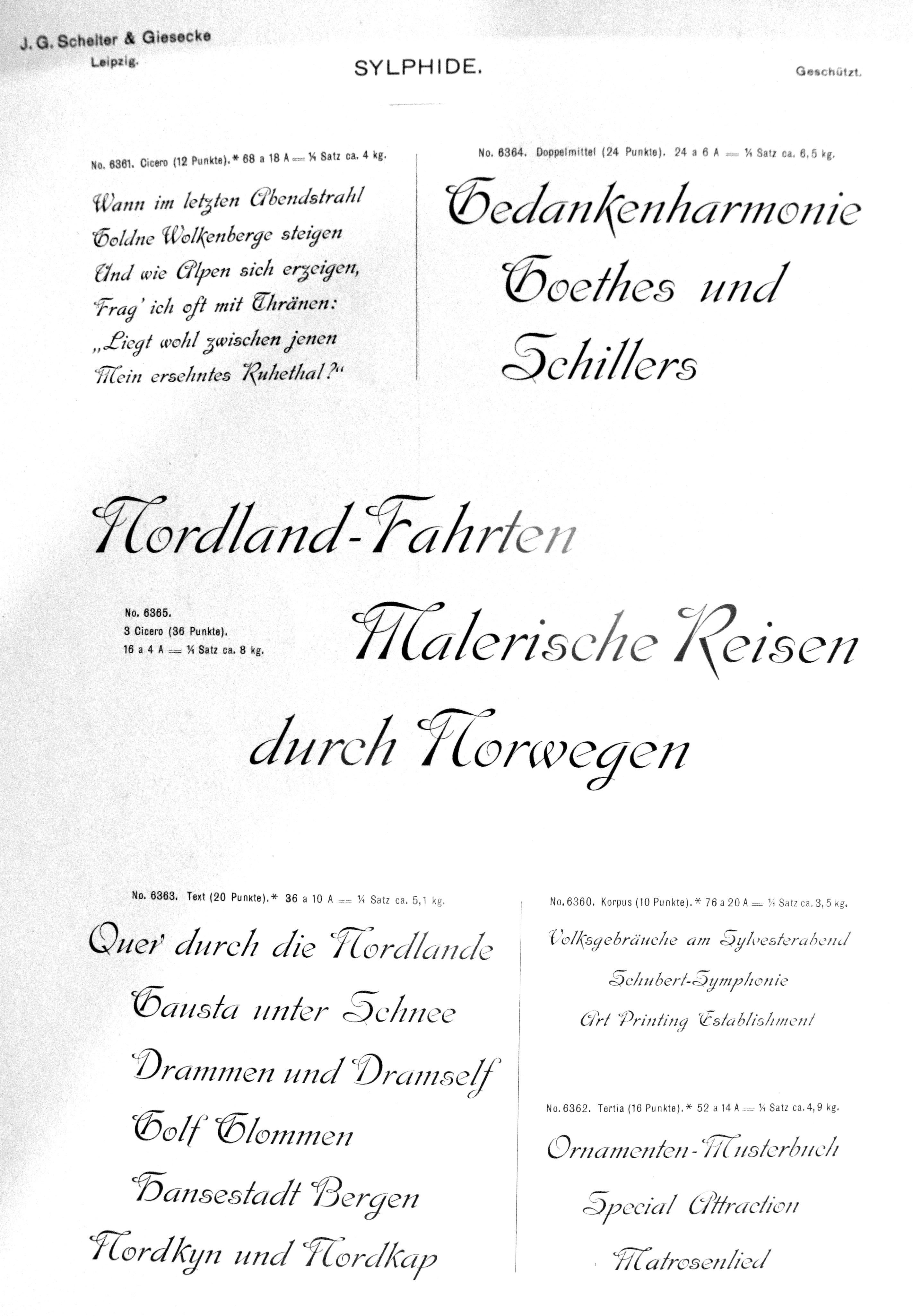
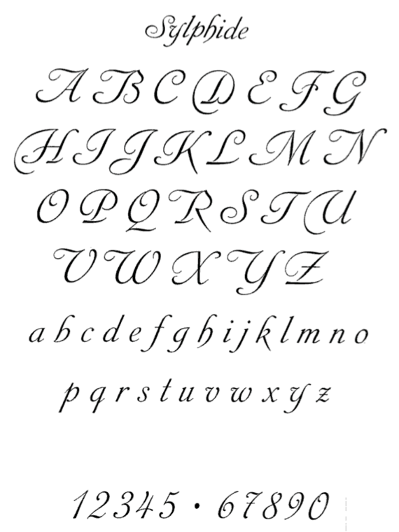
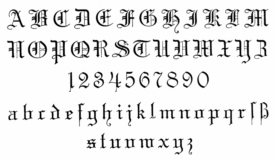
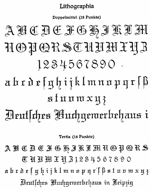
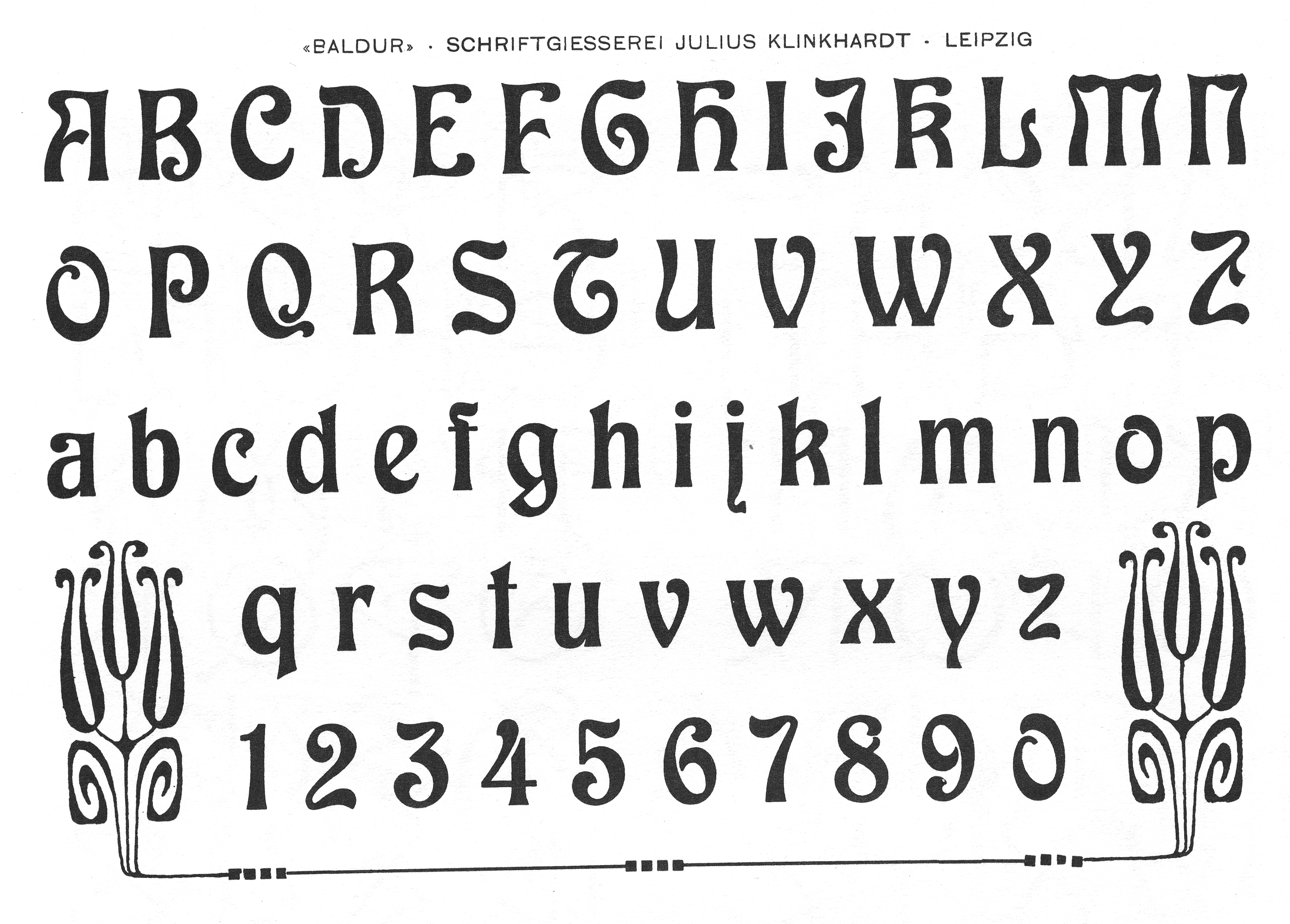
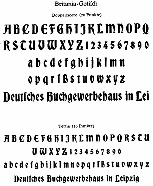
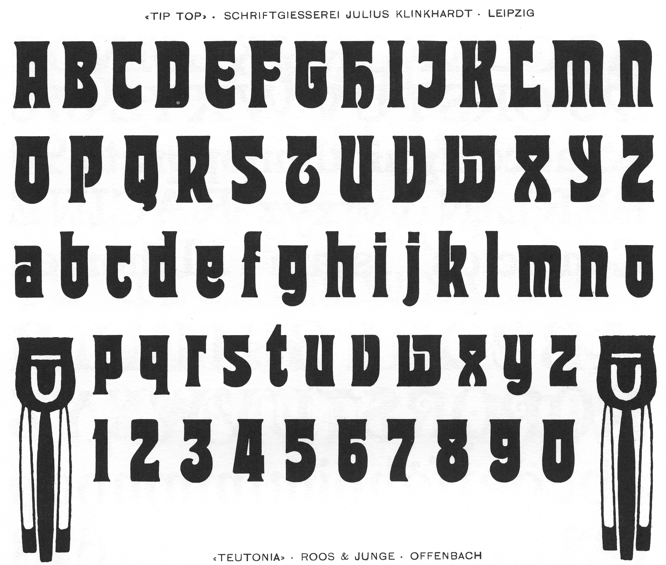
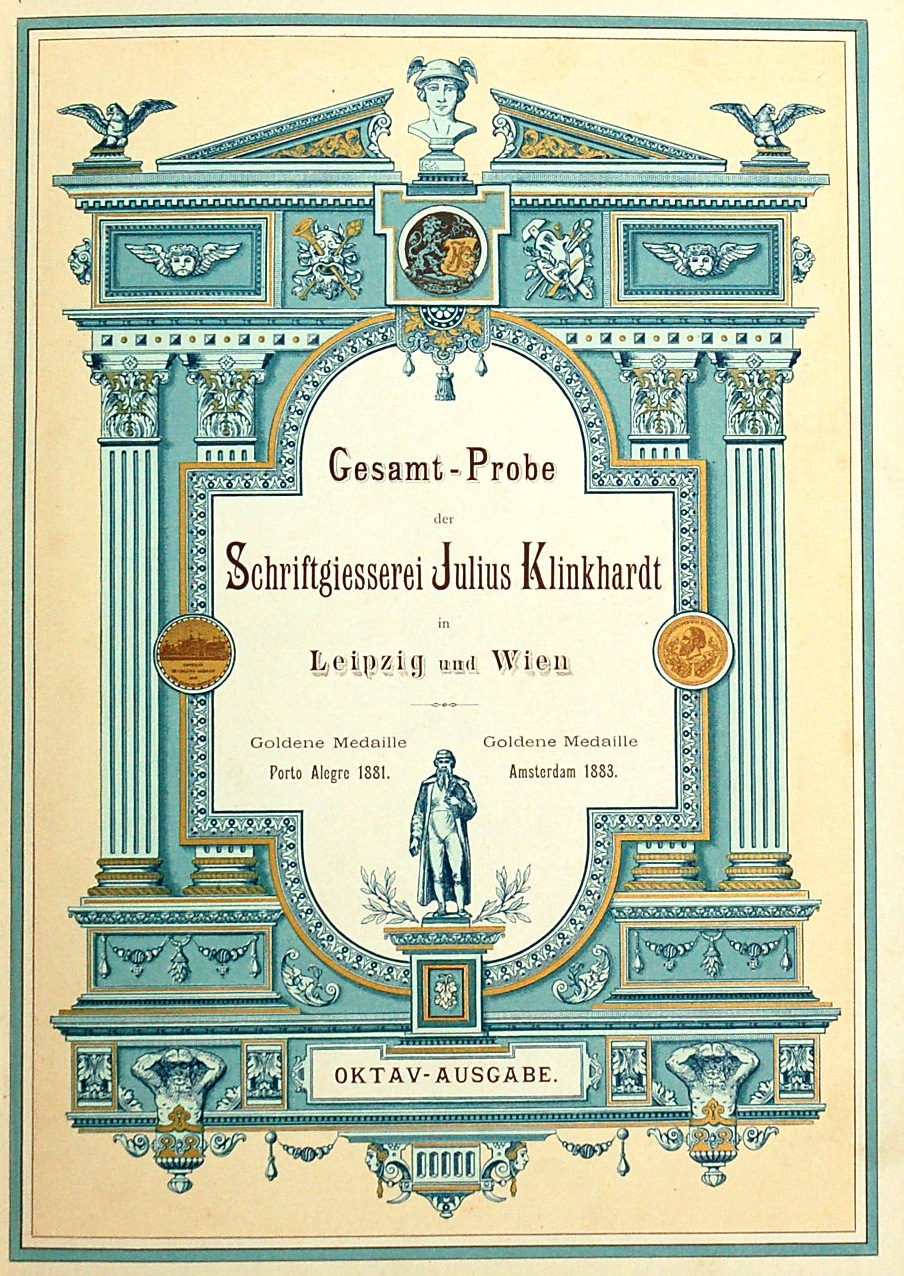
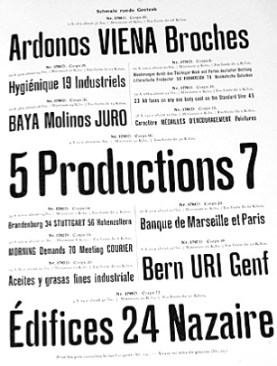
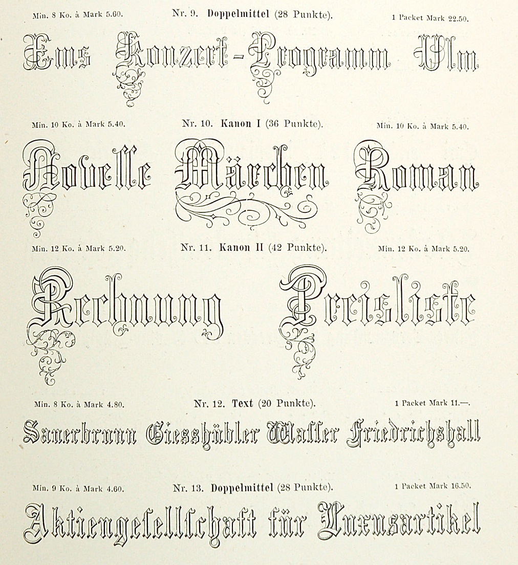
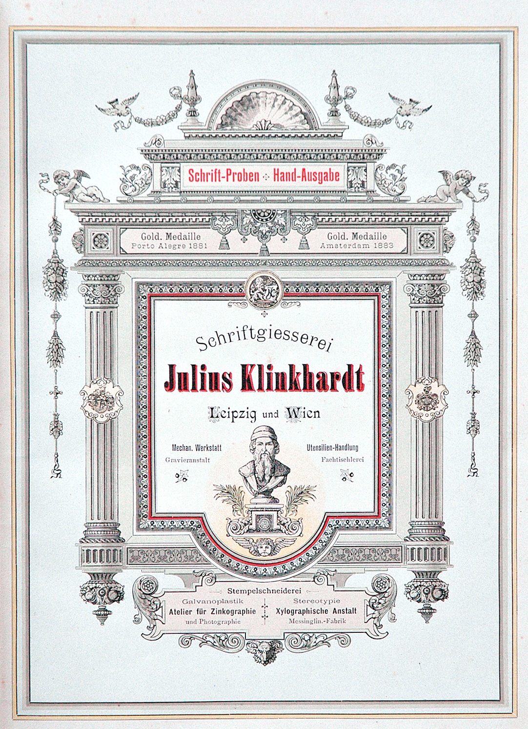
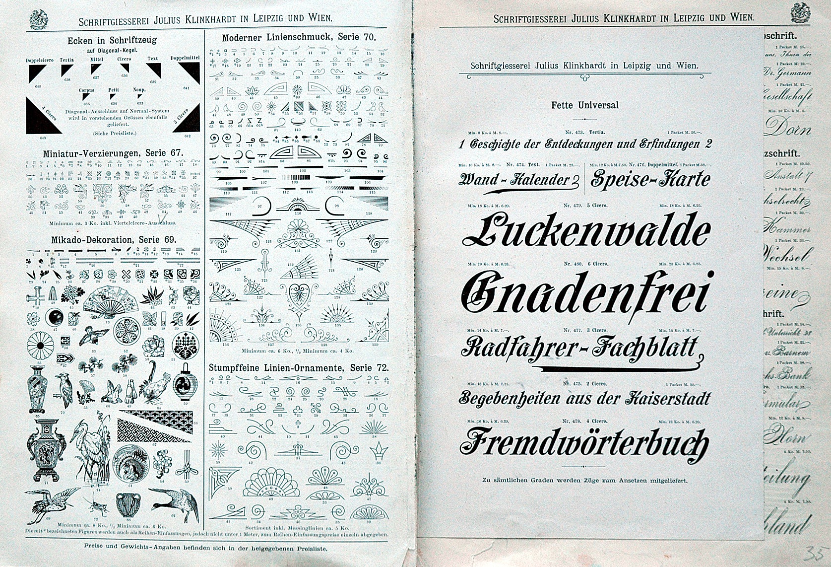
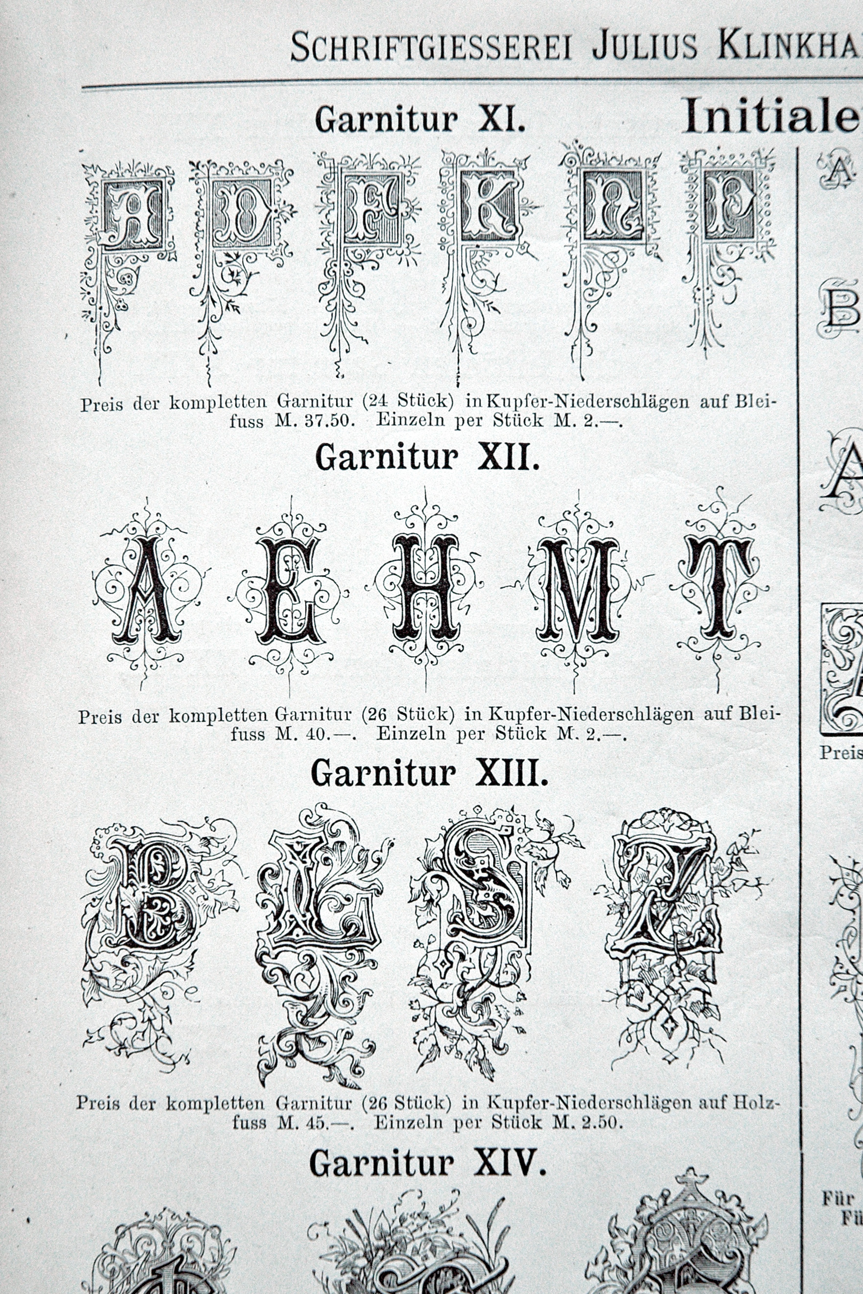
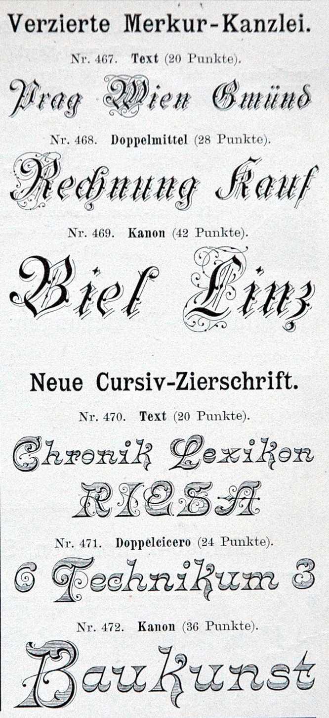
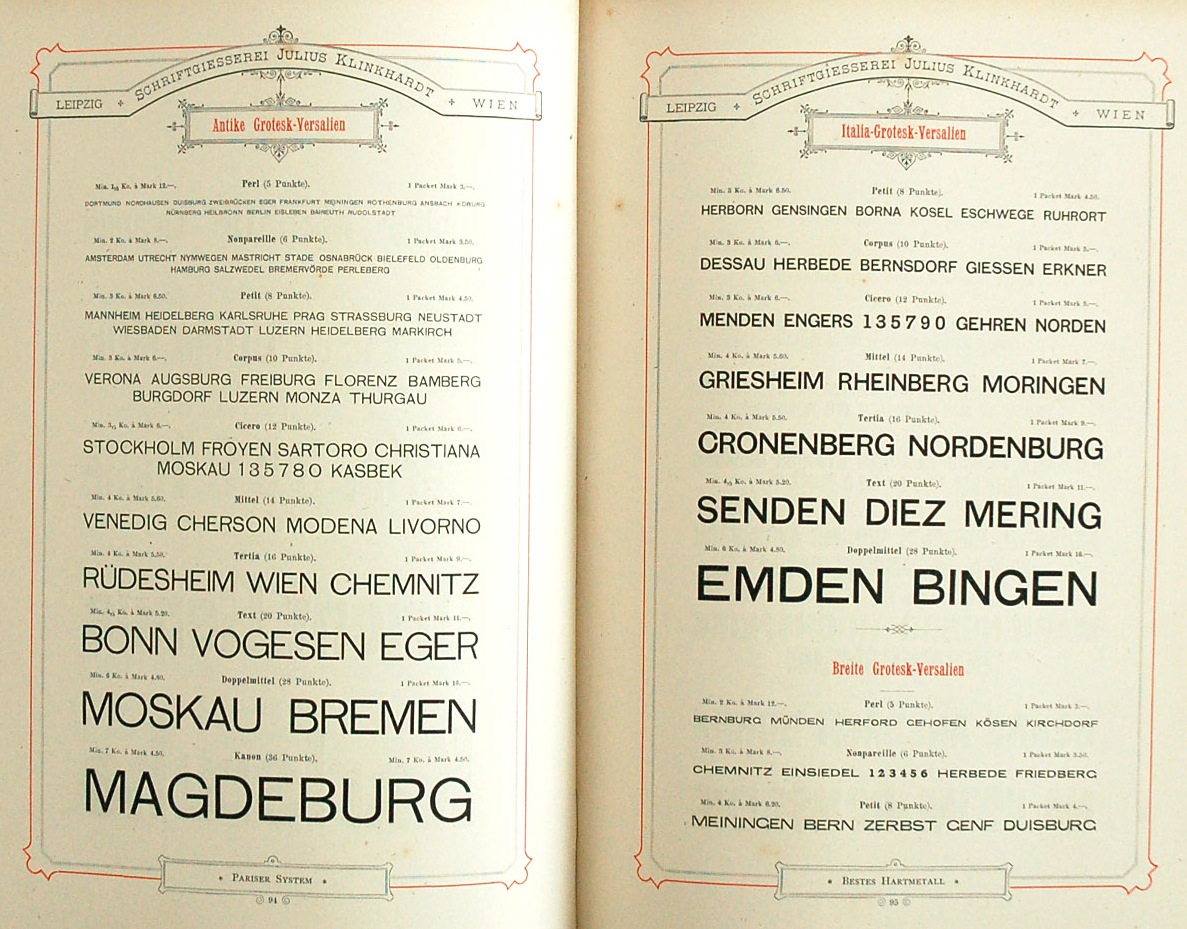
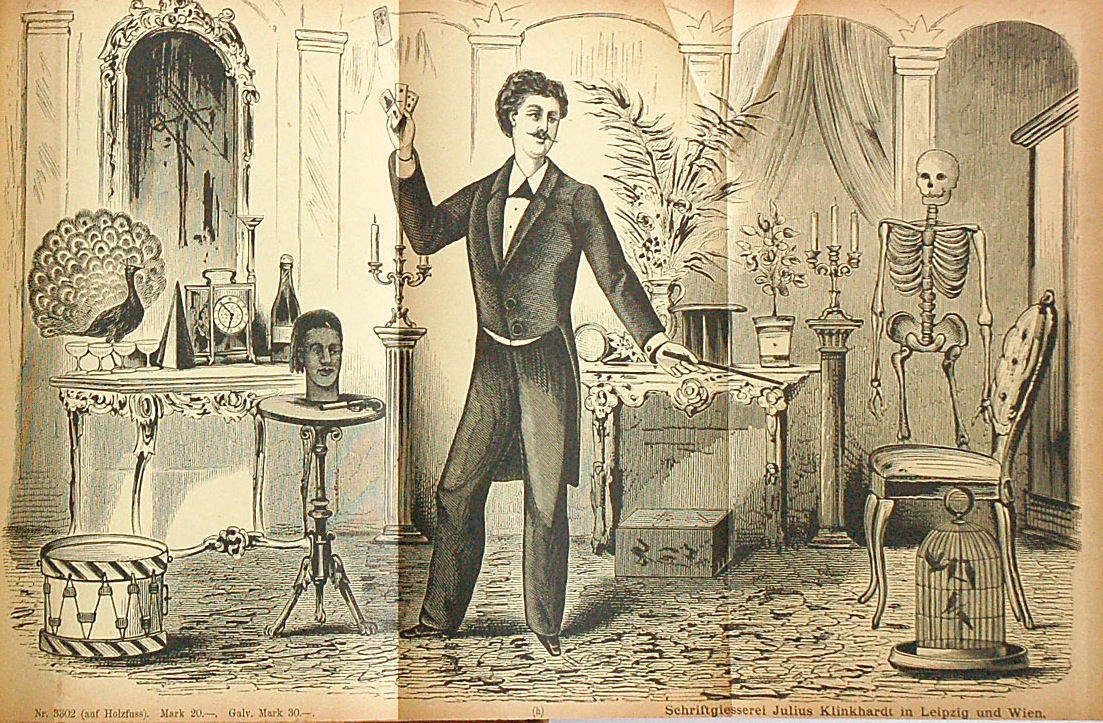
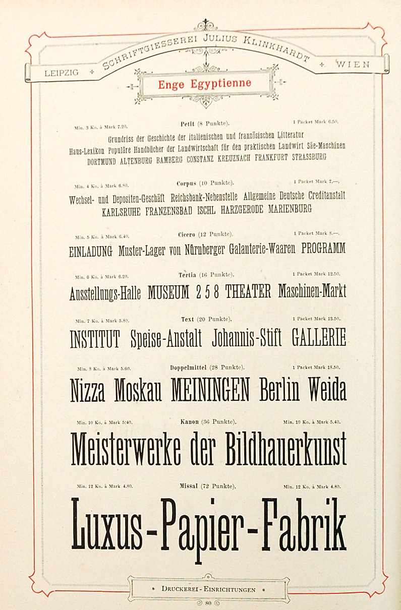
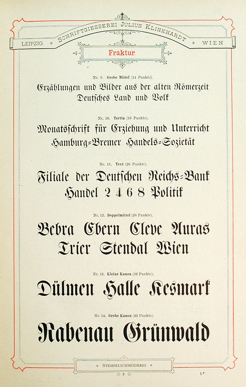
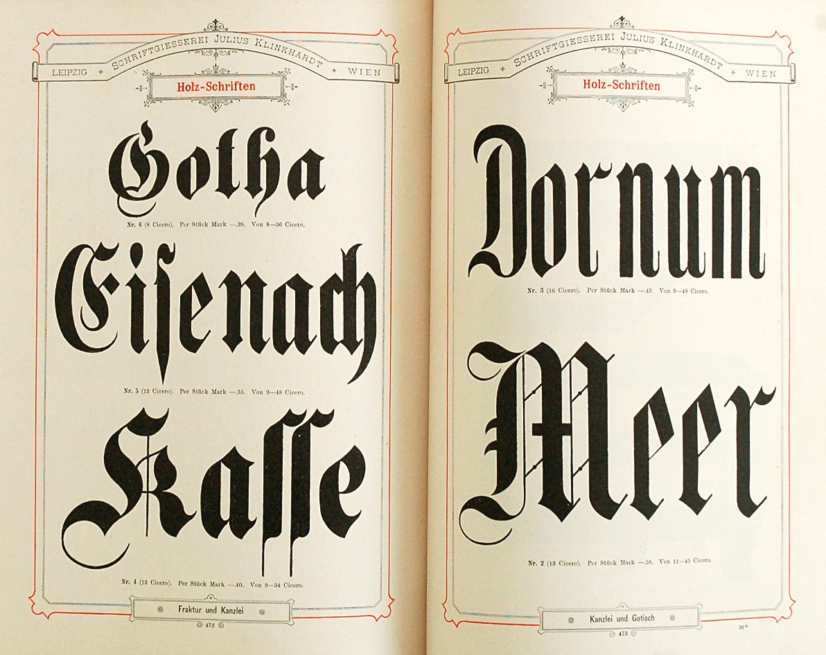
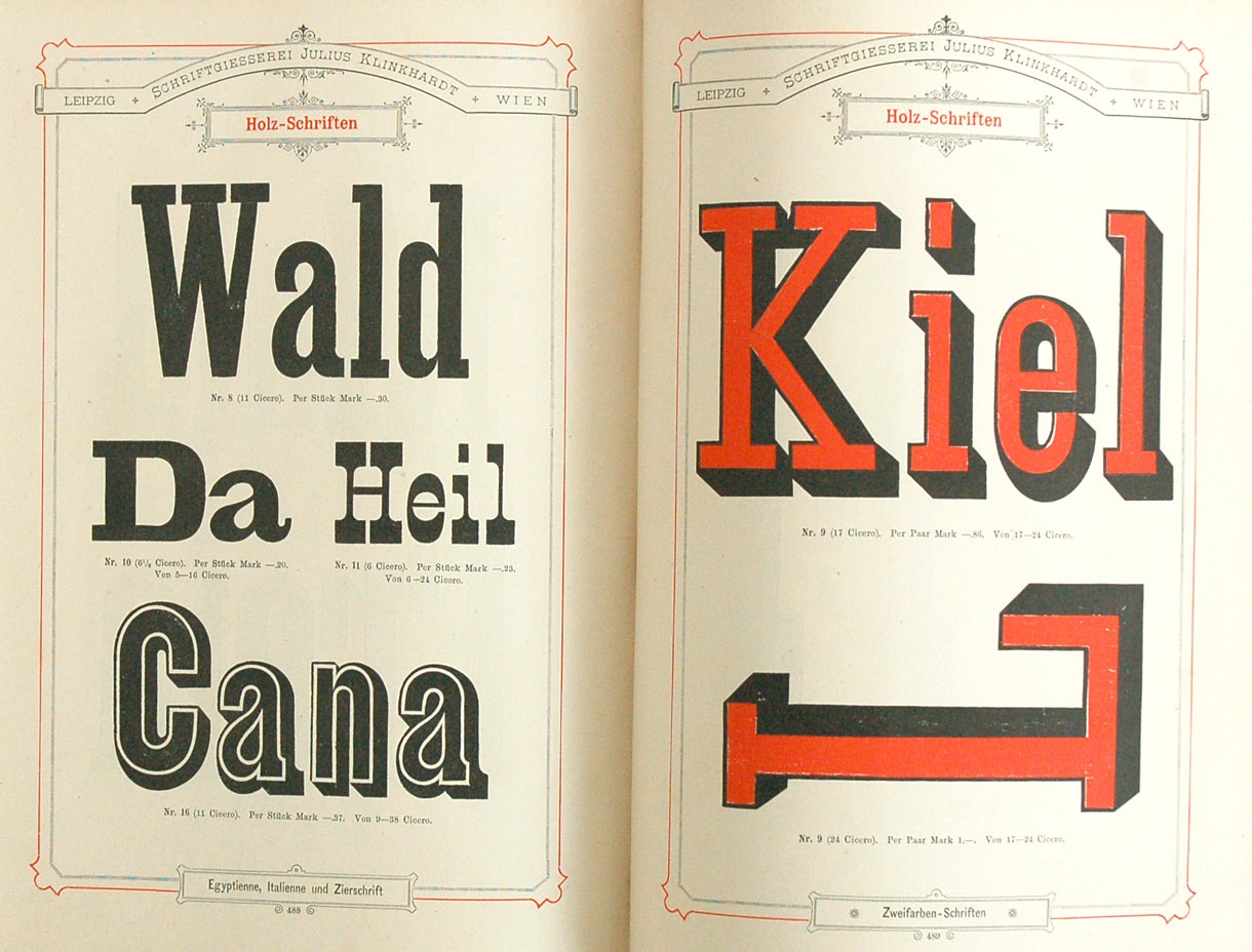
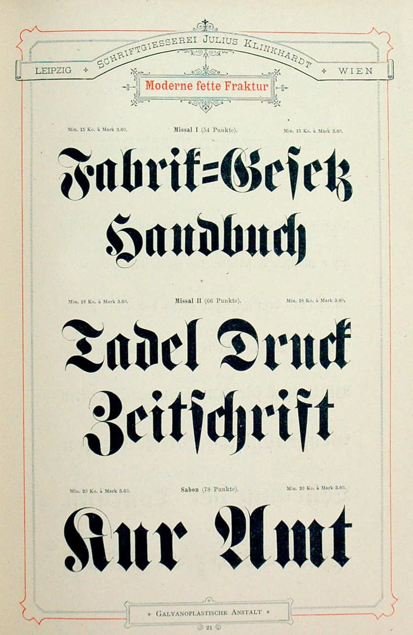
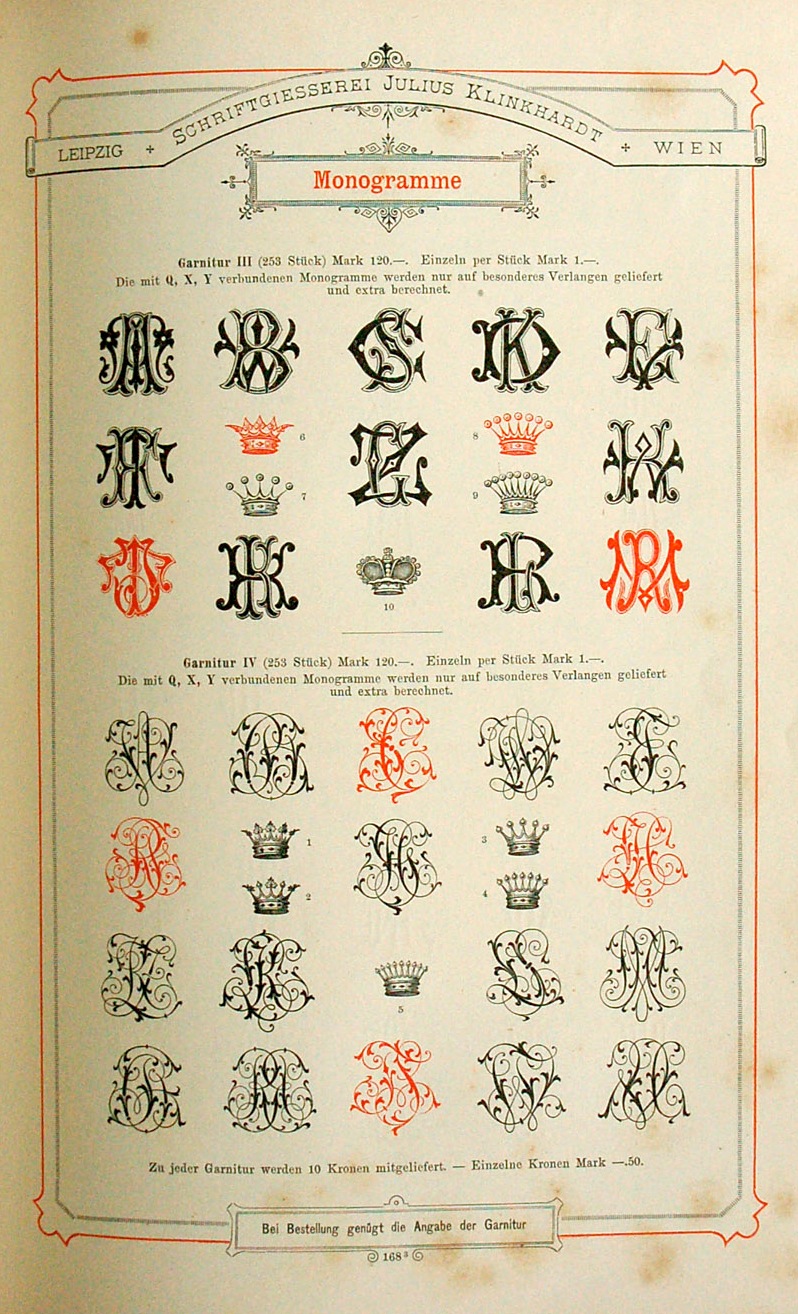
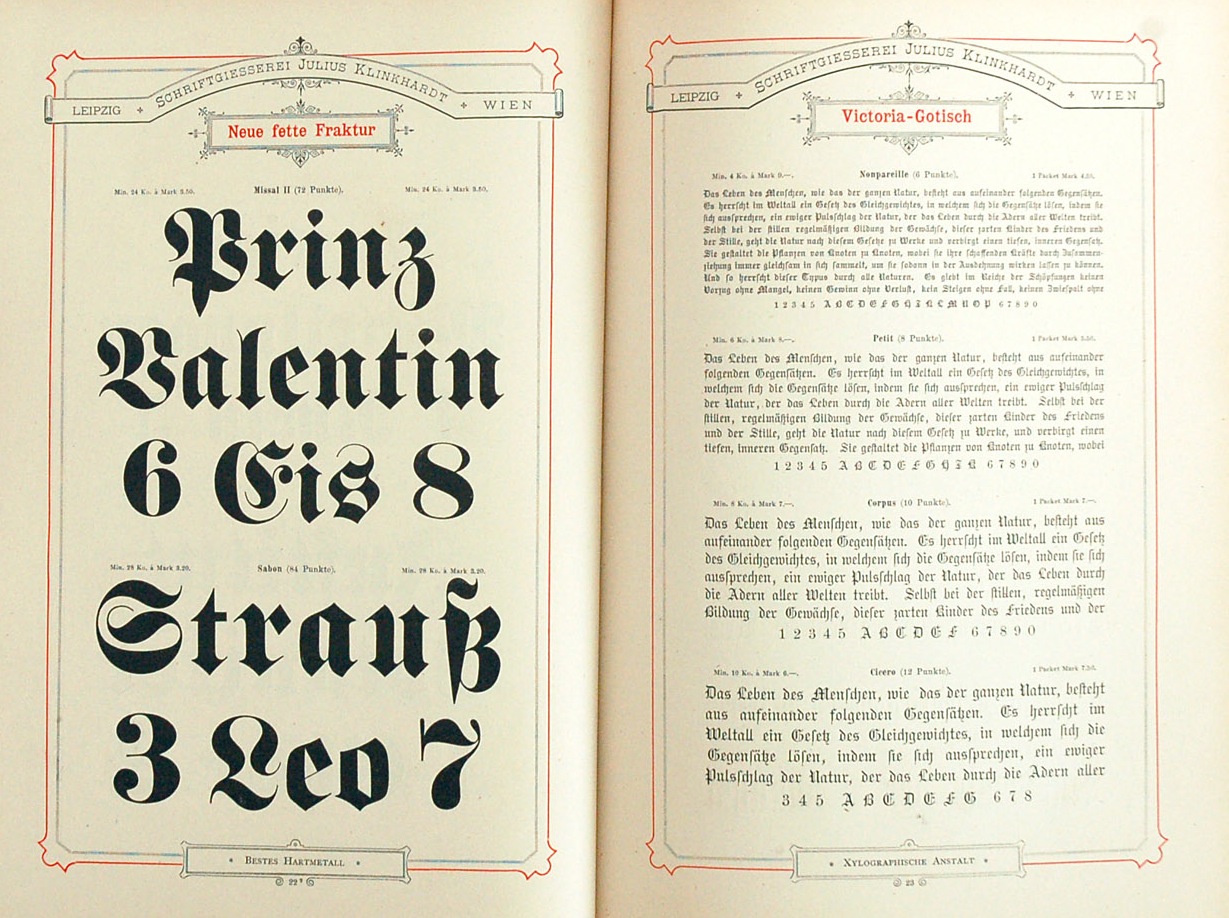
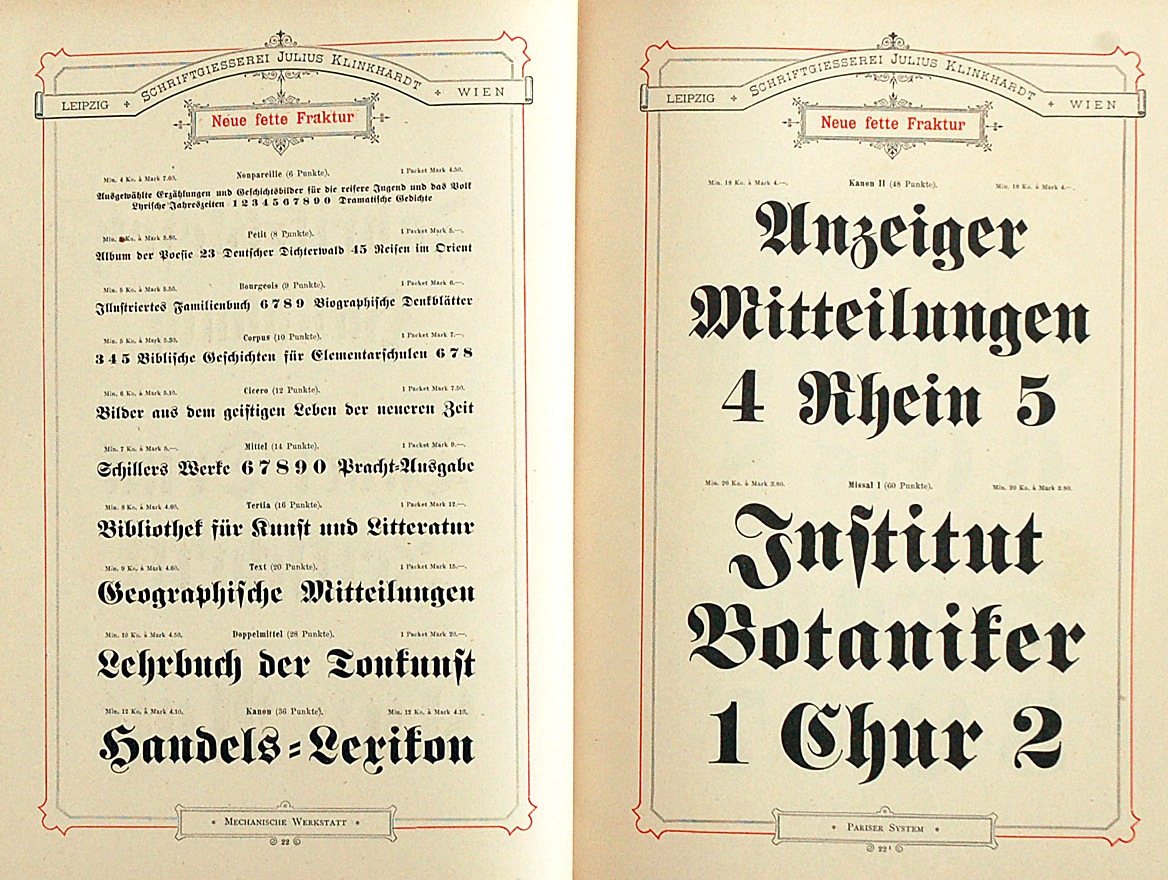
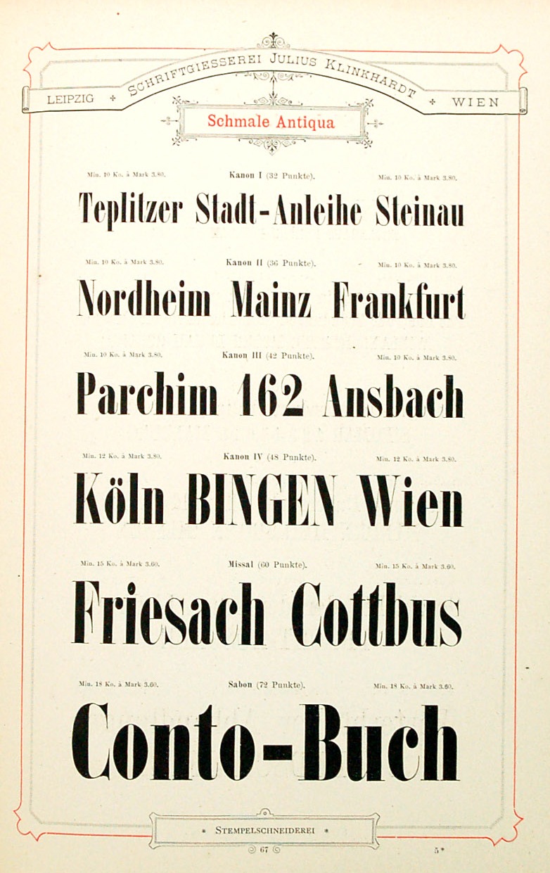
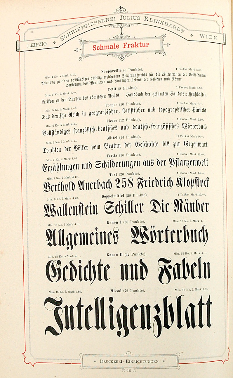
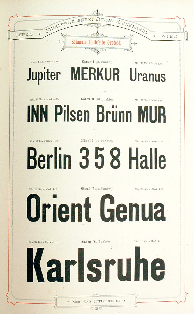
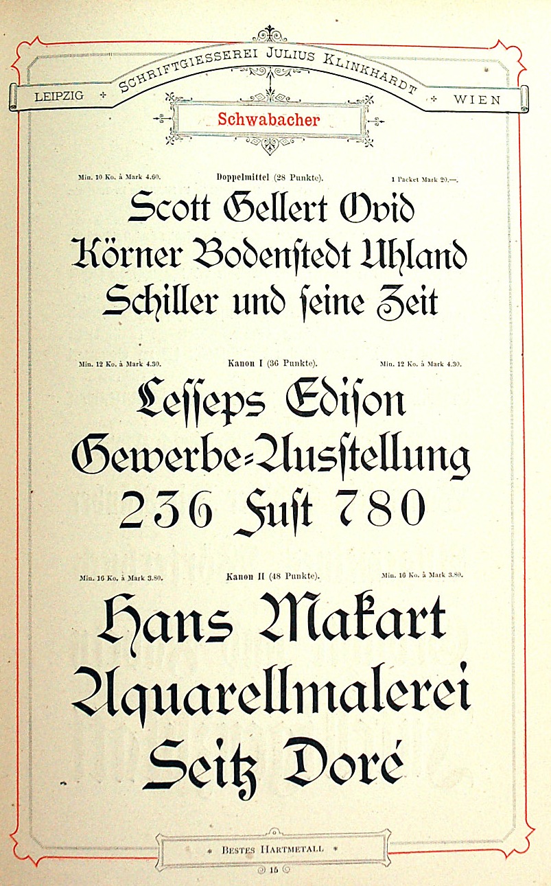
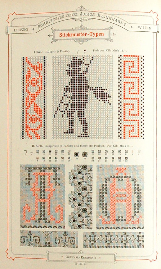
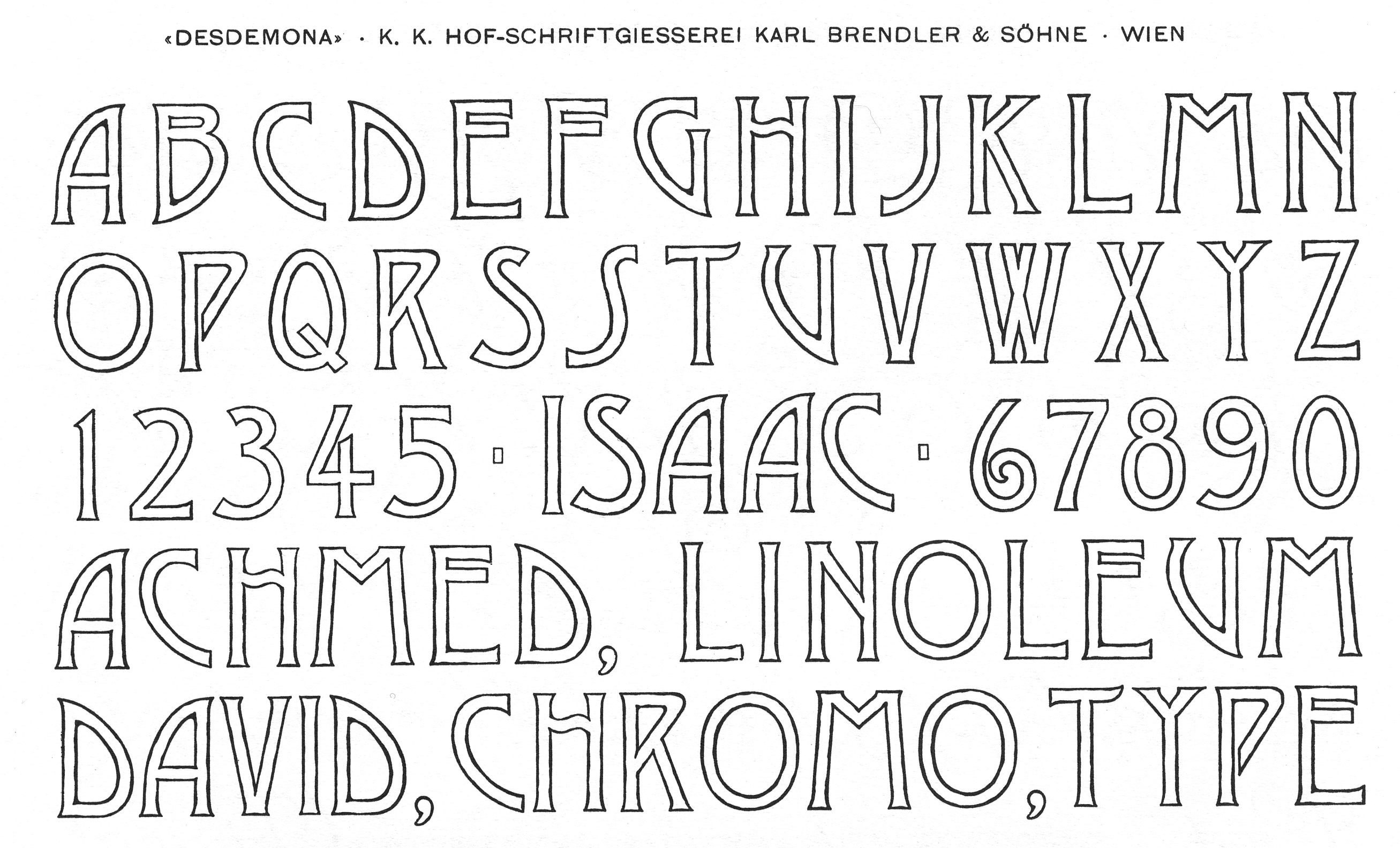
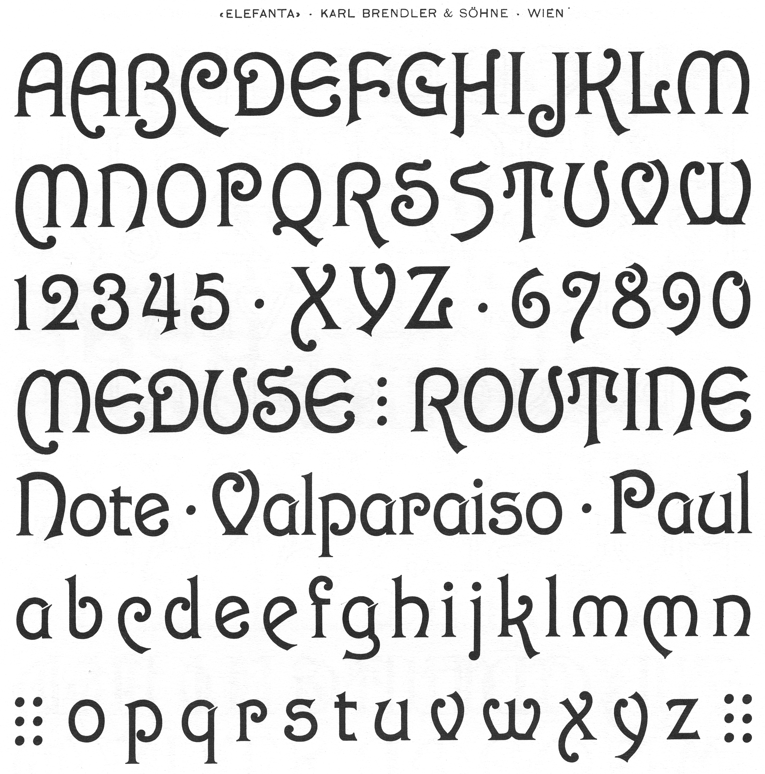
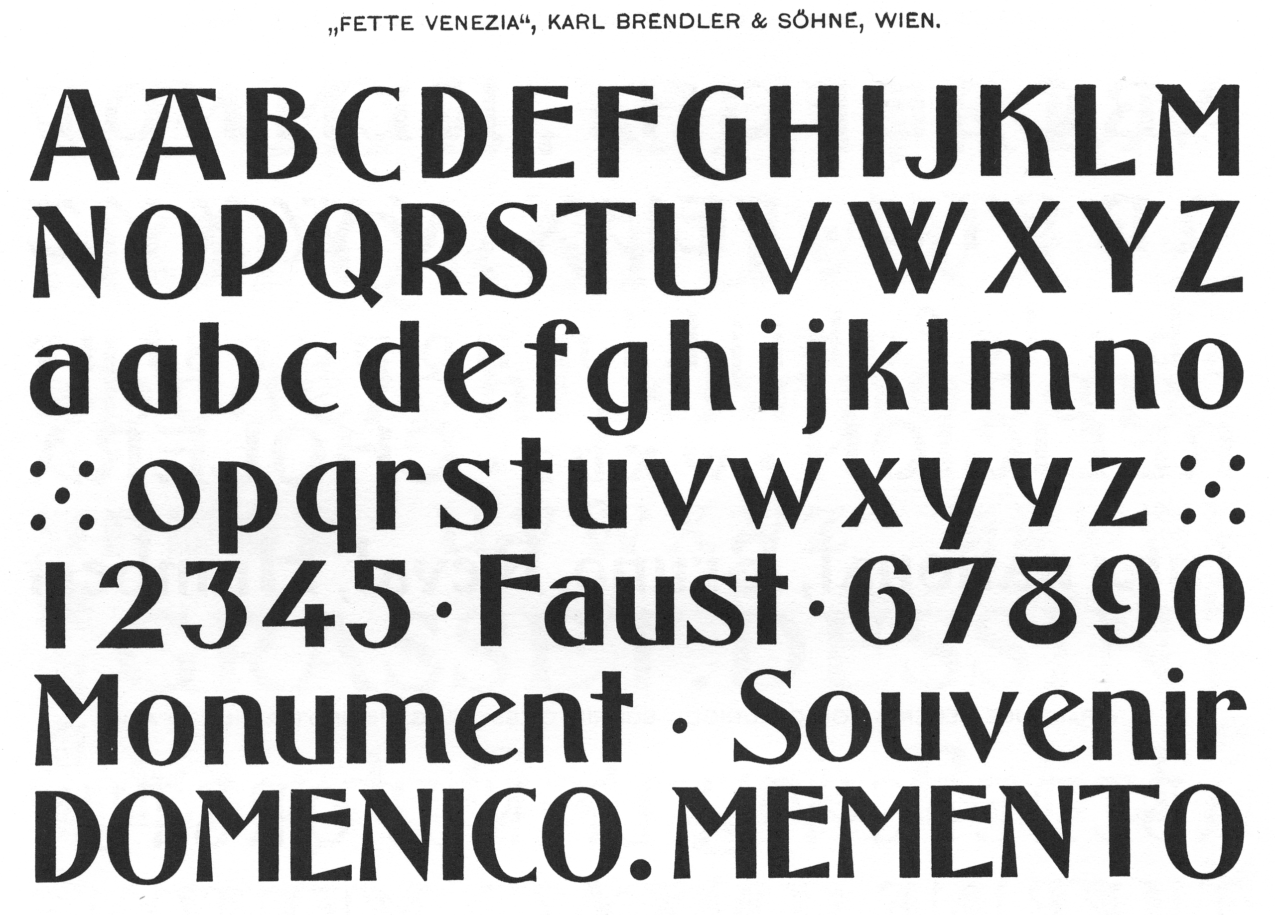
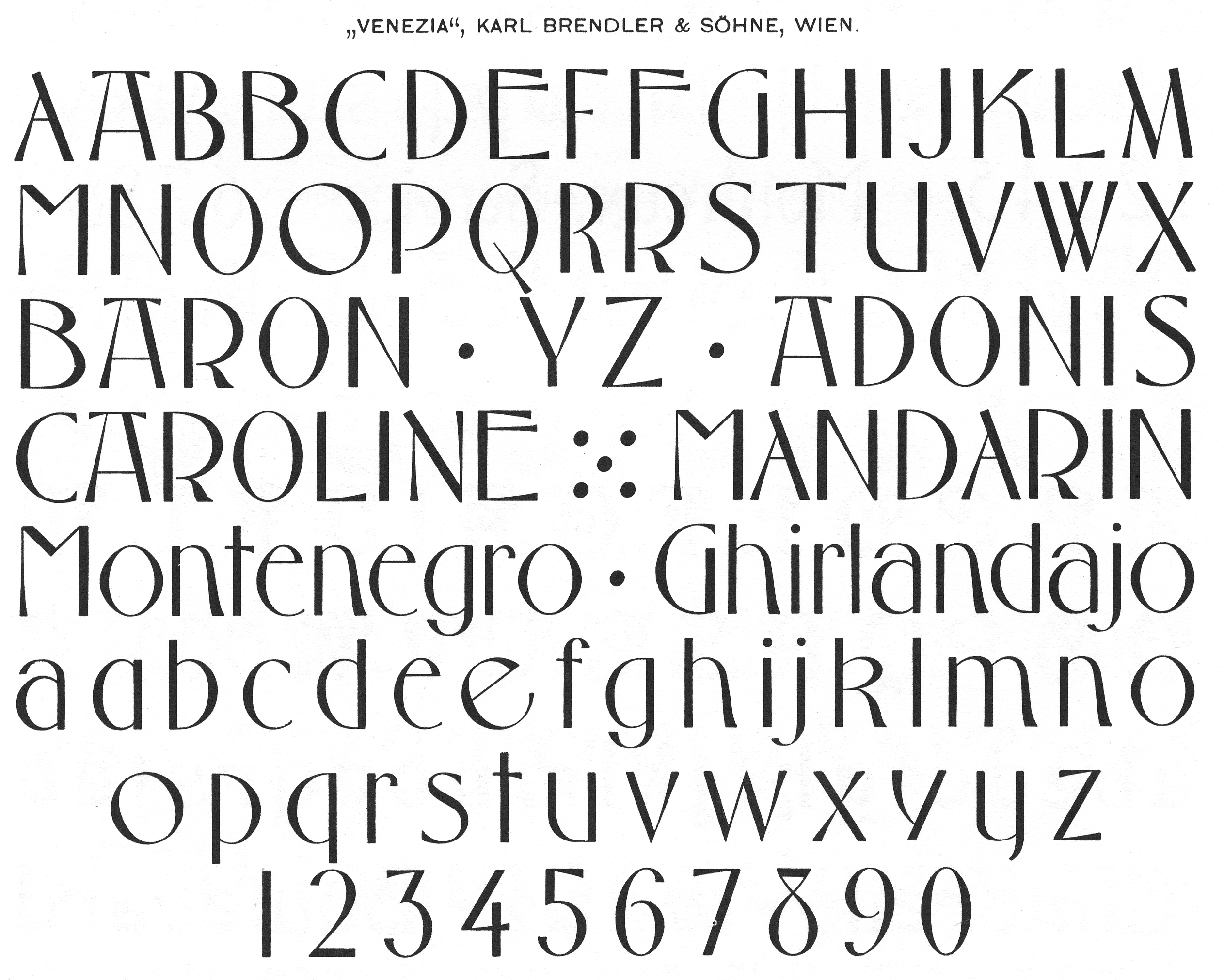
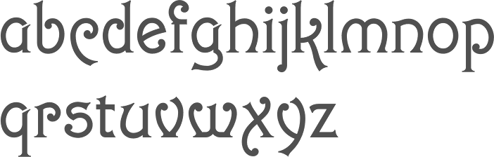
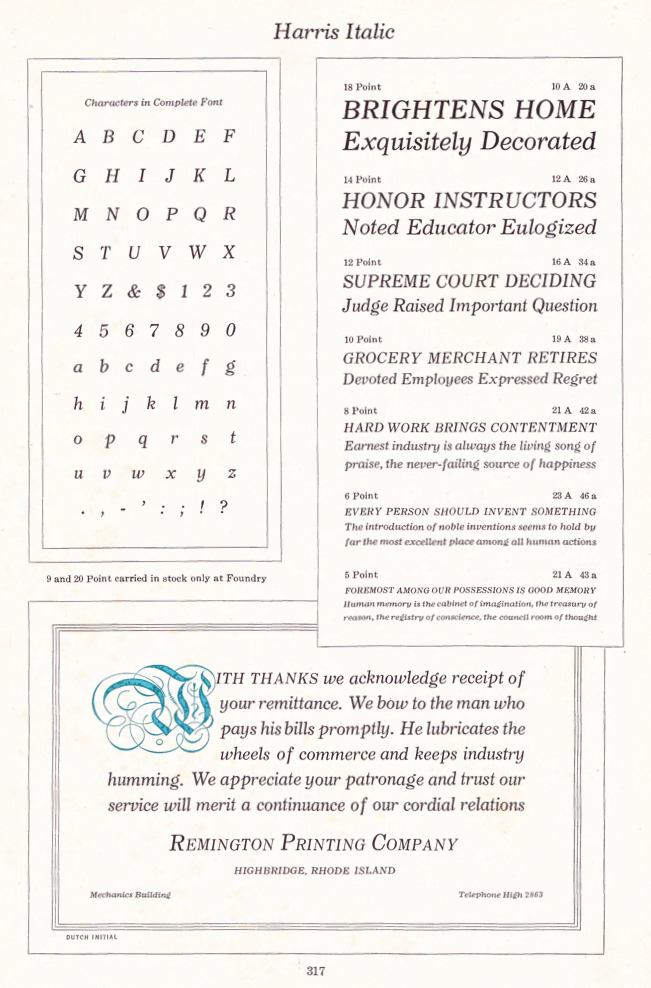
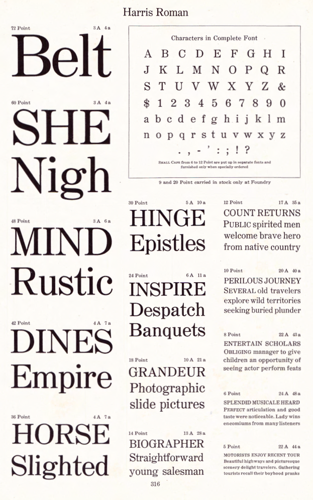
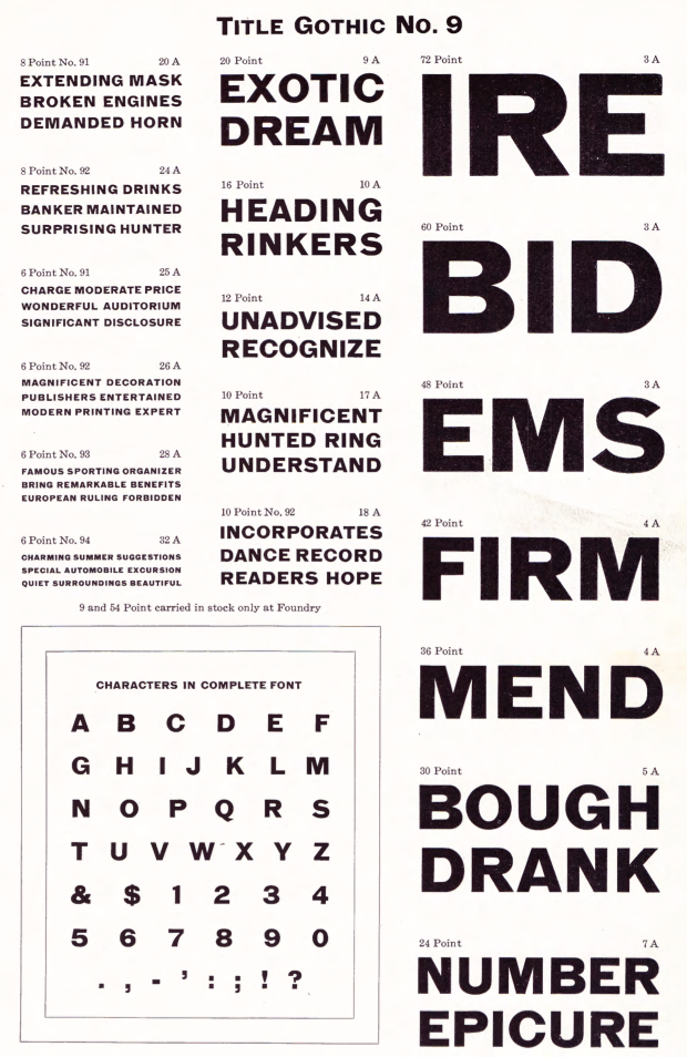
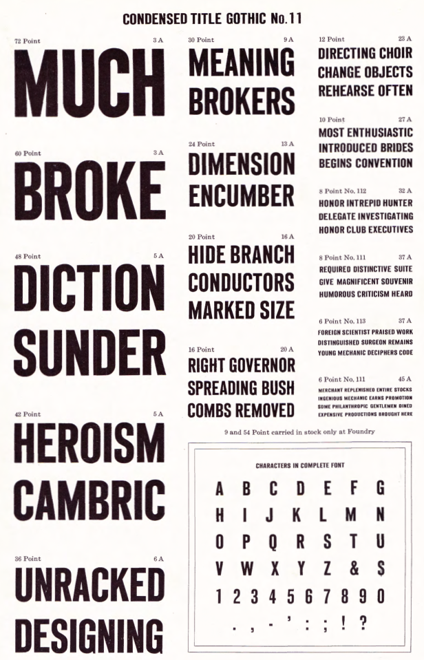
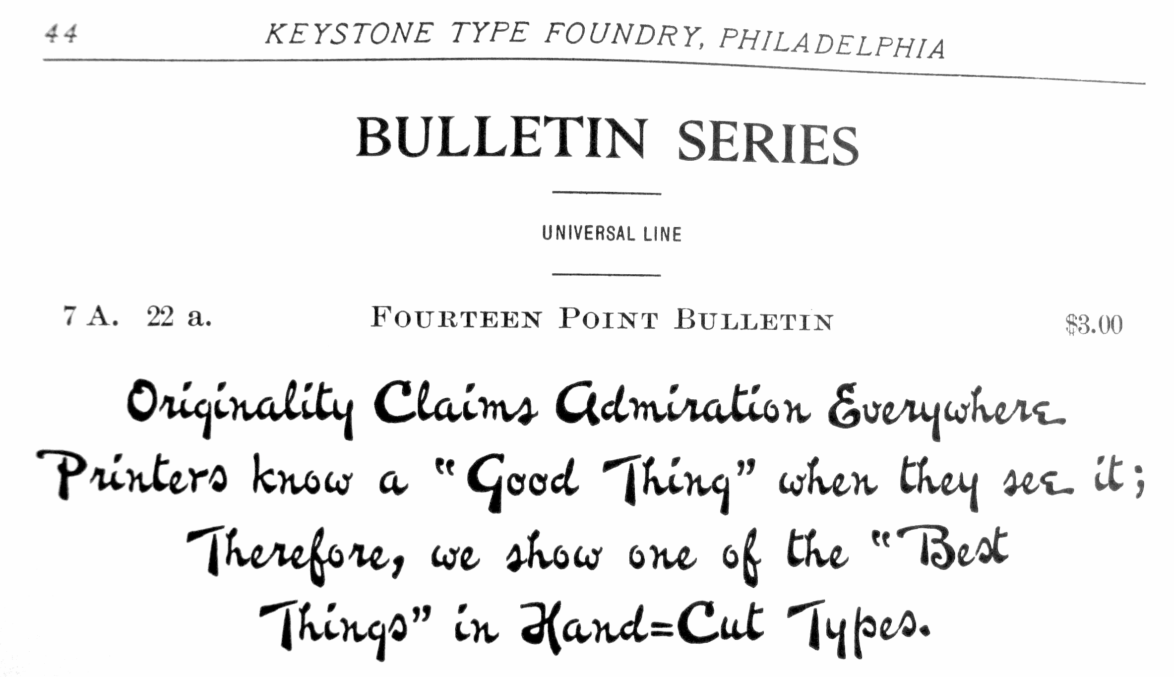
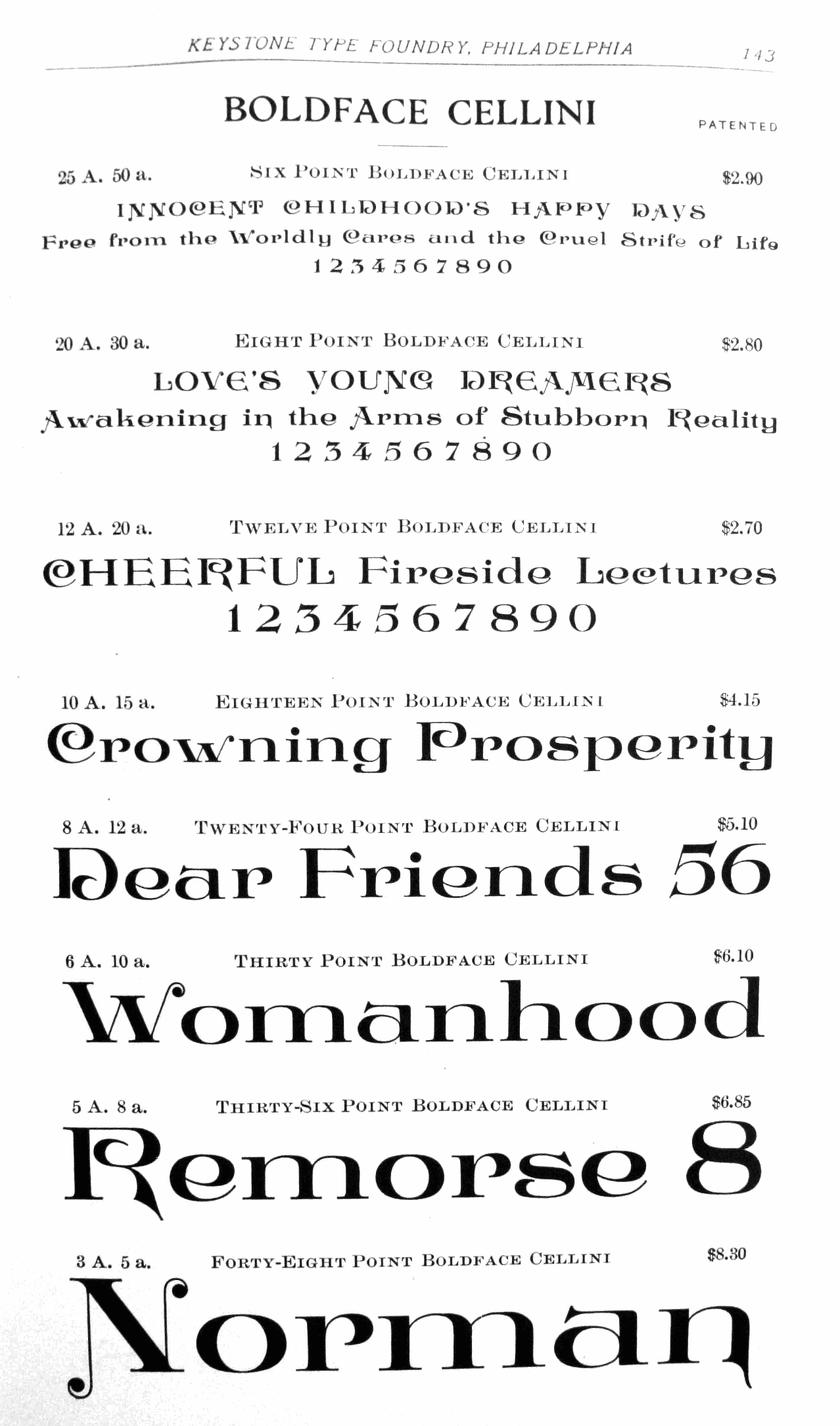
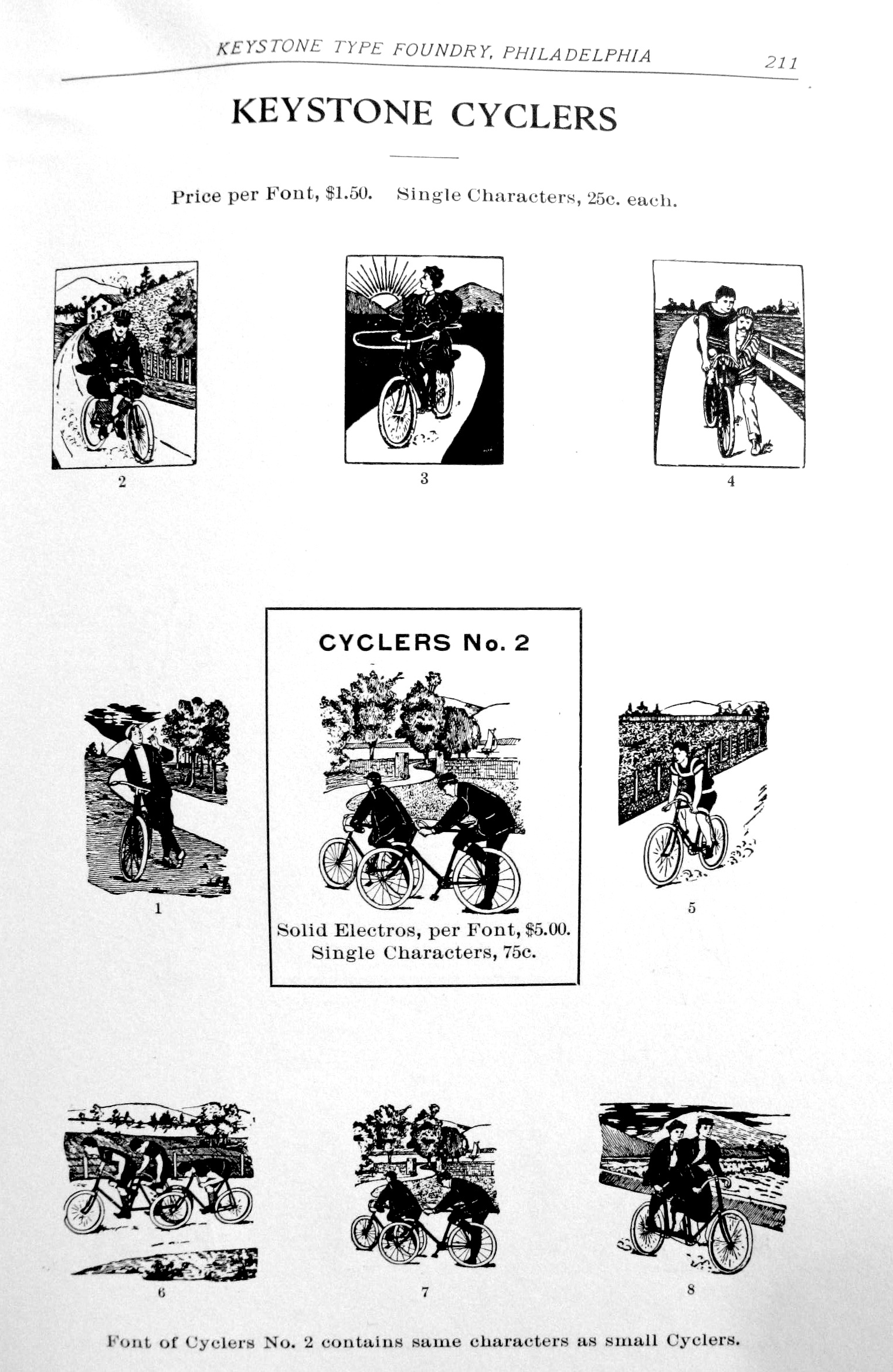
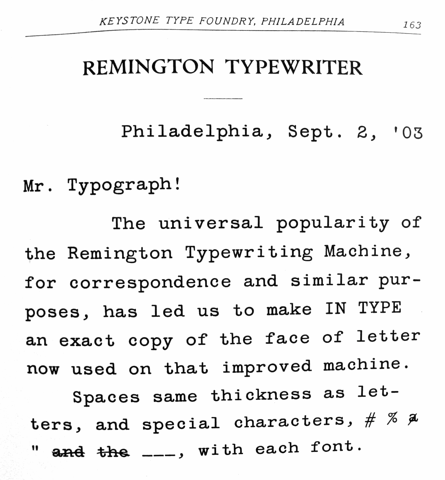
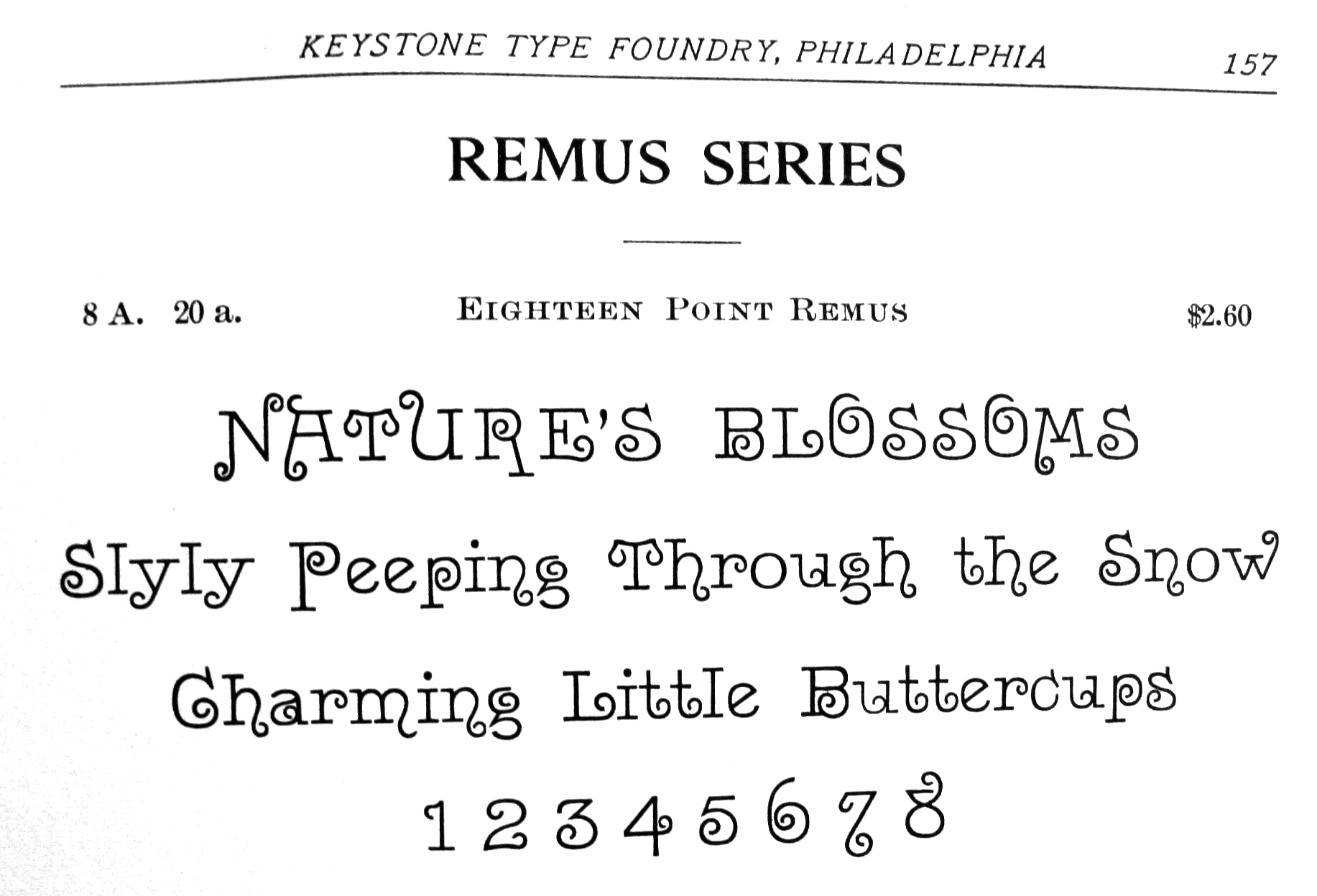
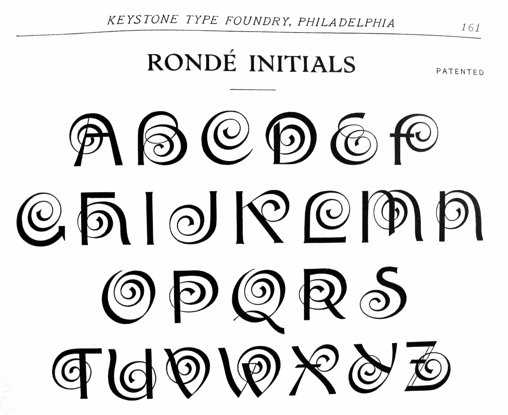
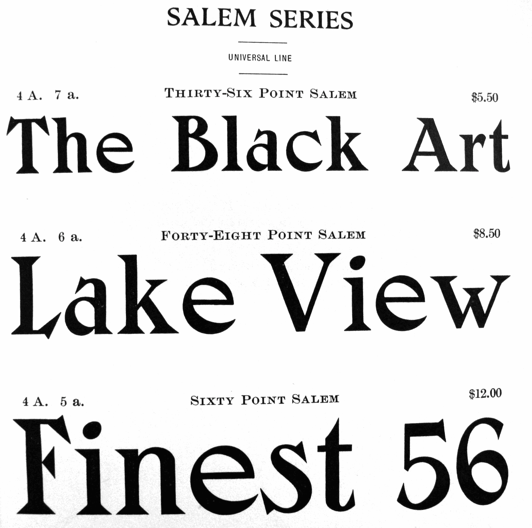
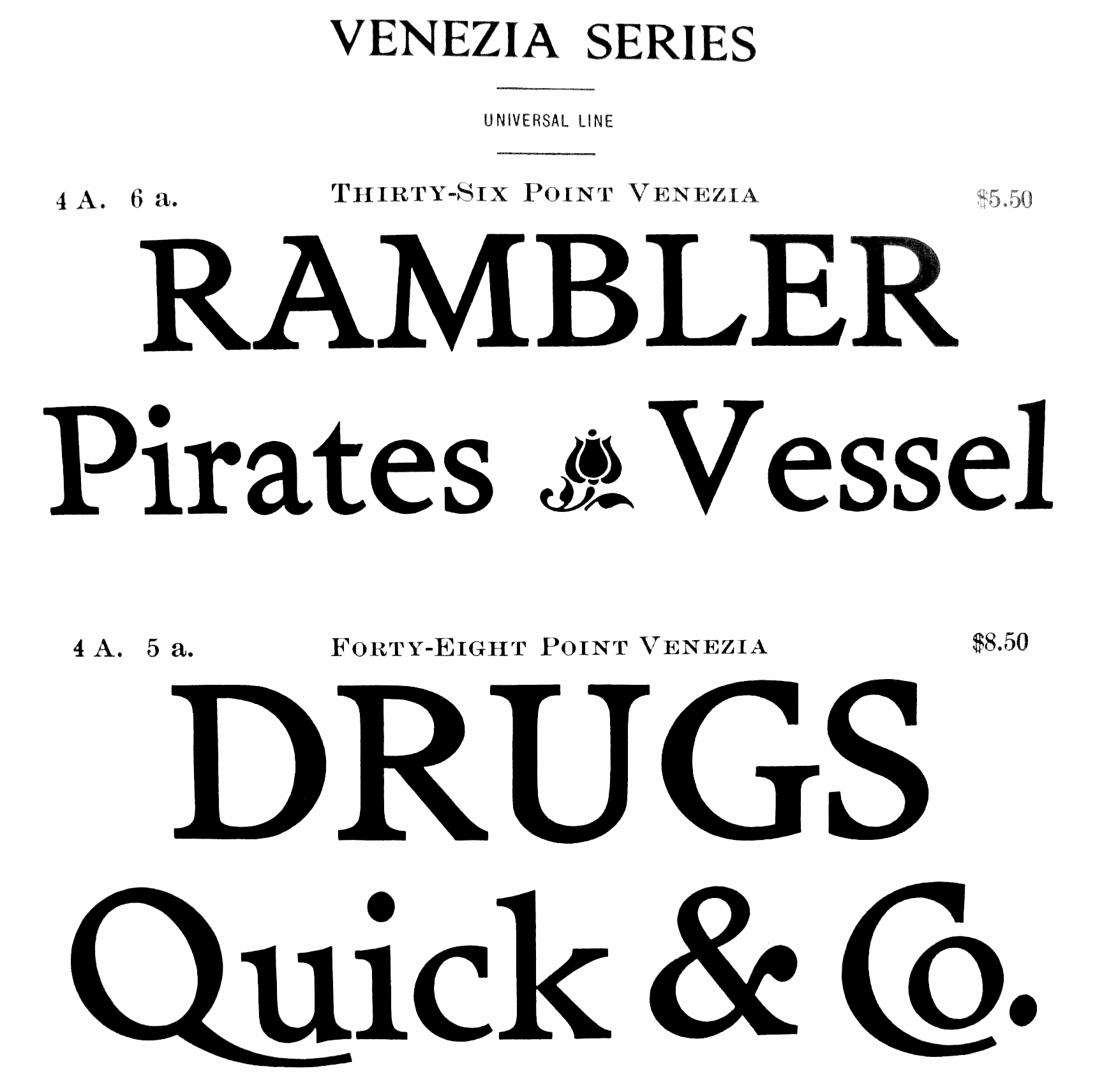
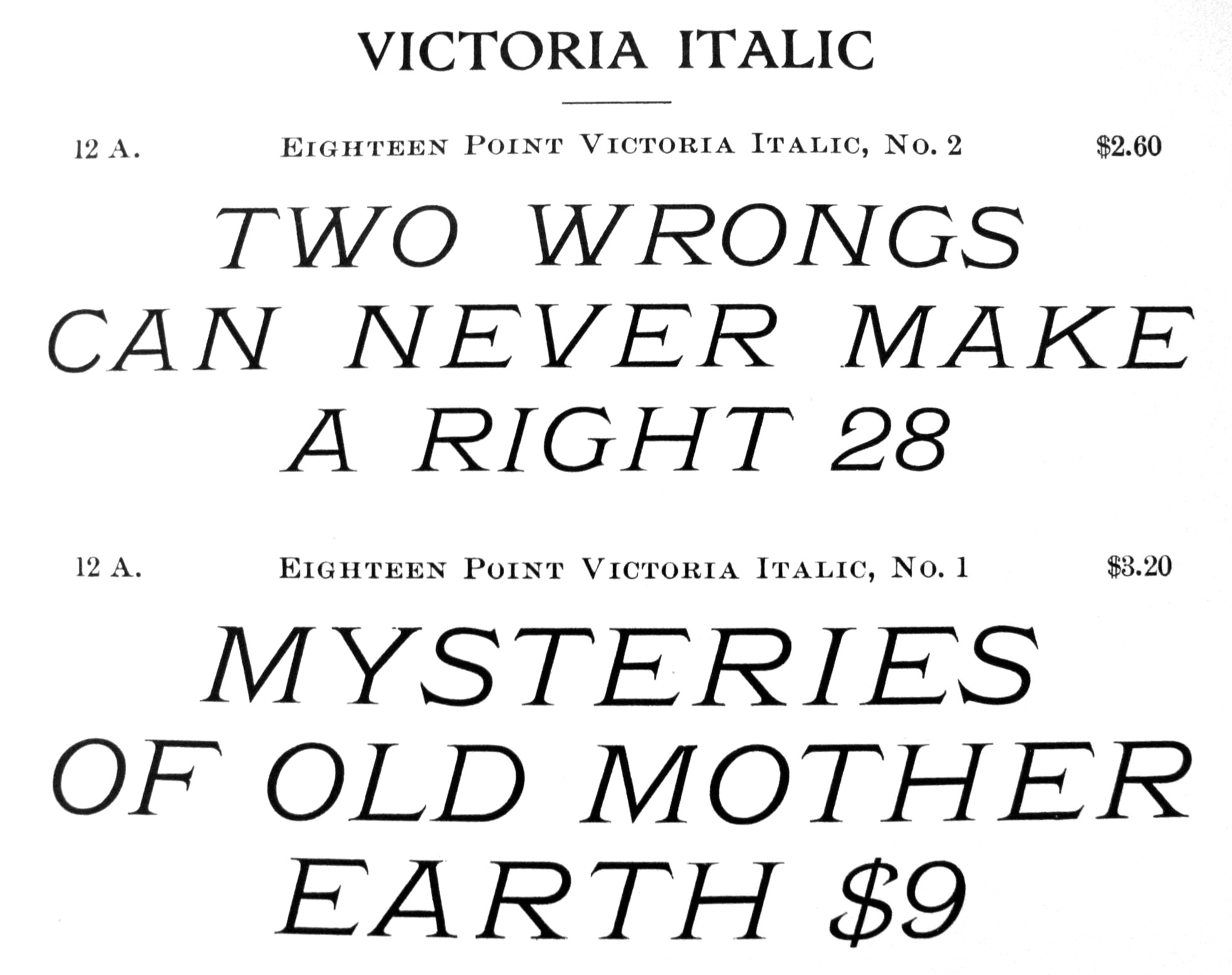
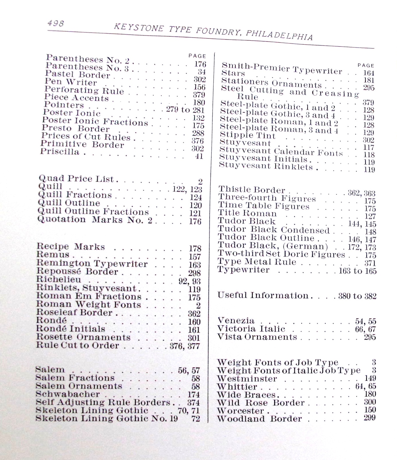
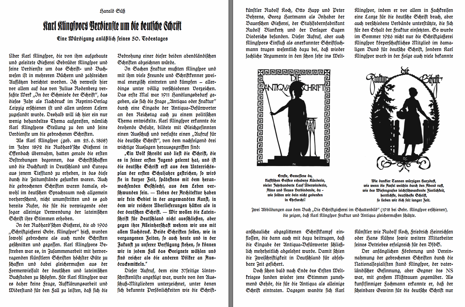
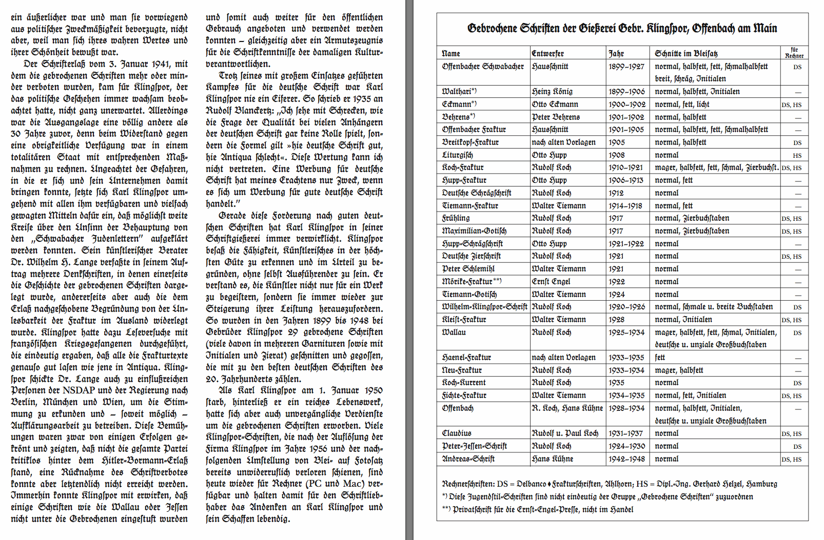
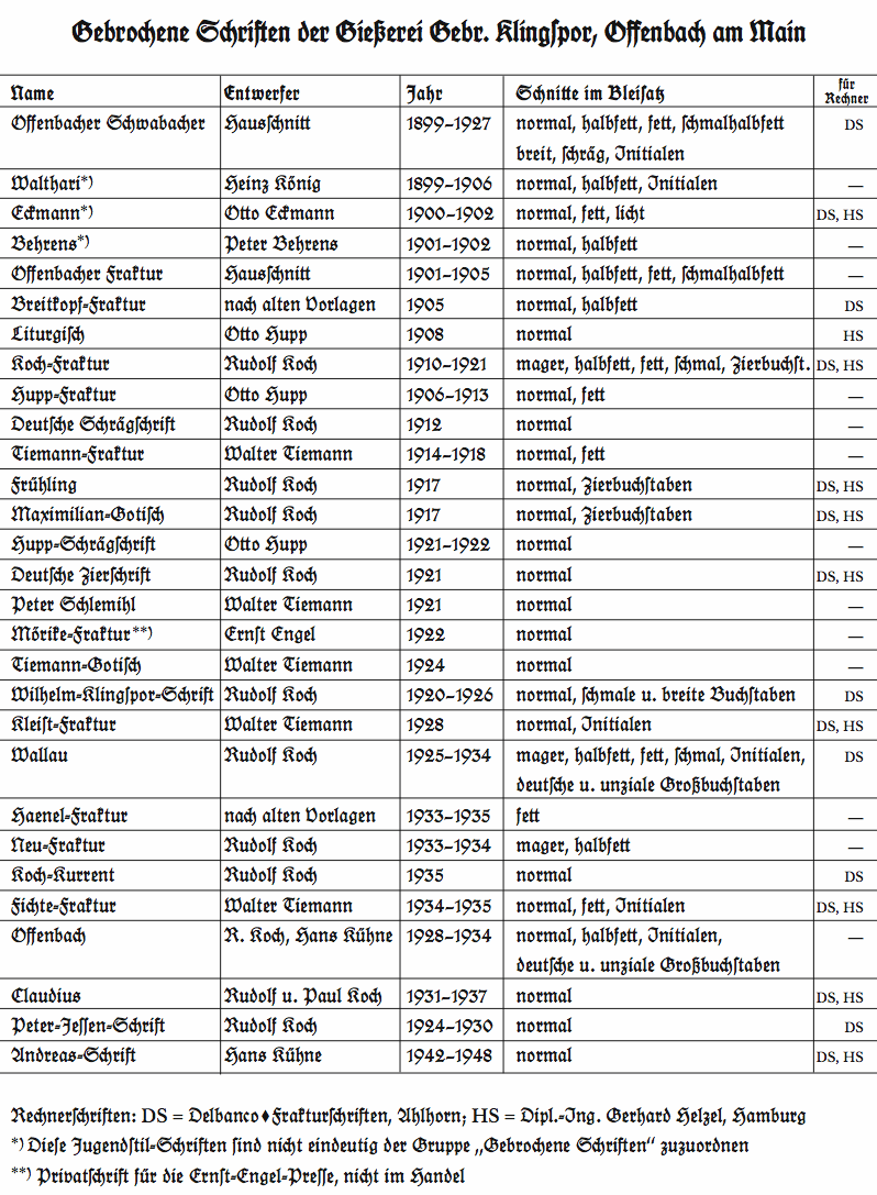
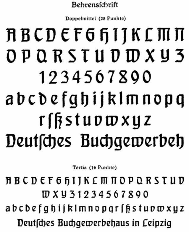
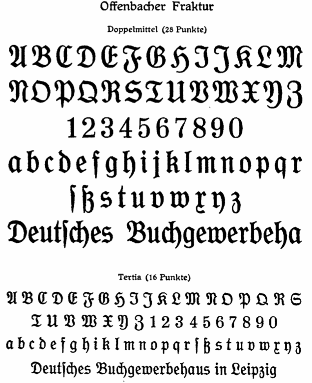
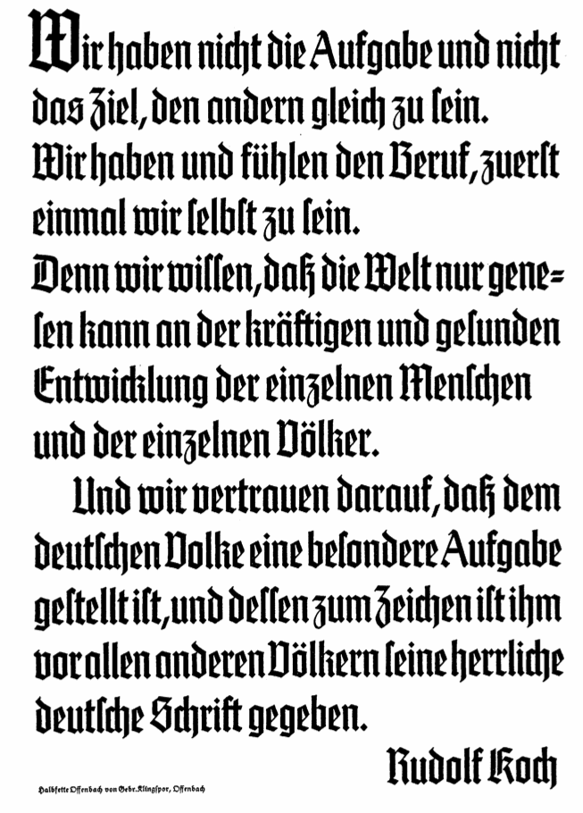
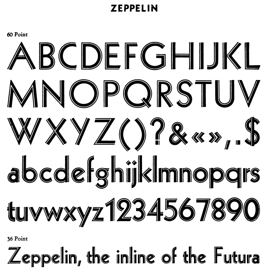
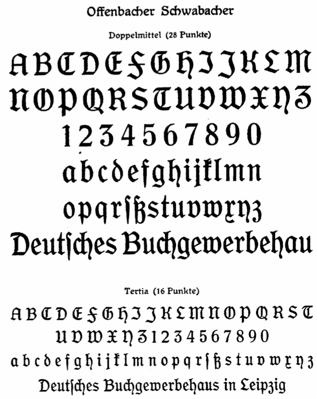
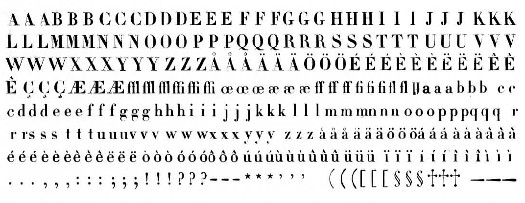
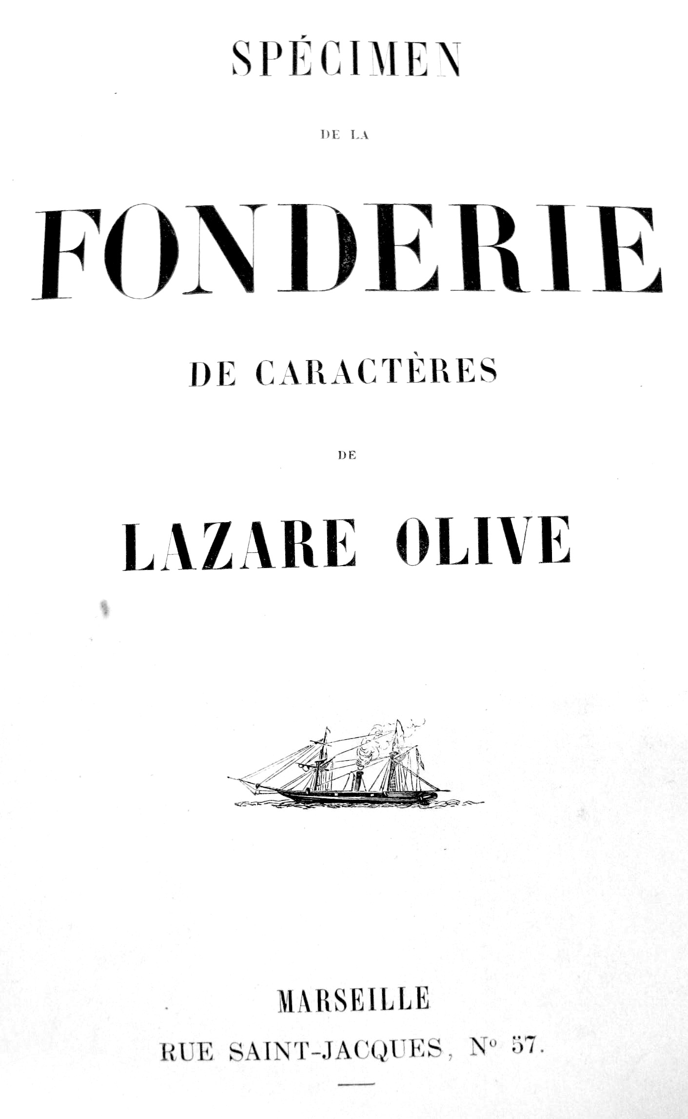
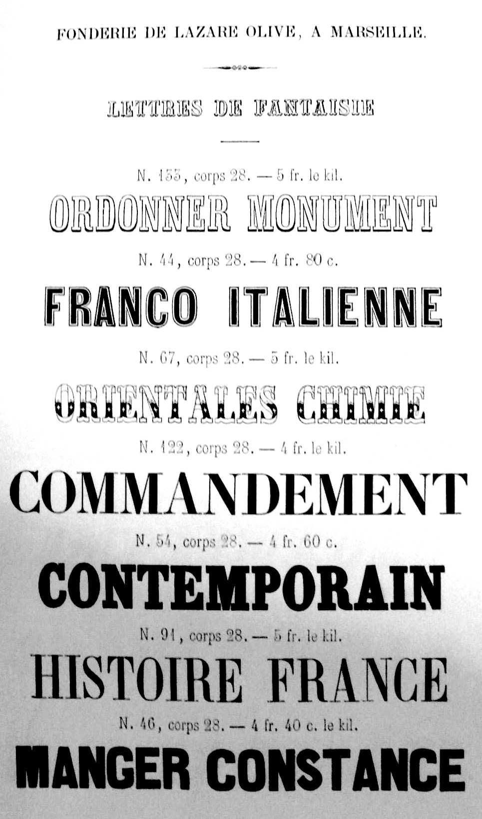
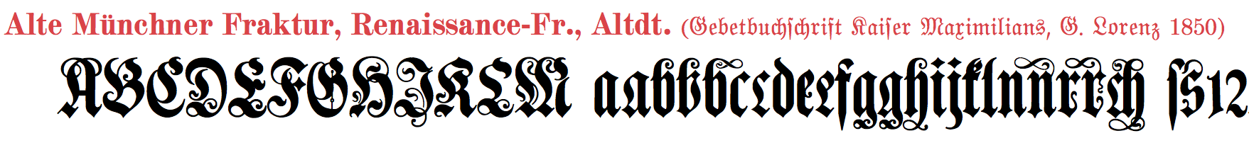
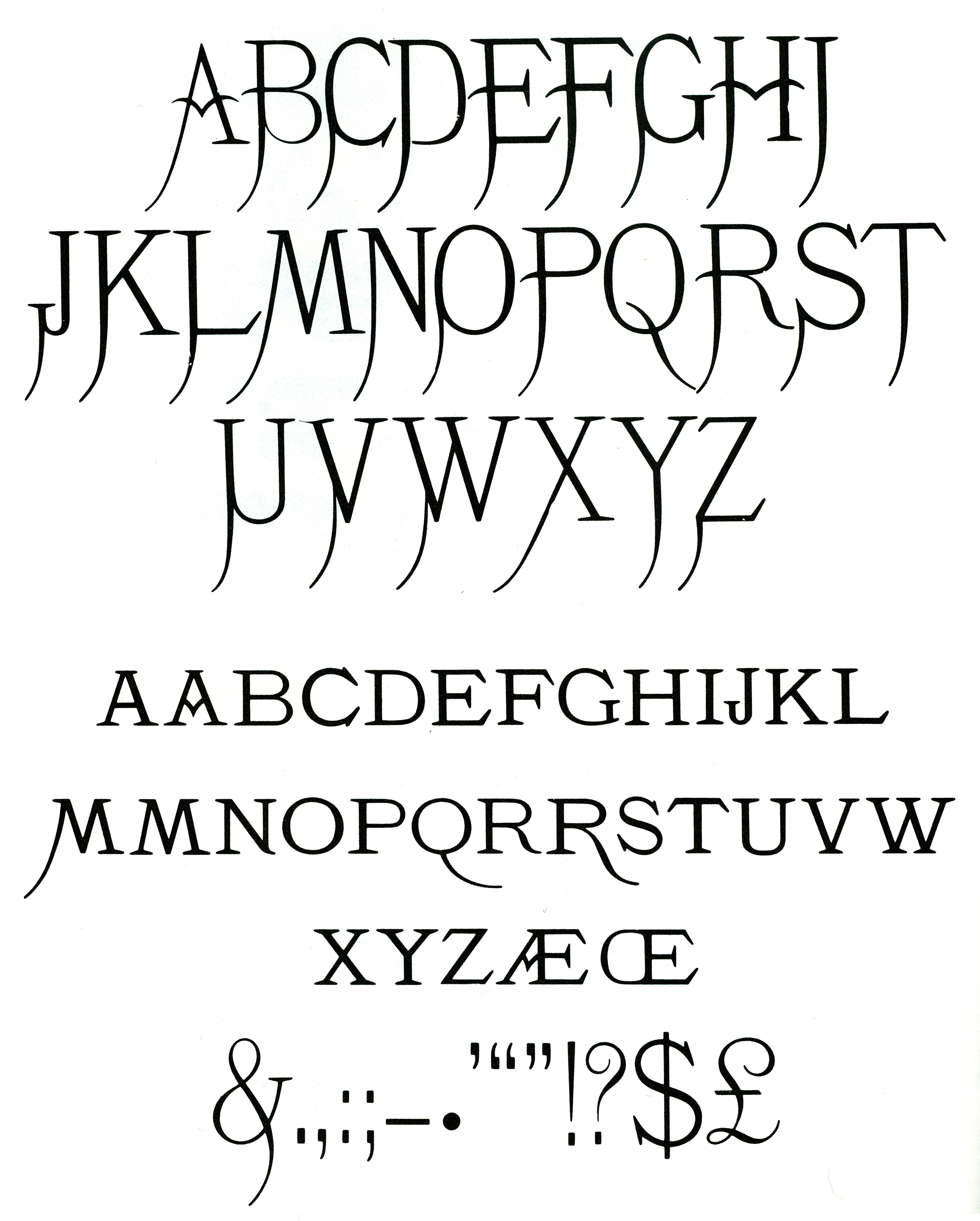
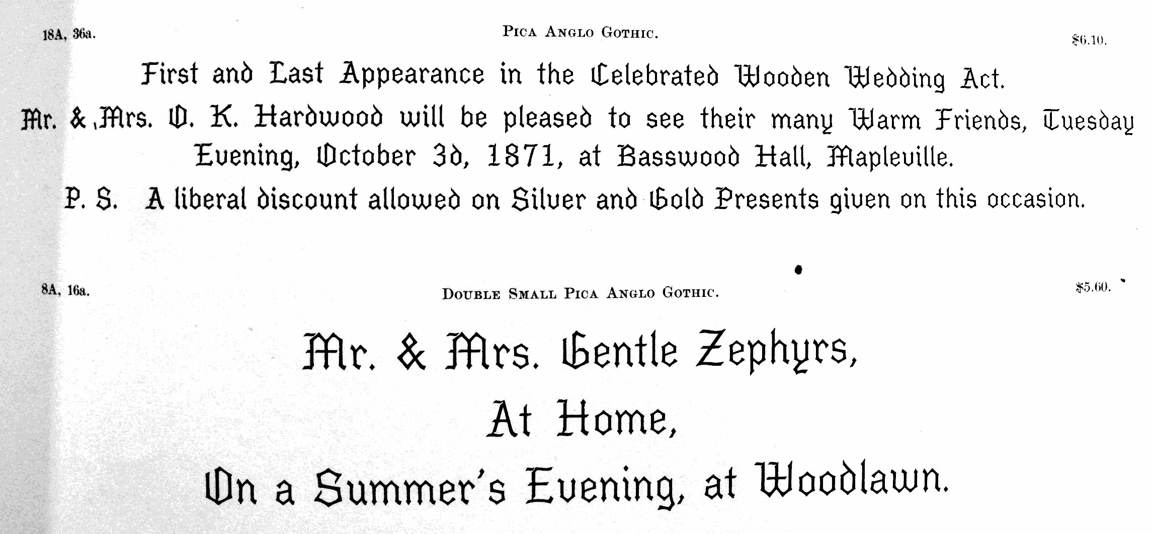
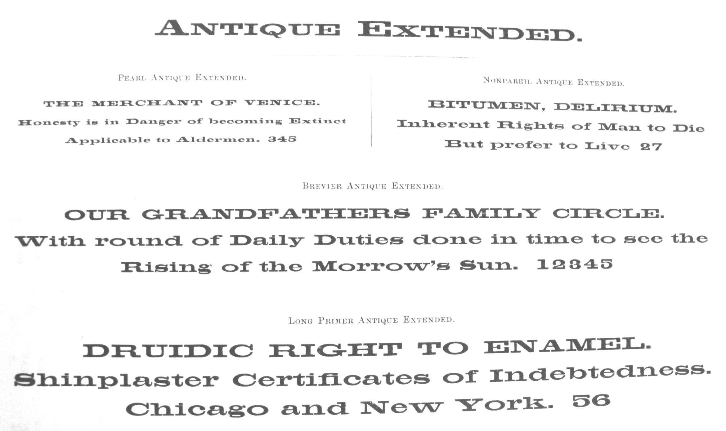
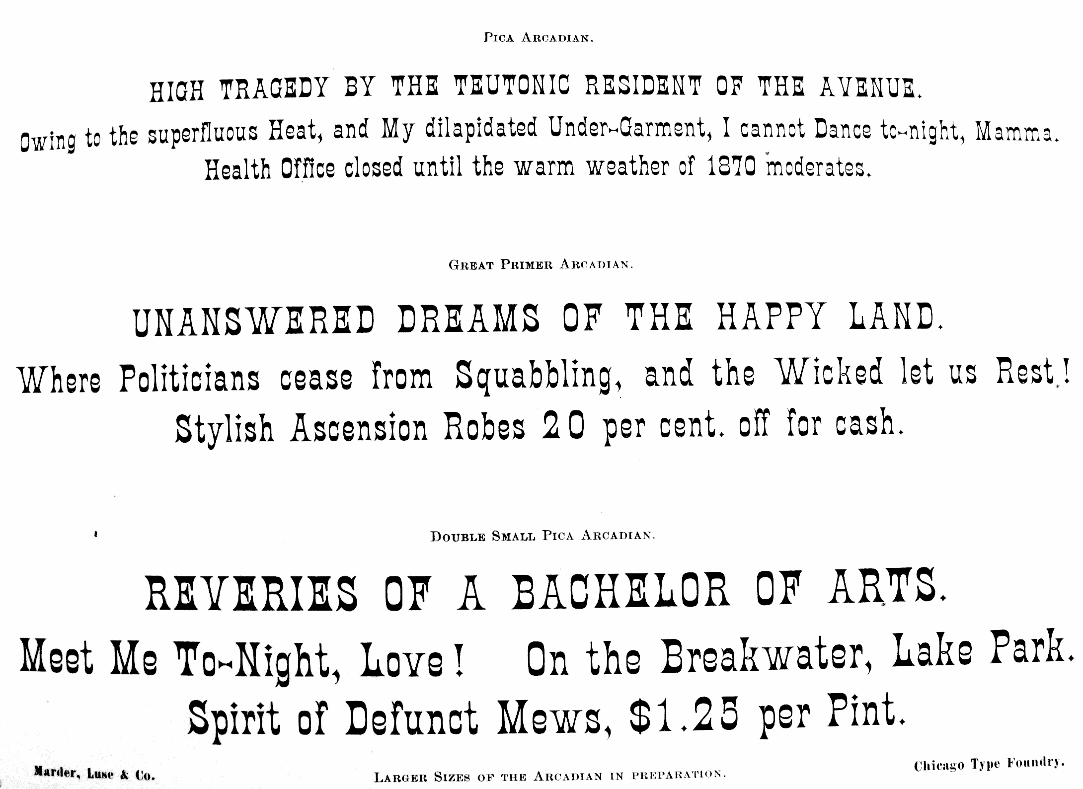
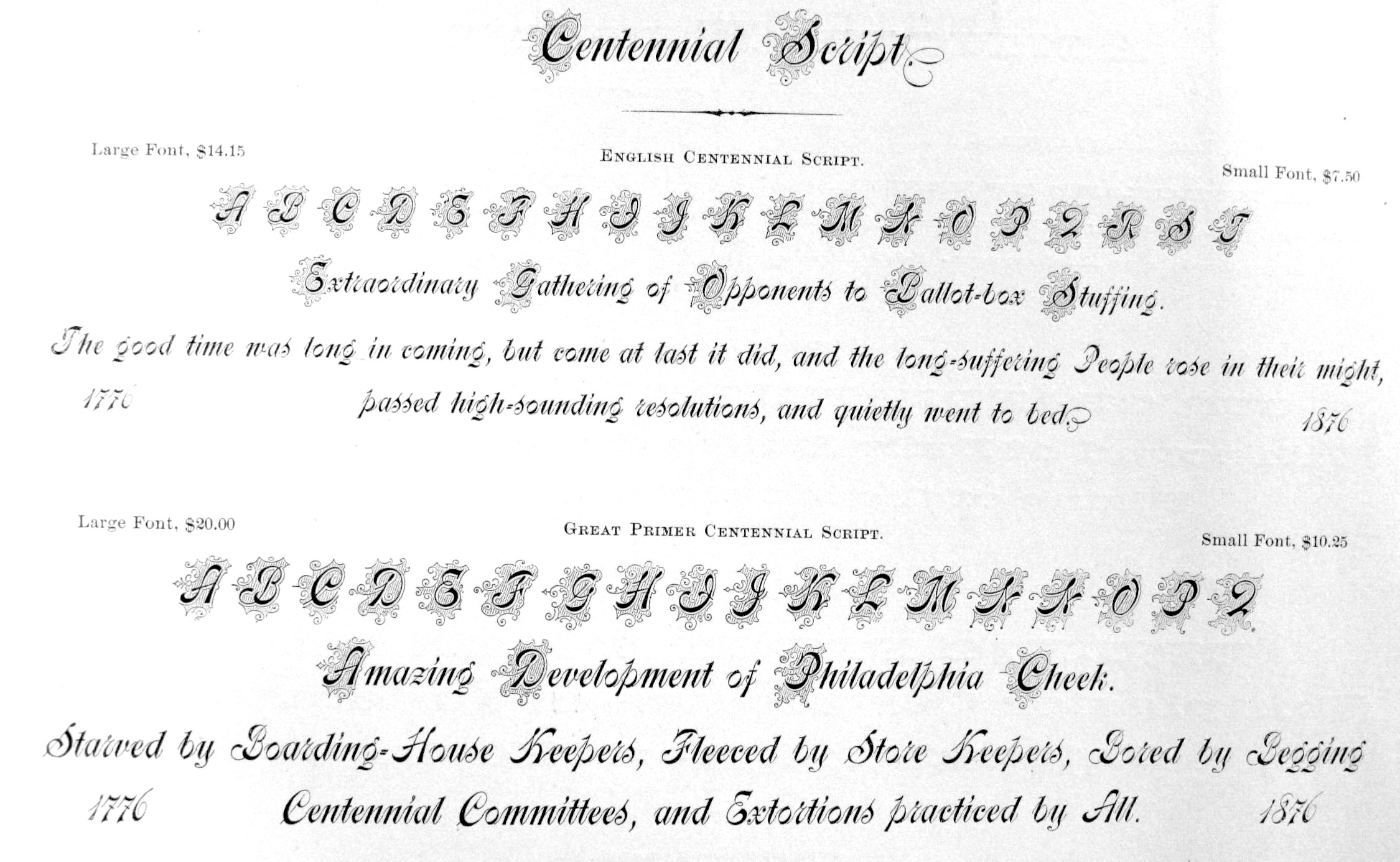
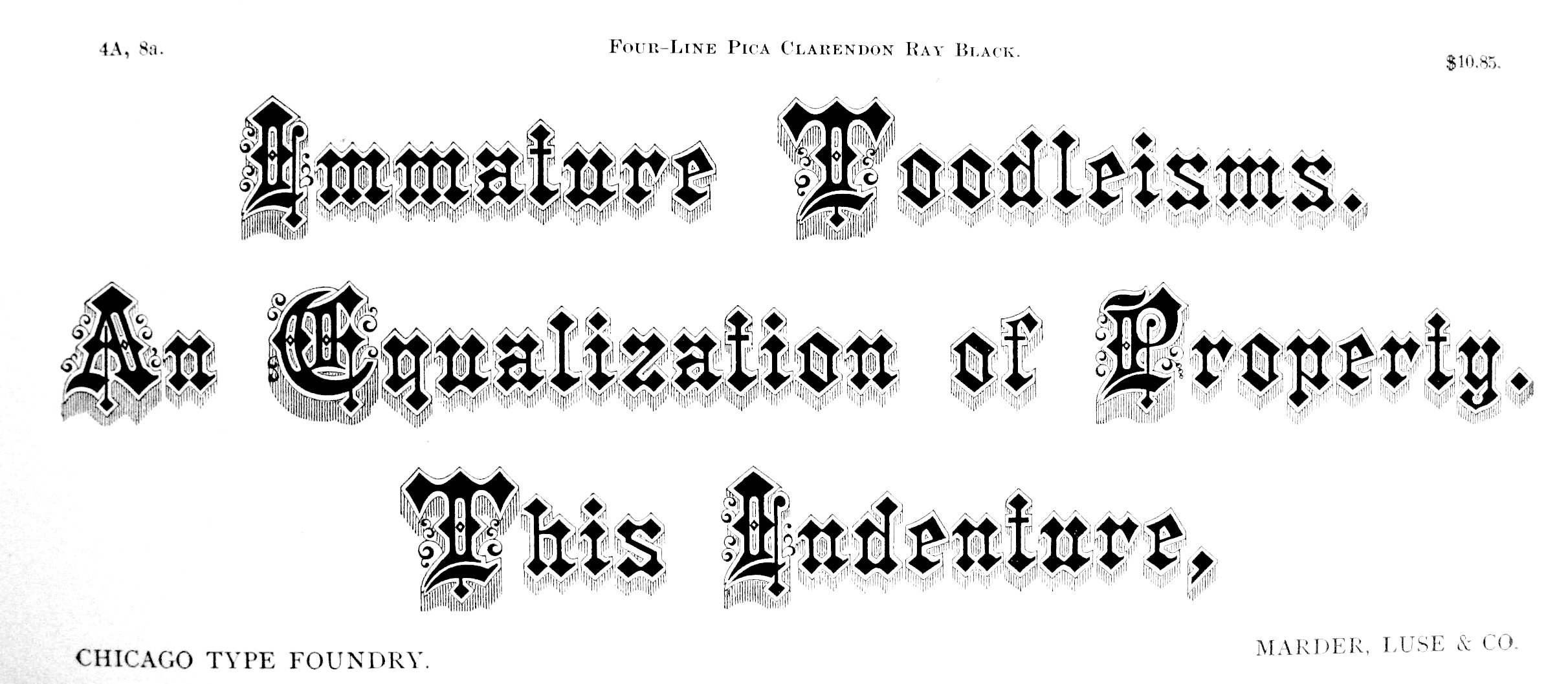
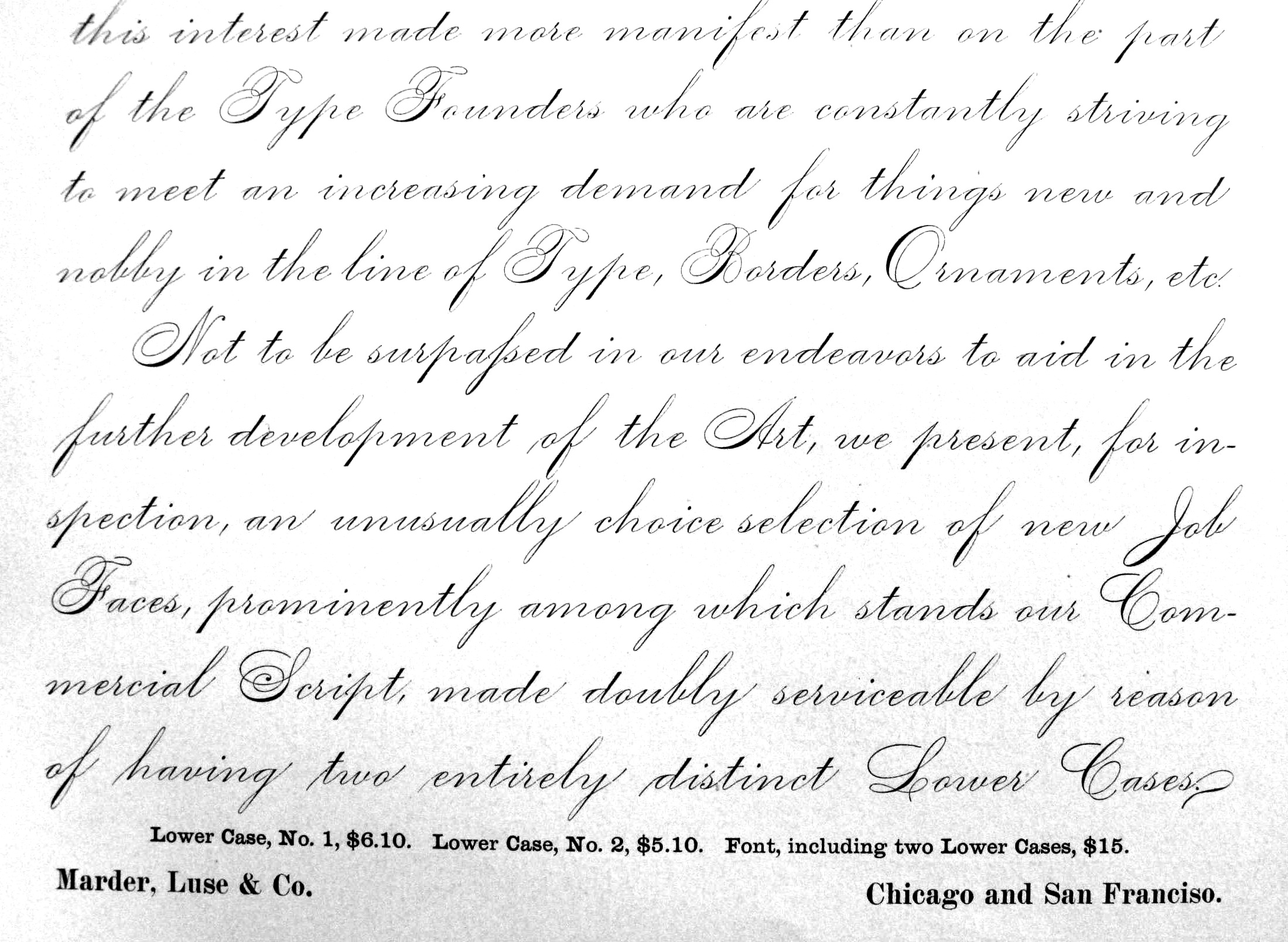
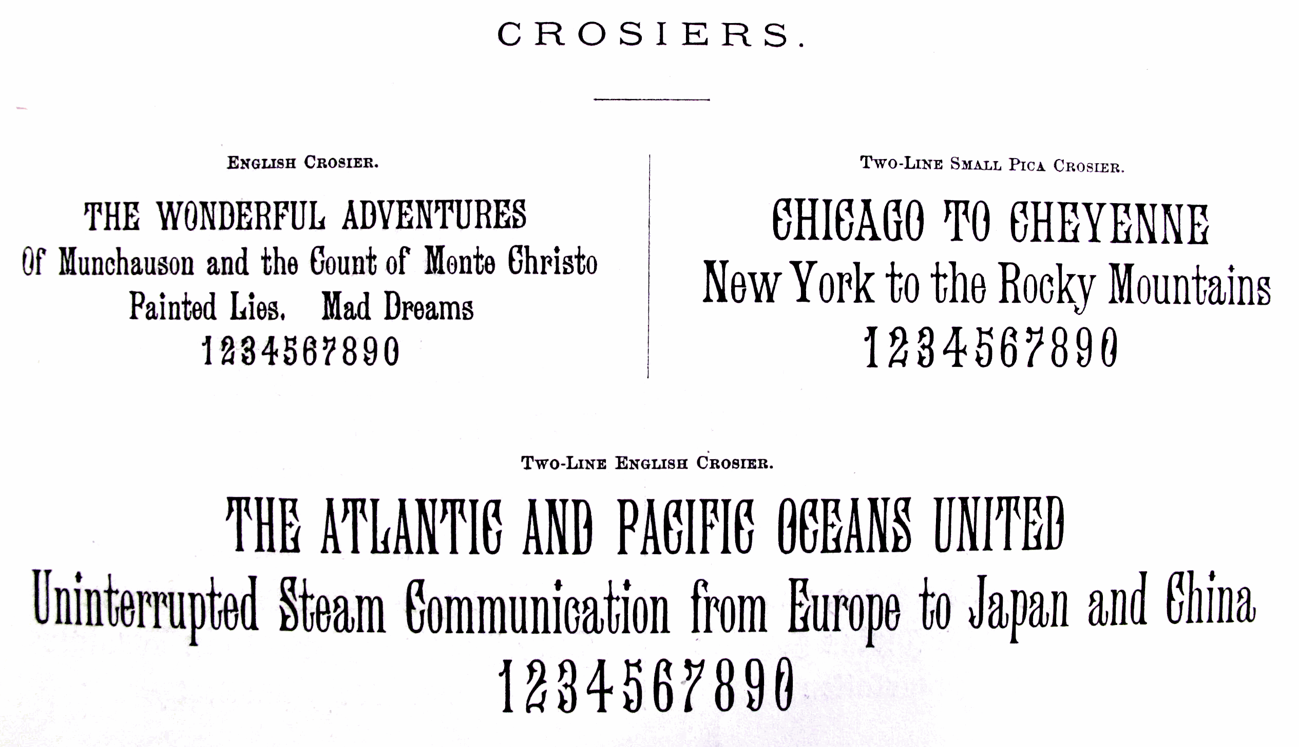
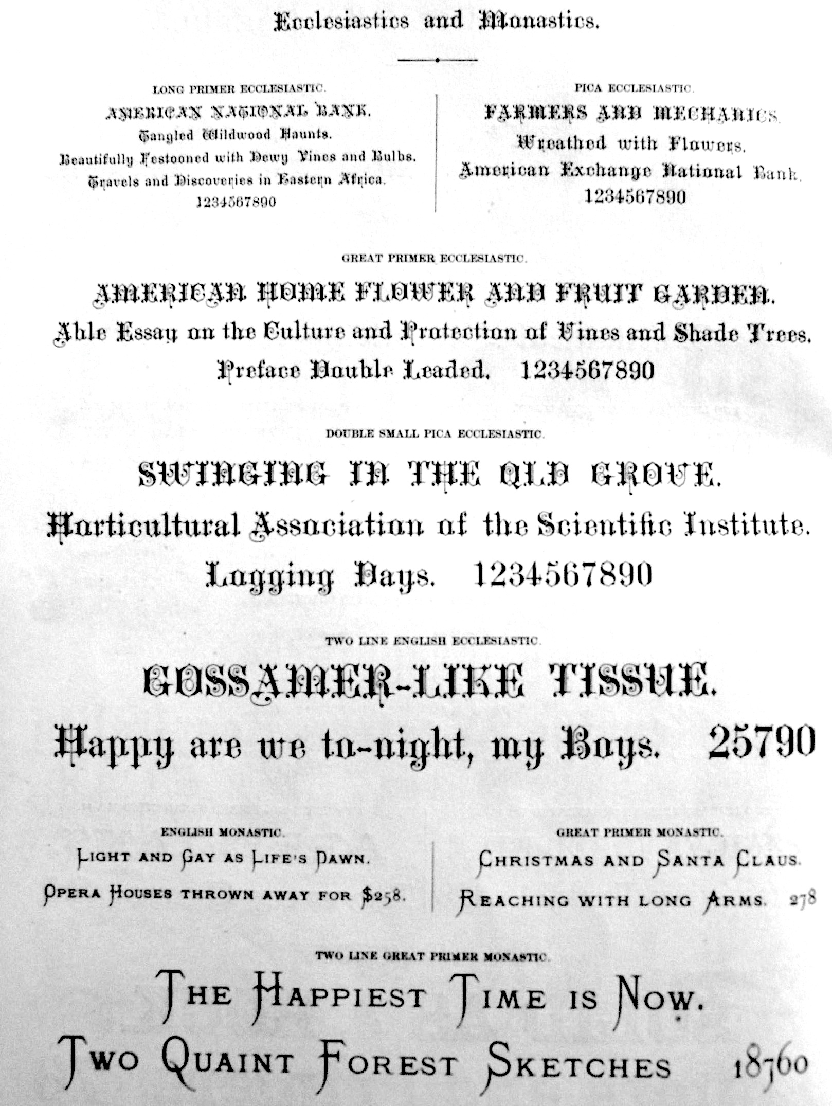
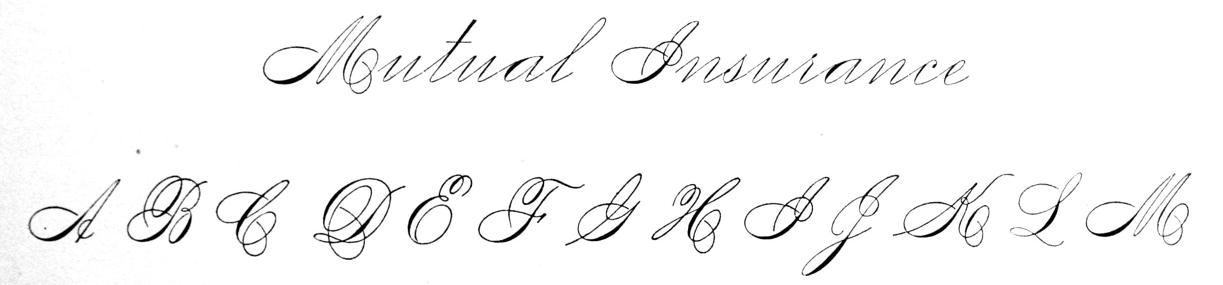
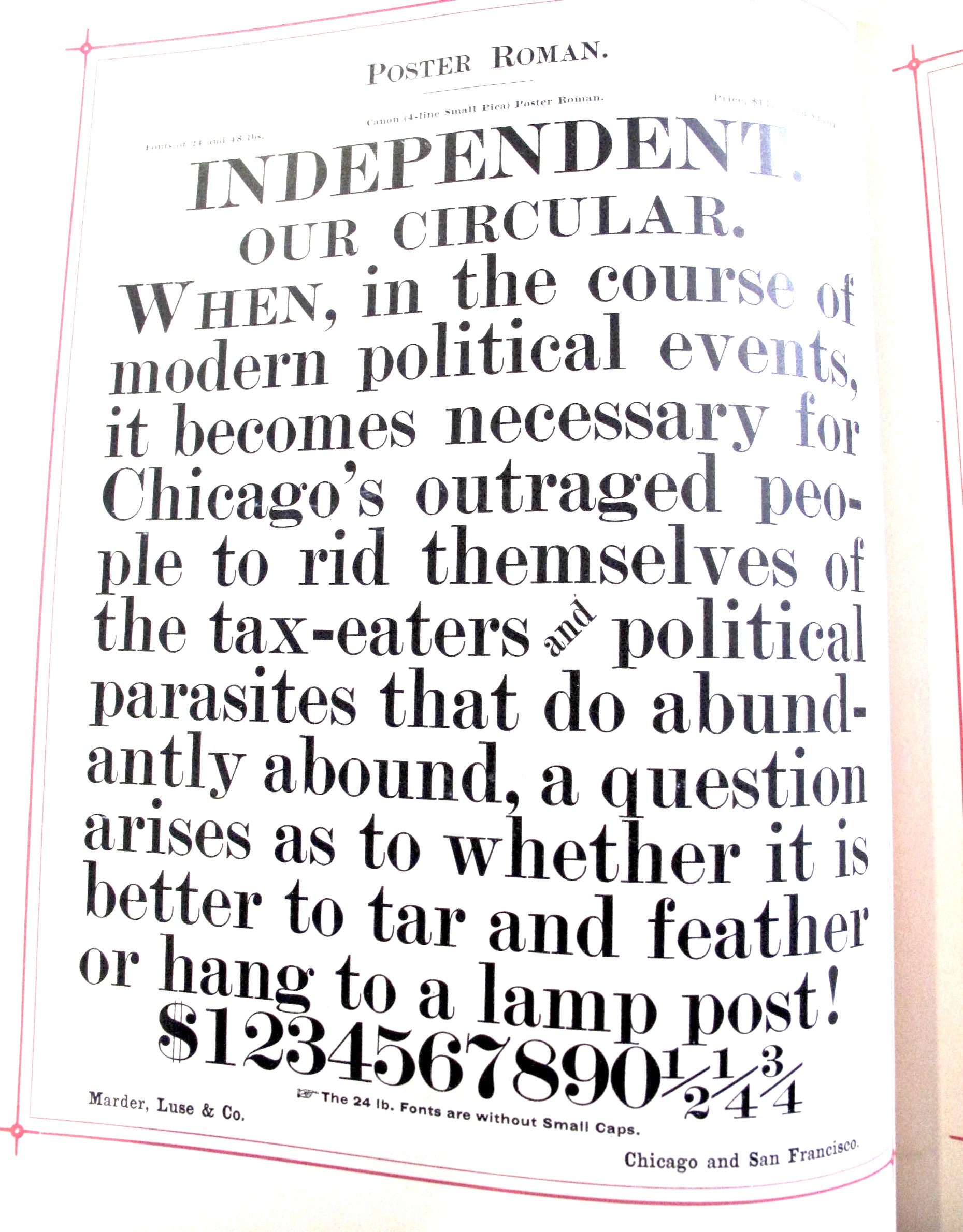
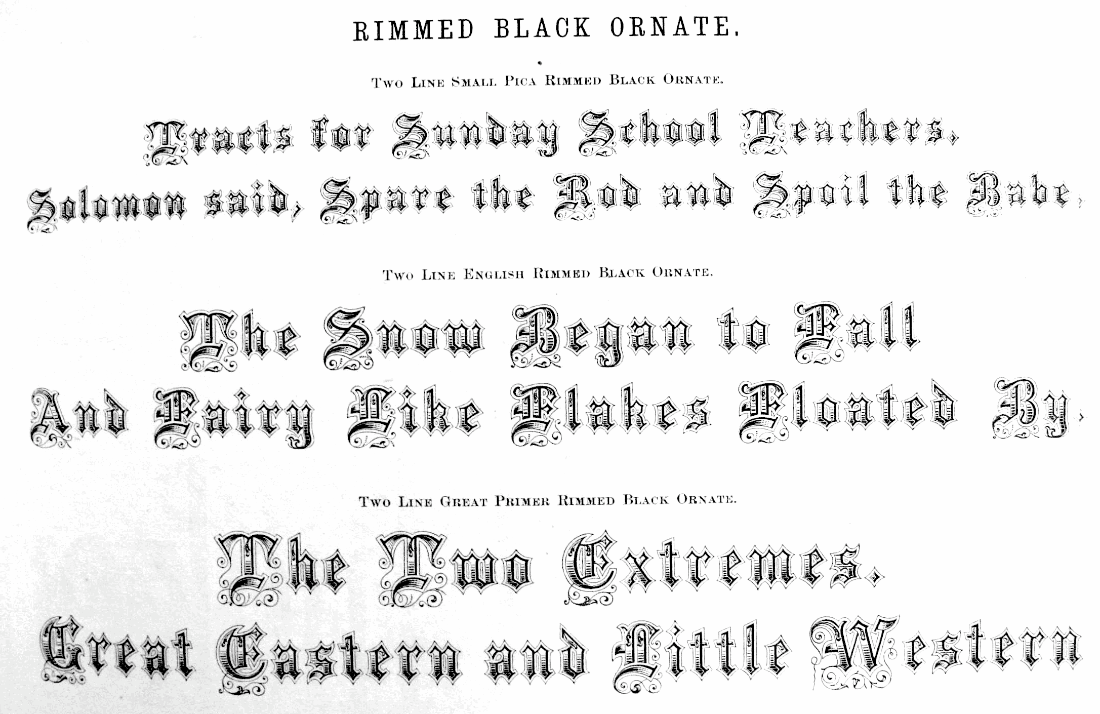
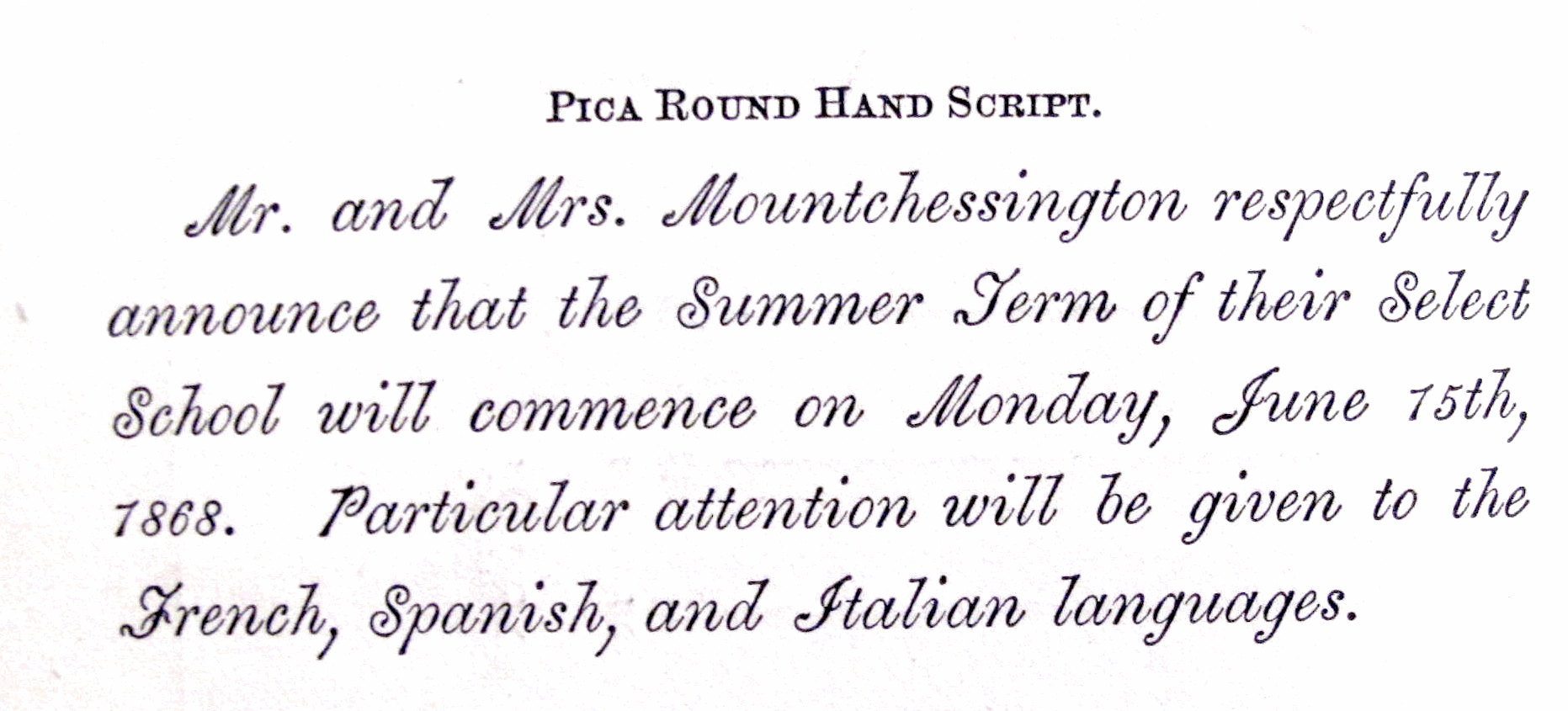
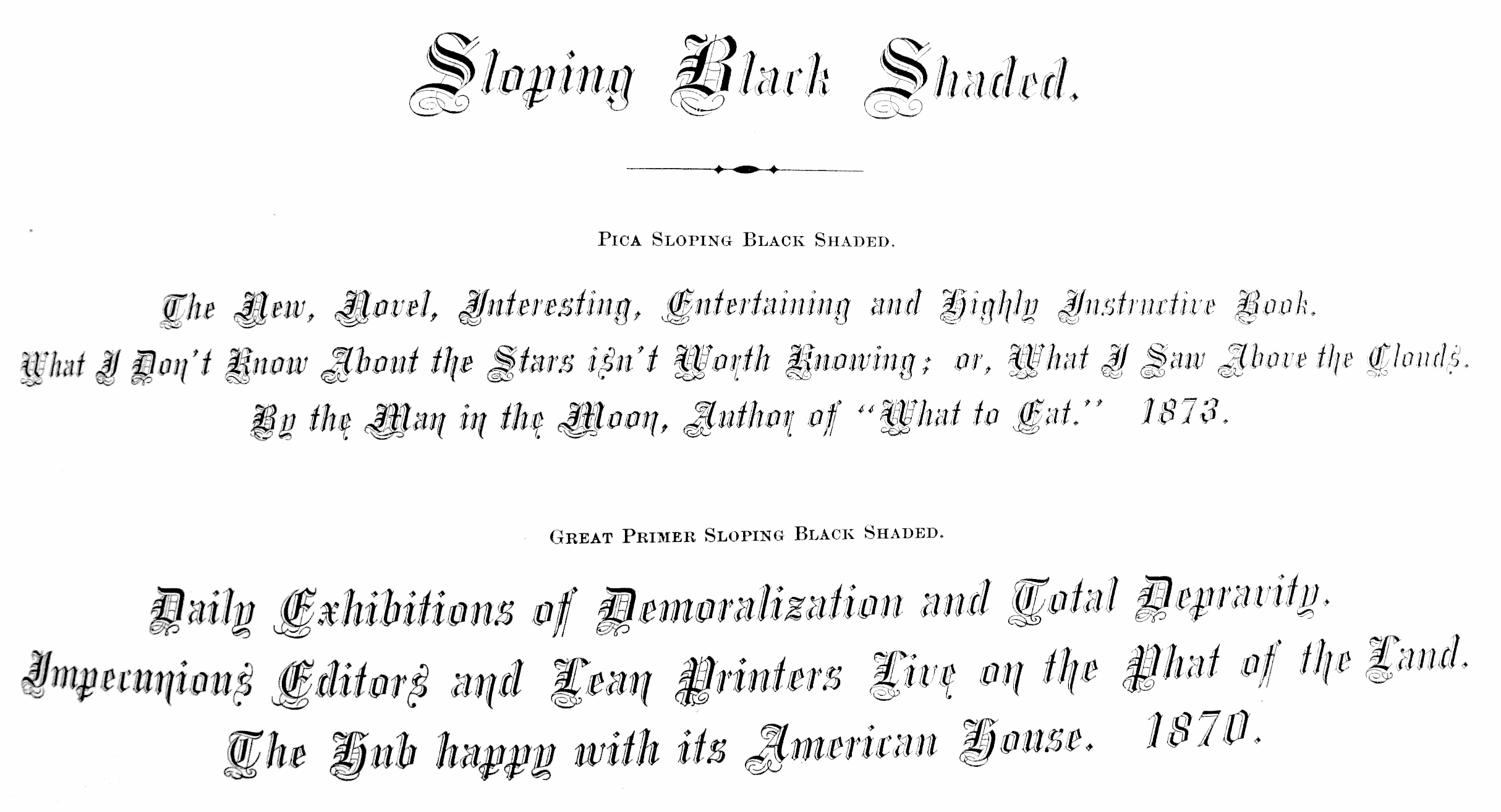
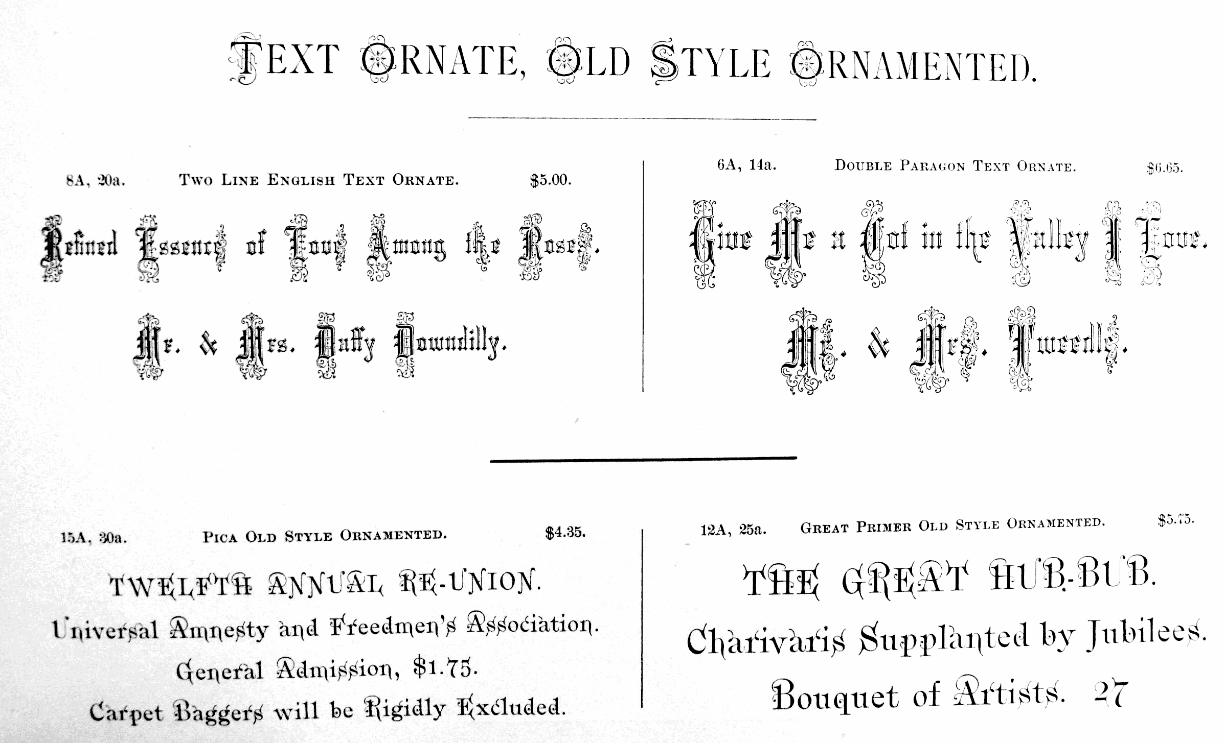
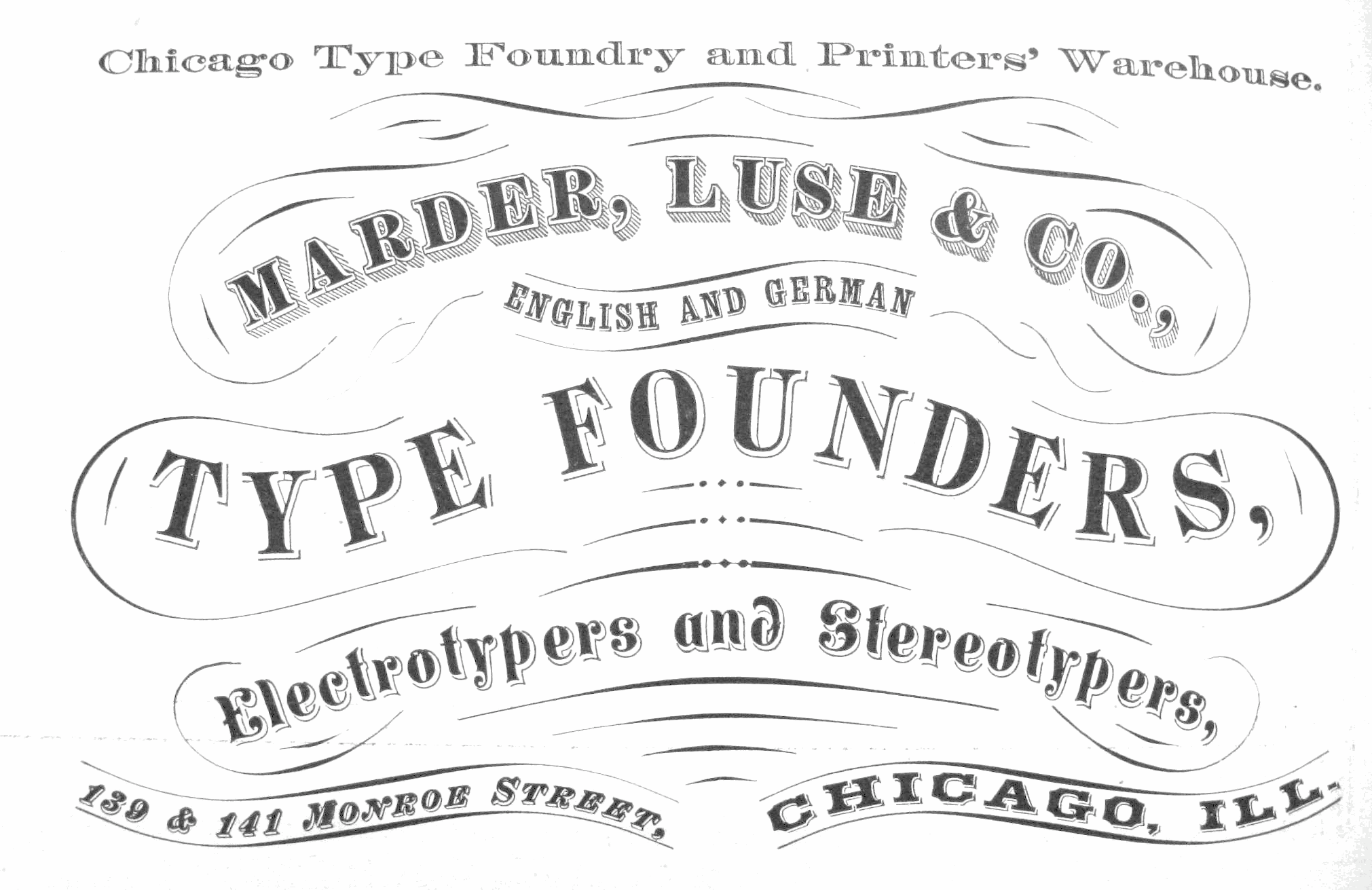
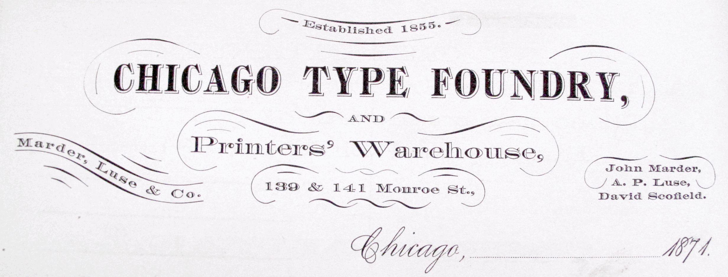
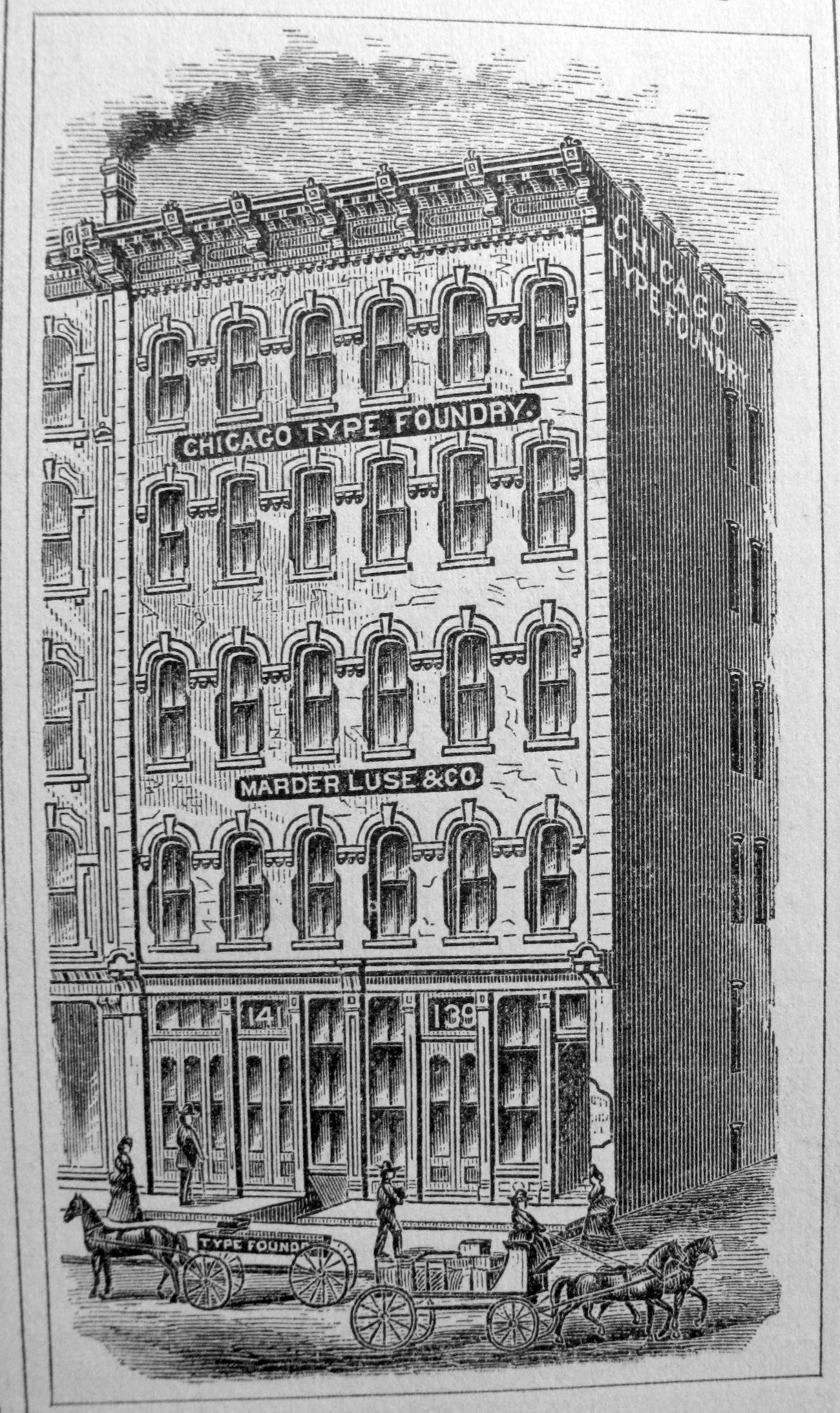
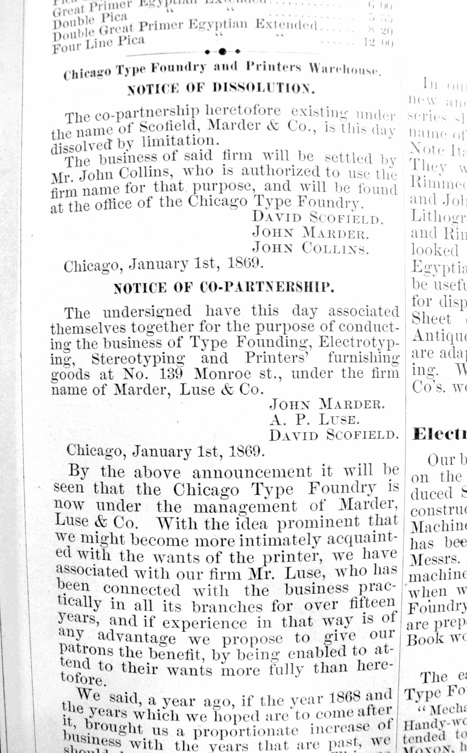
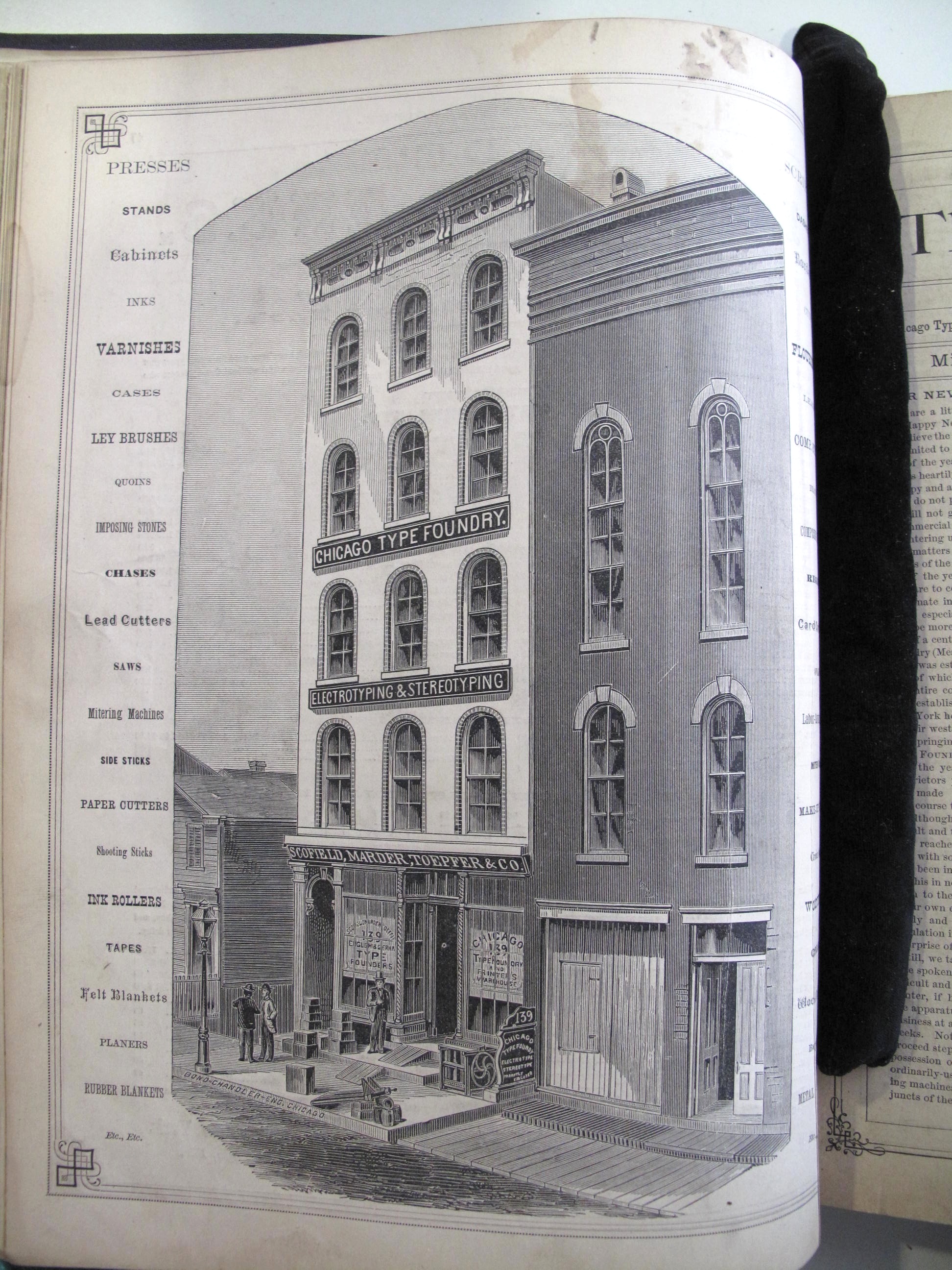
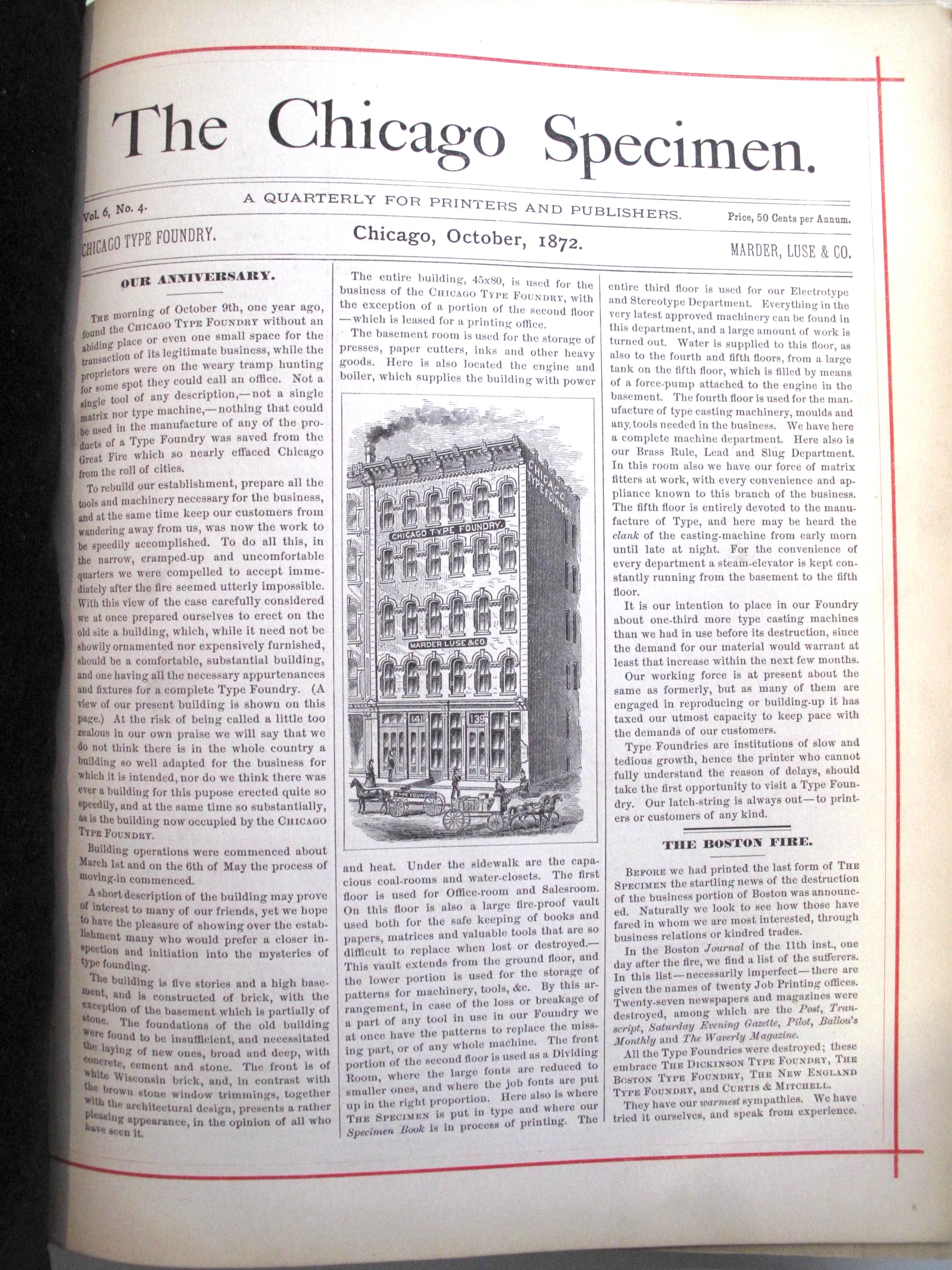
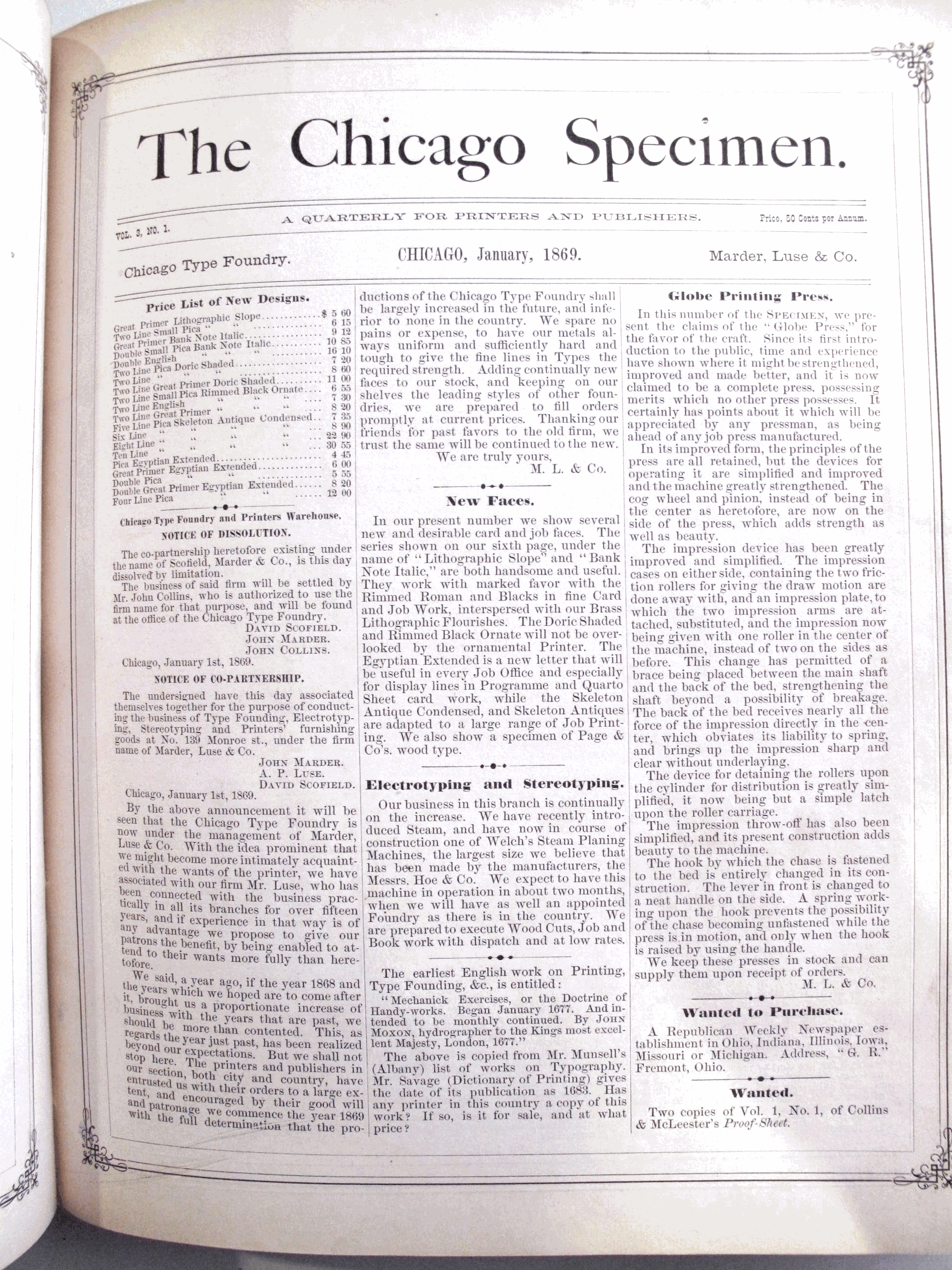
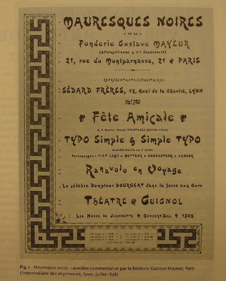
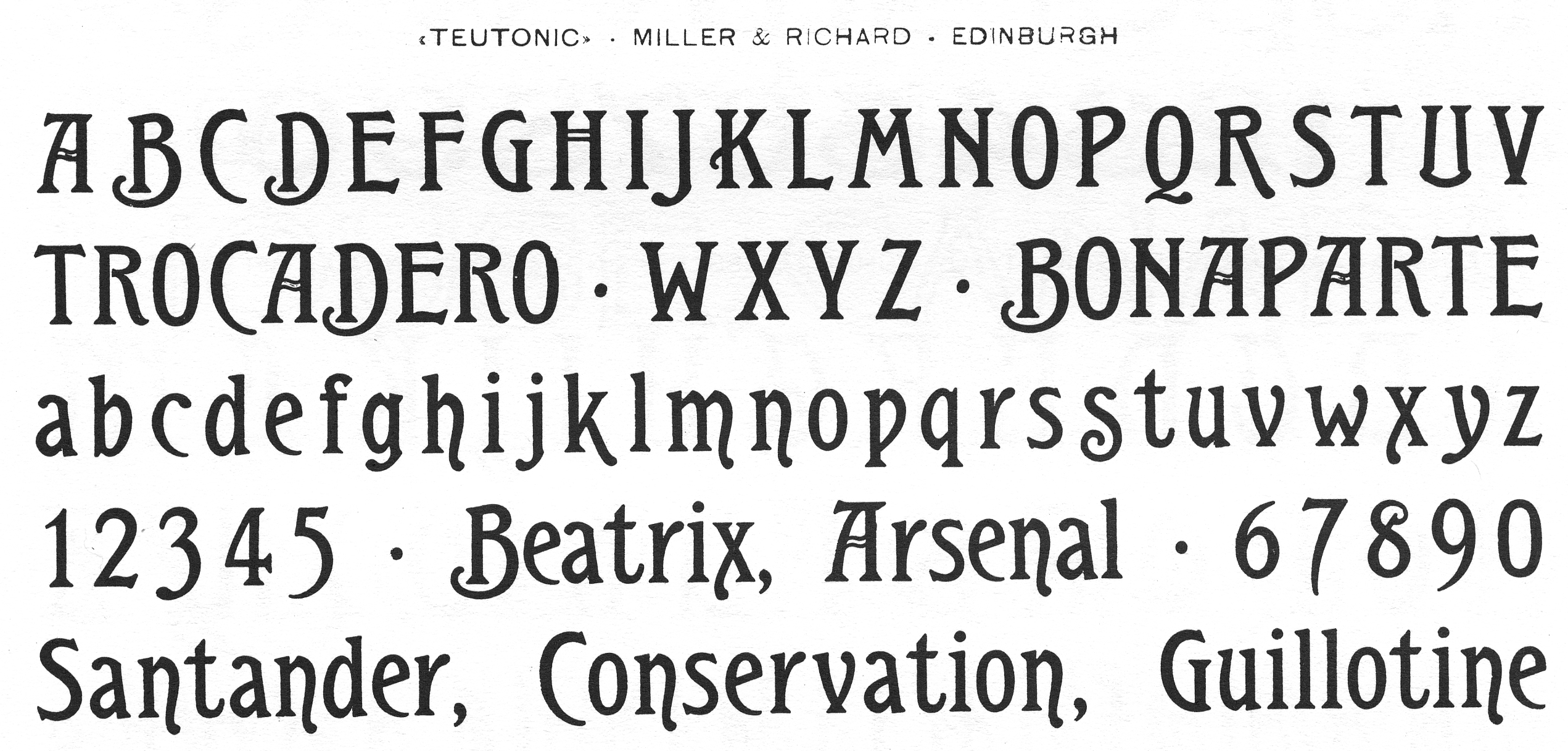
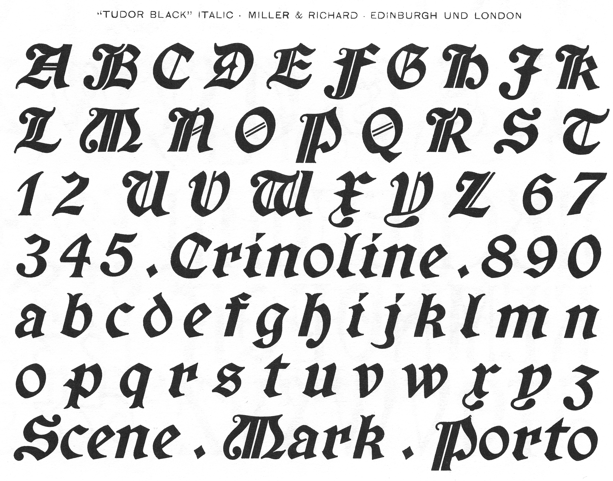
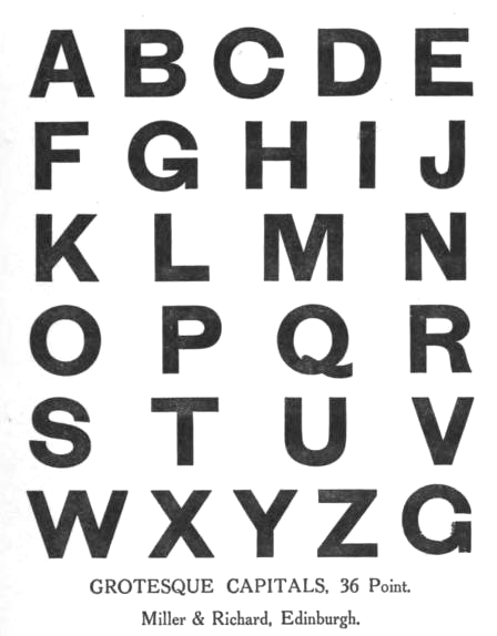
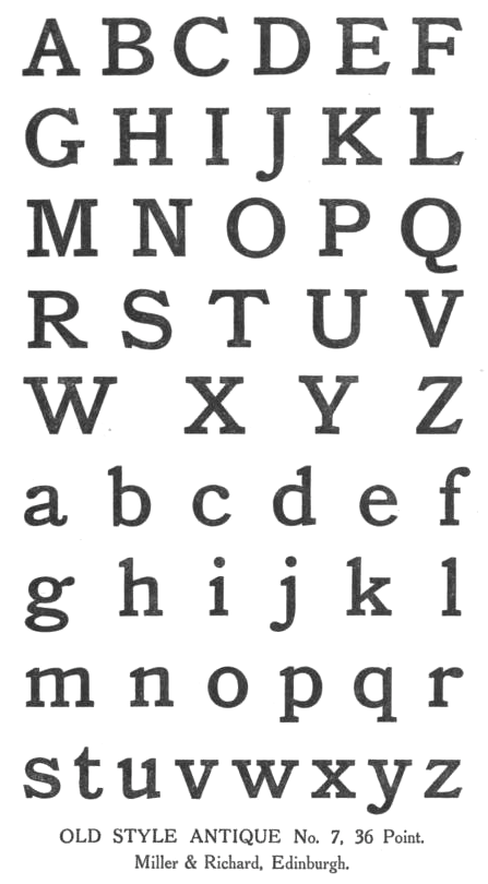
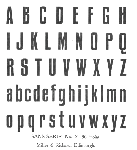
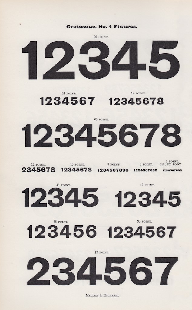
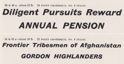
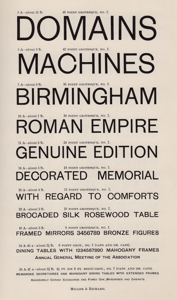
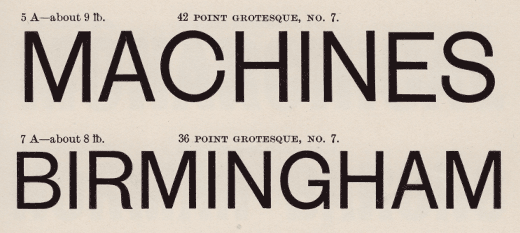
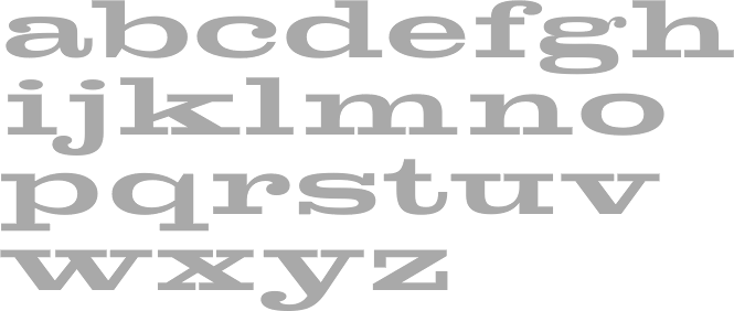
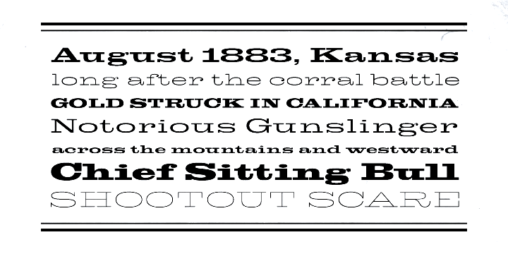
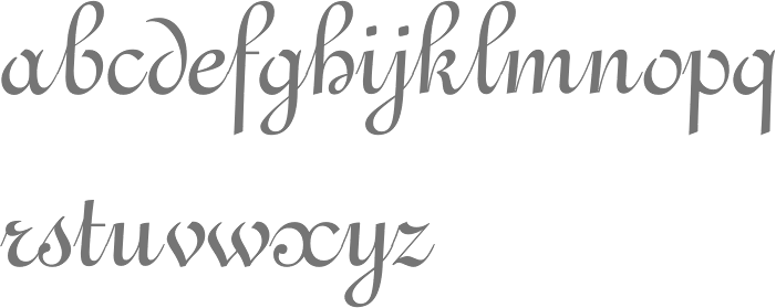
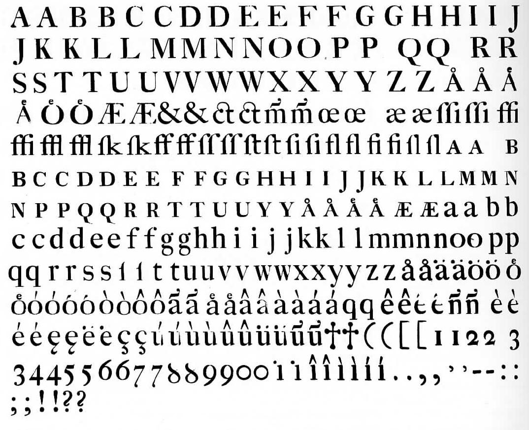
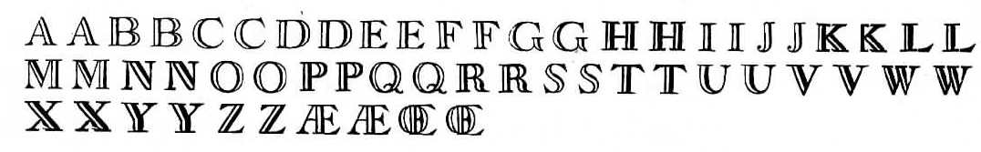
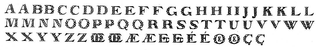
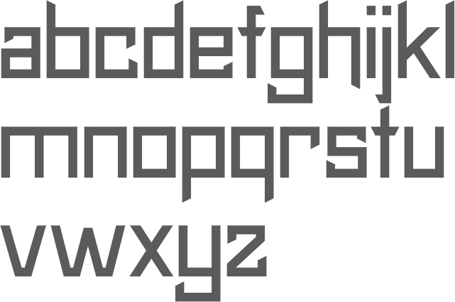
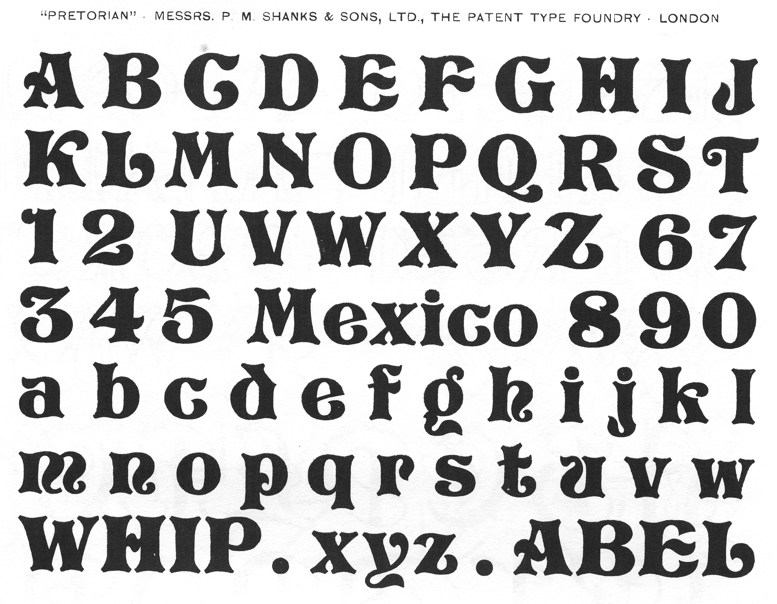
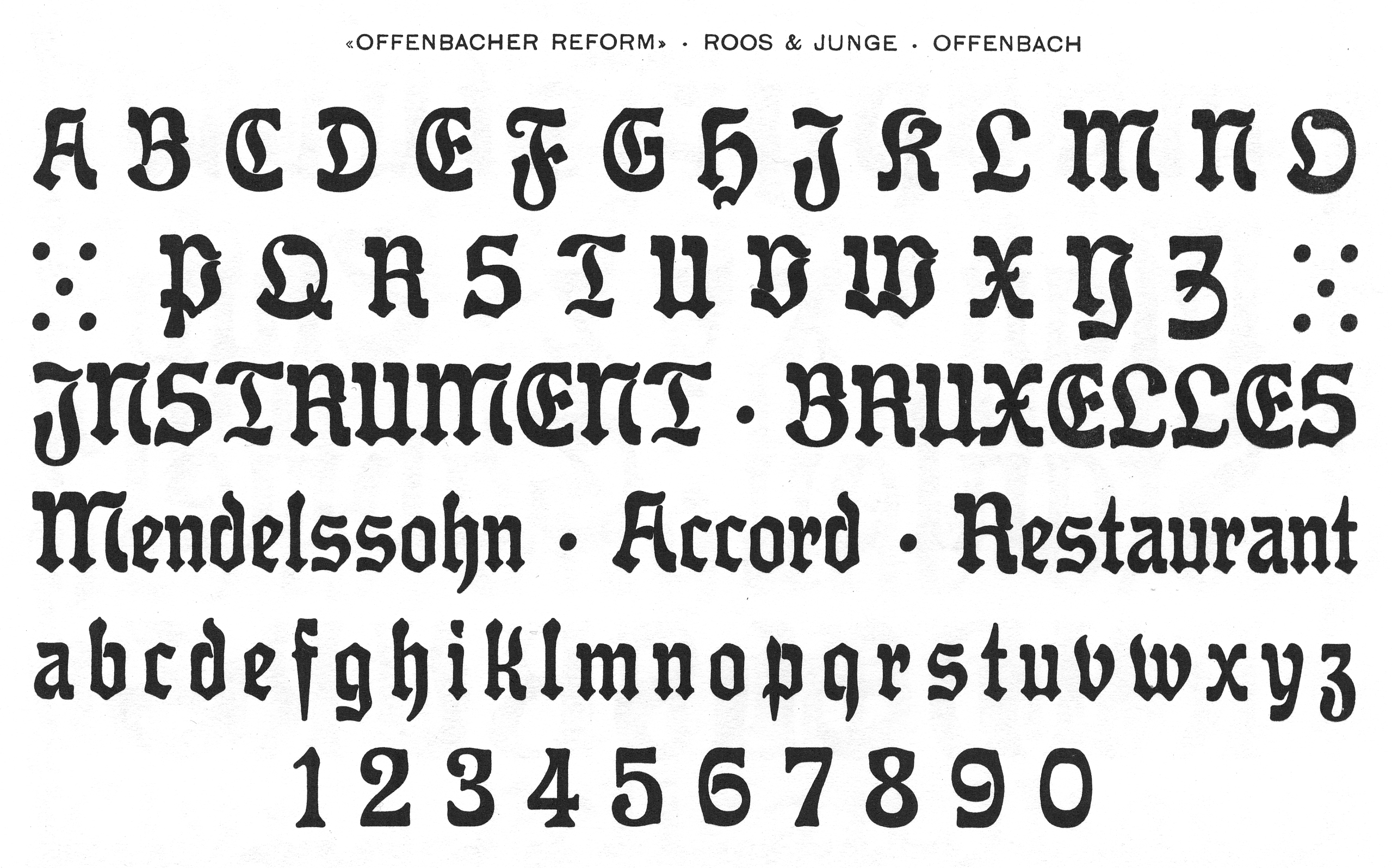
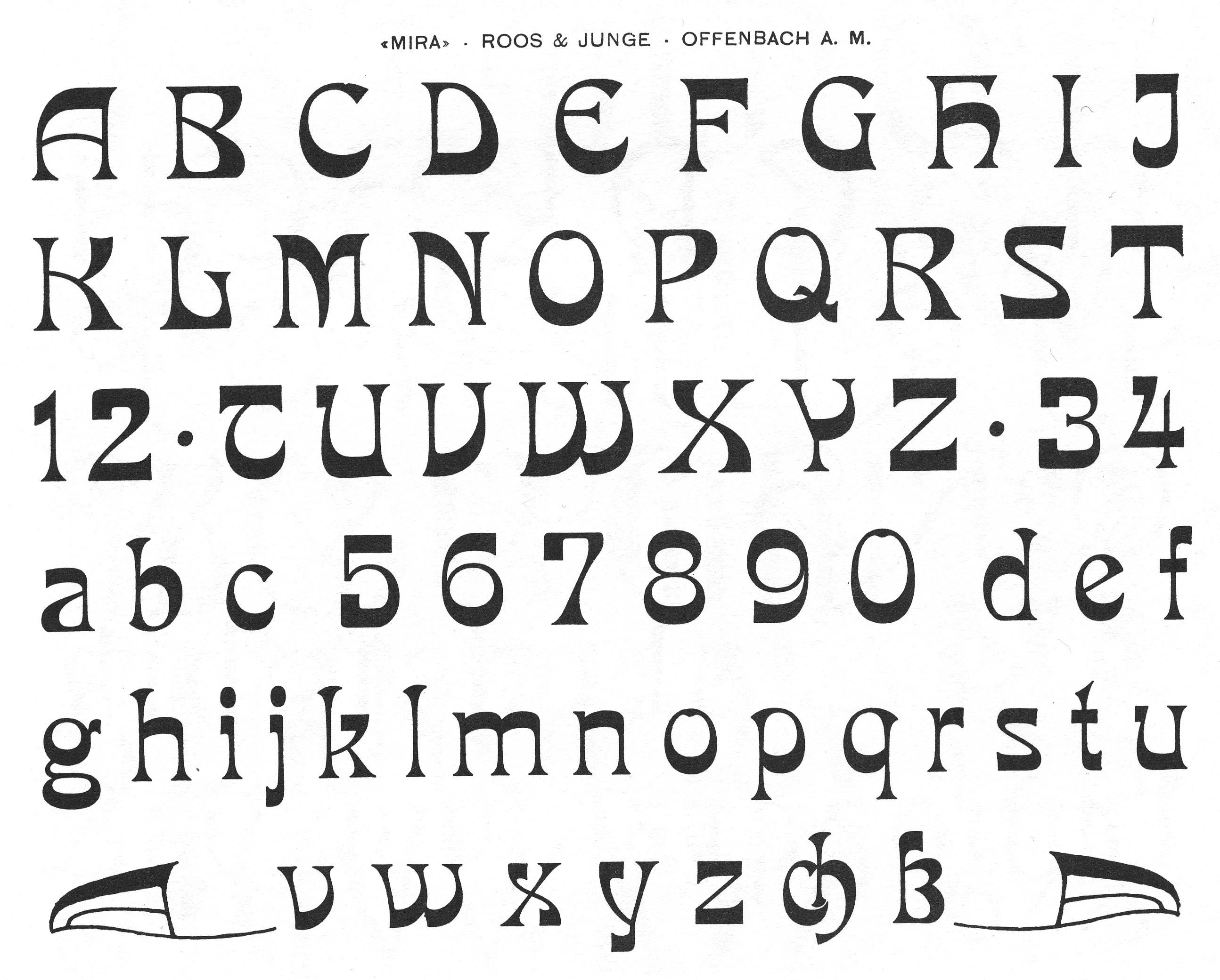
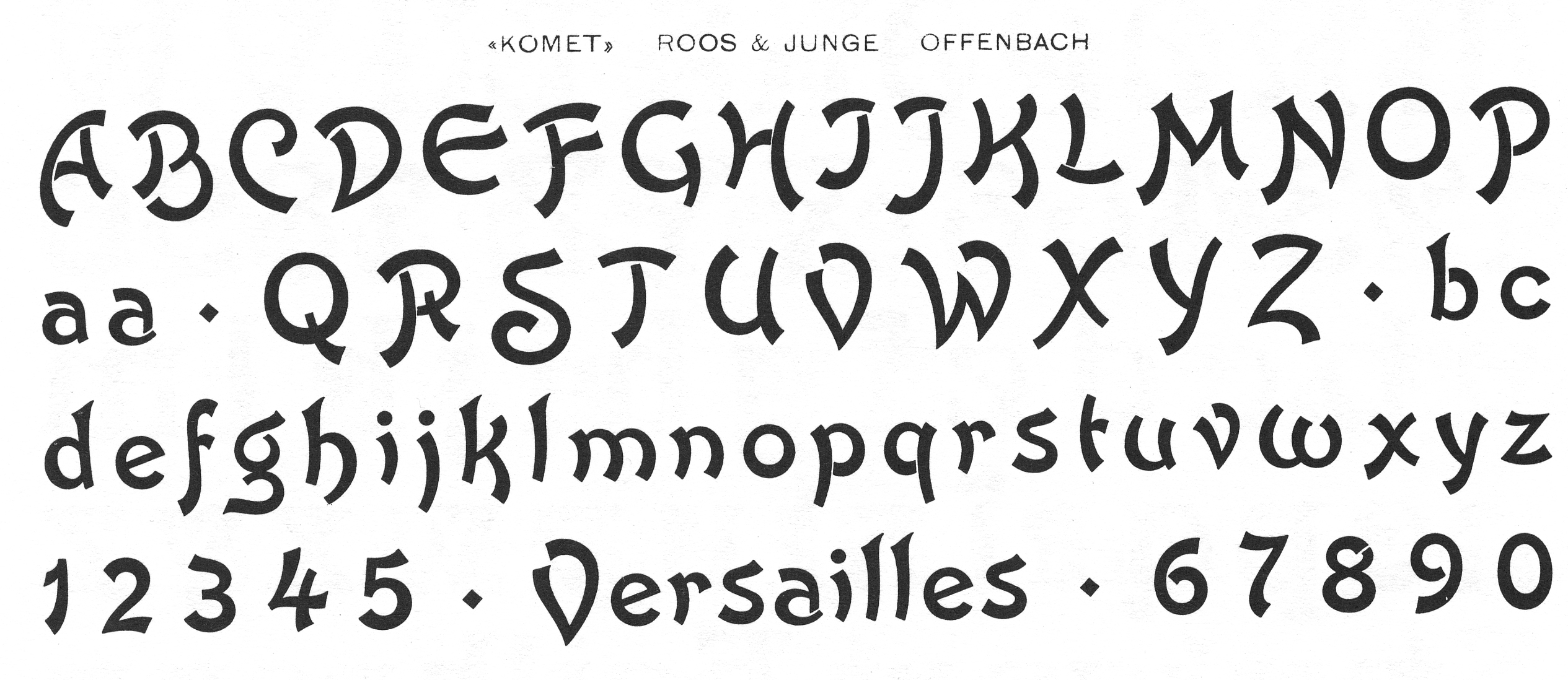
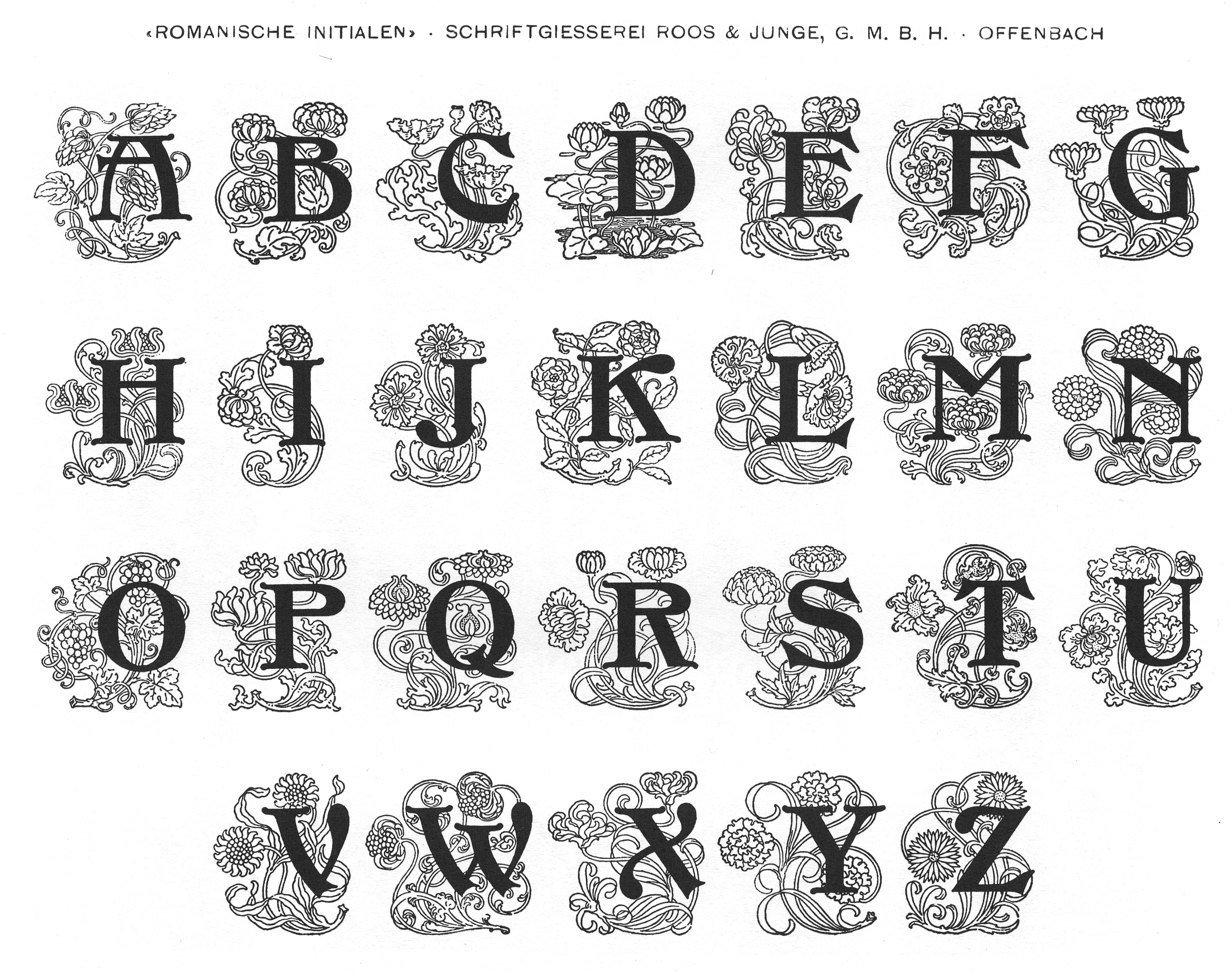
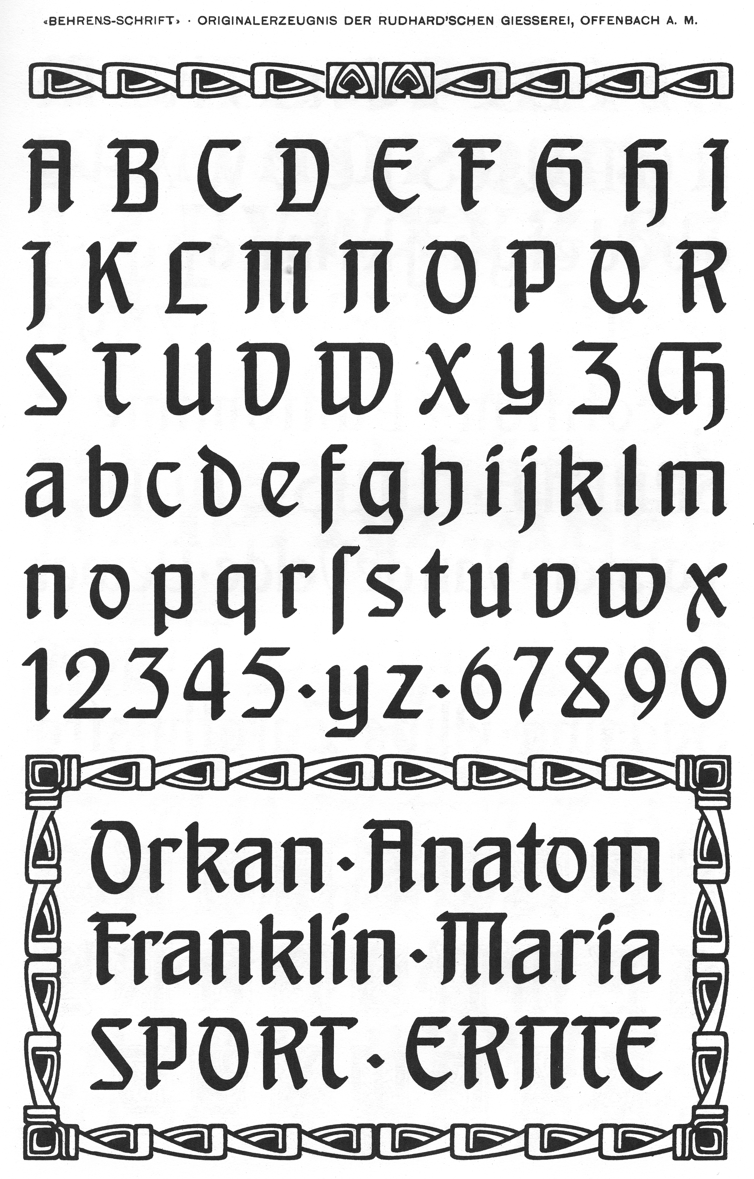
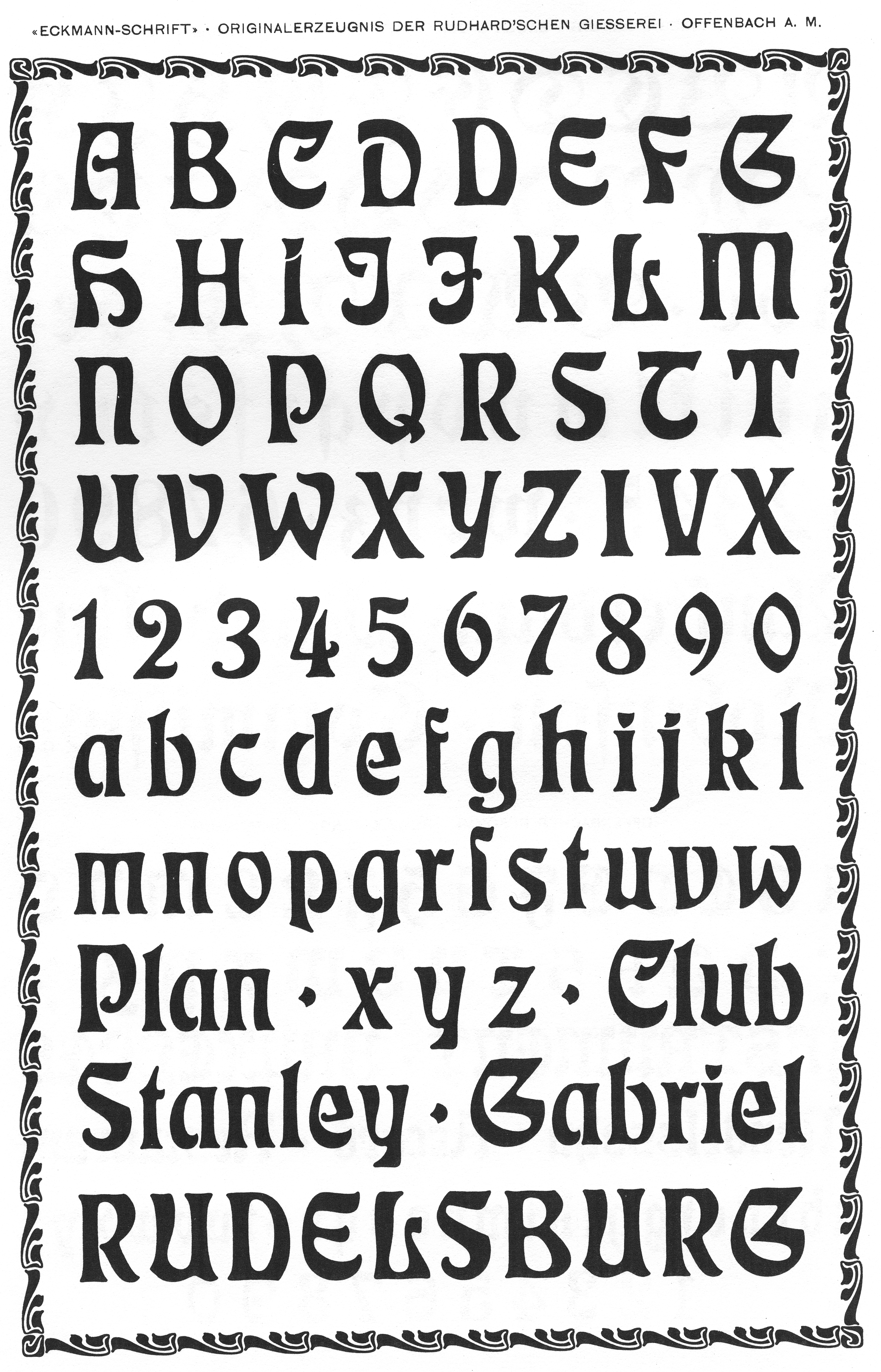
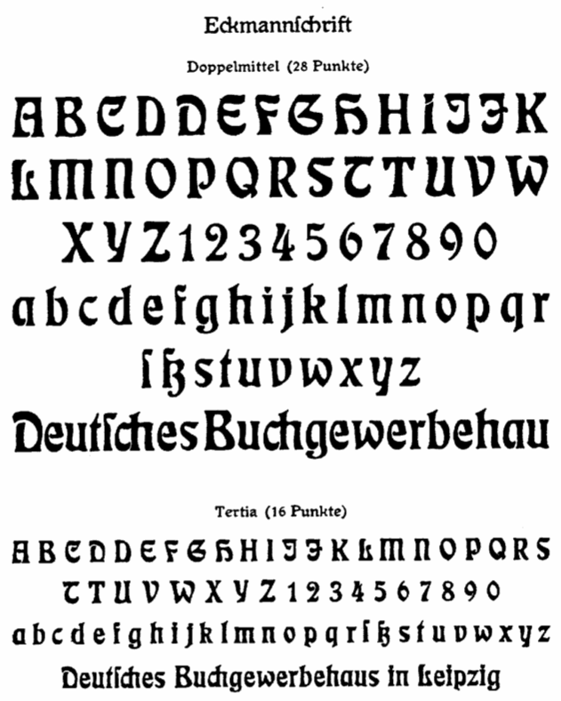
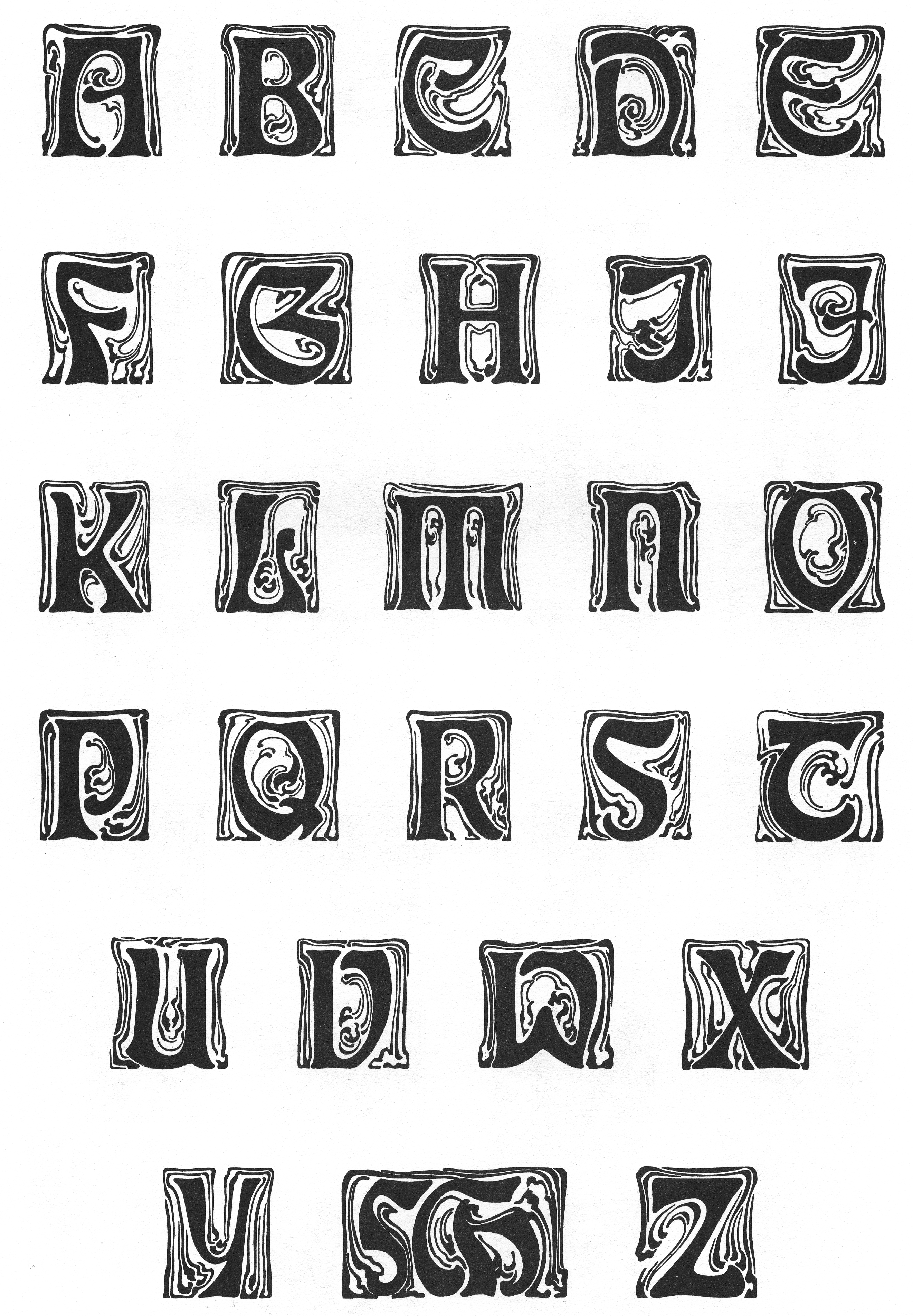
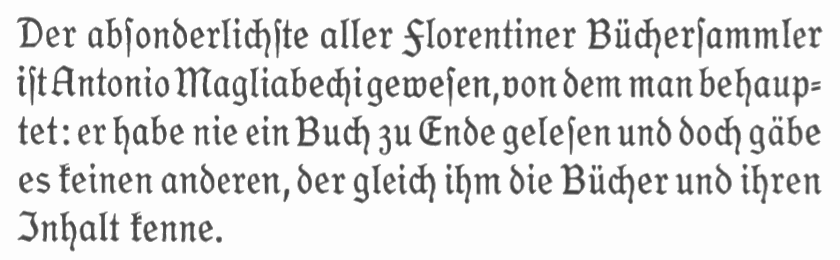
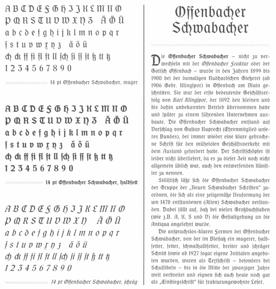
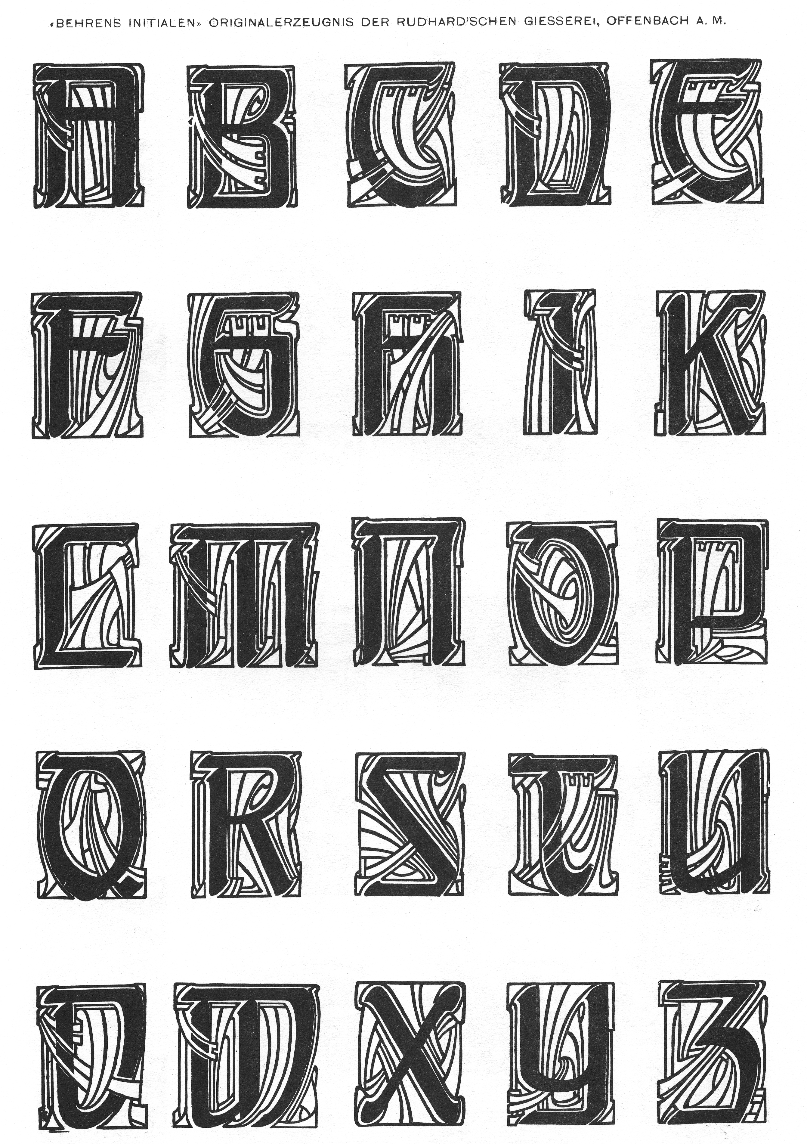
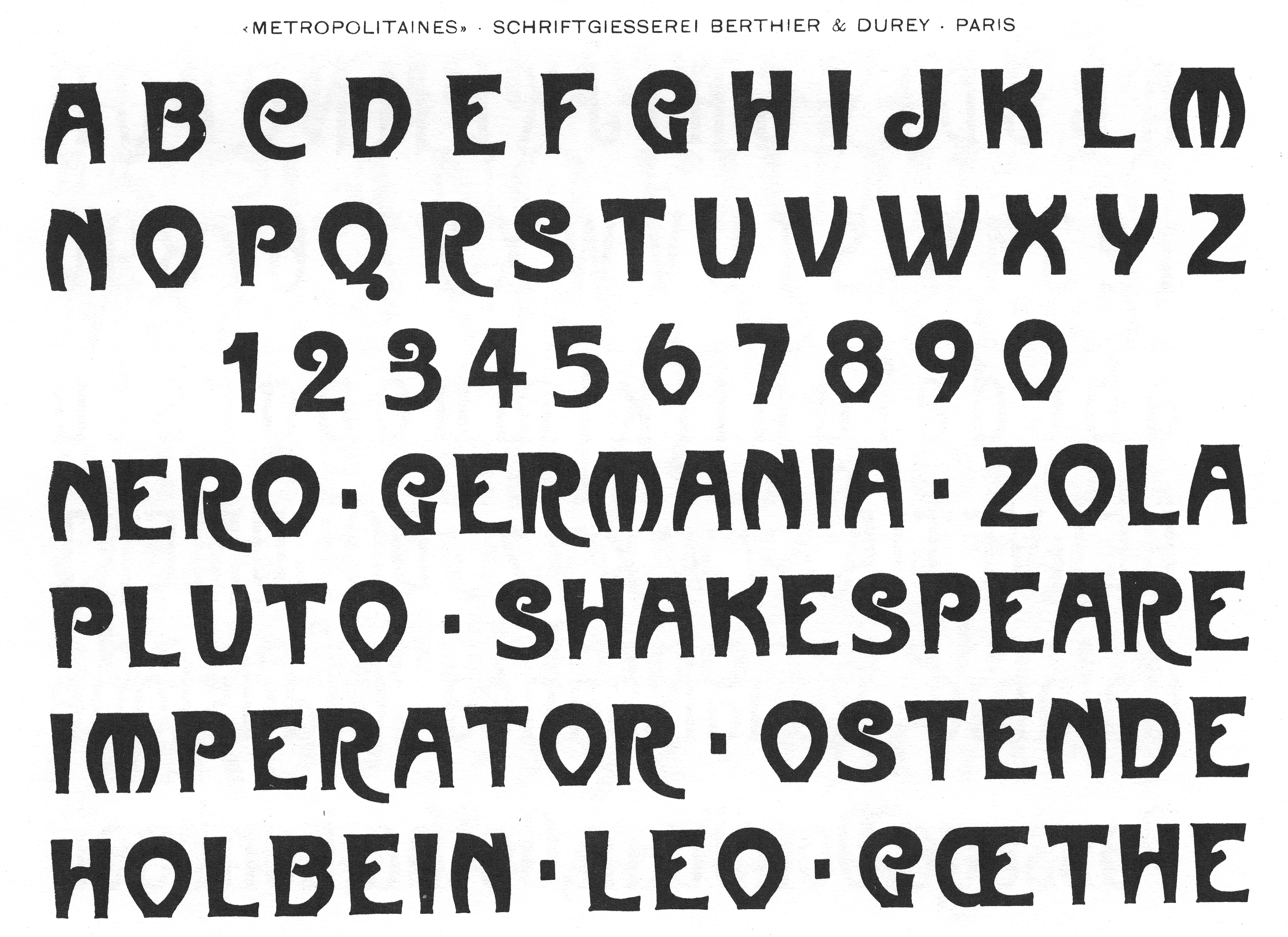
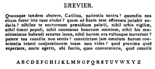
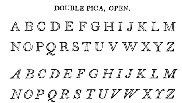
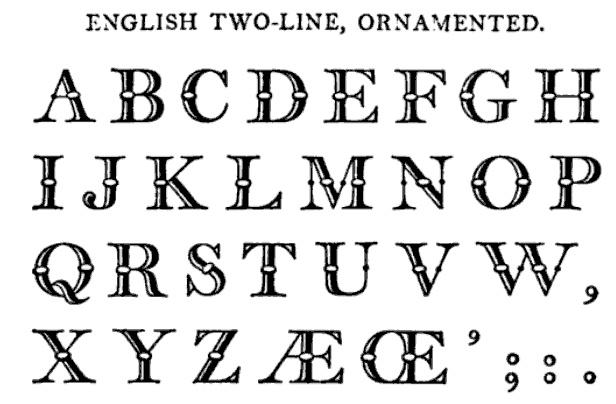
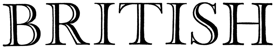
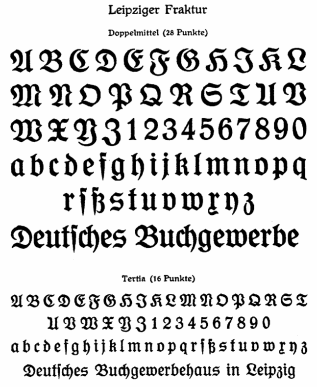
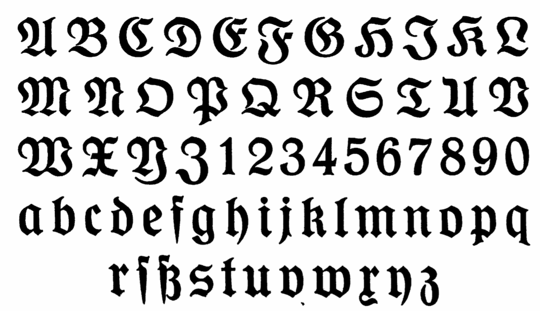
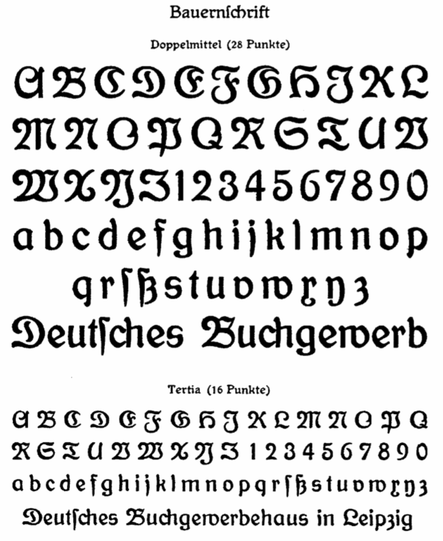
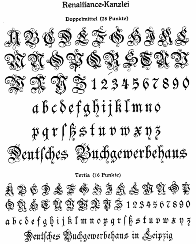
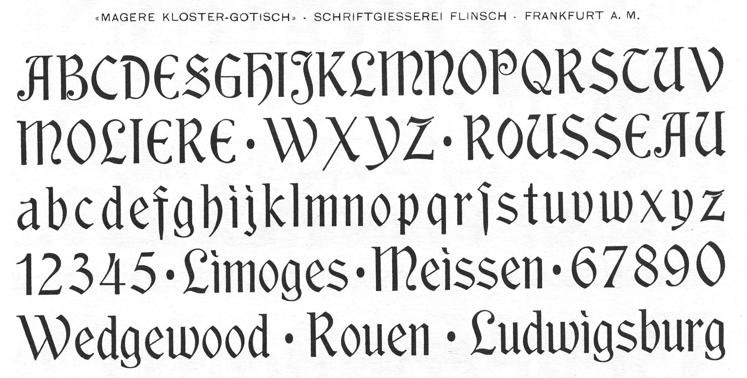
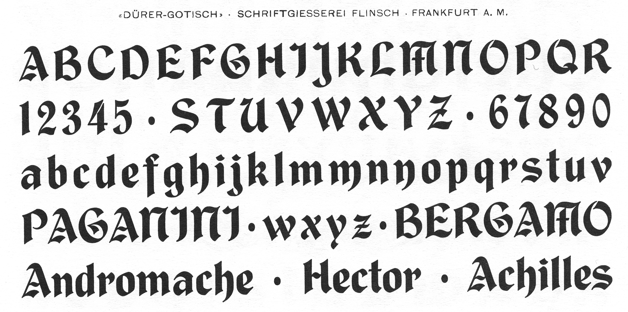
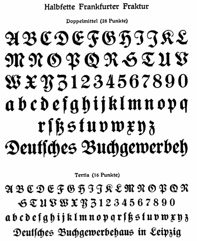
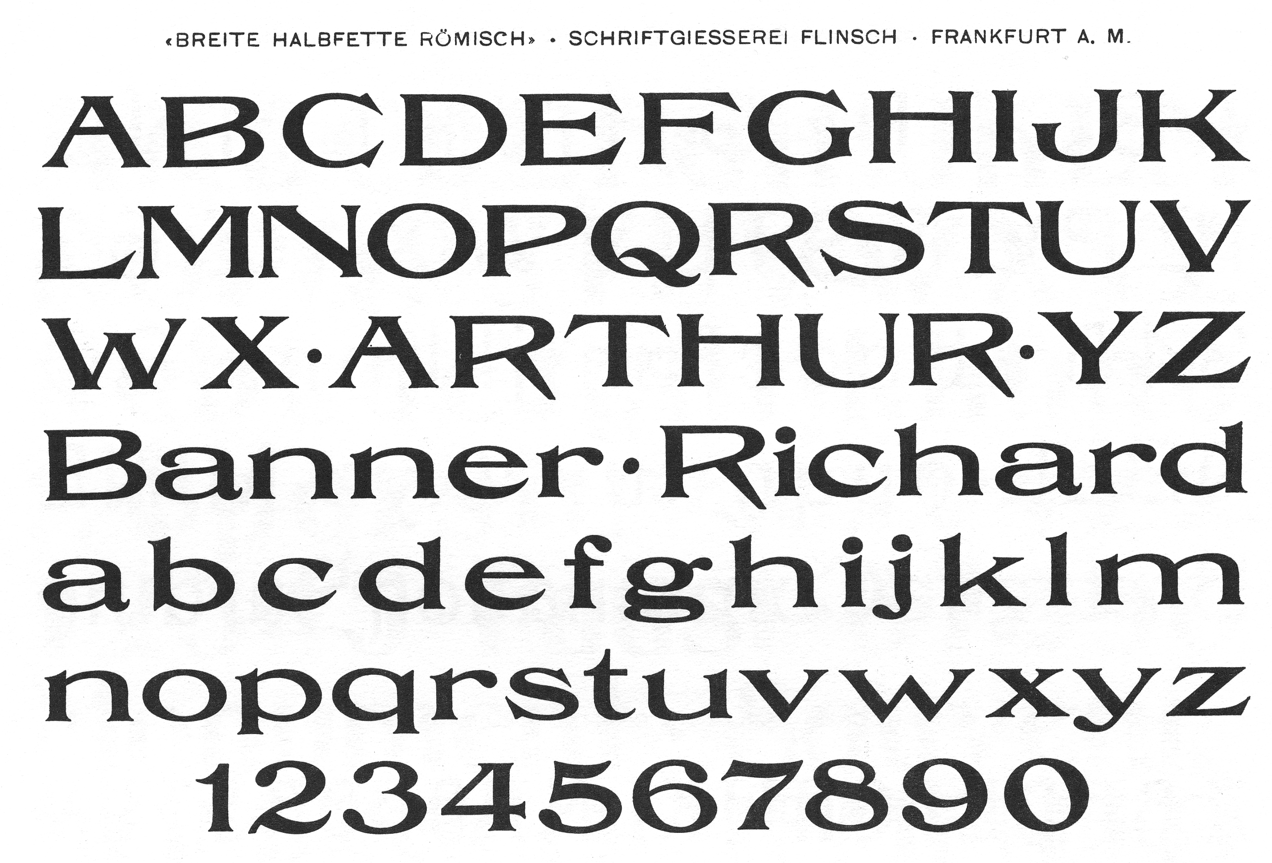
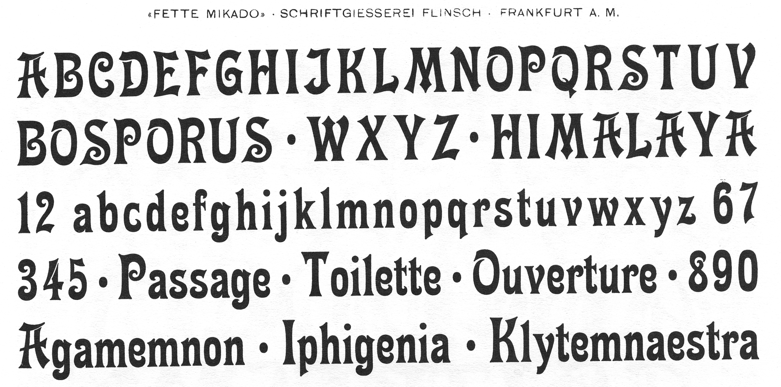
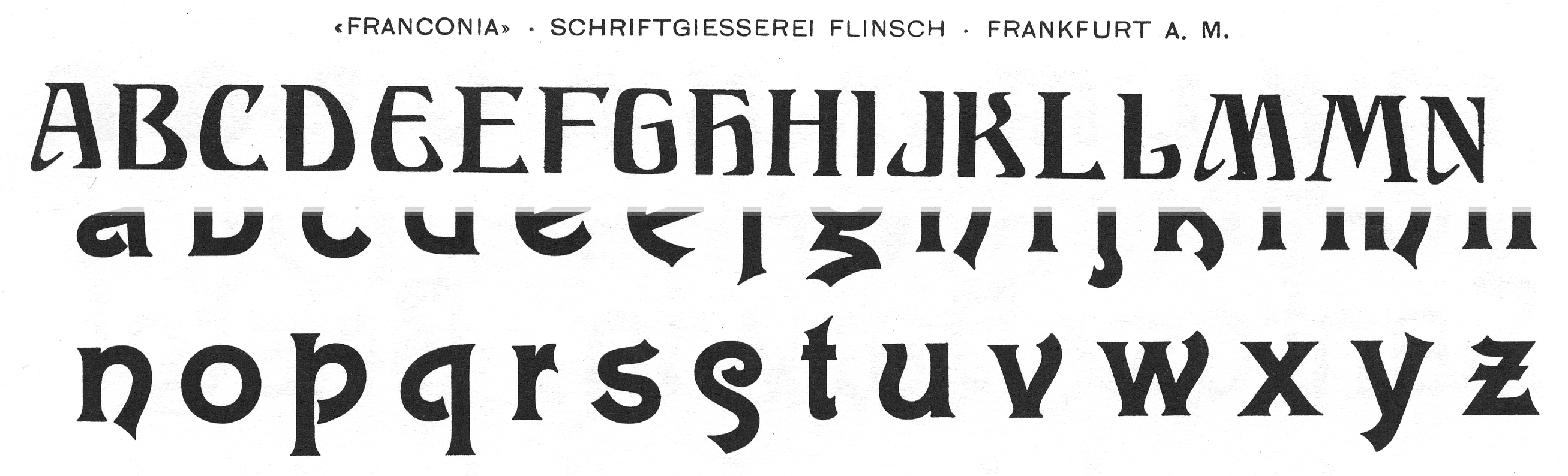
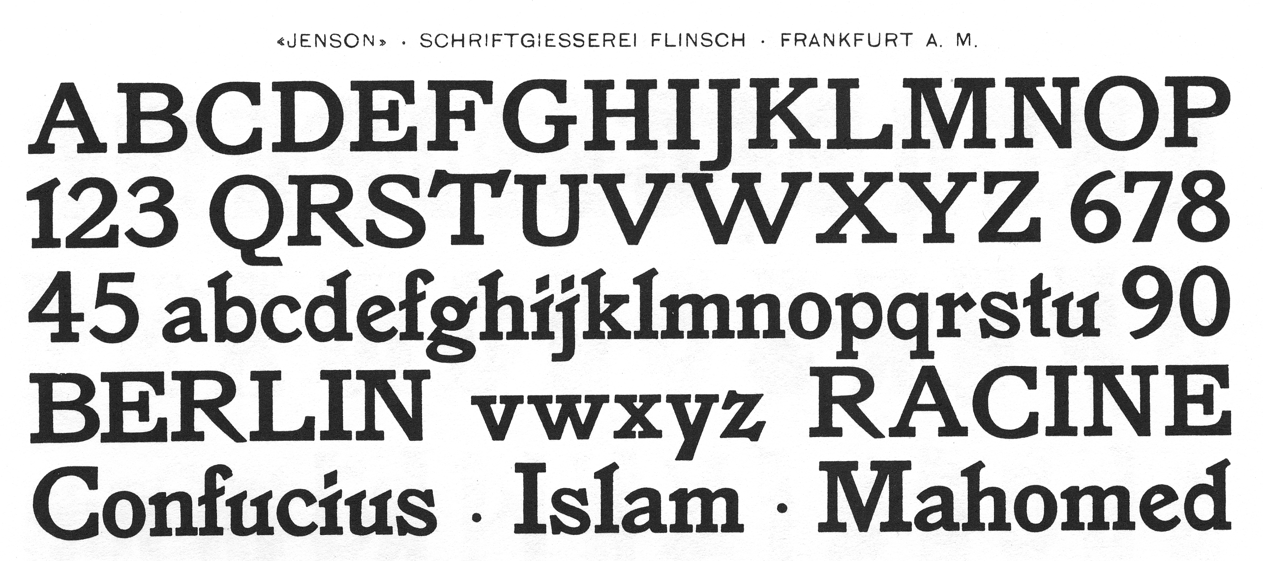
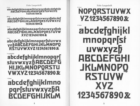
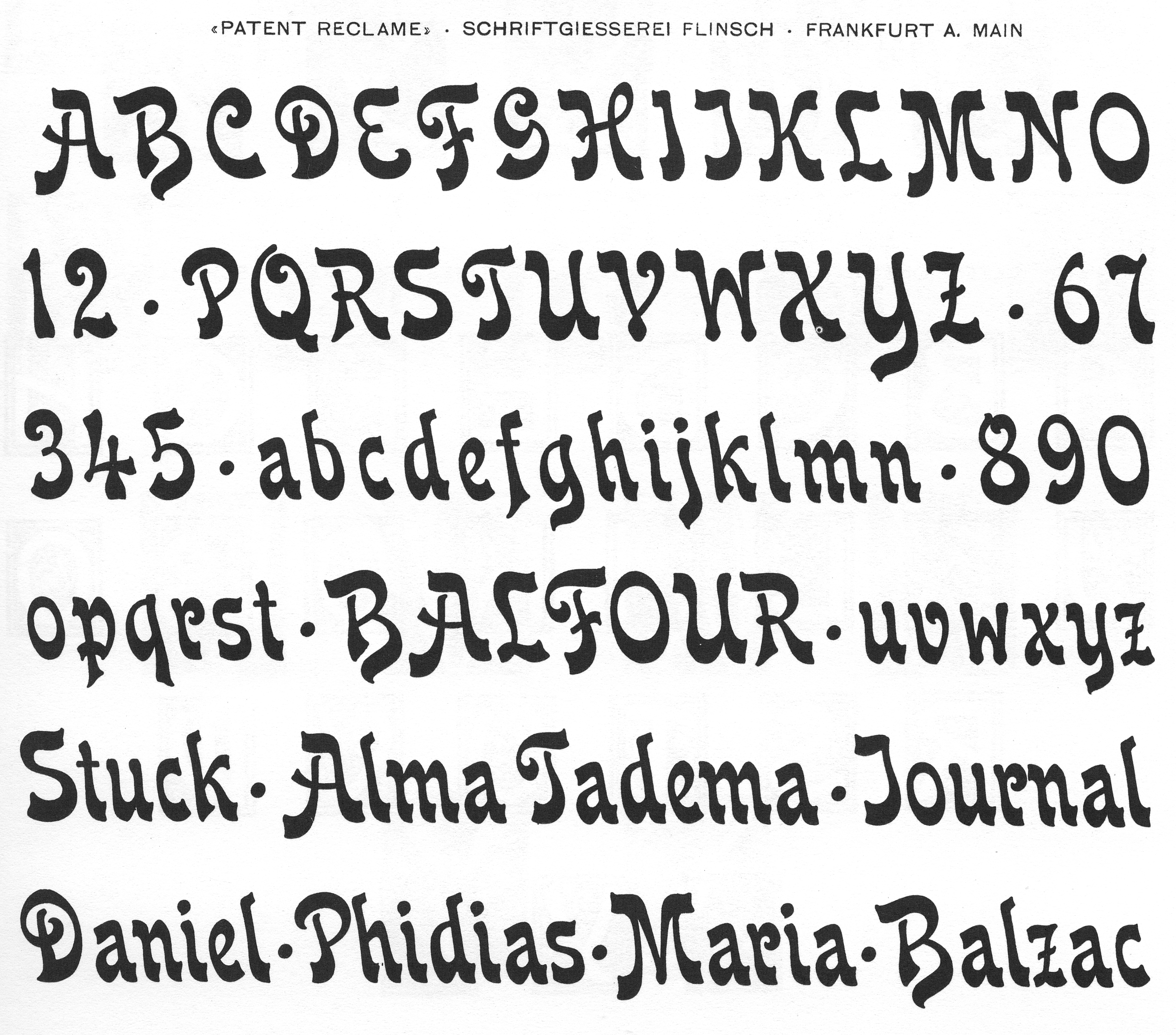
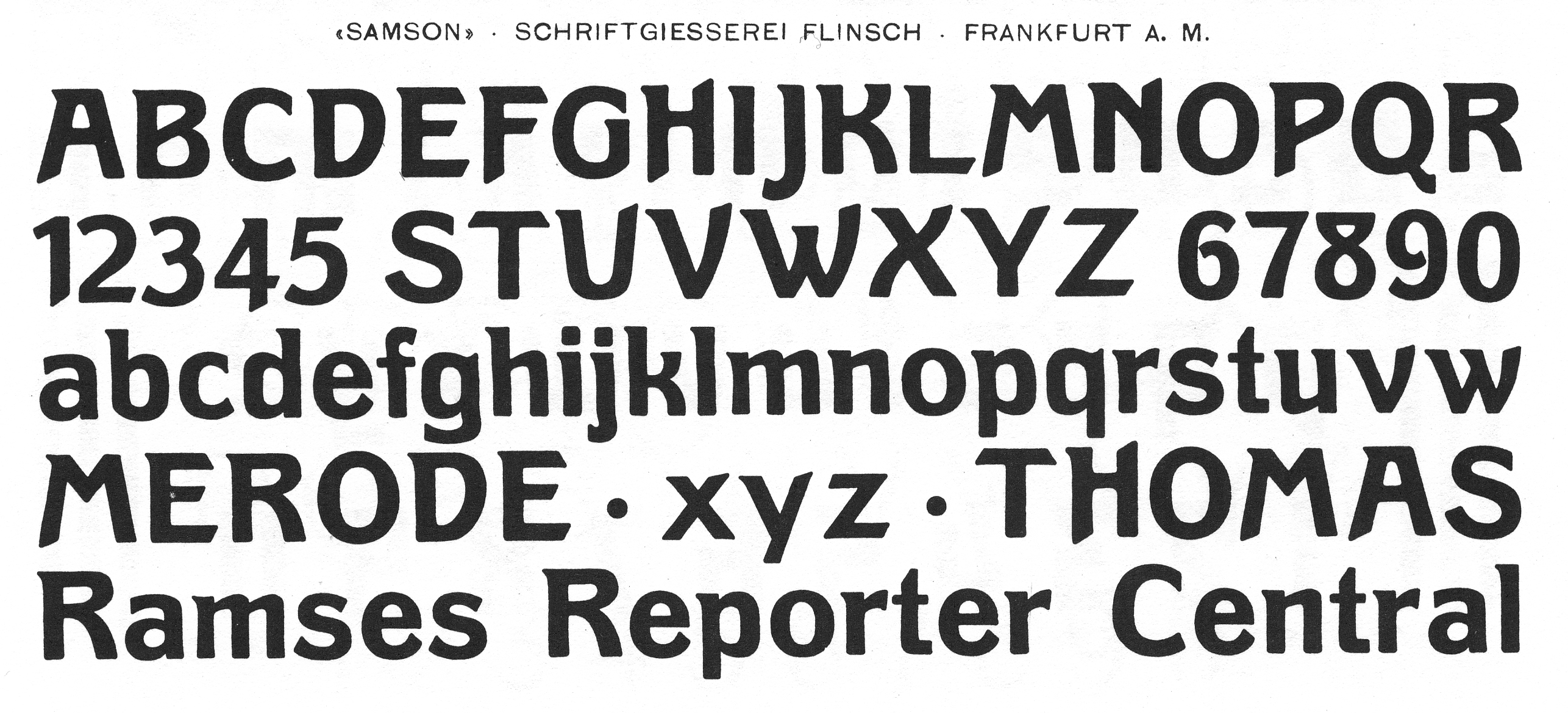
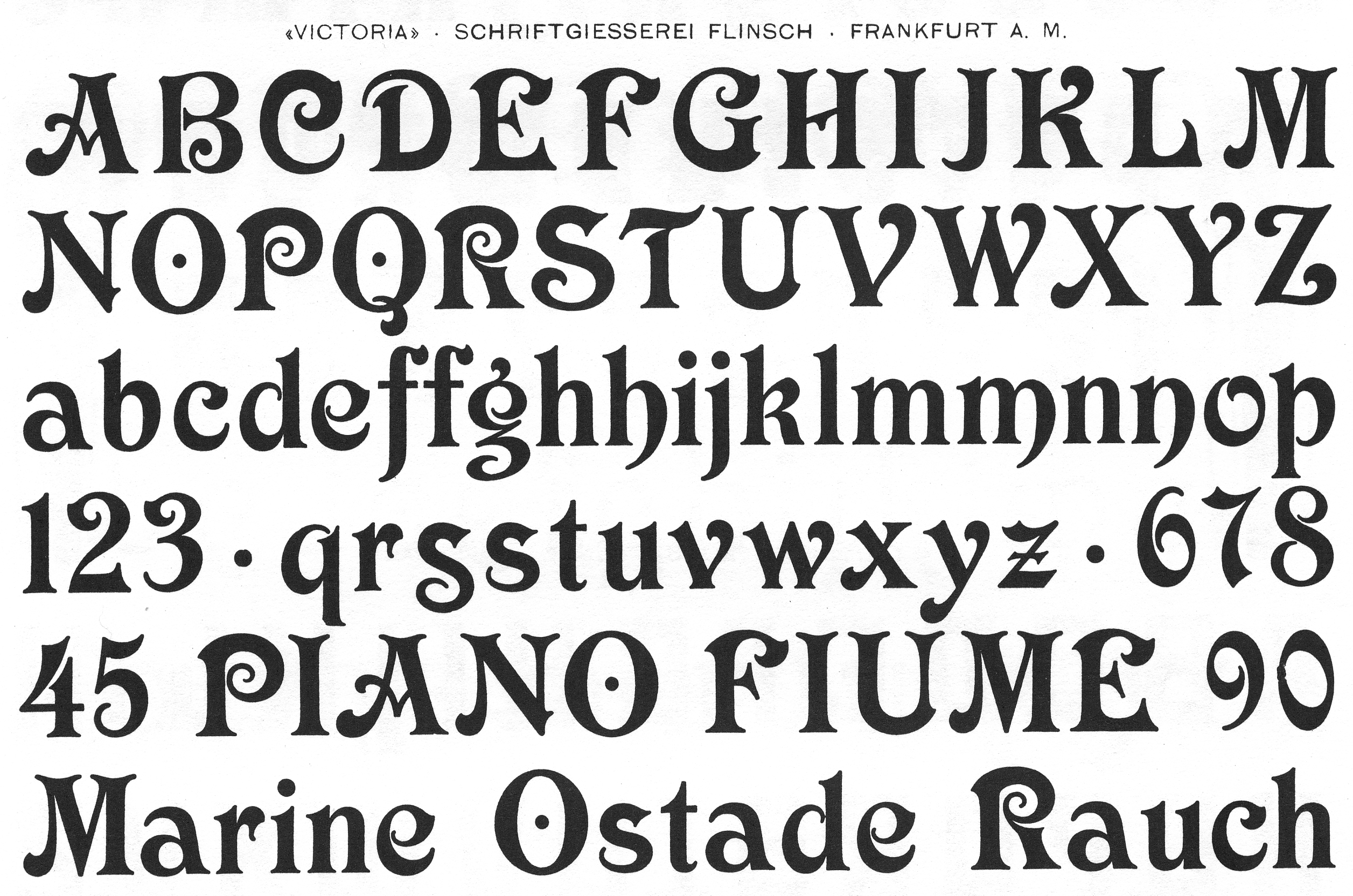
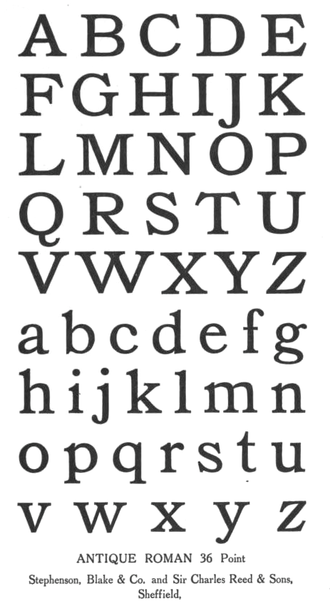
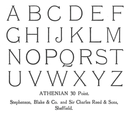
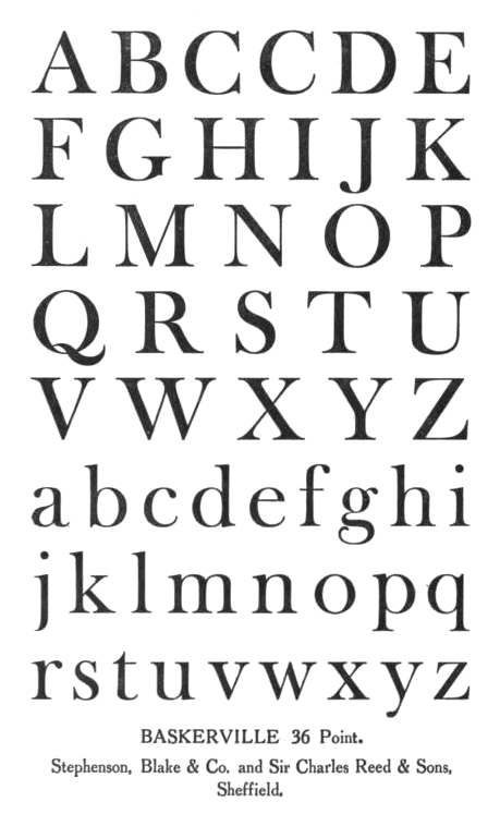
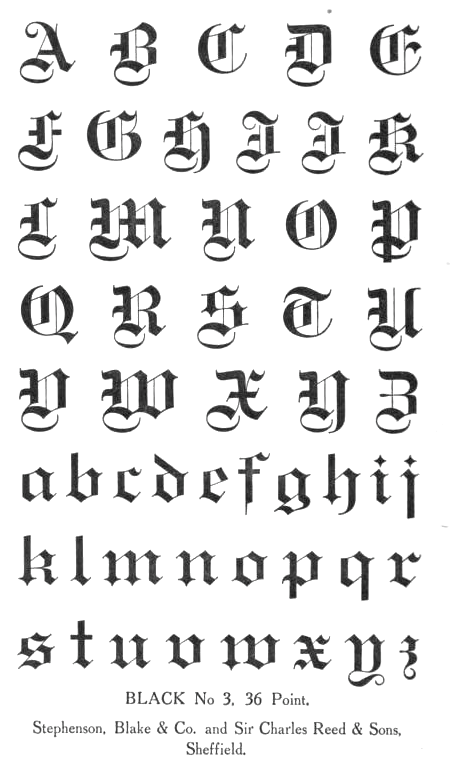
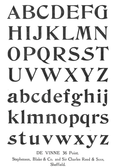
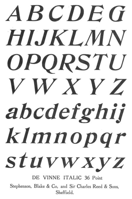
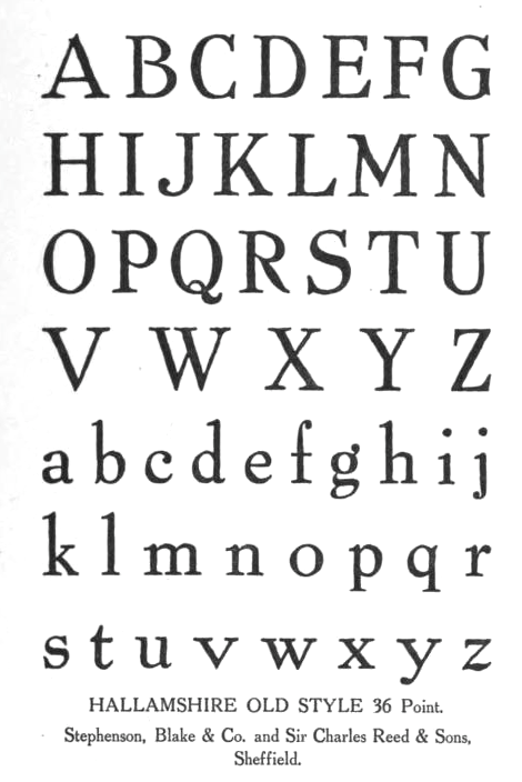
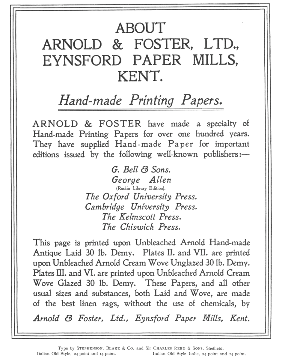
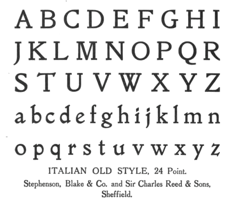
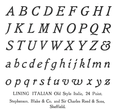
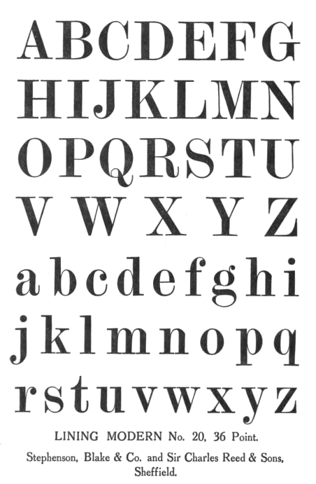
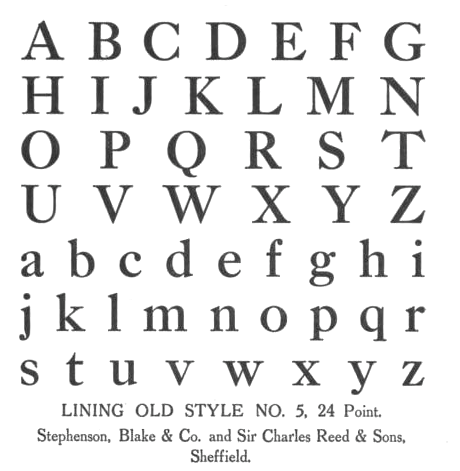
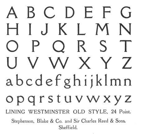
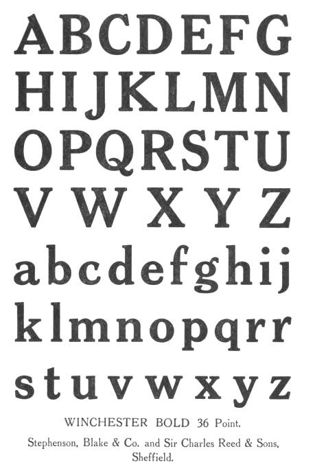
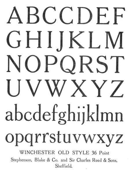
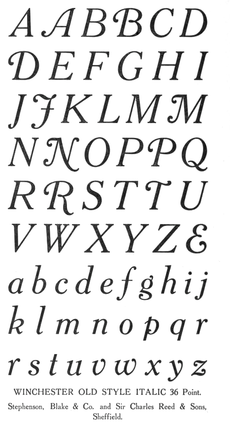
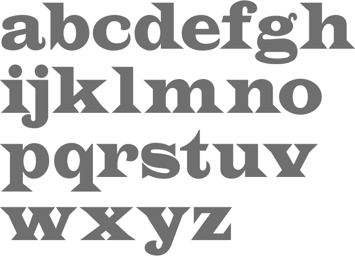
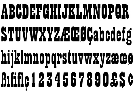
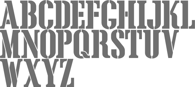
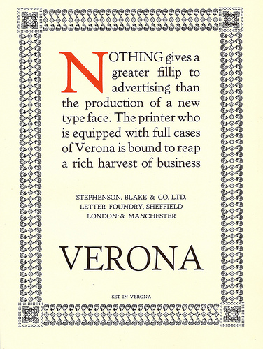
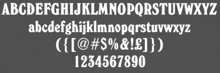
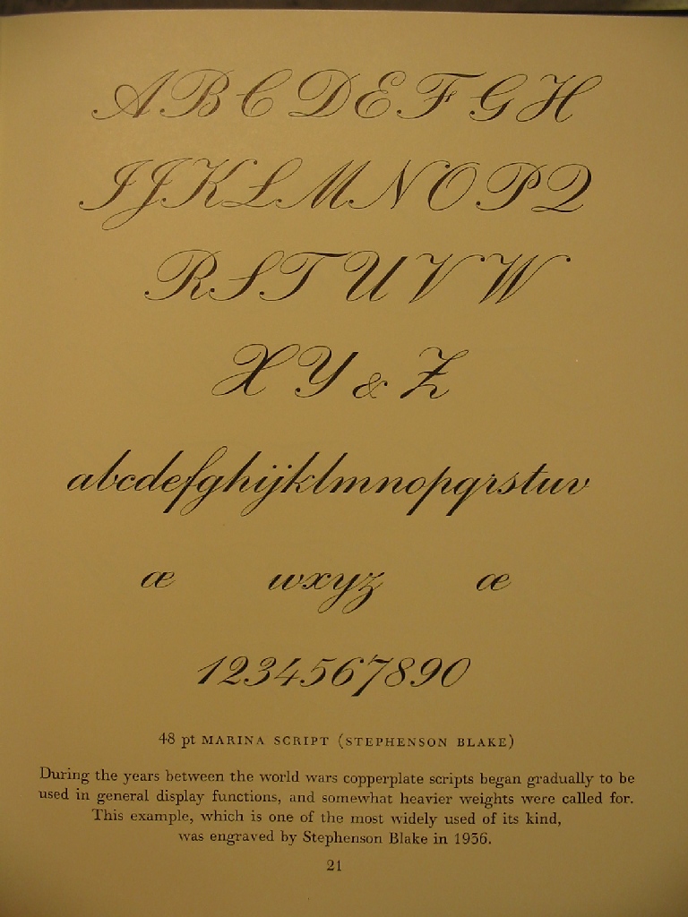
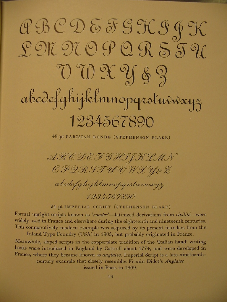
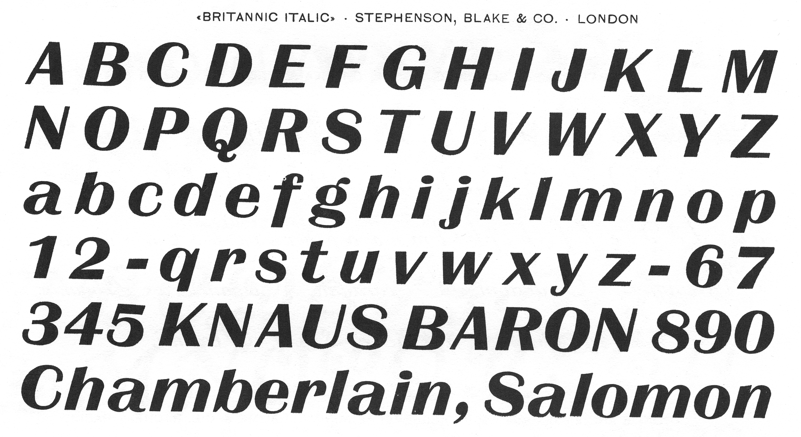
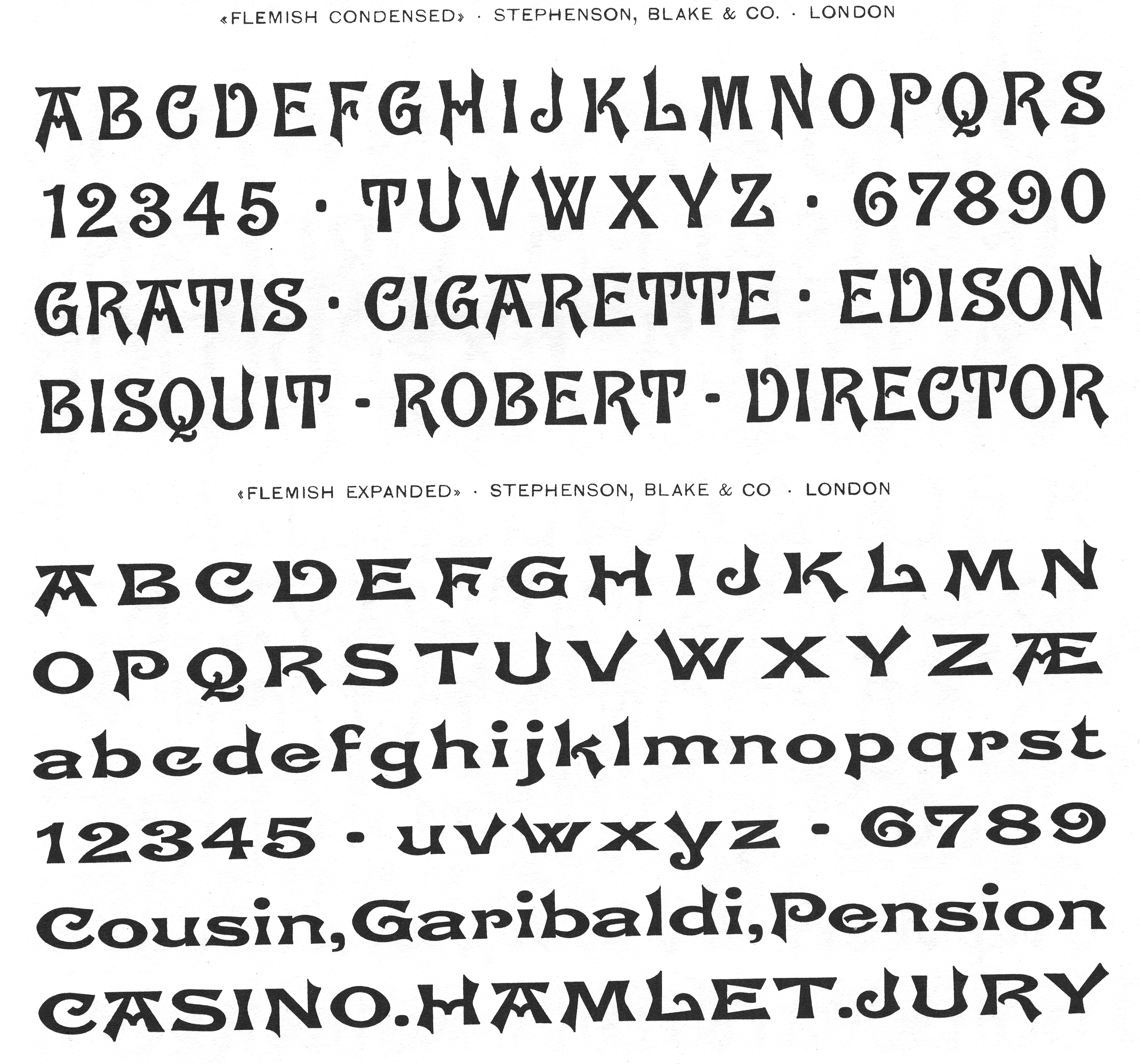
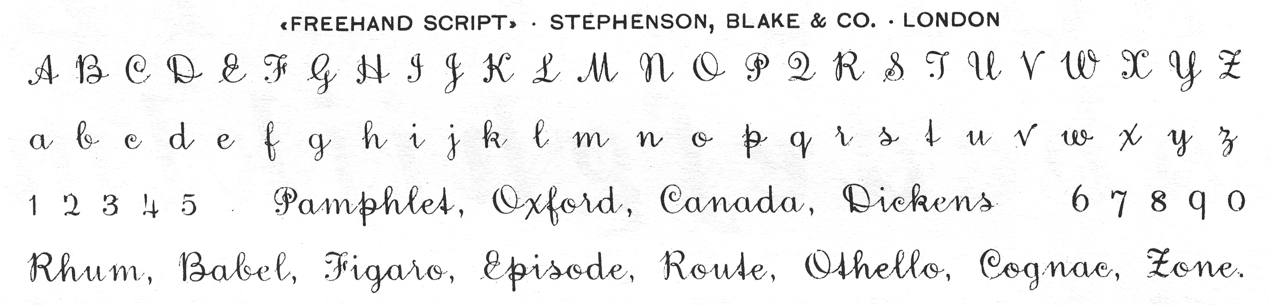
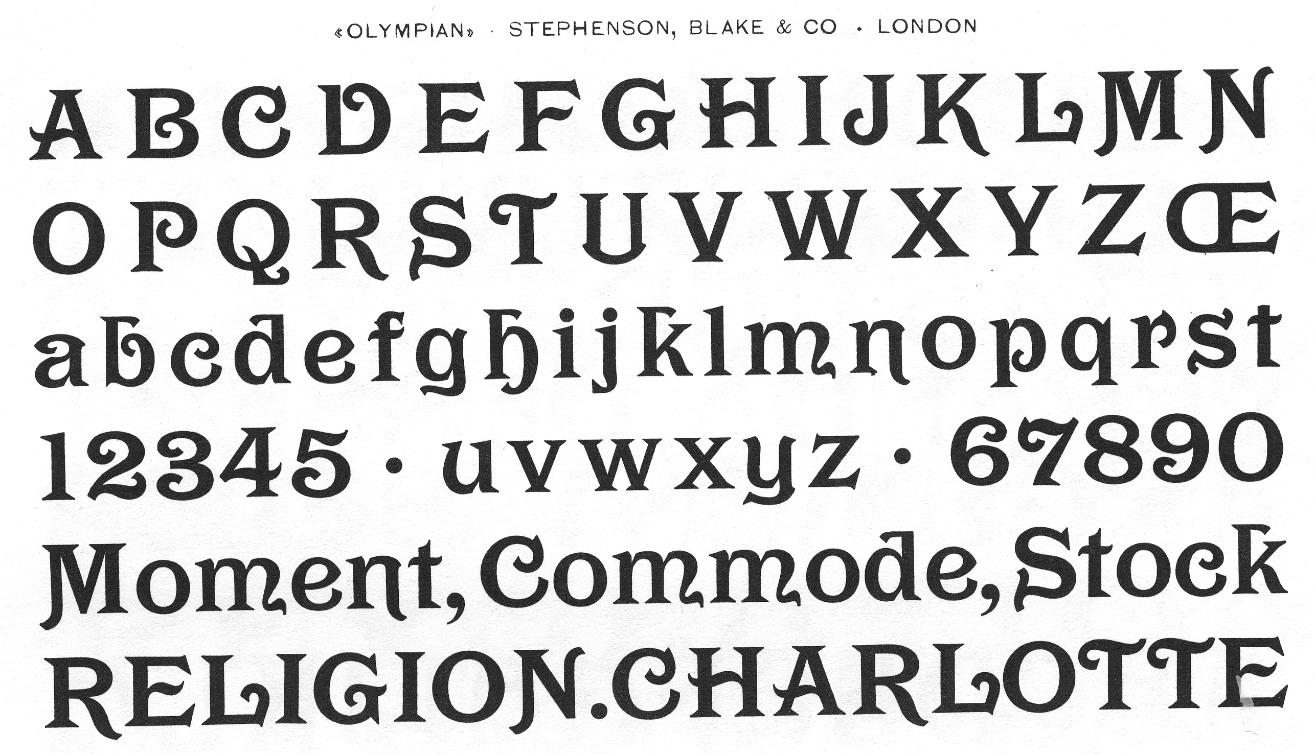
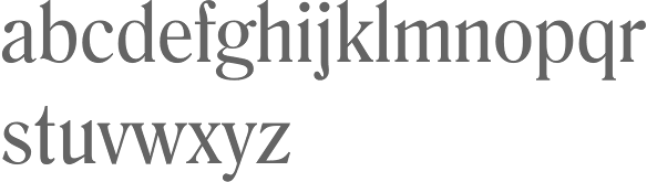
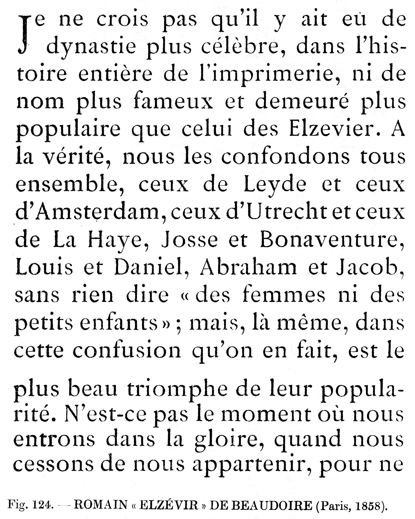
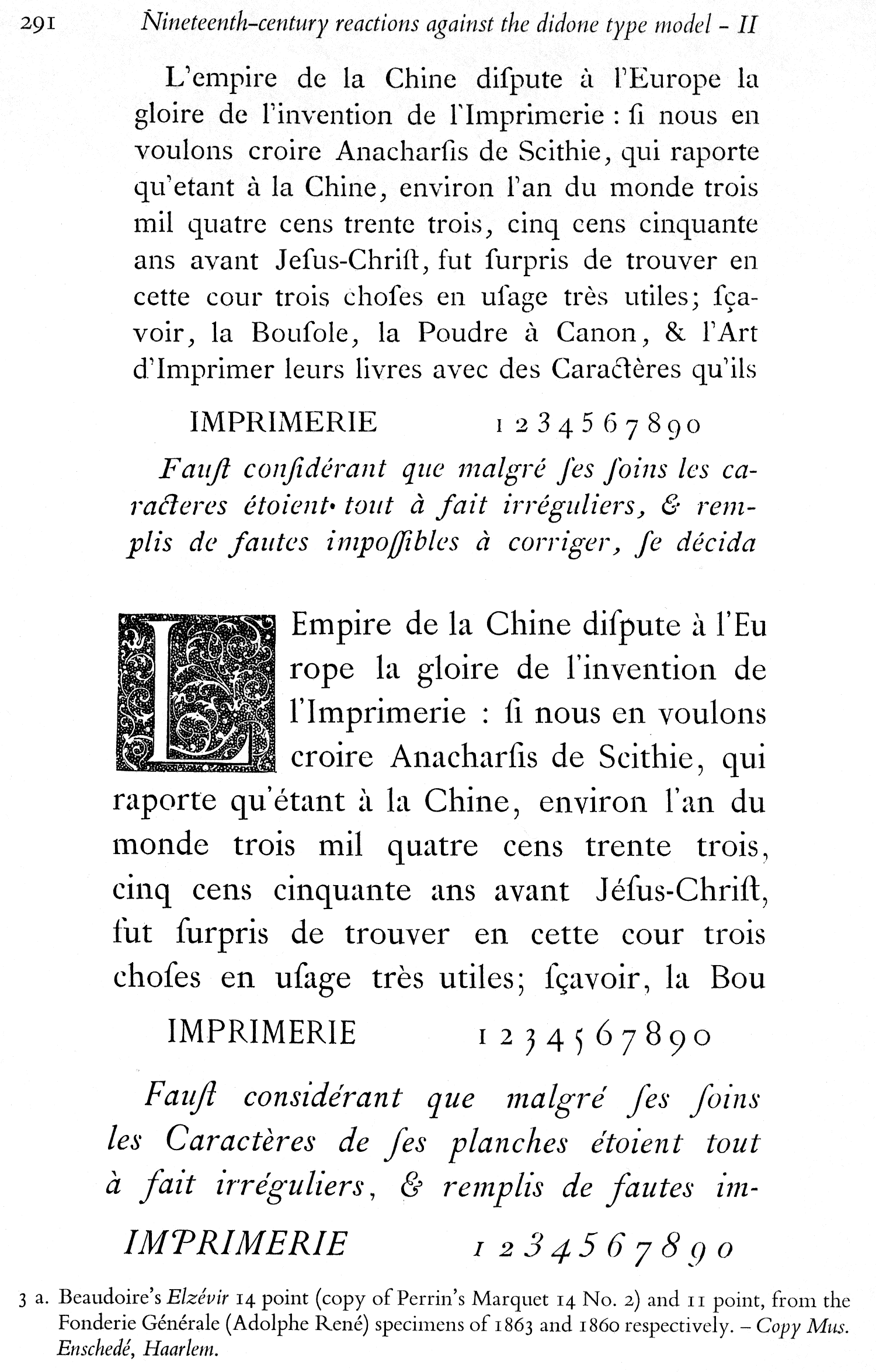
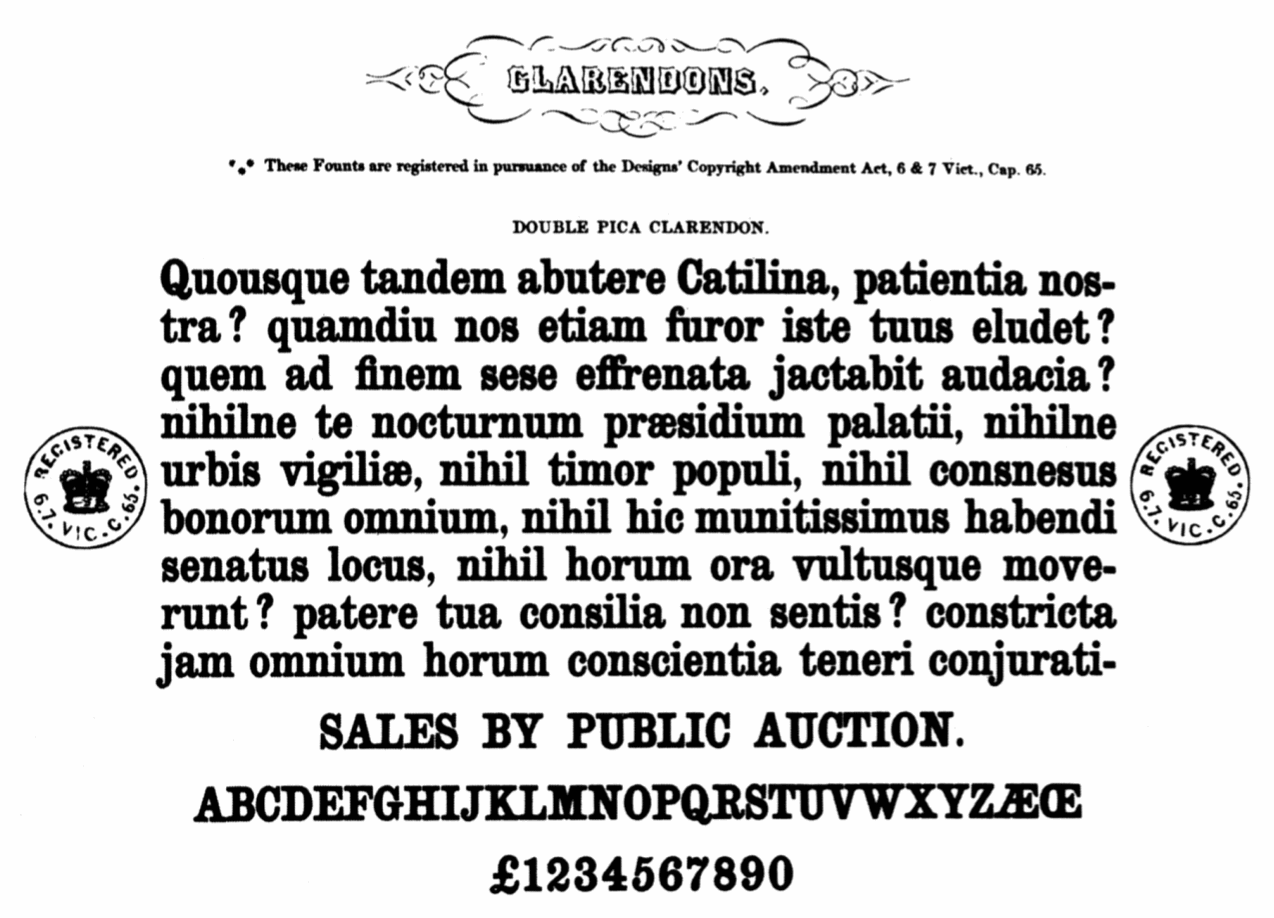
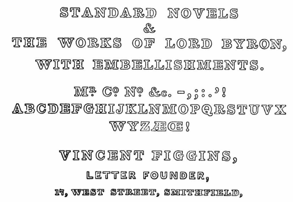
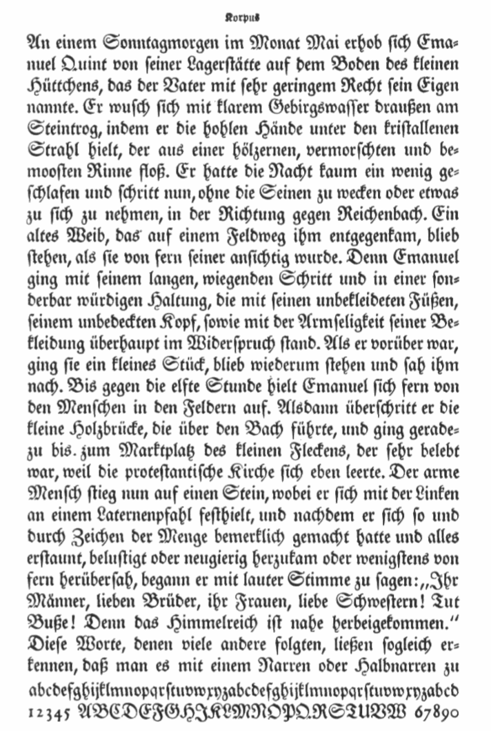
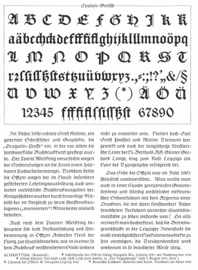
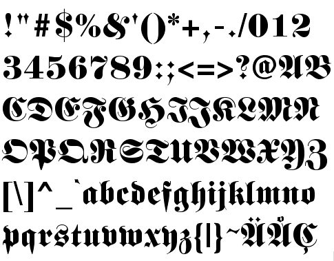
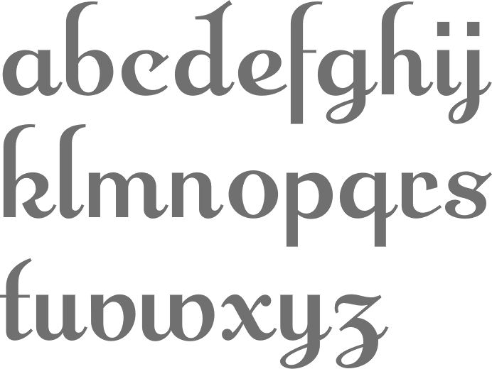
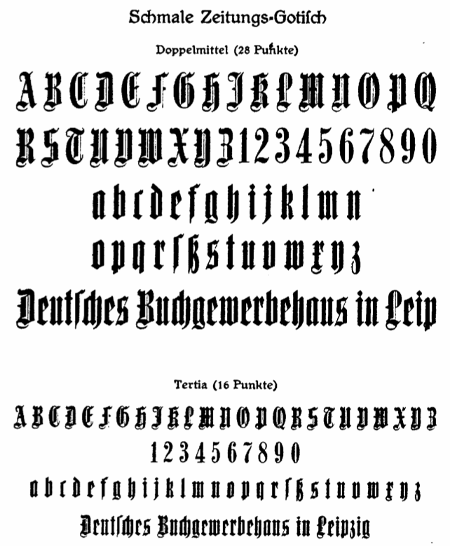
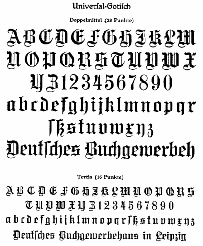
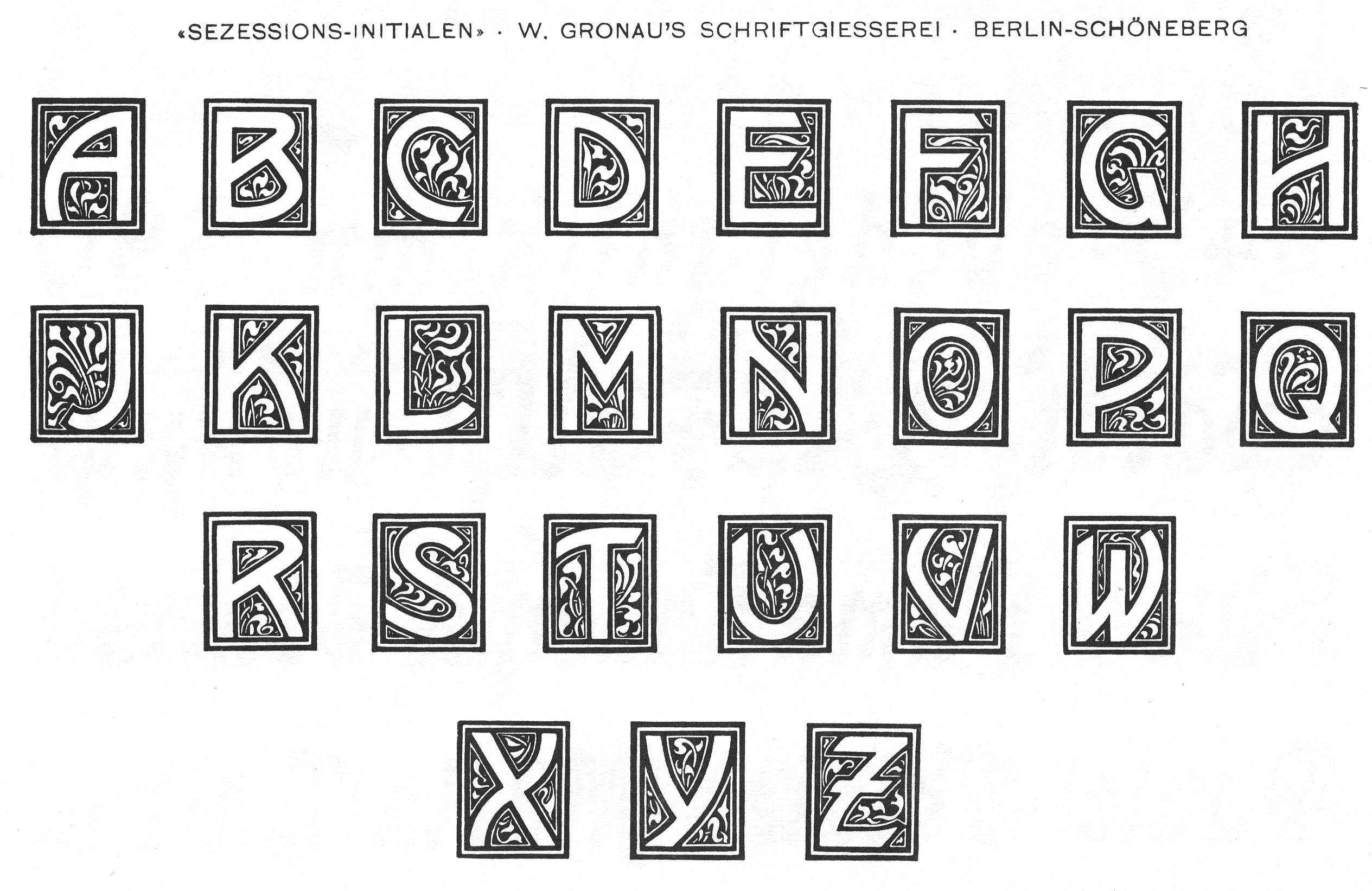
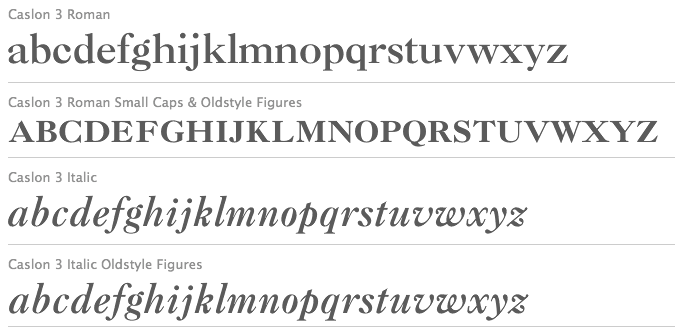
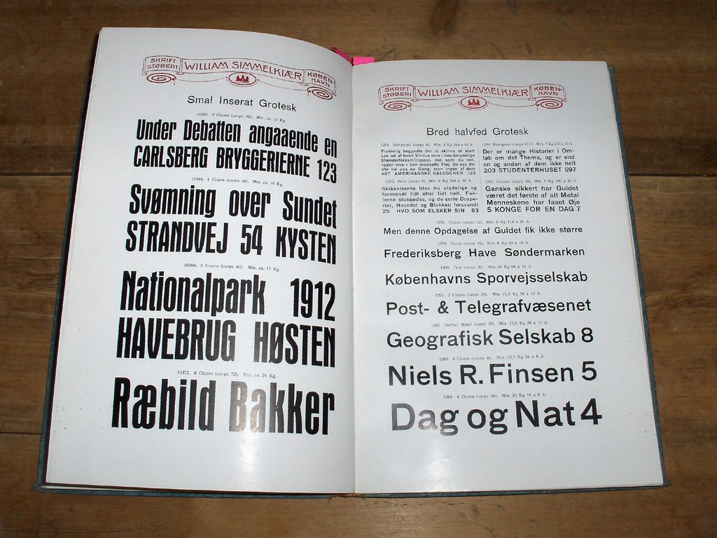
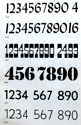
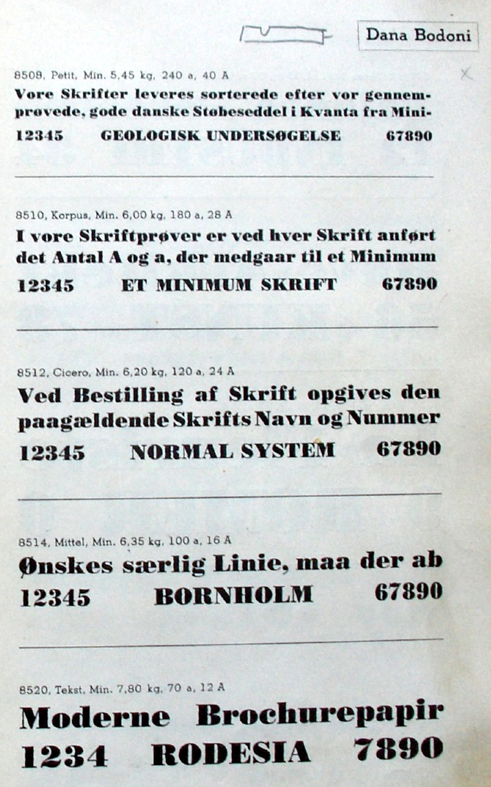
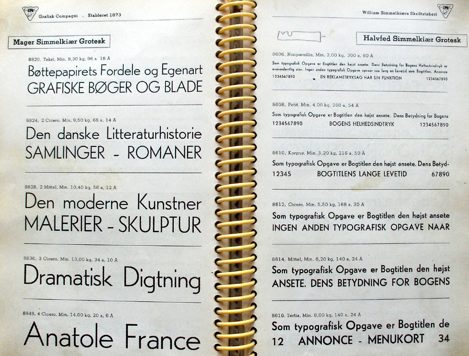
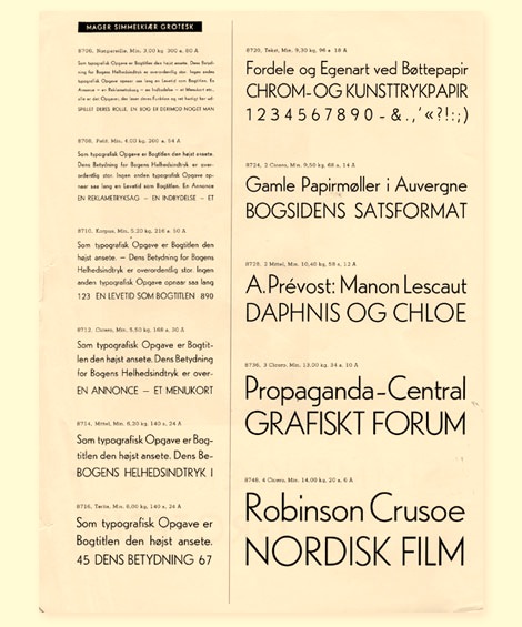
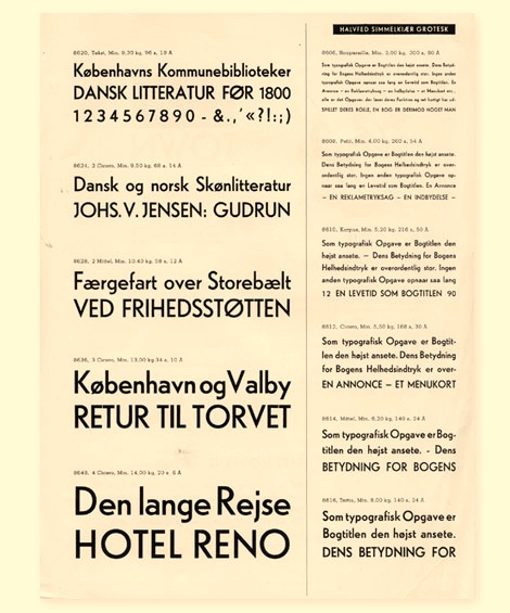
|
|
|
|