| | |
A. Bardi
|
 Type designer who created various alphabets and showed them in Publicité Vignettes Lettres Chiffres Monogrammes et Rehauts Modernes (Les Editions Guérinet, Paris, 1931) [reprinted in 1986 by Dover (NY) as Authentic Art Deco Alphabets]. Examples include
 [Google]
[More] ⦿
|
Abstract Fonts
[Alex Chumak]
|
Growing 13000+ font archive maintained by Alex Chumak from Mississauga, ON. Chumak himself designed these fonts: AF Pepsi, AF Champion, AF Tommy Hilfiger. List of designers. New fonts. Fontspace link. Dafont link. [Google]
[More] ⦿
|
A.D. Farmer
[Farmer, Little&Co.]

|
 [MyFonts]
[More] ⦿
|
Adolf Behrmann

|
 Born in Tockum (near Riga, Latvia) in 1876, he died in Bialystok in 1942. German type designer who designed the classical display typeface Rundfunk at Berthold in 1928. This typeface was digitized by Nick Curtis as Radio Ranch NF. He also designed Radio and Radio Versal in 1928 at H. Berthold AG.
 FontShop link. Klingspor link. [Google]
[MyFonts]
[More] ⦿
|
Adolphe Mouron Cassandre

|
 His real name is Adolphe Jean-Marie Mouron, and he was born in Kharkiv, Ukraine in 1901. He committed suicide in Paris in 1968, after the rejection of one of his innovative designs by a German publisher. After studies at the Ecoles des Beaux Arts in Paris, Cassandre adopted France as his country. He produced his first poster Au Bucheron at 22, and became a successful and influential poster artist best known for his epoch-defining travel posters and for his advertisements for products such as Dubonnet. The consummate art deco artist, he tried to create posters for people who did not try to see them. In 1936 he traveled to America to work on several projects. While there he designed several surrealistic covers for Alexey Brodovitch at Harper's Bazaar. In addition, he created for NW Ayers, the classic eye of the Ford billboard and several pieces for the Container Corporation of America. His career as a poster designer ended in 1939 when he changed disciplines and became a stage, set and theatrical designer. Most of Cassandre's work was done at Fonderie Deberny&Peignot. The 1960s work was at Olivetti.
 He created these typefaces: - Bifur (1928-1929). See the digital form by Richard Kegler (P22, 2004).
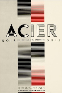
- Acier Noir (1930-1936). His poster Nord Express (1927) (Acier Noir really) inspired Nick Curtis to draw Nord Express NF (2003). In 2010, and then again in 2019, Jean-Baptiste Levée designed Acier (Noir and Gris) as a revival of Acier. Other revivals include HFF Black Steel and Ferrus (2010, Gert Wiescher).
- Peignot (1933-1937, designed with Charles Peignot for Deberny & Peignot). Typefaces like this are called Peignotian on my site; some are calling them modulated sans typefaces. Buy a digital version from Linotype. See this poster by Matt Blaisdell, this poster by Julieta Liberson, and this poster by Guillaume Bret. Noteworthy digital revivals include the rounded multi-style family Pinot Grigio Modern (2014, Alan Meeks) and Greyhound (2012, SoftMaker).
- Touraine (1947). Done with Charles Peignot, it is based on a design of Guillermo Mendoza. This Peignotian typeface was revived ca. 2014 by Clément Bonnetin.
- Cassandre (1968). Cassandre (1968) was largely unfinished, after having been turned down by Berthold and Olivetti (and was possibly the cause of his suicide). It was finished in a revival of sorts by Thierry Puyfoulhoux (2003).
- Graphica81 (1960).
- Cassandre Initials (1927). This artsy typeface was digitized by Gerd Wiescher at Elsner&Flake.
Books: A.M. Cassandre, "L'architecture, l'art que je préfère à tous les autres." (2008) is a small PDF file/essay by Estienne student Antoine Stevenot. In 1988, Letraset published Baseline 10 The Cassandre issue, a fifty-page magazine volume edited by Mike Daines and art directed by Newell and Sorrell. References: - Blaie Cendrars: Le spectacle est dans la rue, Montrouge, Draegr Frères, 1935. Has Cassandre's posters.
- Paul van Capelleveen, Sophie Ham, Jordy Joubij: Voix et visions. La Collection Koopman et l'Art du Livre français, Zwolle, Waanders, 2009.
- Peter van Dam, Philip van Praag: A.M. Cassandre en zijn Nederlandse opdrachtgevers 1927-1931: Catalogue raisonné. Abcoude, Uitgeverij Uniepers, 1999.
- Henri Mouron: Cassandre, London, Thames and Hudson, 1985.
- Maximilien Vox: A.M. Cassandre, peintre d'affiches, St-Gall, Zollikofer, 1948.
- N.R.A. Vroom: A.M. Cassandre, Amsterdam, Rijksacademie van Beeldende Kunsten, 1967.
Klingspor link. FontShop link. Home page. Wikipedia link. [Google]
[MyFonts]
[More] ⦿
|
Al Brandtner
[Al Brandtner Studios]

|
[MyFonts]
[More] ⦿
|
Al Brandtner Studios
[Al Brandtner]

|
Al Brandtner is the founder of Al Brandtner Studios. His Allan Gothic was the inspiration for Nick Curtis' font Namesake. [Google]
[MyFonts]
[More] ⦿
|
Al Mack

|
 American lettering artist whose book Lettering: Brush&Pen in the Single Stroke inspired Nick Curtis in 2006 to design the connected script typeface Got That Bling NF. [Google]
[MyFonts]
[More] ⦿
|
Alan Dempsey

|
Designer of Montage (1995), ITC Tremor (1998), and Bobbysox (2000, Letraset). His Pinball typeface from the 1970s (for Letraset) inspired Nick Curtis to create Dot Soon NF (2009) and led Rick Banks to develop F37 Ping Pong (2018). Alan Dempsey is also credited with the commissioned font Personal (done for Hewlett-Packard in 2006). FontShop link. [Google]
[MyFonts]
[More] ⦿
|
Albanis Ashmun Kelly

|
Author of Expert Sign Painter (1911). That book served as inspiration for Nick Curtis's Gasoline Alley NF (2002). [Google]
[MyFonts]
[More] ⦿
|
Albert Christoph Auspurg

|
 German type designer, b. Frankfurt am Main, 1868, d. Leipzig, 1943. His oeuvre:
 - At C.E. Weber: Start (1934).
- At Ludwig&Mayer: Aristokrat (1912), Miracle (1931, a script face), Rasse (1924), Schöndeutsch (1934), Reklame-Fraktur (1914; revived in 2016 by Ralph M. Unger as Reklame Fraktur), the gorgeous long-legged Mona Lisa (1930; digital version by Pat Hickson, 1992), the blackletter typeface Deutsche Kraft (1915), Brigitte (1935), the display roman typeface Krimhilde (1933-1934; with Schwabacher-style capitals, though).
- At Schriftguss: Lido (1936, script face) and Miami (1934). Digital revivals of Krimhilde were done by Ralf Herrmann (as Krimhilde, 2018) and Klaus Burkhardt (also as Krimhilde). Rick Banks's F37 Attila was inspired by Krimhilde. Miami was revived in 2020 by Ralph M. Unger as Elbflorenz.
- At Benjamin and Krebs: Brentano Fraktur (1915-1916), Federzug Antiqua (1913), Nürnberger Kanzlei (1906), Schönbrunn (1928), Trajan Versalien (1928).
- At Genzsch&Heyse, he did Hans Sachs Gotisch (1911, revived in 2005 by Petra Heidorn; the typeface also appeared at Ludwig & Wagner, where some date the Initialen style at 1902---Hans Sachs Gotisch was named after Hans Sachs from Nürnberg, 1494-1576, who was a master singer and songwriter), Domina (1929), Souverän (1913).
- At Haas: Castor (1924), Pollux (1925).
- At Trennert: Trocadero Kursiv (1927, a script font with flourished capitals). In 2010, it was extended and revived by Ralph Unger as Trocadero Pro.
- At Berthold: the peculiar Messe Grotesk family (1921-1927) and the shaded titling typeface Vesta (1926, a Mexican simulation face; for a digitization, see Visillo Adornado (2006, Nick Curtis) or Venezuela RR (2000, Pat Hickson at Rabbit Reproductions Type foundry, aka Red Rooster)). The Messe Grotesk design was revived by Nick Curtis as Troglodyte NF (2006-2011) and by Paul Hickson as Messe Grotesk (1997, Red Rooster).
- At AG für Schriftgiesserei in Offenbach: the blackletter typefaces Apart (1911) and Fraktur-Kursiv (1923).
- At Schelter & Gisecke: Kolibri (1915; for a digital version of this multiline open typeface caps face, see Trochilida NF (2012, Nick Curtis)).
- At Berling: the italic open capitals typeface Berling Kortversaler.
- At Lettergieterij Amsterdam: Albert or Select (ca. 1936). Revived by Paul Hickson as Honduras RR at Red Rooster.
[Google]
[MyFonts]
[More] ⦿
|
Albert W. Barbelle
|
Poster artist, whose lettering on this poster from 1922 inspired Nick Curtis to make ToonervilleNF. [Google]
[More] ⦿
|
Alex Chumak
[Abstract Fonts]
|
[More] ⦿
|
Alf R. Becker

|
Alf Becker (b. St. Louis, IL, d. 1959, St. Petersburg, FL) was a sign artist in the 1930's and 40's. Beginning in January 1932, at the request of editor E. Thomas Kelly, Becker supplied the Signs of the Times (The National Journal of Display Advertising) magazine's new Art and Design section with an alphabet a month, a project initially predicted to last only two years. Misjudging the popularity of the series, it instead ran for 27 years, ending finally two months before Becker's death in 1959, for a total of 320 alphabets. In late 1941, just ten years after the first alphabet was published, 100 of those alphabets were compiled and published in book form under the title 100 Alphabets, by Alf R. Becker. The American Sign Museum shows the following death notice, taken from the April 1959 issue of Signs of the Times: A chapter of almost 27 years of extensive influence upon the development of sign and outdoor advertising lettering came to a close March 10 in the passing of Alf R. Becker, whose alphabets had been presented consistently in Signs of the Times since January, 1932. Death came in St. Petersburg, FL, where he had been hospitalized since last November. The funeral services were in St. Louis, March 16. Mr. Becker had operated a commercial sign business in East St. Louis, IL., and was widely known for his lettering ability when requested 27 years ago by the late E. Thomas Kelley, then editor of Signs of the Times, to do a series of alphabets for the magazine. They had estimated that 24 alphabets which would be presented in a period of two years would serve the purpose. The series was so enthusiastically received and so many readers urged continuation that it was projected indefinitely to eventually each a total of 320 before failing health of Mr. Becker forced him to give up that creative work. His last alphabet for ST appeared in the January issue this year. Countless are the signmen and women who broadened the horizons of their lettering ability by thorough study of Mr. Becker's alphabet. In 1941, his book, "100 Alphabets" was published by Signs of the Times, and all 3,000 copies that were printed were sold out long ago. Numerous requests have been received for a reprinting, but in view of the changes of time in lettering styles, it has not been considered advisable. Mr. Becker's failing health in 1957 influenced him and Mrs. Becker moving to St. Petersburg, where they bought a home, and where he went into semi-retirement. His love of the sign business was such that he continued his alphabets in spite of the problems of his illness. Many of his typefaces have art deco influences. LHF Monogram at Letterhead is a digital version of one of his fonts. Other digitizations include Whomp (2006) and Buffet Script (2006) by Alejandro Paul (Sudtipos) and Daffadowndilly (2007) and Stony Island NF (after Becker's art deco typeface Chicago Modern), Quaint Notions (2003), and Shaq Attack NF (2011, a wood plank font) by Nick Curtis. The Fontry (James Stirling and/or Adkins) is undertaking a grand digitization project, and releases free and pay fonts with names that start with ARB, followed by the font number, the font name, and the month and year of issue. In The Fontry's ARB series, we find ARB-187 Moderne Caps AUG-47 (2013, didone), ARB-85 Poster Script (2011, after a 1939 typeface by Becker), ARB 70 Modern Poster, ARB 93 Steel Moderne, ARB 44 Chicago Modern, ARB 66 Neon (2010, after a 1937 font, +Block, +Line), ARB 85 Modern Poster JAN-39 (2011, after Modern Poster Script, 1939), and ARB 67 Modern Roman, and ARB08ExtremeRomanAUG-32CASNormal (2009; the original is from 1932). Jeff Levine created a number of typefaces based on Becker's work as well: Show Card Casual JNL (2018: based on a single stroke brush alphabet by Alf Becker), Casual Signage JNL (2018), Modern English JNL (2018), Kanona JNL (2010), Karaoke JNL (2010), Mocombo JNL (2010). John Davis created LHF Pipeline (2012) based on Becker's designs. Kaitlin Sims designed LHF Becker No. 45 (2015). FontShop link. Catalog of some of his digitized typefaces. View the digital typefaces that are based on Becker's work. Showcase of Alf R. Becker's fonts. [Google]
[MyFonts]
[More] ⦿
|
Alfred Riedel

|
Type designer in Freiburg (b. Waldkirch, 1906; d. Freiburg, 1969) who was a pupil of Rudolf Koch, and studied at the Badischen Landeskunstschule in Karlsruhe. He designed books for Verlag Herder from 1935 onwards. His typefaces include the fat face Domino (Ludwig&Mayer, 1954). A digital revival was created by Nick Curtis in 2007, called Idle Fancy NF. His typefaces Adamas and Adamas Unziale (1963, for Herder Verlag) were made into a phototype by Monotype. Sample of blackletter calligraphy. [Google]
[MyFonts]
[More] ⦿
|
Alfred Roller

|
 Austrian graphic designer, painter and lettering artist during the secessionist period, who lived from 1864 (b. Brünn, Mähren) until 1935 (d. Vienna). He was one of the founding members of the influential Vienna Secession for whom he designed numerous exhibition posters. He became president of the movement in 1902 and editor-in-chief of the Secessionist movement's magazine, Ver Sacrum (Sacred Spring). Roller also served as director at the Kunstgewereschule (School of Applied Arts) in Vienna.
 In 1903, Roller drew a great psychedelic calendar for Ver Sacrum, which can be seen today at Letterform archive. His style of lettering can best be described as squares of roughly even size, with curvy inner cuts placed to create the shape of letters. Matthijs Herzberg refers to it as Curvy Block Lettering. The secessionist movement dissolved in 1905, and Alfred Roller moved on to theater set design, a craft in which he flourished. His Curvy Block Lettering style resurfaces in the 1960s in the era of psychedelia, and in particular in the work of Wes Wilson. In 2015 Nick Curtis created the psychedelic / art nouveau typeface Versacrum NF, which is based on the hand-lettering of Alfred Roller for Ver Sacrum magazine in 1903. Other revivals include Roller Poster (2006, HiH), Libido (2021, Matthijs Herzberg), Viatge Quimic by Joan Mas and Preta (2017) by Maximiliano Sproviero. Wikipedia page. [Google]
[MyFonts]
[More] ⦿
|
Alphonse Mucha

|
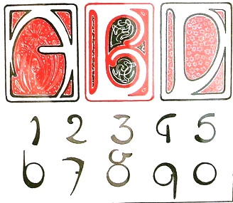 Born in Ivancice, Moravia (Czechia), in 1860, died in Prague in 1939. Famous for his sleek posters of women at the height of the art nouveau movement. In 1885 he studied at the Munich Academy of Art and then moved to the Academie Julian in Paris. In Paris, he took commissions for illustrations, portraits and decorative projects, but became most famous for his poster designs for plays, especially under the patronage of Sarah Bernhardt in the 1890s. The success of his posters led to a commercial career in decorative design for commercial and advertising products. Mucha also created jewelry designs, and briefly taught art in New York. In 1910, Mucha returned to Prague to work on nationalistic art, including murals, postage stamps, stained glass and bank notes.
 Digital fonts that were inspired by Mucha: - Scriptorium published fonts based on his lettering, such as Abaddon, Bernhardt, Slava, Moravia, Gehenna, Princess Hyacinth, Gismonda and Samaritan.
- Herbert Van Brink (aka Character) created a free font called Mucha French Capitals (2010).
- P22 Mucha (2001, P22): an art nouveau font inspired by Alfons Mucha, ca. 1900.
- Lukyan Turetskyy: Modern Wave (2013).
- Dave Ward: Mucha (1999).
- Kiwifrog: The free font Mucha Like (2009).
- Milos Kunst: Mucha (2011, art nouveau).
- Gryzor: Mucha Font.
CV. One of his alphabets. Viennese Secession link. View commercial fonts that descend from Mucha's work. [Google]
[MyFonts]
[More] ⦿
|
Alphonso Edwin Tripp

|
Unconventional artist of the 1930s (b. 1889), who is credited with the art deco typeface Dignity Roman, which was digitized by Nick Curtis in 2002, and called Day Tripper NF, and also in 2000, when it was called Odalisque NF. He also has it as Heavy Tripp. Author of Modern lettering&design (1929, Chicago: Frederick J. Drake&Co. n.). The alphabets shown in his 1929 book: Poster Headline, Poster Strong, Roman Heavy Poster, Speedball Classic, Dignity Roman, Classic Roman, Roman Bold, Forty-five Degree. [Google]
[MyFonts]
[More] ⦿
|
Arktype (was: Atelier René Knip)
[René Knip]

|
 Dutch type designer located in Bloemendaal. Jan Middendorp wrote about him in A.R.K. Ten Years of Type Related Projects 1994-2004 (2004), summarizing Knip's work at Atelier René Knip, mostly experiments in type design. Knip (b. 1963) is a graduate from the St. Joost Academy in Breda, class of 1990. Since 1992, Knip has operated a design studio in Amsterdam, Atelier René Knip.
 Recently, Knip and his brother Edgar formed a new company, Gebroeders Knip, which produces furniture and accessories in which letterforms are integral parts of the objects design. One of his experiments, a unicase typeface with an Arabic feel, was digitized by Nick Curtis as Turban Hey NF (2008). In October 2012, Knip and another Dutch designer cofounded Arktype, but by 2020, the other Dutch designer left that company. Typefaces at Knip's site as of 2020: - Retail faces in the Arktype collection jointly made by René Knip and that other Dutch designer, described as an architectural set of fonts, including many dot matrix, modular, monospaced and stencil typefaces: Square, Double Dot, Radius, Lineup, Brick Caps, Monoline, Street Stencil, Tangram, Tripple Dot, Laundry, Modular, Connect, Triplet, Body Stencil, Mono Roman, Line Dot, Oblong, Random Stencil, Angular, Curtain, Stretch, Concrete, Brick Roman, Unicase, Wood Stick.
- Custom typefaces: Africa Museum, Alphabets, Ark Stencil, BNO Books, Fryslan, Hema tile, Ijburg, Kunsthal, Lindenberg (squarish), Logotype, Marriage (stencil type), Milk (a squarish stencil), Municipal Office (wayfinding, for Den Haag), Nieuwspoort, Nuqat (a pixel script), Old Church 2, RCO Caps, Stitch, Textiellab, WFO.
[Google]
[MyFonts]
[More] ⦿
|
Art deco typefaces by Nick Curtis: I
[Nick Curtis]

|
 Free art deco typefaces by Nick Curtis, made between 1997 and 2003. Nick Curtis also made commercial art deco typefaces, but these will be listed elsewhere.
 - AmstelHeavyNF (2002): based on this poster from 1926 by C. De Haas.
- AmsterdamTangram (2002): based on this poster by Joost Swarte from 1987 entitled "De wereldtentoonstelling van Joost Swarte".
- AnchorSteamNF (2002): based on a poster from 1923 by Wilhelm Poetter.
- Rainbow Bass (1982, Saul Bass) a vertically striped disco style design, was remade by Nick Curtis as Backstage Pass (1999, 2008).
- BeckerBlackNF (2002, 2007): Based on Alf R. Becker's lettering.
- BigAppleNF (2000, 2007).
- BoogieNightsNF, BoogieNightsShadowNF (2002, 2007): based on this poster from 1916 by Paul Hosch and Hans Melching. In 2009, CheapProFonts made a "pro" version.
- BoomerIngueNF (2002, 2007).
- Bric-aBraqueNF (1999, 2007). Bric-a-Braque was based on Cubist Bold (John W. Zimmerman, 1929).
- ChainsawGeometric (1999). Based on this alphabet by Draim (1928).
- ChippewaFallsNF (2002, 2007). Originally called Hiawatha. See this roadside photograph that inspired Nick.
- Coaster Poster (1999).
- DayPosterBlackNF, DayPosterShadowNF (2002, 2007).
- DebonairInlineNF (2000, 2007). The commercial Debonair Inline (2008) is an extension (uppercase, etc.) of Herbert Bayer's 1931 monocase typeface Architype Bayer, also known as the universal moderrn face.
- DecoBordersNF (1999) and DecoDingbatsNF (2000).
- Drumag Studio NF (2003, 2007).
- DustyRoseNF (2000), DustyRoseRevised (2007): Dusty Rose is an art deco typeface based on the logotype for the Dutch magazine Geillustreerd Schildersblad in 1940, by Anton Kurvers. The commercial Dusty Rose NF was published in 2008.
- EastMarket (1999), EastMarketTwoNF (2007).
- GradoGradooNF (2002, 2007): a Bauhaus-style font, based on this 1932 poster by Urbano Corva.
- Great Lakes (2003, 2007), GreatLakesShadowNF (2007): based on this poster by Peter Ewart (1935).
- Heavy Tripp NF, Heavy Tripp Ultra Bold (2001, 2007). Both Day Tripper NF and Heavy Tripp are based on Dignity Roman, a typeface from 1929 by art deco alphabet designer Alphonso E. Tripp.
- HeraldSquareNF, HeraldSquareTwoNF (2002, 2007): a font family based on a design by Welo shown in Studio Handbook for Artists and Advertisers (1927).
- High Five Jive NF, High Five NF (2001, 2007).
- Indochine NF (2003, 2007). Based on this poster by Joseph-Henri Ponchin (1931).
- Ironick-Normal (1999, 2007): an exaggerated Bernhard Modern.
- KerfuffleNF (2000, 2007). Based on this poster by Chris Van Der Hoef (1920).
- KismetNF. A free font. Based on this lettering.
- LabyrinthCapital, Labyrinth (1999, 2007). Based on this poster.
- MetroRetroNF (1999, 2007). MetroRetroRedux (2001, 2010) is a commercial version of that.
- Milton Burlesque NF (2000, 2007).
- Monkey Fingers NF (1999, 2007). Based on an alphabet by Otto Heim published in Farbige Alphabete (1925).
- MunchausenNF (2003, 2007). Based on a poster for an exhibition by Ludwig Heinrich Jungnickel (1911). This is inbetween art deco and art nouveau.
- NickerbockerNF (1999, 2007).
- NightcapCapital, Nightcap NF (1999, 2007). Based on Disque (A. Bardi, 1931).
- OdalisqueNF, OdalisqueRevised (2000, 2007). The commercial versions are Odalisque NF (2008) and Odalisque Stencil (2010). These art deco typefaces are based on Morris Fuller Benton's Chic (1927).
- ParkLaneNF, ParkLaneRevised (2000, 2007).
- PhattPhreddyNF (2001, 2007).
- PinballWhizNF (2002, 2007). Based on this logotype by Joost Swarte for the comic-strip series "Katoen + Pinbal" (1975).
- PlatonickNF (1999, 2007).
- PlugNickelNF (+Black) (1999, 2007): a reworking of Bremen Black, with small caps and a rather skeptical uppercase R added.
- RadioRanchNF (1999, 2007). Adolf Behrmann designed the classical display typeface Rundfunk at Berthold in 1928. This typeface was digitized by Nick Curtis as Radio Ranch NF.
- RaskalnikovNF (2003, 2007). A Cyrillic simulation typeface based on this poster.
- RialtoEngraved, Rialto NF (2000, 2007): a Broadway style art deco face.
- RiotSquadNF (2000, 2007). after a design by Otto Heim from Heim's 1925 book, Farbige Alphabete.
- RitzyRemixNF (2000, 2007). RitzyNormal is based on Tom Carnase's Busorama.
- Seaside Resort NF (2003, 2007). A bilined titling typeface based on a 1933 poster by Italy's Bertarelli Studios.
- SelznickNormal, SelznickRemixNF (1999, 2007). An art deco typeface inspired by movie theaters of the 1930s. Based on ITC Anna (1991, Daniel Pelavin).
- Sesquipedalian, SesquipedalianAlternates (2000, 2007). Inspired by a handlettered logo for Torre's Buckdruckerei in Vienna, circa 1919.
- Sid The Kid NF (1999, 2007).
- Skittles N Beer NF (2007) is based on handlettering on a 1929 brochure for the P&O British-India Steamship Line.
- Standing Room Only NF (1999, 2007). Modeled after Broadway, designed by Morris Fuller Benton for ATF in 1928, originally named Broadway Poster.
- Stony Island NF (2002, 2007). An adaptation of an art deco font called Chicago Modern, designed by lettering artist Alf Becker, whose designs graced the pages of Signs of the Times magazine from the late 30s into the 50s.
- StudebakerNF-Bold, Studebaker (1999, 2007). Based on the lettering on a package for True-Mark Brand Typewriter Ribbons, circa 1938, designer unknown.
- TaraBulbousCapital, TaraBulbousNF (1999, 2007). TaraBulbous NF (the commercial version is from 2008) is a fat-lettered font based on Carlyle-Oring lettering. See also here.
- TitanickDisplayNF (1999, 2007): a remake of the bold pin-striped trilined Dextor by L. Meuffels.
[Google]
[MyFonts]
[More] ⦿
|
Art deco typefaces by Nick Curtis: II
[Nick Curtis]

|
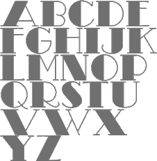 Commercial art deco typefaces by Nick Curtis.
 - Bessie Mae Moocho NF (2002). An art deco font based on handlettering found on a travel brochure for IMM Steamship Lines, circa 1927.
- Blitzkrieg NF (2011). A Lufthansa Airlines baggage label from 1936 provided the inspiration for this genuinely German typeface, with strong art deco influences.
- Blue Jay Way NF (2011). An art deco typeface inspired by Ross F. George. This typeface was used on the Beatles' original Magical Mystery Tour album.
- Boeuf au Joost (2003). Art deco based on work by comic book artist Joost Swarte.
- Boho à Gogo NF (2007): a multiline (op art?) typeface inspired by Bauhaus.
- Chalk and Cheese NF (2004). This art deco uppercase is based on 1930s lettering by French poster artist Charles Loupot (based on this art deco poster), and the non-art deco lowercase is based on 1910s lettering by German plakatmeister Ludwig Hohlwein.
- Chemin de Fer NF (2005). An art deco shadowed outline face.
- Chi Town NF (2008) is a heavy art deco creation that is based on a 1931 poster for the film The Man from Chicago.
- Coochie Nando NF (2011). An art deco shadow caps face, after a typeface called Kitchen by Milton Glaser.
- Dooijes Deco NF (2010). A 3-style art deco family in the style of Broadway, based on the Dick Dooijes tryptich, Carlton, Bristol (1929) and Savoy (1936).
- Duck Soup (2003, after a 1928 poster by Italian designer Neri Nanetti for Snob Cognac).
- Elektromoto NF (2011). This family takes its inspiration from two early Art Deco typefaces from Germany. The Normal version is based on Dynamo, designed by K. Sommer for Ludwig&Mayer in 1930, while the Narrow version is based on Stadion, designed by Erhard Grundeis for Die Schriftguß AG in 1929. Their common design motifs epitomize the Age of Streamline.
- Humpty Dumpling NF (2010). A fat art deco typeface based on an offering from the irrepressible M. Draim, seen in La Lettre dans le Décor&la Publicité Modernes, published by Monrocq Frères of Paris in 1932).
- Dusty Rose (2008) is an art deco typeface based on the logotype for the Dutch magazine Geillustreerd Schildersblad in 1940.
- Edgewise (2007), a quirky well-rounded post-art deco and pre-psychedelic face, uses ideas from Ryter Night (VGC).
- Ege Schrift NF (2011). a faithful revival of Ege-Schrift (1921, Eduard Ege), a mix between Mexican party lettering and art deco.
- Engel Stabenschrift NF (2008). In 1927, Ernst Engel created an art deco typeface which was revived by Nick Curtis as Engel Stabenschrift NF.
- Faerie Queen NF (2006). Based on an art deco typeface named Titania made in 1933 by Fundición Richard Gans.
- The Reed and Fox typefaces Viennese and Corinthian were combined in 2014 in Nick Curtis's digital typeface Genever NF.
- Gotham Rail Company NF (2002). Art deco based on an Italian travel poster from 1931.
- Great Lakes Shadow (2008) is an art deco typeface based on a 1930s travel poster for the Canadian pacific Railway.
- Hunky Dory NF (2014). A circus font after William H. Page's wood type Doric, ca. 1850.
- Jazzfest NF and Tinseltown NF (2009). Based on the 1932 art deco typefaces Newport and Hollywood, respectively, both designed by Willard T. Sniffin for ATF.
- Kharon Ultra (2009). An art deco typeface based on Ludlow Stygian.
- Kinkajou Stew (2003). Image of Kinkajou NF.
- Kirschwasser NF (2005). A bubbly art deco face.
- Korner Deli NF (2006, art deco).
- Kymmera Deco NF (2011). Revival and redesign of Rainbow Bass (1982, saul Bass).
- La Reyna Catalina NF (2006). An art deco face based on Aragón, designed by Enric Crous-Vidal.
- Legnano Cuneo NF and Legnano Sassari NF (2014). Italian art deco wood type.
- Linea Nera NF (2011). Based on Wolf Magin's Black Line (1976, Berthold).
- Lodewijk Gothic NF. After Elzevir Gothic (ATF, 1897).
- Luben Tunen (2008) is another art deco face.
- Madison Squared NF (2012).
- Mighty Ditey (2007): a mix between art deco and Peignot, this elegant typeface is based on a 1970s Photolettering typeface by Richard Nebiolo called Aphrodite, and competes with Riesling (1994, Bright Ideas) and Gillespie (2015, Darren Odden) as revivals of Aphrodite.
- Mogzilla NF (2007) is an ultra fat art deco face.
- Monte Carlo Script NF (2002). An art deco font based on a font called Médicis from a Deberny and Peignot catalog, circa 1920.
- Nip&Tuck (2006).
- Odalisque NF (2008, +Stencil, 2010) are art deco fonts based on Morris Fuller Benton's Chic (1927).
- OK Chorale (2003). An art deco typeface based on Carl Holmes' ABC of Lettering book.
- Orchard Street NF (2011, +Inline). A pair of art deco caps typefaces inspired by one of many posters produced by the WPA by anonymous artists during the 1930s.
- Pentaprism NF (2011). Part Futura, part Bauhaus, this 5-style family has multiline, inline, and other variants.
- Picture Postcard NF (2004: based on an alphabet by Alf Becker).
- Raconteur NF (2006-2008) is a wonderful art deco typeface that shouts gin fizz and high heels: it takes its inspiration from a 1923 ad for Piera Nova, designed by Hernando G. Villa.
- Quoi Chou NF (2006). An elegant and quite original beefed-up version of Bernhard Fashion by Lucian Bernhard.
- Radio Days (2008). An art deco typeface based on 1930s logotype lettering for Crosley Radios.
- Rassetta NF and Rassetta Swash Caps NF (2005). An art deco pair of typefaces originally designed by Willard T. Sniffin for American Type Founders in 1931 under the name Rosetti.
- Renard Moderne NF (2010). An art deco typeface inspired by Sol Hess's 1940s typeface Twentieth Century Poster.
- Resolute NF or USA Resolute NF (2009). An all caps fat headline typeface based on Morris Fuller Benton's Eagle, ATF, 1934.
- Retrorocket NF (2015). An art deco alphabet based on a French lettering chapbook entitled Art du Tracé Rationnel de la Lettre (1934, D. Duvillé).
- Salzmann Deco NF (2011) and Salzmann Deco Deco NF (2011), art deco and Mexican-themed typefaces, modeled after Max Salzmann's Dolmen (1921-1922) and Zierdolmen (1922), respectively.
- Secret Agent (2003). A pure art deco beauty based on this Loupot poster from 1919.
- Ski Alpin NF (2014). An art deco typeface based on a Swiss travel poster from 1927.
- Smart Frocks NF (2008). A Peignotian face, after a shop sign in London, ca. 1930. Designer unknown.
- Stony Island NF (2011). Based on an Alf R. Becker typeface from 1935 called Chicago Modern Thick and Thin.
- Suave Sam NF (2010). An art deco typeface after a 1930 alphabet by Samuel Welo.
- Tasneem (2007) is the ultimate art deco face, originally drawn by Gustav Jensen in 1931.
- Tiny Bubbles NF (2008). An art deco typeface inspired by an alphabet in Pen&Brush Lettering and Practical Alphabets (Blandford Press, Ltd., London, 1929).
- Top Kick NF (2011). Based on Concentra, a geometric marvel with several parallel and concentric lines making up the letters. Concentra was originally published in Schriftatlas: Alphabete von A bis Z .
- Turista Gorda NF (2009). Based on Baltimore Type Foundry's Airport Tourist, which in turn was influenced by Futura Display.
[Google]
[MyFonts]
[More] ⦿
|
Art nouveau typefaces by Nick Curtis
[Nick Curtis]

|
 Art nouveau revivals by Nick Curtis include the following free typefaces.
 - Bala Cynwyd NF (2001, 2007) is an Arts&Crafts style poster typeface inspired by lettering of Dard Hunter.
- MadisonSquareIncised, MadisonSquareNF (2001, 2007).
- MunchausenNF (2003, 2007). Based on a poster for an exhibition by Ludwig Heinrich Jungnickel (1911). This is inbetween art deco and art nouveau.
- RivannaNF (2002, arts and crafts style): Rivanna NF revives Max Joseph Gradl's Gradl Zierschriften, an art nouveau typeface from 1903. Rivanna NF Pro was done in 2010 by CheapProFonts.
- Runy-Tunes, RunyTunesRevisited (1999, 2001, 2007).
- SmorgasbordNF (2003, 2007). Based on this poster by André C. de Takacs (1912).
- TobaccoRoadNF (2002, 2007). This is based on a poster for an art exhibition, designed by Eva Volkel in 1912. It is typical of style of the Austrian Secession school---combining medieval forms with late art nouveau styles.
- ValleyGrrrlNF (2003, 2007). ValleyGrrrlNF (Nick Curtis) is based on Johann Cissarz's poster lettering in Erste Hoehenluft Radfahr-Bahn (1897).
There are also commercial art nouveau typefaces: - Abbey Road NF. After Joseph W. Phinney's Abbey Old Stytle (1901).
- Aint Baroque NF (2009). An art nouveau/psychedelic-style variation on Milton Glaser's Baby Teeth Baroque from 1968.
- Deukalion NF (2006). A fun art nouveau headline face.
- Elefantasia NF (2012) is based on Elefanta, a font by the Karl Brendler & Söhne foundry in Vienna.
- Foxcroft and Foxcroft Shaded (2005). An art nouveau family based on Vassar (1887, Farmer, Little&Co).
- Graphic Stylin NF (2006). A script stencil typeface with an art nouveau feel.
- Half Full NF (2011). A bold weight of Glass Antiqua (Franz Paul Glass, 1912, Genzsch&Heyse).
- Hupp Antiqua NF (2006). A gorgeous display typeface pair first done in 1909 by Otto Hupp for Klingspor. This one has a Basque A.
- Inglenook Corner NF (2005). Based on the lettering of Laurence Schall, as presented in Lewis F. Day's 1910 classic, Alphabets Old and New.
- Jugendstil Borders NF (2011).
- Millrich Moravian NF (2010). A revival of Bohemian (1918, a jugendstil typeface by Miller&Richard). Millrich Olivian NF (2014) revives Olivian.
- One Good Urn NF (2005). Based on the art nouveau lettering of J. M. Bergling in Art Alphabets and Lettering (1914).
- Petrushka NF (2012): based on the art nouveau typeface Petrarka (1900, Schelter & Giesecke).
- Rough Cut NF (2006, linocut). A grunged up version of the art nouveau typeface Daphne.
- Schweimann Moderne NF (2014).
[Google]
[MyFonts]
[More] ⦿
|
ATF 1923 Catalog: Artcraft Series
[Robert Wiebking]
|
 Showcasing the best pages from the Artcraft Series in the ATF 1923 Catalog. Artcraft&Bold&Italic are display typefaces originally designed for Barnhart Bros&Spindler by Robert Wiebking (1911-1913). Jaspert lists Artcraft as a 1930 publication at Ludlow, and Klingspor as Western Type Foundry typefaces from 1911 until 1913. Mac McGrew: Artcraft was designed in 1912 by Robert Wiebking and featured under the name of Craftsman in the first ad for his short-lived Advance Type Foundry, operated by Wiebking, Hardinge&Company, in Chicago. A short time later, the typeface was advertised as Art-Craft, and later as one word---Artcraft. Advance was soon taken over by Western Type Foundry, for whom Wiebking designed Artcraft Italic and Artcraft Bold a year or two later. Western in turn was taken over by Barnhart Brothers&Spindler in 1918. BB&S was already owned by ATF but operated separately until 1929; in the meantime, though, Artcraft and a number of other typefaces were shown in ATF specimens as well as those of BB&S. Artcraft has an unusual roundness in some of its serifs and line endings and a line of it produces a rolling feeling; some characters have curlicues, such as the long curl at the top of the a and and the exaggerated ear on the g. A number of auxiliary characters were made for roman and italic fonts; as these were sold separately, they were overlooked by many printers and typographers. The boldface has fewer eccentricities. Artcraft was a popular typeface for a number of years; the roman was copied by Monotype in 1929 without the fancy characters, and all three typefaces were copied by Ludlow. Adaptation in 1924 of Artcraft Italic to the standard 17-degree slant of Ludlow italic matrices was the second assignment of Robert H. Middleton (after Eusebius, q.v.) at that company. Hansen called it Graphic Arts. One source attributes the Artcraft family to Edmund C. Fischer, otherwise unidentified, but the details stated here are more generally accepted and seem to fit known facts better.
 Digital versions: [Google]
[More] ⦿
|
ATF 1923 Catalog: Parsons
[Will Ransom]
|
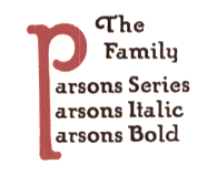 Showcasing the best pages from the Parsons Series in the ATF 1923 Catalog. This is an original ATF display typeface (via its acquisition of BB&S) with a hand-drawn almost art nouveau look. Created in 1918 by Will Ransom for Barnhart Brothers&Spindler, it was named after the artistic director of a Chicago-based department store.
 Mac McGrew: Parsons was designed for BB&S in 1917 by Will Ransom, Chicago artist based on the distinctive style of lettering he had been doing for advertisers in that city, and was named for I. R. Parsons, advertising manager of a Chicago department store. It is nearly monotone, but with a hand-lettered quality. It has unusual half-serifs and unique forms to a number of letters. The caps MNUY have a lowercase design, but at the insistence of users a more conventional form of M and N was added by the foundry, to the distress of the designer. Parsons Italic and Parsons Bold were added in 1918 by the same artist. Oversize ascenders and descenders are one of the most notable features of this type, but Ransom was reluctant to let the foundry cut them. At his insistence the foundry included with specimens a warning that generally only one such letter should be used in a line, and suggesting other restrictions. The type was a great success but the suggestions were commonly ignored, and advertising bristled with groves of tall letters. It is said that this display of bad taste in the use of his design dismayed Ransom so much that he abandoned the idea of designing other typefaces. Only Clearcut Shaded Capitals, in 1924, are later credited to him, aside from decorative material. Parsons is believed to be the first typeface to feature long characters of this sort although several artists had used them in distinctive hand-lettering. At least one typeface---Pencraft (q.v.)---had earlier supplied flourishes which could be added to special ascenders and descenders. Stymie Bold (q.v.) resurrected the idea later but less successfully. The Parsons long characters were included in all fonts; f-ligatures were made for all sizes of italic, but only up to 18-point in the roman and not at all for the bold. Monotype lists "Parson's Bold" in some of its literature; this is presumed to be the same typeface but no confirmation or specimen has been found. Parsons Swash Initials were designed by Sidney Gaunt; some of them were not approved by Ransom but were cast anyway. Digitizations include AIParsons (1994) by Inna Gertsberg and Susan Everett at Alphabets Inc. Nick Curtis' Parsnip family (2004) is based on Parsons. Jess Latham also digitized Parsons. See also OPTI Puritan Bold Flair in the Castcraft collection. Finally, Dieter Steffmann converted the Gertsberg / Everett revival in 1999 to truetype while keeping the name AI Parsons. [Google]
[More] ⦿
|
Baker and Greele Type Foundry

|
Boston-based foundry dating from the 19th century. Nick Curtis made the Western billboard typeface New Boston WBW (2004) based on a 1826 Baker and Greele face. Baker and Greele were the first to cast some native Indian type. For example, in 1827-1829, they cast type for the Cherokee script, a syllabary composed of 85 unique glyphs, each representing a distinct phonetic component. This syllabary was invented by Sequoyah [or George Guess, or Gist, 1760-1843] in 1809. Of the characters finally used, only a few actually retain the original shape, or derivatives thereof. Those sharing Latinate forms may or may not have been suggested by the Rev. Samuel Worcester, who helped Sequoyah to improve and finally adapt the script for use as foundry type. Wm. Joseph Thomas from the Joyner Library of East Carolina University, Greenville, NC, writes; "I know that the American Board of Commissioners for Foreign Missions, which was also headquartered in Boston, arranged for the types to be cast, and they ordered a press to be sent to the Cherokee Nation. The first known printing in the syllabary was December 1827 in the Missionary Herald; the types and press were shipped to the Cherokee Nation in November 1827, according to letters between the ABCFM and the missionary in C.N. The Cherokees began printing their newspaper, the Cherokee Phoenix in February 1828." Harvard has an old type specimen book: "Specimen of printing types and metal ornaments, cast at the New England Type Foundry by Greele & Willis, Congress Street, Boston" (New England Type and Stereotype Foundry, Boston: Beals, Homer & Co., Printers, 1828). In this book, most specimens have imprint: Baker & Greele, Boston, some dated. [Google]
[MyFonts]
[More] ⦿
|
Baltimore Type Foundry (or: Baltotype)
[Herbert F. Czarnowsky]
|
Also known as Fielding Lucas, Jr., Lucas Bros., H.L. Pelouze&Son, and Chas. J. Cary&Co. Specimen may be found in Convenient Specimen Book of Type, Rules, Borders, and Electrotype Cuts from the Baltimore Type Foundry (Baltimore: Chas. J. Cary&Co., 1888. Banta Book of Types&Typographical Tips. Menasha: George Banta, 1961). The company existed until well into the 20th century, and published a catalog as late as 1957 called Type and Rule Catalogue 13, Baltotype. A selected list of typefaces: - Airport Gothic: Turista Gorda NF (2009, Nick Curtis) is based on Baltimore Type Foundry's Airport Tourist which in turn used ideas from Renner's 1932 typeface Futura Display. Mc McGrew on Airport Gothic: Most of this series is the first American copy of Futura, which originated in Germany in 1927, designed by Paul Renner for Bauer. One source says it was cut from original Futura drawings, smuggled out of that country, but it seems more likely that matrices were made by electrotyping the imported type. An extrabold weight, Airport Black, was cut by Baltimore about 1943; information on this cutting is scarce and contradictory- one account says it was designed by Bill Stremic or Bill Blakefield, another that it was designed by Carl Hupie (or Hooper), and cut by Herman Schnoor. There is also Airport Black Condensed Title and Airport Broad. The latter is a modification of Airport Black, cut 50 percent wider on the pantagraph by Herman Schnoor. Baltimore later cast some of its Airport series from Monotype Twentieth Century matrices, and in a few cases listed both series. Airport Relief, Baltimore 299, is English Monotype Gill Sans Cameo Ruled, while Airport Tourist, Baltimore 602, is Futura Display, cast from electrotype mats of the German foundry type.
- Baltimore Script (1955). Mac McGrew: Baltimore Script is a fancy style designed by Tommy Thompson and cut by George Battee for Baltimore Type in 1955. The lowercase follows the general style of a script letter hand-written with a broad pen, although the inclination is slight and the letters don't quite connect. Capitals are flourished. It is suitable for stationery, announcements, and greeting cards, but its range of small sizes is hardly enough for advertising use.
- Mac McGrew: Czarin and Czarin Title were produced by Baltimore Type&Composition Corporation about 1948, the name being derived from the Czarnowsky family which owned the foundry. Czarin Title, issued first, is a copy of Offenbach Medium, a set of pen-drawn capitals designed by Rudolf Koch about 1935 for the Klingspor foundry in Germany. Czarin has minor changes in a few characters, but adds a lowercase, designed by Edwin W. Shaar, that is substantially different from that of Steel, the cap-and-lowercase version of Offenbach. The new lowercase harmonizes well with the capitals, and makes a handsome appearance. Compare Lydian. Footnote: McGrew spelled the name of the owner as Czarnowski. Irene Traeger, the granddaughter of Herbert F. Czarnowsky, pointed out the incorrect spelling to me.
- Mac McGrew: Elegante is a decorative, nearly monotone typeface cut by George Battee for Baltimore Type, after the German typeface Sensation of 1913, from Foundry Heinrich Hoffmeister. It is upright, with flourished caps and loops on some of the ascenders and descenders, and is suitable particularly for announcements and personal stationery. Compare Greeting Monotone.
- Mac McGrew: Emperor is a 1957 adaptation by Baltimore Type of Wide Latin which was cut by Stephenson Blake in England and related to nineteenth-century typefaces under other names. However, this Baltimore Type version has been modified and resized, and is less successful due to excess space between letters (although not as much as in the specimen shown here, which is letterspaced). Emperor was originally shown as Imperial.
- Their geometric series from 1884 became famous, and was often imitated. HiH created two font families based on it: Teutonia (2007) and Baltimore Geometric (2008, a revival of Antique Geometric by Baltimore Type Foundry, 1883). HiH writes: Roos&Junge of Offenbach am Main in Germany produced Teutonia in a "back-to-basics" effort that has seen many quite similar attempts in the field of topography. In 1883, Baltimore Type Foundry released its Geometric series. In 1910, Geza Farago in Budapest used a similar letter design on a Tungsram light bulb poster. In 1919 Theo van Doesburg, a founder with Mondrian and others of the De Stijl movement, designed an alphabet using rectangles only -- no diagonals. In 1923 Joost Schmidt at Bauhaus in Weimar took the same approach for a Constructivist exhibit poster. The 1996 Agfatype Collection catalog lists a Geometric in light, bold and italic that is very close to the old Baltimore version. Even though none of these designs took the world by storm, they all made a contribution to our understanding of letterforms and how we use them.
- Mac McGrew: Greco Bold and Italic are Spanish typefaces of the mid-1920s. They are very heavy, with long ascenders and small x-height, and have a hand-lettered appearance. Linotype Vulcan (q.v.) is equivalent. National Matrix&Type Co. in Baltimore, one of several independent companies which made matrices for the popular casting machines, offered Greco Bold in 1929 as its series 100; this was the source of Baltimore Type's mats, but Baltimore and some other sources cast Greco Bold and Italic as series 326-3261. These numbers have not been found in Monotype literature; perhaps another independent source also made mats. Notice the figures, which are termed hanging or old style, although they do not follow the usual form. However, taller 1, 2, and 0 are also available to convert the set to lining figurees. Compare Hess Monoblack. Greco Adornado, an ornamented version, has also been imported.
- Mac McGrew: Homewood is a recutting by Baltimore Type of Metropolis Lined, a German typeface of the 1930s. It was made from a large size of Metropolis Bold, with the fine white lines cut in, and differs from the original in minor details of the curves. Other sizes were cut by pantagraph and do not necessarily match original sizes.
- IBM Executive Modern, a typewriter type.
- Mac McGrew: Mademoiselle was designed by Tommy Thompson in 1953 as a display typeface for Mademoiselle magazine. It was cut by Herman Schnoor at Baltimore Type, which also offered fonts for general sale. It is a delicate, narrow modern roman, with long ascenders and short descenders, rather loosely fitted, and works well for display with transitional text typefaces such as Bulmer and Scotch Roman. Both lining and oldstyle figures are provided, along with several pointing hands as shown.
- Tourist Extra Condensed. Turista Flaca NF (2009, Nick Curtis) is based on Tourist Extra Condensed. McGrew: Tourist Extra Condensed of Baltimore Type is a copy of Phenix (q.v.) in 24- to 48-point sizes, and is Jefferson Gothic (q.v.) in larger sizes. Phenix is a 1935 ATF typeface by Morris Fuller Benton.
- Mac McGrew: Trend is a brush-lettered typeface cut by Baltimore in 1953. It is very similar to Dom Casual (q.v.), but has a slight back slant.
- Mac McGrew: Trylon as made by Baltimore Type was a 1949 copy of Stephenson Blake's Playbill (see Imports in Appendix), but Trylon Shaded and Trylon Shaded Oblique were designed and cut by George Battee of the Baltimore foundry. The solid version has lowercase in some sizes; it is somewhat similar to P. T. Barnum, with greatly exaggerated horizontal strokes and serifs at top and bottom, but is heavier and narrower. The Shaded versions are more properly outlines of the same design, with a small shadow effect at the top (which is unusual) and right of each letter, but without lowercase.
- Mac McGrew: Vernen is essentially a copy of Huxley Vertical (q.v.), but omitting the round characters AKMNWY and using the alternate pointed characters instead. In addition, the slight extensions of cross strokes to the left of stems have been omitted, and a few other characters have been redrawn. It was offered by Baltimore in 1953.
- Mc McGrew: Vista is a very wide square-serif face, cut by Baltimore Type in 1956. It is said to be a pantagraphic modification of Hellenic Wide from Bauer in Germany; actually it does not match that typeface in details, though it has the same general effect.
- Mac McGrew: Wide Line Gothic is a creation of Herman Schnoor for Baltimore Type, modified by pantagraph from Philadelphia Lining Gothic, increasing the width by about 50 percent. The flat sides of round letters. acceptable in the moderately condensed original, make awkward shapes in this extended version. Compare Franklin Gothic Wide, Tempo Black Extended.
- Among the wood types, we have Oak Leaf (1832, ornamental caps).
Rich Hopkins, a printing historian, acquired Baltotype ca. 1993. Based on drawings from the 1950s in the Baltotype material, Miranda Roth at P22 designed LTC Athena, a narrow art deco typeface, in 2013. [Google]
[More] ⦿
|
Barbara Lind

|
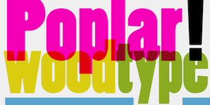 Designer of some Western-themed typefaces at Adobe in the 1990s. These include
 - Poplar (1990, after a 19th century wood type typeface by William Leavenworth). Poplar has these digital versions made by Nick Curtis: Copper Canyon WBW Demi Bold, Copper Canyon WBW, and Copper Canyon Inline WBW.
- Madrone (1991, a spaghetti western face---a fat typeface didone, Madrone was digitized from proofs of the wood type collection in the National Museum of American History in the Smithsonian Institution in Washington, D.C.).
- Adobe Wood Type Ornaments (1990-1991 with Joy Redick).
- Cottonwood (1989, with Kim Buker Chansler and Joy Redick).
Linotype link. FontShop link. Typedia link. View Barbara Lind's typefaces. Klingspor link. [Google]
[MyFonts]
[More] ⦿
|
Barnhart Brothers&Spindler (or: BB&S)

|
 Chicago-based foundry, which grew out of The Great Western Type Foundry in 1868 when the Barnhart brothers (newspaper publishers in Iowa who came to Chicago as advertising agents) bought out the Toepfer family in 1868. They retained Herman Spindler as the foreman, since he was the only typefounder in the group. Aggressive in business, BB&S became the largest foundry in Chicago. Book of type specimens. Comprising a large variety of superior copper-mixed types, rules, borders, galleys, printing presses, electric-welded chases, paper and card cutters, wood goods, book binding machinery etc., together with valuable information to the craft. Specimen book no.9 (1907) is a 1048-page monster catalog (see also here and here and here). Some pictures from Type Barnhart Type Foundry Co. New York City: Superior Copper-Mixed Type (1908). In 1913, they published Preferred Type Faces.
 BB&S was purchased by ATF about 1911 and it operated independently until about 1930. Typophile page on them. Text file with a list of the typefaces in their Catalog 25 (1925). Discussion of some of their typefaces and digitizations: - Engravers Upright Script, a ronde style alphabet, was revived in 2006 by Nick Curtis as Bon Mot NF.
- Hazel Script, a primary school didactic connected script, digitized in 2006 by Paul Hunt as P22 Allyson (discussed here).
- They made the (sloppy) old-look garalde typeface Fifteenth Century in 1897, which turned into Caslon Antique (American Type Founders). A digital version can be had at MyFonts, but who made it? MyFonts also offers Caslon Open Face (originally, 1915).
- One of their best known designers was Oswald B. Cooper who made Cooper Black (1921) and Cooper Old Style (1919-1924), with characteristically blurred rounded serifs. He also made Cooper Hilite (shaded), Cooper 570 (fat), Cooper 579 (outline), Cooper Tooled Italic (shaded) and Cooper Black Italic 571.
- Delysian NF (2004, Nick Curtis) revives their Greeting Card typeface from the BBS catalog of 1923.
- Lining Gothic No. 71 (1907) is a grotesque typeface with panache. It was digitized by Nick Curtis as Cerulean NF (2007).
- Mazurka NF (2004, Nick Curtis) is a combination of two typefaces from the same catalog, Swagger Capitals, designed by Carl S. Junge, for the uppercase and Gothic Novelty Title for the lowercase.
- Racine (1903) was revived by Nick Curtis as Kenosha Antique (2004).
- Archer (1905) was revived by Nick Curtis as Grand Rapids (2005).
- Umbra (1907) was revived by Nick Curtis as Shady Lady NF (2005). Monotype's Umbra is based on a later metal version by Ludlow though.
- One of their blackletter typefaces is Waldorf Text (1914).
- Steelplate, a monocase engraved US dollar bill-style face, ca. 1900 at BBS, was revived by Nick Curtis as Smackeroo NF (2005).
- Ernst Lauschke designed the oriental look typeface Dormer in 1888 at the Great Western Foundry. BB&S renamed it Pekin. HiH digitized it in 2005. Pekin also is the name of Dan Solo's revival.
- Freak (1889, The Great Western Type Foundry) was renamed Bamboo by BB&S. A digital version by Tom Wallace is also called Freak (2005).
- Parsons (1918, Will Ransom) was digitized by Jess Latham.
- Wedge Gothic ML (1893). An oriental simulation font. It was not in the 1907 catalog but reappeared in 1925 as Japanette. According to McGrew, Wedge Gothic was originally created for the Chicago Herald newspaper. Digital versions: Japanette (Infinitype), OPTI Japanette 5 (CastCraft), Wedge Gothic (2010, Tom Wallace), Japanette (2012, SoftMaker).
- Clearcut Shaded Capitals (1920s, Will Ransom). Extended to a full font by Nick Curtis in 2005 as Ransom Clearcut NF).
- Dotted Roman (1897, a Victorian typeface) was revived as Miss Dottie NF by Nick Curtis in 2014.
- The decorative wood type typeface French Antique, featured in the 1905 catalog, and originally due to William H. Page. Digital versions by Woodentype (Jordan Davies) and Nick Curtis (whose version of French Antique Extended is called Fran Tique NF (2008)).
- The wedge-serifed typeface Vulcan (1884) was revived by Nick Curtis in 2014 as Vulkan NF.
- Jeff Levine's Millinery JNL (2022) is based on the art nouveau font Sterling showcased in the 1907 Barnhart Brothers & Spindler specimen book.
Wiki page. List of all BB&S typefaces compiled by the American Amateur Press Association in 2009. This includes a PDF file and an Excel spreadsheet. Digital typefaces that descend from Barnhart / BBS. [Google]
[MyFonts]
[More] ⦿
|
Barry Deutsch
|
 Born in Brooklyn in 1940, he graduated from New York City Community College. Barry worked for Sandgren & Murtha, New York as a graphic designer.
 Creator of typefaces at VGC, such as Deutsch Black (1966). This unicase piano key typeface was revived in digital format by Nick Curtis as Blackbarry NF (2011). [Google]
[More] ⦿
|
Bitstream

|
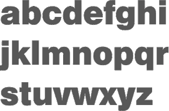 Founded in 1981 by Mike Parker, Matthew Carter, Cheri Cone, and Rob Freedman, Bitstream is the first digital font foundry. Not without controversy, though, as many claim that the original digital collection was an illegal copy of Linotype fonts [Note: I disagree with that statement--take out "illegal"]. In 1999, Bitstream created MyFonts.com, a web site for finding, trying, and buying fonts on line. Bitstream was headquartered in Cambridge, Massachusetts, and led dfior some time by CEO Anne Chagnon.
 Bitstream wrote on the origins of the collection: The Bitstream Typeface Library was developed under the supervision of Matthew Carter, the creator of such esteemed typefaces as ITC Galliard; Snell, Bitstream Charter and Swiss Compressed. Carter, who also serves as Bitstream's Senior Vice President of Design, set uncommonly high standards for the company's highly-skilled design staff. Working from the earliest-generation artwork available, each character of every typeface is hand-digitized on advanced workstations specially programmed by Bitstream's engineers. In building the library, Carter has overseen the licensing of typefaces from such respected international sources as the International Typeface Corporation (ITC), Kingsley-ATF Type Corporation, and Fundicion Tipografica Neufville SA, among others. Bitstream also develops new and original designs. Many countries provide for the legal protection of typeface names only, not the designs themselves. This means that the original names of many typefaces can only be used with a license from the owner. The majority of Bitstream typefaces in this catalog have licensed names (on which royalties are paid), or have historical names that reside in the public domain, or have names to which Bitstream owns the rights. In these cases, the name is used. When the original name is not available for use by Bitstream, an alternative name appears. For example, Swiss 721 is the name that Bitstream uses for its version of the typeface popularly known as Helvetica? Because the original name of that typeface is not widely licensed, there are many offerings of the design with completely different names. It is important to note that the use of an alternative name has no bearing on the inherent quality or authenticity of the typeface design. Bitstream sold a nice 500-font CD for 39 USD around 1996, with all the great text families. This was a fantastic buy, as proved by this quote from John Hudson: I have said it before and I will say it again: I think the development of the original Bitstream library was one of the worst instances of piracy in the history of type, and it has set the tone for the disrespect for type shown today. (A bit of background: Bitstream asked Linotype if they could digitize Linotype's library of fonts. Linotype refused, but Bitstream went ahead anyway.) On this issue, read these pages by Ulrich Stiehl and Typophile. Bitstream was offering a 250-font CD. Type Odyssey Font CD (2001). Bitstream has added Greek, Cyrillic, OldStyle versions to many of its families. New releases in July 2001: Artane Elongated, Cavalero, Drescher Grotesk BT, FM Falling Leaves Moon, FM Rustling Branches Moon, Picayune Intelligence (by Nick Curtis), Raven, Richfont, Rina, Sissy Boy, Stingwire, Tannarin. In November 2001, Serious Magic entered into a long-term agreement to license 25 Bitstream outline fonts for its new visual communication products. Bitstream has been an exemplary corporate citizen, occasionally producing license-free fonts for the masses, such as their Vera collection. Bitstream's own overstated blurb about itself: Bitstream Inc. (NASDAQ: BITS) is a software development company that makes communications compelling. Bitstream enables customers worldwide to render high-quality text, browse the Web on wireless devices, select from the largest collection of fonts online, and customize documents over the Internet. Its core competencies include fonts and font technology, browsing technology, and publishing technology. Finally, together with its spin-off, MyFonts, Bitstream was sold to Monotype Imaging in 2011. Catalog of typefaces [large web page warning]. [Google]
[MyFonts]
[More] ⦿
|
Blackfriars Type Foundry
|
 Type foundry in the early 20th century in London. Their typeface Richmond Oldstyle (1920s) was imitated by Sylvester A. Cypress in the phototype Wembley, which in turn was digitized by Joe Treacy (Treacyfaces) as Wembley TF. Novel Fonts revived Richmond Oldstyle as Valhalla in 1994. Nick Curtis revived Richmond Oldstyle as Rowan Oak NF (2007). In 2009, Nick Curtis digitized Whitefriars NF. [Google]
[More] ⦿
|
Blake Type Foundry
|
British type foundry in the late 19th century. One of its types, Blackfriars, was digitally revived by Nick Curtis as Drury Lane in 2007. [Google]
[More] ⦿
|
Boston Breton
|
 Mac McGrew: Boston Breton was introduced by ATF about 1900. It was redrawn from the earlier Breton, originated by one of ATF's predecessors, the Boston Type Foundry, in the early or mid-1890s. It is a bold, rather wide square-serif face, suggestive of Stymie Bold which came thirty-some years later. But its large lowercase and short ascenders are suggestive also of the modifications designers have given such typefaces in phototype adaptations, seventy years or more later. Boston Breton Condensed and Extra Condensed came from the same source in 1909 or earlier. All have the same unusual sort of Q. In 2011, Nick Curtis created a digital version called Boston Breton NF. [Google]
[More] ⦿
|
Boston Type Foundry
[Edward Pelouze]

|
 Boston-based foundry, est. 1817 by Edward Pelouze. Also called Bedlington&Ewer, Boston Type&Stereotype Co. (1825-1845), and John K. Rogers, Agent (the latter happened when it was bought by John K. Rogers and Edward Pelouze in 1853). Acquired by ATF in 1892.
 Free specimen books: Condensed specimen book from the Boston Type Foundry (1860, John K. Rogers&Co, Boston), Popular designs for artistic printers. Selected from the novelties manufactured by the Central type foundry, of St. Louis and Boston type foundry, of Boston. The only manufacturers of copper alloy type (1892). Digital revivals: View digital typefaces derived from the Boston Type Foundry. [Google]
[MyFonts]
[More] ⦿
|
Büro für Gestaltung Janssen
[Daniel Janssen]

|
 Büro für Gestaltung Janssen, or Janssen Design, is located in Hamburg. It is involved in print, screen, animation, corporate and type design, and was founded in 2002 by Sylvia and Daniel Janssen. Together, they designed these typefaces:
 - Bias Regular (2008, T-26). An experimental pixel-based face.
- Gretel (2005, Fountain), a cross-stitch pattern font.
- Loop (2005, T-26).
- Kaa, a multilined hypnotizing face. This and some other typefaces are also available at T-26.
- Engel (2003, At T-26). See also here.
- Vitus (2003, Fountain: Vitus is a bold typeface with occasional delicate strokes. It'a based on a typeface found on one of the million mark notes released during the inflation in the 1920's). See also here.
- Emily, a connected script font, with some borders. Designed in 2003 with Sylvia Janssen, it is similar to Monte Carlo Script NF (2002, Nick Curtis), and both are based on a font called Medicis by Deberny and Peignot, ca. 1920.
- AF Nitro, a techno/LED collection of typefaces.
- Diavolo, a fifties diner face.
- Unovis, a minimalist squarish typeface with hard to distinguish u, n and v lower case characters.
- Sektor, a sans face.
- Sonar, a display sans.
- Masina, a simple geometric sans.
- Cash (no idea what this looks like).
- Initialen, a 21st century initial caps face.
- EF Gigant, a 96-weight techno family (Elsner and Flake, 2006).
- Emily: a connected upright script available from T26.
- Atlantik: six sets of line elements, sold by Veer and Fountain. The Atlantik typeface is a result of a poster design made for the Habour Museum Hamburg.
- Diago (2008, T-26): a striped op art sans.
- Oceane (2009, T-26). An avant-garde face.
- Karl (2010, T26). A script face.
FontShop link. Klingspor link. T26 link. View Daniel Janssen's typefaces. [Google]
[MyFonts]
[More] ⦿
|
Cabarga type (was: Flashfonts)
[Leslie Cabarga]

|
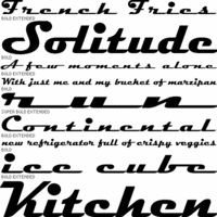 Flashfonts was Zavier Leslie Cabarga's Los Angeles-based foundry. Leslie Cabarga is a baby boomer from New Jersey and author of The Lettering and Graphic Design of F.G. Cooper, the Illustrator/Fontographer/Fontlab resource book, Logo Font&Lettering Bible (2004), and Learn Fontlab Fast (2004, with Adam Twardoch). He ran Leslie Cabarga Design and Cabarga Type in Los Angeles. In 2021, Cabarga Type joined The Type Founders. His lettering prowess is apparent in this drive-in sign for "Betty Boop's Drive-In" (which inspired Nick Curtis to make Drive-Thru NF), FontShop link. MyFonts link.
 Leslie Cabarga's typefaces: - Raceway (1995), a famous retro script.
- Casey (2007), a fat-bottomed script at Font Bureau.
- Streamline. Another fifties diner or Chevrolet grille font.
- Kobalt and Kobalt Kartoon (at Font Bureau), great for displays.
- Ojaio, a beautiful art deco font.
- Central Station, an original display face.
- The retro script Magneto.
- Neon Stream (1995, Font Bureau). Connected retro nightclub letters.
- Peace: an original psychedelic 60s font based on an alphabet copyright 1997 by Wes Wilson, creator of the classic 1960s Fillmore Poster Lettering style; see here.
- Saber (2002), a mix of uncial, Fraktur, gothic and Exocet.
- Love, a psychedelic 60s font also based on Wes Wilson's lettering. In Solid, Open and Stoned styles. At Font Bureau, 1997.
- Esselte's Cabarga Cursiva. Cabarga Cursive was jointly designed in 1982 by Leslie Cabarga and his father Demetrio.
- Cocoanut, Grassy Knoll, Straight Light, Straight Medium, Rocket (1995), Progressiv, Cymbal Regular, Dotcom Medium, Generik Regular, Graffiti Regular, Angle, Badtyp, Haarlem (2000), Margarete, Primitiv, Progressiv, Rocket, Rocket Gothic, Straight, Bellbottom, Hihat, Baseball. Jo the Webmistress on Cabarga.
Abstract Fonts link. [Google]
[MyFonts]
[More] ⦿
|
Carl Holmes
|
Designer of the typeface Pelt Emphasis Script, a fat diner script, which was digitized in 2005 by Nick Curtis as Funky Chunk NF. [Google]
[More] ⦿
|
Carl Schraubstadter

|
The Inland Type Foundry in Saint Louis was established in 1892 by the three sons of Carl Schraubstadter (1827-1897), William A. Schraubstadter (1864-1957), Oswald Schraubstadter (1868-1955) and Carl Schraubs Jr. (1862-1947). Carl had run the Central Type Foundry in Saint Louis and sold it to ATF (American Type Founders) in 1892, and the sons reacted by setting up Inland. Until 1911, Inland was one of the most successful foundries in the United States. In 1911 Inland was purchased by ATF and its equipment divided between that foundry and Barnhart Brothers and Spindler (BBS). Carl Junior is credited with a typeface that was later digitized by Dan Solo (Solotype) as Hearst Roman and Hearst Italic. Goudy claimed that these were designs stolen from him. Solo mentions the date 1904. Alan Jay Prescott made New Hearst Roman and Italic in 1995. A further digitization of these types is due to Nick Curtis in 2006: Ragged Write NF, Ragged Write NF Italic. In 1905, Schraubstadter patented a slab serif typeface. [Google]
[MyFonts]
[More] ⦿
|
Carl Stephen Junge
|
Illustrator and poster designer in Chicago in the 1920s and 1930s, who lived from 1880 (b. Stockton, CA)-1972 (d. Des Plaines, IA). Many of the ornamental typefaces in the Barnhart Brothers&Spindler catalog of 1931, Typefaces: border designs, typecast ornaments, brass rule: selective specimens of preferred matter, are due to Junge. His typefaces: - Caslon Italic Specials (1924).
- Swagger Capitals, which already appeared in the 1922 catalog of BBS. Swagger Capitals was reworked by Nick Curtis in 2004 as Mazurka NF [the lower case of Mazurka NF is based on Gothic Novelty Title, perhaps not a Junge type]. Swagger Capitals also inspired Pencraft (2010, Intellecta Design).
Mac McGrew: Swagger Capitals or Swagger Initials were designed by Carl S. Junge for BB&S in 1925. They are virtually monotone, with an elongated flourish on each of the letters, most of which are cursive in character. There are only twenty-four letters, without X or Z. The foundry promoted them as being usable as initials with various typefaces. - Many ornaments were collected and digitized by Nick Curtis in Junge Holiday Cuts NF (2004).
[Google]
[More] ⦿
|
Cecil A. Wade

|
British lettering (b. 1896) artist who wrote Manual of Lettering (1952, Blandford Press, London) and Modern Lettering from A to Z (1932), a book which shows many alphabets. We also find a 1934 edition: Ed. Pitman Isaac & Sons LTD - London. Example. There are several art deco alphabets. Another example (scanned by Sam Judge). His books provided inspiration for several digital typefaces: - Nick Curtis: Slapdash Deco NF (2005, based on a showcard alphabet presented by Cecil Wade in his Manual of Lettering), Block Party NF (2008).
- Jim Parkinson: Wigwag (2003, a display family inspired by Ross George as well as the work of Samuel Welo and Cecil Wade).
- Richard Dawson: Letraset Comedy (with Dave Farey).
[Google]
[MyFonts]
[More] ⦿
|
Central Type Foundry

|
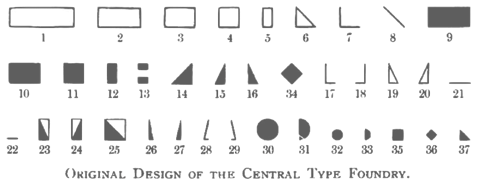 Foundry from St. Louis, est. 1872. It became "Central Division of ATF" in 1893. Discussion of its types by McGrew. Digitizations:
 - Spiral was the basis of the curly revival Hasta La Pasta (2005, Nick Curtis).
- Raphael (1885) was digitized at Linotype / Monotype. It is an art nouveau display typeface with lots of swashy flair. Check the Adobe version (1974-1995).
- Monument is a Solotype revival of a 1893 typeface by the Boston Type Foundry (which was also cast at the Central Type Foundry).
- Harpers was designed for the popular newsweekly of the same name. It was digitally revived in 2009 by Nick Curtis as Weekly Bazaar NF.
- Oh You Klid NF (2009, Nick Curtis) is based on the Victorian typeface Euclid from the 1880s.
- Multiform, created for coloring. No known digitization.
- Quaint Roman: a great hand-drawn alphabet. Khnown digitizations include Eglantine (David Nalle, Scriptorium), MiTica (2020, Rafael Ferran i Peralta), Bushwhacked NF (Nick Curtis) and Romanche (1992-1993, Thomas E. Harvey).
- An 1880 typeface was revived in 2011 by Claude Pelletier as Euclid CP (free download).
- Gloriosus NF (2014, Nick Curtis) revives Apollo.
- Chuck Mountain revived Othello (1892) as Chausson CF (2020).
[Google]
[MyFonts]
[More] ⦿
|
Charles Allen
|
Type designer of the photolettering era (1960s) who created the chiseled 3d typeface Sculpture. Nick Curtis's Haut Relief (2007) is based on this typeface. The African-themed Djibouti of Nick Curtis (2007) is based on West's African Queen, also a 1960s font. [Google]
[More] ⦿
|
Charles Henry Beeler

|
Type designer, b. 1855 Philadelphia, d. 1934. He made a condensed sans serif issued by Mackellar, Smiths & Jordan foundry in 1887, and digitally revived as Roundhead by Dan Solo (Solotype). In fact, this type already appears in an 1883 specimen book by Mackellar, Smiths & Jordan. For a second revival of Roundhead, see LevellerNF (2014, Nick Curtis). Still at Mackellar, he created a fist-based alphading typeface in 1891. Hansard (1887) and Telegraph (1895), Victorian designs, were also revived by Dan Solo. Manifesto Bold (2003, Dan Solo) is a further revival. Google patent link. MyFonts catalog. Klingspor link. Patent office link. [Google]
[MyFonts]
[More] ⦿
|
Charles Loupot
|
 French poster artist (b. Nice, 1892, d. Les Arcs-sur-Argens, 1962) in the 1930s who was one of the main poster artists of his time, together with the three musqueteers, A.M. Cassandre, Jean Carlu and Paul Colin. He was an avantgardist, who contributed mainly in the art deco style. I am aware of the following digital typefaces based on his poster lettering.
 - Chalk and Cheese NF (2004, Nick Curtis). This art deco uppercase is based on 1930s lettering by French poster artist Charles Loupot (based on this art deco poster), and the non-art deco lowercase is based on 1910s lettering by German plakatmeister Ludwig Hohlwein.
- Secret Agent (Nick Curtis). A pure art deco beauty based on this Loupot poster from 1919.
- Affiché (2002, Tiffany Wardle).
- Loupot (1997, Font Bureau). An angular bold connected script done in 1997 by Laurie Rosenwald and Cyrus Highsmith. Based on the lettering on Loupot's St. Raphael poster.
Posters: Café Martin, Cointreau, Fourrures Canton, Mekka Cigarettes, O Cap, O Cap, Bonnard. [Google]
[More] ⦿
|
Charles-Édouard Jeanneret

|
Aka Le Corbusier. Swiss architect, designer, urban planner, sculptor, writer, modern furniture designer, and painter. Born in La Chaux-de-Fonds, Switzerland, in 1887, he died in Roquebrune-Cap-Martin, France, in 1965. His lettering inspired the Letraset rubdown dry transfer typeface Charrette. He also inspired many digital fonts: - Jeanneret NF (2011): a stencil typeface by Nick Curtis.
- Le Corbusier: a stencil typeface by Philippe Desarzens at Lineto.
- Modular Stencil (1994): a stencil typeface by Gregory La Vardera.
- LeCorbusier (great stencil font, 1999), Le Corbusier Condensed (1999): a stencil typeface by Nico Schweizer at Lineto.
- In 2013, Henry Valerian created a typeface that is based on the blocky construction of Le Corbusier's Cité Radieuse in Marseille.
- Villa Savoye (1929-1931) inspired Nicolas Jover to create the compass-and-ruler typeface Savoye Sans in 2013.
[Google]
[MyFonts]
[More] ⦿
|
CheapProfonts
[Roger S. Nelsson]

|
 Started in 2008, this web place by Norwegian entrepreneur Roger S. Nelsson (based in Honningsvåg, Norway) sells fonts by Ray Larabie, Brian Kent, Nick Curtis, Derek Vogelpohl and Kevin King that were originally freeware fonts. Nelsson reworked them (more glyphs, more multilingual) and asks about 10 dollars per font now. He says his fonts now cover these Latin languages: Afrikaans, Albanian, Basque, Belarusian (Lacinka), Bosnian, Breton, Catalan, Chamorro, Chichewa, Cornish, Croatian, Czech, Danish, Dutch, English, Esperanto, Estonian, Faroese, Filipino (Tagalog), Finnish, French, Frisian, Galican, German, Greenlandic, Guarani, Hungarian, Icelandic, Indonesian, Irish (Gaelic), Italian, Kashubian, Kurdish (Kurmanji), Latvian, Lithuanian, Luxembourgian, Malagasy, Maltese, Maori, Northern Sotho, Norwegian, Occitan, Polish, Portuguese, Rhaeto-Romance, Romanian, Saami (Inari), Saami (Lule), Saami (North), Saami (South), Scots (Gaelic), Serbian (latin), Slovak(ian), Slovene, Sorbian (Lower), Sorbian (Upper), Spanish, Swedish, Tswana, Turkish, Turkmen, Ulithian, Walloon, Welsh, Yapese.
 Designer at FontStruct in 2008 of cowboy_hippie and Syndrome X (DNA-look typeface inspired by Syndrome BRK by Brian Kent). Nelsson's fonts are Classic Trash BRK Pro, Dynamic BRK Pro, Galapogos BRK Pro, Genotype BRK Pro, King Cool KC Pro (kid's hand; done with Kimberly Geswein), Lamebrain BRK Pro, Matrise Pro and Matrise Text Pro (dot matrix), Phorfeit BRK Pro, Syndrome BRK Pro, Technique BRK Pro, Vigilance BRK Pro, Grapple BRK Pro. The "BRK" refers to Brian Kent, the original free font designer. In 2009, he added a number of fonts that were done by Nick Curtis some years before that (hence the "NF"): Boogie Nights NF Pro (art deco face), Copasetic NF Pro, Coventry Garden NF Pro, Pro, Fontleroy NF Pro, Hamburger Heaven NF Pro, Monterey Popsicle NF Pro, and Wooden Nickel NF Pro. Trypewriter Pro (2009) is based on Kevin King's Trypewriter. Helldorado Pro (2009) is a Tuscan wood type style typeface based on a font by Levente Halmos. Designer of Isbit Pro (2012, a magnificent melting ice cube-shaped superlliptical typeface family), Familiar Pro (2011, designed with the same metric as Helvetica but "better than Arial"), Bloco Pro (2010, fat counterless face), Trump Town Pro (2009, athletic lettering slab serif), Geometric Soft Pro (2009), Geometry Script Pro (2010, upright connected script), DIN Fun Pro (2011), Infantometric Pro (2012), Foobar Pro (2012) and Cheap Pro Fonts Serif (2009). Typefaces from 2013: Adultometric Pro (narrow monoline sans). Dafont. Fontspace link. Fontsquirrel link. Catalog of Nelsson's bestselling typefaces. [Google]
[MyFonts]
[More] ⦿
|
Christian Heinrich Kleukens

|
 German type designer (b. Achim, 1880, d. Darmstadt, 1954), brother of the more famous "Kleukens", Friedrich Wilhelm (1878-1956). In 1907, the two brothers started running the Ernst-Ludwig-Presse, the private printing shop of the duke Ernst Ludwig von Hessen. Burte-Fraktur by C.H. Kleukens was cut in 1928 for Mainzer Presse by Gustav Eichenauer, Rudolf Koch's favourite punchcutter. It was revived in 2003 by Manfred Klein and Petra Heidorn. He also added a handwritten freestyle version, Burtine 2003, and another interpretation, Burtinomatic (2004). Petra Heidorn revived it as Burte Fraktur in 2003.
 Judith Type (1923), a hookish hellish German expressionist typeface, was at the basis of Judith Type (2007, Nick Curtis), Holofernes NF (2007, Nick Curtis) and Irrlicht (2015, Ari Hausel, Aarhaus). Klingspor link. Klingspor link for Kleukens. [Google]
[MyFonts]
[More] ⦿
|
Churchward Type
[Joseph Churchward]

|
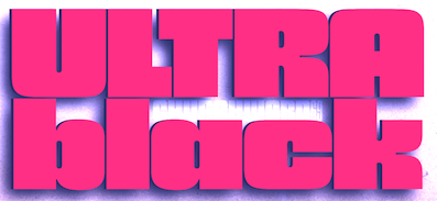 Joseph Churchward (b. Apia, Samoa, 1933) grew up in Samoa, and moved to New Zealand, where he founded a design studio in Wellington. He lived in Hataitai. He died in 2013 [Obituary by Jack Yan].
 His early type designs were released as photolettering through Berthold. In 2000, in partnership with Chank, his fonts are finally being converted to the standard electronic formats. In 1984, he won a Silver Prize at the Morisawa Awards competition. In 2009, he was made a life member of The New Zealand Designers Institute DINZ. MyFonts writes: Churchward Type started in 1962 as Joseph Churchward's freelance lettering service. Within six months he had generated enough work to move from his job as Senior Artist into setting up Churchward International Typefaces, which became one of the largest typesetting companies in New Zealand. In 1969 Joseph was asked to submit alphabet designs to Berthold Fototypes and saw immediate success. He later went on to sign distribution agreements with D.Stempel AG, Dr Böger Photosatz GmbH/Linotype, Mecanorma-Polyvroom B.V and Zipatone. He self-published a handful of original fonts in 1978 becoming the first and only company in New Zealand to publish original photo-lettering. Churchward International Typefaces was forced to close in June 1988 but Churchward Type lives on with a fresh set of independent releases. David Buck has taken on the role of digitisation. Joseph continues to draw alphabets and now has a stockpile of over 300 unique alphabets to his name. Catalog of Joseph Churchward's typefaces: - Chank sells ChurchwardHeading, ChurchwardSamoa, Churchward Maori, ChurchwardDesign5Line, ChurchwardBrush. See also Churchward Roundsquare (2002), which reminds me of Apostrophe's Toolego.
- At Berthold, he published Churchward 69 (1969, a fat face), Blackbeauty (1972; this psychedelic type inspired Nick Curtis's 2009 font, Strollin NF), and Churchward 70 (1970, a Bauhaus-style sans family).
- MyFonts sells Churchward Alien (2012), Churchward Maori (2004, frilly), Churchward Marianna (1969, an obese bubblegum typeface; Nick Curtis's Proud Mary NF (2010) is derived from it), Churchward Ta Tiki (2003), Churchward Asia (2003), Churchward Samoa (2003, 6-weight sans family), Churchward Maricia (a Western-style face), Churchward Brush (2006; copied by SoftMaker as Josephs Brush Pro), Conserif CW (2006, BluHead Studio), Churchward Heading (2007), Churchward Supascript (2007), Design CW (2006, BluHead Studio), Freedom CW (2006, BluHead Studio), Ta Tiki CW (2006, BluHead Studio), Churchward Newstype (2008, 8 styles, BluHead Studio), Churchward Chinatype (2008, 5 styles of oriental simulation glyphs), Churchward Heading (2011), Churchward Brush (2009, BluHead Studio), and Churchward Design Lines (1970, a prismatic multiline face), Churchward Montezuma (2012, an Aztec-inspired design digitized by BluHeadStudio), Churchward Legible.
- Churchward Tua (2014). A Western typeface published posthumously. Similarly, BluHeade published Churchward's 1996 geometric sans typeface Churchward Lorina in 2014.
- Churchward Isabella (2015). A geometric sans.
- Churchward 69 (2015, BluHead Studio). Churchward 69 is a ten-weight typeface family originally designed during the late 1960's, but published in 2015 by BluHead Studio.
- Churchward Typestyle (2022). By Bluhead Studio.
Klingspor link. View Joseph Churchward's typefaces. [Google]
[MyFonts]
[More] ⦿
|
Cincinnati Type Foundry
|
Cincinnati-based foundry (est. 1817), also called Oliver&Horace Wells, Horace Wells, Agant, and L.T. Wells, Agent. Among digitizations, we find French Ionic (Dan X. Solo, Solotype: quite ugly--based on an 1870 Clarendon derivative by the Cincinnati Type Foundry). Free specimen books on the web: [Google]
[More] ⦿
|
Cleveland Type Foundry
|
 Foundry in Cleveland that existed from 1875 until 1892, when it was absorbed by ATF. It was also called H.H. Thorpe Mfg. Co. They published Catalogue and Book of Specimens From the Cleveland Type Foundry. The H.H. Thorp Mfg. Co., 147 St. Clair Street, Cleveland, Ohio (176 pages, 1880), Catalogue and Price List of Type and Material (ATF 1893 Specimen) (1893), and Catalogue and book of specimens of type typefaces and printing material and machinery (1895).
 Its original designs include Koster Initials and Litho (a curly Victorian typeface digitally revived by Nick Curtis in 2007 as Cleveland Litho NF; Curtis says that it comes from an 1898 specimen book but that contradicts the ATF date). Another Curtis revival, Yum Yum NF (2008) is said to be based on Mikado from an 1893 Cleveland specimen book. And in 2008, Nick Curtis continued with a revival of the geometric display typeface Morning Glory (1893), and a revival of Oxford called Really Big Shoe NF (2009). One of Central type foundry's most famous typefaces is the faux-Chinese font Chinese (1883, later called Mandarin). In 2010, Nick Curtis redid Geometric, a typewriter style face, and called it Linndale Square NF. In 2013, the Victorian capitals typeface Oxford No. 2 (from the 1893 catalog) provided the inspiration for the digital typeface MFC Damask (Brian J. Bonislawsky and Jim Lyles, Monogram Fonts Co). MFC Damask Flourish (2013) is a floriated caps typeface from the same source. [Google]
[More] ⦿
|
Comicraft (was: Active Images)
[Richard Starkings]

|
 Comicraft was founded by Richard Starkings and John Roshell in 1992. Located in Santa Monica and Los Angeles, they do lettering and design for the comic book industry and make comic book fonts. At one point they were also called Comic Book Fonts. The current presidents are Rita Simpson and Richard Starkings. Alternate URL. T-26 link. Creative Market link. Some fonts: Sanctum Sanctorum (2003), Grandguignol (2003), MagicalMysticalFour (2003), Smash (2003), Aztech, Joe Kubert, Gobbledygook, Meanwhile, Matinee Idol [Nick Curtis has a much nicer script font by the same name, sold by MyFonts], Manganese (Asian-lookalike by Richard Starkings), Altogether OOky (by John Roshell), AbsolutelyFabulous, Achtung Baby (1997, Richard Starkings: a brutalist typeface), Adamantium, Alchemite, AstroCity, AstroCity International, Bithead, BrontoBurger, CarryOnScreaming, Chills, ClobberinTime, Comicrazy, Destroyer, DivineRight, DoubleBack, DutchCourage (1995, an art deco family), Elsewhere (art nouveau), Flameon, Framistat (2000, JG), Frostbite, GrimlyFiendish, Hooky, Hellshock, IncyWincySpider, JimLee, JoeMad, KissAndTell, KissAndTell International (2000, JG), Meltdown, MonsterMash, PhasesOnStun, PulpFiction, ResistanceIs..., RunningWithScissors, SchoolsOut (1999, John Roshell), SezWho/SezYou, SpookyTooth, Spills, Splashdown, StandBy4Action, Stormtrooper, TheStorySoFar, ToBeContinued, Thrills, WildWords, WildWords International, YuleTideLog, Zoinks, ZAP Pack, Digital Delivery, Jeff Campbell (2000, by JG), Los Vampiros, DeadMansChest, Cutthroat International (2000), Rigor Mortis (2000, John Roshell), DangerGirl, Thingamajig, Red Star, Red Square, Drop Case, Too Much Coffee Man, NearMyth, Stonehenge, Golem and SwordsAndSorcerers (medieval or runes fonts). Their monster fonts collection includes MonsterMash, CarryOnScreaming, Chills, GooseBumps, CreepyCrawly, Grimly Fiendish, IncyWincySpider, SpookyTooth, Meltdown and TrickorTreat dingbats. In 2005, MyFonts started selling their collection. Fonts by Starkings include Achtung Baby, Carry On Screaming, Clobberin Time, Flame On, Goosebumps, Grimly Fiendish, Sez, Splashdown. The full font list: Absolutely Fabulous (1999), Achtung Baby (1997), Adam Kubert (2005), Adamantium (1999), Alchemite (1997), Altogether Ooky (1999, vampire script), Area51 (2005, an octagonal typeface with a military stencil)), Astro City (2005), Astronauts In Trouble (2005), Atomic Wedgie (2005), Aztech (2005), Battle Cry (2005), Battle Scarred (2005), Belly Laugh (2005), Biff Bam Boom (2005), Bithead (1997), Blah Blah Blah (2005), Bronto Burger (1996), Carry On Screaming (1996), Chatterbox (2005), Cheeky Monkey (2005), Cheese And Crackers (2005), Chills (1997), Clobberin Time (1995), Comicrazy (1995), Creepy Crawly (2005), Cutthroat (2005), Danger Girl (2005), Dave Gibbons (2005), Dead Mans (2005), Dear Diary (2005), Designer Genes (2005), Destroyer (1999), Digital Delivery (2005), Divine Right (1998), Doohickey (2005), Double Back (1998), Dreamland (2005), Drop Case (2005), Dutch Courage (1995), Elsewhere (1998), Euphoria (2005), Exterminate (1999), Face Front (2005), Flame On (1997), Forked Tongue (2005), Framistat (2005), Frostbite (1997), Girls Girls Girls (2005), Gobbledygook (2005), Golem (2005), Goosebumps (2005), Grande Guignol (2003), Grimly Fiendish (1998), Hedge Backwards (2005), Hellshock (1997), Hooky (1999), Hush Hush (2005), Hyperdrive (2005), Incy Wincy Spider (1996), Jeff Campbell (2005), Jeff Campbell Sketchbook (2005), Jim Lee (1998), Joe Kubert (2005), Joe Mad (1999), Kiss And Tell (1999), Ladronn (2005), Los Vampiros (1999), Manganese (1999), Matinee Idol (2005), Meanwhile (2005), Meltdown (1997), Mike Wieringo (2005), Monster Mash (1997), Near Myth (2005, a grunge face, since 2007 also at T26), Nuff Said (2005), Overbyte (2005), Paranoid Android (2005), Pascual Ferry (2005), Pass The Port (2005), Phases On Stun (1995), Primal Scream (2005), Pulp Fiction (1996), Red Square (2005), Red Star (2005), Resistance Is (1997), Rigor Mortis (2005), Rumble (1994), Running With Scissors (1997), Sanctum Sanctorum (1998), Santas Little Helpers (2005), Schools Out (1999), Sean Phillips (2005), Sentinel (2005), Sez (1998), Shannon Wheeler (2005), Shannon Wheeler (2005), Smash (2005), Snowmany Snowmen (2005), Soothsayer (2005), Spellcaster (2005), Spills (1997), Splashdown (1997), Spookytooth (2005), Stand By4 Action (1997), Stonehenge (2005), Stormtrooper (1997), Thats All Folks (2005), The Story So Far (1998), Thingamajig (2005), Thrills (1997), Tim Sale (1999), Tim Sale Brush (2005), Tim Sale Lower (2005), Timelord (2005), To Be Continued (2005), Too Much (2005), Tough Talk (2005), Treacherous (2005), Trick Or Treat (2005), Wall Scrawler (2005), Wiccan Sans (1999), Wiccan Serif (1999), Wiccan Special (1999, see also T-26), Wild And Crazy (1997), Wild Words (1995), Yada Yada Yada (2005), Yeah Baby (2005), Yuletide Log (1996), Zoinks (2005), Phil Yeh (2006), Zzzap (2006), Battle Damaged (2007), Speeding Bullet (2006), Foom (2007), Letterbot (2007), Timsale (2007), Cutthroat (2007), Framistat (2007), Area 51 (2007, techno, octagonal), CC Comicraft (2007), Ratatat (2008), Mad Scientist (2008), Monologous (2008, T-26), HolierThanThou (2008, T26), Elephantmen (2008, grunge typeface at T26), Storyline (2008, T-26), Primal Scream (2009, T-26), Spillproof (2009, T-26), Sign Language (2008), Moritat (2009, T-26, by John Roshell), Pass The Port (2009, T-26), Credit Crunch (2009), Elsewhere (2009, art nouveau), Code Monkey (2011, monospaced yet informal), Glitter Girl (2011, hand-printed), Rassum Frassum (2011, comic book face), Rocket Man (2011, a retro futuristic family), Spaghetti Western (2011, signage face), Sunrise Till Sunset (2012), Samaritan and Samaritan Tall (2013, with John Roshell).
 In 2014, John Roshell published the school font Dash To School. Typefaces from 2015: Samaritan Lower (by Richard Starkings and John Roshell), Dusk Till Dawn Buried (expressionist). Typefaces from 2016: Questionable Things (with John Roshell: a question mark font). Typefaces from 2017: Evil Schemes (by Richard Starkings and John Roshell), Regeneration, Obey Obey Obey (by Starkings and Roshell). Typefaces from 2018: Samaritan Tall Lower (by Starkings and Roshell), Blah Blah Upper (by John Roshell and Richard Starkings), Evil Doings (by Richard Starkings and John Roshell). Typefaces from 2020: Elektrakution (a Greek simulation font family by Richard Starkings and John Roshell), This Man This Monster (by John Roshell and Richard Starkings). Typefaces from 2021: Richard Starkings Brush (2021; a comic book typeface by Richard Starkings and John Roshell), Scoundrel (a comic book face by Richard Starkings and John Roshell). Creative Market link. View Comicraft's typefaces. Fontsquirrel link. [Google]
[MyFonts]
[More] ⦿
|
Continental Typefounders Association
[Melbert Cary]
|
Continental Type Founders Association was founded by Melbert Brinckerhoff Cary Jr. (1892-1941) in 1925 to distribute foundry type imported from European foundries. Beginning in 1927 Continental also distributed typefaces cast by Frederic Goudy, and two typefaces for Doug McMurtrie. Doug McMurtie and Frederic Goudy were the vice-presidents in 1925 and 1927, respectively. At first Goudy's type was cast at his own Village Letter Foundry, but after 1929 these were cast by the New England Foundry. Despite imports being virtually cut-off during the war years, Continental was still issuing Goudy's types as late as 1944 and may have continued functioning even later. Located at 216 E. 45th street, New York around 1930. They published Specimen Book of Continental Types in 1929. Cary collected 2300 books about printing. After his death, the Cary Collection was presented to the Rochester Institute of Technology in 1969 by the Mary Flagler Cary Charitable Trust as a memorial to Melbert Cary. Its collection of 20,000 volumes is described as one of America's premier libraries on the history and practice of printing. Their typeface Nova Bold was revived by Nick Curtis as Maple Leaf Rag NF (2005). The European foundries represented by them: - W.H. Caslon, Ltd., England
- Deberny & Peignot, France
- Joh. Enschedé en Zonen, Holland
- Fundiciòn Richard Gans, Spain
- Gloria
- Greco Bold + Italic + Adornado (1925)
- Gebr. Klingspor, Germany
- Ludwig & Mayer, Germany
- Nicolas Cochin + Bold
- La Mercure (an inline version of Cochin)
- Erbar (Jakob Erbar)
- R.H. Stevens & Co., England
- D. Stempel A.G., Germany
- H. Berthold AG, Germany
- Genzsch & Heyse, A.G., Germany
- J.G. Schelter & Giesecke, Germany
- Società Nebiolo, Italy
- Stephenson Blake & Co., England
[Google]
[More] ⦿
|
Curtis Post
|
A newspaper typeface published in 1902 by American Type Founders (ATF). Mac McGrew: Curtis Post was produced by ATF in 1902 for the Saturday Evening Post magazine of Curtis Publishing Company, but soon released to printers in general. It is based on Post Oldstyle Roman No.2, a style which previously had been handlettered for headings in the magazine. Like many fonts of the day, it contained several alternate characters and logotypes. Some specimens hyphenate the name as Curtis-Post. Curtis Shaded Italic was cut in 1910; it is uncertain whether this is the same as Post Shaded Italic. Compare the various Post typefaces. Nick Curtis's Saturday Morning Toast NF (2001) is based on the logotype font of the Saturday Evening Post from the 20s. He writes: Saturday Morning Toast is warm, cuddly and endearing in its quirky charm. [Google]
[More] ⦿
|
C.W. Shortt
|
Type foundry in the early 20th century in London. Gravure (1929), an engraved old style typeface by them, was digitally revived in 2007 by Nick Curtis as Lateral Incised NF (2007). [Google]
[More] ⦿
|
D. Duvillé
|
D. Duvillé was a professor at Ecolesdes arts de Paris. Author of Art du tracé rationnel de la lettre (1934, Société Française d'Éditions Littéraires et Techniques, Paris). The text shows how to trace letters in different styles. There are some digital typefaces that are based on Duvillé's alphabets: [Google]
[More] ⦿
|
Dan X. Solo
[Solotype]

|
 [MyFonts]
[More] ⦿
|
Daniel Janssen
[Büro für Gestaltung Janssen]

|
[MyFonts]
[More] ⦿
|
Dard Hunter

|
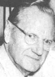 William Joseph Dard Hunter was born in 1883 in Steubenville, OH, and died in 1966 in Chillicothe, OH. He was one of the most influential graphic designers to come out of the American Arts and Crafts movement around 1900-1910. The typeface P22 Arts and Crafts (1995) by James Grieshaber at P22 comes complete with Arts and Crafts Ornaments and is based on Dard Hunter's designs. Bala Cynwyd NF (2008) and Nickley NF (1997, an arts and crafts font) by Nick Curtis are other digital revivals of his lettering. Related arts and crafts fonts include Syracuse (1999, Woodside Graphics) and Nouveau Riche JNL (Jeff Levine).
 The Mountain House Press Types were designed and cut by Dard Hunter between 1912 and 1915, and by Dard Hunter Jr. (b. 1917) in 1937-39, for the private use of their Mountain House Press. A Specimen of Type (Dard Hunter Jr., 1940, Paper Museum Press, Cambridge, MA) is a small booklet shows a roman type started in 1936 by Dard Hunter Jr. under the guidance of Professor Otto F. Ege. Apologies for the poor quality of the digital pics, which were taken under challenging conditions in the dungeon of a gothic library. A third generation has emerged as well, as Dard Hunter III is an active printer and book designer in modern times. Klingspor link. [Google]
[MyFonts]
[More] ⦿
|
Dave West

|
 Type designer of the photolettering era (1960s) whose work is slowly but surely being digitally revived by Nick Curtis, and by Photo-Lettering, the House Industries subsidiary that bought the PhotoLettering Inc type collection. FontShop link. His typefaces:
 - The slightly psychedelic typeface West Banjo. Nick Curtis's Fiddle Sticks (2007) is based on this typeface. For another digital revival, see Plinc Banjo (2017, Mitja Miklavcic at House Industries.
- Elephant Gothic, a fat deco face. Remade by Nick Curtis as Elephunky NF (2011).
- Nick Curtis believes that Stymie Black Flair may also be due to him, and he based his Tutti Paffuti NF (2007) on the latter face.
- African Queen was revived by Curtis as Djibouti NF (2007), a minimalist tribal African alphabet.
- Nickelodeon. Revived by Curtis as Lily Hilo NF (2008).
- Barnum Block (Western face), done in 1960 at PhotoLettering Inc. This became Cg BarnumBlock at Compugraphics. The Compugraphics collection is now sold by Monotype. See also PL Barnum Block.
- Behemoth (1960, PhotoLettering): a slab serif. This too became a Compugraphics face, Cg Behemoth Semi Condensed. See also PL Behemoth Semi Condensed.
- Bubble Gum (late 1960s). This bubblegum / cartoon font was finally digitized in 2011 by Jess Collins for House Industries, and is now called Plinc Bubblegum (2021).
- Futura Casual inspired Nick Curtis to draw Occidental Tourist NF (2010).
- Walnetto Casual (Photolettering) is another psychedelic face. For a digitization, see Nick Curtis's Jackalope NF (2010). West Barnum Ultra, designed by Dave West and digitized by Ben Kiel&Adam Cruz at House Industries in 2011, was film no. 5494 in the original Photo-Lettering archive.
- West Thud.
- West Kerpow, a comic book typeface, late 1960s. This was digitized in 2011 by Allen Mercer at House Industries as Plinc Kerpow.
- West Italiano, or simply Italiano. A Bodoni-style italic. In 2015, Steve Ross and Ken Barber at House Industries digitally revived this typeface as Plinc Italiano.
- West Emperor Script. A connected didone script.
- West Nouveau Compact (Pyschedelitype 5619 in the PLINC collection of 1968). See, e.g., Pyschedelitypes (Alphabet Directions No. 8), Photo-Lettering, Inc., 1968. In the Curvy Block Lettering style of Viennese secessionist Alfred Roller. The same face appears in Castcraft's Encyclopedia of Phototype Styles (1978) as Cetus Black.
- West Fifth Dimension (1971), an Alfred Roller-inspired psychedelic typeface that was shown in PLINC's Alphabet Thesaurus Vol. 3 (1971).
[Google]
[MyFonts]
[More] ⦿
|
David Farey

|
 Type designer who was born in London in 1943. Dave Farey runs Housestyle Graphics with Richard Dawson in London. He was well-known for running the successful auctions at many ATypI meetings. His typefaces for various foundries:
 - Panache Typography: the artsy typeface Cupid, Azbuka (sans family).
- ITC: ITC Beesknees (1991), the sans-serif family ITC Highlander (1993), ITC Ozwald (1992, a beautiful fat face), ITC Johnston, and ITC Golden Cockerel family (1996, with Richard Dawson, an Eric Gill revival). The former three are part of the Linotype library. ITC Beesknees has been remade and extended by Nick Curtis as Arbuckle Remix (2008). Another revival, by Thomas E. Harvey, is BeesWax (1992-1993).
- Agfa: Zemestro (2003, a 4-weight sans tapped as a typeface for television). His Creative Alliance typefaces: Abacus (art nouveau), Blackfriar, Bodoni Unique, Breadline Normal, Cachet, Cavalier, Classic, Cupid, Font Outline, Gabardine, ITC Golden Cockerel, Greyhound Script, ITC Johnston, Little Louis, Longfellow, Maigret (art nouveau), Revolution Normal, Stanley, Stellar, Virgin Roman Normal (art nouveau), Warlock.
- Galapagos: Ersatz (2002, with Richard Dawson, at Galapagos, originally done at Panache).
- HouseStyle Graphics: ClassicFranklin family (2000-2001).
- FontHaus: Aries (1995), a font designed by Eric Gill (1932).
- Monotype: Azbuka (2008-2009): a 20-style sans family by Richard Dawson and David Farey.
- Elsner&Flake: Caslon EF Black.
- OEM work: TimesClassic (2000-2001) for The London Times.
- P22: In 2021, he was part of a big effort by P22 to revive and extend Johnston's Underground to P22 Underground Pro [Richard Kegler (1997), Paul D. Hunt (2007), Dave Farey (2021), James Todd (2021) and Patrick Griffin (2021) contributed at various stages]. Farey's contribution was to the italics.
View David Farey's typefaces. FontShop link. Klingspor link. Biography at Agfa. [Google]
[MyFonts]
[More] ⦿
|
Dennis' Hall of Fame
|
 Dennis was a major contributor to a.b.f., and managed the fontplay site. He often referred to his "Hall of Fame" sites. On February 3, 2002, he finally revealed his list of five favorite font sites, all characterized by usefulness and professional quality free fonts:
 [Google]
[More] ⦿
|
Dick Dooijes

|
 Dutch typeface designer, b. Amsterdam, 1909, d. Baarn, 1998. Trained and worked at the Lettergieterij in Amsterdam under S.H. de Roos, starting in 1926. He worked with de Roos on the design of the typefaces Nobel and Egmont. Dooijes studied at the Amsterdam College of Arts and Crafts and at the Academy of Art. In 1940, Dooijes succeeded de Roos as artistic director of Lettergieterij Amsterdam. He was director of the Gerrit Rietveld Acedemie from 1968 until 1975. Author of Mijn leven met letters, and Wegbereiders van de moderne boektypografie in Nederland (Amsterdam, De Buitenkant, 1988). His typefaces:
 - The art deco triplet, Bristol, Carlton (1929, an engraved version) and Savoy (1936, a deluxe version). These beauties were published by Plantin. Images: 1932 1932. A | B | C | D | E | F | G | H | I | J | K | L | M. In 2010, Nick Curtis turned the three typefaces into digital fonts: Dooijes Deco NF, Dooijes Deco Engraved NF, Dooijes Deco Deluxe NF. Curtis muses that Dooijes made these fonts as a reaction to the huge success of Broadway (Morris Fuller Benton) in the United States a few years earlier.
- Rondo (with Stephan Schlesinger, 1948). Well, "with" Schlesinger is a bit of an overstatement. Hans van Maanen made a digital face, Minuet (2007, Canada Type), that revives Rondo. He writes: Minuet, an informal script with crossover deco elements giving it an unmistakable 1940s flavor, is a revival and expansion of the Rondo family, the last typeface drawn by Stefan Schlesinger before his death. This family was initially supposed to be a typeface based on the strong, flowing script Schlesinger liked to use in the ads he designed, particularly the ones he did for Van Houten's cocoa products. But for technical reasons the Lettergieterij Amsterdam mandated the typeface to be made from unattached letters, rather than the original connected script. Schlesinger and Dooijes finished the lowercase and the first drawings of the uppercase just before Schlesinger was sent to a prison camp in 1942. Dooijes completed the design on his own, and drew the bold according to Schlesigner's instructions. The typeface family was finished in February of 1944, and Schlesinger was killed in October of that same year. Though he did see and approve the final proofs, he never actually saw his letters in use. It took almost four more years for the Lettergieterij Amsterdam to produce the fonts. The typeface was officially announced in November of 1948, and immediately became a bestseller. By 1966, according to a memo from the foundry, the typeface had become almost too popular. This digital version of Schlesigner's and Dooijes's work greatly expands on the metal fonts.
- Mercator (1958): a sans family at Lettergieterij Amsterdam. It was considered at the time as a Dutch version of Helvetica, and referred to as the Dutch Helvetica. See here. Laurenz Brunner did an interpretation of Mercator for the wayfinding at the Gerrit Rietveld Academie. Ken Meier's interpretation is Mercator Vet (2006). Daniella Spinat's is Mercator Roman (2007). Charles Mazé's is just Mercator (2009). Atlas Grotesk (2012, by Kai Bernau, Susan Carvalho and Christian Schwartz, Commercial Type) is a revival of Mercator, which Henk Gianotten chacterizes as being too American, influenced by the American gothics. In 2018, Philip Cronerud released his digitization and expansion, Dooijes Sans at Truly Type. In 2015, Bauke van der Laan and Theo van Beurden set out to make another revival of Mercator in their Mercator project [it will possibly be published by Monotype].
- Contura (1965-1966): an outline font in garalde style.
- Flambard (1954, Lettergieterij). A bold version of Adolf Overbeek's Studio from 1946. The 1963 Tetterode specimen book points to Overbeek as Flambard's designer, and mentions in addition the date 1953. Flambard is called Studio Bold. Canada Type's revival in 2008 by Hans van Maanen is Adams. Mecanorma also has a version. Finally, there is a pirated version from 1998, called Studio Bold. See also OPTI Bold (by Castcraft).
- Lectura (1962-1966, Lettergieterij; 1969, Intertype; acquired by Stephenson Blake): Lectura is a very legible garalde family, ideal for books. It was Dooijes's final typeface. Digitized by DTP Types Limited as Leiden DT (1992).
[Google]
[MyFonts]
[More] ⦿
|
Dickinson Type Foundry
[Samuel Nelson Dickinson]

|
Boston-based foundry, also called Phelps&Dalton, and Phelps, Dalton&Co. Founded by Samuel Nelson Dickinson in Boston in 1839. They published "Specimen of type for book printing, manufactured by Samuel N. Dickinson" (Boston, 1842), "Hand-book specimen of printing type, cuts, ornaments, etc., from the foundry of Samuel N. Dickinson" (Boston, 1847), and "Point specimen book. Specimens of printing types, rules, cuts, printing material" (Boston, 1893, 457 pages). See also The General Specimen Book of the Dickinson Type Foundry, Comprising Types for Letter-Press Printing of Every Variety (Boston: Phelps&Dalton, 1856). In 1872, a fire ravaged the company, and a skilled punchcutter, Alexander Phemister, became a partner. In 1891, Dickinson became part of ATF in the great meltdown. Joseph W. Phinney and Robert W. Nelson (1851-1926) made the transition from Dickinson to ATF. Scans of typefaces shown in the 1923 ATF catalog: Roycroft Tinted, Card Mercantile (1890s). Commentary by McGrew on Card Mercantile: Card Mercantile was produced by Dickinson Type Foundry in the 1890s or earlier. Except for a few letters, it appears to be a duplicate of Extended No. 3 of Stevens, Shanks in England. In 1901 Morris Benton redesigned the two smallest sizes for ATF, successor to Dickinson, for better compatibility with the other sizes. It is a very delicate, wide, thick-and-thin style without lowercase (but the English typeface has lowercase), somewhat similar to Engravers Roman, which supplanted it in popular use. An 1899 ad said, "For imitating the work of steel engravers there can be nothing more beautiful picked from a case, and it is difficult if not impossible to imagine how anything finer ever can." Compare Engravers Roman, Brandon, Litho series. Digital revivals include Renaissant NF (2014, Nick Curtis: a Victorian typeface). Wikipedia link. [Google]
[MyFonts]
[More] ⦿
|
Dieter Zembsch

|
 Born in 1943, Zembsch began his career in graphic arts as a typesetter. He subsequently studied graphic design at Mannheim (in 1968) and Stuttgart. While working as a packaging designer for the pharmaceutical firm of Mann&Schröder, in his spare time he designed the winning entry in Letraset's International Typeface Competition for 1972/73, a typeface named Beans. Another font, Jumping Jack, was first released as dry-transfer sheets by Mecanorma in 1975. He later worked as advertising manager for a German publishing house and, in 1977, he became an independent graphic designer, operating as Zembsch' werkstatt in Munich, specializing in book design. In addition to illustrating book jackets for other authors, he has written and illustrated several of his own works. Zembsch and partner Sophie Weiss currently run a design firm in Munich.
 In 2009, Nick Curtis designed a digital extension and modification of Beans called Free Holeys NF. Alan Jay Prescott's revival is called APT New Beans. The digital re-issue of Beans was done by Charles Grant and Lineto, and released by Lineto in 2008 as LL Beans and in 2020 as Jumping Jack. First designed in 2011, LL Jumping Jack remained unpublished for several years. In 2019, it was overhauled and its character set was completed by Sascha Bente at Lineto, with approval by Dieter Zembsch and Charles Grant. [Google]
[MyFonts]
[More] ⦿
|
E. Winter
|
Poster lettering artist. His design for Hotel Braunwald, Bahn, in 1906, was at the basis of Brownwood NF (2007-2011, Nick Curtis). [Google]
[More] ⦿
|
Eduard Gustav Haenel
[Schriftgiesserei Eduard Haenel]
|
 [More] ⦿
|
Edward Pelouze
[Boston Type Foundry]

|
[MyFonts]
[More] ⦿
|
Edwin Sisty

|
American designer who created the upright curly semiscript Belcanto (1970s, Photolettering). This typeface was revived in 2007 by Nick Curtis as Glissando NF. [Google]
[MyFonts]
[More] ⦿
|
Elzevir Gothic
|
A typeface that appeared in the 1897 ATF specimen book. However, this slightly flared typeface has no relationship with Elzevir. It has an unusually large x-height for the epoch. For a digital version, see Nick Curtis's Lodewijk Gothic NF (2014). [Google]
[More] ⦿
|
Emil Rudolf Weiß

|
 German typographer, graphic artist, book artist, painter, type designer, poet and teacher, b. 1875, Lahr, d. 1942, Meersburg. His typefaces include
 - Weiss Roman (1926). Digital versions include one at Adobe.
- Weiss-Fraktur (1909). This was commercialized in 1913 by Bauersche Giesserei. Digital versions: Weiss Fraktur (2004, Petra Heidorn and Manfred Klein), Emilia Fraktur (2021, Ralph Unger).
- Weiss-Fraktur Kursiv (1923-1924, Bauer).
- Weiss Antiqua (1928). Digital versions: W 690 Roman (SoftMaker), Emilia (2016, Ralph Unger), Weiss Antiqua (URW). In 2019, Rutherford Craze did his own revival.
- Weiss Lapidar mager (1931). Revived as Weiss Lapidar in 2002 by Dieter Steffmann.
- Neue Weiss-Fraktur (1935).
- Lichte Initialen (1935). Revived by Manfred Klein in 2005 as WeissGotnitials.
- Weiss-Gotisch (1936). A Textura typeface at Bauer, revived by Petra Heidorn in 2004 under the same name, by Delbanco as DS-Weiss-Gotisch, and by Ralph Unger as Emilia Gotisch in 2016.
- Weiss-Kapitale (1931).
- Weiss-Rundgotisch (1937, Bauer). Digitized by Fraktur.de, Nick Curtis (as Garmisch Rund NF, 2009), Elsner and Flake (as Weiss Rundgotisch), and Softmaker (as Gothic).
- Weiss Rundgotisch Inititalen (1939), at the Bauersche Giesserei.
- Rundgotisch and Uhlen Rundgotisch (1937), at Hansestadt Letter Foundry. Uhlen Rundgotisch became a Monotype font in 1938.
- Weiß Initials (Series I, II, II Bold, III), the 1920's. Digital versions: Wellsbrook Initials SG (2004, Spiece Graphics), URW Weiss Titling, and Quadrivium NF (Nick Curtis).
In 2011, Gerald Cinamon published E.R. Weiss: The Typography of an Artist (Oldham: Incline Press). Bio at Linotype, and at DdS. Footnote: Many textbooks incorrectly credit Weiss with Memphis (Stempel, 1929)---these include Mac McGrew, Rookledge, and Jaspert&Berry. Memphis was made by Rudolf Wolf. View Emil Rudolf Weiss's typefaces. Klingspor link. FontShop link. [Google]
[MyFonts]
[More] ⦿
|
Enric Crous-Vidal

|
 Type and graphic designer born in Lerida, Spain (1908), who lived and worked mostly in Paris, where he had emigrated to during the Spanish Civil War (1936-1939). He died in 1987 in Noyon. All his fonts are available from Neufville. He was the founder of the movement that is known as Grafía Latina (or La Graphie Latine), which promoted the need to create a new system of typically Latin (as opposed to cold geometric nordic) typographic structures, graphics, alphabets and decorative ornaments.
 As art director of the Fonderie Typographique Française, he designed these fonts: Bibliography: Enric Crous-Vidal. Un carácter en tipografía (Andreu Balius, 2008). View Enric Crous-Vidal's typefaces. Klingspor link. French wikipedia link. FontShop link. [Google]
[MyFonts]
[More] ⦿
|
Erich Mollowitz

|
 German designer of these typefaces:
 - The medium weight formal script font Forelle (Weber, 1936), also called Rhinegold or Rheingold (Trennert, 1936). It has tall ascenders and short descenders. It is accompanied by Forelle Auszeichnung (1936). Mercury (Stephenson Blake) was copied from this. Jaunty Gent NF (2007, Nick Curtis) is based on Rheinhold Kräftig---surely Nick meant to write Rheingold Kräftig. Forelle Pro (2010, Ralph M. Unger) is another digital version of Forelle. Dieter Steffmann made the free font Forelle.
- Anemone (1955, Genzsch&Heyse). A condensed all caps inline typeface.
Misspellings of his name abound: R.S. Hutchings calls him Mallowitz. Others spell his name as Mollwitz. [Google]
[MyFonts]
[More] ⦿
|
Ernst Deutsch
|
Born in 1887 in Vienna, Austria, Ernst Deutsch first worked as a costume designer and studied under Gustav Klimt. In Paris, he worked on costumes for Coco Chanel, before moving to the United States in 1929, where he changed his name to Ernst Dryden and was employed from 1933 onwards as a costume designer for Universal, Columbia and Selznick in Hollywood. He died in Los Angeles in 1938. Designer of Tango Kursiv (1913, +Fett; aka IKA Schriften), and the prototypical silent movie fonts Tango Antiqua (1913), and Tango Antiqua Halbfett (1916), all published by J. Klinkhardt in Leipzig. Digital revivals by Nick Curtis (Rhumba Script NF: free revival of Tango Kursiv) and Oliver Weiss (Walden Font) (WF Paletti, 2016-2017). [Google]
[More] ⦿
|
Ernst Hermann Karl Engel

|
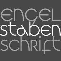 Typographer, type designer (b. 1879, Kassel, d. 1967, Bad König), teacher (at the Frankfurt Vocational School and at the College of Arts and Crafts in Offenbach am Main) and author of typographic books. In 1905, Engel became supervisor of in-house printing at the Klingspor foundry.
 At his own Ernst Engel Privatpresse (est. 1921; it would later be called Ernst Engel Presse Walter Stähle), he designed Mörike Fraktur (1922) with the punchcutter Rudolf Schiffner. Somehow, this typeface is also associated with Klingspor. In 1927, he created an art deco typeface which was revived in 2008 by Nick Curtis as Engel Stabenschrift NF. He made three Unziale that were all unicase ("Einbuchstabenschrift"), in 1927, 1930/31, and 1935, respectively. In 1939, he made a Schwabacher and finished Deutsche Schrift. Picture. Klingspor link. [Google]
[MyFonts]
[More] ⦿
|
Face Photosetting
|
Photo era foundry set up in the 1960s by John McConnell and Chris Dubber in London. I could only find Pluto Outline, the art nouveau typeface Desdemona (a digital version was created in 1992 by David Berlow at Font Bureau and in 1994 by Richard Beatty; Letraset showed Desdemona in its 1981 and 1986 catalogs; the original is from the late 19th century by Karl Brendler&Soehne, Vienna), Stack, and Oxford (a multiline face) on-line. Steve Jackaman worked in the studio in Newman Street and Hanway Place, and recalled El Paso (a Western/Mexican simulation face) when he created El Paso Pro (2011, Red Rooster). In 2017, Steve Jacakaman (Red Rooster) designed Lodestone Pro, which is based on Marvin (1969, by Michael Chave). According to Wes Wilson's web site, Face Photosetting led the way by launching a number of Art Nouveau revivals which were taken from Ludwig Petzendorfer's "A Treasury of Authentic Art Nouveau Alphabets". A selection of these, which included Arnold Böcklin, Edel Gotisch and Eckmann Schrift, were made more widely available when Letraset produced them for their dry transfer product. They published a number of books and catalogs, ca. 1976-1977: Face headline catalogue [1981/82] (1977), Specimens of Delittle's wood type, Face book of typefaces, Type catalogue (1976). Some of the typefaces were Cyrillicized, such as Bullion Shadow (1970; Cyrillic version by Victor Kharyk, 1978). Bully Pulpit Plain NF (2014, Nick Curtis) is a revival of Bullion Shadow. [Google]
[More] ⦿
|
Farmer, Little&Co.
[A.D. Farmer]

|
 New York-based foundry, also called White's Type Foundry and A.D. Farmer Foundry. It was created in New York in 1862, and sold to ATF in 1892. Many of its typefaces were digitized in recent years, such as the art nouveau typeface Palm (1887), which resurfaced as Palmetto (2005, Solotype Foundry). Arbor was revived by Nick Curtis as Surely You Jest NF (2005). The slab serif (almost wood type) typefaces Antique No. 2 and Antique Light Extended live on in digital form as Old Mac Donald NF (2011, Nick Curtis) and Spade (2012, Canada Type). Monotype's Scotch Roman MT [link] is based on a typeface from A.D. Farmer. The art nouveau typeface Vassar (1887) was recreated in digital form as Foxcroft and Foxcroft Shaded (2005, Nick Curtis). Specimen book (1867) can be consulted freely on-line or here. From that book: ornament of a horse and cart.
 Catalogs published by Farmer include Specimens from the A. D. Farmer&Son Type Founding Co. Including Book, Newspaper and Jobbing Type, Brass Borders and Rules, with Complete Price List, &c, New York, 1897. Farmer and Little published The Reduced Price List and Latest Specimens of Printing Types Etc. (In an Abridged Form.) Cast by Farmer, Little&Co., Type Founders in New York in 1882. In 1900, A.D. Farmer & Son published Typographic specimens: illustrated catalogue. Farmer, firm, type-founders, New York, a 607-page catalog. Linotype link. [Google]
[MyFonts]
[More] ⦿
|
Fontscape: Arts and Crafts
|
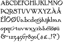 Fontscape lists digital Arts and Cratfs movement fonts:
 - From P22: P22 arts and Crafts (+Tall, +Hunter), P22 Morris (Troy, Golden), P22 Vale (+King's Fount).
- From ITC: Willow, ITC Golden Type.
- From Bannigan Artworks: Arts and Crafts GS.
- From JY&A Fonts: JY Arts and Crafts.
- From Nick Curtis: Lance Corporal NF.
[Google]
[More] ⦿
|
FotoStar
[Robert Trogman]

|
 Los Angeles-based company that distributed a 5000+ library of two-inch film fonts for display typefaces, some of which were original, such as Yagi Double (the CNN logo font) and Yagi Link Double. It ceased operations in 1985. Trogman maintains a design studio in Palm Springs, California.
 The FotoStar collection includes Blippo (1970), Handel Gothic (by Robert Trogman), Buxom (a beveled 3-d athletic lettering typeface sold, e.g., by Elsner&Flake as Buxom SB, Scangraphic) and Embrionic (an ink-trapped typeface family revived by Claude Pelletier). Yagi Link Double was revived by Alex Haigh as Miyagi (2008, Thinkdust). Yagi Bold and Yagi Double were revived in 2010 by Gus Thessalos as Retro Mono Wide and Retro Stereo Wide, respectively. Gus Thessalos revived Yagi Link Double as Retro Stereo Thin. Nick Curtis revived Horse Tank as Feedbag NF (2015), Welling Black as Well Said Black NF (2014) and Angelica as Vauxhall NF (2014). Claude Pelletier too revived Angelica: see his free font Angelica CP (2011). In 2015, Harold Lohner revived Roberta, which Trogman cut based on an art nouveau sign in a Belgian restaurant in 1962. FontShop link. FotoStar is a small web page made by yours truly that showcases some typefaces in the FotoStar collection taken from their catalog, Film Font Digest FotoStar Graphic Supply. Images of some of his fonts. [Google]
[MyFonts]
[More] ⦿
|
Francisco Lucas
|
 Full name: Francisco Lucas Vezino De Sevilla. Spanish lettering master in the 16th century who wrote Arte de Escrevir (Madrid, 1571 [Paulo Heitlinger says that this is 1580, while others mention 1577]), in which he introduced the so-called Spanish Bastarda. He also published Arte de Escrivir (1608, Iuan de la Cuesta, Madrid). Local download.
 Digitizations of his Griffo-style lettering in 1577 include: - Decimosexto NF (2006, Nick Curtis).
- Francisco Lucas Llana Regular (2003). A chancery hand by Pia Frauss. She writes Written in Madrid in 1570, by a man called Francisco Lucas. He classified it as a Bastarda; but actually, it is a humanist cursive -- the type of writing that is mostly known under the name of Chancery.
- Francisco Lucas Brioso Regular (2003, Pia Frauss). A chancery hand.
Scans: Grifa italica and Batarda, Redondilla (1570), Letra. [Google]
[More] ⦿
|
Frank Chouteau Brown
|
Author (b. 1876) of Letters&Lettering: A Treatise With 200 Examples (1921, Bates&Guild Co, Boston). This book shows many decorative alphabets. Alternate URL. Yet another URL. Examples from that book: Alphabet after Serlio, An outline caps face, A Roman caps face. The best page on Chouteau Brown, complete with all images from his 1921 book. Some of Chouteau Brown's own lettering from that 1921 book: Incised English Script, 15th Century English Gothic Blackletter, 16thCentury German Blackletter, Capitals adapted from Renaissance era medals, Classic Roman Capitals, English Gothic Letter 15th Century, English Incised Script from a tombstone in Westminster Abbey, 18th Century French Script Capitals, German Blackletter (from brass), Italian Renaissance Capitals from a Marsuppini tomb, Italian Renaissance Capitals from Santa Croce, Florence, Italian Uncial Gothic Capitals from the 14th century, Modern American Letters, Modern American Letters for rapid use, Modern American Lowercase, Modern German blackletter, Modern German capitals, Spanish Script from the latter part of the 17th century, Spanish Script capitals, early 18th century, Uncial Gothic Capitals 13th century, Uncial Gothic Capitals 14th century, Uncial Gothic Initials 12th century, Venetian Gothic Capitals 15th century. The Siamese style in Brown's 1912 book inspired Nick Curtis's digital font Owah Tagu Siam (2007). [Google]
[More] ⦿
|
Frank H. Atkinson

|
 Sign painter from the art nouveau era, who lived in Chicago and worked mostly for Cadillac. His books Sign Painting (1908) and Artkinson's Sign Painting (1915) influenced hand lettering and signpainting for many years afterwards. The following digital fonts are based on his designs:
 - FHA Sign DeVinne (2015, Michael Gene Adkins, James L Stirling).
- FHA Tuscan Roman (2014, Michael Gene Adkins, James L Stirling).
- FHA Nicholson French (2012). An art nouveau typeface digitized by The Fontry.
- FHA Condensed French (2012, by Michael Gene Adkins and James L. Stirling) is based on Frank H. Atkinson's examples.
- FHA French Eccentric (2009), by Frank Smith and Michael Gene Adkins. FHA Eccentric French Normal (2008) is free at Dafont.
- FHA Modernized Ideal Classic (2011) by Michael Gene Adkins and James L. Stirling.
- Bulletin Stub (The Fontry).
- Book Poster (2010). A series of fonts at The Fontry.
- Beauvoir (1993, David Nalle).
- French Plug (2007, HiH).
- Payzant Pen NF (Nick Curtis) is based on an Atkinson design shown in A Show at Sho-Cards: Comprehensive, Complete, Concise (1918).
- Atkinson Eccenteric, Atkinson Boomtown and Atkinson Egyptian, all made by David Nalle at Scriptorium.
- Still by The Fontry: the Broken Poster family (2010). In 2013, Michael Gene Adkins and James Stirling followed this up with the layered system Broken Gothic, which is based on Book Poster as well.
- Dick Pape created these revival fonts in 2009: ArtNouveauSigns, FHA1908ClassicPlug, FHAAdvertisersThickThinPl, FHAAntiqueBlock, FHAAntiqueRoman, FHAArtNouveau, FHAArtNouveauSigns, FHABradley, FHABulletinPlug, FHABulletinRoman, FHAChicagoTuscan, FHAClassicBlock, FHACondensedFrench, FHAEccentricFrench, FHAEccentricRoman, FHAEngrossingText, FHAExtremeFrenchBold, FHAFrenchRoman, FHAFrenchRomanLight, FHAFullClassicRoman, FHAGunningSingleStroke, FHAHalfClassicRoman, FHAModernizedIdealClassic, FHAModifiedAntiqueTuscanRom, FHAModifiedPlug, FHANewYorkRoman, FHANicholsonFrench, FHAPosterBlock, FHARoundBlockThickThin, FHARoundFullBlock, FHAShowCardFrench, FHASignPaintersPlymouth, FHASingleStrokeBlock, FHASingleStrokeTuscan, FHASpikeSpurFrench, FHAStonehouseEgyptian, FHAWesternLightTuscan, FHAWesternRoman, FHAWesternSingleStroke. Download page. [Google]
[MyFonts]
[More] ⦿
|
Franklin Photolettering
|
 Photolettering foundry in the 1970s, located at 211 43rd Street, New York City 10017. One of my correspondents explains: Franklin Photolettering was the smaller film type joints catering to the major publishing and advertising industries in New York City in the 60s and 70s. They started out with a few originals to get into the game, but within a year or so they started putting out copies or slight modifications of existing stuff from Photolettering and VGC (you can see how that happens---someone comes in for some ad copy in Barker Flare, for example, and he asks if they have something like Eightball, so they say "sure, we can do that"). Even though they did have a bit of original stuff, they didn't have not enough to stand out like PL, Mecanorma, VGC or Letraset---also the sheer number of film fonts available on the market by the mid-70s meant that unless you dumped a lot of money on marketing, big-time design would ignore you----so not much room was left for smaller film type houses.
 Their catalog is published in binder form in Film Alphabet Compendium Franklin Photolettering. In 1974, Paul E. Kennedy published Modern Display Alphabets: 100 Complete Fonts Selected and Arranged from the Franklin Photolettering Catalogue (Dover). Typefaces by them included - Barker Flare, one of their early 1970s retro typefaces. Digitally revived as Plywood (2007, Patrick Griffin, Canada Type).
- Pinto Flare. Digitized as Jazz Gothic (2005) by Patrick Griffin at Canada Type.
- Urban (early 1970s), a Curvy Blocked Lettering typeface in the Alfred Roller / Wes Wilson style popular in the hippie era. Digital revivals include Rebecca Alaccari's Jonah (2005) at Canada Type.
- Viola Flare. Digitized as Omaha Bazoo NF in 2007 by Nick Curtis and in 2005 by Canada Type as Tomato.
[Google]
[More] ⦿
|
Frederic Wesselhoeft
[Frederic Wesselhoeft Ltd]
|
[More] ⦿
|
Frederic Wesselhoeft Ltd
[Frederic Wesselhoeft]
|
London-based foundry, which published typefaces such as Thor (1930). Thor was digitized in 2006 by Nick Curtis as Munchkin Land NF. [Google]
[More] ⦿
|
Frederic William Goudy
[National Old Style and Nabisco]
|
[More] ⦿
|
Free Arts&Crafts Fonts
[John M. Murphy]
|
 Among the fonts in this small art nouveau style and arts and crafts archive, compiled by John M. Murphy in 2003, we find
 - By Anke Arnold: Fortunaschwein.
- By David Fabik: Willow (1995).
- By Steven J. Lundeen: Spanky's Bungalow (1997).
- By David Nalle (Scriptorium): Adresack (1996), Chelsea Studio (1997), Semiramis (1997).
- By Nick Curtis: Avignon (1999), Bala Cynwyd (2001, inspired by Dard Hunter), HobbyHorse (2000), Hut Sut Ralston (2001), Kelmscott Roman (2000, after a William Morris alphabet), Nickelodeon (1999: a silent movie font), Nickley (1997), Our Gang (1999), Runy Tunes Revisited, Grasshopper (2001), Rivanna (2002, art nouveau), Payzant Pen (2001, similar to Speedball), RaggMoppRegular (2000), Runy Tunes (1999; +Revisited, 2001), Shangri-La (2002), SouciSans (1999), Speedball No2 SW (2001), Speedball No3 (2001), Tanglewood Tales (2000).
- By David Siegel: Eaglefeather.
- By Sam Wang: Sarah Caps, EddaCaps (1993, pure art nouveau).
- Other fonts: Davys, Dyer, Eccentrical, Art Noveau Intitials (2001, House of Lime).
[Google]
[More] ⦿
|
Friedrich Wilhelm Kleukens

|
 German type designer, 1878 (Achim)-1956 (Nürtingen). Studied in Berlin. Founder in 1900, with F.H. Ehmcke and Georg Belwe, of the Steglitzer Werkstatt, which he left in 1903. He taught at the Leipzig Academy of Graphic Design and Book Arts from 1903 until 1906. Thereafter he taught in Darmstadt and worked at private presses. From 1924 until 1931, he was advisor at D. Stempel AG, where he made, e.g., Gotische Antiqua (1914), Helga (1912, with round wide lower-case letters), Helga Antiqua (1913), Ingeborg Antiqua (1910), Omega (1926: art deco), Kleukens Scriptura (1926), Ratio Latein (1923), and Kleukens Fraktur (1910-1911) [sample scans: sample text, Zierbuchstaben, alphabet]. Still later, he made Trennert Fraktur (1931) at J.D.Trennert&Sohn. He also made Gutenberg-Fraktur.
 Many of his typefaces were revived. Kleukens Antiqua (Bauersche Giesserei, 1910) was revived by Nick Curtis in 2007 as Kleukens Antiqua NF and by Christine Gertsch at KABK in 2012 as Kleukens Antiqua. Kleukens Scriptura was digitally revived as Kleukens Kursiv NF (2010, Nick Curtis). The Scangraphic collection has his Trieste (1910). Petra Heidorn and her group created a revival of Kleukens Fraktur. Canada Type (Kevin Allan King and Patrick Griffith) published Ratio Modern (2011), a spectacular revival of Kleukens' 1923 didone face. Omega was revived by Ralph M. Unger in 2020 as RMU Omega. [Google]
[MyFonts]
[More] ⦿
|
Fritz Max Steltzer
|
Died in 1940. Steltzer designed Monotype Script Bold. Some publications list him as F.H. Steltzer. Monotype Script was revived in 2000 by Nick Curtis as Team Spirit. [Google]
[More] ⦿
|
Fundicion Tipografica Richard Gans
[Richard Gans]
|
 The Richard Gans Foundry is a defunct Spanish foundry which existed from 1888-1975. Richard Gans was the son of a medic from Karlsbad, Austria. He emigrated to Spain in 1874, and died in 1925. Until 1936 the foundry was led by Mauricio Wiesenthal, but in 1936, his children, Ricardo, Manuel and Amalia Gans Gimeno, now adults, took over. Ricardo and Manuel were assassinated during the Civil War. The foundry was used to make ammunition, and after the war, Amalia Gans and then Reinaldo Leger Tittel started anew in run-down buildings. The foundry operated roughly from 1881-1975. Throughout its existence, types were designed by a number of people from within and outside the foundry. Designers included José Ausejo Matute (d. 1998), Antonio Bilbao (who created Escorial in 1960), the son Ricardo Gans, and Carl Winkow. In the post-war era, Reinaldo Leger and Amalia Garcia Gans made typographic decisions on which types to produce, and acted as typographic directors. Richard Gans' grandson, José Antonio Gans García, is still alive today. Manuel Lage informed me in 2017 that he has inherited the Richard Gans collection.
 Six specimen books were published with titles like Fundicion Richard Gans Muestrario Edicion V. The first and second editions, rare books indeed, were published between 1883 and 1903. Editions 3 through 6 appeared in the period 1903-1922. The 1922 edition is here in its entirety (thanks to J.R. Penela). See also here. In 1965, a small catalog was published under the name Tipos Gans. The National Library in Madrid has Muestrario de Richard Gans (Madrid, Richard Gans, 1903, 410 pages) and Catalogo provisional (Madrid, 1950). On the web, the most complete discussion of Richard Gans is in the PDF file Fundicion Tipografica Richard Gans Historia y Actividad 1888-1975 (2004) by Dimas García Moreno and José Ramón Penela. Catalog of font names. Fonts: Until 1925, there were basically no original types. Almost everything in the specimen books of that era is due to German foundries, principally those of Wilhelm Woellmer in Berlin and Edmund Koch in Magdeburg. Some of those typefaces in common with Koch include Grotesca Chupada Redonda, Ronda Universal. Early types in this category also include Escritura Selecta, Escritura Favorita, Escritura Luis XV (it is being digitally revived by Manuel Lage), Gótico Globo (blackletter), Gótico Uncial (blackletter), Nueva Titular Adornada, Tipos de Adorno, Latina Moderna, Grotesca Ancha, Grotesca and Grotesca Chupada. Many, if not most of these, saw the light at the end of the 19th century and survived until 1965. It is fashionable now to revive all the typefaces. Nick Curtis created a few (see below), and Paulo W (Intellecta Design, Brazil) did many more. Intellecta Designs revivals include Gans Tipo Adorno, Gans Lath Modern, Gans Titular Adornada, Gans Ibarra, Gans Antigua, Gans Antigua Manuscrito, Gans Fulgor, Gans Radio Lumina, Gans Carmem Adornada, Gans Animals, Gans Italiana, and Gans Titania. The original Gans types can be categorized as follows: - Aldine.
- Anchas Americanas.
- Antigua El Greco (+Adornada, Cursiva, Negro, Negro Cursiva, Seminegro, Seminegro Cursiva, Titular), aka El Greco Antique. Weights include Antigua El Greco (1924), El Greco Adornado Titular (with Mexican-style sawteeth). Greco was the inspiration for Melina BT (Nick Curtis, 2003). Curtis' Melina Fancy is based on Greco Adornado. For a free version of Adornado, see GrekoDeco (1992, Dave Fabik). Revived as Kifisia Antigua NF in 2005 by Nick Curtis.
- Antigua. See the digital family Gans Antigua (2006, Paulo W). The Antigua series includes weights like Esbelta, Estrecha, Heraldo, Heraldo Cursiva, I, I Cursiva, I Titular, Mercantil, Negra, Prolongada, Universal, Universal Cursiva, Universal Negra, Universal Negra Cursiva, Universal Negra Estrecha, Universal Seminegra, Veneciana, Veneciana Cursiva, Veneciana Cursiva Fantasia.
- Antigua Manuscrito: a semiscript typeface designed by Hermann Delitsch at the Royal Academy of Graphic Arts in Leipzig. Delitsch was Tschichold's teacher. Digitized as a family by Paulo W as Gans Antigua Manuscrito (2006).
- Antigua Progreso (1923) (+Cursiva, Negra): an interesting serif face. A digital version called Bellini was made by A. Pat Hickson, 1992. Linotype sells Greco (DsgnHaus, 1996) which really is Progreso.
- Arabe.
- Atlántida.
- Azures.
- Bodoni and Bodoni Redonda.
- Carmen, Carmen Adornada, Velázquez, Españolas Adornadas, Antigua Adornada, Utopian, Tipos de Adorno, Americanas (Tuscan style), Americanas-Titular, Elzevirianas Adornadas: Late 19-th century style display typefaces. Paulo W (Intellecta Design) created the beautiful digital family Gans Tipo Adorno (2006). He also made the family Gans Titular Adornada (2006).
- Cartel.
- Cursiva Comercial.
- Dalia (or Ibarra Vaciada): a two-line display face. Similar to Delphian Open Titling (Middleton, Ludlow, 1928).
- Decorativa. Digitally revived by Manuel Lage as Decorativa RGf in 2017 and Volvoreta RG LG in 2021.
- Egipcia in weights called Estrecha, Negra and Nueva, ca. 1923; Egipcia Progreso (1923). The serifs are Venetian, heavy and oblique in the lower case. The ascenders and descenders are short and the strokes have almost no contrast, giving the typeface a stocky appearance. The e has a diagonal Venetian stroke, while the tail of the g is open.
- Elzeviriano: Anchas, Adornado, B, B Cursiva, Chupado, Ibarra, Ibarra Cursiva, Ibarra Titular, Negro.
- Escorial: a display typeface with Koch Antiqua influences, designed ca. 1960 by Antonio Bilbao. Additional weights include Cursiva, Seminegra and Titular. It is being digitally revived by Manuel Lage.
- Escritura Juventud (1950, Joan Trochut Blanchard): a great script with lots of identity and swing. Other Escritura styles: Decorativa (Manuel Lage is working on a digital revival), Gloria reformada, Isabel, Luis XV, Selecta.
- Espanolas.
- Etienne Ancha.
- Filetes de Bronce, Filetes de Metal.
- Fulgor (1930): a connected script face.
- Gacela.
- Galeria Coruna. Revived by Manuel Lage in 2008 as Galeria Coruna LG. In 2017 Lage was working on a further refinement of this typeface.
- Gaviota.
- Gloria (already listed above under Escritura), Gloria Reformada (1930): a connected script family. Gloria was revived by Nick Curtis in 2005 as Pismo Clambake NF.
- Gótico Cervantes (1928): blackletter with regular and ornamental caps.
- Gótico Globo: art nouveau style with blackletter influences. Revived by Intellecta Design in 2007.
- Gótico Uncial (blackletter).
- Graciosa (+Gris).
- Griego.
- Grotesca Ancha (+Fina, Negra, Nueva, Vaciada).
- Grotesca Antigua.
- Grotesca Chupada and Grotesca Chupada Redonda: a rounded sans.
- Grotesca Colón.
- Grotesca Compacta.
- Grotesca Cursiva (+Seminegra).
- Grotesca Estrecha Hercules.
- Grotesca Mercantil, Grotesca Mercurio, Grotesca Negra Cursiva.
- Grotesca Ideal (Negra, Fina, Entrelina), Grotesca Favorita, Grotesca Reformada.
- Grotesca Radio: a geometric no-contrast sans. Styles: Editorial, Estrecha Fina, Estrecha Negra, Fina, Fina Cursiva, Negra, Negra Cursiva, Seminegra, Seminegra Cursiva. For a revival and reinterpretation, see Radar (2019) by Marta Sanchez Marco for Type-o-Tones.
- Helenica (+Ancha, Ancha Negra, Ancha Seminegra, Cursiva, Seminegra).
- Ibarra (1931) and Ibarra Cursiva: a tall ascender garalde family. Ibarra Negra, Ibarra Negra estrecha, Ibarra Vaciada, Ibarra Redonda. See also under Elzeviriano above. Iniciales Ibarra.
- Imán: a shadow headline all-caps face. This was digitally revived in an authoritative way by Manuel Lage in 2016 as Iman RG.
- Inglesa Excelsior.
- Italiana (Cursiva, Titular), 1951, a black caps face. Italienne (Chupada, Moderna).
- Luxor (+Cursiva, Negro, Negro Estrecho).
- Manos (manicules, fists).
- Maquina de Escrebir.
- Maruxa. Manuel Lage is working on a digital version of this script type.
- Normanda (Ancha Negra, estrecha Negra).
- Nueva Antigua No. 1 and No. 2. Nuevas Titulares Adornadas.
- Orlas de Linea.
- Preciosa: Showboat-style Western look.
- Primavera: a condensed sans. Paulo W digitized a condensed family called Gans Lath Modern (2006). See also the extension Primavera (2016, Manuel Lage).
- Radio Bicolor: a headline sans family.
- Radio Gris. Scans of the Radio catalog of 1930.
- Radio Lumina: a display sans. Digitized as Gans Radio Lumina (2006) by Paulo W at Intellecta Design.
- Regina (+Estrecha), Helios, Vulcano (1920s): art nouveau style. Ludlow's Vulcan Bold is based on Vulcano.
- Renacimiento Ancha.
- Romana I (+Cursiva, Egipcia, Estrecha, Negra).
- Royalty.
- Senefelder: engraved look all caps.
- Talla Dulce (+Cursiva).
- Tipo Sombreado, Tipos Adornados, Tipos de Texto.
- Titania (1933): an elegant two-line poster face. See the revival (2006, Nick Curtis).
- Veneziana Negra.
showcase-gans/">View the digital revivals of typefaces by Gans. [Google]
[More] ⦿
|
Futura Display
|
 A typeface designed by Paul Renner in 1932 (Bauer, Neufville, Berthold).
 Derived typefaces include Futura Display by URW, Futura Display SB (2004, Scangraphic), Futura Display SH (2004, Scangraphic), Futura Display EF (Elsner & Flake), Deko Display Serial (2010, Softmaker), Function Display (Infinitype), S842 Deco (Softmaker), Steile Futura, Topic, Bauer Topic. Turista Gorda NF (2009, Nick Curtis) is based on Baltimore Type Foundry's Airport Tourist which in turn used ideas from Renner's 1932 typeface Futura Display. Airport Gothic is a related metal face. Mc McGrew on Airport Gothic: Most of this series is the first American copy of Futura, which originated in Germany in 1927, designed by Paul Renner for Bauer. One source says it was cut from original Futura drawings, smuggled out of that country, but it seems more likely that matrices were made by electrotyping the imported type. An extrabold weight, Airport Black, was cut by Baltimore about 1943; information on this cutting is scarce and contradictory---one account says it was designed by Bill Stremic or Bill Blakefield, another that it was designed by Carl Hupie (or Hooper), and cut by Herman Schnoor. There is also Airport Black Condensed Title and Airport Broad. The latter is a modification of Airport Black, cut 50 percent wider on the pantagraph by Herman Schnoor. Baltimore later cast some of its Airport series from Monotype Twentieth Century matrices, and in a few cases listed both series. Airport Relief, Baltimore 299, is English Monotype Gill Sans Cameo Ruled, while Airport Tourist, Baltimore 602, is Futura Display, cast from electrotype mats of the German foundry type. Hess Neobold was designed by Sol Hess for Monotype in 1934. Mac McGrew: It is a narrow, bold, and very squarish gothic with small serifs, designed for attention-getting display in a style of the day, but never made in more than one size. Compare Airport Tourist (Futura Display), Othello. [Google]
[More] ⦿
|
G. C. Heins, C. G. LaFarge and S. J. Vickers
|
Designers of various tile-based fonts for New York's subway in 1901. Read about it in Lee Stokey's book, Subway Ceramics (1992). Two fonts by Nick Curtis were inspired by that tiling in New York's subway, Downtown Tessie NF (2006) and Midtown Tessie NF (2006). [Google]
[More] ⦿
|
Georg Belwe

|
Belwe is best known for his Belwe text family (1907, a somewhat unsuccessful art nouveau font). Based in Berlin, Georg Belwe lived from 1878 (b. Berlin) until 1954 (d. Ronneburg), and was for a long type head of the typography department at the Leipzig Academy for Art. After studies in Berlin, he set up the Steglitzer Werkstatt in 1900 with F.H. Ehmcke and F.W. Kleukens. He taught at the Kunstgewerbschule in Berlin. His typefaces: Belwe Antiqua (1913), Wieland (1926, a handwriting typeface done at J.G. Schelter&Giesecke), Schönschrift Mozart (1927), Belwe (1907, a somewhat unsuccessful art nouveau font that saw several additions in the period up to 1914 such as Belwe Kursiv (1914)). He designed the blackletter font Belwe Gotisch in 1912 at J.G. Schelter&Giesecke. Digitizations of his work include Nick Curtis's 2009 typeface Bellwether Antique NF and in the Scangraphic collection, Belwe SB and Belwe SH. Dieter Steffmann designed Belwe Gotisch and Belwe Vignetten in 2002. [Google]
[MyFonts]
[More] ⦿
|
George F. Trenholm

|
American type designer (b. Cambridge, MA, 1886, d. Weston, MA, 1958). He designed Nova Script at Intertype in 1937. Other typefaces: Cornell (incl. Italic), Egmont Decorative Initials, Georgian Cursive, Trenholm Old Style&Cursive, Trenholm-Bold, Trenholm-Shaded Capitals, Waverly (incl. Italic). Some of his ornaments that appeared in ATF catalogs were digitized in American Pi NF (2006, Nick Curtis). Nova Script Recut One&Two (2011, Jim Spiece) revives Nova Script. Mac McGrew writes: - Cornell is an original, contemporary roman typeface of distinctive character. designed for Intertype by George Trenholm, who was typeface design coun- selor for that company. The roman and italic were introduced in 1948, with Cornell Bold in 1955.
- Georgian Cursive is a script typeface designed by George F. Trenholm in 1934; it was cast by Machine Composition Company in Boston in one size. It has some resemblance to Coronet and to Trafton Script, but is a little less formal; letters do not connect.
- Trenholm is an oldstyle type family designed by George F. Trenholm, Boston artist and designer, for BB&S. That company's specimen book of 1925 shows the series as being in preparation, but it was 1927 before the roman and bold were advertised as being completed, and at that time the Cursive was still being cut. In 1928 the Shaded Capitals were still listed as being cut. In 1929 BB&S was merged with ATF, and no evidence that this series was cast by ATF after that time has been found, although matrices were later listed in ATF's vaults. The roman and bold were rather conventional oldstyle designs, with sharply inclined serifs on the top of lowercase strokes, but no great distinction. The cursive was a mixture of that and italic, with no serifs at the top of ascenders. Cursive caps were distinctly that, and the shaded capitals even more so. Perhaps the series would have been successful if it had been available for a longer time, but it quickly became a rarity.
- Nova Script was designed by George F. Trenholm in 1937 for Intertype. It is a monotone cursive design, with narrow lowercase and unusual capitals. and has small serifs on some of the letters. The inclination is slight, to keep it within the limitations of straight matrices, and it was made only in one size. Compare Camera, Card Italic.
- Waverley was drawn by George Trenholm and introduced by Intertype 1 in 1940 as a modern roman that is less severe than Bodoni. It is derived from Walbaum, from the Berthold foundry in Germany, but is not a close copy. Alternate characters available include long descenders, oldstyle figures, a slightly descending cap J, and a K with a curved taillike the R. There are also several swash capitals for the italic. Compare Baskerville, Bell, Bodoni, Caledonia, Clarion, Scotch Roman.
Klingspor link. [Google]
[MyFonts]
[More] ⦿
|
Georges Villa
|
French poster artist, 1883-1965. A poster for Piera Nova (1923) inspired Raconteur (2007, Nick Curtis). [Google]
[More] ⦿
|
Gustav Jahn
|
Poster artist whose 1905 poster for the Austrian National Highway inspired Nick Curtis to create the typeface Tintern Abbey NF (2004, based on the lettering for a 1905 poster for the Austrian National Highway by artist Gustav Jahn) [Google]
[More] ⦿
|
Gustav Jensen

|
Gustav Boerge Jensen was a Danish industrial designer of the art deco era (b. Copenhagen, 1898, d. 1954), artist and letterer. He emigrated to United States, settling in New York City. He began working in the field of industrial design in 1928. His clients included Colophon Quarterly, Covici-friede, United Drug Company and DuPont, for whom he designed book jackets, bindings, and packaging. He was featured in the landmark 1934 article in Fortune magazine about the new profession of industrial design: the article noted that, of the recognized pioneers in the field---including Raymond Loewy, Henry Dreyfuss and Walter Dorwin Teague---Jensen was regarded as the top man from a purely aesthetic point of view. Paul Rand considered Jensen his mentor. After the United States entered World War II, demand for Jensen's brand of aesthetic design flagged, and he faded into obscurity. The date and place of his death is uncertain. He inspired many typefaces, such as Bodoni Egyptian Pro Thin (2007, Nick Shinn), a mythological Greekish art deco type Jensen first drew in 1931. Nick Curtis made Tasneem NF (2007), after Jensen's 1931 classic, which was drawn for American Alphabets. Jeff Levine added Danish Script Initials JNL (2019) to the collection of revivals. [Google]
[MyFonts]
[More] ⦿
|
Guy Oring

|
 Coauthor with Paul Carlyle of Letters and Lettering (1938), Layouts and Letterheads (1938) and Learning to Letter (1939).
 The former book was a big source of inspiration for Nick Curtis. For example, he created the typeface Shishka Bob NF (2005) based on the experimental calligraphy in that book. Type designers who were inspired by, revived or extended alphabets shown in Letters and Lettering include: [Google]
[MyFonts]
[More] ⦿
|
Hans Karl Gustav Möhring

|
 Born in Halle, 1894, died in Ludwigsburg, 1958. Painter and commercial artist who was educated at the Leipzig Academy for Graphic Arts from 1912 to 1914 and from 1919 to 1920. Afterwards, he worked independently in Leipzig and Berlin. After the Second World War, he was active in Naumburg.
 - At Genzsch&Heyse, he created Phalanx (1931; Jaspert says 1928), a monotone roman with thickened terminals.
- At C. E. Weber, he made the formal medium-weight script Gabriele (1938; both Hastings and Jaspert says this was done in 1947, so I am not sure), the script typeface Gladiator, and the Peignot-style sans serif capital font Florida (1931; cast by Wilhelm Woellmer in 1931 (as Jaspert claims) or 1932 (claim by Reichardt); it was cast in 1938 by C.E. Weber as well). It is unclear where Gladiator started as it is also reported by Schriftguss and by Typoart. Gabriele was digitally revived by Ralph M. Unger in 2017 as Gaby Pro. Ingmar Bergman often used Florida in his films, and that is why Rick Banks revived Florida as F37 Bergman in 2017.
- At D. Stempel, he made Elan (1928). Jaspert gives the date 1937. Frank Griesshammer, who did a digital revival of called Stempel Elan in 2009 (published by Linotype), claims it was done in 1936. In any case, Elan is an ugly heavy informal script.
- Still at D. Stempel, he made Elegant Grotesk (1928-1929), an art deco geometric sans typeface family of three weights and one inline that predates Futura by a few months. Elegant Grotesk is identical to Guildford Sans (Stephenson Blake: they changed the name). There is a digitization and major extension of Elegant Grotesk to four styles by Jo de Baerdemaker, called Elegant Contemporary (2009), and to twelve styles by Steve Jackaman and Ashley Muir, Guildford Sans (2011). The bilined typeface Elegante Lichte (1928) was revived by Nick Curtis as Relampago NF (2011). Another interpretation saw the light in 2015, (Schoener). Mathieu Cortat's revival was called Battling (2013). In the 1930s, Fonderies Centrales P. Dutreix published Universelles, which was a renamed version of Elegant Grotesk.
Klingspor link. [Google]
[MyFonts]
[More] ⦿
|
Harvey Hopkins Dunn
|
American lettering artist in the 1930s, b. 1879. Dundee Castle NF (2007, Nick Curtis) is a retro script based on his lettering done in 1930 for American Aplhabets. [Google]
[More] ⦿
|
Hendricus Theodorus Wijdeveld

|
Hendrik Wijdeveld was a Dutch architect and art deco paper artist (1885-1987). He founded the trendsetting art deco magazine Wendingen in 1918 and remained its chief editor until 1931. Wijdeveld designed many letter types for special projects, such as book covers, buildings, and letterheads. Examples include a poster entitled Architectuur Tentoonstelling (1931), a poster entitled Internationaal Theater Tentoonstelling (1922), and an illustration for De Bijenkorf (1922). In 2003, Hans Oldewarris published Wijdeveld---Art Deco Design on Paper at 2010 Publishers. That book shows stencil-like art deco typefaces such as Wendingen and Amsterdam Deventer, both designed in the 1920s. Wijdeveld's lettering and alphabets inspired these digital typefaces: - AF Wendingen (1998, Christian Küsters for ACME Fonts). An LED simulation typeface named after Wijdeveld's art deco magazine.
- Architectuur NF (2006, Nick Curtis).
- Hendrikus Wijdeveld (2010). By swiftw5 at FontStruct. Based on the poster entitled Architectuur Tentoonstelling Frank Lloyd Wright (1931).
- Wijdeveld by Matthew Bardram of Atomic Media.
[Google]
[MyFonts]
[More] ⦿
|
Henk Brouwer
|
Dutch poster artist, whose lettering on this maritime timetable entitled Sailings and Fares (1937) inspired Nick Curtis to make Metropolis NF. [Google]
[More] ⦿
|
Herb Lubalin

|
 Born in New York in 1918, Herbert Frederick Lubalin died there in 1981. Founding editor and art director of U&lc from 1973-1981. Co-founder of ITC in 1969, together with Edward Roundthaler and Aaron Burns, as a result of the marriage of Lubalin Burns & Co (est. 1969) and PhotoLettering Inc. Professor at the Cooper Union in New York from 1976-1981. Director of the avant garde magazine Fact between 1965 and 1967.
 His fonts: Pistilli Roman (VGC, see here; with John Pistilli), L&C Hairline (ca. 1966, VGC, with Tom Carnase), ITC Avant Garde Gothic (with Tom Carnase, Gschwind, Gürtler and Mengelt, 1970-77; see Avignon on the SoftMaker MegaFont XXL CD, 2002), ITC Busorama (1970), Ronda (1970), ITC Lubalin Graph (1974; see Square Serif on the SoftMaker MegaFont XXL CD, 2002; poster by Pablo Monachese), ITC Serif Gothic (with Tony DiSpigna, 1974; see Serenade Two on the SoftMaker MegaFont XXL CD, 2002). His companies: Herb Lubalin Inc (1964-1969), Lubalin, Smith&Carnase Inc (from 1975 onwards). In 1985, Gertrude Snyder and Alan Peckolick published Herb Lubalin. Art Director, Graphic Designer and Typographer (New York). Retrospective at ITC. Revivals: Receding Hairline NF (2014, Nick Curtis) revives L&C Hairline. Pudgy Puss (2007, Nick Curtis) is an ultra-fat modern digital display type based on Fat Face (Herb Lubalin, Tom Carnase). Linotype link. Klingspor link. FontShop link. View Herb Lubalin's typefaces. [Google]
[MyFonts]
[More] ⦿
|
Herbert F. Czarnowsky
[Baltimore Type Foundry (or: Baltotype)]
|
[More] ⦿
|
Hernando G. Villa

|
Mexican-American artist, based in Los Angeles. He began his career illustrating books around 1910. Later achieved fame as a poster designer, creating the Chief and other posters for the Santa Fe Railroad in the 1930s. His lettering on a 1923 ad for Piera Nova was the inspiration for Raconteur NF (2008, Nick Curtis). It is an über-stylish art deco typeface ideally suited for the lounge of Elliot Spitzer's Emperor's Club. [Google]
[MyFonts]
[More] ⦿
|
Hunt Brothers
[Walter Bernard "Ben" Hunt]
|
 Walter Bernard "Ben" Hunt (b. 1888, Greenfield, WI, d. 1970) was an American artist, outdoor educator and author. His books covered native American arts, woodworking, scouting, pioneering, jewelry making, metalworking, and calligraphy. Quoting wikipedia: Hunt was born in Greenfield, Wisconsin and grew up in a log cabin. He attended Milwaukee's South Division High School, but did not graduate, dropping out to become lithographic engraver at the Bruce Publishing Company. Hunt moved to Hales Corners, Wisconsin with his wife, Laura, in 1920. In 1924, Hunt, along with his father-in-law and his brother, Edwin C. Hunt, built a log cabin behind his home. The cabin, a 16x28-foot structure, made of tamarack logs, was the subject of Hunt's first article, How We Built Our Log Cabin. During the late 1930s, Hunt began to study the work of Native American artists. As part of his research, Hunt met with artists and leaders such as Nick Black Elk, Frank Smart (or Chief Gogeoweosh), and James F. "Buck" Burshears. Hunt shared his knowledge of "Indian lore" with Milwaukee's boy scout leaders and, in 1942, Hunt started writing articles for Boy's Life. He became a regular member of its staff, ultimately writing over 1,000 articles. Hunt's work for Boy's Life, led him to serve on the staff of the National Boy Scout Jamboree in 1950, 1953, 1957, and 1960.
 Edwin and Ben Hunt published Fifty Alphabets (1931), Lettering of Today (1935, revised in 1941), 60 Alphabets (1935, Bruce Publishing), and 101 Alphabets (1954, 1958). Several digital typefaces resulted from those publications. Grouped by type designer: - Pablo Mateu: HFF Hunts Deco (2012). Based on an alphabet designed by the Hunt Brothers in Lettering of Today.
- Nick Curtis: Moonshine Script NF (2004). A casual connected script patterned based on 60 Alphabets (Hunt Brothers, Bruce Publishing, 1935).
- Dick Pape created 11 fonts in 2012 that are based on 101 Alphabets, all named HuntBros101Plate followed by a plate number. Plate 02 is a Trajan typeface. Plate 5 is a Trajan face. Plate 6 is an art nouveau face. Plate 7 is a flared caps typeface. Plate 10 is a textured poster typeface. Plate 11 is an ornamental caps face. Plate 13 is a condensed caps face. Plate 14 could be considered as a Mexican vernicular typeface. Plate 18 is an antique italic face. Plate 25 is an upright script. Plate 26 Brush is fifties brush signage at its best. Plate 29 (octagonal), Plate 46 (Celtic), Plate 52 (German expressionist), Plate 54 Blackletter, Plate 56 (Lombardic), Plate 62 (uncial), Plate 63 Script, Plate 65 (Victorian ornamental caps), Plate 66 (Western typeface), Plate 74 (Mexican fiesta font), Plate 68 (Arabic simulation), Plate 71, Plate 76 (architectural lettering), Plate 77 (inline caps) and Plate 83 (stencil face) complete the collection.
Download some typefaces based on the latter publication. Flickr site sith images of 101 Alphabets, courtesy of Diane Zerr. Local download of 101 Alphabets. Download link for Pape's typefaces. [Google]
[More] ⦿
|
Invitation
[Morris Fuller Benton]
|
 Invitation is a typeface designed by Morris Fuller Benton in 1916-1917. Mac McGrew writes: Invitation Shaded is a unique shaded roman letter with unusual triangular serifs on some of the letters, designed in 1916 by Morris F. Benton for ATF. Invitation, a solid version, was made by the same designer in 1917. The shaded version was one of a long series of shaded typefaces produced by ATF from 1913 on; these typefaces, as the name implies, were intended for use in fine invitations and announcements, following the style of engraved work.
 For a digital revival, see Sil Vous Plait (2009, Nick Curtis). [Google]
[More] ⦿
|
James Conner's&Sons United States Type Foundry
|
19th century New York-based foundry, also called the United States Type Foundry, Conner&Cooke, James Conner&Son, James Conner&Sons, and James Conner's&Sons. Only a few of its typefaces have been digitized thus far. Among those, we have AWT Connor Tuscan Italian (2013, Dick Pape), Helena Handbasket NF (2005, Nick Curtis) which was modeled after Antique Light (1888). Buffalo Bill (2007, FontMesa) revives a decorative Western style poster font from 1888. Railhead (2007, FontMesa: 4 styles) is a revival of an 1870s type style that was originally available from both Bruce's New York and James Conner's&Sons type foundries. Warp Three NF (2008, Nick Curtis) is a Bank Gothic-style font that borrows its lowercase from Square Gothic (1888, James Conner). Gunsmoke (2010) is a revival of a James Conner's Sons font that has been around the block under different names such as Extended Clarendon Shaded, Original Ornamented and Galena. Ysleta NF (2010, Nick Curtis) revives Conner's Aetna (1888), also known as Painter's Gothic. Conners Corners NF (2010, Nick Curtis) was gleaned from the 1888 specimen books of James Conner's Sons United States Type Foundry. Fists dating from 1888. [Google]
[More] ⦿
|
Jan Tschichold

|
 Born in Leipzig (1902), died in Locarno, Switzerland (1974). Influential German type designer whose typefaces include these:
 - Sabon (1964-1967, for Stempel). The most famous digital version of Sabon is Linotype's Sabon Next. See also Sabon eText Pro (2013, Linotype) and Salieri (2020, a free font by Daniel Benjamin Miller).
- Transit and Transito (1931). Transito has been remade by Nick Curtis in 2009 as Waddem Choo NF, and by Paulo Heitlinger in 2008 as Transito.
- Zeus (1931). Pleks Zeus (2008) is a revival of Zeus by Hans Munk.
- Saskia (1931, Schelter&Giesecke). Revived by Ralph M. Unger in 2016 as Saskia Pro.
- Uher Standard Grotesque.
- Between 1926 and 1929, he designed a "universal alphabet" to help with non-phonetic spellings in the German language. For example, he devised new characters to replace "ch" and "sch". Long vowels were indicated by a macron below them. The alphabet was presented in one typeface, which was sans-serif and without capital letters. Leicht und schnell konstruierbare Schrift (1930) is a Bauhaus-style geometric revived in 2008 by Sebastian Nagel as Iwan Reschniev. See also Architype Tschichold by The Foundry.
Links about him: Textism site. Nicolas Fabian's page on him. Links to his work. Bio at Linotype. Wikipedia site. Publications include: - Die neue Typographie (Berlin, 1928). Quote from this book: Type production has gone mad, with its senseless outpouring of new types. Only in degenerate times can personality (opposed to the nameless masses) become the aim of human development,
- Typographische Gestaltung (Basel 1935).
- Geschichte der Schrift in Bildern (Basel 1941).
- Schriftkunde, Schreibübungen und Skizzieren (Basel 1942, Berlin 1952).
- Schatzkammern der Schreibkunst (Basel 1946).
- Meisterbuch der Schrift (Ravensburg 1953).
- Erfreuliche Drucksachen durch gute Typographie (Ravensburg 1960).
- Willkürfreie Maßverhältnisse der Buchseite und des Satzspiegels (Basel 1962).
- Ausgewählte Aufsätze über Fragen der Gestalt des Buches und der Typography (Basel 1975).
- Jan Tschichold, Leben und Werk (Dresden 1977).
- Jan Tschichold. Schriften 1925-1974 (Berlin 1991).
- Recommended is this short essay entitled Consistent Correlation Between Book Page and Type Area.
- The book jan Tschichold. Vormveranderingen van het &-teken. In een hedendaagse context (Amsterdam, De Buitenkant, 1993) has contributions by Petr van Blokland, Peter Borgman, Bram de Does, Dick Dooijes, Paul Groenendaal, Martin Majoor, Karina Meister, Gerrit Noordzij, Helmut Salden and Gerard Unger.
[Google]
[MyFonts]
[More] ⦿
|
Jeremy Pettis

|
An experimental typeface by Jeremy Pettis, illustrating the concept of "kangaroo", inspired Nick Curtis to design Pal Joey NF (2008). Exclamation mark poster. Flickr page with his photographs and illustrations. [Google]
[MyFonts]
[More] ⦿
|
Jermaine Rogers
|
American poster artist. A poster for Radiohead in the 1990s inspired Funky Rundkopf (2007, Nick Curtis). [Google]
[More] ⦿
|
J.G. Schelter&Giesecke
[Johann Schelter]

|
 Leipzig-based foundry started in 1819 by punchcutter Johann Schelter and typefounder Christian Friedrich Giesecke (1793-1850). It evolved in 1946 into Typoart in Dresden, the official East German government's press. Its early history is told in Schelter & Giesecke 75 Jahre (1894, Leipzig).
 The descendants of Giesecke were also involved, because we find patents filed in the USA by Georg F. Giesecke for typefaces such as Italian Renaissance (1883, blackletter), an ornamental caps typeface (1889), a boxed alphabet (1881), a Celtic caps typeface (1883), Gothic Initials (1883), Zierschrift 1328 (1889), Zierschrift 1400 (1889), Akantrea (1883, borders and ornaments), an early border typeface (1878), Silhouette Border Series 63 (1884), a Lombardic typeface (1885), some script typefaces (1887, 1892), Kartuschen Einfassung serie 72 (1887, ornaments), an ornamental caps typeface with angels (1888), Shieldface A (1881, caps), Shieldface Combinationpieces (1881, ornamental) and Toskanische Egyptienne Initialen (1889; revival by Dieter Steffmann in 2003). Typefaces include the script typefaces Hispania Script (1890, a pirate map face), Koralle (1915), Flamme (1933, brush-like script), Fanal (1933, angular blackletterish script face), Sakia (1931, by Jan Tschichold), Shakespeare Mediäval (1930), Koralle (1929; Georg Kraus mentions the date 1915, as does Nick Curtis, who based his Koralle NF (2012) and Koralle Rounded NF (2014) on this typeface; see also the recent revival Koralle RMU (2018, Ralph M. Unger)), Belwe (1929, by Georg Belwe), Gnom (1928), breite Gnom (1928), Perkeo (1928), Tauperle (1928), Kolibri (1928), Wieland (1927, Georg Belwe), Belwe Antiqua (1927, Belwe), Alt Latein (1924, modified modern), Dolmen (1923, Max Salzmann), Titan and breite Titan (1915), Watteau-Schrift and Watteau Schmuck (1913: aka Kartenschrift Watteau; a non-connected script; ornaments by artists Erich Gruner, Professor Flinzer and Louis Oppenheim), Die Zierde (1913, ornaments by F.H. Ernst Schneidler), Salzmann Antiqua (1913, Max Salzmann), Monos (1912), Salzmann Fraktur and Kräftige Salzmann Fraktur (1911, Max Salzmann), Salzmannschrift and halbfette and schmale Salzmannschrift (1910, Max Salzmann), Roland Grotesk and Roland Kursiv (1910), Rundgotisch (1909; others say 1902-1903), Mimosenzierat (1909, Heinz Keune), Meierschrift (1904-1908, C.F. Meier), Walgunde mit Zieraten (1908, Eduard Lautenbach), Schmale Anker Romanisch (1908, a German romanesque), Leipziger Lateinschrift (1908), Liane (1908), Schmale fette Schelterantiqua (1908), Kalender Vignetten (1907, Max Salzmann), Initialen zur Rousseau (1907), Fee (1907, handwriting), Fata Morgana (1907, handwriting), Schmale fette Edelgotisch und Zierat (1907), Schmale Medieäval (1840: revived in 2020 by Ralph M. Unger as Schmale Mediaeval), Akropolis Ornamente (1907), Patriz Huber Ornamente (1906, Patriz Huber), Reklameschrift Radium (1904-1906), Schelter Kursiv (1906), Schelter Antiqua (1906---and its extensions in 1907, Leipziger Lateinschrift and Tauchnitz-Antiqua; revived in 2020 by Oliver Weiss as Schelter Antiqua WF), Fafner (1905, + Schraffierte; revived by Oliver Weiss in 2020 as WF Fafner), Biedermeierzierat (1905), Rosenzierat Serien 534 und 535 (1905, Heinz Keune), Accidenz-Zierat (1902), Edelgotisch (1901, Albert Knab), Belwe Antiqua (Georg Belwe), Belwe Kursiv (Georg Belwe), Schul-Fraktur (1886, + Fette, 1890, + Schmale fette, 1918; digitization by Delbanco as DS-Schulfraktur in 2001), Gutenberg-Gotisch (1885; the original by F.W. Bauer and Th. Friebel dates from 1880; Halbfette Gutenberg-Gotisch was done in 1890), Borghese (1904, art nouveau: revived in 2015 by Ralph M. Unger as Borghese), Münster-Gotisch (1896; revived in 2009 by Paulo W as Münster Gotische; Gerhard Helzel also did a revival), Jugend-Fraktur (ca. 1900), Breite Kanzlei (1835; other publications mention 1890...), Halbfette Kanzlei (1860), Baldur (1895; for a digital revival, see Alan Jay Prescott's New Baldur APT, 1996, and Dieter Steffmann's Baldur from 2000), Moderne enge halbfette Fraktur (1886), Schmale Steinschrift (1898, Grotesk), Schlanke Grotesk (1886, Grotesk), Breite Grotesk (1886, a typeface that influenced the Bauhaus movement and that become the forefather of Helvetica; revived by Nick Curtis as Schelter Grotesk NF in 2010, and by Arve Båtevik as Sagen Grotesk in 2015), Breite Halbfette Grotesk and Breite magere Grotesk. Ornaments found in their 1902 catalog formed the inspiration for the digital family Allerlei Zierat (2008, Intellecta Design). Comments by Paul Hunt in 2005 on Schelter Antiqua (1906): Schelter & Giesecke had launched Schelter-Antiqua as their own original in-house design with very elaborate and beautiful specimens, an essay on its features, and a warning that they had protected it under German law (gesetzlich geschützt). It was intended as a very serious contender in the legibility stakes and the Schelter & Giesecke specimen contains a fascinating 4-page article on it. There is much emphasis on the care put into avoiding over-fine hairlines and achieving good spacing. Benton's 1914 ATF typeface Souvenir is a cuddly soft version of Schelter Antiqua. Ed Benguiat (Photo-Lettering) did a faithful phototypesetting revival of Benton's typeface in his Souvenir Graphic (1967) and Souvernir Balloon, and that typeface in turn evolved (and was expanded) into the digital typeface ITC Souvenir. Books: Probensammlung Schelter&Giesecke, Zweite Folge (1894), Probensammlung (1888), Type specimen book of Schelter & Giesecke (1899), Schriften und Zierat (1909), Type specimen book of Schelter & Giesecke (1912), Type specimen book of Schelter & Giesecke (ca. 1932). Scans of some typefaces: Altromanisch Kursiv, Cancellaresca, Dante, Edda (art nouveau), Edelgotisch-Initialen, Edelgotisch (art nouveau), Galathea, Hispania, Iris, Müstergotisch, Petrarka (1900, an art nouveau typeface revived in 2012 by Nick Curtis as Petrushka NF), Rundgotisch, Sylphide, (see Hispania Script, 2008, Tom Wallace), Thalia (art nouveau), Tintoretto (for digital versions, see Dieter Steffmann (2000) or Ralph M. Unger, 2009), Washington, Altromanische Antiqua, Halbfette Altromanisch Versalien, Romanische Antiqua, Romanische Kursive No 20, Schmale Halbfette Romanisch, Schmale Muenster Gotisch, Sylphide, Sylphide. View some digital typefaces that are derived from the Schelter & Giesecke library. FontShop link. [Google]
[MyFonts]
[More] ⦿
|
Jim Flora

|
Illustrator and album cover artist in the 1940s and 1950s, b. Bellefontaine, OH, 1914, d. Rowayton, CT, 1998. He lived mostly in Rowayton, CT. Irwin Chusid writes: Flora's album covers pulsed with angular hepcats bearing funnel-tapered noses and shark-fin chins who fingered cockeyed pianos and honked lollipop-hued horns. Yet this childlike exuberance was subverted by a tinge of the diabolic. Flora wreaked havoc with the laws of physics, conjuring flying musicians, levitating instruments, and wobbly dimensional perspectives. Taking liberties with human anatomy, he drew bonded bodies and misshapen heads, while inking ghoulish skin tints and grafting mutant appendages. He was not averse to pigmenting jazz legends Benny Goodman and Gene Krupa like bedspread patterns. On some Flora figures, three legs and five arms were standard equipment, with spare eyeballs optional. His rarely seen fine artworks reflect the same comic yet disturbing qualities. "He was a monster," said artist and Floraphile JD King. So were many of his creations. His headline in a 1953 issue of Park East Magazine inspired Nick Curtis to create the font Cool Cat Jim NF (2005). Other Jim Flora fonts revived by Nick Curtis include Jimbatz NF (2005, dingbats) and Flora Dora NF (2003). P22 Type Foundry has released Flora Mambo (2010), a font set based on playful hand-lettering from the 1955 Jim Flora Mambo For Cats RCA Victor album cover. The set includes Flornaments, consisting of 72 miniature figure icons (dingbats) from Flora artworks. Scans of some of his album covers and illustrations: Collaboration, Dog, Kallao set, Solomon's Seal (1942), The Day the Cow Sneezed (1957), Self Portrait. P22 link. [Google]
[MyFonts]
[More] ⦿
|
Jósef Bottlik
|
Hungarian poster artist, whose lettering on this Hungarian movie poster from 1927 inspired Nick Curtis to make Metropolis NF. [Google]
[More] ⦿
|
Joan Trochut-Blanchard

|
 Catalan designer (b. 1920, Caldes de Montbui, d. 1980, Barcelona) of Bisonte (Fonderie Typographique Française, 1950), Juventud (script typeface at the Fonderie Typographique Francaise, 1950; Hutchings mentions the Gans Foundry: this is, in fact, the Gans version of his Muriel), Muriel (Fonderie Typographique Française, 1950, a script face), Novadam (a logotype from the 1940s; also called Sphlex) and the modular art deco family Supertipo Veloz (Fundición José Iranzo, 1942).
 Rebecca Alaccari and Patrick Griffin (Canada Type) published a revival and elaborate extension of Muriel as Blanchard. Novadam, a great geometric black modern face, was digitized by Nick Curtis as Novadam Obese (2005). Nick Curtis's Conga Line NF (2002) and Super Bob Triline are based on SuperVeloz. Super Veloz allows snap-on serifs and incredible modularity, thanks to the implementation by Andreu Balius and Alex Trochut. More styles were added in 2020 by Andreu Balius and Ricard Garcia: The Superveloz Centenary Collection consists of SV Mambo, SV Jazz, SV Bebop, SV Bolero, SV Swing and SV Twist. Bibliography on SuperTipo Veloz: Enric Satué and Mario Esquenazi, SuperTipo Veloz. Un sistema tipográfico para el pequeño impresor, Cuadernos de Comunicación 1. Barcelona, 1989; V. Martínez Sicluna, Teoría y práctica de la Tipografía Gustavo Gili. Barcelona, 1945; Joan and Esteban Trochut, NOVADAM (vol. 1, 2, 3 y 4), Sadag. Barcelona; Joan y Esteban Trochut, ABUNDANCIA (catalog), Barcelona (1950's). Digital descendants: Conga Line NF (1999-2002, Nick Curtis); the lower case of Astoria Titling (Nick Curtis) is based on Super Veloz. Andreu Balius's free family Trochut (2012, Google Web Fonts) is based on Bisonte. Balius and Alex Trochut co-designed Super Veloz in 2005. In 2020, Andreu Balius and Ricard Garcia released The Superveloz Centenary Collection at Type Republic to honor Joan Trochut's 1942 masterpiece. It consists of SV Mambo, SV Jazz, SV Bebop, SV Bolero, SV Swing and SV Twist. In 2021, Ricard Garcia and Andreu Balius added the large family SuperVeloz Caps which consists of SV Caps Bebop SV Caps Bolero SV Caps Jazz SV Caps Mambo SV Caps Swing and SV Caps Twist. Klingspor link. The ultimate tribute to Trochut-Blanchard is Superveloz net. [Google]
[MyFonts]
[More] ⦿
|
Johann Schelter
[J.G. Schelter&Giesecke]

|
 [MyFonts]
[More] ⦿
|
Johann Vincenz Cissarz

|
 German painter, illustrator, designer, teacher, architect, and type designer born in 1873 in Danzig. He studied painting at the Hochschule für Bildende Künste, Dresden, from 1891 to 1896. He was involved in poster design, handlettering and illustration, and made seminal contributions in his typographic work on the catalogs for the 1904-1905 exhibitions of the Darmstadt Artist Colony and his posters and advertisements for Bad Nauheim in 1904. In 1906, Cissarz became head of book design at the teaching and experimental workshop of the Verein Würtembergischer Kunstfreunde in Stuttgart, later becoming a professor until 1920. From 1916 on, he taught painting at the Kunstgewerbeschule (Arts and Crafts Academy) in Frankfurt am Main. He died in 1942 in Frankfurt am Main.
 His (only?) typeface is Cissarz-Latein (1912, Ludwig & Mayer Foundry) [calligraphy in image by Josef Weinheber]. His poster lettering for the Darmstadt Artists Colony in 1904 was at the basis of Darmstadt Arts NF, a font designed in 2007 by Nick Curtis. Csiszarz Latein NF (2008, Nick Curtis) recaptures his typeface in digital form. ValleyGrrrlNF (Nick Curtis) is based on Cissarz's poster lettering in Erste Hoehenluft Radfahr-Bahn (1897). Klingspor link. [Google]
[MyFonts]
[More] ⦿
|
Johannes Nicolaas Coenraad Collette
|
Joan Collette for short, b. Delft, 1889, d. Nijmegen, 1958. Dutch illustrator, graphic designer and painter. With Flemish designer Jos Dufour, he created the beautiful ultra-fat art deco display typeface L'Indépendant (ca. 1930). It was done at Etablissements Plantijn, a foundry in Brussels affiliated at the time with Lettergieterij Amsterdam. Specimen at the University of Amsterdam library. The name and the year of release were chosen to commemorate the hundredth anniversary of the independence of Belgium (from the Netherlands). It was made into a font by Monotype in 1999. Implementations of Independant include Independant (free; by Phynette and Apostrophe), Dujour (by Steve Matteson), Sid The Kid NF (free; by Nick Curtis), Collette (2007, by Anton Scholtz), Dufour (2011, Anton Scholtz), and Jumbo Mumbo NF (2006, Nick Curtis). [Google]
[More] ⦿
|
John F. Cumming

|
 Massachusetts-based punchcutter, b. 1852, Harrisville, PA.
 - Typefaces at the Boston Type Foundry: Albino (1882), Autograph Script (1884), Bank Note Roman and Italic (1870), Banner (< 1883), Binner Gothic (< 1898), Century (1884), Cheque (1882), Clark Script (1884), Copley (1886), Dresden (1882), Duerer (1889), Facade (1892), Kismet (1879, the ultimate Victorian typeface), London (< 1885), Lubeck (1884), Magnolia Script (1884), Morris, Munich (1882), Record (1881), Rubens (1884), Skinner Script (1885), Soudan (1884), Syrian, Weimar (1886).
- Typefaces at the Dickinson Type Foundry (also in Boston): Algonquin and Algonquin Ornamented (1888), Caxton Title, Colonial (1887), Elandkay (1892), Florentine Old Script (1884), French Cursive, Globe. Gothic Script (1891), Gothic Slope, Grady (< 1891), Howland (1892), Jagged Series (1881), Karnac (1884, Victorian), Masonic Text (1890), Mother Hubbard (1885), Outing Series (1888, revived by Nick Curtis as Pique-Nique NF in 2014), Quaint (1888), Renaissant (1880, a Victorian typeface revived in 2014 by Nick Curtis as Renaissant NF), Satanick (1897), Skjald (1890), Stenograf (1890), Vertical Script (1897), Virile (1890), Visible Speech.
- Typefaces at the Hansen Type Foundry: Viking Old Style No. 3 (1899).
Comment by Mac McGrew on Howland: Howland was introduced by Dickinson in 1892 as a "companion series to DeVinne." The same design was called DeVinne Condensed (No.3) by Keystone Type Foundry, but differs from the De Vinne Condensed issued by other sources. Howland Open followed in 1894; it was copied by Linotype as Condensed Outline and suggested through the 1940s as a display typeface for classified advertising pages which banned bold types. Compare DeVinne Condensed, MacFarland Condensed. Some digitizations exist: the nice fat pre-art deco typeface Binner is offered by Linotype, Elsner & Flake (as Binner EF), and Monotype (as Binner Poster MT). Kismet was digitized by Linotype and separately by Richard Beatty as Spiral. Viking Old Style No. 3 was revived in Ingvaeonic-Oldestyle (2007, Nick Curtis)). Howland was revived by Elizabeth Carey Smith as Howland New. Jenson Oldstyle No. 2 (1893) was designed by J.W. Phinney and cut by John F. Cumming. Linotype link. FontShop link. Klingspor link. [Google]
[MyFonts]
[More] ⦿
|
John J. Palmer
[Palmer and Rey]

|
 [MyFonts]
[More] ⦿
|
John M. Bergling

|
 Great American calligrapher and engraver. He wrote several books, including Engraving Designing Etching (1914), Heraldic Designs & Engravings (1913), Heraldic Designs for Artists and Craftspeople, Ornamental Designs and Illustrations">, Art Monograms and Lettering (1912, 1916) and Art Alphabets and Lettering (1914, 1918, 1923). He was Master Engraver with the renowned C.D. Peacock jewelers in Chicago around 1900. Creator of many art alphabets, Bergling is also noted for state seals of the United States and many seal crests of foreign countries. His great-grandchildren set up Bergling Publishing and are selling directly or through Amazon most of his oeuvre.
 Digital fonts based on Bergling's work: - One Good Urn NF (2005, Nick Curtis) is based on his art nouveau lettering from 1914.
- Morocco (1914) provided the caps of Funky Tut NF (2005, Nick Curtis), and Keramic Text (1914) provided the lower cases characters of the latter font.
- Chantilly Lace NF (2005, Nick Curtis) uses uppercase letters by Bergling and lowercase letters by Roland W. Paul.
- His Nibs NF is a digital font by Nick Curtis (2007) based on the calligraphy of Bergling, ca. 1914.
- Carson Monogram (2009, Brian J. Bonislawsky) is based on Bergling's New Antique 53 from the book Art Monogram and Lettering.
- Bergling (2010, Scriptorium) is a floriate script based on Bergling's work. Other (art nouveau style) Scriptorium fonts based on Bergling include Boetia, Belgravia, Bosphoros and Beaumains (2011).
- LHF Bergling Panels (2012, John Davis) is based on Bergling's work.
- Initials Bergling (2012, Alter Littera) is a comprehensive set of initials (usually referred to as Uncials, Lombardic Initials, or Lombards) of the French variety, adapted from Bergling's book Art Alphabets and Lettering (Second Edition) (1918, Chicago: Blakely-Oswald Printing Company).
- In 2011, J.M. Bergling's work inspired John Studden's monogram fonts LHF Monogram Circle, LHF Monogram Diamond, and LHF Monogram Oval.
- MFC Ambeau Monogram (2019, Monogram Fonts Co). Based on the decorative art nouveau alphabet called American Beauty in Art Alphabets and Lettering).
- MFC Decatur Monogram (2020, Monogram Fonts Co). Based on an alphabet seen in J.M. Bergling's book Monograms and Engraving Alphabets (1914).
- Bergling Nouveau Display (2020, Steve Harrison).
- Skaliwag Display (2020, Steve Harrison).
- Allotropic (2022, The Flying Type). An art nouveau font that loosely draws inspiration from an untitled alphabet drawn in 1914 by J.M. Bergling.
[Google]
[MyFonts]
[More] ⦿
|
John M. Murphy
[Free Arts&Crafts Fonts]
|
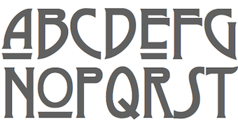 [More] ⦿
|
John S. Carroll
|
Metal type designer who died in 1982. Mac McGrew has remarks about three typefaces cuttings and plates [all text below is quoted]: - Vanity Fair Capitals were adapted by Douglas C. McMurtrie in 1923, from a type of J. F. Rosart, an eighteenth-century Dutch typefounder. and were privately cast for distribution by Continental Typefounders Association. They are a set of shaded italic capitals, with tendril designs used as serifs and breaking the main stems. John S. Carroll, then operating a private r type foundry in Miami Beach, cut much the same typeface in 1964-65; the specimens here show both cuttings. Carroll's cutting is closer to the original, and true to the Dutch originals, smaller sizes are simpler, lacking the mid-stem ornamentation.
- Gold Rush is ATF's revival in 1933 and again in 1949 of Antique Shaded. Also known as Ornamented No. 1514, cut about 1865 with lowercase by Bruce foundry. The basic design is Egyptian, with a third-dimensional form provided by a hairline at the bottom and right of each stroke. It is sometimes also called Klondike. It was plated by Carroll in the 1950s, with his mats later going to Typefounders of Phoenix and then to Los Angeles Type Foundry.
- Marble Heart is an ATF reissue, in 1933 and several later times, of Gothic Double Shade, an 1870s typeface of Boston Type Foundry, one of ATF's predecessors. The ATF casting was later plated and issued by John Carroll and others, and cut in smaller sizes by Los Angeles Type Foundry. [My own addition: Marble Heart seems to be done first in 1866 by Farmer, Little and Co. For a digital revival of Marble Heart, see Marmorherz NF (2014, Nick Curtis).] F
Digitizations include Gold (2011, Michael Hagemann: a multi-style slab serif font family based on the classic Gold Rush (1865, Bruce), with the shadows removed). Images: Gold Black, Gold Thin. [Google]
[More] ⦿
|
John Stephenson
[Stephenson Blake]

|
 [MyFonts]
[More] ⦿
|
John W. Zimmerman

|
 Designer at Barnhard Brothers and Spindler (and head of matrix engraving there), who designed the art deco typeface Cubist Bold (a typeface without lower case) in 1928. Patent. Mac McGrew on Cubist Bold: The name tells it all. Designed by John W. Zimmerman, head of the matrix engraving department. at BB&S, probably just before BB&S merged with ATF in 1929, this font of unusual capitals and figures is very large for the body and has no lowercase. Compare Dynamic Medium, Modernique.
 Revivals of Cubist: [Google]
[MyFonts]
[More] ⦿
|
Joost Swarte
|
Dutch poster and comic book lettering artist, b. 1947, Heemstede, The Netherlands. Comic series and characters by Swarte include Katoen en Pinbal, Jopo de Pojo, Anton Makassar, Dr Ben Cine and Niet Zo, Maar Zo- Passi, Messa. Wikipedia link. Typefaces inspired by his lettering: [Google]
[More] ⦿
|
Jos Dufour
|
 Belgian graphic designer and painter. With Dutch artist and graphic designer Joan Collette, he created the gorgeous ultra-fat art deco display typeface L'Indépendant (ca. 1930). It was done at Etablissements Plantijn, a foundry in Brussels affiliated at the time with Lettergieterij Amsterdam. Specimen at the University of Amsterdam library. The name and the year of release were chosen to commemorate the hundredth anniversary of the independence of Belgium (from the Netherlands). It was made into a font by Monotype in 1999. Implementations of Independant include Independant (free; by Phynette and Apostrophe), Dujour (by Steve Matteson), Sid The Kid NF (free; by Nick Curtis), Collette (2007, by Anton Scholtz), Dufour (2011, Anton Scholtz; +Condensed, +Outline), Condensed Outline, and Jumbo Mumbo NF (2006, Nick Curtis).
 Klingspor link. [Google]
[More] ⦿
|
Joseph Churchward
[Churchward Type]

|
[MyFonts]
[More] ⦿
|
Joseph Friedrich Gustav Binder

|
 After studies in Berlin, Binder (b. 1898, Lindenberg, d. 1991) taught at the National Art School in Saarbrücken. From 1924 on, he worked as an independent commercial artist. Designer at D. Stempel of Binder Style (1959). This squarish elbow-room only typeface appeared on the movie poster for Silence of the Lambs. It was revived by these type designers:
 - Nick Curtis: Bindlestiff NF (2011).
- Castcraft: OPTI-Binder-Style.
- Uwe Borchert: the free font BStyle (2013).
- Jim Lyles and Brian Bonislawsky (Grype): Binder (2020).
[Google]
[MyFonts]
[More] ⦿
|
Jürgen Riebling

|
Designer and lettering artist in the 1970s. He published Mr. Big (1972, Berthold AG), a decorative font that saw several digital revivals: His Media Serif (1976, H. Berthold AG) was digitally revived by Elsner and Flake---this is one of the typographic horrors of Western society, with clumsy serifs pointing the wrong way. at some point, Brendel Studio and Linotype were also offering versions of Media Serif. [Google]
[MyFonts]
[More] ⦿
|
J.W. Weekes
|
Letterer from the last part of the 19th century. Examples of his alphabets (taken from the 1910 book by Lewis Foreman Day entitled Alphabets Old and New) include Modern Roman, another Modern Roman, and Modern Roman Block (sans serif). Crane Titling NF (2006, Nick Curtis) is a digital typeface with medieval-inspired uppercase letters drawn by famed book illustrator Walter Crane. The charming quirky lowercase letters are from alphabets in that 1910 book drawn by J. W. Weekes. [Google]
[More] ⦿
|
Kandinsky NF
[Nick Curtis]
|
 A typeface made in 2008 by Nick Curtis, and named after abstract painter Wassily Kandinsky. [Google]
[More] ⦿
|
Karlgeorg Hoefer

|
 German scribe, type designer and unbelievable calligrapher, b. 1914 in Schlesisch-Drehnow, d. 2000 in Offenbach. Following schooling in Schlesien and Hamburg, he served a four-year typesetting apprenticeship from 1930-1934 in Hamburg and later at the Kunstgewerbeschule (School of Arts and Crafts) in Offenbach am Main. From 1939 until 1945 he was in active military service and became a prisoner of the Russians. After that ordeal, he became a calligraphy teacher at the Werkkunstschule in Offenbach, and developed a universal pen with novel writing and drawing techniques for the company Brause. It is at that point that Hoefer started designing types as well. From 1970 to 1979, Hoefer was a lecturer and later professor at the HfG (School of Design) in Offenbach. From 1981 to 1988, Hoefer ran summer calligraphy workshops in the USA (Los Angeles, San Francisco, Boston, New York, Washington, and other cities). In 1982, Karlgeorg Hoefer founded a calligraphy workshop in Offenbach for everyone, with evening courses and summer school, and in 1987, the registered association "Calligraphy Workshop Klingspor, Offenbach, Supporters of International Calligraphy." From 1987 to 1995, he was the chairman of the association while teaching continuing courses and summer school classes with leading foreign calligraphers. Hoefer has written two books about calligraphy: "Das alles mit einer Feder" (Brause, 1953) and "Kalligraphie, gestaltete Handschrift" (Econ, 1986). Numerous articles about Hoefer's work have appeared in calligraphy journals in Holland, France, the USA, and Japan. In 1989, the book "Schriftkunst/Letterart Karlgeorg Hoefer" was published as part of Calligraphy-Editions Herbert Maring (Die Kalligraphie Edition, Hardheim, Germany, 1989). For his activities as a calligrapher, Hoefer received the Order of Merit of the Federal Republic of Germany in 1993. His typefaces:
 - At Klingspor: Salto (1952), Saltino (1953), Saltarello (1954), Monsun (1954). Salto is a famous and often-copied brush script.
- At D. Stempel: Prima (1957), Zebra (1963-1965, D. Stempel, a script that plays on the simulation of grey and the use of two colors; revived by Colin Kahn in 2007 as P22 Zebra).
- At Ludwig&Mayer: Permanent (1962-1969, a large Grotesk family developed over many years---this was revived by Daylight in 2010 as Permanent Massiv; URW sells Permanent Headline URW D without even a word about the original designer; Softmaker has Plakette Serial and P700 sans; Castcraft has OPTI Permanent and OPTI Pinacle; Marcus Sterz published Letterpress Headline in 2009), Stereo (1963, an outline poster headline script developed between 1957 and 1968; digitally revived in 1993 as Stereo (Tobias Frere-Jones, Font Bureau)), Elegance (1964, a handwriting script, which was the basis for Sincerely (2005, Canada Type)), Big Band (1974, a fat poster script revived in 2007 by Nick Curtis as Baby Cakes NF (2007)), Big Band Terrazzo (1974, a glaz krak face), Headline (1964, a poster typeface that emanated from Permanent).
- Programm-Grotesk (1970): Hoefer's first digital typeface, commissioned by JT Hellas for the Greek telephone books It was first used in the digital machine Digiset of Dr. Ing. Hell in Kiel.
- From 1978 until 1980, Karlgeorg got involved in the development of a German license plate font that could withstand forgery by black marker pens. The typeface, FE Mittelschrift/Engschrift, had also input from other sources.
- Lateinischen Ausgangsschrift (1974): a school script for the Linotype phototypesetter. This led later to VA Schrift (Berthold and Linotype).
- At Linotype: Omnia (1990, a unicase typeface with a Celtic uncial feel), San Marco (1990, round gothic / Rundgotisch), Notre Dame (1991-1993, a full blackletter face), Dominatrix (1994), Sho (1992, an Asian brush script), Beneta (1992, a French bastarda inspired by the Littera beneventana, the script of the Benedictine scribes from the 10th to the 12th century).
Linotype page. FontShop link. View Karlgeorg Hoefer's typefaces. [Google]
[MyFonts]
[More] ⦿
|
Laurence Schall
|
Early 20th century designer of letters, such as this Modern Poster Alphabet with art nouveau influences, Adapted Roman (uncial), and Gothic. The Celtic style typeface Ballyhaunis NF (2005, Nick Curtis) and Inglenook Corner NF (2005, Nick Curtis) are based on his lettering. [Google]
[More] ⦿
|
Leslie Cabarga
[Cabarga type (was: Flashfonts)]

|
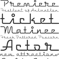 [MyFonts]
[More] ⦿
|
Lewis Buddy III

|
Magazine artist and letterer, b. 1872, d. 1941. He designed Roycroft and Tabard (which appeared, e.g., in the 1912 ATF Specimen book). Tabard was digitized by Nick Curtis in 2006 as Gandy Dancer NF. Mac McGrew on Roycroft: Roycroft was one of the most popular of a number of rugged typefaces used around the turn of the century, when printing with an antique appearance was in vogue. It was inspired by lettering used by the Saturday Evening Post, then a popular weekly magazine, and has been credited to Lewis Buddy, a former Post artist and letterer, but ATF says it was designed "partly" by Morris Benton, about 1898. Gerry Powell, director of typographic design for ATF in the 1940s, says, "Roycroft was first known as Buddy, changed when it was adopted by Elbert Hubbard for the Roycroft Press." Henry L. Bullen, ATF librarian and historian, says, "The first font of type to be made from matrices directly engraved on the Benton machine was 24-point Roycroft. October 4, 1900." While the machine was originally designed in 1884 to cut punches rather than matrices, it is doubtful that no fonts of mats were cut before 1900. Roycroft is also said to be the first typeface for which the large size of 120-point was engraved in type metal, with matrices made by electrotyping. Many typefaces of the day had a number of alternate characters. For this face. ATF gave specific instructions for their intended use: "M with the short vertex, in words the letters of which are open; R with the long tail, as a final letter in all-cap words; the wide h, m, and n, as a final letter only; t with the swash tail, as a final letter but not too frequently; u with the descending stroke, in words having no descending letters; ct ligature, wherever possible; the long s and its combinations, in antique work." Roycroft Open was cut in 1902, probably from the same patterns as the parent face. Roycroft Tinted is a very unusual face, in which the typeface is engraved with the equivalent of a halftone screen of about 25 percent tone value, with a black shadow on the right side; this typeface was cut by the Dickinson Type Foundry branch of ATF in Boston, and includes the same special characters as Roycroft. Compare Post Oldstyle. For a digital revival of Roycroft, see Croft (2018, Brian J. Bonislawsky and Jim Lyles). [Google]
[MyFonts]
[More] ⦿
|
Lucian Bernhard

|
 Vienna-born type designer who lived from 1883-1972, and whose real name was Emil Kahn. He died in New York, where he lived most of his life. He studied at the Munich Academy, which became a center of poster design. In 1910 he co-founded the magazine Das Plakat. During WWI he designed posters for the German War effort. In 1920 he was appointed as the first professor of poster design at The Akedemie der Kunst, Berlin. He moved to New York in 1923 and continued his poster work. He also continued his teaching at the Art Students League and at New York University. Short biography of Lucian Bernhard. Biography. MyFonts link. His typefaces:
 - Bernhard and especially Bernhard Modern (1937) are gorgeous high-legged typefaces. Bernhard Modern is used in classy magazines for ads, and adds a touch of style to many documents or presentations.
- Aigrette (1939).
- Lucian (1925, Bauersche Giesserei). I have also seen the date 1932. See also the digital version by Tilde, 1990. Lucian is very close in spirit to Bernhard Modern. As far as digital versions go, one can check out the Font Bureau contribution from 1990 by Kelly Ehrgott Milligan and David Berlow called Belucian, which comes in several weights, including Demi and Ultra. There are many other ones as well, such as Bernhard Modern FS (2011, Sean Cavanaugh).
- Lilith [or Lilli] (1930, Bauersche Giesserei).
- Bernhard Antiqua (1912, Flinsch). This is the titling typeface on my own web site! For a handcrafted revival in 2016 by Pintassilgo Prints, see Botanique.
- Bernhard Brush Script (Bauersche Giesserei, 1926).
- Madonna Ronde (1925: this is the Stephenson Blake name, after it acquired this typeface from Bauersche Giesserei).
- Bernhard Cursive (Bauersche Giesserei, 1925). Didgeree Doodle NF (2006, Nick Curtis) is a curly cursive originally released as Bernhard Heavy Antique Cursive by the Bauersche Giesserei.
- Bernhard Fraktur (+Extrafette; +Initialen) (1912, Flinsch; 1922, Bauersche Giesserei). The sublist of typefaces and dates: Bernhard Fraktur schmalfett, Bernhard Fraktur fett, Bernhard Fraktur extrafett (1921), Bernhard Kursiv extrafett (1927), Bernhard Antiqua extrafett (1924), Bernhard Antiqua zart (1925), Bernhard Antiqua Kursiv zart, Bernhard Handschrift (1928), Bernhard Schönschrift (1925), Bernhard Schönschrift kräftig (1928). Extrafette Bernhard Fraktur was revived in 2013 by Christoph Schwedhelm and in 2016 by Ralph M. Unger as Bernhard Blackletter.
- Bernhard Privat (also called Flinsch-Privat, 1919; Flinsch, Bauersche Giesserei).
- The Reklameschrift Bernhard Block.
- Bernhard Schönschrift (1925; see EF Bernhard Schonschrift). A free interpretation is Reliant (2010, Iza W and Dmitrij Greshnev).
- Bernhard Fashion (1929). This has been digitized by many, including SoftMaker (as Bernhard Fashion, in 2010), Peter Wiegel (as the free font family Bernardo Moda (2014)), by Infinitype, and by Bitstream (as Bernhard Fashion BT in 1990). It has been extended and played with, like for example, in Nick Curtis's Quoi Chou NF (2006) and in Peter Wiegel's Bernardo Moda Contrast (2014). Poster by Merle Perle.
- Bernhard Gothic (1929, ATF; see Bernhard Gothic SG by Spiece Graphics, Bernhard Gothic Medium (2017, Jordan Davies), or Samosata NF by Nick Curtis in 2009). Mac McGrew writes: Bernhard Gothic was one of the first contemporary American sans-serifs, designed in 1929-30 by Lucian Bernhard for ATF to counter the importation of the new European designs such as Futura and Kabel. It features long ascenders and a number of unusual design details, which perhaps prevented it from achieving the popularity of other such typefaces. Capitals are low-waisted, with the crossbars or arms of E, F, and H being below center. M is widely splayed in some weights. Lowercase a is roman in design, and the cross-stroke of t is wide and below the mean line. All but the Title versions have a number of alternate characters, later discontinued. The comma, semicolon and apostrophe, usually comparable, have three different forms. Bernhard Gothic was made only by ATF, but some weights could be simulated with special characters of Monotype Sans-Serif and Ludlow Tempo. The Title versions, several sizes of caps on each body in the manner of Copperplate Gothics, were added in 1936, and copied by Intertype as Greeting Gothic. Around 1938 Bernhard Gothic Medium Condensed was added.
- Bernhard Tango (1933, ATF). Bernhard Tango was imitated by Corel (Ballroom Tango), SSi (Petticoat), Greenstreet (Felicita) and Agfa (Carmine Tango).
- He also did a Magnetype font series that has been left untouched. Jonahfonts is the first to start reviving this series. In 2010, Bernhard's Community Low and Community Condensed started their digital life as Harpsichord (Jonah Fonts).
- According to Font Bureau, Bernhard also did an art deco display sans series in the 1930s, which David Berlow and Jonathan Corum at Font Bureau revived as Eagle from 1989-1994.
- Lucian lettered a concert program in the 1920, which was used by Jim Spiece in 2002 to create the elegant rounded sans display typeface Concerto Rounded.
- Lucian Bernhard's award-winning poster, Priester (1906), had angular lettering. Jonahfonts did LB Priester in 2009 based on it. In 2018, Ivan Moreno published anotherr extension, Presta.
- In the Bitstream collection, we find Bernhard Bold, with unknown origins. However, I have this rare 2002 public statement by John Warnock, Adobe's founder, in reaction to a question by M. Johansson (What happened to the Lo-Type font in Adobe Font Folio? It was included with Font Folio 8 but it's not in Font Folio 9. In Font Folio 9 there's Bernhard Bold Condensed, which is a reasonable replacement. I'm just wondering if anyone knows why Lo-Type was dropped; I prefer it myself.): Cuz LoType is a Berthold Type font and Adobe and Berthold had a lovers quarrel. A ton of Bertie's in FF8, no Bertie typefaces at all on FF9. Bye-bye Bertie. Love, J. Warnock.
- Lucian's small two-tiered logo with the letters BERN HARD led John Nahmias to extend it to Bernhard Signature (2019).
Posters by Bernhard: An advertising exhibition in 1929 (with Fritz Rosen), Manoli Cigarettes (1912). Linotype link. FontShop link. Klingspor link. View Lucian Bernhard's typefaces. Showcasing the digital legacy of Lucian Bernhard. [Google]
[MyFonts]
[More] ⦿
|
Ludlow
[Robert Hunter Middleton]

|
 Foundry in Chicago run by Robert Hunter Middleton. Myfonts.com writes that its type library was largely derivative, with some original scripts. After Middleton's death, and Ludlow's demise, most of the typefaces from the Ludlow library were licensed exclusively to International TypeFounders, Inc., (ITF) and are part of the Red Rooster collection. Since 2021, its fonts can be licensed via The Type Founders.
 Typefaces by Middleton at Ludlow include Bodoni Campanile, Bodoni (see Bodoni D Black by URW, and Bodoni Campanile Pro (2017) by Steve Jackaman), Coronet, Mandate, Lafayette (now sold by Font Bureau), Tempo (see Tempo by Monotype), and Umbra (now sold by Bitstream and Monotype). Ludlow house typefaces revived by Steve Jackaman include Caslon RR Extra Condensed, Chamfer Gothic (the original being from ca. 1898), and Gothic Medium Condensed. A renewed Ludlow was established in 2001 and is run from the UK. Current (2002) catalog: Admiral Script (Robert H. Middleton's formal script, 1953: see the digital revival by Ralph Unger in 2005), Adrian VGC (2003), Annonce Grotesque (Wagner&Schmidt, 1914), Delphian Open Title (Robert H. Middleton), Flair (connected writing, 40-50s style), Franklin Gothic ExCnd Title, Founders Garamond (based on the Berner type specimen of 1592), Lotther Text (blackletter based on an alphabet of Melchior Lotther, 1535), Ludlow Ornaments (2001), Ludlow Stygian (art deco, which inspired Nick Curtis' 2009 font Kharon Ultra NF), Maxim (Peter Schneidler, hand-printed font from 1955), Orplid (Hans Bohn), Samson (Robert H. Middleton), Speedball Roman, Ludlow Stencil (1937, Robert H. Middleton; a digital revival includes Jeff Levine's Favorite Stencil JNL (2015)), Tempo MedCond (Robert H. Middleton), Theda Bara (great titling type), Vulcan Shaded (based on the design of the Richard Gans Foundry in Madrid), Karnak Black (Egyptian slab serif originally designed by Robert Hunter Middleton in 1930), Oriana (blackletter font based on a design of the Imprimerie Nationale, Paris), Ludlow Square Gothic (revival/modernization of a 1920s font by Robert Wiebking for Ludlow), The Hardy Arcade (like Umbra), Ogre, Vulcan Bold (a display font inspired by a 1925 design of the Richard Gans Foundry, Madrid), Walbaum. Crestwood (2006, Ascender) is an updated version of an elegant semi-formal script typeface originally released by the Ludlow Type Foundry in 1937. References: Ludlow Typefaces A Supplement, November 1933, Ludlow Typefaces Typefaces Recently Produced, April 1936, Ludlow Typefaces [Edition D] (between 1940 and 1956). View a list of digital typefaces derived from the metal typefaces at Ludlow. Ludlow Foundry: List of some digital fonts. [Google]
[MyFonts]
[More] ⦿
|
Ludwig von Hohlwein
|
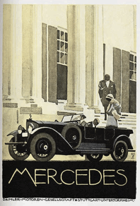 Designer (b. 1874, Wiesbaden, d. 1949, Berchtesgaden) at the Benjamin Krebs foundry who made Hohlweinschrift (1907). He worked mostly in München. Hohlwein was a poster artist ("Plakatmeister"). His posters inspired Nick Curtis to create several digital fonts. Alles trinkt Teutonenbrau (a beer poster from 1926) led to WurstwagenNF. Engelhorns Romanbibliothek (ca. 1912) yielded Chalk and Cheese NF (2004). Riquet Pralinen (1920) was used to develop Picayune Intelligence BT Roman. Richard Lipton created Bremen Black (1992, Font Bureau) after the lettering on a 1922 poster by von Hohlwein.
 Arnie Presiado (Inkfonts) designed Bierstedt (2017) and Porterhouse (2017) based ion Hohlwein's lettering. FontShop link. Posters: Casanova Cigaretten, Frühling in Wiesbaden (ca. 1925), Grönland Eiskrem (ca. 1925), Herkules Beer (1920s), Kraft Omnibusse (ca. 1925), Mercedes (ca. 1925), Riquetta (ca. 1910), Sudana Schokolade (ca. 1910), das kleine Huebchen, Marco Polo Tea (1920), Zeiss. Pic. [Google]
[More] ⦿
|
M. Elizabeth Colwell

|
 Chicago lettering artist who created Colwell Handletter&Italic in 1917 for ATF, and this roman (possibly in 1923), also for ATF. She was noted for her display work and hand-lettered pages. Some say that Colwell Handletter was designed by someone else based on her work.
 Digital versions: HPLHS Prop Fonts (Andrew Leman) has HPLHS Colwell and HPLHS Colwell italic. Lazy Dog Foundry (or: Franklin Type Founders) has a font called Colwell. Suzanne Fleischauer and Apostrophe created Colwell and Hadley (2000), based on 1916 hand lettering by Ned Hadley. So, maybe this suggests that Ned Hadley was the real designer of these fonts. Finally, Nick Curtis created McKenna Handletter NF Normal, McKenna Handletter NF Bold, McKenna Handletter NF Normal Italic and McKenna Handletter NF Bold Italic in 2002. Klingspor link. [Google]
[MyFonts]
[More] ⦿
|
MacKellar, Smiths and Jordan
[Thomas MacKellar]

|
Philadelphia-based foundry, which evolved in 1860 from the Johnson Type Foundry (upon Lawrence Johnson's death that year), which in turn evolved from Binny&Ronaldson (est. 1796). The proprietors were Thomas MacKellar (1812-1899), John F. Smith, Richard Smith, and Peter A. Jordan. MacKellar became the top exporter and producer of type in the 1870s. It united with 22 competitors in 1892 to become ATF (American Type Founders Co). Faces cut by them include the garalde Ronaldson Old Style (1884), named after James Ronaldson, one of its founders, and Campanile (1879). Monotype issued its own version of this typeface in 1903 with short ascenders and capitals the size of these ascenders. Jim Spiece did a revival of a classic Victorian typeface and calls it Zinc Italian SG (2002). The Victorian decorative typeface Ornamented No.5 (1888) was digitized and extended in 2007 by Nick Curtis as Vidalia Sunshine NF. Hermann Ihlenburg was one of their main punch cutters and type designers. Michael Hagemann made a blackletter typeface Spanish Main (2009) after an 1896 typeface called Sloping Black. The 1882 blackletter typeface Borussian was digitized by Nick Curtis and is called McKellar Borussian NF (2009). Hickory (2009, Michael Hagemann) is a revival of an unnamed ornamental Western font dating back to 1852 and was sold through a few different type foundries including Bruce, MacKellar Smiths&Jordan and James Conner's Sons. Monastic (see the1892 book Compact Specimen Book, page 280) was digitized by Toto as K22 Monastic (2010). Brazarri AOE Pro (2021, Astigmatic One Eye) is a revival of the Aztec emulation font Bizarre from 1884. Lining Gothic in their 1892 catalog inspired Jeff Levine's Order Form JNL (2021). An extra condensed serif typeface from that same 1892 catalog was revived by Jef Levine as Catalog Sheet JNL (2022). Specimen books include Specimens of original printing types cast by the patentees MacKellar, Smiths&Jordan co (ca. 1890), Specimens of printing types: ornaments, borders, corners, rules, emblems, initials, &c (1892, Philadelphia), Specimens of Printing Types (1890), 20th edition of the Compact Specimen Book (1892), Specimens of printing types, borders, cuts, rules, &c. MacKellar, Smiths&Jordan (1868), Specimens of printing types ornaments, borders, corners, rules, emblems, initials, &c. (1892), and Specimens of printing types made by the MacKellar, Smiths&Jordan co., type founders and electrotypers (1889). Also worthy of exploration is 1796-1896: One hundred years, Mackellar, Smiths and Jordan foundry (1896). Study and listing of their typefaces by yours truly. [Google]
[MyFonts]
[More] ⦿
|
Marcel Cros
|
I will take a wild guess and say that Marcel Cros was a Belgian illustrator and/or poster artist. In 1937, he did the lettering of an airline timetable "Sabena 1937 horaires et tarifs du 5 Avril au 9 Octobre" for (now bankrupt, thanks to our Swiss friends) Sabena Airlines. That beautiful poster led Nick Curtis to design his Sabrina Zaftig NF font in 2002. [Google]
[More] ⦿
|
Martin Jacoby-Boy

|
 Born in Berlin in 1883, died in Buenos Aires in 1963. He was a painter, commercial artist, advertising artist, writer and costume designer. After training to become a skilled woodworker, Jacoby-Boy studied at the Académie des Beaux-Arts in Paris. From 1912 to 1926, he designed Bravour (1912, D. Stempel AG), Verzierte Bravour (1913, D. Stempel AG) and Jacobea (1928, Berthold). Beginning in 1919, he spent a decade working as a Production Designer for several German film companies, including May Films and Fritz Lang's UfA. In 1933, he emigrated to the Netherlands and then to the USA, and finally to Argentina, where he died in 1963.
 In 2009, Nick Curtis designed Bravado NF based on Bravour. In 2013, Sebastain Cabaj designed Olech based on Bravour. Finally, in 2018, we find yet another revival, Bravour Meio Prata, by Douglas Reis. [Google]
[MyFonts]
[More] ⦿
|
Martin Kausche

|
Designer (b. 1915, Stettin) at D. Stempel of Mosaik (1954), a bold irregular sans serif caps font. Revived digitally by Canada Type as Sultan (2005). Canada Type writes: This design highlights the unmistakable Arabic/Moorish calligraphy influence on Celtic lettering, by way of the highly active Andalusian culture from the ninth century until the crusades in the early eleventh century. Nick Curtis's version of this is called Aethelred NF (2007). [Google]
[MyFonts]
[More] ⦿
|
Max Joseph Gradl

|
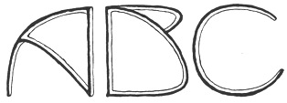 German type and jewelry designer, 1873-1934. He did advertising work for customers in Naples, London, New York and Germany. He was active in the art nouveau era and is credited with these typefaces:
 - The ultimate art nouveau all caps face, Gradl Highstep, revived under that name in 2008 by Tom Wallace (HiH).
- Gradl Initialen (2005), another art nouveau caps typeface revived and extended by Tom Wallace in 2008. Wallace writes: Max Joseph Gradl designed Art Nouveau jewelry in Germany. At least some of his designs were produced by Theodor Fahrner of Pforzheim, Germany -- one of the leading manufacturers of fine art jewelry on the Continent from 1855 to 1979.
- Gradl Zierschriften is yet another art nouveau decorative face, ca. 1900. Revived by Tom Wallace in 2005 under the same name. Another revivalist is Peter von Zezschwitz (Zetafonts), who created, e.g., Gradler. Rivanna NF (Nick Curtis) is yet another revival, but this one is free. Other revivals include Gradl No 1 (2008, Ralph M. Unger, URW++), Gradl (1992, Font Bureau typeface done for Microsoft), and Gradl Max (2010, Mike Freiman).
Scans of some his art nouveau alphabets: (1), (2). Scans of some alphabets of initials: (3), (4), (4). [Google]
[MyFonts]
[More] ⦿
|
Melbert Cary
[Continental Typefounders Association]
|
[More] ⦿
|
Mellisande NF
|
One of Nick Curtis's fonts that was removed from MyFonts after a complaint by Stuart Sandler who thought that it was too close to his own Honey Script. Nick Curtis obviously does not agree with this decison: [...], a claim which I find questionable, given the age of the original. Nonetheless, MyFonts prefers to err on the side of caution in such instances and gives the complaining party the benefit of the doubt, whether or not the complaint has merit. [Google]
[More] ⦿
|
Mike R. Stevens

|
 Designer and old-timer in the signpainting business in San Jose, CA, who influenced sign layout in a big way. Mike Stevens died of a heart attack in 1989 at the age of 46. At the SignDNA foundry, we find reincarantions of many of his alphabets, such as Magic, Stix (art deco), Happy Script, Master, ArRoyo, Tahoe, Staton, BigSur, DuVall, BigRed, BigMedicine, Tenor, Phoenix, Vasona. His bio at SignDNA states: I hope sign people are inspired once again by these great lettering styles of Mike's -- now available as typefaces. MyFonts link.
 Author of Mastering Layout: The Art of Eye Appeal and Ninety-Nine Showcards: A Photo Album, and frequent contributor of articles on layout to SignCraft magazine. MyFonts: Few sign artists in recent times have had as much influence on sign layout as Mike Stevens. He not only mastered lettering and layout, but is also credited with starting a renaissance in sign lettering on the West Coast. Nick Curtis also created some typefaces that were inspired by him, such as Mikeys Roman NF (2011), Marky Marker NF (2008, comic book font) and Mikey Likes It Corpulent NF (2008, signage face). . [Google]
[MyFonts]
[More] ⦿
|
Miller&Richard
[William Miller]

|
 Founded by William Miller in Edinburgh in 1809. The company became Miller&Richard in 1838, and closed in 1952, when the designs became the property of Stephenson Blake. They are best known for innovative type design, including hits such as the Miller&Richard Oldstyle (and its boldface, nowadays called Old Style or Century Oldstyle), Le Naudin, Egyptian Expanded (1850), and Antique Old Style, or Bookman. Specimen book from 1884. In 1974, Bloomfield Books (Owston Ferry Lincs) published a facsimile of Miller&Richards Typefounders Catalogue for 1873. Scans: Cuban, Grange, Ludgate, Teutonic, Tudor Black, Grotesque Capitals, Old Style Antique No. 7, Old Style Italic, Sans Serif No. 7.
 From their 1912 catalog: Grotesque No4, Grotesque No4 Italic, Grotesque No7, Grotesque No7. Revivals: - Bruntsfield CF (2020). A revival of Bruntsfield by Chuck Mountain.
- Nick Curtis offers a few digitizations: his Millrich Moravian NF (2010) revives Bohemian (1918, a jugendstil face). Millrich Grange NF (2015) revives Grange. Millrich Reading NF (2010, Victorian) revives a 1918 Miller&Richard typeface (by the same name, I presume). Millrich Olivian NF (2014) revives Olivian. Habana Sweets NF (2012) is a Victorian typeface modeled on Cuban (1873).
- Canada Type's digitizations: King Tut (2011, Kevin Allan King) is a revival and expansion of the original Egyptian Expanded (1850).
- Vintage Type Co revived Egyptian Expanded in 2019 as Bloke.
- Wood Type Revival (Matt Braun) revived the arts and crafts typeface Teutonic (1909) as WTR Roycroft (2015).
- Sean Coady revived Egyptian Expanded as VTC Bloke (2019).
- Auber CF (2019, Chuck Mountain). A revival and extension of Bohemian, a metal type that can be seen in Printing Machinery and Material (Miller & Richard, 1902).
- Massenet (2020, Chuck Mountain). A revival of Old Style Grotesque Condensed as shown in Specimens of Printing Type (Miller & Richard, Edinburgh, c. 1920).
- Jeff Levine revived Condensed Edina from the 1921 Miller & Richard type specimen book as Office Space JNL (2021).
- Brochure Sans JNL (2022, Jeff Levine). This is based on Sans Serif No.7 from the 1921 Miller & Richard type specimen book.
[Google]
[MyFonts]
[More] ⦿
|
Milton Glaser

|
 Milton Glaser (b. 1919, New York, d. 2020) was an important American graphic designer who founded Push Pin Studios (in 1954) in New York where he worked with Seymour Chwast. He left in 1970 and founded Milton Glaser Inc in New York in 1974. He taught classes at SVA, where according to Michael Samuel he said to his students: There are three responses to a piece of design---yes, no, and WOW! Wow is the one to aim for. One of his most iconic designs is the New York City logo from 1977 set in ITC American Typewriter. Glaser designed type on art boards. In the 1973 monograph Milton Glaser Graphic Design, George Leavitt is credited for lettering execution. Author of Sketch & Finish: The Journey from Here to There (2020, Princeton architecural Press). Glaser's typefaces:
 - Baby Teeth (1968, Photolettering). Milton Glaser's inspiration for his Babyteeth typeface came from a hand-painted advertisement for a tailor he saw in Mexico City. He was inspired by that E drawn as only someone unfamiliar with the alphabet could have concieved. So he set about inventing a completely legible alphabet consistent with this model. Available in the grapevine as BabyTeats. Cyrillically extended by Alexey Kustov (1993, TypeMarket) as Bebit. For a variation of Glaser's psychedelic Baby Teeth Baroque, see Nick Curtis's Aint Baroque NF (2009). Other digital versions include OPTI Buford (Castcraft: after Baby Teeth Ajar) and Baby Teeth (2009, Daylight). Drew Maughan's Wisdom Teeth (2020) is a modern and personal take on the original Baby Teeth, made in response to the large number of hideously bad clones of Baby Teeth (in Drew Maughan's own words). Finally, in 2021, Richard Kegler at P22 published P22 Glaser Babyteeth. Kegler writes: In 2019, P22 Type Foundry met with Milton Glaser to initiate the official digital series of typefaces designed by Glaser in the 1960s and 70s. P22 Glaser Babyteeth is the first family released in the series. P22 Glaser Babyteeth was based on original drawings and phototype proofs from the Milton Glaser Studios archives. Over the years there have been many typefaces that borrowed heavily from the Glaser designs, but these are the only official Babyteeth fonts approved by Milton Glaser Studio and the Estate of Milton Glaser. The solid and open versions are designed to overlap for two-color font effects and can even be mixed and matched for multi layer chromatic treatments.
- Glaser Stencil (1967, avant-garde typeface available at URW, Elsner&Flake, Linotype, and Apply Interactive). The Cyrillic version is due to A. Kustov (1993). For another digital version, see F37 Glaser Stencil by Rick Banks (2015). Glaser Stencil is sometimes referred to as Neo Futura and Futura Stencil.
- Hologram (1970). For a revival see Capital Ideas NF (2012, Nick Curtis).
- Baby Fat (1964). Glaser's first typeface. Digitized by Nick Curtis as Keepon Truckin NF (2007) and Baby Curls, and by Richard Keglet at P22 as P22 Glaser Babyfat (2021), which introduces six additional variations to allow the user to easily colorize the type as Glaser envisioned: Keyline, Fill, Glyph, Left, Right, and Down.
- Test (1996, a Braille simulation face).
- Houdini (1964). Milton Glaser commented about this type family: The typeface is called Houdini after the famous American magician. I wanted to produce a letterform that would gradually disappear as one line after another was removed. For a digital revival, see Richard Kegler's layerable family P22 Glaser Houdini (2021).
- Kitchen or Big Kitchen (1976), an art deco shadow caps face. It was digitally revived by Nick Curtis as Coochie Nando NF (2011) and by Richard Kegler as P22 Glaser Kitchen (2021).
- Einstein (1970s).
- Film Sense (1968, Photolettering, with Seymour Chwast). This typeface was digitized and extended by Adrian Candela in 2013 as Newsense.
- Sesame Place (1980).
Musings about life (dead link). Linotype link. FontShop link. A brief tour of Milton Glaser's typography. [Google]
[MyFonts]
[More] ⦿
|
Morris Fuller Benton
[Sterling and Sterling Cursive]
|
 [More] ⦿
|
Morris Fuller Benton
[Invitation]
|
 [More] ⦿
|
Morris Fuller Benton

|
 Prolific American type designer (b. 1872, Milwaukee, d. 1948, Morristown, NJ), who published over 200 alphabets at ATF. He managed the ATF type design program from 1892 until 1937. Son of Linn Boyd Benton. MyFonts page on him. Nicholas Fabian's page. Linotype's page. Klingspor page. Unos tipos duros page. His fonts include:
 - 1897: Cloister Old Style (ATF). [Stephenson Blake purchased this from ATF and called it Kensington Old Style, 1919] [Cloister (2005, P22/Lanston) is based on Jim Rimmer's digitization of Benton's Cloister.]
- 1898: Roycroft. Mac McGrew on Roycroft: Roycroft was one of the most popular of a number of rugged typefaces used around the turn of the century, when printing with an antique appearance was in vogue. It was inspired by lettering used by the Saturday Evening Post. then a popular weekly magazine, and has been credited to Lewis Buddy, a former Post artist and letterer, but ATF says it was designed "partly" by Morris Benton, about 1898. Gerry Powell, director of typographic design for ATF in the 1940s, says, "Roycroft was first known as Buddy, changed when it was adopted by Elbert Hubbard for the Roycroft Press." Henry L. Bullen, ATF librarian and historian, says, "The first font of type to be made from matrices directly engraved on the Benton machine was 24-point Roycroft. October 4, 1900." While the machine was originally designed in 1884 to cut punches rather than matrices, it is doubtful that no fonts of mats were cut before 1900. Roycroft is also said to be the first typeface for which the large size of 120-point was engraved in type metal, with matrices made by electrotyping. Many typefaces of the day had a number of alternate characters. For this face. ATF gave specific instructions for their intended use: "M with the short vertex, in words the letters of which are open; R with the long tail, as a final letter in all-cap words; the wide h, m, and n, as a final letter only; t with the swash tail, as a final letter but not too frequently; u with the descending stroke, in words having no descending letters; ct ligature, wherever possible; the long s and its combinations, in antique work." Roycroft Open was cut in 1902, probably from the same patterns as the parent face. Roycroft Tinted is a very unusual face, in which the typeface is engraved with the equivalent of a halftone screen of about 25 percent tone value, with a black shadow on the right side; this typeface was cut by the Dickinson Type Foundry branch of ATF in Boston, and includes the same special characters as Roycroft. Compare Post Oldstyle.
- 1900: Century Expanded (1900: poster by Heather Leonhardt). This was a complete redraw of Century Roman which was designed in 1894 by his father, Linn Boyd Benton, for Theodore Low DeVinne, the publisher of Century Magazine. Digitizations by Elsner&Flake, Bitstream and URW.
- 1901: Linotext (aka WedddingText).
- 1901-1910: Engravers.
- 1901: Wedding Text (some put this in 1907), Old English Text, Engravers' Old English (a blackletter font remade by Bitstream). Wedding Text has been copied so often it is sickening: Wedding Regular and Headline (HiH, 2007), Dan X. Solo's version, Comtesse, Elite Kanzlei (1905, Stempel), Meta, Lipsia, QHS Nadejda (QHS Soft), Blackletter 681, Marriage (Softmaker), Wedding Text TL (by Tomas Liubinas).
- 1902: Typoscript.
- 1902-1912: Franklin Gothic. Digital versions exist by Bitstream, Elsner&Flake (in a version called ATF Franklin Gothic), Red Rooster (called Franklin Gothic Pro, 2011), Linotype, and ITC (ITC Franklin Gothic). Discussion by Harvey Spears. Mac McGrew: Franklin Gothic might well be called the patriarch of modern American gothics. Designed in 1902 by Morris Fuller Benton, it was one of the first important modernizations of traditional nineteenth-century typefaces by that designer, after he was assigned the task of unifying and improving the varied assortment of designs inherited by ATF from its twenty-three predecessor companies. Franklin Gothic (named for Benjamin Franklin) not only became a family in its own right, but also lent its characteristics to Lightline Gothic. Monotone Gothic, and News Gothic (q.v.). All of these typefaces bear more resem- blance to each other than do the typefaces within some other single families. Franklin Gothic is characterized by a slight degree of thick-and-thin contrast; by the double-loop g which has become a typically American design in gothic typefaces; by the diagonal ends of curved strokes (except in Extra Condensed); and by the oddity of the upper end of C and c being heavier than the lower end. The principal specimen here is Monotype, but the basic font is virtually an exact copy of the ATF typeface in display sizes, except that Monotype has added f- ligatures and diphthongs. Franklin Gothic Condensed and Extra Condensed were also designed by Benton, in 1906; Italic by the same designer in 1910; and Condensed Shaded in 1912 as part of the "gray typography" series. Although Benton started a wide version along with the others, it was abandoned; the present Franklin Gothic Wide was drawn by Bud (John L.) Renshaw about 1952. Franklin Gothic Condensed Italic was added by Whedon Davis in 1967. Monotype composition sizes of Franklin Gothic have been greatly modi- fied to fit a standard arrangement; 12-point is shown in the specimen-notice the narrow figures and certain other poorly reproportioned characters. The 4- and 5-point sizes have a single-loop g. Gothic No. 16 on Linotype and Inter- type is essentially the same as Franklin Gothic up to 14-point; in larger sizes it is modified and more nearly like Franklin Gothic Condensed. However. some fonts of this typeface on Lino have Gagtu redrawn similar to Spartan Black. with the usual characters available as alternates; 14-point is shown. Western Type Foundry and later BB&S used the name Gothic No.1 for their copy of Franklin Gothic, while Laclede had another similar Gothic No. 1 (q.v.). On Ludlow, this design was originally known as Square Gothic Heavy with a distinctive R and t as shown separately after the Monotype diphthongs; when the name was changed to Franklin Gothic in 1928, it was redrawn, closer to Franklin Gothic but still a bit top-heavy; the unique R was retained in standard fonts but an alternate version like that of ATF was made available separately; also a U with equal arms, a single-loop g, and a figure 1 without foot serifs. Ludlow Franklin Gothic Italic, partially shown on the third line of the specimen, is slanted much more than other versions, to fit the standard 17 -degree italic matrices of that machine. Modern Gothic Condensed and Italic (q.v.) are often though not properly called Franklin Gothic Condensed and Italic, especially by Monotype users. Also see Streamline Block.
- 1903: Alternate Gothic (ATF). See Alternate Gothic Pro Antique (Elsner&Flake), Alternate Gothic No2 (Bitstream), Alpin Gothic (by Team77), League Gothic (2009-2011, The League of Movable Type), and Alternate Gothic No1, No2 and No3 (see the URW version). Mac McGrew: Alternate Gothic was designed in 1903 by Morris F. Benton for ATF with the thought of providing several alternate widths of one design to fit various layout problems. Otherwise it is a plain, basic American gothic with no unusual features, but represents a more careful drawing of its nineteenth-century predecessors. The Monotype copies in display sizes are essentially the same as the foundry originals, with the addition of f-ligatures. The thirteen alternate round capitals shown in the first line of Alternate Gothic No.1 were designed by Sol Hess in 1927 for Monotype, hence the "Modernized" name; with these letters the design is sometimes referred to as Excelsior Gothic. Monotype keyboard sizes, as adapted by Hess about 1911, are considera- bly modified to fit a standard arrangement; caps are not as condensed as in the original foundry design. In 6-point, series 51 and 77 are both the same width, character for character, but some letters differ a bit in design. Note that these two narrower widths are simply called Alternate Gothic on Monotype, while the wider version is Alternate Gothic Condensed! Alternate Gothic Italic, drawn about 1946 by Sol Hess for Monotype matches No.2, but may be used with other widths as well. Condensed Gothic on Ludlow, is essentially a match for Alternate Gothic No.1, but has a somewhat different set of variant characters, as shown in the third line. There is also Condensed Gothic Outline on Ludlow, introduced about 1953, essentially an outline version of Alternate Gothic No.2. On Linotype and Intertype there is Gothic Condensed No.2 which is very similar to Alternate Gothic No. 1 in the largest sizes only, but with even narrower lowercase and figures. Also compare Trade Gothic Bold and Trade Gothic Bold Condensed. For a free version of Alternate Gothic No. 1, see League Gothic (2009-2011, The League of Movable Type).
- 1904: Bold Antique, Whitin Black [see OPTI Bold Antique for a modern digitization], Cheltenham (digitizations by Bitstream and Font Bureau, 1992), Cloister Black (blackletter font, see the Bitstream version: it is possible that the typeface as designed by Joseph W. Phinney).
- 1905: Linoscript (1905). Originally at ATF it was named "Typo Upright". Clearface, about which McGrew writes: Clearface was designed by Morris Benton with his father, Linn Boyd Benton, as advisor. The bold was designed first, in 1905, and cut the following year. The other weights and italics were produced through 1911. As the name implies, the series was intended to show unusual legibility, which it certainly achieved. The precision of cutting and casting for which ATF is noted produced a very neat and handsome series, which had considerable popularity. Clearface Heavy Italic has less inclination than the lighter weights, and is non-kerning, a detail which helped make it popular for newspaper use; the specimen shown here is from a very worn font. Some of the typefaces have been copied by the matrix makers. But the typeface Monotype calls Clearface and Italic is the weight called Bold by other sources. Monotype also includes Clearface Italic No. 289, a copy of the lighter weight. Revival and expansion by Victor Caruso for ITC called ITC Clearface, 1978. Also, American Extra Condensed, an octagonal mechanical typeface revived in 2011 by Nick Curtis as Uncle Sam Slim NF.
- 1906: Commercial Script (versions exist at Linotype, URW, Bitstream (called English 144), SoftMaker (2012), and Elsner&Flake), Miele Gothic, Norwood Roman.
- 1907: Lincoln Gotisch, named after Abraham Lincoln. This found found its way from ATF to Schriftguss, Trennert und Sohn, and Ludwig Wagner. Digital revivals include Delbanco's DS Lincoln-Gotisch. Compare with Comtesses, Lipsia, Elite Kanzlei, Lithographia and Wedding Text.
- 1908: News Gothic, Century Oldstyle (digital versions by Bitstream, Elsner&Flake, and URW), Clearface Gothic (1907-1910: digital revivals include Clear Gothic Serial (ca. 1994, SoftMaker) and Cleargothic Pro (2012, SoftMaker). McGrew: Clearface Gothic was designed by Morris Benton for ATF in 1908, and cut in 1910. It is a neat, clean gothic, somewhat thick and thin, which incorporates some of the mannerisms of the Clearface (roman) series. However, it can hardly be considered a part of that family. There is only one weight, and fonts contain only the minimum number of characters.
- 1909-1911: Rugged Roman. McGrew: Rugged Roman was designed for ATF by Morris F. Benton in 1909-11. It was patented in 1915, but the earliest showing seems to have appeared in 1917. It is a rugged face, as the name says, of the sort that was popular early in the century, but appears to have no relation to other typefaces having the name "Rugged." It somewhat resembles Roycroft, but is lighter. But to add to the uncertainty, fonts contained a number of ligatures of the kind which were more common in the early 1900s, in addition to the usual f-ligatures.
- 1910: Cloister Open Face, Hobo (1910, strongly influenced by the Art Nouveau movement; Hobo Light followed in 1915), ATF Bodoni (Bitstream's version is just called Bodoni, and Adobe's version is called Bodoni Book or Bodoni Poster or Bodoni Bold Condensed, while Elsner&Flake call theirs Bodoni No Two EF Ultra; Font Bureau's version has just two weights called BodoniFB-Bold Condensed and Compressed). McGrew writes about Hobo: Hobo is unusual in two respects---it is drawn with virtually no straight lines, and it has no descenders and thus is very large for the point size. It was designed by Morris F. Benton and issued by ATF in 1910. One story says that it was drawn in the early 1900s and sent to the foundry without a name, which was not unusual, but that further work on it was continually pushed aside, until it became known as "that old hobo" because it hung around so long without results. More time elapsed before it was patented in 1915. The working name was Adface. Hobo was also cut by Intertype in three sizes. Light Hobo was also drawn by Benton, and released by ATF in 1915. It is included in one list of Monotype typefaces, but its series number is shown elsewhere for another Monotype face, and no other evidence has been found that Monotype actually issued it.
- 1911-1913: Venetian, Cromwell. Mac McGrew: Cromwell is a rather playful typeface, designed by Morris Benton in 1913 but not released by ATF until three years later. It uses the same capitals as Cloister (q.v.) and has the same small x-height with long ascenders and descenders, but otherwise is quite different, with much less formality. Notice the alternate characters and the double letters including overhanging f's.. Cromwell was digitized by Nick Curtis in 2010 as Cromwell NF. Mac McGrew on Venetian: Venetian and Italic were designed by Morris F. Benton for ATF about 1911, with Venetian Bold following about two years later. They are rather reserved transitional typefaces, almost modern, instead of classic designs of Venetian origin as the name implies. The result is closer to Bodoni than to Cloister. The working title was Cheltenham No.2, but the relationship to that family is not apparent. It is carefully and neatly done, but never achieved widespread use. Compare Benton, a later typeface by the same designer, which has similar characteristics but more grace and charm.
- 1914: Adscript, Souvenir, Garamond (with T.M. Cleveland).
- 1916: Announcement, Light Old Style, Goudy Bold. Mac McGrew writes: Announcement Roman and Announcement Italic were designed by Morris F. Benton in 1916, adapted from steel or copperplate engravings, but not completed and released until 1918. These delicate typefaces have had some popularity for announcements, social stationery, and a limited amount of advertising work, but are a little too fancy for extensive use. Oddly, some of the plain caps shown in the specimens, both roman and italic, do not seem to appear in any ATF specimens. Foundry records show that a 48-point size of the roman was cut in 1927, but no other listing or showing of it has been found. In fact, sizes over 24-point were discontinued after a few years, and all sizes were discontinued in 1954.. Digitizations: Announcement Roman was revived by Nick Curtis in 2009 and called Society Page NF. Rebecca Alaccari at Canada Type revived it as Odette in 2004. See also Castcraft's OPTI Announcement Roman.
- 1916-1917: Invitation. For a digital revival, see Sil Vous Plait (2009, Nick Curtis).
- 1917: Freehand.
- 1917-1919: Sterling. Digitizations include Howard (2006, Paul D. Hunt), Argentina NF (2009, Nick Curtis), and Argentina Cursive NF.
- 1918: Century Schoolbook (1918-1921). (See ITC Century (Tony Stan, 1975-1979), or the Century FB-Bold Condensed weight by Greg Thompson at Font Bureau, 1992. For Century Schoolbook specifically, there are versions by Elsner&Flake, Bitstream and URW. Bitstream has a monospaced version.) URW Century Schoolbook L is free, and its major extension, TeXGyre Schola (2007) is also free.
- 1920: Canterbury. Mac McGrew: Canterbury is a novelty typeface designed by Morris F. Benton for ATF in 1920, when trials were cut, but not completed for production until 1926. It features a very small x-height, with long ascenders and descenders; monotone weight with minute serifs; and a number of swash capitals. It is primarily suitable for personal stationery and announcements. Compare Camelot Oldstyle. Digital versions were done by Nick Curtis in his Londonderry Air NF (2002-2004), and Red Rooster in the series Canterbury, Canterbury OldStyle, and Canterbury Sans.
- 1922: Civilité. Mac McGrew on the ATF Civilité: Civilite in its modern adaptation was designed by Morris Benton in 1922 and cut by ATF in 1923-24. The original version was cut by Robert Granjon in 1557 to imitate the semi-formal writing then in vogue, and is believed to be the first cursive design cut in type. It became popular for the printing of poetry and for books of instruction for children, where the type itself could serve as a perfect model of handwriting. The first of these books was titled La Civilite puerile, printed at Antwerp in 1559. The books were so popular that the design came to be known as "civility" type. Other interpretations of the letter have been made, including Cursive Script, cut in the nineteenth century in 18-point only from French sources by ATF predecessors and by Hansen, but Benton's seems more attractive and legible to modern eyes. The French pronunciation of ci-vil'i-tay is indicated by the accented e, which was used only in ATF's earliest showings. The many alternate characters were included in fonts as originally sold; later they were sold separately and finally discontinued, although the basic font was still listed in recent ATF literature. Also see ZapfCivilite. Compare Freehand, Motto, Verona.
- 1924: Schoolbook Oldstyle.
- 1926-1927: Typo Roman.
- 1927: Chic (American Typefounders; doubly shaded capitals and figures), Gravure, Greeting Monotone, Goudy Extra Bold. The art deco typeface Chic was revived by Nick Curtis as Odalisque NF (2008) and Odalisque Stencil NF (2010).
- 1928: Parisian, Bulmer (revival of William Martin's typeface from 1792 for the printer William Bulmer; digital forms by Monotype, Adobe, Linotype, and Bitstream), Broadway (1928-1929, see two styles offered by Elsner&Flake, Linotype, Bitstream, and 11 weights by URW), Goudy Catalogue, Modernique, Novel Gothic (ATF, designed with Charles H. Becker), Dynamic. Novel Gothic has seen many digital revivals, most notably Telenovela NF (2011, Nick Curtis), Naked Power (Chikako Larabie) and Novel Gothic SG (Jim Spiece). Images of Bulmer: i, ii, iii, iv, v, vi, vii, viii, ix, x, xi, xii.
- 1929: Louvaine. McGrew: Louvaine series was designed by Morris F. Benton for ATF in 1928. It is an adaptation of Bodoni (the working title was Modern Bodoni), and many of the characters are identical. Only g and y are basically different; otherwise the distinction is in the more abrupt transition from thick to thin strokes in this series. In this respect, Ultra Bodoni has more affinity to Louvaine than to the other Bodoni weights. The three weights of Louvaine correspond to Bodoni Book, Regular, and Bold. This series did not last long enough to appear in the 1934 ATF specimen book, the next complete one after its introduction. Compare Tippecanoe.
- 1930: Benton, Engravers Text, Bank Gothic (see Bitstream's version), Garamond-3 (with Thomas Maitland Cleland), Paramount (some have this as being from 1928: see Eva Paramount SG by Jim Spiece). McGrew: Paramount was designed by Morris Benton in 1930 for ATF. It is basically a heavier companion to Rivoli (q. v.), which in turn is based on Eve, an importation from Germany, but is heavier than Eve Bold. It is an informal typeface with a crisp, pen-drawn appearance. Lowercase is small, with long ascenders and short descenders. Vertical strokes taper, being wider at the top. It was popular for a time as an advertising and announcement type.
- 1931: Thermotype, Stymie (with Sol Hess and Gerry Powell). Stymie Obelisk is a condensed Egyptian headline face---the latter was revived by Nick Curtis as Kenotaph NF (2011).
- 1932: Raleigh Gothic Condensed (the digital version by Nick Curtis is Highpoint Gothic NF (2011)), American Text (blackletter). Mac McGrew: Raleigh Gothic Condensed was designed by Morris F. Benton for ATF in 1932. It is a prim, narrow, medium weight gothic face, with normally round characters being squared except for short arcs on the outside of corners. The alternate characters AKMNS give an even greater vertical appearance than usual. At first, this typeface was promoted with Raleigh Cursive as a stylish companion face, although there is no apparent relationship other than the name. Compare Phenix, Alternate Gothic, Agency Gothic.
- 1933: American Backslant, Ultra Bodoni (a great Bodoni headline face; see Bodoni FB (1992, Font Bureau's Richard Lipton). About Agency Gothic, McGrath writes: Agency Gothic is a squarish, narrow, monotone gothic without lower- case, designed by Morris F. Benton in 1932. It has an alternate A and M which further emphasize the vertical lines. Sizes under 36-point were added in 1935. Agency Gothic Open was drawn by Benton in 1932 and introduced in 1934; it follows the same style in outline with shadow, and probably has been more popular than its solid companion. Triangle Type Foundry, a Chicago concern that manufactured matrices, copied this typeface as Slim Open, adding some smaller sizes. ATF's working titles for these typefaces, before release, were Tempo, later Utility Gothic and Utility Open. Compare Raleigh Gothic Condensed, Poster Gothic, Bank Gothic. Digital versions include Warp Three NF (2008, Nick Curtis), which borrows its lowercase from Square Gothic (1888, James Conner's Sons), FB Agency (1995, David Berlow at FontBureau), Agency Gothic (by Dan Solo) and OPTI Agency Gothic (by Castcraft).
- 1934: Shadow, Tower (heavy geometric slab serif), Whitehall. Font Bureau's Elizabeth Cory Holzman made the Constructa family in 1994 based on Tower. Digital versions include Warp Three NF (2008, Nick Curtis), which borrows its lowercase from Square Gothic (1888, James Conner's Sons), FB Agency Gothic (1995, David Berlow at FontBureau) and Agency Gothic by Castle Type. Eagle Bold followed in 1934. McGrew: Eagle Bold is a by-product of the depression of the 1930s. The National Recovery Administration of 1933 had as its emblem a blue eagle with the prominent initials NRA, lettered in a distinctive gothic style. Morris Benton took these letters as the basis for a font of type, released later that year by ATF, to tie in with the emblem, which businesses throughout the country displayed prominently in advertising, stationery, and signs; naturally it was named for the eagle. Compare Novel Gothic. USA Resolute NF (2009, Nick Curtis) is based on Eagle Bold.
- 1935: Phenix. This condensed artsy sans was revived in 2011 at Red Rooster by Steve Jackaman and Ashley Muir as Phoenix Pro.
- 1936: Headline Gothic. For a digital version, see ATF Headline Gothic (2015, Mark van Bronkhorst, Igino Marini, & Ben Kiel at American Type Founders Collection).
- 1937: Empire. This ultra-condensed all caps skyline typeface was digitally remade and modernized by Santiago Orozco as Dorsa (2011). Jeff Levine reinterpreted it in 2017 as Front Row JNL. Bitstream also has a digital revival.
Linotype link. FontShop link. Picture. Typefaces alphabetic order: - Adscript
- Agency Gothic (+Open
- Alternate Gothic No.1 (+No.2, +No.3)
- American Backslant
- American Caslon&Italic
- American Text
- Announcement Roman&Italic (1916). For digital revivals or influences, see Friendly (2012, Neil Summerour), Odette (2004, Canada Type) and Society Page NF (2009, Nick Curtis).
- Antique Shaded
- Bank Gothic Light (+Medium, +Bold, +Light Condensed, +Medium Condensed, +Bold Condensed). For digital versions, see Bank Gothic AS Regular and Condensed (2008, Michael Doret).
- Baskerville Italic
- Benton (Whitehall)&Italic
- Bodoni&Italic (+Book&Italic, +Bold&Italic, +Bold Shaded, +Bold Open)
- Bold Antique (+Condensed)
- Broadway (+Condensed). The prototyical art deco typeface (1928-1929).
- Bulfinch Oldstyle (1903).
- Bulmer&Italic
- Canterbury
- Card Bodoni (+Bold). 1912-1916.
- Card Litho (+Light Litho)
- Card Mercantile
- Card Roman
- Century Expanded&Italic
- Century Bold&Italic (+Bold Condensed, +Bold Extended)
- Century Oldstyle&Italic (+Bold&Italic, +Bold Condensed)
- Century Catalogue&Italic
- Century Schoolbook&Italic (+Bold)
- Cheltenham Oldstyle&Italic (+Condensed, +Wide)
- Cheltenham Medium&Italic (+Medium Condensed, +Medium Expanded, +Bold&Italic, +Bold Condensed&Italic, +Bold Extra Condensed&Title, +Bold Extended, +Extrabold, +Bold Outline, +Bold Shaded&Italic, +Extrabold Shaded, +Inline, +Inline Extra Condensed, +Inline Extended)
- Chic
- Civilite
- Clearface&Italic (1907, +Bold&Italic, +Heavy&Italic)
- Clearface Gothic: a flared version of Clearface.
- Cloister Black
- Cloister Oldstyle&Italic (+Lightface&Italic, +Bold&Italic, +Bold Condensed, +Cursive, +Cursive Handtooled, +Title&Bold Title)
- Commercial Script
- Copperplate Gothic Shaded
- Cromwell.
- Cushing Antique (1902).
- Della Robbia Light
- Dynamic Medium
- Eagle Bold
- Empire (1937). A skyline typeface.
- Engravers Bodoni
- Engravers Old English (+Bold)
- Engravers Bold
- Engravers Shaded
- Engravers Text
- Franklin Gothic&Italic (+Condensed, +Extra Condensed, +Condensed Shaded)
- Freehand (1917). Mac McGrew: Freehand, a typeface based on pen-lettering, was designed for ATF by Morris Benton in 1917. The working title before release was Quill. Derived from Old English, it is an interesting novelty, and has had quite a bit of use. Compare Civilite, Motto, Verona.
- Garamond&Italic (+Bold&Italic, +Open)
- Globe Gothic (+Condensed, +Extra Condensed, +Extended, +Bold&Italic)
- Goudy Bold&Italic (+Catalogue&Italic, +Extrabold&Italic, +Handtooled&Italic, +Title)
- Gravure
- Greeting Monotone
- Headline Gothic
- Hobo&Light Hobo (1910). For digital versions, see Informal 707 (Bitstream), Hobbit (SF), Homeward Bound (Corel), Hobo No2 (2012, SoftMaker), Bogo (2016, Harold Lohner), and Hobo (Bitstream).
- Invitation (+Shaded)
- Light Oldstyle
- Lightline Gothic&Title (1908). For a revival, see Benton Gothic Thin NF (2014, Nick Curtis).
- Lithograph Shaded (1914, with W.F. Capitain).
- Louvaine Light&Italic (+Medium&Italic, +Bold&Italic)
- Miehle Extra Condensed&Title
- Modernique
- Monotone Gothic&Title
- Motto (1915). Mac McGrew: Motto is a calligraphic typeface designed by Morris F. Benton for ATF in 1915. It is similar to the same designer's Freehand, drawn a couple of years later, but has plainer capitals, heavier thin strokes, and shorter descenders. But letters combine into legible words with a pleasant, hand-lettered appearance. Also compare Humanistic, Verona. For a digital version, see Motto by Juan Kafka.
- News Gothic (+Condensed, +Extra Condensed&Title)
- Norwood Roman
- Novel Gothic
- Othello
- Packard (+Bold)
- Paramount
- Parisian
- Pen Print Open
- Phenix
- Piranesi Italic (+Italic Plain Caps, +Bold&Italic, +Bold Italic Plain Caps)
- Poster Gothic (1934).
- Raleigh Gothic Condensed (1934).
- Rockwell Antique
- Roycroft
- Rugged Roman
- Schoolbook Oldstyle
- Shadow
- Souvenir (1914). Revived in 1977 by Ed Benguiat as ITC Souvenir, but a total failure as a type design. Simon Garfield: Souvenir was the Comic Sans of its era, which was the 1970s before punk. It was the typeface of friendly advertising, and it did indeed appear on Bee Gees albums, not to mention the pages of Farrah Fawcett-era Playboy. Mark Batty from International Typeface Corporation (ITC) on one of his best-selling fonts: A terrible typeface. A sort of Saturday Night Fever typeface wearing tight white flared pants. Garfield also retrieved this quote by type scholar Frank Romano in the early 1990s: Real men don't set Souvenir. Digital revivals also include Sunset Serial by Softmaker, and ITC Souvenir Mono by Ned Bunnel.
- Sterling&Cursive
- Stymie Light&Italic (+Medium&Italic, +Bold&Italic, +Black&Italic)
- Thermotypes
- Tower Condensed (1934). Revived by Photo-Lettering Inc as PL Tower.
- Typo Roman&Shaded
- Typo Script and Typo Script&Extended (1902)
- Typo Shaded
- Typo Slope
- Typo Upright&Bold
- Ultra Bodoni&Italic (+Condensed, +Extra Condensed)
- Venetian&Italic (+Bold)
- Wedding Text&Shaded
View Morris Fuller Benton's typefaces. A longer list. A listing of various digital versions of News Gothic. More News Gothic-like typefaces. Even more News Gothic-like typefaces. [Google]
[MyFonts]
[More] ⦿
|
Multiline fonts: Mike Yanega
|
Mike Yanega has the ultimate listing of multiline fonts. Let me group them for you: - Agfa/Monotype: Zeppelin.
- From the book Homage to the Alphabet: Churchward Metallic (also Italic), Dektiv, Aki Lines, Maxie Lined, Prismania K, Skin & Bones.
- FontBank: Skinny, Legerdemain (Elektrik), Neptune (Neon).
- George Williams: Mirage, Picadilly..
- Elsner + Flake: Pump Triline (+ Initials).
- ParaType: Dublon.
- Blue Vinyl: Macrame Super.
- T26: Kaa, Maxigroove, F-Groove 76, F-Groove 77, F-Groove 78, F-Groove 79, F-Groove 80, F-Groove 81, 21st Outline (+ Italic).
- DustBust: Dreamland, Vectroid Astro.
- Sparky Fonts: Thri.
- ITC: ITC Neon.
- Font-a-licious: Rolloglide, Supreme, Gemini Outline, Gemini 1972.
- Linotype: Labyrinth.
- Churchward Type: Churchward Design Lines.
- Fontlicker Fonts: Phatburner.
- You Work For Them: Trisect.
- DS4.Sale: DS Lane.
- Typotek: La Chaufferie (Basic, Basic Special, Super, Super Special).
- Fontomas: Mass Striped.
- Fenotype: 79 Retro.
- Nick Curtis: Buenos Aires.
- Ray Larabie: Mexcellent, Mexcellent 3D, Soul Mama, Street Cred.
- Red Rooster: Roller.
- C-Font: Crossbar.
- Fenotype: Automania.
- Miguel Hernandez (Atomic Media): Groobit.
- From a Spanish Letraset catalog: Oxford, Michel (by Michel Waxman), Stack, Stripes (1973), Optex (1970), Yagi Link Double (see picture here), Good Vibrations (1973, Trevor Hatchett).
- Axel Pfaender: Excellence (1997).
- Canada Type: Gala (Biline, Triline).
[Google]
[More] ⦿
|
MyFonts: Nick Curtis
[Nick Curtis]
|
MyFonts hit list for Nick Curtis's typefaces, ordered from top sellers on down. View the complete list of Nick Curtis's typefaces made up to the end of 2011 [large web page warning!]. View the typefaces designed by Nick Curtis. [Google]
[More] ⦿
|
National Old Style and Nabisco
[Frederic William Goudy]
|
 Two Goudy fonts, from 1916 and 1921, respectively. Goudy wrote about them, as reported in A Half-Century of Type Design and Typography: 1895-1945, Typophiles Chap Books XIV, 1946 at pages 99 and 110:
 - National Old Style (1916). Clarence Marder asked me later that same year whether I could use the lettering I had done for the National Biscuit Company in 1901 or 1902 and make a type approximating it in character. I called his attention to the fact that the lettering he referred to consisted of capitals only, and while it would be easy enough to make a type of those, it would be more difficult to make a lower-case which would not be rather freakish to go with them. However, I went ahead with the design, adding a lower-case in harmony with the capitals, and it is shown in the specimens of the company. I see it occasionally in printing; one use of it, I recall, is on the cover and title page of _Graphic Arts_ issued by the _Encyclopaedia Britannica_ for a selection of articles from its 14th edition. It has also been used for captions for movies, owing to its strong but even color. As a display letter it probably compares favorably with many others we could do without.
- Nabisco (1921). In Chicago, in 1901 or 1902, I had hand-lettered the words "National Biscuit Company" for that concern. The commission came through their advertising executive, James Fraser, who did not tell me that twenty-five or more designers also had been given the same commission at the same time. A few days after I had delivered my drawing to Fraser, I received a telephone message from him requesting my presence at his office. On arriving there I was shown some forty other drawings of the same words I had drawn, and was then told that mine had won the competition. If I had known it was a competitive affair I might not have accepted the order at all, although _all_ the drawings were to be paid for. One nice thing occurred when I presented my reasonable bill: Fraser surprised me by tearing it up in my presence, and asked me to make out another for double the amount. Practically twenty years later, the New York advertising representatives of the company asked me to make a type for the National Biscuit Company, using letters of the character of those drawn so long before. I didn't like to tell them that I was not sure those letters were the sort that would make a good type to use for their announcements, booklets and advertisements; or that, since I had already made a type for the American Type Founders Company along the same lines, I feared any new attempt might prove too reminiscent of that type. However, I made drawings and had several sizes engraved by Wiebking. The Company named it "Nabisco" and used it frequently for booklets and small advertisements. Of late years I have not seen it so often, but I imagine it still is in occasional use. In 1912 one day while seated at my desk on Madison Avenue, a man came in with a package under his arm. He said he was a lithographer, and had an order to reproduce a drawing which by constant use over a period of years was in pretty bad shape for satisfactory reproduction ; he wondered if I could make a good copy of it for him. On opening the package I was amazed to find it was the original drawing I had made in Chicago in 1901 for the National Biscuit Company!
Mac McGrew: National Oldstyle was designed by Frederic W. Goudy for ATF in 1916. It is based on lettering he had done about fifteen years earlier for National Biscuit Company, hence the name. It was moderately popular for a while for publication and advertising display work, and for titles for silent motion pictures. Compare Nabisco. Mac McGrew on Nabisco: Nabisco was designed by Frederic W. Goudy in 1921 as a private type for National Biscuit Company, based on hand-lettering of the company name he had done about twenty years earlier. As he had in the meantime drawn National Oldstyle (q.v.) for ATF, based on the same lettering, this typeface is consciously different although retaining the same general characteristics. Several sizes were cut by Robert Wiebking. The baking company was pleased. and used it frequently for several years. For a revival of National Oldtsyle, see National Oldstyle NF (2014, Nick Curtis). For a revival and extension to bold, semibold and italics, see Goudy National (2018, Steve Matteson. [Google]
[More] ⦿
|
Nicholas Joseph Werner
|
 Born in Belleville, IL, in 1858. He died in 1940. Typefounder, author, artist, editor and printer, all in one. Involved at some point with the Inland Type foundry and the Central Type Foundry. His typefaces:
 - Antique No. 6 (ca. 1883, Inland Type Foundry).
- Avil (1904, Inland Type Foundry).
- Becker Series (1899, Inland Type Foundry), blackletter face.
- Bizarre Bold (1895, Inland Type Foundry) oe Edwards (the original name) or Inland Series. This typeface adds many Victorian or steampunk elements to a didone skeleton. McGrew says: It was renamed, most appropriately, by BB&S in 1925 after that foundry took over Inland. A companion typeface called Inland, by the same designer, was produced at the same time using some of the same characters but with even more unusual twists to others. Compare Francis. In 2010, Claude Pelletier made two digital versions, called Bizarre and Bizarrerie. Vivien Gorse (Toulouse, France) revived Inland Series in 2014-2015.
- Brandon (1898, Inland Type Foundry): According to McGrew, "a thick-and-thin title face, similar to Engravers Roman, named for a printer in Nashville, Tennessee. Like a number of other such typefaces, it has no lowercase but was cast in several sizes on each of several bodies so numerous cap-and-small-cap combinations could easily be made. This style was popular for stationery and business forms. Hansen called the typeface Plate Roman. On Linotype and Intertype Bold Face No.9 is essentially the same typeface but a little narrower; typesetters not infrequently call it Engravers Roman. There was also a Brandon Gothic, cut only in two small 6-point sizes, which was similar to Combination Gothic, but with a letterspaced effect."
- Bruce Title / Menu Roman / Skinner: McGrew reports that Menu Roman is the BB&S rename, for the 1925 specimen book, of Skinner, which was shown by Inland Type Foundry about 1885, and ascribed to John K. Rogers as well as to Nicholas J. Werner. Menu Title, formerly Lining Menu, was Inland's Bruce Title, by Werner. Menu Shaded was Acme, designed in 1886 or earlier. The latter has only a very general relationship to the other typefaces which are nearly monotone, with long serifs tapering to sharp points. Compare Paragon.
- Caxton Bold (Marder, Luse). Codesigned with William F. Capitain.
- Central Lining Antique (ca. 1892, Central Type Foundry).
- Corbitt (1900, Inland): McGrew states [...] a heavy, thick-and-thin typeface with tiny serifs [...] Although still showing many of the quaint design details of nineteenth-century types, it is somewhat more mature. Condensed Corbitt was advertised by Inland in 1902 as their "latest addition." Both versions were cast by ATF after Inland merged with that foundry in 1911, but only the Condensed seems to have survived until matrices were inventoried in 1930. Digital revival by Chuck Mountain in 2020 as Murden CF.
- Courts (1900, Inland): later renamed DeVinne Recut Italic.
- De Vinne: McGrew writes about this: DeVinne, the display face, is credited with bringing an end to the period of overly ornate and fanciful display typefaces of the nineteenth century, and with restoring the dignity of plain roman types. It is derived from typefaces generally known as Elzevir or French Oldstyle (q.v.). DeVinne says of it, "This typeface is the outcome of correspondence (1888-90) between the senior of the De Vinne Press (meaning himself) and Mr. J. A. St. John of the Central Type Foundry of St. Louis, concerning the need of plainer types of display, to replace the profusely ornamented types in fashion, of which the printers of that time had a surfeit. The DeVinne Press suggested a return to the simplicity of the true old-style character, but with the added features of thicker lines and adjusted proportion in shapes of letters. Mr. St. John approved, but insisted on grotesques to some capital letters in the belief that they would meet a general desire for more quaintness. Mr. Werner of the Central Type Foundry was instructed to draw and cut the proposed typeface in all sizes from 6- to 72-point, which task he executed with great ability. "The name given to this typeface by Mr. St. John is purely complimentary, for no member of the DeVinne Press has any claim on the style as inventor or designer. Its merits are largely due to Mr. Werner; its few faults of uncouth capitals. ..show a desire to please eccentric tastes and to conform to old usage. The new typeface found welcome here and abroad; no advertising typeface of recent production had a greater sale. Thus De Vinne himself credits the typeface to Central Type Foundry and its design to Nicholas J. Werner, but Werner says, "To correct the general impression that Theodore L. De Vinne was the designer of the typeface named after him, I would state that it was the creation of my partner, Mr. (Gustav) Schroeder." The design was patented under Schroeder's name in 1893. Central was part of the merger that formed American Type Founders Company in 1892, but continued to operate somewhat independently for a few more years. Meanwhile, DeVinne was copied by Dickinson, BB&S, Hansen, and Keystone foundries, and perhaps others-in fact, Keystone advertised that it patented the design in 1893, Connecticut Type Foundry copied it as Saunders, and Linotype as Title No.2. Dickinson called it "a companion series to Howland" (q.v.). When Monotype developed an attachment in 1903 to cast display sizes, DeVinne was the first type shown in their first announcement. Later ATF specimens showed this typeface and several derivatives as DeVinne No.2, probably because of adjustments to conform with standard alignment. DeVinne Italic and DeVinne Condensed were drawn by Werner and produced by Central in 1892 and copied by some other sources. Howland, shown by Dickinson in 1892, is essentially the same as DeVinne Condensed No.3, later shown by Keystone. ATF introduced DeVinne Extended in 1896, while BB&S showed DeVinne Compressed, Extra Compressed, and Rold in 1898-99. Keystone's DeVinne Title is another version of bold, not as wide as that of BB&S. In 1898 Frederic W. Goudy was asked to take the famous display type and make a book typeface of it. The resulting DeVinne Roman, Goudy's second type design, was cut the following year by the Central branch of ATF. DeVinne Slope, essentially the same design but sloped rather than a true italic, was cut by the foundry about the same time, perhaps from the same patterns as the roman. DeVinne Open or Outline and Italic also originated with Central. In the roman and smaller sizes of italic only the heavy strokes are outlined; in larger sizes of italic, certain thin strokes are also outlined. Monotype cut the open typefaces in 1913. DeVinne Shaded is another form of the outline, created by Dickinson in 1893; parts of the outline are much thicker than others. DeVinne Recut and Recut Outline, shown by BB&S, are not true members of this family, but are a revival of Woodward and Woodward Outline, designed by William A. Schraubstadter for Inland Type Foundry in 1894; there were also condensed, extra condensed, and extended versions, all "original" by Inland. DeVinneRecutItalic was a rename of Courts, by Werner about 1900, also from Inland. Compare McNally. There are several modern day interpretations, such as C790 (Softamker), Columbus, Roslindale (2018, David Jonathan Ross) and ITC Bernase (1970, Thomas Paul Carnase).
- Edwards (1895, Inland Type Foundry). Revived and interpreted in digital version by Nick Curtis as Inland Edwards NF.
- Era Condensed No. 5 (with Gustav F. Schroeder) (1891, Barnhart Bros & Spindler).
- Flemish Condensed (1905), a typeface bought by Stephenson Blake from the Inland Type Foundry. Flemish Expanded (1890, Stephenson Blake; co-designed with Eleisha Pechev).
- Gothic No. 8 (1890, Inland Type Foundry).
- Hermes (1887, Central Type Foundry). This pure art nouveau typeface was co-designed with Gustav F. Schroeder.
- Inland (1895, Inland Type Foundry).
- Johnston Gothic (1892, Central Type Foundry). A pre-art nouveau typeface codeveloped with Gustav F. Schroeder.
- Mid-Gothic (1892, Central Type Foundry): According to McGrew, Mid Gothic was designed by Nicholas J. Werner for Central Type Foundry, probably just before that St. Louis foundry joined the merger that formed American Type Founder s in 1892. It is an undistinguished gothic of nineteenth-century style, but is an intere sting example of the way many of the earlier types were modified for Monotype. The original copy of this typeface for machine typesetting (6- to 12-point) was necessarily reproport ioned to meet mechanical requirements; the same patterns were then used for display size s and the result is series 176. Later the foundry design was copied much more exactly, w ith little or no modification, as series 276. Both versions have been shown in Monotype literature as Lining Gothic, Mid-Gothic, or Mid-Gothic No.2 at various times. The No.2 designation was applied to many foundry typefaces around the turn of the century when they were adapted to standard alignment or when other slight changes were made. Hansen copied this typeface as Medium Gothic No. 7, and made an inline version as Boston Gothic (q.v.).
- Multiform No. 1 through No. 4, with Gustav F. Schroeder (1892, Central Type Foundry).
- Novelty Script (ca. 1891, Central Type Foundry). An Arabic simulation typeface co-designed with Gustav F. Schroeder.
- Pastel series: according to McGrew, "Pastel began as Era, designed for BB&S about 1892 by Nicholas J. Werner and Gustav Schroeder. Lightface Era and Era Open were added about 1895, and Era Condensed about 1898. Around the turn of the century the name was changed to Pastel, perhaps when Pastel Bold was added in 1903. Era and Pastel are identical, except that Era had only the characters with extended strokes, shown as Auxiliaries with Pastel, where they were replaced with more conventional characters in regular fonts. Pastel is virtually a monotone design, with tiny, pointed serifs. There are several unusual characters, including the splayed M and the N with the curved diagonal. Pastel was quite popular for subtitles in motion pictures, before the advent of sound. It was recast by ATF in 1954. Intertype's cutting of Pastel is essentially the same as the foundry's Pastel Lightface. Intertype also cut a sloped version as Pastel Italic."
- Quentell (1894, Central Type Foundry): Quentell was drawn for ATF's Central Type Foundry branch in St. Louis; it has been ascribed to N. J. Werner, but a design patent was issued in 1895 to William S. Quentell, advertising manager of Armour&Company of Chicago, for whom the typeface was made. Two years later it was redrawn as Taylor Gothic by Joseph W. Phinney for ATF, and later redesigned as Globe Gothic (q.v.). Meanwhile, the original Quentell was slightly modified as Quentell No.2, and in that form continued to be shown in specimens along with its altered forms. See Pontiac. (McGrew)
- Skinner (1896, Inland Type Foundry).
- Victoria Italic (1891, Central Type Foundry). With Gustav F. Schroeder. Mac McGrew: Victoria Italic is a nineteenth-century design that retained its popularity for many years, and has been made under several names by a number of sources. ATF's Central Type Foundry branch showed it as early as 1893, in usual form without lowercase, but with several sizes on each of several bodies in the manner of Copperplate Gothic. In 1898 the Pacific States Type Foundry in San Francisco showed the typeface with lowercase as Pacific Victoria Italic, and about the same time ATF showed Regal Italic with essentially the same lowercase. Victoria Italic without lowercase has also been shown by Keystone and Hansen, as well as Monotype and Ludlow. It is a wide, monotone design with thin, pointed serifs, and was popular for a time for business forms and stationery as well as general printing. Compare Paragon Plate Italic. Keystone also had Keystone Victoria, a similar upright design, without lowercase.
- Woodward Condensed and Extended (1894) and Woodward Extra Condensed (1901), all published by Inland Type Foundry.
Klingspor link. Read about Werner in The Inland Printer in 1898-1899, in an article by William E. Loy entitled Designers and Engravers of Type. No. XIX, Nicholas Joseph Werner. [Google]
[More] ⦿
|
Nick Curtis

|
Nick Curtis (b. Chicago, 1948) lived in Texas from 1952-1997, and lives since 1997 in Gaithersburg, MD and Alexandria, MD. From ca. 1990 onwards, he has been designing fonts, first for free, and then commercially. He had a great reputation as a "revivalist" type designer, with a particular interest in retro fonts and art deco types. In 2003, his site had become too popular and too expensive to maintain, and thus he went commercial as Nick's Fonts. In 2013, he stopped making fonts, and donated his collection of rare books and type material to the University of Virginia. Interview. Complete list of names and other info, maintained by Sander de Voogt. Interview in which we learn about his fondness for Corel Draw as a type design tool. Near the end of 2012, he posted this comment on his web site: Fifteen years ago, I embarked on a wonderful voyage of discovery, when I created my very first font with Fontographer 3.15. My maiden voyages were, frankly, rather clunky and amateurish, but I have been told that they showed promise. Well, sure enough, thanks to the diligent (and patient) efforts of Ilene Strizver, I polished up my craft enough to sell my humble efforts---first as a sideline business and, since 2006, as my full-time job. In total, I have produced over eleven hundred fonts---almost five hundred of them freeware fonts, which I conservatively estimate have been downloaded and enjoyed by over three million people worldwide. Unfortunately, this past year has brought a series of unanticipated setbacks, culminating in the loss of my wife's beautiful mind and soul to the scourge of alcoholism. In an effort to generate extra income to cover the expenses for her long-term care, I have proposed a number of, I believe, innovative ways to revamp the online font business; unfortunately, those efforts have fallen flat, primarily due to the professional font community's abject fear of crossing the $165 million Elephant in the Room. I even offered a special discount rate of 75% off retail price for full-time students of Typohile Forum. To date, there have been zero takers. Hell: even the webfont kit of one of my own fonts which I purchased from myfonts.com turned out to be an empty folder. Talk about a run of bad luck. Which leaves my with you, dear readers. If you or someone you know has had fun or made a buck from my humble efforts throughout the years, please donate whatever you can---even a lousy dollar would help---to help me out. I would greatly appreciate it. Home page. Dafont link. FontShop link. Klingspor link. Abstract Fonts link. View the typefaces designed by Nick Curtis. [Google]
[MyFonts]
[More] ⦿
|
Nick Curtis
[Nick Curtis: German expressionist typefaces]
|
[More] ⦿
|
Nick Curtis
[MyFonts: Nick Curtis]
|
[More] ⦿
|
Nick Curtis
[Nick Curtis: Stencil typefaces]

|
 [MyFonts]
[More] ⦿
|
Nick Curtis
[Nick Curtis: Serif typefaces]

|
 [MyFonts]
[More] ⦿
|
Nick Curtis
[Nick Curtis: Mexican theme]

|
 [MyFonts]
[More] ⦿
|
Nick Curtis
[Art nouveau typefaces by Nick Curtis]

|
 [MyFonts]
[More] ⦿
|
Nick Curtis
[Nick Curtis: retro futuristic and techno typefaces]

|
[MyFonts]
[More] ⦿
|
Nick Curtis
[Nick Curtis: Slab serif typefaces]

|
 [MyFonts]
[More] ⦿
|
Nick Curtis
[Nick Curtis: Modern typefaces]

|
[MyFonts]
[More] ⦿
|
Nick Curtis
[Nick Curtis: Signage typefaces]

|
[MyFonts]
[More] ⦿
|
Nick Curtis
[Nick Curtis: Free avant garde typefaces]

|
[MyFonts]
[More] ⦿
|
Nick Curtis
[Nick Curtis: Wood types]

|
 [MyFonts]
[More] ⦿
|
Nick Curtis
[Nick Curtis: Calligraphic typefaces]

|
[MyFonts]
[More] ⦿
|
Nick Curtis
[Nick Curtis: Commercial avant garde typefaces]

|
[MyFonts]
[More] ⦿
|
Nick Curtis
[Nick Curtis: athletic lettering]

|
[MyFonts]
[More] ⦿
|
Nick Curtis
[Nick Curtis: Celtic or uncial typefaces]

|
 [MyFonts]
[More] ⦿
|
Nick Curtis
[Nick Curtis: comic book or cartoon typefaces]

|
[MyFonts]
[More] ⦿
|
Nick Curtis
[Art deco typefaces by Nick Curtis: II]

|
 [MyFonts]
[More] ⦿
|
Nick Curtis
[Art deco typefaces by Nick Curtis: I]

|
 [MyFonts]
[More] ⦿
|
Nick Curtis
[Nick Curtis: Fat typefaces]

|
 [MyFonts]
[More] ⦿
|
Nick Curtis
[Nick Curtis: blackletter typefaces]

|
[MyFonts]
[More] ⦿
|
Nick Curtis
[Nick Curtis: Western typefaces]

|
[MyFonts]
[More] ⦿
|
Nick Curtis
[Nick Curtis: Computer typefaces]

|
 [MyFonts]
[More] ⦿
|
Nick Curtis
[Nick Curtis: Psychedelic typefaces]

|
[MyFonts]
[More] ⦿
|
Nick Curtis
[Nick Curtis: Victorian typefaces]

|
 [MyFonts]
[More] ⦿
|
Nick Curtis
[Nick Curtis: further free typefaces]

|
 [MyFonts]
[More] ⦿
|
Nick Curtis
[Nick Curtis: Retro -- fifties typefaces]

|
[MyFonts]
[More] ⦿
|
Nick Curtis
[Nick Curtis: Underground]

|
[MyFonts]
[More] ⦿
|
Nick Curtis
[Nick Curtis: Commercial typefaces]

|
[MyFonts]
[More] ⦿
|
Nick Curtis
[Nick Curtis: Typefaces from 2004]

|
[MyFonts]
[More] ⦿
|
Nick Curtis
[Nick Curtis: Typefaces from 2005]

|
 [MyFonts]
[More] ⦿
|
Nick Curtis
[Nick Curtis: Typefaces from 2006]

|
 [MyFonts]
[More] ⦿
|
Nick Curtis
[Nick Curtis: Typefaces from 2007]

|
 [MyFonts]
[More] ⦿
|
Nick Curtis
[Nick Curtis: Typefaces from 2008]

|
[MyFonts]
[More] ⦿
|
Nick Curtis
[Nick Curtis: Typefaces from 2009]

|
 [MyFonts]
[More] ⦿
|
Nick Curtis
[Nick Curtis: Typefaces from 2010]

|
 [MyFonts]
[More] ⦿
|
Nick Curtis
[Nick Curtis: Typefaces from 2011]

|
 [MyFonts]
[More] ⦿
|
Nick Curtis
[Nick Curtis: Typefaces from 2015]

|
[MyFonts]
[More] ⦿
|
Nick Curtis
[Nick Curtis: Typefaces from 2014]

|
 [MyFonts]
[More] ⦿
|
Nick Curtis
[Nick Curtis: Typefaces from 2012]

|
[MyFonts]
[More] ⦿
|
Nick Curtis
[Sander de Voogt]
|
Sander de Voogt tells us all there is to know about Nick Curtis's fonts. A complete list of names, sources of inspiration, dates and foundries. [Google]
[More] ⦿
|
Nick Curtis
[Kandinsky NF]
|
[More] ⦿
|
Nick Curtis: athletic lettering
[Nick Curtis]

|
 Athletic lettering typefaces by Nick Curtis include CampGranadaNF (free). Theodoor Van Erp's 1928 poster for a Delft Student Corps in the Netherlands inspired Nick Curtis to draw Camp Granada NF. Tony Geddes' athletic lettering typeface in the Letragraphica series was the basis for Sis Boom Bah NF (2007). Joe College NF (2010) is another athletic lettering family. Uncle Sam Slim NF (2011) is an octagonal condensed typeface modeled after American Extra Condensed (1905, Morris Fuller Benton). [Google]
[MyFonts]
[More] ⦿
|
Nick Curtis: blackletter typefaces
[Nick Curtis]

|
 Among the few blackletter typefaces in Nick Curtis's repertoire, we find
 - Boston Blackie NF (2004). A blackletter typeface from the 1832 catalog of the Boston Type Foundry.
- Fordor Incised NF (2005). An enhancement of the blackletter typeface Tudor Black.
- Fyne Fish NF (2009). A blackletter typeface based on a cover done by Will Bradley in 1894 for Inland Printer.
- HerzogVonGraf (free).
- Kynges X NF (2004). A a blackletter face inspired by the 1938 classic, Letters and Lettering by Paul Carlyle and Guy Oring.
- MaterhornNF (free).
- McKellar Borussian NF (2009). A blackletter based on Borussian, McKellar, Smiths and Jordan, 1882.
- Posh Soiree NF (2006). A blackletter from the 1923 ATF specimen book, where it is called Engravers Text.
- Tulpe Fraktur NF (2006). A wonderful blackletter found by Curtis in a 1927 German sign painter mag.
- Xanthippe NF (2006). An "exuberant" blackletter typeface based on a design by Ross George in his Speedball Text Book.
[Google]
[MyFonts]
[More] ⦿
|
Nick Curtis: Calligraphic typefaces
[Nick Curtis]

|
 Nick Curtis's foray into calligraphic typefaces, and penmanship.
 - His Nibs NF (2007) was inspired by an American roundhand presented by John M. Bergling in his Art Alphabets and Lettering, first published in 1914.
- Shishka Bob NF (2005). Based on the calligraphy of Paul Carlyle and Guy Oring.
[Google]
[MyFonts]
[More] ⦿
|
Nick Curtis: Catalog of typefaces
|
A catalog of Nick Curtis's typefaces, all collected in one large web page, sorted alphabetically. [Google]
[More] ⦿
|
Nick Curtis: Celtic or uncial typefaces
[Nick Curtis]

|
 Celtic or uncial typefaces by Nick Curtis include the free typefaces Avignon (1999; spectacular ironwork font; +Heavy, +Light), Laconick-NormalA (based on an alphabet of William Morris), and TwoForJuanNF (2002, based on Canas (1998, Andreu Balius and Joan Carles Casasin)). Leabhar Ceilteach NF (2014) is inspired by lettering in the Book of Kells. [Google]
[MyFonts]
[More] ⦿
|
Nick Curtis: comic book or cartoon typefaces
[Nick Curtis]

|
 Free comic book or cartoon typefaces by Nick Curtis: Laff Riot NF (2002, based on this poster), RhubarbPie, SpacePatrol (based on this poster), TooneyNoodleNF (based on an all caps Photolettering typeface called Charlie Pointed), TooneyNoodleOutline, VinnieBoomBahNF (based on a poster from 1950 by Nico Edel). On the commercial side, after 2003, Nick Curtis added these typefaces:
 - The logotype for Archie comics gave rise to Best Gal Betty NF and Best Gal Veronica NF (2010).
- Big George NF (2011). A counterless comic book style typeface based on a creation of Ross F. George.
- Boeuf au Joost (2003). Art deco based on work by comic book artist Joost Swarte.
- Boola Boola NF (2006). An improved version of the 50s font Team Spirit, used in the Tank McNamara comic strip and on Blue Collar TV.
- Marky Marker (2008, a single-stroke marker font) and Mikey Likes It Corpulent NF (2008, fat comic book style face) are based on the work of Mike R. Stevens, a long-time contributor to Signcraft magazine.
- Nerwyn NF. A comic book typeface inspired by the phototype Erwin by Murray Fuchs.
- Peanut Galley (2007).
- PinballWhizNF (2002, 2007). Based on this logotype by Joost Swarte for the comic-strip series "Katoen + Pinbal" (1975).
- Twinkletoes NF (2014, after an example by Ross F. George).
[Google]
[MyFonts]
[More] ⦿
|
Nick Curtis: Commercial avant garde typefaces
[Nick Curtis]

|
 Nick Curtis made many retro typefaces, including typefaces that followed in the path of art deco and degenerated into the avant garde style, of which Herb Lubalin's Avant Garde is the main representative. Here is a list.
 - ChicaGogo NF (2010) is a monoline geometric family inspired by an alphabet in Alphabete: ein Schriftaltas von A bis Z.
- Hess Gothic Round NF (2008) is a rounded family inspired by Twentieth Century (Sol Hess) and Avant Garde (1970, Herb Lubalin).
[Google]
[MyFonts]
[More] ⦿
|
Nick Curtis: Commercial typefaces
[Nick Curtis]

|
Nick Curtis (b. Chicago, 1948) lived in Texas from 1952-1997. Since 1997, he is in Gaithersburg, MD and Alexandria, MD. Since the 1990s, he has been designing fonts, first for free, and then commercially. He had a great reputation as a "revivalist" type designer, with a particular interest in retro fonts and art deco types. In 2003, his site had become too popular and too expensive to maintain, and thus he went commercial as Nick's Fonts. Interview. Free downloads at TypOasis. Complete list of names and other info, maintained by Sander de Voogt. Interview in which we learn about his fondness for Corel Draw as a type design tool. Home page. His free fonts are listed elsewhere. On MyFonts, he says this about himself: Nick's Fonts is a modest little foundry dedicated to the preservation of our rich typographic heritage. Most of the foundry's designs are based on authentic historical sources, gleaned from the massive collections of the Library of Congress. If you are looking for a font that captures the essence of the Wild West, the Gay Nineties or the Jazz Age, look here first: if it is not in the catalog, it will be soon. [Google]
[MyFonts]
[More] ⦿
|
Nick Curtis: Computer typefaces
[Nick Curtis]

|
 Nick Curtis made occasionally a typeface that was inspired by old computer screens or other technological impositions on typefaces. These include;
 [Google]
[MyFonts]
[More] ⦿
|
Nick Curtis: Early commercial typefaces

|
A list of commercial typefaces made by Nick Curtis from 2001-2003, and not listed elsewhere on these pages. Several of these typefaces appeared in the ITC and Bitstream collections. In 2003, he set up his own foundry, Nick's Fonts. The list: Atelier Sans, Cuppa Joe, Jeepers (a silent movie font), Mister Chuckles, Vinnie Boombah (2002, an outline font, based on 1950 poster lettering for Cinzano Spumante by Nico Eder), Scram Gravy, Steppin Out, ITC Zinzinnati, BoyzRGross (2001), HardlyWorthit, Margarita Ville NF (2001, a curly monoline slab serif), ITC Atelier Sans (2001), ShangriLa NF (2002), LaModaNF (2002, based on poster lettering for an Italian fashion house of the same name, designed by Wilman Schiroli in 1935), March Madness (2003, inspired by lettering from a 1920s Italian poster by legendary "postermeister" Marcello Dudovich), White Tie Affair (2002, pretty vertical lines), Ciné Miroir NF (2003), Fireside Chat NF (2003, based on lettering of Samuel Welo), Nord Express NF (2003, simulating poster font ideas of A.M. Cassandre; a variation of the typeface Acier Noir, Deberny&Peignot, 1936), Parsival Oldestyle NF (2003, patterned after Camelot, a 1920's font by ATF), Petre Devos NF (2003, based on a 1930s poster for a Flemish beer), Red Star Line NF (2003, based on a 1926 travel brochure), Soda Jerk NF (2003, based on a 1929 travel brochure), Toot Sweet Bistro NF (2003, based on a 1928 restaurant poster by artist Karl Bauer), BoDiddlioniStencil, ITC Photoplay (2002, based on lettering from 1927 by Samuel Welo, intended originally for captions of silent movies), ITC Scram Gravy, ITC Jeepers (2002), Erehwon Roman NF (2002, an exaggeration of University Roman), Heberling Casual NF, Marrakesh Express NF (2002, based on a 30s poster font), Slam Bang Theater NF (2002, patterned after the font Nubian Black, designed by Willard T. Sniffin for American Type Founders in the 1930s), Wagner Silhouette NF (2002, based on a 1946 design by Charles Louis Henry Wagner), Laguna Madre WBW, WHG Simpatico NF (2002), Sabrina Zaftig NF (2002), Bergling Fantasia NF (2002, after handlettering by J.M. Bergling), Bundle of Joy NF (2002), Namesake (2002, loosely based on Allan Gothic by Allan Brandtner), New Deal Deco NF (2002), Perserphone NF (2002, a Greek simulation font), Day Tripper NF (2002, based on a design originally called Dignity Roman by the unconventional 30s lettering artist Alphonso E. Tripp), Vielle Varsovie NF (2003), Raskalnikov NF (2003, Cyrillic simulation font), Spatz (2000, Sign DNA), Mrs Bathhurst (2001; a display typeface based on a 1916 alphabet by Fred G. Cooper), Vacation Postcard (patterned after various souvenir postcards available at gift shops along US highways, 1950s to present). [Google]
[MyFonts]
[More] ⦿
|
Nick Curtis: Fat typefaces
[Nick Curtis]

|
 Nick Curtis was making and reviving fat typefaces long before they became the hot trend ca. 2006. Goudy Stout is the prototypical forefather of all of them. Among the free typefaces in this list:
 - Altamonte NF. Based on this poster from 1896 for the Italian confection company Talmone. A commercial version appeared in 2011.
- AntsyPants
- ArbuckleFat, ArbuckleInlineNF, ArbuckleRemix. This was meant to improve on ITC Beesknees. In 2008 it was extended to the commercial typeface Arbuckle Remix.
- Ashkelon NF (2011). A heavy poster typeface based on Samson (1940, Robert Hunter Middleton).
- Aunt Bertha NF (2000). Based on a circus poster from 1880.
- Conga Line NF, CongaLineRevised (1999, 2007). Based on Joan Trochut Blanchard's SuperVeloz.
- DingDongDaddyoNF. This is Nick's version of Goudy Stout.
- Elephunky NF (2011) is an amalgam of two typefaces from the Flower Power era, Dave West's Elephant Gothic and Wayne Stettler's Neil Bold.
- Fat Freddy NF (2011). Based on an uncredited typeface from Photo-Lettering Inc. named Palisade Graphic. Some say that Palisade Graphic was created by Milton Glaser for Bobbie Gentry's album Ode to Billie Joe in 1967.
- FattySnaxNF. Based on this poster by Eric Christian Matthews (1920).
- FlatironCapital, FlatironNF.
- GramophoneNF, GramophoneShadedNF. Based on this poster by Achille Luciano Mauzan (1927).
- Guinness Extra Stout NF (1999). Based on a Carlyle-Oring script from 1938. See this poster.
- Indochine NF (2003, 2007). Based on this poster by Joseph-Henri Ponchin (1931).
- KerfuffleNF (2000, 2007). Based on this poster by Chris Van Der Hoef (1920).
- Phunky Ella NF (2011). Based on Implode in Schriftatlas: Alphabete von A bis Z.
- PleasinglyPlumpNF.
- RaggMoppNF (2000). In the Arts and Crafts style.
- Sid The Kid NF (1999, 2007). This ultra fat art deco typeface is based on Independant, which was designed by G. Collette and J. Dufour in 1930 in Belgium.
- Slugfest NF (2001, commercial version in 2008) is patterned after Snail (2001, Maniackers).
- TaraBulbousCapital, TaraBulbousNF (1999, 2007). TaraBulbous NF (the free typeface dates back to 1999; the commercial version is from 2008) is a fat-lettered font based on Carlyle-Oring lettering from 1938. See also here.
- Telenovela NF (2011). This is based on Novel Gothic (1929, ATF, Morris Fuller Benton and Charles H. Becker).
- Unicorn, UnicornHeavy (2000). A revival if Salut or Einhorn (1931, Heinrich Johannes Maehler for Klingspor).
- WoodenNickelBlack, WoodenNickelNF. This is a revival of Bernhard Antique Bold Condensed, fattened up.
The commercial fat typefaces include the following: [Google]
[MyFonts]
[More] ⦿
|
Nick Curtis: Free avant garde typefaces
[Nick Curtis]

|
Nick Curtis's passion for retro typefaces took him to the fads and fashions of the times, such as the semi-geometric look of avant garde. His free typefaces in this category are listed below. - Arizona Airways NF (2003, 2007). Based on this advertising poster (1947).
- BittersweetCapital, BittersweetCapitalBold, BittersweetCapitalOutline, BittersweetNF, BittersweetRevised (1999, 2007). Based on this 1933 movie poster by Hans Flato.
- CameoAppearanceNF (2000, 2007).
- Chi Town NF (1999, 2007, commercial version 2008) is a heavy art deco creation that is based on a 1931 poster for the film The Man from Chicago.
- CopaseticNF-Bold, CopaseticNF (1999, 2007). The Pro version at CheapProFonts followed in 2009.
- DubbaDubbaNF (1999, 2007). Based on this logo.
- GrenadierNF (2000, 2007). Grenadier NF (Nick Curtis) is based on Samuel Welo's Modernistic.
- JunebugStompNF-ExtraBold, JunebugStompNF (2003, 2007). Based on a 1925 poster for the chanteuse Arlette Montal, signed simply Bouchard.
- LakeWobegonNF (2002, 2007). Based on this poster made in 1938 by Glaesser.
- Perisphere (2000).
- SnappyServiceNF (2000). Nick: In the olden days B.C. (before cholesterol), there was a barbeque stand in East Dallas called Snappy Service BBQ. The cook called his sauce "rich," which really meant that it was swimming with grease. Mmmmm-good! Anyhow, times, tastes and LDL levels change: the BBQ joint isn't there anymore, but its sign lettering lives on.
- ValleyGrrrlNF (2003, 2007). ValleyGrrrlNF (Nick Curtis) is based on Johann Cissarz's poster lettering in Erste Hoehenluft Radfahr-Bahn (1897).
[Google]
[MyFonts]
[More] ⦿
|
Nick Curtis: further free typefaces
[Nick Curtis]

|
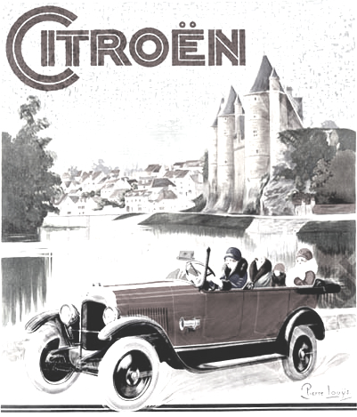 This list contains information on Nick Curtis's free typefaces not discussed or mentioned under other themes. A visual summary of all his free typefaces: A, B, C, DE, F, G, HIJ, KL, M, NO, P, QR, S, T, UVWXYZ. Generally, Nick Curtis specializes in display type, revivals and interpretations.
 - Aerojones (2002). Based on a 1933 poster by George Guillermaz.
- AndironOutlineNF.
- Beauty School Dropout, Beauty School Dropout II, Beauty School Dropout IIS.
- Bellhop NF. Based on this poster.
- Blue Plate Special NF (based on a 1929 typeface by John Zimmerman at BBS called Cubist Bold). See also BluePlateSpecialSW.
- BoyzRGrossNF, BoyzRGrossShadowNF. Handprinted typefaces.
- BuenosAiresNF. Based on this poster.
- ChockABlockNF. Toy letter cubes.
- ChocolateDropsNF. Based on this poster by William Austin Starmer (1902).
- CoventryGardenNF.
- DancingDonutsNF, DancingDonutsRevised.
- EmporiumNF. Based on this poster by Fortunato Depero (1927).
- FacetsNF (2003). Based on this poster by Ruprich (1930).
- FashionVictim. FashionVictim (1999). Think Bernhard Fashion.
- FontleroyBrownNF. CheapProFonts did a Pro version in 2009.
- Forty-SecondStreet (NF, HB). Based on this inline alphabet that is genetically linked to Koch's Neuland.
- FrankensSteinCapital.
- Full-TiltBoogieNF, FullTiltBoogieCapital. Based on Obtuse (1931, A. Bardi).
- GrandPrixRevised, GrandPrixSpectacular.
- HobbyHorseNF (2000).
- JungleFeverInlineNF, JungleFeverNF. The commercial version is from 2008. Jungle Fever (2008) is patterned after Neuland Black (Rudolph Koch for Gebr. Klingspor in 1923), and the sunshine shading version is called Jungle Fever Shaded.
- KurvaceousNF.
- LagniappeInlineNF.
- LittleLordFontleroyNF (2000).
- MiddleEarthNF-Medium, MiddleEarthNF (2003). Based on a 1914 poster by F. Marx.
- MidlandRailNF, MidlandRailShadowNF. Based on this poster.
- MinstrelPosterNF, MinstrelPosterTwoNF, MinstrelPosterWHG.
- ModernTypographyNF.
- MyGalSwoopyNF (2002). Based on Shograd (1924).
- Namesake (2002). Loosely based on Allan Gothic by Allan Brandtner.
- Nickodemus-Extremus. Based on Aldous or Huxley Vertical.
- NotMaryKateNF. Oskar Kress's font Kress Versalien (1926, Schriftguss AG) inspired Nick Curtis to make Not Mary Kate NF.
- OldGateLaneNF, OldgateLaneOutline.
- Otto Heim revivals from Heim's book Farbige Alphabete (1925): Captain Swabby NF (2003, free), Halcyon Days NF (2007, not free), Monkey Fingers NF (not free), Walrus Gumbo NF (free, after a 1925 typeface by Otto Heim; the commercial version of Walrus Gumbo NF appeared in 2011), Riot Squad NF (2000, free).
- OurGangNF (1999).
- PackardClipperNF (2003). Inline typeface based on this Citroen ad by Pierre Louts (1925).
- PointsWestNF.
- PopularCafeAA, PopularCafeNF. Based on these posters by Rae (1927).
- PublicEnemyNF. Based on this Jimmy Cagney movie poster.
- RicksAmericanNF (2002).
- Roller Coaster (2000).
- Sho-Card Caps NF, ShoCard Capital. An adaptation of Futura Display.
- SwishButtonsNF. Dingbats.
- TestarossaNF (2002). Based on this 1907 poster by Leopoldo Metlicovitz.
- ToylandNF, ToylandOutlineCapital. These typefaces are outlined and shadow-cast versions of ITC Motter Corpus by Othmar Motter.
- Troglodyte NF (2006). Curtis: This fine fat typeface is based on a font called Advertisement Grotesque, discovered in a 1942 book entitled Lettering Alphabets for Draughtsmen, Advertisement Designers, Architects&Artists, by the intrepid Alfred Bastien. In 2011, he changed that description after discovering that in fact the design goes back to Albert Auspurg' Messe Grotesk (1921-1927).
- TropicanaNF (2003). This is based on Elancé by A. Bardi (1931).
- UndergroundNF (1999). Commercial version in 2009. This revives Edward Johnston's The Underground for London's metro.
- VielleVarsovieNF (sic)(2003). Based on I. Rubin's constructivist poster from 1936.
[Google]
[MyFonts]
[More] ⦿
|
Nick Curtis: German expressionist typefaces
[Nick Curtis]
|
Nick Curtis created Holofernes NF in 2007. He writes: The raw emotional energy of German Expressionism is evident in this font, based on Judith Type, designed by C. H. Kleukens in 1923. [Google]
[More] ⦿
|
Nick Curtis: Mexican theme
[Nick Curtis]

|
 Fonts by Nick Curtis that have a Mexican theme or evoke a fiesta. In his free repertoire, we have Arizona Airways NF (2011, even a bit of art deco), BeteNoir (1999, wow!), ConquistadormanNF (based on this poster by Anton Reckziegel, 1910), DosEquisNF, Ege Schrift NF (2011, after Ege-Schrift by Eduard Ege, 1921), FeteAccompliEngraved, FeteAccompliNF (based on this poster), Holy Ravioli NF (based on Publicity Gothic by Sydney Gaunt, 1916), Melina (2003, Bitstream, patterned after two members of a type family named Greco, released by Fundicion Richard Gans of Madrid, Spain, in the 1920s. Melina Plain is a refined version of Greco Bold, and Melina Fancy is based on Greco Adornado), MetroRetroNF (1999, 2007; MetroRetroRedux (2001, 2010) is a commercial version of that), Salzmann Deco Deco NF (2011, after a 1922 typeface by Max Salzmann entitled Zierdolmen), and SarsaparillaNF (1999). [Google]
[MyFonts]
[More] ⦿
|
Nick Curtis: Modern typefaces
[Nick Curtis]

|
 Modern typefaces made by Nick Curtis between 1997 and 2010 include the following.
 [Google]
[MyFonts]
[More] ⦿
|
Nick Curtis: Psychedelic typefaces
[Nick Curtis]

|
 Psychedelic era typefaces by Nick Curtis:
 [Google]
[MyFonts]
[More] ⦿
|
Nick Curtis: Retro -- fifties typefaces
[Nick Curtis]

|
 Retro type revivals are Nick Curtis's specialty. He searches deep in the dark guts of libraries to locate long lost treasures. Here is a list of some retro types, mostly from the 1950s, that are free.
 - Artemisia (2002).
- Starlight Ballroom NF (2011). A retro marquee typeface influenced by Samuel Welo's style.
- Camp Granada NF (2011). A campground typeface based on a 1928 poster for the Delftshe Studenten Corp.
- Creampuff.
- DymaxionScript. Named after an extinct automobile.
- EmpireStateCapital, EmpireStateNF.
- Hamburger Heaven NF.
- Lakeshore Drive NF (2002).
- Little Deuce Coupe NF (2000).
- Little Rickey NF (2003). Based on this poster entitled "Ricardo Llacer y Hijos" by Spanish poster artist X. Carot (1948).
- LostWages.
- Luncheonette, LuncheonetteCapital.
- MondoRedondoNF.
- MontereyPopsicleNF (2006).
- Quigley Wiggly.
- Team Spirit NF (2000). An adaptation of Monotype Script.
- Unicorn, UnicornHeavy (2000). Revivals of a fonts known as Einhorn or Salut (1931, Heinrich Johannes Maehler for Klingspor).
- UppenArmsNF-Medium, UppenArmsNF (2003, 2009). This is an upright connected semiscript, based on the circa-thirties marquee from New York's Roosevelt Hotel.
Later commercial additions: - Chromiun Yellow NF (2008) is a heavy retro serif family based, very loosely, on Electro-type Serif, designed by John Wu of Hong Kong's Archetype foundry.
- Funky Chunk NF (2005). A diner font based on Pelt Emphasis Script by Carl Holmes.
- Glengary NF (2007). A digitization of Glenmoy (1932, Stephenson Blake), an upright script also digitized by Alejandro Paul in 2005 as Mousse Script.
- Hip Hop NF (2007) is a bouncy retro typeface based on Friedrich Poppl's Dynamische Antiqua (1960, Stempel).
- Poodle Pusher (2004). Fifties script called Maidstone Script in Dan Solo's Brushstroke and Freestyle Alphabets.
[Google]
[MyFonts]
[More] ⦿
|
Nick Curtis: retro futuristic and techno typefaces
[Nick Curtis]

|
Retro futurism and purely futuristic or techno typefaces by Nick Curtis include Aerovias Brasil NF (2011, based on a 1948 timetable by the airline), BulwarkNF (2003, free), CircuitBoredNF (based on this lettering by Rick Griffin), Drive-ThruNF (based on Leslie Cabarga's drive-in sign for "Betty Boop's Drive-In"), DriveThruCapital, Oo Boodlio Doo NF (2011, after Freeman Craw's 1961 face, Ad Lib), SpaceCadetNF, SpacePatrol ("a little bit of Jetsons"), and SpondulixNF (2003, based on this poster for an Erte exhibition---it is a 3d shadow face). [Google]
[MyFonts]
[More] ⦿
|
Nick Curtis: Serif typefaces
[Nick Curtis]

|
 It is rare that Nick Curtis makes serif typefaces, as he specializes in display type. Nevertheless, we find a few of them in his collection. These are free: ChanticleerRomanNF-Bold, ChanticleerRomanNF (2000-2006, related to Perpetua), Fairfax Station NF (2002, based on Caslon Open), Happy Campers NF (2002), Indubitably NF, Kelmscott Roman NF-Bold, Kelmscott Roman NF (2000, in the style of William Morris). Among his commercial serif typefaces, these stand out:
 - Argentina NF (2009). Based on the elegant titling typeface Sterling (1917-1919, ATF).
- Decimosexto NF (2006). This family includes Spanish Roman letters and Griffo-style italics, both hand-drawn by Francisco Lucas in Madrid in 1577.
- Droobie NF (2014). After Drew (1910, Inland Type Foundry).
- Ingvaeonic-Oldestyle (2007). Based on Viking Oldstyle, from the 1909 H.C. Hansen Type Foundry catalog, due to John F. Cummings.
- John Alden NF (2010). A quaint serif typeface for a cold winter night, based on an 1884 ATF original.
- Kifisia Antigua NF (2005). An antiqued (slightly rough outline) interpretation of El Greco Antique, a 1930s typeface by Richard Gans.
- McKenna Handletter NF (2002): based on a 1923 text family by Elizabeth Colwell for ATF.
- Mercantile Display NF (2008). Based on Engravers Roman (1912, ATF).
- Numancia NF (2011). A faithful copy of Numantina (Carl Winkow, 1940s, Fundición Tipográfica Nacional).
- Cooper's Packard was first handlettered for use in ads for the Packard Motor Company, and later converted to metal by BB&S. A digital version of this was done by Nick Curtis in 2008 under the name Packard Patrician NF.
- Ragged Write NF (2006). Based on ATF's Hearst, ca. 1904. According to Goudy, Inland Type Foundry pirated this typeface from him. In any case, Rough Write has a large x-height and sufficient roughness to make this a lively text titling face.
- Rowan Oak NF (2007). Based on Richmond Oldstyle (1920s, Blackfriars Type Foundry of London).
- Tedlo Rowan NF (2014). Based on DeVinne Roman (1898, Frederic Goudy).
[Google]
[MyFonts]
[More] ⦿
|
Nick Curtis: Signage typefaces
[Nick Curtis]

|
 Signage typefaces made by Nick Curtis between 1997 and 2010 include the following.
 - Gasoline Alley NF (2002): a casual and fun-loving font based on the work of showcard artist Albanis Ashmun Kelly, from his 1911 book Expert Sign Painter, and named for a long-running comic strip.
[Google]
[MyFonts]
[More] ⦿
|
Nick Curtis: Slab serif typefaces
[Nick Curtis]

|
 Slab serif typefaces made by Nick Curtis between 1997 and 2010 include the following.
 [Google]
[MyFonts]
[More] ⦿
|
Nick Curtis: Stencil typefaces
[Nick Curtis]

|
 Nick Curtis designed these stencil typefaces:
 - Bo Diddlioni Stencil NF.
- DeStencilNF (2003, free). Based on this poster.
- Dittem Datum NF (2009).
- East India Company NF (2011). A faithful revival of Tea Chest (1939, Robert Harling at Stephenson Blake).
- Geodezyx NF (2008). An ultra-geometric stencil display face.
- Graphic Stylin NF (2006). A script stencil typeface with an art nouveau feel.
- Jeanneret NF (2011): after architect Le Corbusier, whose real name was Charles Edouard Jeanneret.
- Loading Dock NF (2006). A stencil patterned after the lettering produced by the Marsh Stencil Making Machine.
- Lyric Stencil (2008).
- Matthews Modern Stencil NF (2004). Based on lettering artist Eric Matthews.
- Mister Bones NF (2011). Based on Solotype's Alpha Midnight.
- Odalisque Stencil (2008). An art deco font based on Morris Fuller Benton's Chic, 1927.
- Pearson Stencil NF (2004). Based on a 1923 offering by F.A. Pearson in Ticket and showcard designing.
- Shiver Me Timber NF (2006). An eroded stencil typeface based on old Victor Hammer designs.
- Waxahachie WBW (2005). A Victorian stencil face.
- Zuider Zee NF (2004). A strongly geometric stencil typeface based on a 1937 travel brochure for the Dutch Mails Shipping Company.
[Google]
[MyFonts]
[More] ⦿
|
Nick Curtis: Typefaces from 2004
[Nick Curtis]

|
 Typefaces made by Nick Curtis from 2004, not listed elsewhere on these pages. Bayern Handschrift, De Rigueur NF, Refugio Rustic WBW, Refugio Refined WBW, Ponte Vecchio NF, Brazzaville NF (based on Congo, a 1910 font by Barnhart Brothers \& Spindler), Moonshine Script NF (a casual connected script patterned after an offering from the 1930s chapbook 60 Alphabets by The Hunt Brothers), West Coast Antics (based on a showing from Carl Holmes' 1950s book, ABC of Lettering), Nanki Poo NF (based on Mikado from the Boston Type Foundry), Picture Postcard NF (a Broadway style typeface based on work by lettering artist Alf Becker), Curly Shuffle NF (described as a mix of Alf Becker's style and Leslie Cabarga's), Hardy Har Har NF (based on Samoa from BB&S, 1900), Krazy Kracks NF (based on the so-called California style of lettering used extensively in travel posters of the 30s to the 50s. This version is based on its interpretation by Carl Holmes in a Walter T. Foster artbook entitled ABC of Lettering), Whoa Nelly NF (a comic book face--based on Dan X. Solo's Funhouse), Bushwacked, Cressida (triline face), New Boston (far West typeface of the "italian" kind), Rumble Seat, Kartoon Kutz 3&4 NF, Magic Twanger NF, Snoodle Toons NF, Beanie Kopter NF, Delysian NF (based on Greeting card from the 1923 catalog of BB&S), Mazurka NF (based on Swagger Capitals and Gothic Novelty title from the 1923 catalog of BB&S), Jungle Holiday Cuts NF (based on holiday ornaments by Carl S. Junge, 1929), Stone Soup NF (based on lettering for a 1925 Buster Keaton movie), Tintern Abbey NF (based on the lettering for a 1905 poster for the Austrian National Highway by artist Gustav Jahn), Period Borders NF, Parsnip and Parsnip Outline (Will Ransom designed the exemplar for this series for Barnhart Brothers&Spindler in the early 1900s---the typeface was originally named Parsons (1918), after the advertising director of a Chicago department store), Wurstwagen (suggested by a poster for beer, designed by German artist Ludwig Hohlwein around 1920), Jackson Park NF (1920s style), Kenosha Antique NF (from the 1903 Racine typeface of Barnhart Brothers&Spindler), Catty Wumpas (based on lettering of Ross F. George). [Google]
[MyFonts]
[More] ⦿
|
Nick Curtis: Typefaces from 2005
[Nick Curtis]

|
 Typefaces made by Nick Curtis from 2005, not listed elsewhere on these pages. Chantilly Lace NF (2005: uppercase letters by Bergling and lowercase letters by Roland W. Paul), Edda MorganaNF (medieval English), Gnarly Dude NF (rough script based on material of Ross F. George), Whirled Peas NF (based on a typeface called Whitestone Scrawl by Dan X. Solo in his "Showcard Alphabets"), Cool Cat Jim NF (based on a 1953 headline by Jim Flora in Park East Magazine), Sulphur Springs WBW (bone font), Grand Rapids (based on a typeface named Archer from the 1905 specimen book from Barnhart Brothers&Spindler), Hasta La Pasta (designed after a typeface from a pre-1900 specimen book from the Central Type Foundry of St. Louis, called Spiral), La Coupole (based on lettering on a 1927 menu by prominent poster artists Razzia), Shadowlands (this is like Wilcox Initials from the 1992 Solotype Catalog), Possum Saltare NF (a Trajan column style caps face), Pismo Clambake NF (a connected formal script typeface after a Richard Gans handwriting typeface from 1933, Gloria), Ransom Clearcut NF (an extension of Will Ransom's 1920s caps-only typeface Clearcut Shaded Caps for BBS), Almost Heaven (sold in the early 1900s as Perfection), Goodbye Crewel World (stitching font), Jimbatz NF (dingbats inspired by album cover artist Jim Flora), Bad Dookie NF (from The Advertising Cartoon Clip Art Book, 1971), Maple Leaf Rag NF (revival of Nova Bold by Continental Typefounders), Surely You Jest NF (called Arbor in the 1890's type specimen catalog from Farmer, Little&Co), Merry Old Soul NF (a display typeface discovered in one of the many books on sign writing produced by Eric Matthews), Funky Tut NF (205; the caps are based on J.M. Bergling's Morocco (1914), and the lower cases on Bergling's Kermaic Text (1914)), Groove Thang NF (based on a font called Dado), Novadam Obese (geometric black modern typeface based on a logotype by the same name of Joan Trochut Blanchard, ca. 1940s), Smackeroo NF (2005, engraved US dollar-bill style typeface based on Steelplate, a monocase typeface from ca. 1900 by Barnhart Brothers&Spindler), Snooty Fox NF (an elegant typeface found in Pen&Brush Lettering and Practical Alphabets, Blandford Press, Ltd., London, 1929), Chez Nous (based on Card Italic from a 1930s Mergenthaler Linotype Company specimen book), Slapdash Deco NF (2005, based on a showcard alphabet presented by Cecil Wade in his Manual of Lettering), Rockin Roman NF (from Blandford Press' Pen&Brush Lettering and Practical Alphabets), Kunstgewerbe NF (artsy typeface after work by J.M. Bergling, 1914), Details Details NF (a geometric design from Pen and Brush Lettering and Practical Alphabets), Escondido NF (inspired by an Austrian travel poster designed by Johann Süssenbek in the 1930s), Ballyhaunis NF (based on Celtic lettering by Laurence Schall, early 1900s), Inglenook Corner NF (based on art nouveau lettering by Laurence Schall, early 1900s), Mohair Sam NF (caps based on letters of Samuel Welo, and lower case based on ATF's Romany Script), Partenkirchen NF (a Basque style display face), Helena Handbasket NF (after Antique Light, found in the 1888 edition of the James Conner & Sons United States Type Foundry specimen book), Kudos Kaps NF (2006: five nice ornamental caps and associated alphabet and border sets, including a Lombardic set, an engraved set; they are based on typefaces from Ludwig&Mayer). [Google]
[MyFonts]
[More] ⦿
|
Nick Curtis: Typefaces from 2006
[Nick Curtis]

|
 Typefaces made by Nick Curtis from 2006, not listed elsewhere on these pages: Magic Lantern NF, Duly Noted NF (after an ATF typeface from 1912 called Freeahand), Got That Bling NF (a connected script based on the work of Al Mack, from his Lettering: Brush&Pen in the Single Stroke), Haarlem Nights NF (based on a 1920 Dutch poster for Public Placement Services by Johan Dijsktra), Architectuur NF (based on De Stijl type lettering by H. Th. Wijdeveld, 1925), Gandy Dancer NF (a revival of Tabard, ca. 1912, ATF), Pomfrit Dandy NF (based on Frys Ornamented No. 2 by Stephenson Blake), Smith Premier (Clean and Schmutzy) NF (a typewriter pair after the letters of the Smith Premier No. 3), ed Hot Mama NF (2006), Jumbo Mumbo NF (a revival of Independant done in 1930 by Collette and Dufour), Union Telegraph NF (2006), Major Production NF (which was followed in 2009 by Major Pro Extras NF), Teeny Boppin NF (gleaned from Schrifti Alphabeti, a book of Cyrillic alphabets published in Kiev in 1979), Rutin Tutin NF (based on Wild West lettering found in Schrifti Alphabeti, 1979), Jampact NF (2006, an ultra fat headline face), Beagle Boyz NF (a bouncy typeface based on a Cyrillic alphabet presented in the book Schrifti Alphabeti, 1979), Midtown Tessie NF and Downtown Tessie NF (mosaic tile typefaces), Scary Scrimshaw (based on a 1968 poster for a Doors concert), Speedball No1, Speedball No2 SW (2001), Speedball No3 (2001), Bellagio NF (an interpretation of Robert Wiebking's 1917 font Advertisers Gothic, designed for BB&S), High Society NF (2006, a fashion mag typeface based on an alphabet found in Lettering for the Commercial Artist by Blandford Press, 1946), Osiyo Dohitsu NF (based on letterforms in the Cherokee Syllabary, reputedly devised by Sequoyah in the early nineteenth century; it has petroglyphs as well), Micro Manager NF (pixel face), Paper Caper NF (2006), Shady Grove (a condensed version of Thorne Shaded), American Pi NF (2006: ATF ornaments from the catalogs between 1913-1934, including some designed by Will Bradley, Frederic Goudy and George Trenholm), The Donald NF (a hyper-curly decorative face), Boo Meringue NF (a Halloween font based on Lithotint (1897, ATF)), Lesser Arcana (a mystical type), Zyklop NF (2006), Deux Chasses NF (based on ATF's Thermotype), Bon Mot NF (based on Barnhart Brothers&Spindler's Engravers Upright Script), Munchkin Land NF (based on a work called Thor, issued by Frederic Wesselhoeft Ltd of London in the 1930s), Didgeree Doodle NF (2006, a curly cursive originally released as Bernhard Heavy Antique Cursive by the Bauersche Giesserei by Lucien Bernhard), Kudo Kaps One, Two, Three and Four NF (a total of eight classical initial caps typefaces), Crane Titling NF (medieval-inspired uppercase letters drawn by famed book illustrator Walter Crane with charming, if somewhat quirky, lowercase letters by J. W. Weekes), DecimoSexto NF (+italic) (includes Spanish Roman letters and Griffo style italics, both hand-drawn by Francisco Lucas in Madrid, 1577), Visillo Adornado (a caps typeface based on the typeface Vesta, originally designed by Albert Auspurg for H. Berthold AG, Berlin in 1926), Edsel Font, Deco Dingbats. [Google]
[MyFonts]
[More] ⦿
|
Nick Curtis: Typefaces from 2007
[Nick Curtis]

|
 Typefaces made by Nick Curtis from 2007, not listed elsewhere on these pages: Dundee Castle NF (based on lettering by Harvey Hopkins Dunn, 1930), Sheik Of Araby NF (2007), Aethelred NF (a unicase typeface, with alternate characters in several of the lowercase positions, is patterned after Mosaik, designed by Martin Kausche for Schriftgiesserei Stempel in 1954; Sultan (2005, Canada Type) is also based on Mosaik). Cerulean NF (a sans based on Lining Gothic No. 71 (BBS and ATF, 1907)), Rimshot NF (script), Jaunty Gent NF (based on the upright connected script Forelle, aka Rheingold Kräftig, by Erich Mollowitz in 1936-1937 for the Hamburg foundry of J. D. Tennert&Sohn), Baby Cakes NF (a bubblegum face based on a 1974 release by Karlgeorg Hoefer at the Ludwig&Mayer foundry called Big Band), Amper Sans NF (after Hobby, a script designed in 1956 by Werner Rebhuhn for Schriftgießerei Genzsch&Heyse), Wacky Duck NF (2007), By George Titling NF (inspired by silent movie lettering), Dinky Rink NF (partially based on Steile Futura), Fuller Brush NF (a bouncy signage script from The New Lone Pine ABC of Showcard and Ticketwriting by Australian author C. Milnes), Tiddly Winks NF (2007), Iraan (a stars and stripes typeface based on the ATF typeface Rodeo), Haut Relief (a 3d typeface based on a 1960s typeface called Sculpture), Fiddle Sticks (based on West Banjo (Dave West, 1960s)), Djibouti (an African theme font modeled after African Queen (Dave West, 1960s), Wacky Duck NF (2007), Turing Car NF (2007, a monospaced typeface based on a lineprinter font from the 1960s, the Unisys 0776), Route 66 NF (based on the typefaces used on U.S. Highway signs from the 1930s to the 1950s), Anna Nicole NF (2007, based on the upright semiscript Mirabelle (1926, Wagner&Schmidt); Nick Curtis: Round, firm and fully-packed, it is sure to get attention anywhere it is used.), Keynote Speaker NF (an awkward blocky typeface patterned after Bloomsbury (1920s, P. M. Shanks&Sons)), Twitty Bird NF (2007, an architectural drawing font based on Dan X. Solo's Conway), Balder Dash NF (the caps are based on Breda-Gotisch (1928, H. Berthold AG) and the lowercase on Goudy Text)), Outer Loop NF (2007), Tutti Paffuti NF (after Stymie Black Flair by Dave West for Photolettering), Weedy Beasties NF (after a variation of Seymour Chwast's Blimp), Bully Pulpit NF (2007), Keepon Truckin NF (a 3d typeface based on Milton Glaser's Baby Fat). In the 1970s, Vincent Pacella made a Photolettering Egyptian headline typeface called Blackjack, which was digitized in 2007 by Nick Curtis as Flap Jacks NF. ITC Jeepers and Woodley Park (based on Naudin) won awards at the TDC2 Type Directors Club's Type Design Competition 2002. Artone (Seymour Chwast, 1968) was revived as Loose Caboose NF (2007). Edwin Sisty's upright curly semiscript Belcanto (1970s, Photolettering) was revived in 2007 by Nick Curtis as Glissando NF. F.W. Kleukens' Kleukens Antiqua (1910) was digitized by Nick as Kleukens Antiqua NF (2007). Holo Fernes NF (2007) is based on Christian Heinrich Kleukens' Judith Type (1923), a hookish hell-inspired face. Pudgy Puss (2007) is an ultra-fat modern display type based on Fat Face (Herb Lubalin, Tom Carnase). Omaha Bazoo (2007) is patterned after Viola Flare, issued by Franklin Photolettering in the 1970s. Lateral Incised NF (2007) is an engraved old style typeface originally released in 1929 as Gravure by the London foundry of C. W. Shortt. Tall Scrawl NF (2007) is an original Curtis hand-printed font. Alfred Riedel's Domino (Ludwig&Mayer, 1954) was revived as Idle Fancy NF (2007). Boxcar Willie NF (2007) is a quaint curly face. [Google]
[MyFonts]
[More] ⦿
|
Nick Curtis: Typefaces from 2008
[Nick Curtis]

|
Typefaces made by Nick Curtis from 2008, not listed elsewhere on these pages: Dave West's Nickelodeon was revived by Curtis as Lily Hilo NF (2008). Funky Rundkopf NF (2008) is an adaptation of an LED simulation font of Ray Larabie, called Dignity of Labour. Daffadowndilly NF (2007-2008) is based on art work by Alf Becker from the 1940s. Babes In Toyland NF (2008) has some of the Rennie Mackintosh charm and is based on "Sheet music for Babes in Toyland, USA, 1903". Anagram Shadow NF (2008) is based on handlettering from a 1928 poster for a steamship line by renowned British artist Austin Cooper. Kandinsky NF (2008) is based on shapes found on Kandinsky's painting Succession (1935). An experimental typeface by Jeremy Pettis, illustrating the concept of kangaroo, inspired Pal Joey NF (2008). One of René Knip's experiments, a unicase typeface with an Arabic feel, was digitized by Nick Curtis as Turban Hey NF (2008). Calamity Jane (2008) is a stylish Edwardian script based on a 1930s logotype for the Theatre Moderne in Paris. Orion Radio NF (2008) is a 1930s style display typeface on an African theme. Quinceanera NF (2008) is a a new take on an old dry-transfer standard from the 70s named Barrio. Jobber Wacky NF (2008) is a bouncy handlettering font based on designs of Alan Denney found on greeting cards in the 1950s and 1960s. Franciscan Caps (2008) is based on a 1932 typeface by Frederic Goudy called Franciscan. Morning Glory (2008) is a simple display typeface that goes back to the Cleveland Type Foundry, 1893. Tickety Boo (2008) is a take on Goudy Fancy (or: Goudy Black Elongated Swash). Yo Quiero Taquitos uses letters taken from Rotalución Decorativa (Barcelona, 1940s), Disco 79 (2008, multiline), Eclectic Crumpany (2008, multiline monocase neon or paperclip typeface based on The Electric Company TV Show), Fire Down Below (2008, block gothic), Joufflou NF (2008, very fat), Bala Cynwyd NF (2001) is an Arts&Crafts style poster typeface inspired by lettering of Dard Hunter. Csiszarz Latein NF (2008) recreates an old typeface (ca. 1910) of J.V. Csiszarz. Owah Tagu Siam NF (2008) is a faux Thai font. Langoustine Rouge NF (2008) is based on Dan Solo's Sorbonne. Cecil Wade again provided inspiration for Bloc Party NF (2008). My Little Eye NF (2008) is an elegant piano key font. Roundabout NF (2008) is rounded octagonal. Neubank NF (2008) is Nick Curtis's take on Bank Gothic. Warp Three NF (2008) is a Bank Gothic-style family with an uppercase as in Agency Gothic (1932-1933, Morris Fuller Benton) and a lowercase from Square Gothic (1888, James Conner). [Google]
[MyFonts]
[More] ⦿
|
Nick Curtis: Typefaces from 2009
[Nick Curtis]

|
 Typefaces made by Nick Curtis from 2009, not listed elsewhere on these pages: Society Page NF (semi-script based on Morris Fuller Benton's Announcement, 1916), Glyphix One NF (dingbats), Glyphix Two NF (dingbats), Velveteen Round NF (based on Vellvé's only font, 1971), Steno Stout NF (the venerable Underwood Victoria typewriter on steroids), Diosa Rubia NF (condensed headline face), Mono Amono NF (octagonal), Turista Flaca NF (based on Baltimore Type Foundry's Tourist Extra Condensed), Boop Boop NF (based on handlettering found on Hallmark Studio Cards of the 1950s), Samosata NF (based on Bernhard Gothic), Waddem Choo NF (based on Tschichold's Transito from 1931), Jane Plain NF (architectural blueprint style), Hacky Sack NF (a zany typeface based on Ross F. George's Stunt Roman), Free Holeys NF (after the 1972 Letraset font Beans by Dieter Zembsch), Kingstown NF (semiscript), Kudos Kaps NF (2006: five nice ornamental caps and associated alphabet and border sets, including a Lombardic set, an engraved set; they are based on typefaces from Ludwig&Mayer), Melvin Eustace NF (handlettered), Weekly Bazaar NF (based on Harpers by the Central Type Foundry), Really Big Shoe NF (after a Cleveland Type Foundry typeface called Oxford), Bellwether Antique NF (after a 1913 typeface by Georg Belwe), Garmisch Rund NF (inspired by Rundgotisch, Emil Rudolf Weiss, 1937), Whitefriars NF (based on a font from the Blackfriars Type Foundry in London), Society Page NF (a curly serif typeface based on Morris Fuller Benton's Announcement Roman, designed for American Type Founders in 1917), USA Resolute NF (a unicase headline typeface based on Morris Fuller Benton's Eagle, ATF, 1934), Saturday Morning Toast (2001, based on the logotype font of the Saturday Evening Post from the 1920s), Examiner NF (based on Dwiggins' Metro from the 1930s). Hans Lijklema's Free Font Index has a CD which contains AirstreamNF-Italic, CalamityJaneNF-Bold, CalamityJaneNF, DaddyLonglegsNF, HamburgerHeavenNF, HeavyTrippNF, HutSutRalstonNF (2001), OrionRadioNF, ParkLaneNF, PhattPhreddyNF, RhumbaScriptNF (a silent movie font), Riot Squad NF (2000, after Otto Heim). [Google]
[MyFonts]
[More] ⦿
|
Nick Curtis: Typefaces from 2010
[Nick Curtis]

|
 Typefaces made by Nick Curtis from 2010, not listed elsewhere on these pages.
 Typefaces made in 2010: Conners Corners NF (2010: gleaned from the 1888 specimen books of James Conner's Sons United States Type Foundry), Tumbling Dice NF and Banner Year NF (both were done after scroll typefaces featured in the 1869 MacKellar Smiths and Jordan specimen book), Standing Room Only NF (after Broadway, designed by Morris Fuller Benton for ATF in 1928, originally named Broadway Poster), Proud Mary NF (a plump typeface based on Joseph Churchward's Marianna), Slapsie Maxi NF (based on a Carl Holmes alphabet found in Holmes's ABC of Lettering), Umbriago NF (trying to do a Cooper Black Swash Italic), Picaro NF (based on Harlequin), Palo Pinto NF (based on Pacella Vega Extended 10, a 1960s typeface by Vincent Pacella), Cartella NF (a 3d beveled shadow typeface based on a Morris Fuller Benton 1934 offering for American Type Founders called Poster Gothic), Pracht Antiqua NF (a faithful rendering of the cuddly headline script typeface Pracht Antiqua Schmallfett, which was designed by Carl Pracht for the Norddeutsche Schriftgießerei in 1942), Gitfiddler NF (a futuristic oblique typeface based on the lettering on a package of Gibson guitar strings from the 1950s), Seta Reta NF (after Walter Diethelm's 1965 VGC typeface Arrow), Kleukens Kursiv NF (after Kleukens Scriptura, 1926 by F.W. Kleukens), Kallilu NF (a display face, after George Piscitelle's VGC typeface Thomac from the 1960s), Occidental Tourist NF (an avant-garde sans inspired by Dave West's Futura Casual), Schelter Grotesk NF (after Schelter's Breite Grotesk, 1886), Vuvuzela NF (a casual, almost sign-painted, and nearly African display face), Block Party NF (2008, a 3d face), Cromwell NF (a faithful digitization of Cromwell, 1913, Morris Fuller Benton, ATF), Liguria NF (2010, after a typeface found in a Nebiolo specimen book, ca. 1900), Pony Express NF (2010, after Palmer and Rey's Courier from 1885), Linndale Square NF (a beefed up version of Geometric, 1885, Cleveland Type Foundry---a typewriter style face), Binghamton NF was inspired by the wedge-serifed angular typeface Bingham (Vincent Patella, PLINC). Albert Kapr designed Faust in 1959, so Nick's derived sans typeface is called Kaprice NF. Double D NF (2010, +Fill, +Outline) is a 3d beveled typeface based on Dave Davison's Dimensional from the 1970s. Old Softy NF (2010) is a rounded typeface based on Round Gothic (Keystone Type Foundry, 1884 catalog). [Google]
[MyFonts]
[More] ⦿
|
Nick Curtis: Typefaces from 2011
[Nick Curtis]

|
 Typefaces made by Nick Curtis from 2011, not listed elsewhere on these pages: Jersey City NF (modeled after Times Gothic (1905, ATF)), Petty Despot NF (2011, also modeled after Times Gothic, and possibly renamed from Jersey City NF after Berthold---yes, the same Berthold again---complained about the name Jersey since one of its fonts by Gustav Jaeger was named Jersey. This is my educated guess..., and two thumbs up to Nick for picking the appropriate name Petty Despot NF). Olde Megrat NF is patterned after Antikva Margaret, designed by Zoltán Nagy for VGC in the mid-60s. Herkimer Bunrab NF is an upright scriptish typeface with bunnyears that is based on Hercules (1926, Amsterdam Type foundry). Blackbarry NF (2011) is a faithful revival of Deutsch Black (1966, Barry Deutsch, VGC), a unicase piano key typeface. Bindlestiff NF (2011), which won the 2011 Devroye Memorial Medal for funniest typeface name, revives Schmallfette Binder Style (1959, Joseph Binder, Stempel AG), a squarish tightly set headline face. Decked Out NF (2011) is a fat inline typeface modeled on Dektiv in Homage to the Alphabet. Bazoo Tow NF (2011) is a fun fattish headline typeface that is a faithful reroduction of Basuto (1927, Stanley Baxter for Stephenson Blake). Are You Shaw NF (2011) is an all-caps blackboard bold typeface inspired by Pygmalion, a typeface found in Homage to the Aplhabet. Hoodoo U NF (2011) is a roly-poly romp through the alphabet, based on Jürgen Riebling's irrepressible Mr. Big from the 1970s. Big, bold, bubbly and a little brash, it's a natural choice for happy headlines. The handlettered Mikeys Roman NF (2011) has an uppercase based on the work of Mike Stevens, and a lowercase based on the work of Alf Becker. Outgribe NF (2011) is a rough, raw typeface that is based on the lettering in Ben Shahn's iconic poster protesting the execution of Nicolo Sacco and Bartolomeo Vanzetti in 1927. Nellie Kay NF (2011) is a monoline script face, based on an example by Ross F. George. Shaq Attack NF (2011) is a wooden plank style or brushy typeface inspired by an alphabet of Alf R. Becker. Relampago NF (2011) revives Hans Möhring's bilined typeface Elegante Lichte (1928). Squirrely Shirley NF (2011) is a bouncy typeface based on Phoenix (unknown creator) in Schriftatlas. Spread Out NF (2011) is modeled after Ross F. George's Split Caps. Salzburger Plakat NF (2011) is based on an Austrian winter sports festival poster from 1907 by Swiss poster designer Otto Baumberger (1889-1961). Rightly So NF (2011) is a squarish typeface based on Geometric Gothic (1884, Palmer and Rey)---it is hard to imagine that this almost pixelish style was around at that epoch. Kenotaph NF (2011) is a condensed headline slab serif modeled after Stymie Obelisk (1930s, Morris Fuller Benton). Vasari NF (2011) is based on Ancient Gothic (1891, William W. Jackson, Keystone Type Foundry). Moslem (Boston Type Foundry) was revived as Suffiya NF (2011). Looky Cookie NF (2011) has eyes placed on the glyphs. Iago NF (2011) is a powerful headline sans inspired by two ATF typefaces from the 1880s, Othello and ATF Black Caps. Big Bag NF (2011) is called an industrial-strength titling face by Nick Curtis---it has design elements of Hans Eduard Meier's Syntax Antiqua. Highpoint Gothic NF (after Morris Fuller Benton's 1932-1935 typeface Raleigh Gothic Condensed). Fernburner NF is an all caps shadow face, modeled after Hans Bohn's 1929 typeface Orplid. Planscribe NF is based on types used by the Leroy Automatic Lettering Machine, a tool for architects. [Google]
[MyFonts]
[More] ⦿
|
Nick Curtis: Typefaces from 2012
[Nick Curtis]

|
Typefaces made by Nick Curtis in 2012: - Capital Ideas 1 NF features numbers and uppercase letters rendered in nixietube displays, along with an alphabet patterned after Milton Glaser's Hologram. Capital Ideas 2 NF features K. H. Schaefer's Versalien (1927, Schriftguss AG) and Walter Haettenschweilers Breitfette Unziale (1958).
- Iso Metrix NF: Based on Isonorm, developed by the International Standards Organisation in Switzerland in 1980.
- Koralle NF: Based on a crisp monoline sans typeface in the 1915 catalog of Schelter & Giesecke.
- Recepts NF: a futuristic typeface with a neo-retro twist, based on the logotype for the 1990s tank-warfare videogame for the Mac, Spectre.
- Rio Rita NF: based on lettering by Samuel Welo.
- Spiffily NF (2012): a fat didone based on John Pistilli's Pistilli Roman (VGC, 1970s).
- Trochilida NF: Based on the multiline open typeface style caps typeface by Albert Auspurg (1915, Schelter & Giesecke), which was originally called Kolibri.
- Welo Casual NF: based on Samuel Welo's work.
- Jacopo Mediaeval NF (2012). Based on Jakob Erbar's Erbar Mediaeval (1914, Ludwig & Mayer).
- Easy Eights NF (2012). A revival of the octagonal typeface Octic (1884, Palmer & Rey).
[Google]
[MyFonts]
[More] ⦿
|
Nick Curtis: Typefaces from 2014
[Nick Curtis]

|
 Typefaces made by Nick Curtis in 2014:
 - Alto Rey NF. A revival of a Victorian typeface issued by the Palmer and Rey Type Foundry of San Francisco in 1884.
- Angler NF. A revival of Anglo, a Victorian typeface by Barnhart Brothers and Spindler, 1895.
- Argentina Cursive NF. Based on a typeface by Morris Fuller Benton, 1919.
- Bandiera Del Legno NF. A Tuscan wood type that revives Gothic Tuscan Condensed Reversed by William H. Page.
- Belgique NF. A revival of the (Western) wood type French Clarendon XXX Condensed No. 117 by William H. Page.
- Benton Gothic Thin NF. A revival of Lightline Gothic (1908, Morris Fuller Benton, ATF).
- Big D NF. Based on a Speedball pen font by Ross F. George.
- Bricoleur NF. A connected script from a French magazine in 1927.
- Bully Pulpit Plain NF. After Bullion Shadow (1970, Face Photosetting).
- Call Me Ishmael NF. After Moby Dick (Affolter and Gschwind).
- Chapeaux Noirs NF. After a MacKellars, Smiths & Jordan typeface.
- Chieftain NF. Revival of Pontiac (1893, ATF).
- Coronation Street NF. Based on a typeface created in 1936 by Stephenson Blake.
- De Roos Mediaeval NF. After Sjoerd de Roos.
- Dimanche NF. An art nouveau typeface revival. The original is known as Domingo or Brillante.
- Fluid Drive NF. A take on an art deco typeface by Samuel Welo.
- Gloriosus NF. Revival of the Victorian typeface Apollo (1888, Gustave F. Schroeder, Central Type Foundry).
- Grieshaber Monos NF. After a Schelter & Giesecke typeface designed in 1911 by Moritz Grieshaber.
- Harley Quinn NF.
- Hi Ho Steverino NF. In the Beat style of the 1960s and 1970s.
- Koralle Rounded NF. A rounded revival of Koralle (1913, Schelter & Giesecke).
- Leabhar Ceilteach NF. Inspired by lettering in the Book of Kells.
- Legnano (2014, Italian art deco wood type).
- LevellerNF (2014, Nick Curtis). A revival of Roundhead (Charles Beeler, Mackellar Smiths & Jordan, 1883).
- Lodewijk Gothic NF (2014). Adter Elzevir Gothic (1897, ATF).
- Loopy Loo NF. Upright script based on an original by the Hunt Brothers.
- Marmorherz NF. After an 1866 font, Marble Heart, by Farmer, Little, and Co.
- Maxed Out NF (+Inline, +Starstruck). This series of fonts is based on a 1970s art deco series at PhotoLettering Inc called Riverside Drive by Peter Max.
- Meriwether Circular NF. After a 1905 Victorian typeface by William Martin Johnson for ATF called Meriontype.
- Millrich Olivian NF. A revival of Olivian by Richard & Miller.
- Miss Dottie NF. After Dotted Roman (1897, Barnhart Brothers and Spindler).
- Morticia NF. Based on an ATF original.
- National Oldstyle NF. After a 1916 font by Frederic W. Goudy.
- Nickel Box NF.
- Olden Daze NF. From Alphabets A to Z.
- Page Ephesian NF. A wood type after William H. Page, 1890.
- Page Etruscan No 5 NF. A wood type after William H. Page.
- Painters Roman NF. A wood type based on Painters Roman by Vanderburg and Wells (1878).
- Pique-Nique NF. Based on the art nouveau typeface Outing (1888, John F. Cumming, and 1895, ATF).
- Receding Hairline NF. After L&C Hairline (1966, VGC, Herb Lubalin and Tom Carnase).
- Renaissant NF. After the Victorian typeface Renaissant (1880, by John F. Cumming, Dickinson Type foundry).
- Rythme NF. After a Mexican simulation typeface from 1935 by Maximilien Vox called Éclair.
- Scalar Biform NF.
- Schweimann Moderne NF. An art nouveau typeface.
- Skelett Antiken NF. After William H.Page's wood typeface Clarendon XX (1859).
- Ski Alpin NF. An art deco typeface based on a Swiss travel poster from 1927.
- Sodbuster NF. After William H. Page's wood type Gothic Dotted.
- Southie Signboard NF.
- Strassenmeister NF. After an art deco typeface called Buick Schmalfett by Herbert Thannhaeuser.
- Sweet Afton NF. After a silent movie font by Samuel Welo.
- Talsmann NF. A faithful reproduction of the Advocate font used by the IBM Selectric typewriter.
- Trading Hoss NF. After Ross F. George's Speedball alphabet D-nib Display.
- Tuscalooza NF. After William H. Page's font Tuscan Extended.
- Twinkletoes NF. After a comic book typeface by Ross F. George.
- Unjustified NF. Inspired by the opening credits for the television series Justified.
- Vauxhall NF. Based on Angelica, a 1970s typeface by Robert Trogman (FotoStar).
- Venusian Ultra NF. A heavy sans based on the extra bold extended version of Bauersche's classic sans typeface family Venus (1907-1927).
- Vulkan NF. A wedge-serifed typeface based on a Barnhart Brothers and Spindler original called Vulcan (1884).
- Well Said Black NF. Modeled after Welling Black, a 1970s typeface by Robert Trogman (FotoStar).
[Google]
[MyFonts]
[More] ⦿
|
Nick Curtis: Typefaces from 2015
[Nick Curtis]

|
 Typefaces made by Nick Curtis in 2015:
 - Bothas Ruhm NF. After Blockschrift (1897, Genzsch and Heyse).
- Chiselle NF. A revival of Rustikalis, a typeface designed for the VGC Phototypositor in the 1960s. See Rustikalis DT (1=2007, Malcolm Wooden) for the revival of the bolder version.
- Coins Coupes NF. Modeled after Chamfer, a 19th-century octagonal typeface by Barnhart Bros & Spindler.
- Doright Black NF. Based on Dudley Upright (Dan X. Solo, 1960s).
- Feedbag NF. Based on Horse Tank (Fotostar).
- Inland Edwards NF. Based on Nicholas J. Werner's Edwards (1895, Inland Type Foundry).
- Millrich Grange NF. A revival of the 19th century font Grange by Miller & Richards.
- Mitchell NF. A digital revival of the grotesque all-caps typeface Mitchell (1906, Inland Type Foundry), the bold version of Blair (1900, Inland Type Foundry).
- Newfangle NF. A Victorian typeface based on Newfangle (1892, Hermann Ihlenburg).
- Page Five Fifteen NF. After William H. Page.
- Retrorocket NF. An art deco typeface after D. Duvillé, 1934.
- Rockwall NF. After Aldine by William H. Page.
- Telecomm NF.
- Versacrum NF. A psychedelic / art deco typeface inspired by the lettering of Alfred Roller for the Ver Sacrum magazine in 1903.
- Old Number Ten NF. A revival of a typeface Gothic Number Ten by the Cincinnati Type Foundry.
- Terranova NF. A prismatic typeface based on Earth (Dan X. Solo).
[Google]
[MyFonts]
[More] ⦿
|
Nick Curtis: Underground
[Nick Curtis]

|
Nick Curtis revived Edward Johnson's Underground (1916) as Under London NF (2011). [Google]
[MyFonts]
[More] ⦿
|
Nick Curtis: Victorian typefaces
[Nick Curtis]

|
 It is difficult to precisely define a Victorian typeface. They range from the ridiculously ornate typefaces from 1850-1870 to awkwardly balanced display typefaces and the pre-art nouveau trends. Nick Curtis's revivals in this genre are listed below.
 - Alto Rey NF (2014). A revival of a Victorian typeface issued by the Palmer and Rey Type Foundry of San Francisco in 1884.
- AnagramShadowNF. A free font. Commercial version in 2008. Anagram Shadow NF is based on handlettering from a 1928 poster for a steamship line by renowned British artist Austin Cooper.
- Angler NF (2014). After Anglo, which appears in the Barnhart Brothers and Spindler catalog of 1895.
- Beantown Bounce NF (2007) revives Century, an ornamental display typeface from the 1898 catalog of the Boston Type Foundry.
- Brownwood NF (2011). The inspiration for this semi-Victorian semi-art nouveau typeface came from a 1906 travel poster, promoting the Hotel Braunwald, located in the Swiss Alps.
- Cinnci Card Ornaments NF (2014) is a collection of design elements used in logotypes and calling cards from the Victorian era.
- Cleveland Litho NF (2007), a curly Victorian face, appeared in the 1898 specimen book of the Cleveland Type Foundry, under the name of Litho, while Yum Yum NF (1898) appeared in Cleveland's 1893 specimen book as Mikado.
- DoctorJekyllNF. A free font.
- Durham Abbey NF (2005). Based on a Victorian era font called Romanesque, which can be found in the Dan X. Solo collection.
- Dury Lane (2007) is based on a Victorian era release by Blake Type Foundry called Blackfriars.
- FancyPantsNF. A free font.
- Federlyn NF (2010) and Federlyn Initials NF (2011). Based on the Edwardian-era Artcraft by Robert Wiebking.
- Filibuster NF (2007). This curly über-Victorian typeface is based on Congress, an ornamental typeface found in H. C. Hansen Type Foundry's catalog of 1909.
- GingerPeachyNF. A free font.
- Great Sage NF (2010). That ugly duckling Victorian typeface Karnac (1888, ATF) [not to be confused with the Egyptian typeface Karnak by R.H. Middleton] led Nick Curtis to Great Sage NF.
- Habana Sweets NF (2012). Based on Cuban (1873, Richard & Miller).
- HardlyWorthit. A free font.
- HornswoggledNF. A free font.
- HutSutRalstonNF (2001). Based on a 1915 example in a Speedball Pen book.
- LabyrinthCapital, Labyrinth (1999, 2007). A free font family based on this poster.
- Londonderry Air NF (2002-2004) is based on Canterbury Old Style, a typeface designed by Morris Fuller Benton in 1920-1926 at ATF.
- MarchMadnessNF (2003). A free font. Inspired by lettering from a 1920s Italian poster by legendary postermeister Marcello Dudovich.
- MetropolisNF. A free font. Based on this movie poster from 1927 by Hungarian Josef Bottlik.
- Millrich Reading NF (2010). A Victorian typeface that revives a 1918 Miller&Richard face. Millrich Olivian NF (2014) revives Olivian.
- Nickelodeon NF (1999). A free font. This is sometimes compared with silent movie fonts.
- Nickley Normal (1997). A free font based on arts and crafts lettering by William Joseph Dard Hunter.
- Oaken Bucket NF (2009).
- Oh You Klid NF (2009). Based on a Victorian typeface by Central Type Foundry called Euclid (1880s).
- Palmer Oxonian NF (2011). Based on Oxford (Palmer&Rey, 1884).
- PasticheCapital, Pastiche. A free font.
- PayzantPenNF (2001). A free font, with a commercial version in 2010. Payzant Pen NF is based on Frank H. Atkinson's A Show at Sho-Cards: Comprehensive, Complete, Concise, published in 1918, executed with the then-state-of-the-art Payzant Reservoir Pen.
- Plus de Vagues NF (2006). Based on a curly semi-Victorian alphabet by Stephenson Blake called Recherché.
- Putney Junction NF (2007). Based on a BBS typeface called Design, ca. 1900.
- RhumbaScriptNF. A free font. Based on Tango Kursiv (1913, Ernst Deutsch), it is often compared with silent movie fonts.
- Shady Lady NF (2005). An ornamental shaded caps typeface called Umbra in the 1907 Barnhart Brothers&Spindler type specimen catalog.
- ShangriLaNF, ShangriLaNFSmallCaps (2002). A free font family. The commercial version was done in 2008. Based on a Victorian alphabet from the 1922 chapbook Modern Show Card Writing, by Joseph Bertram Jowitt.
- Sil Vous Plait NF (2009). A Victorian text typeface based on a 1917 font by Morris Fuller Benton called Invitation.
- SouciSans (1999). A free font. Based on a type design by Sam Welo shown in Lettering Modern and Foreign (1930).
- Speedball No1, Speedball No2 SW (2001), Speedball No3 (2001). SpeedballNo1NF-Bold, SpeedballNo1NF, SpeedballNo2NF-Bold, SpeedballNo2NF, SpeedballNo2SW, SpeedballNo3, SpeedballNo3NF-Bold, SpeedballNo3NF. This series is based in part on alphabets by Samuel Welo.
- Storybook Initials NF (2014).
- Streamers NF (2005). A Victorian-era typeface called Fillet revived.
- Tanglewood Tales (2000). A free font.
- Vidalia Sunshine NF (2007). An extension of the 1888 all caps typeface Ornamented No. 5 from MacKellar, Smiths&Jordan.
- Vintage Panels NF (2011): Victorian panels.
- VlaanderenChiseledNF, VlaanderenRoundNF, VlaanderenSquareNF. A free font family. These are based on an untitled work by Dutch designer André Vlaanderen from 1928. These are ugly ducklings because they mix various inconsistent styles without much thought.
[Google]
[MyFonts]
[More] ⦿
|
Nick Curtis: Western typefaces
[Nick Curtis]

|
Nick Curtis's contributions to Western style typefaces. - Belgique NF (2014). A revival of the (Western) wood type French Clarendon XXX Condensed No. 117 by William H. Page.
- City Slicker.
- Daliwood NF (2006). Based on the Western saloon style typeface called Les Catalanes, designed in 1952 by Enric Crous-Vidal for Fonderie Typographique Française.
- Earmark NF (2008). A Western style heavy slab serif based on Vincent Pacella's Pacella Colossus and Pacella Barrel.
- The Reed and Fox typefaces Viennese and Corinthian, both Tuscan in concept, were combined in 2014 in Nick Curtis's digital typeface Genever NF.
- Hornswoggled.
- Mexia WBW (2004).
- Ponsonby3DNF, Ponsonby NF (2003). Based on this lettering by Rick Griffin (1967).
- Rio Grande.
- Round Rock WBW (2006). A Western style font called No. 154 by Rob Roy Kelly.
- San Marcos WBW (2005). A Western saloon font called Marquette in Dan X. Solo's Victorian Display Alphabets.
- Spaghetti Western.
- Spindle Top.
- Trailblazer NF (2010). Vincent Pacella's Western poster font Pioneer was revived by Nick Curtis.
- TucsonTwoStepNF. Based on this poster.
- Wooden Nickel NF.
[Google]
[MyFonts]
[More] ⦿
|
Nick Curtis: Wood types
[Nick Curtis]

|
 Nick Curtis's typefaces that took inspiration from wood types. Many of these have WBW in the name, which stands for Whiz-Bang Woodtype.
 - Bandiera Del Legno NF (2014). A Tuscan wood type that revives Gothic Tuscan Condensed Reversed by William H. Page.
- Belgique NF (2014). A revival of the (Western) wood type French Clarendon XXX Condensed No. 117 by William H. Page. Skelett Antiken NF (2014) revives Wiliam Page's Clarendon XX (1859).
- Blandford Woodland NF (2005). A light version with lower case of Neuland as seen in Pen&Brush Lettering and Practical Alphabets (Blandford Press, Ltd., London, 1929).
- CopperCanyonInlineWBW, CopperCanyonWBW, CopperCanyonWBWDemiBold.
- Falfurrias WBW (2004). Based on authentic xylographic designs from the late nineteenth century.
- Fran Tique NF (2008). The decorative wood type typeface French Antique Extended, featured in the 1905 BB&S catalog, and originally due to William H. Page, was revived as Fran Tique NF.
- Fredericksburg WBW (2006). Based on a wood type by Rob Roy Kelly, which is the same source Jordan Davies used for his Teutonic.
- Grand Prairie WBW (2004). Based on an ornamental wood type called Medallic.
- Hunky Dory NF (2014, a circus font after William H. Page's wood type Doric, ca. 1850).
- Indubitably NF (2011): based on Stephenson Blake's 1880s wedge serif typeface Latin Antique.
- Matamoros NF (2010): wood type simulation.
- Page Ephesian NF (2014). A wood type after Ephesian (1890, William H. Page).
- Page Etruscan No 5 NF (2014). A wood type after William H. Page.
- Pgae Five Fifteen NF (2015). After William H. Page.
- Page Wood Borders NF (2011).
- Painters Roman NF (2014). A revival of Painters Roman (1878, Vanderburg & Wells).
- Rockwall and Rockwall Expanded NF (2015). After William H. Page's Aldine (1870) and Aldine Expanded (1872).
- Round Rock WBW (2006). A Western style font called No. 154 by Rob Roy Kelly.
- San Angelo NF. Based on a 1890 William H. Page Foundry woodtype grotesque specimen.
- Sodbuster NF (2014). After William Page's Gothic Dotted.
- Terlingua WBW (2005). A wood type called Phanitalian in Rob Roy Kelly's collection.
- TradingPostNF (2003). Based on this poster.
- Tuscalooza NF (2014). After William H. Page's Tuscan Extended (1872).
- Woodtype Borders NF (2010), Woodtype Borders 2 NF (2011).
- Woody Goodies 1 and 2 WBW (2004): ornaments, including fists.
- Ye Olde Block NF (2004). Lewis F. Day, in his book Alphabets Old and New, offered this typeface as an example from sixteenth-century England of lettering incised in wood.
- NF (2010). Based on James Conner's wood style typeface Aetna (1888), aka Painter's Gothic.
[Google]
[MyFonts]
[More] ⦿
|
Osiyo Dohitsu NF
|
 A commercial Cherokee font created in 2006 by Nick Curtis. He writes: This rugged typeface is based on letterforms in the Cherokee Syllabary, reputedly devised by a gentleman named Sequoyah in the early nineteenth century. In addition, Native American petroglyphs---some authentic Cherokee designs, some from other tribes---are included in several positions. The name of the typeface, however, is authentic Cherokee, and can be loosely translated as Yo, whuzzup? [Google]
[More] ⦿
|
Oskar von Kress
|
 Also called Oskar Freiherr von Kress. He designed the pointed heavy inline typeface Kress Versalien (1926, Schriftguss AG). Note that Ashley Inline (Agfa) is a digital clone of his font.
 His font also inspired Nick Curtis to make Not Mary Kate NF. [Google]
[More] ⦿
|
Oswald Bruce Cooper

|
 Influential designer and type designer, motivated by beautiful advertising type (b. Mountgilead, Ohio, 1879, d. Chicago, 1940). Picture. He was angry at Goudy for his Goudy Heavyface (1925), which resembles Cooper Black a bit too much (check this 2002 video). MyFonts link. Cooper died of cancer. His typefaces include:
 - The well-known Cooper family done at Barnhart Brothers&Spindler: Cooper (1918-19), Cooper Stencil (1921), Cooper Black (1922; Linotype version, acquired from Barnhart Brothers&Spindler in 1924 by Schriftguß AG in Dresden; Elsner&Flake version; other versions exist by ParaType, Bitstream, Scangraphic, Mecanorma, Adobe, and URW++), Cooper Italic (1924), Cooper Old Style (1919), Cooper Initials (1925), Cooper Hilite (1925), Cooper Black Condensed (1926), Cooper Black Italic (1926), Cooper Fullface (1928). Bitstream offers an 11-style Cooper family. Cooper Black made it to American Typefounders (ATF). One of the original drawings for Cooper Fullface was rejected by ATF but digitally revived by Nick Curtis in 2008 as Ozzi Modo Plump NF and Ozzi Modo Squooshed NF in 2008.
Ian Lynam revived many styles from 2010-2013, under names such as Cooper Old Style, Cooper Initials, Cooper Italic, Cooper Fullface Italic. Lynam writes: Cooper OldStyle is the result of Barnhart Brothers&Spindler type foundry representatives Richard N. McArthur and Charles R. Murray having met with Oswald Cooper and his business partner Fred Bertsch in 1917. Due to other commercial design firms adopting Cooper's style of lettering throughout the Midwest, both companies came to an agreement to create a family of types based on Cooper's advertising lettering. McArthur and Murray saw the biggest potential in the super-bold advertising lettering that would become Cooper Black, but agreed that a roman weight old style should be executed first, the logical progenitor to a family or related types. The foundry requested that the roman have rounded serifs so as to more specifically correlate to the planned bold. This was the first of many tactical strategies in type design between type designer and foundry, most specifically McArthur and Cooper, whose back-and-forth relationship in designing, critiquing, and modifying letterforms was integral in shaping the oeuvre of type designs credited to Cooper. While it was Cooper's sheer talent in shaping appealing and useful alphabets that made his work so popular, McArthur's role as critic and editor has gone largely un-noted in the slim amount of writing of length about Cooper's work. Cooper and McArthur went back and forth over the design of the roman typeface for nearly two years with Cooper, constantly redrawing and revising the typeface to get it to a castable state. The capitals were successively redrawn by Cooper, with particular care paid to the "B" and "R" to make them relate formally. The lowercase was redrawn numerous times, as were experiments in shaping the punctuation. McArthur requested a pair of dingbats to accompany the typeface, along with a decorative four leaf clover ornament "for luck". Cooper included a slightly iconoclastic, cartoonish paragraph mark, as well as decorative end elements, a centered period, and brackets with a hand-drawn feel. The final typeface is a lively, bouncy conglomeration whose rounded forms dazzle and move the eye. Originally called merely "Cooper" in early showings, the name was later revised to "Cooper Oldstyle". The typeface met with a warm reception upon release in 1919, the public favoring its advertising-friendly, tightly-spaced appearance. Sales were moderate, and the typeface was considered a success. Cooper originally drew the figures the same width as the "M" of the font, but revised them to the width of the "N" at the request of McArthur. Early versions of drawings of the slimmer figures are noted as "cruel stuff" in accompanying notes by Cooper, though they were versioned out into far more elegant numerals than the earlier stout figures. Both versions of the numerals are included in the digital release, as are the ornamental elements. In 1925, McArthur and Murray requested a set of ornamental initials. Cooper designed the initials open-faced on a square ground surrounded by organic ornament. The initials were "intended to be nearly even in color value with that of normal text type". The letterforms themselves are a medium-bold variation on the Cooper OldStyle theme, lacking the balance of Cooper's text typefaces, but charming nonetheless. SoftMaker did a complete Cooper Black Pro series in 2012, including Cooper Black Pro Stencil. - Oz Handicraft BT (Bitstream, 1991) was created by George Ryan in 1990 from a showing of Oswald Cooper's hand lettering found in The Book of Oz Cooper (1949, Society of Typographic Arts, Chicago). In that book, you can also find two great essays by Cooper written in 1936-1937, Leaves from an Imaginary Type Specimen Book and As an experiment: 15 serifs applied to stems of similar weight to test serif influence in letter design. Modern Roman Capitals.
- Fritz (Font Bureau, 1997) was created by Christian Schwartz who was inspired by a characteristic handlettered ad from 1909, as well as the single word "Robusto" drawn for Oz Cooper's own amusement. In 1998, Fritz was honored by the NY Type Directors Clubs TDC2 competition.
- Boul Mich. Mac McGrew: Boul Mich. During the period of "modernistic" typography of the 1920s, BB&S, the large Chicago type foundry, brought out Boul Mich in 1927, the name being an advertising man's idea for a tie-in with the fashion advertising of the smart shops on Chicago's Michigan Boulevard [Avenue], according to Richard N. McArthur, then advertising manager of BB&S. An unidentified clipping with a bit of hand-lettering had been sent to the foundry; Oswald Cooper of Cooper Black fame was asked to sketch the missing letters to guide the foundry's pattern makers in cutting a new face, but he disclaimed any credit for the design. Apparently there is no truth in the persistent myth that Boul Mich was named for Boulevard Saint-Michel in Paris. Compare Broadway. Digitally revived in 2010 by Ian Lynam at Wordshape and a few years earlier by Dan Solo as well.
- Dietz Text.
- Packard, first handlettered for use in ads for the Packard Motor Company in 1913, and later converted to metal by BB&S. The bold weight is credited to Morris Fuller Benton (ATF, 1916), but it is highly probable that Benton did the adaptation for both weights. A digital version of this was done by Nick Curtis in 2008 under the name Packard Patrician NF. Steve Jackaman and Ashley Muir created Packard New Style in 2011, and the slightly grungier Packard Old Style also in 2011. Mac McGrew: Packard is ATF's adaptation of a distinctive style of lettering done by Oswald Cooper in advertisements for the Packard Motor Car Company, in 1913. Packard Bold followed in 1916. The latter is credited to Morris Benton, again closely following Cooper's original lettering, and it is quite likely that Benton did the actual adaptation of the first typeface also. These typefaces retain a handlettered appearance partly by the slightly irregular edges of strokes, partly by a number of alternate characters. Both were quite popular for several years.
- Pompeian Cursive (1927): a calligraphic script designed for BBS to compete with Lucian Bernhard's Schoenschrift. Ian Lynam found the original drawings and based his Pompeian Cursive (2010) on it.
- Cooper's handlettering also inspired Matt Desmond, who created the beautiful typeface Cagliostro (2011, free at Google Web Fonts).
- The Bitstream font Oz Handicraft BT (1991) was created by George Ryan in 1990 from a showing of Oswald Cooper's hand lettering found in The Book of Oz Cooper, published in 1949 by the Society of Typographic Arts in Chicago). A refresh was done in 2016.
Klingspor link. FontShop link. Linotype link. [Google]
[MyFonts]
[More] ⦿
|
Otto Baumberger

|
Swiss lithographer and poster designer, 1889-1961. Several of his posters influenced digital typefaces: [Google]
[MyFonts]
[More] ⦿
|
Otto Heim

|
German letterer who drew some alphabets in the 1920s and early 1930s, in the heyday of art deco, and showed many of them in his book Farbige Alphabete (1925). His alphabets influenced these digital type designs: [Google]
[MyFonts]
[More] ⦿
|
Otto Hupp

|
 German type designer, painter, Gutenberg researcher and heraldy specialist, b. Düsseldorf 1859, d. 1947, Oberschleissheim. Mainly specializing in blackletter. His typefaces:
 - At Genzsch&Heyse (Hamburg, München), he did Heraldisch (1910), Hupp-Neudeutsch or Neudeutsche Schrift (1899-1900, see revivals by Gerhard Helzel and Petra Heidorn (2004)), Baltisch (1903, extension of Hupp-Neudeutsch), Numismatisch (1900; revived (?) by P22 as P22 Numismatic), Liturgisch (1906, Klingspor, revived by Dieter Steffmann in 2002, Kristian Sics in 2013, Eugen Kaelin in 1988, as well as by Gerhard Helzel), and Hupp-Gotisch.
- At Rudhardsche Giesserei, Offenbach am Main, which in 1906 became Gebr. Klingspor, he made more blackletter typefaces, such as Hupp-Fraktur (1906-1911), Hupp Fraktur Fett (1910), Hupp Unziale (1909), Heraldisch (1910), Hupp Antiqua (1909: this is a delightful display typeface with religious undertones), Hupp Antiqua Fett (1910), Hupp Schrägschrift (1922; others give the date 1927), and the display fonts Lichte und volle Tam-Tan, Keilschrift and Kegelschrift.
Noteworthy among modern digitizations are Hupp Fraktur (2016, Ralph M. Unger), Hupp Antiqua NF (2006, Nick Curtis) and DXS Otto Hupp Initials (2010, Dick Pape). In 2012, Dick Pape created LFD Alphabet Und Ornamente 216 which is based on Hupp's Modern German version of roman capitals, as seen in Alphabete und Ornamente (Frau Bassermann Nachfolger, Munich). German biography by Wolfgang Hendlmeier from 1985: A, B, C. Scans of his blackletter alphabets: I, II, III, IV, V. Klingspor link. [Google]
[MyFonts]
[More] ⦿
|
Palmer and Rey
[John J. Palmer]

|
 Typefounders and printing press in San Francisco. The Miller&Richard Type Foundry of Scotland opened a branch in San Francisco in 1878, headed by John J. Palmer. This branch was sold to Palmer and Valentine J. A. Rey in 1882. In 1884, Palmer&Rey acquired the assets of the Pacific Type Foundry. The company then merged into American Type Founders in 1892. They published New specimen book (1884, San Francisco), in which we find several original typefaces, such as the Octic series (athletic lettering, octagonal) and the very Victorian typeface Oxford.
 Digitizations: In 2010, Nick Curtis created a digital version of their Courier, and called it Pony Xpress NF. Rightly So NF (2011, Nick Curtis) is a squarish typeface based on Geometric Gothic from the 1884 specimen book of Palmer and Rey---it is hard to imagine that this almost pixelish style was around at that epoch. Oxford was revived by Nick Curtis as Palmer Oxonian NF (2011). Octic was revived in 2012 by Nick Curtis as Easy Eights NF. Alto Rey NF (2014, Nick Curtis) revives an 1884 wedge serif design. [Google]
[MyFonts]
[More] ⦿
|
Paul Carlyle

|
 Coauthor with Guy Oring of Letters and Lettering (1938), Layouts and Letterheads (1938) and Learning to Letter (1939). The former book was a big source of inspiration for Nick Curtis and many other type designers. Typefaces based on designs by Carlyle and Oring:
 Klingspor link. [Google]
[MyFonts]
[More] ⦿
|
Pen&Brush Lettering and Practical Alphabets
|
Book with many samples of alphabets, published by Blandford Press, Ltd., London, 1929. Several typefaces served as models for digital designs by Nick Curtis. [Google]
[More] ⦿
|
Peter Max

|
Phototype era type designer. In the early 1970s, he created some typefaces for PhotoLettering Inc, such as Riverside Drive (art deco). Riverside Drive was revived digitally by Nick Curtis in 2014 as Maxed Out NF. [Google]
[MyFonts]
[More] ⦿
|
P.M. Shanks&Sons
|
London-based foundry in the early 20th century. Fonts include - Ivanhoe (1912, Edward Shanks), copied in 1915 by Keystone Type Foundry.
- Bloomsbury (1920s), an awkward blocky typeface, digitized in 2007 by Nick Curtis as Keynote Speaker NF.
[Google]
[More] ⦿
|
Pontiac
|
An ATF typeface from 1893 that was revived in 2014 by Nick Curtis as Chieftain NF. Unaware that Pontiac was in ATF's 1893 catalog, Mac McGrew wrote: Pontiac is a thick-and-thin, serifless face, almost a condensed version of Quentell, and was advertised by ATF in 1902. It must be older, though, because it is similar but inferior to Globe Gothic Condensed, designed for the same foundry in 1900. [Google]
[More] ⦿
|
QuicKutz
|
A scrapbooking company which, like most others, gives the impression of innocence of a baby shower. Not so: these little devils for a while sold quite a few fonts under the QuicKutz label by just changing the name of some commercial fonts. Examples: QKEliza is Goodfellow (1993, Scriptorium), QKFrankie was originally made by Nick Curtis, QK Gidget is due to Chris MacGregor, QK Honey is one of Chank's fonts, QK Indigo comes from Brendel Informatik, QK Katie is Fontdinerdotcom Sparkly (1998, Font Diner), QK Khaki is a renamed font of Patricia Lillie, QK Marisa is Lucida Handwriting, QK Paige is P22 Garamouche (1995, P22), QK Sophie is Chocolate Mint Surprise BV (1999, Blue Vinyl), and so on. Cute new names will not do it---this is theft. Alternate sales point, where the letter shapes are sold as dies, not as fonts. Alternate sales point, where the letter shapes are sold as dies, not as fonts. I quote some typophile: there is no relationship between QuicKutz and Letraset. QK is a scrapbooking outfit. They are still in business, but I think they've been prohibited from selling fonts (although they might include fonts with some of their products). All the QK fonts were basically other people's fonts that they stole without permission. They gave the fonts new names, but did not seem to have the sense to remove the original font name and copyright info from inside the font file. If you open them with a font editor, it's there for all to see. For example: - QK Eliza = Goodfellow (1993, Dave Nalle/Scriptorium)
- QK Empire = Rusticana (Adobe)
- QK Frankie = Snoopy Snails (Nick Curtis)
- QK Gidget = Threadfun Bold (Chris MacGregor)
- QK Honey = Chauncy Fatty (Chank Diesel)
- QK Indigo = Ondine (Brendel Informatik)
- QK Katie = Fontdinerdotcom Sparkly (1998, Font Diner)
- QK Maggie = Retrofit Bold (Joe Van derBos)
- QK Marisa = Lucida Handwriting (Bigelow &Holmes)
- QK Paige = P22 Garamouche (1995, P22)
- QK Phoebe = Limehouse Script (Letraset)
- QK Roxy = Showcard Modern (Jim Parkinson/Font Bureau)
- QK Sonja = Rage Italic (Letraset)
- QK Sophie = Chocolate Mint Surprise (1999, Blue Vinyl)
- QK Star = Comic Strip Poster (Agfa MT)
- QK Venus = Ravie (Font Bureau)
- QK Zelda = Jokerman (Letraset)
[Google]
[More] ⦿
|
René Knip
[Arktype (was: Atelier René Knip)]

|
[MyFonts]
[More] ⦿
|
Richard Gans
[Fundicion Tipografica Richard Gans]
|
 [More] ⦿
|
Richard Starkings
[Comicraft (was: Active Images)]

|
[MyFonts]
[More] ⦿
|
Rick Griffin
|
Richard Alden Griffin (1944-1991) was a Californian artist and one of the leading designers of psychedelic posters in the 1960s. He died on his Harley Davidson in an accident. He indirectly inspired many digital typefaces. For example, Nick Curtis's Ponsonby NF is based on a 1967 poster by Rick Griffin. This poster from 1984 inspired Nick Curtis to make the futuristic typeface Circuit Bored NF. Rick Griffin (2010) by Jasmin Roslan is also based on Rick's lettering. And so is the psychedelic typeface Rick Griffin (2006) by Keith Bates. [Google]
[More] ⦿
|
Robert Hunter Middleton
[Ludlow]

|
 [MyFonts]
[More] ⦿
|
Robert Thorne

|
 English punchcutter and typefounder (1754-1820, North London), designer of the first fat typefaces, founder of the Fann Street Foundry in 1794 and active until his death in 1820, when his foundry was sold to William Thorowgood a few months after his death. Designer of one of the first fat didone typefaces, Thorowgood (1809), and of Thorne Shaded (1820; Thorne Shaded was part of the Reed foundry material, had defective matrices, so Stephenson&Blake had it recut by Karl Gomer in 1938-1940). iAs metal typeface, Thorowgood was featured in 1953 by Stephenson and Blake.
 Quoting from the typophile wiki: In 1794 Robert Thorne purchased the foundry of Thomas Cottrell, a former employee of the original William Caslon, which had been founded in 1757 when Cottrell and Joseph Jackson were fired in a wage dispute. By 1798 Thorne had replaced all of Cottrell's types with his own designs and in 1801 was the first type founder to begin showing the fat typeface types. He went on to design many popular display typefaces. He also moved the foundry to Fann St. renaming it the Fann Street Foundry. Upon Thorne's death in 1820 the foundry was purchased at auction by William Thorowgood using money he had won in a lottery though he was never involved in the type founding business. Subsequently many of the types identified as Thorowgood's are actually the designs of Robert Thorne. Author of Specimen of Printing types (1794, 1803, 1814). Digital revivals of his types: [Google]
[MyFonts]
[More] ⦿
|
Robert Trogman
[FotoStar]

|
 [MyFonts]
[More] ⦿
|
Robert Wiebking
[ATF 1923 Catalog: Artcraft Series]
|
[More] ⦿
|
Robert Wiebking

|
 Born in Schwelm, Germany, 1870, Robert Wiebking emigrated to the United States in 1881 with his father Hermann Wiebking, and became an apprentice engraver in Chicago. After another apprenticeship in 1884, with C.H. Hanson in Chicago, he became an independent professional matrix engraver in 1892 in that city for several American and English founders and for Ludlow, who cut many of Goudy's types, as well as types for Bruce Rogers and Robert H. Middleton. In 1894 Robert Wiebking and Henry H. Hardinge (also from Chicago) built the first successful machine for engraving type matrices. In 1896, they became partners and set up Wiebking, Hardinge & Co in 1901, manufacturing matrices for type foundries. This led them to set up the Advance Type Foundry in Chicago. He died in 1927 in Chicago.
 Designer of these typefaces: - Advertiser's Gothic (Regular and Condensed, Outline, Condensed Outline) (1917, Western Type foundry). This was interpreted as an art deco typeface by Nick Curtis in his Bellagio NF (2006). It was revived by HiH as Advertisers Gothic (2008). HiH's blurb: Advertisers Gothic is bold and brash, like the city it comes from, Chicago. It was designed by the accomplished German-American matrix engraver, Robert Wiebking, for the Western Type Foundry in 1917. As its name suggests, it was designed for commercial headliner work, much as Publicity Gothic by Sidney Gaunt for BB&S 1916. See our Publicity Headline. In 2010, SoftMaker did its own revival, called Advertisers Gothic. Personally, I find this Wiebking typeface ugly and useless.
- Artcraft&Bold&Italic (display typefaces originally designed for Barnhart Bros&Spindler (1911-1913; Jaspert lists Artcraft as a 1930 publication at Ludlow, and Klingspor as western Type Foundry typefaces from 1911-1913). Mac McGrew: Artcraft was designed in 1912 by Robert Wiebking and featured under the name of Craftsman in the first ad for his short-lived Advance Type Foundry, operated by Wiebking, Hardinge&Company, in Chicago. A short time later, the typeface was advertised as Art-Craft, and later as one word---Artcraft. Advance was soon taken over by Western Type Foundry, for whom Wiebking designed Artcraft Italic and Artcraft Bold a year or two later. Western in turn was taken over by Barnhart Brothers&Spindler in 1918. BB&S was already owned by ATF but operated separately until 1929; in the meantime, though, Artcraft and a number of other typefaces were shown in ATF specimens as well as those of BB&S. Artcraft has an unusual roundness in some of its serifs and line endings and a line of it produces a rolling feeling; some characters have curlicues, such as the long curl at the top of the a and and the exaggerated ear on the g. A number of auxiliary characters were made for roman and italic fonts; as these were sold separately, they were overlooked by many printers and typographers. The boldface has fewer eccentricities. Artcraft was a popular typeface for a number of years; the roman was copied by Monotype in 1929 without the fancy characters, and all three typefaces were copied by Ludlow. Adaptation in 1924 of Artcraft Italic to the standard 17-degree slant of Ludlow italic matrices was the second assignment of Robert H. Middleton (after Eusebius, q.v.) at that company. Hansen called it Graphic Arts. One source attributes the Artcraft family to Edmund C. Fischer, otherwise unidentified, but the details stated here are more generally accepted and seem to fit known facts better. For digital versions, see OPTI Artcraft (by Castcraft), Artcraft Pro (Jim Ford at Ascender), Artcraft URW (2001), Heirloom Artcraft (2013, Nathan Williams) or Federlyn NF (2011, Nick Curtis).
- Bodoni Light&Italic (Ludlow), Bodoni Bold&Italic.
- Caslon Clearface&Italic (1913, BB&S).
- Caslon Catalog (1925, BB&S), Caslon Light Italic.
- Collier Old Style.
- Engraver's Litho Bold&Condensed (1914, BB&S), Engraver's Roman&Bold (available as Engravers EF Roman), Engravers Litho Bold, Engravers Litho Bold-Condensed.
- Invitation Text (1914, Western Type Foundry).
- Laclede Old Style (1920, Laclede Type Foundry). The Laclede Type Foundry was absorbed by BB&S, and the typeface was renamed Munder Venezian.
- Modern Text (1913, Advance Type Foundry).
- Munder Venezian&Italic (1924-1927, BB&S, aka Laclede Oldstyle).
- Square Gothic.
- Steelplate Gothic (1907) and Steelplate Gothic Shaded (1918), both at Western Type Foundry. A Copperplate Gothic style typeface. Digital revival by Steve Jackaman as Steelplate Gothic Pro (2017).
- True-Cut Bodoni&Italic.
- World Gothic&Italic (both also with Condensed).
- Venus Bold Extended (1924). The Venus typeface was at Bauersche Giesserei from 1907 until 1927. Digital descendants (mostly not copies) include Venusian Ultra NF (1924, Nick Curtis), Venus (URW++), Venus SB (Scangraphic Digital Type Collection), Venus (Linotype), Eurydome (2010, by Stephen Boss at Emboss), Akazan (2007, Typodermic), Scout (2008, Cyrus Highsmith for Font Bureau).
Bio at No Bodoni. FontShop link. Linotype link. Klingspor link. [Google]
[MyFonts]
[More] ⦿
|
Robert Williamson

|
 In the 1970, Robert Williamson made a computer printout and screen font called Program 32. This was digitally imitated by Nick Curtis in his Reboot NF (2010). [Google]
[MyFonts]
[More] ⦿
|
Roger S. Nelsson
[CheapProfonts]

|
[MyFonts]
[More] ⦿
|
Roland W. Paul
|
 British architect actve ca. 1900, known for his penmanship. His lettering led Nick Curtis to develop a font called Chantilly Lace NF (2005).
 In 2012, Dick Pape made the free font LFD Penwork 181 based on Paul's work. [Google]
[More] ⦿
|
Ross F. George

|
 Inventor and patent holder (with W.H. Gordon) of the speedball pen. Lettering artist from Seattle, influenced by W.H. Gordon. W.H. Gordon and Ross F. George wrote Presenting The Speedball Pen With Alphabets, Drawings and Designs Produced With This Wizard of Lettercraft (1915, Seattle, WA; local download). George's alphabets appeared in the Speedball Lettering catalogues, published between 1935 and 1948. The Speedball Text Book series's 8th through 17th editions were published at regular intervals from 1925 until 1956, and have many of his alphabets. Some dates: 8th (1925), 10th (1927), 11th (1929), 12th (1935), 13th (1938). Link related to his art deco alphabets. Some of the alphabets in Speedball Lettering have been digitized. To name a few:
 - Toto's K22 TriLine Gothic (2011) is a free multiline font based on Ross F. George's TriLine Gothic from 1956.
- Jim Parkinson created Wigwag (2003, a display family inspired by Ross George as well as the work of Samuel Welo and Cecil Wade).
- Jason Walcott made Baroque Text JF (2003, a great Fraktur font based on a hand-lettered alphabet drawn by Ross George).
- Nick Curtis added Xanthippe NF (2006, an "exuberant" blackletter face) and Big D NF (2014).
- Garrett Boge revived Free Roman.
- Nick Curtis designed Catty Wumpas NF (2004).
- Nick Curtis created Gnarly Dude NF (2005).
- Nick Curtis created Hacky Sack NF (2009), after Ross George's Stunt Roman.
- Harold Lohner published Milky Way (2001) and MilkyWayTwo (2001).
- Michael Stacey created the brushy typeface ITC Wisteria (1995), an almost exact reproduction of one of George's brush typefaces which appeared in many publications from 1938 until 1952 (see here).
- Heller and Fili give him credit for Chop Suey (1935), an oriental simulation typeface which has found its way into the free font world under several guises.
- Jim Spiece (Spiece Graphics) created the Wild West family Cactus Flower SG.
- Paulo W created Speedball Western Letters (2009), Speedball Metropolitan Caps (2010) and Speedball Metropolitan Poster (2010). Sunamy (2007, Iza W) is a ninja font made after an example of Ross George.
- Nick Curtis made the monoline script typeface Nellie Kay NF (2011).
- The art deco typeface Blue Jay Way NF (2011, Nick Curtis) was also inspired by Ross F. George.
- Big George NF (2011, Nick Curtis) is a fat comic book style typeface that revives another of George's creations from Speedball Text Book.
- Split Caps by George was revived by Nick Curtis as Spread Out NF (2011).
- Nick Curtis's revivals from 2014 include Trading Hoss NF (after D-nib Display) and Twinkletoes NF.
- Dick Pape created these typefaces based on the 17th Edition: Speedball America, Speedball Architects Italic, Speedball Architects, Speedball Block, Speedball Brush Bold Italic, Speedball Built Up Style, Speedball Bulletin Dusted, Speedball Bulletin Heavy, Speedball Bulletin Plain, Speedball Bulletin Squiggley, Speedball Carnival, Speedball Carved Caps, Speedball Cond Bold Italic, Speedball Cond Poster Gothic Bold, Speedball Decorative Initials, Speedball Decorative Ransom, Speedball Draftsman's Art, Speedball Formal Roman, Speedball Free Roman, Speedball Gay Nineties A, Speedball Gay Nineties B, Speedball Line Gothic, Speedball Metropolitan Poster, Speedball Power, Speedball Roman Italic, Speedball Rough, Speedball Slant Script, Speedball Speed D Italics, Speedball Squeezed Headline, Speedball Stencil Italic, Speedball Variation. Download here.
- In 2016, Cosimo Lorenzo Pancini, Andrea Tartarelli, Giulia Ursenna Dorati and Andrea Gaspari co-designed the 1940s vintage brush script typeface Banana Yeti, which is based on an example by Ross George shown in George's Speedball 1947 Textbook Manual.
- Steve Harrison's free fonts: Doolally (2020; Ross F. George, 1938), Dawdling (2020; Ross F. George, 1935), Dawdling Snowflake (2020; Ross F. George, 1935), Bogeyed (2021), Faffinabout (2021).
Examples of his Speedball Text Book alphabets: Speedball Title Display 1 (1927), SpeedballTitle Display 2 (1927), Easter Suggestion (1935), Speedball Title 1 (1938), Speedball Title 2 (1938), untitled lettering (1941), Poster Gothic 5 (1935), Postrie Caps (1938), Roman 2 (1935), Roman 3 (1935), Roman 4 (1935), Roman 7 (1935), Roman 7 (1938), Symphony 1 (1935), Symphony 1 (1952), Symphony 2 (1938), Symphony 2 (1948), Modern 1 (1938), Modern 2 (1941), Modern 2 (1948), Line Gothic (1938), Tri-Line Gothic (1956). [Google]
[MyFonts]
[More] ⦿
|
Rudolf Geyer

|
 Austrian type designer, b. 1884, Vienna, d. 1972, Vienna. Painter of "primitive art" canvases and a commercial artist, noted for the design of books, calendars, diplomas and posters. Geyer worked as an in-house designer for the Zsolnay publishing house and, from 1942 to 1945, he taught at Graphischen Lehr und Versuchsanstalt in Vienna.
 He created the Jugendstil font Weiner Grotesk, which was released by H Berthold AG of Berlin in 1912. That font was digitized as Darling Emily NF (Nick Curtis, 2009). Klingspor link. [Google]
[MyFonts]
[More] ⦿
|
Rudolf Koch

|
 Great German type designer (b. Nürnberg, 1876; d. Frankfurt, 1934) who worked mainly at the Klingspor foundry. He founded the Offenbach Werkstatt in 1921.
 Many of his typefaces can be classified as German expressionist. These include Kabel (a sans), and Neuland (an angular poster face). An early Nazi sympathizer and supporter, Koch's fonts were heavily used by the Nazi regime. This page lists 158 royalty-free Christian symbols drawn by Rudolf Koch, a religious Lutheran, with the collaboration of Fritz Kredel (1900-1973) (see also here). His typefaces, with notes on digitizations: - Claudius (1931-1934, 1937, D. Stempel AG). His son Paul Koch followed Rudolf's instructions to make one weight in 1931-1934. Klingspor completed it in 1937. Delbanco (as DS-Claudius) and Klaus Burkhardt (1991) digitized it. Based on the latter, Manfred Klein made ClaudiusImperator (2001). Dieter Steffmann made Claudius, ClaudiusAlternate, and ClaudiusHeadline in 2003. Ralph M. Unger published Claudius in 2010.
- Deutsche Anzeigenschrift (1913-1914), Deutsche Anzeigenschrift schmal (1916-1923, D. Stempel AG). revivals include SchmaleAnzeigenschrift (2002) and SchmaleAnzeigenschriftZier (2002) by Dieter Steffmann, and Schmale Anzeigenfraktur (2009) by Ralph Unger. Later weights by Koch: Deutsche Anzeigenschrift eng (1923) , Deutsche Anzeigenschrift breit (1923, D. Stempel AG) , Deutsche Anzeigen. schmalhf. (1934, D. Stempel AG).
- Deutsche Schrift (1908-1921), consisting of Deutsche Schrift schmal (1913, Gebr. Klingspor), Deutsche Schrift fett (1910, Gebr. Klingspor), Deutsche Schrift mager (1918, Gebr. Klingspor) and Deutsche Schrift halbfett (1912, Gebr. Klingspor). Also known as Koch Fraktur. Revived by Gerhard Helzel as KochFrakturSchmaleHalbfette (2000), by Christian Richter as Rudolf Koch (2003), and by Delbanco as DS Koch Fraktur. It was a popular family, known in England as Oxford. For comparison, here is a phototype version. Deutsche Schrift fett, aka Fette Deutsche Schrift, was revived by Dieter Steffmann in 2002 (as Fette Deutsche Schrift) and by Alter Littera in 2012 as Deutsche Schrift.
- Deutsche Schrägschrift (1912, Gebr. Klingspor).
- Deutsche Werkschrift (1934, D. Stempel AG) and Deutsche Werkschrift hablfett (1934, D. Stempel AG): This is really the "mager" version of Deutsche Anzeigenschrift. Delbanco revived it digitally as DS Deutsche Werkschrift.
- Deutsche Zierschrift (1919-1921, Gebr. Klingspor). Revived as Dutesche Zierschrift (2002) and Zierinitialen> (2002) by Dieter Steffmann. See also Delbanco's DS Deutsche Zierschrift.
- Frühling (1913-1917, Gebr. Klingspor). A blackletter that seems to have been executed with a shaky hand---it is definitely one of Koch's weakest and ugliest designs. Incredibly, the revival gang was still eager to spring into action: it was revived and interpreted by Frantisek Storm in Monarchia. See also Delbanco's DS Frühling. For another revival, see Next Stringtime by Manfred Klein (2003). Frühling is sometimes called Kartenschrift.
- Geschriebene Initialen zur Grotesk (1930, Gebr. Klingspor).
- Grotesk Initialen (1933, Gebr. Klingspor). Paul Hayden Duensing made Koch Initials (metal).
- Holla (1932, Gebr. Klingspor). Digitized by Dieter Steffmann in 2001.
- Jessen Schrift (1924-1930) is a hybrid of gothic (blackletter) minuscules and roman capitals (including the characteristic Basque capital A) designed and cut without preliminary drawings in Offenbach am Main by Rudolf Koch for The Four Gospels, which was printed at the Klingspor press in 1926 and published by Koch himself. Formerly named Bibel-Gotisch, the type was developed between 1924 and 1929 as Peter Jessen Schrift and released as Jessen in several sizes by the Klingspor foundry in 1930. See DS-Jessen-Schrift (1998, Christian Spremberg), Peter Jessen Schrift (Delbanco), Jessica Plus (2002) and JessicaSerif (2003) by Manfred Klein, Peter Jessen Schrift Pro (Softmaker, 2016), and Jessen Schrift (2004, Ralph M. Unger). Jessen Mittel 14 and Jessen Cicero 12 were developed by Alexis Faudot and Rafael Ribas in 2016 during an ANRT workshop in Valence, France.
- Kabel (1927, Gebr. Klingspor), Klingspor's competing design for Paul Renner's Futura. The most famous digitization of this Koch Sans family is by Victor Caruso in ITC Kabel (1976), and with its exaggerated x-height, much larger than the original, it is a poor bastard. The modern Bitstream version is called Geometric 231. Softmaker calls it Koblenz. Poster by Jorge Martinez. At Linotype, Marc Schütz designed the large family Neue Kabel (2016) that revives Kabel by making it more consistent. This version overshadows all previous digital versions or extensions of Kabel. Dates of the various weights: Kabel Kursiv (1929, Gebr. Klingspor), Kabel groß (1928, Gebr. Klingspor), Kabel Kursiv groß (1930, Gebr. Klingspor), Norm Kabel (1930, Gebr. Klingspor): LinotypeLibrary, Kabel fett (1929, Gebr. Klingspor): LinotypeLibrary, Kabel schmal (1930, Gebr. Klingspor), Kabel schmalhalbfett (1929, Gebr. Klingspor).
- Koch Antiqua (or: Locarno) (1920-1922, Gebr. Klingspor). It was sold by Continental Type in the United States as Eve. This gorgeous tall-legged and flared typeface was designed in 1917, but cut in 1922. Koch Kursiv (1923, Gebr. Klingspor) is the Kursiv version of Koch Antiqua. See also Koch Kursiv groß (1929, Gebr. Klingspor) and Koch Antiqua fett (1926, Gebr. Klingspor: some give the date 1923-1924). Rivoli is a similar metal typeface. Digital versions include Rudolf Antiqua (2018, Now Type), Eva Antiqua, Eva SG (Spiece Graphics), Eva (Monotype), AIKochAntiqua (a multiple master font by Randall Jones for Alphabets Inc), Astaire Pro (2004, Bergslund Design, or Hackberry), Koch Altschrift (2004, Moorstation crew), Locarno (1985, Alan Meeks for Letraset), Kuenstler 165 (Bitstream), Koch Antiqua (Adobe, Linotype), Evadare (David Nalle), Hellen (2019, Genilson Lima Santos).
- Koch Kurrent (1933, Gebr. Klingspor). This is Koch's version of school scripts, a variant of his earlier proposal, Offenbacher Schrift (1927). It was only cut in 1935. See Rudolf Koch Kurrent at Delbanco .
- Koch Schrift (1909) is a Schwabacher first known as Neudeutsch and later as Koch Schrift. It was used by the Deutsche Reichsbahn, ca. 1930. For a digital revival, see, e.g., Koch Schrift (1998-2021) by Ingo Zimmermann.
- Marathon (1930-1938, Gebr. Klingspor). Digitized by Linotype in 2003 as Marathon LT (by Ute Harder, aka Frau Jenson), and by Softmaker a bit earlier. The best digital version is by the Koch Memorial team of Petra Heidorn under the name Romantha (a permutation of the letters) in 2003 (it preserves the original x-height better, for example).
- Maximilian Antiqua (1913-1917, Gebr. Klingspor). Digitization by Manfred Klein, who made Maximilian Antiqua (2003) and MaximilianAntiquaSmallCaps (2003). For an initial caps extension, see Typograf's Maximilian Antiqua Initialen (2015).
- Maximilian (Gotisch) (1914-1917, Gebr. Klingspor). Walden Font has a revival. See also Maximilian at Delbanco. Castletype made MaximilianCS. In 1995, Doug Olena revived it as Maximilian. Dieter Steffmann made Maximilian (2002) and Maximilian Zier (2002). Maximilian (2012) is due to Alter Littera. Drawings for Maximilian-Gotisch. Gerhard Helzel's revival from 1995. Stephen Miggas's revival is called Gothicus (2006).
- Neu Fraktur (1933-1934, Gebr. Klingspor): Koch's last Fraktur.
- Neuland (1923, Gebr. Klingspor) and Neuland licht (1928, Gebr. Klingspor), an outline version of Neuland. Neuland is all caps German expressionist typeface chiseled directly by Koch from metal. Copied by Monotype in 1929 as OthelloMT. Digitized by Linotype Library. Also digitized as Newland Black by Andrey Mel'man. In 1995, Doug Olena (Keystrokes) revived it as FFD Neuland (1995). A lower case and hair-serifed extension was created by Manfred Klein as On Kochs Roots (2002) and KochNeu-ExtraBlack (2003). Nick Curtis made Jungle Fever and Jungle Fever Shaded (2008) after Neuland. In 2010, Ian Lynam published yet another update, Neuerland. In 2013, Lazar Dimitrijevic created Cal Neuland Bold.
- Offenbach (1928-1934, Gebr. Klingspor). Made for display in church windows, Koch designed the "mager" weight (1931) and an uncial version. His student Hans Kühne finished the "halbfett" and the gothic after his death.
- Prisma (1928-1931, Gebr. Klingspor): A four-lined art deco face. Revived by Dieter Steffmann (2003-2004) as Prisma, and by Ralph Unger as Prisma Pro (2011). See also the 10-style typeface family LL Prismaset at Lineto (2003-2017, Mauro Paolozzi, James Goggin, Alex Rich, Arve Båtevik, and Raphael Koch).
- Stahl (1933-1939): Done with H. Kühne. Revived by J.F.Y.Daniel Gauthier (GautFonts) as StahlSteel (2003) and StahlSteelRiveted (2003).
- Wallau (1924-1932, Gebr. Klingspor), Wallau halbfett (1930, Gebr. Klingspor), Wallau fett (1935, Gebr. Klingspor), Wallau schmal (1934, Gebr. Klingspor). See Wallaby on the SoftMaker MegaFont XXL CD, 2002, or Wallau by Fraktur.de or DS Wallau by Delbanco, or Wallau (2012) by Alter Littera. Pictures by Dan Reynolds about Klingspor's Wallau speciman book (1939). Wallau, which comes in rotunda (Rundgotisch) and uncial, was named after Heinrich Wallau (1852-1925), a printer from Mainz. Originally, the typeface was going to be called Missale. Also revived by Dieter Steffmann (as WallauDeutsch-Bold (2002), Wallau Rundgotisch Heavy (2002), Wallau Rundgotisch OsF Heavy (2002), WallauUnzial-Bold (2002) and WallauZierBold (2002)) iand by PrimaFont.
- Wilhelm-Klingspor-Schrift. (1920-1926, Gebr. Klingspor): This was originally called Missal. To commemorate Wilhelm Klingspor, who died in 1925 from a war injury, it was renamed Wilhelm-Klingspor-Gotisch. Paul Hayden Duensing made a metal version under the latter name. Digitizations by Fraktur.de and Delbanco. See also Wilhelm-Klingspor-Schrift at LinotypeLibary, Wilhelm Klingspor Schrift (2012) by Alter Littera, Wilhelmschrift (2006) by Stephen Miggas, and Missal by Dieter Steffmann (2003). Matching decorative caps were made in 2004 by Paul Lloyd under the name Holzschnitt-Initialen.
- Zeppelin (1929, Gebr. Klingspor). This is a decorative (inline) version of Kabel. Revived as Zeppelin (2003, Dieter Steffmann) and Evadare (1993, David Nalle).
In 1984, Wolfgang Hendlmeier discussed the blackletter typefaces in Koch's oeuvre: A, B, C, D, E, F, G. Brief bio by Wolfgang Hindlmeier (1984). Koch's involvement in handwriting education in Germany led to these Schreibschrift examples from 1930 (also called Deutsche Verkehrsschrift), and to the development by Martin Hermersdorf of the Deutsche Schreibschrift for fourth graders in Bavaria in 1950. Wood engraving of Koch by Bernard Brussel-Smith. Publications by Rudolf Koch: - Die Schriftgießerei im Schattenbild, Offenbach 1918.
- Das Schreiben als Kunstfertigkeit, Leipzig 1921.
- Das ABC-Büchlein, Leipzig 1934.
- Das Schreibbüchlein, Kassel 1939.
- Klassiche Schriften.
- Das Zeichenbuch. This book contains 493 old-world symbols, monograms and runes and was reprinted in 1955 in the Dover Pictorial Archive Series as The Book of Signs.
- Das Blumenbuch.
References: - Gerald Cinamon: Rudolf Koch: Letterer, Type Designer, Teacher (2000, Oak Knoll Press and The British Library).
- Georg Haupt: Rudolf Koch der Schreiber, Leipzig 1936.
- Wilhelm H. Lange: Rudolf Koch, ein deutscher Schreibmeister, Berlin, Leipzig 1938.
- Oskar Beyer: Rudolf Koch. Mensch, Schriftgestalter und Erneuerer des Handwerks, Berlin 1949.
- Friedrich Friedl, Nicolaus Ott (Editor), Bernard Stein: Typography An Encyclopedic Survey of Type Design and Techniques Throughout History, Könemann Verlagsgesellschaft mbH.
Rudolf Koch's carved lettering inspired spin-offs like PGF Americas (2021, Pedro Gonzalez). FontShop link. Klingspor link. Biography by Nicholas Fabian. Bio at Linotype. Bio in German. The Koch Memorial page [now defunct] offered historical notes and many free revivals of his typefaces. View digital typefaces based on Rudolf Koch's work. [Google]
[MyFonts]
[More] ⦿
|
Samuel Nelson Dickinson
[Dickinson Type Foundry]

|
[MyFonts]
[More] ⦿
|
Samuel Welo

|
 Samuel Welo was an American advertising calligrapher, typographer, designer and lettering artist whose work appeared in the 1920s. Scans by Gene Gable of many pages of Studio Handbook Letter&Design for Artists and Advertisers (1927, Samuel Welo). This book has 233 pages and is entirely hand-lettered! Based on his lettering, several typefaces have seen the light of day. A partial list:
 - P22 Art Deco Chic (2002, James Grieshaber).
- Hamilton (David Nalle, Scriptorium, 1993): a tall, bold display font typical of art nouveau poster lettering and turn-of-the-century advertising design.
- Plakat (David Nalle, Scriptorium, 1993): a rough-edged curly decorative poster face.
- Melcheburn (David Nalle, Scriptorium, 1993): a blackletter face.
- Samuello (Iza W, Intellecta Design, 2007). This type family comes in five styles.
- Rio Rita NF (2012, Nick Curtis).
- Welo Casual NF (2012, Nick Curtis).
- Mohair Sam (2005, Nick Curtis): the upper case is based on Welo's letters, but the lower case on ATF's Romany Script.
- Pyriform Tones (2007, Nick Curtis): first done by Welo in 1925.
- Fireside Chat NF (2003, Nick Curtis) is a font based on a design by Welo shown in Studio Handbook for Artists and Advertisers (1927).
- ITC Photoplay (2002, Nick Curtis): based on lettering from 1927 by Samuel Welo, intended originally for captions of silent movies. It was in Studio Handbook for Artists and Advertisers (1927).
- Sweet Afton NF (2014, Nick Curtis) is based on another silent movie font by Welo.
- Grenadier NF (Nick Curtis) is based on Samuel Welo's Modernistic.
- Souci Sans (Nick Curtis) is based on a type design shown in Lettering Modern and Foreign (1930).
- Blue Plate Special (Nick Curtis) is a font family based on a design by Welo shown in Studio Handbook for Artists and Advertisers (1927).
- Herald Square NF (Nick Curtis) is a font family based on a design by Welo shown in Studio Handbook for Artists and Advertisers (1927).
- Magic Lantern NF (Nick Curtis) is a font family based on a design by Welo shown in Studio Handbook for Artists and Advertisers (1927).
- Speedball No 1 NF and Speedball No 2 NF (Nick Curtis) are font families based on a design by Welo shown in Studio Handbook for Artists and Advertisers (1927).
- Washington Square NF (Nick Curtis) is a font based on a design by Welo shown in Studio Handbook for Artists and Advertisers (1927).
- Whoopie Cushion SW (Nick Curtis) is a font family based on a design by Welo shown in Studio Handbook for Artists and Advertisers (1931).
- Mustang Sally and Tugboat Annie (Nick Curtis) are fonts based on a design by Welo shown in Studio Handbook for Artists and Advertisers (1931).
- Suave Sam NF (2009, Nick Curtis) is art deco at its peak.
- Fluid Drive NF (2014, Nick Curtis).
- Carillon (2014, David Nalle) is based on one of Welo's alphabets.
- LHF Welo Thin (2015, Patrick Kalange) is an art deco poster typeface based on Welo's work.
- Lenox Avenue (2017, David Kerkhoff).
- Formal Notice JNL (2020, Jeff Levine). A revival of an alphabet in Studio Handbook for Artists and Advertisers.
- Show Poster JNL (2021, Jeff Levine). A vernacular typeface based on a design from the 1960 edition of Samuel Welo's Studio Handbook for Artists and Advertisers.
Other alphabet designs: (unnamed, 1928), (unnamed, 1928), Modernistic (1932; I suspect that this was used as a basis for Samuello by Intellecta Design). Books by Welo: - Lettering: Modern and Foreign (1930, Chicago: Frederick J. Drake and Company). Local download.
- Practical lettering, modern and foreign (1946).
- Studio Handbook Letter&Design for Artists and Advertisers (1927).
- Trademark and Monogram Suggestions (1937).
View Samuel Welo's typefaces. [Google]
[MyFonts]
[More] ⦿
|
Sander de Voogt
[Nick Curtis]
|
[More] ⦿
|
Saul Bass

|
 American graphic designer and Oscar-winning filmmaker, best known for his design of motion-picture title sequences, film posters, and corporate logos. Born in the Bronx, NY, in 1920, he died in Los Angeles in 1996. Bass worked for some of Hollywood's most prominent filmmakers, including Alfred Hitchcock, Otto Preminger, Billy Wilder, Stanley Kubrick and Martin Scorsese. Among his best known title sequences are the animated paper cut-out of a heroin addict's arm for Preminger's The Man with the Golden Arm, the credits racing up and down what eventually becomes a high-angle shot of a skyscraper in Hitchcock's North by Northwest, and the disjointed text that races together and apart in Psycho. Bass designed some of the most iconic corporate logos in North America, including the Bell System logo in 1969, as well as AT&T's globe logo in 1983 after the breakup of the Bell System. He also designed Continental Airlines' 1968 jet stream logo and United Airlines' 1974 tulip logo, which became some of the most recognized airline industry logos of the era.
 Type design came as a by-product of his famous logos or movie posters. He designed the artsy Rainbow Bass (1982), as well as a gaspipe-style logo typeface for Alcoa (1963) to accompany his logo for Alcoa. Revivals and descendants of Bass's work: - Alumi (Michael Hernan). Based on the Alcoa typeface.
- Hitchcock (Matt Terich). A free font. This is strictly speaking not a Bass revival, because Dave Nagata did most of the drawings. The style, however, is one hundred percent vintage Bass. According to Keith Morris, the lettering artist who did the lettering for the Saul Bass titles was Art Goodman. Not soi according to Jill Bell: Art Goodman did not do the lettering for Saul Bass. Rather Saul utilized a number of different lettering artists through out his career. Harold Adler did most of the Hitchcock/Preminger titles, Maury Nemoy did some (St. Joan).
- Chank Diesel's Hitchcock (1997).
- Rainbow Bass, a vertically striped disco style design, was remade by Nick Curtis as Backstage Pass (2008), Kymmera Deco NF (2011), and High Five and High Five Jive.
- Harold Lohner's Alumino (2008) was inspired by Saul Bass's design for the aluminum company Alcoa.
- Saul (Laura French, 2011) is based on the cut-out letter movie titling style used by Bass in some movies.
- In 2015, Robin Lassalle created Saul Bass Font to honor Saul's genre.
- Zetafonts pays tribute to Bass in their Double Bass (2018, by Cosimo Lorenzo Pancini).
Jennifer Bass (his daughter) and Pat Kirkham published Saul Bass: A Life in Film&Design (2011). The book's blurb: This is the first book to be published on one of the greatest American designers of the 20th Century, who was as famous for his work in film as for his corporate identity and graphic work. With more than 1,400 illustrations, many of them never published before and written by the leading design historian Pat Kirkham, this is the definitive study that design and film enthusiasts have been eagerly anticipating. Saul Bass (1920-1996) created some of the most compelling images of American post-war visual culture. Having extended the remit of graphic design to include film titles, he went on to transform the genre. His best known works include a series of unforgettable posters and title sequences for films such as Alfred Hitchcock's Vertigo and Otto Preminger's The Man With The Golden Arm and Anatomy of a Murder. He also created some of the most famous logos and corporate identity campaigns of the century, including those for major companies such as AT&T, Quaker Oats, United Airlines and Minolta. His wife and collaborator, Elaine, joined the Bass office in the late 1950s. Together they created an impressive series of award-winning short films, including the Oscar-winning Why Man Creates, as well as an equally impressive series of film titles, ranging from Stanley Kubrick s Spartacus in the early 1960s to Martin Scorsese s Cape Fear and Casino in the 1990s. Designed by Jennifer Bass, Saul Bass's daughter and written by distinguished design historian Pat Kirkham who knew Saul Bass personally, this book is full of images from the Bass archive, providing an in depth account of one of the leading graphic artists of the 20th century. Wikipedia page. [Google]
[MyFonts]
[More] ⦿
|
Schriftgiesserei Eduard Haenel
[Eduard Gustav Haenel]
|
 Schriftgiesserei Eduard Haenel is a Berlin-based foundry operational in the 1840s, run by Eduard Haenel (b. 1804, Magdeburg, d. 1856, Berlin), who was a type founder and book printer. His life's story. His father Christian Jacob Haenel had a printing shop since 1798 in Magdeburg, the Hänelsche Hofbuchdruckere, which Eduard took over in 1824 after his father's death. In 1830, he started also some typefounding, and slowly started operating in Berlin as well. He let his staff cut many vignettes, ornaments, ornamental typefaces and typefaces, and imported many English and French types. The Magdeburg office burnt down, and Eduard moved completely to Berlin, where he worked until selling the business in 1852 to Carl David. The Magdeburg Druckerei continued with Eduard's brother and his sons until 1945 as the Magdeburger Qualitätsdruckereien. Eduard made the so-called Fette Haenel-Fraktur (ca. 1840), specially designed for headlines. He also cut Haenel Antiqua.
 Haenel-Fraktur was digitized by many, including Ralph Unger (who made Haenel-Fraktur in 2011), Walden Font (with Fette Haenel Fraktur), and Dieter Steffmann (2000; as Fette Haenel Fraktur). Haenel Antiqua was revived by Gerhard Helzel and separately, in 2020, by Ralph Unger. In 2017, Pierre Pané-Farré (Forgotten Shapes) set out to revive some poster typefaces by Eduard Haenel. These include: - Breite-Fette Antiqua FSL (2017): Breite-Fette Antiqua FSL is the digital re-issue of an unidentified display typeface which---from ca. 1850 onwards---was part of the type case in the printing workshop of Oskar Leiner in Leipzig. It can not be said whether it was a custom-made design or if the typeface was distributed commercially by a foundry.
- Doppel-Mittel Egyptienne FSL (2017): Doppel-Mittel Egyptienne FSL is the digital re-issue of Doppel-Mittel Egyptienne by Eduard Haenel, Magdeburg. It was advertised 1833 in "Schrift- und Polytypen-Probe. Zweite Lieferung. Blatt 25-72." and again 1834 in "Neueste Lettern", a supplement to the "Journal fuer Buchdruckerkunst." Doppel-Mittel Egyptienne itself was a re-casting of Two-Line English Egyptian No. 1 originally shown in 1821 by William Thorowgood, London.
- Schmale Egyptienne N.12 FSL (2017). By Pierre Pané-Farré: Schmale Egyptienne N.12 FSL is the digital re-issue of Schmale Egyptienne No. 12, 28 Cicero Kegel advertised in 1841 in "Proben der Affichen-Schriften von Eduard Haenel. Berlin."
References: Schriftgiesserei, Schriftschneiderei und Graviranstalt (1847, Eduard Haenel), a 490-page book of type specimens. [Google]
[More] ⦿
|
Schriftguss AG
|
 German foundry that was located in Dresden. Designers include
 - Otto Arpke: Designer of the fat display typeface Arpke Antiqua (Schriftguss, 1928).
- Carl Albert Fahrenwaldt, who made the Minister family in 1929 based on garalde types (Adobe and Linotype have their own versions). He also made Edelweiß (1937), Prominent (1936), and Symbol (1933).
- Heinrich Wieynck made Wieynck-Werkschrift (1930) and WieynckGotischLicht (1926).
- Peter Schneidler made the handwriting Mistral-like typeface Maxim in 1955 (Ludlow's version).
- Peter A. Demeter: the shaded roman capital typeface Holländisch (1922-1926), which also comes with Bold and Extended weights.
- Fritz Müller: Armin-Gotisch (1933).
- Martin Wilke: Burgund (script face).
- Willy Schumann: Butterfly (1927, script), Butterfly Halbfette (1928), Troubadour Magere (1927).
- Walter Schnippering: Pentape (1935, script).
- K. H. Schaefer: Orchidea (1937, script), Schaefer Versalien (1927, lineale titling font on a shaded background), Capitol (1931, a lineale with an extra vertical stroke on the left of each glyph typical of art deco; for a revival, see Capitol Pro (2012, Ralph M. Unger).
- A. Auspurg: Lido (1936, script).
- Arnold Drescher: Energos (1932, script).
- W. Berg: Divina (1930, script), Splendor (1937, script).
- Peterpaul Weiß: Kursachen (1937, blackletter). Digitized and extended by Patrick Griffin at Canada Type in 2005 as Blackhaus.
- Paul Sinkwitz: Sinkwitz-Gotisch (1942).
- Gerhardt Marggraff: the blackletter typeface Marggraff-Deutsch (Halbfette and Fette in 1939, Leichte in 1940), Marggraff Light Italic (1929).
- H.-R. Müller: Fao (1938). Nick Curtis used this as the basis for his Fargo Faro (2007).
- K. Lehmann: Lehmann-Fraktur (1919).
- J. Lehmann: Diamant (1937).
House typefaces include Gilden-Fraktur (1937), Jasmin (1929, blackletter), Jean-Paul-Schrift (1798), Härtel Roman (1928, a didone family) and the Plakatstil font Ohio in 1924, on which Nick Curtis based his ITC Zinzinnati (2001). One of their catalogs was published in Dresden around 1930. A 1925 catalog in Spanish includes Cursiva Minosa, Versaes Schaefer, Cursiva Saxonia Preta, Wieynk Gothic, Rembrandt Meia Preta, Grotesca VI Mercur, Hollandeza Larga, Versaes Kress, Romana Hamburguesa, Typo Klinger, vignettes, tipos de cartel, and other typefaces. Samples of their work: Aldine Schmalfett, Ambassador, Mimosa, Maximum, Appell (1934), Artista, Belwe Antiqua Licht Versalien, Bodoni, Cooper, Druckhaus, Echo, Helion, Diamant, Duplex, Milo, Fette Copra Kursiv, Fette Gotisch, Gladiator, Aktuell, Energos, Burgund, ElegantKursiv, Grossmuetterchen, Grotesk, Grotesk Breite, Junior, Kurier, Fanal, Flamme, (a logo), Marko, Milo, Faro, Luxor, Admira (1940: revived in 2019 by Coen Hofmann), Ramona, Parlament, Patria, Pfeil, (a poster Plakattype), Rautendelein [a calligraphic typeface revived by Ralph M. Unger in 2017 as Carina Pro], Rhythmus [revived in digital form by Ralph M. Unger as Rhythmus Pro in 2016 and by Peter Wiegel in 2015 as CAT Rhythmus], Romantisch, Saskia, Schreibmaschinenschrift 512, Steinschrift, Super-Grotesk, Super-Kursiv, Super-Grotesk, Super Blickfang Initialen, SupremoVersalien, Tausendschoen, Unger Fraktur. [Google]
[More] ⦿
|
Seymour Chwast

|
 Graphic designer born in New York in 1931, who worked with Milton Glaser at Push Pin Studios in New York from 1954 onwards. Many of his fonts were sold by Photo Lettering.
 He designed - Chwast Buffalo Black Condensed (1981, Linotype). Not my favorite black-weight face, oddly serifed. Chwast Buffalo provided the inspiration for Lackawanna Weed (2007, Nick Curtis).
- Artone (1968, PhotoLettering Inc: psychedelic lettering). Artone was digitaly revived as Loose Caboose NF (2007, Nick Curtis), Fofucha (2007, Iza W) and Dogsmoke (2019, Humberto Gillan).
- Blimp (1970, from issue c84 of Push Pin Graphic). Blimp was the inspiration for Weedy Beasties NF (2007, Nick Curtis) and Weedy Beastless NF (2007, Nick Curtis).
- Film Sense (1969, Photolettering: with Milton Glaser). Revivals include Newsense by Adrian Candela (2013).
- In Ray Cruz's font Bouncing Checks Layers (2014), we find 40 fun hand-drawn dingbats by Seymour Chwast.
FontShop link. Klingspor link. Linotype link. [Google]
[MyFonts]
[More] ⦿
|
Shapes for Cash
[Timothy Donaldson]

|
 British calligrapher, signwriter, lettering artist, and type designer. He teaches typography at Stafford College and is a Research Fellow at the University of Lincoln. His typefaces:
 - At ITC: ITC Cyberkugel, ITC Digital Woodcuts, ITC Farmhaus Normal, ITC Farmhaus Not So Normal (he says that Farmhaus is where Neil Young meets Paul Renner), Flight (1995), Pneuma, Scruff, Spooky, Telegram, Trackpad, ITC Humana Serif, ITC Humana Script Light, Medium, and Bold, John Handy, ITC Klee, ITC Talking Drum (1990s, interpreted in 2007 by Nick Curtis as Monkey Business), ITC Musclehead, ITC Riptide, Ruach, Ulysses, ITC Airstream, ITC Angryhog, Etruscan, Green, ITC Jellybaby, Neo Neo, Orange (1995, a liquid font).
- At Letraset: Pink (Peter Hanley's review of Pink), Uffington, TwangLetPlain (scribbly).
- At FontFont: Fancy Writing (or: FF Fancy, 1996).
- At Adobe: Immi 505, Postino, Banshee, Coriander.
- At the Indian Type Foundry: Rozha One (2014, free Google web font). This is a heavy didone typeface with large x-height, high contrast, and a harmonious balance between its Devanagari (designed by Tim Donaldson and Jyotish Sonowal) and Latin (designed by Shiva Nallaperumal). Github link.
- At his own type foundry Shapes for Cash (est. ca. 2018): Donaldsans Code (2019: a programming font), Billy Mozz (2019), Amadeo (Timothy: this is a 20-year old design that won a prize in a Morisawa competition in the 1990s. It is a deliberately crude, unevenly weighted set of simulated incisions that now attempts to challenge the chocolate-box hegemony of perfect Instagraphy, and maybe to invoke the spirit of Imre Reiner), Cowgirl, Hipsterpotamus (a chubby puppy, a chunky monkey, a bestially bloated beauty of corpulent cuteness), Pointyhead (an exercise in absurdity; to create the most atrociously spiky, thorny blackletter; to give it a set of roman uppers along with brutal fraktur majuscules).
- Other fonts: Cult.
He runs Kingink. At ATypI 2004 in Prague, he spoke about The world's even bigger Hamburgefonts. At ATypI 2008 in St. Petersburg, he spoke about the resurrection of the pencil. He states in the abstract: During research for my recently published book, "Shapes for sounds", I investigated the Glagolitic alphabet created by the brothers Cyril and Methodius. This alphabet was the mother of Cyrillic. I learned to write the letters, an activity that took on a life of its own and led to a body of interpretation bordering on the obsessive. My talk will focus on the history, development, and subsequent abandonment of the Glagolitic alphabet and will show the new drawings, sculptures, scripts and typefaces I have produced as a result of this investigation. Speaker at ATypI 2010 in Dublin. Speaker at ATypI 2011 in Reykjavik. In 2012, he won the Akashi award in the Latin category of the Morisawa Type Design Competition for Jara (a fat signage script). Klingspor link. Linotype link. View Timothy Donaldson's typefaces. [Google]
[MyFonts]
[More] ⦿
|
Sidney Clyde Gaunt

|
Artist and type designer at Barnhart Brothers&Spindler, 1874-1932, who lived in Chicago. Creator of many typefaces: - Adstyle&Italic (plus Condensed, Extra Condensed&Headletter, Wide, Lightface, Black, Black Outline, Shaded: 1906-1920, BB&S).
- Authors Oldstyle&Italic, Authors Oldstyle Bold, Authors Roman&Italic (plus Condensed, Wide, Bold, Bold Condensed). Mac McGrew writes: Authors Roman Italic, and Authors Roman Wide were designed by Sidney Gaunt for BB&S in 1902, with other versions added in 1909 to 1915. It is a legible but generally undistinguished face, perhaps best in the Wide version. The italic includes a number of quaint swash characters. and was one of the first BB&S italics to be cast on its offset body, described elsewhere (see "The Third Dimension of Type" in the Introduction); the bold typefaces provide restrained complementary display for headlines. Authors Oldstyle, shown by BB&S in 1912, bears little resemblance to Authors Roman.
- Barnhart Oldstyle&Italic (and a No. 2 version). Mac McGrew writes: Barnhart Oldstyle was designed in 1906 by Sidney Gaunt for BB&S, followed by the italic and Barnhart Oldstyle No.2 the next year. The latter appears to have the same caps as the first typeface but larger lowercase with shorter ascenders. There is also Barnhart Lightface, advertised in 1914 but perhaps designed earlier. This series seems undistinguished, but the original roman and italic were popular enough to be shown as much as twenty years later. Ascenders are long, and some characters have a bit of the irregularity that was popular at that time. The italic apparently was one of the first typefaces cast by BB&S on its offset body, which provided mortises to avoid overhanging kerns in italic designs.
- Barnhart Lightface.
- Cardstyle. Mac McGrew writes: Cardstyle is an unusual typeface designed in 1914 by Sidney Gaunt for BB&S. It is a medium weight monotone, rather narrow, with tiny serifs, and was intended for use on announcements. There is no lowercase, but caps are cast in several sizes on each of three bodies, for cap-and-small-cap combinations. Notice the logotypes, which were more common around the turn of the century.
- Chester Text (1914, blackletter). Mac McGrew writes: Chester Text is a fancy shaded letter designed by Sidney Gaunt in 1914 for BB&S. It features caps and small caps, and is intended for stationery and social work, but is hard to read and not suited to anything but a few simple names or words.
- Engravers Old Black, Engravers Roman Shaded (1914, BBS, formerly Chester Title).
- French Plate Script. Mac McGrew writes: French Plate Script (or French Plate) was designed by Sidney Gaunt for BB&S in 1904. It is an upright script, otherwise similar to the same founder's Wedding Plate Script, both derived from types cut by Mayeur of Paris which were based on eighteenth-century engraving. Both are connecting scripts, the former being similar to Typo Upright (q.v.). Inland Type Foundry showed a similar French Script in 1905, patented by William Schraubstadter, and later listed by ATF. Douglas C. McMurtrie, in his book Type Designs, calls this "one of the finest script types ever produced."
- Mission. Mac McGrew writes: Mission was designed for BB&S by Sidney Gaunt in 1905, but patented by George Oswald Ottley. It is a rather novel face, with long ascenders and short ascenders. Serifs are triangular, like some members of the Latin series. Most noticeable is the way some strokes in the capital letters are joined with curves, especially in the B. Compare Viking.
- Old Roman Condensed (plus Bold, Bold Condensed, Black&Italic, Semitone).
- Parsons Swash Initials.
- Pencraft Oldstyle&Italic (1914, plus Bold, Shaded), Pencraft Text (1916, blackletter). Pencraft Oldstyle and its ornamental version (Pencraft Specials), as printed in the 1922 BBS catalog, inspired the lowercase of Pencraft (2010, Chyrllene K, Intellecta Design). Mac McGrew writes: Pencraft Text was designed by Sidney Gaunt for BB&S in 1916. It has somewhat the character of Pencraft Oldstyle, by the same artist at about the same time, but it can hardly be considered a part of that family. It has just a suggestion of the angularity of Text or Old English typefaces, but retains more of the character of simple hand-lettering. Mac McGrew writes: Pencraft Old Style and Pencraft Italic were designed by Sidney Gaunt for BB&S in 1914, with the bold and shaded versions following over the next two years. The Oldstyle is a rather charming interpretation of lettering styles popular at that time, but the other versions are not as impres- sive. Pencraft Oldstyle is notable for the large number of Auxiliary charac- ters, some of which were commonly included with other similar typefaces, and the unique Pencraft Specials, which consisted of a variety of swash strokes to be used to extend the special ascending and descending letters. Pencraft Italic included several swash caps among its Auxiliaries, and Pencraft Bold had Auxiliaries comparable to the roman, but without the flourishes or Specials. Compare the long ascenders and descenders of Parsons and Stymie.
- Publicity Gothic (1916). Free versions called Lemiesz by David Rakowski and Dieter Steffmann. Publicity Gothic was digitally extended to a commercial all-caps face, Publicity Headline, in 2006 by Tom Wallace (HiH). See also the revival in 1995 by Image Club Graphics: Publicity Gothic ICG Out and Solid. Holy Ravioli NF (Nick Curtis) is also based on Publicity Gothic. Library Book Initials JNL (2018, Jeff Levine) was modeled after examples of Sidney Gaunt's Publicity Initials, which was originally sold in metal type by Barnhart Brothers and Spindler as a companion to the Publicity Gothic typeface. Other digital versions: OPTI Publicity Gothic (Castcraft), Publicity Gothic (by SoftMaker). Mac McGrew writes: Publicity Gothic was designed by Sidney Gaunt in 1916 for BB&S. It is basically a bold gothic, but with many deep irregularities designed into the edges of strokes, which are the same in all sizes. There are no descenders. characters which normally have descenders being designed within the x- height. Caps and ascenders are nearly the full body size, making the typeface considerably oversize by usual standards. Lowercase q has a capital form and is made only in combination with u. The colon and semicolon are full cap height, and there are a number of special characters as shown. ATF revived it for a short time about 1933. Compare Advertisers Gothic.
- Stationers Semiscript. McGrew: Stationers Semiscript as offered by BB&S was a renaming of Palmer Series, introduced by Inland Type Foundry in 1899. It has been ascribed to Sidney Gaunt. It is similar to the BB&S Wedding Plate Script in slope, proportions, and general appearance, but characters do not join. This typeface was revived and extended by Canada Type in 2010 as Siren Script.
- Talisman&Italic. Patented in 1903 and 1904 resopectively.
- Wedding Plate Script. Mac McGrew writes: Wedding Plate Script was designed by Sidney Gaunt for BB&S in 1904. It is much like the same founder's French Plate Script, but sloped, and similar to Typo Slope, produced the following year by ATF.
Images of some of his typefaces when they were patented by BBS: 1908, 1908, 1908, 1906. Klingspor link. [Google]
[MyFonts]
[More] ⦿
|
Sjoerd Hendrik de Roos

|
 Dutch typographer and type designer, b. Drachten, 1877, d. Haarlem, 1962. He worked at Tetterode from 1907-1941. Catalog of some of his digitized typefaces. Designer of various typefaces:
 - The uncial-like typeface Libra Uncial (1938, a pseudo-Gaelic font) at Tetterode in Amsterdam. Libra is now carried in digital form by Mecanorma and Bitstream.
- Nobel, a redesign of Berthold Grotesk. FB Nobel (1993, Tobias Frere-Jones at the Font Bureau) is a powerful 18-style sans family based on de Roos's Nobel. It ranges from Extra Light to Very Black, and includes a condensed sextet. See also DTL Nobel (Dutch Type Library) by Fred Smeijers and Andrea Fuchs (a German student at the Arnhe academy supervised by her teacher, Fred Smeijers).
- De Roos made Dutch (or Hollandse) Mediaeval (1912), an old style (Venetian) typeface with little contrast, arched slabs and serifs, short descenders, an atrocious lower case g, and an italic that is more like an oblique, but with several conservative workhorse qualities that made it one of the most popular typefaces during World War I. Intertype Mediaeval is similar. Hollandse Mediaeval was digitally revived by Hans van Maanen in 2007 as Dutch Mediaeval, and by Hans van Maanen and Patrick Griffin in 2013 as Dutch Mediaeval Book ST. For other digitizations, see De Roos Mediaeval NF (2014, Nick Curtis) and Hoboken Serial (2010, SoftMaker).
- He designed the calligraphic typeface Meidoorn (1928) for De Heuvelpers (his own private press), which was active from 1926-1935. The Meidoorn materials (matrices, punches) are now in the hands of G. J. Randoe (Keizersgracht 89, 1015 Amsterdam). Laure Afchain was doing a revival of Meidoorn in 2008 as a student at KABK, Den Haag. And Joe Chang, still at KABK, did a revival of it in 2012 in van der Laan's class.
- Egmont (1933) is a serifed typeface done at Lettergieterij Amsterdam. Mac McGrew writes: Egmont is a modern interpretation of classic letter forms, designed by S. H. DeRoos for Amsterdam Type foundry in the 1930s, and subsequently cut by Intertype. It is an elegant face, with long ascenders which have double serifs. There are three weights in roman and italic, all with three styles of figures as shown in the bold specimen. Italic swash letters are made for all three weights. Egmont Decorative Initials were added by George F. Trenholm in 1936; they are sometimes called Egmont Medium Italic, from which they are derived. Compare Bernhard Modern. A digital family was designed by Dennis Ortiz-Lopez in 2005 called OT Egmont. Castcraft's free font family OPTI-Eisen is also noteworthy. Open Egmont Kapitalen (2013) is a free openface designed by John Wollring based upon de Roos's known Egmont Inline (or Egmont Versalien) shown in a Lettergieterij Amsterdam specimen book of 1935. Jay Rutherford digitized Egmont Inline in 1988, but did not publish it. In 2016, Alice Retunsky designed the revival Dutch Plus, and added cyrillics.
- Erasmus Mediaeval (1923, Amsterdam). Berry, Johnson and Jaspert write: Venetian in style, but with light serifs and short descenders. Many of the serifs are shaped, as though drawn with a pen. E and F have the centre arms high, the Ha high bar and U the lower-case design. g has a brief tail drawn from right to left;p and q have oblique foot serifs. The italic has slight inclination and has the serifs of the roman. The heavier face of this design is called Grotius. Digital revivals include Erasmus (1992, A. Pat Hickson, ITF) and one by Pradnya Naik.
- Card Pro (2006, URW, Ralph M. Unger) is based on Ella Cursief (1916, Lettergieterij Amsterdam). For another digital version of Ella Cursief, see Rozy Cursive (2016, Leon Hulst).
- Circulaire (2009, Hans Van Maanen, Canada Type) is based on a set of initial caps designed by Sjoerd Hendrik de Roos in 1926.
- His last typeface was De Roos Romein (and Cursief) (1947, Amsterdam; Intertype New York; American Typefoundry) about which Canada Type, which produced a magnificent 10-style digital revival, expansion and interpretation in 2009 simply called Roos, in a cooperative effort between Hans van Maanen and Patrick Griffin, writes: It was designed and produced during the years of the second World War, and unveiled in the summer of 1947 to celebrate De Roos's 70th birthday. In 1948, the first fonts produced were used for a special edition of the Dutch Constitution on which Juliana took the oath during her inauguration as the Queen of the Netherlands. To this day this typeface is widely regarded as De Roos's best design, with one of the most beautiful italics ever drawn. In contrast with all his previous roman typefaces, which were based on the Jenson model, De Roos's last type recalls the letter forms of the Renaissance, specifically those of Claude Garamont from around 1530, but with a much refined and elegant treatment, with stems sloping towards the ascending, slightly cupped serifs, a tall and distinguished lowercase, and an economic width that really shines in the spectacular italic, which harmonizes extremely well with its roman partner. Mac McGrew: De Roos is a handsome contemporary roman type designed by S. H. DeRoos in Amsterdam, Holland. Originally imported from a Dutch type foundry, with additional weights and inline initials, this roman and italic were also cut by ATF about 1952, and by Intertype in 1954. A 1953 piece of ATF literature notes, "Cast at Elizabeth on Amsterdam line." Scans below are from the book First specimen book of De Roos Roman&Italic (Typefoundry Amsterdam).
- Savoy (ca. 1936) was the third art deco display typeface drawn under de Roos's superviosn, after the earlier pair, Bristol and Carlton (1929), which were drawn by Dick Dooijes also under de Roos's supervision.
- Simplex (1937). A typeface that flirts with the idea of unicase. For a digital revival, see Hendrik (2021, by Claudio Rocha and Lucas Franco).
- Zilvertype (1914-1916, with Jean-François van Royen). This was revived by Hans van Maanen as Zilvertype (2012-2014, Hans Van Maanen, Canada Type): Right on the heels of the tremendous popularity wave that made Hollandse Mediaeval the most used Dutch typeface during the Great War years, Sjoerd H. de Roos was asked to design a 15 point type for De Zilverdistel, Jean-François van Royen's publishing company. So between 1914 and 1916, de Roos and van Royen collaborated on the typeface eventually known as Zilvertype, and which both parties viewed as an improved version of Hollandse Mediaeveal. Like Hollandse Mediaeval, Zilvertype was based on the Jenson model, but it is simpler, with more traditional metrics, and lighter and more classic in colour.
- Nieuw Javaansch No. 1 (1909). A Javanese script done by Sjoerd de Roos at Lettergieterij Amsterdam. Revived in 2012 at the KABK by Troy Leinster under the same name.
Klingspor link. FontShop link. [Google]
[MyFonts]
[More] ⦿
|
Sol Hess

|
 American typographer and type designer, b. 1886, Philadelphia, d. 1953. He was a man with class and style, who influenced many through his work. He managed the Lanston library from early in the 20th century (he joined Lanston in 1902) until the second World War. He created many of its typefaces himself, and commissioned many from Frederic W. Goudy. His typefaces (LTC stands for Lanston Type Company):
 - Alternate Gothic Modernized.
- LTC Artscript (Lanston Monotype, 1940; digital version in 2005 at P22/Lanston). McGrew: Artscript is a delicate calligraphic letter designed by Sol Hess for Monotype, which calls it "an attempt to convert into rigid metal the graceful penmanship of the ancient scribe. ..based on the writing of Servidori of Madrid (1798)." It was designed in 1939 but not released until 1948, because of wartime restrictions. It is a pleasing design for limited use, but its delicacy requires special care in handling. Compare Heritage, Lydian Cursive, and Thompson Quillscript.
- In 1928, he created the now famous Broadway Engraved. P22 writes: LTC Broadway was originally designed by Morris Benton. Sol Hess added a lower case in 1929 and also drew Broadway Engraved for Lanston Monotype. That font is now available in digital format from LTC/P22. Other digital fonts include OPTI Broadway Engraved from Castcraft, Broadway Inline (Softmaker), B820 Deco (Softmaker), B821 Deco (Softmaker), Deco 901 (Bitstream) and Bravo (Corel).
- Bodoni 26: a unicase interpretation of Bodoni by Hess at Lanston, designed by Giampa; digital version at P22/Lanston in 2005.
- Bodoni No. 175 (remastered in 2006 by Paul Hunt).
- LTC Bodoni Bold.
- Bruce Old Style No. 31: a transitional font at Lanston Monotype in 1909. Now a Bitstream face. Based on Bruce Old Style No. 20 from Bruce Foundry (1869).
- Linotype states that Sol Hess is responsible for a version of Cochin Bold (1921): Georges Peignot designed Cochin based on copper engravings of the 18th century and Charles Malin cut the typeface in 1912 for the Paris foundry Deberny&Peignot. The font is named after the French engraver Charles Nicolas Cochin (1715-1790) although its style had little to do with that of the copper artist's. The font displays a curious mix of style elements and could be placed as a part of the typographical Neorenaissance movement. Cochin is especially large and wide and was very popular at the beginning of the 20th century. Note: Cochin is now sold by Linotype, Adobe, Monotype, URW++ and Bitstream (as Engravers' Oldstyle 205).
- English Caslon no 37.
- Flash.
- Goudy Bible (1948). Mac McGrew: Goudy Bible is a modification of Goudy Newstyle (q.v.), adapted by Bruce Rogers with the assistance of Sol Hess for use in the Lectern Bible Rogers designed for World Publishing Company in 1948.
- Goudy Bold Swash.
- Goudy Heavyface Open (1926) and Condensed (1927). Mac McGrew: Goudy Heavface and Italic were designed by Goudy in 1925 in response to a strong request by Monotype for a distinctive typeface on the order of the very popular foundry Cooper Black. Such typefaces had little appeal for Goudy, and he always felt that Monotype was disappointed in his efforts, but the result is more informal than other similar types, and has had considerable popularity. Note the extra set of figures and the unusual number of tied characters and ornaments in the font. Goudy Heavyface Open is a variation produced by Monotype in 1926, probably designed by Sol Hess, who designed Goudy Heavyface Condensed in 1927. Compare Cooper Black, Ludlow Black, Pabst Extra Bold. See LTC Goudy Heavyface, or Goudy Heavyface (Bitstream).
- Hadriano Stone-Cut.
- Hess, Hess Bold (1910). Mac McGrew: Hess Bold was designed by Sol Hess for Monotype about 1910, as a companion typeface for Goudy Light, drawn earlier by Frederic W. Goudy. Of medium weight, it accurately reflects the characteristics of the lighter face with a high degree of legibility, but neither typeface is distinguished. There is also an italic by Hess.
- Hess Monoblack. A great display poster typeface that looks like a hand-drawn version of Nicolas Cochin. Mac McGrew: Hess Monoblack is a Monotype typeface that no doubt was drawn by Sol Hess, but it has not been found in any accounts of his work nor in the regular specimen books. The showing here is reproduced from Monotype's "specimen on request" sheet; no other information has been found except that there are only two sizes with seventy-seven characters each, a practical minimum for cap-and-lowercase fonts. Compare Greco Bold. See P22/Lanston for a digital version called LTC Hess Monoblack done by Paul Hunt in 2005.
- Hess New Bookbold (1946). Mac McGrew: Hess New Bookbold was designed for Monotype in 1946 by Sol Hess. with italic the following year; both were released in 1948. An adaptation of Garamond Bold, the typeface was reproportioned to fit a new standard arrangement which was intended to make it readily available for use with several standard oldstyle typefaces still in common use at the time, but little use seems to have been made of it. Ascenders and descenders are shorter than in Garamond, anticipating later phototype trends, weight is slightly greater, and letters are more tightly fitted.
- Hess Old Style (1920-1923). Mac McGrew: Hess Old Style was designed about 1920 (one source says 1912) by Sol Hess for Monotype, which says it was modeled after a typeface shown by Nicolas Jenson about 1479. It is neat, but does not have much in common with Centaur, Cloister, and other typefaces based on Jenson's work. However, it is a little heavier than most of them and so works to good advantage on smooth papers. The italic followed in 1922. Revived by Steve Jackaman in 1993 as Hess Old Style RR.
- Hess Neobold (1933-1934). Mac McGrew: Hess Neobold was designed by Sol Hess for Monotype in 1934. It is a narrow, bold, and very squarish gothic with small serifs, designed for attention-getting display in a style of the day, but never made in more than one size. Compare Airport Tourist (Futura Display), Othello.
- Hess Title (+Italic, 1910). Mac McGrew: Hess Title and Italic were the first type designs drawn by Sol Hess. Produced in 1910 as advertising types, they were designed for and first used by a prominent New York department store. Only the roman was made in display sizes.
- Italian Old Style Wide.
- Janson.
- LTC Jefferson Gothic: an adaptation of News Gothic Extra Condensed drawn by Sol Hess in 1916; digital version at P22/Lanston in 2005. Mac McGrew: Jefferson Gothic was originally Monotype's copy of News Gothic J Extra Condensed, using the same foundry name. In 1916 Sol Hess designed several alternate round capitals; matrix fonts include both styles of these letters, but no lowercase. Baltimore Type called it Tourist Extra Condensed. Compare Phenix.
- Kennerley Open Caps.
- Laurentian.
- Martin (+Italic). Mac McGrew: Martin and Italic are listed as a Monotype production of 1945, adapted by Sol Hess from old sources, but no specimen or further information has been found.
- New Bookman.
- Onyx Italic (1939, for Monotype). The italic version of Gerry Powell's 1937 ATF typeface Onyx, a condensed version of Poster Bodoni.
- Pendrawn (1934). Mac McGrew: Pendrawn was designed for Monotype about 1933 by Sol Hess. It retains much of the quality of sixteenth-century hand-lettering, and is generally modem in character without the severity typical of most modem types. Serifs are long and thin, slightly concave, but those at the top of lowercase stems are slanted as in oldstyle types. Stems taper slightly toward the ends, and figures are hanging. Round letters tend toward an egg shape, with the small end down. It has been made only in two sizes: regular 36-point as a complete font and 36H4 as oversize capitals only.
- Postblack Italic.
- Post-Stout Italic.
- Poster or Hess Poster. Mac McGrew: Poster or Hess Poster is a heavy, narrow, very compact gothic designed by Sol Hess for Monotype. Its general appearance suggests a contemporary serifless design but in fact there is a slight hint of serifs. The slightly splayed M and the single-bowl g are suggestive of British grotesques. Ascenders and descenders are short, giving a large x-height, and the typeface is closely fitted.
- Slimline (1939). Mac McGrew: Slimline was designed by Sol Hess in 1939 for Monotype. It is a lightweight, very narrow, monotone typeface with tiny serifs and a number of alternate round characters. It has had some use for stationery. Compare Huxley Vertical.
- Spire (1937): a condensed didone, see the digital LTC Spire in the Lanston collection. Mac McGrew: Spire is a modernization of the old modern roman extra-condensed style. drawn by Sol Hess for Monotype in 1937. There is no lowercase, but there are several alternate round characters. Compare Greenwich, Modern Roman Extra Condensed, also Empire, Slimline. Spire is also the name of a dissimilar BB&S face, cut in 1898 or earlier and shown as late as 1927. Spire has been digitized/revived by Ann Pomeroy under the same name for FontHaus and then Group Type. LTC Obelysk Grotesk was designed by the Lanston Drawing Office in the late 1980s. This typeface is a reconstruction of Spire. The skeleton of Spire Roman stands with the serifs removed. Like Spire, this font has no lower case, but does offer alternate cap styles in some of the lower case positions.
- Squareface (1940). Now available digitally as LTC Squareface from LTC/P22. Mac McGrew: Squareface was designed by Sol Hess in 1940 as a variation of Stymie Extrabold. A number of characters are the same for both typefaces, but normally round letters have been squared considerably, with only slightly rounded corners. It makes a vigorous display face, and harmonizes well with other square-serif designs.
- Stationers Gothic (1942-1948). Mac McGrew: Stationers Gothic Light and Bold were designed by Sol Hess for Monotype in 1942, and Medium in 1944, but wartime and post-war conditions delayed their release until 1948. They are similar to the Bank Gothics. following a style of squared letter popular for copperplate engraved stationery and announcements, and in effect constitute a more contemporary form of the style typified by Copperplate Gothics. Like the others, there are several sizes on each of several different bodies, making various cap-and-small-cap combinations easily practical.
- Style Script (1940). Mac McGrew: Style Script was designed by Sol Hess for Monotype in 1940. It is a popular bold thick-and-thin cursive style, which has had considerable use in advertising. It is somewhat like the earlier Coronet Bold of Ludlow, but heavier and with a greater x-height; some characters seem to make a conscious effort to differ.
- Stymie.
- Tourist Gothic (Lanston, 1909; now available digitally as LTC Tourist Gothic from LTC/P22). Mac McGrew: Tourist Gothic is a Monotype copy of Modern Condensed Gothic with a set of several round alternate caps designed by Sol Hess in 1928. (Sizes under 14-point continued under the Modern Condensed Gothic name, without the alternates.) In 1938 Hess drew a matching Tourist Gothic Italic, which added to the popularity of the face, although it lacks the round characters. The Outline Gothic Medium Condensed (or Franklin Gothic Condensed Outline) from some sources is actually an open version of Tourist Gothic. Tourist Extra Condensed of Baltimore Type is a copy of Phenix (q.v.) in 24- to 48-point sizes, and is Jefferson Gothic (q.v.) in larger sizes.
- Twentieth Century was designed by Hess between 1936 and 1947 as a monoline version of Paul Renner's Futura. Mac McGrew: Twentieth Century is Monotype's copy of Futura (q.v.), and in display sizes is essentially an exact copy, while composition sizes are only slightly modified. Several additional versions were drawn for Monotype by Sol Hess, including Twentieth Century Bold Italic and Extrabold Italic in 1937, Extrabold Condensed Italic in 1938, Ultrabold in 1941, Ultra bold Condensed in 1944, and Medium Condensed Italic and Ultra bold Italic in 1947. Some of these weights have different names than their counterparts in the original Futura series or other copies; see the list under Futura for comparison of these names as well as technical data. The main version is sold by Monotype as Twentieth Century MT. The digital type foundry Lanston, or LTC, sells LTC Twentieth Century. Hess Gothic Round NF (2008, Nick Curtis) is based on Twentieth Century. The design was reinterpreted by Herb Lubalin as Avant Garde in the 1970s. Curtis' version softens the harsh geometry of the original designs with rounded line endings. Revivals and derivations of Twentieth Century Poster include Renard Moderne NF (2010, Nick Curtis).
- Ward (1942). McGrew: ard or Montgomery Ward is an adaptation by Sol Hess in 1942 of Memphis Light, specially redesigned for use in the large catalogs of that mail-order company. Strokes are lightened a bit, and the x-height is increased slightly. It was cut by Monotype for private use. One reference says there were light and medium weights; another says there were roman and italic in normal width and also an extended version. The latter account seems more authentic.
Digital descendants of Sol Hess: LTC Hess Monoblack (Lanston Type Company), Hess Old Style (Red Rooster Collection), Hess Gothic Round NF (Nicks Fonts), Twentieth Century (Monotype), LTC Squareface (Lanston Type Company), Broadway Engraved SH (Scangraphic Digital Type Collection), Bruce Old Style (Bitstream), LTC Jefferson Gothic (Lanston Type Company), LTC Spire (Lanston Type Company), LTC Swing Bold (Lanston Type Company), LTC Artscript (Lanston Type Company), LTC Twentieth Century (Lanston Type Company), LTC Tourist Gothic (Lanston Type Company), Renard Moderne NF (Nicks Fonts), Goudy Heavyface (Bitstream), Broadway (Monotype), LTC Broadway (Lanston Type Company), Broadway (Linotype), LTC Hadriano (Lanston Type Company), Cochin (Linotype), LTC Bodoni 175 (Lanston Type Company), Stymie (Bitstream), Engravers Oldstyle 205 (Bitstream), LTC Bodoni 26 (Lanston Type Company), LTC Obelysk Grotesk (Lanston Type Company), Century Gothic (Monotype), Spire (GroupType), Havel (T4), Alternate Gothic Pro Antique (Elsner+Flake). Klingspor link. FontShop link. Linotype link. [Google]
[MyFonts]
[More] ⦿
|
Solotype
[Dan X. Solo]

|
 Dover Press sold Oakland's Dan X. Solo's digitizations. Dan Solo (b. 1928, d. 2012) has collected over 13,000 sets of metal fonts, starting when he was 9 years old and growing up in Oakland, CA. Finally, in 2002, he stopped doing that and began converting all of his fonts to computer type. Solotype, his company, was established in Alameda, CA. He printed 30 books on fonts (with Dover), including The Solotype catalog of 4,147 display typefaces, and created hundreds of fonts. In 2007, Dan Solo retired from the font business. He died in 2012.
 Robert Trogman writes: I know Dan X. Solo personally. He ran a typographic studio in Berkeley for over 30 years. He had a large collection of film fonts, including some of my own. He created thousands of fonts and is now retired and is an avocational prestigitator. Copyrights have run out on most of his fonts. He also protected himself by creating pseudonyms on the questionable font names. Stuart Sandler confirms that many of the fonts in Solo's Dover books are in fact from the Filmotype collection, which Stuart is digitizing right now. Gene Gable writes: Dan Solo of Solotype in Berkeley was experimenting with photo type as early as 1945 and started doing optical special effects in the early '60s. And a number of the larger display-type shops developed their own techniques. But in terms of opening up new markets for display type (and giving designers more control over type setting), Visual Graphics and Letraset lead the way. These companies were proud of, and promoted, the fact that that their products could be used by non-typesetters with little training. Bio. He wrote about himself: Dan X. Solo The Solotype Archive was begun in 1942 when I was 14. I was a kid printer for several years before that. At 16, after a quick three months of training, I dropped out of school and went to work full time as a radio actor and announcer in San Francisco. (Easy to get jobs in those days, due to the war-induced manpower shortage.) In 1949 and 1950, I created a magic show which played West Coast theatres with some success. After that, back to broadcasting. By 1962, I was completely burned out on radio, so I decided to see if I could make a living with my collection of antique types, which numbered about a thousand fonts at that time. In 1962, I sent out 4,000 catalogs showing the type to ad agencies all over the U.S. The timing was perfect (no thanks to me) because there was developing at that time a renewed interest in the old types. Business took off immediately. The Solotype collection was one of four commercial collections at the time, but I seemed to have been more aggressive in marketing than the other chaps. (Well, Morgan Press certainly knew how to market.) Two years into the business, I began to collect alphabets on paper for conversion to photo lettering, which was just becoming mainstream in the type business. We closed the shop for a month every year and went on a type hunt, mostly in Europe where there didn't seem to be much competition among collectors. Other typographers couldn't understand how we could do this, but I believe it made people appreciate the resource we offered even more. Over the years, the collection became quite large. When I closed Solotype a couple of years ago, I got rid of about half the archive (because the fonts were dull, or already digitized, or for a variety of other reasons) leaving me with about 6,000 fonts on paper or film. In 1974, I began to supply Dover Publications with mechanicals for books of 100 alphabets on a particular theme. I did 30 of these books over the years, and 30 more of printers' ornaments, borders, and so forth. Sometime in the 1990s, Dover asked me to digitize books of 24 fonts each, to be sold with a disk in the back. I did 12 of these. The Dover relationship came to an end when Hayward Cirker, the owner and my special friend, died and the company was sold to another publisher. Dover felt that they had covered the type field thoroughly. Now in my old age, my wife and I have a mindreading act that is great fun and good for the ego. Even so, when not traveling, I digitize type for relaxation and enjoyment, but have made no effort to sell it. Until now. Solo's wood type/Western/ headline/ Victorian collection includes Acantha, Bindweed, Dime Museum (2004, a French Clarendon revived by ATF in 1933 under the name P.T. Barnum), Egyptian Oldstyle, Excelsis, Extravaganza, Rigney, Assay, Baraboo Banner, Beijing, Brevet (after a Victorian typeface from 1887 by Ernst Lauschke), Brussels, Cathedral, Cleopatra, Cognac, Crossroads, Dainty Lady, Dangerfield, Diablo, Dutch Treat, Grecian, Lord Mayor, Malibu, Minnesota, Moulin Rouge, Penny Arcade (1992, a Victorian face after an 1890 original called Mural by Boston Type Foundry), Trixie, Valerie, Valjean, and Zorro. Alaska is based on an 1890 design of Marder, Luse and co. Arcade imitates an 1888 design of Barnhart Brothers&Spindler. Bamboo (oriental simulation face) is based on a 1889 creation of Barnhart Brothers&Spindler. Behrens Antiqua and Behrens schrift are revival of early 20th century typefaces by Peter Behrens. Eccentric is a digitization of a 1898 arts and crafts typeface by Kingsley/ATF. Hansard is a revival of a display type published in 1887 by MacKellar, Smiths,&Jordan. Pekin is a digitization of a face, first designed by Ernst Lauschke in 1888 and issued by Barnhart Bros.&Spindler foundry in Chicago under the name Dormer, and revived by them in 1923 under the name Pekin. Charles Henry Beeler made a condensed sans serif issued by Mackellar, Smiths&Jordan foundry in 1887: it was digitally revived as Roundhead. Monument is a revival of a 1893 typeface by the Boston Type Foundry, but was also cast at the Central Type Foundry. Vienna Light is a delicate early 1900s type originally created by the German foundry of Schelter&Gieseke. Other designs: Bareback, Campaign (ca. 1970), Cigar Label (1997), Estienne, Farringdon (a western face), Goodfellow (digitization of wood type from 1895 found at Hamilton and probably due to W.H. Page), Harlem Text (blackletter), Houdini (ca. 1992), Memorial, Quadrille 2 (a simplified Tuscan face), Sparticus, Vanities (a Victorian type), Whirligig. In 2005, MyFonts added Seminary (after a Victorian font from 1885 by Bruce Type Foundry), Margie (formal script based on Marggraff Bold Script by the Dresden foundry vormalig Brüder Butter, 1920s), Fancy Dan, Bamberg (2005, after a condensed wood type from ca. 1850), Fat Face No. 20, French Ionic (quite ugly--based on an 1870 Clarendon derivative by the Cincinnati Type Foundry), Hearst Italic (based on a 1904 typeface by Carl Schraubstadter of the Inland Type Foundry), Hearst Roman (based on a typeface from the Inland Type Foundry allegedly stolen from a hand lettering job done by Goudy, acccording to Goudy himself), Tally Text (early photolettering type of the comic book style), Welcome 1 (based on Van Loey-Nouri's art nouveau typeface from 1900). A list of some digitized fonts: - Art Deco: Advertisers Gothic Light, Alex, Beverly Hills, Boul Mich, Capone Light, Chic (after Morris Fuller Benton's Chic, 1927), Clyde, Eagle Bold, Eagle Narrow, Eden Bold, Eden Light, French Flash, Gallia, Graybar Book, Grock, Matra, Modernique (art deco), Parasol, Parisian, Phoenix American, Plaza Suite, Publicity Gothic, Salut, Stymie Obelisk, Zeppelin.
- Victorian: Anglo, Arboret, Campanile, Chorus Girl, Fancy Celtic, Ferdinand, Floral Latin, Glorietta, Grant Antique, Gutenberg, Hogarth, Jagged, Katherine Bold, Lafayette, Meisteringer, Olympian, Phidian, Ringlet (1998, a Victorian typeface after an 1882 original by Hermann Ihlenburg), Romanesque, Rubens, Stereopticon, Templar, Wedlock, Zinco.
- Script/Cursive: Amapola, Artists Script, Carpenters Script, Certificate Script, Commercial Script, Conway (an architectural script), Elegance, Engrossing Script, Figaro, Flare, Gloria Script, Hanover, Helvetica Cursive, Holly, Kunsteler Bold, Liberty, Manuscript, Orion Script, Pantagraph Script (+No2, +No3), Park Avenue, Romany Script, Trafton Script, Typo Upright, University Script, Virginia Antique.
- Art Nouveau: Ambrosia, Argus, Artistik, Auriol, Baldur, Bocklin, Cabaret (2003, as in Murder She Wrote), Carmen, Childs, Edda Black, Excelsior, Francomia, Giraldon, Harrington, Isadora, Metropolitan, Murillo, Oceana, Odessa, Orbit Antique, Palmetto (2005; an art nouveau typeface based on a 1887 typeface called Palm from the A.D. Farmer Foundry), Siegfried, Skjald, Spartana, Titania.
- Gothic/Medieval: Academy Text, American Uncial, Antique Black, Becker Bold, Bradley, Castlemar, Celebration Text Fancy, Church Text, Engravers Old English, Frederick Text, Freehand, Hingham Text, Initials-Bradley and Caxton, Kanzlei Light, Lautenbach, Lautenbach Fancy Caps, Libra, Morris Black, Nicholini Broadpen, Rhapsodie Swash Caps, Scottford Uncial, Solemnis, Washington Text, Wedding Text.
- Celtic: Anglo Text, Camden Text, Chappel Text, Cimbrian, Colchester Black, Durer Gothic, Durwent, Fenwick, Genzsch Initials, Gloucester Initials, Gutenberg Gothic, Hansa Gothic, Harrowgate, Kaiser Gothic, Kings Cross, Konisburg, Malvern, Medici Text, Middlesex, Progressive Text, Tudor Text, Warwick, Westminster Gothic, Yonkers.
- Special-Effects Display Fonts: Azteca Condensed, Buddha (oriental simulation face, after a Schelter&Giesecke type), Burst, Campaign (1970), Chinatown (oriental simulation), Cigar Label (1997-2002), Colonial Dame, Contract Banner (2004, a take on Mezzotint from 1880), Direction, Fillet, Filmstar (1999), Firebug, Headhunter, Hollywood Lights, Igloo Solid, Import, Lariat, Needlepoint, Old Glory, Protest, Rustic, Scimitar (Arabic simulation face), Scoreboard, Skyline, Starburst, Sundown Shadow, Tableau, Tonight, Xerxes.
- Other: Acantha, Assay, Baraboo Banner, Beijing, Bindweed, Brevet (after a Victorian original by Ernst Laushke, 1887), Brussels (positioned inbetween Stephenson Blake's Flemish Expanded and Flemish Condensed), Cathedral, Cleopatra, Cognac, Crossroads, Dainty Lady, Dangerfield, Diablo, Dime Museum, Dutch Treat, Egyptian Oldstyle, Excelsis, Extravaganza, Grecian, Lord Mayor, Malibu, Minnesota, Moulin Rouge, Penny Arcade, Rigney, Trixie, Valerie, Zorro.
Images of selected typefaces: Agency Gothic, Alpha Midnight, Alpha Twilight, Anita Lightface (1977), Art Deco Display Alphabets, Ashley Crawford, Ashley Inline, Astur, Bamberg, Banco, Beans, Blackline, Bobo Bold, Braggadocio, Broadway Engraved, Busorama Bold, Busorama Light, Bust, Charger, Checkmate, Colonel Hoople, Corral, Dudley P Narrow, Dynamo, Earth (a futuristic / prismatic typeface revived by nick Curtis in 2015 as Terranova NF), Eclipse, Empire, Ewie, Fat Cat, Fatso, Festival, Futura Black, Futura Inline, Gillies Gothic Bold, Greeting Monotone, Grooviest Gothic, Hess Neobold, Hotline, Huxley Vertical, Inkwell Black, Joanna Solotype, Joyce Black, Koloss, Lampoon, Mania, Mania Contour A, Mania Contour B, Margit, Mindy Highlight, Modernistic, Monograms Stencil, Mossman, Neon, Neuland (+Inline), Phosphor, Piccadilly, Pickfair, Polly, Prismania P, Quote, Rhythm Bold, Shady Deal, Sheet Steel, Sinaloa. The Solotype Catalog is a file with information on Dan Solo's typefaces, annotated with remarks about name equivalences and digitizations. The original file was due to Thibaudeau, but typophiles on alt.binaries.fonts have added to it in 2010. PDF version. Excel version. Text version. See also here. View Dan Solo's typefaces. Another page on Solotype. Dan Solo's typefaces listed in decreasing order of popularity. View Dan Solo's typefaces. View Dan Solo's typefaces. [Google]
[MyFonts]
[More] ⦿
|
Stanley Baxter
|
Designer at Monotype of the sans serif typeface Jocunda (1933), in which horizontal strokes are wavy. He also created Basuto (1927, Stephenson Blake), a fattish headline face. Nick Curtis revived the latter typeface as Bazoo Tow NF (2011) and calls the style bold, brassy and a little sassy. A free digital revival of Basuto is provided by Vernon Adams in his Rammetto One (2011, Google Font Directory). [Google]
[More] ⦿
|
Stephenson Blake
[John Stephenson]

|
 Founded in 1819 in Sheffield by toolmaker John Stephenson (died in 1864), silversmith William Garnett and financier James Blake, initially largely based on the purchase of the foundry of William Caslon III and IV in 1819. In 1829 Garnett left to become a farmer. The company was renamed Blake&Stephenson in 1830, but Blake died soon after. It became Stephenson, Blake&Co. in 1841. John Stephenson died in 1864, the year after he handed control to his son Henry. The company grew by acquiring most British typefoundries: Fann Street Foundry (1906); Fry's Type Street Letter Foundry; H.W. Caslon&Sons (1937); Miller&Richard (1952). The matrices and other old typographic equipment to Monotype and can be seen in the Type Museum of London. MyFonts provides this update: Members of both the Stephenson and Blake families still sit on the board of the present company. In 2001, according to managing director Tom Blake, the foundry was still producing some type in zinc, but by 2005 the company was wound up. There are plans to turn the former premises into an apartment complex.
 In 1996, all remaining materials (punches, matrices, specimen books) were sold to Justin Howes' Type Museum. The information in The Ancestry of British Typefounding and the complete list of the Stephenson-Blake typefaces comes from Roy Millington's Stephenson Blake The Last of the Old English Typefounders, The British Library, London, 2002. Today, Stephenson Blake continues in manufacturing only. Partial typeface list: Algerian (URW), Brittanic (Linotype), Baskerville Old Face (URW), Blackfriars (1920; a reversed-contrast Victorian typeface; digitally revied as a variable font by Roberto de Vicq de Cumptich at Delve Fonts as Tuppence), Carlton (1910s, digitized by Letraset in 1983; some say the original is F.H. Ehmcke's Ehmcke Antiqua, 1909), Chisel (an engravers typeface done in 1939 by Robert Harling; digital version at URW), Consort [the Stephenson Blake version of Clarendon], Doric Bold (Adobe), Elongated Roman (1937: a revival of the Victorian condensed and elongated fat faces, in the genre of Slimback), Fry's Ornamented No. 2 (many digitizations exist, e.g., Beffle (1991, David Rakowski)), Grotesque No 9 (URW), Impact (Linotype, Adobe), Kingston (with almost square counters and eyes), Klang (by Will Carter), Latin (URW), Latin Wide (1940), Latin Antique (1880s; a woodish typeface revived by Nick Curtis in 2011 as Indubitably NF; Monotype also had a metal version of this), Old Town No 536 (Western face, see Linotype), Playbill (a 1939 western saloon typeface by Robert Harling; digital versions at Bitstream, Linotype, and URW), Sans Serif Shaded (revived by Dieter Steffmann in 2002), Tea Chest (1939, an all-caps stencil typeface revived in 2011 by Nick Curtis as East India Company NF; Sigrid Claessens and Günther Flake revived Tea Chest Stencil in 1999 for Apply Interactive), Thorowgood, Verona (1923), Vivaldi (now at Linotype), Windsor (Bitstream, URW, Linotype, after a 1903 original by Sir William Kirkwood at Stephenson Blake), Wood Indexes (fists), Marina Script (1936, a copperplate script), Parisian Ronde (acquired from the Inland Type Foundry in 1905), Imperial Script (late 1800s formal script not unlike Firmin Didot's Anglaise, 1809), Bologna (script face, 1946), Glenmoy (script face, 1932, digitized and expanded in 2005 by Alejandro Paul as Mousse Script (Sudtipos) and in 2007 by Nick Curtis as Glengary NF, and in 2012 by Vernon Adams as Norican at Google Web Fonts), Francesca Ronde (1948), Granby (1930, a humanist sans family based on Edward Johston's types; revivals include one by Steve Jackaman and Ashley Muir called Granby Elephant (2011), and the main digital revival, from 2011, by Elsner and Flake called Granby EF), Recherché (revived by Nick Curtis as Plus de Vagues NF (2006)), Youthline Script (1952, a copperplate script for the banking and insurance industry, digitized and extended into a 7-weight family in 2005 by Rebecca Alaccari and Patrick Griffin as Sterling Script (2005)). Some type specimen, and a discussion of some typefaces, by yours truly. Scans of some old typefaces: Britannic Italic (1906), Flemish (for a digital semi-revival, see Dan Solo's Brussels), Freehand Script, Olympian. A few scans from Henry Taylor Wyse's book of 1911, showing types owned jointly by Stephenson Blake and Sir Charles Reed of Sheffield: AntiqueRoman, Athenian, Baskerville, Black No. 3, DeVinne, DeVinne Italic, Hallamshire Old Italic, Italian Old Style, Italian Old Style, Italian Old Style Italic, Lining Modern No. 20, Lining Old Style No. 5, Lining Westminster Old Style, Winchester Bold, Winchester Old Style, Winchester Old Style Italic. View digital typefaces that descend from the Stephenson Blake collection. [Google]
[MyFonts]
[More] ⦿
|
Sterling and Sterling Cursive
[Morris Fuller Benton]
|
 Mac McGrew: Sterling and Sterling Cursive were designed by Morris F. Benton for ATF in 1917 and 1919 respectively. They are a delicate and attractive pair of typefaces. with long descenders, but have a number of unusual little quirks that make them more suited to such printing as announcements and programs than for extended reading. Italic capitals are quite flourished, but there is an additional set of Plain Capitals, fonted separately, which is essentially a slanted version of the roman.
 Digitizations include Howard (2006, Paul D. Hunt) and Argentina NF (2009, Nick Curtis). [Google]
[More] ⦿
|
Stitching fonts
|
Stitching fonts as listed by the Typophile wikipedia: [Google]
[More] ⦿
|
Suz Musson
|
I am guessing that she probably was a French poster artist at the height of the art deco movement. Nick Curtis claims that his Soda Jerk NF font is based on this poster by Musson entitled Remiremont Vosges, Chemins de Fer de L'est. [Google]
[More] ⦿
|
Sylvia Janssen
|
Designer (b. 1976, Düsseldorf) with Daniel Janssen at T-26 of Engel (2003). At Fountain, she designed Vitus (2003, with Daniel Janssen), Atlantik (2007, wavy pattern dingbats, with Daniel Janssen) and Gretel (2005, Fountain). Other fonts with Daniel Janssen include Kaa, Emily (2003, T-26, with Daniel Janssen, similar to Monte Carlo Script NF (2002, Nick Curtis), both based on a font called Medicis by Deberny and Peignot, ca. 1920), Nitro, Cash, Initialen, Diavolo, Gigant, Unovis, Sektor, Loop, Sonar and Masina. The frilly Emily, with a border set, is also available from T-26 (2003). She studied graphic design at Hamburg University of Applied Sciences. In 2002, Sylvia and Daniel Janssen founded the design studio Büro für Gestaltung Janssen in Hamburg. [Google]
[More] ⦿
|
TDC2 Type Directors Club's Type Design Competition 2002
|
 The annual TDC2 competition. The jury was headed by Gary Munch, and consisted of Jill Bell, John Downer, Dennis Pasternak and Richard Weltz. The winners are
 - Dreamer DD: a comic book font by Robin Spehar.
- Pradell: a text font by Andreu Balius.
- Whitman: an old style figures font family by Kent Lew (KL Type Foundry).
- Alphatier: a scribbled letter font by Mark Jamra.
- Azuza: a strongly slabbed font by Jim Parkinson.
- Dearest: a lovely medieval scribe font by Christina Torre (P22).
- Globetrotter: a fine hand-printed font by James Lebbad (Lebbadesign, USA).
- ITC Jeepers: Nick Curtis's famous display font.
- Keester: a comic book titling font by Jim Parkinson.
- Media Core 3: dingbats and techno glyphs by Jens Uwe Meyer and Heinrich Paravicini (Mutabor Design, Germany).
- Woodley Park: double-stroked medieval display font by Nick Curtis.
- Brioso Pro: a Renaissance font family by Robert Slimbach (Adobe, see here).
- Federal: From Letterror, Erik van Blokland's great dollar bill lettering.
- Minion Pro Greek: Robert Slimbach.
- Myriad Pro Cyrillic & Greek: Carol Twombly, Robert Slimbach, and Fred Brady.
- Rialto: a text family by Giovani de Faccio and Lui Karner (dftype, Austria).
- Siemens: by Hans-Jörg Hunziker.
[Google]
[More] ⦿
|
Tetterode Nederland (or: Lettergieterij Amsterdam)

|
 Aka Type Foundry Amsterdam, and Lettergieterij Amsterdam voorheen Tetterode, this influential foundry in the Netherlands operated from 1851 until 1988. A lot of the material about Tetterode can now be found at the University of Amsterdam. Its type designers included, most famously:
 - Sjoerd Hendrik de Roos (from 1907). Lettergieterij Amsterdam had the greatest success with the Hollandsche Mediaeval and other designs by De Roos. He also drew several foreign typefaces. De Roos edited Berthold Grotesk into the best-selling Nobel (1929) and released Libra in 1938. He also designed materials such as ornaments, initials and vignettes.
- Dick Dooijes (from 1926). Dooijes certainly made his best work with the Lectura (1969), a classic text type that was created in consultation with aesthetic consultant G. W. Ovink. He is also well known for Mercator (1959) which was known as "the Dutch Helvetica".
- Leonard H. D. Smit (from 1949). He designed the script typeface Amazone (1958).
- Other type designers included Imre Reiner (Reiner Script, 1951), Walter H. McKay (Columbia, 1956), Henri Friedlaender (the Hebrew face Hadassah, 1958), José Mendoza y Almeida (Pascal, 1961), Gerry Powell (Arsis, 1938, a copy of ATF's Onyx, 1937), Jan Tschichold, Georg Salter, Stefan Schlesinger and Henk Krijger.
Typefaces not mentioned above include Batak (1855), Gracia (1927, script face), Hercules (1926---a fat upright scriptish typeface with bunny ears, digitized in 2011 by Nick Curtis as Herkimer Bunrab NF), Orator and Promotor. [Google]
[MyFonts]
[More] ⦿
|
Theodoor van Erp
|
Dutch poster designer, whose 1928 poster for a Delft Student Corps in the Netherlands inspired Nick Curtis to design Camp Granada NF. [Google]
[More] ⦿
|
Thomas MacKellar
[MacKellar, Smiths and Jordan]

|
[MyFonts]
[More] ⦿
|
Timothy Donaldson
[Shapes for Cash]

|
 [MyFonts]
[More] ⦿
|
Tomás Vellvé y Mengual

|
 Catalan type designer (aka Tomás Vellvé), who, at FT Neufville in 1971 created Vellvé, a simple rounded sans serif family, which was published at the Creative Alliance. Born in 1927 in Barcelona, he started his graphic arts work for Rieusset, SA, in Barcelona, but moved to Madrid in 1948 to continue his studies, and returned in 1950 to Barcelona to run his own studio. He created posters and was an illustrator and graphic artist. His only typeface was Vellvé. He died in 1998. Vellvé was extended to a 3-style ffamily by Nick Curtis in 2009, as Velveteen Round NF.
 FontShop link. Klingspor link. [Google]
[MyFonts]
[More] ⦿
|
Tony Geddes

|
Tony Geddes was the co-chair with Dave Farey of Panache in London. He designed Flamenco Inline (Letraset and ITC, 1979; a digital revival by SoftMaker in 2015 is called Fuego) and Spotlight (Letraset and ITC, 1989). In 1968, he created the avant-garde typeface Capone and Musketeer (AG; for equivalent digital fonts, see Milton (Mecanorma), Melbourne (TypeShop), and Melbourne Serial (Softmaker)). He also made an athletic lettering typeface which was at the basis of Sis Boom Bah NF (2007, Nick Curtis). [Google]
[MyFonts]
[More] ⦿
|
Triline fonts: MyFonts
|
 MyFonts lists the commercial triline fonts: Cressida NF (Nick Curtis), Mexcellent (Ray Larabie), Hardliner AOE (AOE), Lunasol (Ray Larabie). [Google]
[More] ⦿
|
Tuscan fonts
|
Tuscan is a style of font from the 19th century, popular with wood type foundries. It has upturned serifs, scalloped contours and is often associated with embellished saloon style display fonts. MyFonts has a partial list: - Prescott (Page Studio Graphics, 2001, named after the old capital of Arizona).
- Gullywasher WBW (Nick Curtis, 2001).
- 57 Rodeo and 66 Rodeo (Baseline Fonts, 2002). [I do not agree with this classification here.]
- Vglee (Ingrimayne type, 1996).
- Salloon (Ingrimayne Type, 1990), Court Gesture, Court Jester, Jester RES and Jester Two (all 1990, Ingrimayne Type).
- Muskitos Caps (Ingrimayne Type, 1996).
- Thunderbird (Kingsley/ATF).
- QuentinEF (Elsner&Flake).
- Thunderbird (Kingsley/ATF).
To which I should add: - TuscanMF Narrow (Richard William Mueller).
- Zebrawood (Adobe).
- Main Strike and Gold Standard (Font Mesa).
- Many fonts at Wooden Type by Jordan Davies: Tuscan Egyptian, Antique Tuscan, Gothic Tuscan, Tuscan Italian.
[Google]
[More] ⦿
|
Unicase fonts
|
Unicase fonts are fonts in which we have only one set of letters that can be used both for uppercase and lowercase. It is believed that Herbert Bayer first proposed unicase type in his Bayer Universal typefaces (around 1929). A partial list of the candidates (links elsewhere on this page): - Bayer Universal (1925-1930) by Herbert Bayer, the original. Revivals at P22: P22 Bayer Fonetik (1997), P22 Bayer Shadow, P22 Bayer Universal. Nick Curtis has Debonair Inline NF (2008).
- Foundry Architype Bayer (1996) at The Foundry, fonted by Freda Sack.
- Marfhaus (1998) by Martin Fredrikson Core at Core.Nu Fonts.
- Alphabet 26: an idea of Bradbury Thompson, digitized by Paul Baker in 2001.
- Tschicholina (1997): by Joan Barjau, Type-o-tones.
- Panoptica (2003), a new monowidth unicase family by Nick Shinn.
- Unicase (2001) by Kemie Guaida at Pixilate Designs.
- Fermo (2002) by Ramiz Guseynov.
- Digidojo (2003): a pixelized unicase font by Nick Hoople.
- Nastepna by Heinrich Lipschka at Typografski Font Boutique.
- Kaiser by Peter von Zezschwitz (Zetafonts).
- Balance Unicase by Noah Rothschild (Victory Type).
[Google]
[More] ⦿
|
Vilmos Huszar
|
Hungarian cofounder of the influential Dutch magazine De Stijl in 1917 (with Theo van Doesburg, Piet Mondrian, Bart van der Leck, Anthony Kok and J.J.P. Oud). His logotypes from that magazine inspired Nick Curtis to develop the digital font De Stencil NF. [Google]
[More] ⦿
|
Vincent Pacella

|
 American lettering artist and type designer from New York. Creator of ITC Cushing (1982) and ITC Pacella (1987). MyFonts.com hints that he may have died. According to Linotype, ITC Cushing has a long history. The font was originally designed [for ATF] by J. Stearns Cushing [in 1897], a Boston-based book printer, and famous American type designer Frederic Goudy expanded it to include an italic weight [in 1904]. These early ATF typefaces became known as Lining Cushing Oldstyle No. 2 and Italic. ATF also brought out a Lining Cushing No. 2 and Italic, Cushing Antique, and Lining Cushing Monotone 553.] A Ludlow version featured narrow capitals and an oblique crossbar on the lowercase t. A Monotype version in one weight of roman and italic had small, inclined serifs, wide capitals, short ascenders and descenders. In 1901, Lanston Monotype introduced Cushing Oldstyle, a slightly condensed typeface with large bracketed serifs and fairly uniform weight. It has little relationship to the ATF and Monotype Cushing.
 Under a special license from the American Type Founders, Vincent Pacella modified the design for ITC and added some additional weights. ITC Cushing is slightly condensed with large, bracketed serifs. Pacella changed the capital letters to better complement the lower case and replaced the sloping serifs of the italics to linear type serifs to produce ITC Cushing. ITC Pacella was fashioned in the tradition of Century Schoolbook, Corona and Nimrod, accordung to Linotype. In the 1970s, he made a Photolettering Egyptian headline typeface called Blackjack, which was digitized in 2007 by Nick Curtis as Flap Jacks NF. His 1970s semi-psychedelic typeface Carousel became Nick Curtis's Vinnie Culture NF (2007). His Pacella Vega Extended 10 (Photolettering, 1960s) was digitized by Nick Curtis as Palo Pinto NF (2010). MyFonts also credits Pacella with AT Stratford Bold, a thick slab serif. His PhotoLettering fonts Pacella Barrel and Pacella Colossus inspired Nick Curtis to create the beautiful ultra fat western slab serif Earmark NF (2009). The Western poster font Pioneer was revived by Nick Curtis as Trailblazer NF (2010). Bingham (done for PLINC) led Nick Curtis to design the angular octagonal typeface Binghamton NF (2010). Designer of Plinc Goliath, a fat slab serif, based on Film No. 6206 in the PhotoLettering archive. Originally drawn in 1970 by Pacella, Goliath was digitized by Ben Kiel with Adam Cruz in 2011 for House Industries. [Google]
[MyFonts]
[More] ⦿
|
Wadsworth A. Parker

|
 Printer, typefounder, and head of the ATF specimen department (1864-1938). Designer of the caps font Modernistic (1927, ATF, which is in the spirit of Gallia), Gallia (1927, art deco headline face), Graybar Book, Lexington, Stymie Compressed, Stymie Compressed Inline Title and Bookman (+Italic).
 Mac McGew: Gallia is a unique decorative letter designed by Wadsworth A. Parker for ATF in 1927, and copied by Monotype the following year. It is a severe thickand-thin style, with main strokes divided by two white lines into a thick and two thin lines. There are flourished alternate forms of several letters, for use as initials or terminals. Compare Modernistic. Nick Curtis made Metro Retro Redux (2001), an art deco font, based on Modernistic. Gallia has seen many revivals including Gallia (Monotype), Galleria (Corel) and Gambler (Softmaker). FontShop link. [Google]
[MyFonts]
[More] ⦿
|
Wagner&Schmidt
|
 German foundry establshed in 1888 by Theodor Robert Arthur Schmidt and Ludwig Wagner in Leipzig. In 1902, Ludwig Wagner quit and joins Gundelach&Ebersbach (first founded in 1897) also in Leipzig, and then opens his own foundry, Ludwig Wagner. Schmidt stops in 1932, while Otto Schmidt takes over--the company is now called Wagner&Schmidt Nachfolger. Otto Schmidt dies in 1941, and the company is dissolved in 1942.
 Wagner&Schmidt was responsible for such successful Fraktur typefaces such as Allemannia-Fraktur (see also Ludwig&Mayer, Frankfurt am Main, 1908), Deutschmeister (Berthold Wolpe; the date 1927 has been suggested), Fette Fraktur (well, their own version at least, dated 1875, with present day versions by that name at Adobe and Berthold. Imitations of Fette Fraktur: Fraktur Fett (Greenstreet), Baron&Berliner (Swfte), Bauble (SSi), Luftwaffe (WSI), F692 Blackletter (SoftMaker), Fraktur (SoftMaker)). They also made the art nouveau era text typeface Rekord Antiqua (1911: revived in 2020 by Ralph M. Unger as Rekord Antiqua), the upright semiscript Mirabelle (1926, which was digitized and extended by Nick Curtis as Anna Nicole NF (2007)), Donatello (1935), Kurmark (see also Norddeutsche Schriftgießerei, Berlin, 1934), Annonce Grotesque (1914; see also Ludlow), Amanda Ronde (1939; see Stephenson Blake) and Senta (1904). Under C.E. Weber in Stuttgart, we find these additional typefaces: Colonna Antiqua (1908), Druckhaus Antiqua (1919), Druckhaus Kursiv, Ekkehard (1903), Erika (1920), Margarete (before 1927), Orient Antiqua (1914), Parlements Fraktur (1908) and Progreß Reklameschrift. In 1936-1937 the company created the Bauhaus-inspired headline sans family Kristall Grotesk, which was digitally revived in Kristall H MfD Pro (2019, Elsner & Flake). [Google]
[More] ⦿
|
Walter Bernard "Ben" Hunt
[Hunt Brothers]
|
[More] ⦿
|
Walter Crane
|
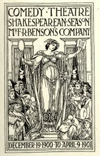 Walter Crane (1845-1915) was an English artist and book illustrator. Wikipedia states that He, along with Randolph Caldecott and Kate Greenaway, are considered the strongest contributors to the child's nursery motif that the genre of English children's illustrated literature would exhibit in its developmental stages in the latter 19th century. His work featured some of the more colorful and detailed beginnings of the child-in-the-garden motifs that would characterize many nursery rhymes and children's stories for decades to come. Born in Liverpool, he was part of the Arts and Crafts movement. He produced paintings, illustrations, children's books, ceramic tiles and other decorative arts.
 His lettering was at the basis of Crane Titling (2006, Nick Curtis), Crane Gothic (David Nalle, Scriptorium) and Walter Crane (2009, David Nalle, Scriptorium). Example alphabets drawn by him with a quill pen include Modern Gothic Capitals and this set. In 2012, Dick Pape created a digital alphabet called LFD Penwork 160 that is based on Crane's (utterly unattractive) modern gothic capitals. In 2013, Michael Bolen designed BU Scarecrow based on Crane's alphabets. [Google]
[More] ⦿
|
Walter Heberling

|
German handletterer who wrote Basic Lettering, and elements of composition, color harmony, gilding, embossing-processes (1922). Mike Jackson writes: W.A. Heberling was the instructor of Sign, Scene, and Pictorial Painting at the Mooseheart Vocational Institute in Mooseheart, IL. This book was also used as a textbook, taking beginners through the basics right up to painted pictorial billboards. His work from 1925 inspired Nick Curtis to digitize Fortune Cookie (2007) and Eulalie NF (2009). Heberling Casual NF (2002, Nick Curtis) is based on a single-stroke pen font from Heberling's 1922 book. All these fonts are quirky and almost Victorian. [Google]
[MyFonts]
[More] ⦿
|
Wayne J. Stettler

|
Son of a signpainter, b. 1934, Allentown, PA, d. 2011 Blue Bell, PA. He studied advertising design at the Philadelphia College of Art. Creator of photype typefaces such as Neil Bold (1966, VGC), which was the source of inspiration for Alejandro Paul's Mobley Sans (Umbrella Type), Neil Bold (2010, Patrick Griffin, Canada Type), Nick Curtis's Elephunky NF (2011), and Jas Rewkiewicz's Armstrong (B&P Foundry). He also created Stettler (1965, VGC). Neil Bold also had an outline version called Open. Patrick Griffin explains: That typeface was very popular with jazz and blues labels. Photo-Lettering knocked it off within 2 months of its release by VGC. This was Wayne Stettler last typeface ever; some say it's because he saw it knocked off and just gave up on type altogether. Also some people say the only reason it won in that type design contest was to actually try to convince Stettler to get back into type design. It never happened, he went into garment design and manufacturing shortly after that contest. Klingspor link. [Google]
[MyFonts]
[More] ⦿
|
Werner Rebhuhn

|
Designer at Genzsch&Heyse (1922-2001), who made these typefaces: - Fox (1953-1955). A heavy and quite ugly brush script. Fox was revived in 2007 by Ralph M. Unger at Profonts / URW++ as Fox. See also the digital revival by Thomas E. Harvey called Swashett (1993).
- Hobby (1955-1956). A casual heavy font. Hobby was revived in 2007 by Nick Curtis as Amper Sans NF (2007).
There is confusion about the first name. Schnelle, Klingspor and Profonts / URW++ say it is Werner, not Walter, while Linotype sticks with Walter. [Google]
[MyFonts]
[More] ⦿
|
Will Ransom
[ATF 1923 Catalog: Parsons]
|
[More] ⦿
|
Will Ransom

|
American designer, letterer, author and type designer (1878-1955) who was associated with ATF. In Chicago, he and Frederic Goudy started the private Village Press in 1903, which was a popular meeting place for typophiles, including Cooper and Dwiggins. Bio by Eason&Rookledge. - In 1918, he created Parsons for Barnhart Brothers&Spindler, which was named after the artistic director of a Chicago-based department store. This was the basis of the typeface AIParsons (1994) by Inna Gertsberg and Susan Everett at Alphabets Inc. Nick Curtis' Parsnip family (2004) is based on Parsons. Jess Latham also digitized Parsons. Finally, Dieter Steffmann converted the Gertsberg / Everett revival in 1999 to truetype while keeping the name AI Parsons.
- He created Clearcut Shaded Capitals (1920s, Barnhart Brothers&Spindler). This was extended to a full font by Nick Curtis in 2005 as Ransom Clearcut NF).
Klingspor link. [Google]
[MyFonts]
[More] ⦿
|
Willard T. Sniffin

|
 Designer at American Type Founders from 1927-1933. Catalog of some of his digitized typefaces. He made these fonts:
 - Adonis (1930, ATF). McGrew writes: Popular for stationery and announcements but with little use otherwise. Lines are monotone throughout, and lowercase letters are linked, although it is not really a script. There are alternate versions of several of the capitals. The 30-point size was cut, but seldom if ever shown. Revived by Jim Spiece as Adonis Old Style SG (1994).
- Hollwywood (1932, ATF). McGrew's comments: It was intended for smart, contemporary advertising, announcements, and stationery, but some of the characters have quaint shapes, suggestive of nineteenth-century styles. Compare Gothic Novelty. Revived by Jim Spiece in 1994 as Hollywood Deco SG and by Nick Curtis in 2009, with improvements, as Tinseltown NF.
- Keynote (1933, ATF), an informal script face. McGrew writes: Its name was suggested by the political campaigns of the previous year. There is variation in weight of strokes, and letters are unconnected, but there are a number of logotypes of connecting pairs of letters. Inclination is slight, permitting it to be cast on straight bodies with little overhang. Compare Raleigh Cursive by the same designer. Digitally revived in 2005 by Steve Jackaman as Willard Sniffin Script, and by Monotype---without mentioning Sniffin...---as CgChaplin (2016).
- Liberty (1927, ATF). McGrew: [ ...] was designed presumably to counter the importation of Bernhard Cursive (Bernhard Schoenschrift), which it greatly resembles. It differs in the crossbars of A and H, which have loops in them, the hooked ascenders of bdhl, and some lesser details, but it is a delicately handsome, unconnected script, with very small lowercase and very tall ascenders. On Intertype it is known as Lotus. Also compare Pompeian Cursive. Digital versions include Liberty (Bitstream) and Reliant (Intellecta Design).
- Newport (1932, ATF), an extra condensed novelty gothic / art deco face. McGrew: Caps occupy almost the entire body, and lowercase letters are tall, with short ascenders and very short descenders. In 48-, 60-, and 72-point sizes, descenders are cast on bodies 6 points larger. The round capitals CDGPR include arcs that are less than half a circle, joining stems at an acute angle. AEFH feature very low crossbars. The normal M is splayed, with the vertex ending short of the baseline, and is the W inverted. There are also an alternate M and W, consisting of three parallel lines with rounded top or bottom. In addition to characters shown in the specimen here, there are a cent mark and a small superior dollar mark, made only in 24-point and larger. Compare Jefferson Gothic, Phenix. Revived in 1994 by Jim Spiece as Newport Classic SG, by URW as URW Newportland, and by Nick Curtis in 2009 as Jazzfest NF.
- Nubian (1928, ATF). McGrew: It is a wide, very heavy design with extreme contrast of thick and thin strokes, and has very short serifs. The lowercase g has an uncompleted tail, and the i and j have semicircular dots. Compare Ultra Bodoni, Cooper Modern. The Broadway style signage font Nubian Black was revived and interpreted by Nick Curtis in his Slam Bang Theater NF (2002). Also check The Nubian: a new fashion in types (ATF, 1928). Local download.
- Piranesi (1930, ATF), a light display typeface with tall ascenders, short descenders, and an almost script italic. Named after an eighteenth-century Italian engraver. McGrew explains: Piranesi was designed by Willard T. Sniffin for ATF in 1930. It is a very delicate roman, with long ascenders and rather short descenders, and is named for an eighteenth-century Italian engraver. Other versions were added by Morris Benton: PiranesiItalic, also in 1930; PiranesiBoldItalic in 1931; and Piranesi Bold roman in 1933. The italics are more characterful and have more of a calligraphic feeling, especially in the cursive capitals, but a separate set of Plain Capitals-essentially a slanted version of the roman was produced for each of the italics. Oldstyle figures were made for all versions, and lining figures were also available for the bold roman. Both romans and both sets of italic plain capitals were still shown by ATF in recent specimens. There seems to be no explanation for the high series number of Piranesi Italic Plain Caps, but that is how it appears in ATF literature. PiranesiItalic, with regular cursive capitals, was also made by Intertype under the name Minuet. Piranesi was remade by Bitstream.
- Raleigh Cursive (1929, ATF). Mac McGrew: Raleigh Cursive is a spirited design by Willard T. Sniffin, drawn in 1929 for ATF but introduced in 1930. It has a pen-drawn quality, with precise lowercase letters which don't quite connect, and flourished capitals. There are two versions of cap Rand T, and several lowercase ligatures, as shown. Sizes over 36-point were discontinued in the late 1940s. Raleigh Initials were designed by the same artist at about the same time. They closely follow the style of Raleigh Cursive, but are more freely drawn. For each size, J and Q are cast on the next larger body size. Compare Park Avenue, Piranesi Bold Italic. For a digital version and extension, see the two-style Redwood (2007, Rebecca Alaccari, Canada Type).
- Rivoli and Rivoli Italic (1928, ATF). McGrew says: They are delicate typefaces with a nervous, pen-drawn quality, and are very similar to Eve and Eve Italic, designed by Rudolf Koch in Germany a few years earlier. However, Rivoli has the extra hairline on all sizes of caps in both roman and italic, whereas Eve has this line only on italic caps in sizes from 14-point up. Compare Paramount, which is essentially a bold version of Rivoli. A revival by Paul Hickson at Rooster Types is entitled Rivoli Initials [see also here].
- Rosetti (1931, ATF). McGrew: This is a thick-and-thin, serifless face. Many of the capitals are informal, and some have an extra swash version. In lowercase letters such as hand m, the ascending stroke leaves the stem at a low point. Compare Parisian, Optima, Radiant, Czarin, Lydian. Revived by Nick Curtis as Rassetta NF and Rassetta Swash Caps NF (2005).
FontShop link. Klingspor link. View Sniffin's typefaces. [Google]
[MyFonts]
[More] ⦿
|
William H. Bradley

|
 Book designer, poster designer and typographer, born in Boston (1868). He died in 1962. His typefaces include the following:
 - Abbey Text (1895, A.D. Farmer).
- Bradley (ATF, 1895). This blackletter typeface was cut into a wood type by Hamilton in 1900.
- A beautiful unnamed lettering for the Inland Printer (1891-1892).
- He drew the Bradley Series and licensed it to American Type Founders in 1895. That blackletter design was copied and issued by the Inland Type Foundry (as "St. John") and by A.D. Farmer&Son Type Founding Co (as "Abbey Text", still 1895). Also in 1895, Hermann Ihlenburg at ATF made the Germanic-language version of the Bradley Series. Several German foundries had metal versions of his 1895 series under the names Halbfette Altgotisch, Altfettgotisch and Amerikanische Altgotisch, such as Bauersche Giesserei and Schelter & Giesecke (1903). Digital revivals: Fyne Fish NF (Nick Curtis, 2009), Bradley Pro (2005, Ralph Unger at Profonts), Bradley DJR (2018, David Jonathan Ross). Bradley was used by Disney in its Sleeping Beauty Castle.
- Priory Black (ATF, 1897-1898) is said to be due to Bradley. In 1904, ATF introduced a modernized version called Cloister Black (or Cloister Text), designed by Joseph W. Phinney or Morris F. Benton.
- Bradley Roman and Italic saw the light in 1901 when Bradley was writing Peter Poodle, Toymaker to the King, and these typefaces are known as the Peter Poodle types.
- In 1904, he co-designed Antique Bold with J.W. Phinney and Morris Fuller Benton at ATF.
- His Bewick Roman series (1904) has gorgeous ligatures (tt, ct, and so on). Mac McGrew: Bewick Roman was designed by Will Bradley in 1904 and issued by ATF the following year. It is a quaint display type with a number of unusual characteristics. Several capitals have both wide and narrow versions, although generally the typeface is rather narrow; there are also several tied charac$Gters and ornaments in the font, as was common with nineteenth-century designs. Compare Rogers, Vanden Houten.
- Wayside Roman and Italic. Mac McGrew: Wayside Roman and Italic were shown by ATF in 1900, as a handsome interpretation of modern typeface similar to Scotch Roman, but without the heavier capitals of the latter face. Some sources say the designer was Will Bradley, but this is disputed by other authorities, and most likely it is a revival of an older face. It was not in regular production very many years, but special castings have been made at times. Some figures appear to be oversize---6, 7, and 9 in the specimen shown here---but this is a characteristic of the font, although not uniform from one size to another. Also compare Oxford, Bell.
- In 1904, he created the beautiful Chap-Book series (Cuts, Borders, Directors (pointing fingers), Guidons (unbelievable parentheses)), as well as the Mission Toys Ornaments, all at ATF. Thereafter followed Missal Initials, Wayside Borders (1904), Wayside Ornaments (1904), Cloister Borders (1905), Cloister Initials (1905), Indian Borders (before 1908). Some of his ornaments made it to American Pi NF (2006, Nick Curtis) and to the five-font-set Bradley Dingies (by Paulo W, 2009). Mac McGrew: Missal Initials were issued by ATF in 1904; their design has been ascribed to Will Bradley. Derived from fifteenth-century sources, each letter is designed to fill a square area. Compare Caxton Initials, Lombardic Initials. For a digital version of Missal Initials, see Initials ATF Missal Caxton (2012, Alter Littera).
- Bradley Initials (1934). For a degital version, see Glenda de Guzman's Bradley Intials (1994, Font Bureau).
- Vanity (1921-1930) is custom type he made while he was art director.
- His last group of typefaces was Bradley Combination Ornaments, made in 1952 for Steve Watts, type merchandising director of the American Type Founders Company.
- Roman alphabet by Bradley.
Fontshop link. A Booklet of Designs (1915, New York) contains many of his interesting drawings for typefaces. [Google]
[MyFonts]
[More] ⦿
|
William H. Page Wood Type Company
[William Hamilton Page]

|
 Norwich, CT-based company involved in wood type production. In 1856, William Page (b. Tilton, NH, 1829, d. Mystic, CT, 1906) bought out Horatio and Jeremiah Bill and founded Page and Bassett in South Windham, CT, with his partner James Bassett. In 1857, they moved to Greenville, CT. Some time later Samuel Mowry replaced Bassett as partner, and the company is Page and Co of Greenville, CT. Another name change occurs, to William H. Page&Co. In 1869, Page buys the operation of Colley&Dauchy. Mowry retires a bit later, the company moves to Norwich, CT, and becomes the William H. Page Wood Type Company. A year later, a defection of sorts---Charles Tubbs (an employee since 1860), John Martin and George Keyes leave to set up the American Wood Type Co. In 1881, George Setchell joins the business, and Page and setchell patent the die-cut production method. In 1889, Setchell sells all interests to S.T. Dauchy, who becomes president, only to sell the entire company to Hamilton in 1891. During the Civil War, Page perfected his equipment and became the leading manufacturer of wood type. In 1874, the company published a specimen book of so-called chromatic (wood) type. Henry Lewis Bullen described it this way: This is the most notable of wood type specimens. Page outshone all competitors in imparting a degree of artistry in designing wood type and borders, most of which could be printed in several colors . . . . [It is] a work of unusual excellence, well worth preserving. In 1891, Page's firm was absorbed by the Hamilton Manufacturing Company of Two Rivers, WI.
 Many of his wood types were digitized by Jordan Davies of Wooden Type. Page's fonts include Aetna, Antique No. 4 (revived as HWT Slab in 2013 by Hamilton Wood Type Foundry), Antique Tuscan No 9 (revived by Tom Wallace in 2006), Bindweed (revived by Solotype), Clarendon Condensed, Clarendon Condensed Bold, Clarendon Extended, Clarendon Heavy, Columbian (ca. 1870; revived in 23020 by Jeff N. Levine as Cherrywood JNL, by Dick Pape in 2013 as AWTPageColumbian), Concave Tuscan X, EgyptianTwo (2005), French Antique, French Clarendon (XXX Condensed No. 117), French Semi, Gilbey, Gothic Tuscan Round, Hamilton, Minnesota, Norwich Aldine ML (1872, digitized by Tom Wallace in 2010 under the same name), Number 154, Page No. 508, Peerless 131 Bold, Rigney, Skeleton Antique, Teutonic, Tuscan Italian Round, Unique Wood, William Page 500, William Page 506. In 2013, John Bonadies (MPress Interactive) started making digital typefaces based on Page's models. They published MPI Aldine Extended (based on a 1872 wood type by William H. Page), MPI Antique (slab serif), MPI French Clarendon (based on wood type from 1865 by William H. Page), MPI French Antique (a typical far West saloon font based on wood type by William H. Page, 1869), MPI Egyptian Ornamented (a western typeface based on a 1870 wood type by William H. Page), MPI Arcadian (based on a 1870 design by William H. Page), MPI Tuscan Extra Condensed (based on William H. Page wood type from 1872), MPI Norwich Aldine Reversed (from a 1872 original). Also in 2013, Dick Pape embarked on a large process of digitization of wood types at the Rob Roy Collection of the University of Texas. His digital fonts are free and are bundled under the label American Wood Type, or AWT. Revivals by Dick Pape of fonts due to William Page include AWTPage&SetchellNo154, AWTPage-SetchellNo515, AWTPageAldine, AWTPageAldineExpanded, AWTPageAldineOrnamented, AWTPageAntTuscanCond, AWTPageAntTuscanOutlined, AWTPageAntiqueBlack, AWTPageAntiqueCond, AWTPageAntiqueNo7, AWTPageAntiqueTuscan, AWTPageAntiqueTuscanNo1, AWTPageAntiqueTuscanNo8, AWTPageAntiqueXXCond, AWTPageAntiqueXXXCond, AWTPageBelgianCond, AWTPageBeveledNo142, AWTPageCelticOrnamented, AWTPageClarendonExtended, AWTPageClarendonNo1, AWTPageClarendonXXCondensed, AWTPageColumbian, AWTPageConcaveTuscanXCond, AWTPageConcaveTuscanXCondOutline, AWTPageCorinthianNo2, AWTPageEgyptian, AWTPageEgyptianOrnamented, AWTPageFrenchAntique, AWTPageFrenchClarendonCond, AWTPageFrenchClarendonXXX, AWTPageFullFacedGrecian, AWTPageGothicLightFace, AWTPageGothicTuscanNo1, AWTPageGothicTuscanPointed, AWTPageIonic, AWTPageIonicCondensed, AWTPageNo500, AWTPageNo501, AWTPageNo506, AWTPageNo508, AWTPageNo51, AWTPageNo510, AWTPageNo515, AWTPageNorwichAldine, AWTPageOrnamentedAldine, AWTPagePeerlessAntNo129, AWTPagePeerlessCondOldStyl, AWTPagePhanitalianNo132, AWTPageRomanAetna, AWTPageRunic, AWTPageSkeletonAntique, AWTPageTeutonic, AWTPageTuscanCondNo2. Revivals by Nick Curtis: Page Five Fifteen NF (2015), Rockwall NF (2015, after Aldine and Aldine Extended), Hunky Dory NF (2014, a circus font after William H. Page's wood type Doric, ca. 1850), Sodbuster NF (2014, after Gothic Dotted), Tuscalooza NF (2014, after the 1872 typeface Tuscan Extended), Bandiera Del Legno NF (2014: this Tuscan wood type revives Gothic Tuscan Condensed Reversed), Belgique NF (2014: a revival of the (Western) wood type French Clarendon XXX Condensed No. 117), Skelett Antiken NF (2014, after Clarendon XX, 1959). In 2020, Mark Simonson reworked, extended and modernized Aetna in his 30-style text and display typeface family Etna. FontShop link. Digital typefaces based on W.H. Page's work. View revivals of William Hamilton Page's typefaces. [Google]
[MyFonts]
[More] ⦿
|
William Hamilton Page
[William H. Page Wood Type Company]

|
 [MyFonts]
[More] ⦿
|
William Martin Johnson

|
In 1903, William Martin Johnson published the beautiful Bulfinch Oldstyle at ATF. It was created for use in The Ladies' Home Journal (Curtis Publishing Company). Bulfinch was released for general sale to printers by ATF in 1905. Morris Fuller Benton helped in the production. Mac McGrew: Curtis specified a design devoid of oddity or freakishness, yet graceful and legible. Adjustments for practical foundry production were made by Morris F. Benton. Although it was used extensively as heads in their magazine, it was advertised to printers in general in 1905. Compare Meriontype. Bulfinch inspired Hernandez Bros (2021, by Daniel and Eli Hernandez). . He also created the (Victorian) Meriontype series for use in the same journal in 1905. ATF writes The requirements called for a composite modernization of popular oldstyle typefaces, retaining all of their desirable features, while eliminating those proven undesirable. It was further stipulated that the Meriontype letters must be interusable with the letters of Bulfinch, or sister series. McGrew adds: Some letters appear to be identical in the two series, others are similar, although the serifs of Meriontype are generally a little larger and more angular. The lowercase g of the latter typeface has the appearance of being reversed. Meriontype was revived by Nick Curtis in 2014 as Meriwether Circular NF. [Google]
[MyFonts]
[More] ⦿
|
William Miller
[Miller&Richard]

|
[MyFonts]
[More] ⦿
|
Willy Mucha
|
French painter, b. 1920. Nick Curtis's Gulfstream NF (2007) is based on a 1934 art deco poster by Mucha for Ouistream Riva Bella, France. [Google]
[More] ⦿
|
Wolf Magin
|
Designer of Black Line (1976, Berthold), a nice multiline all caps face. It was digitally recreated by Nick Curtis in 2011 as Linea Nera NF. [Google]
[More] ⦿
|
X. Carot
|
Spanish poster artist, whose lettering on this poster entitled "Ricardo Llacer y Hijos" from 1948 inspired Nick Curtis to make Little Rickey NF. [Google]
[More] ⦿
|


 Type designer who created various alphabets and showed them in
 [
[ Born in Tockum (near Riga, Latvia) in 1876, he died in Bialystok in 1942. German type designer who designed the classical display typeface
  His real name is Adolphe Jean-Marie Mouron, and he was born in Kharkiv, Ukraine in 1901. He committed suicide in Paris in 1968, after the rejection of one of his innovative designs by a German publisher. After studies at the Ecoles des Beaux Arts in Paris, Cassandre adopted France as his country. He produced his first poster Au Bucheron at 22, and became a successful and influential poster artist best known for his epoch-defining
  American lettering artist whose book Lettering: Brush&Pen in the Single Stroke inspired Nick Curtis in 2006 to design the connected script typeface
  German type designer, b. Frankfurt am Main, 1868, d. Leipzig, 1943. His oeuvre:
  Austrian graphic designer, painter and lettering artist during the secessionist period, who lived from 1864 (b. Brünn, Mähren) until 1935 (d. Vienna). He was one of the founding members of the influential Vienna Secession for whom he designed
  Born in Ivancice, Moravia (Czechia), in 1860, died in Prague in 1939. Famous for his sleek posters of women at the height of the art nouveau movement. In 1885 he studied at the Munich Academy of Art and then moved to the Academie Julian in Paris. In Paris, he took commissions for illustrations, portraits and decorative projects, but became most famous for his poster designs for plays, especially under the patronage of Sarah Bernhardt in the 1890s. The success of his posters led to a commercial career in decorative design for commercial and advertising products. Mucha also created jewelry designs, and briefly taught art in New York. In 1910, Mucha returned to Prague to work on nationalistic art, including murals, postage stamps, stained glass and bank notes.
  Dutch type designer located in Bloemendaal. Jan Middendorp wrote about him in
  Free art deco typefaces by Nick Curtis, made between 1997 and 2003. Nick Curtis also made commercial art deco typefaces, but these will be listed elsewhere.
  Commercial art deco typefaces by Nick Curtis.
  Art nouveau revivals by Nick Curtis include the following free typefaces.
  Showcasing the best pages from the Artcraft Series in the ATF 1923 Catalog. Artcraft&Bold&Italic are display typefaces originally designed for Barnhart Bros&Spindler by Robert Wiebking (1911-1913). Jaspert lists Artcraft as a 1930 publication at Ludlow, and Klingspor as Western Type Foundry typefaces from 1911 until 1913. Mac McGrew: Artcraft was designed in 1912 by Robert Wiebking and featured under the name of Craftsman in the first ad for his short-lived Advance Type Foundry, operated by Wiebking, Hardinge&Company, in Chicago. A short time later, the typeface was advertised as Art-Craft, and later as one word---Artcraft. Advance was soon taken over by Western Type Foundry, for whom Wiebking designed Artcraft Italic and Artcraft Bold a year or two later. Western in turn was taken over by Barnhart Brothers&Spindler in 1918. BB&S was already owned by ATF but operated separately until 1929; in the meantime, though, Artcraft and a number of other typefaces were shown in ATF specimens as well as those of BB&S. Artcraft has an unusual roundness in some of its serifs and line endings and a line of it produces a rolling feeling; some characters have curlicues, such as the long curl at the top of the a and and the exaggerated ear on the g. A number of auxiliary characters were made for roman and italic fonts; as these were sold separately, they were overlooked by many printers and typographers. The boldface has fewer eccentricities. Artcraft was a popular typeface for a number of years; the roman was copied by Monotype in 1929 without the fancy characters, and all three typefaces were copied by Ludlow. Adaptation in 1924 of Artcraft Italic to the standard 17-degree slant of Ludlow italic matrices was the second assignment of Robert H. Middleton (after Eusebius, q.v.) at that company. Hansen called it Graphic Arts. One source attributes the Artcraft family to Edmund C. Fischer, otherwise unidentified, but the details stated here are more generally accepted and seem to fit known facts better.
  Showcasing the best pages from the Parsons Series in the ATF 1923 Catalog. This is an original ATF display typeface (via its acquisition of BB&S) with a hand-drawn almost art nouveau look. Created in 1918 by
  Designer of some Western-themed typefaces at Adobe in the 1990s. These include
  Chicago-based foundry, which grew out of The Great Western Type Foundry in 1868 when the Barnhart brothers (newspaper publishers in Iowa who came to Chicago as advertising agents) bought out the Toepfer family in 1868. They retained Herman Spindler as the foreman, since he was the only typefounder in the group. Aggressive in business, BB&S became the largest foundry in Chicago.
  Born in Brooklyn in 1940, he graduated from New York City Community College. Barry worked for Sandgren & Murtha, New York as a graphic designer.
  Founded in 1981 by Mike Parker, Matthew Carter, Cheri Cone, and Rob Freedman, Bitstream is the first digital font foundry. Not without controversy, though, as many claim that the original digital collection was an illegal copy of Linotype fonts [Note: I disagree with that statement--take out "illegal"]. In 1999, Bitstream created
  Type foundry in the early 20th century in London. Their typeface Richmond Oldstyle (1920s) was imitated by Sylvester A. Cypress in the phototype Wembley, which in turn was digitized by Joe Treacy (Treacyfaces) as Wembley TF. Novel Fonts revived Richmond Oldstyle as Valhalla in 1994. Nick Curtis revived Richmond Oldstyle as
  Mac McGrew: Boston Breton was introduced by ATF about 1900. It was redrawn from the earlier Breton, originated by one of ATF's predecessors, the Boston Type Foundry, in the early or mid-1890s. It is a bold, rather wide square-serif face, suggestive of Stymie Bold which came thirty-some years later. But its large lowercase and short ascenders are suggestive also of the modifications designers have given such typefaces in phototype adaptations, seventy years or more later. Boston Breton Condensed and Extra Condensed came from the same source in 1909 or earlier. All have the same unusual sort of Q. In 2011, Nick Curtis created a digital version called
  Boston-based foundry, est. 1817 by
  Büro für Gestaltung Janssen, or Janssen Design, is located in Hamburg. It is involved in print, screen, animation, corporate and type design, and was founded in 2002 by Sylvia and
 Foundry from St. Louis, est. 1872. It became "Central Division of ATF" in 1893.
  French poster artist (b. Nice, 1892, d. Les Arcs-sur-Argens, 1962) in the 1930s who was one of the main poster artists of his time, together with the three musqueteers, A.M. Cassandre, Jean Carlu and Paul Colin. He was an avantgardist, who contributed mainly in the art deco style. I am aware of the following digital typefaces based on his poster lettering.
  Started in 2008, this web place by Norwegian entrepreneur Roger S. Nelsson (based in Honningsvåg, Norway) sells fonts by Ray Larabie, Brian Kent, Nick Curtis, Derek Vogelpohl and Kevin King that were originally freeware fonts. Nelsson reworked them (more glyphs, more multilingual) and asks about 10 dollars per font now. He says his fonts now cover these Latin languages: Afrikaans, Albanian, Basque, Belarusian (Lacinka), Bosnian, Breton, Catalan, Chamorro, Chichewa, Cornish, Croatian, Czech, Danish, Dutch, English, Esperanto, Estonian, Faroese, Filipino (Tagalog), Finnish, French, Frisian, Galican, German, Greenlandic, Guarani, Hungarian, Icelandic, Indonesian, Irish (Gaelic), Italian, Kashubian, Kurdish (Kurmanji), Latvian, Lithuanian, Luxembourgian, Malagasy, Maltese, Maori, Northern Sotho, Norwegian, Occitan, Polish, Portuguese, Rhaeto-Romance, Romanian, Saami (Inari), Saami (Lule), Saami (North), Saami (South), Scots (Gaelic), Serbian (latin), Slovak(ian), Slovene, Sorbian (Lower), Sorbian (Upper), Spanish, Swedish, Tswana, Turkish, Turkmen, Ulithian, Walloon, Welsh, Yapese.

 Foundry in Cleveland that existed from 1875 until 1892, when it was absorbed by ATF. It was also called H.H. Thorpe Mfg. Co. They published Catalogue and Book of Specimens From the Cleveland Type Foundry. The H.H. Thorp Mfg. Co., 147 St. Clair Street, Cleveland, Ohio (176 pages, 1880),
  Comicraft was founded by Richard Starkings and John Roshell in 1992. Located in Santa Monica and Los Angeles, they do lettering and design for the comic book industry and make comic book fonts. At one point they were also called Comic Book Fonts. The current presidents are Rita Simpson and
  [
[ William Joseph Dard Hunter was born in 1883 in Steubenville, OH, and died in 1966 in Chillicothe, OH. He was one of the most influential graphic designers to come out of the American Arts and Crafts movement around 1900-1910. The typeface
  Type designer of the photolettering era (1960s) whose work is slowly but surely being digitally revived by Nick Curtis, and by Photo-Lettering, the House Industries subsidiary that bought the PhotoLettering Inc type collection.
  Type designer who was born in London in 1943. Dave Farey runs
  Dennis was a major contributor to a.b.f., and managed the fontplay site. He often referred to his "Hall of Fame" sites. On February 3, 2002, he finally revealed his list of five favorite font sites, all characterized by usefulness and professional quality free fonts:
  Dutch typeface designer, b. Amsterdam, 1909, d. Baarn, 1998. Trained and worked at the Lettergieterij in Amsterdam under S.H. de Roos, starting in 1926. He worked with de Roos on the design of the typefaces Nobel and Egmont. Dooijes studied at the Amsterdam College of Arts and Crafts and at the Academy of Art. In 1940, Dooijes succeeded de Roos as artistic director of Lettergieterij Amsterdam. He was director of the Gerrit Rietveld Acedemie from 1968 until 1975. Author of Mijn leven met letters, and Wegbereiders van de moderne boektypografie in Nederland (Amsterdam, De Buitenkant, 1988). His typefaces:
  Born in 1943, Zembsch began his career in graphic arts as a typesetter. He subsequently studied graphic design at Mannheim (in 1968) and Stuttgart. While working as a packaging designer for the pharmaceutical firm of Mann&Schröder, in his spare time he designed the winning entry in Letraset's International Typeface Competition for 1972/73, a typeface named Beans. Another font, Jumping Jack, was first released as dry-transfer sheets by Mecanorma in 1975. He later worked as advertising manager for a German publishing house and, in 1977, he became an independent graphic designer, operating as Zembsch' werkstatt in Munich, specializing in book design. In addition to illustrating book jackets for other authors, he has written and illustrated several of his own works. Zembsch and partner Sophie Weiss currently run a design firm in Munich.
  [
[
 Type and graphic designer born in Lerida, Spain (1908), who lived and worked mostly in Paris, where he had emigrated to during the Spanish Civil War (1936-1939). He died in 1987 in Noyon. All his fonts are available from Neufville. He was the founder of the movement that is known as Grafía Latina (or La Graphie Latine), which promoted the need to create a new system of typically Latin (as opposed to cold geometric nordic) typographic structures, graphics, alphabets and decorative ornaments.
  German designer of these typefaces:
  Typographer, type designer (b. 1879, Kassel, d. 1967, Bad König), teacher (at the Frankfurt Vocational School and at the College of Arts and Crafts in Offenbach am Main) and author of typographic books. In 1905, Engel became supervisor of in-house printing at the Klingspor foundry.
  New York-based foundry, also called White's Type Foundry and A.D. Farmer Foundry. It was created in New York in 1862, and sold to ATF in 1892. Many of its typefaces were digitized in recent years, such as the art nouveau typeface Palm (1887), which resurfaced as
  Fontscape lists digital Arts and Cratfs movement fonts:
  Los Angeles-based company that distributed a 5000+ library of two-inch film fonts for display typefaces, some of which were original, such as Yagi Double (the CNN logo font) and Yagi Link Double. It ceased operations in 1985. Trogman maintains a design studio in Palm Springs, California.
  Full name: Francisco Lucas Vezino De Sevilla. Spanish lettering master in the 16th century who wrote
  Sign painter from the art nouveau era, who lived in Chicago and worked mostly for Cadillac. His books Sign Painting (1908) and
  Photolettering foundry in the 1970s, located at 211 43rd Street, New York City 10017. One of my correspondents explains: Franklin Photolettering was the smaller film type joints catering to the major publishing and advertising industries in New York City in the 60s and 70s. They started out with a few originals to get into the game, but within a year or so they started putting out copies or slight modifications of existing stuff from Photolettering and VGC (you can see how that happens---someone comes in for some ad copy in Barker Flare, for example, and he asks if they have something like Eightball, so they say "sure, we can do that"). Even though they did have a bit of original stuff, they didn't have not enough to stand out like PL, Mecanorma, VGC or Letraset---also the sheer number of film fonts available on the market by the mid-70s meant that unless you dumped a lot of money on marketing, big-time design would ignore you----so not much room was left for smaller film type houses.
  Among the fonts in this small art nouveau style and arts and crafts archive, compiled by John M. Murphy in 2003, we find
  German type designer, 1878 (Achim)-1956 (Nürtingen). Studied in Berlin. Founder in 1900, with F.H. Ehmcke and Georg Belwe, of the Steglitzer Werkstatt, which he left in 1903. He taught at the Leipzig Academy of Graphic Design and Book Arts from 1903 until 1906. Thereafter he taught in Darmstadt and worked at private presses. From 1924 until 1931, he was advisor at D. Stempel AG, where he made, e.g., Gotische Antiqua (1914), Helga (1912, with round wide lower-case letters), Helga Antiqua (1913), Ingeborg Antiqua (1910), Omega (1926: art deco),
  The Richard Gans Foundry is a defunct Spanish foundry which existed from 1888-1975.
  A
A  Coauthor with Paul Carlyle of
  Born in Halle, 1894, died in Ludwigsburg, 1958. Painter and commercial artist who was educated at the Leipzig Academy for Graphic Arts from 1912 to 1914 and from 1919 to 1920. Afterwards, he worked independently in Leipzig and Berlin. After the Second World War, he was active in Naumburg.
  Born in New York in 1918, Herbert Frederick Lubalin died there in 1981. Founding editor and art director of U&lc from 1973-1981. Co-founder of ITC in 1969, together with Edward Roundthaler and Aaron Burns, as a result of the marriage of Lubalin Burns & Co (est. 1969) and PhotoLettering Inc. Professor at the Cooper Union in New York from 1976-1981. Director of the avant garde magazine Fact between 1965 and 1967.
  Walter Bernard "Ben" Hunt (b. 1888, Greenfield, WI, d. 1970) was an American artist, outdoor educator and author. His books covered native American arts, woodworking, scouting, pioneering, jewelry making, metalworking, and calligraphy. Quoting wikipedia: Hunt was born in Greenfield, Wisconsin and grew up in a log cabin. He attended Milwaukee's South Division High School, but did not graduate, dropping out to become lithographic engraver at the Bruce Publishing Company. Hunt moved to Hales Corners, Wisconsin with his wife, Laura, in 1920. In 1924, Hunt, along with his father-in-law and his brother, Edwin C. Hunt, built a log cabin behind his home. The cabin, a 16x28-foot structure, made of tamarack logs, was the subject of Hunt's first article, How We Built Our Log Cabin. During the late 1930s, Hunt began to study the work of Native American artists. As part of his research, Hunt met with artists and leaders such as Nick Black Elk, Frank Smart (or Chief Gogeoweosh), and James F. "Buck" Burshears. Hunt shared his knowledge of "Indian lore" with Milwaukee's boy scout leaders and, in 1942, Hunt started writing articles for Boy's Life. He became a regular member of its staff, ultimately writing over 1,000 articles. Hunt's work for Boy's Life, led him to serve on the staff of the National Boy Scout Jamboree in 1950, 1953, 1957, and 1960.
 Born in Leipzig (1902), died in Locarno, Switzerland (1974). Influential
  Leipzig-based foundry started in 1819 by punchcutter Johann Schelter and typefounder Christian Friedrich Giesecke (1793-1850). It evolved in 1946 into Typoart in Dresden, the official East German government's press. Its early history is told in
  Catalan designer (b. 1920, Caldes de Montbui, d. 1980, Barcelona) of Bisonte (Fonderie Typographique Française, 1950),
  [
[ German painter, illustrator, designer, teacher, architect, and
  Massachusetts-based punchcutter, b. 1852, Harrisville, PA.
  [
[ Great American calligrapher and engraver. He wrote several books, including Engraving Designing Etching (1914),
  [
[ [
[ Designer at Barnhard Brothers and Spindler (and head of matrix engraving there), who designed the art deco typeface Cubist Bold (a typeface without lower case) in
  Belgian graphic designer and painter. With Dutch artist and graphic designer Joan Collette, he created the gorgeous ultra-fat art deco display typeface
  After studies in Berlin, Binder (b. 1898, Lindenberg, d. 1991) taught at the National Art School in Saarbrücken. From 1924 on, he worked as an independent commercial artist. Designer at D. Stempel of Binder Style (1959). This squarish elbow-room only typeface appeared on the movie poster for Silence of the Lambs. It was revived by these type designers:
  A typeface made in 2008 by Nick Curtis, and named after abstract painter Wassily Kandinsky. [
 German scribe, type designer and unbelievable calligrapher, b. 1914 in Schlesisch-Drehnow, d. 2000 in Offenbach. Following schooling in Schlesien and Hamburg, he served a four-year typesetting apprenticeship from 1930-1934 in Hamburg and later at the Kunstgewerbeschule (School of Arts and Crafts) in Offenbach am Main. From 1939 until 1945 he was in active military service and became a prisoner of the Russians. After that ordeal, he became a calligraphy teacher at the Werkkunstschule in Offenbach, and developed a universal pen with novel writing and drawing techniques for the company Brause. It is at that point that Hoefer started designing types as well. From 1970 to 1979, Hoefer was a lecturer and later professor at the HfG (School of Design) in Offenbach. From 1981 to 1988, Hoefer ran summer calligraphy workshops in the USA (Los Angeles, San Francisco, Boston, New York, Washington, and other cities). In 1982, Karlgeorg Hoefer founded a calligraphy workshop in Offenbach for everyone, with evening courses and summer school, and in 1987, the registered association "Calligraphy Workshop Klingspor, Offenbach, Supporters of International Calligraphy." From 1987 to 1995, he was the chairman of the association while teaching continuing courses and summer school classes with leading foreign calligraphers. Hoefer has written two books about calligraphy: "Das alles mit einer Feder" (Brause, 1953) and "Kalligraphie, gestaltete Handschrift" (Econ, 1986). Numerous articles about Hoefer's work have appeared in calligraphy journals in Holland, France, the USA, and Japan. In 1989, the book "Schriftkunst/Letterart Karlgeorg Hoefer" was published as part of Calligraphy-Editions Herbert Maring (Die Kalligraphie Edition, Hardheim, Germany, 1989). For his activities as a calligrapher, Hoefer received the Order of Merit of the Federal Republic of Germany in 1993. His typefaces:
  [
[ Vienna-born type designer who lived from 1883-1972, and whose real name was Emil Kahn. He died in New York, where he lived most of his life. He studied at the Munich Academy, which became a center of poster design. In 1910 he co-founded the magazine Das Plakat. During WWI he designed posters for the German War effort. In 1920 he was appointed as the first professor of poster design at The Akedemie der Kunst, Berlin. He moved to New York in 1923 and continued his poster work. He also continued his teaching at the Art Students League and at New York University.
  Foundry in Chicago run by Robert Hunter Middleton. Myfonts.com writes that its type library was largely derivative, with some original scripts. After Middleton's death, and Ludlow's demise, most of the typefaces from the Ludlow library were licensed exclusively to International TypeFounders, Inc., (ITF) and are part of the Red Rooster collection. Since 2021, its fonts can be licensed via
  Designer (b. 1874, Wiesbaden, d. 1949, Berchtesgaden) at the Benjamin Krebs foundry who made
  Chicago lettering artist who created
  Born in Berlin in 1883, died in Buenos Aires in 1963. He was a painter, commercial artist, advertising artist, writer and costume designer. After training to become a skilled woodworker, Jacoby-Boy studied at the Académie des Beaux-Arts in Paris. From 1912 to 1926, he designed Bravour (1912, D. Stempel AG), Verzierte Bravour (1913, D. Stempel AG) and Jacobea (1928, Berthold). Beginning in 1919, he spent a decade working as a Production Designer for several German film companies, including May Films and Fritz Lang's UfA. In 1933, he emigrated to the Netherlands and then to the USA, and finally to Argentina, where he died in 1963.
  German type and jewelry designer, 1873-1934. He did advertising work for customers in Naples, London, New York and Germany. He was active in the art nouveau era and is credited with these typefaces:
  Designer and old-timer in the signpainting business in San Jose, CA, who influenced sign layout in a big way. Mike Stevens died of a heart attack in 1989 at the age of 46. At the SignDNA foundry, we find reincarantions of many of his alphabets, such as Magic, Stix (art deco), Happy Script, Master, ArRoyo, Tahoe, Staton, BigSur, DuVall, BigRed, BigMedicine, Tenor, Phoenix, Vasona. His
  Founded by
  Milton Glaser (b. 1919, New York, d. 2020) was an important American graphic designer who founded Push Pin Studios (in 1954) in New York where he worked with Seymour Chwast. He left in 1970 and founded Milton Glaser Inc in New York in 1974. He taught classes at SVA, where according to
  [
[ [
[ Prolific American type designer (b. 1872, Milwaukee, d. 1948, Morristown, NJ), who published over 200 alphabets at ATF. He managed the ATF type design program from 1892 until 1937. Son of Linn Boyd Benton.
  Two Goudy fonts, from 1916 and 1921, respectively. Goudy wrote about them, as reported in A Half-Century of Type Design and Typography: 1895-1945, Typophiles Chap Books XIV, 1946 at pages 99 and 110:
  Born in Belleville, IL, in 1858. He died in 1940. Typefounder, author, artist, editor and printer, all in one. Involved at some point with the Inland Type foundry and the Central Type Foundry. His typefaces:
  [
[ [
[ [
[ [
[ [
[ [
[ [
[ [
[ [
[ [
[ [
[ [
[ [
[ [
[ [
[ [
[ Athletic lettering typefaces by Nick Curtis include CampGranadaNF (free).
  Nick Curtis's foray into calligraphic typefaces, and penmanship.
  Celtic or uncial typefaces by Nick Curtis include the free typefaces
  Free comic book or cartoon typefaces by Nick Curtis:
  Nick Curtis made many retro typefaces, including typefaces that followed in the path of art deco and degenerated into the avant garde style, of which Herb Lubalin's Avant Garde is the main representative. Here is a list.
  Nick Curtis made occasionally a typeface that was inspired by old computer screens or other technological impositions on typefaces. These include;
  Nick Curtis was making and reviving fat typefaces long before they became the hot trend ca. 2006. Goudy Stout is the prototypical forefather of all of them. Among the free typefaces in this list:
  This list contains information on Nick Curtis's free typefaces not discussed or mentioned under other themes. A visual summary of all his free typefaces:
  Fonts by Nick Curtis that have a Mexican theme or evoke a fiesta. In his free repertoire, we have Arizona Airways NF (2011, even a bit of art deco),
  Modern typefaces made by Nick Curtis between 1997 and 2010 include the following.
  Psychedelic era typefaces by Nick Curtis:
  Retro type revivals are Nick Curtis's specialty. He searches deep in the dark guts of libraries to locate long lost treasures. Here is a list of some retro types, mostly from the 1950s, that are free.
  Signage typefaces made by Nick Curtis between 1997 and 2010 include the following.
  Nick Curtis designed these stencil typefaces:
  Typefaces made by Nick Curtis from 2004, not listed elsewhere on these pages. Bayern Handschrift, De Rigueur NF, Refugio Rustic WBW, Refugio Refined WBW, Ponte Vecchio NF, Brazzaville NF (based on Congo, a 1910 font by Barnhart Brothers \& Spindler),
  Typefaces made by Nick Curtis from 2005, not listed elsewhere on these pages.
  Typefaces made by Nick Curtis from 2006, not listed elsewhere on these pages:
  Typefaces made by Nick Curtis from 2009, not listed elsewhere on these pages:
  Typefaces made by Nick Curtis from 2010, not listed elsewhere on these pages.
  Typefaces made by Nick Curtis from 2011, not listed elsewhere on these pages:
  Typefaces made by Nick Curtis in 2015:
  Nick Curtis's typefaces that took inspiration from wood types. Many of these have WBW in the name, which stands for Whiz-Bang Woodtype.
  A commercial Cherokee font created in 2006 by Nick Curtis. He writes: This rugged typeface is based on letterforms in the Cherokee Syllabary, reputedly devised by a gentleman named Sequoyah in the early nineteenth century. In addition, Native American petroglyphs---some authentic Cherokee designs, some from other tribes---are included in several positions. The name of the typeface, however, is authentic Cherokee, and can be loosely translated as Yo, whuzzup? [
 Also called Oskar Freiherr von Kress. He designed the pointed heavy inline typeface
  Influential designer and type designer, motivated by beautiful advertising type (b. Mountgilead, Ohio, 1879, d. Chicago, 1940).
  German type designer, painter, Gutenberg researcher and heraldy specialist, b. Düsseldorf 1859, d. 1947, Oberschleissheim. Mainly specializing in blackletter. His typefaces:
  Typefounders and printing press in San Francisco. The Miller&Richard Type Foundry of Scotland opened a branch in San Francisco in 1878, headed by John J. Palmer. This branch was sold to Palmer and Valentine J. A. Rey in 1882. In 1884, Palmer&Rey acquired the assets of the Pacific Type Foundry. The company then merged into American Type Founders in 1892. They published
  Coauthor with Guy Oring of
  [
[ [
[ English punchcutter and typefounder (1754-1820, North London), designer of the first fat typefaces, founder of the Fann Street Foundry in 1794 and active until his death in 1820, when his foundry was sold to William Thorowgood a few months after his death. Designer of one of the first fat didone typefaces, Thorowgood (1809), and of Thorne Shaded (1820; Thorne Shaded was part of the Reed foundry material, had defective matrices, so Stephenson&Blake had it recut by Karl Gomer in 1938-1940). iAs metal typeface, Thorowgood was featured in 1953 by Stephenson and Blake.
  [
[ Born in Schwelm, Germany, 1870, Robert Wiebking emigrated to the United States in 1881 with his father Hermann Wiebking, and became an apprentice engraver in Chicago. After another apprenticeship in 1884, with C.H. Hanson in Chicago, he became an independent professional matrix engraver in 1892 in that city for several American and English founders and for Ludlow, who cut many of Goudy's types, as well as types for Bruce Rogers and Robert H. Middleton. In 1894 Robert Wiebking and Henry H. Hardinge (also from Chicago) built the first successful machine for engraving type matrices. In 1896, they became partners and set up Wiebking, Hardinge & Co in 1901, manufacturing matrices for type foundries. This led them to set up the Advance Type Foundry in Chicago. He died in 1927 in Chicago.
  British architect actve ca. 1900, known for his
  Inventor and patent holder (with W.H. Gordon) of the speedball pen. Lettering artist from Seattle, influenced by W.H. Gordon. W.H. Gordon and Ross F. George wrote
  Austrian type designer, b. 1884, Vienna, d. 1972, Vienna. Painter of "primitive art" canvases and a commercial artist, noted for the design of books, calendars, diplomas and posters. Geyer worked as an in-house designer for the Zsolnay publishing house and, from 1942 to 1945, he taught at Graphischen Lehr und Versuchsanstalt in Vienna.
  Great German type designer (b. Nürnberg, 1876; d. Frankfurt, 1934) who worked mainly at the Klingspor foundry. He founded the Offenbach Werkstatt in 1921.
  Samuel Welo was an American advertising calligrapher, typographer, designer and lettering artist whose work appeared in the 1920s.
  American graphic designer and Oscar-winning filmmaker, best known for his design of motion-picture title sequences, film posters, and corporate logos. Born in the Bronx, NY, in 1920, he died in Los Angeles in 1996. Bass worked for some of Hollywood's most prominent filmmakers, including Alfred Hitchcock, Otto Preminger, Billy Wilder, Stanley Kubrick and Martin Scorsese. Among his best known title sequences are the animated paper cut-out of a heroin addict's arm for Preminger's The Man with the Golden Arm, the credits racing up and down what eventually becomes a high-angle shot of a skyscraper in Hitchcock's North by Northwest, and the disjointed text that races together and apart in Psycho. Bass designed some of the most iconic corporate logos in North America, including the Bell System logo in 1969, as well as AT&T's globe logo in 1983 after the breakup of the Bell System. He also designed Continental Airlines' 1968 jet stream logo and United Airlines' 1974 tulip logo, which became some of the most recognized airline industry logos of the era.
  Schriftgiesserei Eduard Haenel is a Berlin-based foundry operational in the 1840s, run by Eduard Haenel (b. 1804, Magdeburg, d. 1856, Berlin), who was a type founder and book printer.
  German foundry that was located in Dresden. Designers include
  Graphic designer born in New York in 1931, who worked with Milton Glaser at Push Pin Studios in New York from 1954 onwards. Many of his fonts were sold by Photo Lettering.
  British calligrapher, signwriter, lettering artist, and type designer. He teaches typography at Stafford College and is a Research Fellow at the University of Lincoln. His typefaces:
  Dutch typographer and type designer, b. Drachten, 1877, d. Haarlem, 1962. He worked at Tetterode from 1907-1941.
  American typographer and type designer, b. 1886, Philadelphia, d. 1953. He was a man with class and style, who influenced many through his work. He managed the Lanston library from early in the 20th century (he joined Lanston in 1902) until the second World War. He created many of its typefaces himself, and commissioned many from Frederic W. Goudy. His typefaces (LTC stands for Lanston Type Company):
  Dover Press sold Oakland's
  Founded in 1819 in Sheffield by toolmaker
  Mac McGrew: Sterling and Sterling Cursive were designed by Morris F. Benton for ATF in 1917 and 1919 respectively. They are a delicate and attractive pair of typefaces. with long descenders, but have a number of unusual little quirks that make them more suited to such printing as announcements and programs than for extended reading. Italic capitals are quite flourished, but there is an additional set of Plain Capitals, fonted separately, which is essentially a slanted version of the roman.
  The annual TDC2 competition. The jury was headed by Gary Munch, and consisted of Jill Bell, John Downer, Dennis Pasternak and Richard Weltz. The winners are
  Aka Type Foundry Amsterdam, and Lettergieterij Amsterdam voorheen Tetterode, this influential foundry in the Netherlands operated from 1851 until 1988. A lot of the material about Tetterode can now be found at the
  [
[ Catalan type designer (aka Tomás Vellvé), who, at FT Neufville in 1971 created Vellvé, a simple rounded sans serif family, which was published at the
  MyFonts lists the commercial triline fonts: Cressida NF (Nick Curtis), Mexcellent (Ray Larabie), Hardliner AOE (AOE), Lunasol (Ray Larabie). [
 American lettering artist and type designer from New York. Creator of
  Printer, typefounder, and head of the ATF specimen department (1864-1938). Designer of the caps font Modernistic (1927, ATF, which is in the spirit of Gallia), Gallia (1927, art deco headline face), Graybar Book, Lexington, Stymie Compressed, Stymie Compressed Inline Title and Bookman (+Italic).
  German foundry establshed in 1888 by Theodor Robert Arthur Schmidt and Ludwig Wagner in Leipzig. In 1902, Ludwig Wagner quit and joins Gundelach&Ebersbach (first founded in 1897) also in Leipzig, and then opens his own foundry, Ludwig Wagner. Schmidt stops in 1932, while Otto Schmidt takes over--the company is now called Wagner&Schmidt Nachfolger. Otto Schmidt dies in 1941, and the company is dissolved in 1942.
  Walter Crane (1845-1915) was an English artist and book illustrator. Wikipedia states that He, along with Randolph Caldecott and Kate Greenaway, are considered the strongest contributors to the child's nursery motif that the genre of English children's illustrated literature would exhibit in its developmental stages in the latter 19th century. His work featured some of the more colorful and detailed beginnings of the child-in-the-garden motifs that would characterize many nursery rhymes and children's stories for decades to come. Born in Liverpool, he was part of the Arts and Crafts movement. He produced paintings, illustrations, children's books, ceramic tiles and other decorative arts.
  Designer at American Type Founders from 1927-1933.
  Book designer, poster designer and typographer, born in Boston (1868). He died in 1962. His typefaces include the following:
  Norwich, CT-based company involved in wood type production. In 1856,
  [
[