TYPE DESIGN INFORMATION PAGE last updated on Wed May 6 15:53:54 EDT 2026
FONT RECOGNITION VIA FONT MOOSE

|
|
|
|
|
Extinct 20th century foundries | ||
|
|
|
|
SWITCH TO INDEX FILE
This foundry started in 2000 and died in October 2001. It had many interesting new small point size screen fonts. The list: 11px2bus, 11px3bus, 11pxbus, 13pxbus, 5px2bus, 5pxbus, 6px2bus, 6pxbus, 7px2bus, 7px3bus, 7px4bus, 7pxbus, 7pxkbus, 8pxbus, 9px2bus, 9px3bus, 9pxbus. It used to be here: http://ziz.pekori.to/. [Google] [More] ⦿ | |
Self-proclaimed foundry with a mysterious web page active ca. 1999: nothing but graphics, no products or factual information. No clue what sort of fonts they made. [Google] [More] ⦿ | |
A defunct Montreal foundry run by Denis Dulude and cofounded by him and Fabrizio Gilardino in 1995. Denis Dulude closed shop in 2011 and returned all rights of fonts to their creators. [I wish everyone would be so generous...]. Most fonts can now be found in the FontHaus collection. The designers included Annie Bastien (Sofa, Scratch), Robert Beck (Table Manners), Christine Côté (the handwritten Nacht), Denis Dulude (Razzia), Patrick Giasson (Proton 102), Fabrizio Gilardino (Babbio), Marie Laberge-Milot (funny dingbats Fred Family), Anna Morelli (Quattr'Occhi), Serge Pichii (Thais Light), Clotilde Olyff (Douff: geometry in action), Martijn Oostra (Mold Family), Marc Tassell (Pilgrim Family), and Michel Valois (Perceval Family). MyFonts link. View the typefaces made by FontHaus / 2 Rebels. [Google] [MyFonts] [More] ⦿ | |
Birmingham, UK-based design firm. Creators of the futuristic type Slacker Journal for the journal by that name, 2001. No longer active. [Google] [More] ⦿ | |
Czech type foundry in the 20th century. Fonts by them include Gregr Roman (1930), Gregr Italic (1931), and Dyrynk Lateinschrift (1928), all made by Karel Dyrynk. [Google] [More] ⦿ | |
Type foundry from the early part of the 20th century, located in Turin, Italy. [Google] [More] ⦿ | |
Prague-based foundry. Acquired in 1907 by H. Berthold AG. [Google] [More] ⦿ | |
Active Images (or: Comic Book Fonts, or: Comicraft)
| Rita Simpson and Richard Starkings' company which specialized in comic book fonts. The newest Tekton-lookalike font, Hellshock, was designed by Dave Lanphear. Some typefaces: Achtung Baby (1997), Adamantium, Chills, DivineRight, DoubleBack, DutchCourage Elsewhere, IncyWincySpider, RunningWithScissors, Spills StandBy4Action, Stormtrooper, TheStorySoFar, Thrills, ToBeContinued, Alchemite, Astro City, Bithead, Bronto Burger, CarryonScreaming, ClobberInTime, Comicrazy, Flameon, Frostbite, GrimlyFiendish, JimLee, JoeMad, Meltdown, MonsterMash, PhasesOnStun, PulpFictioon, ResistanceIs, SezWho/SezYou, SpookyTooth, Splashdown, TimSale, Wildwords (129 USD!), YuleTideLog, Zoinks. Most fonts by John Roshell. [Google] [More] ⦿ |
AcuteType
| This outfit used to sell and give away fonts made by Stirling H. Alexander until it closed in 1996. Based in Orinda, California, they also were into custom handwriting and custom calligraphic fonts. Free typefaces included Lingbats and Ling Print Brush. Alexander made a dozen fonts in all. Acutetype morphed into a porn site and then another site since 1996, but Stirling H. Alexander has nothing to do with that. [Google] [More] ⦿ |
Adam Numrich
| |
Also called Multigraph Corp. Varityper Division. Defunct foundry. [Google] [More] ⦿ | |
Type foundry, aka Adlertype, from the middle part of the 20th century, located in Pavona, Italy. Their 1978 catalog includes these typefaces: Forma (sans), Impressum, Times, Modulario, Sirio (sans), Esperia (sans), Victoria, Ionic, Excelso, Bodoni, Aulico, some dingbats, and Akkad (simplified Arabic). [Google] [More] ⦿ | |
Incorporates Image Club, a maker of many nice fonts. Has become EyeWire. [Google] [More] ⦿ | |
Short-lived foundry run by Robert Wiebking and Henry Hardinge in Chicago. In 1894 Robert Wiebking and Henry H. Hardinge (also from Chicago) built the first successful machine for engraving type matrices. In 1896, they became partners and set up Wiebking, Hardinge & Co in 1901, manufacturing matrices for type foundries. This led them to set up the Advance Type Foundry in Chicago. Typefaces by them include the ArtCraft Series, Caslon Antique, and Modern Text (blackletter). [Google] [More] ⦿ | |
Affolter und Gschwind AG
|
Some examples of the types shown, in alphabetical order: Antique Wood MP363 (art nouveau), Antique Wood MP 364 (oriental simulation face) [the Antique Wood series is quite extensive, and is just numbered], B+T Classic (roman), Bernhard Fett, Beton Fine Line (typewriter), Burko (avant garde family), fonts starting with G, Gaston Fett (a squarish gothic typeface also called Gipsy), Gaston Halbfett (also called Grassy), Gemini Computer, Germanic Sans (more avant garde and Lubalin-style glyphs), Hollandse Mediaeval, Hollywood (a 3d decorative family), typefaces starting with K, Lineamarca (slabby), Linear (avant garde, geometric monoline), Melen (experimental, geometric), Meola Bookman swash (decorative), Metro (art nouveau, after the Metroploitaine font), Moraine (squarish), the Old Foundry sub-collection [another mysterious numbered collection; examples include some uncials, and some more art nouveau typefaces, some Victorian ornamental typefaces (F260 through F262), more art nouveau (MP418 through MP420) and blackletter typefaces (MP421)], Pierrot (psychedelic, groovy), Phydian (one of many Western style ornamental typefaces), Ronda, Roulette, Roulette Schattiert (=Rajah) (more Western fare), Ruby (shaded caps), Runic Small (condensed), Rustic (wood log look), typefaces starting with S, Spengler Gothik, St. Clair (ornamental), Zither (calligraphic script). [Google] [More] ⦿ |
Agfa Monotype was a wholly owned subsidiary of Agfa Corp. based in Ridgefield Park, N.J. and was part of Agfa's Graphic Systems business unit. Agfa was the U.S. subsidiary of the Agfa-Gevaert Group, one of the world's leading imaging companies. Agfa developed, produced and marketed analog and digital systems primarily for the graphic imaging, healthcare, micrographic, consumer desktop, motion picture and photography markets. Headquartered in Mortsel, Belgium, Agfa had 40 national sales organizations globally, with worldwide sales of 4.215 billion euros in 2003. It had a 7000+ font collection in its Agfa Creative Alliance. After Agfa joined forces with (in fact, absorbed) Monotype, Agfa acquired ITC in March 2000. In 2003, Agfa Monotype acquired Faces Ltd., a typeface distributor in the U.K. Designer profiles. History of the company by Lawrence W. Wallis (dead link). Monotype library today. The 2004 type development team included Geoffrey Greve, Dave Opstad, Mike Leary, Delve Withrington, George Ryan, Chris Oppenberg, Jason Campbell and Jim Wasco. In November 2004, TA Associates purchased a majority interest in Agfa Monotype from Agfa Corp and the company was renamed Monotype Imaging Inc. [Google] [MyFonts] [More] ⦿ | |
Aktiengesellschaft für Schriftgiesserei und Maschinenbau (or: AG für Schriftgiesserei) |
For digital revivals, see Appeal DT (2007, Malcolm Wooden, a revival of Apollo) and RMU Neptun (2021, Ralph M. Unger). [Google] [More] ⦿ |
Original fonts for Mac and PC, mostly Latin letters, but also a few kana typefaces: AKAkubit12H, AKElephant3, AKMyPrince (2004), AKOsaruH, AKOsaruR, AK-Keroyon (2003, alphadings), Akubin (handwriting), AKAppriqueBlack, AKANGEL, AKAppliqueWhite, AKUNCIAL, AKCalligraphy, 09Keroyon (2004), AK Jelly Beans (2004), AK-Piyoko (2004, egg dingbats), AK woopaa, AK Roopaa, AK-Halloween (2004, dings), AK Sweet Prison (2004, Fraktur), AK-BlackCastle (blackletter, 2004), AK-WinterYawns (2004, winter dings). AK-Shanghai 1930 (2005), AK-Japonesque (2005), AK-My Baby (2005, child dingbats), KS Lovers (2007, handwritten Latin and kana). In 2008, they stopped offering free fonts. [Google] [More] ⦿ | |
Albert Hollenstein
| |
Albert Wilhelm Kafemann
| |
Alien Typefaces
| Six futuristic typefaces by Canadian Nicholas Fabian, yours if you can decode his encrypted messages. Try them out! One is called FModernMedium (avant-garde style, 1993). Fabian died in April 2006. [Google] [MyFonts] [More] ⦿ |
| |
Canadian graphic designer Allen Zuk designed these typefaces: Swing (was freely downloadable), Beat, the Kooky family (since 2004 a Bitstream font), Creep, Shadow, Krumple, Arson, Skritch, Schroder. Zuk used to run web pages/outfits called trashtype fonts and Financial Peril. These have disappeared. Home page (his original font pages are gone). Zuk used to work in Edmonton. In 2000, he moved to the UK where he worked as a freelance designer and copywriter until 2004. He currently lives in Toronto. Klingspor link. [Google] [MyFonts] [More] ⦿ | |
Alphabet Innovations International -- TypeSpectra (Was: MM2000)
|
Phil established Alphabet Innovations International in 1969 and TypeSpectra in 1974, and designed most of his 400 typefaces (read: film fonts for use in the VGC Photo Typositor) there: Agenda (1976), Americana (1972), Arthur (1970, by Roc Mitchell), Aurora Snug (1969), Avalon (1972), Baskerville (1969), Beacon (1987), Bluejack (1974), Borealis (1970, by Roc Mitchell), Britannic (1973), Bulletin (1971), Celebration (1969, by Roc Mitchell), Century S (1975), Cheltenham (1971), Clearface (1973), Cloister (1975), Corporate (1971, by Roc Mitchell), Corporate Image (1971, by Roc Mitchell), Courier B EF (2004, originally done at Scangraphic), Didoni (1969, a knock-off of Pistilli Roman with swashes added), Dimensia and Dimensia Light (1971, by Roc Mitchell), Dominance (1971), Egyptian (1970), Eightball (1971, some report this incorrectly as a VGC face, which has a different typeface also called Eightball: it was digitized by FontBank as Egbert. Alphabet Innovations' Eightball had other versions called Cueball and Highball, and all three were designed by George Thomas who licensed them to AI), Fat Chance (Rolling Stone) (1971), Fotura Biform (1969), Franklin (1981), Garamond (1975), Globe (1975), Goudy (1969), Harem (1969, aka Margit; digitized and revived in 2006 by Patrick Griffin and Rebecca Alaccari as Johnny), Helserif (1976---I thought this was created by Ed Kelton; anyway, this typeface is just Helvetica with slabs), Helvetica (1969), Introspect (1971, revived in 2012 by SoftMaker as Looking Glass, and by Castcraft as OPTI Looking Glass), Jolly Roger (1970, digitized in 2003 by Steve Jackaman at Red Rooster; Martin says that Jolly Roger and Introspect are his two most original designs), Journal (1987), Kabell (1971), Kabello (1970), King Arthur [+Light, Outline] with Guinevere Alternates (1971, by Roc Mitchell), Legothic (1973), Martinique (1970), Mountie (1970), News (1975), Palateno (1969), Pandora (1969), Pazazzma (1980), Perpetua (1969), Plantin (1973), Polonaise (1977; digital version by Claude Pelletier in 2010, called Chopin Script), Primus Malleable (1972), Quaff (1977), Quixotic (1970), Report (1971), Romana (1972), Scenario (1974), Sledge Hammer (1971), Son of Windsor (1970), Stanza (1971, by Roc Mitchell; this angular typeface was later published by URW), Stark (1970), Supercooper (1970), Swath (1979), Threadgil (1972), Thrust (1971), Timbre (1970), Times (1970), Times Text (1973), Trump (1973), Tuck Roman (1981), Viant (1977), Vixen (1970), Weiss (1973), Wordsworth (1973). In 1974, he set up TypeSpectra, and created these type families: Adroit (1981), Albert (1974), Analog (1976), Bagatelle (1979), Cartel (1975), Caslon (1979), Criterion (1982), DeVille (1974), Embargo (1975), Heldustry (1978, designed for the video news at the fledgling ABC-Westinghouse 24-hour cable news network in 1978; incorrectly attributed by many to Martin's ex-employee Ed Kelton: download here), Innsbruck (1975: revived in 2018 by Olexa Volochay as Tyrol), Limelight (1977), Oliver (1981), Opulent [Light and Bold] (1975, by George Brian, an amployee at Alphabet Innovations), Quint (1984), Sequel (1979), Spectral (1974), Welby (1982). His fonts can be bought at MyFonts.com and at Precisiontype. He warns visitors not to mess with his intellectual property rights, but I wonder how he can have escaped the ire of Linotype by using the name Helvetica. In any case, the fonts were originally made for use on photo display devices and phototypesetters. Some are now available in digital format. Near the end of his life, Phil's web presence was called MM2000 (dead link). Check his comments on his own typefaces. URW sells these typefaces: URW Adroit, URW Agenda, URW Avernus (after Martin's design from 1972), URW Baskerville AI, URW Beacon, URW Bluejack, URW Cartel, URW Cloister, URW Corporate, URW Criterion, URW Didoni, URW Fat Face, URW Globe, URW Goudy AI, URW Heldustry, URW Helserif, URW Introspect, URW Legothic, URW Martin Gothic, URW Martinique, URW Pandora, URW Polonaise, URW Quint, URW Scenario, URW Souvenir Gothic, Souvenir Gothic Antique (the Souvenit Gothic family was designed by George Brian, an employee of Alphabet Innovations at the time: it was AI's first text family), URW Stanza, URW Stark, URW Timbre, URW Viant, URW Wordsworth. Interview. Bye Bye Blackbird performed by Phil Martin in Largo, Florida. The final message on his last web page, posted posthumously read: MARTIN, PHIL, 82, of Largo, died Tuesday (Oct. 4, 2005) at Largo Medical Center. He was born in Dallas and came here after retiring as a writer, singer-songwriter, commercial artist, and comedian. As a high school student, he worked as an assistant artist on the nationally syndicated Ella Cinders, and at 18 wrote and drew Swing Sisson, the Battling Band Leader, for Feature Comics. He was an Army Air Forces veteran of World War II, where he served as a bombardier in Lintz, Austria. On his 28th mission shelling the yards in Lintz, his B-24 was hit and he was listed as missing in action until the war in Europe ended. He was a comedian on The Early Birds Show on WFAA in Dallas. As a commercial artist, he founded two multinational corporations to market typeface designs and is credited for designing 4 percent of all typefaces now used. He also wrote columns and articles for typographic publications. Locally, he sang original lyrics to old pop standards in area piano bars, and in 1999 produced 59 issues of the Web book Millennium Memorandum, changing the title to MM2000 when he issued the first edition of the new Millennium on Jan. 3, 2000. Survivors include his wife, Ann Jones Martin; and a cousin, Lorrie Hankins, Casper, Wyo. National Cremation Society, Largo. Phil Martin's digital typefaces. FontShop link. Klingspor link. [Google] [MyFonts] [More] ⦿ |
Alphabets Inc (or: Fontsonline.com)
| Alphabets Inc was founded by type designer Peter Fraterdeus, who made AI Marlowe, AI Prospera, AI Wood (1992, interpreted from examples shown in Rob Roy Kelly's American Wood Types) and AI Quanta (1994, a multiple master face). Check here. This foundry has some of the nicest typefaces anywhere, including many gorgeous typefaces by Philip Bouwsma (example: Alexia, Juliana, BouwsmaScript, Weissenau). Other designers include Bonnie Barrett (Arbor), Brian Sooy (multiple master fonts AIVeritas and AIVeritasItalic), Ejaz Syed, Inna Gertsberg, John Pugh, Karen Ackoff (check out the Russell handwriting), Kurt Roscoe, Lester Dore, Manfred Klein, Mike Brooks, Peter Fraterdeus (Oberon, Prospera and Quanta (multiple master) families), Randall Jones (the multiple master font AIKochAntiqua), Robert McCamant, Martha Chiplis, Serge Pichii, and Steve Meek. In 2007, Peter Fraterdeus started Exquisite Letterpress for top quality printing. In 2010, he promised to release Quanta Uncial. Dafont link [where one finds the free experimental typeface AI Fragment]. [Google] [MyFonts] [More] ⦿ |
AlphaOmega Typography
| Type foundry run by Cynthia Hollandsworth. Arthur Baker often contributed typefaces to them, such as ITC Tiepolo (1987). FontShop link. [Google] [MyFonts] [More] ⦿ |
Typesetting machine and system bought by Berthold. In this thread, we learn more about its history. It used its own versions of most fonts---English was Times Roman, Claro was Helvetica, Musica was Optima, Eurogothic was Eurostile, and so forth. [Google] [More] ⦿ | |
American Greetings Corporation
| In 1996, the American Greetings Corporation company issued a number of mostly script and blackletter fonts, whose names all start with CAC. These can now be found on many font archives. A partial list: CACCamelot, CACChampagne, CACFuturaCasual, CACFuturaCasualBold, CACFuturaCasualBoldItalic, CACFuturaCasualMedItalic, CACKrazyLegs, CACKrazyLegsBold, CACLaskoCondensed, CACLaskoEvenWeight, CACLeslie, CACLogoAlternate, CACMoose, CACNormHeavy, CACOneSeventy, CACPinafore, CACSaxonBold, CACShishoniBrush, CACValiant, Care-Bear-Family, ShishoniBrush. Founded in 1906 and based in Cleveland, American Greetings Corporation no longer develops or sells fonts. Some web sites report that AGC, in cooperation with AGI, published these fonts in 2011: Erin B Regular, Handwriting, Hucklebuc, Lady Script, Lasko Medium, Lovebirds, Milli, Moonstruck, Otto Matic Sans Regular, Pigpen Two Plain, Sage Script Regular, Wild Bill Bold. Six of the CAC fonts were designed and produced by graphic designer and Vietnam veteran Courtney Kent Rhodes (b. 1949, Rochester, IN) from Westlake, OH, who worked for AGC from 1988 until 2003. He is a graduate of Indiana University, class of 1977, and is principal of Courtney Rhodes Design since 1980. Dafont link [removed]. Archive of most of the CAC fonts. [Google] [More] ⦿ |
Small foundry in Greenfield, IN, operating in the mid 1990s. Production includes Hey Stupid (by Edwin Utermohlen), Cyberotica (1994, a liquid typeface by Barry Deck), and Hermes. Brian Horner made the grunge typefaces Treat Type, Mega, Mego, and Unicronica, the rounded typeface Bubba, and the monoline sans typeface Urchin, all in 1995 and 1996. [Google] [More] ⦿ | |
Their specimen books are classics:
A brief history of ATF by Carol Van Houten. Reference books. View the digital typefaces that are based (fully, or in part) on ATF's typefaces. See also here, here, and here. [Google] [MyFonts] [More] ⦿ | |
A Handbook of Types (PDF catalog). [Google] [More] ⦿ | |
Andreas Vossinakis
| |
Andreu Balius Planelles
| |
Balius won a Bukvaraz 2001 award for Pradell. Pradell also won an award at the TDC2 Type Directors Club's Type Design Competition 2002. SuperVeloz (codesigned with Alex Trochut) won an award at the TDC2 2005 type competition. At ATypI 2005 in Helsinki, he spoke on Pradell and Super-Veloz. Speaker at ATypI 2006 in Lisbon. At ATypI 2009 in Mexico City, he spoke about the Imprenta Real. Coorganizer of ATypI 2014 in Barcelona. Author of Type at work. The use of Type in Editorial Design, published in English by BIS (Amsterdam, 2003). FontFont link. Linotype link. Behance link. His production:
| |
Apostrophe
| |
Apostrophic Instances
| Upstart foundry with one font family for now, the geometrically inspired Toolego (all formats). Newer fonts: FightThis, Tralfamadore (fantastic font!), WitchesBrew-1999. Alternate site. Apostrophe (Fredrick Nader from Toronto) is also a major custom font maker in Canada. His latest creations are for the 2003 Toronto Blues Festival, Trombone and King Gothic [not for public distribution]. In 2003, Apostrophic Instances morphed into Apostrophic Labs. [Google] [More] ⦿ |
Area 031 Fonts
| Andreas Vossinakis (Area 031 Fonts) has an 80-font archive. He also designed Daze (1998), Espresso (1998), Square-circle (1998). web site disappeared. [Google] [More] ⦿ |
Arthur Baker
| |
This outfit seems to have disappeared. It had four commercial fonts, ca. 2000: Syracuse, Arts and Crafts, Greene&Greene, Frank Lloyd Wright. The last one is like Eaglefeather. [Google] [More] ⦿ | |
Dead link removed. it was an upstart commercial outfit that sold "Handcraft", "Arts&Crafts", and the gorgeous fat-lettered Vienna Komputer Schrift, ca. 1999. Willow can be obtained from Esselte. All fonts are artsy, and come with collections of great borders and geometric patterns. [Google] [More] ⦿ | |
Elk Grove Village, IL-based company established in 2004, which specializes in font development, licensing and IP protection. It rose from the ashes of a major fire at Agfa/Monotype at the end of 2003. Its founders are Steve Matteson (type designer, formerly with Agfa/Monotype), Thomas Rickner (of Microsoft fame, where he hinted many Microsoft families), Ira Mirochnick (founder and President of Monotype Typography Inc in 1989 (where he was until 2000) and a Senior Vice President and director of Agfa Monotype Corporation (2000-2003), a self-proclaimed expert in font licensing issues and IP protection), and Bill Davis (most recently the Vice President of Marketing for Agfa Monotype). Also included in this group are Josh Hadley, Brian Kraimer, Jim Ford (since 2005), and Jeff Finger (as Chief Research Scientist, since 2006). On December 8, 2010, Ascender was acquired by Monotype for 10.2 million dollars. Their typefaces include Endurance (2004, Steve Matteson, an "industrial strength" Grotesk designed to compete with Helvetica and Arial; it supports Greek, Cyrillic and East European languages). In April 2005, Ascender announced that it would start selling the Microsoft font collection, which is possibly their most popular collection to date. They also started selling and licensing IBM's Heisei family of Japanese fonts in April 2005: Heisei Kaku Gothic, Heisei Maru Gothic and Heisei Mincho. Ascender's version of the CJK font Heiti is called ASC Heiti. Also in 2005, they started distributing Y&Y's Lucida family. In October 2005, Ascender announced the development of Convection, a font used for Xbox 360 video games. Their South Asian fonts cover Bengali, Devanagari, Gujarati, Gurmukhi, Kannada, Malayalam, Tamil and Telugu, and include Ascender Uni, Ascender UniDuo and Arial Unicode for general use across all Indic languages, and, in particular, the Microsoft fonts Vrinda (Bengali), Mangal (Devanagari), Shruti (Gujarati), Raavi (Gurmukhi), Tunga (Kannada), Kartika (Malayalam), Latha (Tamil) and Gautami (Telugu). Khmer SBBIC (2011) is a Khmer font at Open Font Library. It does more type trading and licensing than type creation, although Steve Matteson has contributed fairly well to their new typefaces. Their brand value took a hit when they started selling scrapbook, handwriting and wedding fonts under the name FontMarketplace.com. Recent contributions: Crestwood (2006, a house face, possibly by Steve Matteson) is an updated version of an elegant semi-formal script typeface originally released by the Ludlow Type Foundry in 1937. In 2009, they started a subpage called GoudyFonts.Com to sell their Goudy revivals. In 2010, they announced a new collection of OpenType fonts created specifically for use in Microsoft Office 2010: Comic Sans 2010 (including new italic and bold italic fonts), Trebuchet 2010 (including new black&black italic fonts), Impact 2010, Pokerface 2010, Rebekah 2010 and Rebus Script 2010. Ligatures in Comic Sans? View Ascender's typefaces. [Google] [MyFonts] [More] ⦿ | |
Ashendene Press
| Founded in 1895 at Ashendene, Hertfordshire, England, by Sir C. H. St. John Hornby and moved in 1899 to Chelsea, London. It was a leader (with the Kelmscott Press and the Doves Press) in the 19th-century revival of fine English printing. Its edition of Dante (1909) is considered an achievement comparable to the Kelmscott Chaucer of William Morris. The Subiaco type used by the Ashendene Press was designed by Sir Emery Walker and S. C. Cockerell from an early Italian typeface. The Ashendene Press, which set all of its editions by hand, issued 40 books in the years from 1895 to 1915 and from 1920 to 1935. Ptolemy was designed in Chelsea by St John Hornby, Sidney Cockerell and Emery Walker, and was cut in 18 pt by Edward Prince for Cervantes's Don Quixote, which was published by the Ashendene Press in 1927. The type used until 1935 was a revival of Lienhart Holle's cut for Ptolemaeus's Cosmographia printed in 1482 in Ulm. Ptolemy in turn was digitally revived in 2019 by Alexis Faudot and Rafael Ribas in 2019. The Subiaco type (1902) is now owned by Cambridge University Press. Its punches were cut by E.P. Prince. It is a humanist typeface with blackletter tendencies, and is based on the first roman used in Italy for printing, developed around 1464 at Subiaco by Conrad Sweynheym and Arnold Pannartz. |
The American Type Founders specimen books are virtually all on-line now. Here are the main links:
| |
PDF file by David Tribby that lists all ATF typefaces. Text file listing those 1600 typefaces. The Cary Collection at RIT has many matrices, listed here (PDF) and here (HTML). A google docs spreadsheet with the ATF typefaces, all compiled by David Tribby. The same in HTML. Scans of some typefaces: ArtGothic (1897 catalog), Baskerville (1941), Caslon Oldstyle Roman No. 471, Caslon Oldstyle Italic No. 471, Chaucer, Chessmen (1897 catalog), Childs, Columbian (1897 catalog), Columbus, Culdee, DeVinne Initialen, Elandkay (1897 catalog), Erratic Outline, Ferdinand, Jenson Italic, Koster (1897 catalog), Laclede, Ronaldson Title Slope (1897 catalog), Santa Claus Initials, Skjald, Virile Open (1897 catalog), 20th Century, Bodoni Ultra, Clearface, Dietz Text, European Grotesque No. 2, Goudy Kennerley, Impact, News Gothic Condensed, Onyx, Palance Script, Palatino, Stymie, Typo Upright, Atlanta Series, Childs Series, Columbus Outline Initials, Contour No. 7, DeVinne Shaded, Erratck Outline, Johnson Series, Koster Series, Longefellow Series, McCullagh Series, Mural Series, Quaint Roman No. 2, Quaint Series, Rubens Series, Samoa Series, Victoria Series. [Google] [More] ⦿ | |
Newbury Park, CA-based outfit where Slimbach and Stone worked at one point. Its staff designed (and in some cases, imported, via Autologic SA in Lausanne, Switzerland) some nice typefaces in the mid eighties such as the Champfleury family (1985), Geometrica (1985), Kis-Janson (1985), Media (1976, André Gürtler, Christian Mengelt and Erich Gschwind), Melencolia (1985), Signa (1978, André Gürtler, Christian Mengelt and Erich Gschwind) and Trinité (1981, Bram de Does, part Bobst Graphic, part Autologic). [Google] [More] ⦿ | |
A.V. Haight
| |
BA Graphics
|
John Bomparte wrote this obituary: Throughout his career at the legendary Photo-Lettering, Inc. (one that spanned four decades), Bob created original typefaces and tailored type by modifying, revising and filling out families, fashioning pieces of type for hand-lettered jobs, as well as being involved with the updating of a number of well-known logotypes. Bob was blessed with natural teaching abilities; and those in social and professional circles who had the good fortune to know him considered him not just a type designer but a mentor and a friend. As one such person close to him put it, he was a graphic technician [...] back when computers were not even in site for graphic arts, he would take on any intricate&complex graphic project that others would shy away from and come up with a solution that achieved a masterpiece. I'll always remember someone saying "this can't be done" and Bob saying let me see it and a short time later, there it was---done&perfect. I would like to think that attitude rubbed off on me. Along with this gift for teaching and explaining the complex, Bob exhibited a level of professionalism that was unsurpassed. A number of years ago when the need came to make the transition from the traditional to digital way of creating fonts, he rose to the challenge admirably. Towards the last few years of Photo-Lettering, Bob played a vital role in the conversion to digital, of many of the typefaces within the collection, notably those fonts that carry the prefix PL. More recently, Bob Alonso released several fonts through ITC, Adobe and his independent foundry, BA Graphics. Bob was on the cutting edge of his best work, and in the circumstance of his untimely passing, left a measure of unfinished designs. However, the spirit of his typographic talents and his fine sense of humor lives on through the many much-loved, and popular fonts he has left us: fonts such as Cookie Dough, Equate, Elephant Bells and Pink Mouse, to name a few. Alonso created these typefaces:
FontShop link. Klingspor link. View Bob Alonso's typefaces. View the BA Graphics typeface collection. An alphabetic listing of Alonso's typefaces. [Google] [MyFonts] [More] ⦿ |
Babylon Schrift Kontor
| Commercial German foundry, est. 2000 by Klaus Bartels (1948-2005). BSK also has on board Wolfgang Talke, Bernd Pillich, and the type experts René Kerfante and Frank Sax. It specializes in major text families, mostly based on fonts from the Berthold collection. Bartels was previously responsible for the digitization of that collection at Berthold, so this is a natural progression. Some amount of renaming of the typefaces seems to have been necessary. Partial list: Adlon Sans BSK, Adlon Serif BSK, Admira BSK, Albion Script BSK, Albion Script 2 BSK, Alte Schwabacher BSK, Ancora BSK, Atlantica BSK, Avenue BSK, Babylon Schreibschrift BSK, Baskerville BSK, Baskerville Text BSK, Bodoni BSK, Bodoni Expert BSK, Bodoni Condensed BSK, Bodoni Text BSK, Bodoni Text Expert BSK, Carissa BSK, Caslon Text BSK, Centra BSK, Champion BSK, Cogita BSK, Elega BSK, Fabiana BSK, Fonica BSK, Francesa BSK, Garamond BSK, Garamond Expert BSK, Herold Reklameschrift BSK, KG privata BSK, KG privata II BSK, KG vera BSK, KG vera II BSK, Lettura BSK, Mirage BSK, Mirage Expert BSK, Mirage New BSK, Pintura BSK, Signal BSK, Standard-Grotesk BSK, Standard-Grotesk Condensed BSK, Standard-Grotesk Extended BSK, Standard-Grotesk Classic BSK, Standard-Grotesk Next BSK, SG Next Condensed BSK, SG Next Extended BSK, SG Next Rounded BSK, SG Next Stencil BSK, SG School BSK, SG School 2 BSK, Story BSK, Supersonic BSK, T & T Form BSK, T & T Form Condensed BSK, T & T Form Ey BSK, Tomos-Antiqua BSK, Tomos-Mediaeval BSK, Trump Tower BSK, Unger Fraktur BSK, Walbaum BSK, Walbaum Expert BSK, Walbaum Fraktur BSK, Walbaum Text BSK. I have no idea what happened after Bartels' death--the page disappeared! [Google] [More] ⦿ |
BB&S was purchased by ATF about 1911 and it operated independently until about 1930. Typophile page on them. Text file with a list of the typefaces in their Catalog 25 (1925). Discussion of some of their typefaces and digitizations:
Digital typefaces that descend from Barnhart / BBS. [Google] [MyFonts] [More] ⦿ | |
| |
Name of a now defunct (?) outfit that made fonts such as Blackwoods. No other information. [Google] [More] ⦿ | |
Ben Bauermeister
| |
Benjamin Krebs
|
|
Benjamin Krebs
| |
| |
Fontstuff, est. 2005, sells BERTLib, the "Berlin Electronically Remastered Type Library". It has offices in London. Berthold, which folded in 1993, had a 2000+ type collection, which came in the hands of Freydank, Körbis, Pillich, Talke GbR in 1996 who lent it out to Berthold PrePress GmbH in 1997 under the name The Berthold Type Collection. Babylon Schrift Kontor GmbH, the company of Klaus Bartels, offered type 1 fonts from this collection for sale since 2000, but it disappeared some time later when Bartels died. BERTLib acquired the original Ikarus data of the Berthold Type Collection (over 2000 fonts) and set out to make high quality OpenType fonts with full support of all European languages, and fully Unicode-compliant. Slowly, these fonts are now being released by BERTLib. Not to be confused with Berthold Types Ltd from Chicago, who produced its library from Berthold type 1 data, not Ikarus data, of the same collection. Because of typename protection by Berthold Types, BERTLib had to change some font names. Some fonts also cover Cyrillic and Greek, but Maltese and Turkish are standard in all typefaces. More research needs to be done about the Berthold bankruptcy in 1993. They had a lot of debts. How can two different companies "acquire" or "get" the rights and sources of their collection? Who took care of the debts? Were there some underhanded deals? BERTLib twice refused to send me a list of types to which their own names can be matched. No names of digitizers or font BERTLib font designers or BERTLib owners are given. And finally, one has to pay 2.50 Euros just to see a sample of a font. All that makes me think that this company is one of businessmen rather than passionate type designers. Typefaces from these type designers/foundries have been or are being converted right now: Aldo Novarese, American Typefounders, Bernd Möllenstädt, Bertram Grosvenor Goodhue, Bruce Rogers, Claude Garamond, David Quay, Eric Gill, Erik Spiekermann, Facsimilie Fonts, Frederic Warde, Friedrich Berthold, Georg Trump, Giambattista Bodoni, Gustav Jaeger, Günter Gerhard Lange, Hermann Hoffmann, Herbert Post, Inland Type foundry of St. Louis, John Baskerville, Justus Erich Walbaum, Karl Gerstner, Louis Oppenheim, Morris Fuller Benton, Nicolas Cochin, Otl Aicher, Schriftenatelier Taufkirchen, Thomas Maitland Cleland, William Caslon. I created this page with remarks on their fonts. [Google] [More] ⦿ | |
Bill Garth
| |
Bill Garth
| |
Bitstream wrote on the origins of the collection: The Bitstream Typeface Library was developed under the supervision of Matthew Carter, the creator of such esteemed typefaces as ITC Galliard; Snell, Bitstream Charter and Swiss Compressed. Carter, who also serves as Bitstream's Senior Vice President of Design, set uncommonly high standards for the company's highly-skilled design staff. Working from the earliest-generation artwork available, each character of every typeface is hand-digitized on advanced workstations specially programmed by Bitstream's engineers. In building the library, Carter has overseen the licensing of typefaces from such respected international sources as the International Typeface Corporation (ITC), Kingsley-ATF Type Corporation, and Fundicion Tipografica Neufville SA, among others. Bitstream also develops new and original designs. Many countries provide for the legal protection of typeface names only, not the designs themselves. This means that the original names of many typefaces can only be used with a license from the owner. The majority of Bitstream typefaces in this catalog have licensed names (on which royalties are paid), or have historical names that reside in the public domain, or have names to which Bitstream owns the rights. In these cases, the name is used. When the original name is not available for use by Bitstream, an alternative name appears. For example, Swiss 721 is the name that Bitstream uses for its version of the typeface popularly known as Helvetica? Because the original name of that typeface is not widely licensed, there are many offerings of the design with completely different names. It is important to note that the use of an alternative name has no bearing on the inherent quality or authenticity of the typeface design. Bitstream sold a nice 500-font CD for 39 USD around 1996, with all the great text families. This was a fantastic buy, as proved by this quote from John Hudson: I have said it before and I will say it again: I think the development of the original Bitstream library was one of the worst instances of piracy in the history of type, and it has set the tone for the disrespect for type shown today. (A bit of background: Bitstream asked Linotype if they could digitize Linotype's library of fonts. Linotype refused, but Bitstream went ahead anyway.) On this issue, read these pages by Ulrich Stiehl and Typophile. Bitstream was offering a 250-font CD. Type Odyssey Font CD (2001). Bitstream has added Greek, Cyrillic, OldStyle versions to many of its families. New releases in July 2001: Artane Elongated, Cavalero, Drescher Grotesk BT, FM Falling Leaves Moon, FM Rustling Branches Moon, Picayune Intelligence (by Nick Curtis), Raven, Richfont, Rina, Sissy Boy, Stingwire, Tannarin. In November 2001, Serious Magic entered into a long-term agreement to license 25 Bitstream outline fonts for its new visual communication products. Bitstream has been an exemplary corporate citizen, occasionally producing license-free fonts for the masses, such as their Vera collection. Bitstream's own overstated blurb about itself: Bitstream Inc. (NASDAQ: BITS) is a software development company that makes communications compelling. Bitstream enables customers worldwide to render high-quality text, browse the Web on wireless devices, select from the largest collection of fonts online, and customize documents over the Internet. Its core competencies include fonts and font technology, browsing technology, and publishing technology. Finally, together with its spin-off, MyFonts, Bitstream was sold to Monotype Imaging in 2011. Catalog of typefaces [large web page warning]. [Google] [MyFonts] [More] ⦿ | |
BiViTy: Bibliothèque virtuelle de typographie
| Jacques André's site that lists all digitally available type specimen books. [Google] [More] ⦿ |
| |
Swiss photo-typesetting company. Among their typefaces, we find the 1977-1978 effort leading to Signa (by André Gürtler, Christian Mengelt, Erich Gschwind), and Trinité (1981, Bram de Does, part Bobst Graphic, part Autologic). [Google] [More] ⦿ | |
A font studio opened by Ronne Bonder and Tom Carnase in the 60s. [Google] [MyFonts] [More] ⦿ | |
BoyBeaver Foundry
| Foundry with one freebie, Irene Frances Italic Caps. All fonts in type 1 and TrueType, Mac and PC. Commercial fonts: the great subdued calligraphic Turbayne Collection, the Morgan and Morgan Sticks display font, and the stylish Deco font Habana Moon stand out. Other fonts: AbeAbeAbeAbeAbe, Berngard, BoyBeaver Koloss, Granma, Granma Bones, Runninghand, ZigZagBoy, Randi. I guess all fonts are made by Ignacio Frances. Irene Frances is Ignacio's mother. [Google] [More] ⦿ |
This company sold lots of fonts in the mid 1990s under slightly changed names. In the 1993 truetype collection, I count at least 1003 fonts. There are 1000 fonts in their 1991 type 1 collection. Many names reappear later under the Softmaker label, dated 1996. It is unclear whether B&P Graphics has evolved into Softmaker GmbH and/or FantasticArts.com. Many of their fonts can be found on free font sites, and indeed, the collection is in limbo. Uli Stiehl writes: The British font forging company GST Technology alias Greenstreet Software selling thousands of font forgeries made by Brendel & Pabst, was sued by Linotype in 2001. And the German font forging company Brendel & Pabst alias B & P Graphics Ltd. alias Brendel Informatik GmbH alias The Quick Brown Fox GmbH in Cologne was sued by FontShop in Berlin. List of names and equivalences in their Serial Type Collection (courtesy of Elsner & Flake, 1991). [Google] [More] ⦿ | |
B&P Type foundry
| Defunct type foundry in Lausanne, Switzerland, founded in 2005 by Ian Party and Maxime Buechi. From 2000 until 2004, Maxime Buechi studied graphic design&typography at the Ecole Cantonale d'Art de Lausanne (ECAL). His typefaces include Rhodesia , a private type designed with Aurèle Sack for the book African Sniper (for NORM) in 2003 (it was not used there, but was used instead in the book Periferic 7), and a corporate typeface for the Centre for Curatorial Studies Bard&Hessel Museum, New York (2006, with Ian Party). In 2007, the following BP fonts saw the light: Neutral BP (Kai Bernau, a supposedly neutral sans family), La Police BP, Romain BP and Romain BP Headline (as the creator, Ian Parry, states: Based on the Commission Jeaugeon's models and on Philippe Grandjean's classic character, the Romain BP celebrates the marriage of geometric rationality and elegance, of science and craftsmanship. The Romain BP Text is actually closer to the Commission's model than Grandjean's Romain du Roi. It is more synthetic in its structure, more radical, and thus, more modern. It is a contemporary text typeface based on a structure that was created in 1690, not a revival mimicking Greandjean's shapes.). In 2007, they released Esquire, an upright script headline face. Other fonts are listed on my site under the various designers' names. IN 2013, the type foundry morphed into Swiss Typefaces, which is jointly run by Ian Party and Emmanuel Rey. Maxime Buechi now mainly runs a big tattoo parlor in London. [Google] [More] ⦿ |
Brain Stew Fonts
| Brainstew flourished around 1999, but has died around 2000. Mike Clayton's free original TrueType designs: Barbed Type, the grunge font Toothache, the grungy Brain Stew, the squarish Blockhead, the computer font Digitalema, Barricades, Lizzie, the handwriting Linda's Lament, Seperated, Shredder, WideGlide, Precision, the double-focused Astigama Tizm, and Competitor. Alternate (inactive) URL. Some fonts are here. Fontspace link. Fontspace link. Dafont link. [Google] [More] ⦿ |
Bren Burrill
| |
Brenden C. Roemich
| |
Brian Horsfall
| |
Brode Vosloo
| |
Frankfurt-based foundry established in 1892. Many of its shares were acquired by D. Stempel in 1919. [Google] [More] ⦿ | |
| |
C. H. St. John Hornby
| |
Cade Type Foundry
|
Typefaces include Jenson Old Style No. 58, Goudy Lanston No. 279, and Caslon Old Style Italic 3371. [Google] [More] ⦿ |
San Francisco-based foundry, est. 1941 and located at 440 Battery Street, not to be confused with a foundry of the same name in the 19th century. California Type Foundry Price List [and] Specimens was published ca. 1947. The typefaces shown are primarily Lanston Monotype typefaces: 20th Century, Caslon, Coronet, Eden, Flash, Onyx, Stymie, Swing, Tourist Gothic, Ultra Bodoni and Valiant. [Google] [More] ⦿ | |
Calvin Glenn
| |
A rip-off outfit. The Cambridge Fontworks rascals left the original names of the fonts in the "PostScript" name field of the truetype fonts, so it is easy to see what is what. In most cases, many of the punctuation symbols were also omitted, so this is a pretty useless collection. At one point, they put old shareware fonts from others on their CD without the owners' permissions, and changed the copyright to "Cambridge Fontworks". Included were fonts such as Treefrog and Texas Hero by 3IP. Their Poverty 5 was CooperCnd-Heavy, and so forth. Some fonts are here (Atari 1, Deranged). Green Mountain 3 is here. Ashes is here. [Google] [More] ⦿ | |
| |
Carl Kloberg
| |
Carl Volmer Nordlunde
| |
Casady&Greene (Fluentlaserfonts)
|
The FLF series includes Abilene (Western), Alexandria (1986, slab serif family), Black Knight (1991, blackletter), Bodoni FLF (1986), BodoniUltra (1986, a fat didone), Bonnard (art nouveau), ButtonHighlight, ButtonPlain, Calligraphy (1986), Campanile (a great didone face), Checkbox, Chicago FLF (free at OFL), Collegiate (1988, sports lettering), Coventry Script (calligraphic), Cutouts FLF (1992, cargo stencil), Desperado, Dorovar Carolus (1988, Carolingian; see also D790 at Softmaker and Carolingia (1991, William Boyd)), DryGulch, Epoque (art nouveau), FattiPatti, Fletcher Gothic (1992, art nouveau), Galileo (1987, didone), Gazelle (1988, calligraphic script), Gatsby (1986, pure art deco), Giotto, Gregorian (1986, English Gothic style blackletter), Harlequin FLF (1990), Highland Gothic (1992), Jott, Kasse (1992), Kells (modern round Gaelic font, 1988), KeyCaps, La Peruta, Meath (modern round Gaelic font, 1988), Michelle (1992, art deco, marquee face), Micro, MicroExtend FLF (1986, like Microgramma), Monterey (1986, Peignotian), Moulin Rouge (1992, an art nouveau typeface by Richard A. Ware), Nouveau (1990, art nouveau), Paladin (1988, blackletter), Pendragon (1991), Phoenix Script FLF (1990), Prelude (1986, connected script), Regency Script (1986, calligraphic copperplate script), Right Bank (1986, art deco), Ritz (1986, art deco in the style of Broadway), Rocko (1992, rounded like VAG Round), SansSerif FLF (1986, a large geometric sans family), Sedona Script (1990, connected, calligraphic, semi-psychedelic), Slender Gold (1992, script), Vertigo (1992, condensed monoline sans), VertigoPlus, Zephyr Script (1986, brush script). Many fonts were digitized by Richard Ware, and some were designed by Mike Wright. The contact was Terry Kunysz in Salinas, CA. On July 3, 2003, Casady&Greene closed it doors permanently. However, one of its designers, Mike Wright, writes: I believe that all the fonts that were developed by the company are now in the public domain. Robin Casady and I are thinking of putting up a site with free downloads of all of the old C&G public domain fonts--mainly as a way of attracting Mac users to see iData 2. Robin Casady in 2003: I founded Casady Company in 1984 to publish fonts for the new Macintosh. The name changed with incorporation to CasadyWare, Inc. Around this time I met Mike Greene who was looking for a software project to do after SpellsWell. I talked him into doing a program that became QuickDEX. Later CasadyWare, Inc. merged with Greene, Inc. and became Casady & Greene, Inc. Over the years, my role in management reduced as my interests in other areas developed. In the last ten years I have had no official management duties at C&G. About a year ago I removed myself from the Board of Directors. Some fonts could be found at TypOasis [defunct link]. Fontex link. Font Squirrel link. [Google] [More] ⦿ |
C.F. Rühl is perhaps best known in the Hebrew community for its Frank Rühl typeface for Hebrew. The original Frank Rühl was designed in 1908 by Rafael Frank in collaboration with Auto Rühl of the C. F. Rühl foundry. A final version was released in 1910. Many Israeli books, newspapers and magazines use Frank Rühl as their main body text typeface in the 20th century. Many digital versions of this font exist. In 2016, Yanek Iontef designed the free Google Font Frank Ruhl Libre for Latin in Hebrew. Iontef's extension and modernization has five styles. [Google] [More] ⦿ | |
Typefounder and engraver in Paris. His work can be found in Extrait du Spécimen de caractères de la fonderie Ch. Doublet, graveur (Paris, Gravure et fonderie typographiques, 60, avenue d'Orléans [1890?]). They also published Spécimen de caractères d'imprimerie (Paris, Ch. Doublet, ca. 1900, 356 pages). Scan of an art nouveau face. [Google] [More] ⦿ | |
Chameleon Graphics
| Fonts by Robert and Nancy Wall (Chameleon Graphics) include the calligraphic family Alison (1992). [Google] [More] ⦿ |
CHOMP font collection
| CHampions Of the Mac Proletariat. Fonts created by Elliot Weinstein (freeware). Included are many East-European language fonts such as Bryansk, Cracow, and Sverdlovsk. There is also a phonetic font. Other fonts are Chefdijon (with cooking symbols), Fontana, Fraction Fonts, Newport News and Riverside. Can't find the fonts any longer. Elliot Weinstein used to run Devonian International Software Company out of Montclair, CA. [Google] [More] ⦿ |
Outfit that produced a rip-off collection of about 500 fonts in the mid nineties. Not to be confused with "The Classic Font Company" in the UK, which is involved in revivals of historical pen-drawn typefaces. [Google] [More] ⦿ | |
Compugraphic Corp.
| This company existed as Compugraphic and Agfa Compugraphic from 1960-1995. The timeline:
MyFonts sells Garth Graphic (Compugraphic, and now Agfa/Monotype, by Constance Blanchard and Renee le Winter, based on earlier sketches of John Matt, 1979) and Phenix American (Agfa-Monotype), and named in honor of Bill Garth. Noteworthy is the 1988 catalog "The TypeBook". Images of some typefaces: CG Garamond (now Monotype; see also Garamond Antiqua and Garamond Kursiv), CG Times (now Monotype). Timeline at the Monotype Imaging site. Compugraphic collection of fonts (with CG in the name). [Google] [MyFonts] [More] ⦿ |
Defunct foundry which published a cheap font collection in 1996. Their known fonts are listed here. This is a renamed collection: Tekton became Tek, and so forth. The fonts are now sold by Arts&Letters (in Carrollton, TX) under the name BOSS Fonts. [Google] [More] ⦿ | |
Continental Typefounders Association
| Continental Type Founders Association was founded by Melbert Brinckerhoff Cary Jr. (1892-1941) in 1925 to distribute foundry type imported from European foundries. Beginning in 1927 Continental also distributed typefaces cast by Frederic Goudy, and two typefaces for Doug McMurtrie. Doug McMurtie and Frederic Goudy were the vice-presidents in 1925 and 1927, respectively. At first Goudy's type was cast at his own Village Letter Foundry, but after 1929 these were cast by the New England Foundry. Despite imports being virtually cut-off during the war years, Continental was still issuing Goudy's types as late as 1944 and may have continued functioning even later. Located at 216 E. 45th street, New York around 1930. They published Specimen Book of Continental Types in 1929. Cary collected 2300 books about printing. After his death, the Cary Collection was presented to the Rochester Institute of Technology in 1969 by the Mary Flagler Cary Charitable Trust as a memorial to Melbert Cary. Its collection of 20,000 volumes is described as one of America's premier libraries on the history and practice of printing. Their typeface Nova Bold was revived by Nick Curtis as Maple Leaf Rag NF (2005). The European foundries represented by them:
|
Courtney Kent Rhodes
| |
| |
Chicago-based film type supplier active in the 1970s. One of its types, the curly art nouveau typeface Fantan, was revived and updated as Fantini in 2006 by Patrick Griffin (Canada Type). [Google] [More] ⦿ | |
Type foundry in the early 20th century in London. Gravure (1929), an engraved old style typeface by them, was digitally revived in 2007 by Nick Curtis as Lateral Incised NF (2007). [Google] [More] ⦿ | |
View the Stempel typeface library. [Google] [MyFonts] [More] ⦿ | |
Dale Harris
| |
Dave Lanphear
| |
Dave Lawless
| |
David Moore
| |
DeLittle
| In 2014, David Shields researched this British wood type foundry, which was founded in 1888 by Robert Duncan DeLittle as the R D DeLittle Eboracum Letter Factory. The wood type manufacturer was known for their unique production of White-Letter they named Eboracum after the Roman name for DeLittle's native city of York, England. Books by Claire Bolton: DeLittle, 1888-1988: the first years in a century of wood letter manufacture, 1888-1895 (Oxford: Alembic Press, 1988) and DeLittle: an English wood-letter manufacturer; including a brief history of the development of wood-type (Winchester: Alembic Press, 1981). Starting in 1940, DeLittle also cut wood type for Stephenson Blake, the leading type foundry in the United Kingdom. DeLittle ceased operation in 1998. Robert James "Jim" DeLittle (b. 1936), the third and last owner, died in 2014 in Fulford. The Type Museum in London now houses the archives and machinery of the firm. See also DeLittle's Wood Type Specimens, 1966, The Cary Graphic Arts Collection at the Wallace Center, Rochester Institute of Technology. Digital typeface revivals: Presswood JNL (2020, Jeff Levine: based on the title font used on the cover of a specimen book issued by the Delittle), Delittle Chromatic (Matt Braun, 2016; a revival of typeface 56/54), Sandbox (2017, Steve Jackaman, based on typeface 260 in DeLittle's catalog). [Google] [More] ⦿ |
Dennis Ludlow
| |
Det danske Skriftstøberi Harry Løhr
|
|
Extinct type foundry, which published a Specimen Book in 1951. [Google] [More] ⦿ | |
Digital Graphic Labs
| Brenden C. Roemich's Winnipeg-based foundry. They sold fonts at 10 to 20 USD a shot, but made them free starting in 2003, when they quit the font foundry business. The entire collection, mostly dated 1998: ALSScript (knock-off of Shelley Script Andante by Matthew Carter), Aberration, AngleterreBook, Aramis, AramisItalic, ChanceryCursive, Dichotomy, Eddie, EnterSansmanBold (heavy serious sans), EnterSansmanBoldItalic, FLWScript, Fanzine (ransom note face), GlassHouses, Gunmetal, ILSScript, Incite, KellsUncialBold, KellsUncialBold, LDSScriptItalic, MICREncoding, Misbehavin', NinePin, NobilityCasual, Overmuch (fat rounded), PinchDrunk, Protestant, PunchDrunk, RamseyFoundationalBold, RocketPropelled, SNCScriptItalic (a knock-off of Nuptial Script), ShagadelicBold (psychedelic), Spirit, StaticAgeFineTuning, StaticAgeHorizontalHold (textured like a bad TV signal), Symbolix, TempsNouveau, TitleWave, TypeWrong-Smudged-Bold, VinylTile, VulgarDisplay, Whimzee, WhizKid, alsscripttrial, bitwise (LED face), holyunion, overmuchtrial. Direct download. Dafont link. Fontspace link. Local download. [Google] [More] ⦿ |
Digital Type Company (or: DTC)
| German foundry in Hamburg, cofounded by Volker Schnebel and Fritz Renzo Heinze, where they produced about 450 fonts under the DTC label. MyFonts lists the main designer as Fritz Renzo Heinze. Typefaces include DTC Rough Variants, DTC Garamond Variants, DTC Funky Variants, DTC Frankli Gothic Variants, DTC Van Dijk Variants, DTC Brody Variants, DTC Plaza Variants, DTC Dirty Varinats. Each group has between 50 and 100 typefaces. The fonts are marketed by URW++. For example, URW sells DTC FunWorks1, a collection of 450 fonts in all formats. Catalog of DTC's typefaces. [Google] [MyFonts] [More] ⦿ |
Digital Type Foundry
| Digital Type Foundry is James Banner's (extinct) Seattle-based foundry that produced typefaces such as Angelic, Bamberg-Initials, Bamberg, Burton, Caxton-Initials, Daggers, Enochian, FetteFraktur, Fraktur, Futhark-Gothic, Futhark, Hebrew, Hermetica, Titling-Ornaments-1 and Turkish, around 1991-1992. Some fonts can be downloaded for free at Fontspace. He wrote: I started making fonts in 1988 and still produce work, although as it became more difficult to upload my work or share it using the University of Michigan FTP server, I haven't released much. Most recently, I issued the Geoffroy Tory initial letters as a Type 1 font and separately as EPS files as Freeware. I've produced 20-30 fonts since the DTF Volume Three bundle package came out. The foundry disappeared. The licensing today is unclear. Fontspace link. Old URL. Defunct URL. [Google] [More] ⦿ |
This early digital type foundry managed by Jon Stern was based on 7156 Shady Oak Rd in Eden Prairie, MN, and was active from the late 1980s until 1991. Other related companies or company names include ColorSpan and Lasermaster. The quote below is from an ex-employee. The original DTC was not truly a type foundry, but rather a division of LaserMaster Corporation based in Eden Prairie, MN. LaserMaster was started in 1985 by Mel Masters (Melvin Newsom) and Lawrence Lukis (the tech guy) whose mission was to bring true WYSIWYG technology to the computer world. Their product was a circuit board that was inserted into the computer's existing system along with a laser printer that housed the same technology. It allowed the computer to accurately display, in high resolution (not bitmapped as the computers of the time), and output equally well. To ensure that the hardware performed as promised, they started with a package of 35 fonts including what they considered essentials such as Avant Garde and Goudy (see attached pdf). While the technology worked as promised, the fonts they bundled with it were not quality. They were purchasing all of their raw data from URW, and originally, they did nothing to improve or enhance them aside from improving their onscreen appearance with a proprietary PC program built to alter only the bitmapped portion of the two-part postscript fonts of the day. It allowed custom bitmapping and hinting of the typefaces, but did nothing to the font's outlines or metrics (spacing/kerning). As such, when included in a review of typeface manufacturers, they received a very poor rating. They realized if the fonts were to be a major selling point of their product, it would benefit them to create a team of typographers. DTC was established in the late 80s, but still lacked dedicated supervision and quality control. I was the one hired as Senior Typeface Designer in early 1990. They had just released their first 100 font package and were working on the second. My primary job responsibilities included the design of missing characters (all of the fonts had to have a full 256-glyph complement) and quality control. I spent literally hours upon hours scanning through print outs of each font at varying sizes printed by different manufacturer's printers, pointing out inconsistencies and calling for spacing/kerning adjustments. This lead to the developments of some rules for quality outlines that all designers employed there were required to follow. We produced the second 100-font set and were getting ready to decide on what was to be contained in the next set when a major shift in the industry happened, the development of TrueType. To help use make the transition into producing fonts in this new format, they brought in one of the designers from Bitstream (Adobe and Bitstream were the major players of the day) to teach us what was different about the process and how it is rendered and how to produce quality TrueType fonts. As training was going on, we received a request for a large 1000-font package from a software manufacturer that wanted to include a hand-picked set of fonts to be bundled with their software. We were never told who the client was, as the software was still in the development phase, but we worked diligently to finish the package within their specified timeframe. Shortly after we completed the project in mid-1991, we were informed that LaserMaster was dissolving DTC. With the advent of TrueType, their dedicated boards and technology were no longer required to get WYSIWYG performance. Sales were declining rapidly and the company made a huge shift into the large format printer field abandoning the type division completely. I am not certain how or when ProFonts obtained the DTC fonts, but I suspect the URW relationship had something to do with it, since ProFonts has a strong relationship to URW. As far as I know, there was absolutely no connection between DTC in the US and DTC in Hungary. [Google] [More] ⦿ | |
Doc Nimbus Fonts
| Commercial fonts by Doc Nimbus (Eric VanDycke) at the OmegaFrog site: MegaMystic Family, Space Hole Family, Pan Collective Family, Spotted Gaspha, Fractalz (very interesting fractal drawings, 10USD). Page disappeared. [Google] [More] ⦿ |
Korean type foundry in the metal era which produced, e.g., Choi Myungjo in 1957. [Google] [More] ⦿ | |
Doves Type
|
Cobden-Sanderson was born in 1840 in Alnwick, Northumberland, and died in London in 1922. Digital revivals:
|
Eduard Wilhelm Tieffenbach
| |
Edward Detyna
| |
Edward Rondthaler
| |
Electronic Font Foundry
| The Electronic Font Foundry (EFF) in Ascot, Berkshire, UK, sold most classical fonts at about 15 dollars per weight, and made custom fonts. Established in 1984, the foundry had 1300 fonts by 2012. The font designer and owner was Edward Detyna, who died in March 2014. People are reporting to me that the fonts are in limbo, and that Detyna's family is not replying to requests for information. On July 4, 2002, Apostrophe wrote this: I'm currently having a difficult time trying to predict the past of EFF LondonA, EFF Liz, EFF Eric and EFF Formal, to name a few. I have a feeling that these folks just happen to be twins with entities that are currently across the Atlantic from them, namely Adobe Garamond, Cooper Black, Gill Sans and Copperplate Gothic. A friend of Detyna's writes this: When I met him at least twenty years ago, Edward and his associates had a font design studio based in Ascot, near London. He is a mathematician/statistician turned typographer, and was really on top of type design at the time. There are academic articles published on mathematical subjects on the internet. He's an old man now, but still a very smart guy. When he started, with fonts for Acorn RISC-OS (now defunct, but leading-edge British computer of mid-eighties to -nineties), he had very advanced and sophisticated algorithms for anti-aliasing and hinting, and his hand-hinting is still better than almost any other fonts I have used for screen work. He still sells fonts and adapts to user requirements promptly. I recently asked him to adjust the hinting on a font and he turns it around in a day. Jason Koxvold wrote to me in 2017: I knew Edward back in 1990 or so, when I was 13, and he mentored me to a great degree. For a while I worked an internship of sorts at EFF, and then one day, my mother came to see what I was up to---he gave her the job of office manager. He was a tremendously helpful and meaningful person to me then as a very young man with a passion for typography. Closed captioning fonts for TV, made according to the EIA 708-B specifications, include EFF Sans Serif CC, EFF Serif CC, EFF Sans Serif Mono CC, EFF Serif Mono CC, EFF Casual CC, EFF Script CC, EFF Small Caps CC. EFF also has fonts for Vietnamese, Greek, Hebrew, and Cyrillic. EFF Primary is a large family of educational fonts. EFF Utamaru is an oriental simulation font. [Google] [More] ⦿ |
Elliot Weinstein
| |
ElseWare Corporation
| Founded by Ben Bauermeister and Clyde McQueen in 1990, former employees of Aldus. Based in Seattle, it created for Hewlett-Packard FontSmart (a product that gives users 110 fonts and a font-management technology for HP's LaserJet 5L, 5P and 5Si printers in an innovative and compressed format). It also made FontWorks (a truetype font generation engine for Windows), Infinifont (a parametric font generation system), and PANOSE (a fonty classification system). On December 21, 1995, HP bought the company and that was the end of it. The in-house type designer was Karl Leuthold. They produced about 340 "clones" of the major typeface styles, including Albertus, AntiqueOlive, Arial, AugustaEC, BistroEC, BodoniEC, BookAntiqua, BookmanEC, BookmanOldStyle, CGOmega, CGTimes, CafeEC, CenturyGothic, CenturySchoolbook, Clarendon, CourierEC, EtnaEC, GaramondEC, GeneraEC, GillSans, Goudy-Old-Style-EW, GraphosEC, InformaEC, LetterGothic, LetterSansEC, MentorEC, MetrostyleEC, ModalEC, NewTributeEC, OperinaEC, Ozzie, SchoolbookEC, StationEC, StriderEC, StylusEC, TerasEC, TerasMonospaceEC, Univers, VillageOldstyleEC, WilmingtonEC. MyFonts link. [Google] [MyFonts] [More] ⦿ |
Type foundry in Budapest where Zoltán Nagy published most of his typefaces. These include Ungarische Grotesk breitfett (1967), Ecsetiras (18=967) and Reklam Kurziv (a signage face). [Google] [More] ⦿ | |
The Eltra Corporation was a merger of The Electric Auto-Lite Company and the Mergenthaler Linotype Company. The majority of stocks were held by the investor Gurdon W. Wattles. Famous for the 1978 court case of Eltra vs. Ringer. [Google] [More] ⦿ | |
| |
Eragny Press
|
|
Ergisto Reggiani
| |
Eric VanDycke
| |
Italian type foundry which had a wood type collection in the 1940s. [Google] [More] ⦿ | |
| |
Expert Alphabets
| George Abrams (b. 1919 or 1920, Brooklyn, d. 2001, Manhasset, NY) is the designer of the gorgeous font families Augereau, Abrams Caslon and Venetian, at Expert Alphabets in Great Neck, NY. Abrams taught lettering and typeface design at the Parsons School of Design, the New School for Social Research and at the Columbia University Teachers College. He had over 50 years of Madison Avenue experience designing ads, logos, typography and lettering for Fortune 500 companies and more. His early typefaces were photo types published by Headliners in New York City. He died on June 7, 2001 at age 81. About Augereau: This is the only digitized typeface by George Abrams [in fact, the digitization is due to Charles Nix, for George Abrams]. Its 28 weights include over 2,000 sorts including expert, OsF,&alts. Augereau is named for Antoine Augereau, who was a typographer who had a few claims to fame - one was that he was Claude Garamonds teacher, and two was that he was sentenced to death for heresy in 1544. Heresy for a typographer in 1544 meant that he printed something that the king or the Pope didn't like and died for it. I would like to thank Poul Steen Larsen for clarifying the history of Abrams' Venetian: The Abrams Venetian was donated to Mr. Poul Kristensen of Herning (in Jutland), then Printer to the Royal Court (which he has ceased to be in 1995). You are right about the font being today locked to Poul Kristensen' old Linotron, from which not even Linotype experts brought in to unlock it, could get it out for conversion into an up-to-date digital font. So the font will disappear from the type arena when Kristensens Linotron one day breaks down. You can trust me, for I was the one who established the contact between George and Mr. Kristensen back in 1986. The font was first used in 1989 in a book by Martin Lowry, British renaissance historian, with the title Venetian Printing. George Abrams' chalk drawings of the entire alphabet in regular and italic were scanned, more precisely vectorised on-screen and downloaded in Denmark by the Kristensens and therefore, in one sense, could be called the first Danish complete font. A sample of the first use of Abrams' Venetian. A second sample from "Venetian Printing". Abrams Venetian was digitized at some point by Jorgen Kristensen for Poul Kristensen Grafisk Virksomhed Printer. Apostrophe wrote this about Abrams Caslon: This was actually reviewed by Caflish and, if I remember correctly, Mark vonBronkhorst, so there are at least 3 or 4 copies of it out there, other than the Abrams' estate original data. Sumner Stone once said that this is the best Caslon he has ever seen. At least he has seen it; I haven't. The typefaces by Abrams (Abrams Venetian and Augereau) are preserved in the New York City-based Abrams Legacy Collection (see also here). Klingspor link. [Google] [MyFonts] [More] ⦿ |
Eye Envision Studios
| Elite Webdesigns (or: Eye Envision Studios, link died ca. 2004) offered Bren Burrill's free dingbats: Elite1websets, Elite2webset, Elitebitsnpieces, Elitecircledesigns, Elitekaleidos, Eliteremotesplashin. These were all made in 2000, and are very useful as web page icons. Bren Burrill hails from Corsicana, TX, and works as a photographer. [Google] [More] ⦿ |
Face Ronchetti
|
|
Fantazia Fonts
| In 1994, Fantazia published a 2500-font CD (431MB), with fonts in TTF and T1 formats for both Mac and PC. The packages changed names over the years---they were called Fantazia Concepts, and Fantazia Fonts and Sounds at some point. The font names are recognized by their prefix, FZ. The mother company, Fantazia Concepts Inc, used to be located at PO Box 5142, Willowick, OH 44095. It seems to have disappeared though. [Google] [More] ⦿ |
Fidel Peugeot
| |
Filmhimmel
|
He also created Hannibal Lecter, about which we learn this: Officially, Hannibal Lecter font does not exist because it is an exact copy of P22 Cezanne (that font is expensive). Some time ago, Mr. Ziehn had a legal issue with the designer who created Cezanne. After that, he had to remove HL from his site. But since HL was once claimed as free and there are no terms of use in the font file, it appears here and there for download until they get a warning from the P22 foundry. The website of Jens R. Ziehn seems to not exist anymore either. BTW, LD Fierro is also very similar to P22 Cezanne, but it is not a 100% copy and you can obtain it legal way. Dafont link. Alternate URL. Another URL. Still another URL. And another one. Old (dead) URL. Abstract Fonts link. [Google] [More] ⦿ |
In 2006, the Filmotype collection was bought by Font Diner. In 2007, Font Diner started publishing digitizations of the collection: Glenlake (condensed Bank Gothic, by Mark Simonson), MacBeth (script), Alice (casual script), Zanzibar (calligraphic), La Salle (brush writing originally by Ray Baker in the 1950s, named after Chicago's LaSalle Street), Quiet, Ginger (Mark Simonson; masculine headline typeface genetically linked to Futura), Austin (paintbrush), Brooklyn (hand-printed), Honey (handlettered script), Jessy (handwriting), Modern (i), Vanity. In 2010, Stuart Sandler published a book entitled Filmotype by the Letter, in which he details the company's history. He also set up Filmotype as a foundry in Eau Claire, WI. Additions to the Filmotype collection in that year include the signage typefaces Filmotype Kentucky, Filmotype Kingston, Filmotype Harmony and Filmotype Hamlet, and the geometric sans Filmotype Fashion (orig. 1953). The signage typefaces were originally made by Ray Baker for Filmotype in the 1950s, and were digitized by Patrick Griffin and Rebecca Alaccari. Activity in 2011. Patrick Griffin and Rebecca Alaccari revived the condensed sans typeface Filmotype Giant (2011) and its italic counterpart, Filmotype Escort (2011), as well as Filmotype Prima (a sho-card face from 1955). Neil Summerour contributed Filmotype Horizon after an original signage typeface from 1954. Mark Simonson created Filmotype Gay, a tall monoline sans originally from 1953. Filmotype Ford (2011) and Filmotype Jamboree (2012, an informal script based on a 1965 original) are due to Stuart Sandler. Filmotype Quartz is an inline face. Activity in 2012. Alejandro Paul contributed two scripts, Filmotype Yukon (based on Palmer style penmanship) and Filmotype Zephyr (formal italic roman). Later in 2012-2014, the production took off, with many contributions by Patrick Griffin and Charles Gibbons (who created Filmotype Zeal in 2013 for example). Typefaces from 2021: Filmotype Kinzie (by Lily Feinberg), Filmotype Andrew (by Patrick Griffin; a bold and wide extension of the retro casual script font Filmotype Athens). [Google] [MyFonts] [More] ⦿ | |
Italian foundry in Torino, est. 1908 by the merger of Nebiolo (Torino) and Urania (Milano). Soon after that, it comprised / absorbed fourteen foundries, Nebiolo, Urania, Paolo Albé and son, Filippo Fiazza, Carlo Radaelli, Francesco Rizzi, F. Zappa, Wilmant L., Baccigaluppi&C., Ferdinando Negroni, Rayper&C, Fratelli Alessandri, Cucco&Gorigli and Dell'Orto. Scan of a specimen book cover, ca. 1914, and ca. 1909. [Google] [More] ⦿ | |
Italian foundry in Milano. Scan of a specimen book cover, ca. 1914. [Google] [More] ⦿ | |
Italian foundryo. Scan of a specimen book cover, ca. 1930, showing the type family Impero. [Google] [More] ⦿ | |
Fonderia Reggiani
|
They published the avant-garde font Triennale in 1933, a typeface that set the tone for the institutionalized graphics imposed by the Italian fascists. Some of the posters of that era are here. A scan of Campionario Caratteri da Stampa e per Contorno (Enrico Reggiani Foundry, Milan, 1937). See also Campionario Caratteri Fonderia Tipografica Enrico Reggiani (1937). Digital revivals by Now Type (Lucas Franco and Claudio Rocha) include Ciclope and Mefistofele. TIF Balilla is a custom digital revival for Tipoteca Italiana Fondazione and not available for licensing. The original was Serie Balilla. [Google] [More] ⦿ |
| |
| |
Many specimen books were published by them. For their vignettes, see Spécimen de vignettes typographiques (Paris, Rue Visconti, 17, près le Palais des Beaux-Arts, faubourg Saint-Germain. [1870]) and Vignettes typographiques: attributs mélanges armes, médales (Paris, 1886). Early work is shown in Les créations de la fonderie typographique Deberny et cie depuis 1878 (1889) and in Les nouvelles creations de la fonderie typographique Deberny&cie (1895). Fancy type is shown in Les caractères d'affiches. Extrait du Livret typographique (Paris, 1905). Older fleurons are in Nouvelle série des fleurons de la fonderie de Laurent et Deberny (ca. 1844). Other publications by them include Album de clichés et gravures (1934), Premières épreuves du Caractère Peignot dessiné par A. M. Cassandre (Paris: 1937). Digital revivals include Sonderduck Antiqua (2008, Gerhard Helzel). Sphinx (1925) was revived by Steve Jackaman as Sphinx RR (1925), and by Douglas Olena as FFD Sphinx (1995). View the digital typeface that are descendants of Deberny. References: Wikipedia. History of Peignot, by Georges Peignot's grandson Jean-Luc Froissart. Rochester Institute of Technology: History of Deberny et Peignot [dead link]. And finally, the book L'or, l'âme et les cendres du plomb. L'épopée des Peignot, 1815-1983 (2004, Jean-Luc Froissart: Paris: librairie Tekhnê). [Google] [MyFonts] [More] ⦿ | |
French foundry. Designers of some beautiful often didone typefaces, such as the fat face Liliom (see Slimblack for a similar typeface). They also produced well-known Victorian decorative capitals under the names Romantiques No. 1 through 5. The Egyptian typefaces are called just that, Egyptiennes (Narrow, Bold, Italic). Henry Chaix made the display roman typeface Editor in 1937. Revivals include Liliom Pro (2012, Ralph M. Unger). [Google] [More] ⦿ | |
French foundry which was started under the simple name Deberny ca. 1828 by Alexandre de Berny (1809-1881), who had been given the printing business of Honoré de Balzac by his mother, Mme. de Berny, who was Balzac's first mistress. Balzac had bought the typesetting firm of Jean-François Laurent in 1827 [funded partly by money borrowed by his mistress, and incorporated by Balzac with the help of typesetter André Barbier, who left the business in 1828 after it sank into debt due to the spendthrift of Balzac], and so, de Berny and Laurent worked together until 1840, when de Berny bought Laurent out in full. During this time, they made an extensive type library, and bought the wood-engraved letterstock of Pierre DuRouchail. De Berny changed his business name to Deberny. In 1877, Deberny associated himself with Charles Tuleu, his illegitimate son (with farmer woman). Tuleu inherited the firm in 1881 upon the death of Alexandre, and ran it until 1914. He added many fine typefaces, including a series of ancient Latins, many scripts and neo-elzeviriennes, and a collection of foreign alphabets. In 1914, a childless Tuleu proposed the merger of his business with that of the family of his wife, Jeanne Peignot, the sister of Georges Peignot, who ran Peignot et Cie, a rival type foundry. Jeanne refused to be associated with her brother and thus prevented any collaboration between the firms. Tuleu teamed up instead with an old school friend, Robert Girard. Ownership of the business passed to Girard in 1921 when Tuleu retired. The firm was renamed Girard et Cie. Talks were started with Peignot about a merger. Deberny&Peignot was incorporated on July 1, 1923. Charles Peignot now controlled Deberny's classic punches and matrices, the Peignot moderns, and two typefounding factories in Paris and Corneuve. [Google] [More] ⦿ | |
Fonderie Olive
|
|
Many specimen books were published by them. For their vignettes, see Spécimen de vignettes typographiques (Paris, Rue Visconti, 17, près le Palais des Beaux-Arts, faubourg Saint-Germain. [1870]). Early work is shown in Les créations de la fonderie typographique Deberny et cie depuis 1878 (1889) and in Les nouvelles creations de la fonderie typographique Deberny&cie (1895). Fancy type is shown in Les caractères d'affiches. Extrait du Livret typographique (Paris, 1905). Older fleurons are in Nouvelle série des fleurons de la fonderie de Laurent et Deberny (ca. 1844). Peignot foundry genealogy. MyFonts hit list for typefaces by Peignot or in the style of Peignot's typefaces. Compare Peignotian typefaces. [Google] [More] ⦿ | |
Belgian foundry in Antwerp, which was active since the 16th century. They published "Fonderie typographique Plantin, S. A.; caractères de texte modernes et classiques, ornements, filets en cuivre, initiales et vignettes. Supplément au catalogue général", a 116-page book, in Brussels in 1935. [Google] [More] ⦿ | |
Paris-based foundry operational in the early part of the 20th century. (Metal) typefaces by them include Denises. [Google] [More] ⦿ | |
Digital versions of this typeface include Metropolitain EF (1985, Elsner&Flake) and Metropolitaines P (URW), both all caps typefaces. [Google] [More] ⦿ | |
In 1880, they had acquired the Fonderie Charles Derriey. The major specimen book, Spécimen général de la fonderie Turlot, Henri Chaix, gendre, et cie successeurs (1910, 508 pages) [see also here] seems to indicate that the foundry was sold to Henri Chaix in 1910. The latter book is comprehensive. The "Néo-Didot" series mentions Fonderie J.-V. Éon, Turlot, successeur. Other niceties: "signes mathématiques", signes divers, the "Javanaises" (oriental simulation fonts, p. 103), the gorgeous vignettes (ex.: hibou, Japonaise, Nénuphar, Galvanos Modernes), and the hilarious "silhouettes reclames". This book has many illustrations of the start of the art nouveau style. Finally, in 1914, they published Spécimen Général (1914, Fonderie Turlot, Henri Chaix et cie, Paris: 454 pages). Scan of the caps typeface Lettrines Renaissance. Scans from the 1885 specimen book: Elzevir No. 3, Elzevir No. 3, Filets Elzeviriens, Gothiques blanches, Initiales Elzeviriens. [Google] [More] ⦿ | |
Berlintypes published the contents of the 454-page Spécimen Général, Fonderie Turlot (Henri Chaix et cie, Paris, 1914). By chapter:
| |
| |
Fonderie typographique Van Loey-Nouri
| Fonderie typographique Van Loey-Nouri was Henri Van Loey's foundry in Brussels around 1900. They published Spécimen des caractères (1905). According to some sources, their other book, Spécimen de la Fonderie Van Loey-Nouri dates from ca. 1930. One of their art nouveau typefaces from 1900 was digitized by Dan X. Solo as Welcome 1 (Solotype). [Google] [More] ⦿ |
Belgian foundry. They published a 297-page book called Spécimen (Bruxelles). [Google] [More] ⦿ | |
In the 1930s, it published a geometric sans series called Universelles, just a few years after Renner had reaped success with his Futura. It was a French renamed version of Hans Möhring's Elegent Grotesk (1928-1938). That typeface family was digitally revived in 2013 by Matthieu Cortat (Nonpareille) as Battling. Another typeface family, inspired by Nicolas Cochin, is called Jean-Jacques. [Google] [More] ⦿ | |
Font Chop (Lumber Room)
| About ten original fonts by Takumi Hara. Odeco, Edgy, Step, Cubby and Wao are all geometric in nature. Dead link. [Google] [More] ⦿ |
Font Emporium
| Lots of free (mostly grunge) late 1990s fonts by Matt Dennewitz. List: AFontForTheComputerPeople, AlmostNormal, BlackflyMambo, BongWater, Broken, BusinessSuit, ChunkySoup, ComeToFonty, ComingSoon, Condemnation, Consolidated, CrazyKillers (scratchy hand), Delerium, DietAngst, EclipsedMoon, EclipsedMoonOutline, FanatikaOne, FanatikaTwo, GasHufferPhat, GothicAlarmClock, GrungeTastik, IBuriedPaulNormal, IThinkImTurningJapanese, InkblotBaby, Inspector39, Inversed-Script, MechanicalFun, Misplaced, ModernConformist, NoBodysHome, NotSoSlimJim, OptionExplicit, PopWillEatItself, RuggedStencil, SalemErgotism, SaturdayMorningTelevision, ScaryMonsters, ScrawlOfTheChief, ShadowPuppets, Shadowsaroundus, SlimJimpartone, Smeared, Styx-&-Stoned, SuperMattBatz, WickedSystem, WinfaxAteMyBalls, GrandFunk, Stinky Fisty, Shadow Puppets Demo, InTheYear2000, Digitalle. Alternate download site. Mac conversions by Jens A. Czaplo. Alternate URL. Original URL, now defunct. Abstract Fonts link. [Google] [More] ⦿ |
Fontastic (La Kikita)
| Defunct. In the 1990s, this archive had many freeware/shareware fonts and further links. Nice and very useful site. Kikita also has fonts nicely categorized. On the downside, Kikita played font police on alt.binaries.fonts... Also some original creations by Kiki Janson such as SpikeCrumbGeiger, LKBois and Bois Regular. [Google] [More] ⦿ |
FontBank
| FontBank was Jerry Saperstein's outfit in Evanston, IL. A sub-project was called Alphabets&Images Inc. At first sight, this company seems to have created a collection by extrapolation and adjustment around 1992-1994, but that appears not to be the case (read on). The collection was posted on abf in January 2001, and used to be be downloadable from the Font Bank Lounge. It seems to have survived as part of Xara. List of FontBank fonts. Jerry Saperstein's reply to my original description: Your conclusion with regard to the original 325 fonts published by FontBank is incorrect. The fonts were not "created a collection by extrapolation and adjustment." For better or worse, all those fonts were hand-rendered in a totally legal manner from photographic enlargements of analog type specimens. In fact, after the Adobe ruling, FontBank received settlements from other "publishers" who had appropriated our code. (Confidentiality agreements prohibit me from naming those parties.) Obviously, if FontBank were unable to establish the original nature of its code, no one would have settled infringement claims with us. (...) The genesis of Alphabets&Images, Inc. also bears some explanation. It was not an "alias" for FontBank, Inc. Rather, it was the name of a joint venture between FontBank, Inc. and Photo-Lettering, Inc. Photo-Lettering, as may you may know, was the king of display film fonts, hosting such luminaries as Ed Benguiat. FontBank was their chosen vendor for digitizing their film fonts. The venture failed when Photo-Lettering went bankrupt. I believe UTC licensed the Photo-Lettering, Inc. collection thereafter. You would, in fact, be quite surprised to learn who FontBank did rendering for, but alas, confidentiality agreements prevent me from disclosing that information as well. Big, big companies seem to insist on clauses like that. Voilà. Homework for my readers: can you recognize Bastion, Borealis, Brandish, Colbert, Coolsville, and Dayton? [Google] [More] ⦿ |
FotoStar
|
The FotoStar collection includes Blippo (1970), Handel Gothic (by Robert Trogman), Buxom (a beveled 3-d athletic lettering typeface sold, e.g., by Elsner&Flake as Buxom SB, Scangraphic) and Embrionic (an ink-trapped typeface family revived by Claude Pelletier). Yagi Link Double was revived by Alex Haigh as Miyagi (2008, Thinkdust). Yagi Bold and Yagi Double were revived in 2010 by Gus Thessalos as Retro Mono Wide and Retro Stereo Wide, respectively. Gus Thessalos revived Yagi Link Double as Retro Stereo Thin. Nick Curtis revived Horse Tank as Feedbag NF (2015), Welling Black as Well Said Black NF (2014) and Angelica as Vauxhall NF (2014). Claude Pelletier too revived Angelica: see his free font Angelica CP (2011). In 2015, Harold Lohner revived Roberta, which Trogman cut based on an art nouveau sign in a Belgian restaurant in 1962. FotoStar is a small web page made by yours truly that showcases some typefaces in the FotoStar collection taken from their catalog, Film Font Digest FotoStar Graphic Supply. |
Francesco Simoncini
| |
Frank Hainze
| |
Their catalog is published in binder form in Film Alphabet Compendium Franklin Photolettering. In 1974, Paul E. Kennedy published Modern Display Alphabets: 100 Complete Fonts Selected and Arranged from the Franklin Photolettering Catalogue (Dover). Typefaces by them included
| |
Frappe
| Frappe had free original truetype fonts by Jason Skoog. The list of the fonts: Gnarly, Mountaintop Milk, Root, 1905, BarfAtTheSupermarket, Brrr, BulletTrain, Glockenspiel, JumpingRooms, KingOfTheDragonflies, Parasol, Plumbum, RaspberryRosin, Saz, SourApple, Stopwatch, SwingsetsandSandboxes, TwilightExpress, VocabularyStudyGuide, FirstAid (2001), Parasol (2001), Pineapple Drops (2001), Haystack (2001, a very blocky font), Everything (2002), Uppercut Nursery (2002, a child's handwriting), AMP (2002). [Google] [More] ⦿ |
Fred Fife
| |
Frederic Wesselhoeft
| |
Frederic Wesselhoeft Ltd
| London-based foundry, which published typefaces such as Thor (1930). Thor was digitized in 2006 by Nick Curtis as Munchkin Land NF. [Google] [More] ⦿ |
London-based type foundry. One of their alphabets, Memorial, was digitized and improved by Dan X. Solo in 2004 as Memorial. [Google] [More] ⦿ | |
Friedrich Ludwig Metzger had worked briefly for the type foundry of Karl Tauchnitz in Leipzig. From 1848 until 1862, he was the leader of a church mission in Agra, India. In 1863, he set up a type foundry in Leipzig and bought the type foundry of Tauchnitz in 1865. In 1868, Robert Wittig was associated with Metzger, and the company became known as Metzger & Wittig. But that same year, all the matrices and type material was taken over by W. Drugulin, to be joined with the Niersschen Schriftgiesserei (est. 1829). [Google] [More] ⦿ | |
| |
Fritz Renzo Heinze
| |
Fundición Tipográfica José Iranzo
| Fundición Tipográfica José Iranzo is a Spanish foundry which published type typefaces in the 1940s such as the heavy script font Pulido, the commercial modern typeface Publicidad (1930) and Supertipo Veloz (1942, see Neufville). Located in Barcelona and Madrid. José Iranzo published Catálogos : Tipos (Madrid, 1968). Catalog in PDF format (thanks to J.R. Penela). [Google] [More] ⦿ |
Spanish foundry active in the 20th century, with offices in Barcelona, Madrid and Valencia. It made typefaces such as Numantina, Numancia, Hispalis (digitally revived by Red Rooster as Schiller Antiqua), Grotesca Nacional, Nueva Grotesca, Vigorosa, Clasico Nacional, Electra, Imperio, Radar (brush script), Romana, Ingles 15, and Rusinol (C. Winkow). Catalogo de la Fundicion Tipografica Nacional. [Google] [MyFonts] [More] ⦿ | |
Fundicion Tipografica Richard Gans
|
Six specimen books were published with titles like Fundicion Richard Gans Muestrario Edicion V. The first and second editions, rare books indeed, were published between 1883 and 1903. Editions 3 through 6 appeared in the period 1903-1922. The 1922 edition is here in its entirety (thanks to J.R. Penela). See also here. In 1965, a small catalog was published under the name Tipos Gans. The National Library in Madrid has Muestrario de Richard Gans (Madrid, Richard Gans, 1903, 410 pages) and Catalogo provisional (Madrid, 1950). On the web, the most complete discussion of Richard Gans is in the PDF file Fundicion Tipografica Richard Gans Historia y Actividad 1888-1975 (2004) by Dimas García Moreno and José Ramón Penela. Fonts: Until 1925, there were basically no original types. Almost everything in the specimen books of that era is due to German foundries, principally those of Wilhelm Woellmer in Berlin and Edmund Koch in Magdeburg. Some of those typefaces in common with Koch include Grotesca Chupada Redonda, Ronda Universal. Early types in this category also include Escritura Selecta, Escritura Favorita, Escritura Luis XV (it is being digitally revived by Manuel Lage), Gótico Globo (blackletter), Gótico Uncial (blackletter), Nueva Titular Adornada, Tipos de Adorno, Latina Moderna, Grotesca Ancha, Grotesca and Grotesca Chupada. Many, if not most of these, saw the light at the end of the 19th century and survived until 1965. It is fashionable now to revive all the typefaces. Nick Curtis created a few (see below), and Paulo W (Intellecta Design, Brazil) did many more. Intellecta Designs revivals include Gans Tipo Adorno, Gans Lath Modern, Gans Titular Adornada, Gans Ibarra, Gans Antigua, Gans Antigua Manuscrito, Gans Fulgor, Gans Radio Lumina, Gans Carmem Adornada, Gans Animals, Gans Italiana, and Gans Titania. The original Gans types can be categorized as follows:
showcase-gans/">View the digital revivals of typefaces by Gans. [Google] [More] ⦿ |
Funtimod (Fundição de Tipos Modernos, est. 1932) was the largest and first industrial scale type manufacturer in Brazil with national reach. Considered an important Brazilian type foundry, it used to import matrices from European countries, especially Germany, to fabricate the modern types. Examples of their typefaces include Memphis Meio Preto (1960s), which is similar to Rudolf Wolf's iconic slab serif typeface, Memphis. At ATypI 2015 in Sao Paulo, Isabella Ribeiro Aragao and Priscila Farias report on their research into Funtimod. [Google] [More] ⦿ | |
| |
Garcia Fonts&Co
| Experimental foundry, est. 1993 in Barcelona by Andreu Balius who lives in Santa Maria de Martorelles near Barcelona. It existed for a few years and evolved into Typerware. Garcia/Typerware offered about 50 fonts, including some very artsy typefaces, such as Garcia Bitmap (1993), Playtext (Andreu Balius, 1995), Matilde Script (Andreu Balius, 1994: an embroidery face), Helvetica Fondue (1993-1994), Futuda (1993), Ozo Type (1994), Tiparracus (1994, dingbats), (Mi mama) Me soba Script (1994), Parkinson (1994), Garcia Bodoni (1995), Garcia snack's (1993-1995), and Vizente Fuster (1995), all by Andreu Balius and Joancarles Casasin, 1993-1995. The list of typefaces as of 2007: Afligidos deudos (1996, grunge typeface by Adi&arave; Gual), Alexis (1997, handwriting typeface by Alexis Rom), Alfallufat, (1998, fun display family by Saíz), Alquimia (1995, grunge typeface by Estudi Xarop), Ariadna (1988-1989, pixel typeface by Andreu Balius), Braille (1999, by "Txarly Brown", a Braille simulation face), Bubbles (1996, dot matrix typeface by Franco Bonaventura), BuckShot (1994, total grunge by Malcolm Webb), Bunghole (1996, grungy pixel typeface by Michael G. Kippenhan), Calypso (1997, Txarly Brown), Cartolina (2000, poster stencil typeface by Jordi Fosch), Cero (2001, sans typeface by Miguel M. Velacoracho), Dinamo (1993, Andreu Balius), Dr. Zaius (1997, André Nossek), Euroface 80mph ad 100mph (1996, Peter Bilak: a joke typeface that reads more easily as one speeds up on a highway), Fabrique (1993, Andreu Balius), Floridax (1997, a stunning stencil typeface by Txarly Brown), Freddie Frog (1996, Malcolm Webb), Funny (2001, caps for kids, by Jordi Fosch), Futuda (1993, grunge by Balius and Perez Casasin), Game (2002, by Miguel M. Velacoracho), Garage (1997, grunge by Fabrice Trovato), Garcia Bitmap (1993, Balius), Garcia Bodoni (1995, an experimental Bodoni by Balius and Perez Casasin), Garcia Snack's (1993-1995, snack bar lettering by Balius and Perez Casasin), Helvetica Fondue (1993-1994, Helvetica with cheese holes; by Balius and Perez Casasin), Hispana (1996, by José M. Ribagorda), Hokvo (1994, pixel style typeface by Perez Casasin), Inercia (1996, a rounded sans by Inigo Jerez), Inmaculatta (1997, grunge by Roberto Saenz Maguregui), Jam Jamie (1996, painted letter simulation typeface by Malcolm Webb), Janson (1997, grunge by Harald Weber), Juan Castillo Script (1995, by Balius and Perez Casasin, based on the handwriting of an old man in Albacete), Joroña (2001, Kafkaesque caps by Jordi Fosch), Kentucky (1997, grune by André Nossek), Loop Ultra (1996, Franco Bonaventura), Loreakop (1995, irregular hand by Txarly Brown), Martí Hand Script (1998, Saíz), Matilde Script (1993-1994, Balius), MCK mono (2005, pixel typeface by Milos Radosavljevic), Mi Mama Me Soba Script (1994, grunge script by Balius and Perez Casasin), Network (1996, Alex Gifreu), Ninja type (1995, kana-lookalike by Txarly Brown), Ozó Type (1994, an overprinted type by Balius and Perez Casasin), Pantacas (1998, grunge by Nicolas Gallardo), Panxo Pinxo (1996, David Molins), Parkinson (1994, grunge typeface by Balius and Perez Casasin), Playtext (1993-1996, Balius), Popular (1997, Sergi Ibañez), Proceso Sans (1996, only crosses, by Pablo Cosgaya), Rocky (1997, grunge by Harald Weber), Route 66 (1997, Francesc Vidal), Sablon (2005, a stencil typeface by Marcus Schreiter), Simple (2001, experimental typeface by Romulo Fernandez), Skupitajo (1998, graffiti letters by Nicolas Gallardo), SoundFiles (1998, totally off-the-wall experimental typeface by Reto Brunner), Surface (2001, grunge by Jordi Fosch), Temble (1993, Balius), Tiparracus (1994, dingbats by Balius and Perez Casasin), Trash (1996, grunge typeface by Matthias Rawald), Vertigo (1996, a Kafkaesque typeface by Txarly Brown), Visible (handwriting by Fabrice Trovato, 1997), Vizente Fuster (1995, handwriting by Balius and Perez Casasin based on scripts seen in the Sant Antoni market), Water Knife (1995, a medieval calligraphic script revival by Laudelino L.Q), Weird (1996, an experimental typeface by Mladen Balog). [Google] [MyFonts] [More] ⦿ |
Gasoligne Typofonderie
| (Dead link.) Foundry est. 2008 in Brest, France, by two brothers, one of them being Yves Patinec (Roubaix). Their fonts: Urqinoa (2008, sans), Roundabats (2008), Neborg Sans (2008, organic and techno), Oxea (2008, organic), Abalys (organic sans family), Korsen (techno), Consortium (Roman all caps titling family), Veeko, Veeko Wide (informal and organic), Bellila (mini-serifed) and Luvtoner (sales sign script). Barobats and Practicitymap were in the works. MyFonts link. Very soon after the start, we read this allegation of cloning: Urqinoa is identical to Logotypia Pro (by Ralf Herrmann), and Korsen seems like a clone of Aura (by E-lan Ronen, T26, 1998). About a week after the typophiles discussed the cloning case, Gasoligne disappared from the radar. [Google] [MyFonts] [More] ⦿ |
Foundry, est. by brothers Karl and Paul Arndt in Berlin in 1874. Karl already had experience in a foundry. Paul died in 1894, aged just 49. In 1917, Karl sold the company to Otto Thefeld (b. 1868) who had been the company's manager since 1903. In 1921, the eldest son, Heinrich Thefeld, became partner in the company. One of their house types was Courante Gotisch. Gerhard Helzel has digitizations of Courante Gotisch---one based on Bauer, and another one based on the Cottasche Bibliothek der Weltliteratur (ca. 1850). [Google] [More] ⦿ | |
Flickr page on Genzsch and Heyse. Proben von Schriften (1902). View the digital legacy of Genzch & Heyse. [Google] [MyFonts] [More] ⦿ | |
George Abrams
| |
| |
George M. Whiley
| |
Gerald Giampa
| |
Gerald Moscato
| |
Giesserei Carl Kloberg
|
One of their house typefaces was Verzierte Schwabacher (1891) (Schwabacher Handtooled), which was revived in 2005 by Petra Heidorn as Schwabach Deko, with further fine-tuning still in 2005 by James Arboghast and Petra Heidorn in Verzierte Schwabacher. Related typefaces are Hermann-Gotisch by Herbert Thannhaeuser, 1934 and Peter Schlemihl, also known as Lichte Tiemann-Fraktur by Walter Tiemann, 1918-1921. Both were digitized by Dieter Steffmann. House typefaces also include Leipziger Altfraktur (1912, mentioned by some as a Berthold face; revived by Gerhard Helzel), Bavaria-Buchschrift (ca. 1900), Bavaria-Brotschrift (ca. 1900), and Gotisch Enge (1882, Berthold). In 1909, they published a 63-page specimen book, Spezial-Musterbuch für Buchdruckereien über moderne Schriften, Einfassungen, Messinglinien, Ornamente und Vignetten. [Google] [More] ⦿ |
Gilbert Powderly Farrar
| |
Girard et Cie
|
Girard designed Astrée (Fonderie Deberny&Peignot, 1921-1923), a recut of a baroque Elzevir-style face. There were three styles, Astrée, Astré italique and Astrée noire. Punches were cut by M. Bourreau. Stephenson&Blake's version is called Mazarin (1926). In his 1924 oeuvre, François Thibaudeau clarifies the influence of Peignot's Nicolas Cochin on Astrée. Servane Vignes did a digital revival in 2017. Henrik Kubel (A2) published its own extension, A2 Mazarin, in 2017. [Google] [More] ⦿ |
GOEMO
| Another parasite has entered and left the font world. GOEMO is Goetz Morgenschweis's site in Karlsruhe, Germany. He had his own "creations". Yvonne and Yvonne Script are just Freebooter (Meade) and Scriptina (Apostrophe), with the copyright removed and replaced. So, we have to assume by extrapolation that all his 51 "fonts" were made in the same way. The downloads stopped working recently (luckily!). The "fonts" are gone, only to be replaced by more pop-ups. [Google] [More] ⦿ |
Goetz Morgenschweis
| |
Google patent search turns up about 8800 font patents filed with the US Patent Office in the 19th and 20th centuries. [Google] [More] ⦿ | |
Danish foundry in Copenhagen. Their fonts include Chablon (ca. 1938), a stencil face, and Blackburn (a Stymie clone). Scan of 12 WS typefaces (1938), which are mostly heavily inspired by (or identical to) the fashionable typefaces of the era: Blackburn, Kardinal, Ceylon, Silhouet, Hamlet, Relief, Boston, Salut, Fed Antikva, Fransk Antikva, Kalanderfast Kursiv, Vogue. [Google] [More] ⦿ | |
Greg Berry
| |
Greg Kolodziejzyk
| |
Gregory J. Griffin
| |
This outfit used to make fonts: Arcade America, Lil'Howie, MapLinx Corporation (corporate font). I think it grew out of Kozak Design Cyber Studio. [Google] [More] ⦿ | |
Grosse Pointe Group LLC
|
|
Gustave Mayeur
| |
Typesetting MPEG4 movie, ca. 1935. To complement its typesetting equipment business activities, Berthold developed the Berthold Exklusiv Collection, a collection of typefaces created solely for Berthold by distinguished designers. Günter Gerhard Lange began his association with Berthold in 1952, and was artistic director from 1961-1990. In March 1991, Adobe Systems and H. Berthold AG announced that Adobe was to produce PostScript versions of numerous Berthold Exklusiv ("BE") typefaces - these typefaces were later to be known as Adobe Berthold BE fonts. Until 1999, Adobe marketed its versions of 365 Berthold Exklusivs under agreements with H. Berthold AG, and later Berthold Types Limited. H. Berthold AG also produced its own digital versions of their entire library using the Ikarus system - some of these fonts are later to be known as Berthold BQ. In 1993 the company reported insolvency. A follow-up company, H. Berthold Systeme GmbH was formed, but it finally was dissolved in 1995. Shortly before dissolution, the Berlin-based H. Berthold company signed license agreements with and transferred certain rights and trademarks to a Chicago-based US company that later took the name Berthold Types Limited, now called Berthold Direct Inc. This company now offers digital versions of the "Exklusiv" Berthold typefaces. Some of its history is explained in this letter. Old blackletter typefaces from the metal era: Ballade (ca. 1927, Paul Renner), Berthold-Fraktur (1909), Bismarck-Fraktur (1860), Breda-Gotisch (1928, house font), Englische Schreibschrift (1972, version One, version Two; for digital versions elsewhere, see English 157 by Bitstream, or Elegant Script by SoftMaker), Deutschland (ca. 1934), Hansa Kursiv (ca. 1895: art nouveau style, the light version of Regina Kursiv), Schraffierte Gotisch (before 1900; aka Stella), Mainzer Fraktur (1901, Carl Albert Fahrenwaldt for Bauer and Berthold), Morris-Gotisch (before 1905, for Bauer and Berthold), Post Fraktur (1935, Herbert Post), Prinzeß Kupferstichschrift (1905, digitized by Ralph M. Unger as Prinzess Gravur in 2010), Regina Cursiv (ca. 1895: revivals include Carlsbad (2018, Ralph M. Unger), Regina Cursiv (2007, HiH), Toffee Script (2010, Tomi Haaparanta)), Sebaldus-Gotisch (1926: revival by Ralph M. Unger in 2019 as Sebaldus; see also the earlier revivals by Ingo Preuss and Dieter Steffmann, both called Sebaldus), Straßburg (1926, a blackletter face; the digital version by Delbanco is called DS Strassburg; see also Strasburg by Gerhard Helzel), Trump-Deutsch (1936, Georg Trump). House typefaces include Isolde (1912, script face), Augustea Kursiv (1906) and Augustea Fett. Hebrew fonts in their collection include Meruba, Stam, Mirjam and Frank Ruehl. Some of the Berthold collection can nowe be bought through Monotype Imaging and Linotype. [Google] [MyFonts] [More] ⦿ | |
H. Leymarie
| |
View the Haas typeface library. See also here. [Google] [MyFonts] [More] ⦿ | |
| |
| |
Harry Løhr
| |
FinalType (1996-2001) was a free and commercial typeface outfit founded by by Harsh Patel and Jay David. Final Dingbats v1 was free (Mac and PC). Harsh designed fonts such as Tosca. Since December 2000, FinalType is dead, but Harsh helps out Destro at hell.type. This page sells the entire FinalType collection for 200 dollars. Free fonts include Why We Fight, Mathscratch and Black Letter Day. The commercial fonts: 540, 701, 850 double, acid8000, airbag, argh, ariel vs lotus, angsty girly music, aurora, bathysphere, bedroom, brown paper, burton, copsucker, cold jesus beer, choco script, deth imperial, dynamite, dang, deep arch, driveway, finalfin, final dingbats, flea circus, firewater, fatcat, godless, girlfriend, gamera, gravity car, heart of darkness, hs rebels, house anthem, influenza, karen, king, lainie, madonna pinball, marian carey, millionaire, mint, mello medium, monch gothic, murdo, nina, pigeons, pod, queen of Italy, reactor, saturday, scripteriatoid remixes, satellite, satellite feed, solar unit, steak, schlixx, shortwave, skyskraper, tinfoil, state of USA, tosca, 2 swords, transmissions, trigger, tremor control, vegas, wokka, western ways, yummo. Today, he works as a freelance designer in Los Angeles,. [Google] [More] ⦿ | |
Hartwig Poppelbaum
| |
Defunct film type era foundry started in 1954 in New York City. Its 1959 catalog has 458 typefaces, and its 1984 catalog had blossomed to 1319 photo types. George Abrams started out at Headliners. Headliners is also famous for its release of The Morgan Press collection of wood typefaces. Headliners moved to the suburbs of New York City and set the trend for some years with its Neo series in 1979. ITC and Headliners were then known for their typefaces with large x-height. [Google] [More] ⦿ | |
Heinrich Flinsch
| |
FontShop link. PDF at Klingspor. [Google] [MyFonts] [More] ⦿ | |
Hell GmbH
|
MyFonts sells Vario Com (by Hermann Zapf for Hell, but now a Linotype face), and Sierra Com by Kris Holmes, also first done for Hell but now owned by Linotype. About Sierra Com, they write: Sierra is an antiqua with a high x-height and generous, open counters. Many curves of the letters are almost right angles, which was particularly suited to the Digiset machines. Linotype now has digital versions of Digi Grotesk and Digi Antiqua in its library. DigiGrotesk N was influenced by Neuzeit Grotesk, while DigiGrotesk S was a more general sans in the style of Akzidenz Grotesk, Univers and Futura. Digi Antiqua (1968) goes back to the 1820s in England. Hell created Holsatia (Latin for Holstein, as in Schleswig-Holstein), a Helvetica clone. Rudolf Hell was born in Eggmühl, Germany in 1901 and died in Kiel in 2002. MyFonts also shows Hell Design Studio. [Google] [MyFonts] [More] ⦿ |
Henri Van Loey
| |
Hunt Brothers
|
Edwin and Ben Hunt published Fifty Alphabets (1931), Lettering of Today (1935, revised in 1941), 60 Alphabets (1935, Bruce Publishing), and 101 Alphabets (1954, 1958). Several digital typefaces resulted from those publications. Grouped by type designer:
Download some typefaces based on the latter publication. Flickr site sith images of 101 Alphabets, courtesy of Diane Zerr. Local download of 101 Alphabets. Download link for Pape's typefaces. [Google] [More] ⦿ |
H.W. Caslon&Co Ltd
|
Justin (b. Solihull, 1963; d. London, 2005) was director of the Type Museum until 2005, when he moved to the Plantin-Moretus Museum, and then to Reading for postgraduate work. He published "Johnston's Underground Type" for the London Transport Museum in 2000. Justin was a typographer as well as a printing historian. He was responsible for designing many books. He was chair of the Friends of St. Bride from 1998-2003. He died in February 2005 at age 42. Obituary. Quote by Nick Shinn: "Founders Caslon is a trompe l'oeil masterpiece, a carefully crafted amalgam of subtle judgements as to what will best mimic the desired patina of 18th century typography." Obituary at St. Bride. Old URL (now occupied by squatters). [Google] [MyFonts] [More] ⦿ |
Creators of Mongal Thin (1988-1999). [Google] [More] ⦿ | |
Designers in 1991 of fonts such as HandwriteInkblot. [Google] [More] ⦿ | |
| |
Ignacio Frances
| |
Image Club Graphics
|
Greg writes: In 1994 I sold Image Club to Adobe Systems of Mountain View, California. At that time, Image Club was distributing over 10 million software catalogs to it's customers world wide. With sales topping $20 million in 1996, Image Club is very well known in the industry as a successful direct marketer and software developer. [...] The company still operates in Calgary, but has been purchased back from Adobe by the manager who I had hired years ago who changed the name to Eyewire. In 1998, Eyewire was sold to Getty Corporation for a whopping $30 million. The ICG site said at one point that Image Club no longer exists. As a company, it ceased to be sometime between our purchase by Aldus in 1994 and our rebranding as Adobe Studios in 1998. Until recently, the Image Club Typeface Library and Image Club clip art products were available at EyeWire. Eyewire then became Veer. The ICG library can now be bought at MyFonts. List of available ICG fonts. Martin Kotulla states that ICG copied fonts in an aggressive manner, and finds it ironic that this pirate was bought by Adobe. Greg Kolodziejzyk's reply: You should add that all fonts "aggressively copied" by this "pirate" were licensed from the foundries who owned the copyrights to those fonts. I can't tell you how many 100's of thousands of dollars we paid over the years to foundries as licensing fees. This statement is false. Selected typefaces: Eclat (retro signage script), Cariola Script Std (a wide connected script by James West). View the Image Club Graphics typeface library. Greg Kolodziejzyk's present blog about personal fitness. [Google] [MyFonts] [More] ⦿ |
Virginia-based software company which exists since the mid 1990s and "made" a few thousand fonts (mostly renamed from elsewhere). It is headed by George P. Riddick III. Occasionally, we can find these fonts nowadays in archives such as DaFont. They were involved in a lot of litigation on both sides of the fence, and it appears that they are no longer in the font business. However, they still run a clip art operation and state: For over 20 years Imageline, Inc. has been one of the Computer Industry's leading sources for High-Quality Clip Art and other value-added "Graphic Arts Content", such as templates, logos, and animations. Riddick sues the pants off anyone who uses any of his clip art things on a web site or in a publication. But he himself copied thousands of fonts without blinking an eye. May his breath forever smell like a wildebeest's ass. The fonts:
| |
French printer, est. Paris, 1618, and in Le Mans in 1751. In 1889, they published Spécimen des caractères de l'imprimerie Edmond Monnoyer (Le Mans) [Other link]. Picture of Edmond Monnoyer. Samples: Anglaise, Cover page, Elzevir, latines lithographiqes, Ronde and écossaise, Ronde and gothique. Antoine Monnoyer was master printer in Paris in 1618, and ran the print shop until 1634, when (his son?) Pierre Monnoyer took over. There is a historical hole after that, until Jean Baptiste Monnoyer (b. 1688, d. 1777, Joinville), who was a printer for the duke of Orleans in Joinville. Charles Monnoyer (b. 1720, joinville, d. 1793, Le Mans) became the printer of the king and the bishop of Le Mans, where he established himself in 1751. He headed the business until 1789. Charles II Monnoyer (b. 1758, Le Mans, d. 1811) was in charge from 1789 until 1811. Charles III Nicolas Monnoyer (b. 1793, Le Mans, d. 1860) headed the firm from 1811 until 1860, and was followed from 1860 until 1889 by Charles IV Edmond Monnoyer (b. 1829, Le Mans, d. 1899). Finally, from 1889 until 1932, the firm was in the hands of Charles V Antoine Monnoyer (b. 1868, Le Mans) and Paul Charles VI Frederic Monnoyer (b. 1903, Le Mans). [Google] [More] ⦿ | |
Foundry/printer in Liège, rue de la Commune, 15, around 1930. Specimen book (80p.) printed in 1932 available at the Bibliothèque royale de Belgique in Brussels. [Google] [More] ⦿ | |
Imprimerie L. Danel was founded in 1698, as a successor of Imprimerie Fache, which existed in Lille since the early 1600s. It has remained a family business, and occupies two factories, one in Lille, and one in Loos. It appears that some original type was made by L. Danel over the years, although it cannot be said that such was the focus of the business. The Livret Typographique L. Danel (Lille, 1935) describes some of its history and typefaces. [Google] [More] ⦿ | |
The central French national type foundry from the 17th until the 20th centuries. Books:
| |
Ingrama
| Ingrama stands for International Graphic Marketing. Defunct foundry in Vevey (Switzerland) which produced Raleigh (1977, now a Bitstream font family) and Seagull (1978, Adrian Williams, Bob McGrath; now also a Bitstream font). Raleigh's story as told by MyFonts.com: Started by Carl Dair. After Dair's death, David Anderson redrew the design for Typsettra, where it was renamed Raleigh. Adrian Williams at Fonts added three weights as a display series for Conways, while Robert Norton drew the text series. Ingrama was run by Peter Henninger out of Vevey, Switzerland. Modern digital typefaces based on the original Ingrama types include Raleigh Serial (SoftMaker), Digital Serial (SoftMaker), Lingwood Serial (SoftMaker), Expressa Serial (SoftMaker), Pasadena Serial (SoftMaker), Worcester Serial (SoftMaker), Diamante Serial (SoftMaker), Leamington Serial (SoftMaker: based on Adrian Williams' Leamington, 1978), Stratford Serial (SoftMaker), Seagull (Bitstream), Seagull Serial (SoftMaker), Accolade Serial (SoftMaker), Casablanca Serial (SoftMaker), Helium Serial (SoftMaker), Raleigh (Bitstream). The Softmaker typefaces were made in 1994. View surviving Ingrama typefaces. [Google] [MyFonts] [More] ⦿ |
Inland Type Foundry
|
Scans of some typefaces: Becker (art nouveau), Blanchard Italic [Blanchard was revived in 2013 by Paulo W as Blanchard Inland], Commercial Script, Edwards (art nouveau), Inland, Lightface Blanchard, Matthews (1902: revived in 2019 by Chuck Mountain as Cotrell CF), Extended Studley (revived by Chuck Mountain in 2019 as Dukas CF, and by Jeff Levine in 2008 as Bayview JNL), Rogers (art nouveau), Poster French Oldstyle (1897 catalog), Poster Ionic (1897 catalog), Poster Latin Antique (1897 catalog), Pacific Bikes (ornaments, 1897 catalog), Recut Caslon (1907, as taken from the 1923 ATF catalog), Drew (1910, from the 1923 ATF catalog: a digital version called Droobie NF was created by Nick Curtis in 2014), Title Shaded Litho (1911), Litho Roman (1907), Gothic No.578 (1898), Pen Print (1911), Blair (1900; Condensed Blair was revived in 2022 by Jeff Levine as Generic Sans JNL), Mitchell (1906, a bold version of the all caps grotesque face Blair; digitally revived by Nick Curtis in 2015 as Mitchell NF), Comstock (1902), Inland Copperplate (1901), Shaw Text (1907). Commentaries by Mac McGrew on some of the typefaces:
|
Intertype
|
MyFonts writes: Harris inherited the Harris-Intertype library, made up of the typefaces cut by Intertype to compete with Mergenthaler from the First World War. A small group of original typefaces centers on newspaper typefaces and scripts. In the thirties C.H. Griffith at Mergenthaler believed the linecaster to be unsuitable for the development of scripts, which led Ed Schaar at Intertype to claim this market as their own. Intertype became Harris-Intertype ca. 1960, and Harris ca. 1975. Cyrillic typefaces in their library, ca. 1930. The firm still exists as Harris Corporations in Melbourne, FL, but is no longer producing fonts. Leonard Spencer, in his article Linotype / Intertype Linecasting Machines How They Differ writes: Intertype started as International Typesetting Machine Company in 1911. Many of first machines were rebuilt Linotype bases with improvements patented by the new company. When World War I broke out, International Typesetting Machine Company was reorganized as the Intertype Corporation, and by 1917 had three machines for sale: Model A one magazine, Model B two magazine, Model C three magazine. Intertype was first in cold type with its Fotosetter in 1950. This machine continued the circulating matrix principle but had film image instead of the punched character. Stuart Sandler adds this piece of information: The Harris-Intertype Fotosetter was the first photo typesetting machine invented. It marks the beginning of the Cold Type era and is the machine responsible for it . . . Incidentally this is the machine that inspired the creation of the Filmotype by its inventor Allan Friedman when he saw it unveiled to US audiences in 1948. Instead of lead slugs, the Intertype which was a Linotype machine had replaced them with small film negatives and proceeded to set type as you would imagine the bastardization of a lead type and photo type machine only could. There are many reasons Cold Type caught on and it became the standard some time after that period till digital typesetting machines like the Alphatype came into their own. It wasn't until the release of the first MacIntosh in 1984 when Cold Type was eclipsed by desktop publishing. Mac McGrew: Ideal (originally called Ideal News) was designed by Herman R. Freund for Intertype in 1926, for the New York Times. It has much the appearance of Century Schoolbook, but with shorter ascenders and squattier capitals. The italic is a little closer to Century Expanded Italic, providing more contrast with the roman. Sturdy serifs, substantial hairlines, and open loops make it a practical typeface for the demanding production requirements of high-speed newspaper use. Ideal Bold is heavier than the Century bold typefaces. View a few digital typefaces with roots in the Intertype collection. Another famous type is Cairo. Mac McGrew: Cairo is Intertype's adaptation of Memphis, originally designed by Rudolf Weiss for Stempel in Germany about 1929, and first imported into the United States as Girder. Except for Litho Antique, this was the first of the modern square-serif typefaces, which are revivals of older typefaces known as Egyptians. The Intertype typefaces appeared in 1933 to 1940. Lining Cairo features several sizes of caps on 6- and 12-point bodies in the manner of Copperplate Gothic. Compare Memphis, Stymie, Karnak. Farrar is also the author of The Typography of Advertisements That Pay (1917, D. Appleton and Co., New York). Local download. [Google] [MyFonts] [More] ⦿ |
Italian type foundry located in Milan, active in the twentieth century. [Google] [More] ⦿ | |
Type foundry and vendor active in the 1970s and 1980s, when it was associated with International Type Founders (ITC). It was based in Nashua, New Hampshire. John Schappler was art director at Itek Composition Systems from 1979 until 1984. [Google] [More] ⦿ | |
J. G. Francke Nachfolger
| The type foundry J. G. Francke in Berlin was purchased in 1872 by Albert Wilhelm Kafemann and moved to Danzig and renamed Firma J. G. Francke Nachfolger. In 1872, Kafemann also bought the type foundry Christoph Richter which was based in Köln. On October 1, 1875, Franz Otto Claus---an employee at J. G. Schelter & Giesecke in Leipzig---became a partner in Kafemann's foundry. In 1882, Franz Otto Claus continued the foundry by himself still as J. G. Francke Nachfolger. This foundry produced Danziger Fraktur in 1886. This typeface was designed by eye doctor Dr. Schneller in Danzig and produced (and owned) by Kafemann. In 1895, Otto Claus, the son of Franz Otto, became a partner. The latter died in 1905. Otto Claus himself sold the foundry in 1908 to John Seyfert in Danzig. Seyfert in turn sold the company in 1912 to the company Otto Tech in Berlin. That company was partly absorbed by H. Berthold AG and partly by Emil Gursch in 1917. Footnote: Danziger Fraktur was digitally revived by Gerhard Helzel. [Google] [More] ⦿ |
Jackie Piert
| |
Jacques André
| |
Viennese foundry whose production can be seen in 75 Schriften gezeigt von der Offizin Jahoda&Siegel in Wien (1937). [Google] [More] ⦿ | |
James Banner
| |
Jan Id'zkowski
| |
Jan Id'zkowski Giesserei
| Jan Id'zkowski Giesserei was located in Warsaw. The most important type family in its collection was Antykwa Poltawskiego (+Italic, Bold, BoldItalic) designed in 1928-1931 by Adam Jerzy Poltwaski. Other typefaces included Nil (1934ff, a copy of Wolf's Memphis) and Baccarat (sans). [Google] [More] ⦿ |
Oldenburg-based printer / typefounder. Catalog from 1989. [Google] [More] ⦿ | |
Janusz Marian Nowacki
| |
Jason Fagone
| |
Jason Skoog
| |
Jay David
| |
Jay Rutherford
| |
Jens R. Ziehn
| |
Jerry Saperstein
| |
This foundry was founded by Moshe Spitzer and Heinz van Cleef in 1954---it was the first type foundry in Israel. Together with his partners, Moshe Spitzer (1900-1982) developed the Hebrew typefaces Hatzi Light, Romema and David. Other typefaces produced by Jerusalem Type Foundry include Peretz (1959). [Google] [More] ⦿ | |
J.G. Schelter&Giesecke
|
The descendants of Giesecke were also involved, because we find patents filed in the USA by Georg F. Giesecke for typefaces such as Italian Renaissance (1883, blackletter), an ornamental caps typeface (1889), a boxed alphabet (1881), a Celtic caps typeface (1883), Gothic Initials (1883), Zierschrift 1328 (1889), Zierschrift 1400 (1889), Akantrea (1883, borders and ornaments), an early border typeface (1878), Silhouette Border Series 63 (1884), a Lombardic typeface (1885), some script typefaces (1887, 1892), Kartuschen Einfassung serie 72 (1887, ornaments), an ornamental caps typeface with angels (1888), Shieldface A (1881, caps), Shieldface Combinationpieces (1881, ornamental) and Toskanische Egyptienne Initialen (1889; revival by Dieter Steffmann in 2003). Typefaces include the script typefaces Hispania Script (1890, a pirate map face), Koralle (1915), Flamme (1933, brush-like script), Fanal (1933, angular blackletterish script face), Sakia (1931, by Jan Tschichold), Shakespeare Mediäval (1930), Koralle (1929; Georg Kraus mentions the date 1915, as does Nick Curtis, who based his Koralle NF (2012) and Koralle Rounded NF (2014) on this typeface; see also the recent revival Koralle RMU (2018, Ralph M. Unger)), Belwe (1929, by Georg Belwe), Gnom (1928), breite Gnom (1928), Perkeo (1928), Tauperle (1928), Kolibri (1928), Wieland (1927, Georg Belwe), Belwe Antiqua (1927, Belwe), Alt Latein (1924, modified modern), Dolmen (1923, Max Salzmann), Titan and breite Titan (1915), Watteau-Schrift and Watteau Schmuck (1913: aka Kartenschrift Watteau; a non-connected script; ornaments by artists Erich Gruner, Professor Flinzer and Louis Oppenheim), Die Zierde (1913, ornaments by F.H. Ernst Schneidler), Salzmann Antiqua (1913, Max Salzmann), Monos (1912), Salzmann Fraktur and Kräftige Salzmann Fraktur (1911, Max Salzmann), Salzmannschrift and halbfette and schmale Salzmannschrift (1910, Max Salzmann), Roland Grotesk and Roland Kursiv (1910), Rundgotisch (1909; others say 1902-1903), Mimosenzierat (1909, Heinz Keune), Meierschrift (1904-1908, C.F. Meier), Walgunde mit Zieraten (1908, Eduard Lautenbach), Schmale Anker Romanisch (1908, a German romanesque), Leipziger Lateinschrift (1908), Liane (1908), Schmale fette Schelterantiqua (1908), Kalender Vignetten (1907, Max Salzmann), Initialen zur Rousseau (1907), Fee (1907, handwriting), Fata Morgana (1907, handwriting), Schmale fette Edelgotisch und Zierat (1907), Schmale Medieäval (1840: revived in 2020 by Ralph M. Unger as Schmale Mediaeval), Akropolis Ornamente (1907), Patriz Huber Ornamente (1906, Patriz Huber), Reklameschrift Radium (1904-1906), Schelter Kursiv (1906), Schelter Antiqua (1906---and its extensions in 1907, Leipziger Lateinschrift and Tauchnitz-Antiqua; revived in 2020 by Oliver Weiss as Schelter Antiqua WF), Fafner (1905, + Schraffierte; revived by Oliver Weiss in 2020 as WF Fafner), Biedermeierzierat (1905), Rosenzierat Serien 534 und 535 (1905, Heinz Keune), Accidenz-Zierat (1902), Edelgotisch (1901, Albert Knab), Belwe Antiqua (Georg Belwe), Belwe Kursiv (Georg Belwe), Schul-Fraktur (1886, + Fette, 1890, + Schmale fette, 1918; digitization by Delbanco as DS-Schulfraktur in 2001), Gutenberg-Gotisch (1885; the original by F.W. Bauer and Th. Friebel dates from 1880; Halbfette Gutenberg-Gotisch was done in 1890), Borghese (1904, art nouveau: revived in 2015 by Ralph M. Unger as Borghese), Münster-Gotisch (1896; revived in 2009 by Paulo W as Münster Gotische; Gerhard Helzel also did a revival), Jugend-Fraktur (ca. 1900), Breite Kanzlei (1835; other publications mention 1890...), Halbfette Kanzlei (1860), Baldur (1895; for a digital revival, see Alan Jay Prescott's New Baldur APT, 1996, and Dieter Steffmann's Baldur from 2000), Moderne enge halbfette Fraktur (1886), Schmale Steinschrift (1898, Grotesk), Schlanke Grotesk (1886, Grotesk), Breite Grotesk (1886, a typeface that influenced the Bauhaus movement and that become the forefather of Helvetica; revived by Nick Curtis as Schelter Grotesk NF in 2010, and by Arve Båtevik as Sagen Grotesk in 2015), Breite Halbfette Grotesk and Breite magere Grotesk. Ornaments found in their 1902 catalog formed the inspiration for the digital family Allerlei Zierat (2008, Intellecta Design). Comments by Paul Hunt in 2005 on Schelter Antiqua (1906): Schelter & Giesecke had launched Schelter-Antiqua as their own original in-house design with very elaborate and beautiful specimens, an essay on its features, and a warning that they had protected it under German law (gesetzlich geschützt). It was intended as a very serious contender in the legibility stakes and the Schelter & Giesecke specimen contains a fascinating 4-page article on it. There is much emphasis on the care put into avoiding over-fine hairlines and achieving good spacing. Benton's 1914 ATF typeface Souvenir is a cuddly soft version of Schelter Antiqua. Ed Benguiat (Photo-Lettering) did a faithful phototypesetting revival of Benton's typeface in his Souvenir Graphic (1967) and Souvernir Balloon, and that typeface in turn evolved (and was expanded) into the digital typeface ITC Souvenir. Books: Probensammlung Schelter&Giesecke, Zweite Folge (1894), Probensammlung (1888), Type specimen book of Schelter & Giesecke (1899), Schriften und Zierat (1909), Type specimen book of Schelter & Giesecke (1912), Type specimen book of Schelter & Giesecke (ca. 1932). Scans of some typefaces: Altromanisch Kursiv, Cancellaresca, Dante, Edda (art nouveau), Edelgotisch-Initialen, Edelgotisch (art nouveau), Galathea, Hispania, Iris, Müstergotisch, Petrarka (1900, an art nouveau typeface revived in 2012 by Nick Curtis as Petrushka NF), Rundgotisch, Sylphide, (see Hispania Script, 2008, Tom Wallace), Thalia (art nouveau), Tintoretto (for digital versions, see Dieter Steffmann (2000) or Ralph M. Unger, 2009), Washington, Altromanische Antiqua, Halbfette Altromanisch Versalien, Romanische Antiqua, Romanische Kursive No 20, Schmale Halbfette Romanisch, Schmale Muenster Gotisch, Sylphide, Sylphide. View some digital typefaces that are derived from the Schelter & Giesecke library. FontShop link. [Google] [MyFonts] [More] ⦿ |
One of the family members, A.J. Enschedé, sketched the foundry's timeline in 1867:
Publications include:
| |
Johann Andreä founded the Andreäische Schriftgiesserei und Buchhandlung in Frankfurt am Main in 1667. It was sold in 18816 (some say 1838) to Benjamin Krebs but continued until 1892 under the name "Andreäische Schriftgiesserei und Buchhandlung". After that, it changed its name to August Weisbrod and continued well into the 20th century. The type-foundry was particular well-known for its many Hebrew types and the great selection of delightful borders, tail- and headpieces. [Google] [More] ⦿ | |
Johann Daniel Trennert
| |
Johann Daniel Trennert&Sohn
|
|
Leipzig-based typographer who had a foundry and print shop in the late 19th century, which was located in Paunsdorf, just outside Leipzig. House typefaces include Vaterländischer Zierat (1915) and Zeitungs-Fraktur No. 8. It was entirely absorbed by H. Berthold AG in 1918. [Google] [More] ⦿ | |
Johann Schelter
| |
Johannes Lehmann
| |
German foundry. Designers of typefaces such as Rotunda (1948; by Walter Schneider and Hans Vollenweider, based on the 15th century type Rotunda). [Google] [More] ⦿ | |
Johannes Wagner was born in 1888 and died in Ingolstadt in 1965. The oldest son of Ludwig Wagner, he started out in his father's foundry in Leipzig. In 1921, he founded the Norddeutsche Schriftgießerei in Berlin, together with his brother Ludwig and his brother-in-law Willy Jahr. That business moves to Ingolstadt in 1949. In 1956, he moves the Ludwig Wagner company to West Berlin. He dies in 1965. The company was taken over by Arnold Dröse in 1972. Present-day ownership of the Johannes Wagner designs is claimed by Manfred Dröse, Lettern-Service Ingolstadt, Postfach 101027, Ingolstadt, 85010 Germany. In the late 1980s, they recut many famous typefaces, such as Andreas Schrift (1988, after the original by Hans Kühne, 1942). Type designs of Johannes Wagner: Aurora-Grotesk (1912: Hans van Maanen digitized and expanded Aurora Grotesk and called it Annonce (2006, Canada Type)), Steinschrift (1912), Fette Antiqua (1913), Druckhaus-Antiqua (1919), Romana (1930, a display roman with lots of weight, short ascenders and descenders, old typeface serifs, generally looked at as a German adaptation of De Vinne. Linotype carries 6 weights. See "Rookie" on the SoftMaker MegaFont XXL CD, 2002), Gong (1950, a script face) and Neue Aurora Grotesk (1964). The Johannes Wagner Schriftgiesserei published Druckhaus Kursiv (1919), Elvira Kursiv Fett (1926), Jowa Schreibschrift (1967, revived by Ralph M. Unger at Profonts as Iova Nova in 2007), Neue Fraktur (1927) and Neue Fraktur Extra Fett (1927), both revived in 2003 by Petra Heidorn, as well as Schadow (1938, Georg Trump) and Impuls (1945, Paul Zimmermann). In the grotesk category, they published Edel Grotesque (also known as Lessing, Reichgrotesk, and Wotan Bold Condensed) in 1914. The Edel Grotesque Bold Condensed was digitally revived in 2010 at Canada Type (by Patrick Griffin and Kevin Allan King) as Wagner Grotesk. Wotan was revived in 2021 by Ralph Unger as Royal Grotesque and in 2022 as RMU Royal Sans. Kristall Now Pro (2019, Elsner & Flake) is a text family that revives Kristall Grotesk Buchschrift by Johannes Wagner GmbH, 1937. URW++ sells Blizzard standard (D), Fette Fraktur standard (D), Fette Fraktur Initials standard (D), Fette Fraktur OnlyShadow standard (D), and Fette Gotisch standard (D). Linotype link. Digital typefaces based on old Wagner designs. [Google] [MyFonts] [More] ⦿ | |
John Colletti
| |
Tabasco and Paprika, geometric oddities with Paprika being the bilined variant, were revived in 2010 by SoftMaker as Tabasco and Tabasco Twin, respectively. Download Tabasco Twin here. Hiroshi Yamashita's Alpha Midnight (ca. 1969) was revived by Alan Jay Prescott as APT New Alpha Midnight. [Google] [More] ⦿ | |
John Stephenson
| |
José Iranzo
| |
Joseph Kral
| |
Julius Klinkhardt
| |
Julius Klinkhardt Schriftgiesserei
|
On EBay, they were selling the specimen book: See here. Their main specimen books are Gesamt-Probe der Schriftgiesserei Julius Klinkhardt in Leipzig und Wien (1885, 690 pages) and Oktav-Probe II (1890, 452 pages). See the cover of an earlier specimen book. Some type designers:
Examples from their catalog from 1890: Fette Universal, Garnitur XII and XIII, Garnitur XIV, Kurrentschrift, Verzierte Merkur Kanzlei, and Neue Cursiv Zierschrift, Antika and Italia Grotesk Versalien, drawing of a boudoir, Enge Egyptienne, Fette Cursiv, Fraktur, Halbfette Fraktur, Holz Schriften (wood type), more wood type, drawing of horses, Moderne Fette Fraktur, monograms, Neue Fette Fraktur and Victoria Gotisch, Neue Fette Fraktur, Neue Schmale Fette Egyptienne, Romanische Gotisch, Rundschrift Polytypen, Schmale Antiqua, Schmale Fraktur, Schmale Halbfette Grotesk, Schwabacher, Silhouette Initialen, Stickmuster Typen, vignetten, more vignetten, Zierschriften, more Zierschriften, Zweifarben-Schriften. [Google] [More] ⦿ |
Justin Howes
| |
Extinct type foundry in Paris. Ca. 1880, they published Fonderie en Caractères de J.-V. Éon Spécimen. [Google] [More] ⦿ | |
K. u. K. Hof-Schriftgiesserei Poppelbaum
|
|
Karl Klingspor
| |
Kejak Fonts (was: Cheops)
| Alexander S (aka Scott Dieznyik) made (mostly grunge) fonts in Mississauga, Ontario, and ran Kejak (formerly Cheops) Fonts, ca. 1997: his creations included Aadavalus, Honeybomb, This-Emulation, Keoki (not bad!), Lava-Lava (my favorite), ThisEmulation, Eroded2020, Circuit Scraping, Demun Lotion, Equilibrium, DustMites (a wonderful connected script based on Adobe's Sho Roman), Reticulan, Typewise, Bitwise Beta, Chemical Gus, Mechoba and BitwiseAlpha. Alexander is no longer making fonts. All his sites have disappeared. |
Crooked font vendor in Germany who has a few cheap CDs with renamed commercial fonts. Run by Hans Fremuth, who founded Kelly Data GmbH in 1994 (since 1999 Kelly Data AG). Kelly Data AG went bankrupt in 2002. Ulrich Stiehl has evidence that Fremuth is based in München. On the Kelly Media or Kelly Data web sites, one can find cheap font CDs under names such as Profi-Schriften Business Schriften (679 truetype fonts), Firle Fonts, and Profi-TYPO (2000 fonts). Stiehl discovered a connection between Hans Fremuth and Charles Biddle, who set up Bay Animation, an Annapolis, MD, outfit of equal questionable taste. Font names used by both Kelly Data and Bay Animation include Alps (Hevetica), Amaretto (Bitstream Amerigo), Amethyst (Garamond No. 3), Antiqua 101 (Antique Olive), Attila (ITC Avant Garde), Bangla (ITC Benguiat), Bid Roman (Melior), Bliss (Janson), Block (ITC Machine), Centime (Century Old Style), Chelsey (ITC Cheltenham), Chisel (Copperplate Gothic), Clayton (Caxton), Clean (Orator), Congo (Trump Medieval), Cupid (Cooper Black), Schroeder (Schneidler), Tech (Arquitectura), and Vogel (VAG Rounded). Stiehl's PDF file shows without a shadow of a doubt that Biddle copied several fonts, giving examples of Bid Roman (a copy of Zapf Elliptical). Owner info: Hetzner Online AG, Stuttgarter Strasse 1, 91710, Gunzenhausen, DE, +49 9831610061, +49 9831610062, info@hetzner.de. [Google] [More] ⦿ | |
Typefaces: Admiral, Ayer (Mac McGrew: Ayer was introduced by Keystone Type Foundry in 1909, which said it was "named for F. Wayland Ayer, founder of Keystone Type Foundry and the great advertising agency which bears his name." The non-kerning italic was added in 1910.), Ben Franklin, Ben Franklin Condensed, Ben Franklin Open, Bulletin, Caslon Adbold, Caslon Adbold Extended, Caslon Adbold Extra Condensed, Caslon Bold, Caslon Bold Condensed, Caslon Bold Extended, Caslon Bold Italic, Caslon Lightface, Caslon Lightface Condensed, Caslon Lightface Italic, Caslon Title Extended, Charcoal, Charter Oak (1899), Compressed Gothic, Condensed Lining Gothic, Crayonette, Elite Typewriter, Gothic Condensed No. 3, Gothic No. 102, Gothic No. 114, Harris Italic (1910), Harris Roman (1909), Herculean Gothic, Italia Condensed (1906), John Alden Decorative Initials (1906), John Hancock, John Hancock Condensed, John Hancock Extended, John Hancock Outline, Keystone Gothic, Laureate (1906: revived in 2012 by Isabel Urbina), Lining Antique [Keystone], London Gothic (1910 or earlier), New Model Remington Typewriter, Outline, Outline Condensed, Remington, Remington Typewriter, Round Gothic (1884), Skeleton Lining Gothic, Skeleton Lining Gothic No. 19, Smith Premier, Title Gothic [Title Gothic No. 9, Condensed Title Gothic No. 11], Venezia, Washington Text (1902, blackletter), Washington Text Shaded. Digital pictures I took from the Specimen Book of Type (1903): Bulletin, Keystone Bikes, Boldface Cellini, Crayonette Open, Keystone Cyclers, Encore, Lining Antique, Lining Gothic, Outing Initials, Remington Typewriter, Remus, Ronde Initials, Salem (a wedge serif revived in 2021 by Latinotype as Osbourne), Venezia, Victoria Italic, Worcester. Catalog A-C, Catalog C-P, Catalog P-Z. Digitizations:
Comments by Mac McGrew:
| |
Kiki Janson
| |
Type foundry that grew out of ATF, which went bankrupt in 1933. It continued operations until 1993. A bit of the prehistory: In 1892, twenty-three type foundries joined together to compete with the new typesetting machine, the Linotype [and later, the Monotype], to form ATF, which consolidated its type manufacturing facilities in a new plant in Jersey City in 1903. They were the dominant foundry in America until 1933, when ATF went bankrupt. Its collection remains intact at the American Type Founders Company Library&Museum at Columbia University in New York. The Smithsonian possesses most of the original type drawings and many of the matrices, and a number of other institutions and private individuals own matrices. Interestingly, despite the bankruptcy, it continued in operation until 1993, when the Elizabeth, NJ plant was finally liquidated. It was Kingsley's bankruptcy in 1993 that forced the final closure of ATF. In the early part of the 20th century, ATF was the dominant American foundry. [Google] [More] ⦿ | |
Klaus Bartels
| |
Klingspor (or: Gebrüder Klingspor)
|
An unclassified condensed elongated Victorian fat face, Slimback-style, is Figura. No date known. View the Klingspor typeface library. [Google] [MyFonts] [More] ⦿ |
Company in Atlanta, GA, that advertised some blackletter fonts in die deutsche Schrift in 1993, such as Traditional Fraktur (4 styles). [Google] [More] ⦿ | |
Kral Typefaces
| Born in Faribault, MN in 1974, Joseph Kral designs and sells his own typefaces. He lives in Pittsburgh. He founded Kral Typefaces (now defunct), and co-founded the Test Pilot Collective. His typefaces: AtariBaby (1998), Braille (1999), OCRJ (1998), OCRK (1998, monospaced family), Twin Sites, Xerxes (1998), Lakestreet (1998), JoesFoot (1998), Mechanical (1999), Kaliberuckus (2002, dot matrix), Pyrotechnics (1998), Saarikari (1998, rounded sans), Quayzaar (2002, a squarish font), Tricon (2002, unfocused pixel font), Shaolinstyle (1998), Stick26 (1998), Tryptomene (1998). At GarageFonts around 1996, he made HannahBad, Kindee, Kral, Pooty. Behance link. Home page. Klingspor link. View Joe Kral's typefaces. [Google] [MyFonts] [More] ⦿ |
| |
| |
Lanston Monotype Machine Company
| Extinct but influential foundry from the 19th and 20th centuries. P22, the present owner of the Lanston collection, writes: The Lanston Monotype Company was founded in Philadelphia at the end of the nineteenth century by Tolbert Lanston (d. 1913). In 1887 he received his first patent for a mechanical typesetting device. Later refinements led to the Monotype casting machine and the emergence of the Lanston Monotype Company as one of the most renowned type supply companies in the world. The Monotype caster was revolutionary and along with other automated typesetting machines helped to usher in a new age of printing technology. Typesetting had, until this time, remained the same as Gutenberg's first hand-set movable type. In the late 1800s, Tolbert Lanston licensed his technology to an English sister company and became a major international force, competing with the Mergenthaler company, whose Linotype was a slightly different approach to the same problem. Both cast type from molten lead alloy on demand, fresh for each job, then recycled it. But whereas the Linotype cast whole lines (or slugs) at a time, the Monotype cast single letters, composing them into a page with an action that is a joy to behold. Lanston Monotype grew rapidly with America's pre-eminent type designer Frederic Goudy as art director from 1920 to 1947. The type library was directed by Sol Hess, who also designed some of the typefaces. The Philadelphia-based company eventually parted ways with its English counterpart. The thriving English Monotype became simply known as Monotype. By contrast Lanston went through mixed fortunes and lost ground to Mergenthaler. A long-lasting labor dispute interfered with production and servicing of the Monomatic (an absolutely incredible typesetting machine) according to the man who would later own the company, master printer Gerald Giampa. Customers were upset, and the firm was sold on several times until American Type Founders bought it in 1969. Giampa continues the story: "They stopped manufacturing casters because they had always competed with their foundry sales. Then it became a department of Hartzel Machine Works that also manufactured moulds and re-built casters. Then on to Mackenzie and Harris, a type foundry in San Francisco, then purchased by myself and re-located in Vancouver." Lanston continued supplying the American market for monotype casters until January 21, 2000, when the hot-metal component of Lanston was tragically destroyed by a tidal wave. After this time Giampa, who was one of the earliest developers of PostScript fonts, focussed much more on digitization. Under his stewardship, Lanston's classic typefaces were digitized in a style that was true to the sources, which are the brass and lead patterns from which the metal type was made. The company relocated to Finland, then back to Canada. In November 2004 P22 type foundry of Buffalo, NY acquired Lanston Type. P22 studios will re-master Lanston's fonts, including the classic designs of Frederic Goudy and Sol Hess, along with newer designs by such contemporary masters as Jim Rimmer, Dave Farey, and Gerald Giampa himself. The Monotype specimen book of type typefaces (1922, Philadelphia) is a specimen book that is now on the web. View the typefaces designed by Lanston. [Google] [MyFonts] [More] ⦿ |
Lanston Type Co
|
The fonts: Albertan No. 977, Albertan Bold No. 978, Albertan Title No. 980,&Inline No. 979, Bodoni No. 175, Bodoni Bold No. 2175, Bodoni 26 (a Lanston unicase based on an interpretation by Sol Hess), No. 175, Caslon Old Style No. 337, Caslon Bold No's 637,&537, Deepdene No. 315, Figures Square No. 132, Flash No. 373, Fleurons C, Fleurons Granjon Folio, Fleurons Folio One, Forum No. 274, Francis No. 982, Garamont No. 248, Globe Gothic No's 240,&239,&230, Goudy Initials No. 296, Goudy Old Style No. 394, Goudy Thirty No. 392, Goudy Village (#2) No. 410, Hadriano Stone-Cut No. 409, Hadriano Title No. 309, Jacobean Initials, Jefferson Gothic No. 227, Jenson Old Style No. 508, Kaatskill No. 976, Kaufmann (Lanston Swing Bold) No. 217, Kennerley Old Style No. 268, Metropolitan No. 369, Obelisk No. 2577, Pabst Old Style No. 45, Pabst Old Style Open, Spire No. 377, 20th Century No. 605, Vine Leaves C, Vine Leaves Folio One, Vine Leaves Folio Two, Water Garden Ornaments. P22 writes this about Lanston: In the late 1800s, Tolbert Lanston licensed his technology to an English sister company and became a major international force. Lanston grew rapidly with America's pre-eminent type designer, Frederic Goudy, holding the position of art director from 1920-1947. The Philadelphia-based Lanston Monotype eventually parted ways with its English counterpart. English Monotype became simply known as Monotype from that time forth. Lanston was acquired by American Type Founders in 1969. After a series of other owners, the company found its way to master printer Gerald Giampa, who moved it to Prince Edward Island in 1988. During its time of transition, Lanston continued supplying the American market for monotype casters until January 21, 2000, when the hot-metal component of Lanston was tragically destroyed by a tidal wave. Giampa was one of the earliest developers of PostScript fonts. After the loss, he focused on digitization to an even greater extent. Under his stewardship, Lanston's classic typefaces were digitized in a style that was true to the sources, which are the brass and lead patterns from which the metal type was made. The past few years have seen Giampa and Lanston travel from Canada to Finland, and back again. Now, Lanston has completed another journey back to the United States to come under the care of a new steward: P22. Giampa is answering the call of the sea. He has traded his type founder's hat for that of a ship's captain to sail the northern Pacific coast. During his shore leaves, Giampa will act as typographic consultant to Lanston-P22. The P22 Lanston collection (2005-2006) was designed wih the help of people such as Paul Hunt and Colin Kahn. It includes these typefaces:
Fonts can be purchased from MyFonts where all fonts have the prefix LTC. Obituary of Giampa and links to obituaries. Catalog of the Lanston typeface library. View the typefaces designed by Lanston. A more extensive page of Lanston Monotype typefaces. [Google] [MyFonts] [More] ⦿ |
Defunct font producing outfit that was run by Scott Prouty from San Diego. They produced fonts such as Cherry (1992), Basil, Bramble, Brandy, Buckwheat, Celery, Chicory, Endive, Flax, Foxglove, Fuschia, Garlic, Geranium, Gourd, Heather, Hibiscus, Kiwi, Macadamia, Orchid, Oregano, Pansy, Poppy, Sage. The collection is archived here. [Google] [More] ⦿ | |
Leslie Usherwood
| |
LetterGraphics
|
The 1968 catalog of Lettergraphics featured typefaces like the psychedelic Mod Poster in Alfred Roller's Viennese secession style. The 1974 catalog of Lettergraphics shown in ULC 1974 includes these typefaces:
Digital revivals:
|
Founded in 1939 by Edwin W. Krauter of Chicago, Lettering, Inc. produced its own patented Photo-Ray process of lettering (US Pat 2165861) in which transparent letters made from original alphabets were assembled by hand and then placed in a line (angled or curved if so desired) and then photographed. This "glass setting" process created flawlessly set headlines and, with multiple character forms to choose from the headline looked authentically lettered. An early competitor of Photo Lettering, Inc, they employed such notable lettering artists of the time as Oscar Ogg, Ray DaBoll and Ray Baker, among others. At its height in the late 1960s, Lettering, Inc. had as many as 14 franchises operating in the US and Canada and was continually producing new alphabet designs. As the market changed and computer technology evolved, Lettering, Inc. became less of a supplier of type to the ad agencies and became more involved as a supplier of high-end graphics and type to the big Detroit auto makers. Today, from its Southfield, Michigan office, Lettering, Inc. continues to provide various graphics services to a diverse group of customers. Each Lettering, Inc. alphabet was originally designed with nearly 3-4 alternate glyph forms for every character and ligature pair, many with well over 300 Latin characters alone. Stuart Sandler, President of Font Diner, Inc. intends to release the Lettering, Inc. library in OpenType format so the original designs can be fully realized with a dynamic feature set including every alternate glyph forms and automatic substitutive ligature as it was designed by the original artists. "We're also thrilled to be working from the original ink drawings on board by the original Lettering, Inc. artists that have been in the Lettering, Inc. archives since the 1930s." says Sandler. "We are very happy to work with Font Diner to once again make these beautiful and unique typefaces available to the public." says Karin Krauter of Lettering, Inc. "So much of this wonderful collection has never been seen before and we're pleased to honor and revive the work of these highly-skilled and talented lettering artists from the heyday of lettering to be appreciated and enjoyed by modern designers again", explains Sandler. An illustrated history of Lettering, Inc. is currently being researched and written by Sandler with the assistance of many current and former Lettering, Inc. employees. His work will accurately re-tell the evolution of Lettering, Inc., its founder Ed Krauter and the significant contributions of Lettering, Inc. to the typographic industry. A re-release of the original Lettering, Inc. catalogs is also planned. Sample. Another sample. And another one. In 2012, production started with Feather Script (Patrick Griffin). In 2013, the large advertising headline sans family Directors Gothic (Neil Summerour) followed. [Google] [MyFonts] [More] ⦿ | |
Lomofonts
|
The site disappeared after a few years. The Lomo font collection of 37 fonts can now be purchased from Linotype. [Google] [MyFonts] [More] ⦿ |
Extinct type foundry. They published Type specimen book for Los Angeles Type Founders (early 1970s). [Google] [More] ⦿ | |
Foundry prominent in the photolettering period featuring fonts by Herb Lubalin and Tom Carnase. The typefaces have the acronym LSC in their names, such as LSC Book. The company evolved into Lubalin, Burns and Co, which in turn evolved into ITC, which was set up in 1970 by Herb Lubalin, Aaron Burns and Edward Rondthaler. [Google] [More] ⦿ | |
Lucien Pissarro
| |
Ludlow
|
Typefaces by Middleton at Ludlow include Bodoni Campanile, Bodoni (see Bodoni D Black by URW, and Bodoni Campanile Pro (2017) by Steve Jackaman), Coronet, Mandate, Lafayette (now sold by Font Bureau), Tempo (see Tempo by Monotype), and Umbra (now sold by Bitstream and Monotype). Ludlow house typefaces revived by Steve Jackaman include Caslon RR Extra Condensed, Chamfer Gothic (the original being from ca. 1898), and Gothic Medium Condensed. A renewed Ludlow was established in 2001 and is run from the UK. Current (2002) catalog: Admiral Script (Robert H. Middleton's formal script, 1953: see the digital revival by Ralph Unger in 2005), Adrian VGC (2003), Annonce Grotesque (Wagner&Schmidt, 1914), Delphian Open Title (Robert H. Middleton), Flair (connected writing, 40-50s style), Franklin Gothic ExCnd Title, Founders Garamond (based on the Berner type specimen of 1592), Lotther Text (blackletter based on an alphabet of Melchior Lotther, 1535), Ludlow Ornaments (2001), Ludlow Stygian (art deco, which inspired Nick Curtis' 2009 font Kharon Ultra NF), Maxim (Peter Schneidler, hand-printed font from 1955), Orplid (Hans Bohn), Samson (Robert H. Middleton), Speedball Roman, Ludlow Stencil (1937, Robert H. Middleton; a digital revival includes Jeff Levine's Favorite Stencil JNL (2015)), Tempo MedCond (Robert H. Middleton), Theda Bara (great titling type), Vulcan Shaded (based on the design of the Richard Gans Foundry in Madrid), Karnak Black (Egyptian slab serif originally designed by Robert Hunter Middleton in 1930), Oriana (blackletter font based on a design of the Imprimerie Nationale, Paris), Ludlow Square Gothic (revival/modernization of a 1920s font by Robert Wiebking for Ludlow), The Hardy Arcade (like Umbra), Ogre, Vulcan Bold (a display font inspired by a 1925 design of the Richard Gans Foundry, Madrid), Walbaum. Crestwood (2006, Ascender) is an updated version of an elegant semi-formal script typeface originally released by the Ludlow Type Foundry in 1937. References: Ludlow Typefaces A Supplement, November 1933, Ludlow Typefaces Typefaces Recently Produced, April 1936, Ludlow Typefaces [Edition D] (between 1940 and 1956). View a list of digital typefaces derived from the metal typefaces at Ludlow. Ludlow Foundry: List of some digital fonts. [Google] [MyFonts] [More] ⦿ |
| |
| |
MacKellar, Smiths and Jordan
| Philadelphia-based foundry, which evolved in 1860 from the Johnson Type Foundry (upon Lawrence Johnson's death that year), which in turn evolved from Binny&Ronaldson (est. 1796). The proprietors were Thomas MacKellar (1812-1899), John F. Smith, Richard Smith, and Peter A. Jordan. MacKellar became the top exporter and producer of type in the 1870s. It united with 22 competitors in 1892 to become ATF (American Type Founders Co). Faces cut by them include the garalde Ronaldson Old Style (1884), named after James Ronaldson, one of its founders, and Campanile (1879). Monotype issued its own version of this typeface in 1903 with short ascenders and capitals the size of these ascenders. Jim Spiece did a revival of a classic Victorian typeface and calls it Zinc Italian SG (2002). The Victorian decorative typeface Ornamented No.5 (1888) was digitized and extended in 2007 by Nick Curtis as Vidalia Sunshine NF. Hermann Ihlenburg was one of their main punch cutters and type designers. Michael Hagemann made a blackletter typeface Spanish Main (2009) after an 1896 typeface called Sloping Black. The 1882 blackletter typeface Borussian was digitized by Nick Curtis and is called McKellar Borussian NF (2009). Hickory (2009, Michael Hagemann) is a revival of an unnamed ornamental Western font dating back to 1852 and was sold through a few different type foundries including Bruce, MacKellar Smiths&Jordan and James Conner's Sons. Monastic (see the1892 book Compact Specimen Book, page 280) was digitized by Toto as K22 Monastic (2010). Brazarri AOE Pro (2021, Astigmatic One Eye) is a revival of the Aztec emulation font Bizarre from 1884. Lining Gothic in their 1892 catalog inspired Jeff Levine's Order Form JNL (2021). An extra condensed serif typeface from that same 1892 catalog was revived by Jef Levine as Catalog Sheet JNL (2022). Specimen books include Specimens of original printing types cast by the patentees MacKellar, Smiths&Jordan co (ca. 1890), Specimens of printing types: ornaments, borders, corners, rules, emblems, initials, &c (1892, Philadelphia), Specimens of Printing Types (1890), 20th edition of the Compact Specimen Book (1892), Specimens of printing types, borders, cuts, rules, &c. MacKellar, Smiths&Jordan (1868), Specimens of printing types ornaments, borders, corners, rules, emblems, initials, &c. (1892), and Specimens of printing types made by the MacKellar, Smiths&Jordan co., type founders and electrotypers (1889). Also worthy of exploration is 1796-1896: One hundred years, Mackellar, Smiths and Jordan foundry (1896). Study and listing of their typefaces by yours truly. [Google] [MyFonts] [More] ⦿ |
Type foundry from the early part of the 20th century, located in Madras, India. [Google] [More] ⦿ | |
Magic Fonts
| This used to be be a great kiwi professional font service site run by Marvin Wong out of Auckland. Our professional services feature a wide range of expertise in Image Fonts, Picture Fonts, Logo Fonts, Signature Fonts, Symbol Fonts, Handwriting Fonts, and Multiple Language Fonts. Several truetype sample fonts could be downloaded. Prices varied from 10USD (one signature) to 120USD (full connected handwriting font). Fonts: MFpad4, MFpatent, MFrings2, MF-hint, MF-pic, MF_bankcheck (MICR font), MF_boats, MF_sig, MFbmw5b, MFbmwZ8, MFcareCA, MFcareJP, MFrings, MFrky6. It disappeared ca. 2004 after only a handful of years. [Google] [More] ⦿ |
Marc Jones Barry Kimbrough
| |
Mark Solsburg
| |
Marvin Wong
| |
Matt Dennewitz
| |
Maurice Ollière
| |
Maurice Ollière et cie
| French foundry located at 25 rue Julie in Paris. Their work can be found in Extrait du spécimen des caractères de la fonderie typographique de Maurice Ollière&cie, successeurs de Lespinasse&Ollière (Paris, 25, rue Julie, 25, Paris [1901?]) [This small booklet has no full character sets], and Spécimen: gravures&vignettes, filets&sujets (Paris : Gravure&fonderie typographiques de Maurice Ollière&Cie, 252 pages). The company designed Garamond Ollière in 1914, a typeface that was at the basis of Garalda designed in 2016 by Xavier Dupré at TypeTogether. Garamond Olliere was developed for and used in the printing of Jean Paillard's book on Garamond, Claude Garamont: graveur et fondeur de lettres: étude historique (1914). [Google] [More] ⦿ |
Maxime Buechi
| |
Mayeur Type Foundry
|
Somehow, Fonderie Mayeur evolved (in an unclear manner, to me at least) from l' ancienne Maison Battenberg, created in 1843 by Battenberg, graveur and fondeur, located in rue du Dragon, 20, Paris. Battenberg's gorgeous engravings include vignettes du moyen age, vignettes raisins, vignettes grimpantes, vignettes rubans, vignettes treillage, tetes de chapitre, culs de lampe, fleurons, titling ornaments and initials. Their specimen books have many jewels, such as this Mauresques Noires (1898). Gustave Mayeur is credited with the Wedding Plate Script typeface. Mayeur died in 1891. Allainguillaume succeeds the widow Mayeur in 1892. The company was bought by Saling in 1904 and later sold to the Fonderie Typographique Française in 1921. Mayeur's work can be found in these publications:
Most of these books are simply magnificent, if only for the splendid use of frilly ornaments and borders, initial caps, Normandes (heavy didone titling typefaces), Italiennes (Western or Egyptian style), and emblems (such as the Armoiries des villes de France). One of the publications by Allainguillaume, ca. 1904-1910, is Clichés typographiques: caractères d'imprimerie Mayeur: gravure, clichés, sujets, attributs divers, médailles (Paris). [Google] [More] ⦿ |
Their collection includes some great fonts: Access, Artdeco, Artworld, BalloonMN, Brio, BusoramaMN, Campus, CardCamio, Carplate, CaslonAntiqueVL, ChocMN, CircusMN, ComicStripMN, DynamoMN, Galba, Globe-Gothic-Outline, Glowworm, Jackson, LibraMN, MtPlacard, Ortem, Renault, RoslynMN, Sayer, SayerScriptMN, SquashMN, Sully-Jonquieres, Watch-Outline. You can also buy through Atomic Type. Projected new URL, which I am afraid will never be activated because in 1999, the company was bough by the Dutch company Trip Productions. MyFonts sells these typefaces: Access, American Uncial, Anatol, Arnold Bocklin (art nouveau), Artdeco, Artworld (an embossed font), Aster, Balloon (brush font), Blippo Black, Brio, British Inserat, Brush, Bulletin Typewriter, Caligra (blackletter), Campus (athletic lettering), Cardcamio, Carplate, Caslon Antique, Celtic (in the style of University Roman), Chicago (dot matrix / marquee typeface), Chinon, Choc (brush script), Circus (Western font), Classic Script (a copperplate calligraphic script), Comic Strip, Commercial Script, Contest, Cooper Black, Dubbeldik, Dynamo, Egyptienne, Estro (Western font), Eurostile, Forelle, Fumo Dropshadow MN, Galba (Trajan typeface), Globe Gothic, Glowworm (a bubblegum font), Gothique (blackletter), Hansson Stencil, Hillman, Hotel (multilined art deco), Isonorm, Jackson, Jubilee Lines (an engraved money font), Latina, Leopard, Libra (uncial), Michelina (anthroposophic), Milton, Mistral, Normalise Din, Old Style, Olive, Orator, Organda, Ortem, Polka (a brush typeface), Renault, Rondo (retro script), Roslyn, Sayer Interview (old typewriter font), Sayer Script, Sayer Spiritual, Squash, Stencil, Stop (stencil typeface), Studio, Swaak Centennial (pure art nouveau), Tzigane, Viant, Vivaldi, Voel Beat (beveled), Watch Outline (LED font), Windsor, Zambesi (African look font). Designers include Albert Boton, J.H. Crook, Jan van Dijk, J. Dresscher, Roger Excoffon, U. Fenocchio, L. Fumarolo, William Gillies, N. Glason, Lennart Hansson, B. Jaquet, K. Kochnowicz, J. Larcher, C. Mediavilla, José Mendoza y Almeida, L. Meuffels, Aldo Novarese, Georges Renevey, F. Robert, Manfred Sayer, M. Schmidt, J.P. Thaulez, J. Werner and Bogdan Zochowski. The Western slabby font Figaro MT (2004) is ascribed to Mecanorma. A list culled from the web: AccessMN-Bold, AccessMN-Medium, AmericanUncialMN, AnatolMN, ArnoldBocklinMN, ArtdecoMN, ArtworldMN, AsterMN-Demi, AsterMN-Roman, BalloonMN-Bold, BalloonMN-ExtraBold, BlippoBlackMN, BrioMN, BritishInseratMN, BritishInseratMNCondensed, BrushMN, Bulletin-Typewriter, BusoramaMN-Bold, CaligraMN, CampusMN, CardcamioMN, CarplateMN, CaslonAntiqueVL, CelticMN-Bold, CelticMN-Italic, CelticMN, CenturyMNCondensed-BoldItalic, CenturyMNCondensed-Bold, CheltenhamMN-Book, CheltenhamMN-BookItalic, CheltenhamMN-Ultra, ChicagoMN, ChinonMN, ChocMN, CircusMN, ClassicScriptMN, ComicStripMN-Italic, ComicStripMN, CommercialScriptMN, ContestMN, Cooper-Black-Italic, Cooper-Black-Outline, CooperBlackMN, CushingMN-Book, CushingMN-Heavy, CushingMN-HeavyItalic, CushingMN-Medium, DubbeldikMN, DynamoMN-Bold, DynamoMN-Medium, DynamoMN-Shadow, EgyptienneMNCondensed-Bold, ElanMN-Extended, ElanMN-Light, ElanMN-Medium, EnrouteVL, ErasMN-Book, ErasMN-Demibold, ErasMN-Ultra, ErasMN, EstroMN, EurostileMN-Extended, EurostileMN-ExtendedBold, EurostileMN-Medium, FidelioMN, FolioMN-Bold, FolioMN-Extrabold, ForelleMN, FranklinGothicMN-Book, FranklinGothicMN-BookItalic, FranklinGothicMN-Heavy, FrizQuadrataMN-Bold, FrizQuadrataMN, Fumo-DropshadowMN, FuturaBlackMN, GalbaMN, Gillies-Gothic-Bold, Gillies-Gothic-Light, Gillies-Gothic-Ultra-Shadow, Gillies-Gothic-Ultra, GlobeGothicMN-Bold, GlobeGothicMNCondensed-Bold, GlobeGothicMNOutline, GlowwormMN, GlowwormMNCompressed, GorillaVL-Bold, GothiqueMN, HanssonStencilMN-Bold, HanssonStencilMN, HillmanMN, HillmanMNCondensed, HotelMN, IrishUncialVL, IsonormMN, Italia-Bold, Italia-Book, Italia-Medium, JacksonMN, JubileeLinesMN, LatinaMN, LeopardMN, LibraMN, MRunic-Condensed, MSwingBold, MachineMN-Bold, MachineMN, MichelinaMN, MiltonMN-Demibold, MistralVL, MtPlacard-Condensed, NormaliseDinMN, OklahomaState, OliveCompactMN, OliveMNBold, OliveNordMN, OratorMN, OrgandaMN-Bold, OrgandaMN, OrtemMN, PascalMN, PolkaMN-Bold, PolkaMN, PopplExquisitMN, PopplExquisitMN-Alternative, RenaultMN, RenaultMNBold, RondoMN, RoslynMN-Bold, RoslynMN-Bold, RoslynMN-Outline, RoslynMNMedium, SaphireMN, SayerMN-Interview, SayerScriptMN-Black, SayerScriptMN-Bold, SayerScriptMN-Light, SayerSpiritualMN-Italic, SayerSpiritualMN, SloganMN, SquashMN-Outline, SquashMN, StencilAntiqueMN, StencilAntiqueVL, StencilMN, StencilMNOutline, StopMN, StudioMN, SullyJonquieresMN-Bold, SullyJonquieresMN, SwaakCentennialMN, Syntax-Bold, Syntax-Roman, ToucheVL, TziganeMN, ViantMN-Bold, VivaldiMN, VoelBeatMN, WashSymbolVL-Light, WatchMN-Outline, WindsorMN, WindsorMNElongated, ZambesiMN. View Mecanorma's typefaces. [Google] [MyFonts] [More] ⦿ | |
Media Wrench Type
| All the fonts at this outfit were created by Sean Tejaratchi of Craphound Magazine. Shut down in April 1999. [Google] [More] ⦿ |
Megalomanic
| At typOasis, we had the PC versions of the original Mac fonts by Xplo Eristotle of Megalomanic Type (now defunct): AmazonEngineer, ChinaDigital, ChirurgeonPerversion, GangAbacus, GangCuneiform, GangZiggurat, KaevmannPhrolicke, MegalomanicraticAmbassador, PfaereePhrolickeSample, ShiirElectricApocalypse, ShiirElectricGrunge, SlickBones, SlickCity, TurbinadoFlare. Well, change of plans: Xplo asked typOasis to remove the converted fonts, because he/she only wants the world to get Mac versions. And now Xplo also removed the original Mac fonts from his/her site. At least, some people (like myself) have them now. If anyone wants them, drop me a line. [Google] [More] ⦿ |
Melbert Cary
| |
Mergenthaler
| The Mergenthaler company was formed in 1886 to develop and market Ottmar Mergenthaler's (1854-1899) invention of the linecaster. Under Chauncey Griffith's typographic direction from 1915 to 1949 the company assumed the leading position in the Americas in both book and newspaper production, originating a large and varied library. Under the direction of Allied Corporation, the company lost control of the overseas companies and became the American marketing arm of Allied Linotype, which was based in Frankfurt. Some types, both metal and photo, were developed at the company by William Addison Dwiggins, Chauncey Griffith, Jackson Burke and others. Also called Mergenthaler Linotype. German postage stamp showing Ottmar Mergenthaler in 1954, designed by Hermann Zapf. [Google] [MyFonts] [More] ⦿ |
MGI Software used to sell some fonts. In 1997, they released renamed/reworked fonts such as Antigoni, Aucoin, Bedini (like Bodoni), Eurostar (like Eurostile), Gourmand (like Garamond), MGIArchon, MetroNouveau, Palladius (like Palatino), Peinaud (like Peignot), Schindler [see also here and here], Vianta (a formal script face). Alternate URL. Eurostar can be found here. These are all rip-offs: Gourmand is Garamond, Eurostar is Eurostile, Palladius is Palatino, and so on. In January 2002, MGI Software was acquired by California-based Roxio Inc. MGI Software is famous as a leading global provider of digital photo and video editing software. I could not find the fonts at Roxio, so I propose that someone start offering the fonts for free. If Roxio does not react within a reasonable period, then it's too late, and all those (low quality) goodies can be traded and exchanged without any fear of reprisals. Update on my remark from 2003: Microsoft now offers Schindler for download, how about that? Fontica link. [Google] [More] ⦿ | |
Michael Chave
| |
MicroLogic Software
| Frank Hainze (Emeryville, CA) used to sell typefaces such as Adorable, Artisan, Celebrity, Crescent, Duchess, Elegance, Formal, Heather, Imperial, ImperialBold, ImperialBoldItalic, ImperialItalic, Legend, MajesticBold, MasonBook, MasonBookOblique, MasonDemi, MasonDemiOblique, Opera, Salsa, Samurai, Victorian (blackletter, 1994), Wedding. No longer in business. The fonts are still out there, however. For example, check Samurai here. Ulrich Stiehl documents all forged fonts on the PrintMaster CD and reports that the quality is remarkably good. Examples: Advantage = ITC Avant Garde Gothic, Architect = Adobe Tekton, Editor = ITC American Typewriter, Enchanted = ITC Korinna, Fantasy = ITC Tiffany, Gallery = ITC Galliard, Geneva = Linotype Helvetica, Gourmand = ITC Garamond, Imperial = ITC New Baskerville, Manuscript = Linotype Palatino, Mason = ITC Lubalin Graph, Mirage = ITC Benguiat, Optimum = Linotype Optima, Tiempo = Monotype Times. [Google] [More] ⦿ |
Mike Charness
| |
Mike Clayton
| |
Miller&Richard
|
From their 1912 catalog: Grotesque No4, Grotesque No4 Italic, Grotesque No7, Grotesque No7. Revivals:
|
In July 1998 Agfa acquired Monotype Typography and became Agfa Monotype. In 2000, Agfa acquired ITC. In 2004, TA Associates purchased a majority interest in Agfa Monotype from Agfa Corp and the company was renamed Monotype Imaging Inc, with headquarters in Woburn, MA Monotype Imaging in turn went on a spending spree: it acquired Linotype (in 2006), Ascender Corporation, Berthold (unconfirmed), Bitstream (in 2011) and MyFonts (in 2011). They also own China Type Design Ltd, Fontwise, iType, Planetweb, WhatTheFont, and WorldType. The Monotype specimen book of type typefaces. A complete catalog of matrices made for use with the Monotype composing machine and with type&rule caster Catalog at the most popular typefaces available via MyFonts. Full catalog of Monotype's typefaces [large web page warning]. [Google] [MyFonts] [More] ⦿ | |
N. Tetterode
| Foundry in Amsterdam, set up in 1851 by Nicolaas Tetterode (1816-1894). Nicolaas' oldest son, also called Nicolaas, expanded the firm until his death in 1912. In 1914, the firm baecame Lettergieterij Amsterdam, which remains active until today. Tetterode's extensive type and printing library, De Typografische Bibliotheek van Lettergieterij 'Amsterdam' v/h N. Tetterode was donated in 1971 to the University of Amsterdam. In 2002, Linotype acquired the rights to all letters that the Lettergieterij Ammsterdam Tetterode had designed and released itself, such as Mercator and Lectura. And those rights went to Monotype when it in turn absorbed Linotype. [Google] [More] ⦿ |
Nancy Wall
| |
Foundry in Pittsburgh, active in the first part of the 20th century. There was also a National Type Foundry in Bridgeport, CT [The Inland Printer, 1922]. [Google] [More] ⦿ | |
Nebiolo was not averse to copycat design. Christian Schwartz writes: The Etruschi from the Nebiolo specimen is an exact copy of Schelter&Giesecke's Grotesk, specifically the Halbfette weight (what we would call Medium). This typeface first appeared in the late 1890s and was shown in S&G's specimens at least until 1918. Schwartz refers to Etrusco or Etruschi from ca. 1920. That typeface was revived and expanded as Etrusco Now in 2020 by Cosimo Pancini and Mario De Libero at Italian Type. Cairoli was originally cast by Italian foundry Nebiolo in 1928, as a license (?) of a design by Wagner & Schmidt, known as Neue Moderne Grotesk. Its solid grotesque design (later developed as Aurora by Weber and Akzidenz-Grotesk by Haas) was extremely successful---it anticipated the versatility of sans serif superfamilies thanks to its range of weights and widths, while still retaining some eccentricities from end-of the century lead and wood type. In 2020, Cosimo Lorenzo Pancini and Mario De Libero revived Nebiolo's Carioli (1928) as Cairoli Classic and Cairoli Now at Italian Type / Zetafonts. They extended the original weight and width range and developing both a faithful Classic version and a Now variant. The Cairoli Classic family keeps the original low x-height range, very display-oriented, and normalizes the design while emphasizing the original peculiarities like the hook cuts in curved letters, the high-waisted uppercase R and the squared ovals of the letterforms. Cairoli Now is developed with an higher x-height, more suited for text and digital use, and adds to the original design deeper inktraps and round punctuation, while slightly correcting the curves for a more contemporary look. Cairoli Variable has a weight and width axis. Caratteri Nebiolo (ca. 1956) is one of their last specimen books--we list all the types found in it. Specimen book from 1928: Societa Nebiolo Torino Caratteri e Fregi Tipografici. This file by Klingspor shows all the types ever made by Nebiolo. Catalog of digital typefaces that were made by various foundries based on Nebiolo designs. Another digital catalog of commercial Nebiolo typefaces. Another page with digital typefaces based on Nebiolo. [Google] [MyFonts] [More] ⦿ | |
Typefounders of Chicago (or: Castcraft) acquired the Neon Type Foundry (Pittsburgh) in 1959. The Neon Type Division of Typefounders of Chicago (Castcraft) published a specimen book in 1962 which can be downloaded from Archive.Org in two 1 GB parts: Part I, Part II. See also here and here. [Google] [More] ⦿ | |
Nepfont Digital Foundry
| Hungarian type designer who studied at MOME, Moholy-Nagy University of Art & Design, Budapest, Hungary, BA and MA, Communication Design, 1995-2000. Oszkár Boskovitz ran Nepfont Digital Foundry, and at some point, ca. 2009, changed its name to Fontbistro (dead link). He digitized the award-winning typeface family Pannon (2001) made by Edit Zigány in 1972. He is working on a book that will summarize Hungarian type in the 1970s and 1980s. His repertoire:
|
Nght's Place
| Page off-line. The alphading and dingbat fonts made by Nght in 2001 include 1011Dad, 101AllAmerican, 101AnutherPictoBet, 101AshleighsDolly, 101AshleighsOtherDolly, 101AwardsWon, 101B10Jr, 101Badges, 101Beaker, 101BirdsNest, 101BookofShadows, 101BrightIdea, 101BunnyHug, 101BunnySayZ, 101CandleZ, 101CelticKnotDeco, 101Chalice, 101ClockFace, 101CloserInspection, 101ClownZBeanie, 101ClowninAround, 101Compass, 101DadGoesFormal, 101DadsKeyZ, 101December141991, 101DecoType1, 101DovesHeart, 101EXTRA, 101EtchASketch, 101FancyTexanStyle, 101FieldGoal, 101FireSafety, 101FloralCorners1, 101FloralCorners2, 101FloralCorners3, 101FloralCorners4, 101FloralDesigns1, 101FloralDesigns2, 101FloralDesigns3, 101FloralDesigns4, 101FloralDesigns5, 101FloralDesigns6, 101FloralDividers1, 101FloralDividers2, 101FloralFrames1, 101FloralFrames2, 101FloralSignet, 101Garaged, 101Gift, 101GoneGlobal, 101HeartDeco, 101HeartFramed, 101Hearts, 101IPledgeAllegiance, 101ISurrender, 101IdLike, 101IfMyHeartHadWingZ, 101InMyPocket, 101InMyYard, 101InkBottles, 101IntheShroomZ, 101JoshsClownBuddy, 101JoshsSpeedster, 101KandyKorn, 101KimmysKowboyHat, 101KrystalBall, 101Laid, 101LeakyFaucet, 101LettersHatchin, 101LilMikesPup, 101LootBagZ, 101MadHatter, 101MagiciansHat, 101MagikLamp, 101MamasRose, 101MardiMask, 101MariasLoveNote, 101MelvinsBedtimeStory, 101Merlin, 101MomsBrooch, 101NoPeas, 101OntheHomeFront, 101OntheTube, 101PandasDance, 101PartyHorns, 101PictoBet, 101PierrePelican, 101PigTailZ, 101Pillow, 101PokerFaceClubZ, 101PokerFaceDiamondZ, 101PokerFaceHeartZ, 101PokerFaceSpadeZ, 101Polka, 101Postmarked, 101PressRelease, 101PunkinPie, 101RedCross, 101RefereeRonsWhistle, 101RoseCards, 101RoutetoFontville, 101Rx, 101SWAK, 101SayCheeZ, 101SeaHorseZ, 101ShootingStarZ, 101SkullBoneZ, 101SliceofCake, 101SnailsPace, 101SpringTrainin, 101StarLitNght, 101StarStudded, 101Stranded, 101StrawberryDelight, 101SweetDreams, 101TeddieZStocking, 101TennisClub, 101TexanStyle, 101TrinityInset, 101TripleMoonHollow, 101TripleMoonSolid, 101TulipZ, 101Volcanic, 101WalkinHeart, 101Ween, 101WitchesHat, 101YourFontZAreServed, 101ZebraPrint. Fontspace link. Dafont link. [Google] [More] ⦿ |
Nicholas Fabian
| |
Nicholas Fabian
| |
Nicolaas Tetterode
| |
NIMX Type foundry
| Display and dingbat fonts from a foundry in Dallas, TX. Denny Driver made the dingbat font MonkeysTail. Calvin Glenn (the principal?) made the multiple master font Steelhand, Tekno (1993, Monotype), Jacoby (1995, Monotype), and NIMX Jacoby (1995, in the Image Club collection). Other fonts include Jitterbug and Jitterbats (jointly by NIMX and Laurie McCanna, 1994), NIMX Quirks (1994, dingbats), and NIMX Robust (1994). FontShop link. Klingspor link. Defunct URL. FontShop link. [Google] [MyFonts] [More] ⦿ |
Berlin-based foundry established in 1921 by Johannes Wagner together with his brother Ludwig and his brother-in-law Willy Jahr. That business moves to Ingolstadt in 1949. Their metal types included Krystal-Grotesk, Grotesk Pfeiler (1927: a tall radio font), Reporter (Carlos Winkow, 1938), Kurmark (1934, blackletter; revived by Gerhard Helzel; it was also published originally with Wagner & Schmidt) and Kabinett-Fraktur (1938, also called Unger-Fraktur as it is based on work of Johan Friedrich Unger; Unger-Fraktur also made it to Berthold, ca. 1925), and Sütterlin-Schreibschrift (1939). [Google] [More] ⦿ | |
Nordlundes Bogtrykkeri
| Danish type foundry run by Carl Volmer Nordlunde (b. 1888). Nordlunde published Letter from a Danish typographer (1967, New York, The Typophiles). Other publications include type specimen books for specialty types such as Janson and Bembo. [Google] [More] ⦿ |
Norstedt Tryckeri
| Stockholm-based foundry, est. by P.A. Norstedt. The managers of the type foundry include C. and J. Riis (Denmark) (1817, under Lindh--1849, under Norstedt), Thomas Christian Ebbesen (1849-1869), Axel Kock (1869-1920s), Ernst Jonasson (1920s-1950), and Rune Wennborn (1950-1980). A timeline:
|
Norton Photosetting Ltd
| Oxford, UK-foundry of Robert Norton (1929-2001). It produced Else NPL (1982). [Google] [MyFonts] [More] ⦿ |
This company used to sell fonts ca. 1994. A partial list: Adriatic, Ajile, Alexina, Alpist, AlpistPrimer, AltastGreeting, AltastGreeting, AmammaInline, Ammonite, Amossa, Amphora, AmphoraOpenface, AquaticHeavy, AquaticOutline, AquaticOutline, Artista, Auralle, Baltane, BankenScriptBold, Banque, Barber, Barston, Basquerole, Beanstalk, Beanstalk, Beanstalk, Belton, Benjamin, BenjaminSupplement, Berman, Bethany, BisteckBold, Bonhomi, Booster, BostonianUltra, BrintonCondensed, Brunella, Bursten, Calliope, Camanetti, Carlotta, Carolissa, Carpens, Catullus, Cecily, CentarraNova, Cetan, Chamois, Chapell, Chatten, Cheever, Chichester, Cincin, Circuit, Claritan, Claustrum, ConsidineShadow, Cortege, Crinoline, Danton, Debut, Delmonica, DeltaicItalic, Deroon, Destiny, Deweese, Dispando, Distance, Divinity, Dolmen, Dommono, Dragoon, Dryad, Easterly, Ecstatic, Eddmond, EddmondBold, Edifice, Eglentine, Eider, Elspeth, Energetic, Engine, Epworth, Evangel, Famoose, Fansilla, Fanzine, Fascinate, FascinateSpecialBoldItalic, Faysie, Fleece, Fluorine, Folderol, Foster, Frabbel, Framina, Frieze, FuseeBold, Galina, Galton, Gamina, Gasteur, Gautane, Girth, Gittani, Gleeson, Greenwood, Grettin, Guernsey, Hassan, Hostel, Houghton, Houston, Huckleberry, Ignatius, Immediate, Issabella, Ittery, Izzard, Jacquard, Jenkins, Johnson, Justine, Keeple, Kingman, Kisstelle, Kollman, Koloss, Korilly, Lagniappe, Lapidary, Latiara, Lattinum, Laurell, Leagus, Lender, Lentule, Lesline, Lichten, Litelle, Lorrenne, Lufton, Macklen, Madama, Malloy, MansourContour, Marpelli, Marsdale, Mazurka, Mearschaum, Mearschaum, Micheline, Microlla, Mirth, Modellen, Montague, Montague, Naushen, Navinno, Newsel, Novella, OakenShaded, Obbsidda, Opalone, Paliard, Passtine, Paxolla, Penki, Phaeton, Phineas, Picott, Pillsdon, Plastone, Powhatten, Prancer, Precipice, Presscon, Professor, Purcell, Quantum, Quotidien, Raffia, Rickover, Rodding, Roskell, Rostrina, Rublof, Sanctus, Sanderson, SandersonShaded, Scythe, Scythe, Sentian, Shantung, Shattuck, Shonnen, Simmissa, Spinoza, Spoleto, Standle, Stillen, Stillen, Swanson, Sylph, Tamago, Theodora, Valhalla, Vantage, Ventura, Voltaire, Wasserman, Windewood, Xebec, Yonkers, YvesScript, Zapotec, Zirkon. Most (all?) fonts are revivals of other typefaces. Examples: Amossa = Amati (1951, Georg Trump), Baltane = Biltmore (in Rookledge Typefinder; Yanega thinks Baltane is the only existing digitization), Brunella = Brudi Mediaeval (1953-1954, Walter Brudi), Cheever = Chesterfield (1977, Alan Meeks, Letraset), Elspeth = Elizabeth (1937, Elizabeth Friedlander, FTN, and 2006, Elizabeth by Jim Rimmer), Fascinate = Favrile (1985, Tom Carnase, WTC), Justine = Wolf Antiqua (1966, Hans-Juergen Wolf, VGC), Madama = Magna Carta (1974, Vladimir Andrich, Alphatype), Naushen = Nova Augustea (1951, A. Butti and A. Novarese, Nebiolo), Paliard = Packard (1913, Oswald Cooper, ATF; see also Varityper and Photo-Lettering), Parsnip = Parsons (1918, Will Ransom and 1994, Inna Gertsberg, A*I), Sentian = Serlio (Linotype), Valhalla = Richmond Oldstyle (1920s, Blackfriars). [Google] [More] ⦿ | |
Odlewnia Czcionek Jan Idzkowski i S-ka
| Gisernia Jan Idzkowski i S-ka, founded in Warsaw by Jan Nepomucen Idźkowski and o�zef Drozdowski, was inaugurated in 1909, five years before the start of World War I. Initially, German typefaces were imported and copieds.nd often Idzkowski changed the names of the fonts. At e-foundry, Janusz M. Nowacki extended and digitized one of their high-contrast typefaces, and called it Cyklop (2008). Free downloads here. Nowacki explains: The Cyclop typeface was designed in the 1920s at the workshop of Warsaw type foundry "Odlewnia Czcionek J. Idzkowski i S-ka". This sans serif typeface has a highly modulated stroke so it has high typographic contrast. The vertical stems are much heavier then horizontal ones. Most characters have thin rectangles as additional counters giving the unique shape of the characters. The lead types of Cyclop typeface were produced in slanted variant at sizes 8-48 pt. It was heavily used for heads in newspapers and accidents prints. Typesetters used Cyclop in the inter-war period, during the occupation in the underground press. The typeface was used until the beginnings of the offset print and computer typesetting era. Nowadays it is hard to find the metal types of this typeface. The font was generated using the Metatype1 package. Then the original set of characters was completed by adding the full set of accented letters and characters of the modern Latin alphabets (including Vietnamese). Berthold (Berlin) created their successful Secession typeface in 1901 (halbfette in 1903 and contour and fette in 1907). It was one of the typefaces imported (copied) by Idzkowski, who changed the name to Renesans. Renesans was used in Poland until the second half of the 20th century. In the interwar period, it was often used in titles as well as in advertisements and advertising texts. The casting matrices of three sets of the Renesans typeface are kept in Lodz by the Book Art Museum run by Jadwiga and Janusz Pawel Tryzn. Renesans was digitally revived in 2020 by Borys Kosmynka and Ania Wielunska. It can be downloaded here. At that same site, one can find a paper by Andrzej Tomaszewski on the history of Renesans. [Google] [More] ⦿ |
Officina Serpentis
| Eduard Wilhelm Tieffenbach was born in Königsberg (1883) and died in Berlin (1948). He ran a private letterpress in Berlin around 1900 called Officina Serpentis. His typeface (now dubbed) Officina Serpentis (1913, digitized by Petra Heidorn under the name SerpentisBlack in 2004; also, see the extension Serpentina (2004) by Manfred Klein) is a gotico-antiqua type reminiscent of the 15th century types. It is in fact based on typeforms by Peter Schoeffer (Mainz, 1462) which in turn were refined a few years later by Creussner and Koberger. [Google] [More] ⦿ |
Officine Simoncini
|
FontShop link. Klingspor link. MyFonts catalog. Digital typefaces based on Simoncini's fonts. [Google] [MyFonts] [More] ⦿ |
O.O. Gerbek
| |
Polish foundry, which existed from 1969-1976. Its history was told by Adam Twardoch: OPD was founded in Warsaw in 1969 under the direction of the Polish type designer and long-term Association Typographique Internationale (ATypI) board member Roman Tomaszewski. Until 1976, it existed as a research center of the state printing industry, gathering a group of Polish designers involved in lettering with a goal of creating a series of new typefaces for use in printing. Before OPD, very few original typefaces were designed in Poland. A major moment in the existence of this typeface development center was a font design contest held in March 1971 in Dresden, East Germany, where several Polish fonts designed at OPD specifically for that event received awards. One of the most interesting typefaces developed under the auspices of OPD is Alauda, designed by Jerzy Desselberger, who is a world-renowned specialist for Middle European birds. As a member of international ornithological associations, Desselberger writes about birds, supplementing the texts with beautiful illustrations. He occasionally deals with type, and Alauda (Latin for lark) is one of his typographic creations. This intricately drawn, beautifully clear typeface bears a strikingly modern appearance which remains fresh after 30 years. Although slightly slanted, Alauda retains its balance by using half-serifs. In essence, Desselberger follows Poltawski's design postulates, but does so far better and more consistently than Poltawski himself has ever done. Initially, Alauda has been meant for release on photosetting, with Desselberger having prepared three styles (roman, italic and bold), with over 350 characters each. Unfortunately, the typeface has never been released, and OPD has ceased to function in 1976 due to a financial crisis. [Google] [More] ⦿ | |
Typefounders in Zürich since the mid 18th century. One of its founders was the artist Johann Caspar Füssli, 1706-1782. Their work can be found in Épreuves des caractères de la fonderie de Orell, Gessner, Fueslin&compagnie. A Zuric (Zurich, 1781). This book already shows some didone influences, but its main typefaces are all Fraktur, with sizes in Sabon, Grosze Missal, Kleine Misaal, Grosze Canon, Kleine Canon, Mignone, Garmond and Petit. It offered a Garmond Schwabacher too. Publishers of Épreuves des caractères de la fonderie de Orell, Gessner, Fuessli&compagnie. A Zuric (Zurich, 1782). Local download of the 1782 book. The company still exists today, and specializes in cartography as Orell FüssliKartographie AG. [Google] [More] ⦿ | |
Ossip I. Lehmann Type Foundry
|
Revivals include Standard Poster (a Paratype font by V. Yefimov, 1992, which was based on a design from 1986 at Polygraphmash, and which in turn was inspired by the fat didone styles of the Ossip Lehmann type foundry), Chekhovskoy (2017, by Marath Salychow), Elisabethische (by Marath Salychow, 2018), and Elizabeth (Paratype). In 2013, Vasily Biryukov published the Peignotian typeface Romanovsky at Paratype: Romanovsky is a font developed on the base of samples from the catalogue of Ossip Lehmann foundry in Sankt Petersburg. Original Latin design that was used for Romanovsky can be found in Feder Grotesk by Jacob Erbar. The current digital font is not a scanned version of Lehman's samples but a newly drawn typeface that differs from the original in many details. In 2018, Albert Kapitonov and Dmitry Kirsanov revived the early 20th-century typeface Lehmann Egyptian from the Berthold and Lehmann type foundries in St. Petersburg, and published it at Paratype. Lehmann's typeface 1812 by Lehmann Type Foundry (St. Petersburg). It was created for the centenary of the French invasion of Russia, known in Russia as the Patriotic War of 1812 along the lines of decorative engraved inscriptions and ornamented typefaces of that time, presumably by the artist Alexandre Benois. It was used mainly for the decoration of luxurious elegant publications. Later, in 1917, this typeface was used on the Russian Provisional Government banknotes. In the Soviet period of time '1812' appeared to be one of the few typefaces included in the first Soviet type standard OST 1337. It was produced for manual typesetting until the early 1990s. This typeface could be seen on Soviet letterheads, forms, posters and even air tickets. It was revived and extended in 2020 by Viktor Kharyk and Konstantin Golovchenko as 1812. [Google] [More] ⦿ |
Österreichische Staatsdruckerei is the Vienna-based state foundry and press around the start of the 20th century. Designers included R. Junk (who made Junk-Fraktur) and M. Schmid (who made Schmid-Fraktur). [Google] [More] ⦿ | |
Oszkár Boskovitz
| |
Othmar Motter
| |
Ottmar Mergenthaler
| |
Typefounder in Krefeld, Germany, who was active around 1905. [Google] [More] ⦿ | |
Otto Weisert
| |
Otton Osipovich Gerbek
| |
French printer from the early 20th century. His work is shown in Spécimen : caractéres, vignettes, filets, sujets (Paris : P. Ribadeau Dumas, 192?, 271 pages). [Google] [More] ⦿ | |
Also called Page Tech Inc. San Diego-based outfit that produced a package of (renamed?) fonts in 1991-1994: Alamo (Western font), Announce, Articulate, Aurora, Baxter, Bethel, Bockloo, Calculator, Calico (stencil font, +Cyrillic), Campfire, Centurion, CheckStub (MICR font), Excellence, Freedom, Graduate, Indio, LaCosta, Maryland-Italic, Maryland, Merced, Mettler, Miami (Broadway?), NovaScript, Oakland, Oxford, Palomar, Parker, Parsec, Quincy, SanDiego, Shadow, Silicon, Springer, Sunnyvale, TopHat. | |
Californian graphic and type designer who claimed to be influenced by the impressionists. Patty King died in 2002, just after submitting ITC Bette. Check ITC's Women in Type. Her mostly calligraphic typefaces:
ITC wrote this after her death, about her last font, ITC Bette: Known to her friends as Patty and her family as Trisha, King grew up in northern California. Though she displayed artistic inclinations at an early age, it wasn't until her mid-twenties that she decided to pursue her talent and returned to college to study graphic design. Patty gravitated easily to calligraphy, lettering, and then typeface design. Over the succeeding years, a diverse list of clients commissioned her services. Sadly, this is the last typeface design ITC will license from Patty King. She succumbed to a prolonged illness just prior to completing the design. At her request, all royalties from the sale of this---and all her other ITC fonts---will be donated to the charity she identified before her passing. FontShop link. Klingspor link. Patty King at MyFonts. View Patty King's typefaces. [Google] [MyFonts] [More] ⦿ | |
Paul Hayden Duensing
| |
British foundry, active in the early part of the 20th century. [Google] [More] ⦿ | |
Japanese outfit, which started in 2001 and stopped in 2005. Designers of Vacarely Shell, sold at Font Pavilion. Other fonts: TubeClock, Fatty, Biscuit, OD, UD, Loopline, all for the Mac. I never learned the name of the type designer there. [Google] [More] ⦿ | |
Pelzin et Drevon
| Printer in Lyon from the 18th century until 1810, when it became A.M. Pelzin (1810-1828), then Cl. J. Pelzin (1828-1833) and then L. Boitel (1833-1852). Léonard (or Léon) Boitel (b. 1806, Rive de Gier, d. 1855, Irigny) published some specimen books. In an 1846 book, he showed a roman alphabet that was designed by H. Leymarie and engraved on wood by Brevière. Laurent Hippolyte Leymarie (b. 1809, Lyon, d. 1844, Saint-Rambert en Bugey) was a painter, illustrator and engraver. Louis Henri Brevière, b. 1797, Forges les Eaux, d. 1869, Hyères) was an illustrator and wood engraver in Rouen and then in Paris. Boitel's printing enterprise was left to A. Vingtrinier (1852-1876), which was then passed to A. Waltener (1880-1894), and on to P. Legendre (1894-1932), to finally become Etablissements Legendre in 1932, still in Lyon. [Google] [More] ⦿ |
Per Adolf Norstedt
| |
Pete McCracken
| |
Peter Bain
| |
Peter Bain Design (was: Incipit)
| Incipit, or Peter Bain Design, was Peter Bain's type and graphic design studio in Brooklyn, New York. It closed down gradually between 2007 and 2010. Peter Bain received his M.F.A. in Design: Visual Communications from Virginia Commonwealth University. He was type director at Saatchi&Saatchi Advertising in New York, and taught at Parsons/The New School for Design and Pratt Institute in New York. After Saatchi, and before Incipit, he was freelancing. After Incipit, he relacted briefly to Virginia to attend VCU and then went on to Mississippi, where he was Assistant Professor of Art, Graphic Design at Mississippi State University. He lived then in nearby Starkville, MS. He is currently located in Birmingham, AL. He is best known for his wonderful book Blackletter: Type and National Identity (1998, with Paul Shaw). His photocomposition display typefaces were reedited and available in reproduction proofs (for a short time). The photocomposition display typefaces are in two-inch film format, as formerly used on machines such as the Typositor and Filmotype. They are being held in storage, and are no longer listed for that reason. PDF format list. Text format of Bain's file. Bain says he built this from the Typositor type libraries formerly offered by Techni-Process Lettering and Pastore DePamphilis Rampone, which he bought at an auction. Report on his talk in London on blackletter type (2003). MyFonts sells the 4-weight Josef Albers-inspired stencil family Gridiot (2003-2011). His thoughts about the art of Albers: Remember, any idiot can design a typeface on a grid: Gridiot. Speaker at ATypI 2006 in Lisbon. Speaker at ATypI 2013 in Amsterdam. MyFonts link. Behance link. Peter Bain Design. [Google] [MyFonts] [More] ⦿ |
Peter Fraterdeus
| |
Peter Henninger
| |
Phil Martin
| |
Philip Cade
| |
Photo-Lettering Inc.
| New York based photocomposition, lettering and digital type business active from 1936-1997, cofounded by Harold Horman and Edward Rondthaler in 1936 (in 1928, but only open for business in 1936). Its designers included Bob Alonso, Vincent Pacella, Vic Caruso, Herbert Post, Holly Goldsmith, and Ed Benguiat. It sold type drawn by the likes of Herb Lubalin, Milton Glaser, Seymour Chwast and many others. It was one of the earliest and most successful type houses to utilize photo technology in the production of commercial typography and lettering, employing over 200 people at its peak. It folded ca. 1990. Ed Benguiat: The alphabet styles in this collection, many of which took over 200 hours to complete, were drawn with pen and ink to exacting standards by veteran lettering artists. I know....during my 35 years employed by Photo-Lettering I produced over 500 complete fonts. In all, 6500 fonts were produced. A partial time line was offered by Peter Bain (italics are quotes from Bain):
In 2003, the entire collection was bought by House Industries. Its fonts included ITC Flatiron (a very wide caps typeface published by ITC in 1997), BenguaitCharisma (1993), FourthOfJuly (1992), Swinger (1992), Parchment (1993), ITC Musica (1996, which was Bel-Canto at Photo Lettering in 1968), and ITC Static (1996; called Bounce at Photo Lettering). Photo-Lettering Collection Revival link at MyFonts. View their typeface library. More images of digital typefaces based on the Photo-Lettering collection. [Google] [MyFonts] [More] ⦿ |
Photon Inc
| Company in Wilmington, MA, founded by William Garth. MyFonts writes: In the 1950s, 1960s and 1970s, Photon, under Billy Garth, built a large and rambling library of low quality typefaces, original in nothing but scripts. A group of higher quality material created at Deberny&Peignot for Lumitype - Photon's European arm - under Higgonet and Moyroud was added when the younger Higgonet closed Deberny&Peignot. After Photon went out of business, the library was passed through Dymo (1975) to Itek (1979), and then to Unitex (1983), itself later acquired by Chorus Data Systems of New Hampshirer. [Google] [MyFonts] [More] ⦿ |
Photo-era foundry located in London. Their house fonts include Blackfriars, Chin Century 2000 (computer simulation family in Nr 1, 2 and 3 versions), De Vinne Ornamented, Granby Elephant, Mexico Olympic (multilined op-art font) and Nova. Fonts are shown in Berthold Headlines E3 (1982). [Google] [More] ⦿ | |
| |
This is the now defunct foundry of Boris Mahovac in Zagreb that produced a number of knock-off fonts between 1992 and 1995, such as Addressans_PP, Baskwille_PP, Candidate_PP, Cavalier_PP, Centrepiece_PP, FuturSans_PP.ttf GarantiquaBlack_PP, Garantiqua_PP, Handy_Script_PP, HelveticaHeavy_PP, Lubaline_PP, OptiMistik_PP, Pixies_PP, RomanExtraPP, Universans450_PP, Universans570_PP, and Universans670_PP. Since that episode, Boris Mahovac became a member of TypeRight, an organization that has as its goal the protection of typefaces (including, I guess, protection against knock-offs). [Google] [More] ⦿ | |
P.K. Offenhuber
| |
Plazm Fonts
| Portland, OR-based company. Its timeline:
Write-up at Fontnews. Fonts also sold by Mindcandy. Bio of McCracken by ATypI: Pete McCracken is a type designer, designer, artist, musician and educator in Portland Oregon. He owns and runs Plazm Media with business partner Josh Berger. Current projects include 20+ custom typefaces for Nike, the recently published book "XXX The Power of Sex in Contemporary Design", and an extensive branding project for Pierce Brosnan. He also owns and runs Crack Press producing music and custom artwork using silkscreen and letterpress. Current projects include a 43 color commissioned screen print of the Last Supper; Heavy Grass, a metal bluegrass band; and a cd of various compositions called Crack Tracks. He also teaches in the design programme at PNCA. Plazm link. FontShop link. Klingspor link. [Google] [MyFonts] [More] ⦿ |
London-based foundry in the early 20th century. Fonts include
| |
Henry Pinkham's company in New York that published fonts like Poor Richard in 1994. Poor Richard is based on the Ben Franklin typeface by Keystone Type Foundry, ca. 1919. Possible download site for Poor Richard. The company was still active around 1996, but probably disappeared soon after that. [Google] [More] ⦿ | |
Prototype Font Design
| Australian foundry started by Terence Bergagna in 1992, which came out of a larger commercial studio called CasaForte. It folded some time between 2001 and 2004. The fonts included many handwriting, grunge, futuristic and dingbat fonts. It had some very original dingbats such as Mugshots. [Google] [More] ⦿ |
QualiType
|
In 2009, Colletti agreed to let me host the collection for free download. The Qualitype font package from 1992 was rejuvenated in 2009 and repackaged with OpenType versions. Qualitype's license. CTAN link (maintained by Daniel Benjamin Miller). Downloads: In addition, we have the same fonts as above with the original (shorter, Windows DOS 8.3) file names: truetype, opentype, type 1. For those interested in lists and encyclopedic information: the font names are QTAbbie, QTAgateType-Bold, QTAgateType-Italic, QTAgateType, QTAncientOlive-Bold, QTAncientOlive, QTAntiquePost, QTArabian, QTArnieB, QTArtiston, QTAtchen, QTAvanti-Italic, QTAvanti, QTBasker-Bold, QTBasker-Italic, QTBasker, QTBeckman, QTBengal-Bold, QTBengal, QTBlackForest, QTBlimpo, QTBodini-Bold, QTBodini-Italic, QTBodini, QTBodiniPoster-Italic, QTBodiniPoster, QTBookmann-Bold, QTBookmann-BoldItalic, QTBookmann-Italic, QTBookmann, QTBoulevard, QTBrushStroke, QTCaligulatype, QTCanaithtype, QTCascadetype, QTCaslan-Bold, QTCaslan-BoldItalic, QTCaslan-Italic, QTCaslan, QTCaslanOpen, QTCasual, QTChanceryType-Bold, QTChanceryType-Italic, QTChanceryType, QTChicagoland, QTClaytablet, QTCloisteredMonk, QTCoronation, QTDeuce, QTDingBits, QTDoghaus, QTDoghausHeavy, QTDoghausLight, QTDublinIrish, QTEraType-Bold, QTEraType, QTEurotype-Bold, QTEurotype, QTFloraline-Bold, QTFloraline, QTFlorencia, QTFraktur, QTFrank, QTFrankHeavy, QTFrizQuad-Bold, QTFrizQuad, QTFuture-Italic, QTFuture, QTFuturePoster, QTGaromand-Bold, QTGaromand-BoldItalic, QTGaromand-Italic, QTGaromand, QTGhoulFace, QTGraphLite, QTGraveure-Bold, QTGraveure, QTGreece, QTHandwriting, QTHeidelbergType, QTHelvet-Black, QTHelvet-BoldOutline, QTHelvetCnd-Black, QTHelvetCnd-Light, QTHelvetCnd, QTHoboken, QTHowardType, QTHowardTypeFat, QTImpromptu, QTJupiter, QTKooper-Italic, QTKooper, QTKorrin-Italic, QTKorrin, QTKung-Fu, QTLautrecType, QTLetterGoth-Bold, QTLetterGoth-BoldItalic, QTLetterGoth-Italic, QTLetterGoth, QTLinoscroll, QTLinostroke, QTLondonScroll, QTMagicMarker, QTMerryScript, QTMilitary, QTOKCorral-Cnd, QTOKCorral-Ext, QTOKCorral, QTOldGoudy-Bold, QTOldGoudy-Italic, QTOldGoudy, QTOptimum-Bold, QTOptimum-BoldItalic, QTOptimum-Italic, QTOptimum, QTPalatine-Bold, QTPalatine-Italic, QTPalatine, QTPandora, QTParisFrance, QTPeignoir-Lite, QTPeignoir, QTPiltdown, QTPristine-Bold, QTPristine-BoldItalic, QTPristine-Italic, QTPristine, QTRobotic2000, QTSanDiego, QTSchoolCentury-Bold, QTSchoolCentury-BoldItalic, QTSchoolCentury-Italic, QTSchoolCentury, QTSlogantype, QTSnowCaps, QTStoryTimeCaps, QTTechtone-Bold, QTTechtone-BoldItalic, QTTechtone-Italic, QTTechtone, QTTheatre, QTTimeOutline, QTTumbleweed, QTUSA-Uncial, QTVagaRound-Bold, QTVagaRound, QTWeise-Bold, QTWeise-Italic, QTWeise, QTWestEnd. [Google] [More] ⦿ |
| |
Ralph du Carrois
| |
Berlin-based state foundry and press. Designers there included
Publications include Alphabete und Schriftzeichen des Morgen- und Abendlandes zum allgemeinen Gebrauch... etc (1924, Berlin). [Google] [More] ⦿ | |
RGB is Radio Galibasel. The site carried DIE GUTE FUER ALLE font collection by Fidel Peugeot (Vienna), Karl Rottweiler (Basel), Peggy Boon, Robi Watt, Hermine Demoriane, Quentin Magnus, Christian Anders, Betti Sauter, Feit F. Stauffer, Nadja Z, Cosima v. Gestern and the RGB107,6 crew (Vienna-based outfit): nice handwriting fonts for general use. It seemed like it was a free collection, but the download page was not operational. All this is moot now, as the original font site disappeared. The list of typefaces: Omen (Karl Rottweiler) is great, Gabel (by Fidel Peugeot) is a grunge font, Stukkie (by Peggy Boon) is normal handwriting, Ling (by Fidel Peugeot) is curly handwriting, Cuisinette (by Hermine Demoriane) is childish handwriting, Kanguruh (by Robi Watt) is hurried, HerrKlee (by Fidel Peugeot) is for graffiti, Mokka (by Fidel Peugeot) is for 8-year olds, the Waldmeister family (by Veit F. Stauffer) is for writing with chalk on trees, Sticker (by Christian Anders) is a disaster, Quentin Magnus der Wilde (by Fidel Peugeot) is so-so, Pirona (by Babette) is open and inviting hand-titling, BettisHand (by Betti Sauter) and Dr. R (by Dr. R) are regular handwriting fonts, Erdbeere (by Cosima von Gestern) is a doodling food-based dingbat font, Nadja's Trolle is so-so, and Trompete is Fidel Peugeot's Trumpet dingbat font. [Google] [More] ⦿ | |
R.H. Stevens
| |
London-based designer at Steven Shanks who made the slab serif typeface Clarence Condensed ca. 1910. Around 1904, he made the Gaelic modern angular font Stevens Celtic (or: Later Figgins Bold). The latter typeface resurfaced in a similar form as Monotype Series 85, ca. 1906. R.H. Stevens started R.H. Stevens&Co. [Google] [More] ⦿ | |
Richard Gans
| |
Creators of the blackletter typefaces Lipsia Fraktur (1906, H. Berthold), Halbfette Lipsia Fraktur (1907, H. Berthold) and Fette Lipsia Fraktur (1908, H. Berthold) [Google] [More] ⦿ | |
Riscatype
| British printer and typefounder. British Letterpress writes: In 1878 Thomas Yendall took over a printing business started by John Taylor eight years earlier. The firm became a limited company in 1911. By 1925 type casting had started under the name Riscatype. Ten years later printing stopped and Yendall concentrated on the manufacture of type. In 1984 Yendall and Co. went into voluntary liquidation. The firm had cast type using Monotype machines, housed in a cramped green metal building in Risca, South Wales. Pictures of the 1938 Riscatype Catalogue of the Yendall&Co. of London. I can't detect any original types in that catalog. [Google] [More] ⦿ |
A study collection, with extensive specimens, held by the Design Division of the Department of Art and Art History at The University of Texas at Austin. This is one of the most, if not the most, extensive web presence for wood type. The collection, as of mid 2009:
| |
Robert Alonso
| |
Robert Girard
| |
Robert Hunter Middleton
| |
Robert James DeLittle
| |
Robert Norton
| |
Robert Trogman
| |
Robyn Phillips
| |
Roger Excoffon
| |
| |
German foundry established in 1886 and located in Offenbach. Acquired by D. Stempel in 1915. Typefaces include Teutonia (scan) and Offenbacher Reform (blackletter, ca. 1900). Offenbacher Reform was revived by Peter Wiegel in 2015. Teutonia is being reworked by Dan Reynolds as Teutonia Serif (2005) and/or Mountain. HiH made another revival in 2007, also called Teutonia. One of their art nouveau / Victorian typefaces, Mira, was digitized as Mira (2009, Tom Wallace). Komet is another art nouveau face, and Romanische Initialen is a decorative caps face. [Google] [More] ⦿ | |
| |
Rudolf Hell
| |
A doctor and an engineer (1902-2002). He was mostly known for his invention of the fax machine and the color scanner. In Kiel, Germany, he stablished his business, Dr.-Ing. Rudolph Hell GmbH, after the original facility in Berlin was destroyed in World War II. The firm was acquired by Siemens in 1981, and in 1990 merged with Linotype AG to become Linotype-Hell AG. The Rudolph Hell company asked Gerard Unger to create a new round-nibbed script type. From Unger's felt tip exercises grew a font in 1985 that was licensed to ITC and released as ITC Flora (1989). [Google] [More] ⦿ | |
Sacred Nipple Type Foundry
| Founded in 1996, Sacred Nipple Type Foundry was a South African foundry located in KwaZulu-Natal, located at this dead link. The main designers were Brode Vosloo, Lyall Coburn, Stephen Embleton and Scott Dukes. They had grungy fonts such as the great graffiti font StarSalon, Sloth (1996), Albino (Brode Vosloo), Belch (Clint Vosloo), and Spiked Soda (Lyall Coburn and Cock Vosloo). The Vosloo brothers and Coburn are originally from Zaire. Brode Vosloo is also the [T-26] designer of AfroDisiac (dingbats, 1997, with Garth Walker, William Rea and Lisa King), Slicka (2002), FreeLine (a techno face, T-26) and ShoeRepairs (a dadaist and 3d family made in 2000, T-26). Their own designs include interesting African fonts such as MrCV Joint, and Shoe Repairs (2000, family). Newest fonts: ErrorType8 (2000, Brode Vosloo), IZulu-Outline (2000, Brode Vosloo), IZulu-Regular (2000, Brode Vosloo), PleineStr (2000, Brode Vosloo), Rural (2000, Brode Vosloo), Biltong, BirthRiot, Caslonostrate, Cynic, Ejectile, EjectileItalic, Fondle, Fuel, FuelItalic, GrossAkzidentFucked, Hole, Holier, IAlfabhethi, IZuluOutline, Lymphatic, Propane, PropaneRounded, PropaneSmallCaps, Scrapt, ScripteriaCola, ScripteriaGummy, ScripteriaToid, Slick69, StyleLiner. Since 2004, Brode Vosloo works (not sure if he still does today) for Iron Fist Design. Another URL. Dafont link. Klingspor link. [Google] [MyFonts] [More] ⦿ |
Sam Ardell
| |
Korean type foundry in the metal era which produced, e.g., Choi Myungjo in 1958. [Google] [More] ⦿ | |
Examples of Scangraphic fonts: Pi Travel+Transportation, Pi Greek Maths, Pi Communication, Pi Signs+Symbols, Futura Round SB, Futura Round SH. A technical discussion by Yves Peeters. MyFonts link. Link to Scangraphic PrePress Technology GmbH in Seligenstadt. Elsner&Flake shop. Home page. View the Scangraphic typeface library. Another link to the Scangraphic typeface library. [Google] [MyFonts] [More] ⦿ | |
Outfit which made many font families in 1990, including these: American-Classic, Artcraft, Auburn, Autopista, Avenue, Belwe, Bengel, Bengi, Bloom, Booty, Branding, Broadway, Brophy, Brush, CG-Bodoni, CG-California, CG-Century, CG-Clearface, CG-Cloister, CG-Frontiera, CG-Mellinza, CG-Nashville, CG-Omega, CG-Palacio, CG-Pontiflex, CG-Poster, CG-Trade, CG-Trade, CG-Triumvirate, CG-Trump, Callistyle, Camelot, Carolina, Carolina, Caslon-540, Ccrige, Charlotte, Circular, Claredon, Commercial, Compressed, Computer, Cooper, Copperplate, Crest, Deco, Dom, Domino, Doron, ETC, Egyptian, English, Estelle, Europa, Expo, Extend, Exway1, Exway2, Fancy, Fancy, Fleer, Forecast, Fortune, France1, France2, France3, Franklin, Frieze, Futura, Garamond, Garth, Gem, Gothic, Goudy, Highway, Hobo, Hotdog, Journal, Klass, Laddy, Lilt, Lubo, March, Microstyle, Mon_1, Mon_2, Mon_3, Mon_4, Mon_5, Mon_6, Mon_7, Mon_Block, Mon_BlockShadow, Mon_Gothic, Moon, Murray, Musketer, News, Nuevo, Old, OldEnglish, Park, Quill, Raphael, Roven, Sabon, Sans, Scene, Scripta, Shady, Shape, Shot, Signature, Stymie, Superior, Tarry, Transport, Tropez, Typewriter, Uncial, Velvet, Wide, Windsor, Yearbook, Zarana. The link has a full list of the font names. Download link. [Google] [More] ⦿ | |
Schriftgiesserei A. Numrich & Co
| Leipzig-based type foundry, est. 1885 by Adam Numrich (who was employed by C. Kloberg at the time), taken over by Bauersche Giesserei in 1912 (or 1927?). Its first manager was Emil Moll, who was later joined by Bruno Diesel in that role. In its book Leipziger Fraktur (1906), a nice readable Leipziger Fraktur is shown in 13 weights, accompanied by four sets of Initialen. Numrich's typefaces include several sets of music notation symbols, Leipziger Fraktur (1906; see also Bauersche Giesserei, 1909), Breite Leipziger Fraktur, Universitäts-Antiqua, Romana Initialen, Chic (ca. 1909), and International (1902, blackletter). Bauernschrift (1906, also called Fritz-Reuter-Schrift) was designed by Max Fröhlich. It appeared at Bauersche Giesserei in 1911. [Google] [More] ⦿ |
Schriftgiesserei Flinsch
|
For digital revivals, see Edna Text (Reymund Schroeder, 2017) and Litfass (2021, Ralph M. Unger). Their Book of Type Specimens (1904) has 719 pages. An earlier book from 1899, Einundzwanzigstes Fortsetzungs-Heft 1899 has just 70 pages. [Google] [More] ⦿ |
Schriftgiesserei Otto Weisert
| Stuttgart-based foundry run by Otto Weisert. Their publications and specimen books have dates between 1875 and 1922. Faces produced there include Nürnberger Buchschrift (ca. 1900), Kaiser-Gotisch (ca. 1900), Brabanter Gotisch (ca. 1900), Moderne fette Schwabacher (ca. 1900), Moderne Halbfette Schwabacher (ca. 1900, digitized by Petra Heidorn in 2005 as Moderne Schwabacher), Wilhelmina Ornamente (1914), Romanisch (1912), DeVinne Antiqua (1912), Giralda Graphik (1934), Cheltenham (1911). Designers:
|
House typefaces include Gilden-Fraktur (1937), Jasmin (1929, blackletter), Jean-Paul-Schrift (1798), Härtel Roman (1928, a didone family) and the Plakatstil font Ohio in 1924, on which Nick Curtis based his ITC Zinzinnati (2001). One of their catalogs was published in Dresden around 1930. A 1925 catalog in Spanish includes Cursiva Minosa, Versaes Schaefer, Cursiva Saxonia Preta, Wieynk Gothic, Rembrandt Meia Preta, Grotesca VI Mercur, Hollandeza Larga, Versaes Kress, Romana Hamburguesa, Typo Klinger, vignettes, tipos de cartel, and other typefaces. Samples of their work: Aldine Schmalfett, Ambassador, Mimosa, Maximum, Appell (1934), Artista, Belwe Antiqua Licht Versalien, Bodoni, Cooper, Druckhaus, Echo, Helion, Diamant, Duplex, Milo, Fette Copra Kursiv, Fette Gotisch, Gladiator, Aktuell, Energos, Burgund, ElegantKursiv, Grossmuetterchen, Grotesk, Grotesk Breite, Junior, Kurier, Fanal, Flamme, (a logo), Marko, Milo, Faro, Luxor, Admira (1940: revived in 2019 by Coen Hofmann), Ramona, Parlament, Patria, Pfeil, (a poster Plakattype), Rautendelein [a calligraphic typeface revived by Ralph M. Unger in 2017 as Carina Pro], Rhythmus [revived in digital form by Ralph M. Unger as Rhythmus Pro in 2016 and by Peter Wiegel in 2015 as CAT Rhythmus], Romantisch, Saskia, Schreibmaschinenschrift 512, Steinschrift, Super-Grotesk, Super-Kursiv, Super-Grotesk, Super Blickfang Initialen, SupremoVersalien, Tausendschoen, Unger Fraktur. [Google] [More] ⦿ | |
Scott Dieznyik
| |
screen-screen
| Screen-screen is a (defunct) Viennese foundry with commercial fonts by P.K. Offenhuber. These include Euree, a stylish Latin font family, with plenty of currency symbols. Euree Currency is free. [Google] [More] ⦿ |
Sean Tejaratchi
| |
Seite4
| Berlin-based design company, est. 2003, run by Ralph du Carrois and Jenny Horn. It ceased to exist, but du Carrois now runs Colaborate (sic): A four-style sans family done in 2001 for StudioMiR (free). |
Creators of typefaces such Teutoburg (1935, blackletter). [Google] [More] ⦿ | |
Sharkshock
|
His early typefaces include Hot Pizza (2001), Hawaiian Punk, Royal Acidbath, Little Caesar, Subway, Holiday India, Mobsters, Dallas Cowboys (Western look, 2004), Dark Crystal, Queen of Camelot (2015), Green Eggs and Spam (2015), Ludlow Strong Ale (2015, German beer label font), Space Angel (2014), Electrox, Cowboys, Dolphins, Viking Stencil, Lexust (2002), Padaloma (2002), Fujita Ray (2002), Willy Wonka, Hursheys, Grinched (a Halloween or beatnik font), Honda, Busch Gardenz, Holiday India (2000), Simpsons, Blockbusted, IHOP, Chicken Fool A, Playtoy (2000: like the masthead of Playboy), Cowboys (2001), Dreamscar (2001, has a Cyrillic version), Mr. Goodbaur, Dr. Peppers, Oreos, Air Millhouse, Fruitopia, Raiders, TGI Friday, Jolly-Raunchy, Mouser, Pirate-Keg, Fujita Ray (2015), Modeccio (2015, art deco), Wendyville (2015, Western), Vonique 64 (2015, avant-garde style), Your Royal Majesty (2015, a unique blackletter-inspired vampire script), Hackney Block (2015), Thunder Lord (2015, an outlined variant of Raiderfont), Republica Minor (2015), News of the World (2015: a news headline font), TH3 Machine (2015), Funkrocker (2015, inky, grungy), Tiki Tropic (2015: a tiki font), TypoGraphica (2015, a strong geometric sans), Vonique 92 (2015, circle-based fashion sans), Reisenberg (2015, a black titling sans; v2.0 dates from 2018). There is also a medium-sized categorized archive, with subsections such as cartoon fonts and movie fonts. Typefaces from 2016: Twiddlestix, Konigsberg (rounded sans), Wicked Mouse (looney tunes typeface), Heathergreen (a tall condensed sans), Wonderbar (psychedelic), College Block (athletic lettering), Death Star, Ring of Kerry (uncial style), Blockletter (octagonal), Café Françoise, Cronus (round monoline sans), Suissnord (a wide sans display typeface), Grinched 2.0 (an update of Grinched), Red Seven (futuristic), Enchanted Land (derived from the blackletter genre), Freakshow (ornamental ransom note font), Deutschlander (a condensed sans for movie credits and similar applications). Typefaces from 2017: Lemonade Stand, Dark & Black, Hennigar (a heavy compact sans in the spirit of Impact), Durango Western, Banbury (a heavy display didone), United Kingdom (techno), Goldoni, Kingsmen. Typefaces from 2018: Bloomsburg (a 6-style organic sans; +Cyrillic), Stupid Meeting (an all caps display typeface), Medusa Gothic, Carson (tall grotesque), Collegeblock 2 (an octagonal varsity font), Medusa Gothic, Royal Crescent (sans), Praetoria, Papaya Sunrise, Helmswald Post (blackletter). Typefaces from 2019: Deutschlander 2.0 (an organic monoline sans, with coverage of Cyrillic and Greek), Zanzabar (a genie lamp or Arabic emulation typeface), Vonique 43 (an organic fashion mag sans), Delacorso Outlines (tall decorative caps), Kwixter Sketch (for Latin and Cyrillic). Typefaces from 2020: Stupid Meeting (an all caps sans with a comic book feel, appropriately named to describe most COVID era Zoom work sessions), Toyster (a plumpish typeface), Wonderbar 2 (psychedelic, all caps), Boldstrom (a tightly spaced heavy industrial sans), Reisenberg, Snicker Snack, Crosshatcher (a sketched font), Czesko (a skyline font), Storybook Ending (a mix of uncial and Tuscan), Toyster (a bubblegum font). Typefaces from 2021: Kamryn (a display serif), Mouser (an organic geometric sans in six styles), Dottingham (a Victorian typeface), Tempestua (a sharp bold display sans), Lemonade Stand, Brontoburger (a vernacular typeface). Typefaces from 2022: Jumbalo (a bubblegum font). Abstract Fonts link. Creative Fabrica link. [Google] [MyFonts] [More] ⦿ |
Type foundry in the UK active in the 1990s. It later became AIT. Type designers employed by them include Philip Kelly, David Quay and Freda Sack. The latter two made the New Johnston (or: NJ) family in 1992 that is used on the London Transport. They founded The Foundry. Some other foundries have taken their shots at designing their own emulations, such as ITC Johnston, P22 London Underground, Device English Grotesque, Jonathan Paterson's London Tube and the freeware font Paddington. Other Signus fonts include VanDerLeckAT (1993) and VandoesburgatPlain (1993), the last one being a pixel font. [Google] [More] ⦿ | |
Skeldale House Treasures
| This site used to have shareware dingbats by Missi (Robyn Phillips from Cascade, Montana). For a short while, it was a commercial site featuring 246 fonts on one CD for 49USD. And some time after that, it shut down altogether. However, the fonts will forever be floating around in cyberspace. Fontspace link. The font names start with Ryp or ryp, and with that prefix omitted, we have: Abctrain, Animal, Aquatic, Bars 1, Birds 1, Buildings, Butterfly 1+2, Button 1-4, Caps Fonts (60 typefaces !), Cartoon Bugs, Cats 1 + 2, Children 1-3, China Art (11 typefaces), Christmas 1-4, Christmas Bells, Christmas Caps, Deco 1-20, Element 1+2, Evil 1, Facets 1, Fat 1, Fiesta 1+2, Floral 1-11, Frames 1+2, Geometrics, Greek Vases 1+2, Halloween 1, Hats 1+2, Hearts 1, Jewels 1-4, Keys 1+2, Kokopelli Flute, Ladies Hats 1+2, Leaves 1, Lighthouse 1, Nature 1, Nymphic, Old Wood Cuts 1-6, 10-14, Old World Art 1-4, Ornate 1-7, Pipes 1+2, Quilt 1-10, Real Bugs, Ropes 1+2, Santa 1+2, Scarey, Snowflake 1-8 (image of Snowflake 1 and of Snowflake 3), Silhouette 1-20, Thanksgiving, Transportation 1-3, Trees, Victorian 1-3. Dafont link. [Google] [More] ⦿ |
Belgian foundry in the nineteenth century. Specimen des caracteres letters de fantaisie, vignettes, fleurons et ornaments typographiques (1846) is their catalog. [Google] [More] ⦿ | |
Italian type foundry located in Rome. Its typefaces included Caesar (an imitation of Nebiolo's Nova Augustea) and Pubblistyle (an imitation of Nebiolo's Slogan). [Google] [More] ⦿ | |
Italian type foundry located in Turin. In 1878, Giovanni Nebiolo bought a foundry from Giacomo Narizzano. In 1889, the Levi brothers joined this venture to form Nebiolo&Co. After 1899, several other foundries were absorbed by Nebiolo, and for some time (1908-1917), the company was called Società Augusta Torino, but it reverted to Nebiolo&Co in 1917. [Google] [More] ⦿ | |
This outfit released many fonts around 1992-1994, some with the letters FLF in the name (similar to the letters used by FluentLaserFonts). We find BayNetworksLogos-regular, BayNetworksPeople, HancockParkBoldLaser, HancockParkLaser, HancockParkLightLaser, KasseFLF-Bold, KasseFLF, KasseUltraFLF, LaPerutaFLF-Bold, LaPerutaFLF, LaPerutaUltraFLF, MichelleFLF-Bold, MichelleFLF, RockoFLF-Bold, RockoFLF, RockoUltraFLF-Bold, RockoUltraFLF. [Google] [More] ⦿ | |
British foundry, active in the early part of the 20th century. [Google] [More] ⦿ | |
Sound of Print
| Free fonts made by Jay David and Bradford Cox at the Sound of Print during the height of the grunge font era: Sacchrine Trust, Plastic Lasso and the odd Heroin Sheik by Bradford Cox, Tanline and Copsucker by Jay David, Spacesuit by Bradford Cox, and the old typewriter font Metalic Avacodo (sic) by Bradford Cox, all free fonts. On a nearby page, they were selling a few fonts at 15 dollars a shot. Font list: 850doublebumperalley, AcousticBass, AcousticLight, B-Blade, Bachelor, BirthRiot, BootyScratch, Copsucker, CountryFeedback, Dang, DeepRed, Dentist, Driveway, Firewater, Freecityrhyme, Freekitten, GrossAkzidentFucked, Heliosphan, Heroinchic, Hole, Holier, HoneyEggirregular, Lymphatic, MetalicAvacodo, Ob, PlasticLasso, Polaroid22, Primagrosa, Reznor, Sacchrinetrust, Satellite, Shirt, Shortwave, Sondub, Sopolar, Spacesuit, SugarCube, Tanline, Theamericanflag (1998, Bradford Cox), Thetransmissions, Trigger, Tshirt, VersusCloser, VintageNo1, WalkieTalkie, WashingMachineCloser. [Google] [More] ⦿ |
Soup.Type
| Now defunct foundry. It had free fonts by Jason Fagone of Penn State University. They include Monko (handwriting), Monko Blocky, Pianissimo, Blade, Young Zaphod, Velour, Velodrome, Electric Circus, Trapped Family, Font4TheDumped, Torpedo, BachelorPad, 4Decibels and Falling (handwriting of Andy Wagner). [Google] [More] ⦿ |
Port Charlotte, FL-based company owned by the infamous Paul Eric King (pastor of Harborview Christian Church in the same city, b. Stormlaks, IA, 1954), who has reengineered most of Monotype's and Adobe's fonts in the 1990s. For example, their Just My Type CD ($29.95) had 3360 fonts. It was not a foundry, but copied fonts. The Key Fonts Pro 3003 for Macintosh has the same old rip-off fonts found on the older 1555 Key Fonts Pro CD, plus a few new fonts ripped off from new victims. Incredibly, the Postscript versions came without AFM files and were thus useless. Apparently, the kerning present in the TrueType versions or the IBM PostScript versions is the pits, so the whole set is worthless, and proves that King, who is being sued by Adobe, knows nothing about fonts and does not care about quality. Paul King ignored my email regarding the kerning/AFM matter. The kerning pairs on the 1555 Key Fonts Pro CD in contrast were much better. Also, all his fonts can be extracted from the PDF files if you convert these files to PS. Paul King was condemned in court in February 1998 for violation of copyright. King's legal troubles continued on another front: he was arrested on July 2, 2001, for allegedly paddling a child so hard he left bruises. In all, he faced eight accusations of alleged child abuse. The trial started in August 2002. He was convicted in November 2002 and was sentenced on December 30, 2002. Relevant web sites: crime record, Sun Herald (select "Search News Archives", respond "YES" that you are a subscriber, enter "Paul King" for the search keywords (don't use quotes), click Begin Search), Herald Tribune (select Archives (in the left column under Services), enter keywords "paul king" (you must use quotation marks)), NBC, ABC, Booking document (click on Case Number, enter "01000534F", click on Documents). On December 31, 2002, Paul King was sentenced to three months of jail term (see also here). | |
Sprint Software (Niall Ginsbourg, Australia) used to sell a rip-off CD under the name Super Oz Shareware Fonts from 1994-1996. It ceased to exist then, but Niall Ginsbourg continued with other companies and products. It had about 3000 truetype fonts, from Linotype, Agfa, Monotype, URW and so forth, often using original names, and it also contained many shareware fonts by artists such as David Rakowski. Ulrich Stiehl's font by font analysis. [Google] [More] ⦿ | |
The Stanhope Press, founded by F.H. Gilson in 1878, was named after Charles, third Earl Stanhope, the inventor of the stereotyping process. In 1906, this Boston-based company published a 452-page book: "The book of specimens / Stanhope Press" (Boston : F.H. Gilson Co). [Google] [More] ⦿ | |
Star Division from Hamburg sold a collection of renamed fonts around 1995, which I guess were part of its StarOffice free software package. Star Division was acquired by Sun Microsystems. A partial list of their fonts: Americano, Andorra, Arcus, Armada, ArtA, ArtB, ArtC, ArtD, ArtE, Artefakt, Avance, Aventure, Bahama, Baikal, Banberry, Baroness, Bavaria, Bavaria, Beda, Benelux, BeneluxCaps, BeneluxHeavy, Brequet, CadillacCaps, Camarco, Cephyr, CephyrCaps, CephyrCondensed, Chelsea, Cleo, Domo, EnriqueCaps, Erato, Eriva, Farny, Flavius, FlaviusHeavy, Frantic, FranticHeavy, Gamins, Gero, Goncourt, Helmet, HelmetCondensed, HelmetLight, Houdon, Kiddy, Korinth, KorinthHeavy, LarmaCaps, Miplex, MiplexHeavy, Murnau, Nuance, NuanceHeavy, Opera, OperaHeavy, Pakira, Proto, Rocco, Sega, Slim, Solo, SoloLight, Styx, Symco, Timida, TimidaCaps, TimidaHeavy, Timmons, Tintin, Uncorpo, Undine, UndineCondensed, UndineExtraCondensed, UndineHeavy, Usage, Veltina, Wassily, Zazie. [Google] [More] ⦿ | |
Startype
| British Letterpress writes: Startype based in Birstall, West Yorkshire used Monotype machines to cast type and advertised that they were contractors to HM Government and Overseas Governments. The casting machines were modified to work at higher temperatures with a different mix of type metal meaning that they could produce type suitable for hot foil work on a composition caster. The firm closed in the late 1980s. Some machines and the expertise continue with Brian Horsfall who casts type under the name Supertype. In 2022, Brian Horsfall stopped his casting operation. His Monotype display mats were taken over by London-based Matt McKenzie. [Google] [More] ⦿ |
Stephen Deken
| |
Stephenson Blake
|
In 1996, all remaining materials (punches, matrices, specimen books) were sold to Justin Howes' Type Museum. The information in The Ancestry of British Typefounding and the complete list of the Stephenson-Blake typefaces comes from Roy Millington's Stephenson Blake The Last of the Old English Typefounders, The British Library, London, 2002. Today, Stephenson Blake continues in manufacturing only. Partial typeface list: Algerian (URW), Brittanic (Linotype), Baskerville Old Face (URW), Blackfriars (1920; a reversed-contrast Victorian typeface; digitally revied as a variable font by Roberto de Vicq de Cumptich at Delve Fonts as Tuppence), Carlton (1910s, digitized by Letraset in 1983; some say the original is F.H. Ehmcke's Ehmcke Antiqua, 1909), Chisel (an engravers typeface done in 1939 by Robert Harling; digital version at URW), Consort [the Stephenson Blake version of Clarendon], Doric Bold (Adobe), Elongated Roman (1937: a revival of the Victorian condensed and elongated fat faces, in the genre of Slimback), Fry's Ornamented No. 2 (many digitizations exist, e.g., Beffle (1991, David Rakowski)), Grotesque No 9 (URW), Impact (Linotype, Adobe), Kingston (with almost square counters and eyes), Klang (by Will Carter), Latin (URW), Latin Wide (1940), Latin Antique (1880s; a woodish typeface revived by Nick Curtis in 2011 as Indubitably NF; Monotype also had a metal version of this), Old Town No 536 (Western face, see Linotype), Playbill (a 1939 western saloon typeface by Robert Harling; digital versions at Bitstream, Linotype, and URW), Sans Serif Shaded (revived by Dieter Steffmann in 2002), Tea Chest (1939, an all-caps stencil typeface revived in 2011 by Nick Curtis as East India Company NF; Sigrid Claessens and Günther Flake revived Tea Chest Stencil in 1999 for Apply Interactive), Thorowgood, Verona (1923), Vivaldi (now at Linotype), Windsor (Bitstream, URW, Linotype, after a 1903 original by Sir William Kirkwood at Stephenson Blake), Wood Indexes (fists), Marina Script (1936, a copperplate script), Parisian Ronde (acquired from the Inland Type Foundry in 1905), Imperial Script (late 1800s formal script not unlike Firmin Didot's Anglaise, 1809), Bologna (script face, 1946), Glenmoy (script face, 1932, digitized and expanded in 2005 by Alejandro Paul as Mousse Script (Sudtipos) and in 2007 by Nick Curtis as Glengary NF, and in 2012 by Vernon Adams as Norican at Google Web Fonts), Francesca Ronde (1948), Granby (1930, a humanist sans family based on Edward Johston's types; revivals include one by Steve Jackaman and Ashley Muir called Granby Elephant (2011), and the main digital revival, from 2011, by Elsner and Flake called Granby EF), Recherché (revived by Nick Curtis as Plus de Vagues NF (2006)), Youthline Script (1952, a copperplate script for the banking and insurance industry, digitized and extended into a 7-weight family in 2005 by Rebecca Alaccari and Patrick Griffin as Sterling Script (2005)). Some type specimen, and a discussion of some typefaces, by yours truly. Scans of some old typefaces: Britannic Italic (1906), Flemish (for a digital semi-revival, see Dan Solo's Brussels), Freehand Script, Olympian. A few scans from Henry Taylor Wyse's book of 1911, showing types owned jointly by Stephenson Blake and Sir Charles Reed of Sheffield: AntiqueRoman, Athenian, Baskerville, Black No. 3, DeVinne, DeVinne Italic, Hallamshire Old Italic, Italian Old Style, Italian Old Style, Italian Old Style Italic, Lining Modern No. 20, Lining Old Style No. 5, Lining Westminster Old Style, Winchester Bold, Winchester Old Style, Winchester Old Style Italic. View digital typefaces that descend from the Stephenson Blake collection. [Google] [MyFonts] [More] ⦿ |
Stevens Shanks & Sons Ltd
| Stevens, Shanks & Sons Ltd. was an English type foundry formed in 1933 by the merger of the Figgins Foundry with P. M. Shanks (Patent Type Foundry) to form Stevens, Shanks. Sometime after 1971 the foundry ceased operations and all materials (including Figgins's punches and matrices) went to St. Bride's Printing Library. British Letterpress writes: Stevens, Shanks & Sons Ltd was based in Southwark, London SE1. During the 1950s they used Monotype equipment, with a modified heating unit and harder alloy to make their type more hard-wearing. In 1971 they moved from 89 Southwark Street to 22 Coleman Fields where they continued to cast type until the mid-1980s. They revived some very old typefaces, and held some ancient founders matrices. They did not use Monotype Thompson Casters for this work, so must have modified the matrix holders on standard Monotype machines. David McMillan notes: Millington notes that in 1928 P. M. Shanks and Sons Limited [Patent Type Foundry] discussed the sale of their company to Stephenson, Blake. No sale occurred, after four years of discussion. Millington notes that at the end of that discussion P.M.Shanks and Sons Ltd. "amalgamated" with R. H. Stevens Limited [the Figgins foundry]. The new firm was "Stevens, Shanks and Company". Moseley, Howes & Roche (p. 30) identify the date of the merger of R. H. Stevens and P. M. Shanks as 1933. They give the name of the resulting company as "Stevens Shanks & Sons Ltd". They also note that R. H. Stevens (the person) was the grandson of Vincent Figgins I, thus identifying R. H. Stevens Ltd. with the Figgins foundry. Moseley et. al. note that the firm moved in 1971, so it must have been in operation at least until then. Finally, Moseley, Howes & Roche also note that the Stevens Shanks & Sons. Ltd. materials (including Figgins' punches and matrices) went to the St. Bride's Printing Library on the dissolution of the foundry (but give no date for that). According to Jaspert, W. Pincus, W. Turner Berry and A.F. Johnson's The Encyclopedia of Type Faces (Blandford Press Lts.: 1953, 1983), these types were made by Stevens Shanks:
To this list, one can add Memorial (1865), Royal Gothic (1930s), Robur, Antique No. 3 (ca. 1860, taken over from the Figgins Foundry), Antique No. 6 (ca. 1860, taken over from the Figgins Foundry) and Antique Old Style (ca. 1860). [Google] [MyFonts] [More] ⦿ |
Stirling H. Alexander
| |
Studio Hollenstein
| Albert Hollenstein is a Swiss type designer, b. Luzern, 1930, d. Vernazza, 1974. He ran Studio Hollenstein in Paris, which specialized in photographic display typefaces. It was operational between 1957 and 1978. Hollenstein designed Pointille (1975, VGC), Siris (Hollenstein Phototypo, 1972), Tivi (Hollenstein Phototypo, 1968), Brasilia (ABM Hollenstein, 1960, with Albert Boton), Primavera (ABM Hollenstein, 1963, with Albert Boton), Rialto (ABM Hollenstein, 1960, with Albert Boton). With Albert Boton, he designed ITC Eras (1976). ITC Eras, a weird high x-height and open-bowled-a fashion victim of the 1970s, was inexplicably copied by many: Ennis (Infinitype), E820 Sans (Softmaker), Incised 726 (Bitstream), ER (itek), Erie (Corel). Catalog of the serif typefaces at Hollenstein Phototypo. Hommage by Peter Gabor. FontShop link. Klingspor link. [Google] [MyFonts] [More] ⦿ |
Type foundry from the early part of the 20th century, located in Bombay, India. [Google] [More] ⦿ | |
Symmetry Specialty Type Foundry
| Obscure foundry active in the 1990s. I have come across a font family by them entitled New World WinMac (1995), which has this notice: 1995 Dr C. Buck Religion Millikin University Decatur IL 625222084 (C)1995 Symmetry Specialty Type Foundry. Code: Greg Berry. [Google] [More] ⦿ |
Takumi Hara
| |
Tealeaf Digital Type Foundry
| Tealeaf Digital Type Foundry (or: Little Red Circles) was a Manchester, UK-based foundry, which existed from ca. 2000 until ca. 2004. Designers included Carl Seal, Dave Lawless, Tony Howell, Jon Ratcliffe and Kyle Seal. There were about 30 commercial Mac fonts and about 25 free PC/Mac fonts in truetype. By designer:
The other designers made BaskerSans 4, Bitmapbreakfast, Bull, Butter, Calliglession, Calligruffy, Carl Seal, Chewy, Crushedtalc, DuoGypsy, EasyLino, Forma, Geek, Grivant, Growbag, Gypsy, Inbreed, Index, Instamatik, Kyleaged5, Kyleaged5half, Ladyboy, Leavingglassvegas, Litrecs, Matrix, Mend, Metis Rota, Mr.fish, Munch, Next, NuChina, Nudgeashak, NuEngland, NuJapan, Number, Passion, Print is dead, Raygun, Reop-sans, Rupture, Scritch, Shakasonik, Shati, SheMale, Skript, Something, Stamp, Synsis, Timig, Tweak, Underworld, Unruly Cucumber, Unstuklino, Untitled, User-unknown, Whanted, Yatta, Yuleo, Basker Sans 4, Optimistic, Phobia, Typeone. Freebies: Skript, Tweak (Mac and PC, truetype). Dave Lawless now runs Fontmill Foundry (also called Studio Liddell Ltd Graphic Design), and sells his fonts via MyFonts. Carl Seal set up Little Red Circles and took most of the fonts to that site, where they can be downloaded for free. [Google] [MyFonts] [More] ⦿ |
Techni-Process
| Foundry in the film type era, est. in the late 1940s by Sam Ardell. Its 1957 catalog shows 408 film types and its 1967 catalog has 1016 typefaces. Some of these types are missing from their 1984 catalog. Peter Bain (Incipit) bought the remaining typefaces in 1994, and they are now in Bain's Incipit collection. [Google] [More] ⦿ |
Terence Bergagna
| |
Terry Kunysz
| |
Typefaces not mentioned above include Batak (1855), Gracia (1927, script face), Hercules (1926---a fat upright scriptish typeface with bunny ears, digitized in 2011 by Nick Curtis as Herkimer Bunrab NF), Orator and Promotor. [Google] [MyFonts] [More] ⦿ | |
Stuart Sandler (The Font Diner) explains: Dan Barthel was the owner of The Font Company out of Phoenix, AZ and now lives in Ft Myers, FL . . . I have his phone number if you wanted to REALLY get all the inside scoop . . . Generally speaking, he was among the first groups along with a handful of young employees he trained to scan and digitize fonts from filmstrips and did a number of conversions for Harry Brodjian of Alphatype typefaces in the late 1980s. Among those included were Parade and Contemporary Brush Bold which were eventually licensed by Robert Norton for Microsoft . . . I'm certain they used the Ikarus system to make their digitizations . . . The Font Company eventually went on to digitize a good amount of typefaces and nearly all of them were distributed by the Precision Type Company until it closed its doors in the mid-2000s . . . Get your hands on one of those catalogs to see the entire library they released . . . At some point in the 1990s Dan decided to close up shop and tossed all the assets digital or otherwise and start over in another business but walked away from the font business all together regardless . . . The fonts: Abbey, Accolade, Adelon (patterned after Albertus MT), Adroit, Advertisers, Aggie, Amanda, Amber, American, Annual, Apache, April, Art Gothie, Artcraft, Ashley, Atrax, Avalon, Avon, Baker Signet, Ballantines, Balloon, Balzac, Baucher Gothic (a headline, tall and geometric typeface designed by URW Studio in 1995 according to some sources---unclear where it originated), Bauer Topic, Beacon, Beale, Bee, Benjamin, Bernhard, Bible, Bluejack, Boa Script, Brittany, Bulmer, California Grotesk, Cartel, Cartoon, Casablanca, FC Caslon, Century Expand, Charter Oak, Chevalier, Chinat, Cloister, Contemporary Brush, Continental, Cooper Old Style, Corporate, Corvinus Skyline, Craw Modern, Criterion, Danmark, FC Deepdene, Diamante, Didoni, Digital, Din 16, Disco, Egizio, Elaine, Erbar, Expressa, Fanfare, Firmin Didot, Florentine, Frency, Gatsby, Geshexport, Glamour, Glasgow, Globe, Gorden, Harem, FC Heldustry, Helenic, Helium, Helserif, FC Highway Gothic, Hildago, Hobo, Holly Script, Howland, Hudson, Huxley Vertical, Impact, Introspect, Inverserif, Japanette, Jay Gothic, Kelles, Kennerley, Kenneth, Koloss, Largo, Leasterix, Legothic, Lightline Gothic, Lucida Type, Marcato, Martin Gothic, Martinique, Mr Big, Napoli, Nashville, Newport Land, Novel Gothic, Neuland, Ondine, Organ Grinder, Ornitons Heavy, Paladin, Pandora Black, Parade, Pasadena, Pekin, Permanent Headline, Philly Sport, Pinnochio, Plakat, Polonaise, Precis, Pretoria, Promoter, Publicity, Quratz, Quint, Racer, Radiant, Regency, Reiner, Rochester, Roger, Rolling Stone, Roman Shaded, Roman Stylus, Roman Solid, Ronda, Roundest, San Serif, Scenario, Sevilla, Shotgun, Siegfried, Souvenir Gothic, Spire, Stanza, Stark, Thor, Ticonderoga, Timbre, Toledo, Torino, Umbra, Veracruz, Viant, Viking Gothic, Village, Vixon, Woodcut, Wordsworth, Yorkshire, Zanzibar and Zola. Other fonts: AGBuch, AGrotesk, Accent-Normal, Aggie-Normal, AlternateGothic, AmericanGothic, AntiqueOlive, Apache, BAVGarde, BOSGoudy, BakerSignet, Bauer Topic (1999-2002), BernhardModern, BrodyNormal, CaslonC224, CaslonC37, CaslonC637, Centaur, CenturyExpanded, Cochin, DisneyPrint, ECBGill, Exquisit, Flash, Folio, GaramondM, Grotesk, IceAge, ImpactCondensed, Imprint, Jenson, Latin, Laudatio, Lynton, MagicSymbols, MBrighton, Michelangelo (a roman caps typeface based on Hermann Zapf's Michelangelo from 1950), NewportLand, NovelGothic, Nueland, Panache, QuaySans, RealtyExecutives, Roman, SpiritCraw, Univers, Venus. In 2009, the elegant transitional---almost modern--- high-legged typefaces Roman Solid and Roman Stylus (outlines) are shown as part of the URW++ collection. Ascender sells these fonts: Accent, Amber, Amber Italic, Amelia, American Text, American Uncial Regular, April, Artcraft Pro, Avon, Balloon Bold, Balzac, Baucher Gothic, Bernhard Gothic Light, BoaScript, Cartoon, Chinat, Contemporary Brush, Cowgirl, Devinne, Digital, N 16, Erbar, Expressa, Fanfare, Florentine, Geshexport, Glasgow ExtraBold, Handel Gothic, Hastings, Hobo, Hobo Bold, Holly Script, Hudson, Koloss, LeAsterix, Nashville, Novel Gothic, Nueland, Nueland Inline, Opportunity, Pasadena Family, Philly Sport, Pretoria, Quartz, Reiner, Resonance, Souvenir Gothic, Stanza, Thor, Ticonderoga, Umbra, Viant, Woodcut, Zanzibar, Zola. [Google] [More] ⦿ | |
The PAP Type foundry
| Major Greek type foundry, est. 1956, which reached its peak in the mid 1960s. Part of its 1964 type specimen catalog was republished in Hyphen (vol. 4(1)), 2003. They made 176 different Latin alphabets and even more Greek character sets. It was located in Athens and run by Theod. Paraskevopoulos. There are nice selections of Greek stone-cut style typefaces, script typefaces (Kerkyraika, Olympiaka), modern type (Neukro 1960, Perfekt), Egyptian typefaces, sans typefaces (Korinthiaka, Nettas, Iphigeneias), brush typefaces (Arcadia III), text typefaces (Pelasgika, Elzevir), fun display type (Byzantina, Aiolika Stena, Astoria, Orpheus, Greco 1100B), Western type (Epidaurou), caps display type (Nikes, Olumpic Leuka, Ioulias, Rodiaka, Bersaliana Stena), unicase (Athenaika) and typewriter type (Makedonika Leuka). [Google] [More] ⦿ |
Foundry run by L. Theodore Ollier from Austin, TX. It disappeared. Its fonts have the PTF prefix, not to be confused with the PTF commonly used now by the Porchez Type foundry. [Google] [More] ⦿ | |
The Private Press and Type foundry
| Paul Hayden Duensing (1928-2006) was a typographer and type designer who ran The Private Press and Type foundry, in Vicksburg, MI. Designer of Sans Descender, Chancery Italic (1966), Rustica Sixteenth Century Roman, Quadrata II, Janson Open (experimental), Van Krimpen Open Capitals (numerals only; designed by Will Reuter and cut by Duensing), Octavian Caps, Unciala, and Dartmouth (designed by Will Carter, cut by Duensing). In 1990, he published a gorgeously hand-set booklet entitled "Deutsche Druckschriften", in which he says: "The present portfolio attempts no campaign for Fraktur; rather it makes only a quiet appeal for consideration of a great, if neglected, calligraphic typeface." The blackletter types shown there are, I presume, made by him: Heinzemann No99M, Heinzemann No100M, Dürer No.256, Wallau, Jessen, Kasseler No. 40 Teutonic Text, Theuerdank No. 392, Wilhelm-Klingspor-Schrift, Blücher No. 387 and Koch Initials. He was a generous man, who in the last year of his life donated his typefounding machines, matrices and effects to young people. Mac McGrew explains Andromaque's genesis: Andromaque is a cursive form of uncial letter, mixing Greek forms of aeklmnstz with Roman forms of the other letters, yet retaining legibility and harmony. The original size was cut by Victor Hammer and cast in France. The 14-point size was begun by Hammer, but left unfinished at his death. The font was completed by his long-time friend, R. Hunter Middleton, in the early 1980s, and cast by Paul H. Duensing. Paul Baker did a digital version of Andromaque in 1995. |
Frederic Goudy's foundry based in New York [2 East 29th Street] published a delightful little specimen book, A Novel Type Foundry (1914), which is about type in general, and presents Village Press borders, florets and ornaments, as well as type designs by Frederic Goudy such as Kennerley and Forum Title. [Google] [More] ⦿ | |
Theod. Paraskevopoulos
| |
Thomas James Cobden-Sanderson
| |
Thomas MacKellar
| |
Thomas Yendall
| |
Spanish foundry that published its catalog Catálogo de tipos : 1974 in Madrid in 1974. [Google] [More] ⦿ | |
Tolbert Lanston
| |
Toronto-based foundry, located on Bay Street. It was active in the late 19th century, and published a specimen book on wood type: "Wood Type" (1897). It went out of business in 1967 and was taken over by Howard Graphic Equipment. [Google] [More] ⦿ | |
Designers of the comic book font Kablam, NoControl, and MaxwellSmart. The outfit disappeared. Dafont link. [Google] [More] ⦿ | |
Weimar-based foundry. Acquired in 1918 by H. Berthold AG. [Google] [More] ⦿ | |
.ttf fonts
| About 30 original free truetype fonts by Fred Fife (Perth, Australia) were at this now defunct site (.ttf), which operated from about 1998 until about 2001. They include mostly grungy typefaces: Coketail, Sixty, BacktoBay6Regular, CityContrasts, Lead Coat, Grasping, Fast 99, Asman, City Contrast, Froufrou, Enervate, Morse 2050, Wash 99, Sewer Sys, Pixel Shift, FlushOut, Type-Simple (old typewriter), 80 Decibels, Diager, Colour Brush, Back To Bay Six, Broke, Molten (neat!), One Way, Outwrite, OldFax, Comicate, Horrendous (grunge font), Milit, MyPager (dot font), Stocky. Dafont link. [Google] [More] ⦿ |
Type Designs by Nicholas Fabian
| The informative home page of Nicholas Fabian, who died in April 2006. Check out his gorgeous fonts, like Fabius Art Deco and Fabius Durer. Also nice discussions of typographical issues such as TrueType versus PostScript. And pages on the history of type. He also sold Ugarit fonts. Early masters of type design. Alternate URL. [Google] [MyFonts] [More] ⦿ |
Foundry, est. Chicago in 1936. It moved from Hubbard Street in Chicago to a suburb after a few decades---to Skokie and/or Niles. The name changed to Castcraft [3649 W Chase Ave Skokie, IL 60026], and then to Castcraft Software Inc. It owned a comprehensive library of fonts, all with extended character sets for multi-language typography. OptiFont is a trademark filed in 1990 by Fredric J. Kreiter of Castcraft. Castcraft sold a CD-ROM Type Library Volume 1 at 200 USD. Its entire font collection was sold for 1000 USD. It also made some custom fonts. Most post-1990 fonts have the prefix OPTI. For example, OPTI-Peking is an oriental simulation font. OPTI-Favrile is a copy of Tom Carnase's Favrile (WTC). A visitor warned me that there is absolutely zero security when you order from this outfit, so you are warned--this is a dangerous site! It seems that Manny Kreiter (d. 2005) was the last President&CEO, and that his family (Abe, Harry and Ned Kreiter) have been at it since the days of metal type (1936) starting as Type Founders of Chicago. I found this on their pages: Castcraft has licensing [sic] the entire 20,000 TypeFaces from "Type Films of Chicago" and the entire "Solotype Alphabets" collection. Mike Yanega claims that most of their fonts are clearly not original any more than most of Bitstream's are original, and like them they re-name many of their fonts to avoid copyright issues. Their fonts all appear to be a 'dead collection' of copies of relatively old designs that have already appeared in many other collections from the likes of WSI and SSi. In 2010, John Brandt reports: Castcraft, aka Type Founders of Chicago, moved decades ago from Hubbard St in Chicago to a close-in suburb (Skokie? Niles?) and was still operating within the past few years when I happened to drive by. I failed to find any current incarnation, but they used several names even years ago as a prominent pirate. Besides pirated fonts (Typositor to later, generally poor digital), they were a big metal vendor (I have a partial metal set of Helvetica gifted as they left downtown in the 1970s), and also had a guy (whose name escapes me) who did fabulous high-end signage, from sand-blasted glass to the created-on-building inscribed metal logo for a well-known Michigan Ave mall. Longtime owner Manny Kreiter died in 2005, but whether Boomie or any of the others who may still be around kept it going is unknown. Aside from simply having ANY version of their many offerings, most would consider their collection worthless. Anyone who has a digital "OPTIfont" and a font editor can readily view the problems, including usually several times too many Bezier points within any character. I counted 78 control points on a minimal character, for instance, that should have had less than a dozen. Specimen books include Type Specimens by Neon Type Division Typefounders of Chicago (1962) and Catalog Typefounders of Chicago 1100 South Kostner Chicago (late 1940s?). Listing of Castcraft fonts (compiled by myself). The 802 fonts listed here are all dated between 1990 and 1994. I know there are at least 1,000 digital fonts made by them, so my list is incomplete. Typophile discussion of Castcraft. OPTI Castcraft equivalence list by Philippedada [last update May 2012]. Some download links: i, ii. A revival includes Dick Pape's free font Bon Aire (2011), which revives Castcraft's Bon Aire. OPTI Fonts Archive. List of equivalences of Castcraft names. List of Castcraft typefaces as of July 2014. [Google] [More] ⦿ | |
Home site for two different foundries, JoeFont and DamnFine. Seems to have disappeared. [Google] [More] ⦿ | |
Typearound
| The Typearound site was created and run by Stephen Deken, but closed its doors in February 2002. The fonts are being kept alkive at the TypOasis site. Stephen Deken made these high quality fonts: BacklogNormal, BlockNineNormal, Boma-Normal, ClearSnowSect, FontLogic-Normal, HijinxNormal, HorridNormal, InfidelityAbnormal, Inspiration, IsotopicNormal, JokerNormal, MousePutNormal, NameThisFontNormal, ParityDemiBold, PenStitchingNormal, RunicComplationNormal, SeriousDoubtsNormal, ShaveNormal, StephenNormal, StrumbelflumbleNormal, SuckfontNormal, FlimsyStave, ThingamabobNormal, UnitedStates, WitchcraftNormal, PhysicsAlpha, PhysicsBeta, FidelityNormal, FinalsWeekNormal, RushJobNormal, Clothes-Peg, I-am-Nervous. CabeenCondensed. Isabelle Trolio (Solar Sister) made these: Asha Regular, Asha Outline, Worm, Wibble, Bernie, BoxTop, ChangandEng, Chubb, ChunkNorris, CurlysCurls, Ginko (oriental simulation), Kirby, Kriesler, SolarCeltic, Wira, JumpStart, MartiniOlive. Johan Waldenström made 5cent. Paul Genberg designed Lou (2001). Obsolete URL. Dafont link. [Google] [More] ⦿ |
Typehouse
| Type foundry that was active during the photo composition era. Creators of typefaces at VGC, such as Moore Computer (1968, an LED face) and TH Alphabet Soup (1975, a VAG Rounded style face). Moore Computer and Moore Swash are both attributed to David Moore. Zach Whalen on Moore Computer: The minimal aesthetic properties of E-13B saw extended influence in a number of type designs created in the late sixties and early seventies, and many of these MICR-based typefaces saw extensive use in relation to videogames. The typesetting and printing industries were undergoing rapid and dramatic changes during this period, adapting to new technologies like photo- and CRT-based compositors, so a number of companies and design studies were going out of business or changing hands. In addition, the decorative typefaces echoing the style of E-13B were often seen as novelty products, so records about several of these typefaces and fonts are cursory may be unreliable. Nevertheless, the evidence indicates that the first full alphabet based on E-13B was a font called Moore Computer, published by the Visual Graphics Corporation (VGC), possibly as early as 1968. [Google] [More] ⦿ |
Short-lived Toronto-based commercial foundry (2002-2003). The fonts included: Plumero Script (2002, a sublime connected handwriting font by Diego Giaccone). Reflex (2002, a unicase techno-style font family by Alejandro Paul), Domingo and DomingoAlternates (2002, a funky sans serif pair by Ariel Garofalo) and Frisco (2002, a gorgeous fat didone typeface by Fredrick Nader). Freddy Nader continued for some time his general advertising and graphic design work at Hardcover Communications [dead link]. [Google] [More] ⦿ | |
Typoart GmbH (or: VEB Typoart)
|
MyFonts catalog of digitizations. Timeline as provided by Typoart-Freunde, a project of Jay Rutherford at the Bauhaus University in Weimar (and published in 2007 in a book by the same title, Heinz Wohlers Verlag, Harrlach):
References on Typoart:
Personal home page of Jay Rutherford. MyFonts link. View Typoart's typefaces. [Google] [MyFonts] [More] ⦿ |
Not to be confused with the German Typolis site, Typolis was a Belgian group of type design students with exemplary web pages. It sold fresh fonts made by young Belgian typographers. Typolis was set up by design students from the Karel De Grote Hogeschool in Antwerpen, but its site disappeared in 2004. The designers included: Els Bauwelinck, Tom Besters, Kurt Cornelis, Marieke Deckers, Caroline de Pont, Stijn Druyts, Yves Faes-Dupont, Niko Geens, Eve Kuypers, Corinne Lavaerts, Els Leclercq, Evi Leuridan, Kim Matthé, Arne Meganck, Saskia Neirinckx, Steven Soers, Dominic Somers, Kristophe Swaans, Mart Van Elzen, Katleen Vander Waeren, Katrien Van de Vyver, Veronique Verbraeken, Griet Welters. [Google] [More] ⦿ | |
Typsettra
| Typesettra was the Toronto-based type house and foundry run by one of the most famous of all Canadian type designers, Leslie Usherwood (1932-1983). Usherwood studied at the Beckenham School of Art, and practiced as a lettering artist in the commercial art field for 15 years. According to many contemporaries, Usherwood did not really design type. Typesettra was created in 1968, and had more than four type designers in the early eighties. In 1977, Typsettra began designing original typefaces for Berthold, Letraset and ITC. Other designers associated with Typsettra included David Anderson. [Google] [MyFonts] [More] ⦿ |
Connie Cheng's corporation in Naples, FL, that produced fonts in the early nineties such as GreekSenatorUS, MysticalUS, TolouseUS, ZalenskiCapsUS. Probably no longer in business. [Google] [More] ⦿ | |
Type foundry in Milan, active in the early part of the 20th century. It grew out of G. Commeretti in 1903. After absorbing many smaller foundries between 1903 and 1906 (notably, P.&F/ Albè (Milan), F. Negroni (Bologna), C. Redaelli (Milan), L. Wilmant (Milan), F. Fiazza (Milan), F. Rizzi (Milan), Cucco&Gariglio (Rome), Alessandri (Florence) and F. Zappa (Milan)), it became Italy's largest type foundry. It was headed by Alberto Lobetti-Bodoni (a descendant of Giambattista Bodoni) and Angelo Albè. Their typefaces include many versions of existing fonts, and a sprinkling of original fonts. Examples include Columbia (1909), based on Hermann Ihlenburg's Columbus (1890). In 1908, the type scene in Italy was shaken by the merger, in one holding, of its two main typefoundries, Torino's Societa Nebiolo and Milan's Urania, into one new entity called Societa Augusta, now headed by Lazzaro Levi (who comes from the Nebiolo side) and Alberto Lobetti-Bodoni (from the Urania aisle). I wonder if Urania is somehow related to the company that produced the lettering for the Urania typewriter in 1926. [Google] [More] ⦿ | |
URW stands for Unternehmensberatung Rubow Weber. The URW foundry from Hamburg, which existed from 1972 until 1995, when it went bankrupt and its legal successor was URW++ Design&Development, also in Hamburg. That company was started by Svend Bang, Hans-Jochen Lau, Peter Rosenfeld and Jürgen Willrodt in 1995. URW was named after two of its founders, Gerhard Rubow and Rudolf Weber. The third founder was Peter Karow, who had developed Ikarus, an in-house font editor, and possibly the first one for digital fonts. Many people initially outsourced digital font work to them, and many fonts were allowed to be released by URW as well. This led to a large collection. The bestselling typefaces at MyFonts. Adobe link. [Google] [MyFonts] [More] ⦿ | |
This was a short-lived outfit that was part of the "Swank Army". It's motto: "We make grunge fonts because they are messy". [Google] [More] ⦿ | |
Utopiafonts
| Dale Harris (from Bendigo, Victoria, Australia; was: Dale Thorpe) created some fun typefaces at Utopiafonts. The list of his typefaces: 42 (1998), A Blick for All Seasons, A Font for Erin, Avatar, Avatar Drawn, Avatar Serif, Azrael, Babelfish (1998), Bazaronite (1998), Bearpaw (multilined hand-printed), BearpawBats, Beware (2000), Birdman (2002), Chubble (1999 at Chankstore), Crayon, Dael (semi-calligraphic), der Damonschriftkegel (scribbly), Distortia, Empyra (at Chankstore), Everyday Formula, Font in a Red Suit, Frazzle (sketched font), Fred, Freya Neu, Harper, I hate Comic Sans (like Comic Sans, a very funny typeface dingbat font), Instant Soup Mix, Irrep, Korunishi (2002, tech font), Leningrad Disco, Loki Cola (a coca-cola style font; Dale calls himself "loki"), Luxo (neat handwriting), Made in China (oriental simulation font), Mael (vampire font), Nerve Tonic, Netherworld, Ninja Penguin, Octavio, Phoenix Sans (2002), Pigae, Pixel, Plain-o-matic, Playdough, Samba is Dead, Seraphim, Supersoulfighter, The Beautiful People, The Cowboy Font, The Guru Font (scribbly), The Monkies Ate My Soul (sans serif display), The Blick Font, Tolo (outline), TurbulenceRIPIkarus (grunge), Valkyro, Water Torture, Wentelteefje, Whutevur (at T26). Alternate (older) URL. Link at 1001 Fonts. Link at Chankstore. Interview. Some files can be found here and here, but otherwise, Utopia is gone. Dafont link. Old URL. Studio Ink: Based in Bendigo, Victoria with a range of clients locally, nationally and internationally, Studio Ink is a small dedicated team, Directors Leah Hartley and Dale Harris strive to deliver a complete suite of creative, branding and graphic design services and expertise combined with attentive personal service. [Google] [MyFonts] [More] ⦿ |
| |
Past-vendor of Adobe, Alias, Red Rooster, Shinn Type, Letraset Fontek and Device fonts. Shinn Type's Morphica was exclusively there. In October 2003, Veer acquired Jason Walcott's Jukebox Type Foundry, and adds it to the Test Pilot Collective Foundry whose typefaces it also sells exclusively. One of the founding members is Calgary-based type designer Grant Hutchinson. One of the sub-collections is called Umbrella. In 2004, they added a few typefaces from Fountain and Font Bureau. New type announcements. In 2007, Veer was bought by Corbis, a Bill Gates company. Typographers predicted that Veer would disappear soon after that, but this did not happen. On January 2, 2012, we learned that Veer will not be acquiring and selling licences for new typefaces. The collection will be frozen in time. Veer has been acquired by iStock (Visual China Group) and/or Getty Images, and closed down on March 31, 2016. [Google] [More] ⦿ | |
Italian type foundry located in Naples, active in the twentieth century. [Google] [More] ⦿ | |
Foundry from the phototypesetting era, located on 138 NE 125th Street in North Miami, FL, and also at 5701 NW 94th Avenue in Tamarac, FL, with designers such as Ron Arnholm, Arthur Baker, Ray Baker, Stan Biggenden, Stan Davis, Ernst Friz, Louis Minott, John Russell, L. Scolnik, Dave Trooper and Ernst Volker. The company changed its name to VGC Corp. and became a subsidiary of VRG Group N.V. Inventors of the Photo Typositor. List of typefaces and designers as compiled by Tim Ryan. This list has errors, as pointed out in this discussion on typophile. My own list of typefaces. Typefaces in our list whose creators still need to be identified include Bubble (1982: Bubble Light, Bubble, and Double Bubble) and Rodin (ca. 1974). The 450-page book Visual Graphics Alphabet Library (1985) shows all of its typefaces. PDF version of their 1972 catalog. There are two components to the VGC collection, one is the standard collection of typefaces everyone must have (knockoffs, really), and the other one is the collection of originals. Freddy Nader explains: The reason for the VGC/Typositor catalog showing so many standards is this: in photo type days, every type house had to have a basic set of what was known as the "foundry types". These were your basic Garamonds, Baskervilles, Clarendons, etc. They simply did that in order to compete. Back then, the type house worked closely with the person designing the artwork (who usually worked for the publisher or the ad agency), and they were charging per word for display, and per page for text. So the type houses wanted to maintain a kind of continuity with their clients, and tried their hardest to be the exclusive supplier for a number of agencies. The very first photo type house, Photo-Lettering Inc, survived for the longest time on one client (J. Walter Thompson in NYC). As a side note, book publishers tried their best to stay away from photo type because of its very expensive prices. It was a hell of a lot cheaper to stick to metal type than pay the type house per page of layout. So if you look back at the mass paperback industry, it was still using metal type until late into the 1970s. They only switched to film type when competition between type houses became so fierce that the type prices dropped considerably. But film type was used in book for only a short time, then desktop publishing as we know it made it all obsolete. View some digital typefaces that are derived from the VGC library. Another digital catalog. [Google] [MyFonts] [More] ⦿ | |
Vorarlberger Graphik Studio
| Othmar Motter's Austrian studio, founded by him in 1951 in the town of Hard am Bodensee (Lake Constance). He specialized in poster design, and in the late 1960s, early 1970s, he turned to logo and type design. [Google] [More] ⦿ |
German foundry established in 1800 and based in Leipzig. It became Haag-Drugulin, as ATypI explains: The Offizin Haag-Drugulin has played a significant role in publishing, printing and literary history. Its origins can be traced back to the 18th Century. 1829, when Friedrich Nies from Offenbach acquired the printing workshop, is regarded as the year of its foundation. As early as 1831, Nies had attached a type foundry to the business, which he equipped with typefaces for setting Oriental languages. Since then, the printing workshop has always been a synonym for typographic diversity and quality. At the end of the 19th Century, it was even trying to take the place of the lavishly equipped state printing works in Vienna and Paris in the field of Oriental languages. In spite of these conditions, business did not always develop smoothly. After the First World War the interest for Oriental books waned. And people no longer had any money for lavishly designed books, once a speciality of the company. In 1928 the company merged with the Haag printing house, which had moved into the area, and it has traded as Offizin Haag-Drugulin since that time. Typefaces first developed at Offizin W. Drugulin include Ehmcke Fraktur (1910, F.H. Ehmcke) and this blackletter wood type. The type division was acquired by D. Stempel in 1919. Haag-Drugulin published Anwendungsproben der schönsten Drugulin Schriften erstes heft (1932) [see here]. Hebrew typefaces in their collection include Hebraeisch II, Hebraeisch I, Maruba, Hebraeisch IV, Schreibschrift, and Rabbinische. The story of Drugulin was told by Peter Gericke and Wolfgang Hendlmeier in 1993: I, II, III, IV. [Google] [More] ⦿ | |
Wagner&Schmidt was responsible for such successful Fraktur typefaces such as Allemannia-Fraktur (see also Ludwig&Mayer, Frankfurt am Main, 1908), Deutschmeister (Berthold Wolpe; the date 1927 has been suggested), Fette Fraktur (well, their own version at least, dated 1875, with present day versions by that name at Adobe and Berthold. Imitations of Fette Fraktur: Fraktur Fett (Greenstreet), Baron&Berliner (Swfte), Bauble (SSi), Luftwaffe (WSI), F692 Blackletter (SoftMaker), Fraktur (SoftMaker)). They also made the art nouveau era text typeface Rekord Antiqua (1911: revived in 2020 by Ralph M. Unger as Rekord Antiqua), the upright semiscript Mirabelle (1926, which was digitized and extended by Nick Curtis as Anna Nicole NF (2007)), Donatello (1935), Kurmark (see also Norddeutsche Schriftgießerei, Berlin, 1934), Annonce Grotesque (1914; see also Ludlow), Amanda Ronde (1939; see Stephenson Blake) and Senta (1904). Under C.E. Weber in Stuttgart, we find these additional typefaces: Colonna Antiqua (1908), Druckhaus Antiqua (1919), Druckhaus Kursiv, Ekkehard (1903), Erika (1920), Margarete (before 1927), Orient Antiqua (1914), Parlements Fraktur (1908) and Progreß Reklameschrift. In 1936-1937 the company created the Bauhaus-inspired headline sans family Kristall Grotesk, which was digitally revived in Kristall H MfD Pro (2019, Elsner & Flake). [Google] [More] ⦿ | |
Walter Bernard "Ben" Hunt
| |
Around 1994, Ward Technologies (run by Mike Ward) had a CD with a number of fonts. Partial list: PT-BananaSplit, PT-Bandstand, PT-Blockhead, PT-BroadTip, PT-Cadenza, PT-Capone, PT-CaponeCondensed, PT-CaponeExtended, PT-Cargo, PT-CargoCompressed, PT-ChinaBeach, PT-ChocolateDip, PT-CookieCutter, PT-Cozy, PT-CozyCondensed, PT-CozyOutline, PT-Dandelion, PT-DigiCaps, PT-Diner, PT-DinerShadow, PT-Dog-ear, PT-Doodads, PT-Eclectic, PT-Erin, PT-EyeChart, PT-Fineline, PT-Finesse, PT-Flattop, PT-Footlocker, PT-Freeloader, PT-FrightNight, PT-FruitBasket, PT-GIJoe, PT-Groovy, PT-HAL, PT-HandLabel, PT-High-rise, PT-HighJack, PT-Hobbes, PT-ImpressiveBold, PT-Ivy, PT-Jot, PT-Kirkwood, PT-Klaus, PT-Lampoon, PT-LetterSweater, PT-Letterbook, PT-Lohengrin, PT-Longbranch, PT-Lullaby, PT-Mapmaker, PT-MaskingTape, PT-Moda, PT-Oktoberfest, PT-OldFashioned, PT-OrchidBold, PT-OrchidLight, PT-OrchidMedium, PT-Penscript, PT-Persia, PT-PlainJane, PT-Playhouse, PT-PlayhouseShadow, PT-Quill, PT-RSVP, PT-Ragtop, PT-RegulaCaps, PT-RegulaLarge, PT-RegulaSans, PT-RegulaScript, PT-Robinhood, PT-Saigon, PT-Sasparilla, PT-Schoolhouse, PT-SchoolhouseInline, PT-Signboard, PT-Sitcom, PT-SlimJim, PT-SquarePeg, PT-TajMahal, PT-Tassel, PT-Technobop, PT-Toothpaste, PT-Unisyms, PT-Whatsits, PT-Whimsy. The company has disappeared. [Google] [More] ⦿ | |
The Musé de l'imprimerie de Lyon lists specimens of these typefaces: Antiques Warnery (1922), Cyrano, Didot, Egyptienne Warnery, Elzévir Warnery, Fantasques Warnery, Gauloises, Goliath, Gras Warnery, Humboldt, Jenson, Machine à Écrire, Mammouth, Mozart, Ophelia (art deco), Papyrus (rounded script), Ronsard, Récamier, Stridon, Universelles Warnery, Vautour, Vignettes Warnery, Vénitiennes, Zéphyr. Among the revivals of these typefaces, a noteworthy contribution was made in 2018 by Juliette Collin at 205TF with her Salmanazar typeface family, which is based on Antiques Warnery No. 1. [Google] [More] ⦿ | |
Werner Affolter
| |
Westcott & Thomson, Inc. for Fotosetter or Fototronic composition | Photo-type era company in Philadelphia located on 1027 Arch Street. I located an image of their typefaces that are lookalikes/i> (by their own admission) of famous typefaces: Biretta is Bembo, Elegane is Palatino, Galaxy is Uniers, Laurel is Caledonia, Medallion is Melior, Plantina is Plantin, Vega is Helvetica, and Zenith is Optima. [Google] [More] ⦿ |
Whiley Type
| Geo M. Whiley Ltd was a company in Middlesex, England, that made some type from toughened bronze. Their book "Catalogie of Whiley Type" shows some fonts by them: Devon, Kent, York, Lincoln, Warwick and Rutland. [Google] [More] ⦿ |
Wilhelm Gronau
| |
Wilhelm Gronaus Schriftgießerei
|
|
Berry, Johnson and Jaspert write about Kolonial: A heavy display roman, rather like CHELTENHAM. It is somewhat condensed and has short ascenders and descenders. Serifs are thick, blunt and horizontal (except on the d). The K has a very high waist, the middle strokes of the M descend only half-way, the R has a tapering tail. The ear of the g points north-east. The arches of the h, m and n are splayed. The italic has the serifs of the roman and some swash capitals. There are also a Shaded and an Extended face. Before World War II the type was also sold as Columbia by the Amsterdam Typefoundry, and is the Buffalo of the H.C. Hansen Foundry of Boston. It belongs with Morland (Blanchard of the Inland Type Foundry) to the group of heavy display types of which many American foundries had their own version. Its similarity with Cheltenham applies particularly to the original Cheltenham drawings. Notes on revivals of selected typefaces:
The main specimen book of the foundry is Muster-Sammlung von Wilhelm Woellmer's Schriftgiesserei und Messinglinienfabrik (Berlin, 1896 or 1898). [Google] [More] ⦿ | |
William Miller
| |
William Simmelkiær
| |
William Simmelkiær Skriftstøberi
| In 1873, William Simmelkiær (1849-1922) founded the type foundry William Simmelkiær Skriftstøberi, Galvanoplastik og Clichéfabrik in Copenhagen, Denmark. William had learned the craft of type founding during a vist of Schelter&Giesecke in Leipzig. In 1904 he acquired the foundry Frieses Skriftstøberi, Copenhagen (established in 1837 by Heinrich Berling), and in 1909 a little unknown foundry in Lyngby. Their 1912 specimen book entitled Skriftprover confirms that the foundry was quite active. [Flickr site for that 1912 specimen book. Another pic of that book. And another one. And another one.] After William's death in 1922, his son Svend Simmelkiær (1892-1939) took over the foundry. In 1923, Svend established Grafisk Compagni as a sales company. The old foundry continued to cast type under the original name, but now as a part of Grafisk Compagni. The main business of Grafisk Compagni was the sale of equipment to the graphic trade---types from Genzsch&Heyse, presses from F.A.G., Vandercook, Miehle and Albert Frankenthal, and typesetting machines from Linotype. After Svend's death, the company became an Inc/ Ltd in 1940. In 1982 the company closed down. All the rights to their types were acquired by Haas'sche Schriftgießerei and all mats, machines, archives and so forth were destroyed. They only cut one original face, the brushy Stafet. The typeface was designed by Kai Plet in 1937 and was only cast in 36, 48 and 60 point. The rest of their type holding were from foreign type foundries such as ATF, Berthold and Bauersche Giesserei [see, e.g., Corps 48 or Dana Bodoni]. The typeface Simmilkiær Grotesk is a special Danish version of Polar/Kristall/Saxo/Rund Grotesk cut by Wagner&Schmidt, Leipzig (1930-1937). Simmelkiær Grotesk is not 100% identical to any of the German and Swedish versions though. [Google] [More] ⦿ |
Creators in 1993 of Arabia, an Arabic simulation typeface in the style of Schneidler's Legend from 1937. Download site. [Google] [More] ⦿ | |
WSI: Weatherly Systems Inc
| Mike Charness's Huntsville, AL-based foundry used to offer a huge number of handwriting fonts, and thousands of other fonts at rock bottom prices, in all font formats. It stopped selling fonts to end users or licensing fonts for redistribution in 2003, but continues OEM work. Lists of font names:
WSI had barcode fonts, MICR fonts (such as CheckNums-MICR), some foreign language fonts, and many dingbats. The full collection could at one point be downloaded here. The handwriting font collection (known as WSI Hand) was downloadable from here, here and here. Apparently, these handwriting fonts were obtained by first selling a handwriting font service, and then selling a CD with the created fonts. WSI is no longer selling fonts and has this ironic line: WSI's fonts are not freeware, but are commercial software protected by copyright. Now, how did WSI start up its business? I quote from this archived page: We don't sell directly to end users, but rather provide fonts to software publishers who sell our fonts under their own labels. Current and past licensees include PowerUp, Spinnaker, SoftKey, Wayzata, Canon, Fuji, Epson, Serif, Borland, Novell, Maxis, Cosmi, Xoom, Dynamix/Sierra Online, Synergistic Software, Expert Software, IMSI, Parsons Technology, MySoftware, Abstract Software, Dunlop Corp., Case Inc., GraphicCorp, CAI, Creative Wonders, The Learning Company, Current Inc., Pierian Springs Software, Lookout World, Palladium Interactive, Philips Publishing, AIG, Asymetrix, Media Graphics, Knowledge Adventure, WIZ Technology, Paper Direct, Sanctuary Woods Multimedia, GST/GSP, Baudville, Zedcor, and many others. [Google] [More] ⦿ |
Xplo Eristotle
| |
Yves Patinec
| |
The Lucida collection (Lucida Blackletter, Lucida Bright, Lucida Bright Math, Lucida Calligraphy, Lucida Casual, Lucida Console, Lucida Fax (1985), Lucida Handwriting, Lucida Sans, Lucida Sans Typewriter, Lucida Typewriter, and Lucida Unicode) is being distributed by Ascender Corporation from 2005 onwards. There is also a dedicated commercial site, Lucida Fonts. [Google] [More] ⦿ | |
Zipatone
| Defunct foundry in Hillside, IL, which was a competitor of Letraset. They used dry transfer sheets for lettering. Some fonts were created by them, including. For example, Chic was created by lettering artist and calligrapher Gerald Moscato. [Google] [More] ⦿ |

 Werner Affolter ran a phototype and printing company in Basel, Switzerland, called Affolter und Gschwind AG, Fotosatz&Reprotechnik. In 1981, Affolter published an extensive catalog entitled Letterama that showed over one thousand alphabets. Few of those were original, so I suspect he acted as a vendor of sorts, but at least a couple seemed original, or were claimed to be original or exclusive:
  The company was established as Agfa Monotype Corp. in 1998 as a subsidiary of Agfa when its Typographic Systems Division merged with Monotype Typography, a typeface foundry that began in 1887 as the Lanston Monotype Machine Company. Based in Wilmington, Mass. with regional offices in the U.K., Japan and China, Agfa Monotype specialized in fonts and font technologies for graphic professionals, software developers and manufacturers of printers and display devices. The company also provided print drivers and imaging technologies to OEMs (original equipment manufacturers).
  Foundry in Offenbach, Germany. Their main specimen book is Haupt-Probe über Schriftgiesserei-Erzeugnisse und Messing-Material (1911, Offenbach am Main). House typefaces include the blackletters
  Typefounder in Paris, ca. 1900, whose production included
  Born in Dallas in 1923, and retired in Florida, Phil Martin had an
  In 1892, twenty-three type foundries joined together to compete with the new typesetting machine, the Linotype [and later, the Monotype], to form ATF, which consolidated its type manufacturing facilities in a new plant in Jersey City in 1903. They were the dominant foundry in America until 1933, when ATF went bankrupt. Its collection remains intact at the American Type Founders Company Library&Museum at
  Born in Barcelona in 1962,
  [
[
 Chicago-based foundry, which grew out of The Great Western Type Foundry in 1868 when the Barnhart brothers (newspaper publishers in Iowa who came to Chicago as advertising agents) bought out the Toepfer family in 1868. They retained Herman Spindler as the foreman, since he was the only typefounder in the group. Aggressive in business, BB&S became the largest foundry in Chicago.
  Frankfurt-based foundry started in 1837 by Johann Christian Bauer. At the end of the 19th century, the new owner was Georg Hartmann. On its staff, it had designers such as Konrad F. Bauer [
 German foundry established in 1816 by Benjamin Krebs (1785-1858) and based in Frankfurt, which grew out of Schriftgießerey der Andreäischen Buchhandlung. Many of its shares were acquired by D. Stempel in 1933. A list of the typefaces:
  [
[ Extinct Swedish foundry based in Lund, active from 1837 until 1980. At Berlingska Stilgjuteri, Karl-Erik Forsberg published
  Founded in 1981 by Mike Parker, Matthew Carter, Cheri Cone, and Rob Freedman, Bitstream is the first digital font foundry. Not without controversy, though, as many claim that the original digital collection was an illegal copy of Linotype fonts [Note: I disagree with that statement--take out "illegal"]. In 1999, Bitstream created
  Type foundry in the early 20th century in London. Their typeface Richmond Oldstyle (1920s) was imitated by Sylvester A. Cypress in the phototype Wembley, which in turn was digitized by Joe Treacy (Treacyfaces) as Wembley TF. Novel Fonts revived Richmond Oldstyle as Valhalla in 1994. Nick Curtis revived Richmond Oldstyle as
  Stuttgart-based foundry
  Cade Type Foundry is the private foundry of Philip Cade. He cut his first (metal) typeface in 1972. The foundry is an outgrowth of the Juniper Press. Cade published a
  C.G. Naumann is Carl Gustav Naumann, who ran a family printing business in Leipzig. In 1901, he published Schriftproben der Firma C.G. Naumann. Sample pages of that book are shown in the link.
  Casady&Greene, Inc. started out as two separate little companies, CasadyWare and Greene, Inc. CasadyWare, which was founded by Robin Casady in August 1984, began producing Fluent Fonts, which were bitmapped typefaces for the Macintosh. The 1984 set of fonts have copyright lines that mention Richard A. Ware. As soon as PostScript fonts appeared, CasadyWare got hold of the first version of Fontographer and produced the first downloadable PostScript fonts, even beating Adobe, the originators of PostScript, to the punch. These were marketed as Fluent Laser Fonts (FLF) out of Carmel, CA.
  Leipzig-based foundry. It produced typefaces such as Neuwerk-Type (1908, Georg Schiller's blackletter),
  The Curwen Press founded in 1863 by the Reverend John Curwen concentrated on printing music for the tonic sol-fa method, but when his grandson Harold (d. 1955) joined in 1908, he broadened their output to include limited edition books of high quality. It published a nice
 [
[ Doves Type was from Doves Press, founded in 1900 by
  German foundry based in Berlin, active from 1866 until 1917, when it was acquired by H. Berthold AG.
  Private press of Lucien Pissarro, a French type designer, 1863-1944. Pissarro created Brook Type in 1903 for Eragny Press. Brook Type influenced a 1976 design by Adrian Williams, and that in turn led to Steve Jackaman's digital typeface
  Or Mick Chave. Michael Chave was director of Face Ronchetti in London. Phototypefaces by him include Aetna 1968, Alten Book 1969, Amigo 1972, Antique schmal 1975, Antique Tuscan 1975, Antique Tuscan Extended 1975, Arnold fett 1968, Bevelled 142 1975, Childs 1969, Cupid 1970, Curly Hairline 1969, Joanna 1969, Marvin 1969 (also at
  Jens Ziehn (Filmhimmel, aka Jay R. Zay or JRZ) designed fonts on the theme of films. Filmhimmel closed its web doors ca. 2007. The list: 007-GoldenEye, 13th-Ghostwrite-JRZ, 28-Days-Later, a-bug's-life---debugged, a-bug's-life, AVP, AVPyramid, Alien-Resurrection, Anatomie-2, Apocalypse-Now, Blade-2, Chocolate-Factory, Elektra, Goonies, Highlander, Insomnia, Jurassic-Park, Koyaanisqatsi, Mars-Attacks, Men-In-Black-Credits, Monster-AG, Nightmare-Before-Christmas (a German expressionist typeface), One-Flew-Over-The-Cuckoo's-Nest, Planet-of-the-Apes, Road-to-Perdition, Shaun-of-the-Dead, Sin-City, Sleepy-Hollow-3.0, The-Sixth-Sense, The-Thirteenth-Floor, Van-Helsing, Signs---Zeichen-2.0 (old typewriter font, and grungy zodiac sign emulation capitals), The-Incredibles, The-Ring (handwriting), Daredevil, Durchgeknallt, Findet-Nemo, Lost-Highway, Phone-Booth.
 Or Fonderia Tipografica Enrico Reggiani. Italian foundry in Milan, started by Enrico Reggiani in Milan in 1883. The business was taken over by his son Ergisto Reggiani (1888-1964). Reggiani published a bulletin in the 1930s entitled Tipografia (in which we find contributions of Edoardo Persico and the typographer Guido Modiano). It shows 44 very modernist typefaces, such as Reggiani, Macchina, Bodiniana, Jenson, Mascotte, Zaza, Mignon, Tosca, Manon, Mimi, Fedora, Butterfly, Fanciulla West, Turandot, Norma, Fornarina, Parisina, Isabeau, Fiammetta, Licia, Gioconda, Beatrice, Laura, Francesca, Asteria, Rosmunda, Minnie, Rossana, Mirandolina, Saida, D'Annunzio, Sansone, Nerone, Van Dyck, Olimpo, Olimpia, Olimpionica, Rubria, Ottocento, Pre Italica, Italia Nova, Era Nova, Vittoriale, Vittoriosa, Eia, Alala, Ardita, and Asse d'Acciao. Standout art deco designs included Ciclope and Mefistofele.
  Italian type foundry located in Naples. Their typeface Adriatico Corsivo is a copy of Lettergieterij Amsterdam's ATF Garamond. [
 Paris-based foundry operational in the early part of the 20th century. (Metal) typefaces by them include
  The timeline of this French foundry of the 19th century and early 20th century:
  Important French type foundry established in 1836 in Marseille and originally headed by Marcel Olive. In the middle of the 20th century, Roger Excoffon became its major type designer. In 1978 or 1979, the rights to all typefaces were transferred to Haas, which in turn was taken over by Linotype in 1989. The
  Foundry in Paris, which made the celebrated art nouveau Paris subway font Metropolitaines in 1905. Also called Berthier&Durey. In 1882, Berthier & Cie published
  Big Paris-based foundry, with an extensive factory. Their work can be found in
  Type foundry in Paris, founded in 1921 by the merger of the firms of Chaix, Marcou, Durey, Huart and Saling. There were several catalogs of their typefaces such as Fonderie Typographique Française Catalogue Général (ca 1925, 798 pages).
  Foundry in Limoges. Its work can be found in
  Los Angeles-based company that distributed a 5000+ library of two-inch film fonts for display typefaces, some of which were original, such as Yagi Double (the CNN logo font) and Yagi Link Double. It ceased operations in 1985. Trogman maintains a design studio in Palm Springs, California.
  [
[ Photolettering foundry in the 1970s, located at 211 43rd Street, New York City 10017. One of my correspondents explains: Franklin Photolettering was the smaller film type joints catering to the major publishing and advertising industries in New York City in the 60s and 70s. They started out with a few originals to get into the game, but within a year or so they started putting out copies or slight modifications of existing stuff from Photolettering and VGC (you can see how that happens---someone comes in for some ad copy in Barker Flare, for example, and he asks if they have something like Eightball, so they say "sure, we can do that"). Even though they did have a bit of original stuff, they didn't have not enough to stand out like PL, Mecanorma, VGC or Letraset---also the sheer number of film fonts available on the market by the mid-70s meant that unless you dumped a lot of money on marketing, big-time design would ignore you----so not much room was left for smaller film type houses.
  Type foundry in Regensburg, Germany. Its typefaces included Neue Kirchenschrift (ca. 1890, a typeface acquired from Bauer) and Neue Zeitings Schwabacher (ca. 1900). For digital revivals, see Gerhard Helzel's
  The Richard Gans Foundry is a defunct Spanish foundry which existed from 1888-1975.
  Italian foundry in Milano.
  Hamburg-based foundry ifounded by Emil Julius Genzsch (1856-1906). It was taken over by Linotype in 1963. Their library included typefaces by these designers:
  Engraving machine company in Racine, WI. They created several typefaces including Gorton Normal, Gorton Extended, Gorton Moderne, Gorton Stamp Series, and Gorton Script. Digital versions of these types include
  [
[ Leipzig-based foundry of Carl (or Karl) Kloberg which was taken over by Berthold in 1922.
  [
[ Robert Girard (b. 1883, d. 1955) was a school friend of Charles Tuleu, who had inherited Fonderie Laurent&Deberny in 1881. Tuleu teamed up with Girard in 1914 and they cooperated until 1921, when Tuleu retired and the business passed to Girard under the new name Girard Et Cie. Talks were started with Peignot about a merger. Deberny&Peignot was incorporated on July 1, 1923.
  [
[ The Grosse Pointe Group LLC is located in Westport, CT, and is run by Mark Solsburg, who also owns Group Type, ansd who was involved in or ran FontHaus and TypoBrand. Under the Grosse Pointe label, we find a digital font called Stradivarius (1992), named after Imre Reiner's 1938 formal script font Symphonie (Bauer; renamed Stradivarius in 1945). At Group Type or the other outfits of Solsburg, we find these fonts: Carpenter (a 1995 revival of an old connected ATF script by James West), Aquiline (an absolutely wonderful 16th century script), Bank Gothic (1994, a revival of Morris Fuller Benton's original---see also Bank Gothic BT), Aries (a 1995 revival of a lapidary by Eric Gill), Schneidler Initials (a 1995 revival of Friedrich Hermann Ernst Schneidler's Trajan-style typeface), Raleigh Gothic (a 1995 typeface based on Morris Fuller Benton's design. See also Raleigh Gothic RR for a different revival),
  [
[ H. Berthold Systeme AG was founded in 1858 in Berlin by Hermann Berthold. Also known as H. Berthold Messinglinienfabrik und Schriftgiesserei, the type foundry was the largest in the world by 1918, with offices in Stuttgart, St. Petersburg, Leipzig, Riga, Budapest and Vienna. It grew by acquisitions of many other foundries, see., e.g.,
  German/Swiss foundry established in 1790 (however, see timeline below) and based in Basel/Münchenstein. Many of its shares were acquired by D. Stempel in 1927. Linotype takes over Haas in 1989. Their collection includes:
  Foundry which produced typefaces like Sachsenwald (1937, Berthold Wolpe), Rundgotisch and Uhlen Rundgotisch (1937, both by Emil Rudolf Weiss). [
 British printing company founded by
  [
[ [
[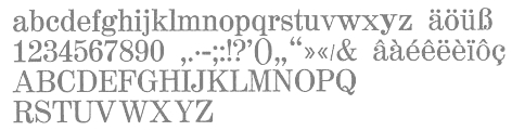 Heinrich Hoffmeister is a German foundry established in 1898 by Heinrich Wilhelm Hoffmeister (b. 1857 Lennep, d. 1921 Langen) and was based in Leipzig. Acquired by D. Stempel in 1918. Hoffmeister's typefaces:
  Foundry started by Dr. Ing. Rudolf Hell in 1947 in Kiel, Germany. The business started off repairing Hellschreiber machines, but went on to produce the Klischograph, Hell's invention---an electronically controlled printing block engraver. In 1964 he invented the Digiset, the first digital typesetter. His
  Walter Bernard "Ben" Hunt (b. 1888, Greenfield, WI, d. 1970) was an American artist, outdoor educator and author. His books covered native American arts, woodworking, scouting, pioneering, jewelry making, metalworking, and calligraphy. Quoting wikipedia: Hunt was born in Greenfield, Wisconsin and grew up in a log cabin. He attended Milwaukee's South Division High School, but did not graduate, dropping out to become lithographic engraver at the Bruce Publishing Company. Hunt moved to Hales Corners, Wisconsin with his wife, Laura, in 1920. In 1924, Hunt, along with his father-in-law and his brother, Edwin C. Hunt, built a log cabin behind his home. The cabin, a 16x28-foot structure, made of tamarack logs, was the subject of Hunt's first article, How We Built Our Log Cabin. During the late 1930s, Hunt began to study the work of Native American artists. As part of his research, Hunt met with artists and leaders such as Nick Black Elk, Frank Smart (or Chief Gogeoweosh), and James F. "Buck" Burshears. Hunt shared his knowledge of "Indian lore" with Milwaukee's boy scout leaders and, in 1942, Hunt started writing articles for Boy's Life. He became a regular member of its staff, ultimately writing over 1,000 articles. Hunt's work for Boy's Life, led him to serve on the staff of the National Boy Scout Jamboree in 1950, 1953, 1957, and 1960.
  H.W. Caslon&Co Ltd was Justin Howes' foundry based in Rushden, UK, with one product,
  Defunct Polish type foundry. In 1931, it published a slight modification of Futura called Paneuropa. The latter typeface was revived in 2017 by Roch Modrzejewski as
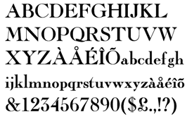
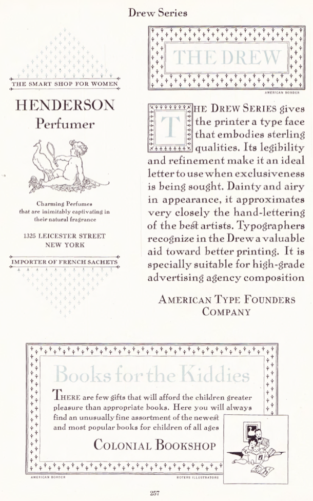 The Inland Type Foundry in Saint Louis was established in 1892 by the three sons of Carl Schraubstadter (1827-1897), William A. Schraubstadter (1864-1957), Oswald Schraubstadter (1868-1955) and Carl Schraubs Jr. (1862-1947). Carl had run the Central Type Foundry in Saint Louis and sold it to ATF (American Type Founders) in 1892, and the sons reacted by setting up Inland. Until 1911, Inland was one of the most successful foundries in the United States. In 1911 Inland was purchased by ATF and its equipment divided between that foundry and Barnhart Brothers and Spindler (BBS). A.V. Haight (Poughkeepsie) designed
  Defunct foundry. One of its typographic directors was Gilbert Powderly Farrar (1886-1957), who designed Bert Black. Intertype's typefaces include
  [
[ Leipzig-based foundry started in 1819 by punchcutter Johann Schelter and typefounder Christian Friedrich Giesecke (1793-1850). It evolved in 1946 into Typoart in Dresden, the official East German government's press. Its early history is told in
 [
[ Type foundry located in Altona, Germany. Typefaces issued by this extinct foundry include
  [
[ [
[ John N. Schaedler was an old school New York type designer, who had his own studio in the city. In the 1970s, Schaedler published Swinger, a film type by Ray Cruz. Around the same time, the psychedelic typeface Loose New Roman was designed. In 2010, Nick Curtis revived the latter typeface as
  [
[ [
[ Viennese foundry acquired in 1926 by D. Stempel AG (50%) and H. Berthold AG (50%). Designers of Original-Schwabacher (before 1925) and Messe-Gotisch (before 1925). Kurt Liebing made Liebing-Fraktur, also some time before 1925. A small timeline of the company:
  Philadelphia-based foundry, 1888-1917. The history of this short-lived foundry was told by James Eckmann in The Keystone Type Foundry, 1888-1917: a reprint [from] Printing&graphic arts, volume VI, number 1, February 1958 (Lunenburg, Vermont: The Stinehour Press, 1958). Their work appeared in Keystone Type Foundry, 1901 (362 pages),
 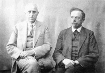 German foundry established in 1906 by brothers
  Type foundry in Torino, Italy, with offices in Milano, Roma, Genova and Napoli. Their typefaces are all named after Italian cities with a few exceptions: Bassano, Rovigo, Chioggia, Tolmino, Como, Rovereto, Trento, Roma, Velletri, Viterbo, Bernina, Casale, Garda, Lodi, Piacenza, Modena, Biologna, Remington, Remington Chiaro. Credit for the images below, taken from their 1929 catalog:
  Extinct 20th century foundry in Saint Petersburg. Their fonts included Placard, which was an adaptation of Hermes Grotesk (Wilhelm Woellmer, 1911). [
 The Lanston Type Co was based in PEI, Canada, moved in 2002 to Vancouver, and moved later that year to Espoo, Finland. In 2004,
  Photolettering foundry run by Marc Jones Barry Kimbrough in Culver City, CA. Russell Bean worked for the Los Angeles studio of Lettergraphics International in charge of lettering, logo design and converting type designs to film fonts. It was at this time (1973) that the Washington family (digital version at Type Associates, Russell Bean's present company) was completed. The company ceased operations in the mid-1980s.
  Chicago-based company founded in 1939 by Edwin W. Krauter, which created lettertypes from the 1930s until the 1970s. In 2010, Stuart Sandler (Font Diner) announced that it intends to digitally revive the collection.
 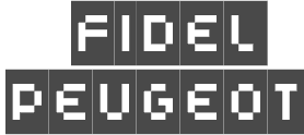 Lomofonts were made by Fidel Peugeot in 1997-1999. They are pixel/grid fonts at all possible pixel sizes (Mac T1 format): LomoWall (53 font weights), LomoWeb (8 font weights), LomoSamples (4 font weights), LomoCopy (18 font weights), LomoAS(ActionSampler) (50 font weights). The following fonts made in 1999 became part of the Linotype Taketype 5 collection in 2003: LomoCopy LT Std Black, LomoCopy LT Std Butt, LomoCopy LT Std Lite, LomoCopy LT Std Medium, LomoCopy LT Std Mezzo, LomoCopy LT Std Midi, LomoCopy LT Std Regular, LomoCopy LT Std Sall, LomoCopy LT Std Zigg, LomoSamples LT Std 1, LomoSamples LT Std 2, LomoSamples LT Std 3, LomoSamples LT Std 4, LomoWallChart LT Std 50, LomoWallDot LT Std 50, LomoWallGrid LT Std 50, LomoWallMinus LT Std 50, LomoWallOutline LT Std 100, LomoWallOutline LT Std 50, LomoWallOutline LT Std 55, LomoWallPixel LT Std 0, LomoWallPixel LT Std 100, LomoWallPixel LT Std 50,
  Foundry in Chicago run by Robert Hunter Middleton. Myfonts.com writes that its type library was largely derivative, with some original scripts. After Middleton's death, and Ludlow's demise, most of the typefaces from the Ludlow library were licensed exclusively to International TypeFounders, Inc., (ITF) and are part of the Red Rooster collection. Since 2021, its fonts can be licensed via
  Leipzig, Germany-based foundry with designers such as
  Big German foundry active in the first half of the 20th century. It was absorbed by Neufville in 1984, which will make its typefaces available in digital form. Type designers and typefaces:
  French graphics lettering company initially involved in instant lettering (made by Trip Productions), and some original typeface designs. From 1989 until 1994, Mecanorma worked with another Dutch company
  Founded by
  A major type foundry, set up in 1887 by Tolbert Lanston. The Monotype Corporation, based in Redhill, Surrey, was an independent English company that originally shared patents with the Lanston Monotype Company in Philadelphia. In the first half of the twentieth century, F.H. Pierpont and Stanley Morison built up the best type library of its time, and Monotype came to be leaders in European book printing. After the Second World War, Monotype continued to offer printing machines, entering the photocomposition era with the Monophoto in 1955, and pioneering laser technology in printing with the LaserComp in 1976. In 1992 the company was split up. The hardware side was purchased by the IPA Group. The type department, continued as Monotype Typography.
  In 1878, Giovanni Nebiolo bought a foundry from Giacomo Narizzano. In 1889, the Levi brothers joined this venture to form Nebiolo&Co. After 1899, several other foundries were absorbed by Nebiolo, and for some time, the company was called Società Augusta Torino, but it reverted to Nebiolo&Co in 1917. Based in Turin, type design started in the 1930s, first under the direction of painter Giulio da Milano, then from 1936 under Alessandro Butti, and from 1952 under the guidance of Aldo Novarese. It was Italy's premier foundry of the 20th century. It closed its typography department in 1975, and went bankrupt in 1978, when Fiat took over. In 1990, the foundry was taken over by Fruttiger AG in Münchenstein. Their most famous font families include Eurostile (1962), Microgramma (1952), Torino (1908) and Stop (1971). Others worth mentioning are Vittorio (before 1920), Neondi (1935, da Milano), Resolut (1937, Brünnel),
 Foundry in St. Petersburg in the late 19th century, est. 1854. Their typefaces include
  [
[ Florence, Italy-based type foundry that was active in the 20th century. It was taken over by Azzaro in Rome. Pierallini & Turchi had a large catalog, that included the Trento series, an imitation of Inkunabula by Nebiolo:
  Southfield, MI-based company founded in 1991 by John Colletti. The 150-strong
  Italian foundry located in Milan. Their work is shown in
  [
[ [
[ [
[ [
[ [
[ Designer in Luzern, Switzerland, who ran Holztypenfabrik Roman Scherer, possibly the only wood type manufacturer in Switzerland. He created
  German foundry established in 1842 by Johann Peter Nees, Phillip Rudhard and Johann Michael Huck, that was located in Offenbach am Main. Carl Klingspor (1839-1903), the father, bought the Rudhardsche Gießerei in 1892. It was renamed Gebr. Klingspor in 1906. Scans of some of its typefaces:
  This company evolved in 1983 from Dr Boeger Photosatz GmbH (est. ca. 1934). The timeline:
  Foundry in Frankfurt am Main. House typefaces include
  Dennis Ludlow (Sharkshock Productions, Raleigh, NC) started making mostly free fonts in 1999. On August 28, 2001, Dennis announced that he would stop producing fonts, forever. To prove himself wrong, he became more prolific trhan ever, and ultimately started designing retail fonts as well.
  Founded in 1819 in Sheffield by toolmaker
  [
[ Aka Type Foundry Amsterdam, and Lettergieterij Amsterdam voorheen Tetterode, this influential foundry in the Netherlands operated from 1851 until 1988. A lot of the material about Tetterode can now be found at the
  Dan Barthell's Phoenix, AZ-based foundry, was founded in 1988. It produced about 400 fonts. It was merged into Precision Type Foundry in 1993. Its fonts can now be bought via URW or
  [
[ Dresden (East Germany)-based font studio that evolved from the former East German centralized press, VEB Typoart.
  Type foundry located in Philadelphia, PA, which published Specimen Booklet of handy Low Priced Type Fonts. [
 German foundry establshed in 1888 by Theodor Robert Arthur Schmidt and Ludwig Wagner in Leipzig. In 1902, Ludwig Wagner quit and joins Gundelach&Ebersbach (first founded in 1897) also in Leipzig, and then opens his own foundry, Ludwig Wagner. Schmidt stops in 1932, while Otto Schmidt takes over--the company is now called Wagner&Schmidt Nachfolger. Otto Schmidt dies in 1941, and the company is dissolved in 1942.
  Foundry in Paris that succeeded P. Digney. It was founded in 1857 in Saint-Germain-en-Laye by Digney who used to be director of the Fonderie Générale in Paris. Its work can be found in Spécimen de la Fonderie de caractères et de blancs Warnery frères (Paris, Usine et bureaux: 8, rue Humboldt, maison de vente: 6, rue Des Forges (place du Caire), June 1882 [1884]). A similarly-titled specimen was also published in 1899. More than half of their 1922 catalog consists of vignettes. In 1934, they published Catalogue Général.
  [
[ Wilhelm Gronau was a German typographer who ran the Wilhelm Gronaus Schriftgießerei in Berlin-Schöneberg from the mid 1800s until early in the 20th century. Typefaces at that foundry include
  Wilhelm Woellmer is a German type designer who ran a foundry which published typefaces such as Deutsche Reichsschrift (1910, a Fraktur digitally
  Past foundry of Charles Bigelow, Kris Holmes, and
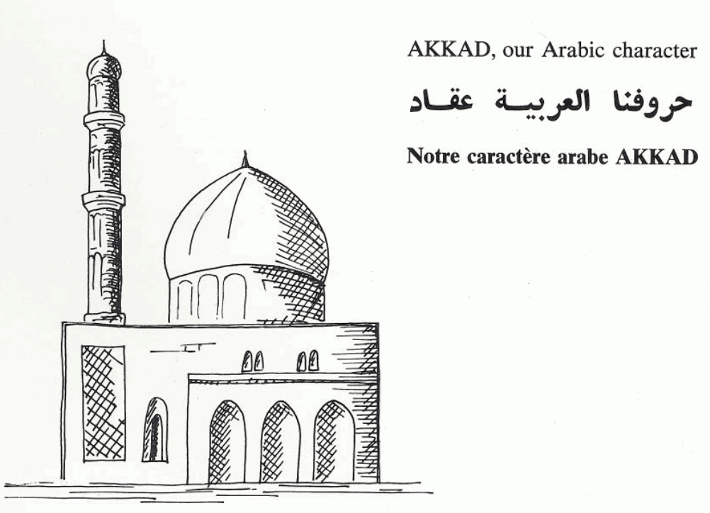
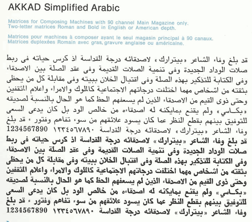
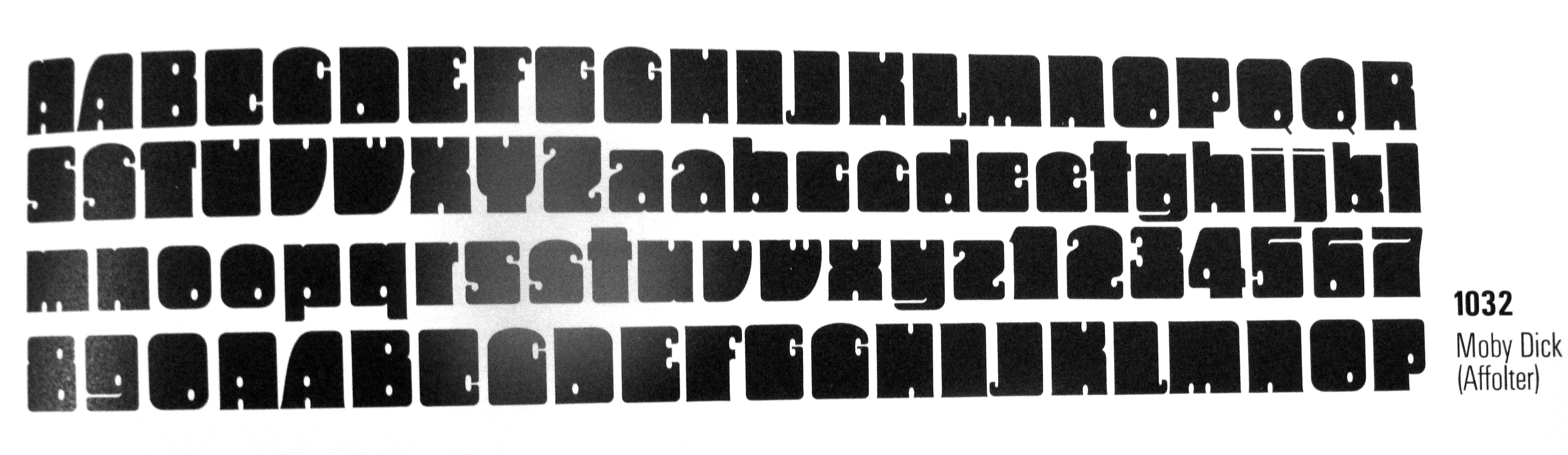
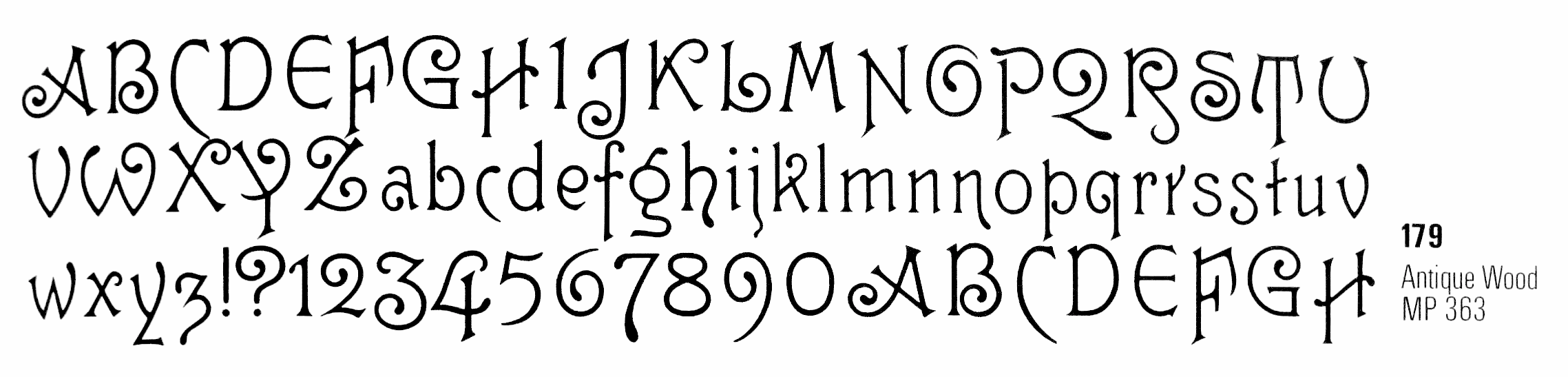
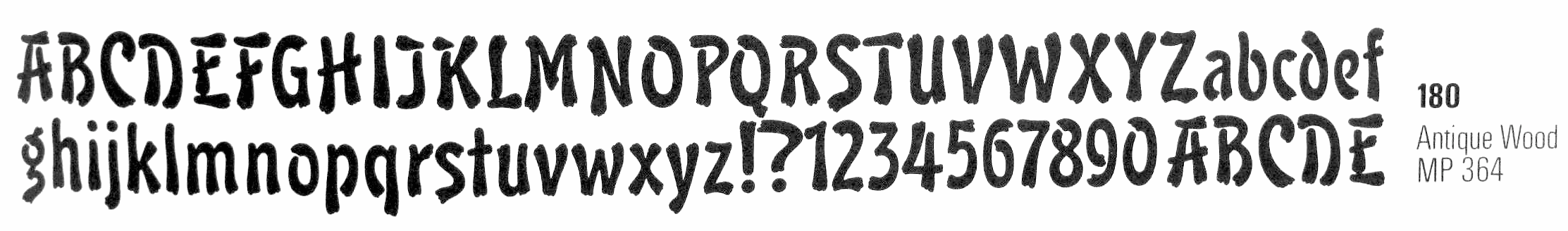
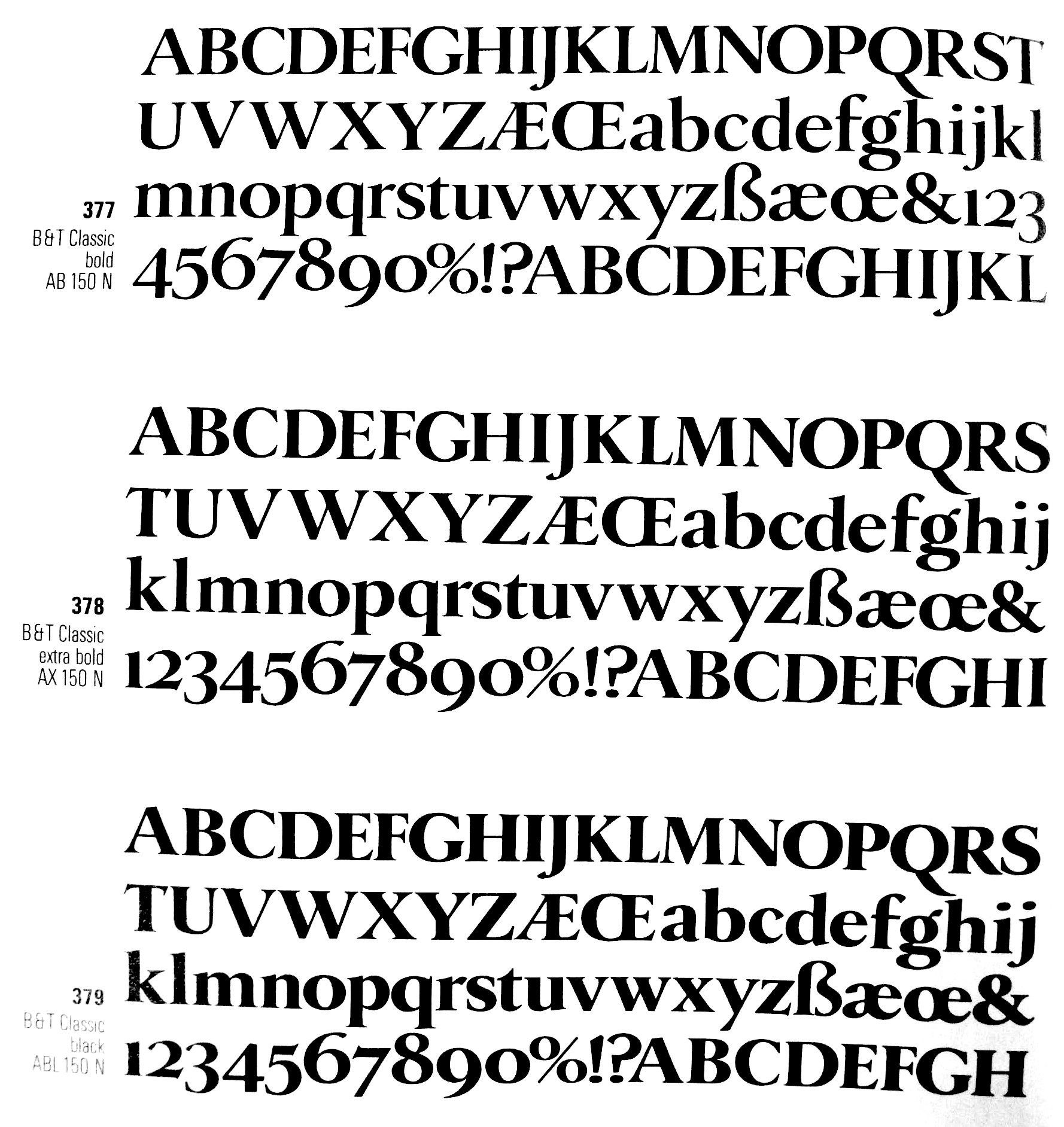
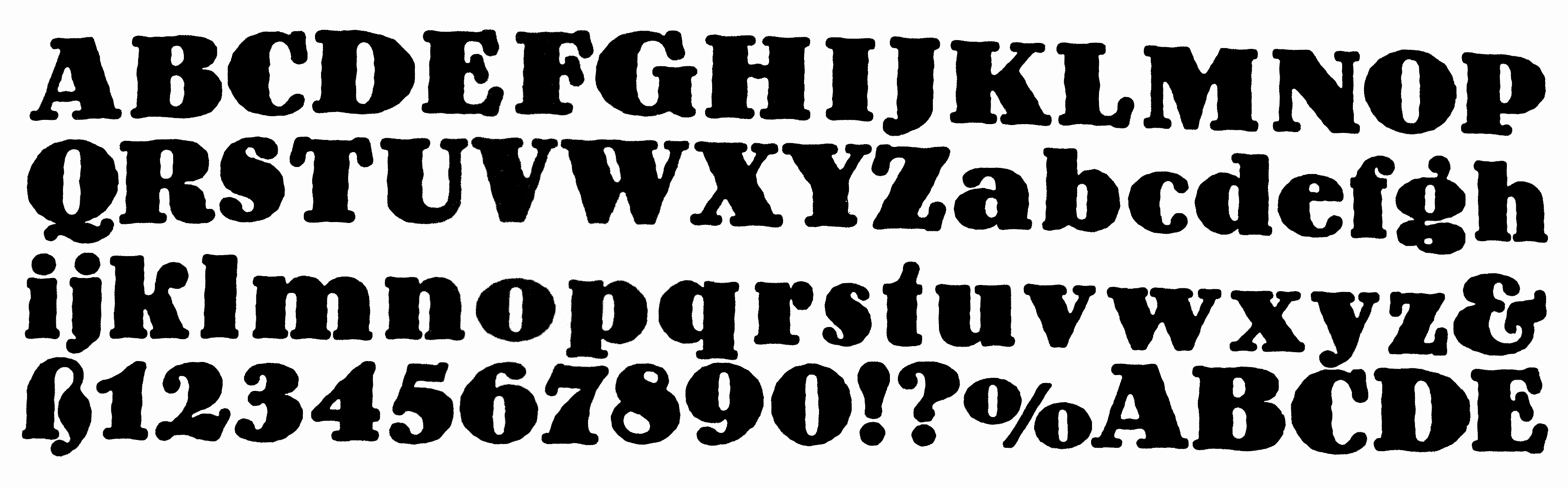
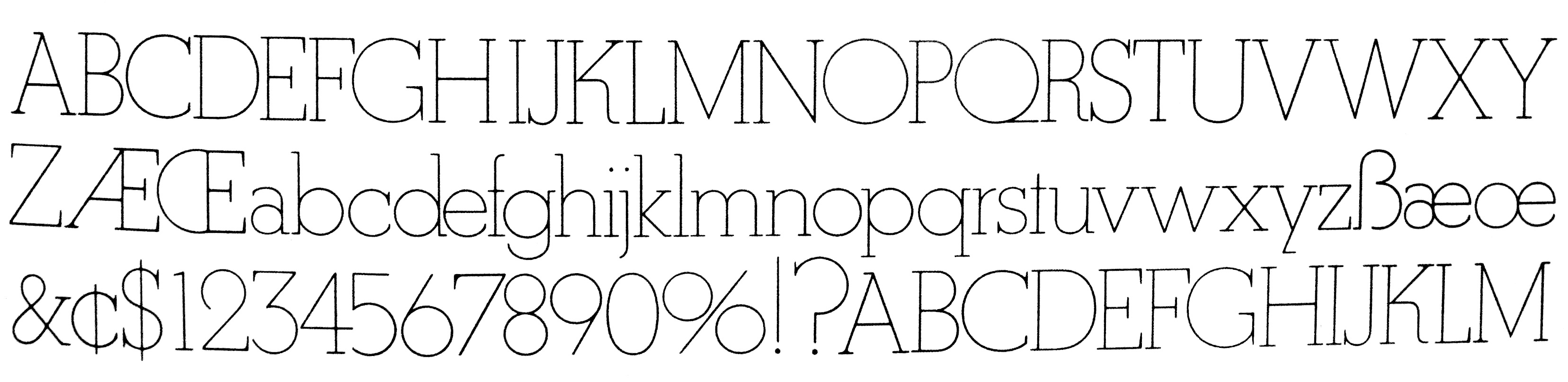
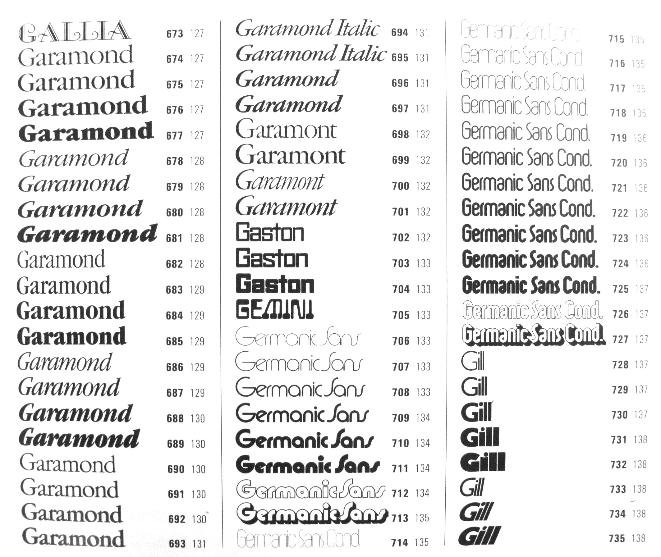
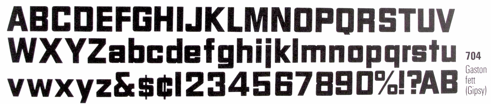
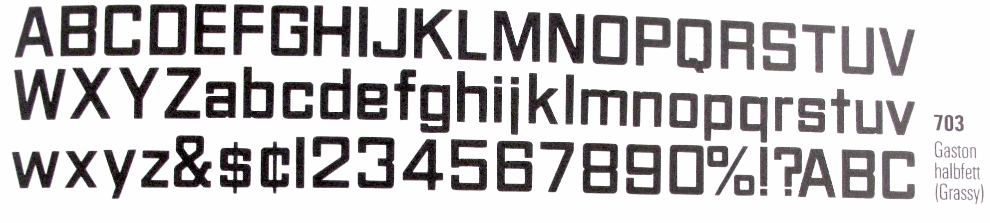
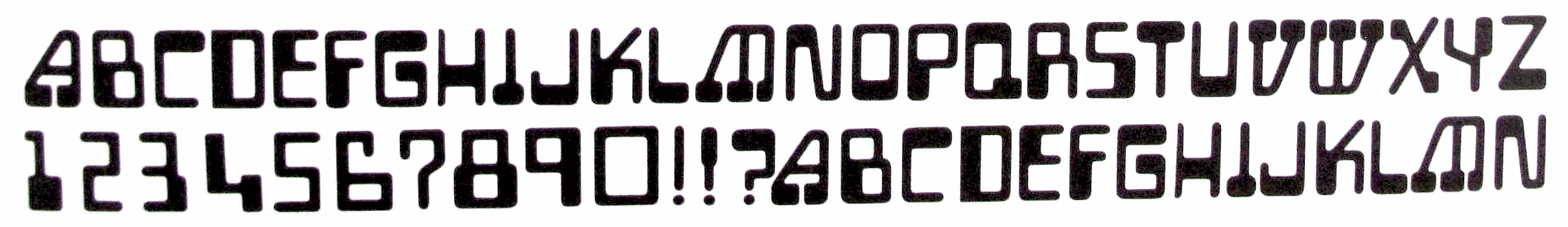
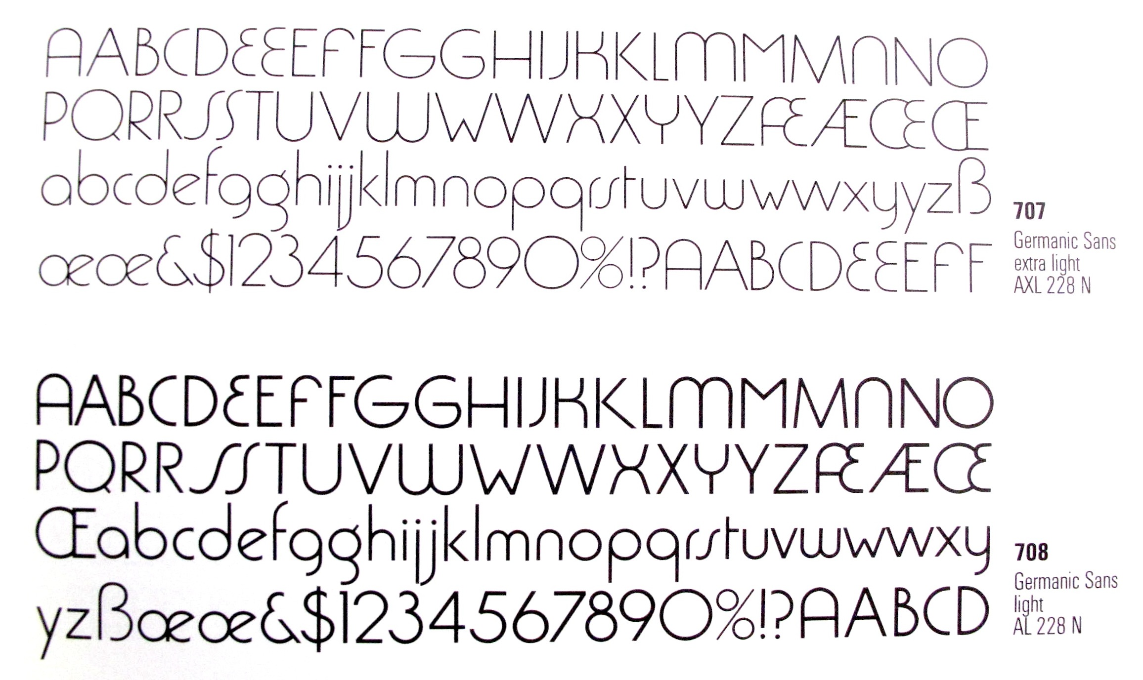
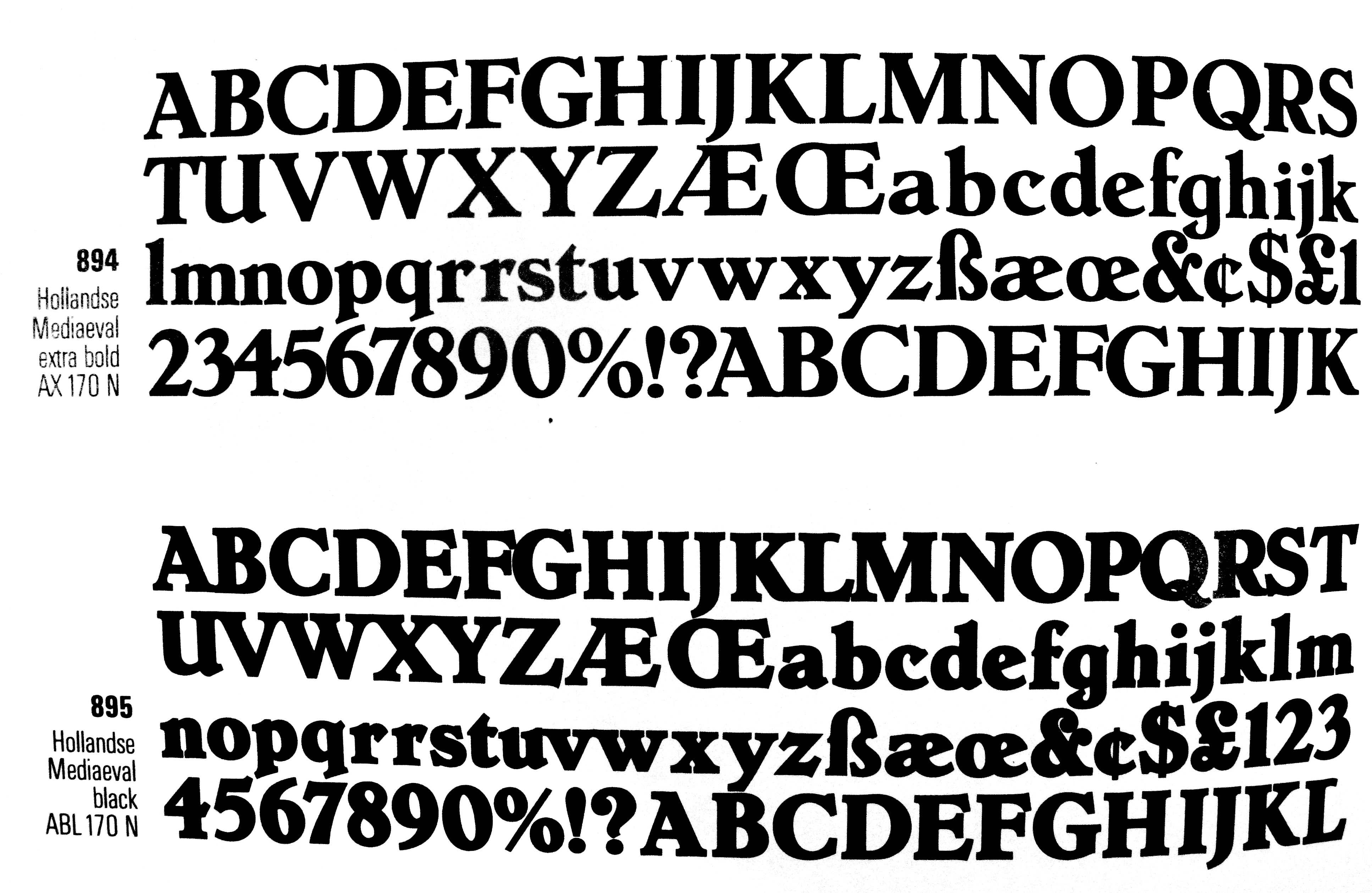
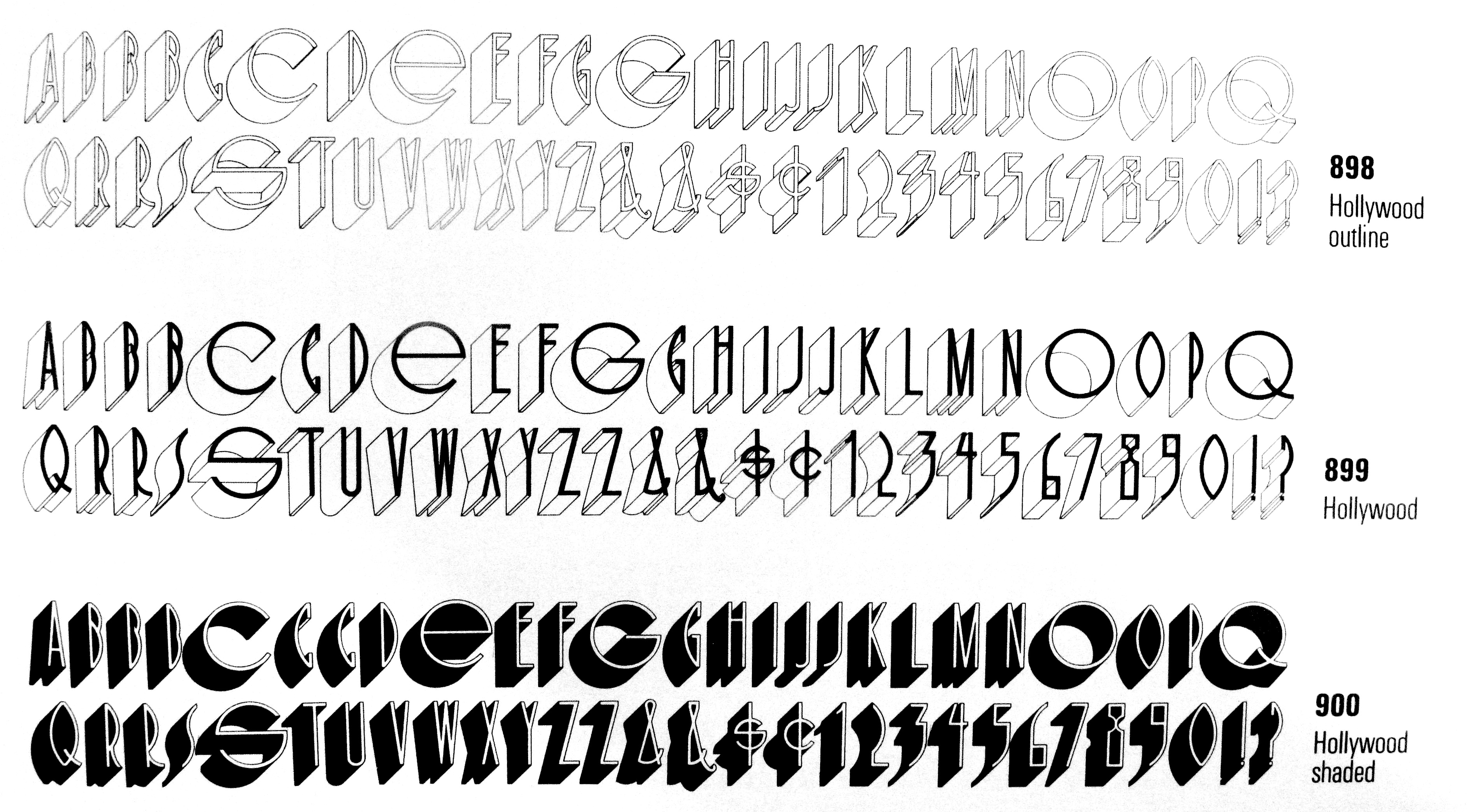
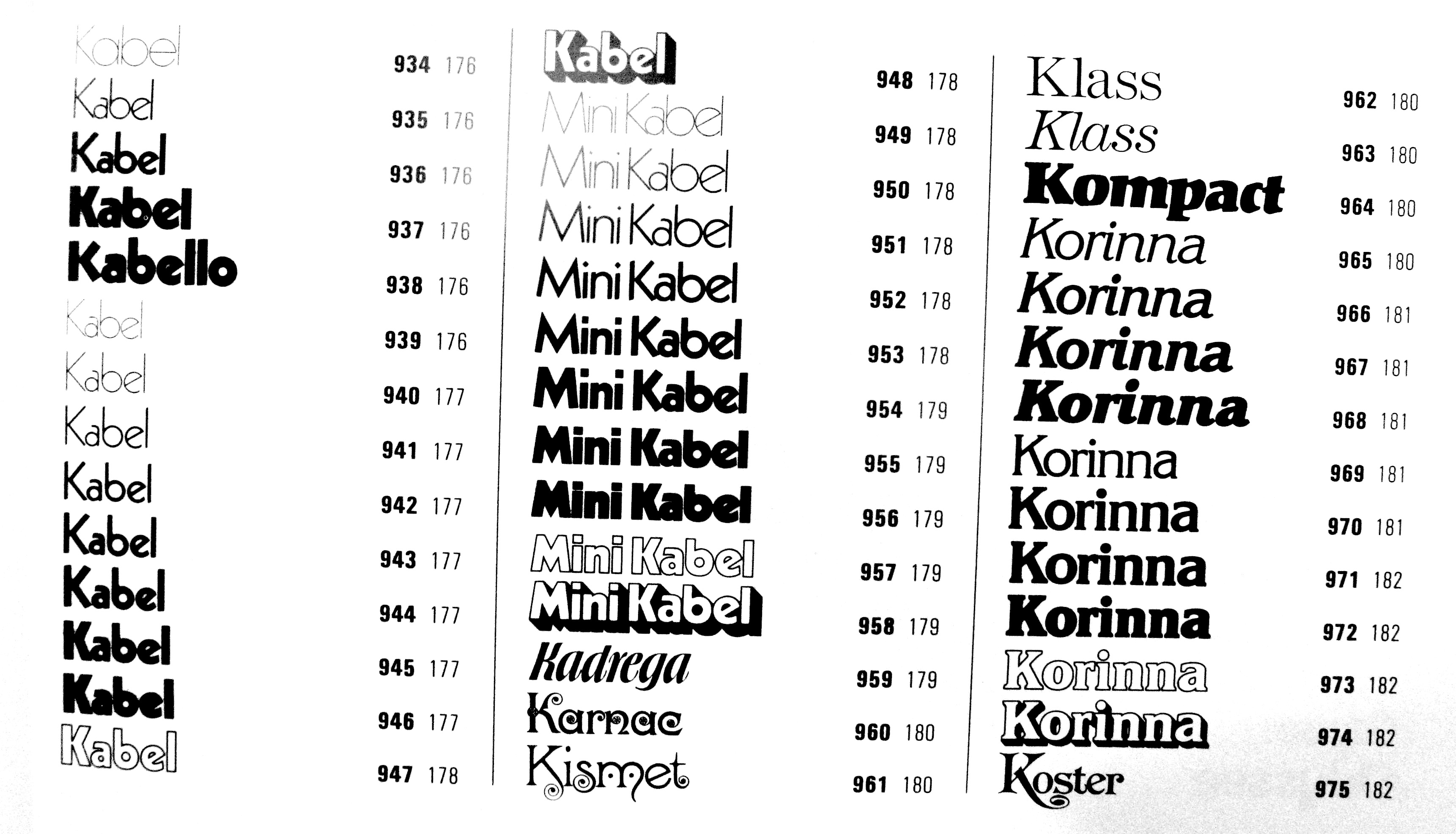
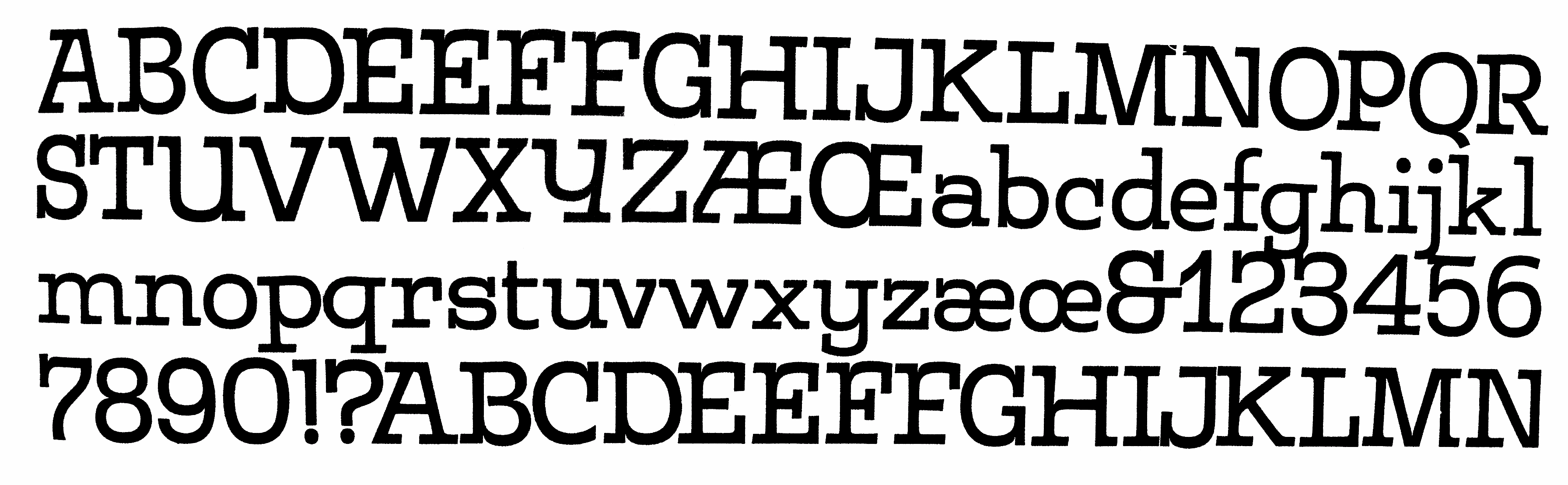
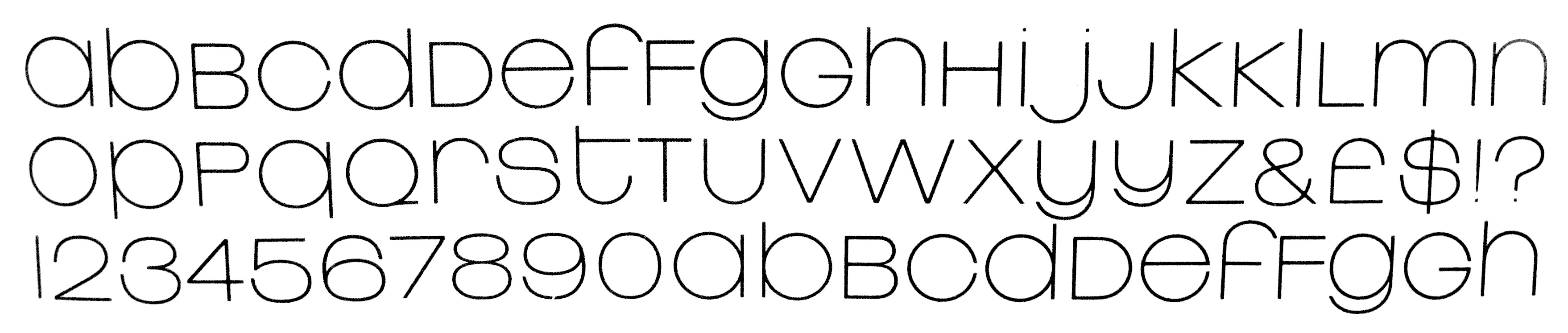
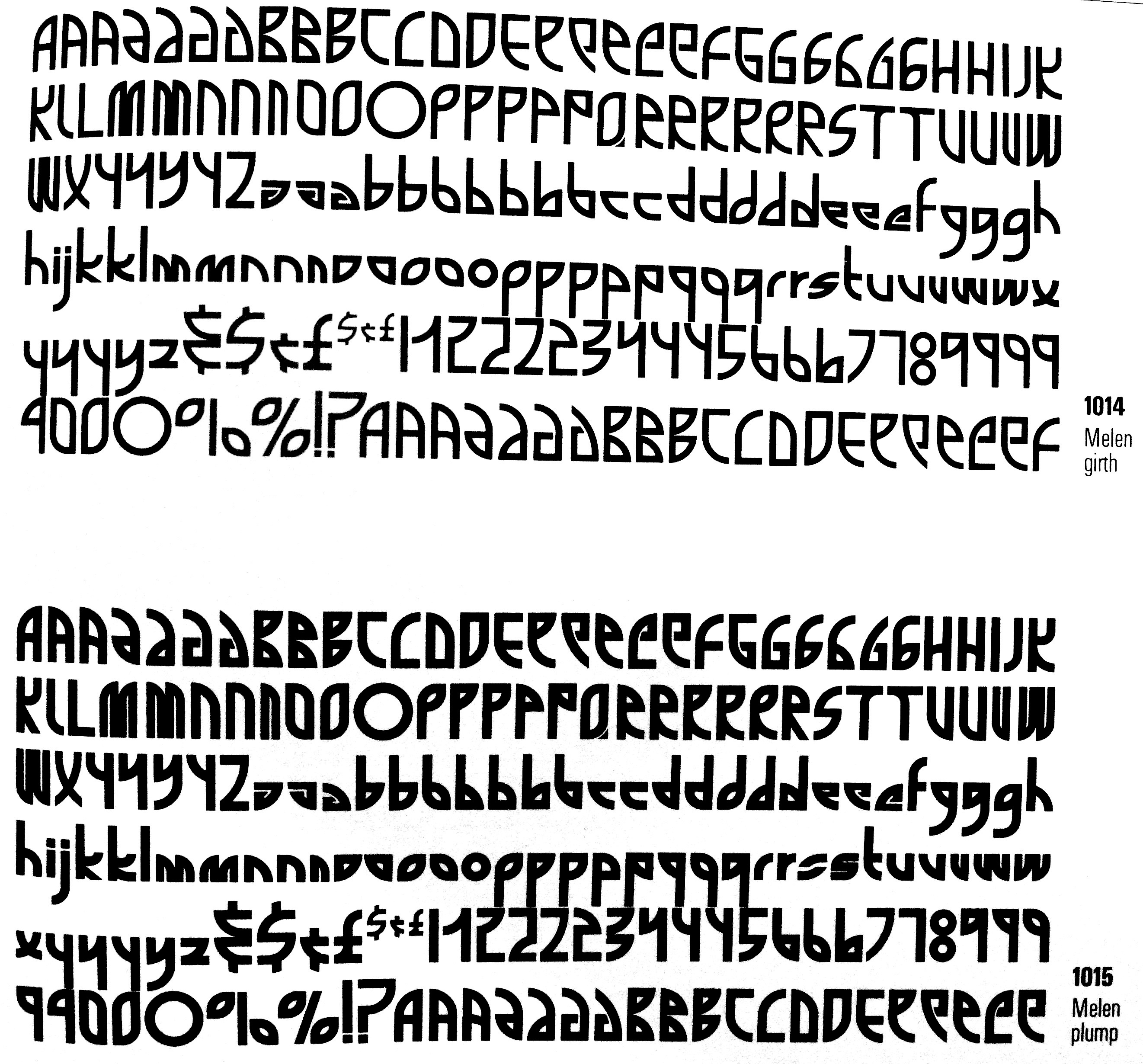
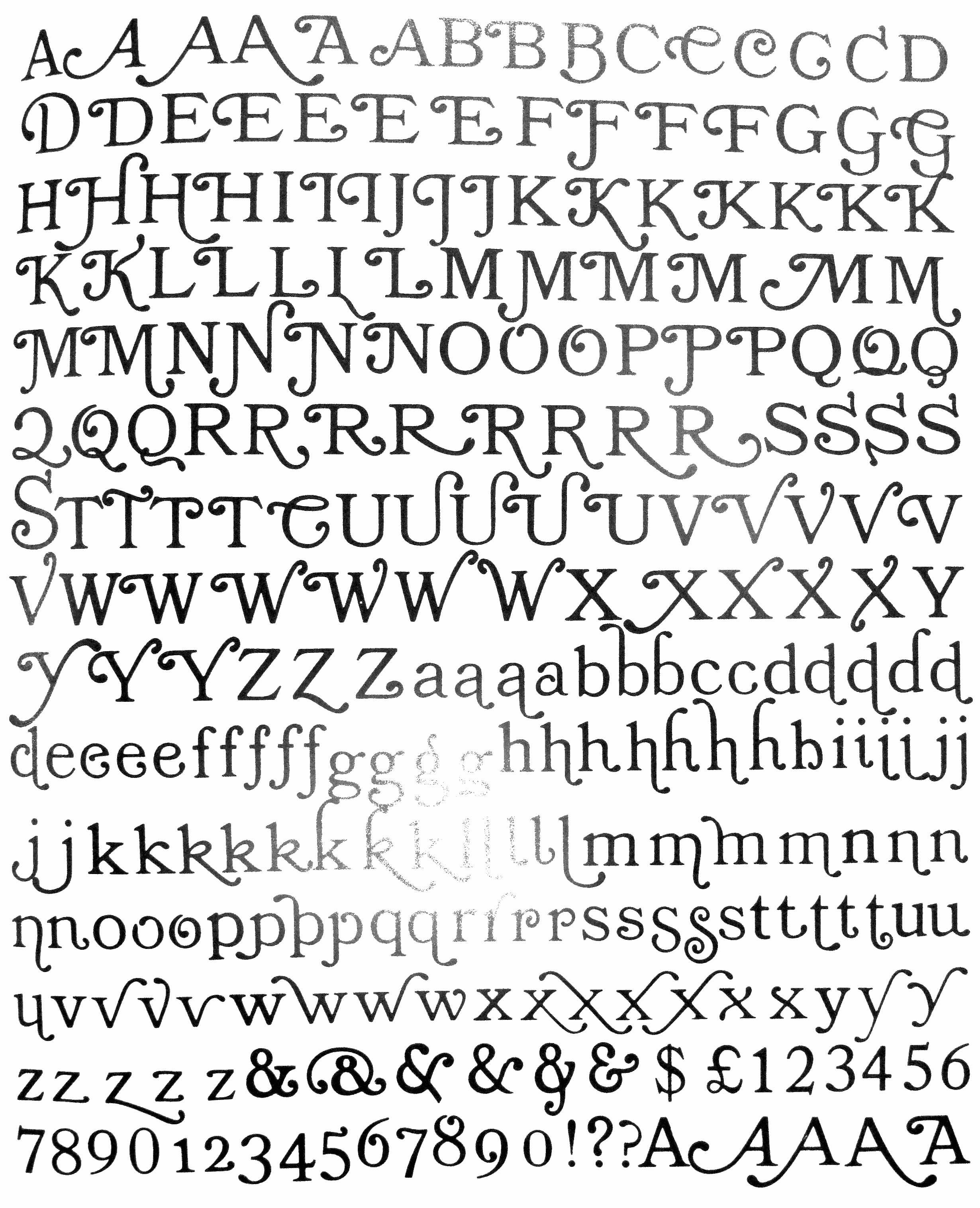
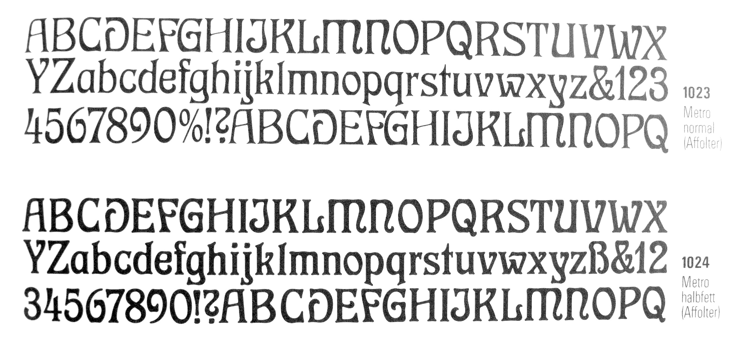
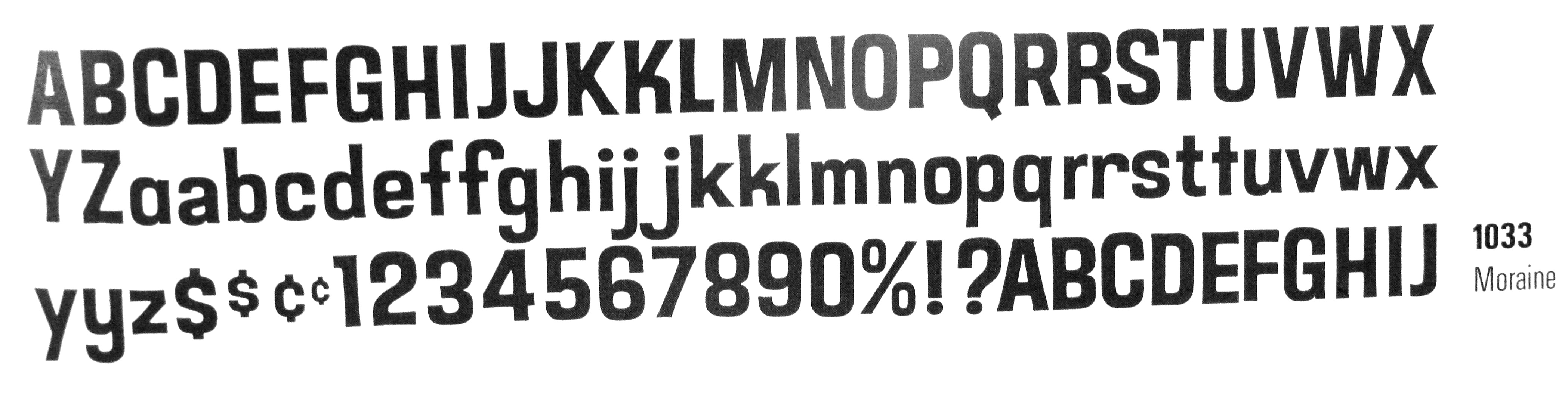
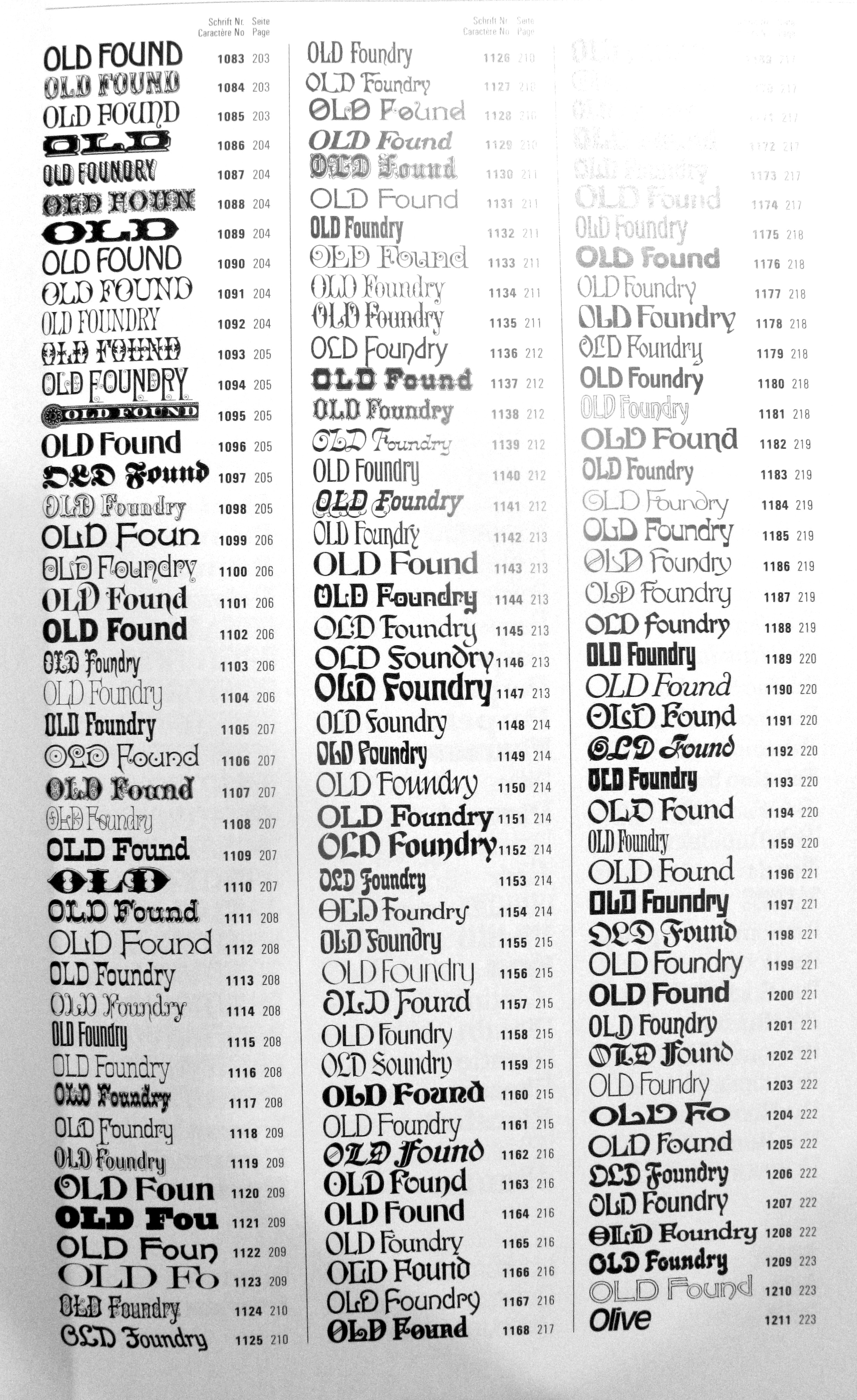
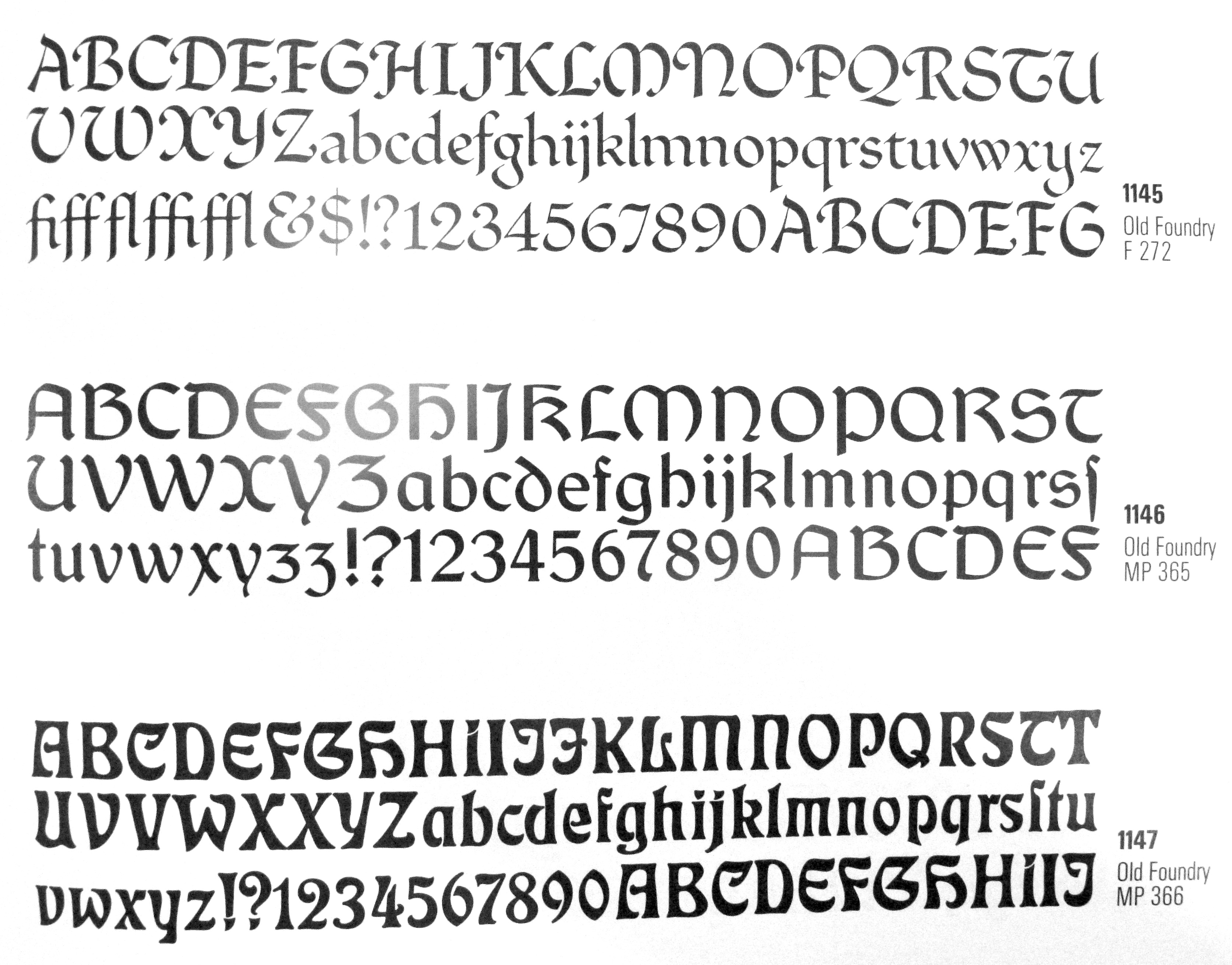
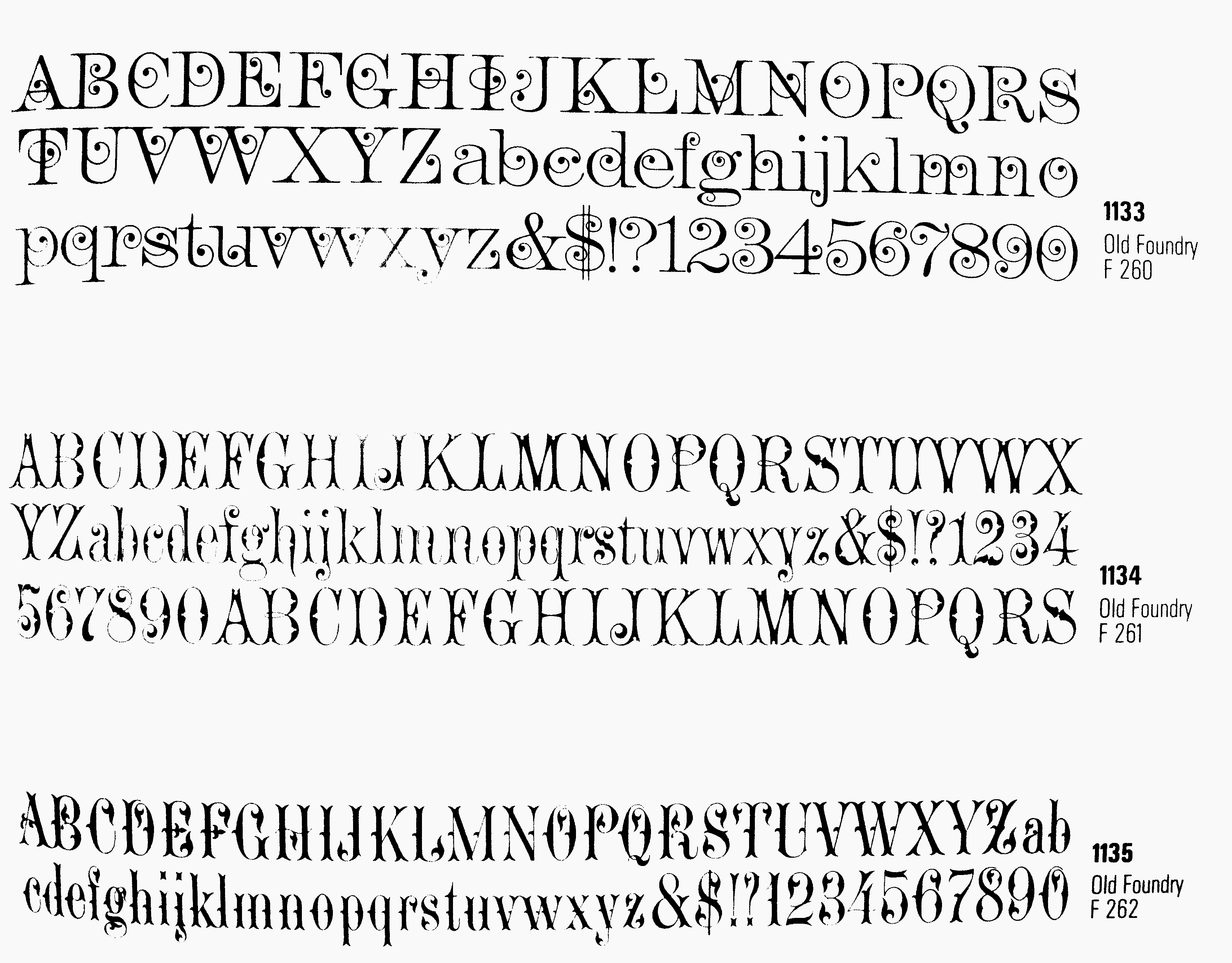
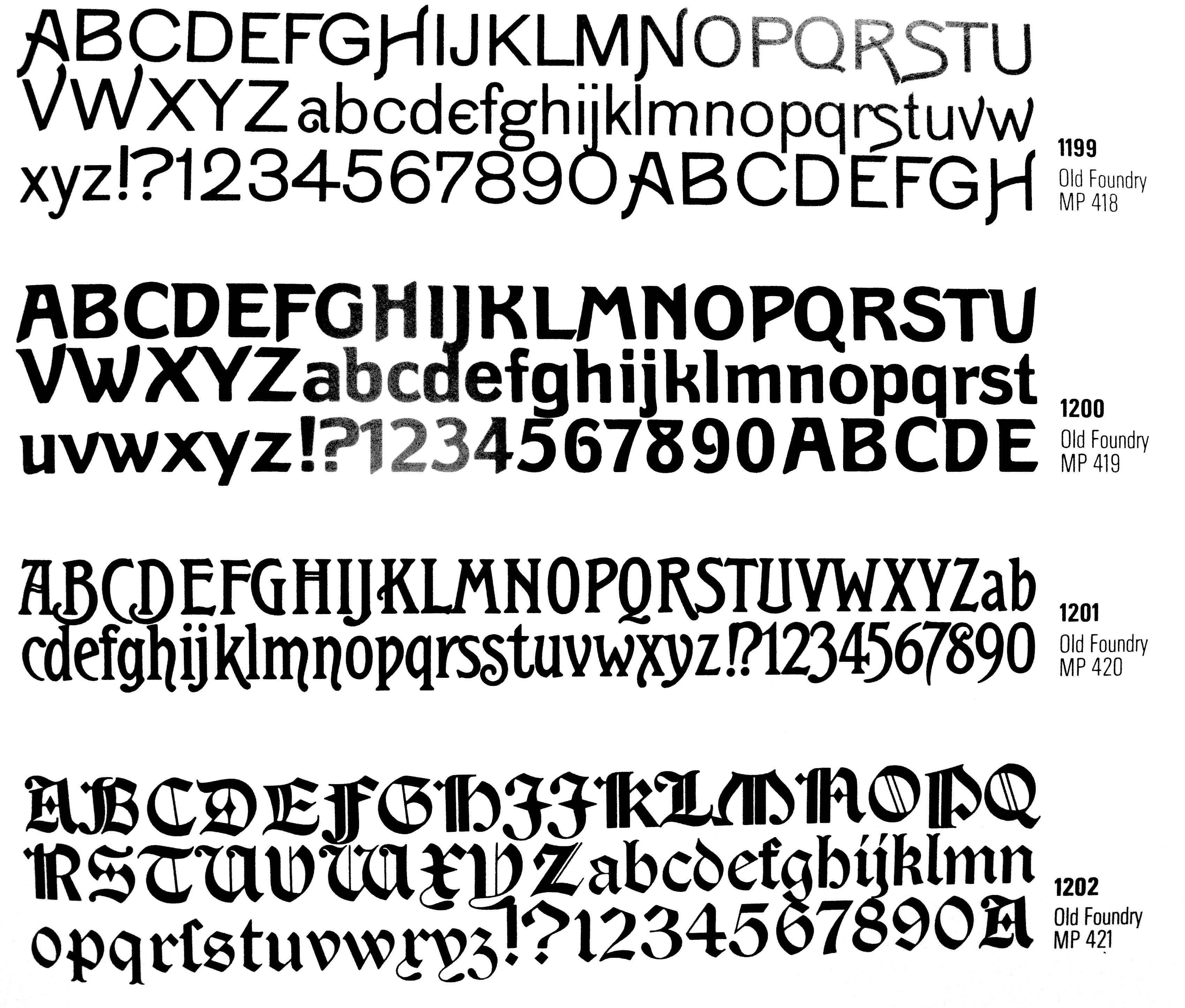
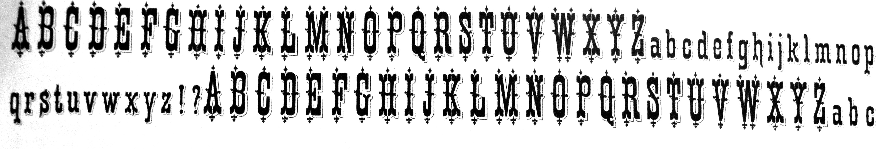
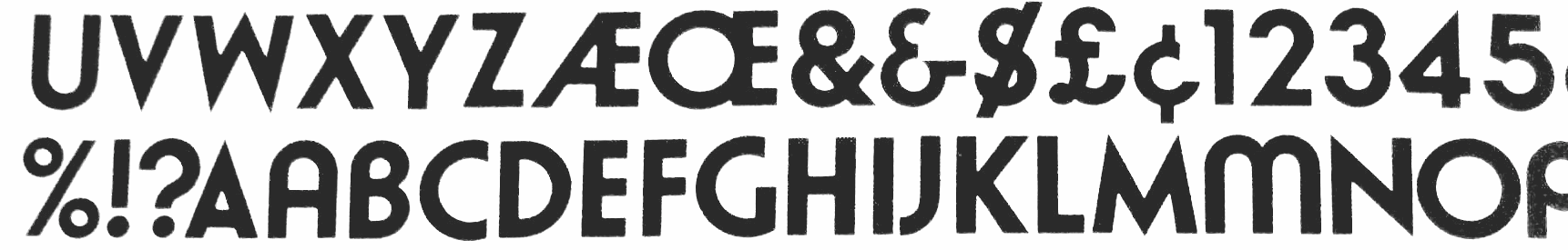
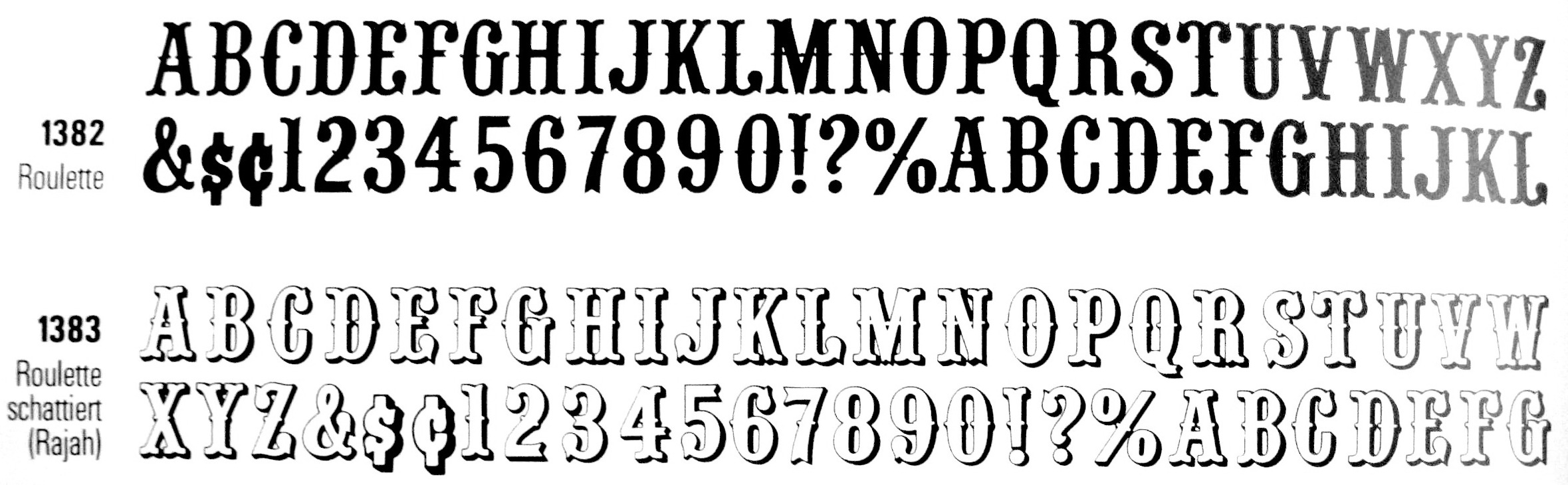
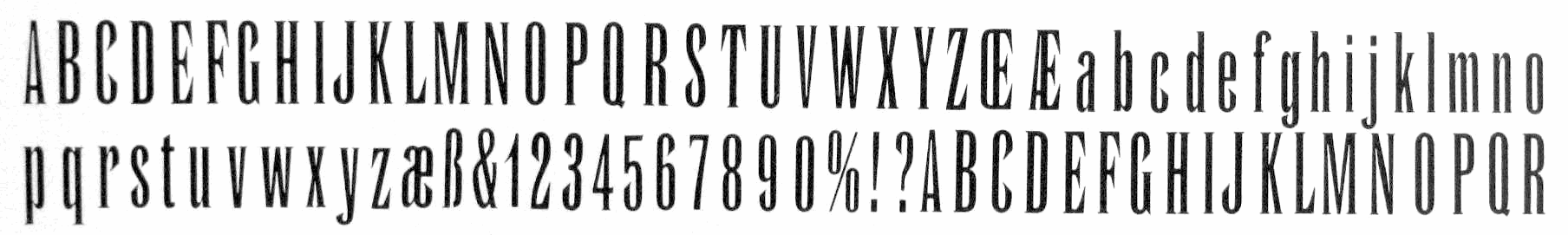
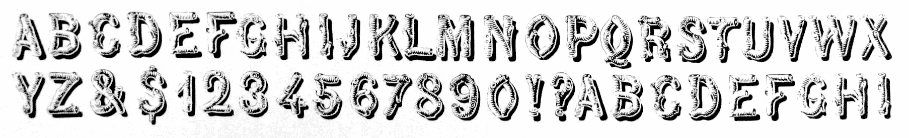
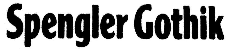
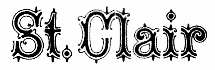
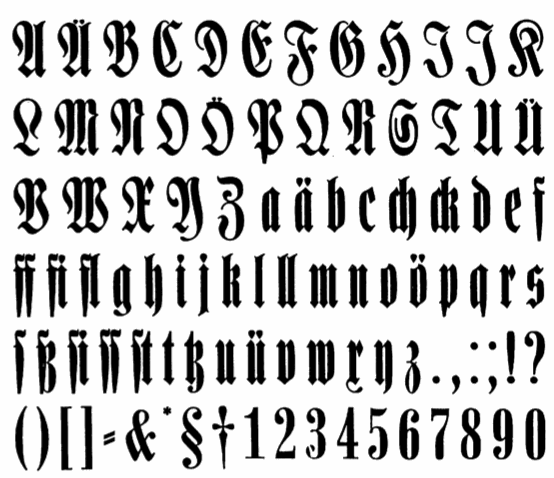
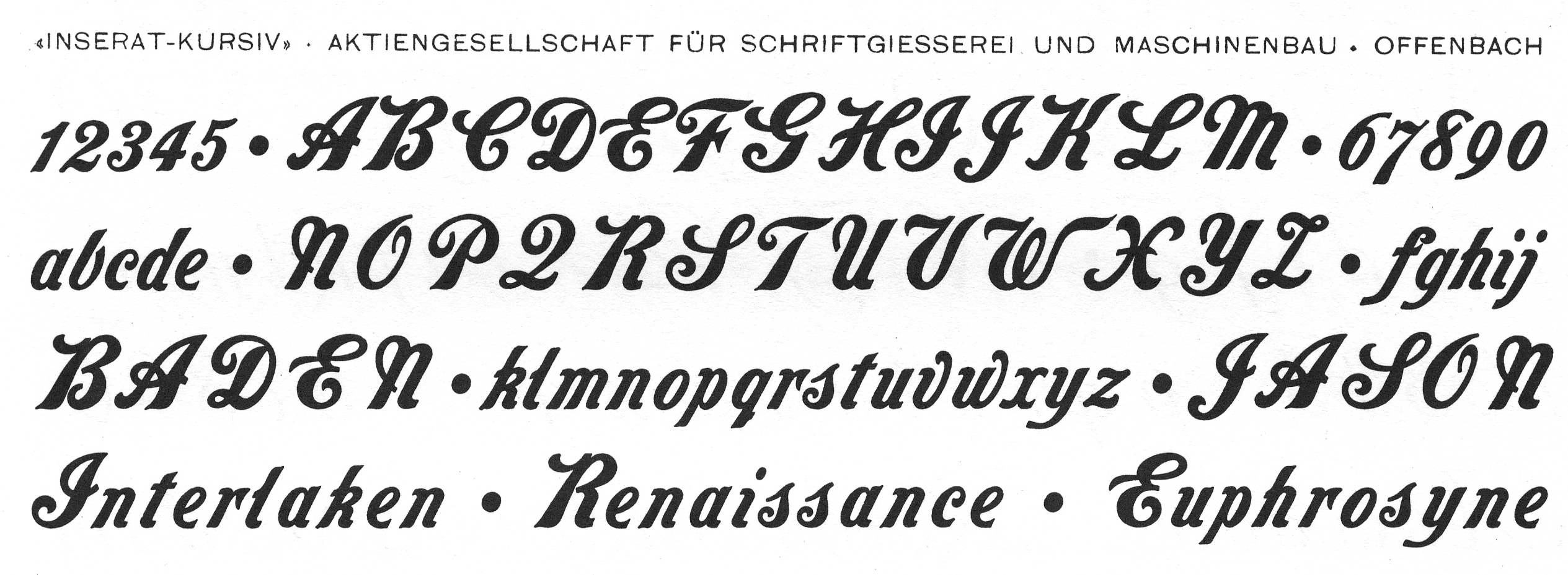
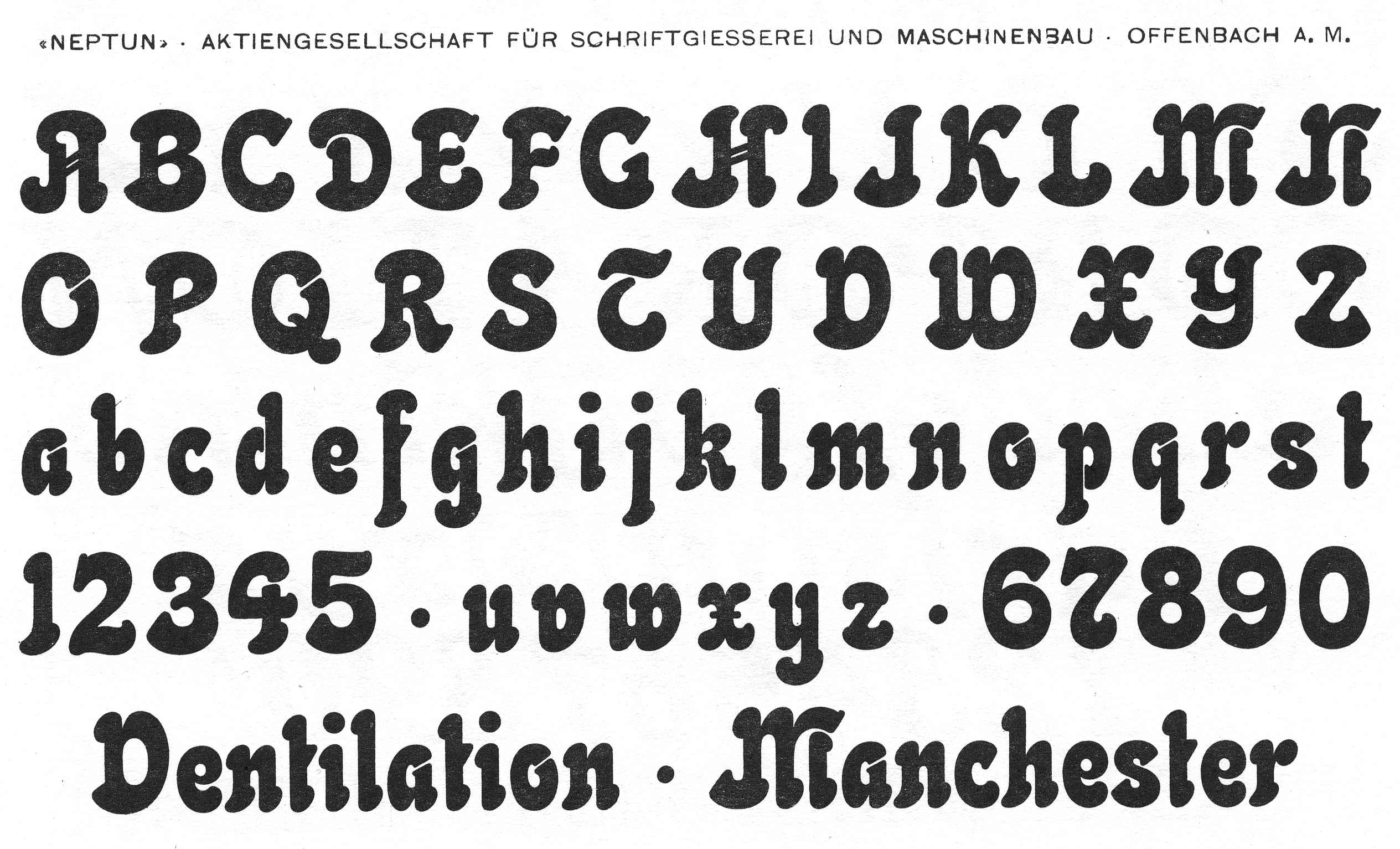
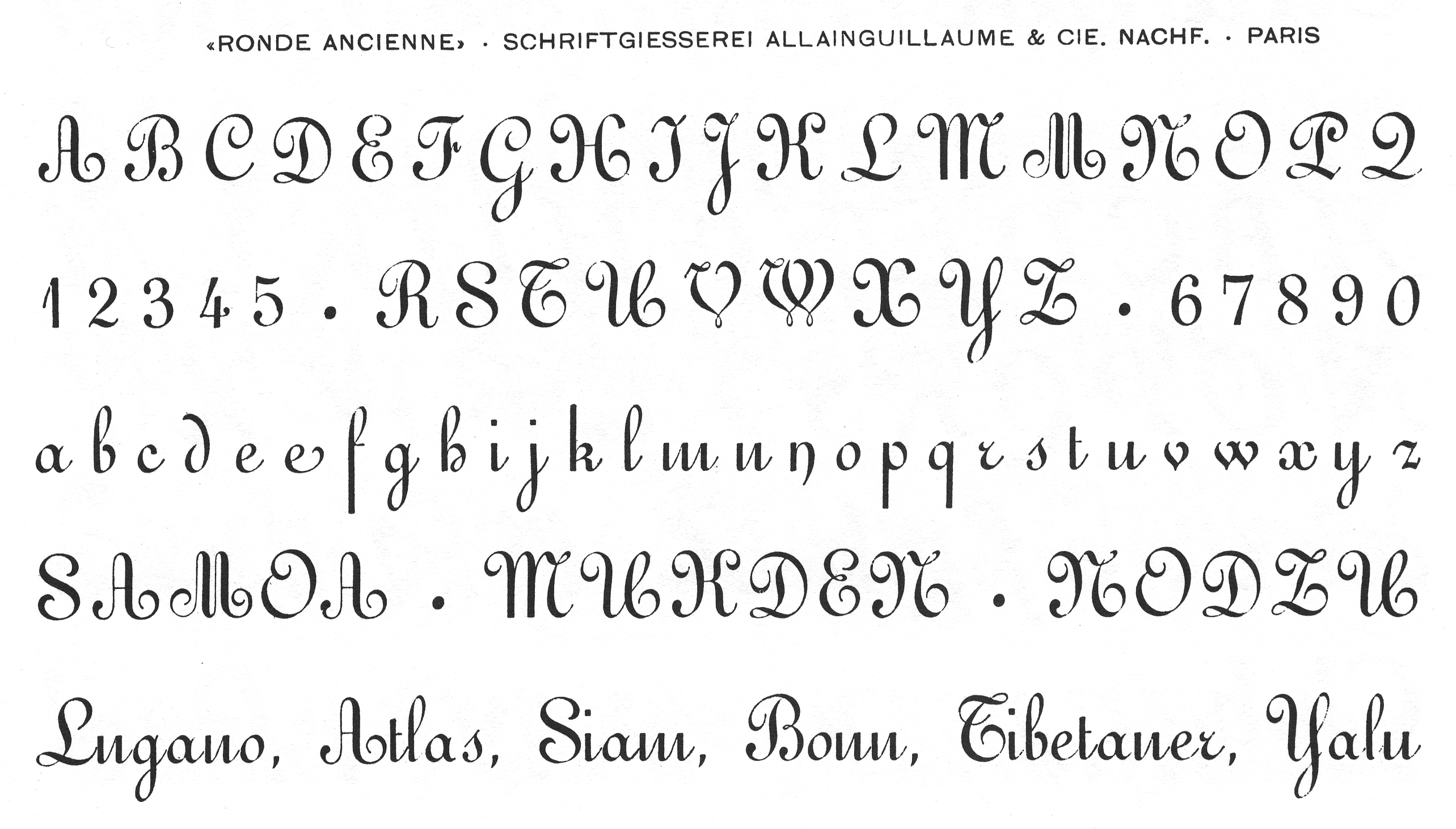
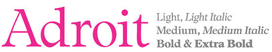
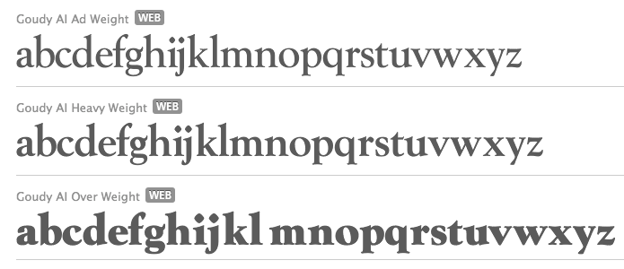
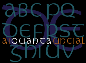
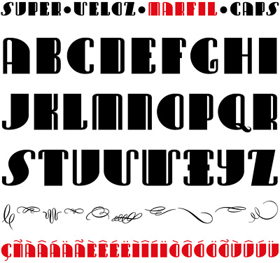
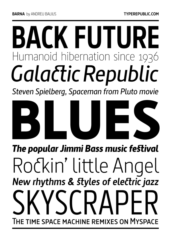
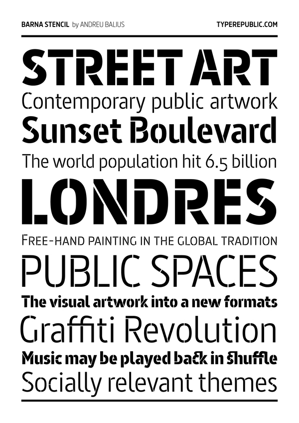
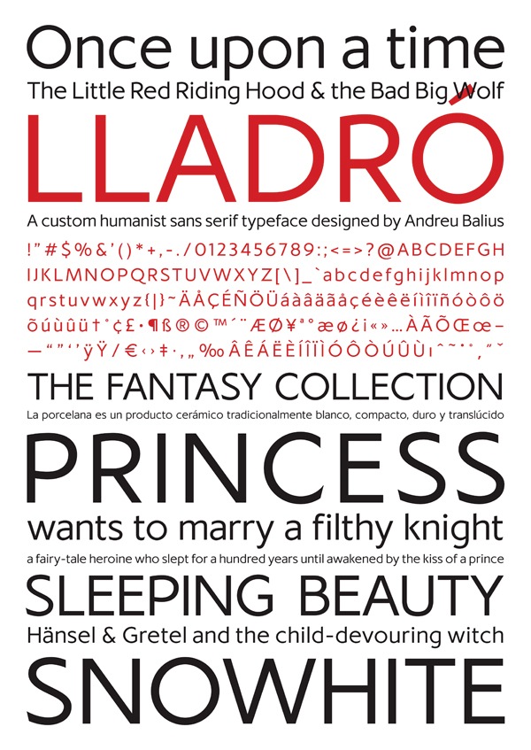
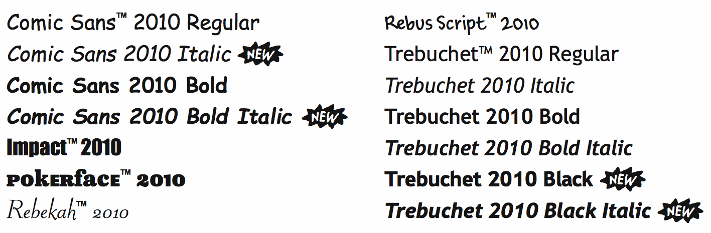
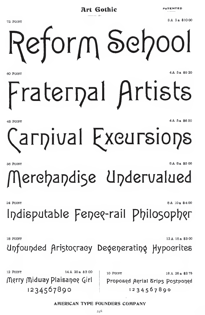
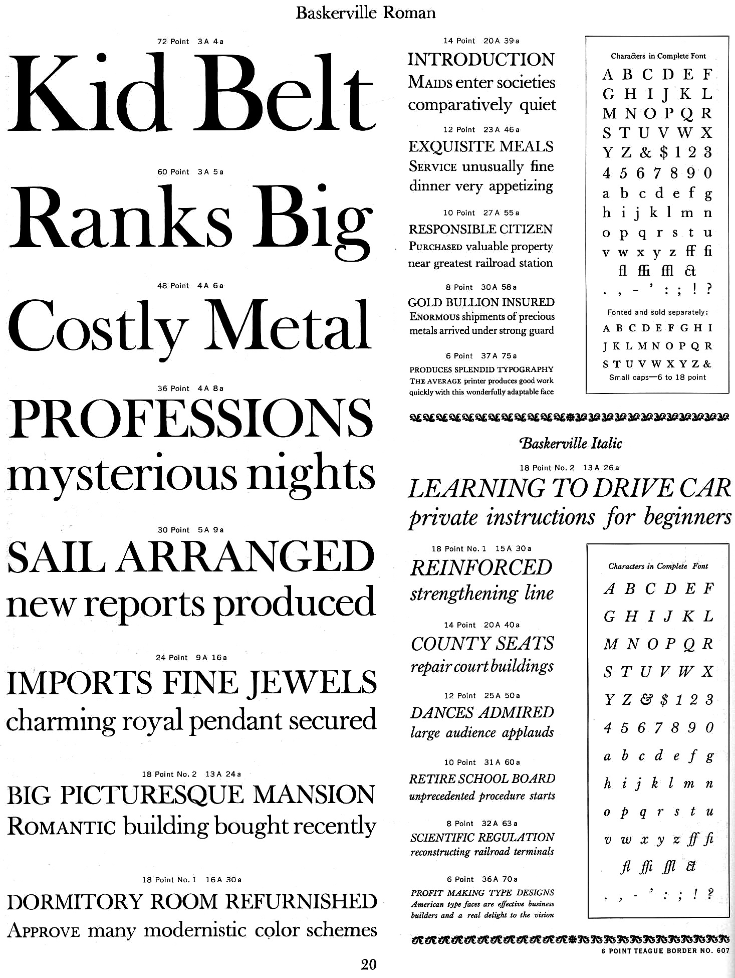
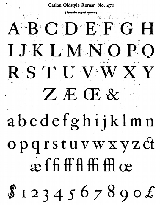
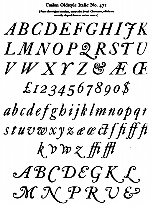
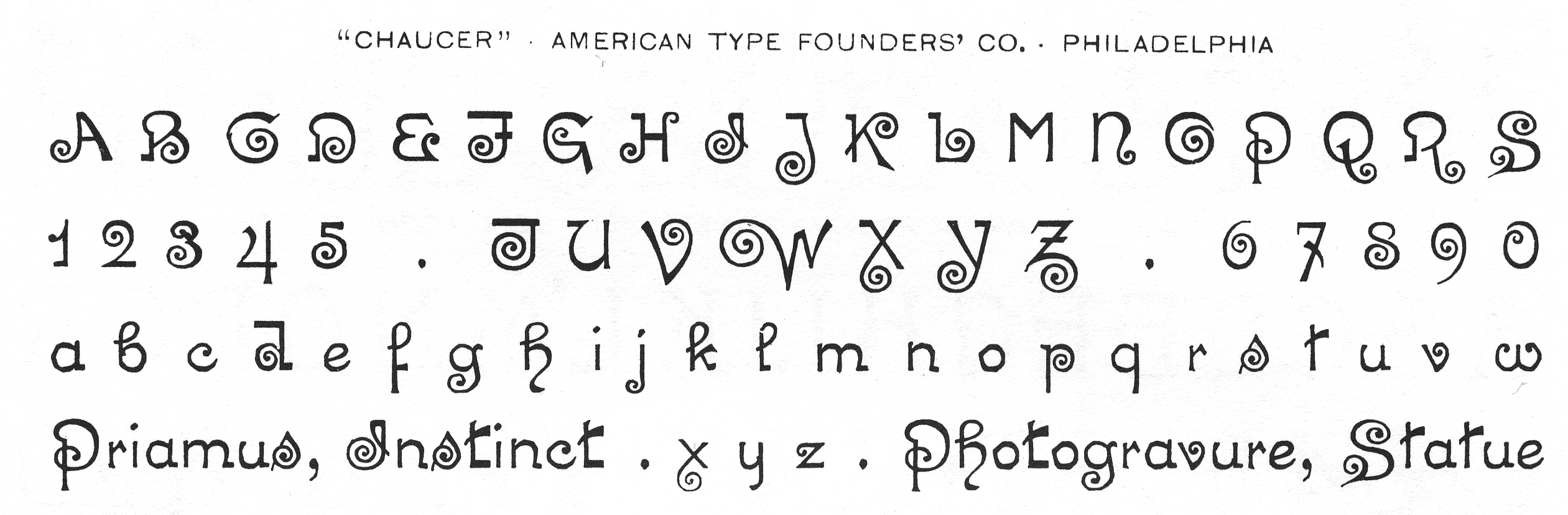
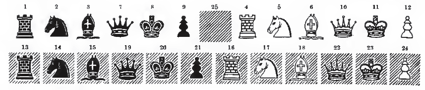
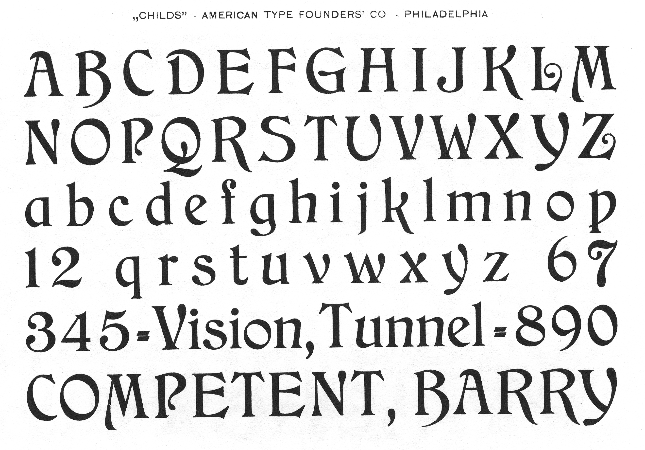
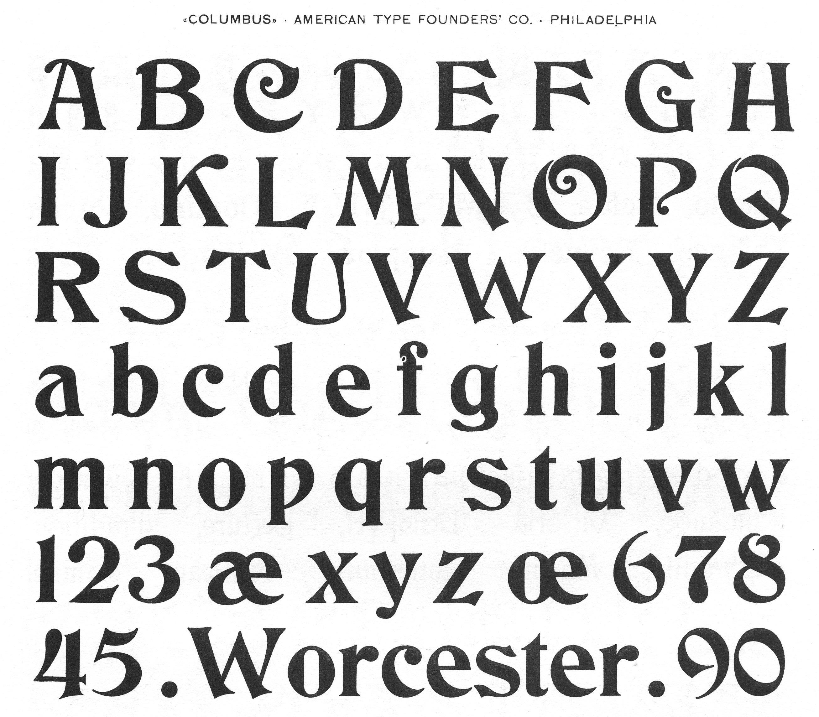
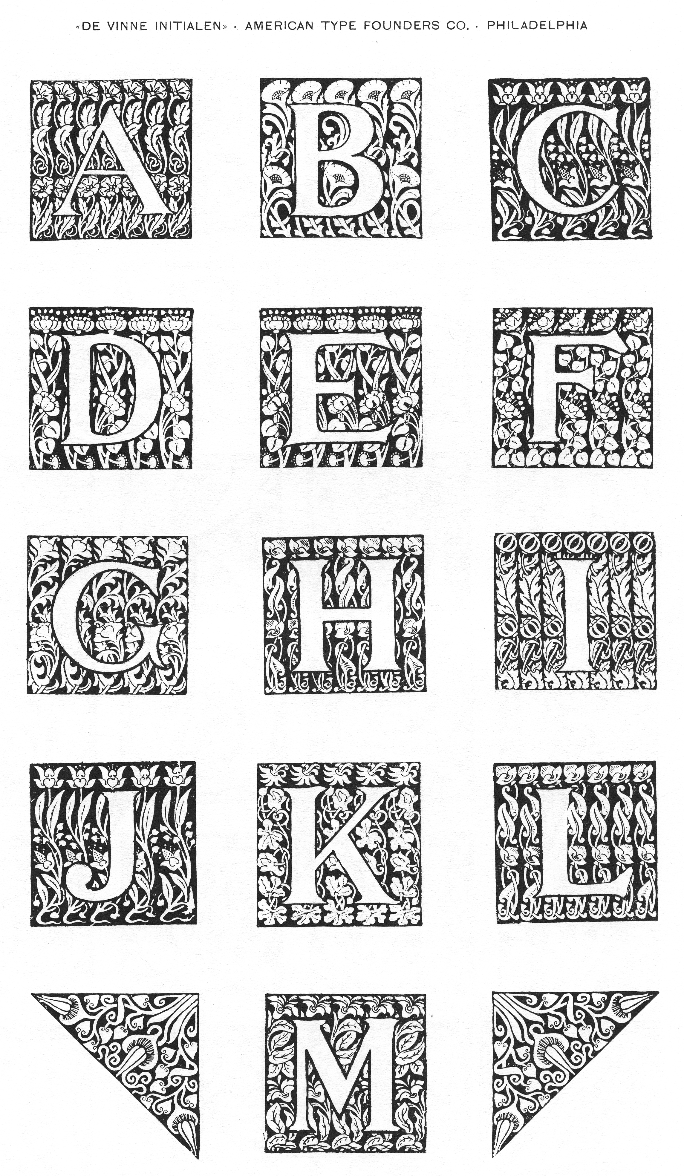
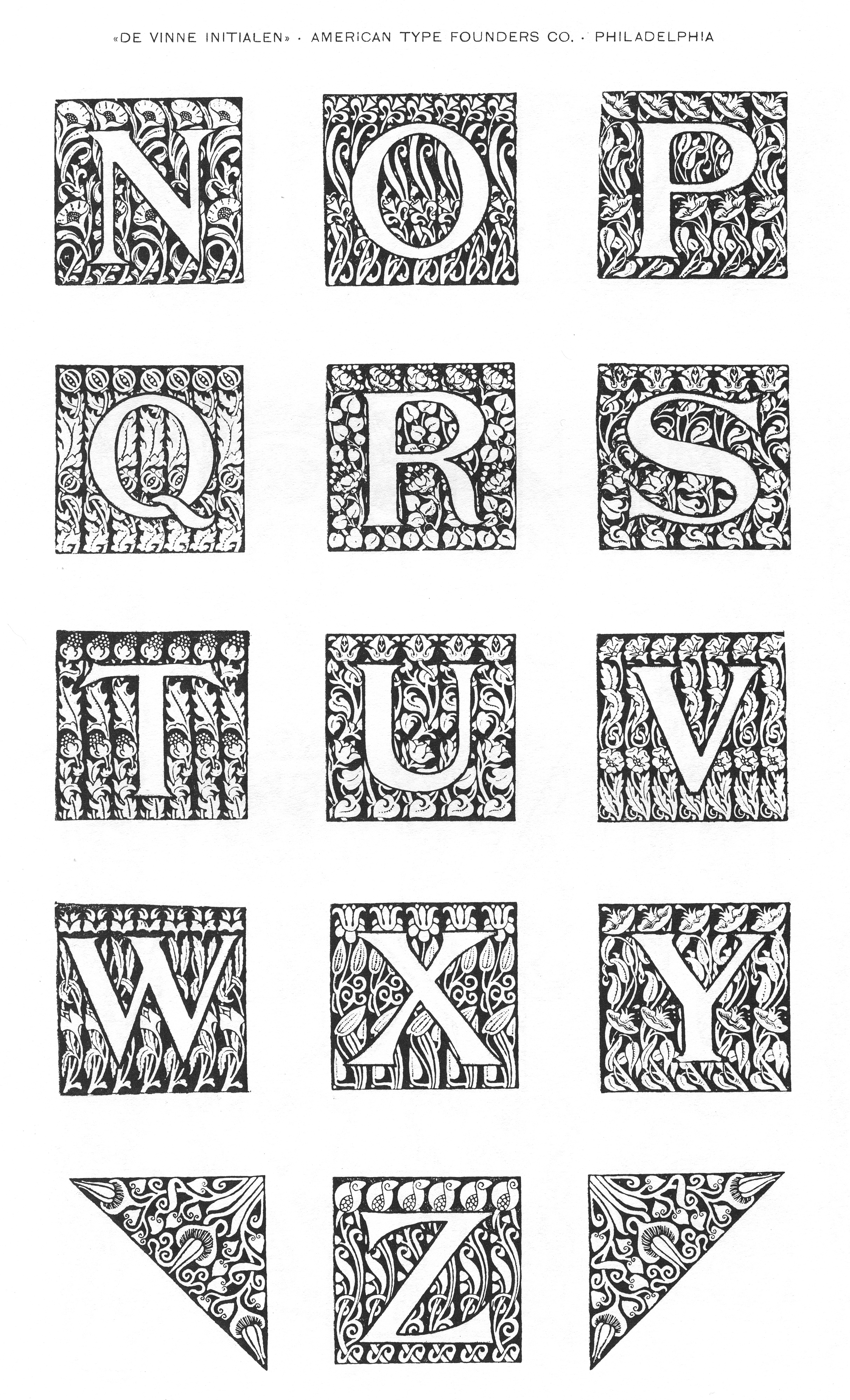
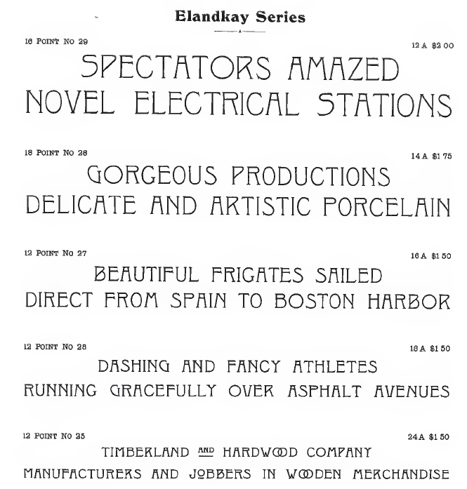
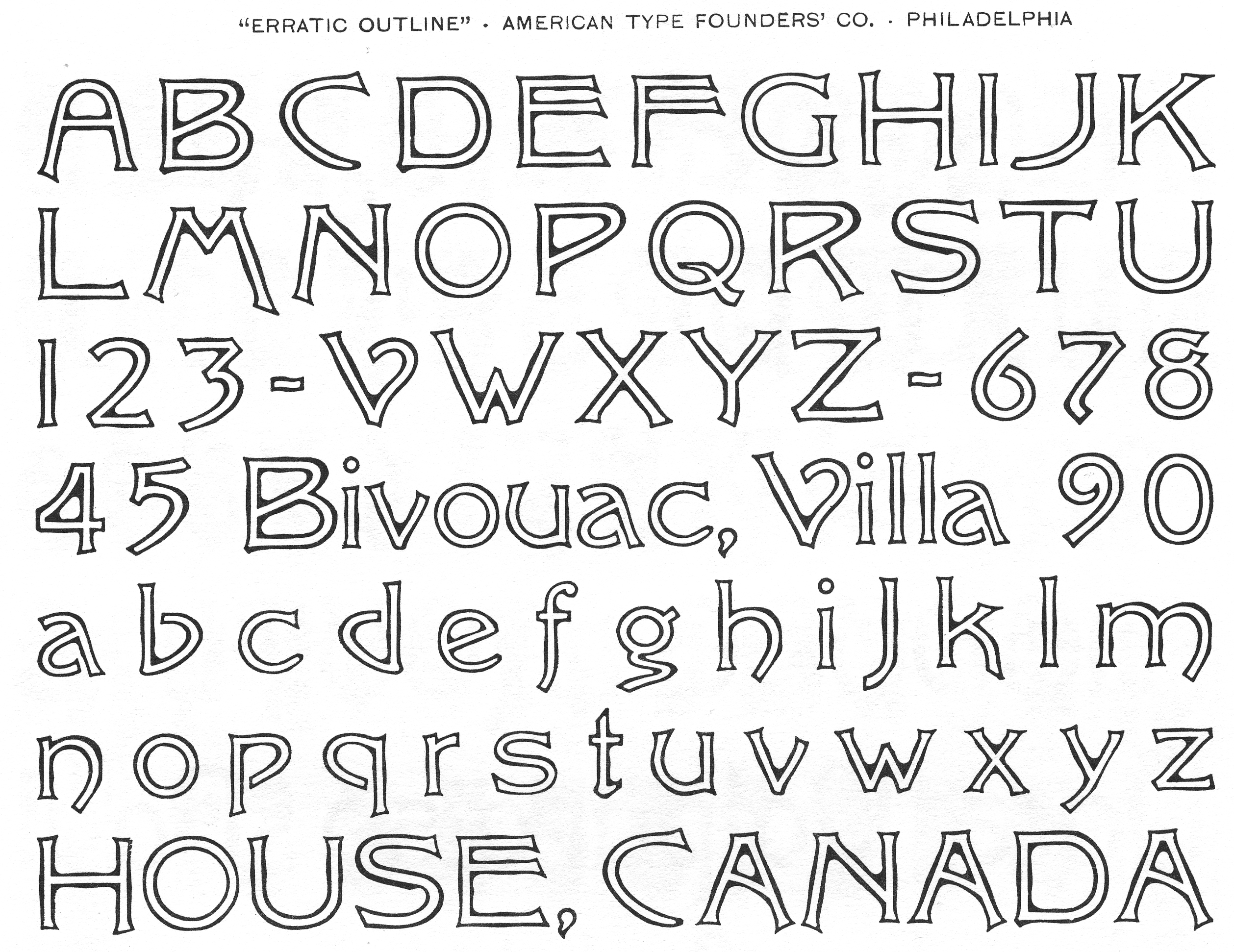
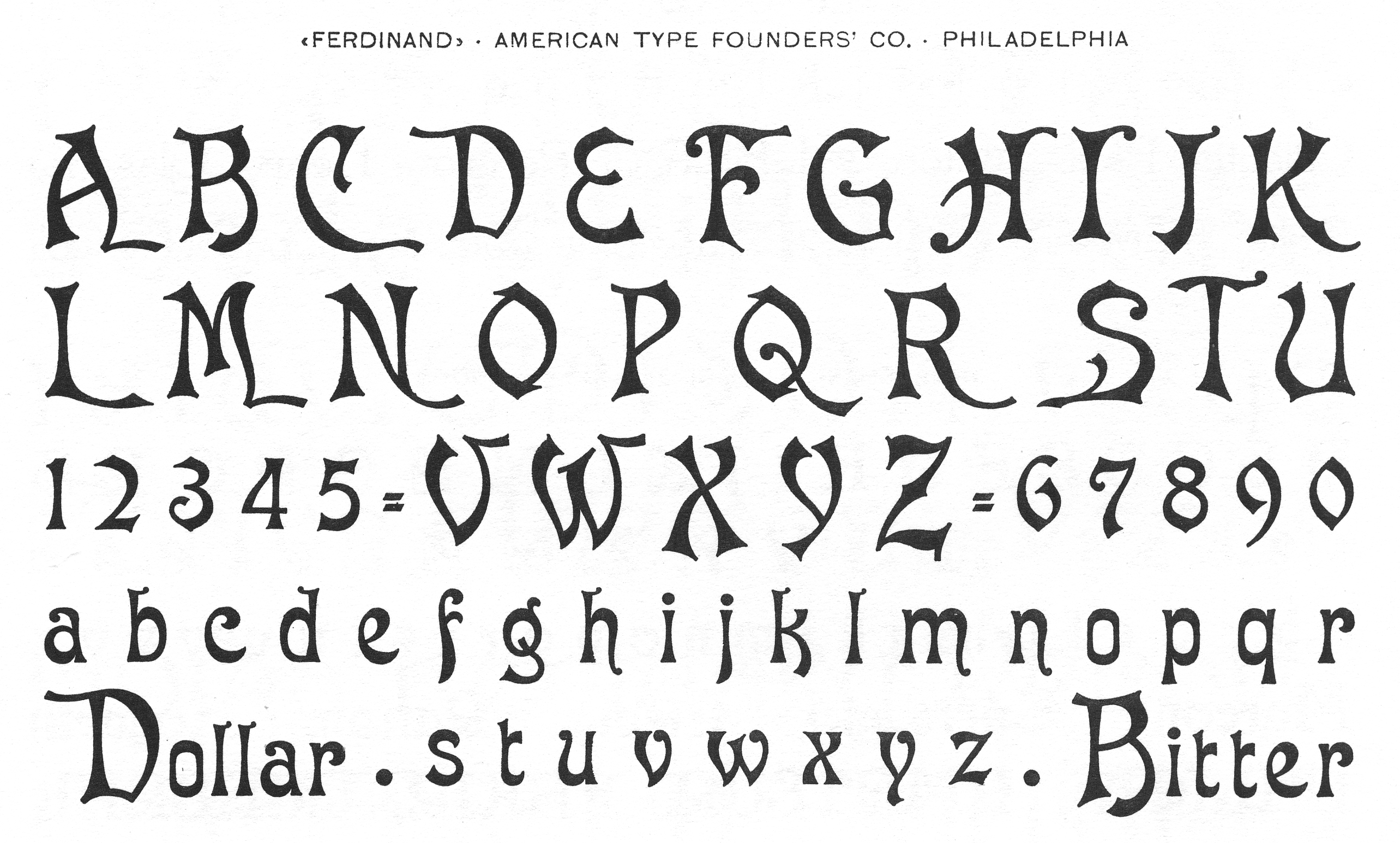
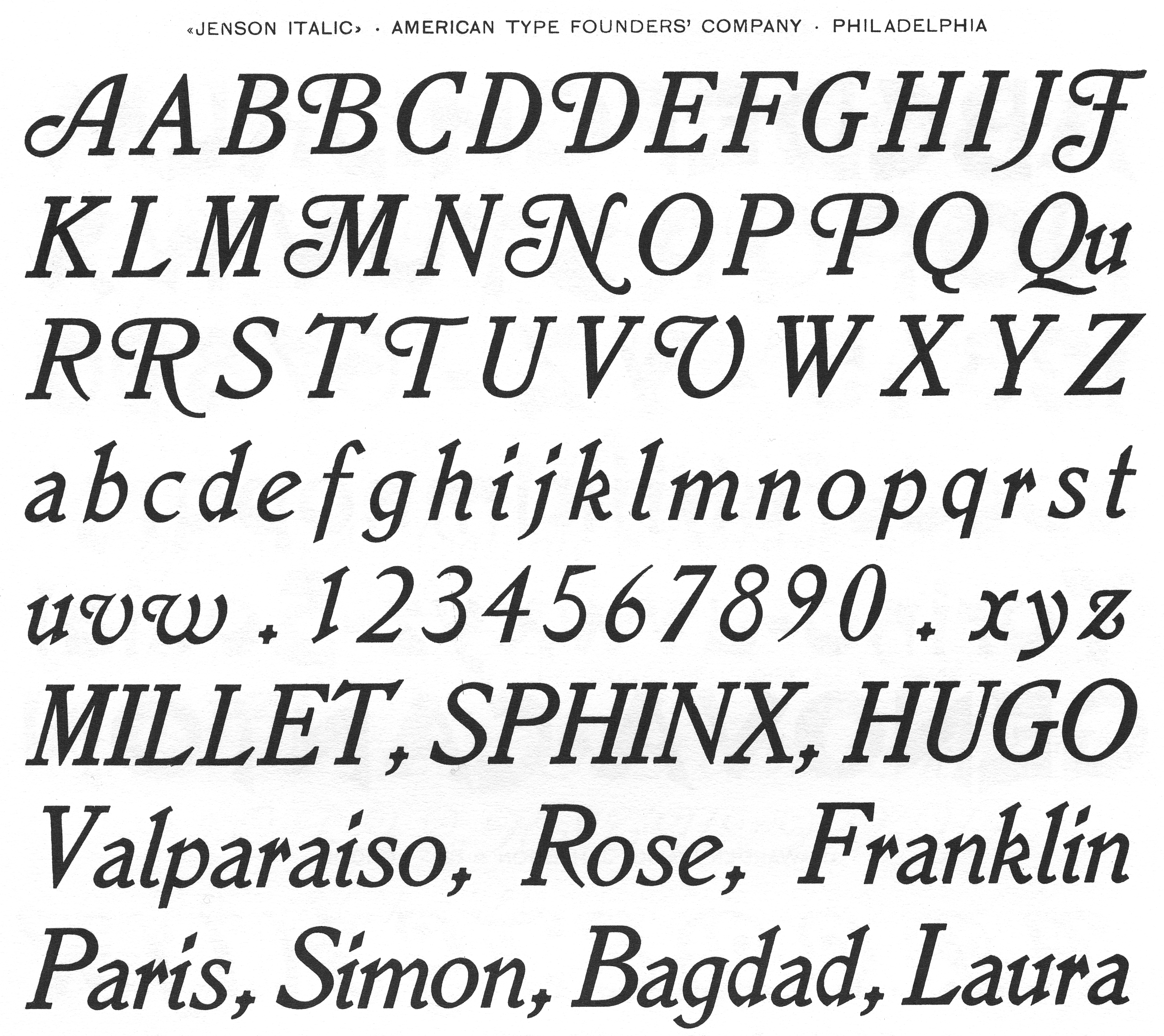
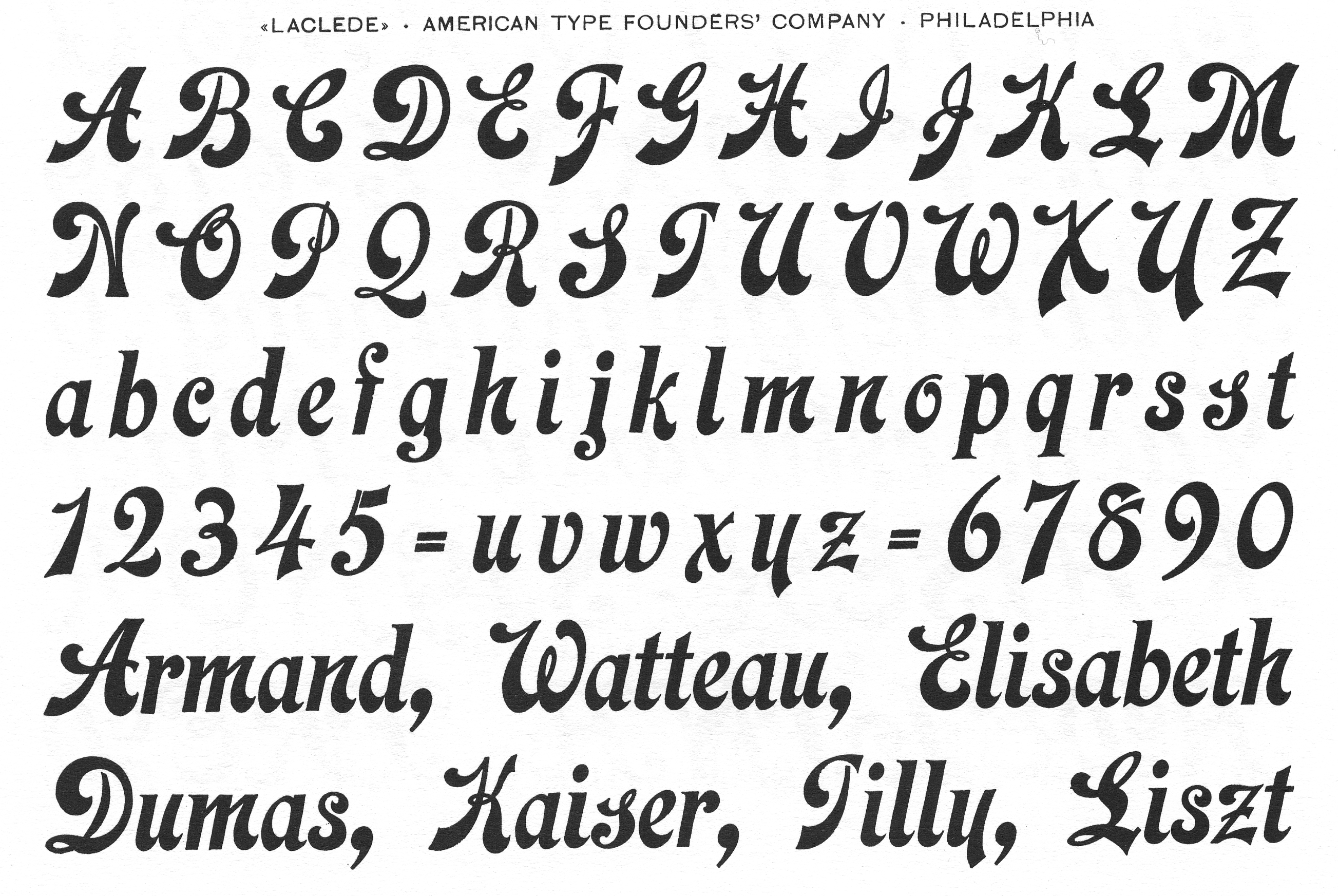
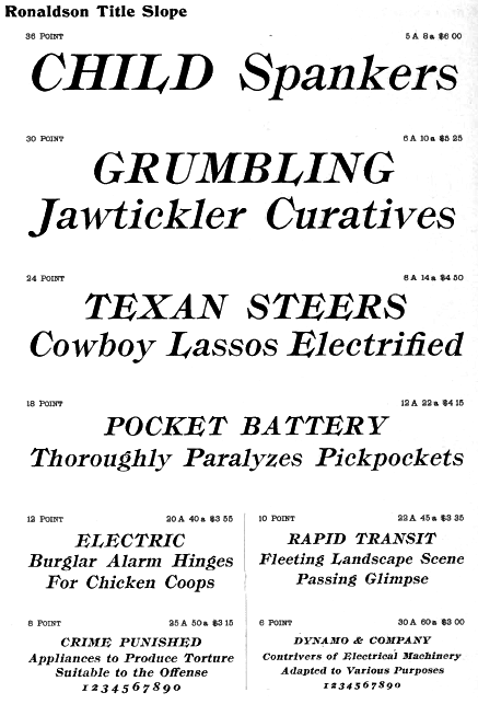
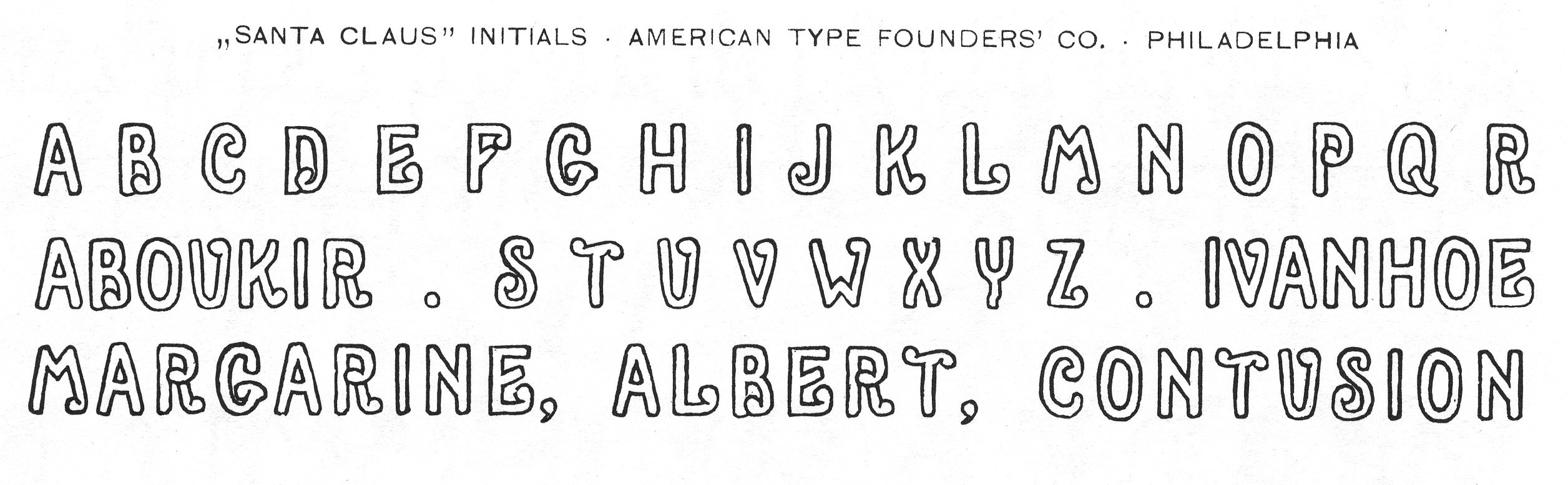
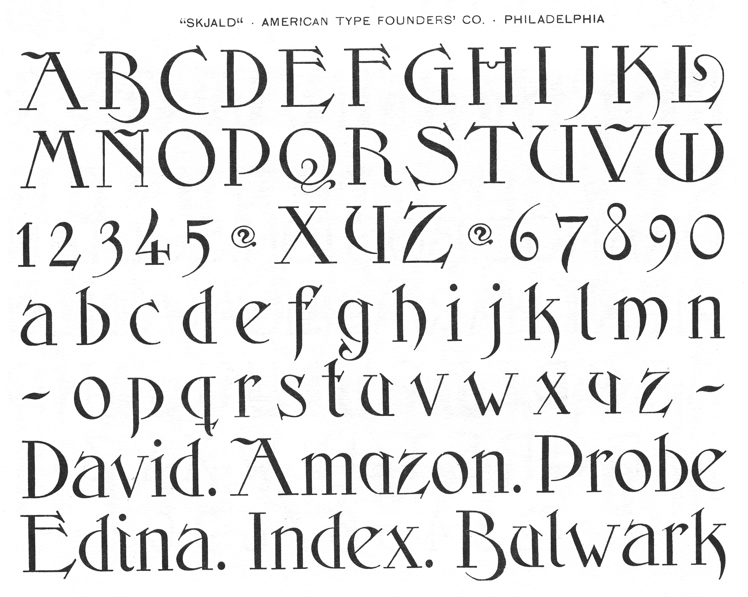
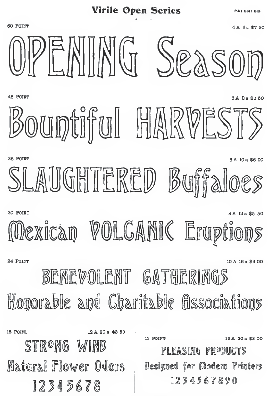
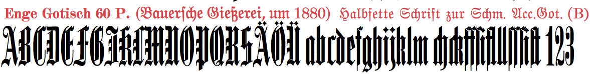
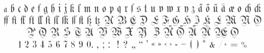
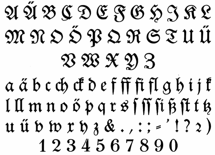
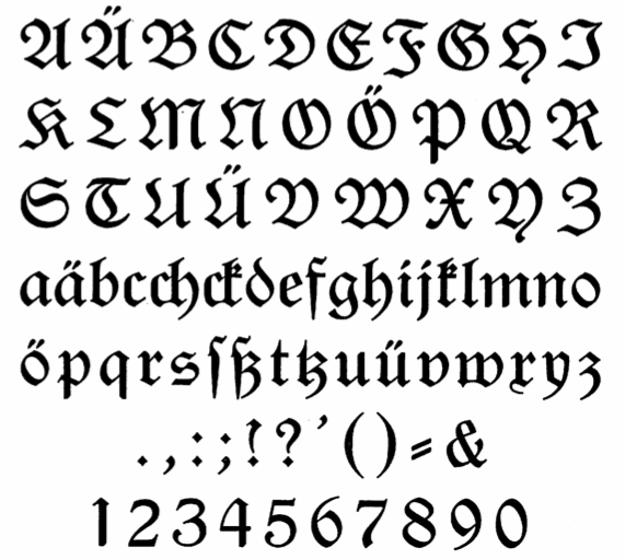
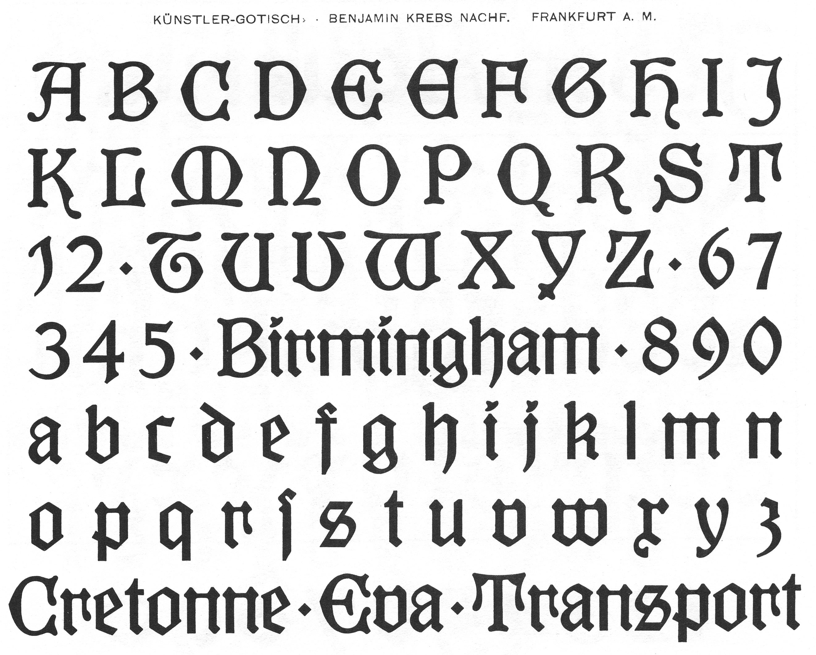
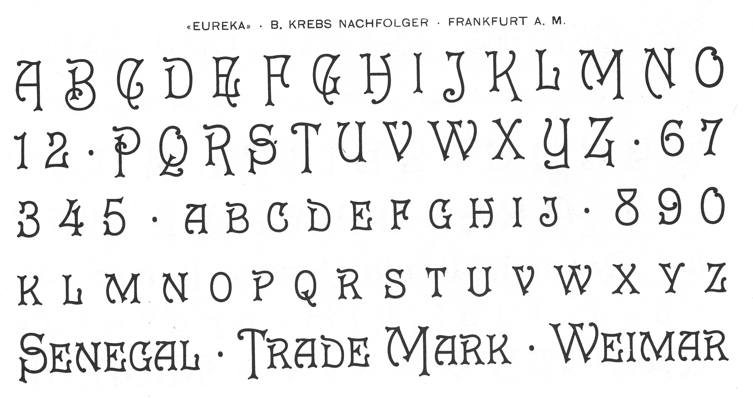
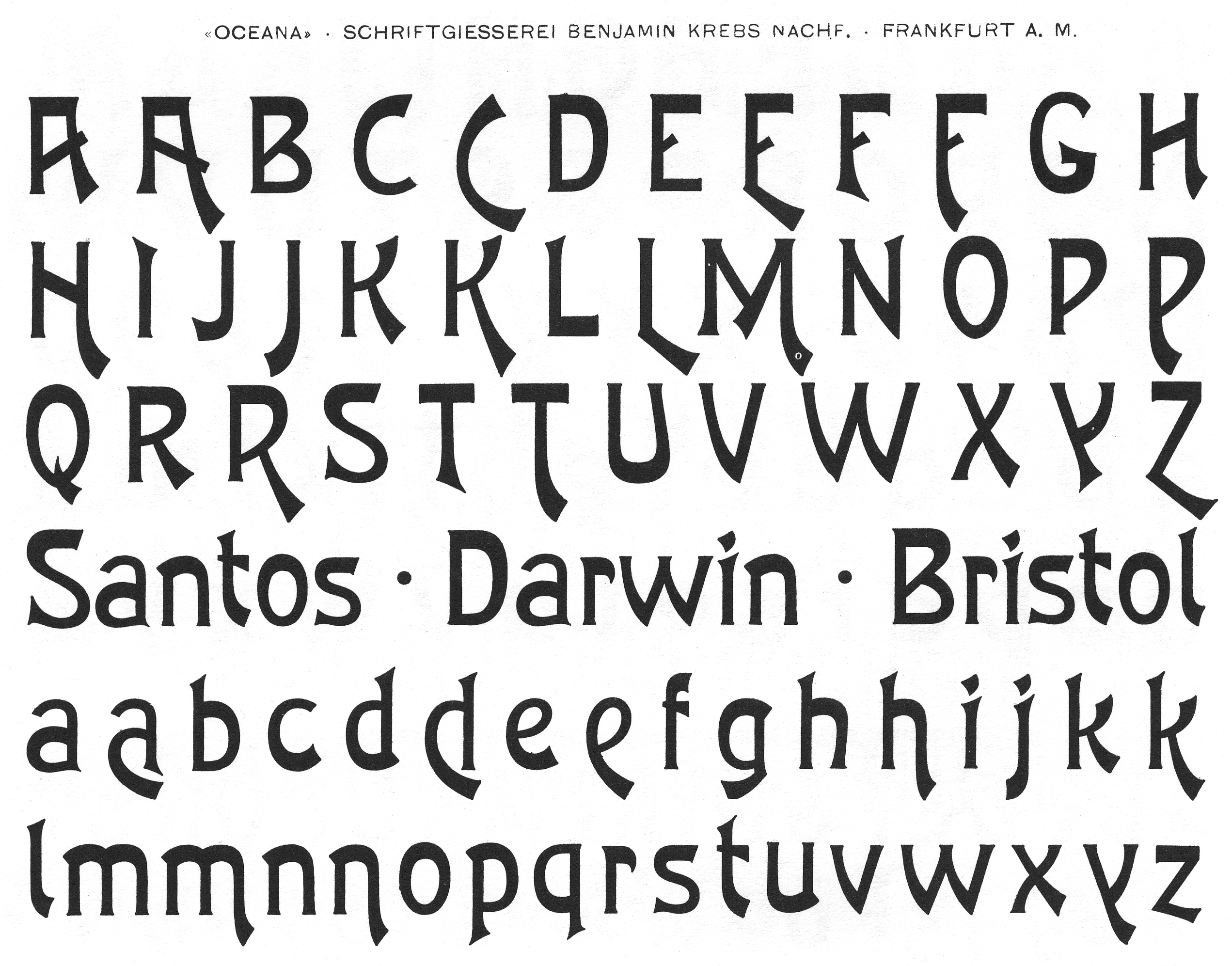
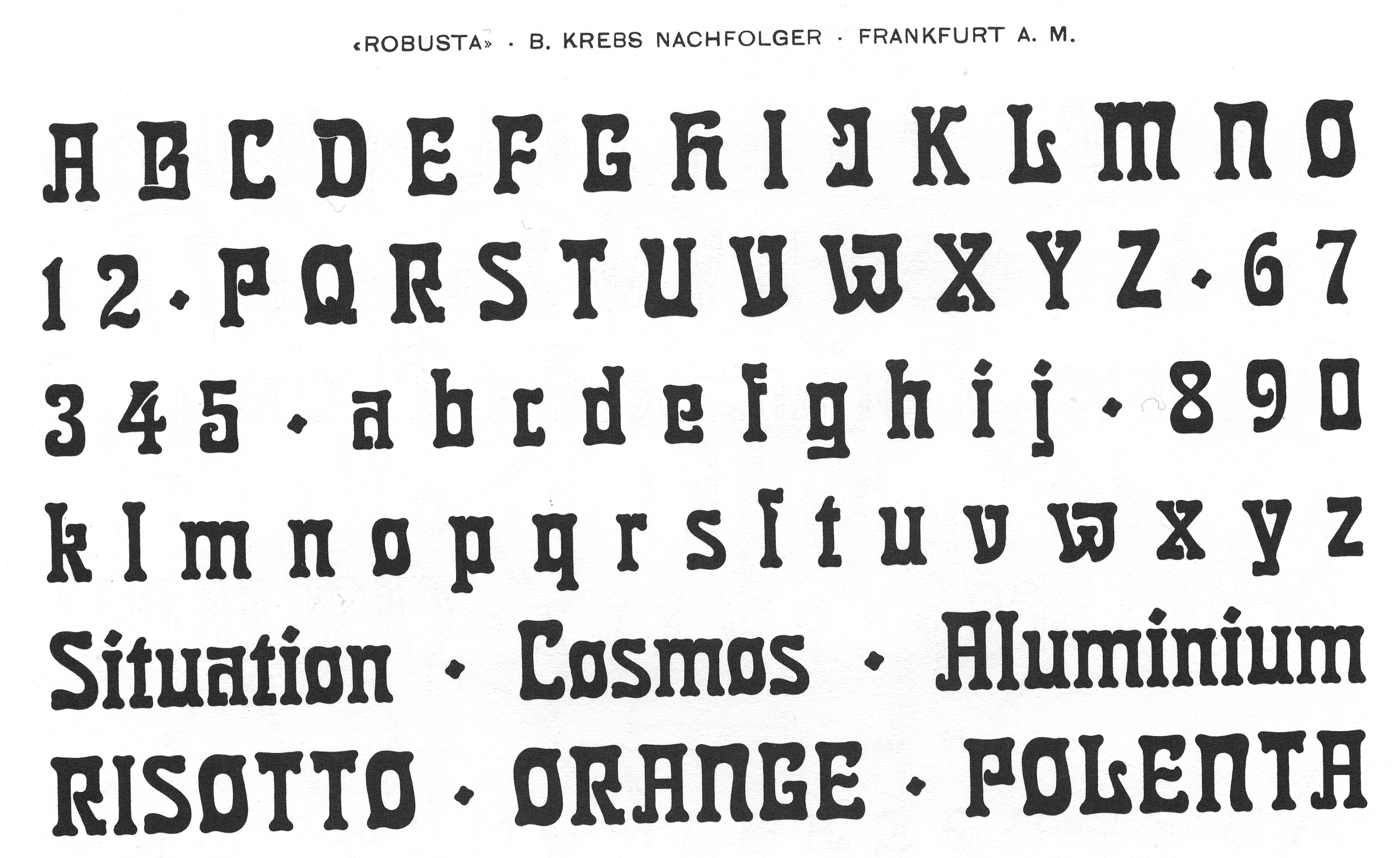
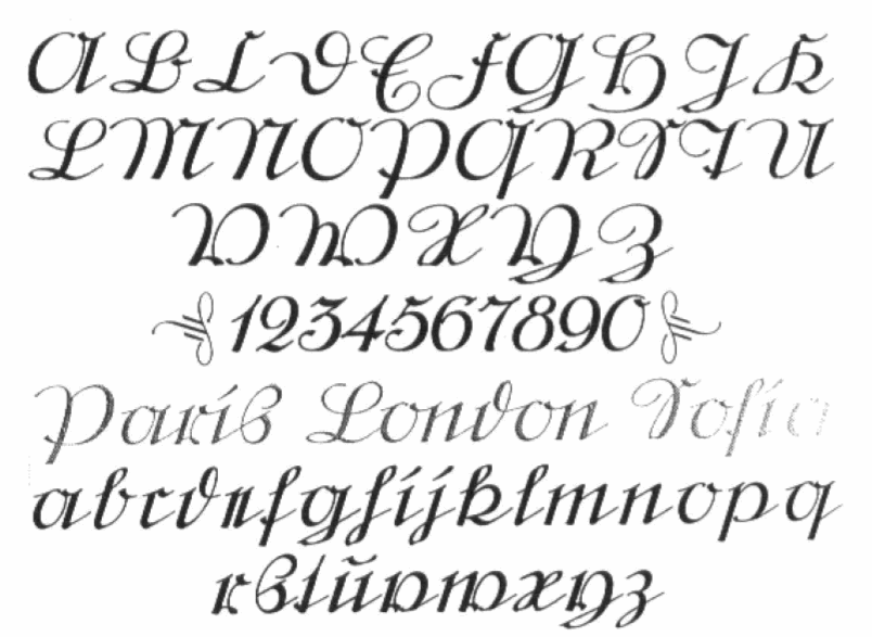
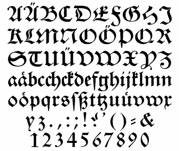
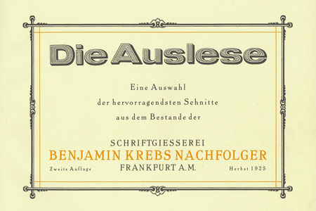
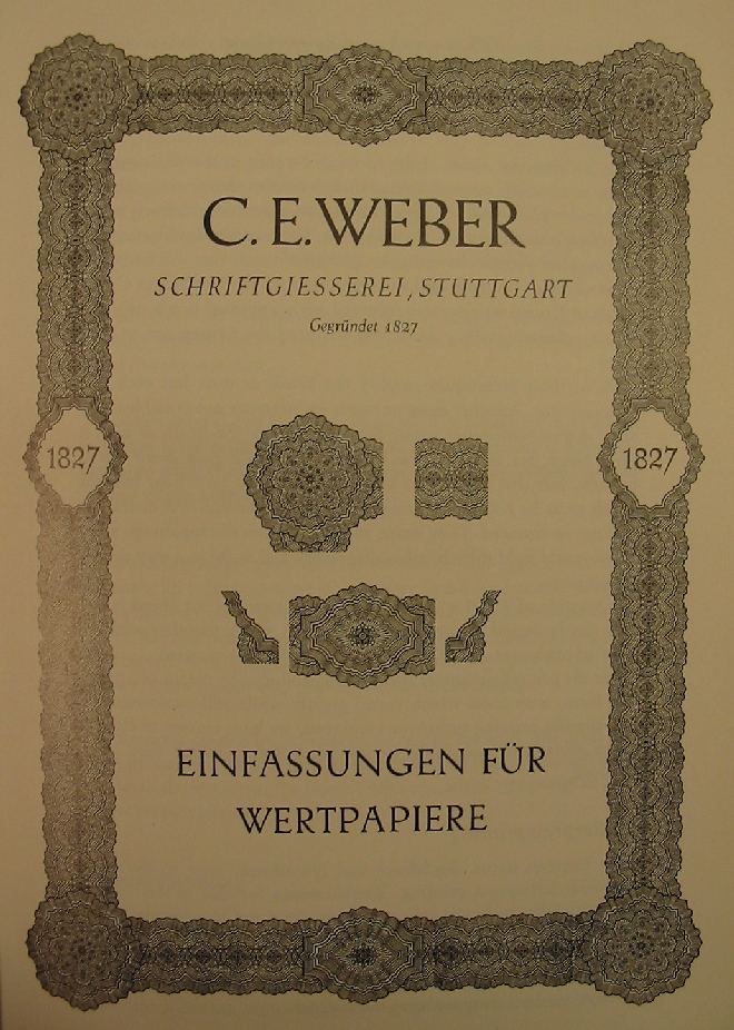
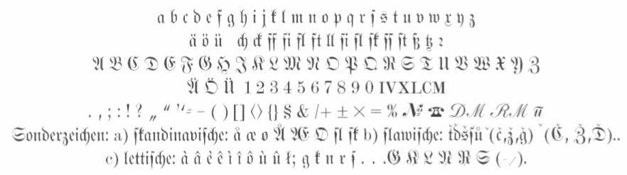
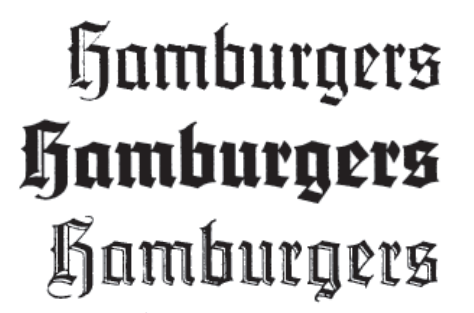
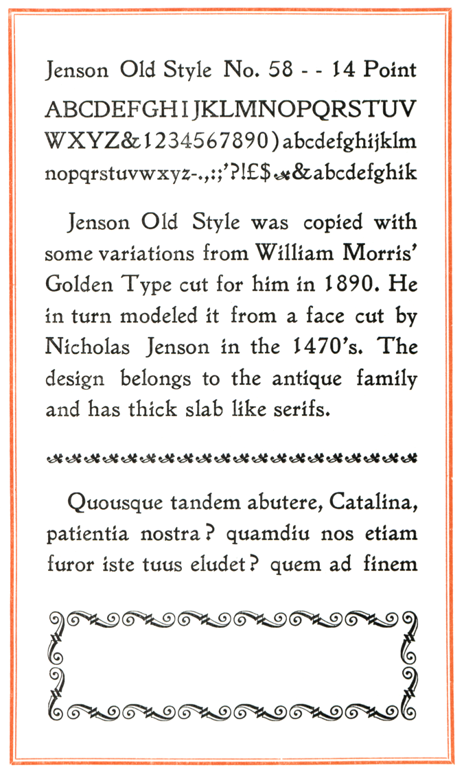
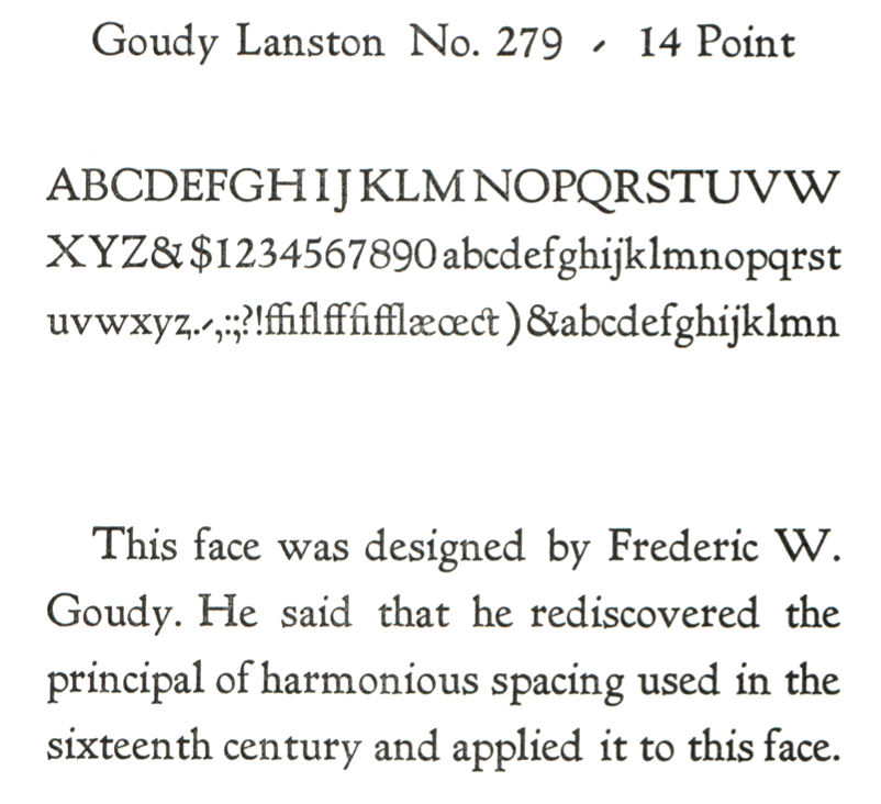
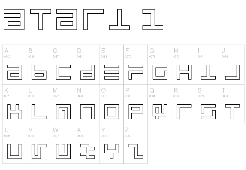
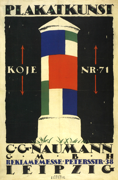
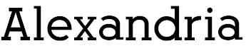
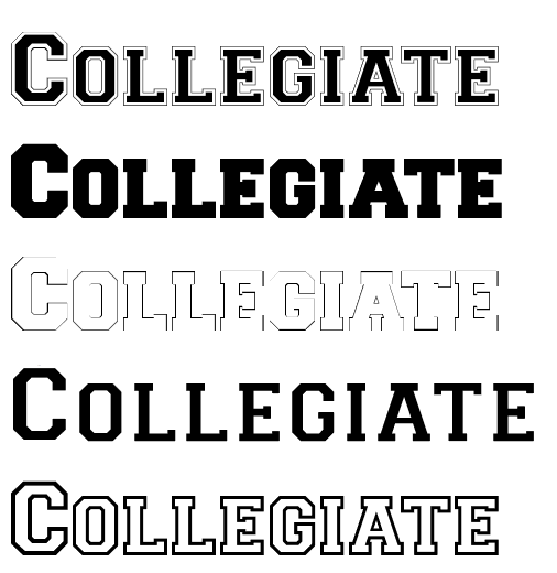
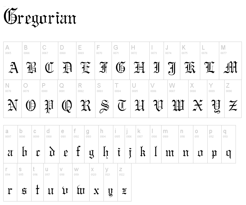
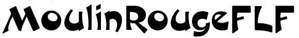
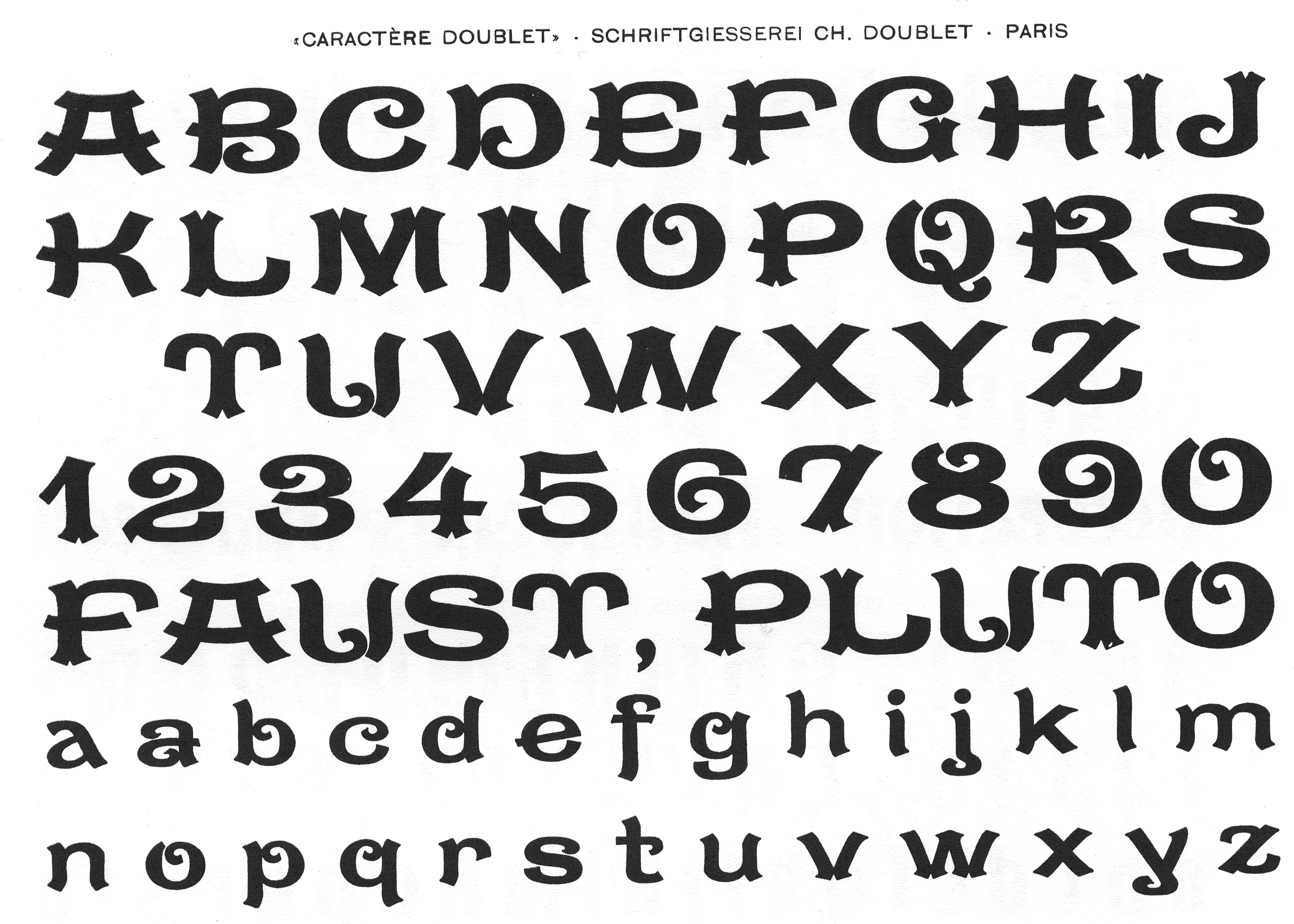
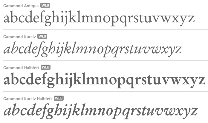
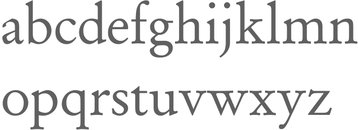
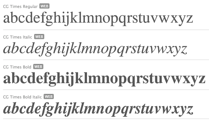
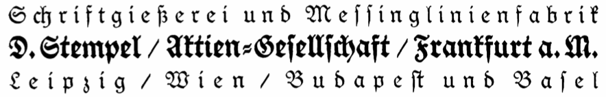
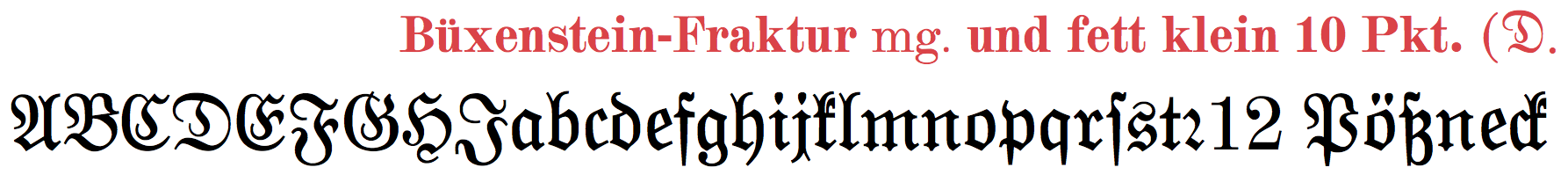
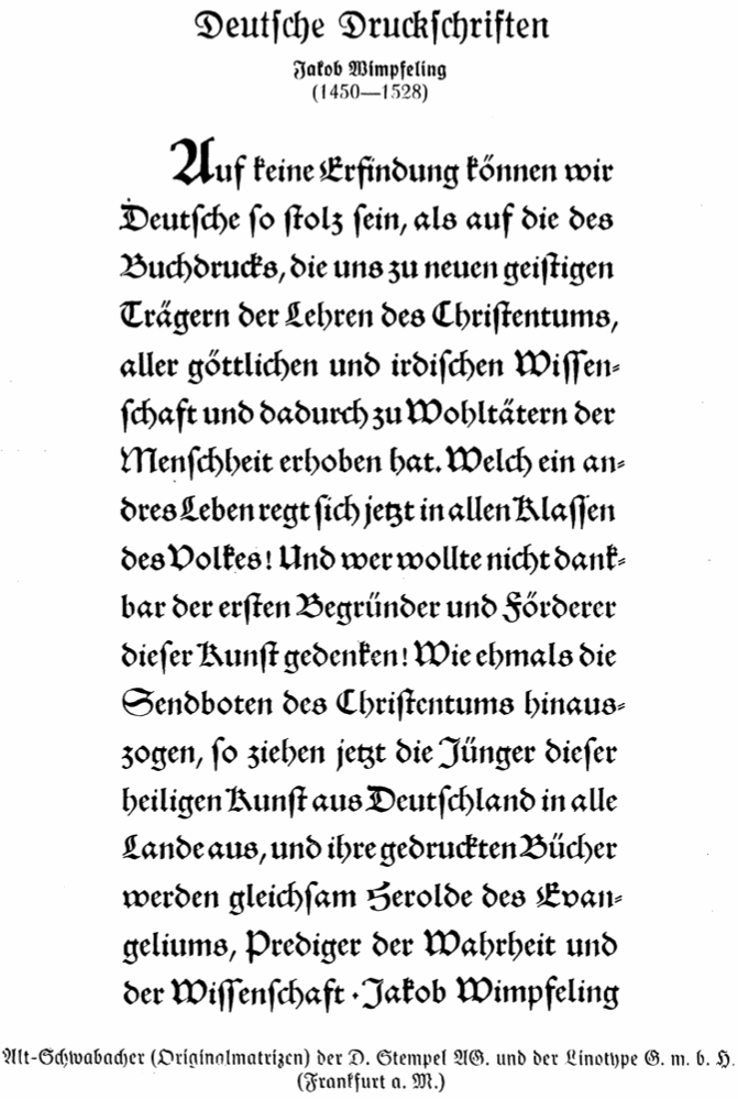
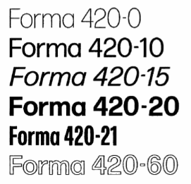
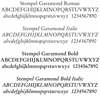
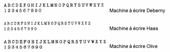
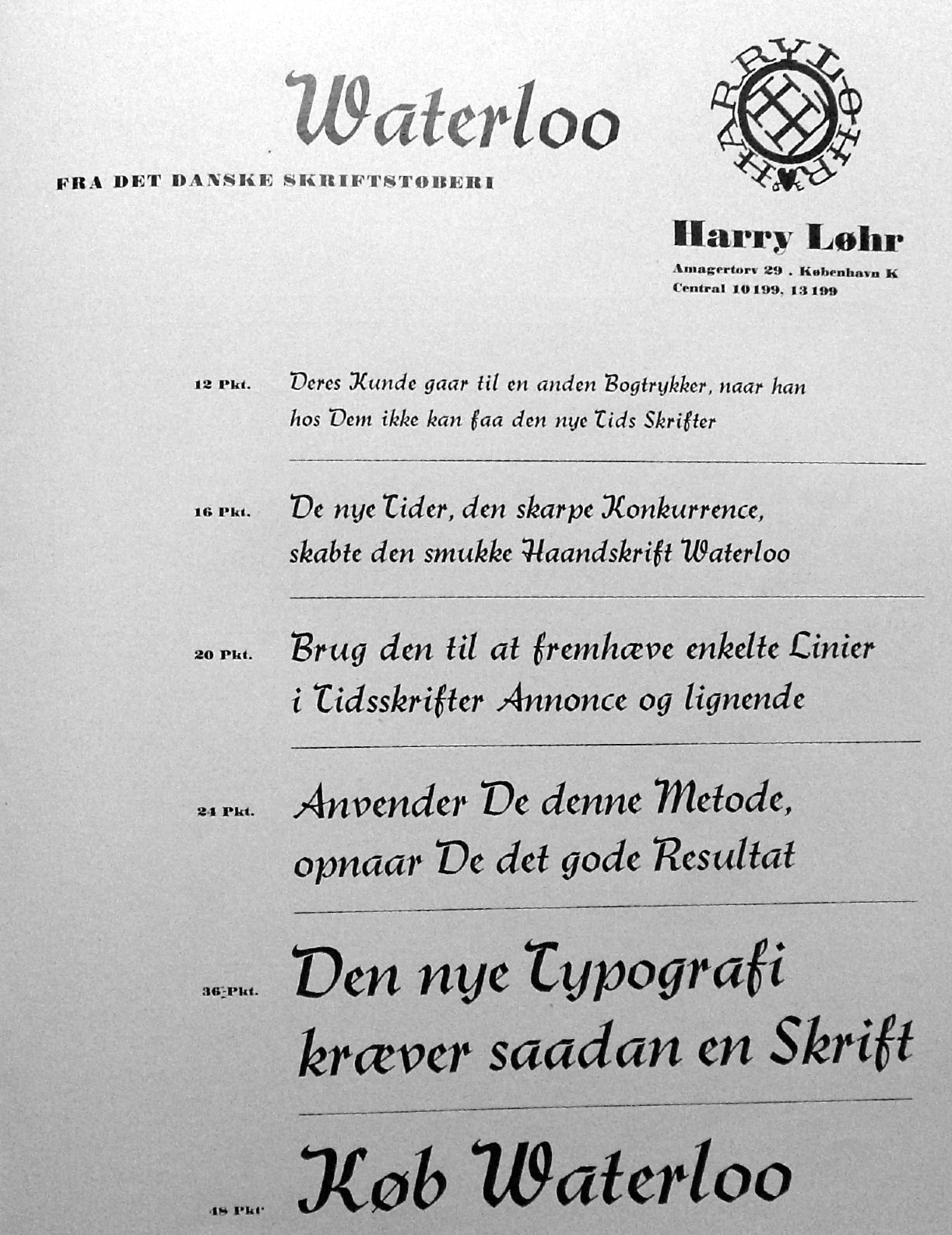
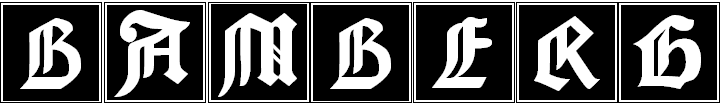
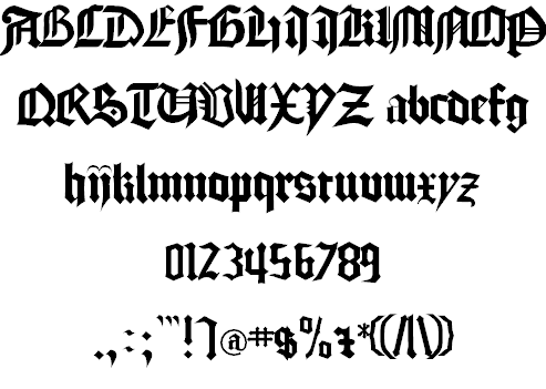
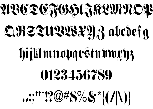
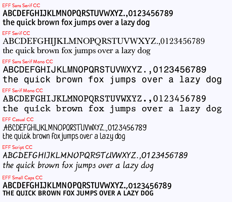
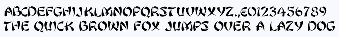
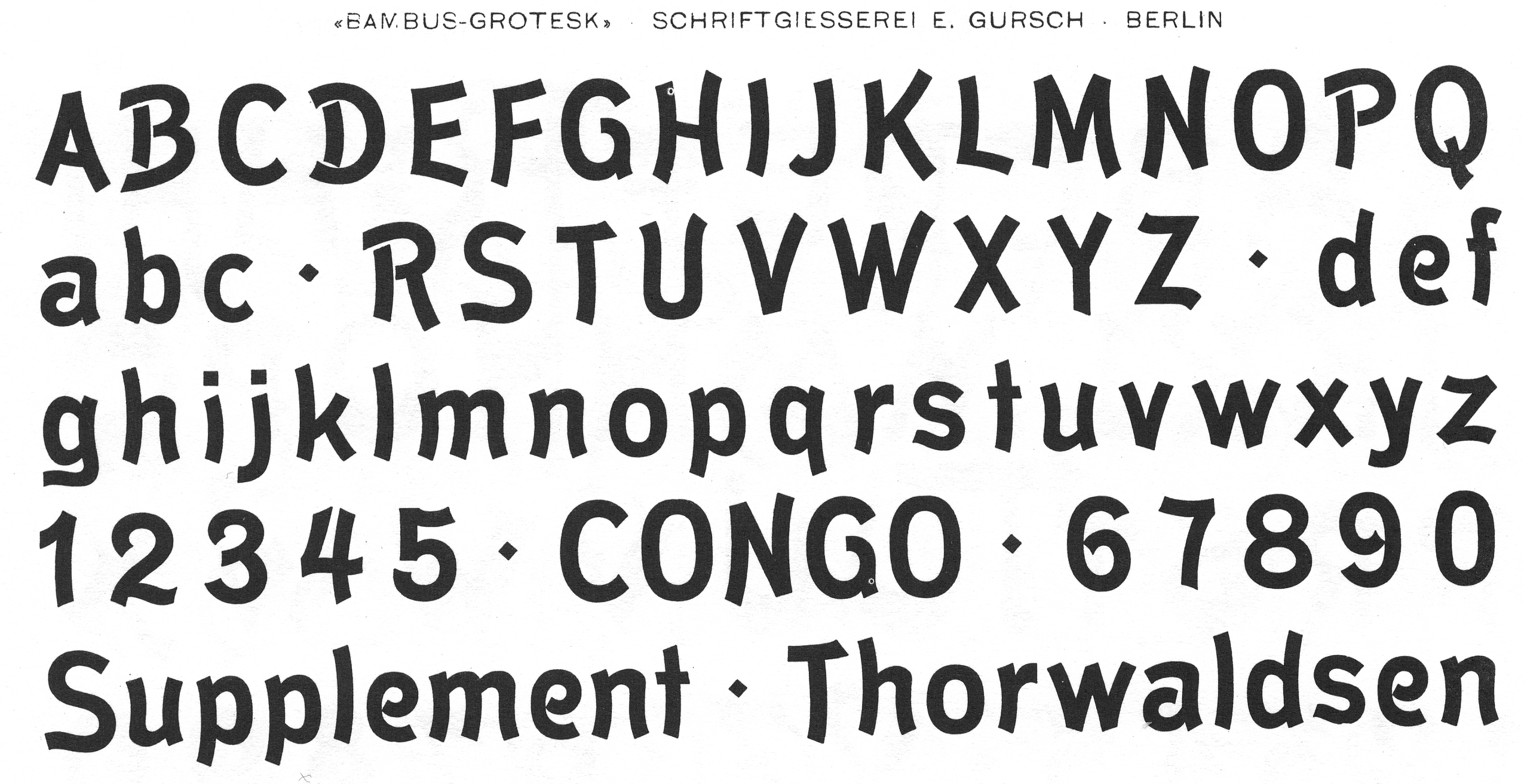
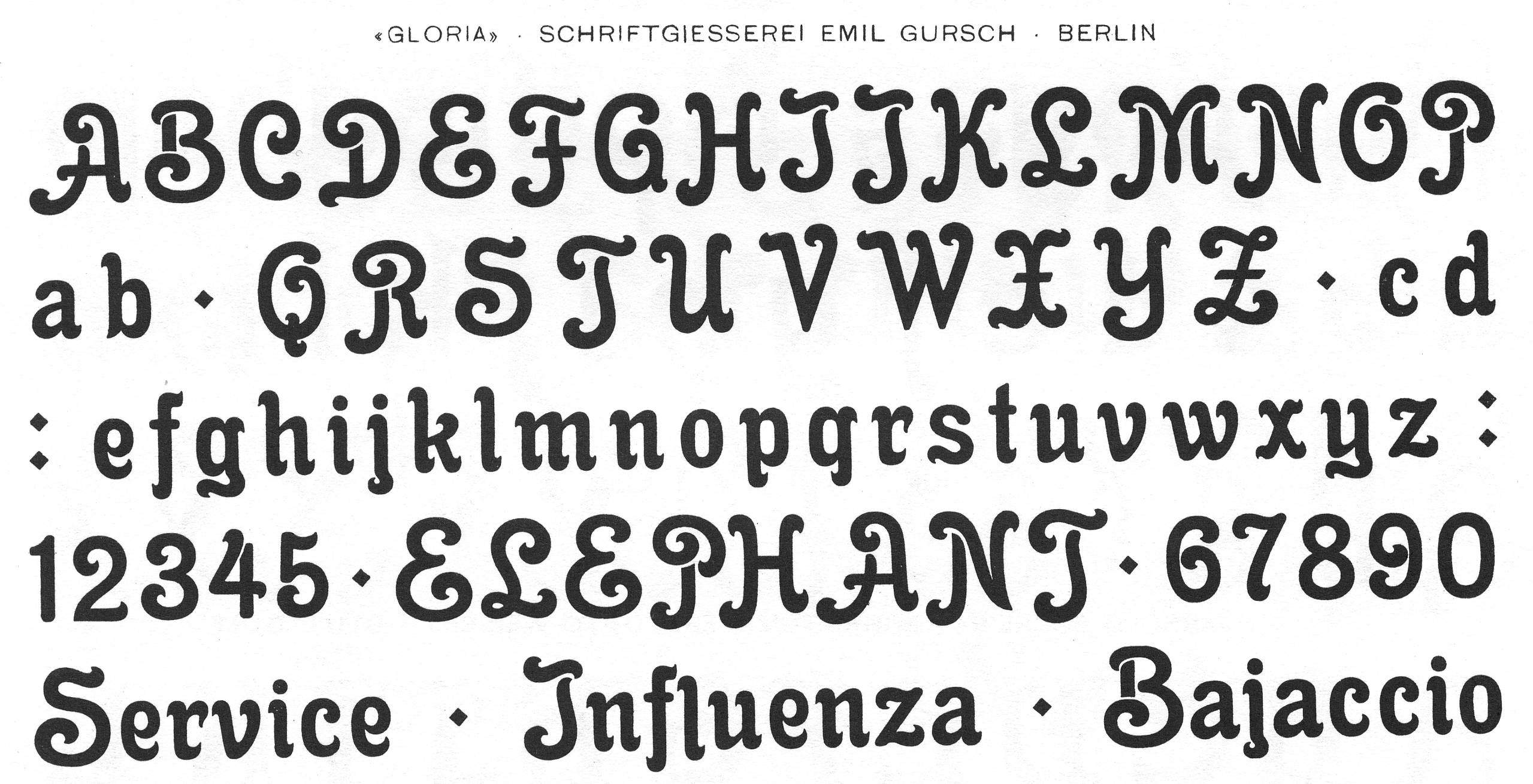
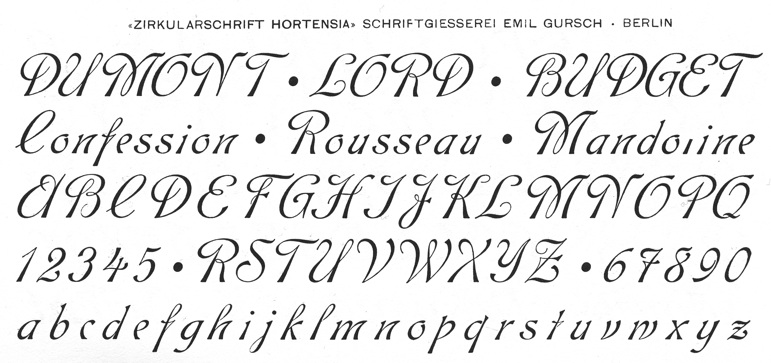
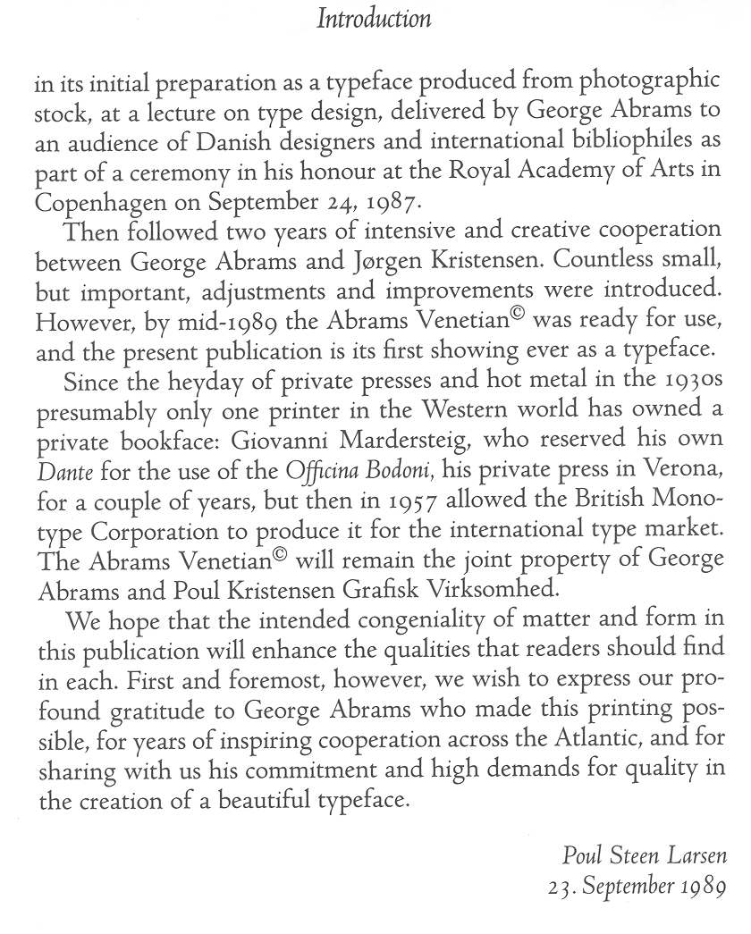
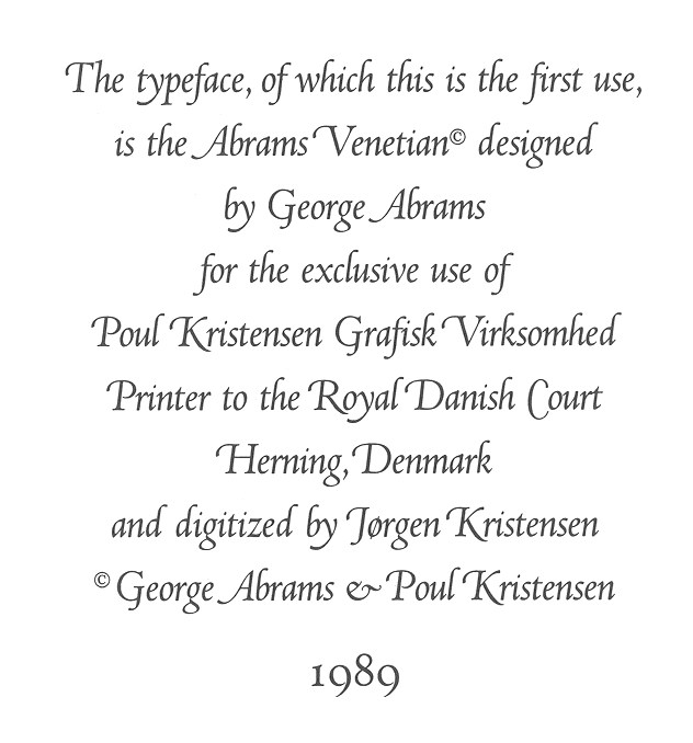
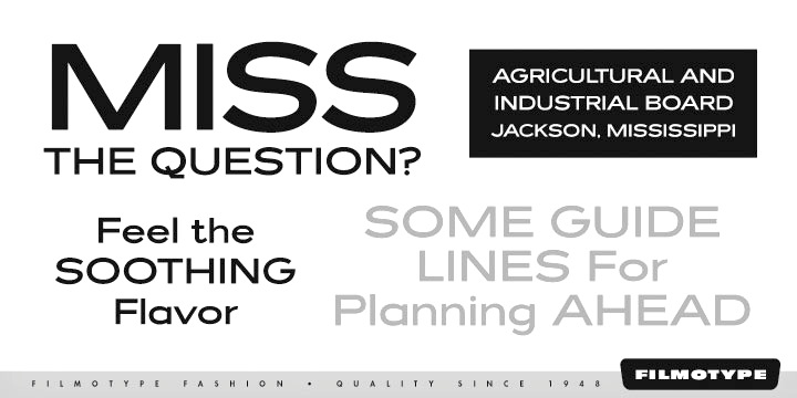
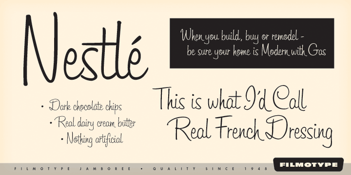
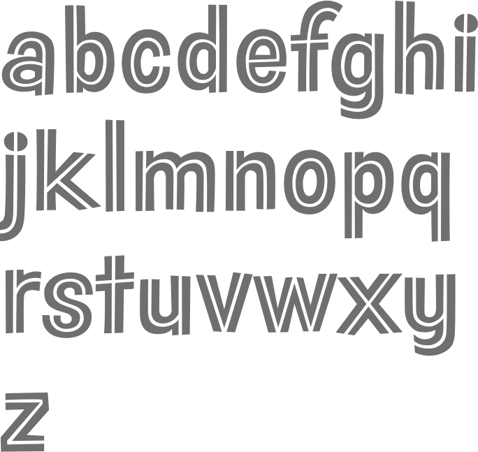
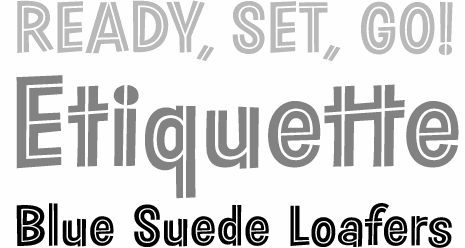
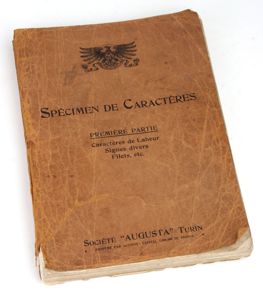
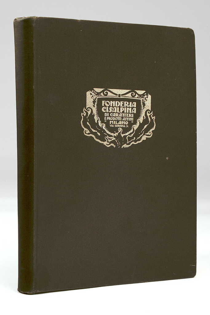
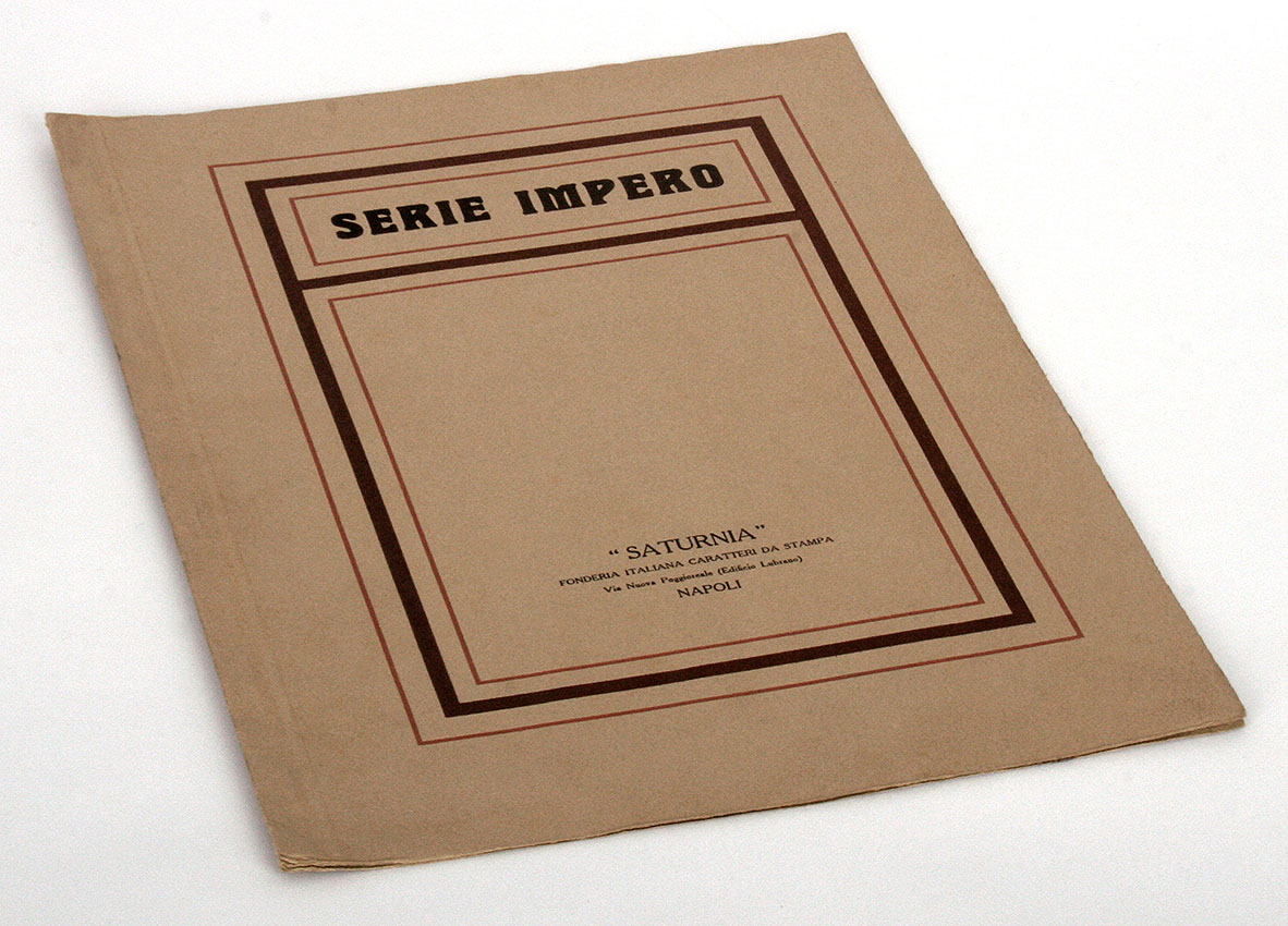
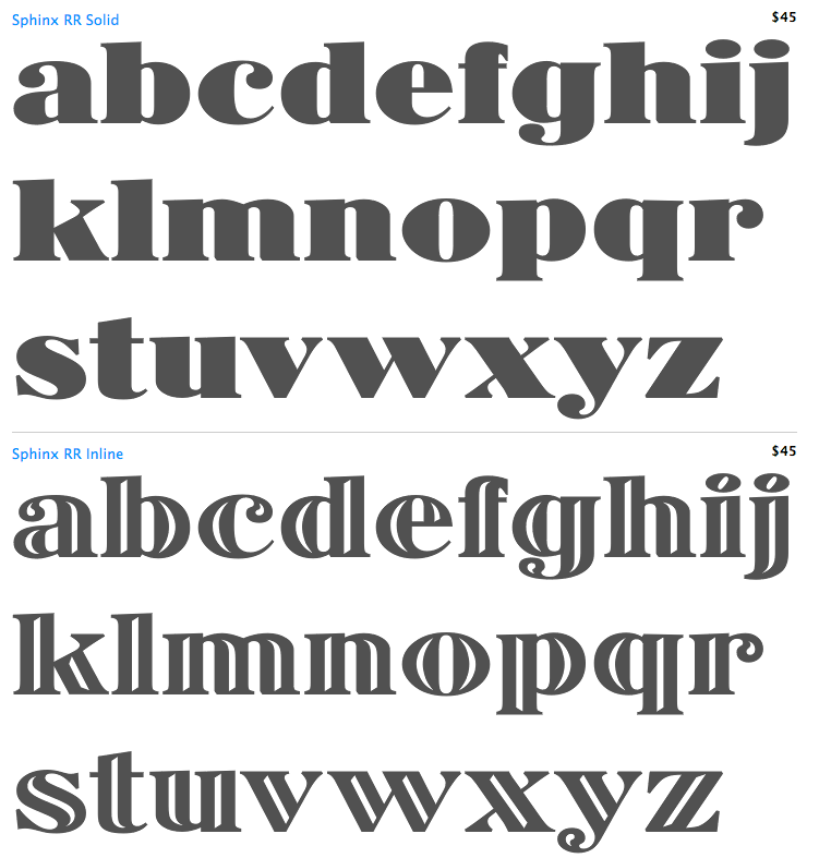
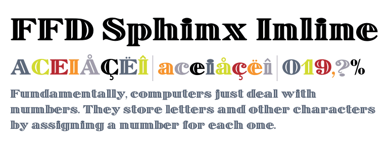
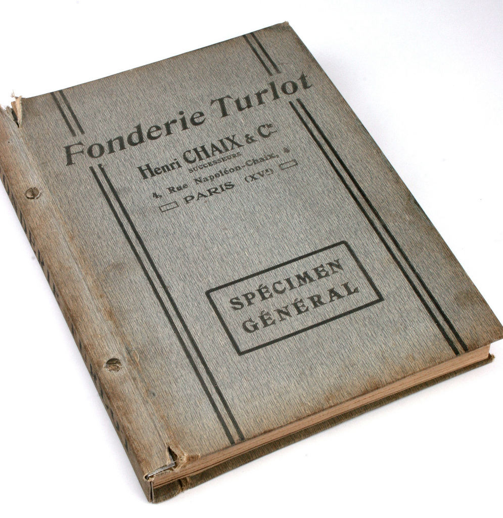
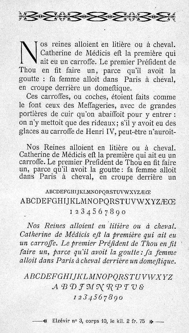
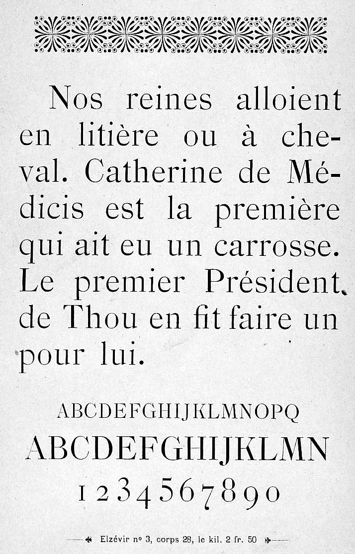
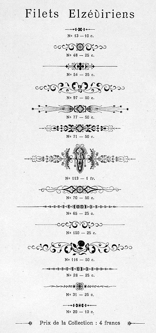
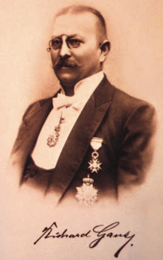
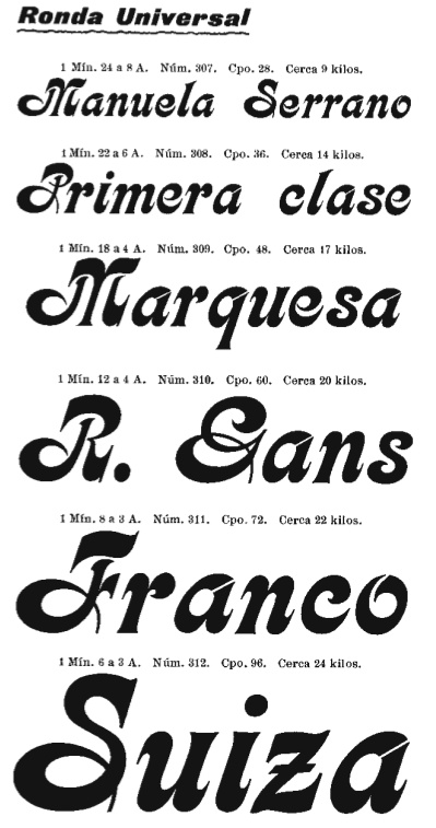
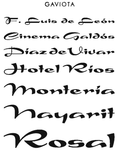
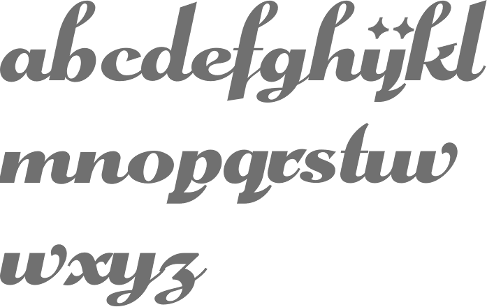
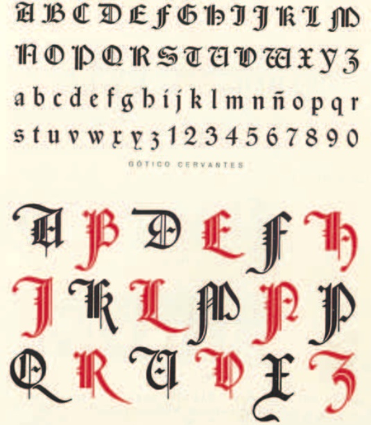
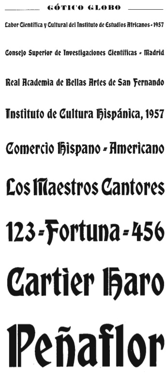
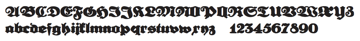
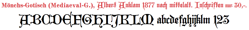
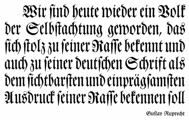
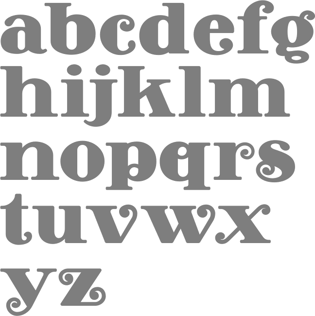
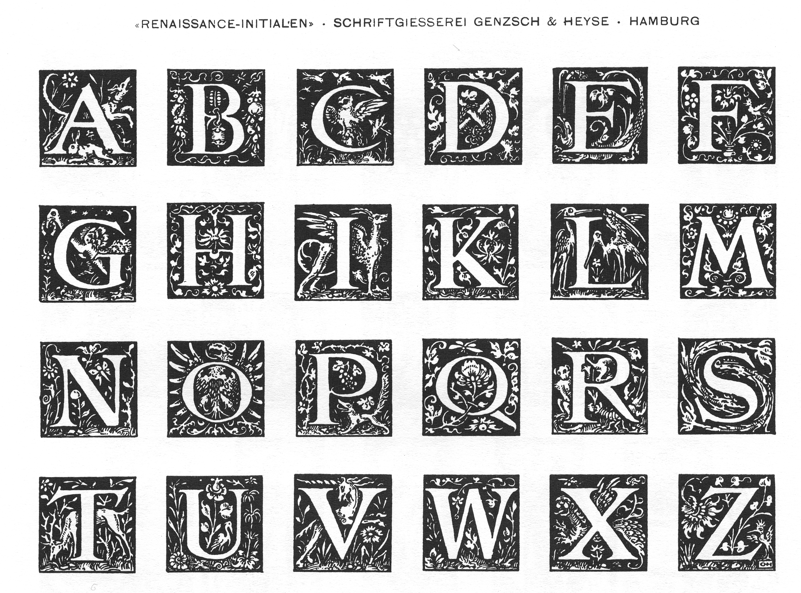
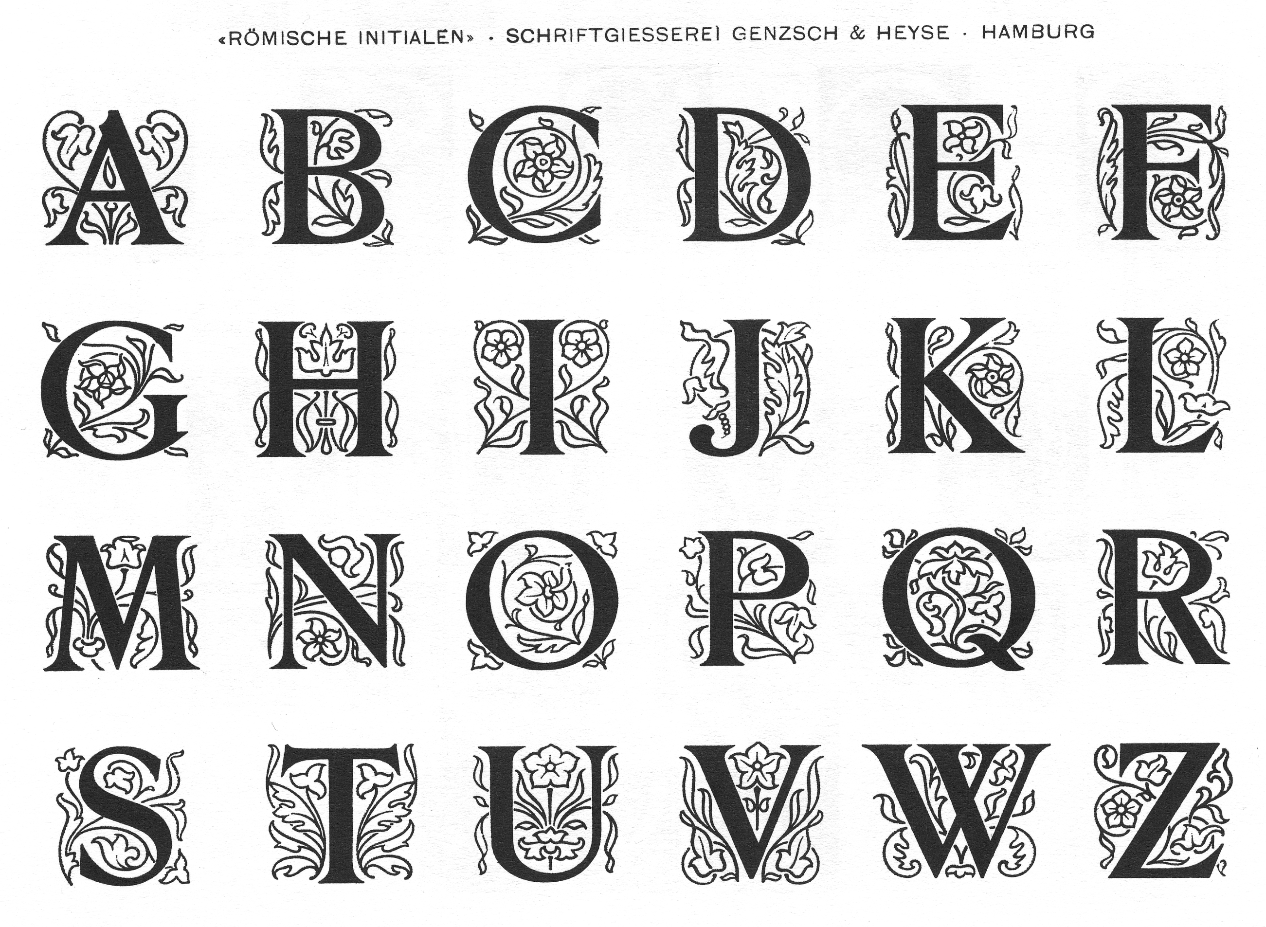
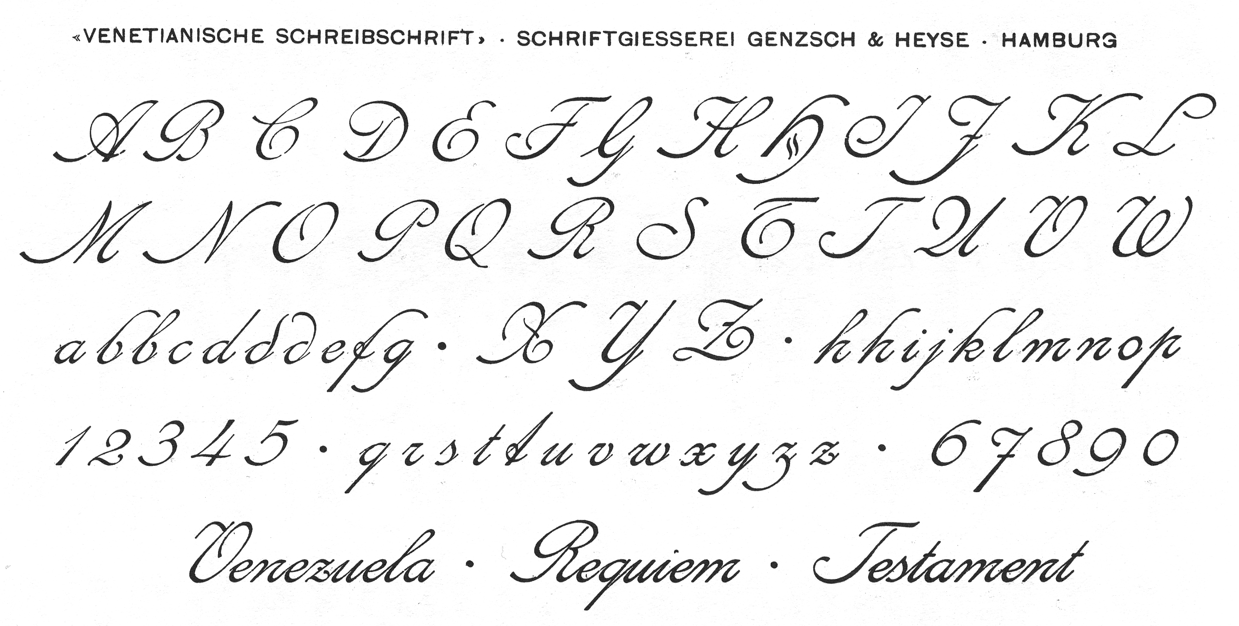
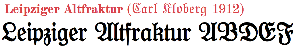
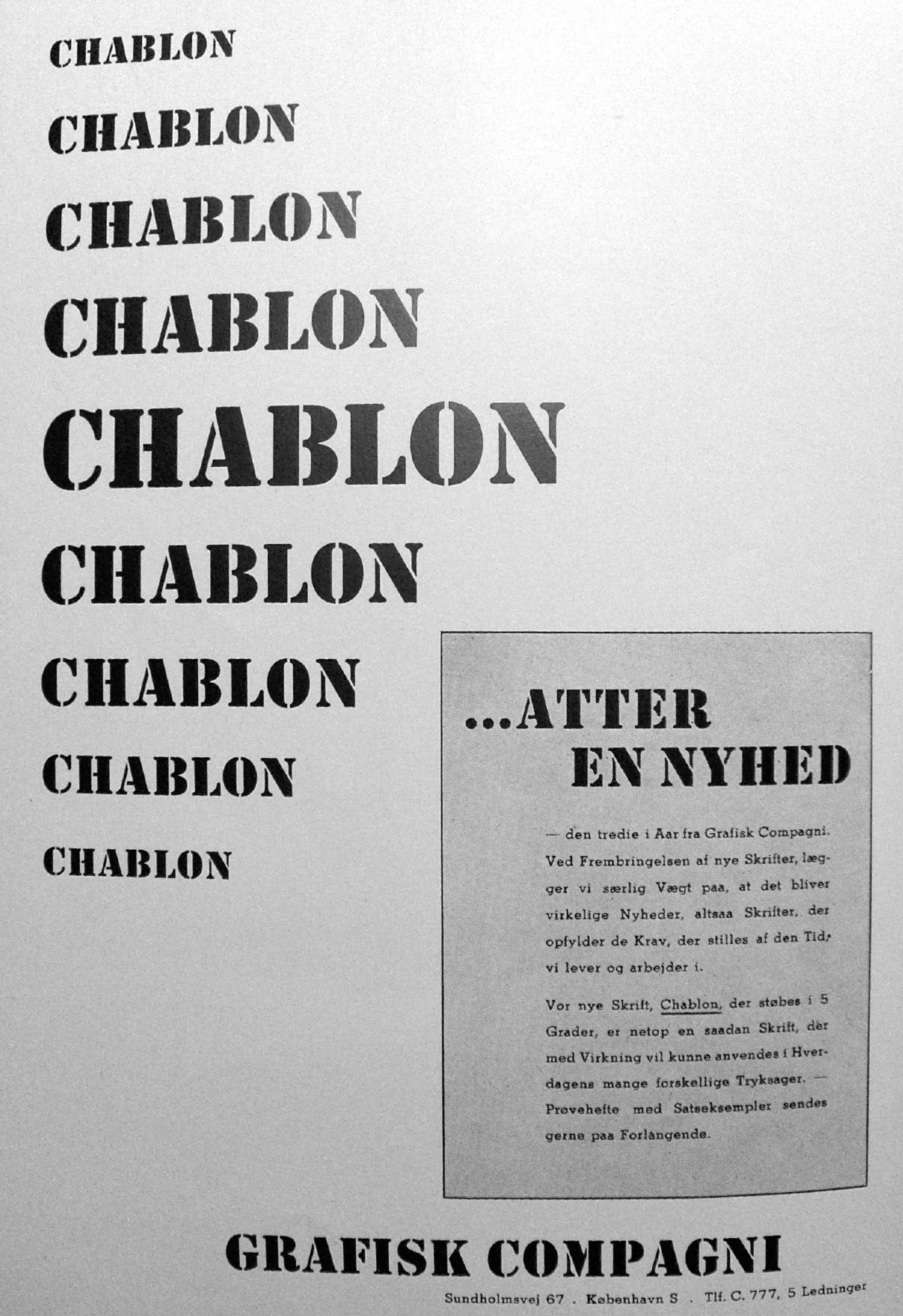
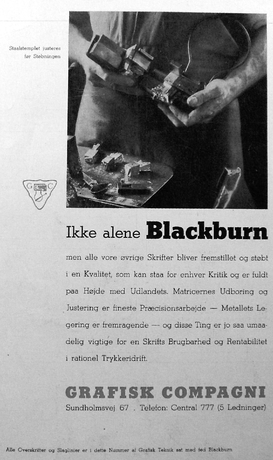
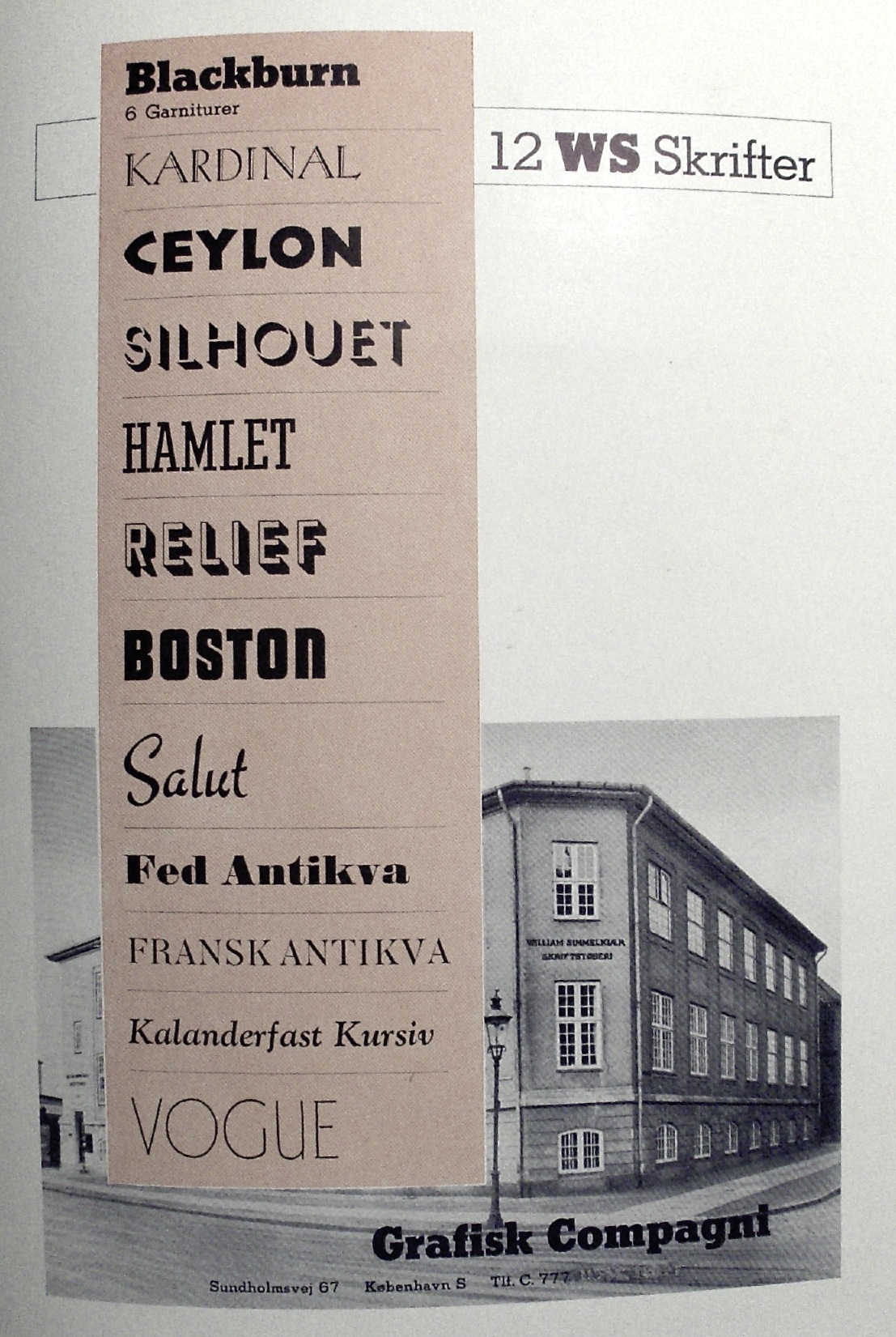
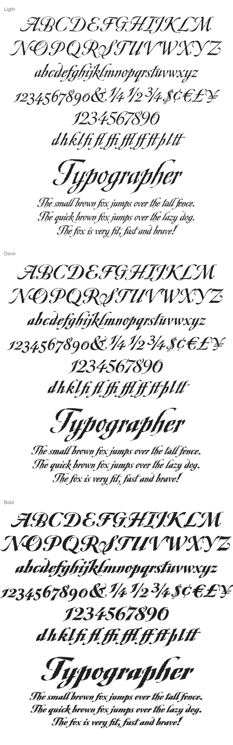
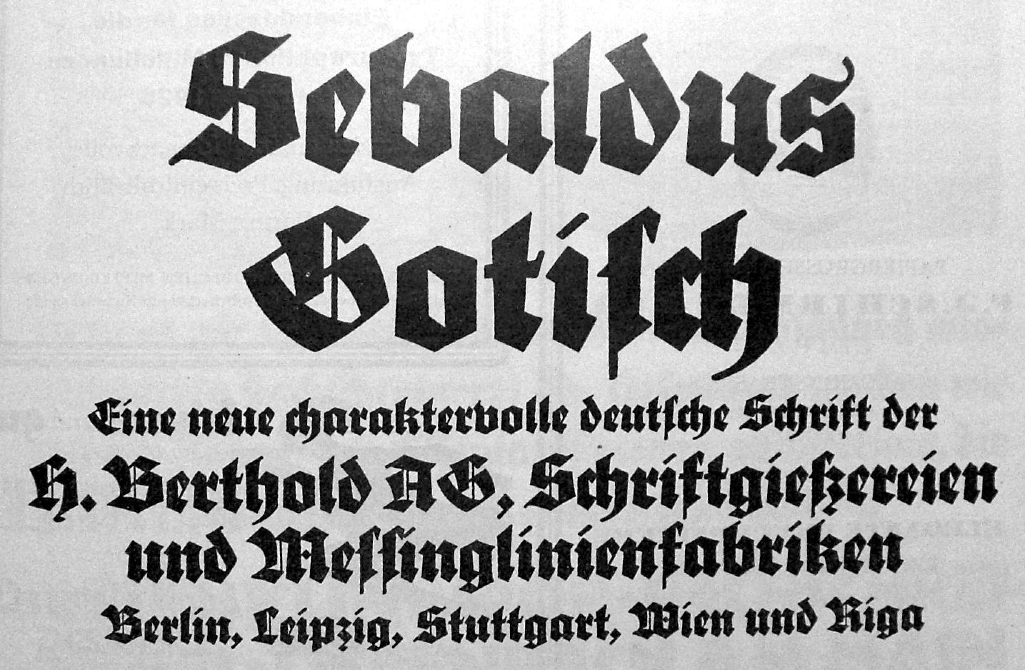
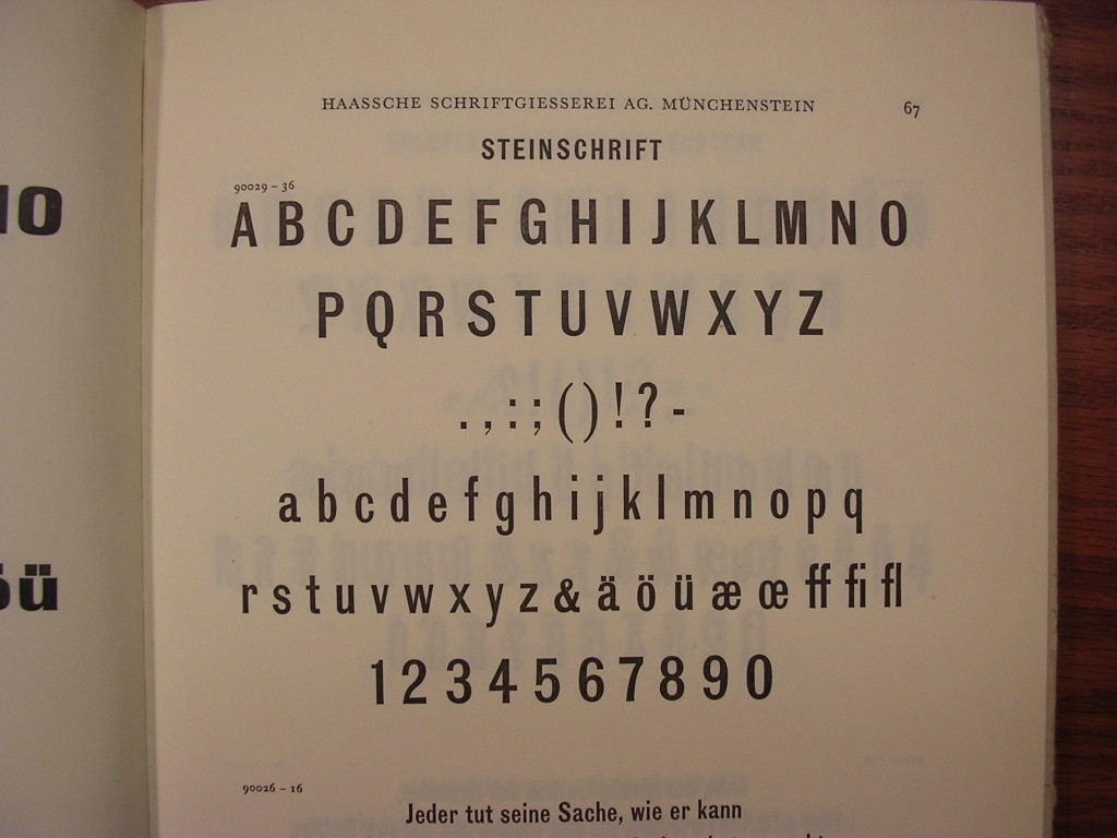
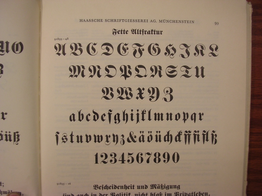
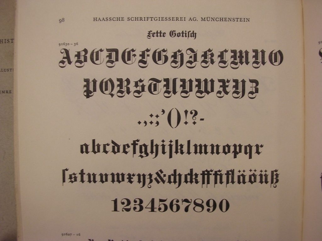
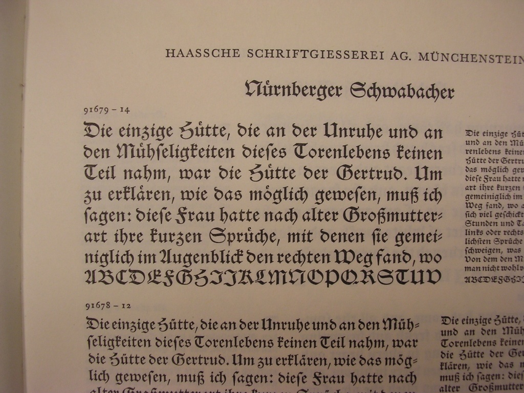
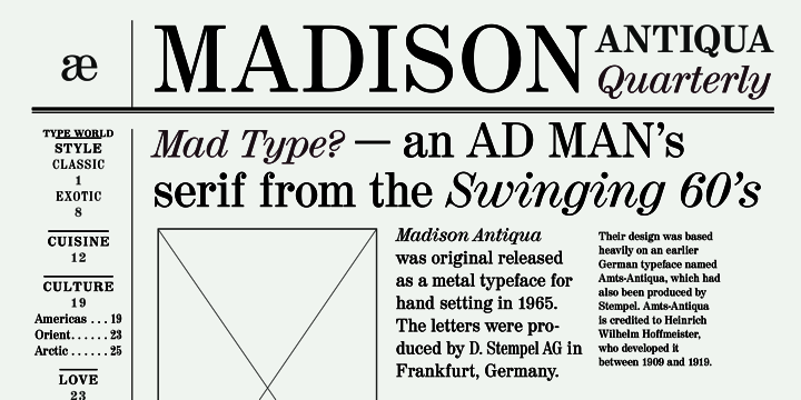
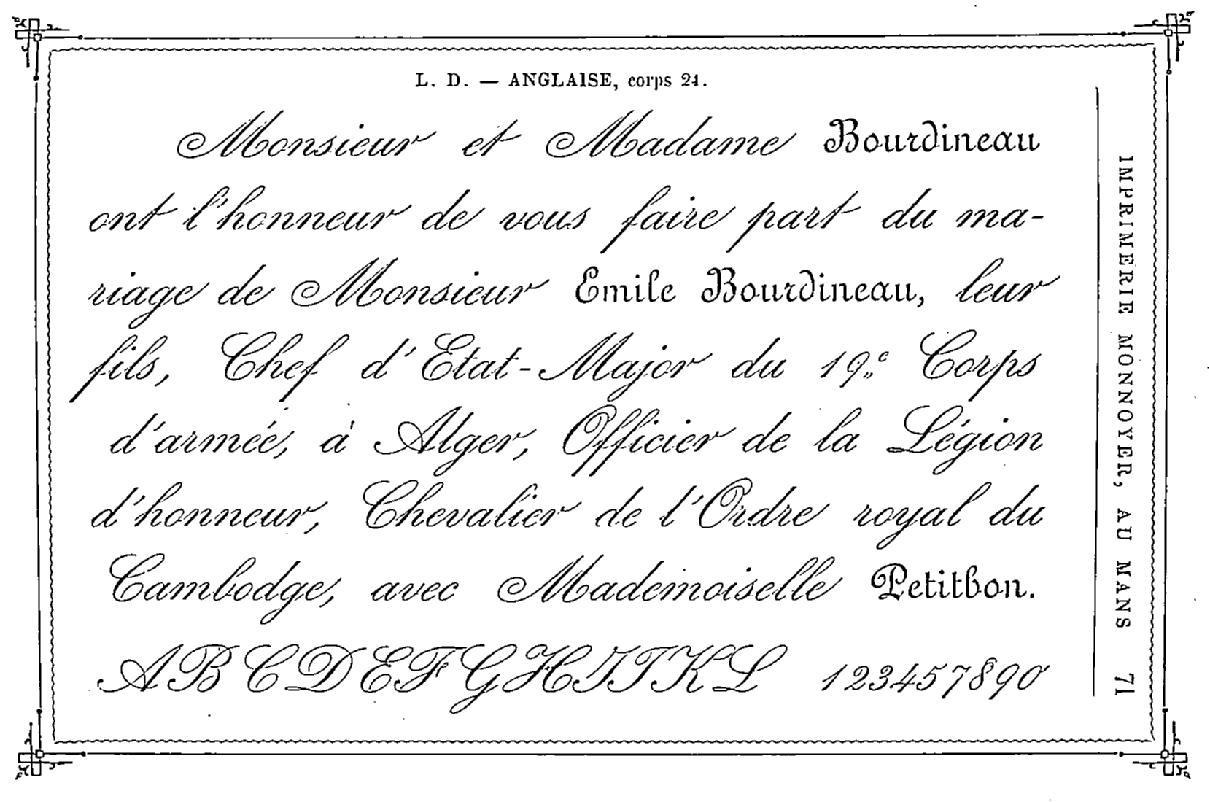
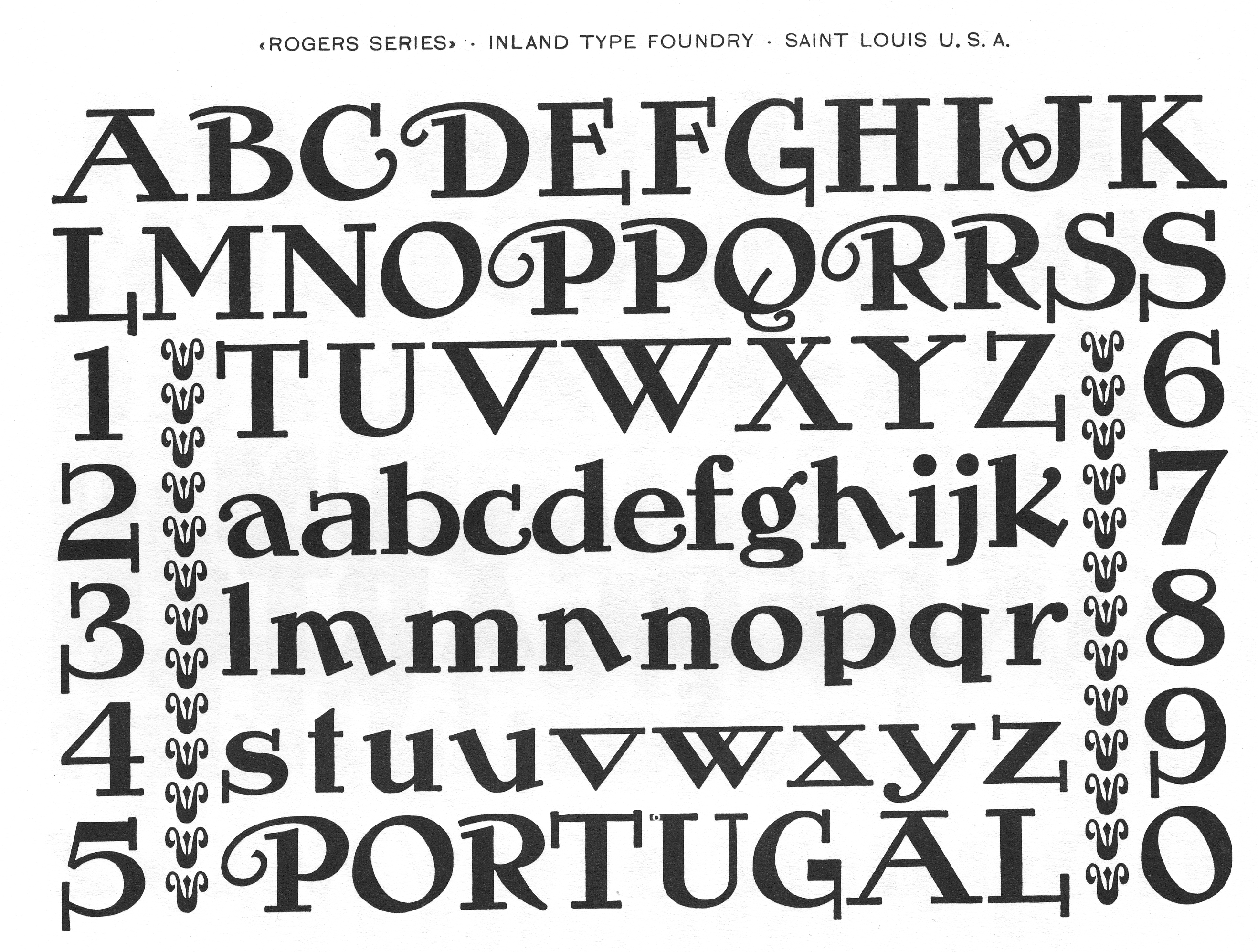
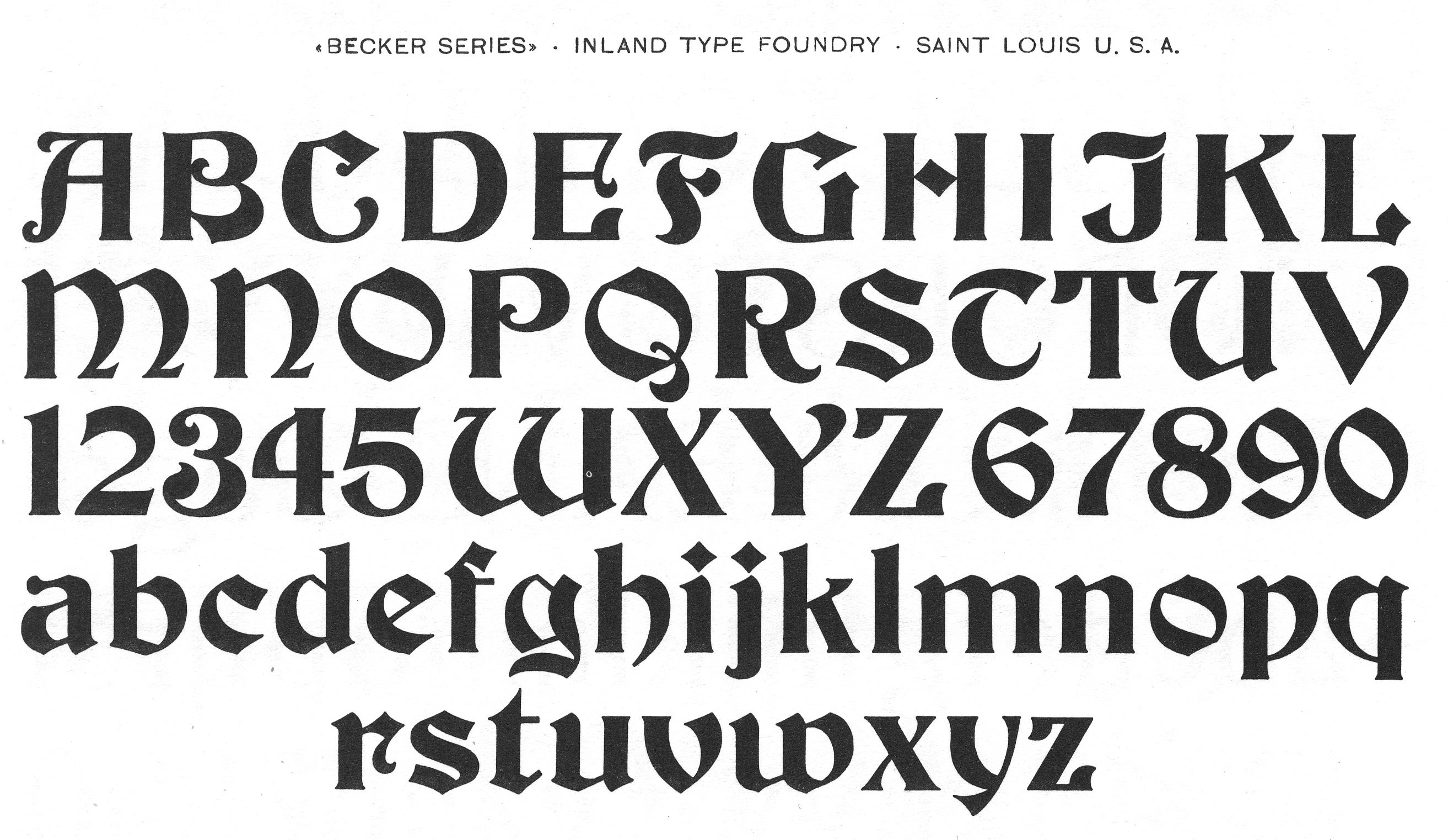
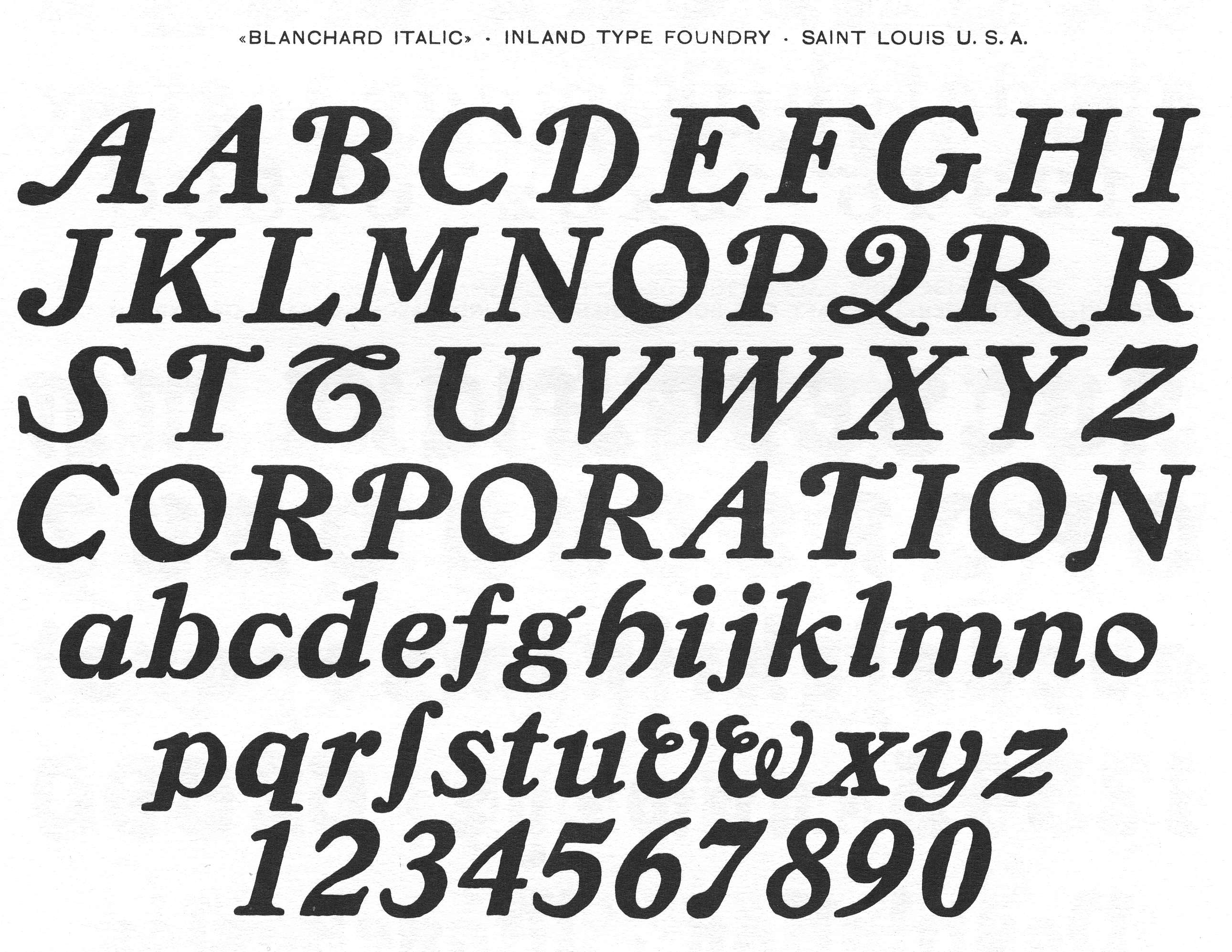
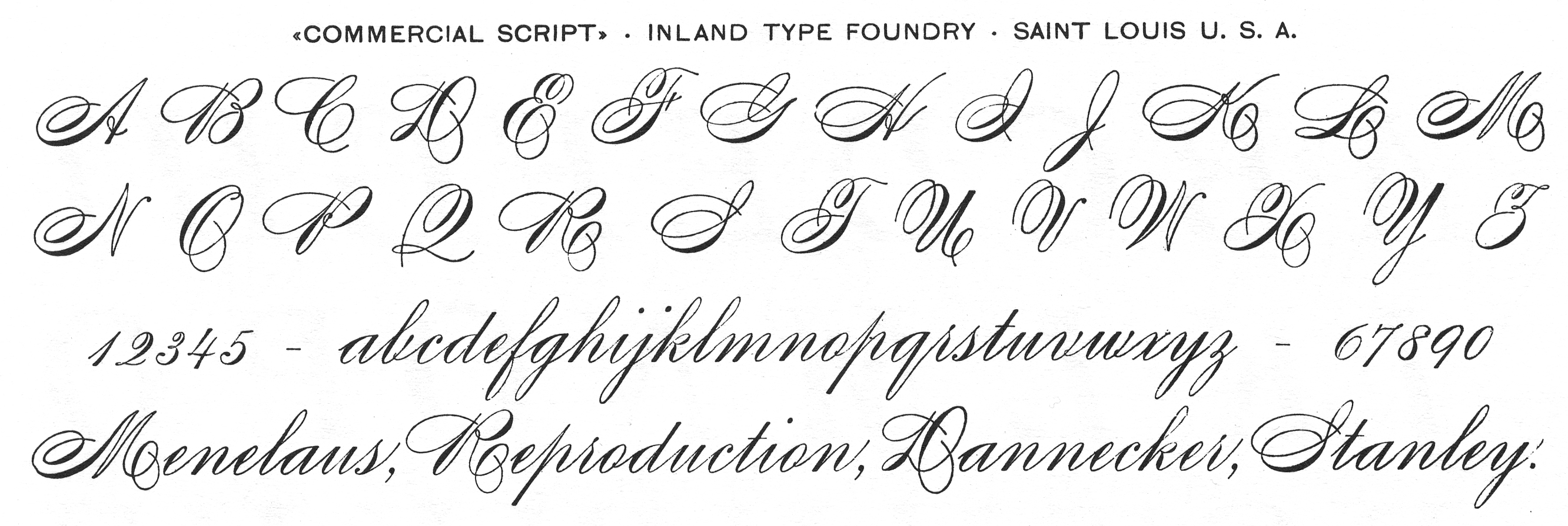
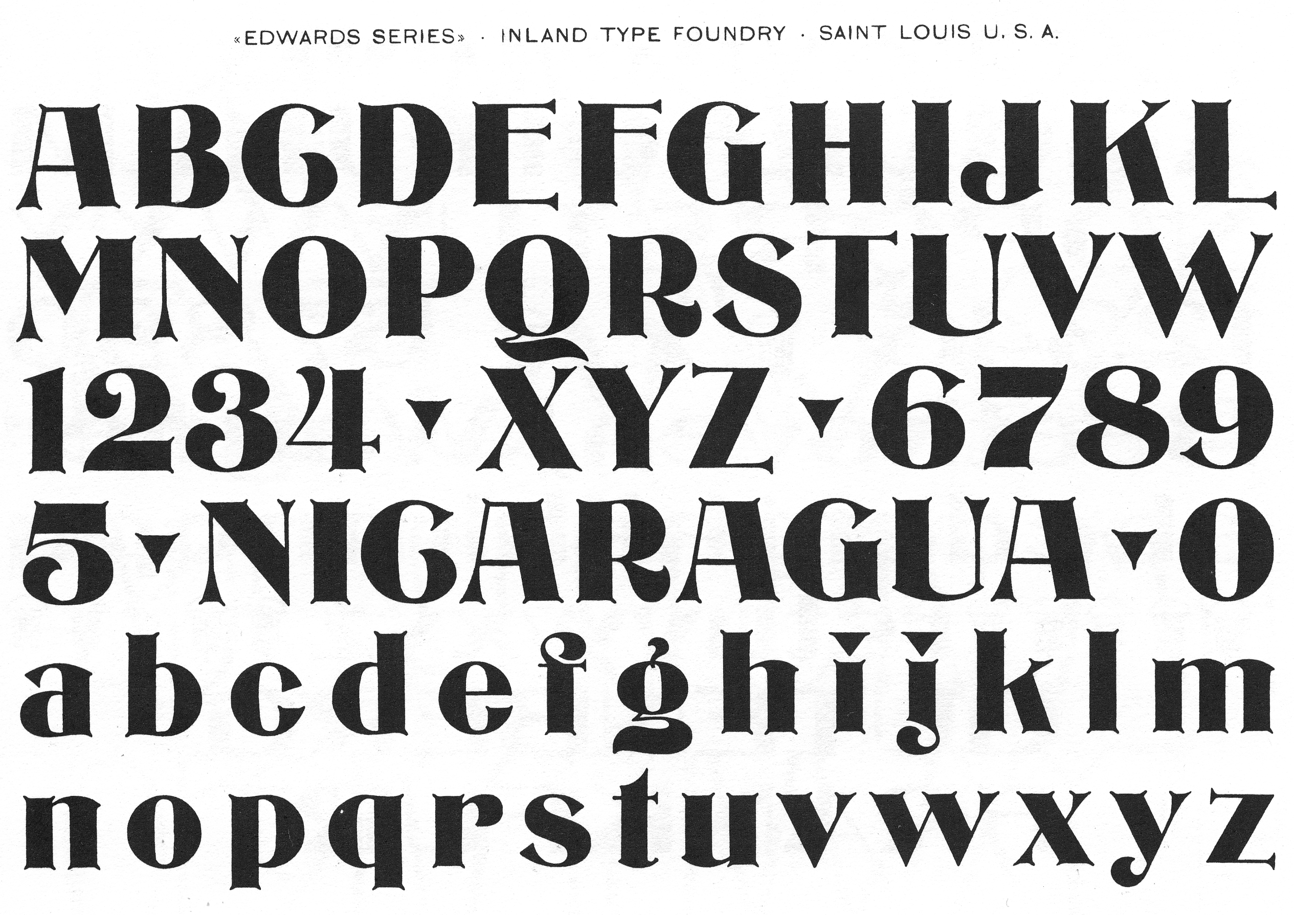
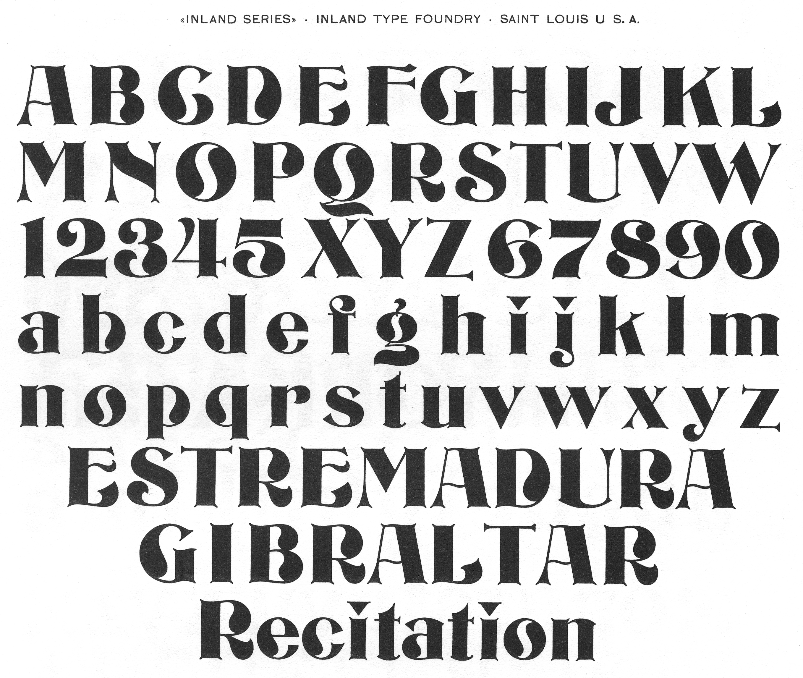
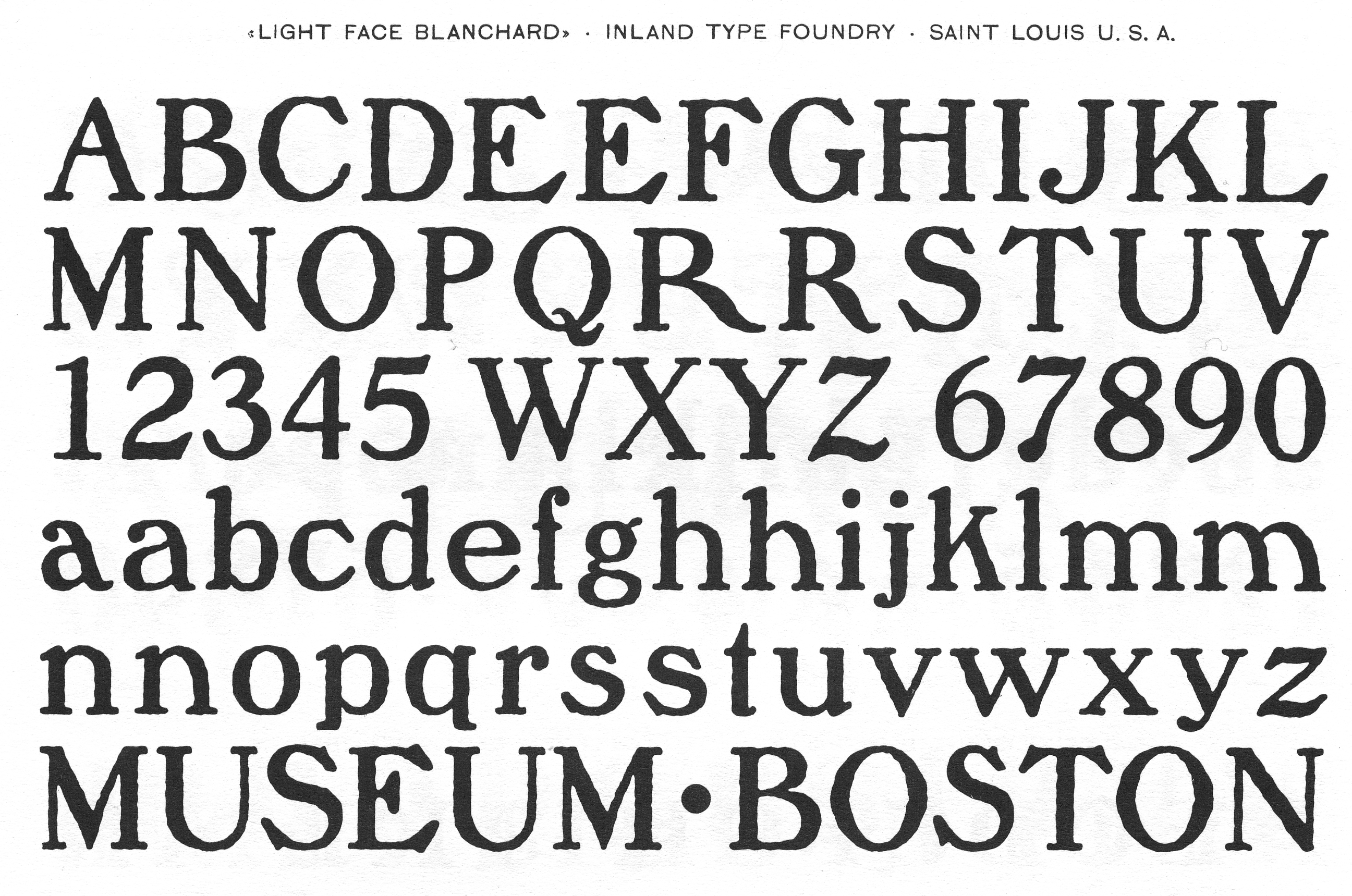
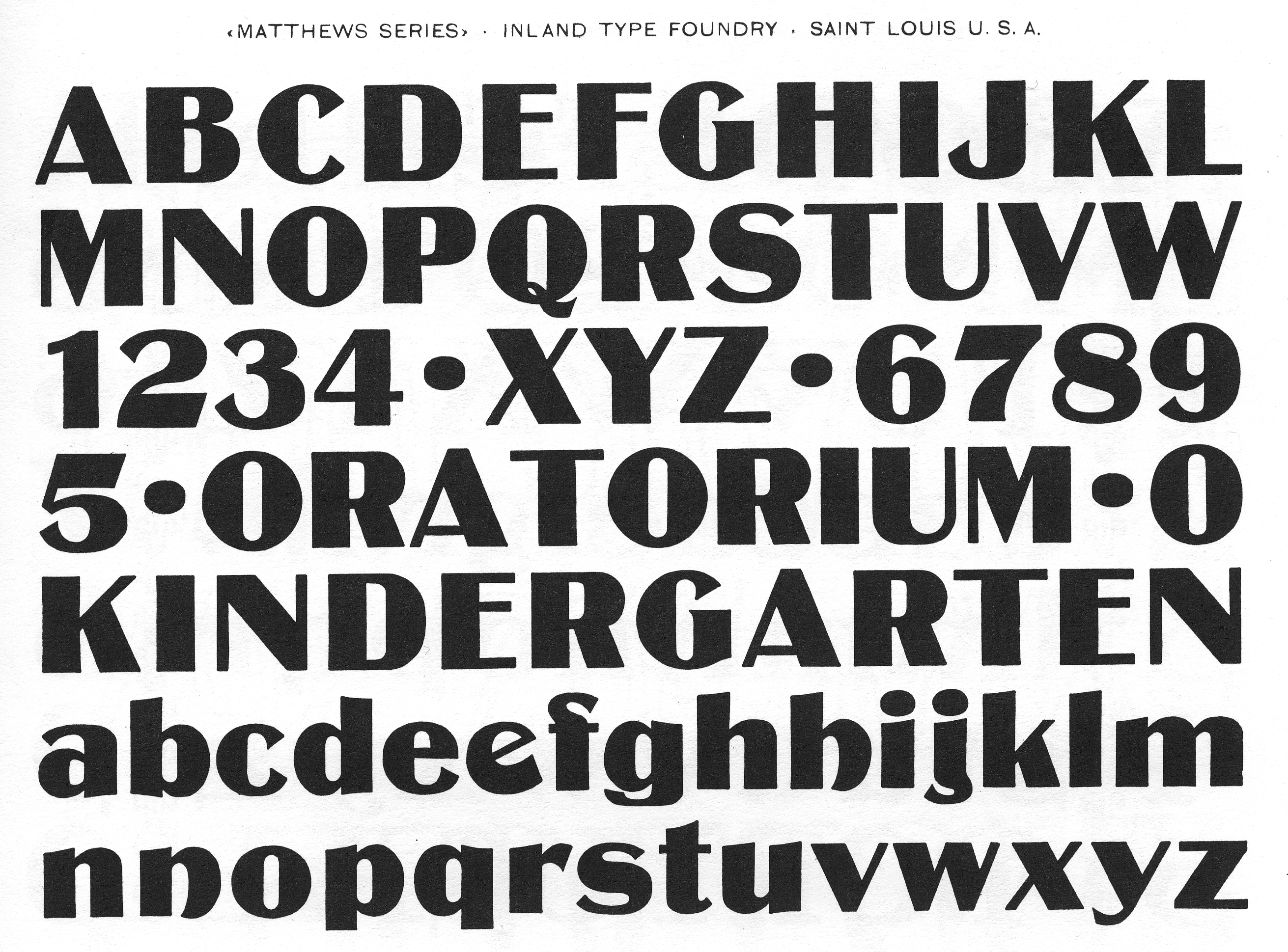
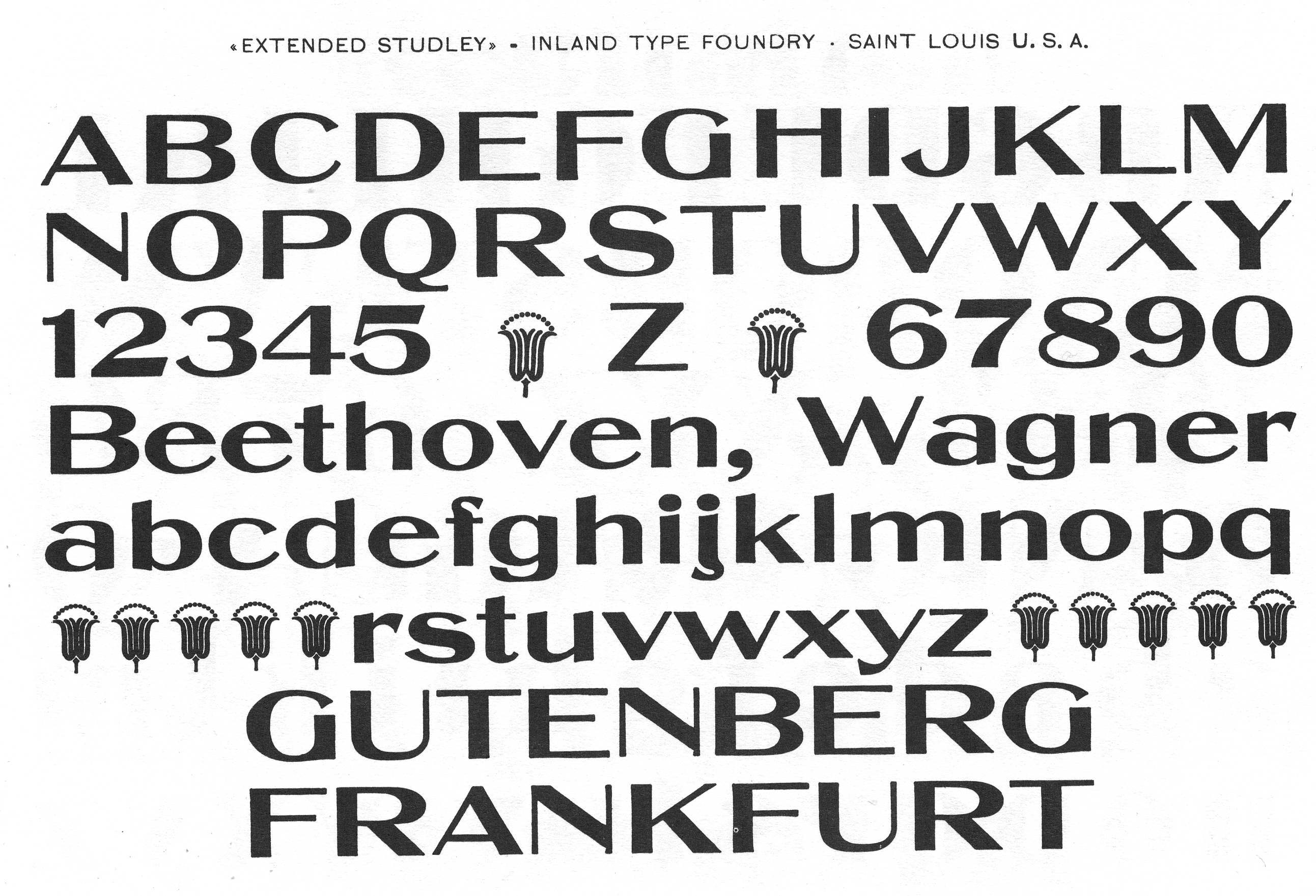
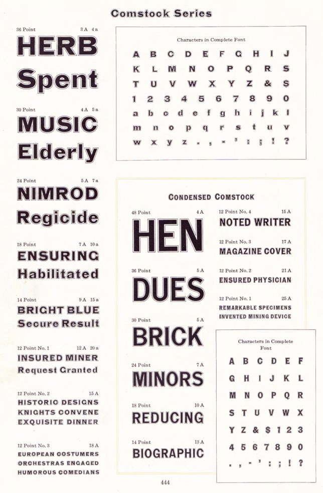
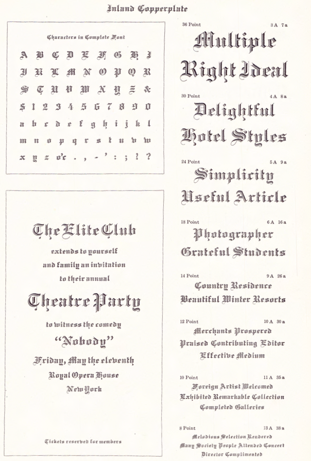
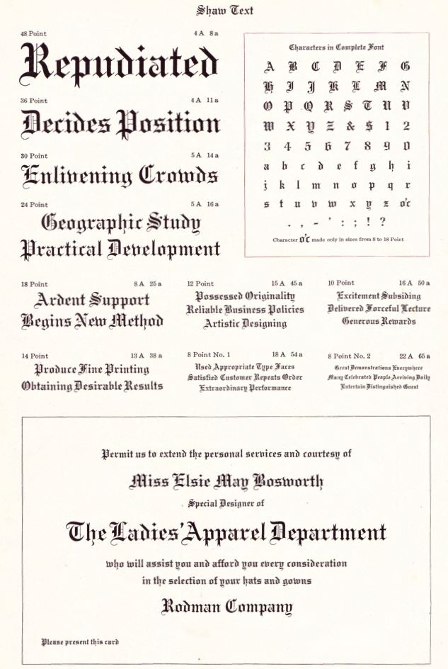
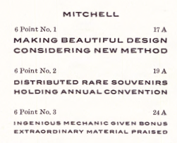
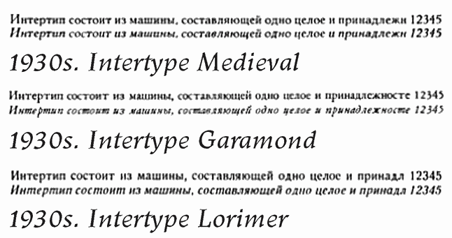
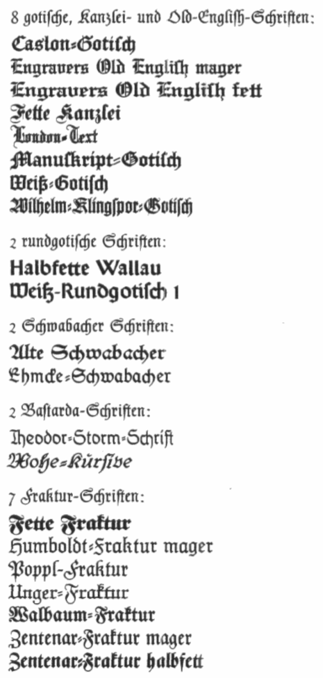
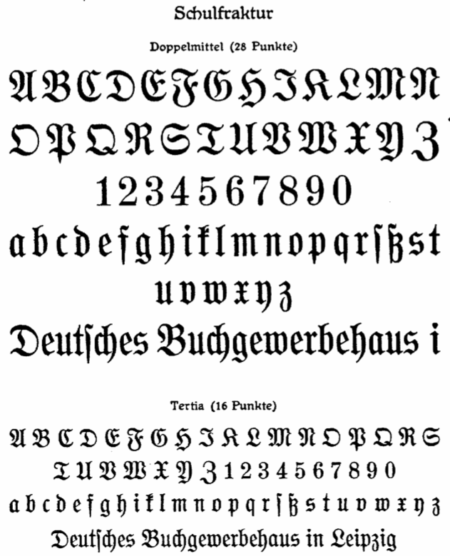
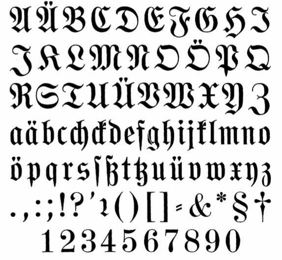
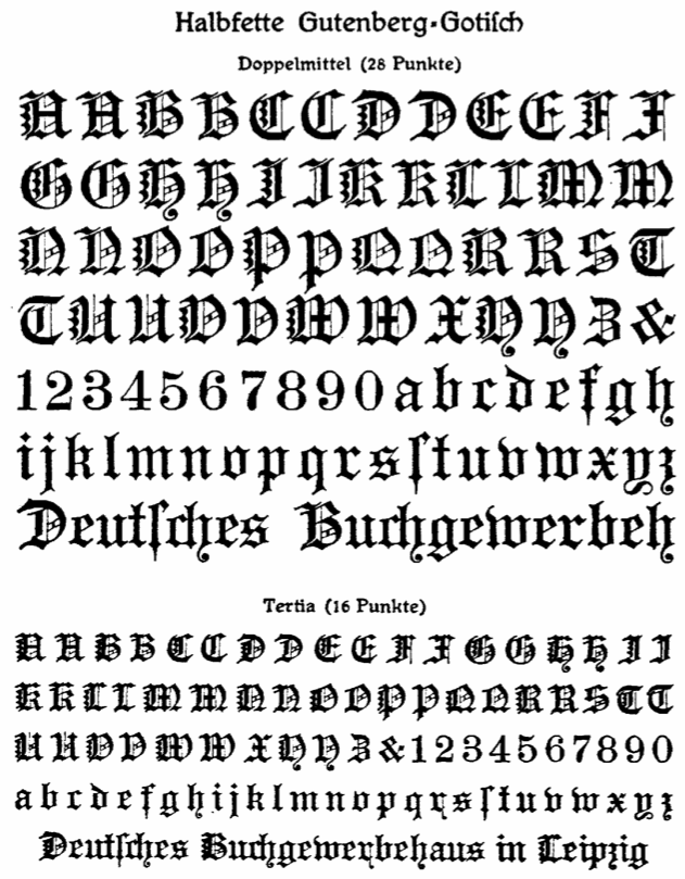
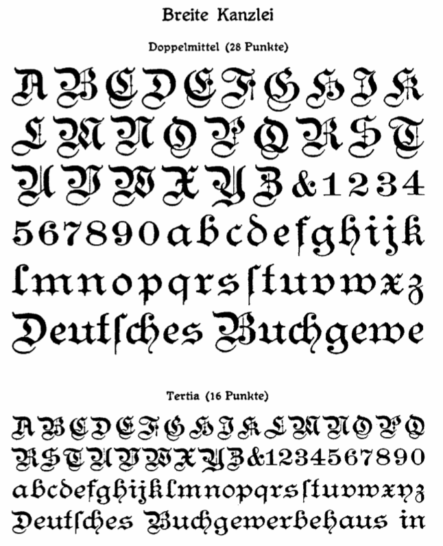
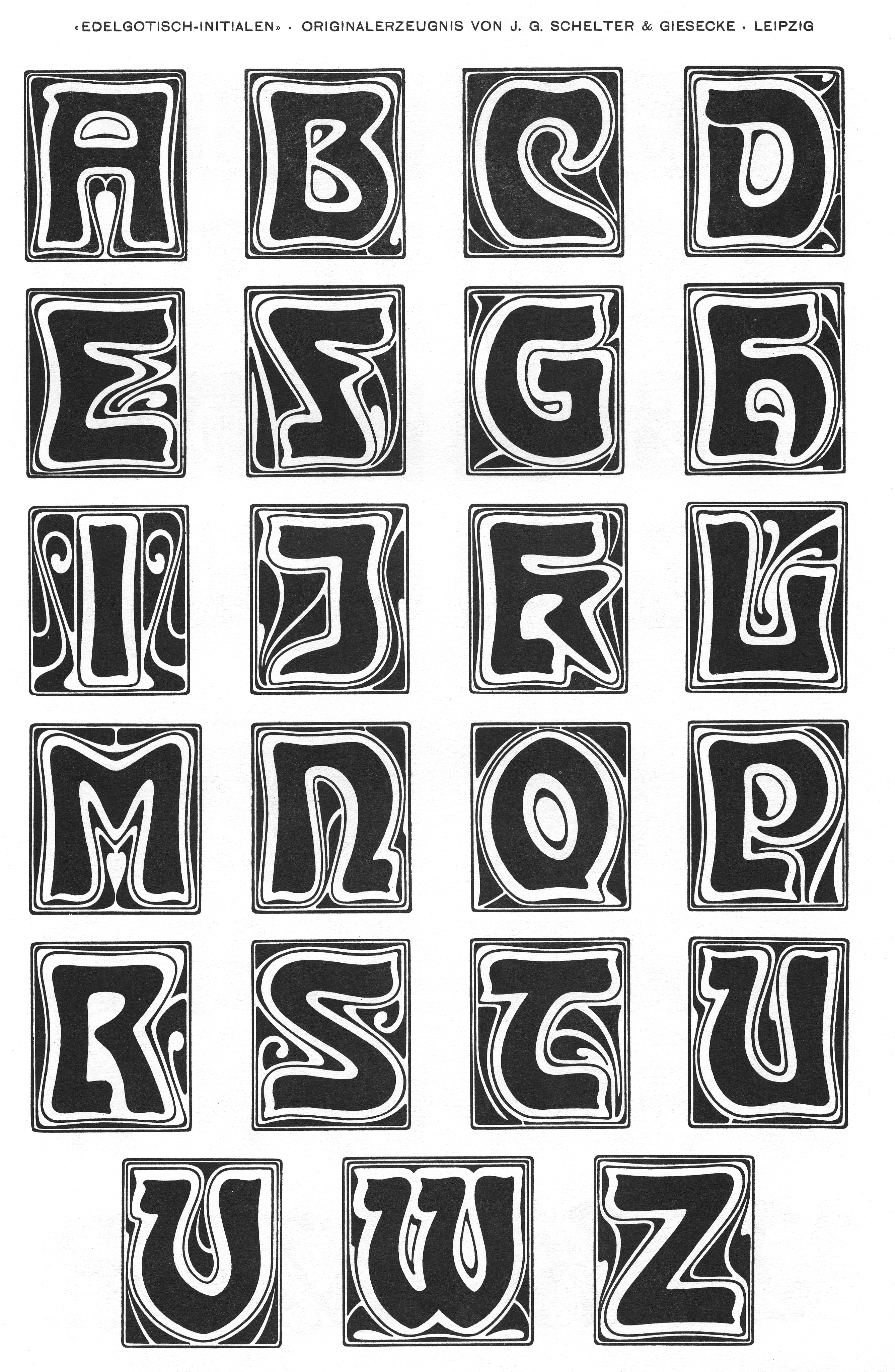
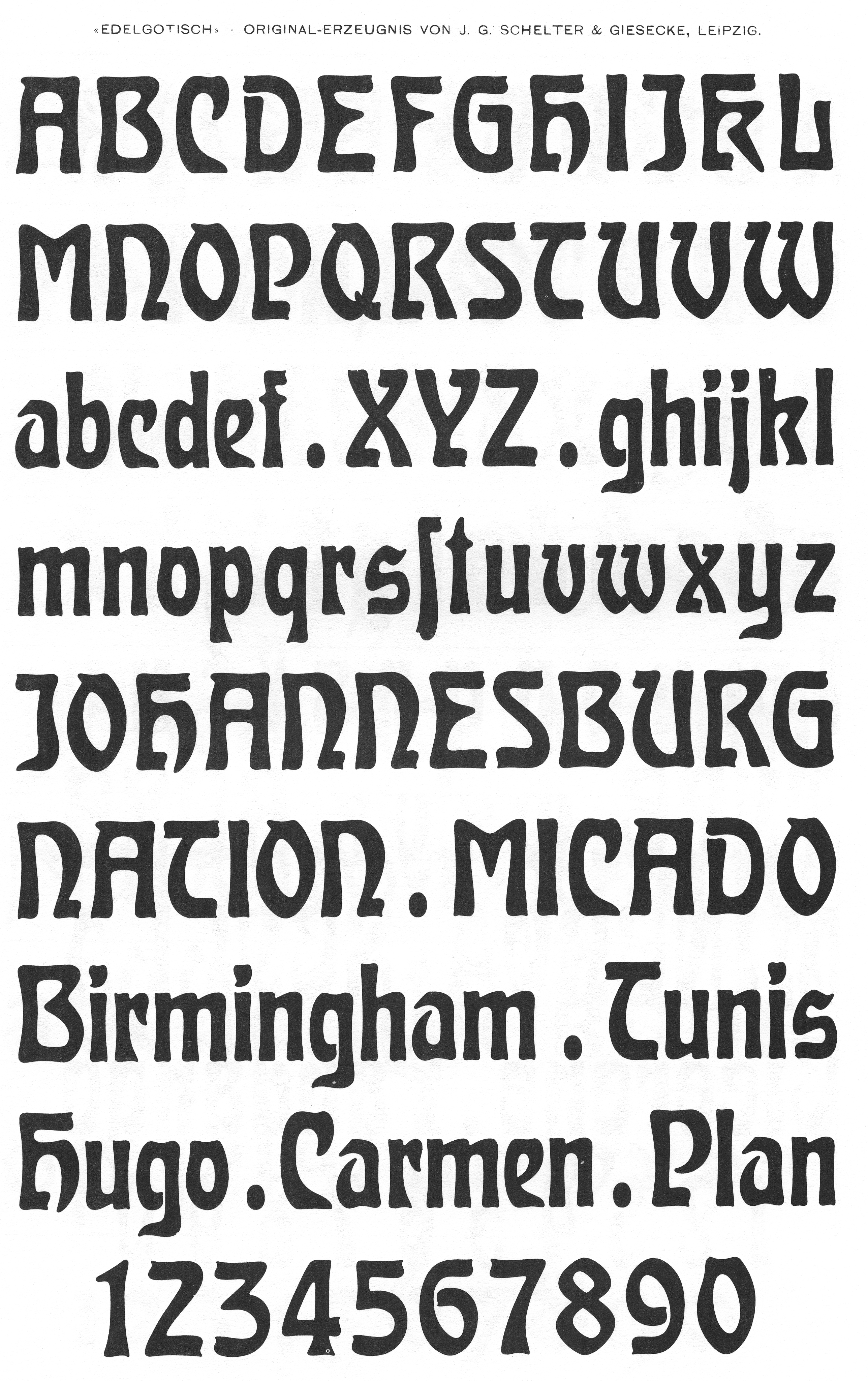
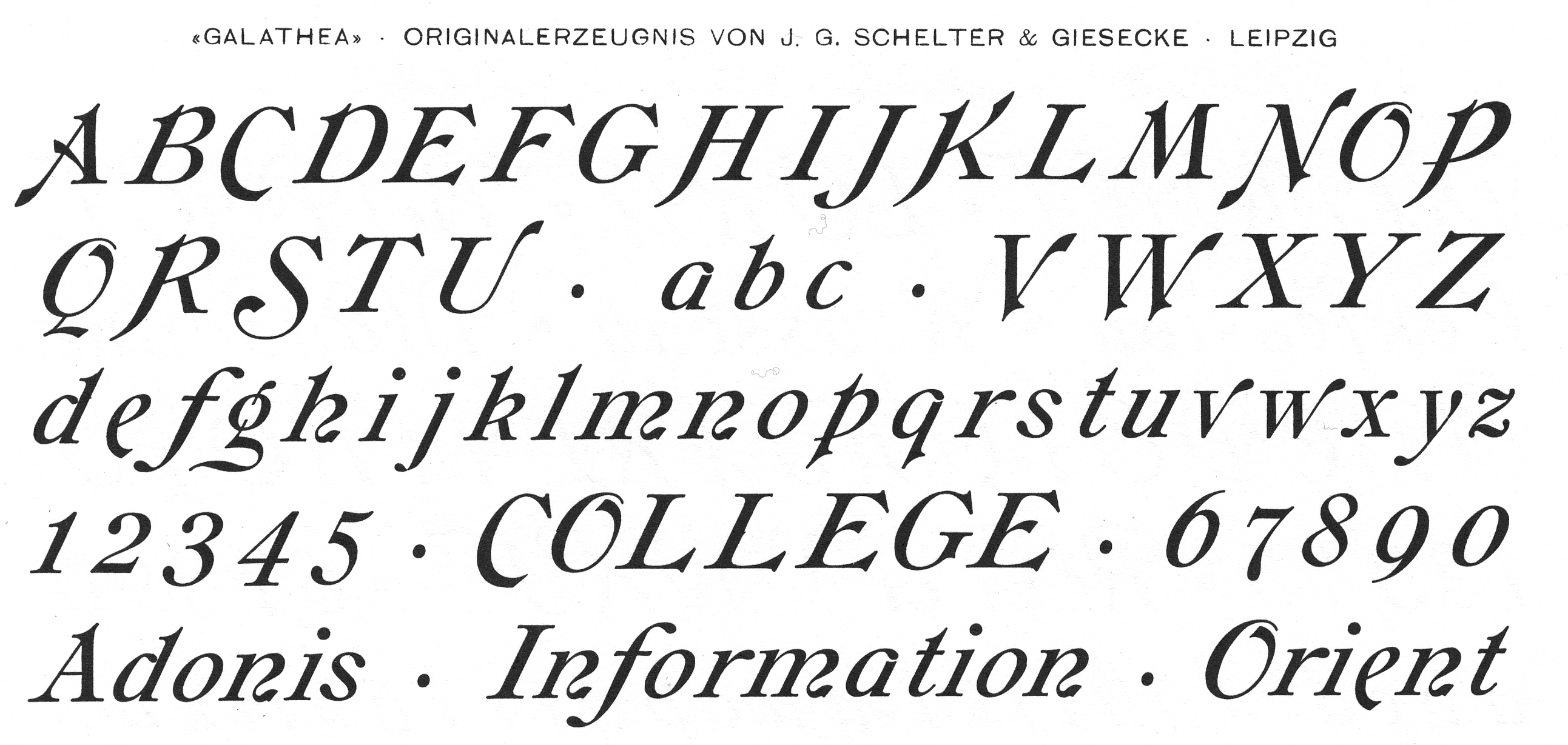
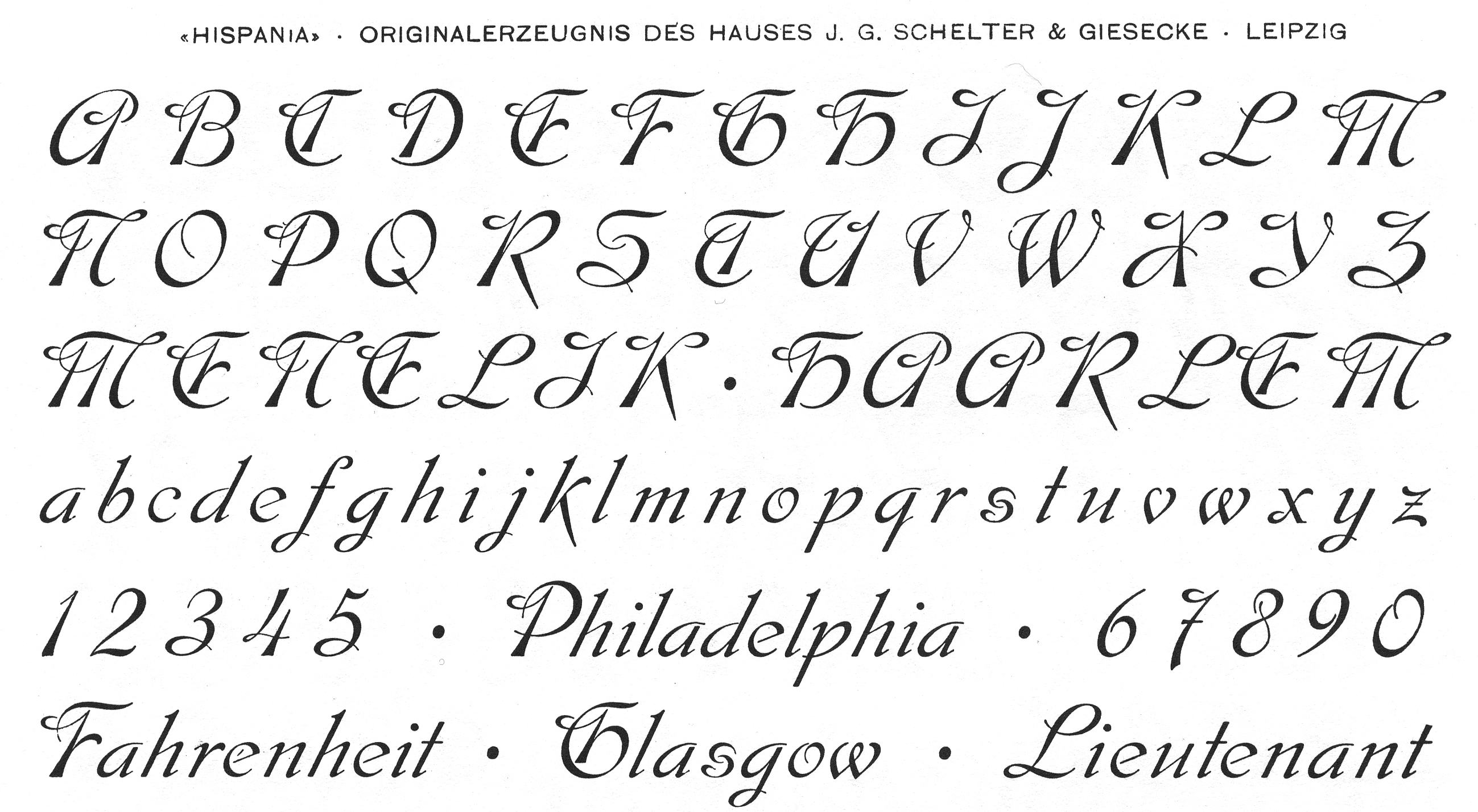
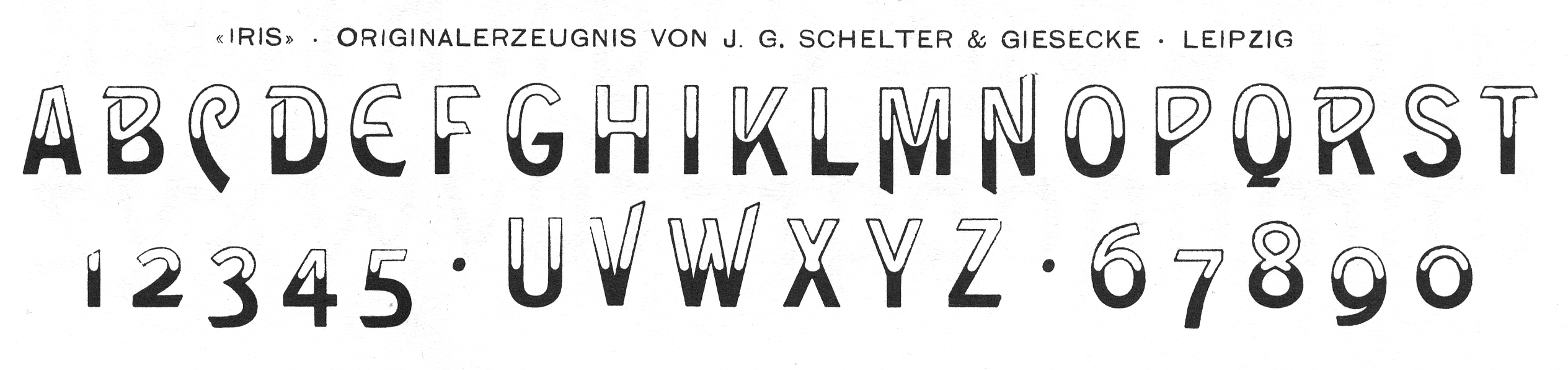
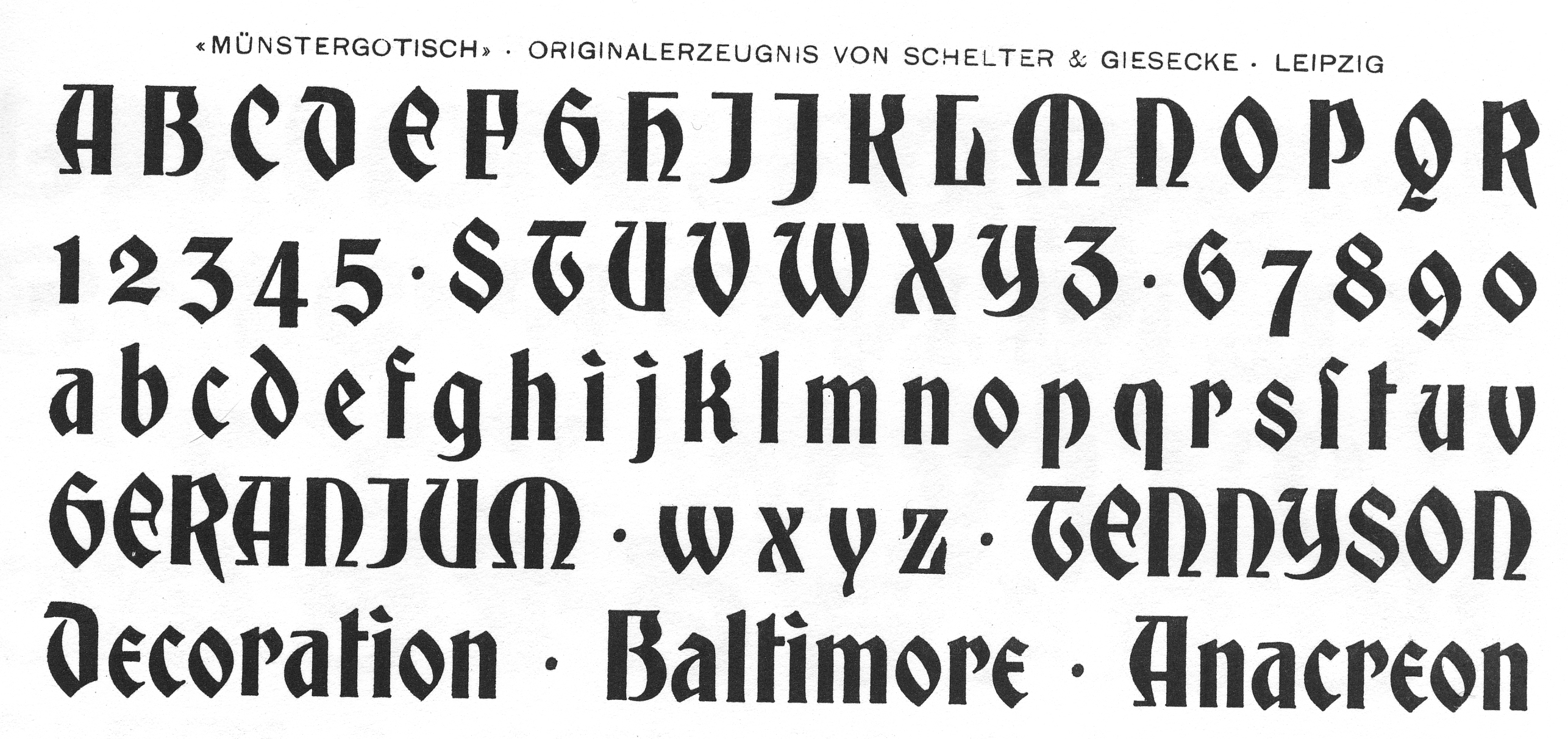
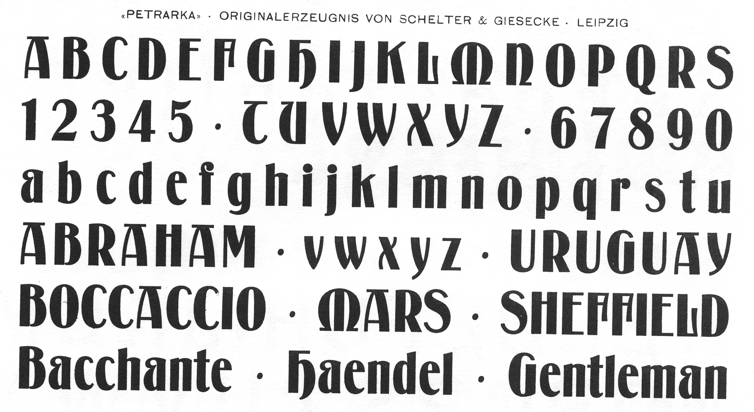
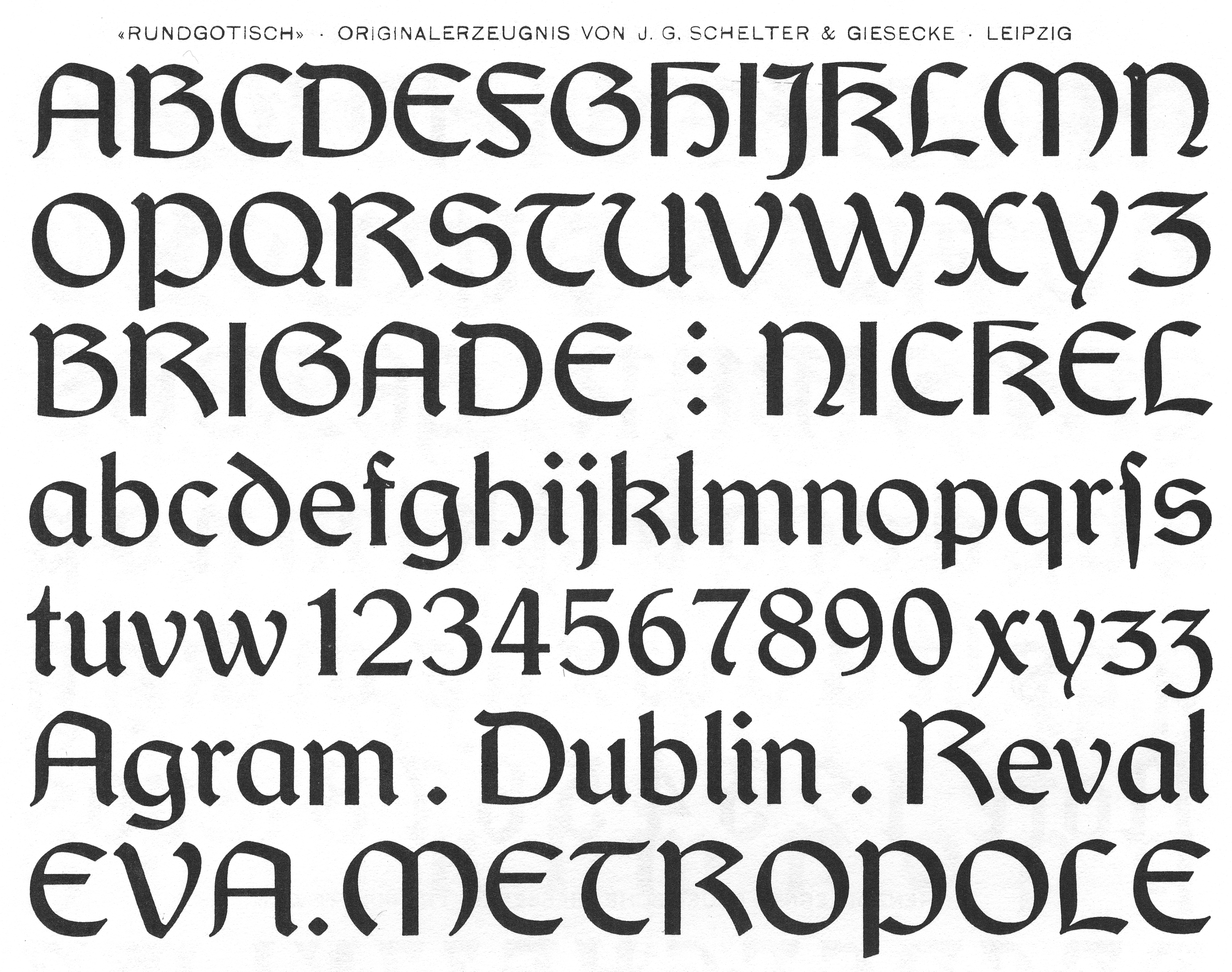
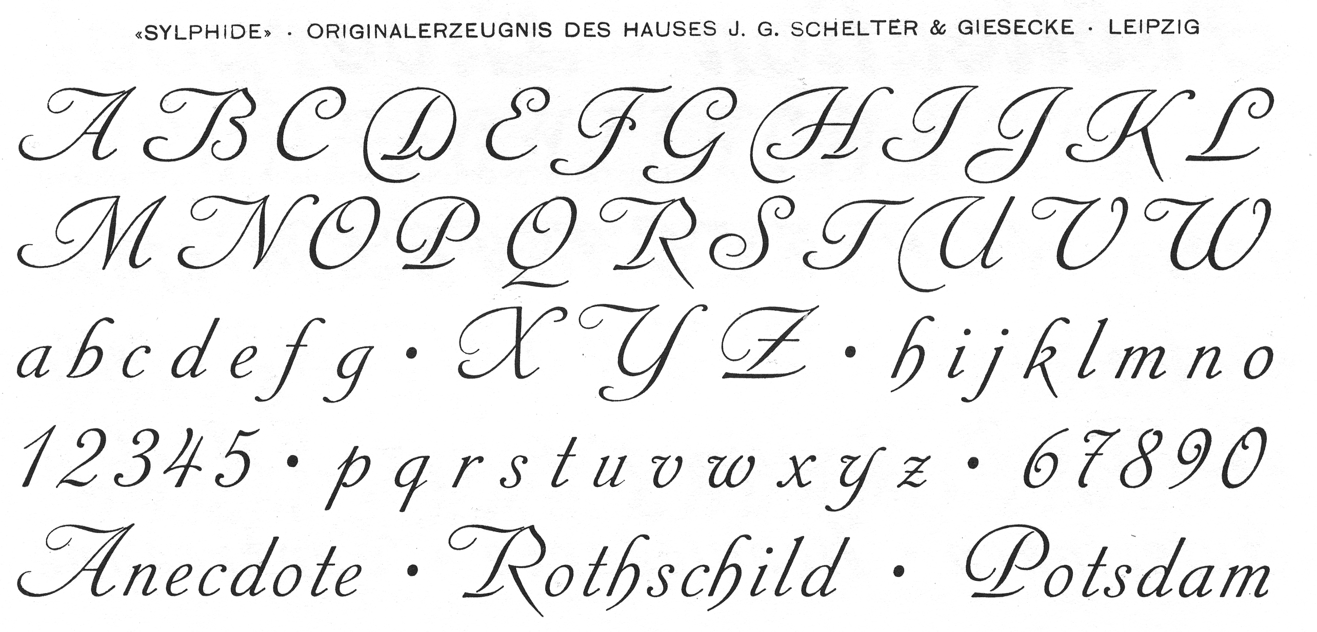
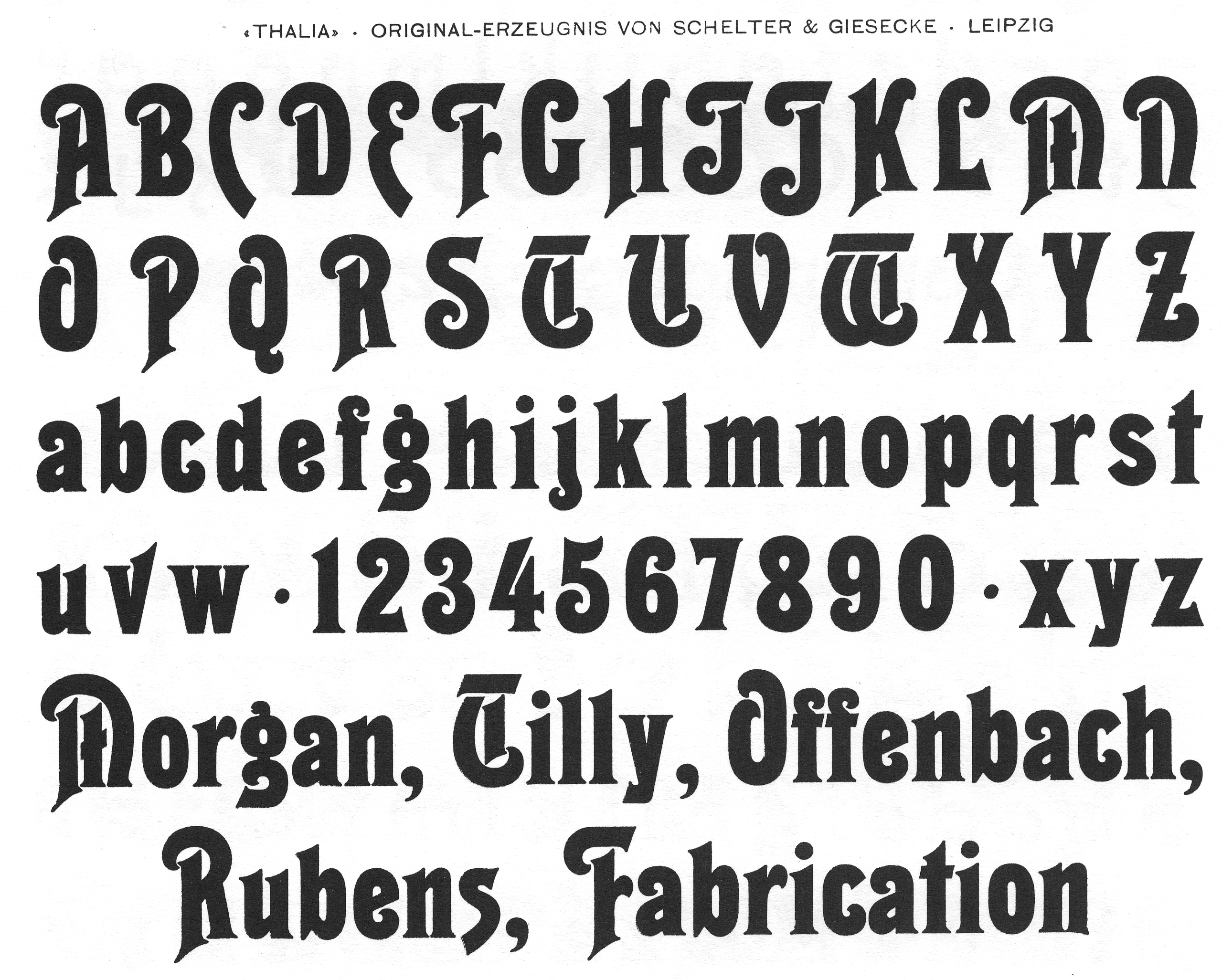
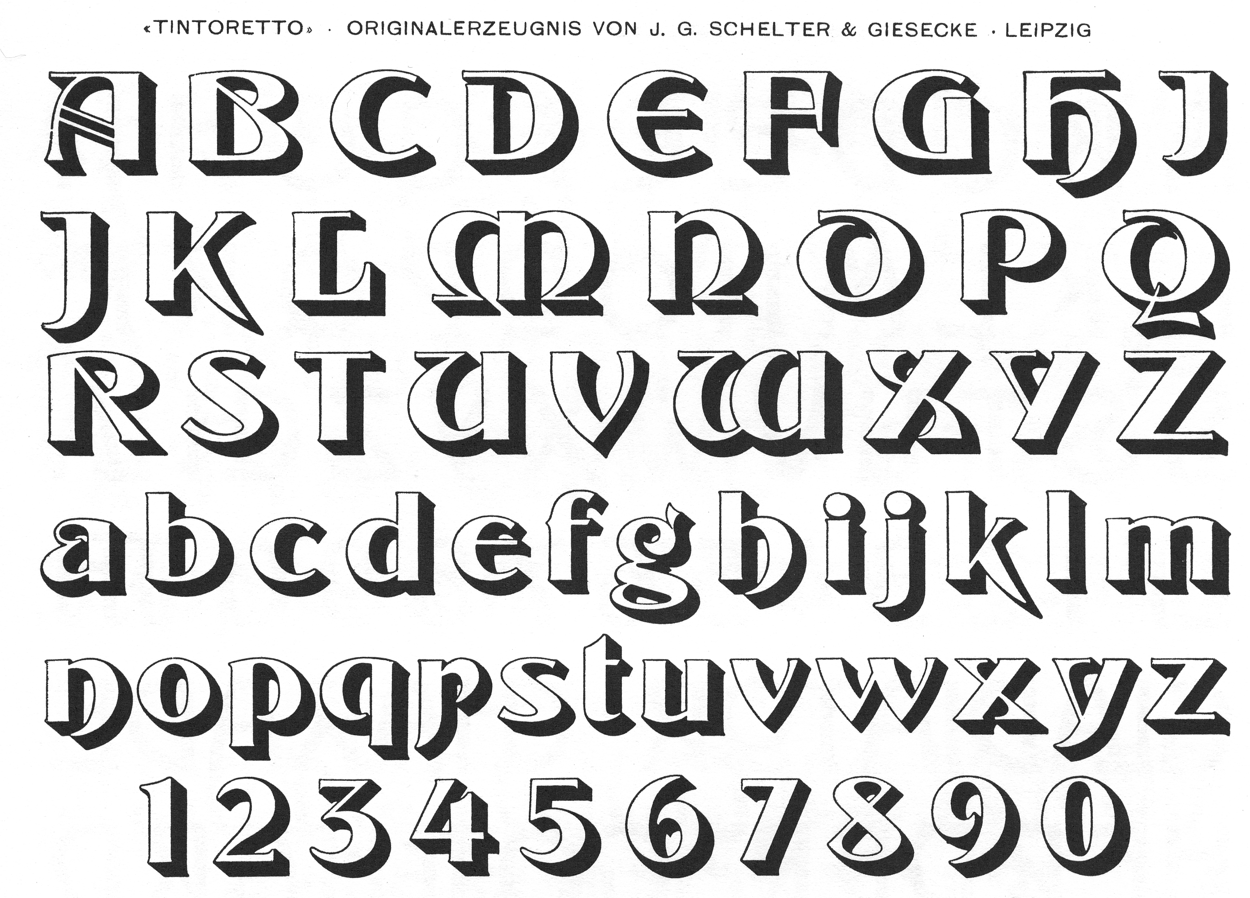
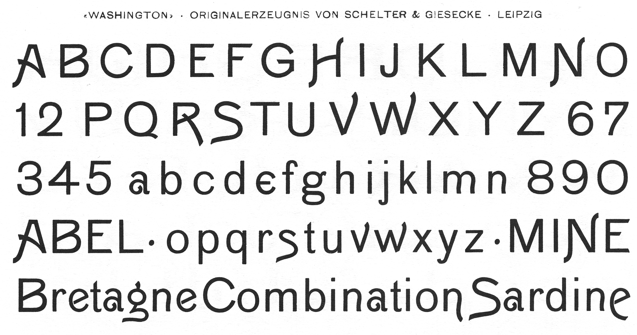
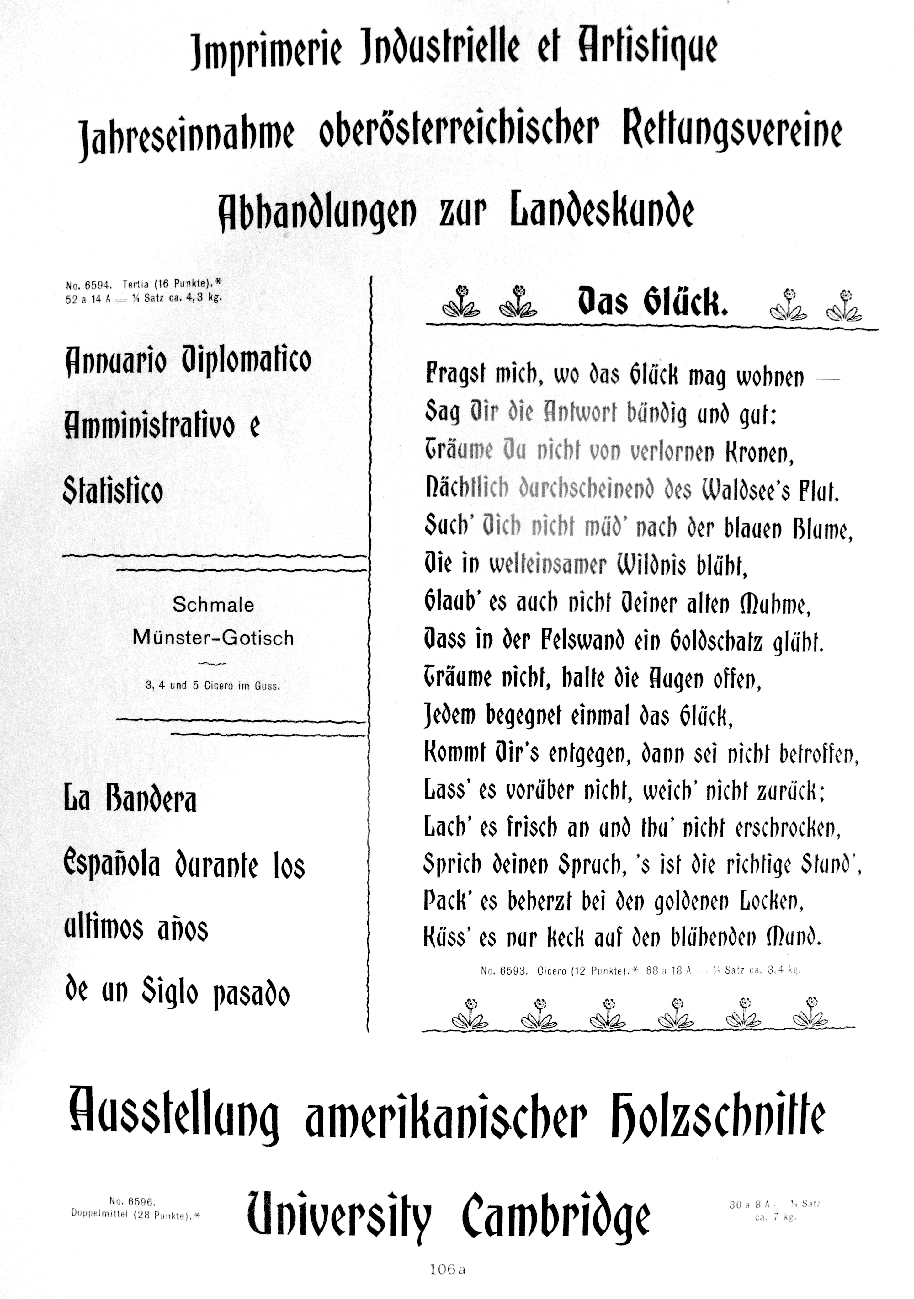
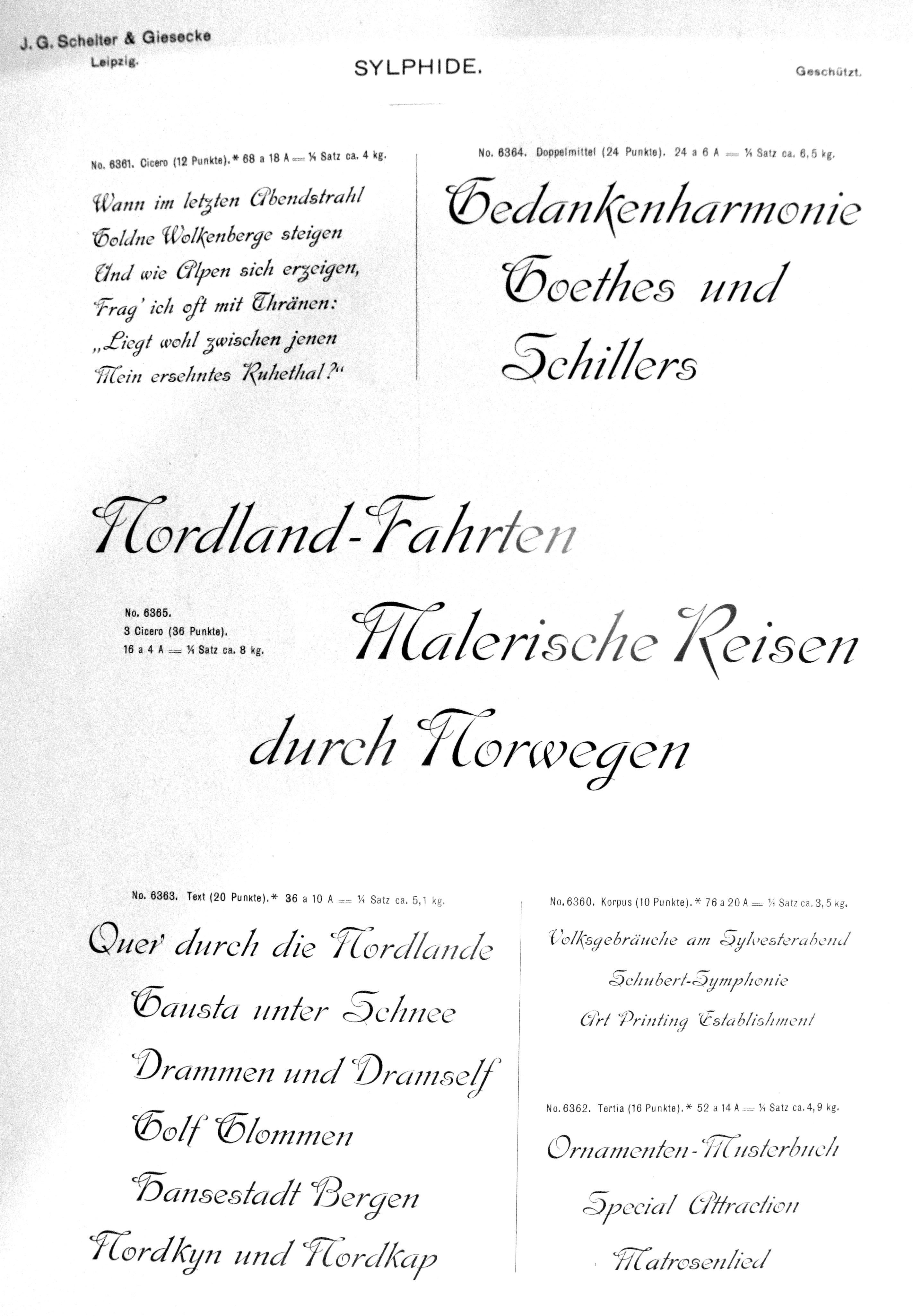
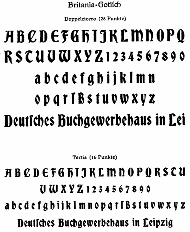
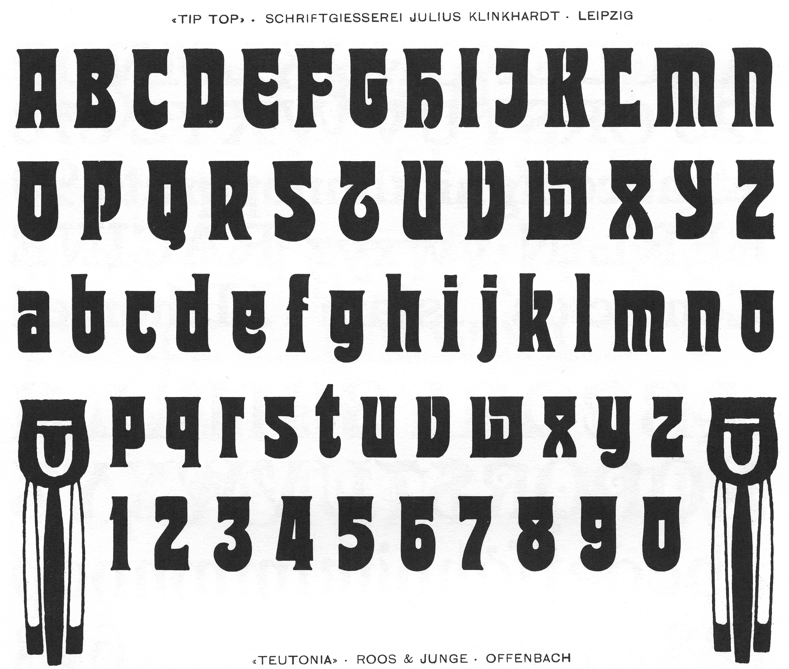
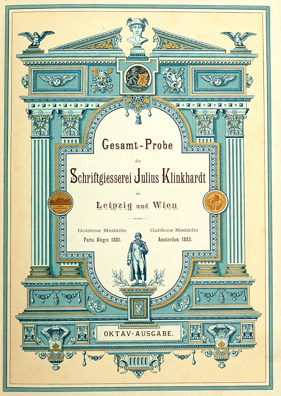
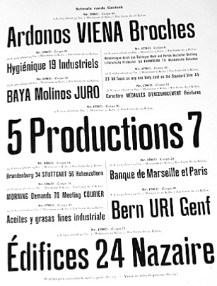
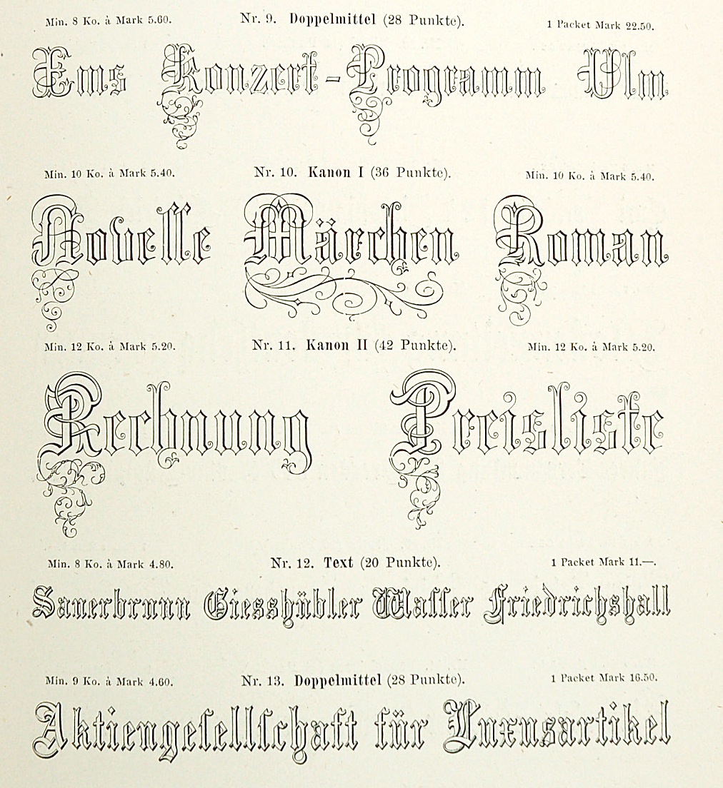
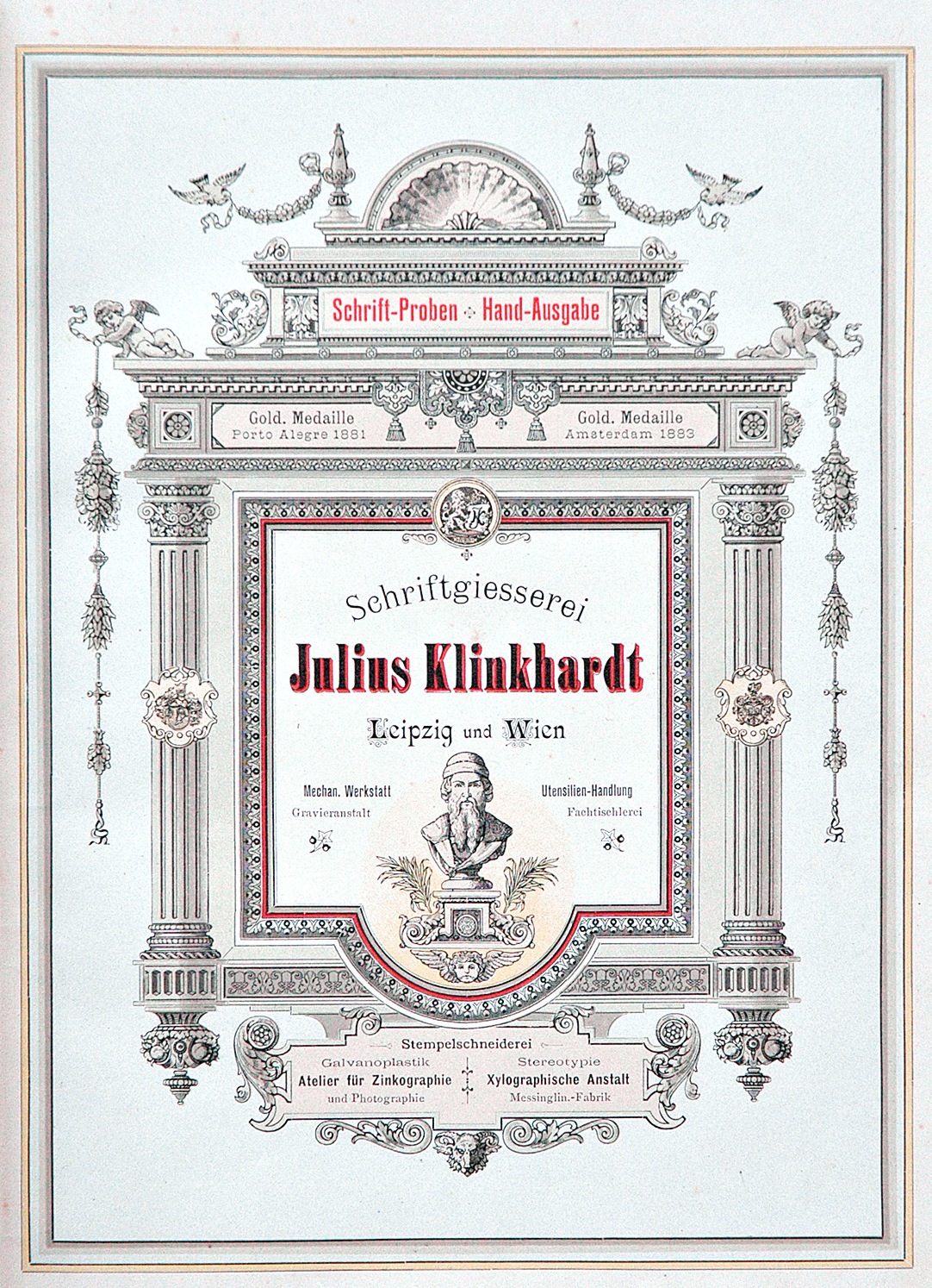
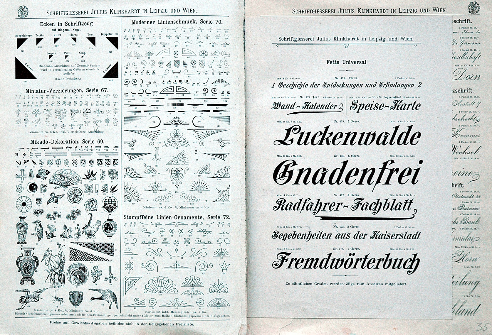
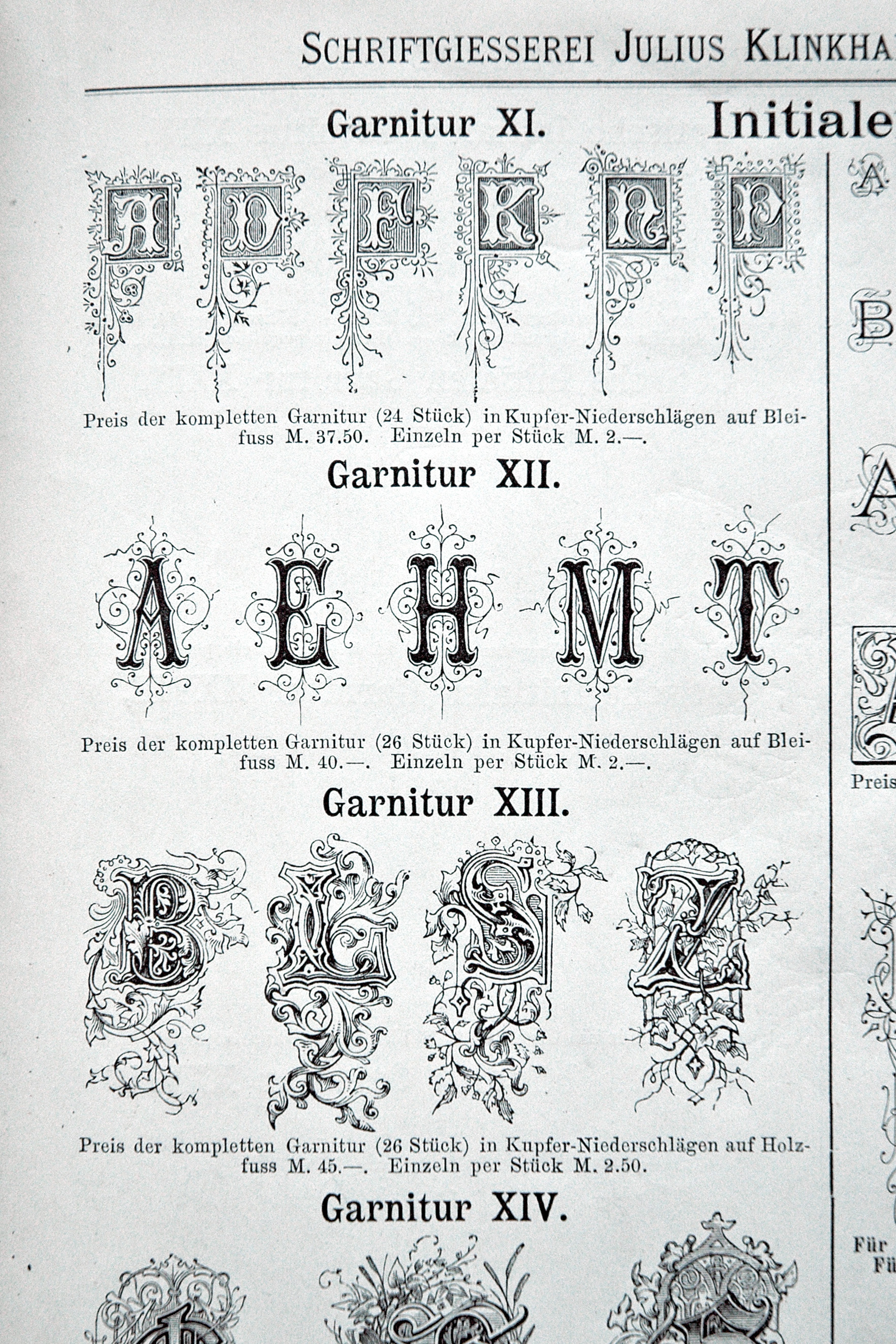
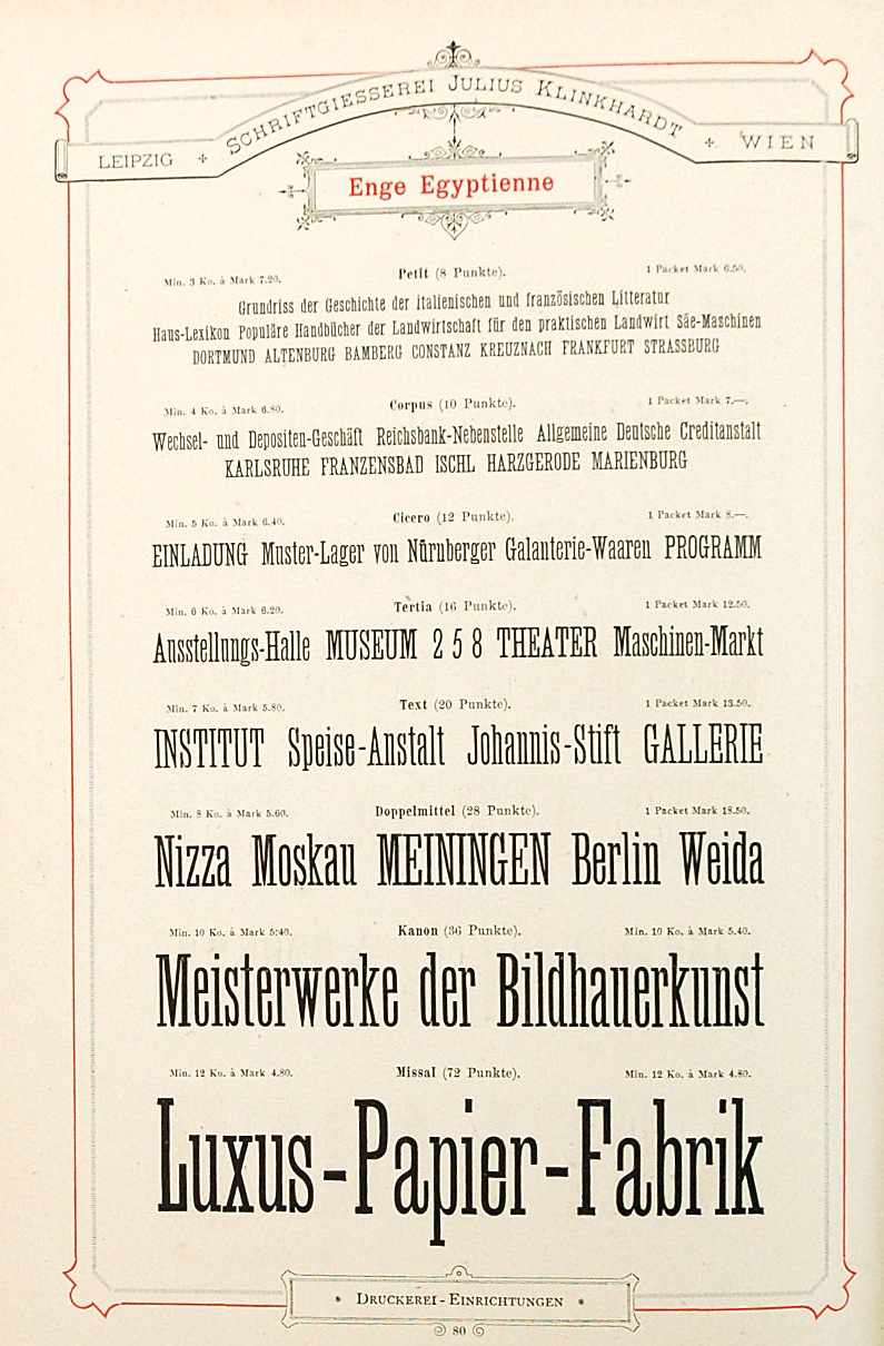
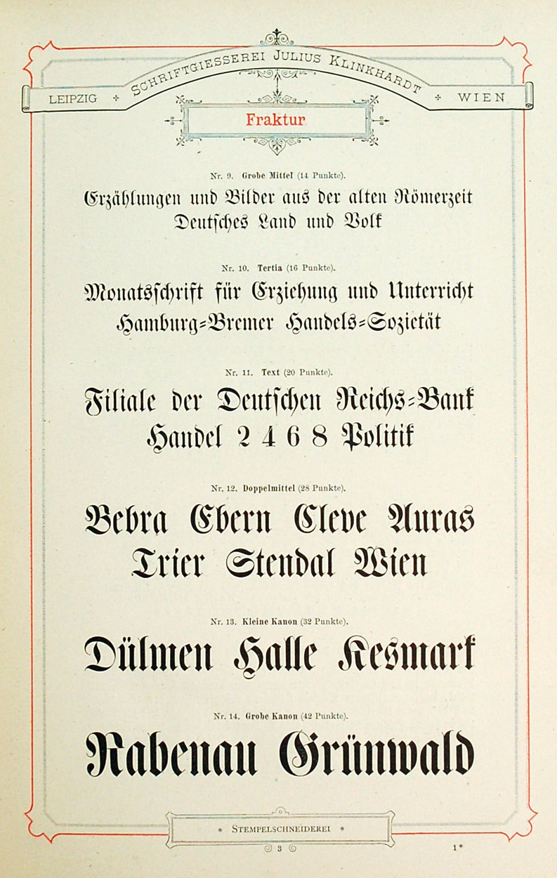
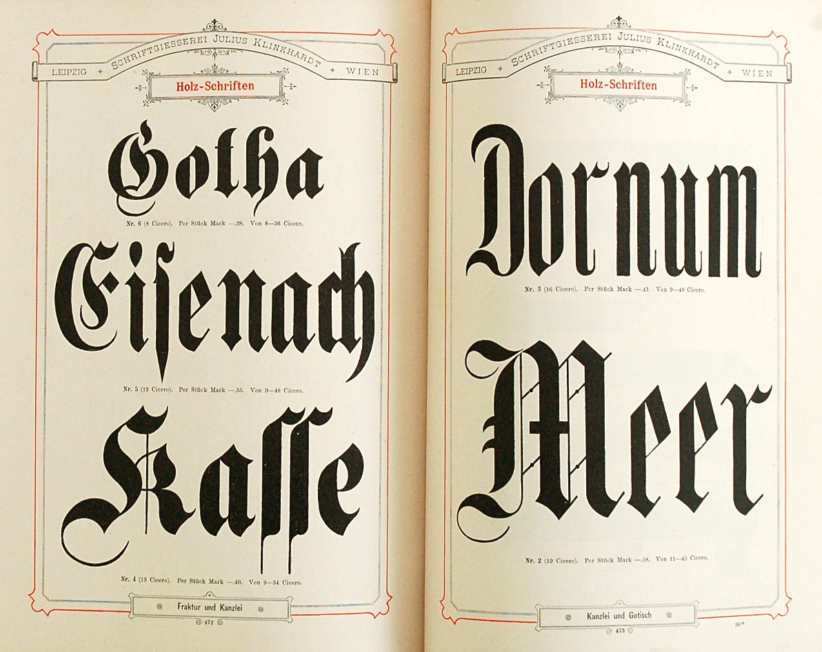
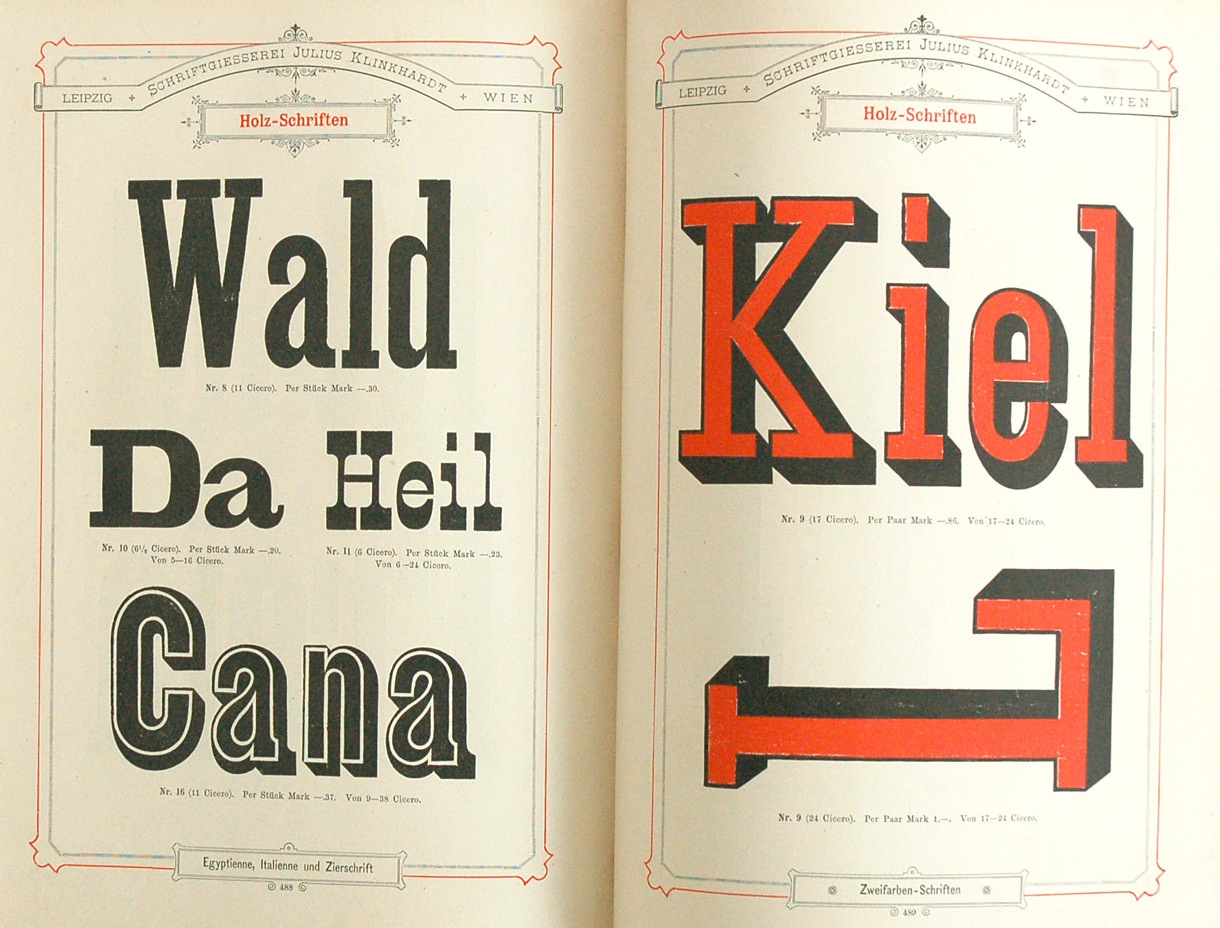
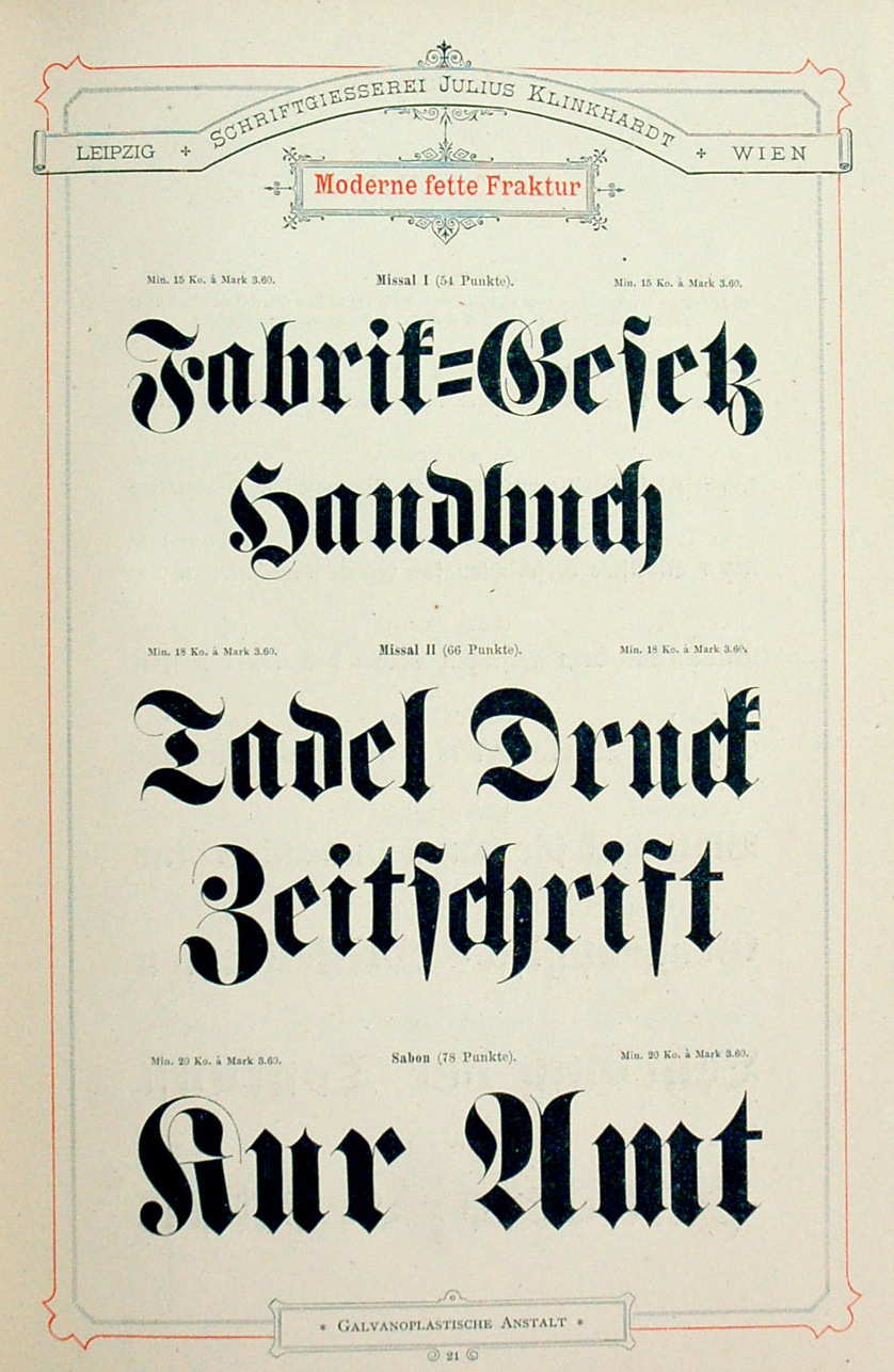
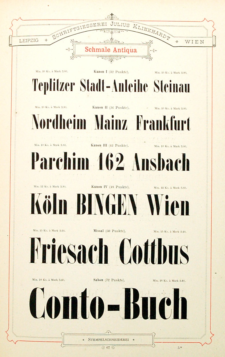
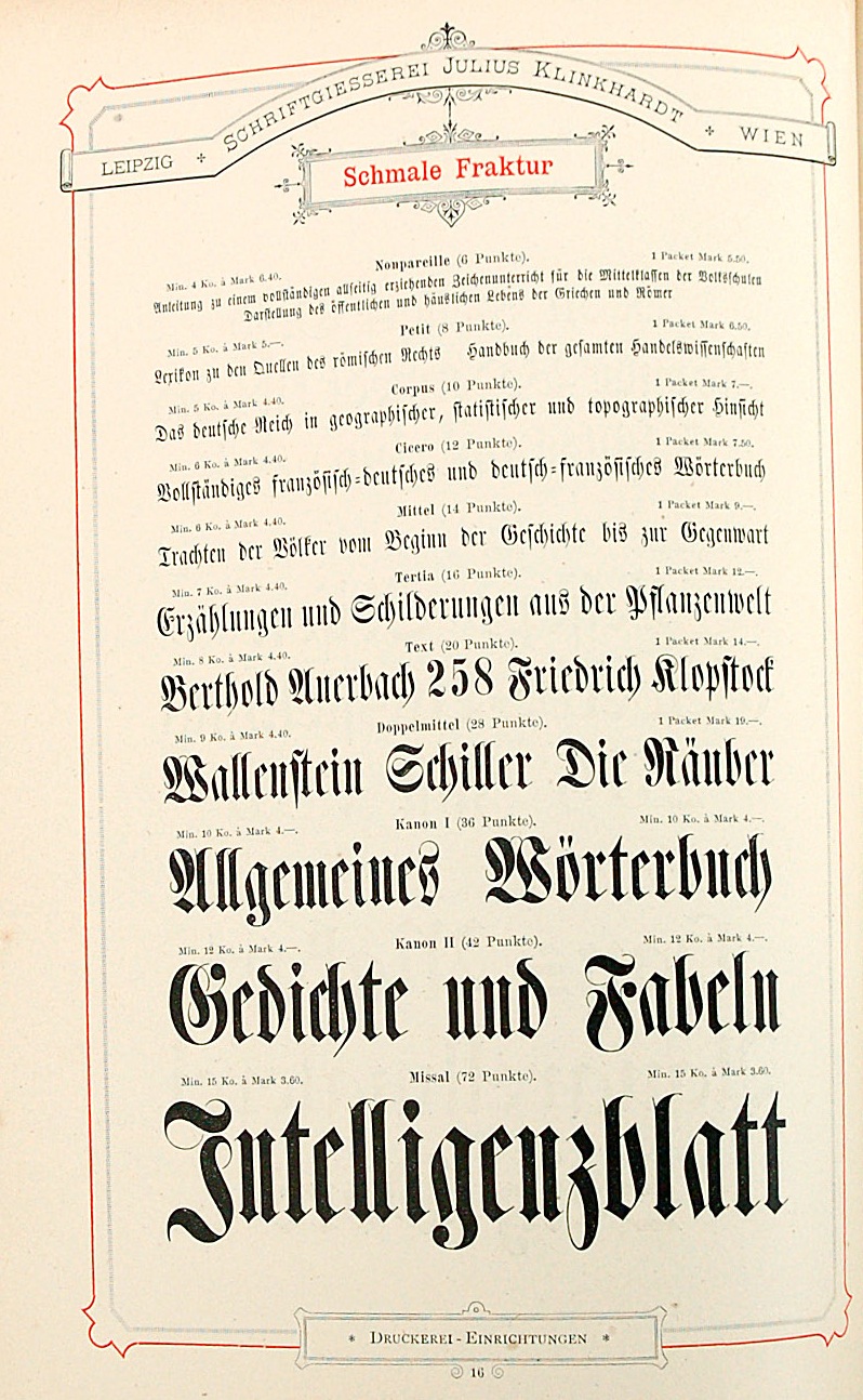
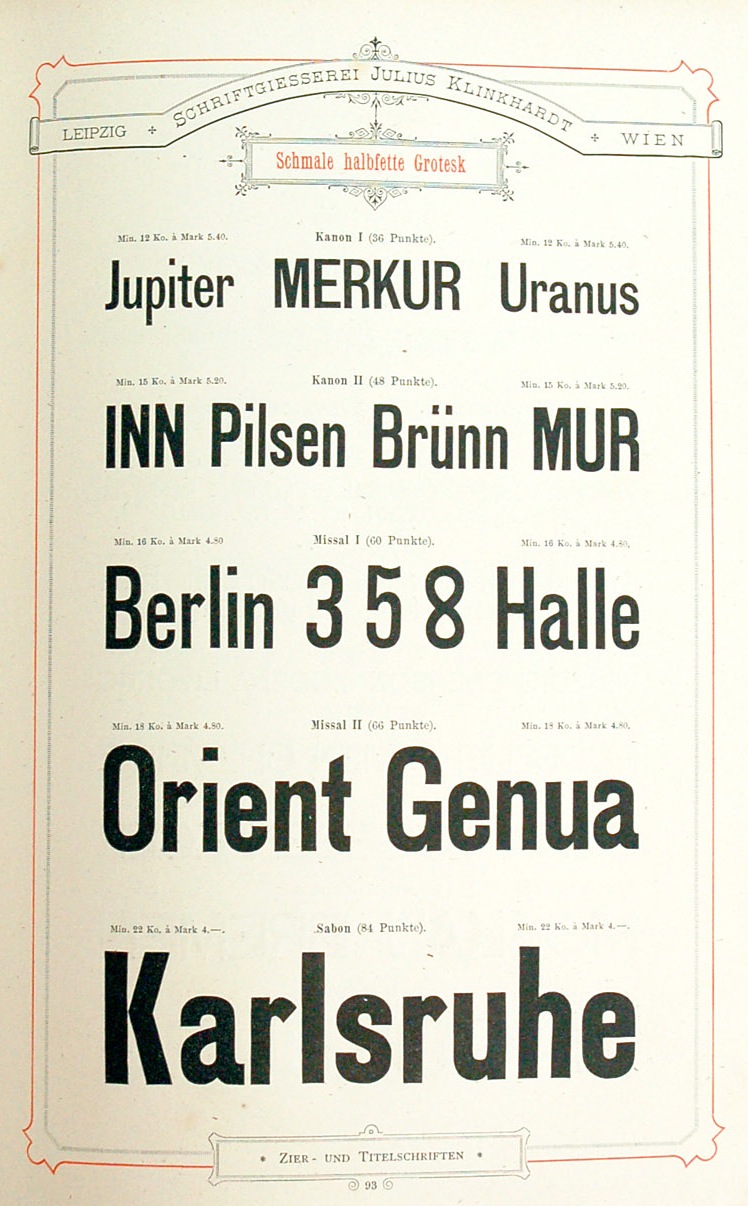
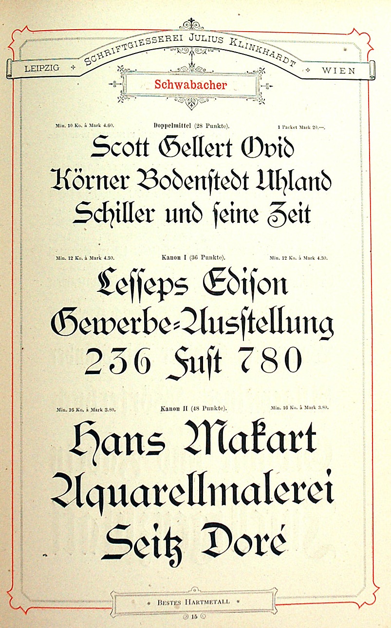
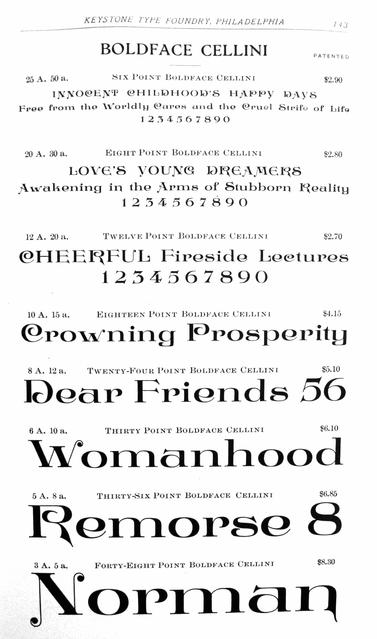
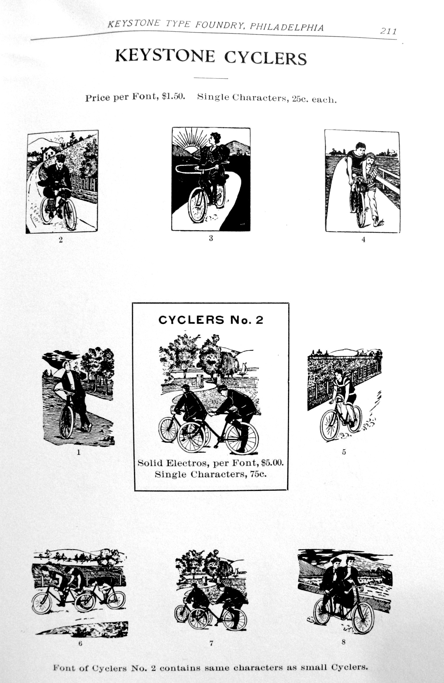
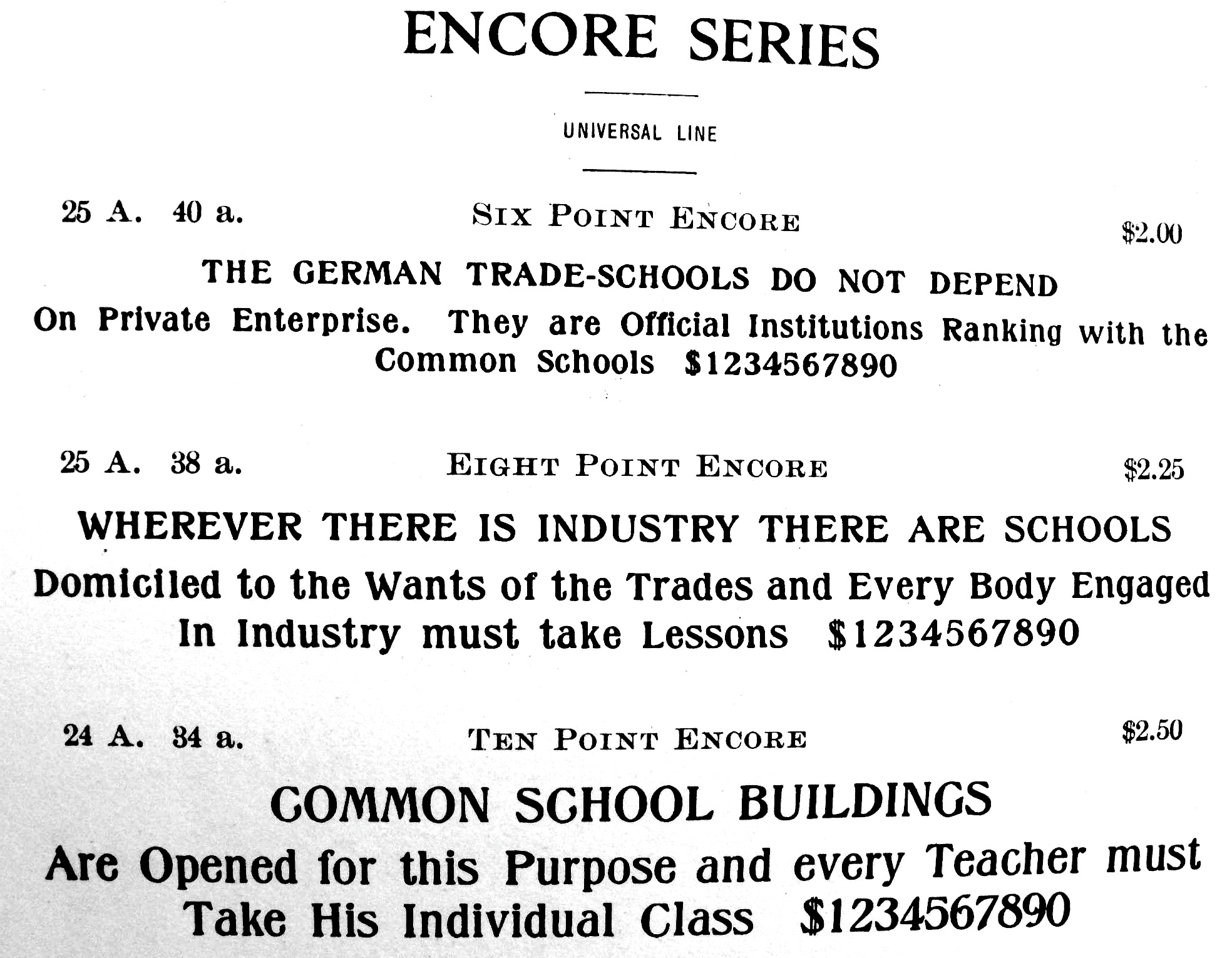
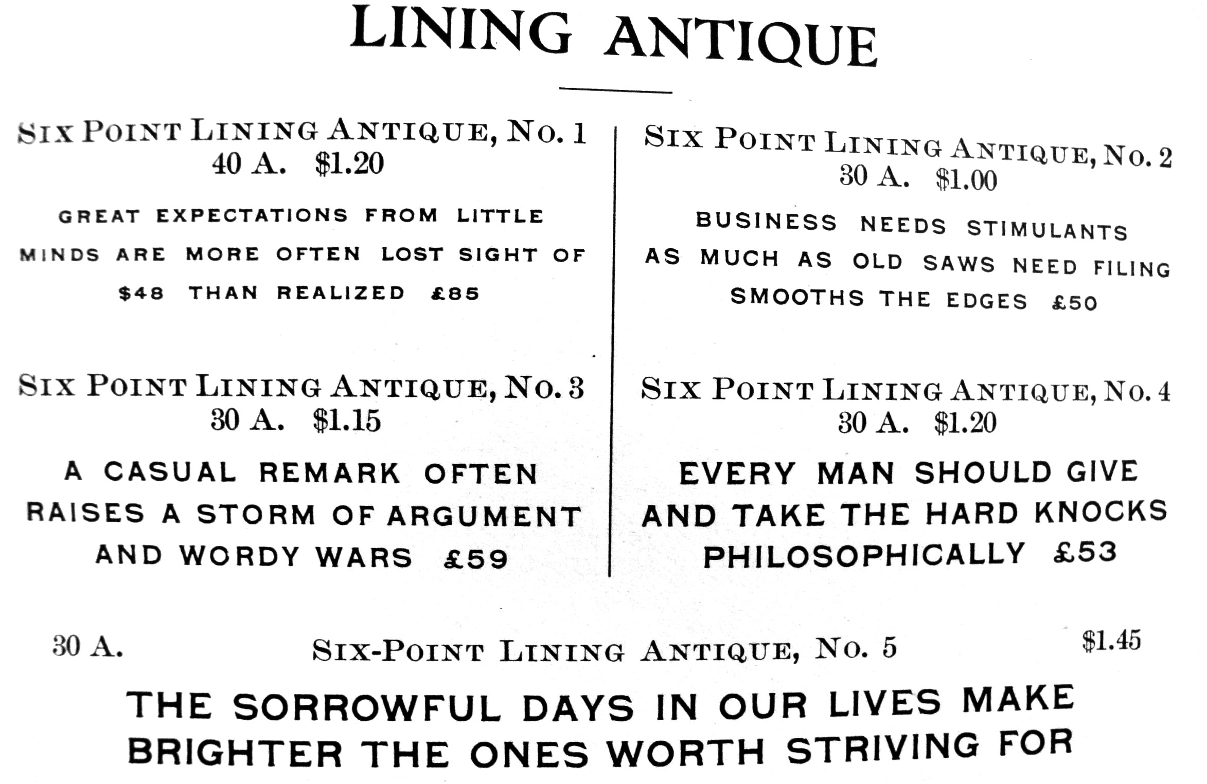
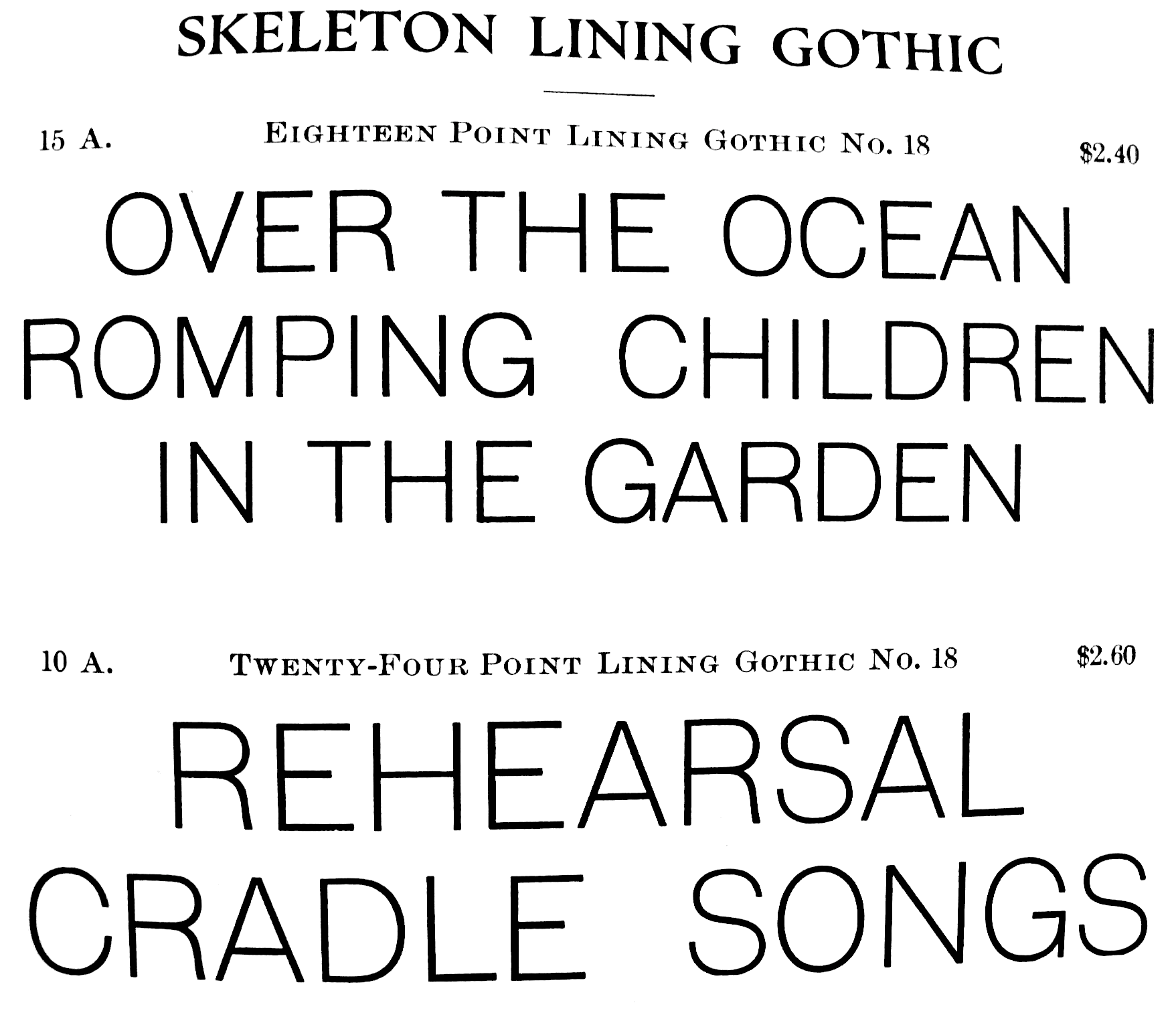
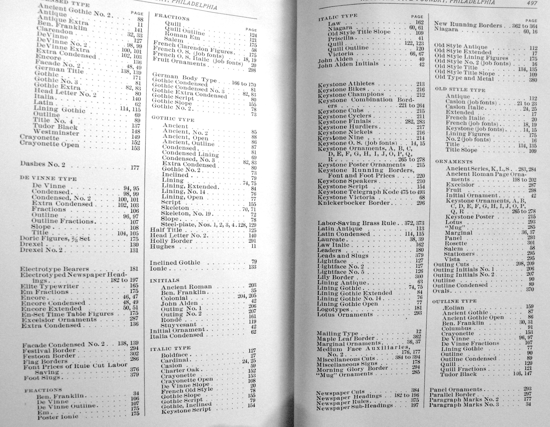
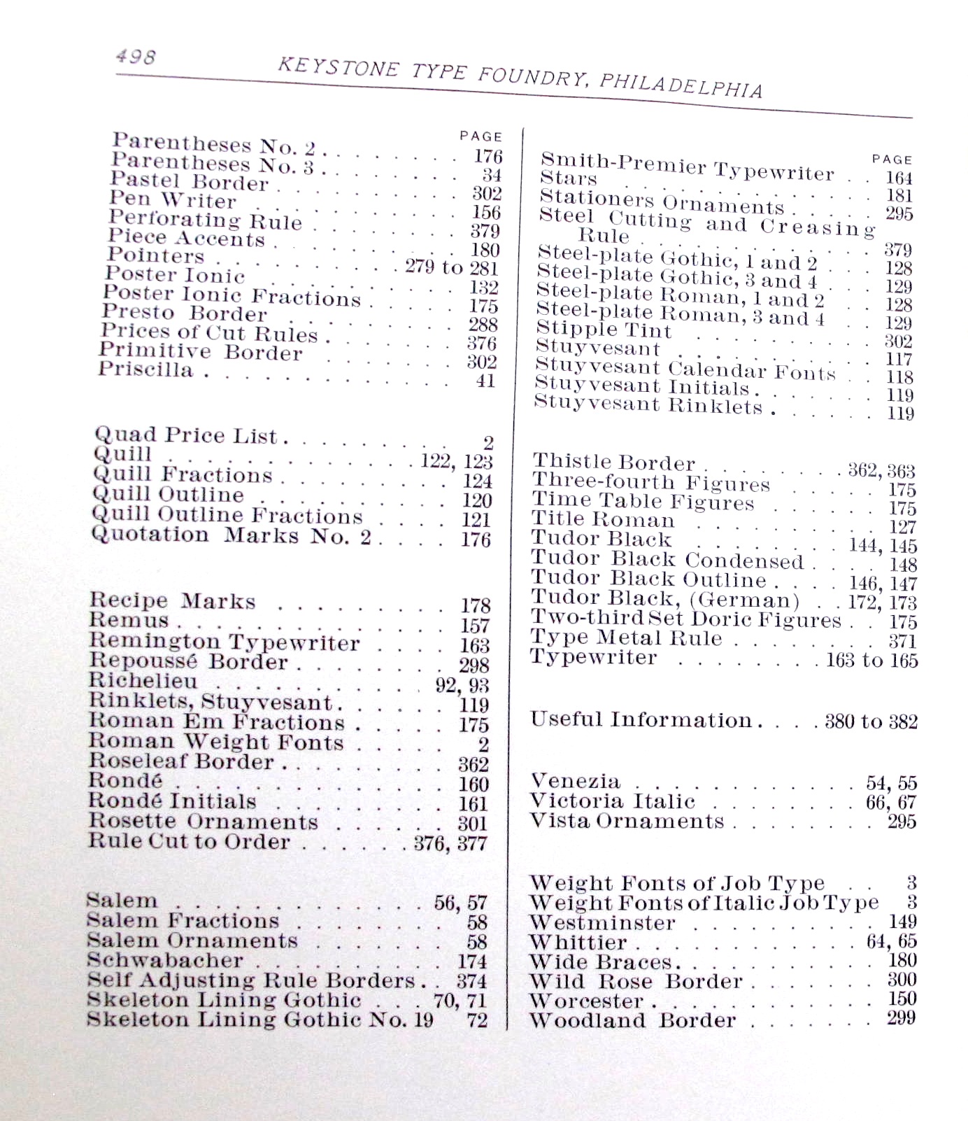
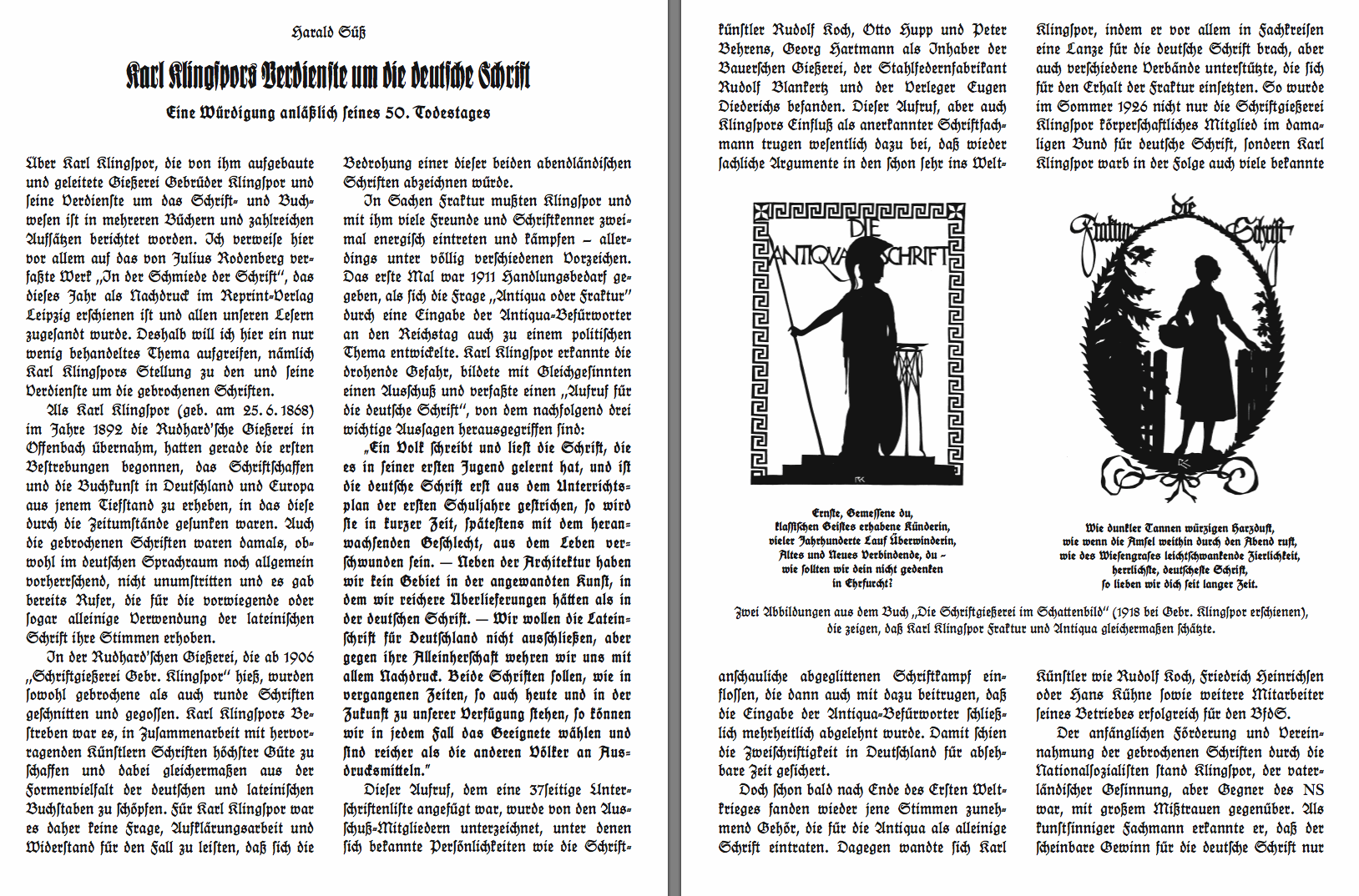
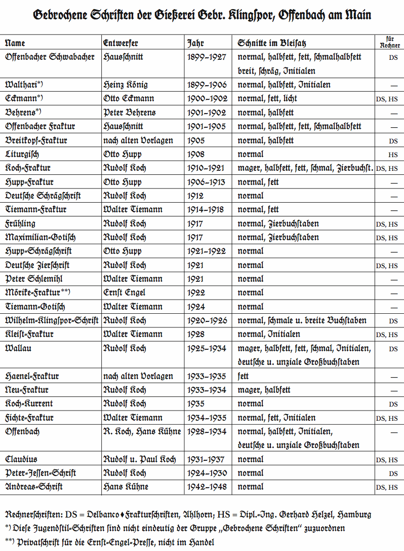
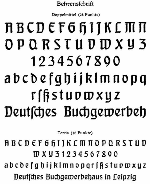
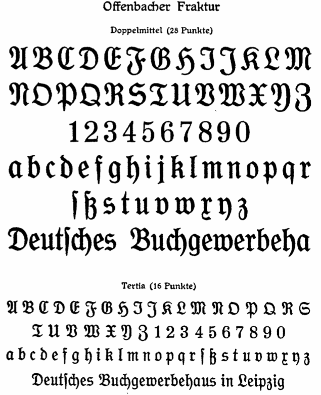
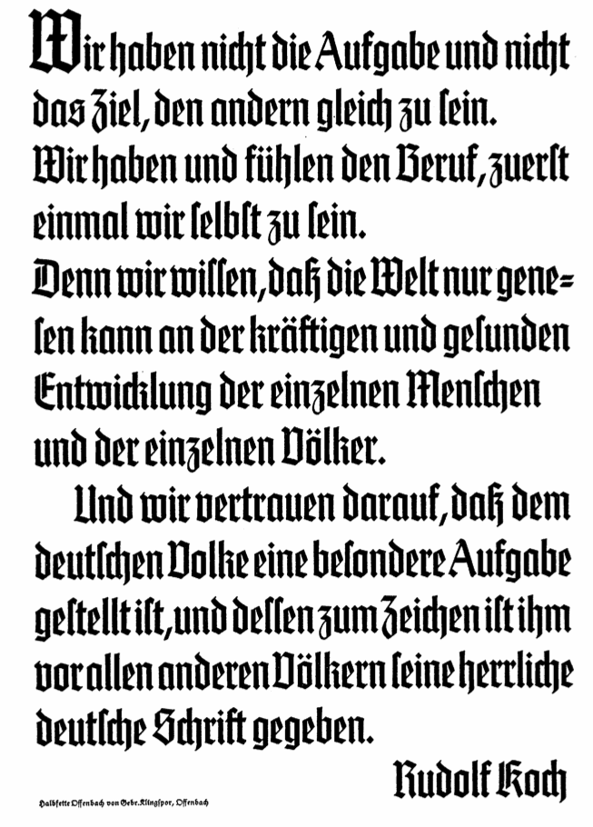
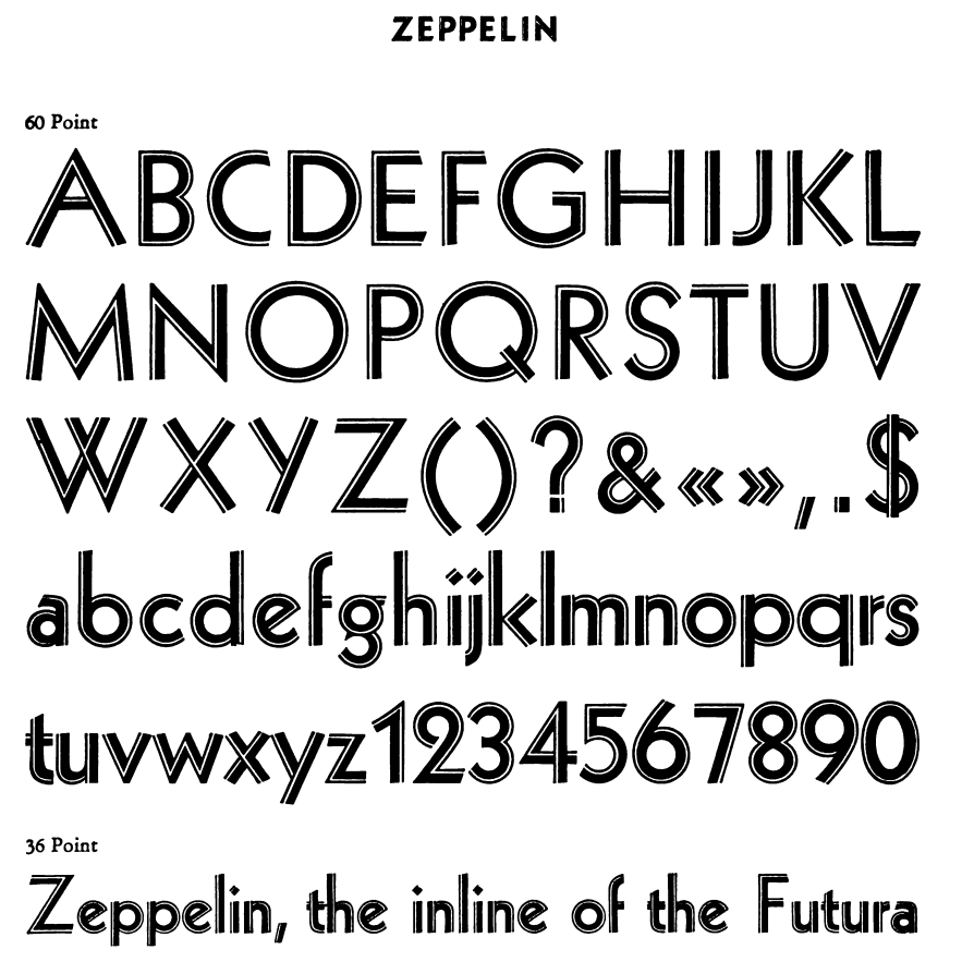
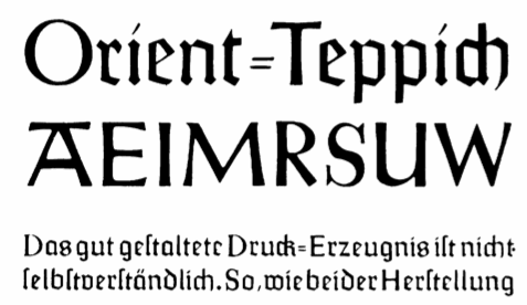
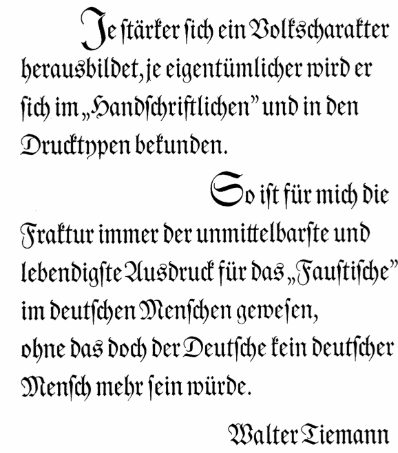
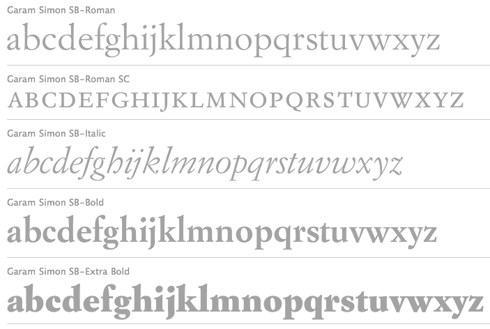
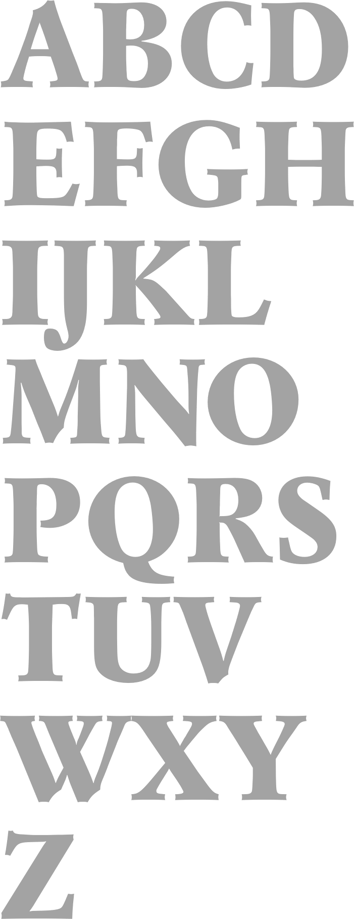
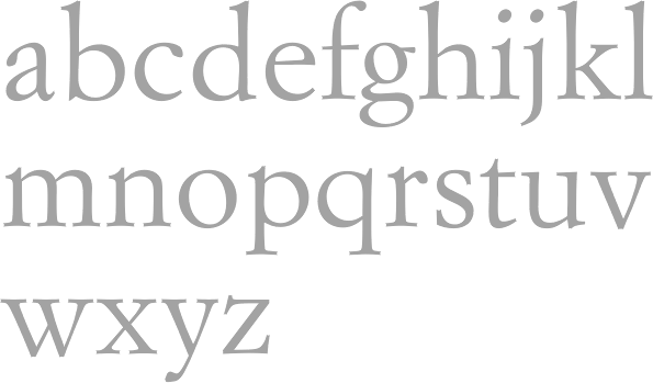
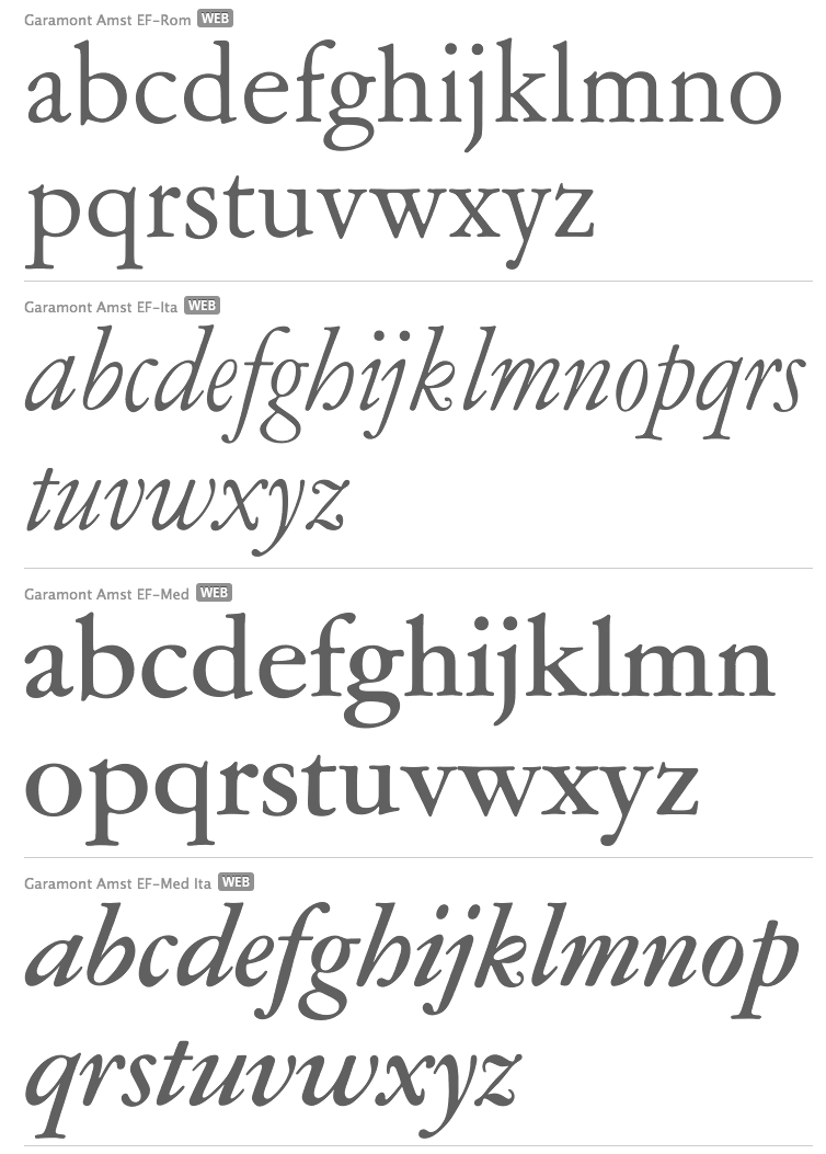
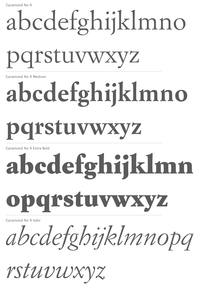
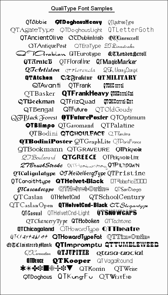
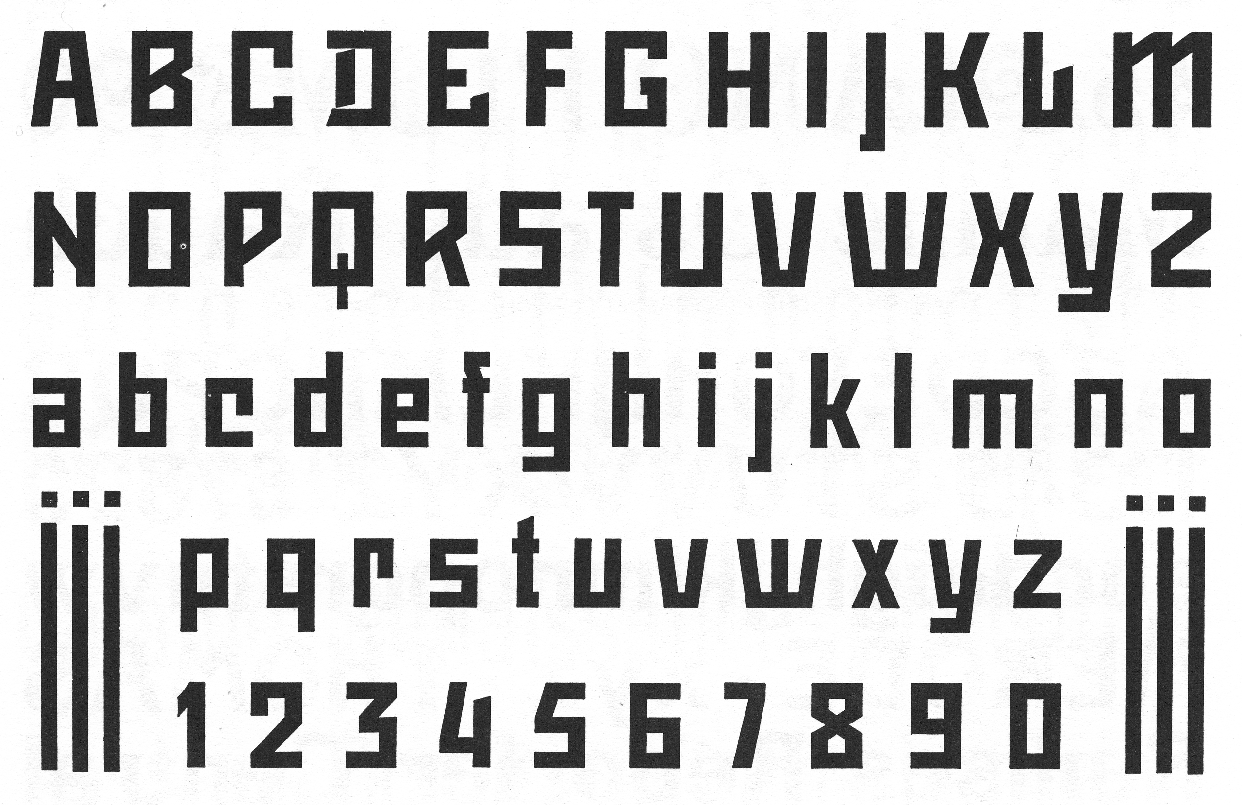
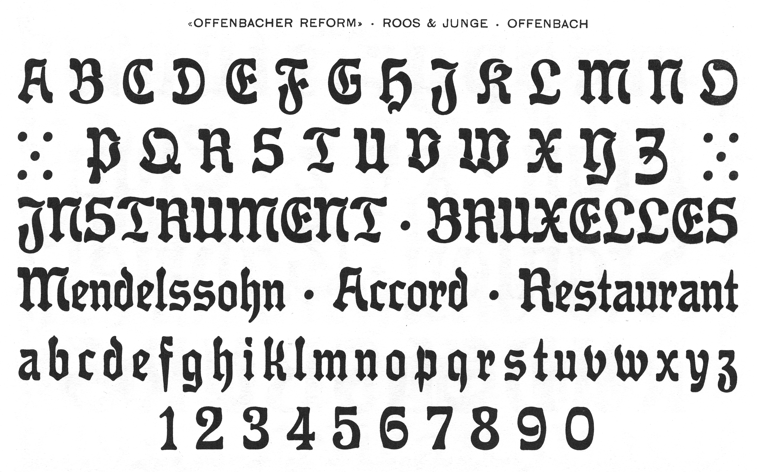
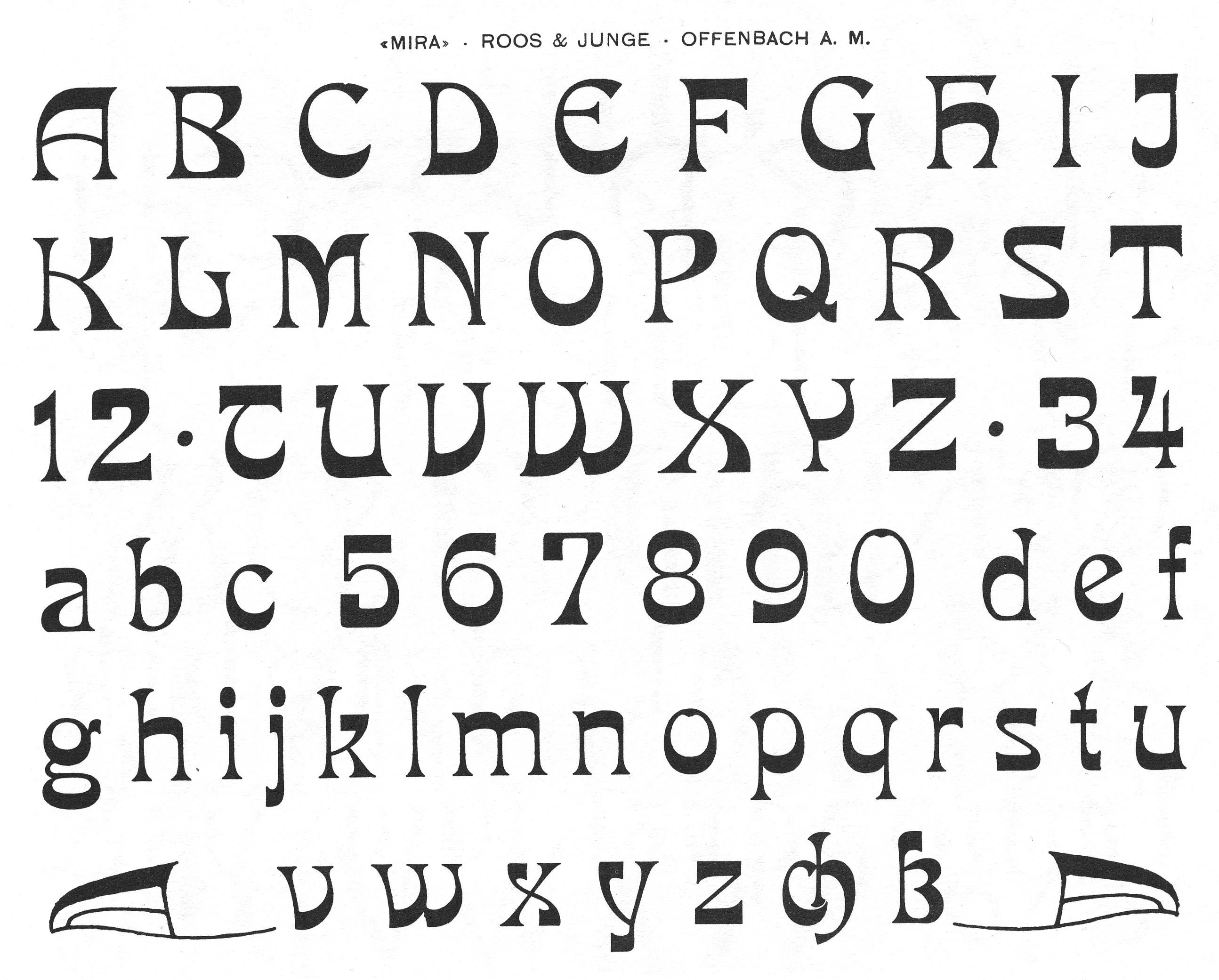
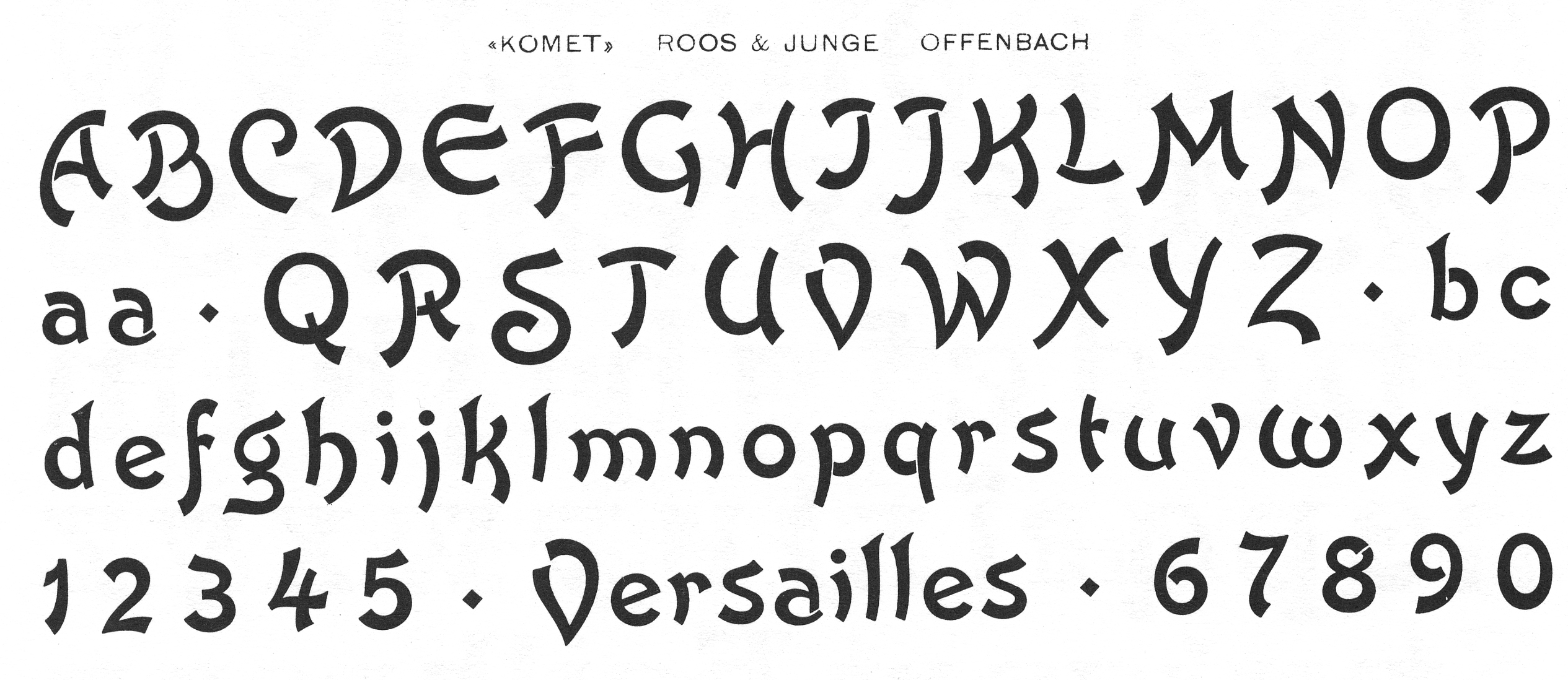
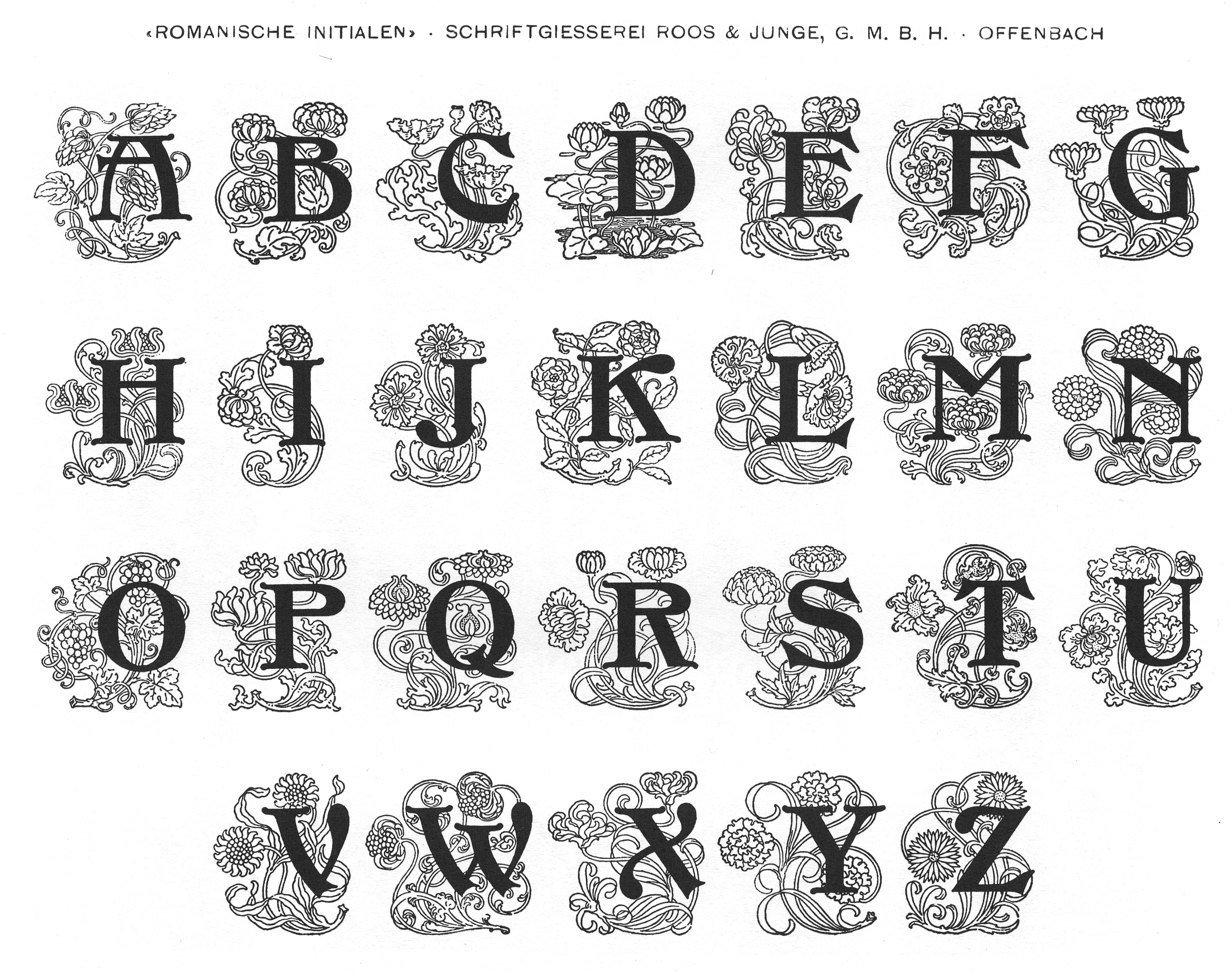
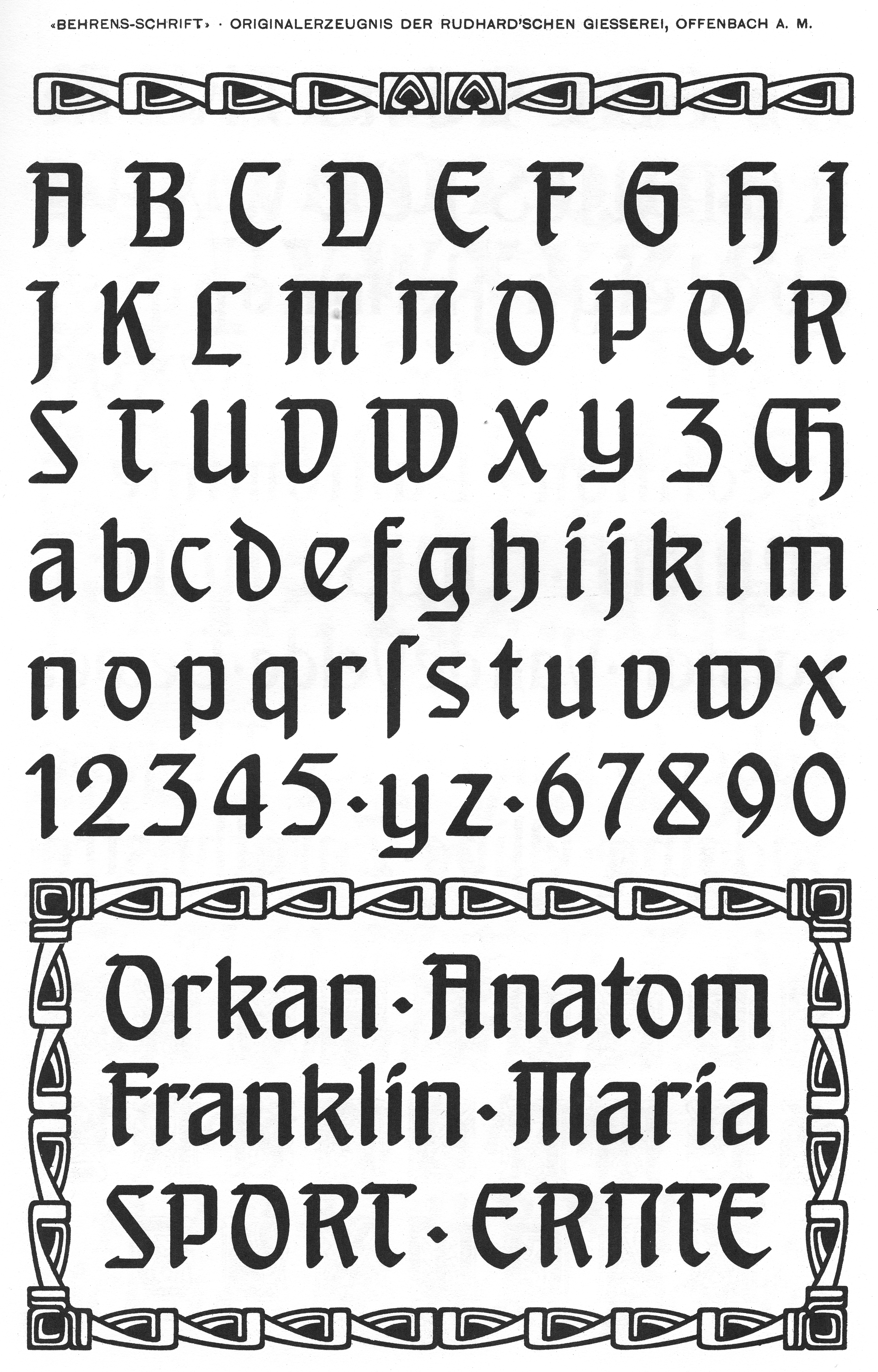
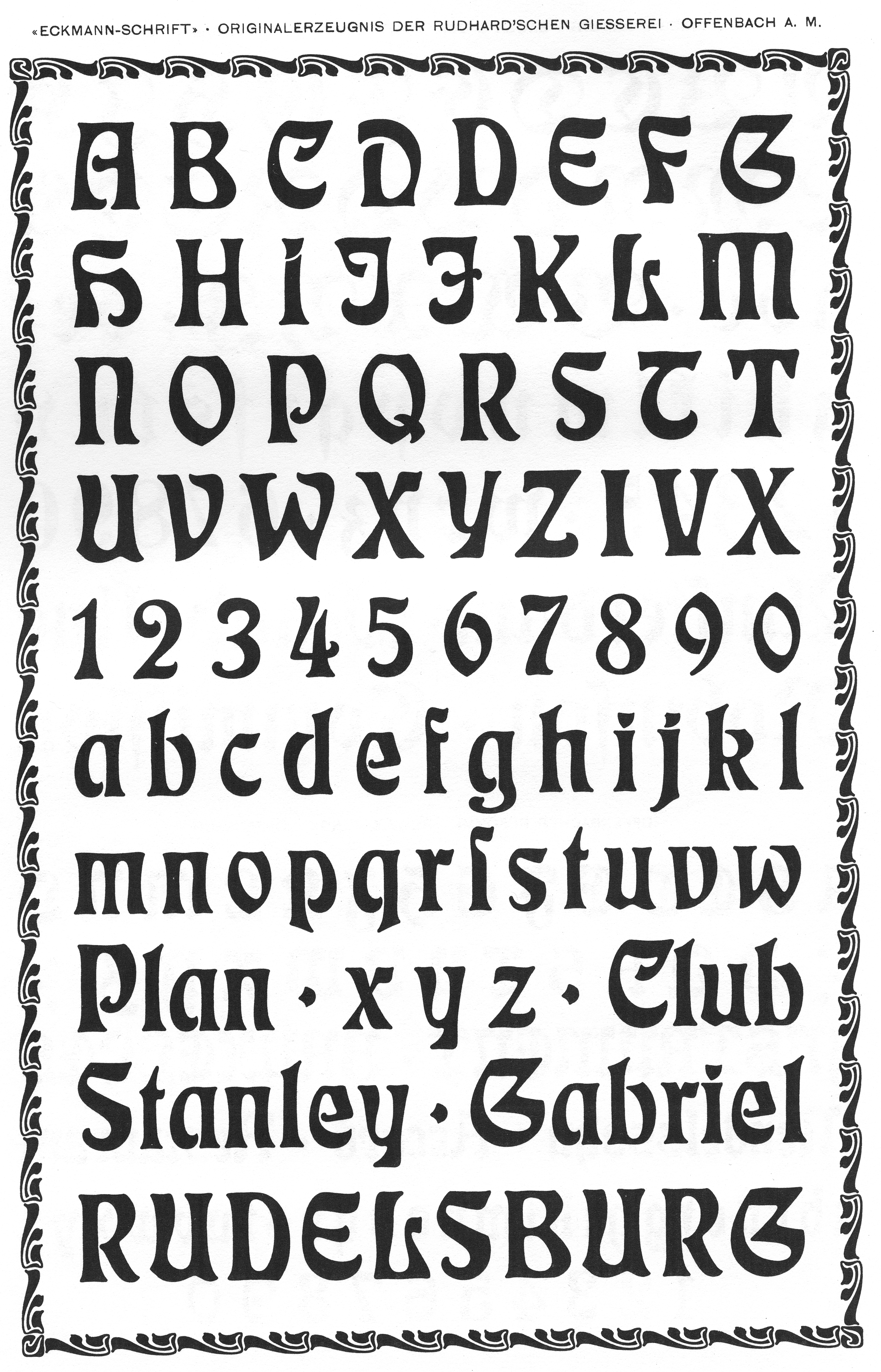
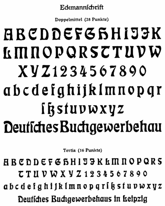
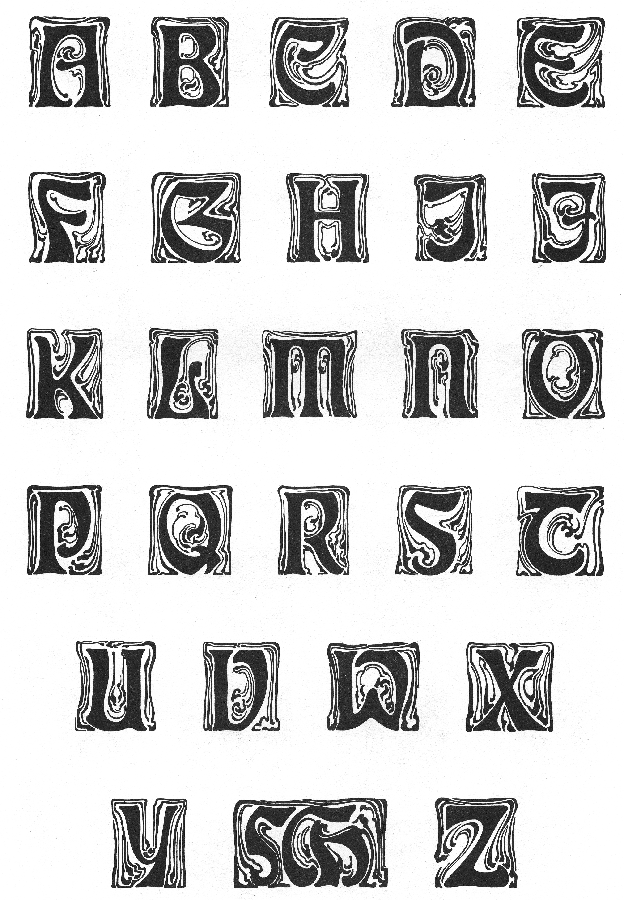
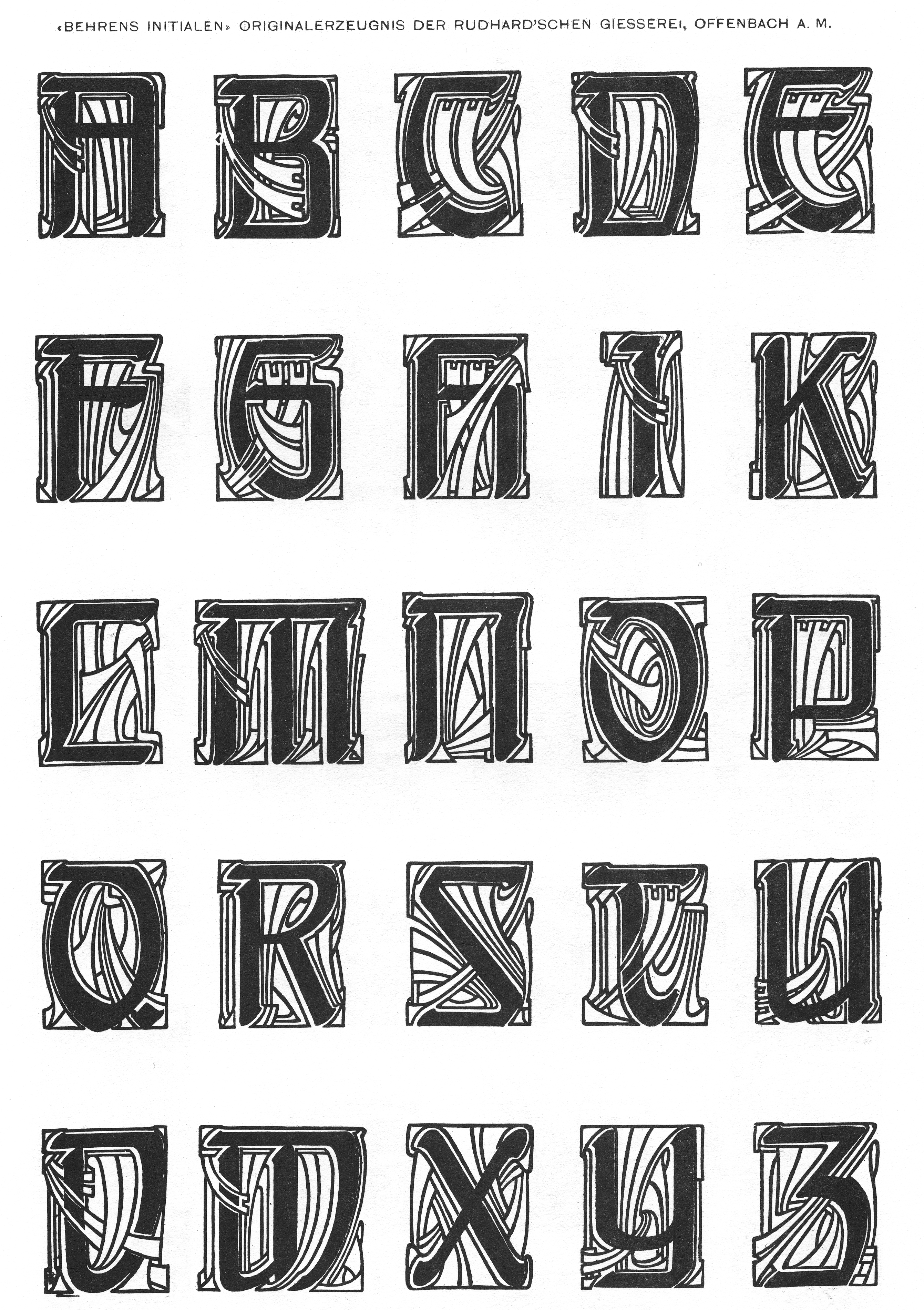
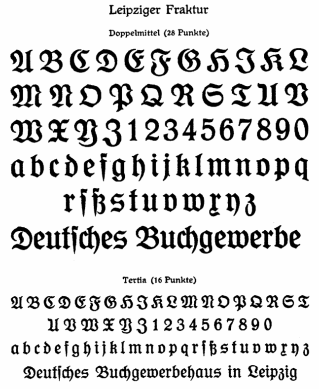
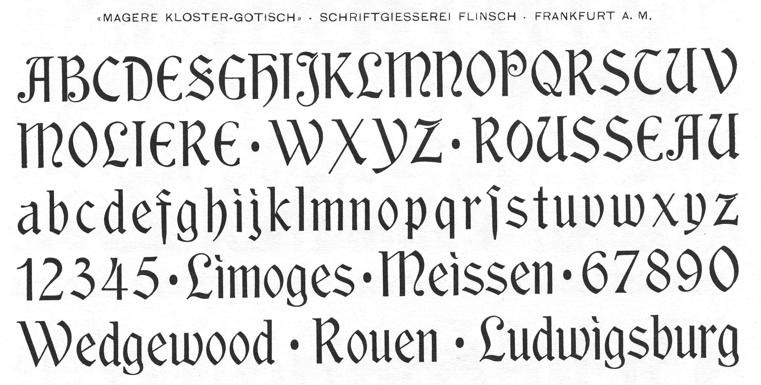
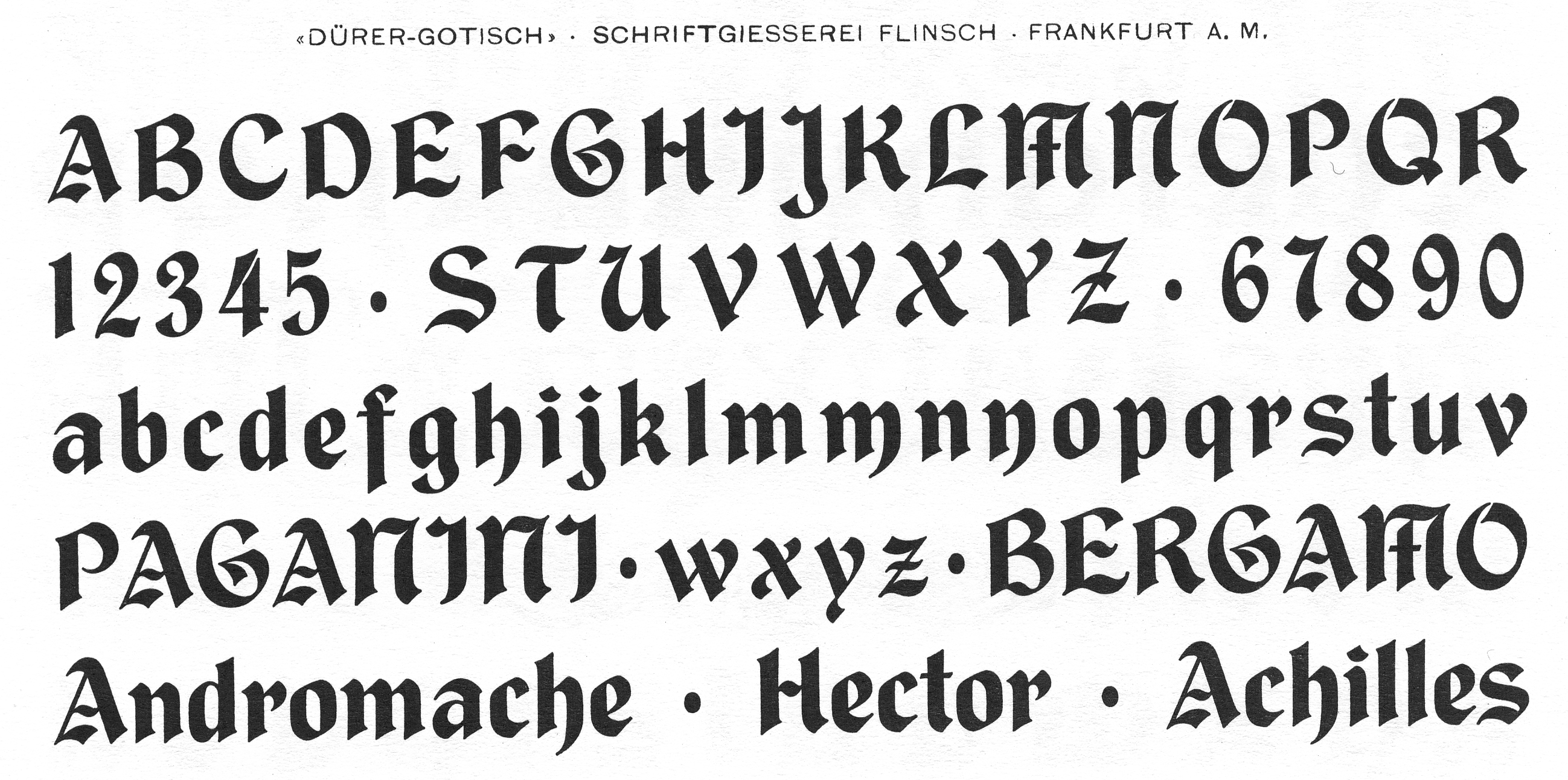
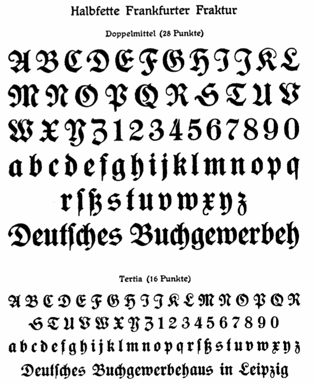
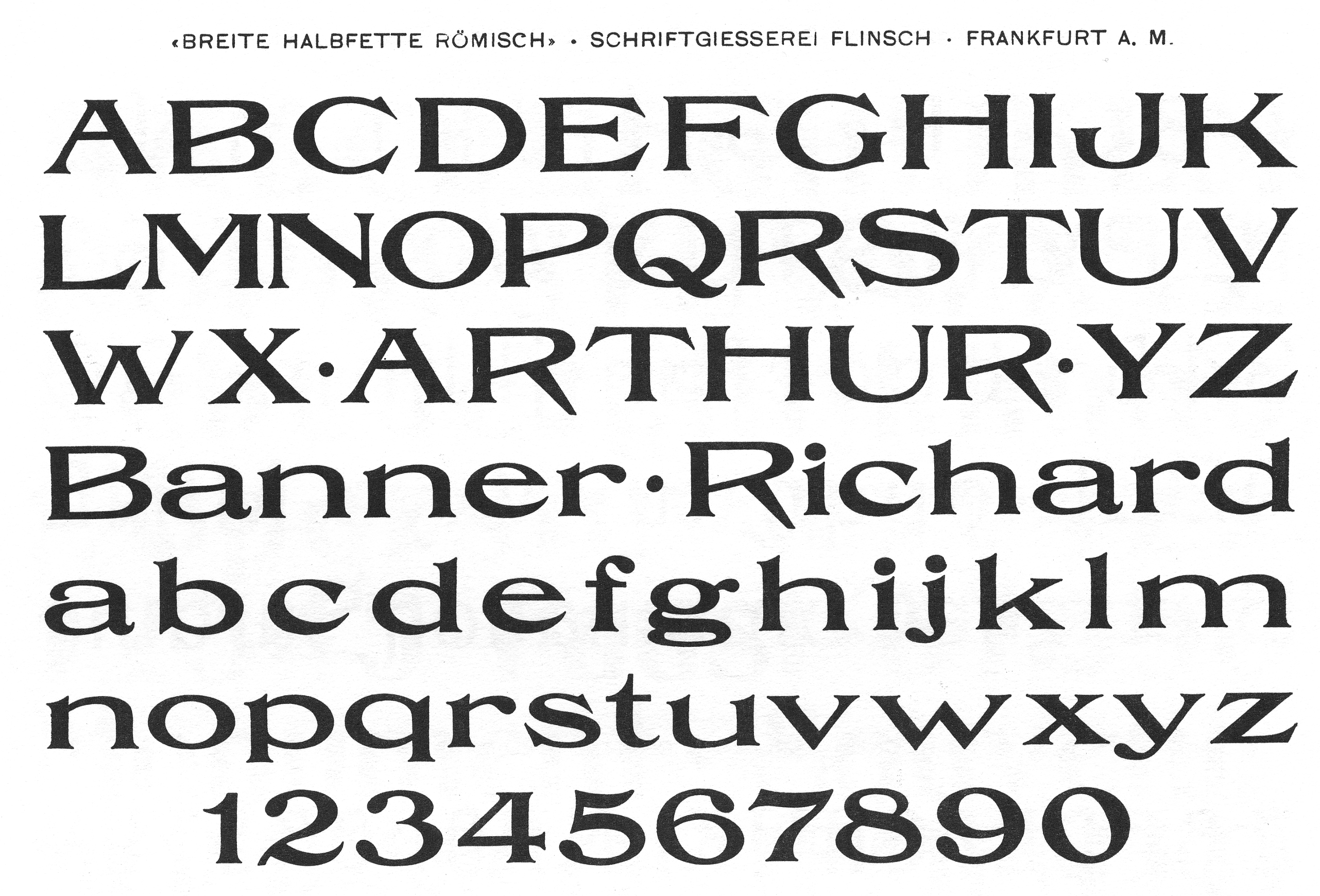
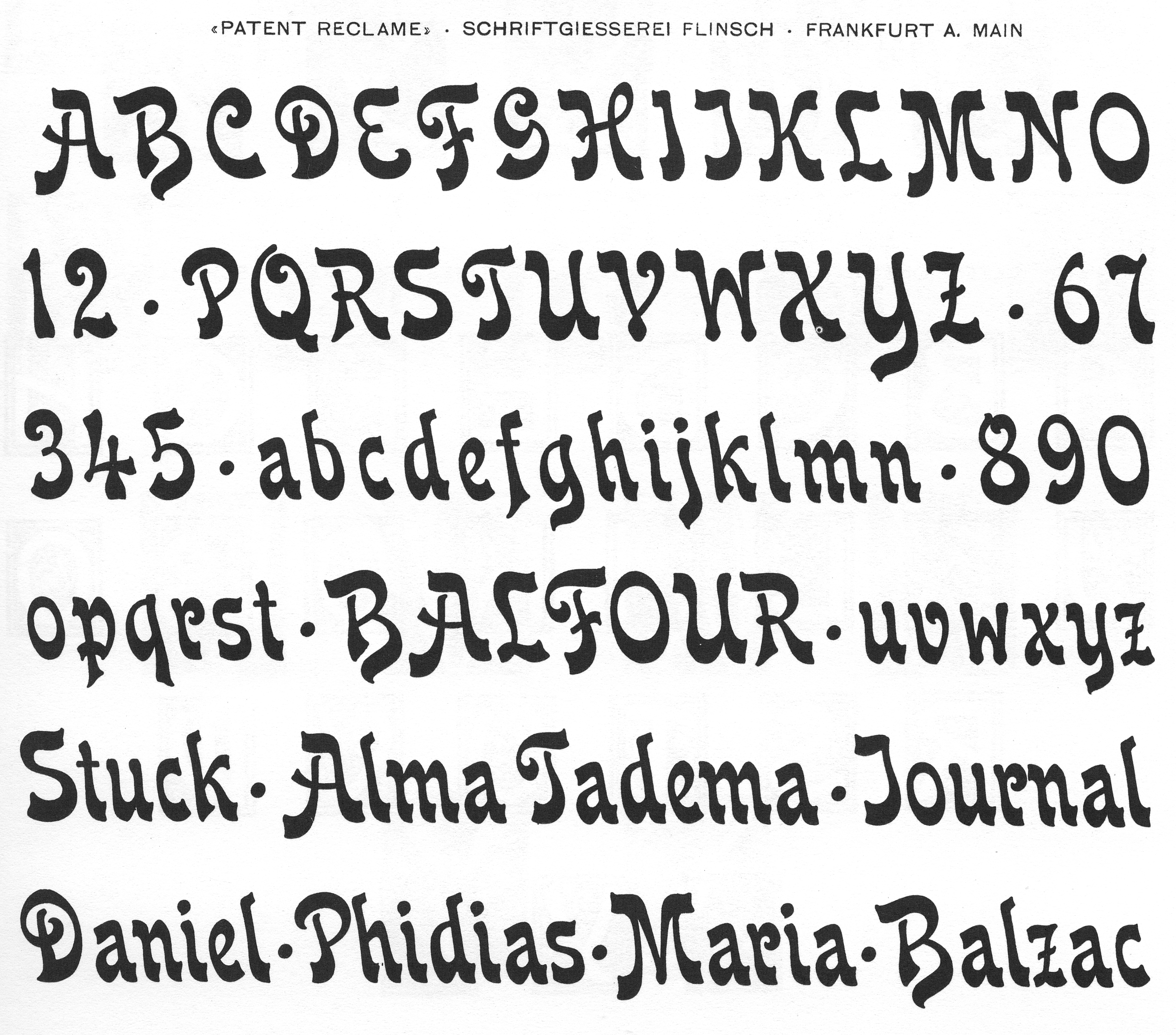
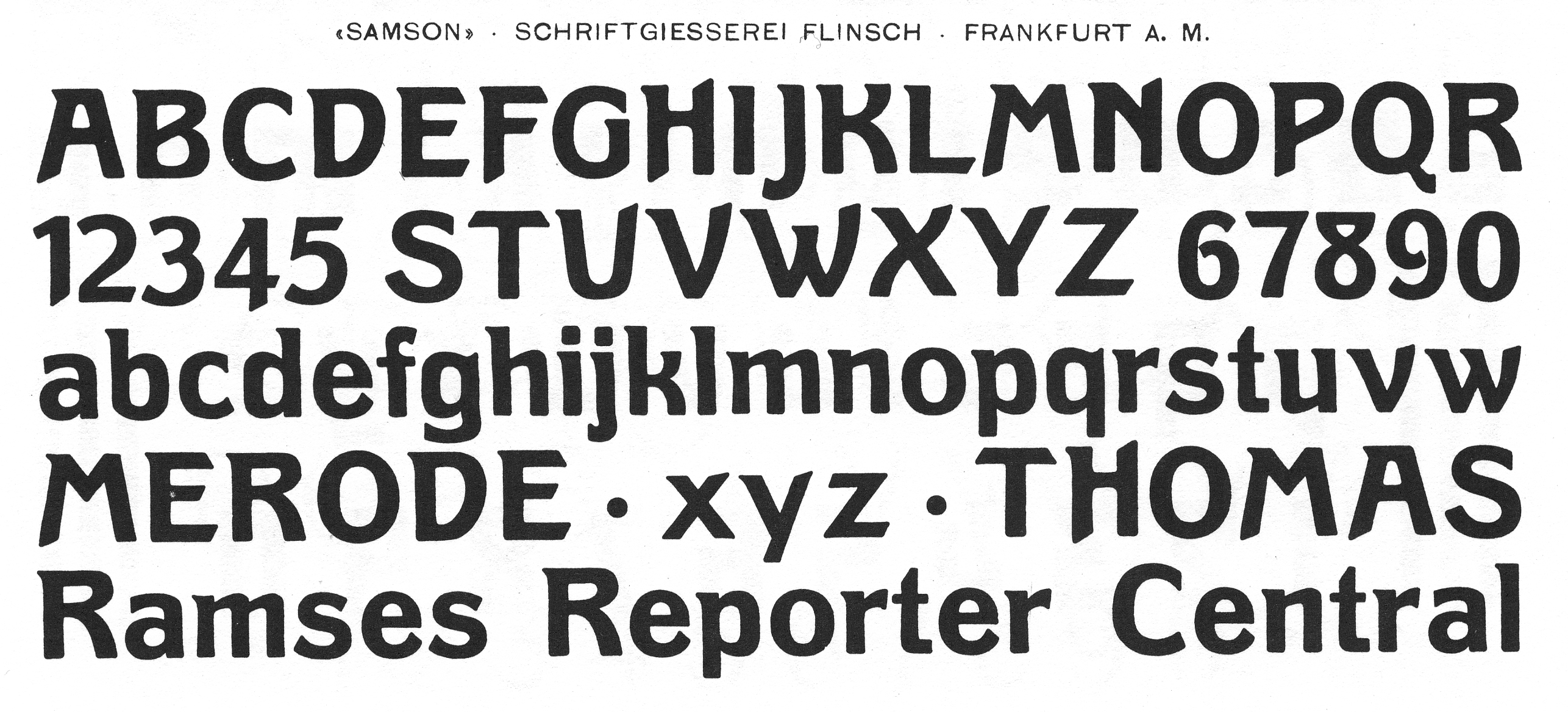
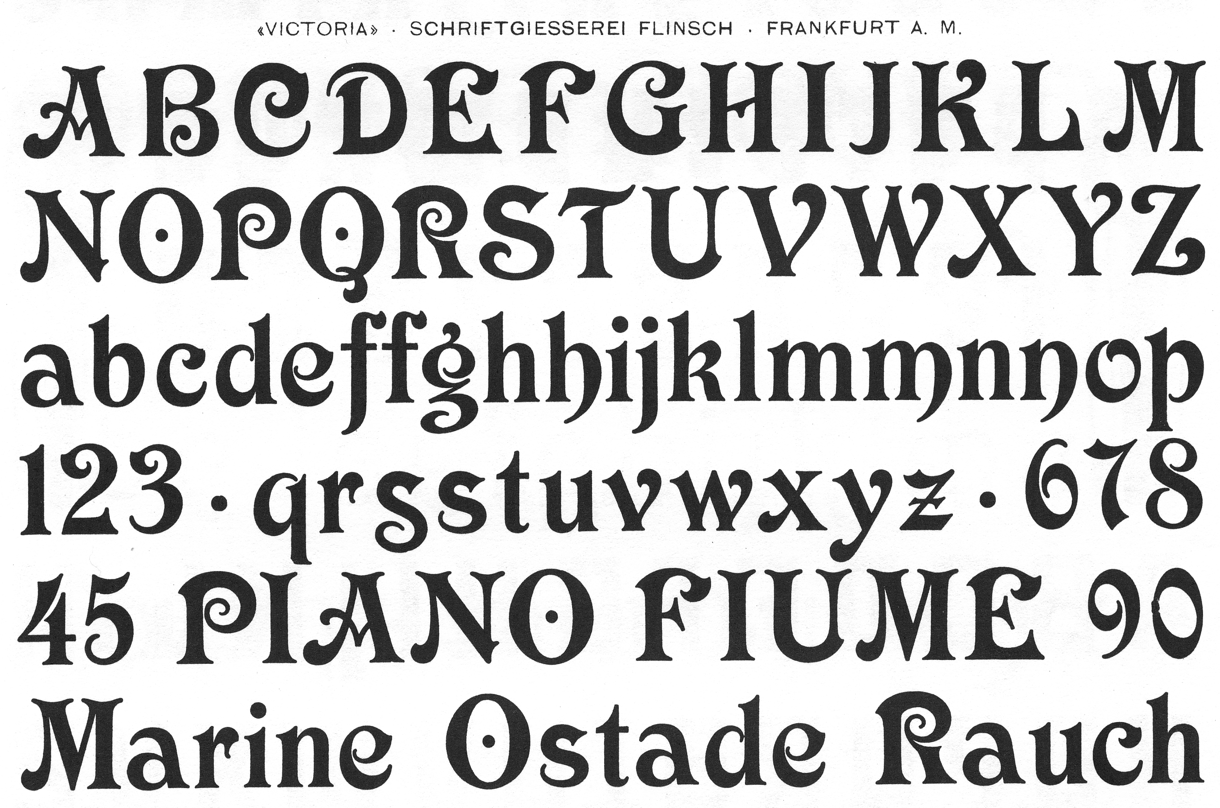
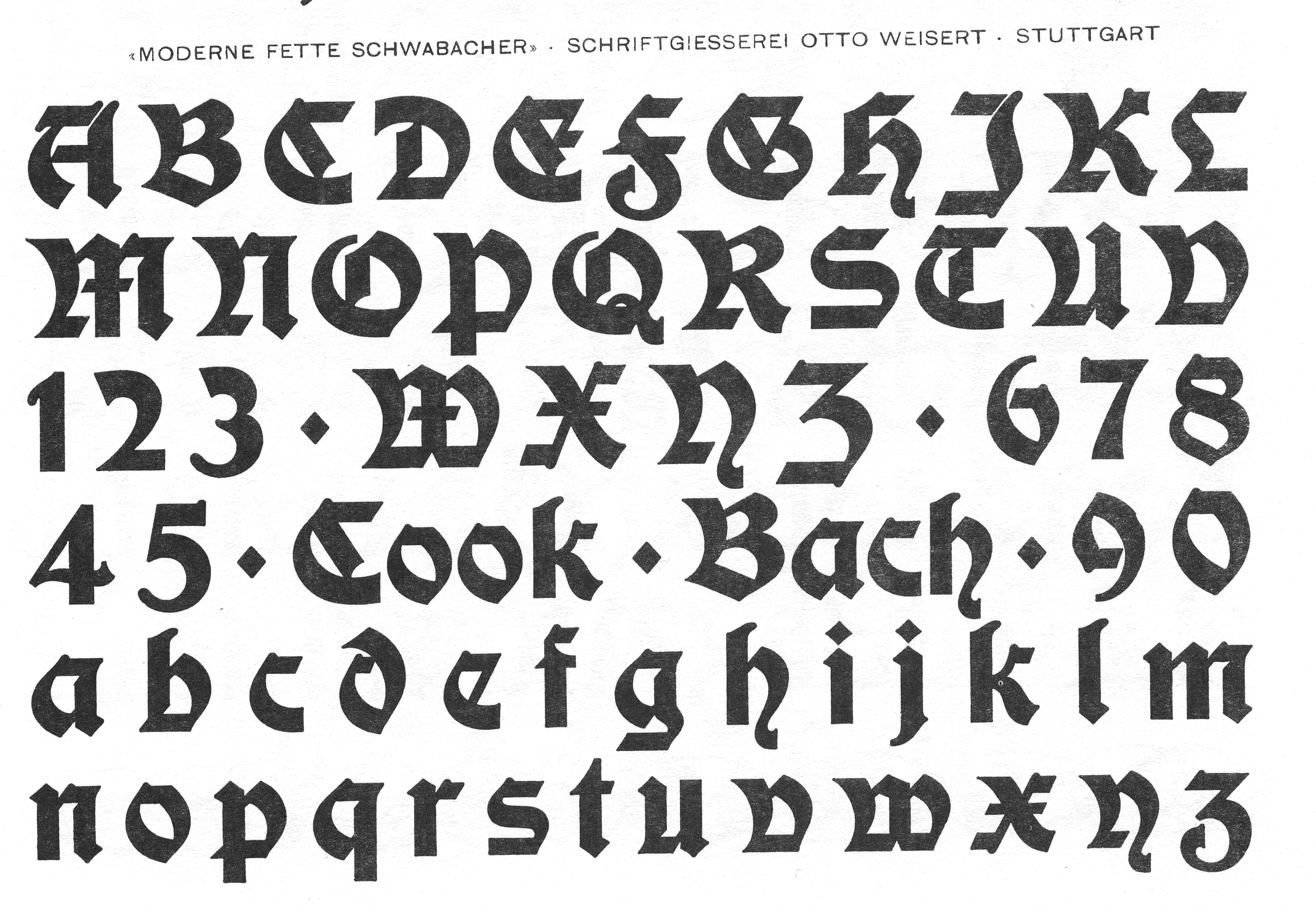
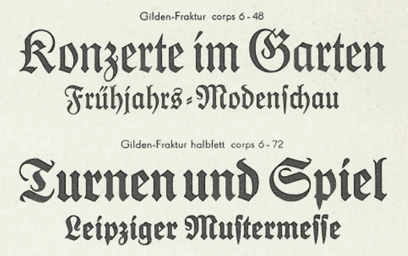
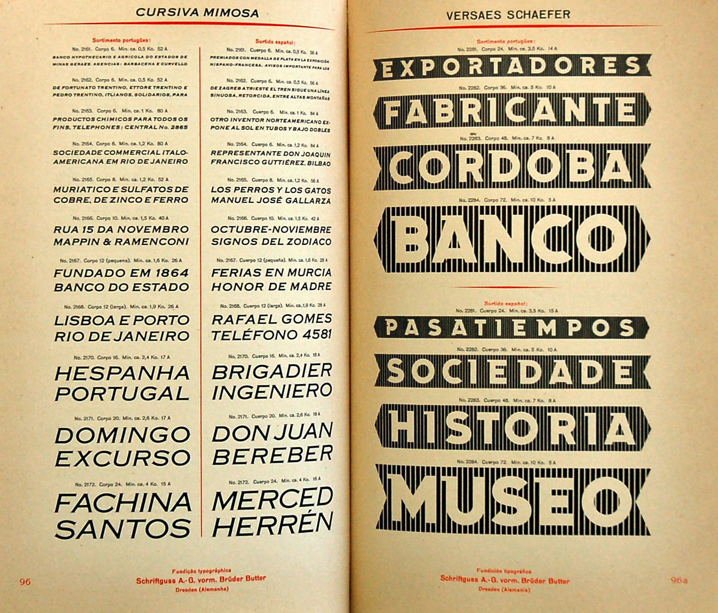
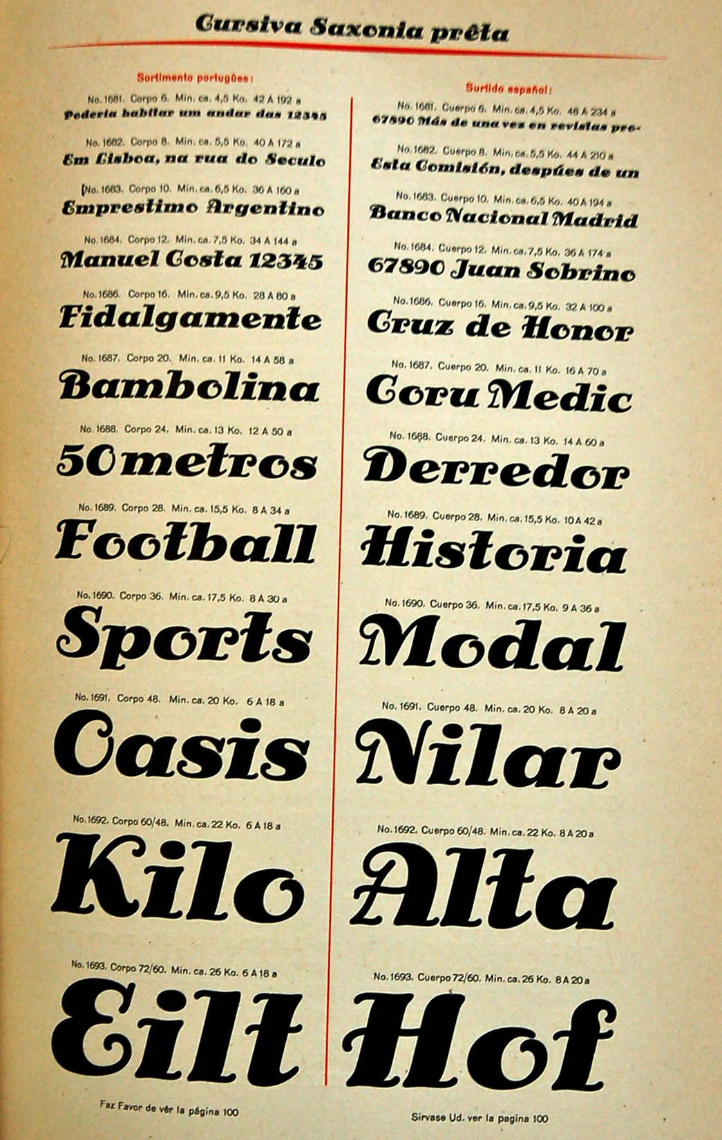
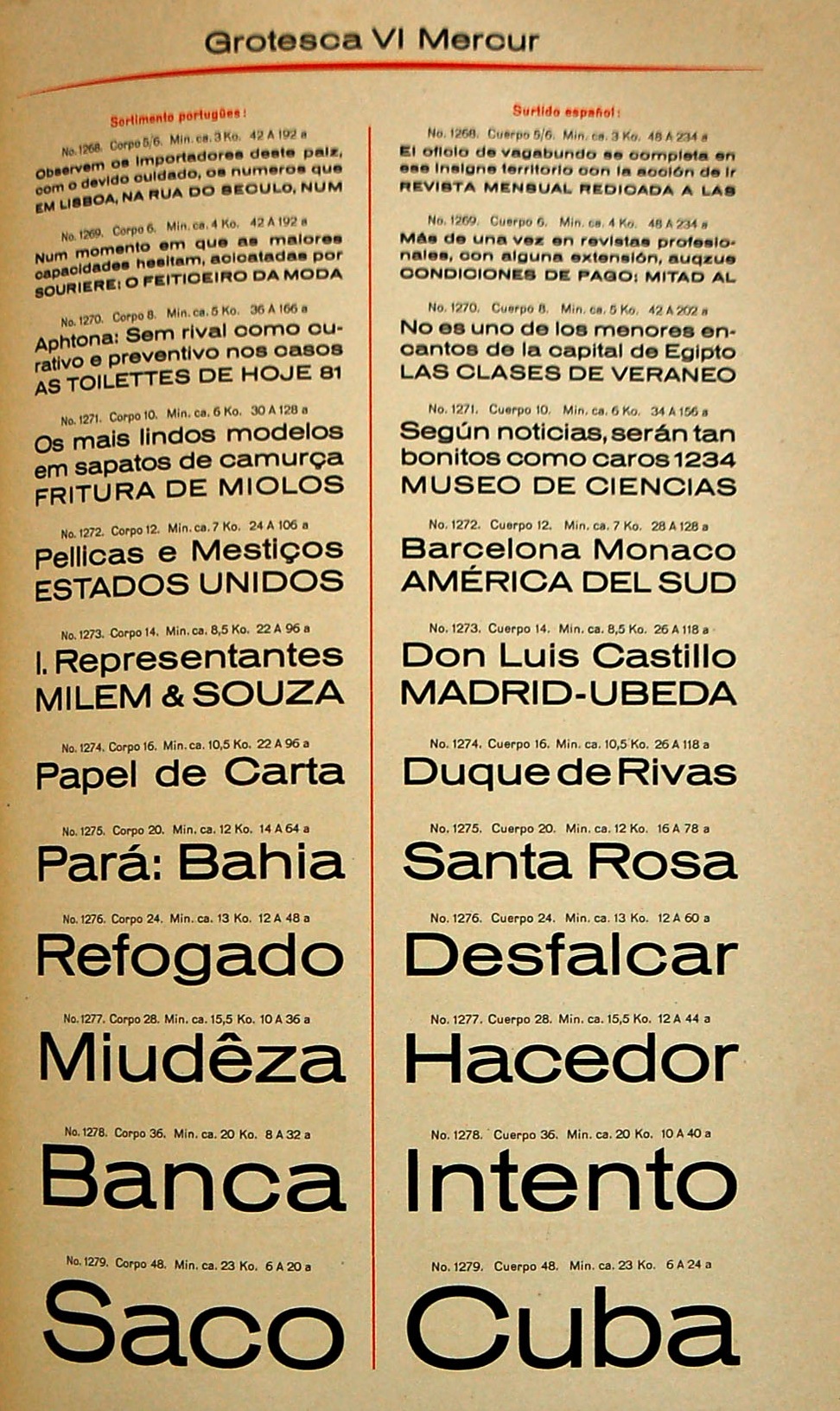
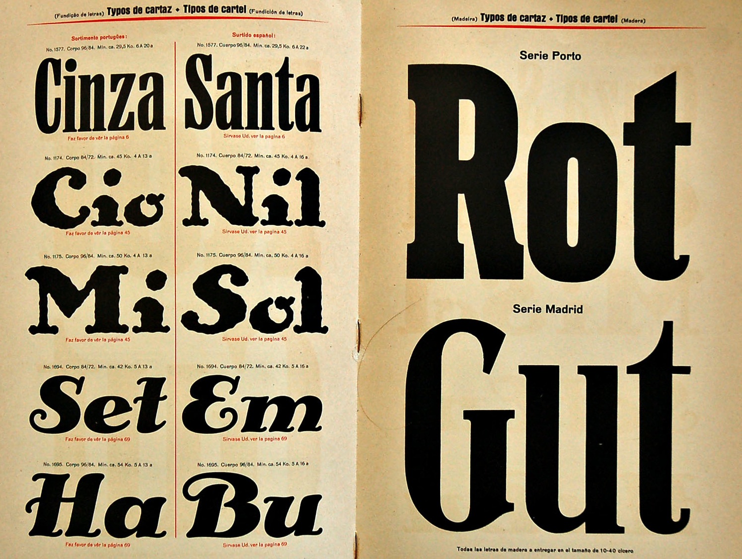
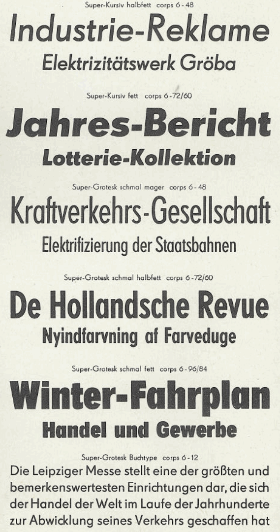
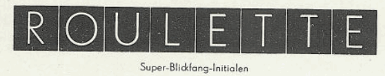
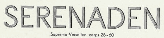
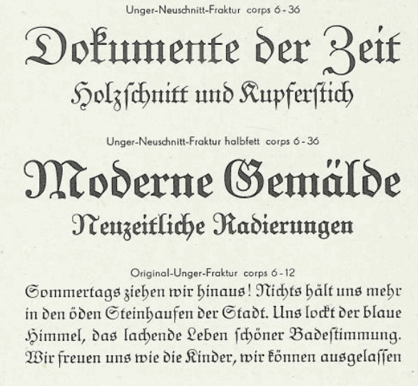
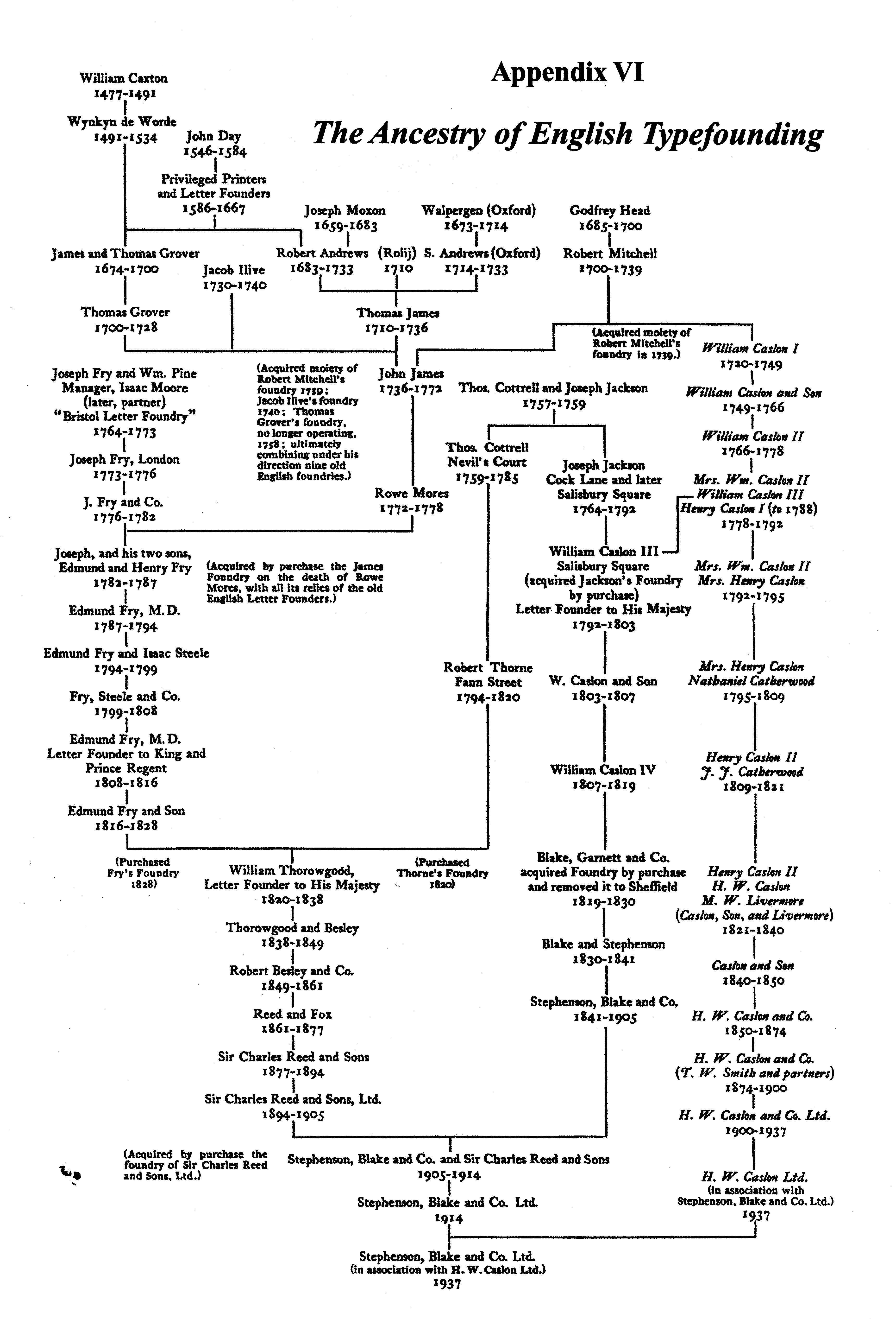
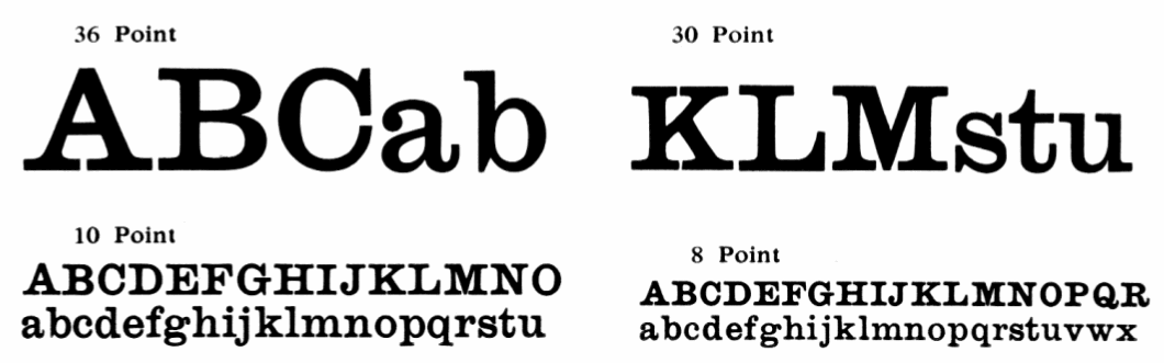
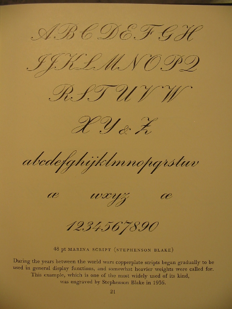
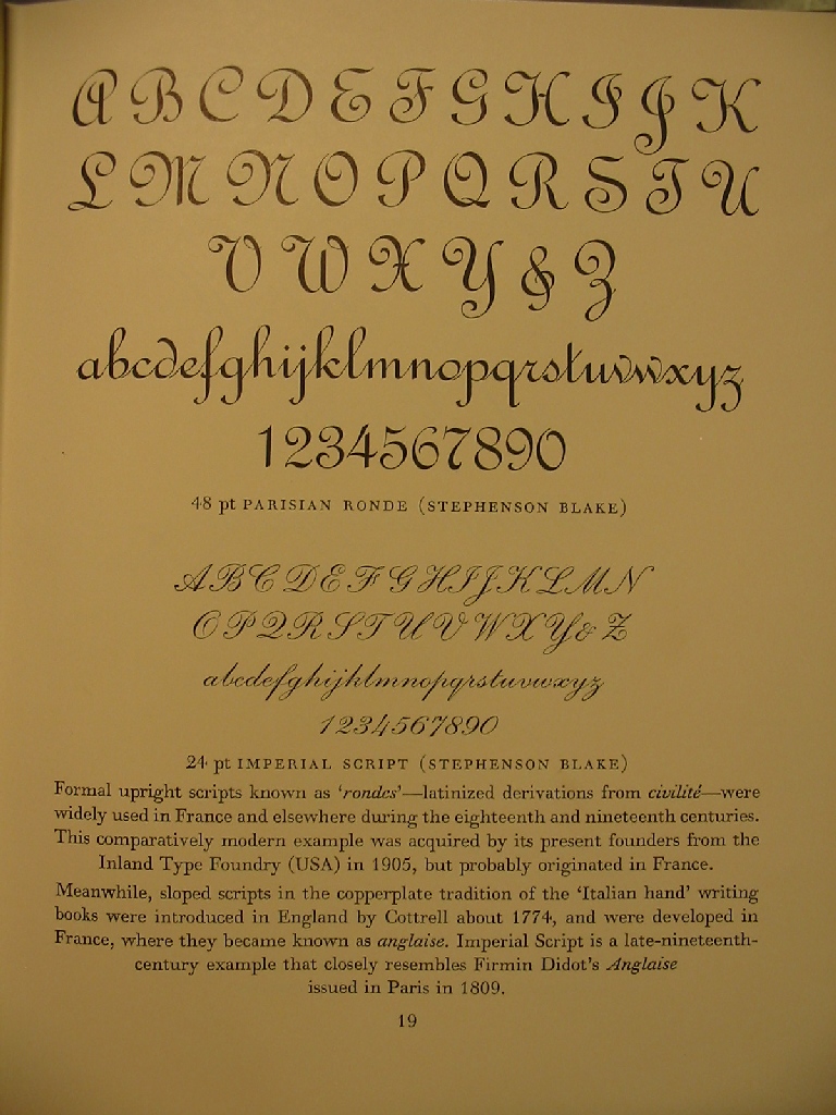
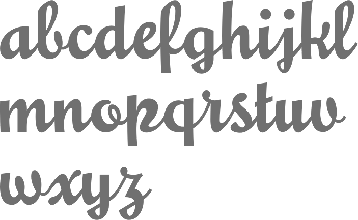
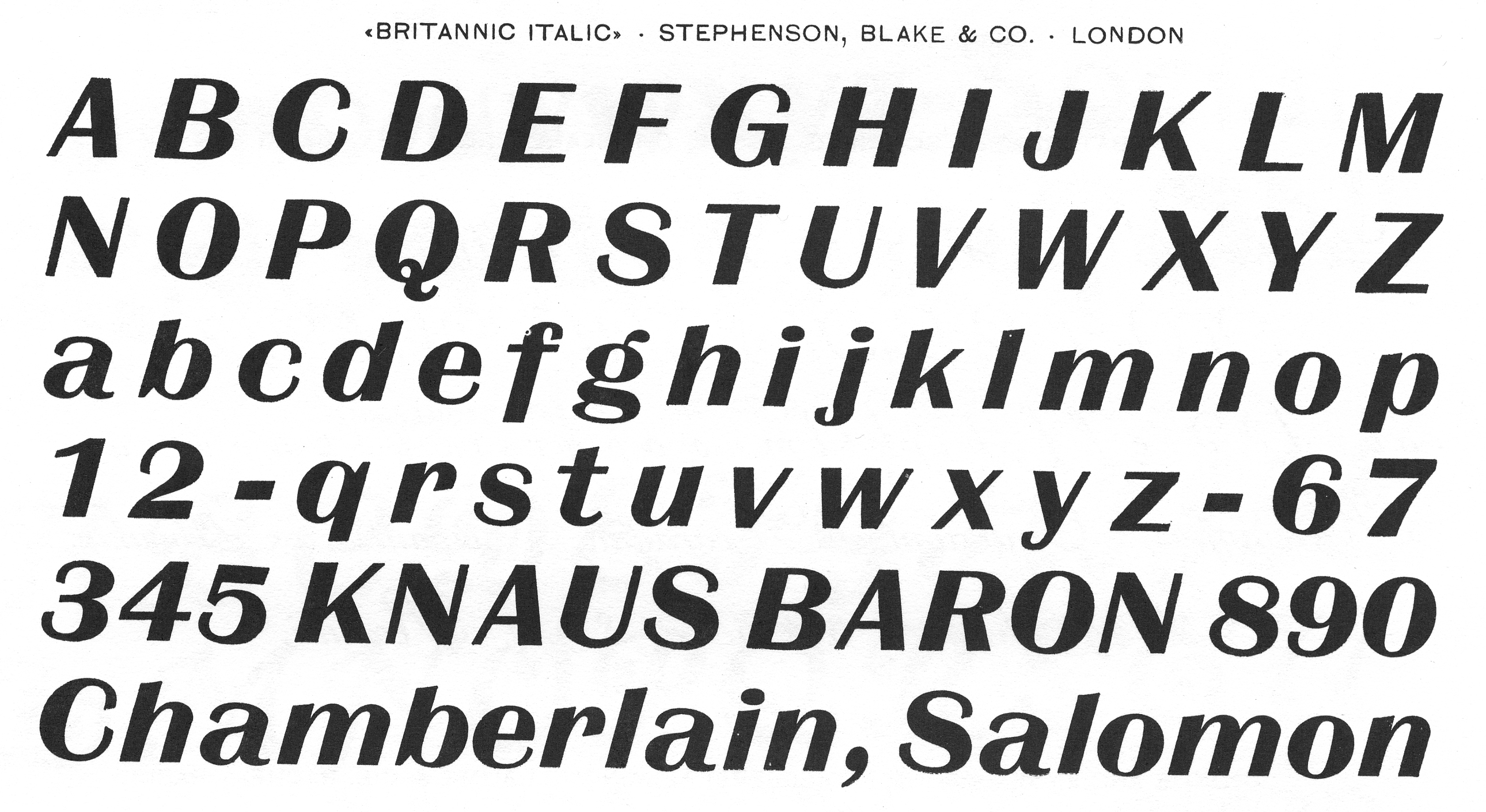
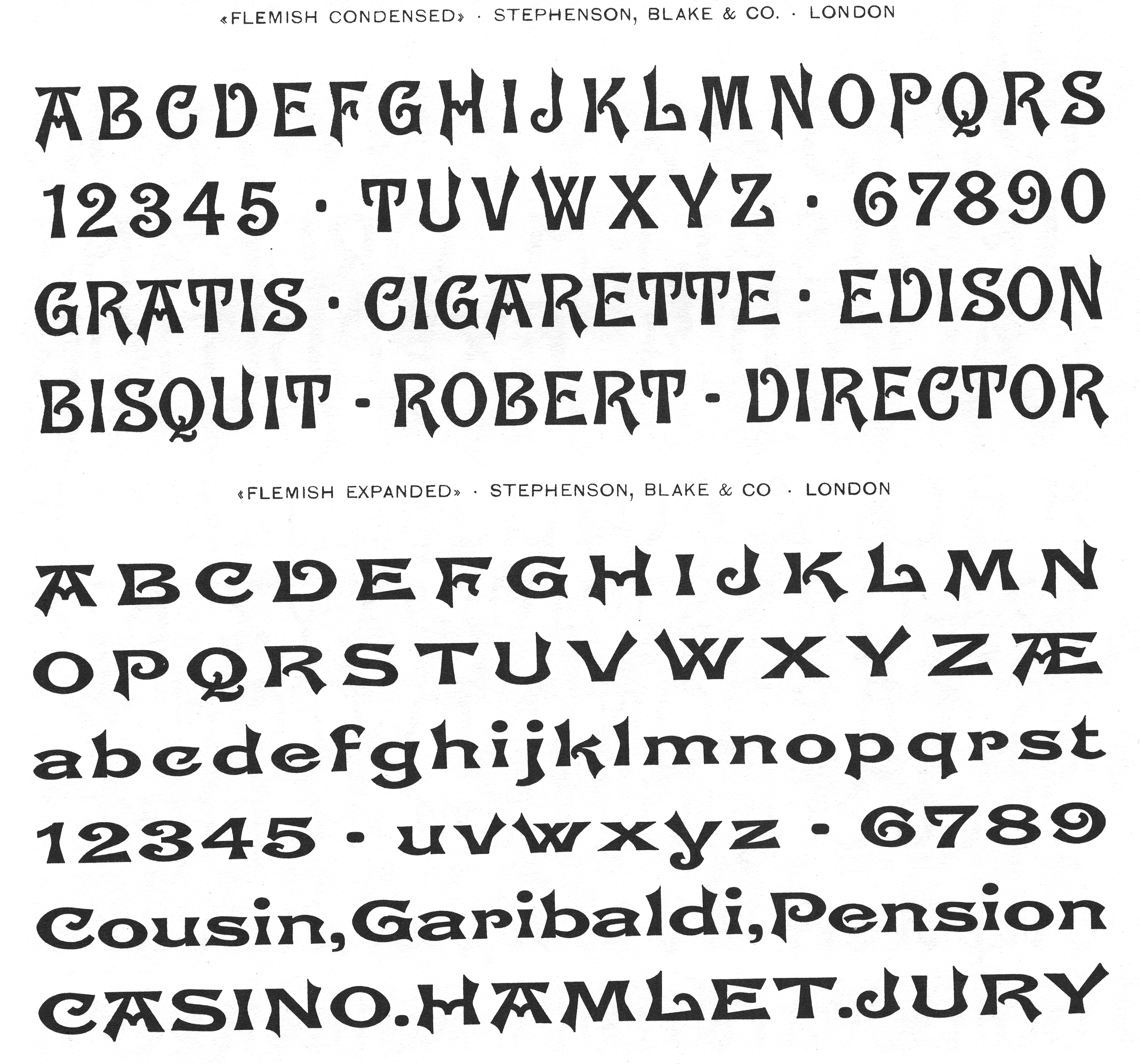
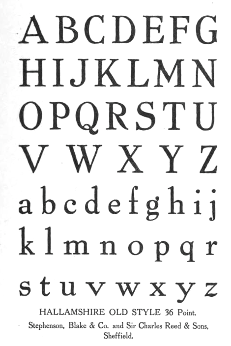
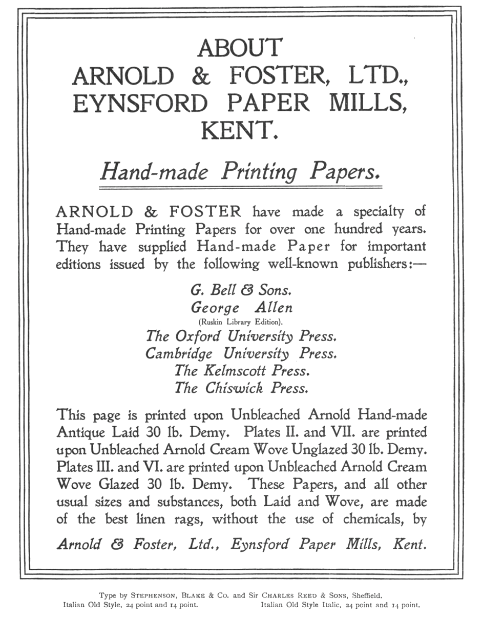
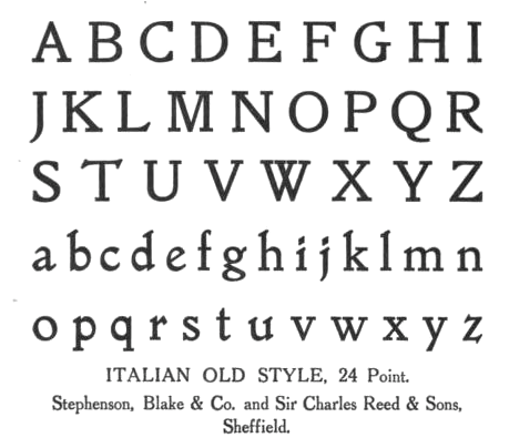
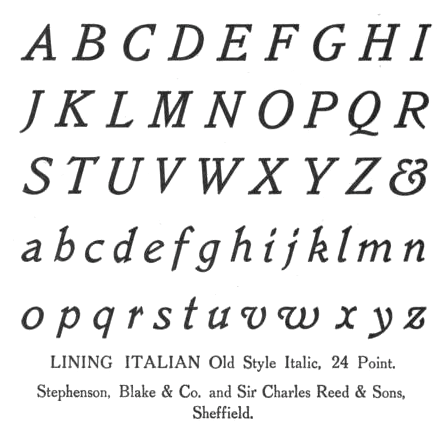
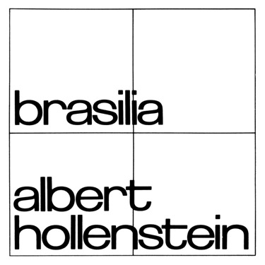
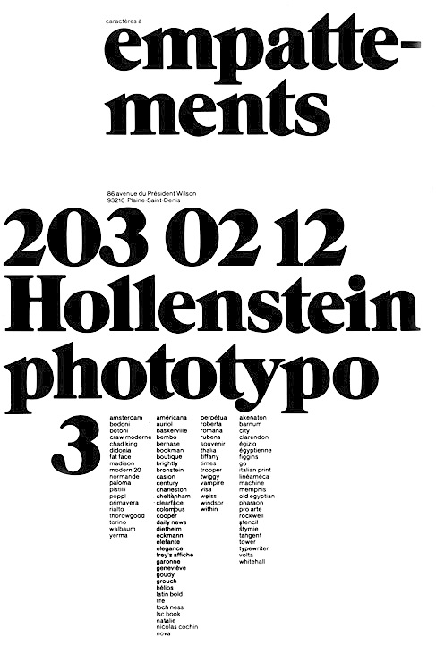
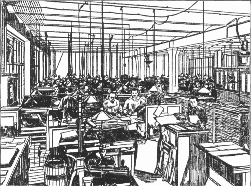
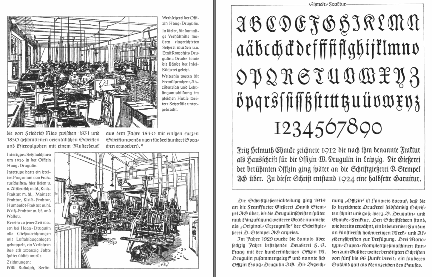
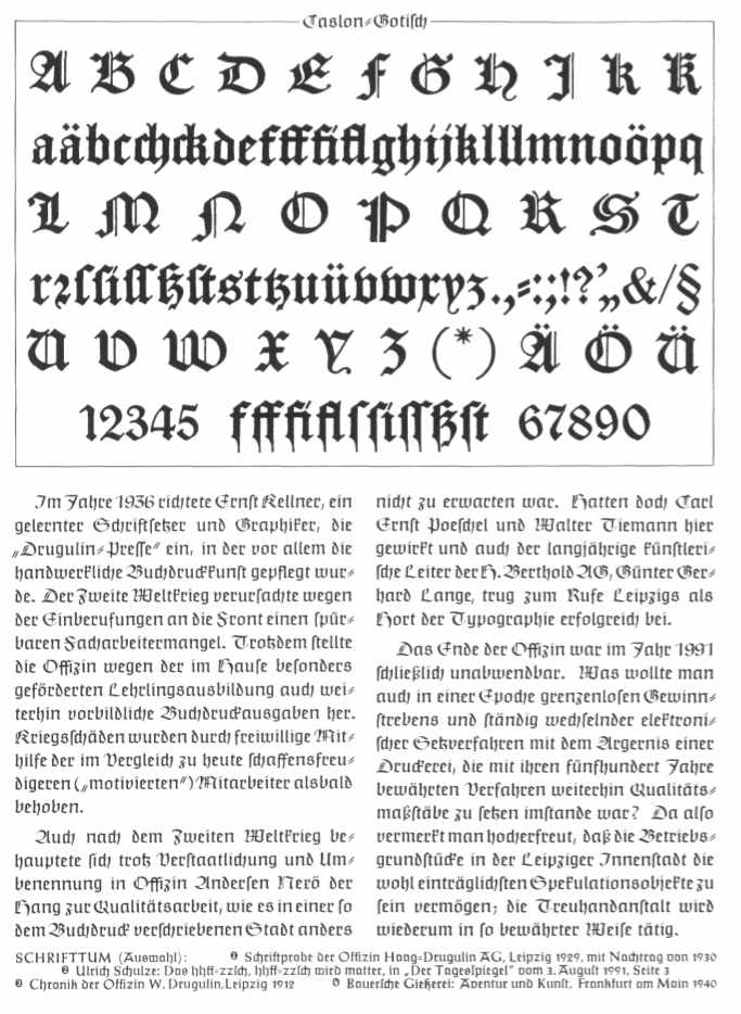
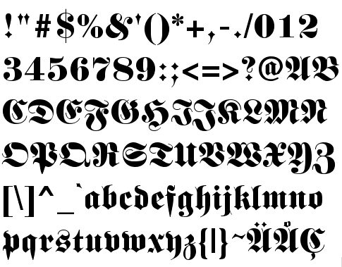
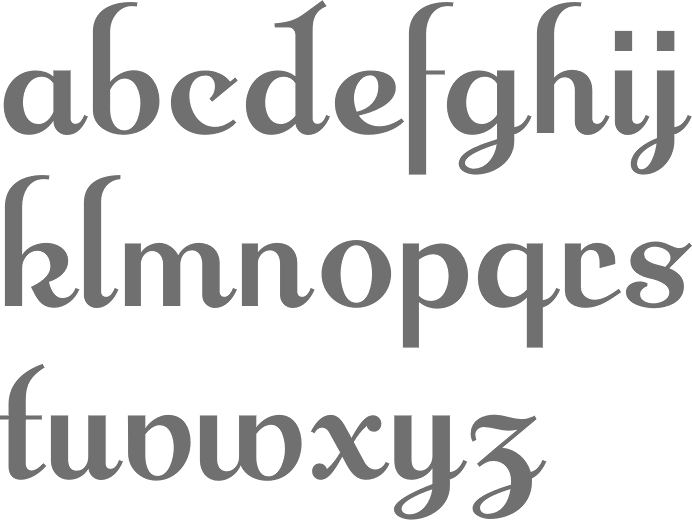
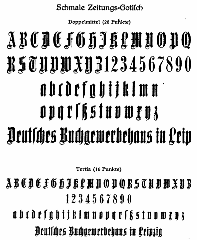
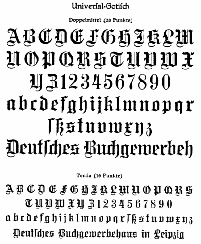
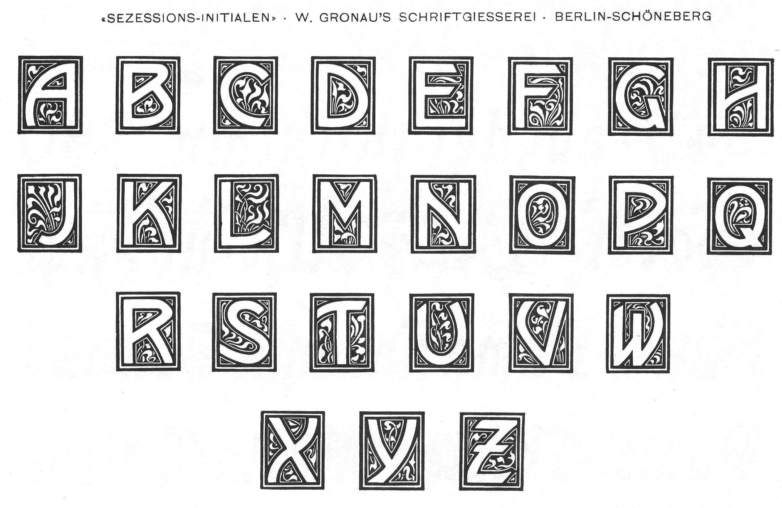
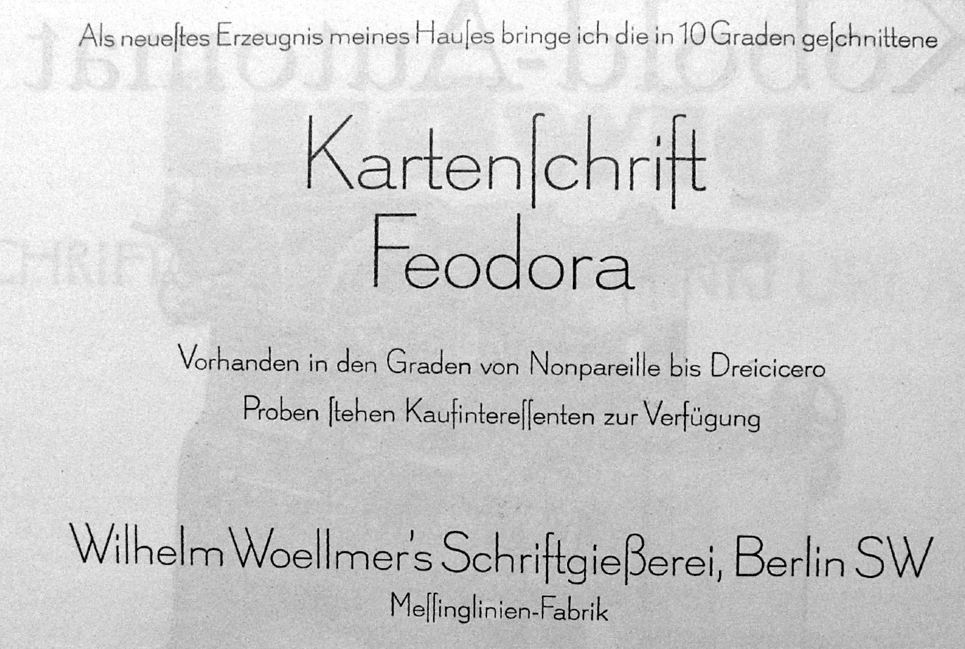
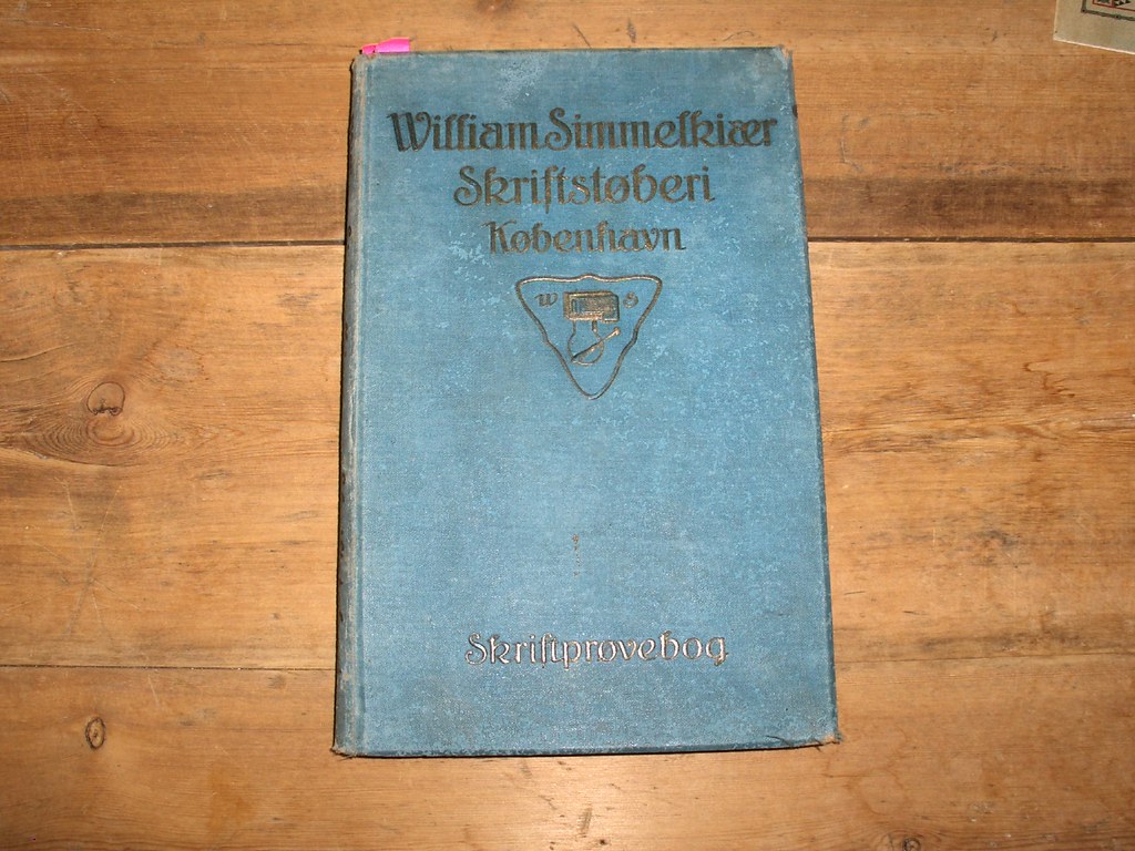
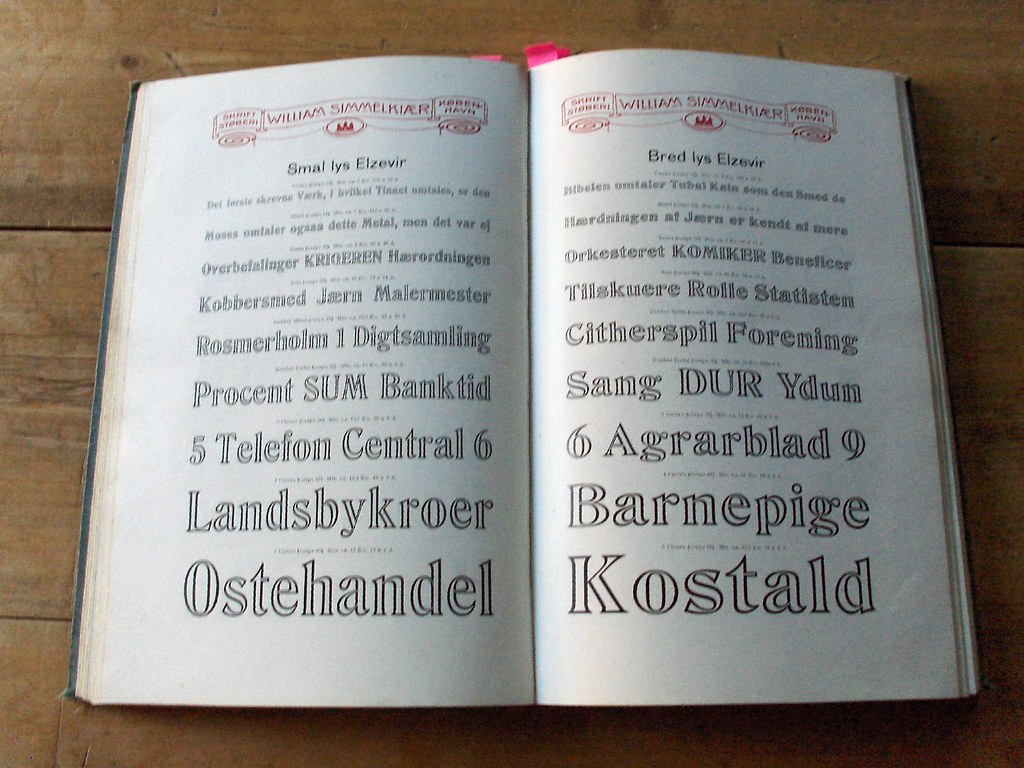
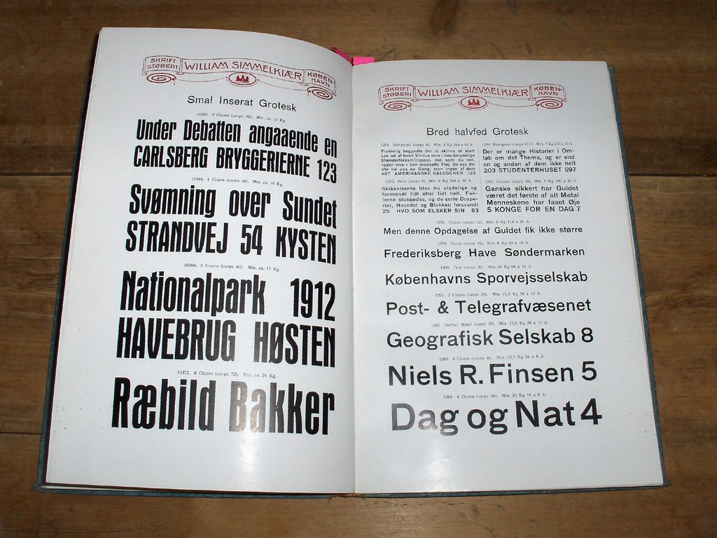
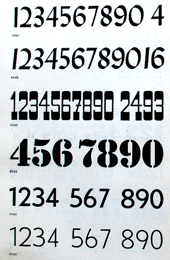
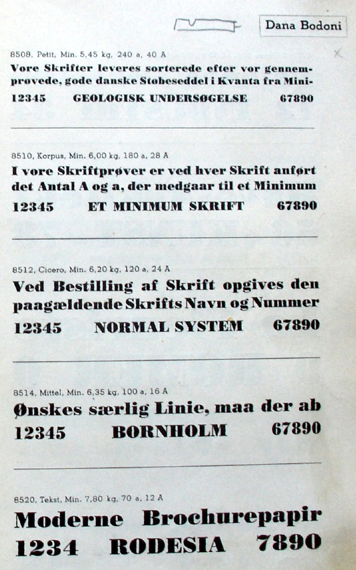
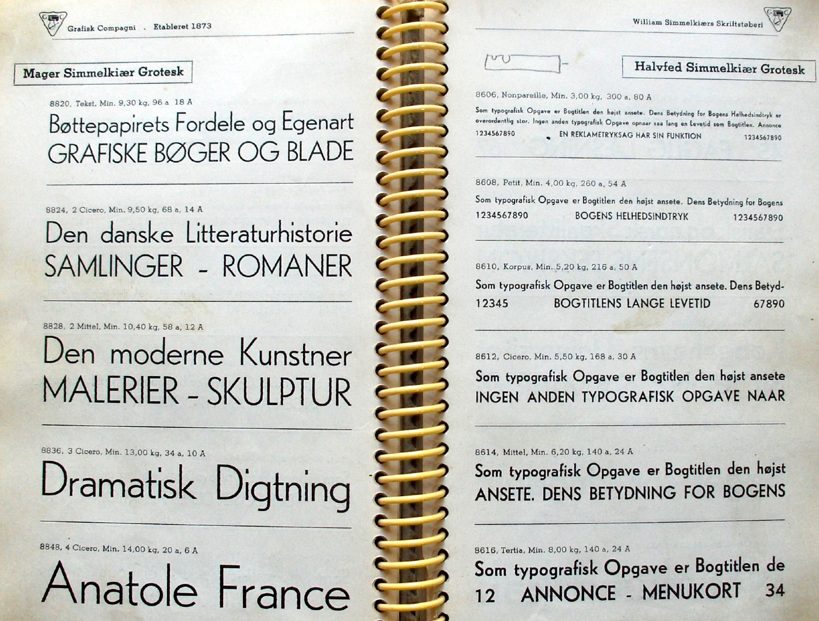
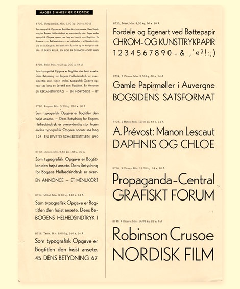
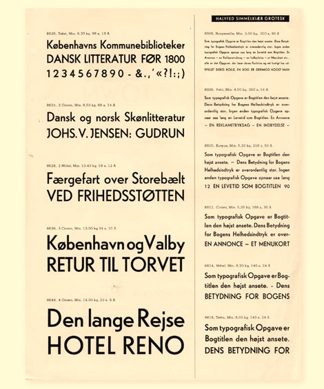
|
|
|
|