TYPE DESIGN INFORMATION PAGE last updated on Mon Jun 8 17:48:33 EDT 2026
FONT RECOGNITION VIA FONT MOOSE

|
|
|
|
|
History of type | ||
|
|
|
|
SWITCH TO INDEX FILE
100types
| Educational and reference site run by Ben Archer, a designer, educator and type enthusiast located in England (who was in Auckland, New Zealand, before that). Glossary. Timeline. Type categories. Paul Shaw's list of the 100 most significant typefaces of all times were recategorized by Archer:
| ||||||||||||
Italian and other writing masters of the 16th century include
| |||||||||||||
Essay by Sumner Stone on the history of combining serif and sans serif in one font. [Google] [More] ⦿ | |||||||||||||
Aaron Burns, designer/typographer, was President of Lubalin, Burns & Co., Inc., New York City. In 1970, Aaron Burns, Herb Lubalin and Edward Rondthaler (from Photo-Lettering Inc.) founded the International Typeface Corporation (ITC), and Aaron Burns became its President. In 1959 he founded the International Center for the Typographic Arts (ICTA), and was a founding member of the International Center for the Communication Arts and Sciences (ICCAS). He is the author of "Typography," published in 1961 by Reinhold Publishers, Inc. From 1955 to 1960 he taught Advanced and Experimental Typographic Design at Pratt Institute, New York. He set up a type division at Rapid Typographers. There he helped promote the Typositor, or Photo Typositor (invented in Miami by Murray Friedel in 1959), which improved over the first photo type machine, the Rutherford. Rapid Typographers organized the Visual Graphics Corporation (or VGC) to make the best use of this new technology. Peter Bain writes: The owners of Rapid Typographers were impressed enough by Friedels invention to organize the new Visual Graphics Corporation. Initially the endeavor split its headquarters between the existing typographers address in midtown Manhattan and sunny South Florida. The Photo Typositor allowed an operator to see composition letter-by-letter as it was exposed, unlike the Rutherford. It also offered many of Photo-Letterings capabilities at a reduced price. The Typositor, as it became known, ingeniously used the same 2-inch film font format as the Filmotype. It speeded fashionably tight letter and word spacing, achievable in metal only with a razor blade after proofing, and had none of the size limitations of foundry type. VGC and its backers proceeded to convert metal typefaces to film, and pursued licensing with typefounders. [Google] [MyFonts] [More] ⦿ | |||||||||||||
About 40 famous type families are shown, with links and a brief history. Pages (in french) by Jean-Christophe Loubet del Bayle. [Google] [More] ⦿ | |||||||||||||
A virtual museum of typography. Classical typefaces. [Google] [More] ⦿ | |||||||||||||
Roman printer, d. 1475. Some think he is the same as Adam(o) de Ambergau, a contemporary printer in Venice, but others refute that. Rot used a proto-roman typeface in Rome to print Dominicus de Sancto Geminiano's Lecturae super secunda parte sexti Decretalium in 1471 and used it until 1474. A digital revival was undertaken by Alexis Faudot and Rafael Ribas in 2016 at a type design workshop at HBK Saar and Bibliothèque municipale de Metz, Sarrebrücken. That typeface is Rot 102R by Faudot and Ribas. [Google] [More] ⦿ | |||||||||||||
Or Adolf Rusch von Ingweiler, who was active in Strasbourg from 1460 until 1489. The first roman antiqua north of the Alps is ascribed to him in 1464. The consensus is that this was not as pretty as the later types by Griffo et al. Nevertheless, Shane Brandes did a large digital revival of his antiqua in 2013 and called it Rusch. Revivals by Alexis Faudot and Rafael Ribas in 2018 during a type design workshop at ESAL Metz and Bibliothèque municipale de Metz, France:
| |||||||||||||
Ricola AG is the Laufen, Switzerland-based manufacturer (est. 1930) of popular herb-based cough drops. One of Adrian's friends told us one evening during the ATypI meeting in Sao Paulo that Ricola had asked Adrian to redo the script logo, to which Adrian agreed. When asked about remuneration, he declined any form of payment. A few days later, a truck arrived at Adrian's house and delivered 20,000 boxes containing Ricola cough drops. In one of the pictrures below, note the omnipresent of the box of Ricola drops (in red). [Google] [More] ⦿ | |||||||||||||
Type specialist, and author of numerous books on type. A very nice historical account of the development of type can be found in Type Designs. Their History and Development (1934, Grafton and co., Coptic House, London; the 2nd edition appeared in 1959). [Google] [More] ⦿ | |||||||||||||
"Flaunt yourself!" is a Polish website devoted to the history of interwar Polish advertising, which appeared mainly in printed form---a project by Sonia Jaszczynska and Ania Wielunska. The site has three parts:
Borys Kosmynka and Ania Wielunska designed Kolumbia and Renesans, while Filip Tofil created Makkabi. Kolumbia is based on E.J. Kitson's Post Oldstyle Roman (aka Columbia. Buffalo, and Kolonel), while Renesans is a revival based on Jan Idzkowski's version of Berthold's Secession typeface. [Google] [More] ⦿ | |||||||||||||
Karl Gerstner said of Akzidenz-Grotesk, It is the work of anonymous typecutters: craftsmen, specialists, whose professional background and experience meant they were familiar with the finest subtleties and principles, and not just those of Grotesque. They gave Akzidenz-Grotesk the ultimate accolade a typeface can have: a functional, formal rightness, transcending the whims of fashion. Erik Spiekermann on the origins: Accidenz (sic) Grotesk was acquired by Berthold in Berlin when they bought another foundry, Pöpplbaum in Vienna. That was 1896 or 1898, depending whether one takes the date of the sale or the release of AG. The original weight was quite light, and Berthold kept adding weights, some of them from other typefaces, acquired from other foundries. Every foundry had a version of that type of face, more often than not available in a few sizes only. The original series remained quite diverse, individual weights showing not much resemblance but name. It was mainly a marketing and naming success. That only changed when they cut (I'm talking foundry type, with some sizes and weights also available on Intertype slug casters) Series 57, and then Series 58, named for the years of release. These had some sizes (but not all) recut under the direction of Günter Gerhard Lange, who was their (freelance) artistic director at the time. Throughout the years, Berthold has expanded this extremely popular and versatile family. AG ExtraBold (1966) and AG Super (1968) were developed by Guenter Gerhard Lange and are excellent choices for headlines. Guenter Gerhard Lange added more weights for Berthold including Super Italic (2001) and ExtraBold Italic (2001). In 2006, Berthold first released Akzidenz-Grotesk in OpenType. In 2007, Berthold announces the release of Akzidenz-Grotesk Pro+ with Cyrillic and Greek support for all 30 fonts in the collection as well as language support for Central European, Baltic and Turkish. Akzidenz-Grotesk Pro+ is available in CFF PostScript flavored OpenType. Also added in 2007 was Akzidenz-Grotesk Next in 14 styles. Akzidenz-Grotesk Probe Nr. 473 (1966, H. Berthold AG) is a specimen book. Ulrich Stiehl dociuments the Linotype clones from 1958. In 1992, H. Berthold made 22 PostScript fonts of Akzidenz Grotesk, shown here. Images of Akzidenz Grotesk, courtesy of Gabriel Perdomo Motta: i, ii, iii. Credit for some images below: Danielle West. [Google] [More] ⦿ | |||||||||||||
Alain Hurtig
| |||||||||||||
Noted type historian in Berkeley, CA. Alastair Johnston is a partner in Poltroon Press, Berkeley. He taught college level courses in typography for over 30 years. He has published scores of books and won the Award of Excellence in the AIGA Just Type Show. His published works include bibliographies and discographies, as well as Alphabets to Order: The Literature of Nineteenth-Century Typefounders' Specimens (New Castle, 2000), Nineteenth-century American designers & engravers of type by William E. Loy (co-editor/designer; Oak Knoll Press, 2009), Hanging Quotes (Cuneiform Press/University of Houston, Texas, 2011), Typographical Tourists: Tales of tramping printers (Poltroon Press, 2012) and Transitional Faces: The Lives and Work of Richard Austin, type-cutter, & Richard Turner Austin, wood-engraver (Poltroon Press, 2013). [Google] [More] ⦿ | |||||||||||||
Type historian at Reial Academia de Bones Lletres in Barcelona, who has a PhD in art history from Universitat Autonoma de Barcelona (UAB). Born in Barcelona in 1971, Corbeto is responsible for all the publishing activities of the Real Academia de Buenas Letras de Barcelona and the Asociación de Bibliófilos de Barcelona. His field of investigation is the history of printing types and, in particular, the work of Spanish punchcutters throughout the second half of the eighteenth century. At ATypI 2006 in Lisbon, he spoke about the efforts around 1750-1770 to set up the Royal Library type foundry by Juan de Santander and Gerónimo A. Gil. Speaker at ATypI 2009 in Mexico City, where he talked about the punches from the Spanish Royal Printing House. Soon he will publish a specimen and text book on all this. His books: Muses de la impremta. La dona i les arts del llibre (segles XVI-XIX) (ed., with M. Garone) (Associació de Bibliòfils de Barcelona, 2009); Especímenes tipográficos españoles. Catalogación y estudio de las muestras de letras impresas hasta el año 1833 (Calambur, Madrid, 2010); Daniel B. Updike, impresor e historiador de la tipografía (Campgrafic, Valencia, 2011); Tipos de imprenta en España (Campgrafic, Valencia, 2011), Las letras de la Ilustración. Edición, imprenta y fundición de tipos en la Real Biblioteca (Catálogo de la exposición en la Biblioteca Nacional, Madrid, 2012) e Història de la tipografia. L'evolució de la lletra des de Gutenberg fins a les foneries digitals (coauthor with M. Garone, Pagès Editors, Lérida, 2012). [Google] [More] ⦿ | |||||||||||||
Images of his work: his famous set of German Renaissance Capitals (1525), Gothic Capitals, German Minuscule, his famous rhinoceros (1515) and his blackletter type Dürerfraktur (1519). Digital typefaces based on Duerer's work:
| |||||||||||||
Author of Handbuch der Schriftarten (Leipzig, 1926), a nearly comprehensive listing of all types at all German type foundries at that time. Just the name index of the types takes 38 pages. Download at Klingspor of the original volume from 1926, and the addenda published in 1927. 1929, 1930, 1933/1935, 1936/1937, und 1938/1939 under the name Nachträge. Emil Wetzig (Leipzig) helped with the production. Local download. [Google] [More] ⦿ | |||||||||||||
Kevin Steele explains in 1996: Some sources cite the publication of Cardinal Bembo's De Aetna as 1493 or 1495. And in fact, the design continued to evolve until the 1499 publishing of the spectacular Hypnerotomachia Poliphili. Let's not split hairs. Let's celebrate 500 years of Bembo! In the mid fifteenth century printing quickly spread to Italy from Germany, and by the 1470's Venice had became the center of the printing industry, home to over 100 printing companies. Pioneers such as Erhard Ratdolt and Nicolas Jenson had already begun working on adapting the roman alphabet for metal type by the time Aldus Manutius established his press in 1494, with the intention of publishing all the Greek classics. Aldus Manutius (1450-1515) was a printer, entrepreneur, a great ego, and publisher of over 1200 titles. Among the many contributions of Aldus was the popularization of small, portable books. His expensive beautiful books were far from today's paperbacks, mind you. One of the many great talents working for Aldus was Francesco Griffo, a gifted type designer. Griffo created many innovative type designs that are still admired for their beauty and readability. Their collaboration broke up over a copyright dispute, primarily over the ownership of the cursive type typeface that Griffo developed under the direction of Aldus. Although Aldus even had a papal decree to protect this style of alphabet, it was as difficult then as it is now to protect a typeface design. The alphabet was widely copied, and the style is known as italic, after its country of origin. Digital typefaces derived from his work: 1501 Manutius (2001) by Klaus-Peter Schäffel. Selection of fonts based on Manutius's work. [Google] [MyFonts] [More] ⦿ | |||||||||||||
Berry, Johnson and Jaspert write: Ronaldson Old Style (Monotype, 1903) is an old face practically identical with Old Style. Originally cut in 1884 by the American founders, MacKellar, Smiths & Jordan, and no doubt named after one of the original founders of their house, James Ronaldson. It is easily distinguished by the beak-like serifs on the capitals and lower case and by the squared-up shoulders of m and n. The type can be converted to Old Style No. 1 by changing a few characters. In the italic the serifs are more normal and the design becomes very like Old Style italic. The Monotype Corporation's version has short ascenders and descenders and capitals not rising above the ascenders. Mac McGrew: Ronaldson Old Style was designed and cut by MS&J in 1884, and subsequently copied by various other foundries. It was notable for the exaggerated serifs on a number of letters, and the name is now associated with these peculiarities, which were also applied to various other typefaces in the nineteenth century. Monotype cut a reasonably good copy of the foundry face, although modified to fit mechanical requirements, while Linotype cut a set of conversion characters which could be substituted for the regular characters of Old Style No.7. A similar set of conversion characters was cut for Linotype and Intertype Old Style No.1 (q.v.), which is a somewhat lighter face. Keystone called its version Keystone Old Style. Other versions of Ronaldson did not last long into the twentieth century. Digital revivals of Ronaldson Old Style:
Digital revivals of Binny Old Style include Monotype's as Binny Old Style MT. [Google] [MyFonts] [More] ⦿ | |||||||||||||
Punchcutter. From MyFonts: Scottish punchcutter (b. Edinburgh, 1829, d. Chelsea, MA, 1894) active in the revival of oldstyle designs at Miller&Richard in the 1850s. He went to America in 1861, working at the Bruce type foundry for two years, and then for the Dickinson foundry. In 1872 this foundry was ravaged by fire; Phemister was made a partner by its founder Samuel Nelson Dickinson and worked there until retirement in 1891. MyFonts missed the boat on this one! Phemister was the first man to design the famous Bookman. His typefaces include these:
Some images below by Alex Delgado. FontShop link. Klingspor link. View and compare Bookman-style commercial typefaces. [Google] [MyFonts] [More] ⦿ | |||||||||||||
Author, educator, historian and type personality who taught at Rochester Institute of Technology from 1947-1977. He wrote Anatomy of a Typeface (1990, David R. Godine). He died in 2002 in Sun City, FL. Obituary. [Google] [MyFonts] [More] ⦿ | |||||||||||||
Dublin-based creator of the roman Gaelic typeface Hogan (1891). He also made the Gaelic Modern round typeface Petrie C (also known as Thom) ca. 1856. [Google] [More] ⦿ | |||||||||||||
Scottish typefounder, b. St. Andrews, 1714, d. Edinburgh, 1784. Educated in London, he started the Wilson foundry in 1742 at St. Andrew's in a partnership with John Baine, and set up shop in Glasgow in 1744, where he began work with Glasgow University Printers, Robert and Andrew Foulis. William Miller (who later started Miller&Richard), Richard Austin and Johann Christian Bauer all worked for Wilson. Wilson's first known specimen sheet was issued in 1772. However, William Rind seems to be using these types as early as February, 1770 in his Virginia Gazette. The business was left to his son Andrew and later to his grandson Alexander. Under Alexander's tenure, it went bankrupt in 1845. Several specimen books exist, including A specimen of printing types by Alexander Wilson&Sons, dated 1783. Life and Letters of Alexander Wilson (by Alexander Wilson) was reprinted in 1983 by Diane Publishing Company, and is freely viewable at Google. They are credited with the first British modern face, Scotch Roman, whch became very popular in the United States. Mac McGrew: Scotch Roman is derived from a typeface cut and cast by the Scotch foundry of Alexander Wilson&Son at Glasgow before 1833, when it was considered a novelty letter. The modern adaptation of the typeface was first made in 1903 by the foundry of A. D. Farmer&Sons, later part of ATF. It is a modern face, but less mechanical than Bodoni, and has long been popular. Capitals, though, appear heavier than lowercase letters and tend to make a spotty page. Hansen's National Roman is virtually the same face, with the added feature of an alternate r with raised arm in the manner of Cheltenham Oldstyle. When Monotype copied Scotch Roman in 1908, display sizes were cut to match the foundry face, but in keyboard sizes, necessarily modified to fit mechanical requirements, the caps were lightened and the entire typeface was somewhat regularized. Scotch Open Shaded Italic, a partial set of swash initials, was designed by Sol Hess in 1924. Similar swash letters, but not shaded, were also drawn by Hess and made by Monotype for regular Scotch Roman Italic. Linotype had adapted Scotch Roman to its system in 1903, retaining the heavier capitals, but in 1931, by special permission of Lanston Monotype, brought out Scotch No.2 to match the Monotype version. Compare Atlantic, Bell, Caledonia, Original Old Style. [Google] [MyFonts] [More] ⦿ | |||||||||||||
Spanish type founder and printer, who worked in Valencia around 1477-1478, where he published the Valancian Bible. He left for Murcia, where in 1484, he printed the Breviarium Cathaginense. [Google] [More] ⦿ | |||||||||||||
All Good Things Typography
| Dead link. Archive (FontPool), history of type, type classification (by Matthias Neuber and Morton K. Pedersen), page layout guide, type choice guide, logo type guide, mixing type guide, Windows software guide, Mac type software guide, glossary. By Kevin Woodward. [Google] [More] ⦿ | ||||||||||||
Alois Ritter Auer von Welsbach (b. Wels, Austria, 1813, d. Vienna, 1869) was a typographer and printer for the state. He was famous for special techniques for "nature printing". Michael Everson Conjectures that he made the Gaelic typefaces Vienna A (also called Altirisch A, Altkeltisch) ca. 1845 and Vienna B (also called Altirisch B or Neukeltisch) ca. 1845. The former typeface is a manuscript face, while the latter is Gaelic uncial round. [Google] [More] ⦿ | |||||||||||||
A 320-page book about the origins of the Latin alphabet, by John Man. [Google] [More] ⦿ | |||||||||||||
A bit of history on writing systems. Links to many ancient scripts. [Google] [More] ⦿ | |||||||||||||
Alphabetum
| Juan-José Marcos García (b. Salamanca, Spain, 1963) is a professor of classics at the University of Plasencia in Spain. He has developed one of the most complete Unicode fonts named ALPHABETUM Unicode for linguistics and classical languages (classical&medieval Latin, ancient Greek, Etruscan, Oscan, Umbrian, Faliscan, Messapic, Picene, Iberic, Celtiberic, Gothic, Runic, Modern Greek, Cyrillic, Devanagari-based languages, Old&Middle English, Hebrew, Sanskrit, IPA, Ogham, Ugaritic, Old Persian, Old Church Slavonic, Brahmi, Glagolitic, Ogham, ancient Greek Avestan, Kharoshti, Old Norse, Old Icelandic, Old Danish and Old Nordic in general, Bengali, Hindi, Marathi, Phoenician, Cypriot, Linear B with plans for Glagolitic). This font has over 5000 glyphs, and contains most characters that concern classicists (rare symbols, signs for metrics, epigraphical symbols, "Saxon" typeface for Old English, etcetera). A demo font can be downloaded [see also Lucius Hartmann's place]. His Greek font Grammata (2002) is now called Ellenike. He also created a package of fonts for Latin paleography (medieval handwriting on parchments): Capitalis Elegans, Capitalis Rustica, Capitalis Monumentalis, Antiqua Cursiva Romana, Nova Cursiva Romana (2014), Uncialis, Semiuncialis, Beneventana Minuscula, Visigothica Minuscula, Luxoviensis Minuscula, Insularis Minuscula, Insularis Majuscula, Carolingia Minuscula, Gothica Textura Quadrata, Gothica Textura Prescissa, Gothica Rotunda, Gothica Bastarda, Gothica Cursiva, Bastarda Anglicana (2014) and Humanistica Antiqua. PDF entitled Fonts For Latin Palaeography (2008-2014), in which Marcos gives an enjoyable historic overview. Alphabetum is not Marcos's only excursion into type design. In 2011, he created two simulation fonts called Sefarad and Al Andalus which imitate Hebrew and Arabic calligraphy, respectively. Cyrillic OCS (2012) is a pair of Latin fonts that emulate Old Church Slavonic (old Cyrillic). In 2013, he created Cuneus, a cuneiform simulation typeface. Paleographic fonts for Greek (2014) has ten fonts designed by Marcos: Angular Uncial, Biblical Uncial, Coptic Uncial, Papyrus Uncial, Round Uncial, Slavonic Uncial, Sloping Uncial, Minuscule IX, Minuscule XI and Minuscule XV. These fonts are representative of the main styles of Greek handwriting used during the Classical World and Middle Ages on papyrus and parchments. There is also a short manual of Greek Paleography (71 pages) which explains the development of Greek handwriting from the fourth century B.C. to the invention of printing with movable type in the middle of the fifteenth A.D. He wrote a text book entitled History of Greek Typography: From the Invention of Printing to the Digital Age (in Spanish; second edition, 2018). See also here and here. [Google] [More] ⦿ | ||||||||||||
Digital fonts that were inspired by Mucha:
CV. One of his alphabets. Viennese Secession link. View commercial fonts that descend from Mucha's work. [Google] [MyFonts] [More] ⦿ | |||||||||||||
American Amateur Press Association (AAPA)
| Organization with many type pages related to letterpress, and run mostly by Dave Tribby. I quote Tribby: From its formation in 1892 (from the merger of 23 leading foundries) to its demise in the late twentieth century, American Type Founders was the dominant force in foundry type. Throughout its existence, ATF produced some of the most beautiful printing fonts. During its first half century, those typefaces were displayed in a series of substantial catalogs. Chicago's Barnhart Brothers & Spindler foundry chose not to join the ATF combine in the 1890s. It finally became part of ATF in 1911, but continued to operate under its own name until it was closed in 1933. Based upon Mac McGrew's American Metal Typefaces of the Twentieth Century, Maurice Annenberg's Type Foundries of America and their Catalogs, and a review of ATF type catalogs published in 1897, 1899, 1900, 1903, 1906, 1909, 1912, 1923, 1934, 1941, 1960, and 1971 (plus BB&S catalog No. 25), Tribby has compiled a spreadsheet of ATF typefaces, their identification numbers, and which page numbers they appeared on in those catalogs. He put together a similar spreadsheet for BB&S catalogs that were published in 1897, 1909, and 1925. The following PDF files were prepared from the individual worksheets in the spreadsheet file.
| ||||||||||||
Lists and explanations of all ancient languages and scripts. No fonts. Page by Lawrence K. Lo. [Google] [More] ⦿ | |||||||||||||
Publisher of "Spécimen des caractères de l'imprimerie du Vatican" (Stampa Vaticana e camerale, 1628). Republished as The type specimen of Vatican Press with an introduction and notes by H.D.L. Vervliet at Menho Hertzberger, Amsterdam, in 1967. See also here for this 49-page book. [Google] [More] ⦿ | |||||||||||||
Italian painter and engraver (b. Vicenza or Padova, 1431, d. Mantua, 1506). Fonts named after him include Mantegna (Philip Bouwsma at ITC) and Mantinia (1993, Matthew Carter). Typedia link. [Google] [MyFonts] [More] ⦿ | |||||||||||||
A primitive uncial style of capitals prevalent in the eighth and ninth centuries. [Google] [More] ⦿ | |||||||||||||
Several such types came out Nicolas Jenson's printing workshop set up by nicolas Jenson in 1468. That first antiqua typeface was used in De Evangelica Praeparatione in 1470. Jenson died in 1480 at the age of 60, but many would take up that style between 1470 and 1600. The Venice connection led quite naturally to the other name for the type style, Venetian. Occasionally, the name old style is also used but that refers to a later style, the aldine or garalde. Well-known Venetian typefaces include ITC Berkeley Oldstyle, Brioso Pro, Centaur, (Adobe) Jenson, Hightower, Kennerly, Schneidler, Nicolas Jenson SG, Phinney Jenson, Stempel Schneidler, Verona, Abrams Venetian, Lutetia, Jersey, Lynton, Spira. It is easy to recognize Venetian types, not just from the uniform thickness and semi-calligraphic look, but also by the small x-height, small counters, tall ascenders, overly wide HMN, sloped cross-bar on the "e", negative axis on the "o", and two roof serifs on the M. Additional literature: Martin Silvertant's history of type, from which the analytic image is borrowed. [Google] [More] ⦿ | |||||||||||||
Mac McGrew writes: Antique in general is a generic nineteenth-century term applied to a variety of old type styles. A few that were given a new lease on life by Monotype and the slug machines are listed here; others were similar to the older Clarendons, Dorics, Ionics, etc. Also see Bold Antique and Bold Condensed Antique, Modern Antique and Modern Antique Condensed, and Old Style Antique, also Cushing Antique, Latin Antique, etc. Antique No.1 is similar to Bookman. Antique No.2 (Lino) is equivalent to Antique No.6 (Mono) and comes from BB&S, where it was later known as Antique Bold. Antique No.3 is equivalent to Modern Antique. Antique No. 525 (ATF) is very similar to Antique [No. 53] (BB&S) and Antique No.1 (Inland); also to Consort Light, the 1950s English revival (see Clarendon). Hansen's Antique No.1 was slightly lighter than the others. Antique Condensed comes from BB&S. Antique Extra Condensed was shown as Skeleton Antique by Marder, Luse in 1886 or earlier and by BB&S somewhat later, with many sources producing the same or very similar designs. Antique Shaded was designed by Morris F. Benton in 1910 but not introduced until 1913, when it was described as "the first of a series of shaded typefaces." It was later promoted as part of "the new gray typography." This typeface was the first one cut on a new shading machine invented by the designer's father, Linn B. Benton. When Monotype copied it, the typeface was named Rockwell Antique Shaded, to tie it in with that company's Rockwell series (q. v.), but since Rockwell is often confused with Stymie, it is perhaps natural that Antique Shaded is sometimes though incorrectly called Stymie Shaded. [Google] [More] ⦿ | |||||||||||||
French type designer and punchcutter, ca. 1490-1534, and teacher of Claude Garamond in Paris. He was one of the first French to engrave roman letters, when other French printers were mostly using blackletter. He began to work for Robert Estienne, one the first Parisian printers to use this type. Influential in creating a French typographical look, he was hanged for printing a poem without permission. George Abrams' rendering of Garamond, called Augereau [digitized by Charles Nix], is a wonderful text family! Klingspor link. [Google] [MyFonts] [More] ⦿ | |||||||||||||
Nürnberg-based printer who created many interesting typefaces in the late 15th century, as narrated by Christoph Reske in Eine neue Entdeckung zur Druckgeschichte der Schedelschen Weltchronik (note: Schedelschen Weltchronik (1492) is a book by Hartmann Schedel). These include a gorgeous Rotunda and Schwabacher (1492), a Druckbastarda, and other original Fraktur typefaces, called No. 9 and No. 11 by Reske. Koberger was first and foremost a printer, who made the first illustrated bible in 1475, and printed, as hinted to above, Schedelschen Weltchronik (1492). He died in 1515. MyFonts page. Modern digital types based on Koberger abound:
| |||||||||||||
Printer from the late 18th century. Type specimen from 1790. [Google] [More] ⦿ | |||||||||||||
Italian printer working in Rome from 1515 to 1567. He got the italic type by Arrighi, the revival of which is Monotype Blado, by Stanley Morison (1923). [Google] [MyFonts] [More] ⦿ | |||||||||||||
Spanish typefounder based in Sevilla, who emigrated to Mexico and is thought to be the first Spanish typographer in North America. He created a large number of Gothic, roman and cursive typefaces. He printed mainly religious oeuvres, from about 1560 until about 1571. Cristóbal Henestrosa, who wrote Espinosa. Rescate de una tipografía novohispana (México, Designio, 2005), writes: He worked with Juan Pablos (first printer on the American continent) since 1551 and he began his independent job in 1559, with Maturino Gilberti's Grammatica Maturini and finalized with the second edition of Graduale Dominicale in 1576, the year he died. It is not completely clear that he cut [types], although there is a contract (1550) in which he promises to cut type for Juan Pablos, but he is the second printer in all of America and the first one who preferred roman and cursive type over the gothic. [Google] [More] ⦿ | |||||||||||||
Copyright-free type and typefounding books. Several type specimen books from the University of California Library Collection have been scanned in by Microsoft. Other libraries are participating as well. [Google] [More] ⦿ | |||||||||||||
Arina Stoenescu (b. 1969, Bucharest) is a doctoral student at Department of Arts and Cultural Sciences at Lund University, Book history. Her doctoral thesis is entitled Typography and Politics. The political impact of typography in newspapers from Romania during the communist time (1948-1989). She lives in Stockholm since 1989. In 2010 she started the first independent type design and typography courses in Swedish universities. Speaker at ATypI 2017 Montreal: An atypical history of type in Romania 1508-1989. [Google] [More] ⦿ | |||||||||||||
Nicholas Fabian on Pannartz. Catholic Encyclopedia. Literature: Burger: The Printers and Publishers of the XV Century (London, 1902); Fumagalli: Dictionnaire géogrique d'Italie pour servir à l'histoire de l'imprimerie dans ce pays (Florence, 1905); Löffler: Sweinheim und Pannartz in Zeitschrift für Bücherfreunde, IX (Bielefeld, 1905), and Die ersten deutschen Drucker in Italien in Historisch-politische Blätter, CXLIII (Munich, 1909). Revivals of their typefaces, blends between humanist and blackletter, include:
| |||||||||||||
German printer, based in Köln, active from 1470 until 1483. Aka Arnold Therhoernen, Arnold ter Humen and Arnold Horn. Aka Arnold Therhoernen, Arnold ter Humen and Arnold Horn. Born in Hoorn (Zuidersee), he died in Köln in 1483 or 1484. In 2013, Shane Brandes created a typeface, Therhoernen, named after him. [Google] [More] ⦿ | |||||||||||||
Art of the Printed Book, 1455-1955: Masterpieces of Typography Through Five Centuries | This book is based on the collections of the Pierpont Morgan Library, New York, and comes with an essay by Joseph Blumenthal. It was published in 1973 by Pierpont Morgan Library, New York, and David R. Godine, Boston. Second printing, 1974. [Google] [More] ⦿ | ||||||||||||
Born in London in 1867, Rackham became a famous illustrator, and was noted for hand lettered titles, decorative marginalia, hand-drwan headers and borders, and color plates. Scriptorium made a font family called Rackham based on his lettering. Rackham died in Limpsfield, Surrey, in 1939. [Google] [MyFonts] [More] ⦿ | |||||||||||||
For revivals and extensions:
| |||||||||||||
On the digital side, in chronological order:
Dead link by the Typophiles on this subject. [Google] [More] ⦿ | |||||||||||||
Buddhist monk. Korean printer of the first book that used movable metal type, in 1372 during the Goryeo Dynasty. He lived from 1298 until 1374. Jikji is the abbreviated title of a Korean Buddhist document, Anthology of Great Buddhist Priests' Zen Teachings. [Google] [More] ⦿ | |||||||||||||
Barlow type
| Early transitional Gaelic typeface prepared by the Gaelic Society of Dublin in 1808-1821, which, just as the very early Queen Elizabeth type, used some roman characters, in part to draw in people to study the Irish language. Sample from a grammar book published by John Barlow in 1808. [Google] [More] ⦿ | ||||||||||||
Barnhart Bros. Spindler Type Founders: Book of Type Specimens, 1907 |
| ||||||||||||
Bartholomäus Ghotan was the foremost authority on printing liturgical texts in his era. He had previously worked as a priest at Magdeburg (Germany) where he learned about book printing and decided to start a new career. His clerical training made him an expert on the subject of liturgical books and he printed the very first missal, Missale Praemonstratense there in 1479. Ghotan moved to Lübeck and continued to make liturgical books. In 1486 he was invited to Stockholm where he printed several books for Swedish dioceses, including Missale Strengnense. In 1487 he had a disagreement with the government led by regent Sten Sture and returned to Lübeck where he printed Missale Aboense in 1488. Ghotan continued printing books in Lübeck for several years before deciding to open a printing shop at Novgorod in 1493. He probably died in Novgorod in 1494. Some suspect that he was killed in the disturbances caused by the conflict between the Hanseatic League and Czar Ivan the Great but the real cause of death is unknown. The letterforms of the digital font Missaali (2016, Tommi Syrjänen) are based on Missale Aboense. Ghotan followed the standard practice of the time and set the missal using textura, a type based on textualis formata that was the prevalent late-medieval script in Germany for the most valuable manuscripts. Thirty years earlier Gutenberg had used the same script for his famous bibles. Missale also has a number of large initials that are mostly set in the Lombardic style. [Google] [More] ⦿ | |||||||||||||
Bartolomeo Sanvito (1435-1518) was a scribe from Padua, Italy, who was trained in Rome. A master of the humanist italic script, his style is characterized by wquare capital letters alternating colored and gold. Books on Sanvito include Bartolomeo Sanvito: the Life and Work of a Renaissance Scribe (A.C. de la Mare and Laura Nuvoloni, Paris: Association internationala de Bibliophilie, 2009) and The Script of Humanism: Some Aspects of Humanistic Script 1460---1560 (James Wardrop: Oxford University Press, 1963). Many digital typefaces were modeled or named after Sanvito. These include
| |||||||||||||
Typophiles with opinions on metal versions of Baskerville, giving a nod to Monotype Baskeville, and voicing concern that the digital Baskervilles are too anemic. Wikipedia: Interest in Baskerville seems to have revived in the early 20th century, with Bruce Rogers among others taking an interest in him. [...] Not surprisingly, therefore, the type was revived for mechanical composition in the 20th century. ATF was first, followed by English Monotype in 1923, and thereafter other manufacturers (notably Linotype) followed suit. Monotype Baskerville (Series 169), perhaps the best-known of these revivals was a commercially successful type despite (or perhaps because) it was heavily "cleaned up" by the Monotype drawing office Monotype's was based on a font designed for use at a fairly large size in an edition of Terence's comedies published in 1772. ATF and Linotype used strikes from genuine punches of a smaller size type; it is not therefore surprising that different versions of Baskerville look noticeably different: they are (or may) still be 'authentic'. Mac McGrew's discussion, mainly regarding metal Baskervilles in America: There are two distinct varieties of Baskerville in America. Both based on the types of John Baskerville, distinguished eighteenth-century English printer and typefounder, who was noted for his quest for perfection. His types are based on Caslon and other popular typefaces of the day, but are more precise and have a little more contrast, with stress more nearly vertical, making them the first transitional designs between oldstyles typified by Caslon and moderns typified by Bodoni. A consistently noticeable characteristic is the lowercase g, with its lower loop not completely closed. All versions have rather long ascenders, and present an appearance of dignity and refinement. On ATF's Baskerville, he writes: The ATF version, which is called Baskerville Roman in foundry specimens but which most typesetters call American Baskerville, is produced from strikes (unfinished matrices) brought from Stephenson Blake, English typefounders, in 1915. In England it is known as the Fry Foundry version, and is said to have been cast from original matrices cut about 1795 by Isaac Moore as a close copy of Baskerville's own types. Small sizes to 14-point tend to be rather light and narrow, while sizes from 3D-point up have more weight and vigor. Production was discontinued about 1950, perhaps because most specimens didn't show the handsome larger sizes in sufficient detail; it was reinstated in 1957 without the sizes below 18-point. ATF Baskerville Italic was designed in 1915 by Morris F. Benton. It is a handsome typeface in itself, but has little in common with its roman mate other than adjustment to the narrowness of small sizes. It is not made above 18- point, nor-since it was reinstated-below small 18-point. Compare Century Catalogue Italic. About Linotype Baskerville: Linotype Baskerville, said to be based on original punches which are still in existence, is much like the ATF face, but differs in details of capitals C, Q, W, and lowercase w, y, and &. It was cut in 1926 under the direction of George W. Jones, British typographer. The italic was recut in 1936 under Linotype's program of typographic refinements. Lanston Monotype Baskerville is virtually a duplicate of the English Monotype face, which is based on original letters but is more regularized and has somewhat less contrast between thick and thin strokes than the Fry and Linotype versions. It was cut in 1923 under the direction of Stanley Morison, being derived from the great primer (18-point) size of Baskerville's type, and copied by Lanston in 1931. The Intertype roman typeface is substantially the same as Monotype except for adaptation to mechanical requirements. But while the Monotype italic is considerably narrower than the roman, on Intertype the two typefaces are necessarily the same width. Finally, McGrew evaluates Monotype Baskerville: Monotype Baskerville Italic has only the swash-like capitals JKNTYZ of the original, while both Linotype and Intertype have replaced these letters with regular characters in standard fonts, but offer a variety of swashes as alternates. Linotype, Monotype, and Intertype each provide their own versions of Baskerville Bold. All are similar, but the Monotype version is slightly heavier over all; this version was designed by Sol Hess, and is claimed to have been adapted from an original heavy typeface created by John Baskerville about 1757 and not generally known. Linotype and Intertype also have bold italics, the former designed by C. H. Griffith in 1939. (Latin Condensed was called "Baskerville" in ATF's 1898 book.) [Google] [More] ⦿ | |||||||||||||
Greg Flores (University of California at Santa Cruz) explains about the Bauhaus movement. He tells about Herbert Bayer's dislike for serifs (which he though useless) and about the introduction of the single case alphabets. [Google] [More] ⦿ | |||||||||||||
Bauhaus School
|
The Bauhaus movement, which cut almost everything to its bare minimum and naked essentials, influenced art, architecture, graphic design, interior design, industrial design, and typography. Its typographical masters included Josef Albers (who made Kombinationsschrift in the 1920s), Herbert Bayer (famous for his Universal), Joost Schmidt and Kurt Schwitters. Bauhaus-style typefaces emerged everywhere---Futura (Paul Renner), Super Grotesk (Arno Drescher), and the types of Moholy-Nagy. Among the digital representatives, we note ITC Bauhaus (1975, Ed Benguiat and Victor Caruso), BH Geometric 572 (Bitstream), P22 Bayer, R790 (Softmaker), and Dessau (by Gábor Kóthay). Penela's pages on Bauhaus. Jürgen Siebert on Bauhaus. Brief bio of Walter Gropius, the founder: Born to a family of architects, he himself studied architecture in Munich from 1903-1904 and in Berlin from 1905-1907, and worked for Peter Behrens until 1910. In 1919, he founded the Bauhaus School. In Programm des Staatlichen Bauhauses Weimar (1919), he describes a utopian craft guild combining architecture, sculpture, and painting into a single creative expression [Gesamtkunstwerk]. Wikipedia page. Bauhaus Museum Dessau. Bauhaus Museum Weimar. [Google] [More] ⦿ | ||||||||||||
Ben Archer
| |||||||||||||
Ben Archer
| |||||||||||||
Swedish art historian whose 1956 PhD dissertation was entitled Svenskt stilgjuteri före âr 1700 (Typefounding in Sweden before 1700). In 1950 he published an 18-page booklet entitled Det äldsta Svenska Stilprovet Tryckt at Skolan for Bokhant verk. [Google] [More] ⦿ | |||||||||||||
Benjamin Franklin, Typefounder (1925, Douglas C. McMurtie, New York) describes Benjamin Franklin as typefounder. McGrew writes about Franklin: Prior to 1722 English typefounding was at a low ebb, and most printers in that country used Dutch types. But in that year William Caslon completed the first sizes of his new style, which quickly gained dominance over the Dutch types. This new English style was also extensively exported to other countries, including the American Colonies, where it was popular before the Revolution. In fact, the Declaration of Independence of the new United States was first printed in Caslon's types. Benjamin Franklin met Caslon in London, admired and recommended his types, and used them extensively in his printshop. F. Kerdijk penned the Dutch book Benjamin Franklin. Drukker - Postmeester - Uitvinder en Gezant, 1706-1790 (1956, Drukkerij Trio, 's-Gravenhage), a 16-page booklet that further explains Franklin's multidimensional persona. Further books on Franklin's sideline include Typophiles Chapbook: B. Franklin, 1706-1790. Franklin's interests in typography and as a printer have caused a number of typefaces to be named after him, such as the famous Franklin Gothic, but also Ben Franklin, Ben Franklin Condensed and Ben Franklin Open (metal types at Keystone Type Foundry. 1919), Franklin's Caslon (2006, P22), Poor Richard RR (named after Benjamin Franklin's "Poor Richard Almanack"), Poor Richard (1994, Projective Solutions: a free font), and Benjamin Franklin Antique (free font by Dieter Steffmann). [Google] [More] ⦿ | |||||||||||||
Chinese inventor of the first (clay type) movable type system for printing in 1040 during https://www.behance.net/JoshPriceDesign. He lived from 990-1051. Tsuen-Hsuin Tsien (1985) writes: During the reign of Chingli, [1041-1048] Bi Sheng, a man of unofficial position, made movable type. His method was as follows: he took sticky clay and cut in it characters as thin as the edge of a coin. Each character formed, as it were, a single type. He baked them in the fire to make them hard. He had previously prepared an iron plate and he had covered his plate with a mixture of pine resin, wax, and paper ashes. When he wished to print, he took an iron frame and set it on the iron plate. In this he placed the types, set close together. When the frame was full, the whole made one solid block of type. He then placed it near the fire to warm it. When the paste [at the back] was slightly melted, he took a smooth board and pressed it over the surface, so that the block of type became as even as a whetstone. The technology spread to Korea during the Goryeo Dynasty in 1234, when the metal movable-type system for printing was introduced. This led to the printing of the Jikji in 1377, the oldest movable metal print book. [Google] [More] ⦿ | |||||||||||||
List of well-known typographers, with biographies of people such as Nicolas Jenson, Aldus Manutius, William Caslon, John Day, Johann Froben, William Caxton, and Christophe Plantin. Plus a list of typography books. [Google] [More] ⦿ | |||||||||||||
Nice page on the history of blackletter fonts. By Austrian Birgit Stehno. [Google] [More] ⦿ | |||||||||||||
View various Bodoni Antiqua / Bodoni Old Face typefaces. [Google] [More] ⦿ | |||||||||||||
| |||||||||||||
British Letter Foundry
|
John Tranter tells the story: John Bell, an English publisher and bookseller, advertised a book called The Way to Keep Him in The World newspaper in London in June 1787, saying: 'J. Bell flatters himself that he will be able to render this the most perfect and in every respect the most beautiful book, that was ever printed in any country.' That was a tall order. In his quest for perfection he set up a type foundry, and hired a young punchcutter named Richard Austin to cut a new typeface for him. The face, named after Bell, was based on a typeface designed some thirty years before by John Baskerville, another perfectionist. Baskerville had said 'Having been an early admirer of the beauty of Letters, I became insensibly desirous of contributing to the perfection of them.' Though Baskerville went broke eventually, his typeface was indeed very close to perfection, and went on to become one of the most popular typefaces of all time. John Bell's type foundry didn't do well. He closed down his shop within two years and went on to other things, and his typeface sank almost without trace in England. Newer trends in typefaces (Didot in France, and Bodoni in Italy) eclipsed the modest elegance of Richard Austin's design. The Americans, though, took a shine to it. It was copied as early as 1792, and always remained popular there. A complete set of type cast from Bell's original matrices was purchased by the American Henry Houghton in 1864 and installed at his Riverside Press. He thoughtlessly labelled it 'English Copperplate'. Later, the distinguished American book designer Bruce Rogers used the typeface frequently, naming it 'Brimmer', after the author of a book he'd seen the typeface used for when he worked as a young man at the Riverside Press. The designer Daniel Updike also worked at Riverside, and also used the 'English Copperplate' type extensively in later years, naming his version of it 'Mountjoye'. Bell's type would have remained obscured by these disguises perhaps forever, but for the alert eye of Stanley Morison. He was doing research at the Bibliothèque Nationale in Paris in 1926 when he came across a copy of the first specimen sheet of type samples issued from John Bell's foundry in 1788. No copy of it existed in England at that time, and Morison recognised the typeface immediately as the original of the 'Brimmer' and 'Mountjoye' fonts used in America. He researched the matter and in 1931 published an important monograph which, as the type scholar Alexander Lawson says, 'returned the name of John Bell to its proper place in the pantheon of English printers'. The typeface was unique in another way. Until Richard Austin cut the typeface in 1788, all numerals were traditionally written like lower-case letters -- small, with some numerals hanging below the line. Bell is the first typeface to break with that tradition cleanly: Austin's numerals are larger than lower-case letters (at two-thirds the height of the capitals) and sit evenly along the line. The trend was taken up. These days the numerals in most printed matter are (unfortunately) the full size of the capital letter, and are called titling figures, ranging figures, or lining figures. | ||||||||||||
Bruce Rogers
| |||||||||||||
Bruce Rogers: Italian Printers in Venice
| An essay by Bruce Rogers on Italian printers in Venice in the renaissance period. [Google] [More] ⦿ | ||||||||||||
| |||||||||||||
California Historical Society
| Archivist at the California Historical Society in San Francisco, who reproduced, highlighted and commented on many nice images of classical typefaces. Jaime writes: All the materials I select for Type Tuesdays come from the Kemble Collection, which features type founders' specimen books, printing and graphic design periodicals, ephemera and much more. Behance link. [Google] [More] ⦿ | ||||||||||||
Cameron Moll is a type specialist. He writes extensively on type design and typography. He sells EPS format glyphs based on the work of master Italian calligrapher M. Giovambattista Palatino (ca. 1515–1575), as featured in Libro di M. Giovambattista Palatino Cittadino Romano, published in Rome around 1550 AD. [Google] [More] ⦿ | |||||||||||||
Professor at the University of Bologna (b. Bologna, 1550) since 1576. Camillo Baldi wrote about How, from a "missive" letter, we can know the nature and quality of the writer (1622: Trattato como de una lettera missiva si conoscano la natura, e qualita dello scrittore). The link shows writing samples from the period of 1522 to 1650. Camillo's own handwriting. He died in 1637. [Google] [More] ⦿ | |||||||||||||
Candace Uhlmeyer
| |||||||||||||
Caractères d'imprimerie, 1853
| Essay bu Paul Dupont on the history of typography, in French. [Google] [More] ⦿ | ||||||||||||
Johann Christoph Carl Faulmann or Karl Faulmann, b. Halle an der Saale, Germany, 1835, d. Vienna, Austria, 1894. In his Geschichte der Schrift: Von den Hieroglyphen bis heute (2002), Harald Haarmann describes Faulmann as a pioneer in the study of writing in the 19th century. He writes that when Carl Faulmann published his Illustrierte Geschichte der Schrift in 1880, his work was the first universal history on the subject and stood alone on the academic landscape of the day. Carl Faulmann initially trained to be a typesetter. His travels led him to Munich, where in 1854 he saw shorthand types from the Royal Court and State Printers in Vienna. Faulmann was inspired by the experience to develop similar versions for Franz Xaver Gabelsberger's stenography system which was popular in the southern part of Germany. In 1855 he became typesetter for foreign languages at the court in Vienna. After four years he resigned from state service and worked as a stenography teacher and typesetter. On the side he continued to augment his language skills auto-didactically, learning Hebrew, Persian and Sanskrit, among others. He wrote various works on linguistic fundamentals that were re-issued for decades. In 1884, Carl Faulmann was named professor of stenography at the University of Vienna. A complete compendium of his work can be found in this German wikipedia page. His books include
| |||||||||||||
American type specialist (1880-1960). [Google] [MyFonts] [More] ⦿ | |||||||||||||
The Melbert B. Cary, Jr. Graphic Arts Collection, a library on printing history located at the Rochester Institute of Technology in Rochester, N.Y. Check out the 18th century collection. The original collection of 2,300 volumes was assembled by the New York City businessman Melbert B. Cary, Jr. during the 1920s and 1930s. Cary was director of Continental Type Founders Association, a former president of the American Institute of Graphic Arts, and proprietor of the private Press of the Woolly Whale. Today the library houses some 20,000 volumes and a growing number of manuscripts and correspondence collections. Also included are impressive holdings on bookbinding, papermaking, type design, calligraphy and book illustration. The goal of developing the digital image database is to enable users all over the world to sample the wealth of rich materials housed in the collection. [Google] [More] ⦿ | |||||||||||||
An essay on Caslon, the font used to typeset both The Declaration of Independence and The Constitution of the United States of America. [Google] [More] ⦿ | |||||||||||||
A brief history of the Caslon family, as summarized by Dave Forster in 2012 while he was a student at KABK [the text below quotes verbatim passages from his document entitled Another Bloody caslon].
| |||||||||||||
| |||||||||||||
| |||||||||||||
| |||||||||||||
German teacher of mathematics and writing, b. Nürnberg, 1535, d. Breslau, 1598. Example of his lettering. [Google] [More] ⦿ | |||||||||||||
In 1871-1872, C.E. Fetzer proposed a mathematically defined (raster-based) grotesk called Runde Groteskschrift. It was not a complete alphabet, but according to Albert-Jan Pool, it was the ancient ancestor of FF DIN. [Google] [More] ⦿ | |||||||||||||
| |||||||||||||
View various commercial digital versions of Century Schoolbook. [Google] [More] ⦿ | |||||||||||||
Herminio Javier Fernandez tells the story of the rip-off typeface Valencia from its roots. Here is the timeline:
| |||||||||||||
Charles Creesy
| |||||||||||||
Dutch author (1855-1919) who wrote the following books or book chapters:
| |||||||||||||
Dutch printer and graphic designer, 1918-1995. He was at odds with the conservatism of Jan van Krimpen. [Google] [More] ⦿ | |||||||||||||
| |||||||||||||
In 1977, Matthew Carter expanded Peignot's revival into the three style family Cochin---the digital versions are sold, e.g., by Linotype. Another family by Linotype is Nicolas Cochin LT (2004)---it is a variation that is taller, rounder, and less archaic than Cochin. Finally, we find a digital version by URW simply called Nicolas Cochin. For an Arabic extension, see Badr (1970, Osman Husseini, Linotype). Cochin is now one of the standard Apple fonts---it is in the basic font set on the iPad and elsewhere on Apple computers. View and compare various digital typefaces related to Cochin. [Google] [MyFonts] [More] ⦿ | |||||||||||||
In 1796, Charles Paillasson wrote L'arte di scrivere: tratta dal Dizionario d'arti e mestieri dell' Enciclopedia metodica (Padova, Appresso Niccolo Bettinelli). The date, 1796, is a bit puzzling, but The Getty Research Institute writes: The text is a separate publication of the section on handwriting from an Italian edition of the Encyclopédie méthodique, originally published in Geneva by C.J. Panckoucke, 1783-1790. The 15 leaves are copies of those first published in: Encyclopédie, ou, Dictionnaire raisonné des sciences, des arts et des métiers. Recueil des planches, v. 2. Paris, Chez Briasson, David, Le Breton, Durand, 1763. The engraved leaves consist of 2 leaves showing position of the hand and writing posture, and 13 writing samples, engraved by Pasquali. Local download. [Google] [More] ⦿ | |||||||||||||
Dublin-based typographer, and creator of the modern angular Gaelic typeface Reed (ca. 1874), modeled after Newman. [Google] [More] ⦿ | |||||||||||||
From MyFonts: Punchcutter for the Imprimerie Nationale, Paris, where he works with Nelly Gable. Author of La Lettre - La Gravure du Poinçon typographique / The Punchcutting (Wissous, 1998). He works at the Cabinet des poinçons. [Google] [MyFonts] [More] ⦿ | |||||||||||||
The Plantin typeface was created in the 1570s. The modern day version at Bitstream is called Aldine 721. Plantin-Moretus Museum in Antwerp. Britannica entry. Biography. The Golden Compasses The History of the House of Plantin-Moretus (Leon Voet, 1969, 1972) is freely downloadable. Books on Christoffel Plantijn (in Dutch). [Google] [MyFonts] [More] ⦿ | |||||||||||||
Christopher Saur (1695-1758) began a successful German-American printing business in the American Colonies in 1738, from Pennsylvania to Georgia. He printed the first bible in America (in German, in Germantown (!), 1743), using a Fraktur font from Frankfurt's Luther Foundry. He is credited with the first type specimen printed in America, ca. 1740, Philadelphia. Check also his almanac from 1754. [Google] [More] ⦿ | |||||||||||||
Author of "Ein Geistliches Magazien, oder: Aus den Schätzen der Schrifftgelehrten zum Himmelreich gelehrt, dargereichtes Altes und Neues" (1770-1772), Germantown. I cite a blurb from an exhibit at Columbia University: "Christopher Sower (1721-1784) was one of the most prosperous printers and businessmen in the North American colonies. Around 1740 he imported type from the Egenolff-Luther foundry in Frankfurt and used it to print many books, including the 1743 German Bible, the first to be printed in any European language in America. By 1770 he had imported matrices as well, and by 1772 his son Christopher Sower II began what may be considered the first successful American type foundry, although he still used European equipment. The legend at the bottom of page 136 of this religious periodical, published in late 1771 or early 1772, reads "Printed with the first types that have been cast in America." When the younger Sower died in 1778, his estate contained not only letter molds but also a large quantity of antimony, the critical ingredient of type metal, which at that time had to be imported to America." [Google] [More] ⦿ | |||||||||||||
A time line for type design, until about 1992. By Chicago's Larry Wiklund. [Google] [More] ⦿ | |||||||||||||
A brief explanation and discussion of Civilité, the script typeface made by Robert Granjon in 1556 as a typical "French cursive". It was imitated and extended by Aimé Tavernier (1559), Hendrik van den Keere (1575), Richard Breton (1597), Philippe Danfrie (1597), Jean de Tournes (1598), Fleury Bourriquant (early 17th century: his type was called Civilité honneste), Pierre-Simon Fournier (1766), Matthias Rosart (1777, the Gros Romain Civilité), and Morris Fuller Benton (1922). Many have since created their own versions. We cite a few of the contemporary type designers: Klaus Burkhardt, Manfred Klein, Stephen Moye (CiviRegular), Ingo Zimmermann (almost a copy of Moye's version), Richard Beatty, Hans J. Zinken (civi4, 1996), Hermann Zapf (1984: Zapf Civilité), George Thomas (CivilitéMJ), and Tim Ryan (CivilitéTR). [Google] [More] ⦿ | |||||||||||||
A discussion on Typophile regarding the history of Clarendon and good versions. This site provides additional information. A summary:
| |||||||||||||
Mac McGrew adds: Clarendon is a traditional English style of typeface, dating from the 1840s, the name coming from the Clarendon Press at Oxford, or, according to some sources, from Britain's Earl of Clarendon and his interest in that country's Egyptian policies. (Such typefaces were classified as Egyptians, and inspired such later designs as Cairo, Karnak, Memphis, and Stymie.) Early Clarendons were used primarily as titles and display typefaces, for which their strong and sturdy nature was well suited. They have the general structure of romans, but lack the hairlines typical of those typefaces. Being heavier, the traditional Clarendons were often used as boldfaces with romans, before the family idea provided matching boldface designs. McGrew continues his discussion by pointing out various revivals and typefaces with strong similarities: Similar typefaces were known as Doric or Ionic, before more individualized type names became common; in fact, all three names were sometimes used interchangeably. Most foundries had versions of Clarendon, and sometimes Doric and Ionic, in the nineteenth century, but most of these typefaces were obsolescent by the turn of the century. However, a few were copied by Linotype, Intertype and Monotype, and thus given a renewed lease on life. Clarendon Medium of BB&S was formerly known as Caledonian. ATF had a similar typeface known as Ionic No. 522. Keystone showed Clarendon Condensed in 1890. Clarendon [No. 51 of BB&S was called Winchendon by Hansen, and extended to 48-point. Like many pre-point-system typefaces, some foundries adapted them to point-system standards by casting them on oversize bodies, others on undersize bodies with overhanging descenders. In the later 1950s Stephenson Blake in England revived several of these early Clarendons under the new name of Consort, which became a popular import (and the source of some of our specimens). Consort Bold Condensed is said to be the first Clarendon, of 1845. (Some added members of the Consort family are noted under Popular Imports in the Appendix.) In 1953 a new version of Clarendon was developed by Hermann Eidenbenz for the Haas Type foundry in Switzerland and later acquired by Stempel in Germany. The Haas Clarendon was copied by Linotype in 1966, in light and bold weights, and about the same time Ludlow brought out three weights of essentially the same face. This was created primarily to set the newspaper ads of a large department store, but it was a good addition to the resources of Ludlow. ATF commissioned a modernized rendition of Clarendon from Freeman Craw, and this was brought out in 1955 as Craw Clarendon (q.v.). About 1961 Monotype brought out Clarendon Bold Extended, similar to Craw Clarendon but heavier. Also see Ionic, News with Clarendon, Manila. | |||||||||||||
Text of an essay by Allan Haley for U&LC vol. 12, no. 2, 1986. [Google] [More] ⦿ | |||||||||||||
Klingspor link. FontShop link. Linotype link. Bio by Nicholas Fabian. | |||||||||||||
Among many other types, Lamesle's 1742 text book shows a Civilité. Revivals:
| |||||||||||||
Type cutter, type designer and printer (1667-1737). Published the poem "Typographiae excellentia" and offered it to king Louis XV. [Google] [More] ⦿ | |||||||||||||
Coauthor with John Lane in 1993 of "Proef van Letteren, welke gegooten worden in de Nieuwe Haerlemsche Lettergietery van J.Enschedé 1768". An Enschedé specimen book with a companion volume with notes by John Lane. [Google] [More] ⦿ | |||||||||||||
Andrzej Tomaszewski tells sketches the history of the Columbia typeface in this Polish site. E.J. Kitson, the graphic designer of the weekly magazine Saturday Evening Post in Philadelphia, designed a characteristic typeface with wavy edges, representing the fashionable Arts & Crafts movement. The typeface rapidly gained popularity and was produced by several typefoundries in the USA and Europe. Originally used in the Saturday Evening Post vignette and later in the weekly titles, it was cast at American Type Founders in the form of two variants---Post Oldstyle Roman No. 1 and No. 2. Then the typeface went to Boston, where the Hansen Type Foundry (founded by Norwegian H.C. Hansen, previously an employee of Dickinson's typefoundry in the same city) introduced a font called Buffalo in 1902 or slightly earlier. The typeface family also had a poster variation, Buffalo Poster. In the early 1970s, Buffalo found its way to the New York-based Photo-Lettering Inc. The typeface was cast in the first decade of the 20th century under various names, e.g., at Renault as Cleveland, by Societa Augusta as Franklin, and by Stevens as Nelson Old Style. In 1904, Lettergieterij Amsterdam (formerly Nicolaas Tetterode) made its own version of Buffalo and offered it under the name Columbia. About the same time, the German adaptation of the typeface was created under the name of Kolonial. The fonts were produced by Wilhelm Woellmer's Schriftgiesserei in Berlin. This version of the typeface was cast in Warsaw: under the original name of Kolonial by Stanislaw Jeaynski and as Columbia (Columbia) by Jan Idzkowski. Even in the catalog from 1954, Odlewnia Fontek PP (the nationalized company of J. Idzkowski i S-ka) offered printing houses with fonts from Colombia. A large part of the matrices from both Polish foundries has been preserved in the collection of the Book Art Museum in Lodz: Columbia in seventeen sizes (degrees of writing of a given type) and one set of the Kolonial typeface from Jezynski's typefoundry. [Google] [More] ⦿ | |||||||||||||
Type founder who succeeded Jacques Sabon in 1580. He was the son-in-law of Christian Egenolff and his successor at the Egenolff print office. His catalog of type specimens is dated 1592. The "Berner specimen" of 1592 formed the basis of the free Google Web Font family EB Garamond (or: Egelnoff-Berner Garamond) developed by Georg Duffner. In 1626, his foundry passed into the hands of Johann Luther. At the time, he was the main type supplier for Germany, the Scandinavian countries and the Netherlands. [Google] [More] ⦿ | |||||||||||||
This 20s-30s movement, with lettering and alphabets done by people such as Wladyslaw Strzeminski, Josef Albers, Kurt Schwitters, Jan Tschichold or Herbert Bayer has no decorations, and uses horizontal and vertical edges and arcs of circles make up the shapes. Fonts in this style include ITC Avant Garde, Avenir, Futura, Industria, Insignia, ITC Kabel and some stencil designs. [Google] [More] ⦿ | |||||||||||||
Contrafonts (or: Frutitype; was: Sindicato de la Imagen, or: Cooperativa de Fundicion Tipografica)
|
Contreras won awards at Tipos Latinos 2008 for Romances (an exquisite calligraphic family) and Epístola. Other typefaces: LTT Jara, LTT Ferretería. He wrote a thesis at the Faculty of Architecture of the University in Chile in 2007 entitled Diseño de fuentes tipográficas, basadas en los libros integramente caligrafiados por Mauricio Amster en Chile. In 2011, he cofounded Los Andes Type, and published the octagonal typeface Fierro (2011) there. Typefaces not mentioned above include TCL Suma (2011), La Chimba (2010) and Nomono (2011, after an alphabet designed by Chilean illustrator Cristobal Schmal). He founded Contrafonts. Promptly, the medieval / uncial wedge serif all caps typeface CF Santiago won an award at Tipos Latinos 2018. In 2020, Joaquin Contreras and Miguel Hernandez Montoya set up Archetypo.xyz from their new base in Germany. They co-designed AA Actual Mono (2020: monospaced, in 10 styles). In 2021, Contreras set up Frutitype in Germany. At Frutitype, he released Cobre (a sans) in 2021. | ||||||||||||
Cooper Black versus Robur
|
It shouldn't be a surprise to anyone that these letter shapes are familiar. They have the unmistakable color and weight of Cooper Black, Oswald Cooper's most famous typeface from 1921. What should be a surprise is that these letters are actually from Georges Auriol's Robur Noir (or Robur Black), published in France circa 1909 by the Peignot foundry as a bolder, solid counterpart to its popular Auriol typeface (1901). This typeface precedes Cooper Black by a dozen of years and a whole Great War. Cooper Black has always been a bit of a strange typographical apparition to anyone who tried to explain its original purpose, instant popularity in the 1920s, and major revival in the late 1960s. BB&S and Oswald Cooper PR aside, it is quite evident that the majority of Cooper Black's forms did not evolve from Cooper Old Style, as its originators claimed. And the claim that it collected various Art Nouveau elements is of course too ambiguous to be questioned. But when compared with Robur Noir, the "elements" in question can hardly be debated. The chronology of this "machine age" ad typeface in metal is amusing and stands as somewhat of a general index of post-Great War global industrial competition:
So almost a hundred years after its initial fizz, Robur is here in digital form, to reclaim its rightful position as the inspiration for, and the best alternative to, Cooper Black. Given that its forms date back to the turn of the century, a time when foundry output had a closer relationship to calligraphic and humanist craft, its shapes are truer to brush strokes and much more idiosyncratic than Cooper Black in their totality's construct. [Google] [More] ⦿ | ||||||||||||
A collection of information-packed pages aboiut the history of French type, maintained by the Musée de l'imprimerie de Lyon. [Google] [More] ⦿ | |||||||||||||
Site about typography. Despite the slow loading, worthwhile information on type, including a glossary and a type history timeline. Incredible-flashy design, yet the authors forgot to mention their own names. [Google] [More] ⦿ | |||||||||||||
Craig Eliason
| |||||||||||||
French pages on French typography. Links, a bit of recent history, and a list of French typefaces. [Google] [More] ⦿ | |||||||||||||
Cyndi Howells's great list of links related to handwriting and handwriting history. [Google] [More] ⦿ | |||||||||||||
Dave Tribby
| |||||||||||||
Born in Edinburgh, Scotland, David Bruce was the brother of George Bruce. Together, they ran the Bruce Type Foundry in New York from 1818 onwards. George gave his attention to the enlargement and development of the type-founding business, while David concentrated on stereotyping, a process he was the first to introduce in North America. [Google] [MyFonts] [More] ⦿ | |||||||||||||
Nephew of George Bruce and son of David Bruce, the founders of the Bruce Type Foundry in New York. Inventor of the Pivotal Typecasting machine in 1838. [Google] [MyFonts] [More] ⦿ | |||||||||||||
David Kettlewell
| |||||||||||||
David McMillan
| |||||||||||||
German founder of the D. Stempel AG (Frankfurt, 1895). Born in 1869, died in 1927. [Google] [MyFonts] [More] ⦿ | |||||||||||||
Influential Dutch magazine founded in 1917 by Theo van Doesburg in cooperation with Piet Mondrian, Bart van der Leck, Anthony Kok, Vilmos Huszar and J.J.P. Oud. It became the catalyst for the De Stijl movement. Ninety numbers were published in 8 volumes, the last one in 1932. All have been scanned in. The De Stijl movement lived and died with the magazine. [Google] [More] ⦿ | |||||||||||||
Below is a verbatim reproduction of what Mac McGrew writes about the De Vinne types. De Vinne types were designed and named for Theodore L. De Vinne, one of the most prominent American printers of the late nineteenth and early twentieth centuries. His De Vinne Press pioneered in various methods of producing high-quality books and magazines, and De Vinne himself had considerable influence on typeface design as well as printing methods and other aspects of the business, and was the author of several books on the subject; however, he was not the actual designer of these typefaces. DeVinne, as produced by Linotype in 1902, is a legible but plain version of modern roman, with long, thin serifs and considerable contrast. It does not appear in the 1907 book, Types of the DeVinnePress, although there are other very similar types. Other typefaces bearing the De Vinne name, described below, are more distinctive and much better known. They might be considered the first large type family, although they developed helter-skelter from several sources rather than being created as a unified family. DeVinne, the display face, is credited with bringing an end to the period of overly ornate and fanciful display typefaces of the nineteenth century, and with restoring the dignity of plain roman types. It is derived from typefaces generally known as Elzevir or French Oldstyle (q.v.). DeVinne says of it, This typeface is the outcome of correspondence (1888-90) between the senior of the De Vinne Press (meaning himself) and Mr. J. A. St. John of the Central Type Foundry of St. Louis, concerning the need of plainer types of display, to replace the profusely ornamented types in fashion, of which the printers of that time had a surfeit. The DeVinne Press suggested a return to the simplicity of the true old-style character, but with the added features of thicker lines and adjusted proportion in shapes of letters. Mr. St. John approved, but insisted on grotesques to some capital letters in the belief that they would meet a general desire for more quaintness. Mr. Werner of the Central Type Foundry was instructed to draw and cut the proposed typeface in all sizes from 6- to 72-point, which task he executed with great ability. The name given to this typeface by Mr. St. John is purely complimentary, for no member of the DeVinne Press has any claim on the style as inventor or designer. Its merits are largely due to Mr. Werner; its few faults of uncouth capitals show a desire to please eccentric tastes and to conform to old usage. The new typeface found welcome here and abroad; no advertising typeface of recent production had a greater sale. Thus De Vinne himself credits the typeface to Central Type Foundry and its design to Nicholas J. Werner, but Werner says, To correct the general impression that Theodore L. De Vinne was the designer of the typeface named after him, I would state that it was the creation of my partner, Mr. (Gustav) Schroeder. The design was patented under Schroeder's name in 1893. Central was part of the merger that formed American Type Founders Company in 1892, but continued to operate somewhat independently for a few more years. Meanwhile, DeVinne was copied by Dickinson, BB&S, Hansen, and Keystone foundries, and perhaps others-in fact, Keystone advertised that it patented the design in 1893, Connecticut Type Foundry copied it as Saunders, and Linotype as Title No.2. Dickinson called it "a companion series to Howland" (q.v.). When Monotype developed an attachment in 1903 to cast display sizes, DeVinne was the first type shown in their first announcement. Later ATF specimens showed this typeface and several derivatives as DeVinne No.2, probably because of adjustments to conform with standard alignment. DeVinne Italic and DeVinne Condensed were drawn by Werner and produced by Central in 1892 and copied by some other sources. Howland, shown by Dickinson in 1892, is essentially the same as DeVinne Condensed No.3, later shown by Keystone. ATF introduced DeVinne Extended in 1896, while BB&S showed DeVinne Compressed, Extra Compressed, and Rold in 1898-99. Keystone's DeVinne Title is another version of bold, not as wide as that of BB&S. In 1898 Frederic W. Goudy was asked to take the famous display type and make a book typeface of it. The resulting DeVinne Roman, Goudy's second type design, was cut the following year by the Central branch of ATF. DeVinne Slope, essentially the same design but sloped rather than a true italic, was cut by the foundry about the same time, perhaps from the same patterns as the roman. DeVinne Open or Outline and Italic also originated with Central. In the roman and smaller sizes of italic only the heavy strokes are outlined; in larger sizes of italic, certain thin strokes are also outlined. Monotype cut the open typefaces in 1913. DeVinne Shaded is another form of the outline, created by Dickinson in 1893; parts of the outline are much thicker than others. DeVinne Recut and Recut Outline, shown by BB&S, are not true members of this family, but are a revival of Woodward and Woodward Outline, designed by William A. Schraubstadter for Inland Type Foundry in 1894; there were also condensed, extra condensed, and extended versions, all "original" by Inland. DeVinneRecutItalic was a rename of Courts, by Werner about 1900, also from Inland. Compare McNally. [Google] [More] ⦿ | |||||||||||||
| |||||||||||||
Denis Potschien (Iserlohn, Germany) showed the history of type classification. In German. Link gone. [Google] [More] ⦿ | |||||||||||||
Depression Press
| K. James is an aficionado of old lettering and type. Based in Chicago, he posts many useful photographs on Flickr. [Google] [More] ⦿ | ||||||||||||
Great pages about the milestones in design history, which often coincided with the key moments in typographic history. [Google] [More] ⦿ | |||||||||||||
Thanks to Google books, I learned that Devroye, possibly one of my Belgian ancestors, was the king's printer (imprimeur du roi) in Brussels in 1858. Other books from that printer date from the period 1844-1859. [Google] [More] ⦿ | |||||||||||||
DH Type Visionaries
| Candace Uhlmeyer provided a bit of type history through the work of Johannes Gutenberg (1398-1468), William Caxton (1422-1491), Aldus Manutius (1450-1515), William Caslon (1692-1766), John Baskerville (1706-1775), Giambattista Bodoni (1740-1813), William Morris (1834-1896), Frederic W. Goudy (1865-1947), Eric Gill (1882-1940), and Jan Tschichold (1902-1974). [Google] [More] ⦿ | ||||||||||||
Rui Canaveira's 2002 PDF list of typographers, printers and lithographers from 1500 until about 1900. In Portuguese. About 150 pages long! [Google] [More] ⦿ | |||||||||||||
| |||||||||||||
Didot family
| A wiki page on the Didot dynasty in France, started by François Didot (son of Denis Didot), a merchant born in Paris in 1689. He died there in 1757. In 1713 he opened a bookstore called La Bible d'or ("The Golden Bible") on the Quai des Grands-Augustins. François Didot was a learned man, and held by his colleagues in great esteem. His most famous sons were François-Ambroise Didot (1730-1804) and Pierre-François Didot (1732-1795). But it was only the third and fourth generations of Didot heirs that made an impact on type design by the creation and commercialization of the modern high-contrast and ultra-rational typefaces now known as didones. [Google] [MyFonts] [More] ⦿ | ||||||||||||
Dmitriy Horoshkin's library of Rusian books on type and typography include these downloadable texts:
Local download (with Horoshkin's permission). [Google] [More] ⦿ | |||||||||||||
In 2018, Albert Kapitonov and Dmitry Kirsanov revived the early 20th-century typeface Lehmann Egyptian from the Berthold and Lehmann type foundries in St. Petersburg, and published it at Paratype. His talk at ATypI 2008 in St. Petersburg is on the first didones in Russia. Paratype page. FontShop link. Klingspor link. View Dmitry Kirsanov's typefaces. [Google] [MyFonts] [More] ⦿ | |||||||||||||
Web designer in Halifax who writes about fontography and type history. [Google] [More] ⦿ | |||||||||||||
| |||||||||||||
His typefaces include McMurtrie Title, Ultra-Modern&Italic (1928, an art deco typeface published at Ludlow), and Vanity Fair Capitals. Jim Spiece's UltraModernClassicSG is based on Ultra-Modern. And so is Steve Jackaman's Ultra Modern RR (Red Rooster). FontShop link. Klingspor link. [Google] [MyFonts] [More] ⦿ | |||||||||||||
Curator of the Plantin-Moretus Museum in the early part of the 20th century, and author of Antwerpsche Druckerye (Brussel, N. V. Standaard-Boekhandel, and Amsterdam, P. N. Van Kampen en Zoon, and Antwerpen, J. E. Buschmann, s. a.), a 153-page book on foundries and printers in Antwerp. Coauthor with Marius Audin of Die Civilité-Schriften des Robert Granjon in Lyon und die flämischen Drucker des 16 / Jahrhunderts (Wien, Bibliotheca Typographica, Herbert Reichner, 1929). That last book is a German version of Les caractères de civilité de Robert Granjon et les imprimeurs flamands (1921). Some of the findings in that beautiful book are reported here. [Google] [More] ⦿ | |||||||||||||
Author of Printing Type Designs - A New History from Gutenberg to 2000 (Akros Publications, Fife, Scotland, 2000). [Google] [More] ⦿ | |||||||||||||
Eamon Dyas
| |||||||||||||
| |||||||||||||
British typefounder, d. 1835. Son of Joseph Fry, the founder of the Fry Letter Foundry in Bristol. Quoted from MyFonts: In 1784 he introduced a raised roman letter for the blind, and was awarded a prize by the Edinburgh Society of Arts. Louis Braille's system of lines and dots ultimately proved better. In 1787, he and his brother Henry took over the Fry Letter Foundry from their father. Credited with many great typefaces, including Fry's Baskerville (1768) and Fry Moxon (or Graisberry), a Gaelic typeface, Fry A Gothic Capitals (ca. 1819), an angular transitional Gaelic face, and Fry B Gaelic Capitals, a transitional Gaelic typeface (Everson mentions the date 1836, but that would be one year after his death...) and Priory Text. Mac McGrew writes: Priory Text was the blackletter of the Fry Foundry in England, with some sizes dating back to about 1600, and most sizes shown in 1785. It was revived by Talbot Baines Reed for his History of the Old English Letterfoundries in 1887, and DeVinne used it for his edition of Philobiblon in 1889. The Dickinson foundry, a forerunner of ATF, issued it as Priory Text about that time. It is very similar to Caslon Text (q.v.). BB&S made a near-duplicate type, originally called Reed Text, but later shown as Priory Black Text. Although the latter was shown as late as 1925, these typefaces had generally been replaced earlier by Cloister Black (q. v.) and other Old English typefaces with more refined draftsmanship. About the Gaelic types, Brendan Leen writes: In 1819, Edmund Fry cut a type once again commissioned by the British and Foreign Bible Society. The design of the Fry type signifies a departure from the angular minuscule toward the more rounded form of the half-uncial, a characteristic of Irish typography in the nineteenth century. Sample of Fry Irish type from The Two First Books of the Pentateuch. Author of Pantographia (1799, Cooper&Wilson, London), a work that shows the scripts of many languages [a careful digitization of some can be found in the font family Pantographia (2010) by Intellecta Design]. The full title is Pantographia; Containing Accurate Copies of All the Known Alphabets in the World; Together with an English Explanation of the Peculiar Force or Power of Each Letter: To Which Are Added, Specimens of All Well-Authenticated Oral Languages; Forming a Comprehensive Digest of Phonology. Examples from that book: Bastard, Bengallee and Berryan, Bulgarian and Bullantic, Chaldean. Local download. Author of Specimen of Printing Types by Edmund Fry, letter founder to the King, and Prince Regent, Type street, London (1816). Local download. FontShop link. [Google] [MyFonts] [More] ⦿ | |||||||||||||
Edna Lucia Cunha Lima (b. Sao Paulo, Brazil) studied at PUC-Rio and has a Ph.D. from ECO-UFRJ in Rio de Janeiro. She practices as a graphic designer since 1970 and since 1998 she is a professor in the department of Arts & Design of PUC-Rio. She researches the history of type design in Brazil, and published the survey article Fundido tipos moveis no Rio de Janeiro, no seculo dezenove (Tupigrafia 11, 2015). Speaker at ATypI 2018 in Antwerp. [Google] [More] ⦿ | |||||||||||||
The late Father Edward Catich was a talented and productive calligrapher who has published several fine books on the making of Roman inscriptions. He researched the Trajan inscriptions on the Trajan column in Rome, and is known for his clear and classy calligraphic "Petrarch Script". [Google] [More] ⦿ | |||||||||||||
Edward Johnston
| |||||||||||||
Editor/author of Life with Letters--As They Turned Photogenic, and Alphabet thesaurus; a treasury of letter designs (1960, Reinhold, NY). Volume 3 was published in 1971. In 1975 he was awarded the TDC Medal, the main prize of the Type Directors Club. In 2007, House Industries made this funny clip. Sadly, Ed died in August 2009. [Google] [MyFonts] [More] ⦿ | |||||||||||||
Richard Felsner (Mainz, Germany) has some info on the history of type. [Google] [More] ⦿ | |||||||||||||
Luis Misa's pages on typography (in Spanish), with a bit of history, lots of quotes and wisdom, and a bit of calligraphy thrown in as well. History of handwriting. Links. [Google] [More] ⦿ | |||||||||||||
Full name: Lazar Markovich Lissitzky. An early 20th century Russian constructivist artist (1890-1941) whose books revolutionized graphic design. Sample of his work. See also here. He published From Two Quadrants (1921), about which one critic writes: "Typography is a game that leads to communication, and it all began with Lissitzky's tale of two squares." Cover of "Union der Sozialistischen Sowjet-Republiken" (1928). Cover of Broom (1923). [Google] [More] ⦿ | |||||||||||||
Elaine Guidero earned an M.S. in geography from Penn State, with a thesis on spatial cognition. As a graduate student in geography at the Pennsylvania State University, Elaine Guidero brings together cartography and typography. Her dissertation in 2013-2014 concerns timelessness and legibility in cartographic typography, with an emphasis on national mapping. Her other academic interests include cartographic design, the sociocultural aspects of authoritarian states, and geographies of consumption. Speaker at ATypI 2013 in Amsterdam: Typography and nationalism: the typographic landscape through a century of official cartography. [Google] [More] ⦿ | |||||||||||||
Emfoundry
|
His typefaces are not commercially available, They inclde:
| ||||||||||||
On-line course notes by Andrew Zurcher based on Martin Billingsley's The pens excellencie or the secretaries delighte (1818). In particular he categorizes hands as follows (table borrowed from his pages):
| |||||||||||||
Erasmus Luther
| |||||||||||||
Augsburg-born printer (1447-1527). A master printer and type designer, he worked from ca. 1474 until ca. 1486 in Venice, where he printed many fine books. Ratdolt returned home and produced the first printer's type specimens sheet with a beautiful decorative initial and 15 different fonts to announce the occasion. He had the first type specimens sheet in the world, showing rotunda, roman and Greek typefaces in various sizes (date: 1486). Ratdolt specialized in missals, liturgical works, calendars, astronomical, astrological, and mathematical subjects, and often included masterful diagrams to illustrate the text. In 1482, he printed Euclid's Elements of Geometry, which became William Morris's reference source for his "while-wine" decorative borders. Erhard Ratdolt died in 1527 or 1528. See DS Ratdolt-Rotunda (Delbanco), a digital version based on a 1989 design by Wolfgang Hendlmeier in 1989. Type sample. Bio by Nicholas Fabian. See also here. [Google] [MyFonts] [More] ⦿ | |||||||||||||
Dr. Herbert E. Brekle from the Universität Regensburgexplains the history of the German ligature symbol ß. [Google] [More] ⦿ | |||||||||||||
Printer in Venice of books such as De Praepartione Evangelico (1470). [Google] [More] ⦿ | |||||||||||||
Evertype (was: Everson Typography)
| Michael Everson's (b. Norristown, PA, 1963) brilliant pages on Celtic and other languages and on font standards, featuring the following sub-pages:
Elsewhere, one can find rare Everson creations such as Musgrave (1994). MyFonts sells these typefaces:
His bio, in his own words: Michael Everson, based in Westport, Co. Mayo, is an expert in the writing systems of the world. He is active in supporting minority-language communities, especially in the fields of character standardization and internationalization. He is one of the co-authors of the Unicode Standard, and is a Contributing Editor and Irish National Representative to ISO/IEC JTC1/SC2/WG2, the committee responsible for the development and maintenance of the Universal Character Set. He is a linguist, typesetter, and font designer who has contributed to the encoding in of many scripts and characters. In 2005 and 2006 his work to encode the Balinese and N'Ko scripts was supported by UNESCO's Initiative B@bel programme. Michael received the Unicode "Bulldog" Award in 2000 for his technical contributions to the development and promotion of the Unicode Standard. Active in the area of practical implementations, Michael has created locale and language information for many languages, from support for Irish and the other Celtic languages to the minority languages of Finland. In 2003 he was commissioned by the United Nations Development Programme to prepare a report on the computer locale requirements for Afghanistan, which was endorsed by the Ministry of Communications of the Afghan Transitional Islamic Administration. He prepared a number of fonts and keyboard layouts for Mac OS X 10.3 (Panther). Michael moved to Tucson, Arizona at the age of 12. He studied German, Spanish, and French for his B.A. at the University of Arizona (1985), and the History of Religions and Indo-European Linguistics for his M.A. at the University of California, Los Angeles (1988). He moved to Ireland in 1989, and was a Fulbright Scholar in the Faculty of Celtic Studies, University College Dublin (1991). In 2010, he made Timenhor, a Latin-script font whose glyphs are based on the uncial letterforms of Coptic manuscripts. Speaker at ATypI 2010 in Dublin. Speaker at ATypI 2011 in Reykjavik. Dafont link. View Michel Everson's commercial typefaces. [Google] [MyFonts] [More] ⦿ | ||||||||||||
At the University of Maryland, Professor Robert Fradkin's page on the origins of the alphabet. Great applets. [Google] [More] ⦿ | |||||||||||||
Evolution of the Alphabet
| A great chart by Matt Baker that shows the evolution of the Latin alphabet from 1750 BC until today. [Google] [More] ⦿ | ||||||||||||
Fabrica / Basel Roman
| The roman pre-Garamond font used by Jacob Herbst (a.k.a. Oporinus) to publish Andreas Vesalius's On the Fabric of the Human Body [De humani corporis fabrica] in Basel in 1543. It has strong affinities with the type used by Swiss printer Johann Froben in Basel in 1526. Stanley Morrsion wrote in 1924 about this typeface: Johannes Froben (1460-1527) was Erasmus's host in Basel for several years and published a number of his books. Updike describes this Roman as "massive and monumental." However, Updike describes the 1543 Fabrica as "a volume not at all of the Froben order, but reminiscent rather of Plantin or some Italian printer. Its noble old style type and delicate italic, delightful initial letters and the careful anatomical engravings . . . make up a remarkable volume." Warren Chappell added in 1970: Johann Froben, the printer, had as his scholar-editor Erasmus, and as his illustrator-decorator the young Hans Holbein. Froben was one of the most renowned publisher of humanist literature, and in the pre-Tory days managed to exert significant influence on European printing, including that of Paris and Lyons... Among the important books printed in Basel was Froben's own New Testament in Greek, with a Latin translation by Erasmus. It appeared in 1516. From the printing office of Michael Isengrim, also of Basel, a large botanical work by Leonhard Fuchs was issued in 1543...An outstanding work on anatomy was brought out by Oporinus in 1568. The author was Andreas Vesalius and the Title De Humani Corporiu Fabrica." Metal font revivals include one by Charles Whittingham of the Chiswick Press called Basle roman. It was cut by William Howard of Great Queen Street, London, soon after the middle of the 19th century. A.F. Johnson writes in 1934: his type was much too exotic to appeal to printers in general, but its antique flavour attracted William Morris. In 1889 he had his prose romance, A Tale of the House of the Wolfigs, set in Basle roman. In another romance, The Roots of the Mountains, 1890 (the book actually appeared in 1889), Morris used the type again, but had a different e cut, one with the bar nearly, but not quite, horizontal. For digital revivals, one should look at P22 Basel by P22, developed bewteen 2008 and 2015, with various type designers, including Colin Kahn and Paul Hunt, contributing to the final set of fonts. The old in-house version of P22 Basel was called P22 Fabrika. [Google] [More] ⦿ | ||||||||||||
Fabritius
| Norwegian printer Fabritius and Sønner in Oslo worked on its own version of Munthe's letterforms. In 1962, it published the blackletter typeface Fabritius-skriften, but this typeface is only available in matrix form at the company, and is hardly ever used today. See also here. [Google] [More] ⦿ | ||||||||||||
For 10 USD, a set of 48 cards with font specimen and the history of the typefaces. [Google] [More] ⦿ | |||||||||||||
Fat Faces: origins
| On February 22, 2021, Sebastien Morlighem gave a great Zoom talk in a seminar series hosted by The Cooper Union in New York. In it, he described the beginnings of fat types from around 1780 until their zenith of fatness and development around 1825, all in London. Here is a summary of the exposition for those who have no access to the video at The Cooper Union. Sebastien started with quotes from famous type experts and type historians:
Without a good definition, but eager to tell us the story, Sebastien showed examples of gradual thickening of the stems and increase of contrast from bold to fat, starting in Thomas Cottrell's foundry, where Robert Thorne (1754-1820) was employed. After Cottrell's death, Robert Thorne bought his foundry in 1794 and replaced the types by his own. Already in 1774, Thomas Cottrell had shown big fat letters in his A Specimen of Printing Types, very much related in shape to the Caslon types, as Cottrell had previously worked for the Caslon foundry. Similar large letters were also shown in broadsides by William Caslon in 1785. This was the time that a need arose for advertizing via posting bills and large lettering on buildings and coaches. Not to be outdone, Edmund Fry showed a very bold Ten Lines Pica in 1787 and S&C Stephenson had a sixteen lines pica in 1796. Thorne in his 1794 book, A Specimen of Printing Types, shows for the first time lower case versions of the letters. Still, serious mechanical challenges remained, as the early types of posting bills were often sand cast. Sometimes printers would use wood types, and in rare instances, even fill in the fat letters by hand. The period from 1805 until 1810 saw the rise of the fat face; Sebastien showed us examples, in particular, of great use by the Liverpool-based printer G.F. Harris. Type historian Daniel Berkeley Updike (Printing Types: Their History, Forms and Use, Harvard University Press, 1922, vol. 2, p. 196) wrote: Thorne [...] is responsible for the vilest form of type invented up to that time. Thorne's specimen book of "Improved (!) Types" of 1803 should be looked at as a warning of what fashion can make men do. Stanley Morison, for whom Sebastien showed little respect, even wrote Thorne's "fat grotesque" [sic] was the first original English design to make an impression abroad. [...] With Thorne was produced a letter during 1800-1803 which was a novelty, distinct and dreadful. [Memorandum on Revision of the Typography of "The Times" [1930], Selected Essays on the History of Letter-forms in Manuscript and Print. Edited by David McKitterick, Cambridge: Cambridge University Press, 1980, vol. 2, p. 305] Great progress was made in the genre by Caslon & Catherwood ca. 1810, who slowly evolved fatter types from bold typefaces. In 1812, William Caslon Juior (William Caslon IV) introduced a new production method, which he called the sanspareil matrices. They would allow for more accurate and crisper letters, and more efficient production of very large lettertypes. And so, the race was on, to make bigger and fatter typefaces. Other, newer foundries also started showing the popular fat types, including Vincent Figgins in 1815, caslon & catherwood in 1820, and Thorowgood in 1821, a year after he bought Thorne's foundry after Thorne's death in 1820. Nicolete Grey in XIXth Century Ornamented types and Title Pages [1938, London: Faber and Faber Limited] had this to add to a fat face by Fry and Steele from 1808: In this letter of Fry [...] the process seems to have reached a norm. It is a superb, wide, generous letter, magnificently roman, but with a good deal less of order and more of pomp than Trajan's classic. [...] It is a letter which falls into no category. In the process of fattening, Cottrell's ordinary eighteenth-century capital has changed, the modelling has been exaggerated and the shading become uniformly vertical and the forms of the letters have grown softer and rounder, yet it is not a modern face, for the shading is quite gradual and the bracketing very full, nor are the thick strokes thick enough, nor are the thin strokes thin enough, for it to be a fat face. Sebastien wrote tthis all up in a booklet, Robert Thorne and the origin of the fat face (2021). The video of his talk is at Type@Cooper in the Lubalin series. [Google] [More] ⦿ | ||||||||||||
Digitizations of his typefaces:
Biography by Nicholas Fabian. Linotype link. FontShop link. MyFonts link. Wikipedia. [Google] [MyFonts] [More] ⦿ | |||||||||||||
Ornamental fists throughout history, as described by Paul McPharlin (1903-1948) in "Roman Numerals Typographic Leaves and Pointing Hands" (1942, The Typophiles, New York).
| |||||||||||||
Fleury Bourriquant made a Civilité honneste, which was used in the region around Toul, Chatellerault and Troyes, in the early part of the 17th century. [Google] [More] ⦿ | |||||||||||||
Scans and photographs of old type specimen books. [Google] [More] ⦿ | |||||||||||||
Or FTC. Foundry established in Milan in 1886 by merging 37 private Italian foundries (originally under the name Fonderia Tipografica Panfilo Castaldi). It remains in existence today, and its last type director was Umberto Fenocchio. Faces produced include Linea (a grotesque face), Sigla (a transitional face designed by Umberto Fenocchio), Brio, and Armonia. Not involved in digital typography. Today, they mainly sell typesetting machines. [Google] [More] ⦿ | |||||||||||||
Thomas Detrie explains the evolutionary development of letterforms and how technology affected changes in typefaces. [Google] [More] ⦿ | |||||||||||||
Jan Jessen's German language pages on the history of type, from its start in 1440, via Linotype (1886), Photocomposition (1949), bitmaps (1965) to vector formats (1975). [Google] [More] ⦿ | |||||||||||||
Fontroduction
| Ian Obermuller's introduction to typefaces, with a visual glossary, and wonderfully instructive pages on type classification and type recognition. Ian is a 2010 graduate of the Seattle Central Creative Academy. [Google] [More] ⦿ | ||||||||||||
References: Typophile reactions. Monotype press release. Another Typophile thread. Aaron McKinney, the artist who drew the Big Fish Eat Little Fish poster inspired by a drawing by Pieter Breugel. [Google] [More] ⦿ | |||||||||||||
Detailed listing of all addresses of all historical foundries in London. Research by Justin Howell and Nigel Roche for The Friends of the St. Bride Printing Library, 1998. [Google] [More] ⦿ | |||||||||||||
Spanish language description of the history of typefounding in Valencia, Spain. [Google] [More] ⦿ | |||||||||||||
Foundry Specimens and Typefoundries
| David McMillan a rather long list of typefoundries, with some attempt to trace their complex interrelationships. It also identifies those specimen books which are available online. [Google] [More] ⦿ | ||||||||||||
His mathematically constructed capitals (1497) were made into a font called Pacioli by Matthew Desmond in 2007. Giovanni Mardersteig also made a font based on Pacioli's caps. Other implementations include LucaPacioliCaps (2004, Manfred Klein), Pacioli (2005, by Alessandro Segalini for Accademia Editoriale in Rome) and Pacioli (1999, a metafont by Peter Wilson). [Google] [MyFonts] [More] ⦿ | |||||||||||||
François Didot
| |||||||||||||
In 2003, Frank Heine published Tribute at Emigre as a creative revival of a 1565 typeface by Guyot. I received this email from a typographer: Did you see Frank Heine's Tribute font at Emigre? They're claiming that it's a Guyot! What a slaughter! I don't know what he was thinking when he made the A, V and W there... and why use a Century Q in a Garalde?. Bill Troop calls Tribute a Frankenstein of a font: see here or here. He supports Apostrophe's interpretation of the Roman and Frank Blokland's interpretation of the Italic. The lower case letters of the italic of DTL VandenKeere are based on Guyot's Ascendonica Cursief of 1557. In 2017, Ramiro Espinoza selected the most interesting elements from the Gros Canon and Ascendonica sizes and assembled them into a consistent family of contemporary detailing, called Guyot Headline. Guyot Text followed later in 2017---it is very legible even at small print sizes and is a sturdy workhorse overall. Sample of his Ascendonica Romaine (Gros Parangon). [Google] [MyFonts] [More] ⦿ | |||||||||||||
Printer from the late 18th century. Type specimen from 1777. [Google] [More] ⦿ | |||||||||||||
Vendor of old type books, based in Nottingham, UK. Type specimen books. Books on typography. [Google] [More] ⦿ | |||||||||||||
Born and died in Bologna, ca. 1450-1518. Also called Francesco da Bologna. He was a Venetian punchcutter, who worked for Aldus Manutius cutting early italics, music types and romans. Under the surname Griffo, he designed and cut all types for the Aldine Press. The "Aldine" typeface was recreated by Monotype in 1929. In 1990, the Monotype staff digitized 24 weights of Francesco Griffo's Bembo family, which was originally created in 1496---however, read on below regarding the date. The Bitstream version is called Aldine 401. Bembo is a typeface that is not compact, with its wide letters and ample spacings, so its use must be carefully weighed. Interesting detail about the end of his life: after the death of Manutius in 1515, Griffo returned to Bologna where he printed some of his own editions until his own death in 1518 or 1519, when it is thought he was hanged for killing his brother-in-law. Kevin Steele explains in 1996: Some sources cite the publication of Cardinal Bembo's De Aetna as 1493 or 1495. And in fact, the design continued to evolve until the 1499 publishing of the spectacular Hypnerotomachia Poliphili. Let's not split hairs. Let's celebrate 500 years of Bembo! In the mid fifteenth century printing quickly spread to Italy from Germany, and by the 1470's Venice had became the center of the printing industry, home to over 100 printing companies. Pioneers such as Erhard Ratdolt and Nicolas Jenson had already begun working on adapting the roman alphabet for metal type by the time Aldus Manutius established his press in 1494, with the intention of publishing all the Greek classics. Aldus Manutius (1450-1515) was a printer, entrepreneur, a great ego, and publisher of over 1200 titles. Among the many contributions of Aldus was the popularization of small, portable books. His expensive beautiful books were far from today's paperbacks, mind you. One of the many great talents working for Aldus was Francesco Griffo, a gifted type designer. Griffo created many innovative type designs that are still admired for their beauty and readability. Their collaboration broke up over a copyright dispute, primarily over the ownership of the cursive type typeface that Griffo developed under the direction of Aldus. Although Aldus even had a papal decree to protect this style of alphabet, it was as difficult then as it is now to protect a typeface design. The alphabet was widely copied, and the style is known as italic, after its country of origin. Fontdeck link. Linotype link. FontShop link. Nicholas Fabian on Griffo. Agustina Cabal's poster of Bembo. [Google] [MyFonts] [More] ⦿ | |||||||||||||
Italian lettering artist famous for his geometrical constructions. See here. Author of the treatise L'Alfabeto (1517). Pictures of the geometric construction of the capitals are here. Fonts named after him include GFT Torniello by Gio Fuga. [Google] [More] ⦿ | |||||||||||||
British book designer (b. London, 1891, d. Lavenham, Suffolk, 1975). He ran Nonesuch Press (founded in 1923) using Monotype machines. Coauthor with Herbet Simon of Fleuron Anthology (1973, London: Ernest Ben Limited), which contains many of the journal The Fleuron's best articles. [Note: Stanley Morison edited The Fleuron, which appeared as a series in the 1920s.] [Google] [MyFonts] [More] ⦿ | |||||||||||||
Digital revivals of his typeface include Skaryna 2017 Title (2020, Aliaksei Koval). [Google] [More] ⦿ | |||||||||||||
Author (b. 1876) of Letters&Lettering: A Treatise With 200 Examples (1921, Bates&Guild Co, Boston). This book shows many decorative alphabets. Alternate URL. Yet another URL. Examples from that book: Alphabet after Serlio, An outline caps face, A Roman caps face. The best page on Chouteau Brown, complete with all images from his 1921 book. Some of Chouteau Brown's own lettering from that 1921 book: Incised English Script, 15th Century English Gothic Blackletter, 16thCentury German Blackletter, Capitals adapted from Renaissance era medals, Classic Roman Capitals, English Gothic Letter 15th Century, English Incised Script from a tombstone in Westminster Abbey, 18th Century French Script Capitals, German Blackletter (from brass), Italian Renaissance Capitals from a Marsuppini tomb, Italian Renaissance Capitals from Santa Croce, Florence, Italian Uncial Gothic Capitals from the 14th century, Modern American Letters, Modern American Letters for rapid use, Modern American Lowercase, Modern German blackletter, Modern German capitals, Spanish Script from the latter part of the 17th century, Spanish Script capitals, early 18th century, Uncial Gothic Capitals 13th century, Uncial Gothic Capitals 14th century, Uncial Gothic Initials 12th century, Venetian Gothic Capitals 15th century. The Siamese style in Brown's 1912 book inspired Nick Curtis's digital font Owah Tagu Siam (2007). [Google] [More] ⦿ | |||||||||||||
Author of the voluminous book "English Printers' Types of the Sixteenth Century", Oxford University Press, London, 1936. [Google] [More] ⦿ | |||||||||||||
Author of Typencyclopedia: A User’s Guide to Better Typography. A type guru, he is Professor emeritus of Rochester Institute of Technology and founder of Electronic Publishing Magazine in 1976. He occasionally writes on early printing technology, such as here. [Google] [More] ⦿ | |||||||||||||
Frederic William Goudy
| |||||||||||||
Digital typefaces based on his work include New Saxon Initials (David Nalle, 2016), Delamotte Initials One (2016, David Nalle), Delamotte Initials Two (2016, David Nalle), Museum Initials (2007, John B. Wundes) and Bad Situation (Intellecta Design, 2007: based on an 1864 design called Example Alphabet). [Google] [MyFonts] [More] ⦿ | |||||||||||||
Leipzig-based creator of the early transitional Gaelic typeface Ballhorn (also called Leipzig, 1861), based on Watts. Author of Alphabete orientalischer und occidentalischer Sprachen (F.A. Brockhaus: Leipzig, 1859). Head of F.A. Brockhaus Printing in Leipzig, in 1856 he published "Grammatography. A Manual of Reference to the Alphabets of Ancient and Modern Languages". [Google] [More] ⦿ | |||||||||||||
The first appearance of Nordisk Antiqua (or Genzsch-Antiqua) was in 1906 with a single weight under the name of "Nordisk Antiqua". In 1912 a family of seven weights was announced under the name "Genzsch-Antiqua" honoring the foundry in Hamburg where Bauer had been the manager of composing and printing since 1900. As the foundry Genzsch&Heyse had a lot of customers in Scandinavia, their Nordisk Antiqua became widely spread over the north of Europe. All his other typefaces appeared at J.D. Trennert&Sohn: Fortuna (1930), Friedrich-Bauer-Grotesk (1933), Friedrich-Bauer-Grot. kräftig (1934), Friedrich-Bauer-Grot. halbfett (1934), Friedrich-Bauer-Grotesk fett (1934), F.-Bauer-Grot. schmalhalbfett (1934), Friedrich-Bauer-Grotesk licht (1934), Trennert Antiqua (1926), Trennert Kursiv (1927), Trennert Antiqua halbfett (1927), Trennert Antiqua fett (1929), Trennert Kursiv fett (1930), Trennert Antiqua schmalhalbfett (1929), Trennert Latein (1932). For a digital revival of Friedrich Bauer Grotesk, see FF Bauer Grotesk (2014, Thomas Ackermann and Felix Bonge for Fontfont). Digital revival of Senats Fraktur: Senatsfraktur (2020, Raph M. Unger). Digital revivals of Genzsch Antiqua:
Author of Chronik der Schriftgiessereien in Deutschland und den deutschsprachigen Nachbarländen (1928, Offenbach am Main). A PDF file exists that was made and expanded by Hans Reichardt in 2011. [Google] [MyFonts] [More] ⦿ | |||||||||||||
Friedrich Nies
| Leipzig-based typefounder who started W. Drugulin in Leipzig in 1829. Aka Niesschen Schriftgiesserei. Drugulin later evolved into the Museum für Druckkunst. [Google] [MyFonts] [More] ⦿ | ||||||||||||
Friedrich Nies
| |||||||||||||
Author of Das Buch des Setzers (1948), an overview of the hand composition typefaces available by German type foundries at the end of World War II:
| |||||||||||||
F.H. Pierpont's successor at Monotype, early 1900s. [Google] [MyFonts] [More] ⦿ | |||||||||||||
Great service in which many old books woith alphabets have been fully scanned. [Google] [More] ⦿ | |||||||||||||
Futura: Text by Mac McGrew
| Futura is a geometric, serifless type designed by Paul Renner for Bauer Type foundry in Germany in 1927, and features reproportioning which at first seemed radical in relation to the traditional gothics. It first gained popularity in America as imported foundry type. The first copies in this country were made by Baltimore Type under the name Airport (q.v.). One source says it was cut from original Futura drawings, but most likely it was electrotyped from imported fonts. Three extrabold versions were added by Baltimore Type, apparently being introduced before their counterparts from other sources. Airport Black and Airport Black Condensed Title were cut about 1943. Airport Broad is essentially a modification by pantagraph of Airport Black, being cut 50 percent wider. These typefaces are heavier than most of their counterparts, none of which copy them exactly, although Spartan Extra Black is about the same weight. Intertype copied a number of Futura typefaces under the original names in 1939, with additional weights designed by Edwin W. Shaar and Tommy Thompson up to 1956. Monotype copied the series under the name Twentieth Century, with additional versions by Sol Hess. Spartan is claimed to have been redrawn from various European sources, but is almost indistinguishable from Futura. It was cut cooperatively by American Type and Linotype, with smaller sizes matching from both sources. Linotype introduced its Sanserif 52, later renamed Spartan Black, in 1939, while other weights appeared as late as 1955. Some of the additional weights were drawn for ATF by Bud Renshaw and Gerry Powell. On Ludlow, Tempo Alternate is a near copy of Futura, but not quite as close as the other typefaces listed; in addition, this typeface has several alternate letters and figures which change the character of the design when substituted. [Google] [More] ⦿ | ||||||||||||
Futura is a geometric sans serif typeface designed in 1927 by Paul Renner. Although Renner was not associated with the Bauhaus, he shared many of its idioms and believed that a modern typeface should express modern models, rather than be a revival of a previous design. Renner's initial design included several geometrically constructed alternative characters and ranging (old style) figures which can be found in the typeface Architype Renner. Futura was commissioned by the Bauer type foundry. The success of Futura coincided with the creation of many competing geometric sans serif typefaces including Kabel, Metro, Vogue, Erbar and Spartan, Twentieth Century, and Century Gothic among others. Futura has an appearance of efficiency and forwardness. The typeface is derived from simple geometric forms (near-perfect circles, triangles and squares) and is based on strokes of near-even weight, which are low in contrast. (This is most visible in the almost perfectly round stroke of the o, but the shape is actually slightly ovoid.) In designing Futura, Renner avoided the decorative, eliminating non-essential elements. The lowercase has tall ascenders, which rise above the cap line. The uppercase characters present proportions similar to those of classical roman capitals. Uses of Futura by businesses: Graphic identity of Volkswagen and Union Pacific, Swissair (1950s to the 1990s), Boeing's flightdeck labeling, films by Wes Anderson and Stanley Kubrick, the commemorative plaque left on Earth's moon by Apollo 11 astronauts in July 1969, Ikea Sans and Opel Sans (Futura-based house fonts designed by Robin Nicholas), Doctor Who (BBC series), RAI Radiotelevisione Italiana, and Ferrovie dello Stato. [Google] [More] ⦿ | |||||||||||||
Designers of various tile-based fonts for New York's subway in 1901. Read about it in Lee Stokey's book, Subway Ceramics (1992). Two fonts by Nick Curtis were inspired by that tiling in New York's subway, Downtown Tessie NF (2006) and Midtown Tessie NF (2006). [Google] [More] ⦿ | |||||||||||||
Gaelic Typefaces: History and Classification
| Detailed historical listing of Gaelic typefaces by Michael Everson. He says that it is not always easy to classify Gaelic typefaces. His classification proposal:
| ||||||||||||
Wiki page on Garamond, a group of old style serif typefaces that can be traced back to Claude Garamond (1480-1561) and Jean Jannon. Easy to recognize by the small-eyed e, the genuflexing italic h, the small-bowled a and the tall ascenders with downwards sloping serifs, this letter style came to prominence in the 1540s. Garamond was commissioned to create a Greek typeface for the French king François I, to be used in a series of books by Robert Estienne. The French court later adopted Garamond's roman types for their printing. The typeface was widely used in France and Western Europe. Garamond based much of the design of his lowercase on the handwriting of Angelo Vergecio, librarian to François I. The italics of most contemporary versions are based on the italics of Garamond's assistant Robert Grandjon. The only complete set of the original Garamond dies and matrices can be found at the Plantin-Moretus Museum in Antwerpen, Belgium. [Google] [More] ⦿ | |||||||||||||
Gene Gable
| |||||||||||||
Gene Gable on the history of typewriters. I cite: Typewriter patents date back to 1713 or older, according to many sources, but nearly everyone ascribes the invention of the modern typewriter to Americans Christopher Sholes, Carlos Glidden, and Samuel Soule, in 1873. The three Milwaukee businessmen soon sold their patents to the Remington arms company, who went on to popularize the typewriter. [Google] [More] ⦿ | |||||||||||||
Octavo.com sells a CD of the original book. You can also view the text on-line. Essay in Spanish on his life. Page at Columbia University. A French thesis on Geoffroy Tory. PDF of Champ Fleury. Scans, images: Letter I superimposed on a human face, Lettres Fantastiques (caps made from tools), [continued], Lettres Imperialles et Bullatiques (capitals), [continued], Lettres Tourneures (Lombardian capitals), Construction of an S, Construction of a Z, Construction of an A, his Lettres Latines alphabet, Cadeaulx (blackletter caps), [continued]. There have been rather few attempts at making a typeface based on Tory's drawings from Champ Fleury. Gilles Le Corre (GLC) created 1529 Champ Fleury Initials (2010) for example. The text of that book, which was printed by Gilles de Gourmond in Paris, led Gilles Le Corre to develop the rough typeface 1529 Champ Fleury Pro. Christian Küsters designed AF Champ Fleury (1996). Michael Jacoby based his Vitruvia Titling (2016) on the Champfleury typeface. [Google] [MyFonts] [More] ⦿ | |||||||||||||
| |||||||||||||
Georg B. Allmacher
| |||||||||||||
Georg Kraus
| |||||||||||||
Quoting From Appleton's Cyclopedia of American Biography, edited by James Grant Wilson and John Fiske. 6 vols. New York: D. Appleton and Company, 1887-1889.: Bruce, George, type-founder (proprietor of the Bruce foundry), born in Edinburgh, Scotland, 5 July, 1781: died in New York City, 6 July, 1866. He immigrated to the United States, where his brother David had preceded him in July, 1795, and at first attempted to learn the bookbinder's trade, but, his master being tyrannical and exacting, he left him, and by his brother's persuasion apprenticed himself to Thomas Dobson, printer in Philadelphia. In 1798 the destruction of Dobson's office by fire, and the prevalence of yellow fever, led the brothers to leave the city. George had yellow fever at Amboy, but recovered through his brother's care. The two went to Albany and obtained employment there, but after a few months returned to New York. In 1803 young Bruce was foreman and a contributor to the Daily Advertiser, and in November of that year printer and publisher of the paper for the proprietor. In 1806 the two brothers opened a book printing office at the corner of Pearl street and Coffeehouse slip. The same year they brought out an edition of Lavoisier's Chemistry, doing all the work with their own hands. Their industry and personal attention to business soon brought them abundant employment, and in 1809, removing to Sloat lane, near Hanover square, they had nine presses in operation, and published occasionally on their own account. In 1812 David went to England, and brought back with him the secret of stereotyping. The brothers attempted to introduce the process, but encountered many difficulties, which it required all their ingenuity to surmount. The type of that day was cast with so low a beveled shoulder that it was not suitable for stereotyping, as it interfered with the molding and weakened the plate. They found it necessary, therefore, to cast their own type. They invented a planing-machine for smoothing the backs of the plates and reducing them to a uniform thickness, and the mahogany shifting-blocks to bring the plates to the same height as type. Their first stereotype works were school editions of the New Testament in bourgeois, and the Bible in nonpareil (1814 and 1815). They subsequently stereotyped the earlier issues of the American Bible society, and a series of Latin classics. In 1816 they sold out the printing business, and bought a building in Eldridge street for their foundry. Here, and subsequently in 1818, when they erected the foundry still occupied by their successors in Chambers Street, George gave his attention to the enlargement and development of the type-founding business, while David confined his labors to stereotyping. In 1822 David's health failed, and the partnership was dissolved. George soon relinquished stereotyping, and gave his whole attention to type-founding, and introduced valuable improvements into the business, cutting his own punches, making constantly new and tasteful designs, and graduating the size of the body of the type so as to give it a proper relative proportion to the size of the letter. In connection with his nephew, David Bruce, Jr., he invented the only typecasting machine That has stood the test of experience, and is now in general use. His scripts became famous among printers as early as 1832, and retained their pre-eminence for a generation. The last set of punches he cut was for a great primer script. He was at the time in his seventy-eighth year, but for beauty of design and neatness of finish, the type in question has rarely been excelled. Mr. Bruce was a man of large benevolence, of unflinching integrity, and great decision of character. He was president for many years of the Mechanics' Institute, and of the type-founders' association, and an active member of and contributor to, the historical society, St. Andrew's society, the typographical society, and the general society of mechanics and tradesmen. [Google] [MyFonts] [More] ⦿ | |||||||||||||
| |||||||||||||
Toronto-based George W.L. Gu worked in a publishing house in Shanghai for eight years as assistant editor and graphic designer. In 1991, he received his Masters degree from the Musashino Art University in Tokyo where he wrote a thesis on digital typography. After graduation, he worked in the design center of Sharp for four years as the head of the font team and subsequently as an adviser. Since 1988, George has been developing and designing CJK Multiple Master display typefaces. In 1998, he single-handedly completed a set of JIS X 0208-1990 MMT, which contains 25,420 Kanji and Kana symbols. He lives in Toronto since 1993. Speaker at ATypI 2012 in Hong Kong: Hanzi: The Past, Present, and Future. In his Hong Kong talk, Gu basically summarizes the history of CJK font design. Here are the main points:
| |||||||||||||
Dublin-based creator of the Gaelic uncial round typefaces Petrie A (also called Irish Archaeological Society 1 and 3), ca. 1835, and Petrie B (Irish Archaeological Society 2), ca. 1850. The Gaelic Modern round typeface Petrie C (also known as Thom) is due to Alexander Thom (ca. 1856). Petrie made the Gaelic modern angular typeface Newman (or: Keating Society) around 1857. That typeface was digitized as Gaeilge (1991) and Bunchló (1996). Brendan Leen explains: The artist and antiquary George Petrie occupies a central position in the history of Irish character typography in the nineteenth century. In 1830, Petrie purchased a holograph copy of the Annals of the Four Masters and, shortly afterward, commenced the design and production of an Irish type suitable for the printing of the Annals. An artist of contemporary renown, Petrie possessed a sound knowledge not only of the aesthetics, but also of the mechanics and technology of print production. The Petrie type continued to be used in the Clann Lir periodical, printed until 1922 by Colm Ó Lochlainn at the Sign of the Three Candles, Temple Bar, and by the National University of Ireland until 1957 for the setting of its examinations in Irish. Sample. About the Newman type, inspired by the Book of Hymns, and commissioned by Cardinal John Henry Newman, Leen writes: A typeface that owed more to the minuscule calligraphic tradition was prepared specifically for the Catholic University of Ireland, also by George Petrie. In order to avoid confusion with the earlier, half-uncial Petrie designs is generally referred to as the Newman type. [Google] [More] ⦿ | |||||||||||||
Flemish cartographer, b. Rupelmonde (as Gheert Cremer), 1512-1594. Educated at the University of Leuven, the alma mater of Luc Devroye, he lived in Duisburg (now Germany) from 1552 and is remembered for the Mercator chart named after him. Author of Literarum Latinarum, quas Italicas cursorias que vocant, scribendarum ratio (1540), which contains some beautiful alphabets, and teaches cursive writing [see Cursiv Latein]. Digital mapmaking fonts based on Mercator's chancery hand include Mercator (1995, Arthur Baker; see also the P22 version from 2001), and Ribbon Cursive (2009, Natsuko Hayashida). A scan of his 1540 book led Gilles Le Corré to 1540 Mercator Script (2010). A full scan of Gerardus Mercator's 1595 cosmographic atlas. Portrait. View typefaces related to Mercator. A list of typefaces related to Mercator. More typefaces based on Mercator's chancery hand. [Google] [More] ⦿ | |||||||||||||
Norwegian typographer and printer (1849-1929). Around 1910, he worked with the Klingspor brothers to produce Munthe-skrift (1904-1910), a Fraktur-like script font. However, it was never commercially released, and was lost when the foundry was bombed during the Second World War. Frisianus (1994-1995, by T. Eng) is a wonderful script font with great alternate caps, based on Munthe's lettering. It was made by Torbjørn Eng and is available from Luth og Co. Munthe drew the characters based on manuscripts from the 12th century, especially the famous Codex Frisianus, to use with a 1904 book of poems, Draumkvedet. [Google] [More] ⦿ | |||||||||||||
Dutch typographer and type teacher (b. Amsterdam, 1912, d. 1984), professor at Plantin Genootschap in Antwerp (1951-1956) and the University of Amsterdam (1956-1982), winner of the Gutenberg prize in 1983. From 1945 until 1977, he was aesthetic advisor at Lettergieterij Amsterdam (voorheen Tetterode). It is thanks to Ovink that the Tetterode Collection was accepted in the Bijzondere Collecties van de University of Amsterdam. He wrote an unbelievably detailed book in which he compares various typefaces in statistical tests to determine various aspects of legibility and impact: Legibility, Atmosphere-Value and Forms of Printing Types (A.W. Sijthoff's Uitgervsmij N.V., Leiden, 1938). The bibliography in this text is pretty complete up to 1938, and was his graduation thesis at the University of Utrecht. Also recommended is a 40-page short historical review of the modern printing type, which comes with a fresh look on things. Author of Honderd jaren lettergieterij in Amsterdam (1951), about Dutch type design and typography in the Netherlands in the 19th and 20th centuries. He also had a hand in the design of the "Dutch DIN", the traffic signage font NEN 3225, which is described in his book, NEN 3225: Dutch standard alphabets (1964). Quote by him: Bodoni would be an admirable letter for a death notice! Obituary, which reminds us of the serious conflicts between Ovink on one side and his Plantin colleagues Jan van Krimpen and Sem Hartz on the other side. Reference: The picture by Ovink below courtesy of Henk Gianotten. Magistraal (a free PDF from 2007 at the Plantin Genootschap based on a 1988 text by Albert J.M. Pelckmans). [Google] [MyFonts] [More] ⦿ | |||||||||||||
Great news page about old books, the history of the book and type, incunabula, and important but forgotten artists. Ceased in 2008, but the archives are still there. [Google] [More] ⦿ | |||||||||||||
Giovambattista Palatino
| |||||||||||||
| |||||||||||||
Palatino is also the name of a famous typeface designed in 1948 by Hermann Zapf at Linotype. Akira Kobayashi, the Palatino typeface family was expanded. Linotype released the Palatino Nova in 2005 and Palatino Sans and Palatino Sans Informal in 2006 as a joint effort of Hermann Zapf and Akira Kobayashi. Copies or near-copies of Zapf's Palatino include Book Antiqua (by Monotype, distributed by Microsoft---this typeface did not have Zapf's blessing and may well have led Zapf to resign from ATypI), URW Palladio L (on which Zapf collaborated), TeX Gyre Pagella (free), Zapf Calligraphic 801 (by Bitstream, approved by Zapf), Zapf Renaissance Antiqua (by Scangraphic), Paltus (URW), Palladium (Compugraphic), Palm Strings (Corel), Parlament (Scangraphic), Patina (Alphatype), pal (GoScript), Palladio (by SoftMaker), palazzo (by SoftMaker), and FPL Neu (based on URW Palladio L). View various digital implementions of Zapf's Palatino. [Google] [MyFonts] [More] ⦿ | |||||||||||||
Link to his human figure alphabet. Digitization of his Bizzarie di varie figure include Bracelli Geometric Human Forms (Dick Pape, 2010). Dick Pape writes: Giovanni Battista Braccelli's Bizzarie di varie figure contains a suite of 50 etchings that celebrate the human figure in geometric forms. (1624) Squares, triangles, circles, and parallelograms take the place of muscle, bone, and tissue, defining the body in a new visual vocabulary. Braccelli's designs are unique in the history of book illustration. They represent a high point in the Mannerist style of etching that flourished in the 17th century. Mannerism incorporated the techniques of the Renaissance but rejected the classical imagery and harmonious style that is the hallmark of much 15th- and 16th-century European art. Braccelli's work had considerable influence on later generations of artists. His figures were adopted, for example, during the 20th century by the Surrealists, who lavished praise on his geometric forms and his ability to invest mechanical images with graceful, human qualities. Some of the etchings portray human emotion, as when figures dance across the page or struggle with one another in mortal combat. [Google]
[More] ⦿
| |||||||||||||
Or Gianfrancesco Cresci. Milanese calligrapher who worked in Rome during the later 16th century, and became the Vatican's scriptor. Author of Essemplare (1560) and Il Perfetto Scrittore (Venice, 1569-1570), and influential Italian writing master. The full title of the book is II perfetto Scrittore Di M. Gio. Francesco Cresci Cittadino Milanese Doue se veggono i veri Caratteri & le natural forme di tutte quelle sorti di lettere che a vero scrittor si appartengono. Con alcun'altre da lui nuouamente ritrouate : Et i modi che deue tenere il mastro per ben insegnare. BibliOdyssey describes a type scandal from that era: Gianfrancesco Cresci heralded the onset of the Baroque by categorically rejecting what he considered were the useless adornments to some of the alphabets produced in the 1540s by the master calligrapher, Giambattista Palatino. Palatino responded by adopting letterforms similar to Cresci's (whose first work was published in 1560 in Essemplare) only to be accused by Cresci of lacking the necessary skills to produce the set himself, instead hiring an engraver for the work. It was quite the calligraphy/typography scandal of the 16th century. I believe the modern scholarly consensus, from manuscript comparisons, vindicates Palatino. Some images of his alphabets: Italian Gothic Capitals (1570), Italian Initials (1570), Italian Minuscule (1570). Another minuscule from 1570. Digital fonts directly based on his work include the Trajan all-caps typeface Cresci LP (1997, Garrett Boge). Pictures of his roman capitals. Images from Il Perfetto Scrittore. [Google] [MyFonts] [More] ⦿ | |||||||||||||
Italian typographer. Imre Reiner shows and compares the earliest fleurons, including one by Aldus Manutius (1500), Giovanni Padovana (1528), Dolet (1540) and Egenolff (1590). Close-up. [Google] [More] ⦿ | |||||||||||||
Girgio Coraglia
| |||||||||||||
Global Type
| German/English web site by Lübeck, Germany-based printing engineer Lars Kähler (b. 1962) about all typographic matters, but still under construction. For example, it will have biographies, complete lists of fonts from the major foundries, technological surveys, and articles on the history of type. Lars has been typesetter from 1987 until 1994. He spoke at ATypI 2006 in Lisbon on Global Type, his project. PDF of Lars' presentation. [Google] [More] ⦿ | ||||||||||||
Goetz Morgenschweis
| |||||||||||||
Google patent search turns up about 8800 font patents filed with the US Patent Office in the 19th and 20th centuries. [Google] [More] ⦿ | |||||||||||||
Google patent search turns up about 800 font patents filed with the US Patent Office in the 19th century. One can download PDFs of all filed designs. [Google] [More] ⦿ | |||||||||||||
P22 reports this story about the foundry's theft of a design by Goudy: In 1900 Frederick Goudy was commissioned by W.W. Denslow to letter his edition of Mother Goose stories for the McClure, Phillips Co. of New York. (Denslow was the Illustrator of the original Wizard of Oz and also an occasional Roycroft illustrator.) The lettering that Goudy designed featured short ascenders and descenders, as well as a tall x-height. Shortly thereafter the Inland type foundry of St. Louis released a typeface that was a direct copy of Goudy's lettering. Goudy seemed to be more offended that the font was named "Hearst" after the notorious newspaper mogul, than by the fact that they copied his designs. As Goudy had put it: "To my surprise, a little later on, the Inland Type foundry of St. Louis, without consultation with me, brought out a new type copied--not inspired--from my Denslow lettering, and added insult to injury by naming it "Hearst." Goudy's reaction was to create his own type typeface for release. The result of Goudy's attempt to outdo a copy of his design evolved into the Pabst type face. Created for the Pabst Brewing Company, this type design has some similarities to Hearst, but is clearly its own unique face. The ascenders are much taller than Hearst and the x-height is reduced. The distressed edging of the letters and the caps bear a similarity, but clearly these are two distinct typefaces. Five years later in 1907, Goudy's "Powell" typeface was created for the Mandel Brother department store in Chicago. This "Powell" typeface bears a closer similarity to "Hearst." The Hearst Roman typeface was later digitized by Dan Solo (Solotype) and by Nick Curtis in 2006 as Ragged Write NF. Alan Jay Prescott made New Hearst Roman and Italic in 1995. [Google] [More] ⦿ | |||||||||||||
A traditionalist movement in France in the 1950s that emerged under the impetus of Enric Crous-Vidal and Maximilien Vox. It emerged during the process of change from lead composition to photocomposition, with Vox as a major figure influenced by the theories of his friend Stanley Morison. Its ideology was based on the concept of Latin universalism that considered the Latin alphabet as culturally superior to any other model, in particular the more functional modern typography proposed and practiced by the Germans and the Swiss. Grafia Latina defended a drawn and humanist model of typeface. Their positions and theories were discussed during annual meetings known as the Rencontres de Lure and led to the Ecole de Lure, an organism for disseminating a journal. Contemporary type historians studying this movement include Manuel Sesma, Raquel Pelta, and Sebastien Morlighem. [Google] [More] ⦿ | |||||||||||||
Italian site with the history of type, stone cutting and calligraphy. [Google] [More] ⦿ | |||||||||||||
Grafotechna Garamond was introduced in 1959 by Stanislav Marso. Praha (1968) is a text typeface that was revived by Synoptic Office in 2017. [Google] [MyFonts] [More] ⦿ | |||||||||||||
The Gutenberg Bible on-line, free! This is a book with an unreadable layout and annoying typography, an example of what not to do when you set a book. Its only interest is that it was a historical milestone. At the British Library. [Google] [More] ⦿ | |||||||||||||
First printer in Augsburg, where he worked from 1468 until his death in 1478. Samples of his work: Halbgotische Druckschrift (1469), a decorative initial from 1477. Shane Brandes made a pair of digital typefaces called Zainer (2012). [Google] [More] ⦿ | |||||||||||||
Helvetica had been secretly developed at the Haas Foundry in the mid-1950s, against the will of Stempel, their majority stakeholder. First presented as Neue Haas Grotesk, in 1957, it was a sensational success. Haas, a relatively small enterprise depending on cooperation and licensing deals, licensed it to Linotype for worldwide exploitation, who adapted it and turned it into the fabled Helvetica. However, Linotype prevented Haas from producing Helvetica for the now prevalent phototypesetting technology, and as a consequence, Haas was denied any major share of its global success. In 1973, Alfred Hoffmann of the Haas type foundry had enough. He invited the prolific type designers André Gürtler, Christian Mengelt, and Erich Gschwind to investigate improving Helvetica for phototypesetting, and to propose a new typeface optimised for the dominant technology of the day. Their thorough analysis of four formally related typefaces (Akzidenz Grotesk, Univers, Neue Haas Grotesk and Helvetica), later published in the document «From Helvetica to Haas Unica», served as foundation for the synthesis of the brilliant new typeface, its name an amalgam of Univers and Helvetica. But by the time Bobst/Autologic (for their Eurocat system) and Linotype (for their Linotronic range) came out with Haas Unica, the days for phototypesetting were numbered. The personal computer was on its way to radically alter the design and printing professions, and in 1984 the Apple Macintosh promised a new dawn for type design. Haas Unica fell into the gap of this transitional period. It had taken six years from commissioning to foundry release, and when it came out, the world was ready to move on. The shift from analogue to digital turned the industry upside down. In rapid succession, companies went bankrupt, were taken over, stripped of their assets, and sold down the river. Four years after launching Haas Unica, Haas’ business partner Stempel was sold to Linotype. Haas, one of the world's oldest foundries with a back catalogue of sheer excellence, was taken over and terminated in 1989. Haas Unica disappeared, and its designers' appeals to Linotype for a digital reissue bore no fruit---it remained buried for close to 30 years. But it was not forgotten. As avid users of type, we often wondered why Haas Unica wasn't available on the market. In 2004, Berlin-based designer and Lineto partner Stephan Müller came across a digital version in a Scangraphic specimen book. As it wasn't available to buy, he sourced a black market copy, made minimal changes to it and discreetly used it for an artist book. This made waves and before long, Unica became a revered tool of choice for keen designers, among them Norm, Cornel Windlin, Laurent Benner, Jon Hares, and Gregor Huber & Ivan Sterzinger, to name but a few. The years passed, and in 2012, there still was no legitimate version of Haas Unica around. What was the problem? It seemed mysterious. When we got in touch with Team 77 to express our gratitude and respect, Christian Mengelt told us the whole Unica saga. Talking to him, we also realised that the version of Unica we had grown to appreciate as a quietly obedient servant was an unauthorised version, resolutely rejected by its original designers. According to Mengelt, its more monolinear drawing and its spacing and kerning bore little resemblance to the more subtle and refined original. At the same time, Mengelt confirmed that Linotype had absolutely no interest in re-issuing Haas Unica and had even given up the trademark years ago; it was obviously just dead weight to them. We were awestruck and decided right there and then to collaborate, in a mission to preserve Unica in its true form and original state. Christian Mengelt dug out the original drawings and went to work, carefully redrawing each of the 8 original cuts. Maurice Göldner closely collaborated with Mengelt to adapt character sets to full Latin Extended encodings, build features and extend the family with new weights (Thin, Medium, Extra Black coming soon). The rest is history, as they say. The bad luck for Haas Unica contnues, however, in 2014-2015, as Toshi Omagari finished his splendid rendering Neue Haas Unica and Neue Haas Unica Pan European for Linotype. [Google] [More] ⦿ | |||||||||||||
Hans Reichardt
| |||||||||||||
Type historian in the Frankfurt area who is associated with the Klingspor Museum in Offenbach, Germany. He has diligently compiled information on most German typefaces ever made. In 2008, Spatium Magazin has just released a DVD containing a collection of 3,000 images scanned from the pages of many 20th century German type foundry catalogs. The news announcements and forum discussions are positive. Four DVDs in all are planned. Included are scans of type specimen cards, brochures, and catalogs from various foundries, such as Bauer, Klingspor, Ludwig & Mayer, Stempel, C. E. Weber, Berthold, Genzsch & Heyse, Joh. Wagner, Flinsch and Schelter & Gieseke. In addition, books like Seemann's Handbuch der Schriftarten, Abraham Horodisch's Die Schrift im schönen Buch unserer Zeit, and Emil Wetzig's Ausgewählte Druckschriften in Alphabeten are scanned as well. Table of contents. All images on the DVD are at 150 dpi resolution. Author of Bleisatzschriften des 20. Jahrhunderts aus Deutschland (2008, Offenbach) and Bleisatzschriften des 20. Jahrhunderts International (2009, Offenbach), both in DVD format. [Google] [More] ⦿ | |||||||||||||
Hans Reichardt
| |||||||||||||
Born in Berlin in 1938, Hans-Jürgen Wolf studied graphic arts and painting with Richard Blank at the Design Institute of Berlin. As a graphic artist, he joined the studio of Schering AG in Berlin. Author of Geschichte der Typographie (Historia, 1999) and Geschichte der graphischen Verfahren (Historia, 1990), a detailed work on the history of typesetting and printing machine companies. Designer of Wolf Antiqua (1966, VGC). This typeface is available as Justine (NovelFonts) and OPTI Julie (Castcraft). [Google] [More] ⦿ | |||||||||||||
German type historian. As example of his work was published in die Deutsche Schrift in 1988: Geschichte der Schwacher (history of Schwabacher). [Google] [More] ⦿ | |||||||||||||
Author of Universalgeschichte der Schrift (Campus-Verlag, Frankfurt, 1991), a book that deals with the history of type and many typeface systems. [Google] [More] ⦿ | |||||||||||||
Co-founder with Edward Rondthaler of Photo-Lettering Inc in 1936 in New York City. He designed the firm's initial collection of typefaces by photographing existing metal designs. These included Carnival (a Western reverse stress typeface). Carnival was digitally revived at House Industries in 2013 by Dan Reynolds. [Google] [More] ⦿ | |||||||||||||
Father of Matthew Carter, typographic historian, and archivist of the Oxford University Press, who lived in the UK from 1901-1982. Author in 1969 of "A view of early typography: up to about 1600". This will be reissued by Hyphen Press in 2002 and is reviewed by Andy Crewdson. [Google] [MyFonts] [More] ⦿ | |||||||||||||
Or Harry Graf von Kessler, or Harry Count Kessler, b. 1868, Paris, d. 1937, Lyon. Quoting MyFonts: Wealthy Paris-born, English-educated son of a German-Swiss father and an Irish mother, a diplomat and patron of the arts, Count Harry Kessler established his private press, the Cranach Presse, in Weimar in 1913. In 1904 he came to London to seek the advice of Emery Walker on the design of books for Insel Verlag, the innovative Leipzig publishing house. While there he was introduced to Eric Gill and Edward Johnston, both of whom he commissioned to draw title pages for Insel Verlag. Kessler later asked Walker to produce a type for the Cranach Presse. Just as Walker had done with types whose design he had supervised for other major private presses---Kelmscott, Doves and Ashendene---he chose Edward Prince to cut the punches. Unfortunately for all concerned, and despite help from Johnston, Prince had serious problems cutting the italic, seemingly unable to interpret the designs of Tagliente. The punches were finished only after Prince's death and barely used. Kessler's interests in fine printing were interrupted by World War I and his posting to Poland as ambassador. He left Germany for France in 1933, with the rise of the Nazis. Cranach published classic works by Shakespeare, Virgil, and Petronius, and such contemporary authors as Rilke, van de Velde and Hauptmann. Kessler's life story provides us with a valuable insight into the Weimar period of German history. In 1904, during his work in Weimar, Harry Kessler began to publish a group of bibliophilic books containing artistic compositions that combine original typography and illustrations. In the beginning he cooperated with the German Insel Verlag. He commissioned an alphabet designed for his book's covers. That bespoke typeface was revived by Alaric Garnier in 2019 as Kessler (Production Type). [Google] [More] ⦿ | |||||||||||||
| |||||||||||||
Hebrew Type
| Informative web site on the history of Hebrew, mainly concerned with typography and bookmaking. It is run by Hillel Smth, a graphic designer and illustrator based in Los Angeles. [Google] [More] ⦿ | ||||||||||||
Hell GmbH
|
MyFonts sells Vario Com (by Hermann Zapf for Hell, but now a Linotype face), and Sierra Com by Kris Holmes, also first done for Hell but now owned by Linotype. About Sierra Com, they write: Sierra is an antiqua with a high x-height and generous, open counters. Many curves of the letters are almost right angles, which was particularly suited to the Digiset machines. Linotype now has digital versions of Digi Grotesk and Digi Antiqua in its library. DigiGrotesk N was influenced by Neuzeit Grotesk, while DigiGrotesk S was a more general sans in the style of Akzidenz Grotesk, Univers and Futura. Digi Antiqua (1968) goes back to the 1820s in England. Hell created Holsatia (Latin for Holstein, as in Schleswig-Holstein), a Helvetica clone. Rudolf Hell was born in Eggmühl, Germany in 1901 and died in Kiel in 2002. MyFonts also shows Hell Design Studio. [Google] [MyFonts] [More] ⦿ | ||||||||||||
Helmar Fischer
| |||||||||||||
Of the famous 16th century Estienne family in Paris. [Google] [More] ⦿ | |||||||||||||
Wikipedia link. More on his typeface. Another wikipedia link. [Google] [More] ⦿ | |||||||||||||
Images of some type specimen from Henry Taylor Wyse's book of 1911: AngloSaxon, Antique Old Style, Baskerville, Black No. 4, Cheltenham, Cheltenham Bold Outline, Cheltenham Heavy Italic, Cheltenham Old Style, Cheltenham Old Style, Lining Carlton, Morland, Morland Italic, Old Face, Old Face Heavy, Old Face Italic, Original Black, Ornaments. [Google] [More] ⦿ | |||||||||||||
Scottish author of Modern type display and the use of type ornament (1911, Edinburgh), a book which can be found in full on the web. See also here. PDF of that book, and the text file. Most of the specimens discussed in the text are from H.W. Caslon Typefounders, Stephenson Blake, Charles Reed and Miller & Richard. [Google] [More] ⦿ | |||||||||||||
Henry Taylor Wyse writes in 1911 in Modern type display and the use of type ornament: Scottish printers received their supplies of type in the early days of printing from Holland. The first Scottish type-founder was Alex. Wilson, a native of St Andrews, who migrated to London in 1737 as an assistant apothecary. Accompanied by a friend, he was conducted over a type foundry there, and, thinking he could improve upon the current methods of type-founding, he started, along with a Mr Baine, a type foundry in his native town in 1742. The business prospered to such an extent, that the foundry was soon removed to Camlachie, a small village near Glasgow. While in Glasgow, Wilson formed many friendships with the professors of the University there, and also with Robert and Andrew Foulis, the University printers. He is probably best known by the magnificent founts of Greek letters which he cut, and which were used for the splendid edition of the Greek classics issued by the University. In 1834 the Glasgow Type Foundry, as it was called, was transferred to London. In 1845 the firm became bankrupt, and most of the punches and matrices were bought by the Caslons. William Miller, a foreman in the Glasgow Foundry, started business in Edinburgh in 1809 as Wm. Miller & Co. In 1822 the title of the firm was changed to William Miller. In 1832 Mr Richard was admitted as a partner, the firm again becoming Wm. Miller & Co. In 1838 it was styled Miller and Richard. To this firm belongs the credit of being the first British Foundry to successfully introduce machines for casting type. William Miller died in 1843. Mr Richard and his son carried on the business till 1868 when Mr Richard, senior, retired, the conduct of the business devolving upon Mr J. M. Richard and Mr W. M. Richard, whose sons are the present proprietors. Messrs Miller & Richard are now the only type-founders in Scotland. [Google] [More] ⦿ | |||||||||||||
Henry Taylor Wyse writes in 1911 in Modern type display and the use of type ornament: GUTENBERG, the inventor of printing, as well as his immediate successors, cut their own punches, made their own matrices, and cast their own type. In the early part of the sixteenth century } however, as the number of printers increased, type-founding as a regular business began to be developed, and periodical markets for the sale of type were held throughout Europe. In England the pioneers of printing, Caxton, Wynkn de Worde, and Pynson, were founders as well as printers, casting type however mostly for their own use. One of the most noted of these founder-printers was John Day, who began business in 1546. He cut founts of Roman, Saxon, and Italic letters, and was the first English founder-printer who cut Roman and Italic letters which would range as one fount. After Day's death, English printers had to depend upon Dutch matrices from which to receive their supplies of type. The year 1585 witnessed a revival of the Oxford University Foundry and Press under Joseph Barnes. During the next century it received two important gifts. Dr John Fell, its Chancellor, in 1677 presented it with a complete foundry, consisting of over seventy sets of punches and matrices for Roman, Italic, Oriental, Saxon, and black letter founts, as well as all the necessary utensils and apparatus requisite for a complete printing office. In the same year Francis Juvinus presented similar gifts to the University. In the middle of the seventeenth century type-founding and printing began to be carried on as separate businesses in England. Joseph Moxon (1659-1683), Robert and Sylvester Andrews (1683-1733), and Thomas and John James (1710-1782) all figure as early English type-founders. Joseph Moxon combined the business of type-founder and printer with that of hydrographer to the King. In 1669 he printed what is supposed to have been the first type-founders' specimen issued in England. Moxon was suc- ceeded by Robert Andrews and his son Sylvester, who had established a type-foundry in Oxford. This was purchased in 1733 and removed to London by Thomas James, who had been an apprentice to Robert Andrews, but had left his service before 1710, being joined by his son John at a later date. It does not appear that they cut any punches for themselves ; they depended upon Holland for their supply of matrices. By 1758 James' Foundry had absorbed no fewer than nine of the old English foundries. Varying fortunes of the Caslon firm form an interesting chapter in the history of type-founding in England. William Caslon I. (1692-1766) may be said to have been the first English type-founder who whole-heartedly devoted himself to the cutting of punches and the casting of type. Originally an engraver of gun barrels, he attracted the attention of Mr Watts, an eminent printer of his day. This printer, struck by the neatness and taste displayed by Caslon in his engraving, and being in need of a new fount of type, enquired whether he thought he could cut letters for him. After one day's consideration, he replied that he thought he could, and straightway began to cut a series of punches for the type which is now known as Caslon Old Face. It is inter- esting to know that Benjamin Franklin, who later became the well-known American printer, ambassador, and statesman, was at this time a journeyman printer in the service of Mr Watts. The efforts of Caslon gave such satis- faction the type he had produced was so much better than that in common use that the Society for the Promotion of Christian Knowledge, being in need of a new Arabic fount, commissioned him to cut it for them. In the same year (1720) he cut a Pica Roman and Italic fount. His next perform- ance was a Pica Coptic fount for Dr Wilkins' edition of the Pentateuch. These successful founts soon made him famous, and by 1730 he had eclipsed most of his competitors, and secured the exclusive custom of the King's printer. About 1733 he cut a black letter fount, and in 1734 issued his first specimen from Chiswell Street, and it contained no fewer than thirty-eight founts, all of which, with the exception of three, were from his own hand. These thirty-five founts represented the untiring industry of fourteen years. The production of this specimen placed Caslon at the head of his profession, and his type was regarded as the standard. It was illustrated in the second edition of Ephraim Chambers's Cyclopaedia in 1738. In 1739 Caslon purchased half of Robert Mitchell's matrices, the other half being bought by John James. In 1742 Caslon assumed his eldest son, Wm. Caslon II., as a partner, and in the specimen of the same year the firm appears as Wm. Caslon & Son. Caslon II. was as expert as his father at punch-cutting, and the following notice appears in " Ames' Typographical Antiquities," published in 1749: "The art seems to be carried to its greatest perfection by William Caslon and his son, who, besides the type of all manner of living languages now by him, has offered to perform the same for the dead, that can be recovered, to the satisfaction of any gentleman desirous of the same." The "Universal Magazine" of June 1750 contains an article on letter-founding, accompanied by a picture of the interior of Caslon's Foundry. The print includes representations of four casters at work, one rubber (Joseph Jackson), and one dresser (Thomas Cottrell). Punch-cutting and justifying was carried on in secret by the Caslons themselves, but Jackson and Cottrell found means to observe them at work, and learned for themselves the manual part of the "art and mystery." In the year 1757 a movement for higher wages was made by the men in Caslon's employment. The increase of wages was granted, but Jackson and Cottrell, the ringleaders, were dismissed. In the specimen of 1764 eighty-two different founts were illustrated, more than twice as many as had been shown in the specimen of 1734. Most of the new founts had been cut by Caslon II. Caslon I. was in many ways a cultured man, being extremely fond of music. He was married three times. His first family consisted of one daughter and two sons William, who succeeded him, and Thomas, who became an eminent bookseller. Caslon I. died at Bethnal Green on January 23, 1766, aged seventy-four. In 1766 Caslon II., who had succeeded to the business on the death of his father, issued a specimen on the title-page of which the original name of Wm. Caslon appears. Caslon II. died in 1778, aged fifty-eight, leaving the business to his son William (Caslon III.). In 1792 Caslon III. disposed of his interest in Chiswell Street to his mother and sister-in-law. Mrs Caslon senior died in 1795, and as her will was the object of some litigation, the estate was thrown into Chancery, and the foundry put up to auction. It was bought by Mrs Henry Caslon for 520, whereas seven years previously one-third share of the concern had been sold for 3000. In buying the foundry, Mrs Henry Caslon determined to revive the business, and for this purpose secured the services of Mr John Isaac Drury, who cut new Canon, Pica, and Double Pica founts. At the same time, Mr Nathaniel Catherwood, a distant relative, was introduced as a partner. By 1808 the foundry had regained its former position. Both Mrs Henry Caslon and Mr Catherwood died in 1809. In 1802 the firm appeared as Caslon & Catherwood, but in 1809 it was styled Wm. Caslon & Son once more. From 1814 to 1821 the partnership included John James Catherwood, brother of a former partner. From 1830 to 1834 it was styled Caslon & Livermore, then in 1839, Caslon Son and Livermore ; in 1846 Caslon & Son ; and in 1850, H. W. Caslon & Co., Ltd. the name by which it is now so widely known. When, in 1757, Wm. Caslon I. summarily dismissed his two workmen, Joseph Jackson and Thomas Cottrell, he little thought that his action would lead to the starting of two new businesses, which would develop into rivals of his own and his successors. Thos. Cottrell started as a type-founder in 1757, and had associated with him for some time, Joseph Jackson, his unfortunate coadjutor. Cottrell's business eventually developed into that of Sir Charles Reed & Sons, while Jackson's foundry, established in 1763, at length became that of Stephenson, Blake & Co., both firms being joined under the same management in 1906. The story of the ups and downs of these firms would be too lengthy for narration in such a work as this, but it may be interesting to relate that the foundries, or at least the punches and matrices of about a dozen concerns were absorbed by Thos. Cottrell's successors. These belonged to Joseph Moxon, 1659-1683 ; R. & S. Andrews, 1683-1733 ; Thomas & John James, 1710-1782 ; Fry and Pine, 1764-1776 ; Joseph Fry & Co., 1776-1782 ; Edmund Fry & Co., 1782-1794 ; Edmund Fry and Isaac Steele, 1794-1799 ; Fry, Steele & Co., 1799-1808 ; and Edmund Fry & Son, 1816-1829, at which date William Thorowgood, who was the then living successor of Thos. Cottrell, took over the business of Edmund Fry & Son, then known as the Polyglot Letter Foundry. In 1838 the style of the firm was Thorowgood & Besley ; in 1849, Besley & Co. ; in 1861, Reed & Fox; and in 1877, Sir Charles Reed & Sons. The foundry started by Joseph Jackson in 1763 was put up to auction after his death in 1792, and was acquired by Caslon III., who had left the Chiswell Street firm. In 1807 it belonged to Wm. Caslon, Junior, son of Caslon III. In 1819, Wm. Caslon, Junior, disposed of the foundry to Blake, Garnett & Co., who had become partners for the purpose of acquiring it, and the entire stock was removed to Sheffield. In 1830 the firm was known as Blake & Stephenson, while in 1841, it went under the style of Stephenson, Blake & Co., the name which, in association with Sir Charles Reed & Son, it now bears. An obituary notice of Thomas Cottrell, written by his friend Nicols, throws a curious light upon the usages of the time, and is as follows : " Mr Cottrell died, I am sorry to add not in affluent circumstances, though to his profession of a letter founder, were superadded that of a doctor for the toothache, which he cured by burning the ear ! " It is interesting to notice that many of the early type-founders forsook other occupations to follow that of punch-cutting. Joseph Moxon was a hydrographer ; Caslon I. was an engraver of gun barrels ; Alex. Wilson of St Andrews, the first Scotch type-founder, and Joseph and Edmund Fry were all doctors, while John Baskerville of Birmingham was successively a footman, a writing master, a printer, and finally a type-founder. Baskerville seems to have been in many ways a remarkable man. He spent six years of effort and over 600 in improving the typography of his own day. He made everything required for his business, punches, matrices, type, ink, and even printing presses. His type was of beautiful and elegant form ; and the issue in 1757 of the first book printed with it (Virgil) was hailed with delight by the entire literary world. This was not sufficient, however, to compensate him for the years of labour he had spent on his founts. The printers of his own day preferred the bold Caslon Old Face, which had taken them by storm. He spared no effort to bring his founts into the market, but without success. His entire stock of type-punches and matrices were eventually purchased by Beaumarchais for the "Societe Litteraire Typographique " for 3,700, and transferred to France. [Google] [More] ⦿ | |||||||||||||
Portrait by Arthur William Presser regarding the Akzidenz Grotesk typeface pioneered by Berthold's company. [Google] [MyFonts] [More] ⦿ | |||||||||||||
Hillel Smith
| |||||||||||||
J.-C. Loubet del Bayle takes us on a tour of the origins of printing in Venice. [Google] [More] ⦿ | |||||||||||||
History of printing in Venice. Exemplary web pages. Pieces on Jean and Wendelin de Spira, Nicolas Jenson, Erhard Ratdolt, and Aldus Manutius. [Google] [More] ⦿ | |||||||||||||
Flickr group on historical types and typography. [Google] [More] ⦿ | |||||||||||||
Very brief historical intro to Latin fonts. In Chinese. [Google] [More] ⦿ | |||||||||||||
The comparative image traces gothic writing from the year 50 via 510 (uncial), 950 (Carolingian), 1230 (gothic) until 1513 (cursive versions of gothic). [Google] [More] ⦿ | |||||||||||||
Wolfgang Thun on the history of lettering. Definition of some terms. [Google] [More] ⦿ | |||||||||||||
History of mathematical symbols
| Jeff Miller has researched the origins of all mathematical symbols. Jeff Miller is a teacher at Gulf High School in New Port Richey, Florida. [Google] [More] ⦿ | ||||||||||||
Jean-François Porchez examines the history of typeface design. See also here. [Google] [More] ⦿ | |||||||||||||
Based in Vitoria, Spain, Hollmed created the free octagonal typeface Delta in 2015. In 2013, he created a nice set of posters called La Tipoteca to survey the typographic terms in Spanish. [Google] [More] ⦿ | |||||||||||||
Born in Rumily, Gotard settled in Barcelona in 1581, where he was an active type founder and printer until about 1590. [Google] [More] ⦿ | |||||||||||||
A useful introduction to humanist (or Venetian) types by John D. Boardley. They appeared in the 1460s and were modelled on the open letterforms of the Italian humanist writers (calligraphers) at that time. The types can be recognized by the sloping crossbar on the "e", the small x-height, the dark color of text set in this type, and the low contrast of thick and thin strokes. Examples include Jenson, Kennerly, Centaur, Stempel Schneidler, Verona, Lutetia, Jersey, Lynton. [Google] [More] ⦿ | |||||||||||||
Hypnerotomachia Poliphili (Leon Battista Alberti, 1494) uses Aldine's Roman, and has breathtaking page setting and combinations of detailed figures and text. Brought to you by Delft University of Technology and MIT Press. A digital font that looks like the original was made by Ulrich Stiehl: Hypnerotomachia. [Google] [More] ⦿ | |||||||||||||
Born in Republic of Korea, Hyun Guk Ryu obtained a Ph.D. at National Kyushu Institute of Technology Graduate School of Design. Presently, he teaches type design and design history at National University Corporation Tsukuba University of Technology Faculty of Industrial. His professional studies are focused in typography and design history of Korean (Haeseo Style), Chinese (Ming Style), and the manufacturing of Latin alphabets for the multilingual typesetting in 19th century Japan and China. Speaker at ATypI 2012 in Hong Kong: A study of collision among and the coexistence of different Korean typeface designs. At ATypI 2011 in Reykjavik, Hyun Guk Ryu spoke about the history of Hangul type design. Speaker at ATypI 2013 in Amsterdam: Directionality in Korean type design. [Google] [More] ⦿ | |||||||||||||
Ian Obermuller
| |||||||||||||
Images of great historic types by Alberti, Amphiarea (1572), Caslon, Cresci, Feliciano (1463), Grandjean (the Grandjean&Alexandre Roman type, dated 1693), Torniello (1517), and Vicentino (1522). Also, pics of the letters on Trajan's column in the Forum (113). [Google] [More] ⦿ | |||||||||||||
This is a PDF file posted on abf by someone. It contains a page by page picture of the original (very old) work, in French, and reads like a course on metal type. [Google] [More] ⦿ | |||||||||||||
| |||||||||||||
From A Short History of the Printed Word: Incunabula can refer to the earliest stages in the development of anything, but it has come to stand particularly for those books printed in Europe before 1500. [Google] [More] ⦿ | |||||||||||||
At this French institute in Lyon which forms part of the Musée de l'imprimerie de Lyon, there are occasionally courses on typography. For example, in the Book History Workshop from 5-8 April 2004, James Mosley gave a course on Type, lettering and calligraphy 1450-1830. From 25-28 April 2005, he gave a course there on Typographie et calligraphie 1830-1980. We also find a list of books on typography and calligraphy, covering 1450-1830. [Google] [More] ⦿ | |||||||||||||
Student at the School of the Art Institute of Chicago. On Behance, she published an interesting visual timeline of typeface history. [Google] [More] ⦿ | |||||||||||||
Typefounder, 1749-1831. Author of A Specimen of Isaiah Thomas's Printing Types. Being as Large and Complete an Assortment As Is to Be Met With in Any One Printing Office in America. Chiefly Manufactured by That Great Artist, William Caslon, Esq.; of London (Worcester, Massachusetts: Printed by Isaiah Thomas, 1785). Local download. I cite a blurb from an exhibit at Columbia University: The experiences of Adam Mappa and John Baine show that American printers wanted a domestic typefounding industry, but only if it could produce type of the quality of the English and Scottish foundries. The year after Mappa's foundry was advertised for sale, Isaiah Thomas issued this printer's specimen of type, not for sale but available for use in his printing office. The title page makes the truthful boast that this was as large and complete an assortment "as is to be met with in any one Printing-Office in America," adding that the type was "Chiefly manufactured by that great Artist, William Caslon, Esq; of London." Writing to Thomas in 1793, Ebenezer T. Andrews, in Boston, thought that Baine's type was "by no means handsome." But Thomas had not only to pay dearly for the imported type, he also had to pay import duties. By 1792, when he tried, unsuccessfully, to have the tax on type waived, the duties stood at 7-1/2% of the value of imported goods of all kinds. Instead, Congress raised the import duties on all goods to 10% in 1794, and, in order to protect the foundling American typefounding industry, specified the following year that this included all imported printing types. [Google] [More] ⦿ | |||||||||||||
Italian foundries from the 1860s through 1890 include Zatta (Venice), Alessandri (Florence), Ameretti (Parma), Paganino (Parma), Negroni (Bologna) and Wilmant (Milan). In their thesis "Questioni di carattere", Manuela Rattin and Matteo Ricci write that these foundries were frought with alignment problems in the production, and had few original typefaces. It was a mediocre era in Italian typography. [Google] [More] ⦿ | |||||||||||||
Jack Kilmon
| |||||||||||||
Jack's Scribal and Epigraphic Fonts
| Houston's Jack Kilmon designed many archaic and epigraphic TrueType fonts. Free for academics. His site also has an archive of some fonts by Reinhold Kainhofer (RK Ancient Fonts), and some Coptic, Hebrew, Hieroglyphic and Greek fonts. A list of his creations: Early Phoenician (8th century BC), Moabite/Mesha Stele Epigraphic, Lachish Ostraca Cursive Palaeohebrew, Elephantine Papyrus Cursive, Jack's Early Aramaic (10th c. BCE), Nabataean Aramaic, Jack's Samaritan, Jack's Siloam Inscription, Jack's Dead Sea Scroll Scribal (or DSS Scribal) (based on Great Isaiah Scroll), Jack's Habakkuk Scribal (based on Pesher Habakkuk), Jack's Meissner Papyrus Cursive, Dead Sea Scroll Scribal, Latin Epigraphic, Roman Rustica (Capitalis Rustica), Latin bookhand from 1st to 6th century, C. Sinaiticus Uncial Greek, Early Greek Epigraphic, Greek Minuscule with Ligatures, Carolingian Minuscule, Insular Minuscule, early Gothic, Gothic Textura Quadrata, C. Sinaiticus Uncial Greek, Early Greek Epigraphic, Greek Minuscule with Ligatures, Jack's Etruscan. Essay on the history of writing. And an archive of Greek, Coptic, Hebrew and hieroglyphic fonts. Dafont link. Marc Smith is not kind in his critique of Kilmon, who he calls an amateur (page 65). He deplores (page 69) that most letters, o, b, p and y included, have the same height in Kilmon's work. [Google] [More] ⦿ | ||||||||||||
Bookseller in Amsterdam at the time of his marriage in 1682 and of his death in 1709. An undated type specimen bearing his name in the Enschedé collection is thought to have been produced around 1699 [according to Harry Carter]. In Typefoundries in the Netherlands, we find this image (of No. 28 type), and this text about it: The matrices owned by Alberts&Uytwerf also passed eventually to the Brothers Ploos van Amstel. Among the types we acquired from them we still have one of the types offered for sale by Van de Velde. It is our English-bodied Roman No.28. In our collection there is also one of the types shown in the earliest specimen of Alberts&Uytwerf, the [Large] Two-line Small Pica Roman No.29... Typophile discussion. [Google] [More] ⦿ | |||||||||||||
Jacques André
| |||||||||||||
Jacques de Sanlecque the elder
| |||||||||||||
Jan Tschichold named his garalde typeface after him in 1964. Jan Tschichold's Sabon is named after Jakob Sabon. Jan Tschichold also penned the book Leben und Bedeutung des Schriftschneiders Jakob Sabon (1967, Frankfurt am Main). Linotype writes about Tschichold's Sabon: In the early 1960s, the German masterprinters' association requested that a new typeface be designed and produced in identical form on both Linotype and Monotype machines so that text and technical composition would match. Walter Cunz at Stempel responded by commissioning Jan Tschichold to design the most faithful version of Claude Garamond's serene and classical roman yet to be cut. The boldface and particularly the italic are limited by the twin requirements of Linotype and Monotype hot metal machines. Bitstream's Cursive is a return to the form of one of Garamond's late italics, recently identified. Punches and matrices for the romans survive at the Plantin-Moretus Museum. [Google] [MyFonts] [More] ⦿ | |||||||||||||
Jaime Henderson
| |||||||||||||
Dublin-based creator of the Gaelic early transitional angular typeface Christie (1815-1844). This sample is from The Proverbs of Solomon. Brendan Leen writes: In 1815, the founder James Christie designed an Irish character type that represented the most legible fount to date. The Christie type also managed to retain the calligraphic qualities of the authentic Irish style. The type required meticulous care in the application of ink on account of its boldness and extreme contrasts of weights. [Google] [More] ⦿ | |||||||||||||
James Mosley
| |||||||||||||
James Shimada
| |||||||||||||
Jan Brito (Jean le Breton) was born around 1415 in Pipriac (Brittany) and moved at a young age to Bruges, the Venice of the North and cultural capital of Europe at the time. There he lived his life and printed in French and Flemish. His publications included the poems of Jacob Van Maerlant. In the 19th century, M. Gilliodts published a thesis that would put Brito's first mobile metal characters around 1445, about ten years ahead of Gutenberg, but that thesis was refuted later on, and the date was changed to 1464. The first printer is probably Johannes Genfleisch (aka Gutenberg) in Mainz, but the Dutch claim it is Laurent Coster from Haarlem. Work by Brito can be found in Kortrijk, Brugge, Edinburgh and the national library of France. Brito, also called the Gutenberg breton, died in Bruges in 1484. There is a Musée Jan Brito in Pipriac. [Google] [More] ⦿ | |||||||||||||
Dutch author, b. 1874, who edited Die Hochdeutschen Schriften aus dem 15ten bis zum 19ten Jahrhundert der Schriftgiesserei und Druckerei (1919, Enschedé en Zonen, Haarlem), a publication which has four articles:
| |||||||||||||
Typefounder active in the Netherlands around 1570. [Google] [More] ⦿ | |||||||||||||
Javenese typefaces: history
| Jo de Baerdemaker's talk at ATypI 2010 in Dublin had this summary: Jo De Baerdemaeker discusses how the Javanese writing system, the indigenous script of pre-colonial Indonesia, was adapted to print. He focuses on the Javanese typefaces that were manufactured in The Netherlands in the nineteenth and twentieth century. The cutting of the first Javanese fount, which was undertaken at Joh. Enschedé en Zonen in Haarlem, coincided with the founding of the first printing house in Jakarta (then known as Batavia, capital of Dutch India). Less than a century later, Lettergieterij Amsterdam developed a new, simplified, Javanese fount, amongst other styles and weights. The Javanese founts of both the Dutch typefoundries were internationally well received and were distributed to polyglot printing houses throughout Europe. [Google] [More] ⦿ | ||||||||||||
French punchcutter who was the successor of Philippe Grandjean, the developer of the Romain du roi in 1702. The complete set of 21 sizes of roman and italic letters was finished by Grandjean's successor Jean Alexandre and completed by Louis Luce in 1745. [Google] [MyFonts] [More] ⦿ | |||||||||||||
French typefounder and printer whose version of Civilité was used in "Galathée (1598). [Google] [More] ⦿ | |||||||||||||
Frantisek Storm writes this: The engraver Jean Jannon ranks among the significant representatives of French typography of the first half of the 17th century. He was born in 1580, apparently in Switzerland. He trained as punch-cutter in Paris. From 1610 he worked in the printing office of the Calvinist Academy in Sedan, where he was awarded the title "Imprimeur de son Excellence et de l'Academie Sédanoise". He began working on his own alphabet in 1615, so that he would not have to order type for his printing office from Paris, Holland and Germany, which at that time was rather difficult. The other reason was that not only the existing type typefaces, but also the respective punches were rapidly wearing out. Their restoration was extremely painstaking, not to mention the fact that the result would have been just a poor shadow of the original elegance. Thus a new type typeface came into existence, standing on a traditional basis, but with a life-giving sparkle from its creator. In 1621 Jannon published a Roman type typeface and italics, derived from the shapes of Garamond's type typefaces. As late as the start of the 20th century Jannon's type typeface was mistakenly called Garamond, because it looked like that type typeface at first sight. Jannon's Early Baroque Roman type face, however, differs from Garamond in contrast and in having grander forms. Jannon's italics rank among the most successful italics of all time. They are brilliantly cut and elegant. Author of Epreuve de caractères nouvellement taillez A Sedan par Iean [Jannon] imprimeur de l'Académie (1621). In 1927, Paul Beaujon (Beatrix Warde) published a facsimile entitled The 1621 Specimen of Jean Jannon, Paris & Sedan, designer & engraver (London). The headline of this page is set in New G8 (2012, Michael Sharpe), which in turn is a digital descendant of URW Garamond No. 8. For a recent digital revival, see JJannon (2019, François Rappo). Commercial digital typefaces based in Jannon. [Google] [MyFonts] [More] ⦿ | |||||||||||||
There is Monotype typeface named after Barbou, namely the Fournier-genre Monotype 178 Barbou (1925). That typeface is being digitally revived in 2019 by Daniel Benjamin Miller as Regis. A second revival was made by Rory Snow, called Barbou (2021). [Google] [MyFonts] [More] ⦿ | |||||||||||||
Jean-François Porchez
| |||||||||||||
One of the two main typefounders in Brussels in the late 18th century. Fernand Baudin and Netty Hoeflake write in "The Type Specimen of J.F. Rosart": "This descendant of a family of printers at Lille, after a setback in 1766, had obtained, in 1768, an exemption and the permission to set up a type foundry in Brussels. In Hellinga, we find in 1776 the address 'Au bas de la rue de la Magdelaine', and in 1177 'Rue de l' Assaut, pres de Ste Gudule'. In the foreword to his Specimen Book of 1776 De Boubers summarizes the types cut by Gillé, in Paris, and by Matthias Rosart against the numbers of the examples. In the Specimen Book of 1777 the names of the punch-cutters are printed at the bot- tom of the showings. De Boubers further informs us that he had punches cut 'exactly the same' as Baskerville's. In 1779 he issued another specimen book, some time later followed by a Premier supplement, and by a second supplement in 1781. One may read in an advertisement in the Gazette de Liège dated 19 September 1781: 'J. L. DE BOUBERS, Printer-Bookseller and Typefounder at Brussels, has just issued to the public the second supplement to his Foundry Catalogue, containing all known types, such as French, Dutch, German, Greek, Hebrew, music, fleurons, and in general all that concern this line of business. He also casts Tarot for playing-cards. He is not afraid to claim that his foundry is one of the finest and largest in Europe', etc. J. L. de Boubers was very different from J. F. Rosart. He was a businessman on a grand scale. In a very short while he compelled recognition as printer and publisher as well as founder and paper-maker. He also enjoyed the favour of the government (see: A. Vincent, op. cit., P.I9). One should not fail to recall here that he printed the handsomest edition known of the works of J.- J. Rousseau and that he had it illustrated by Moreau Le Jeune. He, too, expected to become the greatest typefounder in Europe." He died in 1804, and his widow carried on until 1821. His work can be seen in Épreuves des caractères de la fonderie de J.L. de Boubers (1779, Bruxelles), Premier supplément aux Épreuves des caractères de la fonderie de J.L. de Boubers à Bruxelles (1779) and Épreuves des caractères de la fonderie de J.L. de Boubers (1777, Bruxelles). In the foreword of the last book, he brags about the material strength of his metal typefaces, which are "as strong as those used in Holland and Frankfurt, stronger than those in France". He continues: "jaloux de rendre ma Fonderie la plus belle de l'Europe, j'ai associé à mes travaux les plus célèbres artistes ...". Some of the type shown is by M. Rosart, fils, and Gillé. Local download of his 1779 specimen book. [Google] [More] ⦿ | |||||||||||||
Grandson of Georges Peignot, b. 1926. Author of L'or, l'âme et les cendres du plomb: L'épopée des Peignot, 1815-1983 (2004). It paints the history of the Peignot family of typefounders from 1815 until 1983. [Google] [More] ⦿ | |||||||||||||
| |||||||||||||
Typographic aficionado who contributes links to the St. Bride Printing Library in London. This page has links to the main type sites on the web. I can't resist this wonderful short autobiography of Jef, and I do not want to translate it, because it would lose its punch: Jef Tombeur, ex-vagabond professionnel&auto-stoppeur en Europe, au Moyen-Orient et en Amérique du Nord depuis l'âge de 15 ans, s'est rapidement tourné vers le journalisme par désoeuvrement. Vendre à la criée The International Times et The Black Dwarf à Londres, puis Le Monde à Strasbourg, l'y incita. Laissant tomber facs et école de journalisme, il contribua à rédiger, composer, gérer l'hebdomadaire franco-alsacien Uss'm Follik (Issu du Peuple), ce que facilitèrent ses origines bretonnes. Repéré ensuite à Belfort, Niort, Reims, devenant progressivement grand reporter et de moins en moins pigiste pour Libération et d'autres. Chef de desk à l'Agence Centrale de Presse, il en diffusa la dernière dépêche puis retourna à la rue et aux facultés. Ayant traduit divers auteurs anglophones au passage, tel Tom Coraghessan Boyle (cf. www.tcboyle.net), il s'est de nouveau passionné pour la typographie, en devenant le seul journaliste spécialisé français (notamment pour Création Numérique ou Pixelcreation.fr). Envisage de devenir chômeur en fins de droits et propagandiste plénipotentiaire pour Phil Martin en Afrique avant d'avoir atteint, prochainement, si possible, 55 ans. Localisé fréquemment chez Ali (bar La Gitane, près de Strasbourg-Saint-Denis, Paris) ces temps derniers. Author in 2004 of Femmes&métiers du Livre, Women in the Printing Trades, which appeared with Talus in Belgium. It describes women typographers and printers throughout history. [Google] [More] ⦿ | |||||||||||||
Jeff Miller
| |||||||||||||
Scottish book designer, talented illustrator, and artist in abroad sense (b. New Kilpatrick, Dunbartonshire, 1875-d. Kirkcudbright, 1949). In Kirkcudbright, Scotland, she founded Green Gate Close, a center for women artists. Often, her illustrations included hand lettering. A children's book Art Nouveau style illustration from 1898 gave Richard Every the inspiration to make ITC Greengate from 1996 until its release in 2002. She left behind a collection of beautiful illustrations and floral borders. [Google] [MyFonts] [More] ⦿ | |||||||||||||
J. F. Coakley is Senior Lecturer in the Department of Near Eastern Languages and Civilizations, and on the staff of Houghton Library, at Harvard University. His private press, the Jericho Press, occasionally makes use of Syriac and other exotic types. In 2006, he wrote The Typography of Syriac: a Historical Catalogue of Printing Types, 1537-1958 (Oak Knoll Press, New Castle, DE). Oak Knoll writes: Syriac, a dialect of the ancient Aramaic language, has a remarkable Christian literature spanning a thousand years from the fourth to the thirteenth century, including important versions of the Bible. It remains the liturgical language of several churches in the Middle East, India, and the West, and 'Modern Syriac' is a vernacular still in use today. It is no wonder that this language has a long and rich printing history. The challenge of conveying the beautiful cursive Syriac script, in one or another of its three varieties, was taken up by many well-known type-designers in the letterpress era, from Robert Granjon in the sixteenth century to the Monotype and Linotype corporations in the twentieth, as well as by many lesser-known ones. This study records and abundantly illustrates no fewer than 129 different Syriac types, using archival documents, type-specimens, and the often scattered evidence of the print itself. The Typography of Syriac will be of interest not only to scholars of Middle Eastern languages and scripts but also to all historians of type and printing. [Google] [More] ⦿ | |||||||||||||
Author of "Recherches historiques et critiques sur l'établissement de l'art typographique" (Merlin, Paris, 1830). This book is an account, city by city, of the introduction of the first presses in Spain and Portugal. For example, Valencia was the first to get a press in 1474. Madrid, in 1499, was one of the last big cities to do so. [Google] [More] ⦿ | |||||||||||||
Jo de Baerdemaeker
| |||||||||||||
Printer from the late 18th century. Type specimen from 1787. [Google] [More] ⦿ | |||||||||||||
Bibliography: Marcos Rafael Blanco-Belmonte, R. de Cordoba and M. White: El maestro Ibarra: homenaje que la Casa Gans, al celebrar sus bodas de oro, dedica al gran impresor Joaquan Ibarra (1931, Madrid, Fundicion Richard Gans). [Google] [MyFonts] [More] ⦿ | |||||||||||||
Joaquín (jko) Contreras
| |||||||||||||
German printer and type developer, who ca. 1472 created the type style called Alte Schwabacher in Augsburg. [Google] [More] ⦿ | |||||||||||||
Steingruber (1702-1787) was the son of a master mason from a place called Wassertrüdingen an der Wörnitz, near the town of Dinkelsbühl. After an apprenticeship in which he worked on constructing palaces at Mannheim and Rastatt, he came to work at the Brandenburg court at Ansbach in the service of the margrave Friedrich Carl Alexander. He was soon appointed court and public surveyor, and was later made principal architect of the board of works. Besides completing many building projects, Steingruber expounded on his architectural theory in his books Architecture Civile (ca. 1748) and Practica Bürgerlicher Baukunst (Practical Course in Civil Architecture, 1763). He is the creator of the Architectonisches Alphabeth, so called because each capital is in fact a floorplan of a building. [Google] [More] ⦿ | |||||||||||||
Johann Froben
| Johann Froben [in Latin: Johannes Frobenius] (circa 1460-1527) was a famous printer and publisher in Basel, Switzerland. Froben established a printing house in that city about 1491, and this soon attained a European reputation for accuracy and taste. Froben was friends with Erasmus, who lived in his house when in Basel, and had his own works printed by him from 1514 onwards. Froben employed Hans Holbein the Younger to illustrate his texts. He passed his printing business on to his son Hieronymus, and grandson Ambrosius Frobenius. Digital typefaces directly influenced by the Frobens include Froben Antiqua (2015, Ueli Kaufamnn at the University of Reading), and P22 Basel by P22, developed bewteen 2008 and 2015, with various type designers, including Colin Kahn and Paul Hunt, contributing to the final set of fonts. P22 Basel Roman (2020) is claimed by Richard Kegler, who refers to a garalde font used by Johannes Herbst (a.k.a. Ioannes Oporinus) in 1543 to publish Andreas Vesalius' On the Fabric of the Human Body (De humani corporis fabrica) in Basel. [Google] [MyFonts] [More] ⦿ | ||||||||||||
Johann Froben
| |||||||||||||
Wikipedia reports this theory: Schoeffer ended up marrying Fust's only daughter, Christina. This presents a whole new theory that suggests Schoeffer and Fust were closer than many may think and Schoeffer was sent to work with Gutenberg by Fust in an effort to claim insider knowledge about the printing press before Fust and Schoeffer would leave Gutenberg high and dry. There are facts there to say that Fust and Schoeffer had this planned all along, even before the loans were handed over to Gutenberg. This theory states Gutenberg was, in fact, doomed from the start, never to have a chance at the 42-Line Bible to be advertised as his own work. He seems to have fallen victim to a partnership that did not come about as a spur of the moment decision thanks to a court case, but instead as a well thought out ruse in order to claim fame, money, and power. Wikipedia also discusses the witchcraft story, which may or may not be true: It was once believed that Johann Fust was working for the devil. After several of Gutenberg's bibles were sold to King Louis XI of France, it was decided that Fust was performing witchcraft. This idea came about for a few reasons, including the fact that some of the type was printed in red ink, mistaken for blood. It was also discovered that all of the letters in these bibles, presented to the King and his courtiers as hand-copied manuscripts, were oddly identical. Fust had sold 50 bibles in Paris and the people there could not fathom the making and selling of so many bibles so quickly, because printing had not come to the forefront yet in France. Parisians figured that the devil had something to do with the making of these copies, and Fust was thrown into jail on charges of black magic. Digital version: Fust&Schoeffer-Durandus-GoticoAntiqua118G (2016-2019, Alexis Faudot and Rafael Ribas, ANRT, France). Faudot and Ribas write Durandus's 118G Gotico-Antiqua was first used in Mainz by Peter Schoeffer and Johann Fust for Guillaume Durand's Rationale Divinorum Officorum in 1459. The book displays two sizes, the smaller 92G for the main text and the bigger and more contrasted 118G used only for the colophon and later for the famous 48-line Bible in 1462. It was used until the end of the 15th century. [Google] [MyFonts] [More] ⦿ | |||||||||||||
Austrian calligrapher and penman (1716-1791) who created many calligraphic alphabets, often of capitals. MyFonts link. Author of Calligraphia Latina (1755), reprinted by Dover in 1958. This book has twelve full alphabets, over 300 initials and many exquisite borders and frames. Samples from that book: i, ii, iii, iv, v, vi, vii. Digital remixes: Schwandner Versalia (2010, Iza W, Intellecta Design). [Google] [MyFonts] [More] ⦿ | |||||||||||||
Johnann or Johannes or Hans Schoensperger or Johann Schönsperger der Älte, was an early printer in Augsburg. Born ca. 1455, d. before 1521. He started his print shop in 1481 and dominated German printing in Augsburg until 1500. For Kaiser Maximilian I, he printed the beautiful Theuerdank (1517) and the blackletter Gebetbuch für den St.-Georgs-Orden. For both these books, he designed his own type. Sample page from 1517. Sample page of Gart der Gesundheit (1487). A font named after him, FF Schoensperger, was made by Manfred Klein as part of his package, which also includes FF Carolus Magnus, FF JohannesG, and FF Koberger. SchoenspergerCaps (2004), Hans Fraktur (2003) and Hans Schoensperger Randomish (2004) can be had for free at Manfred Klein's site. Other revivals include Theuerdank Fraktur (2000) by Dieter Steffmann ans Theuerdank Fraktur Pro by Softmaker (2016). Schoensperger's typeface for the prayer book of Maximilian I in 1514 served as example for an 1890 metal typeface at Genzsch and for the digital font Altdeutsch (2002-2006) by Hans J. Zinken. See also Schoensperger Der Altere (2017, Shane Brandes). [Google] [More] ⦿ | |||||||||||||
Oliver Linke, an expert on Neudörffer, and Christine Sauer published Zierlich schreiben Der Schreibmeister Johann Neudörffer der Ältere und seine Nachfolger in Nürnberg (2007, Beiträge zur Geschichte und Kultur der Stadt Nürnberg 25, Typographische Gesellschaft München / Stadtbibliothek Nürnberg). Several blackletter type families are named after him, such as Helmutt G. Bomm's Neudoerffer Fraktur (2009, Linotype), Manfred Klein's Neudoerffer (2003; the note in the font says that these codex-style initials are the unaltered original Neudoerffer Initialen from 1660, but this information could be in error) and Neudoerffer Scribble Quality (2003), and Klaus-Peter Schäffel's 1519 Neudoerffer Fraktur (2012). [Google] [More] ⦿ | |||||||||||||
Johann Zainer (d. ca. 1523) was the second printe in Ulm, Germany. He is known, e.g., for printing the first German edition of Giovanni Boccaccio's De claris mulieribus. He used a gotico-antiqua typeface ca. 1477 for the printing of Jacques de Voragine's Legenda aurea and used it unti 1485. A revival of that typeface was undertaken in 2017 by Alexis Faudot and Rafael Ribas at a type design workshop at Hochschule Aachen and Stadtbibliothek Aachen. They called it Zainer Gotico-Antiqua 96G. In addition, Faudot and Ribas revived a richly decorated gothic initials typeface used by Zainer for the Spiritual Interpretations of the Life of Jesus Christ around 1478 (and used until 1480). They named that typeface Zainer Initials 45mm. Github link where one can download the digital revivals. [Google] [More] ⦿ | |||||||||||||
First printer of Venice. Died in 1469. [Google] [MyFonts] [More] ⦿ | |||||||||||||
Johannes Frobenius
| |||||||||||||
Generally regarded as the inventor of printing in Mainz, Germany, in the 1440s. It is likely his actual invention was limited to the brass moulds and matrices to produce lead type accurately in large quantities. Some say that Laurens Koster in Haarlem probably made moveable type somewhat earlier. Gutenberg brought together many existing technologies in the form of the screw press, wood-engraving, and punchcutting already used in many aspects of metal-working. His goal was to emulate the writing of contemporary scribes. In 1449 he borrowed 800 guilders from a lawyer, Johann Fust, but had to borrow the same sum again in 1452 to continue with his preparations, whereupon Fust became a business partner. Gutenberg's main work, the 42-line Bible (the number of lines per page) was completed around 1455. At this point Fust was still owed money, and it seems that he bankrupted Gutenberg by foreclosing on the debt. He took over the business, removed Gutenberg, but kept on the foreman Peter Schoeffer as his partner. Together they went on to produce several fine works, and Mainz became known throughout Europe as the origin of printing. Bitstream write-up. Gutenberg homepage. Image. His Bible Textura (1452-1455). Wood print of Gutenberg by Karl Mahr. Engraved portrait by A. Thevet (1584). [Google] [MyFonts] [More] ⦿ | |||||||||||||
Johannes Mentelin (or: Hans Mentelin, Hein Mentelin, Johann Mentelin, Johann Mentlin, Johann Mentelein, Jean Mentel, Jean Mentels, Iohannes Mentelius) was a printer and librarian. He was born in Schlettstadt (Selestat) ca. 1410 and died in Strasbourg in 1478. He lived in Strasbourg from 440 onwrds and started a print shop there in 1458. He printed one of the first bibles (now known as Mentelin's bible), only five years after Gutenberg. His types used in that bible inspired some metal typefaces centuries later. Mac McGrew writes: Satanick, issued by ATF in 1896, was called "the invention of John F. Cumming of Worcester, Massachusetts." It has also been credited to Joseph W. Phinney of ATF; probably Cumming cut it from Phinney's drawings. However, it was a close copy, though perhaps a little heavier, of the Troy and Chaucer types of William Morris. De Vinne called it "a crude amalgamation of Roman with Blackletter, which is said to have been modeled by Morris upon the style made by Mentel of Strasburg in or near the year 1470." See Morris Romanized Black. [Google] [More] ⦿ | |||||||||||||
Typefounder active in the Netherlands around 1570. [Google] [More] ⦿ | |||||||||||||
John A. Lane (b. 1955) is a type and printing historian. He was born and raised in the United States and has lived in Leiden (Holland) since 1990. He who often writes on typography:
| |||||||||||||
Scottish type founder from Edinburgh who was active during the second half of the 17th century. He started out in St. Andrews in 1742 in partnership with Alexander Wilson when thwey co-founded the Wilson Foundry there, but moved in 1744 to Glasgow and in 1749 to London (when his partnership with Wilson ended) and in 1768 to Edinburgh. In 1787, he published "A Specimen of Printing Types, By John Baine&Grandson in Co", and emigrated to Philadelphia, where he set up a foundry. The elder Baine died in 1790, and his grandson continued until 1799, when he sold the equipment to Binny&Ronaldson for $300. [Google] [More] ⦿ | |||||||||||||
John Barlow
| |||||||||||||
John Bell
| |||||||||||||
John D. Boardley
| |||||||||||||
| |||||||||||||
Born in London in 1918, died in London in December 2002. Assistant University Printer, Cambridge University Press 1949-56 Cofounder of ATypI with Charles Peignot in 1957. He was the typographic advisor to The Monotype Corporation (now Agfa Monotype) from 1955-1982, having taken over from Stanley Morison. President, Association Typographique Internationale 1968-1973. Sandars Reader in Bibliography, Cambridge University 1979-1980. He was a great writer about typographic matters. Author of Aspects of French Eighteenth Century Typography (The Roxburghe Club, Cambdridge, 1982). Obituary and biography by Nicolas Barker. Winner of the Gutenberg Prize in 1996. Reflections on his life by various typographers. [Google] [MyFonts] [More] ⦿ | |||||||||||||
British punchcutter who cut Baskerville's punches, and who was active in the mid 1700s. He died in 1792. In the type design arena, we find a typeface named after him, John Handy LET Plain (By Timothy Donaldson, Letraset). [Google] [MyFonts] [More] ⦿ | |||||||||||||
Designer from Dublin (?) who, some time in the period 1571-1658 made the Gaelic typeface Queen Elisabeth. Everson says that the roman glyphs are by Pierre Haultin (but he gives no date for that). A draft digitization by Cois Life is mentioned. [Google] [More] ⦿ | |||||||||||||
Dublin-based creator of the roman aspirated Gaelic typeface Furlong (1842). [Google] [More] ⦿ | |||||||||||||
John Walters (Eye Magazine) wrote this about Spiekermann in February 2011. When I went to Berlin a couple of years ago, in preparation for Eye 74, our Berlin special, I kept running into Erik Spiekermann. Not literally, though I did later spend a pleasant evening in the company of Erik and his wife Susanna. But I quickly realised that I couldn't avoid encountering Erik and his legacy. For a start, nearly every person I met had some connection to him: either they had collaborated with him, or worked for him, or they'd been taught or otherwise encouraged by Erik early in their career. And even people who didn't know him very well, or who had never met him, seemed to have an opinion about him. They knew him as a designer, as a typographer, as a type evangelist and as a writer---chiefly on the subject of typography, but with opinions about every other subject: politics, society, culture, art, music and so on. Also, quite apart from all the people I met, there were traces of Erik everywhere I went, on the subway, in the signs and the many different civic and commercial public projects that bore the stamp of one of his design practices, or that used one of his typefaces. So that is why we called the Eye 74 piece "Six degrees of Erik Spiekermann". We devoted a gatefold information graphic to all the connections that he had made throughout his career, spanning the years since 1979, when the company that would become Meta was founded, to the present-day activities of Edenspiekermann. Like Kevin Bacon, Erik seemed to connect anyone who was anyone in graphic design, visual communication, branding and typography. Yet if our world were Hollywood, Erik would perhaps be more like Steven Spielberg than an actor like Bacon. Erik is both a generalist and a specialist. The first time I ran into him, at an international typography conference, he asked me how I could stand to be surrounded by so many nerds? He knows how designers and typographers think, in the most minute detail, because that is the way he thinks, too. Yet he is managed to lift his head above the cubicle that all too often restricts the graphic design world, and look dispassionately at commerce and government and charities, taking the time to understand how they think, too. I have daily reason to be grateful for Erik's advice, since his ideas about the Rundbuero, expressed in Unit Editions' book Studio Culture, helped me make some changes in the way I organise my own office. William Owen described Erik (in Eye 18) as a "consummate pluralist", while also taking on Erik's own definition of himself as a "typographic designer", who designs "from the word up", a phrase later used for a slim volume on Meta's work. William also noted that Erik "valued work of a kind he could never or would never want to do." But that is not surprising. It is almost the definition of a anyone with a rounded interest in culture and the world at large: you don't have to sing opera to value Nixon in China, nor do you have to paint in oils to appreciate art. I think it is Erik's ability to work and show curiosity at both micro and macro levels (and all points between) that makes him a good writer, as well as a good designer. His writing is clear and to the point, whether in a column for Blueprint magazine or in an email containing directions to his house. Even if he had done little else, the book he wrote with E. M. Ginger, Stop Stealing Sheep & Find Out How Type Works (2nd Edition), would be an international calling card of huge proportions, since it's one of the few genuinely informative, entertaining and readable books about type written in the past few decades. When I first watched the DVD of Gary Hustwit's Helvetica, whose extras section includes an extended interview with Erik, I was amused to hear him say how much he liked being an "unknown designer". Today's ceremony seems an odd place to talk about Erik's lack of recognition. Yet he was making an important point about the role of design---graphic design, type design and typography in particular---in civic life. As Erik explains in that documentary, neatly diverting the director from too many questions about a typeface he doesn't much care for, a nation's culture, the stuff that surrounds us, is made of good architecture and building, good food and cafes and supposedly nerdy things like the small type in timetables for public transport, or the signs in stations, or the little details that make your iPhone work intuitively. Erik gets a kick out of being the unknown author behind some of this stuff, even when the money is terrible, and he has to fight the system---the conventional way of doing something---to make things just a little bit better. Few people might notice, or remark out loud that the timetable has acquired more legible, readable type, or better navigation, but as Erik would say, "That is the point." Many designers get a kick out of making things better, or finding a solution, or being part of the team that did that, whether their name is on the finished product or not. So I think we could regard this prize as one that Erik can share, just a little bit, with all the unknown designers out there, who play their part in making our lives better, our small print more legible. Around the time I became editor of Eye, we published an updated version of Ken Garland's "First Things First", calling on designers to examine their priorities. The new manifesto included these sentences: "Unprecedented environmental, social and cultural crises demand our attention. Many cultural interventions, social marketing campaigns, books, magazines, exhibitions, educational tools, television programmes, films, charitable causes and other information design projects urgently require our expertise and help." Erik was one of 33 designers who put their names to "First Things First 2000", and that statement sounds just as relevant today---throw mobile devices and social media into the mix and it still holds good. I agreed to come here on the strict understanding that the Designpreis would not signify or herald any slowing down on Erik's part. He still works at a furious pace. He even has a proofing press in his house, where he’s cooking up plans to combine digital and analogue, making plates with a laser cutter. And in addition to all the usual client work, he is publishing a series of booklets of writings that he likes, and more little red books of his own work---the thoughts of Chairman Erik. These thoughts are worth sharing. Erik is concerned about nerdy details, yet he loves to construct the big picture. He is a great advocate of design's role in civilised society, all the boring, behind-the-scenes stuff, but he is also quick to spot what is new and cool, and to champion and mentor young talent---the new Edenspiekermann scholarship is a significant addition to this aspect of Erik's life and work. For all these reasons, Erik is a worthy recipient of whatever awards get thrown his way---and they won't go to his head. [Google] [More] ⦿ | |||||||||||||
Johnston's Underground Type
| Greg Fleming, upon the publication of his open source version Railway Sans (2012) of Edward Johnston's Railway Type of 1916, recalls the history of the typeface, and adds valuable references. The text below is his. The typeface was commissioned between 1913 and 1915 by Frank Pick (1878-1941), Commercial Manager of the Underground Electric Railways Company of London, UERL, also known as The Underground Group, as part of his plan to strengthen the company's corporate identity. Frustrated at the diversity and seemingly endless variations of poor or unsuitable type- typefaces that were, at that time, in use across the system, one of his first key actions was to introduce a standardised approach to advertising and lettering. Pick's brief to Johnston was essentially that a typeface was needed that would ensure that the Underground Group's posters would not be mistaken for advertisements; it should have the bold simplicity of the authentic lettering of the finest periods and yet belong unmistakably to the twentieth century. Johnston's New Sans typeface first appeared in a poster of July 1916. Inspired by the proportions of classical Roman lettering, based on square and circular forms, it is a vehicle of bold clarity and a perfect example of typography as a powerful, authoritative information tool. It has been used, almost unchanged in essence, continuously and timelessly in signage, posters and publicity for nearly a century. In 1933, The Underground Group was absorbed by the London Passenger Transport Board and the typeface was adopted as part of the London Transport brand. The typeface was originally called Underground. It became known as Johnston's Railway Type, and later, simply, Johnston or New Johnston Sans. Today, Transport for London uses updated versions in many weights of the original face, known as New Johnston Sans. This is not commercially available, except under strict TfL license. Railway is not based on or derived from the official New Johnston Sans in current use by Transport for London. Instead, it predates New Johnston by sixty-three years. The references:
| ||||||||||||
Jon Melton
| |||||||||||||
Hoefler reviews Lapidary, Inscriptional, Venetian, Aldine, Garalde, French Old style, Dutch Old style, English Old Style, Transitional, Modern, English Vernacular, Fat face, Egyptian, and Clarendon, and muses about reviving types. [Google] [More] ⦿ | |||||||||||||
Spanish writing master in the XVIth century. His lettering served as an example for the Columbus text family developed in 1992 by Patricia and David Saunders at Monotype. [Google] [More] ⦿ | |||||||||||||
Author of Arte de escribir la letra bastarda española (1827). The second edition, dated 1835, was published by Imprenta de don A. Mateis Muñoz in Madrid. Local download of that book. [Google] [More] ⦿ | |||||||||||||
Nice Spanish article entitled Los tipos cursivos: Orígenes y evolución (history of the cursive/italic), by type historian and typographic expert José Ramón Penela. [Google] [More] ⦿ | |||||||||||||
José Ramón Penela
| |||||||||||||
British typefounder, 1627-1691. Well known for his book, "Mechanick Exercises or the Doctrine of the handy-works Applied to the Art of Printing" (London. Printed for Joseph Moxon on the Westside of Fleet-dtch, at the Sign of Atlas, 1683). This book was reedited by Herbert Davis and Harry Carter, London, Oxford University Press, 1958, and again at Dover, New York in 1960. He also published "Moxon's Exercises or the whole Art of Printing, 1683-1684", which was reissued in 1978 by Herbert Davis and Harry Carter (Dover, NY). Moxon manufactured an angular Gaelic typeface, Moxon (ca. 1680) based on the Louvain type. This was necessary as the Queen Elizabeth type matrices, used for catechisms and other religious material, had disappeared. | |||||||||||||
Typefounder in Paris (d. 1827) who became famous for his borders designed in the 1790s. There are folios of his from around 1808-1810 entitled "Choix de nouvelles Vignettes de la Fonderie de Gille fils, à Paris, rue Jean-de-Beauvais, no. 28". Gille started directing the Fonderie de Gille fils (his father was a famous typographer, so he distinguished himself as Gille fils) in 1789. He was influenced by Didot in the design of his lush vignettes, borders and rules.. His work can be found in Recueil de divers caractères, vignetts et ornemens de la fonderie et imprimerie de J.G. Gillé (Paris, De l'imprimerie de Gillé fils, 1808). This house specialized in ornaments, fancy letters, and script letters. In September 1827, it was bought by Honoré de Balzac. [Google] [More] ⦿ | |||||||||||||
Image of Spanish gothic capitals (1550). He published Recopilación subtillísima intitulada Orthographia Practica in 1547-1548 (Zaragoza), the first writing manual in Spain. He also published Arte Subtilissima por la cual se enseña a escribir perfectamente in 1548 (8 editions from 1548 to 1566). Recopilación subtillísima intitulada Orthographia Practica was republished in 2003 by Jakider. From that book, his beautiful Latina initial caps. Scan of his Spanish renaissance alphabet, other alphabets, Ave Maria (1548, from Arte Subtilissima), chancery hand, and Cancellaresca gruesca (1548). Biblioteca complutense de Madrid has images on-line. [Google] [More] ⦿ | |||||||||||||
Juan-José Marcos García
| |||||||||||||
In 1675, Colbert invites the Acadé'mie des Sciences to make a grand study of all machines used in the arts. In 1696, l'abbé Jaugeon obliges with a study entitled "Etude des Arts de construire les caractères, de graver les poinçons de lettres, d'imprimer les lettres". From 1692 on, Jaugeon created a mathematical/geometric theory of letters, all inscribed in a 48 by 48 grid (for upper case) or a 16 by 48 grid (lower case). This gridding was to lead to the type style associated with Louis XIV, the Grandjean. Fast forward 200 years to Arthur Christian, director of the Imprimerie Nationale from 1895 until 1906, who wanted to prove that Jaugeon's ideas were also esthetically justified by asking Hénaffe (official punchcutter of the Imprimerie, b. Paris 1857, d. Paris 1921) to precisely reproduce Jaugeon's designs (which he did in 1904). The resulting typeface is called Jaugeon or Hénaffe. This page describes more of his work for the Imprimerie Nationale, such as a Telugu set of punches (1901), a Coptic set (called "memphitique"), a Palmyrian set (1899), a Thai set (1903), and a "gothique Christian" type (1902). [Google] [More] ⦿ | |||||||||||||
K. James
| |||||||||||||
Kai F. Oetzbach
| |||||||||||||
Great page that illustrates the various forms of medieval writing. [Google] [More] ⦿ | |||||||||||||
Professor in the School of Journalism and Mass Communication and Director of the Typography Laboratory at the University of Iowa, b, 1947, d. Iowa City, 2008. At ATypI 2003 in Vancouver, she spoke about this fascinating topic: "Both experts on letterforms, Geofroy Tory and Simon de Colines often worked together in the 1520s and 30s, skillfully developing the French Renaissance style. As a punchcutter and printer, Colines worked behind the scenes at the university in Paris, while Tory left the university to write Champ Fleury, a treatise on letterforms, and later assumed the role of King.s printer. This presentation examines the many points of connection between the two men and explores the typographical interplay achieved by their collaboration." She was the first mentor of John Downer, and John's obituary mentions this: Our times in Iowa City were fabulous, as well. We enjoyed visits paid by our mutual friends John Dreyfus, Sebastian Carter, Robert Bringhurst, and other notable writers and typographers whom Kay was able to invite on behalf of the UI. Last year, Kay accepted Professor Emeritus distinction. As a scholar of type and printing, Kay spent summers in research libraries and rare book collections. Her primary interest was The Golden Age of French Printing, and Paris was like a second home to Kay. Her particular focus within that one aspect of 16th-century French typography was on the work of Simon de Colines. She was widely regarded as the world's foremost authority on Colines. Her contributions to our collective knowledge of his work are substantial. The articles she wrote and the papers she presented were but a small taste of what she had in store. Her book on Colines was in progress when she died. [Google] [More] ⦿ | |||||||||||||
Exquisite font specimen pages at the Kazui Press in Japan. They sell wood types. [Google] [More] ⦿ | |||||||||||||
Kevin Woodward
| |||||||||||||
Klingspor Museum Offenbach
| Opened in 1953, this museum in Offenbach has wonderful collections, and specializes in German typography between 1880 and 1950. The site has biographies on over 100 famous typographers. By Hans Reichardt. [Google] [More] ⦿ | ||||||||||||
Nicholas Fabian on Pannartz. Catholic Encyclopedia. Literature: Burger: The Printers and Publishers of the XV Century (London, 1902); Fumagalli: Dictionnaire géogrique d'Italie pour servir à l'histoire de l'imprimerie dans ce pays (Florence, 1905); Löffler: Sweinheim und Pannartz in Zeitschrift für Bücherfreunde, IX (Bielefeld, 1905), and Die ersten deutschen Drucker in Italien in Historisch-politische Blätter, CXLIII (Munich, 1909). Revivals of their typefaces, blends between humanist and blackletter, include:
| |||||||||||||
A goldmine with full scans of many old Russian books. [Google] [More] ⦿ | |||||||||||||
Typefaces that characterize this movement include those by Enric Crous-Vidal (Flash (1953), Paris (1953), and Île de France (1960)), and some by Mendoza (such as ITC Mendoza). A recent typographic homage to the movement was paid by Argentinian type designer Charlie Zinno in his typeface Latinité (2010). [Google] [More] ⦿ | |||||||||||||
Successor of the foundry of J.-F. Rosart in Bruxelles after his death in 1777. In December 1779, we find Epreuve de la Fonderie de la Veuve Decellier, successeur de Jacques-François Rosart. Troisième édition augmentée. A Bruxelles, rue ditte Vinckt, près du Marché aux Grains., which reproduces all typefaces and fleurons of J.-F. Rosart. Local download. [Google] [More] ⦿ | |||||||||||||
In 1675, Colbert invites the Acadé'mie des Sciences to make a grand study of all machines used in the arts. In 1696, l'abbé Jaugeon obliges with a study entitled "Etude des Arts de construire les caractères, de graver les poinçons de lettres, d'imprimer les lettres". From 1692 on, Jaugeon created a mathematical/geometric theory of letters, all inscribed in a 48 by 48 grid (for upper case) or a 16 by 48 grid (lower case). This gridding was to lead to the type style associated with Louis XIV, the Grandjean. Fast forward 200 years to Arthur Christian, director of the Imprimerie Nationale from 1895-1906, who wanted to prove that Jaugeon's ideas were also esthetically justified by asking Hénaffe (official punchcutter of the Imprimerie) to reproduce precisely Jaugeon's designs. The resulting typeface is called Jaugeon or Hénaffe. Noteworthy is that Philippe Grandjean in his Romain du roi was greatly inspired by Jaugeon. Grandjean made 21 typefaces and 44 initial caps sets, all between 1693 and 1745. [Google] [More] ⦿ | |||||||||||||
J.-C. Loubet del Bayle recalls the writing of the early Phoenicians, upon which most of our present day alphabets are based. [Google] [More] ⦿ | |||||||||||||
Gérard Blanchard (1927-1998), Chancellier des Rencontres Internationales de Lure, Doctor Honoris Causa ès Art of Laval University, Canada, writes about Jean-François Porchez's beautiful Anisette family, and gives it a place in history. [Google] [More] ⦿ | |||||||||||||
Lars Kähler
| |||||||||||||
Type historian. Author of these articles (in Italian):
| |||||||||||||
| |||||||||||||
Pages (in French) on the history of writing and printing. [Google] [More] ⦿ | |||||||||||||
Lawrence Wallis
| |||||||||||||
Lawrence Wallis: A Concise Chronology of Typesetting Developments, 1886-1986
| In his 1988 slim book, A Concise Chronology of Typesetting Developments (London: The Wynken de Worde Society and Lund Humphries), Lawrence Wallis chronicles the history of photocomposition. The information below is from that source, via Paul Shaw's page on that topic.
| ||||||||||||
French pages on the ancient history of the alphabet. [Google] [More] ⦿ | |||||||||||||
Leo Dumea
| |||||||||||||
The roman used by Leonard Holle in 1482 in Ptolemy was the basis of the font Ptolemy Roman (Ashendene Press, 1927). The type only exists in metal, and is in the possession of Cambridge University Press. Ptolemy was designed in Chelsea by St John Hornby, Sidney Cockerell and Emery Walker, and was cut in 18 pt by Edward Prince for Cervantes's Don Quixote, which was published by the Ashendene Press in 1927. The type used until 1935 was a revival of Lienhart Holle's cut for Ptolemaeus's Cosmographia printed in 1482 in Ulm. Ptolemy in turn was digitally revived in 2019 by Alexis Faudot and Rafael Ribas in 2019. [Google] [More] ⦿ | |||||||||||||
The history of typography explained (in French) by the French typographers Michel (b. 1942) and Rosalyne Besnard (b. 1946) who live in Rouen. [Google] [More] ⦿ | |||||||||||||
Les Estienne
| Paul Dupont tells the history of the Estienne family of printers. [Google] [More] ⦿ | ||||||||||||
Letterspace
| Biannual newsletter of the Type Directors Club in New York. Very informative, with a nice book review section by Paul Shaw. His brief bio: he is a calligrapher and typographer working in New York City. In his 18 professional years as a lettering designer he has created custom lettering and logos for many leading companies, including Avon, Lord&Taylor, Rolex, Clairol and Esté Lauder. Paul has taught calligraphy&typography at New York's Parsons School of Design for over ten years and conducted workshops in New York and Italy. His work has been exhibited throughout the United States and Europe. His publishing credits include "Blackletter Primer" and "Letterforms", as well as articles for Print, Fine Print, Design Issues and Letter Arts Review. He is the recipient of awards from the Type Directors Club, AIGA, the New York Art Directors Club, Print and How magazines. He won a National Endowment for the Humanities fellowship to study the type designs of Morris Fuller Benton, and a Newberry Library fellowship to study the work of George Salter. Paul's experience in using research libraries to study historical manuscripts will be shared with tour participants wishing to visit the Vatican Library. He has been a partner in LetterPerfect since 1995. Paul Shaw's home page. [Google] [More] ⦿ | ||||||||||||
Lettres françaises
| Downloadable booklet by Jean-François Porchez detailing the history of French typography and its modern situation. First published at ATypI in 1998. [Google] [More] ⦿ | ||||||||||||
Liam Quin
| |||||||||||||
Liam's Pictures from Old Books
| Liam Quin's pictures from old (now copyright-free) books. [Google] [More] ⦿ | ||||||||||||
Libro di M. Giovambattista Palatino cittadino romano
|
| ||||||||||||
German type designer, renowned for the artistic merit of his roman letters. [Google] [More] ⦿ | |||||||||||||
Linn Boyd Benton, Morris Fuller Benton, and Typemaking at ATF | Article by Patricia A. Cost in APHA vol. 16, No. 2, 1994. [Google] [More] ⦿ | ||||||||||||
Large type German foundry Linotype controlling over 4000 fonts. The company was located in Bad Homburg since 1998. It was acquired by Monotype Imaging in 2006, after more than a decade under the helm of Bruno Steinert. On January 29, 2024, Monotype sent this message: As part of a consolidation of its online offerings, the Monotype Group has decided to discontinue the operation of Monotype GmbH's online store LinoType, effective 28.03.2024, and to transfer/novate this business unit in its entirety to MyFonts Inc. of 600 Unicorn Park Drive, Woburn, MA 01801---also a company of the Monotype Group. And that is the end of Linotype. Linotype wrote about itself in 2008: Linotype GmbH, based in Bad Homburg, Germany and a wholly owned subsidiary of Monotype Imaging Inc., looks back onto a history of more than 120 years. Building on its strong heritage, Linotype develops state-of-the-art font technology and offers more than 9,000 original typefaces, covering the whole typographic spectrum from antique to modern, from east to west, and from classical to experimental. All typefaces (in PostScript(tm) and TrueType(tm) format as well as more than 7,000 fonts in OpenType(tm)) are now also available for instant download at www.linotype.com. In addition to supplying digital fonts, Linotype also offers comprehensive and individual consultation and support services for font applications in worldwide (corporate) communication. It publishes frivolous/experimental font collections under the name Taketype (1 through 4 now), and regularly publishes reworked classic and original text type families such as Compatil, Vialog, Satero, Linotype Sabon, Linotype Frutiger, Linotype Optima, and Linotype Univers. Its designers. A time line:
MyFonts link for Linotype Design Studio. Catalog of the typefaces in Linotype's library [large web page]. View Linotype's library of typefaces in alphabetical order. [Google] [MyFonts] [More] ⦿ | |||||||||||||
Linotype&Linotipisti
| Pages by Giorgio Coraglia on Ottmar Mergenthaler and Linotype. As he himself puts it: "It is a site open to the testimonies of all those whom have dedicated a life of labor to a mythical profession: to the Linotype operator&typographers&= journalists throughout the world. To remember&to remind." [Google] [More] ⦿ | ||||||||||||
Wonderful essay on type history, by John Tranter. [Google] [More] ⦿ | |||||||||||||
Lothar Südkamp
| |||||||||||||
The Elzevir style of typeface originated with Louis Perrin. Hrant Papazian writes: While I was looking for something else I ran into the single most important publication about Perrin that I know of: Audin's book on the 1923 Perrin exhibition in Lyon. It's quite rare - it seems only 61 copies were printed. There's a very extensive text (120 pages), a complete catalog of works, and some great facsimiles (as well as actual prints -like pressmarks- from Perrin's own engravings). The paper is very yellowed though. There are two things in there that will probably interesting you most: A facsimile of Perrin's famous specimen sheet, showing two sizes that are basically Marquet's designs: the 11 and the second 14. Some scans shown below were published by Hrant Papazian. Digital typefaces directly linked to Louis Perrin include the all caps typeface Grand Central by Tobias Frere-Jones (1998, Font Bureau), and the great contemporay revival of Augustaux by Mathieu Cortat simply called Louize (2013, +Display). Aventine (2018, Stephen French) is an oldstyle typeface based on Perrin's Lyons Capitals. Bibliography: Laurent Guillo: Louis-Benoit Perrin et Alfred-Louis Perrin, imprimeure à Lyon 1823-1865-1883 (1986, Mémoire, Ecole Normale Supérieure des Bibliothèques, Villeurbanne). [Google] [MyFonts] [More] ⦿ | |||||||||||||
| |||||||||||||
An assignment given by Hersh Jacob at Loyalist College in Belleville, Ontario led to a number of pages on the main type designers such as Bodoni, Garamond, Goudy, Baskerville, and Dwiggins. [Google] [More] ⦿ | |||||||||||||
Roderick Cave writes in his The Private Press: The first part of this was printed entirely from wood blocks, but the second part, Il Modo di Temperare le Penne, contains several pages printed in a very fine italic typeface modeled on the cancellaresca formata hand. The type was fairly obviously derived from the hand used by Arrighi himself; it seems likely that the punches were cut by his partner, who can with reasonable certainty be identified as Lautizio de Bartolomeo dei Rotelli, of whose skill as an engraver of seals Benvenuto Cellini speaks with respect in his Autobiography. He started printing in 1524 and designed his own italic typefaces for his work, which were widely emulated. His letterforms were revived in the 20th century by designers such as Plumet (1925), Stanley Morison (Monotype Blado (1923, Stanley Morrison) is based on Arrighi's lettering---it was unfortunately named after the printer Antonio Blado who used the type in the 1530s; the name Monotype Arrighi would have been more appropriate), Frederic Warde (in his Arrighi Italic, 1925), Robert Slimbach (one could say that his memory lives on through fonts like Adobe Jenson Multiple Master), Ladislav Mandel (Cancellaresca), Willibald Kraml (Vicentino, 1992), Paulo W (as Volitiva), Gunnlaugur S.E. Briem (Briem Operina), James Grieshaber (P22 Operina), Michelle Dixon (Arrighi Copybook), Gilles Le Corre (1522 Vicentino, 2011) and Jonathan Hoefler (Requiem Text). Arrighi's last printing was dated shortly before the sack of Rome (1527), during which he was probably killed. Sample pics: Fantastic ornamental capitals (1522), roman capitals (1522), Italian capitals, Italian minuscule. [Google]
[MyFonts]
[More] ⦿
| |||||||||||||
Book printer and typefounder in Lübeck, Germany. He learned typefounding in Peter Schöffer's shop in Mainz. He started printing in 1473 in Merseburg and in 1474 in Lübeck. He finished his 474-page masterpiece, Rudimentum novitiorum in 1475. Besides book printing was Brandis mainly occupied as typefounder for himself and others. He founded the type for Missale Magdeburgense (1480, Bartholomäus Ghotan). Brandis died between 1502 and 1504. Digital typefaces based on his work include Lucas Brandis (2011, Shane Brandes). [Google] [More] ⦿ | |||||||||||||
Luthersche Fraktur
| Luthersche Fraktur was designed by Erasmus Luther in 1708. Among Fraktur fonts, it is legible and fresh. The Luther Fraktur forms a link between the earlier Gebetbuch Fraktur and the later Breitkopf Fraktur types. Versions:
| ||||||||||||
The Deberny foundry traces its origins to three men, Jean-Louis Duplat (1757-1833), Jean-Fran&cccedil;ois Laurent (1818-1823) and Joseph Gillé (1748-1789), who came together in the late eighteenth or early nineteenth century to start a typefounding enterprise. This business eventually passed to Laurent by 1827. In 1826, French writer Honoré de Balzac (1799-1850), incorporated with typesetter André Barbier (b. 1793), in a printing and publishing business on the Rue des Marais-Saint-Germain in Paris. Balzac wished to have a printing press at his disposal for his own oeuvre. At one time, thirty workers were employed at Imprimerie H. Balzac which was funded with 70,000 Francs in borrowed money from Balzac's mother, as well as from his mistress, Mme De Berny. Business started well for Balzac and Barbier who showed no discrimination in the kinds of literature that they printed. By 1827, Balzac bought Laurent's typesetting firm in order to extend his immediate control over all aspects of the printing business. If Balzac had been a prudent entrepreneur instead of a spendthrift, his venture may have succeeded. Instead, Balzac lavished much of his profits on extravagant clothing that was needed to access the social circles of another patron and mistress, the Duchess d'Abrantes. As a result of his financial neglect, his Imprimerie sank into debt. Keen to its demise, Barbier left the business in 1828. Balzac was left with approximately 100,000 Francs in debts and equipment. Fortunately, Balzac had aligned himself with a powerful ally. Louise-Antoinette-Laure De Berny (1777-1836), Balzac's first mistress whom he described as more than a friend, more than a sister, almost a mother and even more than that a sort of visible divinity, forgave her loan and took over the print shop. As the wife of a high-ranking official in the French royal court and god-child of Queen Marie-Antoinette, Mme De Berny had financial options at her disposal. She entrusted the business to her 19 year-old son, Alexandre De Berny, (1809-1881). Balzac abandoned his attempt at free-enterprise and went on to profit from his literary talents instead. [Google] [More] ⦿ | |||||||||||||
Maître Constantin is responsible, according to research carried out by Stan Knight and published in Historical Types (From Gutenberg to Ashendene) (Oak Knoll Press, 2012) for the original Garamond types. I quote a passage written by Alastair Johnston in his review of that book: Fortunately we have James Mosley, who teaches at Reading, Charlottesville (Virginia) & London Universities, formerly the Librarian of Saint Bride's in London, as a guiding light in the search for typographic truth. Mosley has been blogging about such matters since 2006. His "typefoundry" blog has been a great resource for Knight, particularly in the untangling of Jannon versus Garamond, the actual spelling of Garamont's name, and other details. Many documents have appeared to further the historical discussion, from the series of Type Specimen Facsimiles (under the editorship of John Dreyfus from 1963 onward), to the exemplary Enschedé (1993) & Plantin-Moretus (2004) facsimiles edited by John Lane. Some of the older facsimile works could be revisited with the new approach heralded by Knight, for example the 1592 Egenolff-Berner specimen sheet which was reproduced in 1920 by Gustav Mori in collotype. That sheet was the first specimen broadside to clearly identify Garamond and Granjon as cutters of their types and, as it was printed from newly cast type, was the best possible source for modern interpretations: Adobe Garamond by Robert Slimbach (among others) was drawn from it. But for most of the twentieth century Garamond revivals (and there have been roughly a zillion of them) were based on the wrong type: a poor imitation cut by Jean Jannon in the French province of Sedan in the 1620s. This typographic Lady Gaga, a tragi-comic homage to classic typefaces, should have been left in the dustbin of history but accidentally gained an important place in the story of type development, so Knight has included it. Also included is a text debunking many of the myths about Jannon and Garamond (thanks to Mosley's research). One of the most fanciful stories has Cardinal Richelieu's troops looting Jannon's types to bring them back to the Imprimerie nationale in Paris. This yarn was first spun by Beatrice Warde in 1926 and picked up by Warren Chappell in his Short History of the Printed Word. As late as 1999 Canadian poet Robert Bringhurst was embroidering the fable in his edition of Chappell's book (p. 148), saying that after Richelieu’s armies seized Jannon’s type they felt bad about it so they reimbursed him for them! As technology improves it greatly assists us in seeing what we are looking at (though collotype mentioned above is hard to beat). Up to now many books on type have used small illustrations of large pages shrunk down, printed from line blocks. In the end you cannot see any details. So the next step is to do more books of this kind that show, as closely as possible, the impression and the texture of the paper, and more specialized books. Knight's previous book was Historical Scripts (also from Oak Knoll) with a similar hyper-visual approach to the history of calligraphy. Hendrik Vervliet's recent three volumes on the Paleotypography of the French Renaissance have illustrations from Xerox copies and photostats. Vervliet's images (many composites to show full character sets) were painstakingly assembled over decades and often Xerox was the only service available. It would be a useful task for someone to give the blow-up treatment (shot in high resolution with raking light to show the impression, as well as the paper surface) to his studies (now that we have the key data assembled), and then move into the following centuries. Nevertheless Vervliet's work is the major contribution to the field in the last half century. So it's great to see late-breaking news from the sixteenth century when Knight reproduces a page of revolutionary new type from Henri Estienne (previously attributed to Garamond [see top illustration]) and, thanks to Vervliet, we now have to acknowledge the shadowy Maître Constantin for this massive step-forward in the Aldine style which revolutionized roman letterforms across Europe. [Google] [More] ⦿ | |||||||||||||
He wrote Technological Shifts in Type Design and Production (2006). His typefaces: Respublika (2013, a humanist sans done with Gregori Vincens, Fontyou), Camille (2010-2011, for Camille Muller), ECAM (2009-2010, for the ECAM theater), Dijon (2011, for the identity of Dijon's Opera house), Arbre (2010, for the identity of the coffee brand L'Arbre de Cafe), Totem, Ficus (2005-2006), Syneas (2009, for Syneas), Digitaline (2007, a Futura-like family done for Agence Digitaline), Vingt-huit (2007), Sabasi (2008), Gem (2007, art nouveau), Oops (2006). Marion Andrews, Malou Verlomme and Laurence Bedoin collaborated on the school fonts Écriture A and Écriture B which are presented in Modèles d'écriture scolaire (2013), a document issued by the French Ministry of Education. These fonts are available from Eduscol. Verlomme set up Long Type in 2012 with Mathieu Chévara, Mathieu Reguer and Thomas L'Excellent. In 2016, for Monotype, on commission for the Transport For London company, he redesigned / tweaked New Johnston, called Johnston100. It will be used in TfL's trains and station signage including for London's new Crossrail Elizabeth line that is scheduled to open in 2018. In 2018, he published the geometric sans typeface family Madera and the revival typeface Placard Next (based on an old Monotype condensed poster typeface) at Monotype. In 2019, he released the 12-style high-contrast Ariata (Text, Display, Stencil) at Monotype. In 2020, he published the superfamily Macklin (Sans, Display, Text, Slab) at Monotype. Influenced by early 19th century designs in Europe, and especially by the work of Vincent Figgins, it is intended for use in headlines and short blocks of text. Variable fonts are also available. Co-designer, with Clement Charbonnier Bouet, of Ionic No 5 (2021), a ten-style Clarendon that revives and refreshes a classic Linotype Clarendon-style serif for Monotype. Noteworthy is that the designers replaced Clarendon's ball terminals by 21st century serifs, even including the hipsterish coathanger f. The ball terminals are relegated to the "alternates". In 2021, he took part in the development of Helvetica Now Variable (Monotype). Helvetica Now Variable was designed by Max Miedinger, Charles Nix, Monotype Studio, Friedrich Althausen, Malou Verlomme, Jan Hendrik Weber and Emilios Theofanous and published by Monotype. Monotype writes: Helvetica Now Variable gives you over a million new Helvetica styles in one state-of-the-art font file (over two-and-a-half million with italics!). Use it as an extension of the Helvetica Now family or make custom-blends from its weights (Hairline to ExtraBlack), optical sizes (four point to infinity), and new Compressed and Condensed widths. It contains 144 static styles. In 2022, he released Boucan (a variable all caps font that can be animated to react to sounds and music). Typecache link. Speaker at ATypI 2017 Montreal. [Google] [More] ⦿ | |||||||||||||
Mannerism is a period of European art that evolved from the Italian high renaissance around 1520. It lasted until about 1580 in Italy, when the baroque style began to replace it. Northern mannerism continued into the early 17th century throughout much of Europe. Mannerism is characterized by elongated proportions, very stylized poses, and a lack of clear perspective. In typography, this is the era of early penmanship in the style of Palatino, and of styles like Civilté. [Google] [More] ⦿ | |||||||||||||
Author of Writing Book (1721, in Portuguese), in which we can find exceptional flourish work. This horseman was drawn in one stroke in 1722. See also these Versalien (1722). Author of Nova Escola para aprender a ler, escrever, e contar. Offerecida a Augusta Magestade do Senhor Dom Joao V. Rey de Portugal (Lisboa Occidental: na Officina de Bernardo da Costa de Carvalho, Impressor do Serenissimo Senhor Infante, 1722). His work inspired Ventura da Silva, a Portuguese typographer who published Regras Methodicas in 1803, who redesigned some of Figueiredo's type specimens. Digital descendants include Dino dos Santos's Pluma (2005), Andrade Pro (2006, a modern) and Andrade Pro Script (2006) typefaces. Intellecta Design's Invitation Script (2013) is based on Andrade's 1722 book. Miguel Bernardino's Manoel Display (2016) is named after Andrade. [Google] [More] ⦿ | |||||||||||||
Many digitized medieval documents, in which many letterforms can be enjoyed and studied. A real treasure. [Google] [More] ⦿ | |||||||||||||
Marc H. Smith
| |||||||||||||
Marc H. Smith
| |||||||||||||
Paris-based creator of the hybrid Gaelic typeface Legrand (ca. 1836). Typefounder in Paris. His work can be found in this specimen book (Paris, 1850, 97 pages). At the Imprimerie Nationale, he was asked in 1846 to cut an arabe maghrébin (the preferred Arabic writing style in Morocco and adjacent regions). He cut anotther weight in 1850. In 2009, Franck Jalleau made a digital version of this, called Le Maghrébin. [Google] [More] ⦿ | |||||||||||||
Type historian from Lyon, 1872-1951. He had a major influence on the French typographical world before World War II. His son Maurice founded the Musée de l'imprimerie et de la banque in Lyon in 1964, starting from the family's archives. Author (1872-1951) of many books on typography and printing, including
| |||||||||||||
Mark Weaver
| |||||||||||||
Originally from Milan, she is currently Associate Creative Director at Studio Matthews (Seattle, WA), developing EGD and wayfinding systems. Graduate of the Type and Media program at KABK, 2009. There, she designed the serif family Alice, specifically for magazines. She is working on Bolano in 2010 about which she writes: It is based on my brush calligraphy, tamed down to a book typeface. Marta Bernstein is a partner at TM (Tiemme Studio), an architecture and design studio based in Seattle. She has a decade long experience in developing identities across various media, and designing wayfinding and signage systems. Marta is an adjunct professor in Typography at Milan's Polytechnic, visiting professor in Architecture and Design at University of Navarra and regular lecturer for the Interior Design master at Tongji University, Shanghai. In 2014, Marta Bernstein was a founding partner in the new CAST type foundry. She was associated with LS Design in Milan. She wrote A Hundred Years of Type 1813-1908 Typefounders and Printers in Italy from Bodoni's death to the foundation of Augusta company in Turin (Master degree dissertation developed with Emanuela Conidi. Supervisor: Prof. James Clough at Politecnico di Milano, July 2006; in Italian: Cento Anni di Caratteri 1813-1908). Cargo Collective link. Speaker at ATypI 2018 in Antwerp. [Google]
[More] ⦿
| |||||||||||||
Author of Die Entstehung von Sprache und Schrift (1996, Dumont Taschenbücher), which deals with the origins of various scripts. [Google] [More] ⦿ | |||||||||||||
German blog by Martin Z. Schröder about lead type. [Google] [More] ⦿ | |||||||||||||
Page of links maintained by Christopher Raymond Baker. [Google] [More] ⦿ | |||||||||||||
Mathieu Lommen
| |||||||||||||
Matt Baker
| |||||||||||||
British wood engraver of the first part of the 19th century. Author of "Specimen of stereotype ornaments, 1825". [Google] [More] ⦿ | |||||||||||||
Matthias, or Matthieu, Rosart is the son of J.F. Rosart, who carried on with his father's foundry in Brussels after his death in 1777. Before that, he had a rough relationship with his father, lived for a while in Amsterdam, and even worked for a competing typefounder in Brussels, J.L. de Boubers starting in 1772. In 1789, Matthias Rosart published his specimen book, Epreuve des caractères. There he announces that he can supply all the fonts and fleurons to be found in the catalogue of his father. This seems to indicate [according to Baudin and Hoeflake] that the foundries of de Boubers and J.F. Rosart in Brussels joined. Indeed, in December 1779, we also find an Epreuve de la Fonderie de la Veuve Decellier, successeur de Jacques-François Rosart. Troisième édition augmentée. A Bruxelles, rue ditte Vinckt, près du Marché aux Grains, which reproduces all typefaces and fleurons of J.-F. Rosart. On page 12 of "Blackletter" (Peter Bain and Paul Shaw, 1998), Matthias Rosart is credited with Gros Romain Civilité (1777, Brussels), one of the most readable Fraktur fonts. [Google] [More] ⦿ | |||||||||||||
Éclair was digitally revived in 2014 by Nick Curtis as Rythme NF. Klingspor link. [Google] [MyFonts] [More] ⦿ | |||||||||||||
Designer of the Vietnam Veterans Memorial in 1982. She picked Optima for the inscription of the 58,220 names on the black granite wall. [Google] [More] ⦿ | |||||||||||||
Ménestrel
| French medieval and paleotypographic jump page, mostly edited by Marc Smith, École nationale des chartes, Sorbonne, Paris. Marc Smith wrote Du manuscrit à la typographie numérique (Gazette du livre médiéval, no. 52-53, 2008, pp. 51-78), in which he describes the history of digital type and makes interesting comments on their roots and classification. The site is quite extensive---medievalists can spend weeks visiting links and sub-pages. PDF file. Marc Smith also designed some typefaces, notably Piacevole (2008, a 16th century cursive map script typeface after J. de Beauchesne), and the "ronde" La Petite Ronde (2008, after L. Barbedor). [Google] [More] ⦿ | ||||||||||||
Medieval typefaces: Marc Smith's list
| This list of digital types with roots in the middle age was compiled in 2008 by Marc H. Smith [Ménestrel, and École nationale des chartes, Sorbonne, Paris] in 2008. He introduces a classification of these typefaces. PDF file. [Google] [More] ⦿ | ||||||||||||
Michael Brandt
| |||||||||||||
Michael Everson
| |||||||||||||
Michael Everson
| |||||||||||||
Monotype Series 24a (ca. 1906), a reincarnation of Later Figgins, was recast in 1913 by Michael O'Rahilly, and digitized in 1993 as Duibhlinn. He designed O'Rahilly Display (ca. 1915), which led to Monotype Series 117 (which, according to Everson, was never cut). [Google] [More] ⦿ | |||||||||||||
Michel Wlassikoff
| |||||||||||||
Mid-Century Modern Typefaces
| A page on typefaces from 1900 until 1940 brought by Mark Weaver. These typefaces were used on vintage printed material such as on album covers. [Google] [More] ⦿ | ||||||||||||
John Tranter recalls the Kis/Janson affair: In his book On Type Faces, published in 1923, the great typographic historian Stanley Morison describes a roman and italic typeface that he said was cut by Anton Janson, a seventeenth-century Dutch type foundry owner. By the 1920s the typeface had fallen into disuse, and when it was revived for the modern age on both Linotype and Monotype machines in 1937, it was named 'Janson' after its presumed designer. Even the German Stempel foundry, who owned the original 'Janson' punches and matrices from the 1600s, called it by that name. The typeface became more and more widely used. Robert Bringhurst (a poet as well as a typographer) refers to it as a wonderfully toothy and compact Baroque type. In the United States it is now the third most popular typeface for book composition, according to its frequency of appearance in the 'Fifty Books of the Year' annual exhibition organised by the American Institute of Graphic Arts. In 1939 Stanley Morison uncovered the embarrassing fact that the typeface had not been cut by Janson, but even he was unable to put his finger on the designer. It was not until the 1950s that Harry Carter and George Buday discovered that the man who had designed the type was a Transylvanian Hungarian named Nicholas (or Miklós) Kis, born in 1650. Kis took religious orders and became a teacher, and eventually decided to visit Holland and study typography, as those skills were needed in Hungary. He turned out to be very gifted at punchcutting, the shaping of metal type, and became so famous in his own time that Cosimo de Medici, the Grand Duke of Tuscany, offered him a position at his court. Kis declined the offer, and returned to Hungary in 1690, determined to spend the rest of his life designing and printing bibles. It was a time of religious and political upheaval in Hungary. The social turmoil, together with personal enmities, shortened his life, and Kis died in 1702, an embittered man. His reputation had to wait 250 years for proper recognition; and such is the conservative nature of the world of type that the typeface he created is still called 'Janson'. Detlef Schäfer writes in 1989 in his book Fotosatzschriften: No other printing type has ever generated as far-reaching a controversy as this typeface which Jan Tschichold called the most beautiful of all the old Antiqua types. For a long time, it was thought to have been designed by Anton Janson. In 1720 a large number of the original types were displayed in the catalog of the Ehrhardische Gycery (Ehrhardt Type foundry) in Leipzig. Recently, thanks to the research performed by Beatrice Warde and especially György Haiman, it has been proven unambiguously that the originator of this typeface was Miklós (Nicholas) Tótfalusi Kis (pronounced Kisch) who was born in 1650 in the Hungarian town of Tótfal. His calvinistic church had sent him to the Netherlands to oversee the printing of a Hungarian language bible. He studied printing and punch cutting and earned special recognition for his Armenian and Hebrew types. Upon his return to Hungary, an emergency situation forced him to sell several of his matrice sets to the Ehrhardt Type foundry in Leipzig. In Hungary he printed from his own typefaces, but religious tensions arose between him and one of his church elders. He died at an early age in 1702. The significant characteristics of the Dutch Antiqua by Kis are the larger body size, relatively small lower case letters and strong upper case letters, which show clearly defined contrasts in the stroke widths. The Kis Antiqua is less elegant than the Garamond, rather somewhat austere in a calvinistic way, but its expression is unique and full of tension. The upper and lower case serifs are only slightly concave, and the upper case O as well as the lower case o have, for the first time, a vertical axis. In the replica, sensitively and respectfully (responsibly) drawn by Hildegard Korger, these characteristics of this pleasantly readable and beautiful face have been well met. For Typoart it was clear that this typeface has to appear under its only true name Kis Antiqua. It will be used primarily in book design. Adobe writes that the model for Janson Text was mistakenly attributed to the Dutch printer Anton Janson. Bitstream explains: His types, the original matrices for which were obtained by Stempel in 1919, were revived for hot metal as Janson by C.H. Griffith for Mergenthaler Linotype (1937), and as Janson and Ehrhardt (1937) from Monotype. Good digitizations exist of Monotype Ehrhardt. Digitizations of Kis / Janson:
Bio by Nicholas Fabian. View the Janson / Kis typefaces at MyFonts. [Google] [MyFonts] [More] ⦿ | |||||||||||||
| |||||||||||||
For the metal type they called Bell, Monotype were working from types that had been newly cast by Stephenson Blake from original matrices that were made from punches cut by Richard Austin for the foundry of John Bell in the 1780s. They were used by the University Press at Cambridge in 1930 to print Stanley Morison's monograph on John Bell. Their text size seems to be based on the original English (about 14 point) type, which they scaled down to make the smaller sizes. For the 8 point the descenders were greatly reduced, but the design does not seem to have been radically redrawn. For 18 point and above (the metal type was cut in sizes up to 36 point) Monotype's model was a larger type, the Great Primer cut by Austin. This has greater contrast in the capitals and a flat footed letter a. There is also a digital version by URW. Mosley comments: [...] URW's model seems to have been Monotype's smaller sizes, whereas for their own digital Bell Monotype appears to have used a single model, their 18-point cut for metal. The metal type of 1931 had been excellently made, since by then Monotype were past masters in adapting historical models to the demands of machine setting. Their Caslon of 1915 was a good example of this, in which every single size was as near as possible a facsimile of the metal types (in which all the sizes were different) cast by the Caslon foundry. Their Series 146 of 1921, called Old Roman and later known by the US name Scotch Roman, was a similar near-facsimile, size by size, of the revived early-19th-century type (possibly also the work of Richard Austin) of the Edinburgh foundry Miller & Richard. These types have to be called near-facsimiles since some characters needed to be slightly redrawn to fit the 18-unit system on which the Monotype line justification system depended, which sometimes meant stretching or compressing them slightly---a compromise that was rarely mentioned at the time. [Google] [More] ⦿ | |||||||||||||
Caleffi writes: There's an interesting essay on Monotype Ehrhardt by Harry Carter in a reprint of Stanley Morison's "A Tally of Types"; there, Carter tells the story of that typeface revival, stating, among other things, that the "Nonesuch Press had a case or two of the 14-point (Didot) [Ehrhardt] in its cellar and set a few small books in it from 1927 onwards. Some of the Nonesuch fount eventually found its way to Cambridge [to Monotype] ... The type was favoured enough to make the American Linotype and Monotype companies cut it for their machines ... Both completed their series in 1937". Carter doesn't quote any specific designer or punch-cutters, but adds that in 1937 Morison started working on a "different treatment" of the type, named "Series 453", which in the end, in Carter's words, resulted in "an exercise in making a Fleischman out of a Kis". Again, there's no mention of any cutter. So it seems that the first Monotype version was faithfully based on the Nonesuch Press cut, while the second one was more an interpretation given by Morison? Anyway, I suggest to everyone to get copy of "A Tally of Types", it is a wonderfully written and beautifully typeset book, even if one doesn't agree with Morison's vision or statements. It seems Chauncey Griffith was involved in the Mergenthaler Linotype version in 1936-1937. And Morison seems to be the main guy for Monotype in 1937. Robin Nicolas, who has a long Monotype experience, writes: I am pretty sure that no other designer (outside of Monotype) was involved in the development of Ehrhardt. The account by Harry Carter in the 1973 'Tally of Types' seems pretty accurate to me. I think it was Morison's take on Janson---made a little heavier and narrower to give improved legibility and economy. The project started in 1936 and was originally called 'Old Hollandische' but Morison scrapped the first trial, which had been based on 'Janson Antiqua 12pt', and re-started the work in 1937, based on a different model. [Google] [More] ⦿ | |||||||||||||
The timeline and history of Monotype has four components: Agfa / Compugraphic (1960-1995), Monotype Typography (1844-1997), Agfa Monotype (1998-2003), Monotype Imaging (2004-present). [Google] [More] ⦿ | |||||||||||||
Monticello
| A type-historical article by Charles Creesy, Director of Publishing Technologies, Princeton University Press, about the Monticello typeface. Summarizing the lifeline of this typeface from Creesy's analysis:
| ||||||||||||
List of the main font families, with original designer, date of creation, Bitstream alias, and latest reincarnation. Very useful! The serif fonts. [Google] [More] ⦿ | |||||||||||||
Also called the Gutenberg of Japan, Motoki Shozo (1824-1875) was a Dutch interpreter at the Nagasaki magistrate's office. He ordered a Stanhope hand press from Holland, which would be the first movable type press in Japan. He had to learn to make Japanese type, and finally set up the Kiyo Shinjuku Type Foundry. Near the end of his life, Shozo stepped down, leaving the business in the hands of a trusted pupil, Hirano Tomiji (1846-92). In 1872, Tomiji attempted to revive the company by moving it to Tokyo -- Japan's new capital and the most modern city in the country. Tomiji first set up shop in the Kanda district, then moved the factory to Tsukiji, eventually renaming his company the Tokyo Tsukiji Type Foundry. [Google] [More] ⦿ | |||||||||||||
President of Monotype in the 1920s who told Goudy that"he felt that all foundries' types were largely obtained by copying or adapting the types of other concerns here, or from foreign sources" (quote from F.W. Goudy in "Goudy's Type Designs"). In fact, Goudy said that Dove plainly wanted the matrices ofATF's Cloister Old style, and Goudy had a hard time convincing him that he did not think that this was right. [Google] [More] ⦿ | |||||||||||||
This museum has several hundred letter casts from the 19th and 20th centuries! There are also several hundred type specimen books. History of typography. [Google] [More] ⦿ | |||||||||||||
Musée de l'imprimerie et de la communication graphique: Search engine | Search for the history of a French font at the Musé de l'imprimerie et de la communication graphique in Lyon. [Google] [More] ⦿ | ||||||||||||
Great web notes edited by Rudolf Rasch with contributions by Bianca Maria Antolini, Axel Beer, Anik Devriès, Laurent Guillo, Rudolf Rasch, Rupert Ridgewell and David Wyn Jones. Lots of information on musical type through the ages. [Google] [More] ⦿ | |||||||||||||
Fritz Klinke, NA Graphics, in Silverton, CO, sells new foundry type cast from original ATF matrices and cast on the original equipment. It is working on the 10 through 16 point versions of ATF Garamond 459, and the companion italic, Garamond 460, and intends to recast Bullfinch. Other typefaces of theirs include Bulmer, Goudy Oldstyle, Munder Venezian, Murray Hill Bold. Klinke owns the entire ATF Bulmer collection, as well as Engravers Roman, which originated with Barnhart Brothers&Spindler. [Google] [More] ⦿ | |||||||||||||
National Old Style and Nabisco
|
Mac McGrew: National Oldstyle was designed by Frederic W. Goudy for ATF in 1916. It is based on lettering he had done about fifteen years earlier for National Biscuit Company, hence the name. It was moderately popular for a while for publication and advertising display work, and for titles for silent motion pictures. Compare Nabisco. Mac McGrew on Nabisco: Nabisco was designed by Frederic W. Goudy in 1921 as a private type for National Biscuit Company, based on hand-lettering of the company name he had done about twenty years earlier. As he had in the meantime drawn National Oldstyle (q.v.) for ATF, based on the same lettering, this typeface is consciously different although retaining the same general characteristics. Several sizes were cut by Robert Wiebking. The baking company was pleased. and used it frequently for several years. For a revival of National Oldtsyle, see National Oldstyle NF (2014, Nick Curtis). For a revival and extension to bold, semibold and italics, see Goudy National (2018, Steve Matteson. [Google] [More] ⦿ | ||||||||||||
Typographic tidbits about Beatrice Warde, Ruari McLean, Eric Gill, Barney Bubbles, Terry Jones, and Paul Rand. [Google] [More] ⦿ | |||||||||||||
New Renaissance Fonts (was: New Fontografia, or: David's Fontografia 2006)
| David Kettlewell (b. Edinburgh, Scotland, 1946, d. Bollstabruk, Sweden, 2011) moved to Sweden in 1984 to take the role of head of music at a college. He was soon putting his musical and linguistic talents to researching and performing early Swedish church and choral music. He was a guest lecturer at four of Sweden's universities and for a period a professor at Tartu University in Tallin, Estonia. He worked from his forest farmhouse in Bollstabruk, Northern Sweden. Kettlewell also ran Fontografia, a medieval and calligraphic type site featuring subpages on Ludovico Vicentino [degli Arrighi], Giovambattista Palatino, and Giovanniantonio Tagliente. He also told us why Fontlab is so much better than Fontographer when developing fonts from scans. Obituary. David Kettlewell is a harper, renaissance musicologist and conductor who illuminate his work with text and type. His own work through New Renaissance Fonts is mostly with medieval and renaissance scripts, calligraphic alphabets and ornamental capitals. Direct acess. MyFonts link for New Renaissance. Klingspor link. Free fonts: AliceScrolltipRoman, AndersFancyCapitals, AndersPlainCapitals, BickhamSwashCaps, Cartouches, CelticNoadProtoype, Chiswickblack, DagmarIlluCaps, Davies-RomantiqueCaps, DaviesIlluminatedcapitals, DaviesRoundhand, DaviesSapphire, DeBeauChesneRoman, FantasiaCaps, GothicCaps, KarinsFreeLombardyCaps (2006, with Karin Skoglund), KingRichard2Caps, Kurbits3, Lettreornee, LubnaCaps, NesbittDecoratedCaps-Medium, RicksClassicItalic, RicksDecoratedUncial-Medium, RicksFolkloreRoman, RicksRelaxedHand-Italic, Samuel, SevilliaDancingText, Sevilliastandingtext, Sevilliatiles, ShawDecoratedInitials1, ShawDecoratedInitials4-Medium, Taliente-IlluCaps, WestminsterMemorialBrasses-Medium. Other fonts (some no longer available or shown): Soest St. Mary (2006, decorative capitals from embroidery work in a German church), Kurbits, Samuel, Celtic Noad, Dagmar IlluCaps, Lettre ornée, Phalesiodecor (medieval caps, 1998), American Uncial (adaptation of a URW font), FinalRomanfat or FatRoman50 (adaptation of an RWE font), Marshall (made from an 1822 parchment). Some fonts are developed in conjunction with Richard Bradley. Others involved more loosely include Adam Twardoch, Karin Skoglund, Dagmar Varaksits and Anders Rosen. MyFonts offers fonts like Chiswick Illuminated Caps (2009, Lombardic), Alice Scrolltip (2006), Albrecht Fraktur (2011), Edward's Uncial 1904 (2011, after an alphabet drawn by Edward Johnston), Davids Roundhand, Karins Lombardy Caps, Sevillia (2006, with Richard Bradley), and Soest St Mary. View the New Renaissance Fonts library. [Google] [MyFonts] [More] ⦿ | ||||||||||||
Nicholas Fabian
| |||||||||||||
Jenson's typefaces influenced many new alphabets:
Brief bio by The Cotsen Institute of Archaeology of UCLA. Linotype link. FontShop link. Klingspor link. [Google] [MyFonts] [More] ⦿ | |||||||||||||
Type site in Germany. It has a truetype archive, and a nice timeline (in German) about the various eras in type. [Google] [More] ⦿ | |||||||||||||
Collection of antique printed materials including Giambattista Bodoni's Manuale Tipografico (Parma, 1818), Albrecht Dürer's De Symmetria Partium in Rectis Formis Humanorum Corporum, Libri in Latinum Conversi (proportions of the human form, Nüremberg, 1538), Aldus Manutius's Hypnerotomachia Poliphili, Geoffroy Tory's Champ Fleury (1529). Check out the Alfabeto Figurato (alphabet etching) by Florentine artist Giovanni Battista Braccelli (Naples, 1632), and his wonderfully surprising book Bizzarie di Varie Figure (Livorno, 1624). [Google] [More] ⦿ | |||||||||||||
Open Educational Resources for Typography (OERT) is an open educational project available to everyone who wishes to broaden their knowledge of typography, including students, teachers, and individuals interested in the subject. The project is built upon the course material prepared by Pablo Cosgaya (FADU / UBA, Buenos Aires), a set of booklets that was initiated in 1994 and which is currently organized into three sections: theoretical, historical, and practical. The project aims at expanding, updating, and editing the current material in Spanish, to translate it into English, and to publish it online under a Creative Commons Attribution Share Alike license. The editorial team consists of Pablo Cosgaya, David Crossland, Natalia Pano and Marcela Romero. The OERT Team consists of FADU / UBA professors Pablo Cosgaya, Magdalena Fumagalli, Verónica García, Alvaro Ghisolfo, Malena Menéndez, Natalia Pano, Inés Pupareli, Marcela Romero and Julián Villagra. [Google] [More] ⦿ | |||||||||||||
Old Style typefaces
|
| ||||||||||||
Ole T. Ystenes
| |||||||||||||
Linotype had pages on the history of sans serif ("Grotesk" in German), from its inception in 1816 in England and the early versions of William Caslon and Vincent Figgins (1832), through the Akzidenz Grotesk (1900), Reform-Grotesk (1904) and Venus (1907). [Google] [More] ⦿ | |||||||||||||
Extremely informative page on the origins of sans serif, and, in particular, about the first sans serif in Germany. [Google] [More] ⦿ | |||||||||||||
Many images from the vaults of the Kunstbibliothek Berlin, UPM Prag and MAK Wien. In German. Many 16th through 19th century books were partially scanned in for everyone's enjoyment. [Google] [More] ⦿ | |||||||||||||
Ottaviano Scoto of Monza (or Ottaviano Scotus) headed a distinguished family of Venetian printers. Born of a noble family of Monza, he went to Venice at the age of 35 and operated a press there between 1479 and 1484. He continued as an editor until 1499 whereupon his heirs, including his brothers and nephews, undertook their own activity (1499-1532). His blackletter types were in the style of Anton Koberger's. Based on his etters, Paulo W made the typefaces ScotoKobergerFrakturN11 (2007) and ScotoKobergerFrakturN9 (2007). [Google] [MyFonts] [More] ⦿ | |||||||||||||
Patrick Griffin
| |||||||||||||
Paul Dijstelberge (b. 1956, The Netherlands) is a book historian and associate professor for the history of the book at Amsterdam University. He also is curator at the Amsterdam Special Collections. Paul lives in Leiden. Speaker at ATypI 2013 in Amsterdam: A fresh look at some early modern typefaces. [Google] [More] ⦿ | |||||||||||||
Paul Dupont
| |||||||||||||
Paul Dupont
| |||||||||||||
Paul Dupont
| |||||||||||||
Author (1903-1948) of Roman Numerals Typographic Leaves and Pointing Hands (1942, The Typophiles, New York), in which he traces the history of the roman numeral, the ornamental leaf and the pointing hand. He says that his main sources for the former were "History of mathematics" (D.E. Smith, 1925) and "Introduction to the study of Latin inscriptions" (James C. Egbert, New York, 1896). [Google] [More] ⦿ | |||||||||||||
Paul Renner
| |||||||||||||
Paul Shaw
| |||||||||||||
Paul Shaw
| |||||||||||||
Paul Shaw
| |||||||||||||
An incomplete list of his typefaces:
| |||||||||||||
Père Sébastien Truchet
| |||||||||||||
A family of typefounders, starting with Edward Pelouze in Boston in 1818 until the last of the third generation of Pelouzes sold out in September 1901 to ATF to become branch 5 of American Type Founders. The link has a reproduction of The Pelouze Family of Typefounders, an article by Steve L. Watts in PAGA, vol. 4, no. 2, pp. 29-35, 1956 and a Pelouze family tree courtesy of yours truly. [Google] [More] ⦿ | |||||||||||||
Peter Bain surveys the era of photo-typography. His introduction: In the 20th century photo-typography fully displaced a 500-year-old tradition of metal type, only to be superseded itself shortly thereafter. Yet most appraisals of type technology and histories of proprietary typefounding still favor type for text instead of eye-catching display. One characteristic feature of 20th century typography was the great effort devoted to ephemera and advertising. This survey is a local view of a half-century, concentrating on display type in New York City. Since New Yorkers have been said to believe they are at the center of the planet, it is fascinating to find a time when it could appear nearly so, typographically. He goes on to explain why and how New york became the typographic center of the globe: The city in the first half of the 20th century was an established communications center for a burgeoning national market. There is ample evidence of local interest in unique letterforms. Sometime Queens-borough resident and typeface designer Frederic Goudy received a commission from retailer Saks Fifth Avenue. The successful New York illustrator and letterer Fred G. Cooper had his distinctive forms included in the same publications that featured an unrelated Windy City designer, Oswald Cooper. Architect H. Van Buren Magonigle and industrial designer Walter Dorwin Teague had both skillfully rendered capitals for print, while their Manhattan offices pursued projects in three dimensions. One of the more curious examples of this fluency in letterforms was a 1943 booklet issued by the Brooklyn-based Higgins Ink Co. The largest portion was a portfolio of thirty-two script alphabets and fictitious signatures by Charles Bluemlein, each accompanied by a handwriting experts interpretation of the admittedly invented specimens. The requirements of publicity and publishing helped drive the demand for handlettering. By 1955, one knowledgeable estimate placed over 300 professional lettering artists working in New York at both comprehensive (layout) and finished levels. It was in a landscape of album covers and bookjackets, magazine and newspaper advertising, trademarks and slogans, store signatures and letterheads, billboards and signs (created by sign artists, not usually graphic designers) that display phototype was emerging in sharp focus. This may have been the peak of market demand for lettering. [Google] [More] ⦿ | |||||||||||||
He designed Roman and Italic cuts for Fell (the "Fell" types) in 1693. The Gaelic typeface Saxon (ca. 1667) is tentatively credited by Michael Everson to him. Peter de Walpergen also made musical type, used, e.g., by Leonard Litchfield in Oxford for printing the Musica Oxoniensis in 1698. See here. Digital typefaces influenced by de Walpergen include these:
| |||||||||||||
One of his alphabets was scanned and fonted by "Character" and posted on abf on November 25, 2002. It is called Flotner. For other free fonts, see Flotner Anthropomorphic (2010, Dick Pape) and Menschenalphabet (1997, Ingo Zimmermann). [Google] [More] ⦿ | |||||||||||||
Among digital revivals, see Psalterium (2012, Alter Littera), Schoeffer GP Roman (2015, Philippe Gauthier), and Germanica (2010, Seamas O'Brogain). Fust&Schoeffer-Durandus-GoticoAntiqua118G (2016-2019, Alexis Faudot and Rafael Ribas, ANRT, France) is a recent revival of Durandus. Faudot and Ribas write Durandus's 118G Gotico-Antiqua was first used in Mainz by Peter Schoeffer and Johann Fust for Guillaume Durand's Rationale Divinorum Officorum in 1459. The book displays two sizes, the smaller 92G for the main text and the bigger and more contrasted 118G used only for the colophon and later for the famous 48-line Bible in 1462. It was used until the end of the 15th century. [Google] [MyFonts] [More] ⦿ | |||||||||||||
His Flickr page has many nice shots of old presses (lithography, copperplate, etc.). He is working on this octagonal face and a rhythmic broad nib pen. In 2012, Peter published a free pixel typefaces Thirtysix and Six. In 2014, he started work on a gorgeous letterpress style typeface, Ijskelder, which was released in 2020. Dafont link. [Google] [More] ⦿ | |||||||||||||
Punchcutter and typefounder who migrated from Breslau (Germany) to Sweden in 1618, and cut Fraktur, Cyrillic and runic punches in Sweden. He was the only punchcutter in Sweden in that time period. Bengtsson (1956) writes that after his death, all of his matrices and equipment vanished from Sweden and showed up in Holland. [Google] [More] ⦿ | |||||||||||||
Typefounder and printer in Paris, who made a Civilité in 1597. His oeuvre is explored in the article Danfrie Reconsidered. Philippe Danfrié's (d. 1606) Civilite Types (March 2020, Hendrik D. L. Vervliet, Volume 21, Issue 1, March 2020, Pages 3-45). The abstract of that freely available paper, perhaps the last paper published by Vervliet before his death, reads: Though little known to the general public, to type historians Philippe Danfrie (c. 1532-1606) will be recognized as a competitor to Robert Granjon's claim for being the inventor of the first Civilité type, a mid-sixteenth-century gothic script type that superseded the French bâtarde. The bâtarde was the usual script for vernacular texts north of the Alps (with the exception of German speaking countries): authors such as Caxton or Rabelais were read in this script. In their Civilité Types (Oxford, 1966) Carter & Vervliet described five of Danfrie's founts. This article aims to present an update of their work and to expand it with four more founts. Danfrie's civil career is broadly documented and that may be a help for gaining a closer insight in the characteristics of a late sixteenth-century type production that balanced between an incunabular model of private type ownership and the seventeenth-century norm of sales of cast types through large monopolistic typefoundries. Danfrié cut these Civilité types for or with others:
| |||||||||||||
Romain du roi was digitized by Frank Jalleau under the name Grandjean and in 2008 by Gert Wiescher as Royal Romain (link). Wiescher writes: Royal Romain was commissioned by the most famous king of France, Louis XIV the Sun King. A group of Scientists set off to work on the task of producing the ultimate font for the king of all kings. After years of elaborations Philippe Grandjean then started to cut the final punches for the Imprimerie Royale and finished his part of the work with the fonts first appearance in the magnificent Médailles sur les principaux énvenémens du règne de Louis-le-Grand, avec des explications historiques. (1702). The complete set of 21 sizes of roman and italic letters was finished by Grandjean's successor Jean Alexandre and completed by Louis Luce in 1745. The font went by the name of Romain du Roi and was for the exclusive use of the Louis XIV. It was never sold or given to any other king or government. The king of Sweden tried to scrounge a set, but the king refused. This font is the basic design for Fournier and Bodoni. Another digital versuion exists, Romain BP and Romain BP Headline (2007), by Ian Party of B&P Typefaces. Ian Party writes: Based on the Commission Jeaugeon's models and on Philippe Grandjean's classic character, the Romain BP celebrates the marriage of geometric rationality and elegance, of science and craftsmanship. The Romain BP Text is actually closer to the Commission's model than Grandjean's Romain du Roi. It is more synthetic in its structure, more radical, and thus, more modern. It is a contemporary text typeface based on a structure that was created in 1690, not a revival mimicking Greandjean's shapes.. [Google] [MyFonts] [More] ⦿ | |||||||||||||
Phoenician Alphabet
| At NC-based Salim George Khalaf's page on ancient Phoenicia, find free truetype fonts (Mac, PC): Nakht Hieroglyphics, Eshmoon (1996; Phoenician runes by Salim himself) and Ugaritic1 (by David Myriad Rosenbaum, El Sobrante, CA). Alternate URL. It has a great tree of language genealogies, placing Phoenician around 1600BC, with as child languages Proto-Arabic (1500BC), Old Hebrew (900BC), Archaic Greek (1000BC), Etruscan/Latin (900BC) and Aramaic (800BC). Alternate URL. [Google] [More] ⦿ | ||||||||||||
Mark van Bronkhorst writes about his MVB Verdigris font: MVB Verdigris is a Garalde text typeface for the digital age. Inspired by the work of 16th-century punchcutters Robert Granjon (roman) and Pierre Haultin (italic), Verdigris celebrates tradition but is not beholden to it. Fred Smeijers designed a (private, unreleased, non-revival) typeface, Haultin (2003-2017), based on one of Haultin's types. The second edition of his book Counterpunch (2011) was set in it. That garalde typeface was finally released by Smeijers at Type By: Haultin (2003-2017). Fred writes: Pierre Haultin was a contemporary punchcutter of the well known Claude Garamond and the lesser known Robert Granjon. In the earlier years of their careers, each of them practised for a while in Paris. All three of them were, probably, ambitious young men, descending from families that held a foot in printing and publishing or fine metal work and jewelry. Claude Garamond is the best known, of all three of them, due to his good connections. After all he was commissioned the cut the Greque du Roi. Somehow having connections with the royal court does pay off even centuries later. Robert Granjon comes next, but perhaps Granjon is still overshadowed by a fourth but younger very well known Parisian punchcutter Guillaume le Bé. Robert Granjon had the biggest output of all four, but second is Pierre Haultin. Haultin is however rather unknown, but he is a punchcutter to reckon with. A man with a clear goal and probably the one who fits our image of the early punchcutter best. A person who has a deeper understanding of most of the processes with in the printing trade. Somebody who could cut type, or woodcut illustrations who would make casting moulds and justify matrices. He could not be fooled when it came down to the quality of presswork, who could oversee, and plan the casting of type as well as judging the overall quality of it and, at the same time, having a sense and ambition for publishing. In short, a person not only very familiar but also trained in the all the important stages of printing, and the reach of it. Haultin is a fervent believer in the calvinistic branch of Christian religion. His aim is to help in spreading the only right and holy word, and printing is a good aid in that. For a big part Haultin is cutting type in order to reach a higher goal. In some way he is a true propagandist and in his cutting he is therefore rather pragmatic. It should be readable and efficient concerning space. So Haultin strives for a efficient typography which makes the printing of small, cheap and compact handheld bibles a reality. Concerning true typographic material there is unfortunately little left, except for some matrices of rather small-sized type, either greek or roman, and a few italics. Some of these were still in use well into the early 19th century. In looking at Haultin's original work, we depend mainly on printed material. And from that material, Smeijers distilled what he would call his interpretation of a Haultin-ic roman and italic. Finally, in 2020, Ivan Louette embarked on a revival of one of Pierre Haultin's Augustine, and named his new font Gustine. [Google] [MyFonts] [More] ⦿ | |||||||||||||
Parisian librarian who published a type specimen in 1856 made by him and cut by M. Gouet. With a large x-height and triangular serifs, this specimen is reminiscent of the "Dutch" typefaces and of Fournier. The specimen book entitled Specimen des Nouveaux Caracteres Destinees à l'Impression de la Bibliothèque Eléevirienne is published here. [Google] [More] ⦿ | |||||||||||||
Pierre Moreau (ca. 1600-1648) was a notary, calligrapher and "écrivain juré" in Paris in the 17th century. He wrote several books on the art of writing, and designed the six typefaces used to print "Les Saintes Metamorphoses," in a style imitating handwriting. He created a script in 1644 that is discussed here. He endeavoured to cut printing types in the style of handwriting. In 1644, he published these handwriting imitation ideas in "Les Heures de la nouvelle imprimerie inventée par Pierre Moreau, dediées à Madame la Marquise de Senecey, gouvernante du Roy." Fournier, and later Updike and Doyald Young document this attempt. Christian Paput found some of Moreau's alphabets in the Cabinet des Poinçons of the Imprimerie nationale (of France). Isabelle de Conihout wrote a chapter on Moreau in Poésie&calligraphie imprimée à Paris au XVIIème siècle. His script type and ornaments from 1643 can be admired here. [Google] [More] ⦿ | |||||||||||||
His study, What came after black and red, which deals with color and chromatic typefaces in the German print industry in the nineteenth century, was published in Vom Buch auf die Strasse: Grosse Schrift im öffenlichen Raum (Journal der HGB, no. 3, 2014), Hochschule für Grafik und Buchkunst, Leipzig. At OurType in 2012, he published the typefaces Orly Stencil, Couteau Stencil, and Greco Stencil. At Forgotten Shapes, he published these revival typefaces:
His Affichen Schriften FSL won the type design prize at the Tokyo Type Directors Club TDC 2020. This is a digitally reconstructed set of four distinctive display typefaces from that era, Doppel-Mittel Egyptienne FSL, Schmale Egyptienne No.12 FSL, Antiques FSL, and Breite-Fette Antiqua FSL. At ATypI 2013 in Amsterdam, he spoke about the multicolored typefaces of the 19th century. Speaker at ATypI 2016 in Warsaw on The stencilled poster in Paris in the 19th century. [Google] [More] ⦿ | |||||||||||||
Pauline Nuñez graduated in 2007 from Ecole Estienne with a thesis entitled Pierre-Simon Fournier, typographe absolu, typographe accompli?. Publications by Pierre-Simon Fournier dit le jeune:
Klingspor link. FontShop link. View some digital typefaces based on designs by Fournier. [Google] [MyFonts] [More] ⦿ | |||||||||||||
This bibliography is on the basis of the study of Jacques André (Rennes, France), who placed a facsimile of Pierre-Simon Fournier's Manuel typographique (1764 and 1766) on his web page.
| |||||||||||||
| |||||||||||||
The Plantin-Moretus Museum in Antwerp, Belgium, and its interactive CD ROM. James Mosley's description: The house and printing-office of Christophe Plantin (died 1589) and his successors became a museum in 1876. The collection of typefounding materials comprises 4,477 punches, 15,825 justified matrices and 4,681 strikes. Among the punchcutters whose work is represented are Claude Garamont, Robert Granjon, François Guyot, Pierre Haultin, Ameet Tavernier, Guillaume I Le Bé, Hendrik van den Keere and J. M. Schmidt. There are 62 moulds from the original collection; another 200 were added in 1956 from the Van der Borght foundry of Brussels. An English-made pivotal caster was acquired for casting new type. The punches and matrices were sorted and catalogued in 1954 and succeeding years. References:
| |||||||||||||
Page by Jaime Henderson about PM, a trade publication dedicated to the work and stylish inclinations of production managers, was started in 1934 by the PM Publishing Company of New York. As a publication of Sol Cantor and Dr. Robert L. Leslie's type firm The Composing Room, PM provided young American art directors with an introduction to modern design, especially the work of European designers and styles. After an eight year run, the publication's focus on graphic design brought about a title change to AD, and Intimate Journal for Production Managers, Art Directors, and their Associates. For those interested in touching PM, both PM and AD are available in the California Historical Society's library in san Francisco. [Google] [More] ⦿ | |||||||||||||
Nice pages (in French) on the history of letterforms, and in particular, Fraktur and uncial types. [Google] [More] ⦿ | |||||||||||||
Preußisches Bleisatz-Magazin
| Substantial German web site about metal type run by Georg Kraus (Ratingen, Rheinland). It has a fantastic collection of JPG samples of old metal specimen, all precisely dated and attributed, an invaluable historic record for those who do not have access to the old specimen books. Unfortunately, Kraus passed away at the young age of 55, as reported by Rainer Zerenko, his Austrian friend: One of our typophiles, Georg Kraus, has passed away on July 22nd 2010. He was a man with character, who didn't refuse to tell his own opinion, especially if it is against the mainstream. He was a keeper of lost typefaces, a provider of vintage typespecimen; a fighter for the black art, for mankind, for his home country. He lost his last fight this July. I will always remember you, Georg. Gott grüß die Kunst. Martin Z. Schröder's obituary of Kraus. Pic. [Google] [More] ⦿ | ||||||||||||
Course by James Mosley at l'Institut de l'Histoire du Livre (IHL) in Lyon, France, from October 14-17, 2002. Limited to twelve persons. 450 Euros. A beautiful course content: Introduction---the writing, of the Roman capital to the tiny Gothic. The discovery of the Roman capital in Italy to the 15 E century. L B Alberti, Felice Feliciano, Luca Pacioli, Geoffroy Tory, Albrecht Dürer. The invention of printing works and Gothic character. The Italian writing: scrittura umanistica and corsiva cancellaresca. Roman characters and italics in Italy and France, 1470-1600. Nicolas Jenson, Francesco Griffo, Claude Garamond, Pierre Haultin, Robert Granjon, Guillaume Bé. Literature of the engraving of the punches and the foundry of the characters: Joseph Moxon (London, 1683), Jacques Jaugeon (Paris, 1704) Pierre-Simon Baker (Paris, 1764). Characters with the "taste hollandois". Hendrik van den Keere, Nicolas Briot, Christoffel van Dijk, Nicolas Kis, Joseph Moxon, William Caslon. Towards a new penmanship 1560-1740 G.F. Cresci, Lucas Materot, Louis Barbedor, Charles Snell, George Bichkam. Of the "Roman of the roi" in Didot. Philippe Grandjean, John Baskerville, Pierre-Simon Baker, François-Ambroise (and others) Didot, Giambattista Bodoni. A new typography: use of the conceited person-face, antique and the Egyptian woman in printed publicity. [Google] [More] ⦿ | |||||||||||||
Fraktur site run by Petra Heidorn and Dieter Steffmann (in German). Books on Fraktur. Tons of history. The fonts:
| |||||||||||||
Ramon or Raimundus Llull (1232-1315) designed many illuminated manuscripts. He was was a philosopher, logician, Franciscan tertiary and Majorcan writer and is credited with writing the first major work of Catalan literature. His lettering inspired Seymour Caprice in the creation of his Trop Magus typeface (2016). [Google] [MyFonts] [More] ⦿ | |||||||||||||
Author (b. 1915) of A Manual of Script Typefaces (New York, Hastings House, 1965: see cover page). For pictures from this book, and a listing of script typefaces, go here. Text with the full list of script typefaces mentioned by Hutchings. He also wrote A Manual of Decorated Typefaces (New York, Hastings House, 1965). [Google] [More] ⦿ | |||||||||||||
Discussions of books on the history of type. By David Wilson-Okamura. [Google] [More] ⦿ | |||||||||||||
Blaise Aguera y Arcas and Paul Needham analysed Gutenberg's work and conclude that Gutenberg may only have invented a primitive form of movable type. [Google] [More] ⦿ | |||||||||||||
Wonderful exposition about Renaissance fonts, with links to free fonts, and an archive. [Google] [More] ⦿ | |||||||||||||
Typefounder and printer in the Rue St Jacques, Paris, who made a Civilité in 1597. [Google] [More] ⦿ | |||||||||||||
London-based creator of the Gaelic early transitional angular typeface Watts (ca. 1818). Recent digitizations include Acaill (1997, Michael Everson) and Seanchló (1998). Later similar Gaelic fonts include Irish Echo (ca. 1881, by an unknown) and Ballhorn (ca. 1861, by Friedrich Ballhorn). The Watts type was originally cut for the Hibernian Bible Society, an organ of the The British and Foreign Bible Society, which tried to convert the Irish speaking majority. [Google] [More] ⦿ | |||||||||||||
| |||||||||||||
Book printer, born in Paris in 1503. He died in Geneva in 1559. Of the famous Estienne printer family in Paris and Geneva. He cut an italic alphabet after an Aldine design, and used it in his edition of Cicero's "Opera". Image from Dictionnaire Latin-Français (1532). [Google] [MyFonts] [More] ⦿ | |||||||||||||
Robert Granjon
|
The Gothic italic typeface Civilité (1566; some say 1557) is also due to him. The first book in this typeface was Dialogue de la vie et de la mort by Ringhieri (1557). The first modern metal version of Civilité is due to Morris Fuller Benton (1922, ATF). Among the digital versions, Ralph M. Unger's Civilité (Profonts / URW++) is noteworthy. W.A. Dwiggins' Eldorado (1953) was based on an early roman lowercase of Granjon. Font Bureau's Eldorado (1993-1994), developed by David Berlow, Jane Patterson, Tobias Frere-Jones and Tom Rickner for Premiere Magazine, was a far-reaching extension of that. Brigitte Schuster did a revival of Monotype Plantin at KABK in 2010. In 1578, he moved to Rome, where he worked on types for Oriental characters needed by the Catholic missionaries: Armenian (1579), Syriac (1580), Cyrillic (1582), and Arabic (1580-1586). He collaborated with Giambattista Raimondi, the scientific director of the Stamperia Medicea Orientale, and Domenico Basa, the technical director of the Stamperia Vaticana, and contributed the earliest printed editions in certain Oriental languages. He also created a Greek typeface, Parangonne Grecque. The Linotype Granjon typeface designed by George W. Jones in 1928 is a Garamond though---Jones used Granjon's work as a model for his italic---, and the name seems to suggest that Granjon created the model for this garamond, which is not the case. Image of Linotype's Granjon. For related typefaces, see ITC Galliard (1978, Matthew Carter). In 2020, Aad van Dommelen released his 4-style revival of Granjon's Ascendonica as Romaine at Fontwerk. He writes: There are two digitizations of Granjon Ascendonica available: the previously mentioned Granjon LT [by Linotype: it deviates too much from the original and shows some inconsistencies] and Matthew Carter's ITC Galliard. Carter's version is quite rightly very popular and widespread, but he allowed himself significantly more freedom, especially with the italic. The fine details of the template led to a special feature of Romaine. While all other digital Garamonds or Granjons have rounded or cut serifs, Romaine has sharp ends. In 2021, Juanjo Lopez published his Graveur, which was based on original artifacts by Granjon kept in the Plantin-Moretus Museum in Antwerp. Also noteworthy is the Granjon-inspired text family Allrounder Antiqua (2020) by Moritz Kleinsorge, who was able to experience first-hand Granjon's work in the Plantin Moretus Museum in Antwerp. References include Maurits Sabbe and Marius Audin: Die Civilité-Schriften des Robert Granjon in Lyon: und die flämischen Drucker des 16. Jahrhunderts. [This is Vol. 3 of Bibliotheca Typographica, 1929]. Images of digital typefaces that descend from Granjon's work. FontShop link. Klingspor link. [Google] [MyFonts] [More] ⦿ | ||||||||||||
Cybapee's new initiative: an informative page on Roman writing, its history, its influence, and the present day fonts that attempt to recreate it. Contributed fonts include Alfabetix (by Apostrophe), Etruscan Script (by Gabor), Roma Cesare, MKapitalis Rustica, MKwadrata, and Odoaker (by Manfred Klein). [Google] [More] ⦿ | |||||||||||||
Roots of the Classical Roman Capitals
| In his book, The Eternal Letter (MIT Press, 2015), Paul Shaw gives a useful timeline for the roots of the classical roman capitals:
| ||||||||||||
Author of Stephenson Blake The Last of the Old English Typefounders, The British Library, London, 2002. [Google] [More] ⦿ | |||||||||||||
Rudolf Hell
| |||||||||||||
Rudolf Koch
| Georg B. Allmacher's site about the work and life of Rudolf Koch (1876-1934). [Google] [More] ⦿ | ||||||||||||
Rustic capitals refers to the style of hand-printing roman capitlas in the third to fifth centuries. [Google] [More] ⦿ | |||||||||||||
This machine was developed in New Jersey from 1928 until 1936 for the banknote industry. It feartured master alphabets on glass plates, effectively stating the photo-lettering era. Peter Bain writes: Only a mere handful of the Rutherford machines had been sold and put into use. The Electrographic Corporation, then owner of one of New York City's leading typographers, decided to launch a start-up proposed and staffed by departing Rutherford employees, notably Edward Rondthaler and Harold Horman. The new midtown firm of Photo-Lettering Inc., starting in 1936, took advantage of the underutilized technology, and claimed an early commercialization of phototype. While not text photocomposition, Photo-Lettering was never handlettering as the name implied. Photography freed the typographic image from the historic constraints of metal, allowing flexibility in scale, dimension, and position, variations which had previously required letter-drawing skills. [Google] [More] ⦿ | |||||||||||||
Salim George Khalaf
| |||||||||||||
Sam Ardell
| |||||||||||||
Some type history related to Lucian Bernhard's Magnet Type. And a free Mac font, Magnet Ornaments. [Google] [More] ⦿ | |||||||||||||
Sarah Eaves
|
| ||||||||||||
German page about typography. Has some history, and a glossary. Link died. [Google] [More] ⦿ | |||||||||||||
Reinhold Kroger's page of ancient/medieval writing. Has four hieroglyphic fonts (free). [Google] [More] ⦿ | |||||||||||||
Bernhard Schnelle gives a splendid historical view of the European scripts, leading up to the scripts used in Germany. [Google] [More] ⦿ | |||||||||||||
Dieter Steffmann has short bios of the lives of various German typographers. [Google] [More] ⦿ | |||||||||||||
Sébastien Truchet
|
In 2008, someone started the type foundry Sébastien Truchet and promptly published the modular counterless typefaces Module (2008) and Module 4-4 (2011) and the squarish humanist sans family Humanex (2011). In 2020, Vanessa Zuñiga designed Sébastien, a set of color typefaces inspired by Truchet's tilings. References: Jacques André; The tiling patterns of Sebastien Truchet and the topology of structural hierarchy (1987, Cyril Stanley Smith); Multiscale Truchet patterns<./i> (2018, Christopher Carlson). [Google] [MyFonts] [More] ⦿ | ||||||||||||
There are a few roman capital fonts in the digital age. These include Serlio (1990, Linotype), Sentian (Novel Fonts) and Opti Serlio (Castcraft). [Google] [More] ⦿ | |||||||||||||
Sebastien Morlighem
| |||||||||||||
The Associazione Culturale Calligrafia e Lettering in Torino, Italy, organizes workshops and courses on a variety of topics, some of which are related to calligraphy and the history of type. For example, from 14-15 March 2009, there was a course on Gothic Textura. [Google] [More] ⦿ | |||||||||||||
Signes
| L'association signes, histoire et actualité du graphisme et de la typographie was founded by art historian Michel Wlassikoff and a committee consisting of Bernard Baissait, Nathalie Bazoche, Aymeric Dutheil, and Yolaine Médéélice. On its web site, one can find tens of historically important documents related to typography. [Google] [More] ⦿ | ||||||||||||
French Renaissance era printer and typographer, 1480-1547. Colines was associated with the elder Henri Estienne and continued his work after his death in 1520. That work included marrying Estienne's widow and running Estienne's press. Robert Estienne I, the son of Henri, entered the business in 1526, by which time Colines had set up his own shop nearby. In 1528 Colines started using italic type. He published Greek and Latin classics, as well as scholarly works in the natural sciences, cosmology, and astrology. He is credited with the design of italic and Greek fonts and of a roman typeface for St. Augustine's Sylvius (1531), from which the Garamond types were derived. In 1525 he published the well-known Grandes Heures de Simon de Colines, with decorations by Geoffroy Tory. Check out Kay Amert's book Intertwining Strengths: Simon de Colines and Robert Estienne (2005, Penn State University Press). [Google] [MyFonts] [More] ⦿ | |||||||||||||
Sir Charles Reed FSA (1819-1881) was a British politician who served as Member of Parliament for Hackney and St Ives, Chairman of the London School Board, Director and Trustee of the original Abney Park Cemetery Joint Stock Company, Chairman of the Bunhill Fields Preservation Committee, associate of George Peabody, lay Congregationalist, and owner of a successful commercial typefounding business in London. He was elected a Fellow of the Society of Antiquaries, and was knighted by the Queen at Windsor Castle in 1874. As a pastime he collected autographed letters and keys. Charles' son Talbot Baines Reed (1852-1893), an author of books for boys, wrote the standard reference work on the history of typefounders in England. The family settled in the London district of Hackney where Charles was active in public and religious affairs, with a particular interest in education. He became a member, and later chairman, of the London School Board, and helped to establish the Congregational Church Board of Education. From 1868 to 1881 he was one of Hackney's MPs. He also raised a family of five sons, the third of whom, named Talbot Baines after his distinguished uncle, was born at the family home, "Earlsmead", on 3 April 1852. Over the years, Charles expanded his business interests, and by 1861 had prospered sufficiently to acquire the Thorowgood type foundry in Fann Street, City of London. The business was called Stephenson Blake & Charles Reed & Sons at one point. A few scans from Henry Taylor Wyse's book of 1911, showing types owned jointly by stephenson Blake and Sir Charles Reed of Sheffield: AntiqueRoman, Athenian, Baskerville, Black No. 3, DeVinne, DeVinne Italic, Hallamshire Old Italic, Italian Old Style, Italian Old Style, Italian Old Style Italic, Lining Modern No. 20, Lining Old Style No. 5, Lining Westminster Old Style, Winchester Bold, Winchester Old Style, Winchester Old Style Italic. [Google] [More] ⦿ | |||||||||||||
A brief genealogy of Societa Nebiolo, up to 1930: Societa Nebiolo was established in 1918, and gre out of Societa Augusta, a holding company founded in 1908 as a merger of the older Nebiolo and Urania (est. 1906). Urania in turn was a large foundry in Italy that was formed by joining many smaller foundries between 1903 and 1906, around the same time ATF was formed in the United States by joining many local foundries there, notably P.&F/ Albè (Milan), F. Negroni (Bologna), C. Redaelli (Milan), L. Wilmant (Milan), F. Fiazza (Milan), F. Rizzi (Milan), Cucco&Gariglio (Rome), Alessandri (Florence) and F. Zappa (Milan). It had offices in Milan, Bologna, Rome and Florence. The original Urania foundry in Milan in 1903 evolved from G. Commoretti (est. 1838). [Google] [More] ⦿ | |||||||||||||
| |||||||||||||
History of typography and type design (in Italian): "Il carattere da stampa e sua evoluzione stilistico-progettuale", by Andrea Marconi and Franco Marinelli. Main page entitled Stamperia e Caratteri. [Google] [More] ⦿ | |||||||||||||
Idaho-based author of
| |||||||||||||
| |||||||||||||
Stempel's first 60 years, from its start in 1895, through the purchases of the Juxberg-Rust foundry from Offenbach in 1897 and W. Drugulin in 1919, to the era of Hermann Zapf in the 50s. That same publication was extended here. [Google] [More] ⦿ | |||||||||||||
Over the years, Stephen Coles's Flickr page has grown to a real resource, and also a valuable source of inspiration. [Google] [More] ⦿ | |||||||||||||
Dublin-based type designer who made the early Gaelic typeface Parker (now also known as Brooke or Bonham), 1787-1815. [Google] [More] ⦿ | |||||||||||||
Steve Dell teaches digital art design at Miami ad School in California. His site has an Adobe InDesign course, where one can find a beautiful type history primer, and a zipped font folder with these fonts: ACaslonPro-Italic, AGaramondPro-Regular, AJensonPro-Regular, ArnoPro-Bold, ArnoPro-Italic, ArnoPro-Smbd, BickhamScriptPro-Bold, BickhamScriptPro-Regular, BlackoakStd, GrotesqueMTStd-Black, GrotesqueMTStd-Bold, GrotesqueMTStd-BoldExtended, GrotesqueMTStd-Condensed, GrotesqueMTStd-ExtraCond, GrotesqueMTStd-Italic, GrotesqueMTStd-Light, GrotesqueMTStd-LightCond, GrotesqueMTStd-LightItalic, GrotesqueMTStd, HelveticaNeueLTStd-Bd, HelveticaNeueLTStd-Blk, HelveticaNeueLTStd-It, HelveticaNeueLTStd-Md, HelveticaNeueLTStd-Roman, MFCFranklinCornersFive-Regular, MFCFranklinCornersFive-Regular, MFCFranklinCornersFour-Regular, MFCFranklinCornersFour-Regular, MFCFranklinCornersSix-Regular, MinionPro-Regular, MyriadPro-Bold, MyriadPro-It, MyriadPro-Regular, NewsGothicStd-Bold, NewsGothicStd-BoldOblique, NewsGothicStd-Oblique, NewsGothicStd, NuevaStd-Bold, NuevaStd-BoldCond, NuevaStd-Regular. [Google] [More] ⦿ | |||||||||||||
Page in French about the history of handwriting. [Google] [More] ⦿ | |||||||||||||
Talbot Baines Reed (1852-1893) was an English writer of boys' fiction who established a genre of school stories that endured into the second half of the 20th century. Among his best-known work is The Fifth Form at St. Dominic's. He was a regular and prolific contributor to The Boy's Own Paper (B.O.P.), in which most of his fiction first appeared. Through his family's business [his father was Sir Charles Reed], Reed became a prominent typefounder, and wrote the celebrated text A History of the Old English Letter Foundries (Faber and Faber Limited, London, 1887). From Wikipedia: Reed's father, Charles Reed, was a successful London printer who later became a Member of Parliament (MP). Talbot attended the City of London School before leaving at 17 to join the family business at the Fann Street type foundry. His literary career began in 1879, when the B.O.P. was launched. The family were staunchly Christian, pillars of the Congregational Church, and were heavily involved in charitable works. However, Reed did not use his writing as a vehicle for moralising, and was dismissive of those early school story writers, such as Dean Farrar, who did. Reed's affinity with boys, his instinctive understanding of their standpoint in life and his gift for creating believable characters, ensured that his popularity survived through several generations. He was widely imitated by other writers in the school story genre. In 1881, following the death of his father, Reed became head of the Fann Street foundry. By then he had begun his monumental Letter Foundries history which, published in 1887, was hailed as the standard work on the subject. Along with his B.O.P. obligations Reed wrote regular articles and book reviews for his cousin Edward Baines's newspaper, the Leeds Mercury. He was busy elsewhere, as a co-founder and first honorary secretary of the Bibliographical Society, as a deacon in his local church, and as a trustee for his family's charities. All this activity may have undermined his health; after struggling with illness for most of 1893, Reed died in November that year, at the age of 41. Early in his career he met the leading printer and bibliographer of the day, William Blades, from whom he acquired a lasting fascination with the printing and typefounding crafts. While still relatively inexperienced, Reed was asked by Blades to help organise a major exhibition to mark the 400th anniversary of William Caxton's printing of The Game and Playe of the Chesse. This was thought to be the first book printed in England, and the exhibition was originally planned for 1874. However, Blades's research proved that Caxton's first printing in England had in fact been in 1477, of a different book, so the quatercentenary celebrations were rescheduled accordingly. The exhibition was held during the summer of 1877, at South Kensington, and was opened by William Gladstone, the former and future prime minister. It included displays of Caxton's printed works, together with many examples of printing through the intervening years. Reed's main contribution was to the exhibition's catalogue, for which he wrote an essay entitled "The Rise and Progress of Typography and Type-Founding in England". The exhibition was supported by leading London printers, publishers, booksellers, antiquarians and scholars, and attracted wide public interest. Sir Charles Reed, who had been knighted on Gladstone's recommendation in 1874, died in 1881. A few months later, Talbot's elder brother Andrew retired from the business because of ill health. As a result, at the age of 29, Talbot became the sole managing director of the Fann Street business, a position he held until his death. This was, however, by no means Reed's sole activity in connection with the trade. In 1878, in response to a suggestion from Blades, he had begun work on a general history of typefounding in England, a task which occupied him intermittently for ten years. Published by Elliot Stock in 1887 under the title of History of the Old English Letter Foundries, the book became the standard text on the subject. Its 21 chapters are illustrated throughout with examples of typefaces and symbols used for four centuries. The text is presented in modern style, but with the initial letter of each chapter ornately drawn from a 1544 pattern. Also in 1887 Reed produced a revised and enlarged specimen book for the Fann Street foundry, with many new typeface designs and artistic ornamentations. [Google] [More] ⦿ | |||||||||||||
Techni-Process
| Foundry in the film type era, est. in the late 1940s by Sam Ardell. Its 1957 catalog shows 408 film types and its 1967 catalog has 1016 typefaces. Some of these types are missing from their 1984 catalog. Peter Bain (Incipit) bought the remaining typefaces in 1994, and they are now in Bain's Incipit collection. [Google] [More] ⦿ | ||||||||||||
Teeline Fonts
|
His typefaces:
| ||||||||||||
Terrence Chouinard
| |||||||||||||
Textes rares
| Pieces of historical value (in French) are making it to the web. Contains a history of French printing (until 1850) by Paul Dupont. [Google] [More] ⦿ | ||||||||||||
That 70's Type
| In 2007, Gene Gable wrote an article for Creative Pro, summarizing the type scene in the 1970s. [Google] [More] ⦿ | ||||||||||||
Nicholas Fabian on the American point system. [Google] [More] ⦿ | |||||||||||||
Typographic images that illustrate the history of type. [Google] [More] ⦿ | |||||||||||||
The Digital Past
| Article by New York-based calligrapher and type specialist Paul Shaw. It talks about the main events in the timeline of digital type (but forgets to mention Computer Modern, does not stress Metafont enough, and omits any mention of the work of Bezier and de Casteljau on Bezier curves), and ends by formulating a strategy for increasing the price of type. [Google] [More] ⦿ | ||||||||||||
The Evolution of Type
| History of type. Type glossary. Links. Site maintained by Michael Brandt and Oriana Anholt of mediumbold. Old URL. Micael Brandt is also the author of The Evolution of Type. [Google] [More] ⦿ | ||||||||||||
The Fell type collection was a gift made to Oxford University by a bishop of Oxford, Dr. John Fell (bishop of Oxford), in the late seventeenth century (ca. 1672). He bought punches and matrices in Holland and Germany in 1670 and 1672 and entrusted his personal punchcutter, Peter de Walpergen, with the cut of the larger bodies. Bibliography compiled by Igino Marini, who revived some Fell types in 2004:
| |||||||||||||
Darry Rehr on the history of typewriters. I cite: ... "It was called the "Sholes&Glidden Type Writer," and it was produced by the gunmakers E. Remington&Sons in Ilion, NY from 1874-1878." ... "The idea began at Kleinsteuber's Machine Shop in Milwaukee, Wisconsin in the year 1868. A local publisher-politician-philosopher named Christopher Latham Sholes spent hours at Kleinstuber's with fellow tinkerers." ... "Sholes proceeded to construct a machine to do the whole alphabet. The prototype was eventually sent to Washington as the required Patent Model. The original still exists, locked up in a vault at the Smithsonian." ... "Sholes lacked the patience required to penetrate the marketplace, and sold all of his rights to Densmore, whose belief in the machine kept the enterprise afloat. Remington agreed to produce the device beginning in 1873. The "Glidden" part of the name came from Carlos Glidden, one of the Kleinstuber Machine Shop gang, who had been something of a help to Sholes." [Google] [More] ⦿ | |||||||||||||
In 1851 a brochure was published for the Second British Exposition of Technology, signed by Albert, Prince of Wales. In it, we find this text: The first patent for a 'writing machine' was given to Henry Mill in 1714. Sadly there are no surviving details to prove its existence as a working machine. The first known typewriter was invented in the United States of America by William Burt in 1830. This was called a Typographer and printed one single letter after another. From this point on there was a flood of designs both in the United States and Europe, causing some dispute over who invented what components. These machines were usually one-offs and it is only in the past year that the inventors of the 'Type-writer', Christopher Sholes and Carlos Glidden, have made an agreement with the Remington company to have their model manufactured in quantity. The machine writes in capitals and was heavily influenced by the workings of the Remington sewing machines. The original design laid the letters in an ABC format, but Sholes found that this continually jammed his typewriters. To solve the problem, he asked his brother-in-law, a mathematician, to work out an arrangement that would - for the most time - prevent the bars from clashing. The result is a rather unusual arrangement of letters on the keyboard 'QWERTYUIOP' on the top row of keys, 'ASDFGHJKL' in the middle and 'ZXCVBNM' on the bottom row. While this might not seem sensible to the laymen among us, Mr Sholes assures us that it is a highly logical and scientific design for the machine. [Google] [More] ⦿ | |||||||||||||
The Font Wars
| A wonderful article written in 2006 by James Shimada that tells the story of PostScript, parametric fonts, TrueType and OpenType. [Google] [More] ⦿ | ||||||||||||
| |||||||||||||
Quoting Dr. Robert Pfeffer: The Gothic or Wulfilan alphabet has nothing to do with the medieval gothic script. Rather, it is the script used by the ancient Goths and invented by Visigoth bishop Wulfila in the fourth century A.D. for the purpose of translating the Bible into Gothic. The Gothic fonts offered here [i.e., by Robert Pfeffer] are based on the younger model of the Gothic script (S-style) as it appears in the Codex Argenteus. The difference to the older variants (Sigma-style) lies in the younger model's S being equal to the Latin one, while the S of the older variants resembles the Greek sigma. [Google] [More] ⦿ | |||||||||||||
Page devoted to the great type designers, by Nicholas Fabian. [Google] [More] ⦿ | |||||||||||||
The entire Gutenberg Bible on-line at the British Library. [Google] [More] ⦿ | |||||||||||||
Long essay on the mechanical history of type. [Google] [More] ⦿ | |||||||||||||
Located at the University of Wisconsin, this site offers some copies of old type specimen books for viewing. There are neither PDF downloads nor high resolution scans, but one can get a feel of the contents. The list (as of early 2012) is below:
| |||||||||||||
The Typehead Chronicles of Thomas Christensen
|
| ||||||||||||
The Typocrafters came into being in 1937 as "a society of midwestern typographic designers". Annual meetings have taken place ever since, interrupted only briefly by World War II. In more recent times, the organization has become "a group of men and women devoted to the preservation of taste, dignity, appropriateness and effectiveness in typography and graphic design. ... There is no formal structure to this group; there are no requirements for membership other than interest and attendance. Some attendees produce a keepsake for exchange, others do not" (Paul Duensing, The Typocrafters, 1981). The documents relating to this society reside at Harvard University. [Google] [More] ⦿ | |||||||||||||
Also called Graphion's Online Type Museum, or earlier, Graphion, a site by Michael sanbon that disappeared in 1999. Subsections:
| |||||||||||||
Theodor de Bry (1528-1598, Johann's father) had been a goldsmith in Liège (in present day Belgium). As a Protestant, he was forced to leave that catholic city in 1570. After living in Strasbourg for several years, he moved to Frankfurt in 1588, where he established himself as a bookseller and publisher. Many of his volumes were illustrated with engravings by his own hand. He was aided in this by his sons Johann Theodor (1561-1623) and Johann Israël (ca. 1570-1611). The de Bry firm issued almost two hundred books, including a renowned series of illustrated accounts of the Americas, emblem-books, and the mystical&alchemical works of Robert Fludd and Michael Maier. He designed the intricate set of caps New Kunstliches Alphabet (1595). In 1596 in frankfurt, they published Human Alphabet. De Bry together with his sons created many non-Latin alphabets as well. [Google] [More] ⦿ | |||||||||||||
Biography by Nicholas Fabian. Bio at Britannica. Bio at Infoplease. His type styles were revived in 2010 by Jeff Levine as Publication JNL. Typophile Chapbook: Theodore Low De Vinne; was published by Carl Purington Rollins. View digital typefaces based on De Vinne's work. [Google] [MyFonts] [More] ⦿ | |||||||||||||
Thomas Christensen
| |||||||||||||
Hymn writer and typefounder (b. New York City, 1812, d. Philadelphia, 1889). At age 14, MacKellar entered the printing company of Harper Brothers. In 1833, he moved to Philadelphia, Pennsylvania, and joined the type foundry of Johnson&Smiths as a proofreader. He subsequently became a foreman, then a partner, in the firm, which from 1860 was known as MacKellar, Smiths and Jordan. [Google] [More] ⦿ | |||||||||||||
Thomas Wolff
| |||||||||||||
Times New Roman
|
| ||||||||||||
PDF by Unos Tipos Duros that contains a history of Spanish typography between 1900 and 1936. In Spanish. By José Ramón Penela and Dimas García Moreno. [Google] [More] ⦿ | |||||||||||||
Spanish language type blog and type jump and news site. It has excerpts of many type articles, and subpages on type history, type design type designers and type foundries. [Google] [More] ⦿ | |||||||||||||
American type man (b. Ohio, 1844, d. Washington, 1913) who founded Monotype Corporation Ltd in 1897. Monotype history. [Google] [MyFonts] [More] ⦿ | |||||||||||||
Type designer at Type Project. Born in 1993 in Tokyo, Ishikawa graduated with a degree in visual communication design from Musashino Art University in 2016. Her graduation project concerned the effect of Japanese horizontal writing on handwritten letterforms and typefaces. Since joining Type Project, she has been involved in the development of the Japanese versions of the AXIS Round 100 and TP Sky typefaces. Speaker at ATypI 2019 in Tokyo on the topic of Japanese Fat Faces from the Edo Period to Today. [Google] [More] ⦿ | |||||||||||||
Toni Pecoraro was born in Favara (Agrigento) Italy in april 1958. In 1977 he graduated from the Agrigento Institute of Art. From 1977 to 1981 he studied decoration at Florence Fine Arts Academy. From 1985 to 1990 he taught Engraving Techniques at Macerata Fine Arts Academy. At present he is teaching Engraving Techniques at Bologna Fine Arts Academy, and lives in Montefiore Conca. On his web site, he placed a reedited version of Giovanni Antonio Tagliente's 1530 book published in Venice. [Google] [More] ⦿ | |||||||||||||
Torbjørn Eng
| |||||||||||||
Torbjørn Engs typografisider
|
| ||||||||||||
Trajan Alphabet
|
| ||||||||||||
Truchet and Types
| A great article by Jacques André and Denis Girou on the lettering of father Sébastien Truchet, 1657-1729. Their thesis: the Romain du Roi font (ca. 1702) is the first digital font, as it has the notion of outlines by arcs of circles, grids as in bitmaps and dpi measurements, and even notions of italic transformations and hinting. PDF file of "Father Truchet, the typographic point, the Romain du roi, and tilings", TUGBoat, vol. 20, pp. 8-14, 1999. [Google] [More] ⦿ | ||||||||||||
American type history conference in Seattle, May 4, 2012, followed by workshops on May 5-6. Speakers included Paul Shaw (Oswald Cooper: Attacked by an itch to work with type), Cathleen Baker (Roycrofters to Renaissance: The progression of Dard Hunter's letterforms from arts and crafts to classical), Paul F. Gehl (Ludlow's Mutt and Jeff: Douglas McMurtrie and R. Hunter Middleton), Nancy Sharon Collins (Engraving: The curiously shy stepchild in American type genealogy), Thomas Phinney, Steve Matteson, and Richard Kegler (A second life for vintage American typefaces), and Frank Brannon (Print Your Own Language: The role of letterpress in Cherokee language revitalizationC). [Google] [More] ⦿ | |||||||||||||
Bibliography on type and calligraphy from 1450 until 1830, compiled at l' Institut de l' Histoire du Livre for a course taught there by James Mosley. [Google] [More] ⦿ | |||||||||||||
Type Designer and Punchcutter
| A PDF filewith the names of nearly all past and present type designers and punchcutters, compiled by Hans Reichardt in 2002 and regularly updated. [Google] [More] ⦿ | ||||||||||||
Type Designs by Nicholas Fabian
| The informative home page of Nicholas Fabian, who died in April 2006. Check out his gorgeous fonts, like Fabius Art Deco and Fabius Durer. Also nice discussions of typographical issues such as TrueType versus PostScript. And pages on the history of type. He also sold Ugarit fonts. Early masters of type design. Alternate URL. [Google] [MyFonts] [More] ⦿ | ||||||||||||
Type foundry
| Personal blog of James Mosley, type historian. This is one of the deepest and most useful type sites in the world. [Google] [More] ⦿ | ||||||||||||
Type Goemo
| German language type site. Has a glossatry, type classification information, type measurement information, type history, type design information, the works. Link died. [Google] [More] ⦿ | ||||||||||||
The mission of the Type Heritage Project is to discover and record the sources of digital fonts with 19th- to mid-20th-century origins-their legitimate tradename(s), the year, country and designer or foundry of origin. Volume One of a book series on this subject (in preparation) deals with 19th-century display typefaces. Research of this era, obstructed by nearly two centuries of renaming for good and not-so-good reasons, began c1996 by matching a Type-1 font called Parsnip with historical specimens called Art Gothic. [Google] [More] ⦿ | |||||||||||||
Great historical page by François Porchez. [Google] [More] ⦿ | |||||||||||||
Great historical page by François Porchez on type before the twentieth century. [Google] [More] ⦿ | |||||||||||||
Type Hype
| Lothar Südkamp's page on type (in German). There are about 80 brief bios of type designers, as well as a German type lexicon, and some notes on the history of type. [Google] [More] ⦿ | ||||||||||||
Type timeline, in Russian. Extensive pages. [Google] [More] ⦿ | |||||||||||||
Type timeline by Ben Archer
| |||||||||||||
Typeface Primer
| Intro to type history and classification. By Thomas Wolff. [Google] [More] ⦿ | ||||||||||||
List of all (metal) typefaces available for sale from these six US typefounders:
| |||||||||||||
Essay by Jean-François Porchez on the history of newspaper type choices. [Google] [More] ⦿ | |||||||||||||
Lots of interviews and radio clips, nicely organized by person, font, location, and event. This will be a vlauable historic record of the state of the art of type design. [Google] [More] ⦿ | |||||||||||||
Informative visual pages about type form and history. [Google] [More] ⦿ | |||||||||||||
Typo Knowledge Base (tkb)
| A type portal managed by teachers and students at the Fachhochschule Aachen, Germany, in German. The page contains the basic rules of legibility and good typography. There is a historic timeline, a list of famous type designers, a list of famous typefaces, a timeline of the great typefaces, anatomy of a letter (glossary), lecture notes, and font downloads of fonts that were developed in the courses of K.F. Oetzbach. The latter include Fegron (Marcel Feiter) and Unperfekt, Semiperfekt and Sansperfekt (Niels Vollrath). Finally, there are many useful book reviews. The site was started by K. F. Oetzbach, André Berkmüler, Natascha Dell and Simon (Burschi) Becker. There are about 25 people participating in the growth of this type portal. K.F. Oetzbach is the codesigner in 2005-2006 with Natascha Dell at Fontfarm of several fonts. [Google] [More] ⦿ | ||||||||||||
Typocurious
| Terrence Chouinard's pages: Typocurious is an archive of print-based typographic material culled from the teaching files once owned by Alexander S. Lawson and Archie Provan, his colleague at the Rochester Institute of Technology School of Printing. Its biweekly posts will be direct transcriptions of previously published material, supplemented with accompanying images when possible, introduced with a few brief sentences when necessary, and conclude with a link to a pdf for our readers' downloading pleasure. Requests for material on certain topics are welcome. As this material is culled from the teaching files of Professors Alexander Lawson and Archie Provan, there is an abundance of type specimens, promotional material, and fistfuls of information on Goudy&Dwiggins. Otherwise, selection of the material will be based solely on the interests¤t research of the moderator. Great biographies of type designers. In 2012, Typocurious was pronounced dead by its founder: The future of typocurious.com is uncertain. It may be dumped upon the internet scrap heap completely or its content may be folded into the upcoming reiteration of ithacatype.com. All its pre-gobblety-gook content is safe on the laptop, but I haven't the time, patience or love to care for typocurious anymore. [Google] [More] ⦿ | ||||||||||||
Typoecke
| General type site (in German) run by Helmar Fischer from Dresden. Type history. Pages about educational fonts. [Google] [More] ⦿ | ||||||||||||
History of type. Specially detailed pages on historical type in Toulouse and Venice, and by Balzac and Gutenberg. Musea. [Google] [More] ⦿ | |||||||||||||
Gérard Blanchard (1927-1998) writes one of his last articles on type: Les états de la création typo-graphique contemporaine en France de la fin de la seconde guerre mondiale à l'an 2000. [Google] [More] ⦿ | |||||||||||||
Typography site maintained by Jean-Christophe Loubet Del Bayle. Has sub-pages on Bertham, Bookman, Chelthenham, Clarendon, Copperplate Gothic, Garamond, Garamond ITC, Garamond No3, Goudy Mediaeval, Goudy Old Style, Goudy Sans, Granjon, Optima, Sabon, Stempel, Collection Claude Garamond, Collection Frederic Goudy. [Google] [More] ⦿ | |||||||||||||
Dead link. Jacques André writes about the history and practice of Greek typography. [Google] [More] ⦿ | |||||||||||||
Typomapp
| A typographic map with information on type history, organized by Leo Dumeo as a web application. [Google] [More] ⦿ | ||||||||||||
According to Michael Everson, either Bourke or James Marr made the roman Gaelic font Bourke (or: Romano-Keltic), ca. 1877. [Google] [More] ⦿ | |||||||||||||
He is generally thought to have made the first typeface in France in the 1470s. Quoting the wiki page with more biographical details of this French printer: Ulrich Gering (active as a printer in Paris from c. 1470 to 1508; died 23 August 1510) came from Beromünster in the diocese of Constance. He was one of three partners to establish the first printing press in France. Invited to Paris in 1469 by the Rector of the Sorbonne, Johann Heynlin, and his colleague Guillaume Fichet, Gering together with Michael Friburger and Martin Crantz set up a printing press within the Sorbonne to produce texts selected and edited by his patrons. The press produced 22 works between 1470 and 1472. By the end of 1472 this subsidised venture came to a close and the three printers left the Sorbonne to set up on their own at the sign of the Soleil d'Or on the rue Saint Jacques in Paris. The partnership came to an end in 1477, after which Gering continued to print on his own, moving in 1483 to the rue de Sorbonne at the same sign. Between 1484 and 1494 books printed at the Soleil d'Or carry the names of Jean Higman (1484-1489) and George Wolf (1490-1492). Gering is found there again in partnership with Berthold Rembolt from 1494 to 1508, after which Rembolt worked alone. At ENSAD in Paris in 2007, Émilie Rigaud started work under the guidance of Alejandro Lo Celso and Philippe Millot on a revival of the first type printed in France, at the Sorbonne, by Ulrich Gering. This work is based on a 1478 edition of Virgilius. Another project at ENSAD, this time headed by André Baldinger and Philippe Millot, in 2009-2010, led to complete revivals of Gering's blackletter and roman typefaces. The graduate students involved in the latter project are Timm Borg, Anthony Dathy, Perrine Saint Martin and Ok Kyung Yoon. They have thoroughly reworked the letterforms found in the extant incunabula available in the Bibliothèque Nationale, complementing the original characters with italics, small caps, and supplementary weights, as well as all of the glyphs necessary in a 21st century font. This Portuguese language site has examples of some types used by Gering. [Google] [More] ⦿ | |||||||||||||
German printer, based in Köln, active from ca. 1463 until 1502. He studied under Johann Fust and Peter Schoeffer prior to 1462. In 2018, Shane Brandes named a rough blackletter typeface after him, Zell. [Google] [More] ⦿ | |||||||||||||
On the history of calligraphy: great French pages. Learn about the differences between Rotunda, Uncial, Textura, Roman, Gothic and Humanist. [Google] [More] ⦿ | |||||||||||||
The oldest of the English decorated typefaces. Around 1700, it belonged to the Grover Foundry. It then bacame part of Fry's, then the Fann Street Foundry, and finally Stephenson Blake. Known for its swash capitals and pearl decorations. A sample can be found in Jaspert, Berry and Johnson. [Google] [More] ⦿ | |||||||||||||
University of Amsterdam: Special Collections
| The library of the University of Amsterdam has many on-line and hard copy collections. Among these, the following stand out:
Mathieu Lommen is an author and book historian who works as a curator at the Special Collections department of the Amsterdam University Library. Mathieu regularly publishes on 19th and 20th century book typography and type design. He is also editor of the scholarly magazine Quaerendo. His books include Dutch Alphabets (2016, De Buitenkant, Amsterdam), Letterproeven van Nederlandse gieterijen / Dutch typefounders specimens (1998, Amsterdam), Bram de Does: Letterontwerper and Typograaf (2003, De Buitenkant), and Nederlandse Belettering Negentiende-Eeuwse Modelboeken (De Buitenkant, Uitgelezen Boeken, Jaargang 17, Nummer 3, 2015). Mathieu Lommen's talk at ATypI 2013 in Amsterdam was entitled Highlights of Amsterdam type design. [Google] [More] ⦿ | ||||||||||||
Implementations include University Roman (Letraset), University Roman (Tilde), University Roman (Monotype Imaging), University Roman (ITC), University Roman (Bitstream), University (Adobe), Hacky Sack NF (Nick Curtis), Finura (Dino dos Santos), and Speedball (Intellecta). View the most representative digital versions of University Roman. [Google] [More] ⦿ | |||||||||||||
unostiposduros.com
| Very didactic and insightful Spanish language web site devoted to typography and its history. Pages by freelance graphic designer José Ramón Penela from Madrid. Check Penela's comparison of truetype and postscript. [Google] [More] ⦿ | ||||||||||||
This page has many typographic examples of historic importance. [Google] [More] ⦿ | |||||||||||||
URW stands for Unternehmensberatung Rubow Weber. The URW foundry from Hamburg, which existed from 1972 until 1995, when it went bankrupt and its legal successor was URW++ Design&Development, also in Hamburg. That company was started by Svend Bang, Hans-Jochen Lau, Peter Rosenfeld and Jürgen Willrodt in 1995. URW was named after two of its founders, Gerhard Rubow and Rudolf Weber. The third founder was Peter Karow, who had developed Ikarus, an in-house font editor, and possibly the first one for digital fonts. Many people initially outsourced digital font work to them, and many fonts were allowed to be released by URW as well. This led to a large collection. The bestselling typefaces at MyFonts. Adobe link. [Google] [MyFonts] [More] ⦿ | |||||||||||||
Swedish art historian who wrote several books in swedish on type design. His masterpiece was written in 1975: Bokstavformer och typsnitt genom tiderna (Letter designs and typefaces through the ages). [Google] [More] ⦿ | |||||||||||||
Bernhard Schnelle's list of historical foundries. [Google] [More] ⦿ | |||||||||||||
Catalan author of Introducción al estudio del arte del alfabeto en Cataluña (Verdaguer, 1913), a book about the history of the alphabet. Pic of the Epistolae Sancti Augustini alphabet. [Google] [More] ⦿ | |||||||||||||
Giza (Font Bureau, 1994) is a revival by David Berlow of the latter face. Among the Gaelic typefaces he designed, we mention the later transitional angular typeface called Early Figgins by Michael Everson (ca. 1815), and the Gaelic modern angular typeface Everson calls Later Figgins. The latter typeface resurfaces ca. 1913 as Intertype and Intertype Bold (designer unknown), with versions at ATF (ca. 1916) and Linotype (ca. 1916), and as Monotype Series 24a (ca. 1906, which according to Everson was recast in 1913 by Michael O'Rahilly, and digitized in 1993 as Duibhlinn). Finally, Figgins's work from 1815 and 1817 inspired Matthew Carter's Elephant (1992), also called Big Figgins and Big Figgins Open (1998). Another digitization is Figgins Antique by Tom Wallace. Scans: Sample of the Figgins type from Hardiman's "Irish Minstrelsy", Two-Line Pearl Outline (1833). Epitome of Specimens by V.&J. Figgins was published in London in 1866. Vincent Figgins Type Specimens 1801 and 1815. Reproduced in facsimile. Edited with an introduction and notes by Bernard Wolpe was published in 1967 in London by the Printing Historical Society. Digital typefaces that can be traced back to Figgins. View typefaces derived from Figgins. [Google] [MyFonts] [More] ⦿ | |||||||||||||
W.D. Teague was a designer of some beautiful border ornaments at ATF in the early part of the 20th century. Later he became an industrial designer, famous for art deco designs of radios and gas stations. [Google] [More] ⦿ | |||||||||||||
Walter Gropius
| |||||||||||||
Director of Stempel, which he joined in 1898, and the Trajanus Press. He shaped the growth of the Stempel and Linotype library after the war and during the advent of photocomposition. Son of Wilhelm Cunz (1869-1951) who was one of the original shareholders in D. Stempel AG, and brother-in-law of its founder, David Stempel (1869-1927). [Google] [MyFonts] [More] ⦿ | |||||||||||||
Wilhelm Haas the Elder (d. 1800) inherited and led the Haas type foundry in Basel at the end of the 18th century. [Google] [MyFonts] [More] ⦿ | |||||||||||||
Wilhelm Haas the younger (1766-1838) led the Haas type foundry in Basel around 1800. Son of Wilhelm Haas the elder (1741-1800), who led the Haas type foundry before him. Before that, his grandfather Johann Wilhelm Haas took over a foundry in 1737 from Johann Rudolf Genath II. [Google] [MyFonts] [More] ⦿ | |||||||||||||
Publishers of the earliest known type specimen book in the low countries: The Leyden "Afdrucksel" (1582). A facsimile with an introduction and notes by Paul Valkema Blouw was published at Terlugt Press, Leyden, 1983. See here. Willem Silvius was a printer in Antwerp around the midde of the sixteenth century. [Google] [More] ⦿ | |||||||||||||
English publisher and printer active c1786-c1817, b. Newcastle upon Tyne, 1757, d. 1830. He first worked for the printer-publisher John Bell. He came to prominence as a result of being chosen by George Nicol, bookseller to King George III, to produce a major new edition of Shakespeare. [Google] [MyFonts] [More] ⦿ | |||||||||||||
Caslon's fame stems largely from his specimen of 1734, showing types that were considered to be superior to the Dutch types that inspired them. The English reliance on Dutch types had finally come to an end. His types were just as highly regarded in America, where the Declaration of Independence was set in Caslon. His son, William Caslon II, took over the business upon his death in 1766. There are four generations of William Caslons, numbered I (1692-1766), II (1720-1778), III (1754-1833) and IV (1780-1869), who took turns running the foundry. The foundry, eventually known as H.W. Caslon&Co., passed down through various members of the family until 1937, when the rights were transferred to Stephenson Blake. Check out the free scanned version of A Specimen of Printing Types (1785, Galabin and Baker, London) by William Caslon III. A specimen of cast ornaments (1795) is by William Caslon III and Charles Whittingham (1767-1840). Recasting Caslon Old Face discusses Specimens of the original Caslon Old Face printing types, engraved in the early part of the 18th century by Caslon I (1896). A listing of some digital version/revivals of Caslon's types:
Klingspor link. FontShop link. http://www.linotype.com/348/williamcaslon.html">Linotype link. [Google] [MyFonts] [More] ⦿ | |||||||||||||
Son of William Caslon I. He managed the Caslon family business from his father's death in 1766 until his own death in 1778. The business was then divided between his widow and their two sons, William Caslon III and Henry Caslon I. [Google] [MyFonts] [More] ⦿ | |||||||||||||
Images from A specimen of printing types (1785): a crown, Double Pica Greek, English Arabic, English Italic, Five Line Pica Ships, Long Primer Roman No 1, Pica Black No. 2, Pica Coptic, Pica Ethiopic, Two Line Double Pica, Two Line Great Primer, Two Line Long Primer. [Google] [MyFonts] [More] ⦿ | |||||||||||||
Son of William Caslon III, great-grandson of William Caslon I. He took over management of the Salisbury Square foundry (ex-Joseph Jackson) from his father in 1807, and called it William Caslon. He is credited with the first sans typeface, an upper-case only typeface called Egyptian, in 1816. In 1819 he sold the business to the new Sheffield foundry of Blake, Garnett&Co (later Stephenson Blake), which had started in 1818. He died in 1869. [Google] [MyFonts] [More] ⦿ | |||||||||||||
In 1476, he returned to England and set up a printing shop at Westminster at the sign of the Red Pale. Here, Caxton published such major works as Troilus and Creseide, Morte d'Arthur, The History of Reynart the Foxe, and The Canterbury Tales. Over the course of 14 years, he printed more than 70 books. The typefaces used by Caxton were all varieties of blackletter or gothic type. His earlier works were set in an early form of French lettre bâtarde. By 1490, he had acquired a more round and open typeface, a textura originally used by the Parisian printer Antoine Verard and later favored by Caxton's successor, Wynkyn de Worde. He died in 1491 in Westminster. Many fonts were named after Caxton, such as the Lombardic-styled Caxton Initials (1905, Frederic Goudy, ATF, revived by Alter Littera in 2012), and the ITC Caxton Roman family. His life's story can be found in Typophiles Chapbook: William Caxton and His Quincentenary (John Dreyfus). See also the Typographic Archives (1999). [Google] [MyFonts] [More] ⦿ | |||||||||||||
Designer of Basle Roman (or Howard's, Chiswick Press, London), a typeface first used in 1854. It is a Vewnetian typeface based on the romans used in Basle and Germany in the early 1500s. The matrices are now at the St. Bride Printing Library. Samples are in Jaspert's book. [Google] [More] ⦿ | |||||||||||||
Together with Ross F. George, William Hugh Gordon invented the Speedball pens in 1914, the first of which was patented in 1916. Born in Canada in the 1860s of Scottish parents, he emigrated to the United States in the 1870s and lived in Colorado Springs, Chicago, Los Angeles and Seattle. He died in 1920. To promote the pens, Gordon and George published an instructional book, Presenting the Speedball Pen with alphabets, drawings and designs produced with this wizard of lettercraft (1915). Author of Lettering for Commercial Purposes, Cincinnati, Ohio, 1918 [Open Library link; local download]. He liked full round ovals, condensed vertical elements and a slightly broken alignment. He was one of the main American designers of commercial lettering during the early part of the 20th century. His students included Ross F. George. PDF of that book. Digital typefaces based on his alphabets include Penina (2021, Mario Feliciano: a multi-contrast single weight delicate serif), Pen Elegant JNL (2018, by Jeff Levine; after an alphabet from a 1918 lettering instruction book by Gordon), Cowling Sans AOE (2017, Astigmatic), Gordoni (2016, James Greenwood), WHG Simpatico NF (2002, Nick Curtis), and Minstrel Poster NF (2002, Nick Curtis). Additional link, where we find his Black Face Poster alphabet from 1918. Biographical research by Alex Jay. [Google] [MyFonts] [More] ⦿ | |||||||||||||
Scottish typefounder. He first worked at Alexander Wilson's foundry in Glasgow. Later he started his own foundry in Edinburgh in 1809. In 1838, his son-in-law Walter Richard joined him. The foundry then became Miller&Richard. [Google] [MyFonts] [More] ⦿ | |||||||||||||
Dublin-based creator of the roman Gaelic typeface Neilson (1808-1845). [Google] [More] ⦿ | |||||||||||||
Born in Exeter in 1572, he became a master printer and owner of his own shop in London, and died some time after 1638. For the typographer, the main interest in Stansby will be his collection of printers' ornaments used between 1615-1617, that is being catalogued at the University of Virginia. [Google] [More] ⦿ | |||||||||||||
A London printer in the sixteenth century. Their English No. 2 (1582) passed to the John James foundry, bought by Fry and then passed to Sir Charles Reed foundry. It was acquired from Reed by Stephenson Blake in 1904. [Google] [More] ⦿ | |||||||||||||
Wolfgang Beinert
| |||||||||||||
Nurenberg-based typographer, who created this roman renaissance lower case alphabet in 1553. [Google] [More] ⦿ | |||||||||||||
Hopyl (Hoppyl) was a printer in Paris (1489-1523). He made Textura typefaces (some are now called Hopyl Textura) and his work served as inspiration for many. For example, the Bauersche Giesserei published the Manuskript-Gotisch typeface (Hopyl, 1514) in 1899 (see also Stempel's version), which was digitally revived by Gerhard Helzel and Petra Heidorn (2004). [Google] [More] ⦿ | |||||||||||||
| |||||||||||||
Born in Alsace, he died in 1535. He was the first printer in England to use italic type in 1524. Originally Jan van Wynkyn, he was a printer and publisher who worked with William Caxton in Westminster. In 1491 following Caxton's death, de Worde took over his printing work. From then until his death he published approximately 750 books. Wiki. [Google] [MyFonts] [More] ⦿ | |||||||||||||
Goryeo Dynasty minister Choe Yun-ui of Korea is credited with publishing the first book printed with metal movable type in 1234. That book, Sangjeong yemun, described the manners of the Korean court from ancient times through the 1234. He lived from 1102 until 1162. [Google] [More] ⦿ |

 The original sans typeface Akzidenz-Grotesk, the most influential grotesque, was first released by the Berthold type foundry in 1896 (as Accidenz-Grotesk). Quoting a Berthold press release: The design originates from Royal Grotesk light by Ferdinand Theinhardt who also supplied the regular, medium and bold weights. In Berthold's specimen booklet (Schriftprobe) number 444 released in December of 1957, Akzidenz-Grotesk mager (light) was referenced as Royal-Grotesk in parenthesis.
  Born and died in Nuremberg, Germany, 1471-1528. Painter, wood carver and copper engraver extraordinaire, famous for many great geometrical and
 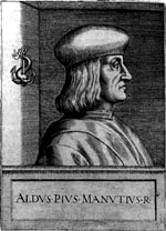 Late 15-th century Venetian scholar and printer, b. 1449, Bassiano, d. 1515, Venice. He founded the Aldine Press in 1495.
  Type designer and punchcutter, b. Edinburgh, Scotland, 1827, d. Philadelphia, 1905. Born Alexander Thompson MacKaye, he apprenticed with a bookbinding tools manufacturer, and went to London in 1850, where he worked for punch-cutting expert John Skirving. He cut typefaces for English typefounders such as Henry Caslon, Vincent Figgins, and the Stephenson Blake company. After that, he joined L. Johnson&Co. in Philadelphia in 1854, where he changed his surname from MacKaye to Kay. He stayed with L. Johnson&Co (later Binny&Ronaldson, then MacKellar, Smith&Jordan) for 40 years, until he lost much of his sight to cataract. His most famous typefaces are Binny Old Style and Ronaldson Old Style (1884, MacKellar, Smith&Jordan). Ronaldson Old Style, which is characterized by beaks on the top serifs, is generally considered to be the first typeface designed in North America.
  Born in Ivancice, Moravia (Czechia), in 1860, died in Prague in 1939. Famous for his sleek posters of women at the height of the art nouveau movement. In 1885 he studied at the Munich Academy of Art and then moved to the Academie Julian in Paris. In Paris, he took commissions for illustrations, portraits and decorative projects, but became most famous for his poster designs for plays, especially under the patronage of Sarah Bernhardt in the 1890s. The success of his posters led to a commercial career in decorative design for commercial and advertising products. Mucha also created jewelry designs, and briefly taught art in New York. In 1910, Mucha returned to Prague to work on nationalistic art, including murals, postage stamps, stained glass and bank notes.
  In the late 1400s, blackletter was replaced by a type style that mimicked handwriting. It was of uniform thickness, and thus appeared quite dark on paper. The humanist writing of Italian scholars of the Renaissance served as a model for what is now known as the Antiqua style.
  German printer (b. Köln, d. 1476), who left Mainz with Conrad Sweynheym to establish Italy's first printing press, in the monastery of St. Scholastica at Subiaco. There, they published three books, Cicero's De Oratore, the Opera of Lactantius, and St. Augustine's De Civitate Dei. In 1467, they set up a press in the De Massimi palace in Rome, from where they published 50 more books.
  This ATF classic headline sans was first introduced in 1906. Mac McGrew writes: Railroad Gothic is a plain, traditional form of heavy, condensed gothic, first shown by ATF early in the century, although it has the appearance of a nineteenth-century face, as some characters seem disproportionate to the others. There is no lowercase. It has long been popular for newspaper headlines, especially in the very large sizes, some of which continue to be shown in recent ATF lists. Ludlow makes the same design in some large sizes as Gothic Bold Condensed Title. Compare Headline Gothic (ATF).
  The original Aurora Grotesk dates back to the Johannes Wagner Foundry (1912), but Paul Barnes points out that the same typeface appears under multiple names in the Handbuch der Schriftarten, 1926:
  Trying to fit this 1000-page book into one web page, with discussion of many types. It's impossible, but I tried it.
  The Bauhaus school was founded in 1919 by Walter Gropius. It was based in Weimar (1919 to 1925), and then in Dessau (1925 to 1932), and finally in Berlin (1932 to 1933), before it was closed by the Nazi regime. Its directors were Walter Gropius (1919-1928), H. Meyer (1928-1930) and Mies Van der Rohe (1930-1933).
  Dave Farey's great essay on the history and implementations of Bodoni. All Bodoni typefaces published today have genetic material from Giambattista Bodoni's original. Below are various implementations:
  Born in Topeka, KS, 1911-1995. Head of Mademoiselle magazine, and a general master of design. He served on the faculty of the Yale School of Art for over thirty years. Typographically, he is best known for his proposal, published in Westvaco Inspirations 180 in 1950, to have a unicase alphabet, tentatively called
 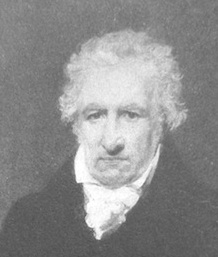 John Bell (1746-1831) was a London-based publisher of several periodicals and newspapers. He founded the British Letter Foundry in 1788, with Richard Austin as punchcutter. The foundry closed in 1798.
  Mac McGrew describes the situation of Caslon in the era of metal type. All text below is quoted. Caslon is "the oldest living typeface," having survived in almost exactly its original form since every character was hand-cut by William Caslon more than 250 years ago. Virtually the same design is still available, along with a myriad of imitations, derivatives, and attempts at improvement. Altogether, they form a number of families, for there is little or no compatibility between many typefaces which now bear the name Caslon. In fact, Caslon is perhaps the hardest set of types to group into reasonable categories; therefore some of the following classifications are arbitrary.
 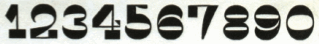 The Caslon wiki states: William Caslon's types of the early eighteenth-century were extremely popular then, and strongly revived in the late nineteenth century, producing many versions. Since the Caslon Foundry was in business for a long time, there are many Caslon typefaces. Caslon's designs were markedly different at different sizes (for instance, some of his uppercase Cs had serifs at top and bottom, some only at the top); variation in design is not therefore necessarily a sign of "inauthenticity". Caslon's type was popular in every sense. It was popular in the eighteenth century (until it was eased out by modern typefaces in the early 19th). When the fashion of "old face" revived in the 19th, many in England and America looked to Caslon's type as the model. And, at a time when lay people probably knew less about font-names than they do now, "Caslon" was a name quite a few people did know. George Bernard Shaw, for example, absolutely insisted that his work be set in Caslon. This vast popularity of Caslon's types led to a practically endless range of copies, among them
  Excerpts from the wiki page on Caslon: Caslon refers to a number of serif typefaces designed by William Caslon I (1692-1766), and various revivals thereof. Caslon shares the irregularity characteristic of Dutch Baroque types. It is characterized by short ascenders and descenders, bracketed serifs, moderately-high contrast, robust texture, and moderate modulation of stroke. The A has a concave hollow at the apex, the G is without a spur. Caslon's italics have a rhythmic calligraphic stoke. Characters A, V, and W have an acute slant. The lowercase italic p, q, v, w, and z all have a suggestion of a swash. [...] Caslon's earliest design dates to 1722. Caslon is cited as the first original typeface of English origin, but type historians like Stanley Morison and Alfred F. Johnson, a scientist who worked at the British Museum, did point out the close similarity of Caslon's design to the Dutch Fell types cut by Voskens and other type cut by the Dutchman Van Dyck. [...] Nicols writes: "he (Caslon) cut the beautiful fount of English which is used in printing Selden's Works 1726. Nicols describes this character as far superior over comtemporary Dutch founts used in English books at this period. Rowe More does not give any comment on this. Dutch founts were in use by several printers in England at that time. The Oxford University Press used the "Fell-types", character cut by the Dutch typefounder Voskens. The Cambridge University Press had received in January 1698 some 52 series of alphabets from Holland, all cut by Van Dyck. But even before that in 1697 thay used the Text-sized roman and italic of Van Dyck in an edition of Gratulatio Cantabrigiences. Character of Van Dyck and Voskens is found also in: William Harison, Woodstock Park, Tonson, 1706. Although Nicols attributes this character to Caslon, the fount used in Seldens Works is actually cut by Van Dyck. The italic is identical to the Van Dycks Augustijn Cursijf fount in specimen sheets issued in 1681 by the widow Daniel Elzevir. This woman had bought the type foundry of Van Dyck after Van Dyck died. The roman in this book, is a Garamond. This fount is used in the first volume and in the greater part of the second volume, It is found in a specimen sheet of the Amsterdam printer Johannes Kannewet, in accompagny with Van Dyck's Augustijn Cursijf. The only thing known about this Kannewet is that he was a printer, not a typefounder. This specimen-sheet is preserved in the Bagford-collection in the British Museum, and can be dated 1715 or earlier because Bagford died in 1716. There is no reason to suppose anything is added on a later date to this collection. The roman is named: Groote Mediaan Romyn. This fount is also found on a specimen sheet of the widow of Voskens. Therefore it can be assumed to be the work of Voskens. The earliest use of it at Amsterdam is 1684. The earliest use of a roman and italic cut by Caslon can be identified in books printed William Bowyer in 1725, 1726 and 1730. The founts cut by Caslon and his son, were close copies of the Dutch Old typeface cut by Van Dyck. These founts were rather fasionable at that time. The alternative founts they cut for text were a smaller, rather than a condensed letter. The Caslon types were distributed throughout the British Empire, including British North America. Much of the decayed appearance of early American printing is thought to be due to oxidation caused by long exposure to seawater during transport from England to the Americas. Caslon's types were immediately successful and used in many historic documents, including the U.S. Declaration of Independence. After William Caslon I's death, the use of his types diminished, but saw a revival between 1840-1880 as a part of the British Arts and Crafts movement. The Caslon design is still widely used today. For many years a common rule of thumb of printers and typesetters was When in doubt, use Caslon. [
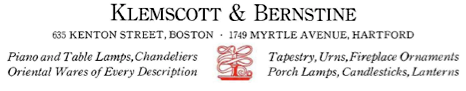 Mac McGrew tells the story of the development of Century. Quoted verbatim, with only minor editorial changes.
  French punchcutter, b. Paris, 1883, d. Paris, 1955. He hand-cut
 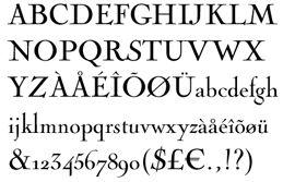 Parisian copperplate engraver, b. Paris, 1715, d. Paris, 1790. His work influenced the letter shapes of Baskerville, Didot and Bodoni. His engraved tall-ascendered letters have been preserved in many fonts bearing the Cochin name. One of the best revivals is by Georges Peignot in 1913. The irregularities of the metal are well preserved in the digital typeface
  French engraver, penman and calligrapher, 1718-1789. Author of Notice historique sur les hommes célèbres de toutes les nations de l'Europe, qui depuis la renaissance des sciences et des arts, se sont distingués dans la configuration des caractères qui composent les diverses Ecritures, which appeared in J. H. P. Pouget, Dictionnaire des chiffres et de lettres ornées à l'usage de tous les artistes (Paris, 1767).
 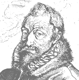 Born in Saint-Avertin, near Tours, in 1514, died in Antwerp in 1589. He left France in 1555 and settled and worked in Antwerp, where he published many books that drew attention because of their beautiful typography. He often used types by Claude Garamond and Robert Granjon. He was the main catholic publisher of the counter-reformation, but he also published material for the protestants. One of his main achievements was the Biblia polyglotta (1569-1573), the eight-volume polyglot Bible in Aramaic, Greek, Hebrew, Latin, and Syrica, with text in parallel columns. For two years, from 1583-1585, he was the official typographer at the newly erected University of Leiden. After his death in 1589, his son, Jan Moretus (1543-1610), carried on his work. Successors after that include Jean Moretus II, and Balthasar Moretus I, II III and IV. Plantin's press, Officina Plantiniana, survives in its entirety as the Plantin-Moretus Museum, sold to the City of Antwerp in 1876. This collection of 16th century typefaces (punches, matrices, the works) is a unique historical treasure.
  The
The 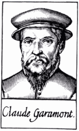 One of the fathers of typography.
  Parisian printer, whose 1742 book
  Or Joaquin Contreras Soto. Santiago, Chili-based type cooperative where some free fonts have been produced:
  An excellent piece written by Patrick Griffin in 2010 when he and Kevin King published
  [
[ Authors in 1751 of
  Bios of the main members of the Didot family: François Didot (1689-1757), François-Ambroise Didot (1730-1804), his son, Pierre-François Didot (1731-1795), the second son, Pierre Didot (1761-1853), the oldest son of François-Ambroise, and
  Type designer Dmitry Kirsanov (b. Orenburg, Russia, 1965) graduated from the Orenburg Art School in 1987. He worked freelance for Yuzhnyi Ural publishing company in Orenburg. After attending the Moscow State University of Printing (1996), he joined its Department of Print Design in 1997 as an instructor of typographic design and computer graphics. From 1996 on he worked at ParaGraph International, designing typefaces. Since April 1998 Kirsanov works for ParaType. His page has essays on the history of serif and sans serif, and on font matching. Would be great for an introductory course. He designed a Cyrillic version of
 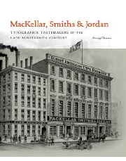 Author of
  Author (1888-1944) of over 400 books on printing and typography. His life story is told by Scott Bruntjen and Melissa L. Young in
  [
[ A metal script typeface published by Fonderie Typographique Française in the interbellum era. This ronde inspired by the renaissance penmanship of Gianfrancesco Cresci (1560-1588) is characterized by inky terminals. [
 New Yorker, b. Bethlehem, PA, 1905. In 1928,
  Emfoundry is the micro font foundry of type designer Jon Melton, whose first degree in art dates back to 1984. It was created originally as part of his MA in Typographic Design postgraduate studies at the Cambridge School of Art within Anglia Ruskin University in 2007. Jon Melton is course leader for BA (Hons) Graphic Design at the CSA. His academic research as a senior lecturer at this university informs his work that focuses upon key moments in type design evolution.
  Celebrated Parisian punchcutter (b. Paris 1764, d. Mesnic-sur-l'Estrée, 1836), son of the printer François Ambroise Didot, and grandchild of the Didot printing business founder, François Didot. He produced the earliest modern typeface about 1784. Designer of a sloped script typeface called
  On July 15, 2014, FontShop / FontFont was bought by Monotype. The official story on FontShop's font feed site as reported by Iwo Grabowitsch: Today is a groundbreaking day in FontShop's 25 year history, the most important one since our formation. The US typeface company Monotype just announced that they have acquired FontShop and the FontFont library. The acquisition package includes the head office in Berlin as well as the FontFont typeface library, the US subsidiary in San Francisco (fontshop.com), and the German distributor, FontShop AG. Monotype acquires the FontFonts of founder Erik Spiekermann directly from him, including all usage and publication rights. All of his bestsellers (FF Meta, FF Info (1998), FF Unit,
 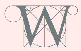 Italian letter artist (b. 1445, d. ca. 1514) who constructed his characters geometrically, as early as 1509. He practiced mathematics and was a Franciscan friar. A Franciscan monk, he is mentioned several times in the notebooks of Leonardo da Vinci. His Summa di Arithmetica, Geometria, Proportioni e Proportionalità appeared in 1494. Continuing his work on proportion, he published
  French punchcutter who lived in the first part of the 16th century. In 1539, he became a resident of Antwerp, and from 1558 until his death in 1570, he delivered letter types to Plantin in Antwerp. His creations were used all over Europe and even in Asia. In his day, he was one of the greatest punchcutters. Day Roman (2002, Apostrophe) is described as follows by its designer: Day Roman, is a digitally redrawn version of what has come to be historically known as the "Two Line Double Pica Roman", a typeface designed by 16th century French punchcutter François Guyot, and used in numerous books between 1535 and 1570, most notable of which are J. Steelsius's printing of The Bible (1541) and Frisius (1551), Gillis Coppens van Diest's printing of Erasmus (1544), Georgius (1544), Serlio (1550) and Horatius (1552), and Rotarius's printing of Livius Brechtius (1549). The type was also used extensively by H. Dunham, and later J. Day, in London (the name Day Roman is simply a reference to J. Day having used the type). Original matrices of Guyot's roman type are now in the
  Also Francysk Skaryna, Francisk Skaryna and Franciscus Scorina de Poloczko, b. 1486 Polazk (white Russia), d. 1541 Prague. Scientist and educator from Polotsk (current Belarus).
 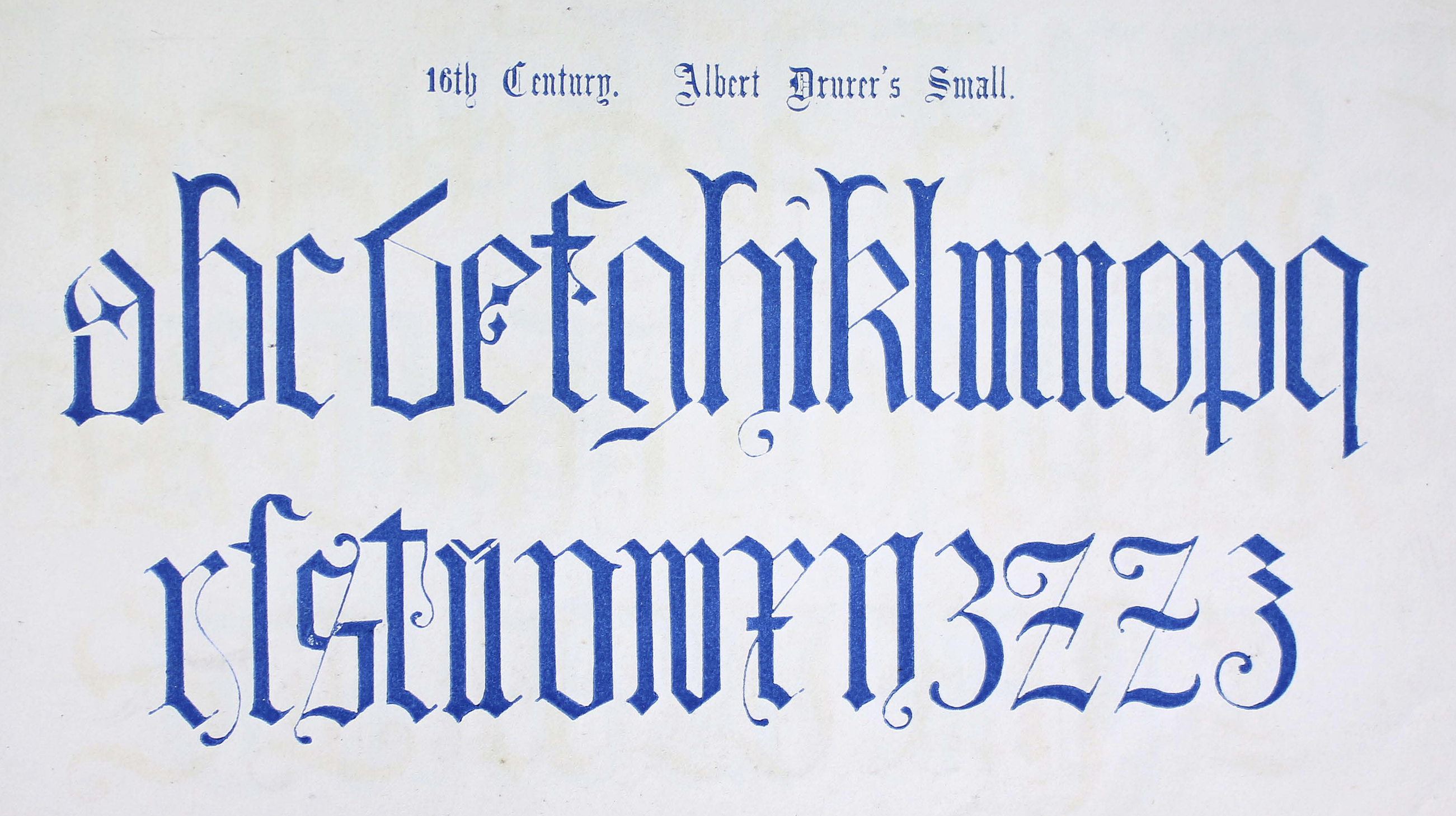 Author, artist, photographer and wood engraver, b. Sandhurst, 1814, d. London, 1862. He published
  German type designer (b. Dorste, 1863, d. Schönberg, 1943). In 1882, he becomes the type director at the foundry of Schelter&Giesecke in Leipzig, until 1890, and again from 1896-1898. From 1898 until 1911, he is the head of printing at Genzsch&Heyse, first in München and then in Hamburg. From 1911 until 1924, he taught at the Staatlichen Gewerbeschule Hamburg. At Genzsch&Heyse, he designed Albingia (1906), Bürgerschafts Fraktur (1907; Schnelle claims 1913),
 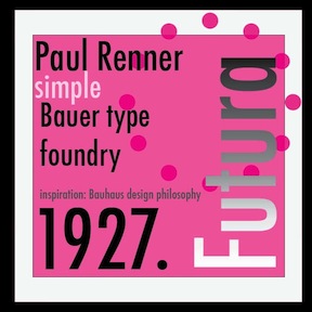 From the Wikipedia entry:
 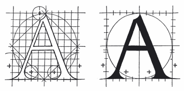 Also Maistre Geofroy Tory de Bourges. Parisian printer, designer and engraver, 1480-1533. As designer and engraver he produced beautiful initials, borders, and illustrations. In
  Type-founder (b. Edinburgh, Scotland, 1781, d. New York City, 1866). He and his brother David emigrated to the United States, where they started the Bruce Type Foundry in New York City in 1813. David was precoccupied with a new printing process, stereotyping, while George was the type-founder who created many beautiful and refined designs. Together, they invented a useful type-casting machine. In 1865, George Bruce published
  Engraving machine company in Racine, WI. They created several typefaces including Gorton Normal, Gorton Extended, Gorton Moderne, Gorton Stamp Series, and Gorton Script. Digital versions of these types include
 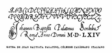 [
[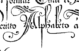 Or Giovanni Antonio Tagliente. Calligrapher and writing master, born in Venice, 1468-1527. Author of
  Giovanni Battista Braccelli (ca. 1600, d. before 1650) was an Italian engraver and painter of the Baroque period, who was active in Firenze. He is best known for his book of prints, Bizzarie di Varie Figure [a variety of human shapes], published in 1624 in Livorno, and dedicated to Don Pietro Medici. It contains wonderful futuristic engravings. Wikipedia: In this book, he engraves baroque experiments recalling Arcimboldo, engaging in a rarified set of conceits. Some of the figures are composed of boxes or raquets or curlicues. He published a second collection of prints entitled Figure Con Instrumenti Musicali E Boscarecci. Finally, he created
  Czech state type foundry (est. 1951) from the communist era at which Josef Týfa, Oldrich Menhart and Rudolf Ruzicka worked for some time. Týfova Antikva (1959, inspired by the work of architect P.L. Nervi) by Josef Týfa later became Tyfa Text (and
  This story is taken from the
 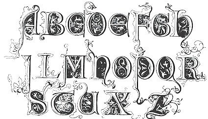 Publishers of Library of Type (1959). This book showcases ornate fonts, dating from the 8th to the 16th century, include German Arabesque and Old English Riband. For some samples, see Jaime Henderson's scans at
  Foundry started by Dr. Ing. Rudolf Hell in 1947 in Kiel, Germany. The business started off repairing Hellschreiber machines, but went on to produce the Klischograph, Hell's invention---an electronically controlled printing block engraver. In 1964 he invented the Digiset, the first digital typesetter. His
  French art nouveau era painter and illustrator, b. 1867 Paris, d. 1909 Les Petites Dalles. He designed a typeface and
  British typefounder from the famous Caslon family. Author of
  Typographer and entrepreneur, b. Berlin 1831, d. Berlin, 1904. In 1858, he founded his "Institute for Galvano Technology" in Berlin. He discovered a method of producing circular lines from brass instead of lead or zinc. The soldering normally necessary could be dispensed with. The lines were elastic and highly durable, and produced fine results. Most of German's letterpress printers and many printers abroad placed their orders with Berthold. In 1864, he set up H. Berthold Schriftgießerei und Messinglinienfabrik in Berlin. The company specialized initially in new technical processes for printing, such as galvano-type, as described above. Hermann Berthold headed the foundry until 1888. Around 1900, Haus Berthold was one of the largest foundries in the world.
  The national French foundry and press from 1640, when it was created, until today. It grew out of the Imprimeurs du roi pour le Grec, which itself was founded in 1538 by king François I. Today, it is entirely state-owned. The imprimerie nationale contains le cabinet des poinçons (where one can find all the old metal types) and a historic library. Between 1985 and 2004, Paul-Marie Grinevald wrote about ten articles on the Imprimerie. [
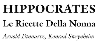 [
[ Jakob or Jacques Sabon (b. Lyon, 1535, d. Frankfurt am Main, ca. 1580-1590) was a typefounder who worked at the Egenolff Foundry in Frankfurt in 1555, and briefly at the Plantin Foundry in Antwerp in 1563. After Garamond's death, Plantin and Sabon both shared in his heritage. Sabon's widow married Konrad Berner in Frankfurt.
  French type designer and punchcutter, 1580-1658, born in Switzerland, who worked at the Estienne printing atelier in Paris before escaping to Sedan, to avoid persecution for his Protestant beliefs. He then worked as a printer for the Calvinist Academy where he began to cut his own letters. In 1641, he received a commission from the Imprimerie Royale from which Caractères de l'Universit�é originated. Until the middle of the 20th century, his letters were misattributed to Claude Garamond. Many of today's Garamond style typefaces are in fact due to Jannon, as first pointed out by Beatrice Warde.
  French printer, 1683-1752. The Barbou's had a printing business starting with Jean Barbou, who printed in Lyon in 1539. The Barbou family printing shops remained active until 1808.
  Jean-Michel Moreau (Moreau Le Jeune) was a French draughtsman, illustrator and engraver, 1741-1814. Born in Paris, he produced drawings of
  Famous Spanish printer (b. Zaragoza, 1725, d. Madrid, 1785). He worked mostly in Madrid as a printer. He never cut type, but commissioned people such as Gil, Pradell, Rongel and Espinosa to cut it for him. Sandra Baldassarri, Ignacio Pulido and Francisco Serón at the University of Zaragoza are attempting to revive some typefaces used by Ibarra: see
  [
[ Goldsmith, lawyer, and financial backer of Gutenberg, b. ca. 1400, Mainz, Germany, d. Paris, ca. 1466. Around 1450 Fust lent Gutenberg 800 guilders to optimize his printing process. In 1452 Gutenberg requested the same amount again to complete the work. In 1455, when still no books had been produced, Fust sued Gutenberg for 2,026 guilders (the amount owed, plus interest). Gutenberg lost in court, and had to hand over his equipment. Fust then hired Gutenberg's apprentice, Peter Schoeffer, and as Fust & Schoeffer, the pair published several fine books, including the famous 42-line Bible in 1456 and Psalter in 1457. They were the first to make printing a successful business.
 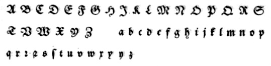 German writing master, 1497-1563, aka Johann Neudörffer The Elder, who founded his writing school in Nürnberg, and printed his first plates ca. 1519. His first publication was Fundament in 1519. These prints eventually became the foundation for a new kind of writing education throughout Europe. His writing manual and teachings helped further the development of blackletter. Author of Anweijsung einer gemeiner hanndschrift. Durch Johann Neudoerffer, Burger vnd Rechenmeister zu Nurmberg geordnet und gemacht (Nürnberg, 1538). Some of his methods are still alive in contemporary type design.
 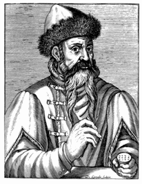 The pater familias of printing, 1394-1468, whose real name was Johannes Gensfleisch zur Laden. He spent most of his life in Mainz, where he was also born and where he died.
  [
[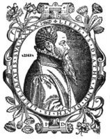 One of the first English type founders, 1522-1584. Designer of Anglo-Saxon (1567-1574), a Gaelic typeface. [
 Basque penman, 1788-1853. His designs were engraved in 1833 by Giraldos and Nicolás de Gangioti and dedicated to the Queen Governor. That work was published in Colección General de los Caractéres de Letras Europeas (see
 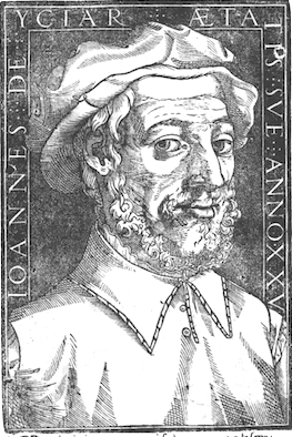 Also written as
  Artistic movement that took place in France during the 1950s and early 1960s. It supported the human calligraphic gesture and the elegance of the mediterranean typographic style. It was
 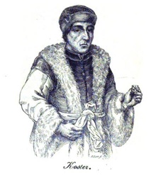 The Dutch have claimed for hundreds of years that Laurens Janszoon Coster [or: Koster] (b. ca 1370, d. ca 1440) printed the first book in Haarlem (The Netherlands), ca. 1440, well before Johann Gutenberg in Mainz in 1452. There is no hard evidence to support or refute this claim, but Jan Middendorp in his "
 This jewel of a book was published in 1550 by Antonio Blado asolano in Rome. It is now available on the web and contains of complete alphabets, from chancery scripts, to blackletter and roman. There are also Greek, Hebrew, Cyrillic, Syrian, Arabic and other alphabets.
  French punchcutter (1795-1865) who lived in Lyon. He designed Lyons Titling (1846, a roman titling font published by Chiswick Press) and
  Engraver at the Imprimerie Royale in Paris, b. Orleans, 1654, d. Paris, 1727. He drew and worked on the
 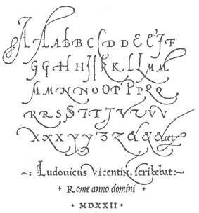 Influential Italian printer, writing master and calligrapher, b. ca. 1475-1480, d. 1527, aka Ludovico Vicentino (degli Arrighi), or Ludovico il Vicentino. Around 1510 he was a bookseller in Rome. He was employed as a scribe at the Apostolic Chancery in 1515. Author in
  French type designer who graduated from l'Ecole Duperré in Paris and the
  Portuguese penman of the 17th century, 1670-1722. Some say 1670--1735. Andrade de Figueiredo was born in Espirito Santo, where his father was Governor of the Capitania. His work follows the style of the great Italian masters in its use of clubbed ascenders and descenders, and of Diaz Morante, the famous Spanish writing master, in its very elaborate show of command of hand. He was known as the Morante portugues.
  French type designer, cartoonist, illustrator, theorist, type historian and journalist, b. Condé-sur-Noirau, 1894, d. Lurs-en-Provence, 1974. His real name was Samuel William Théodore Monod. Founder of the famous
  Miklós Tótfalusi Kis (Nicholas Kis) was born in Misztótfalu, Hungary, in 1650. He left for Amsterdam in 1680, where he worked on la Biblia Hungara (1685), Book of Hymns of San David (1686), and the New Testament (1687). He also published many books for children. Taught there by Dirk Voskens, he made what is now known as Janson Text around 1690. Around 1690, he made an elegant face, Nikis. He died in 1702. The story of Kis's types, now also known as Dutch types, is eloquently told by
 Monotype's hot metal Bell series from 1931 is based on original types made by the punchcutter Richard Austin for the foundry of John Bell in the 1780s. The different sizes of Monotype's series were not all based on the same model. Type historian James Mosley writes on
  Historical discussion by the typophiles of Ehrhardt, a type attributed at Nicolas Kis, ca. 1700, and Wolfgang D. Ehrhardt of the Ehrhardtsche Gesserei in Leipzig, Germany. The discussion by the typophiles focuses on the Monotype version of Ehrhardt, 1936-1937.
  Two Goudy fonts, from 1916 and 1921, respectively. Goudy wrote about them, as reported in A Half-Century of Type Design and Typography: 1895-1945, Typophiles Chap Books XIV, 1946 at pages 99 and 110:
  Or Nicholas Jenson. French printer and artist born in Sommevoire, France in 1420. He worked mostly in Venice as a printer, type designer, punch cutter, and engraver from 1468 until his death in Venice in 1480. In 1475 he was made a papal count by Pope Sixtus IV. He produces his first roman type in Cicero, Epistolae ad Brutum (1468), which is described as perfect and unequaled. A Greek typeface which is used for quotations was made in 1471. In 1473, he creates a blackletter typeface which he uses in books on medicine and history. In 1475, he founds his first book trading company, Nicolaus Jenson sociique, whose partners include the Frankfurt businessmen Peter Ugelheimer and Johann Rauchfass. In 1480, his second book trading company is launched under the name Johannes de Colonia, Nicolaus Jenson et socii.
  A useful introduction to old style (or garalde) types by John D. Boardley. The types can be recognized by the horizontal crossbar on the "e", and more contrast between thick and thin (compared to humanist typefaces). The serifs have wedges, and the letterforms are smooth and refined. They were in vogue for almost 200 years, starting with Bembo in 1495 (Aldus Manutius and Francesco Griffo) and Francesco Griffo's first italic type in 1501. The French caught on 40 years later, and the Garamond-style typefaces saw the light ca. 1540, thanks to Claude Garamond and Robert Granjon. Christoffel van Dijck and Mikós Kis were doing garaldes in the Dutch region ca. 1600 (see styles like Ehrhardt). Finally, Caslon (William Caslon, ca. 1725) is also classified as a garalde. Old style digital typefaces include Berling, Calisto,
  German type designer (1646-1703) who practised in Oxford.
  Artist who probably comes from Thurgau, and who lived roughly from 1485-1546. From 1512 until 1528, he worked in Adold Dauer's shop in Augsburg. He settled later in Nürnberg. Creator of an alphabet (now known as
  Flemish web log about the history and mechanics of type, run by Belgian graphic designer Peter Van Lancker (b. Ghent). There is a lot of information on the early printing and typefounding by
 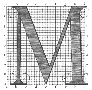 Engraver, b. Macon (1666), d. Paris (1714). In 1695, king Louis XIV of France commissioned a typeface, which until today is described as the first digital font, and at least as the first mathematicallly defined type, the
 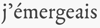 French engraver and punchcutter who worked with Paulo Manucius from 1588 on, and who was commissioned to create a typeface for the Vatican. He cooperated with Granjon. Although he cut roman and Greek types, he was mmainly known for his music types---for example, he started using musical notes with parts of lines attached to make a second impression unnecessary.
  Pierre Pané-Farré is a type designer born in Germany. Pierre studied at the Fachhochschule in Wismar and, later, at the Hochschule für Grafik und Buchkunst in Leipzig, class of 2012. His thesis focused on the development of the book cover in the early 19th century, while his practical work explored and revived the technique of compound-plate printing, using Pierre's own woodcut poster types. Pierre lives and works in Leipzig. He co-founded
  French typefounder (b. Paris, 1712, d. Paris, 1768) also called Fournier le jeune.
 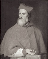 Italian classical scholar, who lived from 1470 (b. Venice) until 1547 (d. Rome). He was well-connected and knew the famous Medicis. Above all, he had an affair with Lucrezia Borgia. He influenced the development of the Italian language and established the madrigal as the most important secular musical form of the 16th century. He was made cardinal in 1539. Monotype gave his name to their typeface Bembo of 1929. The design is based on type cut by Francesco Griffo for the Aldine Press of Aldus Manutius, and first used in Bembo's work De Aetna (1495-1496). Allan Haley writes: In February 1496, Aldus [Manutius] published a rather insignificant essay by the Italian scholar Pietro Bembo. The type used for the text became instantly popular. So famous did it become that it influenced typeface design for generations. Posterity has come to regard the Bembo type as Aldus's and Griffo's masterpiece. Pietro Bembo himself had no connection to or influence on the typeface that carried his name. [
 British typefounder and punchcutter, active from about 1840-1860. He succeeded William Thorowgood at the Fann Street Foundry in 1849. Credited with cutting the
  Born in Rome, Robert Granjon (1513-1589) worked for various printers in Lyon, Paris, Frankfurt, Antwerp, and Rome. In Lyon, he was active as librarian, printer, and engraver of typefaces. Granjon is an exponent of the French renaissance. Granjon's designs live on in the balanced Plantin family, designed by Frank Hinman Pierpont in 1913 at Monotype, and available at Linotype (and elsewhere).
 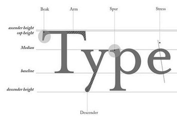 Alain Hurtig has absolutely fantastic pages on the work and life of John Baskerville. Baskerville lived most of his life with Sarah Eaves, née Ruston, the wife of Richard Eaves, and married her only after Richard's death. Sarah Baskerville managed Baskerville's printing shop until the liquidation of the studio in 1785, when the matrices were sold to Beaumarchais. The pages compare Baskerville's letters with Mrs. Eaves, Zuzana Licko's version of Baskerville. See also
  French type designer in Lyon, 1657-1729, whose name at birth was Jean Truchet. He was famous for his Truchet tiling system. Sébastien Truchet designed a modular typographic system during his last year in the School of Fine Arts of Besançon. His work was summarized in a thesis he wrote in 1704, and which is also reflected in
  Italian Mannerist architect, engraver and painter of the sixteenth century, who designed some of the most refined variants of the classic Roman letters---the prototypical Italian Renaissance roman alphabet, also known as
  Speedball pens were invented by Hunt Corporation (or Hunt Company) which was located in Camden, NJ and later (since 1958) in Statesville, NC. The highlights of that company:
  In 1952, Paul Renner published Steile Futura (
 The choice of Garamonds is confusing, and so is the name Garamond when associated with typefaces. In fact, the most faithful of all garamonds is not even called Garamond. So, here is a brief overview.
  Information and specimen of all historically important typefaces: Akzidenz Grotesk, Aldus, Antique Olive, Avant Garde, Avenir, Baskerville, Bell, Bembo, Bodoni, Bulmer, Caslon, Centaur, Century Old Style, Cheltenham, Dante, Frutiger, Galliard, Garamond, Gill Sans, Goudy Old Style, Granjon, Helvetica, Janson (Kis), Minion, Mrs. Eaves, Optima, Palatino, Perpetua, Sabon, Syntax, Times New Roman, Today, Trump Medieval,
  American printer (b. Stamford, CT, 1828, d. New York, 1914). In 1848, he entered the shop of Francis Hart in New York City, where he became owner after Hart's death in 1877. It continued as Theo. L. De Vinne&Company until 1908, when it was incorporated as the De Vinne Press. De Vinne was the best-known American printer of his day. He was neither a type designer nor a type cutter. His books include
 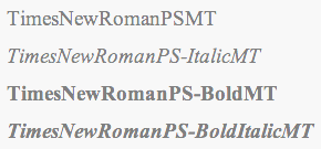 An article by Eamon Dyas entitled The changing typeface of The Times - Times New Roman. [
 Pages on
 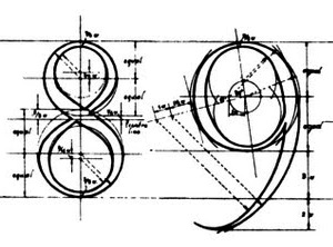 Wolfgang Beinert's piece in German on the Trajan all-caps alphabet (without H, J, K, U, W, Y, Z) created by Syrian engineer Apollodoros from Damaskus for the Roman Emperor Marcus Ulpius Traianus (53-117). The Trajan Column near the Basilica Ulpia in Rome dates from 113. People inspired by the elegant lettering include Fernando Ruano, Vespasiano Amphiarea, Wolfgang Fugger, Geoffroy Tory, Albrecht Dürer, Francesco Torniello, Luca Pacioli, Damiano da Moile, Leonardo da Vinci, Felice Feliciano, Claude Garamond, Jan Tschichold (see his book Meisterbuch der Schrift, Otto Maier Verlag, Ravensburg 1952), Günter Gerhard Lange (see his book Die römische Kapitalschrift, Jahresgabe der Typographischen Gesellschaft München, München 1983), and Carol Twombly (who made a digital font called Trajan at Adobe in 1989). [
 University Roman is usually attributed to Michael Daines and Philip Kelly at Letraset who designed it from 1972 until 1983. However, the origins go back much further. There are two sources that are contradictory, so I will cite both:
 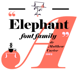 Influential typefounder, born in England, 1766-1844 (Peckham). He published several books of type specimens, and designed Gresham (1792), Old English (1815), Figgins Shaded (1816), Figgins Tuscan (1817, digitized by
 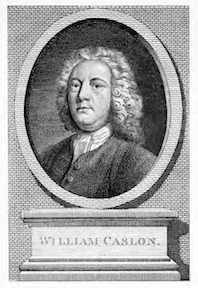 William Caslon I was born in Worcestershire in 1692. He died in London in 1766. He was a gun smith and a typefounder. His William Caslon Foundry was established by him in 1719, and would operate in London for over 200 years. His
  British typefounder in London, 1754-1833. Son of William Caslon II, grandson of William Caslon I. He co-owned the Chiswell Street family firm from the death of his father in 1778 until 1792, when he sold his share in the foundry to his mother and his sister-in-law, the widow of his brother Henry. In the same year he purchased the Salisbury Square foundry of Joseph Jackson (apprentice to his grandfather and rival to his father), who had recently died, and called the foundry Caslon&Son. In 1807, this business was passed on to his son William Caslon IV who in turn sold up in 1819 to Blake, Garnett&Co. (later Stephenson Blake). Author of
  William Caxton, the first English printer, was born in the Weald of Kent, in 1420, 1421 or 1422. In 1438, he became apprenticed to Robert Large, a leading textile merchant who became the mayor of London the following year. After Large's death in 1441, Caxton moved to Bruges, and built a successful textile business. By 1463 he became acting governor of the Merchant Adventurers in the Low Countries. Caxton was hired as an advisor to Charles the Bold's new duchess, the former Princess Margaret of York, sister of Edward IV. It was at the request of the duchess Margaret that he resumed his abandoned translation of a popular French romance, The Recuyell of the Historyes of Troye from the French of Raoul le Fèvre. After spending a year in Cologne learning the art of printing, Caxton returned to Bruges and set up a printing press, where he published his translation of The Recuyell, the first printed book in the English language, around 1474. His next publication, The Game and Play of Chess Moralised (1476), was a translation of the first major European work on chess, and was the first printed book in English to make extensive use of woodcuts.
  At the University of Texas, we find a wonderful site that explains the roots, the rise and the decline of American wood type, and provides a
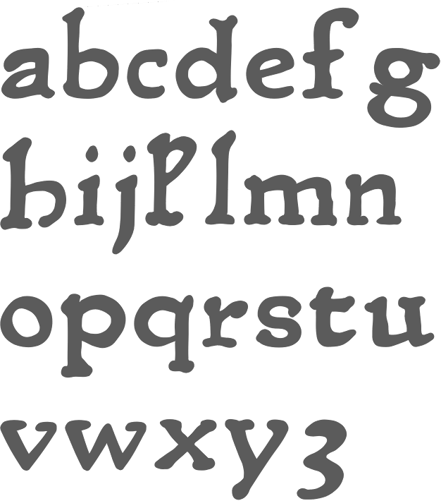
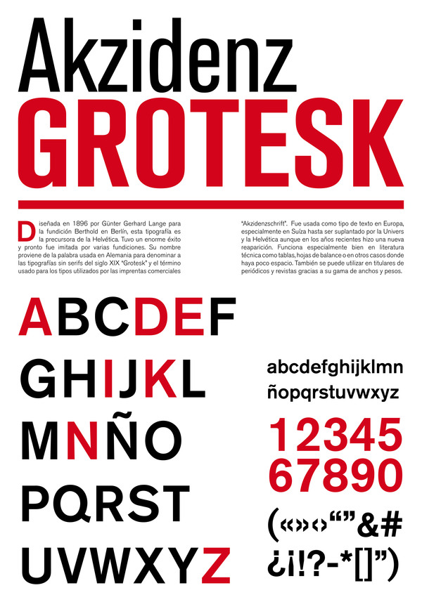
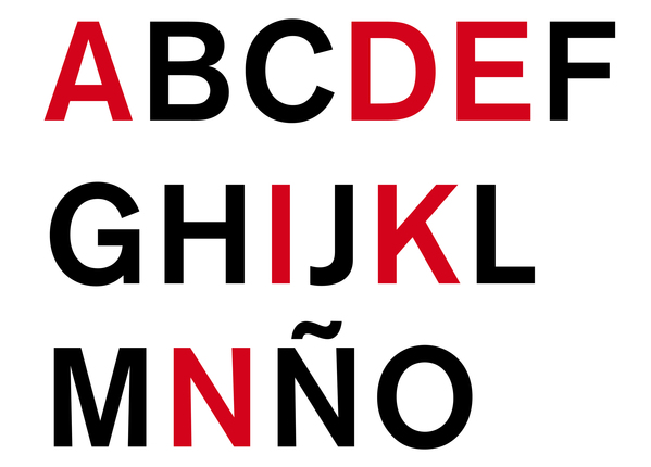
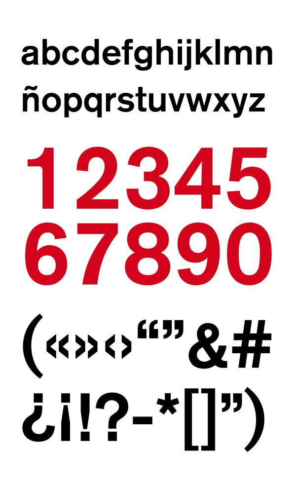
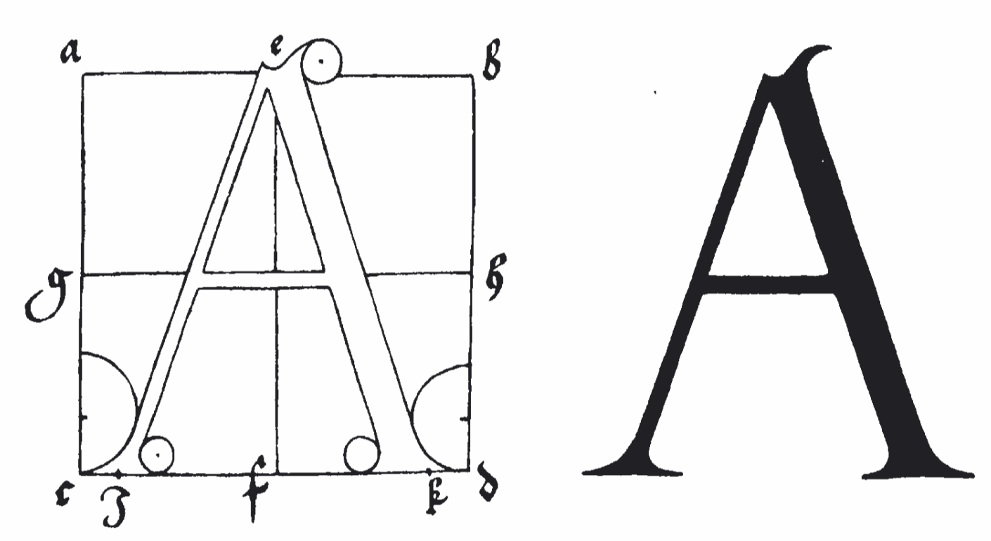
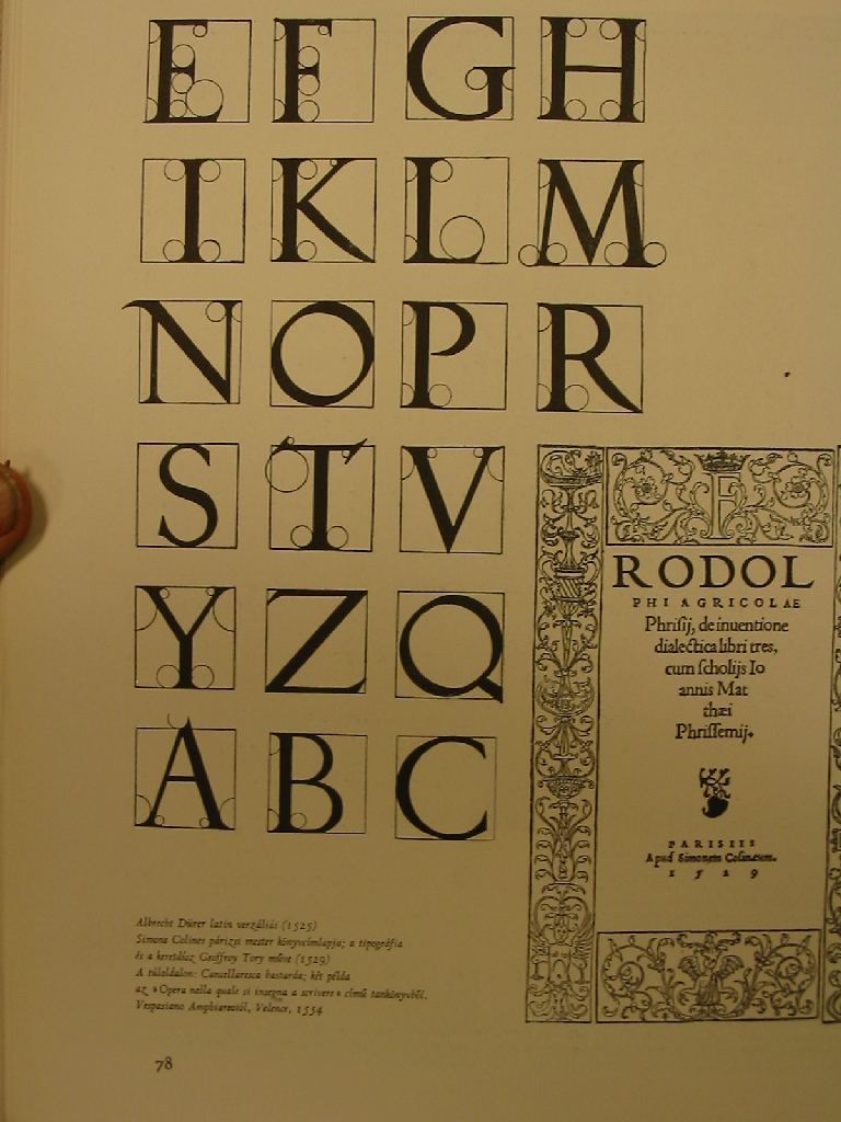
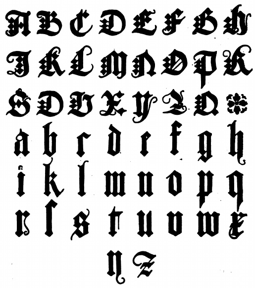
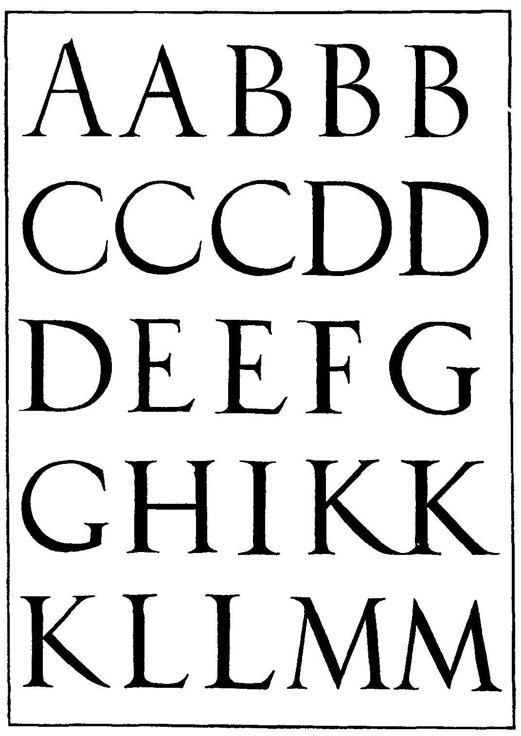
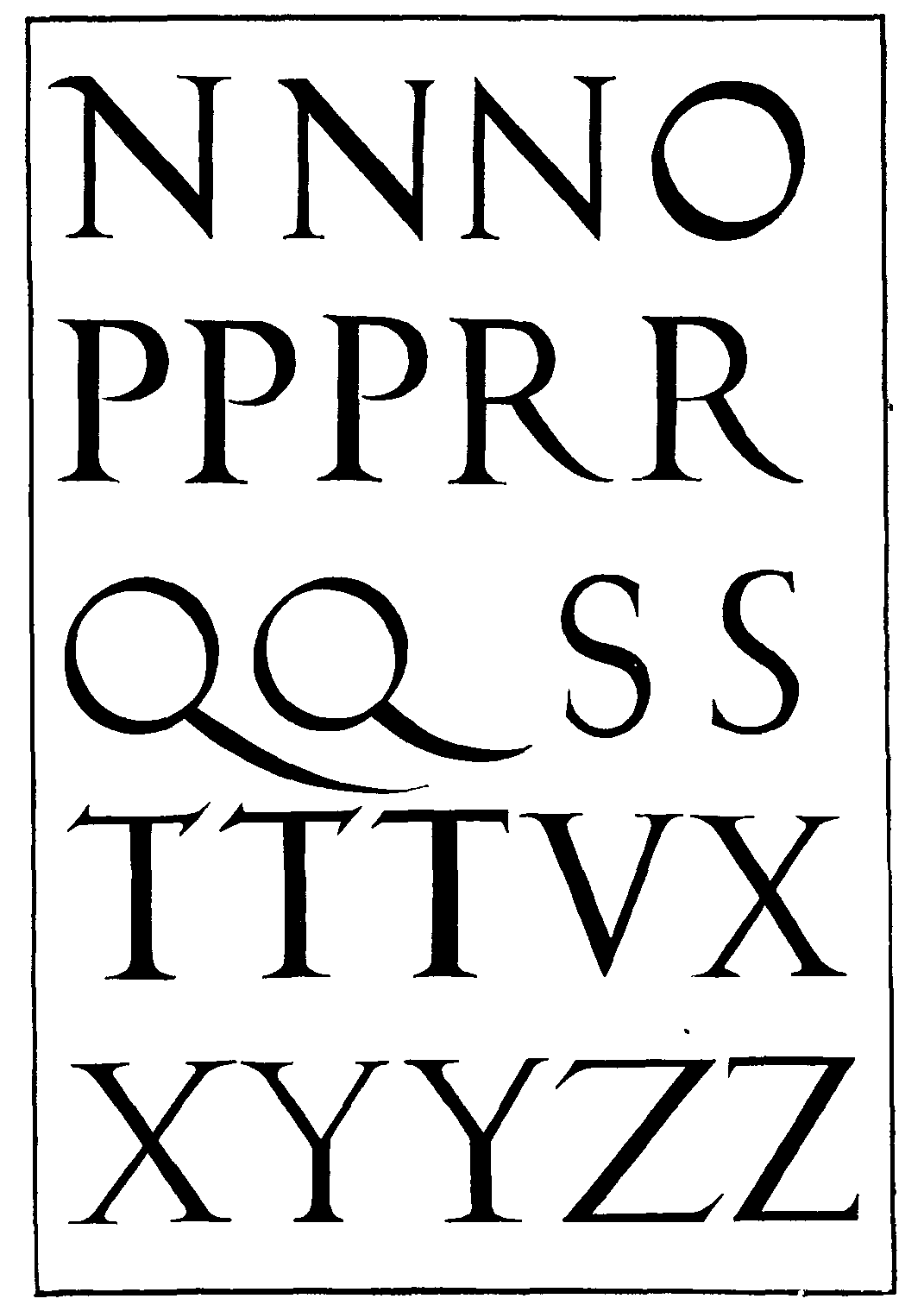
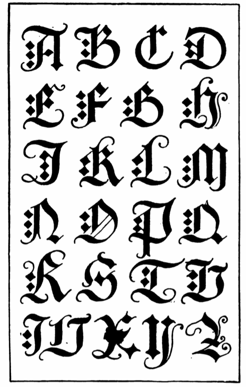
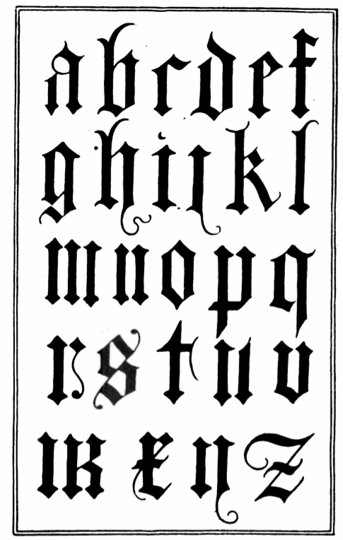
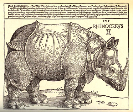
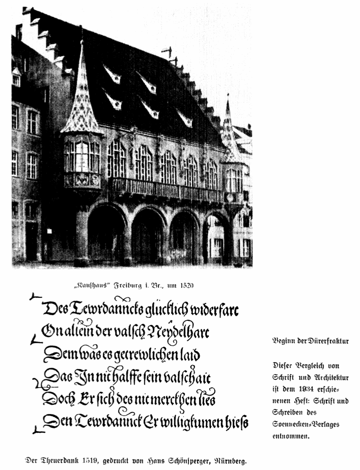
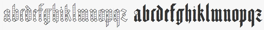
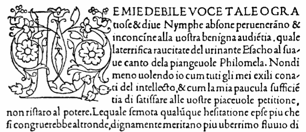
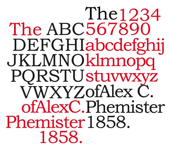
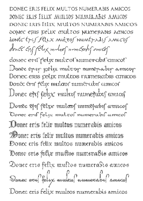
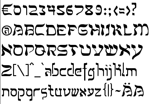
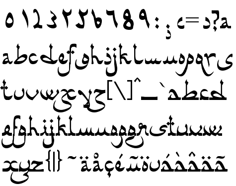
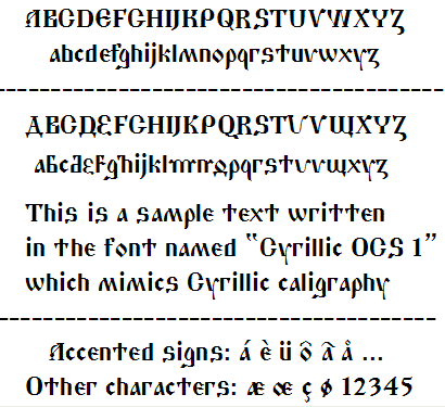
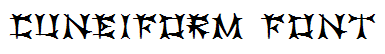
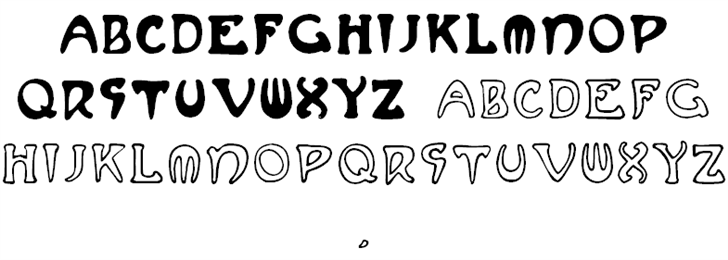
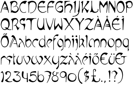
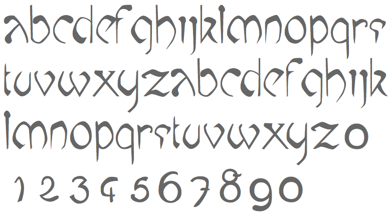
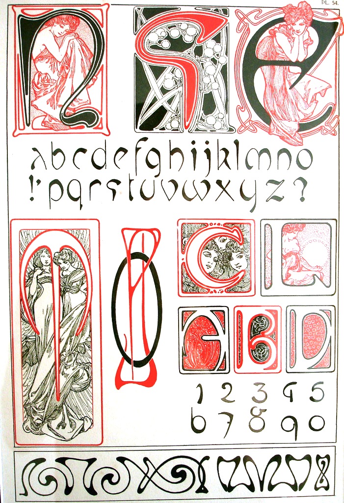
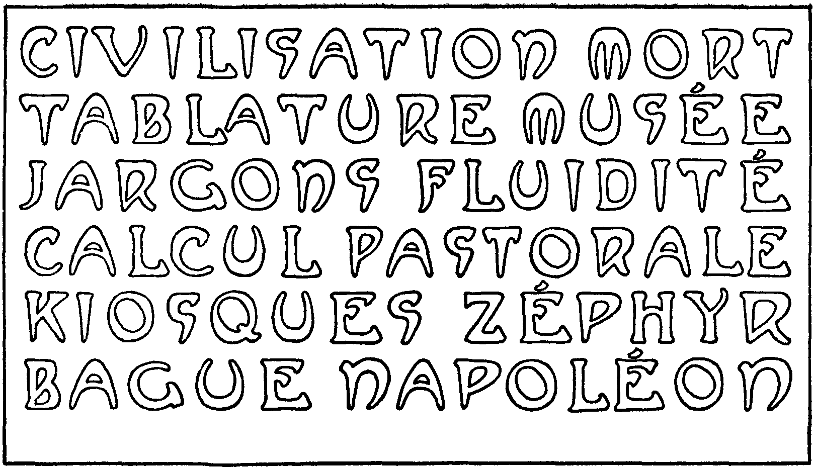
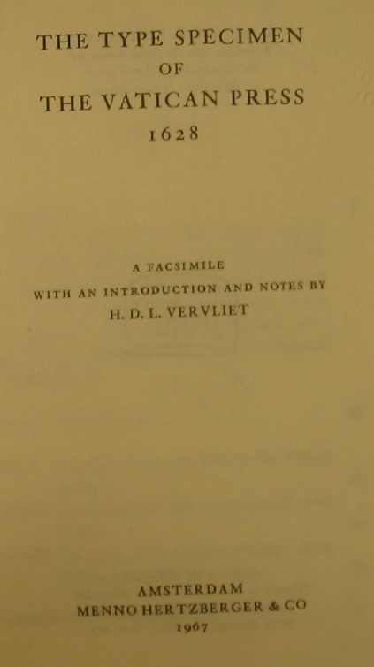
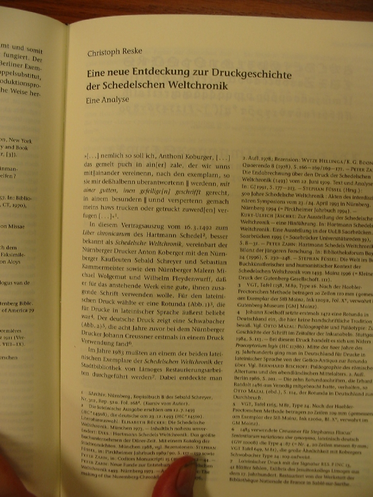
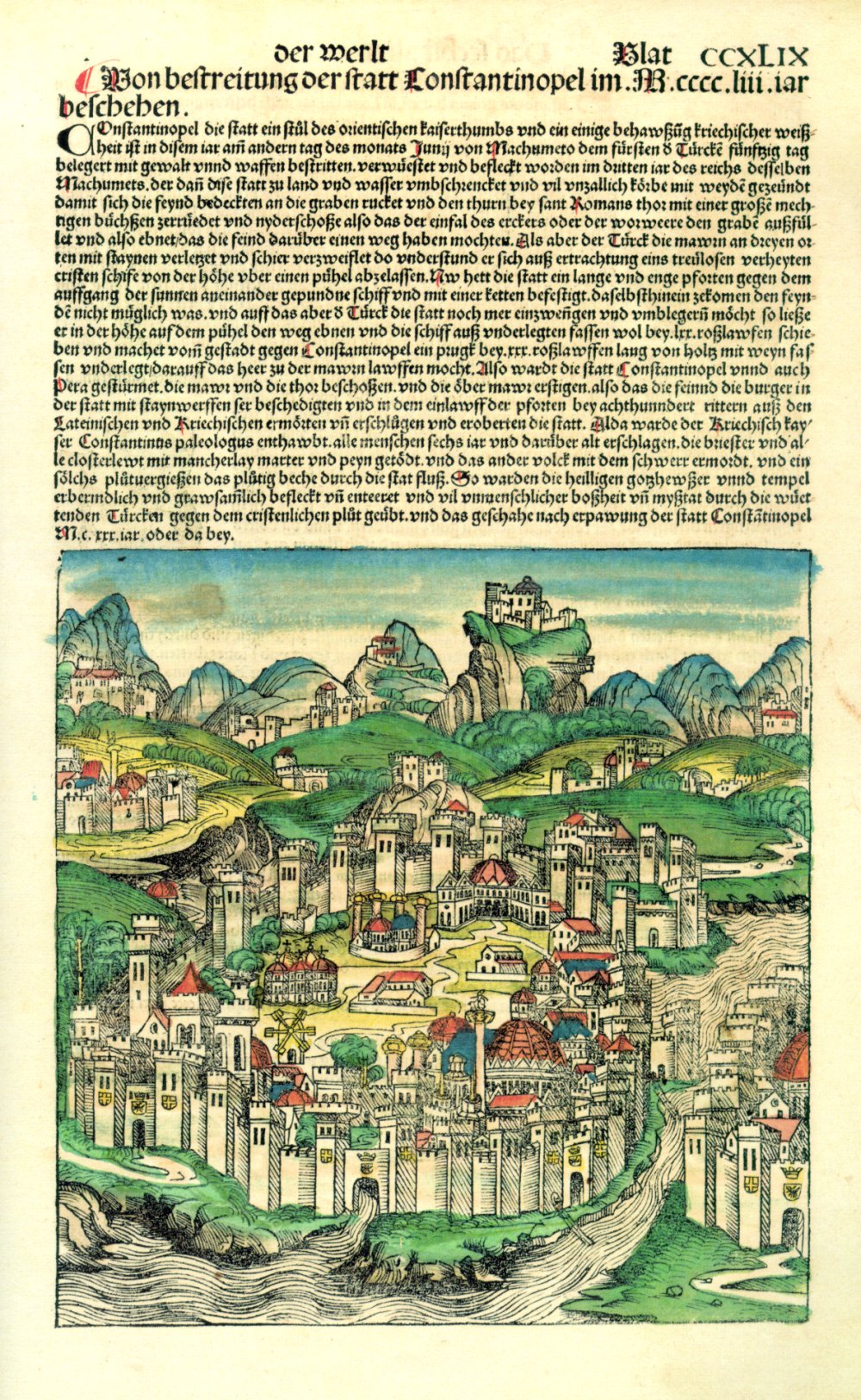
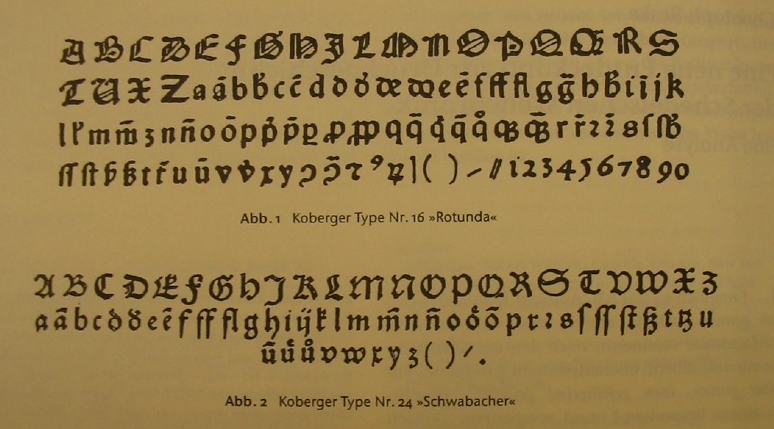
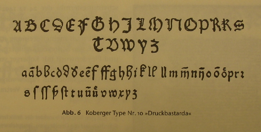
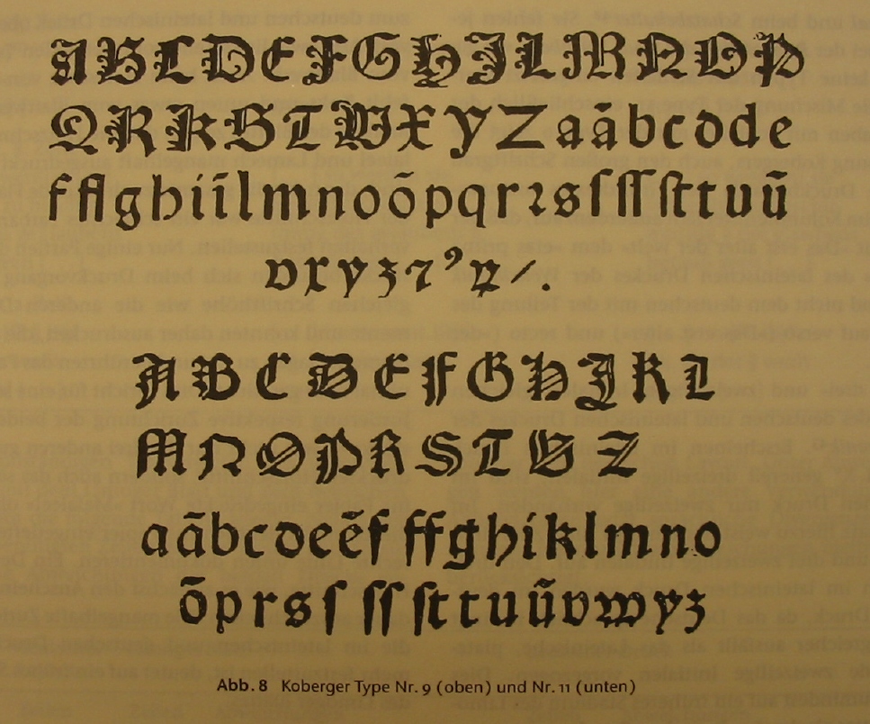
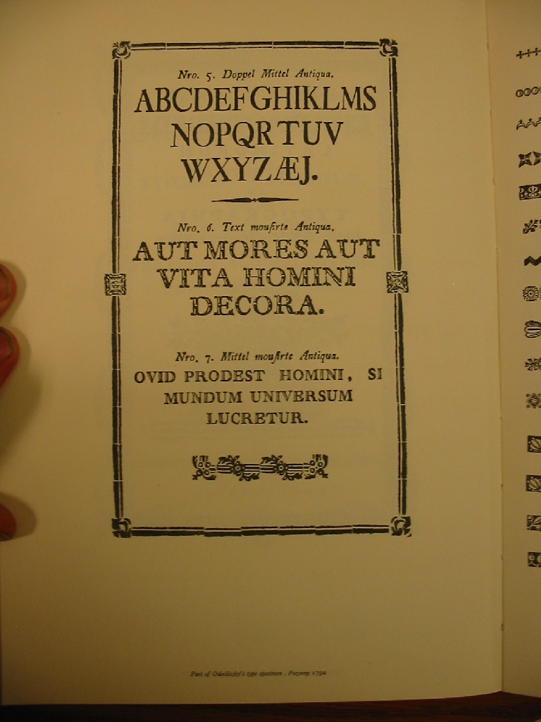
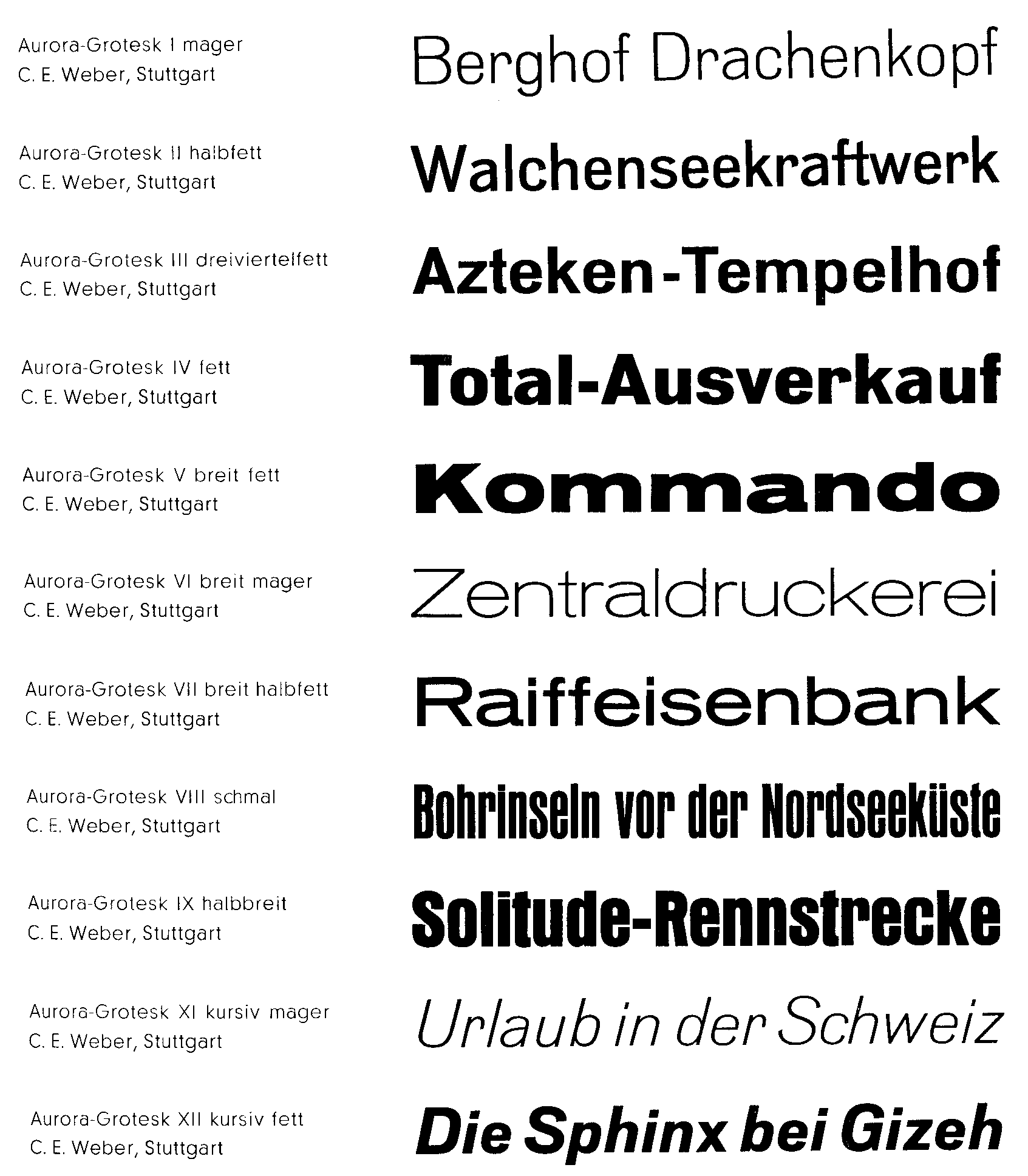
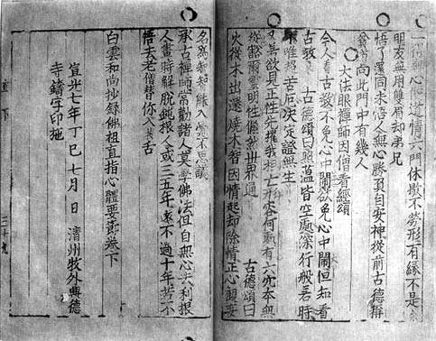
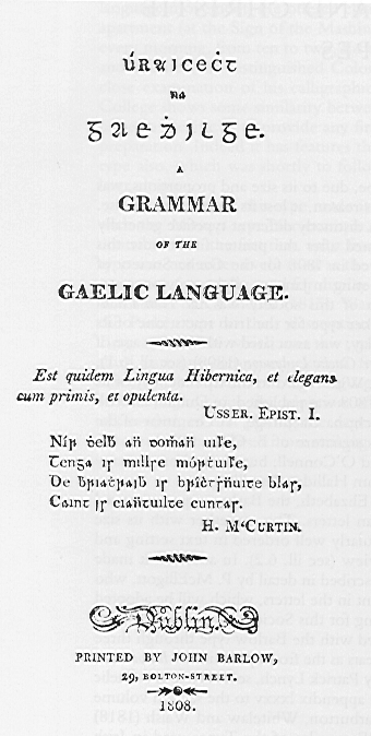
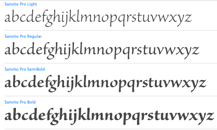
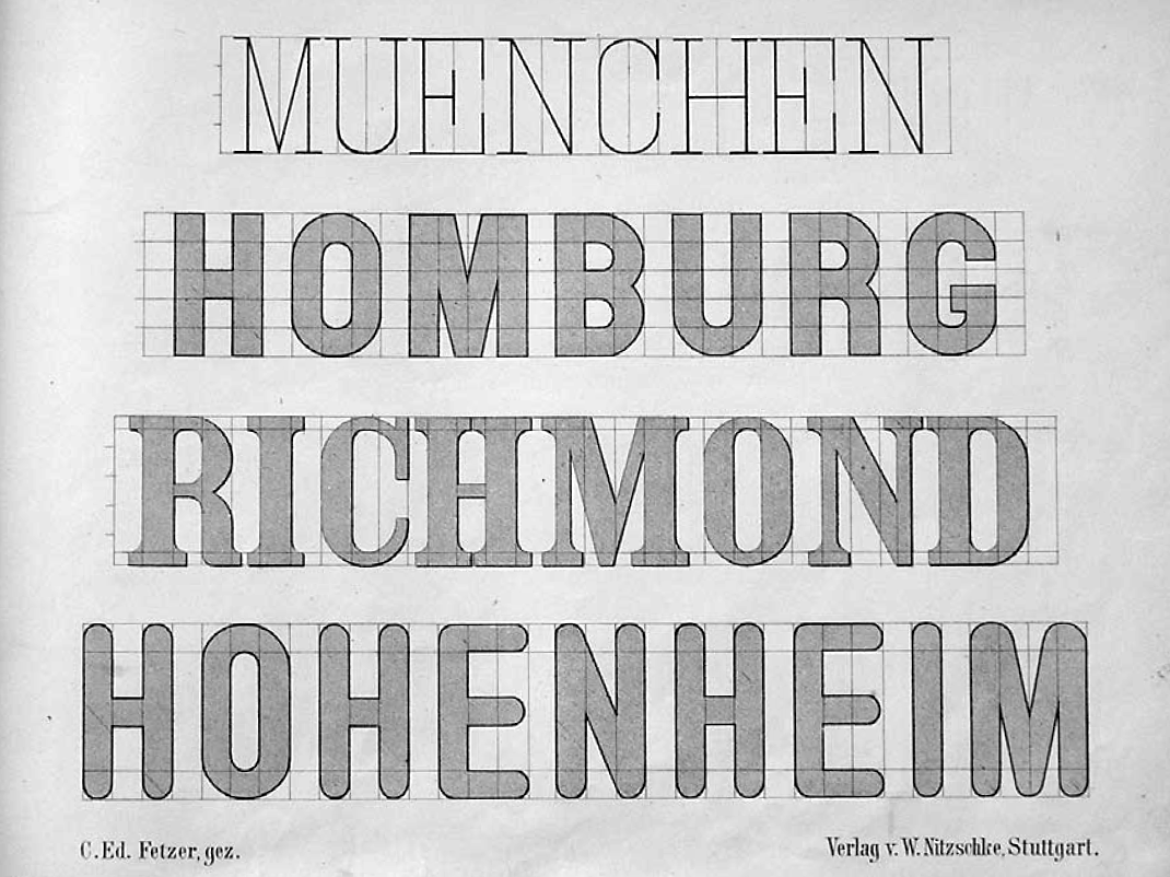
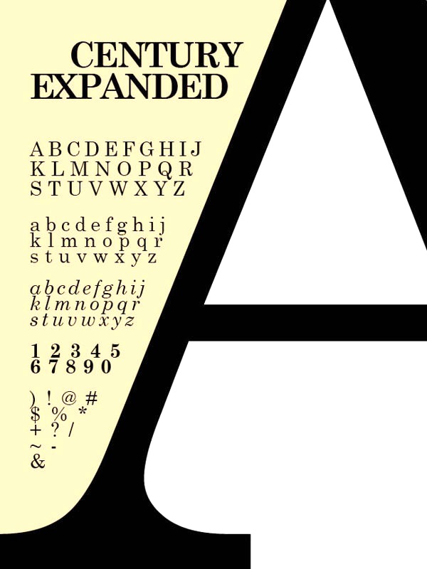
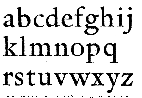
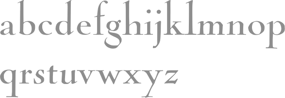
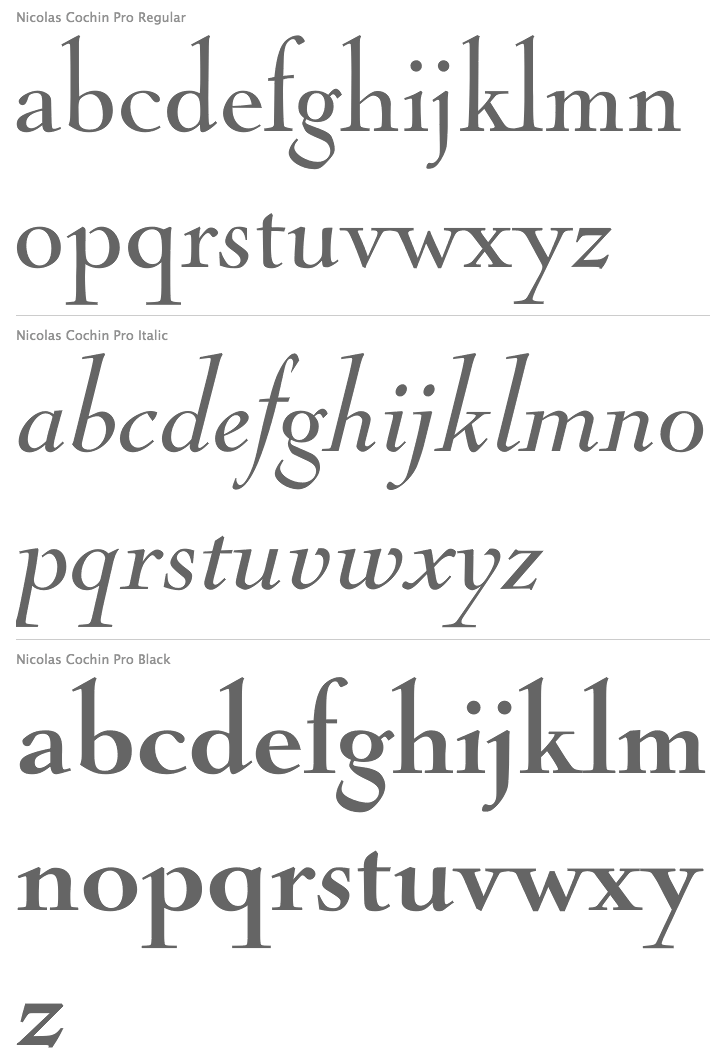
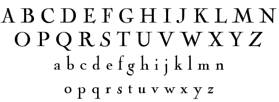
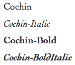
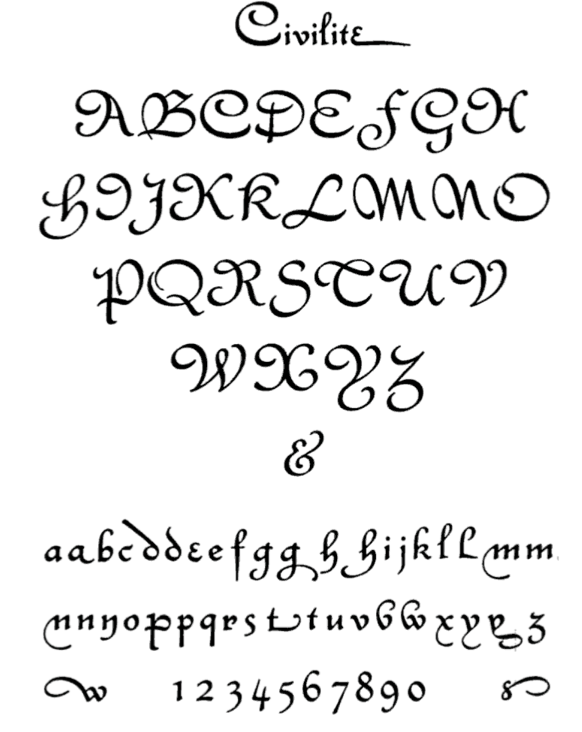
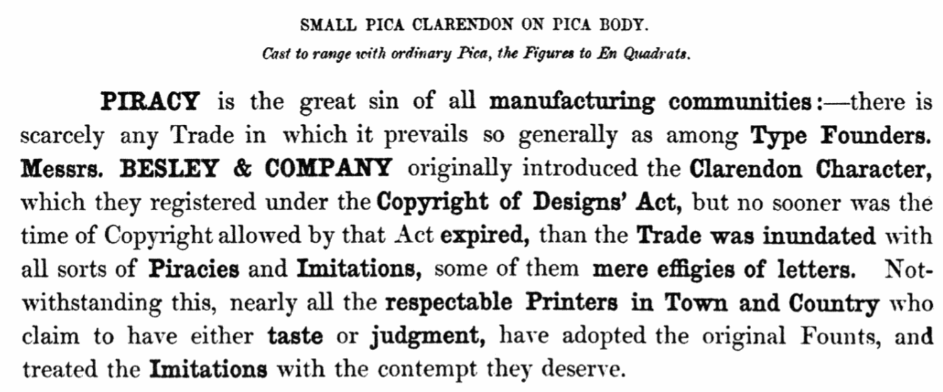
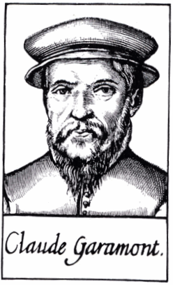
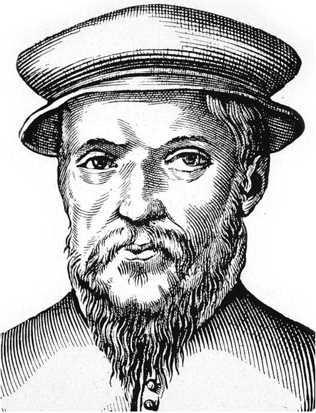
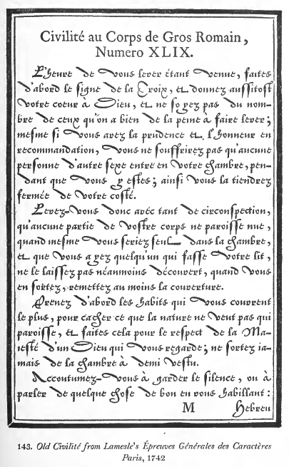
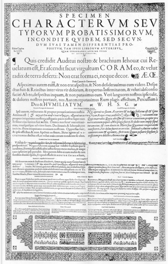
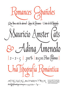
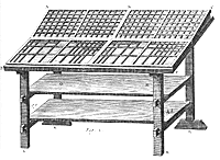
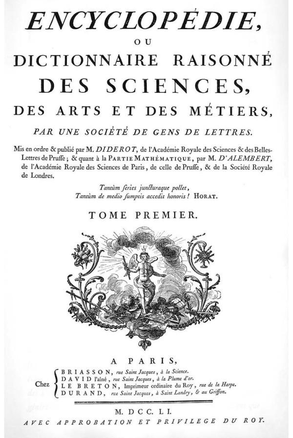
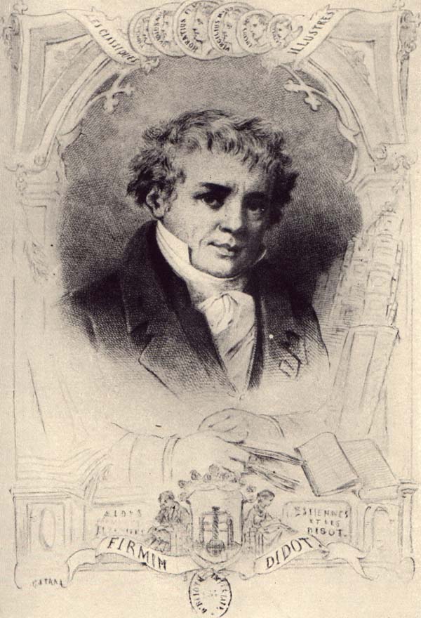
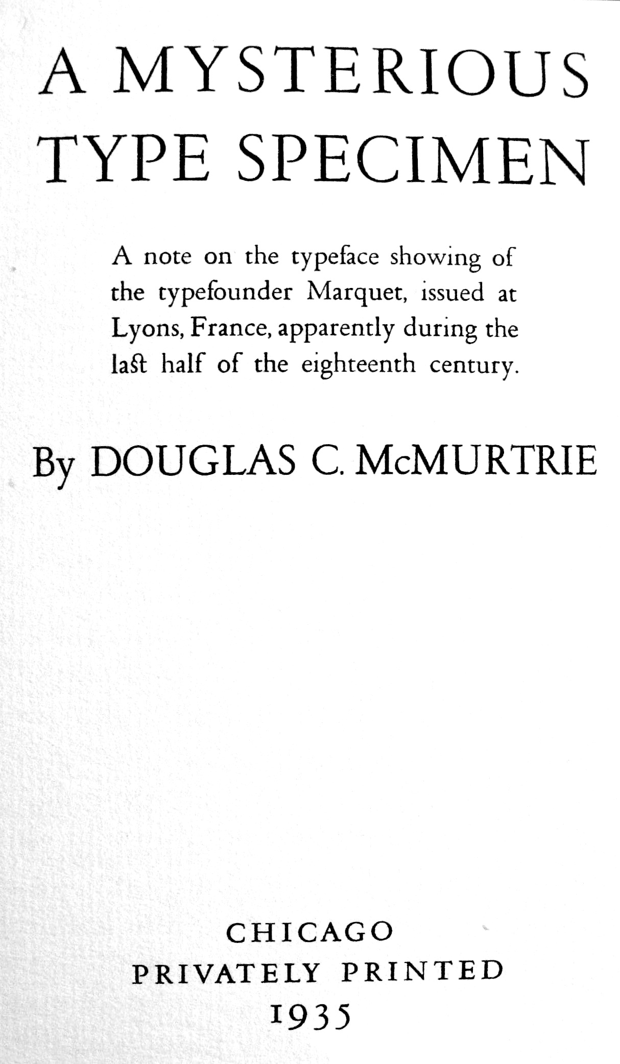
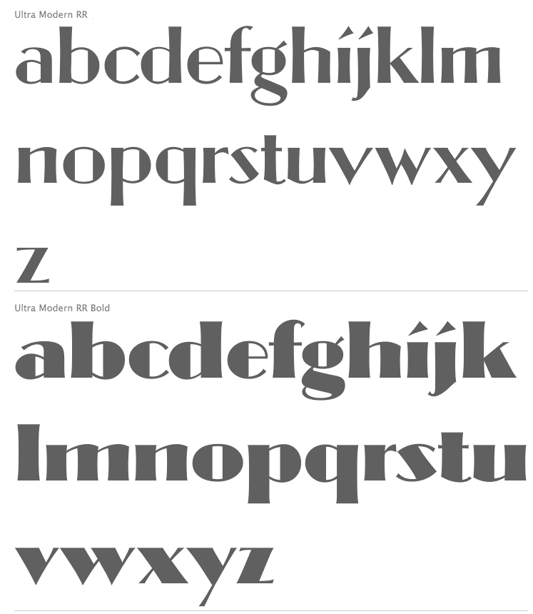
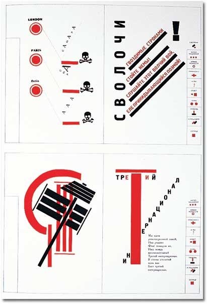
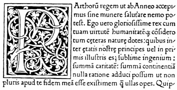
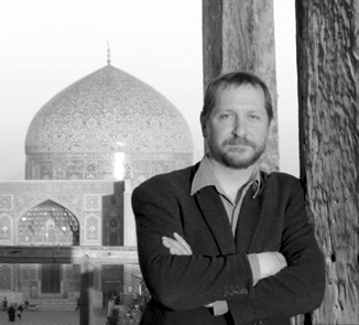
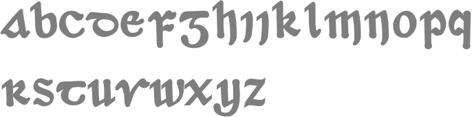
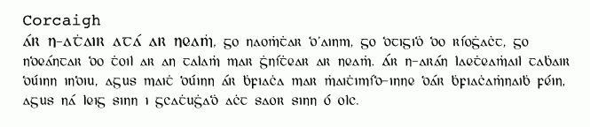
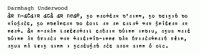
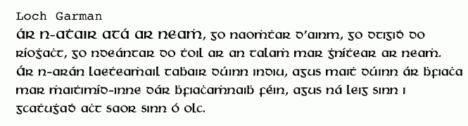
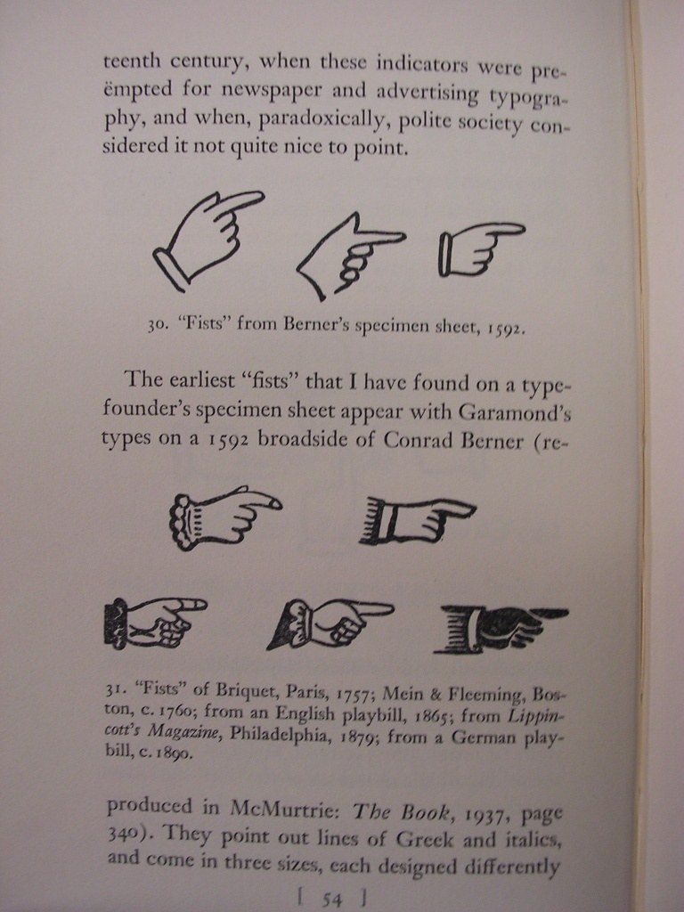
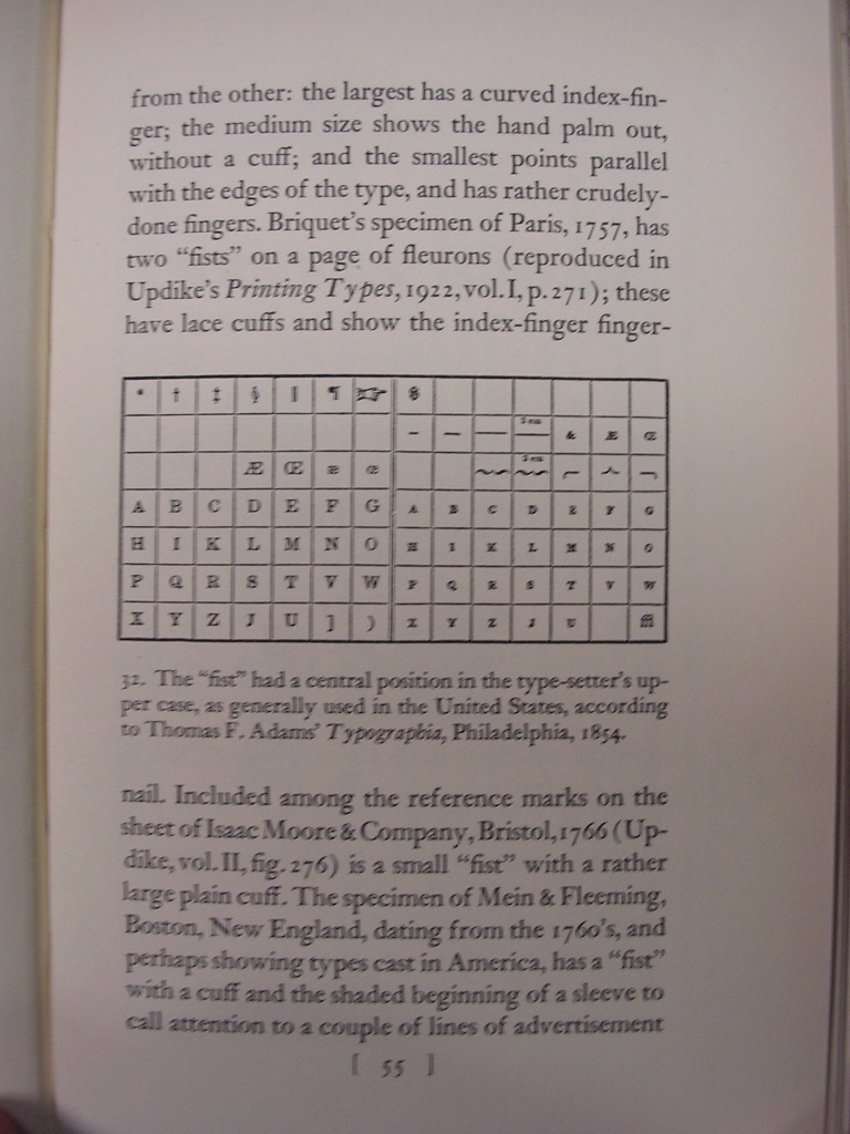
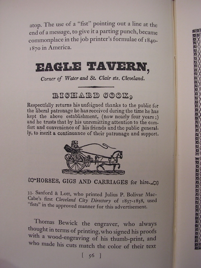
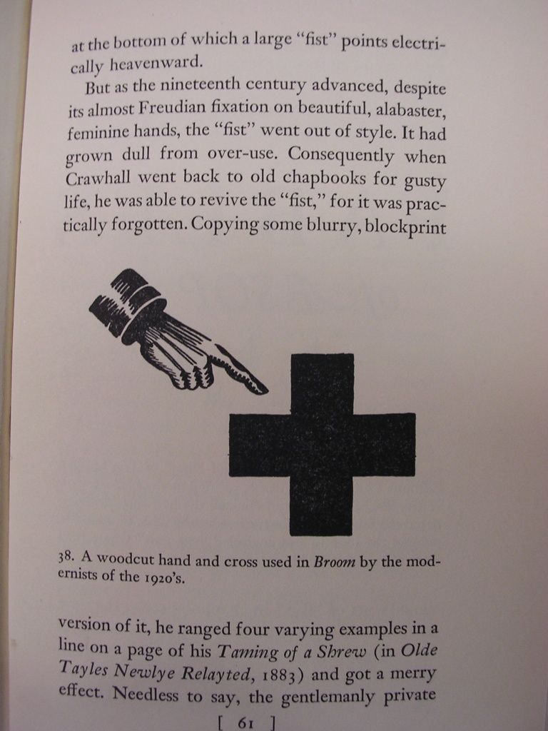
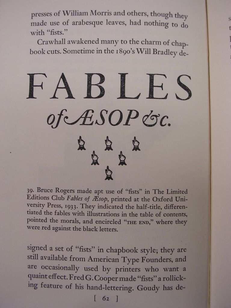
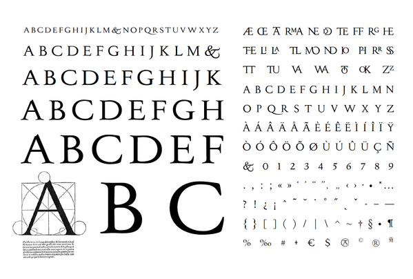
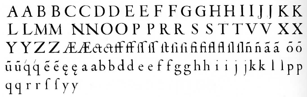
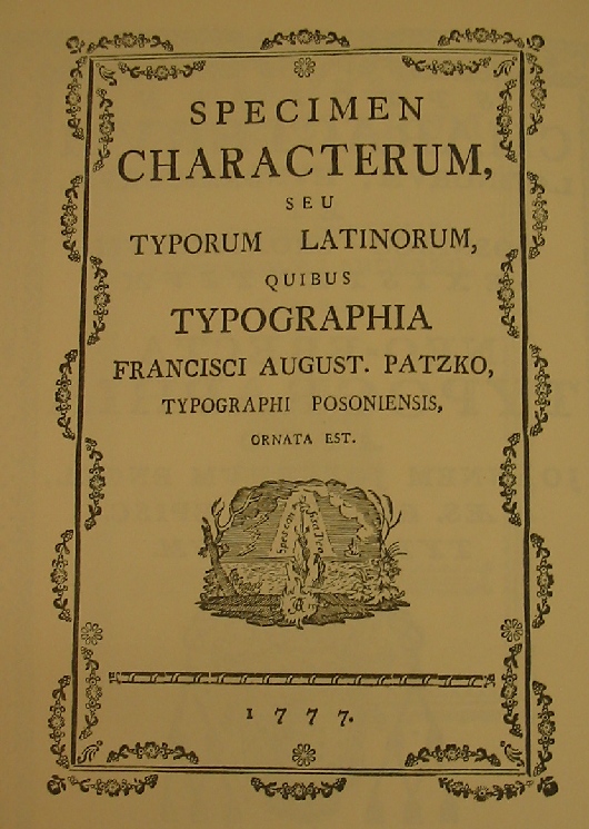
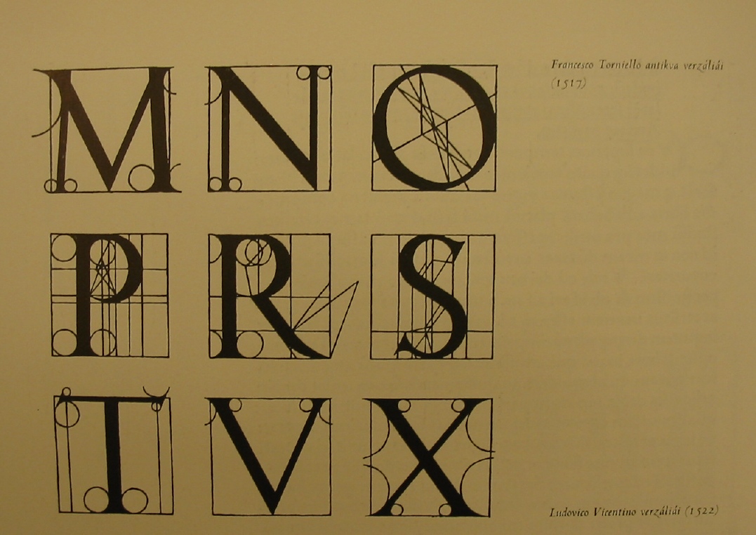
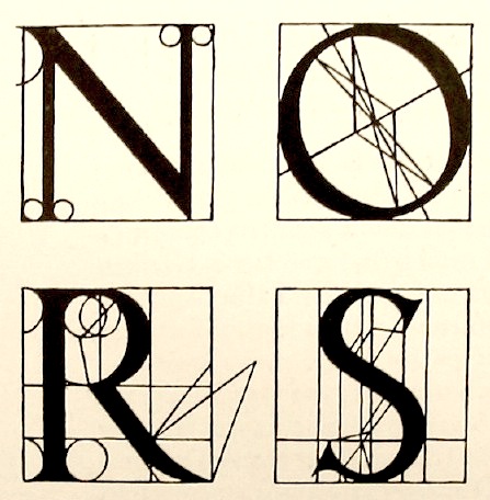
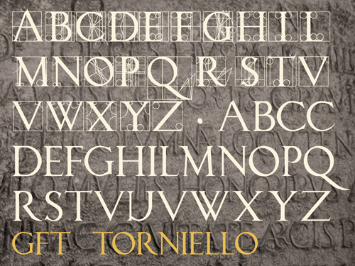
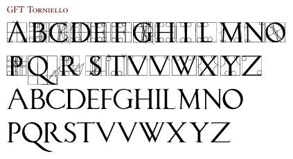
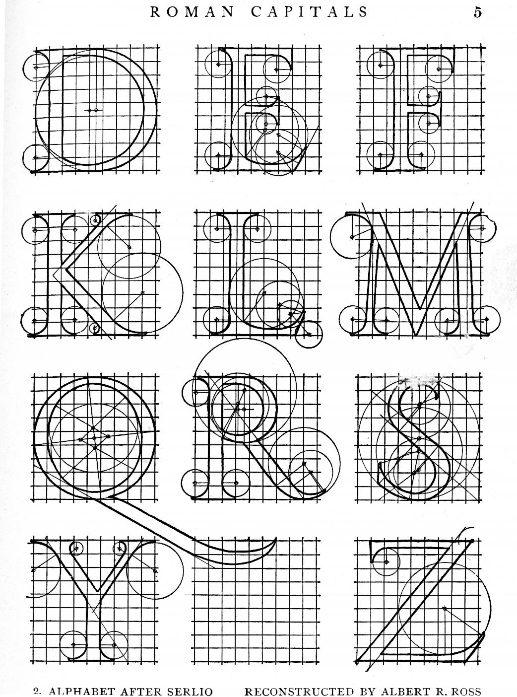
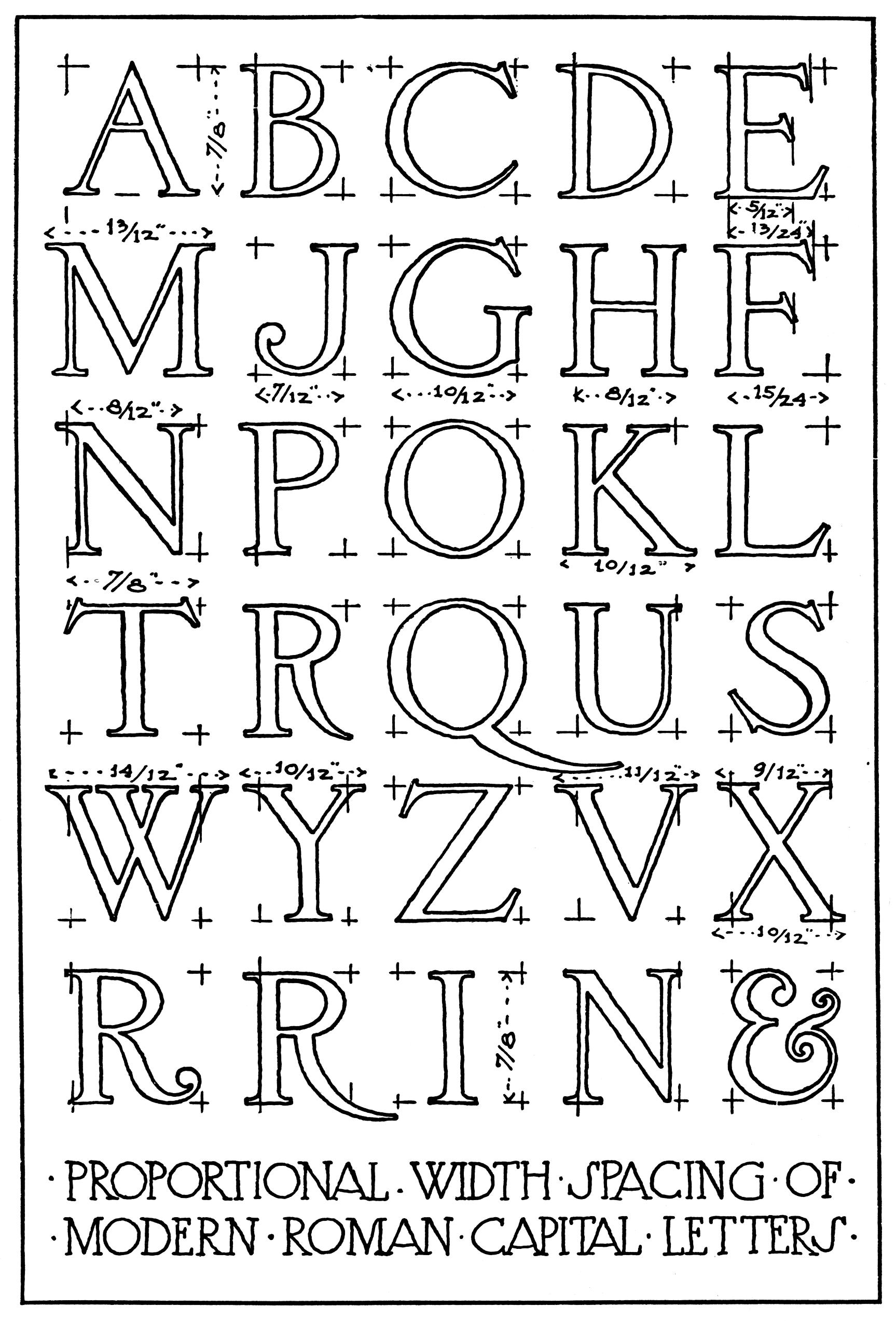
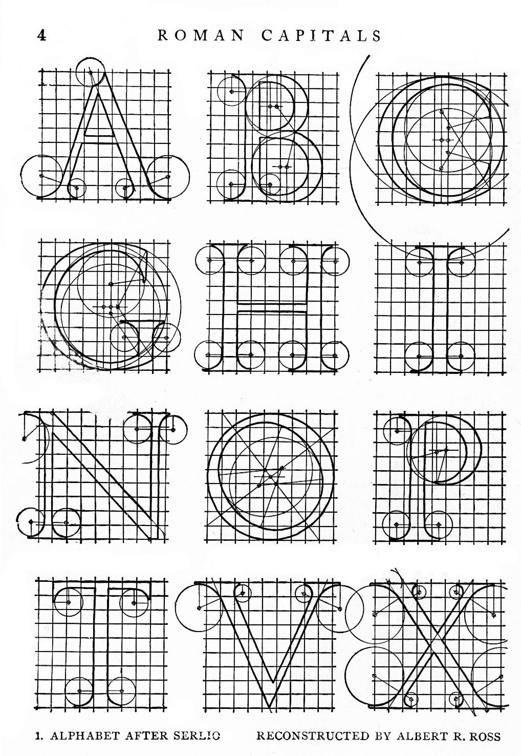
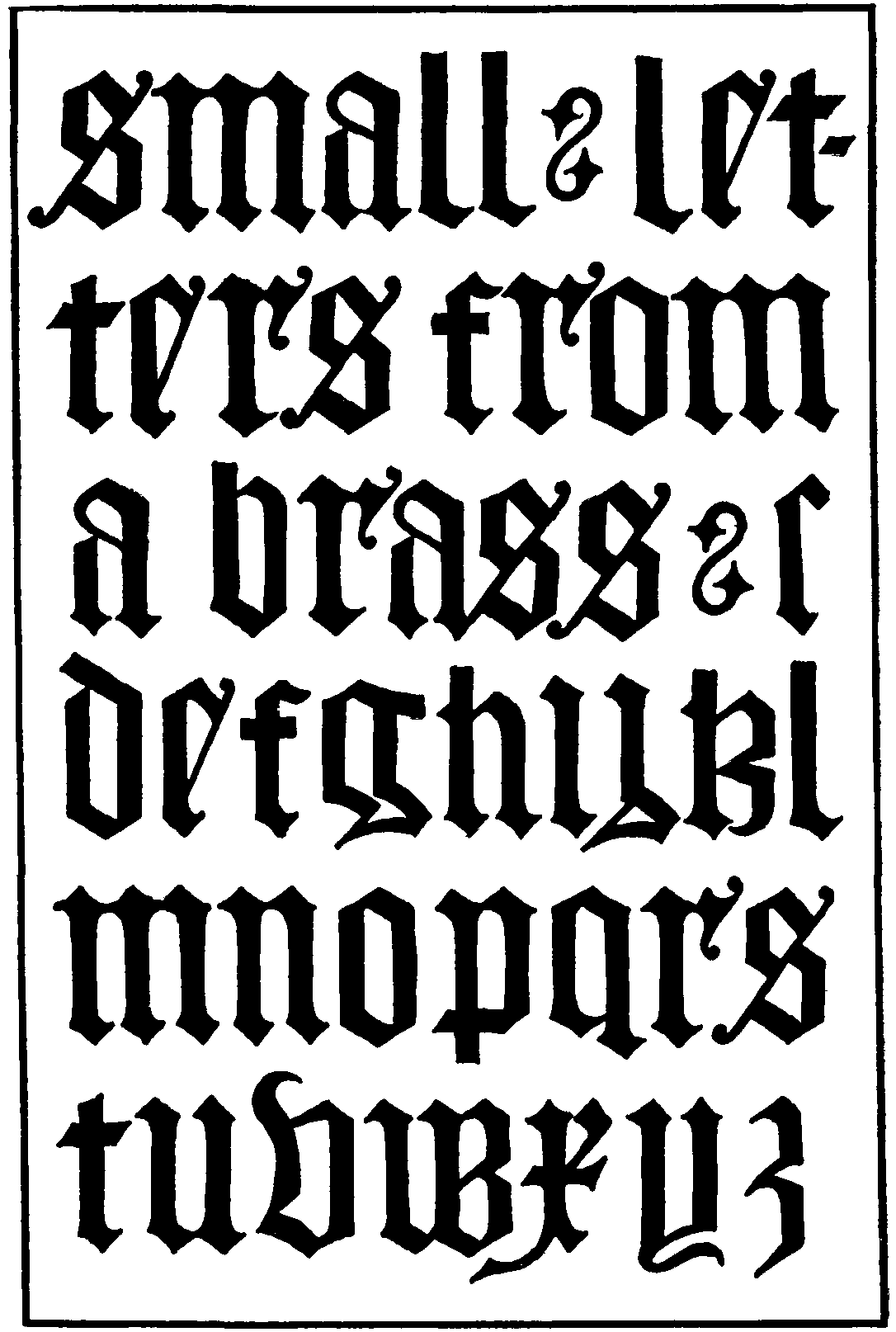
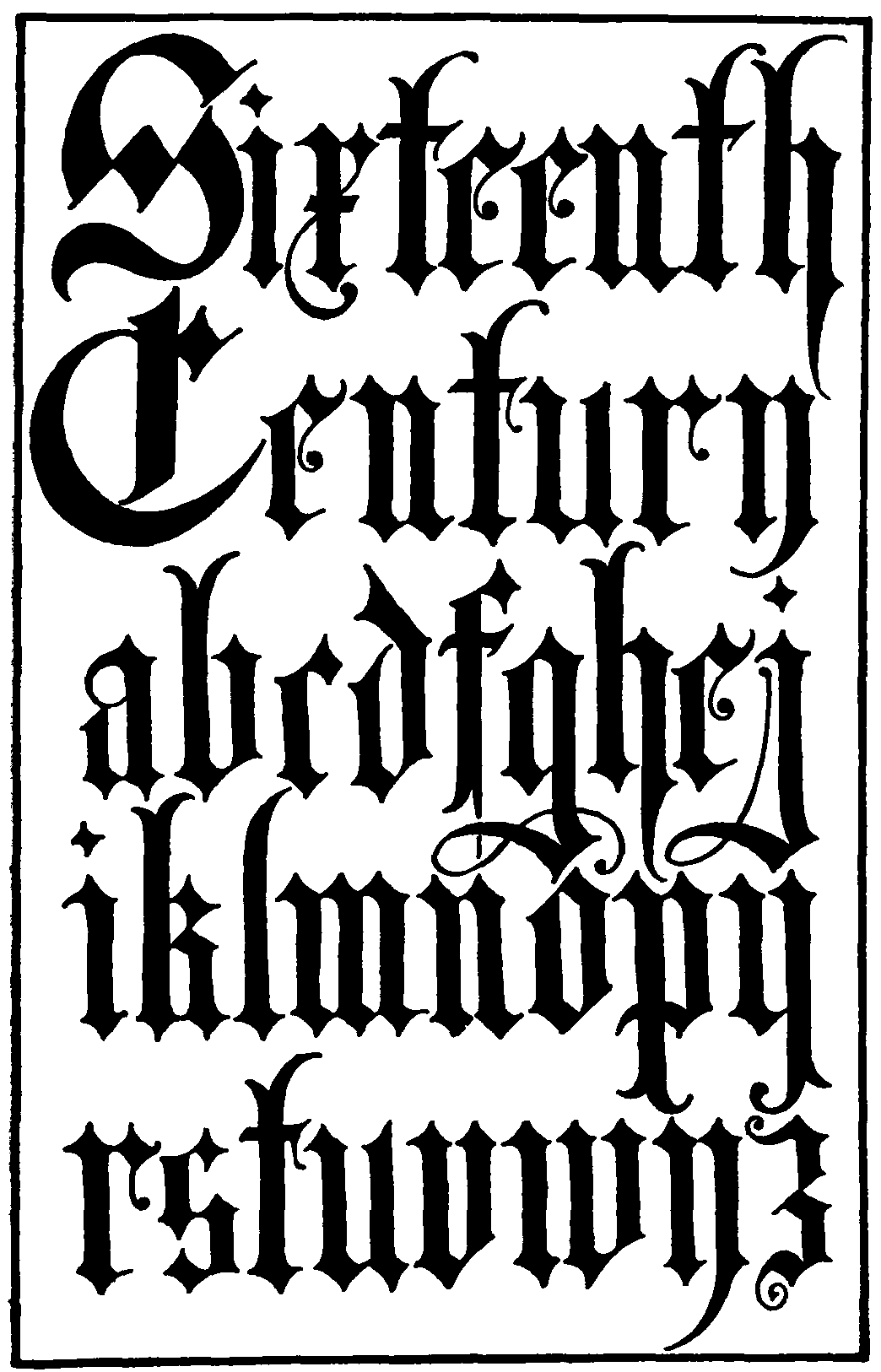
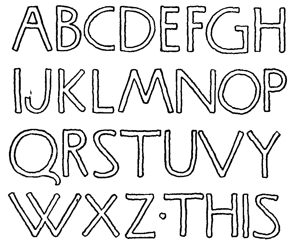
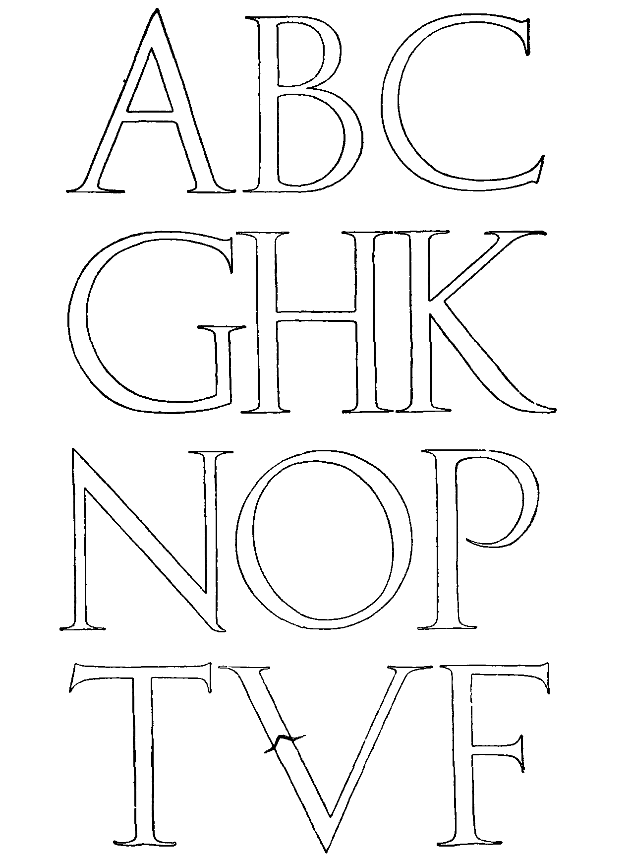
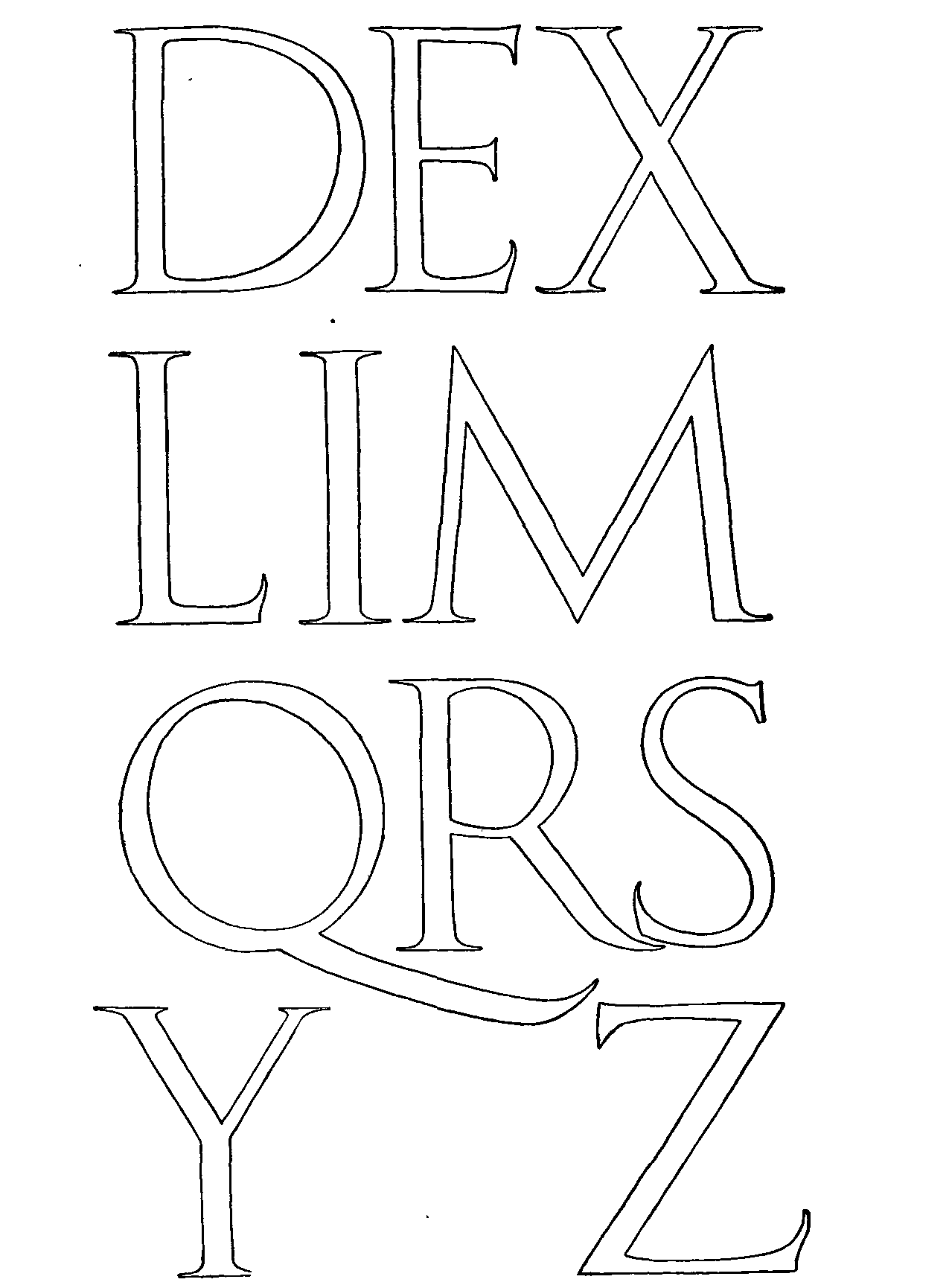
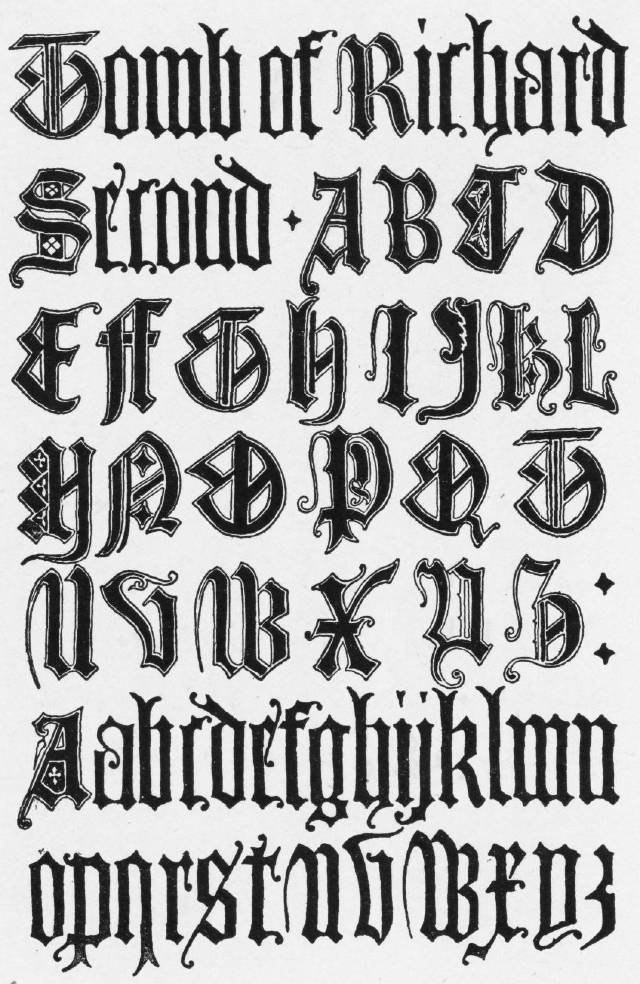
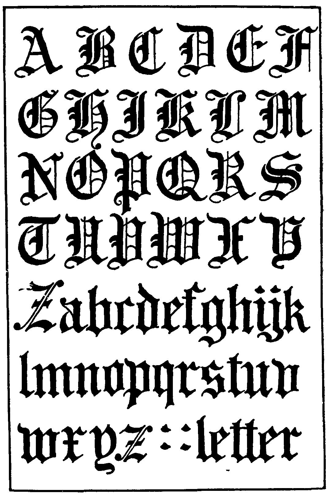
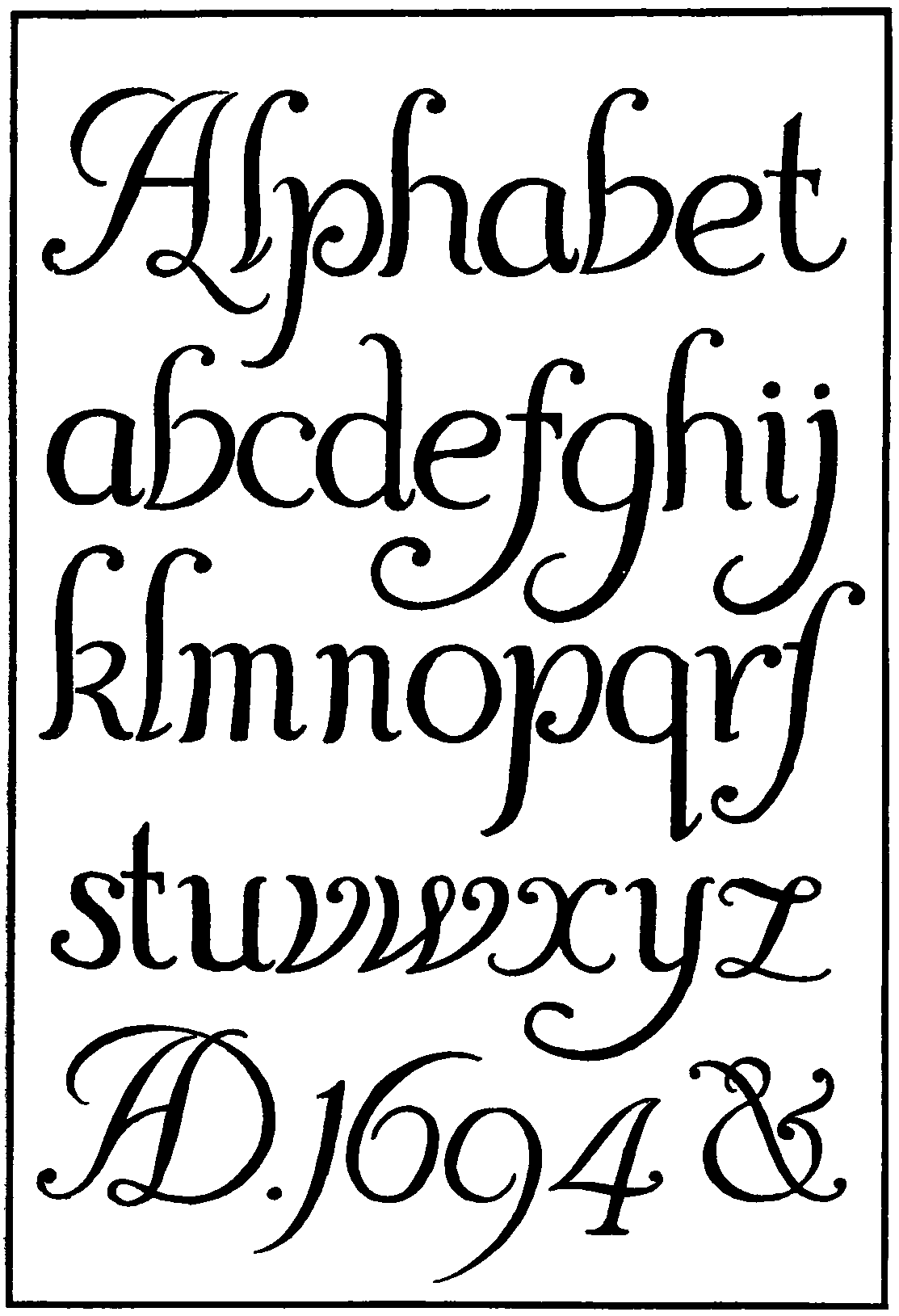
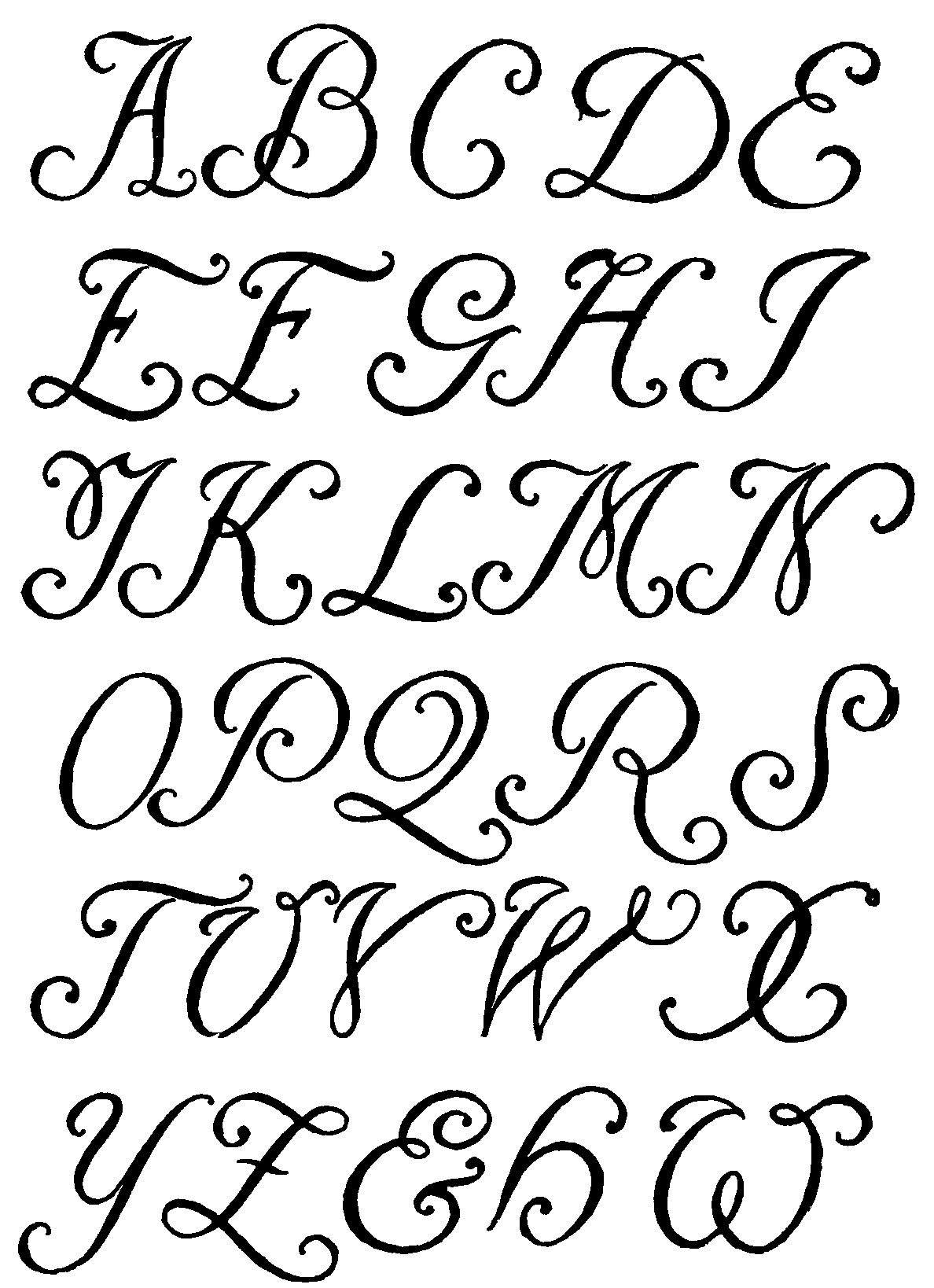
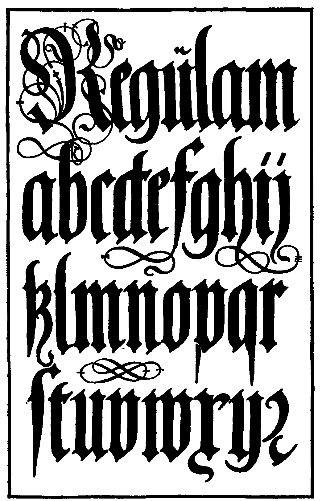
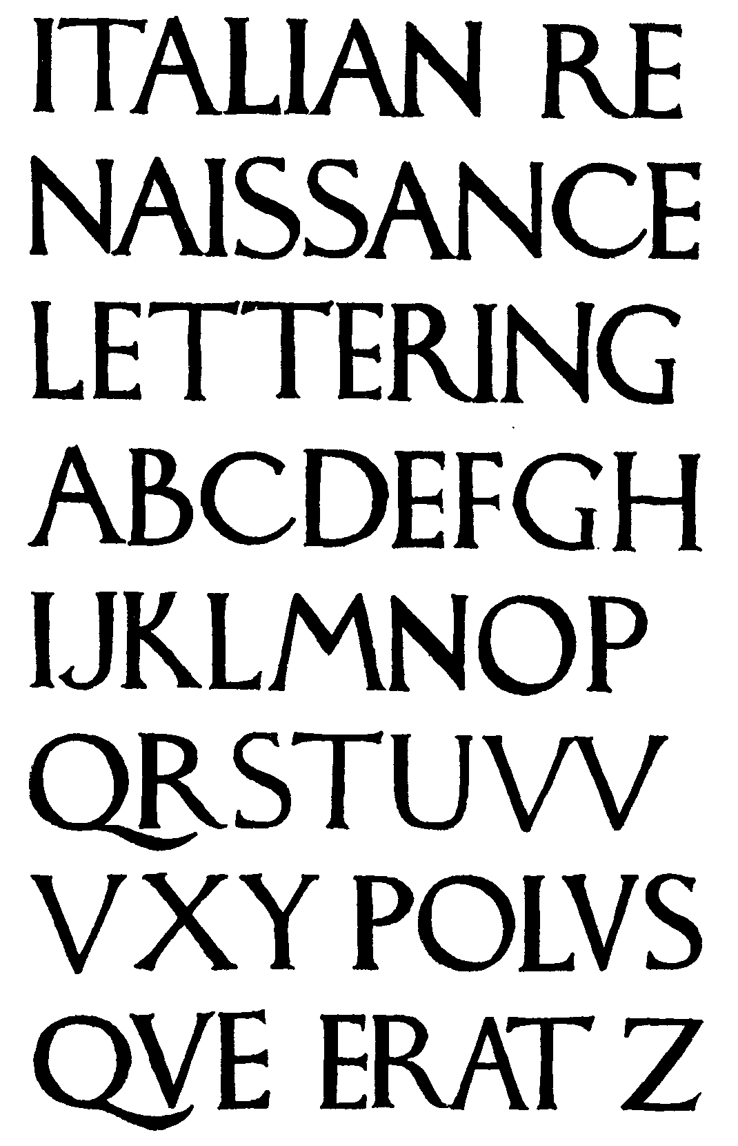
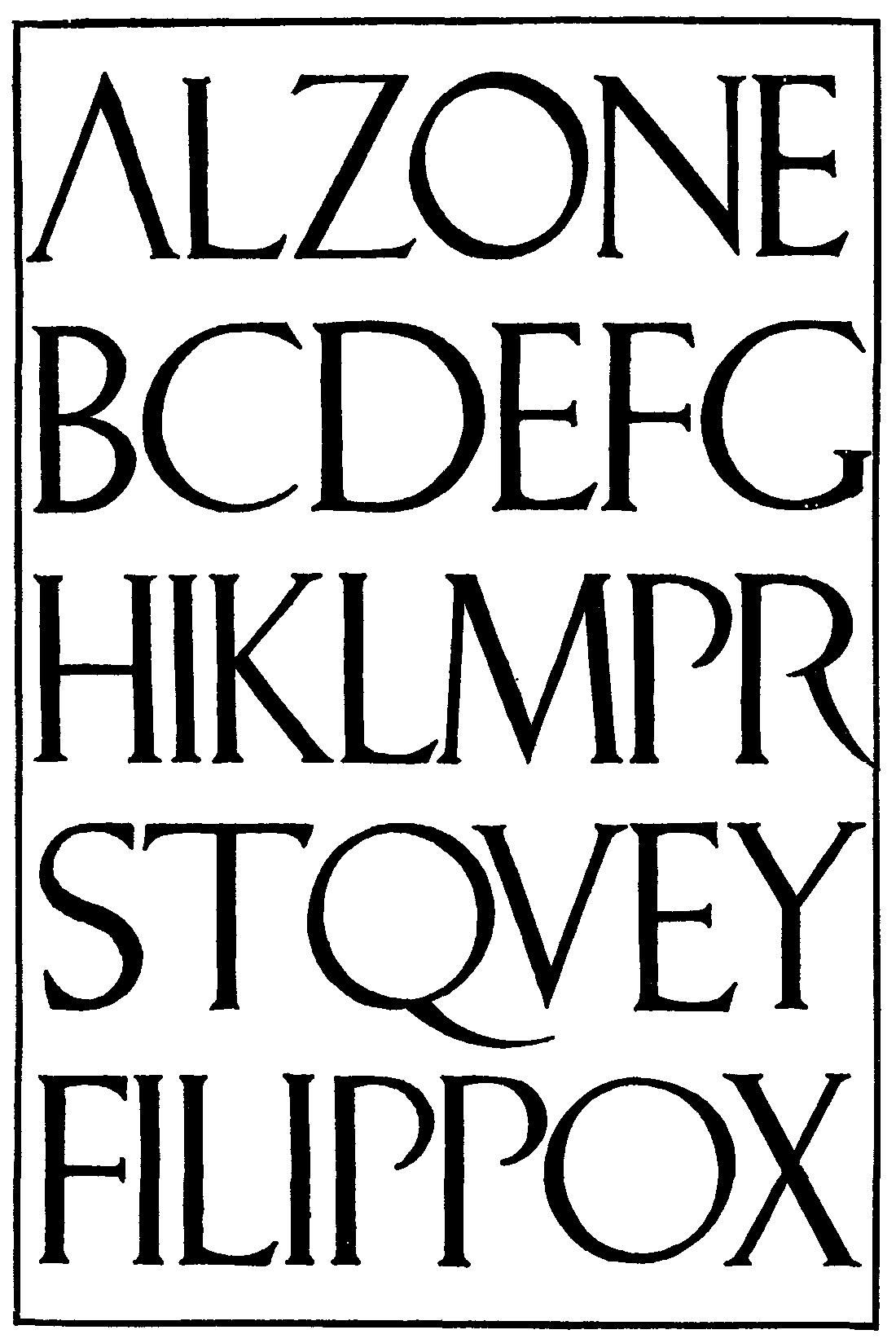
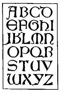
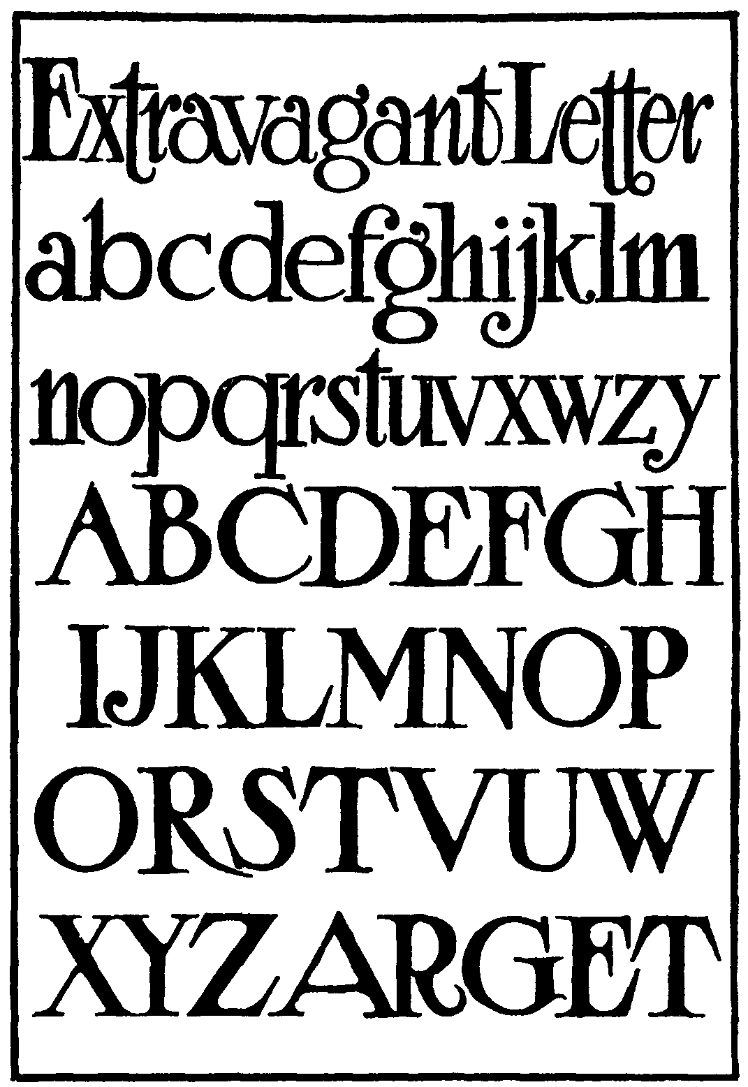
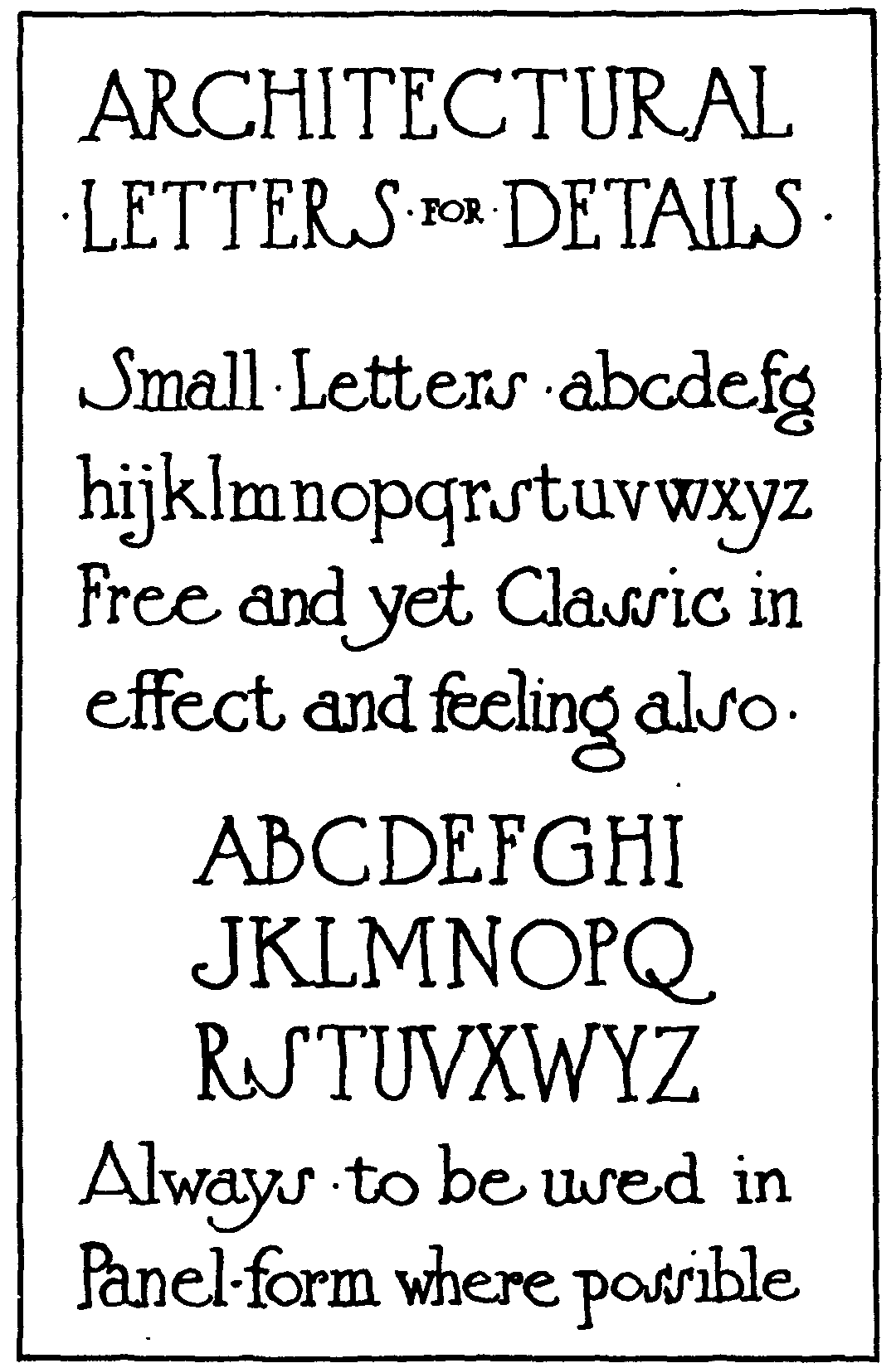
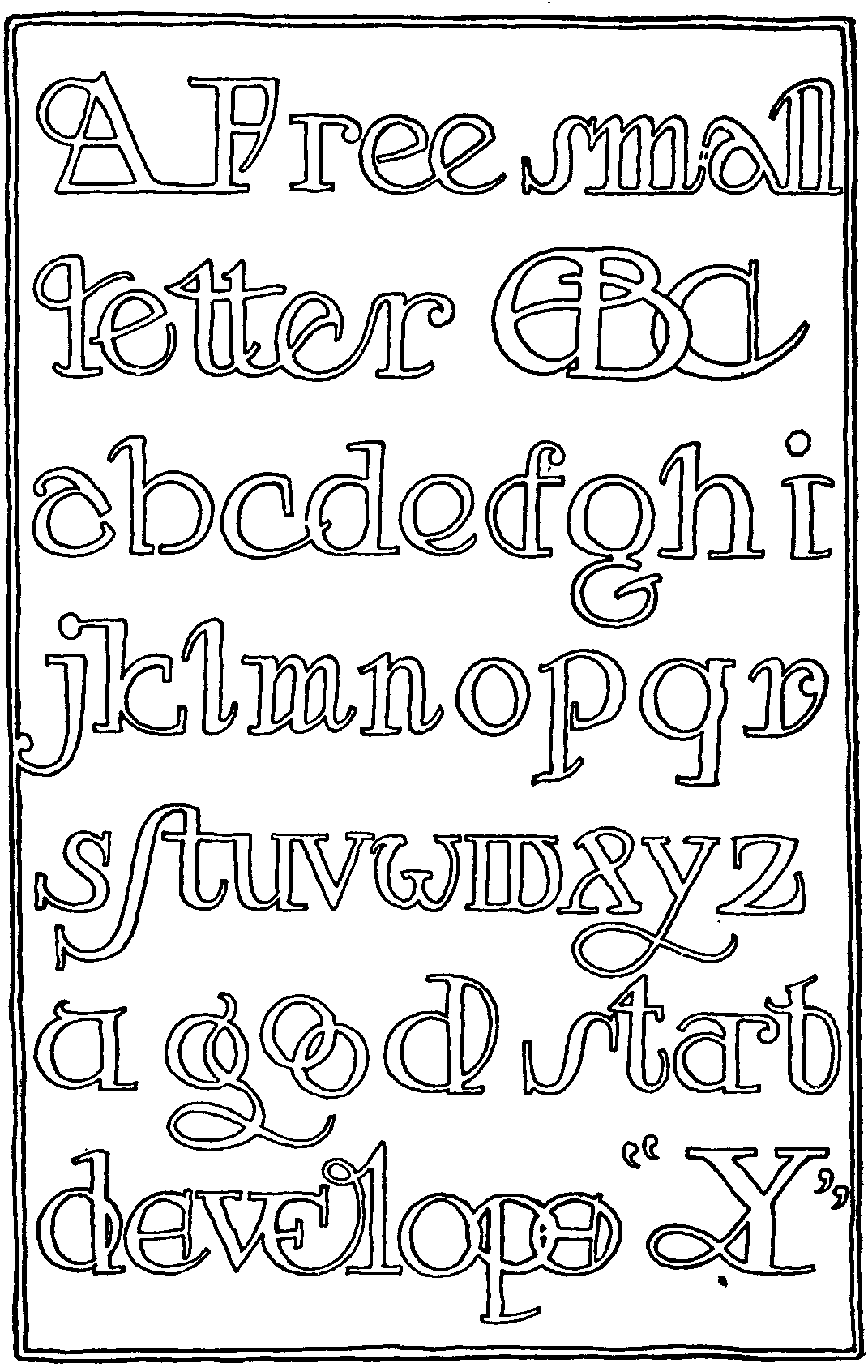
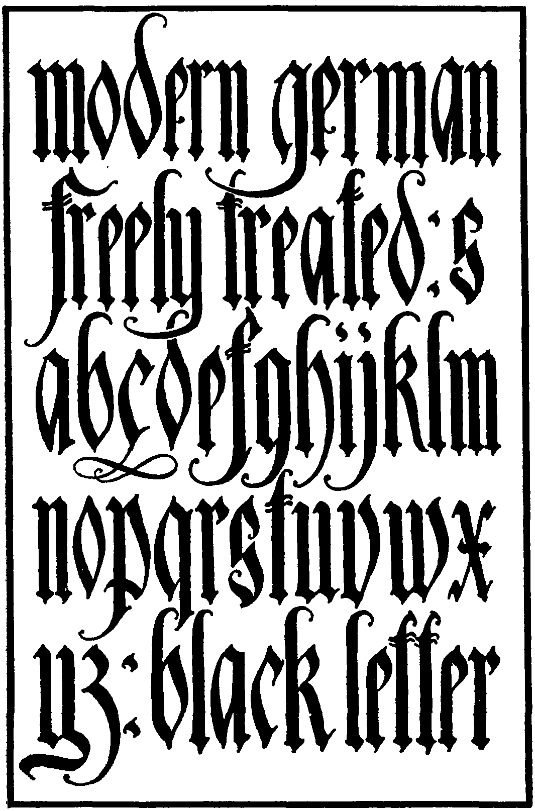
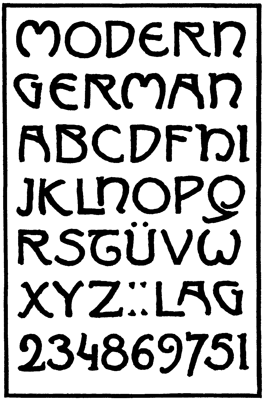
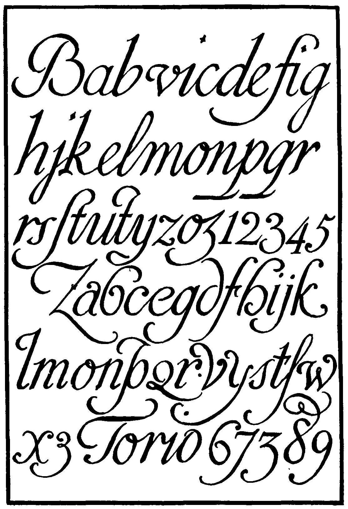
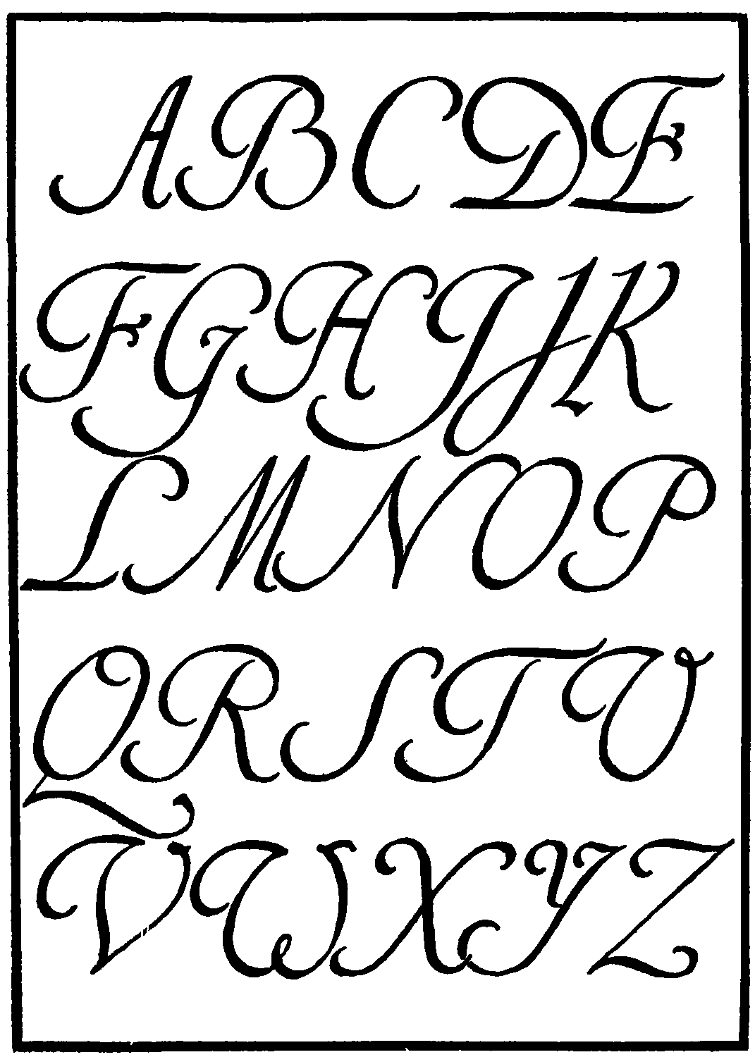
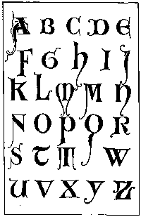
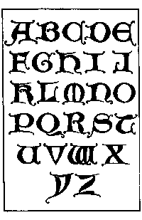
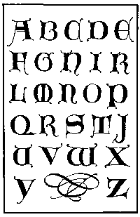
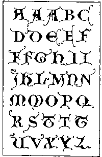
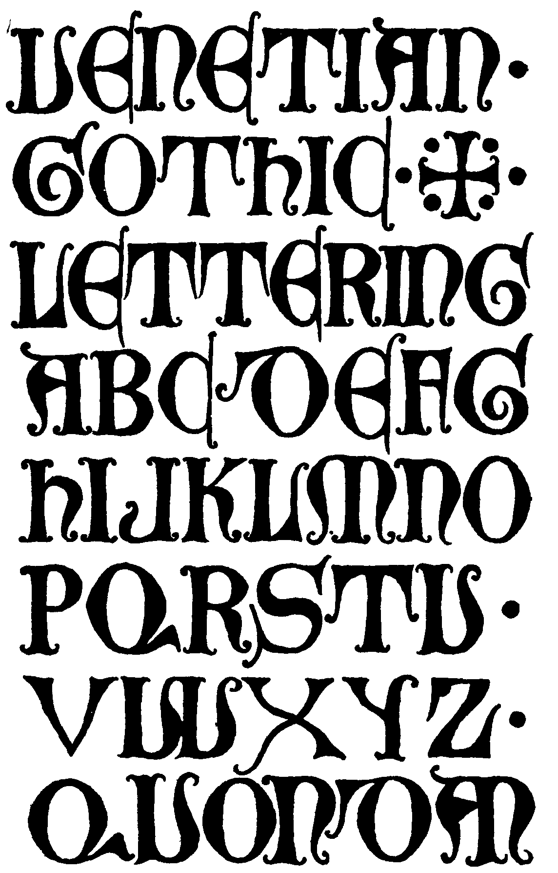
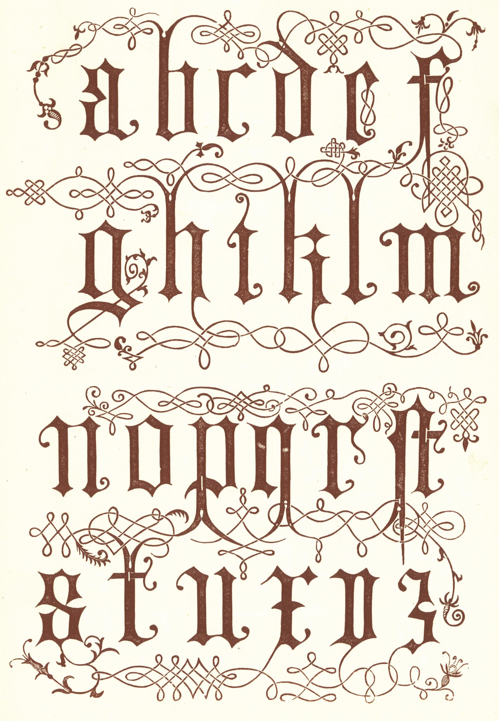
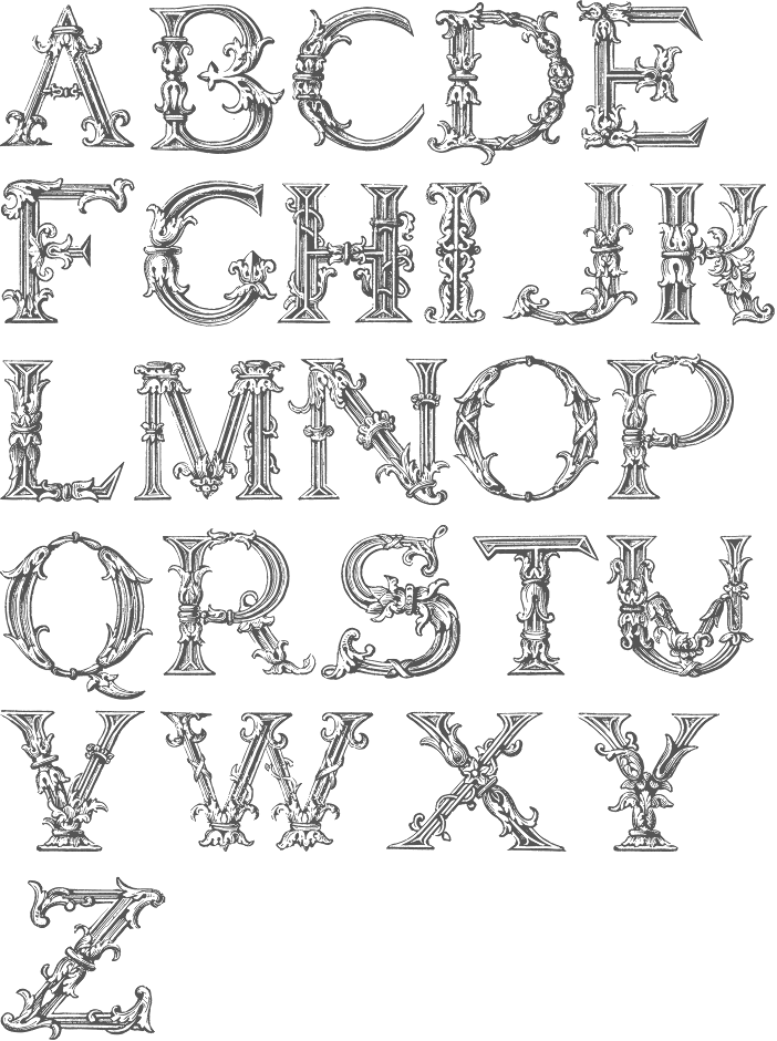
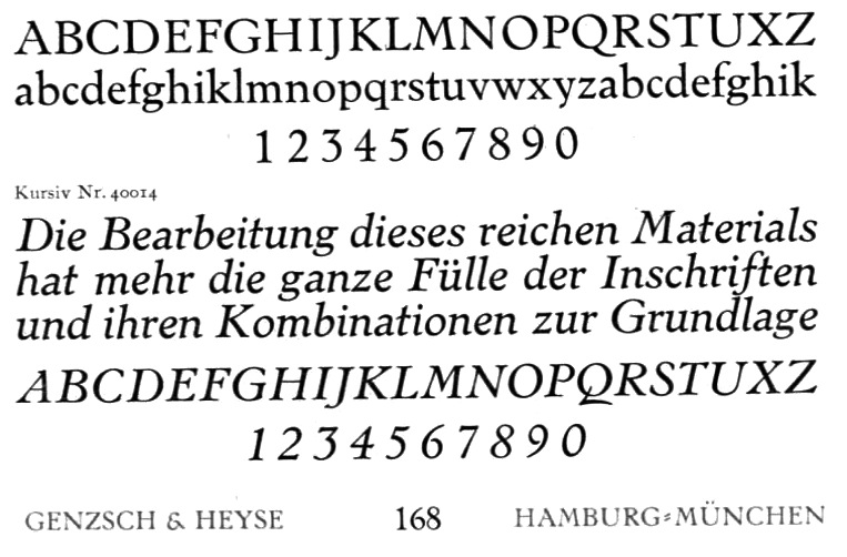
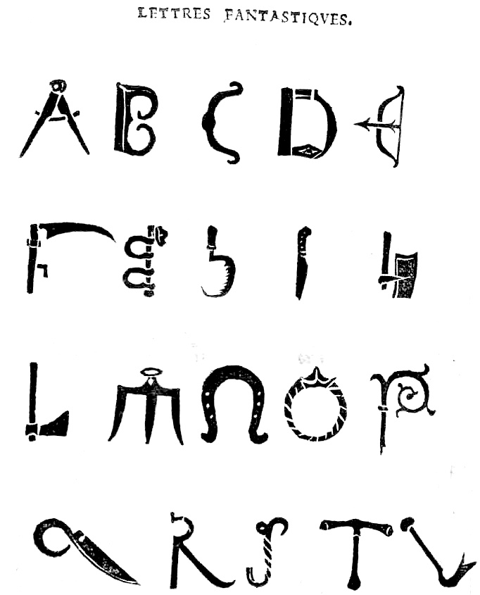
![[continued]](GeoffroyTory1529-LettresFantastiques2.jpg)
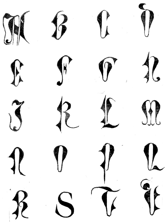
![[continued]](GeoffroyTory1529-LettresImperialles+Bullatiques2.jpg)
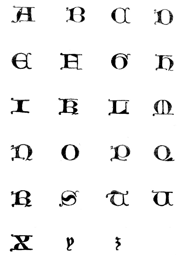
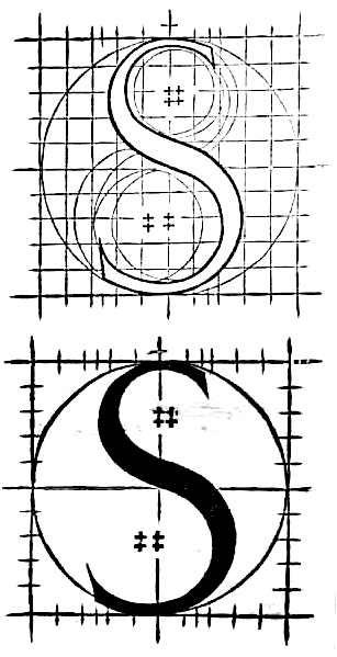
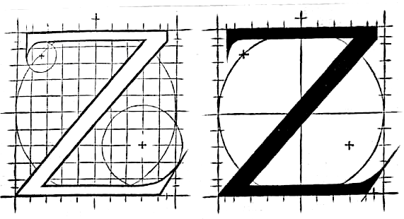
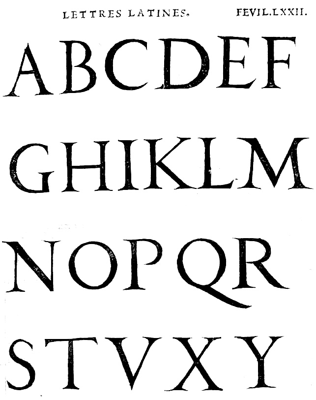
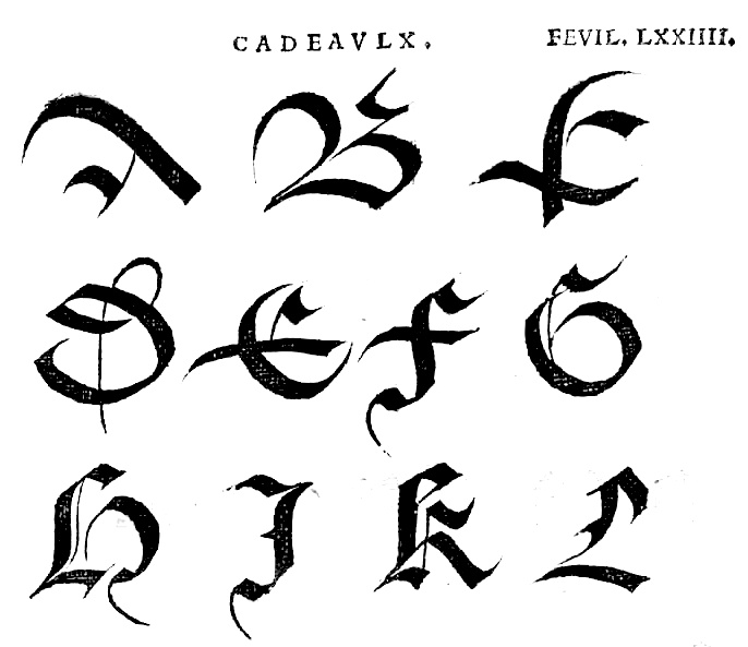
![[continued]](GeoffroyTory1529-cadeaulx2.jpg)
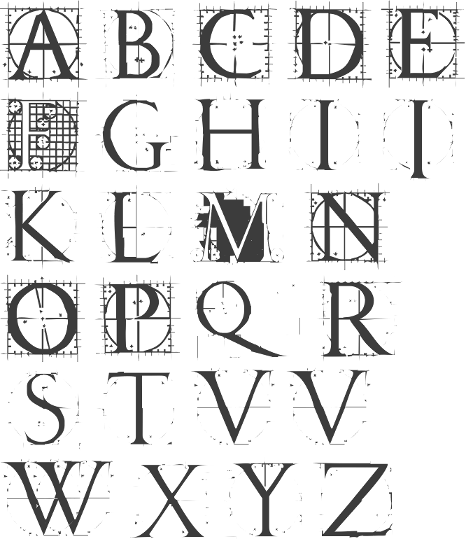
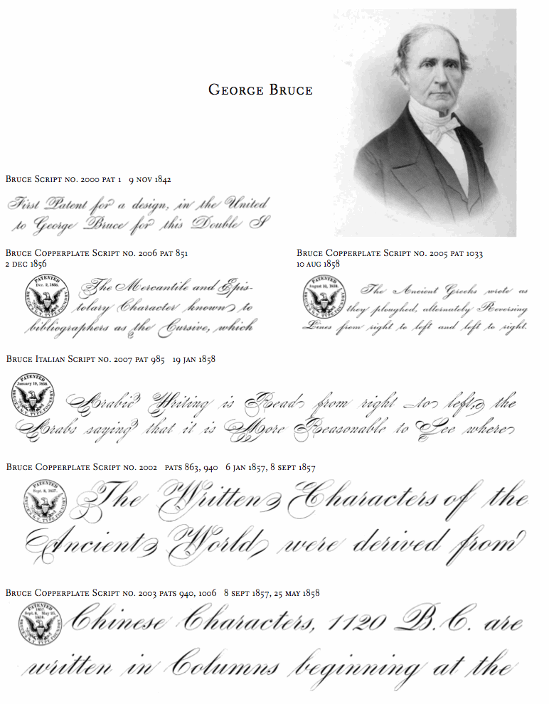
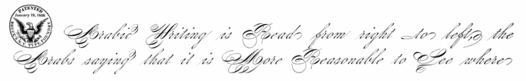
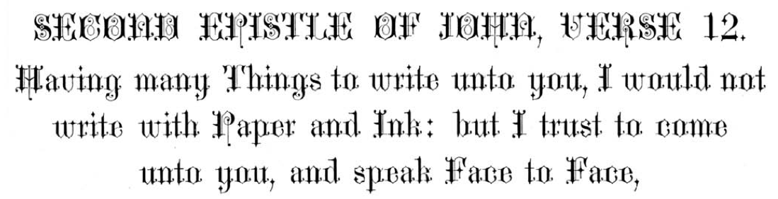
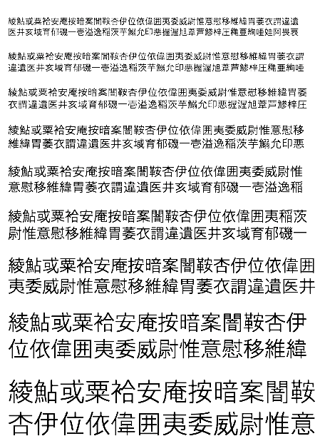
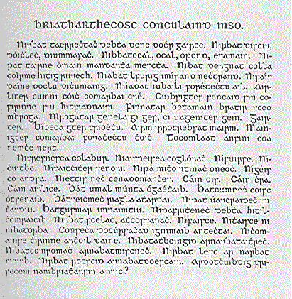
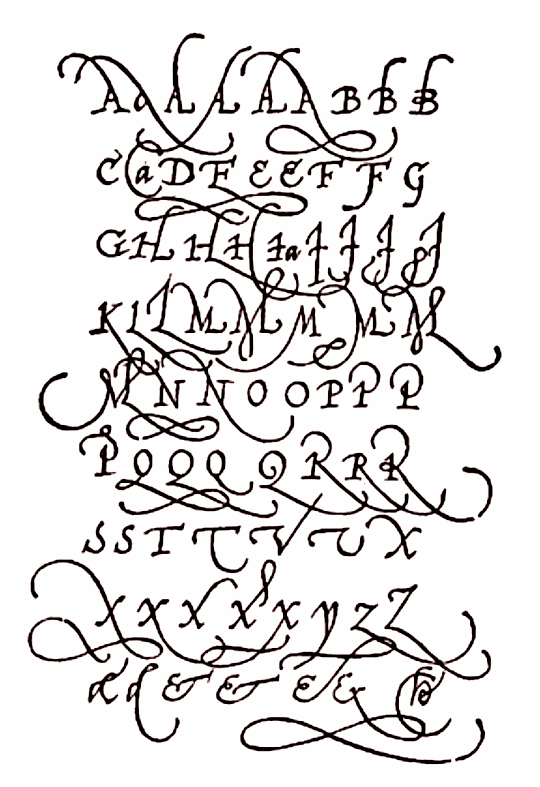
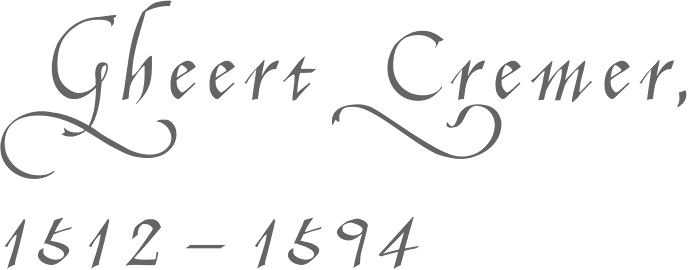
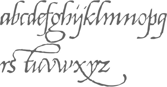
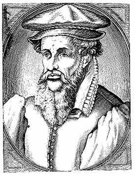
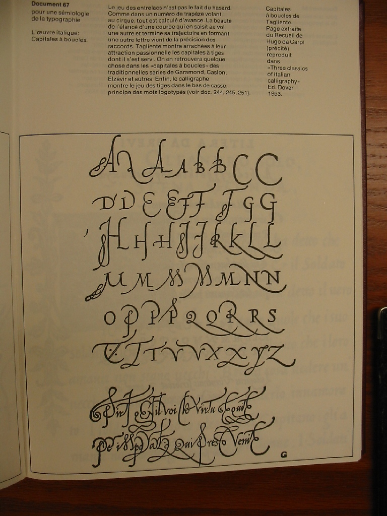
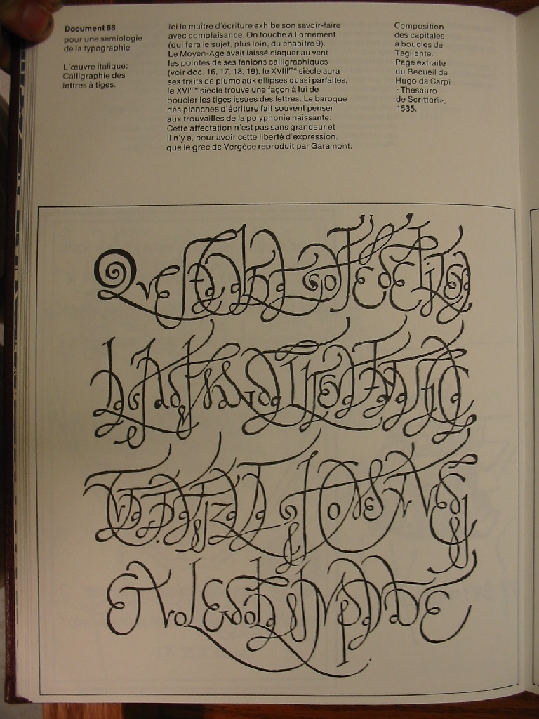
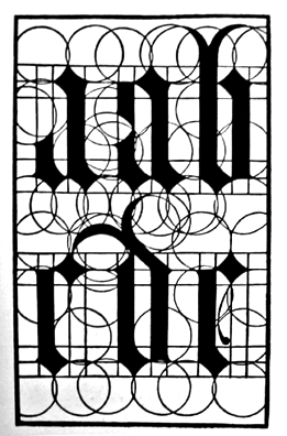
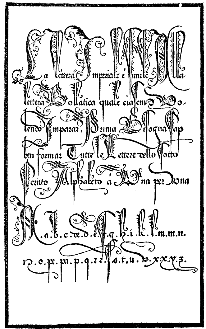
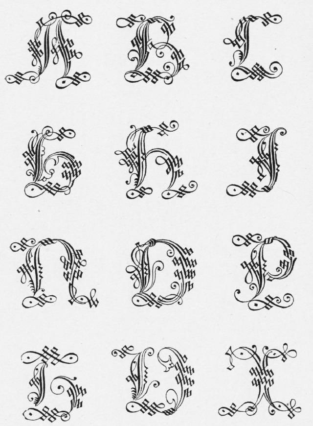
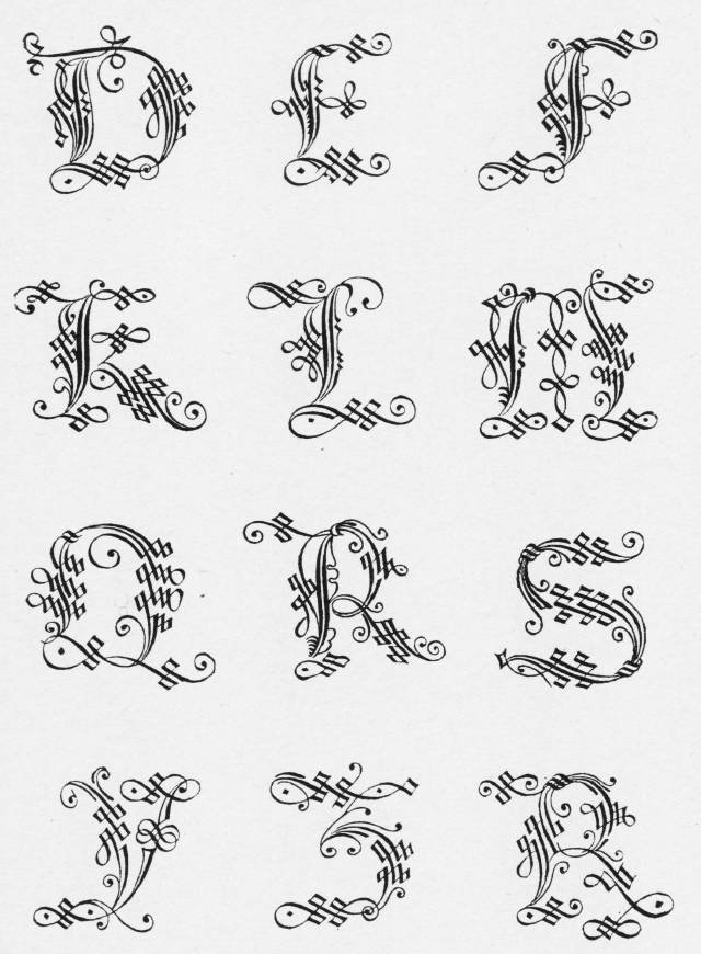
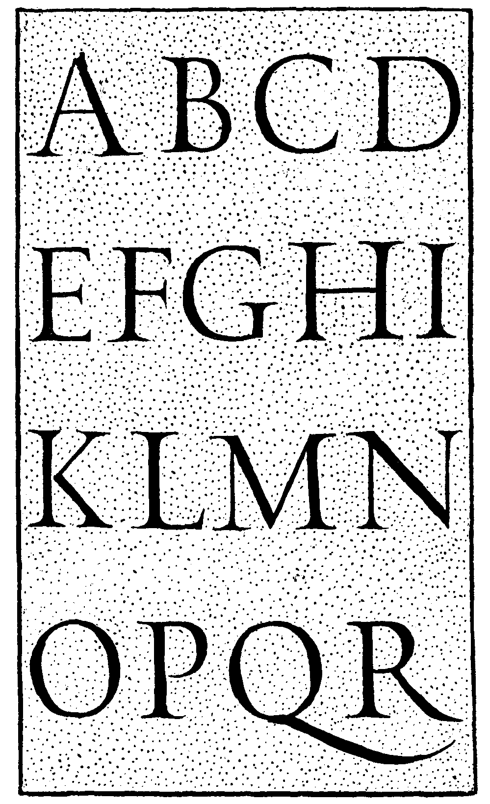
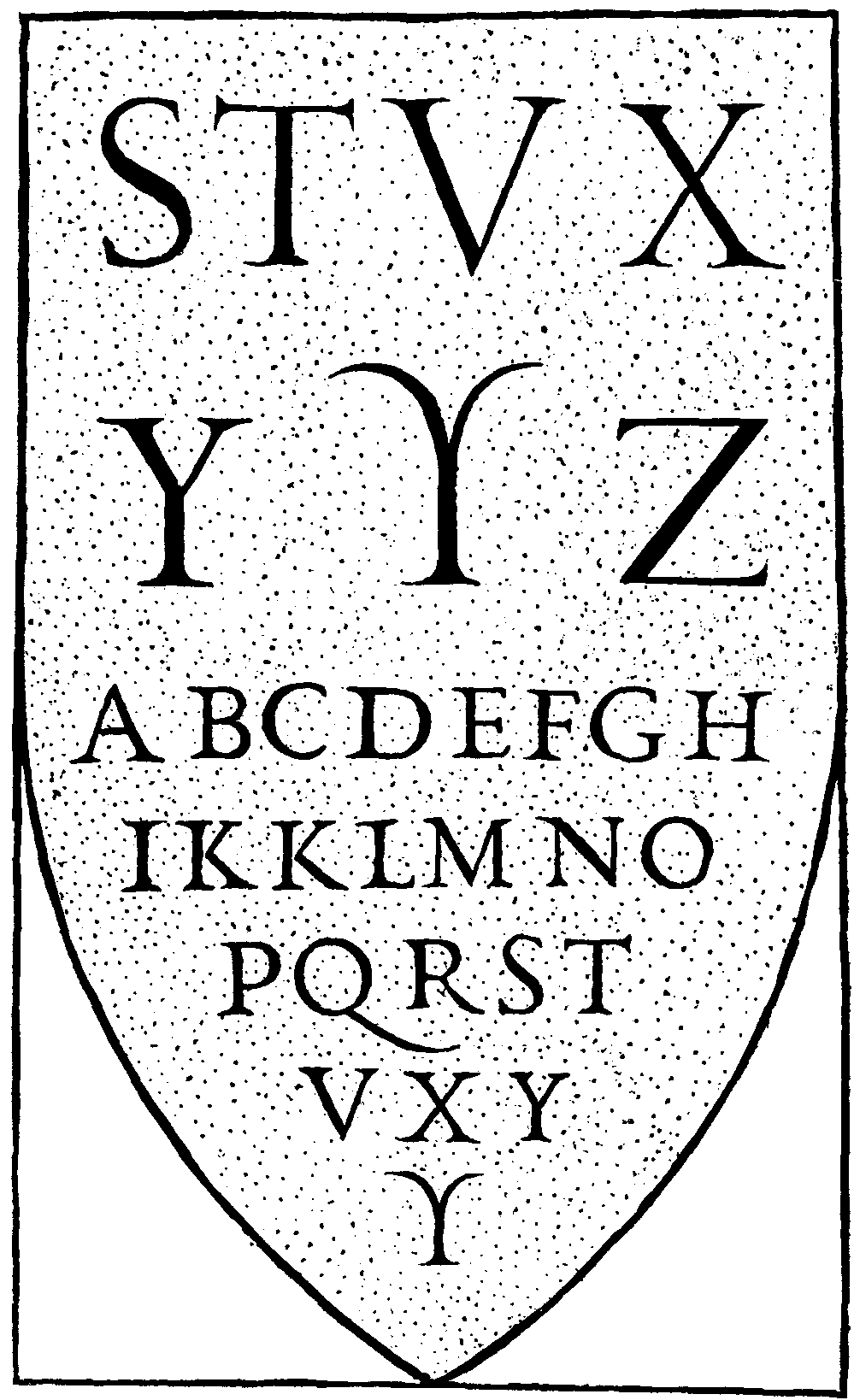
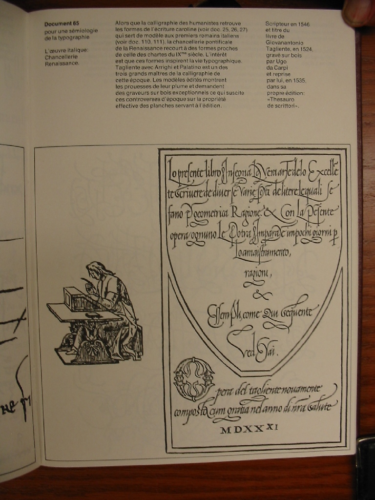
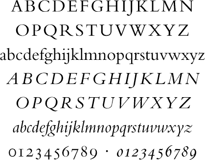
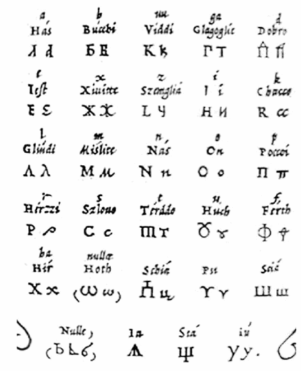
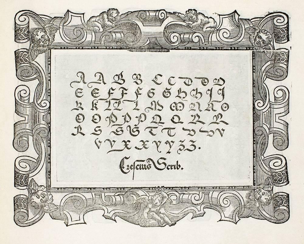
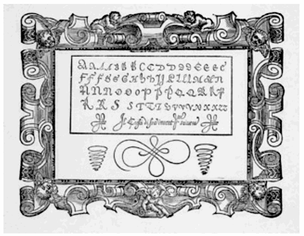
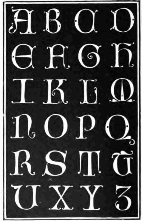
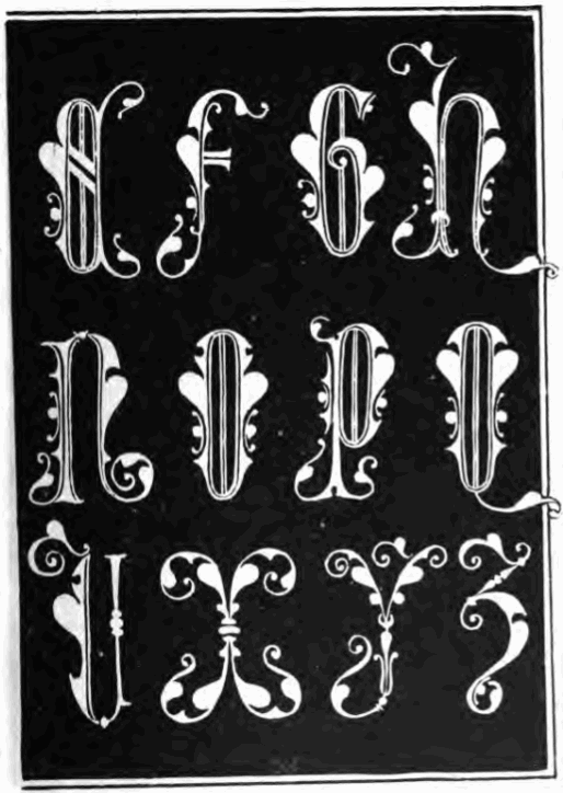
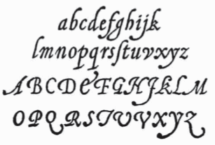
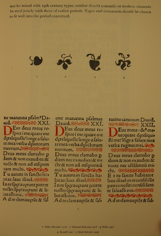
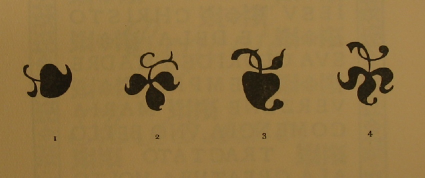
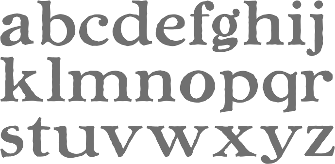
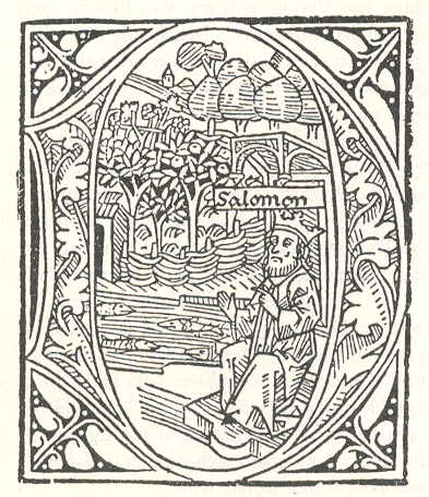
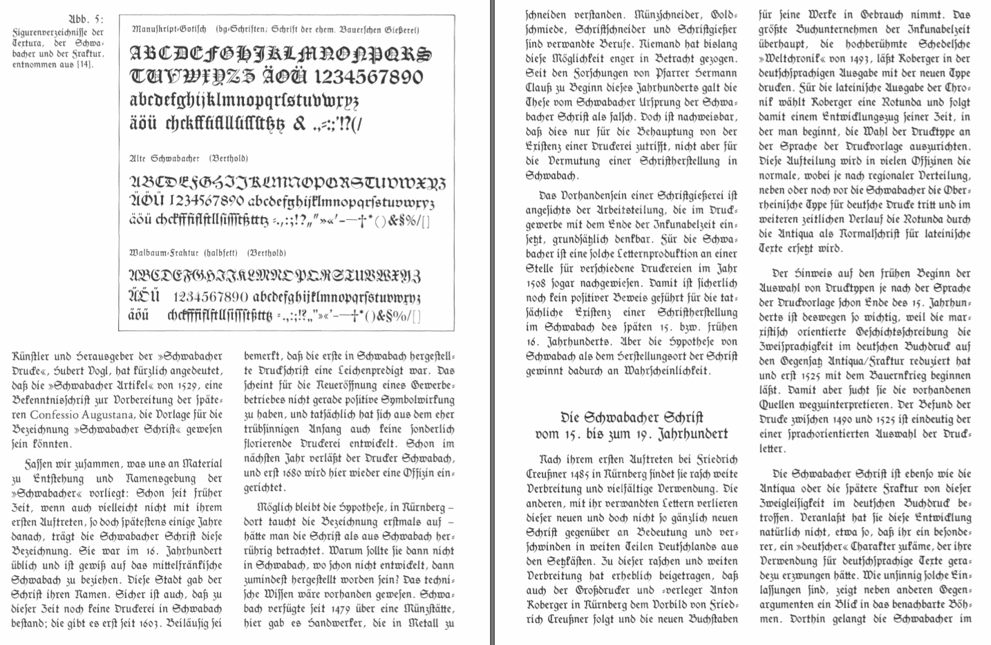
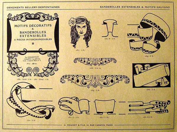
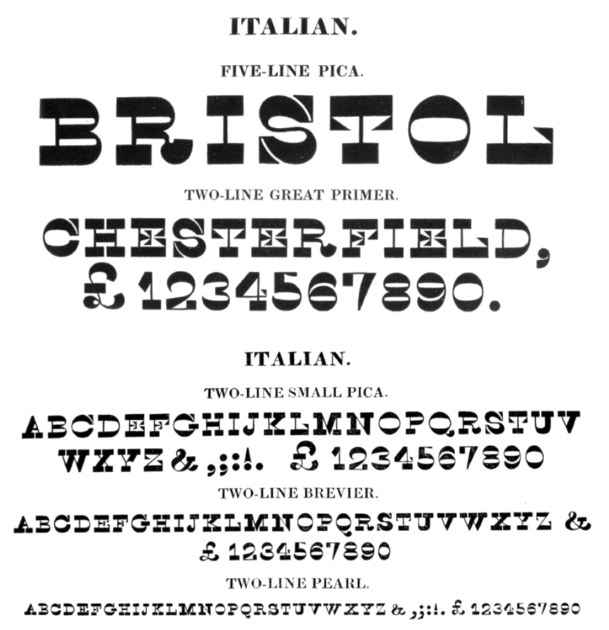
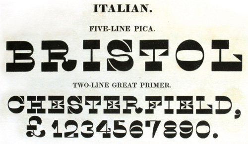
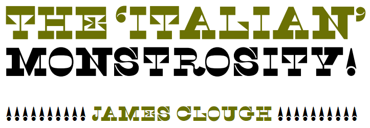
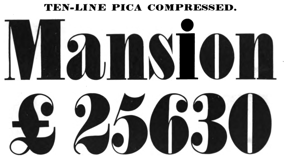
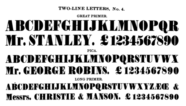
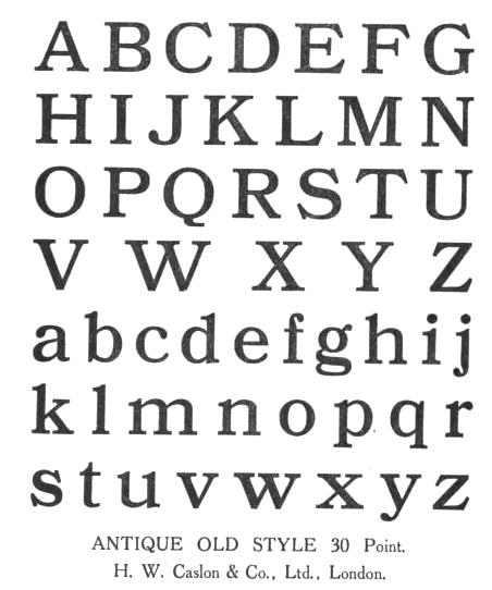
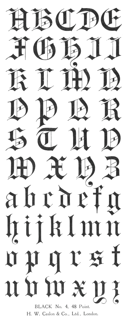
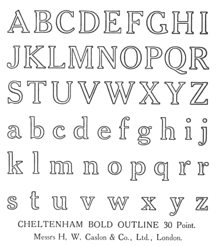
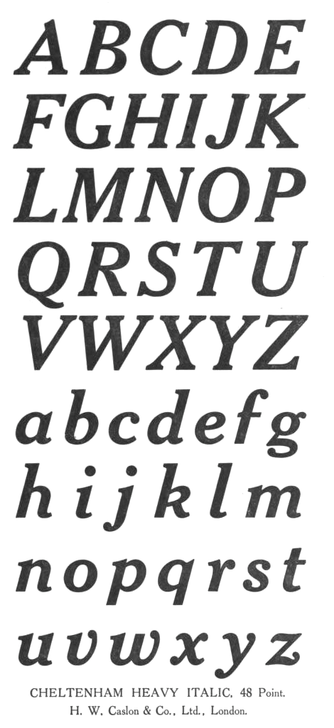
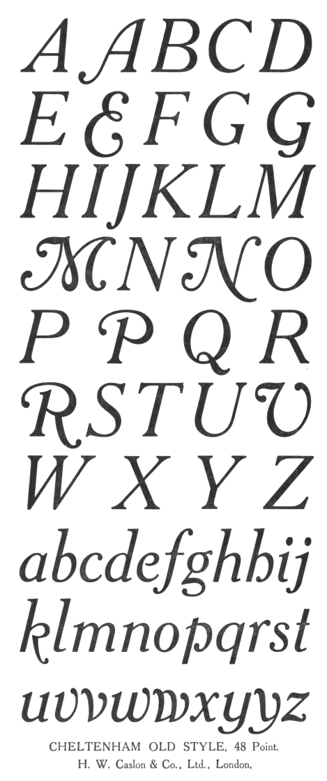
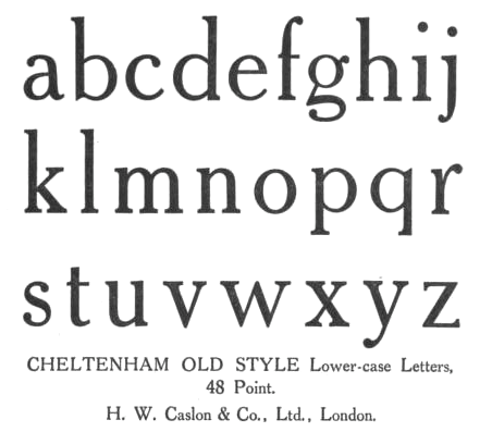
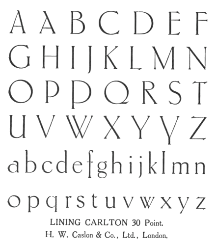
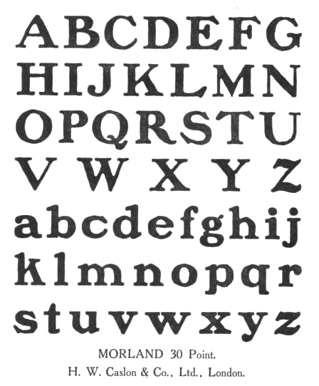
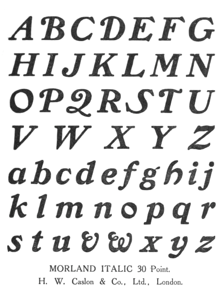
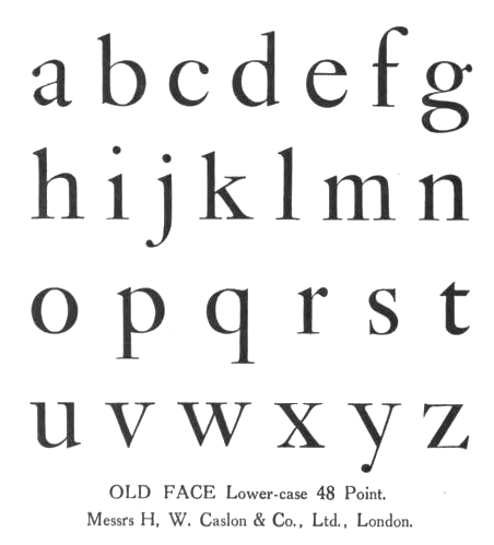
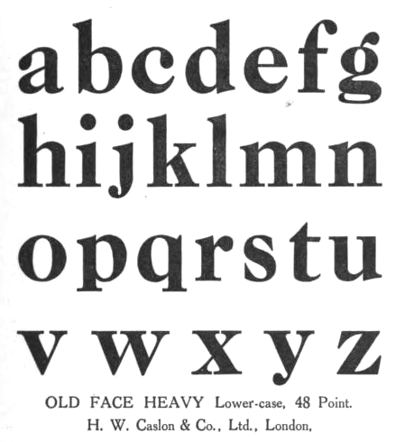
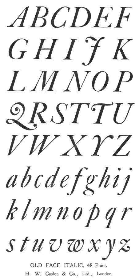
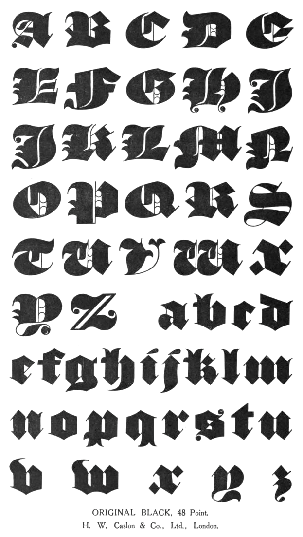
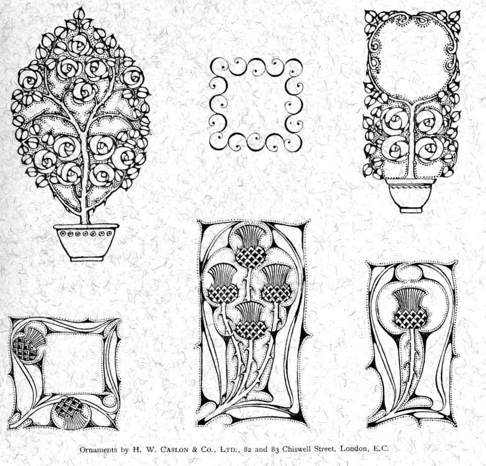
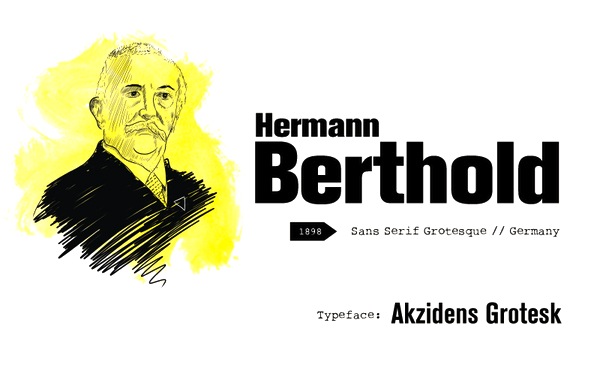
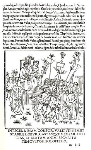
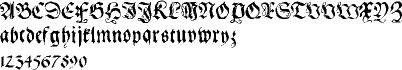
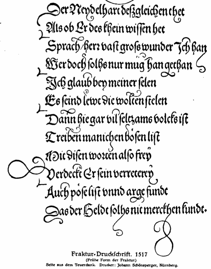
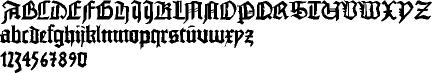
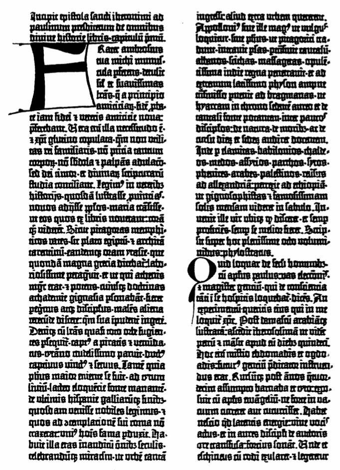
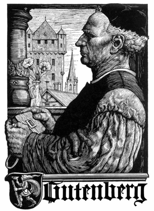
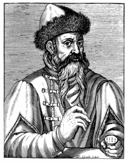
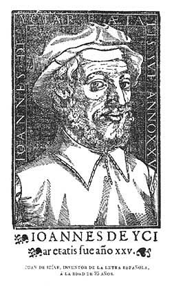
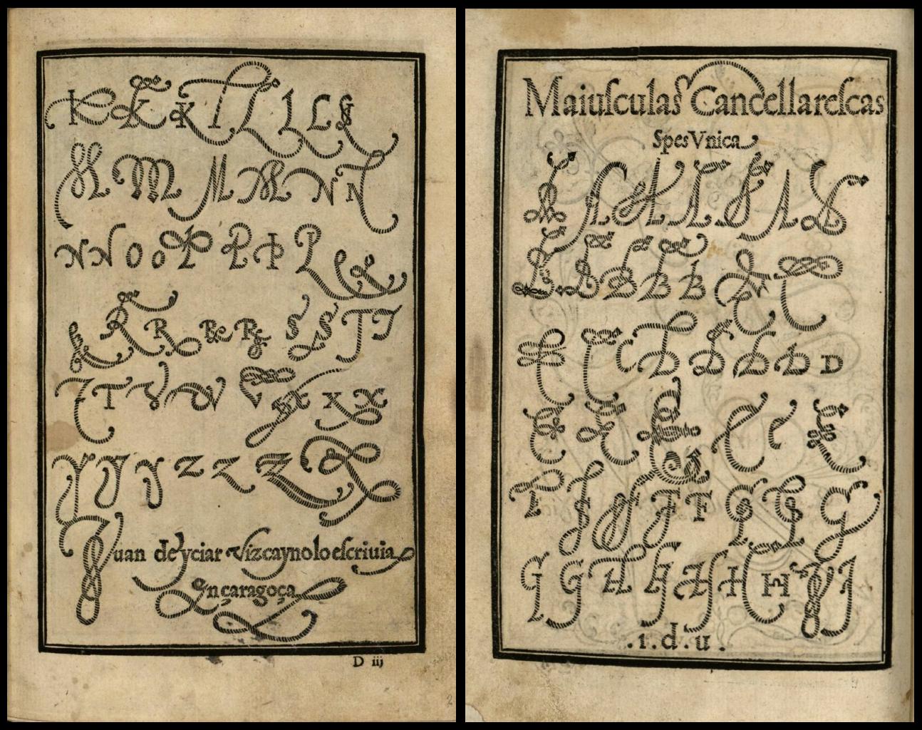
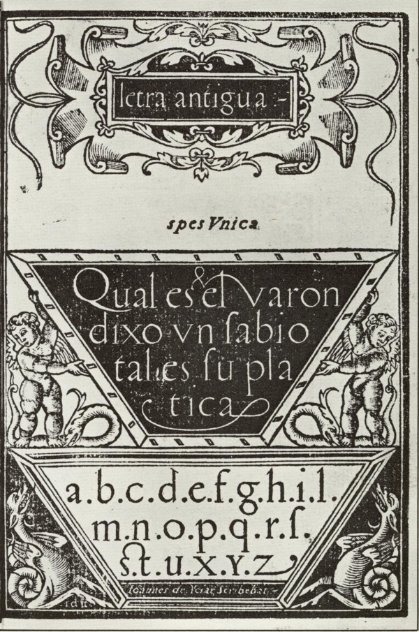
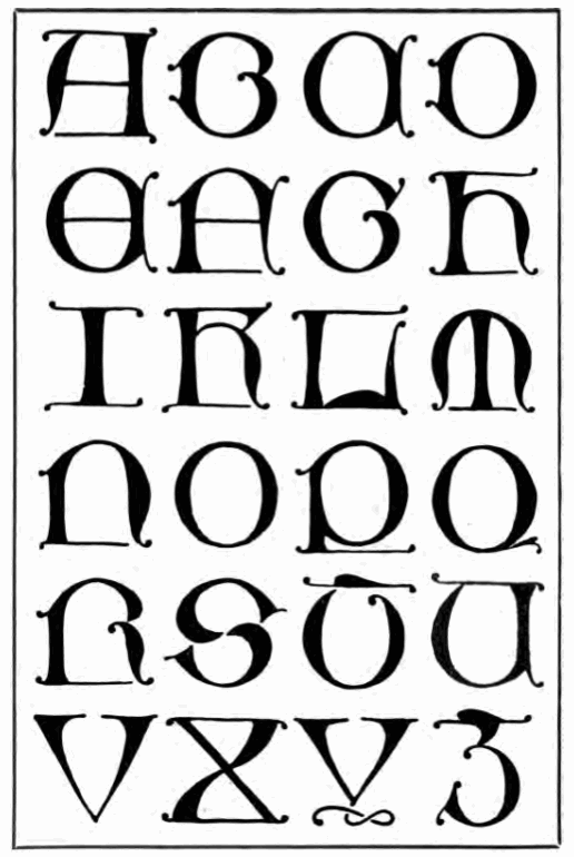
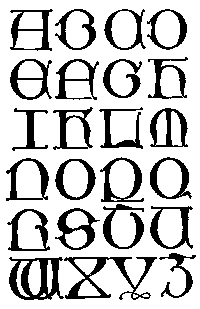
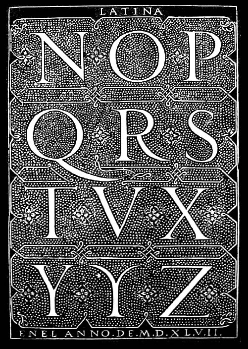
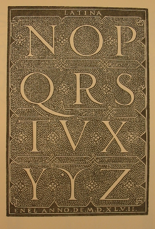
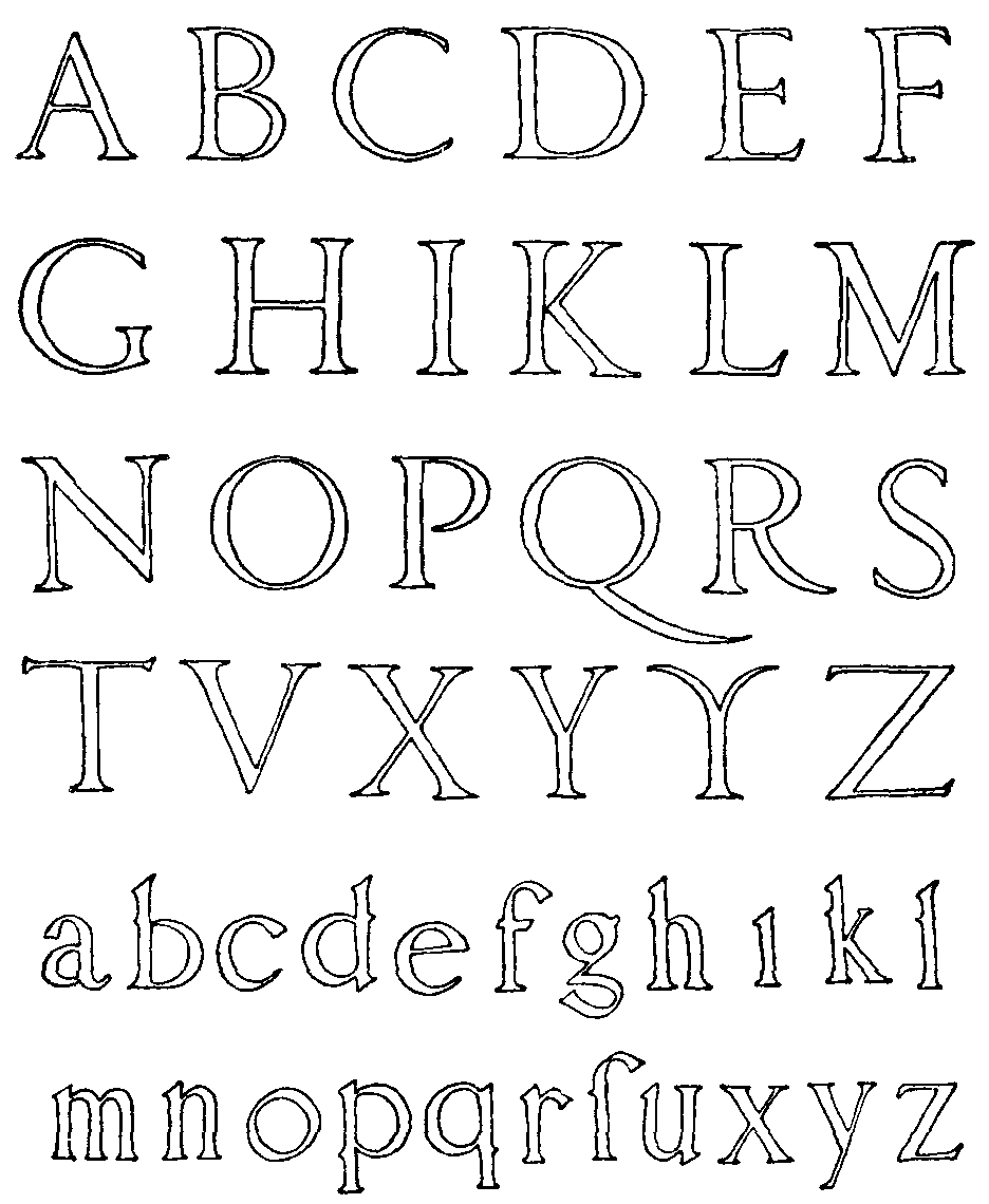
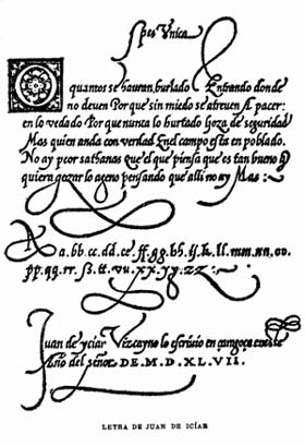
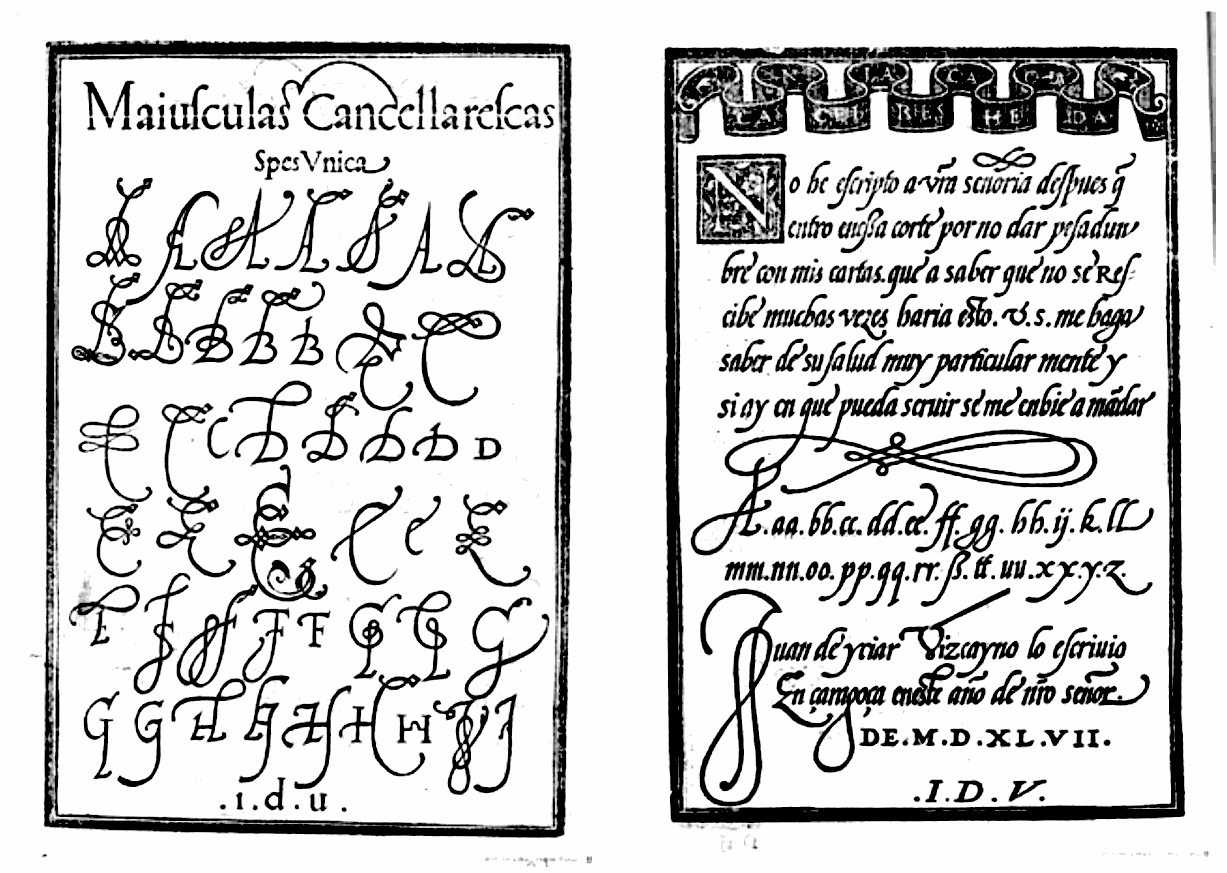
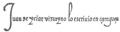
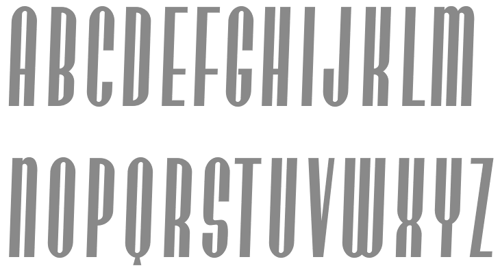
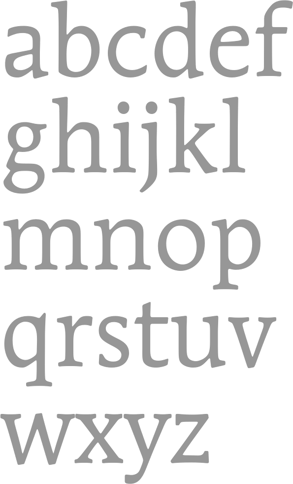
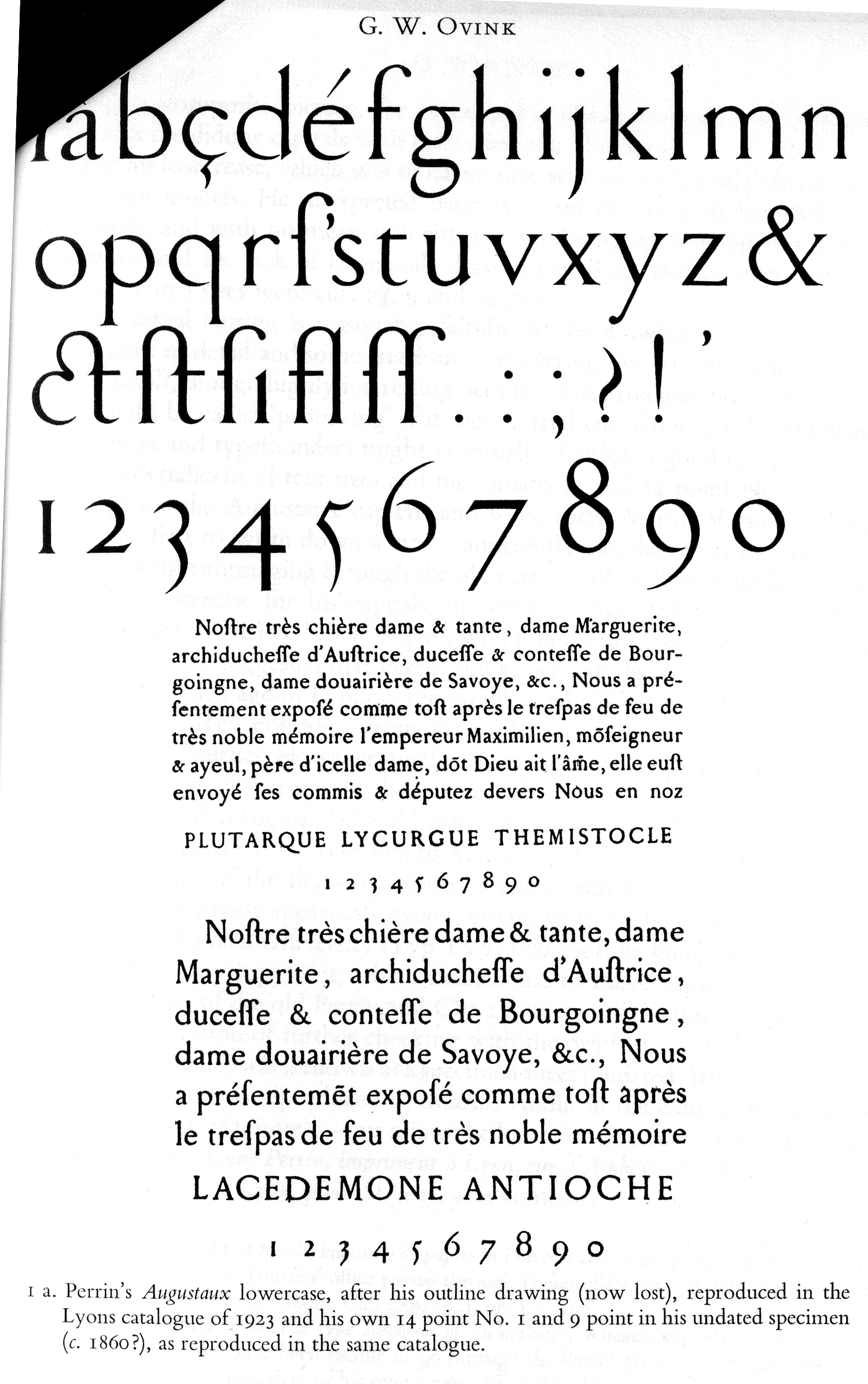
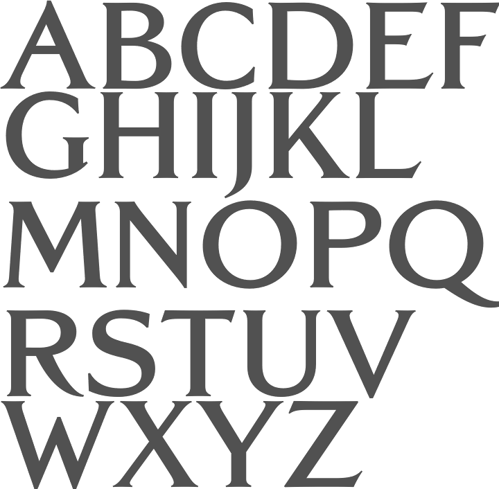
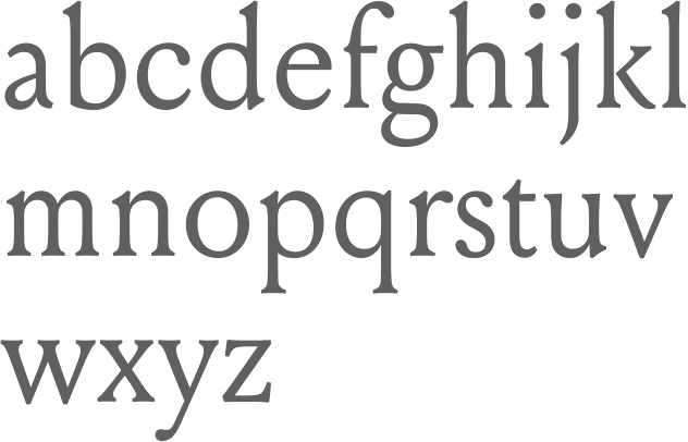
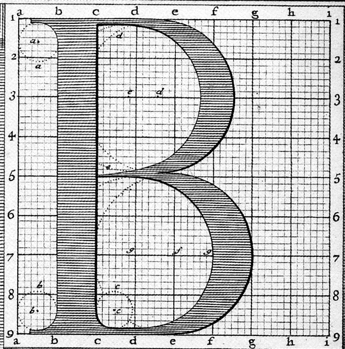
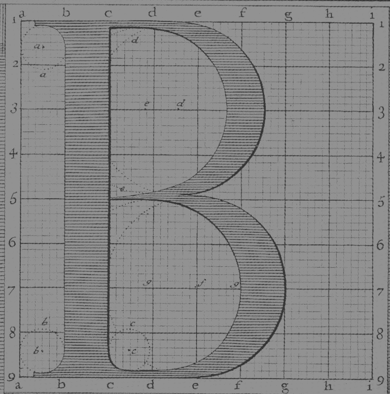
![La Operina, da imparare di scrivere littera cancellarescha, which was the first one for popular use. La Operina contains the first printed example of Chancery Cursive. In 1523, he wrote a sequel, Il modo de temperare le penne, a beautiful and influential typographic manual. Roderick Cave writes in his The Private Press: The first part of this was printed entirely from wood blocks, but the second part, Il Modo di Temperare le Penne, contains several pages printed in a very fine italic typeface modeled on the cancellaresca formata hand. The type was fairly obviously derived from the hand used by Arrighi himself; it seems likely that the punches were cut by his partner, who can with reasonable certainty be identified as Lautizio de Bartolomeo dei Rotelli, of whose skill as an engraver of seals Benvenuto Cellini speaks with respect in his Autobiography. He started printing in 1524 and designed his own italic typefaces for his work, which were widely emulated. His letterforms were revived in the 20th century by designers such as Plumet (1925), Stanley Morison (Monotype Blado (1923, Stanley Morrison) is based on Arrighi's lettering---it was unfortunately named after the printer Antonio Blado who used the type in the 1530s; the name Monotype Arrighi would have been more appropriate), Frederic Warde (in his Arrighi Italic, 1925), Robert Slimbach (one could say that his memory lives on through fonts like Adobe Jenson Multiple Master), Ladislav Mandel (Cancellaresca), Willibald Kraml (Vicentino, 1992), Paulo W (as Volitiva), Gunnlaugur S.E. Briem (Briem Operina), James Grieshaber (P22 Operina), Michelle Dixon (Arrighi Copybook), Gilles Le Corre (1522 Vicentino, 2011) and Jonathan Hoefler (Requiem Text). Arrighi's last printing was dated shortly before the sack of Rome (1527), during which he was probably killed. Sample pics: Fantastic ornamental capitals (1522), roman capitals (1522), Italian capitals, Italian minuscule. [Google] [MyFonts] [More] ⦿](LudovicoDegliArrighiVicentino--LaOperina--Roma-1522.gif)
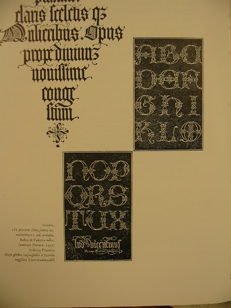
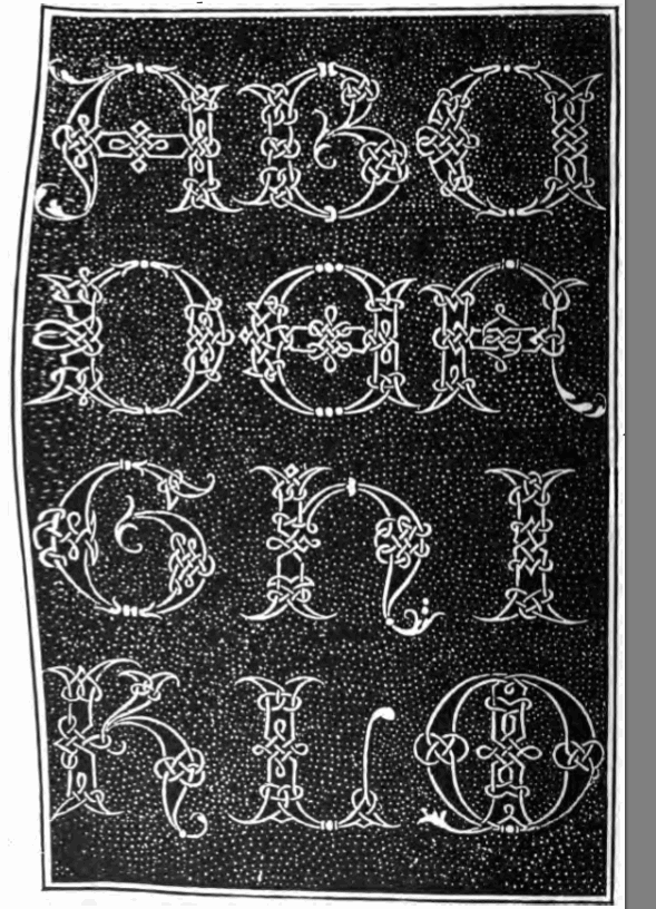
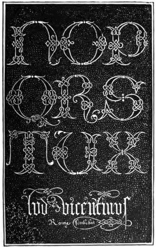
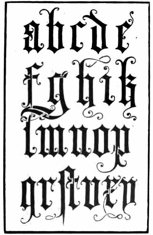
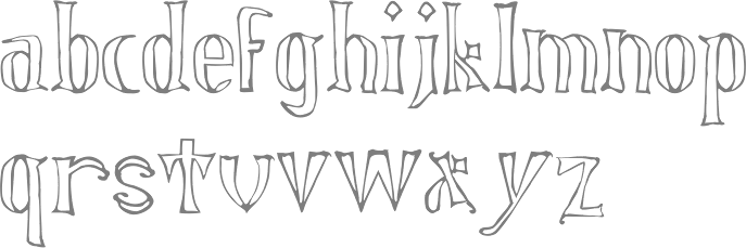
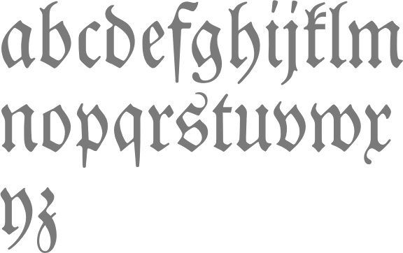
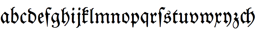
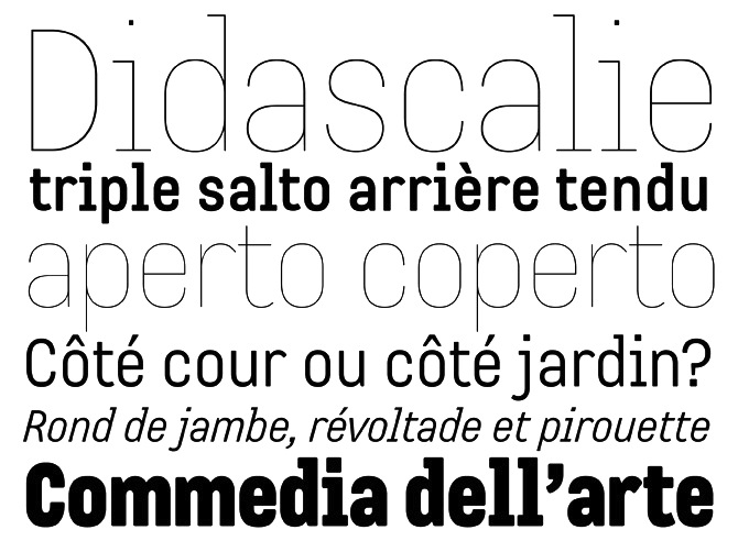
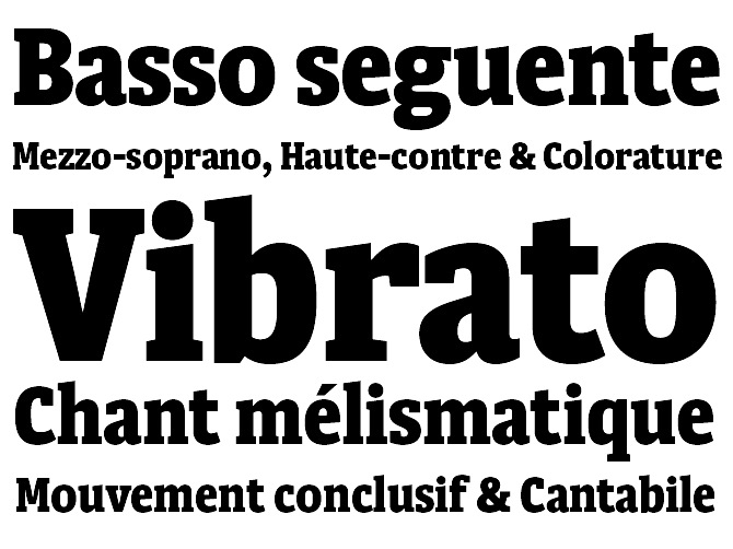
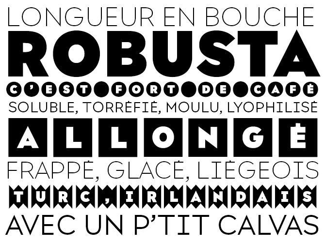
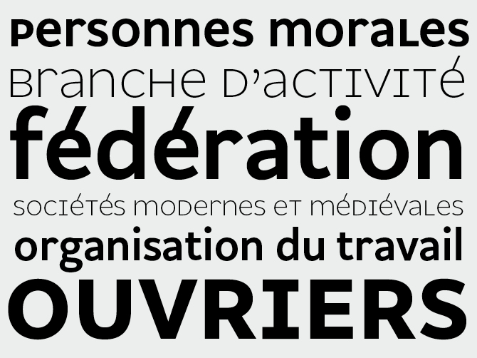
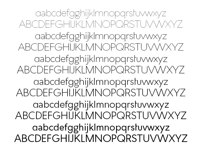
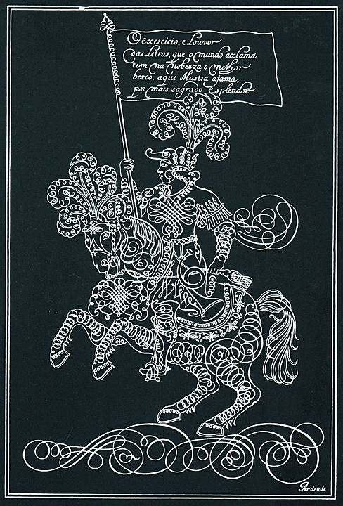
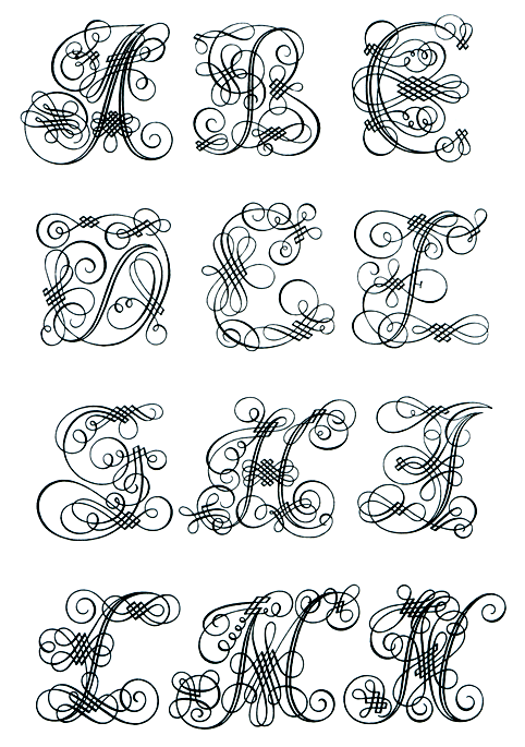
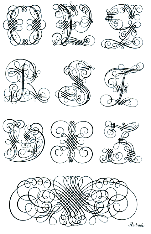
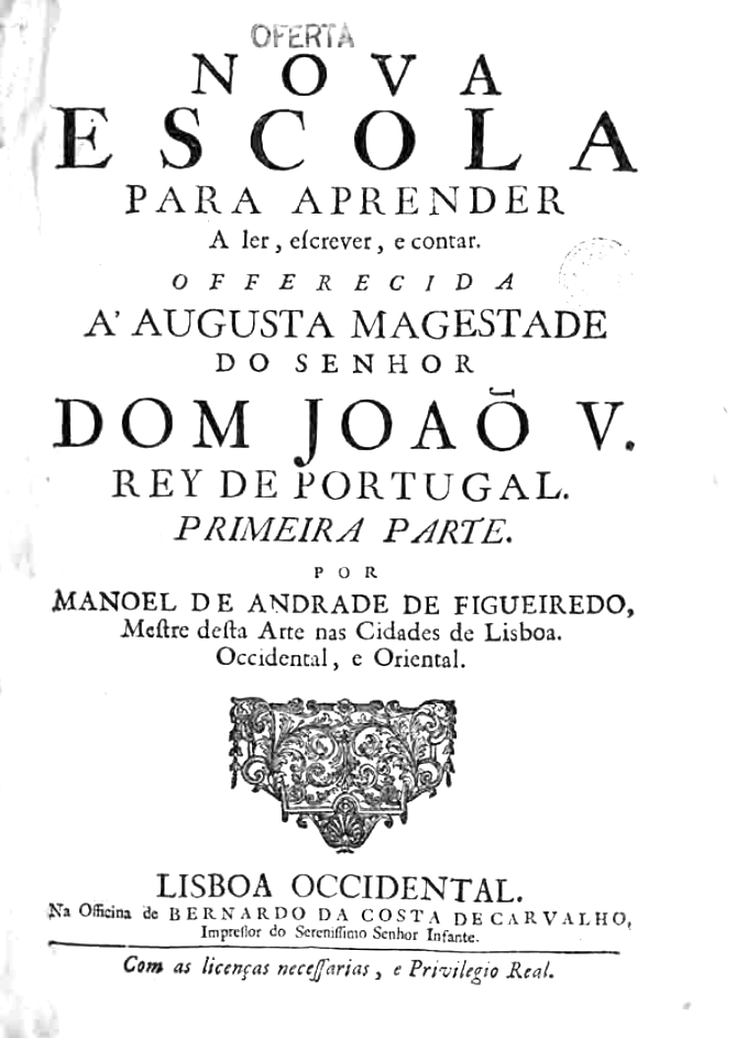
![Cento Anni di Caratteri 1813-1908). Cargo Collective link. Speaker at ATypI 2018 in Antwerp. [Google] [More] ⦿](MartaBernstein--CentoAnniDiCaratteri1813-1908--2006.jpg)
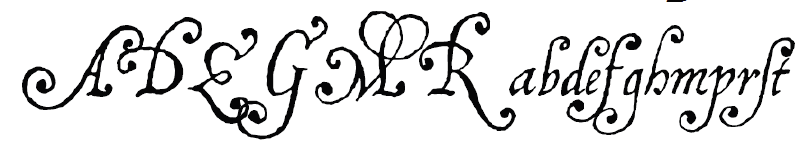
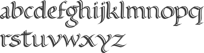
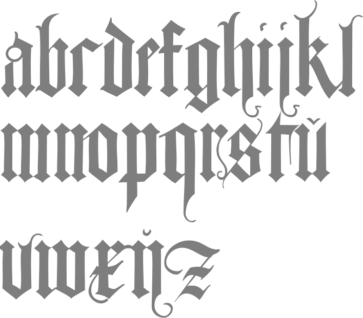
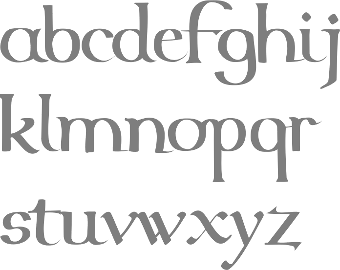
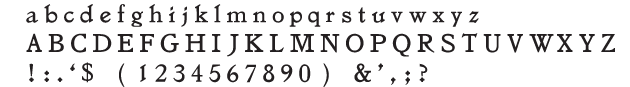
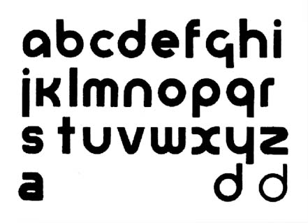
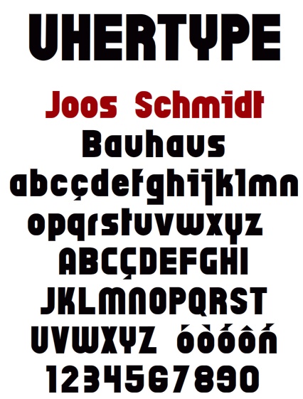
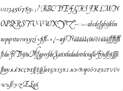
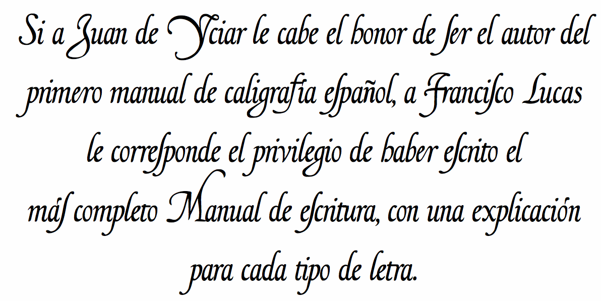
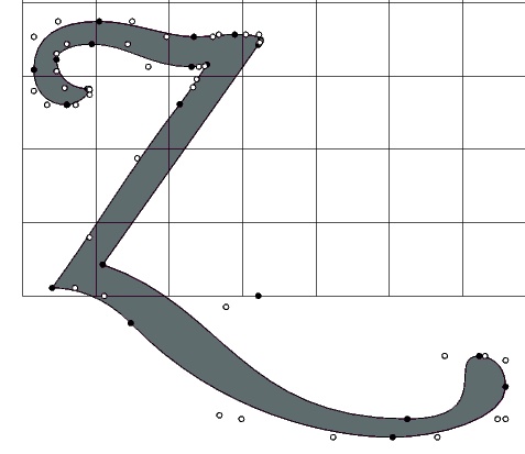
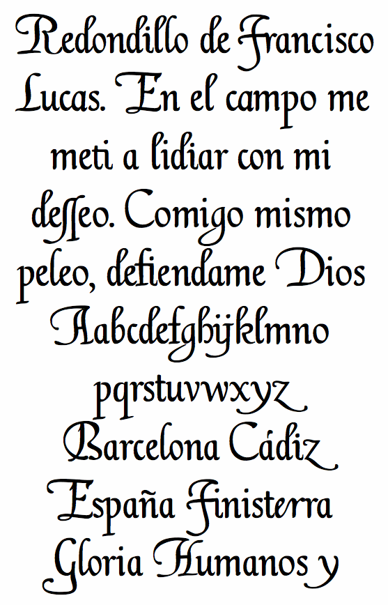
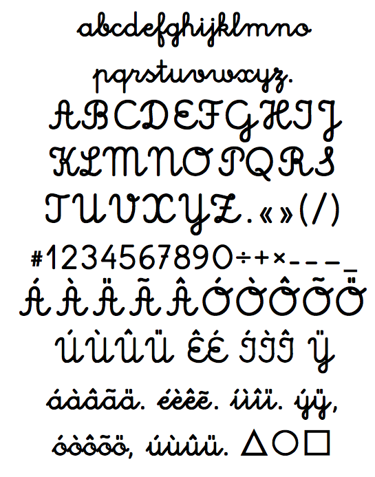
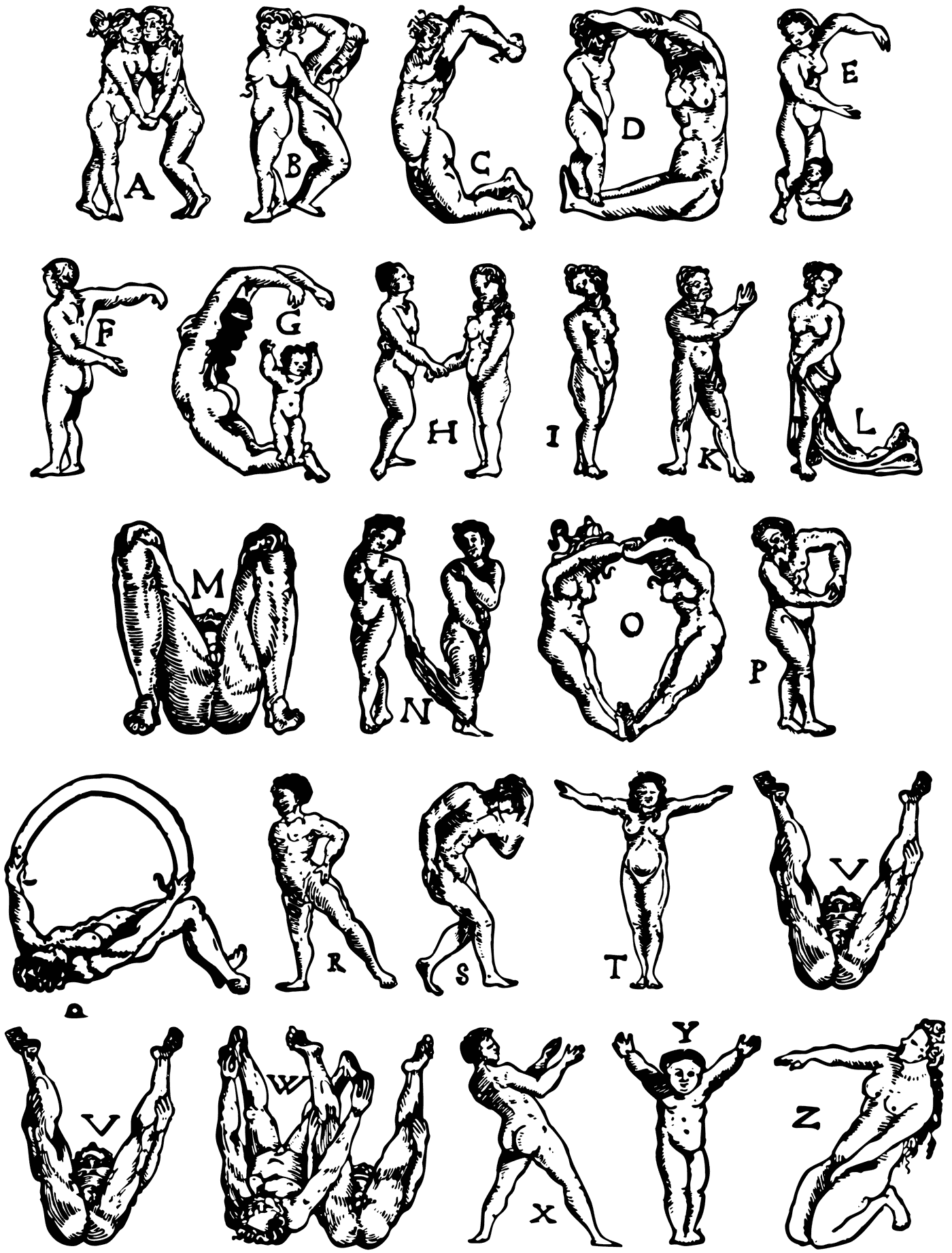
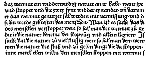
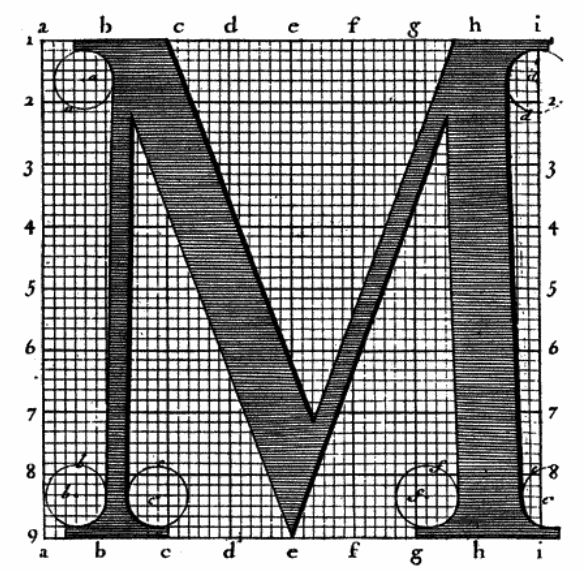
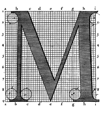
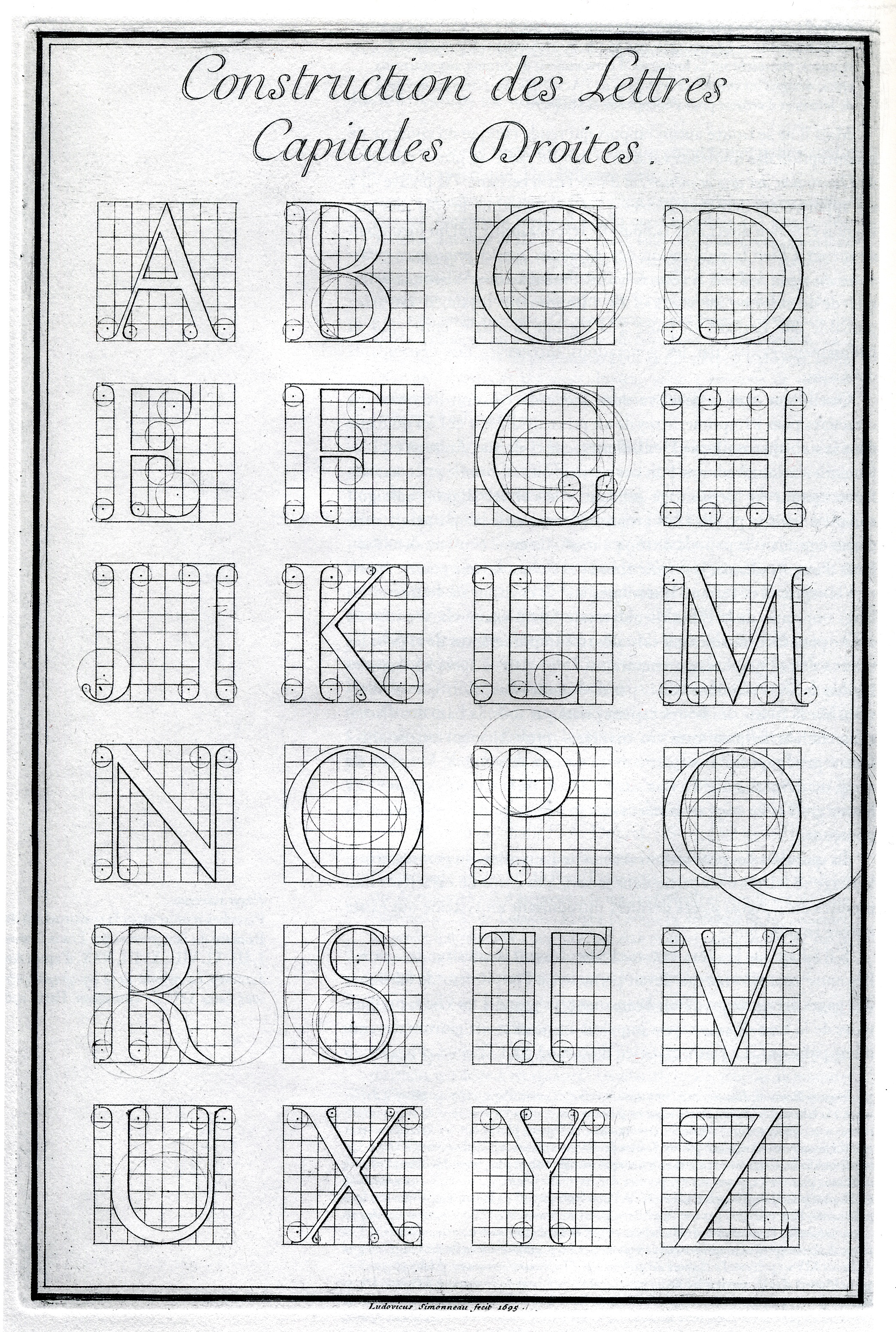
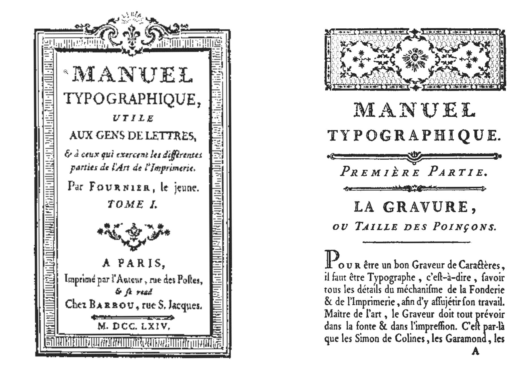
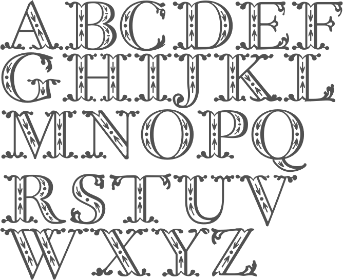
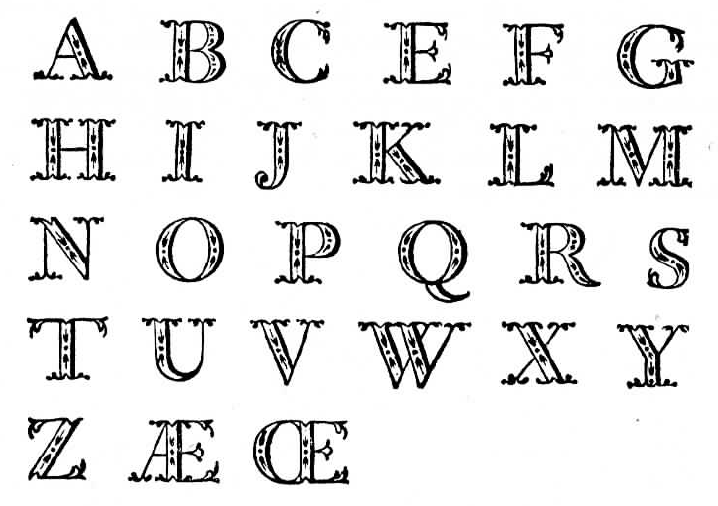
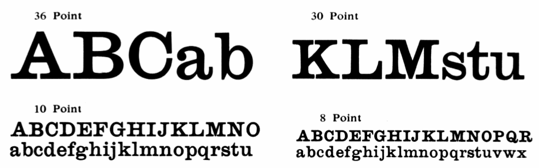
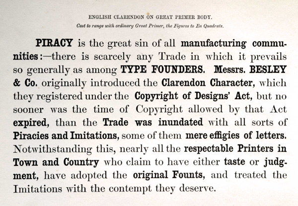
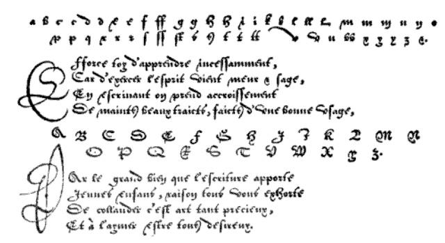
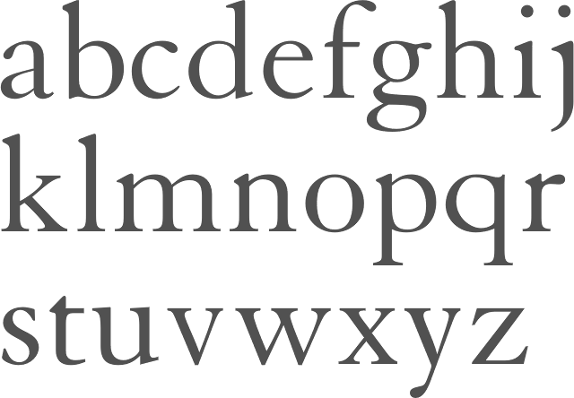
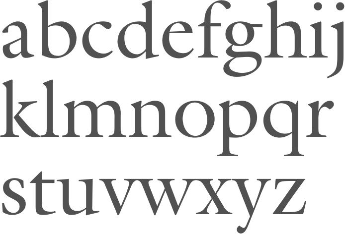
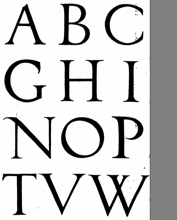
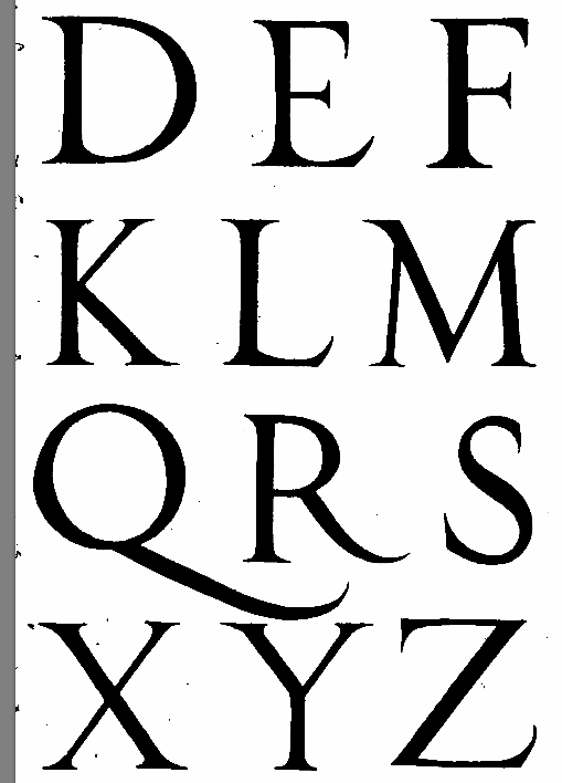
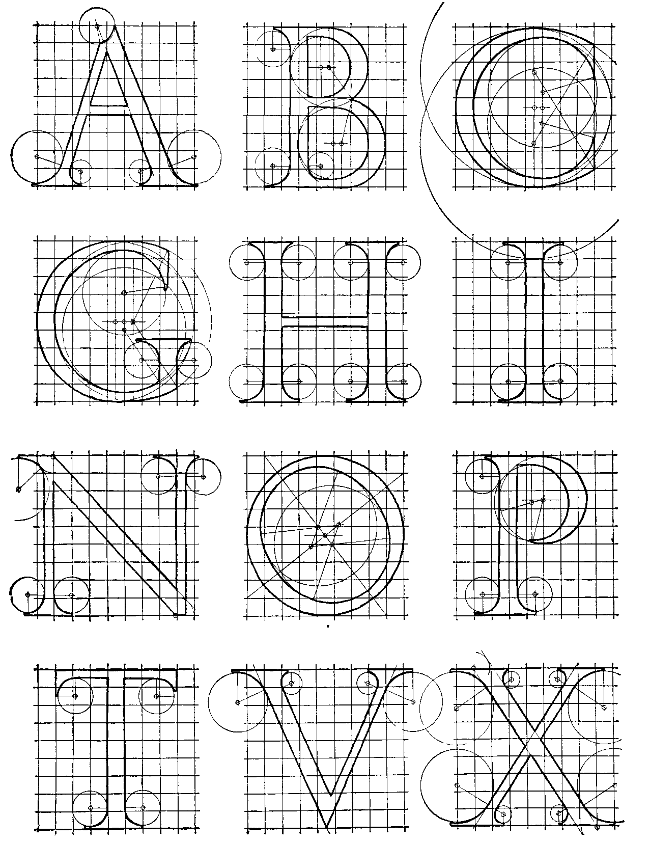
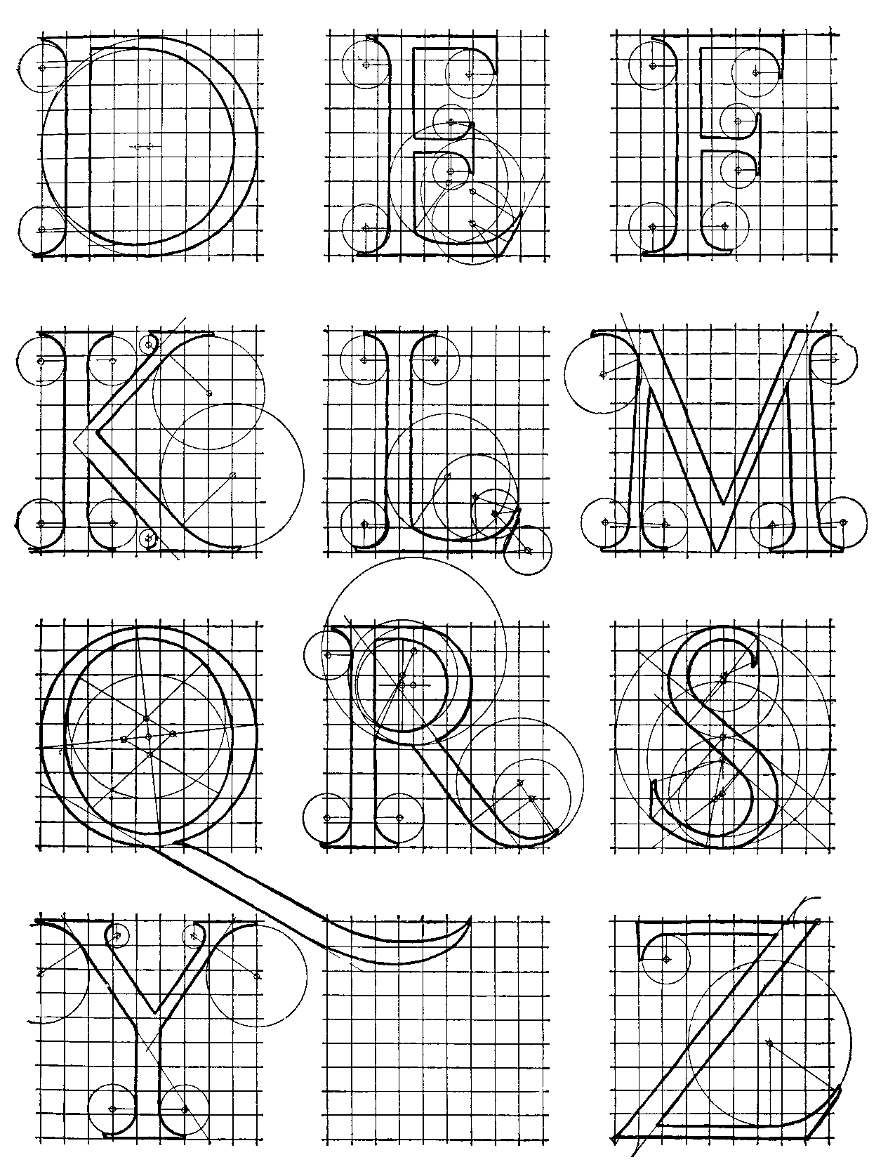
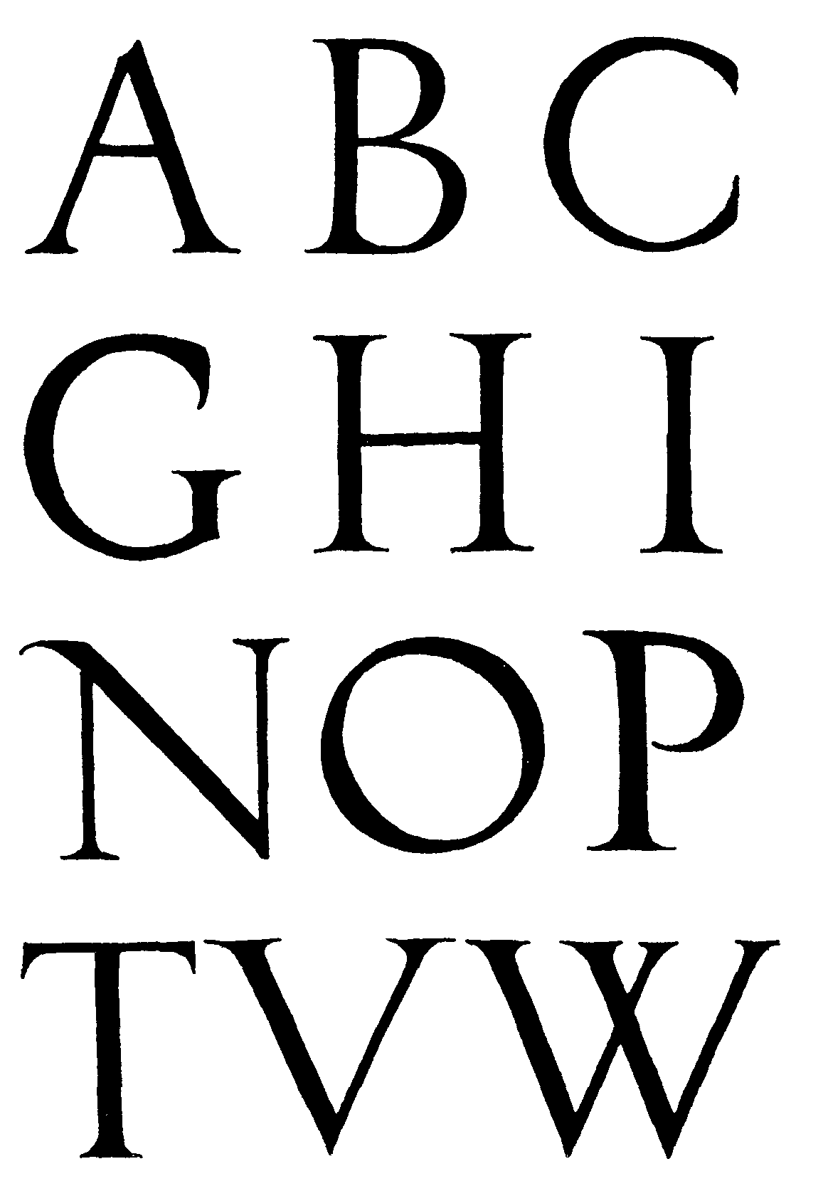
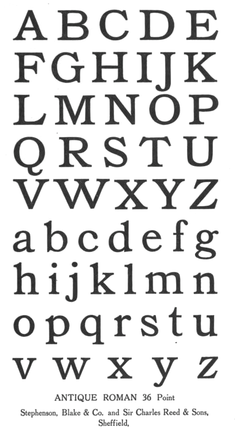
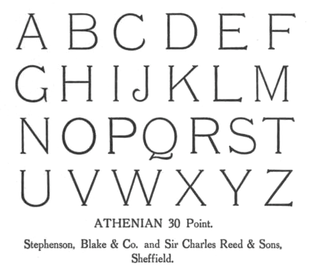
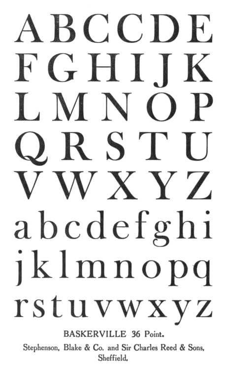
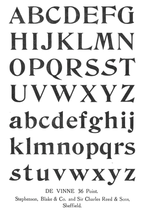
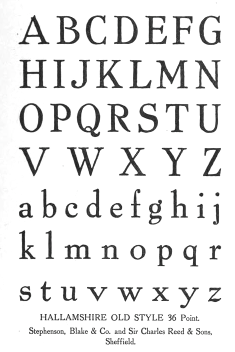
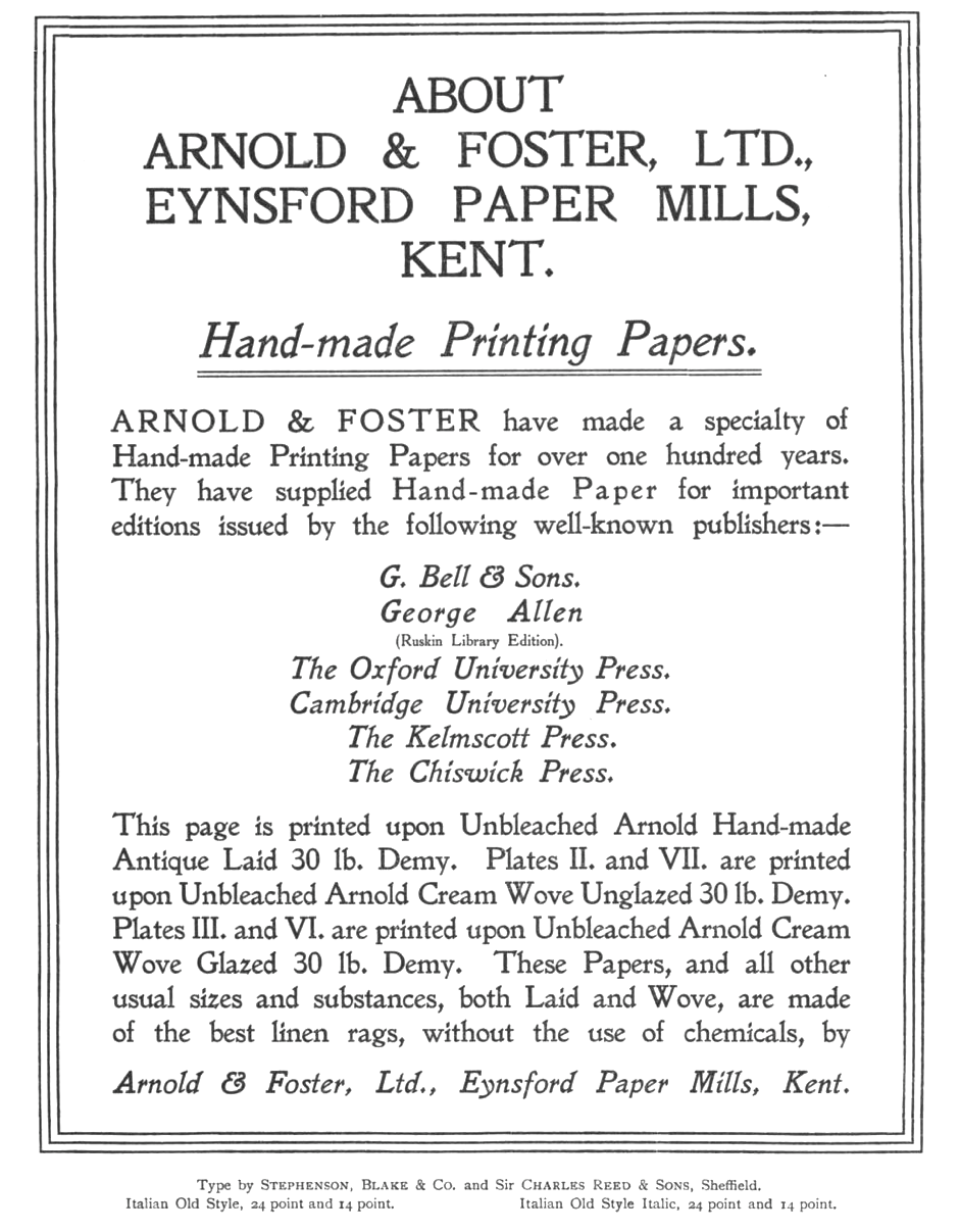
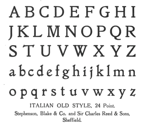
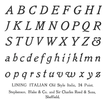
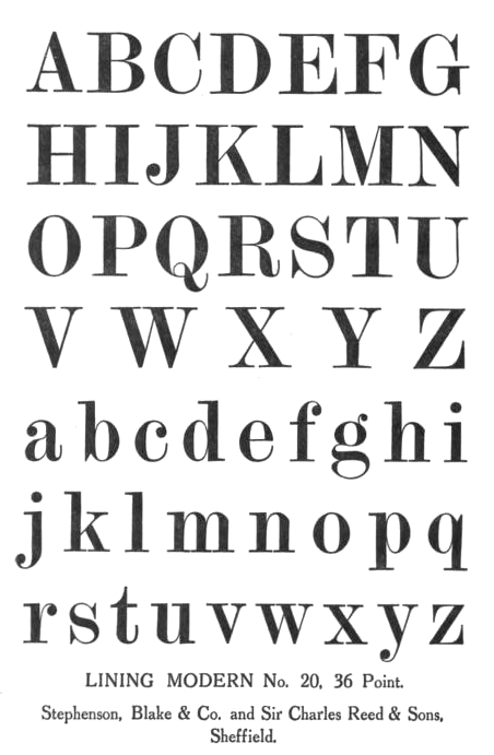
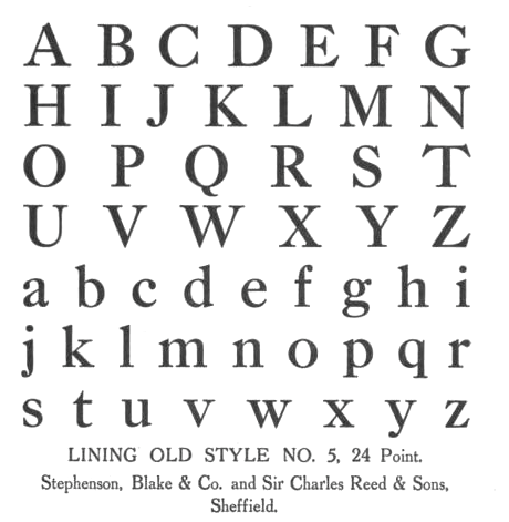
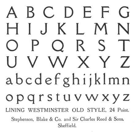
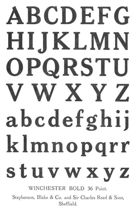
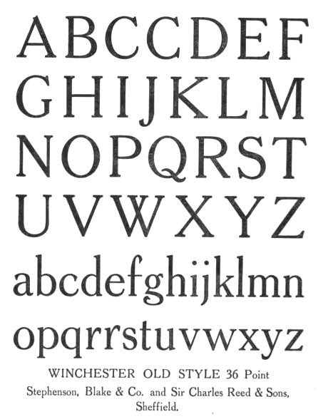
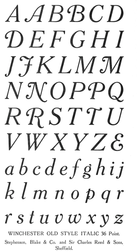
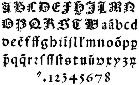
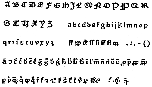
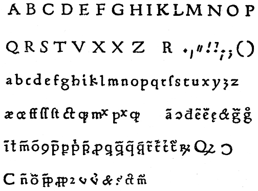
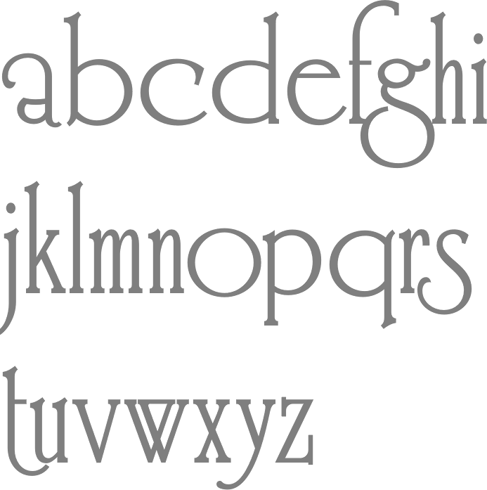
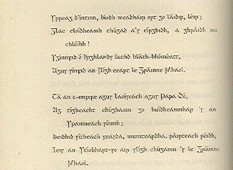
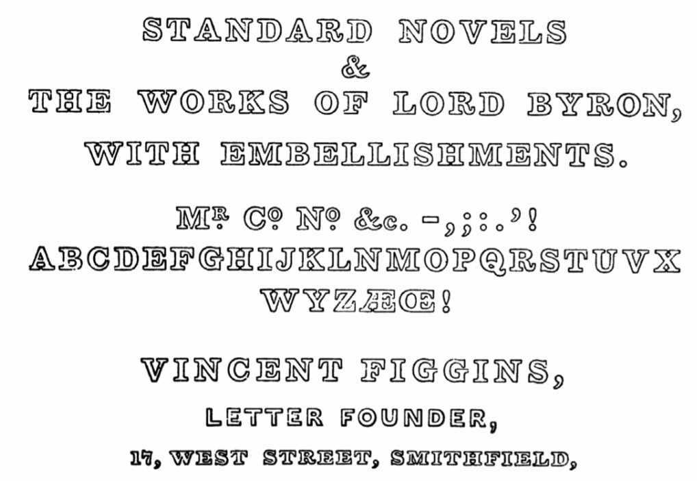
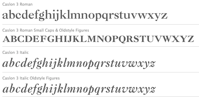
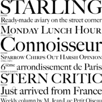
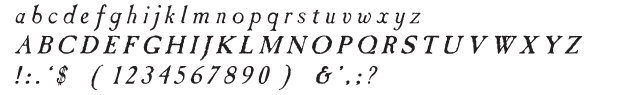
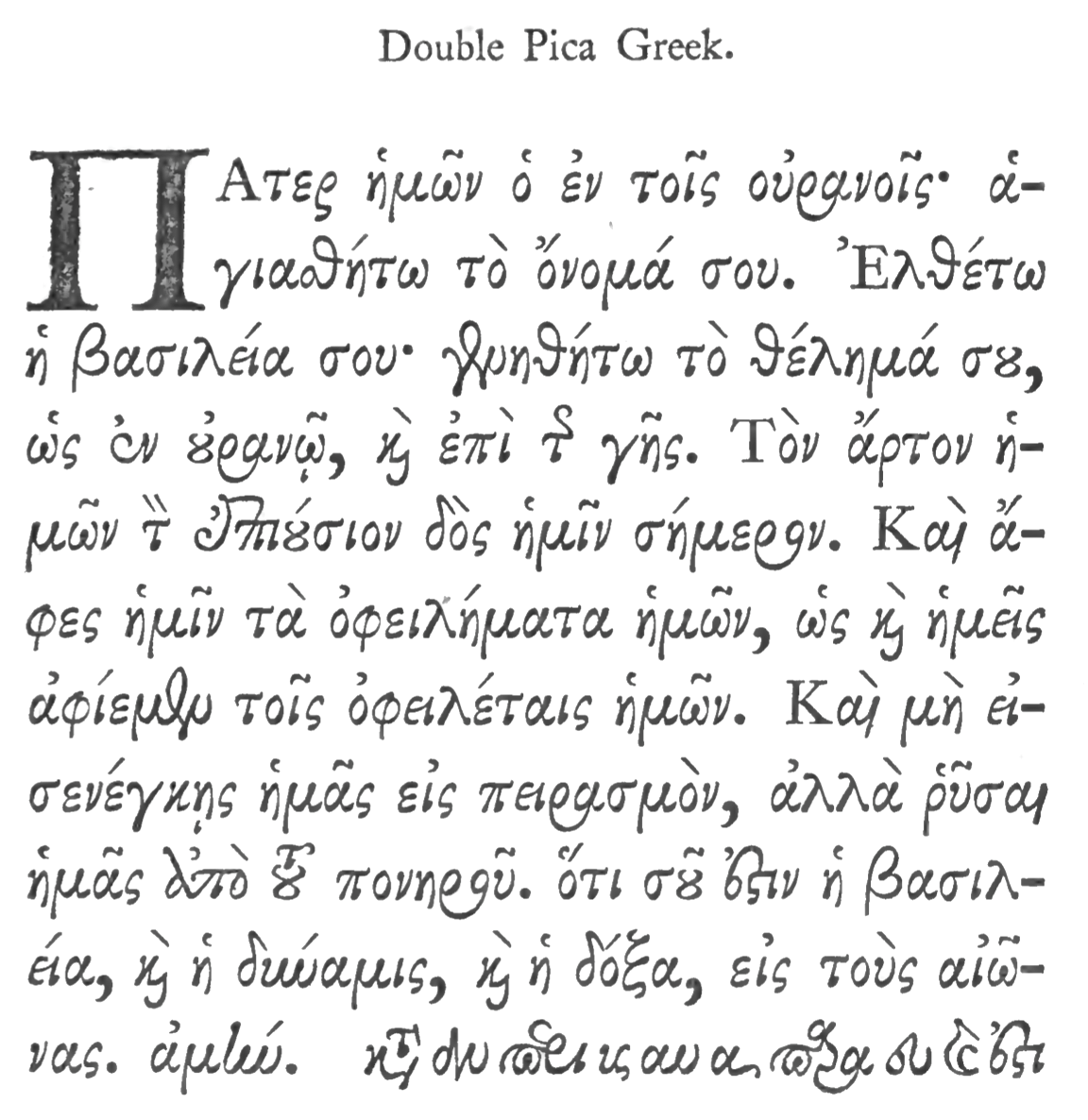
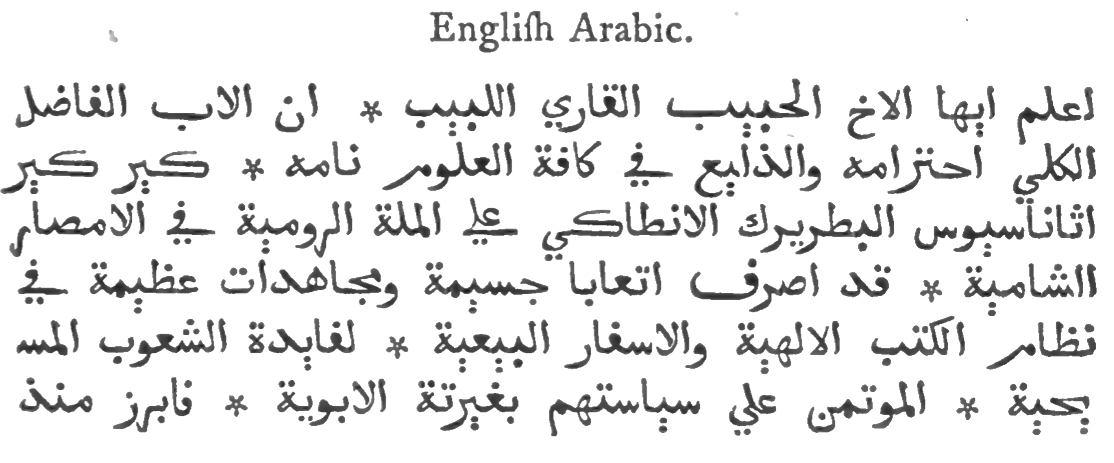
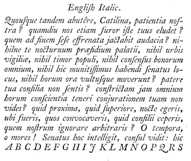
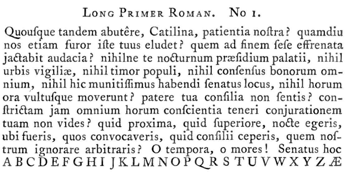
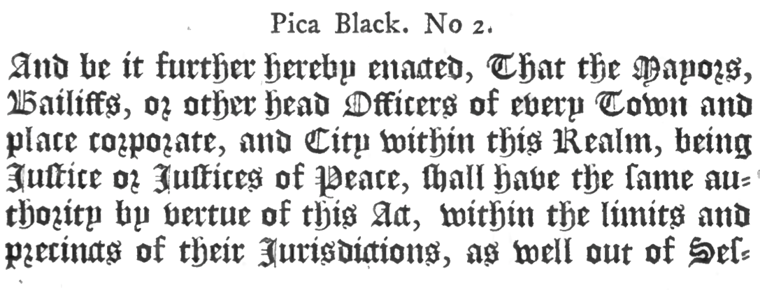
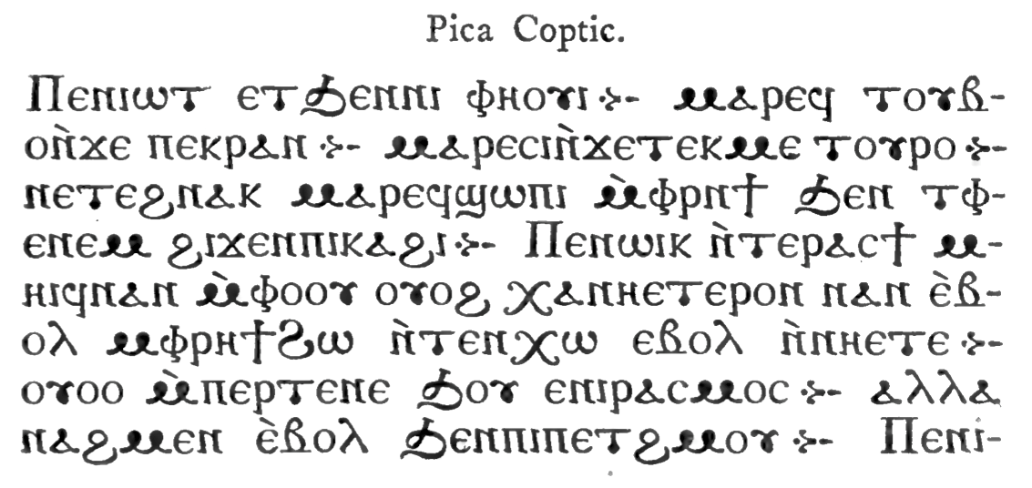
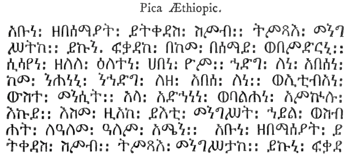
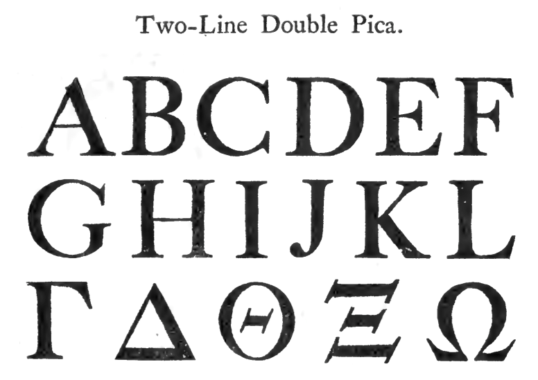
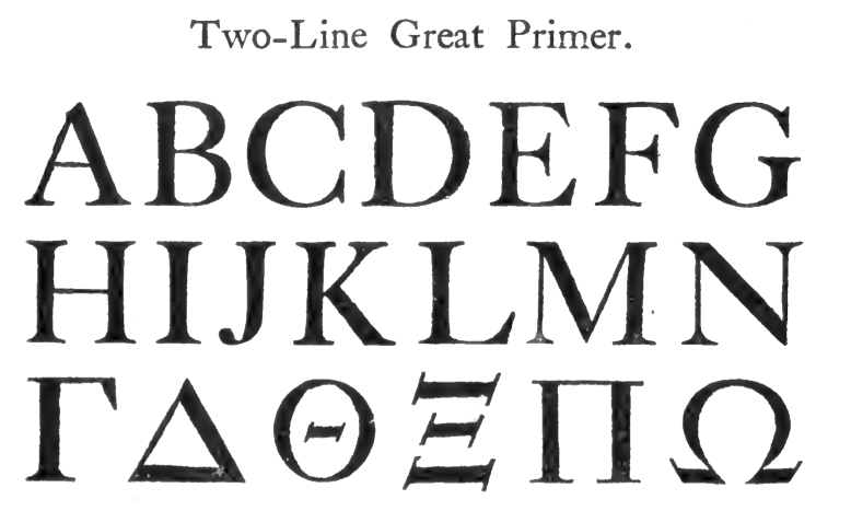
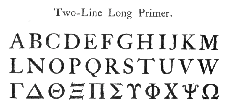
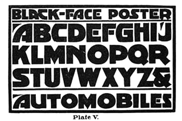
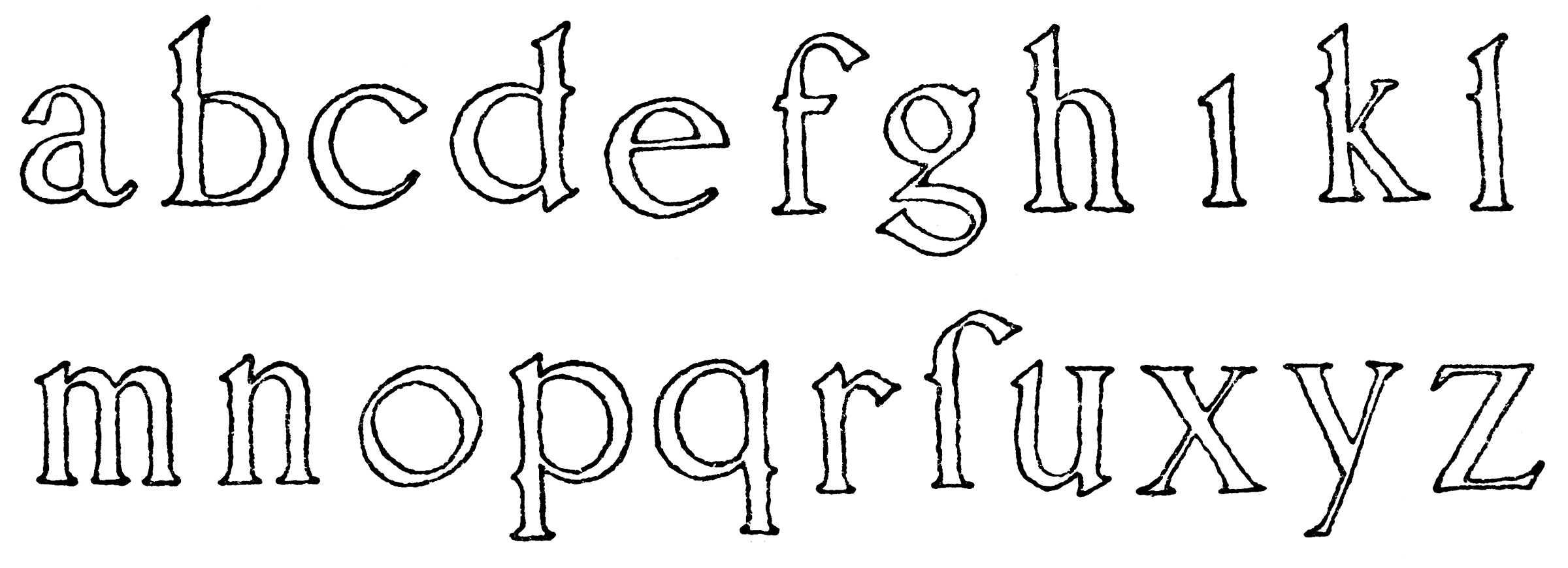
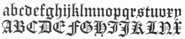
|
|
|
|