TYPE DESIGN INFORMATION PAGE last updated on Mon Jun 8 17:30:01 EDT 2026
FONT RECOGNITION VIA FONT MOOSE

|
|
|
|
|
Icon fonts | ||
|
|
|
|
SWITCH TO INDEX FILE
10four design
|
Designer of ElDiabloRegular, TechnoOrganic (1996), Swashbuckler-Script (1996), BitchinCamero (1996) at Garagefonts. He also created Halqemeylem Serif (1997) for the Stolo Nation, based on Majoor's Scala. The fonts at 10four design include Adanac (free, clean sans), Bitchin' Camaro (scratchy writing font), Devicq (based on the handwriting of actress Paula Devicq), Downsize, El Diablo (gothic), Lonely Cowboy, Lonely Cowpoke (2010), Mia Pets (dingbats), Swashbuckler, Techno Organic. In 2007, Matt published the free icon typeface Adanac that contains 62 Canadiana symbols. In 2014, Heximer created Sonovovitch, a unicase display typeface inspired by the Russian Constructivist movement and Soviet Cold War era propaganda. Although a faux Russian font, Sonovovitch has language support for the true Cyrillic alphabet. In 2016, Matt published the angular Preissig-style Millwright and explains that it is inspired by spunky DIY attitude and Industrial era hardware---an exercise in rendering glyphs with a rudimentary, hand-cut flavour. Behance link. FontShop link. Creative Market link. Klingspor link. [Google] [MyFonts] [More] ⦿ |
Design community headquartered in Bratislava, Slovakia. Creators of the commercial calligraphic typeface Feathergraphy (2013) [not to be confused with a font by the same name published much earlier by Mans Greback], Tzanah (2016; identical to a font by Dorian Grey), and Secret Society Font Family (2016; identical to another font by Dorian Grey). Icon sets designed by them include Sports Icons, Medical Icons, Flat Social Icons, and Vegetables. In 2017, they designed the distressed typeface Dark Matter [I thought that this was by Dorian Grey...] and the handcrafted Pugzley [again, by Dorian Grey, if you ask me]. In 2018, we find typeface such as the handcrafted Emily and the weathered gas mask font Verboten. [Google] [More] ⦿ | |
24 Ways
| Jon Hicks gives a clear mini-tutorial on how to display icons in web pages using fonts (with icon symbols in them) and data-attributes using simple CSS definitions. [Google] [More] ⦿ |
| |
French designer (b. 1978) of the dingbat fonts Social Shapes (2015, social media icons), World CXup 2k14 (2014), Social Logos (2011), Clubz (2007, shields of European soccer teams), 2006 Team (2006, soccer team emblems), IT Logos (2005), OpenLogos (2007) and Illustrate IT (2005). Dafont link. Yet another URL. Old URL. [Google] [More] ⦿ | |
Brno, Czechia-based designer of the animated experimental font Distances (2018) and Typelike Icon Set (2018). [Google] [More] ⦿ | |
Adam Katyi
| |
Graphic designer in Derby, UK, who created YCN 3 Prong Type in 2012 at the University of Derby. He also created fun Dog Icons (2012). [Google] [More] ⦿ | |
| |
During her studies at Rochester Institute of Technology Kosovo, Pristina, Kosovo-based Adea Ademi designed the children's script Five Year Old (2018) and RIT Wayfinding Icons (2018). [Google] [More] ⦿ | |
Lagos, Nigeria-based designer in 2020 of Business Icons and Masegfo (a free squarish typeface). [Google] [More] ⦿ | |
Surabaya, Indonesia-based designer of various icon sets (Kitchen Appliance, Birthday, Basketball, Blood) and the vector font family Minimalist (2017). Behance link. [Google] [More] ⦿ | |
Sidi Bouzid, Tunisia-based designer of the handcrafted Latin typeface Stanley (2017), Restaurant Icons (2017) and Education Icons (2017). [Google] [More] ⦿ | |
| |
Adrian Pelletier
| |
Agaric Type
| Designer of the Agave font between 2013 and 2019. He writes: Agave was an attempt at making a small, monospaced, outline font that would be geometrically regular and simple. The endeavor was motivated by a deep adoration of old-school console bitmap fonts, of Consolas, of Pragmata Pro, as well as a novice's curiosity for typographical design. When it came to establishing a "simple" design scheme, the natural inclination was to separate the glyph design concerns into that of "frame" and "trait". By frame, we refer to the naive geometric extent of a glyph and its parts. And by trait, we mean, for example, the "way" in which a stroke curves, or the relationship between one part of a glyph and another. Adhering to personal tastes, bone-deep laziness, and the quirky spirit of old computer terminal fonts, the delineations of frame and trait amounted to two mathematical patterns: the power of two and the golden ratio. That is of course an understatement. This wonderful font has almost 5000 glyphs, half of them useful icons. To be sure, many of these glyphs were added by Ryan McIntyre in his Nerd Fonts version of Agave in 2020. Earlier (pixel) fonts by Agaric include Autonoe [autonoe is a fixed-width, 7x14, bold-only, unicode, bitmap typeface] and Ino. Github link. [Google] [More] ⦿ |
| |
Graphic designer in Vilnius, Lithuania. Creator of "Funny Icons For Palanga resort" (2014) and Lego Font (2014, modular). [Google] [More] ⦿ | |
Warsaw, Poland-based designer of some icons custom-made for the Proctronik company. [Google] [More] ⦿ | |
Agung Syaifudin
| |
Parisian graphic and web designer who created a cursive typeface and Thing Icons in 2014. In 2015, he/she created a multicolored circle-based alphabet. Home page. [Google] [More] ⦿ | |
Vilnius, Lithuania-based designer of the deconstructed typeface Craft (2018) and a small sert of Public Space Icons (2016). [Google] [More] ⦿ | |
| |
Aka Uloga. designer of the free social icon font dcSocial (2018). [Google] [More] ⦿ | |
Alan Parker
| |
Sofia, Bulgaria-based designer of the thin avant garde sans typeface Lounge (2017) and Animal Pictograms (2017). [Google] [More] ⦿ | |
The 24-font Casagrande was designed in 2020 by the Italiantype Team (Manuel Alvaro, Valentino Coppi and Mario De Libero), working in close collaboration with Alberto Casagrande, and with help from the Zetafonts Team (Francesco Canovaro, Andrea Tartarelli and Cosimo Lorenzo Pancini). The final product has six display families with styles varying from the thirties-inspired Antifascista and Deco, to the modernist Casabau, to the geometric Grind, to the vintage script families Reclame and Casatiello. The collection is complemented by a two-color icon set font, Casagrande Ornaments. [Google] [More] ⦿ | |
Madrid, Spain-based designer of the rounded handcrafted typeface Natural (2017), the sans typeface Acatisia (2018), and the free icon set Summer Bold. [Google] [More] ⦿ | |
Alberto Martinez
| |
As a student in the TypeType education program in 2016-2017, she designed the Venetian antiqua Foundata. [Google] [More] ⦿ | |
Typefaces from 2015: Sacred (alchemic, mysterious), LAM and Larch Brush. Typefaces from 2016: Line Flat (circuit font), Line Flat Icons. Typefaces from 2018: Volos (a great textured poster font), Ancient Geometry (alchemic), Slowik Emphasis (a geometric logo font). She also specializes in alchemic symbolism, with sets of ornaments called Golden Section, Unalome (a script with Buddhist symbols) and Sacred Symbols. [Google] [More] ⦿ | |
| |
Rome-based designer of the modular typeface Console Sans (2015) and of Icon Font (2015). [Google] [More] ⦿ | |
| |
Perth, Australia-based designer of Tropical Party Icons (2018) and the grungy Halloween font Goosepimple (2018). [Google] [More] ⦿ | |
| |
Aka Alex Gorilla. Alex Gart (Chelyabinsk, Russia) created the commercial alchemic typeface The Elementarity (2013). It can be bought here. He also made Weather Icons (2013). Behance link. Graphic River link for buying his typefaces. [Google] [More] ⦿ | |
Ukrainian designer. He has a Mega Thumbs Up Icon Set (2015), a Doodle Social Icons Set (2015), and a 3d handcrafted font called Cracked Font On Chalkboard (2015). In 2016, he made a textured vector format typeface and a colored EPS format typeface called Fairytale. [Google] [More] ⦿ | |
Designer of AO Waxed Rope (2016), AO Drunken Sailor (2016), Fisherman Toolset (2016, dingbats), Lineart Icon Set (2016: 600+ icons), AO Pine Needle Sans Serif (2016) and AO Iron Bolt Serif Bold (2016). [Google] [More] ⦿ | |
German art director. In 2019, he published the 500-icon font Speakons. [Google] [MyFonts] [More] ⦿ | |
In 2013, he created the beautiful art deco typeface New Royal Stencil, and simple and iconic Stackable Animal Illustrations. Other typefaces include the free pixelish typeface Stopwatch. [Google] [More] ⦿ | |
Alex Traian Munteanu
| |
Alexander Alexandrowitsch Roth
| |
Alexander Colby
| |
| |
| |
| |
Designer of Neue UXUI Icons (2020, at Neue), a seven-style set of icon fonts. Each font in turn contains 1155 icons covering areas such as office equipment, social media, controls, layout, music, navigation and weather, in addition to about 200 arrows. She added the 6-icon set Neue OS Icons later in 2020. In 2021, she released Neue UXUI Icons Rounded. With Alexander Roth, she designed the soft versions of Roth's Neue Radial family in 2021: Neue Radial Soft A, Neue Radial Soft B (18 styles), Neue Radial Soft C, Neue Radial Soft D. [Google] [MyFonts] [More] ⦿ | |
| |
Aka Alexey Blogoodf and Aleksei Fetisov. Designer in Moscow. In 2017, he designed the display typeface Koras (blackboard bold), Arktica, Arcachon (organic sans), Arcachon Dots, Arugula (handcrafted), Adequate (thick rounded sans), Public Icons, the organic sans typeface Iconic, the decorative blackletter font Kaligry, Fluffy, the bilined titling typeface Blogoodf, and the vintage script font Jewel. | |
Alit Design (or: Gurita Hitam)
|
Creative Market link. Another Creative Market link. Dafont link. Graphicrier link. [Google] [MyFonts] [More] ⦿ |
Alit Suarnegara
| |
| |
Aurora, CO-based designer of an iconic alphabet in 2017. Behance link. [Google] [More] ⦿ | |
Amarpreet Singh
| |
Amber Kuivenhoven
| |
| |
Amrit Pal Singh (Ahmedabad, India) developed a signage and way finding system for a museum named Vivek Darshan, situated in Khetri, Distt. Jhunjhunu, Rajasthan, in 2014. [Google] [More] ⦿ | |
Creator of the free icon font Richstyle (2012, OFL). [Google] [More] ⦿ | |
| |
Aka Lhotse. Rome-based designer of various sets of icons (Adventure, Stupid, Sugar) and the monoline sans typeface Sweet Snow (2017). Behance link. [Google] [More] ⦿ | |
| |
Graphic design student in Oslo, Norway, who created Typical Oslo Pictograms (2014) and an electrically charged display typeface called Volt (2014). Behance link. [Google] [More] ⦿ | |
Maidstone, United Kingdom-based programmer. Designer of the experimental typefaces Circula Track (2016) and GX Stretched Lines (2016), and the free grungy handcrafted typeface GX Ruff Stuff (2016). | |
| |
Magnitogorsk, Russia-based graphic designer who created Simple Line Icons (2015) and the grid-based squarish typeface Mebius (2015). [Google] [More] ⦿ | |
Barcelona-based designer of the icon set called Eyetok (2017), which was created for a visual identity. [Google] [More] ⦿ | |
Angel Suazon Acar
| |
| |
Angloletra
|
|
Anicons (2019) is the first animated color variable icon font. Made by Wenting Zhang and Hua Shu, it combines variable font and color font technologies. Their Github page explains how to proceed in html. Anicons is free. [Google] [More] ⦿ | |
Designer in Bombay, who made a custom Hindi font (2012), as well as a typeface for teaching children how to draw the Latin alphabet. He also created Hexy (2012, a hexagonal family that includes an inline face), Hindustan Hipsters Icons (2012), the thin geometric typeface Elefont Sans (2012) and the paperclip typeface Incomple (2012). Another Behance link. [Google] [More] ⦿ | |
Typefaces from 2016: Winter Tales (brush script family), Spring, Tel Aviv, HandsUp, Caramel, Ladybug, Carousel, Rainy Daisy, Quick Walk, White Rabbit, Caterpillar, Eucalyptus Tree, Black Moon, Zenith (blackbiard bold style), Nameless (grainy brush). Creative Market link. Graphicriver link. [Google] [More] ⦿ | |
Behance link. [Google] [More] ⦿ | |
| |
During her studies in Moscow, Anna Tyshchenko designed a set of icons (2017). [Google] [More] ⦿ | |
| |
As a student at the University of Salford, UK, Annie Miller designed Kidscan (2016). She also designed Uni Halls Icons (2016). [Google] [More] ⦿ | |
Arie Hadianto
| |
Graphic designer in Balneario de Camboriu, Brazil. He reduced the serifs in Courier New and created Courrier Digital (2012). Spacender (2012) is another experimental typeface. Behance link. [Google] [More] ⦿ | |
Artcoast Design (was: Mankoff)
|
Since 2016, he operates as Art Coast Studio. His free bilined hipster typeface Brokes (2016) outhipsters even the coolest hipsters. He also created the letterpress emulation typeface Jameson (2016), the appealing (regular and rough) poster typeface Weisshorn (2016), the grungy letterpress font Ovsyanka (2016), and the handcrafted typeface Norquay (2016). Typefaces from 2017: Santens Script (dry brush). Typefaces from 2020: Tipio. Typefaces from 2021: Regolith (an all caps display sans with or without a stripe texture), Roadside Motel (a poster font), Planet Jupiter (a great all caps cartoon font), SA Tampico (mimicking writing on wooden crates), Tampico Symbols, Howard (an ultra-condensed titling font). Typefaces from 2022: SA Woodland Hills (an all caps monolinear rounded sans for Latin and Cyrillic). |
Artill (or Artill Typs)
|
Commercial typefaces include Luco Sans (2009), Sketch Block (2009) and the octagonal family Wombat (2009). Yaa (2010) is a hand-sketched headline font. Dock 11 (2011) is a (free) heavy art deco headline face. Sketch Gothic (2011) is a sketched Franklin Gothic. Typefaces from 2012: Zwodrei, Kurt (a hand-printed typeface), Artill Weather Icons (free). In 2014, together with Sascha Timplan at Stereotypes, he created the athletic lettering typeface family Atletico. See also here. In 2016, Sascha Timplan and Lukas Bischoff published the handsome sans typeface family Golden Sans. In 2016, Fargus Meiser and Lukas Bischoff co-designed Paul Grotesk and Paul Soft. In 2018, they added Paul Slab and Paul Slab Soft. In 2021, they released Paul Grotesk Stencil. Behance link. Blog. Old URL. Klingspor link. Abstract Fonts link. Dafont link. Behance link. [Google] [MyFonts] [More] ⦿ |
During her studies, Ashley Gibson (Charlotte, NC) designed the squarish typeface Genesis (2019) and Daily Rotine Icons (2019). [Google] [More] ⦿ | |
Astrolux
| Commercial foundry in Oak View, CA, est. 2011, by Glenn Parsons (b. New York City). Creator of UXB Stencil and its companion UXB Spray in 2011, rough stencil typefaces. He also designed the tattoo typeface Dragon Fang (2011), Sugarbang (2012, comic book style), and the octagonal wedge typeface Spacepod (2012). In 2013, Glenn created the comic book style typefaces Rocket Pop, Rocket Pop Outline and Koo Koo Puff. Signal 1885 (2013) is a vintage cursive script. In 2014, he published Hexxes (a hexagonal typeface family), the retro futuristic mutant typography typeface Redrail Superfast. Typefaces frrom 2015: Barn Owl (layered eroded wood style). Typefaces from 2016: Bonewire, Tin Sign (vintage weathered style). Typefaces from 2017: Digideco (retro-futuristic). Typefaces from 2018: Fabbabi (a retro headline type), Surfoid, Smilodon (crayon font). Typefaces from 2021: Fluffenhaus (a display typeface about which Glenn writes: The glyphs are soft serve ice cream, sorta Cooper Black after too much party. A fun playful look that suggests the 1960s and 1970s). Typefaces from 2022: Monoicono (encircled icons related to environmental, health, weather, emergency, quality control, and synergy). [Google] [MyFonts] [More] ⦿ |
Asyan Design
|
Typefaces from 2020: Sharifa (script), Emyrla (2020: a minimalist futuristic sans), Samosan (2020: titling sans), and Marrowish (titling serif). Creative Fabrica link. [Google] [More] ⦿ |
In 2012, they published the free twitterware round sans family Bariol, which has its own dedicated web page. This was followed by the wonderful set of icons called Bariol Icons. In 2015, they published the tweetware / donationware rounded typeface family Bariol Serif. Typefaces from 2013: Salomé (a fat didone, +Stencil, +Italic, +Deco). Dedicated web page. The text typeface Calendas (2011, Paula Gutierrez). Additional weights were custom-made for the magazine Town & Country. They created a bespoke wayfinding font / icon set for London Luton Airport in 2014. Typefaces from 2015: Geomanist---I guess the name comed from geometric and humanist. In general, I can't imagine a worse marriage but this one actually works. Typefaces from 2016: Seville (a custom font for Fitbit Blaze, based on Bariol), Semcon (for the Swedish engineering firm Forsman & Bodenfors). Typefaces from 2017: Archia (a technical / architectural sans family), Noway (Noway was originally designed as a corporate and signage typeface for London Luton Airport. It has 159 icons and five weights, and is an ideal wayfinding font family), Noway Round. Typefaces from 2018: Solano & Catalan (a corporate typeface), Aceña (a corporate typeface), Silka (a geometric descendant of Futura), Musetta (a fashion mag thin sans), Basier (a Helvetica-style neutral sans family with horizontal and vertical terminals, with a choice of round or square tittles). Typefaces from 2019: Parking (an all caps art deco by Marc Valli), Basier Mono, Bould, Chaney (caps only, for display). Typefaces from 2020: Sawton (a 15-style monolinear condensed geometric sans family consisting of Circular, Industrial and Bauhaus subfamilies), Silka Mono, Wotfard (a malleable geometric sans: time for soulful functionality), Argesta (a fashion mag typeface). Typefaces from 2021: Novela ( a rational serif for use in texts), Izoard and Izoard Soft (a monolinear sans inspired by the text on the monument atop the mythical Col d'Izoard in France which is frequently featured in the Tour de France), Strawford (a 14-style monolinear neo-geometric sans), Scilla Display ( an elegant high-contrast serif typeface inspired by the shapes of the flowers with sharp edges and organic curves). Typefaces from 2022: N27 (an over-the-top hipster sans classified as avant-garde by Atipo), Stampa (an all caps sans serif typeface inspired by La Stampa's nameplate used by the weekly's sports supplement in Turin in 1902). Behance link. Bariol site. Interview in 2012 by Unostiposduros. [Google] [More] ⦿ | |
Chicago, IL-based designer of Beer Glasses (2015) and Material Design Icons (2015: free). Creative Market link. [Google] [More] ⦿ | |
New York City-based designer of Hermetica (2018), a dingbat font that contains 750 cultural and religious symbols. [Google] [More] ⦿ | |
Mansourah, Egypt (and/or New York City)-based designer of the Latin sans typeface Firsta (2012). Now based in New York City, he also designed the free font Burnit (2012), and the rounded typefaces Cobera (2013), Limon (2013), Over Sea (2013), Bazyl (2013), Fada (2013), Fagr (2013), Coll 3D (2013), Cool Bold (2013), Maw (2013), Awesome Outline (2013) and MyBold (2013). He also made Up Down (2013), Carpenter Tools (2013, dingbats), Stop It (2013), Bold Box (2013), Youm (2013), Quick Run (2013), Gangnam (2013), Prison Tattoo (2013), Web Tools (2013, icons), Labels (2013), Social Media Font (2013), Shehab (2013) and Social Font Icons (2013). He runs Fontm.com. Home page. Dafont page. Behance link. Fontspace link. Another Behance link. [Google] [More] ⦿ | |
Aka Semiotica. Istanbul-based designer of the ine Tech Inn Line Icon font (2016). Graphicriver link. [Google] [More] ⦿ | |
Cordoba, Spain-based designer of Mezquita (2015) and Station K Icons. [Google] [More] ⦿ | |
B. Agaric
| |
Mumbai, India-based designer of the icon font Green Turn Water Saver (2018). [Google] [More] ⦿ | |
Banzai Tokyo
| Experimental foundry in Toulouse. Run by Sergey Epifanov (b. 1978, Kostroma, Russia), a graphic designer and an illustrator, it sells fonts like Banzai Moloko (2009) via MyFonts. In 2013, Banzai Tokyo published the icon font Web Hosting Hub Glyphs Essentials. Klingspor link. [Google] [MyFonts] [More] ⦿ |
Typefaces from 2014: Bread and Confectionary, Dairy, Vegetables, Meat and Seafood, Fruits. Typefaces from 2017: Cacko (a slightly curvy sans family). Typefaces from 2018: Fajny, Fajowy. [Google] [MyFonts] [More] ⦿ | |
Illustrator and designer in Valencia, Spain, who studied at the University of Salamanca, class of 2014. She designed some icons (2016) and published the remarkable knife cut typeface Mudanzas (2016). [Google] [More] ⦿ | |
Graphic designer in Sydney, Australia, who created Network Typeface (2014). This modular chromatic typeface lends itself easily to glyph compositions in Latin, Chines and devanagari, and is also usefl for creating icons. Behance link. [Google] [More] ⦿ | |
Berlin-based studio. Designers of the icon font The Earth (2016). Creative Market link. [Google] [More] ⦿ | |
Bata Barata (or: Brandbusters)
|
Graphic River link. Brandbusters link. Behance link. [Google]
[More] ⦿
|
Becris
| Kanda Euatham (Chiang Mai, Thailand) runs Becris. In 2016, he designed the Latin typeface Becris Rounded Monoline. In 2017, he created Becristica (blackletter), Clean Line Icons, and Mono Virgin Script. Creative Market link. Creative Fabrica link. |
Chicago, IL-based designer of the tape font Bei (2017) and a set of family icons (2017). [Google] [More] ⦿ | |
Chilean codesigner (with Dominique Tetzner) of the icon typeface Pictos Latinos, which won an award at Tipos Latinos 2014. In 2015, she published the serif typeface Manola from her new home in New York City, as well as the text typeface Ramiro and the angular italic typeface Violeta, which were created during her studies at Type@Cooper. Behance link. [Google] [More] ⦿ | |
Art director, type designer and illustrator working in Brooklyn, New York, who does mainly custom work for clients such as Entertainment weekly, ESPN, Fortune Magazine, grantland, GQ and NBC. His typefaces include
| |
Ben Grib
| |
As a student at Wheaton College, Hong Kong-based Benedict Leung designed Galactico (2017) and Fish Of The Reef Icon Set (2017). [Google] [More] ⦿ | |
Benjamin Humphrey
| |
| |
Bucharest, Romania-based designer of the school project typeface Impossible Numbers (2015) and the school project icon set Supermarket Pictograms (2015). [Google] [More] ⦿ | |
Mahon (or Mao), Menorca-based art director, who created the rounded tweetware stencil typeface Puig (2014), and Adventure Icon Set (2014). Creative Market link. [Google] [More] ⦿ | |
Bill Kenney
| |
Black Bird Foundry
|
|
Denmark-based designer of the Latin / Cyrillic display typeface Kalofer (2019). [Google] [More] ⦿ | |
| |
BluGraphic (or: Graphic Pear)
|
Typefaces from 2019: Lemon&Fresh, Germany (script), Cremona (a free fashion sans), Designer (sans). Behance link. BluGraphic link. [Google] [More] ⦿ |
Graphic designer in Brugge, Belgium, who designed Philips TV Icons in 2017. [Google] [More] ⦿ | |
Bobby Voeten (Crop, Amsterdam, The Netherlands) designed the animated sans typeface Haywire in 2014 and Rubber Font in 2015. In 2015, he also designed Exova Dashboard Icons. Behance link. [Google] [More] ⦿ | |
Bojan Stefanovic
| |
Boris Borisogljepski
| |
Brandy S. Carney
| |
Designer of 350 Pixel Perfect Icons (2017) and a free Social Media Icons set (2011). Free download. [Google] [More] ⦿ | |
Brave Type (was: Brave Lion Fonts)
|
Typefaces from 2020: Character Sans (a 5-style sans), Flatfoot (a display mini-serif), Hybridea (a display serif with high contrast). Typefaces from 2021: Knive (display serif), Easy Sans, Valkyrie (slab serif caps), Wayne (a Western style slab serif), Writing Icons, Travel Icons, Kosmon (an aerospace font). Typefaces from 2022: Mash, Moony (an 8-style all caps sans). Creative Fabrica link. [Google] [MyFonts] [More] ⦿ |
BraveBros
| Tolyatti, Samara Oblast, Russia-based designer of Maker (2016, a creepy handcrafted typeface). His main products are icons, however. Creative Market link. [Google] [More] ⦿ |
Breezi
|
Fontspace link. Dafont link. [Google] [More] ⦿ |
Argentinian creator of Social Icon (2013, free at Dafont). [Google] [More] ⦿ | |
Britt Edwards is a graphic designer and illustrator in Toronto, Canada. In 2015, she created the handcrafted typeface Hyperbole. In 2014, she designed a set of icons. Behance link. [Google] [More] ⦿ | |
Brittany Deighton
| |
Brumale
|
Typefaces from 2019: Osmica. Typefaces from 2021: Desta (a squarish family in 18 styles, with some styles branded neon), Agosto (a dry brush script with calligraphic roots). Blog. Typefaces from 2022: Valerio (a high contrast boutique serif). [Google] [More] ⦿ |
Bruno Aloy is located in Versailles, Argentina. His creations include Typorama (2014, at FADU / UBA). [Google] [More] ⦿ | |
Build Interactive
| Wolfeboro, New Hampshire-based graphic designer whose company is called Build Interactive. In 2015, he created the rugged handcrafted all caps signage typeface Northern Passage. In 2016, he added the poster font Speed Track (renamed Fast Track). Typefaces from 2017: Bakwoods Cabin, Fifties Paint Brush. Typefaces from 2018: Timber Hitch, Lunar Tundra Brush, Mini Nature Icons. [Google] [More] ⦿ |
Brand and digital design agency in Coimbra, Portugal, est. 2005. Behance link. In 2015, they published the semi-stencil bilined typeface Nomada (by Bruno Rodrigues), and a set of icons called Building Pictogram. Behance link. [Google] [More] ⦿ | |
Cagdas Ilke Unal
| |
Cameron McEfee
| |
| |
Graphic designer in Saint-Tropez, France. In 2012, she created a set of typographic icons called Signe. [Google] [More] ⦿ | |
At the University of Johannesburg in 2016, Carey-Anne Jayanandham designed the icons for the Zoo Lake wayfinding system, and published a potato stamp tribute to Adrian Frutiger (2016). Behance link. [Google] [More] ⦿ | |
Kycka (2011) is a hand-printed slab serif family designed for children's books. Karty (2011, Eurotypo) is a blackboard bold pair of typefaces inspired by Baskerville. Marilyn (2011, Eurotypo) is an informal bouncy heavy sans face. Natalie (2011) is a condensed slab serif face. In 2012, she published the connected script family Gilda, the informal cursive typefaces Zanya, Miss Seshat (Eurotypo) and Belha, the script typeface Lirio (Eurotypo), the hand-printed Pimpin, and the fat finger family Souffle. Typefaces from 2013: Aleka (a vampire script in the style of Bombshell Pro), Mots (a light feminine script), Vernaccia, Eydis (connected script), Bonna (a successful calligraphic family), Rocha (funky cartoon style), Mussa (a curly children's book font), Onna (multiline script), Blondy (curly signage script), Gemma (connected script), Gemmadonati (another connected script), Lavinia (signage script), Ameglia (seductive upright flourished vernacular script). Typefaces from 2014: Juliette, Urbis (curly script), Tansy (a charming connected script), Flamenca (connected script), Mde Sade (flowing wedding script), Nubila, Gardeny (script), Eroli (connected calligraphic script), Andria (script), Kumma (script), Tout, Tout Web Icons, Tout Restaurant Icons. Typefaces from 2015: Parisi (calligraphic script), Scintillae Script, Santa Rita (signage script), Kira (brushy font), Amorino, Aprilis (signage script), Redbird (brush script), Muscari (connected script), Ambar (connected script with a roman caps set called Ambar Serif). Typefaces from 2016: Lyllo, Redmoon Basic, Sond (brush script), Nuit (an informal typeface based on hand-printing), Wildly (brush type), Bloem (Script and Sans), Brun (brush typeface), Joias, Scriptum (brush script). Typefaces from 2017: Halley, Brighten (brush script), Decize (an ornamental didone), Tapa (a sharp-serifed text family), Serenus, Pasteque, Galia, Mikha, Mikha Sans, Junius. Typefaces from 2018: Anemos (a powerful retro signage script), Bernyck (retro script), Mathylda Script (a calligraphic signature font), Cinefile, Stanffords (a brush script paired with Stanffords Sans), Clauques Script and Sans (a signature script), Jacine (Sans+Script), Pial, Mont Rose (based on examples published in Script Lettering (1957, M. Meijer)), Barcares, MyBella (a casual calligraphic script), Skyr Pro (handcrafted), Gageac (a decorative didone), Atmosfera (a glamour sans based on didone contrast), Waylom (script). Typefaces from 2019: Novata, Violant (a medieval script), Manises (inspired by a text written on a 16th century tile), Mostaza (a signage script), Trauville (calligraphic), Magie, Magie Slim, Beauville Script (a retro script), Bovary (a calligraphic script). Typefaces from 2020: Turer (all caps, in the Tekton or Koch Antiqua genre), Indalo (a casual script), Rhodes (a calligraphic typeface), Calinda, Aulas (a decorative serif), Raspail (copperplate calligraphy), Calagio (a casual script), Clichy (a casual sans), Colomby (copperplate round English handwriting), Rembord (an inclined script), Montigny (emulating an 18th century roundhand script). Typefaces from 2021: Verbum (a casual bold script), Grao (a casual script), Tarnese (a calligraphic script), Real Blues (script), Brabon (a heavy signage script), Escaut (a wide inky script). Typefaces from 2022: Cockcrow (a connected sans), Castagna (a calligraphic script). [Google] [MyFonts] [More] ⦿ | |
Buenos Aires-based designer of an identity and an icon set for Republica de los Niños (2012). In 2013, she started working on Kaiser Type. Behance link. [Google] [More] ⦿ | |
Interactive designer in Chicago who created a beautiful Didot poster in 2012. He also created a custom icon set for a hotel in midtown Chicago in 2012. Behance link. [Google] [More] ⦿ | |
During her graphic design studies in Sao Paulo, Carolina Fernandez created Gothic Fernandez (2013, a hand-printed typeface). She also designed Shopping pictograms in 2013. [Google] [More] ⦿ | |
Carrois Type Design
|
Typefaces (a *very* incomplete list, with apologies, but I can't tell from the web site who made what...):
About Ralph du Carrois, b. 1975: He graduated at the Staatliche Hochschule für Gestaltung Karlsruhe in 2004 with his first typeface family PTL Maurea. Since 2000 he has worked for different companies or agencies. In 2003 he founded the studio seite4 in Berlin with its main focus on type design and corporate identity design. [Google] [More] ⦿ |
| |
Casiopea (PUCV)
|
One sub-project is the Hospital signage project started in 2011 by Sofia Savoy and Gley Riquelme in Santiago. This led to a free sans typeface Hospital, and an accompanying Hospital Icons font. Both are graphic design graduates from Pontificia Universidad Católica de Valparaíso, or PUCV. |
| |
Behance link. [Google] [More] ⦿ | |
Check out Biblioteca (2015) by Roberto Osses, Cesar Araya, Patricio Gonzalez and Diego Aravena: this typeface won an award at Tipos Latinos 2016. In 2017, Sergio Ramirez, Cesar Araya and the Latinotype Team developed the information design super-large typeface family Informative (+pictograms as a tribute to Gerd Arntz: Informative Alimentation, Informative City, Informative Energy, Informative People, Informative Politics, Informative Sports, Informative Work). In 2016, Cesar Araya and Daniel Hernandez co-designed the very Latin / curvy / warm slab serif typeface family Hernandez Niu. In addition, Bercz Design Studio, Latinotype Team, Rodrigo Fuenzalida, and Cesar Araya co-designed the expressive typeface family Snatch, which comes with Snatch Dingbats. In 2019, Cesara Araya and Fadhl Waliy Haqq published the didone variant Bunta. Together with Alfonso Garcia, Cesar Araya designed the spurless sans family Branding SF (2019, Latinotype). Typefaces from 2020: Organetto (at Latinotype: a 50-style all caps headline or poster typeface based on early 20th century examples), Spock (2020: a 48-style demi-sans demi-slab family by Luciano Vergara, Cesar Araya and Rodrigo Fuenzalida), Corporative Slab (developed together with the Latinotype team, it is characterized by asymmetric roof slabs on the lower case x and y). [Google] [MyFonts] [More] ⦿ | |
Graduate of Iowa State University, now based in San Francisco. In 2016, she designed the display typeface The Curl, which is inspired by curled paper. She also made Tarot Card Icons (2016). Behance link. [Google] [More] ⦿ | |
| |
During her studies at UOG, Cheltenham, United Kingdom-based Chloe Stokes designed a display typeface (2016) and Outdoor Icons (2015). [Google] [More] ⦿ | |
Chris Coyier
| |
| |
Designer in Bogota, Colombia, who made the street art icon typeface Calle26 (2016) and the flowery icon font Aguadija (2015-2017). [Google] [More] ⦿ | |
Freelance Colombian designer who specializes in lettering, editorial design, and illustration. He produced several icon fonts related to topics of nature and Colombian culture: Aguadija (2020: floral icons based on orchids), Calle 26 (2020: based on graffiti art by Guache, Toxicomano and DjLu). [Google] [MyFonts] [More] ⦿ | |
| |
Thessaloniki, Greece and Korce, Albania-based designer of the fine free (Latin) display typeface Geometrico (2016). His main thing, though, is the design of sets of icons, such as the large varied sets Slimicons (2016) and Sharpicons (2016). His company is called Dreamstale. Behance link. Creative Market link. [Google] [More] ⦿ | |
| |
During his studies in Antiguo Cuscatian, El Salvador, Chrystian Zaldana created the display typeface Added (2013). He also designed a set of mock icons for the 2020 Tokyo Olympic Games. [Google] [More] ⦿ | |
Cindy Kinash
| |
During her studies in Cebu City, The Philippines, Claire Angeli Lua created the retro Sci Fo Icons set (2015). [Google] [More] ⦿ | |
As a student in Madison, WI, Claire Larkins designed a set of lifestyle icons and the modular typeface Slice in 2016. Behance link [Google] [More] ⦿ | |
Claudio Gomboli
| |
Clément Barbé
| |
COG Graphics
| Sofia, Bulgaria-based designer of The Elegant set (a free 187-icon set; 2020), and of a fat face style fat antiqua for Latin and Cyrillic (2020), which is based on specimen from Bulgarian artist Boris Angelushev which Ivan found in a typography book. [Google] [More] ⦿ |
Frontend developer in San Luis Obispo, CA, who designed a great set of SVG format open source icons called Feather (2018). See also here. [Google] [More] ⦿ | |
During his studies at the University of Wisconsin, Madison, Collin Konetzke designed the textured typeface Golden Brown (2017) and Bright Cellars Icons (2017). [Google] [More] ⦿ | |
Conor Muirhead
| |
| |
Creative Media Lab
|
Typefaces from 2019: Jollin, Jollin Family, Popstick (an ultra-smooth popart style rounded sans), Yellost (blackletter), Chalk and Pamor, Little Pea, Tropiello (Tuscan, Victorian), Pink Shark, Molga, Othelie (swashy and medieval), Brume, Little Pea, Kuashe (monoline), Lordish (blackletter), Blue Angel, Black Cameo (spurred), Puralova, Milova (a great calligraphic typeface). Typefaces from 2020: Zolina (a decorative sans, with a variable font added), Black Mango (a chic 10-style display sans with some flared stems; +a variable font), Mesdag, Prettywise (a decorative serif), Loubag (an elegant short-ascender vintage display typeface in ten styles), Kooka (a variable width stylish exaggerated wedge serif family), Belle Story (a high contrast display serif), Losta Masta (a decorative serif), Matterdi (a fashion mag family with an extremely large x-height), Popstone (psychedelic, with a variable font), Carpellon (a tattoo font), Dorris (a swirly psychedelic font), Losta Masta, Mavera (a modular display font), Rajjah Famillia (a blackletter), Allaina (a Victorian serif), Kaoly (a stylish bold serif), Cattedrale (blackletter). Typefaces from 2021: Losta Bonita (psychedelic), Black Mango (Kadek Mahardika) (display sans), Naskle (psychedelic), Reggy (psychedelic), Losta Frida (a curvy display serif), Parka (a decorative saber-edged stencil typeface in nine styles), Missy Voya (a decorative serif), Greyst (a fashion mag display typeface), Skinny Joe (revisiting the bell bottom 1980s in a wonderful wide display family), Morgy (intestinal), Magrit (an ultra-fat high-contrast display typeface), Pretty Boy (a decorative serif family), Catavalo (a 6-style fashion mag typeface), Voire (a swirly lachrymal serif family consisting of 18 fonts), Viva Kaiva (an intestinal and perhaps psychedelic typeface), Pink Crestelle (a ten style display typeface, and a variable font), Benoa (a 7-style decorative serif). Typefaces from 2022: Losta Nova (11 styles), Mango Style (10 styles; a stylish wide display sans with straight terminal endings: +a variable font), Cobya (a variable fashion mag family in 28 styles, influenced by ocean waves and liquids), Missy Voya (a stylish display serif), Losta Nova. [Google] [MyFonts] [More] ⦿ |
Weiden, Germany-based designer of icon sets and typefaces. His type designs include Kernl Grotesk (2019) and the sci-fi font Future Primitive (2019). [Google] [More] ⦿ | |
During her graphic design studies in Bucharest, Romania, Cristiana Costin created Single Line Typeface (2014) and Braila City Icon Set (2014). In 2016, she designed a hybrid of Bodoni and Gill. Behance link. [Google] [More] ⦿ | |
Cristina Pagnotta
| |
Cristina Pi
|
|
Crystian Cruz
| |
| |
Cultivated Mind
|
Cocobella (2012) is a delightful Treefrog-style connected brush script. Luella (2012) is a vintage poster font family. It includes several typefaces with ornaments. Typefaces from 2013: Pacific Northwest (hand-drawn poster typeface), Mimbie (+Kitschy Ornaments, +Spooky Ornaments, +Social Media Icons), Maisy. Typefaces from 2014: Westcoast Letters, the curly typeface Veronia (2014, with Callie Hegstrom), Local Market (with Charles Gibbons), True North (with Charles Gibbons: a set of letterpress emulation and poster typefaces in all caps; +Extras), Ciao Bella (with Charles Gibbons: a hand-drawn copperplate script emulation with four lovely hand-drawn sets of floral ornaments), La Chic (sic) (a poster font family on a didone body, with several sets of frilly frames), Pacific Northwest Letters, Pacifc Northwest Labels, Azaelia (hand-painted; comes with a dingbat font that has handmade frames, page dividers, ribbons and fancy flourishes). Typefaces from 2015: Mulberry Script, Glamour Brush, True North Textures (letterpress emulation; with Charles Gibbons), Wanderlust (watercolor brush script), Wanderlust Collection (including Wanderlust Letters Pro, Decorative, Boho, Chic, Shine, Gold, Caps, and Ornaments). Typefaces from 2016: Viva Beautiful, Garden Grown (brush script; +US B, +US C Caps), Local Brewery (vintage script). Local Brewery evolved in 2020 into Local Brewery Collection, and includes Icons, Extras, a monoline script and a tall all caps monolinear sans. Typefaces from 2017: Northwoods (handcrafted sans). Typefaces from 2018: Beauty Club (a script and a didone text family), City Streetwear, Beauty Style, Bushcraft (a geometric monoline script). Typefaces from 2019: Garden Collection, Viva Beautiful Collection, Northwoods Rough, Eastville Square (signage script). Creative Market link. YWFT link. [Google] [MyFonts] [More] ⦿ |
Dan Cederholm
| |
Haiku, Maui, HI-based designer of the display typeface Boga (2015) and the free 3d Escher effect font Volume (2015). He also made vector hand icons and a free AT Vecor Symbol Logo font. Typefaces from 2017: the geometric solid typeface Malibu. Creative Market link. Behance link. [Google] [More] ⦿ | |
Another URL for Entypo. Fontsquirrel link. [Google] [More] ⦿ | |
Daniel Peralta Casanova
| |
Typedia link. Klingspor link. [Google] [MyFonts] [More] ⦿ | |
In 2014, he designed the sans typeface Fryda (free beta version). Behance link. [Google] [More] ⦿ | |
Danielle Huthart
| |
Designer in Sao Paulo, Brazil. During her studies at SENAC, she created the warm serif typeface Humbond Regular (2012) and the Victorian display typeface Deffugia (2012). In addition, she created Adventure Game Icons (2011) and Alien Pictogram Set (2011). [Google] [More] ⦿ | |
Digital designer in Johannesburg, South Africa, who was part of the international effort in 2014 to create 45 icon sets that explain the self-destruction of the world. The book 45 Symbols published in Köln in 2014 introduces 45 projects of 45 symbols (so 45 times 45 icons in all) created by students from Parsons The New School For Design (New York), Academy of Media Arts Cologne, Hong Kong Baptist University, Lebanese American University Beirut. Falmouth University UK, and Universidad de los Andes (Bogota) on a variety of themes. [Google] [More] ⦿ | |
| |
Designer in Cluj, Romania, of the free vector icon set 3px Icons (2014). Home page. [Google] [More] ⦿ | |
Dave Gandy
| |
Belgian (b. 1978) who lives in Brussels, aka Dasmuse. Designer at FontStruct in 2008 of the robotic dingbat fonts PolyFace, robo, robo2, LostRobo and BlocFace. Alpha 63 (2008) is a fat, futuristic face. In 2009, he added Monsterz and trubik77 (ultra fat techno face). Creations from 2010: Ikoo (icon font), SayTwo (a gorgeous horizontally striped 3D face; free here), GenzzTop, GenzzBottom, PixyRobo (alphadings), Unik (2009), Unik2 (2011). In 2012, he made Shaman Regular, Changaa. Dafont link. Behance link. David Is Creative site, also run by him. Another URL. Another Behance link. [Google] [MyFonts] [More] ⦿ | |
Designer of the free icon set WPZoom Developer (2010). [Google] [More] ⦿ | |
David Figueiras
| |
Typefaces from 2018, all free: Typochok, Louizede, Absortile, LodisZit, Guasmally, Feedjique, Matea 3, Valiere 4, Wattafont Gras, Smartryck (grunge), Destruck (grunge), Schuwmatik (a fun take on Excoffon's style from the 1950s), Surprise (grunge), Thao Sao (retro comic book script; with Hung Lan Nguyen). In 2020, he released Plastik (a handcrafted typeface), Plastik Deco, Umberto (a fat brush face), Vefirdix, and the grungy typeface Destruck V1. Home page. Open Font Library link. [Google] [More] ⦿ | |
David Phillips
| |
DC Fonts (was: Aught Five)
|
Typefaces from 2017: Milk&Honey, Sweet&Silly, Barb&Cally, Chirp, Crackalackin, Mojave Script, Bottega, Beachwood, Truant, Totally Tubular, Marimba (rounded script in Wide, Sans, Slab and Doodles styles), Summertime (brush script), Waliroo (a creamy interlocking poster typeface), Hello Spring, Highflier, Strawberry Dreams, Childish Reverie (a great playful font). Typefaces from 2018: Forever Grateful, Acres, Shriek (a Halloween font), Too Cool for School, Sketchy Story, Jokers, Cottage+Farmhouse, One in a Melon, Thin Stanley, Stacked, Labeck, Mother Nature, Kristof (for children's books), Anything Goes (another children's book font). Typefaces from 2019: Skiba, BellaNotte, Mighty Mountain, Childlike, Lemon Slice, Spring Showers (font and umbrella doodles), Twinkle The Star, Better Be Lovely, Blanket of Snow. Aka Aught Five, and as Denilchan. Creative Market link. Home page for Aught Five. Homer page for Denise Chandler. [Google] [More] ⦿ |
Denis A. Serikov
| |
Denise Chandler
| |
Design by Pascal
| Pascal Barry (London, UK) set up his own commercial type foundry, Design by Pascal, in 2015. His typefaces include LuLu (2015, a monoline, bifurcated serif typeface in all caps taht is based on a classic French biscuit logo). In 2013, he designed the hipster geometric sans serif typeface Cephalonia which is inspired by Greek engravings, and the icon set Iconoci (2013). Iconoci can be bought at Iconoci.. [Google] [MyFonts] [More] ⦿ |
Designconcepts
| Simon Baßler (Designconcepts, Furtwangen, Germany) designed the free typeface Iconconcepts Round (2017). [Google] [More] ⦿ |
For a school project at the National Academy of Art in Sofia, Bulgaria, Deyan Sedlarski created the geometric Latin / Cyrillic typeface Klamer (2014). He also created an extensive series of car wash pictograms. Behance link. [Google] [More] ⦿ | |
Lima, Peru-based designer of Digital Icons (2018). [Google] [More] ⦿ | |
| |
| |
Typefaces from 2015: Famous Car 1, Brasileirao, World Cup Logos, Ancient Weapons, Guns 2, Helmets, Cowboy, Horses 1, Fast Food Logos, Guns, Olimpic Icons 1, Winter Sport, Peppa Pig, Mickey Vintage, Proton Style, Sun Belt, MWC, King Lion, Social Manual. Typefaces from 2016: Tender Puppies, Flags of Europe (1 and 2), Lucas Characters (scanbats). Typefaces from 2017: Men's Clothing, Computer Icons, Wifi, Cats. Typefaces from 2018: Christmas Ornaments. Typefaces from 2020: Justice League, Summer Pool, Sonico, Farm, Sapce, Pupies (sic). [Google] [More] ⦿ | |
Dirk Uhlenbrock
| |
Moscow-based designer of the pixel typefaces Eight Beats (2017) and Jeebz (2016). Creative Market link. [Google] [More] ⦿ | |
Dmitry Baranovsky
| |
Typefaces from 2013 include Bolognese Sans, Moor (multilined art deco family), Bobber Script, and Bread & Milk Sans. Genplan (2013) is a great free layered inline typeface for Latin and Cyrillic that is based on 1930s Soviet poster types. See also TT Genplan Pro (2014). Cittadino Symbols (2013) is a free rounded city traffic icon font related to a Milan subway project. In 2013, this was replaced, still for the Milan metro maps, by Meneghino Wayfind, a tweetware typeface that was influenced by PT Sans Caption. In 2015, Goloub created Ardent: Ardent is my Sergey Chekhonin-inspired typeface. Ardent is an attempt to prove that the bizarre Cyrillic letterforms of 20s are still decent for use in modern design, even in Latin script. It is highly ornamental and lapidary. Still in 2015, he designed the sans typeface family Intersans (a multilingual Swiss army knife sans), which supports Extended Latin, Extended Cyrillic (including Bulgarian and Serbian Cyrillic), Polytonic Greek, Armenian (Asomtavruli, Nuskha-khutzuri, Mkhedruli, Mkhedruli Mrglovani), Georgian and Hebrew. It also includes true italics, small caps, small caps italics and a lot of pictograms. Typefaces from 2020: Grrr (at Paratype, with Alexandra Korolkova: a techno family characterized by an oversized lower case f). Dmitry Goloub's home page. [Google] [MyFonts] [More] ⦿ | |
Dmitry Mankoff
| |
Graphic designer in Sofia, Bulgaria, who designed the squarish spurred typeface Lost Soul (2015), and Old School (2015, a tattoo font and icon set). Behance link. [Google] [More] ⦿ | |
Carlsbad, CA-based creator of the Pictos1 and Pictos2 series of commercial dingbats. He drives home the point that for icons and logos, one can now use CSS and @font-face to use scalable fonts instead of static images. [Google] [More] ⦿ | |
Duo Type
|
|
Designer of the all caps hipster typeface Mowai (2016). Also remarkable are his Hooka icons (2016). [Google] [More] ⦿ | |
Ed Merritt
| |
Edoardo Santamato
| |
Eduard Felegeanu
| |
| |
Eduardo Manso
| |
Eduard's Pocket
| Berlin, Germany-based designer of the free brush signage script typeface GoodHood (2020). He also created a 570-strong set set of icons, Rubber Icons that can be purchased from Graphikstash. [Google] [More] ⦿ |
Graphic designer in Casablanca, Morocco. He designed Neomi Icons (2014) and Fatima (2015, a Latin rounded monoline sans stencil typeface in three weights). Behance link. [Google] [More] ⦿ | |
Designer of the free icon font ET Line Icons (2015). [Google] [More] ⦿ | |
Eleonora Petrova
| |
Elharrak Fonts
|
Typefaces from 2019: Flags World Color, Font Arabic Flags, martphone Color Pro, Font Logos Programs, Font Google Color, Font Logos Technology, Font 90 Icons. Typefaces from 2020: Font-Bitcoin-Color, Font-Canada-Color, Font-Shapes-2019, Quran-karim-114-elharrak-fonts, Type-Icons-Color-2019, allah-names-3, allah-names-4, allah-names-99, allah-names-color, flags-color-world, font-100-icons, font-120-logos, font-bottons-music-pro, font-bottons-music, font-larache-color, font-tanger-color, social-networks-colors. [Google] [More] ⦿ |
Istanbul-based designer of some pictograms in 2017. [Google] [More] ⦿ | |
Designer of icon sets at You work For Them. These include Supellex (2017; furniture), Meat & eggs (2017) and Tutti Frutti (2017). [Google] [More] ⦿ | |
| |
Elvina Gafarova
| |
| |
Elvina Studio (was: Elvi Nova)
|
|
Graphic designer in Rome, Italy, who created the all caps sans typeface Unpointed (2016). He also made a fun set of pictograms for cults and sects. [Google] [More] ⦿ | |
Attitude (2013) is a 7-style semi-alchemic typeface family. Random (2014) is a large and very pretty ransom note family. In Project Seen (2014), he provides three free typefaces, See Underline, Seen Strikethrough, and Seen Blackout, that make use of Opentype tables to automatically censor words the NSA is looking for in text monitoring programs according to an NSA Prism database of terms originally leaked by Edward Snowden in 2013. In 2015, he designed the monospaced typewriter typeface Resolution at The Designers Foundry. Ten Dollar Fonts link. Cargocollective link. Behance link. [Google] [MyFonts] [More] ⦿ | |
During her studies, Grenoble, France-based Emilie Clairefond designed a display sans typeface with square counters (2016). [Google] [More] ⦿ | |
Emir Finfikoglu, an illustrator in Istanbul, created the Spor Piktogram icon set for sports events (2013). [Google] [More] ⦿ | |
Emtype
|
Argot was renamed Bohemia (published in 2004 with Linotype), and won an award at the Linotype International Type Design Contest 2003. EMT Lorena won an award at TDC2 2007. He custom designed Sunday Times Modern (2008) for the Sunday Times. Still in 2008, he published Geogrotesque, a semimodular geometric display typeface in 7 styles. Geogrotesque won an award at Tipos Latinos 2010. This was followed in 2009 by Geogrotesque Stencil and in 2015 by Geogrotesque Stencil Italic, Geogrotesque Compressed, Geogrotesque Condensed, and Geogrotesque Extra Compressed. In 2016, he added Geogrotesque Slab, in 2018 Geogrotesque Cyrillic, in 2019 Geogrotesque Expanded and in 2020 Geogrotesque Sharp (98 styles, and a variable font). He created the custom typeface La Grilla. Periodico (Text, Display) was originally commissioned by the Spanish daily newspaper 'ABC', and was published as a 30-font family with lots of old Spanish ingredients in 2011. In 2012 the London agency GBH commissioned Emtype to develop a custom typeface for the Puma football teams for use in the Brazil World Cup 2014 as well as in the national competitions. Ciutadella (2012) was originally commissioned by Mario Eskenazi's studio. It is a versatile geometric sans serif, a simple, clean and direct family. In 2015, Emtype published Ciutadella Rounded and in 2016 Ciutadella Slab and Ciutadella Display. Typefaces from 2014: Shentox. This squarish nearly monoline typeface family started out from British license plates. Camber (2015) is a workhorse sans typeface, slightly squarish and on a geometric base. Eduardo's keen eye strikes again in the variable width grotesque typeface family Akkordeon (2017), whose black weight will give Impact serious competition. Akkordeon Slab< (2017) is equally impressive. Other typefaces from 2017: Isotonic (a rounded almost monoline sans typeface based on Ciutadella). Corporate typefaces: Sunday Times, Lorena Serif (newspaper type; certificate of excellence in TDC2 2007). Typefaces from 2018: Steradian (a geometric sans), Aribau Grotesk (a low contrast geometric sans). Typefaces from 2019: Approach (a low contrast sans in the style of the earliest grotesques, with slightly angled terminals and plenty of elbow pipes, and a characteristic snub nose "1"). Typefaces from 2020: Approach Mono (a typewriter or programming font family derived from Approach), Majorant (a stocky monoline avant-garde geometric sans). Typefaces from 2021: Classike (a 13-style high contrast squarish display typeface inspired by art deco), Chiaroscura (Eduardo writes: inspired by an art technique, Chiaroscura is a display typeface that conveys elegance and finesse; it has high contrast, sharp terminals and compact vertical proportions that makes it ideal for headlines), Inklination (a low x-height neo-grotesque with five romans, ten italics, five monospaced versions and 50 fun fists and icons). Interview in 2013. Myfonts page. Linotype page. Behance link. FontShop link. Klingspor link. Catalog of Eduardo Manso's typefaces. View Eduardo Manso's typefaces. View even more of Eduardo Manso's typefaces. [Google] [MyFonts] [More] ⦿ |
| |
Timisoara, Romania-based designer of Epic Outlines (2015, an icon font with 1000+ vector format icons). It seems trhat there is also a programming font embedded in it. Creative Market link. [Google] [More] ⦿ | |
ErlerSkibbeTönsmann (and: Character Type)
|
MyFonts page. Linotype page. FontHaus page. Behance link. URL for Skibbe. Klingspor link. [Google] [MyFonts] [More] ⦿ |
Cairo-based designer of a blackletter and a squarish Arabic typeface in 2014. She also created some pictograms in 2014. [Google] [More] ⦿ | |
During her studies at the Academy of Fine Arts and Design in Bratislava, Slovakia, Ester Nemcova created a connect-the-dots icon font called Dots (2013). She also made Icons of Bratislava (2015). Home page. [Google] [More] ⦿ | |
Dutch designer who created these corporate typeface with Amsterdam-based Edgar Walthert:
| |
Ethan Paul Dunham
| |
| |
Evil icons is a simple and clean SVG icon pack with the code to support Rails, Sprockets, Node.js, Gulp, Grunt and CDN. Developed by Alexander Madyankin (Russia) and Roman Shamin (Evil Martians, Moscow, Russia), it is free. Github link. [Google] [More] ⦿ | |
Alexander Madyankin and Roman Shamin, the Evil Martians, designed the free SVG format icon set Evil Icons. [Google] [More] ⦿ | |
Exclamations (or: The Boutons)
|
Their typefaces: International Symbols (2015, an icon font), Twooth (2015), Greek Diner Inline (2015, based on Carol Twombly's Lithos), BifurOverlay (2015, an overlay font based on Cassandre's Bifur (1929)), Bouton Kursiv (2008), Odissey (2008), Russel Write (2010), Elephants and Bears (dingbats), GreekDiner Inline, GeotypeTT (1997), WebKnobsTT (1997), Beacon (2008, a Schwabacher), BOUTON Nouveau Ornaments II (2009), BifurFoundation (2010), BifurOverlay (2010, after Cassandre's Bifur), Frankfurter Venetian (2008, fat rounded horizontally striped all caps face), Folks (medieval caps), Nouveau Rococo Deco Dings I (2008, art nouveau ornaments), Simulata (2006, geometric deco typeface with Bifur influences), Whimsy (comic book font), SymbolsTT (1998, charityware dingbat font). Exclamations link. Alternate URL. Dafont link. Creative Market link. [Google] [More] ⦿ |
F37 (or: Face37)
|
He also published Type Trumps, a set of playing cards that feature the main typefaces. Behance link. [Google] [MyFonts] [More] ⦿ |
Fábio Duarte Martins
| |
Fabio Haag Type (was: ByType, and: Foco Design)
|
Fabio Haag designed FH After (2006, futuristic display typeface to which After Text and After Headline were added in 2007), FH Foco (2003) (a large x-height sans), this futuristic typeface (2003), and Minas Headline, a custom family made for the government of Minas Gerais. He was working on this display font (2005). In 2006, Foco became a Dalton Maag Ltd font family, and Fabio Haag became the new Creative Director of the Brazilian wing of Dalton Maag in 2008. MyFonts sells Foco and Foco Corp (2007). Designer (with Jonas Schudel) of a grotesque sans at Dalton Maag, 2007-2009, called Effra, which was inspired by a 1816 design from the Caslon font foundry. Discussion at Typophile. Followed in 2013 by Effra Corp (Dalton Maag) which also supports Greek and Cyrillic. In 2007, he created the organic sans typeface IronThree. Cordale (2008) is a workhorse serif typeface jointly done with Lukas Paltram at Dalton Maag. Cordale Corp, the corporate edition, includes Latin Extended A, Greek and Cyrillic characters sets. Cordale Arabic was published in 2013. In 2009, Foco Italics was published. At ATypI 2009 in Mexico City, he spoke about Dalton Maag and about the elements necessary to make it in the type business today. In 2012, the Dalton Maag Brazil team designed the font for the Rio 2016 Olympic Games The 5448-character connected script font Rio2016 was developed by Dalton Maag Brazil, and involved a team that includes Fabio Haag, Fernando Caro and Gustavo Soares. Beth Lula is the Branding Director of the Rio 2016 Olympic and Paralympic Games Organising Committee. Passages of the press release: Each letter expresses a characteristic of Rio 2016 Games, its people and city. The letters are written with a single continuous linework, with a fast and fluid movement, suggesting the movements of the athletes in action. The variety of curves in the letters has a unique informality, inspired by the joyfulness of the Brazilian people. Fabio Haag: As a Brazilian typophile, designing the Rio 2016 font was a dream job. This is a milestone for the design scene in Brazil---it's a great example of how type designers can collaborate with graphic designers, sharing their expertise to strengthen an identity. In 2013, Fabio designed Almaq, a pair of sans display typefaces in cuts called Refined and Rough. Codesigner with Bruno Mello, Fernando Caro, Rafael Saraiva and Ron Carpenter of Soleto (2014, Dalton Maag), a sans typeface that won an award at Tipos Latinos 2014. Setimo (2015) was co-designed by Fernando Caro, Ken Gitschier, Fabio Haag and Lukas Paltram at Dalton Maag, and won an award at Tipos Latinos 2016. In 2016, Fabio Haag published Lembra (a sans that was created specifically for branding, characterized by tapered terminals) at his new type foundry, Fabio Haag Type, set up after he left Dalton Maag after eight years. Fabio Haag Type grew in 2020 to a team of four, now also including Ana Laydner, Henrique Beier and Eduilson Coan. In 2019, a variable font option was added top Lembra. In 2017, he designed the 28-unit legible humanist sans variable font family Margem (Fabio Haag Type), which includes a yummy Rounded subfamily. Still in 2017, he developed the sans typeface Sua, which as a variable option. In 2018, he published pictograms for SporTV, a forceful constructivist font for the World Cup 2018 also for SporTV and Furacão (for Atletico Paranaense). Typefaces from 2019: Suzano Sans (a commissioned rounded branding typeface done for Suzano). Typefaces from 2020: Margem (a fine 7-style rounded sans family by Henrique Beier, Ana Laydner and Eduilson Coan). Typefaces from 2021: Seiva (by Henrique Beier, Eduilson Coan and Fabio Haag: a distant relative of Didot, this exotic sans family is partitioned into Text, Display and Poster subfamilies, and welcomes variable font technology), Salva (2021, Fabio Haag Type). A versatile workhorse sans family: Eduilson Coan was the lead designer. He was assisted by the Fabio Haag Type team of Henrique Beier, Ana Laydner and Fabio Haag himself. View Fabio Haag's typefaces. Fabio Haag Type. [Google] [MyFonts] [More] ⦿ |
Fabio Luiz Haag
| |
This web site provides a copy paste interface for Facebook users and web page creators who want to use special icons. [Google] [More] ⦿ | |
Factor Design
|
|
Designer of the EPS format children's font Pastel (2015), Masking Tape Alphabet (2015), and Donut Vector Font (2015). [Google] [More] ⦿ | |
Fateh Lab
|
Typefaces from 2020: Bianca (font duo), Stribe (a supermarket signage family), Astenia, Stribe (a rounded supermarket sans), Le Brond (a heavy octagonal sports slab serif font), El Grosa (two wood type emulation typefaces and a Tuscan font, El Grosa West, Boldine (an all caps heavy sans), Qirate Mono (techno, typewriter style), Quinland (extra condensed), Quinton (extra-condensed). Typefaces from 2021: Hub 191 (a 4-style casual family), Thyga (a 7-style condensed sans), Hugh (a super-fat and wide poster typeface). Typefaces from 2022: Heliuk (an ultra-condensed sans), Heliuk Icon, Bhelt (a bold sans and dingbats), Southern Margherita (calligraphic). [Google] [MyFonts] [More] ⦿ |
Galali, Bahrein-based designer of the decorative floral caps alphabet Sakura (2014) and the ornamental alphabet Anime (2014). She also created some pictograms in 2014. [Google] [More] ⦿ | |
Designer at Type-o-tones in Barcelona of the unicase typeface family Designal (2007, +Stencil), which comes with 400 dingbats for, e.g., weather and packaging. [Google] [MyFonts] [More] ⦿ | |
During her studies at Scola Superior de Educação de Coimbra, Portugal, Filipa Diniz (b. Coimbra) created the sans typeface Old Flint (2013) and a number of internet icons. Behance link. [Google] [More] ⦿ | |
Flag Icons
|
Note: The developer is Lipis (Panayiotis Lipiridis), who is based in Copenhagen, Denmark. Lipis graduated from the Copenhagen University College of Engineering in 2011 and is a web developer. [Google] [More] ⦿ |
Flat Icons
| Dutch designer of Claston Script (2020), Caride Script (2020), Ratilla Script (2020), Pathita Script (2020) and Casira Script (2020). Most of his products are icons though. There are about 200 icon sets. These include Supernatural Icons (2019), Online Education Icons (2019), Politics Icons (2019), Investing Icons (2019), Computer Science Icons (2019), Weather Icons (2019), Metallic Icons (2019), Flat Icons (2014), Bitcoin + Cryptocurrency Line Icons (2018), Travel Icons (2018), Medical Icons (2018), and Cryptocurrency Icons (2018). [Google] [More] ⦿ |
Flat icons and icon fonts
|
|
Florian Klauer
| |
Dutch freelance graphic designer (b. Almelo, 1985) living in Granada, Spain, and/or Nijverdal, The Netherlands. Creator of the free rounded sans typeface FV Almelo (2012), which was designed using ruler and compass. FV Granada (2012) is a contemporary monoline sans typeface. FV Deventer (2012) is a wavy antique almost Victorian font. Floris also created Hipster Icons. Behance link. Dafont link. [Google] [More] ⦿ | |
FontAwesome
|
There is now also a commercial Pro version that includes 7865 fonts (as of 2020). CTAN link. GitHub link. GitHub link for a remastered and optimizaed FontAwesome (2016). Additional download. Open Font Library link. Aka Invoku. Fontsquirrel link. [Google] [More] ⦿ |
Fonts from which compositions can be made:
| |
Fontfabric
|
View Fontfabric's typefaces. In 2015, Ani Petrova, Svetoslav Simov and Radomir Tinkov co-designed the 214-style mammoth font system Intro Rust, a rough version of Fontfabric's Intro. The fonts are partitioned over Intro Rust, Intro Script, Intro Head and Intro Goodies. Still in 2015, we find Nexa Script. In 2017, Plamen Motev and Svetoslav Simov co-designed Uni Neue, a total remake of Fontfabric's earler typeface Uni Sans (2009). Svetoslav Simov, Plamen Motev and the Fontfabric team (Vladislav Jordanov, Stan Partalev, Mirela Belova, Jacklina Jekova, Nikolay Petroussenko) produced Zing Rust, Zing Sans Rust and Zing Script Rust in the same year: it consists of 521 handmade typefaces. In 2018, Mirela Belova and Svetoslav Simov co-designed the 20-style geometric sans typeface family Mont. Svet Simov and Svetlin Balezdrov co-designed the humanist sans family Squad, and Simov published the free all caps flared terminal font Colus in 2018. Gilam was designed in 2018 by Ivan Petrov, Plamen Motev and Svetoslav Simov---it is based on DIN, but is more geometric and has obliquely cut terminals. In 2019, Svet Simov, Radomir Tinkov and Stan Partalev designed the 72-strong Noah family of geometric sans typefaces, which is partitioned into four groups by x-height from small (Noah Grotesque) to medium (Noah and Noah Text) to large (Noah Head). Codesigner of Mozer (2019, by Svetoslav Simov, Ani Petrova, Mirela Belova and Nikolay Petrousenko: a condensed headline sans family that covers Latin, Greek and Cyrillic; Mozer SemiBold is free). In 2021, Svetoslav Simov and Vika Usmanova dusted off the 18-style update of Mont called Mont Blanc. It has very short descenders and medium-sized ascenders, two variable styles, and some redesigned glyphs. Its biggest problem will be the name---surely, the famous Swiss pen maker Mont Blanc will complain sooner or later about its trademark. I am puzzled about MyFonts, which did not catch this problem when they announced the typeface. In 2021, Simov also co-designed Code Next (a 20-style geometric sans by Svetoslav Simov, Mirela Belova and Stan Partalev; it includes two variable fonts). Fontsquirrel link. [Google] [MyFonts] [More] ⦿ |
Berlin-based FontShop International, started by Erik Spiekermann, Joan Spiekermann, and Neville Brody in 1989/1990, offers its own line of digital fonts under the FontFont label. The FontFont library contains around 2,000 original fonts. Its designers included Just van Rossum, Erik van Blokland, David Berlow, Max Kisman, Tobias Frere-Jones, Fred Smeijers, Martin Majoor, and many others. FontShop has offices in San Francisco as well. In July 2015, FontShop and FontFont were bought by Monotype. They are focusing on web fonts today. Their initial web font package included DingbestWeb, DroidsWeb, InfoWeb-Bold, InfoWeb-Italic, InfoWeb-Normal, KosmikWeb, MarketWeb, PixelsDream (by Zuzanna Licko), SheriffWeb-Bold, SheriffWeb-Italian, SheriffWeb-Roman, TrademarkerWeb, TypestarWeb-Black, TypestarWeb-Normal. The free fonts page has InterOffice (two dingbat fonts made in 2001 by Andreas Jung, Markus Hanzer, David Berlow, Fedor Hüneke, Erik van Blokland, Robert Snider, chester, Hans Reichel, Nicole Kapitza, Christoph Kalscheuer, Joachim Müller-Lancé, Paul Neville, Barbara Klunder, György Szönyei, Matthias Thiesen, Norbert Reiners, Joancarles Casasín, Gert Wiescher, Fabrizio Schiavi, Mindaugas Strockis, Theo Nonnen, Alan Greene, Donald Beekman, Martin Wunderlich, Critzler, Stefan Kisters, Dung van Meerbeeck, Ole Søndergaard, Nick Shinn, and Mårten Thavenius), FF Dingbest (by Johannes Erler and Olaf Stein), FF Xcreen, and many Euro symbols to go with their standard fonts. Catalog of FontFont's typefaces [large web page warning]. [Google] [MyFonts] [More] ⦿ | |
Fonthead Design
|
Fonts created in 1999: AppleSeed, Caterpillar, Chinchilla, ChinchillaBlack, ChinchillaDots, CrowBeak, CrowBeakLight, CyberMonkey, DanceParty, DingleHopper, FourScore, FourScoreTitling, Hopscotch, HopscotchPlain, Ladybug, Leaflet-Regular, LeafletBold, LeafletLight, ReadOut, ReadOutSuper, Smoothie, Swizzle, TwoByFour, VeryMerry. Made in 2001: ButterFinger, ButterFingerSerif, CatScratch, Catnip, FighterPilot, FrenchRoast, Handheld, HandheldItalic, HandheldRaised, HandheldRaisedItalic, HandheldRound, HandheldRoundItalic, Kingdom, OldGlory, Quadric, QuadricSlant. MyFonts page. In 2006, several dingbats fonts were added, such as the ClickBits Arrow series and the ClickBits Icon series. In 2008, he created InfoBits Things and InfoBits Symbols, Abigail, Assembler, Click Clack, Drawzing (children's font, crayon or chalk style), El Franco (grunge), Good Dog New (hand-printed), Helion (futuristic), Lead Paint (brush), Schema (architectural lettering), Skizzors (paper cut font), Tachyon (2008, techno, futuristic). Free font download. This place has Allise, Americratika, AppleSeed, AsimovSans, Asterix-Blink-Italic, Asterix-Blink, Asterix-Italic, Asterix-Light-Italic, Asterix-Light, Asterix, BadDog, BattleStation, Beckett, Bessie, BlackBeard, Blearex, BlueMoon, Bonkers, BraveWorld, Brolga, BrownCow, Carnation, CatScratch, Caterpillar, Chinchilla, ChinchillaBlack, ChinchillaDots, CircusDog, CornDog (2004), Croissant, CrowBeak, CrowBeakLight, CyberMonkey, DanceParty, Dandelion, Dannette-Outline, Dannette, DayDream, Democratika, Diesel, DingleHopper, DoomsDay, DraftHand, Flowerpot, Font-Heads, FourScore, FourScoreTitling, FunkyWestern, Goliath, GoodDog-Bones, GoodDog-Cool, GoodKitty, Greyhound, Grimmy, Gritzpop, GritzpopGrunge, Gurnsey20, HandskriptOne, Holstein-Bold, Holstein, HolyCow, Hopscotch, HopscotchPlain, HotCoffeeFont, HotTamale, Isepik, JohnDoe, JollyJack, Keener, Klondike-Bold, Klondike, Ladybug, Leaflet-Regular, LeafletBold, LeafletLight, LillaFunk, Log Jam (+Inline), MargoGothic, MarvelScript, MatrixDot-Condensed, MatrixDot, Mekanek, Merlin, Millennia, Mondo-Loose, MotherGoose, Navel, Network, Noel, NoelBlack, Oatmeal, Orion, Pesto, Randisious, ReadOut, ReadOutSuper, RedFive, Rochester, Samurai, Scarecrow, Scrawl, ShoeString, ShoeStringRound, SlackScript, SloppyJoe, SmithPremier, Smock, Smoothie, SororityHack, SpaceCowboy, SpillMilk, Sputnikk, StanLee-Bold, StanLee-BoldItalic, StanLee-Regular, Stiltskin, Submarine, Swizzle, TekStencil, Teknobe, Torcho, ToucanGrunge, TwoByFour, Tycho, Typewriter2, TypewriterOldstyle, VeryMerry, Vladimir, WashMe, Watertown-Alternate, Watertown-Black, Watertown-Bold, Watertown, ZipSonik-Italic, ZipSonik, ZipSonikSketch-Italic, ZipSonikSketch. Font Squirrel carries ElliotSix (simple handwriting), GoodDog (children's hand) and Millennia (squarish). In fact, in 2009-2010, Ethan Dunham became a very active web font persona, offering a commercial web font service, Fontspring, and a free font service, Fontsquirrel. Klingspor link. Creative Market link. [Google] [MyFonts] [More] ⦿ |
Fontikon
|
Her Symbolikon set (2020) contains over 800 symbols / icons from the following cultures: Adinkra, Africa, Alchemy, American Native Rock Art, Ashtamangala, Asia, Astrology, Aztec, Buddhism, Celtic, Central America, Central Europe, Chakra, Christianity, Egyptian, Flowers, Greek Mythology, Hopi, Inca, Islam, Lakota Sioux, Latvian, Lovecraftian Mythos, Maori, Mapuche, Maya, Mu, Norse, Norse Runes, North America, North Europe, Pacific Area, Sacred Geometry, Slavic, South America, South Europe, Taino, Tarot Major Arcana. [Google] [More] ⦿ |
Fonts With Love (was: Heimat Design)
|
. In 2010, Florian made the monoline sans typefaces Florin Sans (2010) and Heimat Grotesk that are characterized by their large x-heights. Iconized (2013) contains more than 220 icons like arrows, filetype, media, eCommerce, network and devices, contact, service navigation and social network-icons. Klartext Mono (2014) is a monospaced monoline sans with a large x-height and superelliptical curves. In 2016, he published the text typeface family Ethos. In 2017, he designed a corporate typeface for the German sports channel Sport1. Klingspor link. Behance link. Fontspring link. Old Heimat Design link at MyFonts. Florian Klauer's personal page. [Google] [MyFonts] [More] ⦿ |
ForFourCreative
|
|
Föy Studio
|
|
| |
Gabriel de Souza
| |
Designer in Monterrey, Mexico, who created Boulder (2013, a geometric sans with an alchemic alternate version), Healthy Icon Set (2013), Eterna (2011) and Stellar (2011, art deco). [Google] [More] ⦿ | |
Designer at EF English First. Moscow-based creator of Foxtrot Icon Set (2013), which she calls a constructivist collection of icons. She also made the stocky angular newspaper typeface Virginia Lives (2013) for Latin and Cyrillic. Linkedin link. [Google] [More] ⦿ | |
Gallusness
|
|
Behance link. [Google] [More] ⦿ | |
Gary David Bouton
| |
Gaslight (or: Valery Zaveryaev)
|
He lives in Bryansk. All his fonts are Latin/Cyrillic. In 2011, Zaveryaev set up the commercial foundry Gaslight. Fonts there include the elliptical family Maza (2005), the angular elliptical family Barrez (2010), Brut (2005), and the stencil typeface Marshrut (2005). Electrolize (2011) is a free squarish typeface available from Google Web Fonts. Bad Script (2011, Google Web Fonts) is an informal hand-printed typeface made by Roman Shchyukin. Rock Logo (2012) is a metal band / tattoo font co-designed with Roman Shchyukin. Wide Display and Wide Display Ribbon are unicase headline typefaces. Teco Sans (2012) is an octagonal military typeface family, accompanied by the icon font TecoSymbol (2012) and the stencil family Teco Sans Stencil (2012). Teco Serif (2012) is an octagonal slab version of Teco Sans. Still in 2012, Zaveryaev designed Actio, Roz (rounded sans family), Wary (pop art typeface that won an award at Modern Cyrillic 2014), the fat display overlay families Quadratish Serif and Quadratish Solid. Delgado (2012) is an elegant tall and thin fashion mag typeface for Latin and Cyrillic, made by Roman Shchyukin. It won an award at Modern Cyrillic 2014. Typefaces from 2013: Kiddy, Gen (techno), Tesla (techno face, Roman Shchyukin). Typefaces from 2014: Dotee (octagonal paper cut-out typeface, by Valery Zaveryaev and Maria Luarvik), Sofya. Typefaces from 2015: Mx and My (Peignotian caps typefaces). Typefaces from 2016: Fada (by Roman Shchyukin), Pleinair, Rawer (sans, +stencil, +outline), Misty (by Valery Zaveryaev), Agio (by Valery Zaveryaev). Hellofont link. [Google] [MyFonts] [More] ⦿ |
Wilmslow, UK-based designer of Periphery (2015, a squarish typeface), and Rank Icons (2014). Behance link. [Google] [More] ⦿ | |
Free and commercial EPS format icon sets. Sets include Geomicons Squared and Geomicons Wired. [Google] [More] ⦿ | |
The free octagonal monospaced programming font simply called 3270 was started in 1989 by Georgia Tech Research Corporation (GTRC), Atlanta, GA. Later updates were made by Jeff Sparkes (1990), Dick Altenbern (2004), Don Russell (2004-2005), Paul Mattes (1993-2011), Ricardo Banffy (2011-2017) and finally Ryan McIntyre of Nerd Fonts (2017), who added a plethora of icons. [Google] [More] ⦿ | |
| |
German Icons
|
|
Designer of Falena (2018, Typoforge), an 18-style geometric sans family that contains Falena Ornaments and Falena Icons. [Google] [MyFonts] [More] ⦿ | |
| |
Toronto, Canada-based designer of the LED font Conceptual (2016, for Latin and Hebrew), Sports Icon Set (2016), Fastfood Icons (2015), and the Hebrew display typeface BaShalom (in peace). Behance link. [Google] [More] ⦿ | |
Designer in Catania, Italy. In 2018, Danilo De Marco and Giulia Gambino codesigned the free blackboard bold typeface K95 for K95, a communication and graphic agency based in Catania, Italy. In 2017, Danilo De Marco and Giulia Gambino codesigned the free icon set Agane Icons to accompany De Marco's free sans wayfinding typeface family Agane. [Google] [More] ⦿ | |
Communications designer in Naples, who created Symbol Alphabet (2013) and the dot matrix typeface Mobitypes (2013). [Google] [More] ⦿ | |
Glenn Parsons
| |
Gley Riquelme
| |
Glyphish
| Joseph Wain (Glyphish) created several commercial icon sets for mobile devices. His main set is the Glyphish series (2014-2015). Glyphish Badges is free. [Google] [More] ⦿ |
During her studies at Vilnius Art Academy in Vilnius, Lithuania, Goda Petruskeviciute designed the Bauhaus-inspired sans typeface Obsurdo (2019) and a set of animal icons (2018). [Google] [More] ⦿ | |
Lisbon-based designer of Symbol Icon Font (2015, with Pedro Correia). [Google] [More] ⦿ | |
Portuguese designer of the blackboard bold font strangely named Stencil (2019), and the pictogram typeface Silos (2019). [Google] [More] ⦿ | |
During her studies, Istanbul-based designer Gözde Gözükirmizi designed some pictograms for the Istanbul Modern Museum in 2017. [Google] [More] ⦿ | |
Grafisticceria
| Originally from Turin, Italy, Claudio Gomboli now lives in Osaka. He set up Grafisticceria. Claudio created a commercial icon font called World Outside in 2012. Creative Market link. [Google] [More] ⦿ |
CleanIcons is a 5-dollar set of icons in both graphic and font formats. It was designed in 2012 by Greg D. Mathews, a software engineering student at San Jose Stae University. [Google] [More] ⦿ | |
Grundini
|
Bio from his web site: Tilly Northedge and Peter Grundy set up Grundy&Northedge in 1980 because they were both interested in information design. Firstly because it was a totally un-glamorous area of the business which they thought they could change, and secondly because it was less about selling things and more about explaining things which seemed a lot more interesting. Grundy&Northedge spent twenty six years making information visually interesting and in the process developed a way of drawing simple images to illustrate ideas that became their signature. They called it iconography, pictures that provide information and explain complex things. When Tilly left design in 2006 Peter Grundy renamed the studio Grundini with the intent of more extensive iconographic experimentation, not only for the clients who were in effect already there, but newly for customers, people who would see his work and buy one for there home, office or elsewhere. Peter Grundy's previous clients include Shell Oil, Moet&Chandon, Royal Mail, The Guardian G2, The Red Bull F1 Team, Men's Health, South West Trains, Hampton Court Palace and Volkswagen. In 2019, he designed London Dingbats (a set of information icons) at London Type. [Google] [More] ⦿ |
Guido de Boer
| |
Valencia, Spain-based designer of Norsk (2016), a typeface inspired by Viking Futhark writing. He also designed Airport Icon Set (2016). Behance link. [Google] [More] ⦿ | |
German designer of the script typeface Hardgraft (2016) and several large sets of icons, such as Linicons, Srin, Rounded Social Icons, Litos, Simplicons, Homicons, Mini Simplicons, and Aircons. Creative Market link. [Google] [More] ⦿ | |
| |
During her studies at İzmir University Of Economic, Hale Vatansever (Izmir, Turkey) designed a nice set of hospital icons (2018) and a multiline typeface, Lines (2018). [Google] [More] ⦿ | |
Harris Design
|
Jim Harris made the old shareware fonts Bellerose (1992, an avant-garde face: poster by Benbouzid Fatim-Zohra), Bellerose Pro (various weights are done in 2016), Mazama, Premium Thin, RhyoliteVertical (1990) and Andesite (1991) which can be found on many archives. He also made Harris Modern Extended. Old home page. Creative Market link. Dafont link. FontShop link. [Google] [MyFonts] [More] ⦿ |
New Delhi, India-based designer of a foliated typeface (2019) and a set of wayfinding icons for the All India Institute of Medical Sciences (2019). [Google] [More] ⦿ | |
Montreal, Quebec and/or Portsmouth, UK-based designer of several sets of icons, and the typeface pair Pigeon Scout Sans and Pigeon Scout Serif (2018). [Google] [More] ⦿ | |
Hurghada, Egypt-based designer of the free handcrafted typeface Kiwi (2016) and the free handcrafted poster typeface Tython (2016). In 2016, he published the free handcrafted typeface Claws. He also made tweetware vector format icons. Behance link. [Google] [More] ⦿ | |
Shenzhen, China-based designer of Solar Terms Icons (2018). [Google] [More] ⦿ | |
Hederae Creative (or: Hederae Type Foundry)
|
Typefaces from 2016: Pervinca (a sharp-edged tall-legged display typeface with wedge serifs that is influenced by didones), Chamfort (12-style sans), Carnot (a slightly rounded partially hipster grotesk titling typeface), Lorano (a typeface inspired by the rationalist and minimalist movements), Marinaio (a handcrafted poster typeface family inspired by rubber stamps), Fibon Neue (a 32-style modern sans family with Low contrast), Cuciniere (a fun handcrafted typeface with interlocking ligatures and food icons), Regime Grotesk (influenced by the fascist era in Italy), Scritto Sans, Monique (monospaced and monoline), Abside (a geometric sans), Esther (a handcrafted antiqua), Fibon Sans and Zenzero Grotesk (tribal and unexpected). Typefaces from 2017: Liber Text (a geometric sans with circular ink traps), Liber Grotesque (a futurismo sans influenced by Futura and Avenir). Typefaces from 2018: Montagna LTD (inspired by early twentieth century Italian Arte Nuova and Stile Liberty). [Google] [MyFonts] [More] ⦿ |
| |
Hello Brio Studio
| Jennifer Coyle (Hello Brio Studio) is the Philadelphia, PA-based designer of the handcrafted blackboard bold typeface Sweet Pineapple (2014, tweetware). Other creations include hand-drawn dingbat sets such as Doodlebots (2014), Doodled Vector Icons (2014), Drink + Cocktail Vector Illustrations (2014), and Doodled Animals (2014). In 2015 she made Yellow Canary (handcrafted all caps font), Sunny Side Up, Paperweight (handcrafted poster font), Elbow Room, Everything Is Golden (brush font), and Doodled Coffee Icons. Typefaces from 2016: Homebrew. Jennifer runs Hello Brio studio. Behance link. Hello Brio Studio. Creative Market link. Another Creative Market link. [Google] [More] ⦿ |
Henning Hartmut Skibbe
| |
Kediri, Indonesia-based designer of the free display typeface Brique (2021) and the psychedelic Stone Come On (2021), and the icon set Shape Pack (2021). [Google] [More] ⦿ | |
Herbanu Tri Sasongko
| |
Herbanuts (or: LetterStuff Type Foundry)
|
Typefaces from 2019: Rolas Sans (a great rounded sans), Thumbelina, Alenka, Oceania (Victorian), Cherishia. Typefaces from 2020: Misro (a fat supermarket typeface), Chillok (plump, handcrafted), Qolak Pisank, Pastelova (a fat finger font). Typefaces from 2021: Silverback (an inline blackletter typeface). [Google] [More] ⦿ |
| |
HevnGrafix
| Bandung, Indonesia-based designer (b. 1986) of the free curvy comic book / oriental simulation typeface Outsider (2016) and the rounded angular typeface Godsmith (2016). He also made several sets of commercial icons. Behance link. Creative Market link. Dafont link. [Google] [More] ⦿ |
Norwich, UK-based designer (b. 1982) who created the free icon dingbat font Heydings Icons (2011). See also Heydings Controls (2011) and Heydings Common Icons (2011). In 2014, Pickering designed the thin octagonal typeface Squib. Fontsquirrel link. Dafont link. [Google] [More] ⦿ | |
Highchair
| Highchair is Jason Hogue's type foundry in Providence, RI. Jason Hogue is Director of Design & UX at Oomph, Inc. Early in his career, at T26, he created Infinity (1999), Interrobang (1999), Solidarity, and Displacement (2000, pixel face). He also published these fonts at Garagefonts. HC Din Engschrift Rounded is exclusive at Highchair. In 2018, he finished PE Analog Clock Icon Font. FontShop link. Github link. [Google] [MyFonts] [More] ⦿ |
Himoki
| San Salvador, El Salvador and Whiteclay, NE-based designer of these handcrafted typefaces in 2018: Maitana, Cala (dingbats), Sansa Kid (Scandinavian style), Martina (script), Sansa. Earlier typefaces: Begonia Sans (2014), Soda Pop (2014), Lemonade (2014), Dodo (2014), Gefont (2014: geometric). She also made many sets of hand-drawn icons. [Google] [More] ⦿ |
Hishand Studio
| Bali, Indonesia-based designer in 2021 of Eu Alonira (+Icon: a distinguished display sans), Le Amatcky (+Icon: a display typeface and a set of religious icons), Leky Calgria (a flashy display typeface), Amelaryas (+Icons; a display serif), Gyahegi (a decorative serif with religious icons), Agraham (a decorative serif with many ligatures; +Icon), La Gagliane and La Gagliane Icon (fashion mag typefaces), La Obrige (a decorative serif and matching icon set), Kally Dreams (a monolinear fat finger script), and the script or signature typefaces Wina Aprilina, Canggu Vibes, Feeling Beiges, Virghie and Lafamaria. Typefaces from 2022: Lamarkie (a display serif with a negative 45 degree axis), Qanoar (a decorative serif), Alokary (a Peignotian fashion sans). [Google] [MyFonts] [More] ⦿ |
Holmkvist Creative
|
Into Film Rounded is a rounded bubblegum sans typeface. It was created for Into Film, a film education charity that puts film at the heart of the educational and personal development of children and young people aged 5-19 across the UK. Avios (2014) is a set of custom icons for Avios. Decade (2015) is a piano key typeface influenced by Albers, Crouwel, Garland and Gerstner. Schear Grotesk (2017) is a compressed grotesk custom font in the style of Haettenschweiler. In 2020, it went retail 175 dollars per computer. [Google] [More] ⦿ |
Howcolour
| Turkish designer of Miniline Icons (2017), a set of nearly 3000 outlined icons. In 2018, he published Bold Line Icons (1600 glyphs). Typefaces from 2019: Bubble Point, Genome. Typefaces from 2021: Swirly Icons (a set of 630 monolinear outlined icons). [Google] [MyFonts] [More] ⦿ |
Hungarumlaut (was: Cila Design)
|
Behance link for Cila Design. Cila Design. Behance link for Hungarumlaut. Type Today link. Yet another Behance link. [Google] [MyFonts] [More] ⦿ |
| |
Guildford and/or Cranleigh, UK-based creator of the pixelish typeface Speakerbox (2014), the hipster typeface Yelofinch (2014), Pinkfinch (2014), Clock Icons (2014), Weather Icons (2014), the cryptic typeface Kruptos (2012) and of the pixelish typeface Type Beast (2013). Shapabet (2012) is an alphabet composed entirely of simple geometric shapes. [Google] [MyFonts] [More] ⦿ | |
| |
In addition, IcoMoon has a free tool, IcoMoon App, to make vector data (such as SVG files; one per glyph) into fonts and to create cool icons. The Icomoon version on Github has 2364 dingbats. [Google] [More] ⦿ | |
Commercial vector icon place owned by N.Design Studio. For example, Rocky includes 290 icons/symbols that can be used for web templates, user interfaces, package labels, stickers, mobile apps, and more. [Google] [More] ⦿ | |
Icon Fonts are a subcategory of the genus Dingbat Fonts in which all or most glyphs represent screen, web, or computer icons. As an example, Simurai lists these:
| |
Icon Stacks
| Conor Muirhead shows how to combine icon glyphs to create complex icons using clever CSS programming. [Google] [More] ⦿ |
Icon maker and seller featuring over two million icons, usually in SVG format. Super aggressive site with messages from salesman in the bottom right corner. Designer of the free SVG-format icon set Unicons (2021, by Jemis Mali). [Google] [More] ⦿ | |
Russian creator in Moscow of the free icon typeface Web Symbols (2011, OFL). Just Be Nice Studio in Moscow. Fontsquirrel link. Fontspace link. Russian link. [Google] [More] ⦿ | |
Igor Labudovic
| |
IL Fonts
|
Still at Facetype, he cooperated with Michael Hager on Stanley Slab (2012), which is an interpretation of wood type combined with the idea of modern stencils. Stanzer (2010, a unicase typeface done with Michael Hager) is an interpretation of wood type combined with the idea of modern stencils. Vendetta (2011) is a multilingual sans & serif text type family that supports Latin and Cyrillic. Wiener is an upright italic created with a bamboo-pen. Typo Passage is a high-contrast piano key display typeface. This is a modification of an original typeface by Mischa Zog at Erwin Bauer's office. In 2013, he graduated from the MATD program at the University of Reading. His graduation typeface was Salom [peace]: Salom is a type family for complex, yet lively typography, supporting Arabic, Hebrew and Latin. The purpose of this typeface is to balance all three scripts in equal harmony, keeping in mind their individual cultural heritage. Salom is designed to bridge challenging typography with the outspoken voice of the streets. The family comes in Light, Regular, Semi Bold, Bold and Black, every weight in three styles, Roman, Italic and Stencil. Salom was published at Schriftlabor as a retail typeface in 2018. In 2014, Hans Renzler, Dmitrij Ritter and Igor Labudovic co-designed the sans serif and slab serif pair of typefaces Donau Neue and Donau Alte. In 2016, Manuel Radde and Igor Labudovic joined forces for the development of the multiline OCL family of fonts and icons, where OCL stands for Open Commons Linz. These were developed for the city of Linz, and are distributed freely: The use, reproduction, alteration, or adaptation of the digital resources is expressly allowed. Still in 2016, he published the custom creamy signage typeface Almdudler and the 1930s style display typeface Schatzhauser. Typefaces done at IL Fonts:
|
| |
Hamburg, Germany-based designer who interned in Portland, OR. Her typefaces include Happy Holidays font (2014), useful for Christmas cards. She also created Fall Vacation Icon Set (2014) and Squibs (2015, a sans typeface with sufficient quirkiness to make it attractive for children's books). [Google] [More] ⦿ | |
| |
German co-designer, with Manuel Viergutz, of Klein Rough Gemein (2020), a font family that includes an icon set and several styles that emulate old German rubber stamps. [Google] [MyFonts] [More] ⦿ | |
Kiev, Ukraine-based designer of Advio (2017: a rounded set of capitals) and Medical Icons (2017). [Google] [More] ⦿ | |
Invasione Creativa
|
In 2017, Edoardo Santamato designed the experimental typefaces Capitals Tokyo and Capitals New York. Behance link. [Google] [More] ⦿ |
Ion Icons
| Designer of the open source icon font Ion Icons (2019). Github link. [Google] [More] ⦿ |
Ionicons is a completely open-source icon set with 1,300 icons crafted for web, iOS, Android, and desktop apps. In SVG format. By the Ionic Framework team. [Google] [More] ⦿ | |
| |
| |
Ismail Abdurrasyid
| |
Itsmaku
| Kiev, Ukraine-based designer of the free tape font Tapeflow (2019), and the winter tour icon set Just Ride (2019). [Google] [More] ⦿ |
Ivan Ginev
| |
| |
Moscow-based designer of Love Story (2017, handcrafted), Splasher (2017, an ink spill font), Charming Me (2017), Starway (2017), Azteker (2017), Robofor (2017, decorative caps) and Liner (2017, a monoline sans). In 2018, he designed Sport Pack Icons. Graphicriver link. [Google] [More] ⦿ | |
J. Hogue (Highchair Designahus and Oomph Inc, Providence, RI) created Analog-Clock-icon-font (2012). Github link. [Google] [More] ⦿ | |
| |
| |
Jacob Gube
| |
| |
| |
Knoxville, TN-based designer of the free handcrafted typeface James Hand (2016). He also made several free sets of icons, including Technology Icons (2016), Shadowcons (2015), Science Icons (2014), Vegetable Icons (2014), Fruit Icons (2014), Hexagonal Outline Icons (2014), Hexagonal Fill Icons (2014), Practicons (2014) and Foldicons (2014). Behance link. [Google] [More] ⦿ | |
James M. Harris
| |
| |
Graphic design student in Manchester, UK, who created Two Toned (2012) and the free wavy alchemic display typeface Maxim (2014). She also created a free set of 70 AI format pictograms. Behance link. [Google] [More] ⦿ | |
Hilversum, The Netherlands-based designer of the grid-based typeface family Formgiving (2017) and the textured typeface Rotten (2017). Typefaces from 2018: Morbid Icons, Fluid, Point, Dweeb (a neon typeface). [Google] [More] ⦿ | |
Senior brand designer in Milan, Italy. His typefaces:
| |
Designer of Glyphicons (2013). [Google] [More] ⦿ | |
Based in Fargo, ND, Jared Froeber created the dot matrix typeface Press Start (2014) and an untitled set of icons (also in 2014). [Google] [More] ⦿ | |
Graphic designer in Glasgow, Scotland, who created the counterless Pof Dont in 2016. [Google] [More] ⦿ | |
Jason Hogue
| |
| |
Jennifer Coyle
| |
| |
Jens Uwe Meyer
| |
| |
Auckland, New Zealand-based designer of the architectural decorative caps typeface Pride of Place (2017). [Google] [More] ⦿ | |
Jesse Snyder
| |
Jigsoar icons
| Benjamin Humphrey's free icon set is called Jigsoar Icons. Benjamin is a designer for AVOS, and lives in Dunedin, New Zealand. Home page. Link to Jigsoar. [Google] [More] ⦿ |
Jimmy Kalman
| |
Joe Jimenez
| |
Joey Raphael
| |
During his studies at HETIC in Montreuil, France, Johann Desobry designed a free School Icon set (2017) [Google] [More] ⦿ | |
Johannes Erler was born in 1965 in Hamburg. While studying graphic design in Kiel, he worked with Lo Breier in Hamburg and on joint projects with Neville Brody. In 1992 he graduated in communication design from the Muthesius Academy, School of Applied Arts in Kiel. His thesis was about a typeface with information and warning symbols for packaging. FontShop liked the concept and published it as FF Care Pack in 1992. He created the octagonal family FF Pullman in 1997. FontShop's Jürgen Siebert soon suggested that a modern alternative to Zapf Dingbats would be needed. Though Hermann Zapf's symbol font was pre-installed on nearly every computer, it was too incomplete, inconsistent, and out of date, according to Siebert. The result was FF Dingbats, co-designed with Olaf Stein and launched in 1993, just as Johannes Erler and Olaf Stein launched Factor Design. The fonts have become a fixture in communication design worldwide. In 2007, the extensive update FF Dingbats 2.0 by Johannes Erler and Helmut Skibbe was published. This was followed in 2014 by FF Dingbats 2.0 UI and FF Dingbats 2.0 Inverted UI. FFDingbests (with Olaf Stein) is a free sampler of FF Dingbats. Erler Dingbats (2011) is free. Fontshop link. Klingspor link. [Google] [MyFonts] [More] ⦿ | |
Johannes Hoffmann
|
In 2014, he made the monoline superelliptical sans family Monia and Signatia, which is inspired by Polish children's books. In 2014, he finished Vivala Line, Vivala Slab, and Vivala Coffee House Icons. In 2015, he added Vivala Black, a mammoth weight type, Vivala G Slab, and Vivala Sans Round. In 2016, he published the rounded sans typeface Edigna, the programming font Vivala Code and the soft-edged Vivala Milk. Typefaces from 2017: Macella (the proportional version of the monospaced Vivala Code). Typefaces from 2019: Vivala BL (blackletter). Typefaces from 2020: Vivala Pix. Typefaces from 2022: Vivala Re (an inline version). [Google] [MyFonts] [More] ⦿ |
Johannes Hoffmann
| |
John Caserta
| |
Jon Hicks
| |
Graphic designer in Salt Lake City, UT. Creator of Digital Marketing Icons (2015) and Planetary and Zodiacal Symbols (2015). [Google] [More] ⦿ | |
Jonathan Macagba
| |
Creator of the alchemic typeface Ambicase Sans Display (2012), the double case typeface CO2 Display (2012), Facade Sans (2012, a combination of art deco and Futura), Facade Display (2012), Facade Display Stencil (2012), Facade Novelty (2012), and Twofaced Display Type (2012, Ten Dollar Fonts). In 2014, the entire Facade series was renamed Fassade---I think, but am not sure, that pressure must have come from Ascender / Monotype, which has a typeface called Facade by Steve Matteson. Typefaces from 2013 include Hadron (a strong-willed display typeface), Old Railway Type (revival of early 1900s sans serif lettering found on railway signage of the this period all across the UK). In 2017, he published the outlined Del Agua icons. In 2018, he designed the logotype Orshon. [Google] [More] ⦿ | |
Utrecht, The Netherlands-based creator of Cirque de les folies (sic) (2011, an ornamental caps face), Men Archetype (2016: icons), and Refinery (2012). Typefaces from 2017: Infrastructure (multiline typeface), Music in Mono is Dead, Cartoonesque. Behance link. Cargo Collective link. Home page. [Google] [More] ⦿ | |
Creator of the fat finger typeface Nutbutter (2012, iFontMaker) and the icon font Fontcustom (2013). [Google] [More] ⦿ | |
Jordi Manero Pascual
| |
| |
Jory Raphael is a designer and entrepreneur living in Vermont. Founder of Sensible World. Designer of icon sets such as Elements, Forecast, Air, Symbolicons Block and Symbolicons Line. His work is available from Symbolicons.com and Symbolset. [Google] [More] ⦿ | |
Josep Pep Patau i Bellart
| |
Joseph Wain
| |
Austrian Juergen Krausz recognizes typefaces like no one else. Ask him. He also designed UniCons (2000, OFL), which consists of common user interface icons. Home page at Grafik Krausz. [Google] [More] ⦿ | |
Julia Sysmäläinen
| |
Jakarta, Indonesia-based designer of the free brush script typeface Mona (2018) and the free squarish typeface Efesto (2018). Julian also designed several sets of icons, including Cleaning Icons, Travel Icons, and a set of emoticons. Correction: It seems that Efesto was made by Runikh Art, not Julian Ma. [Google] [More] ⦿ | |
Juliasys
|
Julia created these typefaces:
Klingspor link. FontShop link. Behance link. Another Behance link. Art Lebedev link. [Google] [MyFonts] [More] ⦿ |
Lyon, France-based student-designer of Prune's Beers (2016, beer icons) and a runic typeface (2016). [Google] [More] ⦿ | |
Julien Bailleux
| |
Graphic designer in Sofia, Bulgaria. Creator of the experimental triangular typeface 3Angle (2013). She also created a set of icons for an app called Xpensy that keeps track of household expenses. [Google] [More] ⦿ | |
Pic. Myfonts link. Creative Market link. Klingspor link. Fontspring link. Behance link. Showcase of Juraj Chrastina's typefaces at MyFonts. Behance link. View Juraj Chrastina's typefaces. Showcase of Juraj Chrastina's typefaces at MyFonts. [Google] [MyFonts] [More] ⦿ | |
Designer of icons and typefaces.
| |
Kris Yoo was born and raised in Seoul, Korea. She is an interaction designer in Newport Beach, CA. She created a pictogram font (2012) and as a Peignotian sans called Kris Sans (2012). Behance link. [Google] [More] ⦿ | |
K Projects
|
Simone wiorks as graphic and type designer He also designed the octagonal Antique Angles (2009), the counterless Simple Pop (2010), Xetra (2009), Alfabeto (2010) and the 3d shadow typeface Shadow45 (2010). In 2012, he created the Italian wood style typeface East Wood, and a beautiful rounded suarish mionospaced typeface called Monocolo. This typeface family comes with an icon and emoticon set. In 2014, Kprojects published the monospaced monoline programming font Monocolo and the Italian / Western typeface Rockwood. Behance link. [Google] [MyFonts] [More] ⦿ |
Kadek Adi Mahardika
| |
Typefaces from 2015: Vintage Break (letterpress emulation). Behance link. Creative Market link. Gumroad link. [Google] [More] ⦿ | |
Kaer
|
Typefaces from 2017: OneLine Bold (rounded fat color font). Typefaces from 2019: Antique Initials (regular and color; with a flower pattern), OneLine Overlap (a color font). Typefaces from 2020: Pagesso (a lava lamp font), Avery (a monolinear connected sans), Sailem (an inline art deco font), Old Stamp (a fingerprint font), Silvery (a display typeface on the theme of thick and thin), Blueberry Spot, Coffee Chalk (a textured typeface), Allegro (a blueprint type), Northern Monk (beveled), Westland (blackletter), Neon Line, Bronze (art deco, +color, +texture), Shtrih (dry brush), Geoline (sketched, textured), Flowline, Foliageant (floral, curly), Northern Runes (rune emulation), Neon (color font), Parallel Lines, Bronzen Abundance (a display family with textured and color options), Sharp Stroke (a heavy brush typeface), Renaissance Initial, Celtic Spiral, Lace Line. Typefaces from 2021: Atta Weird (a font for LSD addicts), Three Neon Lines, Dead Saint (a Halloween alphabet), Lockdown Christmas (a dot matrix font), Nordic Folk (a layerable typeface family with Scandinavian texture; plus Nordic Folk Icons), Hewy (a display typeface), Planny (a blueprint font), Sportlight (a speed font), Wesloy (a brush serif font), Carle (a 3d polygonal children's book font; +Shadow, +Colored), Absundo (a playful dual weight font), Wide Plump (a geometric solid typeface), Colton (a condensed boutique serif), Aztec Initials (+a colored version), Adrim (a thin floriated sans), Northern Monk (an inscriptional ustav-inspired typeface), Sogia (a decorative serif). Typefaces from 2022: Asl Line (an American Sign Language font). [Google] [MyFonts] [More] ⦿ |
| |
In 2012, he made Stickerman Bad Times, Rock X Start TFB, Aespiro TFB, Perspectivo TFB (3d face), Desgarvuda (textured face), Estancofida TFB (textured face), LEDisplay TFB, Restroom Signs TFB, Chinese Cally TFB, Discontinuo, Suast Ornad TFB (a textured face), Scoolar TFB (3d face), Katakana TFB, Hiragana TFB, Dragons TFB, Arrows TFB, Old Retro Keys TFB, Pycuaf, Pycuafodi, Dragon Ball TFB, Escaned (texture face), Chess TFB, Seagram TFB, Army Weapons TFB, Stamp Seal TFB, Logos TFB, Scripto TFB, Another Ornaments TFB, Vintage Auto Cars TFB, Simple (a monoline sans), Travesia TFB (information design dings), Music TFB (dingbats), Xmas Cartoon, Wings of Wind TFB, Mickey M TFB, Pincel Handwrite, Jigsaw Pieces TFB, Valentines Day TFB (heart dingbats), Proportional TFB (squarish sans), Stars TFB, Working Signs TFB, Signs Language TFB, Ornaments Labels and Frames, Snowflakes TFB, Christmas Nativity TFB, Chinese Zodiac TFB, Zodiac TFB, Only Skulls, Calendar Note TFB, Sports TFB (sports silhouettes), Old Retro Labels TFB, 11 Vator TFB, Xmas TFB (Christmas dings), Trees TFB, Clothing Logos TFB, Dirty Sweb, Can Dog TFB, Ornaments, Finger Print, Kitty Kats TFB, Batman Logo Evolution TFB, Light TFB (avant garde sans), Digital Display TFB (LED face), Skullx (dingbats), Tribal Tattoo (dingbats), Klingon, The Meme Font (dingbats), Rongorongo (a system of glyphs discovered in the 19th century on Easter Island), Strangferfixcs, Hotel Transilvania and Frankenwine. Typefaces made in 2013: Pudahuel Sans, Variada TFB (simple circle-and-arc-based sans), Estorea TFB, New LED Board TFB, Rayada TFB (textured face), New Barcode Font TFB, Estrellas TFB (stars), Estrellass (sic) TFB, Spirits Dots Drinks, Mero Ornad TFB (fishnet textured), Toolz TFB, New Stencil TFB, Logocarsbats TFB, Caritons TFB (smilies), Illustrations TFB (scanbats), Edgebat TFB (knives), Crossbats TFB (crosses), Abstrec TFB (organic sans), Frames TFB, BitxMap Font TFB, Austera Simple TFB, Traffic Signs TFB, Extranger Sol TFB, Rifle Bats TFB, New X Digital TFB (LED typeface family), Dasgastada TFB, El Alambre TFB, Punk Not Dead TFB, Triangled TFB, Noxtrey Auf TFB, Cross LED TFB (+Bold), Cursi Extra TFB, Hearts Shapes TFB, Ornamentsss TFB, Eggfaces TFB, Orniste TFB, Shadded TFB (sic) (shadow face), Spoghetti Western (sic) (Italian Far West face), Groovy Font (shaded), Fireguns TFB (dingbats), Only Revolver TFB (dingbats), Aeg Flyon Now (condensed sans), Espinuda TFB, T1 Logoso TFB, Social Logos TFB, Hearts and Flowers for valentines, Astrology Astrological TFB, Ornametss TFB, Astrology TFB, Old Ornaments, Old Foundry Prints TFB, Old seals TFB, English Two Line TFB (pearly alphabet from 1796), Amame TFB (dot matrix face), Fontesda TFB (sketched face), Flowers Dots Bats TFB, Queen Destroy TFB, Bicycle TFB (dingbats), Stone Army, Ancient Weapons TFB, Numismatic Bats TFB, Elizabethan Initials TFB, Anome Ibul, Big Daddy LED, Mavole Sinpo TFB (spurred), Dowted Remix TFB (dot matrix face), QR Font TFB, Another Barcode, Display Free TFB (LED face), Cadabra Debilex, Initials TFB, Music Logos TFB, Toxic Waste TFB, Ornad Dentro TFB, Logos and Logos TFB, Amore Mio, Hearts Shapes TFB, Another X Display TFB (dot matrix), Pro Display TFB (dot matrix), Juino Net, Quiwo Luse TFB, Aliencons Two, Cargante TFB, News Board TFB, Aliencons TFB, Barcode TFB, Birthday Balon TFB, Birds TFB (silhouettes), Le Fish (fish silhouettes), Motos TFB, Love You Too TFB (Valentine's day font), LED LCD 123, Noteame (fat sans), Badopus TFB (monoline script), Estrellado TFB, Love You TFB (Valentine's Day font), Cubs LED TFB (LED / dot matrix typeface), Text Inside TFB (textured face), Kuwa Ronmcie Q (circle-based face), Zebra TFB, Distrogrunge TFB, Carillas TFB (smilies). Another URL. [Google] [More] ⦿ | |
Kaligra.co (was: Newflix, Icarus Bro, and Artlantis)
|
Typefaces from 2018: Floresto (an interlocking sans), The Florest (another vintage interlockig sans), Western Lake, Uicon (icon sets), Farmer, Snowy, The Northwest, George, George Round, Enriq (a fashion mag sans, +Round), Victoria (sans), The Nomads, Brewski (vintage type), Oregon Vintage, Lighthouse (Sailor Rounded), The Sailor, Jenny, Maxim Sans. Typefaces from 2019: Marisa, Wanderlust, The Riverfall, Karin, Larosa Sans, Carose (sans), Las Valles, Carino (sans). Typefaces from 2020: Mikela (decorative serif), Lamore, Rosie Sans, Kelly (decorative serif), Hipster Script, Taylor, Snowy Floral (a color font). Harahap also made many icon sets, such as Gamers, Galaxy, Fruits, E-Commerce, Christmas, Agriculture, Adventure. Typefaces from 2021: Valky Wolgen (a decorative serif) or simply Valky. Typefaces from 2022: Kelly (a display typeface with large rhombic tittles), Larosa (a stylish all caps sans). [Google] [MyFonts] [More] ⦿ |
Kanda Euatham
| |
| |
Moscow-based designer of the experimental typeface Geom (2016), which was created on a doodled grid. The principle is timeless: draw a grid in some way, no matter how crazy. Then design all your letters by following lines in that grid. No exceptions. For her school, BHSAD, she designed a set of icons (2016). Behance link. [Google] [More] ⦿ | |
New York City-based designer of the all-caps font Godly (2014) on the theme Greek Mythological Gods from Alpha to Omega. While studying at Parsons in 2014, she also created Etiquette Icons. [Google] [More] ⦿ | |
During her studies at the University of Wisconsin Stout, Kayla Smith (Hudson, WI) designed the script typeface Skinny Latte (2016) and Italian Icons (2016). [Google] [More] ⦿ | |
As a student based in Spring Hill, KS, Kaysie Meeker designed the geometric display typeface Scout (2017), and a set of icons depicting cardinals. [Google] [More] ⦿ | |
Creator of the free icon font Android Icons (2012): AndroidIcons is an icon font that was derived by vectorizing the Core Android 4.0 Icon, which is available from Android. [Google] [More] ⦿ | |
Creators of the commercial font Social Network Icons (2011). [Google] [More] ⦿ | |
Norwegian computer specialist at Høgskolen i Østfold. He created the icon font WriteSocial (2012). [Google] [More] ⦿ | |
Kenny Williams
| |
Kickstand Apps
|
Behance link. [Google] [More] ⦿ |
| |
Komet & Flicker (was: StockBucket)
| StockBucket was founded in May of 2004 by graphic designers David Phillips and Traci Daberko in Bellevue / Seattle, WA. It was renamed Komet & Flicker in 2021. David Phillips had earlier run Radar Design (est. 1995), also in Seattle. One can purchase these creations at MyFonts:
|
| |
Studio in Osnabrück, Germany. In 2016, they designed some wayfinding icons for the library of the University of Marburg, the Deutsches Museum München, and TU Chemnitz. Behance link. [Google] [More] ⦿ | |
| |
Kurt Harahap
| |
In 2016, Kwanchai designed Martian B at Deltatype. [Google] [MyFonts] [More] ⦿ | |
Dallas, TX-based designer of the free display typeface Clumsy (2010) and of the vector format font called Steed Font (2009) and of the hand-printed Funktion (2011). Designmoo link. Alternate URL. In 2012, Kyle started selling his Steedicons font and vector format icons. [Google] [More] ⦿ | |
Industrial designer in Moscow who created the display typeface Electroclash (2016).and Olympic Games pictograms (2016). [Google] [More] ⦿ | |
Creator of the identity, logos, fonts, and design elements for the Mexico 1968 Olympics in the op-art or prismatic style. The multilined font, called Mexico Olympic, is due to Photoscript Ltd (I think). A digital font inspired by it is Olio Inline (2012, Max Little). For a free version, see Steve Harrison's Sixty Eight and Sixty Eight Plus (2021). Wyman, who is a branding specialist based in New York City, is known for his many excellent icons and logos for companies and events. Born in Newark, NJ, he is a graduate of Pratt in Brooklyn with a degree in Industrial Design. He made the Tipo Metro font in 1969 for Mexico City's subway, an adaptation of Eurostile. That font was revived later as Metro DF by Harold Lohner. A pixel version of this (by Kemie, is called Balderas). Lance Wyman worked with Rick Banks at F37 Foundry on the design of F37 Wyman (2021), which showcases his famous lettering style that goes back to the 1968 Olympics. | |
Laszlo Nemes
| |
Graphic designer in Barakaldo, Spain. In 2017, Hamex Design (Bilbao, Spain), Teresa Bacelar, Laura Pajuelo, and Ainara Rodriguez co-designed a geometric solid typeface. [Google] [More] ⦿ | |
During her studies at the University of Kansas in Lawrence, KS, Lauren Murphy designed the display typeface Derby (2017) and a set of food truck icons (2016). [Google] [More] ⦿ | |
Nantes, France-based designer of some pictograms in 2016. [Google] [More] ⦿ | |
Graduate of LISAA Strasbourg, class of 2016. Strasbourg, France-based designer of the heavy handcrafted typeface Bertha (2017), Pictograms (2015), and the hexagonal Hexalea (2015). [Google] [More] ⦿ | |
During his studies in Geneva, Leo Rimensberger created a (virtual) set of icons for Geneva's airport (2014) and a bold round display typeface called Vivino (2014). [Google] [More] ⦿ | |
Leonhard Katschner
| |
Designer of the free icon font Typeecon (2017). [Google] [More] ⦿ | |
Lera Efremova specializes in vector graphics. She has created several icon sets and alphabets in vector format, ca. 2014. [Google] [More] ⦿ | |
Malaysian artist who specializes in stick figure icon alphabets, ca. 2017. His output, estimated at about 300 to 500 sets of icons, is phenomenal. [Google] [More] ⦿ | |
LeType
|
Typefaces made in 2013: Only You Sexy, Only You Sexy Icons, Only You Icons (frames, kitchen dings, romantic dingbats), Only You Pro (a curly hand-printed set of typefaces). Behance link. [Google] [MyFonts] [More] ⦿ |
London, UK-based designer (b. 1988) of Chemistry Icon (2018). [Google] [More] ⦿ | |
Lilla My
| |
Cali, Colombia-based designer of the ironwork-inspired decorative caps typeface Tonita (2016). She also proposed icons for Cali Terminal de Transportes (2016). [Google] [More] ⦿ | |
Linda Caroll
| |
During her studies at ENSAAMA in Paris, Lisa Bonnion designed the counterless typeface Verybold (2014), the artistic poster typeface Ivresse (2014), the extreme contrast fashion mag typeface Vulpine (2015), Wing Chun stick figure icons (2014), Scan Font (2015), and the fat finger font Dans Ta Face (2014) Behance link. [Google] [More] ⦿ | |
Toulouse, France-based designer. She created a Funny Icons set and an experimental mirrored alphabet in 2014. Behance link. [Google] [More] ⦿ | |
Designer at Cuchi qué tipo, a foundry based in Jaén, Spain, of the salmon-textured typeface Rosa Salmon (2016) partly inspired by psychedelia. In 2021, she released an icon set called Artesanias Jaen. [Google] [More] ⦿ | |
Logoholik
| Logo expert in Belgrade, Serbia. Designer of the company logo-based alphabet fonts Monogramico Vol. 1 (2017), Vol. 2 (2018) and Vol. 3 (2019). [Google] [More] ⦿ |
Design company in Jakarta, Indonesia, that created Cloudon (2014), a vector format set of weather icons. [Google] [More] ⦿ | |
Madrid, Spain-based designer of a circular typeface (2018) and a set of icons (2018). [Google] [More] ⦿ | |
| |
Lost at Sea Co
|
|
Lovely Bird Digital
| Amber Kuivenhoven (b. 1993; aka Lovely Bird Digital or Amber Does Freelancing, Alphen aan den Rijn, The Netherlands) created these handcrafted typefaces in 2015: the sketch font Its a Sketch, the handcrafted font Patrick, the water bubble font Retro Bubble, the pointilist typeface Sophia Hearts, Catalina, Tessa (floriated) Fairy, Lets Call Her Tally, Jessica Pearson, Jamy, Sophia Hearts, Patrick, Revival, Shakira, Lucy, Santiago 9 - 9, Hey Bas + Hey Bas Uncrossed, Thinly Armored, Itsa Sketch, Ennis, Brienel, Prickly Bush, Starry Night, Retro Bubbles, Budgie Dingbat, Coffee Shop Icons. In 2018, she published the bird dingbat typeface Budgies. Home page. [Google] [More] ⦿ |
| |
Americana, Brazil-based designer of Moontype (2014) and UNIMEP Pictograms (2015). [Google] [More] ⦿ | |
| |
During her studies in Sao Paulo, Luisa Napoli created Imagine Regular (2013), an outlined squarish typeface, and 40 design Stuff Icons (2013). [Google] [More] ⦿ | |
Lukas Bischoff
| |
| |
Lutfi Achmad
| |
Lutfix Studio
| Indramayu, Indonesia-based designer of the modular sans typeface Daun (2018), the squarish techno typeface Troton (2018) and of Modern Ball Icons (2018). [Google] [More] ⦿ |
Mac Rhino Fonts (MRF)
|
His typefaces:
Custom typefaces: Absolut Headline and Script (2008; for Absolut Vodka), Cancerfonden (2018, with Söderhavet), DFDS (sans and serif), Djurgårdens IF (2017: DIF Display, by Kurppa Hosk and Stefan Hattenbach is an octagonal soccer shirt typeface), Dometic Icons (2016), Exotic Snacks (grunge face), Filmstaden (2015-2017, a sans done with Söderhavet), Halebop (2017: octagonal, +Arabic), H&M Script, Hästens (a delicate serif family), Jernhusen (2017, done with Söderhavet), Resurs Bank (2018, done with Söderhavet), SJ (2015), Skanska (2016, done with Söderhavet: Skanska Sans), Skrapan Sans (2006-2007), So-Type (2017-2018, done with Söderhavet: So Ray, So Sargo and So Wrasse), Svenska Arkitekter (2016: the stencil typeface SA Display; done with Ramiro Oblitas), Svenska Dagbladet (2006, a cooperation of Macrhino described as follows: Svenska Dagbladet (SvD) needed a specific headline font for their business section, and ordered a custom typeface from Typecraft and Pangea design, which had both been involved in previous redesigns of the newspaper. The objective was to design something that had a distinctive and unique character, but that would also interact well with their existing grotesque typefaces. Mac Rhino Fonts was then commissioned by Pangea design to do the basic typeface design, and then developed the final design together with Orjan Nordling at Pangea. Mark Winelid at Typecraft then took the font through the final production stages by making detail adjustments as requested by SvD, technical optimization of outlines, kerning and OpenType formatting.), Swedbank (2016: Swedbank Headline), Sweden Sans (2013-2014, with Stockholm design agency Söderhavet:. this nationalistic typeface was commissioned by the Swedish government), Tallink (2017: Tallink Script), Thomas Cook (2013-2016: Thomas Headline and Thomas Script), TV4 (2016: Quattro Sans, developed together with Bold Scandinavia), Urban Escape (2017, UE Display was done for AMF Fastigheter), WAD (2018: Dwiggins Script, which was developed together with Glenn Sjökvist for Antikvariat Morris). Free typefaces: Hattrick Smal Caps, Kerning Unicase, Montessori Script, Stylish Small Caps. Scheduled type: Beef, Fontanino, Hangover, Pomodoro, Republicana. MyFonts interview. Interview. Bio at Garagefonts. Presence at PsyOps. I Love Typography link. FontShop link. View Stefan Hattenbach's typefaces. [Google] [MyFonts] [More] ⦿ |
Sydney, Australia-based icon designer who made tens of sets of icons, each containing 100 icons. [Google] [More] ⦿ | |
Poznan, Poland-based designer of Arcadio (2017, a calligraphic alphabt), Miseli (2017, high contrast roman caps) and some weather icons (2017). [Google] [More] ⦿ | |
Karachi, Pakistan-based designer of a 3d typeface (2017) and Travel Icons (2017). [Google] [More] ⦿ | |
Designer of Bullet Points (2015: a set of icons). [Google] [More] ⦿ | |
Mahmoud Abd El-Ghany
| |
Malgorzata Sobocinska-Kiss (Twin Studio, Warsaw, Poland) designed the clean techno typeface Unikiss (2017) and Xmas and Newyear Icons (2016). [Google] [More] ⦿ | |
Manav Dhiman
| |
There is now an icon to prohibit manspreading (manspreading is the practice of certain men sitting with their legs wide open on public transport, taking up other people’s space) in the city of Madrid. [Google] [More] ⦿ | |
| |
Manuel Viergutz
| |
ManVsType
|
In 2021, he released the 11-style display family MV Bombay. This variable font has an RRs ligature that automatically creates the rupee sign. In general, Bombay is inspired by the colonial version of the city. Personal web page. [Google] [MyFonts] [More] ⦿ |
Photographer who has collected a nice set of toilet icons (2008). [Google] [More] ⦿ | |
At Dalton Maag in 2007, he co-designed Kings Caslon with Ron Carpenter. In 2008, he collaborated with Ron Carpenter and Bruno Maag on the humanist sans typeface Aller. Still at Dalton Maag, in 2007, he created the Horus pictogram set. In 2008, he created the sans typeface Toyota, and the hand-printed typeface Globus. In 2009 at Dalton Maag, he did the wayfinding font Metrolink Manchester at Dalton Maag, and the custom typeface McDonalds. Pantograph was extended in 2017 by Eli Castellanos Chavez as Calmetta. [Google] [MyFonts] [More] ⦿ | |
Padova, Italy-based designer of the sans typefaces MG Una (2017), MG Fixat (2016, monospaced), MG Primo (2016, grotesk) and MG Motan (2016). He also designed several sets of icons, such as Autumn Icons, Audio Icons, and Christmas Icons. In 2017, he published the text typeface MG Sera. Behance ink. [Google] [More] ⦿ | |
Graphic designer and illustrator in Moscow, who created the Cyrillic Street Font, the experimental Tokyo Brief Cyrillic, and Olympic Pictograms in 2016. [Google] [More] ⦿ | |
Graphic designer in Barranquilla, Colombia, who created the experimental Typomusic (2015) and Frida Kahlo Icons (2015). [Google] [More] ⦿ | |
Leiria, Portugal-based designer of the calm monoline sans typeface Nature (2019), and the icon set Perfect Day (2019). [Google] [More] ⦿ | |
| |
During her studies in Sao Paulo, Marina Garcia dos Santos designed the free handcrafted typeface Tapas (2012) and Pet Shop Icons (2013). [Google] [More] ⦿ | |
Designer in Valladolid, Spain, of the free vector icon set Captain Icon (2014). Home page. [Google] [More] ⦿ | |
| |
| |
Graphic designer in Kiev, Ukraine. Creator of the calligraphic Cyrillic typeface Poetry (2014), the circle-based Cyrillic typeface Daj Sk (2014), and the octagonal typeface Depo (2014). She also created Zoo Pictograms (2014). [Google] [More] ⦿ | |
| |
| |
Martian Wabbit Productions
| Sergio Diax (Martian Wabbit Proctions) is a Honduran web developer. He studies at UNITEC. Creator of the free JustVector Social Icons Font set (2012). [Google] [More] ⦿ |
In 2019, Yorlmar Campos and Martin Sesto released RNS Atlante at RNS Fonts. This text family in one weight is based on 16th and 17th century cartography. In 2020, Yorlmar Campos and Martin Sesto co-designed the Swiss style neo-grotesk typeface family RNS Physis. [Google] [MyFonts] [More] ⦿ | |
Saint Petersburg, Russia-based graphic and icon designer. In 2017, she published various sets of icons, including Sign System and Travel Icons. She also designed the outlined decorative caps typeface Vladivostok (2017). [Google] [More] ⦿ | |
In a nice example of icon design, Hong Kong-based Mary Wong created a set of icons, called All About Mary (2013), using only the letters M, A, R and Y in each glyph. Creator of GYshufa (2013), an oriental simulation typeface. GYshufa stands for Guang Ying Shufa. [Google] [More] ⦿ | |
Masyafi Studio (or: Letterayu, Sasqia Creative, Ayyu, Sri Rahayu)
|
|
Material Design Icons (2015) is the official icon set from Google. Free download. Home page. [Google] [More] ⦿ | |
Belo Jardim, Brazil-based designer at UFPE of the icon font Dingrest (2019). [Google] [More] ⦿ | |
Karlsruhe, Germany-based open source and open web supporter. Designer of the free font Open Web Icons (2018). Github link. [Google] [More] ⦿ | |
Typefaces from 2017: Anvyl (free; the Cyrillic characters were designed by Dmitry Sivukhin), Baywulf (a minimalist beer label blackletter typeface), Deimos (a free monospaced programming font). Typefaces from 2018: Geizer (a free all caps copperplate. Typefaces from 2019: Sorta (modular sans). [Google] [More] ⦿ | |
He created the dingbat face Social Networking Icons (2011) and the counterless geometric typeface Grobsidian (2011). Other typefaces: Debunk (2012, a grunge family), Kranx (2012), Bloq (2012), Beehive (2012), Echo Gothic (monolinear and minimalist/geometric), Hanson, Interlocked, Pixter (dot matrix face), Scrawlster (hand-printed), Tubular Type, Unnamed. He set up the Matt Grey type foundry in 2011 in Southampton. In 2017, he designed the octagonal and rounded octagonal typefaces Kunst, Kunst Imprint and Kunst Rounded. In 2020, he published the pixel family Pixter. Catalog of his typefaces. [Google] [MyFonts] [More] ⦿ | |
Matt Heximer
| |
Another URL. Behance link. [Google] [More] ⦿ | |
Treviso, Italy-based designer (b. 1989, Forlimpopoli, Italy) of the monoline rounded avant garde sans typeface Antipasto (2007, Zeta Fonts). Antipasto Pro (+Icons) was published in 2017. Behance link. [Google] [More] ⦿ | |
Max Tarkhov
| |
Parisian designer of the rounded sans typeface Louro (2018), the experimental New Braille (2018), and Electronic Pictograms (2018). [Google] [More] ⦿ | |
Phoenix, AZ-based designer of Weather Icons (2018). [Google] [More] ⦿ | |
Medialoot
|
|
West Bradenton, FL-based designer of Dinosaurus Text (2018), which includes a set of dinsaur doodles for children. She also created an icon set called Under The Sea (2018). [Google] [More] ⦿ | |
| |
Firenze, Italy-based designer of a pixel font in 2017. [Google] [More] ⦿ | |
Caracas, Venezuela-based designer of the multiline typeface Shine (2017) and a set of icons for wayfinding (2017). [Google] [More] ⦿ | |
Canadian designer of Vector Flower Alphabet (2016), an all caps font in Adobe Illustrator format, as well as Blue Emojis (2016). Typefaces from 2017: Yoga Silhouettes (icons), Ghoul, Bloom, Make Your Mark (marker pen font). Creative Market link. [Google] [More] ⦿ | |
Valencia, Spain-based designers of the sans display typeface Onyx (2015), the soft sans typeface Jules (2015), the art deco typeface Elaine (2015) and a few icon sets. Behance link. [Google] [More] ⦿ | |
| |
Tucson, AZ-based designer of a deco poster style typeface called NBA Preview (2017), and Men's Health Icon Font (2017). Behance link. [Google] [More] ⦿ | |
| |
Michael Nunes (Michael Nunes Design, Lisbon, Portugal) created the tweetware alchemic typeface Portica (2013). In 2014, he created the tweetware Round Around Icon Set. Behance link. [Google] [More] ⦿ | |
Michael Nÿkamp
| |
Michael Parson
| |
Michael Rayback
| |
Michael Rayback Design
|
|
Michael Ummels at RWTH in Aachen, Germany, created the TeX font package ccicons, which offers authors who want to publish their documents under a Creative Commons license an easy way to include the relevant icons in their documents. It includes a free type 1 font, CC Icons (2009-2017), where CC stands for Creative Commons. CTAN link to CCIcons. In 2011, he created the mathematical font FD Symbol in Metafont and Type 1, to accompany Fedra in mathematical texts. [Google] [More] ⦿ | |
Michel Lun
| |
Michela Graziani
| |
Graphic designer in London, UK, who created the free icon fonts AICode, PSCode and IDCode (2015). [Google] [More] ⦿ | |
Designer of hundreds of black and white, and color vector icon sets in or about 2020. These include Animal Tracks Icon Set, Arrows Icon Set, Bacteria Germ Icon Set, Belgium Icon Set, Dandelion Icon Set, Diamond Icon Set, Flamingo Icon Set, Funny Monsters Icon Set, Gender Symbols Icon Set, Germs Icon Set, Memphis Graphic Elements, Optical Military Aims Icon Set, Sexual Positions Icon Set, Web Loading IconSet. [Google] [More] ⦿ | |
During his studies in Tartu, Estonia, Mihkel Loomus created Antenna (2014). [Google] [More] ⦿ | |
Mike Fortress
| |
Veliko Tarnovo, Bulgaria-based designer of the art deco typeface Smike (2017), the poster typefaces Edge (2017, octagonal style) and Jazz (2017), and a set of icons called Infographics (2017). [Google] [More] ⦿ | |
Art director at Formlos, Berlin, who created Flittchen (2013, a blackletter typeface), Gridio (2013, a poster typeface) and a set of museum icons (2013). Behance link. [Google] [More] ⦿ | |
Mist Design
| Kragujevac, Serbia-based designer of the medieval Serbian typeface Prizren (2019), Fruit Engravings (2019) and Outdoor Pictograms (2019). [Google] [More] ⦿ |
MKN Design
|
|
| |
Mohamed Elharrak
| |
Mohammed Shohail Bhuian
| |
Moody Type
| Cairo, Egypt-based designer of the icon set Inktober 2020 (2020; some are Trump-era icons), the condensed gothic typeface family Barbaros (2020) and the Arabic typeface family Gali Modern (2019), which was inspired by classic Arabic Thuluth calligraphy. [Google] [MyFonts] [More] ⦿ |
Greenville, SC-based designer of the Peignotian typeface Klaui (2014). She also made Coffee Icons (2014). [Google] [More] ⦿ | |
Dublin, Ireland-based studio. Their typefaces in 2018: Glory (a round serif font), Barbarossa (spurred), Mother Letters, Royal Brandy (a Victorian label font), Oleisia Script, Crawley (script font family), Brother (font duo), ECons (icons). [Google] [More] ⦿ | |
Muhammad Yafinuha
| |
| |
Mutabor Design
| Mutabor Design in Hamburg, Germany is where Jens Uwe Meyer (b. 1973) and Heinrich Paravicini publish their work. They are the winners of an award at the TDC2 Type Directors Club's Type Design Competition 2002, with Globetrotter, a fine hand-printed font. At fonkingz, he made BOT (2002, +Stencil) and the tecno typeface Zero G (2002). At Die Gestalten, Mutabor published Lingua Digitalis Icon Set (2012). Jens Uwe Meyer has studied in visual communication at the University of Applied Sciences Bielefeld and now works for MUTABOR Design as a graphic designer and illustrator. Klingspor link. [Google] [MyFonts] [More] ⦿ |
MyFonts listing of all fonts tagged with the word "icons". [Google] [More] ⦿ | |
MyFonts listing of fonts that are appropriate for web graphics. This includes both icons or dingbats, and alphabets. [Google] [More] ⦿ | |
Colombo, Sri Lanka-based designer of The Voices of The Soul font (2018), and a few icon packs including one called The Magic Galaxy (2018). [Google] [More] ⦿ | |
Moscow-based designer of Turkey Time (2020), Happy Pumpkin (2020), Naturaling (2020: a monolinear rounded organic sans), Best Friends (2019: a children's script), Autumn (2020), Camping Pack (2020), Pixel (2020), Skeleton (2020), Halloween Kid (2020), Cute Halloween (2019), Happy Pumpkin (2019: a cartoon font), Adventure (2019: an informal font, with camping dingbats as a bonus), Brush Font (2019), Summer (2019), School Icons (2019), Feel Time (2019: script), Memphis (2019: in the style of the Memphis Group), Happy Valentine's Day (2019: pixel font), Happy New Year (2018), Bridge (2018), Chalk (2018), the handcrafted Kitty (2018), Fantasm 3D (2018: a vector font), the monoline sans Gravitation (2018), the LED font FIFA (2018) and the monoline sports font Jordan (2018). Her icon sets in 2017 include Space Icons and Ice Cream Icons. [Google] [MyFonts] [More] ⦿ | |
Minsk, Belarus-based designer of a colored textured EPS format Latin alphabet in 2017. She also designed various sets of icons. [Google] [More] ⦿ | |
Natalia Gudina
| |
London, UK-based graphic designer. Creator of the decorative caps typeface Black Smith (2015), which took inspiration from the Kremlin. He also created various sets of icons including Monument Icons (2015) and Mobile UI Icons (2015). Behance link. [Google] [More] ⦿ | |
She created the high school handwriting fonts Geisha Holiday (2008) and Exchange Student (2008, Okaycat), and the dingbat fonts Little Japan (2008, exquisite Japanese dingbats) and Trees of Africa (2008, Okaycat). Hand Cursive and Stitch Cursive (2009) are upright connected scripts. Ribbon Cursive (2009) was developed from Mercator's Italic Hand. 3D Blocky (2009) is a hand-drawn 3-D font done with Luke William Turvey at Okaycat. Art of Japanese Calligraphy (2009, Okaycat) is a kanji font with calligraphic glyphs developed in cooperation with calligrapher Shigeru Nomura. With Luke William Turvey, she did Rustic Stamp (2009, grungy). List of fonts as of the end of 2009: 3D Blocky, Art Of Japanese Calligraphy, Brush Writing OC, Courier Coco, Exchange Student, Geisha Holiday, Grunge Decay, Hand Cursive, Hand Writing OC, Japanese Brush Master, Japoneh, Little Japan (2008, dingbats), Porto, Ribbon Cursive, Rustic Stamp, Stitch Cursive, Trees Of Africa. Fonts made in 2010: Flower Sketch (dingbats; see Flower Sketch Neue in 2014), The Inlines, The Inlines No Inlines, Kanji OC (a Latin font with a brushed Kanji character in place of each letter), Super Hand, Country Charm (dingbats), Rocktopus, Asian Scroll (kanji face). Fonts from 2011: Okay Marker, Script Love (connected script), Muju (Asian brush script), Joopica (a grungy casual typeface done with Luke William Turvey), Okay Berry (connected script), Orchids (flower dingbats), Seashells (dingbats), Sumi (2011, a beautifully raw brush face), Mushrooms (2011), Azsitra (2011, handwriting), Right Hand (2011). Fonts made in 2012: Ferns (dingbats), Arco Web (hand-printed, with Luke William Turvey), Oracle Bone (based on ancient Chinese glyphs), Arco Dot (think "Dalmatian"), Azola (hand-lettered caps), Azsion (a sketch font), Flowertype (a pair of floriated typefaces), Azoe (hand-drawn all caps poster face), Christmas Cards (greetings and ornaments). Fonts from 2013: Swallowtail Butterflies, Flows, Flows Stencil, Komela (a curvy thin poster font), Arco Star (done with Luke William Turvey), Star Cursive, Cosmos Cursive, 3D Cocoro, Cocoro (a sketched handlettered display typeface done with Luke William Turvey), Anika (curly, scratchy hand-printed typeface), Birds (hairline drawings of birds), Azebra (textured script), 3D Cursive. Typefaces from 2014: Macchiato, Maple Lane Cursive, Forest Cursive (connected script), Azola (an elegant connected letter cursive script), Cat Talk (outlined font), Maple Lane, Maple Street (with Luke William Turvey), Shaqa (inline), Hiew (ball terminal-laden display typeface). Typefaces from 2015: Flaticons, Lawson (retro script). Typefaces from 2016: Cosmic Pattern (a connect-the-dots typeface), Canadian Animals, Lawson Vintage. Typefaces from 2017: Easy Hand. Klingspor link. [Google] [MyFonts] [More] ⦿ | |
At the National Institute of Design in Bengaluru, India, Navaneeth Krishnan designed an icon set, an ideogram set amd a display typeface called Pazham Pori (2018). [Google] [More] ⦿ | |
During her studies in Ankara, Turkey, Naz Kisnisci designed Desert Icons (2013). [Google] [More] ⦿ | |
As a student in Pune, India, Neha Nagvekar designed Indian Crafts Icons (2016), as well as a Ribbon-inspred typeface (2016). [Google] [More] ⦿ | |
Nerd Fonts (or: Ryanoasis)
| Seattle, WA-based application developer who set up Nerd Fonts. Github link. As far as i understand, Ryan patched and fixed many public domain and open source fonts and included hundreds of icons in each of them. The patched fonts as of 2019 include 3270, AnonymousPro, Arimo, AurulentSansMono, BigBlueTerminal, BitstreamVeraSansMono, Blex (a renamed version of IBM Plex), CodeNewRoman, Cousine, DejaVuSansMono, DroidSansMono, FantasqueSansMono, FiraCode, FiraMono, Go-Mono, Gohu, Hack, Hasklig, HeavyData, Hermit, Inconsolata, InconsolataGo, InconsolataLGC, Iosevka, Lekton, LiberationMono, MPlus, Meslo, Monofur, Monoid, Mononoki, Noto, OpenDyslexic, Overpass, ProFont, ProggyClean, RobotoMono, ShareTechMono (which he had to rename Shure Tech Mono Nerd), SourceCodePro, SpaceMono, Terminus, Tinos, Ubuntu, UbuntuMono. Big Blue Terminal is a monospaced pixel font, designed for use in fixed- width textual environments (consoles/terminals, text/code/hex editors and so on) and based on the Px437 and PxPlus fonts of VileR (2015). It follows the metrics and dimensions of Windows' old Terminal font (at the 9pt/12px size), but the appearance is closer to the classic IBM PC text mode character sets. Home page. [Google] [More] ⦿ |
Neue (or: Neue Foundry)
|
He held positions as a graphic designer for FontFont, as a lead graphic designer for FontShop and as a marketing manager for Monotype's digital commerce businesses, before joining Monotype's type team. Roth set up Neue. Alexandra Schwarzwald is a type designer & typographer and joined Neue as business partner in October 2020. In 2020, he designed the 72-style typeface family Neue Radial, which is a compendium of sans genres: Neue Radial A follows the model of the original London underground typeface; Neue Radial B exemplifies the roots of a rational grotesque of the late twentieth century; Neue Radial C is a contemporary representative of the geometric sans, mechanically constructed to optically appeal to the appearance of a true compass and ruler typeface; avant-garde-esque elements ensure a smooth transition into Neue Radial D that reflects the tradition of neo-grotesques. The Soft versions (done with Alexandra Schwarzwald) were added in 2021: Neue Radial Soft A, Neue Radial Soft B (18 styles), Neue Radial Soft C, Neue Radial Soft D. Late in 2020, Neue released Neue Vektor (by Alexander Roth; 27 styles, describable as cold-hearted, utilitarian, DIN-like, and for engineers only), Neue Vektor CNC (a monolinear rounded sans in 14 styles), Neue OS Icons (by Alexandra Schwarzwald) and Neue UXUI Icons (by Alexandra Schwarzwald). Typefaces from 2021: Neue Rasant (a cold 15-style brutalist sans), Neue Singular (60 styles: a contemporary neo-grotesque sans-serif designed in three variants, H, D, and V according to stroke endings---H for horizontal, D for diagonal, and V for vertical). [Google] [MyFonts] [More] ⦿ |
New Tropical Design Studio
|
Typefaces from 2019: Farmhouse, Sophillia (an elegant sharp-edged display typeface), Modernica Tropico (a fashion mag titling typeface), Grange (a fine high-contrast fashion font), Dahlia (a mini-serifed font), Sunflora (a fashion font with some linked letters), Rockwell (a wedge serif---it takes a loy of chutzpah to design a typeface called Rockwell that is not a slab serif...), Botanica (an all caps fashion font), Coast & Co, Hunter, Marigold, MariSans, Work & Wear, Avalanche (a warm vintage wedge serif), Kinfolk, Wrangler, Sundays. Typefaces from 2020: Salsico, Milkman, Evangelina (a hipsterish fashion mag font), Culture, Commune, Zephyr, Classico, Analogue, Gallery Modern (a sharp-edged display serif), Mattina Sera SVG (a dry brush typeface by Laura Bennett for New Tropical Design), Geomatik (a minimalist sans), Tangerine (a 1970s style display typeface), Sage (a high contrast decorative didone), Monte Carlo (a stylish all caps typeface). Typefaces from 2021: Ginger (a romantic and artsy display serif), Silvera (a display serif), Stoned Youth (a disturbing graphic sans), Sign Writer, South Pacific, Grange (an extreme contrast fashion mag typeface), Vineyard (an ornate serif), Raygun Grotesk, Evangelina (a hipster display serif), Cost del Sol, Angelica (a display serif), Seaker (a decorative serif), Palm Springs, Starlight (a decorative serif), Palm Tree Icons (in vector format), Yorker (a decorative serif), Future Classic Sans, Lost Lovers (a boutique font), Sunshower Dreams. Typefaces from 2022: Evangelina (a fashion mag typeface), Dark Paradise (serif). Type Department link. [Google] [More] ⦿ |
Graphic designer in Melbourne, Australia, who created the Slither typeface and Library Wayfinding Icons in 2014. [Google] [More] ⦿ | |
Designer in Oslo who created Hung Up Icons (2016) and April (2016, an all caps sans display typeface). Behance link. [Google] [More] ⦿ | |
Moscow-based designer of Dracula (2018) and Services Icons (2018). [Google] [More] ⦿ | |
Based in the Noida Special Economic Zone in India, Nitish Kumar designed the tweetware sans typeface Peenu (2016) and the tweetware Krispicons (2016). Behance link. [Google] [More] ⦿ | |
Typefaces from 2015: Urethane, Hijinx (rounded handcrafted sans caps typefaces), Mortyr Black (blackletter). Typefaces from 2016 in his Tradesman series include Driver, Goblet (blackletter), Gallows (blackboard bold), Deere and Cordial. Together with Mans Grebäck at Aring Type, he designed the calligraphic typeface Melay Script (2016). Still in 2016, he designed the all caps sans typefaces Himalayan (pixelish), Makers Sans, Ale Ligs, Driver, Ranchero (modular), Golden Nugget, Frank, Frankie, Franklin and Graver, the rounded poster typefaces Creature, Cordial and Mill Smith, the connected script typeface Vivien, and the blackletter typeface Sandoval. Typefaces from 2017: Starlite, Slab Sans, Slab Sans Stencil, Ironire (occult blackletter), Charter Sans, Blueberry Script (with Mans Grebäck), Dockhouse (rounded all caps sans). Typefaces from 2018: Misty Forest (pixel font), Roses (8-bit pixel font). Behance link. Creative Market link. [Google] [MyFonts] [More] ⦿ | |
| |
New York City-based designer of these national park display typefaces in 2018: Sequoia (sans), Redwood (spurred), Eagle Sight. [Google] [More] ⦿ | |
Parisian creator of the commercial typefaces Nixon Caps (2012, a slab serif all capsd family), Scrawler (2013, a hand-drawn poster sans), and Bar Cap (2013, headline typeface for signage). He also made the icon sets 80 Sports Icons (2013) and Furnitures. Behance link. [Google] [More] ⦿ | |
North Park (or: Nrth Prk)
|
Graphicriver link. Behance link for North Park. Behance link. [Google] [More] ⦿ |
Tanta, Egypt-based designer of a set of hospital icons in 2018. [Google] [More] ⦿ | |
NSM Worldwide (or: Greek House of Fonts)
| San Diego-based designer (b. 1971) of the free fonts Halloween Too (2015: dripping blood font), Joe Caps Underwood (2015: an old typewriter font), Bad Pad Distressed (2013) and Social Icons (2013), and of the ransom note fonts Distressed Ransom Note (2013), Scary Halloween (a blood drip font) and Yet Another Ransom Note (2013). In 2016, he designed the dot matrix typeface Ugly Sweater and Ugly Sweater Font Icons. Typefaces from 2017: Kurlz, Collegiate Greek, Greek House Varsity (Greek athletic lettering), Greek House Brotherhood (varsity font), Joe Underwood (distressed typewriter). Typefaces from 2018: Hallowed Eve (dripping blood font). [Google] [More] ⦿ |
During her studies at Ecole Estienne in Paris, Océane Juvin created the sans typeface OK (2014), the revival text typeface Cicero (2014), and the experimental typeface Code Decode (2015). In 2015-2016, she developed the old style text typeface Dixit. In 2016, she created the paintbrush calligraphic typeface Blue Mood (2016), for which inspiration came from a portrait by Picasso in his blue period. In 2019, she released the physics icon font Physol. Océane Juvin at Velvetyne, where she published Typefesse (2019). Typefesse is a playful butt-shaped typeface in which the letters are rendered in such a way that the reading is done through the folds of the body. Substyles include Claire, Pleine and Obscure. [Google] [More] ⦿ | |
Octicons
| Octicons is a font made for font-based icons on web pages. It was developed by new media designer Cameron McEfee (San Francisco) in 2009. Github link. Another link. [Google] [More] ⦿ |
Designer in 2017 of Rainy Day, Jonathan (a beatnik font), Doodle Doo, as well as numerous sets of flowers and trees. [Google] [More] ⦿ | |
Olaf Stein
| |
Typefaces from 2017: Jeeks (a funky comic book typeface in all caps), Mick (2017, hand-drawn typeface inspired by 1980s graffiti), Fedot (a polyustav emulation font). Typefaces from 2018: Bubbaloon (bubblgum font), Blockbox, Badwulf (a hand-lettered display typeface), Sandy, Pirate Station, NewMarker, Level Up (pixelish), Helgis Black (an expressive display typeface inspired by album covers of progressive and psychedelic rock bands of the 70s). Creative Market link. ?u=mostrecent">Another Creative Market link. Behance link. [Google] [MyFonts] [More] ⦿ | |
Moscow-based designer of the free AI-format Coffe Store Icon Set (2015). In 2018, she designed Chalk Circus Letters. [Google] [More] ⦿ | |
| |
Based in Novomoskovsk, Ukraine, Olga Khomenko created the handcrafted Latin Valenntine's Day typeface Romantic (2015) and several hand-drawn sets of borders, frames, hispter elements and design elements. [Google] [More] ⦿ | |
Saratov, Russia-based designer of several sets of icons (sich as Origami Animals, Rome, Paris, London) and a few display alphabets. The alphabets and some icn sets were co-designed with Dima Evtushenko. [Google] [More] ⦿ | |
During her studies in Poznan, Poland, Olga Rafalska created the free icon set Elementarz (2014, AI format) and the circle-based typeface Etnofont (2014). [Google] [More] ⦿ | |
| |
Kiev, Ukraine-based designer of Christmas Icons (2015), Linear Font (2015: a bilined typeface) and Colorful Bright Alphabet (2015). [Google] [More] ⦿ | |
During her studies at the University of Kansas in Lawrence, KS, Olivia Feathers designed the modular typeface Forest (2017), Jaws Movie Icons (2018) and Handsome (2018). [Google] [More] ⦿ | |
Designer of Kyiv Type Icons (2020) as part of the free superfamily Kyiv Type (2019) by Dmitry Rastvortsev. [Google] [More] ⦿ | |
In 2013, he created the straight-edged typeface POV. In 2015, he designed Steven for Blanc Marc, a marketing firm in Riyadh, Saudi Arabia. [Google] [More] ⦿ | |
Opalpal Wong (Kloset Design, Bangkok, Thailand) created Crochet (2014, a stitching font) and Weather Icons (2014). [Google] [More] ⦿ | |
Open Iconic
| An open source icon set with 223 marks in SVG, webfont and raster formats. The OpenIcoic font was first created in 2014 by P.J. Onori using Fontforge. It evolved from his 2011 font that was simply called Iconic. Github link. [Google] [More] ⦿ |
| |
Milano, Italy-based designer of the free icon font Payment Webfont (2014), which contains the logos of Mastercard, Maestro, Visa, Visa Electron, American Express, Postepay, Cartasì, Diners Club, Discover, Union Pay, Electronic Cash, TrustE, Amazon, JCB, Google Wallet, Stripe, Square, Ogone, VeriSign, and Bitcoin. Behance link. [Google] [More] ⦿ | |
OT Lab
|
Metrofont (2013, free) contains navigation and warning signs for transportation systems. In 2018, he published the free Latin / Cyrillic / dingbat font Dacha. Forum / Blog (in Russian). Dafont link. Behance link. Font Squirrel link. [Google] [More] ⦿ |
OX Lab
|
|
Ozalp Furkan Eroz
| |
| |
Panayiotis Lipiridis
| |
Parker Bennett works at Mogulsoft in LA. He is the designer of a character in the September 11 charity font done for FontAid II. In 2014, he published Stack Icons (Branding, Social, and Social Minimal). Github link. [Google] [More] ⦿ | |
Parker Creative
|
Typefaces from 2019: Expat, Monarch North (wide, with hatching as in money fonts), Vitala (a workhorse sans). Typefaces from 2020: Robonix, Portsmith (blocky; +Inline), Technology UI Line Icons, Retro-86 (an octagonal video game font), Jensen (script), Airwings, Mayaglyph, Ardin (a rugged wedge serif). Typefaces from 2021: Kuloko (a tropical / tiki inline typeface), Riverwest, Cozee (hand-printed), Docket (emulating a weathered typewriter), Greenstyle, Street Cred (font duo), New Adventures (font duo). Typefaces from 2022: Bayfront (textured and speckled). [Google] [MyFonts] [More] ⦿ |
Pascal Barry
| |
Communication designer in Dortmund, Germany, who designed the information design icon font PB Info in 2019. [Google] [More] ⦿ | |
At the German University of Cairo, Passant El-Koury designed a carefully crafted circle-and-compass Arabic typeface in 2017. She alsso created Khan El Khalili pictograms in 2017. [Google] [More] ⦿ | |
Poznan, Poland-based designer of the asian-themed typeface Sarang (2016). He also created a (partially free) Cloudy Weather Icon Set (2016). Behance link. [Google] [More] ⦿ | |
Paul Jansen
| |
Paula A Design (was: Nursery Art, Eikon Design)
|
Typefaces from 2018: Version Line, Lollipop, Himalayar, Chicago, Only You, Roadtrip, Day Dream, Hard Times (SVG brush), Twingle, North Remember, Still Mind, The Inner Peach, Simple Harmonic, Realistic, Playmate, Silver Mind, Malina, Let's Party, Halfdressed, Twenty Six, The Subject, Nonlineal, Wanderlust, Please Onself, Pommie, Cherish, Simple Harmonic, Memories, Valensia, Raymond, California, Stepbrother. Graphicriver link. [Google] [More] ⦿ |
Peax Web Design
| French creator of mostly (free) hand-printed fonts. Typefaces from 2019: PW Halloween. Typefaces from 2018: PW Christmas Stars, PW Christmas Time, PW Cartoonist (marker pen font for cartoons), PW Stixs, PW Hairz, PW Foodblog (dingbats), PW Haunted, PW Balloon. Typefaces from 2017: PW Skriptt. Typefaces from 2016: PW Xtra Thin, PW Line Font, Sharp Brush, PW Straight, PW June 16, W Feb16. Typefaces from 2015: PW cartoon marker, PW Fine, PW Xmas 2015, PW Beardfont (sketched), PW Strokes, PW June Font, PW Irregular, PW Irregular 2, PW Kool, PW Mambo, PW Stripes, PW Big Blocks, PW 2015, PW Jazzy. Typefaces from 2014: Gingerbread, Dolphins, Christmas Candles, Tinsel Letters, PW Handy Social Icons, PW Christmas Tinsel, PW Alabama, PW Rectangular, PW Odissey, PW Rounded Scratch (iFontmaker), PW Roughs, PW August, PW Barbecue, PW June Script, PW Bella, PW Another Script, PW Curves and Dots, PW Rounded Script, PW April, PW Ghost (brush face), PW Brusheez, PW Fairy Tales, PW Shaded (3d and shaded), PW Perspective, PW Infinity, PW Dotted, PW Scared, PW Tribe, PW Icons, PW Cactus, PW Filament, PW Opened, PW Toonz (cartoon dingbats), PW Rectangle, PW Squared, PW School Script. Typefaces from 2013: PW Smokey, PW Very Scratchy, PW Oblique, PW Foodicons, PW Scratchy, PW Simple Handwriting, PW Curly Regular Script, PW Loops, PW Twirly, PW Hachures, PW Script 09, PW Narrow (clean hand-printed typeface), PW Stretched, PW Noodle Thing, PW Left Hand, PW01 Script, PW New Arrows, PW Manuel Free, PW Brush Me, PW Arrow Font, PW Signature Two, PW Patchworks, PW Bold Script, PW Small Icons, PW Fatscratch, PW 403, PW Scritch, PW Gothic Style, PW Quick Write, PW Chalk (scratchy face), PW Cinderblox (collage font), PW Little Hearts, PW Scriptease, PW Cool Font, PW Peax Valentine Love, PW Tornado, Peax Drawnicons, PW Verticalized, Peax Webdesign Free Icons, PW Bubbles, PW Broderie, PW Schools Out, PW Scolarpaper, PW Back to School (lined school font), PW Groovy, PW Marker, PW Patchy Work, PW Scratched (sketched face), PW Fly Me To The Moon, PW Dolmen, PW Survival, PW Handscript, PW Script, PW Ornaments, PW Freshpaintings. Typefaces designed in 2012: PW Savane, PW Brush Script, PW Whoops, PW Happy New Year (party font), PW Children, PW Simple Script, PW Double Script, PW She's Amazing, PW Happy Christmas, PW Graffiti, PW Comics, PW Christmas Gifts, PW Circle, PW Worlds End 2112, Peax Webdesign Circles, PW Signature, PW Christmas, Five Years Old, PW Signatures, PW Yummy Donuts, PW Chains, PW Lettres Barres, PW Slimy, PW Windy, PW Zigzag, PW Ficelles, PW Trombone (paperclip style), Sketch Icons, Handylined, PW Fluidhand, PW Serif Scratch (sketched face), Simple Rounded (puffy cloud face), Stripped Rounded, Peax Handwriting, Animaletters (alphadings), Peax Webdesign Arrows, UI Mockup, Friday Free Dots, Sunday Script, Gel Stripped, Cheveux d'ange, Mywriting (fat finger font), Xperience Pasta, Decomposition Phase 1. Fontspace link. Dafont link. Peax Web Design link. [Google] [More] ⦿ |
Lisbon-based designer of Symbol Icon Font (2015, with Goncalo Fonseca). [Google] [More] ⦿ | |
Perdana Kurniawan
| |
Perdana Kurniawan Arta (or: Noun Visual)
| Illustrator and icon designer in Jakarta, Indonesia, who created the vampire font The Wambires (2018), the modular font Upmoral (2019), the free modular sci-fi typeface Skywalker (2019) and the culr typeface the Wambires (2019). His icon sets: Summer Holidays, Asian Games, Olympic Sports, Fruit & Vegetables. [Google] [More] ⦿ |
Designer of the free icon font Linearicons (2015). [Google] [More] ⦿ | |
Peter Bilak
| |
Peter Grundy
| |
Petr Knoll
| |
Phelan Riessen
| |
During her graphic design studies in Portland, OR, Phuong Ta created a set of Fresh Market icons (2014) and a custom display typeface for Nobal Home in Portland (2014). [Google] [More] ⦿ | |
Toulouse, France-based designer of the free Picolcon font (2020) which consists of 703 icons in woff2 or svg format. Github link. [Google] [More] ⦿ | |
Commercial pictogram vendor. All pictograms are designed by Morphix Design Studio, which is based in Slovenia. Formats include AI, EPS, PDF, PNG, PSD. The icon sets are Picons Basic (1, 2, and 3), Picons Weather, Picons Ultimate+, and Picons Social (free). [Google] [More] ⦿ | |
The site is brought by Creative Sloth, which is a team of three, Alan Clarke, Erman Kutlu and Joyce Wang, based in London. [Google] [More] ⦿ | |
In 2012, he created the free monoline octagonal typeface Segmentum, and the poster typeface Sportiva. Grottangeles (2014) is possibly named after the cholo graffiti style practiced in Los Angeles. He also designed a set of wayfinding icons in 2014. Other typefaces: Ballphabet (2015, an experimental circle-based typeface family), El Santo (2014, a hipster typeface). Pierfrancesco's logo and typography work includes beauties such as a fish called Aperitivo (2011), and a foot illustration called Walking (2011). Behance link. [Google] [More] ⦿ | |
Frenchman living in Taipei, Taiwan. Designer of the modular typeface Banano (2016) and Asian Food Icons (2016). In 2018, he added Dumdum Sans. [Google] [More] ⦿ | |
Pixel Ambacht
| Dutch site mainly concerned with font technology. Interesting sub-pages:
|
Pixel Bazaar
| Designer at Pixel Bazzar of the free Airline Icons (2016). Pixel Bazaar sells many other sets of icons as well, such as Urban Hustle and Bustle, All That Pollution, All dressed Up, All Aboard, Go Green, and Mother Earth. [Google] [More] ⦿ |
Australian designer of the monogram font Deadwood (2017) and Pixel Icons (2017: covering thess categories: Weather, Communication, Food, Social, Outdoors, Health, Shopping, Religion, Science, Transport, Ecommerce, Apparel, Clothes, Money, Finance, Nature, Medicine). Creative Market link. [Google] [More] ⦿ | |
Pixelyn
| Pixelyn stands for "Pixels in Brooklyn". Until its web site disappeared, it offered free (Mac) truetype pixel fonts for small sizes on screen, designed by Danielle Huthart in 2001. The fonts: Standard, Lilany, Bless, Pixelyn, Pixelyn Outline, Opshift, Demtrek, Fuseseven, Transfer Regular, Transfer Scripty, Gala, Icon Bit One, Icon Bit Two. It was located in Hong Kong. |
PixsHub
| New York City-based site specializing in vector format icons, possibly run by Sanjay Makasana. Most of their sets are free. They include Justicons, Stroke Gap Icons, Stokicon, 220Glyph Icons, Planetary Icon Set, 56 Free Line Icon Set, Rounded Icon Set, Crispy Icons, Pixelvicon Icon Set, PixelKit Icons, Line Icon Set, Abstract UI Icons, Kitchen Icons, and Wireframe Icons. Behance link. Behance link for Sanjay Makasana. [Google] [More] ⦿ |
P.J. Onori
| |
Fontsquirrel link. Fontspace link. Github link. [Google] [More] ⦿ | |
Earlier, in 2014, they designed BBC Icons. Behance link. [Google] [More] ⦿ | |
Graphic designer in Samara, Russia, who deconstructed Georgia into a triplet of experimental typefaces in a project called Transformation (2013). She also made a set of icons called Zoo (2013). [Google] [More] ⦿ | |
Porapak Apichodilok
| |
| |
Bandung, Indonesia-based designer of the rounded poster typefaces Anchorage (2016), Old Pines (2016), North Land (2016), Baheula (2016), Wanderface (script), Minimalust (2016), Heubeul (2016) and Heurash (2016). He also designed Outdoors Inks (2016), Old Scotch (2016, a vintage label typeface), Into The Wild (2016, brush script) and Wanderlust Icons (2016). In 2020, he released the monoline script Take Trails. [Google] [MyFonts] [More] ⦿ | |
Promodesign
|
He obtained an MA in typeface design from The University of Reading (2009), based on his type family Quartzo, a typeface system for magazines. He lectured at IED Sao Paulo and is currently undertaking a PhD and teaching at the University of Newcastle, Australia. His fonts:
Behance link. Speaker at ATypI 2016 in Warsaw. [Google] [More] ⦿ |
Prototype-NY (was: Handcraftedfonts)
|
Jonathan also made commercial fonts available via Phil's Fonts, such as the interesting Murder Mystery Font, EdoFont (great Japanese decoratives), Frankenfont, Frankenfont Careers, FunToUseFonts, HF American Diner (a 3d shadow typeface), Broadstreet, Exposition, Antique Row, Doodle, Libris (great!!!), Edofont (Japanese crests), Newgarden (more!!), and Poster. At Umbrella Type, he published Exposition and Exposition Rounded (2004, a type revival influenced by an Italian poster designed by Leopoldo Metlicovitz in 1906 for the opening of the Simplon Tunnel), Libris (2004, a great and very clean revival of a 12th century Spanish script), and Poster (2004, partially influenced by Egon Schiele's hand-lettered poster for the 1918 Vienna Secession. He also makes custom fonts, logos and signatures. Dafont link. Klingspor link. FontShop link. [Google] [MyFonts] [More] ⦿ |
Creator of the dingbat font SocialIcons (2010, OFL). [Google] [More] ⦿ | |
Putu Dody Permana
| |
Rabbit and Pencil
| Aka Ely Petrova, Travel Rabbit and Sunset Rabbit. Dumaguete, Philippines-based designer of the minimalist futuristic typeface Futare (2017), Chalkee (2017, a crayon font), the vector format Rope Alphabet (2017), and the handcrafted typeface Blacked Doodle (2017). She also designed several sets of icons, including a collection of cacti, Pretty Prickly (2017). In 2018, she released the brush typeface The Real Islander. In 2020, she designed Papercut (SVG format), the woolly handcrafted typeface Pinkment (for Latin and Cyrillic). Home page. Behance link. Home page. [Google] [More] ⦿ |
Other fonts by him from 2012 include Geoda (a geometrically designed font), Modula Mono (a monospaced bold organic caps set, available from Ten Dollar Fonts), Mana (alchemic), and Marina (this three-style text family is his final project for the Masters in Advanced Typography at EINA). In 2013, he designed the 900-glyph geometric display sans typeface Sifonn Pro (Ultra Types), which is loaded with interlocking pairs. There is a basic tweetware version. In 2015, he published Yorokobu Isometric for the Yorokobu cover---it is a 3d Escher-style typographic piece. In that year, he also made a set of travel / wayfinding icons called Trippeo, the circle-based Rotula Display. Typefaces from 2016: 36Dot (colorful 3d caps set), Bosanova (prismatic titling typeface). Behance link. Home page. Utratypes link. [Google] [More] ⦿ | |
Ralf Schmitzer
| |
Ralph du Carrois
| |
Raphaël
|
|
He created the elegant Retro Baku (2018; for Latin and Cyrillic), the free experimental font Delogy (2018), a Cryptocurrency Icon set (2018), the free modular typeface Protos (2017), free stone age script Gobustan (2016: named after the 40,000 year old rock art found in Gobustan), the free gaspipe font Big Font AZ (2012), Gazal (2012) and Sharq (2012, Arab simulation face). Home page. Behance link. [Google] [More] ⦿ | |
Ghazir, Lebanon-based designer of the angular typeface Suzuki Stile (2014). He also created a set of informative icons in 2014. [Google] [More] ⦿ | |
Berlin, Germany-based designer of Rubber Band Theory Font (2015) and an Arabic display typeface (2015). She also designed a proposal of Olympic icons for Amman 2040 during her studies in Berlin. [Google] [More] ⦿ | |
In 2011, she made StraightLines (cut out, dada style), New Age, Nintey Degrees (sic), Disco, Untitled, Gothic Regular and Futuristica (dada style). [Google] [More] ⦿ | |
Rick Banks
| |
Ringlet T
|
Typefaces from 2016: Cooking Icons, Font Bracket. [Google] [More] ⦿ |
Medan, Indonesia-based designer of Linee (2019), Lestarrie Monoline (2018), Mirwana Sans (2018) and Mirwana Script (2018), and Flatolin Ecommerce Icons (2018). [Google] [More] ⦿ | |
RNS Fonts (was: Impacto Laser, or: SuperFlexia)
|
All early fonts are free. In 2014, Yorlmar went commercial and started marketing RNS Fonts on the MyFonts site. Commercial fonts include RNS Pictographica (dingbats), which includes RNS Pictographica Cocina. In 2015, he made the geometric sans typeface RNS Miles (which won an award at Tipos Latinos 2016), the signage brush script RNS Susana, the poster font RNS Ahumada (+Ornaments), the great neurotic script typeface RNS Oladys, the gorgeous ultra fat font RNS Obesa Fat, and RNS Weather Icons (free). Typefaces from 2016: Zangano (an angular typeface), RNS Sanz (a 14-style typeface family for wayfinding and information signage). Winner at Tipos Latinos 2018 of a type design award for Mosonyi. In 2019, Yorlmar Campos and Martin Sesto released RNS Atlante at RNS Fonts. This text family in one weight is based on 16th and 17th century cartography. In 2020, Yorlmar Campos and Martin Sesto co-designed the Swiss style neo-grotesk typeface family RNS Physis. Alternate URL. Another URL. Old URL called SuperFlexia. Home page. [Google] [MyFonts] [More] ⦿ |
Robbi Azis
| |
Robert Dingcong is a graphic designer and illustrator based in Bacolod City, Philippines. In 2015, he designed the octagonal typeface Percolator, and Saddm's Shawarma icons (a fun military icon font). In 2016, he created the free handcrafted typeface Zuma. Behance link. Aka Neue Design and Neue PH. Another Behance link. Cargo Collective link. [Google] [More] ⦿ | |
Robert Holmkvist
| |
In 2012, he designed the condensed typeface Quacke, and Hotel Pictograms. Typefaces from 2017: Brutalica. Behance link. Dafont link. [Google] [More] ⦿ | |
Roel Nieskens
| |
New Delhi, India-based designer of the all caps inline tweetware display typeface Axel (2014) and the tweetware sans typeface Rohio (2014). SocioHexs is a set of 30 hexagonal social media icons. [Google] [More] ⦿ | |
Roman Gornitsky
| |
Roman Korolev
| |
In 2008, this designer used FontStruct to create the vertical-line stencil typeface simple-deux, and the experimental typefaces pix-90 and des-struc. In 2012, Roulianne created Web Symbol and Web Symbol 02. [Google] [More] ⦿ | |
Runikh Art
| Brescia, Italy-based designer of the brush font Zenoo (2019), the free multiline labyrinthine typeface Daidalos (2016), some free weather icons (2015), and the free squarish typeface Efesto (2017). Behance link. [Google] [More] ⦿ |
Ruth & Sira Garcia Trigueros
| |
Ryan L. McIntyre
| |
Baku, Azerbaijan-based designer of Hairline Delicious (2018) and Hexagon Icons (2018). He also designed the handcrafted Manuscript (2018) for Latin and Cyrillic. [Google] [More] ⦿ | |
Tokyo-based designer (b. 1989, Tokyo) who created tha avant garde typeface SS Anemone (2016) according the strict geometric principles that characterize Herb Lubalin's work. He also designed Minimal Icons (2016), which is optimized for use in 96px by 48px settings. In 2015, he designed the interesting Meet Metro logo for the Tokyo Marathon in that year. Behance link. [Google] [More] ⦿ | |
Check the beautiful bathroom pictograms used in this French web site that sells bathroom accessories. [Google] [More] ⦿ | |
Salma Hisham Aggour (Cairo, Egypt) created the Latin typeface Punk Plan and Movie Genre Pictograms during her graphic design studies in 2013 under the supervision of Sabine Schwarz at the German University in Cairo. [Google] [More] ⦿ | |
Salsipuedes
| Madrid, Span-based designer of Salsipuedes (2017), Olympic Games Icons (2019), Albollon (2019) and Boleo (2019), a display typeface designed to work in short texts such as headlines, banners, logos, signs, packaging and posters. [Google] [MyFonts] [More] ⦿ |
Sam Collins
| |
Dublin, Ireland-based designer of the abstract typeface Zero (2017). [Google] [More] ⦿ | |
Art director at the Centro de Estudos Matemáticos in Florianopolis, Brazil. Designer of the 3d typeface Farish (2015) and the icon set Grid Sixteen Icons (2012). His graduation typeface was Soprana (2015, a sans). [Google] [More] ⦿ | |
Sanjay Makasana
| |
| |
During her studies in Torino, Italy, Sara Andrini designed the modular octagonal typeface Edges (2017) and Weather Icons (2017). [Google] [More] ⦿ | |
| |
| |
Web designer and developer in Terre Haute, IN. She created Default Icons in 2012, a font that has many useful arrows and other web symbols. [Google] [More] ⦿ | |
Designer of the free font Appa Sariicon (2020), a collection of 147 pixelized web icons that are carefully designed for web and mobile apps. Github link. [Google] [More] ⦿ | |
Illustrator based in Saint-Petersburg, Russia. In 2020, Sasha released several sets of icons, including a useful set of hand-drawn botanical icons. [Google] [More] ⦿ | |
Art director in Minsk, Belarus who created the tweetware vector icon font Icony (2014). [Google] [More] ⦿ | |
Lodz, Poland-based designer of FT (2014), Geometry (2014), Abc (2014, hipster font), Ukrainian Alphabet (2014), Medicine Icons (2014), and Imopossible Figures (2014, Escher-style dingbats). Behance link. [Google] [More] ⦿ | |
Mumbai, India-based graphic designer. In 2020, he released a set of wayfinding icons and numerals for the SJS company. [Google] [More] ⦿ | |
Scannerlicker (was: Loligo Vulgaris)
|
Fábio has designed some typefaces, such as Illiad Sans (2008-2012, a modular family), Exablock (2008, modular ultra-fat face), Moo (2010, another fat geometric face), and Space Mace (2008, pixel face). Moo (2009) is a free geometric outline font. His octagonal Geomelia was renamed Gerusa (2009, OCR-like face). Typefaces from 2010: Menta (an organic monoline sans), Gerusa (minimalist sans), SuperBlack (fat, counterless), Tucátulá 2010 (hand-printed, with Ricardo Gomes and Carla Estrada). Other typefaces include Catorze (geometric sans; substyles include Catorze 27 Style 1 (2011)), Horta (slab serif), Illiad, Menta (2010), Ulular, and Pixelmixel. Typefaces from 2012: Isotope (a large family in the Isonorm style). Fonts from 2013: Maoos (a layered textured typeface). Fonts from 2014: Quosm (a rounded sans), Conia (free icon font), Letreiro (underlined letters). Fonts from 2016: Grafista (monospaced programming font), Forja. Fonts from 2018: Electrica (a typewriter family inspired by IBM Selectric), Maquina (monospaced). Fonts from 2019: Fester (a geometric sans done for custom work), Optician Sans (free; Anti Hamar hired Martins to produce a bespoke typeface for one of their clients, Optiker-K, a family-held Norwegian business, providing optometrist services since 1877). Typefaces from 2010: Uivo (a grotesque). Behance link. Another Behance link. Klingspor link. Abstract Fonts link. YWFT link. [Google] [MyFonts] [More] ⦿ |
| |
Scott MacMichael
| |
Designer of Floral Letters (2015), Floral Alphabet (2016) and of many sets of icons. [Google] [More] ⦿ | |
Sean Coady
| |
Seemly Fonts (or: Fancy Fonts, Instagram Fonts, Comely Designs, or: Seemly Designs)
| Names associated with Seemly Designs and Comely Designs and Fancy Fonts and Seemly Fonts include Jamel E. Robin and Mohammed Shohail Bhuian. Bangladesh-based creator (b. 1984 or 1985) of Merry Christmas Go (2014, Christmas dingbats), Delphinium (2014, modular typeface), Calla (2014, ornamental letters; called Brush Moon inside the font), Christmas Go (2014, Christmas icons), Artindo (2014, rounded hand-printed sans) and Gerbera (2014, an experimental outline typeface). Typefaces from 2016: Crocus, Formiane (handcrafted), Xiovus (a rough brush face), Brown Foxy (a brush typeface), Burly Stain, Brown Crow, Funtos, Borsta (thick brush), Handwritten Artem, Burly, Goajubia, the handcrafted typefaces handwritten Artem and Vimofee, the grungy Grungoe, the outlined typeface Yarrow, the brush face Renbion, the sans typeface Carefaq. Typefaces from 2017: Shurjota, Admixes, Darkling, Daichi, Deadway (gothic), Dorathy, Funbox, Getrox, Kadence, Quinni, Radburn, Red Runner, Rishima Tint, Rishima (monoline hand-printed), Brave Rocker, Mantre, Marlys Wilson, Bixens, Anxious, Plucky, Terbium, Fraxinus, Leilani (sans), Gresan (signage), Isrety, Sinewy (rounded sans), Foglia, Josen, Meriana (hand-printed), Landis (dry brush), Radburn, Deadway, Bince Triex (rounded sans), Celibe (sans), Rodless, Axile, Bexirow, Jacsony (dry brush), Rantox, Dream Booker, Saburio, Nioxra, Waking Dreamer, Faegan (sans), Quenby, Jugsar (fat brush), Priopa, Tenure (grungy), Hardy Street, Noisette, Disjunct (grungy), Nigella, Xioxca (grungy), Goajubia Next, Rocky Here, Grand Dreamer (sans), Speedwell (text typeface), Scabiosa, Celosia, Gaillardia, Matthiola, Clarkia (dry brush), Jaxcos (prismatic), Jacsony (drybrush), Nelumbo. Typefaces from 2019: Sebqor, Sombir, Cherish Today, Rosbed, Bookish, Bonrin, Dokrak, Moorish Nonary, Notice Things, Single Step, Musicality, Axile, Funbox, Spring Season, Journey Planner, Rockwork, Notice Things, Finder, Caroos, Our Goal, Single Step, Rekobip, Mobstex, Bogwood. Typefaces from 2020: Leman, Valentine Dream, Thrive Xmas, Christmas Respite, Good Mood, Our Santa, Christmas Love, Supposition, Stay Happy, Christmas Tree, Nest, Mother Wonder, Autumn Arbor, Keep Smiling, Be Honest, Spread Beauty, Spread Joy, Happy Dreamer, Delighted Panda, Christmas Eve, Derivation, Be Kind, Dream Arranger, Enjoy Summer, Fallen Dreamer, Father, Follow Through, Hello Brilliant, Hello Christmas, Hello Halloween, Mermaid, My Father, Natural, Obsessed Halloween, Shadowy, Spooky Haunt, Spooky Regime, Summer Garden, Syncopator, Target (textured caps), Travel, Vacation Planner, Veritas Christmas, Welcome Everyday, Sweet Summer, Halloween Occurrence, Bomka, Floweret, Keqima, Mando, Qiko, Runner, Demure Dogma, Epoch (Bold/Light/Regular), Floret, Goodenia, Grand, Hello Brilliant, Jacsony, Plight (Bold/Light/Regular), Queenship, Scabiosa, Sombir, Mamma, Mammy, Momcare, Mother, Mother Special, Mother Wonder, Valentine Things, Autumn Happiness and Valentine Monster. Typefaces from 2021: Strong Passion (a scrapbook font), Striking Rainbow, Food Zone (a round vernacular caps font), Remind Him (hand-crafted), Monteya (a bold display serif), Our Happy Holiday, Sweet Daydream (hand-printed), Eerie House (a Halloween brush font), Scary Hours, Big Dreamer, Christmas Preference (hand-printed), Wake Up Now (a scrapbook font), Connect Christmas, Merry With Dream, Dark Misery, Spooky Sphere, Creepy Night (a brushed horror font), Happy Moment (all caps, handcrafted), Summer Motion, Inquisitive (handdrawn caps), Aim High, Hold On (an all caps brush font), Aim High, Positive Attitude, Take Chances, Hardy Mind, Pretty Magnolia, Summer Ink, Tidy Mom (a chalk font), Think Big, Precious Way, Just Believe (a marker pen font), Generous Monarch (a tall condensed dry brush typeface), Our Goodwill (hand-printed), Keep Me, Intense Emotion, Majestic Valentine (hand-drawn), Wow Darling (handcrafted), Love Taking, Love Radiate. Typefaces from 2022: Easter Discover (condensed, hand-printed), Instinct Question (a condensed all caps brush font), Summer Fable (handprinted), Cute Rabbit (a fat finger children's book font), How Lovely (hand-printed), Summer Splendor (casual, hand-crafted), Individual Thinking, See You Again (handprinted caps), Juicy Fruit. Some fonts are free at Dafont. Creative Market link for Jamel E. Robin. Fontspace link. Sellfy link. [Google] [MyFonts] [More] ⦿ |
Selis Corp
|
|
Moscow, Russia-based designer who worked for BBDO, Q10, and HC Spartak Moscow. Designer of Russian Avant Garde Olympics Pictograms (2019) and the Latin / Cyrillic industrial font Radiotechnika (2021). [Google] [More] ⦿ | |
Serge Lallemant
| |
Sergey Epifanov
| |
Los Angeles-based designer of over 100 icon sets, each consisting of between 10 and 20 icons. [Google] [More] ⦿ | |
Sergio Diaz
| |
In 2017, Sergio Ramirez, Cesar Araya and the Latinotype Team developed the information design super-large typeface family Informative (+pictograms as a tribute to Gerd Arntz: Informative Alimentation, Informative City, Informative Energy, Informative People, Informative Politics, Informative Sports, Informative Work). [Google] [MyFonts] [More] ⦿ | |
Cairo-based designer of an Arabic display typeface in 2016. In another part of her research, she published a fascinating set of icons called Cymatics (2016: Cymatics is the science of visualizing audio frequencies). [Google] [More] ⦿ | |
| |
Tampa, FL-based designer of Aussie Grill Type (2019), Retroactive (2019: a hand-drawn retro grunge font) and Slimey (2016: slimy social media icons). [Google] [More] ⦿ | |
During her studies in Mount Holly, NJ, Shiloh Lenz created Flower Buds icons (2015). [Google] [More] ⦿ | |
| |
Side Project
| Designers of Poor Hans (2016), Ecology Icons (2016), Quaoar (2016, handcrafted typeface), Plain Sans (2015), Simple Hand (2015) and Simple Hand Tree (2015). Creative Market link. [Google] [More] ⦿ |
Sidecar
| Savannah, GA-based designer of the sans typeface Proletar (2016). He also designed many sets of vector format icons in 2016, such as Animals, Academic Icons, Clothing, Commerce, Foodie, Furniture, Health, Music, Nature, nautical Icons, Office, Space, Sports and Transportation. Home page of Bill Kenney. Behance link. [Google] [More] ⦿ |
Simon Bassler
| |
| |
| |
Simone Giorgio
| |
SimpleBits (or: Icon Shoppe)
|
Typefaces from 2022: Easy Coast. Author of Twenty Bits I learned About Making Fonts (2021). [Google] [MyFonts] [More] ⦿ |
During her studies at Plymouth College of Art in 2014, Exeter, UK-based Sinead Perry created some experimental (pixelized, dot matrix, geometric) typefaces and pictograms. [Google] [More] ⦿ | |
S-INGS
|
Typicons (2012-2015) are 336 carefully designed free web icons by Stephen Hutchings, available in both vector and truetype formats. Latex code for use in TeX was written by Arthur Vigil and Xavier Danaux. CTAN download site. Home page Github link. [Google] [More] ⦿ |
Siwat V is a very prolific icon set designer, having made 544 by August 2019 for a total of almost 12,000 icons. In 2019, he released Trade Wars, which includes some icons related to Trump. [Google] [More] ⦿ | |
Six Revisions
| Jacob Gube lists ten free font managers. Other subpages by him:
Elsewhere he lists eighteen free icon fonts. [Google] [More] ⦿ |
Kansas City, MO-based designer of the experimental typeface Notation (2016). The terminal dots in the typeface are of variable size. In 2015, Siyi designed a set of pictograms for the city of Orlando. Behance link. [Google] [More] ⦿ | |
Typefaces from 2017: Skrova (textured layered round sans), Deux Inline, Allergen Icons, Drone Attack (dingbats), Walrus Rough, Walrus Bold. Typefaces from 2018: Confetti (a stackable multicolor font). | |
SM Artists
|
|
| |
French creator of a set of icons and pictograms called JSel (2013). [Google] [More] ⦿ | |
| |
Stef Elmrabet Mustapha is the Casablanca / Rabat, Morocco, and now Bari, Italy-based designer of The King (2014, free calligraphic script), Branco Script (2014) and Lonely Brush (2014). He also designed some icons in 2014. In 2015, he created the script typeface Alia and the brush script Siviana. Behance link. Aka Stefano, as Stef El Mrabet, and as TOP Design. [Google] [More] ⦿ | |
Stefan Hattenbach
| |
Stefan Milic
| |
Stefano Giliberti
| |
Stephen Hutchings
| |
Graphic designer in Rochester, NY, who studied under Kris Holmes at RIT. Creator of a set of animal icons and of Hoefer Blackletter in 2013. [Google] [More] ⦿ | |
Behance link. [Google] [More] ⦿ | |
Irvine, CA-based designer of the experimental typeface Myot (2014). She also created Future Phone Icons (2014). [Google] [More] ⦿ | |
Steve Cotroneo (SAC Designs, USA) created the free icon typeface Social Type (2016). Dafont link. [Google] [More] ⦿ | |
Designer of the free icon set Heroicons (2018) in SVG format. Github link. He also has a commercial extension, also called Heroicons. [Google] [More] ⦿ | |
Strangertype Studio
| Surabaya, Indonesia-based designer of Royal Quest (2019), Amandella (2019), Ganesha (2019), Ghost House (2019), Banabo (2018) and Free Food Icons (2018). Creative Fabrica link. [Google] [More] ⦿ |
Studio B (or: La Station B)
|
In 2013, he made the alhemic typeface Black. Hellofont link, where his fonts can be bought. In 2019, he set up Studio B and promptly released the icon set Tropical (2019) and the great art deco bold poster and display typeface Coquette (2020). In 2020, he designed the art deco typefaces Yangi, Helite and Richart, and the unicase display typeface Boala. |
Creator of the media symbol / icon font sTmedia (2012). [Google] [More] ⦿ | |
Behance link. Dafont link. [Google] [More] ⦿ | |
Born in 1954 in Ithaca, NY, Susan designed some of the original bitmap fonts for the original Mac in 1983-1984, including Chicago, New York, Monaco (download), FiveDots, Geneva, Cairo (dingbat font), LosAngeles, Athens and San Francisco (1984, ransom note font), while being a Creative Director at Apple (1982-1985). For Danger Research, she created the bitmap fonts Hamilton 5, Hamilton 6, Waverley 5, Waverley 6, Bryant 7 (2000). Interview with Cybergrrl. Atomic Media sells these pixel fonts of hers: Kare Five Dots (family), Ramona (script pixel font), Harry, Everett, Kare Six Dots (family), Biology (dings), Kare Dingbats, MiniFood, Ned, Sampler. She explains the choice of names for the original Mac fonts: The first Macintosh font was designed to be a bold system font with no jagged diagonals, and was originally called "Elefont". There were going to be lots of fonts, so we were looking for a set of attractive, related names. Andy Hertzfeld and I had met in high school in suburban Philadelphia, so we started naming the other fonts after stops on the Paoli Local commuter train: Overbrook, Merion, Ardmore, and Rosemont. (Ransom was the only one that broke that convention; it was a font of mismatched letters intended to evoke messages from kidnappers made from cut-out letters). One day Steve Jobs stopped by the software group, as he often did at the end of the day. He frowned as he looked at the font names on a menu. "What are those names?", he asked, and we explained about the Paoli Local. "Well", he said, "cities are OK, but not little cities that nobody's ever heard of. They ought to be WORLD CLASS cities!" So that is how Chicago (Elefont), New York, Geneva, London, San Francisco (ransom note font), Toronto, and Venice (Bill Atkinson's script font) got their names. Kare is also known for the original set of Mac icons. The Apple fonts shown below are outline fonts made by Bigelow & Holmes on commission, based on Susan Kare's original pixel fonts. Susan Kare did not design the outline fonts sold by Apple at MyFonts. [Google] [MyFonts] [More] ⦿ | |
Designer of the free icon font Afiado (2018). [Google] [More] ⦿ | |
Svetoslav Simov
| |
Svilen Petrov
| |
Saurabh Rane's free icon collection consisting of Dripicons, Emoji, FontAwesome, Icofont, Ionicons, Linearicons, Map-icons, Material icons, Open iconic, State face icons, Weather icons, TypIcons. [Google] [More] ⦿ | |
Symbolicons
|
|
Symbolset
| Digital product designer and front-end developer based in New York City. Previously he was a partner and designer at Oak Studios, where he led projects for Village, Tobias Frere-Jones, Font Bureau, Monotype, and Facebook among others. Home page. Symbolset was started by Mike Fortress, a graduate of Type@Cooper. Its commercial icon sets include SS Community (2015, by Wen Ping Huang), SS Glyphish (2015, by Joseph Wain), SS Air (2015, by Jory Raphael), SS Elements (2015, by Jory Raphael), SS Forecast, SS Geomicons Squared, SS Gizmo (2013, by Dutch Icon and Oak Studios), SS Junior, SS Pika, SS Social, SS Standard, SS Steedicons, SS Symbolicons (2012, by Jory Raphael, Oak Studios), and SS UI. [Google] [More] ⦿ |
Creator of commercial icon fonts. These include SS Social Icons (2012) and SS Standard (2012). [Google] [More] ⦿ | |
Tania Dominguez
| |
Illustrator in Saint Petersburg, Russia, who created several children's alphabets and a set of Funny Cactus icons in 2014. In 2015, she designed the handcrafted typeface Neva. Creative Market link. [Google] [More] ⦿ | |
Tarek Samir Al-Sawwa
| |
| |
Graphic designer in Fountain Valley, CA, who created Section 3 (2015, a constructivist typeface), Super Neon (2015, a neon light stencil typeface), and Remote Security Camera Icons (2015, on commission for Zettaguard's remote IP camera viewing/management website). [Google] [More] ⦿ | |
Philadelphia-based creator (b. 1985) of the free icon fonts Social Font Face (2013) and Just Vector (2013). Fontspace link. Dafont link. [Google] [More] ⦿ | |
Temporary State (was: Abstrkt)
|
|
tenbytwenty
|
Hartland (2008, rounded sans), Eiger (2010, fat geometric), Tödi (2010, fat counterless) and Alborz (2010, organic) are commercial. Of particular use is the free 120-glyph icon font Sosa (2012). Fontspace link. [Google] [More] ⦿ |
| |
The Design Office
|
John's CV: John Caserta is a Providence-based designer, artist and educator. He received an MFA from Yale University in 2004 and a BA in Journalism from The University of North Carolina in 1995. Upon completion of his graduate thesis, Take Your Time, he was awarded the J. William Fulbright Fellowship in Art to create a time capsule for a small village in southern Italy. Upon return to the United States in January of 2006, he was appointed critic in the department of graphic design at The Rhode Island School of Design. In addition to course instruction, he is a graduate thesis adviser and leads various workshops. In November of 2007, he founded The Design Office. He continues to run a solo information design practice, taking commissions primarily from media companies and universities. He lives in Pawtucket, R.I. with his wife Sarah, daughter Lucia and dog Ray. |
Examples of icons by Stuart McCoy and Jakub Ukrop. [Google] [More] ⦿ | |
The Warehouse (or: Warehouse Design)
| Based in Kent, Ohio, Brittany Deighton founded Warehouse Design with Jesse Snyder. At Warehouse, one can buy some icon font sets from them, such as Miniglyph, Parks and Rec, and Snack Time. Together, they designed the slabby wood type typeface Ohio, and Medical Icons in 2013, while Brittany was studying in the Visual Communication Design program at Kent State University. Creative Market link. [Google] [More] ⦿ |
| |
In 2012, he created Toy Cloud, Pictoserie 7, Kawai Medical (medical dingbats), Square Face, the rhombic typeface Iddi Head, and the dingbat typefaces Animal Kai, Kawaii Eyes, Kokeshi Kawaii, Mustache, Polynesian Etua (dingbats), Kawaii Food II, Pirats (sic) (pirate dingbats), LaLinea Sea (sea dingbats), Toy Kars, Galaxia, and Bow. Typefaces from 2013: Toy Stum, Dead Head, Nox One, Mix One. He also has icon sets. In 2013, Thomas set up a second identity, that of the Swiss woman Maelle Keita. Dafont link. Another Dafont link. And another link. Abstract Fonts link. Old URL. [Google] [More] ⦿ | |
Lima, Peru-based designer of the wayfinding icons typeface Senaletica UCAL (2019). [Google] [More] ⦿ | |
Ti Zi
| Designer of the hand-drawn Cute Icons (2020). [Google] [More] ⦿ |
In 2012, he created a free icon set called 24 Things. In 2013, he added the sans typeface Franzina Condensed Hairline. Cargo Collective link. [Google] [More] ⦿ | |
| |
Toronto-based designer of Digi Sans (2015), a typeface created for mobile devices/ She also made Platter Icon Set (2013). [Google] [More] ⦿ | |
Graphic designer in San Francisco who created the labyrinthine typeface Maze (2015) and the free Food and Drink Icons (2015). [Google] [More] ⦿ | |
Tipo Pepel (was: Antaviana Typeface Division, or: Astramat)
|
Additional links: Dafont. MyFonts page. Alternate URL. Fontspace link. Fontfreak page. Patau Bellart is also involved in the type information site Unos Tipos Duros. Klingspor link. Abstract Fonts link. Interview by Unostiposduros. Fontspring link. [Google] [MyFonts] [More] ⦿ |
Tipogram
|
|
Tolya Doodko
| |
Tom Creighton
| |
Tom Cunningham
| |
This Czech blog has an icon font archive: Atmandings, Bagarozz, Cartographer, DISTYolksEmoticons, DotCom, Emoticons, Entypo, Evilz, Heydings-Icons, IconBitOne, Kfon, MexicanOrnaments, ModernPictograms, NaiveOrnamentsFree, NoticeStd, Nymphette, Paskowy, SLZodiacIcons, SirucaPictograms, SoftOrnaments, SymbolSigns-Basisset, WCRhesusABta, WebSymbols-Regular, Webmasters, Zodiac01. [Google] [More] ⦿ | |
Poznan, Poland-based designer of Stragan Cafe Icons (2015). Behance link. [Google] [More] ⦿ | |
In 2015, he created a number of typefaces that were inspired by metal band genres: Death Metal, Viking Metal, Industrial Metal, Doom Metal, Heavy Metal, Trash Metal, Power Metal, Black Metal, Gothic Metal. Behance link. [Google] [More] ⦿ | |
Tony Evreniadis
| |
Tony Thomas
| |
Toon Planet Vector Assets
|
|
Travis Zehren
| |
TS Fonts (or: Fonttat)
|
Icon sets: Syrian & Turkish Sweets Icons (2020), Cafe Essentials (2020). |
Indonesian designer in Osaka, Japan. Creator of the monoline connected typeface Laticka Brush Script (2016), the sans display typeface RedFlower (2016), the monospaced computer font Mono RGO Modular (2016; elsewhere attributed to Deni Anggara; inside the font we find a reference to Blaue 21) and Fixed Line Icons (2016). [Google] [More] ⦿ | |
TypeType
|
Partial font list: Leni, Kazoo, Dandruff, Webmap (2001, dingbats for making a web map), Rung, Dole, ViceVersa, Perform, Girl, CellPics (icon font), Sauerkraut (gothic / blackletter), Hamburgotische (more octagonal than blackletter), Neutrum (futuristic octagonal), Laurel and Hardy, Trans (futuristic), Cyanide, Diet, Race (squarish), Girl, Lollop. Originally called Hellvetica, it lasted a few days before Linotype complained about its name. It is now known as Typetype. Part of Signalgrau Designbureau in Essen, Germany. Dafont link. [Google] [More] ⦿ |
Typogama
|
Most of Parson's fonts cover both Latin and Cyrillic. In 2004, he made Clans (T-26, blackletter) and Boulas (T-26). In 2006, he released these at T-26: Boutan (Indic simulation face), Heraldry (dingbats), Palm Icons (dingbats for golf), Wingbat (aircraft dingbats). In 2007, still at T-26: Heraldry, Thunderbolt 73 through 76 (from techno stencil to techno sans). In 2008, at T26: Ealing (geometric sans family, with a hairline), Bauhau (6 weights), Jane (a rounded sans in 12 weights), Quean, Halja (a modular sharp-edged blackletter with illuminated capitals), Faddish (a high-contrast vogue family), Big Boy (11 styles, a slab family from grunge to regular, accompanied by BigSigns, a hand sign font). Fonts from 2010: Tinsel (condensed), Rusty (Latin / Cyrillic constructivist typeface inspired by snowboarding), Vindaloo (+Outline, T26), Kimbo (octagonal slabby family), Cyrus (for Latin, Greek and Cyrillic), Calvin (a monoline sans family, +Hairline), Checkpoint (rounded display sans that won an award at Modern Cyrillic 2014), Fuera (2011: a bilined typeface, T26). In 2013, he published Selecta (an organic rounded sans, T26), Thunderbolt (an octagonal army style typeface family with a military stencil, T-26), Xcetera (2011), Ignorance (an American 19th century style penmanship font), Psalta (an octagonal blackletter typeface), Nadsat (a geometric display sans with some interlocking letters), Cobono (organic sans), Prox (sans face), Zurika (a wonderful crazy script face), Faddish (T26: a fashion mag typeface), Heraldry (T26), Cedi (YWFT: a hand-printed typeface family with huge multi-character ligature set to simulate real handwriting), Tcho (T26: a soft rounded sans family that covers Latin, Thai, Arabic, Greek and other scripts), Dejecta (a striking scratched titling face, T26), Nedo (2011, a bold prismatic display typeface inspired by the work of Nedo Mion Ferrario in Venezuela), Quam (2012, an elliptical sans family), Pictypo (2012, a useful icon typeface). In 2014, he updated the interlocking poster display typeface Tinsel (T26---original from 2010) and published the fantastic cartoon / comic book typeface family Bangbang. Siggy (2014) is a funky typeface. Lale (2014), which won an award in the TDC 2015 Type Design competition, uses the opentype features to set up a font system for flowers. Jane (2014) is a rounded sans typeface family. Vulgat (2014) is a vibrant display typeface based on uncial letterforms. Elsuave is a free rounded piano key typeface. Typefaces from 2015: Chickenz, Framez, Jackazz, Raubam (free), Martinaz (signage script). Typefaces from 2016: Auro (rounded sans), Dejecta (rough and ragged), Apollonius (a swashy didone), Rosengarten (vintage type influenced by Lucian Barnhard), Deleplace (influenced by didones), Furius (Tuscan style). Typefaces from 2017: Kurstiva (an informal sans family), Banja (a plump signage script), Bignoy (Wild West, modernized), Kimbo (octagonal), Mensrea (organic sans with beveled, inline, and various layered and graffiti styles), Nibbles (a food truck-inspired dingbat typeface), Huggy (an art nouveau typeface influenced by the work of Heinrich Heinz). Typefaces from 2018: Brinnan (a wide sans), Zoltana (a floriated, abll terminal-laden fancy titling typeface), Genesa, Kufin (a free Kufic emulation typeface), Madden (an angry dry brush poster typeface). Typefaces from 2019: Ahsing (oriental look font), Convexion (a creamy display typeface), Vidocq (based on 19th century woodcut styles). Typefaces from 2020: Fiducia (inspired by the first Swiss banknotes), Gorgonzo (a creamy bold typeface designed for attention grabbing headlines), Thrifty (a clean minimalist sans family). Typefaces from 2021: Oildale (an oily and creamy display typeface), Conica (a fine extra bold condensed poster typeface). Typefaces from 2022: Xotor (a double-inline or prismatic font with octagonal outlines). Behance link. Klingspor link. Hellofont link. MyFonts link. View Michael Parson's typefaces. [Google] [MyFonts] [More] ⦿ |
Typographic Design
|
He made the striped techno fonts heavyLOUDedge, heavyLOUDedge_lineH, heavyLOUDedge_lineV, heavyLOUDedge_quad, heavyLOUDedge_raw in 2009. He also made Fat Cowboy (2009, FontStruct), QRcodeX (2009, like those airline ticket codes), Low Down Cut (2009), WebPixel (2009), ScrFibble (2009), ScriptSERIF (ransom note face), and Back To Heavy Coat Fat Ground (white on black family) in 2009. Typefaces done between 2010 and 2013: SKATEBOaRDbraNds (2010, ransom note face), Gothic Hand Dirty (2010), SansLigraphy, Slice n Dice (2009), Riptape, Riptrash (2010, grunge), BackToHeavyCoatFatGround, Curly Lava Bubble (2010, dotted family), Hand Times (2010, a sketched Times Roman), BlockHead (2010), kiddySans (2010), webpixelbitmap (2010), dirtyDeoHandInk (2011), Modern Hand Fraktur (2011), Elegant Hand Script (2011), Wear Fat T Shirt (2011, squarish), Giraffenhals (2011, hand-printed), Phone Scan (2011), Slanted Italic Shift (2011), Neon Club Music (2011), Raw Delta Hand Street (graffiti), India Snake Pixel Labyrinth Game (2012, labyrinthine). Typefaces from 2013: Hand Retro Sketch Times (layered poster headline family), Dirty Bubble Gum Grunge, Hand Skribble Sketch Rock, Hells Kitchen Devil God, Hand Scribble Sketch Times, Shaky Hand Some Comic, RawStreetWall (Volcano Type: grunge), Tag Hand Graffiti Trash, Viktors Littl Creepy Horror. Still in 2013, these commercial typefaces were published: Rip TRASH, Dirty Deo Hand Ink, Elegant Hand Script, Gothic Hand Dirty, Rip TAPE, MODERN Hand Fraktur, Giraffenhals, Raw Delta Hand Street, WEAR FAT SHIRT, HeavyLOUDedge, Soul Lotion, Webpixel Bitmap, India Snake Pixel Labyrinth Game, Kiddy Sans, MEGA SLANT LINE, NEON CLUB MUSIC, Slanted ITALIC Shift, Block Head, Happy Brain Creepy Thalamus. Typefaces from 2014: Konstructa Humana Stencil, Hand Stamp Play Rough Serif. Typefaces from 2015: Hand Sketch Rough Poster, Hand Stamp Swiss Rough Sans. Typefaces from 2016: Hand Stamp Gothic Rough, Raw Street Wall (Volcano type). Typefaces from 2017: Brush Poster Grotesk (2017, a fun semi grungy typeface designed for the children's exhibition 1,2,3 Kultummel from Labyrinth Kindermuseum Berlin by xplicit, Berlin (Annette Wüsthoff, Alexander Branczyk and Mascha Wansart) and Manuel Viergutz; loaded with glyphs and decorative extras like arrows, dingbats, emojis, symbols, geometric shapes, catchwords and decorative ligatures), Netherlands Dirty Numbers (a hacker style font), Mallorca Dirty Numbers (another hacker font), Hand Stamp Slab Serif Rough. Typefaces from 2018: Hand Print Stamp Rough, Typewriter 1950 Tech Mono (a great old typewriter font family). Typefaces from 2019: Icons Dingbats Symbols Set, Czykago Rough (with Alexander Branczyk). Typefaces from 2020: One United Font (+icons), Hand Stamp Wood, Klein Rough Gemein (with Inga Luft: a font family that includes an icon set and several styles that emulate old German rubber stamps), LED pixel (65 styles), Boom Pang Pow (a cartoon font), TWIGS 4 kids (2020: designed for a garden exhibition for children by Daniela Costa, Julia Stanossek, Alexander Branczyk and Manuel Viergutz), DIY Fantasy Stamp, Euro Icon Kit, Brush Hand Marker, Chalk Hand Marker. Typefaces from 2021: Wood Sans (a 12-style vintage wood type and letterpress emulation family), Pixel Pattern (a 9-style pixel font family), Hand Writing of Janina, Face Type, Hand of Hannah (a fat finger script), Plakat Wood (wood type emulation), Drunken Pixel, GDR Traffic Symbols, Hearts Love Smile (amorous dingbats), Open Tech Neue (Sans Serif, Invert, Outline, Slab Serif, Stretch, Box Puzzle and Icons). Cat Finger (a rough brush font), Kloetzchen (a set of blocky display types based on a 3d (physical) wood type by Peter Eckartz). Dafont link. Alternate URL. MyFonts link for his commercial fonts. Klingspor link. Behance link. Blogspot link. Old MyFonts foundry link. Abstract Fonts link. Volcano Type link. View Manuel Viergutz's typefaces. [Google] [MyFonts] [More] ⦿ |
Typotheque
|
Typotheque also offers its own type utilities: AccentKernMaker and FontAgent. In 2000, with Stuart Bailey, Peter Bilak co-founded art and design journal Dot Dot Dot. Along with Andrej Kratky he co-founded Fontstand.com, a font rental platform. Peter is teaching at the Type & Media postgraduate course at the Royal Academy of Arts, The Hague. Free fonts: Remix Typotheque and RaumSüd. Commercial fonts: Fedra Sans (2001, 30 weights), Holy Cow (2000), Champollion (2000), Eureka (2000), Eureka Phonetik (2000), Eureka Arrows (2000), Eureka Glyphs (2000), Jigsaw (Light and Stencil, 2000, by Johanna Balusikova), Fedra Mono (2002), Fedra Bitmaps (2002), Fedra Serif (2003, 48 weights, with a characteristic shy female A, toes pointing inwards), Fedra Serif Display (2006) and Fedra Arabic (2006) . Greta (2006-2007, Greta Text and Greta Display) is a newspaper type family designed initially for the main Slovak newspaper, SME. Greta Text won an award at TDC2 2007. It is also being used by the Sunday Times (along with Sunday Times Modern by Emtype and Flama by M. Feliciano). Greta Symbol (2012) is a 10-style 1200-glyphs-per-style superfamily of symbols commonly used in newspapers, magazines and online publications. Finally, Greta Mono (by Peter Bilak and Nikola Djurek) saw the light in 2015. Codesigner with Daniel Berkovitz of Greta Sans Hebrew (2015), which won an award at TDC 2016 and was released in 2017. Greta Sans supports Latin, Greek, Cyrillic, Armenian, Arabic, Hebrew, Devanagari, Thai and Hangul. Greta Sans was designed by Peter Bilak, produced together with Nikola Djurek. Irina Smirnova designed the Cyrillic version. The Latin part has been published in 2012, the Cyrillic and Greek in 2015. In 2015, Greta Sans was recognised by the Tokyo TDC. The Arabic version was designed by Kristyan Sarkis and published in 2015. Greta Sans Devanagari was published in 2017, designed by Hitesh Malaviya at ITF under the supervision of Satya Rajpurohit. The Thai version was designed by Smich Smanloh from Cadson Demak, and published in 2019. This Hangul version was designed by Sandoll designers Yejin We and Jinhee Kim, and directed by Chorong Kim. In 2005, Collins Fedra Sans and Serif were published for use in the Collins dictionaries. A slightly modified version of Fedra Sans is used by the Czech Railways. In 2008, Peter Bilak, Eike Dingler, Ondrej Jób, and Ashfaq Niazi created the 21-style family History at Typotheque: Based on a skeleton of Roman inscriptional capitals, History includes 21 layers inspired by the evolution of typography. These 21 independent typefaces share widths and other metric information so that they can be recombined. Thus History has the potential to generate thousands of different unique styles. History 1, e.g., is a hairline sans; History 2 is Peignotian; History 14 is a multiline face; History 15 is a stapler face, and so forth. In 2009, Bilak published the extensive Irma (Sans, Slab) family, which includes a hairline. Typotheque's other designer is Johanna Balusikova. Collection of over 90 articles on type design by by Stuart Bailey, Michael Bierut, Peter Bilak, Andrew Blauvelt, Erik van Blokland, Max Bruinsma, David Casacuberta, Andy Crewdson, Paul Elliman, Peter Hall, Jessica Helfand, Steven Heller, Roxane Jubert, Emily King, Robin Kinross, Rosa Llop, Ellen Lupton, Martin Majoor, Rick Poynor, Michael Rock, Stefan Sagmeister, and Dmitri Siegel. In 2011, he created Julien, a playful geometric display typeface loosely inspired by the early 20th century avant-garde. It is based on elementary shapes and includes multiple variants of each letter. It feels like a mix of Futura, Bauhaus, and geometric modular design. Julien (2012) is a playful geometric display typeface loosely inspired by the early 20th century avant-garde. Karloff (2012, Typotheque: Positive, Negative, Neutral) is a didone family explained this way: Karloff explores the idea how two extremes could be combined into a coherent whole. Karloff connects the high contrast Modern type of Bodoni and Didot with the monstrous Italians. The difference between the attractive and repulsive forms lies in a single design parameter, the contrast between the thick and the thin. Neutral, the offspring, looks like a slab face. They were made by Peter Bilak, Nikola Djurek and Peter van Rosmalen. Lumin (2013) is a family that includes slab-serif, sans serif, condensed and display typefaces, and no attept is made to make them uniform in style. Lava (2013) is a magazine typeface originally designed for Works That Work magazine. It was extended to a multilingual workhose typeface family. It as extended in 2021 to Lava 2.0, at which time they added a variable version of Lava that does this size-specific tracking optimization automatically---Typotheque calls it optical spacing. By 2021, Lava covered Latin, Greek, Cyrillic, Devanagari, Telugu and Kannada. Typotheque collaborated with type designers Parimal Parmar, who drew the Devanagari; and Ramakrishna Saiteja, who drew Kannada and Telugu companions for Lava Latin, designed by Peter Bilak. For Musée des Confluences in Lyon, France, Typotheuqe designed the custom sans typeface Confluence (2014). For Buccellati Jewellery and Watches in Milan, Typotheque made the classy sans typeface Buccellati in 2013. In 2016, Peter Bilak, Nikola Djurek and Hrvoje Zivcic published the Uni Grotesk typeface family at Typotheque. It is based on Grafotechna's 1951 typeface Universal Grotesk, which in turn is based on 1934 design by Vladimir Balthasar. Noteworthy also is the prismatic style Uni Grotesk Display. In 2016, Peter Bilak designed the wayfinding sans typeface family November for Latin, Greek, Cyrillic and Hebrew. Its rounded version is October. November, co-designed by Peter Bilak, Irina Smirnova and Kristyan Sarkis, won two awards at Granshan 2017. November Stencil was published in 2018. The Q Project was conceived in 2016 by Peter Bilak, and published in June 2020. Nikola Djurek produced the Q Shape 01, loosely based on the Edward Catich's basic brush strokes from his book The Origin of the Serif: Brush Writing and Roman Letters. Bilak explains: The Q Project is a game-like [modular] type system that enables users to create a nearly infinite number of variations. Inspired by toys like Lego or Meccano, Q invites you to explore its vast creative space and discover not only new solutions, but also new problems. Q consists of ix uppercase Base fonts and 35 attachments that can be added as individual layers (Q Base and Serifs). It also comes with a variable font with a motion axis (Q Mechanic), as well as three levels of basic shapes that can be combined into new forms (Q Shapes). In 2021-2022, Typotheque custom-designed the humanist sans typeface NRK Sans for the Norwegian broadcaster, NRK. History won an award at ProtoType in 2016. Behance link. Typedia link. [Google] [MyFonts] [More] ⦿ |
Studio whose products include Glifo (2013), a PhotoShop icon web font maker, and Linies (2014), a set of vector format icons. [Google] [More] ⦿ | |
Uicons
|
Creative Market link. [Google] [More] ⦿ |
| |
During her studies in Leon, Mexico, Valeria Aceves designed the free handcrafted typeface Vale Line (2018) and a set of wayfinding icons. [Google] [More] ⦿ | |
Valerio Dell'Edera
| |
| |
Valery Zaveryaev
| |
| |
Santa Cruz de Tenerife, Spain-based designer of Familia Pictogramas (2018). [Google] [More] ⦿ | |
New York City-based icon designer. In 2014, he published 60 Vicons. In 2013, he designed 44 Shades, Thin Stroke Icons, and 80 Shades of White Icons. [Google] [More] ⦿ | |
| |
| |
Or just Vince Avila. Designer of the rounded sans typeface Outdoor Code (2016) and the wide rounded all caps sans typeface Vindemia (2016). He also designed Western Exploits (2016, rounded sans), Outdoor Icon Set (2016) and Storm Riders (2016). Typefaces from 2017: Forest Dreams (hipster), Fairhope (sans titling), Cannes (sans titling), Alcester (rounded sans). [Google] [More] ⦿ | |
Vintage Type Co
|
In 2014, he created Shifty Sailor (spurred), Hofmann (psychedelic typeface), Kalopsia Slab (a condensed slab serif family with an arts-and-crafts flair). One weight is free---the others can be bought here. He also created free User Interface Icons in 2014. Typefaces from 2015: Jackal Display, Anaheim Gothic, Alehouse (vintage connected script), Dorchester Display (vintage Victorian typeface), Huxley (brush script), Drone Ranger (octagonal dystopian type), Authentico (vintage poster typeface in eight styles), Firefly (free poster font), Highbinder (an eroded vintage typeface), Adventurous Script (watercolor brush), Nomad Icon Font, Arctic Express (handcrafted capitals). Typefaces from 2016: VTC Numeric (free), Grindstone (vintage), Grindstone Script, Grindstone Sans, Midnight Owl, Southbank (free), Planet Rouge, Life Is Jazz Script, Mystery Tour (+Sans) (a layered Americana or circus font), Sugar Boats, Navy Queen (a nice free font influenced by vintage nautical posters). Typefaces from 2017: Virgo Antique, Virgo Display, PressBox (letterpress and Americana emulation), Merchant Street Sans (eight stackable fonts), Old Spirits (spurred Victorian style), Prizefighter (art deco sans), Andre's Diner, Artisans Script (signature script), Milton Grotesque (a free all caps American grotesque), Queen Street (a layerable family). Typefaces from 2018: Grindhaus Sans (geometric), Drone Ranger Pro (octagonal). Typefaces frm 2019: VTC Bloke (a revival of Miller&Richard's Egyptian Expanded, a wide typeface reminiscent of the Egyptian wood types), VTC Horoscope. Typefaces from 2020: VTC Elmwood (a modernized blackletter font family), Fellbaum Grotesk, VTC Fellbaum Grotesk. Typefaces from 2021: Chocolate Chipped (a condensed woodblock emulation typeface family). Vintage Type Co. Dafont link. Behance link. Another Behance link. Creative Market link. Home page. Creative Market link for Vintage Type Co. [Google] [MyFonts] [More] ⦿ |
| |
Visualize United
| Graphic designer and art director in Grevena, Greece, was was at GreekTV.com in San Francisco, and studied at the University of Michigan, class of 2017. His typefaces include Flow (2016, a rounded Latin / Greek sans typeface for use in titles and logos), Funky Handwriting Font (2016), Nipson (2013) and Helexpo (2013, trade fair icons and logos). At MyFonts in 2023, he published the display typefaces VU Rock n Roll, Soul and VU Milwaukee. [Google] [MyFonts] [More] ⦿ |
California-based designer of My Icon Set (2017). Creative Market link. [Google] [More] ⦿ | |
In 2016, Vlad relocated to Amsterdam. That same year, Vlad Cristea and Raul Taciu co-designed the free brush script typeface Hensa. Also, Vlad designed the weathered vintage typeface Bujole, and the script typeface Ball Pen. In 2017, he designed the script typefaces Truly Lully, The Secret, Ding Dong, Think Pink, Dumpling, Heisenberg, Shmoopy, Boogabear, Foo-Foo, Egghead, Fruit Logo, Adorable (signature font), Moonstone, You Rock, Pretty Pen and Saffron, the marquee typeface Drive In, and the layered font family Aemstel. In 2018, he designed the script typefaces Little Ophelia, Ink Pen, Marker Mark (a free SVG font), Rising Moon, Smooth Stone and Pinot. In 2019, he designed the fun display typeface Limoncello and the font duo Laura. In 2020, he designed the free handwriting font Smarta and Pink&Brown, and the free sans display typefaces Baigo and Chubby Wubby. Typefaces from 2021: Ball Pen, Eastern Stories, Tall Jules (a fashion mag font), Think Pink, Toffee, Zip Zappy (brush font). [Google] [MyFonts] [More] ⦿ | |
Vormplatform
|
In 2013, Guido designed the rounded sans typeface 225 Rounds. In 2016, for the city of Utrecht, he designed the daptive typeface U-Type. Personal web site. Behance link. [Google] [More] ⦿ |
Vuuuds
|
Typefaces from 2020: Arsen (a font duo), Cagily (a decorative serif), De Hudson, Froyas, Gesmont (a striking fashion mag font), Kasual, Moric, Smith Signature, Tefis (a decorative serif), Thiago (a decorative serif), Lavagne (an almost-stencil), Carlsen (script). Typefaces from 2019: Claire (Sans, Script), Tango (a poetic irregular script), Serfict (calligraphic), Serfict Sans (outlined caps), Charles UK (a formal upright script), Moret (a children's script), Olifer (Serif+Script), Callies Script (swashy calligraphic script), Hector Ink (a Treefrog style ink splatter script). Typefaces from 2018: Theory, Ezalor (an inky script), Chase (a clean geometric sans family), Manila, Stay, Mono, Lipstick (a signature font), Figo (an inky script), New (sans), York (script), Roth, Reusk Script, Paris, Adelia, Rosie Kiley (a font duo consisting of the titling typeface Track and the script typeface Kiley), Artemis Script, Anter Script, Gloams, Redge, Muster Script, Stylish Script, Georgia Script. Typefaces from 2017: Bianca (signature font), Lisbeth Script, Wilder Script, Kalisa (signature font), The Bloom, Earnis, Mient, Styler, Erily Script, Miyuki (calligraphic), Mussie, Kesley Script, Faust Script, Recolter (a stunning poster typeface), Caities, Emily (script), Roth, Hukster, Rovist Script, Renith (connected script). Typefaces from 2016: Hulleva, Callet, Theos Script, Void (rounded sans), Lemonia, Revel (script), First Text (primitive script), Magical Script, Mauret Script (calligraphic), Rosgart (a signature font), Plore (experimental sans), Murtics (a signature font), Infister (minimalist modernist sans), Beafust, Astter (calligraphic script), Humos (connected school script), Hullist (connected handwriting), Happy Tum, Little Bite (children's book font), Millace (calligraphic script), Grafter (connected signage font), Elgard (brush script), Flotus (calligraphic), Pitter (fat finger font), Scripter (formal calligraphic style), Muffet (connected monoline script), Waltus Script (calligraphic and connected), Feruci, Evertype, Breital Script, Castellia, Enough Script, Rollfunk, Hottuf, Staiger (script), Fintype, Themost Script (calligraphic), Fuster Script. In 2015, he made the brush script typefaces Mauvet Rios, Reusk (a great informal calligraphic typeface), Mostter (calligraphic script), Foldeck (a rounded monoline sans), Quickfox, Serffost, Hurgey, Gothup, Gullick, Wilfur Script and Barkless, the hairline script font Catties, the fine hand-drawn poster font Monofor, the handcrafted connected script fonts Wellone, Anter Script, Cindelia, Ruffest and Perston, the handpainted Emillyne, Herlock, Forsa, the calligraphic font Herfume (loaded with alternates), the handcrafted font family Latype (Brush, Hand, Script, Serif, Condensed, Sans, Extras), the brush typefaces Nufertum (a great medieval travel log script), Nufertum Sans, Northline, Stokebridge, Fouyers Script, Heiger Script and Wayback, and of the handwriting font Allegate. He also designed Bubble Tea, Whalerig, Klasdot, Hello June, Retro Board, London Train, Rope&Bag, Strip Box, Yellow Jelly, Wide West, Funky Disco, Fat Burger, Sweet Lollipop, Dance Club, Crazy Type, Avicelyns (a connected script), Blackyard (a monoline connected script), and Nanoline Icons (which contains 2061 icons divided into 30+ categories: symbol, weather, building, financial & shopping, user, emoticon, hand gesture, medicine, body parts, image, audio, video, music, charts, map, security, document, furniture, kitchen, drink, fruit, food, chat, email, tools, text, communication, business, time, science, laundry, zodiac, kids, energy, animal, clouds, transportation). Typefaces from 2022: Georgia Script, Lecory (a fashionable typeface with high contrast). [Google] [More] ⦿ |
Warehouse Design
| The Warehouse is a collaborative effort between Brittany Deighton (Kent, Ohio) and Jesse Snyder, who is located in Ohio. We also find a mention of Wilmington, NC, more recently. Typefaces by them include some icon font sets, Stilts (2013, a thin headline typeface), Narwhal (2013, a clean all-caps sans typeface), Miniglyph, Parks and Rec (icons), and Snack Time (icons). Together, they designed the slabby wood type (and letterpress emulation) typeface Ohio, Medical Icons, Survival Icons, Bike Icons and Transit Icons in 2013. In 2015, they published the squarish sans typeface Carolina. Creative Market link. [Google] [More] ⦿ |
Wassim Awadallah
| |
| |
| |
Member of the design team at Hyperakt. Creator of the commercail icon set Community (2015), sold by Symbolset. [Google] [More] ⦿ | |
Australian creator of Outdoor Adventure Icon Font (2015). Creative Market link. [Google] [More] ⦿ | |
Wild Hare Studio
| Canadian designer of Snowflake Icons (2017), Christmas Icons (2017), Christmas Trees (2017), Quoth (2017, textured typeface), Thyme (2017), Whitewood (2017, a rustic brush), Willow (2017: same as Whitewood), Nature Rules (2017), and Hello Deer (2017). [Google] [More] ⦿ |
Wisnu Cipto Wibowo
| |
| |
| |
Woodcutter Manero
|
In 2013, he created Gothic Winter (snow-capped blackletter), Woodcutter Anonymous (ransom note font; +part2, 2014), The Shining (movie scanbats), Woodcutter Optical Army (op-art), Viking Runes Shields, Fresh Blood, Pig Rules, Pole Dance, Music+Party, Asian Food, Deers (sic), Woodcutter Amor de Madre (curly tattoo font), Tattoo Vieja Escuela 1, 2 and 3, Origami (animal dingbats), Vintage Motorcycle Club (scanbats), Vintage Christmas (dingbats), Terry Richardson World (scanbats), Woodcutter Wire Fence, Woodcutter Points (textured face), Made in Spain 4, I Love 80s (dings), Drugs (drug paraphernalia dings), Barber Shop (dingbats), Woodcutter del Reves, Adventure Time, New York New York (1 and 2), Woodcutter Dripping Classic, Woodcutter Tinta China (ink splatter font), Woodcutter Cross, Nightmare on Social Media, Breaking Bad (scanbats), Fight Club (boxing scanbats), Boligrafo (sketched font), Robots, Luxury Brands, Woodcutter Buena Lettra, Barcelona (scanbats), Devoto (religious dingbats), Joker (dingbats), Woodcutter Typewritter (sic), Banksy (scanbats), Made in Spain 1, 2 and 3 (company logos), Animal City (funny dingbats), LSD Junior (a scary alphading font), Woodcutter Army (army stencil), Woodcutter El Día De Todos Los Santos (Mexican dingbats), Woodcutter Summer Shadows, and the monster dingbat typeface Woodcutter El Dia del Juicio. Still in 2013, he designed Woodcutter Black Square, DaPunk, Woodcutter Pollita Alegre (a penis font), Woodcutter Hungry Pig, and Woodcutter Hand Light. Typefaces from 2014: Hospital Icons, Woodcutter Rare Drawings, Headache, Irresistible (rounded sans), Doctor Garcia (textured), Violence, Hipster Icons, Saint Valentine's Day, Mister Manson, Casino (dingbats), Christian Icons, Christmas Icons, Hermes Manero, Beauty (dingbats), Art Icons & Tools, Clouds Mix, Malamadre (grunge), Offset Punk, Manos de Cerdo, Hotel Oriental, Basic Trip, Popeye (scanbats), Viva la Fiesta (flag alphadings), Street Stencil, Supermarket, Ebola Font, Vintage Halloween, Motel Imperial, Clothes, The Second World War (army stencil), Tahs On A Rope, Penis (dingbats), Regular Show (dingbats), Parkinsonism, The 70 Greatest Directors of All Time (scanbats), Smartphone (alphadings), Dripping, Chaos in Wisconsin, Saturno, Gym (dingbats), Angie, Antique Book, Black Rodeo, Gutierrez+, Matias-Font, Viejo-Oeste, Woodcutter-Prison-Tattoo, old+sailor, Italian Revolution, Kid Nightmare, Anderson (rough stencil), Manero (scratchy script), Tecno-Chaos (dot matrix font), Neverland, Martian Font, Radical Block, Woodcutter Delicada, Bon Appetit, Termica, Kandinsky, Hotel Paradiso, Seven Arts, Street Icons, Militaria (dingbats), Undergramo (poster font), Woodcutter Avispa, Fuego Fatuo, Other Space, Electrica Sals, Woodcutter Dramatica, Cocinitas (cooking dingbats), Bad Mother Fucker, Quentin Tarantino (scanbats), El Extraño, Fine Disorder, Woodcutter BCN Style (dripping blood font), Woodcutter Virus, Efectiva, Mogambo (fat brush), Duck Tape, Warriors, Cutre Glam, Woodcutter Sutill Shadow, Woodcutter Future, Rage, Woodcutter Negative, Manolo, Vegetables, Woodcutter Storm (lightning texture), Woodcutter Rare Drawings, Rustic Heavy Metal, Grass, Virgin Mary (scanbats), Laurus Nobilis (wreaths), Mister Bambu, Woodcutter Barcode, Conquest, Multimedia Icons, Preschool, Cursors, Woodcutter Kaos, Woodcutter Lines, Ukraine (constructivist), Meccano, Woodcutter Simple Font, Crux (crucifixes), Dolores (3d), Eyes, MoneyMoneyMoney, Made in Spain 5, Barcelona Mon Amour, New Society (a 3d shadow face), Federico (a hand-printed shadow typeface), Aranea (spider dings), Fifth Avenue (art deco), Beware of Pitbull, Dictators (scanbats), Woodcutter Vintage Cartoon, The American (textured face), Woodcutter Mixed Icons, Apple Japanese Keyboard, Vintage Classics Disney, Carnage College (blood splatter font), Vintage Porn (scanbats), Woodcutter Fontana (textured caps), Woodcutter Mixed Icons, Woodcutter Jet Set, Woodcutter Gothic Drama (blackletter), Woodcutter Relieve, Mixed Icons Vol. 1, Woodcutter Electric, Woodcutter Cloth, Street Style (graffiti font), Gothic Punk, Human Body Parts, Dirty Harry, Woodcutter Fine Sketch, Woodcutter Invisible, Miley Cyrus (scanbats), Old Guard, Circus and Fair, Comic Cover, Woodcutter Gigantismo, Clockwork Orange (scanbats), Dosmilcatorce, The Walking Dead (scanbats). Typefaces from 2015: Rude High School, Imprenta Gonzales (white on black), Estrategia (textured style), Monkey Business, Venganza (dripping blood font), Woodcutter Executive, Left Hand Comic (textured), Dirty News, Gorilla BCN (a great handcrafted athletic lettering typeface), Neo Protein (bio-grunge), Barrio-Santo (graffiti style), Periodic-Table-of-Elements, TerrorToons, Vanilla-Candy, Baseball-Icons, Boots, Fine-Homage, Jesus-Christ (religious icons), Lock, Meredith (texturted typeface), Neo-Victorian, Old-Europe (soft blackletter), White-Army (military stencil), HeadWear, Oil-Icons, Pollito-Peligroso (white-on-black letters), Taxi, The-Dentist, Planeta Zero (white-on-black letters), Cronenberg, Hell Bar, Horror Poster, Big Gipsy Bro, Peccatum (bloo drip font), Tempus Fugit (grunge), Indiana State (a great shaded titling face), DJ Icons, Gentleman Icons, Dope Crisis (textured), Bad Quality, Love and Hate, Smoking (dingbats), Phantom of the Opera (dripping blood font), Video Games (dingbats), Beauty Initials, Knife, Ciudad Capital, System Error (dot matrix font), Rejilla (gridded font), Punk Survival, Watches, Barrio Chino (grungy typeface), Delayed (dot matrix font), Impertinencia, Ecology, Anchor, Comic Sandchez, Beard, Globe Icons, Jalisco Company (handcrafted 3d typeface), Summer Icons, New Art Deco (textured art nouveau typeface), Gordita Alegre, Banned World, Pixel Chaos, Dirty Grunge, Metal Curvy, Jazz Club, One Percent, Profile, Scoreboard, Sentencia, The Octopus (silhouettes of octopi), New Sailor (tattoo script), Cleaner, Bear Icons, Woodcutter Trama, Manolete (wavy font), Skully (alphadings), Big Designer, Vintage Punk (white on black), Streets of Fire (textured), Nordica, Belle Epoque (art deco), Bakery, The Worlds Best Logos, Special Unit (textured typeface), Manifesto, Shooter, Woodcutter Carnage, Black Rain (sketched), Soft Addiction, Digital Camera Symbols, Surf, Tailoring, Palo Santo, Morbida (rounded athletic letters), Fine Shadows, The Woodcutter (dings), Experimento (textured typeface), Seven Sisters, Senior Citizen (dingbats), Hotel California, Woodcutter Hand 2015, Fire Department (scanbats), Dolor de Muelas [toothache], Hamburger, Vintage Mixed Vol 1 and 2, Torremolinos, Ol Torero (bullfight scanbats), Formula 1 (scanbats), Presidents of the United States of America, Furure Blood (dripping blood typeface), Wild West Icons, Maravillosos, Territorio (textured display face), Forced Flowers, Black Hole, The Death, Extra Fat (comic book font), Cristobal, Cirilico, Fuck Off (a very useful raised middle finger font), Mexican Skull (the best Mexican skull font anywhere), Old Nuremberg, Maria Dolores, China, Street College, Rodriguez, Tourism, Community, Oklahoma (varsity font), Smartphone Icons, Science Icons, Horse, Greek Mythology, Persiana (a Venetian blind font), Alcohol, Whatsap Emoticons, Library (possibly the best library icon font today), Candelita, Remember Me, Flamenco, Universidad 2015 (athletic lettering), Sneakers, Fire, Industrial Worker, Europe, Abstemious, Police, School, Paris, Savage Empire, Nautical (dingbats), Crusader (dingbats), Woodcutter MMXV, Rats, Monster Mash, 5th Avenue Stencil, Baby Icons, New Space, City Icons, Diamonds, Punkland, Temblores, Puttana Antique, Human Anatomy (dingbats), Guerra Santa, Winter Icons, Farm, NeoWriter, Russia. Typefaces from 2016: Woodcutter People Faces, Ear, Codociosa (grungy), Viking Hell, Simple Myopia (textured, halftone style), Bulbs, Emblem, Vegan Icons, Fleur de Lis, Pregnancy, Harley Davidson, Window, Owl, Native American Indians, The Toy Castle, Aristogramos Chernow, Mediogramo (monogram font), Yes Darling, Dilema Emocional (white on black), Original 301 (draftsman style), Emperador Oscuro (scribbly), Vespa (scanbats), Fine-Sheriff, Hard-Western, Olivia-Garcia (brush script), Woodcutter-Rude-Press (a great handcrafted poster typeface), Printing, Disabled Icons, Golf Icons, Electric Guitar Icons, Airport-Icons, Prudencia (pixel style), Rude-Basic, Stencil-Guerrilla, Tramita-club, Drone, Garden Icons, Feminine Hygiene, Psycho Dad, Intransigencia (textured), Fat Food Icons, Torrebruno, Home Appliances, La Pecosa (textured), Gyn Toons, Insect Icons, Bomb, Special Forces, Business, Irish, Female Underwear, Zombie Salad, Isometric Love, Dinastia (textured), Fireworks, Happy Birthday, Snake Mix, US Election, Spectrum, Extreme Simple, Drunk Sailor (tattoo font), Mountain (dingbats), Cafe Madrid (white on black), Celebration, Rabbit, Rude College, Words, Wingding Review, Transilvania (blood drip font), Tattoo Museum, El Arropeiro (dry brush font), TV (scanbats), Western Dead, Star Wuarras, File Types, Industrial Poison (grunge), Future War, Masacre Digital, Senor Domingo (grungy), Workout Routine (dingbats), Gipsy Bar, Finegrams (ornamental caps, monogram font), Diving (dingbats), Extupida, Dictadura, Euro Estilazo, Cul de Sac, Lions, Woodcutter Olla Barrejada, Cocaine, Monogramos, Gobierno (rounded sans), Maldita Comebolsas, Macho (spurred style), Eagle (great eagle-themed dingbats for East European coup d'etats ca. 1880), Fuck Love, Woodcutter Rocks (white on black), England (dingbats), Mechanic (garage mechanic dingbats), Rodaja (script), Le Petit Chaos, Old Deutschland (blackletter), Mister George, Cloud Candy, Ceporro, Old School Toons, Big Drama (fat poster style), Serial Font, Hotel Madriz, Lady Fiesta, Punk Army, Enfermo Rules, The Laguna, Casa Camaron, Mister Muerte (dripping blood font). Typefaces from 2017: Sea Life, Sushi Sushi, Destruccion, The Barrio Caps (blackletter for gangs), Prehistoric Paintings, Sumo, Hot Air Balloons, Woodcutter Self-Portraits, Manero Universe (grune), Digital Dark Sister (LED font), New Watch (LED style), Free Biker (spurred tattoo font), The King, Canada, Super Hero, Target Shooting, Smokeland, Rabia Absoluta, Infringement, Gifts Icons, Sprinkled (textured), Miopia Internacional, Chupapollas, Orientalismus (oriental emulation), Technopollas, Doctor Punk (ransom note font), Global Terror, Bananas Social Club, Wedding, Coffee Icons, Archeology, Graffiti Tags, Maquina de Escribir (old typewriter font), Little Candy Shop, Madre Superiora (script), Territorial, Diogenes, Cyber Tittle, Pain Explosion, Panchito Style, Lightning Bolt, Pixeland, Club Seven Espadas, Chandelier, Computer Mouse, Restroom, Wash Care, Hell Circus, Extraterrestre, Pix Punk, Lamp, Pizza, Pirate Style, Vacaciones, Hecatombe, Fuente Manerismo, La Cucaracha (white on black), Plastic Surgery, Mafia Mix, Dirty Classic Machine (old typewriter), Woodcutter Noise, Cokelines, Simple Cream, Vintage Poison, Lighter Icons, Pacific Break, Maldito Gringo, Bazar Costa, Doctor Satan (dripping blood font), Caja Fuerte (textured stencil typeface), Saint Peter (brush script), Bela-Lisboa, Ear, Future-Socialism (constructivist), Poop, Retro-Toons, Tattoo-Pro-Icons, Victorian-Gang, Woodcutter-Justice, Writing, Amusement-Park, Linoleum, Funny Barber (shaded), Decadence, Victorian Gang, Depalma (spurred sans), Bela Lisboa. Typefaces from 2018: La Gilda, Portugal Vintage, Call to Huesi, Wood Xmas, Black Empire (a fancy blackletter), Benedicto (a textured all caps typeface), Pixel Icons, Hysterical, Cadalso 74 (grunge), Gramitos, Negroni Chaos, Carajillo de Anis, Hail Disney, Pen Icons, Neo Spain (a glitch font), Adolfito, Anesthesia, Don Pasquale, The Imperial, Juanita Banana, Sovereignty, Bloody Winter (dripping blood font), Drunk College, Sunset Boulevard (shadow font), Miss Order (3d effect font), Burning Manero, Dirty War (a grungy military stencil), Press Division (a shadow font), Fight Team 18, Time To Dead (grunge), Woodcutter Clasica, La Nueva Vieja Escuela (a paint drip font), Woodcutter Animal Faces, Crochet (a softly spurred typeface), Marshal Manero, Nou Barris Bcn, Bad Things (a dripping blood font), Biker Vamp, Insuperable, Pain Shop, El Monstruo del Raval, Arabesque Ornaments, Fans, Tarraco City, Woodcutter Basic Viking (rune simulation), The Hurraca Company, Broken Press, Carnage 1974 (a dripping blood font), Manicomio Woodcutter (a very funny comic book style dingbat font), Amor (spurred), Rompetechos, Electric Punk, Happy Square, Bad Signal (a glitch font), Funny Death, Fresh Nieve (paint drip font), Rota en mil Pedazos (a glitch font), Perra Gorda, Goma de Mascar (a bubblegum font), Mister Love, La Deco Klan, Glitchland, Hackerchaos, Vicious Stencil, Hippie (dings), Skate (dingbats), Dinosaur Icons, Mastodontus, Alphaletras, Torito Style (a woven font), Problems in Wisconsin, Alarma Social, Rue Mademoiselle, Tree Icons, Go Go Sports, Rage Against Mom, Hell Kitchen, Black Order, Black Trident, Sale, War Times (dingbats), Ice Cream Icons, Bastardo, Titi Yayo Rules, Jailbreak, Britannia (blackletter), Venenosa (grungy letterpress), The Gallery (3d, sketched), El Puto Amo, Finolis, Lovegramos (monogram font), Smartwatch, Interferencias (glitch font), Hostage (ransom note font), Miss Antonia (grungy caps), Bocadilla de Mortelada, Bitcoin, Car Parts, Celtic Knots, Cock (rooster dingbats), Dubious Reputation, Funny Chaos, Garage Imperio (shaded, vintage), Geometriarquia (archeological stone font), Good Morning, Graphic Design (dings), Hard Core, HoldFast (spurred), MacizoCompany, Milk, New Gang (garage dingbats), Ninja and Samurai, PhayaThai (Thai emulation), Robotic Arm, Rotunda, Social Media Circled, Stone Block, Unicorn, Victorious (Victorian), Gypsyland, Modernist Chaos, Rata Negra, MMA Champ, Love Initials, Doctor Glitch, Mad College, E-Commerce (dingbats), Sheriff (dingbats), Outline Mix, Stencil Icons, Fairy Tales (dingbats), Alfabetizacion, Night Fever Again, Jodido & Noble, Woodcutter Oligarquia, Screwdriver, Baroque Explosion, Seville Kid, Huesitos, Hanging Party, Brave Grams, Tower of London (outlined, Tuscan), Quintanar de la Orden, Punk West, El Forastero, The Enemigo (ink splash font), El Camino, Finisterre (thin sans). Typefaces from 2019: Ho Chi Minh City, Retro Team, Brushland, Stamp Empire, The Drama Army (an irregular military stencil), Space Grunge, Disturbed (a glitch font), Dead Corporation, El Tito Adolfo (textured), Dirty Deco, Mister Black, Grunge Manifesto, Dark College, Indian casino (a striped Far West font), Heil West (Tuscan), Bonesitos (a bone font), Bad Santa Company, Felipe Segundo, Vanity Garden, Rough Blacky, Rough City (textured, weathered caps), California, Canarias, Chernobyl (weathered), Beauty Bee (an inky script), Chain Style (a bike chain font), Spaniard Soldier, The Matadero (a slimey font), Lapicero, The Minima, House Icons, La Distinguida, Fuente Jalisco, Cordoba, Extreme Glitch, Simulacro, Dies Irae Saloon, El Hispano (decorative Tuscan capitals), Senorita Esmeralda (Tuscan; white on black), Easy Listening, Cool Chaos, Guarrilla, Big Dealer (a grungy poster typeface), Lord British (decorative caps), Cantina Jalisco (Tuscan), Disco Paradiso (brush font), Dark Metal Institute, Asteroide, Bloody Office (dripping blood font), Los Chapters, Home Entertainment, Witch, Cemetery King (dripping blood font), Steel Soldier (a military stencil), Estreno (a dot matrix font), Cat Faces, Gears Icons, Flower Icons, Hardcore Poster, Northern Army (a military stencil), Casimiro, Pantano Gipsy (sic), Zodiac Mix, Insane Empire, Break Summer, Wood Hell Company, Merluza Company (a grungy typeface), Metalurgia Sexual, Aztec Icons, Cemetery Picnic, Pantano Thing, Falange Punk, Jupiter Team, Breakdance, Origaminator, Gothic Gotera, Friday 14, Wifi Icons, Parque del Buen Retiro, Bato Todo El Rato (a graffiti font), Neo Nacional (a shadow font), Capitan Morgan (a Tuscan pirate font), Habitacion 37, Santa Monica (a shadow font), Casino Bar (shaded font), El Boxeador, Attack the Block, Sister Ant, Hard Tree, Another Round, Charcuteria, Thor Gonzalez, Crappy Town (grungy), European War (eroded military stencil), Rock of Times (3d), Crazy Saigon (shaded), Diamondgrams (monograms), Humanoide 2014 (a dripping blood font), Cheddar Cheese (weathered type), Alberto ha Vuelto, Sweet Cake, Cortocircuito (a glitch font), Potorro Angular, Hijo Puta Peligroso (a 3d shadow font), Constitution, Mastodonte, Street Reich, Hispania Manero, Pureta, Pandora, Spray Letters, Roca de Escama, Fat Mom Rules, Thespian, Stencil Time, Isometria Club (3d), Meteoritox, Cinema Capitol, Barna Break, Scratch Night Team, The Estampada, Afterhours, B-Team, Caballito, Ampersand, Gothic Manus, Espana (spurred, Western), Circus Manerus (Tuscan circus font), Hood Army Stencil, Negative System, Positive System, Pagan Symbols, Andy Capp, American Sign Language, Tiki Idols, Greek Column, Maze, Euro Western, Speed Grams, Tiki Tako, Burgos City (waethered caps), The Company (inline caps), Waste Money (a striped money font), Speedy Retro (a circus font), La Rapidita (a speed emulation font), Chill-out Gang, Resistance (grunge), Normandy Squad (condensed military stencil), Last Round, Tecno Extrema, Madrid Grunge, Escabetxina, Face To Sun, Sailor Gonzalez (a tattoo font), Times Now (a codex font), Sergi Tete, Orgasm Co. Typefaces from 2020: Pocket Change, Basura Humana, Korean Icons, Construction Icons, Cowboy Manero (handcrafted, Western), National College, Big Junkie Joe, New World Order, Le Club Parisien, Hardcore Attitude (grungy), Orchestra Icons, Soccer Icons, Tennis, Billiard, Startup Icons, The Fortune, Imperator, La Ramera de Barcelona, The North Hell, Soccer Team, Traditional Punk (a ransom note font), Seismo Club (a glitch font), Ugly, Pistolas, Thailand Icons, Renderland (beveled), Traditional Tattoo Parlour, Retro Computer (halftone font), Vintage Glitch, Torquemada in da house, Louisiana Biker Shop, Le Casino Royale (vintage caps, almost Tuscan), Property of Thor, Los Angeles MMXX (a dripping blood blackletter), American Dreamer (a circus font), American Signs, Back To The Fantasy, Badass Draws, Ballooning, Barcelona Streets (a dripping paint font), Battle of Gettysburg, Bisturi Night Club (a marquee font), Born To be Strong (grungy), Bourbon Whiskey, Century Manero (blackletter), Crunch Motel, Decorative Stencil, Drunk Company, Fat Enterprise, Fellini Club, Gameboard, Gorilla Team, Grandma Rules (a stitching font), Grindcore Records (a scratchy font), Hygiene Icons, La Cebadita, Laia the Great Blondie, Latino Heart, Mass Hysteria, Neo Metropolis, Old Celtiberian (blackletter), Oscuro Club (a heavy grungy brush font), Pandemic&co, Poster Queen, Retro Killer (splattered blood font), Saint-Tropez, Sangre y Arena, Se Esta Lianado, Skate Brand (grungy), Spanish Nightmare (a glitch font), The Happy Bear, The Poster King (grungy), Trabello, Trapeze Artist, Western Samurai, City of Brussels, Daddy Ink (a dripping blood font), Conflictive, Albacete Team, Ornaments Salad, Strong Brain, Hand Shadows Icons, Hello Kitty, Bunker Lowercase (a blackletter), LSD Glitch, Rounder Dirty Team, Ole Torrero, Doctor Terror, Hello Chilly (a glitch font), Donuts Icons, Candy Icons, Holy Bible, Old Japanese, Gothic Notausgang, Adventure Magazine, Nordic Thunder, Black Metal, Franco Bros, Saigon Hotel, Piratas, English Bulldog, Mount Olympus (stone cut Greek emulation), Recreativos, Coronavirus, Dirty And Elegant (grungy), 18 Army (an army stencil), Dirty Streets (grungy), Dark Citizen (grungy), Wild Spain, Marbella, Woodcutter People Faces Vol2, Hawaiian Icons, Vietnam, Maps of USA, Comandante Glitch, Planets, Documenta (a shadow font), Ghetto Bros, Charnego (a wooden plank font), Westfalia (a blackletter), Oi!oi!oi! Party (a ransom note font), Bad Gringo (Tuscan), La Formalita, Sabandija Asquerosa, Woman Faces, Dark Tales, Model Woman Silhouettes, Super Impacto, Adolfo's Punk Restuarant, Virginia, Henry McCarty (a grungy western font), Neo Euskal Herria (a Basque font), Heartbreaking, Battery Icons, Space Rangers, Terremoto, La Distorsionada (a glitch font), New York Press (textured ultra fat caps). Typefaces from 2021: Retro Grunge West, The Bandido (spurred), Casino Madrid, Rosita's Dinner, Mom's Gang (a grungy slab serif), Las Brigadas (a military stencil), Typewriter Grunge, Fire Safety Icons, Zodiac Killer Code, Hearts Salad, American Offset (a halftone texture font) Schizoid Personality, Happy Ending (a dripping semen font), María Magdalen, Nuevo Orden Nacional, Future Shit, Carnage Movie Poster (brush), Big Holidays (counterless), San Judas Tadeo, The King Of Wall (a ransom note font), Graffiti City, Spanish College (a sports font), Campo De La Bota, History Icons, Gothic War, Rocking Bunny, White Storm, Police Department, Rebel Hero, Graphic Lady, La Casa Del Cementerio, Picapiedra (a 3d stone font), Barcelona Scared (a dripping blood font), Nightmare On Raval Streets, High Moon, The Lord of War, La Isla Tortuga (a pirate font), Carmen Polo Superstar (script), Napolitana, New Dimension (3d), Heavy Steel, Barna Hardcore, Fine Books (Initial caps), Descompensada (a ransom note font), Rifle Casual, Espana Imperial, Big Titles, La Costa Dorada is Spain, Brasil Icons, Indonesian Icons, Los Guripas (a grungy blackletter). [Google] [More] ⦿ |
Designer of the free icon font Pulsar JS (2012). [Google] [More] ⦿ | |
Pictogram designer in Pereira, Colombia: Señaletica was made in 2013 for Hotel Don Gregorio. [Google] [More] ⦿ | |
xyz.ch
|
|
Artist, graphic designer and illustrator in Saint Petersburg, Russia. In 2017, graphic and icon designer. In 2017, she published various sets of icons and added a Cyrillic to Aoife Mooney's slab serif typeface Biorhyme. [Google] [More] ⦿ | |
Yaroslav Samoilov
| |
Cairo-based designer of the avant-garde Latin / Arabic sans typeface Arual (2013) and of the Arabic typeface Kutting Edge (2013). She also made a series of icons called Slurp (2013). [Google] [More] ⦿ | |
Graphic designer in Toronto who created the Mabuys Sans and Mabuya Serif typefaces in 2016. [Google] [More] ⦿ | |
| |
Yorlmar Campos
| |
Yudina Nata
| Icon designer. Her sets in 2021 include Cute Animals, Tropical Leaves, Autumn Patterns and Scandinavian Forest Animals. [Google] [More] ⦿ |
| |
| |
Florence-based designer of the octagfonal typeface Zeta Squared (2013). She also created Fairytale Icons (2013). [Google] [More] ⦿ | |
Zeppelin Graphics
| Bucharest, Romania-based designer of these typefaces in 2018: Forests (a layered decorative all caps typeface), Habanos Retro, Quentin (serif), Hydra (futuristic), Lapland (a script and Christmas icons), Galla (font duo), Berthe Script, Bella Script (monoline), Storyland, Two Adventures, Andy One. Typefaces from 2019: Arrogant, Hermannstadt, Hotel Royal (vintage, art deco), Celestar. Typefaces from 2020: Hotel Imperial (Victorian), Fantasya, Coodles (a 20-style hand-drawn collection), Avantgarde Sans, Berry (slab serif and tattoo font), Woodman (a rugged slab serif). [Google] [More] ⦿ |
Brooklyn, NY-based designer of the playful slab serif typeface Dotable (2016) and casoino Icons (2015). [Google] [More] ⦿ | |
Zita Tillai
| |
Zlatko Najdenovski
| |
Zocial
| Sam Collins (Zocial) is the designer of the free SVG format icon font Maki (2012), which was specially created to be used in conjunction with the MapBox software. See also here. Collins also created the social network icon set Zocial (2012, free). Strangely, the free Zocial font on Github, dated 2015, is attributed to Cody Alder. Github link. [Google] [More] ⦿ |
| |
Zoloto Group
| Moscow-based design studio of Tolya Doodko and Andrey Trukhan. Between 2017 and 2020, art director Andrei Trukhan and in-house type designer Tolya Doodko made great use of CSTM's wayfinding font Navigo (2017: by Ilya Ruderman and Yury Ostromentsky). [Google] [More] ⦿ |
Campbell, CA-based creators of the free icon font Foundation Icons (2012). [Google] [More] ⦿ |

 10four design group was founded in 2002 by Sue Lepard and Matt Heximer in Vancouver.
  The book
  [
[ Adam Whitcroft designed
  Graphic designer in Barcelona, b. 1990. Creator of these typefaces:
  Vilnius, Lithuania-based designer of the modular typeface Boy From Mars (2016) and Lithuanian Folk Tale Icons (2014). [
 [
[ Paris-based designer of the free comic book typeface ACL (2020) and the commissioned typeface Club Med Pictograms (2017). [
 Italian lettering artist, illustrator and calligrapher. As a member of the Italian open source font cooperative
  Based in Saint Petersburg, Russia, Aleksandra Gundorova created an unnamed Latin
  Saint Petersburg, Russia-based designer.
  Russian designer of the (vector format) decorative typeface Robot (2016) and the ironwork typeface Twig (2016). In 2017, he designed Fat Boy (colorful caps) and Hiking Icons. [
 Web designer based in Rome. Creator of
  Designer of the art deco typeface Roundabout (2016). He also made several gorgeous sets of icons including splendid Snowflakes (2016). [
 Kerikeri and/or Matakana, New Zealand-based multidisciplinary designer whose company is called New Royal Standard. He created the athletic lettering inline typeface
  Designer of the
  Creator of the free icon font
  Moscow, Russia-based designer of a rhombic Latin typeface in 2016. She also made the handcrafted Cyrillic typeface Native Type (2016), and a set of Olympic Icons (2016). [
 Type designer who joined
  Chicago, IL-based designer of Olympic Game Pictograms (2015) and Greneue (2015, a Greek sans typeface).
  A graduate of Institut Seni Indonesia Denpasar Bali who is based in Denpasar, Bali, Alit Suarnegara (Gurita Hitam, b. 1986, Denpasar) created these typefaces:
  [
[ Funchal, Portugual-based design studio. Designer of Balloon Typeface (2017), Balloon Numbers (2017), Packaging Typeface (2016) and Car Rental Typeface (2016, car icons). In 2018, he published the geometric monoline sans typeface Nano Light. [
 During his design studies at Humber College in Toronto, Amit Jakhu designed the
  Aka Herveine. Designer of the tall condensed handcrafted typefaces Frontier (2016) and Dionimo (2016). She also designed Summer Time Icons (2016).
  During her graphic design studies in Barcelona, Andrea arques created the tattoo font Rocker Slab (2014) and Christmas Icons (2014). In 2015, she created the modular typeface Avelli, which was inspired by the calligraphy of Pedro de Madariaga, Joseph de Anduaga y Garimberti, and Torio de la Riva. [
 Graphic designer in Fgura, Malta, who created the display typeface family Change Sans (2014), Wayfinding Icon Set (2014), and State (2014, a hipster typeface). [
 Graphic designer in Brussels who created the sans typeface Tokyo Airport (2014), together with a set of airport icons. [
 Madrid-based designer of Always Typeface (2015) and Camera Icons (2015). [
 FontStructor who made the elegant bilined caps typeface
  Russian designer of a magnificent set of 600 (vector format) vintage frames and emblems (2016), and of 350 Line Business Icons (2016). In addition, she designed the brush typefaces Bobervons (2016) and Momentique (2016) and the script typeface Likonder (2016). [
 Icon designer. Some of her icon sets in her 2021 catalog: Woodland, Picasso, Matisse, Tropical Matisse, Rural Folk, Halloween, Boho Soul, Wild West, Western, Australian Animals, Plantlovers, Orange Chill, Halcon Libre, Antique, Zodiac, Face To Face, Totemica, Flora, Mermaids, Magic Stellar Insects. [
 Dmitry Mashkin (or Dmitry Mankoff, or Artcoast Design, located in Sochi and/or Krasnodar and/or Moscow, Russia) created the absolutely wonderful restaurant menu deco typeface Montclar (2015, +food icons), the vintage letterpress emulation typeface family Stampbor (2015), the handcrafted Karmina (2015), the brush typeface Hypsletters Script (2015, with Nadi Spasibenko), the vintage letterpress typeface Marktype (2015), and the sans typefaces Albori Sans (2015, rounded and monoline) and Brentwood Sans (2015).
 Bantul, Indonesia-based designer of several icon sets (Ecommerce, Football, Bathroom, Moslem Worship), and handcrafted typefaces sucxh as Kinley (2019: monoline script), Layla Script (2019), Star Medina (2019: an Arabic simulation typeface), Zamalek (2019: a script typeface), Seggo Jagung (2019: a minimalist monoline sans), Jaguar (2019: squarish), Sinau (2019: a script typeface) and Modaz (2019: an all caps brush typeface for horror applications).
  Design studio in Gijon, Spain, set up by Asturian designers Raul Garcia del Pomar and Ismael Gonzalez. One of them studied graphic design in Salamanca. Atipo produced the donationware typeface
  Type foundry in Opoczno, Poland. Their type designs include the all caps poster typeface
  Belgrade-based creator of these typefaces in 2012:
  During her studies in Ankara, Turkey, Beril Karabulut created the calligraphic typeface Caligrazon (2014) and the Sarus Icons (2014).
  Major icon designer located in Ukraine. Their icon sets include (the best-selling) Futuro Line Icons (2013, updated in 2020), Flatty Icons, Brighty Flat Icons, Monoline Icons, Smarty Flat Icons and Monoflat Icons. [
 BluGraphic (Wassim Awadallah, Beirut, Lebanon; but also claimed to be in Bern, Switzerland) specializes in free vector format graphics and typefaces. These include the modular sans typeface family Form (2014), and a collection of vector format icons (2013), weather symbols (2013) and arrows (2014). In 2017, he designed the tall sans typeface Giraffey, Viana Script, Valencia, Quenos (didone caps), Soigné (italic fashion mag typeface), Rhama Gothic (blackletter), Florence Script, Alvania, Prink Script, Virtuous Slab, Less Sans, Amigo Script and Holland Script. In 2018, he designed Strain and Tempo (a
  [
[ Berlin, Germany-based designer, who is a member of a consortium called
  Joe Jimenez (aka Breezi) is the creator of the free font
  Salerno, Italy-based designer of these typefaces in 2018: Sonica (a rounded techno sans), Giordano (a geometric sans), Sauro (techno family), Deciso (octagonal / mechanical / brutalist:
  Carine de Wandeleer was born in Argentina to a French-Belgian immigrant family. She studied fine arts and graphic design at University of Buenos Aires, but lives and works in Spain.
  Carrois Type Design (Berlin, Germany) started up officially ca. 2010, although Ralph du Carrois has been designing typefaces since ca. 2002. This dynamic company in Germany has three art directors, Jenny du Carrois, Anja Meiners and Botjo Nikoltchev. All three also design typefaces, as well as Adam Twardoch, Andreas Eigendorf and Ralph du Carrois himself. The company specializes in custom type.
  A graduate of Missouri State University, Casey Conroy now lives and works in Saint Louis, MO, and is associated wth webster University. Designer at
  Casiopea is a design cooperative in the style of a Spanish language wiki, and is associated with EAD rquitectura y Diseño PUCV in Chile.
  Portland, OR-based graphic designer who made
  Cecilia (b. Trento, Italy) is a designer and illustrator based in Trento, Italy, who studied at ISIA Urbino. In 2012, Cecilia Negri and Virginia Nardelli, who where then both located in Milan, took the Fiat logo, and set out to design a full (condensed, octagonal) alphabet by extrapolation, called the
  Chilean type designer in the Latinotype team.
  Chiharu Tanaka was born and raised in Japan. She completed her Bachelor's degree of Textile Design in Tokyo and worked at design companies for a few years. She subsequently received her MFA in Graphic Design from the Academy of Art University in San Francisco in 2009, and remained in San Francisco area ever since. She worked as a graphic and type designer for John McNeil Studio (2009-2010), Landor Associates (2009-2010), Psy/Ops (2010-present) and Morisawa (2016-present). Her typefaces:
  During her studies in Saida, Lebanon, Christelle Hayek created the lapidary typeface Chrisel (2014), an angular rhythmic Arabic typeface (2014), and Map Design Pictograms (2014). [
 British creator of The Dog Ate My Homework (2016), Social Circles (2016, web icons), Christopher's Scribble (2013) and
  [
[ [
[ CoType is the London-based type foundry of Mark Bloom and Joe Leadbeater, est. 2019. Their typefaces include
  Bali, Indonesia-based designer (b. 1983) of Baruna (2018: vintage decorative font), Brotherley (2018), the hilarious Chef Characters Icons (2018), the sans typeface Drupadi (2018), the ball terminal typeface Cameo Sweet Gothic (2018), the handcrafted typefaces Miyake Signature (2018), Kiddo Handwriting (2018), Puralova Script (2018) and Children Alien (2018).
  Italian art directore designer in London who created the futuristic typeface Space, the modern geometric sans typeface King Lear, and the
  [
[ A style sheet example for creating useful colored variabl-size icons for web sites. [
 Cindy Kinash is an apparel graphic designer from Canada. She started the Cultivated Mind foundry in 2012, and made a reputation as a script font designer. She published the hand-printed poster typefaces
  Stockholm-based creator of the free icon font
  [
[ Daniel Utz lives in Stuttgart, Germany. Involved in corporate (graphic and type) and interactive design, he also teaches digital typography at the Hochschule für Gestaltung in Schwäbisch Gmünd. Designer of FF Netto (2008), a simple rounded sans family created for minimalist designs, signage, and pictograms. This was extended to
  Graphic designer in Sierre and Lausanne (Switzerland). During his studies at ECAL (Lausanne), he made a cinematographic signage typeface called
  Graphic designer from Italy, freelancing in Berlin. Specializing in icons. He created the large free icon sets Linea (2014, including music, weather, e-commerce, software, arrowed and other subsets:
  [
[ Aka Malre and Malre Deszik. Melun Val de Seine, France-based designer (b. 1976) of the free handcrafted typeface Metrique (2014), which is based on China ink lettering done with a Rotring pen. In 2015, he created the grungy typeface Internet and the icon font Webs. In 2017, he published the rungy calligraphic typeface Gyiest Old.
  Eagle Mountain, UT-based creator of free and commercial fonts and icons, ca. 2014---often poster fonts in the style of Pintassilgo or Hanoded---including Pleasantly Plump Icons (2013), Skewed Icons, Stacked (2013), Torple (2014), DubBub (2014), End To End Mini (2014), The Right Stuff Mini (2014), Gab Mini (2014), Two and Two Mini (2014), Peabo (2014, stars and stripes font), Forfty Mini (2014), Scribble (2014), Quick & Dirty Mini (2014), Cedar (2016), Aquabella (2016).
  [
[ Graphic designerr in Moscow who made a colorful Cyrillic stencil alphabet dedicated to Neville Brody (2015). Other typefaces for Latin and Cyrillic include Hollow Pixels (2015), Adhesive Tape (2015), and Multicolore (2015, a rounded sans done for his graduation). He also designed the pictograms Olympic Gods (2015) and Sportsmen (2015).
  Creator of
  Designer of the free sports logo or children's scanbat typefaces LFP (2014), NCAA The Americans (2014), NHL East (2014), MLS East (2014), NHL West (2014), MLS West (2014), MLB NL (2014), NFC (2014), Disney Family 1 (2014), NBA West (2014), NFL AFC (2014), MLB AL (2014), NBA East (2014), NCAA Big 10 (2014), Mosaic Sone (2014) and Black Hoops (2014). In 2014, he also made the dingbat fonts Shrek, Thanksgiving Day, Thanksgiving Turkey, MAC, C-USA, Christmas, New-year, Santa, Winter, Xmas-Gift, xmas-tree, Premier League, Calcio, SEC, Pac 12, NCAA ACC, Ligue 1, Disney Halloween, Halloween Logo, Autumn, Monster High, Bundes Liga, Big 12, Halloween Happy, Halloween, Finest, Pixar2, Pixar1, Shades of Grey [scanbats related to the movie 50 Shades of Grey], Princes and Summertime, and the dot matrix typefaces LED Bus and Black Ball.
  Russian type foundry, est. 2014 by Dmitry Goloub, the Moscow-based codesigner with Lucas Perdidaão of the
  [
[
 [
[ Freelance designer in Porto, Portugal, who created the
  [
[ Moroccan icon designer. He created the free icon font Smartphone Pro in 2018. Other icon fonts include Font 90 Icons, Font Islamic Color, Type Icons, Social Logos Color, Icons Color, Shapes, Social Color Pro, Font logos Color, Font Color Icon, Icons Font Color, Social Media Series, Font Social Media, Social Media, Social Media Pro, Font 120 Icons, Font Hearts Love, Mandalas Pro, Nature Pro, Shapes Pro, Color Qatar, Color Germany, Color Saudi Arabia, Font Morocco Algeria, Font Color Germany, Color Morocco Algeria.
  Saint Petersburg, Russia-based designer of Capsula (2019: a Cyrillic piano key stencil font) and Speaker Icons (2019). She also cyrillicized the didone typeface Elephant (2019). [
 Russian graphic designer who loves soft tones. Creator of these typefaces:
  Emil Kozole (Ljubljana, Slovenia) studied communication design at Central Saint Martins London. His type foundry is called Ljudje. Emil created the slab serif typeface
  Emtype is the foundry in Barcelona that was founded in 1997 (in Buenos Aires) by Eduardo Manso. Eduardo was born in Buenos Aires in 1972 and studied graphic design at the Escuela de Artes Visuales Martín A. Malharro and at the Universidad Nacional de Mar del Plata, both in Mar del Plata. Art director of the Argentinian graphic design mag "el Huevo". He currently lives in Barcelona. His typefaces include the pixel font family
  Valencia-based illustrator and graphic designer, who created the thin monoline unicase typeface
  ErlerSkibbeTönsmann is an agency for corporate, editorial and typeface design in Hamburg, Germany. Its main type designer is Henning Hartmut Skibbe, a German communications designer located in Potsdam and/or or Hamburg,
 [
[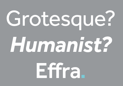 Fabio Haag Type is Fabio Haag's type foundry in Brazil. Earlier, he ran
  [
[ In 1993,
  Bandung, Indonesia-based designer of these typefaces in 2019: Bahama (a rounded sans font for bistrots), Babylonia (a vintage font), Valerian (an all caps sans),
  A collection of all colored country flags in SVG format, plus the CSS for easier integration in web pages.
  [
[ March 6, 2012--a sad day for hackers. On this day, LulzSec, one of the noblest hacking groups in the world, got tricked by the FBI. But there was good news on the web font side. Dave Gandy's
  Iconic font scissors. This free tool can be used to combine icons into a single font. There is, for example, a tool called

 Rome, Italy-based designer. In her Fontikon font project (2020), ishe has produced eight fonts, each with letters and culture symbols: Alchemy Complex, Adinkra Wisdom, Aztec Empire, Celtic Iron, Lovecraftian Neue, Japan Kamon, Viking Norse, Slavian Ustav.
 Budapest, Hungary-based studio that created IcoType (2014), a
  During her studies in Istanbul, Cagdas Ilke Unal designed the sober sans typeface Gökteng (2015) and the beautiful Weather Icon Set (2015). At Föy Studio in London in 2019, Cagdas released the experimental typeface Flex.
  Jayapura, Papua, Indonesia-based designer of Hellend (2019: a brush font), GOBR (2019: a display sans), Flola (2019: a great floral caps typeface), Grime (2019). [
 Gallusness (Alloa, Scotland) is run by Scott MacMichael. He designed Scotoilets (Scottish toilet icons) in 2012, and Candybet in 2014.
  Freelance designer in Berlin who graduated from the California College of the Arts in San Francisco. Creator of the didone typeface Evoque (2014). In 2012, she created Nightclub Wayfinding Icons.
  [
[ Gaslight-type-foundry is collaboration between three type designers---Valery Zaveryaev, Maria Luarvik, and Roman Shchyukin---, founded in 2011. Valery Zaveryaev is a
  At the Universidad de Cuenca, Ecuador Geovanny Gavilanes designed the
  German designer of icons. In 2017, he created the world's largest icon font (his own words in italic). Called GI, or German Icons, it features over 1500 icons and addresses 35 themes.
  Vilnius, Lithuania-based student-designer of the wavy font Flexia (2018) and a wonderful Music Icon Set (2018). [
 Unbelievably talented graphic designer in London. Designer in the
  [
[ Cairo-based artist. Creator of Brink (2014), a Latin typeface that was designed for a water recycling campaign. In 2016, she designed the circle-based Arabic typeface Seen. Also a talented illustrator, she created, e.g., Daily Routine Pictogram (2016). [
 James M. Harris' Colorado Springs, CO-based foundry sells five fonts designed by himself,
  Talented visual designer in Bari, Italy. Creator of the handcrafted poster typefaces Neretto Sans (2015, thick and black), Organic Tobacco (2015) and Sensi Bold (2015), and the elegant rubber stamp-inspired Marinaio (2015).
  Coimbra, Portugal-based designer of the graffiti-inspired typeface Nobre (2016). She also designed Coimbra City Icons (2016) and Zen Beauty Service Icons (2016). [
 [
[ Wonosari, Yogyakarta, Indonesia-based designer (b. 1991) of Primera (2018), Ballicons (2017) and Glyphicons (2017). In 2018, he added Larys Manice (a children's book font), Typis, Sweet Dessert, Rossela, Kiddos and the sci-fi typeface Space Surfer.
  Herman Coetzee (Blackboxgrafx), who is based in Vredesburg, South Africa, designed the futuristic, dystopian and sci-fi typefaces NuMono (2022), ArcType (2022), Quadra (2022), M Tech (2022), and Blackbox (2021). He also made a Cyberpunk Icons set in 2022. [
 Holmkvist Creative is the London-based studio of Robert Holmkvist that created the octagonal typeface family
  Adam Katyi, who hails from Sopron, Hungary, has three degrees. He has a BA from the University of West Hungary at Institute of Applied Arts, Sopron in 2010, and an MA from Moholy-Nagy Art and Design University, Budapest in 2012. In 2013, he graduated from the
  Ho Chi Minh City, Vietnam-based graophic designer who drew a great iconic set of birds in 2018. One set in the collection is called ABC Avian. [
 A free 2100-strong icon font in truetype and SVG versions with icons in 30 categories: Web application (399), Brand (203), Directional (113), Social (113), Animal (109), Currency (100), Food (98), Mobile UI (91), Sport (82), Weather (81), Construction (64), Medical (56), Transport (53), Device (50), Payment (47), Mathematical (47), Text editor (45), Abstract (41), File type (41), Education (40), Law (39), Person (38), Multimedia (35), Business (23), Emoticon (20), Kids (19), Travel (14), Chart (13), Search (11), Fitness (10).
  IcoMoon offers a free
  [
[ Vienna-based type designer who joined
  Graphic designer in Lecco, Italy, who created the wide techno font
  Designer of SketchIconsbold (2015, iFontMaker). [
 Moscow-based designer of a hybrid Latin typeface (2016) based on Garamond Italic and New Courier Italic. She also created a set of Olympic pictograms and a Cyrillic military stencil typeface called Ulichnyj in 2016. [
 Barcelona-based designer of the piano key typeface
  Russian graphic designer working out of San Francisco. His work includes a few nice Cyrillic typographic pieces, some icon sets and digitally revived Vjaz lettering (2014). [
 Poznan,Poland-based designer of Rock Font (2014, a spurred Victorian set of caps), and a
  Creator of the commercial sans typeface
  Seoul, Korea-based designer of a geometric solid typeface in 2017, and a great set of human pictograms in 2016.
  Kragujevac / Belgrade, Serbia-based illustrator. Designer of an untitled Latin / Cyrillic sans serif in 2016. [
 Chemistry professor at the University of Massachusetts, Amherst. Designer of the free font Academicons (2015), which can be downloaded from
  Bulgarian designer of
  Graphic designer and ilustrator who designed the icon sets Running, Swimming and Cycling in 2020. [
 Graphic designer in Saint Louis, MO, who created the
  Düsseldorf, Germany-based creator of
  [
[ [
[ Graphic design graduate from Birmingham City University, who is now based in Marlborough, UK. His typeface Two Lines English Egyptian was developed in 2013 for a university project. It was based on the specimen found in the Blake, Garnett and Co. type specimen c. 1819. This typeface was produced by the first William Caslon's grandson, William Caslon Junior and his type foundry in around 1816, and is said to be the first commercial printing sans serif.
  [
[ Toledo, Spain-based graphic designer. He used the positions of the stars to create connect-the-points letters in his
  [
[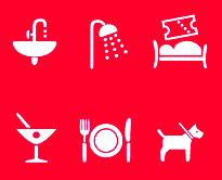 [
[ Julia Sysmäläinen Carelian (Juliasys) is a Finnish type designer, who studied at Pekka Halosen Akatemia in Tuusula. She runs her own type foundry, Juliasys. Julia presently lives in Berlin, where she works for Edenspiekermann Berlin.
 Simone Giorgio (K-Projects, Varese, Italy; b.1985) is a
  [
[ Kadu Supanik (Joinville, Brazil) created the
  Roman Korolev (Kaer, Vologda, Russia) designed the wood stick brush typeface WoodStick in 2016.
  During his studies at Haceteppe University in Ankara, Turkey, Kagan Kazakci the playful font
  Kaiser Zhar Khan (b. 1980, Chile), aka Zanatilja, used to run a new defunct archive called True Type Fonts. He also designed many typefaces himself. The most famous among these is his free African-themed typeface South Afirkas 2100 (2009), which is downloadable from
  Aka Icarus Bro and as Newflix, est. 2017. Medan, Indonesia-based designer of the geometric sans typefaces Gerald (2017), Gerald Round (2017), Amora Sans (2017), Gaston (2017) and Louisa (2017), and the decorative floriated caps typeface Winter Color (2017).
  Parisian designer of the icon font
  Kickstand Apps (Travis Zehren, Stillwater, MN) is an upstart software development company currently focusing on iOS apps. Designer of the
  For a module at Plymouth University in 2014, Kim Uitslag (Groningen, The Netherlands) made a typeface that only shows the essence of type. She also made icons for the Alzheimer's Societ (2014).
  Montreal-based designer of some icons for the ALT Hotel in Halifax in 2013.
  Graphic designer and illustrator based in Bodrum / Istanbul. Designer of the
  [
[ Designer who published the slab serif typeface
  Type foundry in Bahia, Brazil, run by Gabriel de Souza. Creator of the 72-font sans typeface families
  [
[ During his studies, Lecco, Italy-based Lorenzo Rigamonti designed the very original oriental simulation typeface Kana (2017), which comes wth wayfinding icons. [
 Prague-based creator of the handcrafted spurred vintage typeface Vienna Hotel (2015), the spurred handcrafted El Capitan (2015), and the Victorian typeface Fiero Rough (2015). He also made Apparel Icons (2015).
  Senior designer in Ho Chi Minh City, Vietnam. Creator of two teardrop-themed all-caps vector format typefaces in 2013,
  Luciana Sottini is an argentinian graphic who studied at Instituto Superior de Comunicacion Visual and National University of Rosario, where she was José Scaglione's student. She designed the weather icons in TypeTogether's WIPR project, and joined the TypeTogether team in 2018. Designer of the icons in
  [
[ Graphic designer in Brno, Czechia. He made the striped vector format font Candy Type (215), and a wonderful coloful decorative caps alphabet called Flat Alphabet (2015) and the equally interesting Circular Stamp Retro Vector Type and Circular Stamp Marine Vector Icons.
 [
[ Manuel Radde (b. 1979, Berlin) is an independent graphic designer based in Vienna since 2007. In 2016, Manuel Radde and Igor Labudovic joined forces for the development of the multiline OCL family of fonts and icons, where OCL stands for Open Commons Linz. These were developed for the city of Linz, and are distributed
  [
[ ManVsType is the professional type design practice of New Delhi-based designer Manav Dhiman. During his studies at MIT Institute of Design, Mumbai-based Manav Dhiman created the art deco typeface Chrysler (2016), which is named after New York's Chrysler building. In 2015, he designed various sets of icons, such as Dressing Up, and Connection.
  Marc comes from Liechtenstein and Switzerland, but works in London as Marc Weymann Design. Graduate from the type design program at the
  Designer in Rome, Italy, who created of Science Museum Icons (2016,
  During his design studies in Madrid, Mario Mimoso created the fun avant garde display sans typeface Mimoso (2015). For Tabacalera, he created a custom typeface and some signage icons. [
 During her studies in Caldas da Reinha, Portugal, Marisa Ferreira created the serene geometric sans typeface Isamara (2015). She also designed the wayfinding icons for Castelo de Ourem (2015). [
 Graphic designer in Bristol, UK, who designed the colorful geometric solid typeface Mod in 2015. He also created various sets of icons for brands.
  During her studies in 2013 at the Accademia delle Arti e Nuove Tecnologie di Roma, Marta Coppola designed
  Graphic designer from Venezuela who is based in Floresta, Argentina. He studied at UBA in Buenos Aires. Martin's typefaces include Pictogramas Deportes Acuaticos (2014), Whiscacho (display typeface) and Angus (2014, modular typeface). Winner at
  Indonesian type designer who operates under a variety of names. His fonts comprise mainly handcrafted and script typefaces, and dingbats, including many floral icon sets. As of June 2021, the typefaces included AmoceliaRegular, BalineseRegular, BlackAngelsFreeRegular, Heylie, FunnyRabbitRegular, HappySummerRegular, HelloUnicorn, NeutoSansDemoRegular, RasidayRegular, RhenataDemoRegular, Aladin, Aldebara, Alphabet-Wave, Amoxan, ANGELA, animasi-eyes, Annabelle, Azhitromicin, Baby-Cute, Baby-doll, BALOTAK, Beautiful-leaves, BELAROSA, Black-Forest, Blue-ocean, Booster, Botana, Botani, Bougenville-flowers, broken-Heart, Browie, BUBBLE-BOBA, Butterfly, cakiss, Cattrine, Ceftriaxon, CellineHeylie, Charles, Cheerful-Year, Chocolate, Christmas, Coffee-Break, Coffee-Robusta, Crunchy, CUTE-LOVE, Cutes, Delicious-Food, Devil-Beside-You, DIAMOND, Digital-Marketing, Dingbata-Regular, Donuts, DrawingRainbow, Emerald, Emot, Euis, everybody, explore, Floralipart2, FLORENA, flowers, Flowery, FRIENDLY, Funny-Kids, Funny-Rabbit, Gendis-Flower, GEORGIOS, Golden-Pumpkin, Gravera, Greentea-Milkshake, Gupis, Happy-Christmas, Happy-New-Year, Happy-Shopping, Happy-Summer, Happy-weekend, Hello-Christmas, HelloUnicorn, Hellow-January, Hidrocloroquin, Hollster, Honeymoon, Jelline, JONS, Just-Friend, Kidos, kindergarten, Krriiukk, Leaf, Lets-go-to-school, Lighting, Lisan, Love-Bubbles, Lovely, Mandala-Clip-Art-Regular, Mandara-Regular, Manopo, Memoriam, Mennuah, Methilprednisolon, Michy, Miracle-Of-Christmas, Mom-cooking, MONOLOG, Moo-Milky, MOUW, My-Princess, Naturally, North-Star, NOTHING, ONE-MORE, One-Stripe, Outline, Photography, Pillow, Playground, Poco-poco, Pompom, POW-KIDS, Princess, PURPLE, PUZZLE, QIWQIW, Rannel, Rebuilt, Remember, Richeese, Rolling-door, Sana-sini, Sand, sandra, Sansan, Sansullin, Santa-Claus, Saranghae, Sarapan, Sarwendah, Say-Hello, Scarlove, Serenada, SHIZUKA, Sky-face, Solaria, Solatip, Squaress, Srengngee, StarBold, START-UP, Stay-story, Stricker, Stripe-Calm, Sunshine, Taro-Flowers, Thai-tea, Travelling, Tremor, Unicorn-Beautifull, UPNORMAL, wedding-knick-knacks, Welcome-Santa, WILD, Willy, Winner, Winter-Soraya, Wisconsin, Zara.
  Graphic designer and illustrator (b. Southampton, UK, 1993) who studied graphic design at University College Falmouth.
  [
[
 Graphics cooperative in Philadelphia that sells some fonts. These include:
  Rasht, Guilan, Irabn-based designer of the free icon font Micon. [
 Montpellier, France-based designer of the
  Michael Hansen (Michaelhansenwork, Copenhagen, Denmark) studied at the Royal Academy of Fine Arts in Copenhagen. As a student, he created a virtual identity for the future light rail in Aalborg. This involved the development of the rounded sans typeface family Aalborg Bold (2015) and the creation of a few wayfinding icons.
  [
[ Designer of exquisite icon sets., including Marine Icons (2018), Home Icons (2018), Adventure Travel Icons (2018), Cute Animals (2018), Food Icons (2018), Nature Icons (2018), Landscape Icons (2018), Fashion and Style Icons (2018), Magic Creatures (2018), and Handdrawn Animals (2018). [
 Michael Nÿkamp (MKN Design, Grand Rapids, MI) is a designer and illustrator born and raised in Ontario Canada. He won an award in 2014 at the
  Klaipeda, Lithuania-based designer of Shifter (2017) and Youth Senescence Icons (2017).
  The government of Leiria, Portugal, contracted out the design of wayfininding icons for their MIMO (Museu da Imagem em Movimento) in 2016. [
 Born in Takamatsu, Kagawa-ken, Japan, in 1984, Natsuko is a Canadian-educated graphic designer who publishes most of her typefaces at
  Alexander Alexandrowitsch Roth, or just Alexander Roth, was born in the Tajik Soviet Socialist Republic and immigrated from Dushanbe to Germany in 1993. He is a Berlin-based graphic designer who holds a bachelor degree in Media Production from the Hochschule Ostwestfalen-Lippe University of Applied Sciences. Alexander is one of the founders of
  Byron Bay, Australia-based designer of these fonts in 2018: Modernist Milk (stencil), Signwriter, Cloak (stencil), Stamp & Co, Merchant (vintage sans), Big Show (layerable), Sea Spray (experimental minimalist stencil).
  Red Lion, PA-based designer of a free set of vector format icons called
  Graduate of the Hungarian University of Fine Arts, class of 2014, who works as graphic designer in Budapest. Together with
  Auckland, New Zealand-based graphic designer who sells his creations as NrthPrk and North Park (located in Paris). designer of the signage-inspired retail typeface Bar Cap (2015), the slab serif Nixon Caps (2013), and Scrawler (2013, all caps sans serif). He also made Sustainable Resource Icons (2015) and Sport Icons (2013).
  Graduate of Ecole estienne in Paris, whi joined Velvetyne in 2019 annd is currently working as a type design researcher in ANRT, Nancy.
  Aka Youhhou. Tbilisi, Georgia and now, Moscow-based Russian designer of Splinter (2016),
  Krimean artist and illustrator based in Simferopol. Her work includes Narrow (2015, a hand-drawn Latin alphabet), Romantic Alphabet (2015), Ice Cream Alphabet (2015), Snacks and Drinks Doodles (2015), Floral Brushes (2015) and Hand-drawn Zen Letters (2015). [
 Kharkiv, Ukraine-based designer of a
  Born in Damascus, Syria, in 1992, the über-talented Omar Shammah studies Visual Communications (Graphic Design) in the Faculty of Fine Arts in Damascus. In 2012, at the height of the Syrian conflict, Omar created a disturbing yet hauntingly beautiful set of drawings in his
  Graphic designer in Bogota, Colombia, whose work frequently involves calligraphy and type design. In 2015, he created the techno typeface Metrica. Also in 2015, together with Michelle Castillo, he created a proposal wayfinding and icon set for the Universidad Piloto de Colombia. [
 Denis Serikov (OT Lab) is the Moscow-based Russian designer of DionisiiOTF (2003), the caps font
  During his studies in Miami, FL, Jimmy Kalman (OX Lab) designed the
  Badajoz, Spain-based designer of the slab serif typeface Mulatta (2019) and a fantastic set of hospital pictograms (2019). [
 Lake Mary and/or Orlando, FL-based designer of Logico Sans (2017) and Nova Classic (2017). In 2018, he published the headline sans typeface PC Navita, Versa Block (elliptical sans), Darla Script, Quantik, Provoke (an inline family), the
  Aka Paula A and Porapak Picto. Bangkok, Thailand-based photographer and illustrator, b. 1978, whose outfit was called Nursery Art, and before that, Eikon Design. Porapak created these typefaces in 2017: Roche, Boekban, Henrietta, Madelyn, Yesmina, Sticky Script, Gilligan, Lepota, Just Tuesday, Rwanda, Adalicia, Pamela Script, The Eolian, Lesliecy, Bis Später, Halften, Unkempt (dry brush), Esperance, Super Black, Janes Smith (signature font), Trust Me, Stinker, Minnie Script, Jherry Jill, Bentley Script, Instyle, Fabiana (brush script), Atingle, Skylar Script, Skylar Sans, Huh Girls, Sentimental Script, Barbala, Silent Night (script and sans), Unbossy, Densfort, Absorbed, Gumdrop, Fixity, Cuassus (signature script), A Bientot, Enmity (script), Quincy (font duo), Mr. Proxy, Sentimental, MaxWell, Zabar, Deisy, Sandstorm, Koko Kruse, Mizz Zippy, Fabiana (script), Bravo, Paxton, Brushy, Instyle Brush, Ooh Lala (brush), Gypsy Script, Specialist (signature font), Jasper (brush font), 5 Seconds, Malina (connected script), Hi Sunshine, Bellahana Script, Good Morning, Line Cally, Laksamee Script, Beer, Lazy Monday, Travel Icons, Smoothies, Liam Smith (handcrafted), Emma Script, Have Faith Script (brush), Jelly Fish, Olive, Hand Rock, Hand Hardcore, With Love.
  [
[ Commercial icon font foundry. These icons scale, thanks to CSS, and take less space than images. The icons come in png and svg format. After registering, one can select a set of icons from the free list (230 strong) or the commercial list (over 2000 strong), and download them conveniently. One then gets a zip file that contains individual png and svg files, as well as assembled truetype, woff, css and eot files, and ample usage instructions.
  Freelance graphic designer in Grottaglie, Italy. Stones inspired Pierfrancesco Annicchiarico to design the experimental typeface Secco (2009). The Cà brùtta building by Giovanni Muzio in Milan got him to design the
  Aka Some Random Dude. Design technologist and photographer living in San Francisco and working at Seabright. Designer of the pixel typeface SomeRandomFont (2007). He creates typographic icons and tools that are useful for web pages.
  Studio on London founded in 2011 by Jeff Knowles and Nick Hard. It created the bespoke typefaces Soapbox and Dogfight in 2016 for The Seasons Collection book by photographer Matt Alberts (in collaboration with Cadillac). This book peeks into the heart and soul of the people who have dedicated their lives into the skate and surf culture. Dogfight combines octagonal and round, and both typefaces ooze masculinity and strength. Other typefaces include the custom rouned sans Addaction (2016).
  [
[ Graphic designer in Bangkok who created the handcrafted typeface YWFT Roamer (2016), Basic Icons (2016) and The Hands (2016, vector icons).
  Promodesign is a Brazilian graphic design company of
  Original fonts, clip art, signature fonts by New Yorker (and ex-Philadelphian) Jonathan Macagba, and Gregory La Vardera. Macagba used to run Handcraftedfonts, then Adcrobatics, and finally
  Barcelona-based designer of the alchemic typeface
  [
[ Dmitry Baranovsky created a free javascript vector library called Raphaël for doing simple graphics in web pages. As an example, he created a
  Designer and illustrator in Baku, Azerbaijan.
  Creator of free fonts. These include
  [
[ Omsk, Russia-based designer of an experimental Latin typeface created by superimposing circles (2015), and Point (2015). She also created a set of icons and several color fonts in 2015, including the
  RNS Fonts (and before that,
  [
[ Budapest-based graphic and packaging designer, b. 1980. Creator of a soft-edged
  Designer of the free font Pilcrow Icons (2010-2014, OFL). This font contains useful web icons, as well as a set of LED numbers. [
 During her graphic design studies in Cairo, Sara Elsayaad created
  During her graphic design studies in Cairo, Sarah Mossallam created the blocky Arabic typeface Rozma (2014) and the DIN Pictogram Set (2013). In 2013, she created an Arabic extension of the Titillium font. [
 Graphic and media designer and art director in Espinho, Portugal, b. 1984, who founded first
  Scott de Jonge (Brisbane, Australia) designed Map Icons.
  [
[ Designer between 1990 and 2001 of the dingbat fonts Emergency Workplace Signs, Paint Industry Symbols, Risk Phrases, Transport Hazard Diamonds, and Warning Signs, which were initially sold through Agfa (which later became Agfa Monotype). He set up SeLis type foundry in 2004. [
 So as not to be confused with the Colombian type designer Sergio Ramirez (Llamas), this Chilean Sergio Ramirez uses his full name, Sergio Ramirez Flores. At Latinotype, a foundry in Santiago, he published the 369-strong infographics icon font
  Designer of very sharp icons. These include Puchi Puchi, Avocado, Sketchy, Sharp Corners, Feather, Stone, Blueprint, Flat Shadows. [
 Brno, Czechia-based designer of the basic sans typeface Uppest (2017), a wayfinding icon set for KOMA (2017), the handwriting font Karel Jaromir Erben Script (2017, based on the Czech poet's handwriting), and the icons and poster Enabled For Disabled (2017). [
 Zlin, Czechia-based designer of diacritics for Fette Gotisch (2016). She also created a set of icons for the disabled. [
 [
[ Dan Cederholm (Salem, MA) founded Dribble and set up the SimpleBits web page. The Shoppe is an offshoot of SimpleBits, LLC, a design studio founded in 2002 by Cederholm. SimpleBits specializes mostly in icons. Typefaces by Icon Shoppe include Chameleon16 (2007), a beautifully designed truetype pixel font. Icons by Icon Shoppe include Ballroom, Chameleon, Stockholm and Overcast. Typefaces by SimpleBits comprise
  S-INGS is Stephen Hutchings' studio based in Sydney, Australia. In 2016, he designed Monad Sans and Svenska.
  Sjoerd Kulsdom (Dot By Dot) is the Arnhem and/or Amsterdam-based designer of the curly typeface Spring Is In The Air (2011), the polygonal cut-out typeface Cardboard Cat (2016), the informal typeface Merijntje (2014) and the multiline typeface Monogram Rounded (2016). Sjoerd is associated with Ontwerpstudio Dot by dot.
  Sofia, Bulgaria-based designers of the tweetware font family Wirebet (2015), which consists of a set of sans fonts and some web design icons. They also created several sets of tweetware icon fonts: Bar Icons, Game Icons, Dashboard Icons, Weather Icons, Wireframe Icons. The main designer is
  New Providence, NJ-based designer of the spurred typeface Arch (2014). Inspiration came from Indian Mughal arches, and the application Sonal had in mind was fashion magazines. Arch was created for a course at SVA (School of Visual Arts) in New York. She also created a set of pictograms for Ariisto Realtors in Mumbai. [
 StateFace is a free icon font made in 2012 by ProPublica. It contains the shapes of the fifty staes in the USA. [
 [
[ [
[ In 2013, Tommy Isbell (Parma Heights, OH) and Stephen Politte (Cleveland, OH) co-designed a 3d typeface called
  Paris-based graduate of ESAG Penninghen (where he took courses from, e.g., Muriel Paris) who made a custom
 Design studio in San Salvador, El Salvador. Creators of the (commercial) dada typeface Urbanica (2014), the dadaist typeface Deformed Font (2014), and the hand-drawn typeface Lovers Italic (2014). They also sell Random Icon Set (2014).
  [
[ Vector icon sets designed in 2012-2013 by Joey Raphael. Icon fonts from ca. 2013 include Air, Junior, Line, Block, Weather (Forecast) and Veggie.
  [
[ During his studies in Harrisburg, PA, Taylor Schmidt created
  Moscow, and before that, St. Petersburg, Russia-based foundry, first called Abstrkt, and later extended to The Temporary State. All fonts are by
  Foundry set up in 2007 by
  Lima, Peru-based designer of
  A place for independent designers in downtown Providence, RI. One of the designers in this group is
  A collaboration between many people for creating free open source icons. The collection is quite useful and is growing nicely. These icons are available in vector formats, but not as truetype or opentype fonts. The
  German studio that designed the hand-printed typeface
  Graphic designer in Curitiba, Brazil. He created the
  Type coop in Tilburg, The Netherlands, run by Sander Neijnens and Ivo van Leeuwen. The free TilburgsAns fonts
 [
[ Born in Finland, Tomi Lahdesmaki graduated from Academy of Art University in San Francisco. Now based in London, where he runs a studio called Harvest, Tomi created several typefaces in 2014, including the all caps decorative series Mastodon, the fat typeface / light sister combination called Aune, and the heavy titling sans typeface Scandal. He also created several interesting sets of icons.
  Oviedo, Spain-based designer of vector icon sets and accompanying fonts. These include Vecor Arrows, Restaurant App Icons, and Social Media App Icons.
  Or Tarek Alsawwa, founder of TS Fonts and of the type shop
  Foundry with free and commercial fonts, started in June 2002 by Dirk Uhlenbrock.
  Typogama is the personal foundry of Swiss designer
  Typotheque is an initiative of Peter Bilak and ui42 out of Bratislava (Slovakia), and later, The Netherlands: Typotheque is an Internet-based independent type foundry. It offers quality fonts for PC and Macintosh platforms in standard European character set and in CE (central european) character set. All fonts have full (european) character sets, are thoroughly tested and manually kerned.
 Graphic designer in Lyon, France, who created the signage icon set Signalétique Bellecour (2015) and exquisite didone lettering for a milk bottle company called Maison Nacrée (2015). [
 [
[ Moscow-based designer who created the display type Linear (2015) in vector format. He also drew a great set of Monsters in vector format. Icon sets by him include 1000 Icons, Churches, Christmas, Flat Cars, Thin Line Icons.
  [
[ Zagreb, Croatia-based designer of the ultra-fat typeface Rockflick (2015), Pirate Glyphicons (2015), and the Roman capitals typeface Dafnis (2015). [
 Graphic designer in Quilmes, Argentina, who created the text typeface Wima in 2015. She also proposed a set of wayfinding icons in 2015 for MAMBA, the Museo de Arte Moderno de Buenos Aires. [
 Bangalore, India-based designer of the gorgeous Icons of India or City Icons (2015). In 2016, he created the free handcrafted typefaces Kanglish and Cleavin (for Latin).
  Graphic designer from Summerside and/or Charlottetown, Prince Edward Island, Canada, who was located first in Edmonton, Alberta, and then in Moncton, NB, then in Toronto, and finally in halifax, Nova Scotia. He runs SRC Designs and founded Vintage Type Co in 2015 (not to be confused with Susan Townsend's Vintage Type, a company set up in the 1990s). Creator of the free sans titling typeface family
  Venezuelan designer of these retail typefaces in 2014: Itzal, Itzal Simple (avant-garde sans family), Travel Icon Font, Silver, Gallium, Viruta, Auvin (art deco), Couloir. [
 Cluj-Napoca, Romania-based designer of the connected brush script typeface Coralia (2015), the handcrafted Spiff (2015), the script typeface Lumiere (2015), and the free font
  Founded by Guido de Boer (Utrecht), Vormplatform is a Dutch studio in which Roosmarijn ten Hoopen, Studio Airport, Ferry Booms and Jeroen van Loon participate. This is an eye candy site, where one can also find their
  Aka Vuuuds. Denpasar, Indonesia-based designer of these typefaces in 2021: Alfine, Efton Serif (decorative), Emilea, Fistro (an avant garde fashion font with hipster traits), Fromy, Fugi, Hues Serif, Musky (decorative).
  Designer of the free 2000+ icon font WebHostingHub-Glyphs (2013).
  This site sells many icon sets in png and psd formats. No fonts, as far as I can tell. [
 [
[ Graphic designer in Wroclaw, Poland. Creator of some free icon sets in 2015: Hospital, Dream,
  Wroclaw, Poland-based designer of the slab serif typeface Bastard (2014; a school project together with Rui Pinto and Mauro Pedrosa at IPCA; based on Dino dos Santos's Leitura Sans Grot 2), and Wroclaw Public Transport Pictograms (2015). [
 Prolific Barcelona-based type designer. He started out by creating the counterless hand-printed typefaces Woodcutter Dripping Nightmare (2012) and
  Alexandfer Meyer is the Zürich-based
  Vancouver-based designer of the dot matrix typeface
  [
[ Brussels-based designer of the Snowflake Font (2014). She also made a set of icons called Crustacées décapodes (2014). [
 Grand Rapids, MI-based designer of the white-on-black octagonal typeface Band Wagon (2016) and Marvel Pictograms (2015). [
 At the University of Kansas in Lawrence, KS, Zoe larson designed the striking sharp-edged display typeface Gecko (2019), and Jurassic Park Icons (2019). [
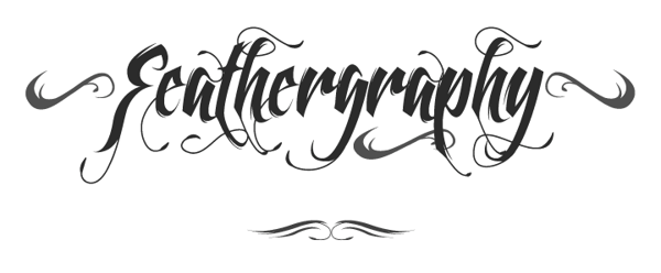
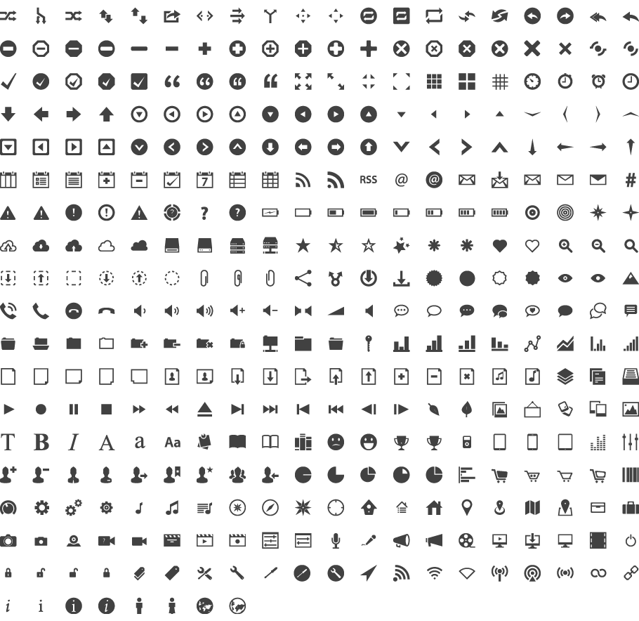
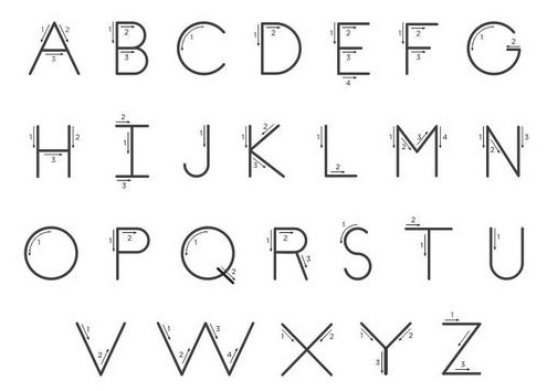
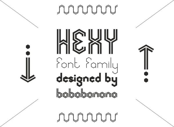
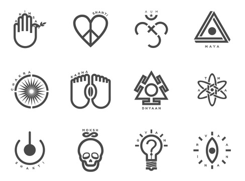
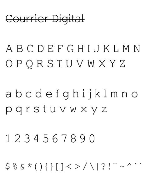
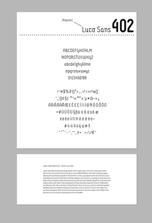
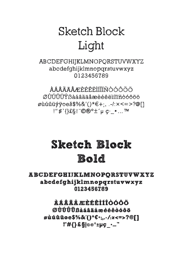
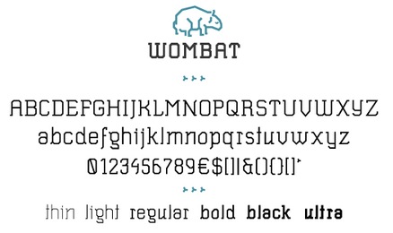
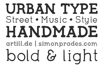
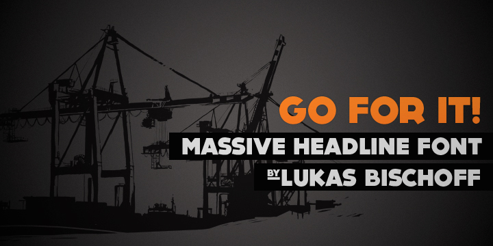
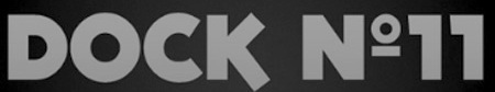
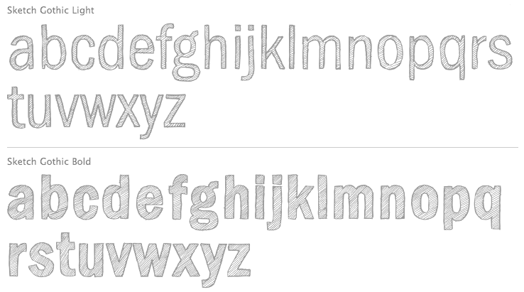
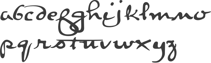
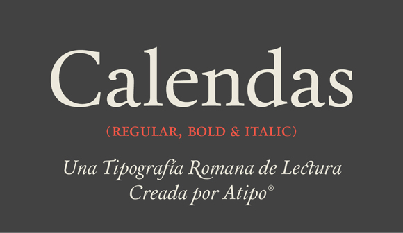
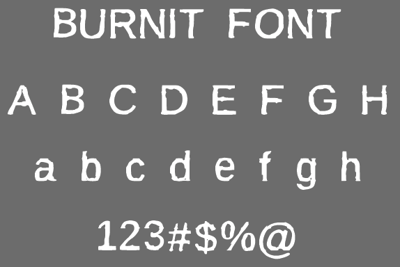
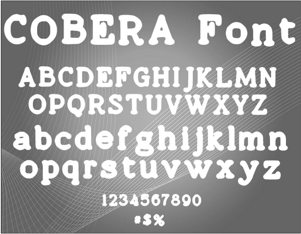
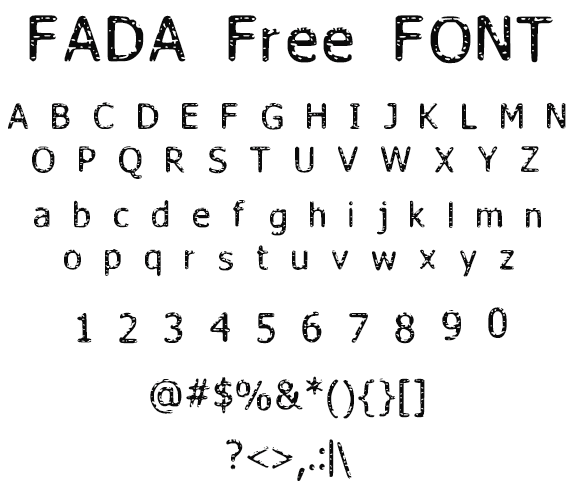
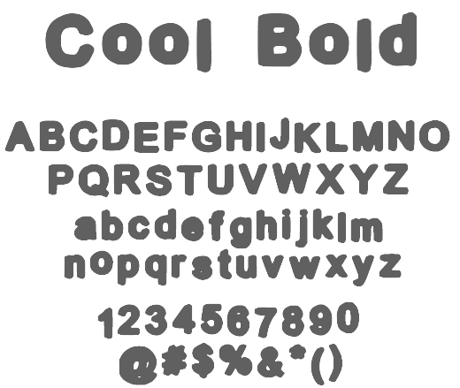
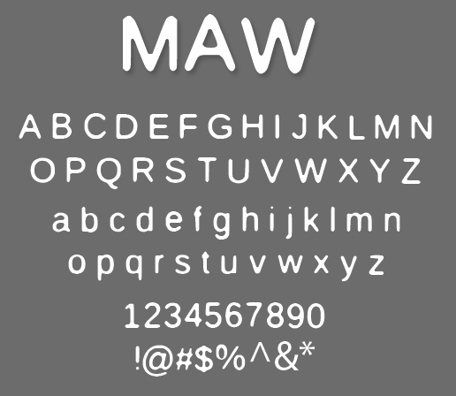
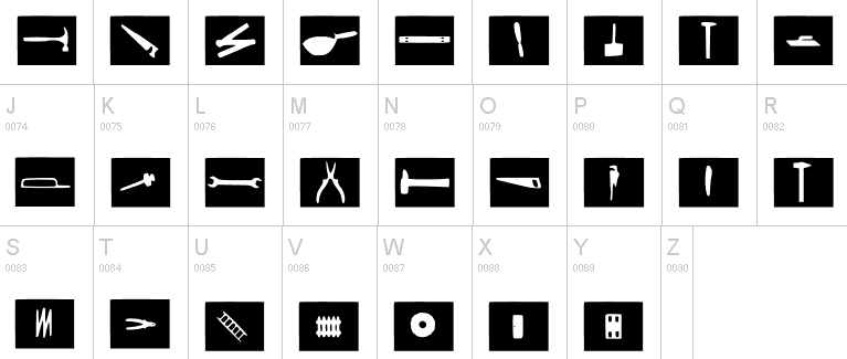
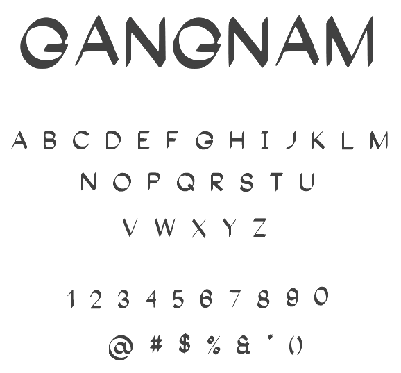
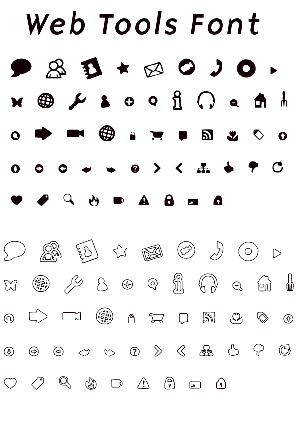
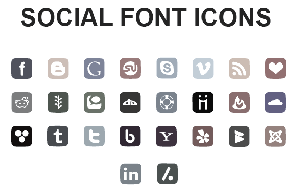
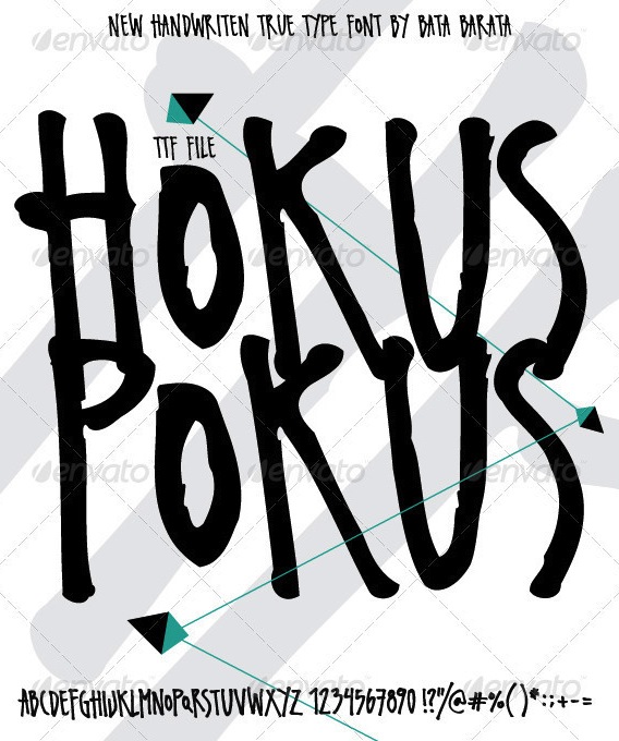
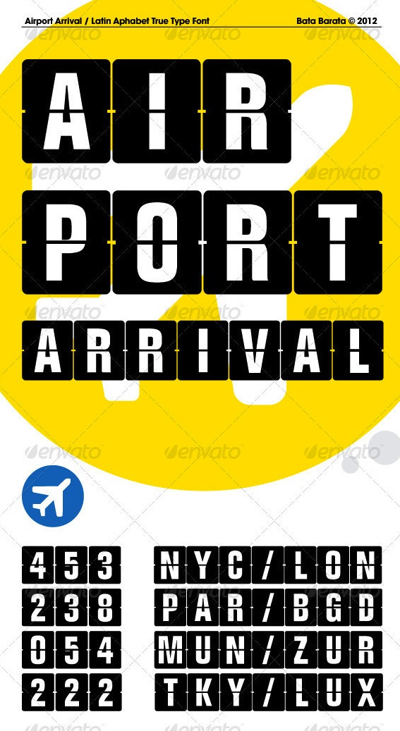
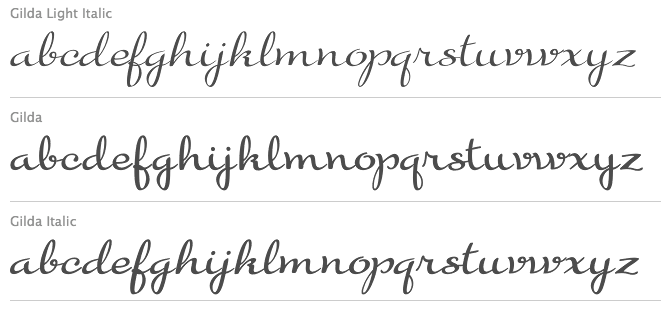
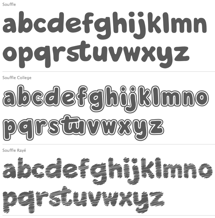
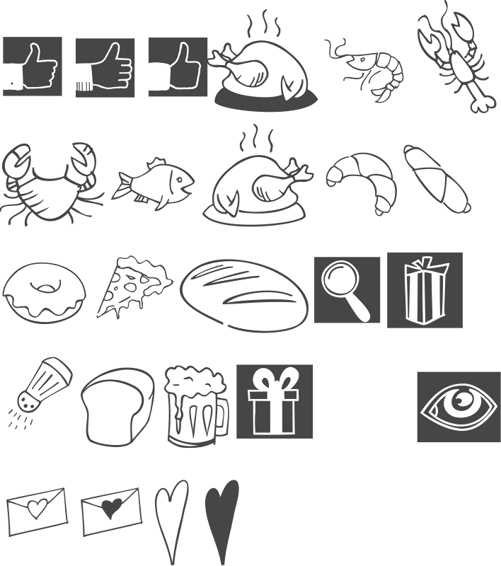
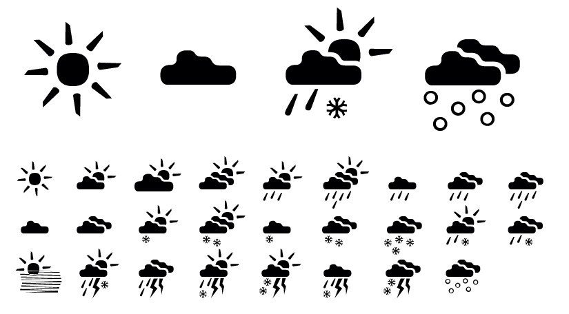
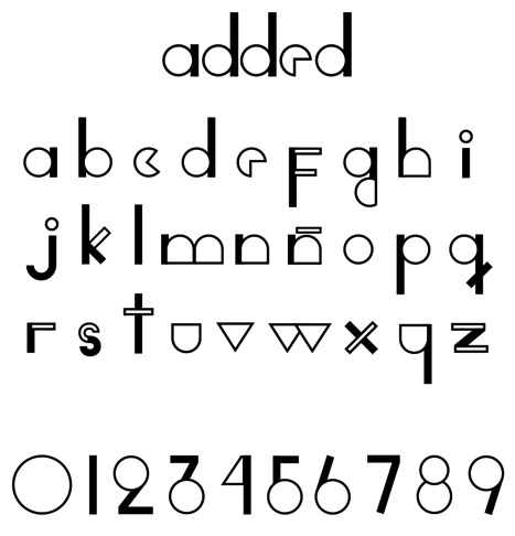
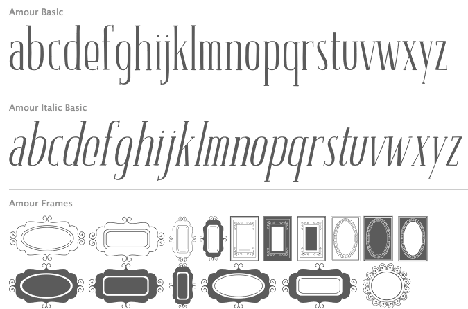
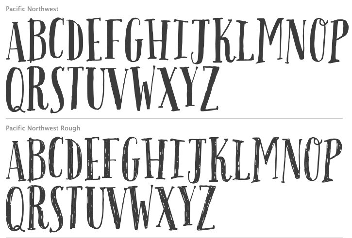
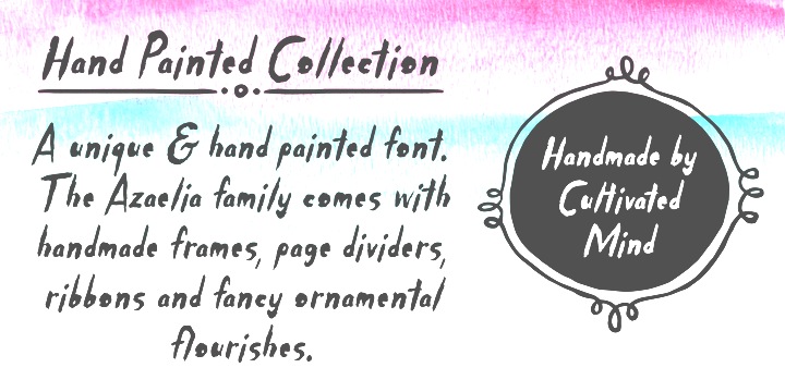
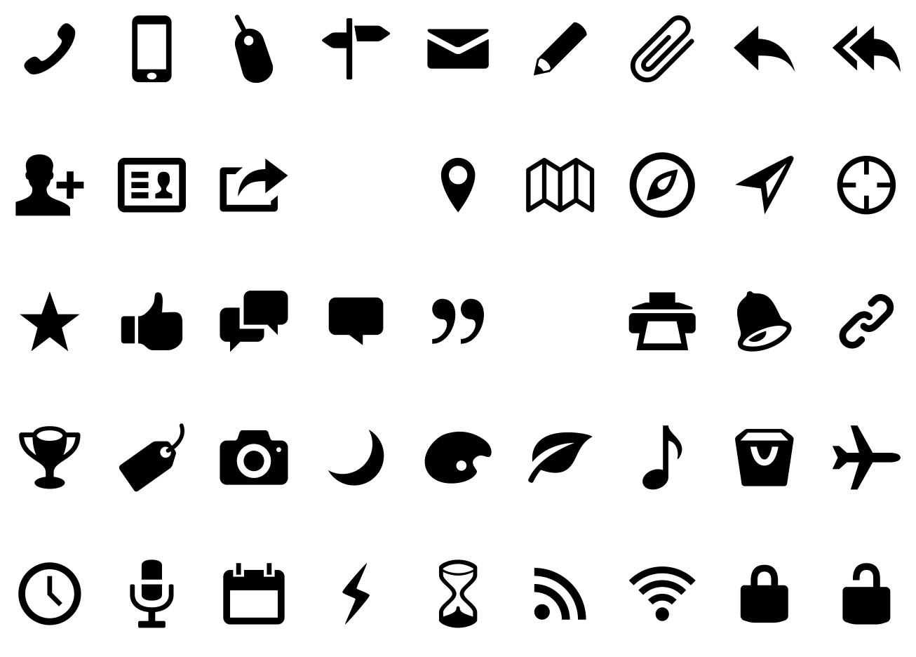
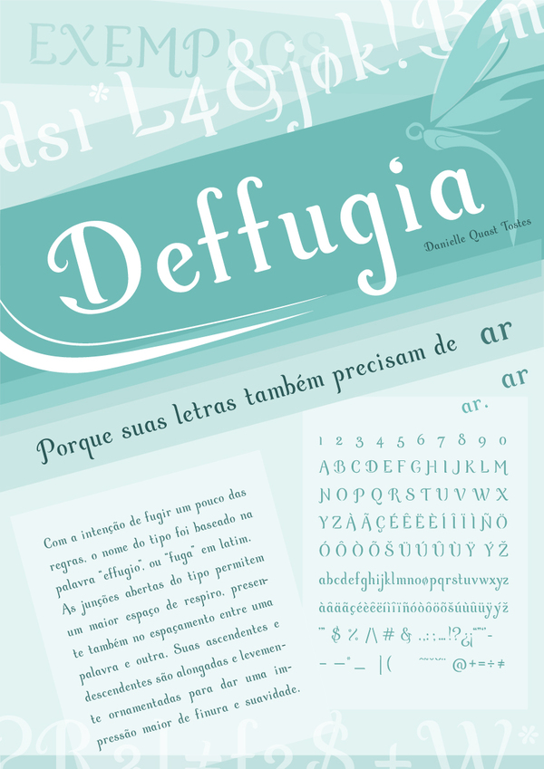
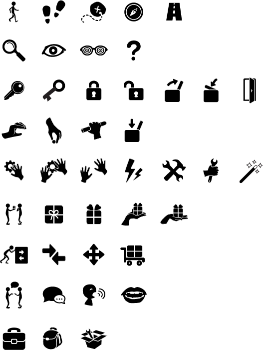
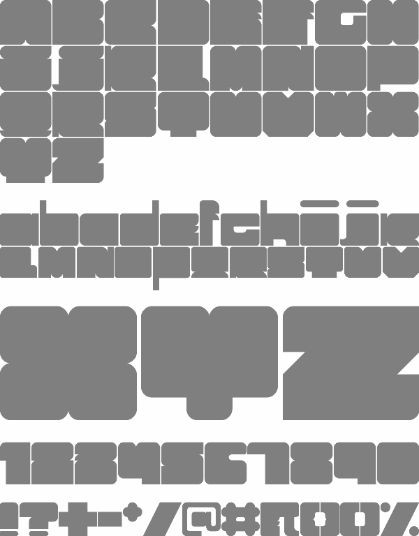
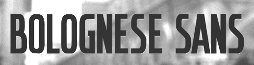
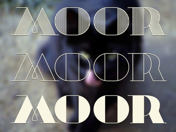
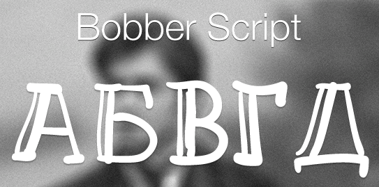
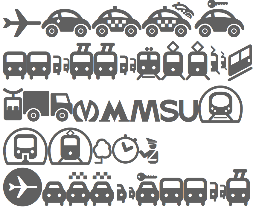
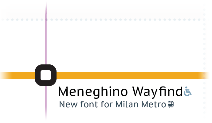
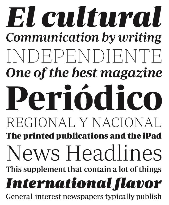
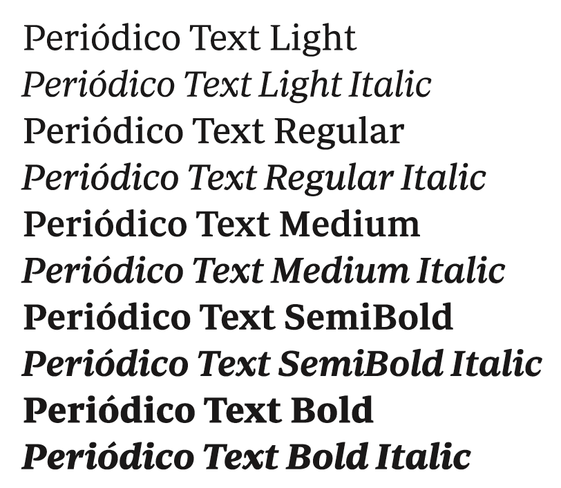
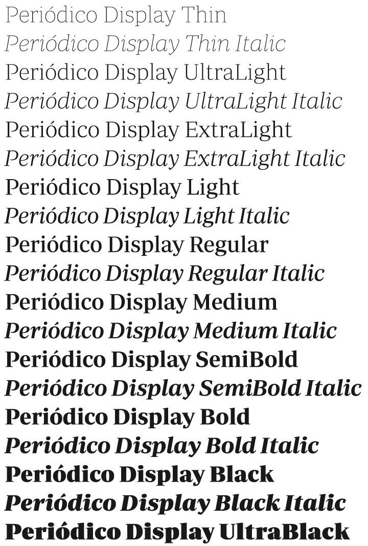
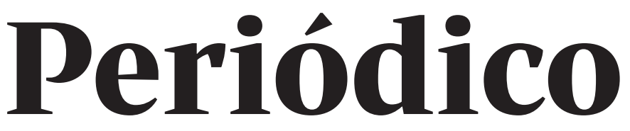
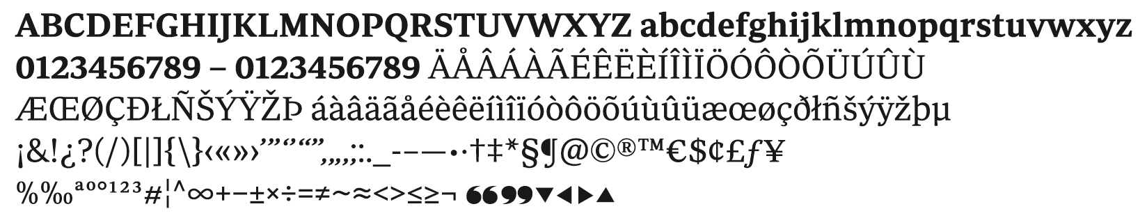
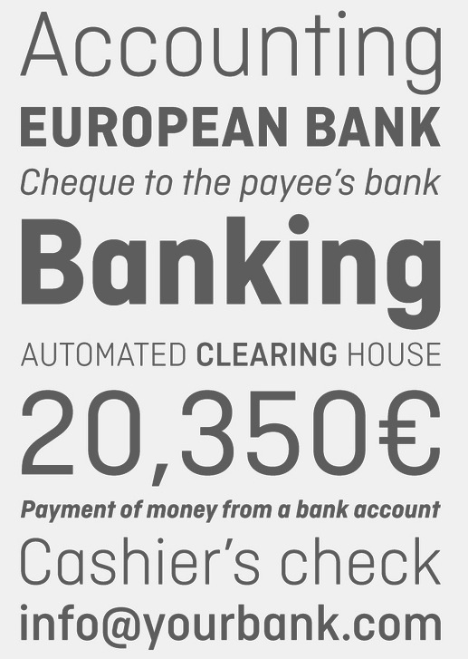
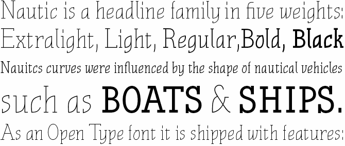
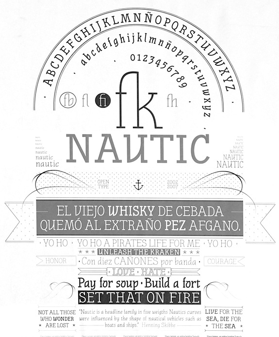
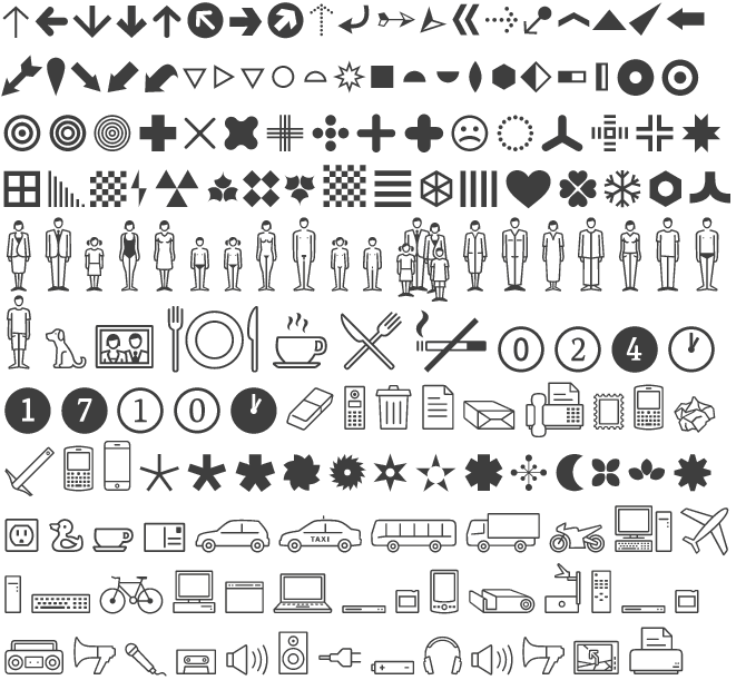
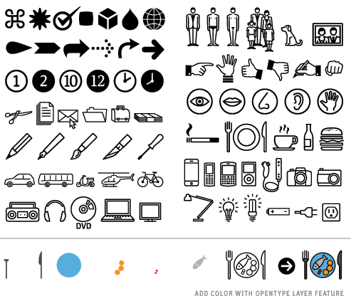
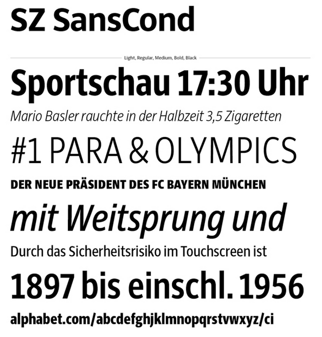
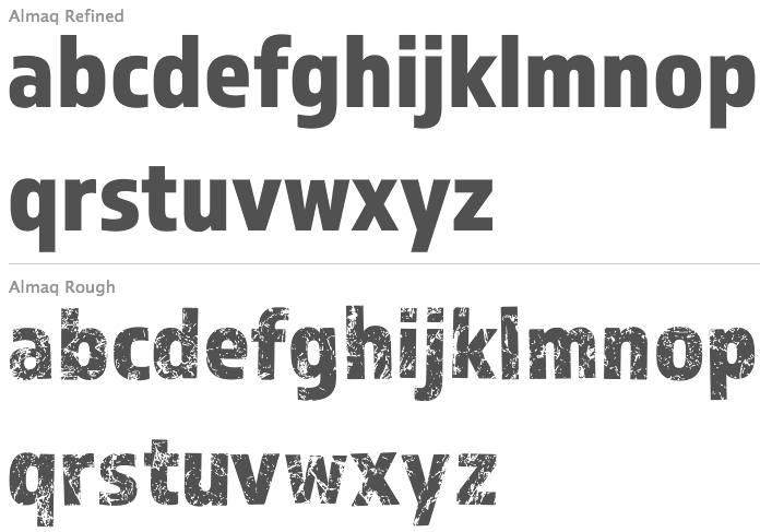
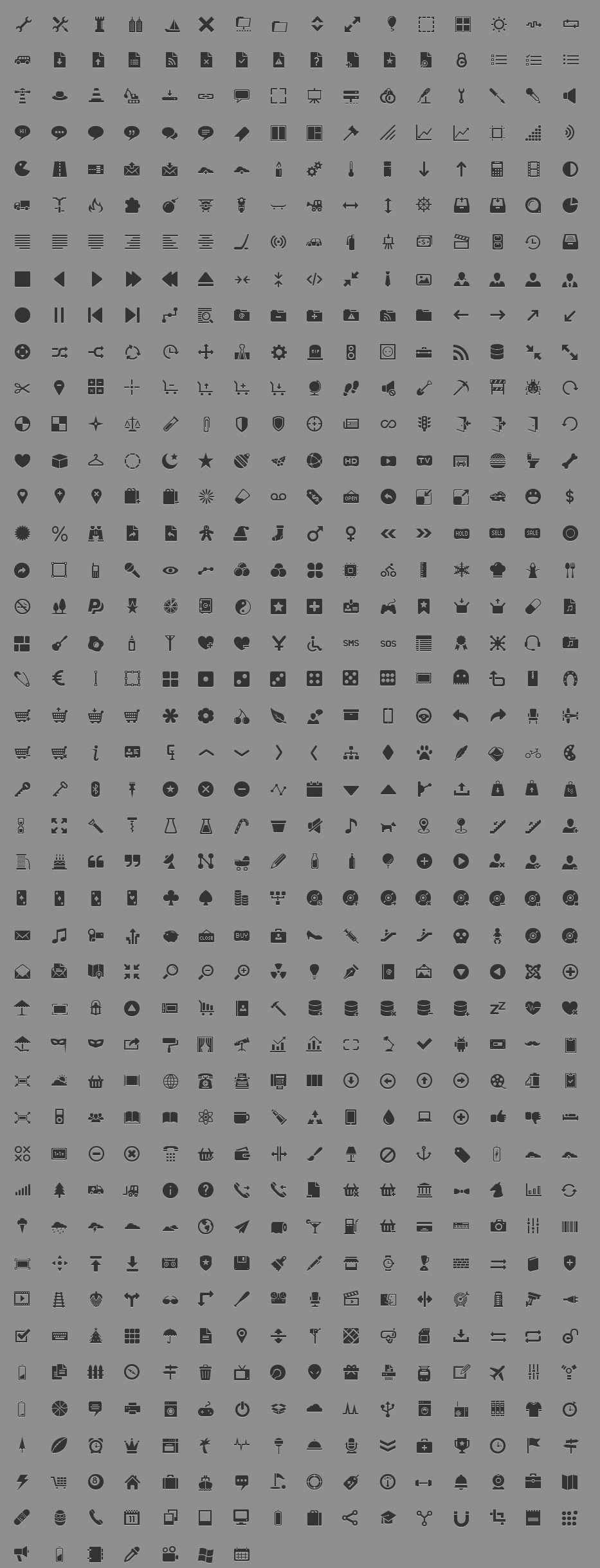
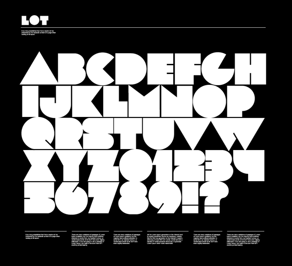
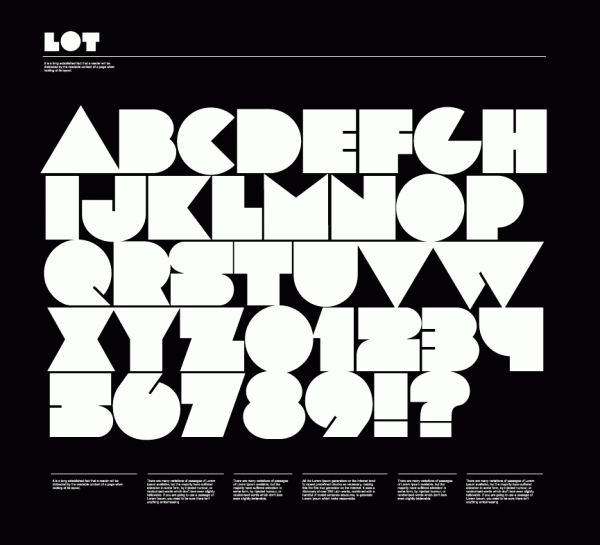
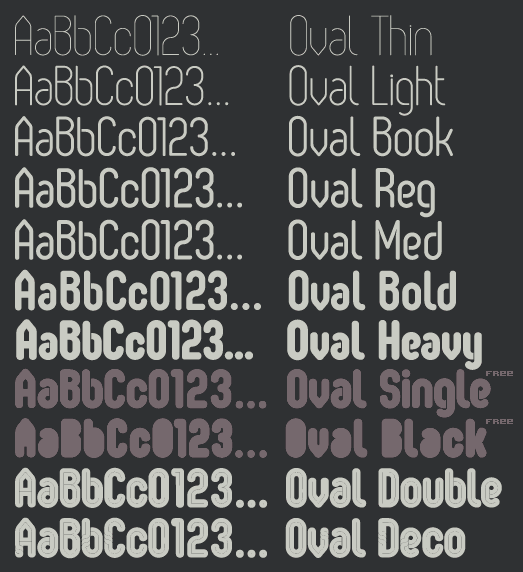
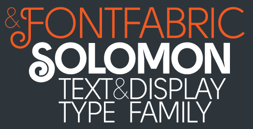
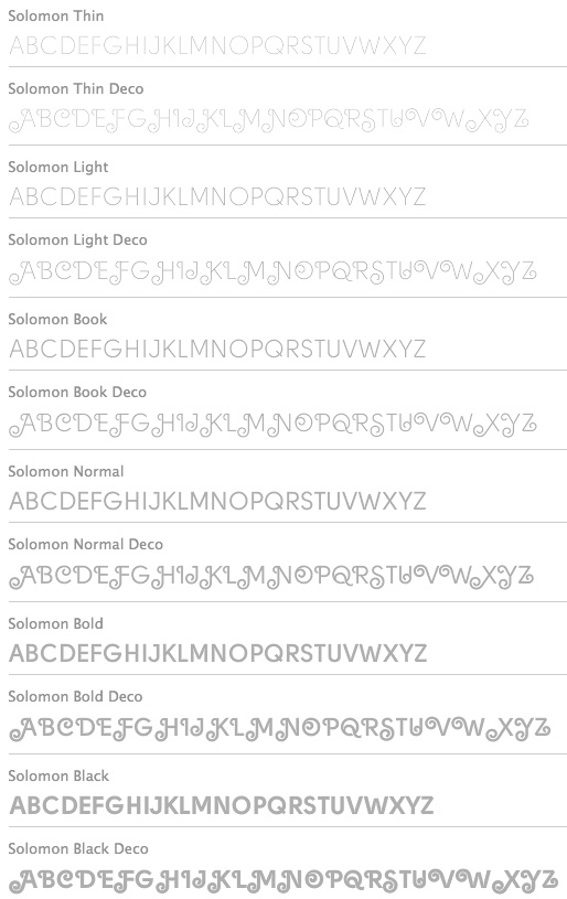
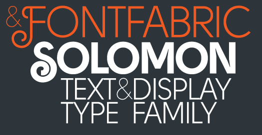
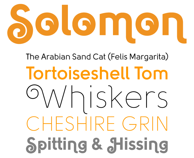
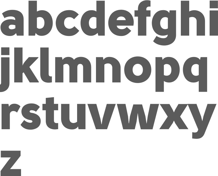
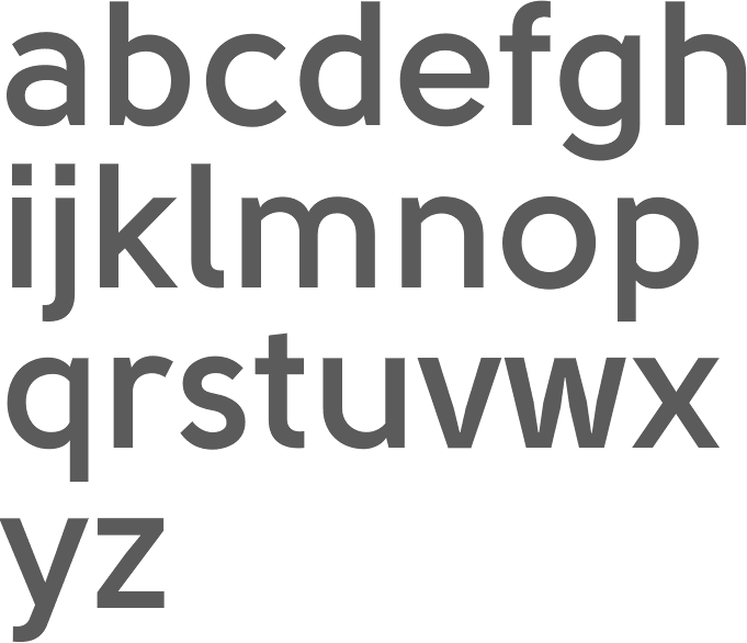
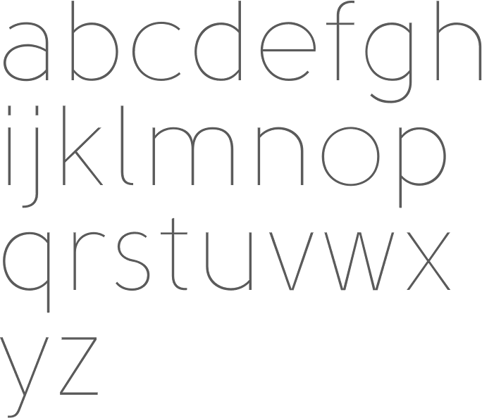
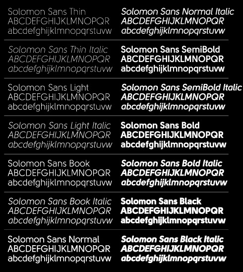
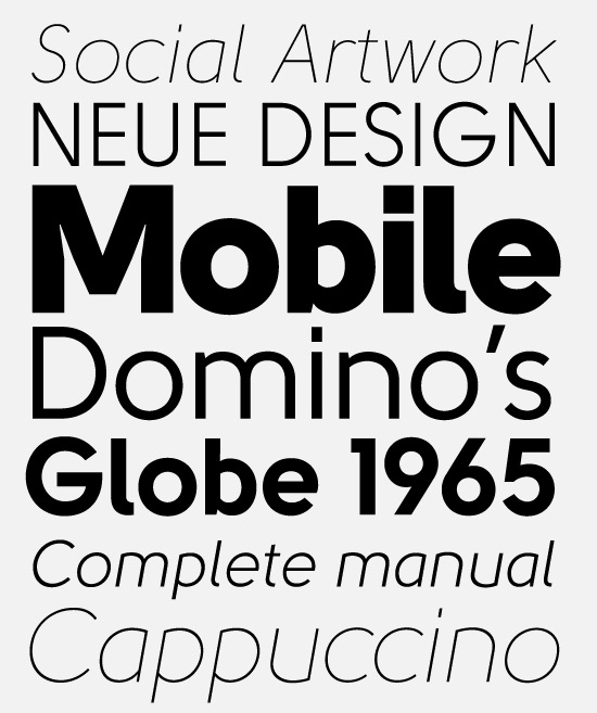
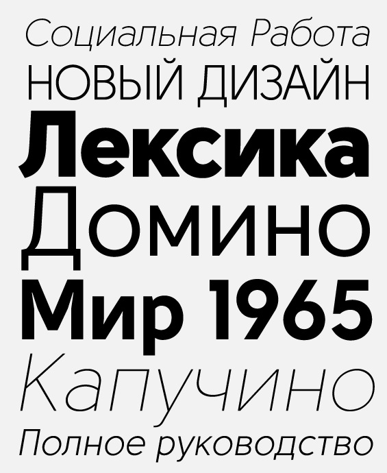
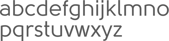
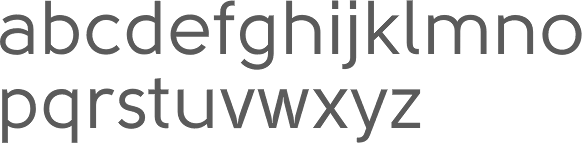
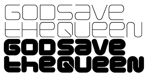
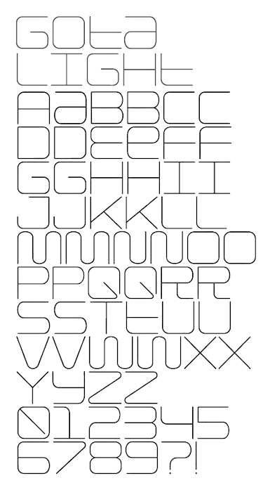
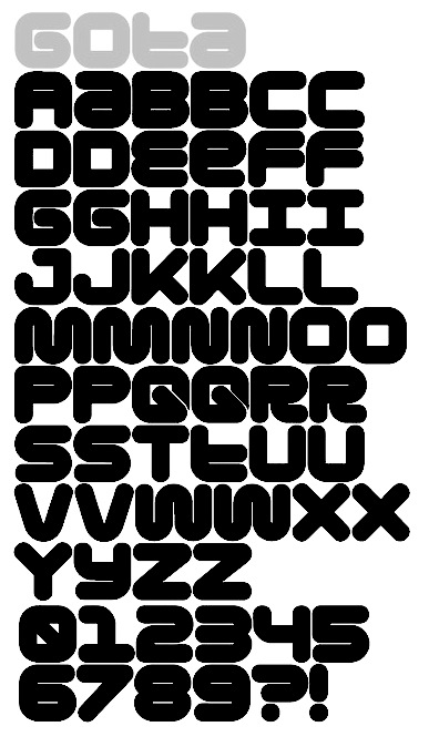
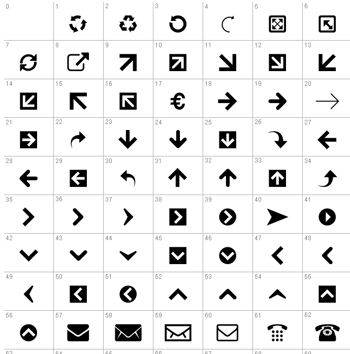
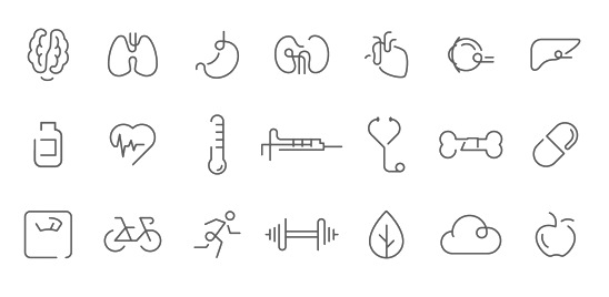
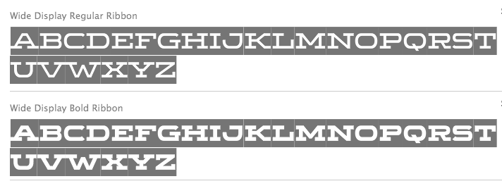
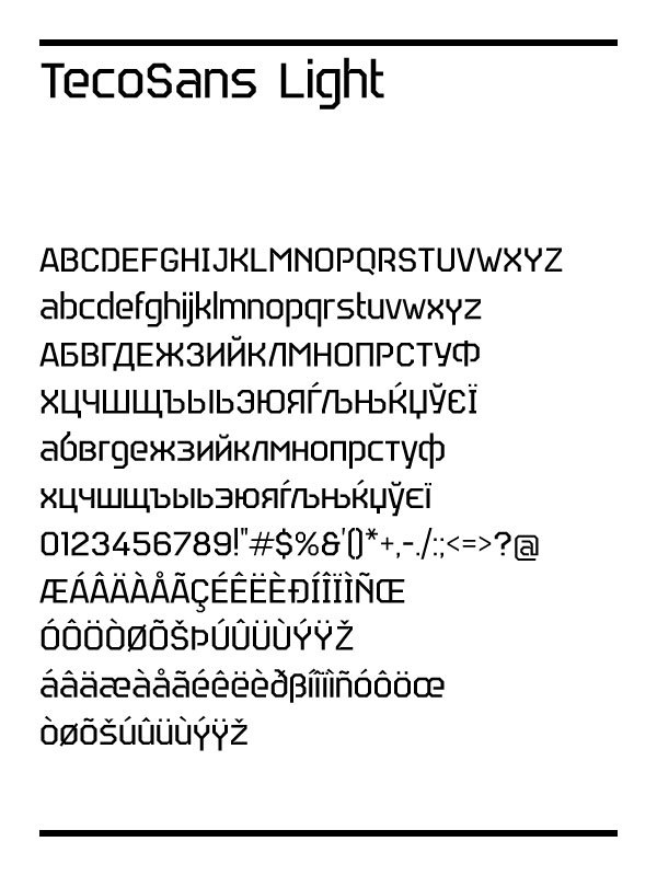
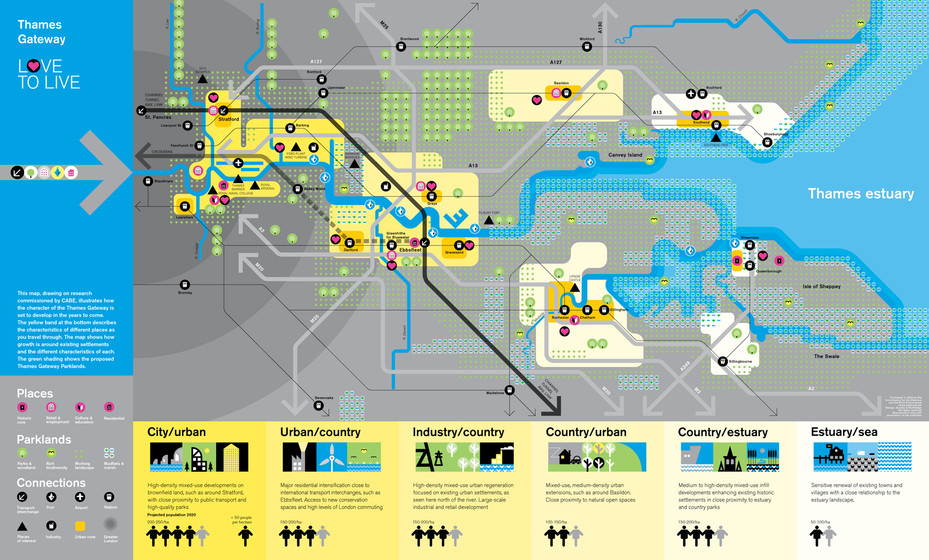
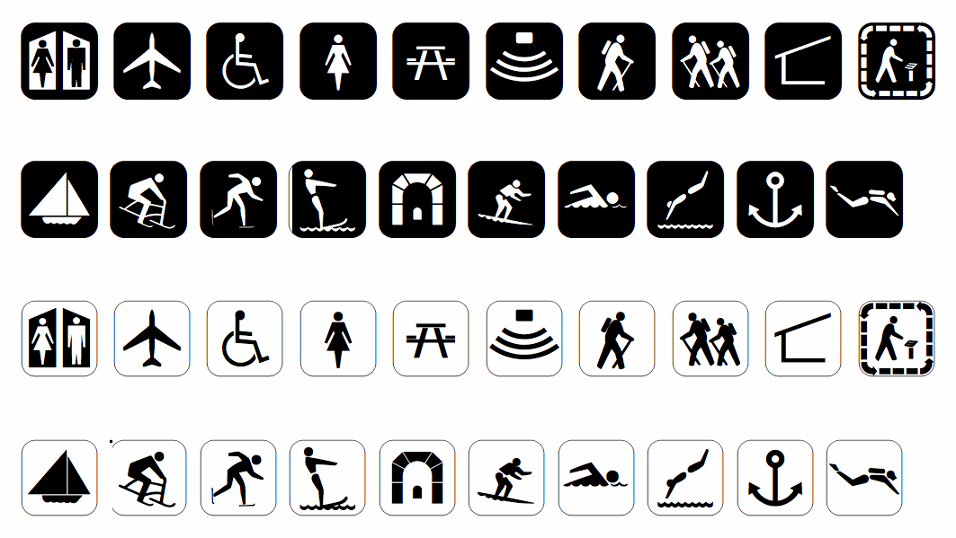
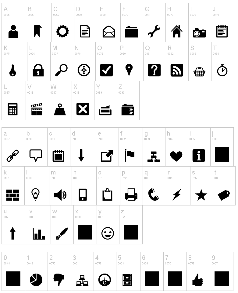
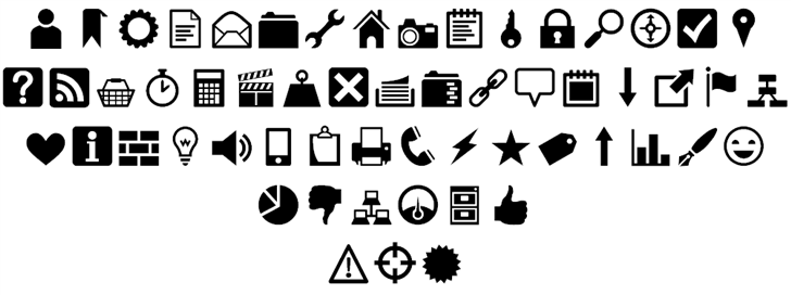
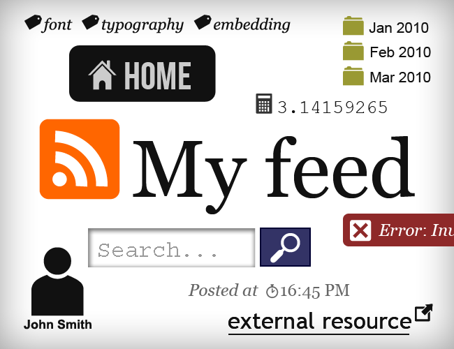
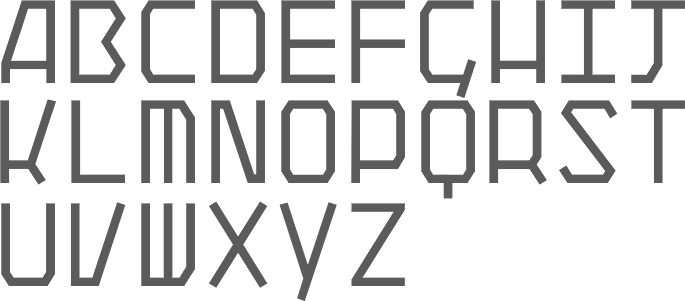
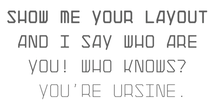
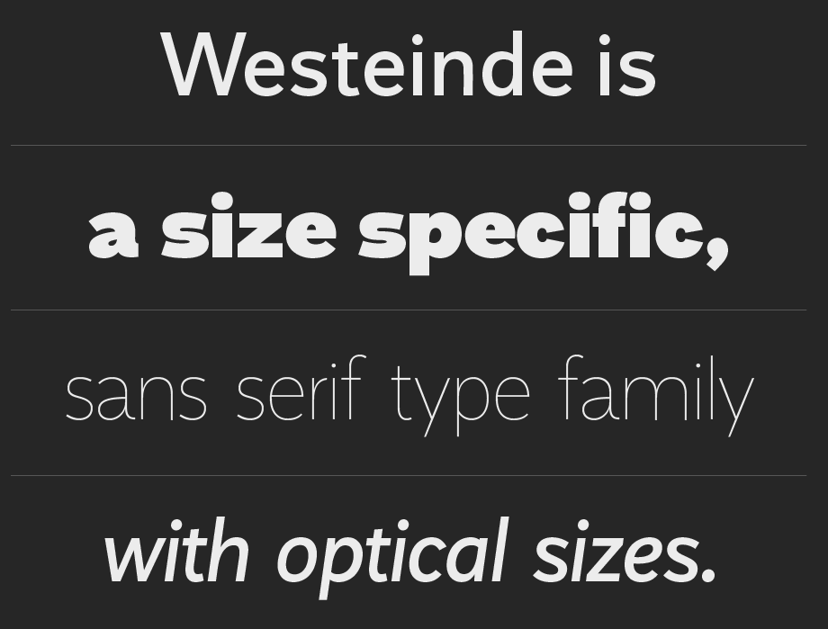
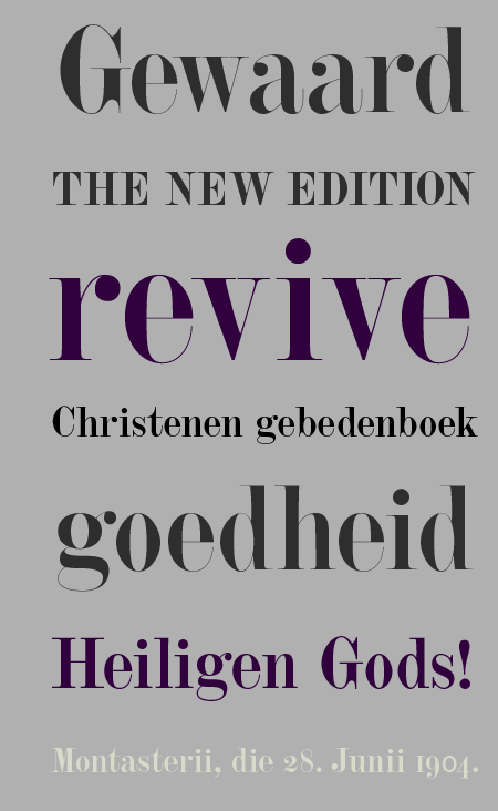
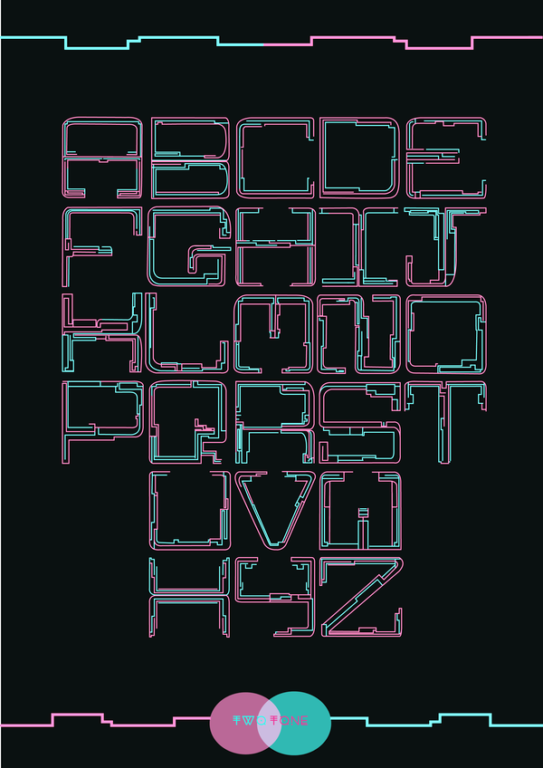
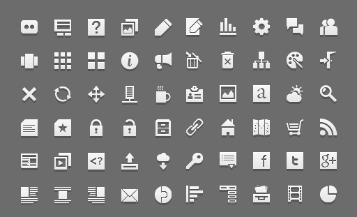
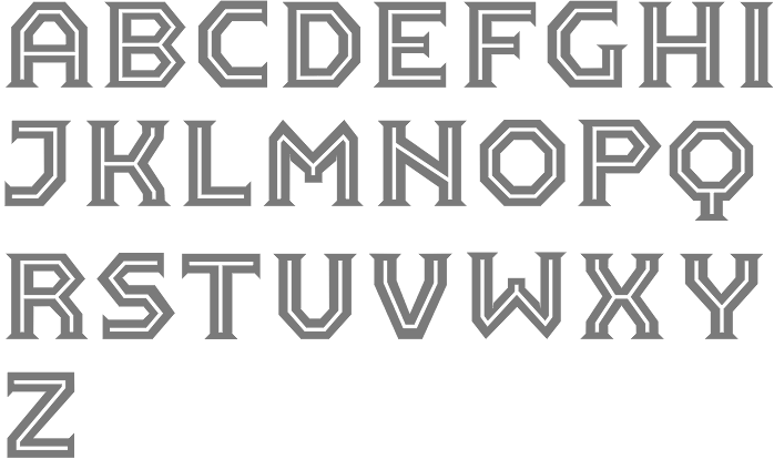
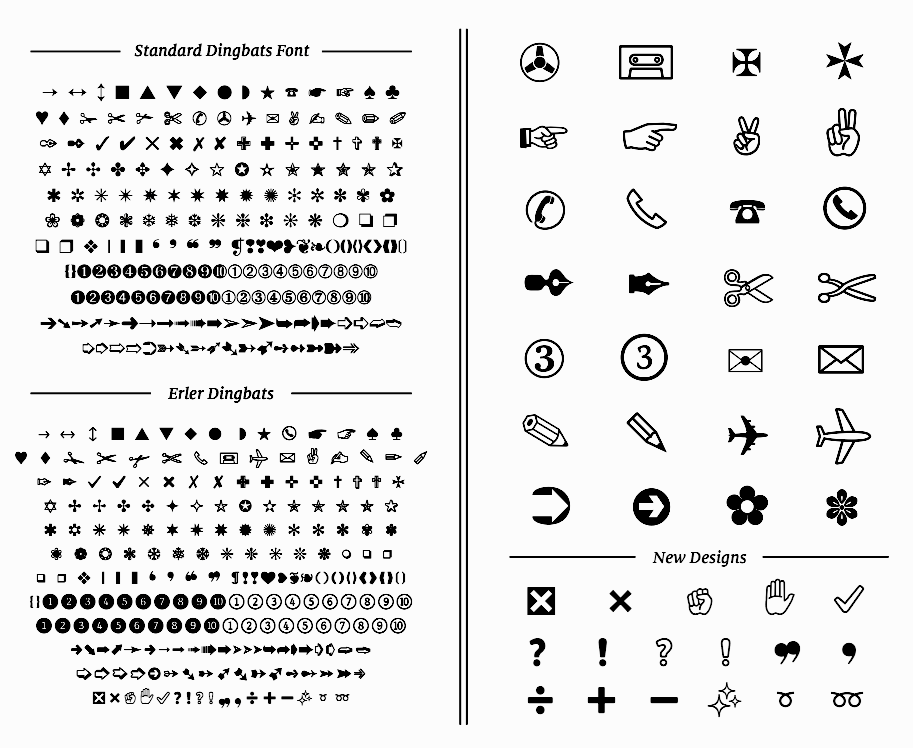
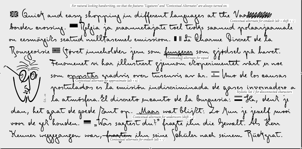
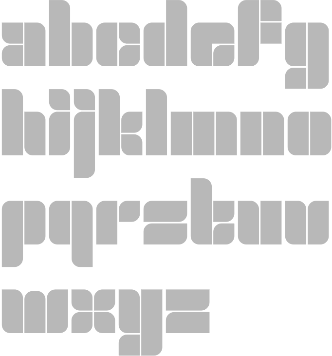
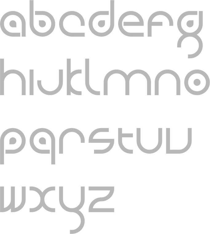
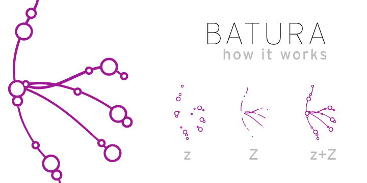
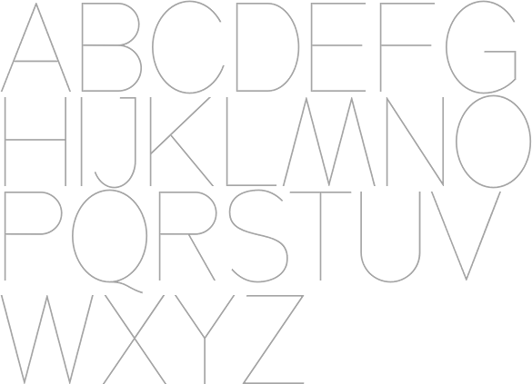
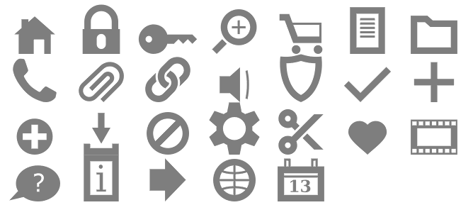
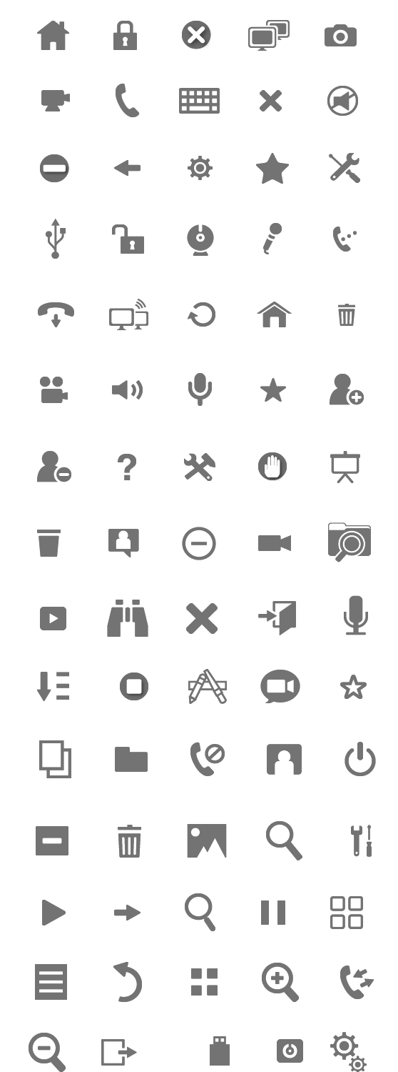
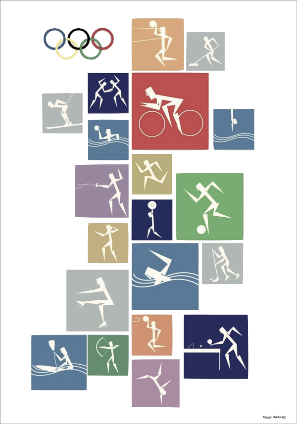
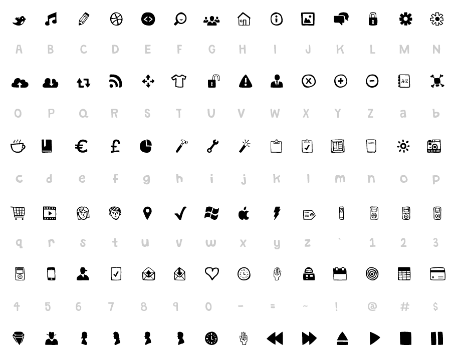
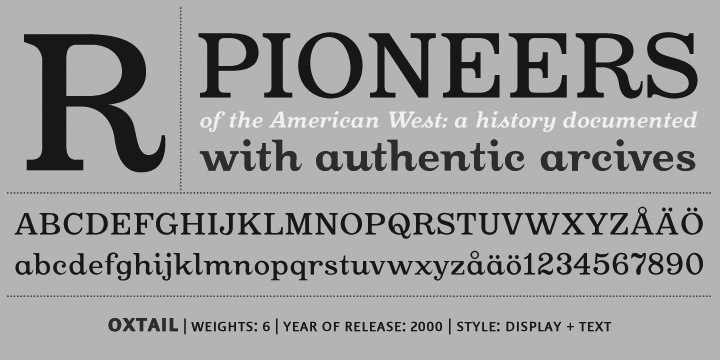
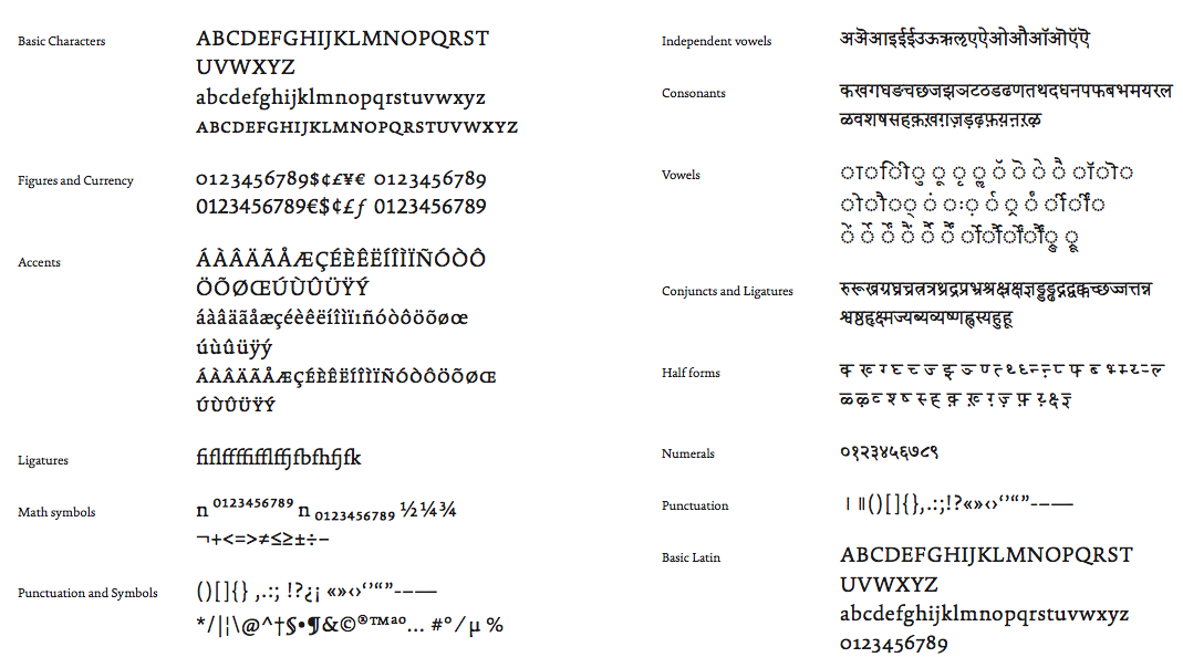
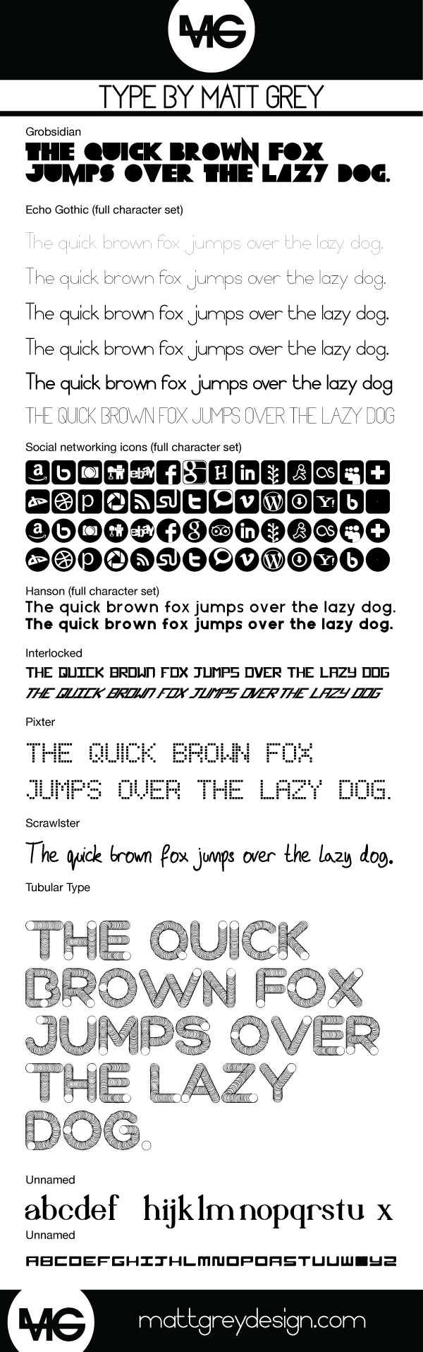
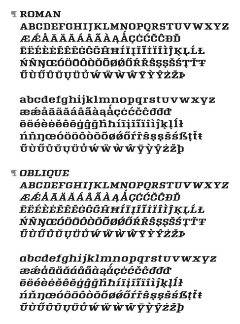
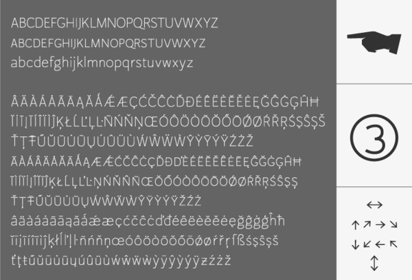
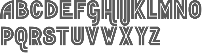
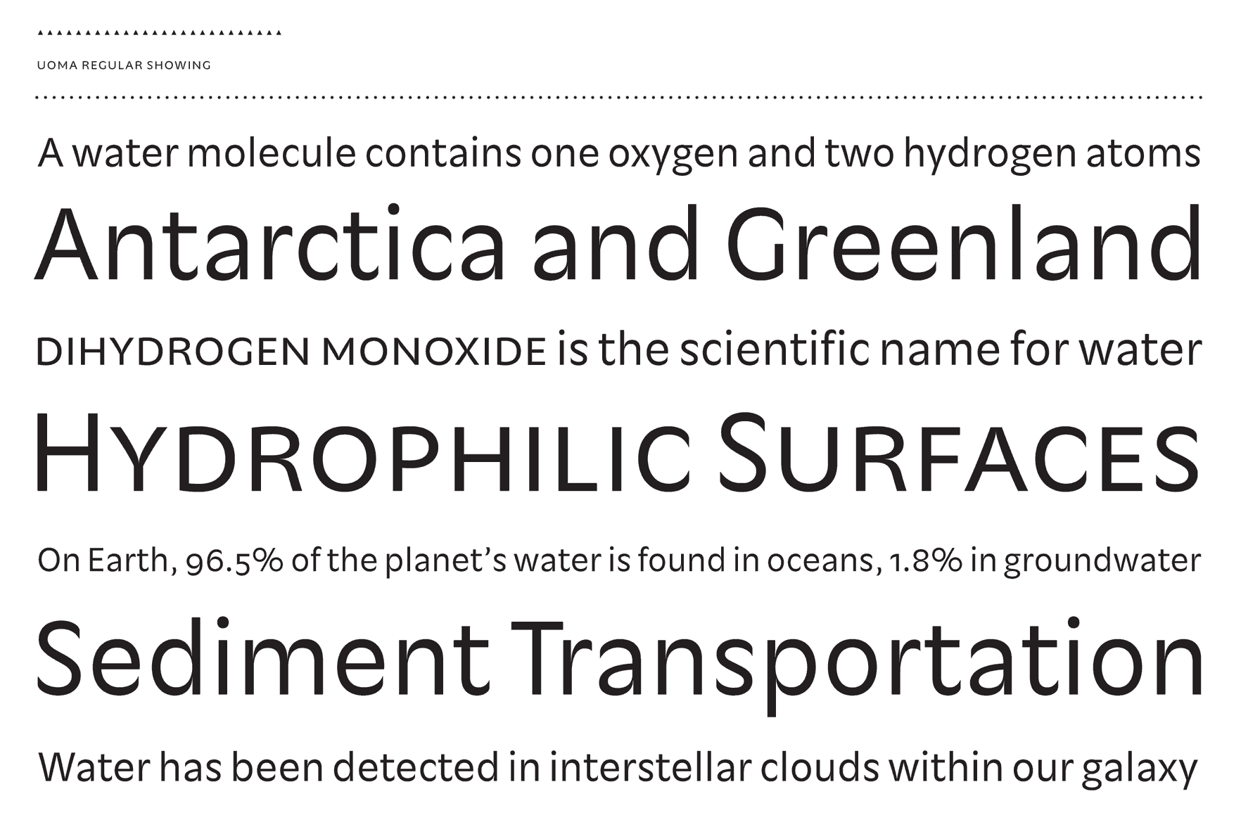
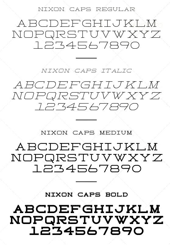
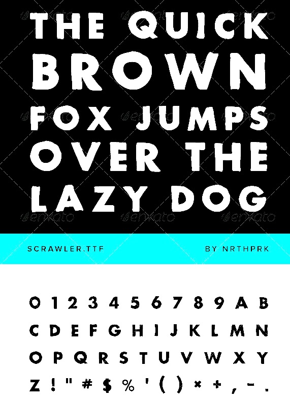
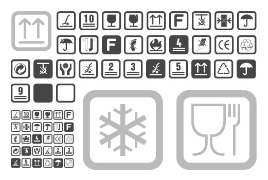
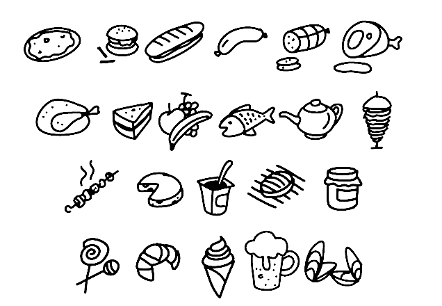
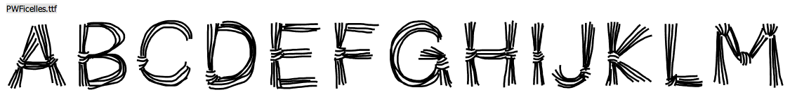
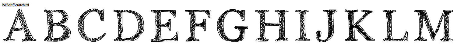
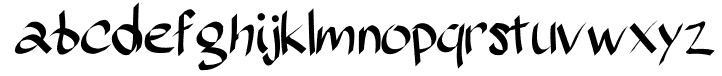
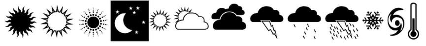
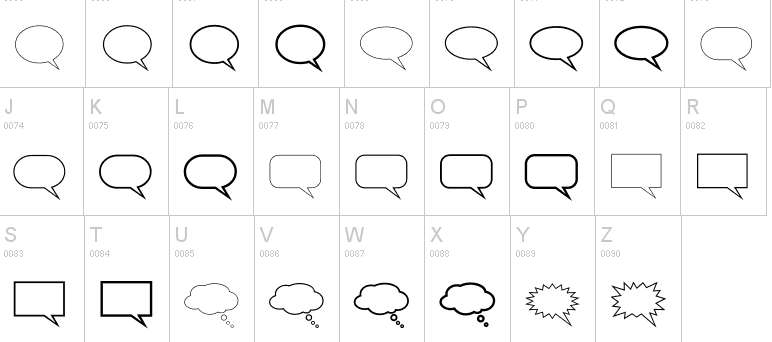
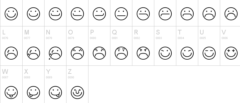
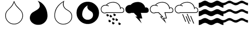
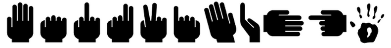
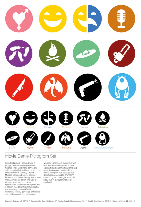
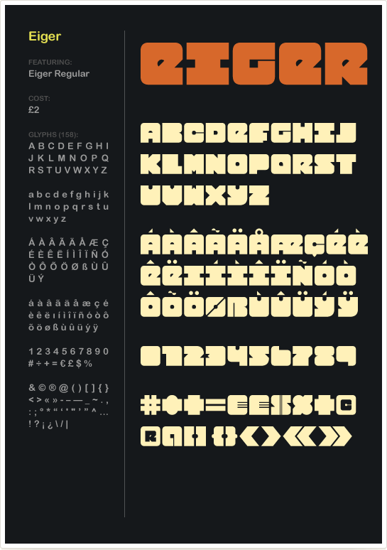
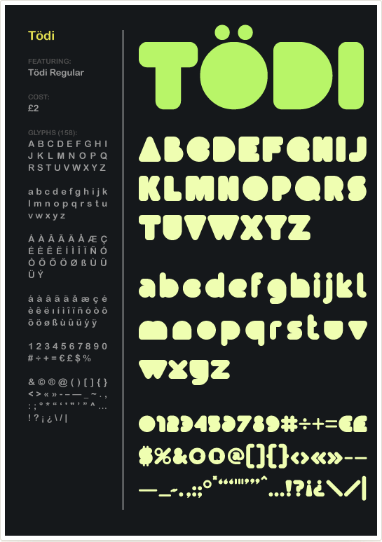
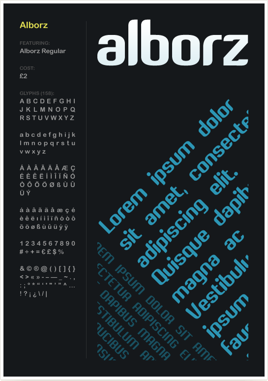
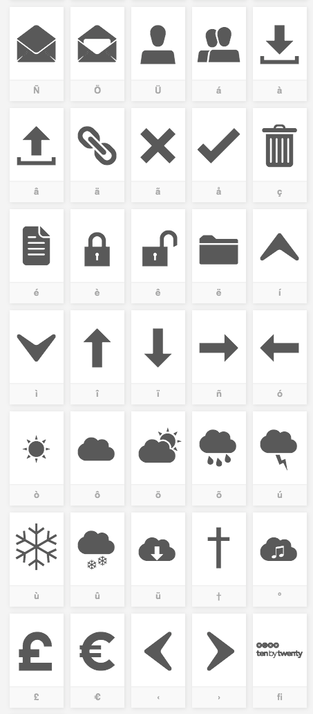
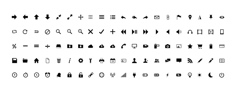
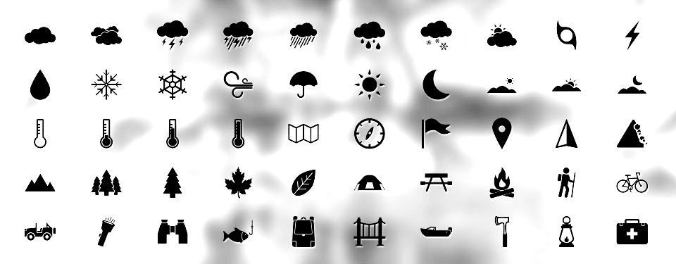
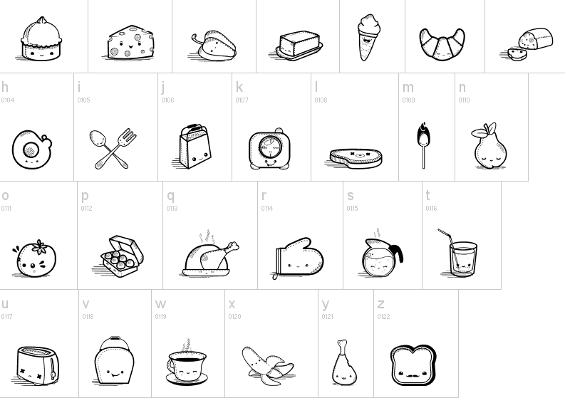
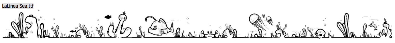
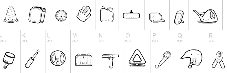
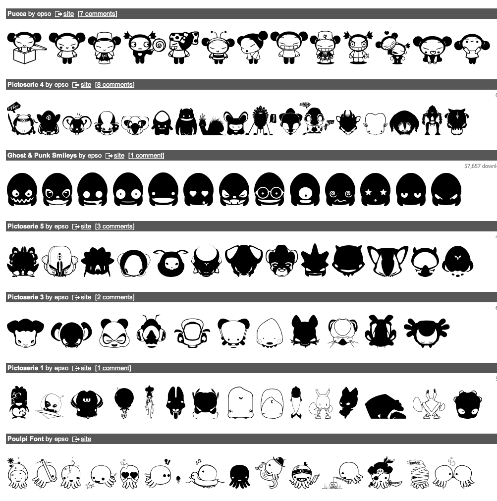
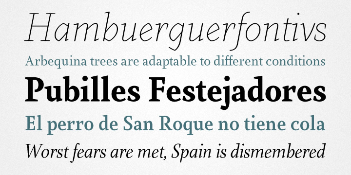
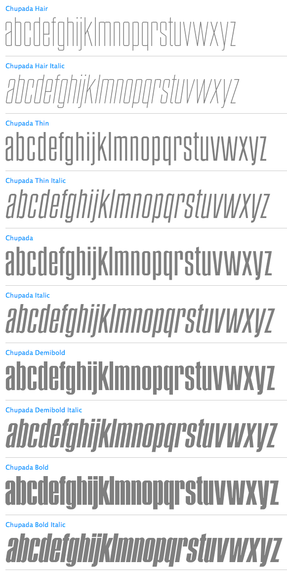
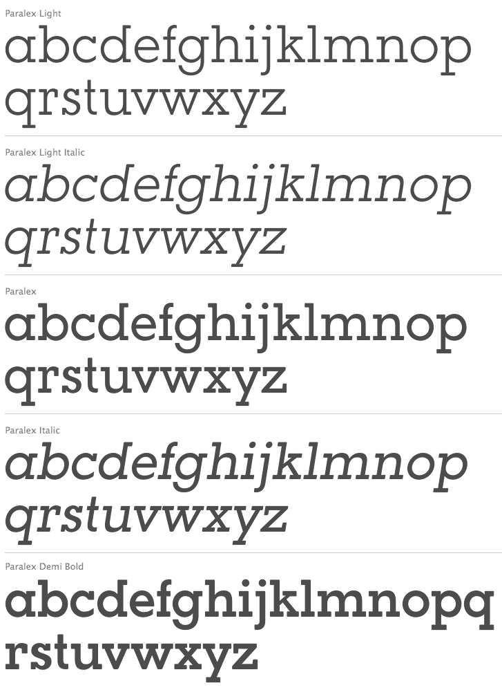
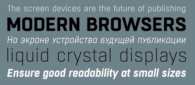
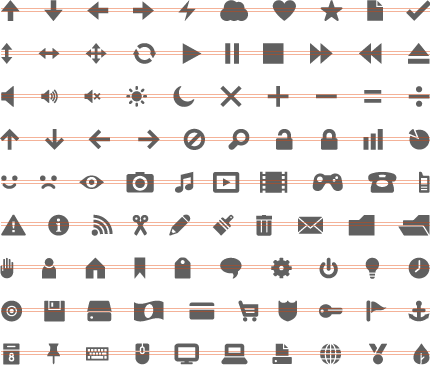
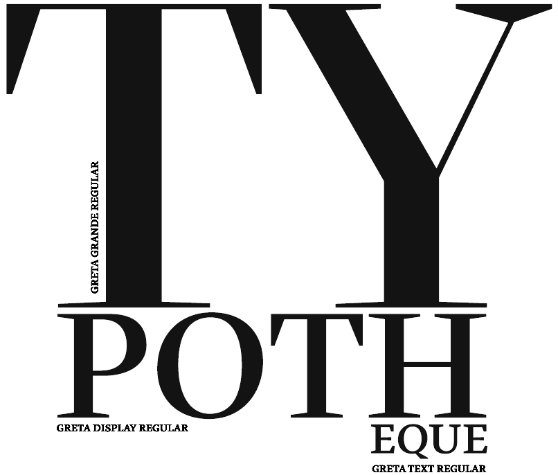
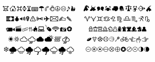
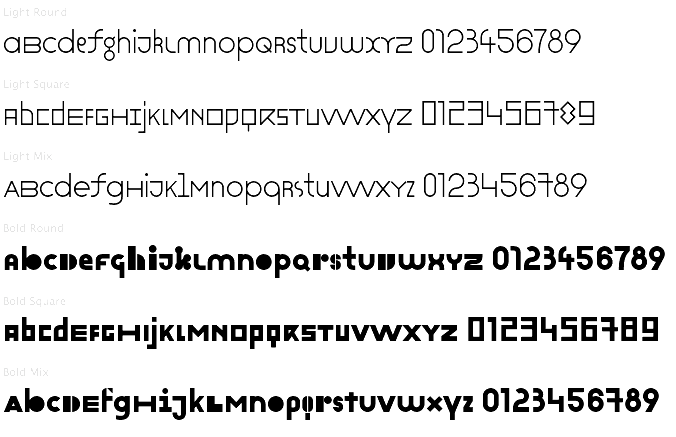
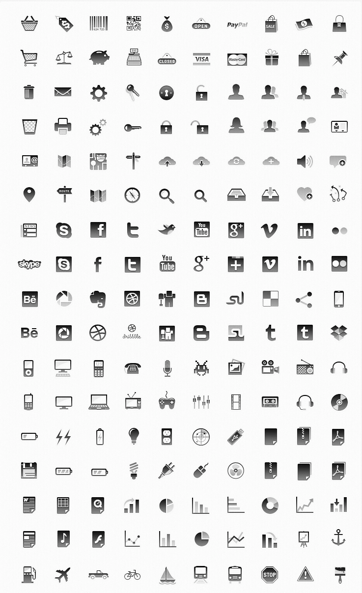
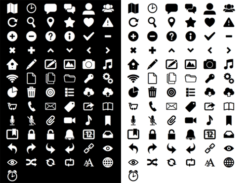
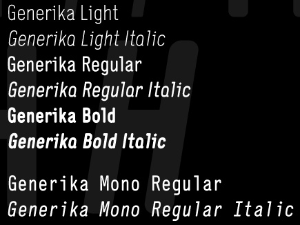
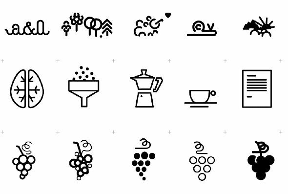
|
|
|
|