TYPE DESIGN INFORMATION PAGE last updated on Mon Jun 8 17:54:36 EDT 2026
FONT RECOGNITION VIA FONT MOOSE

|
|
|
|
|
Type design in Japan | ||
|
|
|
|
SWITCH TO INDEX FILE
04 extra
| Free pixelized fonts by Yuji Oshimoto: the 04b family. Postscript and truetype, PC and Mac. Japanese designer of Beech (psychedelic), Broccoli, Beech, Chicory, Carrot, Sixgun (dot font) and Horseradish. Alternate URL. Alternate URL. Another URL. | |||||||||||||||||
2apes.com
| Original katakana fonts and dot fonts by Taishi Yokoyama. Mac and PC: ApeliumK (1999) and Receipt43 families. [Google] [More] ⦿ | |||||||||||||||||
DEAD LINK. Four free fonts, all called Mild, at this Japanese site. Three of the fonts are katakana. One is a grunge Latin font. [Google] [More] ⦿ | ||||||||||||||||||
Interesting archive with MSMincho, MSGothic, Wadalab Gothic, dfpop9, hgrgep, hgrskp, hgrsmp, all Japanese fonts in truetype. [Google] [More] ⦿ | ||||||||||||||||||
"Minmes", aka "55", is the designer of SmallFont 4th (2002) and SmallFont 6ty (2002), both extreme pixel fonts. Alternate URL. [Google] [More] ⦿ | ||||||||||||||||||
Japanese foundry with some commercial fonts. I think that the fonts can be bought through Shift Factory. One font is called MaoFont. [Google] [More] ⦿ | ||||||||||||||||||
A Spoonful of Sugar
|
Fontspace link. Klingspor link. [Google] [More] ⦿ | |||||||||||||||||
Commercial Japanese foundry with beautiful fonts: Zen Old Minchou R, Marumin Old, Kurenaido, Zen Antique, Dots, Zen Loop, Zen Loop Italic. [Google] [More] ⦿ | ||||||||||||||||||
Designer of the handwritten kanji/kana/Latin/Cyrillic typeface Hikaisho (2003). Alternate page. [Google] [More] ⦿ | ||||||||||||||||||
Japanese page that explains the various electronic font formats. [Google] [More] ⦿ | ||||||||||||||||||
ACAF stands for Ascender Compact Asian Fonts. Their blurb at the launch in 2006: ACAF uses proprietary techniques to render the complex ideographs found in Simplified Chinese, Traditional Chinese, Japanese and Korean (CJK) scripts. By using component outlines, versus entire character outlines, ACAF offers significant benefits over standard TrueType or OpenType font formats. And unlike other compact font formats, such as stroke or stick fonts, the quality of Ascender Compact Asian Fonts is such that no embedded bitmaps are necessary for typical screen sizes. This savings in space by reusing pierces of font outlines is useful for high quality (scalable) fonts on mobile devices and digital TVs. [Google] [More] ⦿ | ||||||||||||||||||
Born in Singapore, Acra is a brand designer based in Tokyo specializing in typography, calligraphy and letterforms. In 2017, she attended Torinoumi Osamu's one-year Japanese Type Design Program, Mojijuku (a Japanese type design course) where she created her first Japanese font for Hiragana, Katakana and Kanji. In 2019, she participated in the Type@Paris intensive course, and that resulted in the friendly serif typeface Companion, which was designed for use in small sizes, and, in particular, for typesetting information in food labels. In 2020, she joined Neil Summerour's Positype Flourish foundry. [Google] [More] ⦿ | ||||||||||||||||||
Major Japanese free font foundry with techno, katakana, hiragana, comic book Latin, techno and game fonts. List: NiseAirTrix, NiseAlienFront, NiseAstroCity, NiseChuChu, NiseColumns, NiseEnduroRacer, NiseEswat, NiseGalaxyForce, NiseGameGear, NiseGenesis, NiseGreatestNine02, NiseGunstarHeroes, NiseHangOn, NiseHornet1994, NiseHornet1997, NiseIchidantRK, NiseIsao, NiseJSRF, NiseJoypolis, NiseKidChameleon, NiseKnuckles, NiseMarkIII, NiseMegaDriveEU, NiseMegaDriveK, NiseOverWorks, NisePico, NiseR360, NiseRoboPitcherK, NiseSG1000, NiseSGGG, NiseSega, NiseSegaK, NiseSegaKara, NiseSegaKn, NiseSegaNet, NiseSegaRosso, NiseSegaSaturn, NiseSegaSports, NiseSegaSports2k, NiseSegaSports2k1, NiseSegaSports2k2, NiseSegaSports2k3, NiseShiningD, NiseShinobi1987, NiseSonic, NiseSonicBattle, NiseSonicIcon, NiseSonicK, NiseSonicKb, NiseSonicShuffle, NiseSpaceHarrier, NiseSuperHangOn, NiseTantRK, NiseTera, NiseTheDead, NiseThunderBlade, NiseUfoCatcher, NiseVFkids, NiseWonderMega, NiseZaxxon, NiseZillion, NiseHotRod, NiseMajorLeague, NiseMegaDriveBR, NiseSegaSonic. [Google] [More] ⦿ | ||||||||||||||||||
Japanese designers of the free fonts Momo, Inapple, Flower Bold, Candy Bold and Mika Hiragana. [Google] [More] ⦿ | ||||||||||||||||||
Add (Aoki Digital Design)
| Geometrically strong fonts by Atsushi Aoki: AddFatMan, Shade, Speedy, Round, Steel, Line, Rusty, Loops, Shark (not free), WASP (not free), Jazz, IronPoint7, StandardBitmapPoint9. Mac type 1 and Windows truetype. Font names: AddCityboyNormal, AddElectricCity, AddFatMan, AddJazz, AddLGBitmap09, AddLine, AddLoopsNormal, AddMBitmap06, AddRusty, AddShade, AddSniperNormal, AddSpeedy, AddStandardBitmap (2011), AddStarSugarNormal, AddStarSugarOblique, AddSteel, AddWBitmap09, Addround. Font Pavilion sells AddWasp (1999). He designed PointN (1999) at Digitalogue in their DPI72 series. Alternate URL. Dafont link. [Google] [More] ⦿ | |||||||||||||||||
Addax Designs
| Japanese foundry with a nice web presence. Free original fonts made in 2000 and 2001 by "Gurucho": Spiral-Bitmap, TeaPot, XSquare, XSquare-Katakana, XSquare-Lite. Most of these fonts are either pixel fonts or inspired by the pixel movement. Teapot (2001-2006) is an informal sans. Hosobiki (2005) is a paperclip font. N.E.L. (2007) is a sans face. [Google] [More] ⦿ | |||||||||||||||||
Japanese designers of the pixel fonts nindots (2004, Latin) and Kakuji (2004, kana). [Google] [More] ⦿ | ||||||||||||||||||
Ages5&Up
| Japanese site with one original free font each week. Some fonts are great, such as 5&up-Namco, 5&up-Airport, 5&up-KC, 5&up-Peanuts, and 5&up-Sega. There are also hiragana fonts for free. Designer: Katsuya Nakamura. Dead link! [Google] [More] ⦿ | |||||||||||||||||
Paul Rädle's great jump page for foreign fonts and phonetic fonts. [Google] [More] ⦿ | ||||||||||||||||||
Japanese designer of Fluent Sans (2014). Dafont link. [Google] [More] ⦿ | ||||||||||||||||||
Aiden Catbagan
| ||||||||||||||||||
Ainezunouzu
| Akira Hayashi (Ainezunouzu) is the Japanese designer of the experimental Latin fonts UzuAutotwo, UzuBalloonO, UzuBalloon, UzuBiscuit, UzuBmp01_06 (pixel), UzuCheeseO, UzuCheese, UzuCracker and UzuRenga. He also made the handwritten kanji fonts UzuPen, UzuPencil, UzuKaku, UzuMaru, UzuFace, UzuOfTsuchiyaB, UzuOfTsuchiya, UzuFude. [Google] [More] ⦿ | |||||||||||||||||
Japanese free font maker specializing mainly in pixel fonts, kana, kanji, Latin. A partial list of their fonts, all made in 2004: 53SeedExtended, 53Veda, 53VedaExtended, 55Kana, 55KanaExtended, 75Naga, 75NagaExtended, 76NagaBold, 76NagaBoldExtended, 88Zen. [Google] [More] ⦿ | ||||||||||||||||||
A-kei
| Commercial Japanese truetype fonts (kanji) by Masahiro Suzuki. He also published some Japanese typefaces at FONT1000. His typeface names start with AFP for Atelier Font Products. They include AFP Karuta, AFPhina, AFPWaraku, AFPGagaku, AFP Kiraku, AFP Suruga. [Google] [More] ⦿ | |||||||||||||||||
Aki Mari
| ||||||||||||||||||
Aki Toyoshima
| ||||||||||||||||||
Links to free fonts for Japanese. Also, discussion and news on commercial Japanese fonts. [Google] [More] ⦿ | ||||||||||||||||||
Akihiko Morisawa
| ||||||||||||||||||
| ||||||||||||||||||
Akihiro Oya
| ||||||||||||||||||
Akihiro Tsusaka's fonts are sold through Font Pavilion: Caterpillar-System, Nightcrawler (1999), Poodle2K (1999). [Google] [More] ⦿ | ||||||||||||||||||
Designer of the commercial fonts Ahoo-Bomber (1998) and Ahoo-Check, sold at Font Pavilion. [Google] [More] ⦿ | ||||||||||||||||||
Akiko Naito
| ||||||||||||||||||
Japanese type designer, b. Fukuoka, 1989. She graduated from the Design Department, College of Art, Nihon University. In 2012, she joined Fontworks Inc. Her first typeface, PalRamune, was released in 2017. [Google] [More] ⦿ | ||||||||||||||||||
Akiko Sekimoto's fonts are sold through Font Pavilion: drop. [Google] [More] ⦿ | ||||||||||||||||||
Akiko Yamaga's techno fonts Apolo (1998) and Union (1998) are sold through Font Pavilion. [Google] [More] ⦿ | ||||||||||||||||||
Visiting Professor at Kyoto University, who also works at the Takarazuka Media Lab. Japanese type designer who published some Japanese typefaces at FONT1000. [Google] [More] ⦿ | ||||||||||||||||||
Akipon Design House
|
Other (exquisite!) Japanese typefaces by her include Aki (2004, FONT1000), Kikori (20009, FONT1000), Tsurumaru (2008, FONT1000), Omusubi (2007, FONT1000), Suzume (2006, FONT1000) and Andante (2005, FONT1000). For a project, he created the Latin poster typeface Midsummer Nights Dream. In 2012, she won the Bronze Prize in the Kanji category of the Morisawa Type Design Competition for Suzumushi. His typeface Ensoku (2013-2014) won an award at the Morisawa Type Design Competition 2014. Aki won the Gold Medal in the kanji category for Natsume in 2016 at the Morisawa Type Design Competition 2016. [Google] [More] ⦿ | |||||||||||||||||
Akira Hayashi
| ||||||||||||||||||
Akira Kataoka
| ||||||||||||||||||
Akira Kobayashi
| ||||||||||||||||||
Speaker at ATypI 2012 in Hong Kong: Rounded sans in Japan. View Akiro Kobayashi's typefaces. Klingspor link. FontShop link. Eurostile Next review. Linotype link. Monotype link. MyFonts interview in 2017. [Google] [MyFonts] [More] ⦿ | ||||||||||||||||||
Akira Uchida (Hitachi, Ltd. and TypeBank Co, Ltd) developed a very useful free full Latin/Kanji/unicode "didone style" font called XANO-mincho-U32 (2003). Opentype included. A thing of beauty. Direct download. He also made another full (free) didone-style unicode font, Kandata (2004). Here you can download his Tsuitiku-Kana family from 2004 until 2005. [Google] [More] ⦿ | ||||||||||||||||||
Original fonts for Mac and PC, mostly Latin letters, but also a few kana typefaces: AKAkubit12H, AKElephant3, AKMyPrince (2004), AKOsaruH, AKOsaruR, AK-Keroyon (2003, alphadings), Akubin (handwriting), AKAppriqueBlack, AKANGEL, AKAppliqueWhite, AKUNCIAL, AKCalligraphy, 09Keroyon (2004), AK Jelly Beans (2004), AK-Piyoko (2004, egg dingbats), AK woopaa, AK Roopaa, AK-Halloween (2004, dings), AK Sweet Prison (2004, Fraktur), AK-BlackCastle (blackletter, 2004), AK-WinterYawns (2004, winter dings). AK-Shanghai 1930 (2005), AK-Japonesque (2005), AK-My Baby (2005, child dingbats), KS Lovers (2007, handwritten Latin and kana). In 2008, they stopped offering free fonts. [Google] [More] ⦿ | ||||||||||||||||||
Great Unicode jump page. Has a page showing all fonts that support the various Unicode ranges. Check, for example, his Shavian Unicode sub-page. Unicode font utilities. Some font downloads, including the Unicode font MPH Damase (2005, Mark Williamson). [Google] [More] ⦿ | ||||||||||||||||||
Hong Kong-based type designer whose Japanese / Chinese typeface Geometrika (2013) won an award in the kanji category at the Morisawa Type Design Competition 2014. [Google] [More] ⦿ | ||||||||||||||||||
Japanese Fontsructor who made the display typeface One OK Rock (2013). [Google] [More] ⦿ | ||||||||||||||||||
Allen Vincent Hershey
| ||||||||||||||||||
Japanese foundry. Creators of the free dingbat font AlohaFont 01 (2007). [Google] [More] ⦿ | ||||||||||||||||||
| ||||||||||||||||||
Japanese type foundry. In 2018, they published the modulated sans typefaces Amato Font and Amatohoso Font for Latin and Japanese. [Google] [MyFonts] [More] ⦿ | ||||||||||||||||||
Amazon fonts
|
Downloads:
| |||||||||||||||||
Based in Yokohama, Japan, An Takemitsu created the free connect-the-dots AI-format Latin font Portal (2014). Behance link. [Google] [More] ⦿ | ||||||||||||||||||
André Germain
| ||||||||||||||||||
Andreas Uebele
| ||||||||||||||||||
Free downnloads of Ahem, Clockopia, DroidSans-Bold, DroidSans, DroidSansFallback, DroidSansFallback, DroidSansHebrew, DroidSansJapanese, DroidSansMono, DroidSansThai, DroidSerif-Bold, DroidSerif-BoldItalic, DroidSerif-Italic, DroidSerif, MotoyaLCedar-W3-90ms-RKSJ-H, MotoyaLMaru-W3-90ms-RKSJ-H. Droid (2007) and Clockopia (2009) are by by Google (2007) and Motoya is by Motoya Corporation (2010). Ahem (2010, Todd Fahrner) is for the CSS Samurai's browser testing. Motoya was created for mobile machines. [Google] [More] ⦿ | ||||||||||||||||||
Katakana and hiragana fonts attached to commercial learning software by Andrzej Lapa. [Google] [More] ⦿ | ||||||||||||||||||
Graphic designer in Las Palmas de Gran Canaria who created Rising Typeface in 2013, for which he took inspiration from samurai warriors. Artyca (2013) is Gill Sans, adapted to various symbologies. In 2015, he designed the minimalist hipster typeface Nara, which is inspired by the architecture of Japan's second historical period known as Nara. [Google] [More] ⦿ | ||||||||||||||||||
Japanese outfit that made some free experimental and/or techno Latin fonts in 2008 and 2009: Angelica, Apricot, Celery, Citronella, Durian, Elder, Feijoa (dotted), Flax, Heliotrope, Liquorice (dotted), LoveApple, Mandarin, Marsh, Melissa (dotted), Paprika, Rosemary. Sorrel (puffy) was published in 2010. [Google] [More] ⦿ | ||||||||||||||||||
Creator of the pixel typeface New Noise (2014), which was influenced by Pachinko games. This typeface was finished during her studies at UCLA. [Google] [More] ⦿ | ||||||||||||||||||
The free handwritten kana font "Cinema" is here. [Google] [More] ⦿ | ||||||||||||||||||
Japanese (a WSI truetype font with about 40 kanjis). Also, Retortot and Sumire, two katakana families by Yuji Saiki, 1999. Truetype. [Google] [More] ⦿ | ||||||||||||||||||
Anke Arnold
| ||||||||||||||||||
Anke Art
|
English page. For 10DM (5 USD), Anke will make your handwriting into a font! Alternate URL. Dafont link. Another link. Open Font Library link. [Google] [More] ⦿ | |||||||||||||||||
Scary fonts at a Japanese site: GhostParty, BloodySlime, DingTheInsect, TheNeighbours, AlmostDead, AlmostDeadBloody. Fonts subpage. Alkternate URL. [Google] [More] ⦿ | ||||||||||||||||||
During his studies at Kuwasawa Design School in Tokyo, Aoi Kageyama created the geometric solid typeface Katie (2017). [Google] [More] ⦿ | ||||||||||||||||||
Apricot Color
| Free handwritten full kanji (anzumoji) fonts made by Kyoko: Anzu, APJapanesefontPrecocity, APJapanesefontPrecocityT, APJapanesefont, APJapanesefontF, APJapanesefontK, APJapanesefontT. [Google] [More] ⦿ | |||||||||||||||||
Explanations of Japanese/Chinese typesetting. [Google] [More] ⦿ | ||||||||||||||||||
Vendor of Mac and PC fonts for several languages and from a variety of companies, active ca. 1999. The fonts covered Japanese, Chinese, Russian, Arabic, Hebrew, Persian, Urdu, Tamazight, Turkish, Greek, Indic, Thai, Eastern European, and Korean. [Google] [More] ⦿ | ||||||||||||||||||
Area-Q
| Ichihara is the Japanese designer of Heartfont (2005, alphadings) and the destructionist typeface DESERT AREA-Q (2005). Dafont link. Yet another URL. Yet another URL. Fontspace link. [Google] [More] ⦿ | |||||||||||||||||
Student at Tokyo Visual Arts, b. 1992. Designer of the display sans typeface Sambadha (2014). Behance link. Dafont link. [Google] [More] ⦿ | ||||||||||||||||||
Japanese font links by Toshiaki Yamazaki, not updated since 1998. [Google] [More] ⦿ | ||||||||||||||||||
It sells the UniFonts 2000 package, as well as an XPDF font pack. Many of the free Chinese fonts on the web originate from Arphic. For example, here, one could download these fonts from 1998: Arphic-Mingti2-Light-BIG5, HerSin-Medium, InnMing-Bold, InnMing-Extra, InnMing-Heavy, InnMing-Medium, InnMing-Ultra, MaokaiEG-Bold-Big5, MaokaiEG-Extra-Big5, MaokaiEG-Heavy-Big5, NewGothic-Bold, NewGothic-Extra, NewGothic-Heavy, NewGothic-Light, NewGothic-Medium, OvlapRound_Outline-Ultra, PensinkaiEG-Light-Big5, PensinkaiEG-Medium-Big5, Pop1-Bold, Pop2EG-Bold-Big5, Pop3EG-Extra-Big5, Pop3EG-Medium-Big5, Pop3EG-Medium-Big565329, ShanHeiSun-Light, ShanheisunEG-Bold-Big5, ShanheisunEG-Medium-Big5, SingkaiEG-Bold-Big5, SingkaiEG-Light-Big5, StdKai-Medium, StdMing-Medium, StdkaiEG-Bold-Big5, StdkaiEG-Light-Big5, StdsungEG-Bold-Big5, StdsungEG-Heavy-Big5, StdsungEG-Light-Big5, TankuinEG-Bold-Big5, YankaiEG-Heavy-Big5, YankaiEG-Ultra-Big5, YenRound-Bold, YenRound-Extra, YenRound-Heavy, YenRound-Light, YenRound-Medium, YenRound-Ultra, ZuinnEG-Medium-Big5. Their Japanese fonts are sold by Dex Web. FireFly, a Taiwanese company, maintains the free font AR PL New Sung (2004), which was originally an Arphic font. Monotype sells many fonts, such as the sake barrel font Arphic PKanteiryu JIS. Alternate URL. In 2018, they published the multilingual (Chinese, Japanese, Korean, and many other languages) font Jing Xi Hei (+Hair, +Thin, very nice weights), AR DC Qing Yuan, AR DC HY Jian Wei, AR Fang Xin Shu. Typefaces from 2019: AR Shu Yuan Song. People presently involved with Arphic include Teresa Mou (senior font designer), Jeff Wu (Genral manager), Grace Yang, Judy Lee (senior font designer), Edwina Lee (strategic cooperation manager), August Lan (head of Font Wizard), and Kaku Kuo (team leader and font designer). Alternate URL. [Google] [More] ⦿ | ||||||||||||||||||
Four high-quality Chinese TrueType fonts generously provided by Arphic Technology (Taipei, Taiwan) to the Free Software community under the "Arphic Public License". The four free Chinese truetype fonts are about 10MB each: ZenKai-Medium, BousungEG-Light-GB, GBZenKai-Medium, ShanHeiSun-Light. Alternate URL. One more site. Yet another URL. This site has a file called fireflysung, which has the full Chinese font AR PL New Sung (1994-1999). CTAN download site. The license states: Everyone is permitted to copy and distribute verbatim copies of this license document, but changing it is forbidden. So I am hosting the fonts on my site: Download these fonts: AR-PL-KaitiM-Big5, AR-PL-KaitiM-GB, AR-PL-Mingti2L-Big5, AR-PL-SungtiL-GB. A large zip file with these fonts. [Google] [More] ⦿ | ||||||||||||||||||
Art and Fonts by Sean (aka The BlackBox)
| Free fonts by Sean Moldenhauer of Michigan City, Indiana, a graduate of the Art institute of Chicago who apprenticed with Donna Karen. Sean has beautiful Japanese calligraphic prints (shodo style) as well as fonts based on carefully researched historical typefaces. Examples: JapaneseZenSampler1 (2001), TheTombwinterandspring1 (1997, "heavily inspired by the incised letters from the tomb of Henry III, Westminster Abbey, about 1272"), Thorns (1997), VampyresGarden (1997, initial caps inspired by a copy of the Romant de la Rose from the beginning of the 16th century), HoursintheRain (1997), SevenWavessighsSalome (1997, caps). Very nice gothic and medieval style creations. He showcases great Arab, Japanese and Chinese calligraphy. [Google] [More] ⦿ | |||||||||||||||||
During his studies at Parsons the New School of Design in New York City, Asaki Okamura created the typeface Arsenal (2014), which showcases parts of different firearms. Before that, he lived in Singapore, Tokyo and Rio de Janeiro. Behance link. [Google] [More] ⦿ | ||||||||||||||||||
Elk Grove Village, IL-based company established in 2004, which specializes in font development, licensing and IP protection. It rose from the ashes of a major fire at Agfa/Monotype at the end of 2003. Its founders are Steve Matteson (type designer, formerly with Agfa/Monotype), Thomas Rickner (of Microsoft fame, where he hinted many Microsoft families), Ira Mirochnick (founder and President of Monotype Typography Inc in 1989 (where he was until 2000) and a Senior Vice President and director of Agfa Monotype Corporation (2000-2003), a self-proclaimed expert in font licensing issues and IP protection), and Bill Davis (most recently the Vice President of Marketing for Agfa Monotype). Also included in this group are Josh Hadley, Brian Kraimer, Jim Ford (since 2005), and Jeff Finger (as Chief Research Scientist, since 2006). On December 8, 2010, Ascender was acquired by Monotype for 10.2 million dollars. Their typefaces include Endurance (2004, Steve Matteson, an "industrial strength" Grotesk designed to compete with Helvetica and Arial; it supports Greek, Cyrillic and East European languages). In April 2005, Ascender announced that it would start selling the Microsoft font collection, which is possibly their most popular collection to date. They also started selling and licensing IBM's Heisei family of Japanese fonts in April 2005: Heisei Kaku Gothic, Heisei Maru Gothic and Heisei Mincho. Ascender's version of the CJK font Heiti is called ASC Heiti. Also in 2005, they started distributing Y&Y's Lucida family. In October 2005, Ascender announced the development of Convection, a font used for Xbox 360 video games. Their South Asian fonts cover Bengali, Devanagari, Gujarati, Gurmukhi, Kannada, Malayalam, Tamil and Telugu, and include Ascender Uni, Ascender UniDuo and Arial Unicode for general use across all Indic languages, and, in particular, the Microsoft fonts Vrinda (Bengali), Mangal (Devanagari), Shruti (Gujarati), Raavi (Gurmukhi), Tunga (Kannada), Kartika (Malayalam), Latha (Tamil) and Gautami (Telugu). Khmer SBBIC (2011) is a Khmer font at Open Font Library. It does more type trading and licensing than type creation, although Steve Matteson has contributed fairly well to their new typefaces. Their brand value took a hit when they started selling scrapbook, handwriting and wedding fonts under the name FontMarketplace.com. Recent contributions: Crestwood (2006, a house face, possibly by Steve Matteson) is an updated version of an elegant semi-formal script typeface originally released by the Ludlow Type Foundry in 1937. In 2009, they started a subpage called GoudyFonts.Com to sell their Goudy revivals. In 2010, they announced a new collection of OpenType fonts created specifically for use in Microsoft Office 2010: Comic Sans 2010 (including new italic and bold italic fonts), Trebuchet 2010 (including new black&black italic fonts), Impact 2010, Pokerface 2010, Rebekah 2010 and Rebus Script 2010. Ligatures in Comic Sans? View Ascender's typefaces. [Google] [MyFonts] [More] ⦿ | ||||||||||||||||||
Font editor by Pyrus/FontLab for Asian type design. Mac and Windows. [Google] [More] ⦿ | ||||||||||||||||||
Vendor of Korean, Japanese and Chinese software, including font packs for Mac and PC. AsiaSoft Inc./AsiaTech Inc. is located in Vero Beach, FL. Their font Urdu Naskh Asiatype (2001) for Urdu can be found here and here. Pashto Kror Asiatype (1994-2002) is here. [Google] [More] ⦿ | ||||||||||||||||||
Asobo Desigbn
| Osaka, Japan-based designer of these free Latin typefaces in 2019: Void, T-Rex, Nektons (sans), Manta Ray (a geometric sans), Super Villan (sic), New Hero, Old Hero. Download link at Asobo Design. [Google] [More] ⦿ | |||||||||||||||||
Kyoto, Japan-based designer of the free Latin circle-based typeface Hoop (2017). [Google] [More] ⦿ | ||||||||||||||||||
Japanese company which has made some commercial typefaces, typically sans serif: Asyl (Black and Dot), Composite (Bold New, Bold Old, Light, 360, 2000, 90's, 1900: sans adjusted to periods), Effects (New Regular, New Wide, Bold, Light: an octagonal family), Minimal (Regular, Round), Amsterdam (Regular, Bold, Light), Tadadah, 26 Dots, Hong Kong Express (black display sans). I don't know who among the staff designed these typefaces: Naoki Sato, Kazuki Ohashi, Yuu Sato, Rie Amaki, Mitsugu Mizobata, Shinichi Arakawa. [Google] [More] ⦿ | ||||||||||||||||||
Atomic Media (was: SmartDust)
| Matthew Bardram (b. New York City, 1965) is the Tucson, AZ-based [T-26] founder of Atomic Media, who specializes in bitmap fonts. He designed Atomic, Centrifuge, Bromide (at T-26), Crackle, Klaxon. At Nakedface (now gone), he made Arachnid, Bitpak, Bylinear, DhexInline, Genetica, Economy Large, Empiric, Hypersigna (2005, bitmap face), Montreal (the family) and two katakana fonts. His Bitpack includes the following pixel fonts: Bylinear (2000), Cellular (2000), Genetica (2000, free download), Genetrix, Macroscopic, Metodic, Microscopic, Noir, Scriptometer, Remote (2000), Monocule (2000), Joystik, Centrifuge, Quantaa (2000), Bionika, Megalon (2000), Wired, Badfish. Bardram's Digipak includes Atomic-Inline, Atomic-Outline, Bionika-Black, Bionika, Genetrix-Crossed, Genetrix-Square, Genetrix-SquareCore, Genetrix-SquareHollow, Joystik, Macroscopic-A, Macroscopic-B, Macroscopic-C, Macroscopic-D, Macroscopic-E, Methodic-Bold, Methodic, Microscopic, Noir, Scriptometer-SanScript, Scriptometer. Additional typefaces: a 3D pixel font called Boxer 3D (2002), Neuronic (2002-2004, nice outlined pixel font; see also here), Fusionaire (2002, a display font) and Wijdeveld, a squarish font based on the lettering of poster artist Wijdeveld from The Netherlands. In 2005, these fonts were added: Magnetica, Imperium, Ratio, Hypersigna, Sequence and Tempora, all by Matthew Bardram. Sausan Kare's pixel fonts at Atomic Media: Mini Food, Kare Dingbats, Biology, Everett, Harry, Ramona, Kare Five Dots, Kare Five Dots Serif, Kare Six Dots, Kare Six Dots Serif. Alternate URL. Interview. Klingspor link. [Google] [MyFonts] [More] ⦿ | |||||||||||||||||
Atsuhito Kohda
| ||||||||||||||||||
Designer of Pazool (Maniackers). [Google] [More] ⦿ | ||||||||||||||||||
Atsushi Aoki
| ||||||||||||||||||
Japanese designer of the futuristic (Latin) typeface Utopia (2019). [Google] [More] ⦿ | ||||||||||||||||||
Atsushi Kadono is a Japanese type designer who sells his fonts via Font Pavilion. Check his dingbat font Monochrome City. There are also austere katakana font families, Asahi and Shin-Asahi. [Google] [More] ⦿ | ||||||||||||||||||
Atsushi Kawakami
| ||||||||||||||||||
Designer of ef4000cc, sold at Font Pavilion. [Google] [More] ⦿ | ||||||||||||||||||
Atsushi Mizukami
| ||||||||||||||||||
Designer of the shareware font AngleBold (1998, Maniackers). [Google] [More] ⦿ | ||||||||||||||||||
Videos. ATypI on Twitter. Youtube channel for the presentations. [Google] [More] ⦿ | ||||||||||||||||||
Japanese foundry that markets about ten Latin and twenty full kanji fonts. Among its type families is LSN or Lambda Truetype Font. Finally, it sells a font editor for Japanese fonts, called LFEdit. [Google] [More] ⦿ | ||||||||||||||||||
Japanese outfit where some free fonts may be found. [Google] [More] ⦿ | ||||||||||||||||||
Designer of handwriting fonts for Japanese: chimacoron (2004), chimacoronhoso (2004), Tinkling Bell (2003), OhiruneFont, kotorimojiFONT-TT (full kanji font, also called TheLittleBirdFONT), RuFont, WarabeFont, TheLittleBirdFONTS (2003, full kanji face, handwritten), WarabemojiKTT (2003, full kanji font). Home page. Alternate URL, which has these free Latin/kana techno fonts: ChimaChima, Dekaji, Funyaji, MaruMaru, MiniChima, MiniChimaKaku, all made in 2003 by Aya Suzukon. Is this by the same type designer? [Google] [More] ⦿ | ||||||||||||||||||
Japanese designer of alphabets Ope Font, which can be downloaded here. [Google] [More] ⦿ | ||||||||||||||||||
Designer of the Latin/kana handwriting font ayaFONT01. Alternate URL. [Google] [More] ⦿ | ||||||||||||||||||
Ayako Ito
| ||||||||||||||||||
Ayako Ito (and: Type for Ukraine)
|
Commissioned typefaces include Bubble Tea (a bubblegum typeface designed for Stone And Strand, a NYC based jewelry startup), Kafeteria (a phenomenal geometric sans as part of the brand identity for Kafeteria, a new café at the Statens Museum for Kunst in Copenhagen by renowned Danish restaurateur Frederik Bille Brahe; just like the menu and experience at Kafeteria, the typeface combines Japanese minimalism with Danish culture), Good Girl (a sans designed for Stone And Strand, a NYC based jewelry startup), August KBH (custom typefaces for August Journal Issue 05: Copenhagen), Moet Hennessy, Gemic (a custom stencil typeface for Gemic, a global growth strategy firm with offices in NYC, Helsinki, Toronto, and Berlin). [Google] [More] ⦿ | |||||||||||||||||
Ayumi Hamasaki is the designer of A-STYLES (2003), all ornamented letter As. [Google] [More] ⦿ | ||||||||||||||||||
Designer at Font Pavilion of Caramelfont (2000). [Google] [More] ⦿ | ||||||||||||||||||
Ayumi Takeshima
| ||||||||||||||||||
Kakuji1 (2000) is a great artistic font with some kanjis, designed by Ayumi Takeshima. Look also for his calligraphy called Hudeji and Kamon (1999). [Google] [More] ⦿ | ||||||||||||||||||
Designers of the dingbat font A-Styles (2001), in honor of Japanese starlet Ayumi Hamasaki. [Google] [More] ⦿ | ||||||||||||||||||
Ayumu
| ||||||||||||||||||
Two huge font files for Windows: Dameji (by Takuya Ando), Habadasa (by Tetsuya Hozaki). I suspect they are two kanji truetype fonts. [Google] [More] ⦿ | ||||||||||||||||||
Azuki Font
| Azusa Hyuga's Japanese foundry Azuki offers the handwritten Japanese font Azuki. Alternate URL. Uzura (2007) is a hand-printed Latin/Cyrillic/kanji font. [Google] [More] ⦿ | |||||||||||||||||
Azusa Hyuga
| ||||||||||||||||||
Baekmuk (was: Hwan Design)
| Korean company that developed the freeware Hangul fonts Baekmuk Dotum (sans), Baekmuk Batang (serif), Baekmuk Gulim (warm rounded sans) and Baekmuk Headline (heavy). All fonts were made by JeongHwan Kim between 1986 and 2002, and cover Korean, Japanese and Chinese. CTAN download site. [Google] [More] ⦿ | |||||||||||||||||
Bagel & Co
|
Dafont link. Fontspace link. Kernest link. [Google] [MyFonts] [More] ⦿ | |||||||||||||||||
Free Japanese techno fonts Ionic Bond and Kaden-60. Aka em-DESIGNS E.d. Fonts. Dafont link. [Google] [More] ⦿ | ||||||||||||||||||
Small commercial Japanese foundry specializing in handwritten and extreme brush fonts. [Google] [More] ⦿ | ||||||||||||||||||
Free fonts: OhHiGe (2003, OpenType), Kakudaron B (2003), Kakudaron IB (2003), GoJuOn (2003, kanji), Kurogama TsubuChan, After_Attack, CHOP!!!!!, MouTen-Dattayo-Soitsu-Wa (2002), Soitsu-Wa-MouTen-Dattayo (2002), Chain-Reaction, Chain-Reaction-Itaric, Kunyulla-Black, mimizu, HONEBONE-Ukokkei, PENTAGRON (2001), TALL-TWIN (2001), TECNO-STRESS, TECNO-STRESS-HIRAGANA, TECNO-STRESS-KATAKANA, Yura_Hiragana, Future-Chibaraki2, Tokyo Honey Chan (2002), DeJi (2002), Hone Bone Ukokkei, Hone Bone Hakkotsu (2001), Yurayura Hiragana, Tecno Stress, Before_Attack, KICK!!!!!, PUNCH!!!!!, Tall Twin (2001), Pentagron (2001), Chain_Reaction, Kemushi_Hira, Kemushi_Alp, Kemushi_Kata, Mystery-Circle, Oshare-Black, YuraH, TecnoS-K, TecnoS-H, Oshare-Honenuki, Suehirogari, JIHAI, MANZ, PINZ, SOUZ [the last four fonts are for mahjong and other games], The-ManPu, Chibaraki-Now, Future-Chibaraki, Oshare, IAmNotWeapon. Many fonts have Latin and kana versions. Alternate URL. Yet another URL. Yep, another URL. One more URL. Dafont link. [Google] [More] ⦿ | ||||||||||||||||||
Japanese outfit. Designed the commercial fonts Makuhari, Metropolis 2001, Yobatsuka. Roman and katakana versions. [Google] [More] ⦿ | ||||||||||||||||||
Japanese page explaining about the use of Bézier curves in type design. [Google] [More] ⦿ | ||||||||||||||||||
Beer
| Japanese and other font utilities resource page kept by Hiroyuki Tsutsumi. Freeware utilities by him, developed from 2003 until 2005:
| |||||||||||||||||
Beer fonts
| Free fonts by "Karo", made in 2001: BEER01-H-ENIKKI (kana), BEER02-A-CROSS, BEER03-H-HEBEREKE (kana), BEER04-A-FASTENER, BEER05-H-MEDAMA (signs), BEER06-H-LOLITA (kana). [Google] [More] ⦿ | |||||||||||||||||
The Beijing Hanyi Keyin Information Technology Co is a joint venture between CAPT (the Chinese Academy of Printing Technology) and TAICEM, based in Singapore, and was established in 1993 in Beijing. The company developed many (principally Chinese and Japanese) fonts using the Ikarus system, and partners on many projects with URW++, which sells these Hanyi fonts: Fang Song, Hei, Song, Song Medium, Yuan, Hupo, Kai, Lishu, Wei Bei, Zong. The Beijing Hanyi collection of Simplified Chinese fonts: HY Bai Qing, HY Bao Song, HY Cai Yun, HY Chang Mei Hei, HY Chang Song, HY Chang Yi, HY Chao Cu Hei, HY Chao Cu Song, HY Chao Cu Yuan, HY Chen Pin, HY Cu Hei, HY Cu Song, HY Cu Yuan, HY Cuang Song, HY Da Hei, HY Da Li Shu, HY Da Song, HY Fang Die, HY Fang Li, HY Fang Song, HY Hei Mei, HY Hu Po, HY Hua Die, HY Jia Shu, HY Kai Ti, HY Ling Xin, HY Mi Mi, HY Nan Gong, HY Qing Yun, HY Shen Gong, HY Shou Jin Shu, HY Shu Hun, HY Shu Song Er, HY Shu Song Yi, HY Shu Tong, HY Shuang Xian, HY Te Xi Deng Xian, HY Wa Wa Zhuan, HY Wei Bei, HY Xi Deng Xian, HY Xi Xing Kai, HY Xi Yuan, HY Xi Zhong Yuan, HY Xiao Li Shu, HY Xing Kai, HY Xing Shi, HY Xueun, HY Ya Ya, HY Yan Ling, HY Yuan Die, HY Zhen Zhu Li, HY Zhong Deng Xian, HY Zhong Hei, HY Zhong Kai, HY Zhong Li Shu, HY Zhong Yuan, HY Zi Dian Song, HY Zong Yi. The Beijing Hanyi collection of Traditional Chinese fonts: HY Bai Qing HY Bao Song, HY Cai Yun, HY Chang Mei Hei, HY Chang Song, HY Chang Yi, HY Chao Cu Hei, HY Chao Cu Song, HY Cu Hei, HY Cu Song, HY Cu Yuan, HY Cu Zhuan, HY Da Hei, HY Da Li Shu, HY Da Song, HY Fang Die, HY Fang Song, HY Hei Mei, HY Hu Po, HY Jia Shu, HY Kai Ti, HY Ling Xin, HY Mi Mi, HY Shou Jin Shu, HY Shu Song Er, HY Shu Song Yi, HY Shu Tong, HY Shuang Xian, HY Wei Bei, HY Xi Deng Xian, HY Xi Yuan, HY Xi Zhong Yuan, HY Xiao Li Shu, HY Xing Kai, HY Xing Shi, HY Xueun, HY Ya Ya, HY Yuan Die, HY Zhen Zhu Li, HY Zhong Deng Xian, HY Zhong Hei, HY Zhong Li Shu, HY Zhong Yuan, HY Zhuan Shu, HY Zi Dian Song, HY Zong Yi. [Google] [More] ⦿ | ||||||||||||||||||
Bertrand Loeulliet
| ||||||||||||||||||
Bharatic
| Free original fonts by Tamon Yahagi: Bharatic (Latin, all formats), Devanagarish (Indic simulation), Ananda (handwriting), Ame, Apparappa-House (2003, handwriting), Hiran-Kanan (kana). Dafont link. [Google] [More] ⦿ | |||||||||||||||||
| ||||||||||||||||||
Japanese site with some free pixel fonts for Mac and PC. Fonts: BMaztecA12, BMharry, BMbiscuitA9, BMblockA15, BMbugA6, BMchainA6, BMchocolatA9, BMcinemaA16, BMcorrodeA13, BMcubeA8, BMcutterK8, BMdelicoA16, BMdumplingA9, BMethnoA17, BMleavesA11, BMmazeA9, BMminiA8, BMnecoA29 (a cute cat ding font), BMplamoA9, BMreceiptA11, BMrizerA6, BMrubyA12, BMslyA10, BMsolidA11, BMspiralA13, BMstampA9, BMtoppoA12, BMGaudiA32, BMUtopiaA33, BMFeather, Tube, BMKitchen, BMPress, BMXRay, BMFigaro, BM Japan-A12, BMgreat-A9, BM-Army-A12, BM Wappen, BM Gaia-A10, BM Cafe, BM Pinhole, BMJoint, BMGermar. All fonts made in 2001-2004. Dafont link. [Google] [More] ⦿ | ||||||||||||||||||
From Bitstream's web page: "Bitstream Cyberbit is our award-winning international font. Based on one of our most popular and readable type designs (Dutch 801 BT [note: Bitstream's version of Times and Times New Roman]), it includes all the typographic characters for most of the world's major languages. Cyberbit is now available! The product release includes the roman weight of Dutch 801 BT, a "serif" font. (A serif font has small finishing strokes at the end of the main stems, arms, and tails of characters, while a sanserif font does not.) The font is in TrueType format for Windows 95 and Windows NT. Future releases will provide support for "sanserif" typefaces, other platforms, other font formats, and even more languages. Bitstream Cyberbit is a work in progress. Bitstream is now distributing the roman weight of Cyberbit, free of charge, over the Internet! Remember, this release is in TrueType format for Windows 95 and Windows NT". --- Well, Bitstream no longer offers the font. It is still out there however. Try here, here, here, or here. Has these unicode ranges: Basic Latin, Latin-1 Supplement, Latin Extended-A, Latin Extended-B, Spacing Modifier Letters, Greek, Cyrillic, Hebrew Extended (A and B blocks combined), Thai, Latin Extended Additional, General Punctuation, Currency Symbols, Letterlike Symbols, Number Forms, Arrows, Mathematical Operators, Miscellaneous Technical, Box Drawing, Block Elements, Geometric Shapes, Miscellaneous Dingbats, Alphabetic Presentation Forms, Combining Diacritical Marks, Enclosed Alphanumerics, Arabic, Arabic Presentation Forms-A and -B, CJK (Chinese, Japanese, Korean) Symbols and Punctuation, Hiragana, Katakana, Bopomofo, Hangul Compatibility Jamo, Enclosed CJK Letters and Months, CJK Compatibility, Hangul, CJK Unified Ideographs, CJK Compatibility Ideographs, CJK Compatibility Forms, Small Form Variants, and Halfwidth and Fullwidth Forms. [Google] [More] ⦿ | ||||||||||||||||||
| ||||||||||||||||||
Japanese foundry selling two katakana font packs. Mac. [Google] [More] ⦿ | ||||||||||||||||||
Japanese designer (b. 1988) who made these free grunge, pixel or handwriting fonts for Latin and/or kana in 2008: def_puni2, def_rabbit, def_summer, def_summer2, hand, loveletter, toller_Ba-Ba-Banbi, toller_By-the-way, toller_Chelsea, toller_Don't-miss-it, toller_OCEAN, toller_amenimomakezu, toller_cassis, toller_crazy, toller_emoji, toller_fruit, toller_mocomoco, toller_mocomoco2, toller_no-name, toller_prettypuppy, toller_sarah, toller_shake, toller_sunshine, toller_vitamin. [Google] [More] ⦿ | ||||||||||||||||||
Font site possibly related to Nan Sakurai's N+ Download. Find the dingbat font Efoodde (2001) and the kana fonts BSkkh, BScth, BSnjh. [Google] [More] ⦿ | ||||||||||||||||||
Artist in Fukuoka, Japan. He FontStructed the ssquarish or octagonal typefaces Surrender Everything Bold Square Katakana (2010), Numb Elektrik (2010), Surrender Everything Bold Square Klone 1 (2010) and Surrender Everything Bold Square (2010). [Google] [More] ⦿ | ||||||||||||||||||
Breezesquad
| Breezesquad is Synnoske Matsumi in Fukuoka, Japan. FontStructor who made the sci-fi font Surrender Everything Bold Square (2010). [Google] [More] ⦿ | |||||||||||||||||
Brian Stell works in the Font and Text team within Google's Internationalization Engineering group. He has been focused on engineering to make web fonts fast for all languages including Chinese, Japanese, and Korean. Speaker at ATypI 2013 in Amsterdam: Roboto: faster than a speeding bullet. The abstract sounds interesting: This talk looks at the current status of Google's work to deliver fonts 'instantly' to Chrome users. With 'instant' fonts, website designers no longer have to choose between web fonts (that slow the site down) or 'web safe' fonts (that are only available in limited styles). Imagine being free to use your branding fonts in extra-light, book, normal, medium, bold, or ultra-bold - with italic, condensed, and slab variants. A brief overview of how the technology works is presented along with references to more information. Also discussed are efforts to make this work on other major browsers. [Google] [More] ⦿ | ||||||||||||||||||
Bridge Corporation (aka Fontasma)
| Japanese site with original truetype fonts made by Jin Hasiba. Includes techno and pixel fonts, a neat Mahjong font, a Japano-English font (Lightmorning), and some katakana fonts. The font names: Amoebic-kana, Amoebic, BRIDGEco, Chicagothic, Chicagothic-Outline, Gear-Proportion, Gear, Harb, Lightmorning (1999, oriental simulation face), Liner-HH, Liner-HS, Liner-SH, Liner-SS (horizontally striped family), Mahjong, Millennium, PEZ-font (3d typeface), Shuttle-Form, Shuttle, disc, disc_black, Bc.BMP07_A, Bc.BMP07_K, Teacher_A (2001, rounded geometric family), Teacher_K. Dafont link. [Google] [More] ⦿ | |||||||||||||||||
Bruce works at Dynalab, which offers Japanese and Chinese fonts. Examples: DynaLab Premium 17 Japanese Truetype fonts for JWindows3.1 US $30. DynaLab Premium 30 Japanese Truetype fonts for JWindows3.1/95 or Mac. US $50. Lots of Chinese fonts on sale at 8$ per font. DynaLab 15 artistic Truetype fonts for Windows95 or Mac for US $50. Sample fonts: DFBiaoKaiShu1B, DFBiaoSong1B, DFFangSong1B, DFGirl1B, DFGuYinMedium1B, DFHeiBold1B, DFHeiMedium1B, DFHeiUBold1B, DFKaiShuMedium1B, DFKanTingLiu1B, DFLiFancySong1B, DFLiHeiBold1B, DFLiHeiLight1B, DFLiHeiMedium1B, DFLiKingHei1B, DFLiKaiShu1B, DFLiSongBold1B, DFLiSongLight1B, DFLiSongMedium1B, DFLiYuanBold1B, DFLiYuanXBold1B, DFLiShu1B, DFMingBold1B, DFMingLight1B, DFMingMedium1B, DFMingUBold1B, DFPOP1B, DFXingShuMedium1B, DFYuanBold1B, DFYuanLight1B, DFZongYiBold1B, DFLiSongLight1B-GB, DFFangSong1B-GB, DFHei1B-GB, DFKaiShu1B-GB, DFSong1B-GB, DFSongXBold1B-GB, DFWeiBei1B-GB, DFZongYiBold1B-GB. [Google] [More] ⦿ | ||||||||||||||||||
In 2011, with Nicolas Noh and Sung-woo Choi, Bruce Kwon co-designed the Apple system font Nanum Gothic (a sans for Latin, Chinese, Japanese and Hangul, NHN Corporation). Google Fonts link: Nanum Gothic. [Google] [More] ⦿ | ||||||||||||||||||
Japanese-born Brazilian designer based in Toronto, Canada. Creator of the free lower case-only blackletter font Delirium (2019). [Google] [More] ⦿ | ||||||||||||||||||
Bruno Selles
| ||||||||||||||||||
Brush Art Design Office
| Brush Art Design Office is the Tokyo-based foundry of brush art designer Teruyoshi Matsui. His brush fonts include Lethal Fake (2009), Brush Type Italic (2009), Brush Type Michiko (2008) and Brush Type Standard (2008). Klingspor link. [Google] [MyFonts] [More] ⦿ | |||||||||||||||||
Burner Graphics
| Japanese outfit. Shinobu Masuda's font Moeyo (1998) may be bought from Font Pavilion. [Google] [More] ⦿ | |||||||||||||||||
burodestruct (or: Typedifferent.com)
|
Free fonts include(d) the gorgeous GalaQuadra (by Angela Pestalozzi, 1999), Eject Katakana (1998), Dippex (1995, grunge font), Ticket (1995), Rocket 70 (1996), Ratterbit (1995, pixel font), Plakatbau (1995), Lodel Fizler (1996), Flossy (1995), Faxer (1995), Console Remix (1998), Cravt (1998, by "Katrin"), Stereotype (1998, by M. Brunner), Brockelmann (1995, free), Kristallo (1997, very original display face) and Billiet (1996). Other fonts: Acidboyz (1998), Alustar (1999), BD Asciimax (1999, ascii art font), BD Billding, Bdr_mono (1999), Brick (1996, like Kalendar), Cluster (1996), Console (1997), Doomed (1998), Eject (1998), Electrobazar (1995), Elside (1995), Globus (1996), Fazer (1996), Lofi (1997), Medled (1995), Paccer (1995), Solaris (1998), Spicyfruits_brush_rmx (1998, a nice high-contrast face), Spicyfruits_rmx, Wurst (free, by Heiwid, 2000), Relaunch (2000), Relaunch Katakana (2000, free), Rainbow (2000), DeLaFrance (2000, free, by Heiwid), Electronic Plastic (2000), Colonius (2001), Cash (2001), Cashbox (2001), Bilding (2001), Meter (2001), Mustang (2001), Bankwell (2001), BD Alm (2001), Balduin (2001), Tatami (2001, oriental look font), Hexades (2001, free), Nippori (2002, techno), Jura (2002), Bonbon (2002, free), Band (2002, free), Navyseals (2002, kitchen tile font), Ritmic (2002), BDR Mono (1999, OCR-like font), Mann (2003, ultra fat stencil), Aroma (2003), Zenith (2003), Nebraska (2003), BD Equipment (2004), BD El Autobus (2004), BD Unexpected (2004), BD Wakarimasu (2004, free kana face), BD Bernebeats (2004, futuristic), BD Deckard (2004), BD Spinner (2004), BD Victoria (2004), BD Designer (2004), BD Kalinka (2005, a curly ultra-fat display face), BD Equipment (2004), BD El Autobus (2004), BD Unexpected (2004), BD Varicolor (2005, stencil), BD Chantilly (2005), BD Memory (2005), BD Emerald (2005, beveled), BD Kalinka (2005, Cyrillic simulation), BD Extrwurst (2005), BD Aquatico (2005), BD Mandarin (2005), BD Polo (2005), BD Beans (2005), BD Tiny (2005, pixel face), BD Times New Digital (2006), BD Panzer (2006), BD Jupiter, BD Jupiter Stencil (2006), BD Pipe (2006), BDR Mono 2006 (2006), BD Fimo Outline (2007, free, by Nathalie Birkle), BD Bermuda (2007, experimental and geometric), BD Smoker (2007, psychedelic), BD Radiogram (2007), BD Mother (2007, exaggerated black Egyptian), BD Fimo Regular (2007, free), BD Demon (2007), BD Reithalle (2007, free), BD Halfpipe (2007, free), BD Broadband (2008, free; not to be confused with the much older fonts BroadbandICG or FLOP Design's Broadband), BD Viewmaster and BD Viewmaster Neon (2008), BD Electrobazaar (2008), BD Motra (2008, stencil), BD Virtual (2008), BD Spacy 125 (2008), BD AsciiMax, BD ElAutobus (2004), BD Equipment (2004), BD Ramen (2003), BD Retrocentric (2009), BDR A3MIK (2009, virile Latin and Cyrillic slab), BD HitBit (2009), BD Unicorse (2010, unicase and techno), BD Telegraph (2011), BD Schablone (2012, stencil face), BD Pankow (2013, stencil), BD Algebra (2014), BD Hiragana Kuro (2014), BD Qualle (2014, a fat poster typeface), BD Tribler (2015, a tribal font). Alphabetical listing of their pre-2015 free typefaces: Algebra, Alm, Apotheke, AsciiMax, Baldrian, Band, Bankwell, Bardust, Beans, Billding, Billiet, Bonbon, Brockelmann, Burner, Cash, Cashbox, Chantilly, Circo, Console, Console Remix, Cravt, Delafrance, Designer, Destination, Dippex, Eject Katakana, ElAutobus, Elmax, Elside, Equipment, Faxer, Fazer, Fimo, Flossy, Fluke, Galaquadra, Geminis, Halfpipe, Hexades, Hiragana Kuro, Jayn Fonta, Kristallo, Lodelfizler, Lofi, Medled, Meter, Mustang, Outline, Paccer, Pipe, Plakatbau, Plankton, Polo, Ragout, Ramen, Ratterbit, Reithalle, Relaunch, Relaunch Ktna, Rocket70, Sirca, Sirca Rmx, Solaris, Spacy125, Spicyfruits, Spinner, Stella, Stencler, Stereotype, Ticket, Times New Digital, TinyFont, Tribler, Unfold, Wakarimasu. Alphabetical listing of their pre-2015 commercial typefaces: A3mik, Acidboyz, Alustar, Aquatico, Aroma, Balduin, BDR Mono 2006, Bermuda, Bernebeats, Breakbeat, Brick, Broadband, Calamares, Central, Cluster (Corporate), Colonius, Deckard, Demon, Discount, Doomed, Edding850, Eject, Electrobazar 2008, Electronicplastic, Elk, Emerald, Endless, Extrawurst, Fontabello, Globus, Good Wood, Hell, Hitbit, Jupiter, Jura, Kalinka, Kameron, Kinski, Las Palmas, Mandarin, Mann, Memory, Mother, Motra, Naranino (2012: a children;s script), Navyseals, Nebraska, Nippori, Nokio, Orlando, Pankow, Panzer, Qualle, Radiogram, Rainbow, Retrocentric, Ritmic, Robotron, Schablone, Showlong, Smoker, St.Moritz, Stalker, Stonehenge, Sweethome, Tatami, Telegraph, Unexpected, Unicorse, Varicolor, Victoria, Viewmaster, Virtual, Wotka, Wurst, Wurst Directors Cut, Zenith. In 2015, Gianfreda designed BD Barbeaux (a condensed typeface with the fashionable chic of the French art nouveau or film noir). Typefaces from 2016: BD Kickrom Mono (LED emulation type). Typefaces from 2018: BD Westwork. Typefaces from 2020: BD Aubergin (an experimental poster font with Bauhaus elements), BD Microna (a pixelish variable font), BD Micron Robots (dingbats). Typefaces from 2021: BD Supper (a food packaging sans), BD Roylac (a stylish poster font that evokes modern furniture), BDRmono 2021 (hipster style techno). Alternate URL. Dafont link. Behance link. View the Typedifferent typeface library. [Google] [MyFonts] [More] ⦿ | |||||||||||||||||
Buuchan
| Buuchan is a free handwritten Japanese kanji font, drawn by Mikumo Sato. Home page. [Google] [More] ⦿ | |||||||||||||||||
By Wahtung
| ||||||||||||||||||
Designers in 2000 at Font Pavilion 12 of the simple fonts OMA2 (Latin, katakana, hiragana). [Google] [More] ⦿ | ||||||||||||||||||
In 2019, Caio Kondo designed the custom typeface Wixx Mono. In 2020, he co-founded Inari Type with Satsuki Arakaki in Campinas, Brazil. With Satsuki Arakaki, he designed Nikkei Maru (2020) and Mori Gothic (2020), a seven-style geometric sans. Nikkei Maru is a tribute to Japanese immigration done typographically. The project started from a collection of photographs of the ships that brought Japanese immigrants to the American continent, and from our interest in researching the history of immigration, fueled by our own ancestry. In addition to the intercontinental transit, the research also addresses the arrival and establishment of Nikkei---Japanese living abroad and their descendants---on the new continent. The immigration process inspired other aspects of typography, such as newspapers from the Nikkei communities that were a reference for the lower case, and different experiences lived by immigrants which are represented in the dingbats. In 2021, he published the 3-weight decorative serif family PP Eiko at Pangram Pangram. Characterized by sharp triangular serifs, PP Eiko is inspired by the work of Eiko Ishioka, a multitalented Japanese artist. It seeks to convey the spirit of his work in these typographic explorations. It is an original serif font with high contrast, including the syllable alphabet kana (hiragana and katakana), it can be seemlessly paired with Mincho style kanji fonts. [Google] [MyFonts] [More] ⦿ | ||||||||||||||||||
Yidao Cai's free software. Most interesting is CNPRINT: "CNPRINT is a utility to print Chinese/Japanese/Korean (CJK) text (or convert to PostScript) under DOS, VMS and UNIX systems. It works just as a print command on your system. Currently GB, Hz, zW, BIG5, CNS, JIS, EUC, Shift-JIS, KSC, UTF8, UTF7 and UTF16 formats are supported. With its full Unicode support, it should be able to print other language (e.g. Thai, Vietnames, Arabic as well)." Also, MSHei and MSSong truetype fonts for Chinese, Korean and Japanese, developed by Stone Corporation, Zhuhai, China. [Google] [More] ⦿ | ||||||||||||||||||
Free Japanese handwritten kanji fonts: Armed Banana and Armed Lemon. Bondance and Flamenco are commercial. [Google] [More] ⦿ | ||||||||||||||||||
In 2016, Kwok worked with the Apple Inc. Type Team where he contributed to the design and development of Latin and East Asian scripts. In 2019, he joined Sharp Type specializing in multilingual type design, lettering, and typography. In 2018, he published the slab serif Urushi at Future Fonts and wrote: Urushi is the first Future Fonts release aiming to support Japanese Kana and Kanji, and Chinese Hanzi. This charming and slabby, reverse contrast is inspired by old Hong Kong movie magazines. His all caps titling typeface Mosses Serif (2018) was designed for the bookstore Mosses. Still in 2018, he was working on the Japanese typeface Tottori. [Google] [More] ⦿ | ||||||||||||||||||
Designers of the font families CactusCurds, CactusFlowers (katakana, 2001), and LoveDollSalon (1999). [Google] [More] ⦿ | ||||||||||||||||||
Original fonts by "Akiko": Hyper Capsule (1999), Kitsch Candy (hirgana), Childish Alpha, Creamberry (katakana). [Google] [More] ⦿ | ||||||||||||||||||
Free original Latin and kana fonts by "Charlie": cute bit club band (pixel), 59th-street-bridge-song (2002, pixels), atarax-p-white, atarax-p, cute-bit-club-band (2002, pixels), copike-kana, kimidori-mugcup (2002, grid font), musekinin-katakana, musekinin (2002, handwritten), orange-phone, tomato_coffee (2002, elegant white on black dot matrix font). Another URL. Dafont link. [Google] [More] ⦿ | ||||||||||||||||||
Graduate of Kunstschule Wandsbek in Hamburg, Germany. Designer at URW++ of FontForum CSPaket, CSCourtHandD (medieval calligraphy based on the handwriting of monks in the 16th century), CSFuzzyLogD and CSTakahashiD (oriental simulation, a hommage to the Japanese Manga artist Katsuhiro Otomo and his character/figure Takashi from the Akira-Manga). His fonts are sold under the name CS Fonts, and through URW++, and through MyFonts.com. [Google] [MyFonts] [More] ⦿ | ||||||||||||||||||
The cascading style sheets info page on fonts translated into Japanese by Kazuteru Okahashi. [Google] [More] ⦿ | ||||||||||||||||||
Free Mac fonts: MoMo, Flowerbold, In-Apple, Mika Hiragana and Candy Bold (also hiragana). [Google] [More] ⦿ | ||||||||||||||||||
Designers at the CDL (Communication Design Lab) in Japan of Eyecatch, a 2-glyph font. [Google] [More] ⦿ | ||||||||||||||||||
Japanese type foundry based in Tokyo. Their typefaces include C&G Hankoin, C&G Reithic, C&G Bouquet, C&G Gyoukoku, C&G Ryurei Gyousyo, C&G Ryurei hutogyousyo, C&G Yukiha Futo Kaisyo, and Kanaface44. [Google] [More] ⦿ | ||||||||||||||||||
| ||||||||||||||||||
Japanese foundry which made Maniac 2K and Maniac 2A, available from Maniackers (MKS). [Google] [More] ⦿ | ||||||||||||||||||
Chaotic+
| Japanese foundry. It has some free Latin fonts using FontStruct: A-CUTE (dot matrix), Cubic+ (3d face), Extension-Icons, FormaL (squarish blackboard bold), Hetare-Moji, KokubanBlackboard (white on black face), PSP-Logo, Scar (futuristic), S-Block, S-Simple, T-TEXT. The fonts were made by "Setsuna" in 2008. [Google] [More] ⦿ | |||||||||||||||||
About ten commercial dingbats drawn by Japanese designers for Font Pavilion/P22. Includes: PetSounds, Kisekae (Japanese kids), Ohanashi, Oshaberi (balloons), Mogmog-mix, Weapons-US, Weapons-German, Undersea, Cover Girl, Caramel Font, Kourin. [Google] [More] ⦿ | ||||||||||||||||||
Chenying Wang was born in Taiwan and studied at Shih Chien University. Now based in Tokyo, he designed the decorative alphabet Perfume (2016). Behance link. [Google] [More] ⦿ | ||||||||||||||||||
Designer of Man-puku-ABC (1998, alphadings with men-shaped shadows), sold at Font Pavilion. [Google] [More] ⦿ | ||||||||||||||||||
A fresh Japanese kanji and kana font. No downloads. [Google] [More] ⦿ | ||||||||||||||||||
Chiba Design
| Free Japanese fonts Key (2014), Little Pig (2014), Bog (2014), Ribbon (2014), Iron Katakana (2014), Trick Kata (2014), Thin (2014). Also some commercial Japanese typefaces. Dafont link. [Google] [More] ⦿ | |||||||||||||||||
Fonts Bonji Chiehou and Bonjie (tattoo-based glyphs). Mac only. [Google] [More] ⦿ | ||||||||||||||||||
| ||||||||||||||||||
Handwritten Japanese fonts. Need a user ID to download them. [Google] [More] ⦿ | ||||||||||||||||||
Chiho Aoshima's fonts are sold through Font Pavilion: Kodomo-Manju (Marshmallow) would make a nice Japanese comics book font. [Google] [More] ⦿ | ||||||||||||||||||
Designer in Tokyo. Creator of an ornamental caps alphabet for children in 2012. Chika also made Ribbon Alphabets (2012). [Google] [More] ⦿ | ||||||||||||||||||
Chikako Hannoura
| ||||||||||||||||||
| ||||||||||||||||||
| ||||||||||||||||||
Chinki Tamushi
| ||||||||||||||||||
Free fonts: FAMania (pixel), Cinecaption (2003-2008, kana, kanji, Latin, Cyrillic, Greek handwriting font), Tompa (huge stick figure and pencil drawing dingbat face). Alternate URL. [Google] [More] ⦿ | ||||||||||||||||||
Chocolat Font
| Free Japanese and Latin fonts designed by Ayumu in 2006: biz-hiragana (Hiragana pixel font), Choco-oiwai (Latin, kana and kanji handwriting), biz_alp (Latin pixel font), biz_pencil (hiragana), Biz-Utatane (Latin and Cyrillic handwriting), biz-chocolat (curly lettering, Latin only). Alternate URL where we find the handwriting fonts Banana Chips (2008) and Burst Chocolate (2008). The designer is called Akira there, and another URL is given as well. [Google] [More] ⦿ | |||||||||||||||||
Designer of an outline bitmap font in 2004. He works as a designer in Tokyo. [Google] [More] ⦿ | ||||||||||||||||||
Typefaces from 2015: Armada CPC (a wide sans), Beach Ball CPC (a geometric solid font; Filled and Outline), Compass Rose CPC (a geometric sans family designed for web sites), Mutiny CPC (an angry all-caps brush typeface). Typefaces from 2016: Waves CPC (pixel fonts), Wave Blackletter CPC (pixel fonts). | ||||||||||||||||||
Graphic designer at Dhurakij Pundit University in Bangkok. Creator of the Japanese picture font Basker Jap (2012). All design elements are taken from Baskerville Old Face. In 2013, Chun created TK Zygote (2013), a transitional Latin / Thai serif font. [Google] [More] ⦿ | ||||||||||||||||||
Taiwanese type designer who won the People's Choice award for Ruitai in 2016 at the Morisawa Type Design Competition 2016. [Google] [More] ⦿ | ||||||||||||||||||
Cihpar Graphic
| Commercial Latin fonts: Cihpar Font 04, 01 and 03. Kana font Cihpar Font 02. By Chikako Hannoura. [Google] [More] ⦿ | |||||||||||||||||
Listing of CJK fonts, as of 2009.
| ||||||||||||||||||
CJK Macro Package
| Werner Lemberg maintains the free CJK macro package of Asian btmap fonts for use in Latex2e. It includes the Hangul fonts han, han1 and hanja65 and the Japanese/Chinese fonts jfs56 (GB encoded, Fangsong style), jisksp40, kanji48, ntukai48 (Big5 encoded, Kai style), and the cns40 series (Song style). [Google] [More] ⦿ | |||||||||||||||||
Pages by Gyula Zsigri on reading and writing Chinese, Japanese and Korean in English Windows. Mirror. [Google] [More] ⦿ | ||||||||||||||||||
The CJK Type blog was started by Gu Hua in Adobe's Beijing office, with active contributions by Ken Lunde. [Google] [More] ⦿ | ||||||||||||||||||
Claudio Gomboli
| ||||||||||||||||||
On November 15, 1998, Microsoft claimed a major breakthrough in font technology with what they are calling "ClearType". They state: "The effective tripling of horizontal resolution in ClearType subpixel rendering allows much greater fidelity to the true angle of italic type, and ClearType's patented color-filtering techniques maintain high contrast and so enable comfortable [on screen] reading". The book Now read this (John Berry and John Hudson, 2004, Microsoft Reading and Advanced Reading Technologies Group) explains the technology in more detail. In the ClearType project (2004), Microsoft releases six Western families (Calibri and Consolas by Luc(as) de Groot, Candara by Gary Munch, Corbel by Jeremy Tankard, Cambria by Jelle Bosma, and the extraordinary Constantia by John Hudson) and one full Japo-Western family, Meiryo, developed by Eiichi Kono and Matthew Carter. Review by Anne van Wagener: Calibri is a pleasure to read, Cambria is a formal and solid workhorse serif, the informal sans Candara is her least favorite, Consolas is a monospaced typeface, Constantia is her favorite--it is a clean and readable serif, and Corbel, a sans, is crisp and refreshing. On a trademark note: Constantia is the name of a pre-2000 typeface designed by Bill Horton (Foster & Horton)---if Bill plays his card right, he could make some good money off this. Typohile discussion. Microsoft we page on the ClearType font collection. [Google] [More] ⦿ | ||||||||||||||||||
Clerk Ma
| ||||||||||||||||||
Japanese foundry established in 2000. Has some gorgeous screen fonts. Fonts include Capsule-Maker, Childish-Alpha, Kitsch-Candy, Kitsch-Candy-Alpha, Micro-Bit+1, Micro-Bit, Minimum, Ozon, Petit, SilhousTwo, Speed, Yoppy. Also some kana fonts. At FRONTLINE 01, they published Dachshund (2002). Dafont link. [Google] [More] ⦿ | ||||||||||||||||||
Archive with five full Chinese/Japanese fonts. [Google] [More] ⦿ | ||||||||||||||||||
Coji Morishita
| ||||||||||||||||||
Japanese font blog. Some links to interesting new free fonts. [Google] [More] ⦿ | ||||||||||||||||||
Many links about Japanese fonts, character codes, unicode, and the like. [Google] [More] ⦿ | ||||||||||||||||||
COM4t (or: Communicate by Four Typeface; was: Font Factory Field)
| COM4t (which was FFF or Font Factory Field) has some nice free fonts in all formats, by Hideki Katayama: COM4t Ascripta (2008, connected upright script), COM4t Ongac Script (2008, connected), COM4t Nuvu Regular (2008, upright script), COM4t Fine (2006), Melton (2005), EXCEEDMediumOblique (2002), EXCEEDMedium, EXCEEDNormalOblique, EXCEEDNormal, FamilianElderOblique, Elder (2003), FamilianElder, Familian (2001), FamilianOblique, Familian Son Oblique, Familian Son (2002), MaximumLine Speeder (2002), OLDNEW, Axis (2002, slab serif), OLDNEWSlider, QuillineScriptThin (2004, calligraphic handwriting), Spirequal Light (2003), COM4tSansMedium (2005). See also here. [Google] [More] ⦿ | |||||||||||||||||
Japanese outfit who made the lofo font Eyecatch (2003). [Google] [More] ⦿ | ||||||||||||||||||
Original Mac fonts: CPD-Orgel (screen font), Lego (dingbats), Tokyo-1 byte (pixel font), Comic, Invader, Illum (pixel font). [Google] [More] ⦿ | ||||||||||||||||||
The CJK fonts on the Corel 13CD, all by DynaLab, made in 1997: DFGothic-EB, DFGothic-SU, DFGothic-UB, DFGyoSho-Lt, DFKGothic-Bd, DFKGothic-Md, DFKMincho-Bd, DFKMincho-Md, DFKaiSho-Lt, DFKaiSho-Md, DFKaiSho-SB, DFKaiSho-UB, DFKoIn-W4, DFKyoKaSho-W4, DFLeiGaSo-W9, DFMaruGothic-Bd, DFMaruGothic-Lt, DFMaruGothic-Md, DFMaruMoji-SL, DFMaruMoji-W9, DFMincho-SU, DFMincho-UB, DFMincho-W5, DFPOP1-SB, DFPOP1-W12, DFPOP1-W3, DFPOP1-W5, DFPOP1-W9, DFPOP2-W12, DFPOP2-W9, DFRuLei-W5, DFRuLei-W7, DFSinSo-W3, DFSoGei-W7, DFSoKing-W3, DFSumo-W12, DFTFLeiSho-W5, DFTFLeiSho-W7, DFTFLeiSho-W9. [Google] [More] ⦿ | ||||||||||||||||||
Cosmic Graphics
| Original fonts by Shinji Shimada. Font Pavilion sells his Space Colony (katakana). Hiroshi Kumabe made HardBoiled, Niale, Pow-waw (flowery dings). [Google] [More] ⦿ | |||||||||||||||||
Cosmic Tower
| Japanese site where we find these original techno fonts: Cool-High, Cool-High-Italic, Final-Century, HARD-EDGE, HARD-ROT, not-compaq, Parts-of-Future, ROLLDOT955, Wide-Impact. These are all made by Fumika (Pantograph). [Google] [More] ⦿ | |||||||||||||||||
Techno, dot matrix and pixel fonts made in 2001 by Kenichiro and Yoko from Sendai (Japan): Asianpearl, Blockn, CosmicdustST, Dotspitch, Funkyteam, Funpotch, Mahawa, Majispirit, Neroppu, OrientalSea, OrientalSeaB, Sexyimpact, Spacebit, Tibitto. [Google] [More] ⦿ | ||||||||||||||||||
Cossack.jp
| Fonts by Hiroya Sato. The two free fonts here are Cossamoji (dingbats of figures dancing like cossacks), Elena (kana and kanji, handscripted) and Hetarosia (handwritten Cyrillic font). [Google] [More] ⦿ | |||||||||||||||||
Japanese pixel type designers, both for Latin and kana. The following fonts were made in 2002: rr_basic01, rr_basic02, rr_basic03, rr_basic05, rr_basic06, rr_basic07, rr_basic_k, rr_cinderella, rr_dogway, rr_laundry, rr_regular. At another site, we find more work by Guby (b. 1977), the Japanese designer of the fonts 0064_001 through 0064_011. The series through 0064_008 are pixel fonts for Latin and kana, and were made in 2001. 0064_009 through 0064_011 were made in 2002. Of these, the oriental simulation font 0064_011 is the most interesting. [Google] [More] ⦿ | ||||||||||||||||||
Cout Works--Drop Design
| Cout Works publishes commercial fonts such as Cosmos8 (1998), Neural (Latin and kana), and Clip. At FRONTLINE 01, they published DSCF (2002). Daisuke Sato (Chiba, Japan) made Clip, Cosmos8 and Moon8, which he sold through Font Pavilion. Other recent fonts include Monolica and Monoloca (2014, octagonal). The Cout Works fonts are also available under the company name Drop Design. Behance link [Google] [More] ⦿ | |||||||||||||||||
Craig Oda
| ||||||||||||||||||
| ||||||||||||||||||
Creation Freefont (or: C-font; was Creation Design Font)
| From Iwata City, Japan, Masato Shimojima's fonts at C-font/Creation Freefont include about 90 free fonts (Mac PS, PC truetype): Cabin (2011, beveled face), The JapaneseBaseball dingbat font (2006), Check (2007), Chair07 (2007), Corner (2007, octagonal), Chape2AL (2005), Chape-001 (2005), Century Solid (2004), Cream Bold (2004), Cream Regular (2003), Caldia (2003), Hope Regular (2003, typewriter type), Speed Solid (2003), Speed (2002), CeresTriangle (2002), PC Button (2003), Cask4Bitmap (2002), CoolBitmap9 (2002), Cheese (bitmap), Crash, Crash Bold, Camel Open, Crash-12Bit, C-Numf, CamelBold, CamelliaExtraBold, CamelOpen, Camellia, CandyBold, CelboBold, CelboExtraBold, Celbo, CelonBold, ChaingothicBold, ChaingothicExtraBold, ChaingothicLight, Chaingothic, ChapeOpen, CharacterBold, CharacterOpen, CharacterShadow, Circle20, CityBold, CityExtraBold, City, ClearBold, ClearKana, ClearLigh, Clear, CliperBold, CliperLKana, CliperOKana, CliperOpen, CliperSKana, CliperShadow, ComdoBold, ComdoShadow, ComonsBold, ComonsExtraBold, ComonsLight, Comons, Consolekana, ContactBold, ContactExtraBold, ContactLight, Contact, Coronaslyz, Cosmos, CootBitmap, CubeBitmap, CreamLight, Cube2000, Cube2000Open, CupolaBold, CupolaOpen, Cupola, CupolaRoman, Cute (oriental simulation font), Cool, CoronaBold, Crossbar, Coot2000, Coot2002, Comdot series. Font Pavilion sells Chape, Connect and Console. Go here for Chain, Chair, Chariot and Condle. Direct access. Newest fonts. The shareware fonts are called C-NUM followed by two digits. Some fonts have katakana versions. Dafont link. [Google] [More] ⦿ | |||||||||||||||||
C-Rockets
| Publishers in 2000 at Font Pavilion 12 of ImoFont, a font designed by Takahiko Yamashita. [Google] [More] ⦿ | |||||||||||||||||
Listing of the most popular CSS fonts specified in Japanese web pages. At the top: MS P Gothic, MS UI Gothic, Osaka, Times New Roman, MS Gothic, Arial, Verdana, MS P Mincho, Courier New, Comic Sans MS, and so forth. [Google] [More] ⦿ | ||||||||||||||||||
CSS Sans
|
| |||||||||||||||||
Dense Japanese font site with many links. No font downloads. [Google] [More] ⦿ | ||||||||||||||||||
CWTTF
| Some Taiwanese Free Software Foundation supporters designed a number of free Chinese truetype fonts under the guidance of Edward J. Lee between 1999 and 2005. People involved include Tsong-Min Wu and Tsong-Huey Wu. As of 2005, the fonts are cwTeXFangSong, cwTeXHeiBold, cwTeXKai, cwTeXMing, cwTeXYen. All fonts cover Chinese, Korean and Latin as well. The project is part of CLE (Chinese GNU/Linux Extensions) located in Taiwan. The fonts are especially useful with cwTeX. [Google] [More] ⦿ | |||||||||||||||||
CYanHeiHK is an OpenType font based on Source Han Sans (SHS) from Adobe and Google (it is called Noto Sans CJK when distributed by Google). A number of glyphs have been modified so that it is more suitable for use in Hong Kong. Note: Source Han Sans / Noto Sans CJK were originally designed by Ryoko Nishizuka (kana & ideographs), Paul D. Hunt (Latin, Greek & Cyrillic), Wenlong Zhang (bopomofo), Sandoll Communication, Soo-young Jang and Joo-yeon Kang (Hangul elements, letters & syllables). [Google] [More] ⦿ | ||||||||||||||||||
Cyclone Graphix (or: sav-wo)
| About 15 original fonts, of which about half are katakana fonts and the others are romaji. Several fonts are free, and others cost about 25USD. Especially interesting are the thick kana fonts juicyfruits2.0 and spicyfruits, and the Latin typeface Retroheavy Future (1998). Some would classify these as Japanese techno fonts. Alternate site. Font Pavilion sells Juicy Fruits and Metro (1998). Models (silhouettes of people) was designed by Nobutaka Sato (1998). All fonts are designed or co-designed by "savwo". These include Aquasky 2.0, TGR 3.-, Typeout2097 and Space. Alternate URL. With Shin Sasaki at Extra Design, he made Cubicle in 1999. He also made Fat Ultra (1998, Extra Design). Dafont link. Behance link. [Google] [More] ⦿ | |||||||||||||||||
CYMingHK is an OpenType font based on Source Han Serif from Adobe and Google (it is called Noto Serif CJK when distributed by Google). A number of glyphs have been modified so that it is more suitable for use in Hong Kong. Note: Source Han Serif / Noto Sans CJK were originally designed by Ryoko Nishizuka (kana & ideographs), Paul D. Hunt (Latin, Greek & Cyrillic), Wenlong Zhang (bopomofo), Sandoll Communication, Soo-young Jang and Joo-yeon Kang (Hangul elements, letters & syllables). [Google] [More] ⦿ | ||||||||||||||||||
100 font-archive with many Latin and some kana fonts. [Google] [More] ⦿ | ||||||||||||||||||
D. Paul Alecsandri
| ||||||||||||||||||
The DMT Shuei family, published in 2018, consists of DMT Shuei Mincho Pr6 Light, DMT Shuei Mincho Pr6 Medium, DMT Shuei Mincho Pr6 Bold, DMT Shuei YMincho Std Medium, DMT Shuei YMincho Std Bold, DMT Shuei Shogo Mincho Std Heavy (a didone style), DMT Shuei Gothic Kin Std Light, DMT Shuei Gothic Kin Std Medium, DMT Shuei Gothic Kin Std Bold, DMT Shuei Gothic Gin Std Light, DMT Shuei Gothic Gin Std Medium, DMT Shuei Gothic Gin Std Bold, DMT Shuei MGothic Std Light, DMT Shuei MGothic Std Bold, DMT Shuei Anti Std Bold, DMT Shuei 4go Std Medium, and DMT Shuei 4goB Std Heavy. [Google] [MyFonts] [More] ⦿ | ||||||||||||||||||
Niigata, Japan-based designer of Block (2015, a constructivist font), Beens (2015, a soft rounded sans typeface) and Liner (2015, a tall display sans). Behance link. [Google] [More] ⦿ | ||||||||||||||||||
Japanese commercial foundry. Creators of the commercial fonts Military (Kata, hira), Y.M.C.font, UnionJack, KUROFUNE20000, Typostock, Dentypo, and kurofune95. Some free stuff: English-Kunyomi font "Kurofune". This font is present to the admiral Perry he came to Uraga in 1853. This is "Kanji-font" meets "English-font" (sic). Older URL. [Google] [More] ⦿ | ||||||||||||||||||
| ||||||||||||||||||
Daisuke Monma
| ||||||||||||||||||
Daisuke Nagatani
| ||||||||||||||||||
Daisuke Sato
| ||||||||||||||||||
Daisuke Sugisawa is a Japanese type designer who sells his fonts via Font Pavilion. BackSeat is a Japano-Latin sales ad font. Go here for Chopress-825683, and here for Backseat, Marmelade (1997) and Pomade. In Font Pavilion 12 (2000): Giddy-Alphabet, Giddy-Katakana, TeaSpoon-Alphabet, TeaSpoon-Katakana. [Google] [More] ⦿ | ||||||||||||||||||
Daisuke Suzuki
| ||||||||||||||||||
Japanese designer. Together with Hiroaki Nagai, he won an award at TDC55 for an experimental typeface called Utsuba Moon Avant Garde (2009). [Google] [More] ⦿ | ||||||||||||||||||
Free Latin and Japanese pixel fonts: Untitled, momoarufa, momokana1, momokana2, momokana3, momokana4, momokana5. In addition, this site has a number of dingbat typefaces, many containing hearts and cute objects: momofancy1, momofancy2, momohana, momoharu, momoheart, momoheart2, momohorror, momokira, momoosyare, momotegaki. [Google] [More] ⦿ | ||||||||||||||||||
Dalton Maag
| ||||||||||||||||||
Designers in 1999 of the font Katakana Textbook. [Google] [More] ⦿ | ||||||||||||||||||
Damien Haikal
| ||||||||||||||||||
Dan Bailey
| ||||||||||||||||||
Das Nest der Qualle
| Ren Kiryu is the Japanese creator in 2007 of RN-DawnRaid (hand-printed), RN-Digitalian (LED simulation), RN-EasyCirclet-OL, RN-EasyCirclet-WL, RN-EasyCirclet, RN-Fraktur1 (blackletter), RN-Gothic1 (blackletter), RN-HoneyBlade, RN-Italic1, RN-Laboratory, RN-Lagopus, RN-LovelyBaby, RN-MilkCafe, RN-RibbonSweets (curly), RN-RoughhewnRomancer, RN-SealingClub, RN-SugarRuskHoney, RN-SwingingJohn, RN-UncialHalfUncial1, RN-disStrayedGhost. Free downloads. [Google] [More] ⦿ | |||||||||||||||||
Cloer (kitchen tile font from FLOP Design), Humanbuilding, Pilgi2 (Hangul font), SAKURAhira (kana font), SnowDream, Toon-Plain, VintageDingbats, ZingDing. [Google] [More] ⦿ | ||||||||||||||||||
Daughters of the Nile
| Melinda Windsor from Ocala, FL (b. 1960) (but maybe also from Lincoln, NE), designed the occult dingbats font OccultDiary02 in 2001. Free Tamil fonts designed by her: KoothuCapsPlain, KoothuTamelTee, KoothuTamilFont, KoothuTamilFontBold, ThinaKoothuPowderCakes. Frigate (2001, Apostrophic Labs) is a display font family that includes kana characters as well. She is making a new font set, Plastic, at Apostrophic Labs. The Cyrillic/Latin version of Plastic No. 28 (2001). [Google] [More] ⦿ | |||||||||||||||||
Daylight Fonts
| Japanese foundry with excellent web pages on early 20-th century type design. Shin Oka, or Shinya Okabe (b. 1976, based in Himeji) created various revival fonts in or just before 2009, many connected in some way to Tom Carnase and the phototype era. He specializes in 1970s and 1980s typefaces, often with open counters and high contrast. His fonts:
In 2020, Shin Oka released the caslon-sinspired Ivy Ivy, the piano key version of a fat Bodoni, the fashionable Gara Gara, the 1970s font Bern Bern, Super Bodo Bodo, the art deco / Bauhaus typeface Sophi Sophi, the art deco typeface Fifty Four, the fashion mag typeface Rache Rache, the Peignotian sans typeface Mid Mid Sun Sun, and the display didone Fau Fau. [Google] [MyFonts] [More] ⦿ | |||||||||||||||||
Japanese techno fonts (katakana, hiragana): Galaxy, Galaxy Seventeen, Widow, Widow Bold. [Google] [More] ⦿ | ||||||||||||||||||
Kochi Mincho and Kochi Gothic: public domain kanji truetype fonts. [Google] [More] ⦿ | ||||||||||||||||||
Free Postscript interpreter w/ Japanese text processing capabilities, Aladdin copyright: package gs-aladdin-vflib 5.10-7.2. Page by Atsuhito kohda. Note: package contains a kanji truetype font from the Kakugawa font library. [Google] [More] ⦿ | ||||||||||||||||||
Freely distributable complete Japanese truetype fonts: wadalab-gothic, watanabe-mincho. [Google] [More] ⦿ | ||||||||||||||||||
Dejima fonts
| A free Japanese font derived from Tsukiji Mincho, by Yoshiki Hayashi: Dejima Mincho (2006-2008). [Google] [More] ⦿ | |||||||||||||||||
Free image generator (for Japanese) using any text message. Written by Kiyoka. [Google] [More] ⦿ | ||||||||||||||||||
A free XWindows kanji font, and a free PostScript kana font. Plus some Japanese language links. [Google] [More] ⦿ | ||||||||||||||||||
Denenchofu Design
| Original kana and Latin fonts by Shuichi Ono, often of the comic book type. Fonts: Paranoia (2003), DD PARANOiA-MAX (2003, kana), November, DDDynamiteRave-N (2001), Poppers, Miracle Moon, Allnight, PetitCapsule, Dynamite Rave, Boys, DDboomboomkana, DDboomboom, DDbwonderland, DDheroBold, DDheroItalic, DDheroNormal, DDMiracleHiragana, DDMiracleNormal, DDwonderful, DDwWonderland, DDmerrowBold, DDmerrow, DDboomboomkadakana, DDMiracleKadakana, SacchiHiragana, Paranoia, Brilliant2U (circled letters), Lucky Love (pixel font), PetitLove (pixel font for kana), Kaorin (irregular handprinting). The latter fonts are not free. [Google] [More] ⦿ | |||||||||||||||||
Denis Roegel
| ||||||||||||||||||
Organized font archive. Many subcategories including Party fonts, Holiday fonts, Balloons, Halloween, Christmas, screen fonts, phonetic fonts, African, Balinese, Bengali, Burmese, Cambodian, Croata-glagolitic, Cyrillic, Ethiopic, Georgian, Greek, Hebrew, Hindi, Hmong, Japanese, Javanese, Khmer, Lao, Malayan, Nepali, Nko, runes, Tamil, Vietnamese. [Google] [More] ⦿ | ||||||||||||||||||
Japanese foundry with some interesting output: Whisper (1997, curly Latin display font), Walk (2000, kanji font at Font1000), Shunyo Sora (2000, handwritten kanji face), Shunyo Yama (2000, handwritten kanji face), Shoten (2000, liquid Japanese face), Gakuen (2000, kanji as written by school kids), Bokusui (2000, minimalist kanji face), Bokkoku (2000, a sword-blade style kanji face), Kogatana (2000, sans serif kanji?), Tsumikishin (1999, a very liquid kanji face), Suiken (1999), Momotaro (1999, from the famous children's comic strips), Sekiin (1998), Kinshun (1998), Taikairei (1997, ink-run kanji face), Tsumiki (1997, rectangular letters), Taikaishinsyo (1997), Kururun (1997, curly kanji face), Bobu (1997, comic book font), Shunin (1996, ancient way of drawing kanji), Maimu (1996, geometrical kanji), Shunboku (1994), Buhin (2000, Latin letters made up from mechanical parts). [Google] [More] ⦿ | ||||||||||||||||||
Design Signal Co
| Successful Japanese type designer, b. 1956, Nagasaki Prefecture. Creator of Gakuen, the gold prize in the 6th Morisawa Awards International Typeface Design Competition, 1999. A simple schoolyard kanji typeface of utter beauty available from Morisawa. Equally gorgeous and inventful is his Shoutenkaku and Shoutenmaru family, which won an award at the TDC2 2005 type competition. Saikusa published some Japanese typefaces at FONT1000. His own company, Design Signal, published Hikari, Picolo, Strong, Corydance, Azure, Magokoro Bro., Type7, Ungrou, Yutampo, Soyokaze, Namikaze, Akari, Highcollar, Kinshichi, Rakugaki, Ayumin, Mambo, Rumba, TA Kirigirisu (used in many book covers, TV ads and web designs in Japan), Fudeshichishichi, Dada, Arinco, Showwa 70, Ikikoku, Flaming, Tomorrow Dream, Tomorrow Skip, Stage 1, Birthday 19, Birthday 21, Tomorrow Walk, U-min Walk, Ryushichi, Fudeshichi, Baby Walk, Itaikoku, Kirigirisu, Shotenkaku, Shotenmaru, Kotsubu, Mayumin Walk, Walk, Kokoro No. 1, Kokoro No. 2, Kokoro No. 3 (all together in TA KokoroF), Ryusen Haru, Ryusen Natsu, Ryusen AKi, Ryusen Fuyu. His awards not mentioned above include three Ishi awards, and a Morisawa award at the 5th Morisawa International Typeface competition. Typecache link. [Google] [MyFonts] [More] ⦿ | |||||||||||||||||
Japanese commercial foundry. They offer Latin fonts as well. Among dingbats and special fonts, we cite Benzion, Fraktura, MathFont, Nota, Numerals, Ornament, PiGraphA, PiGraphB. Designers of Takoyaki, sold at Font Pavilion. [Google] [More] ⦿ | ||||||||||||||||||
Design210
|
With Nicolas Noh, Doo-Yul Kwak codesigned the Latin/Hangul script font Nanum Brush Script (2010, NHN Corporation), which is an Apple system font. URL for NHN. Nanum Brush Script at Google Fonts. While working for Sandoll, he won an award in the Granshan 2014 competition for Sandoll Tokyo. [Google] [MyFonts] [More] ⦿ | |||||||||||||||||
Designers HIGH (or: Keisuke Asami Design)
| Keisuke Asami's fonts at Designers HIGH include kana and Latin versions for each typeface. Commercial, sold through Font Pavilion: KSKD3 (2003), DAF (2003, liquid crystal font), Strange Days, Arc and Line (1999), Octagon (1999), Massive, Ecoda. Free: 4or5H, Bitween10A, Bitween10A2, Bumpy (pixel font), COMMUNICATIONA, COMMUNICATIONH, COMMUNICATIONK, EDIFICE, EDITION12A, Elephant A, Elephant K, EQUIPMENT10, EQUIPMENTMONO, EQUIPMENTMONOLight, EQUIPMENTMONORoundLight, EQUIPMENTMONORoundRegular, FONTDELIC, KEY14A, KSKDATA10 (2000, pixel face), MASSIVE10A, MASSIVE10K, MULTIPLIESH, NERIMA, QUIPMonoRegular. Almost all are geometric techno fonts with Roman and Japanese versions. In Font Pavilion 12 (2000), they published MASSIVE, a Latin/kana font family. At FRONTLINE 01, they published Elephant (2002) (Elephanta, 2003). [Google] [More] ⦿ | |||||||||||||||||
Japanese outfit. Designer of Designitica Neue, sold at Font Pavilion. [Google] [More] ⦿ | ||||||||||||||||||
| ||||||||||||||||||
Dharma Type
|
The connected signage typeface Sneaker Script and the 19th century set of ornaments Gothic Extras followed in 2012 and 2011, respectively. Great Victorian (2012) follows the prototypical Victorian style. In 2015, Dharma Type published the great ultra-black creamy signage script Piepie. In 2016, he published the powerful layered Mighty Slab. Typefaces from 2017: Pansy Bo (calligraphic), Nothing (script), Daisy Lau (calligraphic), Banana (script), Lily Wang (calligraphic), Calling Code (monospaced programming font), Commuters Sans (elegant wide sans), Mighty Slab, Rigid Square (octagonal), Taro (sans), Concrete Stencil. Typfaces from 2018: Victorian Orchid (a transitional text typeface characterized by a Victorian era A and a frolicking lower case g), Dr Slab (an extraordinary layerable and colorable rounded slab poster typeface), Code Saver (a condensed monospaced programming font), Sometype Mono (a free programming font family; MyFonts link). Typefaces from 2019: City Boys Soft, City Boys (sans), Slow Tempo (a relaxed sans family), Baby Baby (an experimental layerable font), Dharma Gothic Rounded. Like Dharma Gothic, it is an antiqued condensed sans serif designed inspired by 1800s-style wood type. It comes in 42 styles. Typefaces from 2022: Debugger (a 6-style octagonal monospaced programming font). Dafont link. Creative Market link. Behance link. Graphicriver link. Adobe link. [Google] [MyFonts] [More] ⦿ | |||||||||||||||||
Dick Pape
| ||||||||||||||||||
Dick Pape: Renji Murata
| In 2009, Dick Pape created the scanbat typeface Range Murata. He writes: Renji "Range" Murata (born October 2, 1968 in Osaka) is a Japanese artist and designer, known for his unique style combining Art Deco and Japanese anime elements. He is best known for his conceptual design work on anime series Last Exile and Blue Submarine No. 6. Download page. [Google] [More] ⦿ | |||||||||||||||||
Commercial katakana/hiragana fonts. Several families such as Blade, Electric, Ghost, Rally, Twinkle, Reindeer, Slender. For the Mac, type 1. [Google] [More] ⦿ | ||||||||||||||||||
Didier Mas designed the Sword Kanji font (2002), a Japanese font based on the Jim's Kanji font by Jim Kurrasch. Basically, Mas placed all the glyphs in one unicode-compatible font. [Google] [More] ⦿ | ||||||||||||||||||
Japanese techno fonts (katakana, hiragana): Astro Pop, Cage, Cocoon, Cyborg Assassin, Discotic, Metallic Combatant, Spermula, Spermula Oblique, Spermula Ultra, Spermula Ultra Oblique, Terror Reverse Wing, Terror Wing, Third World Cinema Kana, Third World Cinema Latin, Ultraman Album Collection. [Google] [More] ⦿ | ||||||||||||||||||
Japanese site with free original Mac fonts: Drop, Dodgem, Garage, Doodle, R1999, PeachMelba, Nicoyan. The designer is called "Mao". [Google] [More] ⦿ | ||||||||||||||||||
Digital Flame Studios
| Japanese site which has Kokkei Mizu's free fonts, such as the screen typeface Pixelation (2005). Dafont mentions that the designer is Sindre Smâ (b. 1993, Norway). Dafont link. [Google] [More] ⦿ | |||||||||||||||||
Japanese foundry. At some point, some of its fonts were part of FRONTLINE 01. The list of fonts fonts (free, kana only): Kannana, Hitsujigumo, Harigane, DB Straight10 (pixel font, Latin), Aoi-Kaku, Ayase, Madara, Hanahata, Ohzakai, Motogi, Gaura. [Google] [More] ⦿ | ||||||||||||||||||
DigitalDreamDesign
| Yoshiyasu Ito's free fonts (Roman and Katakana): the gorgeous Calligraphism, the interesting Labyrinthism. More complete list: D3-Archism, D3-Archism-I, D3-Beatmapism, D3-Beatmapism-Curve, D3-Beatmapism-Neo, D3-Biscuitism, D3-Biscuitism-Bold, D3-Calligraphism, D3-Concretism-typeA, D3-Concretism-typeB, D3-Cosmism, D3-Cosmism-Hiragana, D3-Cosmism-Hiragana-Oblique, D3-Cosmism-Katakana, D3-Cosmism-Katakana-Oblique, D3-Cosmism-Oblique, D3 Craftism (3d face), D3-Cubism, D3-Digitalism, D3-Digitalism-Italic, D3 Egoistism (octagonal), D3-Euronism, D3-Factorism-Alphabet, D3-Factorism-Italic, D3-Factorism-Katakana, D3-Factorism-Katakana-Italic, D3-Guitarism, D3-Honeycombism (hexagonal), D3-Honeycombism-Bold, D3-Honeycombism-Sorround, D3-Isotopism, D3-Labyrinthism-katakana, D3-Labyrinthism, D3-Mochism, D3-Mouldism-Alphabet, D3-Mouldism-Round-Italic, D3-Mouldism-Katakana, D3-Mouldism-Round-Alphabet, D3-Parallelism, D3-PazzlismA, D3-PazzlismB, D3-PipismS, D3-PipismW, D3-RoundSquarism, D3-Stonism, D3-Streetism, D3-Streetism-Katakana, D3-Sufism, D3-Surfism_I, D3-Surfism_IO. Alternate download place where you can also find D3-Circuitism, D3-Circuitism-Oblique, D3-Concretism-typeA, D3-Concretism-typeB, D3-Cozmism, D3-Cozmism-Hiragana, D3-Cozmism-Hiragana-Oblique, D3-Cozmism-Katakana, D3-Cozmism-Katakana-Oblique, D3-Cozmism-Oblique, D3-Electronism, D3-Electronism-Katakana, D3-Smartism-TypeA, D3-Smartism-TypeB, D3-Witchism. Dafont link. Klingspor link. Fontspace link. [Google] [More] ⦿ | |||||||||||||||||
Commercial Japanese font outfit, involved in various font activities. Their fonts are featured at and sold by P22 in the Font Pavilion CD series. Each set features several Roman and Katakana fonts in TrueType for Windows and PostScript for Macintosh. Of particular interest is the DPI72 series, all screen pixel fonts in type 1 format:
| ||||||||||||||||||
Designer of the free pixel typeface Simple Pixels (2016). I covers Latin, Cyrillic and kana. [Google] [More] ⦿ | ||||||||||||||||||
Seoul, South Korea-based creator of Spoqa Han Sans (2015-2016), an open source typeface family based on Noto Sans and Lato. It covers Latin, Korean, and Japanese. Githib link. [Google] [More] ⦿ | ||||||||||||||||||
Donna M. Stewart
| ||||||||||||||||||
Doo-Yul Kwak
| ||||||||||||||||||
Designer(s) of the free kana and alphading typefaces DOT-BAMBI (groovy kana), DOT-CHAMELEON (curly kana), DOT-FROG (alphading), DOT-MARGARET (kana), DOT-PICKLES (comic book kana). [Google] [More] ⦿ | ||||||||||||||||||
Dot Colon (also: Arro, Alt Rivet)
|
In 2014, Seshat became available via TipoType and in 2016 vie Open Font Library. They published the sans family Aileron in 2014 as well. Open Font Library link for Aileron. Arro. Klingspor link. [Google] [More] ⦿ | |||||||||||||||||
Free Nihongo-dayori 48x48 pixel bitmap printer font for Japanese (.exe format, 1.5MB). [Google] [More] ⦿ | ||||||||||||||||||
About 60 commercial pixel fonts for 70 USD, Mac and PC. Drawn by Japanese designers for Font Pavilion/P22. [Google] [More] ⦿ | ||||||||||||||||||
Downloads of many truly free font packages for all languages. Besides the Ghostscript type 1 collection, the free Charter fonts, and the Utopia, Luxi and Courier series, we find these truetype fonts: 09t@, AndaleMono, Antiqu@rk, Arial-Black, Arial-BoldItalicMT, Arial-BoldMT, Arial-ItalicMT, ArialMT, Baekmuk-Batang, Baekmuk-Dotum, Baekmuk-Gulim, Baekmuk-Headline, Bandal, BitstreamCyberBase-Roman, BitstreamVeraSans-Bold, BitstreamVeraSans-BoldOblique, BitstreamVeraSans-Oblique, BitstreamVeraSans-Roman, BitstreamVeraSansMono-Bold, BitstreamVeraSansMono-BoldOb, BitstreamVeraSansMono-Oblique, BitstreamVeraSansMono-Roman, BitstreamVeraSerif-Bold, BitstreamVeraSerif-Roman, BousungEG-Light-GB, ComicSansMS-Bold, ComicSansMS, CourierNewPS-BoldItalicMT, CourierNewPS-BoldMT, CourierNewPS-ItalicMT, CourierNewPSMT, Eunjin, GBZenKai-Medium, GeometricSlab703BT-Light, GeometricSlab703BT-LightItalic, Georgia-Bold, Georgia-BoldItalic, Georgia-Italic, Georgia, Impact, LuxiMono-Bold, LuxiMono-BoldOblique, LuxiMono-Oblique, LuxiMono, LuxiSans-Bold, LuxiSans-BoldOblique, LuxiSans-Oblique, LuxiSans, LuxiSerif-Bold, LuxiSerif-BoldOblique, LuxiSerif-Oblique, LuxiSerif, Kochi-Gothic, Kochi-Mincho, Ongdalsam, Sazanami-Gothic-Regular, Sazanami-Mincho-Regular, ShanHeiSun-Light, TimesNewRomanPS-BoldItalicMT, TimesNewRomanPS-BoldMT, TimesNewRomanPS-ItalicMT, TimesNewRomanPSMT, Trebuchet-BoldItalic, TrebuchetMS-Bold, TrebuchetMS-Italic, TrebuchetMS, UnBatang-Bold, UnBatang, UnBom, UnDotum-Bold, UnDotum, UnGraphic-Bold, UnGraphic, UnGungseo, UnJamoBatang, UnJamoDotum, UnJamoNovel, UnJamoSora, UnPen, UnPenheulim, UnPilgi-Bold, UnPilgi, UnShinmun, UnTaza, UnYetgul, Verdana-Bold, Verdana-BoldItalic, Verdana-Italic, Verdana, Webdings, ZenKai-Medium. They cover European, Chinese, Korean, and Japanese. [Google] [More] ⦿ | ||||||||||||||||||
Drop In
| Japanese foundry. Besides a few katakana and hiragana fonts, they have these Latin pixel fonts made in 2002 and 2003: HM-Applique, HM-BitBox, HM-Break-Bit, HM-Coron, HM-D-HaryuBitOne, HM-EasyBitHR, HM-EasyBitKT, HM-Fine-Bit-Beam, HM-Fine-Bit-Edge, HM-FineBit, HM-FirmBit, HM-HaryuBitOne, HM-LankyBit, HM-LeanBit, HM-OthelloBlack, HM-OthelloWhite, HM-Sinker-Bit, HM-SlenderBit, HM-SquareBitHR, HM-SquareBitKT, HM-TinyBit, HM-Typer-Bit, HM-Wire-Bit. The designer is Haryu. Old URL. [Google] [More] ⦿ | |||||||||||||||||
Dry Heaves Fonts (was: Phil Fonts)
|
The list: BlownDroid, Neatified, HappyLarry, IShotTheSheriff, Alien Marksman, EvilCow, Corporate Suit, BadHairDay, Tiptonian, Philbats. Grouped as Scroll fonts from the dead Sea, we find: Habbakuk Scroll (Hebrew), Manual of Discipline (Hebrew), Parthenon (Greek), Ambrosius, Problem Secretary (old typewriter), DeadCircuit, MoldyPillow, Pastorswrit, RadiatedPancake, StolenLlama, Untitled, WetNapkin, Worn Manuscript (1999, grungy blackletter), DustyWombat, NasalDrip, Alphasnail, CarbonatedFont, RaptorAttack (2001), Warped Greased Monkey, Alphasnail (2001), Beth David (1999, Hebrew), Greased Monkey (2001), Lost City (1999, Hebrew), Missing man out (2001), No Brainer (2001), Raptor Kill (2001), Spazbats (2002, dingbats), Speed of Oatmeal (2001), Troglodyte (2001), Polyphemus (2000), Infestation (2000), Hand Drawn Wasabi (2002, katakana font), I Am A Font Designer (2003, scanbats), Neosight (2003), FirstTemple (2003, an old Phoenician lettering font), ScreamingGuitar (2002, guitar dingbats), DHUgaritic (2003), PeskyPhoenicians (2003). Devian tart link. Alternate URL. Fontspace link. Dafont link. Abstract Fonts link. [Google] [More] ⦿ | |||||||||||||||||
DSEG (2017) is a free set of original 7 segment and 14 segment (LED style) fonts, ten fonts in total. It contains DSEG7, DSEG14 and DSEGWeather (weather icons). The designer is Keshikan, who is based in Japan. Github link. Open Font Library link. [Google] [More] ⦿ | ||||||||||||||||||
Japanese company that produced the dingbat fonts KamonJTCC, KamonLTCC in 2001. Other fonts are mostly kana fonts: FKG5, Gdmc5, Ioa5, Ss5, Ufo5 (kana). Hkf is Latin connected handwriting. Gdks is a partially full kanji font. Alternate URL. [Google] [More] ⦿ | ||||||||||||||||||
Linotype sells these (incomplete list): DF Brush Japanese Font Family, DF Bu Ding Simplified Chinese Font Family, DF Bun Cho Min Japanese Font Family, DF Cai Dai Simplified Chinese Font Family, DF Craft Japanese Font Family, DF Dan Kai Sho Japanese Font Family, DF En En Japanese Font Family, DF En Kai Japanese Font Family, DF Fang Yuan Simplified Chinese Font Family, DF Ga Gei Japanese Font Family, DF Gan Kai Sho Japanese Font Family, DF Gang Bi Simplified Chinese Font Family, DF Glide Japanese Font Family, DF Go Hitu Gyo Sho Japanese Font Family, DF Gyo Kai Sho Japanese Font Family, DF Gyo Sho Japanese Font Family, DF H G Kai Sho Japanese Font Family, DF Hai Bao Simplified Chinese Font Family, DF Hei Simplified Chinese Font Family, DF Hibi Gothic Japanese Font Family, DF Hibi Gothic Japanese Font Family, DF Horror Japanese Font Family, DF Jin Wen Simplified Chinese Font Family, DF K Kai Sho Japanese Font Family, DF Ka Gei Japanese Font Family, DF Kai Simplified Chinese Font Family, DF Kaku Pop Japanese Font Family, DF Kaku Tai Hi Japanese Font Family, DF Kann Tei Ryu Japanese Font Family, DF Kann Ting Liu Simplified Chinese Font Family, DF Ken Ryu Gyo Sho Japanese Font Family, DF Ki Sou Kyu Japanese Font Family, DF Kin Bun Japanese Font Family, DF Ko Tai O Hi Japanese Font Family, DF Kyo Geki Japanese Font Family, DF Kyo Sui Japanese Font Family, DF Lei Ga So Japanese Font Family, DF Li Jin Hei Simplified Chinese Font Family, DF Long Men Simplified Chinese Font Family, DFK Mincho Korean, DF Naughty Japanese Font Family, DF Neko Maru Japanese Font Family, DF PenJi Japanese Font Family, DF POP 1 Simplified Chinese Font Family, DF POP 2 Simplified Chinese Font Family, DF POP 3 Simplified Chinese Font Family, DF POP Mix Japanese Font Family, DF Ren Ren Japanese Font Family, DF Renga Japanese Font Family, DF Ribon Japanese Font Family, DF Script Li Traditional Chinese Font Family, DF Script Miao Traditional Chinese Font Family, DF Script Er Traditional Chinese Font Family, DF Script Hsiu Traditional Chinese Font Family, Liu Traditional Chinese Font Family, DF Script Tsai Traditional Chinese Font Family, DF Script Ya Traditional Chinese Font Family, DF Script Yun Traditional Chinese Font Family, DF Script Chu Traditional Chinese Font Family, DF Script Mo Traditional Chinese Font Family, DF Script Pao Traditional Chinese Font Family, DF Script Tou Traditional Chinese Font Family, DF Script Qiao Traditional Chinese Font Family, DF Shao Nv Simplified Chinese Font Family, DF Shi Yi Simplified Chinese Font Family, DF Shou Jin Simplified Chinese Font Family, DF So Sho Japanese Font Family, DF Song Simplified Chinese Font Family, DF SP Lei Sho Japanese Font Family, DF Star Gothic Japanese Font Family, DF Std Kai Traditional Chinese Font Family, DF Std Song Traditional Chinese Font Family, DF Stick Japanese Font Family, DF Tan Li Simplified Chinese Font Family, DF Taru Gothic Japanese Font Family, DF Tegaki Warabe Japanese Font Family, DF Toge Pop Japanese Font Family, DF Wa Wa Simplified Chinese Font Family, DF Wie Bei Simplified Chinese Font Family, DF Ya Song Simplified Chinese Font Family, DF YaYi Simplified Chinese Font Family, DF Yu Ga So Japanese Font Family, DF Yuan Simplified Chinese Font Family, DF Zong Yi Simplified Chinese Font Family, DF Zou Kei Japanese Font Family. | ||||||||||||||||||
Major producer of Chinese and Japanese fonts. Dynafont OpenType 127 Chinese Fonts (2006) is Dynafont's latest OpenType Chinese font package with 127 fonts. It retails for 200 USD. see also here. [Google] [More] ⦿ | ||||||||||||||||||
54 full-fledged Japanese fonts on one CD. Price: 150 USD. Windows or Mac. See also here. [Google] [More] ⦿ | ||||||||||||||||||
Japanese company, selling Japanese and Chinese postscript fonts here. Example: 38 fonts for 2400 USD. Demo download page. See also here. The Corel 13 CD has these DynaLab CJK fonts, dated 1997: DFGothic-EB, DFGothic-SU, DFGothic-UB, DFGyoSho-Lt, DFKGothic-Bd, DFKGothic-Md, DFKMincho-Bd, DFKMincho-Md, DFKaiSho-Lt, DFKaiSho-Md, DFKaiSho-SB, DFKaiSho-UB, DFKoIn-W4, DFKyoKaSho-W4, DFLeiGaSo-W9, DFMaruGothic-Bd, DFMaruGothic-Lt, DFMaruGothic-Md, DFMaruMoji-SL, DFMaruMoji-W9, DFMincho-SU, DFMincho-UB, DFMincho-W5, DFPOP1-SB, DFPOP1-W12, DFPOP1-W3, DFPOP1-W5, DFPOP1-W9, DFPOP2-W12, DFPOP2-W9, DFRuLei-W5, DFRuLei-W7, DFSinSo-W3, DFSoGei-W7, DFSoKing-W3, DFSumo-W12, DFTFLeiSho-W5, DFTFLeiSho-W7, DFTFLeiSho-W9. [Google] [More] ⦿ | ||||||||||||||||||
East End
| Shinpei Ino graduated from a Japanese art school and worked for two design firms before founding East End in 2017. In 2021, he released the counterless geometric solid typeface Sails Next. Typefaces from 2022: Chet (a sans inspired by the lettering on the signs of American diners and gas stations in the 1950s and 60s). [Google] [MyFonts] [More] ⦿ | |||||||||||||||||
Designer at Font Pavilion of COVERGIRL2000 (2000). [Google] [More] ⦿ | ||||||||||||||||||
Edge of Perspective (or: EOP_takeshi)
| Takeshi Ooya (Edge of Perspective owner) designed the Latin and kana fonts EOPcouponE, EOPcouponE, EOPlaahiragana, EOPlaakaakana, EOPlava, EOPshion, all made in 1998. [Google] [More] ⦿ | |||||||||||||||||
Edo Moji are letter forms from the Edo period (when Edo was the capital of Japan). Hand-painted letters on storefronts and lettering on consumer goods led to many styles, often plumpish. We list a few:
The Edo Moji are still in use today. The evolution of these letters until today was sketched by Tomoko Ishikawa in her presentation at ATypI 2019 in Tokyo. [Google] [More] ⦿ | ||||||||||||||||||
Edomoji Type
|
In 2021, he published New Kakuji, as well as the most common surnames in Japan, in addition to many other historically and culturally significant words, going well beyond the scope of characters that were used in the Edo period. No other font has expanded the character set of the Kakuji Style to the same extent as New Kakuji. [Google] [MyFonts] [More] ⦿ | |||||||||||||||||
Five commercial Japanese truetype fonts by EduThink in their "KanjiKit 2000": TAmadam, TAsamurai, TAamayadori, TAtegaki, TAtsurara. [Google] [More] ⦿ | ||||||||||||||||||
Edward G.J. Lee
| ||||||||||||||||||
Efont (Electronic Font Open) project
| A Japanese font project at Sourceforge being led by Hiroki Kanou. Fonts in this distribution include Kochi-Gothic, Kochi-Mincho (both are spindly), Sazanami-Gothic-Regular, Sazanami-Mincho-Regular (for Sazanami, see also here). Related projects: VL Gothic, Electronic Font IOpen Laboratory, Project Vine (by Daisuke Suzuki). The VL-Gothic-Regular and VL-PGothic-Regular (2006; VL stands for Vine Linux) also evolved from the Wada fonts but are associated with the Vine Linux Project and Daisuke Suzuki. Another subpage of links. [Google] [More] ⦿ | |||||||||||||||||
Japanese FontStructor who made an attempt at a pixelized art deco face, Test Font (2011). [Google] [More] ⦿ | ||||||||||||||||||
At ATypI 2007 in Brighton, he spoke about Sustainability and typography. In 2012, he designed CC Art Sans for CCA Kitakyushu. With Lida Lopes Cardozo, he designed Kindersley Street Italic, a typeface created to accompany Kindersley Street (2005), which in turn is a revival of David Kindersley's MoT Serif (1952). In 2020, he published LDN Kono and LDN Kono Hairline at London Type. LDN Kono is a clean humanist sans family originally designed by Eiichi Kono for the Center for Contemporary Art Kitakyushu under the name CCAArt Sans. [Google] [More] ⦿ | ||||||||||||||||||
Eiji Nishidai
| ||||||||||||||||||
Designer in 2000 at Maniackers Design of Tanrei Katakana, a Latin simulation in katakana. [Google] [More] ⦿ | ||||||||||||||||||
Eisuke Furukawa
| ||||||||||||||||||
Japanese page, where you can download Kanji bitmap fonts. From the Human Sciences Institute at Kyoto University, by Niwa and Katsumura. [Google] [More] ⦿ | ||||||||||||||||||
Electron
| Electron is a Japanese site. Click on menu, then sozai, and then font to find these truetype bitmap creations by Shinji Yamaguchi: ele-chromosome, ele-cryptozoite, ele-digital-sneezing, ele-electrolysis-a, ele-electrolysis-k, ele-electrocardiogram. [Google] [More] ⦿ | |||||||||||||||||
Electropithecus
| Free fonts by Wataru Tonohka (Electropithecus) made in 1999-2000: ET Aluminium, ET Electrotype, ET Technokid, ET Rocketype, Zipangu, Metal, BoogieBlocks (1999), BT6001, BT7001, BT8001, ET BT Ultra9, ET QtFunny, ET BT11B, ET BT 11A. Mostly computer simulation fonts. See also here. Fontspace link. [Google] [More] ⦿ | |||||||||||||||||
elefont
| At elefont (and before that at subform) we could fond the free (non-commercial use only) fonts Halvar, Bailando, Onaka (katakana) and Atmosphere (fantastic LED font), designed by Swede Mattias Jakobsson in cooperation with Daniel Brandt. Elefont disappeared but is revived at typOasis by CybaPee. Dafont link. Fontspace link. [Google] [More] ⦿ | |||||||||||||||||
During her studies at Tokyo University of the Arts, Elena suzuki created Blur Lines (2014), an all caps typeface that consists of horizontally striped letters based on Trajan. [Google] [More] ⦿ | ||||||||||||||||||
Great futuristic fonts for the Mac and PC by an unnamed designer: Doubt, Porhythm, Offon, Sneakout, Stride, Cosmos0, and a katakana font, ESPF-9806. Direct access. Dafont link. [Google] [More] ⦿ | ||||||||||||||||||
Designer of Yuuku, the silver prize in the 6th Morisawa Awards International Typeface Design Competition, 1999. A great brush kanji font. [Google] [More] ⦿ | ||||||||||||||||||
Designer of the free handwritten Latin and kanji fonts ElmerFont and ElmerPFont. Alternate URL. Download page. [Google] [More] ⦿ | ||||||||||||||||||
Yokohama, Japan-based designer of the Victorian layered typeface Modern Cirque (2015). Behance link. [Google] [More] ⦿ | ||||||||||||||||||
Original fonts by Tetsu such as Devil Head (1997), ASAKI-YUMEMISI, Benzen-Ring, COASTER-TO-HELL, DEGI-pulse, GRCaGoon, JIGOCK-COASTER, MATH-BOOK, Panda-Boy, PromptDream, X-dotz, bonapalt-F, devil-head, gulchagon-gothic, hell-2. Alternate URL. Site vanished. [Google] [More] ⦿ | ||||||||||||||||||
Fontspace link. [Google] [More] ⦿ | ||||||||||||||||||
Japanese outfit based in Sendagaya, Tokyo, which made the commercial truetype font Keitai, based on a 12x12 bitmap. See also here. Other products include the Enfour Type Collection and the Type Bank Professional Font Series. [Google] [More] ⦿ | ||||||||||||||||||
The Epson Truetype fonts for Japanese (2000) are free: EPSON-FUTO-GYOSHO, EPSON-GYOSHO, EPSON-KAISHO, EPSON-FUTO-KAKUGO, EPSON-KYOKASHO, EPSON-MARUGO, EPSON-FUTO-MARUGO, EPSON-FUTO-MINCHO. [Google] [More] ⦿ | ||||||||||||||||||
Japanese designer with Masayuki Sato of Stitch AL (2008, Maniackers). [Google] [More] ⦿ | ||||||||||||||||||
Eriko Tomita
| ||||||||||||||||||
Japanese designer(s) of the pixel typefaces Bwnsnw-Bitmap, Bwnsnw, Fanda-Black, Fanda-Egyptian, Fanda-Sans, Tdmex-Bitmap, and the display typefaces SukplenaPS (2004), Pruspic-Openface, Pruspic-Paint, and the art nouveau sans fonts Val-Blanc-Bold, and Val-Blanc. All typefaces are from 2001-2002, except where indicated. Fontspace link. [Google] [More] ⦿ | ||||||||||||||||||
Every Witch Way
| D. Paul Alecsandri designed the runic fonts Futharc (2001), NewSymbolFont (2000) and Samaritan (2001). We also find the rather complete Unicode truetype font Roman-Unicode (2001), which cover all European, Arabic, Hebrew, Greek, Cyrillic, Thai and Indic languages, and provide kana as well (but not kanji). All parts of unicode covered. See also here. Samaritan (2001) deals with a pre-Samaritan or pre-Babylonian Hebrew. Originally designed for linguistics, the free typeface Chrysanthi Unicode (2001) contains all Unicode Latin characters (including Basic Latin, Latin 1 Supplement, Latin Extended A&B, IPA, and Latin Extended Additional) as well as Greek, Cyrillic, Hebrew, and everal others. Fontspace link. [Google] [More] ⦿ | |||||||||||||||||
Free Mac and Windows fonts: the katakana SteelEdge and Heroic, and the Latin fonts Cootan, Cyclops and CKP (Chuck Kichit Pichit). The last three fonts are commercial. Some of these may be bought through Font Pavilion. Flower. [Google] [More] ⦿ | ||||||||||||||||||
Extract (was: Extra Designs)
| Extract is a design studio in Sapporo, Japan, which consists of Nobutaka Sato, Yusuke Ohba, and Takuya Inomata. Before that, it was called Extra Designs. As Extra Designs, it offered free original fonts designed by Shin Sasaki. There were also commercial fonts. The original list of typefaces included Takugin (romaji, kata, commercial), Animals, Compact, Cubicle (1999, 3d lettering, done with Nobutaka Sato), Dotchinhime, FatUltra, HelvetikanaBold, Leaves (original!), Nippon-Bold, Roundstyle, Diet (commercial, 2001, a simple script), Pavement, Squaretype 1.0 and 2. Direct access. Some of these are katakana fonts. At Shift Factory: Nippon Bold 2.0, Helveticana Bold, Squaretype 2.0, Fat-Ultra 2.0, Animals, Leaves, Child Blocks, Sebastian. Paraline (2001) is a circle-geometric tri-line font family. Dub Ainu (2013) is a custom typeface for the Dub Ainu band. Homepage. Behance link. [Google] [More] ⦿ | |||||||||||||||||
Japanese pixel font maker also called "eyeballbaby and the unlucky land cycommunications": abb.bitz-evilyou (2003), abb.bitz-nerdcore (2004), abb.bitz-shortcut (2003). [Google] [More] ⦿ | ||||||||||||||||||
Family Font Mart
|
Dafont link. Fontspace link. Abstract Fonts link. [Google] [More] ⦿ | |||||||||||||||||
Fancy Graphic
| Keita Soejima's fonts are sold through Font Pavilion: Squash, SPORTS WEAR, Portable, Cheese, Mog (2000), Plamoframe, Scooter E, Scooter J, Sportswear Sweat E, Sportswear Sweat J. Many fonts have katakana and romaji versions. Home page. Newest additions: Cartridge E, Edit E, Sponge E, Basic E, Portable E, Squash E. Mac fonts by Keita Soejima and Yo-Yo: two free Roman fonts (French Curve, Marking Marker), one Thai font (Taikana) and an experimental hiragana font (Koike) at this site run by Keita Soejima. Page at DEX Image. [Google] [More] ⦿ | |||||||||||||||||
Fandol
|
| |||||||||||||||||
fatdesign
| Hiroyuki Watanabe (fatdesign) is a Japanese free font maker whose motto is It is one vomited by the individual. Designer at FontStruct in 2008 of fatbitboy. Their other creations from 2008, both Latin and Hirgana/Katakana, are often techno or experimental: FDF_Adapter, FDF_Architectsis, FDF_Beehive, FDF_HiragaNize, FDF_IrishIrish (stitching font), FDF_MiCRO-MINI (pixel face), FDF_Modanium, FDF_NANAMETTA-PIENETTA-TAKANA, FDF_Taspotron, FDF_WeatherPictgram. [Google] [More] ⦿ | |||||||||||||||||
Japanese page which explains the nature and design of pixel typefaces, and gives an overview of the main font formats. Another subpage of links. [Google] [More] ⦿ | ||||||||||||||||||
| ||||||||||||||||||
Field's Colour
| Souka designed these mostly hand-printed Latin and/or kanji fonts: FC-Wind, FC-Earth, FC-Flower, FC-Grass, FC-Stone, FC-Sun, FC-Water. [Google] [More] ⦿ | |||||||||||||||||
Chinese-Japanese-Korean fonts for figlet, a GNU Linux program by Francesco Tapparo. "Figlet is a program that creates large characters out of ordinary screen characters. It can create characters in many different styles and can kern and "smush" these characters together in various ways. Figlet output is generally reminiscent of the sort of "signatures" many people like to put at the end of e-mail and Usenet messages. " Fonts included: Fang Song Ti, Song Ti, CNS, Jiskan 16, Hanglg16, Kanglm16. [Google] [More] ⦿ | ||||||||||||||||||
| ||||||||||||||||||
Download Ming Liu (TrueType) for Chinese Traditional, MS Hei (TrueType) for Chinese Simplified, MS Song (TrueType) for Chinese Simplified, MS Gothic (TrueType) for Japanese, MS Mincho (TrueType) for Japanese. [Google] [More] ⦿ | ||||||||||||||||||
Flat-It
|
MyFonts link. Fontsquirrel link for their free fonts such as Bebas (2005, industrial sans), Boycott, Gesso, and Pusab. Typefaces from 2022: Senpai Coder, Madromit (a layerable futuristic font inspired by the early computer fonts), Tokyo Olive (art deco), Poipoi (a layerable 3d or bubblegum font). YWFT link. Bagel & Co. link. Klingspor link. Dafont link. Dafont link. View Ryoichi Tsunekawa's typefaces. Kernest link. Adobe link. [Google] [MyFonts] [More] ⦿ | |||||||||||||||||
Japanese outfit. Designed the commercial katakana comic book font Comic. [Google] [More] ⦿ | ||||||||||||||||||
Flop Design
|
In 1999, he published the AMI screen pixel font series in Digitalogue's DPI72 package. Other commercial fonts: Pine Apple, the WM family, Cutie Girl, Astratic, PictPlasma, Minivan, Frontbit 7, Ginza, Zoological. Free fonts as of 2007: Aiko, a 4-weight rounded sans with support for Latin and kana (see also here). Fonts made in 2007-2008: MobileDisco, AbbeyRoad-Alternative, HighwayStar, Kompakt, AbbeyRoad, Prefuse, Readymade (didone inspired by Corvinus and Giorgio). Additions in 2009: Kanna W4, Sweet Doughnuts (rounded sans). Fonts made between 1998 and 2008: 321, AirExpress, AirTickt, AMAYADORI, AMIFONT, APPLE, ASTRA, AYANO, BeHappy, bitneon, BORDER7, BREAKFONT, BroadBand, BUNNY, CALENDER, CheerScript, CinemaTime, CLIQUE, CLOVER, CutieGirl, Departure, DIGIT, ELECTRON, FlyerMix, FolkDance, FOLKDANCE2, FrontBit, FRONTLINE, FRONTLINE01, FUYUCOMI, GINZA, HANKO, HappyEnd, hiFive, HumanBuild, IceCream, ICHIGO, JAPON2, KAKIZOME, KEYMODE, LabLife, LongVacation, LoversMINIMONO, MKCUTTER, MOMOKAN, MooFont, MusicNet, NATSUCOMI, Nenga, Noodele, OnePiece, oneBox, Origami, ParisMatch, Pers, Pickett, PICTdings, PictPlasma, PineApple, PingPong, pokkaman, Polaris, PopStar, Puzzle, Recoya, REGO, ROUND, SAKURA, SAMACAN, Seazons, Shopping, SIDE5, SIDE51byte, SIDE6, SIDE61byte, SIDE7, SPEED, STAMPER, SteelType, SummerBeauty, SummerDrive, SuperCar, Template5, TenTen, Ticket2, UltraComic, WHITEday, Yabako, Yago, Yakitori (handwriting of Mayumi Kakegawa), Yothic, Zoological, Nippondings, Caredings, TraficSignsWLD, TraficSigns, JPN, Kamondings, Kamondings2, Kurashidings, Okonomi, FunnyFace, Hotsuma, Toyokuni, Constellation, SunnyDay, BOXdings, Machinedings, CLICKdings, Berrys, Container Box, Twinkleline, Minivan, Akachan. Dingbats: Kurashidings, IchigoC, TraficsignsWLD, TraficsignJPN, Nenga, Kamondings2, Kamondings, Breakstyle, Pictdings, Zoological, Caredings, Clickdings, Funnyface, seasons, Pictplasma, Humanbuilding, Nippondings, Yago, Boxdings, Toyokuni, Constellation (astrological symbols), Machinedings, Hotsuma, Folkdance, Calender. Japanaese handwriting fonts: Aiko, Haruka, Syuntaro, YUKI, Ryunosuke. Futuristic/ geometric fonts: MobileDisco, AbbeyRoad-Alternative, HighwayStar, Kompakt, AbbeyRoad, Prefuse. "Funny" fonts: IchigoR, Ultracomic, Amayadori, Parismatch, hanko, LongVacation, Cinamatime, Natsucomi, Okonomi, IceCream, Yakitori, Cutiegirl, Monokan Wa, Shopping, Lovers, Fuyucomi, Berrys, Akachan, Bunny, Clover, Pokkaman, Pickett, Electron. Cool fonts: Sunnyday, HiVision AirTicket, Lablife, Flyermix, Popstar, AirExpress, Broadband, Recording, Breakfont, Frontline, Ami, Minivan, Side5, Side6, Summerdrive, Digit, Supercar, Frontline00, BeHappy, Steeltype, Onepiece, Puzzle, Astlatic, Stamper. Download page of their free silhouette dingbat images. In 2014, they created the free art deco typeface Jazzkissa. In 2018, they published the full CJK font Soukou Mincho (by Ken Lunde and Masataka Hattori) at Fontsquirrel for free download. Dafont link. Abstract Fonts link. Fontspace link. Direct access. Alternate URL for free stuff. And another URL. Klingspor link. Fontsquirrel link. [Google] [More] ⦿ | |||||||||||||||||
Flucky Frog
| With the help of Mark Abbott I finally located the free fonts on this Japanese page: click prod [van icon], then go to the pull down menu on the right. The fonts: Basicdots, Chimneyb12, Hachy, Harchar, Iceleven, Moonglow, North-Pole, Risingsun, Skyliner, Hachicro. These are mostly pixel fonts, all created by Masachika Yamasaki. The foundry is/was associated with "North Pole". [Google] [More] ⦿ | |||||||||||||||||
fluffybanana101
| Aka fluffybanana101 and Font Fabulous. Tokyo-based creator (b. 1990) of the primitive hand-printed typefaces Primrose (2013), Picture This (2013), Tree Hugger (2013), Confetti Falling (2013), Proper Princess (2013), Sugar Lemonade (2013), Cream Donut (2013), Study Notes (2013), Love Struck (2013), Bacon Farm (2013), Doodles (2013), Daydreamer (2013), Love Me Again (2013, +Two), Mary Kate (2013), Lovestruck (2013), Miss Terious (2013), Pretty Pastel (2014). Dafont link. Fontspace link. [Google] [More] ⦿ | |||||||||||||||||
Flyer's Feeling
| Izumi Najamura is the Japanese designer of these free fonts: FF_FamilyCockpit (2006, blocky), FF_Himekazura-H (2006, blocky hiragana), FF_Himekazura-K (2006, blocky katagana), FF_LogicBox, FF_PetitBiscuit1.9, FF_SingaSong, FF_Suzuki-Al, FF_Suzuki-K. Mostly, these fonts are experimental and incomplete. [Google] [More] ⦿ | |||||||||||||||||
FOD:4 stands for Fonts Over Drive Four. Free truetype fonts for PC and Mac: DH-Angry-Santa-Claus, DemonCubicBlock-NKP, DemonCubicBlock-NKP-Black, DemonCubicBlock-NKP-Dark, DemonCubicBlock-NKP-Shade, DemonCubicBlock-NKP-Tile, DemonCubicBlockFont, DemonCubicBlockFont-Black, DemonCubicBlockFont-Dark, DemonCubicBlockFont-Shade, DemonCubicBlockFont-Tile (a family of 3d block fonts for Latin and katakana), DemonDaDaFont, DH-GENTRY, DH-GENTRY-(SIDE-B), DH-O-Ne-Sho, Hayasaw, DemonicHyperNovaFont, DemonKakubariFont, DemonMetallicFont, SonicDemonFont, Windows, DemonWipeOutFont, DemonWipeOutFont-Proportional, DemonicWipeoutXLFont, DemonWipeoutXLFontProportional. Home page in Japan. [Google] [More] ⦿ | ||||||||||||||||||
Fonderie de Bertrand Loeulliet
| Fonderie de Bertrand Loeulliet was a Paris-based foundry specializing in foreign languages in the 19th century. Léon de Rosny and Bertrand Loeulliet published Spécimen de caractères japonais Kata-Kana / gravés par Bertrand Loeulliet; sous la direction de Léon de Rosny in 1858. This 4-page folio is available at the Bibliothèque royale de Belgique in Brussels. [Google] [More] ⦿ | |||||||||||||||||
Typefaces from 2016: De Black, Fortescue, Heart Signal, Hey Dory, Toretto, Honey Land (brushed calligraphic font family), Ravenclaw (Halloween font), Jaguar (dry brush), Champagne (an inky brush typeface), Sharktooth, Lovely Kenzie, Labyrinth (bilined), Cashy Allen (brush script), Joker (handcrafted), Coralie (curly script), La Viola (free thick brush typeface), Captain America (octagonal and interlocking), Brightscales (curly script), Chicksar, Typefloss (a nice dry brush font), Lovelight, Alexandria (Greek simulation font), Brushello, Cherry Blossom (a children's font), Woodpecker (wood plank typeface), Cataleya (free). Typefaces from 2017: Luxurious Line, Camelone, Glamorous Silhouette, Russell, Vardy, Forester (vintage slab serif), Soeltin, Almera, Relevant, Mellany (script), Tomodachi Hiragana. Behance link. Another Behance link. Aka Voryu. [Google] [More] ⦿ | ||||||||||||||||||
The contributors:
| ||||||||||||||||||
Type series sold by NEC consisting of 18 full kanji fonts. See also here. [Google] [More] ⦿ | ||||||||||||||||||
Font de Material
| Cute Japanese archive with over 500 fonts. Some original fonts and alphadings by "Michon" such as Chemi, DARUMA, Hearts, LadyBug, Michousa1, Michousa2, CometBitFM*11, Cute-2, Cute-3, Cute-3D, Cute-Bag, Cute-Cutout, Cute, HeartBitFM, Michotulip, PampBit*fm15, RabbitBitFM, Shodo, SimpleBitFM13, Snake-one, Till-Party*20. Some of these are pixel fonts. No font, however, has any punctuation symbols. Has a Valentine font archive. Dafont link. [Google] [More] ⦿ | |||||||||||||||||
A collection of fonts by Japanese artists (not free): FRONTLINE01 (Bonus Title Font), Add (AddBlackImpact), COOZ (BMspiral), C-FONT (Cube01), CLOPS (Dachshund), COSMIC-COSMOS/Kenichiro (Neroppu), COUT WORKS (DSCF), Designers High (elephant), DigitalDreamDesign (D3 Groovism), Digital Works Updside K (Aoi-Kaku), FLOP DESIGN (FRONTLINE), Graphic Arts Unit (editmode16), GRAYVISION (Solidstate), KEIY (Pipot), Kivart (Punition), kuzumiHK (DustGhost), Miffies (M42_FLIGHT 721), Maniackers Design (ARAWASU), Naba (STONE), norm09 (Virus), nowconceptsite/makoto (sandpaper), PSYCHOGRAPHERS!/KOU (BIRDISH), SHAKAGRAPHICS/COLA (GRIDSYSTEM), Smile Girls with FD (Cutie Girl), softroclub (Janis Heavy), Third Entertainment featuring MKSD (Honey), Tosouka Utaru (Gatload), holiday (Ribbontic), Love Radio (TMRfont), YUKI (flow&passage), ZETUEI FONTS (emiwareru -oblique (Hiragana)), RIM FILMs (Suehirogari+90), kurihara taketugu (Frost-Medium), Denenchofu Design (poppers), Petuko (OLDA), OHMINATO Kazuaki Design (Twist(Katakana)), Wing.zero (TYPE-CHAIR), plus about four other fonts. [Google] [More] ⦿ | ||||||||||||||||||
Font Laboratory (A.S.P.)
| Seems to be a Japanese page by Yuko Otobe, where the dot matrix font Pointech may be found. Not sure if it can be downloaded from here. [Google] [More] ⦿ | |||||||||||||||||
Font Mura no Fude Yoko-chou
| Font Mura no Fude Yoko-chou offered commercial Japanese fonts for public displays or comic books: Amakara, Sekizou, Fight, Shanaari, Mokuhen, Kiraku, Kamifuusen, Kareha. The company ceased all activities in 2006. In 2021, Mutsuba Jouhou obtained the rights to edit and sell two of his fonts, Amakara and Fight from Ikuo Fujimori, former owner and type designer, in 2017. These typefaces were updated and improved in the process and released in 2021. [Google] [More] ⦿ | |||||||||||||||||
Japanese language font site. Links, and an archive. [Google] [More] ⦿ | ||||||||||||||||||
A set of 15 font CDs from Digitalogue in Japan, marketed through P22. 1000USd for the full collection. About 70USD per CD, with each collection containing about 50 fonts from about 20 Japanese designers. Font names. [Google] [More] ⦿ | ||||||||||||||||||
Font School
| Dead link. T. Kengo's explanations, in Japanese, of the major font classifications. [Google] [More] ⦿ | |||||||||||||||||
Free bitmap/screen fonts. Also, these outline fonts: Voltage, Starbow, StarDust, Cocoon, Horn Medium, all made in 1993. Also: Crescent Moon, Millennium, Whie Hole, Black Hole, Egghead, Cross-Stitch, Hypnosis, Spaghetti, Soft Cream, Town House Maxixe, Sikibu, Kurenai. I have no idea how to download these. [Google] [More] ⦿ | ||||||||||||||||||
Links to made-in-Japan font utilities: FontPeeper 1.4, FontShop 1.2, SmallCaps 1.34, FontList 1.2, Hetaji 7. Mac only. [Google] [More] ⦿ | ||||||||||||||||||
Designer of the free Google font Potta One (2020) for Latin and kanji. [Google] [More] ⦿ | ||||||||||||||||||
Commercial Japanese foundry. Alternate URL. Typecache link. The type designers:
The typefaces include TA-Aotama, TA-Kai L, TA-Kai R, TA-Kai M, TA-Kai B, TA-Kai E, TA-Hogan K250, TA-Hogan K375, TA-Hogan K500, TA-Hogan K625, TA-Hogan M250, TA-Hogan M375, TA-Hogan M500, TA-Hogan M625, TA-Houdate K250, TA-Houdate K375, TA-Houdate K500, TA-Houdate K625, TA-Houdate K700, TA-Houdate M250, TA-Houdate M375, TA-Houdate M500, TA-Houdate M625, TA-Houdate M700, TA-Anzu R, TA-Anzu, TA-Roman, TA-Kinmokusei, TA-Hanamaki, TA-Maruhanamaki, TA-Chushobokunen, TA-Sakura, TA-Tsubaki, TA-Nara, TA-Megadot 9, TA-Kesera, TA-Walk, TA-Mayuminwalk, TA-Babywalk, TA-Ryusen-haru, TA-Ryusen-natsu, TA-Ryusen-aki, TA-Ryusen-fuyu, TA-Kotsubu, TA-Shotenkaku, TA-Shotenmaru, TA-Kokoro No. 1, TA-Kokoro No. 2, TA-Kokoro No. 3, TA-Kirigirisu, TA-Itaikoku, TA-Ryushichi, TA-Fudeshichi, TA-Kiraku L, TA-Waraku M, TA-Gagaku M, TA-Gagaku B, TA-Suruga U, TA-Karuta EL, TA-Karuta BOLD, TA-Porkadot, TA-Kotatsu, TA-Ruby, TA-Intore, TA-Donmai, TA-Tanteidan, TA-candy, TA-toriA, TA-toriB, TA-Pochi, TA-Plus, TA-Marusan, TA-Sampobito, TA-24H, TA-Jgu, TA-Jcheki, TA-Countryroad, TA-Booing, TA-Sekka, TA-Neuron, TA-Dejikombu, TA-Kikori, TA-Tsurumaru, TA-Omusubi, TA-Suzume, TA-Andante, TA-Aki, TA-CousinAun F, TA-Hasemomo R, TA-Ikku, TA-Sigma, TA-Doramin, TA-Quadra, TA-Kotodama L, TA-Kotodama R, TA-Kotodama F, TA-Kotodama U, TA-KintetsuMi BT, TA-KintetsuMi DT, TA-Shirabe, TA-Love Kaku L, TA-Love Kaku R, TA-Love Kaku M, TA-Love Kaku B, TA-Love Kaku U, TA-Love KakumaruL, TA-Love KakumaruR, TA-Love KakumaruM, TA-Love KakumaruB, TA-Love KakumaruU, TA-Love Maru L, TA-Love Maru R, TA-Love Maru M, TA-Love Maru B, TA-Love Maru U, TA-Love Marumaru L, TA-Love Marumaru R, TA-Love Marumaru M, TA-Love Marumaru B, TA-Love Marumaru U, TA-MomoG L, TA-MomoG R, TA-MomoG M, TA-MomoG DB, TA-MomoG B, TAKazunnikoro B, TAKazunnikoro H, TAKazunnikoro BI, TAKazunnikoro FH, TAKazunnikoro FBI, TAKazunnikoro FO, TA-Wakusei K-L, TA-Wakusei K-R, TA-Wakusei K-M, TA-Wakusei K-B, TA-Wakusei K-U, TA-Wakusei A-L, TA-Wakusei A-R, TA-Wakusei A-M, TA-Wakusei A-B, TA-Wakusei A-U, F1-Jaroku B, F1-DoudouKaisho, F1-Seiryu L, F1-Lineboard B, F1-Tegami, F1-Circle, F1-Yogurt, F1-Hierosu R, F1-TogetsuKanteiryu, F1-Clip M, F1-Tombo, F1-13049PIC-JPN10, F1-Stick M, F1-Yamabiko B, F1-Blockline, F1-Hiro. [Google] [More] ⦿ | ||||||||||||||||||
Font910
| Japanese foundry of Hajime Kudo. Its fonts include Cinema (Mincho, Gothic), Gal (Muromachi, Gothic), Seizen (Gothic, Roman), Classic, GCRef, Old GCRef, Shinso (+Mincho), Pop. The full list of typefaces: Cinema Mincho Kana, Cinema Gothic Kana, Gal-ji Gothic Kana, SF Muromachi Gal Kana, SF Seizen Roman Kana, SF Seizen Gothic Kana, Classic Mincho Kana, Classic Gothic Kana, SF G Clef Kanak, SF Old G Clef Kana, SF Kaku Pop-tai Kana, SF Shinso Gothic Kana, SF Shinso Mincho Kana, Classic Mincho W3-IPA, Classic Gothic W3-IPA, Comic W4-IPA, TowerGothic, KesaranPasaran, qoocRoman, Sampomichi, Tokage-no-Shippo HR. Typecache link. Old URL. [Google] [More] ⦿ | |||||||||||||||||
Fontazilla (was: Psychographers)
| Fontazilla (was: Psychographers) is a Japanese foundry that offers free and commercial comic book fonts made by Kou Nakamura. Free fonts: Bradlies (2006, athletic lettering), Garbage (2002), GIANtX (2001, octagonal athletic letters), GORG (2001, comic book face), KICKS (2001, comic book style), Losers (2007, comic book style), Monomen (2007), QUICKONE (2004), Saucerama (2004), Sparkle (2007), Wheels (2007). Commercial fonts: Saucerama2 (2004, athletic lettering), Laserboy, Birdish (2002, FRONTLINE01), A-Bop (Frontline 02). [Google] [More] ⦿ | |||||||||||||||||
Vietnamese site. It has an archive of Vietnamese, Korean, Latin, Chinese and Japanese fonts. [Google] [More] ⦿ | ||||||||||||||||||
Github link. [Google] [More] ⦿ | ||||||||||||||||||
Font marketplace that will open in the spring of 2019. [Google] [More] ⦿ | ||||||||||||||||||
| ||||||||||||||||||
fontgraphic.com
| Hideaki Ohtani is the main designer at fontgraphic.com. In Digitalogue's DPI72 package, he published the screen fonts F2-BoldScriptALP, F2-BoldScriptKT, F2-ScriptALP, F2-ScriptKT. Old pagers with about 15 pixel/dot matrix fonts with kana and Latin glyphs, very legible on screens. Font list: F5-Normal, FN35, FR57, F0 through F5, Diagon, DK, BK, Codename DB, Codename DKB. [Google] [More] ⦿ | |||||||||||||||||
FontGroup
|
| |||||||||||||||||
Japanese language site that categorizes and lists many (mostly free) Japanese fonts in a systematic manner. [Google] [More] ⦿ | ||||||||||||||||||
Font-Kai
|
In 2021, Font-Kai released these Japanese fonts at Google Fonts: Kaisei Decol, Kaisei HarunoUmi, Kaisei Opti (a modern font), and Kaisei Tokumin (a headline font; the name is an abbreviation for Tokuta Mincho Kana). Github link. [Google] [More] ⦿ | |||||||||||||||||
Listing and showing of many fonts by Japanese foundries. [Google] [More] ⦿ | ||||||||||||||||||
Fontmenu.com
| Michel Bujardet (a Frenchman living in West Hollywood, CA) runs Matchfonts, and started Fontmenu.com in August 2001. Commercial fonts, and free demos in all formats. A partial list of fonts:
Alternate URL for his shareware typefaces. MyFonts link for his commercial typefaces. Alternate MyFonts link. Fontspace link. Dafont link. [Google] [MyFonts] [More] ⦿ | |||||||||||||||||
Kei Matsumoto's Windows font viewer (for Japanese and Latin fonts). Free. [Google] [More] ⦿ | ||||||||||||||||||
Creator of the free Japanese font Yasashisa Gothic (2013). [Google] [More] ⦿ | ||||||||||||||||||
Fontopo
| Free fonts made in Japan from 2006 until 2007 by Yoshihisa Nakai: FontopoBREEZE, FontopoELEPOP, FontopoFONTOPO, FontopoHATOPOPPO, FontopoNEUTRAL, FontopoNIKUKYU, FontopoORIENTAL, FontopoSOLID, FontopoSUBWAY, FontopoYANWARI. Mostly typographical experiments with incomplete character sets. Some handwriting fonts. Kana and Latin. Other designs: Synapse (2007), Planet to Planet (2007), Retro Paradise (2007), Fontopo Sunny Day, Planetarium, Dancers, Hannari, Kodomo Light, Kodomo. Old URL. Dafont link. Another link. Link at Typingart. [Google] [More] ⦿ | |||||||||||||||||
Fontosaurus
| Fontosaurus (est. 1996) has about 75 original giftware fonts by Dan Bailey (b. Minnesota, 1972) from Eagan, MN and now Coon Rapids, MN: Blowfish (2001), Negotiated (2006), GhettoBooty (2003), Laika (2003), Amerinese, Heptathalon, Riffic (2002), XMR (2002), Amerikatakana (2002), Experimenta (2002), Tapdance (2002, a great ultra-high contrast Broadway face), Casual Roman (2002, not free), Casual Roman Capitals (2002, not free), Heater (2001), Crank (2001), Halloweenies (2001), GaramOrbital (2001), Microbial (2001, pixelized), Inception (20USD), Fallen Thyme (a hacker font: letters are overlayed in Chank Diesel's Thymesans), Candycorn Overdose (2001), Statebats (2001), Whackbats (2001), 5by (bitmap font for the Mac), Deadwrong (2001), Alien Artifact (2001), Hoodoo Two (2001), Noonan (2001), YChrome (2001), Martini (2001), DresdenFirestorm (2001), Backlash, Brainwave, Whiplash, BlockheadInsecure, Blockhead, BlockheadSpeedy, CancunSiesta, CitizenDick (double writing), CSDAnorexic, CSDMegabold, CSDNormal, CSDPhattie, Danwriting, Eagan, Ebola Jones (2001), FallenDirty, Fallen, KaffeinePsychosisHeavy, KaffeinePsychosis, LucidityNormal, LuciditySlasher, MankatoHalfwit (outlines), MarsColony, MyFriendPoopa, OralExpulsive, Preternatural, Psychoactives (great!), RadiationBurn, Soviet2002, Starvetica, 989MaxProtect, Ablative (2001), Crackaddict, Harleysville, Juggernaut, LoveBot (a mashed Times Condensed), Packer, Sexypants (reworking of Calligraphic 421), Shadowboxer, Skylab (2000), Arduous, Bewbz, BungholioSurprise, Crotchrot, Numatrix, Oddziab, RonnieRaygun, Rusch (2006), Runningback, 1978NYC, Erg, Exclaim, Gigaton, Grackle, Kiloton, MashedPotatoes, Megaton, Moonbase, Mullet, Pornstar, PornStarAcademy, Scumbucket, SnowCrash (hacker face), Speeddealer, SpringBreak, Statebats. Gumbo (2001) and Tirade (2001) are commercial. Does also custom work. At some point, it was part of the Chank Army, where Fontosaurus had the commercial pixel font Noonan (2002). Creator of Jantze (2003), a comic book font based on the cartoon The Norm by Michael Jantze, and whose profits will go to the Lance Armstrong Foundation. Dafont link. MyFonts link. [Google] [MyFonts] [More] ⦿ | |||||||||||||||||
Annoying Japanese site by Morisawa in which users can play with glyph components to create new things. [Google] [More] ⦿ | ||||||||||||||||||
Mizuki Takanashi's Japanese font software for Windows. [Google] [More] ⦿ | ||||||||||||||||||
Information on fonts in ghostscript. Discussed are the 35 free URW type 1 fonts, Basil Malyshev's Paradissa fonts for Computer Modern, the use of the Fontmap, the prfont.ps program for printing a sample sheet, the free Hanzi font (Chinese) by Jackson Technologies, the free Kanji type 1 fonts by Tetsurou Tanaka of the Department of Engineering, University of Tokyo, N. Glonty and A. Samarin's CM Cyrillic fonts, the bdftops (BDF font to type 1 font) conversion program, and many technical details. [Google] [More] ⦿ | ||||||||||||||||||
Japanese commercial foundry. Their typefaces (for Latin and Japanese) include SF Cross, SF Limone, SF Tenduex (a font heavily used for seals) and SF Olive. [Google] [MyFonts] [More] ⦿ | ||||||||||||||||||
Font archive (Japanese). Has some original kana fonts such as Mind Force, Orbit 9, Orbit 9 Oblique, Orbit One, Orbit One Oblique. [Google] [More] ⦿ | ||||||||||||||||||
Fontsonic (or: Newconceptsite)
| Fontsonic (Newconceptsite, also known as Makoto) is Japanese pixel font maker. Their delicate and well-balanced PC and Mac fonts include BesideAL01, BesideAL02, DotAddAL01, DotAddAL02, ShadowAL01, StreamAL01. All fonts made in 2001 and 2002 by "Makoto", who lives in Tokyo. [Google] [More] ⦿ | |||||||||||||||||
Japanese foundry with free and commercial fonts. [Google] [More] ⦿ | ||||||||||||||||||
Japanese font editor. Will create a variety of Japanese glyphs based on simple instructions. [Google] [More] ⦿ | ||||||||||||||||||
Japanese type foundry based in Tokyo and Fukuoka, est. 1993. They write: Fontworks is a leading developer of Japanese fonts for desktop publishing. We are revolutionizing the way Japanese fonts are designed and produced with our ground-breaking, stroke based Kanji software tools. These tools automate much of the routine work associated with Japanese font production, enabling our designers to concentrate on development of new typefaces. A set of 24 Japanese fonts costs 14,000USD. Individual (one weight) fonts at 1000USD a shot. Their catalog includes:
Fontworks also markets Gaijimaster, software for oriental stroke-based fonts. Alternate URL. Opentype subpage. Github link. Google Fonts link. [Google] [More] ⦿ | ||||||||||||||||||
Francesco Mistico Canovaro
| ||||||||||||||||||
Dafont link. [Google] [More] ⦿ | ||||||||||||||||||
Japanese links to free fontsC active from ca. 2006. Discontinued in 2020. [Google] [More] ⦿ | ||||||||||||||||||
Links to free handwritten Japanese fonts, with a blog-style discussion. [Google] [More] ⦿ | ||||||||||||||||||
Spanish language site for various non-Latin language fonts. A sampling: Afus Deg Wfus 2 (for Berber), AlKatib1 (2001, an Arabic typeface by Naseem Amjad), Albanian, Alice_0 (Lao typeface by by Ngakham Southichack), LAOMAY_5 CHAREUNSILP (Lao typeface by by Soupasith Bouahom), Arial AMU (1999, Armenian typeface by Ruben Tarumian), BaltFrutigerLight, BaltHelveticaMedium, BaltNewCenturySchoolbookMedium, BaltOptimaMedium, BaltTiffanyMedium, BaltUniversityMedium, CarloAtor (1997, Arabic family by Timm Erickson, Summer Institute of Linguistics), Caligraf-W, Ciula (1996, a Romanian typeface by Paul Hodor), Cursiv (Romanian), AnlongvillKhek, GabrialAtor (another Arab family by Timm Erickson), Gin, Greek (1993, by Peter J. Gentry&Andrew M. Fountain), HandSign (1993, Sam Wang), HFMassisShantNUnicode (1990-1994, an Armenian unicode typeface by BYTEC Computers and Massis Graphics), HONGKAD (1994, a family by Dr. Hongkad Souvannavong), IsmarBold, IsmarLight, Lakshmi, X000000A (1994, a lao typeface by Sith Bouahom), LAOMAY_2-CHAREUNSILP, Alice3Medium, Alice0Medium, Langagedessignes (1998, by Philippe and François Blondel), NorKirk (1997, a great Armenian typeface by Ruben Tarumian), NovaTempo (for Esperanto), Pazmaveb (for Armenian), ILPRumanianB100 (1996, by Charles J. Coker), Saysettha-Lao, Saysettha-LaoBold, SenzorgaAnhok, Timok, Tribuno, Turn-W, TimesUnicode, ArialAMU, PoliceTypeAPI (for Armenian), Cieszyn-Regular, PoojaNormal, Shibolet (1995, Hebrew), Shree-Ass-0552 (2000, by Modular InfoTech), Tudor-Semi-Lite, Webdunia, TimesNRCzech, TNRLiboriusVII (2001, a fully accented Times typeface by Libor Sztemon), GreatMoravia (2001 Libor Sztemon, Czechia), Johaansi-ye-Peyravi (2001, a full accent blackletter typeface by Libor Sztemon, Czechia), TimesNREuskaraEuransiEsperanto (2001, Libor Sztemon). [Google] [More] ⦿ | ||||||||||||||||||
Free Japanese public domain fonts, FS Gothic and FS Mincho. [Google] [More] ⦿ | ||||||||||||||||||
| ||||||||||||||||||
Fukuhara Hiroshige's FCL Equi and FCL-Thyroxine are sold through Font Pavilion. Check also FCL-HeavyMossR. [Google] [More] ⦿ | ||||||||||||||||||
FUKU-SUKE
| FUKU-SUKE's designer, Shusuke Fukuzaki made Fukidash-Air (balloons and Japanese comics typefaces), sold at Font Pavilion. [Google] [More] ⦿ | |||||||||||||||||
Full Scratch Font
|
Dafont link. [Google] [More] ⦿ | |||||||||||||||||
Fumihiro Yamamoto's fonts are sold through Font Pavilion. He made the alphading font Robot 1. [Google] [More] ⦿ | ||||||||||||||||||
Fumika
| ||||||||||||||||||
Japanese type designer, who won an award in the kanji category at the 22nd Morisawa Type Design competition in 2019 for Kanraku Mincho. [Google] [More] ⦿ | ||||||||||||||||||
| ||||||||||||||||||
Designer at Font Pavilion 12 of Sechinparadise (2000). [Google] [More] ⦿ | ||||||||||||||||||
Japanese foundry where you can download the Mac fonts Starpoint and Circular 9. At Shift Factory, we can buy Shannin, Lemon 2.0, Circular9, and Sprite Bold. [Google] [More] ⦿ | ||||||||||||||||||
GADGET (also: SubGraphics)
| Original techno fonts Rikiya Nishimura for Windows and Mac: Sub, Camouflage, Deformation, Deformation Super (the last two fonts are katakana), Airgun (katakana), alpha (katakana), Dust, Ape, System-K, F.M.J., Prompt (katakana), Green Hill, Ninja2, Dust2, Sub 2000, Fude (great Japanese simulation), Square. Dead link. [Google] [More] ⦿ | |||||||||||||||||
Free fonts by the Japanese group called Gaia: Teigay, DaiChalk (handwriting), TimeTrek (blocky MICR font), the handwriting Gaiasian (2001), FudenM, Floydian (scratchy, Treefrog style), the hiragana font REO, the display fonts Daipop, Daiblur, DaiheadB, and the geometric experiment Kackin-01. Virtually no punctuation. Unclear who the designers are: Masako Ibayashi, Daisuke Katayama, Masako Tsuda or Naoki Matsui. Site not updated since 2001. Dafont link. [Google] [More] ⦿ | ||||||||||||||||||
| ||||||||||||||||||
GakuSoft markets KingKanji, a free Japanese flashcard program for Windows.a Included are free Japanese, Chinese and Hangul fonts. [Google] [More] ⦿ | ||||||||||||||||||
gau+
| Gau stands for "Graphic Arts Unit". Original Latin fonts made by Toshiyuki Takahashi starting in 2001: Root Normal, Modern Semi-Round, Cube (Regular, Bold), Private Regular, Pop Magic, Milk Choco, Over Drive, White Base, Love Rocket (+Neo), Spy Letter, Exposition, Rubber Soul. His kana fonts include GAUfontkana0816, GAUfontkanaAtomic, GauFontKusanagi, GauFontShirousagi, GAUfontkanaRefresh, GauFontKarin91, GauFontRelax, GauFontTampopo, GauFontDonutShop. Finally, he made Editmode16 (commercial screen dingbats font, 2002). Dafont link. Old URL. [Google] [More] ⦿ | |||||||||||||||||
Gebsite
| Advertised as a Japanese game font site. It carries these original creations (Latin alphabet) of Keiichi Satoh: Commune, Corner Boy, Gebapolis, Fantasy-Gezone, GSP-RADE, GamelTry, Gebange, Gebrider, Gebulasray, Geho-Daisakusen, Gradion-Txt-Style-III, geppon, OGEBA-FIGHTER, Gradion, The-Yellows, Borderheaven, Sencoron. Plus the kana game font Hyria-kana. All made in 2003-2007.In 2011, he added EVAC AH, EVAC FH, Tonti But, UNCR-DFMN, Super Gezone. Klingspor link. [Google] [More] ⦿ | |||||||||||||||||
Japanese free font maker. Besides some kana fonts, the following Latin fonts were available in 2007-2009: GKZ-0701 (pixel), GKZ-BurnBurn (pixel), GKZ-CLB (pixel), GKZ-Frox (party face), GKZ-GAZI, GKZ-KAKU, GKZ-Oriduru (oriental simulation), GKZ-Speedwrite, GKZ-crossjam, GtsAbstract, GtsArcadia, GtsImprovisation, Gtsfrontline, Gtsgazigazi, Gtslandscape, Gtsprogressive, Gtsshiranami, Gtstransition. Most of these are pixel fonts or experimental. Hiragana typefaces: GKZ-Okome, GKZ-Shiranami, Katakana typefaces: GKZ-ORIDURUKANA, GKZ-RAIGEKI, GKZ-Radiohour (pixel), GKZ-Sryder. Obsolete URL. [Google] [More] ⦿ | ||||||||||||||||||
Designer at Font Pavilion of STEREOTYPE (1999). [Google] [More] ⦿ | ||||||||||||||||||
Gen Mori's fonts are sold through Font Pavilion: Stereotype is an experimental font. [Google] [More] ⦿ | ||||||||||||||||||
The 10MB font file has the Microsoft collection, plus Dynalab's MingLiu (1996), and some standard Monotype fonts. [Google] [More] ⦿ | ||||||||||||||||||
Free original Mac and PC (techno or pixel) fonts at this (now defunct) Japanese foundry. Made in 2001: AuroraGenocide1, Chopper, Cowgirl, GENOCIDE, MarsAtack, ROCKY, Robo, Toybox (dingbats), Hagane. Dafont link. [Google] [More] ⦿ | ||||||||||||||||||
Genshichi Yasui's free truetype fonts that emulate screen pixels. Direct access to all Techno fonts. List of fonts: G7-Gradius3-TTS, G7-Genshichi-Kana-1, G7-Check-writer-(TT), G7-Copic-TTF, G7-cute-pop, G7Tani-6-Medium, G7Tile(Katakana), G7Tile(ver2), G7Teishi(FL), G7-Genshichi-Tani-4-L-TTE-ver, G7CoconaworldDIGITAL, G7CoconaworldTTF, SpellofMagic, SpellofMagicDigital. Some katakana and kanji fonts, such as RsbNVhE. Game fonts: G7_1943-TTF, G7-Mr.Do!,-vs-unicorns,-wild~, Solomon's-Key-True-Type, Solomon's-Key-True-Type-Smoose, G7-After-Burner-TTF, G7-A-Jax-TTF, G7-Walt-Disney's-Aladdin-TTF, G7-Assault-TTF, G7-Atomic-Robo-kid-TTF, atari_rounded, G7-Athena-TTF, G7-Butasan-TTF, G7-Chelnov,-Trio-the-punch-TTF, G7-Cho-Makaimura-TTF, G7-Cocona-world-TTF, G7-Command-TTF, G7-Dragon-Spirit-TTF, G7-Exed-Exes-TTF, G7-Family-stasium-TTF, G7-Final-Fantasy-Font-TTF, G7-Flicky-TTF, G7-Gemini-Wing-TTF, Gradius,-Gradius-2-TTF, G7-Gradius3-TTF, G7-Gradius3-TTS, G7-Hydlide2-for-MSX-TTF, G7-Image-Fight-TTF, G7-Kiki-Kaikai-TTF, G7-Adventures-of-Lolo-2-TTF, G7-Mahou-Daisakusen-TTF, G7-Makaimura-TTF, G7-Meikyujima-TTF, G7-Moero-!!-Pro-Yakyu-TTF, G7-Nakayoshi-to-issyo-TTF, G7-Newzealand,-Dondokodon-TTF, G7-Parodius-TTF, G7-PuLiRuLa-TTF, G7-R-Type-TTF, G7-Ryger-TTF, G7-Same!-Same!-Same!-TTF, G7-Shalom-MSX-TTF, G7-Silkworm-TTF, G7-Chee_chai-Alien, G7-Spelunker-TTF, G7-Family-Tantei-Club-1-TTF, G7-Tashiro-Masashi-no-princess, G7-Twinbee-for-arcade-TTF, G7Wakuwaku7, G7-Wizardly-for-famicom-TTF, G7-Xevious-TTF. Fontspace link. [Google] [More] ⦿ | ||||||||||||||||||
Gernot Hassenpflug
| ||||||||||||||||||
GH Fonts
| Hiroki Gomyo (GH Fonts, Tokyo) created these fonts: GH Pentago (2013, pentagon-shaped letters), GH Tsunageru (2013) and GH Wadachi (2013). [Google] [More] ⦿ | |||||||||||||||||
Ghost Workshop
| Toshimichi Aoki (Ghost Workshop) is the designer of the OpenType font AokiTegaki (2002, handwriting). This also exists in type 3 format. [Google] [More] ⦿ | |||||||||||||||||
Craig Toshio Oda explains how to use the free Wadalab kanji fonts with ghostscript. And here, we find instructions for using the Wada fonts with ghostscript on the Mac. [Google] [More] ⦿ | ||||||||||||||||||
Japanese outfit. Designer of the commercial katakana fonts Cleaning (1999) and Moriguchi (1999). Check also Snake Cube Font (interesting!). P22 connection. [Google] [More] ⦿ | ||||||||||||||||||
Free sample kana/Latin truetype fonts by Gigamix: MSX-WIDTH32J, MSX-WIDTH40J. [Google] [More] ⦿ | ||||||||||||||||||
Japanese type designer who won the Bronze Prize in the kanji category at the Morisawa Type Design Competition 2014 for Cho-yo. [Google] [More] ⦿ | ||||||||||||||||||
Creators of the Japanese typeface Epgyosho. [Google] [More] ⦿ | ||||||||||||||||||
Glavy Fonts
| Jason Glavy, who lives in Yokohama, runs Glavy Fonts. He has created some free fonts: JG Lepcha (2001, a South asian language font), JG Chantabouli and JG Sasettha (cleaned up and extended unicode vesions of Sasettha and Chantabouli fonts created by John Durdin), JGAksaraBali, JGBasicLao, JGChamVer2, JGChamCambodia, JGChamVN, JGChantabouliLao, JGHurufJawaSanskrit, JGLaoOldArial, JGLaoOldface, JGLaoTimes, JGSoyombo (Tibetan), WL-LatinIPATimes. He used to have a bunch of Japanese fonts on his web site, including his Jindaimoji series. He also created three fonts for Makassarese/Buginese. At some point, he was associated with Saronix Japan. His Hmong page had JGCwjmemFinalVersion, JGCwjmemSecondVersion, JGCwjmemThirdVersion, JGNaadaasFinalVersion, JGNaadaasSecondVersion, JGNaadaasThirdVersion, JGPahawhFinalVersion, JGPahawhSecondVersion, JGPahawhSourceVersion, JGPahawhThirdVersion, JGPuajTxwm, all made in 2002: of these, the Pahawh series is original, while Cwjmem and Naadaas are improvements of other fonts. West African fonts designed by him: JGBassaVahHandwriting, JGBassaVahPrint, JGBete, JGKpelleA, JGKpelleB, JGNKo, JGVaiA, JGVaiB, JGVaiC. These fonts are well researched, and are based on drawings and findings by Dalby, Dr. Welmer, and Jensen. Some of Glavy's fonts for other languages: JGBasicLao, JGChamCambodia (1998), JGChamVN (1998), JGChantabouliLao, JGHurufJawaSanskrit (2001), JGLaoOldArial, JGLaoOldface, JGLaoTimes, JG Lepcha (2001), JGSoyomb (2001). See also SIL's Mingzat (2019) for the Lepcha language of South asia, wich is based on JG Lepcha. [Google] [More] ⦿ | |||||||||||||||||
Japanese site with free original fonts (Pop (1998), Restaurant (1998)--note, the T is missing; it can be hacked to reappear, by the way), Soda (kana font), and some commercial fonts (3 Cinderella dingbats, and 11 animal shape dingbats called Cookies). Mac and PC, T1 and TTF. [Google] [More] ⦿ | ||||||||||||||||||
Gomarice Font (or: Goma Shin)
|
Dafont link. [Google] [More] ⦿ | |||||||||||||||||
Gothi
| ||||||||||||||||||
The Japanese "gothic" typefaces (gosshiku) are equivalent to the Latin sans-serif typefaces. Typically, strokes have a uniform width and do not have any decorations. There are two main categories, the standard gothic and the maru (= round) gothic, which is a style in which the ends of the lines are rounded off. Maru gothic is the typeface used in Japanese road signs. [Google] [More] ⦿ | ||||||||||||||||||
Japanese creator of the katakana typeface Himuka (2013). Behance link. [Google] [More] ⦿ | ||||||||||||||||||
Japanese page with an original dingbat font, Gracie. [Google] [More] ⦿ | ||||||||||||||||||
Grafisticceria
| Originally from Turin, Italy, Claudio Gomboli now lives in Osaka. He set up Grafisticceria. Claudio created a commercial icon font called World Outside in 2012. Creative Market link. [Google] [More] ⦿ | |||||||||||||||||
Graphic Groove
| Graphic Groove is a Japanese foundry run by Hiromu Tsuboi and Tamito Sawaguchi. In FontPavilion01, they published Framework. In FontPavilion07, they published Funya-Chara (an absolutely fantastic series of dingbat fonts). [Google] [More] ⦿ | |||||||||||||||||
Graphic Trash
| Takayuki Hasimoto is the designer of Broken Circulator, sold at Font Pavilion. [Google] [More] ⦿ | |||||||||||||||||
Free and commercial (predominantly techno) fonts. Among the free fonts: KZ-Cubist, KZ-Gravity, KZ-Turbo. The commercial fonts are sold on a CD: KZ Tank, KZ Spellbound, KZ Scratcher, KZ Radiostar, KZ Racer, KZ Lord, KZ Cybone1 and 2. [Google] [More] ⦿ | ||||||||||||||||||
Free original fonts in truetype (PC) and type 1 (Mac): Beat, Soul, Motor, Popy (katakana), Saffraan (katakana), Tiruru (hiragana), Airron (kata), Marchen (kata), Coupe, Plate, Eagle (kata). GoMotor (1997) is in the Pavilion collection. GoSoul (1999) can be downloaded at DaFONT. Dafont link. [Google] [More] ⦿ | ||||||||||||||||||
Gray Graphics
| Free Latin fonts: Nationalyze-ALP, Snow Dream, Lumine Sign, Pollyanna, Quick Express and Milky Well, designed by Kotaro Hatano. Find also the katakana fonts Orange Ade, Happy Frame, Panda Chang Bold, Technopolish, Fancy Balloons, CandyStore, LivingToys, Nekoyanagi, Commercial Break, Citrus Fruits, Nationalyze, NatsuMikan, and Lovely Capsules. Font Pavilion also sells his Fancy Balloons (romaji, katakana for comics). Klingspor link. Fontspace link. Dafont link. [Google] [More] ⦿ | |||||||||||||||||
GRAYVISION
| GRAYVISION is a Japanese foundry. Free fonts: Diesel, G.I.Jackie (2002), Monobits+, Monobits, Muschavroui (2002, kana), Drop, Genesis, Handwriting-E, handwritingja, Qubrick, Smarten, Solidstate (kana), Thread. Most of these are great pixel fonts (Mac and PC) designed by Hiroki Itoh (b. Niigata, Japan, 1984). [Google] [More] ⦿ | |||||||||||||||||
Horsham and Cambridge, UK-based designer who proposed the Kobi Serif typeface in 2014: I found the idea of Kobigraphs whilst researching methods of communication for the blind. The website dotlessbraille.org was the sole proprietor of the Kobigraph idea and it was virtually unknown outside of that website. Researching the website further I became curious about the idea of this typographic bridge between embossed braille for the blind and visual letterforms for sighted persons to read braille more easily. Braille is becoming something of a dying form even though it is extremely important for blind people to know some form of written communication. Fewer than 1% of the two million visually impaired people in the UK are users of Braille. Yet 66% of blind or partially sighted people of working age are unemployed as a result of a lack of some form of literacy. It seemed to me that helping to make braille as accessible as possible to everyone through using the Kobigraph would help raise awareness of the issues of blind literacy and encourage everyone to try learning braille. The Kobigraphs visual form can be read by sighted persons at a glance as opposed to braille - which is usually colourless dots printed on a page. And as the Kobigraph uses the same cell structure as braille, the dots could be raised to allow blind users to read too. The links between cell dots could also be raised to help users further guide their way around a letterform more easily if they have not built up the necessary tactile abilities needed to sense individual dots. In 2014, he made a multilingual display typeface for Latin, Devanagari and Hiragana called InterSans. Behance link. [Google] [More] ⦿ | ||||||||||||||||||
Original fonts at this Japanese site: CacheCache, RendezVous. Mac PS and Windows TT. [Google] [More] ⦿ | ||||||||||||||||||
The package distributed in this site provides the patches for gs6.50 to handle CJK (Traditional/Simplified Chinese, Japanese, Korean) TrueType fonts as CID-keyed fonts and some improvements upon CID-keyed font handler in gs6.50. We also aim to add our results to the original Aladdin/Artifex ghostscript. The developers are Toshiya Suzuki, Masatake Yamato, Taiji Yamada, Hideyuki Suzuki. [Google] [More] ⦿ | ||||||||||||||||||
GT TrueType fonts
| Free Kanji truetype fonts developed in 2001 for use with Debian Linux by Atsuhito Kohda: GT2000-01, GT2000-02, GT2000-03, GT2000-04, GT2000-05, GT2000-06, GT2000-07, GT2000-08, GT2000-09, GT2000-10, GT2000-11, GT2000-K1, GT2000-K2. They are Unicode compliant and contain also complete Latin, Cyrillic and Greek character sets. Alternate URL at Open Text. Yet another URL. [Google] [More] ⦿ | |||||||||||||||||
GT&Canary
|
| |||||||||||||||||
Gurucho
| ||||||||||||||||||
| ||||||||||||||||||
69 Chinese/Japanese truetype fonts. About 400MB in all. Slow page, but good quality fonts. Unfortunately, this server shut down. [Google] [More] ⦿ | ||||||||||||||||||
Habian2000
| Full Japanese/Latin font in the public domain, Habian2000. Alternate URL. The fonts: Habian2000, habian2k, habian2kh. The letters are monospaced and Courier-like. The fonts are based on the old bitmap fonts jiskan16-1990.bdf and jisksp16-1990.bdf, which were merged with newly designed characters by Toshiyuki Imamura and Hanataka Shinya. [Google] [More] ⦿ | |||||||||||||||||
| ||||||||||||||||||
Hajime Kudo
| ||||||||||||||||||
| ||||||||||||||||||
Hakusyu
|
See also here. The latter page has more Japanese font links and a small Latin font archive. Specilaizing in calligraphic and old writing style fonts. Recent additions: Geikai, Kyomadoka, Samurai, Shunpu, Karakusa, Tenshin, Hakuu, Seigetsu, Konshin, Ohka, Sousho, Inshou, Reisho, Gyosho, Koin, Kiwami, Kaisho. A recent list of their typeface library: Geikaisuikou, Kyomadoka, Samurai, Shumpu, Karakusa, Ohka, Konshin, Kasumi, Ohhige, Ninja, Kintoki, Aun, Bukotsu, Mamekichi, Mamekichi 2, Hakushu Sosho Pro, Hakushu Reisho Pro, Hakushu Kointai Pro, Hakushu Shotai Kiwame, Hakushu Kaisho Pro, Hakushu Gyosho Pro, Hakushu Insotai, Hakushu Tenkoin, Hakushu Shoten, Hakushu Kokotsu, Hakushu Tensho, Hakushu Kujoten, Hakushu Kakukuzushi. [Google] [More] ⦿ | |||||||||||||||||
This company sells a gorgeous artistic hand kanji typeface called Samurai. [Google] [More] ⦿ | ||||||||||||||||||
Hanako Takeuti
| ||||||||||||||||||
| ||||||||||||||||||
Article by Kyoko and Uleshka for Ping Mag in 2006 on the hand-drawn letters found on the streets of Japan. [Google] [More] ⦿ | ||||||||||||||||||
Hanpen
| Japanese studio of Daisuke Nagatani and Ranna Sakai. Creators of the iFontMaker font Bontan (2010, hand-printed alphadings). [Google] [More] ⦿ | |||||||||||||||||
Han-Yi Shaw
| ||||||||||||||||||
Happy Child's Town
| Original fonts by Yokoyoko: bmbold, bm-kirakira, bmshironuki, heart-emboss, heartfont, kakurin-Font, kerokero, kerorin. Alternate URL. [Google] [More] ⦿ | |||||||||||||||||
Japanese foundry, also called "Noize of Zappin". Their free Mac and PC fonts, all made in 2002-2003, include 25th-Miseducation, Bit-Boy!---d, Bit-Boy!, Dockin'-Dots-Bold, Dockin'-Dots, Don't-Make-Me-Blue, Go-Right!!---italic, I-wanna-be-a-Happy-Star!, It-is-so-Busy, Laser-Grill, Mozaix-Matrix-reMix---d, Mozaix-Matrix-reMix, Open-----Bind-*advanced---d, Open-<->-Bind-*Advanced, Open-<->-Bind, Piled-Boy,-Stackin'-Girl---d, Piled-Boy,-Stackin'-Girl, Pinch-Up-Bold, Pinch-Up, Shi-No-Bi---d, Shi-No-Bi, TYO-Jimbouchoh, TYO-Kamata, TYO-Kameido, TYO-Kichijohji, TYO-Monzen-nakachoh, TYO-Nishi-Shinjuku, TYO-Shiodome, TYO-Tsukiji, TYO-Udagawachoh, Transforming-Trancer, Vivid-*-Curry---d, Vivid-Curry, Vivid-Stew---d, Vivid-Stew, Wipe-in, Wipe-in, blinkin'-blicks, chill-out---c, chill-out---f, degaussed-pipeline, diecut, trickish-tribute. The Mozaix series is in a kitchen tile style. Most others are pixelized. Update in 2004: TYO-Jimbouchoh (gorgeous oriental simulation font), TYO-Kichijohji, TYO-Kameido, TYO-Kamata (pixel face), TYO-Monzen-nakachoh (labyrinth face), TYO-Nishi-Shinjuku (3d blocky look), TYO-Shiodome (multiline face), TYO-Tokiwa (oriental simulation face), TYO-Tsukiji, TYO-Tokyo (pixel face), TYO-Tokyo---d, TYO-Udagawachoh. [Google] [More] ⦿ | ||||||||||||||||||
Harano Aji Fonts
|
| |||||||||||||||||
Japanese commercial foundry related to Jikji Soft, Hanyang Systems and Yoon Design. Fonts:
| ||||||||||||||||||
Haruki Tominaga
| ||||||||||||||||||
Haruta Design Studio
| Haruta Yukari is a graphic designer. Author of Kawaka Ikehara, A Hundred Vistas of Letters #98 (Robundo, 2000), Kawaka Ikehara: A Man between Calligraphy and Type, Japanese Modern Type: Shozo Motoki And His Surroundings (the Committee of the Japanese Modern Type: Shozo Motoki and His Surroundings and NPO Modern Printing Preservation Society, 2003), and a thesis titled Early Modern Hiragana Type and Its Designer: Kawaka Ikehara and His Surroundings (Japan Society of Typography Journal #09, 2016). She is the principal of Haruta Design Studio and a lecturer at Robundo Shinjuku Private Typography School from 2006 to 2018. Speaker at ATypI 2019 in Tokyo. [Google] [More] ⦿ | |||||||||||||||||
Haryu
| ||||||||||||||||||
A list of links to useful free fonts for Latin and Japanese. [Google] [More] ⦿ | ||||||||||||||||||
Japanese type news. Not updated since 2005. [Google] [More] ⦿ | ||||||||||||||||||
HBF (was: HanayaBellBellDoh)
| HBF (ex: HanayaBellBellDoh) is a Japanese site by Hanako Takeuti. Fonts include HB-Hanabell-Font (curlies), HB-FontHANA, HB-LOVE, HB-Naturals, HB-T-AND-J, HB-TUMIKI, HB-MyDetective. Alternate URL. [Google] [More] ⦿ | |||||||||||||||||
HD
| Japanese outfit that sells its fonts through Font Pavilion. Its main designer Keigo Hara made the techno fonts Roove and Underground. [Google] [More] ⦿ | |||||||||||||||||
Three kanji/kana/Latin fonts by Zen and Syoko: heart-font-by-syoko, Heart-Font-by-zEn, Heart-Font(w)-by-zEn. Free, truetype. Alternate URL. [Google] [More] ⦿ | ||||||||||||||||||
Two free fonts, syoko and zEn. Japanese site. [Google] [More] ⦿ | ||||||||||||||||||
German type designer, b. 1942, Austria, d. 2018, Japan. He started out apprenticing as a typesetter. In the 1960s, he studied in the Basel School of Design in Switzerland under the direction of Emil Ruder, Kurt Hauert and Robert Buchler. Schmid went on to West Berlin and then Stockholm (where he created covers for journal Grafisk Revy). Schmid traveled extensively and worked in Canada, Germany, Sweden, and Japan, before relocating to his permanent home in Osaka in 1977. This was where he developed his iconic design aesthetic that blends European and Japanese elements. One of his most notable works was the brand identity for Japanese sports drink Pocari Sweat, which is still in use in East Asia, Southeast Asia, and the Middle East today. Schmid wrote several essays about typography for global design magazines including Baseline, Idea, and Typografische Monatsblätter. His books include Typography Today, Helmut Schmid: Design is Attitude and Japanische Typographie und Schweizer Typographie, published in Comedia, edition 03-1, 2003. [Google] [More] ⦿ | ||||||||||||||||||
New Jersey native who lives in San Francisco. He states: "Over the years I've had the good fortune to be very involved with photolettering and type design. In the 1980's I set headlines, letter by letter by letter, on a VGC Typositor at Phil's Photolettering in Washington DC. The desktop computer quickly destroyed that entire industry, and that is how I became involved with computer graphics. In the early 1990s, I designed type for FontBank, and consulted for several other type companies, including Microsoft and Galoob Toys. It's nearly impossible to make a living in type design these days, as the industry was basically done in by a combination of legal precedents and rampant piracy. Having worked on "conventional" / Wester / Roman fonts for so long, I've acquired a preference for unusual or obscure fonts or alphabets. I am always available for type design work or consulting." His designs (not downloadable) include Coptic Chelt, Fruthrak Sans, Ojibway Futurae, Cyrillic-Helv-Flash-8pt, KTR-katakana10, Celestia, Daggers, Enochian Times and Nugsoth. [Google] [More] ⦿ | ||||||||||||||||||
Hershey fonts
| The Hershey Fonts are stroke-based fonts that were created in 1967 by naval scientist Dr. A.V. Hershey who worked at the U. S. National Bureau of Standards. They were described in Hershey's report Calligraphy for Computers (1967). Alternate link. The description of the strokes is done according to a scheme invented by Hershey. Free download of the English and Japanese font sets. In 2019, Elias Hanzer and Lucas Liccini based their experimental font Vincent on Hershey Script 1. For a more complete digital revival, see Luuse's Hershey Noailles (2020). [Google] [More] ⦿ | |||||||||||||||||
Japanese outfit. Designed the commercial dingbat font Dojikon. [Google] [More] ⦿ | ||||||||||||||||||
Hideaki Ohtani
| ||||||||||||||||||
Hidekazu Sakakibara
| ||||||||||||||||||
Tokyo based designer and head of Hideki Inaba Design. Designer of TEST (katakana, 1997), sold at Font Pavilion. At Shift Factory: Musasabi, Throw Underthrow, Note Font. WDFB (2001, Hideki Inaba Design) was made for a Japanese children's clothing company. He also designed the dotted line font Designate (1999). [Google] [More] ⦿ | ||||||||||||||||||
Hideki Katayama
| ||||||||||||||||||
Hideki Nakajima is a Japanese art director and graphic designer active since about 1985. He designed record/CD sleeve design for numbers of artist such as Ryuichi Sakamoto, Editorial and book cover design for Ryumei Yoshimoto, Banana Yoshimoto, Masachi Ohsawa and Kodansha General Knowledge Books Department. He also worked for fashion and beauty brands such as Issey Miyake. Other brands in his portfolio include TAG Heuer, Seiko and Marginal Glamor. Nakajima has won numerous design awards both in Japan and abroad ncludes uch as the New York ADC, Tokyo ADC, Tokyo TDC grand prix, and New York TDC. [Google] [More] ⦿ | ||||||||||||||||||
| ||||||||||||||||||
Designer of the Latin/Cyrillic/Greek/Kana/Kanji handwriting font Zatuji. [Google] [More] ⦿ | ||||||||||||||||||
Tokyo-based graphic designer. He created the experimental typefaces HM02 (2011--a free 3d face), Spokeroom (2010, geometric and counterless), and Yellow Cream (2010, fat bubblegum face). Behance link. [Google] [More] ⦿ | ||||||||||||||||||
Designer of Sousui, the bronze prize in the 6th Morisawa Awards International Typeface Design Competition, 1999. A simple, light and elegant kanji font. [Google] [More] ⦿ | ||||||||||||||||||
| ||||||||||||||||||
Japanese type designer associated with Type Project. Between 2012 and 2017, Akira Kobayashi (Monotype) and Isao Suzuki, Hideyo Ryoken and Saori Ooshima of Type Project co-designed SST Japanese. [Google] [More] ⦿ | ||||||||||||||||||
A corporate URW studio sans family published in 2009. The 6-font family sells for over 5000 dollars and covers Turkish, Baltic, Romanian, Cyrillic, Greek, Chinese Simplified, Chinese Traditional, Japanese, Korean, Thai, Arabic, and Hebrew. [Google] [More] ⦿ | ||||||||||||||||||
Hinting and Japanese fonts
| Hiroshi Utumi states: Hinting is not good for square characters (Japanese, Chinese etc). Run kcontrol and disable hinting please. $ kcontrol Font -> Settings -> Hinting style -> Choose "None". His advice is for Linux users. Mire specifically: see here. [Google] [More] ⦿ | |||||||||||||||||
Osaka, Japan-based designer of the curly typeface Bone in Plant (2018) and the stencil typeface Cyber Grotesque (2018). [Google] [More] ⦿ | ||||||||||||||||||
Hiroaki Chiba
| ||||||||||||||||||
Japanese designer. Nagai and Daisuke Yajima won an award at TDC55 for an experimental typeface called Utsuba Moon Avant Garde (2009). [Google] [More] ⦿ | ||||||||||||||||||
Tokyo-based designer, who created the connect-the-dots typeface Architect (2015). Behance link. [Google] [More] ⦿ | ||||||||||||||||||
| ||||||||||||||||||
Hirofumi Nishida
| ||||||||||||||||||
Hirofumi Suzuki's fonts are sold through Font Pavilion: Kerpentine is a katakana font. [Google] [More] ⦿ | ||||||||||||||||||
Hiroki Gomyo
| ||||||||||||||||||
Hiroki Inoue
| ||||||||||||||||||
Hiroki Itoh
| ||||||||||||||||||
Hiroki Kanou
| ||||||||||||||||||
Nagoya, Japan-based designer of the roman typeface Gooey (2016) and the free roman typeface Chandelier (2016). Typefaces from 2017: Enker (a geometric sans). Behance link. [Google] [More] ⦿ | ||||||||||||||||||
Hiroki Mighty (or: Mighty's Notebook)
| Free handwritten kanji fonts by Hiroki Inoue: Maitei-Kaisho-Pro-T (2005), Maitei-Kaigyo-Beginners-S (2004), Maitei-Kaigyo-Beginners-T, Maitei-Sosho-. There is also a demo version Mighty's-Kaisho-Pro-Eval (2003). And by Jirou: yuta_maru, Yuta-Semicircle (letters made out of semicircles), yuta-Underline, yutapon_Coding_Plus_BMP, yutapon_Coding-PlusBMP-spc. Some of these are full handwritten-style kanji fonts. [Google] [More] ⦿ | |||||||||||||||||
Hiroki Takahashi
| ||||||||||||||||||
Hiroko Sakai (Tokyo) created Tape Font (based on masking tapes) in 2013. Behance link. [Google] [More] ⦿ | ||||||||||||||||||
Designer at Maniackers of a series of Holiday fonts (all formats; done with Masayuki Sato), with Latin, katakana and hiragana glyphs. [Google] [More] ⦿ | ||||||||||||||||||
Hiromasa Mori's fonts are sold through Font Pavilion: Talk is a katakana font. [Google] [More] ⦿ | ||||||||||||||||||
Free kanji font, Hiromi (handwriting). Alternate URL. [Google] [More] ⦿ | ||||||||||||||||||
Tokyo-based designer of a few Latin display typefaces (2015). [Google] [More] ⦿ | ||||||||||||||||||
Hiromu Tsuboi
| ||||||||||||||||||
Hiroshi Komiyama is a representative of Japan's Sato Typography Design Institute, type design adviser to DynaComware Corp. in Taiwan and Samsung Electronics and a special reviewer of Tokyo TDC's Type Design Department. He studied type design under Sato Kenosuke, Komiyama is a recognized authority in Japanese type design and Japanese typographical history. He has designed several fonts including the Heisei Mincho font, and Ryobi's phototypesetting font. His publications include The Basics of Type Design (2010), The History of Movable-Type Printing (2009), The Open Type Version of Japanese Movable Type Collection (2007), and Chronicles of Book and Movable-Type Printing (2000). [Google] [More] ⦿ | ||||||||||||||||||
| ||||||||||||||||||
At Photolettering, Hiroshi Morishima created the Latin display typefaces Funletter and Hiroshi Bold. [Google] [More] ⦿ | ||||||||||||||||||
Hiroshi Ozaki
| ||||||||||||||||||
Hiroshi Tachibana
| ||||||||||||||||||
Hiroshi Utumi
| ||||||||||||||||||
Hiroshi Utumi
| ||||||||||||||||||
Big Japanese free font archive. Includes the free fonts that come with GIMP (from URW), many BDF and PK bitmap fonts, Kanji bitmap fonts, X-Windows fonts. Plus useful installation instructions for X-Windows/UNIX platforms. Lots of links to UNIX utilities and software. [Google] [More] ⦿ | ||||||||||||||||||
Hiroya Sato
| ||||||||||||||||||
Tokyo-based designer of a triangle-based typeface and of another geometric display face called Shutter Moment (2015). [Google] [More] ⦿ | ||||||||||||||||||
Hiroyuki Tsutsumi
| ||||||||||||||||||
Hiroyuki Watanabe
| ||||||||||||||||||
Hisashi Iwai is a type designer and educator. He earned his BA and MA from Tokyo Zokei University and Aichi University of the Arts, respectively. In 2007, Iwai joined Jiyukobo Ltd., where he was involved in numerous font-development projects, including the Yu Type Library and OEM fonts. He is a visiting lecturer at Bunsei Art University and Kyoto Seika University. Codesigner with Toshinobu Nagata of the Japanese typeface Ashitano Maru Gothic, which won an award at ProtoType in 2016. His project Fides won the Type Design Prize in Tokyo TDC Annual Awards, 2019. Speaker at ATypI 2019 in Tokyo on the topic of kana. Award winner at 25 TDC in 2022 for Uwabami. He writes: Japanese texts have always been written in a vertical direction since their beginning. Uwabami follows the tradition and is designed exclusively for vertical typesetting. Each character included in Uwabami conforms to the size/proportion of the historical form of Kana and is placed in a proportional body. By designing beyond the space of the body, the neighboring characters may be overlayed by chance, which adds a distinct personality to the composition. Uwabami's character set mainly utilizes Hentaigana, kana that are marginally used today. While this renders the characters almost indecipherable to most modern people, this striking feature helps achieve a unique, archaic flair. Some characters have alternate forms that automatically switch depending on the previous characters. Uwabami is also equipped with abundant ligatures for aesthetic enhancement. These factors diversify character shapes and lead to a richer typesetting experience. [Google] [More] ⦿ | ||||||||||||||||||
Takao Mincho and Takao Gothic (2010-2011) are two free Japanese kanji fonts named after Hiyoshi Takao, the original designer of TypeBank Mincho and Gothic, which in turn led to the development of the IPA fonts. IPA Fonts are high-quality Japanese outline fonts developed by the Information-technology Promotion Agency (or IPA) in Japan under a very free license. Takao font maintainers are Arne Goetje, Fumihito Yoshida, Hideki Yamane, Jun Kobayashi (head), Kazuhiro Nishiyama, Kevin Huang, Nobuto Murata, and Satoru Matsumoto. [Google] [More] ⦿ | ||||||||||||||||||
H=Jan Poland on CJK Fonts
| Jan Poland explains how to work with Japanese and CJK fonts in LaTeX. [Google] [More] ⦿ | |||||||||||||||||
Honya
| Free handwritten kanji fonts by Rufu Suzuki: Nikukyu, HONYA-JI-F, HONYA-JI. He also made the free Latin pixel font series called PITIJI. [Google] [More] ⦿ | |||||||||||||||||
From this Japanese foundry, these free Latin typefaces: 5389, digi, dizzy, ghost, ghost-wave, kaku, makz, mist, stupid, vn-3, vo-0, 11432, bones, cell, devil, devil-em, devil-hop, digi-white, ghost-pt.2, gidi, glass. All fonts were made in 2001, except vn-3 and vo-0, which were made in 2002. [Google] [More] ⦿ | ||||||||||||||||||
How to Compile and Install Ghostscript 5.50 + Japanese Kanji fonts | Instructions on ghostscript 5.50 and vflib, kanji, Wada kanji (Uix), and kanji (Windows), by B.H. Far at the Department of Information and Computer Sciences, Saitama University. [Google] [More] ⦿ | |||||||||||||||||
Japanese company specializing in Chinese character sets. You can download sample TrueType files (single byte). HTML International is the USA counterpart of Dynalab in Hong-Kong, Japan and Taiwan. [Google] [More] ⦿ | ||||||||||||||||||
Hui designed these free Japanese handwriting fonts in 2004: HuiFont, HuiFontP. In 2005-2006, OhisamaFont and MakibaFont were added in 2008. [Google] [More] ⦿ | ||||||||||||||||||
Hwkatakana
| Gernot Hassenpflug provides half-width katakana Type 1 fonts in SJIS encoding are provided to integrate with the Wadalab fonts for use with, for example, the CJK package. The origin of the font is the Wadalab gothic font katakana glyphs, which have been modified to make up the JIS X 0201 set of half-width katakana characters using Fontforge. The Wadalab fonts need to be available for this package to work. The original Wadalab fonts were designed by Tetsuro Tanaka. [Google] [More] ⦿ | |||||||||||||||||
Hyperion Graphics
| Hyperion, a Japanese outfit, has commercial fonts, mostly made by Eisuke Furukawa: Cosmotron11, Gigantic, Inferno, Hellfire and Starlight9 are all pixel or futuristic fonts. Eisuke Furukawa also made Zodiacok (1999), Falcon and Believer, another pixel font. Other fonts, some of which used to be shareware: Biomechanic, Capsule-3, Controler-demo, DotfontEng, TECSCRIR, TECSCRIS, Hexaglamorous, Mirage/Illusion, Overloader, Es, DotFontKat, MirageJap, PhantomK, Stargate, Crossbreed, Future 3000, Reflex. Font Pavilion site. At Shift Factory, we find FBI, Hyperion, Techno Script, Dreamer, Biomechanic 2.0, Controller-demo, Capsule 3, Falcon, Controller, and Galaxy. Free fonts as of 2012: Ghost, Neutral10 (pixel font), Vector (arrow font), Believer12 (pixel font), Phantom, Overloader, ControllerDemo, Capsule, ES10 (pixel font), ES, Mirage. [Google] [More] ⦿ | |||||||||||||||||
HYS Design
| Redmond, WA-based type designer whose Chinese typeface Qingyu Lishu won an award in the TDC Typeface Design competition in 2017. Award winner at 25 TDC in 2022 for these two Chinese / Japanese typefaces:
| |||||||||||||||||
Born in Republic of Korea, Hyun Guk Ryu obtained a Ph.D. at National Kyushu Institute of Technology Graduate School of Design. Presently, he teaches type design and design history at National University Corporation Tsukuba University of Technology Faculty of Industrial. His professional studies are focused in typography and design history of Korean (Haeseo Style), Chinese (Ming Style), and the manufacturing of Latin alphabets for the multilingual typesetting in 19th century Japan and China. Speaker at ATypI 2012 in Hong Kong: A study of collision among and the coexistence of different Korean typeface designs. At ATypI 2011 in Reykjavik, Hyun Guk Ryu spoke about the history of Hangul type design. Speaker at ATypI 2013 in Amsterdam: Directionality in Korean type design. [Google] [More] ⦿ | ||||||||||||||||||
Designers of the neat Japanese doll dingbat font Ayupan (2003). The name "I Love Ayu" is derived from Ayumi Hamasaki. [Google] [More] ⦿ | ||||||||||||||||||
Great full free kanji truetype fonts: epgyobld, epgyosho, epkaisho, epkgobld, epkyouka, epmarugo, epmgobld, epminbld. [Google] [More] ⦿ | ||||||||||||||||||
Original fonts, mostly katakana and hiragana, but also some Latin alphabets. Some pixel and manga fonts, but overwhelmingly, this collection is techno. The font names: ArabiaConsole (2002), ArtificialSatellite, AstroN, AstroT, BiscuitBank, Cocoon, ComBattler, CyborgClassic, DanceMixN, DanceMixR, Discotic, DragonBird, EosE, EosK, FatManLite, FirstGundam, FuwafuwaFururuHS, FuwafuwaFururuHW, FuwafuwaFururuKS, FuwafuwaFururuKW, GalaxyI, GalaxyN (2002, pixel font), HappyChicken, Hearts (parts one and two), HyperLalabellEI, HyperLalabellEN, HyperLalabellJI, HyperLalabellJN, Ideon, JointBump, Jojomix, KoukakuE (2002, pixel font), KoukakuJ, MacrossE (2002, pixel font), MacrossJ, MechaPlate, MobileSuit, Potted, PrePrePretty, Raideen, Robodatch, ShortPart, SpaceResortLite, Sunplaza, SuperLovelyI, SuperLovelyN, TechBonR, TechBonS, TechnoBrush, Thoroughbred, TrigunMaximumE, TrigunMaximumJ, TumblinDiceE (dice: note that there are errors in the dice!), TumblinDiceJ, Vifam, VitaminTabletE, VitaminTabletJ, Xanadu (2000, pixel font), Zambot J Lite. [Google] [More] ⦿ | ||||||||||||||||||
iAi-jp (was Fontage and Kivart)
|
Dafont link. Behance link. Klingspor link. [Google] [MyFonts] [More] ⦿ | |||||||||||||||||
Ian Lynam
| ||||||||||||||||||
OS X fonts in truetype: HardGothicNormal (squarish; a full kanji font as well), AppleGaramond-Bold, AppleGaramond-BoldItalic, AppleGaramond-Italic, AppleGaramondLight, AppleGaramondLight-Italic, AppleGaramond (all by Bitstream, 1991), LucidaGrande (Bigelow&Holmes). [Google] [More] ⦿ | ||||||||||||||||||
Ichihara
| ||||||||||||||||||
Great Japanese design magazine, possibly the best design mag out there today, often featuring articles on typography. It published Typography Today, a book edited by Helmut Schmid that introduces selections from 88 designers. It traces the course of modern typography from Lissitzky, Tschichold, Zwart, Emil Ruder, Karl Gerstner, Herb Lubalin, to Wolfgang Weingart, Wim Crouwel and Kohei Sugiura. The new edition includes art by Neville Brody, April Greiman and Ahn Sang-Soo. See also IDEA NO. 305: Type Design Today (2004), which has articles by
| ||||||||||||||||||
idfont (was: Inoue Design)
| Inoue Design (idfont) is Inoue Masaru's Japanese foundry: there are about 30 original kana fonts, often of the comic book style. They are named Kaiseki (2003), Kaifu2 (2003) and Kaifu3 (2003). Other fonts: Kairyu (full kanji font), Kai (kanji font), Kaiseki (kanji font). Kairyua and the kanji fonts have a good representation of Latin, Cyrillic and other characters. The full list of font names: Kaifu2 (2003, thin Latin letters), Kaifu3 (2003, thin Latin letters), kairyu1 (2003, thick roman letters, full kana and kanji set), kairyu3 (2003, thick roman letters, full kana and kanji set), kaiseki, kana001, kana001p, kana002, kana002p, kana003, kana003p, kana004, kana004p, kana005, kana005p, kana006, kana006p, kana007, kana007p, kana008, kana008p, kana009, kana009p, kana010, kana010p, kana011, kana011p, kana012, kana012p, kana013, kana013p, kana014, kana014p, kana015, kana015p, kana016, kana016p, kana017, kana018, kana018p, kana019, kana019p, kana020, kana020p, kana021, kana021p, kana022, kana022p, kana023, kana023p, kana024, kana024p, kana025, kana025p, kana026, kana026p, kana027, kana027p, kana028, kana028p, kana029, kana029P. Alternate URL. People are saying good things about his hairline sans id-Kaze2OT-Light. [Google] [More] ⦿ | |||||||||||||||||
iFontMaker
|
Born in 1984, Tomonaga studied in Kyoto and is an artist and self-taught programmer. A gallery of free fonts made with the software:
Looking for an author? Replace the %s string in this URL by the name. Showcase. [Google] [More] ⦿ | |||||||||||||||||
| ||||||||||||||||||
iJiFu is a Japanese site run by Fujii. Original fonts: Dali (2001), EmpireofLighsAL (2001), IjifuROBO (2001), IjifufonBlade (2001), IjifuBIN (2002), IjifuHORO (2002), IjifuROBOBlack (2002), Ijifupeopleworld (2001), IJifuex (2001). Direct access. [Google] [More] ⦿ | ||||||||||||||||||
Ikuo Fujimori
| ||||||||||||||||||
illllli.com (was: YaFontWeb)
| Yoshihide Arai's Japanese foundry which produced these free fonts from 2003 until 2007: Acidpunk, Aqutone Circle (only black circles), Blockbox3D, BlockboxHeavy, BlockboxLigh, BlockboxMaruheay, BoxboxboxHeavy, Bubble, CharacerAfro, ChildrenLigh (children's scribbles), Circle, Genjiko, Genshi, Gucle Bold, Handoo, Heainz, Hexagon (hexagonal letters), Hieroglico A, Korrekt (techno), Korrekt Oblique (techno), Majipane (kana face), Marudo (pixel face), Mimot Bold (curly), Mixertype (dings), MonolinRegular (upright script), Morphon, Newdo99 (pixel face), Nwnwn, Omocha No. 1 and No. 2 (dingbats), Rippen Regular and Bold (octagonal), Teks Bitmap, Ufons, Webicon1 (dingbats), Acidpunk. Old URL of its predecessor, YaFontWeb. Dafont link. [Google] [More] ⦿ | |||||||||||||||||
Japanese designer of TTT (2018), which stands for Tokyo Typeface for Train. [Google] [More] ⦿ | ||||||||||||||||||
"A new generation of Asian language software for Windows. RichWin is an add-on software that fits between Non-Chinese Windows and other Windows applications, enabling users to process the two-byte languages Chinese, Japanese and Korean on non-Chinese Windows and on other platforms. It provides 30 different Chinese fonts." For more info, email Bruce Liu. [Google] [More] ⦿ | ||||||||||||||||||
Mike McGee sells a Japanese Font Pack for Mac OS users, which has all hiragana and katakana symbols, and some kanji characters. Some (free?) downloads. [Google] [More] ⦿ | ||||||||||||||||||
A large free Japanese kanji font that also covers IPA and comes in several styles: IPAGothic, IPAMincho, IPAPGothic, IPAPMincho, IPAUIGothic. [Google] [More] ⦿ | ||||||||||||||||||
Information-technology Promotion Agency (or: IPA)
|
| |||||||||||||||||
Inoue Masaru
| ||||||||||||||||||
Inoue Yoshikazu
| ||||||||||||||||||
Commercial katakana/hiragana and Latin fonts such as the Moosaka family (Moosaka stands for Minimalism Obsessed Oosaka) and the Container family. These fonts are adjusted for screen displays. [Google] [More] ⦿ | ||||||||||||||||||
Grahan Hawker's intro page to Japanese calligraphy. [Google] [More] ⦿ | ||||||||||||||||||
IS X 0213:2004 vs Unicode mapping table
| Listing of glyphs with their Kuten, JIS, SJIS and Unicode numbers, as well as their Unicode names. [Google] [More] ⦿ | |||||||||||||||||
Tokyo, Japan-based designer of the compass and ruler font Ginza (2019) and Triangle Font (2018). [Google] [More] ⦿ | ||||||||||||||||||
Isao Suzuki
| ||||||||||||||||||
+ism
| The gorgeous fonts by London-based Matius Gerardo Grieck at this commercial foundry include: Dysthymia, Typographiction, Idiosynoptium (very very original), Arsmagna, Transhuman, Xyperformulaic, Requiem (phenomenal face!), Karoshi, Nanoscopics, Kunstware (techno font), Circumcision (1999, simulating Hebrew), CQN-Molecular, Anthropolymorphics (2000), Arsmagna, Dysthymia, Hypertexturion, Karoshi, Metastases, Netopath, Transhuman (has a katakana component), Transkryption (one of the latter fonts in the family was done by Tsuyoshi Nakazako). Great web page (but a bit slow). Some of the fonts are also available at T-26. Another MyFonts link. Klingspor link. [Google] [MyFonts] [More] ⦿ | |||||||||||||||||
Free kana and Latin destructionist fonts by Shin (Isotope): S_Series-0001 through S-Series-0017. Alternate URL. Defunct URL. [Google] [More] ⦿ | ||||||||||||||||||
| ||||||||||||||||||
Japanese designer (b. 2000) of the hand-drawn alphading typeface Font Cats (2016) and the artificial language font Yelekish (2020). Dafont link. [Google] [More] ⦿ | ||||||||||||||||||
Very interesting software development at Itoh Lab in Japan. Software includes the generation of scratched or brushed calligraphic bitmap images from truetype fonts. Some of the programs use fuzzy reasoning, fractals and "brush-touch" (sic) cursors. [Google] [More] ⦿ | ||||||||||||||||||
Small commercial Japanese foundry specializing in glyphs used in historical documents. [Google] [More] ⦿ | ||||||||||||||||||
A 2MB file Fonts.zip has a full Unicode font FGGYM_0 (with Cyrillic, Greek, Japanese, Chinese), and the font Transistor. [Google] [More] ⦿ | ||||||||||||||||||
"Ryo" is the Japanese designer in 2006 of mixed Latin/hiragana handwriting fonts: AP-hiragana, APJapanesefontBLUEt, APJapanesefontBLUE. The latter two also have handwritten kanji letters. Free downloads. [Google] [More] ⦿ | ||||||||||||||||||
Japanese foundry. Commercial fonts (such as Shohin) and free Japanese fonts (such as Hotaru). Alternate URL. [Google] [More] ⦿ | ||||||||||||||||||
Iwata
|
Typeface library: Iwata Mincho-tai Old, Iwata Gothic-tai Old, UCDA Fonts, Iwata UD Gothic, Iwata UD Maru Gothic, Iwata Shimbun Mincho-tai, Iwata Shimbun Gothic-tai, Kodoken Seicho-tai, Iwata UD Mincho, Iwata UD Shimbun Mincho, Iwata UD Shimbun Gothic, Iwata Mincho-tai, Iwata Maru Gothic-tai, Iwata Shin Gothic-tai, Iwata Kaisho-tai, Iwata Shin Kaisho (2014), Iwata Gyosho-tai, Iwata Reisho-tai, Iwata Souchou-tai, Iwata Kantei-ryu, Iwata Kyokasho-tai, Gakusan Kyokasho-tai, Gakusan Mincho-tai, Gakusan Gothic-tai, Gakusan Maru Gothic-tai, Gakusan Shin Gothic-tai, Hitsujun Font, Kambun Font, Iwata Kaku Pop-tai, Iwata Maru Pop-tai, Iwata Antique-tai. Some fonts can be bought at URW++: PMT Casa bold, PMT Casa light, PMT Casa medium, PMT Gokufuto Gothic standard, PMT Iwata Chu Gothic standard, PMT Iwata Chu Mincho standard, PMT Iwata Futo Gothic standard, PMT Iwata Futo Mincho standard, PMT Iwata Hoso Gothic standard, PMT Iwata Hoso Mincho standard, PMT Kunko light. In 2018, Iwata joined MyFonts. At MyFonts, one can buy Iwata New Reisho Std, Iwata New Reisho Pro, Iwata Souchou Pro, Iwata Souchou NK Pro, Iwata News Gothic NK Std, Iwata News Gothic Std, Iwata UD Gothic, Iwata Mincho Old Std, Iwata New Gothic, Iwata Seichou, Iwata Kaisho Pro, Iwata Kaisho Std, Iwata Reisho Pro, Iwata Reisho Std, Iwata Kyokasyo Std, Iwata Kyokasyo Pro, Iwata Maru Gothic Std, Iwata Mincho Std, Iwata News Mincho NK Pro, Iwata News Mincho NK Std, Iwata News Mincho Std, Iwata News Gothic NK Pro, Iwata Gothic Old Std, Iwata Gyousho Std, Iwata Gyousho Pro, Iwata GNew Gothic Pro, Iwata GKyoukasho Pro, Iwata GMincho Pro, Iwata GMaru Gothic Pro, Iwata GKyoukasho Pro N, Iwata G Gothic Pro, Iwata UD Maru Gothic Pro, Iwata News Gothic Pro (ca. 1990), Iwata Mincho Pro, Iwata New Gothic Pro, and Iwata News Mincho Pro (ca. 1990). Typecache link. En Fontke link. [Google] [MyFonts] [More] ⦿ | |||||||||||||||||
Saitama, Japan-based designer of two decorative sans typefaces in 2017, one based on arcs, and one based on circles. Behance link. [Google] [More] ⦿ | ||||||||||||||||||
Creator of the hand-printed fat finger font Izawa Font Junior (2011, iFontmaker). [Google] [More] ⦿ | ||||||||||||||||||
Izumi Najamura
| ||||||||||||||||||
Creator of Ghetto Dot Alphahira (2010, FontStruct), a dot matrix typeface for Latin and hiragana. Funki Fuji (2010, FontStruct) is a starred outline typeface for Latin and hiragana. Kool Korean (2011, FontStruct) mixes Latin and Korean. Ukikusa (2013) is a hand-drawn hiragan font. In 2014, he published Pirate Power (a grungy blackletter typeface). In 2015, he added Rnd Symbz (dingbats) and Sloppy Koetsu (handwriting). In 2017, he designed DeGerm LoCase (an irregular blackletter), Tracedots, CmpHand, Gizagiza and Lindbergh Baby (ransom note font). In 2020, he added Oddballz. [Google] [More] ⦿ | ||||||||||||||||||
Jack Three Five (was: Jackal Devil)
| Makoto Sakai (Jack Three Five, and before that, Jackal Devil) is the designer of the pixel fonts JACKAL_07, JACKAL_07X_CURVE, JACKAL_07X_OUT, JACKAL_08_K01, JACKAL_08, JACKAL_08_2s, JACKAL_08_sw, JACKAL_08s (2002) and of BlockAL01 (2001) and Squall (2001). Some non-pixel typefaces too. [Google] [More] ⦿ | |||||||||||||||||
Jan Poland
| ||||||||||||||||||
JTA (Japan Typography Association) page. They have a Japanese type mag called Typographics T. Old URL. [Google] [More] ⦿ | ||||||||||||||||||
Japanese brush calligraphy (shodo) comes in various styles:
| ||||||||||||||||||
List of books, and some history of Japanese calligrahy. By Graham Hawker. [Google] [More] ⦿ | ||||||||||||||||||
Huge list of Japanese font links by the ComStar company. [Google] [More] ⦿ | ||||||||||||||||||
Great article by Ross Evans, president of Fontworks International Limited on Japanese font technology. [Google] [More] ⦿ | ||||||||||||||||||
Japanese Fonts 01
| Links to free Japanese and Chinese fonts. Plus a free direct downloads, such as
| |||||||||||||||||
Article by Kyoko for Ping Mag in 2005 on the letters found on sake barrels, all dating back to the Edo era, and thus called edo-moji. The characters with swooshy wind-blown endings are called hige-moji (hige is a whisker). The most frquent character is the ultra-black one, naturally called sumo-moji. The more subtle Kanteiryu is designed from the image of a female Kabuki character. [Google] [More] ⦿ | ||||||||||||||||||
Association that developed some Japanese fonts, such as the Heisei Kaku Gothic, Heisei Maru Gothic and Heisei Mincho families at Adobe. IBM commissioned their own versions of the Heisei family. These IBM versions can be bought and licensed from Ascender Corporation. [Google] [More] ⦿ | ||||||||||||||||||
Classification of Japanese typefaces (with passages taken from a beautiful document by Philip Ronan:
| ||||||||||||||||||
Flickr group on Japanese type, mostly signs and signage on buildings. [Google] [More] ⦿ | ||||||||||||||||||
Japanese Unicode font page by David McCreedy. Has tens of downloads as well. [Google] [More] ⦿ | ||||||||||||||||||
Japanese outfit present on Dafont. In 2010, they designed a dot matrix typeface called Orandakan Kana, and the monoline family Tomato Round. [Google] [More] ⦿ | ||||||||||||||||||
Jason Glavy
| ||||||||||||||||||
The Jaspell Jaldi multilingual word processing software comes with three free truetype fonts: JHIRAG01, JKATAK01, JROMAJ01, for hiragana, katakana and romaji. [Google] [More] ⦿ | ||||||||||||||||||
Jayhan
| An archive with 36 display style katakana fonts. Main page with more blogging on Latin and other typography. It is run by Sim Jun Han ("Jayhan") who graduated in graphic design from KBU International College, and now works in a games production company called John Galt Games Malaysia, located in Kuala Lumpur. [Google] [More] ⦿ | |||||||||||||||||
Original free Mac fonts: Frippa, Hayarn, Fifth-rotten, Fifth, Tisyo, Cream, Snoop, Hawaian, Mikan, Orange, Esnical, Milmil, Bazaar. Type 1 and truetype. Half the fonts are katakana, and half are Latin. Dead link. [Google] [More] ⦿ | ||||||||||||||||||
Jeong Hwan Kim
| ||||||||||||||||||
Japanese foundry that produced the free fonts Cube (white on black), omochi (futuristic font), torn (dot matrix font), WAGAYA (incomplete handwriting font). [Google] [More] ⦿ | ||||||||||||||||||
Jet Bros
| Original typefaces Jet Character (dingbats) and Jet Nyanstance by Hiroshi Ozaki. [Google] [More] ⦿ | |||||||||||||||||
Australian researcher and Japanese typography expert. Maintains an on-line Japanese dictionary, and offers many useful links on Japanese. Jim Breen is/was at the Department of Digital Systems, Monash University, Clayton, Victoria, Australia. [Google] [More] ⦿ | ||||||||||||||||||
Jim Kurrasch
| ||||||||||||||||||
Jim Kurrasch's Kanji
| Jim's Kanji are shareware kanji characters (2550 in all) drawn in 1994 by Jim Kurrasch from Goleta, CA. James Kenneth Kurrasch (1948-2003), a Vietnam veteran and Japanese sword expert, died in 2003. His fonts can be downloaded here and here. They were converted to type 1 in 1999 by Jim Parsons (Verge). [Google] [More] ⦿ | |||||||||||||||||
Art director in Tokyo, who designed a letterpress typeface family, Neo (2014), which has several styles for layering, and a beveled style. [Google] [More] ⦿ | ||||||||||||||||||
Creator (b. 1985, USA) of the free pixel typefaces Litebulb 8Bit (2014, based on the current logos of Nickelodeon and its blocks and sister networks: Nick at Nite, Nick Jr., Teen Nick, and NickMom) and Early GameBoy (2014, after the Nintendo game). Both fonts were made with FontStruct. In 2014, he made the pixel typeface Arcadepix Plus, which is based on Arcadepix by Reekee of Dimenzioned (includes katakana and Cyrillic). [Google] [More] ⦿ | ||||||||||||||||||
Jin Hashiba
| ||||||||||||||||||
Jiyu Kobo
|
In 2008, Osamu Torinoumi received the TDC Tokyo Prize for these typefaces: Yu Minchotai R, Yutsuki Shogo Gothic Kana W6 W7 W8 W9, Yutsuki Midashi Minchotai, Yutsuki Shogo Kana, Yu Kyokashotai M. The company has developed more than 40 typefaces including Hiragino series and Koburina Gothic for Dai Nippon Screen MFG, and their own Yu Fonts Library. They were awarded the 1st Keinosuke Sato Award in 2002 and the Good Design Award in 2005 with the Hiragino series. They started the sale of the Yu Gothic L and H in January, 2008. List of typefaces: Yu Mincho, Yu-Mincho Gogou Kana, Yutsuki Shogo Kana, Yu Mincho 5go Kana, Yu Mincho 36p Kana, Yu Gothic Shogo Kana, Yu Gothic, Yutuki Midashi Mincho, Yu Kantei, Yu Kyokasyotai, Yu-Kyokasyo M, Yu-Kanteiryu, Yu-tsuki Syogou Gothic Kana. About Osamu Torinoumi (b. 1955, Yamagata): He joined Sha-Ken Co. Ltd. in 1979 upon his graduation from the Graphic Design department at Tama Art University. Torinoumi is the president (since 1998) and type designer of Jiyukobo Ltd., which he established in 1989 with Tsutomu Suzuki and Keiichi Katada. He designed the Hiragino series and Koburina Gothic for Dainippon Screen Mfg. Co. Ltd., and has developed more than 100 typefaces for his company brand, focusing on basic typefaces such as Yu Mincho and Gothic of the Yu typeface library. Torinoumi is the recipient of the first Keinosuke Sato Typography Award in 2002, Good Design Award for the Hiragino series in 2005, and Tokyo TDC Type Design Award in 2008. He also teaches at Kyoto Seika University. Speaker at ATypI 2016 in Warsaw on Hiragana & Katakana: the voice of Japanese typefaces. Alternate URL. Nifty Japanese font design explanations. Typecache link. [Google] [MyFonts] [More] ⦿ | |||||||||||||||||
J-Junction
| Free Windows fonts by Y. Ishibashi at J-Junction: Dancing Doll, NiseHangle, DetaraMe, Innchiki (hiragana), Jichitai (katakana), Dancing (dingbats), Morse, Gaiden (wonderful deep sea creatures dingbats), MachineGO. [Google] [More] ⦿ | |||||||||||||||||
In 2012, he graduated from the TypeMedia program at KABK, Den Haag. Wafflu was his graduation project. During his studies with Paul van der Laan at Type & Media in the KABK in Den Haag, Joe Chang created a revival of a 1927 typeface by Sjoerd H. de Roos called Meidoorn (2012). For this, he used printed material as well as original punches. In 2012, for Peter Verheul's course at the KABK, he created the sturdy text typeface Mayweather. Before his studies at KABK, he created the Latin typeface Rubbery (2009). Principal of Typetrix. Behance link. [Google] [More] ⦿ | ||||||||||||||||||
Johan Ahlberg
| ||||||||||||||||||
Johan Prag is a Swedish Art Director living and working in Tokyo, Japan. Before coming to Tokyo, he was part of renowned design agency Stockholm Design Lab where he among other things worked on the rebranding of Scandinavian Airlines System. His typefaces include SUN (for UA's SUN album), and Breathe (for UA's Breathe album). [Google] [More] ⦿ | ||||||||||||||||||
Original fonts by John Manjiro: Full-House20, Manjiro'sHw21. Dafont link. [Google] [More] ⦿ | ||||||||||||||||||
Original handwritten kana font Bizareadventure (2002), made by "out of base". [Google] [More] ⦿ | ||||||||||||||||||
Japanese kanji fonts in truetype: wadalab-gothic, watanabe-mincho. Page by Kazuhisa Furusawa. [Google] [More] ⦿ | ||||||||||||||||||
Julien Mercier
| ||||||||||||||||||
Julmeme
|
The foundry is run by Swiss-born Julien Mercier (b. 1983), who works as a graphic designer in Tokyo. YWFT link. Behance link. Klingspor link. [Google] [MyFonts] [More] ⦿ | |||||||||||||||||
Designer of Millio NN (multiple master katakana), sold at Font Pavilion. [Google] [More] ⦿ | ||||||||||||||||||
Kyoto-born Creative Alliance designer of Monolith, marketed as a Zen font. [Google] [MyFonts] [More] ⦿ | ||||||||||||||||||
Japanese designer of Omiyage (2007, Maniackers, with Masayuki Sato), a simple script font with Latin, katakana and hiragana versions. [Google] [More] ⦿ | ||||||||||||||||||
Japanese type designer who published some Japanese typefaces at FONT1000. His site is called Design Base Tokyo. Typefaces: Jaraku, Jaipo, Jaipo-Min, Jaroku, Jaipo-K. [Google] [More] ⦿ | ||||||||||||||||||
Japanese type designer who won the Gold Medal in the kanji category for Shimanami in 2016 at the Morisawa Type Design Competition 2016. [Google] [More] ⦿ | ||||||||||||||||||
Junko Mori's fonts are sold through Font Pavilion: Forestype. [Google] [More] ⦿ | ||||||||||||||||||
Designer at Maniackers Design of Bobo (2005) and Drip KT. With sayuki Sato, he also made ManiacVersion2 at Maniackers. [Google] [More] ⦿ | ||||||||||||||||||
K. Hamaura
| ||||||||||||||||||
Designer of PictureFont (kana, Latin handwriting). [Google] [More] ⦿ | ||||||||||||||||||
K3 Online
| K3 Online is a Japanese font outfit offering fonts designed by Ukino. These include UkinoMaruHira, UkinoMaruHira, UkinoMaruHiraLight, UkinoMaruHiraNormal, UkinoMaruKanaNormal, UkinoPopnCircleNormal (dot matrix font, 2002). [Google] [More] ⦿ | |||||||||||||||||
Kaaya
| ||||||||||||||||||
In 2012, he made Stickerman Bad Times, Rock X Start TFB, Aespiro TFB, Perspectivo TFB (3d face), Desgarvuda (textured face), Estancofida TFB (textured face), LEDisplay TFB, Restroom Signs TFB, Chinese Cally TFB, Discontinuo, Suast Ornad TFB (a textured face), Scoolar TFB (3d face), Katakana TFB, Hiragana TFB, Dragons TFB, Arrows TFB, Old Retro Keys TFB, Pycuaf, Pycuafodi, Dragon Ball TFB, Escaned (texture face), Chess TFB, Seagram TFB, Army Weapons TFB, Stamp Seal TFB, Logos TFB, Scripto TFB, Another Ornaments TFB, Vintage Auto Cars TFB, Simple (a monoline sans), Travesia TFB (information design dings), Music TFB (dingbats), Xmas Cartoon, Wings of Wind TFB, Mickey M TFB, Pincel Handwrite, Jigsaw Pieces TFB, Valentines Day TFB (heart dingbats), Proportional TFB (squarish sans), Stars TFB, Working Signs TFB, Signs Language TFB, Ornaments Labels and Frames, Snowflakes TFB, Christmas Nativity TFB, Chinese Zodiac TFB, Zodiac TFB, Only Skulls, Calendar Note TFB, Sports TFB (sports silhouettes), Old Retro Labels TFB, 11 Vator TFB, Xmas TFB (Christmas dings), Trees TFB, Clothing Logos TFB, Dirty Sweb, Can Dog TFB, Ornaments, Finger Print, Kitty Kats TFB, Batman Logo Evolution TFB, Light TFB (avant garde sans), Digital Display TFB (LED face), Skullx (dingbats), Tribal Tattoo (dingbats), Klingon, The Meme Font (dingbats), Rongorongo (a system of glyphs discovered in the 19th century on Easter Island), Strangferfixcs, Hotel Transilvania and Frankenwine. Typefaces made in 2013: Pudahuel Sans, Variada TFB (simple circle-and-arc-based sans), Estorea TFB, New LED Board TFB, Rayada TFB (textured face), New Barcode Font TFB, Estrellas TFB (stars), Estrellass (sic) TFB, Spirits Dots Drinks, Mero Ornad TFB (fishnet textured), Toolz TFB, New Stencil TFB, Logocarsbats TFB, Caritons TFB (smilies), Illustrations TFB (scanbats), Edgebat TFB (knives), Crossbats TFB (crosses), Abstrec TFB (organic sans), Frames TFB, BitxMap Font TFB, Austera Simple TFB, Traffic Signs TFB, Extranger Sol TFB, Rifle Bats TFB, New X Digital TFB (LED typeface family), Dasgastada TFB, El Alambre TFB, Punk Not Dead TFB, Triangled TFB, Noxtrey Auf TFB, Cross LED TFB (+Bold), Cursi Extra TFB, Hearts Shapes TFB, Ornamentsss TFB, Eggfaces TFB, Orniste TFB, Shadded TFB (sic) (shadow face), Spoghetti Western (sic) (Italian Far West face), Groovy Font (shaded), Fireguns TFB (dingbats), Only Revolver TFB (dingbats), Aeg Flyon Now (condensed sans), Espinuda TFB, T1 Logoso TFB, Social Logos TFB, Hearts and Flowers for valentines, Astrology Astrological TFB, Ornametss TFB, Astrology TFB, Old Ornaments, Old Foundry Prints TFB, Old seals TFB, English Two Line TFB (pearly alphabet from 1796), Amame TFB (dot matrix face), Fontesda TFB (sketched face), Flowers Dots Bats TFB, Queen Destroy TFB, Bicycle TFB (dingbats), Stone Army, Ancient Weapons TFB, Numismatic Bats TFB, Elizabethan Initials TFB, Anome Ibul, Big Daddy LED, Mavole Sinpo TFB (spurred), Dowted Remix TFB (dot matrix face), QR Font TFB, Another Barcode, Display Free TFB (LED face), Cadabra Debilex, Initials TFB, Music Logos TFB, Toxic Waste TFB, Ornad Dentro TFB, Logos and Logos TFB, Amore Mio, Hearts Shapes TFB, Another X Display TFB (dot matrix), Pro Display TFB (dot matrix), Juino Net, Quiwo Luse TFB, Aliencons Two, Cargante TFB, News Board TFB, Aliencons TFB, Barcode TFB, Birthday Balon TFB, Birds TFB (silhouettes), Le Fish (fish silhouettes), Motos TFB, Love You Too TFB (Valentine's day font), LED LCD 123, Noteame (fat sans), Badopus TFB (monoline script), Estrellado TFB, Love You TFB (Valentine's Day font), Cubs LED TFB (LED / dot matrix typeface), Text Inside TFB (textured face), Kuwa Ronmcie Q (circle-based face), Zebra TFB, Distrogrunge TFB, Carillas TFB (smilies). Another URL. [Google] [More] ⦿ | ||||||||||||||||||
Kajika
| Japanese art site run by Donna M. Stewart ("Kajika") (b. 1985), who lives in Scotland. Alternate URL. She created Urbain and his pigs organ (2005, comic book script) and Perry's Magic Hat (2005). [Google] [More] ⦿ | |||||||||||||||||
Japanese foundry with experimental kana fonts: ahiru-tate, ahiru-yoko, ajichi, katakamuna. [Google] [More] ⦿ | ||||||||||||||||||
Kamimura & Co. (was: Studio Antwork, or: Detail Type Foundry)
|
In 2017, he released the slightly flared typeface Soma. In 2019, he designed the 40-style neo-humanist sans family Astro. [Google] [More] ⦿ | |||||||||||||||||
Two free truetype fonts, PJ-Hiragana, and PJ-Katakana. [Google] [More] ⦿ | ||||||||||||||||||
Full Japanese/Latin font, Kandata. In the public domain too. [Google] [More] ⦿ | ||||||||||||||||||
From Nippon Information&Science Ltd (1994), the full Unicode kanji/Latin/Cyrillic typefaces Haru-Regular, Haru-Bold, Haru-Tohaba-Regular. [Google] [More] ⦿ | ||||||||||||||||||
Sapporo, Japan-based designer of the dotted Latin typeface Tsubu (2015). [Google] [More] ⦿ | ||||||||||||||||||
Designer of the free hand-printed kana typeface Sakura_Irohanihoheto (2008). Born in 1988, Kaolla lives in San Luis Potosi, Mexico. [Google] [More] ⦿ | ||||||||||||||||||
Kao-moji: Japanese emoticons (smilies), very different from their Western counterparts. No fonts here, but could someone please make one? [Google] [More] ⦿ | ||||||||||||||||||
Designer at Maniackers Design of Sennin-AL (with Masayuki Sato). [Google] [More] ⦿ | ||||||||||||||||||
Kaori Takahashi's fonts are sold through Font Pavilion. Look for the katakana fonts AirPacking and Kome. She also designed Crawler (1998, Fontaxe Digitype). [Google] [More] ⦿ | ||||||||||||||||||
Kaoru Yamashita
| ||||||||||||||||||
Karo
| ||||||||||||||||||
Kasai Hakuh's site called The longing fonts has a few free fonts grouped under the heading TenjiFont. They appear to be fonts for Braille. [Google] [More] ⦿ | ||||||||||||||||||
Kataoka Design Works
| Japanese foundry whose designers include Akira Kataoka (b. 1947), Ayumi Kiryu and Yuji Kataoka. Kataoka is also director of Kinuta Font Factory. Commercial fonts include the extensive Iroha Gothic family (2005: Popura, Momi, Kaede, Matu, Icho, Tubaki, Keyaki, Kiri, Ume, Momiji, Nire, Sakura), the MaruMaru Gothic family (2008), Donguri (2011), Yuji3, the Marumin family (2000: Tikuma, Kiso, Shinano, Fuji, Yoshino, Katura), Yamamoto-An (2013), Shin (2014), Kinuta Minchotai L (2017) , and Kana Reiwa (2019). Author of Mojihon. Alternate URL. Typecache link. Speaker at ATypI 2019 in Tokyo. [Google] [More] ⦿ | |||||||||||||||||
Kato Masashi
| ||||||||||||||||||
Kato Masashi
| ||||||||||||||||||
Asaba is the chairman of the Tokyo Type Directors Club (TDC) and of the Japan Graphic Designers Association (JAGDA). He is a committee member of the Tokyo Art Directors Club (ADC). His principal area of expertise lies in the pictographic Dongba script used in rituals by the Naxi tribe in China. He has been awarded the Tokyo ADC Grand Prix, and the Medal with purple ribbon. Keynote speaker at ATypI Hong Kong in 2012. Portrait by Frank Kawamata. [Google] [More] ⦿ | ||||||||||||||||||
In 1996, Aoki won Silver Prize at the annual Tokyo Type Designers Club competition for a logotype he designed for Hiromichi Nakano Design Office. Born in Tokyo in 1965, and employed by San-Ad Co., Ltd. since 1989. [Google] [More] ⦿ | ||||||||||||||||||
Katsunori Watanabe's fonts are sold through Font Pavilion: New Bauhaus Dessau, New Bauhaus K8. [Google] [More] ⦿ | ||||||||||||||||||
Codesigner of Junkissa (Latin/katakana/hiragana font family), sold at Font Pavilion. [Google] [More] ⦿ | ||||||||||||||||||
Katsuya Nakamura
| ||||||||||||||||||
Katsuyoshi Kappon Okuhara
| ||||||||||||||||||
Creator of free hand-printed Japanese fonts. These include KTegaki (2013). [Google] [More] ⦿ | ||||||||||||||||||
Kawaka Ikehara is credited with the design of the first Japanese metal types. According to Yukari Haruta, his typeface provided a bridge between the unique Japanese calligraphy (Wayo) in use until the late Edo period and modern typographic forms from the Meiji period, and its influence deserves wider recognition. Ikehara was not as well-known as Tomiji Hirano and Shozo Motoki, who are usually credited with the importation of Western typography to Japan in the late nineteenth century. However, it was Ikehara who provided them with the drawings of their typefaces. [Google] [More] ⦿ | ||||||||||||||||||
Designer of Katakana Naniwa Scratch, sold at Font Pavilion. [Google] [More] ⦿ | ||||||||||||||||||
Kazuaki Miyatani's hacm (2012) is a free TeX package to typeset the Arka alphabet. Arka is Seren Arbazard's constructed language, which is quite elaborate. The nine official fonts in the package are kardinal, alblant, fenlil, nalnia, olivia, lantia, inje, defans, fialis. [Google] [More] ⦿ | ||||||||||||||||||
Kazuaki Ohminato
| ||||||||||||||||||
Designer of OS Cinema (1998, hiragana), sold at Font Pavilion. [Google] [More] ⦿ | ||||||||||||||||||
Kazuhiro Takahashi's fonts are sold through Font Pavilion: Crawler, Pacifica. [Google] [More] ⦿ | ||||||||||||||||||
| ||||||||||||||||||
Wadalab-Gothic and Wadalab-Mincho kanji fonts in truetype format. Free. [Google] [More] ⦿ | ||||||||||||||||||
Japanese foundry dealing in metal type, with great showings of classical typefaces. [Google] [More] ⦿ | ||||||||||||||||||
Exquisite font specimen pages at the Kazui Press in Japan. They sell wood types. [Google] [More] ⦿ | ||||||||||||||||||
Designer of the free truetype screen fonts somybmp01_7, somybmp02_7, somybmp03_7, somybmp04_7, somybmp05_8, somybmp06_12, all made in 2002. The readme file gives another name, Kazunori Yasuda, while the ttf files show Kazuki Takada. Dafont link. [Google] [More] ⦿ | ||||||||||||||||||
Kazunori Yamazaki
| ||||||||||||||||||
Kazuo Kanai
| ||||||||||||||||||
Kazuo Kanai
| ||||||||||||||||||
Japanese creator in 2002 of the oriental simulation typefaces typefaces KZBLADERUNNER1 and KZBLADERUNNER2, the 3d typefaces KZCUBIStSKELEtON, KZCUBIStSOLID, the techno typefaces KZEXCELALP and KZWEDNESDAYAL, the psychedelic typeface KZGRAVItY, and the display faceKZtURBO. He lives in Tochigi and was born in 1969. Dafont link. [Google] [More] ⦿ | ||||||||||||||||||
Archive of commercial type 1 fonts for Chinese (DLCHei, DLCSong, DLCKaishu, DLCFangSong, DLCZongYi, DLCWeiBei, GBYen, HeitiCSEG, TankuinEG, HeitiEG), Thai (DBErawan, DBFongNam, DBNarai, DBPradit), Hangul (HYGothic, HYTeGoThic, JCLIGHT, HYMyeongJo), Vietnamese (Vina family), Cyrillic (Vina, Helvetica, Newton), and Arabic (Geezah, Nadeem, LotusTT, Yakoot, DedanAB). [Google] [More] ⦿ | ||||||||||||||||||
Kei Homepage
| Two free original font sets by Kei Matsumoto: KeiBoots (free grungy truetype Latin character font), KakuKaku1 (1998, 3 Kanji font sets, unclear whether free or not). The latter font is angular and almost of comic book style, at least is Latin part. Download site. See also here and here. [Google] [More] ⦿ | |||||||||||||||||
Kei Matsumoto
| ||||||||||||||||||
Keigo Hara
| ||||||||||||||||||
Keigo Hirooka
| ||||||||||||||||||
Keiichi Hosokawa's fonts are sold through Font Pavilion. These include Quarry, an irregular LED font. [Google] [More] ⦿ | ||||||||||||||||||
Keiichi Satoh
| ||||||||||||||||||
Keiichi Yamaguchi's fonts Period and Some Bricks are sold through Font Pavilion. Check also Sakana, Fish, the former being the katakana version of the latter. [Google] [More] ⦿ | ||||||||||||||||||
Keisuke Asami
| ||||||||||||||||||
Keita Soejima
| ||||||||||||||||||
A graduate of RISD, Keitaro works in marketing at Morisawa Inc in Japan, since 2008. Speaker at ATypI 2014 in Barcelona. Speaker at ATypI 2016 in Warsaw on Deep Neural Network in Typeface. In the latter talk, Keitaro Sakamoto and Tetsuo Sakomura show an experiment on the recognition of a Japanese character and its components by a deep neaural network. They investigate how a Latin typeface can be recognized or "learned". Speaker at ATypI 2018 in Antwerp. [Google] [More] ⦿ | ||||||||||||||||||
Keiy
| ||||||||||||||||||
Ken Graphix
| Ken Hoshino's free fonts for the Mac (T1 and TT): grasshopper, plus a katakana font. Ken Hoshino (b. 1969) lives in Aichi, Japan. [Google] [More] ⦿ | |||||||||||||||||
Ken Hoshino
| ||||||||||||||||||
Dr. Ken Lunde is Manager of CJKV Type Development at Adobe Systems Incorporated, San Jose, CA. He holds a Ph.D. (1994) in Linguistics from The University of Wisconsin-Madison. He wrote Understanding Japanese Information Processing (O'Reilly&Associates, 1993), and CJKV Information Processing (O'Reilly&Associates, 1999). He also wrote CJKV Information Processing: Chinese, Japanese, Korean&Vietnamese Computing (O'Reilly). In 2010, Adobe will release the first genuinely proportional Japanese font, Kazuraki (by Japanese type designer Ryoko Nishizuka), which was developed at Adobe in 2009 under his management. Ken managed the Source Han Sans project---these are open source fonts released in 2014 by Adobe and Google for Japanese, Chinese and Korean. He also headed the development of Source Han Serif. In 2018, Ken Lunde and Masataka Hattori co-designed Soukou Mincho (free at Fontsquirrel). In 2019, he created the experimental variable font Width at Adobe. Github link. Speaker at ATypI 2019 in Tokyo on the topic of The History of Japan's Era Name Square Ligatures, and in particular, the two-kanji square ligatures for the five most recent eras, Reiwa (2019), Heisei (1989), Shouwa, Taishou and Meiji. [Google] [More] ⦿ | ||||||||||||||||||
Kenichi Tanaka
| ||||||||||||||||||
Kenichi Tanaka Design
| Tokyo-based graphic designer. In 2016, he designed the handcrafted typeface Charity Gothic. [Google] [More] ⦿ | |||||||||||||||||
Japanese designer of The Writing of Atlantis (2005). [Google] [More] ⦿ | ||||||||||||||||||
Dot matrix truetype fonts by Kenji Ohta: 35dot-LCD_E, 35dot-LCD_J. Latin and kana versions. [Google] [More] ⦿ | ||||||||||||||||||
Kenji Takeuchi's Mac fonts (free) are beautiful. The list: 24H-A, 5ZIRA, AJfry, Birthday, Country Road-A, Country Road-H, Country Road-K, Diet, Heavy Q-A, Heavy Q-H, Heavy Q-K, Hirarin, Janken, Jinba, Okumusasi, OshaberiCat, Panic, Picnic, Satellite-K, Sub3, Takao, Take1, Teatime, funrun, kannaduki, pomeranian, satellite-N. [Google] [More] ⦿ | ||||||||||||||||||
Kenji Uebayashi
| ||||||||||||||||||
Designer of the Japanese font CKbonji-Font (1999). [Google] [More] ⦿ | ||||||||||||||||||
Designer of Electronica-Akihabara, Electronica-Manseibashi, Electronica-Sotokanda, all sales-type katakana; and Urban Children (romaji, hira, kata), sold at Font Pavilion. Kentaro is the cocreator of Nendo. [Google] [More] ⦿ | ||||||||||||||||||
Behance link. [Google] [More] ⦿ | ||||||||||||||||||
A free kana truetype font with calligraphic lettering by "Kyuh": KF HentaiKanaFont. Alternate URL. [Google] [More] ⦿ | ||||||||||||||||||
KF Studio
| Japanese foundry of Sachie Shimokawa. Free fonts made by them include KFhimaji, KFhimajiMONO. Subpage with marker fonts for Latin such as Fel and Toho and for kana such as Mojii, all dated 2003-2005. [Google] [More] ⦿ | |||||||||||||||||
In 2012, he published Mr and Mrs Peter, Garamono (a pattern font). Behance link. Klingspor link. [Google] [MyFonts] [More] ⦿ | ||||||||||||||||||
Designer at Hyperion of the futuristic font Zodiacok (1999), with Eisuke Furukawa. [Google] [More] ⦿ | ||||||||||||||||||
Kikuwo
| ||||||||||||||||||
Japanese foundry where you can download the gorgeous pixel/futuristic font family called Fragile. Mac type 1 and truetype. Fonts designed by "Hiro". [Google] [More] ⦿ | ||||||||||||||||||
Asian font archive. Carries Dynafont, CREOFont, Vodafone Opentype, Ricoh Valuefonts, Osaka.ttc, and more. [Google] [More] ⦿ | ||||||||||||||||||
Kimie Suzaki's fonts are sold through Font Pavilion: Flamingo is a Latin-Japano font family (1999). [Google] [More] ⦿ | ||||||||||||||||||
Kinema Moon Graphics
| Kinema Moon Graphics has Yuichi Nakagawa's fonts. Some free fonts: Betulehem, Fude (2008, handwriting), Fushi, Fuu, GolgothaObliqueE, GolgothaObliqueJ, Golgotha, HOSHI, Hane, InKanji, In, Ishi, Ito, KADOkaku, KADOmaru, Kakato, KATACHI, Kodama, Koto, Looper, Mizu, Moleculemodel, Namida, OTOchouha, OTOtanpa, Sakura, Shiziku, Sinobi, Sora, Sputnik (1998), Take, TenRegularE, Tsuno (gothic), Tsuta, V2, Yoru. Commercial fonts: Toge (2007-2008, gothic), Yari (2008, a pointy blackletter), Some of its commercial fonts are sold through Font Pavilion. Check here for the very nice medieval Spanish-look font Ibara (Roman and Japanese versions). In Font Pavilion 12 (2000), we find SORA-RegularE and SORA-RegularJ. [Google] [More] ⦿ | |||||||||||||||||
Kinkido
| Commercial Japanese foundry that sells the typefaces of Yoshizaku Imada. The typeface library: Seicho Mincho-tai Kinryo, Seicho Mincho-tai Kinryo B, Shincho Kankokutai Keisetsu, Shisen Souchou-tai Ryusou, Sakigake, Fumite, Shiori, Saotome, Madoka, Hokuto, Uguisu, Ishibumi, Kurofune, Yabusame, Takasago, Bateren, Genroku, Edo, Hayato, Kizahashi, Sakuragi, Kotonoha, Sayoi, Motoi, Ikehara, Manabu, Kuramochi, Hisanaga, Yukawa, Minami, Taira, Akebono, Sagano, Naniwa, Aoi, Kamome, Hanabusa, Taoyame, Kuretake, Masurao, Waji Oh Hanabusa, Waji Oh Kuretake, Waji Oh Kotonoha, Waji Taoyame, Waji Masurao, Imarisu, Pokkuru, Hatsuhiyamato, Wakabayamato, Minoriyamato, Hanarenge, Hanakocho, Hanabotan, Nanohana, Shogakukan Antique, Kana Minyu Mincho, Kana MInyu Gothic, Tsuya, Go Curl, Heisei Maru Gothic-tai, Mincho, Koran Hoso Socho, Bokassy, Imaryu, Imaso. They have a special section on kanji fonts for children and schools. Typecache link. En Fontke link. [Google] [More] ⦿ | |||||||||||||||||
Gorgeous Japanese kanji fonts. No downloads. [Google] [More] ⦿ | ||||||||||||||||||
Kinuta Font Factory
| This Japanese foundry, est. 1995, sells the typefaces designed by Akira Kataoka, Ayumi Kiryu, Yuji Kataoka and Michiya Yamamoto: Kinuta Minchotai, Marumin, MaruMaru Gothic, Yuji-3, Donguri, Yamamoto-An, Shin and Kiriko. In 2021, some of its typefaces made it to the Google collection, such as Yuji Boku, Yuji Mai and Yuji Syuku. Yuji is a series of fonts digitizing handwriting by calligrapher Yuji Kataoka. Home page. Github link. [Google] [More] ⦿ | |||||||||||||||||
Japanese outfit. Designer of the commercial font Saicorops (has also dice). [Google] [More] ⦿ | ||||||||||||||||||
Japanese foundry, est. 2003, which made the (incomplete) kana/Latin display font Doraemoji, the Hankyu Station font, 55font*, DOUTOR (stencil), The-Font-of-DRUAGA-, guruhude (curly kana), HABBO, KAIJI-no-"ZAWA", Laundry, PSX! (2003, futuristic design), Quintetto, UNAO-JAPON-PRO (handwritten kanji face), UNAO-JAPON, UO-FONT, womusubikun, Strawberry (2004), Goonies (2004), Siusendo (2004, handwritten kanji face), Hentaikana (2004), Osushi (2004, sushi ding font), Strawberry, Ozen (2004, sushi ding font). Alternate URL. Font names: 70:nine-round, Akou-47, 70:ARAHABIKA, 70:BIKKORO, 70:D-FONT, DORAEMOJI, 70:DOTTY-SQUARE, 70:DOUToU, 70:The-Font-of-DRUAGA, 70:GOOONIES, GuruguruFudemoji, 70:HABOBO, 70:Hankyu-Station, HenTaiKana, 70:O-DE-N, 70:O-SU-SHI, 70:PSPS, 70:Quintetto, 70:reclining-chair, Siusen-Do-Font, Siusen-Do-Font, 70:SPOOK, 70:-STRAWBERRY-, 70:Sakura-Valuation-Stamp, 70:Syouwa-Nostalgie, 70:TIROLING, 70:TOYBOX, UNAO-JAPON-pro--new--, UNAO-JAPON-PRO, UNAO-JAPON, 70:UO-FONT, 70:womusubikun, 70:Wonta, 70:ZAWA-ZAWA, 70:Laundry, 70:Mushroom-Land, 70:M*O*O*N*G*L*O*W (moon phases). [Google] [More] ⦿ | ||||||||||||||||||
Kishin
| ||||||||||||||||||
Kishin (Art Path Finder)
| Kishin from Japan, had a page with about 40 free fonts, all called Line Art Fonts by "Kishin". These were great-looking typefaces with a simple aesthetic feel, Mac only. Dead link. Kishin asked me to remove his email as well. [Google] [More] ⦿ | |||||||||||||||||
A free Japanese (kana/Latin/kanji) hand-printed font, Rufuji. [Google] [More] ⦿ | ||||||||||||||||||
Koaunghi Un
| ||||||||||||||||||
Twenty nice commercial display and dingbat fonts (Mac, PC) at this foundry in Kobe, Japan. List: KOBEAIR, KOBECHIFFON, KOBEFUNK, KOB, KOBEHEX, KOBEJAZZ, KOBELEAF, KOBEMODERN, KOBEMUFFIN, KOBEQUEEN, KOBERAIN, KOBESHELL, KOBESNOW, KOBESOUL, KOBESUMMER, KOBEWEBSIGNNO1, KOBEWEBSIGNNO2, KOBEWEBSIGNNO3, KOBEWIND, KOBEWIND_3D, KOBE_EDGE, KOBE_SCREEN, KOBE_PANDA. They also made the OpenType typeface KyuKyoryuchi (2004). Alternate URL. Yet another URL. [Google] [More] ⦿ | ||||||||||||||||||
Free kanji truetype fonts Kochi-Mincho and Kochi-Gothic. [Google] [More] ⦿ | ||||||||||||||||||
| ||||||||||||||||||
| ||||||||||||||||||
| ||||||||||||||||||
Koji Naito's Instant Font series is sold through Font Pavilion: Airline (1997), Capsule (LED), Chocolate, Hamster (alphadings, 1997), Lemonade (katakana). On the Font Pavilion 08 CD: Astronaut 2001 (1998), Mechanics (1998). Both fonts have roman and katakana versions. [Google] [More] ⦿ | ||||||||||||||||||
Page by Koji Nakamaru from which you can download these CID fonts (PostScript) for Japanese: Kochi-Mincho (like Ryumin-Light), Kochi-Gothic (like GothicBBB-Medium). [Google] [More] ⦿ | ||||||||||||||||||
Freelance artist and type designer in Japan, b. 1963. He designed many logos such as the Shanghai World Financial Center, Tokyo Station City, Mizuho Financial Group, Nissan Mortors, Odakyu, Fusion Communications, Mitsui Garden Hotels, Natchan! (suntory), Acerola Drink,The Premium Malts (Suntory), and Orangina (Suntory). His typefaces:
Speaker at ATypI 2010 in Dublin. Speaker at ATypI 2012 in Hong Kong: Special meaning of black and white in Japan. [Google] [More] ⦿ | ||||||||||||||||||
Kokkei Mizu
| ||||||||||||||||||
A web app that converts a font from/to ttf, otf, woff and woff2, written by a coder in Tokyo. Github link. [Google] [More] ⦿ | ||||||||||||||||||
Kool Type Lab
| Kool Type Lab sells its techno fonts through Font Pavilion: Jerusalem, Spacecraft. The type designer is Naonori Kato. Katakana versions included. [Google] [More] ⦿ | |||||||||||||||||
Links to Korean fonts and font software. Includes six Type 1 Mac or PC fonts for free download: these are Frank's Breve fonts that allow the transcription of Korean and Japanese according to the systems of McCune-Reischauer and Hepburn. Mainly Mac-oriented page. [Google] [More] ⦿ | ||||||||||||||||||
In 2013, he designed the free sans typeface Ootori. [Google] [More] ⦿ | ||||||||||||||||||
Kotaro Hatano
| ||||||||||||||||||
Japanese designer of a snake-themed Latin and kana font, Hebisan (2020). [Google] [More] ⦿ | ||||||||||||||||||
Yokohama, Japan-based designer of the great free oriental brush font Yozakura (2016). Dafont link. Behance link. [Google] [More] ⦿ | ||||||||||||||||||
Kou Nakamura
| ||||||||||||||||||
Makers of commercial Japanese brush/calligraphic fonts. [Google] [More] ⦿ | ||||||||||||||||||
Koushiki
| Japanese designer Atsushi Kawakami is Koushiki, a studio located in Himeji. Creator of the free grotesque typeface Koushiki (2012). [Google] [More] ⦿ | |||||||||||||||||
Aka Kyosuke Nagai. Japanese designer of the free Japanese hand-printed Mincho style Google font New Tegomin (2021) and the free (variable) Latin penmanship font Kapakana (2020). [Google] [More] ⦿ | ||||||||||||||||||
Japanese designer of AoyagiKouzanFont2, AoyagiKouzanFontSousyo2, both handwritten kanji fonts. Alternate URL. See also here. [Google] [More] ⦿ | ||||||||||||||||||
Japanese designer of a number of experimental typefaces in 2012, such as Techno, Trippy, and Icy. In 2013, he designed the sans caps typeface Mathilda. [Google] [More] ⦿ | ||||||||||||||||||
Designers of the commercial font (Latin, kana) Uscita. [Google] [More] ⦿ | ||||||||||||||||||
K's Bookshelf
| Yoshio Kobayashi is a Japanese font maker. Free fonts by him include Elements Kanji, K's-BarCodeFont-Code39, K's-Floral-Dings, K's-Numeral-Arabic-1, K's-Numeral-Arabic-GC, K's-Numeral-Arabic-GCN, K's-Numeral-Arabic-RC, K's-Numeral-Arabic-RCN, K's-Numeral-Roman-1, K's-Road-Sign-Symbols-J (2001), K's-Japanese-Shogi-Pieces (2001), K's-Snow-Crystals, WeatherJ (2001). Old URL. [Google] [More] ⦿ | |||||||||||||||||
Graphic Designer, born 1980 in Taiwan. Living and working in Tainan, Taiwan. His lettering can be seen, e.g., on the logo of the Japon Kabob Bar. [Google] [More] ⦿ | ||||||||||||||||||
Designer of the Latin/kana pixel font Font-666 and of Bonji-Font. Alternate URL. [Google] [More] ⦿ | ||||||||||||||||||
Kunihiko Okano
| ||||||||||||||||||
Designers of the Koubou and Fontametsuti fonts. Alternate URL. [Google] [More] ⦿ | ||||||||||||||||||
Designers of the Syoubou font. Alternate URL. [Google] [More] ⦿ | ||||||||||||||||||
Kyoko
| ||||||||||||||||||
| ||||||||||||||||||
Japanese makers of an initial caps font in which letters are related to torture chamber tools and anatomy, and of the anatomical dingbat typeface Hone Font. Alternate URL. Still another URL. Fontspace link. [Google] [More] ⦿ | ||||||||||||||||||
| ||||||||||||||||||
Kyota Sugimoto was born in Okayama prefecture in 1882. Because of his desire to become a specialist in communication technology, he entered the Training Institute for Communication Technology in Osaka, and completed his studies at the training institute in 1900. At that time, typewriters were already commonly used in Europe and America, but no practical type of typewriter had been developed yet for the Japanese language, which would make it possible to write Japanese (Kanji) without using a pen. After he completed his studies at the training institute, Kyota Sugimoto started working in the letterpress technology field, and then turned his attention to development of a typewriter for text in Japanese. At that time, typewriters which could be used to write Japanese utilized characters arranged either on a cylindrical surface or on an arc-shaped surface, but either way only a few characters were available. In order to really adapt typewriters to kanji, which has a huge number of characters, Kyota Sugimoto carefully considered the nature of this writing system, including the frequency of use of characters used in public documents. The 2,400 characters chosen as a result were arranged by classification on a character carriage, and the chosen character was raised by a type bar that could move forward and backward and left and right. The character was then typed against a cylindrical paper supporter. He obtained the patent rights to the Japanese typewriter that he invented, first in Japan (1915, Patent No. 27877) and somewhat later in the USA (1917, Patent No. 1245633). This invention amounted to an epoch making design on which current typewriters for Japanese are based, contributing greatly to efficient processing of documents and creation of different types of documents. In year 1953 he was decorated with the Blue Ribbon Award, and in the year 1965 he received the Small Asahi Ribbon Award. He died in the year 1972. Until the popularization of word processor technology, the Japanese typewriter contributed greatly to increased efficiency of document preparation at Japanese companies and government offices. [Google] [More] ⦿ | ||||||||||||||||||
Japanese site with alphadings: T-kuma-Font, t-kuma2-Font, T-piyo-Font, T-wan-font. [Google] [More] ⦿ | ||||||||||||||||||
Kyouji Kotani's fonts are sold through Font Pavilion: KK Finger (all letters are fingers), KK Speed. [Google] [More] ⦿ | ||||||||||||||||||
Free fonts: TAbimyou_Add, TAbimyou_Add_p, both handwritten kanji fonts by the Techno Advance Company, 2003-2005. [Google] [More] ⦿ | ||||||||||||||||||
La-LaMoomooDesignzerohour
| Atsushi Mizukami's fonts are sold through Font Pavilion: Toy is a toy soldier alphading font (1998). Bug is just a techno font. In Font Pavilion 12 (2000), he published Toy-123. Other fonts include TOY-3D (1999). [Google] [More] ⦿ | |||||||||||||||||
Japanese outfit. Designer of the commercial font Lallasooset (dingbats). [Google] [More] ⦿ | ||||||||||||||||||
Japanese designer of the free font LS Sanskrit (1999-2000). [Google] [More] ⦿ | ||||||||||||||||||
LaTeX Navigator
| General links on typography and fonts, compiled by Denis Roegel (with earlier contributions by Karl Tombre who is no longer involved). Very, very useful. This page contains, among other things:
| |||||||||||||||||
View the Latinotype typeface library. View Miguel Hernandez's typefaces. Fontsquirrel link. [Google] [MyFonts] [More] ⦿ | ||||||||||||||||||
Dafont link. [Google] [More] ⦿ | ||||||||||||||||||
FontStructor who made the squarish typeface Leafy (2011). With over 1600 glyphs, it covers Basic Latin, More Latin, Extended Latin B, Extended Latin A, Greek and Coptic, Cyrillic, Katakana, Hangul, Georgian, Bopomofo, Even More Latin. [Google] [More] ⦿ | ||||||||||||||||||
Letterjuice
|
Coauthor, with Marta Serrats, of Typosphere (2007, Harper Collins). Creator of these typefaces:
Interview by Unostiposduros. Cargo Collective link. MyFonts link. Behance link. Wiki page. Klingspor link. Behance link for Letterjuice. [Google] [MyFonts] [More] ⦿ | |||||||||||||||||
LGJ Font Notes
| Taiwanese type designer Edward Lee has some font information pages (in Chinese). He has useful technical discussions on Metafont, OpenType, Truetype and type 1. Downloadable full CJK fonts include cwHBMono (2008, Tsong-Min Wu, Tsong-Huey Wu and Edward G.J. Lee). This archive contains about 30 free full Chinese fonts in the WT, WTS, WP, and WCL series created in 2004 by Taiwanese type designer Edward G. J. Lee. The font names are: HanWangMingMediumChuIn, HanWangKaiMediumChuIn, HanWangMingMediumPoIn1, HanWangKaiMediumPoIn1, HanWangMingMediumPoIn2, HanWangKaiMediumPoIn2, HanWangMingMediumPoIn3, HanWangKaiMediumPoIn3, HanWangMingLight, HanWangMingMedium, HanWangMingBold, HanWangMingHeavy, HanWangMingBlack, HanWangYenLight, HanWangYenHeavy, HanWangHeiLight, HanWangHeiHeavy, HanWangLiSuMedium, HanWangFangSongMedium, HanWangKanDaYan, HanWangKanTan, HanWangZonYi, HanWangYanKai, HanWangShinSuMedium, HanWangCC02, HanWangCC15, HanWangGSolid06cut1, HanWangGB06, HanWang-KaiBold-Gb5, HanWang-WeiBeiMedium-Gb5, HanWang-FangSongMedium-Gb5, HanWang-SinSongThin-Gb5. All fonts are copyright Dr. Hann-Tzong Wang, 2002-2004. [Google] [More] ⦿ | |||||||||||||||||
Commercial Japanese fonts at the LightHouse Inc: Higagino-Mincho family, Higagino Gothic family, Higagino Tokubuto Gyosyo. [Google] [More] ⦿ | ||||||||||||||||||
Japanese Mac and Windows font vendor. Has fonts by Dynafont, NIS, Ryobi, Adobe, Morisawa, Iwata, Motoya, Ricoh, Canon, Fujitsu, Nihon Lieral, Arphic, Fujisoft, VDL, Taka, NTF, Fontworks, Maruokahakushu, Souei. [Google] [More] ⦿ | ||||||||||||||||||
Japanese font archive with Jim's Kanji font and many kana fonts: Akihibara, ArawasuKatakana, ColopocleKT, Chicagothic, DigiMode1988K1, DigiMode1988, GtinformatAL, GtinformatKT, HachipochiA, HachipochiK, PJ-Hiragana, Japanese, JHIRAG01, JKATAK01, JROMAJ01, JayCons, PJ-Katakana, NihonbashiKatakana, OrangeLight, Parade20A, Parade20K, Shear-15_A, Shear-15_H, Shear-15_K, typoBokankaakana, Teacher_A, Teacher_K, AirlineKatakata, OrangeLightK1, Receipt43K, StampyK. [Google] [More] ⦿ | ||||||||||||||||||
Free fonts made in Japan: Lt-alphaDot (pixel face), Lt-angular, Lt-etudy-alpha, Lt-etudy-katakana, Lt-failsafe-alpha, Lt-failsafe-hiragana, Lt-failsafe-katakana, Lt-handy (hand and finger dingbat face), Lt-hexen, Lt-Hatukari-Alpha, Lt-Hatukari-Kana, Lt-kanaDot, Lt-precautor, Lt-regulator, Sans-Copperplate-Gothic, Lt-strings-alpha, Lt-trisos. Alternate URL. [Google] [More] ⦿ | ||||||||||||||||||
Alternate URL. Original roman and kana fonts: Hatukari-Alpha, Hatukari-Kana, Sans-Copperplate-Gothic, alphaDot, angular, etudy_alpha, etudy_kata, failsafe, handy [hands], hexen [oriental simulation font], kanaDot, precautor [dingbats], regulator-b-01 [dingbats], strings, trisos. [Google] [More] ⦿ | ||||||||||||||||||
Japanese foundry. The free fonts:, all dated 2002 Albero, Antico, Coda, Curva, Diritto, Droga, Edificio, Forma, Largo, Puro, Solido, Spicchio. [Google] [More] ⦿ | ||||||||||||||||||
Linux and Nihongo
| ||||||||||||||||||
Chinese archive: Gulim (Latin/Cyrillic/universal and Korean typeface by HanYang, 2000), Hiragino Maru Gothic Pro W4 (OTF by Dainippon, 2002), Hei (for Mac), Heiti (Chinese font by Changzhou SinoType Technology Co, 2002), Lihei Pro (Chinese font by DynaComware Corp, 2003). Also, the Luxi family. [Google] [More] ⦿ | ||||||||||||||||||
Living Typedrive (or: Living Plant)
| Takafumi Miyadima is a Japanese type designer who sells his fonts via Font Pavilion. The Living Typedrive 1.0J CD has 2070 Polyester, 2100 Celluloid, 2120 Latex. The Living Typedrive 1.0J CD has 2010 Silicone, 2040 Concrete, 2130 Uranium. The Living Typedrive 3.0J CD has 2080 Acrylic, 2110 Titanium, 2170 Glucose, typically with romaji, katakana, hiragana. There is also 2021 Carbon, 2051 Plastic, 2030 Urethan, 2060 Rayonne, 2081 Acrylic, 2091 Steel, 2140 Xylitol, 2160 Nickel Alp (1999), Acrylic 2081 (kata, romaji). At Digitalogue, he designed 4030STARCH (1999). [Google] [More] ⦿ | |||||||||||||||||
Japanese font maker that released fontface4550, SymonGW3P and Gothic (a kanji font). [Google] [More] ⦿ | ||||||||||||||||||
Free Latin and kana pixel fonts by C-moko, dating from 2001: BM_diet_09, BM_dokan_11, BM_fatakana, BM_gatakana, BM_moko_07. [Google] [More] ⦿ | ||||||||||||||||||
Lonesome Type Factory
| Susumu Tanaka's fonts such as Desert-J, D1980s-West, CamouflageWoodland, CamouflageDesert. [Google] [More] ⦿ | |||||||||||||||||
Lorenz Lopetz Gianfreda
| ||||||||||||||||||
Love Font Vapour Trail
| Japanese foundry with principally free bitmap-style truetype fonts and some techno faonts, all made in 2001: BlockBlackBitA12, BlockWhiteBitA12, CherishBitH7, CherishBitK7, ChibiBitA5, DayDreamTrainH, DayDreamTrainK, DayDreamTrain, FloppyBitA16, HappyBirthdayMoon, JungleGymBitA6, OneBitA10, PopsceneBitK9, PopTuneBitA12, PopTuneOutBitA12, PopTuneRound, RadioRadioRadioBitA10, Romantic, SavouryBitK7, ShoplifterABitA16, ShoppingBitA10, SoLongBitA15, SpreadBitA10, StadiumBitA10, StartBitA10, StetchBitA13, SugarBoy, TinyBoxBitA10, TinyBoxBlackBitA8, TinyBoxCollageBitA12, WeekBitA10. The designer is "Kaaya". [Google] [More] ⦿ | |||||||||||||||||
Lovedesign Company
| Lovedesign offers free fonts, mostly by Wataru Osakabe (aka J. Brain). Many are techno typefaces. A partial list: Fool22, CommonPixel, Haris, SecretPassage, SucideNote, Vanilla, Arupino (2001, kana), CherryBlossom (futuristic, 2001), Metropolis (Bauhaus style, 2001), Lovedesign 99 font kana, Gulico Extra Bold, Han-Rice (2000, Asian lookalike font), Tytyle kana, Tytyle Regular (kitchen tile face), Cobra-Ld Regular, ErisKana, MonnaLisa, LovelyDesign, Aurora Devil, Tonight Tonight, Cobra2, GENOCIDERMX, GameOver, HEIGHt, Loedesign99HIRABold, Metamorphose, SweetDays, Poo, tonighonigh, Tytyle, Romantic9 (2004, with Junichi Kato), Papicon (techno), Gameboy gamegirl, Ookami-girl, Hirakumo, Ikkoue, TKO Crazy, F39 Gold (stencil), Fickle, Mr. Chan, Aurora Dance, Masshimo (dingbats of figures made by Akiko Yaeshima). As of January 2004, these can be downloaded: LVDCCLASSIX, LVDCCobra4AL, LVDCCobra4KN, LVDCDisco02, LVDCDubKana, LVDCErisSQ, LVDCFool22, LVDCGOLD, LVDCGulico3, LVDCIKKOUE, LVDCLovelydesign, LVDCMirinda, LVDCNextGames, LVDCOtsukaDream, LVDCPapicon, LVDCPoo3, LVDCSecretPassage, LVDCSucideNote, LVDCSweetDays, LVDCTonightTonight, LVDCVanilla, LVDCauroradance, LVDCver5, LVDCArupino, LVDCBloodyValentine, LVDCCommonPix2, LVDCDubKana, LVDCHaris, LVDCauroradevil, LVDCHanricever3, LVDCMrsChan, LVDCGarnet (2004), LVDCMelos (2004), LVDC Berlin, LVDC Rebirth, LVDC Parthenon, LVDC Nina. Dafont link. [Google] [More] ⦿ | |||||||||||||||||
Loves Devine
| ||||||||||||||||||
Luke William Turvey
| ||||||||||||||||||
Custom fonts made by Martin Majoor for Technische Universiteit Eindhoven in 1999. In truetype: TUELogosVLBold, TUELogosVL, TUEMeta-Book, TUEMeta-Medium, TUEMetaWide, TUEScala-BoldItalic, TUEScala-Bold, TUEScala-Italic, TUEScala. [Google] [More] ⦿ | ||||||||||||||||||
Free Japanese fonts: IPAGothic, IPAPGothic, IPAUIGothic, IPAMincho, IPAPMincho. All copyright of Information-technology Promotion Agency, Japan. [Google] [More] ⦿ | ||||||||||||||||||
Yokohama, Japan-based designer of M150 Simple Round Font (2020: a monolinear sans). [Google] [More] ⦿ | ||||||||||||||||||
M+ Fonts
|
All fonts are totally free: Unlimited permission is granted to use, copy, and distribute them, with or without modification, either commercially or noncommercially. . Download page. Free monospaced and variable width outline fonts containing kana, kanji (97% coverage of jinmeiyo), Chinese (81% coverage of traditional Chinese), Korean, Cyrillic, Greek, Hebrew, and Latin (sans), all made between 2006 and 2016 and still being developed: mplus-1p-black, mplus-1p-bold, mplus-1p-heavy, mplus-1p-light, mplus-1p-medium, mplus-1p-regular, mplus-1p-thin, mplus-2p-black, mplus-2p-bold, mplus-2p-heavy, mplus-2p-light, mplus-2p-medium, mplus-2p-regular, mplus-2p-thin. In 2018, they published MPlusRounded1c at Google Fonts. Additions in 2021: M Plus Code Latin, M Plus 1 Code. Mplus 1 Code is a sans serif programming font with seven weights from Thin to Bold, supporting 5,700+ kanjis for Japanese with GF Latin Plus. iM Plus Code Latin is a multi-weight programming font for Latin only. Both have variable fonts as well. Open Font Library link. Local download of the M+ family. Google Fonts link. Github link. [Google] [More] ⦿ | |||||||||||||||||
Creator of the iFontMaker fonts Macoron-Kana2 and Macaroon2 (2010, a sketch face). [Google] [More] ⦿ | ||||||||||||||||||
Macross Plus
| The truetype font MacrossPlus used in the popular Japanese animation series Macross Plus. Made by K. Hamaura a.k.a. SeyfertSluw. [Google] [More] ⦿ | |||||||||||||||||
Mac font archive. Has some Japanese fonts: ASLFont+ (by Hiroo Yamada), Kagurazaka12a (by Keitarou Hiraki), Makuhari and Narita (by Tosiaki Oorui), Setsugetsuka (by Emuxu), Youxi (by Tomohiro Sudo). There are many fonts by Marty Pfeiffer, and a Mac Chess font by Rolf Exner. [Google] [More] ⦿ | ||||||||||||||||||
Japanese foundry where you can download some free truetype Mac fonts: Anarchy, CrazyMonkey, Destroyed, Hyorofont, artwork, magicmushroom. The designer is Koiji (b. 1972). It seems to have gone commercial around 2006. [Google] [More] ⦿ | ||||||||||||||||||
| ||||||||||||||||||
Tokyo, Japan-based designer of the all caps Latin slab serif typeface Northern Lights (2019), Elegance (2020: a fashion mag sans), and the all caps sans typeface Loyalty (2020). Typefaces from 2021: Exposed (a fashion mag serif), Jonquil (a high contrast and stylish serif), Kokoro (a stylish sans). [Google] [More] ⦿ | ||||||||||||||||||
Makoto
| ||||||||||||||||||
Makoto Kamimura
| ||||||||||||||||||
Makoto Sakai
| ||||||||||||||||||
MT_TARE (2003) and MT_TARE-P (2003) are two full kanji/kana/Latin/Cyrillic/Greek handwritten truetype fonts, free to download. See also here. [Google] [More] ⦿ | ||||||||||||||||||
Mame Shibori
| ||||||||||||||||||
Codesigner, ca. 2007, with Masayuki Sato (Maniackers Design) of Detroit Type City-AL, Foood-AL, KT, Pokupoku-AL, KT, HR, Ball2-AL, Box2-AL, Button2-AL, Xtal-AL, KT, HR, Ikaho-AL, KT, MD Radiogram-KT, HR, Nepon-AL. By herself, still at Maniackers, the following fonts were designed: Ikaho-HR, TypeCantabile-KT, Kotodama-KT, Sandy-AL / 2Type, Yonimofushigina-AL, KT, Cloooud-AL, Yonimofushigina-HR, Timber-AL,KT, HR, Sunday-AL / 3Weight, Hyonnakotokara-AL, KT, HR. In 2009, Mami designed the pen scratch typeface Dandro AI. [Google] [More] ⦿ | ||||||||||||||||||
In their Global Type collection, URW++ has MAN (2012), a private corporate typeface family for the MAN company. There is a limited retail version for the volume at 7,500 Euros. It covers Turkish, Baltic, Romanian, Cyrillic, Greek, Chinese Simplified, Chinese Traditional, Japanese, Korean, Thai, Vietnamese, Arabic, and Hebrew. [Google] [More] ⦿ | ||||||||||||||||||
Manabu Koga
| ||||||||||||||||||
Maniackers Design (or: MKS)
|
| |||||||||||||||||
| ||||||||||||||||||
During her graphic design studies at Nottingham Trent University, Mariko Ebine (b. Tokyo) created a typeface family called Circus (2012), which consists of a prismatic typeface that was inspired by beams of light, and an art deco titling typeface. [Google] [More] ⦿ | ||||||||||||||||||
At Typography Day 2012 she spoke on Typographic Culture of Hong Kong. Speaker at ATypI 2012 in Hong Kong: Typography between Chinese complex characters and Latin letters. Speaker at ATypI 2013 in Amsterdam: Hanzigraphy. In the latter talk, she deals with the problem of the joint use of Latin and Chinese on pages. The research project Hanzi-Graphy: Typographic translation between Latin letters and Chinese characters will be published late in 2013 by a publisher in Hong Kong. In 2014, she graduated from the MATF program at the University of Reading. Her graduation typeface was Gion, a serif typeface for multi-lingual typesetting in Latin, Japanese and Chinese. She writes: As a contemporary interpretation of Modern typefaces, Gion synthesises historical stylistic features of Modern typefaces with characteristics and qualities that enhance comfortable and continuous reading in longer text. Speaker at ATypI 2016 in Warsaw on Tanaka Ikko and the Japanese Modern Typography. A convergence of Western inspiration and Japanese aesthetics. In that presentation, she spoke about Tanaka Ikko (1930-2000), the Japanese grand master of graphic design, and emphasized his encounter with typography. [Google] [More] ⦿ | ||||||||||||||||||
Tokyo-based designer of the zipper-themed typeface Fastener Font (2016). [Google] [More] ⦿ | ||||||||||||||||||
Marshall Ramsey's page is dedicated to programs and information for Japanese language learning including freeware and shareware Kanji flashcards. Download Union Way's Mincho TTF, or one of the two Microsoft TTFs (Mincho, serif, or Gothic, sanserif). Lots of links as well. See also here. [Google] [More] ⦿ | ||||||||||||||||||
Japanese pixel font sample and link site, with some downloads. [Google] [More] ⦿ | ||||||||||||||||||
Masaaki Hiromura was born in Aichi, Japan. In 1977, Hiromura entered Tanaka Ikko Design Office and in 1988, he founded Hiromura Design Office. He has done extensive work on signage systems, CI and VI for commercial facilities and museums. Major awards obtained by him include the Mainichi Design Awards, the KU/KAN Award, the Grand Prize at the SDA Awards, the Good Design Award (Gold Prize). [Google] [More] ⦿ | ||||||||||||||||||
Masachika Yamasaki
| ||||||||||||||||||
Masahiko Kozuka began making type in 1952. At that time, he had started working at the Mainichi newspaper, one of the leading nationwide daily newspapers in Japan, where he made hot metal text and headline typefaces. He worked at Mainichi from 1950 until his retirement in 1984. In the 1970s, in the transition from hot metal to digital type, he redesigned many fonts of Mainichi's newspaper typefaces. From 1984 to 1992, as type design director for Morisawa&Company, he supervised many type development projects such as the popular ShinGo typeface family, which is the main typeface in use in Japan today. From 1992 to 2001, he supervised the Adobe Originals Japanese typeface development, and designed the Kozuka Mincho and Kozuka Gothic typeface families. He served as a part-time lecturer at Aichi Prefectural University of Fine Arts and Music from 1979 to 1997. Download these OpenType fonts for free: KozGoPro-Medium, KozMinProVI-Regular, developed from 1997-2004. In 2009, the 15,713-glyph Kozuka Gothic Pro was published. see here. Typedia link. [Google] [MyFonts] [More] ⦿ | ||||||||||||||||||
New York-based Japanese designer of the experimental vertical typeface Falling Script (2020), which won an award at 23TDC. In 2021, he released MetamorBit, a pixel font for Latin and kana. Future Fonts link. [Google] [More] ⦿ | ||||||||||||||||||
Speaker at ATypI 2019 in Tokyo. [Google] [More] ⦿ | ||||||||||||||||||
Masahiro Suzuki
| ||||||||||||||||||
Masakazu Fukushima
| ||||||||||||||||||
Masamichi Hosoda
| ||||||||||||||||||
Masanobu Narusawa
| ||||||||||||||||||
Masanori Maruoka
| ||||||||||||||||||
Masanori Nakayama's fonts are sold through Font Pavilion: 209Cotton, 209Lap. [Google] [More] ⦿ | ||||||||||||||||||
Font designer at Maniackers, where he made Pico (2009, with Masayuki Sato, a rounded comic book face) and Yakitori-AL, KT, HR / 2Byte (with Mayucco). [Google] [More] ⦿ | ||||||||||||||||||
Masataka Hattori received his degree in graphic design from Aichi Prefectural University of Fine Arts and Music in 1994. He joined Adobe the same year, and is currently a Senior Designer of Japanese Typography. Masataka was a member of the team that designed and developed the first Adobe Originals Japanese typefaces such as Kozuka Mincho and Kozuka Gothic. He also contributed to various font development projects, such as Kazuraki, the world's first fully-proportional OpenType Japanese font. He had a hand in the production of and creation of ideographs (kanjis) for the Source Han Sans fonts released in 2014 by Adobe and Google for Japanese, Chinese and Korean. In 2017, Hattori contributed to Ten Mincho, a set of traditional Mincho-style fonts that feature a full set of Latin glyphs and several color (SVG) emojis. In 2018, Ken Lunde and Masataka Hattori co-designed Soukou Mincho, which is free at Fontsquirrel. Speaker at ATypI 2012 in Hong Kong, ATypI 2014 in Barcelona (on Designing a Large Multilingual Typeface)ATypI 2019 in Tokyo (on Developing a Concept CJK Variable Font Based on Source Han Sans). [Google] [More] ⦿ | ||||||||||||||||||
Masatake Ito
| ||||||||||||||||||
Masatake Ito's Graphics Gallery
| Free fonts: MSTKELEGBold1, MSTKKEY, MSTKboundroundBold, MSTKboundroundlight, MSTKdeep1, MSTKextreme2, MSTKfirst2, MSTKhude1a, MSTKhude2a, MSTKkatana, MSTKmno1, MSTK Rufcut, MSTKrufrufBold. Mainly Mac fonts, TrueType and T1. Direct access. Some kana fonts. Dafont link. [Google] [More] ⦿ | |||||||||||||||||
Masato Shimojima
| ||||||||||||||||||
Masatoshi Hirano's fonts are sold through Font Pavilion: Emus 101 and Emus-202 were made in 1998. [Google] [More] ⦿ | ||||||||||||||||||
Masayo Nakamura's fonts are sold through Font Pavilion: his GuruGuru is a curly hiragana font. Maharani has both hira and kata versions. [Google] [More] ⦿ | ||||||||||||||||||
Designer of the free kana/kanji/Latin fonts SR1Jproto, SR1math-proto, SR1proto. [Google] [More] ⦿ | ||||||||||||||||||
Masayuki Sato
| ||||||||||||||||||
Masayuki Yamamoto graduated in visual communication design from University of Tsukuba before he studied typography at University of Reading. He taught graphic design at the Department of Fine Arts&Music, Hyogo University of Teacher Education, and is now professor at Tama Art University. He spoke at ATypI 2005 in Helsinki on Harmony of type mixture in Japanese typography, and at ATypI 2007 in Brighton on Measuring harmony of type mixture. These statistical studies concern the Latin/Japanese type mixture focusing on four recent fonts: Heisei-Mincho W3 (1991), Hiragino-Mincho W3 (1993), Kozuka-Mincho R (1997), Yu-Mincho R (2002), and various sans (gothic) fonts for Japanese. At ATypI 2009 in Mexico City, she spoke on legibility research of Japanese typography. [Google] [More] ⦿ | ||||||||||||||||||
Matius Gerardo Grieck
| ||||||||||||||||||
Designer of Surakarta (1992, screen font for the traditional Javanese script called Hanacaraka) and KepatihanPro (for the Central Javanese musical notation system called Kepatihan). [Google] [More] ⦿ | ||||||||||||||||||
Matthew Bardram
| ||||||||||||||||||
British Columbia and/or Winnipeg-based computer scientist who obtained his PhD from Waterloo. Currently, he is a Postdoctoral Fellow at the University of Manitoba, in the Computational Geometry Laboratory of the Department of Computer Science. He developed these fonts:
| ||||||||||||||||||
Mattias Jakobsson
| ||||||||||||||||||
Max Everyday
| Taiwanese developer of many free and open source CJK fonts. TAs of 2020, these include Swei Bow Sans, Swei Bow Leg, Swei Bat Sans, Swei Toothpaste, Swei 3T Sans, Swei Nut Leg, Swei Nut Sans, Swei B2 Leg (derived from Noto Serif CJK), Swei B2 Sans (derived from Noto Serif CJK), Swei Gothic Leg, Swei Rainbow Leg, Swei XD Pearl (derived from Noto Serif CJK), Swei D Lucy (derived from Noto Sans CJK), Swei Gothic (derived from Noto Sans CJK), TaiwanPearl, Swei Gothic, Swei Sans, Swei B2 Serif, Swei Meatball (derived from Noto Serif CJK), Swei Spring (derived from Noto Serif CJK), B2 Hana, Hana Meatball, Naikai (derived from Seto), Bakudai, Massa (a brush script), Fake Pearl, Yu Pearl (derived from Huninn), JasonHandWriting. Github link. [Google] [More] ⦿ | |||||||||||||||||
Max Yao
| ||||||||||||||||||
Jewelry designer in Utsunomiya, Japan, who created the handcrafted Latin typeface Piccolino Kodomo (2015). [Google] [More] ⦿ | ||||||||||||||||||
Designer of the Latin/Kana brush typeface Yakitori, which can be found here. [Google] [More] ⦿ | ||||||||||||||||||
m.d.cafe design
| Japanese outfit. Its main designer Satoru Haneishi's fonts are sold through Font Pavilion: MassPro (techno font with katakana and romaji), Showa73 (1998, romaji and katakana). [Google] [More] ⦿ | |||||||||||||||||
Designer in Tokyo. Home page. He created a skeletal number alphabet called skNumber (2011). [Google] [More] ⦿ | ||||||||||||||||||
Meguro Design
| Japanese outfit. Designers of Sabure (kata, hira), Tuki-ALP (by Yukiko Ooi, 1998), sold at Font Pavilion. [Google] [More] ⦿ | |||||||||||||||||
Melinda Windsor
| ||||||||||||||||||
Mellow Fonts
| Designers of the Japanese doll fonts Mellow Fonts 1 (2005) and 2 (2005). Alternate URL. [Google] [More] ⦿ | |||||||||||||||||
Designer of Typos (1971), a Japanese typeface. He wrote "Design of a New Japanese Typeface: Typos", Visible Language. 5; 4; 309-318, 1971. [Google] [More] ⦿ | ||||||||||||||||||
A corporate URW typeface family published in 2009. The 17-font family sells for nearly 10,000 Euros. There are sans, serif, semi-sans and semi-serif subfamilies. This family started out as a design for the Merck company. URW writes: URW++ is authorized by Merck KGaA to deliver the Merck corporate typeface family for a license fee to external users, i.e. Merck KGaA suppliers such as ad agencies, signmakers and the like. The Merck corporate typefaces are available in four different volumes with correspondingly multi lingual character encoding. All Merck Global Fonts contain approximately over 45,000 glyphs including the complete CJK glyph set (China, Japan and Korea). Besides all Latin, Greek, and Cyrillic glyphs as well as the complete CJK glyph set also cover Japanese Katakana and Hiragana plus Korean Hangual syllables. Furthermore they are supporting Thai and Arabic (including Farsi and Urdu) plus Hebrew and Vietnamese as well. [Google] [More] ⦿ | ||||||||||||||||||
Michael Banks at Johnson Banks designed Phonetikana (2012), a typeface that helps Europeans read katakana. A great idea! [Google] [More] ⦿ | ||||||||||||||||||
Michael Hernan
| ||||||||||||||||||
Michel Bujardet
| ||||||||||||||||||
Michon
| ||||||||||||||||||
Seattle-based company involved to some extent in typography. Until 2002, the fonts developed by them were free. That is no longer the case. They are major players in multilingual typeface development, type for on-screen use, and type formats such as OpenType. A listing of their typefaces:
The information below was written by Microsoft itself. The Typography Group at Microsoft is responsible for both fonts and the font rendering systems in Windows. Since version 3.1 the primary font system built into Windows has been the TrueType system, licensed from Apple in a deal (with hindsight) remarkably beneficial to Microsoft. Working with Monotype, the Microsoft Typography Group produced fine TrueType versions of Arial, Times New Roman and Courier New, tuned to be extremely legible on the screen; these were all ready for the launch of Windows 3.1. Since then these core fonts have been developed to cover more and more of the world's languages. In the mid-1990s under Robert Norton a program of truly new type designs was begun, using TrueType technology to render faithfully the bitmaps and outlines designed by Matthew Carter (Verdana, Georgia, Tahoma) and by in-house designer Vincent Connare (Trebuchet, Comic Sans). Until August 2002 these core fonts were offered freely over the Web, where they made an undoubtedly positive contribution in terms of legibility and font choice. In 1996 the OpenType initiative with Adobe was announced; this is touted as "the end of the font wars", whereby advanced multilingual text layout becomes available, native rendering of PostScript fonts becomes part of Windows 2000, and unwieldy font formats are rationalized. In 1998 the group announced ClearType. This is a very ingenious method to increase legibility on color LCD screens, individually targeting the 3 subpixels (red, green and blue) that make up each pixel. Such a leap forward in readability on these screens is a crucial element to the success of nascent eBook technology. Simon Daniels at the Group's website keeps font fans and font developers up to date with most aspects of the digital typography scene, and communicates the technicalities of how fonts work in Windows. Updating us about the current (October 2000) activity of the Group, Simon notes: 1999 saw several members of the group leave to join Microsoft's eBooks group. These included technical lead Greg Hitchcock, developers Beat Stamm and Paul Linerud as well as former Monotype hinters Michael Duggan and Geraldine Wade. On August 12, 2002 Microsoft discontinued the free availability of the core fonts, noting that the downloads were being abused in terms of their end-user license agreements. Most commentators took this to mean the company objected to the fact that the fonts were being installed with Linux distributions. View Microsoft's typefaces. [Google] [MyFonts] [More] ⦿ | ||||||||||||||||||
Someone posted this on alt.binaries.fonts. To obtain a free Japanese TrueType font from Microsoft: (1) run Microsoft Internet Explorer (MSIE); (2) go to any web page; (3) change the View menu / Encoding item to Japanese; and (4) wait for several megabytes to download. Use the same procedure for Chinese or Korean. Microsoft has a web page for these downloads. Search for the keywords "Chinese", "Japanese", or "Korean" (without the quotes) on the http://office.microsoft.com/ web site. You want the "language pack" downloads. These pages often move, but recently were: Japanese (2557 KB with the "MS Gothic" font), Korean (1985 KB with the "GulimChe" font), Simplified Chinese (2561 KB with "MS Hei" and "MS Song" fonts), Traditional Chinese (3541 KB with the "MingLiU" font). [Google] [More] ⦿ | ||||||||||||||||||
| ||||||||||||||||||
Japanese type designer, who won an award in the kanji category at the 22nd Morisawa Type Design competition in 2019 for Nijitako Tengoku. [Google] [More] ⦿ | ||||||||||||||||||
Many free original pixel truetype fonts and some other fonts. Japanese site. Alternate URL. The fonts: M02_STRIDER, M05_DOKOITSU-A, M05_DOKOITSU-H, M05_DOKOITSU-K, M01_CPS, M02_STRIDER, M03_BM, M04_FATAL-FURY, M04_FATAL-FURY-BLACK, M06_QUADRA, M07_MAJOR-BROS, M08_SUPER-MAJOR-BROS, M09_ICE-CLIMBING, M10_BATTLE-CITIES, M11_BREAKING-CREW, M12_MACH-BIKER, M13_SCAD-DESTROYER, M14_DIG-DUB, M15_TURBAN-CHAMPION, M16_DIG-DUB-II, M17_FRONT-MINE, M18_CHALLENGES, M19_COCONUT-MILK, M20_SP-RANKER, M21_EXCITE-HIKE, M22_THE-TOWER-OF-DRUGER, M23_HYDRANT-SPECIAL, M24_DOUBLE-DRAG-ON, M25_F-0-RACE, M26_GOLFER, M27_SPINBALL, M28_ROUTE-160-TYPO, M29_DUCK-HOUND, M30_SHOPLIFTER, M31_MONKEY-KONG, M32_COMPLETE, M33_FLOPPY, M34_TENNESSEE, M35_CPS2, M36_L.E.D.-BIT, M37_FEEL THE BIT, M38_GORILLA, M39_SQUAREFUTURE, M40_BITLINE, M41_LOVEBIT, M42_FLIGHT 721, M43_FEEL THE BIT REMIX, M44_REVOLUTION, M45_NOISY BREAKS, M46_LOSTPET, M47_FIRE WIRE / BLACK, M48_RETROFUTURE, M49_CAPSULATION, M50_VANILLA-ICE, M51_SLEEPEN-SADNESS, M52_CHAINSAW-KISSED-THE-BIT, M53_CHAINSAW-KISSED-THE-OUT. Dafont link. [Google] [More] ⦿ | ||||||||||||||||||
Free Japanese font set developed from 2003 until 2011 in the M+ IPA font project. We find the name of Itou Hiroki in some readme files. The fonts: MigMix-1M-bold, MigMix-1M-regular, MigMix-1P-bold, MigMix-1P-regular, MigMix-2M-bold, MigMix-2M-regular, MigMix-2P-bold, MigMix-2P-regular, Migu-1C-bold, Migu-1C-regular, Migu-1M-bold, Migu-1M-regular, Migu-1P-bold, Migu-1P-regular, Migu-2M-bold, Migu-2M-regular. [Google] [More] ⦿ | ||||||||||||||||||
Designer of Fontdamon, sold at Font Pavilion. [Google] [More] ⦿ | ||||||||||||||||||
Designer of Sarcastic Curve, sold at Font Pavilion. [Google] [More] ⦿ | ||||||||||||||||||
Mika, a young Japanese designer, created a free handrwritten Japanese font set, called Mikachan. [Google] [More] ⦿ | ||||||||||||||||||
The free Mika hiragana font (Mac). Dead link. [Google] [More] ⦿ | ||||||||||||||||||
Designer of the hiragana handwriting font "mikaspecial". [Google] [More] ⦿ | ||||||||||||||||||
New York City-based designer who practices Japanese minimalism and simplicity. She created the squarish typeface Mik (2014). Behance link. [Google] [More] ⦿ | ||||||||||||||||||
Free full Japanese handwritten fonts: mikachan-P, mikachan-PB, mikachan-PS, mikachan. Direct download. Now also in OpenType. See also here. Latest resurrection. Old URL. Alternate URL. [Google] [More] ⦿ | ||||||||||||||||||
Mikan
| Natsumi Kawashima (aka Mikan) is the Japanese creator of the alphading typeface Droid Robot (2011). Fontspace link. Dafont link. [Google] [More] ⦿ | |||||||||||||||||
Mike Kohnke
| ||||||||||||||||||
Miki Nakatani made the nice screen font family Rafu (Latin and kana versions). I cannot figure out how to download the fonts though. [Google] [More] ⦿ | ||||||||||||||||||
Japanese type designer who received an Honorable Mention in the kanji category for Gan Kaisho in 2016 at the Morisawa Type Design Competition 2016. [Google] [More] ⦿ | ||||||||||||||||||
Mikihiro Yamashita
| ||||||||||||||||||
Mikitype
|
| |||||||||||||||||
Original handwriting type designer: Mikiyu-Font--OneLove- (2003), Mikiyu-Font-Alphabet (2002), Mikiyu-Font-Crayon (2004), Mikiyu-Font-Hiragana1 (2001), Mikiyu-Font--Honey-Candy-, Mikiyu-Font--PENJI--P, Mikiyu-Font-Mouhitsu, mikiyufont-crayon2. [Google] [More] ⦿ | ||||||||||||||||||
Japanese foundry. Creators of a few Mac fonts in hand-printed style: Aneji, Bonji, SeiraSeira Ribbon. Other fonts with Latin arts include Seira and Ribbon. No kanji. Alternate URL. [Google] [More] ⦿ | ||||||||||||||||||
Art director at the Japanese design studio Graphite in Tokyo. He made the rounded headline typeface Yellow Cream (2010), which can be downloaded here. The counterless octagonal typeface Spokeroom (2010) is also free. Behance link. [Google] [More] ⦿ | ||||||||||||||||||
Japanese creator (aka mktx) of the iFontMaker fonts alphabex, hiraganax, kuragefont (2010, hand-printed dingbats), mikofont (2010, hand-printed). [Google] [More] ⦿ | ||||||||||||||||||
Mikumo Sato
| ||||||||||||||||||
Original screen and handwriting fonts: mildfontNo3, milds-E, bit-font-#2, bit-font_J, mild-font-S, marine-font-S, mildfont1, mild_whispoer, mildfont1, mildfont2, bit-font, marine-font. [Google] [More] ⦿ | ||||||||||||||||||
Original pixel fonts at this Japanese site: Jelly5, Line7, Kirari9, Maru8, Dot11, Guruguru7. It has hundreds of small web site gifs too. [Google] [More] ⦿ | ||||||||||||||||||
Japanese foundry. Alternate URL. Designers of Armed Banana and ArmedLemon. These are fuill kanji handwriting fonts. [Google] [More] ⦿ | ||||||||||||||||||
Square Two Design clients include: Adobe, IBM, Intel, Stanford University, and the 2008 Beijing Olympics. At Adobe, he designed the mythical figure caps typeface Mythos (together with Jim Wasco). At this site, Min Wang used to have nine Chinese/Japanese/Cyrillic truetype fonts: GCdls, GCWei, GCXfang, TCHei, TCSun, GCFang, GCHei, GCKai, GCSong. Alternate (dated) URL. Keynote speaker at ATypI 2012 in Hong Kong. FontShop link. Klingspor link. [Google] [MyFonts] [More] ⦿ | ||||||||||||||||||
From the wikipedia: style of Japanese typeface commonly used for printed material such as books. The name Mincho literally means "Ming Dynasty". It is a printed variant of the kaisho style of calligraphy originally intended for woodblock printing. The shapes are squarish. The horizontal strokes are thin and the vertical ones thick. Strokes end with brushy fish scales (uroko). Variants of Mincho include kykashotai used for educational materials for children, and shinbuntai used for printing newspapers. [Google] [More] ⦿ | ||||||||||||||||||
Japanese font names often have qualifiers like Mincho or Gothic ("goshikku"), sometimes abbreviated as Min or Go. Mincho corresponds to serif, and Gothic to sans serif. [Google] [More] ⦿ | ||||||||||||||||||
Mind Kinetics
| Shigeru Hasegawa (Mind Kinetics) designed these free fonts: Kollong-Bold, Kollong-Regular (2002, runic), Atle-D (runic), futuu3-kana (kana pixel face), Ninepoint (pixel face), Razor-Edge-Alphabet (pixel face), Razor-Edge-Katakana, SteelArm (kana pixel face). Earlier versions of his pages were called Tabledesign and SITEUNTITLED. He also had Slantica, Enkin (techno), and Squarepuller (techno-kana) back then. [Google] [More] ⦿ | |||||||||||||||||
Designers of the free kanji/Latin/kana handwriting typeface New Reikofont. [Google] [More] ⦿ | ||||||||||||||||||
Japanese designer of the huge Kamono Kana font series at Adobe. [Google] [More] ⦿ | ||||||||||||||||||
Designer of Logo&Script, the bronze prize in the 6th Morisawa Awards International Typeface Design Competition, 1999. [Google] [More] ⦿ | ||||||||||||||||||
| ||||||||||||||||||
Misato
| ||||||||||||||||||
| ||||||||||||||||||
Mitiya Masuda
| ||||||||||||||||||
| ||||||||||||||||||
Designer at Font Pavilion of Kisekae (2000). [Google] [More] ⦿ | ||||||||||||||||||
Mitsuhiro Isoda's dasaji truetype font (roman, Cyrillic, kana, kanji) is 1.54MB large. Alternate URL. Alternate URL. Alternate URL. [Google] [More] ⦿ | ||||||||||||||||||
Mitsuru Inagaki's fonts are sold through Font Pavilion: Inashima Frame. [Google] [More] ⦿ | ||||||||||||||||||
Mitsutoshi Nobusawa
| ||||||||||||||||||
Mittelpunkt Zhongdian
| Berlin-based author, lecturer, art director, communication designer and type designer with special expertise in Chinese, Japanese, Korean, and Hanzi, Kanji, Hanja and CJK fonts. Susanne Zippel (b. 1967) grew up in the former German Democratic Republic. She studied design in Berlin, and lived for five years in Japan. Later she founded the design office Mittelpunkt-Zhongdian in China. For more than two decades she has been researching the history of writing and media in China, Japan, and Korea, with a special focus on sociology and linguistics. She published the first extensive foundational book on Chinese typography, Fachchinesisch Typografie, which provides a comprehensive insight into the CJK writing system and its cultural context. She is currently studying for her doctorate in Vienna, Austria. Linkedin link. [Google] [More] ⦿ | |||||||||||||||||
Mitts Web is a free handwritten kana/kanji OpenType font, published in 2003. Main page. [Google] [More] ⦿ | ||||||||||||||||||
Tokyo, Japan-based designer of the open source Thaana font YuuThaanaKufi (2017). Github link. [Google] [More] ⦿ | ||||||||||||||||||
Small commercial Japanese foundry specializing in minimalist hand-drawn characters. [Google] [More] ⦿ | ||||||||||||||||||
Miyuki Iwadate's fonts are sold through Font Pavilion: ToiletRoll is a font with letters in the shapes of a toilet roll. [Google] [More] ⦿ | ||||||||||||||||||
Japanese designer of the thin octagonal typeface Mechanoarc (2015). [Google] [More] ⦿ | ||||||||||||||||||
Born in France and raised in Japan, Mizuki Tsujikawa designed the experimental typeface Cube in 2016 at the School of Visual Art in New York. [Google] [More] ⦿ | ||||||||||||||||||
Japanese software site, which carries Wada Lab's Kochi Gothic, Kochi Mincho, Sazanami Gothic and Sazanami Mincho, as well as the handwritten kanji font Mikachan. [Google] [More] ⦿ | ||||||||||||||||||
Japanese creator of the child handwriting font simply called ChildFont (2008). It covers Latin, Greek, Cyrillic, hiragana, katakana, and the simple kanjis that a child would know. [Google] [More] ⦿ | ||||||||||||||||||
Moji Waku (or: Kajiru Kawagoto, or: MJ-Work)
| Hiroki Takahashi (Hiroki Chan) is the Japanese designer of the free kanji font Kiwi Maru (2020). Download sites include Github. Other fonts: Ronde, Poprumcute (a kawaii font), Kaiso (rigorous, straight-edged), Mamelon, Waptia (2018; Latin only), Pigmo, Pigmo01, Makinas (octagonal). [Google] [More] ⦿ | |||||||||||||||||
Japanese 24 dot font bitmaps at A-I Net in Yokohama. [Google] [More] ⦿ | ||||||||||||||||||
The Mojikyo Institute is in Yokohama, Japan. Its goal is to produce free universal tools for Japanese, Chinese and Korean word processing and typesetting. Several tens of complete fonts are already finished, in all possible font formats (truetype, type 1, metafont). Mojikyo is the newest kind of software for Chinese Character word-processing. More than 80,000 character fonts have been built in Mojikyo. So, everyone in the world can use any font of Mojikyo, free of charge. Moreover, if you want to use Chinese Character which cannot be found in Mojikyo Internet fonts, you can ask us to make new character provided that you inform us the source(s) of the character. We make them, and put them on our Home Page free of charge for public use. Truetype fonts for Chinese and Japanese characters: The Mojikyo fonts are Japanese Shift-JIS-encoded fonts for the 48,902 Chinese characters in the Morohashi dictionary, along with tens of thousands of additional characters. Each character is assigned a six-digit Mojikyo number. The Morohashi characters are contained in fonts M101-109. Fonts M110 and above contain characters not in Morohashi. These include, for example, oracle-bone characters [M117-118], Siddham [M119-121], and Tangut [M202-203]. Mojikyo Windows truetype fonts. TEX-specific download page. University of Virginia link. [Google] [More] ⦿ | ||||||||||||||||||
Mona Font (2002-2003) is a free Japanese font family for text arts, as part of a project by The Electronic Font Open Laboratory (also called efont). It is based on Shinonome&Kochi-Subst, and is in the public domain. Included are Latin, Cyrillic, Greek, kana and kanji. Historical note: the Shinonome font was originally developed by Yasuyuki Furukawa. Alternate URL where, as of 2006, the fonts are IPAMonaGothic, IPAMonaPGothic, IPAMonaUIGothic, IPAMonaMincho, IPAMonaPMincho, with copyright to IPA, or the Information-technology Promotion Agency, Japan. The readme file was written by Jun Kobayashi and thanks Wada Laboratory, the University of Tokyo and the Electronic Font Open Laboratory. [Google] [More] ⦿ | ||||||||||||||||||
Small Japanese bitmap and monospaced font archive. [Google] [More] ⦿ | ||||||||||||||||||
Tokyo, Japan-based font software developer. Github link. [Google] [More] ⦿ | ||||||||||||||||||
Monotype sells fonts for the following languages: Amharic, Aksara Kaganga, Arabic, Armenian, Balinese, Burmese, Cambodian, Chinese, Coptic, Devanagari (Hindi/Marathi/Nepali), Farsi, Georgian, Glagolitic, Gujerathi, Gurmukhi (Punjabi), Hebrew, Japanese, Javanese, Jawi, Kannada, Korean, Laotian, Lontarak, Malayalam, Old Bulgarian, Oriya, Pushto, Sindhi, Sinhalese, Surat Pustaha, Syriac, Tamil, Telugu, Thai, Urdu, Vietnamese. [Google] [More] ⦿ | ||||||||||||||||||
Japanese fonts at Monotype Imaging:
| ||||||||||||||||||
Monotype states: Traditional Asian TrueType fonts require megabytes of storage too much for most memory-restricted or low-resolution devices. Yet, storage requirements can be reduced 90 percent or more using our stroke-based fonts. For example, a standard GB 2312 Simplified Chinese TrueType font with 7,663 characters is about 2.7 MB. Our stroke font equivalent is under 250 KB. Cell phones, set-top boxes, PDAs, most other wireless devices and even operating systems benefit from stroke-based fonts. Our fully scalable stroke-based fonts consist of composite strokes or graphemes. These simple shapes appear as pen strokes or lines and are used repeatedly to build complex East Asian characters. Graphemes offer huge storage savings. The same graphemes are used to construct various characters that can add up to thousands in a single font. Another major advantage lies in the technologys simplicity: less than half the number of points are needed to render characters much less than building characters using traditional outlines where points are located on the edges of shapes rather than at the centerlines. Our stroke-based fonts support both native and Unicode encodings and are available for Simplified and Traditional Chinese, Japanese and Korean scripts. [Google] [More] ⦿ | ||||||||||||||||||
Japanese publishers in 1980 of a phototype book called Display typefaces. Scans by Maniackers. [Google] [More] ⦿ | ||||||||||||||||||
Moon's Typeface
|
In 2012, he won the Silver Prize in the Kanji category of the Morisawa Type Design Competition for Spring hair. [Google] [More] ⦿ | |||||||||||||||||
Japanese commercial foundry. Typefaces include Liner, Miura Block, Miura Midashi Liner, Miura AI, and Miura Liner Jr. (free font). Font Factory sells their fonts. [Google] [More] ⦿ | ||||||||||||||||||
Morisawa
|
Since 2003, many of their kanji fonts are also available in OpenType format. These include A-OTF-GothicMB101Pro-Bold, A-OTF-GothicMB101Pro-Heavy, A-OTF-GothicMB101Pro-Ultra, A-OTF-Jun201Pro-Regular, A-OTF-Jun34Pro-Medium, A-OTF-Jun501Pro-Bold, A-OTF-KyokaICAPro-Light, A-OTF-KyokaICAPro-Medium, A-OTF-KyokaICAPro-Regular, A-OTF-RyuminPro-Bold, A-OTF-RyuminPro-Heavy, A-OTF-RyuminPro-Medium, A-OTF-RyuminPro-Regular, A-OTF-RyuminPro-Ultra, A-OTF-ShinGoPro-Bold, A-OTF-ShinGoPro-Heavy, A-OTF-ShinGoPro-Light, A-OTF-ShinGoPro-Medium, A-OTF-ShinGoPro-Regular, A-OTF-ShinGoPro-Ultra, A-OTF-ShinseiKaiPro-CBSK1. The PostScript collection includes these families: Ryumin, ShinGo, FutoMinA101, MidashiMinMA31, GothicMediumBBB, ShinMaruGo, GothicMB101, MidashiGoMB31, FutoGoB101, KaishoMCBK1, ShinseiKaishoCBSK1, KyokashoICA, Kanteiryu, Folk, Takahand, Jun, MainichiShinbumGothic, MainichiShinbunMincho. The font library: Symbols, A1 Mincho, Akashi, Folk Pro, Futo Go B101 Pro, Futo Min A101 Pro, Gothic BBB Pr5, Gothic BBB Pro, Gothic MB101 Pr5, Gothic MB101 Pro, Harucraft, Haruhi Gakuen, Jomin, Jun Pro, Kaisho MCBK1, Kakumin Pro, Kanteiryu, Kocho, Kumoya, Kyoukasho ICA Pro, Likurei, MainichiNewspapersG Pro, MainichiNewspapersM Pro, Maru Folk Pro, Midashi Go MB31 Pro, Midashi Min MA31 Pro, Musashino, Nachin, Outai Kaisho, Pretty Momo, Reisho 101, Ryumin Pr5, Ryumin Pro, Sei Kaisho CB1, Shin Go Min, Shin Go Pr5, Shin Go Pr6, Shin Go Pro, Shin Maru Go Pro, Shinsei Kaisho Pro, Shuei Min Pro, TakaHand, Take Std, UD Reimin Pro. Alternate URL. Associated firms: Morisawa Bunken Inc., MTOP Co., Ltd., LIM Co., Ltd., Morisawa USA Inc., Morisawa Taiwan Inc., Morisawa Korea Inc.. Partner companies: Adobe Systems Inc. (USA), Arphic Technology Co., Ltd. (Taiwan), Sandoll Communication Inc. (Korea), The Font Bureau, Inc. (USA), Beijing Hanyi Keyin Information Technology Co., Ltd. (China). Akihiko Morisawa was a guest speaker at ATypI 2019 in Tokyo. Google Fonts link [Google] [More] ⦿ | |||||||||||||||||
Morisawa's font collection, as of 2018:
The Morisawa Passport OpenType collection consists of these fonts: A-OTF-A1MinchoStd, A-OTF-AkashiStd, A-OTF-AntiqueStd, A-OTF-BokutohNStd, A-OTF-CapieNStd, A-OTF-FolkPro, A-OTF-FutoGoB101Pr5, A-OTF-FutoGoB101Pr6, A-OTF-FutoGoB101Pr6N, A-OTF-FutoGoB101Pro, A-OTF-FutoMinA101Pr5, A-OTF-FutoMinA101Pr6, A-OTF-FutoMinA101Pr6N, A-OTF-FutoMinA101Pro, A-OTF-GothicBBBPr5, A-OTF-GothicBBBPr6, A-OTF-GothicBBBPr6N, A-OTF-GothicBBBPro, A-OTF-GothicMB101Pr5, A-OTF-GothicMB101Pr6, A-OTF-GothicMB101Pr6N, A-OTF-GothicMB101Pro, A-OTF-HappyNStd, A-OTF-HarucraftStd, A-OTF-HaruGakuStd, A-OTF-HaseToppoStd, A-OTF-JominStd, A-OTF-Jun34Pro, A-OTF-Jun101Pro, A-OTF-Jun201Pro, A-OTF-Jun501Pro, A-OTF-KaishoMCBK1Pro, A-OTF-KakuminPro, A-OTF-KanteiryuStd, A-OTF-KochoStd, A-OTF-KumoyaStd, A-OTF-KyokaICAPro, A-OTF-LikureiStd, A-OTF-MaruFoPro, A-OTF-MidashiGoPr5, A-OTF-MidashiGoPr6, A-OTF-MidashiGoPr6N, A-OTF-MidashiGoPro, A-OTF-MidashiMinPr5, A-OTF-MidashiMinPr6, A-OTF-MidashiMinPr6N, A-OTF-MidashiMinPro, A-OTF-MNewsGPro, A-OTF-MNewsMPro, A-OTF-MusashiStd, A-OTF-MusaSoStd, A-OTF-NachinStd, A-OTF-NtodayStd, A-OTF-OutaiKaiStd, A-OTF-PreMomoStd, A-OTF-Reisho101Std, A-OTF-RyuminPr5, A-OTF-RyuminPr6, A-OTF-RyuminPr6N, A-OTF-RyuminPro, A-OTF-RyuminStd, A-OTF-SeiKaiCB1Std, A-OTF-ShinGoMin, A-OTF-ShinGoPr5, A-OTF-ShinGoPr6, A-OTF-ShinGoPr6N, A-OTF-ShinGoPro, A-OTF-ShinMGoPr6, A-OTF-ShinMGoPr6N, A-OTF-ShinMGoPro, A-OTF-ShinseiKaiPro, A-OTF-ShueiMinPr5, A-OTF-ShueiMinPro, A-OTF-ShueiShogoMStd, A-OTF-Shuuei3Std, A-OTF-Shuuei5Std, A-OTF-TakaHandStd, A-OTF-TypelaboNStd, A-OTF-UDReiminPro, A-OTF-UDShinGoNTPro, A-OTF-UDShinGoPro, A-OTF-UDShinMGoPro, A-OTF-WanpakuGNStd, A-OTF-ZenGoNStd, G-OTF-GFutoGoB101Pro, G-OTF-GGothicBBBPro, G-OTF-GHitu2jyoStdN, G-OTF-GHitujyoStdN, G-OTF-GHitujyun2Std, G-OTF-GHitujyunStd, G-OTF-GJun34Pro, G-OTF-GJun501Pro, G-OTF-GKyokaICAPro, G-OTF-GRyuminPro, G-OTF-GShinGoPro, G-OTF-GShinMGoPro, G-OTF-KAntiqueStd, G-OTF-KKyokaICAStd, G-OTF-KShinGoStd, G-OTF-KShinMGoStd, MOKigou, MOOubun, MOSuuji, U-OTF-FutoGoB101Upr, U-OTF-FutoMinA101Upr, U-OTF-GothicBBBUpr, U-OTF-GothicMB101Upr, U-OTF-MidashiGoUpr, U-OTF-MidashiMinUpr, U-OTF-MNewsGUpr, U-OTF-MNewsMJUpr, U-OTF-MNewsMUpr, U-OTF-RyuminUpr, U-OTF-ShinGoUpr, U-OTF-ShinMGoUpr. [Google] [More] ⦿ | ||||||||||||||||||
| ||||||||||||||||||
The ceremonial picture shows, from the left, Tsunehisa Morisawa, Akihiko Morisawa, Kunihiko Okano, Masahiko Kozuka, Yasuhito Nagahara and Osamu Torinoumi. [Google] [More] ⦿ | ||||||||||||||||||
The results:
| ||||||||||||||||||
| ||||||||||||||||||
| ||||||||||||||||||
| ||||||||||||||||||
Japanese designers of these Latin fonts: NAPOLI, NORI WRITING, HAGIA SOFIA, ANTICO DUE, USCITA, ANTICO, JASPER, MICHEL, FUTURA JET, HOTEL FORTE, TASTO, WASAVI, BARILE, SBARRA, GNOLOLO. [Google] [More] ⦿ | ||||||||||||||||||
Motoki Higa
| ||||||||||||||||||
Also called the Gutenberg of Japan, Motoki Shozo (1824-1875) was a Dutch interpreter at the Nagasaki magistrate's office. He ordered a Stanhope hand press from Holland, which would be the first movable type press in Japan. He had to learn to make Japanese type, and finally set up the Kiyo Shinjuku Type Foundry. Near the end of his life, Shozo stepped down, leaving the business in the hands of a trusted pupil, Hirano Tomiji (1846-92). In 1872, Tomiji attempted to revive the company by moving it to Tokyo -- Japan's new capital and the most modern city in the country. Tomiji first set up shop in the Kanda district, then moved the factory to Tsukiji, eventually renaming his company the Tokyo Tsukiji Type Foundry. [Google] [More] ⦿ | ||||||||||||||||||
Motomitsu Takagi's fonts are sold through Font Pavilion: GE-GA-Heavy. [Google] [More] ⦿ | ||||||||||||||||||
Japanese designer of the stylish free typeface Sledgehammer. [Google] [More] ⦿ | ||||||||||||||||||
Commercial Japanese foundry. Free fonts. See also here and here. Free font (ask by email). A list of original commercial fonts: Motoya Fudemoji, Motoya Sousyoku, Motoya Seikai, Motoya Sinkai, Motoya Aporo, Motoya Kyotai, Nud Motoya Mincho, Motoya Maru Aporo, Motoya Stencil Aporo, Motoya Cedar, Motoya Gothic, Motoya Mincho, Motoya Maru, Motoya Birch, Motoya Gyosyo, Motoya Okai, Motoya Reisyo, Mty Kj Gaku, Mty Kj Kyotai, Nud Motoya Aporo, Nud Motoya Cedar, Nud Motoya Maru, S Motoya Seikai, S Motoya Sinkai. Typefaces from 2021: Motoya Anemone. Typefaces from 2022: Motoya Kaku Note (handwritten). [Google] [MyFonts] [More] ⦿ | ||||||||||||||||||
M's Studio Inc
| Masanobu Narusawa's site. Commercial hiragana and katakana fonts, such as the Anito family of kanji fonts made jointly by Yutaka Sato and Masanobu Narusawa between 1992 and 1996: IPSio, Ridoc, Marui Circle DB, Marui Normal, Ricoh Condensed, Taigaa, Lion, Momo50. He also published some Japanese typefaces at FONT1000. [Google] [More] ⦿ | |||||||||||||||||
Microsoft fonts for Chinese and Japanese. Some sites where you can find them: Kodyzone, TZoNE, Deepmind, MSIME98, Technote2002, Wintness Peacenet, Lantern Festival. [Google] [More] ⦿ | ||||||||||||||||||
Designer of the Japanese font families Sawarabi (2016: Gothic and Mincho) and Togoshi (2007-2008: Togoshi Gothic, Togoshi Mincho, Togoshi Mono and Togoshi Mona Gothic). They write: Sawarabi Mincho is carefully designed for high legibility. It works well in small text sizes. It already has many hiragana, katakana, ruled lines, and so on, but it does not yet have enough kanji glyphs. Google Font links: Sawarabi Gothic, Sawarabi Mincho. [Google] [More] ⦿ | ||||||||||||||||||
Font studio in Japan that makes dingbat fonts for the Mac. Partial list: Dhani-Normal, Nageyari-Medium, Mcafe, kazoe, Susi. [Google] [More] ⦿ | ||||||||||||||||||
Free truetype versions of MSGothic (Japanese), GulimChe (Korean), MingLiu (Chinese), MSSong (Chinese), MSHei (Chinese). Page seems down. [Google] [More] ⦿ | ||||||||||||||||||
Kyoto, Japan-based designer of the sans typeface Augment5 (2015). Behance link. [Google] [More] ⦿ | ||||||||||||||||||
Muneo Amano's fonts are sold through Font Pavilion: the Nohofont family (1998) includes Cat's White, Cat's Black (cats take the shape of letters), Crayon (alphabet, katakana, hiragana), Rakugaki (child's dingbats), Usamoji. [Google] [More] ⦿ | ||||||||||||||||||
Musescore Shakuhachi
| Free music fonts at this Japanese site by Hiroshi Tachibana who made shakuhachi18 (2010, iFontMaker), Shakuhachi Kinko (2010, iFontMaker) and Shinobue (2010, iFontMaker). [Google] [More] ⦿ | |||||||||||||||||
| ||||||||||||||||||
Free Japanese truetype fonts by Mutsumi Ishikawa. [Google] [More] ⦿ | ||||||||||||||||||
Mutsumi Kaneko
| ||||||||||||||||||
Mutsumi Styling Research
| ||||||||||||||||||
N+ Download
| Nan Sakurai (N+ Download) designed the dingbat fonts Evilz (2003, dingbats of evil characters), Efon (1999), Kfon (1999), and Efoodde (2001). Alternate URL. Yet another URL. Older URL. Fontsquirrel link. Dafont link. [Google] [More] ⦿ | |||||||||||||||||
Written characters of the world: all alphabet sets shown and explained (in Japanese). [Google] [More] ⦿ | ||||||||||||||||||
Nagakura Font Collection
| Sakae Nagakura's fonts are sold through Font Pavilion. Check NumberMM, Dripping MM and Mugnitude MM. Home page. Many Japanese fonts such as Suuji, MMkatakana, MMhiragana. Font Pavilion showing. See also here. Other fonts: the medieval handwriting fonts Jupiter (1995-1999) and Jupwash (1995-2002), and the scary typefaces Drippin0 (1998) and Dripping 1000 (1998). [Google] [More] ⦿ | |||||||||||||||||
"A Method to Generate Writing-Brush-Style Japanese Hiragana Character Calligraphy" is an interesting project by Junji Mano (Nagoya Institute of Technology), Lifeng He (Aichi Prefectural University), Tsuyoshi Nakamura, Hiroshi Enowaki, Atsuko Mutoh and Hidenori Itoh (Nagoya Institute of Technology) for generating writing-brush-style Hiragana calligraphy using an electronic pen. [Google] [More] ⦿ | ||||||||||||||||||
Creator of Dragon Ball (dingbats) and Katakana. Home page. [Google] [More] ⦿ | ||||||||||||||||||
Nakai Toru (Pimatics, Japan) created the caps typeface Oiwai (2010). Behance link. [Google] [More] ⦿ | ||||||||||||||||||
Nakamura Shotai-shitsu
| Japanese type designer (b. 1942) whose fonts include Naru L, Naru D, Gona U, Naka Free L, Fan Ran B, Namin, Nakago Share, Nakaminda B, Hyper Square U, Naka Line L, Kadoma R, Tyokumin-U, and Nakamura Kakugo Chofuto. According to Ryota Doi, a seismic shift occurred in Japanese type design in the 1970s. The legendary designer Yukihiro Nakamura is responsible for this change, which can almost be thought of as a paradigm shift. He created a rounded sans serif called Na-ru in 1973 and a sans serif called Go-na in 1975. [...] First, they were nothing like any existing designs. Second, by creating these epoch-defining new typefaces, the role of type designer was firmly established in Japan for the first time, ushering in a new era for type designers. [Google] [More] ⦿ | |||||||||||||||||
Extinct digital type foundry that had commercial fonts by Todd Masui, Stefan Hattenbach, Claudio Rodil, Brian Einarsen and Matthew Bardram. Their blurb: "Nakedface is a co-operative type alliance made up of creative young designers from all over the world. We offer truly unique and expressive typefaces that are handcrafted with precision and oftentimes love. Our fonts contain full character sets, including foreign accents for that discerning European. Each font is available in both Macintosh and PC format." Free font: Teknikohl. Commercial fonts: from Matthew Collins, Octoplzogg; from Brian Einarsen, Myopic; from Claudio Rodil, Franzen; from Matthew Bardram, Dhex Serif, Arachnid, Atomic, Bitpak, Bromide, Bilinear, Centrifuge, Genetica, Economy Large, Badfish Plain (katakana), Centrifuge Katakana, Empiric; from Stefan Hattenbach, Global; from Fontwhore, KlaxonHeavy; from Todd Masui, Quiver, Steadfast, Vestige, Alloy. Pixel fonts in the lists above: Genetica, Quanta, Cellular, Remote, Arachnid, Megalon, Wired, Bylinear, Methodic, Microscopic, Atomic, Genetrix, Noir Braille, Scriptometer, Monocule. [Google] [More] ⦿ | ||||||||||||||||||
Nan Sakurai
| ||||||||||||||||||
Nanami Chiwaki's fonts are sold through Font Pavilion. Morning Closet is a boy and girl wardrobe dingbat font. [Google] [More] ⦿ | ||||||||||||||||||
Naoki Hatsugai's fonts are sold through Font Pavilion: Jiro katakana, Jiro hiragana, Rikimaru (kata and hira), Masshie. [Google] [More] ⦿ | ||||||||||||||||||
Japanese type designer who won the Gold Medal in the kanji category for Tsukibae in 2016 at the Morisawa Type Design Competition 2016. [Google] [More] ⦿ | ||||||||||||||||||
Naonori Kato
| ||||||||||||||||||
Tokyo-based designer of a handcrafted typeface in 2016. [Google] [More] ⦿ | ||||||||||||||||||
Shinjuku, Japan-based designer of the free minimalist sans typeface Nitaka (2018). [Google] [More] ⦿ | ||||||||||||||||||
Naoya Murata's fonts are sold through Font Pavilion: Pole (1998) is a very condensed family. [Google] [More] ⦿ | ||||||||||||||||||
Naoyoshi Shimada
| ||||||||||||||||||
Designer at Font Pavilion 12 of Fire (2000) and Check (2000). [Google] [More] ⦿ | ||||||||||||||||||
Nasu Toru's fonts are sold through Font Pavilion. Creator of Nash, Jeep Regular, StitchCross. [Google] [More] ⦿ | ||||||||||||||||||
Designer at Font Pavilion of Kourinfont (2001). [Google] [More] ⦿ | ||||||||||||||||||
She created the high school handwriting fonts Geisha Holiday (2008) and Exchange Student (2008, Okaycat), and the dingbat fonts Little Japan (2008, exquisite Japanese dingbats) and Trees of Africa (2008, Okaycat). Hand Cursive and Stitch Cursive (2009) are upright connected scripts. Ribbon Cursive (2009) was developed from Mercator's Italic Hand. 3D Blocky (2009) is a hand-drawn 3-D font done with Luke William Turvey at Okaycat. Art of Japanese Calligraphy (2009, Okaycat) is a kanji font with calligraphic glyphs developed in cooperation with calligrapher Shigeru Nomura. With Luke William Turvey, she did Rustic Stamp (2009, grungy). List of fonts as of the end of 2009: 3D Blocky, Art Of Japanese Calligraphy, Brush Writing OC, Courier Coco, Exchange Student, Geisha Holiday, Grunge Decay, Hand Cursive, Hand Writing OC, Japanese Brush Master, Japoneh, Little Japan (2008, dingbats), Porto, Ribbon Cursive, Rustic Stamp, Stitch Cursive, Trees Of Africa. Fonts made in 2010: Flower Sketch (dingbats; see Flower Sketch Neue in 2014), The Inlines, The Inlines No Inlines, Kanji OC (a Latin font with a brushed Kanji character in place of each letter), Super Hand, Country Charm (dingbats), Rocktopus, Asian Scroll (kanji face). Fonts from 2011: Okay Marker, Script Love (connected script), Muju (Asian brush script), Joopica (a grungy casual typeface done with Luke William Turvey), Okay Berry (connected script), Orchids (flower dingbats), Seashells (dingbats), Sumi (2011, a beautifully raw brush face), Mushrooms (2011), Azsitra (2011, handwriting), Right Hand (2011). Fonts made in 2012: Ferns (dingbats), Arco Web (hand-printed, with Luke William Turvey), Oracle Bone (based on ancient Chinese glyphs), Arco Dot (think "Dalmatian"), Azola (hand-lettered caps), Azsion (a sketch font), Flowertype (a pair of floriated typefaces), Azoe (hand-drawn all caps poster face), Christmas Cards (greetings and ornaments). Fonts from 2013: Swallowtail Butterflies, Flows, Flows Stencil, Komela (a curvy thin poster font), Arco Star (done with Luke William Turvey), Star Cursive, Cosmos Cursive, 3D Cocoro, Cocoro (a sketched handlettered display typeface done with Luke William Turvey), Anika (curly, scratchy hand-printed typeface), Birds (hairline drawings of birds), Azebra (textured script), 3D Cursive. Typefaces from 2014: Macchiato, Maple Lane Cursive, Forest Cursive (connected script), Azola (an elegant connected letter cursive script), Cat Talk (outlined font), Maple Lane, Maple Street (with Luke William Turvey), Shaqa (inline), Hiew (ball terminal-laden display typeface). Typefaces from 2015: Flaticons, Lawson (retro script). Typefaces from 2016: Cosmic Pattern (a connect-the-dots typeface), Canadian Animals, Lawson Vintage. Typefaces from 2017: Easy Hand. Klingspor link. [Google] [MyFonts] [More] ⦿ | ||||||||||||||||||
Natsumi Kawashima
| ||||||||||||||||||
Tokyo, Japan-based creator (b. 1987) of the sci-fi typeface Operation (2014). Home page. [Google] [More] ⦿ | ||||||||||||||||||
Neil Summerour
| ||||||||||||||||||
A design student in Kamakura, Japan, b. 1994, who created the free Latin octagonal typeface family Brownie in 2014. Dafont link. [Google] [More] ⦿ | ||||||||||||||||||
Nemury (was: Tsuyatsuya Nemury)
|
| |||||||||||||||||
Nendo graphixxx
| Nendo graphixxx is a Japanese graphics outfit set up by Kazuo Anazawa, Tsuyoshi Kusano and Kentaro Fujimoto. Tsuyoshi Kusano is the designer of the commercial fonts Ariake (kata), Parking (1998), sold at Font Pavilion. Kentaro Fujimoto designed Electronica-Akihabara, Electronica-Manseibashi, Electronica-Sotokanda, all sales-type katakana; and Urban Children (romaji, hira, kata). Home page. [Google] [More] ⦿ | |||||||||||||||||
Two truetype fonts from Neon Genesis Evangelion: Ayanami, Asuka (truetype). Not downloadable, it seems. [Google] [More] ⦿ | ||||||||||||||||||
Japanese outfit. Designer of the commercial fonts Matenrou, D-Smoke, Egypt (kata), sold at Font Pavilion. [Google] [More] ⦿ | ||||||||||||||||||
Free truetype fonts for Greek (Thryomanes by Herman Miller, 2002), Chinese (AR PL SungtiL GB by Arphic Design, 1999), Japanese (Kochi Gothic by Wadalab), Tamil (TSCu_Comic by Thukaram Gopalrao, 1999), Hebrew (Nachlieli Light by Maxim Iorsh, 2002) and Korean (Baekmuk Gulim by Hwan Design, 2000). [Google] [More] ⦿ | ||||||||||||||||||
The old Public Gothic font, which simplified many kanjis on road signs, and which has been in use since 1963, is being replaced in 2010 by the standard iPad font, Hiragino. [Google] [More] ⦿ | ||||||||||||||||||
Nice To Type (was: Übertype)
| Übertype, later renamed Nice To Type, is an independent type foundry based in Stuttgart, Germany and Japan. Established by Gabriel Richter and Andreas Uebele in 2017, Übertype designs and publishes high-quality typefaces for text and display with the focus on exceptional design and rigorous technical precision. Programming by Petr Pscolka, Opentype support by Alphabet Type, and font production by Christoph Koeberlin. Typefaces:
Andreas Uebele (b. 1960) studied architecture and urban planning at the University of Stuttgart, and art at the Stuttgart State Academy of art and design. In 1996, he founded his own visual communications agency in Stuttgart, and since 1998 has been a professor for communications design at Düsseldorf University of Applied Sciences. [Google] [More] ⦿ | |||||||||||||||||
Nicolas Noh is the Korean codesigner, with Doo-yul Kwak, of the Latin/Hangul script font Nanum Brush Script (2010, NHN Corporation), which is an Apple system font. In 2011, with Bruce Kwon and Sung-woo Choi, he co-designed the Apple system font Nanum Gothic (a sans for Latin, Chinese, Japanese and Hangul, NHN Corporation). Google Fonts links: Nanum Brush Script, Nanum Gothic. [Google] [More] ⦿ | ||||||||||||||||||
Nicole LaRue (Small made Goods, Osaka, Japan) makes clipart, illustrates and draws. In 2015, she published the handcrafted font Rue Letters. Creative Market link. [Google] [More] ⦿ | ||||||||||||||||||
Japanese foundry where you can download some free pixel fonts for the Mac: Donguri-Dance, NiMbc-Allright, NiMbc-Digit, NiMbc-DotDot, NiMbc-Square, NiMbc-forDIGI. [Google] [More] ⦿ | ||||||||||||||||||
Japanese creator of the interesting fat pixel typefaces Block Merged and Block (2010). Japanese home page. Fontspace link. [Google] [More] ⦿ | ||||||||||||||||||
Nihilstorguk
|
| |||||||||||||||||
Japanese type foundry. Its typefaces as of 2018 include:
| ||||||||||||||||||
The first versions of Nimbus Sans were digitized in the 1980s for the URW Signus sign-making system. The highest precision of all characters (1/100 mm accuracy) were required because the fonts were to be cut in any size in vinyl or other material used for sign-making. During this period three size ranges were created for text (T), display (D) and poster (P). In addition, URW produced the L-version that was compatible with Adobe's PostScript version of Helvetica. Nimbus was also the product name of a URW-proprietary renderer for high quality and fast rasterization of outline fonts. Also in the 1980s, a new improved and expanded version of the Nimbus Sans, Nimbus Sans Novus, was developed with URW's Ikarus system. Nimbus Sans Novus was modified for Nimbus Sans Round in 2015. Nimbus Sans Devanagari was redesigned in 2016. Nimbus Roman Japanese was refurbished in 2014 by URW. Two releases in 2021: Nimbus Roman No. 9 L, Nimbus Sans L. [Google] [More] ⦿ | ||||||||||||||||||
Commercial Japanese fonts at about 430 to 4000 USD per family. All platforms. [Google] [More] ⦿ | ||||||||||||||||||
Subpages of this Japanese blog include free Japanese type foundries [Google] [More] ⦿ | ||||||||||||||||||
Japanese kanji font developer. Another URL. [Google] [More] ⦿ | ||||||||||||||||||
Commercial Chinese and Japanese fonts and word processors. [Google] [More] ⦿ | ||||||||||||||||||
During his studies in Tokyo, this designer designed the experimental striped Latin typeface Waveform (2013). [Google] [More] ⦿ | ||||||||||||||||||
In 1995, Nobi Kashiwagi moved to Brooklyn, New York City, from Japan to study photography at Parsons School of Design where he graduated with a Bachelors in Fine Art. Nobi has been working at the acclaimed fashion-advertising agency AR New York, where he has managed several advertising, branding and design projects. His experience at AR includes editorial design of Influences Magazine which received a Typographic Excellence at TDC and Distinctive Design merit at ADC. Nobi also holds a black belt in Brazilian Jiu-jitsu. His design studio, Endash Space, is based in Brooklyn. He designs mostly commissioned typefaces, such as a rounded sans typeface for Art Asia Pacfic Magazine (2013), Didot Sans (2017), and Carl Fischer Font (2016). In 2014, he designed a lowercase for Trajan. In 2017, he tweaked Avant Garde and called it Avant Garde Grotesque. In 2018, he published the text typeface family Wintour, and in 2019 the text typefaces Saggio and France. [Google] [More] ⦿ | ||||||||||||||||||
Nobufont (was: Honey and Death)
|
| |||||||||||||||||
Woodside, NY-based designer of the Latin text typeface Potential (2014). Behance link. [Google] [More] ⦿ | ||||||||||||||||||
Nobutaka Sato
| ||||||||||||||||||
Nobuyuki Tada
| ||||||||||||||||||
Designers of Rococo (2003), a pixel font for kana and Latin. [Google] [More] ⦿ | ||||||||||||||||||
Japanese designer of the free all caps Latin pixel font in 2015. Open Font Library link. [Google] [More] ⦿ | ||||||||||||||||||
Nonty Net
| Nontynet is the outlet of Japanese designers Norio Kanisawa, Nozomi Matsuki who were based in Kanagawa and are now Shizuoka, Japan. Designers of the curly hand-printed script typeface KNSW October (2016), the Japanese scrapbook typeface Honobono Pop (2016) and the kana typefaces Yancha Pop (2016, in kawaii style) and Marshmallow Pop Heart (2016). In 2017, Nonty Net published Amechan Pop Maru, and in 2018 the kana fonts Omekashi, Jumpyon Maru, Chibisuke, Love Mincyou and Otome Mincyou. In 2020, they released Hachi Maru Pop at Google Fonts. HachiMaruPop is a hand-drawn kawaii-style font that was popular among Japanese girls in the 1970s and 1980s. It is a full Latin and kanji font. Github link. [Google] [More] ⦿ | |||||||||||||||||
| ||||||||||||||||||
Norio Kanisawa
| Japanese designer, b. 1984, Kyushu, who is based in Shizuoka. She specializes in rounded cute pop fonts, a genre one could call the kawaii style, for Latin, kana and kanji. Designer of the rounded Japanese pop culture font Marshmallow Pop (2016, Latin and kana), Marsh Mallow Pop Heart (2018), Ame Chan Pop Maru (2018), Yancha Pop (2018), Otome Mincyou (2018), Hachi Maru Pop (2018), 8 bit Darling (2018), Omekashi Emoji (2018), Omekashi Font Pro (2018). [Google] [MyFonts] [More] ⦿ | |||||||||||||||||
Norio Kanisawa
| ||||||||||||||||||
Noto Sans and Noto Serif cover Afar, Abkhazian, Afrikaans, Asturian, Avaric, Aymara, Azerbaijani-AZERBAIJAN, Bashkir, Bambara, Belarusian, Bulgarian, Bislama, Bini, Breton, Bosnian, Buriat, Catalan, Chechen, Chamorro, Mari (Russia), Corsican, Czech, Church Slavic, Chuvash, Welsh, Danish, German, Modern Greek (1453-), English, Esperanto, Spanish, Estonian, Basque, Finnish, Fijian, Faroese, French, Fulah, Friulian, Western Frisian, Irish, Scottish Gaelic, Galician, Guarani, Manx, Hausa, Hawaiian, Hiri Motu, Croatian, Hungarian, Interlingua (International Auxiliary Language Association), Igbo, Indonesian, Interlingue, Inupiaq, Ido, Icelandic, Italian, Kara-Kalpak, Kikuyu, Kazakh, Kalaallisut, Kurdish-ARMENIA, Kumyk, Komi, Cornish, Kirghiz, Latin, Luxembourgish, Lezghian, Lingala, Lithuanian, Latvian, Malagasy, Marshallese, Maori, Macedonian, mo, Maltese, Norwegian Bokmål, Low German, Dutch, Norwegian Nynorsk, Norwegian, South Ndebele, Pedi, Nyanja, Occitan (post 1500), Oromo, Ossetian, Polish, Portuguese, Romansh, Romanian, Russian, Yakut, Scots, Northern Sami, Selkup, sh, Shuswap, Slovak, Slovenian, Samoan, Southern Sami, Lule Sami, Inari Sami, Skolt Sami, Somali, Albanian, Serbian, Swati, Southern Sotho, Swedish, Swahili (macrolanguage), Tajik, Turkmen, Tagalog, Tswana, Tonga (Tonga Islands), Turkish, Tsonga, Tatar, Twi, Tuvinian, Ukrainian, Uzbek, Venda, Vietnamese, Volapük, Votic, Walloon, wen, Wolof, Xhosa, Yapese, Yoruba, Zulu, Akan, Aragonese, ber-dz, Crimean Tatar, Kashubian, Ewe, Fanti, Filipino, Upper Sorbian, Haitian, Herero, Javanese, Kabyle, Kuanyama, Kanuri, Kurdish-TURKEY, Kwambi, Ganda, Limburgan, Mongolian-MONGOLIA, Malay (macrolanguage), Nauru, Ndonga, Navajo, pap-an, Papiamento-ARUBA, Quechua, Rundi, Kinyarwanda, Sardinian, Sango, Shona, Sundanese, Tahitian, Zhuang. Non-Latin scrips include Noto Armenian, Noto Georgian, Noto Carian, Noto Greek, Noto Devanagari, Noto Ethiopic, Noto Glagolitic, Noto Hebrew, Noto Sans Imperial Aramaic, Noto Sans Lisu, Noto Sans Lycian, Noto Sans Lydian, Noto Sans Old South Arabian, Noto Sans Osmanya, Noto Sans Phoenician, Noto Sans Shavian, Noto Sans Tamil, Noto Sans Thai, Noto Serif Thai, Noto Sans Kannada, Noto Sana Telugu, Noto Sans Malayalam, Noto Sans Cherokee, Noto Sans Orya (for Odia), Noto Sans Bengali. Other typefaces in the package include Arima, , and Tinos. At CTAN, one can find Noto with full TeX support. At Open Font Library, one can download Noto Nastaliq Urdu (2014), which covers Arabic, Farsi, Pashto and Urdu. The fonts, as of October 2016: Noto Sans, Noto Serif, Noto Color Emoji, Noto Emoji, Noto Kufi Arabic, Noto Mono, Noto Naskh Arabic, Noto Nastaliq Urdu, Noto Sans Armenian, Noto Sans Avestan, Noto Sans Balinese, Noto Sans Bamum, Noto Sans Batak, Noto Sans Bengali, Noto Sans Brahmi, Noto Sans Buginese, Noto Sans Buhid, Noto Sans CJK JP, Noto Sans CJK KR, Noto Sans CJK SC, Noto Sans CJK TC, Noto Sans Canadian Aboriginal, Noto Sans Carian, Noto Sans Cham, Noto Sans Cherokee, Noto Sans Coptic, Noto Sans Cuneiform, Noto Sans Cypriot, Noto Sans Deseret, Noto Sans Devanagari, Noto Sans Egyptian Hieroglyphs, Noto Sans Ethiopic, Noto Sans Georgian, Noto Sans Glagolitic, Noto Sans Gothic, Noto Sans Gujarati, Noto Sans Gurmukhi, Noto Sans Hanunoo, Noto Sans Hebrew, Noto Sans HK, Noto Sans Imperial Aramaic, Noto Sans Inscriptional Pahlavi, Noto Sans Inscriptional Parthian, Noto Sans Javanese, Noto Sans Kaithi, Noto Sans Kannada, Noto Sans Kayah Li, Noto Sans Kharoshthi, Noto Sans Khmer, Noto Sans Lao, Noto Sans Lepcha, Noto Sans Limbu, Noto Sans Linear B, Noto Sans Lisu, Noto Sans Lycian, Noto Sans Lydian, Noto Sans Malayalam, Noto Sans Mandaic, Noto Sans Meetei Mayek, Noto Sans Mongolian, Noto Sans Myanmar, Noto Sans NKo, Noto Sans New Tai Lue, Noto Sans Ogham, Noto Sans Ol Chiki, Noto Sans Old Italic, Noto Sans Old Persian, Noto Sans Old South Arabian, Noto Sans Old Turkic, Noto Sans Oriya, Noto Sans Osmanya, Noto Sans Phags Pa, Noto Sans Phoenician, Noto Sans Rejang, Noto Sans Runic, Noto Sans Samaritan, Noto Sans Saurashtra, Noto Sans Shavian, Noto Sans Sinhala, Noto Sans Sundanese, Noto Sans Syloti Nagri, Noto Sans Symbols, Noto Sans Syriac Eastern, Noto Sans Syriac Estrangela, Noto Sans Syriac Western, Noto Sans Tagalog, Noto Sans Tagbanwa, Noto Sans Tai Le, Noto Sans Tai Tham, Noto Sans Tai Viet, Noto Sans Tamil, Noto Sans Telugu, Noto Sans Thaana, Noto Sans Thai, Noto Sans Tibetan, Noto Sans Tifinagh, Noto Sans Ugaritic, Noto Sans Vai, Noto Sans Yi, Noto Serif Armenian, Noto Serif Bengali, Noto Serif Devanagari, Noto Serif Georgian, Noto Serif Gujarati, Noto Serif Kannada, Noto Serif Khmer, Noto Serif Lao, Noto Serif Malayalam, Noto Serif Tamil, Noto Serif Telugu, Noto Serif Thai. Late additions include Noto Sans and Serif for Chinese, Japanese and Korean, developed at Adobe. In 2015, Adam Twardoch placed the Noto fonts on Github under the name Toto Fonts. A question of licenses. Github repositories. Open Font Library link. CTAN link. [Google]
[More] ⦿
| ||||||||||||||||||
Dedicated Google fonts sites include Noto Serif SC (for Simplified Chinese; it covers all the Chinese characters listed in China's (Tongyong Guifan Hanzibiao) along with the ASCII, additional Latin letters for Pinyin, punctuation marks and full-width characters used in Chinese), Noto Sans SC, Noto Serif TC (for traditional Chinese), Noto Sans TC, Noto Serif JP and Noto Serif KR. Noto Serif KR has been subsetted to cover the full repertoire of modern Hangul syllables (11,172) and most of symbols in KS X 1001. It also has the full support for Old Hangul with Unicode Hangul Conjoining Jamos and Opentype features. It does not have any Hanjas (Chinese characters) and Greek/Cyrillic letters. Noto Serif JP has been subsetted to all of the kanji in JIS X 0208, JIS X 0213, and JIS X 0212, including all kanji in Adobe-Japan1-6. See also Noto Sans HK. [Google] [More] ⦿ | ||||||||||||||||||
Nozomi Matsuki
| ||||||||||||||||||
Nozomi Seto
| ||||||||||||||||||
Japanese fonts made in 1997 and 1988: NTFKAI, NTFKYO, NTFM, NTFMH, NTFGL, NTFGM, NTFGH, NTFMGM, NTFMGH, NTFAKIRA, NTFSAKAE, NTFANTIC, NTFMANYO, NTF4DIVM, NTF4DIVG. [Google] [More] ⦿ | ||||||||||||||||||
Japanese techno fonts (katakana, hiragana): Mech Code (1997), Super Sexy (1997). [Google] [More] ⦿ | ||||||||||||||||||
Free gothic Japanese font family made from 2005 until 2011: nukamiso, nukamiso2004, nukamiso_komenuka, nukamiso_konbu, nukamiso_yamiyo. [Google] [More] ⦿ | ||||||||||||||||||
Japanese designers of the free fonts SteelBone (2001, Regular and Bold) and Kakutoten (2001, caps in circles). [Google] [More] ⦿ | ||||||||||||||||||
Ohka, a Japanese font vendor, lists the major Japanese commercial foundries and their typefaces. [Google] [More] ⦿ | ||||||||||||||||||
Ohminato Masashi
| ||||||||||||||||||
Ohminato Masashi Design
| Japanese foundry with free Mac fonts by Ohminato Masashi such as CoffeShop, Union, Harp, Stripe, Type Chair, Sasanoha (kana font), BlackOrWhite, Hanco, Hanko H, Ink, Young Leaves, and SteelFrame. See also here. [Google] [More] ⦿ | |||||||||||||||||
Ohminato.jp (was: Ohminato Kazuaki Design, or OK's Design)
| Kazuaki Ohminato designed commercial commercial fonts: Chocolate Cream, Metallic Element, Magnet, Conect, Common, Common katakana, Common hiragana, Common Slide, Twist, Common Dot, Framework, Music, Moment (architecural letters), Soft Font, Kitchen Room (at the basis of the awful Uniqlo sans face, as well as double and triple-lined versions), Visual Sensation, Soft Font Sun, Structure (an octagonal family), New Twist, Crystal, Common Flash, Sensibility. Ohminato Kazuaki's fonts were also sold through Font Pavilion: Metallic is a mathematical graph font with roman, katakana and hiragana versions. Common is free. So is RogoFont (1999, dingbats). In Font Pavilion 12 (2000): ChocolateCream, Conect-Regular, Twist-Regular. [Google] [More] ⦿ | |||||||||||||||||
Okaycat
| Takamatsu, Japan-based design division of The LOLO, a content creation company, which was established in 2006. Luke William Turvey (b. London, Ontario, 1978) who lives in Japan started out with street murals but is doing digital work now. His early fonts include Giacinta Ornate (2008, a lovely bastarda), Parabrite (2008, techno), Stefani EHYO Sans Rounded (2008, a clean geometric sans), Antikka (2008, art deco), Calisso (2008, experimental), LOLO Dingcats (2008), Clementine (2008: artsy serif), Okaytext (2008, a fashionable geometric sans in the style of Bernhard Fashion), Okay Cursive (2008, an upright connected script), Okay Crayon (2008), Okay Paint (2008), Japanese Brush Master (2008), Tag Banger (2008, graffiti font), Bapalopa (2008, more graffiti), Hive Mind (2008, nuts and bolts look), Trees of Africa (2008, dings), 3D Fantablock Beveled (2008), Shababa (2008, shadow font), LOLO Animals (2008), LOLO City (2008, inner city dingbat face), LOLO Cursive (2008, curly handwriting), Japoneh (2008, a great oriental-look drippy paintbrush font). In 2009, Okaycat published Arco Crayon (blackboard writing, but also a lipstick font), 3D Blocky (with Natsuko Hayashida), Carbon Neutral, Hand Writing OC, Okay Cotton, Hand Cursive, Stitch Cursive, Antique Dubplate, Porto (rough calligraphic), Brush Writing OC, Nouveau Rock (engraved), Shababa, 3D Techno, Stefani EHYO (4-style geocratic sans), Japanese calligraphy poster. With Natsuko Hayashida, he did Rustic Stamp (grungy). Fonts from 2010: Uncertainty (grunge), CASU Aerospatiale (an etched 3d font family), Geodot (a dot matrix face), Zampichi (a video game font family), Country Charm (Natsuko Hayashida: a dingbat face), The Inlines No Inlines (Natsuko Hayashida: a black rounded minimalist sans), CC Angular (Turvey: an octagonal typeface that comes with an outlined and shaded style), Pentastic (hand-printed), Candy Cursive (a monoline connected script). Typefaces made in 2011: Okay-A (this font lets one make 3D letters that look to be fastened down with screws), Teselka (a 3d outlined shadow face), Joopica (a casual typeface created together with Natsuko Hayashida). Typefaces made in 2012: Meksa (techno). In 2013, he created Pixapp Inter (a pixel face). Typefaces from 2014: Maple Street (a vintage wood type emulation typeface done with Natsuko Hayashida), Nunooska (a medium-heavy rounded sans). View Luke William Turvey's typefaces. View the Okaycat typeface collection. [Google] [MyFonts] [More] ⦿ | |||||||||||||||||
Omega Type Foundry
|
His graduation typeface Marco (<2011), which is named after Marco Polo, covers Latin, Mongolian, Greek, and Cyrillic, and has sans and serif versions. Inspiration for Marco goes back to Italian humanist typography such as those of Nicholas Jenson or Aldus Manutius, and general influences from calligraphy. Marco is a true superfamily, with wide utility and superb legibility---not surprisingly, it won an award at Modern Cyrillic 2014. The text styles were professionally produced in 2015 by Type Together in 2015---each style has over 1900 glyphs. His chancery hand typeface Tangerine (2010) is part of the Google font directory (for free web fonts). Typefaces from 2013: Metro Nova (Linotype: a sans family with a strangely circumcised lower case f). Metro Nova won an award at TDC 2014. Typefaces from 2014: Neue Haas Unica and Neue Haas Unica Pan European. A digital update of the Helvetica alternative Haas Unica, which was originally released in 1980 by the Haas Type Foundry for phototypesetting. In 2015, he made Cowhand (Monotype: a Western typeface). All words typed in Cowhand are of equal width, whether they contain one character or twenty (the maximum the font allows). For Monotype, he made the custom typeface Quentin Blake (2016) that emulates the irregular handwriting of Sir Quentin Blake, acclaimed illustrator of Roald Dahl's novels. In 2017, Toshi Omagari designed the Wolpe Collection for Monotype, all based on Berthold Wolpe's distinctive typefaces: Wolpe Pegasus, Wolpe Tempest, Wolpe Fanfare, Sachsenwald (blackletter: a revival of Berthold Wolpe's Sachsenwald from 1936), Albertus Nova. In 2018, Linda Hintz and Toshi Omagari published the large geometric sans typeface family Neue Plak that revives and extends Paul Renner's Plak (1928). Nadine Chahine and Toshi Omagari collaborated with Akira Kobayashi and Monotype Studio on Avenir Next Arabic (2021). At his own foundry, Omega Type, he released these typefaces in 2021: Klaket (a bold and monolinear Arabic display typeface that was inspired by classic Egyptian film posters in a free form Ruqah style), Platia (a modern revival of the 19th century font Hellenic Wide). At ATypI 2011 in Reykjavik, he spoke about Mongolian scripts. At ATypI 2015 in Sao Paulo, he revealed his research on the Siddham (post-Brahmian). Speaker at ATypI 2016 in Warsaw on BubbleKern (a new kerning algorithm). Speaker at ATypI 2017 Montreal on Sini: Arabic calligraphic styles from the Far East. Fontsquirrel link. Dafont link. Klingspor link. I Love Typography link. Google Plus link. Interview by MyFonts in 2022. [Google] [MyFonts] [More] ⦿ | |||||||||||||||||
One Fonty Day
|
Aka Tokobi. Behance link. Dafont link. Creative Market link. [Google] [MyFonts] [More] ⦿ | |||||||||||||||||
Designers via Font Pavilion of MAKUHARI-10, MAKUHARI-19, METROPOLIS-2001, METROPOLIS-R2001, YOBATSUKA-00, YOBATSUKA-01, YOBATSUKA-10, YOBATSUKA-11, all in 2000. [Google] [More] ⦿ | ||||||||||||||||||
Free fonts by the Information-technology Promotion Agency at this Japanese site: IPAGothic, IPAMincho, IPAPGothic, IPAPMincho, IPAUIGothic. These 2003 fonts all cover kanji, hiragana, katakana, as well as Latin, Greek and Cyrillic, and are Unicode compliant. A nice alternative for the proprietary MS Mincho and MS Gothic. See also here. [Google] [More] ⦿ | ||||||||||||||||||
Free type fonts for Chinese (MOEKai, MOESung), Korean (Munhwa) and Japanese (WadaGo, WadaMaruGo, WadaMin). [Google] [More] ⦿ | ||||||||||||||||||
Various versions (Windows, Mac) of the Osaka Japanese font. For a Unicode version in truetype, see here. The latter site also has the Latin/kana font y2hFONT. Both fonts have very unequal stroke widths, which make them virtually useless. Osaka, Osaka Narrow and Osaka Bold are dated 1998-1999 and belong to Apple. Old URL. [Google] [More] ⦿ | ||||||||||||||||||
| ||||||||||||||||||
A number of free Japanese unicode-compliant fonts based on the Japanese font Osaka. Arisaka stands for Arial+Osaka, and Tarisaka for Tahoma + Osaka. There are also fonts for Trebuchet + Osaka and Verdana + Osaka. Font names in 2008: ARISAKA-fix, ARISAKA, ARISAKA_AA, Arisaka-Unicode-MS---AA, Arisaka-Unicode-MS---P, Arisaka-Unicode-MS, Osaka-Unicode-MS---AA, Osaka-Unicode-MS---P, Osaka-Unicode-MS, Tarisaka-Unicode-MS---AA, Tarisaka-Unicode-MS---P, Tarisaka-Unicode-MS, Tarisaka, Trebuchet-Osaka--Provisional-, Trebuchet-P-Osaka--Provisional-, Verdana-Osaka--Provisional-, Verdana-P-Osaka--Provisional-, Osaka-Mobile. [Google] [More] ⦿ | ||||||||||||||||||
Apple Osaka Unicode, a Japanese Unicode font in truetype. Has also full sets of Cyrillic, Greek and dingbat characters. [Google] [More] ⦿ | ||||||||||||||||||
Osamu Miki
| ||||||||||||||||||
Osamu Torinoumi
| ||||||||||||||||||
OssiPedia (IPA)
|
The IPAex Type 1 package, managed by Takayuki Yato since 2013, can be freely downloaded from the CTAN sites. [Google] [More] ⦿ | |||||||||||||||||
Otani Hideaki
| ||||||||||||||||||
OTEdit is a free opentype font editor for Windows and Mac. Page in Japanese. [Google] [More] ⦿ | ||||||||||||||||||
Japanese free font foundry. In 2012, they offered Nipponica Hiragana, and Shinobi. Dafont link. [Google] [More] ⦿ | ||||||||||||||||||
Tokyo, Japan-based designer of the sci-fi and futuristic typefaces Yojo (2019), Praxo IO (2019), Cejo (2019) and Gorx Sans (2019). [Google] [More] ⦿ | ||||||||||||||||||
Seems to be an outline (font?) editor for Windows. Page in Japanese. By Nihon Data Control Company. [Google] [More] ⦿ | ||||||||||||||||||
Oxygen
| Oxygen sells its fonts through Font Pavilion: the katakana fonts Neuron, One Dot, Robotech, Ticker-S, Ticker-M are the main ones, all designed by Takashi Konuma. Check also Chibacity (katakana). [Google] [More] ⦿ | |||||||||||||||||
Japanese outfit. Designed the font families Dixtine, Electricity, Stillness (very clean and thin sans serif), Text, Shapeless, Vital, Vital2. [Google] [More] ⦿ | ||||||||||||||||||
The zip file has PJ-Hiragana, Jim's-Kanji, and Gemelli. [Google] [More] ⦿ | ||||||||||||||||||
Designer of the Japanese runic font AhiruMoji. Alternate URL. [Google] [More] ⦿ | ||||||||||||||||||
Original techno fonts made in 2002: i9-ari-font_alpha (handwriting), i9-ari-font_hira, i9-ari-font_kana, i9-KAKUatom, i9-KAKUatom-15-degrees, i9-KAKUatom-a, i9-KAKUatom-h, i9-Beating (futuristic stencil font), i9-cooking-school, i9-DDRfont-re, i9-gikogurumi (dingbats), i9-kitchen-school, i9-kitchen-school-yellow-news, i9-+-hagesikuninja-+ (dingbats), i9-hyu-poket, i9-to-hu, yeti-square. [Google] [More] ⦿ | ||||||||||||||||||
Paper Heart
| Shuichi Kataoka made the free fonts Karuji (Japanese), HetaDasa (Japanese), B Zenmai Clock, W Zenmai Clock (dingbat), Seventeen (2002, Latin), Marker (2002, hand-printed, Latin) and Modern Boy (2002, hand-printed). Home page. [Google] [More] ⦿ | |||||||||||||||||
Japanese barcode and Morse font site. Free downloads here: MorseSQ, BARCODE-JAN and Code39 T25W10 are by Parallel Starts. Older URL. Alternate URL. Yet another URL. Commercial barcode fonts are here, for CodaBar(NW7), Code 39 and Code 128. [Google] [More] ⦿ | ||||||||||||||||||
Free fonts at this Japanese foundry: Keep Werking (dingbats). Alternate URL. [Google] [More] ⦿ | ||||||||||||||||||
Free truetype and bitmap font: PAWFONT (Japanese). [Google] [More] ⦿ | ||||||||||||||||||
Japanese site where one can find a free pixel font, DigiFont (2007). [Google] [More] ⦿ | ||||||||||||||||||
Japanese outfit, which started in 2001 and stopped in 2005. Designers of Vacarely Shell, sold at Font Pavilion. Other fonts: TubeClock, Fatty, Biscuit, OD, UD, Loopline, all for the Mac. I never learned the name of the type designer there. [Google] [More] ⦿ | ||||||||||||||||||
His typefaces include the free didone typeface Valentina (2012). In 2016, he published the humanist sans typeface family Mestre, which, in his own words, is a German & Dutch-inspired geometric sans-serif. In 2017, Pedro graduated from the University of Reading with the multi-script typeface pair Rock (for Latin, Greek and Cyrillic) and Roll (for Latin, Arabic and Japanese). In 2018, Fontsmith published the mammoth sans family FS Industrie. Still in 2018, Arilla released FS Neruda at Fontsmith. This transitional storytelling text family is named after Chilean poet Pablo Neruda. The Lost & Foundry family of fonts was designed in 2018 by Fontsmith's designers Stuart de Rozario and Pedro Arilla together with M&C Saatchi London: FS Berwick FS Cattle, FS Century, FS Charity, FS Marlborough, FS Portland, FS St James. The campaign was developed by Fontsmith, M&C Saatchi London and Line Form Colour. The crumbling typefaces of Soho were recovered to be sold online as a collection of display fonts, to fund the House of St Barnabas's work with London's homeless. In 2020, Monotype released Bunbury, FS Rosa (a soft serif family influenced by Cooper Black and Windsor), FS Renaissance, a stencil serif typeface by Pedro Arilla and Craig Black. Behance link. Home page for Pedro Arilla. [Google] [MyFonts] [More] ⦿ | ||||||||||||||||||
Pentacom
| Japanese foundry and software producer which offers a free dingbat font called Webicons (2002). Usagi is a rabbit ears alphading truetype font made in 1998 by Eiji Nishidai and Yuko Washizu. See also here. Names of designers and typefaces (ca. 1100 as of November 2006). At iFontMaker, in which he is also involved, he made a number of typefaces, ca. 2010: EijisFont, EijisFont5, EijisFontheavy3, Heavyyyyy2, tunagari. [Google] [More] ⦿ | |||||||||||||||||
Pepper Shop
| Japanese outfit. Manabu Koga designed the commercial font Assembly-5 (alphadings). Unimaginably useless Pepper Shop URL. In 2000, he designed Weapons German and WeaponsUS as part of FontPavilion. [Google] [More] ⦿ | |||||||||||||||||
Designer who created the pixel grid typeface z001-rom (2008), Katerina (2010, almost LED face), Kinryu (2010), Kinryu No. 14 (2009), z001-rom_v10.4, Normal (2009, pixel face), Elektrogothic (2008, futuristic), Laurier Test (2009, serifed), Laurier No. 7 (2009, an extensive Unicode typeface that covers Latin, Greek, Cyrillic, most Indic languages, Thai, Hebrew, Lao, Tibetan, runic, Khmer, and mathematical, chess and other symbols), Kinryu No. 8 Regular (2009, an extension of Laurier towards Japanese), Clucky Duck (2008, rounded), and the double-scratch handwriting typeface Wild Freak (2008). [Google] [More] ⦿ | ||||||||||||||||||
Peter Taro
| ||||||||||||||||||
Petit Graphics (was: Petit.tv)
| Misato (Petit Graphics) is the Japanese designer of the pixel fonts PG005A05, PG006A05, PG007H10, PG008A10, PG009A10, PG010K07, PG001A05, PG002K05, PG003A00, PG004A05, PG011H10. These were made between 2004-2006. Some are for Latin, others for kana. Alternate URL where these pixel fonts can be found: PG001A05, PG002K05, PG003A00, PG004A05, PG005A05, PG006A05, PG007H10, PG008A10, PG009A10. [Google] [More] ⦿ | |||||||||||||||||
P-Font Dispenser (was: Yuji-3001)
| Free original fonts by Yuji Adachi: Nice Age, Arcade (pixel font family that includes a horizontally-striped style, 1998), Bop Gun, No Problem, Dymos, One Nation, Atari 80, Bad Matrix and Lavalite, Dimension (kids' orthographic font, 1999), UHF (baseball shirt lettering, 1999), LogoSystem (1998), Bangalore (Stephen Coles says that this is still the world's best small pixel script), Radio Dept, Ole Segments, Code3X (barcode font, 1999), Neo Dymos, Major Kong (handprinting, 1999), Ohio Player. Font Pavilion sells his Dymos (katakana), One Nation, Bop Gun, Logo System. In Digitalogue's DPI72 package, he published the screen pixel fonts CODE14X (1999), DryBones7 (1999), Tempo9 (1999). Promised fonts: Wax, Problems, Bad Matrix, Atari80, Neo Dymos, No Problem, Ole Segments. Fontspace link. Dafont link. [Google] [More] ⦿ | |||||||||||||||||
Japanese creator of an experimental / outer space typeface in 2011. [Google] [More] ⦿ | ||||||||||||||||||
Philip Ronan specializes in commercial professional Japanese typesetting. His work is beautiful. [Google] [More] ⦿ | ||||||||||||||||||
Phillip Andrade
| ||||||||||||||||||
100-font Swedish archive. Has an Arabic shareware font section. In the Asian font section, grab Arakawa (katakana), and a few far-from-complete Chinese fonts. [Google] [More] ⦿ | ||||||||||||||||||
A Japanese typeface characterized by spiral endings of the strokes of each glyph. [Google] [More] ⦿ | ||||||||||||||||||
Pilar Cano
| ||||||||||||||||||
Japanese design magazine (with English translations) that has regular features on typography and type design. [Google] [More] ⦿ | ||||||||||||||||||
Pippi
| ||||||||||||||||||
Japanese designer of Piyotori Dings (2010, iFontMaker). [Google] [More] ⦿ | ||||||||||||||||||
Playtown Domino
| Japanese site with these original typefaces by "Pippi": ninedots_3A (pixel face), kakuji (futuristic Latin/kana/kanji face). There is also an archive of about 100 Latin fonts. [Google] [More] ⦿ | |||||||||||||||||
Free Japanese fonts by Jirou: yuta_maru, Yuta-Semicircle, yuta-Underline, yutapon_Coding_Plus_BMP, yutapon_Coding-PlusBMP-spc. [Google] [More] ⦿ | ||||||||||||||||||
Pocket iLAND
| Free fonts such as the Folkdance family of dingbats by Kato Masashi (of Flop Design, 1999), as well as Border (horiontally-striped face), Amifont, and Keymode, all digital letters in roman and kana, by the same designer. Mac and PC. Dafont link. [Google] [More] ⦿ | |||||||||||||||||
Free dingbats at this Japanese site include Hibiscus and Hawaiian Quilt 1 through 3, with symbols that could be used for snow crystals as well. In addition, we have the guitar dings font Ukelele (2005). [Google] [More] ⦿ | ||||||||||||||||||
Polyline2bezier
| An interesting piece of code written in 2015 by Tokyo-based Yuhta Nakajima. It takes as input a set of points that represent a polygonal line and outputs a Bezier approximation. On-line demo. This code was ported from Philip J. Schneider's example implementation which was included in "Graphics Gems", Academic Press, 1990. [Google] [More] ⦿ | |||||||||||||||||
Pop Suzuki (Junzo Suzuki) is a Japanese type designer who sells his fonts via Font Pavilion. Pop-Bob, Pop-Rei, Pop-Ultra and Pop-Doheta have katakana, hiragana and romaji versions. [Google] [More] ⦿ | ||||||||||||||||||
POP or popputai is a style of Japanese typeface which looks like handwritten characters obtained with a felt-tip pen. [Google] [More] ⦿ | ||||||||||||||||||
Japanese creators of PG Gene. Dafont link. [Google] [More] ⦿ | ||||||||||||||||||
| ||||||||||||||||||
Pororoca
| Shojiro Okuno is a Japanese art director and a graphic designer. He develops and offers custom typefaces, making mainly display fonts. He set up Pororoca in Tokyo in 2014. In 2017, he created the hairline circle-themed typeface Puji. [Google] [MyFonts] [More] ⦿ | |||||||||||||||||
Positype
|
Swash & Kern is the bespoke lettering and typeface design alter ego of Neil Summerour. In 2001, Neil published his first two type designs with [T-26] Digital Type Foundry in Chicago, IL. Since then, he has released tens of font families including hiragana and katakana fonts. Positype fonts are sold by Myfonts.com and [T-26]. Klingspor link. Facebook link. Blog. Behance link. Union Fonts link.
His life in hiw own words: Neil Summerour is a type designer, lettering artist, calligrapher and designer based in Georgia, USA with one foot in Takamatsu, Japan. After graduating from The University of Georgia Lamar Dodd School of Art with a BFA in Graphic Design, he soon found himself opening his own studio to deal with the flow of freelance work. [...] Neil opened his personal type foundry, Positype, in 2000 to feed his ever-growing desire for type design. He later co-founded TypeTrust (2002) with Silas Dilworth as his addiction to type and lettering grew. [...] He was an adjunct art professor at The University of Georgia in graphic design and taught graphic design at the Governor's School for the Arts. [...] As a typeface designer, he has published over 60 typeface families and produced numerous custom typefaces for clients worldwide. [...] He has won the Type Directors Club Certificate of Excellence in Type Design in 2010 and 2011 for Fugu and Nori, respectively. Showcase of Neil Summerour's fonts. [Google] [MyFonts] [More] ⦿ | |||||||||||||||||
Postal Buddy
| Japanese site with free software called Postal Buddy. You can also download a font called PB Barcode. Mac and PC. A barcode truetype font, Postal Buddy (or: PB-Barcode). 35USD shareware, Mac and PC. By Osamu Miki. Alternate URL. [Google] [More] ⦿ | |||||||||||||||||
Maker of commercial fonts, such as 100 degrees (futuristic font sold by Shift Factory), and the sans serif Grasshopper (also sold by Shift Factory). Font Kure is sold by Digitalogue. Designer of the commercial fonts Burkin, Dioxin (kata, hira), Citizendick (kata, hira), sold at Font Pavilion. Check also Hellbetica-Regular. [Google] [More] ⦿ | ||||||||||||||||||
Japanese web designer, b. 1981. His free fonts at his company, Prismtone, include the sans family called Nordic with styles such as the license plate fonts Nordic Round and Nordic Standard (2008). Fontspace link. Dafont link. [Google] [More] ⦿ | ||||||||||||||||||
Japanese free font foundry. They have Rakukana (2007). [Google] [More] ⦿ | ||||||||||||||||||
Japanese foundry which published the following free truetype fonts: HANDARTS_MAX (Latin, kana and kanji, handwritten), HANDARTSa (Latin and kana only), PASON (stickfigure alphading face), SAYAGON, PASSU (blockletter face, Latin and kana). [Google] [More] ⦿ | ||||||||||||||||||
Prop-a-ganda
|
Other fonts: PAG Bankas inspired by retro lettering on advertising & propaganda posters from the 30s to 60s), PAG Club, PAG Etiketa, PAG Industria, PAG Karogs, PAG Norm, PAG Novembris (2008), PAG October (2008), PAG Revolucion (2008), PAG Smoke (2008, art deco in the style of Mostra), PAG Syndicate (2008), PAG Tekov (2008), PAG Theater (2008), PAG Transformacio, PAG Trust (2009), PAG Bravos (a great propaganda poster geometric display face), PAG Brigade, Como (2014, rounded sans). View the Prop-A-Ganda typeface library. [Google] [MyFonts] [More] ⦿ | |||||||||||||||||
Psy Zo Lab (was: Psyborg)
| Free Mac fonts by Hirofumi Nishida: HNDash, HNKani, HNRumine. [Google] [More] ⦿ | |||||||||||||||||
A bundle of helpful files (vf, tfm, makejvf) for using Japanese fonts with TeX, using the ISO-2022-JP encding. In particular, TFM files are provided for min5-10, goth5-10, tmin5-10, tgoth5-10, nmin5-10, ngoth5-10, jis, jisg, jisn, jisgn, jis-v, jisg-v, jisn, jisgn-v, and the standard Morisawa font set (Ryumin-Light, GothicBBB-Medium, FutoMinA101-Bold, FutoGoB101-Bold, Jun101-Light). CTAN link. [Google] [More] ⦿ | ||||||||||||||||||
Free handwritten Japanese fonts called Puchi Kuma and Puchi Kuma Hosome. [Google] [More] ⦿ | ||||||||||||||||||
Japanese foundry with these free fonts: GD-TiVangerion-JA, GD-Digit13LED-OTF (pixel font), GD-HighwayGothicJA-OTF (highway lettering, kanji included), GD-AirportRunway-OTF (2008, octagonal lettering), GD-TiVangerionJA (2006, kana). Fonts without downloads: GD-HyperElectricJA, GD-HyperSuperEnergyJA, GD-OCR-K_JA, GD-SunnyEgg320, GD-MorseBarcode-JA, GD-InaniwaUdon, GD-ProjectNotes, GD-Koigokoro-JA, GD-ComicTitle-JA, GD-Digit17LED. Abstract Fonts link. [Google] [More] ⦿ | ||||||||||||||||||
Free scanbat fonts by "Push", made in 2001: Japanapush (Japanese symbols), Rayguns (guns). [Google] [More] ⦿ | ||||||||||||||||||
Qianqian Fang
| ||||||||||||||||||
Qianqian Fang
| ||||||||||||||||||
R. Bernard designed the free fonts Hiragana and Katakana (1996) as well as Dragon Ball (1999, kanji dingbats). [Google] [More] ⦿ | ||||||||||||||||||
Japanese foundry that published some free alphadings and pixel fonts in 2001 (Latin and kana): X.O., coopchick, coopoppo-3D, coopoppo-bold, coopoppo-edge, coopoppo, coro, coro3D, coroedge, deco, dekisokonai, ecoco, sheepish, scrappy-dot, 100t, beaaaar, cocoro, coopchick-bold, coopchick-edge, coro3D, U.S.A., Miu, Whipping Cream, Kokoro, Coopchick 3D, Coopoppo Serif, Leap in Wired, Dekusikonai. Fonts made by "Rina". [Google] [More] ⦿ | ||||||||||||||||||
Download Orient (Mac, PC), a special font for romanized Japanese. [Google] [More] ⦿ | ||||||||||||||||||
Japanese site with free original techno fonts for Mac and PC, in all formats: Pubblicita, More, Dispenser, Moneco, Oreji (Japanese bitmap font), ArtmGrotesk, 45rpm. [Google] [More] ⦿ | ||||||||||||||||||
Red Design
| Free original fonts by Tadahiro Fukai: Red Font, Left Font, Kan Font (a spectacular display font, partly Latin, partly kana), Joint Font, Cube Font, Scrap Font (kana), Circle Font (kana), Dizzy Font. Mac and Windows. TrueType only. Dafont link. [Google] [More] ⦿ | |||||||||||||||||
Free original fonts: Sporay (graffiti font, no download), RDHoney (2000, art nouveau lettering), RDIcons (2000, dingbats). Plus links to type sites in Japan. Dafont link. [Google] [More] ⦿ | ||||||||||||||||||
Reiko is a Japanese Typography Consultant at Monotype, where she designs Latin and Japanese typefaces. Additionally, Reiko conceived and directed Monotype's first type event in Japan, Type& 2014. Speaker with Osamu Torinoumi at ATypI 2016 in Warsaw on Hiragana & Katakana: the voice of Japanese typefaces. [Google] [More] ⦿ | ||||||||||||||||||
Ren Font
|
At Morisaw, he published Solution Min-Sora, Solution Min-Moon, Musashino and Moaria. At Dai Nippon Pr iting, he designed Shuetai. His Type Bank fonts include TB Regular Script, Hon Mincho no Shingana, Fine Mincho and Floren. At Font Kai, his fonts include Gothis, Luna, Pickles and Sunikku. In 2021, he released the casual typeface WaonPro, which covers Japanese (including kanji) and Latin. The award-winning Waon was originally designed in 2005 and took two years to complete. Kanai writes: Each of the characters (kanji, hiragana, katakana, Latin letters, symbols, punctuation, application letters, and numbers) is designed to have musical characteristics, and the characteristics of each are harmonized perfectly. Waon means harmony. In 2021, he designed the casual Latin / Greek / Cyrillic typeface Amabile. [Google] [MyFonts] [More] ⦿ | |||||||||||||||||
Ren Kiryu
| ||||||||||||||||||
Retro Gaming (or: Hiddcavee Yes)
| Fukuoka, Japan and/or New Zealand-based designer who created the free arcade game font Deltarune (or Deltic Ruins) in 2018. [Google] [More] ⦿ | |||||||||||||||||
Free fonts at this Japanese foundry: Denji (2004, brush script for Latin and kana), Bonji (2004, old kana writing). Download here and view here. [Google] [More] ⦿ | ||||||||||||||||||
Some Ricoh fonts can be found on the web with free downloads. For example, Fontchu carries HGMaruGothicMPRO (2002) and HGSeikaishotaiPRO (2002), as well as HGSGothicE (1997), HGPSoeiKakugothicUB (1997), HGSoeiPresenceE (1997) and HGSoeiKakupoptaiHeavy (1997). Commercial fonts include HG Heisei Minchotai, HG Hagoromo, HG Gothic, HG Gothic PRO, HG Gyoshotai, HG Kyokashotai, HG Marugothic PRO, HG Marugothic, HG Mincho PRO, HG Mincho, HG Reithic, HG Seikaishotai PRO, HG Soei Kakugothic, HG Soei Kakupoptai, HG Soei Presence. [Google] [MyFonts] [More] ⦿ | ||||||||||||||||||
Rikiya Nishimura
| ||||||||||||||||||
Designer of the handwriting kana font BUSAIKU. [Google] [More] ⦿ | ||||||||||||||||||
Archive with: ClowningWayText-Condensed (Imageline), the following fonts by Yoshiyasu Ito of DigitalDreamDesign: D3-Concretism-typeA, D3-Concretism-typeB, D3-Cubism, D3-CuteBitMapism-TypeA, D3-CuteBitMapism-TypeB, D3-Electronism, D3-Electronism-Katakana, D3-Honeycombism, D3-Honeycombism-Bold, D3-Honeycombism-Sorround, D3-Littlebitmapism-Katakana, D3-Mouldism-Katakana, D3-Parallelism; Faerie (Scriptorium dingbats), Freecityrhyme (Bradford Cox, 2000), Freekitten (Bradford Cox, 2000), Hiragana-Regular, Japanese, Kemuri (Toxic Type, 1997), LittleTroubleGirlBV, MotterFemD, RetroBatsOne, ROTORkeffBold, ROTORkeffRoundedBold, ROTORkeffRounded, ROTORkeff (all ROTOR fonts by Jonas Petersson of ROTORtype), Setsama (by Amanda, 2000: cat dingbats), Sumdumgoi (Mike Allard), UniCase (squarish font by Jacky Frossard, 1999), Bit4 (pixel font by Magnus Högberg, 2000), DFFangSong1B-GB, PrincessBV, RotodesignDingbats, Silkscreen, Valium, Velvet (by Faizal Reza, Squirtgun, 1997, based on URW's KunstlerschreibschD-Medi). [Google] [More] ⦿ | ||||||||||||||||||
Designer of the kana handwriting font Michiko (2004). Alternate URL. [Google] [More] ⦿ | ||||||||||||||||||
Tokyo-based designer of the Latin display typeface Oily (2016). Behance link. [Google] [More] ⦿ | ||||||||||||||||||
Art director in Berlin who was born in Japan, and who graduated from the University of Toronto. Designer of the decorative all caps Brush Pen Font (2014). [Google] [More] ⦿ | ||||||||||||||||||
During her studies in Sapporo, Japan, Haruki "Harry" Wakamatsu (b. 1999), aka Haley, designed the free whimsical Clarendon font Orelega One (2021) for Latin and Cyrillic [Github link], the pixel typeface Bodge (2019: Bodge's italic is inspired by Operator Mono), the simple monoline sans typeface Quinone (2018), the pixel typeface StaxBlox (2018), the free Latin typefaces Digital Desolation Plus (2017), Millennium (2017, pixel font), Motion Control Neue (2016, techno), Apricity (2016, a sans family), Goodbye Despair (2015, pixel typeface), Monster Friend (2015: video game font family), Reqruit MK2 (2015, stencil), Wagashi Serif (2015), Motion Control (2015, made with FontStruct, followed by Motion Control Neue in 2016), Digital Desolation (2014, octagonal typeface, free), Helvetica Serif (2014, free), Genji Light (2014), Born2BSporty (2014, a pixel font) and Ginkgo (2014, an organic typeface). Aka The Fizzynator, Japanyoshi, Japan Yoshi, and UkiyoMoji Fonts. Behance link. Tumblr link. Dafont link. Creative Market link. [Google] [More] ⦿ | ||||||||||||||||||
Robundo Type Cosmique
|
Their typefaces, which are part of the Kinkido collection, include the exquisite Seityo Mintyotai (2011), Shintyo Kankokutai (2011), Ryuso (2011), Ambition 9 (2011), Succession 9 (2011, hiragana and katakana only), Revision 9 (2011, hiragana and katakana only), Traditional 9 (2011, hiragana and katakana only), Family 7 (2011, hiragana and katakana only). A list taken from Typecache: Sugi Mincho-tai, Seicho Mincho-tai Kinryo, Seicho Mincho-tai Kinryo B, Shincho Kankokutai Keisetsu, Shisen Souchou-tai Ryusou, Sakigake, Fumite, Shiori, Saotome, Madoka, Hokuto, Uguisu, Ishibumi, Kurofune, Yabusame, Takasago, Bateren, Genroku, Edo, Hayato, Kizahashi, Sakuragi, Kotonoha, Sayoi, Motoi, Ikehara, Manabu, Kuramochi, Hisanaga, Yukawa, Minami, Taira, Akebono, Sagano, Naniwa, Aoi, Kamome, Hanabusa, Taoyame, Kuretake, Masurao, Waji Oh Hanabusa, Waji Oh Kuretake, Waji Oh Kotonoha, Waji Taoyame, Waji Masurao. [Google] [More] ⦿ | |||||||||||||||||
Roland Hüse
| ||||||||||||||||||
Rolling Cradle
| Japanese designer of Oniku-kata (2000, a katakana display font), Demonzoku (1999), Junkfood (1999) and Lucha-doll mask (a fantastic mask dingbat font). With Masayuki Sato he made a fantastic dingbat font of Japanese typefaces called Poranger-AL (Maniackers). [Google] [More] ⦿ | |||||||||||||||||
An essay by Ross Evans, president of Fontworks, about the creation of Japanese fonts, and in particular about Fontworks' "2x2" stroke-based tool. [Google] [More] ⦿ | ||||||||||||||||||
Japanese pixel font maker. Free fonts (Mac only) include RPMBF-01RE, RPMBF-02RE, RPMBF-03RE, RPMBF-04RE, RPMBF-05RE, RPMBF-07E, RPMOF_01E, RPMOF_01J, RPMOF_02E, RPMOF_02J. Kana and Latin. [Google] [More] ⦿ | ||||||||||||||||||
RS Font Works (was RS125)
| Free original TrueType fonts by chain-smoking Ryosuke Sato. His work covers mostly katakana fonts such as Bluetype, Prototype, Stone and Orthodox. But there are also Roman fonts such as Defactica, Continuous, RS125 Original, Dot 28 (horizontally striped techno face), Cybe, Orthodox English, Stone (katakana), Bluetype, Orthodox_K (katakana). Abstract Fonts link. [Google] [More] ⦿ | |||||||||||||||||
Reading aids in Japanese. Rubi are small hiragana or katakana (phonetic) characters that are sometimes used to indicate the pronunciation of unusual kanji. The word derives from the English "ruby", which is an old printer's term used to describe the small type used for this purpose. Rubi is also known as furigana. [Google] [More] ⦿ | ||||||||||||||||||
Rufu Suzuki
| ||||||||||||||||||
Designer in Osaka who created the paper-fold typeface Parallel (2012). [Google] [More] ⦿ | ||||||||||||||||||
Runes & Fonts (or: My Handwritings)
|
Typefaces from 2013: November Sky (art deco sans), Windy Wood, Cool Weekdays, Yellow Peas Light (clean thin monoline sans; free), Back To The Future 4, Yellow Peas Demo (hairline sans), Yellow Peas Bold, Pagan Winter (bilined), Beer Money (brush face), Poor Weekdays (+Serif), Hun Legion (inspired by ancient Hungarian runes), Freehand Roman, Esthajnal (inspired by ancient Hungarian runes), Buffalo Chicken (a connected script), Telihold. Typefaces from 2014: Sunny Winter (thin script), Sunny Merry Christmas (dingbats), Fox in the snow (connected hand), Dersu Uzala Brush (Asian brush), Good Karma (connected script), Stitch Warrior, Chickpeas, Jaspers Handwriting, Margarita in August, Wheatland, Slim Extreme (a gorgeous geometric hairline sans), Sparkler (a clean geometric sans), Factory Worker, Brushido (Japanese simulation font), Mojito in June, Mesa Grande, Altering The Future, Black Olives (thin calligraphic script), Hangyaboly (comic book font), Fecske (Peignotian sans), Windy Rain, Rainy Wind (calligraphic script), Comic Roman, Wizard of the Moon, Urban Stone (grunge version of Urban Tour), Urban Tour (avant garde sans), Wacky Sushi (hiragana emulation), Constrocktion (multilined typeface). Typefaces from 2015: She Always Walk Alone (handcrafted), Transatlantic Cruise (an outline script), Csemege (upright connected script), Milano Traffic (sketched typeface), Undergrunge Tornado (a great brush font, +Cyrillic, +Hiragana, +Katakana), Dirt Road, Kikelet, Kikelet Brush, Have A Great Day (rough brush script), Sorsod Borsod, City Birds (script), Loonaria, Texas Grunge (brush script), Solaria (minimalist techno), Biloxi Script, Chicken Fried Steak, Texas Grunge (brush face), Sharky Spot, Autumn Chant (connected script). Typefaces from 2016: Tribal Case (decorative caps), Shopping Script, Biloxi Calligraphy, Tribal Case (tattoo font), Ting Tang, Alaska Script, Take It Easy (fat finger font), Mi Amor (wide monoline handwriting), Spring Script, Fox in the Snow (connected school script), Kazincbarcika Script (a gorgeous calligraphic script). Typefaces from 2017: Interconnected, Bar Hoppers, Ciao Baby (retro signage script), De Rotterdam, Abigail Script. Typefaces from 2018: Christmas Wish Calligraphy, Christmas Wish Monoline, Chicago Moonshine (art deco), Poker in October (a layered color typeface), Personalitype (connected monoline script), Yellow Peas (sans), The Laughing Wolf (script), Italian Breakfast, Saturday Champagne, Teach (by Moataz Ahmed), Long Night (signature script), Relapse (rough brush script), Just Be (brush script), Air in Space (stencil), Beach Script, Interconnected, Beaumaris (slab serif). Typefaces from 2019: Christmas Wish (calligraphic script), Brachetto (a formal calligraphic typeface developed together with lettering artist Leah Chong), Mulled Wine Season, Colder Weather (spurred), Unlocking Your Dreams (brush script), Gold Under The Mud (a fine scratchy brush script), The Mumbai Sticker (script). Typefaces from 2020: Delugional, Roberts Script, Alone Together Script (a swashy tattoo script), Shopping Script (a signature font), Shape Variable Script (a variable script font that can be programmedi to react to music), Jam Session (blackboard bold), Un Jour Merveilleux (a script), Stars + Love. Typefaces from 2021: Long Story Short (a monolinear signature script), The Racoon Quest (a condensed all caps typeface), Delugional (Greek emulation), Neon Love (a monolinear neon sign script font released at Schriftlabor). Fontspace link. Dafont link. Creative Market link, Old URL. Home page. Another Fontspace link. Creative Fabrica link. [Google] [MyFonts] [More] ⦿ | |||||||||||||||||
| ||||||||||||||||||
Designer at Maniackers Design of Wall Painting, Cosmic and Bellows (1998), all done in collaboration with Masayuki Sato. [Google] [More] ⦿ | ||||||||||||||||||
Kanagawa, Japan-based designer (b. 1995) of the kitchen tile font H19A Luna (2014). Dafont link. [Google] [More] ⦿ | ||||||||||||||||||
Designer at Font Pavilion of VITAL-Bold (1999), VITAL-Regular (1999), DIXTINE-Joint (1999), DIXTINE-JointBlack (1999), ELECTRICITY-Italic (1999), ELECTRICITY-Regular (1999), SHAPELESS-Light (1999), SHAPELESS-Regular (1999), STILLNESS (1999), VITAL2 (1999), TEXT-Italic (1999), TEXT-Regular (1999). [Google] [More] ⦿ | ||||||||||||||||||
Japanese designer of the handwritten kanji font ryoha-yu2003. Alternate URL. [Google] [More] ⦿ | ||||||||||||||||||
Ryoichi Tsunekawa
| ||||||||||||||||||
Ryoichi Tsunekawa
| ||||||||||||||||||
Ryoichi Tsunekawa
| ||||||||||||||||||
Ryoichi Tsunekawa
| ||||||||||||||||||
Designer of BabiesKINOKO and KidsKINOKO. Alternate URL. [Google] [More] ⦿ | ||||||||||||||||||
Kazuraki is an Opentype kanji font developed in 2009-2010 by Adobe for script applications. The Kazuraki design is inspired by the calligraphy of 12th century artist and writer Fujiwara-no-Teika, who is considered one of the greatest poets in Japan's history. It features vertical ligatures. Designed by Ryoko Nishizuka (Tokyo), it was produced by Masataka Hattori (Adobe Systems, Tokyo) and Ken Lunde (Adobe, San Jose, CA) under the management of Taro Yamamoto (Tokyo) and David Lemon (San Jose, CA). Kazuraki won an award at the TDC2 2010 type competition. In 2002, Ryoko Nishizuka won the Morisawa Award for type design for Teika, a precursor of the 2009 Adobe font. Morisawa commented at the time: Turning superb calligraphy into a typeface requires surmounting many obstacles, not least of which is getting characters of differing size to line up correctly. The designer here controls the direction of the brush strokes in order to give the typeface a stability in horizontal typesetting, and in that coherence one can find the traces of her struggle. The ligature in vertical typesetting has also been given full attention, and the result is a generally excellent work. Specimen. Ryoko Nishizuka, who designed the Ryo typeface families in Gothic, Text and Display styles. Adobe writes this about her: Ryoko Nishizuka graduated from Musashino Art University in 1995, and began working at Morisawa&Company, a leading type foundry and manufacturer of digital typesetting systems in Japan. Next, she decided to work as graphic designer at a design studio. But her main interest was always in typeface design. In 1997, Ryoko joined Adobe. She has been involved in the development of the Kozuka Mincho and Gothic typefaces designed by Masahiko Kozuka. In 1999, Ryoko received an honorable mention for her typeface "Branch Letter" at the Morisawa Awards International Typeface Design Competition. In 2002, her calligraphic typeface "Teika" won the Silver Prize at the same Morisawa competition, which was later expanded and refined to become Kazuraki, which is being heralded as the first fully- proportional OpenType Japanese font. In 2003, Ryoko created the Ryo Text and Ryo Display "kana" typeface families. The Ryo Text and Display families are composed of nine sub-set Japanese "kana" OpenType fonts for eight different weights. The brightness emitted from the Ryo typeface is based on her original interpretation of traditional styles of "kana" calligraphy and type design. Kazuraki then consumed much of Ryoko's design effort, and was subsequently released in 2009. She designed and created ideographs (kanjis) for the Source Han Sans fonts released in 2014 by Adobe and Google for Japanese, Chinese and Korean. She led the design of the glyphs for ideographs, Japanese kana, and other Japanese characters in Source Han Serif (2017). Designer of Ten Mincho (2017), a Japanese typeface design from Adobe Originals. Ten Mincho also features a full set of Latin glyphs, collectively known as Ten Oldstyle and designed by Robert Slimbach. Prominent in Ten Mincho are the dynamic characteristics of hand-written characters, as well as a stroke formation style that is typically seen in the Kawaraban printed newspapers from the mid to late Edo period (1603–1863) in Japan. Designer of White On Black VF (2019), a variable font with just one kanji glyph demonstrating an issue related to the non-zero winding rule used for rendering fonts. The issue is especially problematic when negative glyphs are reversed out of a positive background shape. The weight axis shows how the technique for avoiding the problem with static fonts by removing overlaps is not a good solution for variable fonts because the topology of overlapping shapes may change across variations. The antisymmetric font, Black On White VF, is made with the same shapes but with an additional circular path, showing how the issue is not present with positive-on-negative glyphs. The fonts were produced by Ken Lunde using a glyph designed by Ryoko Nishizuka. Behance link. Typekit interview. Speaker at ATypI 2014 in Barcelona and at ATypI 2019 in Tokyo. [Google] [More] ⦿ | ||||||||||||||||||
Ryosuke Sato
| ||||||||||||||||||
Ryota's graduation typeface was Raylaw, which was specifically created for multilingula travel magazines. Raylaw has five Latin weights, and covers Greek, Cyrillic and Japanese (kanji, hiragana and katakana) as well. As a map font, it is particularly well executed, combining original elegance with legibility at small sizes. He was a member of the type design team at Monotype that created the Tazugane Gothic typeface in 2017. Designed by Akira Kobayashi, Kazuhiro Yamada and Ryota Doi of the Monotype Studio, the Tazugane Gothic typeface offers ten weights and was developed to complement Neue Frutiger. It is the first original Japanese typeface in Monotype's history. Speaker at ATypI 2019 in Tokyo on the topic of A Paradigm Shift: How Y. Nakamura's Na-ru and Go-na Influenced the Japanese Type Design Industry in the 1970s. Variable fionts published in 2022: Shorai Sans (a 10-style Latin / Japanese sans by Akira Kobayashi, Monotype Studio and Ryota Doi, designed as a companion typeface to Avenir Next), Shorai Sans Variable, Tazugane Gothic Variable, Tazugane Info Variable. [Google] [MyFonts] [More] ⦿ | ||||||||||||||||||
Japanese type designer who received an Honorable Mention in the kanji category for Kuretonbo in 2016 at the Morisawa Type Design Competition 2016. [Google] [More] ⦿ | ||||||||||||||||||
Japanese foundry. Has Japanese font news pages. RyougetsuPakkieH Bold (2003) is a free original handwriting kana face. [Google] [More] ⦿ | ||||||||||||||||||
Japanese designer of the Pirouette family of calligraphic typefaces (2003, Linotype), which won an award at the Linotype International Type Design Contest 2003 and at the TDC2 2005 type competition. In 2011, John Stevens and Ryuichi Tateno combined forces to publish the four-font calligraphic brush series Stevens Titling at Linotype. It comprises Stevens Titling Boar Brush, Wolf Brush, Sable Brush and Badger Brush styles. Linotype link. [Google] [MyFonts] [More] ⦿ | ||||||||||||||||||
Designer at Font Pavilion of Osyaberifont (2000) and Ohanashifont (2000). [Google] [More] ⦿ | ||||||||||||||||||
American fantasy writer (b. 1994?) who created the hand-printed Verdok Foundation in 2008 for the manga called Verdok. [Google] [More] ⦿ | ||||||||||||||||||
Sachie Shimokawa
| ||||||||||||||||||
Tokyo-based designer (b. 1989, Tokyo) who created tha avant garde typeface SS Anemone (2016) according the strict geometric principles that characterize Herb Lubalin's work. He also designed Minimal Icons (2016), which is optimized for use in 96px by 48px settings. In 2015, he designed the interesting Meet Metro logo for the Tokyo Marathon in that year. Behance link. [Google] [More] ⦿ | ||||||||||||||||||
Saikix Font Distribution
| Freeware Mac and PC fonts (PostScript, TTF) for hiragana and katakana by Yuji Saiki: Saitech, LCD, Takuan2, Alarla, Circuit, Kakumin, Gelnicarna, Voltline, Progress, Syntech (a multiple master font), Sumire100, Sumire250, Sumire400, Sumire550, Sumire700, Retort, Scarlet, Mint, Onesize, OnesizeReverse (pixel fonts for Latin). Dafont link. [Google] [More] ⦿ | |||||||||||||||||
Sakae Nagakura
| ||||||||||||||||||
A free Japanese font, developed in 2006. See also here. [Google] [More] ⦿ | ||||||||||||||||||
Sakura Hatsuki
| ||||||||||||||||||
| ||||||||||||||||||
Commercial Khmer font producer. Salika Ltd is located in Tokyo. Their Khmer fonts are named Khm-1 through Khm-4. They also have fonts for Bengali, Burmese, Chinese, Latin, Hindi, Japanese, Korean, Mongolian, Nepali, Cyrillic, Tamil, Thai and Vietnamese. [Google] [More] ⦿ | ||||||||||||||||||
Commercial fonts at this Japanese outfit include Inu (dingbats of jumping men), Angel (angels), and Dragon (dragons). [Google] [More] ⦿ | ||||||||||||||||||
| ||||||||||||||||||
Japanese type designer whose typeface Goyotai (2013-2014) won an award in the kanji category at the Morisawa Type Design Competition 2014. [Google] [More] ⦿ | ||||||||||||||||||
Sana (Heart to me) is the designer of the handwritten Latin/kanji/dingbat typefaces SNSanaFon (2003), SNsanafonmaruP, SNsanafonP, SNsanafonkakuP, SanafonKakuOT, SanafonMaruOT, SanafonGyou, SanafonMugi, SNchibo, Reizou, SanaFon, SanafonKazari, SNsanafonObi, SanafonPro, SanaFonKaku, SanafonkakuP, SanafonKakuOT, SNsanafonObi, SanaFonMaru, SanafonMaruP, and SanafonYu. They also made the free Latin fonts SNCircuitLine (multiline caps face), SNRoPetit (pixel), SNSharp (pixel), SNchibiB_6, SNchibiU_6, SNchibi_6, SNchibi2_5 (pixel), SNchibo, SNslit, SNslit_black. [Google] [More] ⦿ | ||||||||||||||||||
Japanese type designer associated with Type Project. Between 2012 and 2017, Akira Kobayashi (Monotype) and Isao Suzuki, Hideyo Ryoken and Saori Ooshima of Type Project co-designed SST Japanese. [Google] [More] ⦿ | ||||||||||||||||||
Sasuri-vibs
| Sasuri-vibs sells its fonts through Font Pavilion. Its main designer is Daisuke Monma, who designed Seinen Japon (Japanese hand-drawn characters), and the Kyosen family: Tukaenai Bakemono, Takuenai TaiGun, Takuenai SeinenNihon, mostly dingbats and/or handwriting. Motion Vib3. [Google] [More] ⦿ | |||||||||||||||||
Satoru Haneishi
| ||||||||||||||||||
Satoru Iwatsu
| ||||||||||||||||||
Winner of the type design prize at the Tokyo Type Directors Club TDC 2019 for his calligraphic Japanese typeface Hidesu. [Google] [More] ⦿ | ||||||||||||||||||
Satoshi Kojima's fonts are sold through Font Pavilion: EssBubblon (1998). [Google] [More] ⦿ | ||||||||||||||||||
Designers of 3dfont, grofont (dripping blood font) and Jmap (outlines of the Japanese islands). [Google] [More] ⦿ | ||||||||||||||||||
Between 2012 and 2019, Satsuyako developed the hiragana / katakana / Latin bubblegum font Cherrybomb. In 2020, he released the free old style Latin / Cyrillic / Greek / Japanese text typeface Hina Mincho. | ||||||||||||||||||
Japanese type designer who won the People's Choice award for Madori in 2016 at the Morisawa Type Design Competition 2016. [Google] [More] ⦿ | ||||||||||||||||||
SBA Factory
| Yumi Manabe (SBA Factory) is the Japanese designer of Usuality (2011, sans), Plaid (2011, texture face), Shibuya Now (2011, silhouettes), For Buttons (2011, dingbats), Peacerful Day (2011, hand-printed) and Good Bye Lullaby (2011). In 2012, she made Simple Direction Arrows and Oozing. Dafont link. [Google] [More] ⦿ | |||||||||||||||||
German designer of ayu2002a (2002), a pictorial font of Japanese starlet Ayumi Hamasaki. [Google] [More] ⦿ | ||||||||||||||||||
Commercial Japanese foundry and font vendor. [Google] [More] ⦿ | ||||||||||||||||||
| ||||||||||||||||||
Sean Moldenhauer
| ||||||||||||||||||
Japanese designers of the Hebrew font Yahweh, the rune font Odein, and the angelic font Michael. [Google] [More] ⦿ | ||||||||||||||||||
Japanese designer of the handwritten kanji fonts kiloji, kiloji---B, kiloji---D and kiloji-P (2006). He also made the techno typeface TimeLeap. Home page. [Google] [More] ⦿ | ||||||||||||||||||
| ||||||||||||||||||
Seiwado
| Nobuyuki Tada's Japanese commercial foundry. His typefaces include Seiwa-do Mincho-tai L and Seiwa-do Mincho-tai. [Google] [More] ⦿ | |||||||||||||||||
Tokyo, Japan-based designer of the heeavy organic sans typeface Follana (2017). Behance link. [Google] [More] ⦿ | ||||||||||||||||||
Japanese outfit that produced the commercial font Junkissa (Latin/katakana/hiragana font family), sold at Font Pavilion. They also made JK004NewMelody (2001). [Google] [More] ⦿ | ||||||||||||||||||
Japanese designer of Falcon (2014: a hand-printed Latin/kana font). [Google] [More] ⦿ | ||||||||||||||||||
Setsuna
| ||||||||||||||||||
Free fonts at this Japanese foundry: Shippo, TEN-KEY, Rockatei-chocolat, Marble-Days, orange-peko, protonar, ROCKATEI. [Google] [More] ⦿ | ||||||||||||||||||
Original pixel fonts, very legible at small point sizes. Nice web page design. The fonts are called Shakagraphics 01 through 16, or SG01 throufgh SG16. Shakagraphics also published Gridsystem (published at FRONTLINE 01, 2002), Brokenhead. Dafont link. [Google] [More] ⦿ | ||||||||||||||||||
Shampolyon / FontViewer is a free font viewer for Japanese and Latin fonts. [Google] [More] ⦿ | ||||||||||||||||||
American creator of these free typefaces: ArizonaTumbleweed, ArizonaTumbleweedBold, Bendy Straw, CameronSans, CameronSansBold, CameronSansLight, CatCafe, DelicateSans, DelicateSansBold, GelDotica (connect-the-dots typeface), GelDoticaHeavy, GelDoticaLight, GelDoticaThick, GelPenSerif, GelPenSerifHeavy, GelPenSerifLight, GelPenUpright, GelPenUprightHeavy, GelPenUprightLight, KaoriGel, KaoriGelBold, Lemon Cookie (+Sans, +Bold), Midnight Constellations, Olives, Olives Sans Pimiento, Paper Snowflakes, Psilly, Quaky, QuakyLight, QuickStaffMeeting, ReallyQuickStaffMeeting, Smudge Stick, SpiroFace (ornaments), Spork, StaffMeeting. Typefaces from 2017: Prinsesstårta. Fontspace link. Dafont link. [Google] [More] ⦿ | ||||||||||||||||||
Archive with a full kanji handwriting truetype font, Bgpenkb. In addition, we find Jim's Kanji family, PJ-Hiragana and PJ-Katakana. [Google] [More] ⦿ | ||||||||||||||||||
Born in 1989 in Japan, Shichiro Yokomizo designed the hand-printed typefaces Zeohand (2011), Yokomizo (2011) and Bold Loud (2011), the grungy Unknown (2011), Oak Hill (2013), MRF Boom (2013), Unscriptedness (2013). A second identity used is that of Nick, or Grim, b. 1989, UK. Dafont link. Old URL. [Google] [More] ⦿ | ||||||||||||||||||
Japanese font distributor. Both Japanese and roman fonts. Carries fonts from Extra Designs, Hideki Inaba, G2System, Waap Designs, Hyperion Graphics (who made Capsule3), GEI, Maniackers Design, and Fontage / Kivart, and Fontstudio. Mac and PC. [Google] [More] ⦿ | ||||||||||||||||||
Shigeki Yamada's font Eriki is sold through Font Pavilion. Fusoso (katakana). [Google] [More] ⦿ | ||||||||||||||||||
Shigenao Uzuki
| ||||||||||||||||||
Discussion of Tsukushi Antique Gothic (2016) by Toshi Omagari. He wrote The Fascination of Glyph Design and Typefaces. [Google] [More] ⦿ | ||||||||||||||||||
Shigeru Aoyama's fonts are sold through Font Pavilion: Aru. [Google] [More] ⦿ | ||||||||||||||||||
Shigeru Hasegawa
| ||||||||||||||||||
Designer of Logo Jr Black (2007, with Kyoko Katsumoto), a winner in the TDC2 2008 competition. Katsumoto is associated with Visual Design Lab in Japan. It also won at Letter 2 (2011). Shigeru's KyoSensha (2010) won an award at D&AD 2011. [Google] [More] ⦿ | ||||||||||||||||||
In 1992, Takaoka won Silver Prize at the annual Tokyo Type Designers Club competition for a squarish typeface design. Born in Saitama in 1969, and employed by San-Ad Co., Ltd. since 1987. [Google] [More] ⦿ | ||||||||||||||||||
Designer of the free hairline dsans titling typeface Yava (2011). [Google] [More] ⦿ | ||||||||||||||||||
Shin Sasaki
| ||||||||||||||||||
Shina Design
| Japanese designer of the organic circle-themed sans typefaces Qualy Logo (2021) and Qualy (2018), and of the sans typeface families Cyber (2020: a logo font) and Prelia (2019-2020). In 2026, Shina Design withdrew from MyFonts and Fontbundles. [Google] [More] ⦿ | |||||||||||||||||
Shinichiro Oshima
| ||||||||||||||||||
Shinji Blues
| Free fonts made in 2003 by Shinji Hamada (Shinji Blues): 100Soul, 100Strange, AlrightB, baboo, beck, Devil-Number, Eye, GetTheBluesP, Gold, hige, HundredItsGodEnough, Jelly-Stones (katakana only), KIDS, ODORONO, OldFont, ReafFont (caps with leaves), RecFont (white on black background), romantic (has roman numerals), SevenBeams (pixel), SevenHead (pixel), Shinji Blues, Sweet-Nipple, TelephoneCaster, WooWooWah. Dafont link. Another URL where we find (with repetitions): 100Soul, AlrightB, baboo, beck, BroadCaster, EYEfont, GetTheBluesP, Gold, hige, HundredItsGodEnough, KIDS, ODORONO, OldFont (Western), ReafFont, RecFont (ransom note), romantic, SevenBeams, SevenHead, WooWooWah, TelephoneCaster. [Google] [More] ⦿ | |||||||||||||||||
Shinji Hamada
| ||||||||||||||||||
Japanese designer of TypoBokan (2005, Maniackers, with Masayuki Sato). [Google] [More] ⦿ | ||||||||||||||||||
Shinji Shimada
| ||||||||||||||||||
Japanese type designer, who won an award in the kanji category at the 22nd Morisawa Type Design competition in 2019 for Mimizuku. [Google] [More] ⦿ | ||||||||||||||||||
Japanese designer whose (Japanese and Latin) fonts may be purchased from Shift Factory: Interceptor, Itachoko, Mutant01. Interceptor and Mutant01 are also sold by Font Pavilion. See also FONT1000. Japanese fonts include Nasuka, Norinori, and Togetsu Kanteiryu. [Google] [More] ⦿ | ||||||||||||||||||
Shinji Yamaguchi
| ||||||||||||||||||
Shinnosuke Uchida's fonts are sold through Font Pavilion: Dokurobe. [Google] [More] ⦿ | ||||||||||||||||||
Shinobi Iroha
| ||||||||||||||||||
Shinobu Masuda
| ||||||||||||||||||
Shinpei Ino
| ||||||||||||||||||
| ||||||||||||||||||
Designer of Efon Kaochan (1998), sold at Font Pavilion. [Google] [More] ⦿ | ||||||||||||||||||
Japanese type designer who published some Japanese typefaces at FONT1000. [Google] [More] ⦿ | ||||||||||||||||||
Shintaro Yarimizo
| ||||||||||||||||||
Shintarou Nakayama
| ||||||||||||||||||
Shinya Katagiri's fonts are sold through Font Pavilion: K-B Shinta, K-B Kukei (constfont). [Google] [More] ⦿ | ||||||||||||||||||
Shinya Okabe
| ||||||||||||||||||
Shinya Yagami works in the Business Planning Dept of Morisawa Inc. Speaker at ATypI 2012 in Hong Kong: Designing CJK typeface under an unified concept [sic]. I quote from the interesting abstract: We have designed an expanded font family which has added horizontal and vertical adjustments of boldness of its character, that is called A Gradation Family. Furthermore, the formation of a multilingual font designed under the same logic, combining Chinese, Korean and Japanese, is going to be released soon. [Google] [More] ⦿ | ||||||||||||||||||
Designers of SG-Stitch (2004) and SG-konogana (2004, a kana face). [Google] [More] ⦿ | ||||||||||||||||||
Japanese designer with Masayuki Sato of SwingingBird-AL, KT, HR (Maniackers). [Google] [More] ⦿ | ||||||||||||||||||
Japan-born Sho Shibuya moved to New York City in 2011, where he works as a graphic designer. Creator of the slab typeface Malu Alvarez (2013). [Google] [More] ⦿ | ||||||||||||||||||
Mayumi Kitazawa demonstrates shodo (brush calligraphy) writing. [Google] [More] ⦿ | ||||||||||||||||||
Japanese designer, with Steve Hartwell, of the Latin/Tibetan font Kokonor (2006). With Steve hartwell and Yoichi Fukuda, he created the Latin / Tibetan font Kailasa (2010). Both were designed for the Otani University Shin Buddhist Research Institute. Kailas is an Apple system font. [Google] [More] ⦿ | ||||||||||||||||||
Shojiro Okuno
| ||||||||||||||||||
Japanese pixel typeface designer, who created KS-FaceMark24 (smilie dingbats), KS-Nanorin06, KS-NanorinOutline08, KS-PetitDot08, KS-PetitDotOutline10_1, KS-PetitHeart08, KS-PetitHeart10, KS-PetitHeartOutline10_1, KS-PetitHeartOutline10_2, KS-PetitHeartOutline10_3, KS-PetitHeartOutline10_4, KS-PetitHeartOutline10_5. Dated 2005. Alternate URL. Fontspace link. Klingspor link. [Google] [More] ⦿ | ||||||||||||||||||
| ||||||||||||||||||
Japanese word for writing style. Of particular interest are the writing styles grouped under Edomoji, invented for advertising in the Edo period. These are uniquely Japanese. Examples include
| ||||||||||||||||||
Speaker at ATypI 2019 in Tokyo on the topic of Expressing Vocal Tones through Typography. [Google] [More] ⦿ | ||||||||||||||||||
Shotype
|
At KABK, he created Quintet (2011), which consists of a script, a serif and an italic. He writes: The Script typeface is based on the double-pencil technique and looks double-stroke but consists of a single stroke. The Script variations have completely same letter widths and kerning values to be used as a layer font. The Serif style works for a subhead or body text. Quintet is suitable for packaging design for wines, sweets and cosmetics. The typophiles are applauding Quintet. Hrant papazian says that it is the best typeface to ever come out of KABK. Discussion on Typographica: The layered approach of Quintet gives the designer a toolbox that allows exploration of different shades within the same underlying model. Different weights are implemented in an unconventional way: instead of varying the main strokes, Quintet varies the weight of the outline. And this contour itself is maybe the most remarkable feature of the font: it is in fact broadnib-based double stroke drawn as a single, connected line. This technique itself has been practised by calligraphers for centuries, albeit in ornaments and illustrations, not the letterforms themselves. This way, Quintet gives us the pleasure to enjoy it not only once at first sight but again as we discover its clever loops and connections.. The typeface was published in 2012 by Photo-Lettering. Later he established Shotype. Besides Quintet Script and Quintet Serif, he created AXIS Latin Condensed, AXIS Latin Compressed, Hiragino UD Mincho, Hiragino UD KakuGo, Hiragino UD MaruGo, Shotype Serif, Shotype Slab, AXIS Mincho. In 2012, he won the Gold Prize in the Kanji category of the Morisawa Type Design Competition for Waran. Alcedo (2013) won an award in the Latin category at the Morisawa Type Design Competition 2014. In 2019, Matthew Carter, Shotaro Nakano, and Kunihiko Okano released Role Serif at Morisawa. Speaker at ATypI 2019 in Tokyo on the topic of Expressing Vocal Tones through Typography. [Google] [More] ⦿ | |||||||||||||||||
Founder of one the earliest typefoundries in Japan in the late 1800s. Robundo Publishing will soon realease "Biography of Shozo Motogi". [Google] [More] ⦿ | ||||||||||||||||||
Shriftovik Foundry
|
Typefaces from 2019: SK Irrationalist (originally, a free constructivist typeface), SK Primo, SK Eliz (a free pixel font. Typefaces from 2020: SK Concretica (a caps only monumentalist or hipster typeface for Latin, Greek, Cyrilllic, Hebrew, katakana and hiragana), SK Brushwood (co-designed with Alexandra Valuikina), SK Cuber, SK Moralist (a fat finger font), SK Cynic (a pixel emulation font). Typefaces from 2021: SK Shriftovik (constructivist; Latin and Cyrillic), SK Phlegmatica (a square-shaped letter font), SK Glypher (almost a tape font). Behance link for Shriftovik Foundry. [Google] [MyFonts] [More] ⦿ | |||||||||||||||||
Designer of the kana/kanji calligraphic fonts rkgyou and rkten, both free. [Google] [More] ⦿ | ||||||||||||||||||
Shuhei Toyoda
| ||||||||||||||||||
Shuichi Kataoka
| ||||||||||||||||||
Designer of Edge Gothic, sold at Font Pavilion. [Google] [More] ⦿ | ||||||||||||||||||
Shuichi Ono
| ||||||||||||||||||
Shuji Kikuchi
| ||||||||||||||||||
Anarchistic, Arial-Black, Arial-BlackItalic, Arial-BoldItalicMT, Arial-BoldMT, Arial-ItalicMT, ArialMT, ArialNarrow-Bold, ArialNarrow-BoldItalic, ArialNarrow-Italic, ArialNarrow, Avantque..., BookmanOldStyle-Bold, BookmanOldStyle-BoldItalic, BookmanOldStyle-Italic, BookmanOldStyle, DanielBlack, Garamond-Bold, Garamond-Italic, Garamond, Georgia-Bold, Georgia-BoldItalic, Georgia-Italic, Georgia, HeartlandRegular, KRHeartalicious, MicrosoftSansSerif, MonotypeCorsiva, Moon-font-PRO, SanaFonKaku, Sea-font, TeenDreemMagazeen, aquafont. Has some kanji fonts. [Google] [More] ⦿ | ||||||||||||||||||
Shumpei Yoshitsugu (Peach Studio, Tokyo) designed the geometric solid typeface Sailor in 2018. [Google] [More] ⦿ | ||||||||||||||||||
Shunji Niinomi's fonts are sold through Font Pavilion: 2103-Font, 2103-ST Roman, 2103-Slit Regular. [Google] [More] ⦿ | ||||||||||||||||||
Shusuke Fukuzaki
| ||||||||||||||||||
Shuzo Fujita's fonts are sold through Font Pavilion: 1999Font has Roman and Japanese versions. [Google] [More] ⦿ | ||||||||||||||||||
Sim Jun Han
| ||||||||||||||||||
SIMA-BOX
| Naoyoshi Shimada's (b. 1977, Gunma) font creations at SIMA-BOX: by clicking on the "download" on top of the page, you will find some Mac fonts: Rough, F-bit (pixel font), Moony, Iroen, Sakura and Sakurakana (the latter two are dot matrix fonts). [Google] [More] ⦿ | |||||||||||||||||
In 2020, he designed the free rounded monolinear industrialist sans typeface Kalmansk. [Google] [More] ⦿ | ||||||||||||||||||
Fantastic web page about kanji and Japanese language software. Includes the following fonts: SimonRad, BlabyNewRoman, Japanese&Sanskrit. [Google] [More] ⦿ | ||||||||||||||||||
Nice set of original Latin and kana pixel fonts: RF-b23r10-schirm, RF-b04r12-necklace, RF-b06c09-noeks-condensed, RF-b06r09-noeks, RF-b07r32-technor, RF-b07t32-technor-thin, RF-b08r12-goodd, RF-b10r07-f-system-outline, RF-b10r07-f-system, RF-b12r11-egg-face, RF-b14r12-square-bit, RF-b15r18-mildlife, RF-b16r07-f-system-kk-outline, RF-b16r07-f-system-kk, RF-b17r20-ocr-R, RF-b21r18-mildlife2, RF-b22r18-mildlife3, RF-t01r08-liquid-status, RF T03I00 Conceptless (2006), RF B23R10 Schirm (2004). [Google] [More] ⦿ | ||||||||||||||||||
Sin Cafe
| Japanese foundry with a hard-to-decipher web page. There are free Mac techno fonts here, made by Sin Kubota, who runs Sin Cafe. The names: R_sin_regular, sinLED, sin_bold, sin_round. [Google] [More] ⦿ | |||||||||||||||||
Sin Kubota
| ||||||||||||||||||
Japanese type foundry, est. 2007, that developed software for speeding up the design of Japanese fonts. They have designed over 300 handwriting fonts, over 150 calligraphic fonts, and over 30 traditional fonts for Japanese. Their commercial fonts include TA KotodamaF, TA Kirigirisu and TA KokoroF. [Google] [MyFonts] [More] ⦿ | ||||||||||||||||||
Designer of the free kana pixel fonts DragonQuestFC and DragonQuestFCIntact (2005). [Google] [More] ⦿ | ||||||||||||||||||
Smile Studio
| Japanese design studio with about ten wonderful free and original fonts by Tohru Fukushima: Butthole Surfers (curly), Pavement (papyrus type), Taitoh Katakana (square katakana), Fresh Young Fellows (handwriting), BMX Bandits, Dinosaur Jr (grunge), KC (ink run), Michael's Type (grunge typewriter face), Onsoku-Seinen (grunge), 3Code (not free), Garbage- Garbage-Version2, Ministry, Pavement-Alternative (old typewriter), SummerCamp (4 font-family, including katakana), Views, Taitoh (not free), RapidEyeMovement, MichaelsType-Life Rich Pageant, and MinistrySansSerif. The fonts have an SS prefix. At Font Pavilion, you can buy SS Views, and the 3-Code family (romaji, katakana, hiragana). Alternate URL. He also designed Arakawa (1997), BSurfersPlane (1997). At Dafont, we find these free fonts, all made ca. 1998: BSurfersPlane (curly script around the theme of buttholes), DaidohRemixRound, DaidohRemixRoundIalic, DaidohRemixRoundJka, DaidohRemixRoundJkaSha, DinosaurJrPlane (hand-printed), SUMMERCAMP (futuristic), SUMMERCAMPIalic, SUMMERCAMPKa, SUMMERCAMPKaSha. Alternate URL. [Google] [More] ⦿ | |||||||||||||||||
Japanese foundry. They published free fonts such as Honeydripper (2005, gothic), Someshin (futuristic), Bacon (2004, dripping blood letters), Soccer (2004, free soccer dingbats), Beeper (Western style), Ballet (2004, dingbats), Bunbury, Cecily, Fairfax, FairfaxSpottie, Gwendolen, JPhont, Locomo, MoncrieffShadow, Plant, Prism, Plymdale (2005, liquid), Cardew 3, 4 and 6 series (2005, horizontally striped typefaces). Alternate URL. [Google] [More] ⦿ | ||||||||||||||||||
Cimahi, Indonesia-based designer (b. 1992) of the kana fonts Jafuns (2021) and Japananan (2021). [Google] [More] ⦿ | ||||||||||||||||||
Sonic Fucktory
| Katsuyoshi "Kappon" Okuhara, who runs Sonic Fucktory, is the designer of the 3d fonts Battle-Royale-Font and BattleRoyaleKatakanaFont. Home page. [Google] [More] ⦿ | |||||||||||||||||
Japanese page with lots of truetype font information and links. Downloadable specs. Mac and PC. [Google] [More] ⦿ | ||||||||||||||||||
Sony Design
| In 2013-2014, Sony Design and Akira Kobayashi (Monotype) created the SST typeface family for corporate use. It is a sharp-edged universal sans that can be used in 93 languages, including Japanese, Arabic, Thai, Russian and Greek, to name a few. Interesting to see that Chinese is not covered, and that the design of a sharp-cornered typeface comes at a time when just about everybody else is into rounded sans typefaces. Akira Kobayashi, Monotype type director and primary designer on the project, turned to a network of local designers around the world for their individual language expertise. Subfamilies include SST Hebrew (2017), SST Arabic, SST Thai, SST Vietnamese, SST Japanese (which is a cooperation of Kobayashi with Isao Suzuki, Hideyo Ryoken and Saori Ooshima of Type Project). The typophiles complain that the Arabic is out of place and wonder what the utility is of yet another Frutiger. [Google] [More] ⦿ | |||||||||||||||||
Sora Sagano
| ||||||||||||||||||
Soshi Naemura
| ||||||||||||||||||
Designers in 1998 of MangaSoundEffects and TrigunMaximum. [Google] [More] ⦿ | ||||||||||||||||||
Souka
| ||||||||||||||||||
The 42 fonts are designed for small devices, and thus, the glyphs are monolinear and simple. Each font weight in the family has a total of 65,535 glyphs (the maximum number of characters supported in the OpenType format), and the entire family contains just under half a million total glyphs. Adobe sought expertise from foundries such as Iwata Corp to expand the Japanese glyph selection, Sandoll Communication, designer of Korean Hangul and Changzhou SinoType, Adobe's longtime collaborator in China. On the Google side of the project, where the fonts are added to the Noto Sans and Noto Serif (which covers all major languages of the world and many others, including European, African, Middle Eastern, Indic, South and Southeast Asian, Central Asian, American, and East Asian languages, and, since the joint release with Adobe in 2014, Chinese, Japanese, and Korean, and minority languages related to them), users can download all Noto fonts freely in a 43 MB file. References: Ken Lunde (Adobe) on the design and development of Pan-CJK fonts (2010). Inside the fonts, we find these credits: Ken Lunde (project architect, glyph set definition & overall production), Masataka Hattori (production & ideograph elements), Ryoko Nishizuka (kana & ideographs), Paul D. Hunt (Latin, Greek & Cyrillic), Wenlong Zhang (bopomofo), Sandoll Communication, Soo-young Jang & Joo-yeon Kang (Hangul elements, letters & syllables). At ATypI 2014 in Barcelona, the project was explained by product managers Stuart Gill of Google and Caleb Belohlavek of Adobe. [Google] [More] ⦿ | ||||||||||||||||||
Source Han Serif is the serif-style typeface family companion to Source Han Sans. This free superfamily covers Chinese (traditional (both Taiwan and Hong Kong) and simplified), Japanese, Korean, Greek, Cyrillic and Latin. This project, based on designs originally due to Ryoko Nishizuka, a senior Adobe designer in Tokyo, started in 2010. The designers of Source Han Simplified and Traditional Chinese, and Source Han serif Japanese and Korean are Frank Griesshammer, Ryoko Nishizuka, Soohyun Park, Wenlong Zhang and Yejin We. The Chinese glyphs, both simplified and traditional, were designed by partner type foundry Changzhou SinoType. The Korean glyphs were designed by partner type foundry Sandoll Communications. Source han Serif won an award at TDC Typeface Design 2018. [Google] [More] ⦿ | ||||||||||||||||||
In the late 1990s, SSi used to sell foreign fonts for Arabic, Urdu, Greek, Hebrew, Armenian, Baltic, Burmese, Cherokee, Cyrillic, Cree, Simplified Chinese, Ethiopian, Inuktitut, Gaelic, IPA, Japanese, Korean, Laotian, Mayan. Farsi, Punjabi, Sanskrit, Syriac, South Arabian, Tamil, Thai, Tibetan, Turkish, Ugaritic, and Vietnamese. Plus musical dingbats. Of course, they did not make a single of these fonts themselves. [Google] [More] ⦿ | ||||||||||||||||||
Tokyo-based designer of the Latin text typeface Salden (2013), named after Georg Salden. Behance link. [Google] [More] ⦿ | ||||||||||||||||||
Square Soft
| Keigo Hirooka (Square Soft) is the designer of Final Fantasy (P) and Dragon Quest (P), two Latin/kana pixel fonts. Alternate URL. [Google] [More] ⦿ | |||||||||||||||||
Saru's fonts: BallDot-(sRB), Biscuits-(sRB), Bit-Cheese10-(sRB), Bit-Ranger-(sRB), Bit-Rope20-(sRB), Bit-SARU18-(sRB), Bit-Screen-(sRB), Bit-Station16-(sRB), Bit-TV18-(sRB), Bit-Twinkle15-(sRB), Bit-Web10-(sRB), Gravity-(sRB), Milk-Cocoa-(sRB), PU-RI-N-(sRB), Side-Winder-(sRB), Z-machine-(sRB), COM-(sRB), Drunker-(sRB), Flag-(sRB), idle-(sRB), mumumu-(sRB), nazonazo-(sRB), ONSEN-(sRB), saru-(sRB), sarus-for-web-(sRB), saru's-Flower-Ding-(sRB), sparrow-(sRB), Step-Up-(sRB), Washable-(sRB), week-(sRB), Bit-Darling10-(sRB), Bit-Daylong11-(sRB), Bit-Folder15-(sRB), Bit-Light10-(sRB), Bit-Line15-(sRB), Bit-Lines15-(sRB), Bit-Tough15-(sRB), Bit-Toys20-(sRB), Bit-Trip7-(sRB), Hotplate-(sRB), Monday-(sRB), Monday-Bold&Wide-(sRB), Monday-Bold-(sRB), Orange-HK-(sRB), Pencil-(sRB). English version. The fonts with the prefix "Bit" are typically pixel fonts. Alternate URL. [Google] [More] ⦿ | ||||||||||||||||||
Free fonts designed by "Miu". Bitmap fonts: BA-Venus, BA-Venus-plus, BA-Mars, BA-Mars-plus, BA-Crescent, BA-Moon, BA-Jupiter, BA-Jupiter-plus, BA-Vanilla, BJ-Cynical, BJ-Lovits, BJ-Petit-Lovits. Fonts for Latin: OA-Olive, OA-Cacao, OA-Comical. Japanese fonts: OJ-Tsunoda, OJ-Maruta. Dingbats: OI-Cotton-Candy, OI-Funny. Japanese and Latin fonts in password-protected zip files: SRjupiter, SRvenus, SRcacao, SRmars-plus, SRcomicalB, SRmoon, SRcrescent, SRvanilla. [Google] [More] ⦿ | ||||||||||||||||||
SUN's trial software comes with some Japanese, Chinese and Korean fonts (choose the right platform/language and throw away the software after locating the fonts). [Google] [More] ⦿ | ||||||||||||||||||
American designer of Binary Code Font (2005, letters are in binary), Borthick's Braille Font (2006), Braille 2 (2006), Hiragana Bold (2005), Steve's Handwriting (2006). URL for his fonts. Alternate URL. Yet another URL. And another one. [Google] [More] ⦿ | ||||||||||||||||||
Japanese site. Free fonts in the Kirie font collection made ca. 2000: Angel-Egg, sbaegg (alphadings), K-USA, KF-Butterfly. Fontspace link. [Google] [More] ⦿ | ||||||||||||||||||
Essay By Joel Breckinridge on stroke font technology for Japanese fonts. Link has died. [Google] [More] ⦿ | ||||||||||||||||||
Italian students run this page where you can download MSMincho (truetype) and UWJMG3. [Google] [More] ⦿ | ||||||||||||||||||
Shino made several Japanese kanji handwriting fonts, including Moon-font-PRO, Moonfont, S2G-love, S2Gmemo, Sea-font-pro, Sea-font, moon-font-PRO, moon-font, nagurigaki-P, nagurigaki, seafont, uni-font-PRO, uni-font. The uni-font series is quite remarkable as it covers most of the Unicode spectrum (besides Japanese, also Cyrillic, Greek, many dingbats, astrological symbols, chess symbols, the works). Alternate URL. Alternate URL. [Google] [More] ⦿ | ||||||||||||||||||
From this Japanese foundry, a Latin typeface family: Media-Block-White, Media-Block, Media-Classic, Media-Classic(ItalicShadow). They also offered Md_Block, Md_Blckwh, Md_Classic, Md_Gothic11, Md_Techno102, Md_clitsd, Md_Optima. Old URL. [Google] [More] ⦿ | ||||||||||||||||||
Designer of the commercial font Osakasashi (romaji, kata), sold at Font Pavilion. Web site. [Google] [More] ⦿ | ||||||||||||||||||
Free fonts made in Japan, dated 1998-2007: 1000000voltKanaOblique, 1000000voltKana, 1000000voltOblique, 1000000volt, 120000voltKanaOblique, 120000voltKana, 120000voltOblique, 120000volt, 21, 21KanaOblique, 21Kana, 21Oblique, Bhoochoo, FlookeKana, Flooke, Fuuka, HellbetikaBold, MassimoBoldOblique, MassimoBold, MassimoOblique, Massimo, NyoooBoldOblique, NyoooBold, NyoooOblique, OsakashiBoldKana, StensEr, SublimationLight, SublimationMedium, TimuzRoman. These fonts cover Latin or kana, and generally fall in the category of grunge or techno fonts. [Google] [More] ⦿ | ||||||||||||||||||
127 Japanese fonts for pricing in stores (numbers, Yen sign, related signs). Commercial. [Google] [More] ⦿ | ||||||||||||||||||
Great fonts readable at small screen sizes, both kana and Latin alphabets. The fonts, all made in 2001: SP-Blue-Candy-H, SP-Loppi-Alphabet-a, SP-Loppi-Alphabet-b, SP-Loppi-Katakana, SP-Qp-Alphabet-a, SP-Qp-Alphabet-b, SP-Qp-Hiragana-a, SP-Qp-Hiragana-b, SP-Red-Candy-H, SP-Skeleton-A, Sucharaka-Font, Sucharaka-Maru-Font, SP-Abit-01, SP-Abit-02, SP-Abit-03, SP-Abit-04, SP-Hbit-01, SP-Hbit-02, SP-Kbit-01. Also, Quarter, PeaCan, Magical Candy, PeaCan A, Apolon. [Google] [More] ⦿ | ||||||||||||||||||
Sugargliderz
|
Free fonts: Frail (2011, a 6-style grungified didone family), Cuneiform (2006-2008, this is a cuneiform simulation font), Fragment Core, Proto Uncertain (handwriting), Shears, Unnamed. Commercial fonts: Puchiflit (2020: a typewriter slab serif that according to Kikuchi is a felt tip pen font), Pinch Remix (2020: hand-printed), Oddlini (2019: a 360-style basic grotesk family that covers all widths; it has obliques instead of italics), Oddlini 2 (2019), Knock Type (2017, a kana-Latin-Braille transcription font), Du (2016, a hand-printed font), Magendfret (2016, a warm typewriter family), Artlessness (2015), Bush (2014), Nora Pen (2014, a didone influenced by Walbaum), Uncertain Felttip (2008), the Palindrome family (2006, experimental), Pinch (2007, hand-printed), ScratchWithTheCoin (2007, grunge), Bagworm (2007, four styles, influenced by Tekton), Decay (2008, grunge), Beg Before (2008, grunge), Beg After (2008, grunge), Phoebus Palast (2008), Kropotkin (2008, 24 styles of a sturdy early 20th century grotesk), Rebuild-Square (2009, totally square family), Ponytail (2009, rounded), Violadabraccio (2009, serif), Lettera, Bush, Long Haul Trucker (2009, alphading/logo font), Michel (2009, didone). | |||||||||||||||||
| ||||||||||||||||||
Designers of the free pixel dingbat font Iemoji (2000). [Google] [More] ⦿ | ||||||||||||||||||
Sun-ExtA and Sun-ExtB are two full free Unicode fonts, covering everything under the sun. Inside, we find information that these fonts were made by Beijing ZhongYi Electronics Co. [Google] [More] ⦿ | ||||||||||||||||||
Korean type designer, who won an award at Granshan 2016 for Sandoll Gyeokdong MyeongJo (together with Moa Ku). Sungwoo Choi is associated with Sandoll Communications Inc. In 2011, with Nicolas Noh and Bruce Kwon, Sung-woo Choi co-designed the Apple system font Nanum Gothic (a sans for Latin, Chinese, Japanese and Hangul, NHN Corporation). Google Fonts link: Nanum Gothic. [Google] [More] ⦿ | ||||||||||||||||||
Susanne Zippel
| ||||||||||||||||||
Susumu Tanaka
| ||||||||||||||||||
Swamp Design
| Johan Ahlberg's site on pixel fonts that are very readable at extremely small point sizes, on screen, anno 2000. The web site disppeared so here is Ahlberg's original list: Pixel, Pixel4x4, PixelClassic. Plus an archive of techno/computer/dot/pixel fonts, including many Chinese and Japanese character fonts: 35base, 35basewide, 35lines, 35rounds, ArakawaPlane (katakana), BMUGAsianFont, Beatbox, BlobThin, DFFangSong1B_GB (simple Chinese characters), DotplLCD_KANA, Dotplain, Flytningar (Tarmsaft), Flytningarsprutande, Futalic_win (kana), BlockOut2097 by Matthew Sephton, CoilKtb, MM, Parade20, Pinponpan, Gachaponka__akana (the latter five fonts by Masayuki Sato at Maniackers Design), Jim_s_Kanji_A__PS, Kiloton_v1_0, ManiacKt, Olasfontirregular, Onakanormal, PKNB, PropellerFuel, Sevenet7, Thyristor, Ticker, VTMeiOrnaments (Susan Townsend's nice Chinese ornaments), VTMeiOrnamentsOnBlack, VTMeiOrnamentsOnCircle, WA50, Hirosh, InavelMutant, InavelStorebror, Jetplus, KEWKEN, Koshgarian_Light, Neuropol_Medium, Ollon, Reningsverk, Shamen_Remix. Abstract Fonts link. [Google] [More] ⦿ | |||||||||||||||||
Japanese designer of the black kanji font DelaGothic One (2020). Free at Google Fonts. [Google] [More] ⦿ | ||||||||||||||||||
Synnoske Matsumi
| ||||||||||||||||||
Systema 81
| Systema 21 is a free Unicode sans font for European languages, Japanese, Armenian and Cyrillic, made on the basis of Konatu by Mitiya Musuda for the M+ Project. [Google] [More] ⦿ | |||||||||||||||||
| ||||||||||||||||||
T. Fujiwara
| ||||||||||||||||||
This site has free full-Unicode (including Chinese/Japanese) fonts by T. Fujiwara: Mincho2000, Mincho2000P. It also has BitstreamCyberbit-Roman, a full unicode font. Later additions: Mincho2004, Mincho2004P. [Google] [More] ⦿ | ||||||||||||||||||
T. Kengo
| ||||||||||||||||||
Japanese designer with Masayuki Sato of Chihuahua-AL, KT, HR (2009, Maniackers). [Google] [More] ⦿ | ||||||||||||||||||
T1
| Gothi (or: T1) is the Japanese designer of T_No1, a kana/kanji/Latin handwriting typeface. Alternate URL. Yet another URL. Yet another URL. Latest URL. [Google] [More] ⦿ | |||||||||||||||||
Japanese outfit. Designed the commercial Denkai font family. [Google] [More] ⦿ | ||||||||||||||||||
Outfit in Tokyo that created the sketched typeface Tangent (2015). [Google] [More] ⦿ | ||||||||||||||||||
Discussion of Japanese postscript font technology. [Google] [More] ⦿ | ||||||||||||||||||
Tadaharu Ohtsuki
| ||||||||||||||||||
Tadahiro Fukai
| ||||||||||||||||||
Taikou Font
| Free pixel fonts by Chinki Tamushi (Taikou Font): Hyrule (2002, kana and Latin), Loto_kan (2002, hiragana), Loto_kat (2002, katakana), Ninnin (2003, Latin, caps only), Zebeth (2003, katakana). [Google] [More] ⦿ | |||||||||||||||||
Taishi Yokoyama
| ||||||||||||||||||
Commercial Japanese foundry. Their fonts include these families: Takarain, Takaboy (21 weights), Takachan, Takaroman. [Google] [More] ⦿ | ||||||||||||||||||
Takaaki Goto
| ||||||||||||||||||
Takafumi Miyadima
| ||||||||||||||||||
Takahiko Higuchi's fonts are sold through Font Pavilion. Check the original katakana fonts Diet-After, Diet-Before. [Google] [More] ⦿ | ||||||||||||||||||
Takahiko Yamashita
| ||||||||||||||||||
Hong Kong-based designer (b. Japan) of some unnamed poster alphabets in 2013. [Google] [More] ⦿ | ||||||||||||||||||
Takasakiyama Font House
|
| |||||||||||||||||
Japanese calligraphy by Eri Takase. Examples: Danjo, Miru, Sakana, Ai. Intro to Japanese calligraphy. [Google] [More] ⦿ | ||||||||||||||||||
Takashi Konuma
| ||||||||||||||||||
Takashi Suzuki's fonts are sold through Font Pavilion: Cubu is an alphading font. LE Gothic has roman and katakana versions. [Google] [More] ⦿ | ||||||||||||||||||
Takayuki Hasimoto
| ||||||||||||||||||
Japanese type designer who published some Japanese typefaces at FONT1000. His site is now a flower shop called White Bloom. [Google] [More] ⦿ | ||||||||||||||||||
Takayuki Okawa's fonts are sold through Font Pavilion: Syrup is a billboard katakana font. [Google] [More] ⦿ | ||||||||||||||||||
Designer of the handprinting font by Takayuki Ota: Takachan. Fontspace link. [Google] [More] ⦿ | ||||||||||||||||||
Takayuki Yato
| ||||||||||||||||||
Takayuki Yato
| ||||||||||||||||||
Original roman and kana fonts for the Mac: Country Road, Satellite, Heavy, 24h. [Google] [More] ⦿ | ||||||||||||||||||
Free Japanese fonts: Koenji, Hetaji, Hetadasa. [Google] [More] ⦿ | ||||||||||||||||||
Takehiro Fukuda's fonts are sold through Font Pavilion: Funk (romaji, katakana). [Google] [More] ⦿ | ||||||||||||||||||
Takenobu Wato's fonts are sold through Font Pavilion: PipeLine. [Google] [More] ⦿ | ||||||||||||||||||
Takeshi Ooya
| ||||||||||||||||||
Taketsugu Kurihara's fonts are sold through Font Pavilion: Digitalian is a roman-katakana font. [Google] [More] ⦿ | ||||||||||||||||||
Takuji Tanaka
| ||||||||||||||||||
Tokyo-based designer of the fictional font DIGI (2013). Behance link. [Google] [More] ⦿ | ||||||||||||||||||
Higurashi Takuto got his undergraduate degree from the Shibaura Institute of Technology. His coursework there involved automatically generating typeface designs from a few sample reference images. He is currently (i.e., in 2019) preparing a master's degree in electrical engineering and computer science at the Shibaura Institute of Technology on the topic of Machine Learning and Type Design. He writes: In the future, we may need only supply a handful of glyphs, from which an algorithm will be able to generate a complete typeface at a standard that is indistinguishable from faces that have been manually crafted. This talk will show a font editor currently in development and discuss the possibility of applying deep learning to typeface design. This endeavour is especially useful for CJK typefaces in view of the large number of glyphs. [Google] [More] ⦿ | ||||||||||||||||||
Takuya Sato's fonts are sold through Font Pavilion: Stanley, Escape, Babi (1999), Blondie, Cubic1.5.2. Most fonts have katakana, hiragana and romaji versions. The Twinkle family was published in Font Pavilion 12 (2000). In Digitalogue's DPI72 package, he published BrokeBack series (1999), Pastel (1999), both screen pixel fonts. This site had these free Mac bitmap and type 1 fonts by Takuya Sato: Escape, Blondie, Babi, BrokeBack, Stanley, Pastel, Twinkle. Some have kana characters. [Google] [More] ⦿ | ||||||||||||||||||
Takuya Shinagawa
| ||||||||||||||||||
Takuya Sudo's fonts are sold through Font Pavilion. Salon is an extremely original hiragana/katakana font set. [Google] [More] ⦿ | ||||||||||||||||||
Japanese foundry whose web page crashes my browser. Dafont link. Designers of 01tama (handwriting), 02Tama (sans) and the pixel typefaces tama-mini01, tama-mini02, tama-ss01, tama-ss01b. Also, alphadings such as Hamu, Nyanko, KumaFont2, Cube, CubeVol2, T-Clip, T-Wan, T-Piyo, T-Kuma, T-Kuma2, Moon, Star, USA-USA, PiyoPiyo. Furthermore, several hiragana typefaces such as Hira2Tama, HiraTama, TamaHira, TamaHiraKaku, TamaHiraM, TamaHiraFlower, HamuHira, HiraCube, HiraTClip. [Google] [More] ⦿ | ||||||||||||||||||
Designers of the alphading font Usa Usa Font (2001) and of nyanko-font. Made by "Nat", or "Inbal". Other fonts, sometimes in Japanese: 01Tama, 02Tama, HiraTama, Hira2Tama, TamaHira, TamaMini01 (pixel), TamaLini02, TamaSS01, TamaSS01B (still pixelized fonts), TamaHiraKaku, TamaHiraM, TamaHiraFlower, and the alphadings HiraKima, HamuHira, Hamu, Kuma, HiraKuma, KumaFont2, Nyanko, Cube, HiraCube, CubeVol2, HiraTClip, TClip, Moon, Star USAUSA, PiyoPiyo, T-Kuma, T-Kuma2, T-Wan, T-Piyo. [Google] [More] ⦿ | ||||||||||||||||||
Tamon Yahagi
| ||||||||||||||||||
Tanpopo Lion
| Ayumi Takeshima (Tanpopo Lion) is the designer of the artsy ultra black kanji font Kakuji1 (2000) [only about 40 glyphs though]. Alternate URL. Dafont link. [Google] [More] ⦿ | |||||||||||||||||
Github link. [Google] [More] ⦿ | ||||||||||||||||||
Free truetype fonts that represent ordinary kana and ancient and experimental kana. About fifteen fonts in all. [Google] [More] ⦿ | ||||||||||||||||||
Tara Jiiro's fonts are sold through Font Pavilion. Most were made in 1999: TTF, Hinodector (roman, kata, hira), Hinodestar, Hinode Seven (roman, kata), Hinodeticana (no roman), Hinodex (no roman), Hinodenamin (roman, kata), Hinodeps (roman, kata), Flappy, Hairstyle (alphadings), Hinode 45, HoNoWo-Kat, Drug, Ginza, TTFX (all three with roman and katakana, 1999). In Font Pavilion 12 (2000), he published Silver-A (kata and Latin), Silver-B (kata and Latin), MooDash (kata and Latin), UltraRox (kata and Latin), Rocket. Klingspor link. [Google] [More] ⦿ | ||||||||||||||||||
Designer at Ehime University in Japan who created an extension of Computer Modern in 2010 to cover the long s that was in use in old Latin texts. The font family is called Old Latin. [Google] [More] ⦿ | ||||||||||||||||||
His talk at ATypI 2014 in Barcelona was entitled Designing a Large Multilingual Typeface. Speaker at ATypI 2017 Montreal. Speaker at ATypI 2019 in Tokyo on two post-war typographers and book designers in Japan, Etsushi Kiyohara and Helmut Schmid. [Google] [More] ⦿ | ||||||||||||||||||
A free Roman and kana handwriting font, Shiroyagi freehand (Mac only). Home page. [Google] [More] ⦿ | ||||||||||||||||||
Tategaki is the traditional top-to-bottom and right-to-left style that is still widely used, especially in novels and newspapers in Japan. Yokogaki follows the Western left-to-right and top-to-bottom convention. [Google] [More] ⦿ | ||||||||||||||||||
Pixel fonts, sometimes quite experimental: bit-01:cube-16-remix, bit-02:longbow, bit-03:urbanfluxer, ltr-02:morbid-vision, ltr-04:wireflame, ltr-05-dragonic, ltr-06:artcore, ltr-07:quiolax-demo, ltr-ex:moonlight, ltr-09:30/60. Located in Tokyo. Dafont link. [Google] [More] ⦿ | ||||||||||||||||||
Designer of the hand sign font Yubimoji (2000). [Google] [More] ⦿ | ||||||||||||||||||
Typefaces incl;ude the didone Bodoni F (2016), which can be bought here. [Google] [More] ⦿ | ||||||||||||||||||
| ||||||||||||||||||
Team Hana&Hana
| Flowerflower (or Team Hana&Hana) offers these Latin and Japanese pixel and barcode typefaces for free: nest_KKANA (2003), kikuichimonji (2003), Chameleon_AL (2002), JANbar (2003), bar39 (2003), bit-part_AL (2002), fff_HKANA (2002), fff_KKANA (2002), iichico (2003), virgin_AL (2002). The designer is "Kikuwo". [Google] [More] ⦿ | |||||||||||||||||
Aquafont is a free full kanji font, handwritten (2002). [Google] [More] ⦿ | ||||||||||||||||||
Teawat (or: This is typography)
| Free fonts by Tomoyuki Watanabe (aka Tea-wat): Graffiare (2006, slightly grunge), Bambina (2004), Bambino (2004), Bilancio and Bilancio Alternate (2004, artsy), Bolantan (2004), Boltan (2004), Bifur (2002, a take on the old Bifur), the stars-themed Divo (2003), Ecco (thin-lined rectangular glyphs, 2003), Fraish (2003, art nouveau handwriting), FraishBoldOblique, FraishOblique, Graffiare (2006), Grappa (2004), Margherita (2003, roman numerals), Minerva (2003), Moderno (2003), Orange (2003, pixels), Orangejuice (2003, pixels), Peignot Neo (2004, an interpretation of Cassandre's Peignot from 1937), Quarto (2003, liquid font), Razzo (2003), ReSipleBoldOutline (2003), ReSipleRounded (2003), Retra (2003, handwritten kana), Schedel (2002, skulls alphading font), SchedelBold, SipleDemiBold (2001, sana), SipleDemiBoldOblique, SipleLight, SipleLightOblique, Stency (2003, stencil font), Valentine (2002, Valentine alphadings), ValentineOblique, Valentinecaps, Veneto (2004, artsy stencil face), Versu (2003, artsy stencil face), Vendetta (2004), Vigente (2005). Direct access to the fonts. Handwriting font service. Abstract Fonts link. [Google] [More] ⦿ | |||||||||||||||||
Original fonts made by Shuichi Ono from Denenchofu Design: SacchiAlphabet (2001), SacchiKatakana (2000). Old URL. [Google] [More] ⦿ | ||||||||||||||||||
Seiichi Watanabe's page with the free font Maya (by himself) and some commercial fonts. In Japanese. [Google] [More] ⦿ | ||||||||||||||||||
Designer in Fukuoka, Japan, who created the Latin op-art typeface Optical Illusion Font (2014). [Google] [More] ⦿ | ||||||||||||||||||
Teruyoshi Matsui
| ||||||||||||||||||
Tetsuo Niwa's fonts are sold through Font Pavilion: Renkon-kana. [Google] [More] ⦿ | ||||||||||||||||||
Tokyo-based type specialist. Speaker at ATypI 2016 in Warsaw on Deep Neural Network in Typeface. In the latter talk, Keitaro Sakamoto and Tetsuo Sakomura show an experiment on the recognition of a Japanese character and its components by a deep neaural network. They investigate how a Latin typeface can be recognized or "learned". Speaker at ATypI 2017 Montreal. [Google] [More] ⦿ | ||||||||||||||||||
Tetsurou Tanaka
| ||||||||||||||||||
Tetsuta majored in illustration at Seian University of Art and Design in Japan. After the graduation in 2015, he joined Morisawa Bunken Inc. as a type designer and transferred to Morisawa Inc. in 2017, after the merger of the company. He works on multi-script type design projects for Asian scripts and Latin. He was involved in the production of Clarimo UD Devanagari (2018). [Google] [More] ⦿ | ||||||||||||||||||
Tetsuya Tsukada and Hidechika have been members of Dainippon Type Organization since 1993. They are experimental typography performers who disarticulate or combine Japanese characters and alphabets into unique new typography [sic]. Speaker at ATypI 2012 in Hong Kong: The new form of "Kana character" written in the horizontal direction. [Google] [More] ⦿ | ||||||||||||||||||
Graphic designer, b. 1989, Kanagawa, Japan, who studied at the Department of Design, Tokyo University of the Arts, class of 2013. In the TypeMedia program at KABK in Den Haag, Tezzo Suzuki designed the extreme display / sober wedge serif text typeface Groq (2015). Tezzo Suzuki at Velvetyne, where he published the experimental scribbly typeface Mess in 2020. [Google] [More] ⦿ | ||||||||||||||||||
Free Japanese/Chinese truetype fonts: MS Gothic, MS Song, MingLiu (Chinese), MSHei. [Google] [More] ⦿ | ||||||||||||||||||
Creative Market link. Behance link. [Google] [MyFonts] [More] ⦿ | ||||||||||||||||||
Original Mac and PC pixel fonts made in 2002: Diggysregalp, Draftfont, Easyfalfa03, Easyfbea03, Easyfgamma03, GAIREGALP, Nano, Pointcircleregurar. [Google] [More] ⦿ | ||||||||||||||||||
Third Entertainment
| Third Entertainment (Tsuyoshi Nagae) designed Picolon (2003, a futuristic face), HoneyAlphabet (handwriting typeface done with Masayuki Sato at Maniackers Design), Afternoon (avant-garde, not free), Water Fresh (liquid letters: Latin and kana), Pony (handprinting), Dacks, Third Extended (2004), Pony Katakana (2005), Pony Hiragana, Pony Bold, Mitsubato (2005), Funny katakana and regular (2005), Home Party (2004, clean handprinting), Dachs (2004), Third Extended Bold&Light (2004). Most fonts are free. With Masayuki Sato at Maniackers Design, he created the MinnanoUta family (AL, HR, KT) in 2008. [Google] [More] ⦿ | |||||||||||||||||
Thirdin
| Japanese designer of Iyannu (2020), a simple geometric sans typeface family intended for retro futuristic situations, like cyberpunk in Tokyo. [Google] [MyFonts] [More] ⦿ | |||||||||||||||||
In 2012, he created Toy Cloud, Pictoserie 7, Kawai Medical (medical dingbats), Square Face, the rhombic typeface Iddi Head, and the dingbat typefaces Animal Kai, Kawaii Eyes, Kokeshi Kawaii, Mustache, Polynesian Etua (dingbats), Kawaii Food II, Pirats (sic) (pirate dingbats), LaLinea Sea (sea dingbats), Toy Kars, Galaxia, and Bow. Typefaces from 2013: Toy Stum, Dead Head, Nox One, Mix One. He also has icon sets. In 2013, Thomas set up a second identity, that of the Swiss woman Maelle Keita. Dafont link. Another Dafont link. And another link. Abstract Fonts link. Old URL. [Google] [More] ⦿ | ||||||||||||||||||
Thomas Ridgeway (d. 2005) held a Ph.D. in Asian linguistics. He was Director of the Humanities and Arts Computing Center, University of Washington, Seattle WA, where he worked until around 2002. He is the author of
| ||||||||||||||||||
Entertaining interactive typography site run by Takayuki Mitsugi. [Google] [More] ⦿ | ||||||||||||||||||
Creations in 2010: Hasta Siempre (military stencil), Hasta Siempre Supplement (Fontstruct rendering of the iconic photograph of Che Guevara by Alberto Korda), Belfalas, Fractal Font, Sierpinski White, Sierpinski Black, Sierpinski Dalmatian, Remolino Stencil, Boikot Stencil, Legolas Pixel, Brego, Vortices (dings), Gamling, Coccinella Two (+B), Cyrillic 02, Waves, Hommage à Escher v2 extLat. Creations in 2011: Midori Dot (2011, a dotted kana face), Sierpinski Black Initials (a stunning decorative caps typeface based on Sierpinski triangles), Fontstructivism (constructivist Latin/Cyrillic face), Sierpinski White Initials, Vasarely Squares (experimental---letters based on Victor Vasarely's work), Hurin (counterless, created after Nagasaki by Tom Muller), Strider (an optical illusion 3d multilined face), Dot Dot White (texture face), Dot Dot Black (texture face), Garamond Italic SP (a pixelized version of Garamond Italic), Rohan (+NE01, +NE03: a textured lined 3d logotype family, +NE04, +NE10), Gray Scale (a very interesting texture experiment in which gray scales are "simulated" by simple font mechanisms). Fonts made in 2012: Font Neuf, Khazad (stencil font), Oktogon Stencil, Oktogon Outline, Thorin Stencil (army stencil), Deagol Stencil. Typefaces from 2013: the Voxelstorm family (3d, Escher-style), Elendil (3d face), Denethor Sans (strong mechanical sans), Mirkwood Nano (pixel face), Waves (op art). Typefaces from 2014: Wrath of Mordor (video game font), Gray Scale, Luthien Pixel (blackletter pixel), Gimli (Bevel Black, Inline Shadow, Inline, Bevel Shadow, Shadow), Zebroid, Hunor, Denethor Sans v2, Vasarely Squares (op-art), Waves (op-art), Ecthelion, Hast Siempre (octagonal stencil). FontStruct link. [Google] [More] ⦿ | ||||||||||||||||||
Tictac
|
Dafont link. [Google] [More] ⦿ | |||||||||||||||||
Tikhon Reztcov
| ||||||||||||||||||
Tiny Factory
| Latin experimental fonts made by Yosiro (b. 1974): BigupBold, Bigup, DotsHard, DotsSoft, Eltic, FunamoriKatakana, Gentle, Hearts, Shout, Berion, ChilliBold, Chilli, ChiwawaHard, DeliaBlack, Delia, Marjo, RoughBold. Designer of dotsJ, adgeles, readles, sold at Font Pavilion. At Digitalogue, he made the screen pixel fonts Vibes10, Echo8, Riddim7. At Shoeisha, he designed BDMango (Reg and katakana), Qual, Punch and Ancefan (Reg and katakana). On Dex's Fontrom#2, he has Jerk, King, and Massive. At Fontmania, he has Babylon. Several dot fonts and pixel fonts. Alternate URL. Yet another URL. [Google] [More] ⦿ | |||||||||||||||||
Original Latin and kana fonts: Maze White and Black are free, and so are CrossworAlp and CrosswordKat. The others, like the great 2BKnife, are commercial. Mac and PC. [Google] [More] ⦿ | ||||||||||||||||||
Free samples of commercial Japanese and Latin fonts, typically pixelized letters: Ant, Cream, Digi, Kaco, Knife, Masu, Maze, Notch, Pochi, Soda, Speed, Straw, Sugar, Virus. Alternate URL. [Google] [More] ⦿ | ||||||||||||||||||
Toby Fox
| ||||||||||||||||||
A Japanese open source font project. Free Japanese fonts include Togoshi-Gothic, Togoshi-Mincho, Togoshi-Mono and Togoshi-MonaGothic (2007-2008). All are copyright of Wada Laboratory, University of Tokyo. See also the site of mshio. [Google] [More] ⦿ | ||||||||||||||||||
Tohru Fukushima
| ||||||||||||||||||
Tokyo Desert (or: smegANDsynaps Inc)
| Youki Nemoto's free Mac fonts: Motif, Requid, Silk 27, CoffeeGenome: techno and elegant. Around 2006, he started smegANDsynaps Inc, where we can download coffeeGENOME (1998, organic), MoonbeamsHiragana (2006), MoonbeamsKatakana (2006), motifRegular (1999), reQUIDMedium (1999), reQUIDThin (1999), SILK27Thin (1999). The last four of these are geometric in nature. Alternate URL. [Google] [More] ⦿ | |||||||||||||||||
Meiji era type foundry in Tokyo set up in 1885 by Tomiji Hirano. Digital revivals of their fonts include the GL-Tsukiji family (2008-02009) by Gutenberg Labo (hiragana and katakana only). [Google] [More] ⦿ | ||||||||||||||||||
Created in 1987 along the model of the New York Type Directors Club, and led by Katsumi Asaba. It organizes an annual type competition. [Google] [More] ⦿ | ||||||||||||||||||
Tokyo Type Directors' Club TDC 2002 awards. Peter Cho won an award for his interactive typography, "letterscapes". Letterscapes is a collection of twenty-six interactive typographic landscapes, encompassed within a dynamic, dimensional environment. In each landscape, a letter of the alphabet serves as the starting point for a playful, mouse-driven experience. Peter Cho is a designer and programmer based in San Francisco. He holds a masters degree from the MIT Media Laboratory. [Google] [More] ⦿ | ||||||||||||||||||
Tokyo Type Directors' Club TDC 2003 awards. The digital typography prize went to Scott Kim. [Google] [More] ⦿ | ||||||||||||||||||
Tokyo Type Directors' Club TDC 2004 awards. Deadline: November 25, 2003. [Google] [More] ⦿ | ||||||||||||||||||
Tokyo Type Directors' Club TDC 2005 awards. [Google] [More] ⦿ | ||||||||||||||||||
Tokyo Type Directors' Club TDC 2006 awards. Among these, we find Yoshiaki Kano of Zetuei. [Google] [More] ⦿ | ||||||||||||||||||
Tokyo Type Directors' Club TDC 2007 awards. [Google] [More] ⦿ | ||||||||||||||||||
| ||||||||||||||||||
Created in 1987 along the model of the New York Type Directors Club, and led by Katsumi Asaba, the Tokyo Type Directors Club organizes an annual type competition. Archive of the outcomes of the Tokyo TDC Annual Awards. Jury for TDC 2017: Katsumi Asaba, Kazunari Hattori, Naomi Hirabayashi, Tsuguya Inoue, Taeko Isu, Kaoru Kasai, Atsuki Kikuchi, Issay Kitagawa, Akira Kobayashi, Henrik Kubel, Gento Matsumoto, Kiyonori Muroga, Hideki Nakajima, Masayoshi Nakajo, Norio Nakamura, Yugo Nakamura, Yukimasa, Okumura, Takuya Onuki, Taku Satoh, Katsuhiko Shibuya, Shin Sobue, Fumio Tachibana, Yui Takada, Yoshie Watanabe and John Warwicker. Applications are due on November 1, 2016. [Google] [More] ⦿ | ||||||||||||||||||
Created in 1987 along the model of the New York Type Directors Club, and led by Katsumi Asaba, the Tokyo Type Directors Club organizes an annual type competition. Archive of the outcomes of the Tokyo TDC Annual Awards. Jury for TDC 2018: Tatsuya Ariyama, Katsumi Asaba, Kazunari Hattori, Tsuguya Inoue, Kaoru Kasai, Atsuki Kikuchi, Issay Kitagawa, Akira Kobayashi, Satoshi Machiguchi, Gento Matsumoto, Kiyonori Muroga, Hideki Nakajima, Masayoshi Nakajo, Norio Nakamura, Yugo Nakamura, Daijiro Ohara, Yukimasa Okumura, Takuya Onuki, Taku Satoh, Katsuhiko Shibuya, Shin Sobue, Fumio Tachibana, Yui Takada, Yuri Uenishi, John Warwicker, Yuni Yoshida, Shigenobu Fujita, Osamu Torinoumi. The Tokyo TDC Annual Awards included only one typeface, which went to Shigenobi Fujita for the typeface Tsukushi. [Google] [More] ⦿ | ||||||||||||||||||
| ||||||||||||||||||
Created in 1987 along the model of the New York Type Directors Club, and led by Katsumi Asaba, the Tokyo Type Directors Club organizes an annual type competition. The winners of the Tokyo TDC Annual Awards 2020:
| ||||||||||||||||||
Created in 1987 along the model of the New York Type Directors Club, and led by Katsumi Asaba, the Tokyo Type Directors Club organizes an annual type competition. Archive of the outcomes of the Tokyo TDC Annual Awards. The type design jury for TDC 2020: Shigenobu Fujita, Ryoko Nishizuka, Osamu Torinoumi, Qiu Yin. [Google] [More] ⦿ | ||||||||||||||||||
Special judges for Type Design in 2021: Shigenobu Fujita, Akira Kobayashi, Ryoko Nishizuka, Shin Sobue, Osamu Torinoumi, John Warwicker, Qiu Yin. The main type design prize went to Chinese type designers Jia Yang, Yichao Xu and Yin Qiu for their Coca-Cola Care Font. This award leaves a stain on the reputation of the competition, as Yin Qiu is both competition judge and award winner. [Google] [More] ⦿ | ||||||||||||||||||
Created in 1987 along the model of the New York Type Directors Club, and led by Katsumi Asaba, the Tokyo Type Directors Club organizes an annual type competition. The deadine forv the 2022 awards is 10 October 2021. The type design competition judges: Shigenobu Fujita, Cyrus Highsmith, Akira Kobayashi, Ryoko Nishizuka, Shin Sobue, Osamu Torinoumi, John Warwicker, Wang Wen. In 2021, one of the judges of that competition won the grand prize in type design:( Jean-Francois Porchez won the grand prize in 2022 for Altesse. [Google] [More] ⦿ | ||||||||||||||||||
Created in 1987 along the model of the New York Type Directors Club, and led by Katsumi Asaba, the Tokyo Type Directors Club organizes an annual type competition. Entry forms. Special judges for Type Design in 2022: Shigenobu Fujita, Cyrus Highsmith, Akira Kobayashi, Ryoko Nishizuka, Shin Sobue, Osamu Torinoumi, John Warwicker, Wang Wen. Announcement of both prize winning works and prize nominee works will be made around the middle of January 2022. [Google] [More] ⦿ | ||||||||||||||||||
He was commissioned in 2009 to design S-21, a modernist face (in his own words). Sisamouth was designed in 2009 in honor by Cambodian singer Sinn Sisamouth. Typefaces from 2010: Black Bees (a fat stencil pair). In 2013, he designed the Latin typeface Chams and the geometric sans typeface Enso. [Google] [More] ⦿ | ||||||||||||||||||
Tomatoketchaup
| Japanese outfit that sells its fonts through Font Pavilion. Its techno fonts include Aluminium, Titanium, Funky Spirit (katakana ads fonts, black on white and white on black). Funky Spirit and TitaniumPlate were made by Tomo Fujita. [Google] [More] ⦿ | |||||||||||||||||
| ||||||||||||||||||
tommy's
| Eriko Tomita offers a great brushed katakana font, Darari-kana. Japanese site (in Japanese). Pixel fonts: JISBIT11, 10Girls, specially designed for 72dpi screens (and published at a place called DPI72). Other fonts: Kakikata, Round, C9. Bubble, Boxcell. [Google] [More] ⦿ | |||||||||||||||||
Tomo Fujita
| ||||||||||||||||||
Okinawa, Japan-based designer of a custom octagonal Latin typeface in 2016. [Google] [More] ⦿ | ||||||||||||||||||
Designer of Moving-Walk (1998, alphadings with walking men), sold at Font Pavilion. [Google] [More] ⦿ | ||||||||||||||||||
Tomoki Furukawa's fonts are sold through Font Pavilion: Kauntozero (1997) is a nice LED font (Latin and katakana), and Ret-nology (1997) is very techno. [Google] [More] ⦿ | ||||||||||||||||||
Type designer at Type Project. Born in 1993 in Tokyo, Ishikawa graduated with a degree in visual communication design from Musashino Art University in 2016. Her graduation project concerned the effect of Japanese horizontal writing on handwritten letterforms and typefaces. Since joining Type Project, she has been involved in the development of the Japanese versions of the AXIS Round 100 and TP Sky typefaces. Speaker at ATypI 2019 in Tokyo on the topic of Japanese Fat Faces from the Edo Period to Today. [Google] [More] ⦿ | ||||||||||||||||||
Designer of the handwritten Latin/Greek/kana/kanji font Tomouse (2003). [Google] [More] ⦿ | ||||||||||||||||||
Japanese type designer (b. 1974) who published some Japanese typefaces at FONT1000 in their F1 series. He works with Masami Kobayashi (b. 1958) at the Kobayashi Visual Design Office. He possibly designed some pictograms and a curly Latin typeface. Harmony (2013) won an award at the Morisawa Type Design Competition 2014. [Google] [More] ⦿ | ||||||||||||||||||
Tomonaga Tokuyama
| ||||||||||||||||||
Tomosuki Kurosawa
| ||||||||||||||||||
Tokyo, Japan-based designer of the display typeface Sunset In Letters (2017). Behance link. [Google] [More] ⦿ | ||||||||||||||||||
Graphic designer in Tokyo, aka Nemury. Creator of the geometric and modular typefaces Patchwork (2014) and Minimumgram (2015). Behance link. [Google] [More] ⦿ | ||||||||||||||||||
Tomoyuki Watanabe
| ||||||||||||||||||
Japanese page with a discussion of hand-printed kanji glyphs and their digitization. [Google] [More] ⦿ | ||||||||||||||||||
Toru Arima's fonts are sold through Font Pavilion: KanaRS is a katakana font family. ATBeta-A (2000) is part of Font Pavilion 12. Klingspor link. [Google] [More] ⦿ | ||||||||||||||||||
Codesigner of Junkissa (Latin/katakana/hiragana font family), sold at Font Pavilion. [Google] [More] ⦿ | ||||||||||||||||||
Japanese foundry where you can download some free Mac fonts: go-go-ver1-0, gogodesktop, gyouza, relaxy, tosacar, tosafont. [Google] [More] ⦿ | ||||||||||||||||||
Toshi Omagari
| ||||||||||||||||||
Toshimichi Aoki
| ||||||||||||||||||
Codesigner with Hisashi IawToshinobu Nagatai of the Japanese typeface Ashitano Maru Gothic, which won an award at ProtoType in 2016. [Google] [More] ⦿ | ||||||||||||||||||
Toshiyuki Imamura
| ||||||||||||||||||
Toshiyuki Takahashi
| ||||||||||||||||||
Japanese blog that discusses highway signage fonts. In Japanese. [Google] [More] ⦿ | ||||||||||||||||||
pjfonts: 224K Japanese font (self-extracting file). TLAsian, TLCentralEurope, and TLCyrillic2 are made by URW in 1994. [Google] [More] ⦿ | ||||||||||||||||||
A truetype tool by UniDoc System. TrueKeys is the only font conversion utility that handles Chinese/Japanese/Korean TrueType font conversion between Windows and Mac OS platforms. Can also be used to add Unicode support (required for OS X) to older fonts that don't have it. US$50, and crippled free demo. An OS X version is available. The manufacturer reports: "TrueKeys is a Chinese, Japanese, Korean (CJK) 2-byte truetype font conversion utilities. What makes it different from other truetype utilities such as TTConvert 1.5 and TrueConvert 0.3b is that it generates its own cmap table for specified language encoding, and assemble the original font data into a new truetype. This strategy corrects some common PC font problems such as no Mac cmap table support, etc. When TTConvert or TrueConvert does not work for your font, you should seriously try TrueKeys. TrueKeys v3.5 is guarenteed to work with any Mac format CJK truetypes and Windows format truetypes (including TTC format). TrueKeys v3.6 is currently in beta, supporting both pre-MacOS 9 and MacOS X platform." [Google] [More] ⦿ | ||||||||||||||||||
Commercial (50 USD) Mac utility for Korean/Chinese/Japanese truetype: Convert Chinese/Japanese/Korean truetype fonts between Windows/Macintosh format. Add Apple Unicode encoding table to existing font to support's Apple's Unicode imaging technology. Convert Chinese/Japanese/Korean truetype fonts between popular encodings. [Google] [More] ⦿ | ||||||||||||||||||
Japanese techno fonts (katakana, hiragana): Formula 29X, Latitude Zero (2000). [Google] [More] ⦿ | ||||||||||||||||||
Tsong-Min Wu
| ||||||||||||||||||
Creator of the ransom note font Hitagi Stationery (2012). He explains: This font was made in response to the inspiration from anime "Bakemonogatari (Ghostory)". Fontspace link. [Google] [More] ⦿ | ||||||||||||||||||
Designer of Fruji Cutisy (2001). No further information. The font was posted in September 2001 on abf. The real name of the designer is unknown. [Google] [More] ⦿ | ||||||||||||||||||
Tsuyoshi Kusano
| ||||||||||||||||||
Tsuyoshi Nagae
| ||||||||||||||||||
Japanese designer at T-26 who made the dingbat font Bioprosthesis in 1999. He designed one of the fonts of the Transkryption family at +ism in 2000. [Google] [MyFonts] [More] ⦿ | ||||||||||||||||||
Designer at Font Pavilion 12 of Flava (2000) and FunkyStyle (2000). [Google] [More] ⦿ | ||||||||||||||||||
ttc2ttf converts a TrueType Collection font file (TTC) into one or more truetype font files. This site offers Japanese instructions and free C source code for the conversion. Alternate site. [Google] [More] ⦿ | ||||||||||||||||||
TTEdit is a free truetype font editor for Windows. Page in Japanese. From the same people, Handfont (for handwriting generation), OTEdit (OpenType font editor for Windows), and font utilities. Alternate URL. [Google] [More] ⦿ | ||||||||||||||||||
Japanese language page at Ricoh with many Ricoh-owned Japanese truetpe fonts for Mac and PC. [Google] [More] ⦿ | ||||||||||||||||||
Tilburg, The Netherlands-based designer of the experimental Japanese typeface One Hiragana Katakana (2017). Behance link. [Google] [More] ⦿ | ||||||||||||||||||
Archive with the NEXT fonts, type 1. Has KaiSu kanji font (type 1) plus the Russian NEXT fonts. The KaiSu font from Jackson Technologies is free but flawed (some characters have their tops chopped off by a bounding box that is too small). [Google] [More] ⦿ | ||||||||||||||||||
Unicode Chinese, Japanese and Korean true type fonts. Commercial outfit. One of its fonts, TSC-FMing-S-TT (1998) is here. [Google] [More] ⦿ | ||||||||||||||||||
Twinkle Magic
| ||||||||||||||||||
Two dogs
| Japanese foundry which has these free Latin fonts, made by Yuichi Fukai in 2005-2007: FF64Round (pixelish), FF64Squarish, FFAcrossConstellation (stitched look), FFAcrossLine (octagonal), FFAcrossStud (dot matrix), FFBlackbird (art deco, very dark), FFClipLight, FFClip (minimalist), FF-Depth, FFDiamondsNormal (LED look), FFDiamondsWithThin, FFEmpire, FFFixingHR (pixel face), FFFixingKT, FFFixing33, FFFixing44, FFFixing55, FFNailRound, FFNailSharp, FFPiggies, FFPrudenceBold, FFPrudenceHeavy, FFPrudenceLight, FFPrudenceMedium, FFRubberSoulBold, FFRubberSoulMedium, FFRubberSoul, FFSodaDown, FFSomething (dingbats), FFSodaUp, FFSubmarine, FFTaxman (octagonal), FFTETRAEasyBlack, FFTETRAEasyWhite, FFTETRANormalBlack, FFTETRANormalWhite, FFUniverse, FFWalrusBlack, FFWalrusNormal (3d look), FFWalrusShadow, FFWalrusWire, FFWaster, FFWindingRound, FFWindingSquarish. [Google] [More] ⦿ | |||||||||||||||||
Tydtyp
|
| |||||||||||||||||
Four free fonts made by TypeBank and marketed jointly with Morisawa:
| ||||||||||||||||||
Type Labo
| Tokyo-based designer of Paper Clip (1982, VGC) (or I think it is Yutaka, at least). Information-rich web page of Yutaka Satoh, one of the leading independent type designers in Japan. Includes samples of his original fonts. Currently, Japanese only. The hiragana fonts Bokutoh99 and Bokutoh Kuzure may be bought through Font Pavilion. He started Type Labo. The kana/kanji fonts include Osirase, Kekkon, Hikkosi, Akachan, Dohmo, Tanjohbi, Akemasi, Otohsan, Okahsan, Spring, Summer, Bonus, CVhrist, Bargain, Crear, Birthday, Open, Discount, BokutohKuzure-UH, Bokutoh99-UH, Bokutoh99-UK, BokutohKuzure-UK (1998), Hanpu, Hanpuanito. Free font link page. Links to his pay fonts (Japanese and Latin). Old link. Another old URL. [Google] [More] ⦿ | |||||||||||||||||
Type Project
|
Akira Kobayashi designed the Latin/Japanese Axis (sans) font family in 7 weights in 2001 for the bilingual Japanese magazine Axis. Sample. Link to Axis Font. All seven weights can now be bought for about 2,000 dollars. In 2009, Axis Compressed was added to Axis Condensed (2006-2007) and Axis Basic (2002). In 2015, Axis has 51 weight levels and 21 width levels. The 15,000-glyph Axis Pro N (2014) has Isao Suzuki listed as its designer. The Latin version of Axis was launched in 2018 over at MyFonts, which also started offering Axis Japanese in 2018. . Type Project launched their first adjustable typeface family in 2013, allowing users to select exactly the right weight and contrast combination from their TP Mincho family from a range of 51 weights and 21 levels of contrast. This was further enhanced by the introduction of the FitFont service in 2015, using this fine level of control to allow users to precisely match the feel of a wide range of Latin typefaces. Between 2012 and 2017, Akira Kobayashi (Monotype) and Isao Suzuki, Hideyo Ryoken and Saori Ooshima of Type Project co-designed SST Japanese. In 2015, Commercial Type (Christian Schwartz) entered into an agreement to allow Type Project to distribute a selection of families from its library as part of their FitFont service. Families for both text and display use are include Austin, Caponi, Dala Floda, Guardian Egyptian, Lyon, Publico, and Stag. For pairing with axis, they have Atlas Grotesk, Darby Sans, Duplicate Sans, Graphik, Guardian Sans Headline (in all 4 widths) and Text, and Stag Sans. In 2016, Akira Kobayashi designed the 48-style Between at Monotype, which writes: Between 1, melds industrial and humanistic sans serif design ethics. Between 2 is based on the idea of sans serif version of Kobayashi's Cosmiqua typeface. It strikes a balance between being crisp and legible, and organic and friendly. Between 3 is a freestyle sans with an uplifting sprightly mien. Maybe Between tries to be too friendly. In 2017, they released the semi-contrast sans typeface TP Sky. [Google] [MyFonts] [More] ⦿ | |||||||||||||||||
Founded in 1989 by Sampo Kaasila. Based in Plaisted, New Hampshire, the contacts of this typography outfit are Ed Edman and Amy Hensiek. They offer font engines and type software. It markets type software, and has fantastic web presentations, such as this page showing Gothic Kanji output in small type. On December 2, 1998 Bitstream bought Type Solutions, Inc. for $600,000 US. There are some occasional fonts by them out in cyberspace, but they stopped making fonts. [Google] [More] ⦿ | ||||||||||||||||||
Indonesian designer in Osaka, Japan. Creator of the monoline connected typeface Laticka Brush Script (2016), the sans display typeface RedFlower (2016), the monospaced computer font Mono RGO Modular (2016; elsewhere attributed to Deni Anggara; inside the font we find a reference to Blaue 21) and Fixed Line Icons (2016). [Google] [More] ⦿ | ||||||||||||||||||
Typebox
|
The typefaces: 9volt, Belt 9 (2003), Infolinga (2003, communication dingbats), Reflux, Sylmar, Svolt, TX Blotch (inky), TX Manifesto (includes a stencil font), TxSwitch (2002), TX Map Bits (2003, pixel map icons), TX Hex, TX Signifier, TX Tiny Tim, TX Toolshop (ornaments), TX Wirish, TX Monodular, TX Lithium, TX Gitter, TX Elf (pixel family) and TX Cortina (1997, an LED style typeface by Joachin Müller-Lancé). At AND in 2006, Mike Khnke created the hand signal dingbat font H-AND-S together with Jean-Benoît Lévy, Diana Alisandra Stoen, Sylvestre Lucia and Joachim Müller-Lancé. Free fonts by Mike Kohnke: Free Farm (pixel font), Free Fix, Free Lithium Katakoto (by Akira Kobayashi), Free Signal Signifier (2002), Free Tinka, Free Toolshop (dingbats). TX Signal Signifier was made jointly by Mike Kohnke, Akira Kobayashi, Jean Benoit-Levy, Joachin Müller-Lancé, Kevin Roberson, McShane Adigard Design, Diana Stoen, and Cynthia Jaquette in 2003. FontShop link. Klingspor link. [Google] [MyFonts] [More] ⦿ | |||||||||||||||||
Typing Art (was: Rout Three Graphics)
| At Typing Art (was: Route Three Graphics), we find Yoshihisa Nakai's (free) creations: the Latin fonts Waterdrop, Flower, Planet to Planet, Buddhism, Tokyo, Dancers, and Planetarium, and the Japanese fonts Cassis Orange, Nikukyu, Tokyo Square, Afrotic, Drop G. At Font Pavilion 12, he published Afrotic (2000). [Google] [More] ⦿ | |||||||||||||||||
Japanese outfit that made some free experimental Latin and dingbat fonts in 2009: BlackSpace, Dancers, Mizuumi, PlanetariumAL, Synapse. [Google] [More] ⦿ | ||||||||||||||||||
Japanese font foundry. Their fonts include Seimin Kana Classic (2001), Seigo Kana Classic, Seimin Kana Old (2001), Waon (2005), Matsuba Kana (2003), Hongyo Kana (2004). [Google] [More] ⦿ | ||||||||||||||||||
Type lab at this Japanese University with instruction by Minoru Niijima and Mitsuo Kasui. [Google] [More] ⦿ | ||||||||||||||||||
Japanese type designer, who won an award in the kanji category at the 22nd Morisawa Type Design competition in 2019 for tr. [Google] [More] ⦿ | ||||||||||||||||||
The free fonts Ueda and Uedaji Second are handwriting fonts with Latin and kana. Home page. Alternate URL. [Google] [More] ⦿ | ||||||||||||||||||
Download the Dasaji font at this Mac site. [Google] [More] ⦿ | ||||||||||||||||||
A simple free hand-drawn hiragana font (2013, Open Font Library). [Google] [More] ⦿ | ||||||||||||||||||
Ukino
| ||||||||||||||||||
Ulrich Apel
| ||||||||||||||||||
Ulrich Apel
| ||||||||||||||||||
Tamagotchi, or Umbreon 126, made several fonts with the aid of FontStruct in 2012 and 2013. These include pixel typefaces (FS Rebellion, FS Rept, FS Comic Mono, FS Flower Shop, FS 126 Serif), but also truly large workhorse typefaces. For example, FS 126 Sans (a pixel sans face) has 4871 characters and covers Nko, Lisu, Armenian, Tai Le, Ogham, Thaana, Georgian, Coptic, Kayah Li, Tifinagh, Samaritan, and Lao. The 3114 glyph pixel typeface FS Semioriginal covers Hiragana, Katakana, Arabic, Armenian, Hebrew, Bopomofo, Georgian, Greek, and Cyrillic. The 2000+ glyph pixel typeface FS Unoriginal covers Hiragana, Katakana, Arabic, Armenian, Hebrew, Bopomofo and Tifinagh. Other typefaces include FS Fat Piano, FS Typ Stencil (piano key face), FS Frakletter (blackletter) and FS Stupid Me (white on black typeface). [Google] [More] ⦿ | ||||||||||||||||||
Alternate URL. Yet another URL. The Ume fonts are free full kanji fonts, and include Ume Gothic, Ume P Gothic, Ume UI Gothic, HC Sazanami Mincho, HCP Sazanami Mincho, and WTT UI Gothic. The last font is part of the OpenPrintingProject and is copyrighted by the Information-technology Promotion Agency, Japan, in 2003. At the OpenPrintingProject, we can also download the free IPA fonts IPAGothic, IPAPGothic, IPAUIGothic, IPAMincho, IPAPMincho. [Google] [More] ⦿ | ||||||||||||||||||
UnBatang Odal
| At this Korean font site, we find free Windows truetype assemblers and disassemblers, and several free truetype fonts called UnBatang (2003, Koaunghi Un), a full Latin/Cyrillic/kana/kanji/hangul text face, made by Koaunghi Un from 1998-2003. [Google] [More] ⦿ | |||||||||||||||||
Designer of the scratchy handwritten kanji font Ajiwai (2003). [Google] [More] ⦿ | ||||||||||||||||||
Vendor of Elegance Unicode Chinese, Japanese, and Korean truetype fonts for Mac and PC. [Google] [More] ⦿ | ||||||||||||||||||
Download UnionWay AsianSuite 97 for a 60-day free trial: it includes fonts for Chinese, Japanese and Korean. The registration procedure and mode of providing the files (exe) make this site not worth visiting for the free downloads at least. [Google] [More] ⦿ | ||||||||||||||||||
2.9MB Japanese TrueType font MS Gothic. Self-extracting archive. [Google] [More] ⦿ | ||||||||||||||||||
Free Japanese fonts: Kochi-Gothic, Kochi-Mincho. [Google] [More] ⦿ | ||||||||||||||||||
Unno Misato's fonts are sold through Font Pavilion: Kaburimono has a little cartoon character within katakana letters. [Google] [More] ⦿ | ||||||||||||||||||
Unsifonts
| Japan-based designer of UF Masa (2020: a fat finger font). [Google] [MyFonts] [More] ⦿ | |||||||||||||||||
Uptex
| Font bundle for use with Uptex, maintained by Takuji Tanaka. Github link. Uptex home: Tanaka write that he is developing a Unicode version of ASCII pTeX (a Japanese-localized TeX). I named it `upTeX', `upLaTeX'. The character encoding for input and output is UTF-8. [Google] [More] ⦿ | |||||||||||||||||
uraorange
| Original fonts by Akiko Naito (uraorange), made in 1999-2000: ChuckleNormal, ChuckleOuline, Oravetica-Normal, Oravetica-Outline, towelInDarkness, towel, all charming hand-printed typefaces. Fontspace link. [Google] [More] ⦿ | |||||||||||||||||
Broken Japanese page that seems to offer a dingbat font. [Google] [More] ⦿ | ||||||||||||||||||
Kyoto, Japan-based designer of the experimental pixelish stencil typeface 3t3 5x3 (2015). Dafont link. [Google] [More] ⦿ | ||||||||||||||||||
Also called Uryurin Fonts, this outfit published the free oriental simulation truetype font, uryu-asian (2003), as well as uryu-biscuits (2003), uryu-cats (2003), UryuPOP_O_ANK, POTERIN-hoso(Trial), POTERIN-futo(Trial), uryu-dotface, uryu-happiness, uryu-pentomino, uryu-ramen, uryu-shaggy, uryu-square-shadow, URYURIN-face1sP(Trial), URYURIN-face2sP(Trial), URYURIN-face3sP(Trial), uryu-sandbox. Alternate URL. Half of the fonts above are handwriting fonts with Latin, kana and a minimal kanji set! (Maybe the full fonts have a full kanji set.) There are two OpenType fonts, uryu-dots7x7-90-ot and uryu-dots7x7-77-ot. [Google] [More] ⦿ | ||||||||||||||||||
The Korean versions are Nimbus Roman Korean (2014) and Nimbus Sans Korean (2009). The Japanese fonts include Nimbus Sans Japanese (2014). The Chinese font collection includes the Hanyi fonts: Hanyi Bai Qi Jian (2001, simplified Chinese), Hanyi Bai Qing Jian (simplified Chinese), Hanyi Cai Die Jian, Hanyi Cai Yun Jian, Hanyi Chang Mei Hei Jian, Hanyi Chang Yi Jian, Hanyi Chen Pin Jian, Hanyi Fang Die Jian, Hanyi Fang Li Jian, Hanyi Fang Song, Hanyi Gan Lan Jian, Hanyi Ha Ha Jian, Hanyi Hai Yun Jian, Hanyi Hei, Hanyi Hei Qi Jian, Hanyi Hua Die Jian, Hanyi Huo Chai Jian, Hanyi Hu Po Jian, Hanyi Jia Shu Jian, Hanyi Kai Ti, Hanyi Li Hei Jian, Hanyi Ling Bo Jian, Hanyi Ling Xin Jian, Hanyi Luo Bo Jian, Hanyi Man Bu Jian, Hanyi Mi Mi Jian, Hanyi Nan Gong Jian, Hanyi Qing Yun Jian, Hanyi Shen Gong Jian, Hanyi Shou Jin Shu Jian, Hanyi Shuang Xian Jian, Hanyi Shu Hun Jian, Hanyi Shui Bo Jian, Hanyi Shui Di Jian, Hanyi Shu Tong Jian, Hanyi Song, Hanyi Tai Ji Jian, Hanyi Wa Wa Zhuan Jian, Hanyi Wei Bei Jian, Hanyi Xiao Li Shu Jian, Hanyi Xing Kai, Hanyi Xing Shi Jian, Hanyi Xiu Ying Jian, Hanyi Xue Feng Jian, Hanyi Xue Jun Jian, Hanyi Yan Ling Jian, Hanyi Ya Ya Jian, Hanyi Yuan Die Jian, Hanyi Yuan, Hanyi Zhong Li Shu Jian, Hanyi Zhu Jie Jian, Hanyi Zong Yi Jian. In addition, there are Nimbus Sans Chinese (2014) and Nimbus Roman Chinese. [Google] [MyFonts] [More] ⦿ | ||||||||||||||||||
| ||||||||||||||||||
Between 2005 and 2020, URW developed first URW Nimbus Sans---their take on max Miedinger's Helvetica---and later URW Nimbus Sans Global that covers all major scripts: Latin, Greek, Cyrillic, Hebrew, Arabic (+Pashtu, +Urdu), Chinese, Japanese, Korean, and Armenian. Each of the seven styles has 65,000 glyphs and costs 2320 Euros (about 2500 dollars) per style. [Google] [More] ⦿ | ||||||||||||||||||
Selected releases: URW Egyptienne, URW Grotesk (1985, Hermann Zapf), Anzeigen Grotesk (2009), Clarendon No 1 URW, Saa Series (an industrial sans: the official typeface for Australian road signage), Nimbus Sans (1987, a Helvetica clone), Nimbus Sans Novus, Nimbus Sans Europa (covering Latin, Greek, Baltic, Cyrillic, Central European, Turkish, Romanian, and so forth), Nimbus Roman No 9 (2001), Nimbus Sans Global and Nimbus Roman Global, each at about 2000 Euros, and each containing 35,000 glyphs, from kanji/Chinese/Korean to all European languages. House typefaces done for corporations: DaimlerChrysler Corporate ASE (after the Corporate ASE series for Daimler-Benz by Kurt Weidemann), Gardena Sans (2015, for Gardena), Siemens Schriftfamilie, Deutsche Telekom Schriftfamilie, ZF Friedrichshafen, Körber Argo, URW++ SelecType Raldo (2001, for Igepa). MyFonts lists their bestsellers. Catalog of their typefaces [large web page warning]. Another catalog of URW's typefaces. Eight-minute corporate movie produced in the summer of 2014. Adobe link. [Google] [MyFonts] [More] ⦿ | ||||||||||||||||||
Original fonts: MATRIX, ShamenJr., block (highly original techno font), chem, Digital (LED font), maru, nextblock, pramo, U-know. [Google] [More] ⦿ | ||||||||||||||||||
Japanese site with these free truetype creations: MATRIX, ShamenJr. (kana), block (great techno face), chem, Digital (LED font), maru, Morning, nextblock, pramo, U-know (kana). [Google] [More] ⦿ | ||||||||||||||||||
Designer of Kerodot Deux, Kerodot, Keroway2000Oblique, Keroway2000. Alternate URL. [Google] [More] ⦿ | ||||||||||||||||||
Japanese designer of the kawaii style font Ice Drop (2019). [Google] [More] ⦿ | ||||||||||||||||||
Vasava Fonts
|
Selles created fonts like VSV-Alergia-Bold, VSV-Alergia-Regular, VSV-ByPass-StencilBold, VSV-Epidermis-Black, VSV-Leila-Bold, VSV-Leila-Medium, VSV-Melon (Light and Regular), VSV-DingDong (I and II), VSV-Lengua-RoundedRegular, VSV-Pachuca-Regular, VSV-Pachuca-Suau, VSV-Romina-Bold, VSV-Romina-Light, VSV-Romina-Regular, VSV-RominaRounded-Light, VSV-RominaRounded-Regular, VSV-Rotula-Regular (2001, by Toni Selles, used to be a free stencil font), VSV-Tirania-Caps, VSV-Tirania-RoundedCaps, ADN, ADN-katakana (pixel fonts, 1998), Neurona, Neurona-katakana (pixel fonts, 1999) and Retina. Some fonts used to be free (but they have gone totally commercial now, it seems). Custom typefaces include the official Nike Barca font used by the Barcelonba soccer team. Typefaces from 2015: Matchpoint (a scoreboard or sports jersey typeface), Amaretta (a Suetterlin script-style typeface renamed Amarissima after a few days), Synopsis (a classic small caps or titling typeface). Typefaces from 2017: Kröwn (3d, beveled). Typefaces from 2018: Parca (a grotesk sans). Typefaces from 2019: Abu Dhabi (a custom typeface for Etihad Airlines' magazine Atlas). [Google] [MyFonts] [More] ⦿ | |||||||||||||||||
Japanese site that offers free downloads of fonts by many designers, in many formats, both Latin and Japanese. New additions arrive regularly. Direct downloads. FTP access. Commercial Windows fonts. [Google] [More] ⦿ | ||||||||||||||||||
Vector Inc.
| Japanese site. Freeware and shareware fonts by Peter Taro: Gray, StoneAge, Amoeba (the most interesting typeface in the collection!), Anarchist, deepblue, deepblueoutline, fury, itruder, mtongue, razor_kiss. The fonts have very few punctuation glyphs. Check Y. Ozfont. Dafont link. [Google] [More] ⦿ | |||||||||||||||||
VEK
| VEK, a Japanese outfit, sells its fonts through Font Pavilion. Hinano VEK and Yuki VEK represent Japanese lettering for sales ads. Hinano UEK was made by Kenji Uebayashi for Font Pavillion. [Google] [More] ⦿ | |||||||||||||||||
One huge zip file with Japanese kana and kanji fonts in Truetype. [Google] [More] ⦿ | ||||||||||||||||||
Vic Fieger
| ||||||||||||||||||
Viewlogic
| Japanese font maker. Free (mostly techno) typefaces by Kazunori Yamazaki include BlockAL (2004, art deco), BreadAL, BreadKt, Clap (2007, a sans family in five weights), Cross (2007, AL: and KT), DiagonalAL (2004, art deco), DigiAALBold (2006, pixel face), DigiAALLigh, DigiAALMedium, DigiBALBold, DigiBALLigh, DigiBALMedium, DigiCALBold, DigiCALLigh, DigiCALMedium, FrogBold, Frog (2006, techno), Junction KT, Junction AL (a techno wild west face), Karugamo, ScarfAL (2006, artsy stencil face), ScarfKt, SchoolA (2006, kid's handwriting), SchoolH, SchoolIL (2006, dingbats), SchoolK, SliceAL. It is run by Tadashi Morimoto (art direction), Kazunori Yamazaki (logos) and Tetsuya Fujinaga (illustration). Old URL. [Google] [More] ⦿ | |||||||||||||||||
Vintage Font Lab
| Osaka, Japan-based of many vintage label and handcrafted fonts. These include Claudio (2019), Heritage (2018), Rapsodie (2018), Bertha (2018), Ambient (2018), Alexandra (2018), Broker (2018: a vintage decorative font), Bullseye (2018), Classy (2018: art nouveau caps), Delayne (2018: vintage), Oliver (2018: a modular sans), Wide Saloon (2018: Western), Speedy Cheetah (2018). Designer of the handcrafted typefaces Sheyla (2018) and Oliver (2018). A fuller list: Abandoned, Alabama Gunners, Alcohol Letters, Alexandra handcrafted script, Ambient, Armadilo, Artefactor, Arthur Conan Doyle, Authentic Love and Peace vintage script, Authentic superior Dementor, Barber Shop, Barber, Believe in love, Best Vintage Academic Font, Best Vintage typeface, Blue bell covered Armadilo typeface, Bullseye Shadowed Damaged, Carpenter covered victoriaprice vintage, Childishness, Chummy covered Armadilo typeface, Coffee Shop typeface, Cowboy Saloon, Cowboy Western, Crafters, Denim 1978 Jeans, Dimension, Double Font Set, Double Wood, Drunken Sailors, Elcorazon, Elina Epirus, Exclusive Vintage Cupcakes, Fable covered, Finest Whiskey, Fraudster, Funny Selestine, Future Dreams, Fyodor Dostoyevsky, Ghostly Shadow, Grandeur new vintage, Halloween font, Handcrafted Scratched Typeface, Handcrafted Vintage, Handcrafted vector typeface, Hannisville Whiskey, Happy Halloween, Heritage Collection, Highsky, Horror, Infested, Inspiration, Invisible, Irish Whiskey, Jameson Strong covered Striped Shadow, Jazz and Tequila, KingFisher Display, Layout, Left Behind, Lighthouse, Mariner covered victoriaprice vintage, Masterpiece, Mercantile Saloon, Mexican Fraudster, Moscovite vintage, Narayana, New Jersey, Odinelia, Old Fort Damaged Style Display Font, Old School, Old Style font, Old story, Oliver, Original Vintage Label Vector Typeface, Outgunned display, Paris Bistro Typeface, Piligrimistic Display Font, Police Line Do Not Cross, Postcard Font covered Striped Shadow, Precious, Private Whiskey Collection, Prosperous Shadow Font, Pulpwood font vintage typeface with prosperous cover, Pure Made Coffee, Pure Made Coffee, Real Bourbon, Repeating Floral Eastern Pattern, Repeating Octagon Eastern Pattern, Reserve, Restricted area, Rosalina Boushe, Sherlock Holmes, Sheyla, Smoothy, Space Ship, Speedy Cheetah, Strange Cosmos, Stricktly, Striped, The Gin In the Bottle, Thomas Sawyer, Treasure Whiskey Typeface, Unlucky covered victoriaprice vintage font , Vertically Striped Vintage Handcrafted Font, Victor Hugo, Vintage Academic Based Typeface, Vintage Academic Typeface, Vintage Alcohol Label, Vintage Barber Shop, Vintage Bourbon, Vintage Cinema Lounge, Vintage Gentle, Vintage Goldfield Typeface, Vintage Halloween Covered Vertically Striped Font, Vintage Label, Vintage Meathook Typeface, Vintage Romance, Vintage Typeface, Vintage Vector Letters, Vintage handcrafted typeface, Vintage style double lettered typeface, Vintage, Watercolor Dreams, Whiskey Americana, Whiskey Font, Whiskey Lounge, Whiskey Marine, Wild Ride California, Wild Saloon, Wildfire covered victoriaprice vintage, Winter Holidays, Winter Poster Covered Pulpwood Font, Wonderland, Zebra. [Google] [More] ⦿ | |||||||||||||||||
Archive of free foreign language fonts covering Arabic, Armenian, Bengali, Bulgarian, Burmese, Cambodian, Celtic, Chinese, Croatian, Czech, Estonian, Old English, Farsi, Georgian, German, Greek, Hawaiian, Hebrew, Hindi, Hmong, Hungarian, Icelandic, Japanese, Khmer, Korean, Latvian, Myanmar, Nepali, Persian, Polish, Punjabi, Romanian, Russian, Serbian, Slovenian, Tagalog, Tamil, Thai, Turkish, Ukranian, Urdu, Vietnamese and Welsh. [Google] [More] ⦿ | ||||||||||||||||||
VL Gothic
| The free sans typefaces VL Gothic (2006) and VL PGothic (2006) can be found here. They cover Latin, Greek, Cyrillic and Japanese. These fonts originated from Wada Laboratory, University of Tokyo (1990-2003). Then they were manged in 2003-2004 by /efont/. In 2005-2007, M+ Font Project continued. From 2006 until 2007, the copyright rests with Project Vine and Daisuke Suzuki. [Google] [More] ⦿ | |||||||||||||||||
In 2005, he made Beautiful Universe, a physics symbol font designed to illustrate his physics theory. He visited Monotype In the mid-sixties at which time he patented (in the UK in 1965) a scheme to abbreviate the number of shapes to print Arabic. He created AlQuds (Arabic) fonts for the Tasmeem Adobe InDesign add-on (in 2008). [AlQuds, meaning The Holy One, is the Palestinian Arab name for Jerusalem.] We had to wait until ca. 2015 before he published the AlQuds and AlQuds Monhani family of (modern sans) fonts in its full glory with Monotype. In a separate effort, he designed three funky font families: Maribei (Arabic), Kweeky (matching Latin, also available as 5-layer 3D font sets), Monmon (Arabic). [Google] [More] ⦿ | ||||||||||||||||||
Akita, Japan-based designer of the handcrafted Latin typeface Clasta (2017). [Google] [More] ⦿ | ||||||||||||||||||
WAAP Designs
| Fonts by Shinichiro Oshima, part of Shift Factory. The PlainFontSeries (Japanese fonts) is free. There are some Roman fonts like Beltway, Accela, and Jetplus. There is also Yukidon (hiragana) and Futalic, Thyristor and DotplainLCD (katakana fonts). Old web page. The fonts at Shift Factory include LCD, Jetliner, D-tron, Futalic PRO, Thyristor A, and Beltway 2.0. [Google] [More] ⦿ | |||||||||||||||||
Fourteen hundred commercial kanji fonts are linked to here. This is the starting point for a Japanese kanji library. [Google] [More] ⦿ | ||||||||||||||||||
Wada Laboratory, University of Tokyo
| From the Information Processing Lab at the University of Tokyo. The Wadalab family is a collection of free type 1 Kanji fonts originally developed by Tetsurou Tanaka of the Department of Engineering, University of Tokyo in the early 80s. They eventually developed two fantastic Unicode truetype fonts for Latin, Greek, Cyrillic, Kana and Kanji, Sazanami-Mincho and Sazanami-Gothic. Download them for free here and here. These fonts have copyright Electronic Font Open Laboratory (/efont/) 2003-2004 jointly with Wada Laboratory, University of Tokyo 1990-2003. [Google] [More] ⦿ | |||||||||||||||||
Free Japanese kanji fonts by WadaLab / Rare Earth: WadaLabMaruGo2000, WadaLabMaruGo20004, WadaLabMaruGo2000P, WadaLabMaruGo2000P4, WadaLabMaruGo2004, WadaLabMaruGo20044, WadaLabMaruGo2004P, WadaLabMaruGo2004P4. [Google] [More] ⦿ | ||||||||||||||||||
"This product consists of a set of Kanji fonts originally developed by the Wadalab Kanji committee in Tokyo, Japan. We have converted the original Wadalab kanji-skeletons into PostScript Type 1 format, added the necessary root font definitions to make the fonts usable by a standard PostScript interpreter and packaged everything in to a clean installation kit. " You can't download this. It is free, yes, to those people who have their package 1 or package 2. Stream Technologies states for package 1: "This product is available through an OEM redistribution agreement only. Please contact us for more information." I have not contacted them, but there are no downloads on any pages, as far as I can tell. Fonts: Sai-Mincho, Chu-Mincho, Cho-Kaku, Saimaru. [Google] [More] ⦿ | ||||||||||||||||||
Wadoku
| Wadoku is a German dictionary project, Japanese to and from German. Established in 2007 in Tübingen, it is now led by Thomas Latka in Munich. Ulrich Apel is involved. They produced a free kanji font called KanjiStrokeOrders (2006). Inside the KSO font, we learn that Ulrich Apel was the motor behind the font and the project. Tim Eyre turned the SVG data into a font. Alternate URL. [Google] [More] ⦿ | |||||||||||||||||
Designer of LED FONT (roman and kana) and Crystal-Display Font. [Google] [More] ⦿ | ||||||||||||||||||
Designer of an entirely cursive (sousho style) Japanese brush font in 1990, assisted by his wife Ma Fangnan. In 2021, the Japanese type foundry Mutsuba Jouhou digitized this typeface and started marketing it in 2021 as Baou Sousho. [Google] [More] ⦿ | ||||||||||||||||||
Japanese designer of Fray Deco (2018). Typefaces made at FontStruct by him include Detour (2019), Handsmooth (2019), Playful Deco (2019), Bullet Train (2018), Gothicized Art Deco (2018), Koffie Stencil (2019: piano key style), Rounder (2019), Border of Breath (2019), Two Stage Stencil (2019), and Horse Power Nick (2019). [Google] [More] ⦿ | ||||||||||||||||||
Creator of the free Ume font series in 2011, with a full coverage of Latin, dingbats and Japanese (kanji). The fonts: Ume-Gothic-C4, Ume-Gothic-C5, Ume-Gothic-O5, Ume-Gothic-S4, Ume-Gothic-S5, Ume-Gothic, Ume-Mincho, Ume-Mincho, Ume-P-Gothic-C4, Ume-P-Gothic-C5, Ume-P-Gothic-O5, Ume-P-Gothic-S4, Ume-P-Gothic-S5, Ume-P-Gothic, Ume-P-Mincho, Ume-P-Mincho, Ume-UI-Gothic-O5, Ume-UI-Gothic. He also made the hand-drawn Game Font (2011, Latin). Another link. [Google] [More] ⦿ | ||||||||||||||||||
Wataru Osakabe
| ||||||||||||||||||
Wataru Tonohka
| ||||||||||||||||||
Watashi to Tokyo
| Japanese type blog (in English) mainly concerned with free Japanese fonts. A diary of Aki Mari. [Google] [More] ⦿ | |||||||||||||||||
David McCreedy's list of Japanese and other Unicode fonts. Great page documenting Unicode fonts with hundreds of downloads. From 2004 until 2006, it was called David McCreedy's Gallery of Unicode Fonts. [Google] [More] ⦿ | ||||||||||||||||||
Free fonts at this Japanese site are mostly of the VAG Rounded and techno nature. They include Brush-x-LOVE-bold- (kana only), G-x-LOVE (circle-based letters), Keyboard-x-LOVE (2002), Round-x-LOVE-Bold (2003, round letters), Round-x-LOVE, Sandal-x-LOVE (2002, dings). Fontspace link. [Google] [More] ⦿ | ||||||||||||||||||
| ||||||||||||||||||
Weight Lessness Graphics
| Japanese site with a few free creations by Tadaharu Ohtsuki: WLGJEModuleALP10Reg, WLGJEModuleALP20Reg, WLGJEModuleKAT10Reg, WLGJEModuleKAT20Reg, WLGStructureOblique, WLGStructureRegular, all made in 2004. Tadaharu Ohtsuki published some Japanese typefaces at FONT1000. [Google] [More] ⦿ | |||||||||||||||||
| ||||||||||||||||||
Japanese site with original free fonts: Alphabet 1 through 5 (pixel fonts mostly), a Hangul font and two Katakana fonts. Not free: SQAR, Points_ab, Points_kana (letters made from graphs), TMR font (2002, FRONTLINE 01: a pixel kana font). [Google] [More] ⦿ | ||||||||||||||||||
Wen Quan Yi
|
WenQuanYi Zen Hei is a huge unicode-compatible Chinese/Korean/Japanese/Latin (CJK) truetype font, available for free under the GNU license. From the web page: The WenQuanYi Zen Hei font is a Chinese (or CJK) outline font with Hei Ti style (a sans-serif style) Hanzi glyphs. This font is developed for general purpose use of Chinese for formating, printing and on-screen display. The non-Hanzi glyphs, including Latin, extended Latin, kana etc were merged from cmunss.ttf from the CM-Unicode project, and mplus-1p-medium.ttf from the M+ project. The embedded WenQuanYi bitmap song fonts were developed by WenQuanYi contributors and Qianqian Fang based on the bitmap fonts by firefly.
Zen Hei download link. [Google] [More] ⦿ | |||||||||||||||||
WenQuanYi Zen Hei
|
WenQuanYi Zen Hei is a huge unicode-compatible Chinese/Korean/Japanese/Latin (CJK) truetype font, available for free under the Gnu license. From the web page: The WenQuanYi Zen Hei font is a Chinese (or CJK) outline font with Hei Ti style (a sans-serif style) Hanzi glyphs. This font is developed for general purpose use of Chinese for formating, printing and on-screen display. The non-Hanzi glyphs, including Latin, extended Latin, kana etc were merged from cmunss.ttf from the CM-Unicode project, and mplus-1p-medium.ttf from the M+ project. The embedded WenQuanYi bitmap song fonts were developed by WenQuanYi contributors and Qianqian Fang based on the bitmap fonts by firefly.
| |||||||||||||||||
Latin fonts Alphabet 1 through 4 (mostly pixel or dot fonts), katakana fonts 1 and 2, and Hangul font Hangwl_01, made by Wen in Japan. All are free. [Google] [More] ⦿ | ||||||||||||||||||
Werner Lemberg
| ||||||||||||||||||
This archive has about 20 full Japanese/Chinese character truetype fonts. Dead link? [Google] [More] ⦿ | ||||||||||||||||||
Font links, specializing in Japanese sites. [Google] [More] ⦿ | ||||||||||||||||||
White boX
| White boX is a Japanese foundry. Free fonts at this exemplary web site: DigiGram (2002, dot matrix), Feel-the-HALO (2002), KADOMARU (2001), Pipot (2001, surprising informal lettering!), Prissy--arrange- (2001), Prissy (2001), SmartBit (2001, pixel font). The designer's handle is Keiy. [Google] [More] ⦿ | |||||||||||||||||
Very useful link site for good quality free fonts for Unicode, and in particular for CJK (Chinese/Japanese/Korean) fonts. [Google] [More] ⦿ | ||||||||||||||||||
Pixel artist and game developer (b. 1998) who designed the pixel script typeface Adventurers Scrib (2020) for Latin and kana. [Google] [More] ⦿ | ||||||||||||||||||
Dafont link. [Google] [More] ⦿ | ||||||||||||||||||
Twenty free pixelized fonts for the Mac by Masaki. Some pixelized kana fonts as well. He says that there are 48 weights now in the "Bit" family, but I can't get past his opening page. [Google] [More] ⦿ | ||||||||||||||||||
Wordshape
|
Speaker at ATypI 2019 in Tokyo on the topic of From Bijin-ga to Brutus, in which he explains the work of graphic designers Hokuu Tada (1889-1948) and Seiichi Horiuchi (1933-1987). [Google] [MyFonts] [More] ⦿ | |||||||||||||||||
Commercial Japanese fonts include GLotus (gothic sans), RLotus (roman serif), Seiren Hongo, Seiren Hongyo, Seiren Gothic, Seiren Manyo, and Seiren Mincho. See also here. Alternate URL. [Google] [More] ⦿ | ||||||||||||||||||
A corporate geometric URW studio sans family published in 2012. The three-font family sells for over 5000 dollars and covers Turkish, Baltic, Romanian, Cyrillic, Greek, Chinese Simplified, Chinese Traditional, Japanese, Korean, Thai, Arabic, and Hebrew. URW++ is authorized by the Adolf Würth GmbH & Co. KG to deliver the new corporate fonts to external service providers of Würth on the basis of royalty payment. Würth covers Turkish, Baltic, Romanian, Cyrillic, Greek, Chinese Simplified, Chinese Traditional, Japanese, Korean, Thai, Arabic, and Hebrew. [Google] [More] ⦿ | ||||||||||||||||||
Lots of links to Japanese fonts and information on truetype in X-Windows. [Google] [More] ⦿ | ||||||||||||||||||
Info (in Japanese) on using scalable fonts with X Windows. With lots of links to GIMP and Japanese GIMP. [Google] [More] ⦿ | ||||||||||||||||||
Xaviera Comics
|
In 2004, he created Airstrip Four, AlphaEcho, Boston Traffic (a freestencil typeface), Breakaway, CarbonType (old typewriter), Corporate HQ, DataControl (nice octagonal face), DataControlUnifon, Delta Echo, Eurocentric, FormerAirline, GangofThree (oriental simulation), Helsinki (comic book font), IonicCharge (LCD simulation), JamPact, KarmaticArcade, KnowYourProduct (stencil), LandSpeedRecord, MajorSnafu (stencil; Major Snafu Pro (2012) is a cooperation with Cheap Pro Fonts), NervousRex, Osaka-SansSerif (techno), PillboxOpaque (dripping blood face), QuickEndJerk, Refrigeration, SiameseKatsong, Tetroserbogia, Umbrage, Virgo01, Whitehall1212, Xenophone (+Pro version in 2011), Yukarimobile, ZonaArmada. In 2005, he designed FrauleinUnifon, Fraulein, Fraulain II, Fraulein Hex, NukuNuku (oriental simulation face), OffshoreBankingBusiness, PlannedObsolescence, TerryScript, Wunderbar, YachtingType, Zero&Zero-Is, Xerography, FrauleinHex, ICBMSS20, ICBMSS25 (stencil typefaces), Hydrogen Type, Gumbercules, Kremlin (Cyrillic letter simulation; followed in 2010 and 2014 by Kremlin Pro and Kremlin II Pro at CheapProFonts), Johnny Homicide, Lilac Malaria, Motorway, Offshore Banking Business, Planned Obsolescence, Nuku Nuku Paradiso (Asian simulation), Quadrophonic, Ruth Script, Shoplifter (ransom note font), Under Influence (scratchy face), Viva Allende, KarmaticRevolution (with Mike "Karma" Alkire), RanmorianStd-B (artificial language script) and Ex (kana). His 2006 additions, still free: Big in America, Maxine Script, Gisele Script, Siamese Katsong (oriental simulation), Pokopen, Grecian Formula (Greek simulation), Edo (brush; this became Edo Pro in 2010), Armalite Rifle (grunge stencil; a Pro version followed in 2010), Ruth Script, Terry Script, Oil Age Heiroglyphs (grunge), Nyamomobile (gorgeous futuristic stencil face), Q-Bert's Funeral, Xtreme Chrome, Fawn Script, Ukiah Caps (a hip all caps face), Banzai (fake Japanese), 106 Beats That, Azudings1, Fawn Script, Freelance Kamchatka, and Daisy Script. Commercial fonts: Sixpak (2008, pixel face), Jaipur (2007, Indic script simulation), Santa Mensch (2006, brush face), Celonius Mark XIX (2006 geometric design), Argon Type (2006, futuristic), India Echo (2007, futuristic), How to Consume Oxygen (2007, grunge), Statue Of Liberty's Underwear (2007, Russian constructivist style), Moon Corps (2007, katakana), Underwood Champion (2008, free distressed typewriter), Heavy Data (2008, a computer simulation face). Perlmutter (2008) is a Hebrew and Yiddish font designed for the purpose of legibility at great distance (included are niqqud, letters with dagesh, punctuation, sheqel sign, and aleph-lamed ligature). In 2009, he created Edifice Wrecks (graffiti), Damon Script (comic book face) and Maritime Flags and Curses (dingbat face). Fonts made in 2010: Single Sleeve. In 2015, he created Extended Play. Fonts at FontStruct in 2009: Newhome (LED simulation). Free fonts made in 2011: Death to Smudgey (grunge), Lino Chisel (2011). Fontsy link. Font Squirrel link. Fontspace link. Kernest link . Devian Tart link. FontM link. Dafont link. Aka Xaviera Comics. [Google] [MyFonts] [More] ⦿ | |||||||||||||||||
Xelloss
| Several huge TrueType collection (TTC) fonts by André Germain. Without having inspected them, I guess that the fonts are kanji fonts with various kanas and romajis attached to them. [Google] [More] ⦿ | |||||||||||||||||
Go to xfonts at this Debian site, and get fonts and font software for use under X Windows, including fonts for Japanese, Greek, Chinese, Korean, and Cyrillic. [Google] [More] ⦿ | ||||||||||||||||||
Madrid-based designer (b. 1981) of Widefont, Hiragana (2000) [incomplete] and Graffiti Hiragana (2003). Alternate URL. [Google] [More] ⦿ | ||||||||||||||||||
Y. Ishibashi
| ||||||||||||||||||
Y. Kusaka
| ||||||||||||||||||
Original Mac and PC fonts made in 1999 and 2000: Balljoin, Capruru, Coupondo (dot matrix font), Gashigashi, Offire, Wairess (sic: one dingbat of a waitress). [Google] [More] ⦿ | ||||||||||||||||||
Yamayama
| Yamayama is Kaoru Yamashita's type foundry in Tokyo, est. 2012. He created Pukupuku (2012), a typeface based on clouds with about 4000 glyphs, including kanji, Latin and kana. [Google] [MyFonts] [More] ⦿ | |||||||||||||||||
Hetaji is a Japanese kanji font by Yanagisawa. Free download, truetype. See also here. [Google] [More] ⦿ | ||||||||||||||||||
Yarimizo.Com
| Tokyo-based creator of these (mostly pixel or dot matrix themed) fonts at FontStruct in 2009: Squares, Botetto, LEDPOP, Minimal. Other fonts: Fantasista, Mundo Grotesk (simple sans, 2009). [Google] [More] ⦿ | |||||||||||||||||
Tokyo-based designer of the architectural sans typeface MAT01 (2016). [Google] [More] ⦿ | ||||||||||||||||||
Yasuhiro Ootu's fonts are sold through Font Pavilion: Let (1999) is a techno headline family. [Google] [More] ⦿ | ||||||||||||||||||
Yasuhiro Yamaoka
| ||||||||||||||||||
Japanese designer of the alphading font Hedhead (2019). [Google] [More] ⦿ | ||||||||||||||||||
In 2016, he designed the (Latin) modular compass-and-ruler typeface Bamboo. [Google] [More] ⦿ | ||||||||||||||||||
Designer at the University of Tokyo of Ricty (2012), a font whose generation requires Inconsolata and Migu 1M. GitHub link. [Google] [More] ⦿ | ||||||||||||||||||
Yasushi Saikusa
| ||||||||||||||||||
Yasutaka Sato
| ||||||||||||||||||
Developer of the Shinonome Japanese font, which was the basis for the MonaFont (2002-2003). [Google] [More] ⦿ | ||||||||||||||||||
Avant-garde sculptor, painter and novelist, b. Nagano prefecture, Japan, 1929. Her Google Doodle work (2013) can be seen here. [Google] [More] ⦿ | ||||||||||||||||||
Four fonts at this Japanese commercial site: Haas Respect (2 weights), Mao, Coffee. Type 1 or truetype. No downloads. [Google] [More] ⦿ | ||||||||||||||||||
Studio in Tokyo. Creator of the polygonal typeface Tri Type (2014). Behance link. [Google] [More] ⦿ | ||||||||||||||||||
YK Type
| Japanese screen fonts (bmp format). Alternate URL. Yet another URL. Since 2003, they have a free Latin/kana/kanji handwritten face, YK TYPE. The designer is Y. Kusaka. [Google] [More] ⦿ | |||||||||||||||||
YOFonts
| YOFonts offers beautiful fonts like Trafica and Engraver Sans by Yasuhiro Yamaoka. Most are commercial. Some can be downloaded as freeware or shareware. Fontsquirrel link [where one can download Eau (+Douce Sans, +Naturelle Sans, 2003), EPF (1999-2006), Grov (2000-2002), Midiet (1990-2009, sans and serif), Nord (1992-2000, elliptical), and Telegrama (1992, pixelish)]. Freeware fonts (Mac/PC): Crematec Bold, Glyphian (runic), Grov Alphabet Regular / Italic / Condensed (1999), Grov Katakana, Grov Hiragana, Laitty (1993-1997, upright connected script), Lapidit (1994-2002, experimental), Liq (1995, LCD face), IgnorantModern (1993), Initia (geometric, circular), OneZero Alphabet, OneZero Katakana (pixel face), Ovals (border font), Quads (borderfont), SmooHG, SmooKK, Opuscula (2008-2011), Practica, Ovals Regular (Border font), Quads Regular (Border font). Font of the month (free): Philo AB, Philo KK, Philo HG. Other fonts: Angrite-Regular (1998), ArchaeoDeco (2001, art deco), Botaniq (organic, 2001-2002), Circles, CremSBold (1995-1997), CremacBea, CremacBeaBold, Crematec (techno), Cybertalk (2000), DippleKKS (1998, organic, molecular), Elementa (1990-1998, a techno family in Sans, Serif and Script styles), Engraver Sans (1995, Greek simulation family), Fact (1995-2005, information design family), Fol (1995, octagonal family), LiqMono, LiqMonoOblique, LiqRegular, LiqRegularOblique, ModCircle (1995), ModQuad (1996), Moderno (1997-2002, sans), Philo (1995-1996), Pica (1993-2005), Pixe (1992-1998), Practica (1991-2002, +Practica MsF), Nord-Bold (1998), OneZero-ABOneZero (1998), OneZero-ABZeroOne (1998), OneZero-ABZeroZero (1998), OneZero-KKOneOne (1998), OneZero-KKOneZero (1998), OneZero-KKZeroOne (1998), OneZero-KKZeroZero (1998), Serian (1997-2005, a German Schreibschrift), Trafica (1999-2002). In Font Pavilion 12 [dead link]: Smoo (1997-1998, Latin, katakana, hiragana). [Google] [More] ⦿ | |||||||||||||||||
Yohei Naya's fonts are sold through Font Pavilion: GoMortor is a 1950s diner font. [Google] [More] ⦿ | ||||||||||||||||||
Yoichi Arisaka (Arisaka Design, Tokyo, est. 2003) created the experimental typeface FONTA (2011), which just consists of dots and rectangles. Behance link. [Google] [More] ⦿ | ||||||||||||||||||
Yoichi Mihashi co-produced the Hiragino font family. He has been developing and marketing typefaces since about 1990. Hiragino was first released in 1993, and licensed to Apple Inc. in 2000. All Apple products have Hiragino as a Japanese system font. The Japanese Highway started using Hiragino for their signs in 2010. Hiragino can also be seen in many TV programmes and advertisements. Speaker at ATypI 2012 in Hong Kong: Hiragino---Japanese Helvetica. [Google] [More] ⦿ | ||||||||||||||||||
Yoichi Ozaki
| ||||||||||||||||||
In 1993, Inoue won Silver Prize at the annual Tokyo Type Designers Club competition for a logotype she designed for the Tokyo Copywriters Club. Born in Tokyo in 1964, and employed by San-Ad Co., Ltd. since 1987. [Google] [More] ⦿ | ||||||||||||||||||
Japanese type designer, who won the gold prize in the kanji category at the 22nd Morisawa Type Design competition in 2019 for Hougestsu Kaisho. [Google] [More] ⦿ | ||||||||||||||||||
Yokokaku
|
His Japanese typefaces include Dot-no-ji, Kodomonoji, Douronoji, Shuei-MaruGothic, Hiragino UD Marugo, Hiragino UD Kakugo [Hiragino is the default Mac OS font for Japanese], Yu-tsuki Syogo Kana, Yu-tsuki Midashi Mincho, Yu-tsuki Syogou Gothic Kana, Hiragino Maru Gothic. Speaker at ATypI 2012 in Hong Kong: The new form of "Kana character" written in the horizontal direction. He received an Honorable Mention in the kanji category for Tgk02 in 2016 at the Morisawa Type Design Competition 2016. [Google] [More] ⦿ | |||||||||||||||||
Japanese site offering a free JNR font (after the Japanese railway). It includes a Latin alphabet and pictograms. The designer is Yokota Koji. [Google] [More] ⦿ | ||||||||||||||||||
Yokoyoko
| ||||||||||||||||||
Type designer at Zetuei in Japan since 1996. In 2006, he won an award for his work at the TDC of Tokyo. [Google] [More] ⦿ | ||||||||||||||||||
Designer of O-Shape (1998), sold at Font Pavilion. [Google] [More] ⦿ | ||||||||||||||||||
Japanese type designer who published some Japanese typefaces at FONT1000. [Google] [More] ⦿ | ||||||||||||||||||
Yoshihide Arai
| ||||||||||||||||||
Yoshihide Okazawa
| ||||||||||||||||||
Yoshihiro Ohira's fonts are sold through Font Pavilion: 45RPM, R&B Regular. [Google] [More] ⦿ | ||||||||||||||||||
Yoshihisa Nakai
| ||||||||||||||||||
Yoshihisa Nakai
| ||||||||||||||||||
Yoshikazu Imada
| ||||||||||||||||||
Yoshiki Hayashi
| ||||||||||||||||||
Yoshiki Kita
| ||||||||||||||||||
Yoshi was born and grew up in Tokyo. After she studied business there, she moved to London and studied graphic and communication design at Central Saint Martins. After that, she returned to Tokyo. Creator of the tape and sticker alphabet Sticker Type (2015). [Google] [More] ⦿ | ||||||||||||||||||
Japanese type designer whose typeface Shimanto Ming-cho Italic Kana (2013) won an award at the Morisawa Type Design Competition 2014. [Google] [More] ⦿ | ||||||||||||||||||
Yoshimichi Ohira
| ||||||||||||||||||
Yoshinobu Hayashi
| ||||||||||||||||||
Yoshio Kobayashi
| ||||||||||||||||||
| ||||||||||||||||||
Yoshiyasu Ito
| ||||||||||||||||||
Yoshizaku Imada
| ||||||||||||||||||
Yosh's Laboratory
| Yoshiki Kita (Japan) designed a Mahjong dingbat font (1998) and a gorgeous grunge font called Metacopy. Dafont link. Fontspace link. [Google] [More] ⦿ | |||||||||||||||||
Yosiro
| ||||||||||||||||||
Yosshy
| Free handwriting font YS handy writing (2002) and YS handy writing thin (2002), which have Latin, Greek, Cyrillic, kana and simple kanji characters. Now there is also YS_handy_writing_Bold, YS kakumoji and YS_handy_writing_BBold. Home page of the creator, Yoshinobu Hayashi. [Google] [More] ⦿ | |||||||||||||||||
In 2013, he published the attractive art deco sans headline caps typeface Rainfall. Dafont link. [Google] [More] ⦿ | ||||||||||||||||||
Codesigner of Junkissa (Latin/katakana/hiragana font family), sold at Font Pavilion. [Google] [More] ⦿ | ||||||||||||||||||
Youki Nemoto
| ||||||||||||||||||
Yo-Yo Rarandays markets his fonts through Font Pavilion: French Curve ALP, Marking Marker ALP, Marking Marker KANA, Oriole. Check also the Exotica family from 1997: Exotica-Edelweiss, Exotica-Jasumin, Exotica-Lotus and Exotica-Ohchid. [Google] [More] ⦿ | ||||||||||||||||||
Y.Oz Font
| Yoichi Ozaki ran Y.Oz Vox. He designed H.OzFont, H.OzFontP, Y.OzFontKA, Y.OzFontKG, Y.OzFontNJ, Y.OzFontNL, Y.OzFontK, Y.OzFontM, YOzFont14s, YOzFont5x7d, YOzFontOTW, YOzFontOTWD, YOzFontOTWL, H.OzFontB, Y.OzFontUIB, Y.OzFontPB, Y.OzFontUI, Y.OzFont, Y.OzFontB, Y.OzFontP. These were highly interesting fonts, mostly consisting of handwritten or printed letters covering Latin, Greek, Cyrillic, most mathematical symbols, most standard dingbats, the chess pieces, kana, and kanji. They were all free. More recently, the fonts were grouped in packs: Pen-Ji (ballpoint pen font), Mouhitsu (brush in Gyosho, Gyosho Old Style and Kaisho styles), Eibun (Latin), Moga Gothic and Moga Mincho (based on the IPA fonts). Download site. [Google] [More] ⦿ | |||||||||||||||||
The free fonts WTM-B2M and WTM-S6M contain brush-style handwriting glyphs for Japanese (kanji). [Google] [More] ⦿ | ||||||||||||||||||
Osaka, Japan-based designer of the decorative caps alphabet Divine (2016). [Google] [More] ⦿ | ||||||||||||||||||
He also designed the vintage high-contrast Latin typeface Antiqua Roman (2015) which is based on letters drawn by Fritz Helmuth Ehmcke in 1907. In 2018, Yuanchen designed Mary Roman and AI. [Google] [MyFonts] [More] ⦿ | ||||||||||||||||||
Yuhta Nakajima
| ||||||||||||||||||
| ||||||||||||||||||
Yuichi Fukai
| ||||||||||||||||||
Yuichi Nakagawa
| ||||||||||||||||||
Japanese type designer. Free Roman fonts: 12Saru-YellowFog, Chocopop-WhiteTaste, Digimode1988, Digimode 1988K1, HGL-OrangeLight, and HGL-OrangeLightK1. The K1 fonts are kana. [Google] [More] ⦿ | ||||||||||||||||||
Yuichiro Izumi's fonts are sold through Font Pavilion. Calling himself TypeRanger, he designed Paprika-Red (thick katakana font), Type Rangers (romaji, katakana), Baby Pink, Chinalphabet, Cubism Complex A, Octa (kata, hira). [Google] [More] ⦿ | ||||||||||||||||||
Yuji Adachi
| ||||||||||||||||||
Yuji Kataoka
| ||||||||||||||||||
Japanese designer, born in Tokyo in 1966. Graduated from the Graphic Design Section of the Design Department of the Tama Art University in 1990. Currently working at Nippon Design Center Co., Ltd. He was awarded the 2001 Judges' Special Prize at the annual Tokyo Type Designers Club competition for a nice experimental font. [Google] [More] ⦿ | ||||||||||||||||||
Yuji Oshimoto
| ||||||||||||||||||
Yuji Saiki
| ||||||||||||||||||
Yukari Haruta
| ||||||||||||||||||
Award-winning Japanese type designer (b. 1953, Osaka) who published some Japanese typefaces at FONT1000. He graduated from Osaka University of Art in 1976 and established CID Lab in 1982. [Google] [More] ⦿ | ||||||||||||||||||
Yukihiro Nakamura
| ||||||||||||||||||
Yukiko Ooi
| ||||||||||||||||||
In 2017, Yukino Kohmoto (Tokyo, Japan) used the open source programming language Processing to create a hairline all caps sans typeface. Behance link. [Google] [More] ⦿ | ||||||||||||||||||
Yuko Otobe
| ||||||||||||||||||
Born in Japan. Designer who studied at the Parsons School of Design, New York City. Creator of this experimental typeface. Behance link. In 2010, she created New International. [Google] [More] ⦿ | ||||||||||||||||||
Yumi Manabe
| ||||||||||||||||||
Yumi Tohyama is a Japanese calligrapher. She was born in Tokyo in 1964. Read here about her hybrid Eastern/Latin letters. [Google] [More] ⦿ | ||||||||||||||||||
Japanese designer of HandFont for Latin and kana, and of 16SegmentFont (LED simulation). Alternate URL. Yet another URL. [Google] [More] ⦿ | ||||||||||||||||||
Yuri Sugiyama's fonts are sold through Font Pavilion: Harenti has a funny little cartoon character taking on all shapes. [Google] [More] ⦿ | ||||||||||||||||||
Yusuke Sugomori
| ||||||||||||||||||
Yusuke Yamazaki is a Toronto-based graphic designer. He was born and raised in Shizuoka, Japan. In 2018, he created the decorative alchemic typeface Nova. [Google] [More] ⦿ | ||||||||||||||||||
Tokyo-based designer of the all caps display typeface Y Kawaguchi (2013) and the blackletter typeface Chrome (2017). Tumblr link. [Google] [More] ⦿ | ||||||||||||||||||
Yutaka Ozawa
| ||||||||||||||||||
Yutaka Satoh
| ||||||||||||||||||
Graphic designer in Tokyo who created various display typefaces in 2015 such as Partition (kitchen tile), Mosaic, Line and Contrast. Behance link. [Google] [More] ⦿ | ||||||||||||||||||
Pinvoke is his old URL. Dafont link. Yet another URL. Klingspor link. Abstract Fonts link. Fontspace link. [Google] [More] ⦿ | ||||||||||||||||||
Designer of Leaf (2010). Yuya Koma lives in Osaka. [Google] [More] ⦿ | ||||||||||||||||||
Aka MaruTama. Tokyo-based designer of the free Pinyin fonts Mengshen HanSerif (2020) and Mengshen Handwritten (2020) for Japanese and Chinese, as part of the Mengshen project. Github link. [Google] [More] ⦿ | ||||||||||||||||||
Japanese graphic designer based in Oakland, California. In 2018, he designed the octagonal stencil typeface September. [Google] [More] ⦿ | ||||||||||||||||||
Tokyo-based designer of Mine Font (2015), a Japanese pixel font in the style of the Minecraft font. [Google] [More] ⦿ | ||||||||||||||||||
Japanese foundry which sells fonts such as Taisho (2008). [Google] [More] ⦿ | ||||||||||||||||||
Designer who used Fontstruct to create Stone Slab (2009, blocky; plus Stone Slab Kana for Japanese, +Stone Slab Hangul, 2010), Iron Gate Blocky (2008) and Kyuuketsuki (2008, blackletter with a vampire theme). [Google] [More] ⦿ | ||||||||||||||||||
Zenfont
|
His popular typefaces include Zen Old Mincho New, Zen Kaku Gothic Antique, Zen Kaku Gothic New, Zen Maru Gothic New, Kurenaido, Zen Antique, Zen Antique Soft, Zen Loop. In 2021, he released the free modular sans typeface Zen Dots (Latin only) and the multiline typeface Zen Tokyo Zoo at Google Fonts. Github link for Zen Dots. [Google] [More] ⦿ | |||||||||||||||||
Zetafonts (or: Studio Kmzero, or: ZeroFont)
|
Corporate typefaces were designed for Lucca Comics and Games, Digitalic Magazine, Kair, Unicoop, and Istituto Europeo di Design. Behance link. Zetafonts home page. View the Zetafonts library. Abstract Fonts link. I Love Typography link. MyFonts link. Type Department link. [Google] [MyFonts] [More] ⦿ | |||||||||||||||||
zetuei fonts
| Japanese site. About 80 free and commercial fonts. Hiragana fonts that are very geometric. Among the free fonts, geometric experimentations such as metalflame and exMastang. The highly experimental hiragana/kanji font Shinoba (by Shinobi Iroha) is also free. Free fonts list (truetype, or Mac type 1): CHOUJYOU, GROSSFADERSCH01, GROSSFADERSCH02, HRKtKAI, Iiyodomu, KeikokuKoin, MEcanicules, MECCHAGO, MECHGOtHIC, Morseirclecode, ZetueiMinchoHIR, ZeueiMinchoSample, SHINOBIIROHAMincho (by Shinobi Iroha), SKYSCRAPER, ZebugRadesbit6, ZETUEcriptOblique, Z_HANGMASTA, ANALOGROOVE, Damaraa, Damarahum, Z_DebugRators, Z_exMastang, Z_metalflame, ZSHINOBIIROHA, Z_TANG6133NUM, Z_TT, ZtUBBAnomal, ZtUBBAZOUMOtSU. Most of these fonts have some kanji/kana connection, and are pixel or techno in nature. At FRONTLINE 01, they published Emiwarery Oblique (2002). In 2006, Yoshiaki Kano won an award from the TDC Tokyo for his oeuvre. [Google] [More] ⦿ | |||||||||||||||||
| ||||||||||||||||||
Zoroyoshi's public domain Japanese truetype font k12x10 (2001). [Google] [More] ⦿ | ||||||||||||||||||
zx26 (also: Zero Xenon 26)
| Free Mac and Windows fonts. Fonts at this Japanese site include Zasf, Vzx, Zxr, ZX26, Xecrics, 35base, 35rounds, 35lines, 35base-wide, WA50 (katakana), WA100 (kata), Cookai (strange kanjis), Zecoo (stranger kanjis), Toyokuni (are these old Japanese glyphs?), Izumo (weird glyphs), Ahiru (same), Ainu (runes), Maya2012 (Maya dingbats), Jet 1999 (under construction), Hotsuma (runes). All fonts are futuristic and may (?) have been made by Otani Hideaki from Tokyo. Hint: click on the 24 buttons on the left part of the cockpit. [Google] [More] ⦿ |
 Yasutaka Sato's free techno and/or pixel fonts made between 2000 and 2002 include Asos19101357, Asos19101357BoldItalic, Asosbeats01, Curvic, CurvicOblique,
 [
[ Designer of Aki Lines (1970, ITC), a delicate multiline Latin display face. It was used for Microsoft's logo in 1975. Digital versions include Linea and Akka. [
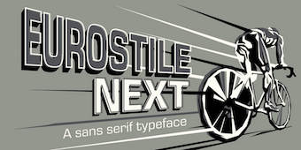 Born in 1960 in Niigata, Japan. Studied at the Musashino Art University in Tokyo. He also studied calligraphy at the London College of Printing. He became a freelance designer in 1997. Akira Kobayashi, who was based in Tokyo prior to his move to the Franfurt area, is an accomplished type designer who has created numerous typefaces for Sha-Ken, Dainippon Screen (where he made the kanji font Hiragino Mincho), TypeBank (from 1993-1997), ITC and Linotype, where he is Type Director since 2001.
  Ann Arbor, MI-based creator of
  The Amazon fonts can be freely downloaded. They consist of:
  [
[ Wernau (was: Wendlingen), Germany-based Anke Arnold's free fonts: aa QWERTZ-Tasten (2012: German keyboard font),
  Taiwanese font company in Taipei. In 1999, they donated four TrueType fonts to the Open Source community under the Arphic public license. These four fonts consist of two Sung type typefaces and two Kai type typefaces, each for traditional and simplified Chinese:
  ATypI 2019 was held in Tokyo, Japan, from 4-7 September, at the Miraikan Museum. The opening keynote is by John Maeda, and the closing keynote by Petra Cerne Oven. Speakers include Jason Pamental, Ken Lunde, Chorong Kim, Wujin Sim, Rathna Ramanathan, Ian Lynam, Renee Elizabeth Salmonsen, Sumanthri Samarawickrama, Hisashi Iwai, Taro Yamamoto, Tomoko Ishikawa, Yuka Hayashi, Shinji Ogawa, Hiroto Ueda, Masahiro Yamada, Laurence Penney, Irene Vlachou, Irin Kim, Nathan Williams, Vinod Balakrishnan, Underware, Takuto Higurashi, Ryota Doi, Xuan Zhang, Promphan Suksumek, Petra Docekalova, Wei Ming, Yin Qiu, Thomas Mullaney, Milda Kuraityte, Ananda Kumar Maharjan, Sunita Dangol, Garret Rieger, Rod Sheeter, Edwina Lee, Matthew Carter, Kunihiko Okano, Shotaro Nakano, Sakura Taruno, Ryoko Nishizuka, John Berry, Sofie Beier, Dafne Martinez, Sandra Garcia, Neelakash Kshetrimayum, Jo De Baerdemaeker, Dohee Lee, Sebastien Morlighem, Akihiko Morisawa, Yukari Haruta, Kataoka Akira, Kudo Tsuyokatsu, Takahashi Yoshimaru, Masataka Hattori, Masahiro Ochiai, Min-Young Kim, Nora Bekes, Celine Hurka, Sovichet Tep, Alexandra Korolkova, and Wei-Hsiang Su.
  [
[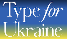 Ayako Ito is based in New York City and Tokyo, and graduated from Type@Cooper. She creates brand identities, books & magazines, typefaces, and illustratis in the fields of art, lifestyle and fashion. Ayako Ito set up
  Japanese foundry that offers these
 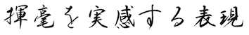 Japanese type designer whose typeface Kitahara Gyosho (2013-2014, co-designed with Hirofumi Iguchi) won an award in the kanji category at the
  Four free fonts made by TypeBank and marketed jointly with Morisawa:
 During his studies in Piracicaba, Goiania, Brazil, Caio Kondo designed the sans typeface Goiania (2014), the blackletter typeface York (2016) and the
 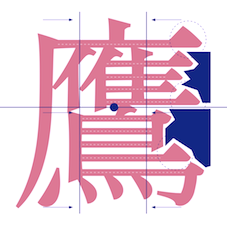 Type designer from Hong Kong who graduated from the
  Type designer.
  Chiharu Tanaka was born and raised in Japan. She completed her Bachelor's degree of Textile Design in Tokyo and worked at design companies for a few years. She subsequently received her MFA in Graphic Design from the Academy of Art University in San Francisco in 2009, and remained in San Francisco area ever since. She worked as a graphic and type designer for John McNeil Studio (2009-2010), Landor Associates (2009-2010), Psy/Ops (2010-present) and Morisawa (2016-present). Her typefaces:
  Spouse of Ray Larabie in Nagoya, Japan. Chikako Larabie is a font design assistant for Typodermic Fonts, specializing in kerning, and languages. With Ray, she created
  Japanese type designer associated with the Tokyo-based foundry Jiyukobo. His typeface Ei Ming Cho Tai (2013-2014) won the Silver Prize in the kanji category at the
  Designer and lettering artist in Austin, TX, who created the warm display typeface
  [
[ Craig Rozynski (Australia and, since 2010, Japan) created the
  Japanese computer scientists
 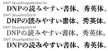 Dai Nippon Printing Co., or DNP, est. 1876, is one of the largest comprehensive printing companies in the world. It was originally known as Shueisha. Designers of the Japanese typeface family
  Japanese type designer, who won the silver prize in the kanji category at the
  [
[ Major Korean type foundry set up in 2014 by Korean type designer Doo-Yul Kwak. Design210 takes credit for about one thousand orginal fonts. Kwak developed several major corporate typefaces for clients that include Samsung and KIA Motors. Design210's typefaces published at MyFonts all cover Latin and Hangul:
 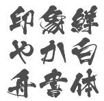 Dex Web or Dex Image is a Japanese font vendor. It also sells
  Yet another foundry of Nagoya, Japan-based designer Ryoichi Tsunekawa, who also runs Flat-It, Prop-A-Ganda, and Holiday Type. The first download is the industrial grotesk typeface
  Japanese foundry, formerly
  Not to be confused with Phil's Fonts, Phil Fonts offers charityware fonts by Phillip Andrade who uses the nicknames Dry Bohnz, neatoguy and
  Taiwan-based foundry involved in the production of both Chinese and Japanese fonts, est. 1987 as DynaLab. It now has offices in Hong Kong, Shanghai and Taipei.
  American designer / programmer Aiden Catbagan describes himself in this way: Aiden Catbagan uses a combination of programming and traditional design tools to create typefaces from historical sources. By his using the latest technology and methods available the design process is streamlined and the results are of the highest quality.
  Japanese type designer. He started out in the photo optical industry in Tokyo with Carl Zeiss and American Optical. He studied type design at the London College of Printing and the Royal College of Art. From 1979 until 1985 he worked at the graphic design firm Banks&Miles in London. There he redesigned Johnston Underground Sans for text setting as well as display use, now known as New Johnston, and carried out a feasibility study for space saving and legibility for the BT telephone directory, proving that Matthew Carter's Bell Centennial was the best suited typeface for the purpose. He also taught typography at Middlesex Polytechnic between 1980 and 1988. With Matthew Carter, he developed the full Roman and kanji OpenType font family
  Japanese creators of free techno fonts in 2009: 134217728 (dot matrix),
  Free fonts by Akihiro Oya in truetype format for Mac and PC: Nishichiba, NerimaNumber, BERLIN-REDRAIN-Italic, BERLIN-REDRAIN-Regular, Canarendon-Broken, Chubu-08-Normal, G.B.BOOT, GENERAL,
  Free Opentype Chinese fonts for Chinese typesetting available via CTAN, the Math TeX archive. The Fandol team consists of Clerk Ma and Jie Su. Created in 2013, the font family covers the basic Chinese styles,
  This archive contains
  Japanese foundry in Nagoya that offers free and commercial Latin fonts made by
  Japanese site with original fonts by Kato Masashi (b. 1973), who lives in Takasaki (Gunma prefecture, Japan): Parismatch (2004), SAKUalp (2000, handwriting), Steeltype, Broadband, Hivision, Cinematime, Ultracomic, Ice Cream, Be Happy, Summer Beauty, Flyermix, Cheerscript, Breakstyle, Breakfont, Round, H-Five, Natsucomi, Long Vacation, Lovers, Breakfont (2003, graffiti style), Pokkaman, BeHappy, Natsucomi, Momolcan, Seasons Dings, Electron, Round, Lovers, FlyerMix (fifties style), CheerScript (comic book style), Hi-Five (pixel font), Summer Beauty, SummerDrive, White Day, Long Vacation, Amayadori (high contrast kana font), Fuyucomi, Icecream, Pickett, 321, Pingpong, Frontline, Ginza, Yago (nice free dings), Polaris, 321eng, 321kana, APPLE, CLIQUE, Clover (kitchen tile font, 1998), DIGI, Eneneng, Enenhira, FDalp, FDwhie, Hnoodle,
  Banda Aceh, Indonesia-based designers of the script typefaces Luxurious Line (2015), Ramsteinz (2015: calligraphic), Gracias (2015, thick brush), Hello Listie (2015), Glytten (2015), Adelle Script (2015) and Loft Yian (2015), the display typeface Vardy (2015, film noir style), and the wonderful rough brush font The Mistie (2015).
  Located in Oakland, Font Aid V was created for the sole purpose of collectively designing a commercial pictotype called
  Japanese type foundry. Their typefaces include:
  Small Japanese font archive: KanjiStrokeOrders (2006), Kochi-Gothic (Wada Lab), Kochi-Mincho, aquafont (2002, aquablue, hand-printed),
  Creator of the Neotechnic series of (free) fonts: Accudigit Regular, Accudigit Body, Parma, Intermatrix (1998), Matricies, Hako, Basic. The designer, Michael Hernan made these fonts between 1995-1998, and writes: About Neotechnic Series: This series of Fonts reflect the information industry at the end of the 20th century and its obsession with classification. Each typeface captures a different aspect of our recent info-culture. He obtained an MA in typeface design from the University of Reading in 2008. At Reading, he designed
  Commercial Japanese foundry set up in 2002 by Kazuo Kanai, who won the first Morisawa type design competition back in 1983. Kazuo Kanai has published fonts at Morisawa, Dai Nippon Printing, Type Bank and his own label, Ren Font. At Font-Kai, he sells the exquisite 12-weight kanji family called Kai.
  [
[ Free dot matrix and dingbat fonts by "2001Nisicasino" from Osaka, Japan. Some names: Chemi, ETC, Washing_indication, chemi, fb_kiriko, fb_onroad, khemi, licabitz-box, licabitz, licadotz-box, licadotz,
  Japanese site with some original fonts. Creators of
  Free techno and pixel fonts by Inoue Yoshikazu (aka M. Urawa): EGG!, NO1,itaric, NO1, NO10, NO12, NO13, NO13a, NO14, NO15, NO16, NO2, NO5, NO6, NO7, NO8, NO9, Q, Q2, core, ic, otete,
  Designer and art director in Tokyo. His Latin typefaces include
  Characters not normally available in Japanese fonts. In the glyph shown on the right (example borrowed from
  Japanese foundry, est. in Fukuoka in 2005 by Shintarou Nakayama (Goma Shin), b. 1982. It offers these free fonts, many of which are in the grunge or techno styles: Steel Boy (2005, techno), Manzyu (2005, liquid), The Past (2004),
  GT&CANARY, a New York City design lab, was founded in 2004 by Takaaki Goto (b. 1966, Japan), a.k.a. GT, who specializes in global brand identity and package design. Takaaki Goto designed the slightly arched
  Japanese font foundry committed to making open license fonts based on old prints. It is run by Judicare and Eunice.
  Japanese graphic designer, b. 1953, who started out as an industrial designer, and became a graphic designer in 1974. He won the 1990 Morisawa International Typeface Design Competition with an Honorable Mention in the Latin Category. The list of
  Small commercial Japanese foundry specializing in handwritten and extreme brush fonts. Gorgeous stuff! Examples:
  Hakusyu is a Japanese font vendor. Their Hakusyu Kyoiku kanji fonts (HakusyuGokubutoKaisyoKyo, HakusyuGyosyoKyokan, HakusyuInsoutaiKyo, HakusyuKaisyoKyokan, HakusyuKointaiKyokan, HakusyuReisyoKyokan, HakusyuSeigyosyoKyo, HakusyuSousyoKyo, HakusyuTensyoKyokan, HakusyuTenkoinKyo), all made in 1998-1999 by Masanori Maruoka, can be downloaded
  At Hanazono University in Japan, we find a free full kanji font called
  Japanese designer, who renamed Adobe's Source Han Sans and Serif (2014-2018) Harano Aji Gothic and Mincho (2019-2020), respectively. CTAN links:
  Tokyo-based designer of the thin decorative didone advertising typeface Ginza Mitsukoshi 2015 (2015, for the department store chain).
  Graduate of Kyoto University and the
 Tokyo-based Hidekazu Sakakibara runs iAi-jp, and before that, Frontage and Kivart. He is the
  [
[
 Sao-Paulo-based illustrator (b. 1976) who designed Coverface SE (2014, a great rounded sans typeface family),
 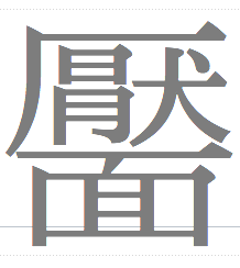 A Japanese unit that created the free (type 1 format) IPAEX fonts in 2003-2011. They can be downloaded from the
  Designer in Tokyo who made the soft sans Latin typeface Infant in 2017.
 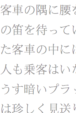 Commercial Japanese foundry in Saitama.
  Commercial Japanese foundry in Shinjuku which makes and sells many full Japanese and CJK fonts. Its designers are Osamu Torinoumi, Keiichi Katada, Makoto Kakita, Tetsuya Handa, Osamu Ando, Hisashi Iwai, Chikao Ito and Sayaka Ishii.
  Taiwanese graphic designer Joe (Hsuan-Hao) Chang (Taipei) has
 Kaiser Zhar Khan (b. 1980, Chile), aka Zanatilja, used to run a new defunct archive called True Type Fonts. He also designed many typefaces himself. The most famous among these is his free African-themed typeface South Afirkas 2100 (2009), which is downloadable from
  Kamimura & Co (or Detail Type Foundry, and earlier, Studio Antwork) are Makoto Kamimura's studios in Shibuya, Tokyo. Makoto created the compass-and-ruler roman corporate typeface
  [
[ Born in 1940 in Kanagawa Prefecture, Japan, Katsumi Asaba founded the Katsumi Asaba Design Studio in 1975. He has designed many advertisements for Japanese companies. He produced the poster of the Nagano wintertime Olympics, for example.
  Member of a type design team at Monotype that created
  Japanese graphic designer in Barcelona, where he studied at Eina. His typefaces:
 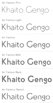 Khaito Gengo (Des Moines, WA, and Seattle, WA) graduated from High School in Australia. From 2005 to 2008, he worked as a graphic designer at his father's interior design company, Gengo Space Design Institute, in Japan. After that, he graduated from Highline Community College, WA, and was mentored by Laura Worthington.
  Japanese designer of the didone fashion magazine typeface simply called
  Japanese calligrapher who did the lettering for the Cacharel logotype. [
 Japanese type designer. He was a multiple award winner at the
  Japanese designer (b. 1993, Tokyo) who studied at Keio University, Fujisawa, Japan, where he obtained a Bachelor of Art in Environmental Information. Creator of Braille Neue (2017), a typeface that combines Braille and Latin. According to Takahashi, Braille Neue is a universal typeface that combines braille with existing characters. This typeface communicates to both the sighted and blind people in the same space. Braille Neue consists of two typesets - Braille Neue Standard which is for English alphabet and Braille Neue Outline which is for Japanese and English. Our aim is to use this universal typeset for Tokyo Olympics and Paralympics 2020 to create a truly universal space where anyone can access information.
  [
[ Designer of
 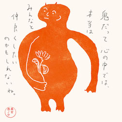 Tokyo, Japan-based illustrator, b. 1986, Tokorozawa. Designer of the nice kanji lettering pieces called July's Makanai and August's Makanai (2016).
  Kyota Sugimoto (1882-1972) was a Japanese inventor who developed the first practical Japanese typewriter. He received the Blue Ribbon Award and the Small Asahi Ribbon. Out of the thousands of kanji characters, Kyota's typewriter used 2,400 of them. The following description of his carrerr and achievements is taken from
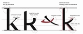 Freelance graphic designer in Buenos Aires who graduated from UADE (Universidad Argentina de la Empresa) with a degree in Graphic Design. In 2010, she created a
  Letterjuice is the British type foundry of Pilar Cano, who graduated from the University of Reading, 2006, but started out life in Barcelona. After graduation, still in 2006, she co-founded Mídori, a graphic design studio specialised in editorial design. Letterjuice is based in Brighton, UK.
  [
[ Free font producer in Japan that started out as a bitmap font specilaist. The M+ Fonts Project is jointly run by Coji Morishita, Hiroki Kanou, Imazu Kazuyuki and Taro Muraoka.
  Kyoto, Japan-based designer of these display typefaces:
  About 150 free original fonts by Masayuki Sato (from Futaba and/or Takasaki, Japan), over half of them pixel fonts. Maniackers designers started in 1995. For most fonts, he has a Latin alphabet (denoted by AL) and a katakana alphabet (denoted by KT). Some also have a hiragana version (denoted by HR). All fonts were made between 1998 and 2009.
  During her graphic design and illustration studies at Tama Art University in Tokyo, Marie Kubo created the ironwork-inspired Iron Font (2015).
 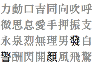 From her CV: Having lived and worked as a half-Japanese and half-German in Germany for a long time, the focus of my artworks was to create books about Japanese culture. The intention of writing and designing books about Japanese topics was to make German readers curious about the strange and foreign culture and to give them insights into it. In the last eleven years I have published six books talking about Japanese culture. Since 1998, I ran my own design office with a focus on corporate design, corporate publishing and catalogue design. Since 2002 I was teaching at several Universities in Germany. Moving to Hong Kong and teaching as an assistant professor at the Academy of Visual Arts of Hong Kong Baptist University (HKBU) since 2010 gives me new influences and inspiration for starting research projects focused on Chinese typography. My background of teaching typography as well as graphic design in Germany over eight years gives me the necessary background for starting a research project not only to learn more about my new cultural environment, but also to make the Hong Kong design culture more visible to international audiences.
 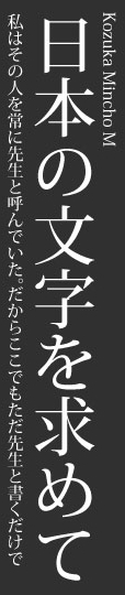 Japanese type designer and type director, b. 1929. Designer of the
  The list of new fonts in Windows 7 in 2009:
  [
[ Mikitype is Mikihiro Yamashita, a student at Musashino Art University in Tokyo. In 2014, he created the Latin text typeface Mesut, the sans typeface Diaby, and the blackletter typeface Rukas.
  Min Wang is a professor at the China Central Academy of Fine Arts (CAFA). He is currently serving as dean of the School of Design at CAFA and director of the Art Research Centre for the Olympic Games. He also serves as Standing Expert on Image and Identity for the Beijing 2008 Olympic Committee. He received his BA in graphic art from CAFA and an MFA from Yale University School of Art where he studied under Armin Hoffman, Paul Rand, and Bradbury Thompson. He is the design director at Square Two Design, which he joined in 1998 after serving eight years as design manager, senior art director and graphic designer at Adobe Systems. He has been a visiting fellow in Germany at Akademie der Bildenden Kunste, Munich and Hochschule der Kunste, Berlin. In 1989, he began lecturing in graphic design at Yale University School of Art, teaching graduate students until 1997.
  Bremen, Germany-based illustrator, who was a manga artist in Japan. He used iFontMaker to create the hand-printed outline typeface
  Japanese font maker, whose fonts can be bought at URW++: URW Heisei Gothic bold, URW Heisei Gothic heavy, URW Heisei Gothic regular, URW Heisei Mincho bold, URW Heisei Mincho heavy, URW Heisei Mincho regular. MyFonts links:
  Japanese designer of the quite interesting
  [
[ Shigenao Uzuki (Moon's Typeface) makes and sells 29 Japanese type families. He won the Kozuka Prize at
  Results of this biannual award, announced in October 2012:
  Japanese creator (b. 1982) of the dingbat typeface
  [
[ Born in Takamatsu, Kagawa-ken, Japan, in 1984, Natsuko is a Canadian-educated graphic designer who publishes most of her typefaces at
  [
[ Tokyo-based designer of the geometric solid typefaces Patchwork App (2014) and Kikagiga (2014).
  A free handwritten kanji font, dated 2006:
  In their Global Type collection, URW++ has its Helvetica clone, Nimbus Sans (2005, 5 fonts, 2000 Euros) and Nimbus Roman (2005, 2 fonts, 2000 Euros). The former is based on Helvetica, the latter on Times New Roman. Meant as workhorses, these fonts cover Turkish, Baltic, Romanian, Cyrillic, Greek, Chinese Simplified, Chinese Traditional, Japanese, Korean, Thai, Vietnamese, Arabic, and Hebrew. Of course, Nimbus Sans can be had for free at
  Honey and Death offers free fonts designed by Mitsutoshi Nobusawa: The list: BlackoronAlp (2003), BlackoronKat, BlindfaithB (2003, experimental), BlindfaithBO, BlindfaithL, BlindfaithLO, BlindfaithO, BlindfaithR, BlindfaithRB, BlindfaithRBO, BlindfaithRL, BlindfaithRLO, BlindfaithRO, BlindfaithRR,
  Font technician. Graduate of the
  A large free font family released under the Apache license at Google Web Fonts, and developed by Monotype's Steve Matteson and a team of type designers. Designed between 2012 and 2016, this typeface covers over 800 languages and 100 writing scripts.
  Noto Sans CJK and Noto Serif CJK are free typeface families developed at Adobe and Google to complement the universal Noto font package between 2014 and 2017.
 Motoki Higa (One Fonty Day) is the Sydney, Australia, and/or Saitama, Japan-based designer (b. Japan) of these commercial typefaces:
  Apple system fonts developed from 1990 until 2008. [
 [
[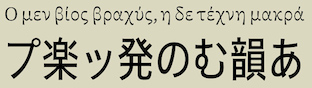 Spanish type foundry, est. 2016 by Pedro Arilla (b. 1984, Ejea de los Caballeros), who runs
  [
[
 Positype was founded in 2002 by Athens and/or Jefferson, GA-based designer and type designer
  Retro font foundry, est. 2008 in Nagoya, Japan, by Ryoichi Tsunekawa. Fonts sold via
  Japanese type designer who graduated from the
 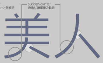 Ren Font is a Japanese type foundry, est. 2001 by Kazuo Kanai, who won the first Morisawa type design competition back in 1983. In 2002, he also started Font Kai.
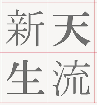
 Japanese foundry of Yoshikazu Imada and Koji Sugimoto.
  [
[ Kazincbarcika, Hungary-based type designer Roland Hüse (b. 1980) sells his fonts through My Handwritings (Kazincbarcika, Hungary), which was renamed Runes&Fonts. His first font is
  Ryan Hellyer Williamson is an Australian type designer, born in Japan and now based in the UK. After a stint as a graffiti artist in Sydney, he received his BA (Hons) in design from the University of New South Wales, Sydney. Graduate of
  [
[ [
[ [
[ Senior designer at Adobe Systems in Tokyo, b. 1972, Fukushima, who graduated from Musashino Art University in 1995, and began working as a graphic designer at a design studio. In 1997, Ryoko joined Adobe. She was involved in the development of the Kozuka Mincho and Kozuka Gothic typefaces designed by Masahiko Kozuka.
  Ryota Doi received his BA in design from Tokyo University of the Arts in 2013. In 2014, he graduated from the MATD program at the University of Reading. Upon earning his master's degree in 2014, he returned to Japan and began working as a type designer at Monotype Japan.
  Sakura Taruno graduated from Nara University of Education’s General Curriculum and Instruction course. In 2011, she joined Morisawa Bunken Inc. and started her career as a type designer. In 2018, she was transferred to Morisawa Inc. and now mainly works on Latin type-design projects. She was involved in the production of A1 Gothic (2017) and Role Serif (2019). Speaker at
  Japanese designer.
  Japanese designer of the free Google Font
  Japanese designer of
  Japanese type designer who published some Japanese typefaces at
  Japanese type designer, b. Fukuoka, 1957. He graduated from the Design Department, Chikuyo Gakuen Senior High School and joined the Type Design Department of Shaken Co., Ltd, a company known for its photocomposers. Since joining Fontworks in 1998, he has produced a variety of typefaces including the Tsukushi series. Fujita received the Tokyo TDC Award for Tsukushi Old Mincho and Tsukushi Round Gothic in 2010. The Tsukushi series has become essential for book and graphic designers. His latest typeface family, Tsukushi Antique, breathes new life into traditional Mincho and Gothic typefaces, giving users a fresh new look and bolstering support for the entire Tsukushi line (quote by Fontworks). He was featured in the NHK television program "Professional" in 2016, and his Fontworks UD fonts won the Silver Award in IAUD Awards 2016. His Tsukushi Series won the type design award at the
  Tokyo-based designer of the animated ornamental typeface
  [
[ Shoko Mugikura is a Japanese type and graphic designer currently based in Berlin. Since 2010, she has been jointly running the type design studio Just Another Foundry with Tim Ahrens, while she continues to work on her own projects. Together, they designed
  Kunihiko Okano graduated from Kyoto City University of Arts in 1995. After working as a packaging designer for about a decade, he started his design office Shotype Design in 2008 and has been providing Latin parts to Japanese type foundries. In 2011, he graduated from
  At ATFI (Moscow) and later Shriftovik Foundry (also in Moscow), Tikhon Reztcov designed the
  [
[ Taipai, Taiwan (was: Beijing, China, and Tokyo, Japan)-based designer (b. Finland) of the
  [
[ In July 2014, Adobe and Google jointly announced the publication of the free Asian typeface family Source Han Sans for Chinese (traditional (both Taiwan and Hong Kong) and simplified), Japanese, Korean, Greek, Cyrillic and Latin. This project, based on designs originally due to Ryoko Nishizuka, a senior Adobe designer in Tokyo, started in 2010. The fonts and original code are downloadable from
 Japanese foundry that has two large free font packages called T Font (2011). It is located at the University of Tokyo's Sakamura-Koshizuki Laboratory. One set of fonts is GT2000-01, GT2000-02, GT2000-03, GT2000-04, GT2000-05, GT2000-06,
  Wonderful free original dingbats (and some scanbats) designed in 2000 by Satoru Iwatsu at Takasakiyama Font House reflect daily life in Japan: Sakabe-Animal (3 fonts), Sakabe-People (7 fonts), Sakabe-things. Truetype for Mac and PC. Saru Font House is another name for the company.
  [
[ Japanese type blog and foundry. It has a marker style typeface kanji font called Tanuki Permanent Marker. Designer of these free typefaces in 2020: Jiyuno Tsubasa, Tanug, Esenapa J, OshidashiMGothic, Ingres Glyphabet (Latin letters in hexagonal boxes), the Google font
  Taro Yamamoto (b. 1961, Kyoto) received a BFA from Musashino Art University in 1983, where he studied the history and art of typography. After a brief period doing type development with Morisawa, he joined Adobe in 1992 as Manager of Japanese Typography. In addition to management and engineering tasks, he led the design team that produced Adobe's original Japanese typefaces, including
  Osaka-based designer (b. 1981) who recreated Simon-Pierre Fournier Le Jeune's
  French freelance graphic and type designer who started his own commercial type foundry in 2014. Now based in Nantes, Thierry was educated in Nantes and studied Typography & Language at ESAD in Amiens, France, class of 2014. His typefaces:
  Budapest-based creator (aka Frodo 7) in 2009 at FontStruct of FontMoot 01 (pixel face), Brego,
  Mame Shibori (aka Tictac) is the Japanese designer of the bold round stencil typeface
  [
[ Created in 1987 along the model of the New York Type Directors Club, and led by Katsumi Asaba, the Tokyo Type Directors Club organizes an annual type competition. The type design prizes in 2016 include Henrik Kubel and Scott Williams (A2) for The New York Times Magazine Custom Fonts, who were awarded the Grand Prix. Gerard Unger received the Type Design prize for Alverata. [
 Created in 1987 along the model of the New York Type Directors Club, and led by Katsumi Asaba, the Tokyo Type Directors Club organizes an annual type competition.
  Created in 1987 along the model of the New York Type Directors Club, and led by Katsumi Asaba, the Tokyo Type Directors Club organizes an annual type competition.
  Tom Tor Studios has offices in Los Angeles and Tokyo. Designer in Tokyo (was: Los Angeles) (b. 1985) of the themed display typefaces Tom Tor (2008, geometric sans), Pavadee (2008,
  Japanese shipbuilder and typefounder, b. Nagasaki (1846), d. Tokyo (1892). In 1871, he took over Motogi's Type foundry. In 1872, he started a new typefounding factory in Kanda, Tokyo. In 1879, he asked Shigeru Magata to cut a new version of Mincho for his foundry. In 1885, he reorganized his typefounding factories and set up the Tokyo Tsukiji Type foundry.
  [
[ [
[ UK-based type foundry, est. 2014 by Shuhei Toyoda (b. 1983, Japan). Typefaces include
  Type Project is a small type foundry in Tokyo, best known for their extensive Axis typeface, which was the first multi-width Japanese typeface. People involved with type Project include Isao Suzuki, Akira Kobayashi and Kunihiko Okano.
  With Joachim Müller-Lancé, Mike Kohnke (Oakland, CA) is the American cofounder (b. 1967) of the
  URW++ Global is the foundry name used by
  A Latin / Japanese sans typeface family published in 2019 by URW. See also the rounded version,
  URW++ Design&Development GmbH is a Hamburg-based foundry established in 1995 by Svend Bang, Hans-Jochen Lau, Peter Rosenfeld, and Jürgen Willrodt. URW stands for Unternehmensberatung Rubow Weber, named after Gerhard Rubow and Rudolf Weber, cofounders of the original URW company from which urw++ evolved. It offers a whole range of font services and has an extensive (7000+) font library. At the basis of the early development of many classy PostScript fonts. For example, in 1999, URW++ donated the 35 core PostScript fonts (renamed) under the GNU GPL license to the Ghostscript project. The great 3000-font CD costs about 2000DM. Other CDs are more expensive: on the ITF CD, each font is about 100DM! URW sells fonts and font families with complete rights (you can change, resell, embed, anything, except use the original name), with examples ranging from 2k for a complete family of 12 to 5k for a collection of 250 fonts. This practice continues until today: URW++ thus provides a great service to software developers who want to include high-quality typefaces in their software applications. URW has offices in many countries. In the first decade of the 21st century, freelance type designer Ralph M. Unger contributed most frequently to the URW library.
  Catalan designer Bruno Selles (b. 1976) set up Vasava Artworks (and later, Vasava Fonts) in Barcelona in 1997. In 2018, he joined the faculty in the Masters in typographic design program at
  [
[ Vladimir F. Tamari (d. August 6, 2017) was born in Palestine, he spent his youth in Ramallah, and has lived in Tokyo for the past 40 years. He studied physics and art at the American University of Beirut where he met and was inspired by Buckminster Fuller (around 1960). He invented and built 3D drawing instruments. In the 1980s he joined the Optical Society of America to keep up with the field and holds U.S. patents for inventions based on his Streamline Diffraction Theory to cancel diffraction in telescopes. He
  A corporate URW studio sans family published in 2012. The six-font family sells for over 4000 dollars and covers Turkish, Baltic, Romanian, Cyrillic, Greek, Chinese Simplified, Chinese Traditional, Japanese, Korean, Thai, Arabic, and Hebrew. [
 Japanese font site run by Oka (b. 1987). There are some free fonts here: eri's-font (handwritten Latin/kana/kanji font), MG8PX (pixel), h.dia, moyashimon (dingbats), daiji moyashimon, OKAO (kana), erizi_V (handwritten Latin and kana), Apika (artsy, Latin), Daiji Mojashimon (kana). [
 Japanese designer of the free hairline avant garde typeface
  Commercial fonts at this boutique type foundry and publisher operating in Tokyo, jointly run by Ian Lynam and Thien Huynh.
  American graphic designer (b. 1982) located in Medway, MA, who has created many free fonts, and some low cost commercial fonts. He is also known for his web comic, Dubmarine. Until 2006, all his fonts were free, but starting in 2006, he started selling them via
  Tokyo-based designer of the Latin didone typeface Fibonacci (2015) that is based on the golden ratio for its proportions. He also made Subway (2015), the ghoulish typeface Ghost (2014) and the blackletter typeface Square (2015).
  [
[ [
[ Japanese graphic designer, who, under the artistic direction of Masasa Katzumie, designed the pictograms for the 1964 Olympic Games in Tokyo. These were the first Olympic Games with their own official set of glyphs for
  Osaka-based designer (b. 1989) who created the round bold monoline Latin typeface
  Yuanchen Jiang is a designer working in graphic design, motion, branding and storytelling, who is based in Los Angeles. He is a graduate of Yale University School of Art (MFA), class of 2015, and China Central Academy of Fine Art (BFA). Developer of a series of typefaces for
  Japanese graduate of the type design program at the
  Tokyo-based freelance design engineer. He created many free pixel font families, which are also available as web fonts via
  Italian design firm in Firenze consisting of three graphic designers,
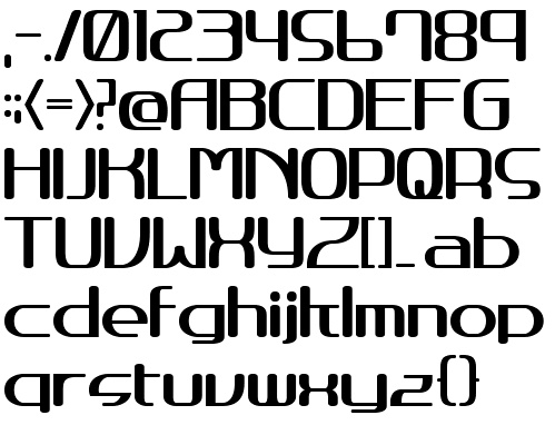
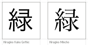
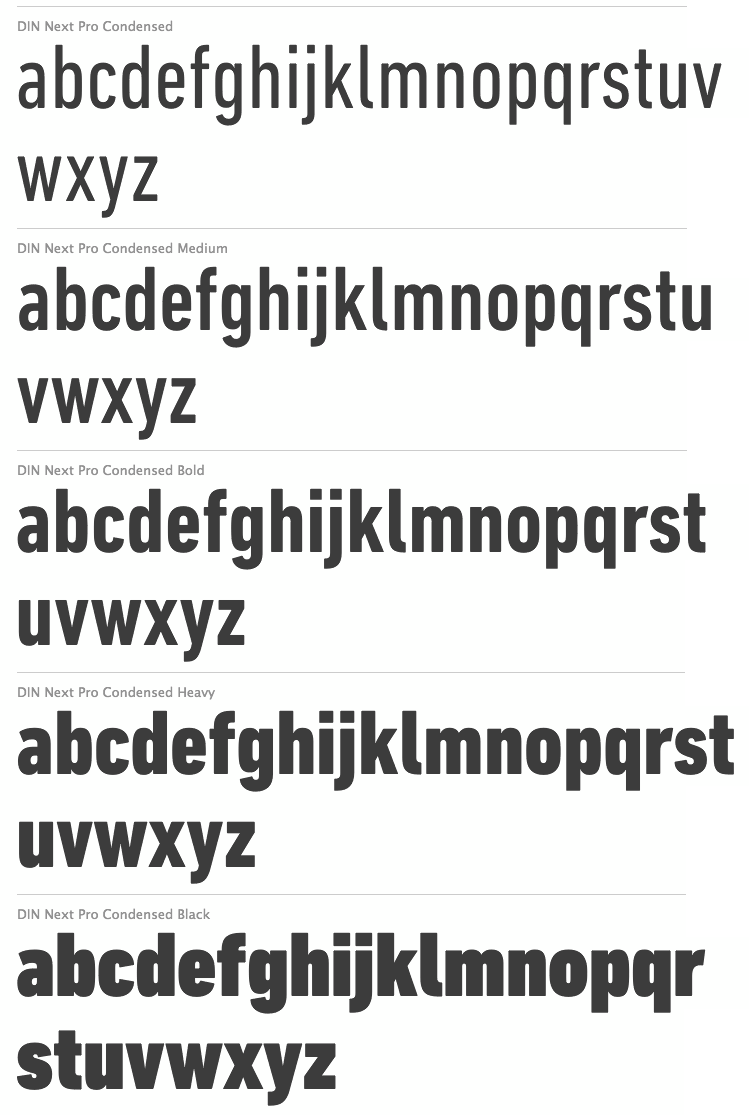
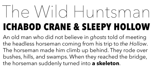
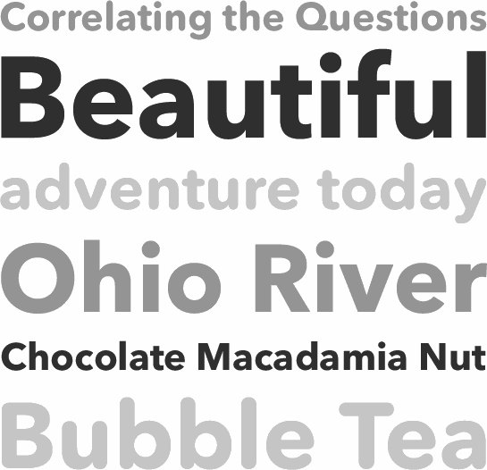
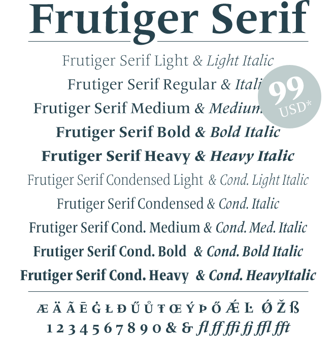
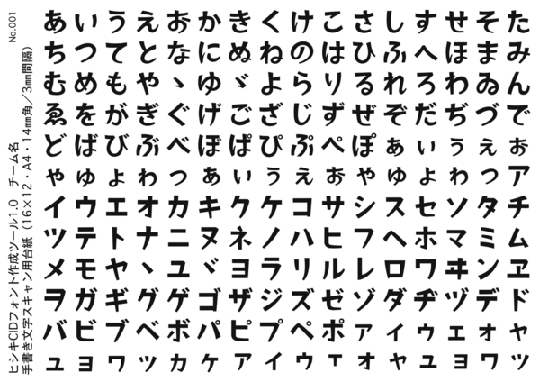
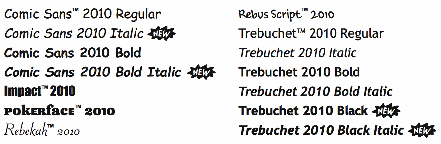
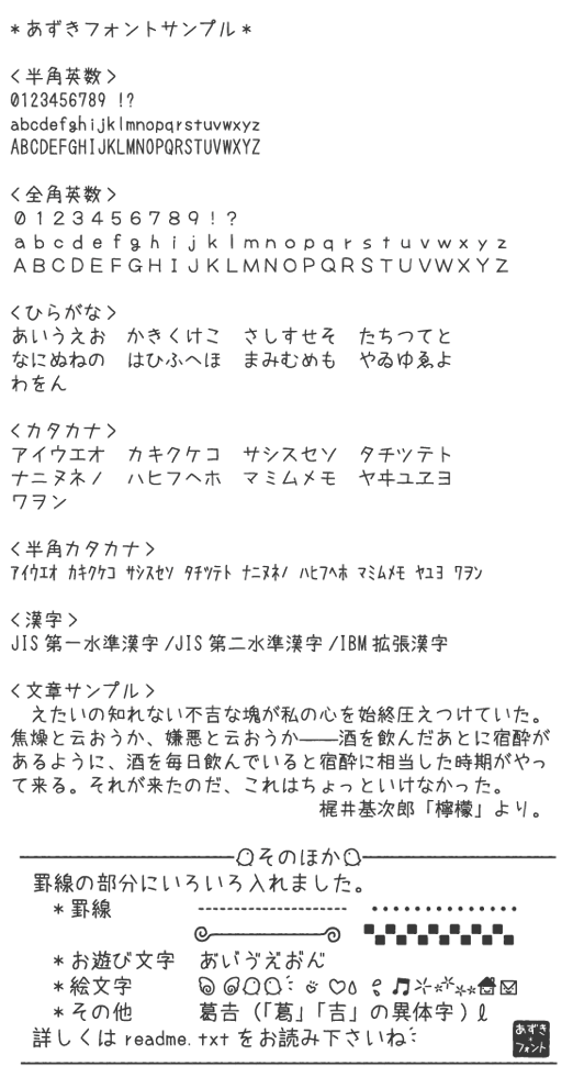
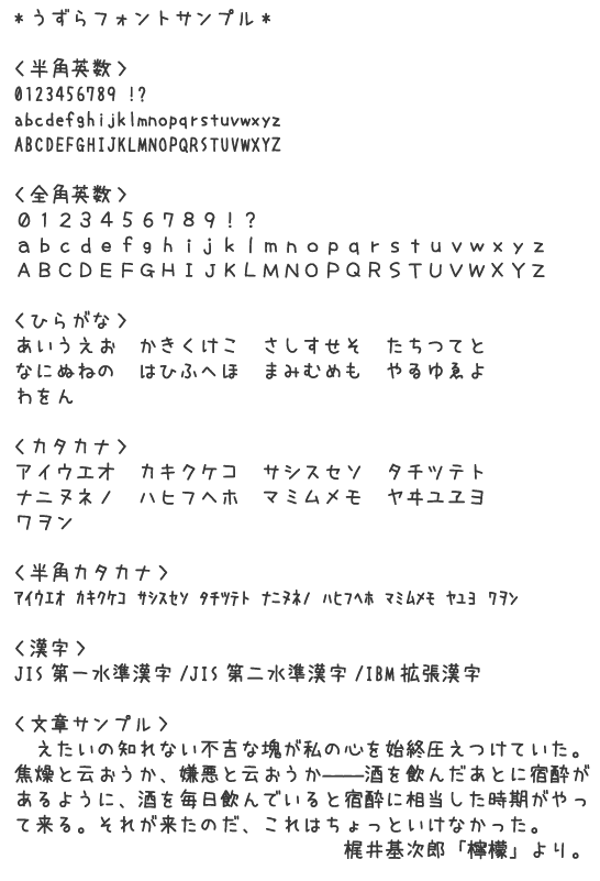
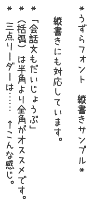
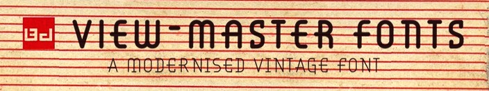
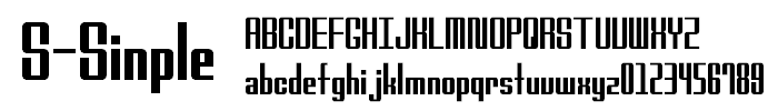
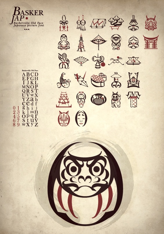
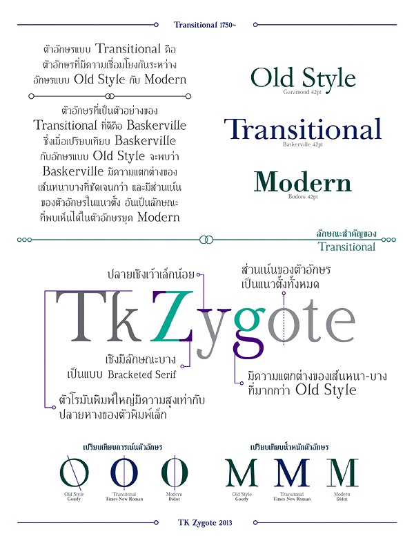
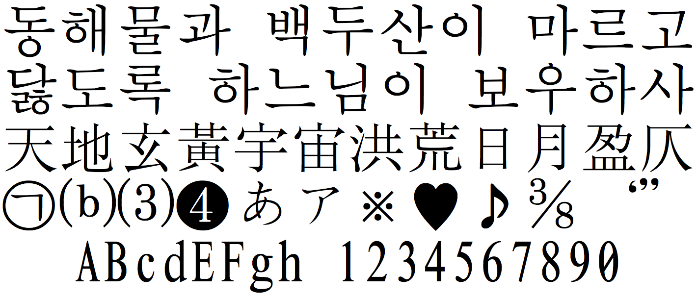
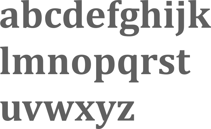
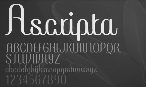
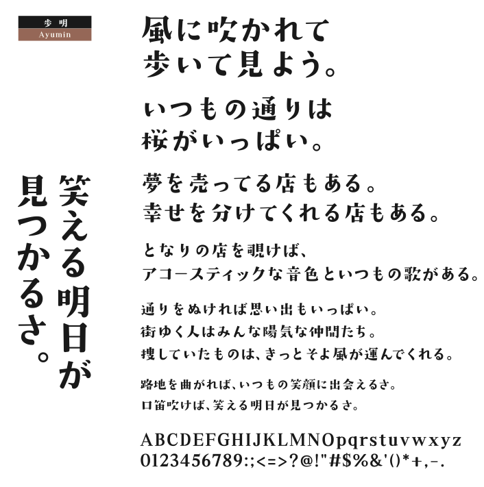
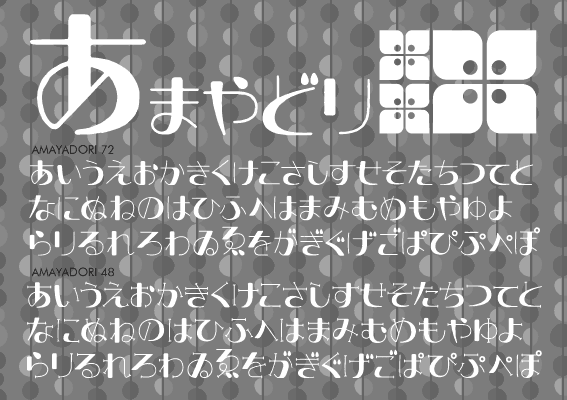
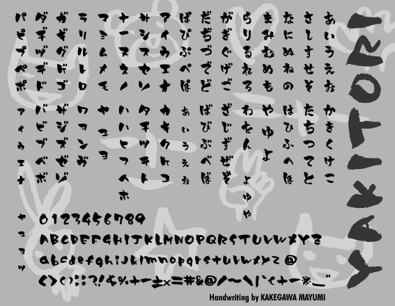
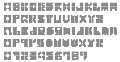
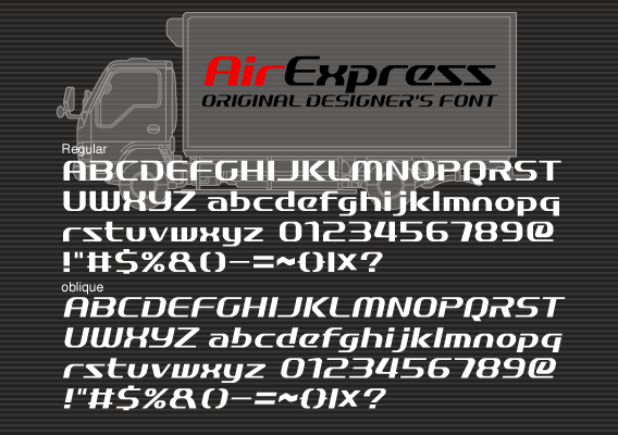
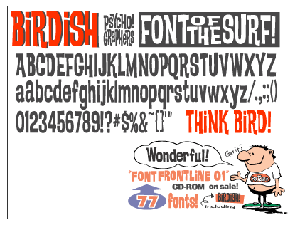
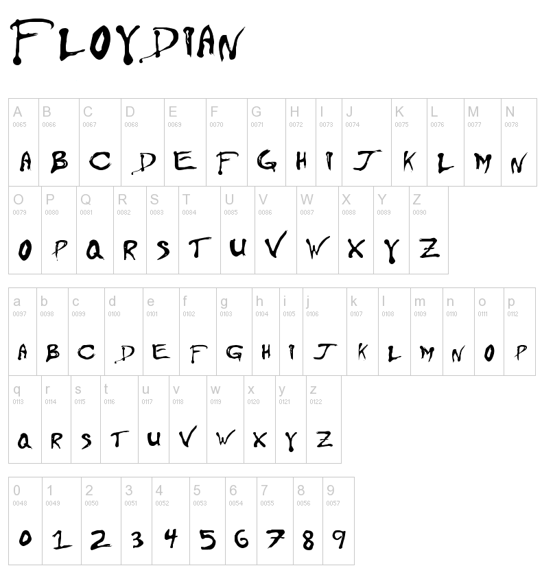
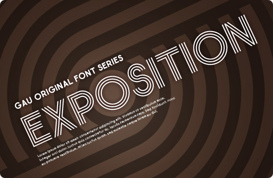
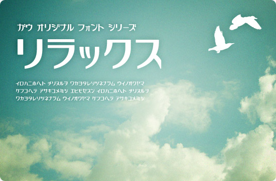
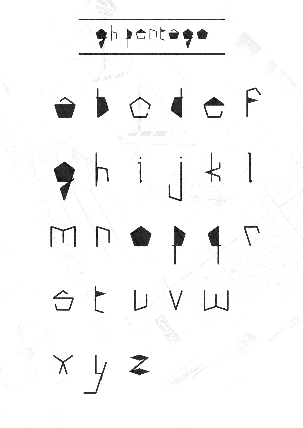
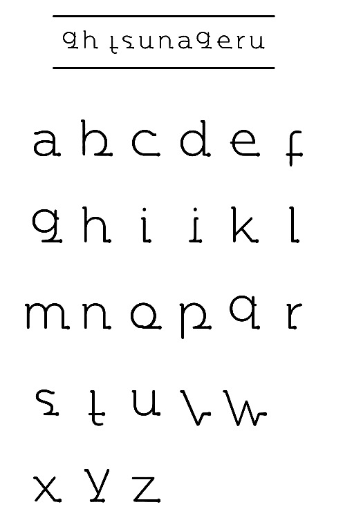
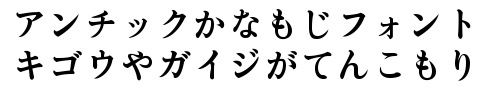
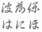
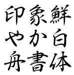
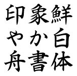
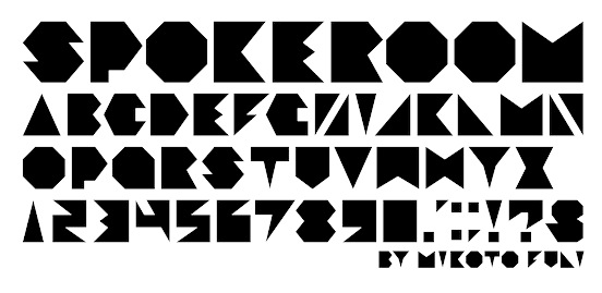
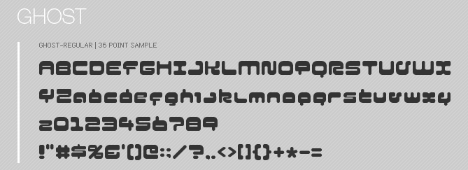
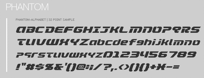
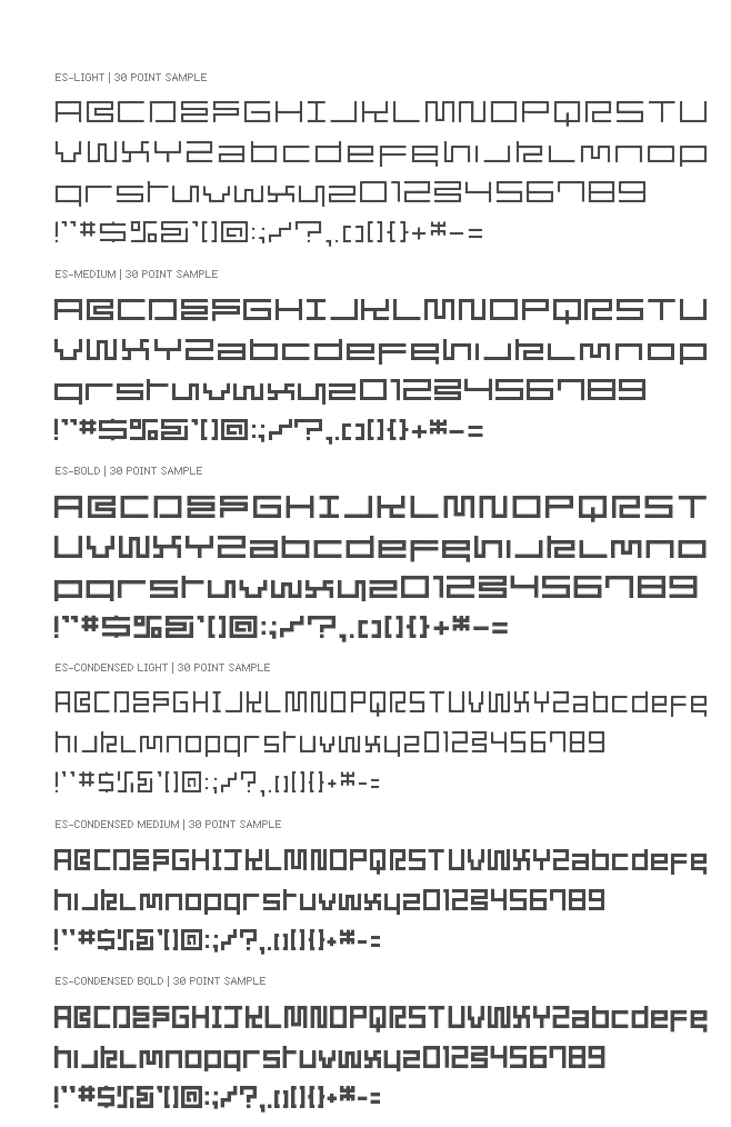
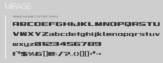
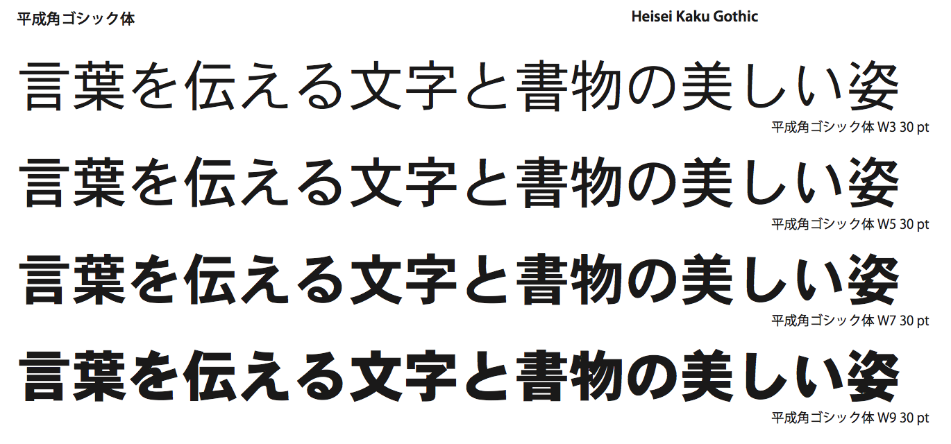
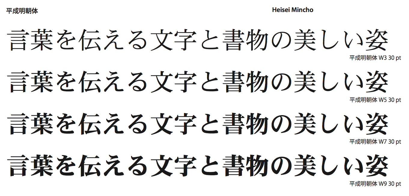
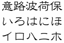
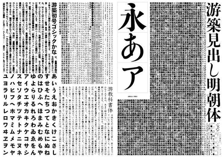
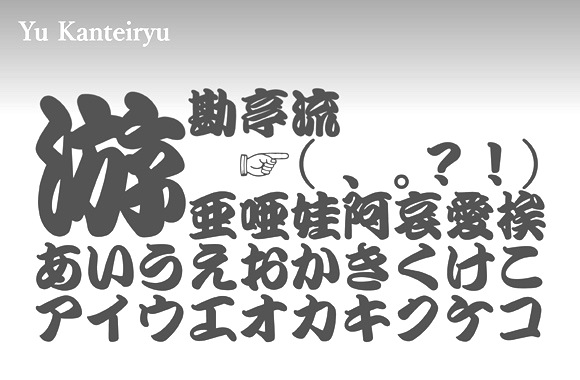
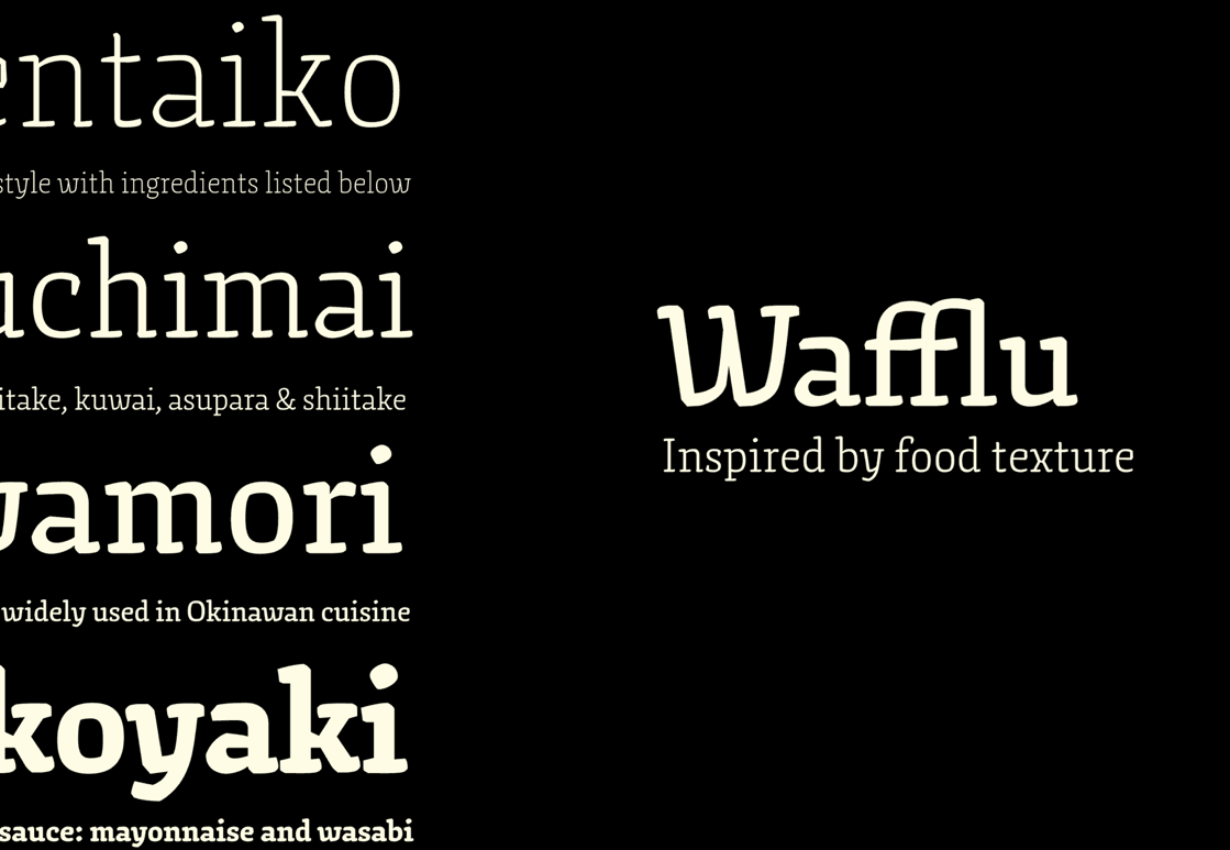
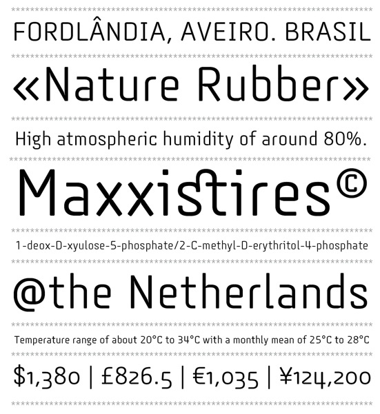
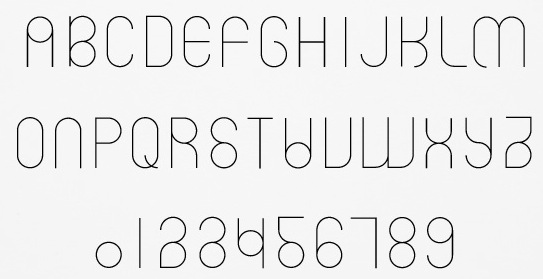
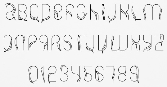
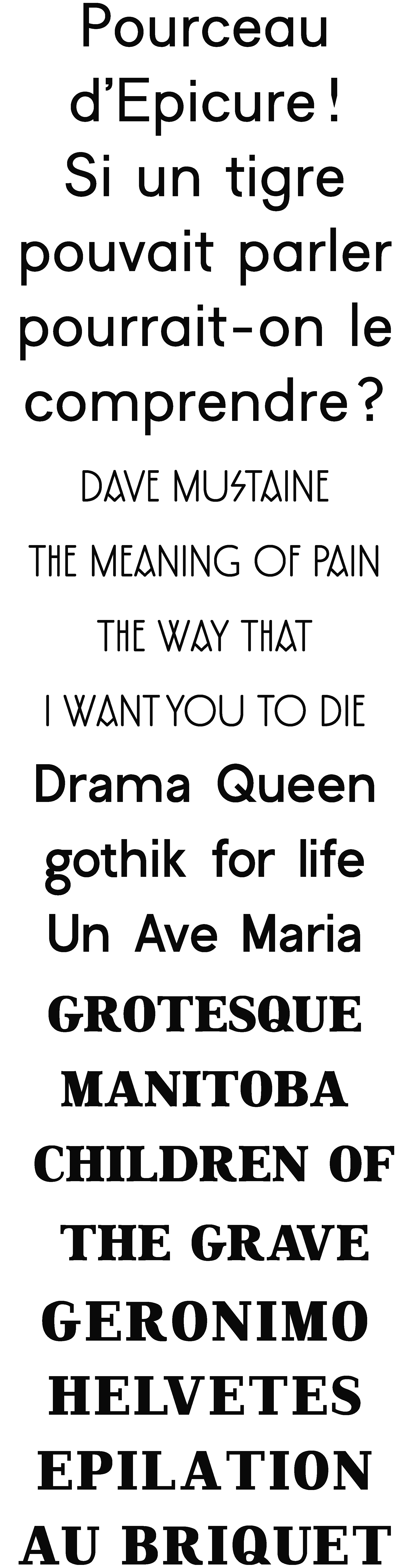
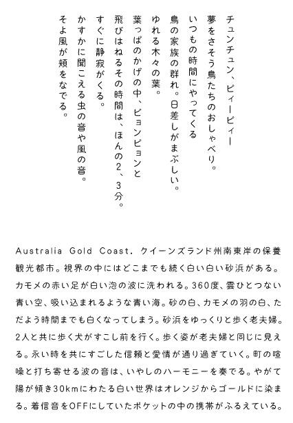
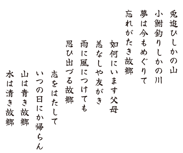
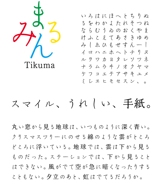
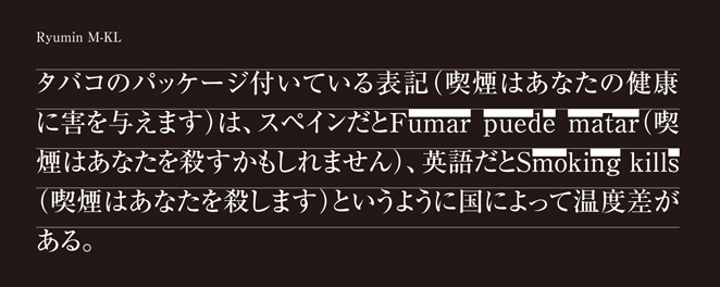
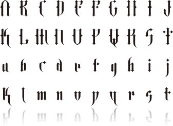
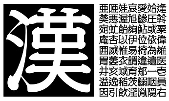
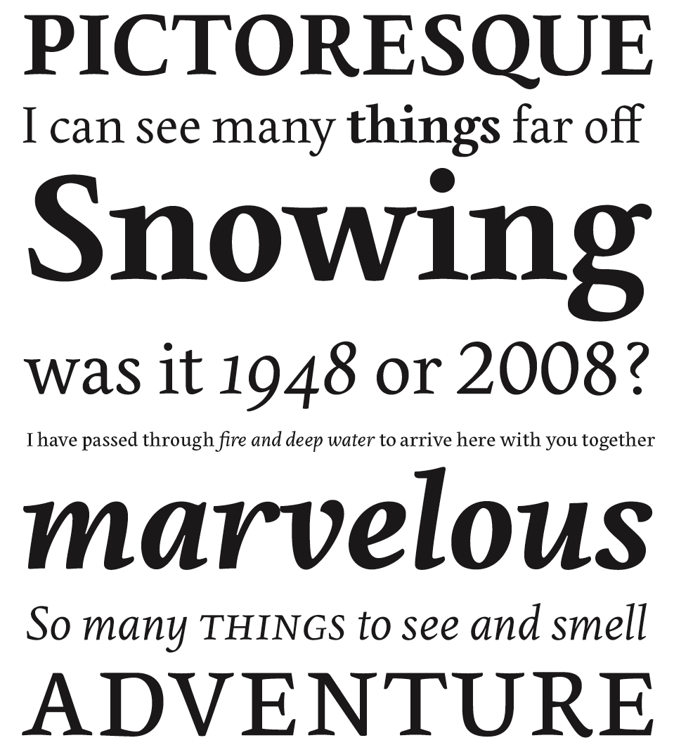
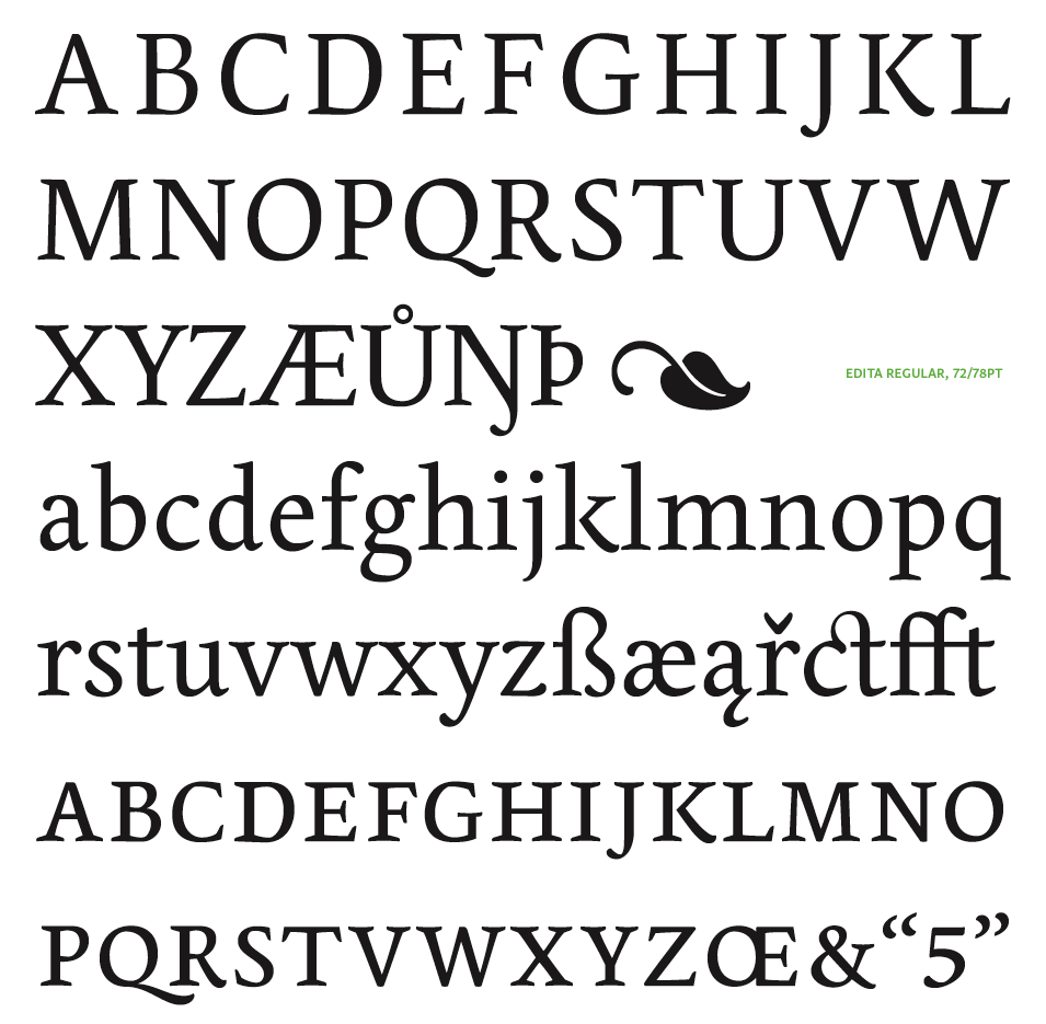
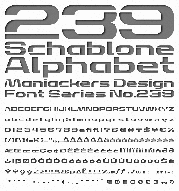
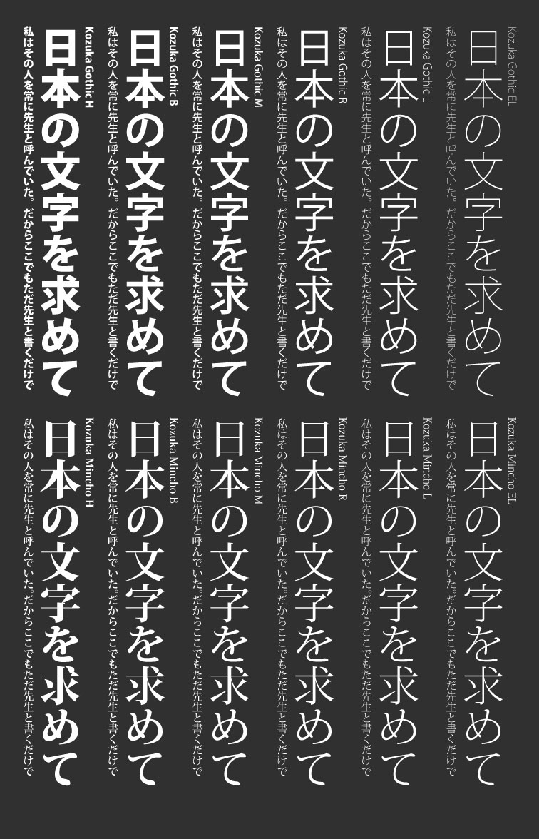
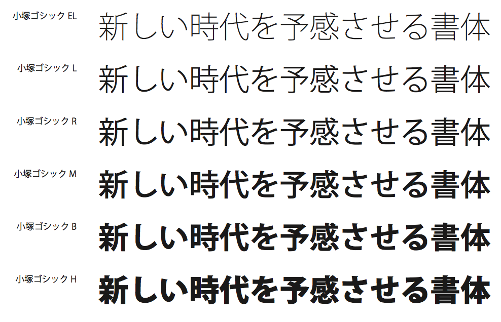
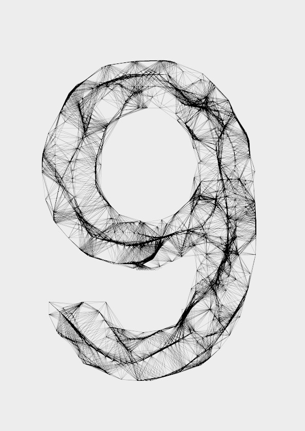
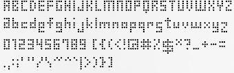
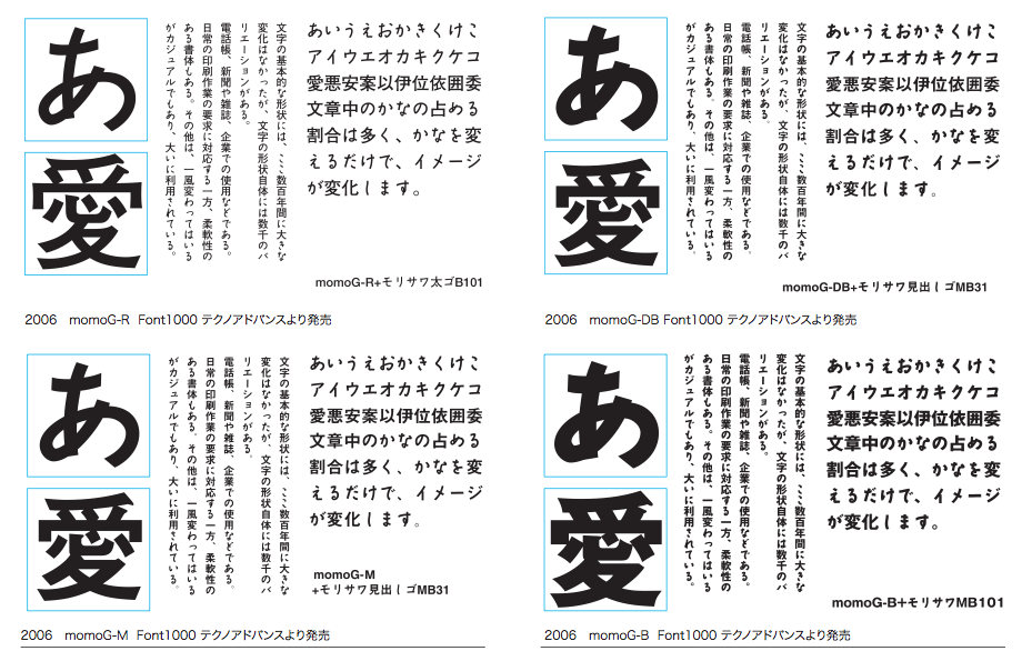
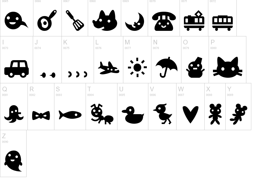
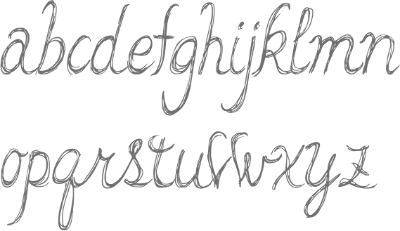
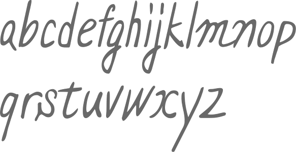
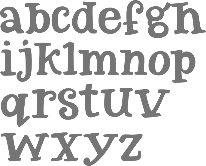
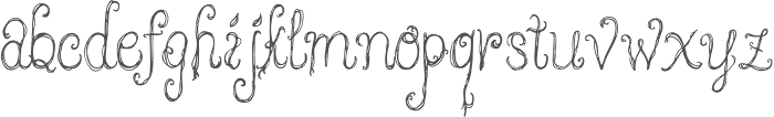
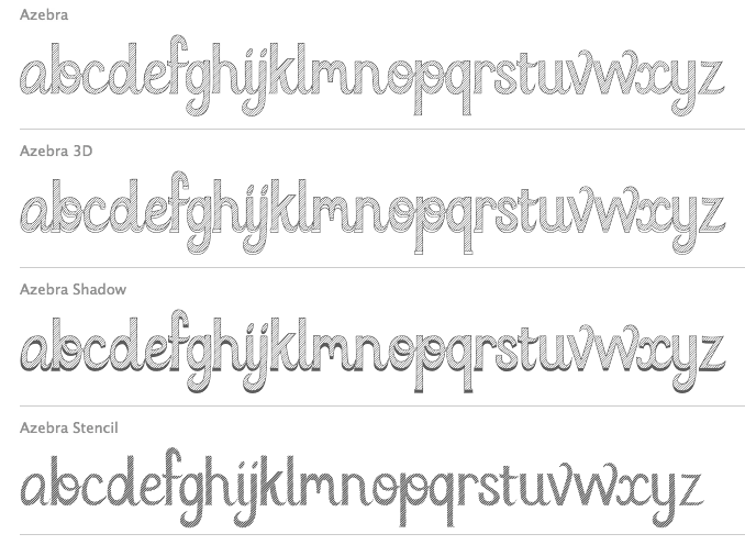
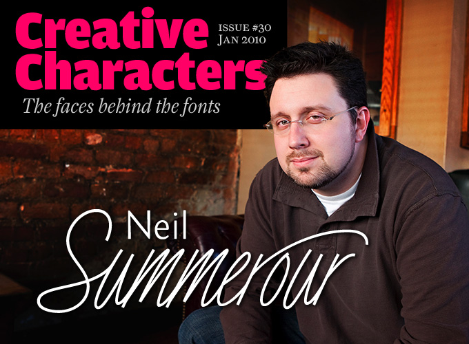
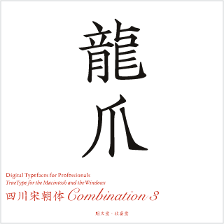
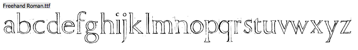
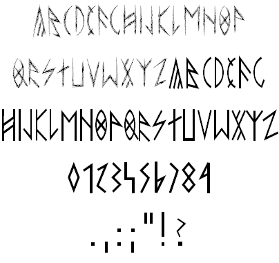
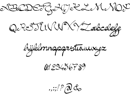
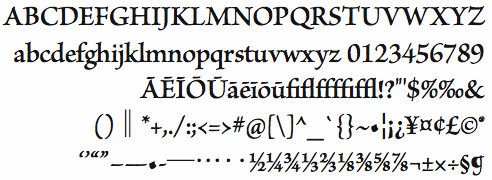
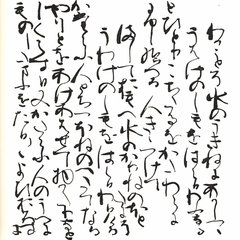
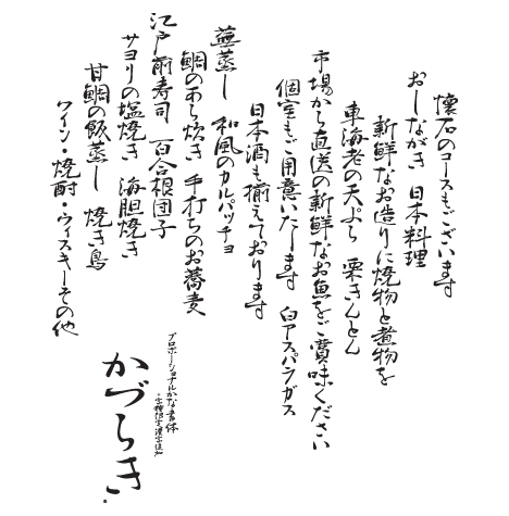
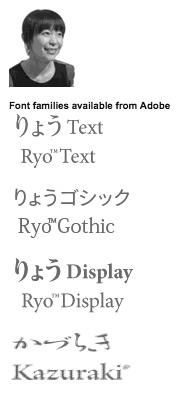
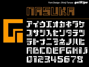
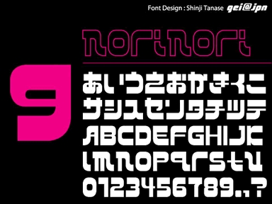
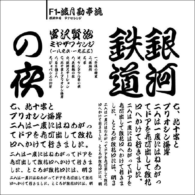
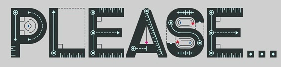
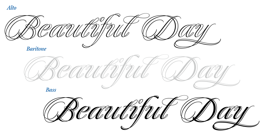
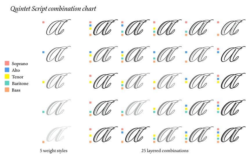
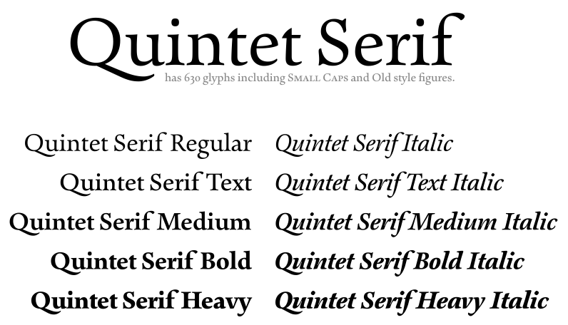
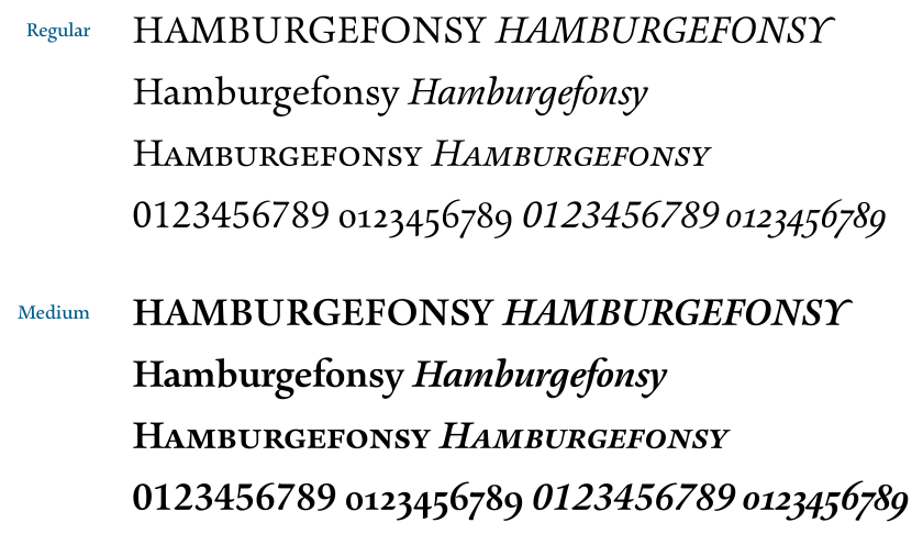
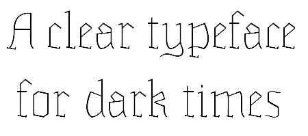
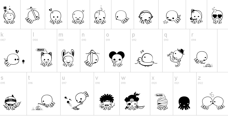
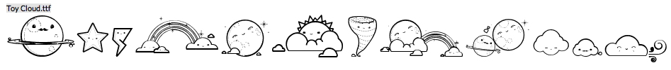
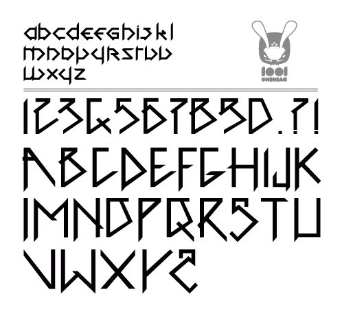
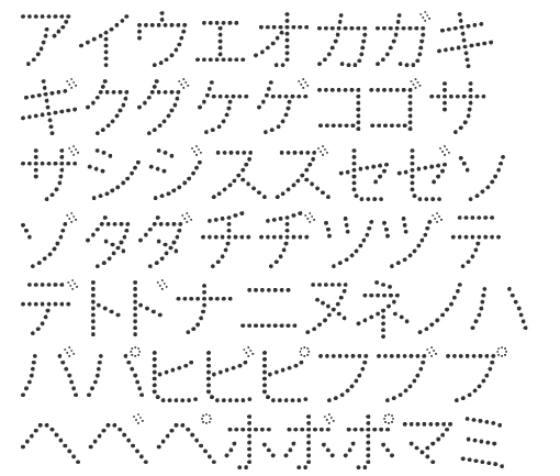
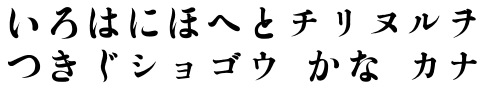
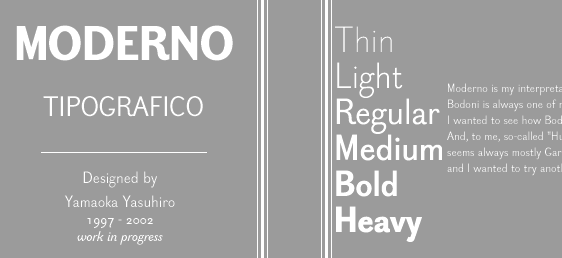
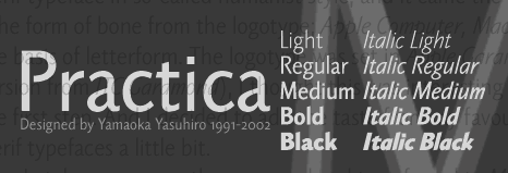
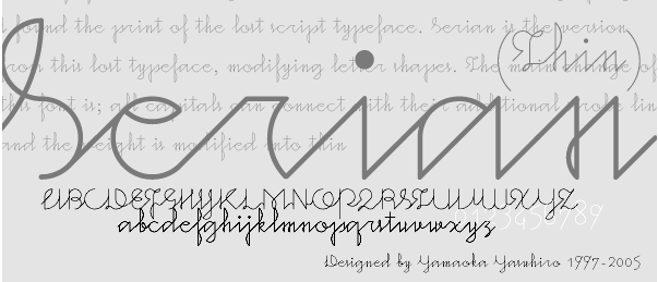
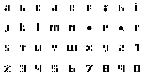
|
|
|
|