TYPE DESIGN INFORMATION PAGE last updated on Wed Dec 17 04:01:46 EST 2025
FONT RECOGNITION VIA FONT MOOSE
|
|
|
|
|
Curly typefaces | ||
|
|
|
|
SWITCH TO INDEX FILE
066.FONT
| 066.FONT is Piotr Wozniak's Polish foundry based in Konskie with some commercial fonts (Linotype Kropki (1997), Dr066, Kfontz) and some free fonts (DNA, Zawijasy, Mieszkanie9 (a halftone curly hand), Plaq, Plaq 108). Kfontz and Dr066 are old typewriter fonts, and Kropki is a dot matrix font. The free fonts are for handwriting. Some fonts at MyFonts.com, such as Pokrak (2009, grunge family), Longinus Pro (2008, a 9-style family of medieval roughly outlined alphabets), Old Stefan (2008, five styles of grungy typewriter), Kra Kra (2008, grunge), Poldi (2007, 3d hand-printed), Poldi No 2 (2008), Bloor (2008), Crazy David No 1 and 2 (2006, grunge), Karacan Pro (2005, eroded look), Polish Dirty News (2005, grunge), Nieanana (2005), Jackcake (2005), Mada693, Nonpress (2006, grunge), Plaq (2005, halftone simulation face), Dr066, KfontZ, Zawijasy (1997, a curly hand, now commercial), Punx (2006, grunge), 066 Army (2006, grunge), Kulfonus No. 1 and 2 (2007, grunge), Duck Duck (2006), Finito (2008, grunge script), Wopi Script (2005), Pimpus (2009, grungy script) and Wopi Script No. 2 (2005) and No. 3 (2007). The designer is Piotr Wozniak in Krakow (b. Konskie, Poland, 1980). Typefaces at MyFonts: 066 Army (066.FONT), Bloor (066.FONT), Chigliak (066.FONT), Crazy David No 1 (066.FONT), Crazy David No 2 (066.FONT), Dr066 (066.FONT), Duck Duck (066.FONT), Finito (066.FONT), Jackcake (066.FONT), Karacan Pro (066.FONT), KfontZ (066.FONT), Kra Kra (066.FONT), Kulfonus No 1 (066.FONT), Kulfonus No 2 (066.FONT), Linotype Kropki (Linotype), Longinus Pro (066.FONT), Mada693 (066.FONT), Nieanana (066.FONT), Nonpress (066.FONT), Old Stefan (066.FONT), Pimpus (066.FONT), Plaq (066.FONT), Pokrak (066.FONT), Poldi No 2 (066.FONT), Poldi (066.FONT), Polish Dirty News (066.FONT), Punx (066.FONT), Vladicek (2022: grungy; emulating wall writing), Wopi Script No 2 (066.FONT), Wopi Script No 3 (066.FONT), Wopi Script (066.FONT), Zawijasy (066.FONT). Polish link. Dafont link. Linotype page. FontShop link. Klingspor link. [Google] [MyFonts] [More] ⦿ |
7N Types
|
Typefaces from 2013: Hurufo+Numero (sans family), Yaahowu (a rounded sans family), Gobold, Bryana Aningsih Shara (upright script), Gpkn (circle-based monoline sans). Typefaces from 2014: Smoolthan (monoline organic sans), Remponk (multilined), Playsir (comic book typeface), Defonarts, Tulisan Tangan 74, Fortheenas_01, Evogria (bold and mechanical), Anysome, Blackplotan, Dotcirful (dot matrix typeface), Handgley, Brokeren (techno sans), Headsome&Modif. Typefaces from 2015: Manophiser (sans), Theodista Decally (upright connected script), Upbolters (a macho sans caps typeface). Typefaces from 2016: Cutrims (a polygonal typeface), Xacose. Typefaces from 2017: Blessing in Disguise, Chirota (handcrafted), Hastoler, Merysha-Italic, Merysha (serif), SHAOutline, ShareHappinessAround (rounded sans), SomethingLooksNatural, Tentram-Italic, Tentram, Reitam (sans), Myfrida, Ribeat (smooth brush), Etchas, Goeslim, JulySeventh, Justtellmewhat, Offerings, Prohandy, Reprineato, Steagisler, Stea, Miss Nealy, Hastro, Dialoegue, Kisah Ceritra, Chesan, Boxise, Creword, Breetty, Anydore (calligraphic), Brushaff, Budiyaya (brush), Brotherina (connected script), Chosence (sans family), Handycheera, Aulyars (calligraphic script), Molleat. Typefaces from 2018: Freshness, Christed, Xyling, Youthing October Fourteen, Kayskew October Eleven, Hoty, Friday October Twelve, Codian October Nine (art deco), Caboge, Stripe October Seven, Nesdate October Ten, Codian October Eight, Odian October Nine, Stripe Shadow October Seven, Clambake October Six, Lovina October Five, Grande October Four, Grande October Three, The October Two, The October One, Favoner One, Homade McRacken, Besta Baru, Srows, Sanson, Bestar, Kathen, Byby, Charilla, CuteBeSpecial, FriendlySchoolmates-Italic, FriendlySchoolmates, GirlsMarks, HeartWarming, HeartWarmingExtra, Kaylonick, LearnShareColaborate-Bold, Mergic, MOGrhythm, OpenMinded, OpenMindedInside, PassiontoAction, PassiontoActionSlant, TeamWork-Italic, TeamWork, Yessy, Feltarigo, Motira, Adelio Darmanto, Troche, Nicolera, Mantul, Yukikato, Gebrina, Veni, Onadio, Aliena, Gabelisa, Still Loving, Shink, Sottee, Milyone, Kelidya, Yuliya, Hestina, Masbro, Goday, Milgun, Togetha, Thisay, Dhitha, Charline, Briany, Candire, Arinda, Anglena, Abilya, Story of Super Boys, Richela Kids, Seelyn, Pulen, Podo Moro, Sri Muliyo, Neigfriste, Hardino (monoline script), Purple River, Yoshephin, Theola Kids, All Season, All Season Ornaments, Hello Teman, Attracted Monday, Cirquesa, Hopeitissed (signage script), Hettas, Certhas, Fattana, Qeiza, Having Fun, Flotta, Soe, Misses, Siry, Mommy's Kitchen, Thany, Mother's Touches, Create Something Today, Well Bred, Cheria, Beatific Margella, Hidea, Gobold Blocky, Riztteen, Stika, Bintar, Ginta, Menscho, Hilona, Dehasta Momentos, Mungkin, Shartoll Light, Robaga Rounded, Ingat, Ascota, Klapjo. Typefaces from 2019: Homazing, Pre (script), Millythea, Rough Rough, The Friday Stroke (brush script), Anu, Dearly Loved One, Khalifa, Vesetia, Blending Attraction, Lova Valove, Quotable, The Simple One, Matchinger, Touch Over Next, Waiting For, Being Love, Lova Valove Serif, Clawster, Hopia, Sanson, Being Love Sans, Back To Ancient Time, Protector, Mystag, Oreta, Dearly Loved Slab One, Yep, Nuaz (a stitching font), Bronice, Nesdate October Ten. Typefaces from 2020: Sheroo (beatnik style), Thank You So Much, Styla, Racy Mango, Josy Wine (spurred), Lonely Melody, Alegra, Alenor, Conformable, Sweet Hansan, River Script, Kevin Aprilio, Jorby, Maines, Say Yes, Fish Grill, Flash on Saturday Night, Literally Natural, Lady Nature, Joyful Story, Brush Hours, Daily Walker, Free Monday, Mila Bright, Marchone, Githo Love, Fondacy, Jumat, Brastagi, Christiany, Feltarigo, Gabelisa, Gibran, Baligle, Do It With Love (a Valentine's Day font), Vecoly, Delightious, Ataro, Anticed, Cherrythea, Merrycle, Twolank, Atozimple (a monoline sans), Bikito (a curly script), Tyfanie, Hilya, Lonnie. Dafont link. Web site. Creative Market link. Creative Fabrica link. Another Creative Fabrica link. And another Creative Fabrica link. [Google] [More] ⦿ |
Aatype
|
In 2010, he created Dopamin (a high-contrast display sans), Square Comic, and Nilish (monoline geometric display sans). In 2011, Ahmet created the art deco chic family Turquoise, the techno sans family Altuna Sans, the semi-hand-printed Shirin, and the organic and elliptical monoline sans family Deria Sans. Sterk (2011) is a legible and open masculine sans family. Glode (2011) is a masculine geometric sans family. Calligra (2011) is an elegant almost calligraphic flared sans. Ephesus (+Shadow) is a caps-only titling sans family. Tillom (2011) is an elegant decorative face. Ondule (2011) is a horizontally-striped texture face. Brounde (2011) is a rounded monoline slab family. Eggy (2011) is a monoline sans display typeface with slightly shaky outlines. Uno (2011) is an organic display face. The display sans Veberk (2011) has contrast and style. Typefaces made in 2012: Halis Grotesque, Uneven (a bold poster typeface family), Ferforje (curly all caps face), Daphne (a hand-drawn all caps poster family), Mancho (a stylish caps only sans family), Cillop (elliptical sans), Typonil (elliptical sans), Omar (squarish poster font), Gulyesa Script (a beautiful informally hand-printed poster typeface), Smyrna (hand-printed poster face). Typefaces from 2013: Minik (a great hand-drawn typeface with tall ascenders and descenders), Festivo Letters (a popular hand-made layered font system with 19 fonts numbered No1 through No19; see also Festivo LC, 2014, which has new sketches, shadows and ornaments), Halis Rounded, Troia (a flexible sans family). Typefaces from 2014: Harman (a 7-style hand-drawn collection of retro poster fonts), Akon (hand-drawn poster family), Minimo (a geometric organic minimalist sans family in four weights). Typefaces from 2015: Racon (weathered type, perhaps letterpress emulation), Masif (heavy brush script renamed Pitos after 24 hours, most likely after a complaint from Monotype which markets a Steve Matteson font called Massif---Ahmet should have ignored that request as Monotype itself ignored Jean Joveneaux, who created another font called Massif in 1957, decades before Matteson's font), Deepika (swashy script), Tropen. Typefaces from 2017: Buket (an 18-font collection including Marquee, Roman Shiny, Fat Sketch, Script, Decorative Shiny, Basic Retro, and Prismatic). Typefaces from 2018: Narin. A geometric sans family with rounded corners. Typefaces from 2019: Revello (hand-painted and layered), Festivo Clean, Salve (a monoline script), Urfa (an 18-style sans family). Typefaces from 2020: Izmir (a 44-style geometric sans family), Grand Sword (a decorative all caps typeface). Typefaces from 2021: Urfa Rounded (an 18-style rounded elliptical sans). Typefaces from 2022: Sarmal (a great handlettered interlocking poster typeface), Punkto (an 18-style geometric sans). |
| |
Abdul Azizul
| |
Abdul Ghofur
| |
Abdul Hapiz Hilman
| |
Abecé Festival Tipografico
| This festival or happening in 2011 in El Salvador led to 66 freely downloadable experimental typefaces. A list:
As a fine representaive in this list, Vladimir Ramos from San Salvador designed Soplodetinta, an ink splatter typeface. [Google] [More] ⦿ |
During her graphic design studies at anasthali Institute of Design, Abhilasha Miglani (Jaipur, India) created these typefaces: Green (2014, curly, organic), Banking (2014). [Google] [More] ⦿ | |
Located in Bandung, Indonesia, ABM Studio created the spurred Victorian typeface Huntington (2014), the sans titling typeface Grandia (2014), and the curly Indic simulation face Sailendra (2014). In 2015, they made the signage font Roodies. Creative Market link. [Google] [More] ⦿ | |
Active Sphere
|
Their fonts include the geometric sans display families Kayla Sans (2008), Kathleen Sans and Serif (2008), Leenyx (2008), Jekatep, Sean Henrich ATF (2009), and Yarikha (2008). Stephanie (2008) and Zirphy (2008) are rounded geometric display fonts, and Kamaru Sans (2008) is an experimental sans face. Mecatoque (2008) is Victorian but pretends to be futuristic, and Sayonachi (2008) is a curly children's book face. Stanix (2011) and Tsikot (2011) are fat techno typefaces. Maxine Sans (2011) is a basic humanist sans family. Tamika (2011) is a gorgeous oriental style brush face. Anino (2011) is a grunge family. Anikka (2011) is a monoline sans family with an extremely thin hairline on one end. Filipina (2011) is an organic sans family. Bradford (2011) is a squarish family. Gretta (2011) is a minimalist sans with missing strokes. Danrex (2011) is Ronnie's contribution to the "fat counterless" craze. Merina (2011) is a fat piano key face. Sailfin is a stylish monoline organic sans family. Typefaces from 2012: Noki (a great slabbed squarish typeface family), Xira (angular), the sturdy geometric display font Zafra, and the fat squarish techno family Mossimo. Typefaces from 2013: Monterra. Typefaces from 2014: Tiger Cat. A large modular typeface family that follows the octagonal mechanical genre. Typefaces from 2021: Blue Creek (22 fonts; a condensed all caps sans), Blue Creek Rounded (22 fonts). |
Adalin
| Designer in 2018 of the Latin / Cyrillic handcrafted typefaces Candy (curly script), Polar Bear (a sketched font for Christmas), A Wish (a Christmas script), Varvara, Jungle, Arelon, Elantris (script). [Google] [More] ⦿ |
Ade Santani
| |
Typefaces from 2010, mostly made with FontStruct: the pixel typeface Benci Malaysia, the hand-printed Nyonya Gendut, the squarish typeface Hutan and the irrgularly sized Madura Regular. He also made the texture / knitting typeface Batik, FoOleD bY GaYUs, Probolinggo (organic), Smasasinema (display face), the texture typeface Serangkaian Pattern, Indo-Malay Confrontation (pixelish), Koruptor and the Bitches (gothic), Qurban Feast, and the curly native pattern typeface Mlungker. In 2011, he made Kabupaten (a sketch font), Social Monster, Buka Pusa Bersama, Ceria Lebaran, Pajarakan Studs, Batik Gangster, Maharani (hand-printed), Lovely Eunike Hans (hand-printed), the texture typeface Kawung Textile, Wildan Izzur Gunarta, Genius Jempolan Royal (scanbats), Pray For Japan, Quantum of Bali, X-Code from East (Javanese script), Hangeul (Korean simulation face), Halidians Blockserif, Moanday Earn Bored, the paper cut typeface Malingsia, Awesome Java, Mesin Hitung (an LCD face), Eenvoudige Batik (stitching face), Antique Paleoindonesia (patterned face), Kebencian (scratchy face), Kemasyuran Jawa (a display face with an Indonesian look), Probolinggo Sans, Londo Chino, Urban (paper cut face), Bikang Struck, Chana Remedy, Indonesian Woman (pixel dings), People Diverse (pixel dings), DBA Muslim (pixel dings), Turk and Nusa (ball terminal face), Jakarta Recycle (paper fold octagonal face), Halida Sans (a swirly version of Ubuntu), Buka Puasa Bersama (Arabic simulation face), Social Monster (grunge), Ceria Lebaran Normal (lava lamp typeface), Dukungan, Dukungan, Sanjaya Epoch, and Jakarta Sunken (angular face). In 2012, he created Halidians Blockserif, Penakut, Agoestoesan, Siti Maesaroh (Arabic simulation face), Turk and Nusa, Rest in Phuket (Thai simulation typeface), Chana Remedy, Bunaken Underwater, New Madura, Moro Seneng, Endutt Normal, Antibalon, Hayyu Kaget, Damai Kpk Polri, Damai Pelajar, Jangan Bersedih (hand-printed), Ikan Besar, Senyum (hand-printed), Catatan Perjalanan (fat finger face), Wizzta, and Quick Argani. Typefaces from 2013: Emilio 19 (athletic lettering font), Bangkit, Faishal Bakeries, Soerjaputera (avant-garde), Soerjaputera Doea (art deco), Sang Fatchurrohmah (lava lamp face), Aceh Darusalam (Arabic simulation face), Revolusi Timur Tengah (Arabic simulation face), Nurkholis (Arabic simulation), Kopleng (alchemic), Menjelajah Halmahera (a ronde font), Jakarta Highends, Smasasinema, Sanjaya Epoch, Mlungker, Dukungan, Thohir Ke Badreah (all caps sans face), Serangkaian Pattern, Endutt (fat finger face), Boutiques of Merauke (a curly typeface), Balinese Family, Zamrud & Khatulistiwa (curly font), Awesome South Korea (great oriental-look font), Freeport Go Away (poster font), Senang Banyol, Don Aquarel, Jawadwipa Adisastra, Si Kancil (fat finger font), Wortellina, Don Butique (hand-printed), Did You See That, Bimasakti. Typefaces from 2014: Rampung, Prabowo, Larasukma (an abstract shape font), Tafakur (Arabic simulation typeface), Syawal Khidmat (Arabic simulation face), Kurnia (curly script), Kota Surabaya (dingbats of buildings), Hutan Lestari, Kobarapi (spurred typeface), Mukadimah (Arabic simulation, based on ae Cortoba by Arabeyes), Huruf Maranti (upright connected script), Emilio 20 (athletic lettering). Typefaces from 2015: Gurindam (Dutch art deco), Upakarti, Tyree Friendly Face (rounded sans), Berantas Korupsi, Kanisah (Hebrew simulation font). Typefaces from 2016: Belacu, Cemong, Bungasai, Semringah, Binarung (masks), Surabanglus (beatnik style). Typefaces from 2019: Kembang (dingbats). Fontspace link. Home page at Fontastic Indonesia. Devian Tart link. Klingspor link. Dafont link. Behance link. [Google] [More] ⦿ | |
Adriana Esteve Hernandez
| |
American designer of these display typefaces in 2019: Toothpicks and Hooks, Curly Hair, paper Clip Edges. [Google] [More] ⦿ | |
Adriprints
|
Her fonts include Kicks (2012, a fun hand-printed typeface for children's books), Stitching Kit (2010, dings), Fiddleshticks (2009, linocut), Sorbet and Sorbet Wide (2009, like architectural letters), Fancypants (2010, curly lettering), Stitchin Crochet (2009, dingbats), Trellis (2009, hand-printed), and Draft Punk (2009, comic book style). Font Squirrel link. Klingspor link. [Google] [MyFonts] [More] ⦿ |
Adult Human Male
|
The commercial Alex created the grunge stencil typeface Butterworth (2011), the hand-drawn Teksi (2011), the monoline squarish family Ebdus (2011), Valis (2011, futuristic), and the thin avant garde monoline typeface New Slang (2011). Gordito (2011) is a graffiti style bubble font that says Smurf. In 2012, Alex published the poster caps typeface Areaman, Stink Lines (multilined typeface) and Penang (art deco signage typeface seen on Penang by the creator). Straights Light is a beautiful pair of bilined all caps typefaces. Dale Kids is a children's book typeface. Hokkien (2012) is an art deco typeface with Chinese influences. Mister Mustard is a chubby rounded art deco typeface. Barkley (2012) is a textured caps typeface with a chalk board feel. Liner Notes (2012) is a bilined hand-drawn typeface. Bartleby (2012) is a hand-drawn all caps display font. The free font foundry Squack has the hand-printed typefaces Barker Allcaps (2012), Scrapist (2012, sketched), Billy Boy (2011, 3d), Quito Chicken (2011, 3d), Fred Wild West (2011, a grungy western face), Coolock Black (2011), Zapftig (2011), Ringworm (2011), Suicide Draft (2011), National Granite (2011, a 3d stone chisel face), Whiskey Fingers (2010), Wank Hands (2010) and Middle Man (2010), and the irregular typefaces Zapftig (2011), Shock Corridor, Pollo Asado, Middle Woman, Ghost Words, Late Puberty, Parrannoyed (2010, ransom note face), the hairline typeface Rexic (2011), Black Grapes (2012), Chump (2012, hand-printed capitals), Areman OT (2012), and the grungy Skidmarks (2012). Typefaces from 2013: Salas (a chunky cartoon face), Rabid (a crayon font), Strokin (a great brush face---part charcoal part paint strokes), Bevel Hands, Bunk (a layered beveled type system absed on a monoline fat rounded sans, Bunk Base 2), Spengler (inline face), Vastra (Bauhaus style, organic), Swingers (curly and cartoonish), Chump Change, Treves Sans (crayon face), Quincey (2017). We read that the fonts are designed by EircomTest. Aka Squack, MiddleMan and Alex H. Dafont link. Creative Market link. Twitter link. Behance link. [Google] [MyFonts] [More] ⦿ |
Adult Ramblings
|
Alternate URL. There are also free handwriting fonts: AEZ-American-Woman, AEZ-country-girl, AEZLeighHW, AEZ-Traci's-Handwriting, AEZ-Jon's-Handwriting. Fontmaking tutorial [dead link]. The font pages seem to have disappeared. Dafont link. Klingspor link. [Google] [More] ⦿ |
Bandar Seri Begawan, Brunei-based student-designer of the free curly flowery handcrafted typeface Light Daisy (2015). [Google] [More] ⦿ | |
AEN Creative Studio
| Yogyakarta, Indonesia-based designer, of the script typefaces Christmas Gift, Hamuna (2019), Sandwell (2019), Kelly Leevan (2019), Driana (2019), Lattiefa (2019: monoline), Naella (2019) and Valerine (2019). In 2020, he released the script typefaces Janiella, Valenttiena, Cute Butterfly, Sarilla Script (a rabbit ear calligraphic script), Sweet Allita, Christmas Surprise, Sallsa, The Spooky Night, Amillina (an upright script), Lovely Autumn, Benillia, Monallesia, Monallesia Script, Giette, Hello Shilla, Allesia (a wide signature script), Benilla, Allitta Calligraphy, Leytta, Selly Calligraphy, Lathi, Barbara Calligraphy, Brillia Calligraphy, Gietta, Selitta, Lattiefa, Sweet Charlie, Ravenna, Solleno and the monoline script typefaces Benalla and Faritta. Typefaces from 2021: Christmas Combine Script (a tall stylized sans), accompanied by a brush script Stunning Christmas Monogram, Cute Christmas Monogram (an alphading font by Agung Eko Nugroho), Christmas Chic (a hand-drawn slab serif), Pattia (a round hand-crafted typeface), Aterline (a monolinear slab serif), Marqana (an elegant informal sans), Halloween Script, Creepy Halloween Monogram, Bat Boo, Halloween Festival, Chic Cat (hairy letters), Spooky Place (a brushed Halloween font), Creepy Ghost, Autumn Ceria (hand-printed with leafy attachments), Conmersa (a headline sans), Amalligna (script), Sweet Flower Monogram (a Valentine's day script), Anttine (script), Kellvin (an informal monolinear typeface), Sweet Butterfly (a romantic or scrapbook script), Summer Story (a non-connected script), Sunny Brush (a brush script), Demillina (a heart-themed Valentine's Day script), Summer Calling, Niliya (script), Aynilla (a curly script), Melline (script), Miatta (a connected calligraphic script), Romantic Spring (a script), Aurona (script), Easter Joy (hand-printed), Alessea (script), Pretty Valentine (script), Valentine Cute. Typefaces from 2022: Amanilla (a scrapbook font), Easter Sweet (a Valentine's Day font), Mellviana (a scrapbook font). [Google] [MyFonts] [More] ⦿ |
Polish creator of the curly psychedelic didone typeface Hippie (2010). In 2012, she created a text typeface. Behance link. [Google] [More] ⦿ | |
Ageless Type (was: Crop Studio, or: Juniors 94)
| Or Rahmat Syahputra. Ingin Jaya, Kabupaten Aceh Besar, Aceh-based designer, b. 1994, of these brushy calligraphic typefaces in 2017: Gerhana, Bintanghu, Geulayang (upright ronde script), Syalty, Kookaburra, Pugter, Flalkner, Iolana, Aneishie. Creator of the monoline script typeface Nagata (2018), the upright script typeface Berkarya (2018), the signage script typeface Hunkydory (2018), and the calligraphic script typefaces Rughetta (2018), Oliverra (2018), Kenshington (2018), Robertortiz (2018), Rodanthe (2018), Kristopher (2018), Serendipity (2018), Whitening (2018) and Matthew (2018). Typefaces from 2019: Fantastic (script), Armadilla (upright script), Aurelia (curly script), Firgia Gia (calligraphic). [Google] [More] ⦿ |
| |
Agung Eko Nugroho
| |
Agung Rohmat
| |
Ahmad Syarif Afandi
| |
Ahmad Zulfikar Ali
| |
Ahmet Altun
| |
FontStructor who made the curly caps typeface Patendril (2012). [Google] [More] ⦿ | |
| |
Aiyari
|
Typefaces from 2016: Holiday (17-script family), Dreadful (a layered Halloween typeface family, with dingbats), Casual Brush, Lucidity (signage script), Euphoria (Victorian), The Painter, Minority (very condensed hand-lettered typeface), Thunderstorm. Typefaces from 2017: Tjikapoendoeng Script (formal calligraphic script by Ricky Rinaldi and Juru Aksara), Lovadelic (psychedelic), Neptunian (dry brush), The Moonlight (comic book script), Savath (a horror font), MacLaurent (tattoo font). Typefaces from 2018: Lucidity (an expansion of his 2016 version, including Psych, Expand, Extras: psychedelic / art nouveau trio), Winter Is Coming (a beatnik font), The Beardy, Dreadful (a layered horror movie font), Saturday Night (a great retro disco poster typeface family with a particularly striking interlocking style). Typefaces from 2019: Spooktacular (a Halloween font), Spooky Sans. Typefaces from 2020: Tropika Island (a great tiki font), Swettiest, Laguna Vintage. Typefaces from 2021: Ayr Blufy (a puffy supermarket signage script). Typefaces from 2022: Ayr Thrope (a weightlifter's font). Dafont link. Behance link. Graphicriver link. [Google] [MyFonts] [More] ⦿ |
Ajibatype
| Ajibatype was founded in 2021 by Jamhur, the Aceh, Indonesia-based designer of Blanton Script (2021: a curly script), Haylin Script (2021), Mistella Script (2021), the 14-style signage script Ralsteda Script (2021), which can be found on Behance under the related name Ralston (2021). [Google] [MyFonts] [More] ⦿ |
Lhokseumawe, Indonesia-based designer of the spurred Victorian (and perhaps tattoo) font Nebenk (2019), the script typeface Seulanga (2019), the 12-style sans typeface Baver Avalone (2019), the vernacular typefaces Choco Peanut (2019) and Kungfu Cartoon (2019), and the modular typeface Pro Legacy (2019). Typefaces from 2020: Aceh Island (Victorian), Casbelov, Eco Power (a round poster sans), Hening, House of Kanoe, Onix, Risol Script (curly), Sweet Boy. [Google] [More] ⦿ | |
Aceh, Indonesia-based designer of script typefaces. The Studio's fonts from 2018: the signage script typeface Merciana Script, the curly Maitlyn Script, Dallastic Script, Fantabulous Script, Hinella Script, Dealova Script, Funtastic Script. Typefaces from 2019: Instory (a dry brush script), Atlantic Script, Fallefi Script (a great upright calligraphic script), Mithana Script, Azzury Script, Molianty, Twenty One, About Loving, Farmfresh Script, Wonderfully Script. Typefaces from 2020: Mordibella (a dry brush script), Bastian (a fat finger font), Kailash (a dry brush font), Baver Brush, Holmeria, Anther Brush, Matteona (a dry brush script). Typefaces from 2021: Kynthia Script (upright and stylish), Asbatun (Arabic emulation), Qaboos (serif), Bollofora (a dry brush script), Fabulous Signature, Aprilous (a fat finger font), Shalleh (an Arabic emulation typeface), Abrupt (a dry brush script), Gibrella (a fat finger script). Typefaces from 2022: Bertone (a scrapbook brush script), The Brayland (a retro signature font), Rumbia (hand-crafted). [Google] [MyFonts] [More] ⦿ | |
Designer of the curly agonized script typeface Eu Mezmo (2011). [Google] [More] ⦿ | |
His oeuvre (sold via MyFonts) includes:
View Alan Meeks's typefaces. Yet another page with Alan Meeks's typefaces. Klingspor link. [Google] [MyFonts] [More] ⦿ | |
Alandya Type Foundry
|
|
Digital artist in Kosova, Albania. Behance link. Most historians believe that the Albanians are descendants of the Indo-German tribesmen called the Illyrians who were in the Western Balkans ca. 1000bc. Illyria (2011) is a curly monoline sans script that permeates Victorian perfumes. [Google] [More] ⦿ | |
Bogota, Colombia-based designer of the curly Wayuu culture-inspired typeface Jerulaa (2016). [Google] [More] ⦿ | |
Graduate from FADU, University of Buenos Aires, who created the curly typeface Filoseidología Ponzettiana (2008). [Google] [More] ⦿ | |
Alternate URL. Dafont link. Behance link. [Google] [More] ⦿ | |
Designer of the beautiful Cyrillic serif family Leksa (a winner at Paratype K2009) and the accompanying Leksa Sans family from 2004 until 2007. This was followed by equally gorgeous families such as Fence (2009, an ultra-fat artistic beauty). Skoropix is an experimental pixel typeface done with FontStruct. She also made Belladonna (2008, a stunning modern typeface for Latin and Cyrillic; a winner at Paratype K2009 and Grand Prize winner at Granshan 2011), Skoropix (with FontStruct), and the experimental typeface Cless (2009). She spoke about Cyrillic at ATypI 2008 in St. Petersburg. She received a TypeArt 05 award for the display family Fourty-nine face. Alternate URL. At MyFonts, one can buy Gorodets [2009: a Russian decoration typeface based on traditional wood-painting style from the town Gorodets on the Volga river, Russia], Leksa and Leksa Sans], Blonde Fraktur (2010: written with a quill by Alexandra Korolkova and prepared in digital form by Alexandra Pushkova), Airy (2010, a curly script), Airy Pictures (2010, animal and plant dingbats), Bowman (2010: a blackboard children's script), PT Serif (2011, Paratype's superfamily of 38 fonts, co-designed with Vladimir Yefimov and Olga Umpeleva; Open Font Library link), PT Circe (2011, a geometric sans family with a neat Thin weight; Third Prize for Cyrillic text typefaces at Granshan 2011), and Cless (2010: ultra fat and counterless). Together with Isabella Chaeva, she made PT Mono (2012, Google Web Fonts and Open Font Library). In 2012, Vasiliy Biryukov and Alexandra Korolkova co-designed the Christmas dingbat font Gingerbread House, together with a plump display face, Gingerbread. In 2013, Vasily Biryukov and Alexandra Korolkova co-designed the soft roundish sans typeface Kiddy Kitty (link). In 2014, she cooperated with Maria Selezenava on a revamped Journal Sans typeface at Paratype, called Journal Sans New (Latin and Cyrillic). This geometric sans in the style of Erbar Grotesk and Metro Sans is a major extension of the Journal Sans typeface (1940-1956, SPA, in metal form, and 1990s in digital form). Still in 2014, she co-designed Stem, a geometric large x-height Latin / Cyrillic sans serif with optical sizing, with Isabella Chaeva and Maria Selezeneva at Paratype. This was followed in 2015 by Stem Text. In 2015, she and Alexander Lubovenko co-designed Circe Rounded, which is an extension of her earlier Circe typeface (2011), both published by Paratype. In 2018, Paratype extended that family with Circe Slab (by Alexandra Korolkova and Olexa Volochay). Still in 2015, Alexandra Korolkova and Alexander Lubovenko published Aphrosine at Paratype, a typeface based on pointed pen script and situated somewhere between handwriting and calligraphy. Many alternatives and smart OpenType features help Aphrosine look like real handwriting. Codesigner of Kudryashev Display (2015, Isabella Chaeva, Alexandra Korolkova and Olga Umpeleva). Kudryashev Display is a set of light and high-contrast typefaces based on Kudryashev text typeface. In addition to Kudryashev Display and Kudryashev Headline typefaces, the type family includes also two Peignotian sans-serif typefaces of the same weight and contrast, with some alternates. The serif styles were designed by Olga Umpeleva in 2011, the sans styles were created by Isabella Chaeva in 2015 with the participation of Alexandra Korolkova. In 2016, she designed FF Carina, a delicate and absolutely stunning decorative didone. In 2018, Alexandra Korolkova and Manvel Shmavonyan designed Fact at Paratype. Fact (2018) is based on Frutiger. The Fact type system contains 48 upright styles with variations in width and weight and eight italics of normal width. At the end of 2018, Alexandra Korolkova, Alexander Lubovenko, and the Paratype team finished Six Hands, which is a collection of six handcrafted typefaces: Black, Brush, Chalk, Marker, Condensed and Rough. In 2019, Vitaly Kuzmin and Alexandra Korolkova co-designed the free sans serif typeface Golos Text at Paratype. It was originally commissioned by Smena (AIC Group) for state and social service websites. Typefaces from 2020: Sber (the type system for Russia's Sber Bank; by Korolkova and the Paratype team), Tupo Vyaz (a free modular closed sans serif font with very simple design and some elements from the northern variant of Vyaz slavonic calligraphic hand), Grrr (at Paratype, with Dmiry Goloub; a techno family characterized by an oversized lower case f). MyFonts interview. Kernest link. Klingspor link. View Alexandra Korolkova's typefaces. Speaker at ATypI 2019 in Tokyo. [Google] [MyFonts] [More] ⦿ | |
Ottawa-based student who is working on the curly display typeface Waterworld (2006) and the serifed display typeface Eskela (2006). [Google] [More] ⦿ | |
Alex Grecian
| |
Alex Haigh
| |
Alex Hy
| |
Alex Ivanov
| |
Alex O. Kaczun
| |
Born in 1917 in Brooklyn, NY, Steinweiss became famous for his music album covers and the lettering used on them. Designer in 1939 of the curly hand-printed Steinweiss Scrawl, which was purchased by Photolettering Inc in the 1950s. It was revived in 1993 by Christian Schwartz as Hairspray (in Blonde, Redhead and brunette weights). Nick Curtis's 2005 font, Whirled Peas NF, revives Whitestone Crawl by Steinweiss. Michael Doret, with the help of Patrick Griffin, made a 2200-glyph curly script typeface called Steinweiss Script (2010), which captures a lot of the spirit of Steinweiss's album covers. Klingspor link. [Google] [MyFonts] [More] ⦿ | |
Alexander Bobrov
| |
Alexander Branczyk
| |
| |
Aka Saint-Sanches. Saint Petersburg, Russia-based designer of Italian Roundhand (2017), a Latin / Cyrillic typeface based on the work of C.P. Zaner, ca. 1900. Other typefaces from 2017 include Unadorned Hairline (perhaps a silent movie font) and Skeleton Letters (a curly decorative monoline typeface family, with monogram ornaments). Creative Market link. Behance link. Graphicriver link. [Google] [More] ⦿ | |
Added in 2009: Russisch Brot, Block Out (3d face, +Filled1, + Filled2), Bold Stencil Sans, Script Pixelig, Dorky Corners Sans, Haus der Kunst (inspired by the building in München by that name), Fraktur Test, Fette Sans (nice), Emilia, Runde Pixelig (pixel script). Creations in 2010: Fraktur Test, The Plot (octagonal, architectural), 80s Metal Band, Fieldwork Font (pixel), Black Metal, I slabbed the Seriff, Play (curly face). Creations in 2011: Obvious Stencil (Bauhaus, or piano key), Supercali (a psychedelic font inspired by the cover for A.R. Kane's "I"), Manuale (with straight slabs; +Manuale Giocoso, 2012), Graphite (fat and rounded), Graphite 2, Hinterland Italic (quaint Victorian face). From 2012: Linea Fraktur (extended in 2013 to Linea Runde), Black Organic (spiky blackletter), Green Organic (a spurred blackletter), Standard Sans, Modular Blackout Bold Condensed, Viva Las Vegas, Helios, Faux Pas Serif (Egyptian typeface), Nova Thin Extended (this hairline sans is a tour de force---it is the first successful hairline sans typeface ever made by anyone using FontStruct), Bencraft. Fonts from 2013: Meadow Bold, Lush Capitals, SwiftStroke, Its Slab To Be Square, Mellow Doubt, Ligure Black, Beige Organic, Trafo, Trafo Evolution, Codester Mono (a programming font), Swash Buckle, Nova Thin Extended (a hairline sans), Meson Sans, Burgwald Exquisite Bold Condensed, Editoriale, Coalescimen, A La Carte, Hampton Italic, Baby Elephant (fat grotesque). Fonts from 2014: Terminal One (a basic sans), Fanomino, Fontris (like Tetris), Schlaraffenland (+Variant: great rounded sans family), Crystalline, Tick Brush, Manuale Neue Bold, Terminal One, Sanspura, Italics Study, Mundane Black Extended, Heavy Grain, Wineshop Stencil, Folds and Rhizones, Viva Las Inline. Fonts from 2015: Augustine, Coleridge, Framtid, Licht-Sans, Quire-Bold, Quire, Static-Grotesk, Tattoo-Parlour, The-Gift-Serif, Tuileries-Black, Usual-Type, Ziseleur, Zungenschlag, Blackesteverblack. Klingspor link. [Google] [More] ⦿ | |
Photographer and designer in Lyon, France, who created the curly vampire typeface Madlex (2016). Behance link. [Google] [More] ⦿ | |
Oliveira de Azem&eacite;is, Portugal-based designer of the calligraphic typeface Platonic (2014) and of the curly typeface Orta (2014). [Google] [More] ⦿ | |
Alfredo Marco Pradil
| |
Graphic design student at the University of Kansas in Lawrence. She created the curly typeface Sprightly (2012). [Google] [More] ⦿ | |
Typefaces from 2019: Whitefield, Alterwave (a sans family), Greenmark (Peignotian), Günterhaus (a didone), AfterOne, Bluristy, Archelaos, Finnmark, Quinlee, Glitterino, Commodus, Exophis, Klausen (inspired by Trajan caps0, Osmund (a clean bold gemetric sans), Multiberry, Helmwick (a signature script), Benfield (wild calligraphy), Clocksmith (a piano key typeface), Westboy. [Google] [More] ⦿ | |
Aliv Pandu
| |
Alphabet Soup (or: Michael Doret)
|
Fonts sold by MyFonts. Behance link. FontShop link. His typefaces:
Creative Market link. View Michael Doret's typefaces. The typeface libray at Alphabet Soup. [Google] [MyFonts] [More] ⦿ |
Alphabet&Type
|
He also has an interest in Startrekkery because he designed the typefaces Transformers Movie (2009) and Star Trek Future (2009). All these typefaces are free at Dafont and/or Fontspace. Alternate URL. In 2010, he did the free brush typeface Fronte del Porto, which is based on the Elia Kazan movie with Marlon Brando entitled On The Waterfront. There is also a commercial side of Alphabet&Type: In 2010, they published the angular family Antares, the bold organic typeface Minardi (+Collage), and the curly family Vannucci Antico. Metropolis (2010) is an angular typeface based on the titling of Fritz Lang's movie Capolavoro. Sabrina (2010) is taken directly from the Best movie by Billy Wilder, with Audrey Hepburn and Humphrey Bogart. An American in Paris (2010, or: UnAmericanoAParigi) is based on the font used in the movie by Vincente Minnelly, with Gene Kelly and Leslie Caron. Cleopatra (2011) is a chisel font with a Greek look, based on Cleopatra, the movie by Joseph L. Mankiewkz, starring Liz Taylor and Richard Burton. Il Grinta (2011) is the wedge serif titling font of True Grit, Henry Hathaway's movie starring John Wayne. The beautiful inline typeface Singapore (2011) after the titling in John Brahm's movie featuring Ava Gardner. Strade di Fuoco (2011) is based on the movie Streets of Fire by Walter Hill, with Diane Lane. Flash Gordon (2011) is based on the famous movie by Mike Hodges, starring Max Von Sydow. Amazing Spider Man (2011) is based on the Spiderman movie by Marc Web which featured Andrew Garfield. Captain America (2011) is based on the movie by Joe Johnston, with Chris Evans. Twilight New Moon (2009) is based on the Twilight movie. Electric Dreams (2011) is based on steve Barron's movie. Tintin (2011) is a comic book typeface based on Steven Spielberg's 2011 movie. Fantastic Four (2011) is a StarTrek style family that is based on the Tim Story movie. Faelorehn (2011) is a vampire script. Creations from 2012: Sherlock Holmes, Watson (based on Guy Ritchie's movie), Lucky Luke (after the successful Western comic book series by Morris and Goscinny), Danger Diabolik, Ghost Rider (based on the movie by Mark Steven Johnson, starring Nicolas Cage), Notorious (a brush font based on Notorious, a movie by Hitchcock starring Cary Grant and Ingrid Bergman), Cullen, Flower Header, Dorian Gray (from the movie by Oliver Parker starring Ben Barnes), Snow White (from Rupert Sanders's movie Snow White and The Huntsman). Typefaces made in 2013: Beastly (based on the David Barnz movie featuring Vanessa Hudgens), Top Gun (an octagonal typeface based on the movie with Tom Cruise), Manhattan (from Woody Allen's movie), Assassin (based on a Ubisoft video game). Typefaces from 2014: Dylan Dog (based on Kevin Munroe's movie starring Brandon Routh). [Google] [MyFonts] [More] ⦿ |
Alphabytes
|
In 2003, he found an outlet for his work through P22 and published P22Corinthia, P22ImperialScript, P22OhLey [simulating Mexican writing], P22Petemoss and P22Ruthie. He also made RUSerius (2007, curly handwriting), Alex Brush (2003), Cherish Font (2003), ChildrenPlay ROB (2003), Ephesis (1988), Inspiration (2003), JackieO (2003), Licorice (2003), OoohBabyROB (2004), TheNautiGal (2006), Gideon (2009, roman), Corinthia (2009, calligraphic), Puppies Play (2009), Monte Carlo (2011). Rob Leuschke's bio. Klingspor PDF. MyFonts interview. [Google] [MyFonts] [More] ⦿ |
Alphart
| Grobogan, Indonesia-based designer (b. 1996) of the script typefaces Legilature (2018), Southaste (2018: an inky signature font), Salahe (2018: a curly script), The Bohemian (2018), The Signate (2018: monolined), Butterfly (2018), The Rainbow (2018: brush script), Sontoloyo (2018: free), Vessia (2018), Russhell (2018), Helsinki (2018), Tallitha (2018) and Salhena (2018), and the display typeface Cutebold (2018). Typefaces from 2019: Collection, Shinthink, Every Style, Diveil Script, Lazy Cat, Alisha, Catarina (brush font), Maode, Frederick (signature font), Bigfish, Bella (vintage script), Anderfont (script), Brother (brush script), Holiday (script). Typefaces from 2020: Belove, Childish. [Google] [MyFonts] [More] ⦿ |
Alua designed the curly typeface Verdure (2013) while studying in Fairfax, VA. [Google] [More] ⦿ | |
During her studies at the Illinois Institute of Art-Schaumburg, Aly Kelly (AK Designs, Algonquin, IL) designed Steampunk Speech Typeface (2013) and Vine Lnes (2013, a curly script). [Google] [More] ⦿ | |
Moscow-based type and graphic designer who was born in 1991 in Ardatov. Creator of Alya Hand (2010, a curly typeface based on her handwriting, which was done with Konstantin Boldovskiy of the Russian foundry Konst.ru. [Google] [MyFonts] [More] ⦿ | |
Graphic designer in Boulogne-Billancourt, France, who created the curly caps typeface Onduline in 2014. [Google] [More] ⦿ | |
Graphic designer in Lins, Brazil. She created the curly typeface Delsarte (2012). Behance link. [Google] [More] ⦿ | |
During her studies in Rochester, NY, Amanda Riekstins designed Strawberry Lemonade (2016), French Toast (2016), Whipped Cream (2016) and Pumpkin Spice Latte (2016, a curly typeface). In 2018, she published Jelly Jar. [Google] [More] ⦿ | |
Illustrator Amber June Cross (Sarasota, FL) designed the brushy The Scream-style typeface Sorry For The Pentagram (2015) during her studies at Ringling College of Art & Design. In 2017, she designed the runic emulation typeface Runic, and the curly Heffner. Behance link. [Google] [More] ⦿ | |
Graphic and product designer in Cedar Hills, UT, where she created the curly blackboard bold typeface Trueline (2013). [Google] [More] ⦿ | |
Amondo Szegi
| |
At Atlantic Fonts, she designed the hand-printed typefaces Kinglet (2012, curly), Honey Bee (2011), Once (2010) and Clue (2010). In 2013, Amy published the playful poster typefaces Trail Map (2013) and Merci. Farmstand (2013) is a hand-printed typeface that is accompanied by the dingbat font Farmstand Goodies. Wheat (2013) is a stylish rough-edged script face. Eeeek (2013) is a Halloween dingbat typeface. Solstice (2013) is hand-printed. Typefaces from 2014: Shoebox, Reading (bouncy typeface), Lion (an African-themed typeface), Suntea (a children's book script), Fini (cartoon font), Fini Things (girly dingbats), Catbird (whimsical). Typefaces from 2015: Goby (a great children's book font with fun sea life dingbats called Goby Graphic), Laughing Gull (a fun cartoonish font), Digby (Atlantic Fonts). Typefaces from 2016: Sanderling(children's script), Dinghy (beatnik style) and Dinghybats, Storyboard (a primitve painter's font), Quince (a handcrafted typeface), Kiwi (a juice bar font accompanied by the dingbat font Kiwi Fruits). Typefaces from 2017: Meow (a children's script), Answer (handcrafted, unicase), Peapod (a textured patterned all caps typeface). Typefaces from 2018: Junglegym, Turmeric. Typefaces from 2019: Pattycake (a children's book font), Espadrille (a mixed case monoline display sans), Galavant (a cartoon font with interlocking letters), Seaglass. Typefaces from 2020: Darcy (a wonderful beatnik typeface), Parula (hand-drawn with lots of oomph due to its energetic line variations). Typefaces from 2021: MollyO (a scrapbook script), Rabbet (a fat finger font). Old URL under the name Amy Dietrich Russell. [Google] [MyFonts] [More] ⦿ | |
Amy Ellks
| |
Creator of the iFontMaker font Amy Lynne (2010, curly, hand-printed). [Google] [More] ⦿ | |
Monterrey, Mexico-based creator of the curly sea snail-inspired AI-format typeface Mood Board (2012). [Google] [More] ⦿ | |
Slovenian designer of the curly typeface face Krinoline during the design workshop TipoBrda in 2008. [Google] [More] ⦿ | |
In 2012, she designed the curly typeface Glyphy. [Google] [More] ⦿ | |
Graphic designer in Madrid. She created the curly Ananas (2011) and the squarish Pixel Diamond (2011). [Google] [More] ⦿ | |
| |
American creator of the hand-printed monoline typeface For My True Love (2013) and of Taste of Childhood (2013), Royal N Curvy (2013), Why So Skinny (2013), Missing My Daddy Today (2013). Ana Perestrelo (2013) is a very curly script typeface. [Google] [More] ⦿ | |
Designer of the free curly script typeface Anyk (2013). [Google] [More] ⦿ | |
Anastacia E. Zittel
| |
Anapa, Russia-based designer of a curly connected Latin / Cyrillic script typeface and of the sketched Chalk Cyrillic in 2016. Aka Inky Owl. Typefaces from 2022: Kit Cloudkicker (in a child's hand), Paperboard (a paper cutout font), Pumpkin Magic (a brush font), Sunny Citrus (a bold grungy font), Hocus Pocus (a paper cutout font). [Google] [MyFonts] [More] ⦿ | |
Graphic designer in Kharkiv, Ukraine, who created the curly Cyrillic typeface Breeze in 2018. [Google] [More] ⦿ | |
Latvian designer of the curly typeface Twiddle (2022). [Google] [More] ⦿ | |
Andez
|
|
Andinistas
|
Among their typefaces: Nikona, Magola (2008, puffy script), Angelita, Pepelepu, Zerotipo, Skuke, Retro, Radio Bemba, Pumarosa, Pr1, Oficia, Nativa, Mongol (free), Lirrot, Leroy (1999-2008, computer screen stripes), Leroy Dingbats (1998-2008), Hiroformica, Hibrida, Guerilla, Guerilla Outline, Gruada, Gancho Petare, Escuedra, Esbelta, DSNett, dia-D, Download, Denego, Cristal, Codiga, Codiga Icon, Codiga Destroy, Codiga Codec, Chacao Petare, Cazon Gothic, Boa, Biol, Ave-cedario, Anaira. Cazon (2007, Camargo Guerrero) is a family of calligraphic origin consisting of 7 styles: Gris, Negra, Uno, Dos, Tres, Dingbats A and B and is based on the paintbrush letters found in the popular markets of La Guaira, Caracas. This family won an award in the experimental typeface category at Tipos Latinos 2008. Lirrot (2007) is a 6-style grunge handwriting typeface bordering on the psychotic, and comes with Lirrot Dingbats. It too won an award at Tipos Latinos 2008. PP Lepu (1998-2008) is pixel grunge. Josefina (+Dingbats1) is a curly script also made in 2008. Navaja (2008) and Diad are collections of grunge fonts with grungy dingbats. Lucrecia 1 through 3 (2008) is a fat connected script family ranging from clean to splattered. Telesforo (2008) radiates anger from its brushy grungy limbs. Telesforo Black won an award at Tiupos Latinos 2012. Ninja 1 and Ninja 2 (2008) are script fonts, and are accompanied by Ninja Dingbats (2008). Dsnet (2008) is a 6-style bare-bones rounded squarish family. Flaminia and Flaminia Dingbats (2008) are useful for food-related signage. Modelia (2008) is thick, informal, and looks like it was brushdrawn. Modelia won an award at Tipos Latinos 2010. Filomena (2008) is a brush family with a goth theme and an accompanying goth dingbats. Obdulia (2008) and Floro (2008) are extreme mural grunge fonts. Marimonda (2009) is grunge calligraphy. Typefaces from 2012: Demetria (a hellish script), Ciclope (army stencil), Meteora (a sturdy weathered family), Kamuy (a grunge typeface, with dingbats, that links to Asian comic style lettering, and Japan in the Pacific War), Naturalia (an informal sans family). In 2013, he made Gluten (a poster typeface family), Bengala Script (a distant relative of Mistral), Chef Script (a large signage script influenced by Ross F. George's Speedball lettering manual (1957)), Chef Script Dingbats (hilarious restaurant dings and fists), Sumergible Script. Typefaces from 2014: Citronela (cartoon or Caribbean hotel signage font family), Bemol (a set of script fonts in craftsman style), Nemocon (creamy script), Acustica (a calligraphic Acustica Script, with didone Acustica Caps, and a decorative Acustica Dingbats), Cereal (+ Script (a vampire script), Skin and Dingbats). Typefaces from 2015: Draw (which includes a gorgeous calligraphic Draw Script), Coffee Break (signage script family, +dingbats), Solar (a set of seven handcrafted styles). Typefaces from 2016: Enjoy (Script, Caps). Typefaces from 2017: Warhol (irregular scripts), Makeup (a crayon font by Carlos Guerrero and Carolina Suarez). Typefaces from 2018: Bechamel (a delicious curly brush script), Bechamel Roman (based on the unicase letterings of the movie Willy Wonka and the chocolate factory), Stevia (script). Typefaces from 2019: Bleak (an experimental layerable font inspired by wood type, Piet Zwart, Lissitzky and van Doesburg), Nutcake CatchWords. Sonora won an award at Tipos Latinos 2014. Combine Script and Combine Caps (layerable colorable fonts), and Nemocon, won awards at Tipos Latinos 2016. Winner at Tipos Latinos 2018 for Clothing, a titling typeface published at Andinistas by Camilo Zamora and Carlos Fabian Camargo. Typefaces from 2020: Cherrypie (a food packaging script), Rapsodia (a decorative all-caps family with curl, spurs, Victorian details, and decadent frills). Typefaces from 2021: Visible (an inky script family), Caribe (Script, Caps, Shields). View the typefaces designed by Andinistas. Klingspor link. Dafont link. Behance link. [Google] [MyFonts] [More] ⦿ |
Andrea Zudip Aggasi
| |
Graphic designer in Lisbon. Creator of the curly script Le Mariage (2011), a wedding invitation font. [Google] [More] ⦿ | |
Andreu Balius Planelles
| |
During his studies at the University of Cincinnati, Andrew Block designed the curly typeface Swish And Flick (2016). [Google] [More] ⦿ | |
His own fonts include Gothickella (2017, blackletter), Sailorette Tattoo (2015), Elkwood (2014, sans), Snowinter (2014, sans), Rebel Pixy (2014, tattoo script), Pride of the Young (2014, hipster style), Scribblet (2014), Tall & Slim (2014, a great tall-legged poster typeface), Tribal Threat (2014), Boldenstein (2014), Fireflies (2014), Rio Frescata (2014, curly), Alpaca Scarlett (2014), Alpaca Solidify (2014), Vanity Script (2014: a vampire script), SC Gretchin and Timmy (2013), Fun In The Jungle (2013), Pixelic War (2013), A Glitch In Time (2013), Giraffe And Co (2013, an African-themed typeface), Chameleon Dreams (2013: a fantastic wacky party typeface), Angelic Serif (2012), Angelic Peace (2012), Pyrite Script (2012), Pyrite Crypt (2012), Body Piercing And Chains (2012), Love til Killed (2012), Hollywood Capital (2012), Donaldo Regrecka (2012), Deadly Black Chain (2012), Dirt2 Copperbolt (2012, grungy copperplate), Truskey (2011, grunge), Sick Capital Kingston (2011), Full Moon On (2011), Grafitik Riot (2011, graffiti face), Electric Panda (2011), Last Draft (2011, grunge typewriter), CaliforniabyDirt2 (2010), JusticebyDirt2 (2010), SC Gum Kids (2010), SC Tinas Baby Shower (2010), Little Ryan (2010, handwriting), Sick Capital Vice (2010), Star Avenue (2009), Cute Tattoo (2009), DuerTWO (2009), Dirt2Stickler (2009), Ithornët (2009, grungy blackletter), NoXWay (2009, graffiti grunge), Skulls and Splatters (2009), Hacjiuza (2009, hand-drawn blackletter; +Dirty), Popstar Autograph (2009, comic book style script), The Quickest Shift (2009, curly script), DuerTwoo (2009, bloody horror font), Malgecito (2009, grunge), Ithornët (2009, grungy medieval pirate font), Little Bliss (2009), Loyal Fame (2009, curly script), Angelic War (2009, grunge), Soulstalker (2009, grungy blackletter), Kings of Pacifica (2009, ransom note font), GanixApec (2009), GoodPeace (2009), KatyBerry (2009), OffTheDrugs (2009), ThinFranq (2009), WILDAFRICA (2009, African-theme multiline face), St. Andrew (2009, a spray type font), Hawaii Lover (2009, grunge calligraphic script), Aristotle Punk (2009, grunge), Juicy Hunt (2009, grunge), Dead Hardy (2009, Victorian), Kate Perry (2009, fifties script), Kate Berry (2009, fifties script), Vloderstone (2009, hairline slab serif), Good Peace, Off The Drugs, Thin Franq (2009, hairline), Ganix Apec (2009, sans), Jailbox1 (2009, grunge), Blast Beat (2008), Ghosttown-BC (2008, Western style), Dead Secretary (2008, grunge), DIRT2-DEATH (2008, grunge), Robot Head (2008), Alpaca 54 (2007, grunge), Hawaii Killer (2007, Coca Cola grunge), Splinter2 (2007, grunge based on Franklin Gothic), Everyday Ghost (2007, grunge), Plague Death (2006, grunge), SEXtalk69 (2007), Screamz1 (2007). [Google] [More] ⦿ | |
London-based and Australia-born designer of Doodlebug (Letraset, a nice scratchy handwriting face), Jokerman (1995, Esselte), Retro Bold (1992, a slab serif done with Colin Brignall), Scratch (1995), Smudger (1994), Chiller (1995, Esselte), the frivolous curly font Laughin (FontHaus, since 2006 also at Group Type: sample, another sample, and another one), Doubler Script (FontHaus), Chipper (1995), and Faxsimile (at 2Rebels, 1998). Creator of Barbed Wire AS (1998). Goo Goo Gjoob (Letraset Fontek) was inspired by the hand-writing and drawings of John Lennon (see also John Lennon (2008, a free font by Analia Wainer). Potato Cut (Fontek) is a comic book face. Klingspor link. FontShop link. View Andrew P. Smith's typefaces. [Google] [MyFonts] [More] ⦿ | |
Andrey Kudryavtsev
| |
Andrey Kudryavtsev Type Foundry (or: AKTF)
|
Andrey Kudryavtsev designed Spacexplorer (2012), Necromant (2012), Flexy Sans (2011), Otrada (2011, signage script), Micronica (2008), a font shaped like old TV screens, Karlson (2009), Imperator (2010, a Trajan face), Alter (2010), Sommelier (2011), Alebarda (2009), Rubicon (2009) and Flexy Sans (2009). Typefaces made in 2012 include the macho slightly flared Antey (Latin and Cyrillic) and the strong display sans typeface Tambov. In 2013, AKTF published Softipen Script. In 2014, he created Qwincey FY (a high-contrast slightly flared almost Peignotian sans family, published by FontYou), Warren Narrow and Achille II Cyr FY (together with the Fontyou team of Alisa Nowak and Gregori Vincens). Typefaces from 2015: Smile Pro (a fat multi-style handcrafted poster family of exceptional beauty; together with Rodrigo Araya), Ardilla Small (a rounded small x-height sans done together with Rodrigo Araya; inspired by the children's show Peppa Pig), Plumps, Antey, Crisper. Typefaces from 2016: Pequena Pro Cyrillic (Rodrigo Typo), Robest (unicase). Typefaces from 2017: AK Sans, Hatter Cyrillic Display (a Halloween font), La Pica (by Rodrigo Araya and Andrey Kudryavtsev), Fairystory (curly typeface), Kreker (a rounded poster sans), Stickout (comic book style). Typefaces from 2018: Czarevitch (a Cyrillic and Cyrillic simulation pair), Skaz (a psychedelic type inspired by the Victorian typeface Ringlet), Sitari, Dozer, Squick (a comic book / children's font family by Franco Jonas, Andrey Kudryavtsev and Rodrigo Araya), Freept (a free marker font), Nightelf, Ingot (a condensed rounded blackletter), Insolenta. Ding (2018) is a great fattish cartoon font that was co-designed by Rodrigo Araya Salas, Andrey Kudryavtsev and Franco Jonas. See also its extensions, Ding Pro (2019) and Ding Extra (2019). Typefaces from 2019: Clarence Alt (a an almost bubblegum children's book sans by Franco Jonas, Rodrigo Araya Salas and Andrey Kudryavtsev). Typefaces from 2020: La Pica Bonus (a vernacular or supermarket style font and dingbat family by Andrey Kudryavtsev and Rodrigo Araya Salas), Ancoa Slanted (an angular display family in 15 styles; by Andrey Kudryavtsev, Rodrigo Araya Salas and Franco Jonas Hernandez), Skippie (a comic book family by Andrey Kudryavtsev, Rodrigo Araya Salas, Bruno Jara Ahumada and Franco Jonas, and four sets of dingbats including Skippie Monster Lucha Libre and Skippie Monster Halloween), Ancoa (an angular 19-style layerable typeface by Andrey Kudryavtsev, Rodrigo Araya Salas and Franco Jonas Hernandez). Typefaces from 2022: Chessnota (a chess font). Behance link. Creative Market link. Myfonts link. Klingspor link. View the typefaces made by AKTF. Patreon link. [Google] [MyFonts] [More] ⦿ |
Ang Cheffey
| |
| |
Based in Austin, TX, Anika Samples created the curly script typeface Sissy Hankshaw (2011), about which she writes: Helvetica Rounded Bold and Dorchester Script were combined to create this typeface as a typographic embodiment of Tom Robbin's Even Cowgirls Get the Blues protagonist Sissy Hankshaw. A stunning, modelesque wanderlust with cucumber-sized thumbs (and therefore a superior ability to hitchhike), Sissy's feminine beauty is referenced with Dorchester while Helvetica Rounded adds an awkwardness in hommage to her over-sized appendages. Behance link. [Google] [More] ⦿ | |
Anke Arnold
| |
Anke Art
|
English page. For 10DM (5 USD), Anke will make your handwriting into a font! Alternate URL. Dafont link. Another link. Open Font Library link. [Google] [More] ⦿ |
Ann Way
| |
| |
Fontstructor who made the textured typeface Dotses (2012) and the curly thin typeface Frog (2012). Aka Anna Beere. [Google] [More] ⦿ | |
Annette Ward
| |
Annie Lang
| |
Annie Things Possible
| Creator in 2003 of AnniesBees, AnniesBirchCaps, AnniesBitFancy, AnniesBubbles, AnniesClouds, AnniesCurlyQ, AnniesFunStars, AnniesGrass, AnniesGrids, AnniesHearts, AnniesJagged, AnniesLadyBugs, AnniesLoops, AnniesPatchStripes, AnniesPeepers, AnniesPlainPrint, AnniesRagTags, AnniesScript, AnniesShadow, AnniesSpooked, AnniesStitches, AnniesTwinklers, AnniesWiggleDots, AnniesWindy-Semi-expanded, AnniesZigZag. Most of these fonts are so-called alphadings, such as letters with twinkling stars added, letters with holes, and so forth. Creative Market link. [Google] [More] ⦿ |
Creator of the curly hand-printed typeface Anthony's Font (2011, iFontMaker). [Google] [More] ⦿ | |
Graphic and motion graphics designer in Johannesburg, South Africa, where he worked as Ontwerp.tv (Idea currency) Pty Ltd. He is now located in Seattle, WA. He created several experimental alphabets, often of a geometric nature, such as Geometric Chic (2008-2009) and Beauty (2009). The Bends (2011) is a hairline curly-yet-straight display face. SansGoma (2011) is a hairline slab poster face. Nu Gothic (2011), Nu Modern (2011) and especially Vironica (2011) are fashion mag display typefaces. Neu Nouveau (2011) is a curly art nouveau face. Numera (2011) is an organic fashion mag face. Killoton (2011) is super-fat and beautiful. Creations in 2012: An art deco example in his Janelle 1945 work. Vorm Type, inspired by the work of Wim Crouwel, is a rounded blocky typeface that is monospaced in the x and y directions. Typefaces from 2013: Canada (alchemic). In 2015, he created a series of posters called Vignelliisms illustrating one-liners by Massimo Vignelli. Typefaces from 2017: Canada (I can't believe that he has trademarked the name Canada). Home page. Behance link. Ontwerp link. [Google] [More] ⦿ | |
Anti Mainstype
| Banda Aceh, Indonesia-based designer of these typefaces:
Behance link. Behance link for Muhajir Oesman. [Google] [More] ⦿ |
Anton Scholtz
| |
Aozora Type (was: Bluesky Type)
|
Typefaces from 2017: Belmout Script. Behance link. [Google] [More] ⦿ |
| |
April Carter Grant
| |
Aceh, Indonesia-based designer of the following script or signage typefaces in 2018: Refadhiana Lajuba (calligraphic), Annjelina (calligraphic), Willdiyana (calligraphic), Mollgarete, Dino Party (a children's book font), Sweet Dream, Sweet Sweet (a curly script), Milena Hymes Script, Aggie Marder Script, Musche Moulton Script, Marshabella (calligraphic), Cathleen, Angelica, Bella Madelyn, Michelle Stine, Alissa Thomas, Angies Luis Script, Krusyida, Ossellany Script, Austria Script, Motesia (calligraphic). Typefaces from 2019: Varelisa, England (a wild script), Sarllina, Amilya (a curly script), Fartos Benofa, Sinta Script, Leone Moliss, Davina Sichelle, Molin (a softly curved serif), Berlin Script, Antonio, Bilges (a display didone), Sarmytos, Mortyni, Beldon, Goliyana (a formal calligraphic script), Mellysa, Osella Estin (a signature font), Mellionery, Antilira, Amerthyna. Typefaces from 2020: Autelan (a baseball script), Martonisa (wild calligraphy), Megilan (an upright formal connected script), Modusa (a stylish display serif), Mastura, Mollisa, Agestin, Will Shortz, William (script), Chery Santos (a wild script), Eilee Smith, Cathie Glas (an inky calligraphic script), Coletta Davis, Botterill Signature, England Signature, Brittany Coleman, Douglas, Arabela, Agatha (an open upright script), Melistoria, Michelle Stine, Qorlyna Script, Refadhiana Script, Molisa (script), Gabrina (script), Gogles, Gracelina, Amrelia, Rostina (an upright calligraphic script), Sicheli (a brush script), Amidah (an upright ronde script). Typefaces from 2021: Alhirah (a rabbit ear script with heart-shaped tittles), Aulyana (calligraphic), Rosnila (a curly script), Marcha (an upright script), Ellastia (a thin script), Bitsaylen (an inky signature script), Sastica Nora (a hairline rabbit ear script). Typefaces from 2022: Batmeton (an elegant formal retro script). Fonts2U link. [Google] [MyFonts] [More] ⦿ | |
Architaraz Type (or: Kassymkulov Design)
|
He made a gridded modular typeface called Targeted (2011). Sliced (2011) is a counterless stencil face. Discostructed (sic) (2011) is a texture face. Mono Dot (2011) is a thin dot matrix face. Mono Hor (2011) is a horizontally striped version of it, Mono Ver (2011) a vertically striped version, and Mono Bold (2011) a bold version. Promo (2011) is purely geometric. Semiz (2011) and Semiz Light (experimental) are partly art deco. Audio (2011) is based on the logo of audiojelly. Arro (2011) has letters with arrowed terminals. Hexa (2011) is hexagonal. Happi (2011) is a fat finger face. Semiz Black (2011) is a free fat pixel face. Creations from 2012: Pearls of Margar, Korgan, Phunni, Carbo, Carbo ii, Lenta, Phunni, Jambul, Extraterrestrial (sci-fi), Rap My Hip-Hop, Armada 1991 (monospaced), Venus (white on black), Garage Garbage (bold avant-garde design), WHAQ, Extra Fontestrial, Algae, A Tasbaqa, Salem (rounded bold typeface), Thaiana Jones, Salem (fat rounded face), Audio 2012, Balapan, Dalmat, Bonn (an art nouveau army stencil face), Mgla, Teris (white on black), Degoratix (curly), Barney Stencil (a fantastic brushy stencil), Lentalicious, Blackway Str, Schengbers (a great piano key stencil family), Tramcar Typo, Mgia, Brushure (a fat curvy display face), Extralien, Serrific Terif, Missinger, Tolkyn, Murt, Twisture, Soliture, Threedure, Antillic, Garage Garbage, Arro, Happi, Schengbergs Hi. Typefaces from 2013: AT Dombra (psychedelic typeface after Motter Ombra), AT Hoppy (fat letters), AT Liniya (blackboard bold), AT Karagai, Hed Kandi (techno face), AT Traffa Stencil, AT Schema, Naation, AT Nayman, AT Roughin, AT Rooktura Stencil, AT Duba, AT Archistency, AT Liena, AT Bombarda (fat stencil face), AT Sulfur ii, AT Mad Pilot, AT Tasbaqa, Vaia Con Dios, Betaport, Mooltyashka, AT Stincel (a lively stencil font), Millio, Tamshy, Offelia, Jalgas (retro script: a winner in the FontStruct Connected Script Competition), Laffa (connected stencil script), Dlinalys, Diagona, Kitara (psychedelic), Archtitalic, Bonn (bony stencil), Teka 1, Teka 2, Unknownim, Khara (ultra-heavy slab face), Shlab (slab serif), Unknownim (slab serif), Archtalic, Argyn, Linea Runde, Mechatraps (+Plain), Eliksir, Drilliant, Katamaran (art deco), Lagman, Neurojet (experimental), Jazzure (bullet hole display face), Diagon, Aroth, Pharaoh's Delight (piano key / art deco typeface), Cocomi, AT Burshak, AT Sulfur, AT Taspa, AT Affina. Commercial typefaces done in 2013: KD William, William Shakespears, AT Archistency (piano key stencil face) AT Bombarda (piano key stencil face), AT Audio, AT Argyn. Typefaces from 2014: AT Sudoku (each letter is actually a sudoku puzzle!), AT Tactica (tic tac toe voard), AT Sudoku+, AT Pixtensans, AT Ayna, AT Kerey, AT Giveaway, AT Lagman, AT Asotika, AT Tugan, AT Yertegi, AT Nudgera, AT Diagona, AT Golovkin (stencil typeface named after middleweight boxer Gennady GGG Golovkin), AT Arachis (stencil), AT Tugan (fat rounded sans), AT Baktera, AT Jumpa Jumpa (stencil), AT Nudgera, AT Digitta, AT Archaus, AT Ladya (ball terminal stencil), AT Yin Yang, At Keste, AT Yazyk (rounded stencil), AT Sulfurian (techno stencil), AT Fasten Your Seatbelts (diagonally cut stencil), AT Buckle Up (like AT Fasten Your Seatbelts), AT Droppix, AT Knitka (knitting font), AT Sagat, AT Wild Archid (african theme font), AT Steglo. Typefaces from 2015: ATAday, ATArchistruct, ATAttache, ATBogomol, ATCastleryRock, ATChaperon, ATKitay (oriental simulation), ATQuba, ATRaushan, ATRoyal, ATShlanga, ATSkos, ATTrassa, AT Giveaway 4, AT Sherit, AT Ribborn. Typefaces from 2016: ATArchaus2, ATArchistructOutline, ATDornach, ATDrogo, ATEnschede, ATExtrema, ATGiveawayNo5, ATGiveawayNo6, ATHadamard, ATTwelve, Windows Icon Font. Typefaces from 2017: ATBals, ATBevelour, ATEsrever, ATHitchook, ATImagiro, ATLauda, ATMigdalia, ATRozalla, ATUniversiade, ATYangster, ATZabor, ATThinnetry. Typefaces from 2018: KD Eight, KD Tramcar, KD Algae Brush, Forza Juve (inspired by Juventus FC's logo), KD Hachure (a multiline typeface family), KD Half Arc, KD Space Band, KD Hachure (+Inline, +Outline), KDAnniversary, Armiya (army stencil), KD Baba Yaga (multiline). Typefaces from 2019: KD Para, KD Pempo (a multiline art deco font). Typefaces from 2021: KD Ziberia (based on Antonio J. Morata's Ziberia typeface from 2011), KD Dekorat (a modular labyrinthine or Maya genre set of capital letters). FontM link. Behance link. FontStruct link. [Google] [MyFonts] [More] ⦿ |
Ardian Radityo
| |
Area Type (was: GType)
|
Designer of the Victorian typefaces Broser (2015), Romant (2015) and Moyers (2014). In 2015, he made the connected script typefaces Madelina Script, Smoothline Script (calligraphic), Adediala and Adamenya, the poster typeface Wolder, the connected brush script Sannie, and the hand-lettered typefaces Alastrina and Quintessa. Typefaces from 2016: Sheraton Script (calligraphic), Mahogany Script (calligraphic), Monisa (calligraphic script), Strongman Script, Natalia Script, Agustine (script), Amberland (calligraphic script), Mallicot Script (calligraphic), Sifrand Script (brush), Chamelia Script, Moodnight Script, Flowerroom Script (curly script), Ismelda Script (calligraphic script), Charissa Script (brush script), Shartica Script, Morenthya Script, Aintzane (connected script). Typefaces from 2017: Wasatch Brush (dry brush), Shanti Script, Hottemp Brush, Darling Harbour, Matterhon Script, Blishfully, Motisan Script, Anindita Script, Authentic Script, Sentosha Script (a great wild calligraphic (wedding) script), Heritage Script, Strengthen Script (calligraphic), Redheads Script. Typefaces from 2019: Anthony Script, Lucinda Script (calligraphic). Typefaces from 2020: Charissa Script, Sifrand Script (a dry brush script), Salbatora Script, Natalia Script, Platipus Script, Moodnight Script (a dry pen script), Electrophorus (script), Amelina Script, Hilsa (a great dry brush script), Bignay (wild calligraphy), Motherly Script, Black Line, Chaliya Script, Highland Script, Darling Harbour (a dry brush script). Typefaces from 2021: Majors (a stylish serif with wind-swept ascenders and descenders), Maroon And Black (a swinging display typeface), Morissa (a delightful display serif with a didone skeleton), Mitogen Display (a display serif), Bigbone, Flower Rose (a brush script), Mustang Script, Marsya Script. [Google] [MyFonts] [More] ⦿ |
Graphic designer in Kolkata, India, who "created" the tweetware script typeface Vigneta (2015)---he is asking 2 dollars for it tto; the only problem is that it was actually stolen from Ilham Harry. In 2015, he published the free font Cassiderra and has the chtutzpah to write Cassiderra is a beautiful and expressive handmade script font made by me. It is a shameless copy of Eduilson Wessler Coan's Delicatta (2012)----it was removed within 24 hours. He also "made" (referring to it as my project) the free curly Victorian typeface Qwerly, which was made in 2014 by Dede Mulyadi. And the list goes on. I can't understand why Behance does not place him on the no-fly list. He surfaced as Frank Supply Co and Aritro Francis, again on Creative Market. He was selling Mozzart Sketch by Posterizer KG as Retro Ink. [Google] [More] ⦿ | |
Arthur Ilyin
| |
Creator of the curly display typeface Boots & Barkley (2013) and the hairline typeface Cloud (2013). [Google] [More] ⦿ | |
During her studies in Mumbai, India, Ashan Mistry designed a curly Gurmukhi Script typeface (2016). Based on Archie's comics, she also created the decorative caps typeface Archies Font (2016). Charkat (2016) is a Devanagari font is inspired by the famous Nehru Planeterium. [Google] [More] ⦿ | |
Asort Technologies
| Indian designer of the free curly typeface Anywhere But Home (2004). [Google] [More] ⦿ |
| |
Assami Studio (or: Sammy Studio)
| Indonesian designer of the formal calligraphic cript typeface The Singers (2019). Typefaces from 2020: Mishella, Rowley Script, Amelia Kanny (script), Artline (calligraphic). Typefaces from 2021: Benthura Script (an upright calligraphic script), Vintage Fonta (a formal calligraphic script), Gastine Script (a wild calligraphic script), Hello Annabetta Script (a curly calligraphic script, also called Aristone Script), The Donya (a formal swashy calligraphic script), Maguero Script (a swashy formal calligraphic script). [Google] [MyFonts] [More] ⦿ |
Astigmatic One Eye
|
Fontsquirrel link. Dafont link. Fontspace link. A partial list of the AOE fonts made in 2011: Engagement (2011, a free brush script at Google Web Fonts), Fascinate (2011, an art deco typeface at Google Web Fonts; +Inline), Original Surfer (2011, a free Google Web Font inspired by a vintage advertisement for the "California Cliffs Caravan Park"), Smokum (2011, a Western / Italian face), Yellowtail (2011, signage face), Redressed (2011), Special Elite (2010, a free old typewriter face), Aclonica (2011). Typefaces from 2008 or before: Horseplay AOE (2008, Western style), Cake and Sodomy AOE (2008), Good Eatin AOE (2008), Paradiso AOE (2008, inspired by logotype of the Paris Resort and Casino in Las Vegas), Montelago AOE (2007, a script inspired by the logotype of the Mirage Resort and Casino in Las Vegas), Jack Chain AOE (2007), Henhouse (2007), Schnitzle (2007), Luxurian AOE (2007, inspired by the logo of the Luxor Hotel&Casino in Las Vegas), Digital Disco AOE (2007), Mighty Tuxedo AOE (2007), Makeshift AOE (2007), Clarity AOE (2007, slab serif headline; + grungy version), Red Pigtails AOE (2007), Run Tron 1983 (2002), Eyeliner AOE (2006, Tekton-like), Mother Hen (2007), Gloversville (2007, comic book style), Mighty Tuxedo AOE (2007, condensed sans), Quick Handle AOE (2007), Surfing Bird (2007), Hydrogen (2004), Hardliner (2004, fifties diner style), Big Ruckus (2004), SS Antique No. 5 (2004), Europa Twin (2003), EuroMachina (2003, techno), Lord Rat (2003: papercut sans), Love Anxiety (2003), BuzzSaw (2003), Skullbearer (2003, skull dingbats), Beatnick Blue (2002), Geisha Boy (2002), Mardi Party (2002), Midcrime (2002), Ocovilla (2002), Ruthless (2002), Saltie Doggie (2002), Whiskers (2002), Royal Gothic, Family, Eggit, Jericho, Wild Monkeys (2002), 5FingeredGothSW, AlienArgonautAOE, AlphaMackAOE, AmphibiPrint, AngiomaAOE, AntiChristSuperstar, AntiChristSuperstarSW, AstigmaSolid, BigLimboAOE, BigLimbodOutAOE, BoneRollAOE, BoneRollAOEBold, BoundAOE, BrailleAOE, BulletBallsAOE, ButterflyChromosome, ButterflyChromosomeAOE, ButtonButton, ButtonButtonAOE, CType, CTypeAOE, CelticLionAOE-Bold, CelticLionAOE-BoldItalic, CelticLionAOE-Italic, CelticLionAOE, CharailleAOE, ChickenScratch, ChickenScratchAOE, ClunkerAOE, ClunkerAOE-Bold, CropBats, CropBatsAOE, CropBatsIIAOE, DarkNightAOE, DeadGrit, DeliveryMatrixAOE, DetourAOE, DigitalDiscoAOE, DigitalDiscoAOEOblique, DingleBerries, DoggyPrintAOE, DraxLumaAOE, DungeonKeeperII, DungeonKeeperIIBold, DungeonKeeperIIItalic, EggItAOE, EggitAOE-Italic, EggitOutlineAOE, ElectricHermes, ElectricHermesAOE, ElectricHermesAOECharge, FearAOE, FilthAOE, FishyPrintAOEOne, FishyPrintOneAOE, FishyPrintTwoAOE, FutharkAOE, FutharkAOEInline, FutharkAOEInline, GateKeeperAOE, Ghoulish Fright AOE (2006), GlagoliticAOE (1999, grungy glagolitic), GorgonCocoonAOE, Gotik, GreyAlienSW, HAL9000AOE, HAL9000AOEBold, HAL9000AOEBoldItalic, HAL9000AOEItalic, HandageAOE, HandageAOEBold, HauntAOE, HybridLCDAOE, IDSupernovaSW, IslanderAOE, JokerWildAOE, KillMeCraig, KillMeCraigAOE, Kinderfeld, KittyPrint, KittyPrintAOE, Kornucopia, KornucopiaAOE, LinusFace, LinusFaceAOE, LinusPlayAOE, LinusPlaySW, Lochen, LovesickAOE, Manson, MasterPlan, Mervale Script Pro (2012: a brushy script based on the 1940's Fawcett Publications Mary Marvel comic), Microbe, MooCowSW, MotherlodeLoadedAOE-Italic, MotherlodeLoadedAOE, MotherlodeStrippedAOE-Italic, MotherlodeStrippedAOE, MysterioSWTrial, NightmareAOE, OrnaMental, Pantera, PapaManoAOE, PenicillinAOE (described as a bacterial stencil typeface), PixelGantryAOE, PixelGantryAOEBold, PixelGantryAOEBoldItalic, PixelGantryAOEHeavy, PixelGantryAOEHeavyItalic, PixelGantryAOEItalic, PixelGantryHiliteAOE, PixelGantryHiliteAOEItalic, PoppyAOE, PoseidonAOE, Prick, QuiltedAOE, QuiltedAOEBlack, QuiltedTrial, RippleCrumb, RippleCrumbUltraCon, ROCKY, ROCKYAOE, RustedMachineSW, SSExpAntiqueAOE, Schizm, Schrill, SchrillAOE, SchrillAOEOblique, Scrawn, ScrawnAOE, ScrawnCyrAOE, ScrawnKOI8AOE, ScrewedAOE, ScrewedAOEOblique, ScrewedSW, SeaweedFireAOE, SenthAOE, ShampooSW, ShottyTransferTrial, SkinnerAOE, SlurCrumb, SpatCrumb, SpikeCrumbGeiger, SpikeCrumbSwizzle, SpikeCrumbSwollen, SteelcapRubbingTrial, StruckSW, StrutterAOE, SunspotsAOE, SurferComicTrial, TRANSHUMANALPHABET10, TRANSHUMANKATAKANA20, TannarinAOE, TannarinAOEOblique, TibetanBeefgardenAOE, TibetanBeefgardenAOE, TouristTrapAOE, TransponderAOE, TransponderGridAOE, UglyStickAOE, VanguardIIIAOE-Bold, VanguardIIIAOE-BoldOblique, VanguardIIIAOE-Oblique, VanguardIIIAOE, Ventilate, VentilateAOE, Y2KPopMuzikAOE, Y2KPopMuzikOutlineAOE, YoungItchAOE, ZeichensSW, ZenoPotionAOE, Zombie, BeatnikBlueAOE, BeatnikBlueFillAOE, GeishaBoyAOE, MardiPartyAOE, MindCrimeAOE, OcovillaAOE, PolynesianTouristAOE, RuthlessAOE, SaltyDoggieAOE, SpruceAOE, WhiskersAOE-Oblique, WhiskersAOE, WhiskersAltCapsAOE-Oblique, WhiskersAltCapsAOE (2002), Habitual, Automatic (techno), Bitrux, Filth (an eerie brush script), Cake&Sodomy, Gulag, Bad Comp, Detour, Alien Argonaut, Dark Night, GateKeeper (Halloween font), Gargamel Smurf, Invocation, Neuntotter, Geisha Boy, Saratoga Slim, Gobe, Stingwire, Lavatype, Tapehead, Islander, Clunker, Digelectric, Gargamel, Krulo-Tag, Krelesanta, SurferComic, Bound, Culture Vulture, Intruder, Cavalier, Anoxia, Synchrounous (IBM logo style lettering), Luna, Data Error, Lunokhod, Jericho. There are many techno and gothic fonts. Kill Me Craig is the first 26 death scene dingbat font (scenes by Craig Dowsett). KittyPrint takes the LinusFace font concept to more realistic cat head dingbats. Krelesanta (not free) is a funky font inspired by the band Kreamy Electric Santa. The free ButtonButton is useful for making buttons. Lovesick AOE is a scrawly, lovelorn typeface, i's dotted with hearts. Strutter AOE is based on the KISS logo. Senth AOR is a runic font. Charaille is one of the many dot matrix fonts. Cavalero is inspired by the logotype of the Chevy Cavalier. At Bitstream in 2001, AOE published Cavalero, Stingwire and Tannarin. And in 2002, he published the comic book font Big Limbo, Euro Machina BT and Islander there. Bio at Bitstream. In 2005, Bonislawsky and Sandler realeased 500 fonts, via Bitstream and MyFonts, under the label Breaking The Norm. In 2006, Astigmatic published their typewriter collection, which includes Military Document, Bank Statement, State Evidence Small Caps, State Evidence, Urgent telegram, Library Report, Overdrawn Account, Customs Paperwork, Incoming Fax and Office Memorandum. From the bio and various pieces of information, one is led to believe that Brian was born in Poland, and now lives in Miami, but that may be wrong. In 2010, he placed a free font at the Google Directory, Syncopate. Along the same lines, we find the derived square serif typeface Stint Ultra Condensed (2011, Google Web Fonts) and Stint Ultra Expanded (2012). In 2011, several other typefaces followed there, like Ultra (fat didone), Maiden Orange, Special Elite (2010, a free old typewriter face), Just Another Hand, Crushed, Luckiest Guy (comic book face), Aclonica, Redressed, Montezuma (a curly connected upright script), Devonshire (brush script), Fondamento (calligraphic lettering), Yellowatil (connected retro script), Righteous (free at Google Web Fonts: inspired by the all capitals letterforms from the deco posters of Hungarian artist Robert Berény for Modiano), Ribeye and Ribeye Marrow> (cartoon and/or tattoo style lettering---free at Google Web Fonts), Spicy Rice (2011, free festive display typeface at Google Web Fonts). Contributions in 2012: Marcellus (2012, Trajan, flared roman, at Google Fonts and CTAN), Eagle Lake (a free calligraphic font at Google Web Fonts), Uncial Antiqua, Jim Nightshade (2012, free at Google web fonts), Dynalight (2012, a retro script inspired by a vintage luggage tag for the Southern Pacific 4449 Daylight steam locomotive), Yesteryear (a retro script loosely based on the title screen from the 1942 film The Palm Beach Story), Parisienne (Google Web Fonts: casual connected script based on a 1960s ad for bras), Shojumaru (Google Web Fonts: an oriental simulation typeface inspired by a poster for the Marlon Brando movie Sayonara), Berkshire Swash (Google Web Fonts), Audiowide (Google Web Fonts), Romanesco (Google Web Fonts: a narrow calligraphic style), Galindo (Google Web Fonts), Oregano (Google Web Fonts: based on cartoon style lettering of calligrapher and logo designer Rand Holub. This style of hand lettering adorned many retro brochures and advertisements of the late 40's through the 1960's), Peralta (Google Web Fonts: an Egyptian comic book face), Eagle Lake (Google Web Fonts: calligraphic), McLaren (Google Web Fonts: comic book style alphabet), Freckle Face, Hanalei Fill, Hanalei [Polynesian bamboo or tiki lettering], Purple Purse, Margarine, Risque, Clicker Script [image], Stalemate [a gracious script, by Jim Lyles for AOE], Mouse Memoirs, Quintessential [Google Web Fonts: chancery hand], Bigelow Rules, Englebert [Google Web Fonts: from the title screen of the 1930's film titled Der blue Engel, starring Marlene Dietrich], Sacramento [Google Web Fonts: connected script]. Typefaces from 2013: Freckle Face (grunge), Grand Hotel, Purple Purse (Purple Purse draws its inspiration from a vintage Ivory Soap ad from the 1950's. Somewhat of a cross between Bodoni and Pixie, this font finds that it never truly takes itself seriously). Stiggy & Sands is the American type foundry of Brian Bonislawsky and Jim Lyles, est. 2013. Their first commercial typefaces, all jointly designed, are Luckiest Guy Pro (a fat comic book font based on vintage 1950s ads) and Marcellus Pro (a flared roman inscriptional typeface with both upper and lower case, originally published in 2012 by Astigmatic). Typefaces from 2014: Franken Jr AOE Pro (inspired by the title screen from the 1966 Hanna Barbera cartoon Frankenstein Jr), Good Eatin Pro AOE (inspired by the title screen from the 1942 Warner Bros. cartoon Dog Tired), Ghostkid AOE Pro (comic letter style). Typefaces from 2015: Shanks Antique 5 AOE (after the newspaper typeface Memorial (1865, Stevens, Shanks & Sons)), Reliquaire AOE (a somber blackletter typeface inspired by Memorial (1881, Boston Type Foundry)). Typefaces from 2016: Mailuna Pro AOE (a gothic sans), Kentish AOE Pro (art deco). Reardon AOE (a digitization of a film typeface called Joyce Black by LetterGraphics), Berkmire AOE (1970s style robot-inspired techno font), Blackheath Pro AOE (this typeface started as a digitization of a film typeface called Roberts Square by LetterGraphics), Delaware Pro AOE (art deco), Rutland AOE (a futuristic font that is a digitization of a film typeface called Maccaro by LetterGraphics). In 2016, Brian J. Bonislawasky and Jim Lyles published the rugged octagonal mega typeface family Tradesman at Grype. In 2017, they added the art deco typeface Cowling Sans AOE (which is based on alphabet from "Lettering for Commercial Purposes" by Wm. Hugh Gordon). In 2018, they published the letterpress emulation typeface Prison Pro, Pink Sangria (50s style movie font), Manic Tambourine, Motenacity (a Martian cartoon font), the old typewriter font Office Memorandum Pro, and the Flintstone font Strongman. Typefaces from 2021: Klutz AOE Pro (a condensed all caps beatnik font), Data Error AOE Pro (based on early dot matrix printers), Customs Paperwork AOE Pro (based on the NuMode Type No. 61 vintage typewriter), Rinzler AOE Pro (a great stencil font that revives LetterGraphics' Caren), Restraining Order AOE Pro (an old typewriter font), Brazarri AOE Pro (an Aztec emulation font based on MacKeller, Smiths and Jordan's Bizarre from 1884). View Astigmatic's typeface library. View the typefaces made by Brian Bonislawsky. Fontsquirrel link. Dafont link. Fontspace link. Creative Market link. [Google] [MyFonts] [More] ⦿ |
Atelier Vonau
| Mosbach, Germany-based designer of Mibelle (2015), Edmond Bold (2015), Brad Bold (2015, brush font), Josia (2015, handcrafted by a child), Palm Script (2015, curly font), Sarayon (2015, fat crayon script based on daughter Sarah's handwriting), Friday Script (2014), Vector Font No 5 (2015), Jekyde Bold (2015, fat brush font), Inkje Italic (2015, brush),Bbambink (2015) and Bambist Condensed (2015, hand-made with bamboo pen and ink). Typefaces from 2016: Miller Mini, Palim (grungy curly script), Mondeen, Mondeen Condensed. Typefaces from 2017: JuliMoon. Creative Market link. [Google] [More] ⦿ |
Atif Arshad
| |
Atlantic Fonts
|
Typefaces from 2013: Rowboat, Judlebug (a children's book script). Typefaces from 2014: Atlantic Doodles, Began (elliptical futuristic wide sans), Steamboat (semi-calligraphic ribbon style script). Typefaces from 2015: Hightide (hand-lettered script). Klingspor link. [Google] [MyFonts] [More] ⦿ |
Audi Prasetya
| |
Mexican designer (b. 1989) of the curly font Letras Locas (2009), the informal One Leash (2009), the outline typeface White Squared (2009) and the hand-printed MyWord (2009). [Google] [More] ⦿ | |
Aulia Akbar
| |
Aulia Al Farabi
| |
Aulia Rahman
| |
Home page. Dafont link. [Google] [More] ⦿ | |
Authentype (or: Mix Jpg)
| Aka Ekayasa. Bali, Indonesia-based designer of the display serif typefaces Wano Quin (2020), Black Wano (2020), Mix Dimly (a wild calligraphic script) (2020), Horst More (2020) and Barsillago (2020), the funeral parlor font Mixink Std (2020), the signature script typefaces Milly (2020) and Weisy (2020), the script typefaces Amelo (2020: monolinear), Quritta (2020) and Battic (2020), the nature font Foturest (2020), the display typeface Yougats (2020), and the signage script typeface Qaylla (2020). Typefaces from 2021: Wave Vero (a stylish display serif family), Cavas Nera (a decorative serif in nine styles), Balune (an extra-condensed hipsterish sans), Balune Handwrite (script), Sarony (script), Ayulia Molga (script), Qustyle (Victorian), Sand Forest (Victorian), selga (a decorative serif), Magero (a decorative serif), The Calonue (a decorative serif), Cavas (a decorative serif), Calonue, Daylosta (a bold monolinear script), Ayulia Molga (curly), Syake (a swashy display sans), Roses Bolero TP (a 9-style sharp-edged display typeface family), Sand Forest (Victorian), Silagus Modern (a signature script), Milysa Signature, Barsillago, Sinelys Brush, Hildor San (a 9-style display typeface), Hildor (an elegant semi-script). Typefaces from 2022: Dolego (a 9-style display font), Valute (a 9-style display sans with asymmetric shoulders), Margic Tp (a flared display serif), Reclamo (a wide fashion mag sans in 18 styles). Creative Fabrica link. [Google] [MyFonts] [More] ⦿ |
Ayumu
| |
Azka Ryzki
| |
BA Graphics
|
John Bomparte wrote this obituary: Throughout his career at the legendary Photo-Lettering, Inc. (one that spanned four decades), Bob created original typefaces and tailored type by modifying, revising and filling out families, fashioning pieces of type for hand-lettered jobs, as well as being involved with the updating of a number of well-known logotypes. Bob was blessed with natural teaching abilities; and those in social and professional circles who had the good fortune to know him considered him not just a type designer but a mentor and a friend. As one such person close to him put it, he was a graphic technician [...] back when computers were not even in site for graphic arts, he would take on any intricate&complex graphic project that others would shy away from and come up with a solution that achieved a masterpiece. I'll always remember someone saying "this can't be done" and Bob saying let me see it and a short time later, there it was---done&perfect. I would like to think that attitude rubbed off on me. Along with this gift for teaching and explaining the complex, Bob exhibited a level of professionalism that was unsurpassed. A number of years ago when the need came to make the transition from the traditional to digital way of creating fonts, he rose to the challenge admirably. Towards the last few years of Photo-Lettering, Bob played a vital role in the conversion to digital, of many of the typefaces within the collection, notably those fonts that carry the prefix PL. More recently, Bob Alonso released several fonts through ITC, Adobe and his independent foundry, BA Graphics. Bob was on the cutting edge of his best work, and in the circumstance of his untimely passing, left a measure of unfinished designs. However, the spirit of his typographic talents and his fine sense of humor lives on through the many much-loved, and popular fonts he has left us: fonts such as Cookie Dough, Equate, Elephant Bells and Pink Mouse, to name a few. Alonso created these typefaces:
FontShop link. Klingspor link. View Bob Alonso's typefaces. View the BA Graphics typeface collection. An alphabetic listing of Alonso's typefaces. [Google] [MyFonts] [More] ⦿ |
Bai Mellon
| |
Barmee.com (was: Czcionki.com, or: Barme Fonts)
|
Font list (with repetitions): 4Mini, BarmeReczny, Elementarz, Fiesta, GotykPoszarpany, GrubaBerta, Hieroglify, KeiserSousa, Kobajashi, Kwadryga, Magda, Manifest-Niski, Manifest, MaszynaAEG, MiniMasa, MiniSet, MiniSter, Nerwus, Nokian, Nokian2, Opeln2001-Prosty, Opeln2001, Opeln2001Szeroki, Pascal, Passja, Premiership, RecycleIt, Sandwich, SecesjaPL, Szablon, Wabene, Xar, Zakret, MiniForma, MiniStrzalki, Miniline, Minitot, Ulisson, Astalamet (2002), Gosford (2002), Volan (2002), Establo, QuatronFat, Infantyl (2002), Quatron (2002), YnduFat (2002), YnduOut (2002). URL not accessible to my browser (Mac+Firefox). This site carried these fonts in May 2008: 4Mini, Afarat-ibn-Blady, Astalamet, AstalametPure, BarmeReczny, Cyree, DorBlue, ElementarzDwa, Erton, Establo, EstabloFat, Fiesta, Gosford, GotykPoszarpany, GrubaBerta, Hieroglify, HongKong (oriental simulation), Infantyl, InfantylFat, InfantylItalic, InfantylOut, Jiczyn, KeiserSousa, Kobajashi, Komix, Kwadryga, Lola, Magda, Manifest-Niski, Manifest, MaszynaAEG, MaszynaRoyalDark, MaszynaRoyalLight, MiniBet, MiniForma2, MiniJasc, MiniKongo, MiniLine2, MiniMasa, MiniQuan, MiniQuanMniejszy, MiniSet2, MiniSter, MiniStrzalki, MiniTot, Nerwus, Nokian, Nokian2, Opeln2001-Prosty, Opeln2001, Opeln2001Szeroki-Metro, Opeln2001Szeroki, Pascal, Paskowy, Passja, Quatron, QuatronFat, RecycleIt, Sandwich, SecesjaPL, Sloneczko, Szablon, Tabun, TechnicznaPomoc-Italic, TechnicznaPomoc, TechnicznaPomocRound, Ulisson, Vaderiii, Volan, Wabene, Xar. In 2011, he established the commercial foundry GRIN3. Dafont link. Klingspor link. Fontspace link. GRIN3 link. Old free font URL. Showcase of Bartek Nowak's commercial fonts. [Google] [MyFonts] [More] ⦿ |
Barmoor Foundry
|
Typefaces from 2017: Barmoor (inspired by Garamond), Nobbin (a quirky children's book font used in the book Nothing To Do). Typefaces from 2018: P22 Muschamp Pro (P22: midway between a beatnik type and a curly vampire script). Typefaces from 2019: P22 Schneeberger (a curly and playful handcrafted typeface family). Sabingrafik link. Typefaces from 2021: P22 Torrone (an art deco script). |
Bartek Nowak
| |
Bartek Nowak
| |
Romanian designer of the curly serif typeface Metshige (2005). Obsolete web page. [Google] [More] ⦿ | |
Bayu Suwirya
| |
Based in Burgos, Spain, Beatriz Izquierdo designed Euforia (2013, an alchemic typeface) and Balum (2014, a curly all caps typeface). Behance link. [Google] [More] ⦿ | |
Creator of BOD (2011, iFontMaker), a very curly hand-printed face. [Google] [More] ⦿ | |
Bedoodle
|
Additions in 2009: Barack, Mrs. Obama, Malia (upright connected script), Violette (female script), Abbatia (ornaments), Frame Ups (frames), Sasha (didactic font with lines). [Google] [MyFonts] [More] ⦿ |
Bejeletter
| Indonesian architect, b. 1989. Designer of Grookey Shawn (2020), the curly script Neo Osaka (2020), Syakaila Script (2020) and the kawaii script font Baby Nasha (2020). Typefaces from 2021: Rolling Story (a rhythmic script), Roxy Vp (stencil), Comicartoon (a cartoon font), Comicartoon (a cartoon font), De Gozaru (a swirly calligraphic script), Gv Time (a creamy signage script). Typefaces from 2022: Secret Mango (18 styles), Archipad Pro (a 36-style sans and slab serif family). [Google] [MyFonts] [More] ⦿ |
Co-designer with Roland Huse of the free script typefaces Hawaii Beach (2017: curly script), Strawberry Cocktail (2017) and Snowman Dudes (2017). [Google] [More] ⦿ | |
Based in Rio de Janeiro, Bela Ouassé created a curly vampire script typeface in 2014. [Google] [More] ⦿ | |
Bernd Vonau
| |
Stephen Coles and Joshua Lurie-Terrell publish their list of the 23 best fonts of 2006. These are the Oscars of type design. A summary:
| |
Designer at ScrapNFonts/Creating Keepsakes of CK Coquette (curly handwriting) and CK Modern Girl (dingbats). [Google] [More] ⦿ | |
Bethany Pevy (b. 1988) is graduate from The Savannah College of Art and Design who holds a BFA in graphic design. She is from Jacksonville, FL. Behance link. She made the stylish curly serif typeface Air Quill (2010). [Google] [More] ⦿ | |
Big Cat Creative
|
Typefaces from 2019: Audrey, Just Keep Breathing, Firefly, Iridescent, Qraffito (a classy bold sans). [Google] [More] ⦿ |
Billie Piercey
| |
Fonts from 2019: Talk Sing, New Garden Two (a circle-based sans), Hearts Garden, Garden Black, Adalgisa, Mellissa, Mattisse, Universal Sans, Universal Script, The Light, Campesina, Babeface, Soulstice, Movements, Love Empure, No Stress (grungy sans), Flowers (script), Magical Day, North Shore (a weathered slab serif), Theodora, Amandita, Brilhant, Alamoana, Palomita, Superworld, Black Rose, Mistical, Rocks (grungy), Marvelous, Dinasty, Magic Touch, Hot Jacket (brush script), Simplicity (beatnik face), Ibiza Crystal, Mystical Eyes, Allicia, Misterios del Amor, Sugar Kisses, Gonna Getha (weathered sans), Valentine Day, Secretss, Honey Lips, Got to be real, Afternoon in Stereo, Hotel Costes, Wall Paper, Fonts from 2018: Children's Party, Music Magic, Awesome Season, Lavelle, Wonderful Night, Chapter One, Atmospherica, Lost Sunset, Claudina, Run To The Hills, Placid Pool, New Balance, Euphoria, Claudia, Barbecue, Salsa Parrilla, Pilsen Extra, Morphine, Love is the Law, United Forces, Smell a Daisy, Allegratta, Hamburguer, Gingerale, Anette, Marshmallow, Bunch of Flowers, Cinderela, Antonine, Sepetiba, Anastasia Script, Alliance, Mustard, Superstar, Makeup, Flowers of Summer, Honeybe, Mirella, Fantastic (signage script), Inked Skin, Girls Got Rhythm, Dirty Queen, Ipanema, Antidote, Galaxie, Moving Star, Miraflor, Beredith, Allessa, Worldwide, Andorra, Single case, Carpenters, Monster Party (eerie font), Dontchastop, Love Strong, The Hills, Romantica, Attraction, Burning Heart (monoline script), Local Motion, Summer Daisy, Pumpkins, Space Jam, Sweet Movements, California Sun, Body & Soul, Choppers, Magical Waste, Over The Seas, Vegan Yummy, Glamour Girls, Flower Power, Quick Kiss, Star Light, Costa Rica, Nuclear Boots, Amore Mio, Lovely Summer, Roses Everywhere, Love Is The Antidote, Wisdom Words, Limousines, Mysteries of Passion, Moving Pictures, Blackberry Jam, Movie Poster, Beauty Mountains, Bunch Blossoms, Flora, Inked Angels (tattoo font), Loveland, Beautiful Lovers, Belle et Belle, Cherry Blossom, Let It Be, Casual Chance, Caranda, Aromabar, Capable of Loving, Miss Daisy, Mardi Gras, Last Frontier, Nouvelle Vague, Travel Light, Mind Rescue, Bella Fashion, Amarula, Sweet Easy, Indian Strength, Everlast, Megan, Hello Beauty, Vegan Style, Andaluzia, Ambar Pearl, New Era, Candice, Hometown, Sunrise Place, Lemon Jelly, Nature Beauty, Natural Beauty, Black Pearl, Tan Pumpkins, Acid Label II, Thrasher, Inked Babes, Ribbons in the wind, Calligraphy (inky), Amsterdam, Sweet Sixteen, Sunset Beach, Star King, Countryside, Crazy Love, Little Sister, Creature, House Queen, Dr Phibes (beatnik style), Moskitoes, Nirvana (script), Iceland, The Cure, Mr. Fink (beatnik style), Sea Balance, Hot Dog, Blow Up, Blow Me (crayon font), Sunrise, Joes Burguer, Splatted, Moonbeam, Tomatoes, Beautiful People, Hamsters, Vacations in Paradise, Lover Artefacts, School Days, Traffic, Campus (weathered athletics font), Universidad (weathered athletics font), Sundance, Siberian, Rich The Barber, Aurora, Dove of Peace, Clipper, The Quick Fox, Daisy Days, Dieselpower (grungy texture), Progress, Loud and Clear, Generator, Wannabees, Ripmonsters, Shity Chats, Death Before Chocolate, Karmacoma, Clever Couple, Astrovegan, Clarification, Breakfast on the beach, Graceland (signage script), Beauty Bright, Atlantida (letterpress grunge), Cassandra, Gene Loves Jezabel (brush), Great Cities, Crackerdown, Lost Ages, Bite Chocolate (script), Sunflowers (script), Mon Cherry (script), Lovely Day (heart font), Miracle Place, Ebony Eyes, Skywalker, Zabritzkyes, Black (grungy octagonal slab serif). Fonts from 2017: Waiting a Silver Moon, Master of Comics, Millenia, Fantastic Reason (signage script), Varukers (dry brush), Awakening (grunge), Majestic (signage script, Emotional Rescue, Misstral, Elements, Alouette, Cure of Pain (ink splash type), Farenheight (octagonal), Peacemaker (upright retro script), Altavista (creamy script), Ananda (script), Alexandra (script), Paper Rib (script with paper rib outlines), Honeymoon (script), Gotcha (heavy headline type), Christmas Day (signage script), Clarice, Orange (signage script), Indiana (baseball script), Magnificent (blackletter), Sketching Summer (signage), September Five, Cross Town (weathered), Saturday Nights (signage script), Blessed (baseball script), Blobbers (baseball script), Jam Sessions, Moon Walker (dry brush), Drawing Nature, Sketching Stars, Lone Wolf, Cubika Script, Bonneville Co, Walk (wide wood type), Rio Black (counterless), Secret Agent, Trouble (blackletter), Trouble II (blackletter), Living Colours, Crystal, Sepia (letterpress poster font), Rainbow Bridge, Black Diamonds (signage script), Candy Shop, Enthrall (sharp-edged retro signage script), Movie Makers (script), Sunshine Boulevard, Black Napkins (grungy), Brush Stroke, Carolina Mountains, South Gardens, Calling Angels, Cherry Kisses (candy script), Messenger Pigeons (script), Shine, Carolina Hills, Shave The Whales (tattoo script), Diamonde (baseball script), Yananeska, Black Ball, Miss Hanna (signage script). Fonts from 2016: Sweet Sensations, Breeze (brush script), Christmas Time (script), Propaganda Sight, Modern Stencil, Eyes Wide Open, Bella Donna, Safira Shine, Heaven Matters, Electricity (fifties script), Maccrap Asphalt (textured), Blockhead Dude (beatnik style), Weekend Flower Hunters, Sunset Clouds (tattoo script), Bikinis, Chedelparedon (scartchy font), Dattermatter (connected script), Granada-Blues (connected script), Mistery-Curse (connected script), Walking-Stones (calligraphic), Moderata, Spring Time (calligraphic), Desert Queen, Marriage Moment (wedding script), Angel Tears Neue, Germanika (blackletter), Great Day, Sunday Morning, Texas Tango (weathered Western font), Stenciled, Casablanca Noir, Brasileirinha, Carioca, Asphaltic Grain, Asphaltic Scratch, Nova Stamp (grungy), Bananas (brush script), Enjoy, Reminiscent Drive, Bananas (signage script), Mandela Script, Altamonte (baseball script), Landscape, Landscape Land, Old Type, Sedex, Good News, IA Type, Satisfaction (heavy creamy signage script), Sebastiana (baseball script), Urgh Type (grunge), Texas Tango (spurred Western font), Factory (textured), Rio Glamour (sans), Like (Italian style Western font), Heaven Gate (connected script), Colt (Western font). Fonts from 2014: BackStab (metal band blackletter font), Strongbox (concave Western font), Goiabada, Bonesoup, Blanc Chateau (tattoo script), Botas Sujas (grungy letterpress font), Bigbobs (cartoon face), Yukathin N Conte Smile, Sambahollyc, Cherry Jam, Cacha (grunge), Rubber Stamp, Yukafont (hand-printed), Cabriolet (brush script), Sweet Correction Roth (tattoo script). Fonts from 2011: Tabu, Caribbean Tool (roman caps face), Pijamas (hand-printed 3d outline face), Nova Solid (Nova Regular and Bold are from 2014), Chocolate Dealer, Happy Family (dingbats), Save The Mini, Tosca Zero (grunge), Epidemia (grunge), Skt and Destroy (grunge), High on fire, Manabu, Masterplan, Thrashline (multiline), Triumph Rewind, The Dreamer, Why, Uranium Mafia, Blessed Day, Caribbean Tool (floral caps face), Lost Winner, Dove Love (curly valentine's Day font), Safe Iodine (texture face), Easy Trouble, ArgelFont, BUTECO (sketch font), DIAMONDDUST, Dropping, Ink In The Meat (tattoo font), NORMAL, Popcorn (a great grunge hand-drawn Futura Black), POPCORNSKETCHSKETCH (a sketched face), ROCKETAIR, ShitHappens-Cursive. Panhead (grunge Western face). Fonts made in 2010: Thrashline, Dotled (a fuzzy texture face), Refurbished, PUNKBABE, CANDYINC, GreenPillow, DIRTYBAGBOLDTRIAL, LEDLIGHT, MAJORGUILTY, Network Vampires, NEWESTTRIAL (Western face), VATOS, Billy Argel Font (calligraphic), ACIDLABEL, BeyondSky-trial, HURTMOLD, TOSCAZERO, TABU (grunge), EASY TROUBLE, BOMBFONT (puffy letters), BILLYARGELFONT (calligraphic), Soap Store (grunge), ANGELTEARS (calligraphic), BUTOXQUEEN-trial, ELECTRICHANDS (cursive hand), FLOWERFLOW-trial, HAPPYFAMILY-TRIAL, HEARTQUAKE (grunge), MSKITOKILLA (grunge), NIGHTSTALKER-TRIAL (grunge), RAINFOREST (handwriting with rough edges), ROADMOVIE, ROSE TATTOO (an outlined hand-printed beauty), TWINPINES (brush), WANNABEME (sketched), WEDDINGNIGHTMAREStrial (calligraphic), BEERNOTE, GREENMIND (grunge), PORNFASHION, MASTERPLAN (grunge), SNIPERSHOT. Fonts from 2009: COOLECTOR, BODYHUNTER-Bold (grunge), CLUBHAUS-Bold (ultra black, mechanical/octagonal), MAKEMEALPHA (grunge), NewGardenLight, TRIUMPHREWIND (grunge), Nachos and TV, Oxidisaster, Helloween, Lemon Day Semibold (a sketch font), Tosca Zero, Outlaw (Western face), Gangland (scratchy brushy face), B Side (vertical stencil). Fonts from 2008: Plastic Pill (fat art deco face), Bedspread Assassin, A Bite (grunge), Dirty and Classic (grunge calligraphy), Gas Mask (grunge stencil), PANHEAD (grungy Western billboard font), My Turtle, Cubiculo Gallery (created for the Cubiculo Gallery in Sao Paulo), Ginga (grunge calligraphic--think award-winning grunge!!!), Wallrider, TOY_SOLDIERS-Bold (grunge), Abite (grunge), ACIDLABEL, Bulldozer, Cheap Stealer, DONOTEXIST, HANGUP (3-d bouncy letters), HYERBA (Far West font), LAZYDAY (hand-printed outline caps face), LEDLIGHT, Mon Bijoux (ornamental), MANABU (futuristic), PEIXEFRITO, Positiv-A, Killed DJ (multiline grunge), Sniper (grunge), Black Oak (smudged face), ShAnKed, Fonts from 2007: Olho de Boi (a great scratchy handwriting font inspired by the first Brazilian postage stamp which was released on August 1, 1843), Skull TS2 (skull dingbats), REBOARD, Hurtmold (rounded octagonal face), PDRPT (grunge), the Soma family (modern stencil), Caatinga (2006, artsy display face), Santos Dumont (handwriting: free at DaFont). Klingspor link. Dafont link. Abstract Fonts link. [Google] [More] ⦿ | |
Bizzarro Foundry
| American designer of Growth (2018: a curly font inspired by the Parkmerced neighborhood in San Francisco), Quandary (2018). [Google] [More] ⦿ |
Bjarne Henning Kvaale
| |
Blackboard Etiquette
| Australia's self-proclaimed number one chalkart studio, which offers free fonts designed by Peter Stanton, all done ca. 1998. Handwriting and display designs include the curly Bitchin, Bitch Cakes (handwriting), Marilyn Monroe Dingbats, Focaccia, Watertank, Cat Krap, Saphire, Chalkie, Rhiannon, Slobbo, Graveyard Shift (grunge), Caffe Latte (curly), Angelica (1998, curly), handwriting fonts such as Angelica, Hankee Pankee and Jungle Juice, and Reactivare, Maximillion, Knick O Teen and Mr Fixby. Dafont link. Fontspace link. [Google] [More] ⦿ |
Blossom
|
Typefaces from 2017: Misano Adriatico, Genova, Siena, Palermo, Lavanga (script), Ostuni (a sketched font), Colibri (connected script), Ravello, Marble, Todi, Adelaide, Sam, Rimini, Olbia, Sanremo (curly script), Andria (calligraphic), Simple (sans), Empoli (upright script), Pavia. [Google] [More] ⦿ |
Blushbutter
|
Their fonts include Blushbutter Fairy Floss (2007, curly caps), Blushbutter Whimsy (2007, more curly caps), and Blushbutter Fae (2007, pixie dingbats). Alternate URL. MyFonts site. Klingspor link. [Google] [MyFonts] [More] ⦿ |
| |
At [T-26], he designed Gaijin (2005, a great 3-d family, +Shadow), Raster (2002, a 10-weight rectangular lettering font family). In 2004, Boris joined Union Fonts, where you can get his typeface Dakar (2004). He started his own design studio, Boris Dworschak in 2004. In 2005, he founded dworschak&hoos with Heiko Hoos in Karlsruhe. He created the stencil typeface Exakt, and the mechanical typefaces Ikiru Sans and Ikiru Serif (2009) at Die Gestalten. Klingspor link. [Google] [MyFonts] [More] ⦿ | |
Brad O. Nelson
| |
Brain Eaters Font Co.
| BrainEaters is Brad O. Nelson's font outfit in Salt Lake City, Utah (formerly in Orem, UT). Current fonts (mostly commercial, some free) include: BEBlob, BECROSS, Bingo Star, BubbleMan, DecayingAlternate, Decaying, EvilOfFrankenstein, PlasmaRain, SinsofRhonda, Witless, Blood Of Dracula (1.1), Blood Feast (1.1), Cat Women of the Moon, Cat Boxed, Channel Tuning, Demon Night (1.2), EddieFisher (1.4) (early 60's beatnik style sharp serif face), EddieFisher's Brothers (1.1), FrankenTOHO (1.1), H-Man (1.2), H-Man Part 2 (1.1), Keep on truckin (2003, psychedelic), Musicals (psychedelic), Psychatronic (2.0), Psychatronic Two Caps, Shiver (1.1), Spooky One (1.1), Stencil Gothic, Two-Face, Strange Planet, UmAbort, Old Witch, Sinister Urge, Haunted Hillbilly, Shiver, Sinbad 7, Trauma, Ghetto Dan, Burn in Hell, Unmanned Mission, Bloodytronic, A Weird Party (curly!), Amhole, BE Marker, Brain Invaders, Cat Women, KuntryHog&Joe, Matchbook, Space Immortalizer, BE Streetwalker, Butch Wax, Oh My Word, A Weird Party, Amhole, Prosy Script, Ramsesfuad, PsychTest, Circusized, Marker Money FW and CV (2005, an irregular hand), Witless (2008), Xerker, Robot Games, Space Blasterm Hyper Drive, Prosy Script, Ramsesfuad, PsychTest, Circusized, Space Immortalizer, Matchbook, Be Streetwilaker, Butch Wax, Oh My Word, Strange Planet, Um Abort, Mysterian, Old Witch, Sinister Urge. Dafont link. Fontspace link. Link at FontDiner. Another Fontspace link. [Google] [More] ⦿ |
Graduate of The Art Institute Online- Pittsburgh Division. Springfield, OH-based designer of the curly typeface Beauty and the Beast (2017). [Google] [More] ⦿ | |
Brian J. Bonislawsky
| |
Mexico City-based designer of the curly vampire font Lirixa (2018). [Google] [More] ⦿ | |
Brian Powers
| |
Fairport, NY-based designer of the curly (school project) typeface Regnant (2014). [Google] [More] ⦿ | |
Bright Ideas Fonts
|
Typefaces in alphabetical order with a few additional fonts mentioned separately later: Abraham, Accumulation, Adderley, Aerosol, Akimbo, Alexander, Amadeus-Regular, Amadeus, Amadeuz, Anderson, Arkitex, Arthur, Ashley, Asphalt, Asphalt'Wicker', Avante, Aztecan, Backlit, Balcony, Banshee, Barbarian, Barnaby, Barney, Beanbag, Bender, Bicycle, Billie, BlackRose, Blanchard, Blazed, Blossom, Bodkin, Bogsley, Boingo, Bonham, Botica, Bradley, Braxton, Brittany, Brownie, Bubbly, Bullwinkle, Bumper, Bunker, Butterscotch, Cajalco, Camelot, Candles, CandlesChrome, Candy, Canterbury, Cappuccino, Capsule, Carbiner, Carousel, Carrington, Carson, Casanova, Catfish, Cathedral, Catnip, Cecily, Ceremony, Challenge, Chamberlain, Chance, Chantilly, Cheetah, Chilled, Chocolate, Chopstick, Chump, Conniption, Corrigan, Corrosion, Crawford, Cyborg, Daffodil, Dakota, Danferno, DantesInferno, Darcie, Daytona, Delineator, Dementia, Diamondhead, Donika, Donnah, Dribble, Einstein, Elizabeth, Energy, Espresso, EspressoBI, FabreseDemi, Fairytale, Fallbrooke, Fiancee, Fido, Fionah, Fontana, Fonture, Fortress, Framed, Frankie, Frazier, Freddy, Frederick, Frizbee, Funhouse, Futana, Gapetto, Gatsby, Gemini, Gershaw, Gobbledygook, Godfrey, Goliath, Gonzales, Gonzo, Gothica, Graphitti, Grasshopper, Grendel, Griffin, Groovy, Habibe, Hannah, Hansel, Haskel, Havisham, Hawthorne, Henderson, Hendrix, Higgins, Highland, Holmes, Horton, Humphry, Hutchinson, Incense, Independence, IndependencefromBrightIdeas, Interpret, Invisible, Jacinda, Jacoby, Jaddarack, Jagger, Jamboe, Jangazoo, Jeremy, Jigsaw, Jokester, Joplin, Joseph, Joshua, Jubilee, Junior, Kaboom, Kamden, Karissa, Katherine, Kaufman, Kayleigh, Kendra, Kennedy, Khaki, KhakiBold, KhakiBoldOblique, KhakiOblique, Khakiripp, Khakiwrink, Kilcher, Killian, Kincade, Kingdom, Kinison, Klinker, Komodo, Kramer, Kromeon, Kryski, Kurrajong, Kyanna, Labrador, Leallie, Leland, Licorice, Limousine, Lindsy, Liquitek, Lockleer, Lockwood, Londonderry, Loyalty, Machine, Maddox, Madman, Magazine, Magellan, Maggie, Magician, Majesty, Malachite, Malone, Mandolin, Margarita, Marilyn, Marley, Marmalade, Marquardt, Martin, Mascara, Masters, McMahon, Mckinsey, Mechanizm, Meddler, Michelle, Milano, Millenium, Moccasin, Mongrel, Monolyth, Monster, Montey, Montoya, Moonstar, Morgan, Morrison, Morteza, Moteefe, Muskrat, Mustard, Napkin, Neolite, Newlywed, Nirvana, Noodles, Nouveau, OldWood, Oliver, Omicron, Pajama, Palooza, Panache, Paperclip, Papercut, Parbuckle, Parkinson, Paschico, Patches, Patriot, Patton, Payton, Pebbles, Pegasus, Perkins, Phantom, Picante, Picasso, Pickles, Pigeon, Pinhead, Pirouette, Platinum, Poodle, Pugsly, Quantum, Quentin, Radford, Ragetta, Ramirez, Rampart, Ramsey, Rapunzel, Rathskeller, Ravage, Ravish, Razor, Rebecca, Recess, Rediculous, Reefrash, Remeus, Revenge, Rhackoon, Rhodes, Ricksha, Riesling, Rockafella, Rockford, Rockola, Romance, Romulus, Rookie, Rutger, Ruxton, SMCChicago, SMCHollywood, SMCMiami, SMCMonteCarlo, SMCPhoenix, Sabien, Sampson, Samurai, Sangrial, Sapphire, Sapporo, Sawyer, Scarab, Scarlet, Scirocco, Scorpio, Scratch, Scrubblack, Scrubbold, Scrubcle, Scrublight, Sebastian, Seymour, Shakah, Shardee, Sheela, Skatty, Sketcher, Skyline, Skywalker, Snoozie, Snowboard, Squared, Stacker, Starsky, Stencil, Stencilla, Stiltskin, Sublime, Sundance, Surkle, Surrender, Swashed, Swingreg., Tagger, Tamarin, Tamborine, Tanner, Tantrum, Tarzana, Taylor, Teriyaki, Thompson, Thrash, Thrust, Tiddwell, Trapeze, Trident, Trinket, TrujillietXtra, Tuolumne, Twinkle, Tybette, Urbana, Vargas, Ventolin, Ventura, Vitrono, Vulmere, Waynne, Weiland, Whitney, Windsong, Winslow, Winton, Wonton, Wookie, Zargon, Ziggie. Additional fonts not in the list above: Andrew, Boogie, Fracas, Mandrel, Sinclair, Tuxedo, Varsity. Annotations:
|
| |
Her typefaces: Ambition + Ink (a hand-printed font), Aerwyna (2021: a fairytale font), Shirebourn (2021), Crickhollow (2021), Farmhouse Rooster (2020), Airbender (2020), The Old Forest (sketched, eerie) (2020), Lingonberry Marmalade (2020), Little Miracles (2020), Brandybuck (2020), Poundcake (2020), Haunted Woods (2019: +Corroded, +Inline), Moonbright (2019, +Inline), Wildemount (2019), Farm to Market (2019, +Fancy), Hodgepodgery 3D (2019), Love Monster ketched (2019), Love Monster Skinny (2019), Heartwrecked (2019: brush font), Bang Whack Pow Outline (2019: cartoon font), Fishfingers Outline, Cuddlebugs Outline (2019), Hodgepodgery Outline (2019), Aberforth Outline (2019), Melisande Sharp (2019), Wildemount Rough (2019), Perfectly Scrathy (sic) (2019: a sketched font), Dusty Velvet (2019), Aberforth (2019: unicase), Aberforth Tiles (2019: white on black), Aberforth Rough (2019), Sugar + Spice (2018, +HandSans), Beautiful Things (2018), Christmas Sprouts (2018), Hodgepodgery (2018), The Road Ahead (2018), Submarine Beach (2018), The Brooklyn Smooth (2018), Skydancer (2018), Wildemount (2018), Just Alice (2018), Uptown Market (2018), Raspberry Moonshine (2018), Avacado & Lime (2018), Ambition & Ink (2017), The Brooklyn (2017, sans), Shorthalt (2017), Alphabetized Cassette Tapes (2017), Geektastic (2017), Letters for Learners (2017), Asparagus Sprouts (2017), Lovegood (2017), Georgina (2017, script), Meatloaf (2017, 3d), Honeyquick (2017), Market Fresh (2016), Beautiful Mess (2016), Another Birdhouse (2016), Velvet Heart (2016), Unrulyness (2016), Meadowbrook (2016), Simple Joys (2016), Yellow Umbrella (2016, beatnik style), Charbroil (2016), Perfectly Amicable (2016: a sans), Hickory Jack (2016: a connected script), Small Town Skyline (2016), Brilliant (2015), Morningtype (2015, sans), September Mornings (2015), Sassy Molassy (2015), Peas & Carrots (2015), Notepaper Airplanes (2015), Gingersnaps (2015: a curly font), Retrofitted (2015), When It Rains (2015), Love Monster (2015), Cashew Apple Ale (2015, +Bold), Tinue Road (2015), Generally Speaking (2015, hand-printed), Wedding Chardonnay (2015, a ronde), Huffleclaw (2015), Sandbox Melodrama (2015, children's hand), Faerytale Woods (2015), Dandelion (2015), Hazelnut Water (anthroposophic), McKenna (2015), Whatever It Takes (2015), Something Blue (2015), Blueberry Oatmeal (2015), Always Forever (2014), Where Stars Shine the Brightest (2014), A Song For Jennifer (2014, sketched typeface), Cuddlebugs (2014), Sweetly Broken (2014), Hazel Grace (2014, a wonderful curly script), Hazelnut Water (2014, +Lite), Jasmine Reminiscentse (sic) (2014: a connected script), Virginia Sky (2014), Something Blue (2014), Cheddar Jack (2014), Sandbox Melodrama (2014), Ingrained (2013, textured typeface), Garden Fresh Tomatoes (2013), Something In Your Eyes (2013), Faerytale Woods (2013), Dark Roast (2013, a connected script), Jennifer Lynne (2013), Retrofitted (2013), Whiz Bang (2013), Fish Fingers (2013), Something in your eyes (2013), Enough For Me (2013), Organic Fridays (2013, funky; +Lined, +Italic), Orange Juice (2013, hand-printed shadow face), Apple Cider Daydreams (2012), McKenna (2012, hand-printed), Just Kidding (2012, outlined and hand-printed), My Grandpa's Farm (2012), Café And Brewery (2012, thin sans), Whatever It takes (2012, hand-printed), Albatross (2012, grungy), Deus Etched Machina (2012: a sketched typeface), Gingersnaps (2012, curlified text), Kyne Morgan (2012), A song for Jennifer (2011), Night of the fireflies (2011), Cinnamon Cake (2011), One Starry Night (2011, curly letters), Dandelion in the Spring (2011), Simply Glamorous (2011, script), Second Breakfast (2011, hand-printed), Skinny Jeans (2011), Sweet Home Oklahoma (2011), Sweetly Broken (2011), Light Up The World (2011), Of Wildflowers and Wings (2011), Joy Like Sunshine Through My Windowpane (2011), When It Rains (2011, grunge), Peyton Jennifer (2011, an informal hand-printed sans), Appleberry (2011, sketch font), Irish Spaghetti (2011, hand-printed), Alphabetized Cassette Tapes (2011), The Beautiful Ones (2011, grungy), Contempo Jungle Minuet (2011), The Unseen (2011), Sophomore Yearbook (2011, hand-printed), Jelly Bean Sandwich (2010), English Essay (2010), Jazz Essay (2010, connected hand), A Sensible Armadillo (2010), Double Scratch (2009, Fontcapture), Writing Stuff (2009, Fontcapture) and Just Act Casual (2009, Fontcapture), Yesterday Again (2011), Illuminate (2011, a sketch font), Vanilla Twilight (2011), Where Stars Shine The Brightest (2011), Attack of the Cucumbers (2010), Awakening (2010). Fontspace link. Dafont link. Creative Market link. Abstract Fonts link. [Google] [MyFonts] [More] ⦿ | |
Brownfox
|
Brownfaox specializes in the design and production of Latin and Cyrillic fonts for print and for screen. They are the organizers of the first Russian international type conference Serebro Nabora. Their first typefaces in 2012, all posted at Google Web Fonts, include Simonetta (readable angular typeface: see here), Sevillana (curly upright script by Olga Umpeleva), Geometria (a geometric sans by Vyacheslav Kirilenko and Gayaneh Bagdasaryan), and Henny Penny (a playful decorative typeface, also by Olga Umpeleva). In 2013, we also find Super Disco (an art disco layered typeface family by Gayaneh Bagdasaryan). Institut (2013) is an industrial-strength sans typeface designed by Vyacheslav Kirilenko with participation of Gayaneh Bagdasaryan. In 2013-2014, Gayaneh Bagdasaryan and Dmitry Rastvortsev created the Latin / Cyrillic sans typeface family Brutal Type (Brownfox) that is genetically linked to DIN. Typefaces from 2014: Gerbera (a sans face co-designed with Vyacheslav Kirilenko), Formular (by Vyacheslav Kirilenko and Gayaneh Bagdasaryan: a Swiss sans family for Latin and Cyrillic), Activist (a minimalist all caps typeface commissioned by the Anticorruption Foundation). Typefaces from 2015: Nolde (a Latin / Cyrillic titling typeface named after german-Danish printer Emil Nolde; by Vyacheslav Kirilenko and Gayaneh Bagdasaryan). Typefaces from 2016: Wermut (a dagger-serifed transitional Latin / Cyrillic text typeface family by Gayaneh Bagdasaryan and Vyacheslav Kirilenko, published at Brownfox). Typefaces from 2017: Aeroport (by Gayaneh Bagdasaryan & Vyacheslav Kirilenko). Typefaces from 2022: Jet (the authors, Gayaneh Bagdasaryan and Vyacheslav Kirilenko, write: Jet is an assertive italic sans that anticipates the return of the simpler, optimistic times when progress was considered positive and forward seemed to be the only way to go). Behance link. Fontspace link. [Google] [MyFonts] [More] ⦿ |
| |
Buddha Graphix
| Jesper Birk's FunkDaFont series. His cool shareware fonts include Funky Deco (Arnold Boecklin grungified), Bandit, Barmos, BlueRoom, ConnectionBad, Clockwork, DanzinLikeCrazy (a very curly pen-drawn face), See Your Point, and StageDive. Other URL. Fontspace link. Dafont link. [Google] [More] ⦿ |
Burghal Design
|
A partial list of her fonts: Vamp Trilogy, PsychoVamp, Monkeywrench, Vamp (great!), Stemplate, Prick, BabyDoll (curly letters), Fauntleroy (2007, based on BabyDoll), Crania (2003, the ultimate skulls dingbat font), Graffiti Alphabet Letters (with Leslie Cabarga, based on letters found on New York City's walls), Peace (2003, peace symbol embedded in the letters; an anti-Iraq war tribute; see also here), SissyBoy (curly letters), Neutrinos, Hemingway's Shotgun (1999, hand-printed), Huevo Loco (neat!), Crosshair (1999, phenomenal idea), Burgbats, Burghal Babies, SissyBoy (2001, Bitstream), Stemplate (2001, Burghal, a stencil font), Smarty Pants (+ Bold, Super Bold, Doodles, Snowflakes, made in 2004). FontShop link. Klingspor link. [Google] [MyFonts] [More] ⦿ |
Burhan Afif
| |
Burhanul Jauhar Arifin
| |
burodestruct (or: Typedifferent.com)
|
Free fonts include(d) the gorgeous GalaQuadra (by Angela Pestalozzi, 1999), Eject Katakana (1998), Dippex (1995, grunge font), Ticket (1995), Rocket 70 (1996), Ratterbit (1995, pixel font), Plakatbau (1995), Lodel Fizler (1996), Flossy (1995), Faxer (1995), Console Remix (1998), Cravt (1998, by "Katrin"), Stereotype (1998, by M. Brunner), Brockelmann (1995, free), Kristallo (1997, very original display face) and Billiet (1996). Other fonts: Acidboyz (1998), Alustar (1999), BD Asciimax (1999, ascii art font), BD Billding, Bdr_mono (1999), Brick (1996, like Kalendar), Cluster (1996), Console (1997), Doomed (1998), Eject (1998), Electrobazar (1995), Elside (1995), Globus (1996), Fazer (1996), Lofi (1997), Medled (1995), Paccer (1995), Solaris (1998), Spicyfruits_brush_rmx (1998, a nice high-contrast face), Spicyfruits_rmx, Wurst (free, by Heiwid, 2000), Relaunch (2000), Relaunch Katakana (2000, free), Rainbow (2000), DeLaFrance (2000, free, by Heiwid), Electronic Plastic (2000), Colonius (2001), Cash (2001), Cashbox (2001), Bilding (2001), Meter (2001), Mustang (2001), Bankwell (2001), BD Alm (2001), Balduin (2001), Tatami (2001, oriental look font), Hexades (2001, free), Nippori (2002, techno), Jura (2002), Bonbon (2002, free), Band (2002, free), Navyseals (2002, kitchen tile font), Ritmic (2002), BDR Mono (1999, OCR-like font), Mann (2003, ultra fat stencil), Aroma (2003), Zenith (2003), Nebraska (2003), BD Equipment (2004), BD El Autobus (2004), BD Unexpected (2004), BD Wakarimasu (2004, free kana face), BD Bernebeats (2004, futuristic), BD Deckard (2004), BD Spinner (2004), BD Victoria (2004), BD Designer (2004), BD Kalinka (2005, a curly ultra-fat display face), BD Equipment (2004), BD El Autobus (2004), BD Unexpected (2004), BD Varicolor (2005, stencil), BD Chantilly (2005), BD Memory (2005), BD Emerald (2005, beveled), BD Kalinka (2005, Cyrillic simulation), BD Extrwurst (2005), BD Aquatico (2005), BD Mandarin (2005), BD Polo (2005), BD Beans (2005), BD Tiny (2005, pixel face), BD Times New Digital (2006), BD Panzer (2006), BD Jupiter, BD Jupiter Stencil (2006), BD Pipe (2006), BDR Mono 2006 (2006), BD Fimo Outline (2007, free, by Nathalie Birkle), BD Bermuda (2007, experimental and geometric), BD Smoker (2007, psychedelic), BD Radiogram (2007), BD Mother (2007, exaggerated black Egyptian), BD Fimo Regular (2007, free), BD Demon (2007), BD Reithalle (2007, free), BD Halfpipe (2007, free), BD Broadband (2008, free; not to be confused with the much older fonts BroadbandICG or FLOP Design's Broadband), BD Viewmaster and BD Viewmaster Neon (2008), BD Electrobazaar (2008), BD Motra (2008, stencil), BD Virtual (2008), BD Spacy 125 (2008), BD AsciiMax, BD ElAutobus (2004), BD Equipment (2004), BD Ramen (2003), BD Retrocentric (2009), BDR A3MIK (2009, virile Latin and Cyrillic slab), BD HitBit (2009), BD Unicorse (2010, unicase and techno), BD Telegraph (2011), BD Schablone (2012, stencil face), BD Pankow (2013, stencil), BD Algebra (2014), BD Hiragana Kuro (2014), BD Qualle (2014, a fat poster typeface), BD Tribler (2015, a tribal font). Alphabetical listing of their pre-2015 free typefaces: Algebra, Alm, Apotheke, AsciiMax, Baldrian, Band, Bankwell, Bardust, Beans, Billding, Billiet, Bonbon, Brockelmann, Burner, Cash, Cashbox, Chantilly, Circo, Console, Console Remix, Cravt, Delafrance, Designer, Destination, Dippex, Eject Katakana, ElAutobus, Elmax, Elside, Equipment, Faxer, Fazer, Fimo, Flossy, Fluke, Galaquadra, Geminis, Halfpipe, Hexades, Hiragana Kuro, Jayn Fonta, Kristallo, Lodelfizler, Lofi, Medled, Meter, Mustang, Outline, Paccer, Pipe, Plakatbau, Plankton, Polo, Ragout, Ramen, Ratterbit, Reithalle, Relaunch, Relaunch Ktna, Rocket70, Sirca, Sirca Rmx, Solaris, Spacy125, Spicyfruits, Spinner, Stella, Stencler, Stereotype, Ticket, Times New Digital, TinyFont, Tribler, Unfold, Wakarimasu. Alphabetical listing of their pre-2015 commercial typefaces: A3mik, Acidboyz, Alustar, Aquatico, Aroma, Balduin, BDR Mono 2006, Bermuda, Bernebeats, Breakbeat, Brick, Broadband, Calamares, Central, Cluster (Corporate), Colonius, Deckard, Demon, Discount, Doomed, Edding850, Eject, Electrobazar 2008, Electronicplastic, Elk, Emerald, Endless, Extrawurst, Fontabello, Globus, Good Wood, Hell, Hitbit, Jupiter, Jura, Kalinka, Kameron, Kinski, Las Palmas, Mandarin, Mann, Memory, Mother, Motra, Naranino (2012: a children;s script), Navyseals, Nebraska, Nippori, Nokio, Orlando, Pankow, Panzer, Qualle, Radiogram, Rainbow, Retrocentric, Ritmic, Robotron, Schablone, Showlong, Smoker, St.Moritz, Stalker, Stonehenge, Sweethome, Tatami, Telegraph, Unexpected, Unicorse, Varicolor, Victoria, Viewmaster, Virtual, Wotka, Wurst, Wurst Directors Cut, Zenith. In 2015, Gianfreda designed BD Barbeaux (a condensed typeface with the fashionable chic of the French art nouveau or film noir). Typefaces from 2016: BD Kickrom Mono (LED emulation type). Typefaces from 2018: BD Westwork. Typefaces from 2020: BD Aubergin (an experimental poster font with Bauhaus elements), BD Microna (a pixelish variable font), BD Micron Robots (dingbats). Typefaces from 2021: BD Supper (a food packaging sans), BD Roylac (a stylish poster font that evokes modern furniture), BDRmono 2021 (hipster style techno). Alternate URL. Dafont link. Behance link. View the Typedifferent typeface library. [Google] [MyFonts] [More] ⦿ |
Turkish graphic designer who created a curly hand-drawn alphabet in 2010. [Google] [More] ⦿ | |
American digital artist (b. 1976). Creator of the grunge handwriting typeface misselhorn (2008) and the curly typeface Mountain High (2010). Home page. [Google] [More] ⦿ | |
In 2015, at the Universidade do Estado de Minas Gerais, Caio Gomides (Belo Horizonte, Brazil) designed the curly typeface DElegance. Behance link. [Google] [More] ⦿ | |
Cajjmere Wray
| |
Cajjmere's Playground
| Cajjmere Wray is the Toronto-based designer of Deeegruvy, Deeeluvly, and GoodbyeHorses, posted in May 2000 on abf. His (truetype) fonts consist of artsy handwritten and often curly letters. Fun to play with. [Google] [More] ⦿ |
Callie Hegstrom
| |
Canada Type
|
Typefaces made in 2005: Jazz Gothic (Patrick Griffin), Showboat, Hunter (a revival of Imre Reiner's brush script Mustang, 1956), Quanta (stencil), Quiller (a script typeface based on J.J. Sierke's 1964 typeface Privat), Rhino (revival of Mobil, a 1960 typeface by Helmut Matheis for Ludwig&Mayer), Dominique (donated to FontAid), Secret Scrypt (donated to FontAid), Jackpot (2005, Western typeface remotely based on Cooper Playbill which in turn is related to Cooper Black, but it also has hippy 1968 influences), Sincerely (handwriting typeface based on Karlgeorg Hoefer's 1968 Elegance), Fontella (a digitization of Novarese's calligraphic script Elite), Boondock (digitization of Imre Reiner's Bazaar from 1956), Gumball (digitization of Papageno, a 1958 bubblegum font by Richard Weber for Bauer), Runway, Gamer, Dominique (OpenType handwriting face), Sterling Script (2005, by Alaccari and Griffin: a 7-weight digitization and extension of Stephenson Blake's 1952 clean copperplate script Youthline Script), Vox (2007, a 24-style monoline sans family done with Patrick Griffin), Vox Round (2013, a softer version), Swan Song (2006: a calligraphic typeface based on the hand of Alexander Nesbitt. A later document states that it is based on work by British artist Rachel Yallop from 1986), Evolver (2006, a 9-style futuristic family), Ambassador Script (2007, an Alaccari-Griffin revival of the angle-reduced calligraphic script Juliet by Nebiolo, 1955). In 2005, Philip Bouwsma joined Canada Type, and designed a great calligraphic blackletter-inspired family, Torquemada. He designed many other typefaces for Canada Type in subsequent years. VIP (2007, Rebeca Alaccari) is a humanist sans serif uppercase (and figures) combined with a freshly redrawn revival of the classic VGC Constanze initials originally designed by Harry Brodjian in 1970, and even further back, the Constanze Initials by Joachim Romann (1954-1956, Stempel). Chopper (2007, by Rebecca Alaccari) is a revival of Venture (a 1972 typeface for VGC by Harry Villhardt). Walter (2007, Rebecca Alaccari) is a digitization of Heritage (1952, ATF, a calligraphic script by Walter H. McKay). Celebrity (2007, Rebecca Alaccari) revives and extends the retro/techno typeface Latus (Willy Wirtz, 1971). Sympathique (2008, Alaccari) is an ultra-thin and ultra-tall typeface in the mold of Bernhard Fashion and other era poster or film typefaces (they say that it is rooted in the film typefaces Hairstreak and Mossman). Mullen Hand (2008) is a revival of Repro Script (1953, Jerry Mullen, ATF). Filmotype Giant (2011, a condensed sans) and its italic counterpart, Filmotype Escort (2011) were both co-designed with Patrick Griffin. In 2020, they released the variable informal sans typeface Bananas: Bananas was sourced from multiple American film era faces, all from 1950s and 1960s, when the casual sans genre was at its popular peak. Headliners' Catalina and its very similar cousin, Letter Graphics' Carmel, served as initial study points. Klingspor link. [Google] [MyFonts] [More] ⦿ |
Ho Chi Minh City, Vietnam-based designer of the curly Latin typeface Bahatha (2017), which takes inspiration from both Thai and Bauhaus. [Google] [More] ⦿ | |
Cao Fila (was: Amatraca Design Grafico)
| Cao Fila was set up in Sao Paulo, Brazil, by Marcelo Sodré, who earlier ran Amatraca Design Grafico. Originally, he designed free fonts, such as Ju Gulart (2012, thin curly face), Tia Marcia (2009, upright script; almost a ronde), FSM Sans (2005), Zoi Mao (2005, handwriting), Mix Serif Condense (2012, pixel font), Fonte Mundo (2014, upright connected script) and Amatraca Grotesque (2014). His commercial fonts include Setter (2020), a strong slightly rounded casual sans family with large x-height. [Google] [MyFonts] [More] ⦿ |
Caoca Studio (or: Heroglyphs)
|
Typefaces from 2021: Jingle Cookies, Halloween Time, Alpaca Rain, Dingo Nursery, Cheese Sandwich, Charming Winter, Dashing Christmas, Magic Blooms, Dear Love. Typefaces from 2020: Prune Blossom, Author Junior, Party Festival, Thankful Cookies Font, Christmas Valley, Warm Noodles, Your Summer, Happy House, Back To School, Pink Unicorn Font, Pink Beach, Rolling Film, Chill Time, Holiday Season, The Merry Holiday, Winter Holidays, Chocolate Cheese, Holly Jolly, Some Time. Typefaces from 2019: The Rudolf Sleigh, Christmas Glee, Pumpkin Halloween, Automono (a rounded monolinear monospaced sans family), Summer Break, Milky Unicorn, Merry Bright, Brain Wash. Typefaces from 2018: Altocumulus, Great Heart, Jolly Christmas, Winter Story, Romantica Script, Orange Juice, Black Shadows, Baby Seal, Adabame, Ericlaire, Uniquely, Sunday Hawaii, Summer Seas, Pool Party (monoline), The Lettering Font, The Great Circus, Brain Wash, Parents Greet, Monday Lovers (athletic lettering), Moms Note (handcrafted), Meidy, Maldisa, Historia, Laborations (sans stencil), Magic Trick, Kajika, Little Edelweiss, Hello Alpha, Hairmusk (brush), Gallerina, Father and Son (sans), Summer Peach, The Patriot (all caps sans), Vaganza (spurred), The Harison, Twigs (brush script), Valery (vintage), Torberta (spurred), Sants (squarish sans), Out Hill, Super Slayers, Sun Street, Summery, Summer Nude, Retros, Keripik (fat marker font), LaVonn (sans), Happy Valentine's Day (dingbats), Valentine's Edition Dingbats, Irish Green, The Stoothgart, Tying The Knot, San Barley (horizontally hatched), Easton (monoline sans), Pop Fist (condensed sans), Oracles (all caps sans), Pandoura, Popera, Loverstruck. Typefaces from 2017: Right Brush, Spooky Tricks (halloween font), Treasure Script, Summer Joy, Brave Hearted (outline font), Father And Son, Super Slayers, Earth and Sky, Almondia, Hello People (comic book script), Northern, Looking, Parents Greet, Baker Sweet, Avocados. Typefaces from 2016: Ineffable (regular and grunge), Saqanone, Salmonberry, Huckleberries, Mongli (a sharp-edged sans), Retros (inline), Andrade (brush style), Amecas (squarish), Queenata (signage script), Ranania (script), Paradise (calligraphic), Valery, The Mastiff, Little Edelweiss (curly informal typeface), Loverstruck, Calamandria, Pulsate (stencil), Peanut, Sedalia (brush script), Delaboean, Rhapsody (blackletter), Chiqarine (connected script), Berretti (a Broadway style art deco typeface), Cupello Sons (a geometric serif), Quella (brush script), Hello Alpha, Historia, Desmosedici. In 2014, during her studies in Bandung, Indonesia, Olivia Theresa created the frilly ornamental caps typeface Sambasa (2014), which was designed on a Georgia skeleton. Creative Market link. Behance link. Behance link for Olivia Theresa. Creative Market link for Heroglyphs. [Google] [More] ⦿ |
Kycka (2011) is a hand-printed slab serif family designed for children's books. Karty (2011, Eurotypo) is a blackboard bold pair of typefaces inspired by Baskerville. Marilyn (2011, Eurotypo) is an informal bouncy heavy sans face. Natalie (2011) is a condensed slab serif face. In 2012, she published the connected script family Gilda, the informal cursive typefaces Zanya, Miss Seshat (Eurotypo) and Belha, the script typeface Lirio (Eurotypo), the hand-printed Pimpin, and the fat finger family Souffle. Typefaces from 2013: Aleka (a vampire script in the style of Bombshell Pro), Mots (a light feminine script), Vernaccia, Eydis (connected script), Bonna (a successful calligraphic family), Rocha (funky cartoon style), Mussa (a curly children's book font), Onna (multiline script), Blondy (curly signage script), Gemma (connected script), Gemmadonati (another connected script), Lavinia (signage script), Ameglia (seductive upright flourished vernacular script). Typefaces from 2014: Juliette, Urbis (curly script), Tansy (a charming connected script), Flamenca (connected script), Mde Sade (flowing wedding script), Nubila, Gardeny (script), Eroli (connected calligraphic script), Andria (script), Kumma (script), Tout, Tout Web Icons, Tout Restaurant Icons. Typefaces from 2015: Parisi (calligraphic script), Scintillae Script, Santa Rita (signage script), Kira (brushy font), Amorino, Aprilis (signage script), Redbird (brush script), Muscari (connected script), Ambar (connected script with a roman caps set called Ambar Serif). Typefaces from 2016: Lyllo, Redmoon Basic, Sond (brush script), Nuit (an informal typeface based on hand-printing), Wildly (brush type), Bloem (Script and Sans), Brun (brush typeface), Joias, Scriptum (brush script). Typefaces from 2017: Halley, Brighten (brush script), Decize (an ornamental didone), Tapa (a sharp-serifed text family), Serenus, Pasteque, Galia, Mikha, Mikha Sans, Junius. Typefaces from 2018: Anemos (a powerful retro signage script), Bernyck (retro script), Mathylda Script (a calligraphic signature font), Cinefile, Stanffords (a brush script paired with Stanffords Sans), Clauques Script and Sans (a signature script), Jacine (Sans+Script), Pial, Mont Rose (based on examples published in Script Lettering (1957, M. Meijer)), Barcares, MyBella (a casual calligraphic script), Skyr Pro (handcrafted), Gageac (a decorative didone), Atmosfera (a glamour sans based on didone contrast), Waylom (script). Typefaces from 2019: Novata, Violant (a medieval script), Manises (inspired by a text written on a 16th century tile), Mostaza (a signage script), Trauville (calligraphic), Magie, Magie Slim, Beauville Script (a retro script), Bovary (a calligraphic script). Typefaces from 2020: Turer (all caps, in the Tekton or Koch Antiqua genre), Indalo (a casual script), Rhodes (a calligraphic typeface), Calinda, Aulas (a decorative serif), Raspail (copperplate calligraphy), Calagio (a casual script), Clichy (a casual sans), Colomby (copperplate round English handwriting), Rembord (an inclined script), Montigny (emulating an 18th century roundhand script). Typefaces from 2021: Verbum (a casual bold script), Grao (a casual script), Tarnese (a calligraphic script), Real Blues (script), Brabon (a heavy signage script), Escaut (a wide inky script). Typefaces from 2022: Cockcrow (a connected sans), Castagna (a calligraphic script). [Google] [MyFonts] [More] ⦿ | |
Carl Crossgrove
| |
| |
Carlos Fabián Camargo Guerrero
| |
Located in Buenos Aires, Carlos Garcia created the über-curly typeface Swirly Nouveau in 2014. [Google] [More] ⦿ | |
Carmen Garriga Rios
| |
At The Art Institute of Pittsburgh-Online, Carole Robare (Mill City, OR) designed the curly typeface The Black Stallion (2016). Behance link. [Google] [More] ⦿ | |
During her studies in Curitiba, Brazil, Carolina Baronio created the curly script typeface Bouclé (2014). [Google] [More] ⦿ | |
Santiago, Chile-based creator of the curly Victorian pre-art nouveau typeface Valencia (2013). [Google] [More] ⦿ | |
Designer of the curly handwriting fonts Moxie, Tootsie, FunkyBet. Alternate URL. [Google] [More] ⦿ | |
CAT Design Wolgast
|
Dafont link. One more URL. Fontspace link. Yet another URL. Font Squirrel link. Fontsy link. The list of his truetype and opentype typefaces as of 2011: 18thCenturyInitials, 18thCenturyKurrentStart, 18thCenturyKurrentText, Alfabilder, AlteDIN1451Mittelschrift, AlteDIN1451Mittelschriftgepraegt, AmptmannScript, ApolloASM, Avocado, Barnroof, BerlinEmail, BerlinEmail2, BerlinEmailBold, BerlinEmailBold, BerlinEmailHeavy, BerlinEmailHeavy, BerlinEmailOutline, BerlinEmailOutline, BerlinEmailSchaddow, BerlinEmailSchaddow, BerlinEmailSemibold-Bold, BerlinEmailSemibold-Bold, BerlinEmailSerif, BerlinEmailSerif, BerlinEmailSerifSemibold, BerlinEmailSerifSemibold, BerlinEmailSerifShadow, BerlinEmailWideSemibold, BerlinEmailWideSemibold, Beroga, Beroga, BerogaFettig-Bold, BerogaFettig-Bold, BertholdMainzerFrakturUNZ1A-Italic, BertholdMainzerFrakturUNZ1A, BertholdrMainzerFraktur, Blankenburg-Regular, BlankenburgUNZ1A-Italic, BlankenburgUNZ1A, CasaSans-Regular, CasaSans, CasaSansFettig-Bold, CatShop, CentreClaws, CentreClawsBeam1, CentreClawsSlant, ChunkFiveEx, CntgenKanzley-Regular, CntgenKanzleyAufrecht, DIN1451fetteBreitschrift1936-Regular, DiscipuliBritannica, DiscipuliBritannicaBold, Doergon-Regular, DoergonBackshift, DoergonShift, DoergonWave-Regular, Elb-Tunnel, Elb-TunnelSchatten, Elbaris, ElbarisOutline, ElficCaslin, EricaType-Bold, EricaType-BoldItalic, EricaType-Italic, EricaType-Regular, ErikaOrmig, Eureka, FibelNord-Bold, FibelNord-BoldItalic, FibelNord-Italic, FibelNord, FibelNordKontur, FibelSued-Bold, FibelSued-BoldItalic, FibelSued-Italic, FibelSued, FibelSuedKontur, GoeschenFraktur, GoeschenFrakturUNZ1A-Italic, GoeschenFrakturUNZ1A, Gondrin, GreifswalderTengwar-Regular, GreifswalerDeutscheSchrift, GruenewaldVA-Regular, GruenewaldVA1.Klasse, GruenewaldVA3.Klasse, H1N1, HelvetiaVerbundene, KochFetteDeutscheSchrift, KochFetteDeutscheSchriftUNZ1A-Italic, KochFetteDeutscheSchriftUNZ1A, LeipzigFrakturBold, LeipzigFrakturHeavy-ExtraBold, LeipzigFrakturLF-Bold, LeipzigFrakturLF-Normal, LeipzigFrakturNormal, LeipzigFrakturUNZ1A-Bold, LeipzigFrakturUNZ1A-BoldItalic, LeipzigFrakturUNZ1A-Italic, LeipzigFrakturUNZ1A, Luxembourg1910, Luxembourg1910Contur, Luxembourg1910Ombre, MMX2010-Regular, Maassslicer3D, Maassslicer3D, MaassslicerItalic, MaassslicerItalic, Makushka, MakushkaKontura, MakushkaQuadriga, MakushkaSecunda, MeyneTextur, MeyneTexturUNZ1A-Italic, MeyneTexturUNZ1A, Midroba-Regular, MidrobaSchatten, Moderne3DSchwabacher, ModerneFetteSchwabacher, ModerneFetteSchwabacherUNZ1A-Italic, ModerneFetteSchwabacherUNZ1A, ModerneGekippteSchwabacher, MoradoFelt-Regular, MoradoMarker, MoradoNib, MoradoSharp-Regular, Murrx, Nathan-CondensedRegular, Nathan-ExpandedRegular, Nathan-Semi-expandedRegular, Nathan, NathanAlternates-CondensedRegular, NathanAlternates-ExpandedRegular, NathanAlternates-Semi-expandedRegular, NathanAlternates, Nomitais, Nomitais, Numikki, Numukki-Italic, Numukki-Italic, Numukki, Powerweld, PreussischeIV44Ausgabe3, PreussischeIV44Ausgabe3, PreussischeVI9, PreussischeVI9Linie, PreussischeVI9Schatten-Linie, PreussischeVI9Schatten, Proletarsk, Prsent60, Quimbie, Quimbie3D, QuimbieShaddow, QuimbieUH, Quirkus-Bold, Quirkus-BoldItalic, Quirkus-Italic, Quirkus, QuirkusOut, QuirkusUpsideDown, RostockKaligraph, RotundaPommerania, RotundaPommeraniaUNZ1A-Italic, RotundaPommeraniaUNZ1A, Rudelskopfdeutsch-Aufrecht, SchatternvonPreussischeVI9, Schulfibel-Nord-Linie-2, SchwabenAlt-Bold, SchwabenAltUNZ1A-Italic, SchwabenAltUNZ1A, Stage, StrassburgFraktur-Regular, TGL0-16, TGL0-17, TGL0-17Alt, TGL31034-1, TGL31034-1, TGL31034-2, TGL31034-2, Tank, TengwarOptime, TengwarOptimeDiagon, TitilliumMaps29L-1wt, TitilliumMaps29L-400wt, TitilliumMaps29L-800wt, TitilliumMaps29L-999wt, TitilliumText22L-1wt, TitilliumText22L-250wt, TitilliumText22L-400wt, TitilliumText22L-600wt, TitilliumText22L-800wt, TitilliumText22L-999wt, TitilliumTitle20, UtusiStar-Bold, UtusiStar, VarietScala, Varietee, VarieteeArtist, VarieteeCabaret, VarieteeCascadeur, VarieteeCasino, VarieteeCirque, VarieteeColege, VarieteeConferencier, VarieteeFolies, VarieteeIkarier, VarieteeJongleur, VarieteeMirage, VarieteeRevue, VarieteeTheatre, Via-A-Vis, Vrng, Waschkueche, Waschkueche, WaschkuecheGrob-Ultra, WaschkuecheGrob-Ultra, WiegelKurrent, WiegelKurrent, WiegelKurrentMedium, WiegelKurrentMedium, WiegelLatein, WiegelLateinMedium, WolgastScript, WolgastScript, WolgastTwo, WolgastTwo, WolgastTwoBold, WolgastTwoBold, XAyax, XAyax, XAyaxOutline, XAyaxOutline, YiggivooUnicode-Italic, YiggivooUnicode-Italic, YiggivooUnicode, YiggivooUnicode, YiggivooUnicode3D-Italic, YiggivooUnicode3D-Italic, YiggivooUnicode3D, YiggivooUnicode3D, ZeichenDreihundert-Regular, ZeichenDreihundertAlt, ZeichenHundert-Regular, ZeichenHundertAlt, ZeichenVierhundert-Regular, ZeichenZweihundert-Regular, ZeichenZweihundertAlt, cbe-Bold, cbe-BoldItalic, cbe-Italic, cbe, kaufhalle, kaufhalle, kaufhalleblech, kaufhalleblech, moebius. His type 1 fonts as of 2011: Avocado, BerlinEmail, BerlinEmail2, BerlinEmailBold, BerlinEmailHeavy, BerlinEmailOutline, BerlinEmailSchaddow, BerlinEmailSemibold-Bold, BerlinEmailSerif, BerlinEmailSerifSemibold, BerlinEmailSerifShadow, BerlinEmailWideSemibold, Beroga, BerogaFettig-Bold, CasaSans, Elb-Tunnel, Elb-TunnelSchatten, Maassslicer3D, MaassslicerItalic, Numukki-Italic, Numukki, Powerweld, PreussischeIV44Ausgabe3, Quimbie, QuimbieUH, RostockKaligraph, TGL31034-1, TGL31034-2, UtusiStar-Bold, UtusiStar, Waschkueche, WaschkuecheGrob-Ultra, WolgastScript, WolgastTwo, WolgastTwoBold, YiggivooUnicode-Italic, YiggivooUnicode, YiggivooUnicode3D-Italic, YiggivooUnicode3D, cbe-Bold, cbe-BoldItalic, cbe-Italic, cbe, kaufhalle, kaufhalleblech. A list of typefaces in alphabetical order, with descriptive comments provided by Reynir Heidberg Stefansson from Iceland: 18th Century Kurrent (Kurrent-style handwriting, Wiegel-coded), Alfabilder (Alphabetic picture font for the German alphabet), Amptmann Script (Partly-connected, upright writing, used on Prussian Railways pattern drawings), ApolloASM (Jugendstil, vaguely resembling an ornate Bocklin), Avocado (Handwriting, broad-nib pen-style), Berlin Email (Narrow sans-serif, based on emailled signage; Wiegel-coded), Berlin Email Serif (Narrow serif, based on emailled signage; Wiegel-coded), Beroga (All-minuscule, rounded marker-style sans-serif with ca. 8° slope), Berthold Mainzer Fraktur (Fraktur in Wiegel (Regular only) and UNZ1(A) coding), Blankenburg (Semicondensed Tannenberg in Wiegel (Regular only) and UNZ1(A) coding), Casa Sans (Squarish, broad-nib pen-style block writing), CatShop (Serif, soft of an acid-washed didone), cbe Normal (Sans-serif, narrow, somewhat cuneiform), Centre Claws (Sans-serif, Art Deco display, a bit like Broadway), Cöntgen Kanzlei (Cöntgen Kanzley) (Fraktur-based calligraphy by Heinrich Hugo Cöntgen, Wiegel coding), DiffiKult (Sans-serif, display, no horizontal lines), DIN 1451 fette Breitschrift 1936 (The now-withdrawn Wide version of DIN 1451 traffic font), Discipuli Britannica (UK school handwriting), Doergon (Slab-serif, narrow-ish, all majuscule), CAT Eckmann, Elabris (Elbaris) (Sans-serif, caps/smallcaps, shades of DIN1451 Engschrift), Elb-Tunnel (Sans-serif, based on signage in the old Elbe tunnel in Hamburg), Elbic Caslon (Elfic Caslon, Elfic Caslin) (a Caslon for the Queen Galadriel), Erika Type (Erica Type) (Slab-serif, typewriter, comes from Wiegel's old Erika typewriter), Eureka (Serif, caps/smallcaps, Art Deco/Jugendstil), Fibel Nord (2009, sans-serif, based on German school primer), Fibel Sued (2009, sans-serif, based on German school primer), Fibel Vienna (Sans-serif, based on Austrian school primer), Fundamental Brigade (Sans-serif, geometric, some UNZ1 ligatures), Göschen Fraktur (Goeschen Fraktur) (Fraktur with a biblical feel, Wiegel (Rg only) and UNZ1 coding), Gondrini (Gondrin) (Sans-serif, geometric, display, shaded outlines, cookie-cutter), Greifswalder Deutsche Schrift (Handwriting, based on Rudolf Koch's Offenbacher Kurrent, Wiegel coding), Greifswalder Tengwar (Tengwar handwriting in Offenbach style), Gruenewald VA (Latin-style schoolhand, Wiegel coding), H1N1 (Heavy display typeface made of parallel wavetrains), Hardman (Heavy, wide, squarish logotype with connecting letters), Helvetia Verbundene (Swiss handwriting), Immermann (Display, resembles a seriffed Radio/Rundfunk, UNZ1 coding), Kaufhalle (Display, recreation of HO Kaufhalle logotype), Koch Fette Deutsche Schrift (Very plain fraktur, Wiegel (Rg only) and UNZ1 coding), Leipzig Fraktur (Fraktur for bread text, Wiegel coding), Leipzig Fraktur UNZ1A (Fraktur for bread text), Luxembourg 1910 (Sans-serif, Jugendstil display typeface from old spice drawers), Maass Slicer (Maassslicer) (Sans-serif, oblique display face, orig. logotype), Makushka (Sort-of an Elabris with minuscules, looks overlayable), Men Nefer (Slab-serif, geometric, UNZ1 coding), Midroba (Spur-serif, display, all-majuscule, heavy, octal), MMX2010 (Sans-serif, display, caps/smallcaps, TV game machine feel), Moderne Schwabacher (Heavily reworked, Wiegel coding), Moderne Fette Schwabacher UNZ1A (Heavily reworked, Wiegel coding), Möbius (moebius) (Sans-serif, display, bicolour (u/c = non-spacing fills, l/c = spacing outlines)), Morado (Connected handwriting with nib or marker pen), Murrx (Heavy display typeface made from ellipsoids on NE-SW axis), Mutter Krause (Serif, slanting, Jugendstil-feel), CAT Neuzeit and CAT Neuzeit Schatten (2012-2014), Nathan (Slab-serif, hand-drawn.), Nomatais (Nomitais) (Elabris with multiple levels of outlines), Numukki (Conlang, knotted-line, good for separators and scenebreaks), Powerweld (Sans-serif, Bauhaus style, all-minuscule), Präsent 60 (PI font with various East German logos), Preussische IV 44 (PreussischeIV44Ausgabe3) (Repro of Prussian Railways pattern type IV 44 version 3), Preussische VI 9 (Repro of Prussian Railways pattern type VI 9 version 2), Proletarsk (Sans-serif, monoline, doubled-up questionmark), Quast (Brush type, all-majuscule, very rough outline), Quimbie (Sans-serif, all-majuscule, resembles Amelia), Quirkus (Sans-serif), Ring Matrix (LED matrix with ring LEDs, solid LEDs and ring LEDs with shadow), Rostock Kaligraph (Very round calligraphy, resembles rotunda), Rotunda Pommerania (Rotunda style, Wiegel-code (Regular only) or UNZ1-coded), Rudelskopf deutsch (Sans-serif, based on Kurrent-style letterforms), Schwaben Alt (Schwabacher in Wiegel- (Rg only) or UNZ1-coding.), Stage (Sans-serif, narrow, Art Deco, fleeting taste of Broadway), Strassburg Fraktur (Handwritten fraktur, ornate majuscules, Wiegel-coding), Tank (PI font with (gas/petrol) tank station logos), TengwarOptime (Optima for Tengwar), TGL 0-16/0-17 (East German versions of DIN 16 and DIN 17 blueprint types), TGL 31034-1, TGL 31034-2 (East German versions of DIN 6776 / DIN EN ISO 3098 blueprint types), Utusi Star (Sans-serif, slight resemblance with Rundfunk), Varieté (Sans-serif, all-majuscule or caps/smallcaps), Vis-A-Vis (Serif, all-majuscule, split in middle), Volk Redis (Kurrent handwriting, anno 1930-1941), Vrångö (LED matrix type like Ring Matrix), Waschküche (Serif, resembles Antykwa Torunska), Wiegel Kurrent (Kurrent-style handwriting), Wiegel Latein (Latin-style handwriting), Wolgast Script (Sloppy-looking handwriting with a broad-nib pen), Wolgast Two (Latin/Cyrillic handwriting), XAyax (Serif, Jugendstil, narrow, all-majuscule), Yiggivoo Unicode (Sans-serif, wide, tall x, board game packaging feel), Youbilee (PI font with various jubilee laurels), Verkehrszeichen (Zeichen) (PI fonts with traffic signs (in layers)), Verkehrszeichen alt (Zeichen Alt) (PI fonts with old traffic signs (in layers)). Abstract Fonts link. Dafont link. Kernest link. Klingspor link. CAT Fonts link. Fontesk link. [Google] [More] ⦿ |
Creator of the curly typeface Seasons Spring (2010), and the ornamental caps typeface Christmabet (2012). [Google] [More] ⦿ | |
Catherine Haugland
| |
Australian designer (b. 1988) of InsertRandomness (2005). She also created the handwriting fonts i-hearts (2009, curly) and Yes Miss (2009), and the blackboard bold font Narnean (2009). [Google] [More] ⦿ | |
Honduras-based designer (b. 1996) of the very curly free font Geordana (2017). [Google] [More] ⦿ | |
Graduate from FADU, University of Buenos Aires, who created the curly script typeface Filografía (2009), in the style of the Sudtipos scripts by Koziupa and Paul. [Google] [More] ⦿ | |
Cecilia Vizan
| |
During her studies at Universidade Federal de Pelotas in Pelotas, Brazil, Celina Lemos created the curly hand-drawn typeface Dolphin Type (2014). [Google] [More] ⦿ | |
| |
Designer at Thirstype of the highly original curly dingbat font Veejay (2003, with Rick Valicenti). [Google] [More] ⦿ | |
| |
During her studies in Singapore, Chew Xinjie designed the curly typeface Whirl (2016). [Google] [More] ⦿ | |
Chiara Samperi
| |
Chiara's Fontopia
| Chiara Samperi (Chiara's Fontopia) designed the curly typeface Full of Hearts (2012), Full of Swirls (2012), and Shopping List (2012). [Google] [More] ⦿ |
Chicken
| British outfit located in London. MyFonts sells the double-stroked and African-themed comic book style family Picklepie (2008), the curly Galerie Simpson (2011), the playful Message of the Birds (2009), Lemon Flower (2010), No Liming (2009), Out Back (2009) and Pigeonpie (2009), made jointly by Tim Barnes (b. 1967, London) and his six-year old daughter Lydia Barnes (b. 2001, London). In 2013, Tim Barnes published the hand-printed caps family Pegasus, Lobo (an interlocking letter typeface), Barb (angular poster face), Ply, and the crazy mixed-glyph typeface Coo Coo I Coo Coo For You Too. [Google] [MyFonts] [More] ⦿ |
Chocolat Font
| Free Japanese and Latin fonts designed by Ayumu in 2006: biz-hiragana (Hiragana pixel font), Choco-oiwai (Latin, kana and kanji handwriting), biz_alp (Latin pixel font), biz_pencil (hiragana), Biz-Utatane (Latin and Cyrillic handwriting), biz-chocolat (curly lettering, Latin only). Alternate URL where we find the handwriting fonts Banana Chips (2008) and Burst Chocolate (2008). The designer is called Akira there, and another URL is given as well. [Google] [More] ⦿ |
Choly Knight
| |
British creator of these fonts: Curls (2006, a curly sans), Curlial (2006), Absolute Zero (2006, pixel face), and Minimono (2006, pixel face). Dafont link. [Google] [More] ⦿ | |
| |
Christian Metts
| |
In 2008 he designed Flag Semaphore (+Smooth, Peace), Articulate, Font from NATO (military slab serif), Glockenwerk (pixel clock font), Glockenwerk Uhrzeit, Flags-and-NATO (dingbats), Font from NATO alpha, Tall, Flying-Circus (Western showtime typeface to imitate the Monty Python titling font), LCD-display, Simple (stencil font with 700 glyphs), TMNT, Tetris, sharp-pixels, Raster, Quad (nice stencil face), Inverted, Propaganda (Cyrillic font simulation), Empty Monospace, Pride, Stadium, Rounded, Dear God (script pixel face), Celtic Style. In 2009, he added 7x12 Pixel Mono, @bcde, Abstract Letter Patterns, Music, Texture, Diagonal, Gothic, Illusio, Unispace (typewriter type), Narrow Serif, Delta, Alien Double (great!), Donut, Flags-and-NATO, Simple-Fraktur-Initial, Simple-Fraktur, Texture, Friendly Serif, (+Soft), Invisible, Sharp, Heavy Diacritics, Concentrium, Continuous Digital Display, Elves, Pixies, Space Movie (+Ligatures), Flag Semaphore (+Smooth, +Peace), Articulate, BBT Biline Twist, Biline Twist, Empty Monospace, Unfix, Infix, Pride, Tyre Stencil (like tire threads---nifty...), and Overlap. FontStructions from 2010: Even (gridded), Brilliance, Slalom Vision, Quirky Serif, 7x12PixelMono, Ball Terminator, Gearbox, Prefix, Upside Down, Way Too Small (a minimalist pixel face), Butterfly, Ribbon Gymnastics, 2D Barcode, Horizon Stencil, Biline Twist, Blocktur, Symmetricus (alien writing?). FontStructions in 2011: 12 dice, Monotwist (tall, monospaced), Squarific (fat octagonal), Swirl (curly), Sweet (Victorian), Easter Eggs, 50 Fifty (experimental, geometric), Squarific (+Stencilious), Spiralix (spiral-themed for Latin and Cyrillic), Bloccus, Feet (monospaced). Creations from 2012: Düpbøl (German expressionist face), Slice, Blocktur, Alien Double, 7:12 serif (pixel face), Blick, Dry Heat (Isolates and Initials, Medials, Finals: an Arabic simulation family), FF9 Coin Slots, FF8 Untalic, FF7 w1de, FF6 Lean Mean, FF5 Bamana, FF4 Circulation, FF3 3times7, FF3 Runization, FF1 Glitchy, Squared, Puzzlish, Steep, Digitalis (octagonal), 50 Fifty (artsy and geometric), Monotwist, Infix. FF stands for Forgotten Fonts. Typefaces made in 2013: Ribbons And Banners, Digital Rome (pixel face), Censorship, Interlock, Bouma, Glaedelig Script, Hand XL Smooth, Vascomat, Spitzschtruct (emulation of Suetterlin), Neonic, Fish Scales, 7:12 Serif, Analogly, Squarific Fraktastic, Metro Sans (pixelish). Typefaces from 2014: Word Games, Shadows, Yuuroppuna pixel, Spines, Numbers, Tal Dansk, Zahlen Deutsch, Insular Typewriter, Nudge Nudge (dot matrix), 7:12 Serif (monospaced pixel font), Jovian, Squarafic Fraktastic, Computer Says No, Runic, Fluorescent (neon tube typeface). Typefaces from 2015: Hexagonia, Kapow (a comic book font), Fauxreign (a Thai emulation font). Typefaces from 2016: Ziplock (art deco), Vexillum (maritime signal flags). Typefaces from 2019: Drop Cap (Lombardic), Fun with Cubes (3d). [Google] [More] ⦿ | |
Creator of the hand-drawn typefaces Raining in White (2013, curly), Fancy Pants (2013, like an old typewriter) and Christina's Font (2013, curly). Lets Do Brunch (2013) is a grungy italic typeface. [Google] [More] ⦿ | |
Rochester, NY-based designer of the curly decorative didone typeface Gardina (2014). Behance link. [Google] [More] ⦿ | |
German designer from Trier, b. 1983. Creator of the quirky curly font The Croach (2007). [Google] [More] ⦿ | |
Christopher Hansen
| |
Originally from Brooklyn, Christopher K. Wright now teaches graphic design, web design and typography at Indian River State College in Florida. He created the commercial curly Victorian typeface family Exposition (2014). Creative Market link. [Google] [More] ⦿ | |
American graphic and type designer who created Semester (a curly almost Victorian script) and Joseph Venetian (almost blackletter) in 2009. [Google] [More] ⦿ | |
Cindy Kinash
| |
Clarence Pearson Hornung
|
The book Early Advertising Alphabets, Initials and Typographic Ornaments (1956), edited by Clarence P. Hornung, led Dick Pape to creates these digital fonts in 2008: AltDeutsch, Amorette1889, ArabesqueDesign, BreiteEgyptienne (2008), BreiteverzierteClarendon, ChiswickPressGothicInitials, EarlyScrollAlphabet, EarlySignboards, EnglandInitials1880, ErhardDatdolt, FlorentineInitials, FlorentineInitialsReverse (2008), GothicChancery1880s, GothicClosedLetter (2009-2010, Lombardic), Hollandisch-Gothic (2010), JudendstilAlphabet (2009), LilyoftheValley, Papillon 1760 [First shown in Paris in 1760, and reprinted by Clarence P Hornung in Dover Pictorial Archive Series: Early Advertising Alphabets, Initials and Typographic Ornaments (1956, Dover Publications). Hornung's images inspired Pape's typeface], Phantasie (2009-2010), Romaine Midolline (2010), RomanPrintShaded (2010, ornamental roman caps), RusticAlphabet, SilhouetteInitials1880, TheTerrorsofNightLife, VerzierteAltGothic, VerzierteGothic, VictoriaGingerbread1890 (2007). Download here. More direct link to Pape's digitizations. [Google] [More] ⦿ |
Designer in 2010 of free hand-printed typefaces Graffito, Phat, be-my-valentine, curly-Claudia, mnm, schools-Back, slightly-different. [Google] [More] ⦿ | |
During her studies in Lima, Peru, Claudia Nunez created the curly typeface Donita (2014). [Google] [More] ⦿ | |
Claudio Reston
| |
Clément Nicolle
| |
Its original designs include Koster Initials and Litho (a curly Victorian typeface digitally revived by Nick Curtis in 2007 as Cleveland Litho NF; Curtis says that it comes from an 1898 specimen book but that contradicts the ATF date). Another Curtis revival, Yum Yum NF (2008) is said to be based on Mikado from an 1893 Cleveland specimen book. And in 2008, Nick Curtis continued with a revival of the geometric display typeface Morning Glory (1893), and a revival of Oxford called Really Big Shoe NF (2009). One of Central type foundry's most famous typefaces is the faux-Chinese font Chinese (1883, later called Mandarin). In 2010, Nick Curtis redid Geometric, a typewriter style face, and called it Linndale Square NF. In 2013, the Victorian capitals typeface Oxford No. 2 (from the 1893 catalog) provided the inspiration for the digital typeface MFC Damask (Brian J. Bonislawsky and Jim Lyles, Monogram Fonts Co). MFC Damask Flourish (2013) is a floriated caps typeface from the same source. [Google] [More] ⦿ | |
Cob Studios (was: Aidan, or WY Creative)
| Wildan Yakob (Cob Studios, formerly Aidan, and before that, WY Creative, Bandung, Indonesia) created the spurred vintage typeface Mandon, the spurred Victorian typefaces Zumba and Munozudo, the curly typeface Afatar, the brush script typeface Heina, the curly typeface Bahamastch, the script typeface Ariandi and the vintage decorative typeface Lanedey in 2015. In 2016, he designed Arthila Script, Noera, Cafetila (a bold script), Willona (brush script), and the connected brush script Mathila Script. Typefaces from 2017: Varche Caps (sans), Ol Sans (a rounded sans; +Inline), Austic Script (monoline), Justich Brush (watercolor brush), Machost (rounded sans). Typefaces from 2018: Jachoust (font duo), Bhetanic Signature, Sabita, Lastion, Sadinta. Creative Market link. New Behance link. Newer Creative Market link. Newer Behance link. [Google] [More] ⦿ |
| |
Cony Larsen
| |
Corradine Fonts
|
Fonts from 2007: Kidwriting (a family which includes Kidwriting Dingbats 1 and 2), Garabata (a fantastic handwriting face), Garabata Dingbats, Hexagona Digital, Quadrat (grunge), Quadrat Old (grunge), Quadrat Dirty (grunge), Quadrat Broken, Quadrat Ugly, Neogot (experimental, 8 styles). Fonts from 2008: Mucura (handwriting), Prissa (handwriting), Salpicon (a script), Cuento Serif (a bouncy hand-printed family), Memoria (brush script), Charco, Happy Day (comic book family with Happy Day Dingbats), Espectro (a swinging script with swashes and a Dingbats style), Furia (handwriting), Candelaria (based on house signs in the La Candelaria neighborhood of Bogotá), Old Village (1600's style), Old Village Ornaments, Rapidda (a successful simulation of quick handwriting), Hueca (an outline children's script), Antigua (an old swashbuckler family), Colegial (a great-looking hand script), Pincel (a fantastic paint brush family with accompanying splatter dingbats), Trazo (Corradine's handwriting), Arcos (a techno family), Caveman (a primitive stone-look type family), Rumba (two styles; an elegant flowing brush script), Parche (graffiti family), Elegance Monoline (a greeting card script typeface that won an award at Tipos Latinos 2008), Abuelito (script). Fonts from 2009: Helga (flowing script), Mussica (+Swash, +Antiqued: a delicate Victorian typeface; followed in 2017 by Mussica Italic), Guarapo (hand-printed), Toxic (futuristic stencil), Emotion (comic book face), Bloque 3D, Rock and Cola, Betco's Hand, Telefante (comic book family), Nancy's Hand (more comic book hand-printing), Alambre (multiline/paperclip), Sensual (calligraphic hand), Zape (in the style of Tekton), Antrax Tech (grunge), Masato (handwriting), Hu Kou (oriental simulation). Fonts fgrom 2010: Miel (a curly script), Oferta (a signage script), Corradine Handwriting (and Corradine Handwriting Italic, 2015), Alberto (connected hand), Changua (hand-printed). Fonts from 2011: Plebeya (2011, connected hand), Mimi's Hand Connected, Legendaria (an extensive connected calligraphic family). Fonts from 2012: Tecna (a techno family co-designed with Sergio Ramirez), Neuron (a fantastic 16-style rounded elliptical sans family created together with Sergio Ramirez), Bucanera Soft (blackletter), Bucanera Antiqued (grungy blackletter), Official (a simple monoline sans family), Almibar (a connected calligraphic Spencerian script), Eterea (a roman all-caps family), Eterea LC (the lower case set), Canciller (an italic roman, done with Sergio Ramirez), Quarzo (2012, a formal copperplate script done with Sergio Ramirez). Typefaces from 2013: Neuron Angled (still with Sergio Ramirez), Alianza Slab (a great-looking slab family), Alianza Italic and Alianza Script (a packaging font), all made jointly by Manuel Eduardo Corradine and Sergio Ramirez. Typefaces from 2014: Whisky (a large blackletter family with inlines and fills for layering co-designed with Sergio Ramirez; related to German expressionism, it won an award at Tipos Latinos 2016), Whisky Italics, Beauty Script (with Juan Sebastian Rincon), Emblema and Emblema Headline (tall-legged art deco sans family by Duvan Cardenas), Wild Pen (a 1200-glyph set of typefaces that can be used to simulate handwriting thanks to smart replacements in Opentype), Sinffonia (a thin informal typeface with oodles of choices for swashes). Typefaces from 2015: Be Creative (a vintage display typeface), Typnic (a varied handcrafted layered and script typeface family; rhymes with picnic), Typnic Headline Slab. Typefaces from 2016: Naugles (thick display face based on the Naugles logo), Scrans (a modern signage script), Bloque (heavy slab family), Bloque Italic. Typefaces from 2017: Cristal (layered, triangulated and beveled font family, including exquisite Cristal Dingbats and Cristal Frames), Almibar Pro (connected calligraphic script). Typefaces from 2018: Tierra Script, Pueblito (rustic style). Typefaces from 2019: Austera Text (a comfortable workhorse serif). Typefaces from 2020: Kidwriting Pro. Klingspor link. Behance link. Creative Market link. MyFonts link. Fontspring link. Font Squirrel link. View Corradine's typefaces. [Google] [MyFonts] [More] ⦿ |
Coral Springs, FL (formerly Rapid City, SD)-based designer of Jiri Monospaced, Ozme, Maku, Ethne Tribal Font and watc Monospaced Font, all created in 2004. In 2005, he created Bele, Eala, Njallur, Ressl, Rose (a curly upright script updated in 2008), Sante, Santina and Xeto. In 2006, he added Adam and Geu 1.2. In 2008, the Celtic font Santina became Albina. [Google] [More] ⦿ | |
The handwriting of Lord Byron led Pancini to develop the brush script typeface Byron (2013, Zetafonts). MyFonts credits him with the rounded avant garde sans family Antipasto (2007), but elswhere we read that this typeface is made by Matteo di Iorio, so there is some confusion. It was extended in 2017 by Pancini as Antipasto Pro. In 2014, Cosimo Lorenzo Pancini and Francesco Canovaro co-designed Amazing Grotesk (+Ultra). He also designed the calm bold geometric rounded sans typeface Cocogoose (2014; replaced by Cocogoose Pro in 2017) and the stylish deco font Offensive Behaviour. Cocogoose Letterpress is free. Cocogoose is part of the Coco Gothic family, a collection of twelve typefaces each inspired by the fashion mood of every decade of last century, named after fashion icon Coco Chanel. Cocogoose is Coco Gothic for the 1940s. See also Coco Gothic Pro (2021). In 2015, Pancini published the grand family Coco Gothic. This Latin / Greek / Cyrillic typeface family features a small x-height and sligghtly rounded corners to make the avant garde and geometric sans typefaces in vogue in the 1970s come alive again, ready for 21st century fashion magazines. It comes with substyles that recreate many moods, including art nouveau and arts and crafts (Cocotte), Italian propaganda style and Italian deco (Cocosignum), hipster style (CocoBikeR), or Bauhaus (Cocomat). Coco Gothic was initially developed as a corporate font for Lucca Comics & Games Festival 2013. The rounded geometric sans family Cocomat (by Cosimo Lorenzo Pancini, Deborah Manetti and Francesco Canovaro) was inspired by the style of the twenties and the visions of Italian futurists like Fortunato Depero, Giacomo Balla and Antonio Sant'Elia. Updated in 2019 as Cocomat Pro. Still in 2015, Cosimo and Zetafonts published the connected creamy baseball script Bulletto, the grungy handvetica Neue, and the calligraphic wedding typeface Hello Script. In 2015, at Zetafonts, Cosimo Lorenzo Pancini designed CocoBikeR (2015) to celebrate the hipster and bike cultures. CocoBikeR (for Latin, Greek and Cyrillic) is part of the successful Coco Gothic typeface family. In 2017, Pancini designed the 1930s Italian art deco typeface families Cocosignum Maiuscoletto and Cocosignum Corsivo Italico. In 2021, he published the 48-style (+variable) font family Coco Gothic Pro. This is a redrawn and expanded set of fonts: Inspired by a biography of Coco Chanel and trying to capture the quintessential mood of classical fashion elegance, Cosimo Lorenzo Pancini designed Coco Gothic looking for the effect that the first geometric sans typefaces (like Futura, Kabel or the italian eponyms like Semplicita) had when printed on paper. The crisp modernist shapes acquired in printing charme and warmth through a slight rounding of the corners that is translated digitally in the design of Coco Gothic. [...] A distinguishing feature of Coco Gothic Pro is the inclusion of ten alternate historical sets that allow you to use the typeface as a true typographic time machine, selecting period letterforms that range from art deco and nouveau, to modernism and to eighties' minimalism. Equipped with such an array of historical variants, Coco Gothic Pro becomes an encyclopedia of styles from the last century. There is also attention to Darkmode and there is coverage of Cyrillic and Greek. Typefaces from 2016: Adlery (a curly brush script), Kitten (Fat, Swash, Swash Monoline, Slant, Bold: signage script family), Adlibitum (a blackletter typeface by Cosimo Lorenzo Pancini and Francesco Canovaro), Morbodoni (a display didone by Cosimo Lorenzo Pancini and Francesco Canovaro). In 2016, Cosimo Lorenzo Pancini, Andrea Tartarelli, Giulia Ursenna Dorati and Andrea Gaspari co-designed the 1940s vintage brush script typeface Banana Yeti, which is based on an example by Ross George shown in George's Speedball 1947 Textbook Manual. The Zetafonts team extended the original design to six styles and multilingual coverage. The ExtraBold is free. Still in 2016, Pancini designed Calligraphunk, an experimental typeface that mimicks polyrythmic calligraphy, by alternating two sets of lowercase letters to emulate handwriting. In 2016, Cosimo Lorenzo Pancini, Matteo Chiti, Luca Chiti and Andrea Tartarelli co-designed the retro connected brush script font family Advertising Script, which is based on an example from Ross George's Speedball 1947 Textbook Manual. Beatrix Antiqua (2016, by Francesco Canovaro, Cosimo Lorenzo Pancini and Andrea Tartarelli). This humanist sans-serif typeface is part of the Beatrix family (Beatrix Nova, etc.) that takes its inspiration from the classic Roman monumental capital model. Its capitals are directly derived from the stone carvings in Florence's Santa Croce Cathedral. Beatrix keeps a subtle lapidary swelling at the terminals suggesting a glyphic serif, similar to Hermann Zapf's treatment in Optima. Amazing Grotesk (2016) is based on a logo designed by Francesco Canovaro. Studio Gothic (2017, by Francesco Canovaro, Cosimo Lorenzo Pancini and Andrea Tartarelli) is an 8-style geometric sans family based on Alessandro Butti's geometric sans classic, Semplicita. Hello Script and Hello Sans can be used for layering and coloring. The Christmas-themed version is Hello Christmas. Pancini designed the 64-strong typeface family Body Grotesque and Body Text in 2017-2018, together with Andrea Tartarelli. It was conceived as a contemporary alternative to modernist super-families like Univers or Helvetica. In 2017, Cosimo Lorenzo Pancini and Andrea Tartarelli co-designed the sans typeface family Kabrio, which gives users four different corner treatment options. Anaphora (2018). Anaphora is a contemporary serif typeface designed by Francesco Canovaro (roman), Cosimo Lorenzo Pancini (italic) and Andrea Tartarelli. It features a wedge serif design with nine weights from thin to heavy. Its wide counters and low x-height make it pleasant and readable at text sizes while the uncommon shapes make it strong and recognizable when used in display size. Anaphora covers Latin, Greek and Cyrillic. Canovaro's Arista served as a basis for the 29-style monolinear rounded sans typeface family Aristotelica (2018) by Cosimo Lorenzo Pancini and Andrea Tartarelli. See also Aristotelica Pro (2020). In 2018, he designed the italics for Cosimo Lorenzo Pancini's Domotika typeface family. Between 2018 and 2021, Cosimo Lorenzo Pancini and Andrea Tartarelli developed the 8-weight humanist sans typeface Domotika for Latin, Cyrillic and Greek, further into the 18-style Domotika Pro (2021). In 2018, he published Radcliffe, with Andrea Tartarelli, a Clarendon revival with Text and Casual subfamilies. Radcliffe (a Clarendon revival by Cosimo Lorenzo Pancini and Andrea Tartarelli), and added the layerable condensed Cocogoose Narrows to the Cocogoose family. Codec (2018) by Cosimo Lorenzo Pancini, Francesco Canovaro and Andrea Tartarelli is a geometric sans typeface family in which all terminal cuts are horiontal or vertical. See also Codec Pro (2019). His Double Bass (2018) is a jazzy 4-style typeface family that pays tribute to Saul Bass's iconic hand lettering for Otto Preminger's The Man with the Golden Arm film title sequence and other movies, Bass's vibrating, almost brutal cut-out aestethics, and the cartoonish lettering and jazzy graphics of the fifties. In 2018, he published the sharp wedge serif typeface Blacker to pay homage to the 1970s. In 2019, that was followed by Blacker Pro (Cosimo Lorenzo Pancini and Andrea Tartarelli, who write: Blacker Pro is the revised and extended version of the original wedge serif type family designed by Cosimo Lorenzo Pancini and Andrea Tartarelli in 2017. Blacker was developed as a take on the style that Jeremiah Shoaf has defined as the "evil serif" genre: typefaces with high contrast, oldstyle or modern serif proportions and sharp, blade-like triangular serifs). Still in 2018, he designed the swooping polyrhythmic calligraphic typeface Calligraphunk. In 2018, Cosimo Lorenzo Pancini and Andrea Tartarelli designed Holden, a very Latin cursive sans typeface with pointed brush aesthetics and fluid rhythmic lines. In 2019, Cosimo Lorenzo Pancini, Francesco Canovaro and Andrea Tartarelli published the monolinear geometric rounded corner amputated "e" sans typeface family Cocogoose Classic, the sans family Aquawax Pro, and the condensed rounded monoline techno sans typeface family Iconic. In 2019, Cosimo Lorenzo Pancini, Andrea Tartarelli and Maria Chiara Fantini at Zetafonts published a slightly calligraphic Elzevir typeface, Lovelace. In 2019, the lapidary typeface family Beatrix Antiqua (Francesco Canovaro) was reworked by Cosimo Lorenzo Pancini together with Andrea Tartarelli and Maria Chiara Fantini into a 50-style type system called Monterchi that includes Text, Serif and Sans subfamilies. Monterchi is a custom font for an identity project for a famous fresco in Monterchi, developed under the art directorship of Riccardo Falcinelli. Tarif (2019) is a typeface family inspired by the multicultural utopia of convivencia---the peaceful coexistence of Muslims, Christians and Jews in tenth century Andalusia that played an important role in bringing to Europe the classics of Greek philosophy, together with Muslim culture and aesthetics. It is a slab serif typeface with a humanist skeleton and inverted contrast, subtly mixing Latin zest, calligraphic details, extreme inktraps, and postmodern unorthodox reinvention of traditional grotesque letter shapes. The exuberant design, perfect for titling, logo and display use, is complemented by a wide range of seven weights allowing for solid editorial use and great readability in body text. Matching italics have been designed with the help of Maria Chiara Fantini and Cosimo Lorenzo Pancini, while Rania Azmi has collaborated on the design of the arabic version of Tarif, where the humanist shapes and inverted contrast of the Latin letters find a natural connection with modern arabic letterforms. Late in 2019, Cosimo Lorenzo Pancini released the fun typeface family Hagrid at Zetafonts, which writes: Crypto-typography---the passion for unknown, weird and unusual character shapes---is a disease commonly affecting type designers. Cosimo Lorenzo Pancini has celebrated it in this typeface family, aptly named Hagrid after the half-blood giant with a passion for cryptozoology described by R. K. Rowling in her Harry Potter books. Extreme optical corrections, calligraphic counter-spaces, inverted contrast, over-the-top overshoots: all the inventions that abound in vernacular and experimental typography have been lovingly collected in this mongrel sans serif family, carefully balancing quirky solutions and solid grotesque design. In 2020, Pancini released Stinger (2020, a 42-style reverse contrast family by Francesco Canovaro, Cosimo Pancini, Andrea Tartarelli and Maria Chiara Fantini) and Boring Sans (a typeface family designed along two variable axis: weight and weirdness). As part of the free font set Quarantype (2020), Cosimo Lorenzo Pancini designed Quarantype Embrace, Quarantype Hangout, Quarantype Hopscotch, Quarantype Joyride, Quarantype Sackrace, and Quarantype Uplift (with Maria Chiara Fantini). In 2020, Cosimo Lorenzo Pancini and Mario De Libero revived Nebiolo's Carioli (1928) as Cairoli Classic and Cairoli Now at Italian Type / Zetafonts. They extended the original weight and width range and developing both a faithful Classic version and a Now variant. The Cairoli Classic family keeps the original low x-height range, very display-oriented, and normalizes the design while emphasizing the original peculiarities like the hook cuts in curved letters, the high-waisted uppercase R and the squared ovals of the letterforms. Cairoli Now is developed with an higher x-height, more suited for text and digital use, and adds to the original design deeper inktraps and round punctuation, while slightly correcting the curves for a more contemporary look. Cairoli Variable has a weight and width axis. In 2020, Cosimo Lorenzo Pancini and Mariachiara Fantini---with the help of Solenn Bordeau---released Erotique at Zetafonts. Erotique evolved from Lovelace, an earlier Zetafonts typeface. Zetafonts describe this evil serif as follows: it challenges its romantic curves with the glitchy and fluid aestethic of transmodern neo-brutalist typography. Late in 2020, they added Erotique Sans, the sans version of Erotique, also designed by Cosimo Pancini and Maria Chiara Fantini. Late in 2020, he co-designed the 46-style font family Eastman Grotesque together with Francesco Canovaro and Andrea Tartarelli. This monolinear sans with a tall x-height comprises an interesting Eastman Grotesque Alternate subfamily with daring and in-your-face glyphs. The typeface evolved from Zetafonts' earlier Bauhaus-inspired typeface Eastman (2020). Later fonts in this family include Eastman Condensed (2021, by Francesco Canovaro, Cosimo Pancini and Andrea Tartarelli). In 2020, Cosimo Pancini, Andrea Tartarelli and Mario De Libero drew the 60-style Cocogoose Pro Narrows family, which features many compressed typefaces as well as grungy letterpress versions. Sunshine Pro (2020, Zetafonts) was designed by Cosimo Lorenzo Pancini and Solenn Bordeau expanding the original Sunshine design by Francesco Canovaro, part of the Quarantype collection (2020), which in turn was designed as a typeface for good vibes against Covid-19. Sunshine Pro is an experimental Clarendon-style font with variable contrast along the weight axis---contrast is reversed in light weight, minimized in the regular weight and peaks in the bold and heavy weights. Coco Sharp (2021) is a 62-style sans feast, with two variable fonts with variable x-height, by Francesco Canovaro, Cosimo Pancini and Andrea Tartarelli. Co-designer of Heading Now (2021), a 160-strong titling font (+2 variable fonts) by Francesco Canovaro, Cosimo Pancini, Andrea Tartarelli and Mario De Libero that provides an enormous range of widths. Keratine (2021, Cosimo Pancini, Andrea Tartarelli and Mario De Libero). A German expressionist typeface that exists in a space between these two traditions, mixing the proportions of humanistic typefaces with the strong slabs and fractured handwriting of blackletter calligraphy. Pancini, its main designer, writes that it explores the impossible territory between antiqua and blackletter. Geppetto (2021) is a frivolous Tuscan font that started out as a revival of a condensed Tuscan wood type family appearing in the 1903 Tubbs Wood Type catalog and which was probably derived from an 1859 typeface by William Hamilton Page. Pancini built a variable font on top of it and calls it a font for fake news. In 2021, Pancini added Coco Tardis as a variable font with a time travel slider to the Coco Gothic family. Millard Grotesque (2021) is a true "grot" in the Akzidenz Grotesque sense of the word. This typeface family was designed by Cosimo Lorenzo Pancini and Andrea Tartarelli. Pancini's Descript (2021) is a variable script font with two axes, slant and speed of writing. Milligram (2021) is a very tightly set grot by Cosimo Pancini and Andrea Tartarelli. [Google] [MyFonts] [More] ⦿ | |
Cotbada Studio
|
Typefaces from 2018: Sofiebestin, Gallisia Design Script, Jodie Badiston Script (a signature font), Crolinesy Daggaes Script, Chalifor Dalsatic (an SVG script), Mottingham Script, Mathanifo Script, Dhanikans Signature, Sophier Rotties. Typefaces from 2019: Julie Brious, Rollgates (monoline sans), Rollgates Luxury, Rollgates Victoria, Rollgates Fabulous, Bernitha, Angelica Berkeley (script), Cartines Script, Betharia Script, Mark Rasford (a signature font), Young Love, Sanger, Proper Lady, Mexabetto, Happy Monday, Genjutsu (a comic book font), Gasttula, Funbold, Deep Feeling, De Califortia, Blongoc Script, Kaget Botalies Script, Romans Rexamples (font duo), The Blagious Bold Script, The Bextrias Script, Alessa Beilaire (a calligraphic signature font). Typefaces from 2020: Gabrielly (Regular, Script: for fashion mag applications). Typefaces from 2021: Streamline Moderne (a vintage display typeface), Yipes (a display sans). [Google] [MyFonts] [More] ⦿ |
Counterpoint Type Studio
|
In 2014, he added Swashington. In 2015, he designed Plectrum CP (a Peignotian sans typeface family with very large x-height). Later in 2015, he set up Jukebox Collection. Typefaces from 2016: Schmalfette CP. He writes: SchmalfetteCP is the result of another collaboration between designers Jason Walcott and Rob King. King suggested that Walcott revive this wonderful and somewhat forgotten sans serif typeface from the mid 1950s. Originally designed by Walter Haettenschweiler in 1954, Schmalfette Grotesk was used for many years in the German magazine Twen. The typeface was notoriously hard to acquire at the time and graphic designers in the USA often resorted to cutting letters from the Twen magazines and reusing them in their own designs. Later, when digital type came along several typefaces very similar were created that claimed to be digital revivals of Schmalfette Grotesk. However, they are actually only loosely based on the original. The proportions are different and in some cases a lower case was added. The original font was all caps. [Google] [MyFonts] [More] ⦿ |
Cove 703 (was: ComicVector 703)
| Denpasar, Bali-based designer of the curly handcrafted typeface Kerithing (2015), Baline Script (2016) and the watercolor brush typeface Amarill (2016). Typefaces from 2017: The Naturel (woodblock printing style), Balistroke, Rosedita Script (calligraphic), Maheera, Ringotube (2017). Typefaces from 2019: Tony Bhages (dry brush), James Stroker, Ricky Lhambert, Cleopharta (dry brush), Hardy Blow (dry brush script), Morgan Chalk, Cherry Angela, Christopher Done, Chrusty Rock, Willy Brothers, Zuka Doodle (3d, sketched), Yasmine Rothem, Qinyana Signature, Firyana Beauty, Olivia Dhorgent, Wyntex Brasco, Charlie Zonk, Agnesa Kyoto, Mickey Steward, Becky Tahlia, Boldywolf, Paul Signature, Happy Sunday, Just Mandrawn (sketched), Ghiya Strokes (a dry brush typeface), Jocky Starline, Billy Scriptian, Rose Katrinah, Nugie Romantic (Victorian), Nadia Sofia (bold italic), Golden Ranger, Dharko Gilbert, Kestoy Selfie, Falling Button (a fat finger font), Richie Brusher (dry brush), Rhyanie Lane, Sheila Crayon, Anthem Nasney, Melodya Chatrina, Sandra Belhock, Duck in Shipah, Monster Game, Robert Barack, Hot Restaurant (monoline script), Funshop, Katrine Holland, Shark Ready, Heidy Indigo, Takashi Minta, Ballet Harmony, Knight Jacker (blackletter script), Michael Jackpot (brush font), John Bulgarry (script), Roshida Valentines, (script) The Naturel Txt (a dry brush or wood texture emulation font), Jungle Boy, Shitoberry (script), Baline Script. Creative Market link. Dafont link. Graphicriver link. [Google] [More] ⦿ |
Designer of the free curly typeface Delectable (2014). [Google] [More] ⦿ | |
Creative Ultra (was: Creative Whoa, Symufa, or Creative Tacos)
|
Typefaces from 2017: Damean, Candace, Christmas Script, Ulyssa, Hanma, Carla, Abasalom, Amidala, Vanett, Kaayla, Habel, Cabales, Barden, Zayley, Ceica, Maleah Sans, Vannah, Ireene Serif, Jerrick, Perkin, Talissa, Stay Wanderer, Immani, Acacio serif, Charlton, Earwyn Serif, Catheryn, Ailish (free), Adney, Ackley, Lisandro, Janecia Serif (angular style), Hagito Serif, Abiah Sans, Hadwin Serif, Erynn Serif, Ethan (wedge serif), Alodie, Ainsley Sans, Adyson Sans, Jesusa Serif, Jerricca Serif, Chrys Sans, Cartland Serif, Brydon Serif, Orrick Slab Serif, Adenn Sans, Dayleen Sans, Cordaro Sans, Carra Serif, Adriell Sans, Diedra Serif, Cleantha Serif, Cordaro Serif, Carra Serif, Birtle Serif, Axell Serif, Ahijah, Aderes Serif, Achazia Serif, Brycen Serif, Jaavon (fashion mag serif typeface), Cheston Slab Serif, Treyton, Shaaron, Severn Sans, Darrion (slab serif), Naava (slab serif), Tabner, Garvin (slab serif), Jotham, Sumer, Sharis serif, Jerrad, Orrick (slab serif), Ethan (wedge serif), Zack Thin, Abril, Haytham Slab Serif (free), Khwaja, Jennet Brush, Asma (curly script), Jaraad Script, Yessica Sans, Rockley (sans), Cason, Carita (text typeface), Glennda, Starlyn, Hommer (mini-serifed), Adouliss Mag (a great angular design), Wrenn Sans, Medric Serif, Erica Script, Timm Serif (high contrast fashion didone), Veera Serif, Sondra Serif (lapidary, flared), Abira Sans, Montrell Serif, Spark Serif, Jassmine Hand Written, Berton Sans, Beacher (sans), Varina, Mercuric Fancy, Deron Sans, Edina Sans, Adley (sans), Aariel (sans), Hurst (sans), Azel, Aaliyah (fashion font), Barnes Serif, Zimra Serif, Zisel (sans), Bethan (sans), Abner, Abed Serif, Aludra (serif), Myron Serif, Aster Slab Serif, Anaan (sans), Aara Serif, Zack Serif, Alex Sans, Vengeance (sans), Aaron (sans), Aaron Serif, Adon, Alex, Maaz Serif, Thomas Mag (fashion mag family), Zahra, Zack, Aagaz, Barden, Erica, Asbah, Aiden, Anzil, Zahra, Alayna, Aaminah, Atifa Serif, Barkat, Adouliss, Amirah, New Year 2017, Dr. Usama, Yadon (a fashionable Peignotian), Tyra, Abell (an angular typeface family), Akiva. Typefaces from 2018: Saarah Fresh, Pierson, Moisses, Wensley (roman caps), Cammron Serif (roman caps), Enrique Sans, Zevida, Aimen Serif, Aarianna, Farhan, Nasya, Mahlon, Jadrien, Ahsan, Gayora Slab, Haana Slab, New Year 2018 Brush, Carolin, Galvin Slab Serif, Sharoon, Bellinor, Fonzy, Hacca, Abeetha. Typefaces from 2019: Adrina, Solomon, Qanaya, Yarelli, Edingu, Eadita, Daecca, Cansu, Madelin, Caelan, Banquo, Haddie, Aabel, Hyman, Maiah, Walcot, Hyogo, Fabyen, Gerard, Hadasa, Yafeu Sans, Benett, Yahir, Raanan, Geldwine, Karlton, Abrasha, Linnett (a geometric sans), Cador (a fashion mag font), Daaron (sans), Yessica, Ammar, Eadfrid, Boulia, Stay Writer, Soulmarker, Dusty Chalk, Xantheus, Adallyn, Badrick, Paulose, Labor Union Serif. Aka Symufa. Creative Market link. Dafont link. Home page. Aka Creativewhoa. Creative Fabrica link. [Google] [More] ⦿ |
Creativeqube Design
|
Typefaces from 2016: Boltis, Tantrums, Favoured (rough brush), Goatfish, Odd Socks, Passion Fruits, Boom&Farrow, Blissfully, Snowblown (a chunky marker font), Loganberry, Roll Off, Shakeoff (dry brush), Grainger, Irish Brogue, Saltie Sea, Gorgeously You, Yellow Gold, Seriously Rad (brush font), Sorrella Script, Woodend retro, Roamfest Brush Script, Doctors Scrawl script, Needle & Thread, Rabbit Fur (brush type), Moonlit harvest, Quickly Script, Multiculture, Lusciously, Listless, Lemony Zest, Liberty & Love, Lemonade Fizzo, Illabarook Script, Humongous, Hot Chips, Going Slow, Aberfoyle Park Script, Strike One, Lovers Avenue, Glen Thompson, Sing Aloud, Berry Shortcake, Yellow Taxi, Shopwreck (dry marker font), Faithful True, Flattering, Zombie Zone, Feathertop, Jellybeans, Show+Tell, Swizzlesticks, Label Marker, Hello Journal, School Blackboard, Life+Laughter, Holiday Chaos, Silverwaves, Bjorn Rider (marker font), Affectionate Brush (crayon font). Typefaces from 2017: Soundbound, Trescott, Tyndust Script, Wallower Script, Berry Merry, Beautiful Lights Script, Song of the River Script, Oh Mistletoe Script, Holiday Joy, Jingle Joy, Holiday Coffee Script, Cheerful Elf Script, Journey's Inn (brush), Ice Castle, Frosted Cupcake, Oh Surrender Script, Moonlight Sailing Script, Justify Brush Script (dry brush), Just Maria Script, Falling Pumpkins Script, Bright Soul Script, Blossomie Script, Joy Flight Script, Loving Saskia (watercolor brush), Blue Liquid, Lemons Soda Script, Southerner (dry brush script), Theodoria Script (tall swashy calligraphic typeface), Highline, Southfall Script (formal calligraphy), Serial Catch, Travelling Abroad, Warrenson Script, Saturday Rock, Indulgence Script, Cottage Gardens Script, Spoonfull Script, Pattersonville Script (signature font). Typefaces from 2019: Abiding Love, Lightheartedly (a signature script), Bright Glow Script, Bloom of Life, Enjoying Life, KindSoul SVG Script & Serif, Quest, Roverback, Route Nine Script, Cozi Glow, Consequat, Quick Scrawl Script, Abiding Love, Darling Rosie (font duo), Fernando Willow Heart, Gather Collector's Edition, Greater Things, Isle of Skye Script, Oakwood Beach Script, Ross Creek (a dry brush script), Santiago Vincent, South & North, Studio Baked, Surfers Paradise, Terminal Four Modern, Wonderful Time Script. Typefasces from 2020: Vintage Stylist. Typefaces from 2021: More Aloof (psychedelic), Bourdeilles France (script), Ello (+floral patterns), Emilia-Romagna Script, Olive Branch, Quanta La Oranj (an ink bleed display serif), Rainger Serif. [Google] [More] ⦿ |
Cristian Vargas
| |
At Universidade de Sao Paulo, Cristina Tamada designed the curly typeface Samsara (2017). [Google] [More] ⦿ | |
Cromo Prasios
| |
Cromo Types
|
|
Crow Studio
|
Behance link. Creative Market link for Efe Gürsoy. [Google] [More] ⦿ |
Orphaned free curly font, made in 2012, by a student at Chandrakasem Rajabhat University, Thailand. He also made CRU Jeelada Handwriiten (2012). [Google] [More] ⦿ | |
Aka Design Shark. Conroe, TX-based designer of these display typefaces in 2017: Roasted Chestnuts, Snowman Kisses, Milk for Santa, Christmas Wishes, Buffalo Plaid, Oh Deer, Candy Cane Cutie, f-Stop, Chunkster, Winter Holiday, Starry Sky, Snowball Fight (connect-the-dots), Sneaker Girl, Semi Charmed Life, I Love Books, Goal Line, Felty Dot, Fairytale Forest (curly, vampirish), Fairy Dust (hyper-curly), Dots A Lot (connect-the-dots script), Dream Days, Christmas Sweater (a stitching font), Be My Honeybee, Apple Pie, Outline Sketch, Dreams, Kids Kick, Dorm Days, Cookie Cutter, Morning Coffee, Holly days, Magical Unicorn, Maniac Monday, Hot Chocolate, Quirky Engraver. Typefaces from 2018: Pastry Shoppe, Tomcat, Kindergarten Teacher, Hollywood Gothic, Messy Life, Sleepy Puppy, Spooky Nights, Thin Man, Wine Not, Honeysuckle, Love Always. [Google] [More] ⦿ | |
Crystal Kluge
| |
During her studies in Kansas City, MO, Crustal Mccann created Hariqua (2013), a curly typeface that blends Book Antiqua (Palatino) and Harrington. [Google] [More] ⦿ | |
Cultivated Mind
|
Cocobella (2012) is a delightful Treefrog-style connected brush script. Luella (2012) is a vintage poster font family. It includes several typefaces with ornaments. Typefaces from 2013: Pacific Northwest (hand-drawn poster typeface), Mimbie (+Kitschy Ornaments, +Spooky Ornaments, +Social Media Icons), Maisy. Typefaces from 2014: Westcoast Letters, the curly typeface Veronia (2014, with Callie Hegstrom), Local Market (with Charles Gibbons), True North (with Charles Gibbons: a set of letterpress emulation and poster typefaces in all caps; +Extras), Ciao Bella (with Charles Gibbons: a hand-drawn copperplate script emulation with four lovely hand-drawn sets of floral ornaments), La Chic (sic) (a poster font family on a didone body, with several sets of frilly frames), Pacific Northwest Letters, Pacifc Northwest Labels, Azaelia (hand-painted; comes with a dingbat font that has handmade frames, page dividers, ribbons and fancy flourishes). Typefaces from 2015: Mulberry Script, Glamour Brush, True North Textures (letterpress emulation; with Charles Gibbons), Wanderlust (watercolor brush script), Wanderlust Collection (including Wanderlust Letters Pro, Decorative, Boho, Chic, Shine, Gold, Caps, and Ornaments). Typefaces from 2016: Viva Beautiful, Garden Grown (brush script; +US B, +US C Caps), Local Brewery (vintage script). Local Brewery evolved in 2020 into Local Brewery Collection, and includes Icons, Extras, a monoline script and a tall all caps monolinear sans. Typefaces from 2017: Northwoods (handcrafted sans). Typefaces from 2018: Beauty Club (a script and a didone text family), City Streetwear, Beauty Style, Bushcraft (a geometric monoline script). Typefaces from 2019: Garden Collection, Viva Beautiful Collection, Northwoods Rough, Eastville Square (signage script). Creative Market link. YWFT link. [Google] [MyFonts] [More] ⦿ |
Cundrawan Tan
| |
| |
Chicago-based film type supplier active in the 1970s. One of its types, the curly art nouveau typeface Fantan, was revived and updated as Fantini in 2006 by Patrick Griffin (Canada Type). [Google] [More] ⦿ | |
Cut Nurfajarlia
| |
Cut@Home LLC
| Cony Larsen (Cut@Home LLC, based in Orem, UT) is the designer of a number of fonts in 2003 such as DCAshley, DCBaby, DCBailey, DCBeary, DCBedtime, DCChelsi, DCChelsiJournal, DCCherry, DCCherryJournal, DCCookie, DCCookieJournal, DCCurlyQs, DCDots, DCDotsJournal, DCFunSerif, DCFunSerifJournal, DCGoofy, DCGrapeVine, DCHibiscus, DCKristy, DCKristyJournal, DCLindsey, DCMadison, DCMadisonJournal, DCMakeaWish, DCMoonbeams, DCRecess, DCRecessJournal, DCRose, DCSassy, DCSassyJournal, DCSeasons, DCSimplicity, DCSpring, DCSugarnSpice, DCTwoStep. These can be found on the FontBug Font CD. Some fonts are said to be designed by C. Christenson and others by Chelsi Pulley or N. Lefebvre. [Google] [More] ⦿ |
Cyn Fonts
|
He cut the serifs and ends off Times Roman to create the sans typeface RighOn, the extended rounded display sans typeface Pagkrati, and the slab serif typeface Calimera in 2013. Free downloads. In 2014, he created the free font Gearus, the free handwriting font Singing, and the free thin sans display typeface Actual Free Font (2014, Latin and Greek). In 2015, he published Cyn Filos (free rough brush font), Covalt, the curly typeface Medelsan, the stencil typeface Quaummerce, the interesting 10-weight Latin / Greek sans family Pinaxi (commercial). Its very open forms and organic feel make this ideal for mobile devices. He also made a proposal for a drachma symbol at the height of the Greek Euro crisis in June 2015. Still in 2015, he designed the grunge fonts Studiomast and Typink, the free handwriting font Cyn Goodinside, the calligraphic nibbed typeface Erasty, the nibbed typeface Achieve, the commercial vintage poster typeface Palko, Delyte, Bortrait, Porta, Maternity, The Loom, the handcrafted Tasy and Innosend, the nibbed typefaces Nicky, Relevancy and Applauds, the amoebic Locker, the octagonal Powergo, the inky script typeface Trip, and the monospaced organic sans typeface Bot (Latin and Greek). Typefaces from 2016: PVF NeuTymes, PVF Clothing, PVF Over, PVF Newtown, PVF Mazzy, PVF Saved, PVF Seventy, PVF Solon (Greek simulation font), PVF Springs, PVF Climax, PVF Tropo, PVF Riding, PVF Spice, PVF Cash, PVF Chock, PVF Presence, PVF Codesk, PVF Saved, PVF Pop, Stroma, Ally, Hutch (tattoo script), Treesign. Behance link. Blogspot link. Home page. Blogger link. [Google] [More] ⦿ |
Norfolk, VA-based designer of New Curls (2016), a typeface inspired by Steve Matteson's MT Curlz (1995). Behance link. [Google] [More] ⦿ | |
Romanian designer (b. 1988) of the free fonts Reqtangular (2018), Kwintus Halved (2018), Editors (2017), Despair (2014: curly vampire face) and Manic Sea (2013). [Google] [More] ⦿ | |
Dan Vuletici
| |
Barcelona-based designer of an unnamed curly typeface in 2012. [Google] [More] ⦿ | |
Assistant Professor in the Department of Art & Art History, University of Utah, in Salt lake City. As Fugitiveglue at FontStruct, he made Allemande (2010), and Havre (2009, gridded), as well as the more experimental Luggage Lifter (2010), Root Canal (2010), Unexamined Zipper (2009) and Gawe (2010). Routeo (2010) is art nouveau, and Ampul (2010) simulates Arabic. Perforane is a heavy mechanical/octagonal unicase typeface, while Guasco (2012) is a curly high-contrast face. Perforance became the basis of a large family of fonts, like PERF Blur (textured face), PERF Glow, PERF Solid, PERF Solid 3D, PERF Knockout 3D, PERF Punch1 3D, PERF Punch3 3D, PERF Punch1, PERF Punch2, Cuevita (2012). Typefaces from 2013: Apocalipsis, Boot Liquor (a western face), Galactica Alphabetz, Clownstruct, Ball Chain (texture face; +Light). | |
Svidnik, Slovakia-based designer of the handcrafted curly serif typeface Wonderland (2017). [Google] [More] ⦿ | |
Daniel Keith Bale
| |
Designer of the curly display font Beardsley, inspired by the art of Aubrey Beardsley. [Google] [More] ⦿ | |
Chilean type designer who graduated from Universidad Tecnológica Metropolitana de Santiago de Chile. At Esos tipos de la UTEM, one can download her curly ornamental typeface dfdLastarria (2007), named after Barrio Lastarria. [Google] [More] ⦿ | |
Daniela graduated from Universidad Tecnológica Metropolitana de Santiago de Chile in 2007. For the type design course there, she created the cute curly thin-lined hand-printed face Fantasia. [Google] [More] ⦿ | |
Darcy Baldwin
| |
Typographer and designer from Sydney in Western Nebraska. She created the curly hand-printed typeface Persuasion (2011). Behance link. [Google] [More] ⦿ | |
In 2014, he made Creepy Scrawly, Balloon Floats (alphadings), King Dubstepikz. Magic Marbles, Smooth Circular (a circle-based sans), Vampire Raves (fat art deco sans), GoGo Poster Punch (heavy sans caps), Sophisticated Slims, Happy Potatoes, Freaky Paper Cutouts, Absolute Zero (FontStruct), Big Bad Blocks (FontStruct), CheerioOldChap, CrazyInkSplats, Dadiomouse, Da Mad Rave (FontStruct), ExtinctionEvent (FontStruct), FriendlyFeltTips, NeonNanoborg (a neon emulation font made with FontStruct), NightmareInk, NinjaRush (FontStruct), Oilslick, Sandscrape, StretchedElectrons (FontStruct), SyntheticSharps (2014, FontStruct), TowerBlock, Ghostly Prints, Kurly Kyoots. Typefaces from 2016: Paint Blobs, Chalk Dash, Go Faster Brush, Splay Brush, Cartoon Marker, 3D Hand Drawns, Serial Killers, Thick Marker Talls, Alphabet-Souplings, Barbed-Wires, Cartoon-Inkstrokes, Dot-Stick-Doodles, Jelly-Wobblers, Kiddy-Paints, Taped-Up-Tight, Angular-Anarchy, Balloon-Friends, Bead-Necklace, ChunkyFunks, Circular-Abstracts, Fat-Brush, Inky-Scrawls, Long-Loving-Letters, Prehistoric-Caveman, Volcanic-Dungeon (glaz krak style), Roundy Rainbows, Digital Dreamers, Scifi Adventure, Space Superstars, Slim Thin Pixelettes, Scrapbook Scribblers, Dark Scroll Scripts. Typefaces from 2017: Marshmallows, Swirltastic, Sweetpaint, Shockers, Cyborg City, Baubles, Funny & Cute, Splatink, Snowblobs, Dear Santa, Paint Brush, Noise Machine (sci-fi), Curvy Thins, Skinny Things, Chublings (fat cartoon font), Snowy Skies, Zombiebites, Skinny Sunbeams, Japanese 3017 (oriental simulation), Robot Crush (squarish), Virtual Rave, Outliners, Christmas Curls, Vector Waves, Signboard, Signup, Signoff, Horrorshow, Mad Meka, Gameshow, Cute Notes, Perfect Princess, Bankjob, Paintling, Spooky Light, Playtime, Stringz, Comictastic, Loveables, Technotot (octagonal), Boss Fight (rough brush), Adorable, Tokyo 2097 (sci-fi), Awesome (beatnik), Knick Knack, Ninja Strike, Fairies (uncial), Wowsers, Funhouse, Sourdough, Love and Romance, Kissy, Ultrathins, Skin and Bones, Skinnymalink, Board Marker, Rockbiter (Flintstone font), Hackattack, Rosegarden, Grungelings, Splatlings, Rush, Sketchalot, Trashtalk, Blobtastics, Madjumbles, Daydreamer, Moonlight, Inkbleeds, MooMoo, Maximum Impact, Boxy Brush, Wibble, Exquisite, Dragonlands, Cut It Out, Inkling (inky font), Shiny Darks, Quirky Thins, Off Kilter, Coarse Fuzz, Scraggly, Flowing Flowers, Zebra Blobs, Shiver, Bare-Bones, Fats Are Good, Fighting Force, Inked-Out, Kid-Marker, Love-Me, Neon Adventure, Quiet Streets, Slice, Scribble Lines, Square Chunks, Da Serif Kid, Squidgy, Crazy Guy, Madhouse, Alien Beasts, Cogs and Bolts (octagonal), Spatial Anomaly, Fun Smiles, Balloonish, Chunky Cheese, Pirate Plunder, Squiggler, Scribble Wire, Quicky Brush, Scratchies, Nerdy Norms, Cartoonlings, Neat Chalk, Spidery (crayon style), Speeding Brush, Super Sketch, Patchwork Stitchings, Skinny Marker, Blob-Toon-Shadows, Brisk-Bristle-Brush, BurntFirewood, Childlike-Blobs, Comical-Cartoon, Drunk-Handwriting, Mad-Stick-Brush, Pipecleaners, Roundish-Toons, Scribbletastic-Brush, Sick-Sketchlings, Sloppy-Paint, Almost-Outlines, Archaic-Asian-Inks (oriental brush font), Brisk-Bristle-Brush, Chunky-Boulder-Outlines, Expressive-Inks, Fast-Flat-Brush, Fat-Wobble-Outlines, Rapid-Inks, Rough-Comic-Outlines, Single-Stroke-Inks, Square-Brush, Swirly-Curly-Inks, Thin Toon Outlines. Typefaces from 2018: Superfats, Toon Balloon, Comic Queens, Big Black Bear, Mad Hacker (a glitch font), Space Quest, Aliens Among Us, Neon Overdrive, Tech Headlines, Megalopolis X, Neon Vortex (octagonal), Son of a Glitch, Space cadets, House on Mars, Robotronics, Alien Cyborg, Dreamlands, This is the Future, Alien Robot, Zen Os, Speed Freaks, Martian Sunrise, GoGo Hack, Squaresharps, Quirky Robot, Android Assassin, Positrons, Virtual Realm, Robot Reavers, Dark Dimension, Alien Wars, Whimsical Lovelies, Superchunky, Bunny Ears, Sunshiny, Lovehearts, Only Organic, Mars Mission, Alien Android, Angry Android, Baby Blues, Cryogenix, Robot Renegades, Invasion, Reavers, Haunting, Ghastly, Ghost House, Extra Fruity, Blueberry, Gingerbread, Iced Cookies, Turnaround, Chunky Chalk, Chalk About, Raptors, Calamitech, Robot Radicals, Juice Monster, Silky Smooth, Slender Scratch, Super Scratchy, Wide Scratch, Megabomb, Pink Rocket, Nebulari, Solaria, Sunspire, Slimbots, Jumping, Sleeping, Walking, Lovelings, Xenosphere, Lovebuzz, Shadowkingz, Western Wonderment, Sudden Desires, Cookies, Starborn, Slimlines, Solid Grooves, Delicious, Martian Wars (constructivist), Ironworks, Newsflash, Space Madness, Neon Machine, Kings Feast (great fat caps), Casual Caps, Crazy Dots, Splatter Kings, Squidgy Slimes, Ghostz, Android, Casual Friday, Quickly, Quioet Meows, Lovely Serifs, Penelope, Chubby, Fireworks Kid, Fat Cat, Dreamwalks, Cartoons 23, Rise & Shine, Bright & Early, Alien Mushrooms, Monsterz, Digital Dare, Kinda 3D, Flower Powers, Simply Be, Balloon Pops, Heart to Heart, Boardgamers, Cloudheads, Game Over Dude, Roundish, Snake Chan, Cactus Cuties, Veggie Seedlings (monoline handcrafted typeface), Martian Signpost, Forever After, Curved Square, Happy Bomb, Machinations, Super Turnips, Summer Love, Kawaii Stitch, Cutesy Kisses, Toon Cats, Comic Kings, Mushy Love (beatnik style), Patchy Robots, Robot Blocks, Robotica, Kids Stuff, Aine, Begorra, Malarky, Shenanigans, Spring in My Step, Never Surrender, Juicy Fruity, Gorgeous Girls, Knife Princess, Massive Bassline, Jelly Kids, Magic Moons, Fairies Are Real, Super Sweet, Unconditionally, Love The Fonts, Forever, Jelly Donuts, Cute Stitch, Ninja Note, Comic Panels, Love You Angel, Shine With Me, Express Yourself, Superstar, Rave King, I Am Awake, Android 101, Robot Children, Machine Madness, Kissy Hugs, Natural Sugars, Fresh Cream, Planetoid, Asteroid 7337, Zombie Apocalypse, Russian Dollmaker (constructivist), Sunshine Smiles, Sushi Roll, Snowy Sparkles (textured), Lovely Madness (beatnik style), Hello Angel, Dubstep Heroes, Space Crusader, Pixelopolis 9000, Dungeons, Stroketastic, Brushalot, Delicious Doom, Skinny Dipping, Sparkly Hearts, Swirlstory, Circuitboard, Yours Truly, Scawlamajig. Fonts from 2019: Chinatown Champs (oriental simulation), Modern Machine, Hyper Helix, Alien Mine, Robot World, Future Worlds, Pumpkin King, Vampire Wars, Halloween Treats, Zombie Night, Deadly Cute, School Play, Love The Trees, Moonbase Omega, Japanese Robot, To Japan, Moonlighting, Cyberjunkies (sci-fi), Spotsticks, Chalktastic, Megabot Five, Xen Galaxy (trekkie font), Gorgeous Grafix, Comic Marker Deluxe, Speedy Marker, Maxi Marker, Love Marker, Natural Marker, Juice It Up, Oldschool Tag, Marker, Cutout City, Renegade Moons, Marker Notes, Angelic Child, Natural Toons, Miss Chalkboard, Quirky Cat, Delicious Scrawl, Super Tasty, Patchwork Stitchlings, Neptune Lander, Saturn 3, Supernova, Moonbase Delta (a heavy octagonal typeface), Daydreamers (marker pen font), Marker Notes (marker pen font), Martian Robotiocs (mechanical), Super Sunrise (marker pen font), Space squadron (squarish), Robotronica, Retronoid, Mechacubes, Beyond The Stars, Neon Vampire, Magical Markers, Lovely Notes, Super Toons. Typefaces from 2020: Cartoon Fun, Robot Z, Scary Horrors, Pumpkin Soup, Halloween Hex, Ultraquick, Killer Bassline, Blackmoon Quest, Toy Box, Alien-Realities, Cyberpunks, GoGo-Poster-2020, Japanese-2020 (oriental emulation), Monster-Mech, Stitchy-Missy, ToyBox. Typefaces from 2021: Ninja Attack, Squaremaze, Gen Z, Big 500, Drum N Bass, Deadly Advance, Deadman, From Beyond, Alien Skyline, Never Better, Flourish, Dubai Dubstep, Zef Rave. Creative Fabrica link. [Google] [More] ⦿ | |
Darwin Huayan Harahap
| |
Das Nest der Qualle
| Ren Kiryu is the Japanese creator in 2007 of RN-DawnRaid (hand-printed), RN-Digitalian (LED simulation), RN-EasyCirclet-OL, RN-EasyCirclet-WL, RN-EasyCirclet, RN-Fraktur1 (blackletter), RN-Gothic1 (blackletter), RN-HoneyBlade, RN-Italic1, RN-Laboratory, RN-Lagopus, RN-LovelyBaby, RN-MilkCafe, RN-RibbonSweets (curly), RN-RoughhewnRomancer, RN-SealingClub, RN-SugarRuskHoney, RN-SwingingJohn, RN-UncialHalfUncial1, RN-disStrayedGhost. Free downloads. [Google] [More] ⦿ |
Dathan Boardman
| |
Dave Cohen
| |
Dave Rowland
| |
Dave Rowland Type (was: Eclectotype, Schizotype)
|
He created these fonts in 2009: Quesadilla (signage type, Mexican simulation face), Quesadilla Shadow, Schizotype Scrolls, Quiff, Toothpaste, Astroboy (connected script), Decolletage (art deco), Kazumi Sans, Acid Haus, Dr. Black, Dr. Eric, Soyo Gogo, BMX radical (brush), Team, Miami Hopper, and Tubularis (multiline face), Sickle, Klique (futuristic display face), Uncle Eric (a cartoon face), Praline Smooth (connected script in the style of Mistral), Kwaktur, (blackletter typeface based on the logo of Belgium's Kwak beer), Blackball (another blackletter) and Modulogue (a modular display family). Additions in 2010: Christmas Tuscan (a modular Tuscan), Masonic Lodge, Mook (a retro, unicase, bubble font), Toothpaste 2, Gaden Sans (organic monoline typeface that includes a hairline weight), Sizemore (all caps slab headline face), Quickscript (signage face), New Wave. Fonts designed in 2011: Brag Pro (like Brag, a Cooper Black alternative), Brag Stencil Pro, Chestnut (curly, hand-printed), Brag (a fat round face in Cooper Black style), Gelato Script (a connected signage face), Brag Stencil (2011), Streetscript (2011, brushy signage face). In 2011, he created a quaint text family, Vulpa, with quirky foxtail terminals. Typefaces from 2012: Margot (a rounded slab serif described as a lovechild of American Typewriter and Cooper Black), Range Serif (an angular typeface), Pastiche Brush (a brushy connected script inspired by the titles of the 1959 movie Imitation of Life (Wayne Fitzgerald)), Quayside (a bulbous baseball or signage script). Typefaces from 2013: Alight Slab (hairline slab), Anultra Slab (a heavy bold slab serif), Ollie (a connected baseball or signage script), Urge Text (an extensive modern text family with ample language support and plenty of mathematical symbols, and large ball terminals). Typefaces from 2014: Range Sans (a grotesque sans family with the quirky angular cutouts inherited from Range Serif), Samui Script (upright connected script), Streetscript Redux (signage script), Price Didone (created for setting elegant price tags). Typefaces from 2015: Oldskool Script (a connected signage script; one of many quite different commercial fonts with the same name), Hazel Script (a great flowing calligraphic script designed around the time of the birth of his first child, Hazel; the name may create confusion as there is a famous BB&S metal font with the same name), Mastadoni (a fat didone for headlines and fashion mags), Kake (a great creamy sign-painting font), Bali Script (creamy signage script), Flat Sans. Typefaces from 2016: Cinema Script (retro movie script), Chill Script (a retro non-brush signage script), Blanket (a soft cursive font, ideal for children's books), Schizotype Grotesk (a very original angry geometric grotesk, with bucketloads of pizzazz), Astrid Grotesk, Asterisk Sans Pro (a versatile humanist sans family for Latin, Greek, and Cyrillic), Strelka Ultra (a retro space age typeface), Revla Serif (beatnik style, emulating randomly positioned handlettering). Typefaces from 2017: Duckie (a bubblegum or creamy signage script), Tusque (a layered decorative Tuscan typeface), Ekamai (a tight non-connected creamy signage script), Quinella (seventies script), Delfino Script (retro signage script), Tchig Mono (a special, almost hipster monospace typeface family), Revla Sans (beatnik style), Revla Sans Text, Eroika Slab (a robust wedge serif family). Typefaces from 2018: Aziga (descrived by Dave as a high (occasionally reversed) contrast, postmodern, deconstructed-reconstructed, serifless (mostly), fashion didone), Revla Slab (bouncy, beatnik), Galix (subdue futuristic sans family), Gelato Luxe (an update of his earlier Gelato Script), Engria (an angular brush-inspired text typeface). Typefaces from 2019: Gelato Fresco (a warm flowing script), Amica Pro (a stocky part humanist part geometric workhorse sans), Galix Mono, Backstroke, Gigantic (an exercise in ultra-fatness). Typefaces from 2020: Gelica (a 14-style retro soft serif family influenced by Cooper Black, Goudy Heavyface and Ludlow Black), Capsule (a reverse-stress high-contrast rounded sans-serif), Sausage (a friendly fat rounded typeface that is is unapologetically bold and bulbous. Influenced by magnetic fridge letters, hot dogs and 70s phototype fonts, it is retro, but not cloyingly so). Typefaces from 2021: Revla Round (a child-friendly version of Revla Sans), Megumi (a formal hairline fashion mag script), Yink (a bulbous psychedelic experiment). Showcase of Schizotype's typefaces at MyFonts. Fontspring link. MyFonts interview. [Google] [MyFonts] [More] ⦿ |
David C. Lovelace
| |
David Clegg
| |
In 2010, as Wisconsin-based Sideshow, he placed a number of free fonts at the Google Directory, all mostly hand-drawn typefaces: Walter Turncoat, Unkempt, Sunshiney, Slackey, Kranky (blackboard bold), Irish Growler (comic book style), Irish Grover, Chewy (bubblegum face), Rock Salt. Faces from 2011 at Sideshow: Rancho Deluxe (with Stuart Sandler), Creepster Pro (with Stuart Sandler), Permanent Marker Pro, Rochester (a Victorian upright connected script). In 2012, David Cohen and Stuart Sandler published these typefaces at Neapolitan: Irish Grover Pro (2010, a bouncy face), Satisfy Pro (2011, a connected retro script face), and Slackey Pro (2010, a paper cut out style face). Typefaces made in 2012: Mystery Quest (a curly Victorian and/or psychedelic typeface that is free at Google Web Fonts), Seaweed Script (Google Web Fonts), Griffy (spooky face, Google Web Fonts), Skranji (Google Web Fonts). Typefaces made in 2013: Impala Script (retro script; with Stuart Sandler), Fuzzbox (a funky typeface; with Stuart Sandler), Ramparts (funky font, with Stuart Sandler), Seaweed Script Pro, Griffy Pro, Blinky (chalky, hand-drawn). Typefaces from 2014: Tradewinds Pro (with Stuart Sandler), Flavors Pro (with Stuart Sandler), Flavors Pro Spicy (with Stuart Sandler), Oyster Shore, Rumpus Room Filled (with Stuart Sandler), Rumpus Room (with Stuart Sandler). Typefaces from 2015: Mystery Quest Pro (wacky, wobbly, funky, offbeat and groovy), Frijoles (with Stuart Sandler, at Neapolitan), Snackbar (an 18-style fifties diner script family by David Cohen and Stuart Sandler). Typefaces from 2019: Grannys Greenhouse (a beatnik font by David Cohen and Dathan Boardman). Klingspor link. Fontspace link for some free fonts. [Google] [MyFonts] [More] ⦿ | |
David Fleming Nalle
| |
David Kerkhoff
| |
David Kovalchik
| |
Born in 1984 and based either in Arequipa, Peru or Australia, David Panca designed the free curly typeface Elizabeth Ruelas (2016). Dafont link. [Google] [More] ⦿ | |
List of his typefaces, or revivals, at MyFonts: Bordeaux (Elsner+Flake), Bronx (Elsner+Flake), Agincourt (ITC), Aquinas (ITC), Blackmoor (ITC), Bordeaux (ITC), Bronx (ITC), Coptek (ITC), Digitek (ITC), La Bamba (ITC), Lambada (ITC), Latino Elongated (ITC), Letraset Arta (ITC), Marguerita (ITC), Mekanik (ITC), Milano (ITC), ITC Quay Sans (ITC), Robotik (ITC), Santa Fe (ITC), Scriptek (ITC), Teknik (ITC), Vegas (ITC), Titus (Linotype), Kade (Re-Type), Metallic Sky (SoftMaker), Foundry Sans (The Foundry), VLNL Hollandsche Nieuwe (VetteLetters). View David Quay's typefaces. Klingspor link. FontShop link. Linotype link. View David Quay's typefaces. [Google] [MyFonts] [More] ⦿ | |
Dawn Studio (was: Frachmadi)
| Aka Dawn Creative, and Fajar Rachmadi Priyambada. Sidoarjo, Indonesia-based designer (b. 1992). Creator in 2018 of the display typefaces Glenmore and Gores Sans, and the script typefaces Chrystalic, Chrisyard Script and The Ninth Valley. Typefaces from 2019: Rara Sekar (an upright script), Brownies (script), Gayatri Script, Psychopath, Creepy Forest, Sigarette (a signature font), Rote, Black Castle, Berthalia, South Bali, Melyana, Sweet Letter, Kayana (an attractive script), Vasgas, Nex Time (futuristic), Valyrianth (script), Das Pattern (brush font), Digitizer (a pixel font), Bravani (script), dXplosive (octagonal). Typefaces from 2020: Deeney (a fat finger font), Vasgas (sans), Valyrianth (a signature script), Sigarette, Heywa (a curly typeface). [Google] [MyFonts] [More] ⦿ |
De Amsterdamse Krulletter
|
Krul is a typographic interpretation of the lettering style created by Dutch letter painter Jan Willem Joseph Visser at the end of the 1940s, which decorated the traditional brown bars of Amsterdam. In the beginning, these letters were strongly associated with the pubs connected to the Amstel brewery, given that Visser was the company's official painter. As the years passed, the style became increasingly popular, and various business owners in Amsterdam and other Dutch and Belgian cities also commissioned its use. In the 1970s and 1980s, Leo Beukeboom, another talented letter painter, continued and expanded this lettering tradition while employed under the Heineken brand. Much of his work can still be found in the Jordaan and De Pijp neighborhoods in Amsterdam. The Amsterdamse Krulletter, or Amsterdam's curly letter, is strongly inspired by the calligraphic works of the 17th century Dutch writing masters, of which Jan van den Velde was a central figure. However, distinct characteristics of this style, for example, its unusual and beautiful "g" originate from a model that was published by Johannes Heuvelman in 1659, which J. W. J. Visser referenced. Typographic circles have somehow overlooked the Amsterdamse Krulletter and its heritage. The Dutch calligraphic hands preceded and influenced the formal English penmanship which has inspired numerous typefaces in the Copperplate style. In contrast, the models from van den Velde, Heuvelman, and Jean de la Chambre, among others, are a missing chapter in Dutch typographic history, and had never been turned into typefaces until now. He continues about his own typeface Krul: Conscious of the cultural and identity issues that arise in reviving a unique style, and concerned about the speed with which the lettering style was disappearing, Ramiro Espinoza focused the project of designing Krul on digitally recreating the calligraphic complexity of these beautiful letters. Created through several years of research, Krul is not a direct digitization of the Amsterdamse Krulletter, but instead, an interpretation that incorporates numerous alternative characters absent in the original model, and improves upon details where necessary, resulting in an optimal performance on the printed page. The typeface is presented in Open Type format, with an abundance of intricate ligatures, fleurons, and swashes, which permit the creation of numerous calligraphic effects. The very high contrast and rhythm of the strokes in this typeface make it especially suited for media applications conveying a sense of elegance and sophistication. Designers of feminine magazines, advertisements, and corporate identities within the fragrance and fashion industries will find in this typeface to be an extremely useful and appropriate resource. The great Amsterdamse Krulletter is finally back, and we are proud to make it available to you. Krul can be purchased at ReType. At ATypI 2013 in Amsterdam, Ramiro explained his work on the Krulletter. Still in 2013, Rob Becker and Ramiro Espinoza coauthored Amsterdamse Krulletter. In 2015, they published The Curly Letter of Amsterdam (Uitgeverij Lecturis, Eindhoven and Amsterdam). [Google] [More] ⦿ |
Deadlock Studio
|
Typefaces from 2016: Humphrey (a sans headline family), Diamor (monoline packaging script), Mallena, Everlasting Script, Clockwise (brush script). Typefaces from 2017: Flattery (retro signage script). Typefaces from 2018: Friday Vibes, Bouvardia, Roland Emerald (Victorian and layerable). Typefaces from 2021: Baerst (art deco), Cerelina (a decorative serif). [Google] [More] ⦿ |
Illustrator and graphic designer in Recife, Brazil, who created an unnamed curly typeface in 2013. Behance link. [Google] [More] ⦿ | |
Dede Mulyadi
| |
| |
Deniart Systems
|
List of font packages: Aglab, Alchemy Symbols, American Sign Alphabet, Ancient Writings Vol. 1, Ancient Writings Vol. 2, Angelica, The Astrologer Bundle, Astrologer, Aztec Day Signs, Black Magick, Braille Alphabet, Castles&Shields, Celestial Writing, Celtic Astrologer, Certar, Chinese Zodiac, Coptic Alphabet, Daggers Alphabet, Dendera, Dinosauria, Dragons, Egyptian Deities, Enochian Writing, Egypt. Hieroglyphics Vol 1, Egypt. Hieroglyphics Vol 2, Egypt. Hieroglyphics Vol 3, Egypt. Hieroglyphics Vol 4, Futhark, Greco, Hebrew Basic, Hypnotica, Magi Writing, Magick&Mystic, Malachim Writing, Masonic Writing, Maya Day Names, Maya Month Glyphs, Meso Americano, Meso Deko, Morse Code, Old Persian Cuneiform, Passing the River, Phaistos, Pike's Alphabets, Powers of Marduk, Sanskrit Writing, Semaphore Code, Signals&Signs, Skeleton Alphabet, Sublimina, Tengwanda Gothic, Tengwanda Namarie, Theban Alphabet, The Egyptologist, Tolkien Scripts, WhiteMagick, Skeleton Alphabet, Hebrew Basic, Sanskrit Writing. Note: I cannot find an entry for Jan Koehler at MyFonts, where all Deniart fonts are said to have been made by Denise Koehler. [Google] [MyFonts] [More] ⦿ |
Home page. Dafont link. Fontsy link. Klingspor link. Abstract Fonts link. Devian tart link. Behance link. Tumblr link. [Google] [More] ⦿ | |
| |
Japanese foundry with some interesting output: Whisper (1997, curly Latin display font), Walk (2000, kanji font at Font1000), Shunyo Sora (2000, handwritten kanji face), Shunyo Yama (2000, handwritten kanji face), Shoten (2000, liquid Japanese face), Gakuen (2000, kanji as written by school kids), Bokusui (2000, minimalist kanji face), Bokkoku (2000, a sword-blade style kanji face), Kogatana (2000, sans serif kanji?), Tsumikishin (1999, a very liquid kanji face), Suiken (1999), Momotaro (1999, from the famous children's comic strips), Sekiin (1998), Kinshun (1998), Taikairei (1997, ink-run kanji face), Tsumiki (1997, rectangular letters), Taikaishinsyo (1997), Kururun (1997, curly kanji face), Bobu (1997, comic book font), Shunin (1996, ancient way of drawing kanji), Maimu (1996, geometrical kanji), Shunboku (1994), Buhin (2000, Latin letters made up from mechanical parts). [Google] [More] ⦿ | |
Dhan Ghete
| |
Graphic designer in Dubai whose curly typeface D Vintage (2012) covers both Latin and Arabic. [Google] [More] ⦿ | |
Dick Pape
| |
Indonesian designer, b. 1990, who posted Novus (a sans family), Winchester (a condensed serif), La Provence (a curly script), Playbook, Eva (a circle-based font), Tall Tiny Extra (dingbats), Tall Tiny, Grocery, Melancolie, Faun (textured caps), Halftone, Agave Brush, Wanda Script, Pavel Korzhenko's Circle Monogram, Les Paul, Afterglow (2017) and La Fa Salt (2017). [Google] [More] ⦿ | |
Digital Typeface Studio (was: Evas Unique Fonts)
|
In 2016, she designed Kristaly (connected script), Rubican (connected script), FlypFlop (thin connected script), Dingfleur (floral dingbats), Dingsprinkle (ornaments), Lacy (textured), Coalpen, Digi Stamps One (flowery ornaments), the textured typefaces Leaffy (decorative caps) and Hyppolit, the ornamental typeface Zending, Karykas, the curly script Pyktor, Symca, Dood Leafs, Pypats, the textured typeface Zensyrom, Doodlowers, Doodletters, Woodys, the stylish display typeface Lynzer, the curvy Roucorns, the sans typeface Dyane, the pendant typeface Proxanys, the display typeface Chowes, the bubble-themed Amydor, the textured typefaces Sanzen and Bubbles, the sketched typeface Stone Story, the handcrafted Clarissa, Cally Script and Sanlabello, the mask dingbat font MaskbyEBO, the curly decorative all caps typefaces Zsylett and Zsynor, Rythmus and Popcorn. Typefaces from 2017: Maudlyn (script), Hakyt (script), Atyla (script), Welga, Bynda (script), Kylets (script), Martyn (script), Balton (handcrafted), Zengo (ornamental caps), Chyga (Victorian, curly), Geryta, Leafyction, Edyra (textured caps), Simpla (textured caps), Digidon (textured caps), Trefay (calligraphic script), Fonix (textured caps), Haloven (Halloween font), Sylabus, Icing Cookies, Clarissa, Floryan (floriated caps), Flory Anna, Nebulo, Storyteller (floriated didone), Mandings, Zenyth, Beadwork, Eszty (calligraphic), Divat, Kahir (exquisite decorative caps), Zen3, Moaren (sketched), Moare (fingerprint texture), Stone Story (textured), Stampy, Wyllam, Dyane (sans), Manuell (a heavy display didone), Labrint (textured), Zenone (textured decorative initial caps), Zensyrom (textured caps), Marmelad, Filigran (a textured didone), Chamylle (leafy font), Balloony (comic book style), Bemydor (textured caps), Eggshell Mosaic (textured caps), Portabell (textured caps), Stampy Light (outlined shadow typeface), Tendrils (textured caps), Retrograph (textured caps), Digizen (textured all caps typeface). Typefaces from 2018: Lamor (heart-themed textured caps), Zentyp (decorative textured initials), Square Frames, Seamless Patterns, Tiptak, Adetar, Seryfan, Blysher, Katalyn, Agrifan, Bokretan, Hebydia (calligraphic), Westyler (script), Pepitas, Sthencyl (script), Bykars (curly), Hegran (Victorian, with curls), Monogram Framer, Grafyk, Orhydea (upright script), Denka (textured caps), Dathyn, Agrish, Olyber, Sayes Script, Layers (with snowy TV screen texture), Dafodyl, Rubynt, Ofaly, Gudlak, Natyl, Vytorla Mix (curly script), Gaby, Kiraly, Meybi (heart script), Sofye, Emryt, Vytorla, Sybelia, Alyfe, Bigdey, Amagh. Typefaces from 2019: Gitar, Feba, Arthegos (script), Quilty (script), Trinyta, Lyra (textured caps), Astoria, Judyth, Artopyl, Stokyt, Janzen (tribal texture caps). Typefaces from 2020: Storyk (script), Pegro Stencil, Framed Monograms, Beprity Stencil (a script), Direkt Stencil, Dings, Sati, Hapyster, Stager, Lathyn, Welga, Agrifan, Atyla, Hegran (curly Victorian), Orhydea (a rabbit ear script), Dyobar (a stencil font), Cytar, Valtin (decorative caps for Valentine's day). Creative Market link. Creative Fabrica link. [Google] [More] ⦿ |
| |
| |
Caracas, Venezuela-based designer of the curly typeface Drops Artmond (2018). [Google] [More] ⦿ | |
Student at Chandrakasem Rajabhat University (Faculty of Visual Communication Arts), Thailand, in 2012-2013. Creator of the curly free fonts CRU-Dissaramas (2012) and CRU-Dissaramas Handwritten (2012). Fontspace link. [Google] [More] ⦿ | |
District (was: CV Type)
|
His creations from 2010 until 2012: Aeron (2010, semi-serifed family, with a crippled lower case h), Hijinx (2009, a headline face), Verlico (2009, a take on Optima), and Frusta (2010, a 5-style slab serif family), Level (2010, an elliptical sans family), Reverie (2011, a curly sans), Encoder (2011, a slabby stencil family), Blancmange (2012: a tall informal semi-brush family), Reverie OT (2012). Typefaces from 2013: Hoban (Light and Bold, a pair of high-contrast fashion mag typefaces), Fair Sans (unicase), Fair Sans Text. Typefaces from 2014: Coupler (Coupler is a sturdy text face with low contrast, airy counters, and a strong baseline for smaller sizes and extended reading), Fair Sans Text. Typefaces from 2015: Steady Sans (a sans with curvy dynamics), Emeritus (a lapidary typeface influenced by carved letters found on buildings and monuments in Washington, DC). View Galen Lawson's typefaces as CV Type. View Galen Lawson's typefaces as District. [Google] [MyFonts] [More] ⦿ |
Diyos
|
Creative Market link. [Google] [More] ⦿ |
Original dingbats (PC truetype): DizzinzBows, DizzinzButtons, DizzinzCorners, DizzinzCurlyQ's, DizzinzDividers, DizzinzFramesToo, DizzinzGemsets, DizzinzSwirlies, DizzinzFancyFrames, DizzinzSweetHearts. These fonts used to be free, but no longer. [Google] [More] ⦿ | |
DJBFontography
|
In 2011, she made DJB C Lyle Run, DJB Blueprint, DJB Crazy Goofy Cool, and DJB Cassandra. Typefaces designed in 2012: DJB Play Misty For Me (made in conjunction with Misty Cato), Bean Pole, DJB Liz, DJB Worn at the knees, DJB Cris Script, DJB Doodle Beans, DJB Squirly Q, DJB Jacked Up Kinda Luv, DJB Lena, DJB Pookiedoo, DJB Geeks Who Wear Glasses, DJB Brewhaus Special, DJB Emily's Garden (curly alphabet, co-designed with Lauren Grier), DJB Room Mother Script, Lucy Lu. In 2013, Darcy published the outline typeface Just an Outty (made together with Lauren Grier), the curly swirly DJB Swirl Me Around (made in conjunction with Shawna Clingerman), and the hand-printed DJB Boyfriend Jeans. In 2014, she made DJB Tweenybopper, DJB Holly Serif, DJB Chalk It Up, DJB Angel Baby, Upstairs at the Abbey (blackboard bold), Scruffy Angel, This Font Is Empty, All Cool Chicks, DJB Me and My Office, DJB Holly Serif, DJB Tweenybopper, DJB Angel Baby, DJB Holly Jolly, DJB All The Cool Chicks, DJB Doodle Beans, DJB Bad Stamp Job, DJB 2 Cute 4 U, DJB A Bit if Flaire, DJB I'm No Wizard, DJB Annalise The Bold, DJB This is my life, DJB This Font is Bold, DJB Holly Berry Wonderland, DJB Baby Bump, DJB Upstairs Downstairs, DJB Coffee Shoppe (Venti, Buzzed, Espresso), DJB Holly Enchanted, DJB Dear St. Nick, DJB Color Me Chic, DJB Coffee Shoppe Buzzed, DJB A Bit of Flaire, DJB Sarah Prints, DJB Monkey Scratches (scratched, sketched typeface), DJB This Font Is Worn, DJB Vintage Find Stamped (with Jennifer Barrette), DJB This Font Is Bold, DJB This Font Is Stressed, DJB This Font Is Empty, DJB Werecow of Danville, DJB Geordie Girl, DJB Fancy Nancy, DJB Fizza Wizza Wowza, DJB What A Babe, DJB Chubby Muffins, DJB Rubia's Tiny Print, DJB Chicken Scratchez, DJB High Zombie, DJB Holly Enchanted, DJB Coffeeshoppeespresso, DJBHeatherG, DJBZoraPrints, DJB Belly Button Outtie, DJB Skritch Skratch, DJB It's Full of Stars, DJB It's Full of Dots, DJB Doodle E Doo, DJB Mess in My Head, DJB Miss Liz, DJB About A Boy, DJB This Moment, DJB Danielle 2.0, DJB Merry, DJB BellyButton-Innie, DJB I Love A Ginger, Hand Stitched, Hand Penned, Baby Bump, Rubia Tuesday, DJB Bailey, DJB Emphatic, DJB You make Me Blush, DJB Doodled Bits, DJB Hunky Chunk, DJB Bad Stamp Job 1 (2), DJB In Such A Rush, DJB Sheldon's Girlfriend, DJB Uncertain Tense, DJB Holly Jolly B'Golly (a great poster typeface), DJB Lemon Head (hand-drawn), My Boyfriend's Handwriting, Sugar Shock. Typefaces from 2015: DJB On The Spot, DJB The Generic, DJB Nouveau (beatnik typeface), DJB Nouveau Straight, DJB Monogram Font, DJB Ransom Note Clipped, DJB-Another-Mandy, DJB-Dear-Mr-Claus, DJB-Eggsellent-Wobbly, DJB-Eggsellent, DJB-Got-No-Time-For-That, DJB-Lemon-Head-Dots, DJB-Speak-the-Truth-Bold, DJB-Speak-the-Truth-Boldly, DJB The Generic Kinda Funky All Caps, DJB It's Our Choices, DJB Mr. Claus, DJB Sunflowers for Vincent, DJB Standardized Test (+Oval), DJB Up on the Scoreboard (dot matrix font), DJB Friday Night Lights (dot matrix font), DJB My Last Amen, DJB The Cheerleader, DJB Drives Me Dotty, DJB This Font is Bold, DJB This Font is Empty, DJB On The Spot, DJB Don't Call Me Crazy, DJB Sticky Tape, DJB Messy Amanda Goes Bold, DJB Pokey Dots Font, DJB Friday Night Lights, DJB Up On The Scoreboard (dot matrix font), DJB Starry Starry, DJB Linus Pumpkin, DJB Number 2 Pencil, DJB In A Hurry, DJB Gonna Share My Story, DJB Stinky Marker, DJB Get Digital (LED font), DJB My Last Amen (sans), DJB Standardized Tests, DJB Number 2 Pencil (in the style of Comic Sans), DJB Sticky Tape Labels, DJB Speak Softly, DJB Ransom Note, DJB Meet Me At My Locker, DJB Ransom Note, DJB Lemon Head Dots, DJB Messy Amanda Goes bold (handwriting font), DJB Jenna, DJB Speak Up, DJB Sandra Dee, DJB Speak Out (outlined sans), DJB Pinky Swear, DJB Oh Suzannah, DJB Gimme Space, DJB My Mood Ring Says Blah, DJB Elliephont, DJB Fan Girl, DJB Sissy, JB I'm No Wizard, DJB Writes A Lot, DJB Letter Game Tiles (scrabble font), DJB Just An Outty, DJB Speak Up, DJB Poppyseed, DJB Lemon Head, DJB Miss Molly Brown, Holly Typed, Speak Out, DJB Writes A Lot, DJB On The Lighter Side, This Font Is Stressed, DJB Straight Up Now, DJB See Spot Run, DJB Jacked Up Kinda Luv, DJB I Love Me Some Brook, DJB This is me, DJB I Love Me Some Aly, DJB This Is Me, DJB Speak The Truth Boldly, DJB Me and My Shadow, DJB Rubia's Tiny Script, DJB Fresh Start, DJB Poppyseed, DJB Tootsie Wootsie, DJB Tootsie Wootsie Bold, DJB Downstairs at the Abbey, DJB Holly Typed Too Much, DJB Heart Attack, DJB That Font I Saw On TV, DJB Constance Beauregard (architectural lettering font), DJB I Love Me Some Aly, DJB Annalise, DJB Carly Sue Got Married, DJB Miss Molly Brown, DJB This Font is Worn, DJB Almost Perfect, DJB Holly Typed, DJB What A Babe, DJB How Cute Am I, DJB Brit's Thick Pen, DJB Brit's Thin Pen, DJB Scruffy Angel, DJB Sand Shoes and a Fez. Typefaces from 2016: DJB Hunky Chunk, DJB Ornamental (alphadings in Christmas balls), DJB Shape Up Stars (alphadings), DJB Candy Corn, DJB File Folder Labels, DJB File Folder Tabs, DJB About A Boy, DJB It's My Birthday, DJB Happily Ever After (curly font), DJB Journaling, DJB Yard Sale Marker, DJB Gonna Share My Story, DJB Smarty Pants, DJB This Font Is (Bold, Stressed, Worn, Empty), DJB Elliephont, DJB Nouveau, Cutouts, Drives Me Dotty, It's Our Choices. Typefaces from 2017: DJB Shape Up Hearts, DJB Another Mandy, DJB Almost Perfect. Typefaces from 2018: DJB Miss Jinkie Van Pelt, DJB Holly Jolly, Snarky Bess, Mia Script. Dafont link. Creative Market link. Fontspace link. Klingspor link. [Google] [More] ⦿ |
DKB Fonts
| Located in Casino, NSW, Australia, DKB Fonts is Daniel Keith Bale's outfit. A graphic designer and illustrator, his first typeface is Aurélie (2005), a curly fashionable display face. [Google] [MyFonts] [More] ⦿ |
| |
Dmitry Arakelov
| |
Dmitry Bag
| |
Dmitry Savin
|
In 2013, he published Pont (a slab serif typeface) and Woodburn (a Cyrillic constructivist typeface). Dafont link. Behance link. Fontspace link. Aka Dima Bag or Dmitry Bag. [Google] [MyFonts] [More] ⦿ |
Indonesian student-designer of Ambrela (2019: a curly font), Nibel (2019: handcrafted) and Amosilin (2019: a pill bottle sans). In 2020, he added the script typefaces Bremora and Claudia. [Google] [More] ⦿ | |
Photographer in Warsaw. He designed the curly Ars Kosmo (2010). [Google] [More] ⦿ | |
dope fonts!
| Original grunge designs by Ola Nilsson from Sweden: the curly Doublejoint, the scratchy PleasureGelf, BarelyManilow [appropriate name for an intentionally ugly font], Barbapa, Dope714, Glorija and the Smiths, Kiddie Grinder, ChocolateBandit, Folk 1, 666 and Untitled. [Google] [More] ⦿ |
Graphic designer and typographer in Toronto. In 2009, she created the experimental geometric typeface Kolo (This typeface design was inspired by tin can pull tabs. Thank you chicken of the sea.), the cool Newmar (Newmar was designed to compliment the symbol above. Influences: paperclips, Julie Newmar 1966&a gold belt. This typeface has two ascender lines&three descender lines.), and the curly display face Gallnut (gallnut---a round gall produced on the leaves and shoots of various species of the oak tree.). Home page. About Newmar, she writes: Newmar was designed to compliment the symbol above. Influences: paperclips, Julie Newmar 1966&a gold belt. This typeface has two ascender lines&three descender lines. In 2012, Dorothy published the fun alchemic family Gelato (2012). [Google] [More] ⦿ | |
Creator of the curly decorative all caps typeface Estaviejo (2017), and the connected Icenomina Script (2017). Estaviejo is based on an alphabet template given as a promotional material by a sewing thread company in Goggingen, Germany in the 1800s. [Google] [More] ⦿ | |
Designer(s) of the free kana and alphading typefaces DOT-BAMBI (groovy kana), DOT-CHAMELEON (curly kana), DOT-FROG (alphading), DOT-MARGARET (kana), DOT-PICKLES (comic book kana). [Google] [More] ⦿ | |
Typefaces from 2020: VTKS Beleza Pura (calligraphic script), Classical Hit, Lovecure, VTKS Smile (modular), VTKS Blocketo (a pixel font). Typefaces from 2019: VTKS Dracena (a dirty brush script), VTKS HyperBoldi (all caps, grungy), VTKS Amplexus (dancing letters), VTKS Dynamic (grunge), VTKS Unamour. Typefaces from 2018: Vtks Rockino v2, Vtks Bela Vista (a treefrog script), Vtks Core Reason, Vtks Hand Made, Vtks Blacqui Letter (a decorative inline blackletter), Vtks La Prensitcha, Vtks Brilhante, Vtks Beautizinea, Vtks The Dark, Vtks Lettering, Vtks Urbanizart, Vtks Textones, Vtks Autorized, Vtks BoldCool, Vtks Sportage, Vtks Relpius, Vtks Escape, Vtks Demolition (grunge), Vtks Challenge (weathered), Vtks Propriedade, Vtks Cafezito (coffee klatsch font), Vtks Propaganda (grunge), Vtks Lightness, Vtks Success. Typefaces from 2017: Carbo 753 (grunge), RokiyoSan, BlowUp (splashy brush), Madalena, Mural, Heavy Duty (grunge), Krueza, Azeitona, Mindfulness, Carruagem, VTKS Sal Grosso, VTKS Realm (grunge), Mercado, Dreamland 223, Dreamland 777. Typefaces from 2016: Vtks Colored Soul, Vtks Lombriga, Vtks Karmapolis, Vtks Katiassa, Peacemakers (art nouveau), Vtks Gran Moda (brush), Vtks Obscena (curly font), Vtks Zamioyn (childen's script), Vtks Long Time (painted letters), Vtks Solaris (hand-drawn), Vtks Zuadinha, Vtks Peace and Love, VTKS Shine (brush script), VTKS Kacilds (children's script), VTKS Friaka, VTKS MockUp, VTKS Amarelli, VTKS Perereca, VTKS Raladeira, VTKS Rough Col, VTKS Integral, VTKS Voluntario (brush script), Vtks Burning (curly and bewitched), Vtks Simplex Beauty (ornamental caps), Vtks Raladeira, VTKS Black Hair (a fun irregular brush script), VTKS Felicidade (script). Typefaces from 2015: VTKS Love U, VTKS Mockup, VTKS Academy, Family, Poster (grunge caps), Hunt, VTKS Articles (Treefrog-style script), VTKS Sonho (Treefrog), Lounge Set, Vacancy, Red Line, Old Mobile, Raining, Happiness Always, Good Day, Nicely, Desgaste (spurred), Basic Lines, Water Lily. Typefaces from 2014: VTKS Painel (brush), VTKS Motor (handcrafted), VTKS Super Funny, VTKS Tender Love (vampire script), Limpeza (signage script), Delicious, VTKS Hotel, Propolis (brushy script), VTKS Rash (irregular hand), Pedra Azul (vampire script), MRD 67 VTKS (grunge), VTKS Samanbaia (Treefrog-style script), VTKS Channels, VTKS Dreamer, VTKS Money, VTKS Belinha (inky script), VTKS University (striped typeface), VTKS Classicuda, VTKS Authentic, VTKS Burning, VTKS Modern Look, VTKS Beta, VTKS Bandoleones, VTKS Pedra Bruta (rough brush script), VTKS Recover MB 1, VTKS Simplex Beauty, VTKS Dirty Letters. Typefaces made in 2013: VTKS Rust, VTKS Easy Work, VTKS New One, VTKS Old Tee, VTKS Free Soul (Victorian), VTKS Have A Nice Day (grunge), VTKS University, VTKS Piscina, VTKS Divertida, VTKS Modern, VTKS Lovely, VTKS Back To Basics, VTKS Sujinha, VTKS Inked, VTKS Grungy, VTKS Thanks You, VTKS Love Is Everything (curly font), VTKS Dura 3D (showboat Western), VTKS Youth Spirit, VTKS Lightness, VTKS Premium, VTKS Authentic (a calligraphic brush script), VTKS Rafia, VTKS Have A Nice Day, VTKS Classical Hit, VTKS Lumina, VTKS Dirty 2, VTKS Good Day (Treefrog-style hand), VTKS Boutique, VTKS Storm 2 (grunge). Typefaces made in 2012: VTKS Street Vision (graffiti font), VTKS Show, VTKS Lounge Set, VTKS Total Flux Disturbed, VTKS Total Flex Clean, VTKS Love Love, VTKS Ballerina, VTKS Contrast, VTKS Friendly, VTKS Orbital, VTKS Exame (dirty stencil face), VTKS Future (stencil face), VTKS Fresh, VTKS Laundry, VTKS Curumin, VTKS Citrino (a spurred inline face), Vtks Squizita (grunge), Vtks Blank, VTKS Broadband, VTKS Logic (grungy texture typeface), VTKS Expert (grunge), VTKS Worker, VTKS Chalk 79 (chalk font), VTKS Vinte e Cinco, Good Vibration, VTKS Bagacao, VTKS Message, VTKS Keystorm (texture face), VTKS Scratch, VTKS Minus, VTKS Fail, VTKS Busseta (dymo label font), VTKS Assign, VTKS Carrier (grunge), VTKS Lovers Italic, VTKS Good Vibration 2, VTKS Encounter (grunge), VTKS Natural, VTKS Seven. Typefaces made in 2011: VTKS Message (grunge), VTKS Lovers (frilly), VTKS Carrier (grunge), VTKS Contact (texture typewriter face). Designs from 2010 include VTKSSIGNOFTIMES, VTKSSIGNOFTIMESbold, VTKS Unidade, VTKS Scream, VTKS Personal, VTKS Noise (texture face), VTKS Mint, VTKS Legal (Treefrog-style hand), VTKS Fresh Mint, VTKS Ink, VTKS Study (a sketch face), VTKS Morning Rain (+3D, +Bold), VTKSEMBROIDERY, VTKSLowRider, VTKSLowRiderBox, VTKSREVERSO, VTKSREVERSOOPTIONB, VTKSURBANTIME, VTKSURBANTIME3d, VTKSURBANTIMEbold, VtksBeautifulDreams, VtksVictory, vtksRudeMetalshadow, vtksarmy, vtksarmy3d, vtksshow, vtkssolution, vtkssolution3d, vtkssolutionbold, vtkssuper, vtkswhitepage3d, VTKSCOMIC, VTKSHIGHLIGHT (2010, a sketched face), VTKSHIGHLIGHT2, VTKSHIGHLIGHT3, VTKSXtra, vtkscrazytime, vtksmorningrain, vtksmorningrain3D, vtksmorningrainBOLD, VTKS Trunkset, VTKS Control, VTKSCURVE, VTKSDOWNTOWN (chalk or brush face), VTKSLOVEANDPEACE, VTKSSOLUOCRIATIVA, VTKSSOLUOCRIATIVADOIS. In 2009 he designed vtks Water cristals, vtksControl, vtkskeystorm, vtkstrunkset, VTKS Distress (grunge), VTKS Deja Vu, VTKS Giz, VTKS Sunny Day, VTKS Mercearia, VTKSRASURADA (grunge), VTKSSABONETE (grunge), Vtksespinhuda (grungy), and vtkssbadodechuva (grungy). In 2008, he created VTKSSKULLS, VTKS Focus (curly letters), vtksRascunhoErrado (hand-printed), vtksanimal2 (brush/paint), VTKSFLOWERSINOURSOUL, VtksRelaxingBlaze (double script), Quadrada e Gordinha, VTKS Velhos Tempos (great scratchy script face), Squizita, Mural, VTKS Revolt, VTKS General Use, VTKS Good Luck For You, VTKS-BEAUTY, VTKS-CHIP-SET, VTKS-CHOICE, VTKS-CORE, VTKS-No-Name, VTKS-SKULLZ-ME, VTKS-SummerLAnd, Vtks-Blank, Vtks-FININHA, Vtks-Hardness, Vtks-Noba, vtks-alcalina, vtks-caveirada, vtks-squares, vtks-syndicate, VtksCapsLoco (all caps), VtksEntulho (grunge), VtksSonho (elegant scratchy script), vtksalcalina, vtkscaveirada (grunge), vtkstrutagem (grunge), VTKS Encantar (grunge). In 2007, he designed VtksDesgaste, VtksWineLabel, VtksWineLabelTwo, VTKSBlackLabelNormal, VTKSBlackLabelNormalFilete, VtksBlack, VtksBlackLabel, VTKS Untitled (grunge), VTKS-News-Label, VTKS-ROCK-GARAGE-BAND, VTKS-SCRUBBED, vtks-REPORT-erRoR, VTKS Clean, VTKS Easy Way (informal outline lettering), VTKS Hardness (grunge), VTKS Mural (scratchy script), VTKS Alpes, VTKS No Name (ornamental caps), VTKS Beauty (ornamental caps), VTKS Refused (grunge), VTKS Gore, VTKS Estilosa, VTKS Bandana, VITKS Furious, VITK Colagem, VTKS36, VTKSDearLove (curly lettering), vtks38 (double-lined hand), vtksLemonDrop (comic book face). Fonts made in 2005 include D_OLD_MODERN, D_OLD_MODERN2, Scretch (scratchy face), Busseta, D Old Miner, Assign (handwriting), Fail (grunge) and Minus (scratchy face). Pay fonts include Beautiful Dreams, Black, Black Label, Bronze Age, Desgaste, Design Pencil, Embroidery, Funny Lines, Good Vibrations, Keep Your Mind Clean, Low Rider, Mixed Job, Natural Style, Number Zero, power Age, Sexy Lines, Shadow, Urban art, Victory, VTKS V2, Warrior, Wine Label, Xtra. FADU-UBA link. Fontspace link. Fontsy link. Dafont link. Abstract Fonts link. Old URL. Font Squirrel link. [Google] [More] ⦿ | |
Drippy's Fonts
| Creator of the rough curly font Spinstee (2001). Dafont link. [Google] [More] ⦿ |
French digital artist who created Curves (2007, a curly font). [Google] [More] ⦿ | |
New Zealand-born designer who now works in London. He drew his bilined curly caps typeface Guillotine (2012) in Illustrator. [Google] [More] ⦿ | |
Designer of the frilly curly hand-drawn Ebba Font (2007), and the children's hand font Righty Uses Left Hand (2009). [Google] [More] ⦿ | |
Eclectic Anthology
|
|
Eddy Mahfud
| |
Edric Studio
|
Typefaces from 2019: Ghost (a high-contrast script), Cully, Trumans Script, Rowland, Nairi Amber (Sans, Script), Qalin, Allorta, Rowland (sans), Flower Adaline, Rowland Caligraphy, Axton, Dezert, Kempton Serif, Kempton Sans Serif, Kempton Handwritting, Stanwick, Fornever, Victorisa, Anamelia, Oldwin Script, Old Excalibur, The Afford, Aldith, Bigboby, Victorisa Script, Aldith Script, Cully, Ethelyne, Allorta (an art deco sans), Atthia, Gladwin (a connect-the-dots font), Gladwin Script, Cyttah, Thiaga (a font duo), Neolion (sci-fi style), Trumans (Shadow, Stencil, Script), Qalin (Sans, Script), Stanwick (+Calligraphy), Holea, Livingston (Sans, Serif, Signature), Haston, Accelerare, Lionello (sans+script), Brian Worth, Kempton (font trio), Amorica (Sans, Script), Northcliff (slab serif, +Stencil, +Shadow, +Outline), Stella Alpina, The Lekker (spurred), Xharp (sci-fi), Joscelynn, The Champ, Mery Qolby, Twopath, Aldora (a monoline sans), Coet (rounded sans), Alfrida, Brian Worth (slab serif), Funny Samurai (oriental simulation font), Rohman, Zorgeous, Alaqua (rounded sans), Sam, Green Aila, Goldin Finance (sans), Saila Nurissalma, Fositif (monoline script), Twopath, Dezert, Louise Ann (script). Typefaces from 2020: Acilla Tristan, Aftermoon (a lively script), Aghnesta Sans, Aghnesta Signature, Aghnesta, Aldira, Alican, Aneetha Sans, Aneetha, Angel Valley, Angemurphy Blackletter, Angemurphy, Anindya Meita, Ariesta Moon, Arsya Edelwiess (sic), Ashelynn Sweet Sans, Aslina Ohio, Ayesha Burns, B Luna Piena, Badass Holliday (+Sans), Barnetta, Because of You, Belagiana Flowers (+Sans), Bhalbino, Birdella, Black Suit, Blind Heart, Bolliver, Breezy Bolton (+Sans), Bufferly Serif, Burning Sun, Calderdale, Callion, Canvashead, Cardolith, Carllis, Catherina, Cattily, Cerys Everett, Chairmate, Chameeta, Charlyn Rushmoor, Cheeks Rosy Script, Cheeks Rosy, Chill Friend, Choerunnisa, Cifans Bell, Claressa, Crush on You, Daisy Facthory, Damiola, Daysave, Dazz Place Display, Delafinka, Denique, Devllin, Dewebeauty, Donellia, Doughnuts, Dreamy Melodies, During Dusk, Eberta Light, Exninja Caligraphy, Exninja, Explore Sky (Greek simulation), Extraordinary U (a signature font), Ezhilan Aliqua, Fangirliya, Feliciana, Flow Perfect, Fly Feather Script, Gamila, Gapbrooth, Garan Fox, Gemintang, Ghaniya Holmy, Ghivton, Ghostlike, Ginger Bread, Ginger Spice, Gladwin (a connect-the-dots font), Gloria Beauty, Gonlotus Fangwell Script, GonlotusFangwell Dry Brush, Goodselves, Goshty Doll, Great Devotion, Greatest Show, Great March, Greentler, Guritno Script, Guritno, Happy Nature, Happy Sweety, Hasita Hillary, Haston, Hatching Love, Hazelnut Smooth Handwriting, Heluzenut, Herist, Hilliard, Himponis (a signature script)Holla Hearth, Jellita, Jenoshark Feiya, Jillfester, Kandis Marsh Script, Kanya, Karllia, Kate Raymond Script, Kathreen Smith, Keira Dreamer (+Sans), Kelana Morris, Kellia Wakeup Script, Kellista, Kelsey Wilson, Kiarina, Lamish Caritta, Lauliya, Leading Role, Leonita, Lighten Up (upright script), Long Knive, Look Down, Lorieta, Lovic, Lovic, Machaela (monoline script), Mallisa, Maxwell Leonard, Meiriona, Meisya Emilia, Mile Green, Mind Notes, Mirinia, Modya Tea, Moody Star, Morachinno, Most Sense, My Illutions, Myron Hector, Naiyana, Naminasae, Neolion, New Gladish Fancy, Nhadiem Elans, Nicollia, Nicolls, Nielsen Owen Script, Night Feel (wild calligraphy), Nikeisha, Ninabell, No Offense (a signature script), North Mount Script, Nothan (stencil), Ogorphy, Ogowey, Only Friend (a signature script), Oppy Sahra, Orla Fiola Script, Orla Fiola, Oscar Wright, Overa, Pancake Batter, Peace Boy Serif, Peace Boy, Pep Talk, Photogenics, Plaza Avenue, Pubarash Lulu, Qailla Gloam, Quinnesha, Rainray Serif, Rainray, Rashean (a rough brush font), Raysha Moonly, Redalle, Reyburn (+Script), Right Attitude Sans, Right Attitude, Rottorant, Rubicela, Saeela Nuary Serif, Saeela Nuary, Sandwell (+Sans), Secret Feeling, Selfies Script, Sellby Ridge, Selvillia Dreamer (+Sans), Semiora, Sendayu, Serameyer (a signature font), Sevastyan, Shaimaa Script, Shamora, Sheinman, Sheira, Shimponia, Sillmy Sans, Sillmy, Simple Harmony, Snoorks, Squirrel Boys, Stay Big, Straight White, Sunaiko Haines, Sunny November, Swag Ghost, Syllia, Tantra (stencil), Tantra Script, Tantra, Telly Humble Sans, Telly Humble, Thalia Hillary Script, Thalia Hillary, The Billie Monlly Sans, The Billie Monlly, The Moyanka, Thiaga Script, Thifa, Think Dreams, Thipany, Timitty Sans, Treated Good, Vanellofa, Velasquis Tamyra Script, Velasquis Tamyra, Vender Rustime Display Grunge, Vender Rustime Script, Veronica Elena, Verwalter (a great modern rounded sans). Vlorens Flower Script, Vlorens Flower, Waringtons (+Script), Washllo, Wavaca, Wednesday Night, White Chunti, White Honey (+Sans), Within Life, Wolf Rubeus, Wolven Shevana, Wooslight, Wubby Kitten, Xabiya, Xander Bruce, Xenia Urshina, Yhasmeera, Yofanka (a brush script), Yoforia, Zainiver, Zakilla, Zeanica, Zephira. Typefaces from 2021: Flower Leaf, Gladiator Arena (grunge), Hang Stick, Happy Rhino, Dalisha (script), Kinasih (a signature script), Cute Lovely, Cool Glasses, Simple Couple, Bright Summer (script), Battles Bridge (a spurred beer bottle font), Grand Estonia (script), Judicious, Brookville (calligraphic), Salisbury (script), Airframe (a monoline sans family by Widiyanti & Suci Anita), Hardenburg, Beechlands (a dry brush font), Racemate (a racecar font), Wedding Dream (calligraphic), Lifebest, Snowbare, Ice Breaking, Botanic, Seychelles (a monoline script), Juicely (script), The Empire, Monice (a rounded organic sans), Cartoonery, Beckley (brush script), Happy Moon, Rayesha Moony (a calligraphic script), Black Sting (a blackletter font), Triumphal, Strong Iron, Brockley, Chubby Toon, Super Shining (a signature script), For Kids, Rashyid, During Dusk, Rubicela, Gloria Beauty, During Dusk, Seaways, Close Distance, Yofanka, Pep Talk Script, Whether Fark, Lighten Up, Crush On You, Fairy Style, Ninabell, Aftermoon, Doughnutz, Great March, Goodselves, Extraordinary U, Dreamy Melodies, Canvashead, Mile Green, Colorful Glazed, Dazz Place Display, Treated Good, Night Feel, Plaza Avenue, Sheinman, Gingar Bread Script, Himponis, Semiora, Naminasae, Within Life, Stay BIG, No Offense, Only Friend, Black Suit, Zeanica, Krisward, Firlands House, Jazz One Script, Infinity Gown, Jazz One, Mighty Duck, Good Smells, Nice Tune, Nebula Starry, Social Trend, Slang Outfit, Leading Role, Eberta, Matchmaking, Lux Rose, Eberta Script, First Heart, Siblings Love, Mad Galaxy Script, Ghostlike, Mad Galaxy, Go Come Sans Serif, Go Come, Pink Tinge, Overall Deep, Pink Sun, Siblings Love Sans, Roxanne Elea, Young Boy, Thahiyat, Eleanor Satnight Script, Bardlove, Nadheva, Manly Dack, Khensin, Brusly Name Signature, Freakouts, Hermony, Blankspot, Stepballoon, Lansbury Goulding, Bevernice, Horror Type, Without Love (script), Crushing (font duo), Breaking Dawn, Sugar Roll, Hanry Potter (sic) (script), Bestnine, Fine Todey (sic), Havelberg (a monolinear script), Lushyana (an inky script), Catch You, Woolymood (calligraphic script), Seaways (a monoline script), April Dance, Hitz Girlz. Typefaces from 2022: Hello Bhessy, Luvi Hollis, George Asher, Curly Planet, City Halle (script), Night Lover (a fashion mag typeface), Ivanka Rachel (a fat finger script), Fire Foxes, Captain Jerry (a cartoon font), Kathleen Tico, Clock Crown, Saturday Moon (font duo), West Houston (script). [Google] [More] ⦿ |
American designer who created the upright curly semiscript Belcanto (1970s, Photolettering). This typeface was revived in 2007 by Nick Curtis as Glissando NF. [Google] [MyFonts] [More] ⦿ | |
Edy Type
|
His typefaces include Carlomagno (1997-2000) and Uncial Romana (1996), released by Neufville. He sells his fonts nowadays through his foundry, Edy Type. For example, in 2010, Edy Type launched the lively connected handwriting font Despeinada, which, Ricardo says, tries to find the middle between Mistral and Zapfino. Chevronne (2010, not my favorite) is based on mediaeval / gothic forms but tries to be contemporary. Drumbeat (2011) is a calligraphic script face, and Bambola (2011) is a curly signage script. Klingspor link Behance link. MyFonts link. [Google] [MyFonts] [More] ⦿ |
Ef Studio (or: Luthfi ef)
| Purwakarta, Indonesia-based designer (b. 1992) of the script typefaces Creates (2018: a signature font), Sensitype (2018), Natalie (2018), Quebec (2018), Sathar (2018) and Roughsy (2018), the elliptical sans Kagura (2018), the curly script Little Edward (2018), and the free knife-sharp display typeface Arnietty (2018). Typefaces from 2019: Segatha (script), Cream Candy, Golden Dream, The Brands, Planolla, Sunberry (wild calligraphy), Glaston (formal calligraphy), Funky Signature, Balnes, Undercut, Aerotis, Rushtick, Belly Betty, Ferinitta. Typefaces from 2020: The Artisan Marker (dry brush), Wildstripe, The Artisan (script), Pretty Hearty, Modernline (inky handwriting), Salmonpie, Hearty Morning (a monoline script), Hello Honey, Creampie, Mother Tongue, Hernitta, Hertine (a monoline script), Cream Cake. Typefaces from 2021: Keukenhof (calligraphic script), Tint Shade (a brush font), Frasell (a dry brush script), Ingasm (an inky script), Donitta (script). Typefaces from 2022: Modernline (an inky script). [Google] [More] ⦿ |
Efe Gürsoy
| |
Ega Nugraha
| |
Creator of CurlyHogRunes (2007), a gorgeous Celtic illuminated lettering font that is part of the Open Font Library. Alternate URL. [Google] [More] ⦿ | |
Graphic designer and illustrator. Creator of a nice curly typeface in 2009. Illustration. [Google] [More] ⦿ | |
Ekayasa Ekayasa
| |
Lancaster, PA-based designer of Kiddie Sampler (2011) and Elaine (2006, curly hand-printed face). In 2012, she went commercial via Creative Market. Her fonts there include Kiddie Things Dingbats and Victoriana Caps (2012). Fontspace link. [Google] [More] ⦿ | |
Elemeno
| Elemeno is a foundry in Topeka, Kansas, where one can buy fonts made by graphic designer Alex Grecian (b. Hospital, 1969), who markets his fonts through MyFonts. Partial list of typefaces: Aldersgate, Betabet (2002, a scratchy sketched typeface), Bindle, Black Bull (2005), Boller, Borealis, Bungalow, Cadence, Camryn, Cerulean, Dragon Drop, Plummet (2006), Handwriting fonts Boller, Benchley (2004), Chalk, Parmesan Serif, Trade Dress, Chockablock (comic book face), Broadway, Classical Drop Caps (2002), Classical Engraved (2002), Chocolate Shop (2005, display face), Christy Marie (curly face), Circus Peanut, Zero Tolerance Block, Zero Tolerance College, Zero Tolerance Serif, Kryptonite, Zap Bats, Extreme Junction, Grecian Empire, Helvetian Times, Platypus (2002), Saint Vitus, Saturday Night, Vibraphone, Xanthippe, Christy Marie (2002, crazy curly font), Zero Tolerance, Kings in Disguise, Peaches, Betabet (2004), Minuitia, Natural Dark, Wittgenstein, Drop Down, Erector Dysfunction, Flaster Platypus, Gorey, High Water, Hypewriter, Iteration Grap, Jejune Bebug, La Brea Typist, Macon Tracks, Merkin, Nicodemus, Orbiculate, Parker (2004), Parmesan Serif, Pillow talk, Reading Railroad, Rejoinder, Rock Bottom, Ross (2004: an avant-garde geometric monoline regualr face), Ross Round (2004), Rubric Cuped, Salutation, Saturday Night, Trade Dress, Structure, Salutatorian, Spiroglyph, Tattersall, Tenpenny Dreadful, Times Kangaroo Down, Trivet, Wendigo, Whiffle (2004), Woodcutter (2005), Woollcott, Wordplay, Writers Block, Zap Bats. View Alex Grecian's typefaces at Elemeno. [Google] [MyFonts] [More] ⦿ |
Type designer and lettering artist in Moscow. Her typefaces include Diamond Crystal (a script) and Roller Coaster (a brush font). In 2020, she released White Stork, Simple Monoline and the curly script typeface Sweet Tooth. [Google] [MyFonts] [More] ⦿ | |
Elena Genova
| |
| |
At the University of Missouri, Elizabeth Principato (Columbia, MO) designed the informal curly typeface Curly Sue (2019). [Google] [More] ⦿ | |
Ellinor Maria Rapp
| |
| |
Haderslev, Denmark-based designer of the curly bilined pastry shop typeface Parisienne (2013). [Google] [More] ⦿ | |
Designer in Atlanta, GA, whose company is called Curly Maple Creative. Creator of an eye-pleasing typographic poster called Rosebud Forks (2012). [Google] [More] ⦿ | |
Emily Conners
| |
Emily Lime Design
|
Old home page. Some fonts or subsets of fonts can be had for free at Fontspace and Dafont. MyFonts interview in June 2012, with this introductory paragraph: We've seen a few meteoric careers on MyFonts before, but the dazzling feats accomplished by the one-woman foundry called Emily Lime has left us seriously in awe. Based in Greenville, SC, this brand new font company managed to score one best-seller after another these past six months. The energetic Southern Belle in charge of the operation has made fonts in a range of styles, but capricious scripts are what she does best. Her peacefully named Bombshell Pro is at the top of our Hot New Fonts list as we speak. And while her alphabets are nonchalant and untamed, the underlying font technology is smart and nifty. Meet Emily Conners, a newcomer with a punch. [Google] [MyFonts] [More] ⦿ |
Emily Lowe, who hails from Mount Maunganui, New Zealand, created the curly display typeface Family Feed during her graphic design studies in Hamilton, New Zealand. [Google] [More] ⦿ | |
Emily Spadoni
|
Typefaces from 2015: Storybook, Fashionista Black, Sophia (brush script, free), Ke Aloha (Hawaiian vibe script), Fashionista (calligraphic connected script), Annabella Calligraphy Script (a great calligraphic curly wedding script typeface family), So Lovely, Velvet Berries (curly script), Butterfly Waltz Script (curly script), Secret Garden Script, Lettres Douces, Starstruck, Berrylicious, Portabello Script, Smoothie Shoppe (free), Sweet Peony, Margherite, Mirabella Script, Lilly Belle, Sweet Pea, Ballerina Script (curly script), Tippy Toes, Doodle Dings 2 Retro Flowers, Ralphie Brown (curly script), Because I Am Happy (hairline script), Give Me Some Sugar (a lovely boudoir-curly typeface), Dandelion Soup, Noteworthy (a connected signature script), Gardenia (+flower ornaments), Country Chic, Clementine, Daydreamer, Tickled Pink (very curly), Sugar Plums Script, Abigail Brush, Hello Sunshine Script, Ink Blossoms Script, Carried Away, and Beautiful Day. Typefaces from 2016: Lemons Mangos Sunshine (a swashy feature-laden script), Smoothie Shoppe (free), Romantic Script, Clementine Script. Typefaces from 2017: Dandelion Soup, Peony Blooms. Typefaces from 2018: Roseroot Cottage (a 22-style font collection). |
Emily Spadoni
| |
An orphaned font made at iFontMaker in 2015. [Google] [More] ⦿ | |
Graduate of the Minneapolis College of Art and Design. Saint Paul, MN-based designer at YouWorkForThem. She created several interesting hand-drawn typefaces in 2008 such as Girlyque (curly), Faux Bois (wood type simulation), Mr. Hyde (2012), Dodoots, and Trithart (YWFT). In 2010, she added the YWFT font Trihart (hand-printed). In 2013, he designed the custom hand-drawn typeface Caribou Coffee. Behance link. Home page. Klingspor link. [Google] [More] ⦿ | |
Piracicaba, Brazil-based creator of the curly typeface Hepburn Type (2014), which was finished during her graphic design studies. [Google] [More] ⦿ | |
In 2014, he created the slightly flared slab serif family Clasica (Latinotype), which was inspired by Zapf's Optima. Triump (2014, Latinotype) is a relatively simple rounded sans that comes witha nice inline for titling. Typefaces from 2015: Triump Rough (a full range of 26 textured weathered typefaces), Clasica Sans (contrasted sans with oh so slightly flared stems). Typefaces from 2016: Isidora (a warm Latin sans, extended in 2019 to Isidora Soft). Typefaces from 2017: Isidora Sans (a 28-style reworking of Isidora), Javiera (a geometric sans with humanist elements thrown in). Typefaces from 2018: Emy Slab (an Egyptian with soft terminals). Typefaces from 2019: Goldplay (based on Isidora Sans), Monckeberg (a fashion mag sharp-edged serif family). Typefasces from 2020: Grobek (32 styles; a soft serif with negative diagonal stress and inward curling terminals), Winden (a 28-style classical slab serif, partially based on Isidora). [Google] [MyFonts] [More] ⦿ | |
Pekanbaru, Indonesia-based student-designer of the free curly typeface Swirl In The Wonderland (2014). Behance link. [Google] [More] ⦿ | |
Typefaces from 2016: Isometric Cartoon Font, Winter Cartoon Alphabet. [Google] [More] ⦿ | |
Eric VanDycke
| |
Erica Hartwick
| |
Typefaces from 2011: Melkslijter (2011, a stylish art deco typeface based on a brochure by Dutch graphic artist Dirk Hart), Polyspring (2011, a Victorian typeface hand-drawn based on Italia Condensed, Keystone, 1906), Berimbau (2011), Populaire (2011, a hand-drawn poster caps typeface that was inspired by the electrifying posters from May 1968 by Atelier Populaire, and loaded with alternates to give a random effect), Manicuore (2011, a hand-drawn typeface inspired by Italian movie posters by the prolific movie poster artist Symeoni, aka Sandro Simeoni), Smashing (2011, a fat hand-printed poster face), Smashing (2011, a fat hand-printed poster face), Chancellor (2011), the eccentric poster face Polygraph (2011, based on lettering of the Polish poster artist Leszek Zebrowski. Images: i, ii, iii, iv, v, vi, vii, viii, ix, x), the vintage serif typeface Organically (2011), Transitore (2011: Transitore is a lively hand-drawn font with loads of alternates and ligatures which, managed by advanced OpenType features, help create a convincing handcrafted look), the poster display typeface Sforzando (2011; +Alto), the signage typeface Jongleur (2011). Typefaces from 2010: the Cuban poster typeface Transmogrifier (2010, based on lettering by Cuban poster artist Eduardo Muñoz Bachs), the ultra-fat art deco typeface Loudine (), Crocante (2010, comic book face), Love Birds Pattern (2010), Swung Note (2010), Amarelinha (2010, hand-printed), Cuadrifonte (2010, a fat hand-printed family including styles called Pics, Sketch (regular), Fill and Line), Xylo Sans (2010, wooden texture face), Ritornelos (2010, a curly all caps hand-printed face), Roadway (2010, based on wood Clarendons), Bandoliers (2010, an informal hand-printed sketched face, with 3D versions such as Beefy, High and Rocky), Changing (2010), Vitrines (2010, hand-printed), Prokaryotic (2010, a "bacterial attack" face), Football World (2010, soccer silhouettes), Singela (2010), Butterfly Effect (2010), Tonal (2010, ultra-fat with mini-counters), Dynatomic (2010, inspired by the hand-drawn lettering of a 1964 polish movie poster designed by Andrzej Krajewski), Lovebirds (2010, bird silhouettes), Somewhat (2010, hand-drawn), Oyster (2010, hand-drawn dingbats), Grante (2009, a lively poster face), Mondiale (2009), Nanquim (2009, sketched letters), Merceria Antique (2009) and Arca (2009, + Dashed). All have an informal and attractive look, and were co-designed with Ricardo Marcin. The prints of Horst Janssen had a characteristic uneven hand-printed lettering that led Erica Jung and Ricardo Marcin to design the multi-featured opentype typeface Horst (2010). Nova Horst followed in 2012. Creative Market link. Klingspor link. [Google] [MyFonts] [More] ⦿ | |
Erin Wheatley (Erin Wheatley Design, Pasadena, CA) created the curly typeface Romeo (2013). MyFonts link. Behance link. [Google] [MyFonts] [More] ⦿ | |
Esos tipos de la UTEM
|
|
Estiko Priyanto
| |
Eurotypo
|
Eurotypo is also the foundry of Olcar Alcaide. Catalog of Olcar Alcaide's typefaces. In 2010, he published the text family Antium and the warm signage typefaces Mijas Ultra and Lila Pro Heavy. Typefaces from 2011 include Lila pro, Atenea (a humanist sans family), Agerola Script (a fat flowing signage face), Teja (signage face), Zalea (yet another signage face), and Nabu Pro (a connected signage script). Equalis (2011M, with Juan Lavalle) is a monoline slab typeface with a huge x-height and wide open counters. It was followed by Equalis Stencil (2011). Ravel (2011) is a fat signage script face. Atenea Egyptian (2011) is a solid slab serif family. Berta (2011) is a signage brush typeface with connected and unconnected versions. Optic Art (2011) is an ornamental typeface with building blocks that can be used for overlays. Creator of Eurotypo Bodoni Bold (2011). Typefaces from 2012: Cubus (dingbats), Saxo Deco (art deco), Moliere (2012, an elegant didone family with outspoken ball terminals), Melon Script (a fat curvy signage script family), Riky (comic book family), Chipa (a signage and package design script), Heket (an expressive curly script), Lenga (a slab serif typeface family), Mikal (brush script). Duktus is a 1940s style script in the style of Donatello (1935, Wagner & Schmidt), Troubadour (1927, Wagner & Schmidt), Liberty Script (1927, Willard T. Sniffin), Trafton Script (1933, Howard Allen Trafton), and Coronet (1937, R.H. Middleton). Typefaces from 2013: Dignus (influenced by Bank Gothic and Eurostile), Bague (old Dutch style with little contrast, in the style of Jan Van Krimpen), Lugo (a heavy signage or advertising script), Brittes (copperplate script), Talis (contrast-rich sans family), Fiesole (display family with an awkward back-curled lower case d), C Duflos (after a bâtarde coulée by Claude Duflos, a French engraver who was acitve around 1690). Typefaces from 2014: Talks (creamy signage script), Fiume (calligraphic script), Predy, Daevon (copperplate script), Beily (letterpress style), Ritts (a heavy script-like display family), Ritts Cursive (in the style of the brush signage scripts descending from Robert E. Smith's Brush Script for ATF in 1942). Typefaces from 2015: Valentia (a semi-copperplate calligraphic script followed by Valentia Condensed in 2016), Stabia, Digatte Quill (connected script), Digatte (connected monoline cursive script). Typefaces from 2016: Duero (signage script), Turia (calligraphic script), RRollie (a lapidary typeface based on the roman inscriptions), Valentia Nit (a copperplate typeface enriched with swashes and extensions). Typefaces from 2017: Citix (a great calligraphic / penmanship script), Citix Two Condensed, Alfabetica (humanist sans), Merick. Typefaces from 2018: Fortezza (a stiifened didone), Portoluce, Hotdogger (a cursive brush font family), Hotdogger Extras (dingbats), Favarotta, Vikive (a grotesque family), Aretino (a renaissance text typeface), Mirabella, Lectio. Typefaces from 2019: Palio (a condensed tall didone), Fractus (blackletter), Blackduck (blackletter), Sgraffio (copperplate script). Typefaces from 2020: Eolia A (a 12-style low contrast grotesque typeface), Breda (a 12-style geometric sans), Breda Two (six additional condensed styles), Marcus Traianus (in the Trajan style, with lowercase included as well), Eurotypo Sans, Eurotypo SII, Eurotypo BKL (a Baskerville-inspired family), Cannoli (a retro brush lettered signage script). Typefaces from 2021: Zornale (a 7-style text family inpsired by the Zornale, an original manuscript that contains a daily record of the books acquired by the Venetian bookseller Francesco de Madiis, between 1481 and 1488), Alacant (a 14-style slab serif with elliptical shoulders), Tre Giorni (a carefully designed script in solid and outline styles), Due Giorni (a rhythmic calligraphic script), Sagasti (a text typeface with straight serifs), Calcis (a 10-style sans), Rufolo (an 8-style lapidary typeface influenced by Robert Hunter Middleton's Stellar (1929), William A. Dwiggins' Albertus (1932) and Hermann Zapf's Optima (1952)). Typefaces from 2022: Zornale Title. Creative Market link. Klingspor link. [Google] [MyFonts] [More] ⦿ |
British creator of the curly hand-printed typeface Angelova (2012). [Google] [More] ⦿ | |
Eva Barabasne Olasz
| |
Israeli type designer who created these Hebrew typefaces at Masterfont: Avishag MF, Ezer MF (2002), Hila Dror MF, Maayan MF, Ron Dror MF, Ron Round MF, Shuli Curly MF. Klingspor link. [Google] [MyFonts] [More] ⦿ | |
Ezza Adhreza Brahma
| |
Ezzazabra
|
Typefaces from 2014: December, Kandel (a great layered typeface in Regular, Bevel and Inline versions), Jingga, Expatriate (a compass-and-ruler typeface), Father (vintage signage face, with 3D and Distort styles). In 2015, he designed Puna (copperplate), Nawaitu (signage typeface), Tresno (a curly brush script), Mementomori (a modern blackletter), Gulana Slab Serif, the piano key typeface Zaun, and the 7-style vintage typeface family Sonten, which comes in 3D, Bevel, Contour, Deboss, Outline, and Shadow forms. Typefaces from 2016: Hujan (a fun calligraphic printed typeface), Canda, Canda Script, Ririwa (evil ghost: a wonderful scary ink splatter font). Typefaces from 2017: Oun (a vernacular blackletter typeface inspired by the Khmer alphabet). Aka Ezza Zebra. Behance link. Creative Market link. [Google] [MyFonts] [More] ⦿ |
Venezuelan designer of the curly typeface Eye Script (2010). No downloads. [Google] [More] ⦿ | |
Fabrika de Typos
|
In 2017, he created the colored Memphis-style typeface Denoise. Commercial typefaces: Circus de Terror, Rapariga (curly), Indiana, Hard Core, Iemanjai, Disorder, Joy, Deusdeti, Deux ex Machina, Comunista, Destroyer, Off Set, Pleasures Poesie Noire, Helena, Base, Clean, Casulo, Serial killer. Creations in 2012: Big Pig, Suicidal Tendencies. In 2015, he made FDT Wonderland. Dafont link. Yet another URL. Behance link. [Google] [MyFonts] [More] ⦿ |
Face 2 Face (or: F2F)
| Born in Frankfurt, Germany in 1959, Alexander Branczyk is the main typographer at F2F (Face 2 Face), which is based in Berlin and Frankfurt. Other participants include Stefan Hausen, Alessio Leonardi, Torsti Maier-Bautor, Thomas Nagel, Haike Dehl and Sybille Schlaich. F2F specializes in what it calls anarchistic typography. Branczyk made F2F CzykagoTrans (1995) and a few other experimental fonts, as well as Bellczyk, CZYKago-Cameo, CZYKago-Quer, OCR-Alexczyk, OCR-Bczyk, SubberlogoMini, TheczykM, MadzineScript (curly vampire typeface), BurnoutChaos, Frontpage, MonakoStoned, Entebbe (a ransom note font), OCRFBeta and OCRHeike. Other designers: Thomas Nagel (ScreenScream, Shakkarakk, ElDeeCons, Madame Butterfly, Pixmix, Shpeetz, TyrellCorp), Heike Nehl (LoveGrid, Starter Kid, Lego Stoned, Twins), Alessio Leonardi (PrototipaMultipla, TagliatelleSugo, Mekanik Amente, Metamorfosi, provinciali, AlRetto, F2F TechLand, F2FAlLineato, F2FMekkasoTomanik, F2FSimbolico (1992, dingbats), Poison Flowers (1992)), Stefan Hauser (F2FBoneR, Haakonsen), Sybille Schlaich (Styletti Medium). Face2Face groups the designers of Moniteurs and xplicit ffm. Bitstream link. Alternate URL. In 2003, these designs by Alexander Branczyk appeared in the Linotype Taketype 5 collection: F2FBurnoutChaos LT Std, F2FCzykago LT Std Light, F2FCzykago LT Std Semiserif, F2FCzykago LT Std Trans, F2FEntebbe LT Std, F2FFrontpageFour LT Std, F2FMadZine LT Std Dirt, F2FMadZine LT Std Fear, F2FMadZine LT Std Script, F2FMadZine LT Std Wip (1992), F2FMonakoStoned LT Std, F2FOCRAlexczyk LT Std Regular, F2FOCRAlexczyk LT Std Shake, F2FOCRBczyk LT Std Bold, F2FOCRBczyk LT Std Regular, F2FTechLand LT Std. Alexander Branczyk studied visual communication at HfG Offenbach under Friedrich Friedl. From 1988 until 1994, he was project manager at Erik Spiekermann's MetaDesign. Since 1994, Alexander is partner and managing director of xplicit Gesellschaft für visuelle Kommunikation mbH (xplicit.de) based in Frankfurt/Main. Alexander Branczyk is co-publisher of Emotional Digital, and since 2003 a visiting professor for typography at the Bauhaus University Weimar. Codesigner of Czykago Rough (2019, with Manuel Viergutz), Brush Poster Grotesk (2017, a fun semi grungy typeface designed for the children's exhibition 1,2,3 Kultummel from Labyrinth Kindermuseum Berlin by xplicit, Berlin (Annette Wüsthoff, Alexander Branczyk and Mascha Wansart) and Manuel Viergutz; loaded with glyphs and decorative extras like arrows, dingbats, emojis, symbols, geometric shapes, catchwords and decorative ligatures), TWIGS 4 kids (2020: designed for a garden exhibition for children by Daniela Costa, Julia Stanossek, Alexander Branczyk and Manuel Viergutz). Showcase of Alexander Branczyk's typefaces. [Google] [MyFonts] [More] ⦿ |
Fadhil Aqsa
| |
Czech FontStructor who made these fonts in 2009 and 2010: Husi BRK, Baculka (octagonal), Topol (condensed), Krasopis Script, Krasopis (connected upright script), Kyklop (ultra fat deco face), Kolecka (2010, curly face), Dvojlom, Bublifuk, Rozeklany, Robustni, and Nedotazane. In 2011, he created the bilined typeface Svinutek, the octagonal typeface Shishoid, Zapadlo (octagonal), and Puntiky (texture face). [Google] [More] ⦿ | |
A curly font from 1999 whose creator is anonymous. [Google] [More] ⦿ | |
Fajar Rachmadi
| |
Typefaces from 2014: Pontiac Inline (by Fanny Coulez and Julien Saurin---a classy almost art deco inline caps font with layering and shadow and other effects). Typefaces from 2015: Pontiac (also with Julien Saurin). Typefaces from 2016: Naive Line Sans, Naive Line. A great all caps handcrafted sans serif font designed by Fanny Coulez and Julien Saurin. Followed in 2017 by Naive Sans and Naive Deco Sans. Typefaces from 2018: Papercute Inline, Colette (an inky script). Typefaces from 2021: Almarose (an 18-style geometric sans). Typefaces from 2022: The Hand Wide (hand-printed). [Google] [MyFonts] [More] ⦿ | |
Fat Cat Fonts (was: MintCure)
|
She also made the commercial handwriting typeface Luna Bar (2001-2004), F/Stop, Inkling, Sanford, Sweeney, Icing Sugar, and Orgy. |
Fatih Günes
| |
Favete Art
|
Typefaces from 2017: Cutout, Mucho Gusto (Script+Doodles), Scandinavian (textured, patterned), Golden Boy, Rotterdam (dry brush font), Soft Spot (thick soft brush font), Kaleido (a spectcular brush script), Silentium, Big Brush, Sydney (brush), Woodland, Gizmo (marker font), Typetop (dry brush style). [Google] [More] ⦿ |
Editorial and corporate designer in Dortmund, Germany, who designed the curly upright connected script typeface Felicia in 2012 during a course taken with Natascha Dell. Behance link. [Google] [More] ⦿ | |
Felipe Roque Dolce
| |
Los Teques, Venezuela-based designer of the curly display typeface Alice Torn (2016). [Google] [More] ⦿ | |
| |
Ferdian Syah
| |
During his studies in Pelotas, Brazil, Fernando affonso designed an unnamed curly typeface (2013). [Google] [More] ⦿ | |
Fernando Forero
| |
Fernando Forero Foundry
|
Designer of Ishia Antiqua (2013, a cursive hand), Urbania (2013, a dusty face), Ilex (2012, hand-printed), Baltan (2012, a calligraphic script), Old Stamps (2011, scanbats), Boys and Girls (2011, dingbats), Aliovha (2011, a monoline elliptical sans), Old Nyleshina or Old Nyleshna (2010, roughened calligraphy), Vexa (2010, grunge), Ornamentus (2010, an interesting modular ornamental face), Melonella (2010, a medieval script), Cioran (2010, aged letters), Ornalia (2010), Selbst (2010, hand-printed caps), Nugg (2010, grungy), Feeda (2010, a curly face), Intuitiva (2010, grungy), Czarnulka (2010, script), Khamus (an earthy calligraphic face) and Últimos Ritos (a hybridization between the forms of the Cyrillic and Roman characters), two typefaces that won awards at Tipos Latinos 2008. He also made the grungy Refaxed (2008) and Efficient Fax Font (2010), and the experimental Aleah (2010) and Ovhol (2010). In 2014, Forero published the grungy letterpress emulation font family Asfalto. Devian tart link. Behance link. Another Behance link. Klingspor link. Old URL. [Google] [MyFonts] [More] ⦿ |
In 2011, he made the monoline organic sans typeface Lerótica (free at OFL). In 2012, he created Nabatea (stone chisel typeface), V de Vacia (a grungy outline face), Sabática (organic), the straight-edged data style typeface Gabardina, the grotesk typeface A Bebedera, the shadow typeface B de Bonita, D Puntillas, and the deconstructed Qebrada. In 2013, he designed Yacarena Ultra, H.H. Agallas, Nacimiento (a dymo label font), J Airplane Swash (a psychedelic typeface named after Jefferson Airplane), CA Garrutas (grunge), CA Gatintas (grunge), I Am Telefono (the largest phone dingbat and scanbat typeface on earth), Wach Op-Art (kaleidoscopic icons), K.O. Activista, I Am Hueca, X Template (stencil), H.H.Samuel (rounded sans), U2 Metalona (a beautiful white-on-black display face), M F Plexus Italic, J.M. Nexus Grotesque (an "thin inline" fat grotesque), Wachinanga, Tabaquera, Pabellona (grunge), El Pececito (video game font), the poster typeface Hobby of Night (OFL), H2O Shadow (outline version of Fabada), Zabatana Poster (a didone-inspired poster font), Oaxaquena Tall, Yacimiento (wood style wedge serif), and Rabanera. Typefaces from 2014: Babalusa Cut, A Cuchillada, Sabandija (a plump round display typeface), F2 Tecnocratica, F1 Secuencia Quad (pixel face), La Pejina FFP (bilined), Tabaiba Wild, Gabachita (ultra-condensed rounded sans). Typefaces from 2015: Tabarra Pro (Swiss style sans family for Latin, Cyrillic and Greek), A Sogra Ruth (ultra-condensed art deco), Gaban (an outline version of Tabardo), Tabardo (a heavy blocky font), Wacamoler Caps (a Tuscan typeface inspired opening credits of the Western movie Winchester '73 directed by Anthony Mann in 1950), Ubicada (condensed geometric sans), Rabiosa (neurotic font), Zacatecas (condensed shaded sans), F3 Secuencia Round, La Babaca (a powerful black condensed sans in the style of Impact), Obcecada Sans + Serif (condensed with almost disappearing descenders), Eacologica Round Slab (a nice commercial font with an incomplete set of numerals), Palim Script (curly), Vacaciones (signage face), de La Cruz. Typefaces from 2016: Yugoslavia (calligraphic), Love Box (stencil), Cienfuegos (connected retro script named after the Cuban her Camilo Cienfuegos), Gaitera Ball (round fat script), The Black Box (a retro banner font), Durum Kebab (shadow sans), Jolgoria In Town (script), Yerbaluisa (signage script), Escobeta One (brush script), Posteratus Rex, Bastardilla (a cursive font), Rotulona Hand, The Juke Box (retro juke box lettering), Angelique Rose (connected monoline script), Promenades, Bucanera (a swashbuckle font), Lucemita, Panama Road (a casual calligraphic font), Deslucida, Disoluta, Sucesion Slab, Tabarra Pro Round, Qebab Pro Shadow, Monserga (white on black), Indulta SemiSerif. Typefaces from 2017: Partizano Serif (a retro poster font; free demo), Jack Stanislav (a great condensed movie poster font), Fontanero (rounded fat sans), Yonky (fat slab serif), Zigzageo, Libertatus (manual serif fonts based on a Czech poster from 1935), Libertatus Duas (slab serif), Flamante Sans, Flamante Serif, Flamante (Round, SemiSlab, Stencil, Seca, Cairo, Roma), Seisdedos Dead (rough stencil fonts), Neo Latina (stencil), Carta Magna (blackletter), La Sonnambula (signature script), Bola Ocho (an eightball font), Clandestina (textured, layered), Acratica (signage script), Penitencia Inline, Autarquica (outlined vernacular style), Caminata One (shaded signage typeface), Sin Razon (wedge serif), Glotona Black and White (a layered tattoo style font duo), Glotona Dots (the textured versions of Glotona), 6th Aniversario, Tribal Box (squarish sans, with tattoo ornaments and a great environment for borders), Candy Pop (bubblegum font), Sargento Gorila (army stencil font), Libertinas + co (a curly calligraphic script; the free version has no numerals). Typefaces from 2018: Gudariak (a free color SVG font: Vicente Ballester Marco (Valencia 1887-1980) was a graphic designer and Valencian poster artist affiliated with the CNT (Confederacion Nacional del Trabajo) who created political propaganda posters of clear modernist and post-cubist influence during the Spanish Civil War. The Gudariak typeface is inspired mainly by one of the posters he made for the Government of Euskadi and also in others where the author continues to explore this particular typographic style. ), Farisea Fraktur, Octuple Max (techno), Ordeal Eroded, Panfleta Stencil, Secuela (free), Fragua Pro (condensed sans family), Getho (a geometric semi-sans), Cowboya Tuscan (a curly Tuscan circus font), Txuleta Deco (a striped art deco typeface), Coltan Gea (slab serif), Getho Semi Sans, Cowboys (a Tuscan typeface), Drystick Geo Grotesk, Diezma, Grifa Slab, Coltan Gea (slab serif family), Paloseco (geometric and grotesk), Stoica (a color SVG font), Letrera Caps (a rounded square style layered and color font that pays homage to the sans serif inline genre), Enagol Math (a condensed rounded slab serif based on carefully applied mathematical ratios), Heptal, Velocista, Octagen Condensed, Octagen Black, Sextan Serif, Sextan Cyrillic, Quickat (signage script), Octagen (condensed sand with short descenders), Wolframia Script (flowing handwriting), Pentay Slab, Pentay Sans, Pentay Book, Cuatra, Judera (Flat and Ring: monospaced, unicase and totally sqaurish), Quotus (slab serif), Tripleta Grotesk (a 16-style geometric sans family). Typefaces from 2019: Pervitina Dex (sci-fi), Megalito Slab, Obesum Caps, Jane Roe (sans), Icons Opentype, Felona (stencil: a variable font), Neo Fobia, Bocartes Fritos (food icons), Red Thinker (a squarish monoline sans), Pena Caldaria (blackletter). Typefaces from 2020: Anoxic (a squarish monoline sans). Typefaces from 2021: Humato (a sturdy font for weightlifters), Probeta (a squarish techno sans family in 42 styles), Speeday (a speed emulation sans). Creative Market link. OFL link. Behance link. Dafont link. Devian tart link. Abstract Fonts link. Fontspace link. [Google] [MyFonts] [More] ⦿ | |
Ferry Hadriyan
| |
Ferry Septian
| |
FHFont (was: Feydesign)
|
Typefaces from 2016: Anniversa (wedding script), Point Break, Atlantis Heart (brush font), Hometown (a 15-style vintage letterpress-style family, +Clean, +Rough), Apple Tree (dingbats), Strawberry, Wild Zova (a free brush script), Beauty Heart, Devil East, Sexy Shout, Hometown Script (signage script), Awesome, Hunter Heart (free vintage titling font), Voltury, Wowangle Brush Script, Nightamore (free brush script font), Honeymoon Midnight (calligraphic). Typefaces from 2017: Peace Maker (script), Hunter Skyfar (dry brush), Wonderfebia (wedding script), Chocolate Milky, Soybeanut (upright script), Vertical Brushy, Firefly, Ambergris Script (calligraphic), Arthouse Display Pro (Victorian), Real Stones, Hard Stones Pro, Photograph (a formal calligraphic wedding script font). Typefaces from 2018: Bloomy Script, Strongloves (dry brush), Break Stones. Typefaces from 2019: Esmetralda, Pinkalova (a free brush script), Magentasia, Butter Swany, Butter Luchy, Caramello, Wondertime (dry brush), Mangotea, Simpletune, Pintenium Script (brush script), Pinkalova Script, Pentenium (brush script), Dragtime, Auntekhno Script (handlettered script style), Salute Riches, Shutten Reason, Young Blood Solid. Typefaces from 2020: Festany (a dry brush script), Button Grinder (all caps, dry brush), Marijose (a dry brush script), Astro Jack, Browsa (a modular all caps typeface), Frigtona (a dry brush script), Ankerisey (dry brush script), Southwave, Vinegart (dry brush script), Brightsome, Bitten Amore, Artics Snow, Aimchestar (a brush script), Hello Beauty, Rightside (a dry brush script). Typefaces from 2021: Mount Light (despite the name, a bold script), Standgrow (a fat script). [Google] [MyFonts] [More] ⦿ |
Fidel Peugeot
| |
Designer and digital artist in Porto, Portugal. He made a nice typographic poster entitled Free Tibet (2010), and designed a number of experimental typefaces in 2010. In 2011, he made Souca (multilined), Ayuthaya (blackletter), Gourmet (art deco), Graphic Monkeys (bilined), a curly face and an ornamental caps face. Typefaces from 2012: Colambo (an early 20th century grotesk), Honkers (rounded sans). Behance link. [Google] [More] ⦿ | |
Designer of the curly handwriting font PC-GothicScroll (2006). Dafont link. [Google] [More] ⦿ | |
Fizzetica Type foundry
| Born in 1988, Hilman lives in Depok City (Kota Depok), West Java, Indonesia, and runs Fizzetica Type foundry or Fizz-Labz Inc, Fizzetica TypeFoundary DepokAsiana Ltd. Creator of FTF Semar Poenakawan (2016), FTF Bali Myranthee Pro (2016), FTF Jiwarana Aroena 7 (2016), FTF Indonesiana Go Graffitiana (2016), FTF Robornesia (2016), FTF Indonesiana BatikRetrosphiana (2016), FTF Ahlan Ve Arabez (2010-2016, Arabic simulation font), FTF Minthee Distronesiana (2016, clothing dingbats), FTF Indonesiana Wanangkoe (2016, inspired by the wayang puppet), FTF Minthee Hewante (2011-2016, animal-themed caps in the style of Victor Garcia), FTF Aywave Arty (2016, a Treefrog style script), FTF Indonesiana Aruna Serif (2015), FTF Indonesiana Sans Serif (2015), FTF BALI Myranthee (2015), FTF Indonesiana BatikRetrosphiana Italic (2015, tweetware), FTF Inspillo Mystic (2011), FTF Instillo Packagee (2011), FTF Aywave Arty (2012), FTF Ahlan Ve Abra Retro vl1 (2007, circle-based), FTF Geng Kapak Merah (2013, scanbats), Indonesiana Khatulistiwania (2012), FTF Hutan Rantingee (2012), FTF Indonesiana Serif Hijauwana (2012), FTF Minthee Indonesiana 3th (2012), FTF Semar (2012), FTF Minthee Limo (2012), FTF Inspillo Packagee (2012), FTF Hutan Akarasiana (2011), FTF Leafy Lopstonesia (2011), LomonesiaDingbats (2010, scanbats of cameras), LostPopnicasiana (2010), IndonesianaGoGraffitiana (2010), IndonesianaIsland (2010), IndonesianaScout (2010), IndonesianaSerif (2010), IndonesianaSketchSerifv.1 (2010), the slightly curly serif typeface Indonesiana (2009), FTF Indonesiana Sans Javallonia (2010, grunge), Indonesiana Bramanangkoe Repack (2010), Cellul@rofIndonesianaIsland (2010, Indonesian communication logos), and IndonesianaSerif (2009). 1001Fonts link. Devian Tart link. Dafont link. Fontspace link. Another Dafont link. Facebook link. Fizzetica Type foundry. Behance link. Creative Market link. Klingspor link. [Google] [More] ⦿ |
Flavourfont
| London-based visual artist and cartoonist. DsgnHaus / FontHaus designer of fonts like BoldAloha, CroAloha (1996), Curly Luly, Doublecross (2001), Fleche-Heavy, Fleche-Thin, Fleche (1996), FrankGorshin (1996), Leticea Bumstead, PhoenixChunky-Italic, Phoenix Chunky, Wooders, WoodersCAPS. His Phoenix Chunky was designed to prevent him from having to handletter the Sumo Family newspaper strip every week. Once it was licensed to Fonthaus, it became a very popular typeface for children's books and toy packaging. It was the official face of the Norwegian National Lottery for several years. [Google] [MyFonts] [More] ⦿ |
Typefaces from 2016: De Black, Fortescue, Heart Signal, Hey Dory, Toretto, Honey Land (brushed calligraphic font family), Ravenclaw (Halloween font), Jaguar (dry brush), Champagne (an inky brush typeface), Sharktooth, Lovely Kenzie, Labyrinth (bilined), Cashy Allen (brush script), Joker (handcrafted), Coralie (curly script), La Viola (free thick brush typeface), Captain America (octagonal and interlocking), Brightscales (curly script), Chicksar, Typefloss (a nice dry brush font), Lovelight, Alexandria (Greek simulation font), Brushello, Cherry Blossom (a children's font), Woodpecker (wood plank typeface), Cataleya (free). Typefaces from 2017: Luxurious Line, Camelone, Glamorous Silhouette, Russell, Vardy, Forester (vintage slab serif), Soeltin, Almera, Relevant, Mellany (script), Tomodachi Hiragana. Behance link. Another Behance link. Aka Voryu. [Google] [More] ⦿ | |
FONTana Typestudio
|
Free typefaces: Zodiac (2000), Cards (Gyula Zsigri, 2001), Maldoror, Domino (Gabor Kóthay), Count, Csenge (a Hungarian rune font by Csaba Dávid), Qwerty (Gabor Kóthay, 2000), Y2K (Gabor Kóthay, 2000). Early commercial fonts: Woodini (caps), Sleeping Beauty (caps), Zimbalo (1999, Amondó Szegi), Pacalsone (1999, Amondó Szegi), Paradox (1999, Amondó Szegi), Construct (2001, Amondó Szegi), Binario (2000, Amondó Szegi), Bikewrench (2001, Amondó Szegi), Cabin (2001, Gábor Kóthay). At T-26, in 2001, Amondó Szegi published the commercial typefaces MuseFace (art nouveau), Glosso (2003), Xodus (2001, Regular, Italic, Forgotten), Kozma-Ornaments, all showing old Slavonic and/or Armenian influences in Latin letters. In 2000, he made Alian Ornaments (floral ornaments) for T-26. At T-26, Gábor Kóthay published Adagietto (2000), Minerva (2000), Archetype (2000). At PsyOps, Gábor Kóthay published the formal script Anglia (2001), Berill (2001), and Plexo (2001). Amondó Szegi's typefaces at T-26: Nexodus (2008, medieval style), Zenthes (2008), Alien Ornaments, Glosso, Iskola (2002, a Victorian typeface done with Silas Dilworth), Kozma (great ornaments), Melico, Melico Ornaments (2004, another great set), Xodus. At P22, Szegi designed the curly typeface Mantra (2005). Amondó Szegi's Telegdi family is since 2001 available from P22. At The Type Trust, he created the playful Gepetto (2006). Typefaces from 2013: Ma (avant-garde, constructivist, done as an hommage to Lajos Kassak), Overdose, Sorry (kitchen tile typeface), Atett (hommage to Lajos Kassak), Street Soul, Samizdat, Velorex (brush script), Zsir (fat octagonal face), Kedves (hipster font). Typefaces from 2014: Iseum, Pix Gotisch. Among their custom corporate identity jobs, the Losonczi Hair Salon work (2012) is quite outstanding. Dubstep (2012) is an experimental triangulated grid-based typeface. In 2013, Glosso Novum (2013, Fontana Type Foundry), a remastering of Glosso (2003), was published. Nexodus (2013) is a reworking of his 2001 typeface Xodus, with new ornaments and zodiac signs, and more weights. Xodus (2001, Regular, Italic, Forgotten) revives work by Miklós Kis Misztótfalusi (Nicholas Kis), who was one of the first designers of Armenian type: He prepared his first set of exotic types before September 1685 for the Armenian printing house in Amsterdam. It was the knowledgeable mayor of Amsterdam who requested that those types be founded. These types were used to print the mayor's (Nicolaes Witsen) work entitled Noord en Oost Tartarye. Misztótfalusi's name appears in the colophon of the book. Later, in 1687, he found Georgian types, which were, in many respects, similar to the Armenian set. Since there was no printing house in Georgia, he designed the types on the basis of some manuscripts. Unfortunately, as legend has it, the types never reached the Georgian court, which had commissioned Misztótfalusi to design them. They were either lost or stolen somewhere in Sweden. However, a sample sheet survived and was found in 1980 in Amsterdam. It may seem to make no sense to re-Latinise the types of Misztótfalus, who himself was a great master in founding Latin types, and for whom Armenian types meant the first step in a new direction. Typefaces from 2016: Crave Sans. Klingspor link. Fontspace link. Behance link. Dafont link. Creative Market link. [Google] [MyFonts] [More] ⦿ |
Fontdesign by Fidel Peugeot
| |
Fontfabric
|
View Fontfabric's typefaces. In 2015, Ani Petrova, Svetoslav Simov and Radomir Tinkov co-designed the 214-style mammoth font system Intro Rust, a rough version of Fontfabric's Intro. The fonts are partitioned over Intro Rust, Intro Script, Intro Head and Intro Goodies. Still in 2015, we find Nexa Script. In 2017, Plamen Motev and Svetoslav Simov co-designed Uni Neue, a total remake of Fontfabric's earler typeface Uni Sans (2009). Svetoslav Simov, Plamen Motev and the Fontfabric team (Vladislav Jordanov, Stan Partalev, Mirela Belova, Jacklina Jekova, Nikolay Petroussenko) produced Zing Rust, Zing Sans Rust and Zing Script Rust in the same year: it consists of 521 handmade typefaces. In 2018, Mirela Belova and Svetoslav Simov co-designed the 20-style geometric sans typeface family Mont. Svet Simov and Svetlin Balezdrov co-designed the humanist sans family Squad, and Simov published the free all caps flared terminal font Colus in 2018. Gilam was designed in 2018 by Ivan Petrov, Plamen Motev and Svetoslav Simov---it is based on DIN, but is more geometric and has obliquely cut terminals. In 2019, Svet Simov, Radomir Tinkov and Stan Partalev designed the 72-strong Noah family of geometric sans typefaces, which is partitioned into four groups by x-height from small (Noah Grotesque) to medium (Noah and Noah Text) to large (Noah Head). Codesigner of Mozer (2019, by Svetoslav Simov, Ani Petrova, Mirela Belova and Nikolay Petrousenko: a condensed headline sans family that covers Latin, Greek and Cyrillic; Mozer SemiBold is free). In 2021, Svetoslav Simov and Vika Usmanova dusted off the 18-style update of Mont called Mont Blanc. It has very short descenders and medium-sized ascenders, two variable styles, and some redesigned glyphs. Its biggest problem will be the name---surely, the famous Swiss pen maker Mont Blanc will complain sooner or later about its trademark. I am puzzled about MyFonts, which did not catch this problem when they announced the typeface. In 2021, Simov also co-designed Code Next (a 20-style geometric sans by Svetoslav Simov, Mirela Belova and Stan Partalev; it includes two variable fonts). Fontsquirrel link. [Google] [MyFonts] [More] ⦿ |
Fontmunkások
|
Dafont link. FontShop link. [Google] [More] ⦿ |
Company located in Washington State. Scrapbooking font style company with commercial curly handwriting and doodling fonts by Bannerwoman, Blushbutter, Carrie Stephens, Dianne Rigdon, Meredith Fenwick, Mindy Terasawa, Miss Tiina, Sara Carling, Sausan Designs, Scrappy Cats Designs, and Shabby Princess. Free Fontologie fonts: mtf_sketchie (2007, Miss Tiina), Taylor_Mackenzie (2007, Kristie Matthews), SVD_WilderThings (2007, Stephanie Victoria Designs), SVD JoyFilled (2007, Stephanie Victoria Designs), Doodle Dance (2008), Messy Bessy (2008), Free Refill (2008), Printing Primer (2008), Wiggle Worm (2008), Weathered (2008), Vintage Press (2008), Uptown Girl (2008), Textura (2008), PS I Love You (2008), Howie's Stamps (2008), Giggles and Giggles Small Caps (2008), Empty Wrapper (2008), Dippity Dots (2008), YS Frakleberry (2008), TS Traci (2008), TS Webchyk (2008), TS Wendy (2008), Antique (2008), MF Funkalicious (2008), Hallway Graffiti (2008), Journal Away (2008) and Jacki's Hand (2007, Jacki Steinkamp). All are hand-printed. Font making service: 35 dollars for a full font. All fonts sold since November 2007 at The Shabby Shoppe. These include the grunge typefaces Howie's Stamps, Wiggle Worm, Empty Wrapper and Vintage Press. Another URL. [Google] [More] ⦿ | |
Fontomania (or: Fontilizer)
| Omer Agiv (Fontomania) made freeware Latin, Hebrew and dingbat fonts such as Amraheb, Electroni, Jumang, Krashim-signs, LironAgiv, Moshe, Outline, Samurai, Samuraiheb, Sunnyday, Transport, Worms, arrow, boards, bw, dotty, goggles, krashim, leaves, nuni, nurit, wood-sticks, Dinorific, omerh. Some fonts are commercial. Personal handwriting font service for 55USD (Latin, Hebrew or Arabic). Personal signature for 10USD. Some commercial fonts at 8 to 12 dollars, such as Smily, Cookie (curly), Orenh (handwriting), Geometry, Tal, Jifa, Sun, Hairy, ABC, Chains, Liner, Chinese, Arak, Parkinson, Papio, Tropical Sickness and IceSticks. The free and commercial Hebrew fonts include the Tapuach package (8 fonts). Fontomania also sells the 13-font 44 USD-"Silver Collection" on CD. Free handwriting font download: Janet Luther. At Elifont, one can download Wood Sticks, Samurai, Liron, Ice Sticks, and Boards. Dafont link. Old URL. [Google] [More] ⦿ |
Fontomen (was: Tabbar&Typer)
| Nice free fonts made by Jenny Barck, who sometimes uses the name Joakim Kihlström. The fonts include AsaRocks, BabyBazonga, BabeBamboo, BatBen (batman font), Beam, BrandNewHeavies, Ceasar, DayOfTheTentacle, Diodos (1997), Djellibejbi (hearts), ElasticWrath (curly), Eller, Flame, HailMary, HarryPotter, Holywood, Heffaklump, Jagular, Jamiro, Komhjlp, Korv, KabanossNormal, Magnumpi, ManaMana, Modinskan, Megafon, Merde, Monday, Rambo, RamboKiller, Reddordedd, Runar, Salamander, Serru, SugarRay, Swabba, Tigger, Walter (2001, a Disney font), XFiles, Zeppelin. Dafont link. Fontspace link. Abstract Fonts link. [Google] [More] ⦿ |
Fontop
|
In 2017, at YWFT, he published YWFT Sugar. He also designed Constructor (a layered, beveled typeface), Presto Script, Synopsist and Paramaribo (a delicate upright hand-lettered typeface) that year. Typefaces from 2018: Cutcut (a party time paper cutout typeface), Bon Ami, Good Day (a delicate handcrafted coffeeshop typeface), Turkuaz (a comic book family), Episode (an ultra-condensed tall poster typeface), Skyscraper (a tallcondensed hexagonal typeface). Typefaces from 2019: QSansPro (a workhorse sans), Legatum (a classical roman font inspired by the old inscriptions in Rome). Typefaces from 2020: Avayo (a 9-style modern sans), Sansmatica (38 condensed techno fonts), Formatica, Ascent Pro (a geometric sans), Factum (a didone hybrid with high contrast styles culminating in some stencil types). Typefaces from 2021: Uplift (a 6-style font characterized by mechanical notches and a certain blue collar appeal), Hygge Sans (a 34-style simple sans). [Google] [MyFonts] [More] ⦿ |
FontPanda
| FontPanda (Los Angeles, CA) offers a free font making service via scans of templates. There is a subpage of fonts made by them. This service started in July 2012. The fonts are on the web site for a few days. Typefaces from 2014: Suzanna, Learn to Spell, Extra Grotesque, Lost and Found, Jolly Beggar, Chicken Scratch, Travis Sans MS, Teenishly Beautiful, White Bear Lake, Supernova, BigHonk Handwriting, Dave The Eagle, Chips & Salsa, Treat Yo Self, Light of the world, Stretchy Pants, Hermes Epoca, Torpedo Empire (old typewriter font), Ripper, Bailey Bowers. Typefaces from 2013: Happy Pappy, I am Seventeen, Jason Sharpie, Serif Sketch, Asdf, QJae, Kimmun, Everything Rhymes with Orange, Jennilyn's Everyday, Tickets to Elton John, Simply Lin, Black Jack (fat finger font), I Eat Crayons, Wrtty, Sajid, Weaselbee Beans, Hammer, Jimmy Flashcard, Stampede, Spooky Spiders, Scrawl, Lavalamp, Pizza by Alfredo, Marmelade Toast, Morning Coffee, Zack and Sarah, Pinky Promise, Shipwreck, Indigo Unicor (hand-printed), Madman (fat finger font), Soft Script (an elegant über-curly script), Sugarpie, West Coast, Jenny Penny, Ordinary Day, Little Miss Wonderful, No Other Name, Swagmasta, Marivi Handwriting, Black beauty, Circular Quay, Stamping Nico, Loose Typewriter, Minneapolis, Perpetua Evenity, Mockup, Dizzy Does It, Heina's Hurry, Inkyflutterby. The typefaces from 2012 include: Pen2, Alice Oranges, Daydreamer, Sparkly Lights, Rags to Riches, Lauvik, Lighthouse, Slippery Dip, Chicken Scratch, Straight and Narrow, Christmas Gift, Light at the end, Upcycled Mama, Violety Crumble, Minnie Mousse, The Toadfrog, Enchanted Castle, Chase's Sketch, Bee Burts, Think Thick, Kristen always not so normal, Elmo, Dina's Handwriting, Fall is still like summer, Lemonjuice, I Still Believe, Iced Latte, Snow White, McEnneking, Lara Prints Bold, Lara Prints, Laura's Letters, Casual Perfectionist, Capitol Chase, Jeans Font, Paresh, Skitser Swift, B-McE, Top of the world, Skitser Square, Santa Barbara, Zay, Skitser Cartoon, Skitser Marker, Skitster Fineliner, Charlotte, Yafont, Fancy Nancy, Swan, Beehives are sticky, Little Bird, Ginjah Ninjah, Aye Bay Bay, The Joynt, Afromatic, Allen, Typo (old typewriter), Innocent, DH Hand Scribblies, Crae, Kiki, Distinctly Dan, Jorgieporgiepuddinpie, Megaink, The Hand of Tes, Rithondinmin, Alain Perso, Slim Jim, Wisdom is better, Betsilicious, My Derp Handwriting, Love You Heaps, College RA, Rich's Riting, AaaaaalRock, Joshie, Lo Style, Ishwar, Straight Up Zody, Calli Girl, Josie1, AllieO, FunkyPunky, Mariposa, Nic's Handwriting, Mari's Handwriting, Hanna Handwriting, KSA Font. Dafont link. [Google] [More] ⦿ |
Fountain--A Friendly Type Foundry
|
Some offerings over the years: the avant-garde Anarko (nice!), the curly Pizzicato (also nice), Pussy, Udo, Barbera, Gas, the gorgeous bottle dingbats Mini (by Peter Bruhn), Kundera, the free downloads Animals, Doggystyle, Egg, Egg Cameo, Fat Ultra, Kundera, Maceo, Mothafucka, Pavement, Pavement-Kana and Sevenet. All of the aforementioned typefaces have mostly been designed by Peter Bruhn. They also do custom work. Other fonts: Jinchi1, Hebrew, Greek. Recent fonts by Simon Schmidt include CloseCall, CloseGridder, Ogra and Schlager. Martin Fredrikson Core made the fat display typeface Filt (based on Antique Olive, it now has a Greek weight as well), Borgstrand, FTN Sauerkrauto [see also Sauerkrauto Pro (2000)], and Malmo Sans. Matthew A. Chiavelli made Ultura (1996). Peter Hoffmann created Alita. Lars Bergquist published Paracelus (a modern version of Schwabacher), Baskerville 1757 (2002), Montrachet, Monteverdi, and Waldstein (a Scotch typeface). Steve Payne designed COMA. Felix Braden made Sadness and Grimoire. Lee Basford created Nuephoric. Peter Bruhn made the commercial fonts Mayo, Ketchupa, Mustardo and the free fonts Partisan, Jinichi, Lipo-D, Dopil, Deuzhood, Azteak (initial caps) and Anticca. Lotta Bruhn designed Lucifer. Stefan Caludius made Dekoria (2003), a Tuscan titling face. Fountain released Stefan Hattenbach's sans family Stalemate in 2004, which was originally an OEM family designed for but not used by a German IT company, Gretel (by Sylvia&Daniel Janssen), Scrixel 8 and 16 (pixel families by Thomas Crolla). |
Alternate URL. Dafont link. Abstract Fonts link. [Google] [More] ⦿ | |
Francesco Mistico Canovaro
| |
Francis John S. Villo
| |
Francis Studio
| Born in 2001 in The Philippines, Francis John (Francis Studio) designed the calligraphic script typefaces Amarillo, Lost in Wild, Starfish (curly) and Buttercup, the handcrafted Beauty and the Beast, and the brush script typeface Nightingale in 2016. [Google] [More] ⦿ |
Zürich-based creator of the dot matrix typeface called Bubbles (1996, Garcia Fonts) and of the curly typeface Loop (1996). [Google] [More] ⦿ | |
Frank Heine
| |
Frank Marciuliano
| |
Furdzville
|
Fontspace link. Dafont link. [Google] [More] ⦿ |
Gábor Kóthay
| |
Gabriel de Souza
| |
Digital artist in Bothell, WA. Creator of the curly display typeface Inplaco (2013) and of some experimental alphabets. Behance link. [Google] [More] ⦿ | |
| |
Typefaces from 2016: Ginumber1. Typefaces from 2015: Happy New Year 2016, School, Gaelle Star, Oeillet (connect-the-dots typeface), Gifont, Happy New Year. Typefaces from 2014: GaelleAbc (iFontmaker), GaelleDEF (iFontmaker), Gaelle Majuscule, Gaelle Number (+1, +2, +3, +4, +5, +6, +7, +8, +9), Clock, Gaelle 001, Enjoy, Gael 427, Gaelle. Typefaces from 2013: the hand-printed typefaces October, Ellega, Gaelling Pates, Gaelle Fine, Manuscrite, Gaelle 2002, Gaelle 307, Plaque, Gaelle 2000, Gaellefont 403, Gaelle 203, Gaelleings Letter, Ecriture, MJ Letter (outlined), MJ Letter2, Funny, AZ (outlined caps), April, Lettre Classique, Relier Les Points (connect-the-dots), Plume, Shiver For You, Galfont, Sur Un Trait, Frissons, I Love You Forever, Stop Please, Pinceau, Collage, Once Upon A Time, Japanese Letter, Shiver For You, Trouverlecode, Brush, Contour de Lettres, Dessin 123, Elegantegaelle, Fleche, Frissons, Highlight, Les Lettres d'Adam, Paille, Pointcarre, Pointgaelle (dot matrix), More Letters, Numero1, Cupidon, Saint Valentin (letters in hearts), Je suis doublée, Lettre Etoile, Les Dunes, Filament (multiline face), Ameno (calligraphic face), Petite Boule, Helveti (fat finger font), Ecolier (children's hand), Cfun, Miss, Vague, Happy New Year 2013, Highlight, Bubblefont. In 2012, Gaelleing created Trait Lettre (vertical striping), Beautiful, I Love You, Once Upon A Time, It's Beautiful, Papoune, Tournicoti (super-curly face), Double, Versaille, Love, Lettre Gaelle (fat finger font), Chouchou, Boule Noel (alphadings with Christmas balls), Inclined Letter, Elganoel, Gaelleing and Gaelleing2. [Google] [More] ⦿ | |
Creator of the experimental Almost Sanskrit (2009), Zodiac Nice (2009, astrological symbols), Xilo in Zodiac (2009), Xilo-Cordel-Literature (2009, dingbats), Cordel Circo Mambembe (2010), Inside Issue (2009), Stretched Signature Flex (2009), Action of the time (2009, grunge), the dingbat typeface Ugly Cars (2010), the grunge typeface Capitão Galdino (2008), the grunge typeface Saltpeter-N-Fungus (2010), Texture Road (2010, more grunge), BSB DF 50 (2010, grunge), Fine Serif (2009), and the nice dingbat typeface Ochent Silibrina (2009). Fonts made in 2010: Sport 4 Ever (dingbats for Olympic Games), 60sPop (multiline face), DotSpot (dot matrix), IRON H METAL (tattoo, gothic), IngaStoneSigns (stone age glyphs), Ode2PasteUp (hand-printed), WideSquare (pixelish), ActionoftheTimeNewUL, BSBDF50, Haus-Sweet-Haus, INSIGHT-ISSUE-NEW, Movie Filmstrip, SquareChalk, Action Of The Time New (grunge), CordelValentine (dingbats), IngaStoneSigns (petroglyphs), SustainableAmazon, VeryDamaged (grunge), ParkTechCG (letters as in wired circuits), kidSWritten, Iron H MetallLight, LaceNice (knitted look), Ode2PasteUp, TextureRoad (grunge). Fonts from 2011: Booklet Cordel (sketched), Cordel Encarnado, Nuclear Accident (texture face), Noncircular (techno), Old Press (grunge), Old Typography (grunge). Fonts made in 2012: New Press (condensed sans family, +Eroded), Sketch Wall, Comic Gibi, Own Written, Comica BD (comic book shadow font), Cartoon Relief (a 3d cartoon typeface), Riscada Doodle (scratchy hand), Sketch Nice, Needlework Good (a stitching font), Biscuit Made, Just Skinny, Crazy Style, After Cheret (hand-drawn 3d shaded outline face), Spots in the mirror, TNT Xplosion, Escrita Toska (curly script), Cordel Movies (moviemaking dingbats), Fine N Tall, Cordel Groteska, From Street Art (free graffiti font), Sketch College (sketched athletic shirt font), Thin Press (grungy vernacular type), Sketch Serif, Relief BD, Maxxi Serif (very heavily slabbed serif face), Semi Cursive Gut, Sketch Coursive (sketch face), Salt Pet Non Eroded, Advanced Architecture, Very Fine Serif (a monoline Egyptian), Sketch Nothing, Freehand Nothing, Shark Attack (curly), Do Doodle, Maybe Pollock (dust texture face), Xilo Prosa (grunge), Thin Design, Amazon Palafita (hand-drawn 3d outline face), Snow Times, Snow Traces, USSR Army (rough army stencil with a Russian feel), Needlework US (stitch font), Old Scribe (Greek lapidary face), Nickel Bumpy, Soviet Style (stencil face), Top Modern (heavy slab serif), Lettering Set New, Carton East, Not Tuned TV (sketch font), Scar Bleed (scary font), Maxxi Dots (texture face, +Shadows), Dots Land Gotika (grungy blackletter), Stefanie Dots (textured letters), Karamuruh (textured caps), Broken Type (grunge: a glaz krak font), Touppeka (a Kafkaesque, tribal or painter's font), Old Dreams (grungy), Bad King (sketched typeface), False 3D (hand-printed 3d outline typeface), True2D, I Wrote All, Resistance Until The End. Typefaces from 2013: Serifa Comica (comic book slab), Press Style Serif (letterpress style), Press Style Large, Triatlhon In (sic: a Greek simulation face), Go 2 Old Western (grungy wood type), Old Serif Gut, Press Style (letterpress style typeface), Dust Serif, Thing Press, Thin Grotesk Serif, Before Collapse (glaz krak face), Stencil Style New (a military stencil), Damaged Serif, Press Serif Cool, Press Feeling, Sketch Toska, Link Parties, Almost Cartoon, Cartoon Toy, Toy Toy Toon, Fine Style (didone caps), Fine Sans (Peignotian), Beyond Blackboard, Forgotten Junk (grunge). Typefaces from 2014: Simply Rounded, Cartoon 2 Packages, Pain N Bleed, Yummy Lollipop, Hippie Movement, Rotunda Geo, Old Figaro Cursive, Cute Cartoon, Sketch Gothic School (sketched blackletter), Fine College (hatched athletic lettering face), Press Felling Eroded (letterpress emulation), School Book New (sketched), Stencil Cargo Army (military stencil), Fine Eroded, Grunge Poster, Education Is A Way, Cartoon Blocks, Cartoon Bones, Cursive Option, Odd Press (letterpress emulation), Cartoon Tunes, From Cartoon Blocks (3d), Hippie Movement, Yummy Lollipop, Needlework Perfect, Press Gutenberg (blackletter), Unic Calligraphy, Roundfed Eroded, Children's Book (outlined), Neon 2 News, Good Choice (shaded letterpress emulation), Cartoon 2 Us, O 10 Type, Dust West (grungy Western style), Comic Balloon, Caligraf 1435 (pirate era script), No Name Sans, Top Secret Stamp (grungy stencil), Fine Blackboard (blackboard bold, inline), Press Style Extra L (letterpress), Sounds Good (geometric sans), Sounds Eroded (shaded letterpress font), Cartoon Blocks Christmas, Street 2 Art (graffiti font). Typefaces from 2015: Snaps Taste (a grocery store or comic book font), Snaps Taste Christmas, Calligraphy Hand Made, Silly Aliens (dingbats), Sketch Match (3d, sketched), Cartoon 4 Sports (dingbats), Kids Book, Almost Japanese (oriental simulation font, +Comic, +Cartoon), Inga Stone Redesigned, Money Money Plus (engraved money font emulation), Thin Cool, Old N New Media (dingbats), Thinkers World (scanbats of famous intellectuals), Magical Cord, Quick Writing, Eroded 2 Much, Stencil Army WW I (military stencil), Stencil WW II (military stencil), D-Day Stencil (military stencil), Western Bang Bang (weathered Western font), Modern Serif, Modern Serif Eroded, Money Money (handcrafted engraved currency font), Almost Japanese Smooth (oriental simulation typeface), Write Righ, Ease Christmas (dingbats), Sketch Script Cool, Ficticcia College. Typefaces from 2016: Doodle Cafe Scents (dingbats), Christmas Cookies, Coffee Written, Soft Marshmallow, Niagra Faults, Sketch Toronto, Sketch Fine Serif, Sketch Handwriting, Typewriter Press, Typewriter Style, Sketch 3D, Maple 3 Cartoon (snow-covered letters). Typefaces from 2017: Crazy Krabs, Old Barbwire, Gregory Packaging, Ghost Army Stencil, Old Wise Sketch (sketched blackletter), Packaging Funny, Blackboard Restaurant, Kavernosa (bony typeface), Little Kid. Typefaces from 2018: 1927 Epoque, Cartoon Toy Turbo, Old Wise Lord (blackletter), Handmade Memories, Silly Cartoon, Old Press Original, Pet Shop, Cute Script, Dust West College (hatched), New Comic BD. Typefaces from 2019: Eco Bamboo (Cartoon, Fun), Karamuruh Turbo (all caps with a quilted texture), Cordel Junina, Cordel de Mangai (240 dingbats), Cordel Rustika. | |
Galen Lawson
| |
Galyna Tymonko
| |
After a fontmaking hiatus, he released these fonts in 2020:
FontShop link. Bestselling typefaces at MyFonts. Klingspor link. | |
Gayaneh Bagdasaryan
| |
Gennadii Korchuganov
| |
George Dobrogeanu
| |
George Studio (was: I M Studio, Logic Type, or: Biargabara)
|
MyFonts link for IM Studio. [Google] [MyFonts] [More] ⦿ |
Designer in 2010 of free hand-printed typefaces Chubster, Laura-Cocks, Tottletastic, curly-georgia, poo. [Google] [More] ⦿ | |
Gert Wiescher
| |
Simon Ager invented this curly script in 1998 as an alternative way to write Mandarin Chinese. Since then it has gone through many revisions and refinements. The sound system is based on bopomofo (the Chinese Phonetic Alphabet) with some modifications. The shapes of the letters were inspired partly by bopomofo and partly by such alphabets as Thai and Burmese. The numerals are based, very loosely, on Burmese numerals. [Google] [More] ⦿ | |
GFR Creative
| Tuban Jawatimur, Indonesia-based designer (b. 1997) of these typefaces in 2020: Bangilan (an upright formal monolinear script), Monday Monkey, Asdonuts, Balone Kids, Blarak (a script typeface), Ermia (a monolinear script), Star7 (a car racing font), the monoline scripts Qatar and America, the script typefaces Bhanira, Hati, Rosala, AriesA (a spurred hyper-decorative victorian typeface), Bella Dahlia and Habisa, the dry brush typefaces Ronggolawe and Blackbor, the brush typeface Halloqueen, the fat finger font Monday Monkey, the blackletter typeface Ashter, and the spurred typeface Monshter. Typefaces from 2021: High Speed (a speed font), Racing Hard (a speed font), Anderik (a bold signage script), Tarik Ses, Yello Cat (hand-drawn, monolinear). [Google] [MyFonts] [More] ⦿ |
Giftype
| Spanish designer of Gyftype Bones (2019: a skeletal font). In 2020, she released Arabesco Basic, Makenn Palos, Cap, Scribble Knot, Comic Basic (a comic book font), Tilma, Makenn00, Makenn01, Makenn23 and Makenn264 (an old typewriter font). Typefaces from 2021: Comicbasic (intended for comic books for children). [Google] [MyFonts] [More] ⦿ |
Gilang Maulana
| |
Gilberto Moya Perona
| |
Giuseppe Salerno
| |
At FH Potsdam, Germany, Giusi Vaccanio (Berlin) created the circle-based sans typeface Curly (2015). [Google] [More] ⦿ | |
In 2016, he designed Far Kingdoms (Victorian), Brass Heart (steampunk / Victorian), Big City Light (a vintage movie theater typeface), Lostamp (a weathered vintage rough stencil script), Kexman (calligraphic script), Loftype (creamy brush script), Shoelaces (monoline script), Tobacco Box (Victorian), Humblest, Whiskey Label (a great vintage Victorian headline font), Insane Fear (spurred), Falchion Edge (Victorian display typeface), Inside The Box (techno), Amber Taste (a layered Victorian beer label font; see also Amber Taste Pro (2020)), One Thin Line (a paperclip font), Bald Eagle (Victorian), Autumn Feel (brush script), Dirty Cartoon, Magic Curls, Winery, Bite Hard (beveled caps), Lovebus (psychedelic style), Column (layered Victorian), Golden Brush, Marine Fairytale (Victorian), and Old Story (handcrafted). Typefaces from 2017: Goodwine, Daub (EPS format brush alphabet), Rusted Bevel, Dirty Cartoon (a layerable cartoon font), Bald Eagle (vintage), La Belman (Victorian; see also La Belman Pro in 2020), Bright (creamy calligraphic), Winery, Magic Curls, Black Queen (Victorian style), Little Mess (dry brush), Lovebus (psychedelic), Bite Hard, Fiver (prismatic style), Sweet Rum (vintage), The Freaky Circus (Western circus font), Biker New (spurred), Flex Wire, Agress (graffiti style), Old Story, Rusted Brushpen (dry brush), Mosaic Pool, Ranch (vintage style with layered textures), Golden Dust, Letter Head, Limber (dry brush script), Patina, Craft Beer (a layered beer label font), Droptune (Victorian), Chimera Tail, Hardwatt (dry brush), Megawatt (signage script), Jamish (a handcrafted blackboard bold typeface), Oak Lumber, Odd Times (blackletter), Gunshot (an art nouveau display typeface), Bootleggers (a vintage label typeface), Brandy Label (vintage layered font), Smoking Typeface (vintage Western style, with layering). Typefaces from 2018: Shining Night (a marquee font), Scratches, Candy Shop (a multiline titling typeface), Nataly Temper (a crayon font), Anise Seeds, Lostamp (a great stamp font), Hicksons (retro signage script), Loftype (creamy script), Far Kingdoms (spurred vintage typeface), Predators Cuspid, Sweet & Fresh, Frantic (a vintage car typeface), Affair (Victorian), Falchion Edge (spurred vintage style), Lost in Space, Traveler (an interlocking vintage Tuscan display typeface), True Black, Late Frost, Inside The Box (an interesting double-width font), Magic Garden (curly style), Skater Girl (retro script). Typefaces from 2019: True Black (Tuscan), Nature Force, Sweettooth (script: 2018-2019), Rusted Bevel, Rusted Bevel, Fishermans Knot (a vintage label font started in 2018), Skater Girl (a heavy upright script), Cidrella, Western Shooter, Little Mess (a dry brush calligraphic script), Spirit Board (pure Victoriana), Ranch Vintage (shadowed, textured, vintage), Forged Fence (an ironwork font), Long Ride (an octagonal license plate font), Chimera Tail Rough, Patina. Typefaces from 2020: Sweet Ponch, Natural Heap (letters in laurels), Street Rush, Cally (a decorative Tuscan typeface), Sunny Bay, Harietta (a retro monoline script), Cheer Inside (a vintage font), Frizzy (a vintage label font), Asia Impact (simulating an oriental brush calligraphy), Exa Metline (an inline font), Hallie (a curly display typeface), No Rules, Parallax, Golden Treasure (a vintage ironwork font), Squidink, Bushman (an organic sans), Florry (a display sans), Propeller, Spirit Board (a layered circus font family), Lord Grayson (Victorian), Grayson (a tall gloomy monoline sans), Grayson Rough, Kaipara (a patterned all caps font), Classic Heritage (a Victorian or steampunk signage typeface), Anise Seeds (vintage softly spurred Tuscan caps), Candy Shop (vintage trilined caps), Plop, Practish (an experimental slab serif family), Everleigh (a stylish thin typeface), Everleigh Duo, Love Affair (vintage, perhaps art nouveau), Lost in Space (sci-fi), Sweet and Fresh. Typefaces from 2021: Dusky Rough (a Western or saloon font), Dusky Pub (a Western typeface with Tuscan features), Dusky Slab (a reverse stress Western font), Humblest Pro (an all caps display sans), Giftbox (a vintage label font). Typefaces from 2022: Simply Royal (layerable vintage caps with an engraved money look), Go Pop (pop art). [Google] [MyFonts] [More] ⦿ | |
Pencil artist from Norman, OK (b. 1984) who designed the curly typeface GloriaNumberOne (2004), the hand-printed typeface March Nouveau (2006), Descenders (2006, art nouveau face), April Nouveau (2006), Jaws of Life (2006, artsy billboard face), Konnectors (2006), Rebubbled (2006), Eggheadz (2006), Untitled Comic Font (2006, contains Cyrillic characters), Hexangular (2006), Gloriental (2006, oriental simulation), ApplePear (2009) and Gloria's Hand 1 (2005). Alternate URL. [Google] [More] ⦿ | |
Gluk Fonts
|
Creator of the free artsy font Wanta (2008), of Resagnicto (2010), of Rawengulk (2010), of Rawengulk Sans (2011), of Reswysokr (2011), of the bold slab serif typeface Zantroke (2011), and of the free calligraphic typefaces Odstemplik (2009), promocyja (2008) and Konstytucyja (2008). He published the elegant serif family Foglihten (2010), which includes the inline typefaces Foglihten No. 1 (2011), Foglihten Fr02 (2011), Foglihten No. 3 (2011) and Foglihten No. 4 (2012). The latter is inspired by the Polish Constitution of May 3, 1791. Foglihten Petite Caps Black (2012) and Foglihten Black PCS (2012) are high-contrast fat didone typefaces, minus the ball terminals. The series continues with Foglihten No. 6 (2012) and Foglihten No. 7 (2013). Qumpellka No 12 (2011) is a flowing italic. Opattfram01 (2011) is a dingbat typeface with onamental patterns. The Okolaks family (2008) has a bit of an art deco feel. It covers East-European languages as well as Cyrillic. Sportrop (2008) is a neat multiline face. Gputeks (2008) is a delicate decorative face. Szlichta07 (2008) on the other hand is an experimental typeface based on tilting the horizontal edges about ten degrees up. Kawoszeh (2008) is a curly Victorian pre-art nouveau face. Spinwerad (2009) and Itsadzoke S01 (2010) and Itsadzoke S02 are display didones. Znikomit (2011) is an impressive lachrymal hairline slab face. See also Znikomit No. 25 (2012) and Znikomit No. 24 (2012; image by Benjamin Frazzetto). Creations from 2012: Charakterny, Garineldo, Mikodacs (an Impact-like black display sans), Yokawerad (a didone headline face), Resagokr, Nikodecs, Garineldo SC. Typefaces from 2013: Etharnig, Namskin, Namskout (a layered heavy display face), Prida 65 (spurred antique face), Ketosag, Prida 61, Gatometrix, Glametrix, Gallberik. Typefaces from 2014: VECfont FogV4, EtharnigV (a bi-colored font), Risaltyp, Wabroye, Kleymissky, Sortefax (an outline font with engraved versions as on dollar bills), Dragerotypos (blackboard bold), Resamitz. Typefaces from 2015: Prida 36, Sudegnak No. 3 (script), Vecfont Sudegnak (cartoonish), PridaEn (a vector font for color), Prida S4, Prida01, Prida02 Calt. Typefaces from 2016: BroshN, Tofimpelik (+Candy), Prosh3, Digitalt, Agreloy (a lovely curly Victorian typeface), Gluk Mixer (ransom note font), Fogtwo No 5. Typefaces from 2017: Prosh 4B (a variable color font), BroshK2 (an origami style color font, in OpenType SVG format), Fuetargio (a multiline bejeweled typeface). Typefaces from 2018: BroshK, Rostef (all caps titling typeface), Fogthree. Typefaces from 2019: ResotE, ResotE-Pastels (a color font), ResotYc (a decorative unicase font), Resot Yg, Liserif (a kinetic SVG font). Typefaces from 2020: Digico M (a color font), Resotho (a wide all caps geometric sans). Dafont link. Digart link. Fontspace link. Dafont link. Open Font Library link. Scribus Stuff link. Fontspace link. Kernest link. Abstract Fonts link. Behance link. Font Squirrel link. Klingspor link. Creative Market link. [Google] [MyFonts] [More] ⦿ |
Grafito Design
|
He created the Mexican-look poster font Talacha (2007), Square Kids (2011, white on black), Chamaco (2011, facial dingbats), Buen Chico (2011, funny dingbats), Chango Marango (2011, curly), Fayuca (comic book face), Andrea Karime (2010, a bouncy comic book style face), Appo Paint (2009), Dibujosenlinea (2007, dingbats), Aracnoide (2009, scary handwriting), Maropawi Club (2002, groovy), LCD, LCD Phone (2006, dot matrix), Overload (2011, poster font), Spider Gotic (2004), Fenix Header (2002), Corporea (2005). Typefaces from 2012 include Efitype Reversed, Biosolid, Bioliquid and Aria Solid and Bioliquid. In 2013, he created Papel Picado (textured typeface), Felt Pen. In 2018, he published the squarish typeface Galaxia. Fontspace link. [Google] [More] ⦿ |
Greater Albion Typefounders (or: GATF)
|
Edwardian creations from 2008-2010: Ark Wright (traditional shop signage), Adantine, Goldbarre, Brosse, Crewekerne, Crewekerne Magna and Crewekerne Magister (arts and crafts face), Larchmont, Brissard, Brossard (slab serif), Bonavia, Bonavia Blanc, Clementhorpe, Veneribe, Chiara Script, Howlett, Svengali Roman, Bonning and Bonnington (1920's style families with ideas from University Roman), Absinette (2009, art nouveau), Bamberforth, Tumbletype, Vertrina, Bromwich, Great Bromwich, Fleete, Helenium. Chipping emulates the Edwardian 1920s. In 2012, he added the Bolton Commercial family (late Edwardian, early art nouveau). Art deco typefaces: Oakland (2011, multiline typeface gleaned from a 1930s French car ad), Zenia (2010, trilined), Plebe (Plebia, 2008: a grotesk emulating the 1930s), Whitehaven (2008, an extensive art deco family with several shadow weights), Merry Fleurons (2008, Christmas ornament dingbats), Braxia (2008), Keynsia (fifties style art deco family with Peignot influences). Other typefaces: Haymer is a large sans family made in 2010. Clunic (2008) is a blackletter face. Tectura (2008) is a handwriting font. Eldridge is a slab serif family. Aliqua (2009), Chipperly (2009) and Syondola (2008, Tuscan) are Wild West families. Terazza Tilings (2009) and Valentine's Fleurons (2009) are dingbat typefaces. Additions in 2009 include Lowndes (soft blackletter), Christmas Fleurons, Merry Snowmen, Cherritt (described as a Victorian era Courier), DoodleBirds, Halloween Fleurons, ButtonFaces, Sabio (neither slab nor sans), Daub (brush graffiti font), Sabinard (a modern swash face), Cullions (futuristic blackletter), Coronard (blackletter / roman hybrid), Easter Fleurons, Chapter Initials, Paveline (19th century calligraphic script), Mellin Sans and Open, Gildersleeve (evoking the 1920s Arts and Crafts movement), Stannard (a 1920's advertising inspired small caps face), Slattery (a horizontally shaded fun face), Slatterine (2009, more retro futurism), Spillsbury (2010, Victorian family), Cirflex (2010, geometric display typeface based on arcs of circles), Oxonia (2010, a classic roman family) and Vectis (classic Roman elegance, another small caps face). Creations in 2010: Windevere, Albion's White Christmas, Paragon (a great didone display family with a wood type feel), Compton (slab serif family), Mexborough, Morover (Schwabacher family), Anavio (a classical roman family), Corvone (3d-effect font), Granville (Victorian), Corton (Victorian), Wellingborough (Victorian), Worthing (Victorian), Ark Wright (traditional shop signage), Bonaventure (art nouveau), Federal Streamliner (1950s feel techno face), Deva (classical roman), Crucis Ornaments (crosses), Bronzino (a roman with Arts and Crafts roots), Bertoni (2010, a didone family), Pardon Me Boy (train dingbats), Woodruff (Open Face fonts with a wood type look), Jonquin (based on a WWI poster; +Incised), Luscombe (1920s display family; +Parva), Movella (futuristic from the 1950s), Magdalena Sans (2010: a clear monoline sans), Endymion (2010: Tuscan), Paget (a Tuscan experimental all caps face), Portello (Victorian). Typefaces made in 2011: Admiral (art nouveau), Tuscaloosa (Tuscan face), Eccles (bombastic Victorian), Wolverhampton (pre-Victorian), Doncaster (Victorian family), Metropole (art nouveau family), Corsham (stone engraved lettering family), Leibix (casual), Albia Nova (an elegant futuristic organic face), Flapper (art nouveau face), Bertolessi (curly Victorian), Tulk's Victorian Banner (all caps banner face), Fitzgerald (Victorian all caps face), Cleveden (Victorian headline family), Spargo (an extensive set of early 20th century-look engraved typefaces for official documents and securities), Bettendorf (2011, based on a 1900s masthead typeface), Wolvercote (2011, similar to Bettendorf), Pittsburgh (2011, a Western-style engraved face), Chubbly (2011), Portmeirion No. 6 (2011, a Victorian / circus design), Bronzetti (2011; images: i, ii, iii, iv, v, vi), Sophie J (hanprinted), Dem Bones (2011, glyphs made from bones), Stout (2011), Birmingham New Street (a Victorian family inspired by the hand lettered title on a 19th century railway map), Beckinslade (ornamental blackletter). Production in 2012: Alfere Sans Stripes, Albion's Americana (Western stars and stripes face), Tudor Perpendicular (blackletter), Amici (rounded headline face), Amie (rounded sans), Wolverton Text (Edwardian family), Vinea (10-style display family), Par Avion (retro futuristic), AstroBats (retro sci-fi dingbats), Beeching (+Shadowed), Gondolieri (didone meets Tuscan), Penrose Slabserif (an Escher-like trompe l'oeuil 3d face), Haldane (art nouveau, Arabic look), Solidarius (chubby, fat felt-tip pen font), Bluebottle (angular display face), Merrivale (Victorian), Future Runes (runic simulation), Coliseo, Alfrere Sans (inspired by a 1950s television caption style), Tectura II (Lloyd's answer to Comic Sans), Secombe (Edwardian caps family), Milligan, London Court (Tudor-era caps family). Typefaces from 2013: Speedblur, Belhampton (Edwardian), Merry Baubles (Christmas tree dings), Merry Bauble Letters (Christmas alphadings), Wroxeter (blackletter), Thurbrooke (+Banner, +Initials, +Black, +Reverso, all based on 19th century banner headings and engraved lettering), Bourne (a rounded type system), Henrician (a set of eight Tudor style display typefaces), Belle Jardin (art deco marquee face), Lavery (Edwardian), Baldione (a stylized didone), Chequers (a vintage poster face), Turvy Topsy (fat finger face), Merrivaux (faux medieval), Blout (German expressionist typeface), Easter Egg Letters, Isometrica (a banner typeface family), Valentine's Letters, Imperial Granum (roman titling face), Brollo (chunky display face). Typefaces from 2014: Albions Very Old Masthead, Albions Engraved Black, Albions Old Masthead, Albions Incised Masthead, Albions Black Holly, Zanderley (pure Victoriana, +Initials), Landsdowne Commercial, Friendly Shaded Sans, Trivette, Wellmere Sans, Uncia Black, Henry VII, Greene and Rollins (layered Victorian typeface), Barollo, Alfrine, Alfrere Banner (+Incised), Lugano, Lanvier (1930s-style caps typeface family), Bonlivet (a hyper-decorative capitals alphabet from the late Victoian or early art nouveau era), Ames Text (a didone family with rounded brackets), Ames Roman (related to didones but with wedge serifs), Ames Weathered, Ames Shadow, Ames Shaded, Amersham (vintage signage family, 2013-2014). Typefaces from 2015: Netherland Perpendicular (Victorian blackletter), Ledbury (Victorian), Ambergate (Edwardian poster face), Empyrean (futuristic, yet curvy), Flinscher (1920s script), Signwriter Standard, Display Hatched, Albions Marker No.1 (a charming outlined marker pen typeface inspired by Bembo and Caslon), Joyvrie, Kinver (Victorian), Nationale (Victorian), Doges Banner, Doges Darker (Victorian), Doges Delight (Victorian), Doges Venezia (Victorian). Typefaces from 2016: Buntisland, Elmcourt, Allorette, Albion Sharp Italic, Deco Metro (art deco), SpeedSwash (blackletterish), Stridere (blackletterish), SpeedSketch. Typefaces from 2017: Shervington, Cantebriggia 1207 (a weathered blackletter), Algreve, Alambart, Duquesne Dark Woodcut, Courtold Shadow, Athabasca (Wild West Tuscan), Fargo Tuscan, Millerstown (Western), Millerstown Races, Old Millerstown, Sasparillo (Tuscan), Sasparillo Fizz, Wylgate, Herald Banner. Typefaces from 2018: Garstang Engraved, Halliwell Casual, Portculliard, Rotham Industria, Sombrieul (Edwardian), Shervington Engraved (a shaded typeface that appears hand-engraved on copper-plate). Typefaces from 2019: Dewhirst Display, Rakia (retro futuristic), Eurobia (art nouveau style). Typefaces from 2020: Draughtsman Engraved, Draughtsman Label Hand (Victorian), Civic Triline. Typefaces from 2021: Albion Seventies, Portculliard Engraved (an engraved ultra-decorative blackletter). Type announcements. Behance link. Klingspor link. Abstract Fonts link. Font Squirrel link. Kernest link. Abstract Fonts link. Hellofont link. View all typefaces by Paul Lloyd. Images of Paul Lloyd's best-selling typefaces. Greater Albion Typefounders: typeface collection. View Paul Lloyd's Victorian typefaces. [Google] [MyFonts] [More] ⦿ |
Greek House of Fonts
| Sebastian Riessen is the San Diego-based creator of the rounded fat typeface Greek House Fat (2006-2009, caps only). Dafont link. Free fonts: Greek House Basic, Krakt and Symbolized. Pay fonts: Greek Curlz, Greek Collegiate, Greek Ole English, Greek Script, Greekhouse 70s, Greek Applique, Applique Outlined, Greek Ancient, Greekhouse Heavy, Greek Junior High, Collegiate Outline, Wicked Olde English, English Skript, Greek HouseSymbolized (2012), Greek Fathouse, Greek Marker Bold, Greek Freight Tag, Greekhouse Scribbled, Greekhouse Studz, Greekhouse Stitched. Fontspace link. Klingspor link. [Google] [More] ⦿ |
Greg Smith
| |
GRIN3
|
Aka Leitmotif. Dafont link. Klingspor link. Fontspace link. GRIN3 link. Old free font URL. Creative Market link. Home page. Showcase of Bartek Nowak's commercial fonts. [Google] [MyFonts] [More] ⦿ |
Groovy Journal
| Kilgore, Texas-based designer of these pen typefaces in 2017: Messdy Ink Pen, Humphrey, garden Gnome, Smarty Pants, Cheesy Enchilada, Maggie Mae, Stella, Jackson, Blue Mason Script (free), Lucille Hand, Simon, Matchstick, Marley, Marigold, Lumberjack, My Dear Watson, Betty Jane, Whiteboard, Oscar Bravo, Ella Harper, Curly Lou, Twiggy Pop, Gina Bina, Mimsy Whimsy. Creative Market link. Behance link. [Google] [More] ⦿ |
Designer of the curly pixelish typeface Sweet Dreams (2014). [Google] [More] ⦿ | |
Grzegorz Luksza
| |
Guguh Gumantoro
| |
His typefaces include:
| |
During her studies in Cairo, Egypt, Habiba Emad designed the curly Latin typeface Ruve (2016). [Google] [More] ⦿ | |
Haidi Shabrina
| |
Designer of the hand-printed Shirtsy (2009) and of the curly Romantique (2009). Fontspace link. [Google] [More] ⦿ | |
Hanken Studio
|
OFL link. Hellofont link (for purchasing his fonts). Behance link. Facebook link. He operates as Hanken Studio. [Google] [MyFonts] [More] ⦿ |
Creator of the curly TeenageFantasyRomanceNovel (2009). Home page. [Google] [More] ⦿ | |
Monterrey, Mexico-based creator (b. 1994) of the free curly hand-printed typefaces HSF Cuarto Menguante (2013) and HSF Honey Wind (2013). HSF Skinny Towers (2013) is an upright hand-printed typeface. HSF Lazy Strokes (2013) is hairlined. Behance link. [Google] [More] ⦿ | |
Hanoded
|
In 2011, he went partially commercial via MyFonts. His typefaces became more diversified and are quite stunning at times:
|
HansCo
|
Typefaces from 2020: Blue Spiris, Grapine (Victorian), Ricasto (a signage script), Grizlie (an octagonal sports font), Madanira (a semi-formal script), Amellisa Ink, Anstec (a techno / sports font), Razen (a techno / sports font), Sourta (a speed emulation sports font), Abigile (an upright script), Off Side (all caps, brush), Bastina Sindey (a dry brush script), Bread Store, Feeling Blessed (an upright rabbit ear script), Meristmas, Mosteri (a fantasy font), Ateros (a sci-fi typeface), Aloner (a sci-fi font), Nucleo (a sci-fi font), Roline (prismatic), Tahu Bullats (a creamy signage script), Valentiqu (a curly upright script), Magic Funk (a psychedelic script), Letter Magic (a decorative serif), Craft Lovers, Magzo (a decorative serif), Belights, Cute Meow, Baking Pastry, Sweet Butter, Feeling Blessed, Baby Bunny Script, Misteri Caps, Carglos (blackletter), Traditian, Genta (a rounded bold all caps typeface), Beyond Stars, Off Side (brush), Santoriu, Hi Panda, Crows (a curly serif), Zeniq (a stencil font), Nucleo, Abigile, Blaster, Botania, Crunchy, Femina, Graphite, Holly Days, Hot Sauce, Just Swirls, La Fiesta, Lets Espresso, Little Baby, Magic Sparkle, Ricota, Secillia, Shinesy, Skid Rock, Stripline, The Englands, The Spectre, USA Nation, Magzo (a display serif indeed for food packaging and logos), Stabillo (a food logo brand typeface), Austina Capitton, Kora Kora, Mosherif (Regular, Tall, Short), Golden Stanbury (a signature script font duo), Risolla Calisto (a wild calligraphic typeface), Wild Wolf (brush), Balistone (a wild script), Glastia Monoline, Amorista (a rabbit ear script), Eastblue, Crimmy (a dry brush script), Buchery, Castel, The Begundals, Sambal Pedas (a dry brush script), Blastoic (a dry brush script), Queen Sea, Skid Rock, Platinum Signature, Sonita (a condensed decorative serif typeface). Typefaces from 2021: Bastro (a great obese short-necked retro display typeface), Romantic Serif, Pastel Orange (an elegant artsy ligature serif), Romantic Serif, Sunroll (fashion mag caps), Romla (a wide display serif), Magic Retro (a heavy magic mushroom typeface), Holingston (a dry brush script), Gopetter, Ballomont (handwriting), Astopher, Restoe Bumi (a handwriting font), Rotenfold (a script), Halima Sofira, Anastia Buttery (an inky signature script), Belighta (wild calligraphy), Bittle Birdy (an irregular typeface that will cause psychological damage), Magic Sparkle (a decorative all caps serif), Notted (an exaggerated fashion mag font loaded with smooth ligatures and featuring surprise gyhphs such as a lower case a that is a mirror of the lower case e). HansCo Studio. [Google] [MyFonts] [More] ⦿ |
Creator of the curly hand-drawn typeface Curly Cuties (2014). [Google] [More] ⦿ | |
Foundry in Snohomish, WA, est. 2013. Creators of the curly hand-printed typeface Rollicking Polly (2011) and the feminine script typeface Rita Anne (2013). [Google] [MyFonts] [More] ⦿ | |
Happy Letters
|
Typefaces from 2019: Bonjour, Poster (+Bold, +Color), Tropical, Wedding Heart Monogram, Sweet Dreams, Holly Jolly, Just Case, Circle Around (curly), Summer Beach, Love Story Monogram, Inspiration (a great brushy script), Monogram Valentine (decorative caps), Christmas Snow. [Google] [MyFonts] [More] ⦿ |
His typefaces from 2010: Ciseaux Matisse (a counterless hand-printed all-caps typeface which is based on paper cut-outs), Zebramatic (a striped caps face), Sevigny (an experimental face based on threads), Speech Bubbles, and the fun poster typeface Whimsical Musical. Fonts made in 2011 include Cute Letters (curly, hand-printed Valentine's Day pair of typefaces: Hearted and Heartless), Prince Charming, Princess Charming (doodly Valentine's Day face), Conversation Hearts (alphading face), Capital Love (an alphading typeface with hearts), and Unchain My Heart (Valentine's Day alphading typeface). In 2012, he created the calligraphic connected script typeface Conspired Lovers and the seven-font set Light Hearted (which was inspired by a recording of Jean Baudrillard entitled Die Macht der Verführung (2006). His largest type project in 2013 was Sigmund Freud Typeface, which was developed with the help of PDF file. That font was published in 2017 as Albert Einstein. Still in 2017, he published Electric Cable (together with Julieta Ulanovsky) and had a Kickstarter project called Martin Luther. In 2018, he teamed up with Sumbo Pinheiro to develop the fun typeface Excited Alphabets, which is based on Sumbo's illustrations. Home page. Behance link. MyFonts link. Klingspor link. [Google] [MyFonts] [More] ⦿ | |
Harder Type Foundry
| Dede Mulyadi (b. 1990) is based in Bandung, Indonesia, where he established Harder Type Foundry. He created the Victorian typefaces Golden (2014), Qwerly (2014) and Bandung Pride (2014), and the vintage signage fonts Anastasia (2014) and Billfont (2014). Typefaces from 2015: Remires (Victorian), The Harrlems (curly script), James Fonts (a comic book or cartoon style all caps typeface), Ballarea (connected calligraphic script), Gullever (formal connected calligraphic script), The Georgios (script). Typefaces from 2016: Humber (signage script), Voster, Heritage (monoline script), Ballet Script, Roister, Dear Saturday (signage script). Typefaces from 2018: Lambreta, Caledon. Typefaces from 2019: Raighton (a 20-vintage font collection). Typefaces from 2020: Homebreaks, Rosemary Love (a dry brush script), Bandoeng (a vintage sign painting script that was inspired by the cover of a 1920 Nebiolo book). Typefaces from 2021: The Stylist (an upright monolinear signature script), Blossom Dahlia (a monoline signature script), Beautiful Summit (script), Heartbear, Homebreaks, Local Goods (a sign painter's font), Old Landmark (a monolinear retro script). [Google] [MyFonts] [More] ⦿ |
Hardiboy Design
| Magelang, Indonesia-based designer (b. 1995) of these handcrafted typefaces in 2020: Snow, Martani, Keraton (curly caps), Ninja Warrior (oriental simulation), Little Monster (a horror font). [Google] [More] ⦿ |
Hardiman Siswanto
| |
During her studies in Rome, Haru Graphic created the curly typeface Swirl (2013). [Google] [More] ⦿ | |
Jakarta-based Indonesian designer of the graffiti typeface Grafitti (2009, sic), and of the free curly font Astayoga (2010). Aka Astayoga. [Google] [More] ⦿ | |
HeArt Lab
| Olga Chanturiia (HeArt Lab, Odessa, Ukraine) created the curly script typeface Cherry Blossoms (2016). [Google] [More] ⦿ |
Heather Kennedy, a fashion model in London, created a curly all-caps typeface in 2013. [Google] [More] ⦿ | |
In 2013, she published the mixed glyph caps typeface Bits N Bobs, Sqwash, Fire Within (letters in circles), and Castal Street (curly script). Typefaces from 2014: Captain A. | |
Designer in Tarakan, Indonesia, who created the curly display typeface Ayau (2013) which was inspired by the Dayak fighters. [Google] [More] ⦿ | |
Hero Studio (or: Ws Studio)
| Indonesian type designer (b. 2001) specializing in script typefaces. Typefaces from 2021: Manda Rawles (a curly script), Gerakona (a calligraphic script), Baby Boy (a calligraphic script), Braly Latoya (a calligraphic script), Baby Boy (a calligraphic script), Cornelia (calligraphic), Holly Molly, Elora, Aqilla, Fussena, Breakfast, Girly Rose, Balyona. Typefaces from 2022: Magmola (wild calligraphic), The Benmoka, Hi Margaret (script), Beauty Cosneta (a swashy script), Koodgeta, Womly Queen. [Google] [MyFonts] [More] ⦿ |
Venezuelan creator of the free curly typeface Zou 70s (2012) and the spiny typeface Espinas (2012). [Google] [More] ⦿ | |
Venezuelan creator of the free curly typeface Zou 70s (2012) and the lava lamp typeface Marina (2012). [Google] [More] ⦿ | |
Heyheydecay
|
|
HiH (Hand in Hand)
|
View Tom Wallace's fonts. View the typefaces designed by Tom Wallace. MyFonts link. [Google] [MyFonts] [More] ⦿ |
Osaka, Japan-based designer of the curly typeface Bone in Plant (2018) and the stencil typeface Cyber Grotesque (2018). [Google] [More] ⦿ | |
Hiscott Foundry
| Located in Ithaca, NY, the Hiscott Foundry started producing fonts in 2008: Piano (2008, inspired by piano keys), Asimov (2008, handwriting), Kopa (2008, hand-printed). Additions in 2009: Vapor (curly hand). [Google] [MyFonts] [More] ⦿ |
Edmonton, Canada-based web company. They made the free curly typeface Digory Doodles (2016), possibly as a hook to earn a free link or two. Dafont link. [Google] [More] ⦿ | |
House of Lime
|
The font list: Abstract, Africa, African Design, African Eggs, AfricanPattern, AlphaRemember, AlphaSausage, AlphaThin, AmishQuilts, AngelsFairies, Angelsaroundtheworld, AngloText, Animal, AnimalDesign, AntiqueStuff, AntiqueStuffII, AroundSports, Aroundthehouse, ArtDecoMotif, ArtNouveauBild, ArtNouveauBlume, ArtNouveauFlowers, ArtNouveauFramesandBorders, ArtNouveauInitials (2001), ArtNouveauInitialsA, ArtNouveauInitialsB, ArtNouveauInitialsC, AsianArt, AsianArtII, BOO, BabyTime, BackToSchool (2000, pencil-themed face), Bagsandstuff, BagsandstuffII, Balloons, Baseball, Big Lou (2003, art deco), BirdStencilDesign, BirdStencilDesignII, Birdies, Bzzy (2004, alphadings), Books, Butterflies, Buttons (2006), Calender, CamelotCaps (2000), CarstensOwls, Cats, CelticElements, CelticElementsII, CelticMotif, Celtics, Cherub, CheshireInitials (2001), Chiseled (2006), ChristmasTime, ChristmasWreath, ChubbyDotty, ChubbyTrail, Cornerflair (2002), CrayolaKiddyFont, Curly Fleur Caps, DBLCeltic, DBLCorners, DBLFacesfromthepast, DBLFlowerDelight, DBLMedievalDesign, DancerInTheDark, DancerInTheDarkII, DancerInTheDarkIII, DecorativeOrnamental, Decorette, Decorina (2001), DesignMotif, DesignerCorners, DesignerCorners, DesignerDing, DesignerDividers, DesignerFrames, DesignerFramesTwo, DesignerMix, DesignerMixII, DesignerMixed, DesignerMotifs, DesignerMotifsThree, DesignerMotifsTwo, DesignerPlus, DesignerStuff, Dividers, DividersTwo, DoggyBag, DogsandCats, Dolphins, Dot Trail (2002), DoverChineseMotifDesign, DoverFloral, DoverFloralandDesignII, DoverJapaneseDesign, Dragons, Durbin Initials (2009), EasterBunny, EasterHoppy, EasterTime, EatingOut, Egypt, ElectionTime (2000), Elegance, EvelynsHeart, EvsDragons, ExtraOrnamentalNo2, FaceofaLady, Faces2Faces, FacesOfTheCentury, Faith, Fans, Fashion, FashionLadies, FleurCornerCaps (2000), FloralDesign, FloralStencilDesign, FloridVictorianOrnament, FlowerandFairyAlphabet, Folklore, FolkloreII, Fontanesi, Framed, Frames, FramesAndBorders, FramesAndBordersII, FramesAndBordersIII, FramesandBackgrounds, FramesandHeaders, Fromthegarden, Fruityandveggie, Furballs, GailsUnicorn, GardenTime, Geisha, Genzsch Initials, GermanCaps, GothicCornerCaps, GothicFlourish, GrafikText, GuinevereCaps, HalloweenKiddyFont, Hats, HatsII, HatsIII, HatsIV, HatsV, HeartsofLime, Heraldics, Horses, Houses, HousesII, Howling, Iconettes, Inmygarden, Inyourgarden, Itsserved, Jars, JustFrames, KarensKitties, KeyasTurtles, KiddyDing, KiddyFlakey (2002), KiddyFrames, KiddyHalloween, KiddyToys, KidsAlphabet, KittytheCat, Ladiesofthe20s, Leaves, LimeBlossomCaps (1999), LimeGloryCaps (2000), LisasDragons, LittleHeroes, LizsGibsonGirls, LovePoision, Maskes, MedievalAlphabet (2000), MedievalMotif, MedievalMotifTwo, MexicanMotif, MirrorImage, MosaicCaps (2000), Motif, Mousie (2000, alphadings), MoyrasParrots, Music For Your Ears (2006), MutansII, Mutants, Mythical, NavyBlues (2000, white on black buttons), OldFashionedIllus, OldFloralIllustration, OldFolksShuffle (2000), Onthefarm, OrientalDesign, OrientalIcons, OrientalIconsII, OrientalIconsIII, OrientalIconsIV, OrientalView, OrnamentalCorners, OrnamentalDecoration, OrnamentalDecorationII, OrnamentalElements, OrnamentalElementsII, OrnamentalFramesI, OrnamentalInitialsA, OrnamentalInitialsB, OrnamentalInitialsC, OrnamentalInitialsD, OrnamentalInitialsE, OrnamentalInitialsF, OrnamentalInitialsG, OrnamentalInitialsH, OrnamentalInitialsI, OrnamentalInitialsJ, OrnamentalInitialsK, OrnamentalInitialsL, OrnamentalInitialsM, OrnamentalInitialsN, OrnamentalInitialsO, OrnamentalInitialsP, OrnamentalInitialsQ, OrnamentalInitialsR, OrnamentalInitialsS, OrnamentalInitialsT, OrnamentalInitialsU, OrnamentalInitialsV, OrnamentalInitialsW, OrnamentalInitialsX, OrnamentalInitialsY, OrnamentalInitialsZ, OutOfAfrica (2000), Paisley, Paisley Caps, PaisleyII, Party (2004, Mexican simulation face), Pentagon (2003, Western face), PhilliBoo, PokemonKiddyDing, Retro Elite (2003, art deco), RibbonCaps, Rose, Rosegarden, Scary, Scary House, Scrapper's Arrows, ScrappersCorner, ScrappersElements, ScrappersElementsII, ScrappersElementsIII, ScrappersElementsIV, ScrappersElementsV, ScrappersKeys, ScrappersStencil, ScrappingDoodles, Scream, Sealife, September11, Shaking Salsa, Ships, SimplyFriends, Skeleton, Smelly, SomeoneSpecial, Spiders (2001), SplatterCaps, Spooky, Sporty (2004), Spring (2003, Victorian ornamental typeface), Square Frame (2006), Stamped Flowers, Starlite, Stars, Stencil, StripesCaps (2000), SugarFootStrut, Sun and Moon, Sunflowers, Sunny Days (2004), SunshineKiddyFont, Tattoo, TheGoddess, ThePerfectMan, ThemeCorners, TiffanyCorners, TiffanyCornersII, TiffanyCornersIII, Tiles, Tools, TraditionalFloralDesign, TraditionalFloralDesignII, TraditionalFloralDesignIII, Trapeze (2004), TreasuryofDesign, Treesandleaves, Tulips, TylersPokemon (2000), UncasWomen, Valentine, VictorianWindow, Wedding, Wildflower, WildflowerII, WildflowerIII, WildflowerIV, YesterdaysBeauty, YourSign, Yummi, Zodiac. Designer Menues (commercial dings, 2001). In 2006, these commercial dings: Scrapping Corners, Scrappers Fills. Direct access to the dingbats. Direct access to fonts. Fontspace link. Dafont link. Abstract Fonts link. [Google] [More] ⦿ |
Berkenwoude, The Netherlands-based designer of a curly slimy typeface in 2015. [Google] [More] ⦿ | |
HypeForType
|
It seems that this foundry grew out of Alex Haigh's Thinkdust in Nottingham, UK. They have some exclusive typefaces by Si Scott (the curly typeface Hunter, 2009), Alex Trochut (Neo Deco, 2009), HelloHikimori (Lace, 2009), Luke Lucas (Lukano, 2009), and Jon Burgerman (the hand-drawn fun type Burgerman, 2009). Thinkdust link. Behance link. Dafont link. [Google] [MyFonts] [More] ⦿ |
I Can Be Your Type
|
|
Ian Barnard
| |
Igor Mustayev
| Moscow-based foundry of Igor Mustaev (also written Mustayev), est. 2010. Designer of Ivan (2011, constructivist---Latin and Cyrillic), Juan (2011) and Now Grotesk (2011). At Art Lebedev Studio, he published the curly script typeface Neuch (2009). [Google] [MyFonts] [More] ⦿ |
Igor Mustayev
| |
Designer of the Latin/Cyrillic art deco typeface Oster-Poster (2009), which was part of his diploma work at the Moscow Department of Higher British Design School. He is currently living in Moscow and working as a freelancer in graphic design, lettering and type design. At Art Lebedev, he created the curly handwritten typeface ALS Neuch (2009). He also designed Zifferblatt (2009, old watch figures) and Now Grotesk (2010, a retro-futuristic unicase). At Hot Russian Pancakes, he made Juan (2011), Ivan (2011, slightly constructivist) and Now Grotesk (2011). [Google] [MyFonts] [More] ⦿ | |
Ijemrockart
|
Typefaces from 2016: Sameri (brush script), Dentra, Salita Script, Salita Sketch, Parakota (Halloween typeface), Rustic Script, Badegan Calligraphy, Sinyak Script, Badegan Script, Contento Script, Behind Script (calligraphic), Rumble, Elpida Thin (blackboard bold), Elpida Lean, Elpida Outline, Elpida Vintage, Elpida Light, Marisa Script, Husty Brush, Gradies Brush, Sunset Script, Insects, Insect Slab Serif, Little Stars Brush, Zackers, Rock Mella, Jackland Two (spurred), Turning & Curling (curly script), Drast Bold Script, Friends Da Vinci (copperplate calligraphic script), Dreams Liem, Sugar Vanila, Caribold, Arizona (+Shadow, +Outline). Typefaces from 2017: Rushtard Brush, Silver Made (free), Charlion Script, Raymod Colin Family, Big Blue Script (a signage font), Jackson Script, Scarlett Script (calligraphic), Scarlett Sans, Raquella (brush script), Madelon Script (connected script). Typefaces from 2018: Showbad, Birabella Script, Harpert Script, Roxinate, Dreams Liem, Evertone, Magarella Script (calligraphic), Bitlamero Script, Bestilla Script, Charlion Slant Script, Kristale, Barosaki Script, Ballqis, Marquella, Bishella, Hostens Signature, Latasha, Bontella, Vellesa Script, Peque, Marchy, Gasterye, Big Bone (a free script), Woulien Script, Criselda Script. Typefaces from 2019: Willford Brush, Lottekas Brush, Brodekist Brush, The Razels (brush script), Big Blue Rough, Elvira, Typefaces from 2020: Kliptones Brush (a dry brush script), Milmay Brush, Adestya Signature, Madrutype Signature (a thin monoline script), Sellotia Signature, Diversal Brush, Shirleya Script, Dalgonis Brush, Highway Signature, Barthley Script, Wonderting Script, Fillmade Signature, Slighty Script, Hilluxos Script, Dextor Script (a signage script), Ackerley Script (a retro signage script), Ferdian Signature. Typefaces from 2021: Hugehito Brush (a dry brush script), Dublishines Signature. Typefaces from 2022: Kanisty (a plump retro display serif). Aka Ijem Skupp Pen and IJ Letterplay. Creative Market link. Another Creative Market link. Dafont link. Behance link. Graphicriver link. Creative Fabrica link. [Google] [MyFonts] [More] ⦿ |
Ikhsan Maulana
| |
Ikrar Bey Khubaib
| |
illllli.com (was: YaFontWeb)
| Yoshihide Arai's Japanese foundry which produced these free fonts from 2003 until 2007: Acidpunk, Aqutone Circle (only black circles), Blockbox3D, BlockboxHeavy, BlockboxLigh, BlockboxMaruheay, BoxboxboxHeavy, Bubble, CharacerAfro, ChildrenLigh (children's scribbles), Circle, Genjiko, Genshi, Gucle Bold, Handoo, Heainz, Hexagon (hexagonal letters), Hieroglico A, Korrekt (techno), Korrekt Oblique (techno), Majipane (kana face), Marudo (pixel face), Mimot Bold (curly), Mixertype (dings), MonolinRegular (upright script), Morphon, Newdo99 (pixel face), Nwnwn, Omocha No. 1 and No. 2 (dingbats), Rippen Regular and Bold (octagonal), Teks Bitmap, Ufons, Webicon1 (dingbats), Acidpunk. Old URL of its predecessor, YaFontWeb. Dafont link. [Google] [More] ⦿ |
Illushvara
|
Typefaces from 2020: Brown Peanut, Karisa House (hand-printed, all caps), Angela Sweet, Gold Brush, Winter Swash, Violetdays, Christ Moon , Cerellia (an upright script with attractive ascenders), Silver Rocky (a dry brush script), Sans Autumn, Diamond Pride (a clean needle-anbd-thread script), Baking Pastry, Jimuella, Eye Monsta, Allamanda, Flintoye, Fully Moon, Spooky Green, Lemon Rolls, Honey Butterfly, Small Bunny, Foliage Monogram, Afilia, Berthan, Black Halloween, Eye Monsta, Leafing, Meowcats, Slabs, The Roseville (a fat finger font), Vintage Parker Leafing. Typefaces from 2021: Dragons Gravity, Neon Magic (a neon font), Woodyland (hand-crafted), Rainy Candy (a scrapbook font), Valo (a tuxedoed typeface), Pinky Scream (a horror font), Valley (script), Jelly Billy (a children's font), Rushline (an all caps brush font), Enjoy Things (a scrapbook font), Crafty Notes (scrapbook font), Kidy Smile (a monolinear children's font). Typefaces from 2022: Boldies (a stylized bold serif), Retro Bawl (retro and hand-crafted). Creative Fabrica link. [Google] [MyFonts] [More] ⦿ |
iLuv Color
| Located in Timisoara, Romania (b. 1978), Dan Vuletici made the delicate curly and bubbly typefaces Palm of Buddha (2009) and Monkey Love (2009). iLuv Color is his business site. Klingspor link. [Google] [More] ⦿ |
In 2011, he published Francobelge (comic book face), Freepress (grunge), Gamix (Western titling face), Inmyroom (dingbats), Majestrick (calligraphic), Onomatopaf (comic book dings), Outerzone, OuterzoneB, Starz (dingbats), Stenstreet (grunge), Tram, Tramix (texture face), TrashToys02, War-Lettersn, Mixagex, Massive Dynamite (grunge), Not Well (grunge), Actu, Blck, Gling (texture face), HeRioz (silhouettes), Brightoon (cartoonish brush face), Muzo (ink spill face), Sharpy, Space Shop (dingbats), Pulp Dance (hand-printed), Essef (art deco), Retro Sign (grunge), Labo (grunge), Exhausted, Komikoz, Puzzled, Toonimals (dings), Penstriped (sketch face), Cashier (grungy), Dan Hand, Hardwell (grungy caps), Colleged (athletic lettering), Goodjean (jeans texture face), Seaside Things (dingbats), Real Tek (techno), Zou (3d hand-printed caps), Painter, Border Line (grunge), Handout (grunge), Tract (grunge), Pulpatone (grunge), Logos I Love, Pal Antic (chancery hand), Twent (fat rounded display face), DoodFlow (dingbats), Afro Add (texture face), Crump (grunge), Big White, Dark Room (grunge), Manifesto (grunge), Tacketil (a FontStruct font), Otto Land (sketch face), Over (outline face), Under (brush dings), Baskertown (grunge), Nursery Tale, Panic (texture face), BlackNDot (ink spill face), Beyond (striped display face), Advert, Car Crash (grunge), Heartz, Starsteel, Smart Faces, Blackflag (a brushed blackletter), Dock 51 (grungy stencil), Lead (3d face). In November 2011, he created a number of texture typefaces: Hotöcop, Pal Mod, Speedy (sketch face), Thirties Gold, Sunset GP. Further 2011 typefaces: Poptivi, Shadow Mole, Super Modern Black. Faces from 2012: Remanence, Winter Days (dingbats), Nowharehouse (grunge), Snuff (grunge), Cup of Tea (3d shadow face), Talk of the wall. Typefaces from 2012: Egirlz (dingbats), Art Post (white on black poster lettering), Volutes (copperplate calligraphic script), From me 2 you (curly script), PS I Love You, Kolossal (caps only), Kraash, Alexandre (3d engraved headline face), Monstres de poche (dingbats), Alternate (grunge), Warning, Dreams (brush face), Headline Crack, Bump Pad (textured typeface), Carton (grungy white-on-black stencil face), Maybe maybe Not, Frames n Riboons (sic), Blackboard (sketched face), Logotronik (a 3d techno face), Big Bad Dogs (dingbats), Libre Expression (engraved copperplate typeface), Mecagothix (textured blackletter face), Destroy, Destroy Helpers, Buy More, Things we said (curly face), Lost Saloon (Tuscan), Salon de Coiffure (beveled), Brighton Pier (grunge), Motel Vacancy (grunge), Bates Shower (dripping blood typeface), Venus Furs (texture typeface), Showmen, True Men Tattoos (dingbats), Quicker (sketch font), Romanum Est (grungy Trajan face), Also (scratchy letters), Lazy Day (3d font), Pusher, Hard Dumb, The Idiot, Overflowing (grunge), Fast Foont (sketched), Melange (grunge), Jumbo Parade (circus font), Happy Monsters, Zozox (experimental), Magic Sound (packaging typeface), Arena Mascaras (dingbats), Top View (3d face), Flagadoum, Last King Quest, Rhythm n Blacks (textured face), Troll Sketched, Superpoz (a 3d painted typeface of exceptional beauty), HalloCuties (Halloween font), Gothik Steel (circus font), Silvestre Relief (3d titling face), Just Like That (comic book face), Numero 10 (athletic lettering), Tet de Mor (skulls), Facelook, Xmas Dad, Instant Marker, Ragtimer, Punk Dots (textured face), Onomato Vlam (comic book balloons), 8th Cargo (textured mechanical octagonal face), Zu Kabarett (creepy curly German expressionist face), Unusual Day One, Happy New One (party font), Xmas Doods, Xmas Doods 2, Higher, Usual Day One, Team 401 (athletic lettering), Doonga (comic strip letters), Killer's Move. Typefaces from 2013: Them (fat brush), Ghost Code, Tiny Heroes (figurines), Over There (sci-fi), Higher than High, Abandon (sketched face), Broken Hearts, True Stories, A wolf at the door (wood style poster face), Elo Hand, Bots n Droids (dingbats), Toonimals 2 (dingbats), Halftoned Backup (textured face), Novlang (textured poster face), Come With Us, Ptits Pirates (pirate figurines), Board Dudes (skateboard dingbats), Big Bro's Watch (grungy), Doonga Slash (comic book face), Round About, Signz, Lethal League (grungy athletic lettering), Dark Times, Dandy Hat Trick, tardots (textured typeface), Dinoz (dinosaur dingbats), Big Surprise (fat script), Comix Loud, Arlequin, Fanzine Title, Scotch Taped, Phoenix (dingbats), Rock's Death (grunge), Tuamotu (textured), Trees Friends (dingbats), King Arthur Legend (blackletter), Fairy Strange, Flame On, Mystery, Money Go Round (ransom note font), Seven of One, Captain's Talk, Peaches en Regalia (sketch font), Wrong Board (textured or crayon typeface), Subito (comic book face), Extra Sales (signage face), Gimme Danger (grunge stencil), Alphabet City (graffiti font), Raleigh Rock, Rysky Lines, Splash, Good Vibers (comic book figurines), Tequilla Sunrise (3d shadow face), Graphers Blog, Star Waves, Splash, Action Comics, Wild Trails (wood plank typeface), Tiki Club (dingbats), Bad Striped (sketched face), Come With Me (paint drip face), Famous Oldies (textured face), Girly Toons (dingbats), Eshop Advert, Full Pack 2025, Dickson's Tale (a great grungy caps face), Hand Typewriter, Campus Relief (athletic lettering), ZalienZ (dingbats), Manga Style (oriental brush), Journal du Soir (letterpress emulation), Royal Delight (3d sketched face), Gothix Fate, Lettrisme (a letterpress ransom note font), NYC Zone 123 (graffiti face), Tedz (teddy bear dingbats), Merry Xmas, Last Day On Earth (textured typeface). Typefaces from 2014: Dite Alla Giovine (flared cursive script), Heavy Gothik (textured blackletter), Comix Bubbles, King of Scotland (textured), Lazy Sketch, Arabica Export (coffee bag texture), Scream Again, Season of the Witch, Soul Festival, Back Ride 342, Cheap-Potatoes, Nine-Feet-Under (grunge), Remingtoned-Type, Search'n-Destroy, Starz-2, Vanished, On The Roof (or: On The Tops), Mad Groove Blast, Another Brick (textured face), Destination Future, Perversionist, Dex's Jobs (Treefrog-style typeface), Ptit Coeur d'Amour, Mickey's School (athletic lettering), One Way or Another (a hand-drawn poster typeface), Californian Cars (license plates), Building State Empire, Back on Lime (shadow face), Next Ups (graffiti face), PatchFun (textured face), Railway to Hells, Shut'em Down, Misunderstanding, Another Brick (textureface), Perversionist (grunge), Destination Future, Linographer, Polish Posterisation, For Girls Only, Half Price 4 You (sketched typeface), Secret Agency (bad ink grunge), Player One (a grungy baseball Script), Raw Notice, Home Mad Popsters, No Silly Walk There, Bad Coma (lovely grunge), Dark Net Warrior (grunge), Cowboy Movie (Western font), Palm Beach (textured typeface), Search n Destroy (textured), Carnaval de mai, Variations (textured), Black Jeans (weathered font), City of Light, Santa's Air Mail (snow-capped letters), Cheap-Potatoes, Nine-Feet-Under, Remingtoned-Type, Search'n-Destroy, Starz-2, Vanished. Typefaces from 2015: Snake Jacket, Big Campus (athletic lettering), Penball Wizard, When The Eagles Dare, Urban Brush Zone (graffiti font), Wild West Pixel, World Black Shadow, Next Custom, Irresponsible Direction (grunge), Doodle Gum (textured), Posthuman (textured), Red Zone (glaz krak face), Smasher 312 (graffiti font), Columbine (dripping blood font), Tarentula's Web, Just Like This (retro funk), Eastern Brush (oriental brush typeface), Pulp Headlines (grungy typeface), War is Over (letterpress emulation), Thirties Relief, Flowers Power (sic) (floral caps), Direct du Gauche (inky brush), Jackpot (3d, sketched), Numero 10 Clean (athletic lettering), Lace Dreams (textured), Right Chalk (chalky crayon font), Lazy Sketch Black, Golden Age (shaded pixel font), Swamp Death (textured), Astounding News, Heavy Metal Rocking, Fifties Movies, Grunge Strokes 01, Cosmik Orchestra, Paysley Sports (sandy athletic lettering), No Safety Zone (grungy stencil), Quicksands (textured), Break It Down (glaz krak font), Naughty Cartoons, Mad Groove Clean (athletic lettering), Outlaw Stars (grungy Western face), Space Comics, Dirty Bowl 86 (athletic lettering), Cheap Potatoes Black (imitating pototo printing?), ExtraBlur (textured), Backside Air, Megalopolis, Curse of the Zombie, After the Goldrush, Avantgardiste 1934, Easy Fashion (textured), Free Thinking's Murder (textured), Phantom Zone (zombie texture), Snake In The Boot, Checkpoint Charlie (grungy stencil), For Girls Only Bold, Playing In The Mood (piano key face), Intergalactik Airlines, Les Mystères de Paris, Season of the Witch Black (blackletter), Resistance Is Futile (a great textured mechanical typeface), On The Tops Lights (matinee signage), Strawberry Fields, Serif of Nottingham, OnomatoBom (cartoon smaks). Typefaces from 2016: Dynamix (a shaded comic book typeface), Black Santa (snowy letters), Astral Delight, Mr. Headlines (titling sans), Sister Spray, Shaka Pow (cartoon font), Jack in the Box, Glitter Campus (athletic lettering), Ghost Crazy (heavy brush), Prezident, Flowers Kingdom (psychedelic), Galaxy Corps (octagonal stencil), Stitchn School, Brown Shoes, Armagedon (dry brush), Smasher 312 (graffiti style), Bad Stories, Master Droid, Heavy Metal Box (grungy letterpress), Outerspace Shoping (sic), Extros Backstage (squarish), Jelly Crazies (jellybean font), Black and White Banners, Ballad of Dwight Frye (grungy), Crazy Sixties, SciFi Movies, Maximum Strength (athletic lettering), Evanescente (sketched typeface), Urban Ghost, Vif Argent (watercolor brush script), Demolition Crack (textured), How to Disappear, Public Market, Pyjama Party, Magician Rings (modular sans), Pale Blue Eyes (brush script), All The Mad men (sketched), Dixociative (white-on-black), White Flame (octagonal typeface), Asian Delight (oriental brush emulation), Candy Shop, Barb Wire Club, Super Weird, My Socks Line. Typefaces from 2017: Scoubidou Rap, Good Morning (cartoon font), Graphik Arts (textured), Danger Zone Warning, Love The One You're With, Are You Hung Up (textured), Keys of Paradise, Mr Headlines Fancy, Game of Brush, Powerful, Ghost Shadow, Quick Menu Boards, Urban Fresh Air, Cheer Lace Leader (textured), Cracked Code (grunge), Very Simple Chalk, Fluo Gums, Very Popular, Personal Service, Blind Signature (crayon font), Blood n Guts, Quarterback Fight (octagonal athletic lettering), Supersonic Rocketship, Reboot Crush, Strange Path (dry brush font), Heroes Legend, Cache-Tampon, Championship (a great horizontally striped typeface), Silver Age Queens, Strange Tales. Typefaces from 2018: Play With Fire, Scrunched, Megalomaniac Headliners, Craps of Paper (white on black), All Things Must Pass (textured), Presque Normal, Interfearence, Pop of the Tops, Universal Knowledge, Digital College, Cold Turkey (a handcrafted horror font), Strange Magic, Grandissimo, Best Prices (sketched), Magician's Daughter, Children's Theater (textured), Magnifico, Lethal Slime, Pop of the Pops, Slow Death, Folk Festival, Strange Marvel, Strong Impact (octagonal), Heavy Metal Blight, Mango Slice, Are You Jimmy Carl Black, Strange Clowns, Mechanical Animals, Fast Forward, Spanish Castles, Vintage Warehouse, Swamp Black, Pixelmania, Enigma key, Vlump (wooden plank font), Guns n Flash Comix, Black Streamer, East Border (military stencil), Bot Craftshop, Super Quick, Don't You Know?, Return of the Flash, Only The Strong (weathered athletics font), Hands Up, Strange Shadow, White on Black, Ed Wood Movies. Typefaces from 2019: Inner Mounting Flame, Playtimes, Game Commands (white on black), Magic Spots (with a spotted texture), Vanishing (with a halftone effect), State Secret (squarish), All My Stitches (a hospital font), Lightyear Design, Ancient Ad, African Style (textured with African patterns), Secret Planet (sci-fi), Universal Ignorance, Give Peace a Chance, Hard Punk Gothic, Vraoum (speed emulation font), Galaxy Travels, Megapoliscape, Red Signal, Perfect Mystery (dry brush), Many Years Ago (mechanical, octagonal), Vintage Display (textured caps), Space Sport (textured, octagonal), Dancing Days, Steam Punk, Splatch (comic book font), Rear Defender (octagonal, stencil), Ghost Factory, Kids Magazine. Typefaces from 2020: Bright Star (sci-fi), Fiesta Rumba (a matinee font), Sergeant Rock (a stencil typeface), Tricky Hearts (a vampire font), Organic Brand, Campus Riot (grungy), Crazy Love Song, Shiny Signature, Evil Highway, Slightly Eroded, Lightyear Shadow, City Player (graffiti), Night of the Deads (a horror font), Ka Blam (an all caps cartoon font), Unforgettable, Corrupted File (grungy, pixelish), Urban Heroes (a dripping paint font), Victorian Art Magic Remains, Kid Games, Restricted Area (a dripping paint stencil), Dark Poestry, Platinum Sign, Tacos de Tijuana (a Mexican party font), Retro Shine, Lower East Side (a graffiti font), Holidays Homework (a chalk font), Deep Shadow, Finger Printed, Crushed (a glaz krak typeface), Bing Bam Boum, Stars Fighters (a Star Trek font). Typefaces from 2021: Baby Party, Shadow Of The Deads, Big Bad Bugs, Boldfinger (bold caps), Paperback Writer (sketched), Comics Tricks, Charming Sixties, Squarely, Mad King Games, Back to School (a varsity font), Youtube Star (an oily typeface), Silver Medal (beveled), Cosmic Blaster. [Google] [More] ⦿ | |
Jepara, Indonesia-based designer (b. 1999) of Guenue (2019), Theapot (2019), Hades (2019), Gueva (2019), Hades (2019), Spiral (2019: Victorian), Buntut Iwok (2019) and Afterain (2019). [Google] [More] ⦿ | |
In Your Typeface Productions
| Stephen and Kristy Chick (In Your Typeface Productions) sell their scrapbook style fonts through Linotype. Creations include B'Bold, Black puppet, Control, Curly Deb, Dbutante, Deconstruct, Lacerate, Mercury, Mjolnir, Paloen, Salute, Servant, Shameless, Shirkle, Sisterhand, Spiked, Unity, Wind, Wormwood. Klingspor link for Deborah Chick. Klingspor link for Kristy Chick. Klingspor link for Stephen Chick. [Google] [More] ⦿ |
Incools Design Studio (or: Aol Scrachtzo)
|
Typefaces from 2016: Jenny Simol (a signature typeface), Ipanema, Esse (brush script), Shaggie (script), Inkotsi (a rough sans serif). Typefaces from 2018: Vladiviqo, Apple Peach, Sanango (script), Bamboo, Original Sin, Manchuria (wavy prismatic caps). [Google] [More] ⦿ |
Indian Summer Studio
|
Typefaces from 2016: Historical Stencil Font USSR 1980 (2016), Geometric Sans Serif, Tanuki, Curly Cyrillic Sans, Historical Geometrical Art Nouveau Study, Indian Stylized Cyrillic, Historical USSR (constructivist), IBM Selectric Typewriter, 1966 Olympia SF DeLuxe Cursive (typewriter font), Moscow Metro, Cynzel (cyrillization). Typefaces from 2019: Funny Toons (a rounded cartoon family by Ekke Wolf and Alexander Bobrov), Selectric Century (a Scotch Modern / Schoolbook typeface modeled after the famous IBM Selectric golfball font), Aldo New Roman (a modern version of the typeface cut by Francesco Griffo for Venetian printer Aldus Manutius around 1490AD). Typefaces from 2020: Air Force 30 Stencil (the official US military fonts/lettering used in U.S. Air Force, U.S. Army, U.S. Navy, U.S. Marine Corps, based on their technical specifications), Oriental Kaishu (all caps, oriental simulation), Selectric Melt, Air Force (the official US military fonts/lettering used by US Air Force, US Army, US Navy and US Marine Corps, designed based on the Military Standards and Technical Manual; covers Latin, Cyrillic and Greek), Stone Age (a neolithic font), Selectric Pyramid (a typefwriter font based on Rudolf Wolf's Memphis from 1929), Selectric (a 1315-glyph (!) revival of IBM's famous golfball typeface, Selectric), Dymond (a dymo label font). Typefaces from 2021: Science Fiction (rounded, squarish), USSR (a squarish Russian cold war propaganda font; Latin and Cyrillic), Age (squarish and rounded; for Latin and Cyrillic). [Google] [MyFonts] [More] ⦿ |
Basque designer located in San Sebastian, Spain. Creator of Lineados (2013, a sans typeface with curly terminals), and Blackletter Typeface (2013, an octagonal font). [Google] [More] ⦿ | |
Ink & Brush Art
| Vladivostok, Russia-based designer of these handcrafted typefaces in 2018: Magic (curly font), Chef, Hard Brush, Invitation, Black Arrow, Black Monogram, Sherlock, Savage, Dark Street, Elegento, Floral ABC (floral caps), Funny, Wild & Free, Lengthy. [Google] [More] ⦿ |
Insigne Type Design Studio (was: Dooley Type)
|
Catalog of their typefaces. View Jeremy Dooley's font library. View Jeremy Dooley's typefaces. Adobe link. [Google] [MyFonts] [More] ⦿ |
Faces from 2009: Infrastruct Hairline, Untag, Scansion, Manganesi, Curly Queues, Culdeslack, Clerestory, Snurkle, Arabica, Mishmash, Processor, Insomnia, Spatial Test, Furtiva, Wedgistry, Semiotica, Prince Edward, Imprimatur, Reverie, Spikenard (octagonal), Brusque (heavy slab serif), Flikki Crude, Crudenza, Arvid, Makizmo (black mechanical), Purdy, Whaddya, Timaru, jehoshophat, Octane, Purdy, spikenard, Slabba Dabba Doo, Attempa, Meshugge, Shvoss, Ruffian, Leterodoxi, Anuva, Jehoshophat, Tagliana (typewriter style), Mocktura (fat octagonal), Pustulate, Fuego, Souvlaki, Palimpsest, Onsquared (about which he writes Please excuse the X. He badly needs to go for a pee), Octavia (octagonal art deco face), Queasy Peasy, Slubgob, Squibnib, Micro Splotchika, Mixter (octagonal), Odile, Transept. Typefaces from 2010: Ropey Sans, Compositor, Dooble Trouble, Flopsical, Dulcet, Sprig Latin, Flux, Yabadaba, Holdem (Western style), Elvira (octagonal), Adhoc, Little Schema, Fiddledy-Dee, Triplecheck, Rusty Blades, Crudenza, Zingaling (kitchen tile), Ornery, Strictly Boardroom, Serif Test, Merenge, Ugly Sister, Cholestera (heavy mechanical face), Prefab. Production in 2011: Albedo (Egyptian), Candyrock Mountain, Cooperite (Cooper Black relative), Ran Tan, Rangitoto (fat, almost-blackletter face), This Little Piggy, Boxica (an angry angular face), Carpathian (almost blackletter), Kinnybuns (almost art deco), Wallachia (stencil blackletter), Ubend (organic, almost LED face), Quickstep, Basket Case, Flik Flack, Effigy, Laguna, Barbary. Typefaces from 2012: Vertical Hold, Heresy Arcfun (a play on positive and negative spaces), Morphology (wide elliptical display face), Sausinges. | |
Invents
|
Typefaces from 2017: City Track (graffiti font), Midnight (script), Glitzy, Glitch, Glaze, Chunky (spurred), Davil (spooky), Champion (striped), Asphalt (heavy weathered slab serif), Acids (art deco), Splodge (dry brush), Brush, Mars. His icons are sold separately. [Google] [More] ⦿ |
Ankara-based designer of Puma (2014), a modular typeface inspired by the brand logo. She also created two hybrid fonts in 2014, Bollyholly (combining the art deco Broadway with Collonna MT) and Daliforce (combining Curlz MT and Elephant). In 2016, she made the pixel fonts Bitland, Cubit and Xbold. [Google] [More] ⦿ | |
IRF Lab Studio (was: Miss Type)
|
Typefaces from 2021: Manthan (a decorative fashion font family in four styles), Burger Honren (a retro family of supermarket typefaces), Angelin Girald (a bold and swashy script), Hello Melodi (a condensed calligraphic script), Family Holiday (a heavy swirly script), Faikinlan (a tattoo script), Benalline Signature (a condensed formal calligraphic font), Mahegrena (a loopy monoline script), Garelgina (swashy, calligraphic), Amanda Manopo (a formal copperplate calligraphic typeface). [Google] [MyFonts] [More] ⦿ |
Irfan Mahmudin
| |
Creator of Irmakovsky (2011, iFontMaker), a fun hand-printed face. Still at iFontMaker in 2011, he also made Irmaksville, Irmak Fingerline, Irmak Sans (curly hand), and Irmak's Basic. [Google] [More] ⦿ | |
Irwan Felani
| |
German graphic designer and illustrator in Stuttgart (b. 1986) who made an alphabet patterned after floor plans, called Bauplan (2008). She also made the curly typewriter-based font Anek (2009). [Google] [More] ⦿ | |
During her studies at Universidade do Estado de Minas Gerais, Belo Horizonte, Brazil-based designed the curly typeface Cleidiane (2017). [Google] [More] ⦿ | |
Creator of the hand-printed typefaces Stickman (2013), Isabella (2013) and Curly Wurly (2013). Fontspace link. [Google] [More] ⦿ | |
Staff type designer of ParaType, where she worked on Pragmatica. Paratype writes: The typeface was designed at ParaType (ParaGraph) in 1989-2004 by Vladimir Yefimov and Olga Chaeva. A spin-off from Encyclopedia-4 type family of the Polygraphmash type design bureau (1987, Vladimir Yefimov and Isay Slutsker). Inspired by Helvetica (Neue Haas Grotesk) of Haas type foundry, 1957 by Eduard Hoffman and Max Miedinger. Based on the 19th century Grotesque designs, Helvetica brought a new level of mathematical accuracy to the sans serif category. Widely used for many applications, from magazines and books to advertising and headlines. Four basic styles of Pragmatica were developed in 1989 by Vladimir Yefimov. Eight additional styles were developed in 2003 by Olga Chaeva. Condensed styles were developed in 1993-2004 by Vladimir Yefimov, Alexander Tarbeev and Manvel Shmavonyan, with participation of Dmitry Kirsanov. Extended styles were developed in 2004 by Olga Chaeva and Manvel Shmavonyan. She made the Cyrillic version of Licko's Quartet (2003). She also created Engravers Gothic, an extended grotesque family (Paratype) based on the Bitstream original. In 2003, Isabella Chaeva added a Bold version. Other cyrillizations include FF Meta, ITC Officina Sans and Serif, and Bell Gothic (1999; after Bell Gothic, 1938, Chauncey H. Griffith). About Pragmatica, Paratype writes: The typeface was designed at ParaType (ParaGraph) in 1989-2004 by Vladimir Yefimov and Olga Chaeva. A spin-off from Encyclopedia-4 type family of the Polygraphmash type design bureau (1987, Vladimir Yefimov and Isay Slutsker). Inspired by Helvetica (Neue Haas Grotesk) of Haas type foundry, 1957 by Eduard Hoffman and Max Miedinger. Based on the 19th century Grotesque designs, Helvetica brought a new level of mathematical accuracy to the sans serif category. Widely used for many applications, from magazines and books to advertising and headlines. 4 basic styles of Pragmatica were developed in 1989 by Vladimir Yefimov. Eight additional styles were developed in 2003 by Olga Chaeva. Condensed styles were developed in 1993-2004 by Vladimir Yefimov, Alexander Tarbeev and Manvel Shmavonyan, with participation of Dmitry Kirsanov. Extended styles were developed in 2004 by Olga Chaeva and Manvel Shmavonyan. In 2006, she created the jagged script Jaggy (Paratype). In 2007, she added Vermicello (Paratype). Textbook New (2008, Paratype) is based on Bukvarnaya (TextBook) photocomposing version designed in 1987 by Emma Zakharova. The initial Bukvarnaya for metal composition was created at Polygraphmash in 1958 by Elena Tsaregorodtseva. It was developed for primers and the first level school textbooks. An early sans serif (Grotesque) with half-closed static letterforms. Kuenstler 165 (2008, Paratype) was extended by Isabella Chaeva: Two weights of Cyrillic version including alternative lc characters were developed by Isabella Chaeva and released in 2008 by ParaType. In 2010, Vladimir Yefimov and Isabella Chaeva extended and cyrillicized Kuenstler 480 (Bitstream) at Paratype, which in turn was the digital version of Trump Mediaeval (Georg Trump, 1954-1960). In 2011, she created the lovely curly swashy script typeface Rosabella (ParaType). Together with Isabella Chaeva, she made PT Mono (2012, Google Web Fonts). In 2013, Isabella Chaeva and Vladimir Yefimov created a Cyrillic version of Roundhand BT (1966, Matthew Carter) for ParaType. In 2014, she co-designed Stem, a geometric large x-height Latin / Cyrillic sans serif with optical sizing, with Alexandra Korolkova and Maria Selezeneva at Paratype. This was followed in 2015 by Stem Text. Codesigner of Kudryashev Display (2015, Isabella Chaeva, Alexandra Korolkova and Olga Umpeleva). Kudryashev Display is a set of light and high-contrast typefaces based on Kudryashev text typeface. In addition to Kudryashev Display and Kudryashev Headline typefaces, the type family includes also two Peignotian sans-serif typefaces of the same weight and contrast, with some alternates. The serif styles were designed by Olga Umpeleva in 2011, the sans styles were created by Isabella Chaeva in 2015 with the participation of Alexandra Korolkova. In 2020, she released the chancery-style humanist italic typeface Reed and Titul (a titling font family that includes an engraved money font, and solid and blackboard bold styles) at Paratype. In 2021, Paratype designers Isabella Chaeva, Vasily Biryukov and Alexander Lubovenko created DIN 2014 Rounded, an extension of the industrial sans serif DIN 2014. The six-style typeface supports all European languages based on Latin, Cyrillic, and Asian Cyrillic (Tatar, Kazakh and Kyrgyz) and has a variable version. FontShop link. Klingspor link. [Google] [MyFonts] [More] ⦿ | |
Isabelle Trolio
| |
| |
The International Type Design Contest was held by the Linotype Library in 2003. The winners were announced in July 2004:
| |
Celaya, Mexico-based designer of the curly typeface Milan (2016). [Google] [More] ⦿ | |
Productions in 2008: Basilissa (flowery caps), Calligraphia Latina Soft, Chyrllene (curly Victorian family), Clea (caps), Fridha (undrerstated and 3d calligraphy), Hostetler Kapitalen 2, Litho Romana Inland (a caps family), Ogden (calligraphic), Olivetti Typewriter (5 styles), Syl (frilly Victorian caps), Tissot (2008, fine caps), Triball (headline blackletter family), TTF TATTOEF 8 (tattoo dings). MyFonts says The mysteriously-named Iza W shares most of the development activities at Intellecta Design with Paulo W. She specializes in revivals of historic advertising types, specifically metal and wood display types of the Americas, from the early 19th to mid 20th century. and lists these fonts at the end of 2008 as having been designed by her: Advantage, Agua (2007, an extension of Heinrich Maehler's 1931 font, Salut), Alta, AltDeutsch, Anatomy, Antiqua Shaded, Apolo Decorative, Ariana, Basilissa, Biza, Black, Boliche, Bruce Borders, Bruce Flourished, Bruce Hairline, Bruce Miscelania, Bruce Ornament, Cadels, Calligraphia Latina Soft, Catania, Centennial Script Fancy (+Three), Chancelaresca Spanola, Chyrllene, Clea, Cleo (Lombardic ornamental caps), Cresciesco, Deco Experiment 2, Deco Experiment 3, Deco Experiment 4, Deco Experiment 5, Deco Experiment 6 (2007), Deco Experiment 7, Deutsche Poster Steinschrift, Donald, Drianh, Easy Callig, Egipcia, Elara (2009), Elegancy, Engel, Estiliza, Evangeliaire Uncial, Faroeste, Feosa, Figgins Brute, Fin Fraktur, Flower Essences, Flower Jars, Fofucha (2007, a psychedelic typeface modeled after Seymour Chwast's Artone from 1968), Frames 1, Francesco Decorative, Fridha, Frompac, Fry's Alphabet, Furniet Roman (2008, after Fournier), Gans Animals, Gans Carmen Adornada, Gans Cornucopia, Gans Gotico Globo, Gans Italiana, Gans Royality, Gans Sport Club, Gans Titania, Gans Titular Adornada, Gans Transportation, Gans Vessels Fishes, Geodec Bruce Ornamented (2006, a tribute to George Bruce), Geodec Minuskel, Geodec N9, Geodec Petras Enhanced, Glaciana, Gloo Biloo (2010, spooky alphading face), Gothic Handtooled Bastarda, Gotische, Gotische Frame, Gottar (blackletter), Gradl Initialen, Grid, Grissom (insect dingbats), Grolier (caps), Grolier Beveled (2011, free at Dafont), Half Flower, Hannover, Hostetler Kapitalen, Imperio Romano (2009, roman heads), Intellecta Bodoned (+Two, +Trash), Intellecta Borders, Intellecta Crowns (royal crowns), Intellecta Grotesca Compacta, Intellecta Slab Bold, Intellecta Square, Intellecta Typewriter, Intellecta Typewriter 2, Japonesa (2010, oriental simulation), Julisa Script, Kocham, Latinish, Laureatus, Lettering Deco (2008, art deco, +Shadow), Litho Romana Inland, Littler Serifada, Magro, Majestade, Malvinna, Manuscript XIV Century, Merona, Missal, Monograms Soft (2010, with Paulo W), Naturella (2009, leaf and grape dingbats), Neretta (2008, +Italic), Numbers, Ogden, Olivetti Typewriter, Orchis, Palermo, Paola Decorative, Peloponeso, Porcupine, Questy, Remington Elite Typewriter, Samuello, Schneider Kontrast, Schneidler Zierbuchstablen, Schwandner Versalia (2010, ornamental caps based on an alphabet by Austrian penman Johann Georg von Schwandner), Schwandner Black Fleurons (2010), Schwandner Ornaments (2010), Selena, Sinfonia, Southern Flight, Speedball, Standard Typewriter, Suciellid, Sunamy (oriental simulation, after lettering by Ross F. George), Surrey (2008), Syl, Tissot, Tondella, Triball, TTF TATTOEF 4, TTF TATTOEF 6, TTF TATTOEF 7, TTF TATTOEF 8, Tuska, Underwood Typewriter (+Underscore), Uthan, Versatile Initials, Victorian Exotical Capitals, Warp, Woodball, Yanna, Zooth. From 2009: Calligraphia Latina Soft3, Cantate (+Beveled), Remington Weather (old typewriter), Xyla (caps), Polen, Polen Two (2007), Arrius (calligraphic), Catilina, Pentagraph (upright connected script), Renania (calligraphic), Renania Double Line (free), Samantha (caps), Silius Engraved (caps), Stencil Intellecta (+Trash), Tatooyn, Urszula (caps), Victorio (caps), Elfort (formal calligraphy after Poppl Exquisite, a typeface by Friedrich Poppl), Pretoria Gross (2009), Holy Church (2009, blackletter), Holy Church Fleurons (2009), Single Silhouettes (2009). Typefaces done in 2010: Penabico (a calligraphic script; with Paulo W), Baltimore Typewriter (a great typewriter family, with a black-on-white typewriter keys style added), Izouda (an art deco Broadway-style beauty), Bernardo (an italic family, with swash initials thrown in, named after Lucian Bernhard), Netuno, Supermarket (shop signage family), Bruce Influence (interpretation of Great Primer Ornamented No. 30, from the Bruce's TypeFoundry 1869 catalog), Pretoria Gross (a Victorian family done with Paulo W), Reliant (2010, with Dmitrij Greshnev: a free interpretation of Bernhard Schönschrift (Lucian Bernhard) and Liberty, which was designed by W.T. Sniffin for ATF in 1927, following the original designs by Lucian Bernhard), Reliant Limited (2012, free version). Gostosinhos (2010) are hilarious faces put together in a dingbat font. Centennial Onaments (2010) was done with Paulo W. Calligraphic Birds is pure penmanship.
Creations in 2012: Spirulina, Promotion Script, Soft Ornaments (+Two, +Three, +Four, +Five, +Six, +Seven, +Eight, +Nine, +Ten, +Eleven, +Twelve, +Thirteen, +Fourteen, +Fifteen, +Sixteen, +Seventeen, +Eighteen, +Nineteen, +Twenty, +21), Soft Garden (ornaments), The Black Shapes, Sabor Words, Sabor Digital (textured), Sabor Rasgos Escritura (upright connected script), Floreart (floral dingbats), Mirella Script (French bastarda penmanship script), Soft Flowers, Derriey Vignettes (after Charles Derriey), Gracious Azaleas (flowery dings). Design from 2013: Bruce Ornaments Collection, Invitation Script (after the calligraphy of Andrade de Figueiredo, 1722), Mirella Initials Ornamentals (a swashy calligraphic script done with Paulo W), Menina Graciosa (ornamental caps), Menina Gostosa (Loira (caps), Morena (calligraphic), Ornamentos (floral)), Alien Trees. [Google] [MyFonts] [More] ⦿ | |
Australian designer of the curly mosaic art typeface Gaudia (2018), which is inspired by Gaudi's work. [Google] [More] ⦿ | |
| |
Berlin-based designer of the curly script typeface Peppy Motion (2013). It was created during her graphic design studies. [Google] [More] ⦿ | |
| |
Jaime Andres Sanchez Castro (b. 1995) created the curly caps typeface Break It Sweet (2013). [Google] [More] ⦿ | |
Jakob Fischer
| |
Jakob Runge
| |
James A. Lebbad
| |
Jamhur
| |
Jan Koehler
| |
Jason Anthony Walcott
| |
Jason Anthony Walcott
| |
Jason Anthony Walcott
| |
Jason Hogrefe
| |
Jason Mark
| |
JAW Fonts (Jukebox Type)
|
The original list of typefaces includes Acroterion JF (2002, formal script), Adage Script JF (2002, formal script), Alpengeist, Andantino (2003), AnnabelleJF (2002, a formal script), Baileywick Curly, Baileywick Festive, Baileywick Gothic, Baileywick Happy Grams (star dingbats), Baroque Text JF (2003, a great Fraktur font based on a hand-lettered alphabet drawn by Ross George), Boxer Script, Bronson Gothic, Buena Park (2001, Victorian vintage type influenced by Clarendon), Cathexis (2010, a heavy poster font), Cavetto, CharadeJF (2001, informal script), Debonair, Fairy Tale, Fanfare (2004, a bouncy serif family), Fenway Park, Friki Tiki, Geometric Soul (2004, an art deco all caps face), Gypsy Switch, Holiday Times, Hucklebuck (2003, upright connected signage face), Jeffriana, John Andrew JF, KonTiki (a family published in 2002 containing Aloha, Enchantment, Hula, Kona, Lanai, Lounge and Trader), Lady Fair, Luxury Royale (2003), Manual Script JF (2002), Martini (2004, a brush script), Mary Helen, Opulence JF (2002, formal script font), Peregroy, Periwinkle (2006), Cabernet (2006, frilly didone), Polynesian (2004, Hawaiian-look typeface that could also pass for an oriental simulation face), Primrose JF (2002, formal script), Rambler Script, Randolph, Retro Repro (2002, based on a script by Jerry Mullen from 1953), Saharan, Scriptorama (Hostess, Markdown and Tradeshow), Shirley Script JF (2003), Southland, Spaulding Sans, Stanzie, Stella Ann (2005), Stephanie Marie JF (2003), Tamarillo (2005), TwisterJF (2003), Valentina Joy, Varsity Script, Viceroy, Walcott Gothic (Fountain, Hollywood and Sunset), Groovin (2005, Umbrella Type), Wonderboy. The fonts of this West Hollywood, CA-based foundry can be bought at MyFonts.com. In 2003, he started Jukebox Type and started offering his fonts at Veer. In October 2003, Veer acquired Jukebox Type outright. In 2005, they added Rootin Tootin (Western style), Dulcimer (soft script), Block Party, Dandelion, Marmalade (idyllic script). In 2006, he created Jukebox Bookman, a 6-weight family, and the brush script typeface Stephanie Marie. In 2007, he added Hellenic Wide (after a 19th century ATF font), GiggleScript JF, Savoir Faire (after a handlettered slogan in 1940 for Chesterfield cigarettes), Lollipop. 2008 additions: Hogwash (paintbrush face), Antiquities Technobaby. 2009 additions: Cynthia June (calligraphic). Typefaces from 2010: Eloquent (a didone in the style of Pistilli). Counterpoint Type Studio was established by Walcott in 2013. In 2013, Jason designed the psychedelic typeface Califunkia and the calligraphic script typeface Profiterole. Domani CP (2013, CounterPoint)) is a faithful digital revival of an old photo-typositing typeface called ITC Didi. Originally designed by Herb Lubalin and Tom Carnese, Domani brings to life a font that has been somewhat neglected by the digital era until now. This is the list of fonts sold by MyFonts in 2015. It is just a subset of the fonts made by Walcott:
Klingspor link. View the Jukebox Type typeface library. View the JAW Fonts typeface library. [Google] [MyFonts] [More] ⦿ |
Jay Vidheecharoen
| |
JB Foundry
|
Typefaces made after 2007: Simple Ronde (2011, upright connected script), JB Etude (2007), JB Script (2010), JB Haut>, JB Lames (2008), JB Elegant (2008), JB Cursive, JBStyle (2008), JB Fil Std (2009) and JB Calli (2008). Commercial typefaces: JB Davayé (2010, connected upright script), Belladone (2010, a graceful display family), Maceriam (2010, +Nova, +Putri, +Lapide: letters cemented into walls---a great idea). From 2011: Old French School Bold (upright connected script), Filature (a monoline connected upright script). Typefaces from 2012: Only One Dollar (a shaky script), JB Cursive 3, Purple Line, Purple Deco, Suilly La Tour, Typha Latifolia, Bouclettes (a curly upright typeface). Typefaces from 2013: Friandise (a decorative typeface reserved for chocolate enthusiasts), Capucine (a chocolate store pair of typefaces), Cuivrerie (a flared interlocking typeface based on lapidary inscriptions found in Bourgogne), Suilly La Tour (calligraphic script), Gaston (a large script family), Typha, Centaurea (a beautifully executed layered type system based on a didone with curved serifs), Toubib (hand-printed). Typefaces from 2014: Hirondelle (connected script), Lecteur Heureux (connected upright loopy script), Happy Reader (connected script), Hopeful Giraffe (a very tall and thin upright script). Typefaces from 2015: HopefulGrasshopper (a fun printed script), Henri Modeste (an experimental didone typeface), Gaston (upright connected ronde script), R+C (the ultimate explicit ruler-and-compass technical drawing typeface with filled, outlined and sketched substyles). Typefaces from 2016: Belle Allure (connected upright school script). Typefaces from 2017: Badinerie (flowery semi-connected connected script), Badinerie Love (with hearts added), badinerie Christmas. Fontsy link. Klingspor link. Dafont link. [Google] [MyFonts] [More] ⦿ |
Jean Boyault
| |
Italian company which offers a free 500-set font package, of which five were made by Lecce, Italy-based Jecko (b. 1990), according to their web site: Jecko Legacy, JD LCD Rounded, JD Familla, JD Stars, JD Rings. FontStructor who designed the dot matrix typeface JD LCD Rounded (2011). Fontspace has several fonts made in 2011: JD LED 3 (dot matrix face), JD Scarabeo (white on black face for Scrabble tiles, +Light), JD Erica Regular (octagonal), Jecko Legacy, JD Jessica Regular (dot matrix face), JD Garden Regular (octagonal outline face), JD LCD Rounded, JD Eugeni (octagonal, white-on-black), JD Gina Regular, JD Star Regular, JD Rings Regular, and JD Nadia Regular, JD Brush, JD Stefania, JD Jerk, JD Hands, JD LED3 (dot matrix face), JD Familla, JD Treasure (hand-printed), JD Rossella (hand-printed), JD Fabiola (hand-printed), JD Techno (hand-printed), JD Teresa (hand-printed), JD Lecce (octagonal), JD Eugenia (white on black), JD Code (octagonal), JD Stars. Fonts from 2012: JD Lucrezia, JD Digital Regular. Fonts made in 2013: JD Melted, JD Carnival, JD Royal, JD Tuline (bilined), JD Digisquare (textured typeface), JD Glare, JD Pictura, JD Talk (a multiline typeface), JD Rosaria, JD LED 7, JD Vega, JD Teresa, JD Stefania, JD Gina (octagonal), JD Arrow Up, JD drip, JD LED 5, JD Wave, JD Fynx, JD Tyr, JD Fantasy (stitched font), JD Neos (octagonal). Typefaces from 2014: JD Belt, JD Gems (FontStruct), JD Lovers (FontStruct), JD Bagues, JD Cloverleaf (dot matrix style), JD RevLED, JD Irregutype, JD Quadz, JD Cereus, JD Stripex, JD Din (scribbly hand), JD Alessandra (curly script), JD Sophara, JD Equinox, JD Estrellas. Typefaces from 2015: JD Sketched, JD Vortex (dot matrix), JD Persegi (dot matrix), JD Raw Script, JD Ducky (curly script). Abstract Fonts link. Fontspace link. Dafont link. FontStruct link. [Google] [More] ⦿ | |
She studied at The Art Institute of California in LA, and obtained a Bachelors of Science in Graphic Design in 2008. She created the curly hand-printed typeface Much Ado (2011). [Google] [More] ⦿ | |
Designer of the curly hand-printed Square One Jenna (2009). [Google] [More] ⦿ | |
Jennifer Dickert
| |
One free curly handwriting font, Twisted (curly). TrueType for Windows. Alternate site. [Google] [More] ⦿ | |
Jenny Barck
| |
Type designer. She created the super-curly Kaixo (1996, T26). [Google] [MyFonts] [More] ⦿ | |
Parisian designer. Creator in 2012 of the curly geometric hairline typeface Ipsen for the pharmaceutical lab Ipsen. This is a tour de force, as the user can choose to use between one and seven oparallel lines to compose the glyphs. A beautiful blend from a monoline display typeface to a prismatic wonder. [Google] [More] ⦿ | |
Jeremy Dooley
| |
Jeremy Vessey
| |
Tuscaloosa, AL-based designer of a curly all caps display typeface (2014). Behance link. [Google] [More] ⦿ | |
Jesper Birk
| |
During her studies, San Bernardo, Chile-based Jessica Faundez designed the über-curly Peluches Script (2017). [Google] [More] ⦿ | |
Jessica McCarty
| |
Jill Davis
| |
Jim Spiece
| |
Operating as Corner Croft, Jing Cheng (Macclesfield, UK) designed the curly brush script font typeface Ocean Waves (2016). [Google] [More] ⦿ | |
Creator of Joe's Part (2011, iFontMaker), a curly hand-printed face. [Google] [More] ⦿ | |
During his last year of studies at the Chelsea College of Art and Design, University of the Arts in London, Joe Hayes created a curly typeface tentatively entitled Emma Job (2012). [Google] [More] ⦿ | |
Joe vanderHam
| |
Joebob Graphics
|
Fonts added in 2007: Curly Joe, Sinister Sam (calligraphic), VincHand (handwriting of Vincent Haenen), DearJoe5, Moan Hand, FancyPens (a calligraphic pen). Fonts added in 2006: FlutSaus (hand-printed; done with Hilde Rikken), Amorrisline, Hilde Caps (based on the handwriting of 9-year old Hilde Rikken), C rial, Hildinia Donut, BrunoBook, BuffaloStance, Stam Pete (grunge), CrosswordBill, DearJoe 1, JoeHand 2, Kali Graff, Bearer Fond. His oldest fonts: BillieBarred (multiple-lined handwriting), BillieBob (a great poster typeface), BillieBoldHand, BillieKid (nice stencil font), BobTag, CalamityJoe, CrappyJoe, DearJoeItalic, DearJoe II, DearJoe IV (antique handwriting, 2005), DoctorBob, FruscianteHand, FuturexBob, JoeBobstraight, JoeHand, MarkerMoeII, MoanLisa (2001, linocut style), Onepunch Jim Outline, Detour Dork (2002). His fonts are available from MyFonts. Fontspace link. Font Squirrel link. Fontsy link. Alternate URL. Dafont link. Typoasis link. Abstract Fonts link. Klingspor link. Another Fontspace link. View Joe Vander Ham's typefaces. Abstract Fonts link. [Google] [MyFonts] [More] ⦿ |
Typefaces from 2016: Chalisto Script, Harista Brush Script, Andara Script, Ocean Twelve, Johns Steward Script, Mustache (consisting of Mustache Rounded and Mustache Brush Script), Flourish Script, Virmigo (calligraphic script), Maestro (brush script), Mustica Script, Shinthia (calligraphic script), Be Smart Script. Typefaces from 2017: Medley, Still Shine, Worthwhile (calligraphic script), Castilla Script, Daughter (formal calligraphy). Typefaces from 2018: Mansions Brush Script (brush script), Malika, Barracuda Script (copperplate calligraphy), Mighty Heart, Novelia Pro (a curly serif typeface), Zenith Script. Typefaces from 2019: Hefalo Script, Abella Script (copperplate calligraphic). Typefaces from 2020: Nostalgic Script, Harista, Edelweis Script (wild, calligraphic), Basyirah Script, Almere Script, Meritta Serif (a decorative serif), Married Typefaces. Typefaces from 2021: Rogelio Script (a wonderful inky script). Typefaces from 2022: Krong (a 19-style geometric sans), Brody Script (a signage script). [Google] [MyFonts] [More] ⦿ | |
Ventura, CA-based designer of the free curly script typeface Peony Charming (2013) and of Olive Charming (2013). She is a calligrapher and wedding blogger. In 2014, she designed Daisy Charming and Rose Charming. Dafont link. [Google] [More] ⦿ | |
Lakewood, FL-based designer of a curly typeface for a book cover (2015). [Google] [More] ⦿ | |
John Ramstine
| |
Jonathan Hiscott
| |
Jonathan Stephen Harris
| |
Branding expert in Calgary, who has created some curly logotypes in 2009. In 2010, he made the geometric beveled face Architype, and the octagonal techno typeface Phreeker. [Google] [More] ⦿ | |
Jordan Greywolf
| Free PC fonts made in 2002 and 2003 by American designer Todd Jordan "Greywolf" Peacock: GreywolfGlyphs (hieroglyph), GreywolfHeater, GreywolfNouveau (art nouveau), GreywolfPaperHeroes01, GreywolfPaperHeroes02, GreywolfPaperHeroes03, GreywolfPaperHeroes04, GreywolfQuirk (curly lettering), GreywolfStarshipFactory01, GreywolfTreasureItems01, IronclawPaperHeroes01, IronclawPaperHeroes02, IronclawPaperHeroes03, IronclawPaperHeroes04, IronclawPaperHeroes05, IronclawScenery1, IronclawStandUps1, IronclawStandUps2, IronclawStandUps3, IronclawStandUps4, IronclawStandUps5, IronclawSymbols, MagicIconsGW, SkavenIconsGW. Dafont link. [Google] [More] ⦿ |
Jordi Manero Pascual
| |
Student at Ringling College of Art + Design in Sarasota, FL. He merged Memoriam Pro and Didot HTF to obtain the curly didone poster typeface Lush Script (2011). [Google] [More] ⦿ | |
Josh Scruggs
|
|
Josh Scruggs
| |
In 2010, he designed Telegraph Sans and Telegraph Serif and Hellschreiber (2011, Sans and Serif), the latter at Die Gestalten. The name Hellschreiber originates from an old Siemens telegraph system (or Hell-Schreiber, named after Dr. Rudolf Hell). Both fonts have the look of typewriter type and were inspired by Courier. In 2012, Joerg started the Joerg Schmitt Foundry. His first typeface there is the pleasing rounded monospaced typewriter style sans family Ingrid Mono (from Hairline to Bold). Fansy (2013) is a prismatic typeface. In 2014, he created the (curly) ironwork typeface Snappy. In 2017, he published the very readable soft sans typeface Oblivian Grotesque and the sharp-edged Oblivian Text, which is characterized by a kneeling italic f. Klingspor link. Behance link. 36plus Zeichen link. [Google] [MyFonts] [More] ⦿ | |
Creator of these typefaces:
Behance link. Devian tart link. Home page. Dafont link. Old home page. Fontspace link. Abstract Fonts link. Creative Market link. [Google] [More] ⦿ | |
Juan Cieri (Buenos Aires, Argentina) created the curly typeface Acrotauro (2012). Behance link. [Google] [More] ⦿ | |
Buenos Aires-based designer of a curly typeface possibly called Jesus in 2013 while studying at FADU / UBA. [Google] [More] ⦿ | |
Creator of Play With Me (2011), a curly scribbly face. [Google] [More] ⦿ | |
Jukebox Collection
|
View the Jukebox Collection typeface library. [Google] [MyFonts] [More] ⦿ |
Aceh, Indonesia-based designer of the calligraphic typefaces Super Moon (2016), Seaweed (2016), Meuttuah (2016), Ladybug (2016), Stephany (2016), Samantha (2016), Chaiden (2016, heavy calligraphic style), Bazooka (2016, curly), Almond (2016), Quality (2016) and Lantana (2016). Typefaces from 2017: Blastamino, Geoffrey (a childish script). [Google] [More] ⦿ | |
Florianopolis, Brazil-based designer of a curly typeface (2015). [Google] [More] ⦿ | |
| |
Indonesian designer of these typefaces in 2019: Jack's adventure (curly script), Smoothie Shoppe (chocolate store script), Royals (heavy octagonal), Moon (sans), Aligathor (calligraphic script), Ventigladie Script, Ramanda (sans) and Soule (a thin script). [Google] [More] ⦿ | |
Julien Saurin
| |
Jun Herjuna
| |
Typefaces from 2017: Strawberry, Little Mandy, Emona, Stracciatella, Fantomica (a curly genie font), Capris (handcrafted), Poetovio (script), Celeia (monoline), Alannah (well---I thought that this was by Russian designer Pixel Buddha). Behance link. Creative Market link. [Google] [MyFonts] [More] ⦿ | |
Pic. Myfonts link. Creative Market link. Klingspor link. Fontspring link. Behance link. Showcase of Juraj Chrastina's typefaces at MyFonts. Behance link. View Juraj Chrastina's typefaces. Showcase of Juraj Chrastina's typefaces at MyFonts. [Google] [MyFonts] [More] ⦿ | |
| |
Just in Type (was: Tipomovel)
|
As a type designer, he created over 50 typefaces for the newspaper Noticias Populares, for America Online, and the magazines Moderna, Saraiva, FTD and Atica. Free fonts at the Tipomovel site included Ariana, Beabá, Bloco, CyberComix, Cyber Rounded, Cyber-Zinha, Digital Typewriter, Egly (my favorite--a Bodoni with curly serifs), Futura Vítima, Futura Vítima Bold, Futura Vítima Extra Bold, Games, Genoveva, Helvetica Backlight, Illinoise, Macmania Bold, Neurastenic, Notícias Populares, Oficina Bold, Pin ups, Pixel, Pravda, Sequestro, Simbolo, Splash, Stalin, Sumô, Super Braille (created for the Dorina Nowill Foundation), Times Change, Tipografia, Toxic Bodoni, Web Power, Zine. Samba LT (2003, Linotype, designed with Carlo de Marco; this art deco typeface was inspired by the lettering art of J. Carlos, a Brazilian illustrator during the early 20th century) won an award at the Linotype International Type Design Contest 2003. Just in Type typefaces include HallowHell Dingbats (2006, Halloween dingbats), Drop It (2005, dot matrix), Illinoise (2005, techno-grunge, by Tony and Caio de Marco), Kindergarten (a school font), Pixel Zoo (2008, dingbats), Inferno Dingbats (2008), Brazil Pixo Retro (2007, rune simulation), Fractal (2010), Concreta (2011, a stencil typeface in the style of Josef Albers, done with Niko Fernandez). In 2012, Tony de Marco and Diego Maldonado co-designed Garoa (a black rounded sans). Influenced by Herb Lubalin, it was derived from the free font Garoa Hacker Clube (done with Diego Maldonado). In 2014, Bernardo Faria and Tony de Marco created the masculine typeface family Terrorista, and wrote this blurb: Terrorista is a homage to everyone who fought against the Millitary Regime in Brazil from 1964 to 1985. The Terrorista Marighella features generous inktraps, fits perfect for small sizes. Terrorista Dilma has the same design as the Marighella, but without inktraps, made for display. The last typeface from the package is Terrorista Lamarca, stencil version. This is the font for the political propaganda machine. Completely in line with Tony's exuberant and delightfully mischievous views, he published Represent (2017), a typeface with sexual orientation symbols that can be compared with Luc Devroye's own Sekushii font from 2002. In 2019, Tony de Marco and Monica Rizzolli released the free octagonal typeface family Tomorrow at Just in Type. Github link. Open Font Library link. Typefaces from 2020: Letrix1 (a programmed experimental variable font). Typefaces from 2021: Just Pixo (a seven-weight pixacao font by Tony de Marco and Monica Rizzolli designed for monumental type sizes and vertical alignments, and released by Latinotype; +a variable font). Fontspace link. MyFonts link. Dafont link. Klingspor link. [Google] [MyFonts] [More] ⦿ |
Justine Racho (Marikina, The Philippines) designed the curly signage typeface French Whimsy in 2013 for Goldilocks Bakeshop. [Google] [More] ⦿ | |
Kaer
|
Typefaces from 2017: OneLine Bold (rounded fat color font). Typefaces from 2019: Antique Initials (regular and color; with a flower pattern), OneLine Overlap (a color font). Typefaces from 2020: Pagesso (a lava lamp font), Avery (a monolinear connected sans), Sailem (an inline art deco font), Old Stamp (a fingerprint font), Silvery (a display typeface on the theme of thick and thin), Blueberry Spot, Coffee Chalk (a textured typeface), Allegro (a blueprint type), Northern Monk (beveled), Westland (blackletter), Neon Line, Bronze (art deco, +color, +texture), Shtrih (dry brush), Geoline (sketched, textured), Flowline, Foliageant (floral, curly), Northern Runes (rune emulation), Neon (color font), Parallel Lines, Bronzen Abundance (a display family with textured and color options), Sharp Stroke (a heavy brush typeface), Renaissance Initial, Celtic Spiral, Lace Line. Typefaces from 2021: Atta Weird (a font for LSD addicts), Three Neon Lines, Dead Saint (a Halloween alphabet), Lockdown Christmas (a dot matrix font), Nordic Folk (a layerable typeface family with Scandinavian texture; plus Nordic Folk Icons), Hewy (a display typeface), Planny (a blueprint font), Sportlight (a speed font), Wesloy (a brush serif font), Carle (a 3d polygonal children's book font; +Shadow, +Colored), Absundo (a playful dual weight font), Wide Plump (a geometric solid typeface), Colton (a condensed boutique serif), Aztec Initials (+a colored version), Adrim (a thin floriated sans), Northern Monk (an inscriptional ustav-inspired typeface), Sogia (a decorative serif). Typefaces from 2022: Asl Line (an American Sign Language font). [Google] [MyFonts] [More] ⦿ |
Student at Chandrakasem Rajabhat University (Faculty of Visual Communication Arts), Thailand, in 2012-2013. Creator of the free fonts CRU Kanda (2012) and CRU Kanda Handwritten (2012, a curly face). [Google] [More] ⦿ | |
Pixel and related font archive: 04b03, 04b03, 04b03b, 04b03b, 04b08, 04b08, 04b09, 04b09, 04b11, 04b11, 04b19, 04b20, 04b21, 04b24, 04b25, 04b25, 04b30, 04b30, 04b31, 0Pointe-AFaire, 0Pointe-Fait, 11px2bus, 11px3bus, 11pxbus, 13pxbus, 3t, 5px2bus, 5pxbus, 6px2bus, 6pxbus, 7px2bus, 7px3bus, 7px4bus, 7pxbus, 8pxbus, 9px2bus, 9px3bus, 9pxbus, ADMONO, AIFragment, AKAkubit12R, AKJellyBeans, APapa, AWeirdPartySW, AajaxSurrealFreak, ActionIs, AddMBitmap06, AirConditioner, AlienLeague, Alienoid, AlphaRope, AmericanHighway, AmholeSW, AmstelHeavyNF, AnabolicSpheroid, AnchorSteamNF, AnglosaxOblique, Angrybitch, AntiquaInGrid, AonCariCeltic, Arctic-Regular, Asenine, AsenineSuperThin, AsenineThin, AtomicClockRadio, Automatic, Avignon, Avondale-Italic, Avondale, AvondaleCond-Italic, AvondaleCond, AvondaleInline-Italic, AvondaleInline, AvondaleOutline-Italic, AvondaleOutline, AvondaleShaded-Italic, AvondaleShaded, BEBlob, BECROSS, BMarmyA12, BMaztecA12, BMbiscuitA9, BMbiscuitA9, BMblockA15, BMbugA6, BMcafeA14, BMchainA6, BMchocolatA9, BMcinemaA16, BMcorrodeA13, BMcubeA8, BMdelicoA16, BMdelicoA16, BMdumplingA9, BMethnoA17, BMfeatherA20, BMfigaroA11, BMgaiaA10, BMgaudiA22, BMgreatA9, BMharryA10, BMharryA10, BMjapanA12, BMkitchenA10, BMleavesA11, BMmazeA9, BMmazeA9, BMmicro7A7, BMminiA8, BMnecoA29, BMnecoA29, BMplainA7, BMplamoA9, BMpressA7, BMreceiptA11, BMreceiptA11, BMrizerA6, BMrizerA6, BMrubyA12, BMslyA10, BMslyA10, BMsolidA11, BMspaceA9, BMspaceA9, BMstampA9, BMstampA9, BMtoppoA12, BMtubeA10, BMutopiaA23, BMxrayA12, BNDefect, BULLYBOYS, BacklogNormal, BahamaSlim, Balker, Bambina, Bambino, Bangalore, Barbarello, Barbaric, Baubau, BayouCowboy, BearpawBats, BeautySchoolDropout, Belmongo, Benjamin-Regular, BennyBlanco, Billo, BingoStar, Bisque, Bit-TV18-(sRB), BitDustTwo, BlackWidow, Blake, BloodFeast, BloodOfDracula, BodoblackSquares, BodoblackSquaresInvers, BongonautNormal, Borgnine, Bouhbouh, BoumBoumFreeversion, BowlORama, BoxingBrophius, Brie-Light, Bubble, BubbleMan, Buttons-and-Switches-JL, CalvinAndHobbesNormal, CandyBitsBT-Regular, Canin, Canin, CaninOblique, CaninOblique, Cat-Treats, CatWomen, CenturyGothic, ChannelTuning, ChattyCocktails, Chibaraki-Now, ChickenKing, ChuckChillout, Ciao, Cocktail, CocktailBubbly, CoffeeShop, CometNegative, CometPositive, Comrade-Bold, Comrade-BoldCondensed, Comrade-BoldExtended, CongaLine, Corrupter, CountryStore, Crack-Babies, CreakyFrank, Cube, Cupola, CupolaBold, CupolaOpen, Cyclo-Trial, DJ4Skin, DNAad, DSDiplomaDBLBold, DeLouisville-Bold, DeLouisville, DeLouisvilleSmallCaps, Decaying, DecayingAlternate, DecayingKuntry, DemonNight, DepthChargeSemiPhat, Detroit3k, Deviliette, Dirtfont, DoIlikeStripes?, DoctorBob, Dolphian, EffluenceOutlined, Eggwhite-Black, Eggwhite-Lite, ElNino, ElasticWrath, ElectronicaNine, Embargo, EmblemChief, Ernest, Evanescent, EvilOfFrankenstein, FSOrevengeofzany, Fanzine, FashionVictim, FatSam, FeaturedItem, FontdinerdotcomLuvable, FrankenTOHO, GuestCheck, HKImetropol, HM-OthelloWhite, HMan, HamburgerMenuMarquee, HamburgerSandwitch, HammerKeys, Harting-Plain, Hawaiiah, HeartSweetHeart, Hexagon, HolidayRanch, HomeSweetHome, HomeSweetHomeOutline, Hooge0553, Hooge0557, Hooge0558, Hothead, InMyCloset, Insert, Insert2, Insert3, Insert4, Interdimensional, JIBalloonCaps, JISolidBalloonCaps, JackFrost, KSKDATA10, KanE, KankanaK, KeeponTruckinFW, KiddieCocktails, KingXmasTrial, Kroeger0554, Kroeger0557, KuntryCombo3in1, LMS-Hippy-Chick, Lane-Cane, Lane-Narrow, Lane-Posh, Lane-Upper, Larson, LasVegastoRome, Lastwords-Thin, Leftovers, LionelTextSteam, Lucky-Font, MYoungHKS-Medium, Mandingo, MarkerMonkeyFW, Mellifluos, Milk-Cocoa-(sRB), Milwaukee, MilwaukeeNeonNeon, MilwaukeeNeonShadow, MiniLine, MiniSet, MirageBazaar, MirageZanzibar, MotorOil, MotorcarAtlas, Motoring, MrQuicke, Musicals, New, OldieSplat-Oldie, OneWayRegular, Outlands-Truetype, PAsstheCheX, Paperclip, Patches, PermanentWaves, Pfanimals, PinkFlamingo, Pixel-Chunker, PixelHugger, PlexifontBV, PopticsThree, PopuluxeBlub, PortlandRoman-Bold, Psychatronic, Punavuori00150, QueenRosie, Regulator, Resurrection_hydro.seven.four, Rivanna, Royal-Pain, RuggedStencil, SFNewRepublic, SFNewRepublicSC, SFSquareRoot-Bold, SFSquareRoot-BoldOblique, SFSquareRoot-Oblique, SFSquareRoot, SFSquareRootExtended, SG01, SG02, SG03, SG04, SG05, SG06, SG07, SG08, SG09, SG10, SG11, SG12, SG13, SG14, SG15, SG16, SG17, SG18, SG19, SP-MagicalCandy-H, SP-PeaCan-K, SP-Skeleton-A, Salaryman, SaysoChic, Screenhorn10Bold, Screenhorn10Normal, Sevenet7, Shiver, Silkscreen-Bold, Silkscreen-Expanded, Silkscreen-ExpandedBold, Silkscreen, SinsofRhonda, Slugfest, SmallTalkAltCapsTight, SmallTalkAltCapsWide, SmallTalkMonoTight, SmallTalkMonoWide, SmallTalkTight, SmallTalkWide, Smiley, Spacearella, Spaider, Spaidersimbol, Spd03, Spd04, Spd06, Spdr02, SpeedballNo3, StarburstLanes, StarburstLanesTwinkle, Stealthy-Bastards, StencilGothicBE, Superaircraft, Superboy, Supercar, Supercargo, Supercollider, Supercollidersmall, Supercondenced, Superconductor, Superdigital, Superfluidhard, Superfluidsoft, Supergirl, Superhelioextended, Superhelioextendedultra, Superhelioregular, Superheliosmall, Superheliothin, Superload, Supermagnet, Supermagnetfat, Supermarketround, Supermarketsquare, Supernova, Supernovaextended, Supernovafat, Superphonic, Superphonicextended, Superphunky, Superpointrounded, Superpointsquare, Superrazor, Superscreen, Superscript, Supersimplefat, Supersimpleregular, Supersonic, SupersonicBold, SupersonicThin, Superstar, Superstarfat, Superstition, Supervisor, SwampType, SweetRosie, TOMMYHILFIGERAF, Taylors, Technicality, Technicality1, ThatsSuper, UPFSilkscreenRemix, Uncletypewriter, Vandaloop, Vitaminoutlined, VolcanoKing, VoodooDolls, WARNING, Witless, XerkerFW, YellaBelly, You'reGone, andrebold, ani-Font, coopchick-edge, curly, elektra, flower1, flower3, jamaistevie, karabinE., leaf1, lelimLight, not-included., rr_basic01, rr_basic02, rr_basic03, rr_basic04, rr_basic05, rr_basic06, rr_basic07, toyomu. [Google] [More] ⦿ | |
Kapri Prianto
| |
Montreal-based designer. Behance link. Creator of the decorative curly typeface Amary (2011). [Google] [More] ⦿ | |
Creator of the curly Victorian typeface that was inspired by the works of Charley Harper, called Anning (2011). Charley Harper (1922-2007) was a Cincinnati-based American Modernist artist. He was best known for his highly stylized wildlife prints, posters and book illustrations. [Google] [More] ⦿ | |
American designer in 2010 of the free curly art nouveau font Anning. [Google] [More] ⦿ | |
During her studies at Flagler College, Saint Augustine, FL, Kasha Fahy designed the free curly lower-case-only typeface Femme Fatal (sic) (2013). [Google] [More] ⦿ | |
Typefaces from 2012: Mano Danielli (children's hand), Hard Shadow, Hercule (a curly hand-printed typeface that was inspired by the moustache of Hercule Poirot), Something Fishy (dingbats). In 2014, she published the dingbat typeface Tea and Crumpets and the handwriting typeface Altra Mano. Klingspor link. Behance link. [Google] [MyFonts] [More] ⦿ | |
Kate Peters
| |
Ontarian designer of the curly outline typeface Fica (2011). [Google] [More] ⦿ | |
| |
KC Fonts
|
Commercial typefaces: Pewter (2012), Varsity Playbook (2012, sketched), Subway Novella (2012). Typefaces made in 2012: This Line-Up (grungy), None Shall Pass (grungy stencil), Black Asylum (horror movie grunge), Jonze (rubber stamp grunge), Main Event (grunge), Pewter, Black Asylum (grunge), Transit Diplay (noisy), Muddy Tractor, Load up on guns (grunge), Tragic Vision (grunge), Closure, Rocky Shore (grunge), Kraft Nine, Hooverville (copperplate/engraved typeface), Misery Loves Company, All Ages (grunge), By The Throat (scribbly, fat), Faded Memory, Varsity Playbook, Headliner No. 45 (a heavy poster face), Dro (another poster face), The Biz (grunge), Scorched Earth, Gunslinger (grungy wood type), Friday Night Lights (athletic lettering), Noises in the Attic (grunge), Jonze and Jonzing (grungy poster typeface in the style of Veneer). Typefaces made in 2013: Misdemeanor (grungy stencil), Intaglio (grunge), Outliner No 45. Typefaces from 2017: Type Xero (grungy and texrtured). Dafont link. Home page. Fontspace link. [Google] [MyFonts] [More] ⦿ |
| |
| |
Chicago-based designer of the curly script font Macaroons (2012). Behance link. [Google] [More] ⦿ | |
Kelly Shami (New York City) is studying at The School of Visual Arts for a BFA in Graphic Design. She created the ball terminal experimental typeface Revolver (2012) and the flourished curly typeface Baby Jane (2012) during her studies at SVA. Behance link. [Google] [More] ⦿ | |
Graphic designer and photographer in Cleveland, OH, who obtained an MFA in graphic design at SCAD (Savannah, GA) in 2013. She runs Kelsey Cronkhite Design. Creator of the octagonal typeface Powerpants (2011), the flowing curly script typeface Blue Spruce (2013), and the calligraphic Swanville Road (2016). In 2017, she designed Cleverly Brush. Behance link. Creative Market link. Home page. [Google] [More] ⦿ | |
Graphic designer in the San Francisco Bay area who created the curly script typeface Dame in 2012. [Google] [More] ⦿ | |
Ken Russell
| |
During his studies in Bauru, Bazil, Kenzo Hamazaki designed the free artsy sans typeface Woom (2017) and its curly companion, Woom Flow (2017). [Google] [More] ⦿ | |
Kerrie Carbary
| |
In 2010, he co-designed Robur and Wagner Grotesk, Slinger (an art nouveau face) and Sol Pro (a 20-style monoline sans family based on the classic Sol design by Marty Goldstein and C.B. Smith, published by VGC in 1973) with Patrick Griffin at Canada Type. Still with Griffin at Canada Type, he revived a psychedelic / art nouveau typeface called Fortunata (1971, Karlo Wagner) and called it Spadina (2010). He also has a Facebook group on type crimes called TCI: Typographic Crime Investigators. Wagner Grotesk is the elaborate digital version of Edel Grotesque Bold Condensed (also known as Lessing, Reichgrotesk, and Wotan Bold Condensed), a 1914 typeface by Johannes Wagner, which was later adopted by pretty much every European type foundry, exported into the Americas, and used on war propaganda posters on either side of the Atlantic. In 2011, he and Patrick Griffin published the refined Orpheus Pro family, which was based on the elegant Orpheus by Walter Tiemann (1926-1928, Klingspor), and its Italic which was called Euphorion (Walter Tiemann, 1936). Their enthusiastic description: The Orpheus Pro fonts started out as a straightforward revival of Tiemann's Orpheus and Euphorion. It was as simple as a work brief can be. But did we ever get carried away, and what should have been finished in a few weeks ended up consuming the best part of a year, countless jugs of coffee, and the merciless scrutiny of too many pairs of eyeballs. The great roman caps just screamed for plenty of extensions, alternates, swashes, ligatures, fusions from different times, and of course small caps. The roman lowercase wanted additional alternates and even a few ligatures. The italic needed to get the same treatment for its lowercase that Tiemann envisioned for the uppercase. So the lowercase went overboard plenty alternates and swashes and ligatures. Even the italic uppercase was augmented by maybe too many extra letters. Orpheus Pro has been a real ride. Images of Orpheus: i, ii, iii, iv, v. In 2011, Griffin and King co-designed Walter Script, a calligraphic script that revives Troubadour (1926, Wagner&Schmidt). Still in 2011, King and Griffin completed work on an exceptionally beautiful revival, Ratio Modern (the original by F.W. Kleukens is from 1923). This is a didone family with a refined humanist trait. Still in 2011, he and Patrick Griffin created the 18-style sans family Recta, a considerable extension of Novarese's Recta. And they also completed Kumlien Pro, a revival and expansion of a beautiful transitional typeface designed in 1943 by Akke Kumlien. King Tut (2011) is a restoration and expansion of the original Egyptian Expanded, a single bold typeface cut in 1850 by Miller&Richard. Libertine (done with Patrick Griffin) is an angular calligraphic script inspired by the work of Dutchman Martin Meijer (1930s): This is the rebel yell, the adrenaline of scripts. Paganini (with Patrick Griffin) is another jewel in Canada Type's drawers: Designed in 1928 by Alessandro Butti under the direction of Raffaello Bertieri for the Nebiolo foundry, Paganini defies standard categorization. While it definitely is a classic foundry text typeface with obvious roots in the oldstyle of the Italian renaissance, its contrast reveals a clear underlying modern influence. Patrick Griffin and Kevin Allan King did a revival called Paganini in 2011. The year 2012 starts out with a bang. King and Patrick Griffin published Wonder Brush (partly based on a signage brush script called Poppl Stretto (1969) by Friedrich Poppl), Wagner Script (a revival of Troubadour (1926, Wagner&Schmidt)), Spade (a super-heavy slab face, done with Patrick Griffin; based on Farmer and Little's Antique No2 from 1867), and Louis (a faithful digital rendition and expansion of a design called Fanfare, originally drawn by Louis Oppenheim in 1927, and redrawn in 1993 by Rod McDonald as Stylus). King Wood (2012) is an octagonal flared wood type family with a set of dingbats, King Wood Extras. Monte Cristo (2012) is a grand type family with five styles and 1630 characters with many swashes and ways of connecting the calligraphic glyphs---it is the ultimate wedding font. The last joint project of King and Griffin in 2012 was Pipa, a pseudo-psychedelic groovy bellydancing font: Originally made for a health food store chain we cannot name, Pipa is the embodiment of organic display typography. In 2013, Kevin Allan King and Patrick Griffin revived Georg Trump's transitional typeface Mauritius (1967, Weber). In 2014, they designed the psychedelic typeface Jingo: This is the digital makeover and major expansion of a one-of-a-kind melting pot experiment done by VGC and released under the name Mardi Gras in the early 1960s. It is an unexpected jambalaya of Art Nouveau, Tuscan, wedge serifs, curlycues, ball endings, wood type spurs and swashes, geometry and ornamental elements that on the surface seem to be completely unrelated. His graduatiuon type at MATD in 2018 was Mazina, a multi-script typeface system developed for complex literary texts. It supports Arabic, Latin, and several Canadian aboriginal scripts. In 2022, he released eight fonts for Canadian Syllabics at Typotheque. At the same time, he published the extensive article Syllabics typographic guidelines. [Google] [MyFonts] [More] ⦿ | |
Kevin Christopher
| |
Kevin Kegler is a Professor of Graphic Design at Daemen College in Amherst, New York. In addition, he is a practicing designer and sculptor. He created the dingbat font P22 ToyBox (Regular, Blocks, Animals; with Michael Want and Richard Kegler) and of the curly handwriting font P22 Aglio (2003). [Google] [MyFonts] [More] ⦿ | |
Kevin King
| |
American designer (b. 1975) of the handwriting fonts Righter (2009), Rudiment (2009), Otto (2009), Little Boxes (2009), Scrawler (2009), Jean Sun Ho (2008), khand (2008), Charlie (2008), Toony (2008, comic book style), Like Cockatoos (2008, curly shaky hand, straight from an Agatha Christie murder novel), Absinthe (2010), Sematary (2010, grotesk), Negative Space (2008), Oh My Goth (2008), Sable (2008), Skinny Drip (2008), Spitter (2008), which can be found at Acidfonts. Fontspace link, where one can download BrownBagLunch, Charlie, Daubmark, Diskontented, JeanSunHo, JeanSunHoBold, LikeCockatoos, LikeCockatoosBold, LikeCockatoosCondensed, LikeCockatoosItalic, Mostly Mono, NegativeSpace, OhMyGoth, RattyTatty, Righter, RobGraves, Sable, Scrawler, Snake, Spitter, Toony, TypeO, ZippitteyBold, ZippitteyItalic, ZippitteyRegular, khand. Typefaces made in 2010: Highlight (a sketched face), Absinthe, Sematary (grotesk), West England (pixel), Dotty, Peterbuilt (script). Another URL. Another URL. Fontsy link. [Google] [More] ⦿ | |
Khurasan
|
Typefaces from 2017: Felix, Vinyl Script, Millenials (sic), Happy Party, Licht Monoline Script, Qasmi Script, Hitam, Red Merah, Gloomy Night (Halloween font), Gloomy Line, Declara (script), Loveya (calligraphic), Rishtee Signature, Legenda, Indah Script, Exco (sans), Brat Brush, Hatake Brush, Otella Signature, Jaiho Script, Manda Script, Sanies Script, Wolca, Thesla Script, Thory (hipster style), Matta, Sanies Script, Beukah, Miliki, Starmix, Arlisa Script, Raport, Cebo, Tanda Signature, Nelvita Script, Aldine (script), Lexlox, Vallen, Aeron (brush font). Typefaces from 2018: Welcome 2019 (brush script), Memory of 2018, Big Snow (free), Cute Thing (font duo), Brotha Script (angular), Young Sprime (a glitch font and two Tokyo techno fonts), Get Happy, Pauline & Fairy, Christy & Snow, The Fables Knight, Rogeu (free), Gabuek Script, Foxlite (free dry brush script), Merova, Tempe (brush script), Hi Summer, The Timmy Script, Salah, Summer Back, Coffee and Cookie, Yehaa, Hello Guys, Sweet Bread, Angers Script, Scripto, Sebastrian, Razan Script (free), Viksi Script (free), Arrival, Qsans (layered), Allexis (signature font), Ariel (signature font), Esteh, Tahu (a free script typeface), Cakra Script, Orange Squash Script, Fresh Grapes, Levo Sans (layered), Reman (a free script font), Apalu (a free brush script), Asans (a sketched layered font), Klasic Script, Happy Party, Slavina Script, Abuget (free). Typefaces from 2019: Pinky Cat (script), Potato Chips (a painted font), Low Batt (a tape font), Hey Fun (a monoline marker pen font), Maquire (a brush face), Breaking Wild, The Brat, Expain, Snow Fairy, Beloved Daughter, Shelva, Henniver, Cold Climate, Friend White, Vixen Deer, Le Petit, Blue Fonts Sans, West Fighter (a dry brush script), Royal Fighter (brush), Smoke Attack (dry brush script), Blue Fonte, Cupid Deer, Blitzen Deer, Hey Comic, Prancer Deer, Comet Deer, Green Fonts, The Baby Monster (a stone cut font), Youth Power, Hey October (dry brush script), Stefont, Halloween Secret, Cute Maple (a great inline comic book font), Cute Jellyfish (a fine children's book font), Greywall, Hey August (dry brush script), Greywall, Great Fighter (brush), Angers Script, Nikolas+Pine, Sheppaloe, Youth Power (a dry brush font), Love Mint, Real Young (squarish caps), This July, Vontens (dry brush), Beloved Teacher, School Times, Tuckers (brush), Pig Year (+Sans, +Display), School Story, Wellfont (dry brush), Happy School (a fat marker font), Are You OK (dry brush), Sand Beach, Oh Now, Sheenaz (a signature font), Real Miami, Mother Day, Ranget, Lovea, Ohio (a high-contrast smooth brush script), Manda, Oh Now (brush style), Evident, Recoba (roman caps), Ariel Script, Sandiago (brush), Cavatelo (brush), Dream Meadow, Virale, Just Kelly Justine, Tempe, Galea (a floriated script), White Pinky, Fair Prosper, Real Ohio, Jatayu, Young Robust, Saitama, Rastazm (dry brush), Fontblitz (dry brush), Young Vigor (dry brush), Fonters (brush), Fontgrab (brush), Metal Pen, Tosca Pen, Blue Pen, Takota (a free brush font), Fontrust (dry brush), Goo Easter, Fontjek (a free thick brush script), Silver Pen, Coral Pen, Striverx (brush), Saltino (fat brush), Under Type (a heavy painted look), White Pen, Fake Serif (brush script). Typefaces from 2020: Ontel, Fresh Mango, Fresh Lychee, Vuldo (a condensed sans), Gila (a bold titling sans), Mini Story, Anjhay, Fresh Guava, Fresh Coconut (a cartoon font), Fresh Olive, Free License (a dry brush font), Avture, Marqez (dry brush), Gathan (dry brush script), Marie Clara, Clusive, Rehat, Angello, Shaumy (Arabic emulation), Baby Eliot, Baby Pilot, Wash Your Hand, Fontix (a dry brush script), Salazur, (a dry brush script) Alert Covid (grungy), Black Hold (brush), Arthure (brush script), Black Wipe, Asia Tiger, Enjoy Writing, Schagen, Antam, Alansky, Fontrue, Sentury, Rithem, Flashing, Great Sejagad. Typefaces from 2021: No Virus, Juliagar, Forturn, Masker Area, Hiatus (dry brush), Alphakind (a comic book typefacs). Home Page. Creative Fabrica link. Behance link. Dafont link. Creative Market link. Graphic River link. Newest Behance link. Fontspace link. Aka Matfine on Fontbundles. [Google] [MyFonts] [More] ⦿ |
As a student in Guangzhou, Kiki Chan designed the curly typeface Britomart (2013). [Google] [More] ⦿ | |
Or Ngan Le Kim. Or Ngan Le. Albany, NY-based designer, as a student at The College of Saint Rose, of the curly calligraphic piece called Anna Belle (2016) and the experimental typeface Potcharu (2017). [Google] [More] ⦿ | |
| |
Kimmy Design
|
Kimmy created a gracious curly calligraphic script face, Madeleine (2010), which is based on a logo she designed for Hotel Le Sirenuse. At Dafont, one can download Kuppel (a hairline display sans) and Hammer Head, both done in 2010 as well. Phase two of Kimmy's career started late in 2010 as Kimmy Design, where one now has to pay for Madeleine (2010) and Katelyn (2011). Addison (2011) is a wood type Western circus poster font in two styles, West and Circus. In 2012, Kimmy created the counterless art deco typeface Chelsnuts, the worn wood type typeface Cpl Kirkwood, Elizabeth Script, and Paper Cutout Pro. In 2013, Kimmy published Lunchbox Slab, the grungy Appareo, the condensed minimalist sans family Maxwell Sans, its companion Maxwell Slab, the scriptish typeface Lunch Box, and the bold headline family Station (inspired by old train station typography). Typefaces from 2014: Catalina (hand-drawn typeface family with sub-styles called Anacapa, Avalon, Clemente Script, Typewriter and Extras, ideal for hand-drawn menus, table cards, chalkboards, and wall quotes), Amorie (a skinny hand-drawn family, with styles called Modella, Nova, SC and Extras). Typefaces from 2015: Avaline Script, Baker Street (vintage hand-drawn typeface family), Burford (a 16-style vintage layered family), Burford Rustic (layered font family). Typefaces from 2016: Bourton (a layered font for vintage yacht club or whiskey bar logos; it is the sans version of Burford; sufamilies include Drop, Lines and Outlines), Rainier (handcrafted). Typefaces from 2017: Evanston Alehouse (octagonal, beer bottle style, slightly copperplate), Bourton Hand. Typefaces from 2018: Clifton (his MATD graduation typeface): Clifton is a modern type family with many weights and contrast styles. It supports Latin scripts as well as Greek, Cyrillic and Arabic. Originally intended as a book typeface, it was designed so that all the weights and styles would work together as a cohesive family. Typefaces from 2019: Refinery (an 85-style octagonal family based in early 20th century signage), Evanston Tavern (Evanston Tavern is a square typeface and the sans-serif version to Evanston Alehouse. Inspired by the years that prefaced the ratification of the American Prohibition, this typeface mimics the signage commonly seen outside of saloons, taverns and alehouses during that time.), Winslow Book (a playful modern Scotch). Typefaces from 2020: Roadhouse (a layering typeface family that is part of the greater Evanston type collection, which is inspired by American typefaces commonly used at the turn of the century leading up to prohibition), Winslow Title (a decorative didone family), Winslow Title Script (monoline), Hawkes (Sans, Script, Variable Width Sans). Typefaces from 2021: Madley (a 12-style soft slab serif). Typefaces from 2022: Bourton Text (an elliptical sans in 42 styles). [Google] [MyFonts] [More] ⦿ |
Kimmy Kirkwood
| |
Kinetic Plasma Fonts (was: Cannot Into Space Fonts)
|
The fonts include first and foremost the large geometric sans typeface family Nordica (2014) and the large grotesque family Hussar (2014). Other typefaces: Warszawa (2016: a wide display sans), Camo3 (2016, camouflage pattern fonts), Armata (2016, sans), Bolshevik (2016, constructivist), Rabbid Highway Sign II (2015, a sans, followed by IV in 2016), Rocketfuel (2015, by Mew Too), Charger (2015, a sans by Jasper; see also the 2016 typeface Charger Pro), Kabina (2015), Just Breathe (2015), Polan Stronk (2015), Apple Storm (2015), Numb Bunny (2015), Hi (2015, with Mew Too), Hussar Motorway (2015, an arrow font), Hussar Szturm (2015), Hussar Print (2015), Happy Time (2015, transitional; done with Mew Too and forked from TeX Gyre Termes), Distraught (2015), Curly Kue (2014), Filament (2014), Thicker Than (2014), BigWriter (2014), SuplexDriver (2014), Loogie Hawk (2014), Squared Hand (2014), Polan Writings (2014), Waterfire (2014), RDJ Hand (2014, a pixel typeface), Bwahh (2014, FontStruct font), DinKursivschriftEng, DinKursivschriftGhostEng, DinKursivschriftLeftEng, PolanCannotInto (2014, +DIN, +Shqip), PolskiDINKursivschrift (2014), Rabbid-Highway-Sign (2014, FontStruct font). Typefaces from 2015: Warsaw Gothic (a modification of a font by The League of Movable Type, 2009), Sztylet Bold (not a "Cannot Into Space Fonts" font, this heavy geometric sans is a derivative of Hussar by "Crazy Dave" at Plus One Fonts), Trueno (by "Jasper"; an extensive sans family based on Julieta Ulanovsky's Montserrat (2014)), Passageway (based on an Ascender design from 2010), Fog Sans (a derivative of Intel's Clear Sans from 2012), Asimov (a derivative of Roboto), Rocketfuel, Be Happy (a smiley doodle font by Mew Too), CSF Camouflage Kit (dingbats), Stormning Aesir (an outlined version of Stormning, with Mew Too), Blink (a condensed sans in nine styles, by Mew Too), DIN Kursivschrift (an update of the earlier font), Stormning (a Norse runic font co-designed with Mew Too; followed in 2016 by Ny Storming), Analytik, Through The Black, Ruined Serif, Warp Storm, Give A Hoot (2016: sans family). Special mention: Hussar Techniczy (2015), Hussar Ekologiczny (2015), Hussar Paneuropjskich (2015, a hacker font). In Jablonski's own words, it is an April Fool's day joke font. We were inspired to make it by Erik Spiekermann's April Fool's day joke font "FF Mt", which was a disemvoweled version of Meta, and by "Lato Saves Billions", by Lukasz Dziedzic and Adam Twardoch, a Miniaturized version of Lato. Hussar Paneuropjskich (Polish for Paneuropean) is a "universal European font". Designs made with FontStruct: Bwahh, Rabbid Highway Sign, Handwriting series, Waterfire, Numbbunny, Squarish, Proton, Jag Elskar Dig (I Love You), Applestorm, BigWriter, Squared Hand, Gib Font Plox, Blanket, Dictator, Krieg Font, Thicker Than..., HoneyBee, Just Breathe, Reckless Catfish, Tape, Polanwritings, Filament Serie, Curlykue, Børk Börk, Loogie Hawk, Take Off, Piccolo, Suplexdriver, Kabina, Polanstronk, Subtitle, CiSf OpenHand, Mewtoo Hand, Distorted series, I Like Turtles, Analytik, Koop, Carwash, Anarchic Type, Messed Up, Drag You Down, Blindside, Through The Black, Warpstorm, Ruined Serif, Distraught, Photofail, Sprayer, PlasticEraser. Typefaces from 2016: Ember, Retroscape (a pixel typeface made with FontStruct). Typefaces from 2018: Hussar Motorway (arrows), Anxiety, Mew Too Catdings. Typefaces from 2019: Connection II (pixel font). Fontspace link. FontStruct link. Dafont link. Open Font Library link. One Drive link to download all his fonts at once. [Google] [More] ⦿ |
Kingthings
|
|
Japanese foundry, est. 2003, which made the (incomplete) kana/Latin display font Doraemoji, the Hankyu Station font, 55font*, DOUTOR (stencil), The-Font-of-DRUAGA-, guruhude (curly kana), HABBO, KAIJI-no-"ZAWA", Laundry, PSX! (2003, futuristic design), Quintetto, UNAO-JAPON-PRO (handwritten kanji face), UNAO-JAPON, UO-FONT, womusubikun, Strawberry (2004), Goonies (2004), Siusendo (2004, handwritten kanji face), Hentaikana (2004), Osushi (2004, sushi ding font), Strawberry, Ozen (2004, sushi ding font). Alternate URL. Font names: 70:nine-round, Akou-47, 70:ARAHABIKA, 70:BIKKORO, 70:D-FONT, DORAEMOJI, 70:DOTTY-SQUARE, 70:DOUToU, 70:The-Font-of-DRUAGA, 70:GOOONIES, GuruguruFudemoji, 70:HABOBO, 70:Hankyu-Station, HenTaiKana, 70:O-DE-N, 70:O-SU-SHI, 70:PSPS, 70:Quintetto, 70:reclining-chair, Siusen-Do-Font, Siusen-Do-Font, 70:SPOOK, 70:-STRAWBERRY-, 70:Sakura-Valuation-Stamp, 70:Syouwa-Nostalgie, 70:TIROLING, 70:TOYBOX, UNAO-JAPON-pro--new--, UNAO-JAPON-PRO, UNAO-JAPON, 70:UO-FONT, 70:womusubikun, 70:Wonta, 70:ZAWA-ZAWA, 70:Laundry, 70:Mushroom-Land, 70:M*O*O*N*G*L*O*W (moon phases). [Google] [More] ⦿ | |
Aka Kiana JBash. American designer of primitive hand-printed fonts: Curly, Popular, Groovy, Kirsten, Cuteso, Square, Perfecto, Janbakhsh, Peace, Dotty, It's Beginning to look a lot like Christmas, Soheezy, Mother Whale, Taylor Swift, Sydsation, Robotic, Tall Letters, Maggie is dhfhddf, How Cute, Sydanators Font, A Writers Writing. In 2013, she added Lawn Party and Symbols Rock. [Google] [More] ⦿ | |
Israeli type designer who made Hemdat, Shablul (curly numerals), Koby. [Google] [More] ⦿ | |
Konstantin Boldovskiy
| |
Typefaces from 2015: Marthas, Risoless Script, Elska (a thick warm watercolor brush script), The Chalker (crayon font), The Bride, The Groom (brush script), Wanderlove (brush script), Rumbell (handcrafted poster typeface). Typefaces from 2016: Easy Lullabye (Swash, Sans), Wiggle (brush script). Typefaces from 2017: Fathers (a vintage packaging script), Ride Slow (a handcrafted set of motorcycle culture fonts), Delight, Kehlin (retro poster style), Butter Love (dry brush), Fathers Script (vintage), Fili & Kyla (thin script), Husky Giggle (casual hand stroked brush font), Ruffle (dashing brush script), Dollyn Script, Halloween Rock, Love Hurts (ballpoint pen font), Moneyroll, Trakster, Trakster Serif, Noswatt, Noswatt Serif (copperplate style), Notstar, Rodenda, Hammet, Hastagirl (watercolor brush), Arzeti Script (informal monoline wedding script), Sicero (vintage display typeface by Abdilah), Sign Panthers Brush Script, Magle Sans, Magle Script. Typefaces from 2018: Millerstone (connected calligraphic script), Bad Taste, Conserta (Victorian), Grestal Script, Beclave, Double Aunofa (Script and Serif), Summer Classico, Ahoy Amigo (font duo), Aunofa Serif, Aunofa Script, Delphin Spring, Delight Lettering Script, Tropical Asian, Vedacity (calligraphic), Rothe (vintage), Bigger Love (script), First Choice (calligraphic), Love Hurts, Hall Of Fun, Casual Font Bundle (which includes Easy Monoline Script, Subber Sans, Sintix, Rebel Four, and Grotes Sans), Hemera II (a vintage Victorian matchbox typeface), Asian Skyline, Queen Waffle, Rosse, Harvest Barn (script), Oh Samantha, Simple Monologue (calligraphic), Sweet Getaway (handwriting). Typefaces from 2019: Vango (a sci-fi or speed font), Aghony (script), Conserta Royal (Victorian), Roast Serif, Mister Quenos (a fast food store signage font), Calisatt (an SVG brush font), Redstock Script, Suspiria Vampira (a Halloween font set), Hoffers (a children's book font), Closer (a Swiss sans), Hoffers (a marker pen font), Mackle (Script, Serif), Blante (Sans + Script), Millerstone, Kimball, Henave (flared sans), Valsday (Sans, Script). Typefaces from 2020: Destrokes, Kremato (+Script, +Short, +Tall), Krasher (a painted brush SVG font), Rebelton (a 12-style all caps sans), Koutura (a fashion mag font), Kalleco (a free hand-printed typeface), Citypop (1990s Japanese retro pop style, with subfamilies Main Display, Neon, Screen, Digital and Automotive), Urban Shock (ultra-condensed), Renin (a Western super-heavy slab serif), Jaksel (a bold squarish sans typeface), Alkaria (a retro display typeface). Typefaces from 2021: Kingsad (a 5-style wide flared display family), Ahoy Amigo (a type duo), Harvest Barn (script), Simple Monologue (a calligraphic script), Magle (a script typeface), The Sign Painters, Makalo (an African tribal font), Discopia (neo-futurist), Daguin (a fashionable display typeface inspired by the Middle Ages), Tropical Asian (a painted font), Fosty Blue, Kofje (a daring decorative serif). Typefaces from 2022: Vogatron (sci-fi), Hwaiting Handwriting (emulating Korean), Hwaiting Serif, Hwaiting Sans (an experimental Korean vibe font), Walanor (a pop art font). Tumblr link. Graphicriver link. Fontspace link. [Google] [MyFonts] [More] ⦿ | |
Konst.ru
| Moscow-based Russian foundry of Konstantin Boldovskiy (b, 1966, Pereyaslavka, Russia). He graduated in 1988 as an architect from the Khabarovsk Polytechnic Institute. Typefaces:
Personal Behance link. Behance link. Home page. [Google] [MyFonts] [More] ⦿ |
Kreative Korporation (was: Relay Fonts, or: Kreative Software)
| Relay Fonts (Rebecca Bettencourt, aka Beckie RGB, and also known as Kreative Korporation and Kreative Software) offers a number of free fonts.
Dafont link. Fontspace link. Abstract Fonts link. Klingspor link. Open Font Library link. [Google] [More] ⦿ |
Designer at House Industries of fonts such as Scubyzhouse, Dollhouse (1995), Itchyhouse (1995), Outhouse A and B (1994), Springhouse (1995), SplitlevelHouse (1995), and the curly Housemaid (1994). [Google] [More] ⦿ | |
Designer in 2010 of free hand-printed typefaces Sticks, Plka dot, Modern, Love Letters, Kristena and Emily, Curly. [Google] [More] ⦿ | |
During her studies in Orlando, FL, in 2013, Kristen Hicks created a curly all-caps display typeface. [Google] [More] ⦿ | |
Washington, DC-based designer of typographic illustrations for Farmers Fishers Bakers in Washington, DC, 2013. In 2013, she published the curly typeface Zeppolini at Design23. Behance link. [Google] [MyFonts] [More] ⦿ | |
Graduate of The Art Institute of Washington with a BFA in Graphic Design. She created the curly typeface Ruth (2010). Kristie lives in Brentwood, MD. [Google] [More] ⦿ | |
Typefaces created in 2012: Redcat, Wrong Ink (ink run face), Curlings (curly script). Typefaces from 2015: Differentiator (free rounded hexagonal typeface). Devian tart link. Klingspor link. Home page. [Google] [More] ⦿ | |
Ksenia Yerulevich (or Erulevich) was born in Novotroitsk, Russia, in 1986. She graduated from The British Higher School of Art and Design (Moscow) with a Type and Typography degree. Since 2011, Ksenia has worked as a type designer and calligrapher at Art. Lebedev Studio. Designer of the quaint text typeface Alice (2011, Cyreal, Google Font Directory) and the curly typeface Bonbon (2011, Google Web Fonts). Creator of the feminine script typeface ALS Fuchsia (2012, Art Lebedev Studio). In 2013, Ksenia published ALS Malina, a plump packaging and children's book face. In 2016, she published the informal sans typeface ALS Lavanda and the flaring ALS Alumna at Art Lebedev. ALS Sector, a grotesque typeface family, followed in 2017, and the rounded all caps sans Contract and Russian Premier League (a soccer shirt font by Ksenia Erulevich, Nikolay Nedashkovsky, and Konstantin Lukyanov at Art Lebedev) in 2018. Her corporate typefaces at Art Lebedev Studio include M.Video (2013, done with Olga Umpeleva) and Yandex (2013: by Ksenia Erulevich, Taisiya Lushenko, and Elena Novoselova). [Google] [MyFonts] [More] ⦿ | |
Krasnodar, Russia-based designer of the wavy typeface Sea Breeze (2018) and the curly handcrafted typeface Amster (2018). [Google] [More] ⦿ | |
Moscovite graphic designer and illustrator. Creator of the curly hand-printed typeface My First Type (2011). [Google] [More] ⦿ | |
Kseniy Khikmatulina
| |
Designer at Typolis in Antwerpen, Belgium, where he designed the curly (octopussy?) experimental font Octopus. [Google] [More] ⦿ | |
Designer of the curly yet angular free font LoveSexy (1996), available from the FontFreak site. See also here. [Google] [More] ⦿ | |
American creator of the child's hand Like Legit (2011), of the other children's script Curly Letters (2012), of Teacher, and of the hand-drawn typefaces Defenseless (2013), Dreamer (2013), Geo (2013), Asdfghijkl (2013) and Mobiles (2012). In 2014, Kylie created Neon (hand-printed) and Spaghetti. In 2018, Kylie designed the children's hand font Lawson. [Google] [More] ⦿ | |
La Lettre de Luxe
| Los Angeles-based designer of these handcrafted typefaces in 2017: Emmerin (emulation of chalk writing), Bull Run, Gingha (curly font), Abbazzo Comic, Basic Bits (a casual monoline sans typeface), Fairelyn Fantasy, Lipstick on the Mirror, Murderino, Murderino2. Creative Market link. Creative Market link for Design Tyrant. [Google] [More] ⦿ |
Lacey Kavanaugh (Fresh Fonts) created these free fonts (some were originally available at the Womens Font Collective): Huxley, Washi, A Drink For All Ages, Very Short Fuse, Merleretta (hand-printed), Glory ound, The Daves I Know, Skirt and Trousers, Duck Duck Goose, Greenman (1999) and Bellyfish (1999, a curly script face). Old link. Fontspace link. [Google] [More] ⦿ | |
Ciudad Juarez, Mexico-based designer of the curly typeface Tongue (2016). [Google] [More] ⦿ | |
Lars Harmsen
| |
Creator of the free curly Victorian font Black Flowers Blossom (2012). [Google] [More] ⦿ | |
Laura Bolter
| |
Laura Bolter Designs
| Graphic designer in Lenexa, KS, who created these commercial hand-drawn typefaces in 2014: LBBrushy, LBSweetieBold, LBSweetie. In 2015, she designed Anne with an E (handcrafted), and LB Pie (curly script). In 2017, she created Bonjour Mon Ami (calligraphic brush font) and Little Princess. Creative Market link. Behance link. [Google] [More] ⦿ |
Prolific type designer who uses iFontMaker to create her fonts. Creations from 2012 include Karmagiddy, Lilfawn, Giddy, Sassafrass, Shadow Pup, Butters, Scamper, Orville (curly), Lynxun, KarmaGeddin. [Google] [More] ⦿ | |
In 2010 she and Alejandro Paul created the exquisite curly script typeface Lady René at Sudtipos. In 2015, Laura and Alejandro cooperated again in the curly tattoo font Lady Dodo. Klingspor link. [Google] [MyFonts] [More] ⦿ | |
Laura Worthington
| |
Laura Worthington Design
|
Her typefaces:
Interview by MyFonts in 2010. I Love Typography link. FontBros link. Creative Market link. Klingspor link. Behance link. Fontspring link. Picture. View Laura Worthington's typefaces. Images of her typefaces. [Google] [MyFonts] [More] ⦿ |
Lauren Ashpole
| |
Ephrata, PA-based designer of a curly typeface (2014) during her studies at California University of Pennsylvania. [Google] [More] ⦿ | |
Lauren Thompson
| |
Lebbadesign (or: Lebbad Design)
| Lebbadesign (Stockton, NJ) is where James Lebbad (b. 1955, Newark, NJ) publishes his work, mostly logotype and lettering. Jim graduated from Kutztown University in 1977. He is a winner of an award at the TDC2 Type Directors Club's Type Design Competition 2002, with Globetrotter, a fine hand-printed font. Other fonts: Penske, Campbell Soup, Echo, Takhomasak, Lebbad Roman, Ellen, Janelle. MyFonts sells Alie (2008, a rough-edged script), Antman (2008, reto futuristic face), Bunky (2008), Ellen (2008, a display serif face), Kerb (2008, an elliptical sans), Pastina (2008, a Victorian serif), Nicole (2008, a graceful condensed face), Zoomba (2009, a script), Lebbad Script (2011, retro signage face), Juliana Joy (2012, a sharp-edged serif face), Minnie (2016, a curly upright script), Minnie Brush (2016), Leo Slab (2016), Krone (2018: a bold semi-serif), Oliver Serif (2020). View the typefaces designed by James Lebbad. [Google] [MyFonts] [More] ⦿ |
LePine Studios
| Illustration and font creation studio. Commercial fonts by them include Sweety Pie (2010, curly), Rapière (sharp-edged comic book face), Métropole (condensed), Fökker, Gothique (grotesque), Phillip LePine is located in Williamsville, NY. [Google] [MyFonts] [More] ⦿ |
Designer in Manila, The Philippines, who created the typeface Basso & Brooke (2012), which was inspired by the curly and colorful fashion collection of Basso & Brooke. [Google] [More] ⦿ | |
Roman designer who created the Curly typeface in 2012. [Google] [More] ⦿ | |
Letter Deen
| Or Muhammad Wahyudin. Bekasi / Cirebon, Indonesia-based designer (b. 1995) of the monoline script typefaces Dottinghise (2019), Gllibfith (2019: a monoline script), Callien Pooh (2019), Domniquers (2019), Berather (2019) and Westburry (2019), the script typefaces Selamyts (2019), Monaghan (2019), Nanelli (2019), Ninella (2019), and Shaenalle (2019), the curly Be Hodakga (2019) and Keorta Script (2019), the bouncy letter font The Forquest (2019), the formal sans typeface HalfbreD (2019), and the squarish display sans typeface Narrow Streets (2019). Typefaces from 2020: Geulis, Returned, Little Funny (+Dingbats: free). Typefaces from 2021: Reaktions Story (script). [Google] [More] ⦿ |
Letter Stock (was: Gumacreative)
|
Typefaces from 2018: Vanhala (Tuscan), Orchard, Solitaire, Founder (a thin script), Elanor, Callous (signature script), Keith (script), Subsky (script), Hamburger (artsy script), Smith (monoline rounded sans). Typefaces from 2019: Steven Mattew, Romansa (script), Pianicas, Infamous, Voltras, Faddox, Slayer Creeper (a dripping blood blackletter font), Hellioum (a balloon font), Grootten Beast (a wooden plank font), Lazarrous (beatnik), Salmounth (a clean script), Damaskush (a blackletter), Neurotic (spurred, blackletter), Maclucash, Neowave, Throoper, Maldivine, Morrisette (signage script), Descrendent (sans), Athlenstan, Hole Script, Cardigan, Lenox, Aero Space, Esentrik (over-decorated), Lethal (sans), Markwell (script), Hallmark, Fymous (signature script), Brighford (spurred), Bulb (a bubblegum font), Wavecraft. Typefaces from 2020: Flinch (a stone cut Flintstone font), Jack Miller (a signature script), Jaguar Jugglers (squarish, constructivist), Lazarrous (beatnik style), Jane Frediction, Grindmore (a calligraphic blackletter typeface), Descendent (a monolinear rounded coffee shop sans), Oliver Queen (a fat brush script), Orangutan, Chadwick (a Halloween font), Oakleaf, Buckles, Hackwell, Susan Brooks, Jacqueline, Alistair Morrison, Gibson Walsh, Slapstick, Monkey Werch, Rooselyn, Northway (lettering for outdoor or nature trail signage), Ghotana, Apija, Rawkin Pickles, Lockdown, Linger (a curly delight), Nuttyclash (a dry brush typeface), Ghosie, Kuro (a brush script). Typefaces from 2021: Bellamind (a decorative serif), Bingana (a playful typeface with oriental influences; appropriate for toys), Cheshire (sketched, textured), Creepycall, Croftler (a grungy athletic shirt font), Goldenwick (a vintage decorative serif), Karlburns (an ultra-decorative font by Vic Carless), Shorelly (an arts and crafts all caps serif), Walkingblue (a round vernacular slab serif), Garlicha (a great formal copperplate calligraphic font that unfortunately features a lower case r that can be confused with a lower case n), Hamingduck (copperplate calligraphy), Antucious (an ornamental serif), Monkeymod (a textured reverse srtress display font), Eightbit (a retro pixel font), Maloney West (art nouveau), Adamovick (a spurred Halloween font), Grindleaf (organic), Cronicalypse (a reverse stress elephant foot display font), Houston Palace (a monolinear retro script), Raceryouth (a weathered stencil font), Lyonade (a monolinear script based on retro motorbike posters), Alleysondust (a calligraphic script), Carlosberg (a spurred Victorian typeface), Clubeight (a trilined neon typeface that is reminiscent of Wyman's designs for the 1968 Olympics in Mexico), Slacksluger (a decorative inline typeface with medieval terminals), Beckmarine (a rough typeface inspired by retro cartoon and retro motorbike posters), Bullmars (a heavy font), Sinofluck (a stylish brush script inspired by a samurai poster), Scandlers (a dry brush script), Melvines (a thick paint brush font), Rockapolis (stencil), Lexaviers (a rune simulation font), Mylo (a dry brush typeface), Meckatler, Machiates (a vintage signage font), Fluxion (a dry brush script), Black Marilyn (blackletter), Palermosh, New Kids on the Font, Psychonaut (a reverse contrast, or even a Western, font), Black Valentine (a decorative blackletter), Buckles (a dry brush font), Smegh Mouth (a dry brush font), Armthadore, Brookland (a dry brush script), Khian Shantang (a decorative blackletter), Laekar (a hand-drawn blocky poster font), Schoutler (an ornamental fantasy font), Sonoxa (a heavy and creamy dry brush typeface), Classicloud (a decorative and festive blackletter). Typefaces from 2022: Gavin Zoo (a vintage decorative serif), Sallam (Arabic emulation), Sururim Maudunah (emulating Arabic), Ar Rayyan (Arabic emulation), Hollybucks (a round handprinted typeface), Mack Dutch (a weathered elephant foot serif), Obidel (a squarish vernacular typeface), Pinkerton (a playful cartoonish font), Sloopy Joe (a condensed sans with some curly terminals), Xylo Macloud (a decorative serif), Hickenwitch (a decorative serif), Parkwilson (a decorative serif), Buckedtalk (an inline blackletter typeface), Buckedtalk (an inline blackletter typeface). Creative Fabrica Script. [Google] [MyFonts] [More] ⦿ |
Letterafandi Studio (was: Letterafa Studio, Peterdraw, Delapan Studio)
|
Creator of the display typefaces Pistachio (2019), and Brewok (2019: a sans with hairy outlines), Glippy (2019: a glitch font), and Neon Desmon (2019), the fat finger fonts Granada (2019) and Macadamia (2019), the rounded handcrafted sans typefaces Maven (2019) and Dear Audrey (2019), and the script typefaces Attaya (2019), Sabrina (2019), La Petite (2019), Molita (2019), Geulis Stylish (2019), Gladyss (2019), Nina Ninut (2019), Lulla (2019), Dear Audrey Script (2019) and Camellia (2019). Typefaces from 2020: Sparkle (a connected script), Mischella (a signature script), Chia Seeds, Summer Pisces, Jerome (a condensed slab serif in three weights), Marylinda (script), New Interspeaker, Revnosa (a dry brush typeface), Chasy (script), Sherletta, Candela (a monoline script), Danyla, Grand Duke (a display serif), Sintya (a stylish script), Hey Monday, Chapillada, Butterfly, Good Vibes, Techno Space (futuristic), Oregano, Sabrina, Femme, Bilderberg (a display serif), Sagara (a vintage text typeface co-designed by Ahmad Syarif Afandi and Tri Kuncoro). Typefaces from 2021: Agathis, Allenisa (an open connected script), Beautiful Variella, Betteryou (a smooth script with contrast), Bitterlove (a curly script), Black Thunder (a fat finger font), Bunnyheart, Christhine (an elongated bean font), Christmas Craft (a blackboard bold font), Christmas Heart, Christmas Weather (script), Christmas Winter, Early Christmas (a scrapbook script), Easter Story, Evelyne, Febriella (a fine script), Firstlove (an upright script), Fishbone, Gabriella, Geollitta, Halloween Monoline, Hillarie, Holidate, Honey Love Bunny, Jaggielka, Kattsia, Lovebird, Nathilda (a calligraphic script), Phitaya (a hand-printed typeface with small x-height), Rabitta, Salminah (a monoline script), South Town (a monoline script), Spooky Hunter, Summer Beach (a playful font), Sweet Christmas, Thanks Mom (a scrapbook script), Violethe (a painter's font), Warilah, We Love Mom (a fat finger font), Wolfriend, Yattina (script). Old link for Peterdraw. Old link for Delapan. Typefaces from 2022: Angolla (a textured hand-crafted display font). [Google] [MyFonts] [More] ⦿ |
Letterhead Studio VV Fonts
|
Behance link. His graphic design and photography studio. Live Ocean link (Vilnius, Lithuania). [Google] [MyFonts] [More] ⦿ |
Letterhead Studio YG
|
Author of the acclaimed 384-page book Book of Letters From to ” (2007, Art. Lebedev Studio). Behance link. Art by Yuri. Issuu link. Klingspor link. Behance link for Yuri Gordon. Art Lebedev link. |
LeType
|
Typefaces made in 2013: Only You Sexy, Only You Sexy Icons, Only You Icons (frames, kitchen dings, romantic dingbats), Only You Pro (a curly hand-printed set of typefaces). Behance link. [Google] [MyFonts] [More] ⦿ |
Creator of the curly yet angular script typeface LEVO Scaloopy (2011, The Fontry), free at Dafont. [Google] [More] ⦿ | |
Lia Wijayanti
| |
Houston-based designer of the handcrafted Curly Script (2012). [Google] [More] ⦿ | |
New York-based graphic designer. She created the curly hairline script typeface DogDays (2012) and the display typeface Botanica (2012). [Google] [More] ⦿ | |
Lina Aragon (Cali, Colombia) is a graphic design student. Her designs, including her typefaces and her moustache, are curly, lively and fun. The typefaces include Santonia (2011). [Google] [More] ⦿ | |
Creator of the stencilish typeface Semi Circle Sans (2009), of New Type (2011), and of the funky psychedelic Curly Numbers (2011). Lindsay is a graphic designer based in Christchurch, New Zealand. [Google] [More] ⦿ | |
| |
| |
Graphic designer in Queretaro, Mexico, who created the curly hand-printed typeface Ribbs (2012). [Google] [More] ⦿ | |
Designer of the hand-printed typefaces Perfect, Fill in the blanks, Jap Cally, Bubbly Limit, Blocks, Scary Fontt, Mineee Lol, Curly Wurly, Blocks Extra, Back in the newer days, Caps all over and Magnesac in 2011. [Google] [More] ⦿ | |
Print and graphic designer in Vitoria, Brazil, who used ear plugs as a theme in the design of the curly "plugged" typeface Plugged (2010). [Google] [More] ⦿ | |
Livin Hell (was: Webbyen.dk)
| Danish site with about twenty original grunge fonts made by Christopher Hansen, who is located in the United States: A Theme for Murder (2005, a great scary script), Got Heroin (2005, ransom note font), Carnivale Freakshow (2004, Western), Even Badder Mofo (2005), Living Hell (2005), Nemo (2005), Nemo Nightmares (2005), Dearest Dorothy (2005, curly), Deanna (2005), The Gingerbread House (2005, a curly creepy German expressionist typeface), Cocaine Sans (2005), Latchboy (2005, curly creepy face), Raiderz (2004), Shoguns Clan (2004), Sell Your Soul (2004), Nightmare Maker (2004), Beyond Wonderland (2004), Bad Mofo (2004), Pure Evil (2004), Pure Evil 2 (2005), Slaytanic (2004), Spinal T. Fanboy (2004), Frank Knows (2004), Requiem (2004), The Battle Continuez (2004), Against Myself (2004), Scratched Car Paint (2004), Punk Kid (2003), All Rejects (2003), 80's-hero (2000), If (2000), Insert-your-name-here (2000), Metalheads (2000), Funky2, GoRiLlaz-2 (2000), Punk-Kid (2000), Green Days (2002), Straight-Face (2002), se7en (2002), The Battle (2000), and Dwarves (2003). See also here. Alternate URL. Fontspace link. FontShop link. Abstract Fonts link. Another Abstract Fonts link. [Google] [More] ⦿ |
Lluís Bartra
| |
Loanne Molin's final school project in Belo Horizonte, Brazil, involved the design of a typeface. Hers is a curly creature, Wavin (2014). Behance link. [Google] [More] ⦿ | |
Puchong, Malaysia-based designer of the curly typeface Floristry (2016). [Google] [More] ⦿ | |
Lorenz Lopetz Gianfreda
| |
| |
Louise Ross
| |
Lucia (Lu Mar Diseño Grafíc) is the creator of the curly script typeface Single (2012). [Google] [More] ⦿ | |
| |
Lucas Oriel (Belo Horizonte, Brazil) created the curly display typeface Carnaval do Recife (2012) aty the Universidade do Estado de Minas Gerais (UEMG). He also designed Caminha 1 (2009), a calligraphic typeface based on the Letter of Pero Vaz de Caminha, written in 1500---the year Brazil was discovered by Portuguese adventurer Perdro Alvares Cabral. Behance link. [Google] [More] ⦿ | |
Montevideo, Uruguay-based designer of the curly Victorian typeface Migra (2016). [Google] [More] ⦿ | |
Posters by Bernhard: An advertising exhibition in 1929 (with Fritz Rosen), Manoli Cigarettes (1912). Linotype link. FontShop link. Klingspor link. View Lucian Bernhard's typefaces. Showcasing the digital legacy of Lucian Bernhard. [Google] [MyFonts] [More] ⦿ | |
Lucy Chugg
| |
Lughdailh
| Catalan designer of Arepas y Queso (2006, irregular hand), Belisa Plumilla Regular (2006), Lughdailh Regular (2006) and Mariana Peluso (2006, great curly handwriting). Dafont link. Fontsy link. [Google] [More] ⦿ |
Brazilian designer (b. 1983) who lives in Santa Rita do Sapucaí, Minas Gerais. Home page. Creator of the curly handwriting font Dirty Lady (2005), which can be found on Dafont. [Google] [More] ⦿ | |
Creator of Carente (2011, iFontMaker) and Jamabais (2011, iFontMaker), two curly hand-printed typefaces. [Google] [More] ⦿ | |
Luke William Turvey
| |
| |
Luthfi Fauzi
| |
LVFV Designs
| Designer of Beeb's Kaleidoscope (2001) and BdhFancyCurly (2001). [Google] [More] ⦿ |
Dutch designer (b. 1991) of Curly (2008) and Lydeke Handwriting (2008). [Google] [More] ⦿ | |
Canadian designer of the hand-printed block letter font Sunday Morning Garage Sale (2008), the comic book typeface Mumbley Joe (2008), the signpainter typeface The Bubbler (2008) and the brush typeface Underpaid Sign Painter (2008). Creator of Best Kind (2014), a hand-drawn poster typeface. In 2016, she added the handcrafted typefaces Mayor Town, I Don't Want To Grow Up, Can You Dig It, Dirty Joe, Dear Diary, Birthday Party, Outlined, Roll Up (curly letters). Devian Tart link. [Google] [More] ⦿ | |
M. Irfan Syouqi S.
| |
During his graphic design studies in Leuven, Maarten Denaeyer designed the curly display typeface Burles (2013), which combines two themes--ball terminals and quirkyness. [Google] [More] ⦿ | |
| |
Maelle Keita
|
Typefaces from 2017: Adventure of the Old Giant, The Curious Incident, The Fabulous Orchestra, The Butcher factory, Dancing in the Moonlight. Typefaces from 2016: La Bataille du Sanctuaire, The Quest of Discoveries, Sentimental Beach, October Quotes, Hercule vs Goliath, Band of Reality, Street Gathering, Alicia on the Enchanted Highlands, Adventures on the Mountains, League of Giant, Richard True Crime, Dragons and Chickens, The Elves And The Secret Garden, Pokerface, Gentleman on the Rainbow, La Pantoufle en Or (tattoo font), Bulles de Chocolats, Atlantide Starlight, The Golden Flower, Mr Fisherman and the Shoemaker, Catherine de Beaumont. In 2015, Maelle made Gravity of Love (white on black letters), Incredible Angel (beatnik style), The Red Horse, The Spaghetti Movie (Western font), The Hundred King, The King of Lost Towel, les Soeurs Samurai, Mr. Jackson Rankenstein, Mathilde Castleland (calligraphic script), Question and Love (calligraphic script), Chateaux des Olives (calligraphic script), Le Cachalot du Grand Nord (a hilarious funky font), Le Grimoire du Bonheur, The Constellation of Heracles, The Citizens, Secret of the Octopus, Fabulous Vikings, King Arthur (ribbon font), Mademoiselle Catherine, Alfred La Moule, Jackie Talks to You, Les Carottes Sont Fraiches, Claudette aime le Chocolat (connected dessert script), LA-CHAMBRE-77, LACHAMBRE67, LE BAL DES COCHONNES, LE BAL DES COCHONS, LE CABARET DES FOUS, LE SILENCE DES CAFARDS, La Tortue, Le-Jardin-de-Calista (strong brush typeface), ONLY IN THIS CASE, Stink on the Death (signage script). Before 2015, Maelle designed Black December (2014), Une Grenouille Le Soir (2014), La Kame A Leon (2014, heavy brush), The Best Things In Life Are Free (2014), Caviar De Lapin Blanc (2014), La Truite à Papa (2014), Mougatine (2014, a needle thread script), Chicken Chorizo (2014), Ventilla Stone (2014), Mademoiselle Camille (2014, swashy), Authentic Hilton (2014), Olympic Branding (2014), Le Laboratoire du Docteur Steak (2014), The Chicken Love Story (2014), Les Sorcières de la Lune Noire (2014), La Compagnie des Ombres (2014), Les Sensations de Cerise (2014), La Chatte à Maman (2014, a creamy script), Aligot de Mirabelle (2014, a great delicate calligraphic script), L'Antre du Corniche (2014, thin script), Caviar de Diane (2014, thin script), Karine Aime Les Chocolats (2014: a connected script), Death in the Shadow (2014: brush script), Akhenaton (2014: brush script), Mayumi Gumi (2014), Font For Children Indo (2014: dingbats), Anabelle Script (2014, a heavy brush script), Mademoiselle K (2014, a cursive typeface), Anacondas (2014, an upright connected script), Walker on the Moon (2014, connected script), Angelique ma douce Colombe (2014), Pomerole (2014), Paper For Your Ass (2014), Paper Towel (2014), Wolf in the City (2014), Dragon is Coming (2014), J'aime bien le dimanche (2014), Camelia (2014, grungy signage script), Kosmo Cat (2014, a stone age script), Ophelia Script (2014), Monkey Snake (2014), Ventilla Script (2014), Slow Motion (2014), Ail et Fines Herbes (2014: hairline script), Mister Fish : upright curly script (2014), Elephant (2014), Nemo One (2014), Royal Chicken (2014, signage script), Nenuphar of Venus (2013), There Can Only Be One Breaver Im It (2013: flourishes), Ruskof (2013, grunbgy Cyrillic simulation face), Kawaii Food Font (2013, dingbats), Chouette Alors (2013, owls), Eglantine (2013, upright script), Zentai Itacha (2013), Magnolia (2013), God Bless America (2013), Jack And The Beanstalk (2013, upright connected script), Halloween Trick (2013, dingbats), Noyeux Joel (2013, Christmas dings), Angel of Blood (2013), Matriochkas (2013), My Princess Likes A Frog (2013), Skate or Die (2013, dingbats), Chouette Alors (2013, owls), Sleep on the moon (2013), Animox (2013, teddy bear dingbats), It Was A Good Day (2013, ornaments and filets), Ordre de Depart (dot matrix face), Diane de France (2013, calligraphic), Serval (2013, script), Chicago Eskimo (2013, fat outlined signage face), Quality Street (2013, vintage signage script), From The Moment (2013, frames), Arabia (2013, upright connected script), Hector Le Dragon (2013), Fantom Better (2013), Mont Royal, Coccinelle, Ponctuation, Miel & Abeille, La Petite Puce, Yo te amo pero en secreto, Conjecture (a sketch font), Coloscobik (2013, a marquee face), Ejaculator, This Is Not A Font, Tell Me A Secret (2013), Chocolate Cake (2013, plump outline face), Eglantine (2013), Ornamind (2013, floral dingbats), La Grosse Cochonne (2013), Toyzareux (2013, bubblegum font), Oliver Tue Les Fourmis (2013), Two Fingers King (2013, an ornamental blackletter), Piragniac (2013), Marguerite (upright connected script), Gulliver, Arakphobia (2013, a spiderweb font), Gelatina Elemente (connected script), Zenzai Itacha (oriental simulation), Atlas Eternal 78 (2013), Serial MKV 1 (2013), The Black Manba (2013), Gang Bang Crime (2013, a dripping paint font), La Grenouille Verte Qui Devient Toute Rouge (2013), Aracme Waround (2013), Zoa Elephantesque (2013), Estrela Fulguria 1748 (2013, calligraphic), Cirus Quantum Solace (2013), Paint All Time (2013), Jumbo Burn (2013), Allo t'as pas de shampoing, Helene Queen K (2013, script), Not Only The Quake (2013, script), One Day Before Rain (2013), Bullet Campus (2013), Eternal Call (2013, swashy calligraphic font), Kill The Panda (2013, a textured blackletter face), Trash Butterfly (2013, ornamental caps) and In Secret I Love You (2013, hand-printed), A Sweet Melody My Lady (a circular font), Lady Solarus Queen 1789. Fontspace link. Dafont link. [Google] [More] ⦿ |
Magpie Paper Works
|
The following fonts were released in 2012: Vermandois (a great irregular vintage penman's hand, accompanied by Vermandois Splatter), Saltpetre (grungy medieval outline face), Plinth (architectural typeface), Mignonette, Jacob Riley (a vintage 18th century printers' specimen revival, hand-illustrated with calligraphy nibs dipped in walnut ink), Ghouligoo, Cerise (curly hand), Sullivan, Saissant (Treefrog style), Campland. In 2013, she made the upright calligraphic script typeface Ahra and the children's script typeface Mirabelle (not to be confused wit an earlier typeface called Mirabelle by Alessandro Colizzi, or the 1926 Mirabelle typeface by Wagner&Schmidt). Ondise (2013) and Dasha (2013) are other decorative scripts in the mould of Emily Lime's Bombshell Pro. Typefaces from 2014: Woolen (a hand-inked & italicized serif, based upon a 17th century type specimen by Jean Jannon. Many of the capital letters are decorated with subtle sprigs and leaves, while the lowercase letters remain classically styled). Typefaces from 2015: Quimbly, Rivea Twist, Rivea Upright: two calligraphic scripts. Typefaces from 2017: Liesel (a watercolor brush typeface family consisting of Regular, Brush, Pencil, Shadow, Printed, Icons). Typefaces from 2019: RF Marshall. Behance link. Creative Market link. View Jessica McCarty's typefaces. [Google] [MyFonts] [More] ⦿ |
Mahameru Type (or: Haidi Illustration, or: Mahameru Type, or: HN Fonts)
|
Typefaces from 2018: Arkipelago (a free brush script), La Patio (a monoline script), Belmonte (signage script), The Bouquet List, Lactosa (signage script), Barton Graph (fifties script), Barton Ink. Typefaces from 2019: Restora (an old style serif type family with 16 weights), Freich (a bold angular poster font), Freich Monsta (for Halloween), Fonseca (a layerable art deco sans, +Rounded, +Grande; free demo), Frunch. Typefaces from 2020: Opheline (a nine-style all caps display serif by Nasir Udin and Haidi Shabrina), Restora Neue (a quirky 18-style transitional roman), Proda Sans (an 18-style humanist sans with small x-height), Pockota (a warm rounded display serif family), Mondia (a sharply cut semi-serif in 18 styles). Typefaces from 2021: Mylon (a 14-style Peignotian fashion mag sans by Nasir Udin and Haidi Shabrina), Debira (a 14-style wedge serif with a coathanger lower case f that is de rigueur in 2021; with Nasir Udin), Departura (sans), Montas (a 7-style decorative serif by Nasir Udin and Haidi Shabrina). Graphicriver link. Dafont link. Another Dafont link. Home page. Graphicriver link. Fontsquirrel link. [Google] [MyFonts] [More] ⦿ |
Graphic designer in Beirut who created the curly typeface Bubbly People (2013). [Google] [More] ⦿ | |
MakeMedia Co
|
Typefaces from 2015: Boutique Script (brush script), Loveletter (brush script), Thriftshop Hand (Sans, Brush, Extras), Smitten (a great watercolor brush script), Lettersmith, Sweetgrass (curly script), Manhattan Darling (a gorgeous brush script). Typefaces from 2016: Five Boroughs (brush font), Taco Tuesday, Brushfire (brush script), Melon Mojito (a great summery handcrafted font), Texas Toast, Bellissimo Brushed (a great brush script), Chopshop (free brush font), Cheers (curly script), Ink Bandits (sans and script pair), Blush (connected script). Typefaces from 2017: Ciao Amore (a great layerable typeface family), Bloomsberry, Punchbowl, Cabana Kingpin, Bourbon & Buttermilk, Fresh Picked, Magnolia Merchant, Buttermilk Farmhouse, Millennial Script, Millennial Sans, Moonstruck (dry brush), Typeset. Typefaces from 2018: Hey Bombshell, Thicket & Thatch (a rustic font trio, with plenty of ornaments), Portabella (SVG script), Portabella Serif, Love Potion (a boudoir script collection), Blush And Bloom, Among The Wildflowers. Typefaces from 2019: La Paloma Script, Bushel And Peck (+Elements). Typefaces from 2020: Fullbloom, Paperchaser (wild calligraphy), Cottonwood Market, Indigo Moon (a decorative serif). Typefaces from 2022: Always & Forever, Cafe Americana, Celebrate, Grateful Heart, Honeysuckle Market, Moonflowers, Palmetto, Paper Tigers, Punchbowl, Secret Crush, Sequoia Sans, Smitten Script, Sunshine & Whiskey, Sunshine Society, TypeSet Trio. Wallflower, Wild at Heart. [Google] [MyFonts] [More] ⦿ |
Manfred Klein
| |
Manfred Klein
| |
Manfred Klein: Calligraphy
|
Download page. Download all these fonts in onze zip file. [Google] [MyFonts] [More] ⦿ |
Creator of the curly hand-printed typeface Cutie Queues (2012) and of Bendy Rulers (2012). [Google] [More] ⦿ | |
| |
Maniackers Design (or: MKS)
|
|
Manuel Eduardo Corradine
| |
Graphic designer in Montevideo, Uruguay. In 2017, he published the curly condensed (and blackboard bold) typeface Fragua, which takes inspiration from the ironwork seen in the old center of Montevideo. [Google] [More] ⦿ | |
Manuel Viergutz
| |
Marcelo Sodré
| |
Marcin Leskow
| |
Marcio Hirosse
| |
Marciuliano Design
|
FontShop link. Klingspor link. View Frank Marciuliano's typefaces. [Google] [MyFonts] [More] ⦿ |
Marco Vinicius (Belo Horizonte, Brazil) created an untitled curly typeface in 2013. [Google] [More] ⦿ | |
| |
During her studies in Buenos Aires, Maria Antonella Cavallaro (b. 1991) created the thin slightly curly typeface Fatima (2014). Behance link. [Google] [More] ⦿ | |
Coimbra, Portugal-based creator of the curly hand-printed typeface Caracoleta (2011). [Google] [More] ⦿ | |
Designer in Santiago, Chile. She made Roho (2011, curly script) and Horror Type (2011, pixelish). [Google] [More] ⦿ | |
Maria Olga Reyes
| |
Plovdiv, Bulgaria-based designer of the curly Cyrillic typeface Spiral (2013). [Google] [More] ⦿ | |
Maria Sofia Arango used iFontMaker to create Sofia's (2011), a curly hand-printed face. [Google] [More] ⦿ | |
Graphic designer in Buenos Aires who created Interveau (2016, curly typeface). [Google] [More] ⦿ | |
During her design studies in Cali, Colombia, Maria-Angelica Cuadros created the octagonal typeface Tejido (2013) and the curly poster typeface Pacheco (2013, a combination of Broadway and Psuedo Saudi). [Google] [More] ⦿ | |
Toronto-based art director and typographer. Creator of the curly alphabet The Sound of Fashion (2009). [Google] [More] ⦿ | |
Odessa, Ukraine-based designer of the soccer shirt font JuegoFut (2016) and the curly display typeface Kerlingar (2016, for Latin and Cyrillic). [Google] [More] ⦿ | |
She spoke at ATypI in Lisbon on vernacular Brazilian type and the current state of Brazilian type design. On her site we can find some sketchbooks, and a proposal for a blackletter face, among many other type-related goodies. At KABK, she designed the type system Chic (2011). This family includes fashion mag styles from a roman sans to curly caps and a "chic" didone. In 2013, she created the beveled caps typeface O Melhor de Sao Paulo, which is based in part on Jackson Cavanaugh's Alright Sans Ultra. In 2014, Crystian Cruz and Marina Chaccur co-designed the sans custom typeface UOL for the Brazilian internet provider. Behance link. [Google] [More] ⦿ | |
Malaga, Spain-based creator of the curly typeface Citric (2013). [Google] [More] ⦿ | |
Marina Sozonova
| |
During her studies at the Technical University in Sofia, Bulgaria, Marinela Teneva created Curly Font (2013), an organic monoline sans. [Google] [More] ⦿ | |
Klingspor link. Dafont link. Fontspace link. [Google] [MyFonts] [More] ⦿ | |
Mark Fong (b. 1984) created the thin curly typeface Peacock (2013, FontStruct). [Google] [More] ⦿ | |
Mark van Wageningen
| |
Born in Prague, Marketa Kontova is now in Southport, Australia. She created the curly script typeface Dignity (2013). [Google] [More] ⦿ | |
For a school project at Collège Ahuntsic in Montreal, Marlène Dulude added lacy things and curly endings to a Didot when she made the feminine didone typeface Quinte (2015). Behance link. [Google] [More] ⦿ | |
| |
Marta Waniek
| |
Martin Leśków
|
Klingspor link. [Google] [More] ⦿ |
Italian designer of the curly hand-printed Romantic Font (2007). [Google] [More] ⦿ | |
Marx Ause
| |
Designer of the curly handcrafted typeface Lujuria (2018). [Google] [More] ⦿ | |
Masayo Nakamura's fonts are sold through Font Pavilion: his GuruGuru is a curly hiragana font. Maharani has both hira and kata versions. [Google] [More] ⦿ | |
Masayuki Sato
| |
According to this page, Matt Rodgers is the designer of Contrivance, a cute curly handwriting font. However, this is wrong---this seems to be a Frank Heine font from UORG (1993). [Google] [More] ⦿ | |
Matteo Federico Bologna
| |
Matthew Smith
| |
Maulana Creative
|
Typefaces from 2016: Astronaut (signature font), Axwell (dry brush font), Allia (calligraphic), Broke, Dounuts (a great calligraphic script), Hattes (brush script), Blesd (connected hairline script), Kalista (connected script), Arissa (rough brush), Lote Santos (marker script), Sobod (a great high-contrast creamy script), Qoobly, Supartiny (thin calligraphic script), Evadoffi Script (calligraphic), Adellove, Alissya Script (heavy brush font), Rustic Station, Wonder Sunshine, Kania Script, Rabbits Hole, Easy Brush Font, Bottle Massow Brush Script, Sottafles (brush script), Roselowe (brush script), Pratiwi (connected formal script), Zonas (breezy script), Zonas Sans, Wosser, Palm Brush, Mornin Awesome, Jarvish Blurry Brush, Morning Wishes (calligraphic script), Valdemar (bold script), However Store. Typefaces from 2017: Klast (signature font), Santashoes Script, Raisa Script, Harris Signature, Aerials, Fturism, Contaur, Bouttiques, Gladise (signature script), Bottle Massow, Sustans (script), Otentic (signature font), Hard To Love (dry brush), Bware, Love Hewits, Glamoush, Like Father Like Son, Brostars, Kottam (dry brush), Swanish, Little Kittens (script), Afattal, Peter Jhons (signature font), Sallad (brush script), Sandia Brush, Augustia Signature, Casses, Boostpest (brush), Habbit, Without You, Vesial (brush script), Hatton, Jollie, Bom Day (signage script), Rohtwo, Rusa Hitam, Authen Brush, Walrus, Datto (brush script), Masto (brush script), Jolies, Arion Signature, Gamot, Dattsy (a signature font), Sbastian Signature Clean. Typefaces from 2018: Puspa Script, Puspa Sans, Kaydens (Sans+Script), Uniclo (a wide sans), Crake (brush SVG font), Scottsmith (script), Justices (font duo), Seltons (a dry brush SVG font), Golte (sans), Saturasi (signature font), Hybrid (brush script), Rossa Script, Saintrop (brush script), Leibra (font duo), Ladytron, Ansterdam (a monoline signature font), Rups Script (an SVG font), Amstonia (a signature font duo), Batters (a monoline script), Sweetshy, Fractis (monoline script), Aviliator (brush script), Clodia (signature font), Hunny Straw (font duo), Rushfor (calligraphic), Strollers (script), Zeuty Script, Bikarosta, Ollister (signature font), Wowi (brush font), Something Cool, Easy Salads, Limitless, Rissa (brush script), Nordams (condensed sans), Pollistons (Sans and Script: a signature font), Sheiral, Monerd (sans), Pure Dance (brush, SVG), Owissa Story (font duo), Rattles (Signature and Serif), Serrona Script, Love Rosnita (font duo), Seirra (OpenType SVG brush font), Funtastic Youth, Osturria, Zattoya (signature font), Bertta (signature font), Athen, Birocratic, Ottodisom, Baltism (monoline script), Stantic, Hellicopters (sic) (signature font), Agrem (sans), Motters (connected script), Stampson Signature, Solevate, Smith Allison (a signature font), Asturria, Awosem, Amber Queen (a signature script). Typefaces from 2019: Broothers (chalk SVG font), Brotthers Sans, Pillish (font duo), Osttrola, Bastille, Nubolts Rounded, Hardtrack, Mistari, Wellfare, Millton (Serif, Script), Aklay (script), Worthness (an SVG font), Artifac (script), Anthique (spurred, Victorian), Poliesster (font duo), Snowhart, Fairmont, Mollysh Script, Swootys (for signatures), Sarvati, Rossmore, Horsesse (brush type), Paulina (a signature font), Mathew Rohas (a heavy brush font), Lany Zesty (a monoline script), Bridgetts (a font duo), Cardiff, Arlobuns, Asphalt (monoline script), Sweetshore (monoline script), Borris (font duo), Rushtten (script), Dotyville, Cayttons (a monoline signature script), Polandic (dry brush script in SVG format), Weisston (a thin script), Foltta, Suarte (script), Roosevelt (dry brush), Arthemis, Frances, Argents, Schrader SVG, Bashira, Emerisa, Hogart Script, Moriarty Serif, Flohart SVG, Triester SVG, Fire Stone, Lovas (script), Mombay Brush, Amorisa (monoline script), Amberla (font duo), Thorce (a rounded sans), Cassius, Katty Lynch (font duo), Jadeline (Script, Serif), Nyquist (signature script, and sans), Pradita Script, Modura, Oliviare (sans), Goodsay (a great monoline script), Scouthels, Hello Subrim (font duo), Darto (a signature font duo), Lostfield (display sans), Brushelly SVG. Typefaces from 2020: Hmrile Brush, Bareta (a monoline script), Carols Night (a monolinear signature font), Eastpoint (wild calligraphy), Juxtapose, Mad World (a monolinear script), Corlathans, Grunges (a brush font), Anthroops, Ameriondela (monoline script), Wooden Okadio (a fashionable display typeface), Arturia, Esok Pagi, Scottish, Soul Harder, Stereoflows, Bahud Aroyek (a blackletter), Siarons (a dry brush script), Soul Harder, Frostiest, Gastronomes, Gottar Adsset, Symptonics, Malo Aino (a graffiti brush font), Beauty Flome, Moriss Ward (a dry brush script), Atorge, Black Range (all caps, dry brush style), Sabrionte, Waykers Amor (spurred, blackletter, Victorian), Rockerby, Bestro (a dry brush script), Charoeys (a monoline script), Constaniz, Mist Sunshine Brush (a dry brush font), Clockwork (a decorative inline blackletter font), Distance (a bold upright script), Stereomantic (a monoline script), Spacetroops, Astrolove, Randirops (a fat finger font), Adicttives, Mayoritte, Torches Realistic Brush Font (a dry brush script), Oturllis, Rollo (a decorative sans), Pollyester (a blackletter), Wondar Quason (a display serif), Winchester (a vintage label typeface), Cardiolla, River Rocks (a fat finger font), Backers (a fat finger font), Riverola (a dry brush font), Mathernal, Fleurette, Gillford, Santoria, The Monster, Balleys, Bestons (a dry brush script), Karstar (a monoline script), Bestiest (a script typeface), Arsitage (dry brush script), Asterica, Heathers, Judith (monoline script), Lekcra Crubop (signage script), Diettersen, Hasta (a dry brush script), Smithgroove, The Carbs, Elanor (tall caps), Outeris, Nymburgh (a fat finger font), Acrosmyth, Windblows, Asiatropic, Hello Miassond, Brasons Risool, Castallier, Elosiam, Tumbrella Script, Alona, Monology, Margott Rooster, Theodorlane, Charmeleon, Flim Flom Graffiti, Rabbit Oaks, Dawsons Script, Arteknilo (a wild script), Jetha Crimson, Heatwave, Kavarian Serif (a display serif), Royal King (spurred, vintage, inline), Clairdelune, Hawk Eyes (dry brush, SVG format), Sunset Trips, Roschetta, Chordettes, Salmander Bentols Script, Sentilum, Viesta, Morish, Amkifuny (vintage, decorative), Victory Rose, Emma Goulding (a monoline signature font), Wallace (a display serif), Monalls Script (wild calligraphy), Rozex (blackletter), La Rosse (Serif, Sans, Script), Gilodas (a monoline script), Dalton Gardens, Sophan Calligraphy (a signature font), Trickiest, Breakloft (a signature script), Elitmog, Collabro, Alentropics, Querins (an SVG brush font), Russlock (an SVG brush font), Winter Delight (textured caps typeface), Jonathan (script), Magic Daisy, Deronic (font duo), Alentropics, Brittanstone, Blackseas, Heartales, Dillandio, Mysthics, Qurtsign, Chelsy, Polers, Sattiers, Nickollas, Artlines, Osirish, Oterdin, Astherik (Sans, Script), Stuborn (sic). Typefaces from 2021: Bolivar Shore (a wild script), Chasterlize (a tall and somewhat wild script), Greastly (a fat finger font), Ray Harts (script), Sobiah Written (a scrapbook script), Street Walks (a dry brush script), Surfers South (a monolinear signature font), Writes Sketh (a scrapbook brush font), Anesthesa (a fat finger script), Gratelos (a straightened bold inktrapped sans), Logkey Block (an informal blocky font), Qualyters (a rabbit ear signature script), Restflaws (a fat finger script), Pluckypot (counterless), Beauty Snowy (script), Brominates (script), Colatera Soft (a bold soft sans), Garmint (a condensed bold grot), Grimblocks, Hilority (a tall signature script), Julliusy (a wild script), Katvondy (script), Nastyflashy (script), Rissyetta (script) Roxfranks (brush script), Supergravity (script), Almond Nuts (a scrapbook script), Crash Struck (a brush script), Jillstone (script), Red Bells (a signature script), Sallowness (a bold script), Converon (in the style of Saul Bass), Cool Unkle (a bean font), Crayonest, Crisp Cracks (a marker pen font), Discreates (a signature script), Elfashion (script), Gradiattes (script), Woodstark (script), Kartbones (a signature script), Drive Hearts (script), Drive Hearts, Subcultures (a creamy script), Taptalks (a hasty script), Monstafaller (a Halloween font), Neillgates (script), Guyad (a scrapbook script), Twicelights (a signature script), Hollowcoves (a heavy old school script), Shadyspeed (a scrapbook script), Qritticaly (a marker pen font), Hockleys (a monoline script), Soulections (script), Bermont (sans caps), Manford Sans, Gramary (a compressed sans), Binthrots (script), Oxyless (a signature script), Fairdate (a unicase placard font), Farloxy (a thin signature script), Fortyfresh (vernacular supermarket caps), Hybridge (a brush font), Distractiles (script), Fallen City (a rabbit ear script), Fattalsfort (a brush font), The Rebound (a graffiti font), Bravarya Sky (script), Halley Parades (handwriting), Moralstory (a fat display script), Qobryts (a signature script), Shortwaves (script), Skisterstone (a scrapbook script), Hastafloris (script), Lafoyettes (script), Chillybeans (a rhythmic swashy calligraphic script), Olgoods, Rookys, Salmonillo (a brush script), Tarboots (a bold script), Tiffanka (a tall calligraphic script), Westclock (script), Angel Rise (a monolinear script), Chillphils, Golfrush (a monolinear script), Ronny Catuss (a signature brush font), Chorest (a dry brush script), Contoursy (a signature font), Hoffmans (a signature script), Quintys (a wild calligraphic script), Zapatos (a thin signature script), Avextur SVG, Roxtowns, Orbitens (signature script), Goversy, Sellyamor (signature script), Kartbones (signature script), Zapatos (siagnature script), Castury (signature script), Citadels (script), Elfashion (script), Chorest (an SVG brush font), McTellyus (a monoline script), Golfrush, Angel Rise, Tarboots (a fat finger script), Hoffmans (signature script), Contoursy (a signature font), Cillphils, Ronny Catuss, Risella fruits, Nuttelos, The Impostor (a fat finger script), Foxity, Infamous Rush, Alaskano (a plump display typeface), Brickston (script), Gutreks (script), La Roux (a bold monoline script), Overtis Signature, Younglines (script), Blackbirdy (a bold script), Clifttons (script), Mc Havoks (a script), Plotwist (a bold script), Belltons (an SVG format brush script font), Canthonys (script), Eureka Springs (script), Kollhers (a sloppy script), Lovesmilly (script), Quiltyks (script), Feeltrips (a marker pen font), Ginloops (script), Jollynorly (script), Soulsteps (script), Blacksharks (script), Fishercat (handcrafted), Honestbeat (a bean font for scrapbooks), Milkista (a heavy signage script), Railstone (a bold brush script), Silvia Norlin (script), Arttelost (script), Blisstrapy (a fat finger font), Blufcrowds (a monoline script), Callways (a creamy script), Hartsinger (a prototypical fat finger font), Mottel Laguna (an upright script), Sunsetstill (a fat finger script), Aurellia (a scrapbook font), Blakecats (a bean font), Franches (a bean font), Hopipolla (a plump script), Kurtistown (script), Malikis (a display font), Sailmelly (a fat script), Smithmagis (a bean font), Fujinstall (font duo), Switch Sister (script), Volatter, Hellostars (a script typeface), Hide Seek (a script font), Jeigers (an antiqued all caps font), Southavely Signature, Astavilla (script), Butterjam (a scrapbook font), Caberolla (a fat finger font), Rosestaly (script), The Junos (a handcrafted display font), Crunchyes, Fever Coaster (a handcrafted display typeface), Lottebytes (a scrapbook font), Noobys Display (beatnik caps), Cliquelly (a monoline script), Foxrights, Hillstatic (script), Howelstun (script), Jimmslofs (a brush script), Jownsey (a monolinear script), Just Hopes (a brush font), Sallymoores (a signature script), Tesselates (a wild calligraphic script), Adorefunny (a wild script), Birdflocks (a monoline script), Cheesyfloat (a fat finger script), Mustardmoster (script), Polyfonics (a handcrafted art deco typeface), Rusticform (a monolinear script), Steelkold (a brush font), Adoredly (script), Believest (script), Fortunelimes (script), Jawstone (script), Milatones Signature, Rawks Dream (script), Castella (script), Jullysinty (script), Kreatives (a wild script), Salvadores (a wild script), Amberlion (a creamy upright script), Ecaliptycus (an upright monolinear script), Nordstall (a brush script), Oplatussy (script), Sidehustle (a fat finger script), Terrakota (font duo), Tripfills (script), Anestacilla (a thin signature script), Blisslayton (a brush script), Dailytrust (script), Koolkids (script), Lovesgoods, Gilly Fleurs (a thin script), Hittoshira (script), Plastikcycle (a tall and wide signature script), Bloomshine (a script), Girlfinest (script), Owlmoons (script), Barkertraps (a wild calligraphic script), Konstanhigh (a signature script), Nickjones (an irregular script), Yourstrully Script (a wild calligraphic script), Cholasette (a tall handwriting font), Mondayslove (a wild script), Losthouse (script), Missousy (an upright signature script), Mylofist (a wild script), Affinities (script), Emitensy Script (upright), Gentlysoftly (a script), Homeytasty, Wollyroots (a handwriting script), Jollytimes (a thin script), Smorebucklys (script), Mostlovely (script), Dreamotions (a script), Hunnyflash (an upright script), Kristafly (script), Mashpoints (a scrapbook script), Heavenllys (script), Kallis Ottis (script), Nicestrips (script), Pallpitas (script), Amberlayton (a monolinear script), Chuckybits (a monoline script), Monkeystand (script), Jefferys York (a monolinear signature script), Monkeystand (script), Acronits (script), Bellmounts (a script), Mellodyst (a thin script), Wishlyttes (script), Wonkyest (script), Cashwoots (script), Kites String (script), Mylestock (an irregular signature script), Steffyray (a signature script), Ownttys (script), Greylorks (script), Vellizta (a wild script), Jilliankrots (a signature script), Allisha Croft (a wild calligraphic script), Alulla Saffia (script), Goldshift (a brush script), Goryfitts (a brushy signature script), Hotty Potty, Le Patterns, Melly Hailey, Raliscka (a wild script), Skyeeloft, Amorflavor (script), Gastank (a brush script), Ollykers (script), Mistychain (a wild script), Moonsticky (script), Collibryums (a signature script), Constatic (a signature script), Montly Cloudy (script), Straightfast (a brush script), Glofuts (a fat finger font), Northyhuny (script), Babotta (script), Blowfisher (a signature script), Hachitos (a signature script), Lillyanstar (script), Minormayor (a brush script), Sunnycyclops (a monoline script), Billijanes (a scrapbook script), Glowyts (script), Harashi (a brush typeface), Jules Otonomi, Marshlord (a monolinear script), Purplemonths (a signature script), Righttoast (script), Slowly Moment (a monoline script), Hoeflers (all caps, retro and handcrafted), Thoolloves (hand-printed), Blammingst (a monolinear script), Fallisanta (script), Aprictoos (a dry brush script), Jifstone Signature, Bllides (hand-printed), Tiffanky (a monolinear script), Xylomylo (a chunky rounded typeface), Alonnafeast (script), Alphasoil (script), Monicallisa (a wild script), Volustion (upright handwriting), Collathives (script), Holly Wings, Moffle Chee (a monoline script), Deloissta (script), Jarvitts (a signature script), Mildlight (an inky script), Sarfokats (a monoline script), Whillys (script), Ballstomer (a monoline script), MVRX Maverix (script), Great Alexa (script), Hoomanist (a handwriting font with delightful quirks), Ordionally (a signature font), Rallista (a thin signature font), Mokashin (a wild script), Roma Invicta, Buttersoy (script), Corestairs (a signature script), Echountter (script), Gotlicks (script), Potlar (script), Qallani (a monolinear script), Monnolitic (a signature font), Astoylist (a monoline script), Cariollets, Oliviars script, Sunfort, Bilanthy (script), Challum (a creamy script), Krysttal Spears, Satinwoods (a monoline script), Qojack (a signature script), Astoylist (a monoline script), Cariollets, Oliviars script, Sunfort, Astylooms, Bliss Hearts (a scrapbook script), Classyloop (a signature script), Koffiesta (a hand-printed typeface), Schwitz Signature, Millstream (brush scriupt), Chucklots, Slotheryn, Bagelorts (a monolinear script), Bathsy, Brothest (a fat finger script), Harollds (a script), Starstoles, Thefrost (script), Wascer (a signature script), House Bay, Rillies, Flinckstone (a wild script), Machinkly (a curvy display typeface), Fattoll (a signage script), Afiany (script), Asterikats, Molaka (a signature script), Zincand, Kalia (a fat finger font). Typefaces from 2022: Brownfauks, Yellawolfs (a fat finger script), Gotslick (a fat finger script), Gromhins (reverse contrast), Olds Murray (a wild script), Romantic Purple (a wild script), Rust Crowth (a dry brush font), Wishstock (script), Hookypilots (a scrapbook script), Argenthus (brush script), Hustcroft (a bean font), Keithlar (an inky dispaly typeface), Norlandy (a wild script), Melvio Play (a bold script), Atheroll (handprinted), Bionzhe (a rock-solid sans), Cityskypes (script), Embroi Ghokib (a scrapbook font), Astomia Duslons (an inky rabbit ear script), Blastiks (a monoline script), Hearthaliso (a condensed upright script), Fourthyla (a plump elepehnat feet retro serif), Honey Rain (a fat finger script), Pacifica Tropics (a rabbit ear script), Lanchoster (a scrapbook script), Backflips (a thin script), Manor Smiths (interlocking and hand-crafted in Saul Bass's style), Munichley (script), Beautiful House (a fat finger script), Alto Bonito (a scrapbook script), Architaris (a signature script), Brad Rowland (a signature script), Feliztha (a scrapbook script), Collint Billy (a thin script), Grandetrix (a scrapbook brush script), Jamie Handwriting (10 styles), Hogla Brush, Rithmycs (script), Coopslight (a signature script), Darkbones (a heavy brush script), Madymory (a scrapbook script), Mistoms (a scrapbook script), Eggcup (a children's book font), Calstavier (a delicate display serif), Clockerts (a fat finger script), Redtrails (script), Zelmud Script, Cybertroops (a monolinear rounded stick font), Hartwick (script), Queensytrix (script), Anthem Park (a fat finger font), Hinterlands (brush script), Headskirt (a monoline marker pen script), Queen Sheila (script). Behance link. Graphicriver link. Another Behance link. Dafont link. Creative Market link. Unsure if Graphic Assets is another identity. [Google] [More] ⦿ |
Max Infeld
| |
Maximiliano Sproviero
| |
During her studies at Centro Universitario Senac in Sao Paulo, Mayara Cruz designed Tipobis (2015, a squrish pixelish typeface) and an untitled curly typeface (2015). [Google] [More] ⦿ | |
During her studies at UBA (Buenos Aires, Argentina), Mayra torres designed the curly typeface Bio Veget (2016). [Google] [More] ⦿ | |
Yogyakarta, Indonesia-based designer of the curly script typeface Yegritte (2018), the handcrafted Syareal (2018), and the blackletter typeface Silent Bob (2018). Creative Fabrica link. [Google] [More] ⦿ | |
Creator of Pea Meaghan (2013, hand-printed), Williams Hand (+Neat), Pea Rachel, Pea Meaghan Messy, MW Bubbly, MW Curly, MW Heart. Dafont link. [Google] [More] ⦿ | |
Creator of the curly blackletter typeface German Type (2014). Megan is involved in The Student Advertising Graphics Association, which is the student chapter of the American Institute of Graphic Arts, Los Angeles at CSU Northridge. It groups graphic designers and CSUN students interested in visual communication. [Google] [More] ⦿ | |
During her graphic design studies at Southern Illinois University in Carbondale, IL, Megan Kaley created the curly typeface Twisted Roots (20133) and the beveled typeface Paper Diamond (2013). [Google] [More] ⦿ | |
Melifonts
|
Fontspace link. Klingspor link. [Google] [MyFonts] [More] ⦿ |
Melinda Jeffs
| |
Graphic designer in Hillsborough, NJ. Creator of the free all-caps sans typeface Komorebi (2015) and of the curly handcrafted typeface Sophrosyne (2014). Dafont link. Behance link. [Google] [More] ⦿ | |
She also has beautiful illustrations. [Google] [MyFonts] [More] ⦿ | |
| |
During her studies in Elgin, IL, Meredith Kennedy designed a curly typeface in 2013. [Google] [More] ⦿ | |
Merethe Liljedahl
| |
Klingspor link. [Google] [MyFonts] [More] ⦿ | |
Meutuwah (or: Hermestype)
|
Typefaces from 2017: Chatting, Rositha (curly script), Bonety Lady, Mantana (calligraphic script), Squadwife Script, Lovelyou Script. Typefaces from 2018: Mention (a signature font), Soul Amsterdams, Cratti, Vettorell, Lobsters Blush, Battal, Sallat, Autumn, Lovelyou, August Script, Clarity. Aka Meutuwah. Typefaces from 2020: Pisonest, Momday, Rosebondy, Orlando Smith (a signature font), Winterous (font duo), Valentine. Typefaces from 2021: Northell (a fat finger script), Pisonest (script), Mountty (brush script), Love Squall (script). [Google] [MyFonts] [More] ⦿ |
Michael Cina
| |
Michael Doret
| |
MyFonts page. Alternate URL at MyFonts. View Michael Jason Browers's typefaces. [Google] [MyFonts] [More] ⦿ | |
Michel Lun
| |
Jakarta, Indonesia-based designer, b. 2000, of the curly handcrafted typeface Siger Lampung (2020). [Google] [More] ⦿ | |
Conifer, CO-based designer of the curly caps typeface Charlotte Script (2012). She also did an experiment in which Palatino was married with Romantiques, yielding Romantino (2012). [Google] [More] ⦿ | |
Johannesburg, South Africa-based designer of the curly typeface Curla (2015). [Google] [More] ⦿ | |
Mick Sylvestre
| |
Miffin Fonts
| Misti Hammers (b. 1990, Saint Ignace, MI) created the fat finger typefaces Darlin Pop (a Valentine's Day font family), Shooting Stars (curly font), We Are In Love, Northern Lights, and MiffinsHandwriting in 2013. Misti, who lives in Texas now, also started Misti's Fonts. Dafont link. Other URL. Devian Tart link. [Google] [More] ⦿ |
Vilnius, Lithuania-based designer who, during her studies in 2020, designed a lovely curly experimental typeface. [Google] [More] ⦿ | |
| |
Mihaly Ferencz (Budapest) created Mihok (2011, a curly upright script face). [Google] [More] ⦿ | |
Mike Hind
| |
Miles Newlyn
| |
Serbian book illustrator, graphic arts teacher and phototype, woodtype and linocut letter type designer, b. Despotovo, 1931, d. Belgrade, 1999. His sons Rastko and Vukan write about both aspects of his life. His CV: he graduated in 1954 from the Academy of Applied Arts, Belgrade and took his Masters Degree in 1959, under Professor Mihailo S. Petrov. He was professor at the Faculty of Applied Arts, University of Arts, Belgrade from 1964 until 1997. He was Head of the Graphic Department from 1974 to 1975. His publications include Graphic identification 1961-1981 (SKZ, Belgrade, 1982), Graphic communications 1954-1984 (Vajat, Belgrade, 1986), Heraldry 1 (University of Arts, Belgrade, 1983) and Coat-of-Arms of Belgrade, Heraldry 2 (Cicero, Belgrade, 1991). Most of Ćirić's types were for Cyrillic, while some have Latin alphabets as well. Many would be classified today as poster types, type to accompany illustrations. The list of his typefaces:
| |
Mindy Armour
| |
Minhocossauro Emporium (was: Minhocossauro Tipografia)
|
Typefaces from 2016: Cinema Novo (handcrafted). Typefaces from 2017: Disco Voador (stencil). In 2018, he designed the handcrafted Party Popper, the deco typeface family Mystax and the stencil typeface Farofa. Typefaces from 2020: Pipoca (a great rounded stencil typeface), Milchkaffee (handcrafted), Delirante (squarish and stylish). Fontspring link. Behance link. Graphicriver link. [Google] [More] ⦿ |
Minimo
| Mariaolga Reyes (aka Minimo, or as MO) is a web and editorial designer in Guatemala City. She created the wrought iron curly Victorian typeface Barrots (2012), which was inspired by some buildings in Barcelona. [Google] [More] ⦿ |
Mira Kartika Sari
| |
Graphic designer in Paraiba, Brazil, who created the curly typeface Whimsyshire (2015). [Google] [More] ⦿ | |
Born in 1987, Mitsue lives in Florianópolis, Brazil. Creator with Saulo Deboni and Silvia Cristina Medeiros of the curly display typeface Franklin Cascaes (2007). This font was inspired by Franklin Cascaes Joaquim (b. 1908, San Jose, d. 1983, Florianopolis), who was a researcher of Azorean culture, folklorist, potter, printmaker and author. Free download. [Google] [More] ⦿ | |
Miss Tiina
| Tina E.J. Raparanta (Miss Tiina, Miss Tiina Fonts, or MTF) owns MissTiina.com. Mostly, her fonts are free. Tina is of mixed Finnish and French origins and lives in Ontario. Designer of the ornamental dingbats typeface Miss Tiina (2007), as well as MTFBase (2009), MTFBaseOutline (2009), MTFUnderYourSkin (2009, curly), MTFBaseDashLeafy (2007), MTFBaseOutline (2007), MTFChunkie (2007), MTFRever (2007), MTFScribblie (2007), MTF_CHUNKIEDOODLE (2007), Mtf_sketchie (2007, childish handwriting), MTF Doodle (2008, dingbats) and MTF Heart Doodle (2008, dingbats). Commercial handwriting fonts, for a small fee: Megan, XOXO Vo2, XOXO Vo1, Christopher, Hunnie, Sweetie, Frozen Solid, Base, Girlie, Lexi, Oopsie Daisie, Chunkie Doodle (dingbats), Quirkie, Chunkie, Funk Fusion (dingbats), Cutie Patootie, Scribblie, Dreamie, Messy. With repetitions, the fonts at Fontspace are: MTF-Chunkie-Doodle, MTF-Funk-Fusion, MTF-Girlie, MTFBase, MTFBaseLeafy, MTFBaseOutline, MTFBecki, MTFCaMaura, MTFChubb, MTFChunkie, MTFCindy, MTFColleenCursive, MTFColleenPrint, MTFCoolKid, MTFCupcake, MTFCutiePatootie, MTFDearSanta, MTFDonna, MTFDoodle, MTFDoodlewhats, MTFDreamie, MTFElegance, MTFEpic, MTFEvasHand, MTFFlowerDoodles, MTFFlowrites, MTFFrozenSolid, MTFGavin, MTFGridie, MTFHeartDoodle, MTFHelloAgain, MTFHooRah, MTFHootyCoo, MTFHunnie, MTFIttyBittyBaby, MTFJanaG (2012), MTFJotted, MTFJude, MTFJumpin'Jack, MTFKatrina, MTFKim, MTFKrystyna, MTFLexi, MTFLoli'sHandwriting, MTFLynds, MTFMagicalMarilyn, MTFMegan, MTFMelissa, MTFMemory, MTFMessy, MTFMikayla, MTFMikaylaPrint, MTFNotebook, MTFOliveYou, MTFOopsie, MTFOopsieDaisie, MTFPeachCobbler, MTFPlaytime, MTFPorkChop, MTFQueenOfSketchyland, MTFRever, MTFRhesa, MTFSaxy, MTFScribblie, MTFSkinnyJeans, MTFStampinRachel, MTFSweetCheeks, MTFSweetDings, MTFSweetHalloweenDings, MTFSweetNatureDings, MTFSweetSkyDings, MTFSweetie, MTFTamarasHusband, MTFToast, MTFUnderYourSkin, MTFVecbatVo1, MTFWhacko, MTFWhimsy, MTFWildflower, MTFWulan, MTFXOXOVo.1, MTFXOXOVo.2, MTFakhn, MTFdrgnldy, MTFiheartSketches. Typefaces from 2018: MTF 100 Dings, MTF100, MTF183, MTF30Something, MTFBeMine, MTFBirthdayBash, MTFBirthdayBashDoodles. Klingspor link. Fontspace link. Dafont link. [Google] [More] ⦿ |
Phoenix, AZ-based illustrator, type designer and cat lady, aka Geek Missy. Typefaces from 2021: Sleepy Bear (a scrapbook font). Typefaces from 2020: Witch Hazel, Pickled Limes, Spring Herbs. Typefaces from 2019: Frogurt, Boisterous Fun (a fat finger font), Tropical Punch, Muggsy Sketch, Dear Agatha (a monoline hairline script), Alimentary, Delbert Sketch (free), Piggy Bank, Orchid Key (spurred), Argyle Socks (influenced by Saul Bass's movie posters). Typefaces from 2018: Raisin Rage, Berryfield, Muggsy, Juicy Gossip, Barn Party, Tippy Tappy Type (typewriter font), Breaking Bread, Breakfast Pastry, Allegory (curly script), Boisterous, Loquat (brush script in SVG style), Cheesy Grits, Puckery Tart, Blorp (comic book style). Typefaces made in 2017: Mystical Woods, Uncle Grump, Bloomdings, Kookyheads, Barn Dance, Mr. Stretch, Mr. Stout, Terrapin, Saboteur, Garrulous, Sportsball, Scott Slaughter (a free horror script font), Ankle Biter, Buddy Mac, Taxpayer (hand-printed), Chaotic Neutral, Trillian, Garlic Butter, Benji (monospaced rounded sans), Pickle Biscuit (children's script), United Scripts (all names of states), Succulent, MacGuffin (children's book or comic book typeface family), Limetta (brush script), Gray Skies, Scamper, Lallsey, Meddling Kids, Crispin (marker font), Fatty Cakes, Mossy Rock, Jumbuck, Candlepin (rounded and monospaced), Intruding Cat, Allspice, Skrawk Serif (a free sketched font), Starch Raw (a free sans typeface). Typefaces made in 2016: Starch, Showpony Sans (free), Pinsetter, Quintsy (+Sans, +Deco, +Casual, +SansRounded, +Slab), Virga Script (a wide connected script), Virga Sans, Virga Casual, Undulant (curly marker script), Tallsy, Breezy Beach, Kidlit, Missyhand, Cherry Cordial (brush script), Big Sweetie (a textured handcrafted heart-filled typeface), Big Freeze (snow-filled letters), Big Frost, Morning Sunset (smooth brush script), Rough Puff (fat brush style), Race Coarse (dry brush), Zooky Squash (curly script), Bobbles (a curvy monoline script), Skellyman (a free marker pen Halloween font for Latin and Cyrillic), Tingler, the free brush script typeface King Basil, the free font Gumption, the free hand-drawn Twenty Minutes, the brush script typeface Spiffy McGee, the free beatnik typeface Gallimaufry, free brush script typeface Sprightly Two, the free sketched typeface Skrawk Serif, the free watercolor brush font Brizzush, free brush font Ludicrous, the free marker pen font family HoliDoodles, the free handcrafted Tragic Marker, free brush script font Sprightly, and the free hand-printed typefaces Cavorting, Boldly Missy (comic book style) and Trawll. [Google] [MyFonts] [More] ⦿ | |
Misti Hammers
| |
Misti Hammers
| |
Misti's Fonts
|
Typefaces from 2021: Vazeelia (script), Bee Dotty (textured), Muirgen (blackboard bold), Blodwen, Magnilda, Be My Glittertine, Cute Little Sheep. Her typefaces from 2020: Dragon Wings, Bright Azure, I Love Glittermas, So Much Glitter, Sizable Quantity, Unicorn Confetti, Vampire Bite, Kind Handwriting, Nyckelpiga, Magier Schrift, Make Summer Fun, Make Anything, Bee Leave, Validity Script (by Mans Greback and Misti Hammers), Better Sweet, Yay Babe, Great Answer (brush script), And This Happened, Texas Twilight (rough script), MF 26 Banners (ribbons), Lipstick Rage (a crayon font), MF Heart Stuff (a Valentine's day font), XOXO Misti (lips). In 2019, she designed Very You, Winter Wunsch, Winter Twilight, Chasing Snowflakes, Qtie Script, Mistis Destruction (calligraphic), Eleganta (with Mans Greback), Familiar Taste of Poison, Self Deception, Never Ever, Magical Night, Dillon the Cat, My Last Breath, Ridin Dirty, MF Star Dings, Lightning Crashes, Misti Nicole, Drop the Game, Pretty Summer, Reality Shift, Wake The Warrior (script), June Calligraphy, Fairies in the Forest, Marienkaefer, Flower Shop, Smol Kitty Boi, My Yellow Car, By Me, Keep The Faith, Rebellious Af, Okay Again, Going Forward, Living Selflessly, Quite Colorful (outlined and shadowed), My Best Shot, The Heart Chakra, Sugar Addiction, Bringing on the Heartbreak, 26 More Kisses, MF Love Dings 2, Pique My Interest, Flame Fetish, So Damn Beautiful (script). In 2018, she designed Warm Winter Kiss, Forgiven Script, Quite Good, Dream Her, Rainbow Colors, My Happy Ending, Quite Magical, Clouds Smile Too, Whale I Tried, Haunted Moon, Fall is Coming, Good Unicorn, Losing Grip, The Haunted Maze, Love Like This, Bad Unicorn, Ready For It, Liebe Finden, I Heart Summer, Lucy The Cat, Queen Xylophia (upright script), Summer's Victory over Spring, I Heart Coloring, Cloud Calligraphy, Let's Bake Muffins, Blak and Bitter Coffee, Springtime in April, Springtime Sunshine, Unicorn Giggles, Make Magic Happen, Spring Is Coming, March Calligraphy, Your Star, Jakob's Handwriting, Color Your World, Supermassive Black Hole, Liar Script, I Found My Valentine, Lovers in February, Kiss Kiss (dingbats of lips), Snowflake Calligraphy, Behind Violet Eyes, Behind Brown Eyes, Chasing Stars, Einhorn Schrift, Unicorn Sparkles, January Handwriting, Simple Signature, and Winter in January. In 2017, she designed December Calligraphy, Summer in December, My December, December Sky, Behind Green Eyes, Unicorn Calligraphy, Everything You Want, Autumn Moon, Haunted Eyes, Spooky Halloween, Midnight in October, October Moon, Vampire Calligraphy, Please Dont Take My Man, You're So Cool, A Perfect Place, I Heart You Always, Behind Blue Eyes, The Illusion of Beauty (monoline connected script), Basically Yes, Give You What You Like, Affectionately Yours, I Miss Your Kiss, Guys My Age, Oh My It's July, Kiss Me Or Not, Color Time, Congrats Calligraphy, Congrats Script, Galaxy Boy, It's Definitely Possible, Waiting For You, Let That Be Enough, If Only, Let That Be Enough (tall, hand-printed), That I Love You, Otterly Adorable (monoline marker script), Love and Sunshine, Youth and Beauty, Unicorns Are Awesome, April Flowers, Sunny Spring Day, Oh Whale, March Into Spring, Lie To Me, Marshmallows & Chocolate, Chasing Hearts, White Chocolate Mint, Winter Calligraphy. In 2016, she designed Bold Stylish Calligraphy, Coffee With Sugar, I Love Christmas, Autumn in November (a connected script font), October Twilight (dancing script), Queen of Heaven, Requited Script, Watermelon Script (free), Better Together, Apples Script (curly calligraphic style), Stylish Calligraphy, Back to Black (signage script), The Heart of Everything (calligraphic), Hugs and Kisses (calligraphic script), Elephant Ears (fat marker font), The Happy Giraffe (thick roundish handcrafted sans), Dutch Tulips (a clean hand-printed typeface), Cupcake Party, Too Freakin Cute, My Epic Selfie, My Big Heart, Vampire Kiss, Lazy Spring Day, Coffee at Midnight, The Heart Maze, Strawberry Muffins, Texas Woman, Pretty Girls Script (connected and curly). In 2015 she made Miss Issippi, Ladybug Love, Mf Sippin on Sunshine (sketched font), Mf Vampire Heart (connected script), Feel My Heart (connected script), July Sky (a textured headline typeface), Mf Kazincbarcika (a comic book style fat finger script), Yellow Butterflies, I Love Glitter, Break The Rules (heavy brush script), Texas Spring, Love Song, Love is Awesome (Valentine;s Day font). Earlier typefaces include Mf Wedding Bells (2014, wedding script), Really Awesome (2014), Air Balloon (2014), Be Yourself (2014, fat finger font), Autumn breze (2014), Mf Summertime (2014), Mf Kings & Queens (2014), Mf Still Kanda Ridiculous, Mf Houston Paris Budapest (2014, calligraphic), Mf Kind & Witty (2014), Delicate Little Flower (2014), I Like It Bold (2014), Mf Queen Leela (2014, connected), Killing Loneliness (2014), Scribble Script (2014), Rusty (2014, comic book font), Young and Beautiful (2014: connected script), Foxes in Love (2014), End of the dream (2014), My Love Dings (2014, mostly hearts), Love & Trust (2014), Quirky & Messy (2014), Hey Pretty Girl (2014), Fill Me With Color (2013), Hug Me Tight (2013), This Is Ridiculous (2013), Hello Heartache (2013), Girls Have many Secrets (2013), Even More Mixed Up (2013), A Little Mixed Up (2013), Are You Freakin Serious (2013), Borders Divide But Hearts Shall Conquer (2013), Just Sayin (2013), For A Pessimist Im Pretty Op (2013), Technically But Not Actually (2013), My Oh My (2013), Simply Complicated (2013), The Lonely Ones (2013), What's My Age Again (2013), MF Dings 3 (2013: dingbats with hearts), Love Is A Many Complicated Thing (2013), Fool For Love (2013), Fine Again (2013), Rebel Chick (2013), I Love You Monkey (2013), Happy Birthday Baby (2013), MF Dings (2013), MF Dings 2 (2013), Honeybee (2013), My Font Addiction (2013), Fight For Our Love (2013) and Ships In The Night (2013). She also designed Sex & Candy (2013), Simply Complicated, Head Versus Heart (2013, outlined typeface), Kill The Lights (2013, sans), Soul Merets Body (2013, sans), MF Dings (2013), Curious Cat (2013) and Bright Like A Diamond (2013). Fontspace link. Dafont link. Old URL. Behance link. [Google] [MyFonts] [More] ⦿ |
| |
Designer in 2017 of these display typefaces: The Razor One (spurred tattoo font), The Razor Blade, Bahala, Ring (medieval), Qalam (Arabic emulation?), Rota (with multiline Victorian curls as in Kismet), Naku. Hollom, Hello Smile. [Google] [More] ⦿ | |
Born in Egypt, Moataz Ahmed now lives in Stamford, CT. In 2018, he designed the free curly text typeface Teach. Aka Motizzy. [Google] [More] ⦿ | |
Mohamed Naseer
| |
During her studies in Elgin, IL, Molly Studer created Curly Font (2013). [Google] [More] ⦿ | |
FontShop link. Klingspor link. [Google] [MyFonts] [More] ⦿ | |
Moriz Type (or: Muriza Creative)
|
Typefaces from 2017: Mantera, Metinoline Script (calligraphic), Gullami Rice Script (calligraphic), Religion, Zenithal, Ritalina Sans. Typefaces from 2018: Asdore Script, Futsal Script, Chastum Script, One Luminous (calligraphic), Southern Script, Farmhouse (calligraphic). Behance link. Typefaces from 2019: Purelove Script (calligraphic), Stylistics Script. [Google] [More] ⦿ |
Morning Type
| Morning Type was set up in Brooklyn, NY, by Matthew Smith. During his studies in Plainview, NY, Matthew Smith designed the curly display typeface Mystic (2016). [Google] [More] ⦿ |
Mozyen Studio
| Sleman, Indonesia-based designer (b. 1992) of these script typefaces in 2018: Sabareh, Besok Lusa, Masrodi, Larissa, Buffalo Herder, Satriya Maya Hanwriting, Semayane Handwriting, Asmarandana, Samarasa Handwriting, Brekele, Nglengkuwerr (a curly font), Credibility. Typefaces from 2019: Strakle (script), Harjuna, Saharia (script), Dirandra (a signature script), Samiruk, Batullistiwa, Palleto, Nemetric, Angellida, Fastfood, Make Peace, Brajandala, Peacelove (a wide signature script), Prettigel, Fastfood, Fellicita, Pellittora, Bandem, Guwatel, Copalanga, Kluban (monoline script), Samarasa, Mendowan, Gulali (a monoline marker font), Gandul Matheng, Sigaharu. Typefaces from 2020: Dot Zero, Samureix, Lestyam Yonitta Signature, Hot Nice, Leluhur, Shorter, Gelowing, Sinawane, Medicali (a monoline script), Sellia, MalvineW, Sufhia (Arabic script emulation), Kambia, Terecia (a signature script), Mbokmenawa (a signature script), The Bright Road, Droph, Prewedding, Ramsella. Typefaces from 2021: Naturaliste. Home page. [Google] [More] ⦿ |
Mucca Design (or: Mucca Typo)
|
His typefaces include Food Mucca, Hair Updown, Littoria, Filo Mucca, Mirra Mucca (gorgeous lettering), Mongo Mucca, Rigid Mucca, Rubens Mucca, Vox Mucca, Egizio Mucca, Latina Mucca, Joung Mucca and Pravda (cyrillic simulation font). Free fonts: Geo Mucca, Fax Mucca, Melt Mucca, Updown Mucca, Pepina Mucca (curly lettering). Mucca Design custom-designed Balazs, Decora, Moranda Serif and Grotesque, One Atlantic (a slabbed Garamond done by Joshua Darden), Faux Cyrillic (done for Manhattan's Pravda restaurant), Victoria's Secret Logotype. At iFontMaker, he did ItalianoAMano, and ItalianoAManoPieno. In 2015, he created the industrial squarish vernacular typeface NoExit. Originally designed for the Chicago Athletic Association Hotel, its inspiration was an old sign that said STAIRWAY found the hotel's old building. In 2017, Mucca Design (via Schriftlabor) created the custom typeface Sephora (Sans, Serif). [Google] [More] ⦿ |
Muhajir Oesman
| |
Muhamad Ali Hasan
| |
Muhammad Nazarudin
| |
Muhammad Rizky Ariesto
| |
Muhammad Sirojuddin
| |
Muhammad Taufik
| |
Muhammad Wahyudi
| |
Muntab Art
|
Typefaces from 2020: Esteban (Tuscan), Aquatone, Oakle, Familia (a tattoo font), Gangsta (a blackletter typeface with decorative spurs), Martyr, Santiago (decorative), Mayhem, Westcoast (spurred), Mexicanos (a tattoo or cigar box font), Florida (a wavy font), Aveden (an all caps avant garde typeface), Skyload, Black Sails (brush), Hardcore (dry brush), Mood, Caithlyn (a great inky calligraphic script), Lestly (a curly text typeface). Typefaces listed by early 2021: Aeromono (a futuristic semi-stencil), Akasara (a decorative serif), Amerald, Anomaly, Aquatone, Armora, Aveden, Balmonte, Baltre, Banana Carolline, Becko (futuristic, sci-fi), Befaro, Berlin (a sci-fi stencil typeface), Black Sails, Brigade, Caithlyn, Carl Brown (a decorative serif), Chicano Font, Chicano Vol. 02, Davinci, Dogtown, Dayles Script, Defrozo, Destroit, Eastside, Esteban, Evalter, Exposure, Familia Tattoo Lettering Font, Farware, Fenomeno (futuristic), Florida, Freeflow Monoline Script, Good Vibes, Gangsta Typeface, Glenca, Hardcore, Havox, Herlik, Herofin, Lemonade Signature Font, Leoni, Lestly Fonts, Lorena, Magna (a decorative serif), Maldito Font, Mandora, Martyr, Maverick, Mayhem, Metrolic, Mexicanos, Mijuo, Minerva, Monica, Monreal, Mood Font, Nordik (a sci-fi stencil typeface), Nova, Oakle, Orlando Sign, Phoenix, Quadron, Quincy, Rebelion, Reforma, Reviews, Roman, SALVAGES BOLD, SOUTHSIDE, Santiago, Selfakia, Skyload, Tribal Font, Valkrye, Velta, Westcoast, Wilyam, Zemora. Typefaces added in 2021: Anabele (decorative serif), Arizona (a stylish all caps typeface), Avander (a stylish serif), Babylon (an all caps blackletter), Badgiek (decorative serif), Bandito Script (for tattoos), Bestie, Boston (retro baseball script), Bravado (decorative serif), Brescia (decorative caps), Brown Sugar (an all caps decorative serif), Calya (decorative serif), Carl Brown (a decorative serif), Carola (an art deco mini-serif), Caterina (an all caps display typeface), Cigero (a decorative all caps serif), Dectro (decorative caps), Dream Avenue (a decorative serif), Elmo (a decorative serif), Elva, Felicio (an art gallery serif), Gamero (a monolinear paperclip font), Ghania, Hexagon, Katrine (a decorative condensed serif), Le Monte (a high contrast jewelry store typeface), Lemonia (a reverse stress serif), Love Story Self Made, Lower Coast, Macron (a spurred Victorian tattoo font; why it is named after the French president beats me), Margate (a sword-serifed display typeface), Matrix (a bullet hole font), Molten (a display caps typeface), Monstar (an all caps typeface for fashion mags), Musa, Pleasure (blackletter), Qaigero (a display serif), Qureka (a glamour font), Ragesta (decorative with wavy junctions), Reno (cyberpunk), Rhapsody (a swashy penmanship script), Rioky (a lovely wedge serif display typeface with a vaguely tribal vibe), Romance (display caps), Rosalia (a fashion mag typeface), Stachy, (elephant-footed caps) Tropico Salte (art nouveau genre caps). [Google] [More] ⦿ |
Muriza K. L. Jaya
| |
Murizar
| Born in 2001 in Tuban, Jawa Timur, Indonesia, Muhammad Rizky Ariesto created the inky script typefaces Hanatasya Sans (2014), Omong Kosong (2014), Kunjara (2014, Javanese script), Arrogano (2014), Damai Pemilu (2014), English van Java (2014), Salto (2014), Kecil Cabe Rawit (2014), Sunyi Normal (2014), Tersesat (2014), Ozi's Handwrite (2014), 8 Octav (2014), Semangat 45 in 2014. Doraemon (2014) is a comic book character typeface. Robin (2014) is a curly typeface. Andromeda (2014) is a poster font. Mayangsari (2014, FontStruct), Zanki (2014), 1945 (2014) and Aufal (2014, FontStruct) are display typefaces. [Google] [More] ⦿ |
My Creative Land (was: Mosquito Place)
|
She designed these commercial typefaces in 2014: Ariadne (connected curly script), Veryberry (curly script, + Cyrillic), Handy Sans Condensed (+Distressed; for Latin and Cyrillic), Handy Casual Condensed. In 2015, she designed the brush typefaces Celestial, Dessert Menu (Sans and Script), Botanica (Sans, Script, Ornaments) and Evenfal and the script typefaces Storyteller (a great connected script in Script and Casual sub-styles ideally suited for children's books), Allegretto Script (calligraphic), Catfish (monoline and connected), Rosalinda Script, Aristelle Script (+Aristelle Sans: identical to Ariadne) and La Veronique. Typefaces from 2016: Sunshine Daisies (handwritten type system), Nefelibata (in Brush and Sans versions), La Parisienne, La Veronique Two, New Storyteller. Typefaces from 2017: Above the Sky, Lovingly Friends (a collection of sixteen handcrafted typefaces), Scandiebox, Brushability, Rockeby (32 fonts, which she describes as slightly more geometric than Block Berthold but much softer than the industrial Din Next; see also Rockeby SemiSerif and Rockeby Brush). Typefaces from 2018: Adventures Unlimited (a connected monoline script and a super-condensed sans companion), Brushberry (dry brush script), Absolute Beauty (a monoline signature script and accompanying thin serif), Combinado (Sans, (a didone) Serif, Text, Script), Brooklyn Heritage (Sans and Script), Palomino (a crayon script), Beautiful Minds (a fashion mag typeface family; +Stencil). Typefaces from 2019: Contempora Script and Contempora Sans Condensed, Freethinker, Hello Bloomie (a watercolor SVG font), Above the Beyond, Lumios Marker (a marker pen font), Lumios Typewriter (old typewriter), Beautifully Delicious (Sans+Script duo). Typefaces from 2020: Dreaming Outloud (a fat finger font), Roca (a plump serif influenced by Windsor and Cooper Black), The Youngest, Praline MCL (a chocolate store Serif and sans pair), Balerno Serif (a lachrymal didione). Typefaces from 2021: Parlare (a flowing script), Lumios Brush (a bold brush script), Boss Jock JNL (an informal font based on the title and credits from the 1965 film Strange Bedfellows), Peachi (a 6-style soft serif typeface with rounded terminals), Carelia (a didone display typeface for Latin and Cyrillic). Creative Market link. Behance link. [Google] [MyFonts] [More] ⦿ |
A visual listing of curly typefaces over at MyFonts. See also here and here. [Google] [More] ⦿ | |
Type designer at Hallmark, d. 2013. At Letterperfect, Kathy Schinhofen, Garrett Boge and Myron McVay together designed the whimsical curly connected script family Jackalope LP (2011). He designed the script typeface Bayou based on lettering (ca. 1984) by Rick Cusick. [Google] [MyFonts] [More] ⦿ | |
Typefaces from 2019: Love Republic (script). [Google] [More] ⦿ | |
Nadhira Felani
| Parakan Temanggung Jawa Tengah, Indonesia-based designer of the connected monolinear script typefaces West Side (2018) and Mallaga (2018), a curly delight. [Google] [More] ⦿ |
Naghi Naghachian
|
Ahoura (2011) is an Arabic font family. Decora One (2011) is a curly ornamental all caps face. Decora Two (2011) is another ornamental caps face. Bamdad Extra Bold Condensed (2011) is an Impact-like typeface Bamdad that supports Latin, Arabic, Persian, and Urdu. Parsi (2011) is an elliptical sans family that supports Latin, Arabic, Persian, and Urdu. Novin (2011, +Shadow) is an elliptical typeface that supports Latin, Arabic, Persian, and Urdu. Typefaces from 2012: Parto (elliptical). Typefaces made in 2013: Iranica, Avid Pro, Nima (a Latin/ Arabic techno family named after Persian poet Nima Yooshij, 1896-1960), Decora Arabic, Decora Pro (and its Arabic / Farsi / Urdu companion, Parvin), Ekbatana (for Latin, Arabic, Farsi and Urdu), Apadana (for Latin, Arabic, Persian and Urdu), Roumi Pro (an elegant inline typeface), Surprise Pro (headline rounded sans), Mocca Pro, Nana Pro, Nana Rounded Pro, Nana Arabic, Petrol Stencil (an Arabic / Urdu / Latin stencil typeface), Kashi (2015: inspired by 16th century building decorations in Iran). Typefaces from 2013: Ostad Arabic. Typefaces from 2016: Naghashian, Golestan (supports Arabic, Persian and Urdu), Babak (a techno family for Latin, Arabic, Persian and Urdu), Ostad Pro, Elogium Pro. Typefaces from 2017: Afsoon, Afsane, Jekta, Pasargad, Kamane (Naskh style for Arabic, Persian and Urdu), Damavand. Typefaces from 2018: Bieta, Afshid, Pegah, Homayoon, Hafez, Dara, Homa (for Arabic, Farsi and Urdu), BaBa Rounded, BaBa. Typefaces from 2019: Nahid, Nameh (a single-weight sans), Gilan, Jaleh, Bauhaus Arabic. Typefaces from 2020: Golnama (a prismatic typeface for Arabic, Persian, Urdu and Latin), Esfand, Bonyad (modern kufi / geometric sans), Art Deco Arabic, Behtab. Author of Illustrated Quatrains of Omar Khayyam, Geometrie als Mysterium, and Design and Structure of Arabic Script. Klingspor link. MyFonts link. [Google] [MyFonts] [More] ⦿ |
Naghi Naghashian
| |
Creator of the curly typeface Efinea (2011). [Google] [More] ⦿ | |
Nandaa Nan
| |
At the University of Central Oklahoma, Oklahoma City-based Naomi Serna designed the thin curly display typeface Stimmena (2015). [Google] [More] ⦿ | |
Typefaces from 2021: Mylon (a 14-style Peignotian fashion mag sans by Nasir Udin and Haidi Shabrina), Mauren (a 14-style text typeface with an almost chancery script italic set), Debira (a 14-style wedge serif with a coathanger lower case f that is de rigueur in 2021; with Heidi Shabrina), Fonseca Grande, Departura (sans), Montas (a 7-style decorative serif by Nasir Udin and Haidi Shabrina), Karsten (a 27-style bastard didone named after Dutch architect Thomas Karsten who designed many buildings in Java). Typefaces from 2022: Incognia (a 10-style classical roman display serif), Rasbern (a 16-style display serif with elephant feet). Fontsquirrel link. [Google] [MyFonts] [More] ⦿ | |
Nasrullah
| |
Graphic designer in Sao Paulo. With Raphao Freire, she designed the organic sans typeface Miltom (2013). She created the plump curly typeface Gula in 2012. With Camila Caligari and Suzana Nakamura, she created a number of fine illustrations entitled Sofa Cafe (2012). Behance link. [Google] [More] ⦿ | |
Buenos Aires, Argentina-based designer of the curly typeface Seahorse (2016). Behance link. [Google] [More] ⦿ | |
Creator of a vector format set of brushy and curly typefaces in 2014. [Google] [More] ⦿ | |
Klingspor link. MyFonts interview. View Natalia Vasilyeva's typefaces. Another listing of Natalia Vasilyeva's typefaces. [Google] [MyFonts] [More] ⦿ | |
Creator of the fat finger fonts Tronica (2013), Curly Qs (2013) and Handwriting (2013). [Google] [More] ⦿ | |
Ames, IA-based designer of a curly upright script font in 2016. Behance link. [Google] [More] ⦿ | |
She created the high school handwriting fonts Geisha Holiday (2008) and Exchange Student (2008, Okaycat), and the dingbat fonts Little Japan (2008, exquisite Japanese dingbats) and Trees of Africa (2008, Okaycat). Hand Cursive and Stitch Cursive (2009) are upright connected scripts. Ribbon Cursive (2009) was developed from Mercator's Italic Hand. 3D Blocky (2009) is a hand-drawn 3-D font done with Luke William Turvey at Okaycat. Art of Japanese Calligraphy (2009, Okaycat) is a kanji font with calligraphic glyphs developed in cooperation with calligrapher Shigeru Nomura. With Luke William Turvey, she did Rustic Stamp (2009, grungy). List of fonts as of the end of 2009: 3D Blocky, Art Of Japanese Calligraphy, Brush Writing OC, Courier Coco, Exchange Student, Geisha Holiday, Grunge Decay, Hand Cursive, Hand Writing OC, Japanese Brush Master, Japoneh, Little Japan (2008, dingbats), Porto, Ribbon Cursive, Rustic Stamp, Stitch Cursive, Trees Of Africa. Fonts made in 2010: Flower Sketch (dingbats; see Flower Sketch Neue in 2014), The Inlines, The Inlines No Inlines, Kanji OC (a Latin font with a brushed Kanji character in place of each letter), Super Hand, Country Charm (dingbats), Rocktopus, Asian Scroll (kanji face). Fonts from 2011: Okay Marker, Script Love (connected script), Muju (Asian brush script), Joopica (a grungy casual typeface done with Luke William Turvey), Okay Berry (connected script), Orchids (flower dingbats), Seashells (dingbats), Sumi (2011, a beautifully raw brush face), Mushrooms (2011), Azsitra (2011, handwriting), Right Hand (2011). Fonts made in 2012: Ferns (dingbats), Arco Web (hand-printed, with Luke William Turvey), Oracle Bone (based on ancient Chinese glyphs), Arco Dot (think "Dalmatian"), Azola (hand-lettered caps), Azsion (a sketch font), Flowertype (a pair of floriated typefaces), Azoe (hand-drawn all caps poster face), Christmas Cards (greetings and ornaments). Fonts from 2013: Swallowtail Butterflies, Flows, Flows Stencil, Komela (a curvy thin poster font), Arco Star (done with Luke William Turvey), Star Cursive, Cosmos Cursive, 3D Cocoro, Cocoro (a sketched handlettered display typeface done with Luke William Turvey), Anika (curly, scratchy hand-printed typeface), Birds (hairline drawings of birds), Azebra (textured script), 3D Cursive. Typefaces from 2014: Macchiato, Maple Lane Cursive, Forest Cursive (connected script), Azola (an elegant connected letter cursive script), Cat Talk (outlined font), Maple Lane, Maple Street (with Luke William Turvey), Shaqa (inline), Hiew (ball terminal-laden display typeface). Typefaces from 2015: Flaticons, Lawson (retro script). Typefaces from 2016: Cosmic Pattern (a connect-the-dots typeface), Canadian Animals, Lawson Vintage. Typefaces from 2017: Easy Hand. Klingspor link. [Google] [MyFonts] [More] ⦿ | |
During her studies, Arlington, VA-based Nayasia Thomas designed the curly typeface Queen Bey (2016). [Google] [More] ⦿ | |
Neutrone Labs
| Medan, Sumatra-based designer (b. 1985) of the cursive typeface Baristha (2019), the grungy Halloween typeface Blackmilles (2019) and the curly Victorian typeface Alleha (2019) and Chouphie (2019). Typefaces from 2020: The Butterplay (a rhythmic script), Haildany, Hijakers (an upright monoline handcrafted typeface), Barringtone (Victorian and curly). [Google] [More] ⦿ |
Nevi A
| |
Newlyn (was: TextPref, x&y)
|
Bio at Emigre. Most of his typefaces can be bought from Veer and MyFonts. Klingspor link. FontShop link. [Google] [MyFonts] [More] ⦿ |
Nic
| |
Designer of Frankfurter (1978-1981, with Alan Meeks and Bob Newman, who did the original Letraset design in 1970), Victorian Inline Shaded (1980, Linotype) and the curly Belshaw EF (1980, Linotype). FontShop link. Linotype link. [Google] [MyFonts] [More] ⦿ | |
Nick Curtis (b. Chicago, 1948) lived in Texas from 1952-1997, and lives since 1997 in Gaithersburg, MD and Alexandria, MD. From ca. 1990 onwards, he has been designing fonts, first for free, and then commercially. He had a great reputation as a "revivalist" type designer, with a particular interest in retro fonts and art deco types. In 2003, his site had become too popular and too expensive to maintain, and thus he went commercial as Nick's Fonts. In 2013, he stopped making fonts, and donated his collection of rare books and type material to the University of Virginia. Interview. Complete list of names and other info, maintained by Sander de Voogt. Interview in which we learn about his fondness for Corel Draw as a type design tool. Near the end of 2012, he posted this comment on his web site: Fifteen years ago, I embarked on a wonderful voyage of discovery, when I created my very first font with Fontographer 3.15. My maiden voyages were, frankly, rather clunky and amateurish, but I have been told that they showed promise. Well, sure enough, thanks to the diligent (and patient) efforts of Ilene Strizver, I polished up my craft enough to sell my humble efforts---first as a sideline business and, since 2006, as my full-time job. In total, I have produced over eleven hundred fonts---almost five hundred of them freeware fonts, which I conservatively estimate have been downloaded and enjoyed by over three million people worldwide. Unfortunately, this past year has brought a series of unanticipated setbacks, culminating in the loss of my wife's beautiful mind and soul to the scourge of alcoholism. In an effort to generate extra income to cover the expenses for her long-term care, I have proposed a number of, I believe, innovative ways to revamp the online font business; unfortunately, those efforts have fallen flat, primarily due to the professional font community's abject fear of crossing the $165 million Elephant in the Room. I even offered a special discount rate of 75% off retail price for full-time students of Typohile Forum. To date, there have been zero takers. Hell: even the webfont kit of one of my own fonts which I purchased from myfonts.com turned out to be an empty folder. Talk about a run of bad luck. Which leaves my with you, dear readers. If you or someone you know has had fun or made a buck from my humble efforts throughout the years, please donate whatever you can---even a lousy dollar would help---to help me out. I would greatly appreciate it. Home page. Dafont link. FontShop link. Klingspor link. Abstract Fonts link. View the typefaces designed by Nick Curtis. [Google] [MyFonts] [More] ⦿ | |
Nick Curtis
| |
Nick Curtis
| |
Nick Curtis
| |
Nick Curtis
| |
Nick Curtis
| |
A list of commercial typefaces made by Nick Curtis from 2001-2003, and not listed elsewhere on these pages. Several of these typefaces appeared in the ITC and Bitstream collections. In 2003, he set up his own foundry, Nick's Fonts. The list: Atelier Sans, Cuppa Joe, Jeepers (a silent movie font), Mister Chuckles, Vinnie Boombah (2002, an outline font, based on 1950 poster lettering for Cinzano Spumante by Nico Eder), Scram Gravy, Steppin Out, ITC Zinzinnati, BoyzRGross (2001), HardlyWorthit, Margarita Ville NF (2001, a curly monoline slab serif), ITC Atelier Sans (2001), ShangriLa NF (2002), LaModaNF (2002, based on poster lettering for an Italian fashion house of the same name, designed by Wilman Schiroli in 1935), March Madness (2003, inspired by lettering from a 1920s Italian poster by legendary "postermeister" Marcello Dudovich), White Tie Affair (2002, pretty vertical lines), Ciné Miroir NF (2003), Fireside Chat NF (2003, based on lettering of Samuel Welo), Nord Express NF (2003, simulating poster font ideas of A.M. Cassandre; a variation of the typeface Acier Noir, Deberny&Peignot, 1936), Parsival Oldestyle NF (2003, patterned after Camelot, a 1920's font by ATF), Petre Devos NF (2003, based on a 1930s poster for a Flemish beer), Red Star Line NF (2003, based on a 1926 travel brochure), Soda Jerk NF (2003, based on a 1929 travel brochure), Toot Sweet Bistro NF (2003, based on a 1928 restaurant poster by artist Karl Bauer), BoDiddlioniStencil, ITC Photoplay (2002, based on lettering from 1927 by Samuel Welo, intended originally for captions of silent movies), ITC Scram Gravy, ITC Jeepers (2002), Erehwon Roman NF (2002, an exaggeration of University Roman), Heberling Casual NF, Marrakesh Express NF (2002, based on a 30s poster font), Slam Bang Theater NF (2002, patterned after the font Nubian Black, designed by Willard T. Sniffin for American Type Founders in the 1930s), Wagner Silhouette NF (2002, based on a 1946 design by Charles Louis Henry Wagner), Laguna Madre WBW, WHG Simpatico NF (2002), Sabrina Zaftig NF (2002), Bergling Fantasia NF (2002, after handlettering by J.M. Bergling), Bundle of Joy NF (2002), Namesake (2002, loosely based on Allan Gothic by Allan Brandtner), New Deal Deco NF (2002), Perserphone NF (2002, a Greek simulation font), Day Tripper NF (2002, based on a design originally called Dignity Roman by the unconventional 30s lettering artist Alphonso E. Tripp), Vielle Varsovie NF (2003), Raskalnikov NF (2003, Cyrillic simulation font), Spatz (2000, Sign DNA), Mrs Bathhurst (2001; a display typeface based on a 1916 alphabet by Fred G. Cooper), Vacation Postcard (patterned after various souvenir postcards available at gift shops along US highways, 1950s to present). [Google] [MyFonts] [More] ⦿ | |
Nick Curtis: Typefaces from 2004
|
|
Nick Curtis: Typefaces from 2006
|
|
Nick Curtis: Typefaces from 2007
|
|
Nick Curtis: Typefaces from 2009
|
|
Nick Curtis: Victorian typefaces
|
|
Nick Shinn
| |
Nicki Throndsen
| |
In 2015, Nicki created more script typefaces: Hello Sunshine (hand brushed), Stone Harbour (dry brush typeface), Pleasures Script, Bonjour, Heart & Soul, Butterscotch. She also created a handcrafted system, called The Typographers Fonts, that includes these fonts: Bacon Sandwich, Fish And Chips, Fox And Bear, Gingerbuck, Habaneros, Handsome Hand Slanted, Handsome Hand, Heartstrings, Hunterswood, Lemon Squeeze, Mustache, Rembrandt, Shopaholics, Stalemates, Stringbeans, Sugarbush Slanted, Sugarbush, Zanjeros. Typefaces from 2016: Just Lovely, Bloomishly Brush, Saturday Script (dry brush script), Tanglewoods, La Fiesta (calligraphic script with watercolour edges), Maraschino Script (calligraphic script with a bouncy baseline, Little Anchor (Wobbly hand-painted script), Blushing Bride (a flirty hand-lettered script), Lemonshino, Strawberry Frosting (plump and cheerful), Happy Days, Bear Hugs, Vanilla Sprinkles (messy calligraphy with watercolour edging), Mustard Mustache (an uppercase marker font), Island Style, Lucky Fellas (brush script), Indigo Blue, Miss Couture (pencil brush script), Forever Soulmates, Blooming Elegant (Sans, Hand and Monoline), Hello Lucky (a dry marker font), Biscuit Base Script, Boathouse Script, Deliciously Script, Gojiberries, Harelybuck Script, Jeronimo Typeface, Jolly Sailor, Loveluck Script, Lemonade Stand, Maraschino Typeface, Masquerade, Novascotia, Peaches & Pistachio, Shoestrings. Typefaces from 2017: Just Heavenly (dry brush script), South Route, Pringle+Tweed, Poppit+Finch, Ernest + Emily, Gotcha (marker font), Indigo Summer, Serendipity, Styled Up, Hello Pretty (brushed typeface), Born Ready (brush script). Typefaces from 2018: Electric Dreams (font duo), Instalove (SVG dry brush), InstaLove Smooth, Lovestory (watercolor SVG font), Summer Loving (SVG brush), Stay Classy Font Duo, Signature Collection, White Oleander, Belluga, Simply Sweet, Signature Collection, Chin Up Buttercup. Typefaces from 2019: White Alchemy (a wild script), Supa Mega Fantastic, Pink Lemonade, Picasso in Paradise, California Dreams (+SVG, +Marker, +Watercolor), Bon Vivant Family (font duo), Gatsby Modern, Nicolette Script (by Nico Inosanto and Nicky Laatz), Serenity Font Duo, Joules et Jaques (script and serif), Kokomo Breeze. Typefaces from 2020: Wicked Awesome, The Perfect Match, Fishfingers & Chips, Juniper and Sage, South Pacific, Marshmallow Hot Chocolate, Glamour Absolute (a fashion mag display typeface). Typefaces from 2021: Isabella Grand, Nightingale Script (an antique watercolor script), Idealist Serif (a hipster serif), Magic Ramen, (a reverse contrast script). Typefaces from 2022: Kilimanjaro (a heavy 18-style sans that recalls Lubalin in the late 70s). [Google] [MyFonts] [More] ⦿ | |
Nicola Ivec (Australia) created mainly children's handwriting fots. These include A Fat Child (2010), A little bit fanc-aaay (2010), Just That Neat (2010), Sticks and Stones (2010), You are just an idiot (2010), Hearts and Smarts (2010), Nicola (2010) and English Boredom (2010). Other typefaces from 2010: Schools and Rules, Capital Fun, Dotty Spotty, Slightly Covered Up, Stencil Pencil, Little Miss Script, Scri-Bubble, Fatso D, Bored in Science, Niki Chunkiee, Emily Smyth, Bayley Moroney, Back to School, Dunno tell me then, and Celine Ingram, Light it up like it's dynamite, Blocks, In The Stars, Just while he's speaking, Curly Twirly, To Love You, Holly Meier, Lego Blocks, Vous devez telecharger, I think your beautiful too. Creations in 2011: Goodbye 4 now, Goodbye 4 Good, I Like You Stay In My Life, Pokemon, J'aime le poisson, Cupid's gonna get ya, What the fudgesticks. Typefaces from 2013: Procrastinating. Another Fontspace link. And another one. Tumblr link. [Google] [More] ⦿ | |
Nicolas Baillargeon (Montreal) is a talented art director. His campaign for Tabasco (2011) is outstanding. In 2011, he made an unnamed 3d typeface and the curly family Shoelace. Reserva (2011) is a vintage stencil family made for a brand called Reserve 51 for the Bâton Rouge restaurant. [Google] [More] ⦿ | |
Nicolas Isfani
| |
Colombian creator (b. 1993) of Reservoir Ink (2011), a curly lava lamp face. [Google] [More] ⦿ | |
| |
Saint Petersburg, Russia-based designer of the free curly display typeface Monster Regular (2016). [Google] [More] ⦿ | |
| |
Nirmala Graphics
|
Typefaces from 2020: Natuna (a very wide script), Kidszania (a curly children's font). Typefaces from 2021: Doyotama (an eerie graffiti font). [Google] [MyFonts] [More] ⦿ |
Niznaztype (was: Em Nazar)
|
Typefaces from 2019: Catloekeys (brush), Brush Brezz, Zanzibar, Etnico (stone cut), Obey (a signature font), Gundos, Velosia, Ramesgo. Typefaces from 2018: the techno typeface Emporium and the curly script typeface Lacaruna DemiBold. In 2017, he operated as Niznaz at Graphicriver and published these typefaces that year: Azmatt, Icetea, Crazzon (chalk or crayon font), Exriver, Boxtoc, Oretz, Qoubizza, Stereoz. In 2016, he designed Hiroshio (an oriental simulation font) and Nexhope (a modular typeface). [Google] [MyFonts] [More] ⦿ |
Using iFontMaker, Noah Parsley created the curly hand-printed typeface Noahs (2011). [Google] [More] ⦿ | |
| |
Nonty Net
| Nontynet is the outlet of Japanese designers Norio Kanisawa, Nozomi Matsuki who were based in Kanagawa and are now Shizuoka, Japan. Designers of the curly hand-printed script typeface KNSW October (2016), the Japanese scrapbook typeface Honobono Pop (2016) and the kana typefaces Yancha Pop (2016, in kawaii style) and Marshmallow Pop Heart (2016). In 2017, Nonty Net published Amechan Pop Maru, and in 2018 the kana fonts Omekashi, Jumpyon Maru, Chibisuke, Love Mincyou and Otome Mincyou. In 2020, they released Hachi Maru Pop at Google Fonts. HachiMaruPop is a hand-drawn kawaii-style font that was popular among Japanese girls in the 1970s and 1980s. It is a full Latin and kanji font. Github link. [Google] [More] ⦿ |
Jambi, Indonesia-based graphic designer. Creator of these typefaces in 2015, all handcrafted: Moizture (water brush), Chewing Gum Script Font, Sangkuriang (curly script), Gabbarra. In addition, Nopi designed the circle-based typeface Onde Onde (2015, inspired by a traditional Indonesian rice cake). [Google] [More] ⦿ | |
Norio Kanisawa
| |
| |
Novo Typo (was: Atelier van Wageningen)
|
In January 2015 Mark started the Typewood project. Typewood is a research project about designing, deconstructing, and transforming multicolored digital typefaces into wooden type for letterpress. Ziza, a corresponding project with lead type, followed in 2016. Both projects show the future of multicolored typeface design through the revitalization and deconstruction of typographic traditions. Mark wrote several books about chromatic type design such as the Novo Typo Color Book (2017) and Color and Type (Princeton Architectural Press, 2019). The display type Stavba (inspired by Rodchenko's constructivist lettering) appeared in 1994 as a part of his presentation for his final examination at the Gerrit Rietveld Academie in Amsterdam, and was later renamed Ärst. He continues making display types on his own account. He created the fonts Linotype Cerny (1995, caps only), Linotype Laika and Linotype Sjablony (a roughened stencil font) in 1997. Fontshop and 2Rebels sell his Gagarin family (2000), which include Anna (constructivist and unicase), Boris, Christa, Dmitri (MICR), Eleno, Fjodor, Gregor, Hektor (stencil), Igor, Youri, Leonora (with Nele Reyniers), Magda (with Nele Reyniers), Ossip and Petrov (LED simulation). As he tells it, four Russians, Gustav Klucis, Vladimir Majakovski, Alexander Rodchenko en Gregory Rasputin each had an affair with Anna Gagarin, and out of all that came forth Boris, Christa, Dimitri, Elena, Fjodor, Gregor, Hektor, Igor, Jouri, Kurt, Leonora, Magda, Nina, Ossip, Petrov, Quirina, Rudolf and Sonia. Atelier Van Wageningen made the curly typeface HC type (2010) for packaging. Typefaces from 2012 include NT Lucien, NT Plakaty (poster font), NT Theo, the NT Gagarin family, NT Zkumavka (rough stencil based on stencils from the 1920s in Russia; first published in 1995-2002 at Two Rebels), NT Cornelia (wood type caps), NT Novo (with Novo Alla, Bila, Cela, Dada, Enno, Fika, Gigo, Halu (art deco)), Louis Douze and Therese Quatorze, Caren (a soft-edged corporate typeface for a Dutch women's organization, Vrouwen van Nu). Typefaces from 2013: NT Guru (a layered ornamental type system), Sjiq (with a crazy roofed lower case s), and flower photographic typefaces such as Fall, Lily and Pure. Novo Typo also made several corporate typefaces. Typefaces from 2014: NT Wolf (layered typeface), NT Yaki (hipster layered font family), NT Fest (a curly inline caps face). Typefaces from 2015: NT Fata (a layered decorative font family), NT Rashmir (Indic simulation inspired by Sanskrit; styles Amal, Baya and Cyra), Bixa (Bixa Color minisite: a multicolored wood type; winner at TDC 2016 and ProtoType in 2016). Creative Market link. Behance link. Linotype link. FontShop link. Another Behance link. Klingspor link. [Google] [MyFonts] [More] ⦿ |
NSM Worldwide (or: Greek House of Fonts)
| San Diego-based designer (b. 1971) of the free fonts Halloween Too (2015: dripping blood font), Joe Caps Underwood (2015: an old typewriter font), Bad Pad Distressed (2013) and Social Icons (2013), and of the ransom note fonts Distressed Ransom Note (2013), Scary Halloween (a blood drip font) and Yet Another Ransom Note (2013). In 2016, he designed the dot matrix typeface Ugly Sweater and Ugly Sweater Font Icons. Typefaces from 2017: Kurlz, Collegiate Greek, Greek House Varsity (Greek athletic lettering), Greek House Brotherhood (varsity font), Joe Underwood (distressed typewriter). Typefaces from 2018: Hallowed Eve (dripping blood font). [Google] [More] ⦿ |
Nurron Shodiqin
| |
Nurrontype (was: Neuron Neuron, or: Neuron Type)
|
In 2020, he designed the Victorian display typeface Migaela, the decorative serif typeface Nakilla, the curly decorative serif typeface Brasika Display, the Victorian typeface Sign Shop (with Pieter Bielous), Gentlemen Revival, the decorative didone typefaces Glinde and Lastone, and the octagonal typeface Mars Outline. Typefaces from 2021: Barbra (reverse stress, psychedelic), Longstride (a flared almost uncial typeface), Longstride (a flared almost uncial typeface), NT Tonight Show (a 12-style flared display family; in this font, Shodiqin attempted to instill a showbiz atmosphere as he admits being a fan of David Letterman's Tonight Show), Aschere (a psychedelic display typeface), Molen (a decorative serif), Molenilo (a medieval display typeface). Typefaces from 2022: NT Brick Sans (pixelish). Type Department link. [Google] [MyFonts] [More] ⦿ |
Nymfont (was: Nymphont)
|
Nymph's handwriting (2009) followed a bit later. LT White Fang (2009) is an outline blackletter face. LT Sweet Nothings (+ Dingbats), Cupi de Locke and Damask Dings were added in 2009. Champagne&Limousine (2009) is an elegant geometric sans family. Caviar Dreams (2009) and LT Anomaly (2009) are sans families. Happy Phantom (2009, +Demi) is a typewriter-style slab serif. Pinstripe Limo (2010) is bilined. Sachiko (2010) is an upright connected script. Jolly (2010) is a monoline sans family with four weights. Lemondrop (2012) is an art deco family. Tellural (2012) is a monoline sans typeface family. The 4-style serif typeface Aver (2012) is quite useful. In 2013, she published Merveille (a ronde script), Xiomara (connected curly script), Connie (a late Victorian or early art nouveau typeface), Whipsmart (a clean flared sans), the classic ornamental font Dingleberries, Margot (a quaint almost art nouveau alphabet), and the informal Tuscan typeface Robinne Truecase. Typefaces from 2016: Rolande (handcrafted), Knud (yummy script). Devian Tart link. Abstract Fonts link. Fontspace link. Nymfont home page, which has a type design blog. Klingspor link. [Google] [More] ⦿ |
Ocio Criativo
| Marilia, Brazil-based design group consisting of Felipe Roque Dolce (the type designer), Arthur Sandrini Pinto, and Jonathan Amoroso de Lima. Creators of the thin octagonal futuristic typeface Aso (2010) and the monoline sans Curly Type (2012). Behance link. [Google] [More] ⦿ |
Creator of the curly typeface Cowslip (2011, iFontMaker). [Google] [More] ⦿ | |
Okaycat
| Takamatsu, Japan-based design division of The LOLO, a content creation company, which was established in 2006. Luke William Turvey (b. London, Ontario, 1978) who lives in Japan started out with street murals but is doing digital work now. His early fonts include Giacinta Ornate (2008, a lovely bastarda), Parabrite (2008, techno), Stefani EHYO Sans Rounded (2008, a clean geometric sans), Antikka (2008, art deco), Calisso (2008, experimental), LOLO Dingcats (2008), Clementine (2008: artsy serif), Okaytext (2008, a fashionable geometric sans in the style of Bernhard Fashion), Okay Cursive (2008, an upright connected script), Okay Crayon (2008), Okay Paint (2008), Japanese Brush Master (2008), Tag Banger (2008, graffiti font), Bapalopa (2008, more graffiti), Hive Mind (2008, nuts and bolts look), Trees of Africa (2008, dings), 3D Fantablock Beveled (2008), Shababa (2008, shadow font), LOLO Animals (2008), LOLO City (2008, inner city dingbat face), LOLO Cursive (2008, curly handwriting), Japoneh (2008, a great oriental-look drippy paintbrush font). In 2009, Okaycat published Arco Crayon (blackboard writing, but also a lipstick font), 3D Blocky (with Natsuko Hayashida), Carbon Neutral, Hand Writing OC, Okay Cotton, Hand Cursive, Stitch Cursive, Antique Dubplate, Porto (rough calligraphic), Brush Writing OC, Nouveau Rock (engraved), Shababa, 3D Techno, Stefani EHYO (4-style geocratic sans), Japanese calligraphy poster. With Natsuko Hayashida, he did Rustic Stamp (grungy). Fonts from 2010: Uncertainty (grunge), CASU Aerospatiale (an etched 3d font family), Geodot (a dot matrix face), Zampichi (a video game font family), Country Charm (Natsuko Hayashida: a dingbat face), The Inlines No Inlines (Natsuko Hayashida: a black rounded minimalist sans), CC Angular (Turvey: an octagonal typeface that comes with an outlined and shaded style), Pentastic (hand-printed), Candy Cursive (a monoline connected script). Typefaces made in 2011: Okay-A (this font lets one make 3D letters that look to be fastened down with screws), Teselka (a 3d outlined shadow face), Joopica (a casual typeface created together with Natsuko Hayashida). Typefaces made in 2012: Meksa (techno). In 2013, he created Pixapp Inter (a pixel face). Typefaces from 2014: Maple Street (a vintage wood type emulation typeface done with Natsuko Hayashida), Nunooska (a medium-heavy rounded sans). View Luke William Turvey's typefaces. View the Okaycat typeface collection. [Google] [MyFonts] [More] ⦿ |
Ola Nilsson
| |
Olcar Alcaide
| |
Old Typewriter TrueType Fonts Home Page
| Jason Mark's own creations: Loony (curly letters), (old) Typewriter (1996, 3 versions) and Scratchy Mess. Alternate site. Another site. Jason lives in Brantford, CT. [Google] [More] ⦿ |
Oldschool Designer Co (or: Design Dukkan, or: Font Art)
|
In 2016, Fatih designed Magnificent, Yellow Shoes, Tweety Sweety Script and Brother, the calligraphic scripts Sunshine Rose and Japille Script, the brushy Las Vegas, the scribbly Habgost Script, William Kidmon (signature script), Sunshine Rose, Ravishing (brush script), Stemle, Specific (a techno sans), Harley Quinzel, Lemonade Script, Xandek (signage script), Antony Bradshaw Script, Roseline Script (brushy), Yusuf Kral Artistica Font, Lustinmal Script, Twister Script and Amsterdam Script. Typefaces from 2017: Garrett Russol (signature script), Rarrettant, Kind Smithen, Midnight Blue Brush, Ramsterink Script, Bob Husk Brush, Justinot Infinity (marker script), Wild Kogsit (dry artistic brush), Waterlife, Harmony Script, Bluejeans (dry brush), Alice Blue (brush lettering), Sparkling, Hellocity (dry brush), Livingstone, Zombies (free dry brush font), Northshine (dry brush font), Jack's Adventure Book (curly vampire script that could also work as a children's book font), Jasmine (brush script), Specific (squarish), Saturday (brush script), Majestic (brush script), Relative Script, Kensington, Sandy Brown (script). Aka Design Dukkan and as FontArt. The free Hand-Crafted Font Collection of 2017 includes Angela's Hopes, April, Belongsto (dry brush), Black, BobRaeal, December (dry brush), Fevhil, Hemlok, Jaguar, Jungle (very dry brush font), Kitchen, La Alorta, La Rose, Permanent, Ramses, Relax (textured), San Francisco, Saturday, Snake, Tools, Witness (textured). Typefaces from 2018: Avelia, Abelia, Waton Kattuk, Gatasuunk (a lovely dry brush script), Kasterl Rom Script, Gold Mastey, Famous Bristol (watercolor brush), Christmas Icons. Behance link. Another Behance link. Creative Market link. Old URL. Behance link for FontArt. Creative Market link for Design Dukkan. Creative Market link for Oldschool Designer. Fontart link. See also Fontart, Font Art, or Son of Art. [Google] [MyFonts] [More] ⦿ |
| |
Olga Chanturiia
| |
Odessa-based designer of the curly connected script (Latin) typeface Adorable (2015), the curly font Chalkolate (2015) and the equally curly Cherry Blossoms (2015). In 2017, she designed the script typeface Fashion Society. Creative Market link. [Google] [More] ⦿ | |
Graduate of the Moscow State University of Printing Art, and of the TypeMedia program at the Royal Academy of Art (KABK) in Den Haag, The Netherlands, class of 2020. Moscow-based designer of the free font Tagesschrift (2005, Yanone, done together with Jan Gerner, A. Korolkova and V. Yefimov). Fontdeck link, where she is credited with the Paratype typeface PT Sans (2010). PT Sans can also be downloaded at Alex Barakin's site, at Fontspace, at Github, and at CTAN. Open Font Library link. The companion family PT Serif is also at CTAN. The full family, co-designed with Alexandra Korolkova and Vladimir Yefimov, will set you back over 1000 dollars however. Federico (2007) is based on the handwriting of Spanish poet and playwright Federico Garcia Lorca (1898-1936). Pragmatica Slab (2011, Paratype, Olga Umpeleva and Vladimir Yefimov) was designed as a complement to the popular type family Pragmatica by Vladimir Yefimov and Isabella Chaeva (1989-2004) by the addition of square slab serifs. Paratype writes: Pragmatica Slabserif was designed as a complement to the popular type family Pragmatica by Vladimir Yefimov and Isabella Chaeva (1989-2004) by addition of square serifs. Inspired by Helserif (Phil Martin, 1978 [note from Luc to self: I think Paratype errs here, since Ed Kelton made Helserif in 1976]) which was formed in the same way by addition of square serifs to Helvetica (Eduard Hoffman and Max Miedinger, 1957). First sketches of Pragmatica Slabserif were created by Vladimir Yefimov in 1988 during development of Pragmatica. Olga Umpeleva designed the whole slabserif type family of six weights basing on that sketches. She also did an upright connected educational script in 2011 at Paratype: Little Cecily (based on a Russian calligraphy sample book for primary schools, Propisi pryamogo pisma (Moscow, 1914)). Such scripts were implemented in school programs at the end of the 19th and the beginning of the 20th century. In 2012, Olga published the curly upright script typeface Sevillana (Google Web Fonts, Brownfox Foundry) and the playful decorative typeface Henny Penny (Google Web Fonts and Brownfox). Typefaces from 2013: M.Video (a corporate typeface done with Ksenia Erulevich at Art Lebedev Studio), ALS Schlange Sans (Art Lebedev Studio: a rich sans family with rounded terminals, and a toolbox "f"), ALS Schlange Slab. Typefaces from 2015: Kudryashev Display (2015, Isabella Chaeva, Alexandra Korolkova and Olga Umpeleva). Kudryashev Display is a set of light and high-contrast typefaces based on Kudryashev text typeface. In addition to Kudryashev Display and Kudryashev Headline typefaces, the type family includes also two Peignotian sans-serif typefaces of the same weight and contrast, with some alternates. The serif styles were designed by Olga Umpeleva in 2011, the sans styles were created by Isabella Chaeva in 2015 with the participation of Alexandra Korolkova. The typeface was released by ParaType in 2015. Still in 2015, she designed Federico (a typeface based on the handwriting of Spanish poet and playwright Federico Garcia Lorca (1898-1936)). Typefaces from 2017: Fado (a formal broad nib calligraphic beauty). Typefaces from 2018: Kelpie (an inky and a monoline pair of scripts). Typefaces from 2020: Noordenwind (her graduation typeface at KABK). Typefaces from 2021: Westenwind (an experimental font that on purpose exaggerates the number and sizes of the serifs). Kernest link. MyFonts link. Google link. Klingspor link. Fontspace link. Behance link. Future Fonts link. [Google] [MyFonts] [More] ⦿ | |
Russian designer of the handcrafted typefaces New Doodle Font (2015), Mon Ami (2015, curly font) and Stranger (2015, brush typeface). [Google] [More] ⦿ | |
Olga Zakharova
| |
Olivia Theresa
| |
Omega Font Labs
|
Typefaces: OmegaSwirls (a neat collection of spirals and swashes), Curbature (an earthy outline font), SpahrtyGirl (1998, a great curly typeface), Shamantics (music-inspired), Doodle Dudes of Doom (funny dingbats), BirthdayBats, Big Ham, Black Shirt Slime Trail, Bazzomba, Big Blocko, Androganamous, 52 Spheroids, Vadim'sHand, Tom'sWriting (nice), Kim'sHandwriting, Jennifer'sHand, Fanny's Treehouse, Chris's Handwriting, Armageddon, Awl Scrawl, Kim'sToons, Max's Handwriting, Frog Mess 1 (by Froggie), and Frog Dings 1 (by Froggie), Halloween Boosta, Blottooo, Border Bats, Death Valley, Runes of Omega, Retrobats, Pittoresk, Runes of the Dragon, Cthulhu Runes, the fantastic DocNimbusBats, SpaceWooziesExtraz, Oriental Patterns, OldTimeAdDings, MonsterMasher (to make a monster font), Monsters of Stone, Garden Dings, DaFunkBrothers, Cultural Icons, Celtic Patterns, Celtic Frames, Cerbature, Callallied, Callaxis, Asian Dings, 52 Sphereoids (very original), gothic hijinx (phenomenal!), Spazzz Caps, Oogie Boogies, XRayTid, XXonXXoff, SwampType, Speedy12, SlapHappy, Kaptain Kurk (OK font!), jaunty, GrungePuddles, Frankendork, Evil Signature, Elevator Buttons, Chewed Straw, Chilly Moe, 4 Star typeface Font, Amosis Technik, Space Woozies, Schizoid Trout, Halloween Border Bats, Bloody Stump (dripping blood face), BubblyFrog, Cathzulu (+Hollow, +Extraz), Chunk-o-Muffin, Kallamar, Lyarith (curlies!), PsiBorgZ, Purple Burple, and Quasidipitous. Archive at Font-A-Sea. Archive at Mouser Fonts. Alternate URL. And another one. Fontspace link. Dafont link. [Google] [More] ⦿ |
Omer Agiv
| |
Indonesian co-designer with Situjuh Nazara (7NTypes) in 2018 of the curly typeface Hoty. [Google] [More] ⦿ | |
Orak Arik Studio
| Wonogiri, Indonesia-based designer, aka Koi and Nanda Nan, of the script typefaces December (2019), Folfo (2019) and Latinika (2019), the brush typeface Orak Arik (2019) and the curly typeface Interior Break (2019). [Google] [MyFonts] [More] ⦿ |
Orenari (or: Oren Ari)
| Lia Ari or Lia Wijayanti. Madiun, Indonesia-based designer of these typefaces in 2019: Birly (a children's book font), Omiwa, School Holic (a school font set with various degrees of texture and shading), Really Better, Caramel Macchiato, Little Miku, Lovantine (a Valentine's Day font), Pixe Lony, Hey Elsie (a Valentine's day font), Romantine (a hyper-curly Victorian Valentine's day font). Typefaces from 2020: Mollroy, Cherish Moment, Cloud Bread (rounded, handcrafted), Kopi Senja (a fat finger font), Magic Story (a beatnik typeface), Kiddy Times, Night Birds, Hello Rainbow, Sushi Cat, Jasmine Bloom, Candy Cake, Hola Zozo (a chubby grocery store typeface), Belligan. Typefaces from 2021: Mr Halloween, Things To Remember (handdrawn scrapbook caps), Moon Earth (a fat finger font), Mique (a smooth heavy brush typeface), Yes Margo, New Romantine (a romantic monolinear display serif). [Google] [MyFonts] [More] ⦿ |
Oscar Dee
| Oscar Dee, or Oscar Rubio, was born in Mexico in 1988. He created the bilined curly blackboard bold typeface Sail Away (2012). Dafont link. [Google] [More] ⦿ |
Oscar Rubio
| |
Designer of Fabrica Texto (Italica, Versalita, Bold, 2008) and Lucrecia Texto (Itálica, Versalita, Bold), both winners in the Tipos Latinos 2008 competition for best text family. Grand prize winner at Tipos Latinos 2010 for his titling type family Carlota. Other typefaces by him include Aion, Moneda, and Condesa. Viga (2011, free at Google Web Fonts) is a heavy angry macho sans. In 2012, he created Amate, a type that was designed for a newspaper in Cuernavaca. Calavera (2012, Cocijotype) is an ornamental display typeface that is based on the Mexican Tuscan letter style and on the work by Mexican engraver Manuel Manilla. It won an award at Tipos Latinos 2014. Dorotea (2012) is a Latin / Greek / Cyrillic typeface family created for text in books and periodicals. The name is in honor to Dorothy Abbe, typographer, puppeter and close friend of William Addison Dwiggins. At ATypI 2009 in Mexico City, he spoke eloquently about Boudewijn Ietswaart and the development of the Balduino typeface (by the Círculo de Tipógrafos). In 2014, he created the curly ronde script typeface Bistro for Gastronomie Magazine. He lives in Mexico City and is Design Editor at GEE. Founding member of Círculo de Tipógrafos in Mexico. In 2010, Cristobal Henestrosa strated work on Charter, which is based on an experimental typeface named Charter, designed yet never fully finished by William Addison Dwiggins. It is an upright italic, unconnected script typeface, whose main features are a pronounced contrast, condensed forms and exaggerated ascenders. While Dwiggins worked on this project from 1937 to 1955, he only completed the lowercase and a few other characters. However, it was used to set a specimen in 1942 and a short novel in 1946. The sources that Cristobal used for Royal Charter (and later, Mon Nicolette) were the original sketches by WAD as well as printing trails kept at the Boston Public Library, and a copy of the 1946 edition of The Song-Story of Aucassin and Nicolette. This gorgeous typeface can be used successfully in headlines, subheads and short passages of text from 12 points onwards. It was published in 2020 as Mon Nicolette at Sudtipos, where the help of Oscar Yanez was acknowledged. Mon Nicolette also comes in a variable format with weight and optical size axes. [Google] [More] ⦿ | |
Otto Maurer
| |
Otto Maurer (was: Tattoofont)
|
Otto Maurer (Tattoofont) created Ipoint (2008, a 15-style fun-filled Bauhaus-inspired family), Black and Beauty (2007, blackletter family), Big Rain (2007), Blood (2007, dripping blood type), Preussen (2007, a 4-style blackletter family), Otto Bismarck Italic (2007), an italic blackletter face, and its parent, Otto Bismarck (2007). Designer of the free curly font Corps Script (2006) and Corps Script Shadow (2006). Creator with Sabrina of the free handwriting fonts Sabsis Handwriting Version 3 (2007) and Sabsis Handwriting (2007). Home page. Dafont link. Yet another URL. In 2007, he went partially commercial and set up shop at MyFonts. His fonts there include the artsy Sailors Tattoo (2006), SailorsTattoo-waves (2007), Sailors Tattoo Pro Xmas (2007), Sick Skull (2007, scary), Tribal Maori (2007), MauBo Flatline (2007, experimental), Tribal Dingbats (2007), Tribaltypo (2007: quite interesting), MauBo (2007, mechanical look), Hotrod (2007), Blood (2007, scary), MauBo Flatline (2007, white on black) and Corpse Fairy (2007), Mrs. Sabo (2007, calligraphic and grunge hand), Tribal King (2007), Pierced (2007), Big Rain (2007), Detective Maurice (2007, a typeface with fingerprints on the alphabet), Cutdown Maurice (2007), Digital Maurice (2007), Good Old Fifties (2007, 11 styles), Tribal Dingbats II (2008, a tattoo font), Tribal tattoos III (2010), Hot Flames (2008), Drago (2008, a blackletter and alphading family), Party Night (2009), Tattoo Girl (2008). Typefaces from 2009: Yuma (2009, Western saloon font), Freiheit (2009, blackletter), Lycaner (2009, blackletter), Sud France (2009, script), Psychbilly (2009, fat brush), Love Mom (2009), Vampire (2009), Animal Zoo (2009), Turtle (2009), Grunge (2009, cracked marble family), Crate (2009). Typefaces from 2010: Big Mom (2010, a family that includes a blackboard bold style), Haike (2010). Typefaces from 2011: Tinka Babe (2011, a gangster or tattoo script), Poisoni Pro (2011, tall art nouveau style brush face, with Shadow and College sub-styles), Lanzelott (2011, a very elegant retro display family, followed in 2017 by New Lanzelott), Stencilla (2011, a heavy stencil face), Guilin (2007, brushy), Darkwood (2011), Rock n Roll Typo (2011), Loreen (2011: an elegant display family that includes a hairline and a shadow style). In 2012, he made the pointy Psychomonster typeface. In 2013, Otto Maurer published the gangster tattoo font Bibiana as a companion for Tinka Babe. Typefaces from 2014: Cupcakes Winterwonder (snowy font), Soul Winterwonder, Loreen Hollywood (art deco), Soul Material Design Dingbatz, Soul Love (Valentine's Day font), AZ Cupcakes, Soul (a sans family with some flaring), Christe Wagner (a great set of curly Victorian music sheet-inspired typefaces), Spider Type, Marie Lyn, Mariedean (a Victorian titling set, including decorative caps), Peachy (+ Shadow: a slab serif). Typefaces from 2015: Maori New Zeeland, Chika Tattoo (12-style tattoo script), Chino Tattoo, Big Yukon (Wild West font), Bonecracker, Freibeuter NR (Western Tuscan family), Sailor Marie (tattoo font family), Baby Lyns ABC (children's book alphabet). Typefaces from 2017: Anchorage (a sailor's tattoo font), Friedrichsfeld (blackletter). Typefaces from 2018: Lettre Damour (handwriting font), Cryptolucre (started in 2014, Cryptolucre is a font specifically for all crypto currencies like Bitcoins, Litecoins, Ethereum, Ark, Siacoin and Golem--the icon version includes some existing currency logos and newly invented currency logos), Haike, Soul Leo (textured), Soul Skull, Tattooflash Fingers, Tattooflash Marie. Typefaces from 2019: Stencilla. Showcase of Otto Maurer's fonts. View the typefaces made by Otto Maurer. [Google] [MyFonts] [More] ⦿ |
Outside The Line Fonts
|
See also here. Agfa/Monotype sells Architectural Lettering, Cross Stitch, CurlyQ, Doodles, DoodlesTheAlphabet, Food Doodles, Holiday Doodles, Office Doodles, Plz Print, Plz Print Brush, Plz Print Bold Condensed, Plz Script, the hand-printed series (Best Regardz, Dearest John, Yourz Truly and Sincerely Yourz, 2009) and Tall Skinny Condensed (1999). MyFonts link. Font Bros link. MyFonts interview. Klingspor link. Creative Market link. |
Johor Bahru, Malaysia-based designer of the curly typeface Ribbont (2013). [Google] [More] ⦿ | |
Akron, OH-based designer of the handcrafted typeface families Sweetwater (2016), Summer Swirl (2016, curly letters), Ellie Mae (2016), Hurried Hand (2016), Sweet Water (2016), Super Sweet (2016), Fruity AppleJax (2016) and Loverly (2016). She operates as Millie Mae & Co. Creative Market link. Dafont link. [Google] [More] ⦿ | |
French creator in Bordeaux of Lutin Paniquangoisse (2011, curly face). Dafont link. [Google] [More] ⦿ | |
Panji Nugraha
| |
Paolo Vannucci
| |
Papermode Co
|
Typefaces from 2020: Permacultur (a spectcular wild calligraphic script), Seila (a wild penmanship script), Matic and Colge (a monoline script with a serious slope), Andit (stylish wild calligraphy), Bon Apit (a monoline script). Typefaces from 2021: Kafutey (an excellent inky script; at Siwox Studios). Typefaces from 2022: La Fiola (a great wild and inky script). [Google] [MyFonts] [More] ⦿ |
Parallax (Dave's Free Fonts)
|
Alternate URL. Dafont link. Fontspace link. [Google] [More] ⦿ |
Paskadom (or: Cut Ayasofia)
| Aka Marx Ause. Seunebok Aceh, Indonesia-based designer of the children's script fonts Rudox (2016), Collonio (2016), Childish (2016) and Camelia&Amalia (2016), the curly typefaces Bookoolah (2016) and Micaloox (2016, curly), the water drop emulation typeface Melto (2016), the curly Latihan (2016), the tribal font Folka (2016), and the watercolor brush font Kuwekie or Quekie (2016). Typefaces from 2017: Mareena Brush, Kartina Script, Artevak, Red Monday, Halimoon. Cut Ayasofia is represented by the Palepupils Agency. Behance link. Newest Behance link. [Google] [More] ⦿ |
Patricia graduated from Universidad Tecnológica Metropolitana de Santiago de Chile in 2007. For the type design course there, she created the curly vine-inspired typeface Primavera. [Google] [More] ⦿ | |
Klingspor link. [Google] [MyFonts] [More] ⦿ | |
Founded in September 2006, Patty Whack Fonts is an independent American type foundry. Fonts include Tattletale PW (2008, kid's script), Funky Fat Jiggly (2006), Fatty Fatty Bombalatty (2009), Farmer's Market PW (2009), Cutesy Wootsy PW (2006) and Mademoiselle Magnifique PW (2007), schoolgirl handwriting typefaces. They also made Abracadabra PW (2006), in a free-flowing greeting card style, and Les Bonbon Boutique (2007). Poodle Tails PW (2008) is extremely curly. In 2012, Tangled and Sweet Tea (a tall all-caps poster face) were published. View the Patty Whack typeface library. [Google] [MyFonts] [More] ⦿ | |
Paul James Lloyd
| |
Student in Poznan, Poland. Designer of the curly typeface Rooko (2012) and the cool display typeface Pear (2012). In 2013, she created the grotesque typeface Roma. In 2014, she made the informal children's book font Linda. [Google] [More] ⦿ | |
During her studies at DIT, Dublin-based Paulina Biskup created the curly display typeface Pala (2015). [Google] [More] ⦿ | |
In 2012, he designed Obscura and wrote: Obscura is derived from Tim Burton and his inspiration of German Expressionist films during the 1920s. Distorted perspectives, jagged angles and contrast between light and dark. Still in 2012, he created the (virtual) design and a (virtual) information pictogram set for Santa Clara Valley Medical Center. [Google] [More] ⦿ | |
Paulo Caparica Junior
| |
Designer of a set of curly baroque initials in Nürnberg in 1601, published in Schatzkammer. Allerhand Versalien. The original book was scanned in at the BSB (Bayerische Staats Bibliothek and can be downloaded. Joseph Kiermeier-Debre and Fritz Franz Vogel published a facsimile that can be seen at Google Books and at Amazon (Ravensburger Buchverlag, 1998). A penmanship book due to Paulus (or Paul) Franck from 1655 under the title Kunstrichtige Schreibart: allerhand Versalien oder AnfangsBuchstaben der teütschen, lateinischen und italianischen Schrifften aus unterschiedlichen Meistern der edlen Schreibkunst zusammen getragen was published in 1655 in Nürnberg by Paul Fürst (ca. 1605-1666) and printed by Christoph Gerhard (1624-1681). This text, of which some pictures can be viewed here, consists largely of hyper-ornamental blackletter initials. Franck's über-ornamental decorative caps were revived digitally in several typefaces:
Open Library link. [Google] [More] ⦿ | |
Stockholm-based graphic designer, b. 1979. His fonts include the curly-creepy pre-suicide typeface Farewell Eternity (2001). [Google] [More] ⦿ | |
PC Crafters (was: Provo Craft)
|
The fonts: AllOccasionsNormal, CountrysideNormal, FourSeasonsNormal, GardenPartyNormal, HolidaysNormal, PC1776, PC50sSpin, PCAloha, PCAlphabetSoup, PCAmericana, PCAnderson, PCAngelHandwriting, PCAntique, PCApril, PCArrows, PCArtNouveau, PCAugust, PCBabyCurls, PCBaby, PCBackwards, PCBakesale, PCBalloon, PCBalloons, PCBandages, PCBang, PCBarney, PCBauble, PCBeachBum, PCBeachFront, PCBeachParty, PCBeached, PCBeads, PCBeccaBrush, PCBedrock, PCBerrySprig, PCBestFriends, PCBigStickOutline, PCBigStick, PCBingoDots, PCBirdhouse, pcBirthdayCard, PCBlackJackOutline, PCBlackJack, PCBlack, PCBlanketStitch, PCBlimp, PCBlockItalic, PCBloom, PCBoldOutline, PCBold, PCBorders, PCBotanicalStraight, PCBoxy, PCBoysToyz, PCBright, PCBrita, PCBubbleBath, PCBubbleDot, PCBubbleHearts, PCBubble, PCBugTracks, PCBugs, PCBunnyDash, PCBurlap, PCButterflight, PCButtons, PCBuzzyBee, PCCJ, PCCalendar, PCCalico, PCCallihan, PCCampus, PCCandlewick, PCCandyCane, PCCandyStripes, PCCandyman, PCCarolee, PCCartoon, PCCasual, PCCatScratch, PCCelebrate, PCCelebrations, PCCelestial, PCCereal, PCChalk, PCCheck, PCCheer, PCChessieDash, PCChessie, PCChicksFont, PCChildish, PCChopsticks, PCChowmein, PCChristmasVillage, PCChubby, PCChunkyDash, PCChunkyJumbled, PCChunky, PCChuva, PCClassicEnglish, PCClouds, PCClubhouse, PCCocoa, PCComicStripBlack, PCComicStrip, PCConfetti, PCConnected, PCCookieCrumbs, PCCookieDough, PCCookieFilling, PCCookieTime, PCCool, PCCountry, PCCountryside, PCCozy, PCCrackled, PCCrazed, PCCrazySerif, PCCream, PCCremeBrulee, PCCrossStitch, PCCupid, PCCurl, PCCurls, PCCurlyQue, PCCurlz, PCCursive, PCCurved, PCCutiePie, PCDaddyLongLegs, PCDancer, PCDangleStar, PCDashed, PCDashes, PCDashingDiva, PCDazzleOutline, PCDazzleTremor, PCDazzle, PCDecember, PCDented, PCDinosaur, PCDiva, PCDivertido, PCDoodle, PCDotWriter, PCDot, PCDotsandBows, PCDots, PCDoubleLine, PCDoubleTick, PCDoubleVisionMonogram1, PCDrop, PCDucky, PCEarthquakeOutline, PCEarthquake, PCEasterEgg, PCEggy, PCEightBall, PCElegantDots, PCEli, PCFabric, PCFall, PCFallingStars, PCFancy, PCFebruary, PCFernLeaf, PCFiesta, PCFillItIn, PCFlipFlop, PCFlourish, PCFlowerBed, PCFlowerGarden, PCFlowerGirl, PCFlower, PCFlowery, PCFolk, PCFootballWhite, PCForgetMeNot, PCFoundationHand, PCFreshEggs, PCFriendlyDots, PCFriends, PCFriendship, PCFunkyBits, PCFunkyBlack, PCFunkyFlowers, PCFunky, PCGarden1, PCGarden2, PCGardenFlower, PCGardenPacket, PCGardenSeedGiftPacket, PCGarden, PCGardenia, PCGeoAngles, PCGermanText, PCGhostly, PCGirly, PCGoo, PCGoofy, PCGraffitiOutline, PCGrandmasGarden, PCGrass, PCGreetings, PCGroovyOutline, PCGroovy, PCGrowingVines, PCGuenevere, PCGypsy, PCHalloween, PCHannahsHand, PCHappyTalk, PCHardball, PCHarvestGrain, PCHarvestMoon, PCHarvest, PCHawaiianHut, PCHeartDrops, PCHeartStrings, PCHeartBeat, PCHearts, PCHeavenSent, PCHeavyTrim, PCHolidayGlow, PCHoliday, PCHollyberries, PCHoneyvilleFill, PCHoneyville, PCHookLine, PCHotdog, PCHug, PCInaHeartBeat, PCInthePines, PCInformalFormal, PCItalicLines, PCItalic, PCJackOLantern, PCJam, PCJanuary, PCJennPen, PCJuly, PCJumpRope, PCJune, PCJustRosie, PCKaesKasual, PCKennedy, PCKeyhole, PCKickPlate, PCKid, PCKidsWingDing, PCKidz, PCKimmi, PCKindHeart, PCKnobbish, PCKoolSkool, PCLADoodles, PCLadyBugDots, PCLadyBug, PCLadyBugTracks, PCLadybugGarden, PCLadybugz, PCLaughter, PCLaundry, PCLeaves, PCLeere, PCLet'sLeave, PCLewisDot, PCLewis, PCLicorice, PCLights, PCLights, PCLilac, PCLine, PCLinedPlaid, PCLinesandLoops, PCLis, PCLittleBear, PCLittleGrace, PCLittlePrincess, PCLittleSquiggles, PCLog, PCLombardicLimbo, PCLoopDeLou, PCLooped, PCLoopie, PCLoring, PCLorisans, PCMadison, PCMallow, PCMarch, PCMarkerSwirl, PCMarshmallow, PCMay, PCMeadow, PCMelon, PCMeringue, PCMichelle, PCMismatch, PCMissThom, PCMonster, PCMotherDear, PCMotion, PCMouse, PCMummBasicNormal, PCMummNeoClassic, PCMunchkin, PCNatalie, PCNature, PCNeedles, PCNoodleBaby, PCNovember, PCOctober, PCOldEnglish, PCOldWorldScript, PCOutline, PCOvertheMoon, PCOveralls, PCPaintbrush, PCPaisleyGarden, PCPaperChop, PCPaperClip, PCPaperClips, PCPartyFun, PCPartyTime, PCParty, PCPatchScraps, PCPawPrint, PCPencil, PCPenmanship, PCPeppermint, PCPetiteDot, PCPicketFence, PCPigPen, PCPigtail, PCPilgrims, PCPinWheel, PCPizazzOutline, PCPizazz, PCPlainJane, PCPlayful, PCPlaytime, PCPoint, PCPolkadot, PCPoodleDoodle, PCPopstick, PCPosiePoints, PCPosie, PCPretty, PCPrimitiveStitch, PCPuff, PCPuffy, PCPumpkinpatch, PCPuppy, PCQTOutline, PCQT, PCQTip, PCQuack, PCQuiltBlocks, PCQuilting, PCRagdoll, PCRagtime, PCRandsomNote, PCRatatat, PCRazzle, PCRebeccaUncial, PCRebecca, PCRebsWrit, PCRectangle, PCRecycle, PCRideEmCowboy, PCRings, PCRockBlock, PCRockingShip, PCRodIron, PCRoman, PCRope, PCRosebush, PCRosemary, PCRoundAbout, PCRoundup, PCRuler, PCSaltboxHill, PCSantaSuit, PCSaucy, PCScarecrow, PCScarecrows, PCSchoolDays, PCScrapWood, PCScratchPad, PCScratch, PCScrawledDelight, PCScript, PCSeaBreeze, PCSeaside, PCSeasons, PCSeedling, PCSeeds, PCSellersSwirls, PCSeptember, PCSewingScraps, PCShadowHut, PCShamrockDark, PCShamrockLight, PCShamrock, PCSheSellsShells, PCShells, PCShimmyDot, PCSimple, PCSimplicitee, PCSketchbook, PCSketched, PCSkool, PCSmoochie, PCSnapdragon, PCSnowCaps, PCSnowDay, PCSnowFlake, PCSnowballs, PCSnowfall, PCSnowflake, PCSnowflakes, PCSnowmen, PCSommerset, PCSpaghetti, PCSpangled, PCSpecialDay, PCSpeckle, PCSpiceRack, PCSpice, PCSplinters, PCSpookIt, PCSpooky, PCSports, PCSpotted, PCSpringBliss, PCSpring, PCSpringish, PCSquareLoop, PCSquiggle, PCSquirrelly, PCStamps, PCStarOrnament, PCStar, PCStarsNStripes, PCStarsandStripes, PCStars, PCStencil, PCStitch, PCStitches, PCStitching, PCStockings, PCStoneScript, PCStraight, PCStrawberries, PCStretch, PCStringy, PCStripedRibbon, PCStroke, PCSuitcase, PCSunnyDay, PCSunnyFlowers, PCSuperHappyFunFun, PCSurfboard, PCSwayin, PCSweet, PCSweetie, PCSwirlyQ, PCSwish, PCSwissCheese, PCTallSwirl, PCTape, PCTaylor, PCTeaCupParty, PCTeeTime, PCThanksElegance, PCTheme, PCThickDots, PCThickSwirls, PCThickandThin, PCThick, PCThicky, PCThread, PCThumbtack, PCTidings, PCToolman, PCToothpaste, PCToothpics, PCTrainChain, PCTree, PCTrueLove, PCTwiggi, PCTwinkleStar, PCTwistedRibbon, PCType, PCTypewriter, PCUSA, PCUnevenCrazy, PCUnevenOutlines, PCUneven, PCVavoom, PCVegetableGarden, PCVine, PCViola, PCVogue, PCWacky, PCWatermelon, PCWave, PCWeb, PCWedgie, PCWetNoodle, PCWhimseyHolly, PCWhimsey, PCWideAngle, PCWiggle, PCWild, PCWilla, PCWillabella, PCWindswept, PCWinterWeather, PCWinter, PCWired, PCWish, PCWishes, PCWitchesToe, PCWitches, PCWoodenLetters, PCWooden, PCWoodland, PCYearbook, PCYellowSands, PCYoungstuff, PCZebra, PCZesty, PCZigZag, PCZiggyZag, pcApples&Pears, pcAutumn, pcBabyStar, pcBearFairies, pcBeautifulApril, pcBlackMarker, pcBlockParty, pcBlownOver, pcCandyCorn, pcCandyCorn, pcCatchAStar, pcFallDeco, pcFishingTrip, pcFlowerPot, pcFlowerPower, pcGirlFriends, pcGiveThanks, pcHolidayLights, pcHomeGrown, pcJust4Girls, pcKeyPad, pcLoveLetter, pcMothersDay, pcMothersLove, pcMyValentine, pcNewBeginnings, pcNoel, pcPamperMe, pcPartyFlower, pcPeppermintCandy, pcPilgrimHats, pcPilgrimScript, pcRibbon, pcRooster, pcRoosters, pcSnowmanScript, pcSpringTime, pcSunflower, pcTeddyBear, pcVictorianHome, pcVictorianScript, pcWinter'sGarden, pcWinterNewYears, pcWoodSticks, pcYouGoGirl. Old link to the shareware fonts. [Google] [More] ⦿ |
Graphic designer in Singapore, who designed the curvy connect-the-dots typeface Pearl Curlz in 2013 during her studies at first Media Design School. Behance link. [Google] [More] ⦿ | |
Peax Web Design
| French creator of mostly (free) hand-printed fonts. Typefaces from 2019: PW Halloween. Typefaces from 2018: PW Christmas Stars, PW Christmas Time, PW Cartoonist (marker pen font for cartoons), PW Stixs, PW Hairz, PW Foodblog (dingbats), PW Haunted, PW Balloon. Typefaces from 2017: PW Skriptt. Typefaces from 2016: PW Xtra Thin, PW Line Font, Sharp Brush, PW Straight, PW June 16, W Feb16. Typefaces from 2015: PW cartoon marker, PW Fine, PW Xmas 2015, PW Beardfont (sketched), PW Strokes, PW June Font, PW Irregular, PW Irregular 2, PW Kool, PW Mambo, PW Stripes, PW Big Blocks, PW 2015, PW Jazzy. Typefaces from 2014: Gingerbread, Dolphins, Christmas Candles, Tinsel Letters, PW Handy Social Icons, PW Christmas Tinsel, PW Alabama, PW Rectangular, PW Odissey, PW Rounded Scratch (iFontmaker), PW Roughs, PW August, PW Barbecue, PW June Script, PW Bella, PW Another Script, PW Curves and Dots, PW Rounded Script, PW April, PW Ghost (brush face), PW Brusheez, PW Fairy Tales, PW Shaded (3d and shaded), PW Perspective, PW Infinity, PW Dotted, PW Scared, PW Tribe, PW Icons, PW Cactus, PW Filament, PW Opened, PW Toonz (cartoon dingbats), PW Rectangle, PW Squared, PW School Script. Typefaces from 2013: PW Smokey, PW Very Scratchy, PW Oblique, PW Foodicons, PW Scratchy, PW Simple Handwriting, PW Curly Regular Script, PW Loops, PW Twirly, PW Hachures, PW Script 09, PW Narrow (clean hand-printed typeface), PW Stretched, PW Noodle Thing, PW Left Hand, PW01 Script, PW New Arrows, PW Manuel Free, PW Brush Me, PW Arrow Font, PW Signature Two, PW Patchworks, PW Bold Script, PW Small Icons, PW Fatscratch, PW 403, PW Scritch, PW Gothic Style, PW Quick Write, PW Chalk (scratchy face), PW Cinderblox (collage font), PW Little Hearts, PW Scriptease, PW Cool Font, PW Peax Valentine Love, PW Tornado, Peax Drawnicons, PW Verticalized, Peax Webdesign Free Icons, PW Bubbles, PW Broderie, PW Schools Out, PW Scolarpaper, PW Back to School (lined school font), PW Groovy, PW Marker, PW Patchy Work, PW Scratched (sketched face), PW Fly Me To The Moon, PW Dolmen, PW Survival, PW Handscript, PW Script, PW Ornaments, PW Freshpaintings. Typefaces designed in 2012: PW Savane, PW Brush Script, PW Whoops, PW Happy New Year (party font), PW Children, PW Simple Script, PW Double Script, PW She's Amazing, PW Happy Christmas, PW Graffiti, PW Comics, PW Christmas Gifts, PW Circle, PW Worlds End 2112, Peax Webdesign Circles, PW Signature, PW Christmas, Five Years Old, PW Signatures, PW Yummy Donuts, PW Chains, PW Lettres Barres, PW Slimy, PW Windy, PW Zigzag, PW Ficelles, PW Trombone (paperclip style), Sketch Icons, Handylined, PW Fluidhand, PW Serif Scratch (sketched face), Simple Rounded (puffy cloud face), Stripped Rounded, Peax Handwriting, Animaletters (alphadings), Peax Webdesign Arrows, UI Mockup, Friday Free Dots, Sunday Script, Gel Stripped, Cheveux d'ange, Mywriting (fat finger font), Xperience Pasta, Decomposition Phase 1. Fontspace link. Dafont link. Peax Web Design link. [Google] [More] ⦿ |
Pedro González Jorquera
| |
Pedro Reis is a designer from Belo Horizonte, Brazil. His typefaces, all co-designed with Marina Cote, and freely downloadable:
| |
Pedro Yan
| |
PeGGO
|
Calligraphic works include L'Ecole d'Fine Arts (2009), Latinisiert Fraktur Neue (2014), Paradise Duck, Eclesiastes (based on "La Rueda" of Sheila Waters, 1981). Creative Market link. Behance link. MyFonts foundry link. Klingspor link. [Google] [MyFonts] [More] ⦿ |
Graphic designer in Surabaya, Indonesia, who designed the curly typeface La Reve (sic) (2013). [Google] [More] ⦿ | |
Spanish designer (b. Valencia, 1951) of the handwriting font Warhol, with slight calligraphic influences (possibly based on the handwriting of Andy Warhol's mother, Julia Warhol). It won an award at the TDC2 2001 competition (Type Directors Club). He also designed the curly FF Pepe family (2002). Since 1987 he has worked on a free-lance basis specialising in graphic communication, corporate identity, signposting and publication design. He has taught graphic design at the C. E. U. San Pablo University, Valencia. Author of Cali Typography (2002, La Imprenta-Comunicación Gráfica). Behance link. Bio at FontFont. FontShop link. Klingspor link. [Google] [MyFonts] [More] ⦿ | |
Perdana Kurniawan
| |
Perdana Kurniawan Arta (or: Noun Visual)
| Illustrator and icon designer in Jakarta, Indonesia, who created the vampire font The Wambires (2018), the modular font Upmoral (2019), the free modular sci-fi typeface Skywalker (2019) and the culr typeface the Wambires (2019). His icon sets: Summer Holidays, Asian Games, Olympic Sports, Fruit & Vegetables. [Google] [More] ⦿ |
Pere Esquerra
| |
Peter Bruhn
| |
| |
Peter Stanton
| |
Peter Wiegel
| |
Petros Vasiadis
| |
Phelan Riessen
| |
Phil Bracco
| |
Phil LePine
| |
Pink Broccoli
|
In 2012, Bracco published Mister Rii PB. In 2013, Phil Bracco designed Screwby (offbeat retro style that started out as a digitization of the film typeface Surf by Lettergraphics) and Contraption (an octagonal typeface family that started out as a digitization of a film typeface called Intrigue by Lettergraphics). Typefaces from 2014: Wonderbear PB (a cartoon typeface based on the title screens and comic books of the Hair Bear Bunch), Sackem PB (Bracco explains: Sackem started as a digitization of a singular film typeface called Benman Jumbo by Lettergraphics. From there, this mechanical typeface was expanded into a giant family of playful widths and obliques: from the condensed Slim style to the original Jumbo style). Typefaces from 2015: Beaucoup PB (Beaucoup started as a digitization of a film typeface called Bippie by Facsimile Fonts), Luckmeister PB (offbeat, retro and cartoonish, from the vintage record cover, Music from MR. Lucky, composed and conducted by Henry Mancini), Good Grief PB (which started out as a digitization of a film typeface called Carmel by Letter Graphics), MardiKrewe PB (funky psychedelic letters, described by Phil as delightfully insane; it started as a digitization of a film typeface called MardiGras by Lettergraphics). Typefaces from 2016: Cat Burglar PB (inspired by the titling of a 1961 Looney Tunes cartoon called "The Pied Piper of Guadalupe"), Birthday Wish PB (beatnik style), Flawless Flygirl PB (beatnik style), Jus Hangin PB (children's script inspired by the lettering on the cover of the 1999 Counting Crows album "This Desert Life"). Typefaces from 2017: Roadie PB. Typefaces from 2018: Roadie PB, Chilidog PB, Cattleprod PB, Varmint PB (an offbeat flared serif font inspired by the titling of the early 1970s Yosemite Sam & Bugs Bunny comics from Gold Key), Nudity PB (a revivo the film font Ad Shadow by LetterGraphics as a layerable font), Wintermint (a revival and extension of the flared almost psychedelic typeface Lori by LetterGraphics). Nudity PB, Wintermint, Patsy PB (beatnik style). Typefaces from 2019: Ridiculous PB (beatnik), Troubled PB, Blackhole PB (a digitization of a bullethole psycjedelic film typeface known as Circue Solid by LetterGraphics), Stacked Deck PB (a retro font), Mushmouth PB (based on Lettergraphics' cartoon font Albert), Rackem PB (a beatnik font that started as a digitization of a film typeface known as Eightball by LetterGraphics). Typefaces from 2020: Jughead PB (inspired by Cooper Black and Archie Comics). Typefaces from 2021: Uncanny Cat PB (a beatnik font), Goondocks PB (octagonal; a faithful recreation of the titling font from 1985 film, The Goonies), Friday Freak PB (a beatnik all caps typeface inspired by the 1976 Disney movie Freaky Friday), Soulfinger PB (a psychedelic and beatnik hybrid). |
PintassilgoPrints
|
Their typefaces include Petulante (scratchy caps) (2021), Skaligari (eighties punk) (2021), Slotrip (2021), Soapy (foam-textured caps) (2021), Conversa (2021), Tenacious Brush (2021), Clarks (2021: a modular typeface based on the work of Lygia Clark, one of the giants of Brazilian postwar art), Cachalote (a poster typeface) (2021), Search (an all caps dry brush font) (2020), Grok (2020), Pickles (2020), Pain de Mie (2020), Outside (2020), The King (2020), The Spoilers (2020), Altogether (2020: a doodling beauty with eight choices for each glyph), Ars Nova (2019: art nouveau), Pind-O-Rama (2019), Pieches (2019: a linocut font inspired by the powerful political and social posters by Paul Peter Piech), Soundstar, Clafoutis (2019), Pedrita (2018), Transmogrified (2018), Melodia (2018), Minute (2018), Mindset (2018), Salted (2018), Plunct Plact (2017: a children's script), Manihot (2017), Brushtones (2017), Strange Times (2017), Mudstone (2017), Plumcake (2017), Cordelia (2017), Dunkelbunt (2016, inspired by the eccentric artist, architect and designer Friedensreich Hundertwasser), Chronic (2016, influenced by the work of HAP Grieshaber and Willem Sandberg; expanded in 2020 to Anachronic), Unboring (2016), Sunbeat (beatnik style), Hand It (2016, a childish script), Botanique (2016, after Lucian Bernhard's Schmalfette Bernhard Antiqua, 1912), Somehand (2015), Gumdrop, Granz (2015: retro lettering based on a Porgy & Bess album cover by David Stone Martin), Stabile and Stabile Toys (2015, handcrafted), Cluster (2015, a layered letterpress emulation typeface), Stick Around (2014), Marker Aid, Unpack, Felt Noisy (fat brush), Blueshift (2014), Daft Brush (2014, a vernacular brush), Tuesnight (2014, offbeat poster font), Periplus (2013), Marujo (2013: a decorative typeface inspired by paintings of Arthur Bispo do Rosário, a Brazilian artist who lived for 50 years in a psychiatric institution), Brush Up (2013: a rough brush script), Undersong (a stackable script system), Tremendous (2013: a retro poster typeface), Rockinstead (2013), Runcible (2013, +Cleft, its glaz krak version), Mamute (2013: a layered letterpress style type system), Sabotage (2013: squarish poster font inspired by the iconic Vertigo movie poster by Saul Bass), Gentil (2012, an all caps poster font), Card-o-mat (2012, bird dingbats), Kokoschka (2012, based on the lettering on the poster of an expressionist play by Austrian painter, printmaker and writer Oskar Kokoschka in 1909), Sundowners (2012), YWFT Duncan (2012), Rather Jazzy (2012), Rather Loud (2012), Soundtrack (2012), Monstrinhos (2012, dingbats), Monstro (2012, fat poster face), Attic (2012), Melkslijter (2011, a stylish art deco typeface based on a brochure by Dutch graphic artist Dirk Hart), Polyspring (2011, a Victorian typeface hand-drawn based on Italia Condensed, Keystone, 1906), Berimbau (2011), Populaire (2011, a hand-drawn poster caps typeface that was inspired by the electrifying posters from May 1968 by Atelier Populaire, and loaded with alternates to give a random effect), Manicuore (2011, a hand-drawn typeface inspired by Italian movie posters by the prolific movie poster artist Symeoni, aka Sandro Simeoni), Ziclets (2011, a bubblegum typeface), Smashing (2011, a fat hand-printed poster face), Chancellor (2011, a plakatstil style caps face), the eccentric poster face Polygraph (2011, based on lettering of the Polish poster artist Leszek Zebrowski. Images: i, ii, iii, iv, v, vi, vii, viii, ix, x.), the vintage serif typeface Organically (2011), Transitore (2011: Transitore is a lively hand-drawn font with loads of alternates and ligatures which, managed by advanced OpenType features, help create a convincing handcrafted look), the poster display typeface Sforzando (2011; +Alto), the signage typeface Jongleur (2011), the Cuban poster typeface Transmogrifier (2010, based on lettering by Cuban poster artist Eduardo Muñoz Bachs), the ultra-fat art deco typeface Loudine (), Crocante (2010, comic book face), Love Birds Pattern (2010), Swung Note (2010), Amarelinha (2010, hand-printed), Cuadrifonte (2010, a fat hand-printed family including styles called Pics, Sketch (regular), Fill and Line), Xylo Sans (2010, wooden texture face), Ritornelos (2010, a curly all caps hand-printed face), Roadway (2010, based on wood Clarendons), Changing (2010), Vitrines (2010, hand-printed), Prokaryotic (2010, a "bacterial attack" face), Football World (2010, soccer silhouettes), Singela (2010), Bandoliers (2010, an informal hand-printed sketched face, with 3D versions such as Beefy, High and Rocky), Butterfly Effect (2010), Tonal (2010, ultra-fat with mini-counters), Dynatomic (2010, inspired by the hand-drawn lettering of a 1964 polish movie poster designed by Andrzej Krajewski: caps only), Grante (2009, a lively poster face), Somewhat (2010, hand-drawn), Mondiale (2009), Merceria Antique (2009), Nanquim (2009, sketched letters), Lovebirds (2010, bird silhouettes), Oyster (2010, hand-drawn dingbats), and Arca (2009, +Dashed). All have an informal and attractive look, and were co-designed with Erica Jung. Dafont link. He created the grunge typeface Talvezassim (2009) and the fat geometric typefaces Parafuse Ultrablack (2009, +Outline, Shadow) and DeLarge (2009). Monster Boxes (2009) is a dingbat face. Oyster (2010) is hand-printed. The prints of Horst Janssen had a characteristic uneven hand-printed lettering that led Erica Jung and Ricardo Marcin to design the multi-featured opentype typeface Horst (2010). Nova Horst was published in 2012. Alternate URL. Open Font Library link. Fontspace link. YWFT link. Creative Fabrica link. Fontsy link. Klingspor link. Creative Market link. View all of Pintassilgo's typefaces. [Google] [MyFonts] [More] ⦿ |
Pio Pio
|
|
Piotr Wozniak
| |
PIP Type
| Australian foundry of Ang Cheffey: PIP stands for Pretty in Pink. Creator of the curly typefaces SexyRexy (2007), SexyRexy-Smitten (2007, hearts and Valentine's Day dingbats) and MoxyRoxie_Beta (2007, curly hand). [Google] [More] ⦿ |
Pisto Casero
|
Typefaces from 2011: Paper Cube (3d, outlined), the ink spill typeface Sopa de Letras, the fat counterless typeface Minimal, the outline typeface I Am Online With U, the 3d hand-printed outline typeface Indietronica, the stencil pixel typeface Stencil 8Bit, Wet Arial (a beautifully executed type treatment face), and the 3d pixel typeface Chip Tunes. Typefaces from 2012: Awakened, Corrupted Democrazy (grungy), Czech Tales (a beautiful curly typeface inspired by traditional Czech fairytales), Neon Serif (multilined, prismatic), Democrazy (sans and serif with very tall ascenders). Typefaces from 2014: I Am Online With You (a connected outline font family). Typefaces from 2015: Santanelli (an all caps rounded hipster display typeface). Home page. Fontspace link. Dafont link. [Google] [MyFonts] [More] ⦿ |
Pixel Surplus
|
Typefaces from 2017: Harvester (script), Particle Regular (all caps sans), Hunter River (signature script), Garment District (a free monoline script designed together with Alex Joganic), Ciderhouse (free all caps sans), The Woodlands (a free brush script), Rustico (a free dry brush font), Chisel Mark (free, by Savanas Design), Ocean Six (free brush typeface), Terrain (condensed sans), Gritstone Script Bold, The Brewers Collection, The Woodblock Collection, Bourbon Grotesque (free). Typefaces from 2018: Schoolhouse (a free chalkboard SVG font), Rock N Roll (a free dry brush script), Calibre Super Condensed (free), Blackstone Script. Typefaces from 2019: JV Signature SVG, Bellanche, (a free curly calligraphic typeface), Lightshow (dry brush), Carlanta (by Faras Dina), Highfield (a free Peignotian sans), Heavy MFG, The Woodlands (brush script), Gallagher (a vintage font family), Whiskey Sour (font duo), Rose Blush (SVG opentype brush font), Emily Smiles (brush script), Rhythmic (a dry brush SVG font), Ashfort (dry brush), Flintstock. Typefaces from 2020: PS Botanical, Montero (script), Aelyn (a free art nouveau font), Paradizo (a didone-inspired typeface), Athletic Dept, Skream (a free horror dry brush font), Traverse (a painted SVG font), Blackshore (a painted SVG font), Morning Brew (grungy letters), Halden (SVG brush font), Strive (a dry brush SVG font). Typefaces from 2021: Hatfield Park (a baseball script), Avondale (a monoline script), Drag Race SVG (brush), Portside (an old map font), Wild Youth (script), Melrose (a rough-edged script), PS Ambiance (a signature script), Drag Race SVG (dry brush), Strive (dry brush, SVG), Underground Ink SVG (painted), Earthtone (dry brush), Kinlock (a stencil serif), Presque, Haute (a decorative serif), Le Grand Amour (a wild calligraphic script), Adventurist (a free SVG format dry brush script), Game Day (dry brush). Typefaces from 2022: Montgrove (a luxury serif), Rigero (a reverse contrast display typeface), Patheos (a sharp-edged decorative serif). [Google]
[More] ⦿
|
| |
PizzaDude
|
View Jakob Fischer's typefaces. View Pizzadude's typefaces. [Google] [MyFonts] [More] ⦿ |
Polish Your Art (was: Marta Van Eck Designs)
| Marta Waniek (Marta Van Eck Designs, Poland and Germany) made the free old typewriter typeface SENTA Schreibmaschine (2011), the curly script Midnight Reverie (2012), the spindly script Vintage Marta Van Eck (2012), and Burned Letters (2012, recovered from burnt newspapers). In 2013, she published the grungy typeface Rubber Stamp, the children's hand font Melchior, and the scratchy chalky Chalkboard. Typefaces from 2014: Steampunk (grungy), Mischief Circus, Comic Block (3d, shaded). Typefaces from 2015: Clasica Striped (an etched money font). Typefaces from 2016: Sketched 3D. Fontspace link. Dafont link. Home page. [Google] [More] ⦿ |
Mumbai, India-based designer of the curly Batik pattern-inspired Latin / Devanagari display typeface Mrigasya (2018). [Google] [More] ⦿ | |
Portype (was: Idesain Creative)
| Jakarta, Indonesia-based designer (b. 1997) of the handcrafted typefaces Black Mother (2020), Junkrik (2020), Mystery (2020), Halloworld (2020), Oddie (2020), Oddie Cortal (2020), Baby Mermaid (2020), Cute Bunny (2020), The Wedding (2020), The Halloween (2020), Baby Dog (2020), Winter Unicorn (2020), Genius (2020), Rossa (2020), Black Mother (2020), Junkrik (2020), Viraly (2020), My Mother (2020), Makan Rendang (2020), Cameron (2020), Elenia (2020), Delecious (sic) (2020), George (2020), Arthur (2020), Stella (2020), Caset Cusut (2020), Genta (2020), Trumble (2020: brush), Trumvolion (2020), Talidi (2020: a rope font), Keriting (2020: curly), Melodi (2020), Kilimanjaro (2020), Jack Seel (2020) and Parasit (2020). Typefaces from 2022: Majapahit (grungy). [Google] [MyFonts] [More] ⦿ |
Caloocan, The Philippines-based designer of a curly children's alphabet in 2015. [Google] [More] ⦿ | |
Puri Creative (or: Ibey Design)
| Operating as Puri Creative, Ibey Design, Andreas Bina, Ilrar Bey and Ikrar Bey Khubaib. Bandung / Tangerang, Indonesia-based designer (b. 1990) of the display typefaces Right Hand (2019), Lamborgini (2019), and Avatarock (2019), the stitched / molecular / sans family Lamberto (2019: rounded sans), the cursive typeface Calligram (2019), and the script typefaces Rollingstand (2019: dry brush), Steven Anderson (a scrapbook script) (2019), Ravimon (2019), Vanilla (2019), Khalid (2019), Hastagram (2019), Bestlife (2019), Amanda Signature (2019), and Kaysan Signature (2019). Typefaces from 2020: Ballistick, Slimpick. Typefaces from 2021: Khalidin (a scrapbook script), Rollingstand, Slimpick, Vanillove (script), Calligramy (script), Hastagram (script), Rollingstand (script), Slimpick (script), Vanillove (script), Black Jacky (a bold well-groomed brush script), Fasteam (a signature script), Otherslide (a fat finger script), Staly Home (a scrapbook script), Honeywelly Modern Calligraphy (an upright script), Shopia Modern Calligraphy (an upright calligraphic script), Vilanovas (a heavy upright script), Honeywelly Modern Calligraphy (an upright script), Agustaf Bold Script (a bold brush script), Ali Ana (a scrapbook script), Gojacky Bold Script (a scrapbook script), Gojacky Bold Script, Hamidah (a bold script), Javagos (script), Haritta (a scrapbook script), Takipedey (a scrapbook script), Algorisma Heart (a curly script), Angelist Heart (a signage script), Bakulipack (script), Carmitta (a creamy script), Graby (a bold script), Hakigai Heart (a scrapbook script), Hashiba Japanese Font (a display sans with Japanese influences), Lizadah (a bubble font), Hello Christmas, Black Jacky, Blueberry, Otherside, Sweet Valentines, Playstick, Something, Anterra, Healtico, Lezato, Otocar, Shaking, Nyamil, Bodyluck, Rocky Run, Fast, Casey Martin, Brownis, Bethany Signature, Rosty Creamy, Gardenia, Jelly Fruit, Shalma, Chrustmas, Black Friday, Hello Diary, First Blood. Creative Fabrica link. Fontdaily link. [Google] [MyFonts] [More] ⦿ |
Putra Cetol Studio
|
Typefaces from 2019, mainly calligraphic except if specified otherwise: Attaira (art deco and script), Arshaka (a great vampire blackletter font), Honey Berry, Vanetta, Safiar (font duo), Havina, Eurolite (a modular sans), Florita (font duo), Silky Candy, Ultimate Slayer (brush), Zahiya (a ronde), Networld (a mesh font), Stranger Creature, Amella, Grimscy, Visaka (a tall spurred wedge serif), Micayla, Rougher (brush), Slatter, Rygid (a straightened script), Mixy Missy (an oily script), Qunky (a formal script), Marceila (upright script), Glamoury (calligraphic), Thicxer, Madhen (script), Secret Darling, Keshia, Mahaputra (a spurred swashy Victorian typeface), Busther (brush style), Sherley, Shanela, Rotters (script), Sweety Lovers (script), Aliyah, Laureta, Tashia, Smash Wall (a glaz krak typeface), Delacruz (techno), Elvino (techno), Crava (a vintage display typeface), Bornena (curly script), Vintage Queens (for vintage signage), Kanaya, Yuanita, Daysha, Thickline, Maze Line (labyrinthine), The Doctor (a signature font), West Kingdom (fat signage script), Pixel Bit, Barstrip, Arjunka, Waffle Latte (monoline and connected), Strip Deco (Broadway style), Corlita Script, Fathur (signature script), Royal King (inline, vintage), Boldest (an oily fat font), High Mount (titling sans), Stasya, Ultimate Class (a thin monline script), Hai Eisya (geometric sans), Dirty Rock (grunge), Hello Eisya, Boldline, Dvorak (dry brush), Ayana, Bigdot, Ghaya, Scary Night, Keytip (Victorian), Melodious Script, Lusya, Nachelle. Typefaces from 2020: Techno Board (a circuit font), Happy Christmas Party, Roadstone (a signage script), Cavilay Script (wild calligraphy), Urban Sketart (a fine mural art font), Shecarea, Rose Thorns, Retroparty (a bold script), Lovely Couple, Macrosty (a bold script), Amarithe, The Bold Street (a fat graffiti font), Rahaely (script), Nightcrow (a fiery font), Vintage King (a grungy vintage signage script), Vintage Party (a signage script), Gayesha, Water Splash, Clarinta (a wide hairline calligraphic script), Kinghawk, Audrena (a monoline script), Royal Queen, Headbrush, Coldcoast (script), Mahacara, Goldenlife (an upright signage script), Lyodra (a monoline script), Mayla (wild inky calligraphy), Faylake (a fat finger font), Grandmora (monoline script), Qonitya, Clowney (an inky script), Shafiqa (a rabbit ear script), Spirly (curly, Victorian), Quentara, Roxer, The Excited (signature script), Street Road (modular), Rasputia (a calligraphic script), Retroking. Typefaces from 2021: Antique Vignette (a stylish script with extreme contrast), Love Paradise (a scrapbook font), Vintage Reclame (an upright retro advertizing script), Bulky Book (in the piano key genre), Scarf Bandana, Double Pineapple, Lychee Farmland, Single Tangelo (a cuddly casual typeface), Grandtown (a bold retro script), Dizzy Fence (a beatnik font), Cheesy Bread (a bold supermarket font), Roughpen, The Night Lamp (a horror brush font), Monokind Script (a monoline script), Cristaloak (a script with a weathered outline), Cute Love Story (a scrapbook font), My Love Letter (a monoline scrapbook script), Feldberg (a dynamic display typeface), Morrello (a rounded wide display serif), Quaker Ladies (Victorian), Spooky Monsta, Abstract Style (a geometric solid typeface), Ballsye (a fat finger font), Burning Hammer (a font with flaming letters), Falsetto Signature, Kharinniswa (a bold and wide serif typeface), Roshmary (a condensed monolinear sans), Unpredictable (a condensed display sans), Surprise Spring (script), Handaru (a wide script), Queen Veronica (a monolinear script), Strong Grandpa (a bold retro signage font), Rahardian (a signage script), Candrika (a vintage spurred typeface), Euphoria Party (a psychedelic font), Spookies Identity (this is what a font infected with pestilence or leprosy would look like), Alvarisky, Springate (script), The Knight (script), Hello Audrey (an upright script), Winslet (a bold script), Hello Audrey (an upright script), Winslet (a bold script), My Beautiful Story (an inky script), Romantic Dates (calligraphic), Blossom Heart (script), Happy New Year Party. Typefaces from 2022: Japanese Emperor (emulating Japanese), Binlay (script), Child Krafter, Fresh Spring (a scrapbook script), Our Infinity Love (a wonderful connected script with a warm rhythm), East Aurora (a bold slab serif), Heathfield (a bold vintage serif). Creative Fabrica link. [Google] [MyFonts] [More] ⦿ |
Putra Novembria Candra Kusuma
| |
Qilli Design
|
Typefaces from 2017: Hello Love (with heart textutres), Douillet (sketched), Tiny Joy (textured), Playful (paper cutout), Magic Days (brush), Gentle Air (curly script), Mirabelle (calligraphic script), Francy, Celine Modern (artsy beatnik style), La Balade, Mirelia (brush font), De Plaisir Autour (sic) (counterless), Artless (connected script). Typefaces from 2018: Golden Day (monoline script), Only Yesterday, Summer Day, Spring Dreams (decorative caps), Just Step. Typefaces from 2019: Only Joy, Angel Star, Amber Day (brush font), Magnoly, Clouds Caprice, Spring Dreams, Be Amazing, Starry. Typefaces from 2020: Funny Christmas, Starry, Mirabelle Script, Golden Day. [Google] [More] ⦿ |
Quothron (was: TJ Creative)
|
After the switch to Quothron, he released these (mostly script) typefaces in 2019: Across, Adelmo, Anomutta Script, Armattuge, Autumn Mood, Avantyre, Battshion, Beginning, Belashic, Bimatter, Boshankem, Bring, Calligraphic, Cinthia, Creatie, Crittemo (a great swashy calligraphic typeface), Dammiano, Dannyfootto, Elevation, Embrain, Exella, Fall of the Ghost, Gamodora, Glimpse, Gybella (a curly script), Heeshland, Hermany, Horizon, Kahendra, Lamhawk, Lovely Jane, Margerlliny, Morale, Nindalla, Quick Cloud, Rakhino, Rattun, Rymand, Sallie, Salloomeg Script, Sheldon, Sloothine, Snallie Soul, Snaus, So Fresh, Some One, South Pimllin, Summer Faith, The Breat, The Heattoo, The Marttins, The Monse, The Nicco, The Pamele, The Quick Brown, The Shellra, The Wind First, The Yellon, Umbrella, Unforgiven, Vander, Wanda, Weendovre, Wild South, Zeatoner. Typefaces from 2021: Willian (wild calligraphy). [Google] [MyFonts] [More] ⦿ |
Rabas Design
| Jakarta, Indonesia-based designer (b. 1984) of Curly (2018), Old Jeans (2018: a textured and studded typeface) and Velissa (2018: a brush script). Typefaces from 2020: Cuby Cuby, Bumblebee, Alledahe, Socialitta. Blogspot link. [Google] [More] ⦿ |
Creator of the curly hand-printed typeface Crazy Curlz (2013). [Google] [More] ⦿ | |
Nashville, TN-based designer of the curly typeface Raychel (2013). [Google] [More] ⦿ | |
Rachel Silberberg designed the curly That's Amore. [Google] [More] ⦿ | |
Chelsea, Quebec-based designer of the very curly script typeface Gigi (2014). [Google] [More] ⦿ | |
Rachel White
| |
Rachel White Art
| Chicago, IL-based designer of the brush typeface Curiosity (2016) and the free handcrafted typefaces Malibu Punch (2017), Butterbell (2017), Toast (2017, watercolor brush) and Tango Charlie (2017). She also made Blueshire (2017), Marmalade (2017) and Adorbs (2017). Typefaces from 2018: Brolly Fight, Honey Bumbles (a curly script), Donut Derby, Wonderland, Lemon Shake (inky watercolor brush script), Ruby Hollow (dry brush script). Typefaces from 2019: Backyard Bouquet, Boyish + Weird, Whitbury (a wild calligraphic script), Saturday Brunch, RWA Honeydew, RWA Snowballer, RWA Wakefrost, RWA Friendish, RWA Frontliner, Blueshire, RWA Tango Charlie. Typefaces from 2020: Jules Thicket, Donut Derby, Leyton Hills. Typefaces from 2021: Primrose Gardens (a loopy font). [Google] [MyFonts] [More] ⦿ |
Rae Kaiser
| |
| |
Rahmat Syaputra
| |
Dutch creator (b. 1998) of Rainbow Bitch (2013, curly hand). [Google] [More] ⦿ | |
Ralph du Carrois
| |
Ralph Michael Unger
| |
Ramiro Espinoza
| |
Rangga Singgih Subekti
| |
Raretracks (was: Monodark)
| Indonesian designer of these typefaces in 2017: Carita (round brush script with a glaz krak substyle), Borneo, Darker Time (stone chisel type), Mosqita, Segaris (curly). In 2018, he/she designed Merchants (a spurred vintage typeface), Ugly Jelly (textured), the poster typeface Barakuda, Bartholomew (Dutch deco), Raphaelum (a playful script), Tremore, Magnetum, Stabillum, Parisian (art nouveau), Chopio (a notebook font), Pristine (slab serif), Wilhelmina, Matheo Aans, and Grundschule (handcrafted). Creative Fabrica link. [Google] [More] ⦿ |
Behance link. [Google] [More] ⦿ | |
Rastype
| Indonesian designer (b. 1996) of the upright script typeface Betrycia (2019), and the calligraphic script typefaces Handriona (2019), Lucky Start (2019), Baristafi (2019), Ballurani Script (2019), Burrahar (2019) and Hirradista (2019). Typefaces from 2020: Liashintya Script (curly and swashy formal calligraphy), Mellisa Hella, Meltisia Script (a wild script), Salsadila Script, Scarletta Script, The Artmars Script (a retro signage script), Dharma (a display typeface). With few exceptions, his calligraphic typefaces exhibit rabbit ear ascenders. Typefaces from 2021: Beauty Sabila (script), Romantis Natalies Duo, Lovely Motheris Font Duo, Natalic Script, Hello Bluebird Font Duo, Hello Bestlady Duo, Solidaritas Script (swashy formal calligraphy). Typefaces from 2022: Beloved Turtle (a scrapbook script). [Google] [MyFonts] [More] ⦿ |
Raul Andres Perez Canseco
| |
Rebecca Alaccari
| |
Rebecca Bettencourt
| |
Redcollegiya
| Marina Sozonova is a Russian graphic designer and a vector artist specializing in children's book and fun hand-lettered typefaces. In 2020, she released Fancy Kingdom MS (a curly all caps font for fairies), Ginger Mate MS (hand=crafted, unicase), Third Floor MS and Maybug MS. Typefaces from 2021: Cafeterio MS (a scrapbook font). [Google] [MyFonts] [More] ⦿ |
RedEyeType
| RedEyeType offers these fonts by Jay Vidheecharoen (Chicago, IL): AngelaSans (1999: based on Neville Brody's Industria, so Jay says), Imitari (1999: for Imitari magazine), Atmosphere (1999, octagonal: free at Dafont), Memento Mori (1999: wow!), and Van Hooser (1997: a curly font for Hallmark cards based on the lettering style of Hallmark illustrator Donna Van Hooser). Jay worked in the lettering department at Hallmark in 1997. In earlier days, Jay ran Invisible Studio Fonts, but that link is now dead. He also worked at the University of Kansas and for PC Gamer Magazine. Dafont link. Klingspor link. [Google] [More] ⦿ |
| |
Ren Kiryu
| |
The Canvas Acrylic Megafamily (2016) by Yellow Design Studio consists of nine sub-families (39 fonts in all) designed by Ryan and Rena Martinson: Canvas Script (acrylic brush fonts with regular, heavy, and layered versions), Canvas 3D (a textured dimensional family), Canvas Curly (playfully sincere letterforms with unique layers), Canvas Inline (an eccentric unicase family), Canvas Text (casual sans and serif with accent layers), Canvas Basic Sans (all-caps acrylic geometric sans), Canvas Tiny (designed for very small typesettings), Canvas Icons (340 tasty shapes, icons and, seasonal elements), and Canvas Rena's Flowers (unique floral icons & patterns designed by Rena Martinson). Rena's main contribution is to the icons and floral elements in Canvas Rena's Flowers. [Google] [MyFonts] [More] ⦿ | |
Art director in Cachoeiro de Itapemirim and Vila Velha and Sao Paulo, Brazil. He designed the techno typefaces Kropp (2011) and Vosky (2011), and the weathered typeface Wrot (2011). In 2014, he designed the vernacular hand-drawn typeface Sabrazila and the curly typeface Vila. In 2015, he created the blocky futuristic typeface Apolo. In 2016, he designed the cursive typeface Married, and the teardrop-themed Amadeus. | |
Free fonts made in 2008-2010 by Dutchman René Crol: 4DOGS, ANTY, BANAAN, BLOESEM, BRETAGNE, BUIS, CHIP KNIP (heavy stencil), CHRIS BOX (alphadings for Christmas presents), CHRIS BOX ARRE, CHRISMAS3, CLIPSART, CROL, FLOWERcomic, FRIET, HAPPYdave, KEVER, KNIJPER, LUSIVERS.-NL (letters made from matches), PEAR (alphadings), PIJL (arrow-based letters), POTLOOT, SCHROEF, Singel BEL (great high-contrast curly face), TREIN (trains), WODENBLOCKS (sic). [Google] [More] ⦿ | |
Resistenza
|
In 2010, he made the circular multiline face Afrobeat (+Light), the fat counterless typeface Vito Sans (2010), Wonderwall (2010, like a skeletal construction), the high-contrast art deco typeface Zaza (2010), and the pure Italian vintage art deco face Luxx (futurism). Other work: an art deco poster. Direct links to his fonts: Zaza, Afrobeat, Vito Sans, Luxx, Wonder Wall, Afrobeat Light. Creations from 2011: Ratatan, Bodoni At Home (a handpainted Bodoni), Arcanotype (2011, delicate caps, individually drawn using Chinese ink on Japanese calligraphy paper), Babushka (2011), Dolce Caffe (2011), Adelaida (hand-printed poster face), Monella (octagonal). Production in 2012: Ampersanders (a font with many ampersands), BLAQ (an ornamental blackletter caps typeface inspired by Henry W. Troy), The Bay (hand-printed all caps poster face), Bratislove (an artsy hand-drawn typeface), Modernissimo (decorative modern art-inspired caps), Clementina (hand-printed caps), Afrobeat Gothic (angular multiline face). Typefaces from 2013: Glob (bubblegum face), Archivio (slab serif family with very open counters), Mina (connected script), Monster Hand (brush script), Berliner Fraktur (a flat brush fraktur inspired by Rudolf Koch), The Luxx (a redesign of the 2010 art deco sans typeface Luxx---a comparable typeface is Mostra Nuova by Mark Simonson), Starburst (calligraphic gestural light script), Caramello Script, Copperlove (copperplate script), Yma Italic (retro script), Sonica Brush. Typefaces from 2014: Stencil Creek, Elastica (handcrafted typeface family), Elastica (hand-drawn poster family), Nautica (copperplate script, extended in 2018 to Nautica Sottile and the monoline version Nautica Line), Ingles (copperplate script), Peperoncino Sans (a decorative sans serif font system designed with a marker), Attica RSZ (inspired by Caslon Italian and Novarese's Estro), Montana (poster family, +Icona), Superb (a yummy creamy script, co-designed with Paco Gonzalez), Dolce Caffe 3D, Coming Home (a hairline curly script based on a childish handwriting), Rachele (a monoline connected script with a large x-height), The Crashed Fonts (a glaz krak family), Newland (inspired by Rudolf Koch's Neuland), Two Fingers (a funky hand-drawn family that includes, e.g., Two Fingers Bodoni, Two Fingers Courier, Two Fingers Poster [blackboard bold] and Two Fingers Script). Typefaces from 2015: Modern Love (brush script), Mela (a gorgeous pointed brush / walnut ink typeface), Turquoise (a calligraphic serif type influenced by capitalis romana; not to be confused with Ahmet Altun's Turquoise typeface from 2011; co-designed with Paco Gonzalez, it was extended in 2019 in Turquoise Inline, and a new version was added in 2021, Turquoise Tuscan), Mina Chic (a wide connected calligraphic fashion mag script), Natura (connected fountain pen script, with accompanying Notebook, Icons and Stamps (initial caps) styles), Stencil Creek (inspired by Akzidenz Grotesk and influenced by street signs of the North West Pacific), Quaderno (monoline upright signage script). Typefaces from 2016: Xmas Wishes, Gianduja (2016, a chocolate box script typeface family co-designed with Andrea Tardivo and Paco Gonzalez). Apero (a handcrafted emulation of sans and slab styles; the sans serif was inspired by vintage local liquor labels), Respect (a brush script sign painting typeface), Mentha (a calligraphic connected script typeface). Typefaces from 2017: Peperoncino Vintage, Shabby Chic (wide signature script), Merendina (rounded sans family), Adore You (dry brush script), Quaderno Slanted (monolinear connected script), Love Wins (a collection of signage type phrases), Beach Please (watercolor brush), Timberline (dry brush script), Orbita (stencil shadow), Modern Love Slanted (brush style), Gessetto (a chalk lettering family). Typefaces from 2018: Pesto Fresco (a wonderful 28-font layerable font family for use in hand-lettered posters), Instamood (a casual script), Auster (an unconventional flared and reverse contrast sans; followed in 2019 by Auster Rounded by Paco Gonzalez and Giuseppe Salerno, and in 2020 by Auster Variable), Smoothy (brush script), Voguing (a multiline typeface inspired by the movement and glamour of the 80�s and New York ballrooms scene), Beach Please Vintage, La Bodeguita (calligraphic), Contigo (with Paco Gonzalez; see also Contigo Vintage ), Story Tales (folklore style, with many choices of textures and possibility of layering), DreamTeam (multilined). Typefaces from 2019 co-designed by Paco Gonzalez and Giuseppe Salerno: the brush typefaces Pando Script and Parkour, the Tuscan family Royale, the chalk font Dolce Caffe Chalk, the brush script Batticuore, the bry brush script typeface Blue Jeans, the layered handcrafted sans typeface Dolcissimo, and the font duo Sunday Morning. Typefaces from 2019 by Giuseppe Salerno: SmoothyPro (with Paco Gonzalez), Auster Slab (a reverse stress slab). Typefaces from 2020: Vermouth (a layerable font based on Italian signs from the 1960s), Big Mamma (a hand-printed slab serif by Giuseppe Salerno and Paco Gonzalez), Suerte (a reverse contrast display type, inspired by Aldo Novarese's Estro; with Paco Gonzalez), Norman (a fashion mag typeface by Paco Gonzalez and Giuseppe Salerno), Royale Italic (Tuscan; with Paco Gonzalez), Groupie (a psychedelic delight), Hello Fresh (with Paco Gonzalez), Nostalgia and Nostalgia Flowers (with Paco Gonzalez), Tresor (a romantic flared sans; with Paco Gonzalez), Pesto Fresco Italic (with Paco Gonzalez). Typefaces from 2021: Industria Serif (54 styles; by Giuseppe Salerno and Paco Gonzalez), Guess What (hand-printed), Little Boxes (a fat finger font), Notes (a notebook script family), Annuario (an 48-style sans initially created for a calendar), Norman Stencil, Norman Variable, Videomusic (script), Norman Fat (a decorative high-contrast razor-sharp serif). Typefaces from 2022: Oddity (a stylish calligraphic script). His type blog is called It's Not My Type. Behance link. Creative Market link. Klingspor link. Creattica link. [Google] [MyFonts] [More] ⦿ |
RGB is Radio Galibasel. The site carried DIE GUTE FUER ALLE font collection by Fidel Peugeot (Vienna), Karl Rottweiler (Basel), Peggy Boon, Robi Watt, Hermine Demoriane, Quentin Magnus, Christian Anders, Betti Sauter, Feit F. Stauffer, Nadja Z, Cosima v. Gestern and the RGB107,6 crew (Vienna-based outfit): nice handwriting fonts for general use. It seemed like it was a free collection, but the download page was not operational. All this is moot now, as the original font site disappeared. The list of typefaces: Omen (Karl Rottweiler) is great, Gabel (by Fidel Peugeot) is a grunge font, Stukkie (by Peggy Boon) is normal handwriting, Ling (by Fidel Peugeot) is curly handwriting, Cuisinette (by Hermine Demoriane) is childish handwriting, Kanguruh (by Robi Watt) is hurried, HerrKlee (by Fidel Peugeot) is for graffiti, Mokka (by Fidel Peugeot) is for 8-year olds, the Waldmeister family (by Veit F. Stauffer) is for writing with chalk on trees, Sticker (by Christian Anders) is a disaster, Quentin Magnus der Wilde (by Fidel Peugeot) is so-so, Pirona (by Babette) is open and inviting hand-titling, BettisHand (by Betti Sauter) and Dr. R (by Dr. R) are regular handwriting fonts, Erdbeere (by Cosima von Gestern) is a doodling food-based dingbat font, Nadja's Trolle is so-so, and Trompete is Fidel Peugeot's Trumpet dingbat font. [Google] [More] ⦿ | |
Rhega Juliandy
| |
Ricardo Marcin
| |
Graphic designer and illustrator in Rio de Janeiro. Creator of the curly typeface Vintage (2013), which was inspired by Greek arabesques. [Google] [More] ⦿ | |
Ricardo Nunez
| |
Ricardo Victor Rousselot Schmitt
| |
| |
Rick Hutchinson
| |
Ricky Rinaldi
| |
Rina Miele (Sleepy Hollow, NY) created the free hand-printed vector art alphabet Pug (2009). She also made the curly family Acrylic, and the free hand-printed poster typeface Thin Things (2011). [Google] [More] ⦿ | |
Lisbon, Portugal-based freelance designer, who made the curly serif typeface Rio in 2009. [Google] [More] ⦿ | |
New Delhi, India-based designer of a curly cursive typeface in 2017. [Google] [More] ⦿ | |
Rizal Rabas
| |
RMU (Ralph Michael Unger Typedesign)
|
Ralph made some typefaces outside URW/Profonts and RMU, such as Stripes (2014, a prismatic typeface puvlished by Thinkdust). View Ralph M. Unger's typefaces. [Google] [MyFonts] [More] ⦿ |
RnLetters
| Ciudad Obregon, Mexico-based designer of the curly display typeface Winos (2017). [Google] [More] ⦿ |
Aka Maker21. Los Angeles-based designer (b. 1975) at T-26 of the 6-weight octagonal family Nightjar Text (2006) and its 7-weight curly/blackletter sister family Nightjar (2006). Alternate URL. Klingspor link. [Google] [MyFonts] [More] ⦿ | |
Rob Leuschke
| |
Robbie de Villiers
| |
Robert Alonso
| |
Robert E. Leuschke
| |
Robert Jablonski
| |
Roberto Osses
| |
Roberto Osses
| |
| |
Tlalpa, Mexico-based art director. Creator of Collette (2007), an exaggerated curly face, almost good enough as an Indic simulation font. In 2010, he made the fat counterless typeface ROMA. He works at ROM, a design and identity studio in Mexico City. Behance link. [Google] [More] ⦿ | |
Roman Korolev
| |
Ronna Penner
| |
Ronnie Dela Cruz
| |
| |
Royaltype
|
Creative Fabrica link. [Google] [More] ⦿ |
Budapest-based creator of the curly caps typeface Fontain (2012). At least, I think that she made a full font---it is not clear from the information on the web. [Google] [More] ⦿ | |
Type designer from Ashbourne, PA, who filed some designs with the US patent office. With Edwin C. Ruthven, he created an unnamed border type in 1889 for the Mather Manufacturing Company of Philadelphia. He made a curly Victorian face in 1890. In 1889, he made an art nouveau face. [Google] [More] ⦿ | |
Rusd Alfareaniy
| |
Rusd Studio
| Aka Al Fareaniy, Bang Rusd and Rusd Alfareaniy. Kab. Bekasi, Indonesia-based script and alphading type designer (b. 1989 or 1990). Creative Fabrica link. Typefaces as of 2020: Alien, Amayrates, An Apple, Ballz, Bambusa Spinosa, Banana, Bark, Black Unicorn, Blue Eyes, Bobobos, Bolm, Camping, Cherry Blossom, DRulers, Donutos, Ducky, Expanse (sci-fi), Falling Rain, Father Mother, Freezed (blackboard bold), Giant Bulsko, Grape, Hananiah (signature script), Hi Baby, Home, Hot Seblak, Human, Humanity, Ice Dawets, Mango, Monogram Swans, Monogram Swsh, Monogram Veg, My Shine, Netizen, O Apple, On Spring Monogram, Orange, Play Back, Play Ground, Pukis, Putak, Redberry, Roboboy, Romadhon, Rover, Rujiak Melonies, Sallsa, Samadera (a great curly script), Squad Ranger, Squads, Star Baby, Strawberry, Sunflower, Unicorn, Unicorn Kids, Watermelon, Worm, Youty, Zigzag. Creative Fabrica link. [Google] [More] ⦿ |
Based in Bandar Seri Begawan, Brunei, Saadah Serjuddin created the curly Latin typeface Snig (2014). [Google] [More] ⦿ | |
During her studies at Banasthali University, Newai, Jaipur, India, Sakshi Rajoria created an untitled curly typeface. [Google] [More] ⦿ | |
| |
Sancrea Studio
| Tangerang, Indonesia-based designer (b. 1993) of the script or signature typefaces Just Marsha (2019), Aurelle Script (2019), Rhamonic (2019: a monoline script), Piersa (2019), Kingsley Roman (2019), Belatina (2019), Maveline (2019) and Sadwell (2019), and the all caps typefaces Baroneys Textured (2019), Junar (2019), Veltic (2019) and Modric (2019). Typefaces from 2020: Forestside (weathered), Blessed Friday (script), Holyriver (an inline font), Britney (script), Beauty Honey, Space Garden, Sweety Sunshine (curly, monolinear), Rosskey (a brush script), Monster Pumpkin (for Halloween), Antique Cable (a psychedelic script), Starfight, [Google] [MyFonts] [More] ⦿ |
Denver, CO-based designer of the curly all caps typeface Monogram in 2017. Sara was raised in St. Louis, MO. Behance link. [Google] [More] ⦿ | |
Oslo-based designer of the curly typeface Saltet (2016), which is based on traditional pen strokes and Norwegian ornaments. Saltet was finished during her studies at Westerdals ACT in Oslo. [Google] [More] ⦿ | |
Designer of these free fonts in 2013: Outline, Sloppy Hand (calligraphic style), Weird (curly script), Scriptish. [Google] [More] ⦿ | |
Graphic designer in Lisbon, Portugal. She designed the curly typeface Comma (2011) and the blocky ultra-fat typeface Work Hard (2012). I like her motto, Listen, learn, work hard, give and be kind. [Google] [More] ⦿ | |
| |
Creator of the curly scratchy Bipolar Braden (2009). Sarah lives in Wisconsin and runs SB creative llc. [Google] [More] ⦿ | |
Designer of the primitive hand-drawn typefaces Sarah Script (2014) and Curly Girl (2014). [Google] [More] ⦿ | |
Satriyo Hutomo
| |
Brazilian creator, with Silvia Cristina Medeiros and Mirian Mitsue Yanai of the curly display typeface Franklin Cascaes (2007). This font was inspired by Franklin Cascaes Joaquim (b. 1908, San Jose, d. 1983, Florianopolis), who was a researcher of Azorean culture, folklorist, potter, printmaker and author. Free download. [Google] [More] ⦿ | |
S&C Type Paris (was: La Goupil Paris)
|
Graffiti fonts: Ruelles (2009), Vandalism Alternate (2008). The original Vandalism (2007, co-designed by Saurin and Blanc) was free at Dafont. The scratchy Carving (2010) is commercial, however. In 2011, Saurin made the pure geometric art deco face Haussmann. With Angela Bolliger, Julien Saurin published the classic avant-gardist hand-drawn typeface Paris (2012, La Goupil). It comes with art nouveau ornaments called Paris Serif Ornaments. Typefaces from 2012: Paper Cute (a paper cut face), Adrenaline (hand-printed), Montmartre (a soft hand-printed typeface family, now retired from the line-up). Typefaces by Julien Saurin in 2013: The Serif Hand (with Fanny Coulez), The Hand (a hand-printed caps typeface done with Fanny Coulez), Naive (a curly hand-printed serif typeface done with Fanny Coulez), Insolente (a connected script done with Fanny Coulez), Neo Phoenician (a straight-edged rune simulation font done with Fanny Coulez). Typefaces from 2014: Pontiac Inline (by Fanny Coulez and Julien Saurin---a classy almost art deco inline caps font with layering and shadow and other effects). Typefaces from 2015: Pontiac (with Fanny Coulez), Insolente (by Julien Saurin and Fanny Coulez), Carving (scratchy hand). Typefaces from 2016: Naive Deco Sans, Naive Line Sans. A great all caps handcrafted sans serif font designed by Fanny Coulez and Julien Saurin. Typefaces from 2017: Majorelle (signage script). Typefaces from 2018: Papercute Inline (with Fanny Coulez), Colette (an inky script). Typefaces from 2022: The Hand Wide (hand-printed). Creative Market link. Fontspring link. MyFonts link. Klingspor link. Behance link for S&C Type Paris. Creative Market link for S&C Type Paris. [Google] [MyFonts] [More] ⦿ |
Scapbook.com (or: SBC)
| Seller of fonts for children's birthday parties or similar events: SBC Aztec, SBC Aztec Outline, SBC Calligrapher 2000, SBC College Daz Block, SBC Handprints, SBC Platforms, SBC Serif Block, SBC Stencil, SBC Tablets, SBC The 40s, SBC Sandy Beach, SBC Baby Blocks, SBC Funky Flowers, SBC Jills Place, SBC Karen Bear Outline, SBC Karen Bear Ultra, SBC Pool Noodle Outline, SBC Stone Inscription, SBC Chopsticks, SBC Funky Chunk, SBC Funky Flourished, SBC Funky Free Thin, SBC Fuzz, SBC Morse Code, SBC Oriental Express, SBC Preschool, SBC Shire, SBC Zany, SBC Curly, SBC Curly Outline, SBC Greetings Outline, SBC Macaroni, SBC Type Keys, SBC Type Keys Black, SBC Anasazi, SBC Chit Chat, SBC Courtney's Journal, SBC Curly Chronicle, SBC Davey, SBC Distressed Well Said, SBC Designer Notes, SBC Eden, SBC Everyday, SBC Highs and Lows, SBC Jazzed, SBC Jdot, SBC Kiddie, SBC Love Mom, SBC Quick Chick, SBC Scribble, SBC Skinny Dip, SBC Sticks and Stones, SBC Teeny, SBC Well Said, SBC Distressed Typewriter, SBC Greetings, SBC Karen Bear, SBC Pool Noodle, SBC Whimsy Joggle, SBC Chopsticks, SBC Funky Chunk, SBC Funky Flourished, SBC Funky Free Thin, SBC Morse Code, SBC Oriental Express, SBC Preschool, SBC Shire, SBC Zany, SBC Curly, SBC Curly Outline, SBC Greetings Outline, SBC Macaroni, SBC Type Keys, SBC Type Keys Black. The names shown with the fonts are Jill Davis, Jill Broadbent and Nikki Barber. [Google] [More] ⦿ |
According to legend, Scarlett Williams from Santa Fe drew the curly ScarlettTTPC font in 1996 when she was seven years old. [Google] [More] ⦿ | |
Scholtz Fonts
|
Scholtz sells a fine selection of display types that ooze African themes. An alphabetical list:
View the typefaces designed by Anton Scholtz. [Google] [MyFonts] [More] ⦿ |
Illinois-based designer of free fonts such as SC Bracketology (2009, hand-printed curly brackets), CU Ink Blot (2009), CU Paisley (2009), CU Doodle Frame (2009). Painful downloading. [Google] [More] ⦿ | |
Scriptorium (Ragnarok Press, Fontcraft)
|
A creative and prolific designer, he has made hundreds of beautiful (often historic) fonts. His outfit, Scriptorium (based near Austin, TX, est. 1989), also does custom font and logo design. At some points, Scriptorium was also known as Ragnarok Press and Fontcraft. It specializes in artsy and ancient typefaces. Some subset of the fonts is made by Michael Scarpitti. Free font demos. Images of his best selling fonts. Special subpages:
Fonts from 2013: Doge (a Venetian font based on a J.M. Bergling revival), Original Django (after the titling font in Quentin Tarantino's movie Django Unchained). Fonts from 2014: Highball, Carillon (based on a typeface by Samuel Welo), Edifice (based on lettering by J.M. Bergling). Fonts from 2015: Gods of Mars (an inline sci-fi typeface), Rykov (based on a 1930s Ukrainian constructivist style; Latin and Cyrillic), Vie Moderne (French art deco), Dahlgren, Grand Concours (art deco), Tantalus, Power Tie (art deco), Marquis Greeking. Fonts from 2016: Ekberg Modern (based on lettering samples by Samuel Welo from poster designs of the 1920s), Knuckleduster, Tzaphkiel, Sarandiel, Primrose Initials, Elizabethan Script (chancery style), Zeitschrift (an art nouveau font based on the Ver Sacrum magazine), Wendingen (Dutch deco), Memento Mori (Tuscan), Rounders (art deco). Fonts from 2017: Buzzmill (wooden plank font), Pumpkin Patch Initials, Talinn, Reliquary, Nopalito, Scattershot (script). Typefaces from 2018: Marionettas (a Mexican horror movie poster font), Fascination, Architextura, Santa Sangre, Glyphos. Typefaces from 2019: Cafe Corso (art nouveau), Comic Classix. Fnts released in 2020: Epigramatic (based on lettering by Dard Hunter for the Roycroft Press in the early 1900s), Cryptos (graffiti). Klingspor link. Abstract Fonts link. Dafont link. View David Nalle's typefaces. Scriptorium's library. [Google] [MyFonts] [More] ⦿ |
Scrowleyfonts
|
|
Sebastián graduated from Universidad Tecnológica Metropolitana de Santiago de Chile in 2007. For the type design course there, he created Eva Luna. This curly display typeface is decicated to five imaginary heroins created by Isabel Allende, Irene, Alba, Elisa, Aurora and Eva Luna. [Google] [More] ⦿ | |
Sebastian Riessen
| |
Buenos Aires-based designer of the stylish curly headline typeface Modocha (2013). Behance link. [Google] [More] ⦿ | |
Sehat Co (or: Duasatu)
|
In 2016, he created these typefaces: Thillends (2016, a thick brush script by Aliv Pandu and Hamam Jauhari), Hastadaya (a brush script co-designed with Hamam Jauhari at Wakacsara), Anthares, Aerokids Script, Marsmello (monoline fifties script), Sandat (connected script), Aduhay (calligraphic), Corder. Before that, he designed Realitium (2015, spurred Victorian style), Dianjuli (2015), Logawa (2015), Fantai (2015, a great brush poster typeface), Sandat (2015, a painted font), Wanih (2015, a signage script), Hayuk Script (2015), Aduhay (2015), Arisyan Script (2015), Greget (2015, painted type), Solecha (2015, +Rough), and the tall handcrafted typeface Flush (2014). Typfaces from 2017: The Austten (brush script), Cosmoball (a signage script by Aliv Pandu and Hamam Jauhari), Museum Sonobudoyo (curly Victorian typeface influenced by traditional Javanese patterns). Typefaces from 2017: Underland (a dry brush script by Aliv Pandu), Santhen (a sign painters font by Aliv Pandu and Hamam Jauhari), Sailoria (by Aliv Pandu and Hamam Jauhari), Baksoda (by Aliv Pandu and Hamam Jauhari), Austten (brush script), Mattcool (by Aliv Pandu and Hamam Jauhari), Cosmoball (a signage script by Aliv Pandu and Hamam Jauhari), Anthares (brush script). Typefaces from 2018: Delichia (a monoline script by Aliv Pandu and Hamam Jauhari), Southbeach, Rocket Clouds (a neon font done with Hamam Jauhari), Machineat (with Hamam Jauhari). Typefaces from 2019: Quadrone (by Aliv Pandu and Hamam Jauhari), Everland Script. Behance link for Sehat Co. Behance link for Duasatu. Another Behance link. Aka Ahya Agawiss (Pacitan and/or Yogyakarta, Indonesia). Dafont link. Creative Market link for Wacaksara. [Google] [MyFonts] [More] ⦿ |
Seite4
| Berlin-based design company, est. 2003, run by Ralph du Carrois and Jenny Horn. It ceased to exist, but du Carrois now runs Colaborate (sic): A four-style sans family done in 2001 for StudioMiR (free). |
Selby Wainman (Derby, UK) created the curly Flower Font (2013). [Google] [More] ⦿ | |
The only thing we know about the designer is his birth year, 1986. [Google] [MyFonts] [More] ⦿ | |
| |
Sergey Lavrenov
| |
Seruput (or: Barokah, or: Graptail)
|
In 2014, they created Kahitna, Stand By Slab, Laskar (signage script), Aleandra (a flowing script), Gemulay Script (signage script family), Monday (script face), Transmetal and Bringin (a free connected script). Typefaces from 2015: Apashi, Anthem Script (a ronde style connected script), Honeymoon Script, Devious, Dankita Script (brush script), Ringdena (connected calligraphic script), DorayakiScript, Realist, Hillda Script, Angelline Script, Karmela Script, Lemonade. Typefaces from 2016: Pathout Script (for signage), Manisly Script, Kaitlyn Script, Trapline, Regaled Script. Typefaces from 2017: Antigena, Duffish (a heavy upright script), Sarcastic (+Inline; Victorian; published in 2019 as Sarkastic), Pathout Script, Young Coconut Script (signage brush script), Blastrick (Tuscan / Victorian), Smooth Boy, Bringin, Delitha. Typefaces from 2018: Dropslide (Victorian), Laskar Script, Aerohate (Victorian), Jailetter (spurred), Grantmouth, Monday Script, Karmela Script, Apashy, Ropstone (Victorian). Typefaces from 2019: Arastin (Serif+Script), Herina, Grantmouth Vol. 2 (art nouveau), Crotila. Typefaces from 2020: Rodest (a decorative serif), Histories Family (a fairy book display serif), Boheld (a vintage collection with Sans, Serif, Bold, Condensed, and Inline styles), Morthern (a decorative Victorian typeface). Typefaces from 2021: Sarcastic Nova (Victorian caps), Ringift (a decorative serif), Norteam (a 9-style vintage all caps collection), Lorida (a compressed display serif), Sernes (an 18-style condensed all caps display serif), Bunga Pro (a stylish curly romantic serif), Koling (a romantic cursive font), Klipan Black, Rhinegold (a heavy display serif with diamond-shaped tittles). Dafont link. Behance link. Graptail link. Another Creative Market link. Graphicriver link. Type Department link. [Google] [MyFonts] [More] ⦿ |
Creator of the free curly typeface Wentira (2013). [Google] [More] ⦿ | |
Designer of the curly handwriting typefaces SP Totally Doodle, SP French Countryside and SP Double Doodle (2007). [Google] [More] ⦿ | |
Shakatype
|
|
Jaipur, India-based designer of the curly script typeface Sentimeter (2019), and the script typeface Beutycool (sic) (2019). [Google] [More] ⦿ | |
San Rafael, CA-based designer of a curly typeface in 2012, possibly called Sweet Pea and/or Shan Serif. [Google] [More] ⦿ | |
During her studies at AiO, Rhinebeck, NY-based Shannon Ferguson created the quaint curly typeface Love Poems (2015), which was inspired by the poetry of Pablo Neruda. In 2017, she published the handcrafted Coffee Date, and Friends & Aliens. Typefaces from 2018: Hey Fox (comic book style). [Google] [More] ⦿ | |
Graphic designer in Melbourne, Australia, who created the tweetware fat brush font Hot Mess and the curly sketched font Tribal Life in 2015. In 2017, she designed the tall monoline sans typeface Saignee. Typefaces from 2018: Hedron Sharp, Hedron Round. Typefaces from 2019: Shell's Hand, Etta Errol (bilined, art deco), Clandelia (an organic monoline sans). [Google] [More] ⦿ | |
Shinn Type
|
Shinn Type fonts at MyFonts. Behance link. He is the designer of Fontesque (a wild family of curly glyphs), the monospaced font Monkey Mono, Artefact (1999), Beaufort (a sharply serifed family done in 1999; in 2008, he published a 10-style extension called Beaufort Pro), Bodoni Egyptian (1999), Alphaville (2000, techno typeface with straight mono-width strokes), Brown, Brown Gothic, Duffy Script (2008, in 4 styles: an interpretation of the lettering of contemporary illustrator Amanda Duffy, aka Losergirl), Handsome (1999, cursive handwriting family, since 2005 available in OpenType), Merlin, Oneleigh (1999, masterful!!), Paradigm (1995, updated in 2008, inspired by 15th century letterforms), Shinn, Walburn (1996) [note: Walburn and Brown were originally commissioned for the 2000 redesign of the Globe and Mail. Walburn is an adaptation of a didone typeface by Erich Walbaum, c.1800], Worldwide (1999). In 2001, he designed the Richler font in honour of the memory of Mordecai Richler. The Richler font was only available to the Giller Prize, Random House and the Richler family until its public release in May 2013 at MyFonts, where Richler (+Cyrillic, +Greek) is advertised as a 21st century antiqua book face. In 2002, he published Goodchild (a Jenson revival; see also Goodchild Pro (2017). Goodchild is a Venetian with clean (not antiqued!) outlines and a larger-than-Jensonian x-height. It comes in 4 styles and is targeted at sophisticated academic typography) and the liquid lettering family Morphica, exclusively at Veer. In 2003, he released the absolutely gorgeous "modern" sans Eunoia (which has a unicase weight), and the quirky sans family Preface (2003; Preface Thin is a hairline weight; Preface Light is free at FontShop). In 2003, he also published the mmonowidth unicase family Panoptica (2003), which includes styles called Regular, Sans, Egyptian, Doesburg and Octagonal, to name a few. In 2004, he released Nicholas, a Jensonian serif family, which is the headline version of Goodchild. Additions in 2006 include Softmachine (VAG Rounded/comic book style family). Sexy type from Toronto is an article by Erin Kobayashi about Shinn's work published in the Toronto Star on April 15, 2007. Nick Shinn designed the type for the redesign of The Globe and Mail in April 2007: Globe and Mail Text [look at the f], Globe and Mail Sans (or GM Sans), Globe and Mail News (or GM News). In 2008, these typefaces went retail. One typeface is called Pratt, named after David Pratt, the design director at The Globe and Mail who commissioned the typeface for his redesign of the paper. The companion typeface will be called Pratt Sans. Additions in 2008: Figgins Sans (4 styles), Scotch Modern (a 5 style didone family that revives the typeface used in New York State Cabinet of Natural History), Scotch Micro. Paul Shaw writes: Scotch Roman, beloved by D.B. Updike and W.A. Dwiggins, was a standard in the typographic repertoire of pre-World War II printers but fell out of favor after the war, supplanted by Bodoni. Nick Shinn of Shinntype has made a bid to resurrect this oft-maligned typeface with Scotch Modern. Scotch Modern is not a revival of the familiar Scotch Roman of Linotype and Monotype, but of a more modern design attributed to George Bruce, the great 19th-century New York punchcutter. Shinn used a sample of the typeface from the New York State Cabinet of Natural History's 23rd Annual Report for the Year 1869 (printed in 1873) as a model. He drew it by eye, aided by a sharp loupe: no photographic enlargements, no scans, no tracing. The ends of the strokes are slightly rounded, to capture the effect of metal type being impressed into soft paper. Shinn contends that the 19th-century Scotch types were "eminently readable" and a factor in the rise of modern literacy. His rendition, an OpenType font, aims for readability in all situations with display, regular, and microtype versions. The display roman includes a unicase font-a nod to Bradbury Thompson's Alphabet 26 experiment-and the italic has elegant swash caps. Scotch Roman has never been a typeface for those seeking eternal beauty or anyone desperate for typographic kicks. Dwiggins gave it a 10 for legibility (where 10 was "reasonable human perfection") but only 4 for grace and 0 for novelty. Shinn's Scotch Modern, with its many OpenType extras, scores well on all three counts. It's a typeface for those who prefer a mature single malt: simple at first, but more complex as it is savored. Photograph. At ATypI 2008 in St. Petersburg, his talk was entitled Scotch Modern. Several catalogs have been published by Shinntype. Particularly noteworthy is The Modern Suite (2008, Nick Shinn, Coach House Press, Toronto), which showcases Figgins Sans and Scotch Modern. Sample of some Scotch Modern dingbats. Production in 2010: Sensibility (a humanist sans superfamily), Sense (a modernist sans superfamily), Bodoni Egyptian Pro (a monoline slab Bodoni experiment---the Pro version of a 1999 family by him). In 2011, he created Checker, an all caps 3d black and white-tiled typeface, and Parity (a roman unicase pair). Naiad (2013) is a didone, or neoclassical, typeface with Victorian curlicues thrown in to create a Victorian look. Pratt Nova (2014) is a 17-style large x-height typeface family that attempts to achieve visual and semantic opulence, equipping the typographer with a comprehensive array of harmonized fonts, all rigorously drawn, superbly fitted iterations of a single, profoundly original design. Neology (2014) is a 15-style sans family subdivieded into Deco, Grotesque and plain sans subfamilies. Brown Pro (2016) is a classic grotesque, distinguished by its semi-condensed proportions and slight flaring of the edges and some ink traps. Figgins Standard (2016) is a take on the low-contrast original sans typefaces designed in the 1830s in industrial London. Gambado (2016). This is a collection of shaken typefaces with bouncing letters. Particular fonts include Gambado Sans and Gambado Scotch. Dair (2017) is a revival of Canada's first home-grown typeface, Cartier, which was completed by Carl Dair in 1967 and named after 16th century explorer Jacques Cartier, who mapped the Gulf of St. Lawrence in the 1530s. Dair 67 and Dair 67 Italic are facsimiles of the original fonts. Dair and Dair Italic are fully-featured 21st century fonts. In 2018, Nick Shinn published Phiz, a diverse suite of 27 decorative fonts based on Figgins Sans Extra Bold. Designer of Boxley (2016), a superelliptical sans typeface family. At the end of 2020, he published the 14-style condensed rounded sans typeface family Aptly. o Typefaces from 2021: Buslingthorpe (a tall-necked typeface in which the x-height is only 29% of the ascender height, beating classic tall fonts such as Rudolf Koch's Koch Antiqua, and Lucian Bernhard's Lucian and Bernhard Modern). Speaker at ATypI 2017 Montreal. MyFonts interview. I Love Typography link. FontShop link. Klingspor link. View Nick Shinn's typeface library. [Google] [MyFonts] [More] ⦿ |
During his/her studies at the Visual Arts Institute in Eger, Hungary, "Shiope" designed the curly piano key typeface Calliope (2019) and the dripping paint font Khula (2019). [Google] [More] ⦿ | |
Shori Ameshiko
| Orlando, FL-based designer, artist, writer and seamstress (b. 1985). Creator of Hello Kitty (2007, curly handwriting) and Little Twin Stars (2006, a free artsy font). Home page. [Google] [More] ⦿ |
ShowUp Type Foundry
| Or Aulya Rahman. Banda Aceh, Indonesia-based designer of the signage script typefaces Mekar Script (2016) and Nelda Script (2015). In 2016, he made the connected monoline script font Sakura, the logotype script The Angel (removed after a few days, but then reinstated), the script package Beauty Sunset, the handcrafted typeface Oliver, the poster typeface Lumberjack, the brush font Strength Script, and the connected signage typeface Florance Script. In 2017, he designed Bagman (connected monoline script), The Moon (a free brush script), Alaska (a fat brush script), Maveric (a dry brush script) and Signature Script. Typefaces from 2018: Margents (signage script), Specta Retro Script (2018, with Hendra Maulia). Typefaces from 2019: Lumberjack, Oliver, Matao Serif (a decorative didone typeface done with Hendra Maulia), The Night (curly script). Typefaces from 2020: Monesta (an 18-style sharp-edged display serif; +a variable style), Nagaiya (a 15-style display sans (+a variable cut) characterized by sharp spurs; by Aulia Rahman and Hendra Maulia), Rustler Barter (a display font done with Hendra Maulia), Neue Metana (a wide display sans by Aulia Rahman and Hendra Maulia), Masculine Script. Typefaces from 2021: Markisa (an 18-style humanist sans and a variable font), Magtis (a 10-style retro fashion mag serif by Aulia Rahman and Hendra Maulia), Magis (a 21-style display sans), Cigra (a decorative serif by Aulia Rahman and Hendra Maulia). Typefaces from 2022: Garcia (a Picasso-esque display typeface by Aulia Rahman and Hendra Maulia), Consta (an 8-style display serif by Aulia Rahman and Hendra Maulia). [Google] [MyFonts] [More] ⦿ |
| |
Siberian Art
| Sergey Lavrenov (Siberian Art) designed the curly handcrafted decorative typeface Elf Line in 2016. [Google] [More] ⦿ |
Sideshow
| Eau Claire, WI-based outfit who sell their fonts at MyFonts and Font Diner: Sideshow was developed as an offshoot boutique type foundry of the Font Diner retro display font foundry. Their first work is a collection of calligraphic borders called the Certified Series (2008, by Stuart Sandler of Font Diner and Bai Mellon from France). Other work includes Goofball (2008, retro lettering by David Cohen and Stuart Sandler), Cocktail Shaker (2008, a retro font typical for Stuart Sandler), Bamboozle (2008, wooden plank look by David Cohen and Stuart Sandler), Blackcat (brush typeface by Sam Gambino and Stu Sandler), Creaky Frank (2008), Creaky Solid (2008), Creaky Tiki (2008) [all wood-style typefaces made by Sandler and Derek Yaniger], Blackcat Fever (2008), Weird Bill (2008), Weirdbats (2008, by Cohen and Sandler) and Toylab (2008, by Molly Zakrajsek and Stuart Sandler). Sandler added Derekbats (in cooperation with Derek Yaniger), Savage Hipsters (a bebop curly display face), Weird Bill (with David Cohen), Coffee Drinker (connected script) and Coffee Service (a signage face) in 2008. At Google Web Fonts in 2011: Creepster (Halloween font), Trade Winds (pirate font), Frijole [image], Flavors [link]. Free fonts done in 2012: Rock Salt (hand-drawn). View the Sideshow typeface library. [Google] [MyFonts] [More] ⦿ |
Sideshow
|
Typefaces made in 2012: Grilled Chicken (angular hand-printed typeface), Mystery Quest (a curly Victorian and/or psychedelic typeface that is free at Google Web Fonts), Seaweed Script (Google Web Fonts). In 2015, they published Jazznik (a sixties beatnik typeface family with accompanying dingbat fonts Jazznik Rhythms and Jazznik Riffs). |
Sigurður Oddsson or Siggi Odds or Siggi Oddsson, was born in Reykjavík, Iceland, in 1985, but spent a large part of his childhood in Vancouver, Canada. He graduated from college (in science) in 2005 and graduated with a B.A. degree in graphic design from the Iceland Academy of the Arts in Reykjavík, Iceland in the spring of 2008. He is an illustrator and graphic designer. Typefaces created by him include Sniðagrind (2007, an experimental typeface inspired by Gateway, by designer Stephan Müller), Kögra (2006, a typeface based on fractals made at The Iceland Academy of the Arts), and Aryan Monkey (2007, a curly font done with Sveinn Daviðsson). [Google] [More] ⦿ | |
Lima, Peru-based designer of a curly typeface, Surreal (2017), that was inspired by Tim Burton's movies. [Google] [More] ⦿ | |
Florianopolis-based creator, with Saulo Deboni and Mirian Mitsue Yanai, of the curly displaytype face Franklin Cascaes (2007). This font was inspired by Franklin Cascaes Joaquim (b. 1908, San Jose, d. 1983, Florianopolis), who was a researcher of Azorean culture, folklorist, potter, printmaker and author. Free download. Behance link. [Google] [More] ⦿ | |
Italian creator of Vipera Cattiva (2011, iFontMaker), a hand-printed face. She also made the curly typeface Vipera Buona (2011, iFontMaker). [Google] [More] ⦿ | |
Turkish-born designer in Brooklyn, NY, who created the display typeface Beykoz in 2016. In 2014, Sinem published the curly Light Gothic Godo. [Google] [More] ⦿ | |
Situjuh Nazara
| |
Typefaces from 2017: Skrova (textured layered round sans), Deux Inline, Allergen Icons, Drone Attack (dingbats), Walrus Rough, Walrus Bold. Typefaces from 2018: Confetti (a stackable multicolor font). | |
Skiiller Studio
| Indonesian designer of these handcrafted typefaces in 2019: Brazillian, Syembhara, Syahara, Hustyle (a curly font), Juliet, Selfila, Gillithig. Typefaces from 2020: Angelyta, Moonthy. Typefaces from 2021: Heroes (a condensed casual sans), Throll (a casual sans). [Google] [MyFonts] [More] ⦿ |
Typefaces from 2017: Oh Livey, Tilly, Girl Crush, Hey Girl, Carley and Co, Flower Child, Sweet Mia (calligraphic brush), Willow Bloom (calligraphic brush), Sookie, May Wilde (brush script). Typefaces from 2018: Ciera (watercolor SVG font), Spring Rain (SVG brush font), Sophia Reign (signature font duo), River Jade (signature font). | |
Pulau Sulawesi, Indonesia-based designer of the free curly brush typeface Deep Sea (2017, iFontMaker) and the free rounded sans font Langlang (2017, iFontMaker). iFontMaker link. [Google] [More] ⦿ | |
Smile Studio
| Japanese design studio with about ten wonderful free and original fonts by Tohru Fukushima: Butthole Surfers (curly), Pavement (papyrus type), Taitoh Katakana (square katakana), Fresh Young Fellows (handwriting), BMX Bandits, Dinosaur Jr (grunge), KC (ink run), Michael's Type (grunge typewriter face), Onsoku-Seinen (grunge), 3Code (not free), Garbage- Garbage-Version2, Ministry, Pavement-Alternative (old typewriter), SummerCamp (4 font-family, including katakana), Views, Taitoh (not free), RapidEyeMovement, MichaelsType-Life Rich Pageant, and MinistrySansSerif. The fonts have an SS prefix. At Font Pavilion, you can buy SS Views, and the 3-Code family (romaji, katakana, hiragana). Alternate URL. He also designed Arakawa (1997), BSurfersPlane (1997). At Dafont, we find these free fonts, all made ca. 1998: BSurfersPlane (curly script around the theme of buttholes), DaidohRemixRound, DaidohRemixRoundIalic, DaidohRemixRoundJka, DaidohRemixRoundJkaSha, DinosaurJrPlane (hand-printed), SUMMERCAMP (futuristic), SUMMERCAMPIalic, SUMMERCAMPKa, SUMMERCAMPKaSha. Alternate URL. [Google] [More] ⦿ |
Athens, Greece-based designer of the display typeface Solar System (2013) and the curly typeface Slide (2013). [Google] [More] ⦿ | |
Solar Sister
| Isabelle Trolio from Mount Lawley, West Australia, made a ton of interesting fonts: Asha family (eroded Times-Roman), Box Top, Worm, Chunk Norris, HourlyDaily, Kriesler (nice!), Martini Olive, Chang and Eng (semi-Chinese), Ginko, Kirby, Soss and Wibble (Arial reworked), Solar Celtic, Lipstick Traces, Floozy, JuniorStar, Big Mister C (handwriting), Chubb, Curly Coryphaeus, HourlyDaily, Izza, Jump Start, Stinko, Curly's Curls, Stanky, Wira. Get her fonts also from Typearound. Fontspace link. [Google] [More] ⦿ |
Something Design
|
In 2015, he designed the beautiful watercolor brush typeface Toscana, the old typewriter font Enigma Typewriter Sans, the connected script typeface Melancolie, the script typeface Annabelle (2015), the hyper-curly script La Provence, and the thin avant garde fashion sans typeface Eva. Typefaces from 2016: Tall and Tiny Font Duo, Novus Sans, Playbook, Agave, Wanda Script (which he calls a pin-up style), Capital (dry brush font), Halftone Sans (textured), Quantum, Dystopia. Typefaces from 2018: Faun (an exquisite decorative caps typeface). Creative Market link. Behance link. Home page. [Google] [More] ⦿ |
Italian creator of the serifed curly monospaced typewriter typeface Gilda Typewriter (2009), which was designed while she was studying at the Politecnico in Milan. Home page at Venti Zero Nove, which Sonia runs with partner Nicola Iannibello in Milan. Behance link. [Google] [More] ⦿ | |
Indonesian designer of the curly typeface Mandau (2012). [Google] [More] ⦿ | |
Designers of Medieval Sorcerer Ornamental (2005, luscious ornamental caps loosely based on a script found in the book Hill's Manual of Social and Business Forms (Chicago: Hill Standard Book Co., 1893) by Thomas E. Hill), FairiesWearBoots (2005, curly font), Flaming Stars (2005), Celtasmigoria (2005, letters made up of Celtic icons), Barnum Symbols, and Rongo Rongo (dingbats based on Easter Island Script). [Google] [More] ⦿ | |
Spiece Graphics
|
The typefaces made Jim Spiece: MyFonts link. Klingspor link. View Jim Spiece's typefaces. Listing of Jim Spiece's fonts. [Google]
[MyFonts]
[More] ⦿
|
Sproviero Type (was: Lián Types)
|
Sproviero graduated from FADU, University of Buenos Aires in 2008 with a script thesis typeface called Colofon. His fonts from 2008 include Devil Kalligraphy, Pumba (great futuristic rounded look), Tobogan (retro), Kiwi Sans Serif, School Rainbow, Suave Calligraphy, Tonika (handwriting), Goddess (handwriting), Cursivessca (calligraphic; 4 styles), Friendship (6 styles), Chechelo Lawyer (modern italic condensed), Quijote Italic (calligraphic with tall ascenders and descenders), Miscelanea (arabesques), Lunga (a condensed hairline family consisting of Real Ligada, Exacta, Versalita and Extras), Mabela (a rounded fat display font), Red Wagon (ultra-condensed), Valeria Script (swashy), Kalligrand (2008, a tall calligraphic face), Intima Script One, Two and Three (described by him as a sensual calligraphic script family), and Paradise Script (96 styles, all calligraphic). Creations from 2009: Kaligrafia, Galana, Mon Amour Script (hyper-calligraphic), Oh Lara (also hyper-calligraphic), and Quijot sauvage (a 7-style calligraphic feat). In 2010 he made these typefaces: Parfait Script (a high-contrast calligraphic script), Kanikama, Breathe Pro (calligraphic with didone serifs), Boston Script. Creations from 2011: Reina (a curvaceous didone family, +Engraved). He updated this in 2021 to the 45-style Reina Neue. At Tipos Latinos 2012, Maximiliano Sproviero won awards in the display type category for Aire (2012, a thin curly didone family), Breathe Pro, and Reina. At TDC 2013, he won an award for the copperplate script Erotica. Erotica also won an award at Tipos Latinos 2014. Typefaces from 2013: String (a hairline Spencerian script), Brand (a signage script family), Agile Pro (a hairline swashy calligraphic family), Bird Script (which an award at Tipos Latinos 2014), Live Pro. Typefaces from 2014: Selfie (connected monoline signage script), Heroe (a script that takes Lubalin and Caslon to the extreme), Dream Script (a chancery script that won an award at Tipos Latinos 2016), Dream Caps (Trajan capitals), Beatle (a Spencerian script with psychedelic touches). Typefaces from 2015: Seventies (a funkadelic typeface), Indie (a signage script family that won an award at Tipos Latinos 2016), Model (a hairline fashion mag calligraphic script family). Typefaces from 2016: Lubaline (decorative caps inspired by Herb Lubalin), Skill (signage type: winner at Tipos Latinos 2018 of a type design award). Typefaces from 2017: Posh (a fat didone), Fluire and Fluire Caps (a greeting card font pair), Preta (almost psychedelic script), Vinyle (a remarkable monoline decal script). Winner at Tipos Latinos 2018 of a type design award for Lubaline, Posh and Preta. Typefaces from 2018: Burger (a fast food slab serif bonanza), Fleur (inspired by some lettering in Palais Garnier in Paris---Sproviero calls this the Napoleonic style), Pantera (a lively pointed brush calligraphic typeface family), Girasol (based on sketches by Susana Maurette), Rafaella (all caps---described by Sproviero as coquette). Typefaces from 2019: Hot Script (monoline), Elipses (a Peignotian sans family in 7 styles), Fabulous Script, Breathe Neue. Typefaces from 2021: Selfie Neue Rounded (40 styles), Selfie Neue Sharp (39 styles), Ballet VF (Maximiliano Sproviero: a variable Spencerian penmanship font with optical sizing from 16pt to 72pt---a technical feat accomplished with the help of Eduardo Tunni and the Omnibus team; free at Google fonts; Github link), Klingspor link. Behance link. Interview by MyFonts in 2014. [Google] [MyFonts] [More] ⦿ |
Squid & Steve (or: Rocket Type)
|
The early typefaces by Dathan Boardman include Afternoon Tea (2010: inspired by a lettering specimen featured in Letters and Lettering by Paul Carlyle and Guy Oring) and Portsmouth (2012, with Ryan Lyse: a squarish typeface family). In 2015, Dathan designed the handcrafted typeface Little Pigeon, Jacuzzi Room, and the signage script Lampoon Brush (not to be confused with Sam Wang's Lampoon Brush from 1992). Typefaces from 2016: Redshift (a rounded geometric full range sans), Aldin (a simple monoline sans family), Rifleman, College Dropout (handcrafted athletic lettering font), Portsmouth (a stackable sketched textured typeface), Afternoon Tea (after an alphabet published in 1938 in Letters and Lettering by Paul Carlyle and Guy Oring), Eisley, Material (brush font). Typefaces from 2018: Diablo (beatnik style), Bivona (a retro jazzy typeface), Cream Cheese (handcrafted), Echophonic, Piquant (curly and joyous), My Left Foot, Mr + Mrs Konky (beatnik style), 500 Guitars. In 2018, at Great Lakes Lettering, Dathan Boardman published Penny Pincher, Posie, and Sharp Shooter. At Font Seed, he published Discount, a typeface co-designed with Stuart Sandler in 2018. Typefaces from 2019: Delmonico (a vintage display typeface by Dathan Boardman and Ryan Lyse). [Google] [MyFonts] [More] ⦿ |
Savannah, GA-based designer of the curly display typeface Bash (2013). [Google] [More] ⦿ | |
San Francisco-based designer of this fun curly font (2007). [Google] [More] ⦿ | |
Stefani Letter
|
|
Stefani Tri Rosa Setiati Christiana
| |
Digital artist in Curitiba, Brazil, who created the curly typeface Arte Nova in 2013. [Google] [More] ⦿ | |
Graphic designer and visual artist, b. 1990. He lives in Oslo. His typefaces, all made in 2009, include Tiny Little Miss Squirrel (hairline, curly), Big Fat Ugly Cow (fat fad face), Mr. Hedgehog (geometric experiment) and Just Comic (child's hand). [Google] [More] ⦿ | |
During her studies in Montreal, Stephanie Belanger created a curly descendant of Ellington MT and called it Vaudou (2014). [Google] [More] ⦿ | |
Born in 1990 in El Salvador (San Salvador), Stephanie Peraza designed the free typeface Curly Simple Perfect (2013). [Google] [More] ⦿ | |
Stephen Banham
| |
Stephen Chick
| |
Stephen Deken
| |
Stereotype (was: Zone Erogene, or Dasklem)
|
Dasklem (Zone Erogene) was a French foundry (est. 2002) in Nancy also founded by Clément Nicolle. At Dasklem, he created nice typefaces (with repetitions from the list already mentioned above) such as Frakturika (2004), Phonetica (2003, a semi-phonetic unicase face), C'dans l'air, Irreversible, Migraine Sans (2002), Migraine Serif (2002, unicase), Fleur aux Dents (dingbats by Damien Raymond), 3 Grammes 5 (2002), Arriere Garde (2002), Base 02 (2002), Perestroika (Russian simulation face), Petiote (2003, pixel face), Marcelle (2004, fifties style baseball script), Madredeus, ReclameDingbats, Bagpack (grunge), Barrio 30 (grunge), Morgenstern (electrical circuit font), Today (2008, signage script), Heroin 07 (2008, grunge), Base 05 (2009, grunge). The most recent typefaces: Bugeater (2013, textured typeface), Docktrin (2014, a spurred letterpress-style typeface), Huntress (2015, grungy letterpress style), Wasted (2015, a connected retro script), Bakery (2015, curly script), Bernadette (2016, signage script), Master of Break (2016, free signage script), Magnolia Sky (2016, a wonderfully irregular curly script), Marguerite (2016, signage script), Beyond The Mountains (2016), Mark My Words (2016), Thinking of Betty (2016, retro signage script), Bernadette (2016), Thinking Of Betty (2016, a retro signage script), Bernadette Rough (2017), Work In Progress (2017), Mustardo (2017, signage script), Gloss And Bloom (2017, dry brush), La Guapita (calligraphic), Rose of Baltimore (calligraphic), Broadcast Matter (2017, dry brush script), Mocking Bird (2017, signage script), Hotel de Paris (2017, beveled), Julietta (2017, script based on the lettering of Stéphane Lopes), Meat Buckets (2017, a nervous signage script), Strawberry Blossom (2018: script), Jasmine and Greentea (2018: script), Grand Adventure (2018: script), Silver Charm (2018: script), The Breakdown (2018: script), Rosetta Black (2018: brush style), Rosetta Color (2018: SVG color font), The Perfect Christmas (2018: a starry font), Strawberry Blossom (2019: watercolor brush), Madame (2019: signage script), Mollywood (2019), Badass Moon (2019), Rotten Mangos (2019: made from a fudenosuke brush pen; a renaming of Badass Moon?), Snowballs (2019: Magnolia Sky with snowflakes), Mondaine. Typefaces from 2020: Yellowstone (an inky script), Holly and Berries (a Christmas font), Halloweek (a dripping blood font). Typefaces from 2021: Bergamote (script), Leaves&Ground. Older (dead) URL. Dafont link. The foundry survives as Stereo Type (since about 2005). Another Dafont link. Yet another link. Klingspor link. Abstract Fonts link. Creative Market link. [Google] [MyFonts] [More] ⦿ |
Typefaces created in 2011: Sioux Caps (ornamental caps: a scanbat face), Flower Cap (floriated caps), Damned (a grungy horror movie typeface), Sketch Me (a sketched face). Typefaces from 2012: Dill Francis, I Hate Futur, Fabrics (stitch font), Stucco, Children, Hacking Trashed, Flower (floriated caps), Arbre, Patriotes 1837, Damned Deluxe, Trashed Light (grunge), Leather (ornamental caps), Punk Rock Show, Crack And Bold, Ana Eve (grunge), British Museum 1490 (ornamental caps), Nature Font (grungy caps), Chenier (grunge), Mosaique (a textured typeface), Motor Pieces (commercial), Mixtec Codice (Maya, Aztec or Inca dingbats), Parkinson (grungy outlines), Ludger Duvernay, Monster, Sponge, Napoleon (a nice fat poster face), Negative Film, Nelson Old Newspaper, Fuck Autority (sic), Rene Levesque (hand-printed), First Nation (an Indian scanbat face), Pustule, Emilie (hand-printed caps), Papineau (hand-printed), Sixties, Dali, Midnight (brush face), Fairy Tale (ornamental caps), Tiger Balloon (African-themed), Rafael (fat poster face), Sacred Place (heavy poster family), Pistache Regular (unicase Plakat font), Morning Stress, Hippie Gypsy (ornamental caps), FBI Old Report (old typewriter face), Mitsouskos, Ten O Clock (a multiline hand-printed face), Strawbwrry, Jewels, CF Night of the Damned, CF One Two Trees (tree-themed), Hagadou (bejeweled letters), CF Punk Forever (white on black grunge), CF Anabelle (curly script), CF Samurai Bob, CF Marie-Eve, CF Christmas Shit, CF Pinceau (fat brush face), CF Deco 1492, CF Cracked Stone, CF Metropolis Serif, CF Punky, CF Snowball (snow-capped glyphs), CF Tuques, CF Revolution, CF Fashion, CF Tissus, CF Christmas Letters, CF Diamond (diamond-studded letters), CF Stencil Orama, CF Dallas Stars (stars and stripes face), CF Old Photograph Credit Font, CF Christmas Letters. Typefaces from 2013: CF National Stitches, CF Spaceship, Historia (sans caps), CF WireFrame, CF NaVia, CF Sortilege, CF Spirality, CF Charlie, CF Fredo Style, CF Little Monsters (alphadings), CF Tissus, CF I Love Montreal (fat finger face), CF Jungle, CF Paris (art deco caps), CF Marie Eve Cartoons, CF Circuit Electrique, CF Jack Story, CF Punk Attitude, CF Billabong, CF I Want To Believe Comp (grunge), CF Zombie Party (crayon or lipstick font), CF Life Is Beautiful (paint font), CF Gothika (grungy blackletter), CF Manifesto (painted letters), CF Rise of Nations, CF The Lost Batallion, CF Armageddon, CF Electronic Board, CF Old Typography (letterpress font), CF Modern 165, CF Hockey Players (dingbats published on the day the Montreal Canadians were humiliated, 6-1, by the Ottawa Senators in the Stanley Cup playoffs), CF Nelson Old Caracters (sic), Peru Adventure, CF Montreal High School (athletic lettering), Urban Life (textured font), CF Same Old Story (grunge), CF Plants And Flowers, CF Cant Change The World (clean, hand-printed), CF Jeanne Mance, CF Jeans Collection (textured), CF Alien Abduction, CF Rebelle (brush font), CF Jungle Adventure, CF Never Trust A Hippy, CF Anarchy (ransom note font), CF Life Is A Dream (grunge), CF Farwest, CF Typocraft, CF Politicians Killers (blood drip face), CF Technomania, CF Technorama, CF I Love Ugly Fonts, CF Ribbon, CF Tree Of Life, CF Revenge, CF Back to School, CF Nut And Bolts, CF Final Conflict (brush script), CF Nostalgia (brush face), CF Industrial Fabrics (textured face), CF Font Shading, CF Rock Age, CF Nouvelle France (antiqued alphabet), CF My Bloody Valentine, CF Ceinture Flechee (multilined typeface), CF Disappointed, CF Atlantide, CF Bucherons (texture face), CF Simon Marchessault (hand-printed), CF Haunted House (brush face), Gray Texture, CF Space Cowboy (textured typeface), CF Louis Cyr. Typefaces from 2014: CF Goliath, CF Alone on Earth, Stencil of Rama, Bad News (textured face), CF Xerography, CF Milk, CF Springtime, CF Crayons, CF Dwarf, CF Asshole Politicians, CF Old Milwaukee (spurred typeface), CF Paris Old Style (grungy Peignotian typeface), Creature of Darkness (textured typeface), Quebec Stamp (grungy stencil), Schizophrenia (neurotic typeface), La Belle Helene, CF William Wallace, CF Dots 521, CF LCD 521, CF America, CF Left Behind, CF Jacques Cartier, CF My Best Friend, Flowers of Destiny. Typefaces from 2015: CF Rise of Nation (bold poster typeface), CF Punk (grungy capitals), Baron Rouge, General Tao (oriental simulation font), CF Mother Board (circuit font), CF John Doe (sketched), CF Crayons de Plomb, CF US Army (textured type), CF White Trash (Treefrog style), CF Punk Rock Show, CF Denim Jeans, CF School Handwriting, CF Nuclear War (very grungy caps face), CF Jack Story, CF Civilisation Maya (textured typeface), CF Punk Is Not Dead, CF Calligraphia, CF Life Is A Dream (grungy textured font), CF Blueprint, CF Far West Regular, CF Samuel de Champlain, CF Azteques (Mexican decorative font)., CF Fleurs de Lys (dingbats), CF Chevalier de Lorimier (connected script), CF Bonaparte, CF Expedition, CF Boston Regular (casual script), CF Jacques Parizeau (a grungy font named after a racist and pompous former political figure in Quebec), CF Trash Zone (grungy stencil), CF I Dont Want To Grow Up, CF Metro Parisien (art deco), CF Craig Robinson, CF Paradise City, CF Great Destiny, CF Robert Nelson, CF Grand Nord (a snow-capped design), CF Green Monster (slab serif). Typefaces from 2016: CF Showbizz, CF Halloween (dripping blood font), CF La Sorciere Noire (vampire script), CF Green Corn (white on black), CF Engraved, CF Ghost Stories, CF Legends of the Fall, CF Bad Cops, CF Cherokee (wood block printing emulation), CF School Zone (crayon font), CF Snowboard Project (grunge), CF Oak Island, CF Peterson. Typefaces from 2017: I Robot, Christmas Stitch, Nightmare (dripping blood font), Tangerine (inline typeface), CF Klondike (spurred Western font), CF Letterpress Type, CF Brothers in Arms, CF Etoffe du Pays (a dusty typeface), CF Second Son, CF The Rock (textured), CF Old School, CF Pretty Trees. Typefaces from 2018: CF Le Dernier Empereur (oriental emulation), CF Sacred Planet, CF Glitch City, CF Remington Typewriter, CF Cyborg, CF Punk vs Cyborg, CF The Ocean Song (monoline connected script), CF Wild West (Tuscan), CF Three Dimensions, CF Mexicana. Typefaces from 2019: CF Le Grand Cirque (a circus font), CF Saturn 21, CF World at War (an old typewriter font), CF Night of Terror (a dripping blood font), CF Blackboard (a chlak font), CF Punk Fashion, CF Punk Songwriter. Typefaces from 2020: CF Punk Posters (a ransom note font), CF University of Nowhere (a grungy varsity font), CF Letterpress Type Two, CF Band of Brothers. [Google] [More] ⦿ | |
Designer of Tango (2010), King Luau (2007, oriental brush face), Sunshine State (2011), Reno Casino (2010), Christmas Mouse (2009, dingbats that include snow crystals), Buka Bird (2009, inspired by the characters seen on "Lilo&Stitch" movie and "Stitch's Great Escape" attraction at Walt Disney World), Mouse Tags (2009: inspired by icons seen at Disneyland and Walt Disney World), Haunted Mouse (2009, Halloween font), Space Encounter (2008, inspired by the font seen at WDW Stitch's Great Escape), Space Encounter (2008, inspired by the font seen at WDW Stitch's Great Escape), Spaceship Bullet (2008, inspired by the font seen at WDW Stitch's Great Escape), Kringle Castle (2007), Kringle Castle Night (2007), Empire State Deco (2006), Pieces of Eight (2006, a degraded pirate era font, inspired by the characters on the attraction poster "Pirates of the Caribbean"), Frosty's Winterland (2006), TS Curly (2006), Dharma Initiative Logos (2006), TS Block (2006), Market Deco (2006, sans in the style of Neutraface), Star Trek Annual Magazine (2006), Aero Font One (2006, psychedelic), Mouse Deco (2006, geometric sans), Island of Misfit Toys (2006), Airline Logos Past (2006), Wrestling Logos (2006), AndersonTheMysterons (2006), AndersonTheSecretService (2006), Anderson-Four-Feather-Falls (2006), AndersonSpace1999Dings (2006), AndersonUFO (2006), FederationStarfleetHull23rd (2006), AndersonStingray (2006), AndersonThunderbirdsAreGO! (2006: Western), AndersonTorchyTheBatteryBoy (2006), Anderson Fireball XL5 (2006, brush face), Anderson Supercar (2006, display sans), Anderson Captain Scarlet (2005), Jonny Quest Classic (2005, connected 50s script seen in the Hanna-Barbera cartoons from 1964) and Anderson Dings 1, 2 and 3 (2005-2006). Anderson refers to Gerry Anderson's Supermarionation. The full list of fonts: Aero Font One Swash, Aero Font One, Airline Logos, Anderson Dings 1, Anderson Dings 2 v2, Anderson Dings 3 (v2), Anderson Fireball XL5, Anderson Four Feather Falls, Anderson Space1999 Dings, Anderson Stingray, Anderson Supercar (v3.1), Anderson The Mysterons, Anderson The Secret Service, Anderson Thunderbirds Are GO!, Anderson Torchy The Battery Boy, Anderson UFO Ding, Anderson_Captain_Scarlet, Anderson_Fireball_XL5_Shadow, Buka Bird, Christmas Mouse, Dharma Initiative Logos, Empire State Deco, Federation_Starfleet_Hull_23rd, Haunted Mouse Alt, Haunted Mouse Shadow Alt, Haunted Mouse Shadow, Haunted Mouse, Island of Misfit Toys Alt, Island of Misfit Toys, Jonny_Quest_Classic, King Luau, Kringle Castle Night, Kringle Castle, Market_Deco, Mouse Tags, Mouse_Deco, Pieces of Eight Alt, Pieces of Eight, Pro_Wrestling_Logos, Reno Casino, Space Encounter , Spaceship Bullet, Sunshine State, TS Block Bold, TS Curly, Tango Chips, Tango Regular, Trek Disruptor Blast. Aka Supercarguy. Fontsy link. [Google] [More] ⦿ | |
CBC interview in 2012. Fontspace link. FontShop link. At ATypI 2011 in Reykjavik, he spoke on typefaces for Android OS. His typefaces:
Klingspor link. Fontspace link. View Steve Matteson's typefaces. [Google] [MyFonts] [More] ⦿ | |
Stickfonts
| Stickfonts is Mike Hind's Bermudan foundry. Its free fonts: Magic, Techno Teapot, Fatty Bombatty (my favorite in this collection), Chunky Times, Space Up Yer Life, Grrrrrr, Hoptical, Slamming, Curly Cue, PalmPilot, ComicTalk, Titwillow, PoopieDoopie, Winkie (1998, handwriting), and Koo Rear. Dafont link. [Google] [More] ⦿ |
Storic Type (or: Flavor Type, or: Flavortype)
|
Panji Nugraha is the Bandung, Indonesia-based designer of Caferus (2014), Murmers (2014, Victorian), Bonerica (2014, a Victorian typeface), Vanderchalk (2014) and Glowist (codesigned in 2014 with Ilham Herry and Maghrib Lab at Flavor Type). In 2015, he made My Dear Script (penmanship script), Hava Shine (Victorian signage face), Lovile, La Chalk (chalk writing emulation), Carneval (a fun hand-drawn typeface family with a possibility of layering), To Dear (brush script typeface), Allic (brush typeface), Vidiz (a swashy slab serif poster typeface), Levitte Script, Leila, Holisun (brush face), Vacamous, Summerica, Callalily, Vicent (watercolor brush), Morning Sugar (brush script), Blacky, Lonssa (hand-drawn type, with ornaments), Heartwell (a wonderful brushy poster script), Noside (a splashy brush), Toxine and Fruty. Typefaces from 2016: Enlighten (bouncy sans), Bite Chalk, Stay Alive (Victorian), Dafodil (Western), Vercha, De Arloy (art nouveau), Herald Bouncy, Mon Cheri (signage script). Typefaces from 2017: Relove (Victorian), Floresh, Chester (a layered spurred vintage typeface), Recipe Daily (free), Glandish, Moody Blue (a curly Victorian typeface), Reborn (ornamental Victorian typeface), Recipe Diary. Typefaces from 2018: Limit Corner (Victorian), Bride Chalk (sans and serif). Typefaces from 2019: Borest (a luxurious flared sans by Ilham Herry and Maghrib Lab), Fulgate (by Ilham Herry and Adam Fathony). Typefaces from 2020: Muray House (a bold swashy bathroom towel typeface by Ilham Herry and Adam Fathoni Haris), Esteric (a playful retro jazz typeface). Flavortype's catalog in 2022 showed these typeface families:
Creative Market link for Flavor Type. Another Behance link. Behance link. Another Behance link. Another Creative Market link. [Google] [MyFonts] [More] ⦿ |
String Labs Creative Studio
| Serang, Indonesia-based designer (b. 1993) of handcrafted and script typefaces: Weatpoint (2019), Oaklash (2019), Marelan (2019), Blackway Brush (2019: a dry rough brush), Wreckout (2019: a wooden plank typeface), Charlotte (2019), Hallywood (2019: monoline), Hollywise (2019), Williamson (2019), Hillbear (2019), Northgate (2019), Geovanice (2019), Caramelia (2019), Gabrielle (2019), Karltown (2019), Andovine (2019: brush style), Calledliner (2019: monoline), Russeline (brush script), Blood Bold (2019: a dripping blood Halloween font), Mayestica (2019: font duo), Chellyne (2019: a clean brush script), Flavellya (2019), Southiya (2019), Gotten (2019). Typefaces from 2020: Aerillyo, After Breaking, Agenda King, Agies Fresh (a signage script), Aginoe Sans (a geometric sans), Agise Rujdi (blackletter), Aisbum Slashey, Ajuslly, Allise (a signature script), Alvens, Amazing Kids (a cartoon font), Amellis Path, Amelliz, Anasite Malela, Andy Tusvah, Angel Rhapsody (blackletter), Angelicy, Angeliny, Angelwine, Angel Wish, Angika Jaya, Anhattan (a fat script), Anjelica, Ansagia Metta, Anttariksa, Anythings, Aquilla, Arionna, Austhind, Avenus Type, Awely Shiny, Azingdar, Baby World, Bagus Stanlley, Bahisey, Balhgi Rizetons, Baliung, Ballerina, Banyu Langits, Baster Monky, Basuhed, Beautiful Vibes, Beauty Heart, Belinday, Bellamy Signature, Bethan White, Betty Finty, Binttang Selfianto, Black Ink (a dripping paint font), Black Rose, Brightly Crush, Brightside, Brittany Angella, Brogads, Bulgaria, Butterfly, Calvin Fallen, Cameliya, Candy Qelling, Candy Yefumy, Carmelia, Catthy Wellingten, Chalkboard, Chaybree, Chellyne, Chivel Mind (spurred), Cinthya Einzberg, Comic Boys, Comic Dylans, Daisuky Fancy, Dark Phoenix, Dattge Hurty (a monoline script), Dianora, Dilan Whemsy, Dirly Belly, Dulan Anzelica, Emixvade, Fatin Gengky, Fendysa, Feri Candi, Firsta (dry brush), Fortunate, Frangklin, Freedam Theory (a retro signage script), Funcy Kids, Fun Games, Geng Rimba, Girdens, Gweneth (supermarket script), Haredang, Hey Kidos, Hey Sweety, Holland Gateway, Honuzima (brush script), Hunthers Dwayne, Hysteria (dry brush), I Am Cool, Ingkar Janji, Islamic Romance (Arabic emulation), Jacmax (a horror font), Jacyking (a curly script), Jangkids, Janji Cinta, Janyss Brush, Jarida, Jasmine Daily, Jelly Belty, Jerhiyof, Jodaguz, Justhin, Kangtoni, Karltown, Kinder Boys, Lazyday, Lazy Monday, Livingstone (blackletter), Lovely-Kids, Mady Risaw, Magic Wand, Manthesy, Marelan, Marvelous Photograph, Mashiya, Mathulesy, Megahunt, Melvina Wayne, Mentari, Milky Nice, Miny Fellas, Miya Wayne, Montages (retro script), Mortal Wave, Mystic Darling, Mystique, Osake, Oyange, Pagi Senja, Pejuang-Cinta, Phoenix Squad, Playkidos, Pomthing (a dry brush script), Rachelyne, Rademos, Ratih Hyun (script), Rantliyer, Rantting Tjinta, Rathury (a curly script), Ratih Hyun, Rattnugidari, Rattu Aqilla, Rayhue, Recollect (retro script), Regalhisa, Reinstay, Renitah, Restu Bundah (a retro brush script), Revij Anovik, Rhieknuza (a cartoon or graffiti font), Rindu Alam, Roguedash, Romantika Hidup, Russel Dexter (vintage), Sabina Angellica, Sang Dewi, Sangkury, Santy-Ehisa, Sany Cimahen, Seindah Cinttya, Sellviny, Sellviny Queen, Shanta Creny, Shiny-Aisyah, Sportive (an Escher font), Stilda Script, Sugih Janji, Super Kids, Super Maizen, Taniya Relly (a signature script), The Angellica, The Anthelope, The Antique, The Austin, The Banten, The Bugatten, The Comic Struve, The Frangklin, The Gallery, The Lastring, The Saily (a monoline script), Tukiyem (a fine wild script), Twenty Senja, Vagnotie, Vezthisory, Ving Smith, Vires Gollem, Virgi Ella, Virgiluna, Vivy Aquilla, Vuttaline, Walentiny, Walytime, Weatpoint, Welingtom (bilined), Wenykidos, White Mellow, Wilson Wells (blackletter), Winsthen, Wreckout, Wynter Sandy, Zenghief. Creative Fabrica link. [Google] [More] ⦿ |
Stripes Studio
| Aceh, Indonesia-based designer of the calligraphic script typefaces Wellington (2018: a penmanship font), Starlight (2018) and Smoothline (2018). In 2019, they published the curly calligraphic script Syarlina, the wild calligraphic script font Angola Script (2019), the dry brush fonts Ringster, Lost Brush, Horbelly and Gruffly, and the calligraphic fonts Melya, Murchison Script (with many swashes) and Melisenda Script. Typefaces from 2020: Dear Story (a wild script), Misyela, Jasmitha Script (a formal calligraphic script), Basting Brush (a dry brush script), Fellya, Black Mud (a dry brush font), Heliconia, Aster Love (a dry brush script), Flower Garden (a brush script), Hot Ink (brush script), Push Thing Script, Hugbirds (dry brush script), Brightime Script, Ink Hill, Gempita Brush, Schuyler Script, Birthday Script, Agustin Script, Madelis Script, Holland Script, Fabulous Script (penmanship script), Starlight Script, Marstain (a dry brush), Emilston (a dry brush script), Konsteady, Clock Bird (a dry brush script). Catalog as of 2020: Agustin Script, Angola, Aster Love, Basting Brush, Birthday Script, Black Mud, Brightime, Clock Bird, Emilston, Fabulous Script, Fellya, Flower Garden, Gempita Brush, Gruffly, Heliconia, Holland, Horbelly, Hot Ink, Hugbirds, Ink Hill, Jasmitha Script, Konsteady, Madelis Script, Marstain, Melisenda Script, Melya, Murchison, Push Thing, Ringster, Schuyler, Smoothline Script, Starlight, Syarlina, Wellington. Typefaces from 2021: Anstolina (a dry brush script), Anstolina (a dry brush script), Wiltona Brush (a dry brush script), Meyola (script), Celtia Script, Molynia Script, Strong Brush (a dry brush script), Revanie Script, Better Night (a dry brush font), Hello Yasmin (an upright script), Hello Yasmin (an upright script), Young Style (script), Love Style (a scrapbook script), Marthoni Brush (a dry brush script), Hello Marlisa (script), Choose Time. Typefaces from 2022: Mitabela (script), Deysia Brush (a dry brush script), Deysia Brush (a dry brsuh script). [Google] [MyFonts] [More] ⦿ |
Subectype
| Subectype is the team of Rangga Subekti and Ari Liari. Madiun / Surabaya, Indonesia-based designer (b. 1993) of the handcrafted typefaces Brownie Sundae (2020), Brosia (2020), Jumping Unicorn (2020), Martina (2020), The Crafter (2020), Abu Dhabi (2020), Daisy Girl (2020), Million (2020: a fat finger font), Wishline (2020), Rollanda (2020), My Brother (2020), Kind Heart (2020: a monoline elementary school script), Superion (2020: a dry brush script), Outbreak (2020), Blues Malone (2020), Ardila (2020), Amerio (2020: weathered letters), Smothink (2019: architectural drafting letters), Anantasia (2019: script), Larianti (2019), Awesome Journey (2019: brush), Kalline (2019: formal), Adelina Camarie (2019), School Holic (2019: +Sketch, +3D), Horthen (2019), Darkline (2019: brush script), Be Strong (2019), Marthin (2019: script), Smilen (2019: a layerable font), Herlambang (2019), Golden Class Font Duo (2019: Script, Serif), Sabryne, Romantine (2019: curly Victorian), Bill Smith (2019), Butterland (2018: a free monoline upright script), Good Feeling Script (2018), Realstone (2018), Pageone (2018: dry brush script), Selter (2018), Beegal (2018: a Halloween script), Shortime (2018) and Oureet (2018). Typefaces from 2019: Brush King, Omiwa, Brillion, Madelican, Realistic, Little Miku, Le Gusto, Odesty, Belligan, After Fall, Caramel Macchiato, Really Better, Secret Midnight (a Halloween font), Being Strong, Smilen, Katrine, Funking, Gemmo, Amalina Script, Single Fighter (Asian brush), Yonkie, Bathilda (signature script), Rasionil (beatnik style), Homina, Madeline, Katrine, Aldania, Failing Star, Onarie (upright script), Maulidine (script), Donattio, Rezdone (unicase), Lovantine (a Valentine font), Govani Emire (script), Sensaka (brush script), Hanna Monica, Romi Diorama, Billea Quin, Bad Racer (weathered), Hey Elsie, Hey Elsie Cute, Feeling Lovely, Romantine Dingbat, Nour Manise, Harold Flower, Hello Linnea, Quick Divine, Saturdate (font duo). Typefaces from 2020: Cute Gorilla, Billion Dreams (2020, by Mans Grebäck and Rangga Subekti: a heavy signage script), Rockies, Spring Daily, Highline, Great Feeling Sans, Feeling, Easteria (a fat finger font), Black Bruno (dry brush), Candy Cake, Right Side, Lightside (brush script), Velfo, Hola Zozo, Fontarian (a Valentine's Day font), Nadilla, Adinda Melia, Wonderline. Typefaces from 2021: Mermaid Babies (a scrapbook font), Wonderful Today (a roundish script), Love Craft (a scrapbook script), Shining Monday (a chubby display typeface), Backline (a monolinear fat finger script), With You (script), Holidream (a monoline script), Hello Angel (a scrapbook font), Malira (an upright monoline script), Urban Black (a graffiti font), Gold Night (a brush script), Baby Sakura (script), Magic Holiday (a fat finger font), My Beloved, Jumping Unicorn. Typefaces from 2022: Alyson Signature (a wild calligraphic signature script). [Google] [MyFonts] [More] ⦿ |
During her studies in Brisbane, Australia, Suchata Wangsomnuk designed the curly script typeface Leafling (2015). [Google] [More] ⦿ | |
Indian graphic designer and illustrator who lives in Mumbai. Designer of the curly typeface William Shakespeare (2011) and of the caps typeface Elvis Presley (2011). [Google] [More] ⦿ | |
Sulthan Studio
|
Typefaces from 2019: Rogertt (a thin rabbit ear script)ttps://www.myfonts.com/fonts/sulthan-studio/recobant-sans/">Recobant Sans (a rounded sans), Allysha Script, Baby Master, Sayutilove, Say Love, Eliyamoli script (formal calligraphic), Berliyan (calligraphic script), Oh Juliya, Halimah (brush), Cynthia Script, Chocolate (brush script), Baby Master, Bantimange Script (swashy and calligraphic), Article (calligraphic), Jantan (calligraphic), Selentingan (calligraphic), Sahitya, The Fantastic, Night Alongs, Cadina, Syakira (a great calligraphic script), Naghitha Brush, Bungalow Script. Typefaces from 2020: Pelangi Script (a low x-height rabbit eared calligraphic script), Aliefba Script, Real One Specific (a font duo), Gabilo Script (a rabbit ear script), Bright Star Script, Rosliyati, Conithing (an upright rabbit ear script), Julianti (a rabbit ear script), Quality Capcay Black Light (a curly font), Starland, Oh Claristta, Mitha Silva (script), Layla Layli (script), Salsa Billa, Bright Lady, Best Love, Listingloves, Melliyan (calligraphic), Ameliya, Andrila. Typefaces from 2021: Glaster (a scrapbook script), My Love Olivia (script), Balicot Sweet (a dry brush script), Cangela (script), Belonk (a handcrafted poster font), Anjeli (a bold upright brush script), Beasley (an upright rabbit ear script), Broughtes (script), Larisa Script (upright), Metalline (a display serif), Bella Bellia (a thin upright script), Jorstin (a curly script), Nela Neta Script 1, Hi Girls, Mono Love, Muliya Tat (a calligraphic script with serious contrast and some rabbit ears), Rostyle Script (a curly calligraphic script), Ronal Diana, White Gray. Typefaces from 2022: Sweet Boho (a scrapbook script). [Google] [MyFonts] [More] ⦿ |
Summit Type (or: macware Inc, or: Summitsoft Corporation)
|
Further investigation reveals that this is the old Macxware company about which I have been writing for almost ten years. From another place on my web site, I quote [note that this was written ca. 2004]: A CD with 1000 truetype fonts for Mac OS/X sold for 30USD and advertised by Creative Pro. This PDF file shows that most fonts are by Ray Larabie, Aenigma and other shareware foundries. I wonder if Ray and Aenigma know about this. For an extra 30USD, you can get an additional 750 fonts on the MoreMacFonts CD. That second CD, whose fonts can be viewed here consists of nothing but renamed stuff from elsewhere. The dubious company, called macXware, is run by Ishan Amin out of Omaha, NE. People on Typophile complained that most are freeware/shareware fonts by people such as Ray Larabie, Tom Murphy and Brian Kent (Aenigma). Amin said he obtained permissions. I do not believe that. And a big booh to Creative Pro. On September 4, 2004, 5 months after my original complaint, Creative Pro was still at it advertising this work. Typophile thread. Finally, on September 21, 2004, macXware withdrew its font collections from the market. Well, it seems they have been resurrected as Summit Type and convinced MyFonts to accept their business. The continuing saga in 2011. MacUpdate bundles free fonts with their software---see here and here. The fonts were made by SummitType---this PDF shows all the fonts. The FontPack Pro 2015 edition contains 7640 fonts. See also here, 4000 Fonts (Amazon), here, and here. Again, nothing but renamed fonts---Mistral is Mystic, Vogue is Vogel, and so forth. Compilation of all font names in the Master Pro collection. List of the 1577 names in the Premium Fonts collection of 128bit Technologies. [Google] [MyFonts] [More] ⦿ |
Susan Derrick
| |
Sveinn Þorri Daviðsson was born and raised in Akureyri on the north-east side of Iceland. He moved to Reykjavik in 2005 to study graphic design at the Iceland Academy of the Arts (B.A. degree in 2008). After his graduation, he moved to Berlin, where he shares a studio space with his friend Siggi Eggertsson. His typefaces:
| |
| |
Svetoslav Simov
| |
Designer of the curly hand-drawn script typeface She Devil (2013). [Google] [More] ⦿ | |
Syaf Rizal
| |
Kuantan, Malaysia-based creator of Curly Hair Alphabet (2014). [Google] [More] ⦿ | |
Syed Faraz Ahmad
| |
Sylvestre Studios
|
Additions in 2009: the handwriting typefaces Caramella, Fantillo, Shaelynn, Manta, Seussian, and the LED-meets-art deco font Katzenklo. In 2015, Sylvestre designed the carnival font Rodinia (Latin and Cyrillic) and the curly kitschy typeface Garish. View Mick Sylvestre's typefaces. [Google] [MyFonts] [More] ⦿ |
Pennsylvanian designer (b. 1980) of Hairpiece (2006, curly handwriting). Alternate URL. [Google] [More] ⦿ | |
Production Artist at City College of San Francisco, who lives in Dale City, CA. Working on the digitization of an ultra-thin curly font: Dengo (2005). Also working on Natura (2005), a really irggular scribbly face. [Google] [More] ⦿ | |
SwirlyFont (1998) is a nice (and free) curly font made by Tamara Knoss. Another URL. [Google] [More] ⦿ | |
Tanya Davis
| |
Graphic designer in New Jersey who created a curly typeface in 2012. [Google] [More] ⦿ | |
During her studies in Houston, TX, Tara Howard designed the custom curly typeface Tendril & Vine (2016). [Google] [More] ⦿ | |
As a student at Savannah College of Art and Design in Savannah, GA, Tarcisio Rodrigues designed the curly tattoo typeface Nostalgia (2016). [Google] [More] ⦿ | |
Tart Workshop
|
In 2007, she made Silverstein and Seasoned Hostess. In 2008, she added Henparty Sans and Serif (casual curly scripts), and Darling Monograms. The calligraphic Nelly Script (copperplate script) and Nelly Script Flourish followed in 2009. Carrotflower (2009, hand-printed) comes with Carrotflower Christmas Icons, Carrotflower Invitation Icons, and Carrotflower Celebration Icons. Her designs in 2010 include Barocca (a monogram font, done with Stuart Sandler) and Nelly Frames. In 2011, she published the quaint teahouse typefaces Bookeyed Jack and Bookeyed Suzanne. At Google Web Fonts, we find Chelsea Market (2012), Butterfly Kids (2012, a curly script) and Princess Sofia (2012, a tipsy script). Crystal Kluge and Stuart Sandler made the children's party font Crafty Girls Pro (2010, with Stuart Sandler at Neapolitan). Typefaces from 2012: Emily's Candy (a curlified didone: free at Google Web Fonts), Madelinette (connected script). Codystar (a dot matrix face) is free at Google Web Fonts. Sugarplum (with Stuart Sandler) is a cheerful casual typeface. Aya Script (with Stuart Sandler) is a script with adjustable ribbons at front and rear of the letters. San Rafael is an upbeat curly script. Bookeyed Nelson is a tall caps only poster typeface. The teenage script typefaces Princess Sofia Royale Pro, Butterfly Kids Pro and Emily's Candy Pro and the bohemian typefaces Chelsea Marketplace Pro and Chelsea Market Open Pro were published by Crystal Kluge and Stuart Sandler at Neapolitan. Typefaces from 2013: Bookeyed Sadie (a quaint curly ball terminal typeface). Typefaces from 2014: Amoretta (a curly font family, co-designed with Stuart Sandler), Bookeyed Martin (another vintage curly script, with Stuart Sandler). Typefaces from 2016: Cherripops (by Crystal Kluge and Stuart Sandler). Typefaces from 2019: Madelinette Grande (by Stuart Sandler and Crystal Kluge: created by hand with traditional pointed pen, it includes calligraphic penmanship and rustic styles), Bella Monograms. Typefaces from 2021: Bon Marche (a curly vernaculat script by Stuart Sandler and Crystal Kluge), Los Angelino (a script by Stuart Sandler and Crystal Kluge), La Bohemienne deLuxe (a calligraphic script by Stuart Sandler and Crystal Kluge), Epicursive Pro (a script by Stuart Sandler and Crystal Kluge), Hey Eloise (hand-crafted). View Crystal kluge's typefaces. Google Plus link. Creative Market link. [Google] [MyFonts] [More] ⦿ |
Florianopolis, Brazil-based designer of the curly typeface Wendy (2014). [Google] [More] ⦿ | |
Tattoo Woo (or: JSH Creates, or: Smokewire)
|
In 2011, he created the curly gothic tattoo typefaces Hot Chocolate Latte, League of Ages, Royal Inferno, Tribal Times and Tribal Dragon, and the spiky typeface Quasari (2011). He also made Jelly Swirls (curly), Highway to hell, What a mess (grunge), Pixie Moon, Sword Thrasher, Starship XXXII (Star Trek face), Christmas Snow (art nouveau snowcapped glyphs), and Jazzy Caveman (a stone age face). Typefaces created in 2012: Bright Star Tonight, Harristoon, a crayon series (Crimes Times Six, Colored Crayns, XXX Dirty Jokes XXX, Harris Wear, Black Crayon), Alien Mutations Begin, Vineyard Magazines, Forbidden Land (scratchy face), Way Gardens (flowery script), Pencil Shading, Cartoon Shadow, Heart Shapes, Sassy Stark, Back to School, Black Eye Peas, Silly People, Street Art (a great ink splatter font), Heartbroken, Jen Luves Ben Forever, Heart Broken, Catalina, Anywhere but home, Holly Christmas, Kringley Christmas (dingbats), Seasons Greetings, Cheese Cake, Abraham Heights, Call me maybe (sketch font), Lydia Puente (calligraphic script), Tribal Script, The Daily Bread (a beautiful ronde), Naughty Nights, a set of four Asian brush style typefaces (Japanese Style, All Yoko, Chinese Asian Style, Chinese Takeaway), Hey Cutie, Zing Easy (brush), Kids Play, Keep It Simple (loopy script), Standing Tall (anguished Kafkaesque typeface), The Abandoned Treasure (brushy caps face), The Mocking Bird, Nighty Nights, Road Trip, Been Hanging Around, Divided Nations, Dodger Gear, The Best Night (brush), Stencil Brush (brush), Quite Chocolatey, Round About (stitch font), Physics Teacher, Madman Howling, Love Sequel, Cross Out, My Mistake, Colours of Autumn, Da Streets (graffiti face), Hard Fox (stencil brush), You Are Precious (curly script), The Blue Oasis, Dysfunctional Family (brush face), Lovely Excuse (brush family), No Fear (brush face), Dead End, The Art Show (brush face), Comical Smash, The Quick, The Lost Paintings, Stone Age, Eyeliner Tattoo, Sketch Pad, Art Class (spilled paint face), Ink Studio, Stay Holy Okay, Water Park (bubblegum face), Urban Jungle, Geez Seriously (curly typeface), Crazy Weekend, Slimeball, Real People, A Brush No, Beware of the Hogs (blood drip typeface), Definitely Maybe, Draw Freehand, Bloodthirsty (blood drip font), Zombie Slayer (blood drip font), Your Bloody Choice (blood drip font), Barn Animals, Comic Strip, Scribble Fun (textured face), Boom Shanker, Girly Punk, Pucky, Spray Break, Font Insane, Fairground, Last Breath (2012), Follow Your dreams, Together Again, Drawing Guides, Death Branch, Panda Spots, Fuzzy Bear, Threadz Needle, Homeboy, Hairs Dens Bag, Primitive Alien, Bonney Lass, Cake Nom (3d and shaded), Headshop (psychedelic), Tribal Butterflies (dings), Tribal Dragons Tattoo Designs, Tribal Animals Tattoo Designs, Abstract Alien Symbols, Jewelry Design Shapes, Wander Ball, Love Hue, The Fat Store, Chooka Zoon (bubblegum face), Happy Roxy, Hearts and Stars, Arcade Book, Teaspoon Display (swashy calligraphic face), Ready Black (another swashy calligraphic face), The Lodger Rang (gothic script), Sketch Book, Sketchline, Drafting, Last Breath (tattoo font), Drawing Pad, Child's Play, Design Bubble, A Stitch Plus Nine, Ming in Bling (comic book shadow face), You Are Something (curly script), Hot Pink, How To Do Something (comic book face), I Love What You Do, Get Wet. Typefaces from 2013: Seaside Heights, Falling Rain, Ace Records, Today People, Night Adder, Squicky (curly font), No Messin (scratchy brush), Wrong Tracks, Postcard From Mars, Aluminum Trucks (script), Life Azures, The Waddys, The Angels, Oliver Richards (brush face), Arabic Magic, Messenger, Anxiety Management, Basterds, Beep Beep, Suburban Legends, Street Wild, Abreviater, Snowmania, Yak Shamash, Booday, Everyday Mayhem, Mega Team, Beaty Pagent (sic), Monster Unleashed, Hopeless Place, Alley Cat, The Lovers, Crazy Rascals, Golden Star, Gimme Your Love, Every Freakin Night (a sketched poster face), Big Top, Hopeless Place, The Lovers, Alley Cat, Queenie Beebie, Swirly Shirley (curly script), Dark World (scratchy face), Fun House (sketched face), Ultimate Chaos, Wake Me Up, Find A Way, Fat Tats (signage script), Big Winks, Nothing To Lose (blood drip typeface), Art Brewery (brush font), Holiday Blues (scratchy brush), Punked Out, The Jolly Rancher, Quite Mighty, Smudgie Crayon, Squiggley Brown, Morning Star (brush face), No Talking Allowed, Butter Finger (scratchy typeface), Mad Beef (thin script), Dinosaur, Reed of Love (a textured script face), First Grader, School Holiday (brush script), Spin Head (sketched face), Russian Roulette, Blah (brush face), Eating You Alive (brush face), Christians United (brush face, same as Blah), Beginning of Summer (brush face), Something Strange (blood drip font), Messy Script, Broken Ink, Car Wash, Head Case (a very curly script), Barn Owl, Ruff Ruff, Shadow Jumper, Barn Oil, Phantom Ghost, Tardy Kid, Scrapbooking, Fiesta Time, Science Project, Oh No Not Again, Oh Shit (brushy), Teaser Houses, Eternal Fascination (connected script), Shades of Black, Bingo Bangos (brushy script), Street Fighter, Marker Pen (brush), Home and Away (brush), Spring Cleaning, Scribble Table, Sound Heart, Imagination Station (a heavy brush face), Teddy Bear, Good Day, Easy Rider (retro script), Silent Reaction, Today is the Oldest and Youngest (tall condensed script), Brush Strokes, Texas (brush), Messing About (scratchy hand), Kindergarten (hand-printed), Oh No (dusty typeface), Art Studio, Crazy Horse (great grungy brush), Time Machine, Strings and Things (sketched typeface), Twisted Brother, Big Easy, Egyptian Nights, Demolished, Lazy Girls, Angels Message (pixie dust script), Medieval Queen, Kings and Queens (swashy script), Admiration Pains, Confetti Stream, Hill Billies (signage face), Sweet Heart, Manhunter, Beware of the dog, Kiss Me Quick (Valentine's Day script), Atomic Number (a chalky dusty typeface), Potted Balls, The Boatman (graffiti font), Dead Island (brush face), Age to Age (swashy brush), Sticky Things (brush face), Lasting Love, Beware of the Zombies, Skyscraper, Coffee House, Rough Rider (fat brush face), The Green Life, National Cartoon (sketched 3d face), True Lies (brush face), Heron's Nest (sketched), Freaky Friday, Be There Soon, Praying Angel, Leap of Faith (graffiti brush), Beginning Yoga (brush script), Tims Grocery Store, Biogalaxy, Funga Donga Binge, Sketchbook Challenge, Arsonist, Say No to Drugs, Frizzled Planet, Decayed in Sixty Seconds. Typefaces from 2014: Believer Fever (tattoo script), Millennium (sketched font), Everything Holiday (tattoo script), Angel Warriors, Ghetto Master, Going Rogue (3d, hand-printed), Times Are Hard (brush), Oliver Twist (fat brush), Story Book (brush face), Rockers, Berty Script, Broken Promise (textured all caps typeface), Paranoid Freak (a great scratchy typeface), Nitya HK (or: Drawing Practice: a sketch font), Early Bird, British Quest, Crazy Thoughts (fat brushy script), Teenage Dreams, Renegades (hairy, grungy), The Pits (crayon font), Always Beside You (tattoo script), Greed (fat brush), Sea Reef, Sandy Bay, Fun Crayon, Mother in Law (caryon brush), Asylum Mansion (fat brush), Taking Notice, Basquiat, The Beach, Open Hours, Paranoia (brush typeface), Beast of Avalon, Motives, The Hit, Air Heads, Painted Lady (brush script), Born Wild (fat brush), Rebel Beat, Across the Road (script), Zentaiges (script), Fearing Madness (tattoo font), Rags to Riches (a great brush face). Typefaces from 2015: Merry Christmas Tree, Christmas Trees Celebration, Fun Christmas Trees, Ocean Rotation, Street Sound (thick brush), Without Notice (thick brush font), Slowed Down (brush font), Girlfriend (sketched shaded beauty), The Others Are Here (scary brush font), Government Torment (brush font), Love Rock, Skid (charcoal brush), Redrum (grungy brush), Charcoal, Home School (textured), Mona Shark (textured 3d typeface), Cookie Dough, Minimum Loss, Moonstreet, Friday Lovers, Broken Dreams, Cutie Pie, Freedom Fighters, Cooperation Nest, Magic Pies (rough brush script), Rain Tax. Typefaces from 2016: Loads of Love, Personal Delinquent, The Right Thing, Devastated (scratchy style), Broken Ground, Slimed, Cartoon Madness (sketched), Anything For You, Sketchy Script, Beautiful Vampires (scratchy), Think Nothing, Barn House (paint or blood drip typeface), Thready Bear, Get Richer, Bedrock, Chocolate Smoothie, Running Scared, Truly Yours, Coffee Mocha, Abrahams Wish, Dicey Slices, Forbid Nothing, Cartoon Freak, The Oyster Bar, Nowadays, Rough Script, Messy Artist, Fun Things, Bubble Bash (grungy), Yeti Fety (dry brush script), Kahuna Island (a tropical island font), Dancing on the Beach, Consistency Measures, Dead Wood (dry brush), Regent Way, Last Feast, Steppers, Oily. Typefaces from 2017: Wishing Well, Darkside of the Morning, From Nowhere, Wreak Havoc, Rocky Bottoms, Shock Horror, Signatures, Elyse, Stew Tuesdays (brush script), Majestic Mansion, Chasing Magnolia. Typefaces from 2018: Queens Perfume, Shiny Pimple, Belly Queens, Martian Vacation, School's Out (sketch font), Brush Pains (dry brush), Death Valley (dry brush), Steady Rain (crayon font), Blinkets, Trap Beats, Chicken Fajitas, Knackers, Regal Eagle. Typefaces from 2019: Sketchy Night (a dry brush font), Royal Riot (dry brush), Questionary (a chalk font), Holly Hood, Squiggles, Pirate Scripts, Mutation Patient, Futures Past, Monster Reading (sketched), Metal Head, Ghosting, Wear and Tear, Rain Shower (textured), Ring Master, Yellow Rose, Splat Attack, Crazy Hearts (dingbats), Margarita, Black Brush, Ghost Story, Chalk Stick, Spiritual Ritual (textured), Farty Breath, When in Rome (brush), Crazy Metro, Swirly Tops (curly). Typefaces from 2021: Crimes Times Six (a dry brush font), Sticky Pops. Fontspace link. Dafont link. Abstract Fonts link. Fontspace link for Smokewire. Link to Smokewire. Fontspace link for Jonathan harris. [Google] [MyFonts] [More] ⦿ |
Chicago-based illustrator and graphic designer (b. 1990) who created the pretty curly upright script typefaces Peach Sundress (2008) and Clementine Sketch (2008). Also check out her 2009 poster entitled The person you love is 72.8% water. It is worthwhile to repeat the modus operandi of the innovative Clementine Sketch: To make this font display correctly -- that is, with the beginnings and ends of each word closed -- you must begin each word with a capital letter and end each word with the symbol ^. [Google] [More] ⦿ | |
| |
| |
Terrestrial Design
|
Other fonts by Crossgrove include Othello (2002, with Steve Matteson), Wakerobin (based on hand-painted billboards, posters and signage lettering of the mid-19th century), Scripsit (which was named Judges' Choice in Serif Magazine's 1996 type design competition), Tarantella Script, Ranunculus, Penmark, Curlz MT (1995, Monotype; with Steve Matteson). Beorcana (2006) is a 28-part serifless roman in the style of Optima or typefaces like Albertus, Stellar, Tiepolo, Barbedor, Lydian and Amira. In the making since 1992, this flared calligraphic book typeface was released by Monotype in 2006. Stephen Coles states: Beorcana is Crossgrove's best and most complete design yet. I can declare from personal experience that it is beautifully drawn and sets very well, small or large, thanks to three optical size masters. It will be a hit with fans of calligraphic sans serifs like Optima. It won an award at TDC2 2007 and was one of the best types of 2007. Florian Hardwig writes: The typeface has no serifs, yet its the opposite of a grotesque. It exhibits the rhythmic contrast and the humanist proportions of a renaissance roman. Its letters please with vividly dancing forms in every detail. However, this obvious calligraphic derivation never seems inappropriately fancy even the spruce swash italics are down-to-earth in a convenient way. The Thin isn't anemic and the Ultra isn't heavy-handed. Crossgrove really knows his stuff. Beorcana Pro (2006-2013) comes in Regular, Display and Micro styles. Nebulon (2008) is an organic typeface that won an award at TDC2 2009. This retro-futuristic, soft superelliptical display sans-serif design was renamed Biome a year later. With Rod McDonald, he created Egyptian Slate (2009, Monotype). Linotype published ITC Galliard Etext in 2013, after the 1978 garalde typeface by Matthew Carter called ITC Galliard. It lists Carl Crossgrove as its designer. In 2014, Crossgrove published the Burlingame typeface family at Monotype. He calls this sans collection sturdy, muscular and decisive. From 2003 until 2014, he designed the OEM Monotype font Halesworth Etext. In 2017, he published the comic book typeface family Cavolini at Monotype. Still in 2017, Karl Leuthold, Juan Villanueva and Carl Crossgrove co-designed the breezy script typeface Sagrantino (Monotype) in Regular, Highlight and Shadow substyles. In 2018, Monotype's Carl Crossgrove, Charles Nix, Juan Villanueva and Lynne Yun co-designed Walbaum, a reimagined superfamily with 69 total fonts, in five optical sizes. Monotype writes: Walbaum was meticulously crafted by Monotype's Carl Crossgrove, Charles Nix, and Juan Villanueva to bring Justus Erich Walbaum's high contrast didone style masterpiece to the 21st century. Walbaum has over 600 glyphs with OpenType typographic features like small capitals, old style and lining figures, proportional and tabular figures, fractions and ligatures. Also included in the family are three decorative and ornament fonts. At the end of 2018, he published the rough-edged calligraphic typeface Amarone at Monotype. Typefaces from 2019: Mundo Serif (Monotype). Linotype page. Adobe's page. MyFonts page. FontShop link. Klingspor link. View Carl Crossgrove's typefaces. [Google] [MyFonts] [More] ⦿ |
Klingspor link. View Terry Wüdenbachs's typefaces. [Google] [MyFonts] [More] ⦿ | |
Teuku Asrul Sami
| |
Teuku Deky Firnanda
| |
Brazilian graphic designer in Sao Paulo who made the boozy curly Fat Vodka typeface in 2010, as well as Licking Drops (2010, a sweet script face). In 2013, she created Discreet (a sans typeface). For her Masters in Graphic Design in 2014 at the Universidade do Porto, she created the serifed typeface Fronte. Alternate URL. Devian Tart link. Dafont link. [Google] [More] ⦿ | |
The 1477 Font Foundry
|
Typefaces from 2018: Blow Ted, Prim & Proper, More Say Ache, Reubenesqueish, Into Minds, Stay The Sway, Whoa Van, Hurley Curley, Blow Red, Surfer Zoil, Organic Too, Splish Splosh, Triffids Day Off, Slab Square Rounded, Game of Stones, Dark Ages (a handcrafted Lombardic typeface), Not Quite Wright, Globular, InGrid, Magna Sea, And Gloves Axe On, Big Bold Chunky, Boing The Dots, Made Evil (decorated textured caps), Big Chunk, Jiggery Shrubbery, Re Twig, Pet Redish, Rub Her Side Lamp, Eye Wood Knot (wooden plank font), Jabby Rocky (Flintstone font), Phat Belle (plump psychedelia), Sir Riff Rough (curly), Stripe Bend, Stripe Bend Finesse, All Over The Shop, Not My Indent. [Google] [More] ⦿ |
The Autumn Rabbit
| American designer Louise Ross (The Autumn Rabbit) created the free hand-printed typefaces Loulous Scribble, Pound Cake 69, Frank Drebon, Whimsy Wischy, Another Try, and Louises Hand in 2012. In 2013, Louise made Wischy Stylus (a curly typeface), TAR Im Tired (fat finger font), TAR Its A Good Day. Typefaces from 2014: TAR Just A Monday. Dafont link. [Google] [More] ⦿ |
The Letterbox
| Australian foundry and design studio, est. 1991, located in Melbourne. Fonts by Stephen Banham, an Australian graphic designer and writer, who was born in Melbourne in 1968. Banham has written and produced fourteen publications on typography, notably the Qwerty series (1991-96), the Ampersand series, Fancy (2004), and the Oblique series (2008). Since 2005 he has run a very successful public forum series on graphic design and typography known as Character. Stephen teaches at RMIT in Melbourne. His typefaces: Bisque (2007, curly monoline connected script), Gingham (1996: a thin artsy sans), Kevlar (inspired by 60s style audiotape logotype), Terital (2003, monoline connected script), Berber (2002, Caps and Regular; Niels Oeltjen is associated with this typeface in 2007, perhaps in an update), Gaberdine (fat sans), Nylon (comic book style), Morice (2005, a collaboration between Morice Kastoun and Stephen Banham at Letterbox). E-store. Wiki. MyFonts link. [Google] [MyFonts] [More] ⦿ |
The Living End
|
In 2011, she went commercial at MyFonts as Lauren Ashpole Foundry, located in Brooklyn, NY. Her fonts there include Starry Night (1998), Sewing Patterns (2010, silhouettes of women), Sewing Patterns 2 (2012), Origami Bats (2010), Horseshoes And Lemonade (1998), Forgotten Playbill (2011), Bikes (2011, dingbats), Paper Hearts (2012, a Valentine's Day font), and Candy Randy (1998). Typefaces from 2014: Hellmuth (2014, based on the Tuscan writing on the Hellmuth Building) . Typefaces from 2015: Herbaceous Border (2015, floral caps). Typefaces from 2016: Bar Book (dingbats), Parallel Lines. Typefaces from 2017: Sewing Patterns 3. Typefaces from 2018: Roundabout (a display type with circus font textures), Mistletoe (a color SVG font). Typefaces from 2019: Thornback (sketched). Typefaces from 2020: Sacremende (a chunky, slightly messy display font inspired by the retro California aesthetic and, in particular, old surf rock posters). Typefaces from 2021: Space Time (a starry stackable shadow font). Abstract Fonts link. [Google] [MyFonts] [More] ⦿ |
The Pen & Brush
|
|
Colombo, Sri Lanka-based designer (b. 1979) of the Sinhala fonts Cadet (2020) and Sandhwani (2020), and the (Latin) curly ironwork typeface Lanka Curves (2020), which works in Sinhala art symbols in its Latin glyphs. [Google] [MyFonts] [More] ⦿ | |
Thirtypath (or: Pathero Studio)
|
Typefaces from 2016: Metal Ink, Beastmachine (brush script), Connoisseurs (connected script), Beauty Angelique (calligraphic), Bright Daddy, Angelow (dry brush), Bellinda Script, Serangkai (script), Maximaz, Legacy, Billaneiva (swashy calligraphic script), Bareken (an elegant signage script). Typefaces from 2017: Mishaland (signage script), West Cousin (daring modern calligraphy), Bantham, Lambaretta (or Lambretta; a free signage script), Fusterd (brush script), Ballada (free watercolor brush), Volletra (free calligraphic script), The Zains (free brush script), Amigos (signage script), Hello Bunda, Terranika, Andieny Script (formal calligraphic), Mahdaleina (calligraphic and swashy), Boldie Script, Helliebrie (script), Bright Visions, Bellatrix (free brush script), Bammantoe (connected script). Typefaces from 2018: Bellaneiva, Bitter Mind, Eleineighteen, Andriani Script, Mandymores, Alleiyana, Boomerang (signage script), Bright Daddy, Kracktone (curly script), Salernitana Script, Boomerang Script (for signage), Gold Brush, Ballistic (curly script), Rommantis, Fusterd Brush, The Zains, Lambaretta, Ballada, Crash One, Legacy, Madelina, Peque Script, Conditional Script, Passengers Script (a free script). Typefaces from 2019: Death Zone, The Black Hat (script), Fantastico, Santun Adab, Stamford Bridge, You Are Stranger (brush script), The Woofey Script, Great Himalaya (fat script), The Barrack, Lovely Valentine, Vaelarmoster (a curly script), Valentine Season (dry brush). Typefaces from 2020: Panbers (brush), Slabor Brush, Theraphiest, Amboera Script. Creative Market link. Behance link for Pathero Studio. Pathero Studio link. Creative Fabrica link. [Google] [More] ⦿ |
Thomas Boucherie
| |
In 2012, he designed the (free) curly upright typeface family Mocha Script. In 2013, he designed the blood splatter font Sin. In 2014, he created the layered cartoonish font Storyland, the ink splatter typeface Isaiah 53, the wide typeface Lightyear, the blackletter typeface Easy Company, and the roundish typeface Thunder Pants (extended in 2016: see further on). Typefaces from 2015: Aventuras Stencil, Stella Grace (children's script), Sunshine Sans (+Spurred, +Stencil, +Rounded), Sugarfoot (Western), Country Bluegrass (Western), Baker Street Script, Yellowstone. Typefaces from 2016: Thunder Pants (handcrafted collection that includes the Halloween font Scaredy Pants, Narly Pants, Touchdown Pants, and Spangled Pants), Blacklisted (Peignotian sans), Old Glory, Survivor Wood (a wooden plank font modeled after the Survivor TV series), Survivor Display (cleaned-up version with several inline styles). Behance link. Creative Market link. Newer Creative Market link. [Google] [More] ⦿ | |
Throndsen
| Throndsen is the commercial foundry of Nicki (or Nichole) Throndsen in Lakeland, MN. Designer of And Then (2012), Phat Brush (2012), Top Banana (2012), Kandy Kane (2012), Katyfaith (2012, curly letters), Thrond Sans (2012), Sam Pro (2012), Jaded Rock Stars (2012, faded dymo label font), Dandy Candy (2012), Anglier (2012, brush), Nicki (2012, inky hand), Sketchy Biz (2012, sketch font), Mock Chalk (2012), Modern Slim (2012), Bloomies (2012, flower dingbats), and Mod Blaq (2012, a rounded caps typeface). Earlier, Throndsen created free fonts such as Baxter Dash (2012), Victorias Sister (2012), Jaded (2012, dymo label font), Circus Circus (2012), Victoria (2012), Stitch It (2012) and Britty Rock (2012, ornamental caps). Typefaces from 2013: Crazy Christmas Trees, Vintage Vixen (a snowflake font), Polka Dotti, Wild Child, Flakes of Crystalline (snowflakes), Christmas Charm (2013, dingbats), Flakes & Trees (for Christmas), Best Cellar (a great roundish sans), Amino 33 (2014, a sci-fi font). Typefaces from 2018: Christmas Flakes, Throndsen, Nichole Jean, Penlovely, Deco Pro, Sloppy Joes, Stengel (sans). Typefaces from 2019: Brown Cow, Moscovium (a sci-fi typeface), Chicken Butt, Cow Pie, College Grad (athletic lettering slab serif), Hello Sunday (a rounded sans), Consilio (an elegant flattened wide squarish typeface). Defunct Dafont link. [Google] [MyFonts] [More] ⦿ |
Tim Barnes
| |
Tina E.J. Raparanta
| |
Tipo de Fabrica (was: Vero Type)
|
Typefaces from 2016: Blank Monkey, Fabulous Script (calligraphic), Sidolly Script, Lisbon (copperplate calligraphic script). Typefaces from 2017: Madhouz (script and sans). Typefaces from 2018: Ciellda (script), Blackout. Typefaces from 2019: Relion (script), Lolly & Choco (a creamy fat script), Avocado Cream. [Google] [More] ⦿ |
Tipopotamo Fontes
| Tipopotamo Fontes is a Brazilian foundry in Rio de Janeiro (also called Elesbao e Haroldinho) offering 27 free fonts. Designers: Claudio Reston, José Bessa, Fabio Eis. Their fonts: AlmanaqueItalic, AlmanaqueNormal, AlmanaqueOutlineItalic, AlmanaqueOutline, AMassaFalida1, AMassaFalida2, AngularMedium, BacanaMesmoMedium, BacanaMedium, BlendadaNormal, BrailleSerif, BrasilisBold, Buchada (handwriting), Cadela (handwriting), CassulaDingbats (little men), CassulaTypeface (handwriting), Cistema (pixel font), EmboliaLunar (curly letters), LatrinaBlack, MobralMedium, NervosaNormal (handwriting), OdaraSemiBold (geometric experimental), SambambersBold, Supersonica, Surraundi (squarish letters), TechnocrataItalic, TechnocrataNormal. All fonts made in 1999-2001. Behance link. [Google] [More] ⦿ |
This designer used iFontmaker in 2011 to create Loopy, a hand-printed curly face. [Google] [More] ⦿ | |
Todd Jordan Greywolf Peacock
| |
Tohru Fukushima
| |
Illustrator and pinstriper who studied at FH für Gestaltung in Hamburg, Germany. With Stuart Sandler at Sideshow, he designed the funky curly beatnik typeface Savage Hipsters (2008). [Google] [MyFonts] [More] ⦿ | |
Tom Wallace
| |
Japanese type designer (b. 1974) who published some Japanese typefaces at FONT1000 in their F1 series. He works with Masami Kobayashi (b. 1958) at the Kobayashi Visual Design Office. He possibly designed some pictograms and a curly Latin typeface. Harmony (2013) won an award at the Morisawa Type Design Competition 2014. [Google] [More] ⦿ | |
Tony de Marco
| |
Free fonts by Sarah from Baden-Württemberg, b. 1985 (in the fonts, it says Catty): Pixelshit (2005), First (2005, handwriting), Mediaeval (2006), Dirty little secret (2005, grunge), Devil's Snare (2005, gothic), Twist of Fate (2005), Screwed (2005), Reality Sucks (2005), Drive Shaft (2005), Just Chalking (2005), Ginny (2005), Love is like Dirt (2005), Black Catty (2005, a blackboard math face), Just Brittled (2005, grunge), Highschool memories (2005, superfat outline font---not bad!!!), Save Me (2005, scratchy handwriting), Iron Brew (2005), Scared (2006, gothic), Treebeard (2006, gothic), Esprit (2006, stencil based on the fashion brand), Bored Now (2006), Whatever (2006), Crazy (2006), Oscar (2005, Oscar show-themed), Mommy (2005, handwriting), Supernatural (2007), Human Alphabet (2008), Alien (2005), paulchen (2008, handwriting), Cartoon Me (2009), curly Whurly (2010). Alternate URL. [Google] [More] ⦿ | |
Australian designer of Princess (curly script), RV Park, Sunset (anthropomorphic face), all made in 2003-2004 at StockBucket, a company she founded in 2004 with David Phillips. [Google] [MyFonts] [More] ⦿ | |
Tracy Sabin
| |
| |
Student-designer at John Petra University (Indonesia) of the curly patterned typeface Cloudy Mega (2020). [Google] [More] ⦿ | |
TSA Creative (or: Tiko Creative)
| Bandung, Indonesia-based designer, b. 1974, who runs the studio with the unfortunate name TSA Creative. Designer of the textured sketched typeface Gently (2019), the straight-edged typeface Brigita (2019), the rounded sans typeface Rothenberg (2019), the brush typeface Kemocheng (2019), and the script typefaces Phanthomim (2019), Montania (2019), Hyper Script (2019), Klungkung (2019), Jessica (2019) and Grafina (2019). Typefaces from 2020: Mandalykha (a curly script), Mangkaning (script). |
TSV Creative
| Ardian Radityo (TSV Creative, Yogyakarta, Indonesia, b. 1984) created the typefaces Outrunner Retro Script (2016: connected neon style script), Proudly Signature Script (2015), Dignity (2015), Luvdove Script (2015, curly script), AXR Airpena (2015, spurred vintage letters) and Neverland Handmade (2015). |
Tu Nguyen
| |
TuNeuwin
| San Diego, CA-based designer, b. 1988, of mainly children's book fonts. These fonts are all from 2018: Trash Panda (dry brush), Christmas Workshop (curly)m Lemon Lime Octopie (font duo), Tropical Flamingo (font duo), Mushroom Growing, Simple Love (a Valentine's Day font), Christmas Puppies, Star Bright Moon Light (font duo), Tiki Tiki Festival, Rudolph's Holiday Party, See You Later Alligator, Worthy Story (inky script), Orange You Glad?, Silly Rabbit (a rabbit ears script). [Google] [More] ⦿ |
Dutch designer from Groningen, b. 1960. At Dafont, one can download his creations: Evil Empire (2019: a semi-constructivist typeface), Curvilingus (2019: a sensual typeface), Zowieyoe (2018), Hokjesgeest (2018: bilined and monospaced, all caps), Hokjesgeest Cube (2018), Kwajong (2018: modular), Brewsky (2011, inline poster face), Alpenkreuzer (2011), Gladifilthefte (2009), Effortless (2009, rounded black face), AaarghNormal (2004, clean sans), BlokHeavy (2004), FETTECKE (2004), FORQUE (2009, strong sans display), Farckenzlabb (2004, Frankenstein style), Gobbledegook (2000), GreenbeansThin (2000, hand-printed), Milkmoustachio (2011, curly handwriting), Quickie (2000, hand-printed outline face), Remarcle (2000, connected diners script), RemarcleLeft, RemarcleRight, Snickles (2009, comic book). I have to hand it to Tup---that is one of the funniest home pages I have ever seen. Alternate URL. Font Squirrel link. Fontspace link. FontM link. [Google] [More] ⦿ | |
Turtle Arts Fonts
|
View the Turtle Arts typeface collection. [Google] [MyFonts] [More] ⦿ |
Twntysix
| Banda Aceh, Indonesia-based designer (b. 1995) of the curly typeface Anohana (2020) and Berlina Script (2020). [Google] [More] ⦿ |
Typadelic
|
Fonts from 2011: Pink Lemonade (child's hand), Little Sunshine (Open, Solid: slightly Victorian letters), Gaffer, Ruff N Ready, Elisabeth (rough-edged antiqua), Miss Demeanor (based on 1930s script), Wee Todd (2011, kid's hand), Crush (grunge). FontShop link. Fontspace link. Font Squirrel link. Klingspor link. Dafont link. [Google] [MyFonts] [More] ⦿ |
Type Innovations
|
His early typefaces include Axion (2012, a futuristic, techno-looking type family; +RND, +SSF, +SER, +RX14, +STN (a stencil version)), BottleKaps (1992) at Linotype. Also at Linotype, he worked on the Fairfield family, designed in 1939 by Rudolf Ruzicka, completing the job in 1991. He also made outlines for Bell Centennial based on Matthew Carter's bitmaps. He runs Type Innovations. He designed the following fonts at Galapagos: Beatnik (1997), Android (2010, beveled techno family), Big Boy (2010, a heavy wood type), CaltexNovaSans (Galapagos), Contax (1997, Galapagos: Alex says about this family: Contax is the new Univers for the 21st century), Contax Sans (2011---this typeface is Peignotian in its light weights, and has subtle and not-so-subtle stem variations), Eclipse (1997, shadow beveled face), Extreme SDans (1997), Innovage (1997, a new Helvetica for the 21st century, in his own words), New Renaissance (1997, a true roman face), Shockwave (1997), Golum (1997), Swordtail (Galapagos, 1997, a hip hand-printed font), New Age (Galapagos, 2002), Extreme Sans (Galapagos, 2002). Other typefcaes: Kaczun Oldstyle Bold (2010), Doc Holliday (2010, a Western face), Hippyfreak (2010), Mister Twiggs and Misses Twiggs (2010), Geomatrix (2010, geometric stencil face), Oronteus Finaeus (2010, like lettering from a map dated 1531), Piccadilly Circus (2010, a Western face), Switched On and Off (Galapagos, 1997), Racetrack (2010: an octagonal multiline display face), Mandelia (2010: a wedge-serif display face). Typefaces from 2011: New Age Gothic (a kind of 21st century copperplate), Scion (wide techno logo family), Dexter (2011, an artsy grotesque), Metalica (2011, a pointy cult type family). Typefaces from 2012: Edgar No. 9 (heavy baroque slab serif in the style of 19th century wood type), Langston (outlined and octagonal), Ekeras V2 (inline face), Mecanica, Mariamne (a spurred typeface based on Contax), Axion SER (a triangle-serifed typeface), Beatnik Barbie (a beatnik font influenced by Jack Kerouac), Nadia (a modern stencil interpretation of Granjon Oldstyle). Typefaces from 2013: Directors Cut Pro (this geometric antique font was a second prize winner at the Canberra Typeface Competition), Ambriel (a curly didone that mixes in Victorian frillies), Sansational (or Sensational sans: an ultra-condensed sans family), My Darling (a bastardized didone fashion mag face), Envisage (grotesk). Typefaces from 2014: Renovatio Deco (a spurred stencil), Crypton (sci-fi face). Typefaces from 2015: Nadia (a stencil version of Granjon Oldstyle). Typefaces from 2017: Gothica (stencil), Decrypt H1, Decrypt He2 (hipster style), Decrypt 02, Decrypt 01 (this geometric sans with hipster capitals evolved from Contax Pro in 1997 and was finally published in 2017). Typefaces from 2018: Grande Sans (stylized caps with sharp triangular corners). Showcase of Alex Kaczun's typefaces. [Google] [MyFonts] [More] ⦿ |
Type Republic
|
Balius set up Garcia Fonts in 1989. He co-founded Typerware in 1996 (which existed until 2001), where he managed type-related projects for La Vanguardia newspaper, La Fura dels Baus and Primavera Sound Festival. In 2003, he launched Type Republic, catering to clients such as SEAT/Wolkswagen group, Victoria's Secret, Acciona, Ferrovial, and designed text typefaces for newspapers such as La Gaceta, Tribuna (Salamanca, Spain) and La Discusion (Chile). Some fonts sold through MyFonts:
Custom / bespoke typefaces include Carmen VS (for Victoria's Secret, New York), Ferrovial, Dsignes (a wayfinding sans), VLC (for Valencia Tourism Bureau), Lladro (sans), Forum. |
Typearound
| The Typearound site was created and run by Stephen Deken, but closed its doors in February 2002. The fonts are being kept alkive at the TypOasis site. Stephen Deken made these high quality fonts: BacklogNormal, BlockNineNormal, Boma-Normal, ClearSnowSect, FontLogic-Normal, HijinxNormal, HorridNormal, InfidelityAbnormal, Inspiration, IsotopicNormal, JokerNormal, MousePutNormal, NameThisFontNormal, ParityDemiBold, PenStitchingNormal, RunicComplationNormal, SeriousDoubtsNormal, ShaveNormal, StephenNormal, StrumbelflumbleNormal, SuckfontNormal, FlimsyStave, ThingamabobNormal, UnitedStates, WitchcraftNormal, PhysicsAlpha, PhysicsBeta, FidelityNormal, FinalsWeekNormal, RushJobNormal, Clothes-Peg, I-am-Nervous. CabeenCondensed. Isabelle Trolio (Solar Sister) made these: Asha Regular, Asha Outline, Worm, Wibble, Bernie, BoxTop, ChangandEng, Chubb, ChunkNorris, CurlysCurls, Ginko (oriental simulation), Kirby, Kriesler, SolarCeltic, Wira, JumpStart, MartiniOlive. Johan Waldenström made 5cent. Paul Genberg designed Lou (2001). Obsolete URL. Dafont link. [Google] [More] ⦿ |
Typefaces from 2017: Shilla (curly script). [Google] [More] ⦿ | |
Typemefonts (was: 26plus zeichen)
|
His early typefaces include the free condensed octagonal typeface Fracmetrica (2009). Other typefaces of Runge's designed in 2009 and 2010---all at 26plus-zeichen---include Singula, Edelsans (a geometric sans), Sinews (a manly sans which he compares with Klavika and Corpid), JJ Realis (a Swiss sans), Ugl-y (2010), Cojonna (2010; curly--an exercise on ball terminals), Capitalis Nova (2010, dot matrix family), Graphit (2010), Devion (2010, semi-angular serif face), Textrusion (2010, Escher-style trompe l'oeuil), Frgmt (2010, experimental), Samblone (2011, an Asian-look stencil face), TJ Evolette A (2011, with Timo Titzmann---a fashionable geometric grotesque caps family). In 2014, Jakob Runge set up Typemefonts in München, Germany, to market his own typefaces, starting with the slab serif typeface Muriza (dedicated site), FF Franziska (2014: an offshoot of his graduation typeface), Mem (experimental geometric face), and the geometric sans FF Cera. Runge began work on FF Franziska in 2012 as part of a Masters thesis at Muthesius Academy of Fine Arts and Design in Kiel under the guidance of Albert-Jan Pool and André Heers. Hamburg-based information designers Christian Hruschka and Stefan Semrau used FF Franziska for the new Bündner Tagblatt. The modern, fresh layout won the European Newspaper Award 2013 in the category of Typography. Dedicated web site. In 2015, he created Cera PRO, Cera Stencil, Cera CY, Cera Stencil CY, Cera GR, Cera Stencil GR, Cera, and Cera Stencil Std (an extensive sans and stencil family for Latin, Greek and Cyrillic). In 2016, he added Cera Brush (in cooperation with Max Kostopoulos). In 2017, Jakob Runge teamed up with Lisa Fischbach for Cera Round Pro, an absolutely wonderful geometric rounded sans typeface family that covers Latin, Greek and Cyrillic. In 2018, Jakob added Cera Condensed + Compact Pro. Jakob Runge, with the help of Lisa Fischbach, designed Harrison Serif Pro (a slab serif) in 2017 at Typemates. In 2016, Jakob Runge and Lisa Fischbach co-designed the bespoke sans typeface family SAM Text and SAM Headline at TypeMates for the food company S:A:M. Jakob Runge finished Urby and Urby Soft. In 2018, Runge published the techno/industrial sans typeface family Sinews Sans Pro at TypeMates. In 2019, Jakob Runge, Nils Thomsen and Lisa Fischbach released Halvar and wrote: Halvar, a German engineered type system that extends to extremes. With bulky proportions and constructed forms, Halvar is a pragmatic grotesk with the raw charm of an engineer. A type system ready to explore, Halvar has 81 styles, wide to condensed, hairline to black, roman to oblique and then to superslanted, structured into three subfamilies: the wide Breitschrift, regular Mittelschrift and condensed Engschrift. Halvar Stencil, which was released simultaneously, is a German engineering stencil font family. In 2021, Mona Franz and Jakob Runge published the sans families Gratimo Grotesk, Gratimo Classic, Grato Grotesk and Grato Classic at Typemates. Consulting on Cyrillic by Ilya Ruderman and Yury Ostromentsky. They write: Grato and Gratimo are a system of typefaces joined by geometry but differing in genre and function. Grato's geometric core is shared by two designs with different terminals and different uppercase proportions to make a Grotesk and a Classic. And, for greater function and economy, both were redrawn for text and interface: Gratimo Grotesk and Gratimo Classic. [...] Grato is a family of two typefaces, modernist Grotesk and the humanist voice of the Geometric Suite Classic. A timeless typeface, it combines a pure, present voice with idiosyncrasy and luxury. Ignoring most calligraphic conventions, Grato is shaped by pure forms, low stroke modulation and square dots that contrast with almost perfect circles. Grato Classic pursues the classical proportions of early British geometric typefaces, while Grotesk inherits the industrial logic of early German ones. The result is a family of quirks and clarity, a substantial family for identity and editorial work. Grato includes a spectrum of nine weights, from fine hairlines to super heavy blacks. Runge's corporate custom typefaces include Lenbach Grotesk (2014). Klingspor link. Dafont link. Behance link for Runge. (old) link to 26pus zeichen. Jakob Runge's home page. Behance link for Typemefonts. [Google] [MyFonts] [More] ⦿ |
TypeSETit
|
Ambiance BT (Bitstream) was Rob's first typeface. Also, early on, he created the free emoticon font AairChat (1995). An incomplete list of his creations: AlexBrush, Cherish, Ephesis, Inspiration, Jackie-O, Licorice, Kolker Brush (2004, Western version of Japanese calligraphy), Love, Neanderthaw, Ruge Boogie (2004), Saliere, Updock, Whisper, TheNautiGal (2006, connected script), Water Brush, Love Light, Passions Conflict (2004), Mea Culpa, Beau Rivage (2004: calligraphic; Github link), Good Vibrations (the commercial version of his free font Great Vibes), Lovers Quarrel, Grechen Fuemen (2003-2021), Moon Dance (2004), MsMadi (a monolinear script), Bonheur Royale (2005), Fuzzy Bubbles, LA Heat (2005), Qwigley ROB (2005), Vujah Day, he added Kings Honor (2006), Kings Quest (2006), Kings Dominion (2006), RUSerius (2007, curly handwriting), QwitcherBychen (2007, calligraphic), Arizonia (2007, calligraphic, based on lettering seen on a truck), Road Rage ROB (2008, grunge), Grey Qo (2008, calligraphic), FleurDeLeah (2008, flowery calligraphic), My Soul (2008), MooLahLah (2008, cow-spotted letters). MyFonts sells Alex Brush, Allison (an inky script that is free at Google Fonts), Ambiance BT, ITC Arid (1997), Arizonia, Babylonica (2008, a great connected brushy script), Bilbo, Bilbo Swash Caps (2011, Google Web Fonts), Bonheur Royale, Caramel (Crunch, Candy, Nuggets), Carattere, Cherish, ITC Chivalry, Corinthia (calligraphic but with slope errors on some connections such as between "o" and "r"), Ephesis, FleurDeLeah, Fuzzy Bubbles (free at Google Fonts), Good Vibrations (2003), Grapenuts, Great Vibes (2012, Google Web Fonts), Gwendolyn (free at Google Fonts), Holiday Font, Hurricane (brush script), Imperial Script (2008), (2018-2022, Google Fonts), Inspiration (2004), Jackie O, Kings (script), Kolker Brush (2004), LA Heat, (2018-2022, Google Fonts), Licorice (2004), Love Light (2003), Lovers Quarrel (since 2012 at Google Web Fonts), Mea Culpa (2003-2021), MooLahLah (2003-2021), Moon Dance (2004), Ms Madi, MySoulOne, Neonderthaw, Oh Ley, Ole (2008), Oooh Baby (2004-2021), Passions Conflict, Petemoss, Puppies Play (2009-2021: a curly script), Qwigley, QwitcherBychen, Qwitcher Grypen (2007-2021), RoadRage, Roelandt BT (2002), RUSerius, Ruthie (2003), Saliere, SassyFrass ROB (2008-2021: calligraphic), (2018, Google Fonts), Shalimar (a great calligraphic script, 2004-2021), Square Peg, Tapestry, TheNautiGal (2013-2021), Twinkle Star (2003), Updock (classical calligraphy), VujahDay (2003), Water Brush, Waterfall (2011) and Whisper. Fonts released in 2009 at P22: Babylonica, RobsPickles, RoadRage, QwitcherBychen, the Caramel family (including Crunch, Candy, Nuggets). In 2009, he also published Italianno ROB. Typefaces made in 2010: Allura (see Google Web Fonts), Estonia Nouveau (based on calligraphy by Villu Toots), Estonia Regular, Estonia Swash, Island Moments, Neon Derthaw (neon light face). Typefaces from 2011: Robs Pickles, Waterfall, Monte Carlo (a free formal calligraphic script at Google Fonts), Genos (anthroposophic; includes Cherokee; in 2021, a variable font pair was added), Bilbo (free at Google Web Fonts), Playball (free connected signage or baseball script face at Google Web Fonts). Designs from 2012: Fuggles, Explora (a delicate calligraphic script face). Typefaces from 2013: Style Script (an upright retro script; free at Google Fonts). Typefaces from 2014: Praise Pro (signage script), Ise Sport (flared font). Typefaces from 2015: Festive, Luxurious (free at Google Fonts), Luxury script, Comforter, Comforter Brush, WindSong (a connected script, not to be confused with the famous calligraphic script Windsong (1998, Bright Ideas); also at Google Fonts), Alumni Sans (an organic sans family with large x-height; +Collegiate, +Inline; free at Google Fonts). Typefaces from 2016: Glory (an organic sans family, free at Google Fonts, and a pay font at MyFonts), Hurricane (connected script family). Typefaces from 2017: Splash (ink splatter script), American Calligraphic, Smooch (a brush scriptthat is free at Google Fonts), Smooch Sans. Typefaces from 2018: Angeletta (at Monotype), Meow Script. In August 2018, he published his Smorgasbord series: Grape Nuts, (Google Fonts), (2022, Google Fonts), Kings Honor, Kings Quest, Kings Dominion, Moon Dance One, Moon Dance Two, Ms Madi, My Soul, Pickles, RUSerius, (2018, Google Fonts), Vujahday Plain, Vujahday Script, Vujahday Flourish. Typefaces from 2019: Birthstone. Typefaces from 2021 (including updates of earlier fonts), all published by Google Fonts: Are You Serious, Birthstone, Birthstone Bounce, Bonheur Royale, Caramel, Carattere, Cherish, Ephesis, Explora, Fleur De Leah, Gideon Roman, Fuggles (script), Festive (a free curly script). [Google] [MyFonts] [More] ⦿ |
TypOasis 2005
|
|
Typographic Design
|
He made the striped techno fonts heavyLOUDedge, heavyLOUDedge_lineH, heavyLOUDedge_lineV, heavyLOUDedge_quad, heavyLOUDedge_raw in 2009. He also made Fat Cowboy (2009, FontStruct), QRcodeX (2009, like those airline ticket codes), Low Down Cut (2009), WebPixel (2009), ScrFibble (2009), ScriptSERIF (ransom note face), and Back To Heavy Coat Fat Ground (white on black family) in 2009. Typefaces done between 2010 and 2013: SKATEBOaRDbraNds (2010, ransom note face), Gothic Hand Dirty (2010), SansLigraphy, Slice n Dice (2009), Riptape, Riptrash (2010, grunge), BackToHeavyCoatFatGround, Curly Lava Bubble (2010, dotted family), Hand Times (2010, a sketched Times Roman), BlockHead (2010), kiddySans (2010), webpixelbitmap (2010), dirtyDeoHandInk (2011), Modern Hand Fraktur (2011), Elegant Hand Script (2011), Wear Fat T Shirt (2011, squarish), Giraffenhals (2011, hand-printed), Phone Scan (2011), Slanted Italic Shift (2011), Neon Club Music (2011), Raw Delta Hand Street (graffiti), India Snake Pixel Labyrinth Game (2012, labyrinthine). Typefaces from 2013: Hand Retro Sketch Times (layered poster headline family), Dirty Bubble Gum Grunge, Hand Skribble Sketch Rock, Hells Kitchen Devil God, Hand Scribble Sketch Times, Shaky Hand Some Comic, RawStreetWall (Volcano Type: grunge), Tag Hand Graffiti Trash, Viktors Littl Creepy Horror. Still in 2013, these commercial typefaces were published: Rip TRASH, Dirty Deo Hand Ink, Elegant Hand Script, Gothic Hand Dirty, Rip TAPE, MODERN Hand Fraktur, Giraffenhals, Raw Delta Hand Street, WEAR FAT SHIRT, HeavyLOUDedge, Soul Lotion, Webpixel Bitmap, India Snake Pixel Labyrinth Game, Kiddy Sans, MEGA SLANT LINE, NEON CLUB MUSIC, Slanted ITALIC Shift, Block Head, Happy Brain Creepy Thalamus. Typefaces from 2014: Konstructa Humana Stencil, Hand Stamp Play Rough Serif. Typefaces from 2015: Hand Sketch Rough Poster, Hand Stamp Swiss Rough Sans. Typefaces from 2016: Hand Stamp Gothic Rough, Raw Street Wall (Volcano type). Typefaces from 2017: Brush Poster Grotesk (2017, a fun semi grungy typeface designed for the children's exhibition 1,2,3 Kultummel from Labyrinth Kindermuseum Berlin by xplicit, Berlin (Annette Wüsthoff, Alexander Branczyk and Mascha Wansart) and Manuel Viergutz; loaded with glyphs and decorative extras like arrows, dingbats, emojis, symbols, geometric shapes, catchwords and decorative ligatures), Netherlands Dirty Numbers (a hacker style font), Mallorca Dirty Numbers (another hacker font), Hand Stamp Slab Serif Rough. Typefaces from 2018: Hand Print Stamp Rough, Typewriter 1950 Tech Mono (a great old typewriter font family). Typefaces from 2019: Icons Dingbats Symbols Set, Czykago Rough (with Alexander Branczyk). Typefaces from 2020: One United Font (+icons), Hand Stamp Wood, Klein Rough Gemein (with Inga Luft: a font family that includes an icon set and several styles that emulate old German rubber stamps), LED pixel (65 styles), Boom Pang Pow (a cartoon font), TWIGS 4 kids (2020: designed for a garden exhibition for children by Daniela Costa, Julia Stanossek, Alexander Branczyk and Manuel Viergutz), DIY Fantasy Stamp, Euro Icon Kit, Brush Hand Marker, Chalk Hand Marker. Typefaces from 2021: Wood Sans (a 12-style vintage wood type and letterpress emulation family), Pixel Pattern (a 9-style pixel font family), Hand Writing of Janina, Face Type, Hand of Hannah (a fat finger script), Plakat Wood (wood type emulation), Drunken Pixel, GDR Traffic Symbols, Hearts Love Smile (amorous dingbats), Open Tech Neue (Sans Serif, Invert, Outline, Slab Serif, Stretch, Box Puzzle and Icons). Cat Finger (a rough brush font), Kloetzchen (a set of blocky display types based on a 3d (physical) wood type by Peter Eckartz). Dafont link. Alternate URL. MyFonts link for his commercial fonts. Klingspor link. Behance link. Blogspot link. Old MyFonts foundry link. Abstract Fonts link. Volcano Type link. View Manuel Viergutz's typefaces. [Google] [MyFonts] [More] ⦿ |
Typography by Vid the Kid
| David Kovalchik (Vid the kid) is the designer of the free monospaced font StringLiteral (2005), which is specially crafted for reading computer code on screen (large differentiation between characters). Other free fonts, all dated 2004-2005: EngineeringPlotLight, Magick-Medium (bewitched curly letters), Old-Block-Black, StringVariable, VidsNorse (rune font), DavidSys (pixel face), DavidCons (pixel face). Dafont link. [Google] [More] ⦿ |
Typogrify
| Tools and filters to improve web typography, such as nice curly quotes, improved spacing between caps, beautified ampersands, and so forth. The original Typogrify is Python code by Christian Metts. Typogrify.module uses Hamish Macpherson's PHP port of that code, php-typogrify. Another URL. Jeff Croft's page on Typogrify. [Google] [More] ⦿ |
Typozon
|
He created Pandilla (2011), a curly display face. Salvaje (2015) is an exuberant poster typeface family inspired by the Birds of Paradise. Salvaje was published by Coppers and Brasses in 2018. Facebook link. [Google] [MyFonts] [More] ⦿ |
Creator of Brace (2009), a type based on curly braces. [Google] [More] ⦿ | |
Uncurve
|
Typefaces from 2017: Dream Catchers (monoline script), Greature (a scary decorative typeface, accompanied by classical ornaments, Greature Extras), Montreal Script, Hipster Letter. Typefaces from 2018: Chadlershire (a Victorian font duo). Typefaces from 2019: Delighter Script, Forthland (a monoline script). Typefaces from 2020: Afferiants (a formal signage script), Tweensco (a display sans), Northfield (a Vicorian label font), Queensby (a decorative swashy serif typeface). Typefaces from 2021: Goldshine (pure Victoriana), Arestons (a Victorian display typeface). Typefaces from 2022: Sketchson (a frilly Victorian script). [Google] [MyFonts] [More] ⦿ |
A curly hand-printed font, made in 2011--no names of creator or font available at the iFontMaker site. [Google] [More] ⦿ | |
UORG
| Born in 1964, Frank Heine died in Stuttgart in 2003. Heine established UORG in Stuttgart in 1992. UORG was essentially a one-person outfit. Frank also released his fonts through Emigre, FontHaus, FontShop and [T26]. Author of Frank Heine: Type &c (Gmeiner Verlag, 2003). Klingspor link. FontShop link.
|
Vable Studio
| Or Azka Rizki. Solo, Indonesia-based designer, b. 1983, of the curly casual monoline typeface Serasa (2018), the bubblegum / cartoon fonts Candyshop (2018) and Balonku (2018), and the handcrafted typeface Learn To Fly (2018). Typefaces from 2019: Horobi (a puzzling brush typeface), So Young. Typefaces from 2020: Plastic Love (an all caps cartoon font), Matsuri (a textured typeface with tribal patterns), Lukalama (a dripping paint font), Blue Night (heavy cartoon font in all caps). [Google] [More] ⦿ |
| |
Aka The Butterfly, Vanessa Bays specializes in very clean hand-printed typefaces. Texan creator (b. 1982) in 2014 of Sweet and Sassy Serif, Alexis Marie (a very clean hand-drawn sans), Clean Up Your Mess, Our Lil Secret Forever, My Silly Willy Girl, Amber Shaie, Expressions of the Soul, A Little Sunshine, Celia Garcia, and Sorry We're Closed. Typefaces from 2013: Running For A Cause, Give It Your Heart, Please write me a song, Where the lonely ones roam, Chunkster Jamz, Just Gotta Smile, Bubble Bath, Grandma's Garden, Sealed With A Kiss, Macilynn Marie, Love and Laughter, Baby Lexi, Papa Bear, All Things Pink, Sophmore Year, Diamond Girl, Always In My Heart, Georgia Belle, Chocolate Covered Raindrops, Miss Smarty Pants, Flower Power, Just for Giggles, Isabelle Layne, Cutie Patootie, Life's A Beach, VB Dings, Eternal Promise (upright connected script), The Urban Way (comic book font), Anjelika Rose, Jessica Elaine, My First Crush, A Gentle Touch, Penelope Loves Anne, You Make Me Smile, Simple Kind of Girl, Passing Notes, VB Dings, Wednesday, Bubble Letters, Panic Stricken, Yummy Cupcakes, Ribbon of Hope, Vanessa's Valentine, Eternal Script, Scrapoholic, Curly Shirley. Typefaces from 2012 include the free hand-printed typefaces Dazzling Divas, Smell The Roses, Urban Class (coic book style), Spring Rolls, Puppy Bellies, Too Tight, Daddy's Girl, Simplicity, Sloppy Hollow, Vanessa Loves You, Forget Me Not, Scrap It Up, Lilian, Caffeine, Sixteen, Kelli Lynn, By The Butterfly, Live Laugh Love, Little Miss Priss, LoveNess Three, Whisper a dream, Kenzie, Seriously, Hyperness, My Skinny Jeans, Love Me Forever, Sweetness, Workaholic, Connected (connect-the-dots face), Vannessa Marie, Christmas Eve, Lazy Day, Angel Toes, Fat Marker, Amanda Rae, Slopness, So Posh, I Lovers You, Wassup, DashNess, Chunkyness, Thinnyness, Bigness, Christmas Lightness, Lil Guy, Ness, LoveNess Two, Girl Next Door, Skinnyness, This Sux, VaNess, DotNess, LoveNess, Just Playin, Squishy, Cuteness. Dafont link. Fontspace link. [Google] [More] ⦿ | |
During her studies at PUCP in Lima, Peru, Vanessa Morales Huerta created the curly hand-drawn typeface Little Garden (2014). [Google] [More] ⦿ | |
Vanessa Trendle
| |
Vates Design
|
In 2018, he designed the beautiful Spencerian penmanship font Jamaica Script, which was inspired by Louis Madarasz. In 2019, he released Rough Antiqua and Viking Caps (a rune and rune emulation typeface). Typefaces from 2020: Lodbrok (Celtic). Typefaces from 2021: Marquise (a calligraphic script). Link to a business that makes vintage coat-of-arms logos. [Google] [More] ⦿ |
Aka A Blond Moment, and as Lana N. Located in Vancouver, BC, this group or designer created the curly Wonderland Script (2016), the whimsical handcrafted typeface Fairytale (2016) and Soho Lights (2016). Creative Market link. [Google] [More] ⦿ | |
Veronika Golovko
| |
| |
| |
Canadian design and 3d modeling artist. Creator of the curly hand-printed typeface Nanaimo (2013). Dafont link. [Google] [More] ⦿ | |
At the Yoobee School of Design in Auckland, New Zealand, Vinod Roy designed a curly display typeface (2015) that was inspired by the ironwork on park benches. Behance link. [Google] [More] ⦿ | |
Vintage Type Co (or: Vintage Design Co)
|
In 2015, Ian created the vernacular script Northern Soul, the brush script Enjoy The Ride, the free handcrafted typeface Foxhole, the brush font Sun Kissed, the connected monoline script typeface Smoothy and the letterpress emulation font Saltash. In 2016, he designed the poster typeface Sticky Lollipop, the American Oak series (Script, Serif, Slab, +scratchplate drawings by Emma Lindley), the vintage artisanal display typeface family Sugar Boats, the handcrafted Outbound and Money Penny Script, VTC Symbols, the sans titling typeface Fruitbox, Money Penny Sans, the handcrafted travel poster typeface Cool Britannia (2016), and the connected script font Bloomsbury, which is accompanied by Bloomsbury Sans and Bloomsbury Serif. In his Wood Type series (2016), he emulates old worn wood type and letterpress type---try out the free Condensed Slab Rough. Typefaces from 2017: Simple Things (old typewriter font), Dorchester Display (Victorian), Besties, Montebello (monoline script), Radiant Beauty (brush script), Adrenaline Brush, Foxtrail Script, Bookend (a super-condensed sans). Typefaces from 2018: Lemon Bird (free), Beautiful Grace (Serif, Script). Typefaces from 2019: Bloke (a revival Miller & Richard's classic metal typeface Egyptian Expanded). Typefaces from 2020: Andre's Diner (Peignotian). Creative Market link. Behance link. Home page. [Google] [MyFonts] [More] ⦿ |
Virgiawan Listanto
| |
Brazil-based designer of the curly typeface Hummingbird (2017). [Google] [More] ⦿ | |
Creator of the curly ball terminal typeface Retro Loops (2012). [Google] [More] ⦿ | |
Brazilian designer of the curly almost Victorian typeface Flowicca (2017). [Google] [More] ⦿ | |
Vladimir Fedotov
| |
Vladimir Ramos
| |
| |
Volcano Type (MAGMA)
| Magma Brand Design in Karlsruhe, Germany evolved in 2004 into Volcano Type. Magma is headed by Lars Harmsen (b. Hannover, 1964) and Ulrich Weiss. Lars Harmsen spent the first four years of his life in Chicago. He then moved to Geneva with his parents for eight years, and then moved to Karlsruhe. He completed his schooling at the French section at the European School. He first studied history and Germanics in Freiburg before beginning to study design at Basel, Boston, Saarbrücken and Pforzheim. He got his degree in graphic design, and in 1996 he founded MAGMA [Büro für Gestaltung] together with Ulrich Weiß. He is the co-founder of STARSHOT GmbH, a design company for sports products, now based in Munich. MAGMA created Type Foundry Volcano-Type.de and the internet forum Slanted.de. In the meantime, Slanted.de has become the most active German typography forum. Volcano Type offers commercial and some free typefaces: DigiBo (Boris Kahl), Objects (free ransom typeface by the house), MonoPoint and DoublePoint (monospace dot matrix families by the house), Amiga Normal and Rounded (pixel typefaces by Boris Kahl), Screeny, Pixel and C64 Style (pixel typefaces by Boris Kahl), Fette Pixel (pixel typeface by Florian Gärtner), Teckbo (digital typeface by Boris Kahl, who writes: Retro-Avant-Garde for Club-Flyer-Honks and Plastic-Pussy-Chicks), Psycho (grunge by Boris Kahl), Wald Ast (tree branch look by Sandra Augstein), Wald Blatt (tree leaf look by Tanja Rastätter), Rollerblind (a pair of dot matrix typefaces by Boris Kahl), Chaucer (uncial by Boris Kahl), Glossy (dot matrix typeface by Sandra Hofacker), Brüll (a funny frog dingbat typeface by Andre Rösler), Pax (a free peace symbol typeface by Heidrun Weißschädel and Alexander Kassel), Mud (free typeface by Boris Kahl). And these display typefaces by Florian Gärtner: Republic, Tacora. And finally the Fone 1 through 3 grunge typefaces by Florian Gärtner. The typefaces of Lars Harmsen (or co-designed by him) at Volcano:
Behance link. Klingspor link. Volcano Type link. MAGMA Brand Design link. Their bestsellers at MyFonts. View Volcano's complete typeface library. See also here and here. [Google] [MyFonts] [More] ⦿ |
VP Creative Shop
|
Typefaces from 2018: Cross Road, Desire, Marvin, Contraband (all caps display sans), Christmas (a ball terminal-laden font), Trixie, Musa, Vendée, Just Because, Splendor, Vovchik (art deco), Varna, Summer, Jane Doe, Opinio, Melancholy, MadHouse Sans, Rebel, Irina, Gentleman (art deco), Fancy, Rhino, Rimini, Tamira (high contrast luxury font), Aria (ultra-condensed), Elena, Good Wish, Kavaler (fashion mag typeface), April, Belinda Script, North East (high-contrast family), Golden Bird Serif (a fashion mag typeface), Dark Heart (an eerie typeface), Nova Logo, Maria (blackboard bold), Signature VP, Moderna, Hashtag, Fonatik, Sugar Serif, Spice Serif, Highway (vintage script), Ravenside (a fashion mag typeface family), Georgia (stylish), Pandora Display (piano key typeface), Desislava (a fashion sans with several selections of textures; the outline style is free), Young Rebel (a partially free spurred font duo), Alexandria (piano key style), Blu Purpl (a partly free sci-fi typeface family), Kalpazan (partly free: a tall condensed unicase font), Pinchik (a simple rounded sans), Echo (14-style squarish sans), Elephant (with a free Outline style), Golden Age (curly calligraphic script), Rose Gold (fashion mag serif), Godlike (monoline script). Typefaces from 2019: Propaganda, Mallie, Clementine Script, Phoeniks, Orenda (script), Monument, Rose Gold (a fashion mag typeface), Sunflower (+Script), Gentleman, Minibus, Lelushka (an inky brush script), Mondaze, Kindel (a stylish geometric typeface family), Kalorama (a font duo), Fabulist, Explorers, Errorist, Afterclap, Lotus Eater, Cute Animals, Black Gold (a stylish all caps typeface), Mantrum (brush), Highway (script), Exquisite, Belinda, Tamira, Pathway Script, Sunlight, Serendius, Portraits, Hysteria Script, Bock, Indigo, Bosnia (a monolinear all caps sans), Hippo Sans Serif, Zemarah (calligraphic), Portraits, Mooka Powder (font duo), Momentus, Searchlight, Dream (a fashion mag headline typeface), Melancholy, Knowhere (grunge), Elena (a luxury serif), Hashtag Moderna (a Peignotian sans), Musa Display, Ultimus and Ultimus Serif (fashion mag fonts), Alpha. Typefaces from 2020: Black Gold VP (a high contrast display font; with Plamen Petrov), Kompot (a condensed all caps decorative serif; co-designed with Plamen Petrov), Chalga VP (a decorative serif co-designed with Plamen Petrov), Ablation (a 6-style all caps geometric sans jointly done by Vladimir Fedotov and Plamen Petrov), Midnight Tales (vintage decorative caps jointly done by Vladimir Fedotov and Plamen Petrov), Akros (a fashion mag font by Vladimir Fedotov and Plamen Petrov), Daylight Dreams (a festive all caps typeface by Vladimir Fedotov and Plamen Petrov), Zink VP (a bold all caps sans by Vladimir Fedotov and Plamen Petrov), Billionaire Club (art deco caps; by Vladimir Fedotov and Plamen Petrov), Blackpaper (a negative space font by Vladimir Fedotov and Plamen Petrov), Metria Street (a monolinear condensed interlocking sans by Vladimir Fedotov and Plamen Petrov), Monday Boulevard (an all caps art deco typeface by Vladimir Fedotov and Plamen Petrov), Sombre (a negative space font by Vladimir Fedotov and Plamen Petrov), Bubbble Gum (a 10-style rounded monolinear sans by Vladimir Fedotov and Plamen Petrov), Equinox VP (a futuristic all caps font by Vladimir Fedotov and Plamen Petrov), Inertia (a logo font, with Plamen Petrov), Inure (a ball terminal typeface, with Plamen Petrov), Papillon VP (with Plamen Petrov), Bungalow VP, Fika VP (a rounded and modular typeface by Vladimir Fedotov and Plamen Petrov), Kavo Serif (a 5-style all caps didone by Vladimir Fedotov and Plamen Petrov), Kavo Inline (with Plamen Petrov), Kavo Sans (with Plamen Petrov), Silver Queen (a ball terminal typeface; with Plamen Petrov), Anteric, Agelast (all caps, futuristic sans), Quilin (decorative and swashy; with Plamen Petrov), Akros (an art deco serif typeface), Metria Street (art deco), Blackpaper (a font that experiments with negative space), Mischief (brush), Slang, Daylight Dreams, Kavo (a 17-style family), Midnight Tales, the tall slab serif Carnival VP (with Plamen Petrov), and the weathered Greenth (with Plamen Petrov). Typefaces from 2021, all by Vladimir Fedotov and Plamen Petrov: Aisling (a six-style ultra-compressed sans), Stolen Love (a 16-style fashion mag serif), Cruell (a high contrast ball terminal laden fashion headline typeface), Mother VP (a high-contrast fashion font with plenty of ball terminals), Magoa (a serif typeface with extreme contrast), Sorcha (a ball terminal display font by Vladimir Fedotov and Plamen Petrov), Stolen Love (a fashion mag font), Defect (grunge), Tacenda (grungy caps in SVG and OTF formats), Magoa serif (a ligature typeface), Sonder Serif (decorative, for fashion mags), Oldink (grungy), Arowen (grungy, SVG format), Cruell Serif (with ball terminals), Mother Serif (also a play on ball terminals), Derau (a bitmap SVG watercolor font), Akrasia (an SVG watercolor font), French VP (an all caps glamour font adorned with gigantic ball terminals; with Plamen Petrov), Perfectly Splendid (a ball terminals all caps typeface; with Plamen Petrov), Italian VP (a 21-style tall slab serif in which the bold weight is still thin by international standards), Huova (a decorative all caps serif), Kompot Slab, Kompot Display, Unique VP (a fashion mag titling font with many ligatures and swashes), Bronx (sans and inline), Monday Boulevard (an art deco typeface), Chalga VPoutline (a classy outline font), Mila VP (a disturbing sans & serif hybrid), Kompot Sans (an all caps titling sans), Avoqado (a 6-style all caps sans with features of DIN), Kuchek (a ligature-rich decorative serif). Typefaces from 2022: Forbidden Love (a condensed fashion mag serif), Vintage Mintage (a display serif), Lonely Moon VP (a delicate yet eerie typeface), Malinger VP (an elegnat display serif), Sign That (a wild script), Redmark. Enchanted Love (a 7-style display sans). Creative Market link. Graphicriver link. Personal web site. [Google] [MyFonts] [More] ⦿ |
Vsevolod Vlasenko
| |
Wahyu Andi Prasetiyo
| |
Wais Alqarni
| |
Weape Design
|
Typefaces from 2018: Hanston (a signature font), Jelly Bean Script, Nicollast (brush), Octhovia (font duo), Milea (brush script), Geraldyne (monoline script), Felician (monoline script). Typefaces from 2019: Maulida, Scotties, Forrest, Maddox, Larritta, Talliya, Caylee, Allisya Script, Balleho, Hanston (a signature script), Blacky Sambat (a vampire script), Jackster (spurred), Blackhood, Girock, Manthul, Besttiny, Gillattoz, Tortilla, Toothless, Buggiel, Diggies, Freville Script, Apricat, Cynthias (brush), Black Torch (brush), Mattsolar (brush caps), Allitha (brush), Brightland (brush), Miss Rhinetta (brush script), Anttisol (a brush script), The Last Day, Sinestta, Aggitha, Kitabisa (monoline script), Lettia, Holyfat, Adelliya, Sengkaling, Andien Nidya (monoline script), Red Bright (dry brush). Typefaces from 2020: Seintolop, Justtafe, Astrea, Mettika, Folders, Dirtys, Kuman, Chidera Script & Sans, Resitta, Notebook, Linebrush, Regitta, Brocken, Masterline, Toothless, Gastpoll, Anttisol, Roulette, Clarkton, Mashita, Lorettya, Allitha. |
Web Dog
| Australian font site. Original free fonts by Greg Smith: Round Graph (great!), Wipeout, Handi, Scratchi, Fishbowl, Pencilled, Pussyfoot (1998, caps made up from cats), Spiderman (1998), Graffito, Anvil, Blotto, Curly, Fetch, Roughie (old typewriter), ThisWay, Graph, Zippy, Roughage, Roughie Light, Aussie Icons. The font site has closed down, but TypOasis offers some of the fonts now. Greg's Hand (2001) is available at Harold Lohner's site. Fontspace link. Dafont link. [Google] [More] ⦿ |
Typefaces from 2017: The Youngest (textured), Harold (fashionable), Philemon (handcrafted), Tamarind (handcrafted blackboard bold typeface duo), June Morning, Cardamine (marker caps), Cedrus, Tarant (sans), Gramin (a great inky brush font), Moricandia, Thyme (curly letters), Parsley, Lovage (all caps sans poster type), Camomile, Chervil (sketched), Hornimet (watercolor brush), Asure (rounded all caps geometric sans), Savory (handcrafted), Anise (thick watercolor brush script), Hagna (sans), Marjoram (curly script), Caraway, Fonto. Typefaces from 2018: Realism (headline sans). [Google] [More] ⦿ | |
Weknow
|
Creator of the unicase sans typeface Weknow (2009) and the roundish MisstyPoland (2009). From 2010: Helenfont (2010), Dennis Vallera (2010), Kasumichan, Karitza, Mozzie, Wings, Sharon, Noakatz, dearladysandra, arachnidlove, Alexandra, Monica (2010), Natalie, Wayner 8088, Anime Queen (2010, pixelized), Nano (2010, pixel face), Glover (2010, circular face), Frozen Pandaman (geometric), Joenine (circular), Fun Record (geometric), Gembira (circular), Gabrielle, Solgas (circular), lifeforfun (2010), znowwhite (2010), Snowmask (2010), Nine (2010), Znowwhite (2010), Cecile (2010, experiment with triangles), Coreldraw (2010, geometric, monoline), DennisVallera (2010, inspired by the vector art of Canadian Dennis Vallera), Helenfont (2010). Designs from 2011: Michelle (circle-based), Emmilia (circle-based), Raynaliz, Polysoup, Seba, Selfregion (concentric glyphs), Wings of the dragons (octagonal), Spider, The Training Artist, Chewed Kandi, Sandra, Saintfighteraqua (geometric), Alexey (circle-based), Kristina (circle-based), Graphic Dream, Crystalcore (techno), Dominique (fat rounded), Formalart, Henderson (circle-based), Intanputripratiwi (circle-based), Kioshima (geometric), Gitchgitch (geometric), Justta, Dismecha, Self Region (labyrinthine), Alberto (monoline geometric), Abstrasctik (rounded and experimental), Nicole, Robotoc, Laggastic, Masterpanda, Mohr, Maruciel, Gabrielle, Carlos (a circle-based face), Life For Fun (geometric monoline sans), Lois Cesarano (hexagonal), Heather Thomas (circles and lines), Picaee (modular and leafy), Owaikeo (a circle and arc face), Celeste, The World, Future, Lanitta, Earthearth, Basic, Beautiful, Internationalist (monoline rounded sans caps face), Midnight Show, Plastic, Victory, Perfect, Superpower, Katarzyna, Invasion, Block, Wonderfull, Sweetest, Direction, Funrecord, Eternal Flame, Coreldarw, James Glover (circle-based), Superstar, Inside, Parallel, Million, Ocean, Never Ending Maze, Silverbend, Dragon Fly, Whatever You Want, Swinging Swan, Funatic, Soulmate, Superhero, Zetland, Letting The Cable Sleep, Weknow World, Universalisme, Ocean, Smiley Turtle, Family&Friend, Flower in the window, You&Me&Everyone Else, Astonishing, Grass Hopper, Merpati Putih, Extra Hot, Trees of Happiness, Blowing Bubble, Brain Storm, Good Morning, Flower Lover, Honestly, Jaguar, Modern Aristocrat, Pure and Simple Everytime, Ride the lightning, Proffesional (sic), Flight Stewardess, Antique Retro, Natural Technologies, Ethereal Sky, Conversation, Earth Heart. Free typefaces from 2012: Serta Kayu (multiline script), Emerald, Sweater (texture face), Fish Bone, Delicious Ketchup. The Dark Knight, String and Wire, Little Ant, Xtrapower, Standard International, Nice dream come true, Bavaria, Queen of the modern age, Science Fiction, Greatest View, Queen of the Modern Age, Made in earth, Arabian Knight, Emperor of Japan, Bill Gates Windows, Maximum Kilometer, Mineral Oil Resources, Motorcycle (curly caps), Eskimo and Polar Bear, Gladiator Sport, Aero Dynamic, Optical Fiber, High Logic, Generation (a nice all-caps shadow face), My Heart, Play Ground (multiline face), Cartoon Character, Windows in Japan, Quantum Leap (dymo label face), Computer Love, Electric City, and Copper, Valentine In Love, Weknow Windows, Punk, Graphic Design, Billy Jean Style, LMAO (rounded bold sans face), Take and Give, Indonesia Tanah Air, Swimmer Browser, Diamonds are forever (hexagonal and rounded), Tortoise, My Dear, Get Ready, Export Import, Miracle, Digital Ninja, Funtastic Million Moment, Funny and Cute, Samurai in UK, Bookmark, Once Upon A Time, Bird Feather, Respect, Aruna Aira Jasmine, Extra Cheese, Beauty and the beast, Kung Fu Master (oriental simulation typeface), Game Player (art deco), Modern Building, Trade and Mark, Grovy (sic) Kind of Life, King of Font and Typography, ABC (comic book face), Metro City (extended monoline typeface), The Art, Sprout and the bean, Scooter experiment, Sundown Sunrise (a rounded monoline sans), Art Heart, WindowsObject, Authentic Love, Dolphin Ocean Wave, British Pop Music, Master (sci-fi), Sneak Peeks, Like This, Crumble, Zebra Cross, Star Constellation, Water and Gasoline, Autumn, Aviator, So Cute, Crow Chief (bow and arrow font), Beard Rider, Skateboard, Panel, Swallow Sky Night, Hotel Motel (fat finger face), Techno Various, Zooming Track, Robo Cop, Dance Fever, West Java, Ivory Culture, Push The Button (art deco), Highway Patrol (blocked black typeface), Sausage, Little Atom, Mick Jagged, Life Is Final (copperplate), Total Hammer, Cybertooth, Modern Craft, Riding The World, Boarder (counterless), Essential Arrangement, Sensation, Helmet, Smile, Little Think Big Impact, Airplane, Young and Free, The Futurist, Creative Mind, House Builder, Falling in love, My Font (a rounded monoline oblique sans), Proffesional (sic) Edition, Young Forever, Brown Fox, We Know, Prehistoric, Frankenstein Monster, Great Adventure, You Makes Me Happy, The One and Only Me, Wireframe (3d face), Ceramic (3d face), Winner, The Amazing Me, Cycle, Asia Pacific, Written on the hand, Love is blind, Luxurious Sexy, Robotic, Nano (dot matrix face), King Of The World, Roller Blade, Antelope Run, Elemental, Champion Coffee Cup, Bandit, Arcade, Zetland, The Training Artist, Technique, Neon Glow, Fruit Vegetable, Archieve, Experiment Butterfly, French Fries, Remember Memory, Rocksteady, Electro Static Rain, Science Channel (stencil face), Surfing and Play, Umbrella, The Wizard, Great Leader, Bare Knuckle Fight, The Wizard of One Click, Extra Large, Stabilo Spidol, Onion Rings, Strawberry, Lets Do It Again, Modern Script, Amazing Symphony, Psychedelic, Jump Street, The Earth (modular), Brigade Army, Extraordinary, Cobra on Coconut Tree, Natural Beauty, Anything Mean Everything, Smoke on the water, Write A Letter, Everybody, Together, Planting And Seeding, Savior Light Our Way, All Around The World, Think More For Solution, Yesterday, Techno Tech, Prudent, Metamorphosys, Keep quite and simple (sic), India Hair Style, Catalyst, Bamboo Shoot, Global Capitalism, Water Drop, Thunder Jagger, The Science Archaeologist, The Happy Face Smile, Pyramid Inverted, Jailbreak, Game of Life, Fun Raiser, Athletic, Android Robot (sci-fi), Croissant Sandwich, Ocean Free, Thursday, Crochet Pattern, Firework, Futuristic, Pocket (rounded bold sans), Entertainment, Technology (bubblegum face), So This Is It (inline caps face), Everything (circle-based font), Auto Mobile, Futurism, Rhinoceros Break, Enormous (angulat headline face), The Quick (octagonal), Over The Mountain (wavy face), Frame Work, Interplanetary, Antariksa (rounded sans), Airwaves, Strong in the Heart, Pure And Simple Everytime (rounded organic sans), Gitchgitch (rounded organic sans), Monica, The Lazy Dog (grunge), True Self Reliant, Think Techno, Street, Symbol (constructivist), Post Rock, Moon Light (plump and round), Jumping Running, Green Avocado, Bunga Melati Putih, Bizzare, World Word, Little Rainy Day (dot matrix), Animaline (animal dingbats), Smart Watch, At Most Sphere, Sweet Lollipop (curly), Painting The Light, Flattered, Earth Aircraft Universe, Daydreamer, Earth Aircraft Universe, Flattered, Welcome to Planet Earth, People Quark, Friendly Robot, Biological, Splashing, Freezer, Ragatnia Clara (a nice script), The Happy Face Return. Typefaces from 2013: Cat Eyes, Stay True, Where Wolf, The Sound, Royal Jelly, Grumpy Cat, Aku Cinta Kamu, Yellow, Innovation, Invisible Man, Archieve, Electro Magnet, Bamboo Chopsticks, Valentine's Day, True Love, Club Golf, Your Smile, Guitar On Stage, Karate (oriental simulation), Recognition, Sleeping Beauty (plump lettering), Gelombang Radio, Frozen Ice, Sport Center, Reflection, Enjoy The Time, Fillet O Fish (brushed caps), Artistic, Flower Generation (psychedelia), Heart Shaped, Adore You, Jelang (textured typeface), Stargazer, Army Of Me, Xtreme Bike, Atomic, Fancy Curly, Mastermind, Scientist, Brother, Bahasa Indonesia (sans), Cyber, Photography, Super Creative, Black Stallion (script), Cartoon, Exposure (shadow face), The Ticket, Mercury (retro-futuristic), Agriculture (lava lamp typeface), Electronic, Transformation, The Night (gothic typeface), King Cobra, Bionic Heart, Goddess of Fortune, Guitar Acoustic, Magenta Flower, Java Island (lava lamp typeface), Ready Steady Go, Cute Monster, High Speed, Machine Gun, Random Face 1 (dingbats), Dear Diary, Shinobi Ninja, Stranger (octagonal), Discovery, Translation, Japan (oriental simulation), Digital Gothic, Techno, Butterfly (lava lamp typeface), Candlelight (eax drip face), Maverick, Movie Script Ending, Monochrome, Japan, Chunky Bar, The Greatest High (blackboard bold), Featured, Random Thing 1 (cartoon dingbats), Straw Hat, Where Are You, Plant On Lawn, The Innocent Face, Beat of Drum, ASDFA, Creamy Butter, Monster Rock, Plumbing, Mexicano Chili Sauce, Air Show (bubblegum face), This Is True, Fresh Mint, Laser Gun, My Game, Black Mamba, Drako Heart, Children Stories, Play The Game (with a McDonald's M), Let it be, Everlasting Song, Logotype, Blessing Son, Wino Sutarmin Kadir, Bad Boy, Bold and Blue, Quantum (sci-fi face), Oceanography, Elementary, Sailorman, Heart And Love, High Thin Light, Vintage Postcard (spurred), The Bartender (spurred), Inside The Boxes (rhombic type), Herbalism, Happy Home (lava lamp typeface), Wave Zone, Market Leader, The Monkey, Engine Power, Gamer, Story Telling (lava lamp typeface), High Flagship, Back to Nature, The Quick Motorcross (bilined, caps only, with a McDonalds M), Fisherman (lava lamp typeface), Step Forward, King of Pirate (art nouveau caps), Heritage, High in Love, Thin Decorative (spurred typeface), Little Cowboy, What The Fun, Aha Experience, Glitch (pixel face), Portable. Typefaces from 2014: Enjoy The Show (bubblegum font), Right Power, Xerxes, Selamat Hari Raya, Sincere Heart, Thermometer, My Angle (fat script), Restaurant, Life is font, Material Science, Wave Zone, Everything is a test, The kind of feeling, The President, Blue Ocean, Heavy Metal Gaze, Air-Planet, FOREST-THING (a black poster font), Here-Comes-The-Sun, VICE-VERSA, Wajah-mu-Malaikat, The Miracle, Over The Sky, Eternal Love, Under Stand, Lets Get It On, Salute, Please Forgive Me, Forest Jump. Dayak Shield, Golden Bar (piano key stencil face), Life To Find, Make Peace, Rocket Brothers, Space Truckin, Silver Knight, Zeppelin, Banana Split, Funny Sport, Material Science, Cinta Adalah Perhatian, Love is Attention, Philosophy, Swampthing, Something, Great Job, I Love You, Baby Metal, Millenium 3, White Sock, Liberate, Life Is Font, Chasing Tail, Listening, Sghining Pearl, Hall of Fame, The Good Life, Funky Claw, Pretty Clever, Breath, Continue, Eyes Believer, Samurai Sword, About, God is Watching us, Smile at face, Guitar Rumble, Si Cantik, She is Beautiful, Joker Shoes, Welcome to the jungle (brush face), Maximum High Tension, First Love, Great Heart, Computer Robot, Question of Science, Book Shelves, Billy The Kid (Western font), Times New Romance, Techno Capture, Chemistry, City Shine, Samurai and Blade, Hexagonal. Typefaces from 2015: Brigade of Love, Creative Culture, Axe For Warrior (dingbats), Bogor, Teleport Machine, Construction, Architecture, Underground (octagonal), King will be king, Knight of Light (medieval), Barbarian, Every Day, Thumbs Up, Defragmented (pixel face), Garden of Rose, House Music, Giant Universe, Element (a connect-the-dots typeface), Kingdom of Heart, Smart Talk, Take On Me, Symbolism, The Happiness, Dark Empire, Space of Time, Game Robot, Made in Indonesia, Morning Sunshine (art deco), Gravity Relationships, All About Love, City of Rock, Dear Baby, My Pleasure, Dear Lovely, Drea Reality, Charming Prince, Warehouse Project (geometric solids), Stone Rock, Script Machine, Pray Boy, Copy Paste, Baby Cuttie, Treasure Island, Impulse of Heart (fat rounded stencil), Extraordinary Craft, Brand New Colony (connected script), Digital Handmade, Learning, Aero Glass, Rainbow In Love, Catatan Harian, Sky Liner, A Lot of Love, Take Me Home, Shake It Off, Everything More, Qualified Good, We are the Word, Tshirt, Valuable, Weknow, Metal Kingdom, Phytoplankton, Kissing The Rain, Sunset Beach, Jazz Music, Dear Lovely, Dream Reality, My Pleasure, Boarder, Entertaintment-Show, Guardian, Indonesia, This-is-internet, Picture-of-you. Typefaces from 2016: Big Burger, Blues Melody, Kangaroo Punch, Dark, Amazing Day Everyday, Delicious Choice (lava lamp script), Panda Robot, Wijaya Fresh, Megapolitan Jakarta, Chalk Board, Mother Father, Knowledge Power, Singing Bird, Extra Machine (stencil), Airwave (rounded sans), Human Alter Ego (octagonal), Grand Prix, Serat Kayu, Daniel, Greatest Map, Jazz Sound, Amazing Sound, Algorithm (techno), Brother Army (upright connected script), Cannon Ball, Senorita Spain, Billionaire, Most Famous, The Innocent Army, Guitar Electric, Bracelet, Batman, Phenomenon, Arabian Prince, Taring Serigala, Happy Everydays Day, Coffee Time, Revolver (Western style), Space Object, Black Arrow, Candle-Light, Evergreen, Green Tea (foliate typeface), Harley Queen, Masquerade. Typefaces from 2017: Red Light Special, The Brain, Entrance, Auto Bots, Alive in Science Fiction, Harmonic Vibration, Hydraulics System, Mountain Dew, Flying Bird, Next Century (outlined), Read Book (trilined), Just Do Good, Purpose, Kasih Dan Sayang, Tobacco (scratchy typeface), Baby Superhero, Life in Digital Age, Black Star, Start Revolution, Artistic, Army of Me, Anything Mean Everything, Antariksa, Animaline Dingbats, Android Robot, Amazing Symphony, A Lot of Love, All Around The World, All About Love, The Ugly Font, Switch System, Across The Night, I Am A Robot, Polygon Star, The Creation, Amazing Day Everyday, A Lot of Love, Western Eastern (Far West font), Gangsters, Armored, All Around The World, Great Britain, Chintya Awuy, King and Queen, City of Rain, Sub Urban City, Spicy Paprika, King of Everything, Pondok Ratu Intan, Celestial Love, After Party, Underground 2. Typefaces from 2018: Age of Science and Technology, Autopilot, Age of Awakening. Typefaces from 2019: Primitive Heart. Typefaces from 2020: Thefotosintesis. Alternate URL. Behance link. Dafont link. Fontspace link. Klingspor link. Fontm link. Creative Market link. [Google] [MyFonts] [More] ⦿ |
Wiescher Design
|
Author of many books, including Zeitschriften & Broschüren (Systhema-Verlag, München, 1990), Schriftdesign (Systhema-Verlag, München, 1991), and Blitzkurs Typografie (Systhema-Verlag, München, 1992). The following text was excerpted from his wikipedia page: At 14 years of age, Wiescher went to Paris to study fine art. He financed his stay by doing portraits on the Place du Tertre on Montmartre. In the sixties Wiescher studied graphic design at the Berlin Academy of Fine Arts. (Since November 2001, Berlin University of the Arts.) He financed his studies by sidewalk painting and drawing portraits. While doing sidewalk paintings, he met the typeface designer Erik Spiekermann, who inspired his love of this branch of design. After two years he quit his studies, and went to Barcelona where he worked at the offices of Harnden & Bombelli, for whom he designed the OECD-Pavilion of the 1970 Osaka World Expo. In 1972 he moved on to Johannesburg working as an art director at Grey and Young advertising . In 1975, he returned to Germany, working first for DFS+R-Dorland, and then for the "Herrwerth & Partner" ad agency. At Herrworth, he was involved in introducing IKEA into the German market. In 1977 he became a creative partner in the Lauenstein & Partner ad agency, creating mainly campaigns for large German retail chains. In 1982 he started his own design office, creating work for editors (Markt & Technik, Systhema and Langen-Müller-Herbig), computer companies (House of Computers, FileNet) and he worked for Apple Computers designing their publications (Apple-Age and Apple-LIVE). View Gert Wiescher's typefaces. Wikipedia link. [Google] [MyFonts] [More] ⦿ |
Wilcom Keyboard Fonts
| Creator of the free curly font Puppy Pooky (2012, an embroidery font), of Prestica (2012), and of the textured typeface Stoneflint (2012). Wilcom sells several font sets. They include curious offerings like Undergrad Tees, freshbase1, Babypop Outline, Babypop Distressed, Freshman Athletic ESA, LC Lucida Graphic, and Papy Rustica D. Dafont link. [Google] [More] ⦿ |
Wildan Yakob
| |
In 2012, he added these fonts at MyFonts: Architect, Black Tie, Carousel, Check Mate, Cobblestones, Cruise, Dog Tag, Edgar Fernhout (2012), Fifty Famous Fairy Tales, Fratturato Digitale (pixelish blackletter face), Ghost Town, Jackpot, Jelly Bean, Keyboard, Kingdom (a castle font), Lagniappe (Victorian), Lyrical, Madie, Matchstick, Menagerie, Q Typ, Scaffo, Sprinkle, Stained Glass, Stencillated, Stensei (stencil), Sweet Valley, Toothpaste, Vibration MF, Yoyo, Zephyrelli. Typefaces from 2013 (no longer freely downloadable!): Pome (dot matrix), Cow Poke (dot matrix), Sausalito Nautica, Cut Here (stitching typeface), Belly Button (dot matrix face), Rouletto (bejeweled typeface), Picnic Basket (alphadings), Fandangle (dot matrix), Trace Remains (dot matrix), Billiards (dot matrix), Cross Worded, Script Town, Schematode (connect-the-dots), Electrifunkified, Aloha, Signal Strength, Ink Well, Satellite, Supper Time (alphadings), Mike (alphadings), Licorice, Conga Lounge OF, Monkey Bars, Daisies, Fractal OF (textured face), Saloon OF, Ball and Chain, Say What. Typefaces from 2014: the multilined or inline typefaces Ozmosis, Ozian, Cardinal, Hollow Branch, Emblem, and Oblio. The alphading typefaces Rat Race and Picnic Basket. The pearly dot matrix typeface Rouletto and Crawler. The video game typefaces Pod Invasion and Zogg Domination. The stitching typeface Cut Here. The pixelized typeface Code Hijack. Klingspor link. Dafont link. Fontspace link. Additional URL. Myfonts link. MyFonts foundry link. View Wilson Thomas's commercial typefaces. [Google] [MyFonts] [More] ⦿ | |
Wilton Foundry
|
Chatype is a geometric slab serif typeface family designed in 2012 for the city of Chattanooga, TN, by Robbie de Villiers and Jeremy Dooley. Unio (2012) is a rounded slab family designed to be sturdy and legible. In 2017, Wilton Foundry published Yotta, Marcus, Chateau, Pagina, Plato, Beurre, Vecta Serif, Cyan Neue, Buckle, Suzie, Unio, Attic Sans, Blau (hand-chiseled, angular text typeface) and Taglio, a contemporary calligraphic interpretation of incised or inline engraving or carving. Typefaces from 2018: Chartre, EM, Mijne, Brew, De La Croix (a stencil sans inspired by the works of Eugène Delacroix, leader of the Romantic School) , Halla (a light monoline sans). Typefaces from 2019: Kular (monospaced), Zentral (an awesome 2-style sculptural font with the angularity of old Czech masters such as Preissig and Menhart). Typefaces from 2020: Obo Regular (a diamond-studded display typeface), Rito (monospaced). View Robbie de Villiers' typefaces. Home page. [Google] [MyFonts] [More] ⦿ |
Wino Sutarmin Kadir
| |
Woodcutter Manero
|
In 2013, he created Gothic Winter (snow-capped blackletter), Woodcutter Anonymous (ransom note font; +part2, 2014), The Shining (movie scanbats), Woodcutter Optical Army (op-art), Viking Runes Shields, Fresh Blood, Pig Rules, Pole Dance, Music+Party, Asian Food, Deers (sic), Woodcutter Amor de Madre (curly tattoo font), Tattoo Vieja Escuela 1, 2 and 3, Origami (animal dingbats), Vintage Motorcycle Club (scanbats), Vintage Christmas (dingbats), Terry Richardson World (scanbats), Woodcutter Wire Fence, Woodcutter Points (textured face), Made in Spain 4, I Love 80s (dings), Drugs (drug paraphernalia dings), Barber Shop (dingbats), Woodcutter del Reves, Adventure Time, New York New York (1 and 2), Woodcutter Dripping Classic, Woodcutter Tinta China (ink splatter font), Woodcutter Cross, Nightmare on Social Media, Breaking Bad (scanbats), Fight Club (boxing scanbats), Boligrafo (sketched font), Robots, Luxury Brands, Woodcutter Buena Lettra, Barcelona (scanbats), Devoto (religious dingbats), Joker (dingbats), Woodcutter Typewritter (sic), Banksy (scanbats), Made in Spain 1, 2 and 3 (company logos), Animal City (funny dingbats), LSD Junior (a scary alphading font), Woodcutter Army (army stencil), Woodcutter El Día De Todos Los Santos (Mexican dingbats), Woodcutter Summer Shadows, and the monster dingbat typeface Woodcutter El Dia del Juicio. Still in 2013, he designed Woodcutter Black Square, DaPunk, Woodcutter Pollita Alegre (a penis font), Woodcutter Hungry Pig, and Woodcutter Hand Light. Typefaces from 2014: Hospital Icons, Woodcutter Rare Drawings, Headache, Irresistible (rounded sans), Doctor Garcia (textured), Violence, Hipster Icons, Saint Valentine's Day, Mister Manson, Casino (dingbats), Christian Icons, Christmas Icons, Hermes Manero, Beauty (dingbats), Art Icons & Tools, Clouds Mix, Malamadre (grunge), Offset Punk, Manos de Cerdo, Hotel Oriental, Basic Trip, Popeye (scanbats), Viva la Fiesta (flag alphadings), Street Stencil, Supermarket, Ebola Font, Vintage Halloween, Motel Imperial, Clothes, The Second World War (army stencil), Tahs On A Rope, Penis (dingbats), Regular Show (dingbats), Parkinsonism, The 70 Greatest Directors of All Time (scanbats), Smartphone (alphadings), Dripping, Chaos in Wisconsin, Saturno, Gym (dingbats), Angie, Antique Book, Black Rodeo, Gutierrez+, Matias-Font, Viejo-Oeste, Woodcutter-Prison-Tattoo, old+sailor, Italian Revolution, Kid Nightmare, Anderson (rough stencil), Manero (scratchy script), Tecno-Chaos (dot matrix font), Neverland, Martian Font, Radical Block, Woodcutter Delicada, Bon Appetit, Termica, Kandinsky, Hotel Paradiso, Seven Arts, Street Icons, Militaria (dingbats), Undergramo (poster font), Woodcutter Avispa, Fuego Fatuo, Other Space, Electrica Sals, Woodcutter Dramatica, Cocinitas (cooking dingbats), Bad Mother Fucker, Quentin Tarantino (scanbats), El Extraño, Fine Disorder, Woodcutter BCN Style (dripping blood font), Woodcutter Virus, Efectiva, Mogambo (fat brush), Duck Tape, Warriors, Cutre Glam, Woodcutter Sutill Shadow, Woodcutter Future, Rage, Woodcutter Negative, Manolo, Vegetables, Woodcutter Storm (lightning texture), Woodcutter Rare Drawings, Rustic Heavy Metal, Grass, Virgin Mary (scanbats), Laurus Nobilis (wreaths), Mister Bambu, Woodcutter Barcode, Conquest, Multimedia Icons, Preschool, Cursors, Woodcutter Kaos, Woodcutter Lines, Ukraine (constructivist), Meccano, Woodcutter Simple Font, Crux (crucifixes), Dolores (3d), Eyes, MoneyMoneyMoney, Made in Spain 5, Barcelona Mon Amour, New Society (a 3d shadow face), Federico (a hand-printed shadow typeface), Aranea (spider dings), Fifth Avenue (art deco), Beware of Pitbull, Dictators (scanbats), Woodcutter Vintage Cartoon, The American (textured face), Woodcutter Mixed Icons, Apple Japanese Keyboard, Vintage Classics Disney, Carnage College (blood splatter font), Vintage Porn (scanbats), Woodcutter Fontana (textured caps), Woodcutter Mixed Icons, Woodcutter Jet Set, Woodcutter Gothic Drama (blackletter), Woodcutter Relieve, Mixed Icons Vol. 1, Woodcutter Electric, Woodcutter Cloth, Street Style (graffiti font), Gothic Punk, Human Body Parts, Dirty Harry, Woodcutter Fine Sketch, Woodcutter Invisible, Miley Cyrus (scanbats), Old Guard, Circus and Fair, Comic Cover, Woodcutter Gigantismo, Clockwork Orange (scanbats), Dosmilcatorce, The Walking Dead (scanbats). Typefaces from 2015: Rude High School, Imprenta Gonzales (white on black), Estrategia (textured style), Monkey Business, Venganza (dripping blood font), Woodcutter Executive, Left Hand Comic (textured), Dirty News, Gorilla BCN (a great handcrafted athletic lettering typeface), Neo Protein (bio-grunge), Barrio-Santo (graffiti style), Periodic-Table-of-Elements, TerrorToons, Vanilla-Candy, Baseball-Icons, Boots, Fine-Homage, Jesus-Christ (religious icons), Lock, Meredith (texturted typeface), Neo-Victorian, Old-Europe (soft blackletter), White-Army (military stencil), HeadWear, Oil-Icons, Pollito-Peligroso (white-on-black letters), Taxi, The-Dentist, Planeta Zero (white-on-black letters), Cronenberg, Hell Bar, Horror Poster, Big Gipsy Bro, Peccatum (bloo drip font), Tempus Fugit (grunge), Indiana State (a great shaded titling face), DJ Icons, Gentleman Icons, Dope Crisis (textured), Bad Quality, Love and Hate, Smoking (dingbats), Phantom of the Opera (dripping blood font), Video Games (dingbats), Beauty Initials, Knife, Ciudad Capital, System Error (dot matrix font), Rejilla (gridded font), Punk Survival, Watches, Barrio Chino (grungy typeface), Delayed (dot matrix font), Impertinencia, Ecology, Anchor, Comic Sandchez, Beard, Globe Icons, Jalisco Company (handcrafted 3d typeface), Summer Icons, New Art Deco (textured art nouveau typeface), Gordita Alegre, Banned World, Pixel Chaos, Dirty Grunge, Metal Curvy, Jazz Club, One Percent, Profile, Scoreboard, Sentencia, The Octopus (silhouettes of octopi), New Sailor (tattoo script), Cleaner, Bear Icons, Woodcutter Trama, Manolete (wavy font), Skully (alphadings), Big Designer, Vintage Punk (white on black), Streets of Fire (textured), Nordica, Belle Epoque (art deco), Bakery, The Worlds Best Logos, Special Unit (textured typeface), Manifesto, Shooter, Woodcutter Carnage, Black Rain (sketched), Soft Addiction, Digital Camera Symbols, Surf, Tailoring, Palo Santo, Morbida (rounded athletic letters), Fine Shadows, The Woodcutter (dings), Experimento (textured typeface), Seven Sisters, Senior Citizen (dingbats), Hotel California, Woodcutter Hand 2015, Fire Department (scanbats), Dolor de Muelas [toothache], Hamburger, Vintage Mixed Vol 1 and 2, Torremolinos, Ol Torero (bullfight scanbats), Formula 1 (scanbats), Presidents of the United States of America, Furure Blood (dripping blood typeface), Wild West Icons, Maravillosos, Territorio (textured display face), Forced Flowers, Black Hole, The Death, Extra Fat (comic book font), Cristobal, Cirilico, Fuck Off (a very useful raised middle finger font), Mexican Skull (the best Mexican skull font anywhere), Old Nuremberg, Maria Dolores, China, Street College, Rodriguez, Tourism, Community, Oklahoma (varsity font), Smartphone Icons, Science Icons, Horse, Greek Mythology, Persiana (a Venetian blind font), Alcohol, Whatsap Emoticons, Library (possibly the best library icon font today), Candelita, Remember Me, Flamenco, Universidad 2015 (athletic lettering), Sneakers, Fire, Industrial Worker, Europe, Abstemious, Police, School, Paris, Savage Empire, Nautical (dingbats), Crusader (dingbats), Woodcutter MMXV, Rats, Monster Mash, 5th Avenue Stencil, Baby Icons, New Space, City Icons, Diamonds, Punkland, Temblores, Puttana Antique, Human Anatomy (dingbats), Guerra Santa, Winter Icons, Farm, NeoWriter, Russia. Typefaces from 2016: Woodcutter People Faces, Ear, Codociosa (grungy), Viking Hell, Simple Myopia (textured, halftone style), Bulbs, Emblem, Vegan Icons, Fleur de Lis, Pregnancy, Harley Davidson, Window, Owl, Native American Indians, The Toy Castle, Aristogramos Chernow, Mediogramo (monogram font), Yes Darling, Dilema Emocional (white on black), Original 301 (draftsman style), Emperador Oscuro (scribbly), Vespa (scanbats), Fine-Sheriff, Hard-Western, Olivia-Garcia (brush script), Woodcutter-Rude-Press (a great handcrafted poster typeface), Printing, Disabled Icons, Golf Icons, Electric Guitar Icons, Airport-Icons, Prudencia (pixel style), Rude-Basic, Stencil-Guerrilla, Tramita-club, Drone, Garden Icons, Feminine Hygiene, Psycho Dad, Intransigencia (textured), Fat Food Icons, Torrebruno, Home Appliances, La Pecosa (textured), Gyn Toons, Insect Icons, Bomb, Special Forces, Business, Irish, Female Underwear, Zombie Salad, Isometric Love, Dinastia (textured), Fireworks, Happy Birthday, Snake Mix, US Election, Spectrum, Extreme Simple, Drunk Sailor (tattoo font), Mountain (dingbats), Cafe Madrid (white on black), Celebration, Rabbit, Rude College, Words, Wingding Review, Transilvania (blood drip font), Tattoo Museum, El Arropeiro (dry brush font), TV (scanbats), Western Dead, Star Wuarras, File Types, Industrial Poison (grunge), Future War, Masacre Digital, Senor Domingo (grungy), Workout Routine (dingbats), Gipsy Bar, Finegrams (ornamental caps, monogram font), Diving (dingbats), Extupida, Dictadura, Euro Estilazo, Cul de Sac, Lions, Woodcutter Olla Barrejada, Cocaine, Monogramos, Gobierno (rounded sans), Maldita Comebolsas, Macho (spurred style), Eagle (great eagle-themed dingbats for East European coup d'etats ca. 1880), Fuck Love, Woodcutter Rocks (white on black), England (dingbats), Mechanic (garage mechanic dingbats), Rodaja (script), Le Petit Chaos, Old Deutschland (blackletter), Mister George, Cloud Candy, Ceporro, Old School Toons, Big Drama (fat poster style), Serial Font, Hotel Madriz, Lady Fiesta, Punk Army, Enfermo Rules, The Laguna, Casa Camaron, Mister Muerte (dripping blood font). Typefaces from 2017: Sea Life, Sushi Sushi, Destruccion, The Barrio Caps (blackletter for gangs), Prehistoric Paintings, Sumo, Hot Air Balloons, Woodcutter Self-Portraits, Manero Universe (grune), Digital Dark Sister (LED font), New Watch (LED style), Free Biker (spurred tattoo font), The King, Canada, Super Hero, Target Shooting, Smokeland, Rabia Absoluta, Infringement, Gifts Icons, Sprinkled (textured), Miopia Internacional, Chupapollas, Orientalismus (oriental emulation), Technopollas, Doctor Punk (ransom note font), Global Terror, Bananas Social Club, Wedding, Coffee Icons, Archeology, Graffiti Tags, Maquina de Escribir (old typewriter font), Little Candy Shop, Madre Superiora (script), Territorial, Diogenes, Cyber Tittle, Pain Explosion, Panchito Style, Lightning Bolt, Pixeland, Club Seven Espadas, Chandelier, Computer Mouse, Restroom, Wash Care, Hell Circus, Extraterrestre, Pix Punk, Lamp, Pizza, Pirate Style, Vacaciones, Hecatombe, Fuente Manerismo, La Cucaracha (white on black), Plastic Surgery, Mafia Mix, Dirty Classic Machine (old typewriter), Woodcutter Noise, Cokelines, Simple Cream, Vintage Poison, Lighter Icons, Pacific Break, Maldito Gringo, Bazar Costa, Doctor Satan (dripping blood font), Caja Fuerte (textured stencil typeface), Saint Peter (brush script), Bela-Lisboa, Ear, Future-Socialism (constructivist), Poop, Retro-Toons, Tattoo-Pro-Icons, Victorian-Gang, Woodcutter-Justice, Writing, Amusement-Park, Linoleum, Funny Barber (shaded), Decadence, Victorian Gang, Depalma (spurred sans), Bela Lisboa. Typefaces from 2018: La Gilda, Portugal Vintage, Call to Huesi, Wood Xmas, Black Empire (a fancy blackletter), Benedicto (a textured all caps typeface), Pixel Icons, Hysterical, Cadalso 74 (grunge), Gramitos, Negroni Chaos, Carajillo de Anis, Hail Disney, Pen Icons, Neo Spain (a glitch font), Adolfito, Anesthesia, Don Pasquale, The Imperial, Juanita Banana, Sovereignty, Bloody Winter (dripping blood font), Drunk College, Sunset Boulevard (shadow font), Miss Order (3d effect font), Burning Manero, Dirty War (a grungy military stencil), Press Division (a shadow font), Fight Team 18, Time To Dead (grunge), Woodcutter Clasica, La Nueva Vieja Escuela (a paint drip font), Woodcutter Animal Faces, Crochet (a softly spurred typeface), Marshal Manero, Nou Barris Bcn, Bad Things (a dripping blood font), Biker Vamp, Insuperable, Pain Shop, El Monstruo del Raval, Arabesque Ornaments, Fans, Tarraco City, Woodcutter Basic Viking (rune simulation), The Hurraca Company, Broken Press, Carnage 1974 (a dripping blood font), Manicomio Woodcutter (a very funny comic book style dingbat font), Amor (spurred), Rompetechos, Electric Punk, Happy Square, Bad Signal (a glitch font), Funny Death, Fresh Nieve (paint drip font), Rota en mil Pedazos (a glitch font), Perra Gorda, Goma de Mascar (a bubblegum font), Mister Love, La Deco Klan, Glitchland, Hackerchaos, Vicious Stencil, Hippie (dings), Skate (dingbats), Dinosaur Icons, Mastodontus, Alphaletras, Torito Style (a woven font), Problems in Wisconsin, Alarma Social, Rue Mademoiselle, Tree Icons, Go Go Sports, Rage Against Mom, Hell Kitchen, Black Order, Black Trident, Sale, War Times (dingbats), Ice Cream Icons, Bastardo, Titi Yayo Rules, Jailbreak, Britannia (blackletter), Venenosa (grungy letterpress), The Gallery (3d, sketched), El Puto Amo, Finolis, Lovegramos (monogram font), Smartwatch, Interferencias (glitch font), Hostage (ransom note font), Miss Antonia (grungy caps), Bocadilla de Mortelada, Bitcoin, Car Parts, Celtic Knots, Cock (rooster dingbats), Dubious Reputation, Funny Chaos, Garage Imperio (shaded, vintage), Geometriarquia (archeological stone font), Good Morning, Graphic Design (dings), Hard Core, HoldFast (spurred), MacizoCompany, Milk, New Gang (garage dingbats), Ninja and Samurai, PhayaThai (Thai emulation), Robotic Arm, Rotunda, Social Media Circled, Stone Block, Unicorn, Victorious (Victorian), Gypsyland, Modernist Chaos, Rata Negra, MMA Champ, Love Initials, Doctor Glitch, Mad College, E-Commerce (dingbats), Sheriff (dingbats), Outline Mix, Stencil Icons, Fairy Tales (dingbats), Alfabetizacion, Night Fever Again, Jodido & Noble, Woodcutter Oligarquia, Screwdriver, Baroque Explosion, Seville Kid, Huesitos, Hanging Party, Brave Grams, Tower of London (outlined, Tuscan), Quintanar de la Orden, Punk West, El Forastero, The Enemigo (ink splash font), El Camino, Finisterre (thin sans). Typefaces from 2019: Ho Chi Minh City, Retro Team, Brushland, Stamp Empire, The Drama Army (an irregular military stencil), Space Grunge, Disturbed (a glitch font), Dead Corporation, El Tito Adolfo (textured), Dirty Deco, Mister Black, Grunge Manifesto, Dark College, Indian casino (a striped Far West font), Heil West (Tuscan), Bonesitos (a bone font), Bad Santa Company, Felipe Segundo, Vanity Garden, Rough Blacky, Rough City (textured, weathered caps), California, Canarias, Chernobyl (weathered), Beauty Bee (an inky script), Chain Style (a bike chain font), Spaniard Soldier, The Matadero (a slimey font), Lapicero, The Minima, House Icons, La Distinguida, Fuente Jalisco, Cordoba, Extreme Glitch, Simulacro, Dies Irae Saloon, El Hispano (decorative Tuscan capitals), Senorita Esmeralda (Tuscan; white on black), Easy Listening, Cool Chaos, Guarrilla, Big Dealer (a grungy poster typeface), Lord British (decorative caps), Cantina Jalisco (Tuscan), Disco Paradiso (brush font), Dark Metal Institute, Asteroide, Bloody Office (dripping blood font), Los Chapters, Home Entertainment, Witch, Cemetery King (dripping blood font), Steel Soldier (a military stencil), Estreno (a dot matrix font), Cat Faces, Gears Icons, Flower Icons, Hardcore Poster, Northern Army (a military stencil), Casimiro, Pantano Gipsy (sic), Zodiac Mix, Insane Empire, Break Summer, Wood Hell Company, Merluza Company (a grungy typeface), Metalurgia Sexual, Aztec Icons, Cemetery Picnic, Pantano Thing, Falange Punk, Jupiter Team, Breakdance, Origaminator, Gothic Gotera, Friday 14, Wifi Icons, Parque del Buen Retiro, Bato Todo El Rato (a graffiti font), Neo Nacional (a shadow font), Capitan Morgan (a Tuscan pirate font), Habitacion 37, Santa Monica (a shadow font), Casino Bar (shaded font), El Boxeador, Attack the Block, Sister Ant, Hard Tree, Another Round, Charcuteria, Thor Gonzalez, Crappy Town (grungy), European War (eroded military stencil), Rock of Times (3d), Crazy Saigon (shaded), Diamondgrams (monograms), Humanoide 2014 (a dripping blood font), Cheddar Cheese (weathered type), Alberto ha Vuelto, Sweet Cake, Cortocircuito (a glitch font), Potorro Angular, Hijo Puta Peligroso (a 3d shadow font), Constitution, Mastodonte, Street Reich, Hispania Manero, Pureta, Pandora, Spray Letters, Roca de Escama, Fat Mom Rules, Thespian, Stencil Time, Isometria Club (3d), Meteoritox, Cinema Capitol, Barna Break, Scratch Night Team, The Estampada, Afterhours, B-Team, Caballito, Ampersand, Gothic Manus, Espana (spurred, Western), Circus Manerus (Tuscan circus font), Hood Army Stencil, Negative System, Positive System, Pagan Symbols, Andy Capp, American Sign Language, Tiki Idols, Greek Column, Maze, Euro Western, Speed Grams, Tiki Tako, Burgos City (waethered caps), The Company (inline caps), Waste Money (a striped money font), Speedy Retro (a circus font), La Rapidita (a speed emulation font), Chill-out Gang, Resistance (grunge), Normandy Squad (condensed military stencil), Last Round, Tecno Extrema, Madrid Grunge, Escabetxina, Face To Sun, Sailor Gonzalez (a tattoo font), Times Now (a codex font), Sergi Tete, Orgasm Co. Typefaces from 2020: Pocket Change, Basura Humana, Korean Icons, Construction Icons, Cowboy Manero (handcrafted, Western), National College, Big Junkie Joe, New World Order, Le Club Parisien, Hardcore Attitude (grungy), Orchestra Icons, Soccer Icons, Tennis, Billiard, Startup Icons, The Fortune, Imperator, La Ramera de Barcelona, The North Hell, Soccer Team, Traditional Punk (a ransom note font), Seismo Club (a glitch font), Ugly, Pistolas, Thailand Icons, Renderland (beveled), Traditional Tattoo Parlour, Retro Computer (halftone font), Vintage Glitch, Torquemada in da house, Louisiana Biker Shop, Le Casino Royale (vintage caps, almost Tuscan), Property of Thor, Los Angeles MMXX (a dripping blood blackletter), American Dreamer (a circus font), American Signs, Back To The Fantasy, Badass Draws, Ballooning, Barcelona Streets (a dripping paint font), Battle of Gettysburg, Bisturi Night Club (a marquee font), Born To be Strong (grungy), Bourbon Whiskey, Century Manero (blackletter), Crunch Motel, Decorative Stencil, Drunk Company, Fat Enterprise, Fellini Club, Gameboard, Gorilla Team, Grandma Rules (a stitching font), Grindcore Records (a scratchy font), Hygiene Icons, La Cebadita, Laia the Great Blondie, Latino Heart, Mass Hysteria, Neo Metropolis, Old Celtiberian (blackletter), Oscuro Club (a heavy grungy brush font), Pandemic&co, Poster Queen, Retro Killer (splattered blood font), Saint-Tropez, Sangre y Arena, Se Esta Lianado, Skate Brand (grungy), Spanish Nightmare (a glitch font), The Happy Bear, The Poster King (grungy), Trabello, Trapeze Artist, Western Samurai, City of Brussels, Daddy Ink (a dripping blood font), Conflictive, Albacete Team, Ornaments Salad, Strong Brain, Hand Shadows Icons, Hello Kitty, Bunker Lowercase (a blackletter), LSD Glitch, Rounder Dirty Team, Ole Torrero, Doctor Terror, Hello Chilly (a glitch font), Donuts Icons, Candy Icons, Holy Bible, Old Japanese, Gothic Notausgang, Adventure Magazine, Nordic Thunder, Black Metal, Franco Bros, Saigon Hotel, Piratas, English Bulldog, Mount Olympus (stone cut Greek emulation), Recreativos, Coronavirus, Dirty And Elegant (grungy), 18 Army (an army stencil), Dirty Streets (grungy), Dark Citizen (grungy), Wild Spain, Marbella, Woodcutter People Faces Vol2, Hawaiian Icons, Vietnam, Maps of USA, Comandante Glitch, Planets, Documenta (a shadow font), Ghetto Bros, Charnego (a wooden plank font), Westfalia (a blackletter), Oi!oi!oi! Party (a ransom note font), Bad Gringo (Tuscan), La Formalita, Sabandija Asquerosa, Woman Faces, Dark Tales, Model Woman Silhouettes, Super Impacto, Adolfo's Punk Restuarant, Virginia, Henry McCarty (a grungy western font), Neo Euskal Herria (a Basque font), Heartbreaking, Battery Icons, Space Rangers, Terremoto, La Distorsionada (a glitch font), New York Press (textured ultra fat caps). Typefaces from 2021: Retro Grunge West, The Bandido (spurred), Casino Madrid, Rosita's Dinner, Mom's Gang (a grungy slab serif), Las Brigadas (a military stencil), Typewriter Grunge, Fire Safety Icons, Zodiac Killer Code, Hearts Salad, American Offset (a halftone texture font) Schizoid Personality, Happy Ending (a dripping semen font), María Magdalen, Nuevo Orden Nacional, Future Shit, Carnage Movie Poster (brush), Big Holidays (counterless), San Judas Tadeo, The King Of Wall (a ransom note font), Graffiti City, Spanish College (a sports font), Campo De La Bota, History Icons, Gothic War, Rocking Bunny, White Storm, Police Department, Rebel Hero, Graphic Lady, La Casa Del Cementerio, Picapiedra (a 3d stone font), Barcelona Scared (a dripping blood font), Nightmare On Raval Streets, High Moon, The Lord of War, La Isla Tortuga (a pirate font), Carmen Polo Superstar (script), Napolitana, New Dimension (3d), Heavy Steel, Barna Hardcore, Fine Books (Initial caps), Descompensada (a ransom note font), Rifle Casual, Espana Imperial, Big Titles, La Costa Dorada is Spain, Brasil Icons, Indonesian Icons, Los Guripas (a grungy blackletter). [Google] [More] ⦿ |
Woodrow Phoenix
| |
Xerographer Fonts
|
Creations in 2012: Perspect (3d face), Nuevo Stencil, Dingus, Dirty Serif, Skinny Serif, Batt Marber, Hollavetica (2012, grunge), Stick Tickle, Carve Your Table (2012), Stripe Fest (2012, 3d, hand-printed), Craycray For You, Feed The Bears, Yummy Nubs, Yum Nub Extended, Sleeping in Lecture (2012, informal 3d face), Zombie Checklist (2012, hand-printed), Lisas First Class (2012, hand-printed), Stick Four, Two Stick, Spacetime, Drunk Tattoo, Bantum Caps (2012, hand-printed stencil face), Funny Zebra, Sick Future (2012, grungy), Fuzzy Handcuffs, Black Spiral, Happy Caps, Come Party, Hellawood, Chronic Gothic, Ice Cream Party, Grassevent (2012, texture face), Electrical (2012, letters cracked by lightning), Rockster, Strungout, Bubbletea (2012, bubblegum font), Yumernub, Nighthour, Pointy, Simplehand, Linerstencil, Stickchop, Tapetype, Rolling Deep (2012, based on arcs of circles), Pony Rides, Bambu, Stolen Script, Secret Sauce, Eighties, Negative, Turds, Identify (2012, a fingerprint font), Another Party, Mighty Roping, Copy Stand, Cloudstorm, Teardrops, Friends Forever, Delicious Applepie (texture face), Crackvetica, Stormtime (grungified face), Therp (2012: 3d face), Spookies, Freeline (3d engraved face), Super Serious, Robot Shadow (2012: 3d face), Great Arrows, Great Shadow (2012: textured face), Alien Fur, Graffical, Bent Out, Splatish, Seamonster, Thirds Hand (2012: 3d outline face), Particle Physics, Poster Script (2012: rough script), Badazzle (2012, texture face), Serifvetica, Make Impact (2012, a 3d headline typeface), Stenciltration, Naughty Pipe, Qrurl, FunHaus, Flame Time, Steller Script, Summer Festival (2012, grungy caps), Major Earthquake (2012, grungy outline text face), Hot Sweat (2012, texture face), Metal Crime (2012, a cracked marble typeface), Summer Blacktop, Great Farmer, an angular typeface, Lucky Scratcher, Future Moon (textured face), Shatter Web (2012, a glaz krak face), Power Play (2012, another glaz krak face), Magic Crystal (2012, yet another glaz krak typeface), Rough Cut, Rock Harder (2012, texture face), Shred Hard, Clock Work, Major Veins, Paint Scratch, Break Away, Quick Comic, Summer Scriptastic, Absolute Money, Brush Sand, Playhouse, Pleasure Wash, Meat Market (dripping blood font), Paper Folder, Scratchingly, Fresh Sticks, FunTrucks, Quick Rodeo, Poster Bold, Open Bars (horizontal stripes), Outline Twelve, Spot Event (grungy outline face), Final Slash (textured typeface), Munchies, Meltasstic, Some Bubbles, French Sugar (very curly script), Cream Cone, Zap Deal, Crack Snacks, High Method, Crack Bars, Wall Fresh, Star Wonder, CurlyQue, Summer Script, Happy Lines, Just Marker, Solid Marker, Straight Hand, Wurm Fun, Rave Time (sketched face), Graff Caps, Erect Angle (outlined and hand-printed), Circle Caps, Story Time, Upper Side, Lower Side, Tech Haus (sketched), Boneyard, Status Update, Eigth Grade (sic), Table Shank, Serial Lover, Freaky Night (blood drip font), Future Girlfriend, Summer Scare, Faster Stronger, Smoking Cracks (texture face), After School, Cutting Edge, Animal Cracker, Sticky Mad, Comic Chub, Right Way, RockLess, CleanFade, Exploded Capital, Size Matters, EightBite, Extra Dimension, Cap Scratched, FanCom, Optic Nerd, Spooky Stencil, Five Dozen, Great Mix, LowCase, Swirl Insertion, Lube Splash, Organic Vines, Fall Greetings, Plant Type, Fast Brush, Hair Bows, Limo Caps, Bold Shake, Path Check, PopCap, Angle Stroke, Scratch Point, China Town (oriental simulation), Gunky Ick, Super Fade (textured), Practical Script, Delicious Outline, Fourth Dimension, College Scribble (sketch font), Dirty Western, Freeky Typewriter, Creature Builder, Bang Time (a rough brush), Fall Harvest (sketch face), EuroParty, Fire Proof, Eye Scare, Empire Caps, Pleasure Castle (a great barbed face), Scribble Time (sketched font), Star Rising (poster font), Dottline, Euro Horror, Metal Show (metal band font), Fantastic Sunset, Toxic Waste, Alien Waffle (textured face), Rewind Forward, Stitchy Times, Snug Bum, Star Fishy, Ghost Clouds, Epic Slash, Childs Persprective, Thin Fine, Metal Event (chiseled face), Tight Box, Saber Husk, Major Scare, Terminal Event, Pirates Bay, Wicked Cockney, Great Splunk, Diamond Cut, Treehause Horror, Indie hand, Sweet Revenge, Chronical Script, Peaceful Violence, Basic Header, Hand Work, Ninja Turtle, AquaColor, Furry Sack, Mad Style, Alien Dot, Dirty Feature, Wine Basement (connected script), Pen War (scratchy script), Angelina, Skate Around, Wide Thin (brush face), Frisky Vampire, SuperBling, Chronic Harvest, Fur Handcuffs, Darth Fader (textured face), House Rave, Snow Frosting, Post News, Straight Baller (white on black poster face), Heavy Weight, Angry Nerds (brush face), Future Style (hand-printed 3d face), Liner34, Tweak Diner, Frosty Holiday, Zap Control, Kids Outline, Shock Treatment, Flesh Digster, Shredding Harder (grungy scratchy typeface), Metal Chakra (barbed wire face), Childs Funtime, Super Cut, Holy Scriptacular, Tangent Print, Chung Flew, Lucky Money, Oven Bread, Soda crack, Quick Dirty, Victory Cut, College Dropout (athletic lettering), Comic Shadow, Mystery Forest (sketched), Code Danger, Slash King, Phat Rave (sketched), Tiger Tails, Major Rules, Cloud Home, Flower Header (floriated caps), Tiny Friends, Tasty Sundae, Leaking Type, Saturday Evening, Agenda Clash, Tripple Dots, Plain Handline, Cutefold, Gift Exchange, Reaganald Script, Broadway Event (marquee face), Gotfaded (textured face), Disco Rush, Some Lines, Inside Flower, Scratch This, Alien Sweater (stitch font), Fantom Bantum, Stripe Fun, Thrift Store, Legit Outline, Country Gold, Chrome Fancy, Barnyard Massacre (Treefrog style), Holiday Event, Art Times, Flesh Shop, Heart Baller, Free Kittenz, CreamPuff, Outline Around, Quivering Noodle, Rocking Lines, Tugboat, Comic Bubble, Hand Shadow, Sans College, Winter Ice, Cutout Poster, Woodblock Cutter, Handy Stencil, Dirty Cursive. The following typefaces were designed by Matt Barber: Gateway Drug (2013), Crankdeal (2012, a hand-printed poster face), Mad Caps, Third Leg (multiline typeface), Late Nights, Sewn Tight (2012, stitch font), Black Widow (2012). The following typefaces were co-designed with Dylan Tellesen in 2012: Dingleberry (+Solid), Threed, Brushingtons, Excellent Stencil, Handrelief, Partyline, Basic Chrome, Spot Lights, Big Spit, Code Bars, Color Blind, Skullvetica, Diamond Plate, Blambu, Hounds, Knity (texture face), Eightballer, Another Line (a basic straight-edged monoline sans), Rocking Poster, Robotic Revolution, Organic Nature, Underground Event, Surf Shack, Greater Shadow, Razor Slice, Big Print (textured face), Scripty Caps. Typefaces made in 2013: Fresh Maker, Lucky Dogs, Quickly Write, Gourmet King (glaz krak font), Austin Lights, Pony Maker, Crystal House (grunge), Secret Event (textured face), Indian Tiger, Great Camp, Cowboy Would, Western Racing, Stripe Attack (textured font), Art Bang (grunge), Quick Scratch, Cold Brew, Fresh Twist, Nine Eight, Going Fast, Mega Riches, Taste Bomb (textured face), Brighten Days, Supergraf (a brushy graffiti face), Last Hand, Spring Ninja (brush face), Circuit City, Global Village, Yard Gnome, Lite Hand, Metal Block (Zero, Two, Three: scanbats), Indie Rock, Ancient Story, Super Drag, Slight Rocking, Over Scribble, Quickly Caps, Crack Deco, Victory Time (faded formal script), Futuristic Outline, Another Student, More Party, Brush Grunge, Zipper Fries, Diamond Lux, Splatter Funtime, Durh Shapes, Frosty Winter, Whole Space, BlockWood, Soda Water, Magic Scribble, Seaming Stitchy, Thrash Party, Line Fever, Great Bush, Right Price, Tight Carve, American Freedom, Jimbos Print, Quick Cut (faded face), Super Cracks (glaz krak face), More Party, Half Faded (textured face), Charcoal Script, Future Lines, Dot Outline, Half Tones, Shady Walk, Quick Slash, School Notes (sketched face), Block Party, Wonderful Party, Heart Stripe, Heart Beat, Heart Hole, Paint Balls, Golden Lights, Spring Party (texture face), Shockvetica (glaz krak face), Safe Paper, Sword Fighting, Camo Wear (textured face), Disco Night (art deco), Reverse Frick, Scratchy Fun (sketched), Fun Origami, Special Exit, Kid Print, an old typewriter collection (Dirty Olympia, Sterling Keys, SuperKeys, Quiet Type, Hermes Rocket, Double Studio, Light Fingers), Designer Pixels, Beauty Salon (Treefrog script), Headshot, Mega Bone, Fantastic Habits, Fridge Letters (textured), Kids Blocks (scanbats), Theater Event (grunge), Circle Pixels, Taste Bomb, Kite High, Run Away (3d) Dirty Coal (brushy), Dot Sticks, Twerk Fifty, Dance Lights (textured), Steam Rose (textured), Donkey Punch, Fold Line (origami), Tiger Nuts (textured), Fun Bear, Standard Header (letterpress, 3d), Marble Wasteland, Bender Lines, Magical Springtime, Open Hatch (hand-printed), Retro Tastic, Space Zombie (hand-printed), Mad Triangle (textured typeface), Sweaty Party (a fun sketched typeface), Freaky Manor (gothic typeface), Special Brand (texture face), Western Clown, Company Problem, Derp Icons, Pixel Hour (textured face), Basic Scratch, Indie Sellout, Next Level (textured face), Third Rail (grunge), Real Trap (athletic lettering), Bang Party, Title Solution (textured face), Special Third (textured face), Deal Maker (textured typeface), Liquor Bank (3d), Electrical Neue, Eighties Locker (grunge), Visual magnets (textured typeface), Final Relief (textured), Comic Tans, Bright Headline (hand-printed), Tiger Bawl, Cut Away (cutout letters), Kings Castle (textured face), Southern Riots (grunge), Slick Wave (textured face), Smash Break (texture face), Thin Simple, Super Rocket, Kids Game, Eighties Shades, Melt Factory, Pirate Zombie (grunge), Doktor Scratch, Mix Tape (textured face), City Tags, Gotcha (3d face), Wild Scratch (textured), Inter Fade (textured), Urban Labels (textured), Hot Tropics, Quantum Pixel (grungy), Minus Plus, Lower Scratch, Flying High, Broken Mustangs (script), Byte Shades (textured), Bolt Light (textured), Just Quick, Hotrocks, Total Event, Racing Flow, Energy Drink (textured), Inside Box (a wonderful metal-look textured typeface), Heat Wave (a wide poster face), Great Miami (arched typeface), Disco Midnight, Clean Scratch, Vegas Nights (textured and smudgy), Pirate Disco, Swift Chops, Zero Hype, Dot Tricks (grungy), Shaken (glaz krak font), Great Points (textured), High Level (textured), Break Time (textured), Circus Party, Crash Site (glaz krak face), Lower Resolution, Fifty Hours (script), For Sale (script), Broken Fixed (script), Hieroglyph Licks, Think Plan, Fancy Shadow, Forwards Backwards, High Sales, Slash Thirty (blood drip face), Universal Freaky, Event Shark, Bone King, Sharking, Magnetic, Paper Shreads, Summer Watermelon, Bubble Yums, Crazy Eyes, Danger Waffles (textured face), Early Scare, Farm Barns, Freckle Jackson, Greater Sales, Indian Summer, Mixed Thirty, Positive Warp, Reasonable Speculation, School Party, Scratching Matters, Lemonade Summer, High Style (textured face), Biology, Aweseome Style, Box Lines, Cloud Ahead, Going Around, Hot Flash, Major Stripe (sketched face), Pixel Draw, Summer Fire, SuperTack, Sure Real (Treefrog style), Totally Straight, Mega Gothic, Basic Hand, Chief Scare, Plain Slice, Sail Away, Gone Away, Chubby Muffin, Crack King, Dirty Jobs, Paris Label, Phone Home, Kids Party, Zombie Stitch, Moden Post, Rock Bait (Treefrog style script), Tent Sale (brush face), Event Maker, Quantum Ants, Cheap Horror, Extra String, Scratch Times, Snorkel Whisp, Dirty Looks, Bould, Window Crash (glaz krak face), California Harvest, Twerking Nasty, College Movie, Easy Horror, Brush Some, Autumn Two, Season Fourteen, Always Never, Fresh Bone, Scare Camp, Twinkle Fingers, Dirty Bandit, Metal Clash, Simple Folks, Sunrise Disco, Danger Zone, Swift Break, Dusty Salmon (textured face), Urban Poster, Tasty Drips (dripping paint font), HardLine (3d font), Technophilia, Zombie State, Come Inside, Popular Invite, Tough Horror, Wonderful Phonograph, Zombie Scratch, Thunder Crack, Fresh Riot, Metal Atlas, Grunge Shack, Gif Wrap, Punk Inside, Disco Break, Quantum Future, Major Black (textured), Stone Bird, Fantastic Party, Quick Money, Fast Time, Hecka Grunge, Electric Night, Tasty Swirl, Helping Stranger, Radical Llamas, Real Gold, Double Shadow, Space Cats, Space Fight, Furious Racing (textured typeface), Snow Flakes, Solid Event, First Place, Total Shock, Hairy Fun, Cats String, Dragons Breath, Stripe Disco, College Bytes, Late Club, Road Skin (textured), City Heights (textured), Easy Bricks, Insert Fun, Grunge Kids (textured), Solid Brand, Winter Decor (snow crystal font), Doctor Meow, Real Fast, Major Sketchy, Easy Romance, Globtastic, Noses, Strike King, Salty Would, First Contact, Extra Zero, Space Bang, First Avenue, Dirty Shocker, Delicious Candy, Drop Inside. Typefaces from 2014: Divide Conquer, Mad Pic Nic (textured), American Lights (dry brush), Chromest, Absolute Invite, Fancy Sauce (simulates an oriental typeface), Fair House, Gansta Walk (graffiti typeface), Spring Away (script), Heavy Load (fat brush), Amazing Sunshine, Club House, Magic Status, Big Party, Ocean Twelve, Lost Type, Spring Harder (textured), Escape Great, Fine Things, Cut Five, House Boat (textured), Splat Matrix, We Spring (gunge), Great Band (textured), Sky Limit, Four Six, Quick Sales (textured), Vegas Neon, Xero Typique, Ink Special, Bad Luck (glaz krak face), Handing Over, Megaphilia, Late Drank, Atlas Grunge, Right Track (textured), Square Deal, Great Party, Next Wave, Doges Walk, Dirty Locals, Boulder Scare, Clean Easy, Come Around, Fresh Holiday, Half Light (a condensed brush face), Light Curls, Lower Case, Magic Beauty, Much Funky, Plain Lines, Ten Fresh, Simply Fresh, Windy Metro, Play Along, East City (textured), Bernal Heights (grunge), Metalblock Delta (textured), French Disco (textured), City Magic (textured), Thunder Head, Lucky Diamonds, Great Storm, Neon Taste (textured), Night Hawk, Trap Music (a sketched typeface), Close Race, Major Label, Fresh Track (an all-caps brush typeface), Jack Trades, Cut Blox, Metal Block Theta (textured), Fired Bread, Angry Beavers (script face), Get Real, Lost Ray, Slot Machine, Animal Planet, Very Rich, Hawt Would, Above Ground, Grave Pain, Heaven Gate, Countrry Diamonds, Master Strike, Great Ending, Dreaming Pandas, Olden Times, String Tyme, Wrecking Ball, Great Nineties (sketch face), Lightning Blaze, Club Night, Certain Times, Clean Bubbles, Disco Party, Stoned Heights (glaz krak font), Can Opener, Metal Block Tango, Disco Fresca, Static Heights, Chronic Deal, Fire Block, Capital State, Burger Hut, Chicken Waffles, Bro Hugs, Indie Hype, Smoking Pistols, Mega Play, Light Break, Fadevetica, Metal Block Serif, Dream Stencil, String Piano (grunge), Binaty Waters (textured), Soth West, Magic Pens (fat finger font), Mega Bits (dot matrix), Zebra Disco, Luxury Import, Rapid Sloths (Treefrog-style handwriting), Spring Rage, Delicious Mocha (textured), Tropic Disco, Sprung Breakers, Urban Trails, Many Times (textured), Spring Headliner (textured), Party Lights (rounded stencil), Slick Ride (grungy), Burn Side (textured), City Stencil (grungy), Love Joy (textured), Neon Disco, Witches Brew (halftone texture), North Beach (textured), Metal Black Naked, Metal Block Ultra, Wet Razors, Cat Meow (sketchy face), Dance Away, Salty Beach (textured typeface), Great Horizons, American Western, Start Menu (halftone texture typeface), Zip Down, World Peace, Super Round, Spring Fruit, Open Lounge, Magic Kids, Fresh Candy, Four Stars, Gold Ring, Fun Time, Dark Box, Major Clue, Alert Notice, Love Riot, High Boat, Real Hard, Canada Mist (textured), Flavor Maker (textured), Spring Daisy, Great Springtime, Danish Crack (glaz krak), High Rating, Awesome Play, Flash Dance, Super Awesome, Paint Night, Pixel Drip, Ready Start, High Flight, House Music, Alternative Nineties, Technologic, Beaver Scratches, Spring Bump, Fancy Animal, Graph Master, Many Lines, Quality Control, Hot Discovery, Disco Trap, Ripe Dusk, Spring Dance, Electrical Storm, Electro House, North Cowboy, BiteTyme, BubLight, ChronicSales, ColdSpring, DeliciousFrosting, FloweringBuds, FrenchDance (white on black), Frequency, GetAround, GiftCards, LargeCrayon, MadSkilz, MetalShred, PeaceFight, ProximaFour, RightPlace, RockingTimes, ShwedyBawls, ThinkLight, WildThang, Make Out (crayon font), Clean Dirty (another crayon font), Digital River, Jaged Edge (sic), Loathing Fear (a great Treefrog style typeface), Metal Spectacular, Quit Work (crayon font), Special Delivery, Big Crump, High Fence (glaz krak face), Delicious would, Neon Tech, Right Brew, After Work, Pit Stop (textured), Strong Void, Love Scratch, Maiden Voyage, News Worthy, Mint Coin, Hipster Bike, Ready Made, Ten Dimensional, New Highs, Banlieue Disco (textured face), Punk Event, Soup Kitchen, Such Money, The Pulse, Thirdly (3d face), Train Station (a great ultra-fat rounded sans), Goldfinger (script), Neurotick, Hawt Comix, Talking Louder, Mind Storm, Astral Projections, AncientSprawl, BeautifulThangs, BoulderRough, ChronicMethodMB, CleanSimpleDT, DropKickMB, EasyDoughDT, FairBanks, FaultLineDT, FiftyShadowsDT, FrenchPirates, FuelControl, FunMeatsDT, GrandCircleDT, GreatFriendsDT, GreatSails, HawtFriend, JuicyCultureDT, JustWriteDT, LearningMachine, LearningMachineItalic, Marijuana, MegaLife, RedPanda, SecretTickleMB, SlickRoadsDT, SmokingParadise, StarDancing, StringTheory, StrongEventDT, ThinkingAcademicDT, ThugLoveDT, California Delights (connected script), Super Freak (textured), Extra Highs, Slime Bawls, Metal Witch, Grape Soda, Little Spooky, Such Frosting, Monster Slash, Burn Time (textured), Quick Fade (textured), Urban Animal, Prison Escape, Super Fear (dripping blood font), Final Days, Racing Numbers, Pirate Spider, Walking Dead, Hatch (textured), Strawberry Longcake (curly), Mad Zombies, More Dimension (3d), Popular Culture, Princess Cake, Wine Tasting (vampire script), Toxic Powers, Zombie Treats (rough brush), Total Eclipse (brush), Whisky Lickers, Brain Washers, CityVetica, Turn Up, Basic Sharpie, Electronic Voyage, Swingers, Heavy Loading, Solid Waste (textured typeface), Swingers, HighLines (sketched typeface), IceCold (textured), ManyGifts, OpenStore, PlaidEvent (textured), RustyNail, SickDream, WantedPirates, BreakingNews, FantasticSeasons, FantasyMachine, FluShots (rough brush), GreatWinter, HeavenlyWings (sketched), KentuckyBourbon, LoveBombs (rough brush), MicroBrew, Slashtacular, XmasLite, Golden Dabs (grunge), Urban Paints, Making Ideas, Just Brains. Typefaces from 2015: Extra Reaper (horror font), DigitalStream, EightyOne (sketched), GrandStencil, GrandZeroes, LightFuze, LiquidMagic, MetalReason, MiamiShades (shadow font), TakenBlack, TakenBlackItalic, TeaParty, WinterCrops, WonderInk (tattoo font), YoungRanger (connected script), Late Noise, Dark Papers (textured), College Thrash (sic), CrispyBones, DrawingMachine, JusticeWanted, KrampsHandso, PolarBears, SolutionFive, Shock Colours, Washer (textured), Dynamatics (textured font), Flowery Death, Pushing Sticks (dry brush font), Righty Marks (marker pen font), Baked Trains (graffiti font), Chronic Delivery (signage script), Intaglio Plains, Modern Reality (dry brush script), Nuevo Trenta, Rastaerize, World Shocker, Grape Blaster, Slate, Stencil Disco, Technocracy, Yarden Tawns, Flaunts (textured), Ringlead (textured), Freshly Thinking (script font), Plutonium (textured), Space (textured), Boulevard, Nuevo Disco, Stamp Ink, Educated, Krusty Signs, Quagent, Dusty Hotels, Cracked (glaz krak face), Amplitudes (techno sans), Frozen Rita, Beast Mode Suite (an avant garde family; +Disco), Epicenter (athletic lettering), Kitchen Cowboy (modular and spurred), Forest Lakes, Northern Montgomery, Biometric (techno family), Modernism, Higher Pixels, Grandious Vengeance (scratchy script), Second Avenue, Just Perforate, Grave Danger, California Designs, Natural Products, Boxing Chocolates, Beyond Space (textured), Asterisk, Katchy Markers (rough dry brush), Black Ties (sketched), Twenty Singles, Great Shake, Monster Energy (textured), Precious Moments (vampire script), Nuevo York (a vampire script), Faux Antique (another vampire script), Zero College, Fun Sized (drop shadow face), Blueberry Waffle, Stale Marker, 12 ounces, Raw Diet, Megadeal, Blklite (textured), Prison Break, More Candy, Fuel Tanks, Hot Bone, Break Point, Fresh Waters, Lower Haight, Carnal Devices, Juicy Boxes (sketched font), Special Case, Urban Life (dingbats), World Beings (dingbats), Twenty Something (textured), Many Fun, Expensive Solutions (brush), Dopeframes, Fun Lines, This Way (handcrafted arrows), Rinse Wash, Trap House (crayon font), Love Marks (dingbats), Viral Fun (scanbats), Grape Dragon (brush script), Juicy Rags, Pleasure Riot. Typefaces from 2016: Reinebow (a color SVG font), DecoRated (art deco), Recreational (3d, outlined), Tiny Shack (3d, outlined), Sugar Cakes, Regime Change, Treasure Hunt, Taco Fiesta (Mexican simulation font), Crystal Breath, Purple Drank, Denominator, Perceptual (art deco), Realismo (futuristic), Banquetier (a monoline deco typeface), Continents, Asperian, Fonderian, DeadTasty, Distinguished, DraftHouse, FreakyTwenties (white on black poster typeface), LuckyTricks, (outlined) MajorChronic, (outlined) Moulden (outlined), OldeBarnsby, (outlined) Marquez (crayon script), Hand Typist, Fauquier, Blockchain (3d style), Zombie Story, Private Fort, Spiral, Spherism, Swaingarm Yori, Solarium (outlined techno typeface), Tracksion, Hail Stormz (grunge), Paper Scraps, BombingStencil (textured), ExtraSprinkles (textured), MagneticFriends, PerfectChisle, PrizedStudy (sketched), RealPrizesItalic (tattoo script), RealPrizesVeryItalic, SketchyBuilder, Tragic Prequel, Twisty Pixel, Movie Nite, Gaslighter, BeautyScript, BlackSmith, Education (grungy athletic lettering), Kickstop (white on black), LemonadeHustler, PrinceCharming, SurfPoint, Wickers, BigTangle (triangulated), FlavoredCrayons, FreshCandies, RedlightDistrict, SingleOrigin, SnakeBite, SpringRaces (children's script), Valencia (dry brush script), BoldDrink (textured), BrandStruck (sketched), CarteBlanche, DarkStars (sketched), FreightCarts, HipsterFactory (sketched), HugeCrunch (textured), LateVaping, Masquerade, Neturality (white on black), Playgrounds, Prescriptivism, RockSolid, SewModern, SimpleLucky, TotalFreak, Transylvania, WasteFactory, WickedSeventies, WindowMarkers, Boards (sketched), BigSmoke, BrightSigns, ClubSport, DatBox (3d, white-on-black), EasyPeople (signage script), GouldenTreatise, Invertage (white-on-black), SpaceTransit, Above Stars, Band Stand, Market Crash (glaz krak typeface), Opiated Values, Stamped Envelopes, Higher Bounties, Gothic Friends (blackletter tattoo font). Typefaces from 2017: Abraxeous, Schwifty (outlined shadow font), Freaks (scary font), Musky Dawn, Tigerian (tiger-striped letters), Banqued (sketched), Basket of Candy, Bouquet (handcrafted blackboard bold), Percolation, Scrapbuckets, Guangzhou (oriental simulation), Budtender (outlined), Cryptographic, Moleculan (connect-the-dots style), Robustly Brewing, Wonder Age, Graphemic, Simulacre (bilined), Squanch (squarish), Wysterium (a hatched display typeface), Value Stamp, Discover Earth, Dreaming Castle, Metal Shard, Warm Showers, Ripe Apricots, Plenty of Metal, Spackler (dry brush), Falconers, Ephemerian, Brackish Pond, Lemon Shower, Delinquence, Couper Blaque, Pelanquier, Karpow, Graphisme, Martienso, Bacon Request, Corpsey, Cloudier (cloud-themed font), Draft Quick (draftsman font), Forgivable Sin, Manufactured Consent, Comedy Show (shaded), AvailableReservation, CandyDelish, ForgeMelt (textured), FreshSteaks, FunSpace (textured), Gouldage, StuckBrayers, Substrate, SunsetBreak (textured). Typefaces from 2018: Infinity Lights, Prescribe, Huge Party, Fun Play (a 3d shadow font), Clown Shoes, Astronmica (hipster style), Bronium, Mastum, Brisquet (bilined), Mega Dose, Space Melons, Retaillistic (stencil), Algorithma (bilined), Basket Fries (crayon font), Elusive, Splasher, Midcentury, Miswak, Parabolic, Xelita. Typefaces from 2019: Brewski, Trash Fort, Rough Path, Uncertainty, Scrizbels, Psychographia, Caustic, Zipties, Light Roast, Liquor Market, Boublies, Monolithic, Brick Roads, Blokqued, Chonkies, Brushings, Fugly Stick, Fresh Bagel, Scratchers, Fentanyl, Crypto Prices, Chonky, Mucho Fiesta, Leather Jackets (grungy), Peroxide (shattered letters), Postructure (sketched), Lubricants (brushed), Train Yard, Shipment (rough stencil), Action (halftone font), Bathing in Acid. Dafont link. Github link. [Google] [More] ⦿ |
During her studies in Chattanooga, TN, Yadira Sanchez created the curly music note-themed typeface Yadira's Clef Script (2013) and the thin script typeface Elyse (2013). [Google] [More] ⦿ | |
Yanin Design
| Aka Pedro Yan, Imam Sofyan, and Sofyan ID. Banda Aceh, Indonesia-based designer, b. 1987, specializing in wild semi-calligraphic typefaces. His early fonts include Fashion (2016), Save Beauty (2016), Enjoy Summer (2016), Remember (2016), Quellea (2016), Jasmine (2016), Impossible (2016), Mallows (2016), Fruitella (2016), Mujuani (2016) and Textilia (2015). Typefaces from 2017: Shailene, Bungalowsa, Glamor, Bungalow, Bungalow Sans, Willshiffe (Script, Sans). Typefaces from 2018: Sheline (script), Vallexis, Quiche, Bouthfield, Asnitta, Sweete Girl, Coneshia, Wellyfitts, Bottomline, Little Star, Darmia, Starword, Merry & Bright, Ornamen, Envelope. Typefaces from 2020: Coconut (a curly script), Hello Sweety Bundle, Joustin, Merry & Bright, Moisture ink, Mountiza, Palmtrees, Regular Queen, Salmon, Sienta, Sophie, Vioneka, Wollshine. Creative Fabrica link. [Google] [More] ⦿ |
In 2016, he designed Beautify Script (free), Briefly (script), Galata (script), Galata Serif (based on Times New Roman), Wild Spirit (brush script), Little Raspberry (a curly script), Fish and Sea (a Treefrog script), Rainbows Queen, and Milkshake Script. Typefaces from 2017: Dino Type (children's picture book letters), Atmosphere (a free watercolor brush typeface), Network Script, Exotic Taste Script (brush), Musiques, Unsatisfied (brush font), Verona Lotte, Jameican (sic) Blue (a dry brush typeface). Typefaces from 2019: Ronet (script). Typefaces from 2021: Godwit (a display typeface with clogged arteries). [Google] [MyFonts] [More] ⦿ | |
Type foundry in Florida, est. 2013. Creator of the curly typeface Joy (2013). [Google] [MyFonts] [More] ⦿ | |
New York City-based designer of the minimalist fonts Nomnom (2014) and Square (2013). In 2014, she made the curly typeface Moon, and in 2015 the circle-based display family Milk. | |
Designer (b. 1992, Singapore) of the curly typeface Cutie Heartz (2013), the fat finger font Faith Handwriting (2013), the outline fonts Chopstickfont and Climb The Ladder (both from 2013), the hand-printed This Font Looks Like Eleohant (2013) and the textured typeface Letter Graphic (2013). [Google] [More] ⦿ | |
YOFF (or: Your Own Font; was Font Garden)
|
Listing of these initial handwriting fonts: AaronFont-Hand, Addiction, AliceWachol, Amura, AmuraMusic, Amyie-Hand, AngHand, Augustin-Hand, Bonnie'sfont, BrianneHand, CRobles, Cathie'sHand, Charyn-Hand, Chelmo, Chelsea'sHandwriting, CherFont-Hand, Cheryl-Hand, Cindywrite-Hand, Crys-Hand, David-Hand, Deanna'sHand, Deanna'sHand-Music, Delany-Hand, Derek-Hand, DeseraePlain, DesereaFancy-Hand, Diana-hand, Dulce'sFont, EdithHand, Efficient, Elisha-Hand, Ellifont, Erin-Elizabeth, FG Klara (2005, Fiona-Hand, ForgetMeNot-Girl, Frederick-Hand, Gina, GraysonFont, Gunnar-Krus, Handwriting, Ivy-Hand, Jayne-hand, JaynePrint-Hand, Jeana-Script, Jeff-Hand, JenniferHand, Jenny-Handwriting, Jessy-hand, Joe, Judy-Script, Justen-Hand, KariKatziFont, Katie-Font, Keven-Hand, KollerFont-Script, Kristen Curly (1999), KristenScript, Kristenscriptalt, LN, Larina-hand, Larua-Hand, LeafQueen, LeafQueen-scripty2, LeafQueenHand, LeafQueenScript-scripty2, LockermanHand, Maria-Hand, MarioHand, Mats-Hand, Mazgiz, Melodie, Mich, Michelle (2000), Michelle-Marker, MomsFont-Hand, Nancy-Print, Natalie'sScribble, Pam'sHand, Paulette-Hand, PiaScript, Polly, QUesneLL, REW, RingbearerRegular, Rissa'sFont, SSR-Hand, Samantha-hand, Sammy, Sandy-Script, SaraElizabeth, Schaun-Hand, Shane-Hand, Shelton, Shennette-Hand, Starlet, Steve-Hand, Steven2-Hand, Stuarty-Hand, TotallyTweetie, Traci-Hand, Valorie-Hand, VirgilGS, Whitney2, Whitney2, Wolfie-Hand, Wurth-hand, c.j-Hand. She created Claudia (2003, handwriting by Claudia Lasiter). At Dafont, one can find her typefaces Cheryl Hand (2000), Jayne Print (2000), Totally Tweetie (2001, dings) and Whitney2 (2000). A list of fonts on their site in 2006: BrianneHand, FGAaron, FGAddiction, FGAmura, FGAmuraMusic, FGAmyie, FGAngHand, FGAugustin, FGBonnie'sfont, FGBunnigrrrl'shandwriting, FGCJ, FGCRobles, FGCathie'sHand, FGCharyn, FGChelsea'sHandwriting, FGCherFont, FGCheryl, FGChris, FGChristine, FGCindywrite, FGCrys, FGDavid, FGDeanna'sHand, FGDelany, FGDerek, FGDesereaFancy, FGDiana, FGDulce'sFont, FGEdith, FGEfficient, FGElisha, FGEllifont, FGErin-Elizabeth, FGFiona, FGFrederick, FGGina, FGGraysonFont, FGGunnar, FGHandwriting, FGIvy, FGJayne, FGJaynePrint, FGJeana, FGJeff, FGJennifer, FGJenny, FGJessy, FGJoe, FGJusten, FGKariKatzi, FGKatie, FGKeven, FGKollerFont, FGKristenCurly, FGKristenScript, FGLN, FGLarina, FGLaura, FGLeafQueen1, FGLeafQueen2, FGLeafQueenHand, FGLisa, FGLisaScript, FGLockerman, FGMariaHand, FGMelodie, FGMich, FGMichelle, FGMomsFont, FGNancy, FGPam'sHand, FGPaulette, FGPiaScript, FGPolly, FGQUesneLL, FGREW, FGRingbearer, FGRissa'sFont, FGSamantha, FGSammy, FGSandy, FGSaraElizabeth, FGSchaun, FGShane, FGShelton, FGStarlet, FGSteve, FGSteven, FGStuarty, FGTotallyTweetie, FGTraci, FGValorie, FGVirgil, FGWhitney1, FGWhitney2, FGWolfie, FGWurth. Dafont link. Font Garden at MyFonts sells FG Adam, FG April, FG Camilla, FG Carola (2006), FG Caroline, FG Elias, FG Ellinor, FG Erin, FG Jasmine, FG Jennifer (2007), FG Jordan, FG Lova, FG Matilda, FG Muriel, FG Nadja, FG Nando, FG Nina, FG Petra, FG Rakel, FG Rebecca, FG Ronja, FG Saga, FG Smilla, FG Tindra, FG Traci, FG Typical, FG Rochelle, FG Emmy. Added in 2007: FG Jacky, FG Norah. Fonts in 2008: FG Abby, FG Sharon, FG Alison, FG Jason, FG Pedro, Bethany (handwriting), FG Callie (grunge blackletter), FG Noel (child's hand). Fonts from 2009: FG Kelli (connect-the-dots face), FG Liz, FG Tiffany. Additions in 2010: FG Alex, FG Audrey, FG Kristine, FG Lina, FG Well Well, FontAddicts Halloween, FG Tonya, FG Jennie, FG Swan, FG Suzanne. Additions in 2011: Charlotta (children's hand). As YOFF, MyFonts sells Abigail YOFF (2020), Alisha YOFF, Mazi YOFF (2011, a happy hand-printed family), Jolly, Abby, Bunnigrrrls Handwriting YOFF, Nicola YOFF (2013), Stella YOFF (2013), Roger YOFF (2013). Klingspor link. Dafont link. [Google] [MyFonts] [More] ⦿ |
| |
Daegu, South Kore-based designer (b. 1992) of the hand-printed Latin typeface Soljik Dambaek (2013, free) and the squarish typeface Ylee Polymnia Framed (2013). He started studying mathematics at McGill University in Montreal in 2011. In 2014, he created the hyper-curly typeface Ylee Dalkom Roll Cake and the handwriting typeface Ylee Mortal Heart Immortal Memory. Dafont link. [Google] [More] ⦿ | |
Yoshihide Arai
| |
You Work For Them (or YWFT; formerly Cinahaus or TrueIsTrue)
|
Cina's fonts include the pixel fonts YWFT Caliper (1998), YWFT Bit (1998), 6x7oct (1998) and BlackGold; the handwriting font Cinahand; Blessed (1999, techno), YWFT Cam (1998, a slab serif based on industrial lettering), CommunityService, Crossover (1998, dot matrix with stars instead of dots), Composite (1998, octagonal), Formation (1999, a big octagonal family), Jute (2004, a masculine, military, sans-serif), YWFT Maetl (1999, octagonal, angular family), YWFT Moteur (a technical, retro, machine-like design; it briefly went under the name Alloy---in the early 2000s it was heavily used in the video gaming magazine Playstation), YWFT Novum (2002: a heavy block font that draws inspiration from a typeface originally used by the Swiss graphic designer Siegfried Odermatt), Pakt, Reversion (1997, squarish), Selector, Selek (1998, pixelish), YWFT Blackgold (2000, pixelish), Service (2001-2002, an octagonal family), YWFT Signature (1998), Trisect (1999, three-lined family), Unisect (1999, organic monoline sans), YWFT Ultramagnetic (1996, a popular rounded gothic typeface family), Ultramagnetic2 (1999), YWFT Ultramagnetic Expanded (2011), YWFT Ultramagnetic Rough (1996-2017), Unfinished. Bastard (1998), Kcap6 (with Matt Desmond), Cheese (1998), Novum (2002), Overcross (2002, unfocused letters), Stem (1998), Testacon (with Kral and Desmond, 1999), Praun (2002, pixel typefaces), OneCross (2002, pixelish stitching family), Estenceler (2004, a great stencil family a bit related to Milton Glaser's Glaser Stencil), Graphium (2004, octagonal Western style family), Expos (2004, graffiti or poster face), YWFT Pixacao (2007, after the Brazilian graffiti style), Vox (2007, monoline sans), Militia Sans (2007, like a Russian constructivist stencil), Jupiter (roman), Militia (2007, heavier stencil), Merc (2007, grunge), Guild (2007), Clarendon Text (2007, a complete revival), Jezebel (2007, script), Ambassador Script (2007, a digital revival of Novarese's typeface by that name), Enam (2002, influenced by Crouwel), Enigmatic Hand (2007), Dusty (2007, a Tuscan-eared Western font), YWFT Poplock (2007, experimental), YWFT Pakt (2004, geometric sans), Sudsy (2007), Black Sabbath (2008, ultra black slab serif, by Stefan Kjartansson), YWFT Belle (2008), YWFT Agostina (2008), YWFT Bitwood (2007-2017, pixelish Western typeface), YWFT Mullino (2009, letterpress emulation), Trithart (2008, grunge by Emma Trithart), YWFT Tapscott (2008-2017, informal and nostalgic all caps family, in the style of Rennie Mackintosh), Habano (2008, script), Amorinda (signage script), Retron (2008, connected script), MD01 (medical-themed dingbats), Adelaide (script), Centennial Script (calligraphic), Alexia (calligraphic), Ultramagnetic (experimental), Nash (1997, grunge), Amber (kitchen tile), Fab (3d), 6x7 Oct (1998, pixels and dots), Wool (2009, stencil), YWFT Matter (2009, a wide bold grotesque), YWFT Merriam (2009, a Clarendon-styled slab serif), Agostina Alternate (2011, with Michael Paul Young and Taechit Jiropaskosol), Ramsey (2012), YWFT Dessau (2013, schizograms and capitals like Bauhaus on drugs), YWFT League (2014, inspired by college football jerseys), YWFT Yoke (poster typeface done with Pintassilgo), YWFT Illuminati (2015, abstract capitals). Blog. His lovely g poster (2010). House fonts at YWFT by unknown designers: YWFT Knit (2010: knitting patterns), YWFT Motif (2015), Ramsey Condensed (2015), YWFT Roamer (2016), YWFT Whisky (alchemic), YWFT Psychosis, YWFT Processing (2001-2010: YWFT Processing was developed in 2001 for Casey Reas, the co-creator of the Processing programming language. We created this display face to be sharp, tall, unique and interesting...much like Mr. Reas himself. The font was derived from an original logo that already existed, and we continued the idea into a fully working six-weight font family. YWFT Processing was converted to Opentype format in 2010), YWFT Filbert (2012), YWFT Nim (2012, combining the hipster style with overlays for bevel and shadow effects), Dogma (2012, alchemic), Attic (spooky poster face, in EPS format), YWFT Yoke (textured all-caps), Riblah (2003, dot matrix), YWFT Fraktur (tattoo face), YWFT Burls (2013, fat poster typeface), YWFT Coltrane (2011, handdrawn poster typeface), YWFT Symplify (2013: haute couture snowflakes), YWFT Smoothie, YWFT Chance (2016), YWFT Skipper (2016), YWFT Wheatgrass (2016), YWFT Estee (2002-2017), YWFT Watermelon (2017), YWFT Ink (2017, originally designed in 2008), YWFT QUE, YWFT Burtonian (2017, named after Tim Burton), YWFT Crew (handcrafted), YWFT Maudlin (2017), YWFT Liana (2017; perhaps plumbing dingbats, who knows?), YWFT Victoria (2010: a bonbonnerie type), YWFT Valley (2017: a Memphis movement type), YWFT Wellsworth (2017), YWFT Harmony (2008-2017, a curly calligraphic script), YWFT Edger (2017), YWFT Chateau, YWFT Gummy (2002-2018), YWFT Blender (2018), YWFT Fluctuant (2018: a variable font), YWFT Gavin (a ransom note font) (2021), Ramsey (2021: a 54-style rounded squarish typeface), YWFT Hugo (2021: a child's hand). View Michael Cina's typefaces. Alternate URL. Behance link. Interview. [Google] [MyFonts] [More] ⦿ |
Filipino creator (b. 1986) of Lipi (2009), a curly typeface which was ased on the typography by Maggie Simpliciano in Folk Architecture [Rodrigo Perez III, Quezon City, Philippines 1989]. Home page. [Google] [More] ⦿ | |
Yur Lis
| |
Yuri Gordon
| |
Oleksandriia, Ukraine-based designer of the vector format typefaces Vintage (2016), Twoline (2016) and Curlittos Curly (2016, a curly typeface). Behance link. [Google] [More] ⦿ | |
Yus Wardi
| |
Zachariah Nelson
| |
Zachary Bizzarro
| |
During his studies at the Art Institute of Indianapolis, Jamestown, IN-based Zaxhary West designed a curly typeface (2016). [Google] [More] ⦿ | |
Ze Studio
|
Typefaces from 2016: Selfish, Grimm Brush (free), Hidoku (brush script), Cinthia, Julianne Script, Shandala Brush, Mahatma (smooth brush). [Google] [More] ⦿ |
Zet Design
| Zet Design is the second foundry of Muhammad Sirojuddin, who also set up Lettersiro. Based in Yogyakarta, Indonesia-based designer, b. 1989, he designed these typefaces as Zet Design: Kachong (a rabbit ear script), Green Nature (2019: a leafy font). [Google] [MyFonts] [More] ⦿ |
Zet Design (or: Afredo.fk, or: Seventype)
|
Also, as there are perhaps two Zulfikar Ali's, the Aceh, Indonesia-based designer (b. 1990) of these script typefaces in 2017: Cumtbum (or Camtbum), Vathina Script (calligraphic), Alif Script. In 2018, he designed the signage script typefaces Dealova, Parent, Norty, Alongtime Script, and Alakita, as well as the decorative typeface Singel Parent Serif and the thin script Van Basten. In 2019, he designed the creamy brush scripts Insting, Camping and Wanita, the modular typeface Batavia Glamore, the wooden plank font Woodyssey, the horror brush script Realiztix, and the monoline scripts Daddy Doctor, Batavia Glamore Script and Dirgantara. Typefaces from 2020: Resolve, Khansa (an inky signature script), Hino Nagata, Roster, Estika (a brush script), Queen Mestalla (ornamental, Tuscan), Birthy (a decorative serif), Willgive (a display family), Alterous Display, Alterous Text (a bold, perhaps threatening, vintage typeface), Queenzy, The Brothers (exaggerated decorative), Funboo (a Halloween font), Restrick (a heavy decorative serif), Scratoon (a scratchy font), Pentoon, Doodletoon Pencil (3d, sketched), Aquaboy, Cartoonic (a bold monoline cartoonish font), Justheros (a bold display typeface), Quinlophe (a Valentine's Day font), Goodbees (a retro signage script), Radhistone (a florally decorated serif), Magnitudo (a signage script), Cute Frog, Kachong, Sakalangkong, Madina, Online. Typefaces from 2021: Wedef (a creamy signature script), Broost (a groovy script), Nugetto (a curly magic mushroom font), Quegos (a lava lamp font), Blastand (a techno typeface), Racesky (a speed font), Qoutiens (a signature script), Scratchman (a sketched font), Gerush (a fingerprint font), Grandix (a fat finger font). Typefaces from 2022: Stellafox (a stylish brush font). [Google] [MyFonts] [More] ⦿ |
Zetafonts is a font foundry created by Francesco Canovaro, Cosimo Lorenzo Pancini and Debora Manetti. Almost all of these fonts were created as part of the design process for logos and printed materials. Many were created for the experimental magazine ego[n]. Foundry in Florence, Italy, although the Behance page places them in the United States. [z]fonts is the font development section of Studio Kmzero, a Florence (Italy) based Design and Communication Agency. Studio Kmzero is an Italian design firm in Firenze consisting of three graphic designers, Francesco Canovaro, Debora Manetti, and Cosimo Lorenzo Pancini. Also called ZeroFont. Francesco Canovaro and Adolfo Monti are the designers of the simple bold sans typeface Arista (2007). They also made the basic sans typefaces Cibreo, zProzak-Bold, zProzak and zProzakLight in 2006, and Sugo in 2007. We also find Antipasto (2007, clean elegant sans, by Matteo Di Iorio), Arsenale White and ArsenaleBlue (2009, children's hands, done by Cosimo Lorenzo Pancini, Francesco Canovaro and Jonathan Calugi), Bistecca (2005, a bellissima extra-condensed serif font created for ego[n] 5 and for the cover of ego[n] 4), Braciola (2006; monospaced and octagonal, with stencil styles added), Bubblebody, Byron (2006, handwriting), Delizioso (2008, art deco), Docporn (comic book style), Duepuntozero Pro (2006-2008), Handvetica (2005, arched), Happyfruhzero, Modulo3 (2008, an artsy beauty), New Romantic (curly grunge), Prozak (2006), Sala de Fiestas (2005-2006, by Debora Manetti, free download at OFL), Senzacuore, Square80 (2009), Sugo, Taller Evolution (2009, geometric sans), Taller, Tallest (2009, ultra-condensed), Targa Monospace (inspired by license plate lettering), Targa (2002), TargaMS (2002), TargaMSHand (2002), Tutor (2006, rectangular, pixelish---what I call a piano key font), Toller (2009, ultra-condensed), Filetto (2009, a sans modeled after DIN 1451 done with Francesco Canovaro and Katiuscia Mari). In 2014, Cosimo Lorenzo Pancini and Francesco Canovaro co-designed Amazing Grotesk (+Ultra). The free font Amazing Infographic was published in 2016. View the Zetafonts library. [Google] [MyFonts] [More] ⦿ | |
Zetafonts (or: Studio Kmzero, or: ZeroFont)
|
Corporate typefaces were designed for Lucca Comics and Games, Digitalic Magazine, Kair, Unicoop, and Istituto Europeo di Design. Behance link. Zetafonts home page. View the Zetafonts library. Abstract Fonts link. I Love Typography link. MyFonts link. Type Department link. [Google] [MyFonts] [More] ⦿ |
Zhalgas Kassymkulov
| |
Kiev-based designer of a beautiful curly logo for the coffee shop Cacaofée in Bonn (Germany) in 2012. In 2016, she designed the handcrafted typeface Cookie. In 2017, she added the handcrafted Rodriguez and Ice Cream Berries. | |
Zoel Jabbar
| |
Creator at FontStruct of the curly hand-printed typeface Only Human (2011). [Google] [More] ⦿ | |
Zulfan Iskandar
| |
Graphic designer in Yogyakarta, Indonesia, who created the hyper-curly typeface Mahatala (2019), which was inspired by Borneo's Dayak tribe. [Google] [More] ⦿ | |
Interview by Rhonda Rubinstein. Rudy VanderLans, Zuzana Licko and Mary E. Gray wrote Emigre (The Book): Graphic Design into the Digital Realm (1993, Van Nostrand Reinhold, New York). Her work is discussed by William H. Powes (in More from Eastern Europe: Czechoslovakia. Art Direction, vol. 45, pp. 62-63, 1994), Laurie Haycock Makela (in Three New Faces. Design Quarterly, vol. 158, pp. 22-25, 1993), Mike Jones (in Two Colors, one vision. Design, vol. 500, pp. 64-66, 1999) and Patrick Coyne (in Communication Arts, vol. 34, pp. 64-73, 1992). |
|
|
|
|


 Indonesian creator in Jakarta (b. 1985). 7NTypes includes several designers, including Keithzo, but Situjuh Nazara is the founder and main contributor. Creator of
  Turkish type designer in Izmir (b. 1964) who sells through
  The Philippines-based designer of the free curly vampire script typeface Sabrina (2014). [
 Active Sphere is a foundry in Valenzuela City, The Philippines. It is run by
  Adien Gunarta is an Indonesian type designer (b. 1995) who is based in Probolinggo, East Java, and who is studying at Airlangga University, Surabaya, class of 2014. His typefaces can be found under his name or under
  [
[
 Adult Human Male is the type foundry of Malaysian designer Alex Hy, who is located in Berlin or Ireland. His Twitter account says that he is New York, Paris and Coolock. His Dafont account calls him Irish. Whatever. Alex has two aspects, a commercial one, expressed in his commercial foundry Adult Human Male, and a free one via his Squack site on Dafont.
  This used to have alphadings and dingbats by Anastacia E. Zittel (b. 1976) from Douglas, Massachusetts, all made between 1990 and 2002: AEZ-American-Woman, AEZ-Americana, AEZ-April-Fool's-Day-dings, AEZ-I-saw-the-Sign, AEZ-Jon's-Handwriting, AEZ-Kate's-Handwriting, AEZ-Lacy-Hearts, AEZ-Native-American-Turtle,
  For a school project at FADU / UBA (Buenos Aires), Agostina Amelotti (Lujan, Argentina) mixed Kabel and Dorchester when she created the elegant curly hybrid typeface Lemon Champ (2014). Also worthwhile is her cocktail lounge series of sample applications. [
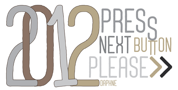 [
[ Kwai Chung, Hong Kong-based designer of the curly eyelash-style typeface Cranky (2014). [
 Bandung, Indonesia-based designer (b. 1988) of the modular display typeface
  Prolific type designer, b. London, 1951. Alan started working in 1970 for Graphic Systems as a lettering artist. In 1975, he joined Letraset as the Senior Type Designer and Studio Manager where he was responsible for all the artwork produced by the Letraset studio. During his tenure at Letraset, he designed over 40 popular typefaces, including Bramley, Candice, Bickley Script and Belwe. Most of these typefaces also showed up in the Scangraphic collection. Together with type director Colin Brignall, Alan contributed to the success of Letraset. All the original typographic artwork produced at Letraset was produced by hand cutting the fonts in Rubylith, a highly-skilled technique known as stencil cutting. Alan was responsible for training the entire Letraset studio in this art. Most of the original Letraset artwork has now been archived at St. Brides Printing Library, London. Today, Alan works independently, specializing in all facets of corporate identity including type design, typography, packaging, and development of logos and symbols.
  Aceh, Indonesia-based designer (b. 1986) of the (mostly) script typefaces
 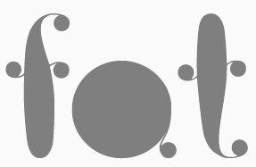 Art director in Moscow, b. 1985. His (mostly free) typefaces include the ultra fat art deco typeface
  Graduate of Moscow University of Printing Arts in 2006 where she studied under Alexander Tarbeev. She teaches type design and typography there. In 2007, her book for Russian students on typography was published (English title: Alive Typography). She received many awards for her work and is a frequent speaker at type design conferences. In particular, she received the prestigious Prix Charles Peignot in 2013. After that she became Type Director at ParaType in Moscow.
  [
[ [
[ [
[ [
[
 German designer (aka laynecom) at
  [
[ Studio in Cluj-Napoca, Romania. Creator of the curly script typeface Violet Night (2015) and the poster typeface Hornhill (2016, Sans and Serif).
  [
[ Michael Doret is a commercial hand lettering artist in Hollywood, CA, but
  Paolo Vannucci (Alphabet&Type, b. 1969, Punta Marina Terme) created the curly handwritten Halloween typefaces
  St. Louis lettering artist Robert Leuschke (who grew up and lives in St. Charles, MO) has made some 250 calligraphic fonts for greeting cards, including many for Hallmark Cards, of which about 80 are commercially available:
  American designer, b. 1967, California. Married to Ken Russell, who runs
  [
[ Mexican designer who used iFontmaker in 2011 to create
  During her studies at Pontificia Universidad Catolica del Peu (PUCP) in Lima, Ana Paula Cubas Vargas designed the curly-haired and joyous typeface Ana Paula (2016). [
 Chilean foundry with both free and commercial typefaces. The free typefaces gre mostly out of
  Bogotá-based Colombian graphic design studio and type foundry Andinistas was founded in 1998 by
  [
[ Andrew Hart is a Corona-based American digital photographer (b. 1988), who runs
  [
[
 During her studies at FADU / UBA in Buenos Aires, Angeles Moreno Vivot created the display typeface Broadway (2015) and the curly typeface Ansh (2014). [
 [
[ Wernau (was: Wendlingen), Germany-based Anke Arnold's free fonts: aa QWERTZ-Tasten (2012: German keyboard font),
 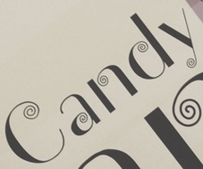 Toronto-based creator of
  [
[ Banda Aceh, Indonesia-based designer of Decimo Script (2016), the curly typeface Anohana (2016), the signage typefaces Tuha Script (2016) and Cantique (2016), the handcrafted Antique (2016) and Volutra (2016), and the display typeface Ethictical (2016).
  New Delhi, India-based designer of an attractive set of curly hand-drawn letters called Dreamer (2016). [
 Architaraz Type (Kassymkulov Design) is located in Shanghai, China, and Taraz, Kazakhstan. Its type designer, Zhalgas Kassymkulov, was born in 1986 in Kazakhstan. His initial type designs were all done with the help of FontStruct. In 2013, he went commercial as Architaraz Type.
 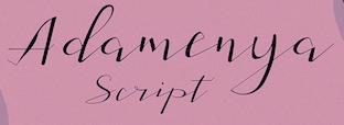 Brazilian or Indonesian designer, known as Dan Ghete, Dhan Ghete, Ambia Ambia and just Ambia. His/her foundry was first called
 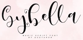 [
[ Cairo, Egypt-based designer of the Latin curly didone typeface Straight Curls (2015). [
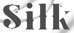 [
[
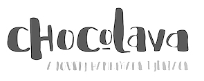 [
[ Snellville, Atlanta, GA-based designer (b. 1977) of the playful fonts Austie Bost Dreamboat (2015), Austie Bost There For You (2015), Austie Bost Envelopes Print (2014), Austie Bost Take A Chance (2014), Austie Bost Lifted Up (2014), Austie Bost Arrow Mania (2014, arrows), Austie Bost Envelopes (2014), Austie Bost Versailles (2014: thin curly script), Austie Bost Chunky Description (2014), Austie Bost Descriptions (2014), Austie Bost Wibbly (2014: a great curly poster typeface), Austie Bost Somersaults (2014), Austie Bost Cartwheels,
 Original fonts by Polishman Bartek Nowak (aka Barme, b. 1973) made in 2000-2001: BukwaNormal (Cyrillic), Nokian (pixel font), Passja, Xar, BarmeReczny, Elementarz (orthographic writing for kids) [see also
  Barmoor Foundry showcases handcrafted and script fonts created by Californian illustrator Tracy Sabin. Typefaces from 2016:
  [
[ [
[
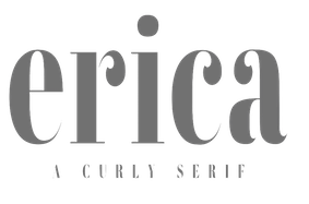 Designer in 2018 of the script typefaces Lovely (a retro monoline script), Ellisa (font duo), Jolly, Unleash, Dawn and Edmonton, the art deco typeface Empire, the display font duo Wild One, the fashion mag typefaces Lucky and Vienna, the curly serif Erica, the display typeface Abigail, the layerable shadow typeface Peachy, and the sans typefaces Super Basic, Neon, Lumina (Peignotian), Jolly Sans, Unleash Sans, and Tropicana.
 [
[ Designer of the stylish Belluno (2016), the thick brush typeface Comely (2016), the thin Verona (2016) and Florence (2016), the textured Valencia (2016), the blackboard bold typeface Lucca (2016), and the high-contrast roman typeface Adelaide (2016).
  Melbourne, Australia-based scrapbooking company of
 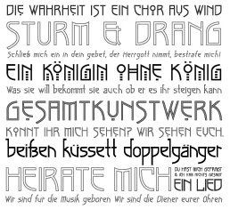 Bonnie Clas has completed her B.F.A. and M.F.A. at Savannah College of Art and Design as a major in Graphic Design with a minor in Drawing. She has been developing her career by taking positions as a designer, illustrator, and letterer for SpotCo, Rodrigo Corral Design, and Hsu+Associates in Manhattan. She lives in New York City. Creator of
  Pforzheim-based Boris Dworschak graduated in 2003 from the University of Applied Sciences in Pforzheim, Germany. Designer at
  [
[ [
[ A foundry which made over 500 fonts, mostly in 1998-1999, and was located in Carlsbad, CA, where Gail Conwell edited their Bright Ideas Magazine at that time, and Rick Hutchinson is listed as one of the directors / managers / owners.
  An orphaned curly Victorian font downloadable from Dafont, and made in 2012. [
 Type designer, aka
  A graduate of Moscow State University of Printing Arts, Gayaneh has designed Cyrillic localizations for most major type libraries, including Linotype, Bitstream, The Font Bureau, ITC, Berthold, Typotheque, Emigre, and ParaType. She began her type design career at ParaType in 1996 and started Brownfox (her type foundry) in 2012.
  Torres Vedras, Portugal-based designer of the curly, ironwork-inspired and ball terminal-laden typeface Maré (2015). [
 Burghal Design (Tujunga, CA) offers commercial "fonts for the complacent middle class" by
  [
[
 [
[ Foundry in Canada, est. 2004 by Rebecca Alaccari in Toronto, and run by her and Patrick Griffin.
  Bandung, Indonesia-based type designer specializing in scrapbook fonts.
  Carine de Wandeleer was born in Argentina to a French-Belgian immigrant family. She studied fine arts and graphic design at University of Buenos Aires, but lives and works in Spain.
  [
[ Carla is a graphic designer originally from Costa Rica. She attended the Universidad Iberoamericana in Mexico City, and graduated from the Minneapolis College of Art + Design (2007). She lives in Minneapolis, MN. With Chank Diesel, she is working on a curly bilined script typeface called
  [
[ Wolgast-based type designer Peter Wiegel (b. 1955) runs CAT Design Wolgast. Designer of these free fonts:
  Foundry from St. Louis, est. 1872. It became "Central Division of ATF" in 1893.
  Creator of the iFontMaker font
  During his studies at Mount Ida College in Newton, MA, Chris Lenzi (Franklin, MA) designed the curly display typeface Ionic (2016). [
 Danish designer (b. 1991), aka CMunk, who used
  [
[ Prolific author, b. 1899. His books include the typographically magnificent Handbook of Early Advertising Art, Mainly from American Sources (Dover, 2 volumes). The typeface Lexington is attributed to him, as Mac McGrew writes: Lexington is a font of shaded and decorated letters and figures, drawn for ATF by Wadsworth A. Parker in 1926, from a design by Clarence P. Hornung. It is an ornamental form of roman letter, with curly serifs, and tendrils at the ends of light strokes. It was recast in 1954, and copied in one size by Los Angeles Type.
  [
[ Foundry in Cleveland that existed from 1875 until 1892, when it was absorbed by ATF. It was also called H.H. Thorpe Mfg. Co. They published Catalogue and Book of Specimens From the Cleveland Type Foundry. The H.H. Thorp Mfg. Co., 147 St. Clair Street, Cleveland, Ohio (176 pages, 1880),
  Kiev, Ukraine-based designer of the great decorative didone typeface Mayotto (2019) and the
  Manuel Eduardo Corradine Mora was born in Bogotá in 1973. He graduated from the School of Graphic Design of the National University of Colombia in 1996, and became a graphic designer. He started by custom-designing fonts and by making typefaces for his own company, Casa Papelera El Cedro (The Cedar Papermaking House), for printing invitation cards. With other designers like Carlos Fabián Camargo, John Vargas and César Puertas he formed Tipográfico in 2007 to strengthen the type discipline in Colombia.
  Born in Firenze in 1969. Cofounder with Francesco Canovaro and Debora Manetti of the Italian design firm in Firenze called Studio Kmzero. He co-designed some typefaces there such as
  Bireuen, Indonesia-based designer of the swashy script typefaces Restafi Script, Marchelina Script, Malika and Agus, the signage script Aqlima, Angelines, and the curly Ragetti Script in 2017.
  Established in 2013 by Hollywood, CA-based Jason Walcott (formerly operating as
  Lucknow, India-based designer who started out as
  Hamilton, Victoria, Australia-based designer of Torquay Hotel (2015, a great dry brush typeface), Tropical Nights Script (2015), Blitzen (2015, a scribbly outlined typeface), White Snowfall Script (2015), Third Storey (2015, +Brush, +Regular, +Marker), Twisted Willow (2015, a connected exaggerated script), Saltywaters (2015, an attractive brush script), Operation 22 (2015), Sideline Bold (2015), Sideline Hollow (2015), Juicy Brush (2015), Blushingly (2015, a brushy wedding script font), Thystle Leaf (2015), La Bambiny (2015: painted Treefrog style script), Sweet Dreamer Script (2015, children's hand), the fat brush typeface Coalface (2015) and the curly fat brush scripts Wonderlicious (2015) and Rumpledrop (2015).
  [
[ [
[ Chicago, IL-based designer of the
  Crow Studio consists of Efe Gürsoy, Suat Tuna and Yasir Ekinci. During his studies at Mimar Sinan Fine Arts University in Istanbul, Efe Gürsoy created these typefaces:
  [
[ Cindy Kinash is an apparel graphic designer from Canada. She started the Cultivated Mind foundry in 2012, and made a reputation as a script font designer. She published the hand-printed poster typefaces
  An orphaned free Victorian curly font, published in 2014. [
 [
[ Petros Vasiadis is a graduate of Vakalo Art & Design College who works in Athens, Greece. Petros Vasiadis set up CYN Fonts in Athens, ca. 2013, and offers these free (mostly brush) fonts for Latin and Greek: CYN Kypselers (hexagonal), Logikfron (grunge), Me Rider (grunge), Banxed (hexagonal), CYN Ypsoma (hand-printed), CYN Unlimited (brush),
  [
[ [
[ Type foundry in Sheffield, UK, first called Schizotype, and in 2021 renamed Eclectotype because this is not a foundry that likes to stick to trends or expectations. Its designer,
  [
[ [
[ Squid (aka Dave Cohen) is a font designer, sculptor, illustrator and musician. He has executed hundreds of prototypes for the toy, ceramics and gift industries, such as tiki mugs. Squid's fonts are published exclusively by Sideshow Foundry. You can see his other musings at
  [
[ [
[ British type and graphic designer (b. 1948, London) who graduated from Ravensbourne College of Art&Design in 1967, and after working as a graphic designer in London, founded Quay&Gray Lettering with Paul Gray in 1983. David Quay Design started in 1987, and finally, in 1990, he co-founded
  In English, Amsterdam's curly letter. While doing a revival / interpretation of this style in his
  Rhega Juliandy (Deadlock Studio, Bandung, Indonesia; b. 1991) designed the rhythmic brush script Nailika (2015), the calligraphic Sweet Holiday (2015), the flowing script typeface Vallerie (2015), the beautiful brush script typeface Nailika (2015), the curly display typeface Milady (2015), the free fat marker typeface March (2015), the wonderful connected brush script Allenois (2015), the logotype Voltus (2015), the thin calligraphic script Theodore (2015), the script typefaces Sweet Holiday (2015) and Rose (2015), and the script typeface Anke (2015).
  Delfina Duarte was Cristiane Delfinah. This Brazilian created the curly girlish script
  Great fonts for astrology, hieroglyphics, alchemy and the occult, by Toronto's Jan and Denise Koehler, mostly designed between 1993 and 1995. They moved to Litomerice and then Teplice, the Czech Republic, recently.
  Digital artist from Quezon City, The Philippines, b. 1991. Aka Douxiegirl. Creator of the mostly handcrafted fonts Laser Metal (2015), Honeytone (2015), Aloha Sunshine (2015, curly script),
  Santiago, Chile-based designer of the great curly tuxedoed typeface La Cuica (2015), which was inspired by vintage Chilean magazines. [
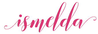 [
[ [
[ Aka Eva Barabas, and as Digital Studio. Ireland-based designer of Zenfyrkalt (2015, decorative textured caps), Papyrus EBO (2015), and Cirkus (2015, curly font).
  Istanbul-based designer of Ch. Vladica (2014), which was inspired by the name plate of architect Ch. Vladica from İstanbl---it was created during Dilara's studies. Dikara also designed the cury paperclip typeface Naturel (2014).
  Famous Greek illustrator, who studied geology and paleontology and worked as a specialist designer for archeological findings. Among his influences are Edmund Guy and Philip Burke. His designs appear weekly in magazines and often in advertising campaigns. He has designed several typefaces
 Yus Wardi (Diyos) is the Indonesian designer of these typefaces:
  Darcy Baldwin (DJBFontography) is the Texas-based designer of these handwriting typefaces in 2007: DJBABITOFFLAIRE, DJBADEE1, DJBAMANDAG, DJBANGELA, DJBANNALISE, DJBANNETTEscript, DJBCHERE, DJBCHRISTINEC, DJBCINDA, DJBCINDAs, DJBDAWN, DJBDOODLEDOO, DJBELIZABETHK, DJBELKE1, DJBEMILYS, DJBEuroscript, DJBGINAE, DJBGISELLA, DJBJANELLE, DJBJANINE, DJBJENB2, DJBJENNA, DJBJENNIFER, DJBJENNIFERscript1, DJBJOAN, DJBJOYscript, DJBKATHERINE, DJBKATRINE, DJBKEELYB, DJBKEELYBscript, DJBKELLEY, DJBKENNAscript, DJBKIRA, DJBLINDSE1, DJBLINDY, DJBLIZ, DJBLORRAINE1, DJBMANDY, DJBMEGAN, DJBMETA2, DJBMISH, DJBMichael, DJBPOOKIEDOO, DJBRITA2, DJBSOFEE1, DJBTABITHAscript, DJBWENDY, DJBWENDYPscript, DJBWRITESALOT. In 2008, she made DJB Treasure Hunt, DJB Curlie Wurlie, DJB 2Cute4U, DJB Heart of Dixi. Fonts made in 2009: DJB For Annie, DJB Sloppy Joe.
  Russian type designer who made the calligraphic greetings typeface Gala 72 (2012) and Congratulatory (2010: Latin and Cyrillic) and the curly psychedelic all-caps typeface
  [
[ Russian designer in Arzamas (b. 1987) of the free Latin / Cyrillic typeface
  Brazilian resident who specializes in original grunge designs. His typefaces are mostly free. Some commercial typefaces are available via
  Catherine Haugland (Eclectic Anthology, Iowa) created the vintage handcrafted typeface Ravenly in 2015---to be used for mystery novels and ghostbuster movies. In 2016, she published the curly script typeface Georgette and Harlequity.
  Known as Edric Studio, Renata Insan C, M. Nouval, and Ega Nugraha. Bandung, Indonesia-based designer of mainly modular typefaces. He created these typefaces in 2017: Nine Tail, Meatballs (a layered signage script), Rohman, Roundfra (a modular typeface), the preppy handlettered typeface Mirinia, the brush font Hummer, the deco typeface Coet, the script typefaces Ghost (smooth and with high contrast), Ora et Labora, and Lisna, the handcrafted Sild, the marker font Winkdeep, the brush script Oppy Sahra, Cully Mac, Terry Bruce, Gliford, and the art deco sans typeface Allorta.
  Ricardo Victor Rousselot is a calligrapher and type designer born in Argentina in 1936. He was trained in the sixties in Chicago in the studio Ficho&Corley Inc., which was led by a disciple of Frederic Goudy and Oswald Cooper, Carl Corley. After that, he returned to Buenos Aires, and in 1975, he settled permanently in Barcelona, where he teaches at the University of Barcelona.
  [
[ [
[ [
[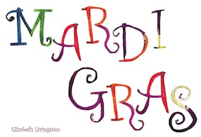 Designer of a set of colorful letters in 2015---a hand-drawn rendering of Curlz MT. [
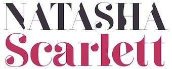 For a school project, Eloi Canals Serra (Barcelona, Spain) created the
  [
[
 Plainville, Massachusetts-based Emily Spadoni (b. 1979), runs her own foundry, simply called Emily Spadoni. She specilaizes in scripts, and in partucular, curly, frilly, mischievous scripts and vavoom vampire handwriting. In 2014, she made these hand-printed typefaces: Drawing With Markers, Peanutbutter Smoothies (curly), What I Want For Christmas, Sweethearts Love Letters (curly script), Strawberry Whipped Cream, Silver Bellybutton Ring (cute curly script), Betty, Pink Ladies and Peanutbutter (a curly teatime script), Tall Tulips, Doodle Dings 1 Birds Cages.
  [
[ Chilean type designer based in Santiago. Father of Latinotype's Daniel Hernandez. Designer of the 4-style didone typeface
  Eric Nokhsorov (aka Eric The Pirate Art) designed the vector format cartoonish fonts Monsters (2015), Ice Cartoon (2015) and Candy (2015), the connect-the-dots typeface Constellation (2015), the angular yet curly Twirl (2015), the beatnik typeface Cartoon (2015), and the decorative typeface Floral (2015).
  [
[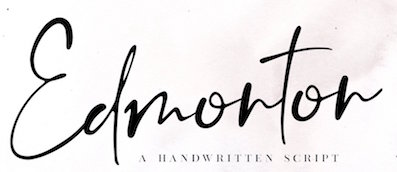 [
[ Brazilian printmaker, graphic artist and illustrator, b. 1975. Her fonts are created together with Ricardo Marcin at
  Institute in Benalmadena, Spain (was: Santa Severa), where one can take 4-week courses at 1450 Euros a shot on the Etruscan alphabet, Trajan, Cuadrata and Rustic Roman Capital letters, and related subjects. They also organize lettering tours in Italy and guided tours in various musea. The teachers are Alberto Di Santo (Professor of the visual communication, Tor Vergata University, Rome; Professor of Graphic Design, Istituto Europeo di design, Rome; Professor of editorial design, La Sapienza University, Rome; Professor of Typography, C.F.P. Sinalunga, Siena) and
  [
[ Based in Bandung, Indonesia, Adhreza Brahma (b. 1987) is a typographer and illustrator. At
  Fabrika de Typos is a Brazilian fondry run by Marcio Hirosse (b. 1969) in Sao Paulo. He made
  French designer of
  Fat Cat Fonts (was: Mintcure) offers absolutely wonderful grunge fonts by CT-based Jennifer Dickert. These include Caterpillar, La Ment,
  [
[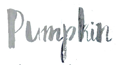 Moscow and/or Riga, Latvia-based designer of the pleasingly rough brush typeface Bronks Script (2015) and of the handcrafted typeface Marshmallow (2015). In 2016, she made the dry brush font Density (2016), the brush scripts Firecracker, Caricia, Pepper, Lady in Red (a fine brush script), Asparagus, Siberia (crayon style), Newport (marker font), Emerald and Haiti, Ambrosia Script, the wide calligraphic font Lancaster, the curly watercolor brush script typeface Candyland, Fallen Angel, the Treefrog-style script Lemon, Penelopa, Cutout, and the creamy brush script Marmaris.
  Or Ferdi Henriques. Graphic and type design professor at UNESP Baura, Brazil, who has a doctorate from Pontifícia Universidade Católica de São Paulo, Brazil. The work done by her students is nicely presented on her web site, and has quite a few interesting type designs. Here is a listing of the typefaces designed in 2011 in various courses:
  [
[ [
[ Fernando Forero (b. 1978, Tunja) ran EisartGraphic.com together with Weronika Kwiatkowska, and moved from Bogota to Kalisz, Wielkopolska, Poland, where he
  Las Palmas de Gran Canaria, Ampuero and Laredo, Spain-based designer (b. 1971) who set up deFharo. Creator of the monoline sans typeface
 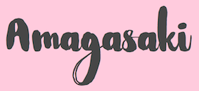 [
[ [
[ Ferry Hadriyan (FHFont and before that, Fey Design, located in Indramayu and/or Cirebon, Indonesia) designed these typefaces in 2015: Milkytwins Modern Wave, Fantasia (a charming curly upright script), King City (calligrapghic signage script), Chocolate Heart Script, Adefebia (calligraphic wedding script font), Sexy Shout, Awesome Display (signage script), Love Mile (curly brush-painted font), Shakila (a vampire script), Hard Brush Ghost, Telena Brush, Slow Motion Script, Heaven Sky, Candy Sugar, Chocolate Heart (curly script), and Hard Brush.
  Banda Aceh, Indonesia-based designers of the script typefaces Luxurious Line (2015), Ramsteinz (2015: calligraphic), Gracias (2015, thick brush), Hello Listie (2015), Glytten (2015), Adelle Script (2015) and Loft Yian (2015), the display typeface Vardy (2015, film noir style), and the wonderful rough brush font The Mistie (2015).
  FONTana is a font design studio in Szeged, Hungary, started in 1999.
  [
[
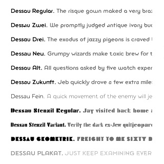 Gábor Kóthay (Fontmunkások) is a Hungarian type designer (b. 1962) who lives in Szeged.
  Russian designer based in Turkey. Creator of these typefaces in 2017:
  Fountain is a Swedish foundry in Malmö, founded in 1994 by Peter Bruhn (1969-2014). In 2008, its designers include Rui Abreu, Lee Basford, Lars Bergquist, Felix Braden, Lotta Bruhn, Peter Bruhn, Lucas Brusquini, Matthew Chiavelli, Stefan Claudius, Thomas Crolla, Jay David, Stefan Hattenbach, Peter Hoffman, Nina Hons, Sylvia&Daniel Janssen, Randy Jones, Gábor Kóthay, Martin Lexelius, Ricardo Santos, Góran Sóderstróm, Simon Schmidt, and Dirk Uhlenbrock.
 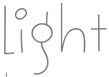 Cartoonist, illustrator and designer located in Montolivet, France. Creator of these typefaces:
  [
[ Great free fonts made by Brian Powers (Furdzville):
 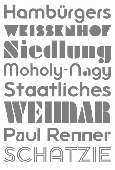 [
[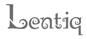 During her studies in Jakarta, Indonesia, Gabriela E. Tanizaal created the curly typeface Lentiq (2014), which is inspired by a traditional ceremonial coat from Toraja, South Sulawesi, Indonesia. [
 French creator of a large number of free typefaces, starting in 2012.
  Cartoonist from Recife, Brazil, b. 1966, whose sense of humor and artsistic prowess shine in his dingbat fonts.
  [
[ Seattle-based type designer (b. 1951, Spokane, WA) who founded
  [
[ [
[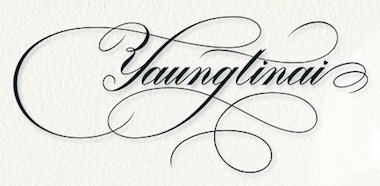 Beureunuen, Indonesia-based designer of
  [
[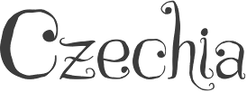 [
[ [
[ Dnipropetrovsk, Ukraine-based designer of these typefaces in 2015: Odd Times (a vintage blackletter typeface), Brandy Label (a layered Victorian signage font), Smoking (a great Western layered poster font), Traveller, Letterhead (steampunk, vintage, Victorian), Age, Nataly Temper, Vintage Auto (a retro chrome automobile font), Golden Dust (a lava lamp font), Rusty Phoenix, Phoenix, the Victorian signage typeface Whiskey, Spirals, Biker (spurred inline font), the oily signage font Pin Up.
  Aka Grzegorz Luk and just Gluk, Grzegorz Luksza is a Polish type designer (b. 1973) who specializes in ultra-decorative and experimental typefaces.
  Designers of some free fonts.
 A group of independent designers from Poland, heade by Bartek Nowak, and located in Staromiejska. Nowak has been designing typefaces since ca. 2000. Typefaces:
 [
[ [
[ Punchcutter, b. 1861 (Berlin), who made many typefaces. He worked at the Central Type Foundry and then ATF in the late 1800s, and was living in St. Louis, MO, in 1891 and in Mill Valley, CA in 1892. The Inland Printer announced in 1895 that Schroeder had joined the Pacific States Type Foundry in San Francisco. His typefaces straddle the Victorian, arts and crafts and art nouveau eras.
  [
[ Graduate of the College of Architecture and Fine Arts, Batangas State University, The Philippines, who has been working as a graphic designer since 2005. He is currently located in Dubai, UAE and is a prolific type designer. His typefaces:
  Hanoded is the
  Yogyakarta, Indonesia-based designer (b. 1988) of the font duo
  Donetsk, Ukraine-based designer of the handcrafted typeface Espresso (2017), Advertis (2017: ornaments). In 2018, she published Delight (a script typeface),
  German type designer, b. 1980, Frankfurt. He runs a design studio in Frankfurt.
  Oregon-based creator of the freeware fonts
  Designer of these
  Tom Wallace's foundry, HiH (est. 2005), was first located in Woodbridge, CT. Subsequently, Tom Wallace (b. 1944) moved from Woodbridge to Naugatuck to Waterbury and finally in 2009 to New Britain, CT. His type designs are based on historical letterforms:
  Defunct type foundry that had free original
  British foundry started in 2009 in Sheffield, but now located in Dronfield. Their fonts include
  Zachariah Nelson (I Can Be Your Type) studied graphic design at Philadelphia University. Clayton, NJ-based designer of the curly flared caps typeface
  [
[ Also written Igor Mustaev. Born in 1982 in Khabarovsk, Mustayev was first an architect. In 2009, he finished the Type and Typography course at the British Higher School of Art and Design, supervised by Ilya Ruderman.
  Aceh Besar, Indonesia-based designer, b. 1991. His typefaces from 2015 include of the connected script typefaces Marthana Script, Alleana Script and Love Moment. He also made the handcrafted Kanover (also called Rockmasta?), Berrybold, the spurred typeface Jackland, the squarish typeface Flying Landing, Big Round (a clean brushed sans family that includes Outline, Normal and Black), Six Only, Difer, Kuasque (brush font), Parakota, Ring Town, Brushers Hands, Dhiezar, Moon Fighter (slab serif), Koala Script, SnowBad, Tree Shoots, Rahmah, Malaka Brush, Always Pro (squarish), Brush Rock 17, Caribold, Funny, Longers (tall condensed sans), Ubet City (brush face), Srikhaya (handcrafted), Queeny (condensed sans), OnFrends (brush), Hamboe (handcrafted).
  [
[ Denpasar, Bali-based designer, b. 1989, of Love Santa (2019), Candy (2019), Hello Kids (2019), Round Light (2019:
  Frenchman (b. 1957) who started making fonts in 2010, after a career in illustration, comics, and video games. In 2010, he created the free fonts BabyJo (pixel face), Bayday, Chrom (beveled face), LaPresse (grunge),
  Banda Aceh, Indonesia-based designer, b. 1988. Creator of the handcrafted typefaces Archipelago (2015, a connected swashy script), Shintya (2015), Sambay (2015: a brush script), Silvia (2015), Matauro (2015, a watercolor brush), Almarhum (2015), Chocolava (2015, a fun creamy handcrafted typeface), Itaki (2015, a rough brush font), Egocentric (2014), and the curly connected script typeface Esmeralda (2015). He also designed the copperplate calligraphic script typeface Cimochi (2015).
  Alexander Bobrov (Indian Summer Studio, or simply Indians, Moscow) designed the vintage didone typeface family
  Insigne Type Design Studio (est. 2006) is run by
  Prolific designer of these typefaces at FontStruct in 2008: Mausoleum, Quarantino, Strontium (heavy octagonal), Redactor (inline; athletic lettering), Coppertones, Copperthief Gothic, Disarticulate, Adamantine, Spindlery, Thalamicus, Monolog, Abstruction, Banned Rotunda, Less Rotunda, Blabbermouth, Hackney, Circumfence, Circle Play, Outlandish, Cannibaal, Valedictory, Hegemony, Sansibal, Shoptima, Toobatu, Dwarven, Evonce, Magog, Fuego, Empyreus, Upscale, Quickie, Svengali, Amanuensis (hairline), Whitechapel, Interzone, Annexia, Mugwump, Misterioso, Slitcom, Mud Indigo, Integer, Optimist, Interim, Tredd (athletic lettering face), Brilliant Corners, Palimpsest, Trudge Fix, Plangent Shaven, Plain James Bond, Spikeful, Plain James, Portia, Juliette, Rotunda One, Dystopian, Fed Up, Mag Lev, Eensy, Simpatico, Afterburn, Fongeray, Less-Sirvere, Levio-sah, Oddity-oldstyles, Planar-light, Plangent, Plangent-semi-serif, Plangent-shaven, Prester-John, Spin Doctrine, Tabula, X-Sirvere, abricado, aubrey, chunki-phat, chunki-slim, chunki, cold-shoulders, emerald-city, epistrophy, experiment, flawa-pawa, fongamatah, gematria-experiment1, gematria, malinki, massif, modnera, nutty-slab, okey-dokey, patina, planar-book, planar, plangent, simplex-b, slantfest, slinky, solidad, solitude, souvlaki, space-oddity, spin-doctrine, splayful, too-much-caffeine, travelclock-alt, travelclock, tredd, trudge-fix, Zinzan (blocky headline face), Sir Vere (haha---he writes A Bodoni that won't take its meds; still, a great-looking simulation of Bodoni's balls), More Sirvere and Less Sirvere (derived from Sir Vere), Ugly Beauty, Tito Puente, Plain James Bold (octagonal), and First Sampler.
  Aka Ameer. Designer of these typefaces in 2016: Ikndo (a handcrafted party font), Fisher, Fisher2, Engin (super-techno), Curly, Cruise, Cookies, Chikle, Aeliron, Alphabet Stencils, Akbaal, Agreloy, Adventure, and Omisans.
  Indonesian designer of formal and semi-formal calligraphic scripts. In 2020, he/she made Adeylina, Alangte, Alove Hoolena, Arveraghen, Asengel Atigelan, Bebimelista, Braghan, Dear Mother, Fanedai, Garelgina, Hellomelanti, Hellomelodi, Holiedarling, Lenastanela, Love Derlina, Love Henila, Lovelyhome, Lovethebook, Neviliyenti, Seherlan Salene, The Harlana,
  Russian type designer called Olga Chaeva at
 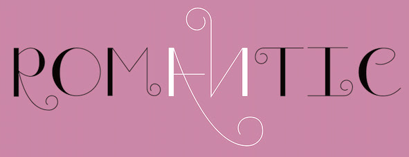 Colombian designer of the curly deco titling typeface Valentine (2019). [
 Iza W is a Brazilian type designer who works with Paulo W at intellecta Design.
  Fonts done in 2011:
 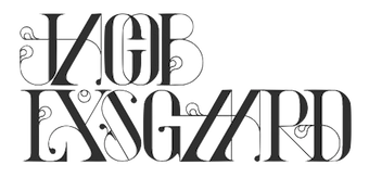 Graphic design graduate of the Bergen National academy of the arts in Norway. Jacob lives in Copenhagen. Creator of the playful high-contrast curly typeface
  Designer of
  [
[ [
[ [
[ [
[ [
[ [
[ JAW Fonts (and before that, JAW Arts Fonts, and
 [
[ [
[ [
[ [
[ [
[ [
[ Dutchman Jeroen van der Ham ("joebob"), who is based in s'Hertogenbosch, designed mostly handwriting fonts:
  Banda Aceh, Indonesia-based designer. He created these calligraphic script typefaces in 2015: Still Shine, Mighty Heart, Azurra Script, Amigirl (script and sans), Monkuta Script and Bruselo. Still in 2015, he designed the swashy script typefaces Story Dream, Mastura, Hefalo (brush style), Edelweis Script, Brigent Script, Cherryla, Amellia Script, Bella Script, and Novelia.
  [
[ [
[ Josh Scruggs is a graduate from Kansas University, who teaches type design there starting in January 2009. He is also an in-house type designer at Hallmark Cards. His type blog was called
  Designer (b. 1985, Marburg) at 26-plus Zeichen in Germany, who is based in Köln. He graduated from the University of Applied Sciences in Trier in 2010.
  Designer from from Puyo, Ecuador, b. 1991, known as Darko Juan. He made numerous free fonts.
  This is the new foundry of Hollywood, CA-based Jason Walcott, who formerly ran
  Creator of the thin curly typeface
 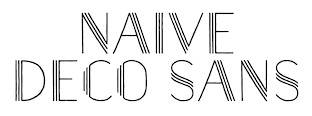 [
[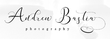 [
[ Celje, Slovenia-based designer of Little Mandy (2016:
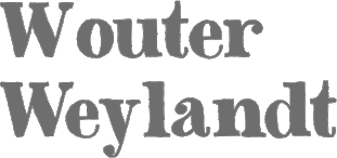
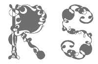 Freelance photographer in Tirana, Albania, who created the hair-stylized Ile Font and the fun display typeface Albanica in 2014. In 2015, Jurgena designed the curly Deco Type and the decorative caps typeface Albanica.
 Roman Korolev (Kaer, Vologda, Russia) designed the wood stick brush typeface WoodStick in 2016.
  Type designer from Batavia, IL. She designed
  [
[ Lettering artist. At Letterperfect, Kathy Schinhofen, Garrett Boge and Myron McVay together designed the whimsical curly connected script family
  Canadian creator (b. Regina, SK) of the free typefaces Subway Novella (2011, grunge), Death From Above (2011, grunge), My Girl is Retro (2011, grunge),
 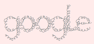 Creator of the iFontMaker font
  Creator of the free curly typeface
  Kevin Allan King is from Toronto. He designed fonts for Canada Type from 2010 until 2017. In 2018, he graduated from the
  [
[ Aka Khurasan and Jalembe. Aceh, Indonesia-based designer of the free typeface Alamak (2014). In 2015, he made Jomblo Ngenes (comic book script) and Si Brot (heavy brush face). Typefaces from 2016 include Lefina (curly serif typeface), Carlita Script, Creaphy (a brushed Halloween font), Reybro, Moyko (Asian brush emulation), Setialah, Jalani Script, Bijak Script and Labuhan (a lava lamp typeface).
  Born in Missouri in 1979, Kimberly moved first to Texas and later (in 2007) to China, and most recently, to Orlando, FL. She made some free fonts (often handwriting styles), and also ran a personal handwriting font service [those fonts have names that start with KGD].
  Kimmy Kirkwood (b. 1988, Seattle, WA) (Kimmy Design) studied at Chapman University, and lives in Santa Monica, Orange County. He graduated in 2018 from
  [
[ Cannot Into Space Fonts is the free font studio of Robert Jablonski (b. 1991), who is based in Indiana. Before this studio, Robert used to make fonts at FontStruct under the alias Rabbid Bahh. Mew Too (b. 1991, Indiana) is co-lead designer for Cannot Into Space Fonts. Jasper (b. 1996) joined in 2015.
 Commercial typeface foundry in Jakarta, Indonesia, run by "Ian" and "Abdilah". Its first typeface is Muffler (2014), which is inspired by retro brush signage for car races. Lacydes (2014) is a spurred advertizing typeface. Upjohn (2014) is a horror movie poster typeface. Curely (2014) is a
  Croatian designer (b. 1988) of the geometric art deco typeface
  Laura Varsky is a graphic designer and illustrator from Buenos Aires, Argentina. Her first forays into the design world came through her involvement with the local independent rock scene. She gradually asserted herself as a designer, specializing in the design of books and CD sleeves. In 2006 she received a Latin Grammy as Art Director for best record packaging. Four years after her graduation as a designer, she rediscovered the world of illustration working for editorial projects, several labels and artistic projects. She taught typography for ten years at the School of Design of the University of Buenos Aires. Her lettering and illustrations are well-known in Latin America.
  [
[
 [
[ [
[ Bandung, Indonesia-based designer (b. 1982) of Masura (2016, brush style), Space Cake (2016, sci-fi style), Caroline Script (2016), Morning Fever (2016), Binzo (2016), Morning Cloud (2016, handcrafted), Rancha (2016: grungy style), Alkhali (2016), Gath Is A Robot (2015) and Scarlet (2015, textured typeface).
 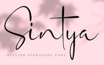 Yogyakarta, Indonesia-based designer (b. 1994) who started out as
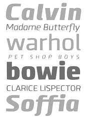 Type foundry in Bahia, Brazil, run by Gabriel de Souza. Creator of the 72-font sans typeface families
  Graduate of York College in York, PA, who lives in Cockeysville, MD. Creator of
  Cape Town, South Africa-based designer of the curly script typefaces Salt & Pepper (2016) and Pillowbook (2015), and the handcrafted poster dingbat and ornament typeface Caboodle (2015).
  [
[ Designer in 2016 of several free handcrafted typefaces at iFontMaker. These include Italisch, Riveted, Decoish, Fatso (sketched), Nuncial, Curly Wurly, and Bad Type. [
 Senior designer in Ho Chi Minh City, Vietnam. Creator of two teardrop-themed all-caps vector format typefaces in 2013,
  Vienna-born type designer who lived from 1883-1972, and whose real name was Emil Kahn. He died in New York, where he lived most of his life. He studied at the Munich Academy, which became a center of poster design. In 1910 he co-founded the magazine Das Plakat. During WWI he designed posters for the German War effort. In 1920 he was appointed as the first professor of poster design at The Akedemie der Kunst, Berlin. He moved to New York in 1923 and continued his poster work. He also continued his teaching at the Art Students League and at New York University.
  [
[ Buenos Aires, Argentina-based designer of the curly typeface curl (2017). [
 [
[ Graphic designer in Buenos Aires. During her studies at FADU / UBA in 2012, she designed the curly Victorian typeface Mushroom. [
 Maelle Keita is the second identity of
  Type foundry in the United Staes, run by lettering artist Jessica McCarty, which specializes in hand-drawn, pen-drawn and hand-printed typefaces. In 2017, she co-founded
  Mahameru Type is Haidi Shabrina (b. 1992) and/or Nasir Udin, depending upon where you look. Semarang and Bali, Indonesia-based designer of the brush typeface Faito (2017), Faito Rough (2017), the creamy brush script typeface Shabrina (2017) that was inspired by vintage chocolate biscuit packaging. He or she also made Discobaby (2017, a great connected marker pen script), Parisien Night (2017), Sweet November (2017: script), The Flowery Spring (2017, curly script), Nandito (2017: handcrafted), and Ayanna (2017: watercolor brush).
  Aka Callie Rian. Littleton and Denver, Colorado-based designer who created the curly typeface
  [
[ Some typefaces ny
 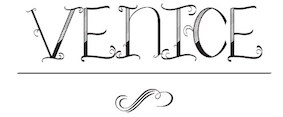 San Diego-based creator of the curly typeface
  About 150 free original fonts by Masayuki Sato (from Futaba and/or Takasaki, Japan), over half of them pixel fonts. Maniackers designers started in 1995. For most fonts, he has a Latin alphabet (denoted by AL) and a katakana alphabet (denoted by KT). Some also have a hiragana version (denoted by HR). All fonts were made between 1998 and 2009.
  [
[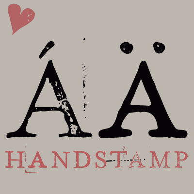 [
[ [
[ Fonts made by New Yorker Frank Marciuliano: at Linotype, Abstract,
  Designer in 2019 of Orbit (a cosmic font), MM Strokes (dry brush), MK Ultra (blocky, octagonal), Switch Blade, Quick Pencil (sketched), Mck Glitch, Jot Sp Inverted (a stencil font), Marker Scratch (a charcoal font), High School Notebook (a doodle font) and Fancy Nancy (hand-drawn and super-curly). [
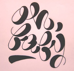 Marina is a Brazilian graphic designer and teacher, who graduated from Fundação Armando Alvares Penteado FAAP. She has an MA from the London College of Communication. In 2011, she obtained a
  Barcelona-based graphic designer (b. 1963).
  [
[ Designer of the free hyper-curly typeface Grarax (2021-2022). [
 Polish graphic designer.
  [
[ Bandung and/or Jakarta, Indonesia-based creator of Passion (2015, thick marker script), Elrotex (2015, thick brush script), Arkana Script (2015), Asia Otasi (2015, thick brush script), Wolf Reality (2015, thick brush typeface), Atorak (2015, brush script), Soulmater (2015, a calligraphic script), Zurich (2015, a heavy brush font), Chromount (2015), Constanta (2015, brush typeface), Tristan (2015, fat brush style), Rissa (2015, a fat brush script), Morracle (2015, hand-painted brush font;
  [
[ [
[ Born in Boston, MA, in 1988, Melinda Jeffs designs type. She founded Melifonts in 2011 in Hampton, NH. Creator of
  Berlin-based
  Manchester, NH-based designer of a curly Victorian alphabet in 2014. She also created Blue Lobster Type (2014). [
 [
[ Born in Durban, South Africa, in 1947, Merle Scholtz specializes in designing African and Indian ethnic patterns and logos. Her work with ethnic patterns began as a result of her fascination with, and collection of, ethnic African masks and beadwork. Together with Anton Scholtz, she runs
 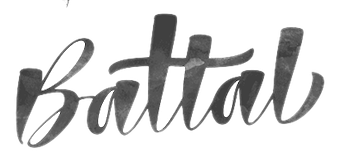 Fadhil Aqsa (b. 1996) (DJ Studios in Lamno Jaya, Banda Aceh, Indonesia) designed the calligraphic script typefaces Cratti Script and Xandrella Script in 2016.
 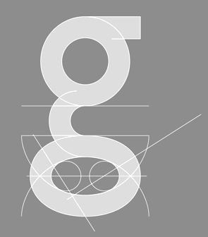 [
[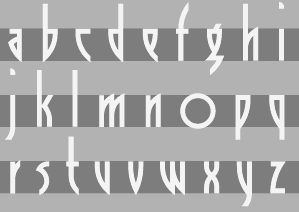 [
[ Duluth, MN-based designer (b. La Crosse, WI, 1977) of
  Graduate of ENAP-UNAM in Mexico City. Creator of these typefaces:
  [
[ Architect and designer in Sao Paulo, who runs Minhocossauro Tipografia. He created Salyma (2015, part vampire script, part curly Victorian extravaganza), Essential Coffee (2015, stencil), Militante (2015, stencil font), Cogumelo (2014, a retro futuristic unicase typeface), Biotech (2014, techno), Action Flick (stencil font), Morango (2015, handcrafted Western font), and Cinema Novo (2015, handcrafted typeface).
  [
[ [
[ Texan creator (b. 1990) of many free mostly hand-printed typefaces. Starting in 2016, she is located in Dresden, Germany.
  Designer in San Francisco, who created the curly display typeface Zingara in 2014.
  German designer of the fifties diner family Frigidaire (2004, URW, designed with Peter Guckes) and of the handrwritten typeface Pirates&Robbers (2004, URW). Also with Peter Guckes, she created the experimental typeface
  Banda Aceh, Indonesia-based designer of the calligraphic script typefaces Crellitta (2016), Billgrotia Script (2016, +Sans), Hello Shanghai Script (2016), Rosvigts Brush Script (2016), Arillyoni Script (2016), Arillyoni Brush (2016), Thirteenth Script (2016), Stylistics (2016), Modigirl Script (2016: a really great calligraphic script with 925 glyphs), Willshering Script (2016), Mofishine (2016), Calligrafhy Script (sic) (2016), Zombis Night Script (2016), Raffiator (2016), Master Faith (2015), Cinderella (2015, a rip-off of Olympic Branding by Maelle Keita), Whartillax (2015), Everbest (2015), the connected Brisk Wondering (2016), Ritalina (2016), the handcrafted Stylistic Sans (2016), and the uber-curly Amsterday (2015).
  Born in Milan in 1965, Matteo Federico Bologna emigrated to the United States, where he founded Mucca Design in 1999, a company involved
  Malang, Indonesia-based designer of the serif typeface Lorena (2019: for fashion mags featuring skinny models), Orlando Sign (2019), Banana Caroline (2019: font duo), Salvages Bold (2019), Davinci (2019), the loud typeface Dogtown (2019), the blackletter typeface Tribal (2019), the black metal blackletter font Southside (2019), the brush script fonts
  [
[ Elena Genova (My Creative Land, Edinburgh, Scotland) specializes in digitized handwriting fonts. In 2021, My Creative Land joined
  Or Nadin Oldy. Perm, Russia-based designer of the handcrafted typefaces Winter Loves (2016, brush script), Mandarin Juicy (2016), Grumbler (2016), Careless (2016), Jovial (2016), Fabler (2016, hyper-curly, almost a vampire script) and Diletant (2016), and the script typeface Morning Regular (2016).
 [
[ Bali-based designer who used to run Mahameru Type. As Nasir Udin, his typefaces include
  [
[ Natalya Vasilyeva (from Barnaul, Siberia) is a type designer, book designer and calligrapher, also engaged in editing, publishing, photography and computer design. She published these typefaces, which, unless explicitly mentioned, are all done at Paratype:
  Born in Takamatsu, Kagawa-ken, Japan, in 1984, Natsuko is a Canadian-educated graphic designer who publishes most of her typefaces at
 [
[ [
[ [
[ [
[ Typefaces made by Nick Curtis from 2004, not listed elsewhere on these pages. Bayern Handschrift, De Rigueur NF, Refugio Rustic WBW, Refugio Refined WBW, Ponte Vecchio NF, Brazzaville NF (based on Congo, a 1910 font by Barnhart Brothers \& Spindler),
  Typefaces made by Nick Curtis from 2006, not listed elsewhere on these pages:
  Typefaces made by Nick Curtis from 2007, not listed elsewhere on these pages:
  Typefaces made by Nick Curtis from 2009, not listed elsewhere on these pages:
  [
[ Successful designer in Cape Town, South Africa, who started making fonts in 2014, In 2016,
  Fontshop calls him Oeltjen, and MyFonts Oeltien. Whatever. Australian designer at the Letterbox of the curly monoline upright script typeface
 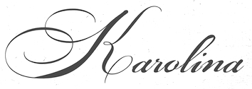 Designer of the curly Victorian hand-drawn typeface Maestro (2014) and the calligraphic script Karolina (2014).
 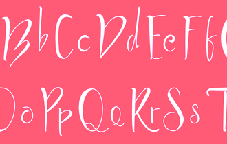 Madiun, Indonesia-based designer of these handcrafted typefaces in 2019:
  Indonesian type designer, operating as Em Nazar, Muhammad Nazar and Niznaztype. Typefaces from 2020:
 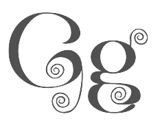 Cairo, Egypt-based designer of the curly almost Victorian style Latin typeface Esmeralda (2019). [
 This designer used iFontmaker in 2011 to create
 [
[ Bandung, Indonesia-based designer of the tuxedoed art deco typeface Marcopolo (2019), the fashion mag typeface Prague Display (2019), the ball terminal extravaganza Brand (2019) and the inline Victorian typeface Larson (2019).
  Lauren Thompson (Nymfont, or Nymphont) is a designer from Las Vegas (b. 1982). She created the elegant sans typeface LT Oksana (2008), the grungy Frail 7 bedazzled (2008) and the classical ornament typeface Nymphette (2008). Her
  [
[ Fatih Günes, an art director in Milan and/or Bursa, Turkey, extended Lukasz Dziedzic's free Lato font (2010) for Turkish, in his Lato TR (2013). In 2015, he made the rounded slightly elliptical sans typeface family
  Graphic designer in Altay, Russia. She created Barbariska (2015, a curly script), Petroglif (2015) and Broad Brush Font in 2015. [
 [
[ Freeware fonts by Eric VanDycke from Warnerville, NY, aka Dr. Nimbus. Original and very very enjoyable creations from 1997-1998. The site was closed in March 1999, unfortunately! Thanks to CybaPee, you can download the whole collection now.
  Oscar Yáñez (b. Mexico City) has a Bachelor's degree in Graphic Communication Design from the Universidad Autónoma Metropolitana (UAM) and a Master's degree in Typographic Design from the Centro de Estudios Gestalt. He studied Project Management in the Instituto Tecnológico Autónomo de México and a Masters degree in Type Design at Centro de Estudios Gestalt. He was involved and leading designs and redesigns in more than fifty magazines, newspapers and websites like Time Inc Expansion, Editorial Televisa, Reforma, El Universal and Khaleej Times newspapers. Nowadays he is Group Design Director for Harper's Bazaar Arabia and is based in Dubai.
  [
[ Tattoo artist and graphic designer from Dinslaken (Duisburg), Germany, b. 1968, Duisburg.
  Outside The Line Fonts was founded by
  [
[ [
[ Indonesian designer of Emely (2019: a classy calligraphic font),
  Free futuristic fonts by David C. Lovelace from Broad Brook, CT:
  Type designer at Canada Type.
  [
[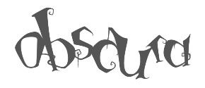 Graphic and interaction designer and photographer, based in San Jose, CA. He created the thin chic curly typeface
  [
[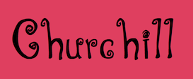 Publisher of scrapbook fonts, made roughly between 2000 and 2008, including fonts by Jill Webster, Amy Dott, Annette Ward, Deena Rutter, Kathy Griffiths, Debbie Lewis, Lorie Lakey, Rebecca Carter, Pat Olson, Rebecca Hogue, Anne Fetzer, Leere Aldrich, Fayette Terlow, Kristen Cook, Cara Bradshaw and Julie Young.
  [
[ Type designer graphic designer, calligrapher and illustrator from Chile, who graduated in graphic design in 2005 from the Universidad del Bío-Bío., b. 1977, Santiago de Chile. Aka PeGGO, a
  [
[ [
[ [
[ Foundry located in Westbury, NY, and run by Phil Bracco (b. 1981, Big Horn, MT), a graduate of the Pratt Institute. Creator of the festive signage fonts Charming Charlie PB (2009), Hip Hopper PB (2008, inspired by the lettering on an art poster by Patrick Owsley for the cartoon character Hoppity Hooper),
  Brazilian printmaker, graphic artist and illustrator in Vitoria, b. 1973, Rio de Janeiro. His fonts are created together with Erica Jung at
  Cecilia Vizan (Buenos Aires, Argentina) set up her own type foundry, Pio Pio, in 2013. She created the curly script typeface family
  Fine Arts graduate from UCLM (University of Castilla-La Mancha) in Spain, who works as a graphic designer in Cuenca, where he set up the Pisto Casero commercial type foundry in 2013, after a period of free font production. He worked at
  Jeremy Vessey set up Hustle Supply Co in 2014. In 2016, he founded Pixel Surplus in Montreal. His first fonts there are Wild Youth (brush script), St. Jacques (a free avant-garde font), Buffalo (connected script font), Old Growth, Ambarella (free script), Greenstone (connected script), Summer Hearts (brush), Wayward, Wayward Sans (
 The Great Dane from Copenhagen,
  Karanganyar, Indonesia-based designer, b. 1989, of these typefaces in 2018:
  [
[ Veronika Golovko or Veronika Qilli (Qilli Design, Novorossiysk, Russian Federation) specializes in scrapbook fonts. She designed the brush typefaces Michelly (2015) and Jemmer (2015), and the hand-painted font Bellious (2015). In 2016, she designed Gentle Air, Clouds Caprice, Drawing A Life, Sorcery (a curly vampire script), Magic Snow (brushed), Joy In Night (Halloween font), Autumn Madness (perhaps for children's books), Belles Script, and the brush typefaces Adeline and Melony Script.
  Tommy James or Arthur Quathron or Arthur Ilyin, claiming to be in the UK, b. 1990. MyFonts mentions that Arthur Ilyin is based in Russia. His type collection consists mainly of calligraphic or semi-calligraphic scripts. As Tommy James, he ran TJ Creative and designed these script typefaces in 2018: Ultralife Sansa, The Forest Factory, Sallie, Beginning, Dammiano, Embrain, Unforgiven, South Pimllin, Sloothine, Zeatoner, Autumn Mood, Roottenberg, Snallie Soul, Nindalla, Quick Cloud, Glimpse, Fall of the Ghost, Exella, Lamhawk, Rattun, The Shellra, Cinthia Font, The Quick Brown, The Yellon, Elevation, Morale, The Breat, So Fresh, Vander, Belashic, Snaus, Wanda, Weendovre, Avantyre, Gamodora, Bring, Rakhino, Kahendra, Some One, Horizon, The Monse, Across, The Nicco, The Pamele. Lovely Barthy was done at TJ Creative in 2019.
  [
[ Rafael Jordan Oliver, aka Barry Bianco, is a graphic designer and calligrapher in Valencia, Spain, b. 1983, Alzira. Graduate of EASD in Valencia, class of 2013. His typefaces:
  [
[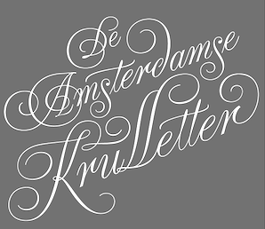 [
[ Aarhus, Denmark-based creator of the rounded curly tattoo font
  [
[ [
[ Fontstructor who made
  Giuseppe Salerno (aka
 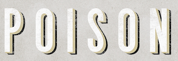 [
[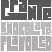 [
[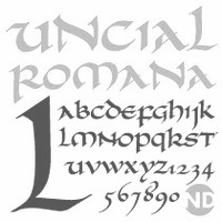 [
[
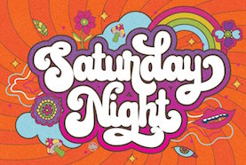 [
[ Ralph M. Unger (b. 1953, Thuringia, East Germany) says this about himself at
  [
[ [
[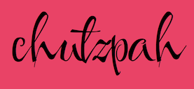 [
[ [
[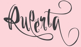 In Diego Pérez Lozano's class at the Universidad de Palermo in Buenos Aires, Rocio Amura designed the lively curly calligraphic script typeface
  [
[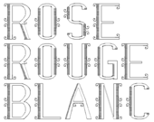 UK-based FontStructor (student at Bristol UWE) who made the curly fonts Rose (2010) and
 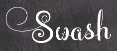 Aka Darwinoo, and revitalized in 2019 as Royaltype. Medan, Indonesia-based designer of these (mostly calligraphic) typefaces:
  Samuel Welo was an American advertising calligrapher, typographer, designer and lettering artist whose work appeared in the 1920s.
  During her studies at German University in Cairo, Sarah Ahmed designed the curly hyper-Victorian typeface Spiral (2018) and the curly Arabic typeface Belle (2018). [
 [
[

 Dave Nalle was born in Beirut on March 19, 1959, and died on February 13, 2021 from COVID in his home town of Manor, Texas. From his
  Tanya Davis (Scrowleyfonts) is a type designer in Shrewsbury, UK (b. 1966). Her typefaces:
  Aliv Pandu is a Yogyakarta, Indonesia-based designer.
  The Seniors Studio in Banda Aceh, Indonesia, designed
  Belize City, Belize and now New York City-based designer who specializes in high tech and futuristic type designs. He created Borgita (2021: a plump rounded display typeface), Cyberpunk (2021), Cyberto (2021: cyberpunk), Cyberia 3D (2021: a 3d customizable font), Spacegate (2020), the puffy or bubblegum font Funfood (2020), the calligraphic font Wayout (2020), the techno family Vortex (2020), the techno / paperclip font family Mazeline (2018), the signage script Lettercraft (2017), the robot and drone-inspired Robodron (2017), Gempire (2017), the rounded organic typeface Airy (2017), Radon (2017), the outline typeface Ply (2017), the paperclip typeface Garde (2017), the blackboard bold typeface Aberration (2016), the striped typeface Karma (2016), the logotype font Advio (2016), the ribbon or monogram font RibOne (2016), the tech font Line Tech (2016), the curly Wonderscript (2016), the prismatic typeface Lineat (2016, +Lineat III), the plump logotype Airy (2016), the bi-lined typeface Freeline (2016), the robot-inspired Stingo (2016), the display typeface Food Craft (2016), the bilined logo and monogram font Sentaline (2016), the script typefaces Curline (2016) and Article (2016), the children's font Happy Kids (2016), the futuristic font Digitalium (2016, +Condensed), the multiline titling typeface Sentagram (2015), Forest Line (2015, thin squarish headline sans), Sweet Ink (2015), and the ribbon typeface Sentaband (2015).
  Indonesian design studio located in Banda Aceh, run by Teuku Deky Firnanda, b. 1989. In 2013 it published the
  Malang, Indonesia-based designer of display typefaces, b. 1990. The catalog in 2022 showed these fonts: Neonisans (a neon font), Rafaiza (a swashy calligraphic script), Oulina (a formal script), Ramphal (a rhythmic script), Adara (a curly typeface), Beauty Angelin (an upright script). [
 Nick Shinn (b. London, 1952) is an art director and type designer. He teaches at York University in Toronto, and is a founding member of the Type Club of Toronto. He writes regularly for Graphic Exchange magazine, and has contributed to Applied Arts, Marketing, Design, and Druk. He founded Shinn Type in 1999, and made fifteen type families.
  The digital images by Si Scott will blow you away. He is a master at creating images that escape from letters. Wonderful typography and type art.
  Company whose fonts can be bought via Stuart Sandler's Font Bros. They include mostly playful display typefaces:
  [
[ Great Falls, MT and Amsterdam, The Netherlands-based designer of the brush typefaces April Blossom (2016), Januar (2016), December Sparks (2016) and October Storm (2016), the script typefaces De Novembre (2016) and Sweet September Script (2016, beatnik style), Minty March (2016), July Kissed (2016, curly brush script), Dear June (2016), the brush script typefaces August Rain (2016), Bongiorno (2016), Willow (2016) and Olive Sky (2016). He also created the handcrafted February Love (2016), Jamie Woods (2016).
  Ploiesti, Romania-based designer of Winchester Condensed (2014), Picnic Caps (2014) and Grocery Rounded (2014).
 Argentinian foundry located in Buenos Aires, est. in 2008 by
  Rocket Type, Squid & Steve, Dandylion Brushworks and Dandylion Typeworks are all names of foundry set up in 2014 by Dathan Boardman.
  Indonesian designer of the script or scrapbook typefaces
  [
[ Stereotype is Clément Nicolle's web outfit. He designed these (free) fonts between 2004-2006: 3grammes5, BagpackDemo (grunge), Base02 and
  Quebec-based designer (b. 1971) in 2010 of the
  Rochester Institute of Technology's School of Printing graduate who lived in California and in Holland, MI, and now resides in Louisville, Colorado. He was a disciple of Chuck Bigelow and Kris Holmes.
 Banda Aceh, Indonesia-based designer (b. 1984) specializing in calligraphic typefaces. In 2018, Sulthan Studio published
 Russian graphic designer. She made the soothing curly informal Cyrillic typeface
  [
[ [
[ [
[ New Westminster, BC-based foundry of
  [
[ Minneapolis, MN-based illustrator and lettering artist. Designer who sells her script fonts through
  Tattoo Woo (or: Smokewire) is American
  Born in Lincoln, UK, in 1942,
  Temeshi is the Polish designer of a neat curly-jazzy logotype called
  Terrestrial Design is Carl Crossgrove's web site. Crossgrove graduated from Rochester Institute of Technology in Printing /Typography, and has shown a life-long interest in calligraphy and lettering. Now based in San Francisco, he has worked at Adobe, where he designed the Multiple Master hand-printed (semi-Celtic or stone-carved) families
  Snowboarder from Liechtenstein, who designs typefaces at P22 and its descendant foundries such as HWT. The list:
  [
[ Founder of Atelier Zero Ltd and The 1477 Font Foundry in London. In 2012, he designed the squarish typeface
  Free fonts made by Brooklyn, NY-based (and before that, Huntington Beach, CA-based) Lauren Ashpole (b. 1982, Corpus Christi, TX):
  Amy Ellks (The Pen & Brush) creates commercial graphics items. Her fonts, mostly hand-drawn in a lively poster style, include Mia Bella (2014, an über-decorated Valentine's Day typeface; +Lighthearted), Love & Stuff (2014, a calligraphic font), Le Petit Parisien (2014, a gorgeous hand-drawn poster typeface), Le Petit Parisien Light (2014, outlined version), Sweet Wanderlust (2014), Brooklyn Girl (2014, a great connected curly script), and Made From Scratch (2014). [
 Banda Aceh, Indonesia-based designer, b. 1983, of the brush script typefaces Adilla + Rita (2015), Ausyilla (2015), The Barrack (2015), Geuceu (2015) and Ballistic (2015), the calligraphic Workaholic (2015) and Autumn Flower Script (2015), the handcrafted Crash One and Crash Two (2015,
  [
[ Thomas Ramey, a graphic designer from Austin, TX, who grew up in Pasadena, TX, and was located in San Francisco and Nashville, TN, now operates out of Seattle, WA. He created the hybrid font
 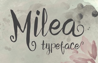 Known first as Ivan Vani and then as Zulfan Iskandar. Jakarta, Indonesia-based designer of the vampire script typeface Milea (2015), the calligraphic typeface Calista (2015), the connected Panda Tired (2016), Panda Tired Caps (2016), Sheilova Script (2015), and the curly romantic script Weloe (2015).
 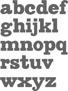 [
[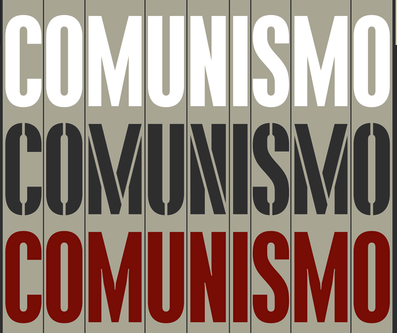 [
[ [
[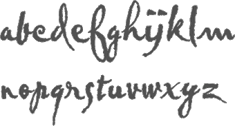 British designer of
  Turtle Arts Fonts is the Seattle, WA-based foundry of Kerrie Carbary (b. 1970), est. 2000.

 Catalan foundry headed by Andreu Balius (b. 1962), who is based in Barcelona and Son (Alt Aneu), Lleida. Balius holds a PhD in Design from the University of Southampton (UK) and teaches typography and type design at EINA, University School of Design and Art, in Barcelona.
 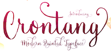 Indonesian designer of the brush script typeface Balliget (2016) and the connected swashy calligraphic typeface Crontang (2016).
 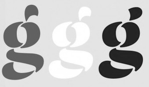 Jakob Runge (M&uum;nchen, Germany) graduated from
 Fonts published in 2005:
  Berlin-based
  Cristian Vargas (b. 1981) is a graphic designer and illustrator from Bogota, Colombia. Since 2004 he has been working on brand and identity projects for companies in Latin America and United States with his design studio Typozon, est. 2015. Cristian studied at the Cooper Union in New York in 2013. In the
  Bandung, Indonesia-based designer (b. 1986) of these Victorian signage typefaces in 2016: True West (spurred, layered Western font family), Convexa, Warclan (3d and layered, inspired by video games), El Tigres (layered), Eastern Beast, Crypton Stone (automotive lettering), Brandley (spurred and layered Victorian signage typeface), Trio Apriliana (a handcrafted family that includes a curly script), Eastern Beast (Victorian).
  Designer at
  Moscow-based illustrator specializing in vintage style, calligraphy, ornate crests and emblems. In 2014, Vates Design created the commercial copperplate script typeface Bodega Script and the engraved currency font Bold Price. In 2015, Vates added the copperplate gothic typeface Barracuda Display and the curly Austen Display. In 2016, they published the calligraphic chancery style November Script. Fonts from 2017 include Achievement (a brush script) and Black Spot (vintage style).
  Maracaibo, Venezuela-based designer of the art deco typeface Rocco (2016) and the curly textured Candy Shop (2016).
  Victoria Bellavia is a letter designer based in New York City. Her portfolio is outstanding. She created the curly typeface
  Crowborough, East Sussex, UK-based designer Ian Barnard (Vintage Design Co) created the curly hand-drawn typeface Warrior in 2014. With Sam Jones, he designed the school script font Path Type (2014).
  [
[ Successful illustrator and graphic designer in Odense, Denmark. In 2014, he created a logo and designed a font for Mister Finch and a book about his textile sculptures published by Glitterati Incorporated. This font, Mister Finch, is curly and can be regarded as a vampire script.
  Bulgarian designer (b. 1991, Varna) of these typefaces in 2017: Nova (a great logo font), Selfish Script, Delicious Yellow Script, Emanuela (a charming upright calligraphic script), Mikaela Script, Sailor (handcrafted), Parrot, Octopus, Everest Script, Stork, Dork, Boxo, Pino.
  [
[ Ponorogo, Indonesia-based designer of the curly coffee shop typeface Espresshow (2016), the monoline script Springfield (2017), and the brush signage typefaces Overland (2017) and Andora (2017).
  Polish designer of the thin upright script typeface Mila (2016) and the sans typefaces Friday (2016), N78 Thin (2016) and Exmila (2016).
  Weknow is the foundry of Indonesian type designer Wino Sutarmin Kadir (b. 1979), who is based in Bogor, Jakarta. Weknow produced a large collection of free fonts from 2009 until 2012. He started making commercial fonts in 2012.
  Gert Wiescher was born in Braunsbach am Kocher, Germany, in 1944. Based in München,
  Serif:
  Designer (aka Funk King, b. Fort Knox, KY) who lives in Orlando, FL, and/or Apopka, FL. He used FontStruct in 2008-2009 to make over 550 decorative fonts, and became one of the world's top experts on FontStruct, FontShop's on-line font editor. Most of his fonts were withdrawn in 2012. He did a few commercial typefaces at his commercial foundry, Funk King. His creations include
  The Wilton Foundry, which started out in Wilton, CT, but is now in Chattanooga, TN), was founded in 2003 by
  [
[ Prolific Barcelona-based type designer. He started out by creating the counterless hand-printed typefaces Woodcutter Dripping Nightmare (2012) and
  Max Infeld (b. 1981, aka Xerographer Fonts) from Chico, CA, makes free fonts and offers a free font-making service. He surged onto the font scene in 2012, and is currently located in Ojai, CA.
  Illustrator and designer in Istanbul, Turkey. He created the rough brush typefaces Atmosphere Script (2015: dry brush), Smithen (with Suat Tuna and Efe Gürsoy), Boutique (with Suat Tuna and Efe Gürsoy) and Ravenclaw in 2015.
 Graduate from
  Michael Cina (Minneapolis) is the cofounder of WeWorkForThem and
  [
[ Ze Studio (Barcelona) is most likely run by Pere Esquerra. He created the curly script typeface Clotilda Script (2015), the handcrafted Therevel (2015), the
  Surabaya, Indonesia-based designer (b. 1988) of the brushed font Carocks (2019), the children's book font
  Italian design firm in Firenze consisting of three graphic designers,
  [
[