| | |
100 Beste Schriften aller Zeiten
|
 German FontShop-sponsored site listing the hundred best fonts of all times, compiled by a jury in 2007. There is a lot of good information about each of the fonts mentioned. PDF file compiled by the jury: Stephen Coles, Jan Middendorp, Veronika Elsner, Roger Black, Ralf Herrmann, Claudia Guminski (FontShop) and Bernard Schmidt-Friderichs. Visualization of the list. The list:
 - (1) Helvetica
- Garamond
- Frutiger
- Bodoni
- Futura
- Times
- Akzidenz Grotesk
- Officina
- Gill Sans
- Univers
- (11) Optima
- Franklin Gothic
- Bembo
- Interstate (1993, Tobias Frere-Jones)
- Thesis
- Rockwell
- Walbaum
- Meta
- Trinité
- DIN
- (21) Matrix
- OCR A und B
- Avant Garde
- Lucida
- Sabon
- Zapfino
- Letter Gothic
- Stone
- Arnhem
- Minion
| | - (61) Blur
- Base
- Bell Centennial
- News Gothic
- Avenir
- Bernhard Modern
- Amplitude
- Trixie
- Quadraat
- Neutraface
- (71) Nobel
- Industria, Insignia, Arcadia
- Bickham Script
- Bank Gothic
- Corporate ASE
- Fago
- Trajan
- Kabel
- House Gothic 23
- Kosmik
- (81) Caecilia
- Mrs Eaves
- Corpid
- Miller
- Souvenir
- Instant Types
- Clarendon
- Triplex
- Benguiat
- Zapf Renaissance
| - (91) Filosofia
- Chalet
- Quay Sans
- Cézanne
- Reporter
- Legacy
- Agenda
- Bello
- Dalliance
- Mistral
| Follow-up in English. Credit for some images below: Danielle West. [Google]
[More] ⦿
|
1930s American midwestern typography
|
Jonathan recommends these fonts as representatve of 1930s American midwestern typography: "If you're going for museum-piece accuracy, look for typefaces issued by the Ludlow or Barnhart Brothers&Spindler type foundries--- you can probably do some sleuthing at myfonts.com. But to get you started, try Tempo, Cheltenham, Franklin Gothic (not ITC), Cooper Black, Alternate Gothic, Post Roman, Copperplate, Radiant, Agency Gothic, Poster Gothic, Bank Gothic, or the ineluctable Goudy Old Style." [Google]
[More] ⦿
|
Aaron Chiffers
[Arctype]

|
[MyFonts]
[More] ⦿
|
Acmé-Paris
[Élodie Mandray]
|
 Acmé-Paris is a design studio in Paris run by Élodie Mandray and Caroline Aufort. Creators of New Gothic Textura (2009), Canevas (2010-2012, stitching font), Acme (2013), Tropique (2011, experimental), Minuscule (2012), Tribute (2012, children's hand), Juicy (2010), Eclipse, Thésard, the music-inspired Swing (2010), the heavy monoline sans typeface Acmé (2013), the titling sans typeface Le Creux (2013), and the stitching font Canevas (2013).
 Typefaces from 2015 include the multiline neon font Neo Neon. In 2016, Acmé Paris designed the copperplate style poster typeface Aylak, the titling sans Truck, the art nouveau typeface Bertand, the art deco typeface Beaumont, and the avant-garde typeface Cattolica. In 2017, they designed the artsy rounded sans typeface Kasha. Typefaces from 2022: Madrid (inspired by vintage posters from the Spanish Civil War). [Google]
[More] ⦿
|
Acute Studio
[Diana Ovezea]

|
 Born close to the Black Sea coast in Romania, Diana moved to Austria as a child, where she attended the American International School. After graduating from the New Design University in St. Pölten, she worked as a graphic designer, mainly on book and corporate design projects. In 2013, she graduated from the Type & Media program at KABK in Den Haag. Some time later, she set up Acute Studio in Amsterdam under the motto: We like sharp outlines, tight curves, and edgy designs.
 Creator of the hairline face Opium (2010) characterized by teardrop terminals. Creator of Paige (2011), developed at the tipoRenesansa 3rd international type design workshop in Ljubljana, Slovenia. This is an attractive and bouncy papercut display face. Marge (2011) is edgy and highly legible even at very small sizes---it was developed at the tipoRenesansa 2nd international type design workshop. Paige Italic (2012) was done at tipoRenesansa 4 and TypeClinic 5 (2012). Her KABK graduation typeface was Editura (2013), a a type family for serious publications, magazines, as well as non-fiction books. At The 8th International Typeclinic in 2014, she continued work on an untitled text typeface. At Die Gestalten, she published Paiper, an extraordinarily balanced and readable 6-style text family with angular flared glyphs that are genetically related to folded paper strips. In 2014, Diana collaborated on the design of HF Stencil with Bold Monday and Studio Thonik. Made for Holland Festival, HF Stencil is based on Glaser Stencil. In 2016, Diana published Equitan Sans and Equitan Slab at Indian Type Foundry, marrying industrial era rustiness with modern functionality. In 2017, she designed Tiny Sans and Albert Samuels Clock Type. Codesigner in 2017 with Samo Acko and Sabina Chipara of the typefaces Passenger Display (2017) and Passenger Serif (released in 2019: a Clarendon). Passenger Display is a high-contrast didone-style font family. It is intended for use in headlines, signs, or posters. Passenger Display is a high-contrast didone-style font family. It is intended for use in headlines, signs, or posters. In 2019, Diana Ovezea and Samo Acko added Passenger Sans, which is characterized by horizontal and vertical terminal strokes and small apertures, and delivers a relaxing read in long texts. With Sabina Chipara, she co-designed the 8-weight simplified sans family Bega at Indian Type Foundry. Diana Ovezea also published the sharp-edged 14-style Matteo in 2017. At Future Fonts, she published Bizzarrini (together with Sabina Chipara) and Silverspoon, ca. 2018. She writes about the wonderful Bizzarrini: Though the idea originates from a Stefan Schlesinger ad sketch for a Paris couture house, we straightened up this typeface and made it seem engineered and sharp. It gets its name from the Bizzarrini Manta, a wedge-shaped concept car designed in 1968 by Giorgetto Giugiaro. Bizzarrini has extremely long wedge serifs. Following Schlesinger's sketch, it features very tall capitals with an out-of proportion middle-line (very big heads on S, B and R). Silverspoon is a contemporary take on Copperplate Gothic. In 2019, she released the connected monoline sans script Akin (done with Sabina Chipara) and the geometric sans family Matteo at Indian Type Foundry. Typefaces from 2020: Silverknife (a tall and skinny version of Silverspoon), Capra (a headline typeface with a bouncy baseline. This project started as a one-day challenge to recreate a piece of lettering on the Glass Menagerie poster designed by David Klein in 1958). At Fontshare, Diana Ovezea and Sabina Chipara released the free calligraphic script Britney. In 2021, Barbara Bigosinska, Rafa Buchner and Diana Ovezea set up Blast Foundry. At Blast Foundry, she published Granblue, a great experimental typeface family for boxing titles. Typefaces from 2022: Duplet (a 14-style geometric sans with a techno vibe; by Diana Ovezea and Rafal Buchner at Indian type Foundry), Duplet Rounded (also 14 styles), Duplet Open (the 14-style companion of Duplet). Home page. Behance link. Future Fonts link. [Google]
[MyFonts]
[More] ⦿
|
Aga Silva

|
 Aga Silva (aka Mme. Ping) is an ex-architect/urban designer, who now lives in Krakow, Poland. Creator of the Glitter family (kaleidoscopic, star-shaped, and possibly of use as snow fonts), Stars Promo (2012), Ivy Tiles (2012), Lillius (2012, floral and froggy dingbats), Maya Tiles (2012), Ballpen (2012, hand-printed), Mickey Script (2012), and Nillie's Love Letters (2012).
 In 2011, she designed Grand Duchess (script face), Rosette110621 (kaleidoscopic dingbats), Brasserie (connected script), Marker Script, Skarpa LT (an avant-garde hairline face), Skarpa Regular, Skarpa Bold, Auld Magick (blackletter), Two Am, and Fantasy Dingbats. Typefaces from 2013: Monmica (an upright copperplate script), Skarpa 2.0, Trufla (English round hand, copperplate script), Trufla Words (calligraphic), Calissa (copperplate script), Calissa Words. Typefaces from 2014: Mavblis, Lavenda (a connected copperplate script), Roicamonta (connected script). Typefaces from 2015: Skarpa Round, Nistiver (calligraphic script), Lavenda (calligraphic script). Typefaces from 2016: Lidaxid (connected script), Hinzatis (calligraphic script), Roicamonta Basic (an upright connected calligraphic script), Monmica Fancy, Bisalir (heavy script), Piambis (thick signage script), Piambis Round, Piambis Sharp. Typefaces from 2020: Skarpa (a revised version of her 2011 typeface), Skarpa Condensed. Typefaces from 2021: Timernis (a 9-style humanist sans based on 1940 stone engraving commemorative plaque). [Google]
[MyFonts]
[More] ⦿
|
Agfa -- Monotype Sackers
|
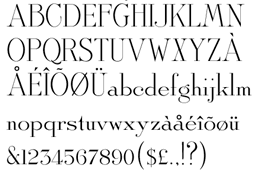 The Sackers family (Monotype, and before that Agfa) is a vintage typeface family. Its members:
 As a whole, this is an elegant but curious collection. There are few clues as to its origins, which may be a bit louche because we can easily recognize Engravers Gothic in the Sackers Gothic, for example. All typefaces look like they originate in the 19th century, and started probably out as engraved (copperplate) lettering. View the sackers typeface family. See also here. [Google]
[More] ⦿
|
Agung Maskund
[Decade Type foundry]

|
[MyFonts]
[More] ⦿
|
Akhmad Reza Fauzi
[Reza Design (or: Silverstein Design)]

|
[MyFonts]
[More] ⦿
|
Alcode
[Sukjana Almunandar]

|
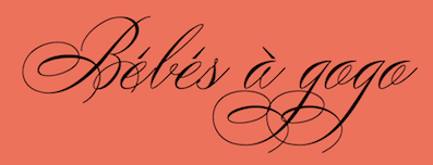 Banda Aceh, Indonesia-based designer (b. 1993) who specializes and excels in formal calligraphic typefaces. Creator of the thin calligraphic typefaces Yesterday (2017: upright) and Jazzi Script (2017), and the swashy formal calligraphic typefaces Peaches (2017), and Sinday College (2017).
 Typefaces from 2018: Malikon, The Duality, Karmila Script (a signature font), William Duke (a great formal calligraphic script), Differenlight (Spencerian calligraphic), Stipa Willington (formal calligraphic), Gatlik Saphir (formal calligraphic), Lile Dahliya (formal penmanship calligraphy), Bulgattie (copperplate calligraphy). Typefaces from 2019: Laront Monoline, Claristy, Graceful (a thin Spencerian script), Beduga (a signature script), Desirable Calligraphy (Spencerian), Fantera (a baseball script). Typefaces from 2020: Colfige (a fashion mag typeface), Claristy, Dalgond Script (formal calligraphic), The Duality (a formal calligraphic script), Peaches (a penmanship script), Imagine (calligraphic), Willmaster Calligraphia (a Spencerian penmanship script), Quntas Script (a hairline calligraphic font), Kota Datoma (wild calligraphy). Typefaces from 2021: Betting Soker (a brush script), Tugafy (fashion mag font), Mole Display (a distorted font), Avole (a hipster fashion mag font), Qanthorely Castigra (a wild Tree Frog genre script), Bolgifam (a triptych of stylish typefaces including a formal copperplate calligraphic style), Matilost Wikly (script), Silta The Farming (a brush script), The Kaluge (a feminine display typeface), Silta The Farming (a brush script), Tylaco (an art nouveau typeface), Dofta (a high-contrast decorative typeface), Dofta (a high-contrast decorative typeface), Batick Rodist (a wild script in a font duo), Blosta (a fashion serif and a copperplate calligraphic script), Piguet Script, Migueto (a fashion mag typeface), AvOle Serif (a fashion mag typeface; identical to Migueto). Typefaces from 2022: Roti Brown (an elegant wild script). [Google]
[MyFonts]
[More] ⦿
|
Aldo Novarese

|
 Italian designer, 1920-1995, who designed most of his typefaces at Nebiolo in Turin. Until 1975, he made about 30 families at Nebiolo, and after 1975, he produced about 70 further families of fonts. With weights included, he created about 300 fonts. Biography by Sergio Polano. He was very influential, and wrote two important books, Alfa Beta: Lo Studio e il Disegno del Carattere, a study on font design and history (1964), and Il Segno Alfabetico (1971). Essay by Sergio Polano on Novarese. The list of fonts done at Nebiolo:
 - Landi Linear (1942). This was revived in digital form in 2011 by Toto as K22 Landi Linear.
- Etruria (1940-42)
- Express (1940-43)
- Normandia (1946-49, with Butti, and 1952)
- Athenaeum Initials (with A. Butti, 1945-1947)
- Fluidum (+Bold) (1951, script). Revived by Ralph Unger as Butti (2011).
- Fontanesi (1951-54, an all caps rococo font). Digital revivals include Fontanesi RMU (2018, Ralph M. Unger) and Fontanesi (2003, a free font by Frogii).
- Microgramma (1952, with A. Butti; available at URW++). This was done as an alternative to Bank Gothic, and is identical to Eurostile Bold Extended.
- Nova Augustea (1951, ITC Augustea Open)
- Egizio (1953-57), a slab serif [see E710 Roman on the SoftMaker MegaFont XXL CD, 2002, or Egizio URW (2009, quite complete family with 5 styles) or Egizio EF (2001), or Thierry Gouttenègre's Aldogizio (2013)]. For a specimen, see here.
- Cigno (1954). This script typeface was revived an extended as P22 Cigno (2008, Colin Kahn, P22).
- Swan (1954), aka Cigogna (with A. Butti).
- Juliet (1954-55). For a superb revival and extension of this copperplate script, see Canada Type's Ambassador Script (2007).
- Ritmo (1955)
- Rhythm (1955)
- Garaldus (1956-ff). A garalde digitally revived in 2012 as Garaldus by Flanker.
- Slogan (1957). Digital revival by Terry Wudenbachs in 2010 called P22 Slogan.
- Recta (1958-1961). This is a large sans family. Canada Type published an 18-font revival in 2011, also called Recta.
- Estro (1961). A western font now found in the Mecanorma collection.
- Fancy (1961)
- Exempla (1961). Published by VGC in 1966. Third Prize in the 1966 VGC National Type Face Design Competition.
- The Eurostile family (1952: caps, with Alessandro Butti; 1962: lower case). This is carried by many foundries such as Adobe, Linotype, and URW++. Eurostile lookalikes include Aldostile (Autologic), ES (Itek), Eurasia (SoftMaker), Eurogothic, Eurostar (MGI Software), Eurostile, Eurostile Next (Akira Kobayashi), Gamma, Jura (Daniel Johnson), Microgramma, MicroSquare (SoftMaker), Microstyle (Compugraphic), NuevoSolStile (Cayo Navarro), SD Eurostile Elite (Justin Rotkowitz), Square 721 (Bitstream), Waltham. Noteworthy is Eurostile Round (2014), a rounded version of Eurostile by URW++.
- Patrizia
- Magister (1966)
- Forma (1966). Alessandro Colizzi explains: From 1965, following a marketing-oriented approach focused on the user, the management set a research group of graphic designers to work on a new typeface design. Headed by Novarese, who provided the basic alphabet, the team included Franco Grignani, Giancarlo Iliprandi, Till Neuburg, Ilio Negri, Pino Tovaglia, Luigi Oriani, and Bruno Munari. The collective design process was based on an analysis of contemporary sanserif typefaces and legibility tests, to develop a more mature, humane interpretation of the Swiss sanserif trend. The process was quite laborious with monthly meetings spanning across over two years. In 1968, Forma was eventually released as lead type. As its name implies, Forma aimed at representing the ideal letterform of its time, equally appealing to designers, printers and the general public. The typeface was favourably received by the design community (it won a special mention at Compasso d'oro in 1970), but although initial sales were encouraging, it could not really compete in a market already saturated by Univers, Helvetica and the like. . A grand revival of Forma, described by Indra Kupferschmdt, was organized by Roger Black for Hong Kong Tatler (as fashion mag). The revival was executed by Font Bureau's David Jonathan Ross in 2013. See David Jonathan Ross's site.
- Oscar (1966)
- Lambert (Compacta lookalike)
- Metropol (1967). This gaspipe typeface was digitized by Patrick Griffin at Canada Type in 2007 as Press Gothic. Originally, it was meant as an alternative to Geoffrey Lee's Impact at Stephenson Blake.
- Elite (1968, a boring linear script, digitized in 2005 by Canada Type as Fontella)
- Fenice
- Stop (1971; available at Mecanorma, Linotype, URW++, Elsner&Flake)
- Dattilo (1974, an Egyptian face) (1974): his last creature for Nebiolo, a typewriter type. It was considered as a slab serif companion of Forma. This typeface was revived as a variable font in 2020 by David Jonathan Ross.
His post-Nebiolo fonts: - Primate (1972), for AG Berthold. For a digital revival of this wedge serif, see Luca Terzo's Noctis (2020).
- Sintex 1 (VGC, 1973). A revival and expansion of this funky nightclub typeface was done in 2008 by Patrick Griffin at Canada Type as Stretto (2008).
- Sprint (1974). A script typeface. Digital versons: Sprint (Linotype), Sprint (2019, SoftMaker).
- Bloc (1974, VGC)
- Mixage (1977 Haas, a lineal font, now ITC Mixage) 1985?
- Novarese Book (1978, now ITC Novarese Book)
- Lapidar (1977)
- Andromeda (1978, VGC)
- Global (1978, VGC)
- Fenice (1977-80; now ITC Fenice)
- Expert or Expert Haas (1982-1983). At Haas'sche Typefoundry.
- Floreal Haas (1983). A decorative and slightly wavy serif published by Haas'sche Schriftgiesserei.
- Colossal (1984); see Colossalis at Berthold, a slab serif sports lettering family)
- Stadio (1974). A reverse contrast sans that was published only as a rub-on transfer typeface. Revived in 2020 by the Zetafonts team as Stadio Now.
- Symbol (1982-1984, now ITC Symbol)
- Arbiter (1989, Berthold)
View Aldo Novarese's typefaces. [Google]
[MyFonts]
[More] ⦿
|
Alejandro Paul

|
 Designer who lives in Buenos Aires and who teaches graphic design and typography at the Universidad de Buenos Aires. He has worked as an art director in prestigious Argentina-based studios, handling high-profile corporate brands such as Arcor, Marta Harff, Morph, SC Johnson, Danone, and Movicom. He runs Estudio Paul. Professor at Facultad de Arquitectura, Universidad de Buenos Aires. Co-creator, with Apostrophe at Apostrophic Laboratory, of Usenet (2000), FontCop I through IV (2000) and the pixel font family Cayetano. Published the dot matrix font Stardust with T-26 in 2000. Designed the gorgeous font Elektora in 2000. He developed with Michael Lynch a 17-font Tennis set of grid-based pixel fonts. At Typeworx, he published Reflex (2002), a commercial 6-style unicase font family. Another web site by Alejandro. Cofounder of DAS, a design studio in Buenos Aires.
 Cofounder of Sudtipos (2003), where he does custom work and creates new typefaces. His work there includes Tierra (a titling face), Latinaires (2003-2018: originally called Latina Sans), Reflex, Downtempo (2003), Stardust and Mosaico (1999, pixel face). Still at Sudtipos, he digitized the beautiful handwriting/calligraphic typefaces by Angel Koziupa called Alma (2005), Murga, Habano and Tiza, which together with his script typeface Argenta (2004), Oxida (2005), the medieval script typeface Mama Script (2004, designed with Alfredo Graziani), Divina (2004, with Alfredo Graziani), and the sans family Kautiva (2004) can be bought via Umbrella Type. For children's orthography, he developed Estrada Hand, on commission for Editorial Estrada. He was working on the serif family Libertina (2004). Herencia (2004, a handwriting typeface done with Diego Giaccone), Grover (2004, slab serif), Milk Script (2004, with Alfredo Graziani), Mama Script (2004, with Alfredo Graziani), Politica (2004, a techno typeface with a very thin Thin weight) are at Sudtipos. The Bluemlein Scripts (2004-2005, Umbrella and Veer) are based on the calligraphic renderings of Charles Bluemlein, shown in a 1943 ink catalog: Miss Le Gatees, Mr Rafkin, Mr Keningbeck, Mr Lackboughs, Lady Dawn, Mrs Von Eckley, Mr Sheppards, Mr Dafoe, Mr Canfields, Mr Stalwart, Mr Sandsfort, Mr Leopolde, Mr DeHaviland, Mr Blaketon, Miss Stanfort, Miss Packgope, Miss Fajardose, Mrs Saint-Delafield, Mrs Blackfort, Mr Sopkin, Mr Sheffield, Miss Lankfort, Herr Von Muellerhoff, Dr Sugiyama, Dr Carbfred. (Note: Soft Horizon's Lainie Day (1993) is an earlier free font in the style of Lady Dawn and Mr Lackboughs). In 2011, that series was made available at Google Web Fonts. Sudestada (2005, Sudtipos) is a handwriting script developed with Diego Giaccone. Cuisine (2005, Umbrella Type) is an informal bold script. Mousse Script (2005, Sudtipos) is based on Glenmoy, a 1932 Stephenson Blake typeface. Suave Script (2005) is a 4am jazz bar script. Ministry (2005) is related in style but less funky, Chocolate (2005) is for sales ads, and Cenizas (2005, with Angel Koziupa) is straight from an old manuscript. Whomp (2006, Umbrella) was based on a partial sign-painting font by Alf Becker (1930s), and so was Buffet Script (2006, Sudtipos). Affair (2006, Umbrella) is swashy and calligraphic, while Candy Script (2007) and its italic version Sugar Pie (2011) are based on Argentina's market lettering. Galgo Script (2007) is a brush calligraphic font based on a design of Angel Koziupa. Burgues Script (2007) is an ornate calligraphic script based on the lettering of calligraphy teacher Louis Madarasz (1859-1910) (award at TDC2 2008). Burgues Script, Adios Script (2008: it won an award at TDC2 2009), Feel Script and Sugar Pie all won awards at Tipos Latinos 2008. Sinfonieta (2006) and Buffet Script are fifties style connected scripts. Feel Script (2007) is based on lettering that calligrapher and logo designer Rand Holub created in 1950 and that was subsequently captured in Intertype's typeface Monterey (1958). Some letterforms were redrawn from vintage American magazine ads (some by Holub himself), Cuisine (2008, food advertising script), Pronto (2008, comic book style, by Alejandro Paul and Angel Koziupa), Grover (2004, rounded sans family), Grover Slab (2004). Burgues Script, Adios Script, Feel Script and Sugar Pie all won awards at Tipos Latinos 2008. Calgary Script (2008, Umbrella) is a pure signpainting job. Accolades from all typophiles for his calligraphic wunderkind, Compendium (2008). The 2009 haul: Sugar Pie (signage font), Bravissima Script, Theorem (upright semi-script). Speaker at ATypI 2009 in Mexico City. The year 2010 starts off with a bang, five awards at Tipos Latinos 2010: a grand prize for Brownstone Sans, and four standard awards, for Semilla, Kewl Script (for food packaging and store windows), Calgary Script, and for Business Penmanship. Typefaces from 2010 include the baseball lettering typeface Fan Script and the tattoo script face Piel Script (piel=skin), which was influenced by Burgues Script and more remotely by showcard lettering by B. Boley (1930s, Sign of the Times Magazine). Piel Script won an award at Tipos Latinos 2012. In 2011, he and Koziupa made the fat signage typeface Aventura and Viento (a grunge version of their earlier 2004 face, Brisa). He added one retro connected signage font to the Filmotype collection in 2012, called Filmotype Kitten (original from 1955). Filmotype Zephyr (2012) is an italic roman formal script. Filmotype Yukon (2012) is inspired by the classic Palmer style of penmanship. Storefront (2012) is a swashy signage typeface based on an incomplete alphabet by Alf Becker. His signage script typeface Hipster Script won an award in the TDC 2012 competition and at Tipos Latinos 2012. Typefaces from 2013: Rolling Pen (a connected script that recalls the business penmanship genre), Bellissima Script (based on a copperplate calligraphic alphabet from Bellezas de la Caligrafía by Ramón Stirling, 1844). In 2014, he helped Panco Sassano, a lettering artist and illustrator from Mar del Plata, who designed the wide connected semi-calligraphic handwriting typeface Horizontes Script (Horizontes subsequently won an award at Tipos Latinos 2016). Still in 2014, he published the fat packaging or signage script Bowling Script, which is based on Freely Drawn Italic, a non-font alphabet by Ernst Bentele (1953). In 2015, Alejandro Paul, Yani Arabena and Guille Vizzari combined forces in the signage script typeface Quotes (Script+Caps) (2015, Sudtipos). Merengue Script (2015, with Panco Sassone) is a fun creamy script, ideal for pastry shops, tea rooms or supermarkets. Steak (2016) is a connected vintage signage script based on an Alf Becker design. Envelove (2017) is a script typeface family consisting of Script, Icons, and Caps, designed at Sudtipos by Yani Arabena, Guille Vizzari, and Alejandro Paul. Winner at Tipos Latinos 2018 of a type design award for Envelove. Still in 2017, Guille Vizzari and Alejandro Paul co-designed the great Moleskine notebook-inspired typeface family Proprietor. Proprietor comes in Script, Icon, Deco, Wide, Open and Roman styles. It won an award at Tipos Latinos 2018. Rigatoni (2017): A skyline didone based on mid-20th century example by Eugen Nerdinger. Bibliophile Script (2017). A pair of copperplate calligraphic typefaces. Fixture (2018: a 72-font grotesk family published by Sudtipos). Newbery Sans Pro (2018). A simple workhorse sans typeface family that is inspired by German industrial design and the lettering of Eugen Nerdinger. Winner at Tipos Latinos 2018 of a type design award for Tennis Set, Bibliophile Script, French Bulldog, Envelove, La Taqueria, and Speakeasy Set (a collection of (copperplate) script, sans, modern, flare and gothic substyles). From 2019: Hot Salsa (a retro brush script; with Ximena Jimenez), Old Letterhand, Clockmaker (arts and crafts style), Steak Script (inspired by an old alphabet by Alf Becker), Address Sans Pro (a sans family inspired by Butti and Novarese). In 2019, Alejandro Freitez and Claire Menager, under the art directoship of Alejandro Paul, designed the multistyle wood type look / Western / Victorian / reverse stress / hyper-decorative Presley Slab. Typefaces from 2020: Apothicaire (a wonderful quaint serif family in the frivolous didone genre; three variable fonts, 16 styles in all), Inglesa (a penmanship script), Dilemma, Dilemma Serif (Dilemma is a sans/serif type system with 42 styles; it is inspired by the anonymous Polyphème, Cyclopéen and Extra Condensé designs from the early 1900s at the Peignot Fonderie; two variable fonts are included), Sporty Pro (a large sports / athletics font family). Typefaces from 2021: Plethora (an 18-style family and two variable fonts that build on Julius Herriet's Old Style Ornamented for Bruce Type Foundry; Alejandro added various frills, ligatures, weights, exaggerating in true Victorian spirit), Magari (a fat face or Normande; Alejandro likens it to Italian classics of the 19th century though), Regional (27 styles, plus variable styles). Typefaces from 2022: Wienerin (a revival and expansion of Olympia (1929) by Carl Otto Czeschka, one of the members of The Wiener Werkstätte). [Google]
[MyFonts]
[More] ⦿
|
Alex Ivanov
[Vates Design]
|
 [More] ⦿
|
Alex O. Kaczun
[Type Innovations]

|
 [MyFonts]
[More] ⦿
|
Alex Sheldon
[Match&Kerosene]

|
 [MyFonts]
[More] ⦿
|
Alfredo Marco Pradil
[Hanken Studio]

|
 [MyFonts]
[More] ⦿
|
Alisa Nowak

|
 French type designer who studied at Fachhochschule Düsseldorf (2009) and at the Ecole supérieure d'art et de design d'Amiens, France, class of 2011. At ESAD her graduation typeface was called Eskapade. In 2012, the blackletter typeface Eskapade Fraktur was published by Type Together. The angular weights Eskapade Regular and Eskapade Italic were added in 2012.
 With Sebastien Degeilh, she is a partner in Nowak & Degeilh, a French type foundry started in 2012. At Nowak & Degeilh, she created the 3d geometric overlay font family Carton (2012). For the next few yours, her work was published by Fontyou: - She co-designed the stylish Egyptian typeface Achille FY (2012) with Gia Tran, Gregori Vincens, Valentine Proust and Bertrand Reguron, and Achille II FY (2014) with Valentine Proust and Gregori Vincens.
- With Gia Tran, Gregori Vincens, Valentine Proust and Elvire Volk, she co-designed the monoline sans display typeface Younion FY (2013). Younion One FY is free at Dafont.
- Codesigner of Kaili FY (2013): an exotic typeface with crazy ligatures, inspired by Indian scripts, designed by Gregori Vincens, Bertrand Reguron, Gia Tran and Alisa Nowak.
- The EPS format display typeface Alice FY (2013). Co-designed by Alisa Nowak, Micaela Neustadt, Gia Tran, Bertrand Reguron and Valentine Proust. Alice FY was inspired by Adrien Genevard's lettering. Sub-themes are Alice in Wonderland and playing cards.
- The EPS format frilly script typeface Lullaby FY (2013), co-designed by Alisa Nowak, Micaela Neustadt, Gia Tran, Bertrand Reguron and Valentine Proust at Fontyou. It too was inspired by Adrien Genevard's lettering.
- Exquise FY (2013). A fashion mag didone co-designed by Bertrand Reguron, Alisa Nowak, Valentine Proust, Elvire Volk and Gia Tran at Fontyou.
- Bruum FY (2013) by Gia Tran, Alisa Novak, Micaela Neustadt, Bertrand Reguron and Grégori Vincens. Bruum FY is a curvy stressed elliptical sans typeface.
- Four typefaces done with Luis Gomes and Jeremie Hornus: Booster FY (2013: a rounded sans), Gauthier FY (2013: a transitional typeface family, followed in 2014 by Gauthier Next FY), Lean-O FY (2013: a slab serif with leaning asymmetrical brackets; see also LeanO Sans in 2014), Marianina FY (2013: a contemporary condensed 24-style headline sans family with simple strokes. Characterized by kinks in the ascenders).
- Gregori Vincens, Gia Tran, J&eacxute;rémie Hornus and Alisa Nowak co-designed the humanist sans typeface Klaus FY (2013).
- The slender display typeface Sérafine FY (2013). Co-designed with Jason Vandenberg and Jérémie Hornus.
- Codesigner with Mr. Zyan of the alchemic hipster font Pyrenees FY (2013).
- She collaborated with Jérémie Hornus and Fabien Gailleul on the design of the astrological simulation typeface Astral FY (2013). The same group of three collaborated in 2014 on Naive Gothic FY.
- In 2014, Adrien Midzic, Jason Vandenberg, Jérémie Hornus, Julien Priez and Alisa Nowak co-designed the creamy script Vanilla FY. It was renamed Vanille FY after a few days.
- Still in 2014, Adrien Midzic, Jérémie Hornus and Alisa Nowak co-designed the very humanist sans family Saya FY and Saya Semisans FY.
- Luis Gomes, Jérémie Hornus and Alisa Nowak co-designed the rounded sans typeface family Booster Next FY in 2014.
- Joao Costa co-designed the thin lachrymal typeface Zitrone FY in 2014 at FontYou with Jérémie Hornus and Alisa Nowak.
- In 2014, Monica Munguia, Alisa Nowak and Jérémie Hornus co-designed the blackletter typeface Blackmoon FY.
- In 2014, Matthieu Meyer, Alisa Nowak and Jérémie Hornus co-designed the wedge serif typeface Ennio FY at FontYou.
- The punchy poster typeface Kraaken FY (2014) was designed by the FontYou team of Bertrand Reguron, Alice Resseguier, Valentine Proust, Julien Priez, Gia Tran, Jérémie Hornus, and Alisa Nowak.
- In 2014, Joachim Vu, Jérémie Hornus and Alisa Nowak co-designed the classical copperplate script typeface Vicomte FY.
- Codesigner with Jan Dominik Gillich of Sperling FY (2014, FontYou), a didone-inspired headline or fashion mag display typeface family.
- Designer of Marianina Wide FY (2014).
- In 2014, Alisa Nowak, Gregori Vincens and Andrey Kudryavtsev created Achille II Cyr FY.
- Codesigner of Hansom Slab FY (2014, Gia Tran, Jeremie Hornus and Alisa Nowak).
- Still in 2014, Julien Priez, Hugo Dumont, Jérémie Hornus and Alisa Nowak co-designed Rowton Sans FY, a sans family patterned after Gill Sans in six weights, from Hairline to Bold---named after Arthur Eric Rowton Gill, it has the Gillian lower case g but italic lowercase is a bit too far afield for my own taste, especially the squeezed g.
In 2015, Jérémie Hornus, Clara Jullien and Alisa Nowak co-designed the spurless / organic slightly inflated sans typeface family Diodrum at Indian Type Foundry. Diodrum Rounded (2020, by Manushi Parikh, Jérémie Hornus, Clara Jullien and Alisa Nowak) is a spurless organic sans family. In 2016, Alisa Nowak, Julie Soudanne and Jean-Baptiste Morizot co-designed Graphico (Indian Type Foundry): Its letterforms are industrial and square-sided. The typeface looks like the product of precision mechanics: it should be featured together with tech---either old tech like appliances or watches, or new tech like apps and laptop stands. In 2016, Alisa Nowak designed the all caps art deco / avant garde typeface family Inbox that comes with many great ligatures and interlocking glyph pairs. It was published at Indian Type Foundry. Alpinist (2016) is a humanist sans with a small x-height optimized for magazine design and other editorial applications. The edges are slightly rounded for easy reading. It was designed by Jeremie Hornus and Alisa Nowak. Somehow, it evolved into Alpino at Fontshare. In 2016, Jeremie Hornus and Alisa Nowak released Associate Sans and Slab (+Stencil), and Associate Mono at Indian Type Foundry. This is a family with an American gothic look. Vesterbro (Jeremie Hornus, Alisa Nowak, Ilya Naumoff, Black Foundry, 2017) is a high-contrast Latin / Cyrillic typeface with a Viking feel that won an award at Granshan 2017. Papelli (2016) is an informal typeface family by Alisa Nowak and Julie Soudanne. At Fontstore / Fontshare, she released the 6-weight sans typeface Excon in 2017. Excon is named after and a tribute to French designer Roger Excoffon (1910–1983). Excon's letters are top-heavy, a rarely-explored idea in type design Excoffon himself experimented with. In 2017, Jérémie Hornus, Théo Guillard, Morgane Pambrun, Alisa Nowak and Joachim Vu co-designed Bespoke Sans, Bespoke Serif and Bespoke Slab at Fontstore / Fontshare. In 2020, Bespoke Stencil was added. In 2017, Jérémie Hornus, Julie Soudanne and Alisa Nowak designed the attractive titling didone typeface Zesta. Zodiak (2021, Jérémie Hornus, Gaetan Baehr, Jean-Baptiste Morizot, Alisa Nowak, and Théo Guillard at Fontshare) is a free 24-style text family with Century-like newspaper roots and sturdy bracketed slab serifs that was originally named Claire (2020). In 2020, Jeremie Hornus, Theo Guillard, Morgane Pambrun, Alisa Nowak and Joachim Vu co-designed Bespoke Stencil (2020, Fontstore). [Google]
[MyFonts]
[More] ⦿
|
Alison Argento
[Dear Alison]

|
 [MyFonts]
[More] ⦿
|
Aliv Pandu
[Type Colony]

|
[MyFonts]
[More] ⦿
|
Ana Cristina Hernandez
|
Monterrey, Mexico-based designer of the copperplate typeface Heredem (2014). [Google]
[More] ⦿
|
Andreas Seidel
[astype.de (or: Astype)]

|
 [MyFonts]
[More] ⦿
|
Andrew H. Leman
[E-phemera (was: HPLHS Prop Fonts, and earlier: Prop Fonts)]

|
 [MyFonts]
[More] ⦿
|
Andri Kurniawan
[Struggle Studio]

|
 [MyFonts]
[More] ⦿
|
Andy Clymer
|
 Andy Clymer grew up in Irvine, CA and studied at San Diego State University in 1998. At that time, he was working on Stencil Fraktur (2002). In 2004-2005, he studied type design in the Masters program of the KABK in Den Haag. He joined the typeface development department of Hoefler&Frere-Jones in New York in 2005. He has been an instructor in the Type@Cooper program in New York since 2011.
 From 2005 until 2018, Andy worked at the Hoefler&Co. type foundry, where he contributed to the typefaces Vitesse, Forza, Ideal Sans, Archer, Surveyor, and spearheaded the design of Operator and Obsidian (2015: a decorative copperplate engraved emulation typeface---various kinds of 3d illumination in Obsidian were obtained by an algorithmic process. In 2019, he co-developed Mingei Mono for the Mingei International Museum along with Yomar Augusto. In 2020, he released Tilt. Tilt is a family of (variable) typefaces inspired by three dimensional lettering found in storefront signage. Subfamilies: Tilt Neon (mimics the construction of neon tube lettering), Tilt Prism (based on prismatic lettering, cast or cut in a material), Tilt Warp (resembles peeling vinyl stickers). The variable fonts have two axes, horizontal rotation and vertical rotation. Github link. [Google]
[More] ⦿
|
Angelica Porto
|
Designer in Recife who made some typefaces in 2013, such as Tetris, Aguardente De Canna (copperplate) and Raspa Raspa. [Google]
[More] ⦿
|
Antonio Vignali
[RM WD]

|
 [MyFonts]
[More] ⦿
|
Archive Type
[Matevz Medja]

|
 Slovenian foundry which specializes in old typefaces found in old prints, books and samples. Typefaces are reproduced as they appeared in print. In order to preserve the original feel of typefaces, no additional characters were added to originals therefore most of fonts consist just of basic character set. Upper case letters, lower case letters, numerals and basic punctuation. It was set up in 2000 by Matevz Medja. Engraving style typefaces: Kludsky (2006), Garfield (2005), Copperplate Head (2005), Western Iron (2005), Cider (2005), French Shaded (2005), Tilt (2005). The blackletter typefaces: School Text (2005), Harlem Title (2005), Copperplate Text (2005), Black Title (2005), Chased Black (2005), Tinted (2005), Steeler (2005), Blackcap (2005). Calligraphic typefaces: Petite Script (2005), Autograph Script (2005), French Script (2005), Penman Script (2005), Magnolia Script (2005), Roundface Script (2005), Roundhand Script (2005). Other typefaces: American Shadow (2005), Lightface Extended (2005), Grotesque Shaded (2005), Gothic Ornate (2005), Antique Extra Condensed (2005), Antique Extended (2005), Ironlace (2005), Atlantique (2005), Mann (2005), Old Style Condensed (2005), Ribbon (2005), Salisbury Script (2005), Black Title Text (2005, blackletter), German Text (2005, blackletter), Archive Hands (2006, pointing fingers), Archive Woodchild (2006). Distressed typefaces: Archive Tale (2006), Archive Egipt Compressed (2006). In 2011, he published the Archive Garamond family, which is closer to the unpolished originals. The 2010 catalog has three parts:
 - The Archive 40: Archive Western Iron, Archive American Shadow, Archive Antiqua Extra Cond, Archive Antique Extended, Archive Atlantique (avant garde sans), Archive Autograph Script, Archive Black Title Text, Archive Black Title, Archive Blackcap, Archive Chased Black, Archive Cider (engraved; a vintage money font), Archive Copperplate Head, Archive Copperplate Text, Archive Egipt Compressed, Archive French Script, Archive French Shaded, Archive Garfield (2005), Archive German Text, Archive Gothic Ornate, Archive Grotesque Shaded, Archive Harlem Title, Archive Ironlace, Archive Kludsky, Archive Lightface Extended, Archive Magno Script, Archive Modern II Open, Archive Modern II, Archive Old Style Condensed, Archive Penman Script, Archive Petite Script, Archive Ribbon, Archive Roundface Script, Archive Roundhand Script, Archive Salisbury Script, Archive School Text, Archive Steeler, Archive Tale, Archive Tilt, Archive Tinted.
- Archive Americana: Archive American Shadow, Archive Steeler, Archive Tilt, Archive Grotesque Shaded, Archive Black Title (blackletter), Archive Mann (an industrial 3d typeface), Archive Autograph Script, Archive Tinted, Archive Harlem Title (blackletter).
- Archive Western: Archive Egipt Compressed, Archive French Shaded, Archive Western Iron, Archive Antique Extended, Archive Copperplate Head, Archive Ribbon, Archive Gothic Ornate, Archive Oldstyle Condensed, Archive Lightface Extended, Archive Ironlace.
Creative Market link. View Archive Type / Matevz Medja's typefaces. [Google]
[MyFonts]
[More] ⦿
|
Arctype
[Aaron Chiffers]

|
 Falmouth, UK-based designer of Tetsuo AT (2019: a geometric, futuristic and monospaced typeface; +Stencil), High Tide AT (2019: inspired by the lettering of the fishermen of Cornwall), and the copperplate-inspired all caps typeface, Caeli AT (2019), for Latin, Greek and Cyrillic. [Google]
[MyFonts]
[More] ⦿
|
Aring Typeface
[Måns Grebäck]

|
 Måns Grebäck (Aring Typeface, Örebro, Sweden) is a prolific Swedish designer (b. Lindesberg, Sweden, 1990), who lives in Borlänge, Sweden. Måns Grebäck has a bachelor's degree in graphic design from the University of Dalarna (2012). In 2010, he went commercial, and started selling fonts through MyFonts. In 2011 he started Mawns Design. In 2013, that was renamed to Aring Typeface. In 2011 he already had over seven million downloads of his fonts, which were featured at websites such as Dafont and Myfonts. He also does custom type work. His typefaces, both free and commercial:
 - Acryle Script (2014).
- Actonia (2016). A monoline script.
- Adielle (2018).
- Aerofoil (2017). A vintage bottom-heavy script.
- Airways (2016). A signage script.
- Akayla Script (2018). Calligraphic.
- Aliey (2021). A 4-style Victorian copperplate serif.
- Aliment (2018). A sharp geometric sans.
- Amertha (2020). a fat finger font.
- Amplify (2013). A signage script.
- Angars Runes (2019: medieval, with gothic cathedral curves).
- Angilla Tattoo (2013). A connected spurred tattoo typeface. Followed by Angilla Script (2020).
- Antlers (2012). A calligraphic script.
- Aquate Script (2019).
- Arachnids (2011, graffiti face)
- Artely Inks (2016).
- Artisual Deco (2021). Pure art deco.
- Artographie (2020). An all caps art deco typeface family.
- Atelas (2015). Signage type, baseball script.
- Atures (2018). Futuristic and monoline.
- Autograf (2015) and Autografia (2021). Signature typefaces.
- Ave (2016) in styles called Ave Utan, Ave Betwan and Ave Fedan. A family of baseball scripts.
- Avelana. A connected script.
- Backpack (2014). A thick signage script typeface.
- Backyard (2016). A blackletter typeface.
- Barkants (2011, elegantly hand-printed family).
- Barley Script (2017). A signage script.
- Baystar Script (2021).
- Beautiful Trouble (2012). A rabbit-eared upright connected script.
- Beaked Tyrant (2014). A copperplate calligraphic script.
- Beckasin (2011, signage face)
- Before The Rain (2011, calligraphic) Before The Rain Arabic (2016).
- Belladio (2021). An urban script.
- Bellino (2018).
- Bezar (2020). A script.
- Billion Dreams (2020, by Mans Grebäck and Rangga Subekti). A heavy signage script.
- Billion Stars (2013). A tattoo script font.
- Bira (2012). A retro connected brush / signage script.
- Blaak (2019).
- Black Fox (2014). A sirupy brush face.
- Black Signature (2021). A bold signature font.
- Black Larch (2016) and Dark Larch (2016).
- Bloc Boy (2016). Like handwriting.
- Blockography (2011). A sketched typeface.)
- Block Talk (2011, with Zaydek Michels-Gualtieri)
- Blods (2011, a great blotty brush face)
- Blueberry Script (2017; with Noah Kinard).
- Botanink (2011)
- Bouncy (a cartoon font).
- Bourdos2022). A script typeface.
- Brannboll (2011, baseball signage face), Brannboll NY (2013), Brannboll Connect (2020), Brannboll Stencil (a baseball script) (2020).
- Bready (2011). A retro signage script with art nouveau aroma.
- Brev Script (2014). A connected secretary hand from the 19th century.
- Bronze Script (2014).
- Brother Tattoo (2012).
- Bumblebees (2012). A plump curvy script.
- Bunya (2016). A geometric slightly deco sans typeface family.
- Calendary Hands (2012).
- Caligraf (2020).
- Canela Bark (2015, co-designed with Luis Miguel).
- Caneletter Sans and Script (2013). Upright unconnected and connected scripts.
- Cantona Script (2019).
- Canyon (2021). A wide elliptical sans in 18 styles, featuring a coathanger lower case f.
- Capoon (2018). A ten-style sans family.
- Caprica Sans (2014) and Caprica Script. A plump script.
- Caravela (2020). A pirate map script.
- Casat Cap (2017). An all caps brush typeface family.
- Caster (2019). A heavy poster script.
- Castro Script (2012).
- Catchland (2021). A retro baseball script.
- Celebrater (sic) (2012). An oily font.
- Cellos Script (2013).
- Centeria Script (2012).
- Channel (2011, connected upright script)
- Chapel Script (216). For signage.
- Characteristic (2011).
- Chavenir (2011).
- Chinal (2018).
- Choko (2011, released in 2016). Chocolate and cream-themed decorative typeface.
- Christmas Miracle (2018), Christmas Reign (Tuscan, all caps) (2020), and Christmas Sparkle (2018).
- Chrysante (2020). A monoline flowing pen script.
- Clear Line (2012). A fat finger / signage typeface.
- Clipper Script (2011).
- Clothe (2017).
- Coneria Script (2012). A connected script.
- Conture Script (2018). Elegant, classical, and with exaggerated capitals.
- Crackin (2011).
- Crunchy (2016). An upright connected script.
- Cruz Quaste (2020). A handcrafted blackletter typeface.
- Cubest (2021). A squarish monospaced techno family.
- CutScript (2011, connected script).
- Danbury (2022). A speed-emulating sans.
- Dark Crow (2020). a dry brush script.
- Dollie Script (2013).
- Ebbing (2018).
- Echinos Park Script (2012).
- Ederson (2018). A vintage signage script.
- Ekologie Hand (2012).
- Ekorre 2021). Aa vintage decorative serif.
- Elaya Script (2019). A creamy signage script.
- Electronics (2017). A retro signage script.
- Elevate (2016).
- Emiral Script (2017). A baseball script.
- Encina Script (2016). A thin calligraphic typeface.
- Enlighten (2011)
- Delinquente (2012).
- Denigan (2011, hairline)
- Equal Sans (2012).
- Espesor Olas (2011, fine hand-printed calligraphic family)
- Esplanade Script (2015, by Mario Arturo).
- Ethernal (2017). A connected script.
- Europe Underground (2010, geometric sans with a hairline weight).
- Fabulous (2017) and Fabulous Gold (2017). Signage script.
- Falkin Sans (2016), Falkin Script (2016), Falkin Serif (2016).
- Faltura (2011, constructivist), Faltura Alien (grunge), Faltura Guerra (grunge)
- Faltura Animals (2011)
- Feathergraphy Decoration (2011, calligraphic).
- Duera (2016). A variable width sans typeface family.
- Fargo (2021). A cursive script.
- Fat Wandals (2018). A graffiti font.
- Feathergraphy Clean (2011).
- Fibography (2013). A caps typeface composed of fibers.
- Filbert Brush (2012), Filbert Color (2013, a soft brush font).
- Finition (2017). A connected brush script.
- Fireplace (2020). A connected script.
- Firstly (2020). A flowing calligraphic signature script.
- First Lyrics (2011).
- First Reign (2022). A medieval typeface. Second Reign (2022), Third Reign (2022) and Fourth Reign (2022) are further medieval typefaces.
- Flighter (2018). A retro airplane font.
- Fondy Script (2018).
- Frankentype (2013). An all-caps brush typeface for signage.
- From Skyler (2016).
- Funkygraphy (2011, fat and counterless).
- Gecko (2015, a fine creamy signage script).
- Geza Script (2017). A great angular almost Arabic-looking script.
- Ghang (2011, graffiti family).
- Gingo (2020). A script.
- Goatskin Brush (2015). A great brush typeface.
- Golden Hopes (2021). A signature script.
- Gonzi (an 31-style sans). Published in 2021.
- Graced Script (2016). A wide calligraphic connected brush script.
- Grandi (2016). A ten-style display sans.
- Gready (2021). A fat signage script.
- Greback Grotesque (2012). The Thin is very very thin.
- Gretoon (2011, cartoon family)
- Griphite (2018). A rough brush typeface.
- Guld Script (2015).
- Habanero (2016). A fat signage typeface.
- Handtalk (2010, silhouettes)
- Harbell (2013).
- Hard Block (2011, Western slab face).
- Hastafi (2022). An 8-style sharp-edged display serif.
- Haydon Brush (2016).
- Heavy Rain (2021). Decorative initials, and an all caps wedge serif.
- Hemicube (a wide squarish all caps sans) (2020).
- Hemmet (2013). A signage script.
- Hierograf (2016). A layered textured handcrafted poster typeface family.
- Hitalica (2011).
- Honeymoon (2017). A connected script.
- Housegrind (2013, connected script).
- House of the Dragon (blackletter). Published in 2021.
- Hoyle (2020). A slab serif.
- Hundred Miracles (a signage script). Published in 2021.
- Impregnable (2013). A connected script.
- Indiana Script (2017). A baseball script.
- Inked Bones (2019). a hand-painted blackletter font.
- Intrique Script (2013). A baseball script.
- Isle Body (2019), Isle Headline (2019).
- Jacked Eleven (2011), Jacked Eleven Highlight (2011), Jack Pirate (2020: a tattoo blackletter typeface), January Script (2013).
- Jaymont (2018). A sharp-edged wedge serif typeface family.
- Jengotan (2021). A dry brush script.
- Jumper (2021). A 13-style sans. Free download for personal use only.
- Kandira (2018). A sleek sans family.
- Kanvas (2020). A script typeface.
- Kerater (2011, sans)
- Lace 2.0 (2012). A thin connected script co-designed with Matteo Milazzo.
- Lacosta (2020). A signage script.
- Kompar (2018).
- Krinkes (2015, baseball script). A connected swashy signage script.
- Kurri Island (2020).
- Lakesight (2014). A connected script.
- Larch (2016). A crisp script typeface.
- Largelake (2021). A signage script.
- Las Enter (2013). A neon light script.
- Leaders (2020). A blackletter font.
- Ledare (2021). A 14-style bold and expressive sans.
- Letric (2021).
- Let Me Ride (2011)
- Levitee (2011, a lively connected script).
- Lighthouse (2013). A bold high-contrast script face.
- Lina Script (2012). A tattoo script done with Vicky Mardian.
- Lourino (2018).
- Low Casat (2017) and Low Casat Fat (2017).
- Lyrics Movement (2011, tall-ascendered hand).
- Lyster (2020).
- Mandoul Script (2021) and Mandoul Black (2021: a brush script).
- Mainland (2018). A sans family.
- Mainstream (2017). Graffiti style.
- Manofik (a 4-style warm retro serif with a coathanger lower case f; for Latin, Cyrillic and Arabic). Published in 2021.
- Martyric (2014, brush script),
- Masteries (2013). A connected formal script.
- Mastoc (2014).
- Mauritz Caps (brushed) and Mauritz (a great wild script family), both published in 2021. Followed by Mauritz Sans (a brush script with a strong personality and a cartoon vibe) in 2022.
- Mean Casat (2018).
- Medish Script (2018). A great calligraphic handwriting typeface.
- Together with Noah Kinard, he designed the calligraphic typeface Melay Script (2016).
- Middle Ages (2019). A Lomardic blackletter in Regular and Deco styles.
- Milasian Circa (2015) and Milasian. A connected script.
- Merry Christmas (2015). A retro script in Flake and Star styles. Followed in 2017 by the color script font Merry Christmas Color.
- Milkyway Hotel (art deco sans).
- Miraikato Hand (2022) and Miraikato Script (a rustic script) (2022).
- Mistuki (2015). An oriental brush simulation font.
- Mochary (2016). A signage or tattoo script.
- Molly Sans (2019). Caps only.
- Monsta Tag (2013): a graffiti font.
- Motion Picture (2013). A heavy connected retro script.
- Mount (2012).
- MAWNS Graffiti (2010) and MAWNS Serif (2010)
- MAWNS Handwriting (2010).
- Made With B (2011, sketched face).
- Mardian (2012). A calligraphic tattoo script done with Vicky Mardian.
- Markera (2011, marker pen family)
- Many Weatz (2011)
- Mawns Rock (2011)
- Monoment (2011). A fat upright connected script.
- Moneymachine (2022).
- Monosphere (2012-2016). A futuristic monospaced typeface.
- Murality (2022). A readable graffiti or mural typeface.
- Myteri Tattoo (2021) and Myteri Script (2021: a calligraphic script).
- Nacinth (2020). A script.
- Nino Script (2018). A tattoo font.
- Nobella (2021). A retro baseball script.
- Normale (2014). A set of distressed typewriter fonts.
- Notera (2014). A connected handwriting font. Followed by Notera 2 in 2018.
- Odenburgh (2020). A medieval calligraphic typeface.
- Optien (2011, techno face)
- Ordinatum (2011, a severe sans).
- Original Black (2021). A fat blackletter typeface.
- Ornamental Versals (2011, ornamental caps)
- Painter (2016). A sign painting script.
- Patched (2021).
- Pennybridge 1563 (2010, blackletter)
- Pharmount (2014). A calligraphic connected script.
- Phraell (2013). A great italic formal calligraphic script with optional swashes.
- Pigeon (2016).
- Pineapple (2012).
- Plates Napery (2015).
- Plicata (2016).
- Pligo (2016). A balloon or cartoon font.
- Preside (2017).
- Prime Script (2012).
- Prognostic (2011)
- Qaskin (2015). A semi-formal connected script typeface with Black and White (outlined) styles.
- Qhuman (2021). A 6-style Victorian serif.
- Qraxy (2016). Quache Variable (2020) and Quache (2020). A 28-style flexible sans family.
- Quanton (2022). An 8-style angular serif.
- Querino Sans (2019). A very bold sans. Followed by Querino Script (2019).
- Quickier Pro (2012). A swashy calligraphic script face.
- Quincho Script (2016).
- Quintal Script (2021). A retro signage font.
- R-2014 (2011, LED face).
- Rabento (2021). A 6-style condensed display slab serif.
- Race Fever Pro (2015, in Brush and Pen versions) and Race Fever Brush (2015).
- Radio 187.5 (2010, techno family)
- Rakoon (2014). A creamy ultra-fat upright script. Followed by Rough Rakoon in 2016.
- Rangly (2017-2018). A paint roll font.
- Raspberry Script (2017).
- Recorda Script (2013). A formal calligraphic script.
- Reditum (2014). A decorative script.
- Reeler (2014, with Noah Kinard).
- Remachine Script (2013). Retro signage script. In 2020, Mans added Remachine Script Arabic.
- Respective (2011, calligraphic script, +Swashes).
- Respondent (2021). A script.
- Rider (2011, a 30-style "versal" sans family)
- Ringer (circle and arc-based sans)
- Ristella (2017). A baseball script.
- Rivera 2022). A narrow sans in 10 styles.
- Rodrigues (2021). A script typeface.
- Roona Sans (2018: modernist and organic curves).
- Ropest (2018). A rope font.
- Roskrift (2011, calligraphic; + Roskrift Clean).
- Rougant (2021). An organic display font.
- Roughen (2020).
- Rurable (2015).
- Ruthless Wreckin (graffiti typefaces), Ruthless Drippin' (dripping paint family)
- Safir Script (2016). A fat baseball script.
- Saker Sans (2017).
- San Andre (2021) and San Andreas (2021), the free version. A baseball script.
- Santa Claus (2019). A blackletter typeface, accompanied by Santa Claus Deco, a snow crystal font.
- Scantype (2016).
- Sculptor's Hand (2011, connected chancery hand).
- Second Lesson (2022). A wide script.
- Second Lyrics (2011, Treefrog-style handwriting)
- Sequal (2020). Graffiti style.
- Sicret (2020) and Sicret Mono (2020). An all caps family.
- Servin' for Salute (2011)
- Shaded Larch (2016).
- Sharpe (2019). A sharp-edged high-contrast serif typeface family. See also Sharpe Variable (2020).
- Shenandoah (flowing signage script).
- Shimes (2015).
- Shipped Goods (2011). A copperplate calligraphic script.
- Shortbrush (2011)
- Signerica (2011, connected flowing hand)
- Sketchica (2011, sketchy face)
- Skyzhi (2016). An advertising headline typeface.
- Society Editor (2013, connected script).
- Snacker Comic (2013).
- Snowstreet (2013, an octagonal typeface) and Snowy (2013).
- Some Weatz (2011, calligraphic, copperplate; +Swashes)
- Sonika (2018).
- South African (2014). A movie poster brush typeface.
- Southern Aire (2013, connected script face).
- Specify (2016). A 40-style sans family. Download, free for personal use.
- Spoken (2019). A graffiti font.
- Sponger (2021). In the VAG Round genre.
- Square Worm (2011)
- Stackyard (2015). A script.
- Stainy (2013). A signage script.
- Starella Script (2019) and Starella Tattoo (2019).
- Starge (2019).
- Starkey (2020).
- Stormland (2021). A wide monoplinear sans.
- Stormline (2021). All caps, wide and outlined.
- Strawberry Script (2017).
- String Lines (2018).
- Stroke Dimension (2011). A 3d typeface.
- Struck Base (2021). A baseball script.
- Suecos Locos (2011---yummy!).
- Sultan Cafe (2014). An interlocking poster typeface.
- Sunny Sam (2020). A script typeface.
- Sverige Script (2012). Calligraphic wedding font.
- Tall Casat (2018).
- Tamoro Script (2014).
- Taylor Hand (2020). A signature script.
- Tevegraphy (2011, elliptical)
- The Hills (2017).
- The World is Yours (2011, quaint)
- Throwupz (2011)
- Toley Hand (2019).
- Tipbrush Script (2011).
- Tomino (2016).
- Top Comic (2013). A very fat cartoon bubble face.
- Treehouse (2011, upright connected script; +Snowhouse for a snow-covered version)
- Tusch Touch 1 (2011)
- Two and Three (2011: a tattoo parlor blackletter family)
- Typographic Onedalism (2011, graffiti simulation face).
- Undergone (2014). Decorative and calligraphic.
- Unthrift (2015). A pen script.
- Vacer Sans and Vacer Serif (2016). The latter is a slab serif.
- Validity Script (2020, with Misti Hammers).
- Ventography (2013). A bold signage script.
- Vinho De Amora (2021). A vintage all caps wedge serif and a stencil version.
- Waiter (2017).
- Walk Da Walk One
- Wandals (2018). A graffiti font.
- Wankstaberg Battles (2010, a tall fat script)
- White Dream (2021). A retro script.
- White Larch (2016). A connected script typeface.
- Wholecar (2021). An unerground train graffiti typeface family.
- Wild Growth (2011).
- Wildline (2021).
- Winfield Script (2019).
- World Series (2021). A baseball script.
- Xtreem (2012) and Xtreem2 (2014).
- Yanty, Yanty Big, Yanty Script, and Yanty Script Big (2012).
- Yaquote Script (2014).
- Yaty (2019).
- Yoghurt (2011).
- Zoney (2021).
View Mans Grebäck's typefaces. Abstract Fonts link. Fontspace link. MyFonts link. Another URL. Dafont link. Klingspor link. Buy fonts directly from Måns Grebäck. Old URL. [Google]
[MyFonts]
[More] ⦿
|
Artisan Studio (or: Artisans)
[Roiyani Teungku]

|
 Banda Aceh, Indonesia-based studio associated with Nava Abel and/or Roiyani Teungku and/or Teungku Dibale. Designer of these typefaces in 2015: the calligraphic signage typeface Antero, the calligraphic typefaces Elastic, Braveheart, Midnight and Lettuce, and the creamy brush script typefaces Aqualita and Scylla.
 In 2016, he designed Metafora (a fresh upbeat script), Worker, Asly Brush, Mallow Script, Arnetalia and Wholler (connected calligraphic typeface) Typefaces from 2017: Manifesto, Good Night, Best Lottre. Typefaces from 2018: the upright script typeface Sumantry (which is by Roiyani Teungku), the signage script typeface Plants, Solange (font duo), Angelica (inky script), Nathalia, Chica Maravilla, Handwriting (a signature font), Mighty Girl (font duo). Typefaces from 2019: Smoothen, Olivera, Story Fresh (a fine brush script), Martoni (a thin script), Hortense (wild calligraphy), Magnison (vintage font duo), Ringstone (a rhythmic signage script), Vectory. Typefaces from 2020: Gonero (an 81-style unkerned sans family), Segments (a signature script), Quanika, Hand Sworth (a signature script), Black Stanky, Brandy (formal almost copperplate calligraphy), Mostyn (a retro signage script), Polites (a slab serif). Typefaces from 2021: Roy Smith (script), Arnetalia (calligraphic), Beby Asia (a wild script). [Google]
[MyFonts]
[More] ⦿
|
astype.de (or: Astype)
[Andreas Seidel]

|
 Astype.de is a German foundry started in 2003 by illustrator and type designer Andreas Seidel (b. 1975, bad saarow, near Berlin, Germany). He lives in Cottbus, Germany. In 1998, he obtained a Masters degree in business administration. In 2007, he and Ingo Preuss set up The German Type Foundry. In 2017, he joined the initial crew at Fust & friends. The typefaces:
 - One of his first typefaces was Crayfish (originally a URW font, but withdrawn by Seidel from URW in 2002). Crayfish is a display type originally designed for an American Football club. The Crayfish typefaces are sold as Thunder Bold and Titan Bold.
- Check his nice weather symbols (not a font).
- He finished Ornaments Thanksgiving and the great ASTYPEOrnaments-WineGrape A (2004).
- He is working on 14th century initials (2003).
- He created Sattler (2003): Joseph Kaspar Sattler, one of the great German art nouveau artists created these nice initials in 1897 for the famous royal monumental book project Die Nibelunge for the Reichsdruckerei Berlin. Only 200 exclusive signed masterpieces were printed in four years from 1900 till 1904. Joseph Sattler was the art director, type designer and designer in one person. The Reichsdruckerei showed samples of the unfinished work in 1900 at the world exhibition in Paris to advertise the high craftsmanship of the German presses.
- He made Heraut (2003), an art nouveau lettering typeface based on a 1901 design of Hermann Hoffmann called Herold Reklameschrift.
- He created Sveva AS Versal (2003, art nouveau).
- About Missa Solemnis, he writes: Solemnis was designed by Günter Gerhard Lange and first cut in metal 1953 (this is the date he quotes himself, other sources mention 1950 or 1952). It seems to be one of his earliest typeface designs that he had done as a freelancer for H. Berthold AG in Berlin. [...] Missa Solemnis AS is a new, remastered and extended version of Mr Lange's typeface. The font is available in the OpenType format and comes in two styles: 1953 and 2003. The 1953 style contains all characters of the original metal type, as well as a few additions. [...] The 2003 cut is more delicate and makes extensive use of the OpenType format. It contains over 650 glyphs, covering Roman-based languages of Western and Central Europe. His Solemnis inspired Simeon AS (2003), a 650-glyph uncial style face.
- In 2004, he created Missale Incana, an interpretation of a typeface from Herbert Thannhaueser.
- Still in 2004, he created ASTYPE Ornaments Christmas A2 and ASTYPE Ornaments Christmas A. These were followed in 2005 by ASTYPE Ornaments Christmas B.
- He made Missale Lunea (2004). This has astroligical symbols, moon phases and medieval characters.
- In 2005, the exquisite calligraphic script typeface Gracia was added, consisting of Gracia No. 44, 45, 54 and 55 (graceful calligraphic script), and Gracia Solo.
- Paola is a redesigned, new interpretation of a brush typeface from Carl Rudolf Pohl.
- He made Adana (2005): The roots of Adana going back to the year 1930, to the Berlin-based German graphic designer Wilhelm Berg. His typeface can be interpreted as an answer to Lucian Bernhards Schönschrift. The Initials are nearly close to the original drawings but the Circular typeface was changed dramaticly. Excentric, unusual forms and loops were changed to fit todays needs. Due to the lack of a corresponding Roman letter form, the Regular version was designed including small caps, fitting the contrast and swinging shapes of Adana Circular. Both typefaces play well together in all kinds of adverts, as well with designs like Bodoni or Didot.
- Alea AS Initials (2005) is a floral faced based on the drawings of Maria Ballé.
- Taiko (2006). A revival of Otto Arpke's Arpke Antiqua (1928, copperplate).
- ASTYPE Ornaments Accolades A (2007), and ASTYPE Ornaments Accolades C (2011).
- GTF Toshna Std (2008, German Type Foundry) is a garaldic type family in three optical weights, after a 1955 family called Tschörtner-Antiqua by Hellmuth Tschörtner that was very popular in the DDR.
- Secca (2009, German Type Foundry) is a simple sans family rooted in early German grotesque type designs. See also Secca Soft (2014) and Secca Stencil (2015).
- Nepos (2010) is an experimental modular type kit consisting of ready-made typefaces and a set of special BUILD fonts to build your own letters and ornaments. These BUILD fonts can be used on layers with different colors and overprinting for special effects. The effects like Antiplex can be considered as kitchen tiles. There are also color inversions and stencil types.
- Secca Saloon (2011) is a versatile ornamental Western family.
- Popsil (2011) is a white-on-black hand-printed poster face.
- Ademo (2011) is a classic shaded layered 3d caps face, based on two typefaces designed by Carl Albert Fahrenwaldt that were published in 1931-1932 by Schriftguss AG.
- Wood Bonnet Antique No.7 (2012) is based on real vintage wood type blocks from Switzerland.
- VTG Stencil US No. 4 (2012) is based on plate US No. 4 from New York Stencil Works. This revolving stencil-plate was invented by Eugene L. Tarbox and patented in 1868. The military stencil fonts VTG Stencil US No. 2 (+Ornaments), VTG Stencil US No. 51, VTG Stencil UK No. 76, VTG Stencil Germany No. 101 (2014, modeled after historic blackletter stencil plates from Bavaria), and VTG Stencil US No. 72 followed in 2014. In 2016, he added Vtg Stencil DIN.
- VTG Stencil Germany No. 1 (2013) is a set of nicely executed didone stencil typefaces based on real models used in Germany from 1871-1918 and later. There is a Sketch style.
- Wood Poster Eight (2015) is a free wood type slab serif.
- Alea Initials (2017, floriated caps).
- Wood Bonnet Grotesque No 4 (2017).
- The Vtg Stencil France series (2017) in substyles Vtg Stencil France No1, Vtg Stencil France No3 and No. 5.
- The expressionist typeface Alarm (2017, Fust & Friends), which is based on an old design of Heinz König also called Alarm (1928, at Trennert).
- Presto (2017, Fust & Friends), a revival of a script by Helmut Matheis (1970).
- Vtg Stencil Italy No2 (2018).
- Rocaie (2018). Decorative caps base on antique rococo letters from a gilding workshop.
- Wood Heinz No.4 (2019). Wood Heinz No.4 offers up to four printed look variations of all the Latin base letters and figures. An OpenType letter rotator is programmed into the fonts to emulate the randomness of wood type printing. Also: Wood Heinz No.2 (2019).
- Missale Solis (2019). An uncial typeface that overhauls Missale Lunea (2004).
- Vtg Stencil UK No2 (2019).
- Vtg Stencil Marsh (2020). Based on one inch stencils, cut by a Marsh machine. Marsh was an American stencil machine maker in the 1920s.
- Bonnet Grotesque Narrow (2020). A condensed grotesque family.
Behance link. Creative Market link. Fust & Friends link. Klingspor link. Home page. See also here. View Andreas Seidel's typefaces. [Google]
[MyFonts]
[More] ⦿
|
Atatamita
[Qaila Sa]
|
Qaila Sa is also known as Atatamita. Indonesian designer of these connected calligraphic typefaces in 2017: Bulgaria, Botak, Erlitha, Sulanga, Nazla, The Lover, Masyitah, Sintiya, Hebalita Script, Sistelow. Still in 2017, he also designed the script typefaces Camelia, The Rockstar, Seulanga, Selayar, Modena, Atlantic Script, Dilema Script, Khunza, Verza and Lilly Mae, the marker pen fonts Love Me and House Story, the copperplate titling typeface Alequa, the dashed line font Avisto, the display sans typeface Rosinate, the brush fonts Love Me and Qoidar, the techno typeface Apelio, and the speed-themed font Speedes. Graphicriver link. [Google]
[More] ⦿
|
ATF 1923 Catalog: Copperplate Gothic
|
 Various pages from the 1923 ATF catalog with Copperplate Gothic. Most of these typefaces are due to Frederic Goudy. [Google]
[More] ⦿
|
Aulia Al Farabi
[Incools Design Studio (or: Aol Scrachtzo)]
|
 [More] ⦿
|
Australian Faces
[Robert G. Oster]

|
Robert Oster (b. Tanunda, Australia, 1959) is the founder of AustralianFaces (est. 1999 in Redfern, with a new headquarters in Melbourne, and now also in Strawberry Hills NSW), and his fonts are copyright "Oopie Family Trust". His commercial fonts include AFF Australian Sans (2000), Batmin, BlackJack, Broad, AFF Bumpy Ride, Copperplate, Outback, Grotesque 9, Evolution A, Evolution B, FAQ, Grace, Old Chicago, Mardigras, One Dollar Font (wow, a competitor for LettError's Federal font), Acid Caps, Jelf Script, Scrunch, Bluegum. He also does custom font work. MyFonts page. The typophiles object: Beauchamp looks surprisingly like the wonderful Mantinia from The Font Bureau, with a badly modified B and G. [...] Deftone is a Larabie font. UntitledAF is Solaris. Old Chicago is just the old Mac system font run through a filter. [Google]
[MyFonts]
[More] ⦿
|
Authentic
[Julius Wiescher]

|
German foundry, est. 2009 by Julius Wiescher (b. 1991), who is the youngest son of famous type designer Gert Wiescher. His font Thin Pen (2009) is based on an ancestor of the German DIN-Schrift. The font was traced with a plastic template on transparent paper, scanned and worked over carefully to keep the handmade, authentic touch. Other fonts by him: DonJulio and Donna Julia (2008, Autographis, calligraphic script fonts made with Gert), Flatpen (2008, Autographis, with Gert), Norm Pen (2011, based on an ancestor of DIN Schrift), Bold Pen (2011, bold version of Norm Pen), Groucho (2011, a high-contrast flowing script), Authentic (2011, a connected copperplate script), Oldhand (2011, shaky handwriting), Holz Caps (2011, an irregular wood type simulation face), Poing (2011, a flowing calligraphic script), Cri Cri (2011, slab serif comic book face). Klingspor link. [Google]
[MyFonts]
[More] ⦿
|
Autographis
[Gert Wiescher]

|
 München-based foundry, est. 2008 by Gert Wiescher, whose main font foundry is Wiescher Design. Myfonts link. Specializing in handwritten scripts and rough fonts, they created Obsession A through F (2012, a penmanship typeface family), Pigalle Swing (2012), Amaro (2011, a signage script family; + Amaro Block, +Amaro Fleurie), Obsession (2011, a calligraphic family), Astara (2010), Golden Love (2010), Homer (2010, a comic character script), Moon Love (2010), Perfecto (2010), Nikita (2009, upright connected script), English Lazy Bird (2009), Script Hand (2009), Angel Eyes (2009), Cheap Thrill (2009), Viva Maria (2009), True Love (2009), WildThing (2009), Doria (2009), Verena (2009), Astria (2009), Chloe (2009), Bea (2009, brush), Xan (2009, rough Japanese-style script), Fat Sally (2009, comic book face), Wally (2009, calligraphic), Ysadora (2009, calligraphic), Zoe (2009, calligraphic), Joyosa (2009), Ulissia (2009, hand-drawn slab serif), Querida (2009), Riana (2008), Quiana (2008), Quirina (2008, calligraphic), Naomi (2009, calligraphic; based on his Nana), Don Julio (2008, calligraphic), Donna Julia (2008, calligraphic), Novita (2008, calligraphic), Novido (2008), Flatpen (2008, a rounded sans face), Kato (2008), Leona (2008, brush script), Tina (2008, fat brush), Maeva (2008, calligraphic script), Oona (2008, like Maeva), the brush script Paula (2008), the upright cursive typefaces Grazia (2008) and Greta (2008), the brush script Juliana (2008), the comic book style typefaces Carina (2008), Isara (2008), Kiki (2008), and Fanny (2008), and the calligraphic script typefaces Dalia (2008), Elisara (2008), Simona (2008), Helenia (2008), Annabella (2008), Brigitta (2008) and Constanza (2008). Gert writes about himself: I went to Paris when I was very young, just for the sake of art. That caused many a sleepless night to my beloved mother, but she accepted my decision. Once I met Salvador Dalí, but he did not take me very seriously. To this day I dont know why! After some years I decided to start a serious life. I got married and studied graphic design at the Hochschule der Künste in Berlin. Making detours, once more to Paris, then to Barcelona, where I designed the OECD pavillion for the Osaka World Expo at the office of Harnden&Bombelli, I reached South Africa. Grey and Young advertising got to know me! I had to fiddle around with Agfa cameras and films, Epol dog-food, several kinds of toilet paper, unbelievable insurance companies and I-dont-know-what. Sometime on a holiday in Munich I stayed there. Someone made me an offer I did not want to refuse. DFS&R-Dorland bought me out of South African slavery! I now became an art-director for Paulaner, CMA, Phillip Morris, and Peugeot. Being a young adventurous man, I changed to the Herrwerth&Partner agency, which at that time was supposed to be the most creative outfit in town. Mister Herrwerth taught me to think simple. I was allowed to introduce IKEA into the German market. Afterwards I became Creative Partner with Lauenstein&Partner. That was OK, til someone discovered his love for horses! Thats when I rented my own office in 1982! Since then I design some typefaces per year, I guide a couple of nice young people (apprentices) along to designer stardom. I write a couple of books and newspaper articles about design, computers, food, drink and crime! As a graphic designer I have nothing but happy clients! I am open to every challenge! [Google]
[MyFonts]
[More] ⦿
|
A.V. Haight
[Inland Type Foundry]

|
 [MyFonts]
[More] ⦿
|
Bagas Zhafran
[Rinjani Bagaz]
|
[More] ⦿
|
Bangkit Tri Setiadi
[Blankids Studio]

|
 [MyFonts]
[More] ⦿
|
Bastien Muttoni
|
Lyon, France-based designer of several typefaces in 2015, such as a textured typeface, a copperplate typeface and a Bauhaus-inspired typeface. [Google]
[More] ⦿
|
Ben Hutchings
|
During his studies at the School of Visual Arts & Central Saint Martins, Ben Hutchings (London, UK) designed the copperplate typeface Fenial (2017). Behance link. [Google]
[More] ⦿
|
Benedikt Gröndal
[Handwriting Models]
|
[More] ⦿
|
Bilal Ahmed
[Graphic Out]
|
[More] ⦿
|
Blair
|
A caps only wide copperplate sans style font by the Inland Type Foundry, ca. 1900. Mac McGrew: Blair was advertised in 1900 by Inland Type Foundry as new and original, calling it "an exact imitation of the small gothic letter now so popular with engravers for stylish stationery." Its production was continued by ATF until the 1950s. It is similar to Copperplate Gothic Light, but without the tiny serifs of that face. Litho Gothic is the same design but with lowercase. Mitchell is the same design but slightly heavier. The condensed version was produced in 1903 or earlier. Hansen copied Blair as Card Gothic No.2. Compare Lightline Gothic.. Mitchell was issued in 1906. Digital versions of Blair and Mitchell include ITC Blair (1997, Jim Spiece) and Mitchell NF (2015, Nick Curtis). [Google]
[More] ⦿
|
Blake Young
|
 Blake Young (from Tupelo, MS) has a Bachelor of Fine Arts from the University of Mississippi in Studio Art and Graphic Design, class of 2005. He continued his studies at the Savannah College of Art and Design and received a Master of Fine Arts in Graphic Design in 2008. He currently lives in New Orleans where he works as an art director.
 He created a frilly caps face inspired by the style of lettering in old copperplate etchings from the 1700-1800s in 2007. His second typeface, Hispaniola is a swashbuckler typeface introduced here (2007) and discussed here. [Google]
[More] ⦿
|
Blankids Studio
[Bangkit Tri Setiadi]

|
 Nengtak, Bangunjiwo, Kasian, Bantul, Semarang and Yogyakarta, Indonesia-based designer (b. 1991) of Marchell (2017: copperplate calligraphic script), Bluesky (2017), Kallisa Script (2017: brush), the signage typeface Mattoa (2017, co-designed by Bangkit Tri Setiadi and Amir Subqi Setiaji), Blandes (2017: brushed signage font), Slender (2017: signature font), Sacred Bridge (2017: co-designed by Bangkit Tri Setiadi and Amir Subqi Setiaji), Wildcats (2017: vintage signage font), Alentine (2017, brush style), Black Django (2017), Rockaboy (2017, signage), Raidand (2017, brush signage script) and Conjure (2017, Victorian).
 Typefaces from 2018: Flanella, Clarissa, Kallisa (dry brush), Funkies (signage script), Monthelo (a retro signage script), Chomolatte, Anthemis (a heavy signage script), Northead (a vintage display typeface), Quiska, Fresty, Old Finlander (Victorian), Black Drama (a free Victorian typeface), Blackjack (sign painter font). Typefaces from 2019: Sagesta, Hayline, Old Finlander (a blackletter vampire font), Streamzy (a great graffiti font), Questario, Heatting, Bubble Boom (defined by graffiti and comic books), Brigherdz, Black Night (a horror font), Sporter (octagonal), Orlande (brush script), Dayland (formal calligraphy), Birallina, Stonekids (a layerable signage script for children's books), Beautiful Roses (a swashy calligraphic font duo), Butchery, Heykido, Queenline (monoline, swashy), Letter Marker, Frenda (a monoline retro signage script), Rockadelic (signage script), Bresley (a signature font), Brayles (a brush signage script), Hondurhas (a vintage typeface family by Bangkit Tri Setiadi and Amir Subqi Setiaji), Hungry Beast (a Victorian typeface by Bangkit Tri Setiadi and Amir Subqi Setiaji). Typefaces from 2020: Anelise, Andrea Belarosa, Signatria, Happy People, Deckled, Beatney, Blezer, Bomber Squad, Lodstay (a graffiti font), Right Strongline, Westerion (spurred), Tuberosa, Lodstay (a graffiti font), Restown, Black Squad (an ominous slab serif), Graffiti Rebel, Rastelay (a brush script), Bros Rover, Hardsign, Street Hipster, Cripsy, Madelia, Paisley Cupcake, Miracle Day, Hello Valentica, Romantic Crafty, Strabela Moisty, Stay Girly, South Beast, Monstora (a playful scrapbook font), Alstoria (a decorative serif by Bangkit Tri Setiadi and Amir Subqi Setiaji), Belyard (a signage script), Barlen, Brendy-Berly, Cincha (a cartoon font), Everline (a bilined script), Feelista, Femina (a calligraphic signature script), Lemon-Squash, Lovely-Creamy, Milko-Denilo, Pretty-Yellow, Romie-Shine, Samberia, Belsmont, Bembies, Baby Monkey, Amdoly Cokie, Craptons, Danilena, Benchey, Cuty Tubby, Beirnite, Bilber Bread, Sweety Cats (a cartoon font), Andrea Bilarosa, Balgeris, Aperly, Adora Chalie, Beauty Angel. Typefaces from 2021: Broly (a creamy blocky font that looks at first like a Hebrew emulation font), Blood Blaster (a cartoon font), Brenza (an urban mural brush font), Aloha Dance (a tiki font), Gresta (a chunky supermarket script font), Black Blast (a super-fat cartoon font), Star Blast (a fat cartoon font), Stone Ocean (beatnik vernacular lettering), Berlion, Vampire Zone (a horror font), Brockers (a graffiti font), Bomber Throw (a bubblegum font), Helsky (a playful font), Scream Zombie, Ageoline (a sign painting script), Airneo (a graffiti font), Cristone (a tattoo blackletter font), Square Spray (ultra-fat), Street Lord (inspired by murals), Rosvard (a layerable vintage all caps font by Amir Subqi Setiaji and Bangkit Tri Setiadi), Loving Kitten (a scrapbook font), Urban Rebel (a plump graffiti font), Bolgen (a sketched font), Mondeline (a signature script), Bomber Squad (a graffiti font), Algeline (a wild script), Hello Almeida (a fat finger font), Northead, Belgetha (handwritten), Hello Valentica, Romantic Heart, Street Urban (a plump graffiti font), Bondy Quirky (a scrapbook font), Slenderline (a signature script), Diamonda (handwriting), Biber Beard (an all caps children's book font), Morthena (a copperplate script), Deliosa, Almeida Script, Hello Nightmare, Rough Letterline, Wildcats (a signage script). Typefaces from 2022: Smack Boom (a cartoon font). Home page. [Google]
[MyFonts]
[More] ⦿
|
Blast Foundry
|
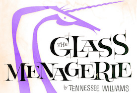 Blast Foundry (The Netherlands and Poland) was set up in 2021 by Barbara Bigosinska, Rafa Buchner and Diana Ovezea. Future Fonts link. Their typefaces:
 - Bay Sans
- Bizzarrini (2018, Diana Ovezea and Sabina Chipara). Diana Ovezea writes about the wonderful Bizzarrini: Though the idea originates from a Stefan Schlesinger ad sketch for a Paris couture house, we straightened up this typeface and made it seem engineered and sharp. It gets its name from the Bizzarrini Manta, a wedge-shaped concept car designed in 1968 by Giorgetto Giugiaro. Bizzarrini has extremely long wedge serifs. Following Schlesinger's sketch, it features very tall capitals with an out-of proportion middle-line (very big heads on S, B and R).
- Capra (2020, Diana Ovezea). A headline typeface with a bouncy baseline. This project started as a one-day challenge to recreate a piece of lettering on the Glass Menagerie poster designed by David Klein in 1958.
- Gamer.
- Granblue (2021). An experimental typeface by Diana Ovezea.
- Sharf (2021, mainly Barbara Bigosinska). With six weights and two optical sizes, and a variable font option, this display typeface has razor sharp edges and quite a few surprises to liven up many a page.
- Silverknife (2020, Diana Ovezea). Silverknife is a tall and skinny version of Silverspoon.
- Silverspoon (2018, Diana Ovezea). Silverspoon is a contemporary take on Copperplate Gothic.
[Google]
[More] ⦿
|
Blessed Print
[Dmitrii Mikitenko]

|
 Dmitrii Mikitenko (Blessed Print, Chisinau, Moldova) created the connected brush script typefaces BetterFly (2015) and Miletta, and the calligraphic (wedding) scripts TheSecret and Flamingo in 2015. Other early typefaces include Draft Cheese, Graficx, Holiday, Kiss Me, Linella, Masterink, Modern Script, Patteson, Rotundio, Shrifton, Sunse Fun, TheSecret, Trajan, and Zippy.
 Typefaces from 2016: Mozart Script (formal calligraphic or wedding script), Blessed Script, Blessed Appetite Sans, Blessed Mamaliga Condensed Serif, Amelia Script. Typefaces from 2017: The Wedding Script (Spencerian), The Creative, Sophia Script (a great swashy calligraphic typeface family), Dorotthy Script. Typefaces from 2018: Betterfly, Cardinal (a great weathered medieval calligraphic script), Charlotte (free script font). Typefaces from 2019: BP BlackWhite (a copperplate calligraphic script typeface by Dmitrii Mikitenko and Sabina Aliyarova), Outstanding Victoria (calligraphic script). Typefaces from 2020: Creative Vintage (in the orbit of Cooper Black). Typefaces from 2021: Ecatherina (a 15-style copperplate calligraphic script). [Google]
[MyFonts]
[More] ⦿
|
Boxhead Gothics
|
A (metal) version of Copperplate Gothic. Mac McGrew: Boxhead Gothics are identical to the smallest sizes of several popular gothics, except for being cast on minimum bodies to save space and permit setting more copy in small box headings on forms. The 4-, 4 1/2-, and 5-point sizes are equivalent to the three smallest 6-point sizes respectively of: 01-02-03: Light Copperplate Gothic, 11-12-13: Heavy Copperplate Gothic Condensed, I21-22-23: Heavy Copperplate Gothic, 31-32-33: Light Copperplate Gothic Condensed. [Google]
[More] ⦿
|
Brandon Sugiyama
|
Brooklyn-based Brandon Sugiyama made a New York Subway Tile Font in 2013, based on pictures and research done on the NY subway. Squire J. Vickers was an architect and lead designer for the subway system from 1908 to 1942 and was responsible for 300 station designs. The New York Times identifies architects George C. Heins and Christopher Grant La Farge as those who designed, hand-lettered and manufactured the tiles in a Copperplate-like style. Behance link. [Google]
[More] ⦿
|
Brian Jacob
[Jacob Type]

|
 [MyFonts]
[More] ⦿
|
British Letter Foundry
[John Bell]

|
 John Bell (1746-1831) was a London-based publisher of several periodicals and newspapers. He founded the British Letter Foundry in 1788, with Richard Austin as punchcutter. The foundry closed in 1798.
 John Tranter tells the story: John Bell, an English publisher and bookseller, advertised a book called The Way to Keep Him in The World newspaper in London in June 1787, saying: 'J. Bell flatters himself that he will be able to render this the most perfect and in every respect the most beautiful book, that was ever printed in any country.' That was a tall order. In his quest for perfection he set up a type foundry, and hired a young punchcutter named Richard Austin to cut a new typeface for him. The face, named after Bell, was based on a typeface designed some thirty years before by John Baskerville, another perfectionist. Baskerville had said 'Having been an early admirer of the beauty of Letters, I became insensibly desirous of contributing to the perfection of them.' Though Baskerville went broke eventually, his typeface was indeed very close to perfection, and went on to become one of the most popular typefaces of all time. John Bell's type foundry didn't do well. He closed down his shop within two years and went on to other things, and his typeface sank almost without trace in England. Newer trends in typefaces (Didot in France, and Bodoni in Italy) eclipsed the modest elegance of Richard Austin's design. The Americans, though, took a shine to it. It was copied as early as 1792, and always remained popular there. A complete set of type cast from Bell's original matrices was purchased by the American Henry Houghton in 1864 and installed at his Riverside Press. He thoughtlessly labelled it 'English Copperplate'. Later, the distinguished American book designer Bruce Rogers used the typeface frequently, naming it 'Brimmer', after the author of a book he'd seen the typeface used for when he worked as a young man at the Riverside Press. The designer Daniel Updike also worked at Riverside, and also used the 'English Copperplate' type extensively in later years, naming his version of it 'Mountjoye'. Bell's type would have remained obscured by these disguises perhaps forever, but for the alert eye of Stanley Morison. He was doing research at the Bibliothèque Nationale in Paris in 1926 when he came across a copy of the first specimen sheet of type samples issued from John Bell's foundry in 1788. No copy of it existed in England at that time, and Morison recognised the typeface immediately as the original of the 'Brimmer' and 'Mountjoye' fonts used in America. He researched the matter and in 1931 published an important monograph which, as the type scholar Alexander Lawson says, 'returned the name of John Bell to its proper place in the pantheon of English printers'. The typeface was unique in another way. Until Richard Austin cut the typeface in 1788, all numerals were traditionally written like lower-case letters -- small, with some numerals hanging below the line. Bell is the first typeface to break with that tradition cleanly: Austin's numerals are larger than lower-case letters (at two-thirds the height of the capitals) and sit evenly along the line. The trend was taken up. These days the numerals in most printed matter are (unfortunately) the full size of the capital letter, and are called titling figures, ranging figures, or lining figures. See also here. FontShop link. [Google]
[MyFonts]
[More] ⦿
|
Bruce Type Foundry
[George Bruce]

|
Founded in New York in 1813, and acquired by ATF in 1901, this foundry made fonts such as Bruce Old Style (now Bitstream), Madisonian (now available from Présence Typo), Ornamented No. 1007 (Mac McGrew: Old Bowery is an ATF revival, in 1933 and again in 1949, of Round Shade No.2, originated by Bruce, one of its predecessor companies, about 1854, as Ornamented No. 1007.), and Old Style 7 (Linotype, Adobe). Also called D.&G. Bruce, George Bruce, George Bruce&Co., George Bruce's Son, George Bruce's Son&Co., and V.B. Munson. They published a 592-page specimen book in 1901: Bruce Type Foundry: Our Handy Book of Types, Borders, Brass Rule and Cuts, Printing Machinery&General Supplies.. In 1869, George Bruce (b. 1791, Edinburgh, Scotland; d. 1866, New York) published An abridged specimen book Bruce's New York Type-Foundry (1869), now available as a free Google book. Page with specimen of Great Primer Ornamented No. 5, Meridian Black Open (blackletter), Canon Teutonic Ornamented, Small Pica No. 2, Double Pica Graphotype, all taken from An Abridged Specimen of Printing Types Made at Bruce's New-York Type-Foundry (1868) and stolen from Luc Devroye's web site. Fists by the Bruce Foundry. Revivals: Bruce Ornamented No. 6 was digitized by Iza W from Intellecta Design in 2006 as GeodecBruceOrnamented. Gold Rush (2008, FontMesa) is a family of Western style typefaces based on a Bruce type family from 1865. FontMesa also made Belgian (2008) based on a Bruce Type Foundry design from the 1860s. Bruce 532 Blackletter (2011, Paulo W, Intellecta Design) is an excessively ornamental blackletter face. Michael Hagemann's slab serif family Gold (2011) is based on Bruce's Gold Rush (1865) after removing the shadows. RMU Bowery (2019, Ralph M. Unger revives Old Bowery). [Google]
[MyFonts]
[More] ⦿
|
Burntilldead
[Eric Kurniawan]

|
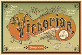 Eric Kurniawan (or Burntilldead, b. 1986) is located in Bali, Indonesia. He created the vintage script typeface The Goldsmith Vintage (2015).
 Typefaces from 2016: Lazarus (a brush font), Bestters Supply (signage script), The Wild Hammers, Ramblin Script, Ramblin Sans, Angeline Vintage (brush typeface), Victorian Deco (more Victoriana), Steelworks (letterpress), Angeline (swashy brush script), La Petitenget, Azarus (brush style), Victorian Parlor (Victorian). Typefaces from 2017: Dandeleon, American Whiskey, Vulturemotor (with Gusti Ngurah Widiantara), Sandglow (signage script). Typefaces from 2018: Renaissance Garden (vintage), Victorian Fonts Collection (which consists of King Edward (Edwardian) and Queen Victoria (Victorian)), Billyforges (weathered letterpress style; with Ade Meida and I Gusti Widiantara). Typefaces from 2019: Victorian Decade (18 fonts: +Gradient, +Outline, by Eric Kurniawan and Ade Meiada). Typefaces from 2020: Alocasia (Sans, Script and Serif), Victorian Supremacy (an 11-style ornate Victorian / blackletter typeface family), Galactus (sci-fi), Prestissimo Classy (Serif and Script: the Script features copperplate calligraphy), Historium and Historia (a weathered vintage typeface), Sportage (a squarish sports font). Typefaces from 2021: Mashbro, Barones (a vintage label font), Arterium (a vintage Victorian label font family), Veinline (a vintage script font), Bonitalia (script), Alota (funky and groovy 1970s font), Energize (techno), Metalsmith (a weathered all caps typeface), Bower (an early computer emulation font), Broto, Celestic (a decorative partly psychedelic serif), Dellucion (an art nouveau serif), Glitcher (a great art nouveau typeface), Greta, Lazarus, Racer Boy (a techno family), Silly Kids, The Sitcom (a retro script). Typefaces from 2022: Mooners (a spurred Victorian liqueur font), Morvem (an 18-style psychedelic typeface). [Google]
[MyFonts]
[More] ⦿
|
Cahya Sofyan
[Studio Sun (or: Sun Brand Co)]

|
 [MyFonts]
[More] ⦿
|
Cami Alama
|
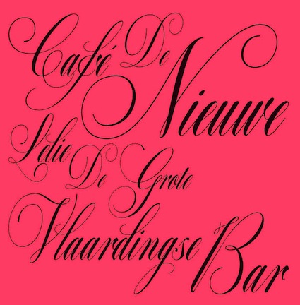 For her final project at EASD Valencia in Spain, Cami Alama created the Dutch Krulletter typeface Krullcoplate Script (2014). [Google]
[More] ⦿
|
Canada Type
[Rebecca Alaccari]

|
 Foundry in Canada, est. 2004 by Rebecca Alaccari in Toronto, and run by her and Patrick Griffin. Interview with Rebecca. Her typefaces can be bought via MyFonts: Storyville (2015, a curly script), Centennial Script (2007, a revival of an 1874-1876 high-contrast calligraphic script by Hermann Ihlenburg), Valet (2006, superb art deco face), Freco (2006, an art deco typeface loosely based on designs and letters of Fré Cohen), Silk Script (2006, based on 1956 Helmut Matheis script called Primadonna), Dominion (2006, based on an early 1970s film type called Lampoon), Johnny (2006, an art nouveau poster typeface that revives the Harem/Margit typeface by Phil Martin, 1969), Guillotine (2007), Mayfair (2006, a calligraphic typeface based on Mayfair Cursive by Middleton, 1932), Happy Birthday (2006, script), Geronimo (2005, brush style poster font), Rostrum (2005, a revival and expansion of a type called Oleander, designed in 1938 by Julius Kirn for the Genzsch&Heyse foundry in Hamburg), Apricot (2005; based on A.R. Bosco's Romany for ATF, 1934, but a major extension with many ligatures), Heathen (2005), Cougar (2004, a digital version of Martin Wilke's 1968 handwriting typeface Konzept), Puma (2004, brush typeface based on Herbert Thannhaeuser's 1954 Kurier), Big Brush (brush), Diva (connected script), Odette (a high ascender display typeface after the Morris Fuller Benton 1918 American classic, Announcement Roman), Crucifix (2004, a severe octagonal face), Fore (2004, a bullethole face), Formula, Gamer (2004), Formula (2004), Kofi, Platoon (2004, a stencil face), Verso (2004), Secret Scrypt (2004, a handwriting face), Bluebeard (2004, blackletter by Patrick Griffin), Bolero (2004), Janice (2004, psychedelic), Jimi (2004, also psychedelic), Scroll (2004), Dominique (2004, upright script), Moxie (2004, a fat display family which includes a stencil), StockA (2004), StockB (2004, a fat stencil face), Stalker (2004, a destructionist face), Scroll (2004), Jonah (2005, a hippie typeface based on an early 1970s film type from Franklin Photolettering called Urban). MyFonts page. Phil Rutter and Patrick Griffin made Coffee Script (2004), the digital version of R. Middleton's Wave design for the Ludlow foundry, circa 1962. Phil Rutter and Rebecca Alaccari designed Almanac (2004), a script typeface based on Imre Reiner's London Script (1957) (and Rebecca did a subsequent redigitization in 2007 that led to Reiner Hand), Tiger Script (2004, based on Georg Trump's wild brush script Jaguar done in 1967 for C. E. Weber), and Ali Baba (2004), an Arabic simulation typeface originally designed by Georg Trump as Palomba (1955, C.E. Weber foundry). Patrick Griffin made Leather (2005, after Imre Reiner's 1933 blackletter face), Secret Scrypt (2005), Skullbats (2005), Slang (2004, a blood scratch face), Bluebeard (2004), Expo (2004, an octagonal family), and Dancebats (2004). Simone Wilkie designed Boyscout (2004) after the handwriting of her son. Helmut Matheis' Contact (1963, flowing script/brush) was digitized by Rebecca in 2004 as Bruschetta. Rebecca also made Steiner Special (2007, a revival of Swing, a film type by Peter Steiner, 1974), Genesis (2007, a digitization and extension of Grayda, a 1939 calligraphic script of Frank H. Riley at ATF), Evolver (2006, futuristic family), Redwood (2007, a calligraphic script based on Willard T. Sniffin's Raleigh Cursive (1929, ATF)), Orotund (2005, after the 1970s typeface Eight Ball; this was extended again in 2006 in her art nouveau typeface Huckleberry, which is a revival of the 1973 typeface of Gustav Jaeger called Mark Twain), Pendulum (2005, a fantastic flowing script based on Nebiolo's Americana, 1945), Jojo (2005, a flower child typeface after Spring, by Bernard Jacquet), Mascara (2004), Gala (2004, after Neon (1935, Giulio da Milano at Nebiolo)) and Bella Donna (2004, after a script made by Alessandro Butti in 1948, called Rondine).
 Typefaces made in 2005: Jazz Gothic (Patrick Griffin), Showboat, Hunter (a revival of Imre Reiner's brush script Mustang, 1956), Quanta (stencil), Quiller (a script typeface based on J.J. Sierke's 1964 typeface Privat), Rhino (revival of Mobil, a 1960 typeface by Helmut Matheis for Ludwig&Mayer), Dominique (donated to FontAid), Secret Scrypt (donated to FontAid), Jackpot (2005, Western typeface remotely based on Cooper Playbill which in turn is related to Cooper Black, but it also has hippy 1968 influences), Sincerely (handwriting typeface based on Karlgeorg Hoefer's 1968 Elegance), Fontella (a digitization of Novarese's calligraphic script Elite), Boondock (digitization of Imre Reiner's Bazaar from 1956), Gumball (digitization of Papageno, a 1958 bubblegum font by Richard Weber for Bauer), Runway, Gamer, Dominique (OpenType handwriting face), Sterling Script (2005, by Alaccari and Griffin: a 7-weight digitization and extension of Stephenson Blake's 1952 clean copperplate script Youthline Script), Vox (2007, a 24-style monoline sans family done with Patrick Griffin), Vox Round (2013, a softer version), Swan Song (2006: a calligraphic typeface based on the hand of Alexander Nesbitt. A later document states that it is based on work by British artist Rachel Yallop from 1986), Evolver (2006, a 9-style futuristic family), Ambassador Script (2007, an Alaccari-Griffin revival of the angle-reduced calligraphic script Juliet by Nebiolo, 1955). In 2005, Philip Bouwsma joined Canada Type, and designed a great calligraphic blackletter-inspired family, Torquemada. He designed many other typefaces for Canada Type in subsequent years. VIP (2007, Rebeca Alaccari) is a humanist sans serif uppercase (and figures) combined with a freshly redrawn revival of the classic VGC Constanze initials originally designed by Harry Brodjian in 1970, and even further back, the Constanze Initials by Joachim Romann (1954-1956, Stempel). Chopper (2007, by Rebecca Alaccari) is a revival of Venture (a 1972 typeface for VGC by Harry Villhardt). Walter (2007, Rebecca Alaccari) is a digitization of Heritage (1952, ATF, a calligraphic script by Walter H. McKay). Celebrity (2007, Rebecca Alaccari) revives and extends the retro/techno typeface Latus (Willy Wirtz, 1971). Sympathique (2008, Alaccari) is an ultra-thin and ultra-tall typeface in the mold of Bernhard Fashion and other era poster or film typefaces (they say that it is rooted in the film typefaces Hairstreak and Mossman). Mullen Hand (2008) is a revival of Repro Script (1953, Jerry Mullen, ATF). Filmotype Giant (2011, a condensed sans) and its italic counterpart, Filmotype Escort (2011) were both co-designed with Patrick Griffin. In 2020, they released the variable informal sans typeface Bananas: Bananas was sourced from multiple American film era faces, all from 1950s and 1960s, when the casual sans genre was at its popular peak. Headliners' Catalina and its very similar cousin, Letter Graphics' Carmel, served as initial study points. Catalog of its typefaces. Klingspor link. [Google]
[MyFonts]
[More] ⦿
|
Carine de Wandeleer

|
 Carine de Wandeleer was born in Argentina to a French-Belgian immigrant family. She studied fine arts and graphic design at University of Buenos Aires, but lives and works in Spain.
 Kycka (2011) is a hand-printed slab serif family designed for children's books. Karty (2011, Eurotypo) is a blackboard bold pair of typefaces inspired by Baskerville. Marilyn (2011, Eurotypo) is an informal bouncy heavy sans face. Natalie (2011) is a condensed slab serif face. In 2012, she published the connected script family Gilda, the informal cursive typefaces Zanya, Miss Seshat (Eurotypo) and Belha, the script typeface Lirio (Eurotypo), the hand-printed Pimpin, and the fat finger family Souffle. Typefaces from 2013: Aleka (a vampire script in the style of Bombshell Pro), Mots (a light feminine script), Vernaccia, Eydis (connected script), Bonna (a successful calligraphic family), Rocha (funky cartoon style), Mussa (a curly children's book font), Onna (multiline script), Blondy (curly signage script), Gemma (connected script), Gemmadonati (another connected script), Lavinia (signage script), Ameglia (seductive upright flourished vernacular script). Typefaces from 2014: Juliette, Urbis (curly script), Tansy (a charming connected script), Flamenca (connected script), Mde Sade (flowing wedding script), Nubila, Gardeny (script), Eroli (connected calligraphic script), Andria (script), Kumma (script), Tout, Tout Web Icons, Tout Restaurant Icons. Typefaces from 2015: Parisi (calligraphic script), Scintillae Script, Santa Rita (signage script), Kira (brushy font), Amorino, Aprilis (signage script), Redbird (brush script), Muscari (connected script), Ambar (connected script with a roman caps set called Ambar Serif). Typefaces from 2016: Lyllo, Redmoon Basic, Sond (brush script), Nuit (an informal typeface based on hand-printing), Wildly (brush type), Bloem (Script and Sans), Brun (brush typeface), Joias, Scriptum (brush script). Typefaces from 2017: Halley, Brighten (brush script), Decize (an ornamental didone), Tapa (a sharp-serifed text family), Serenus, Pasteque, Galia, Mikha, Mikha Sans, Junius. Typefaces from 2018: Anemos (a powerful retro signage script), Bernyck (retro script), Mathylda Script (a calligraphic signature font), Cinefile, Stanffords (a brush script paired with Stanffords Sans), Clauques Script and Sans (a signature script), Jacine (Sans+Script), Pial, Mont Rose (based on examples published in Script Lettering (1957, M. Meijer)), Barcares, MyBella (a casual calligraphic script), Skyr Pro (handcrafted), Gageac (a decorative didone), Atmosfera (a glamour sans based on didone contrast), Waylom (script). Typefaces from 2019: Novata, Violant (a medieval script), Manises (inspired by a text written on a 16th century tile), Mostaza (a signage script), Trauville (calligraphic), Magie, Magie Slim, Beauville Script (a retro script), Bovary (a calligraphic script). Typefaces from 2020: Turer (all caps, in the Tekton or Koch Antiqua genre), Indalo (a casual script), Rhodes (a calligraphic typeface), Calinda, Aulas (a decorative serif), Raspail (copperplate calligraphy), Calagio (a casual script), Clichy (a casual sans), Colomby (copperplate round English handwriting), Rembord (an inclined script), Montigny (emulating an 18th century roundhand script). Typefaces from 2021: Verbum (a casual bold script), Grao (a casual script), Tarnese (a calligraphic script), Real Blues (script), Brabon (a heavy signage script), Escaut (a wide inky script). Typefaces from 2022: Cockcrow (a connected sans), Castagna (a calligraphic script). [Google]
[MyFonts]
[More] ⦿
|
Carl Rylatt
|
 Brighton, UK-based creator of the copperplate caps typefaces Laudanum (2012, available from Ten Dollar Fonts) and Fuck Powerpoint (2012).
 Tenebrae (2013) is a spooky spurred display typeface. Tenebrae is inspired by the Giallo films of the 70s and other cult cinema film posters. It can be bought at Ten Dollar Fonts. Behance link. [Google]
[More] ⦿
|
Carlos Matteoli
[Q-BO]

|
 [MyFonts]
[More] ⦿
|
Carmel Type (or: Just Lucky)
[Drew Melton]

|
 Drew Melton (Carmel Type and Just Lucky, Los Angeles, CA) is a graphic and type designer, letterer and occasional illustrator. He has worked for a wide range of clients including McCann, Saatchi & Saatchi and Penguin Books. Many of his typefaces are exquisite.
 He created the vintage shaded typeface Lastra (2014, improved in Lastra Display in 2015), Westward Numerals (2014), Steel Cut (2014, numerals), Chisel (2014, numerals), Show Stopper (2014, a signage typeface), Ballpoint Script (2014; released in 2019 at Typeverything), Awning Display (2014), Brite Script (2014, Ten Dollar Fonts), Handsome Script (2014, a calligraphic copperplate script), the signage typeface Sideshow (2014) and the Tuscan typeface Magnifique (2013, +Inline, +Shadow). Typefaces from 2015: Numerals (Book Club, Butcher Block, Chisel, Chisel Shadow, Chisel Fill, Elegante, Elegante Fancy, Yuma), Dolcetto (a stunning swashy calligraphic copperplate script for stately occasions), Lumber Co (an Italian Western wood style font family at The Designers Foundry; together with Jason Carne), Rubber Boots (a text typeface with considerable contrast), Stockpile (numerals), Luxus Gothic (blackletter), Yuma Numerals. In 2015, Jason Carne and Drew Melton co-designed the large condensed titling typeface family Skyward and wrote: Robust, towering, and geometrically refined, Skyward is a surefire classic cocktail of equal parts utility and elegance. Stuffed Crust, bold and loud, will be a hit too. Drew writes: Big and greasy never looked so good. Typefaces from 2016: Boulangerie (a Tuscan typeface by Drew Melton), Motor City (by Drew Melton and Jason Carne; an industrial strength slab serif; the name Motor City was already taken by Casey Cole in 2012, so we'll wait and see if there will be a name change in the works). Creative Market link. Behance link. Ten Dollar Fonts link. Carmel Type link. [Google]
[MyFonts]
[More] ⦿
|
Caron Twice
[Martin Cincar]

|
 Martin Cincar (Prague, Czechia) designed these typefaces:
 - The sans typeface Atwic (2019).
- The large typeface family Copperplate New (2019), which is modeled after Frederic Goudy's Copperplate Gothic (1901-1904).
- The 4-style sans typeface Susie (2021). This was inspired by Susan Kare's 1984 Apple system font Chicago.
- Calligraphic Afera Beauty (2021). A sharp display serif; the name calligraphic refers perhaps to some terminals. Two variable fonts are available as well.
- Little Micro Sans (2021). A sans with contrast).
- Pixel Grid (2021). A dot matrix superfamily with 220 styles.
- Sans Atwic Modern (2021). A 19-style sans.
- Wild Title Sans (2021). An experimental sans in 11 styles.
[Google]
[MyFonts]
[More] ⦿
|
Casady&Greene (Fluentlaserfonts)
[Terry Kunysz]
|
 Casady&Greene, Inc. started out as two separate little companies, CasadyWare and Greene, Inc. CasadyWare, which was founded by Robin Casady in August 1984, began producing Fluent Fonts, which were bitmapped typefaces for the Macintosh. The 1984 set of fonts have copyright lines that mention Richard A. Ware. As soon as PostScript fonts appeared, CasadyWare got hold of the first version of Fontographer and produced the first downloadable PostScript fonts, even beating Adobe, the originators of PostScript, to the punch. These were marketed as Fluent Laser Fonts (FLF) out of Carmel, CA.
 The FLF series includes Abilene (Western), Alexandria (1986, slab serif family), Black Knight (1991, blackletter), Bodoni FLF (1986), BodoniUltra (1986, a fat didone), Bonnard (art nouveau), ButtonHighlight, ButtonPlain, Calligraphy (1986), Campanile (a great didone face), Checkbox, Chicago FLF (free at OFL), Collegiate (1988, sports lettering), Coventry Script (calligraphic), Cutouts FLF (1992, cargo stencil), Desperado, Dorovar Carolus (1988, Carolingian; see also D790 at Softmaker and Carolingia (1991, William Boyd)), DryGulch, Epoque (art nouveau), FattiPatti, Fletcher Gothic (1992, art nouveau), Galileo (1987, didone), Gazelle (1988, calligraphic script), Gatsby (1986, pure art deco), Giotto, Gregorian (1986, English Gothic style blackletter), Harlequin FLF (1990), Highland Gothic (1992), Jott, Kasse (1992), Kells (modern round Gaelic font, 1988), KeyCaps, La Peruta, Meath (modern round Gaelic font, 1988), Michelle (1992, art deco, marquee face), Micro, MicroExtend FLF (1986, like Microgramma), Monterey (1986, Peignotian), Moulin Rouge (1992, an art nouveau typeface by Richard A. Ware), Nouveau (1990, art nouveau), Paladin (1988, blackletter), Pendragon (1991), Phoenix Script FLF (1990), Prelude (1986, connected script), Regency Script (1986, calligraphic copperplate script), Right Bank (1986, art deco), Ritz (1986, art deco in the style of Broadway), Rocko (1992, rounded like VAG Round), SansSerif FLF (1986, a large geometric sans family), Sedona Script (1990, connected, calligraphic, semi-psychedelic), Slender Gold (1992, script), Vertigo (1992, condensed monoline sans), VertigoPlus, Zephyr Script (1986, brush script). Many fonts were digitized by Richard Ware, and some were designed by Mike Wright. The contact was Terry Kunysz in Salinas, CA. On July 3, 2003, Casady&Greene closed it doors permanently. However, one of its designers, Mike Wright, writes: I believe that all the fonts that were developed by the company are now in the public domain. Robin Casady and I are thinking of putting up a site with free downloads of all of the old C&G public domain fonts--mainly as a way of attracting Mac users to see iData 2. Robin Casady in 2003: I founded Casady Company in 1984 to publish fonts for the new Macintosh. The name changed with incorporation to CasadyWare, Inc. Around this time I met Mike Greene who was looking for a software project to do after SpellsWell. I talked him into doing a program that became QuickDEX. Later CasadyWare, Inc. merged with Greene, Inc. and became Casady & Greene, Inc. Over the years, my role in management reduced as my interests in other areas developed. In the last ten years I have had no official management duties at C&G. About a year ago I removed myself from the Board of Directors. Some fonts could be found at TypOasis [defunct link]. Fontex link. Font Squirrel link. [Google]
[More] ⦿
|
Castle Type
[Jason Castle]

|
 Designs by Jason Castle from San Rafael, CA, who studied psychology at Dominican University of California. He does custom font design and sells commercial typefaces through MyFonts and FontShop. Blog. These include:
 - A: AfrikaBorders, Afrika Motifs, Agency Open (M. F. Benton, 1934, revival Jason Castle), Agency Gothic Inline, Ampersands, Azbuka (2005, a heavy slab serif).
- B: Brasileiro (2007, an art deco face).
- Carisma (2007, a clean geometric sans), Carlos (art deco inspired by Elektra), Castle Fleurons, Chinoise (2008, based on hand lettering that is reminiscent of a style of ancient Chinese square-cut ideograms), Cloister Black, Copperplate Script, Cradley (2015, a Caslon titling family with Greek and Cyrillic, named after the birthplace of William Caslon).
- D: Deko Initials (1993, discontinued in 2007; based on NADA0 drawn in 1972 by Marcia Loeb), Dionisio (2008, didone).
- E: Eden (Bold, Light; originally designed by Robert H. Middleton in 1934).
- F: Fat Freddie, Futura CT and Futura CT Inline (2007, based on Futura ND, but discontinued after only a few weeks).
- G: Goudy Lombardy (Lombardic), GoudyStout, Goudy Text, Goudy Trajan (1994-2010, free; +alternates).
- H: Handsome (2002, nice finger dingbats, aka fists).
- J: Jensen Arabique (left field art deco, based on work of Gustav Jensen, 1933).
- K: Koloss (art deco).
- L: Latin CT (2008, 6 styles), Latin Wide, Laureat, Lise Informal (2008, hand-printed), Lombardy.
- M: Maximilian CS (Rudolf Koch, 1917), Metropolis Bold and Shaded (based on the 1932 Stempel cut as designed by W. Schwerdtner), Minotaur (2008, an original monoline design based on an Oscan votive inscription from the second century BC; looks like simulated Greek).
- N: Norberto (2009, an all-caps Bodoni; +Stencil).
- O: Ogun (2008, inspired by an Egyptian-style Russian block alphabet and useful for athletic lettering; formerly named Azbuka).
- P: Plantain (2002, a digital version of Plantin Adweight, a 1913 typeface by F. H. Pierpont), Plantain Stencil (2009), Progreso (2010, a condensed, unicase, serif gothic type design inspired by the hand-lettering on Russian posters from the 1920s).
- R: Radiant, Radiant Extra Condensed CT (both Radiants are revivals of Roger Middleton's typeface by that name, 1940), Ransahoff (2002, ultra condensed didone), Rudolf (1992, based on Rudolf Koch's German expressionist work such as Neuland).
- S: Samira (2008, art nouveau style; based on Peter Schnorr's Schnorr Gestreckt, from 1898), Shango (1993, based on Schneidler Initials by F.H.E. Schneidler (1936), and including a digital version of Schneidler Cyrillic (1992); extended in 2007 to Shango Gothic and in 2008 to a 3-d shadow version, Shango Chiseled, and in 2009 to Shango Sans), Sculptura (2005, an all caps typeface based on Diethelm's Sculptura from 1957), Sencia (2008, based on Spanish art deco stock certificate lettering from 1941), Sonrisa (2009, art deco family---Sonrisa Thin is free), Standard CT (a neo-grotesque family), Standard CT Stencil (2012: free).
- Tambor (Light, Black, Inline, Adornado) (1992) (note: Jason claims that it was remotely based on Rudolf, which in turn was based on calligraphy of Rudolf Koch), Trio (an art deco sansserif), Trooper Roman (discontinued).
- V: Vincenzo (2008, a slabby didone), Warrior (2009, a 3d font based on Ogun; +Shaded).
- X: Xavier (art deco family based on Ashley Crawford by Ashley Havinden, 1930, revival by Jason Castle in 1992).
- Z: Zagora, Zamenhof (2011: an all caps poster face with constructivist ancestry, named after the inventor of Esperanto), Zuboni Stencil (2009, Latin and Cyrillic, constructivist and perhaps even military).
Klingspor link. Behance link. View Jason Castle's typefaces. [Google]
[MyFonts]
[More] ⦿
|
Charles Emil Heyer
|
Chicago-based punch-cutter, 1841 (Berlin, b. Carl Emil Heyer)-1897 (Chicago). His typefaces have late Victorian and early art nouveau elements: - At BBS: Armenian (+Extended) (1879), Calumet (1887), Castle (1888, a clean basic sans), Challenge Lightface (1888), Fair (1893), Fair Open (1891), Grant No. 2 (1892), Heyer, Jewel Script (1888), La Salle (1889), Lakeside Script (1883), Lyric (+Lightface Lyric, 1882; in 1925 renamed to Greeting Card (+Light)), Maltese (+Open) (1878), Mayo, Myrtle Script (1885), Occident (+Shaded) (1881), Opaque, Plate Script, Princess Script (1887), Princeton, Solar (1888), Sylvan Text.
- At Boston Type Foundry: Bank Note Italic Ornamented (1874 or 1875), Compressed Black (1875), Copperplate Italic (1875), Harlem (+Open, +Shade) (1875), Karnac (1874 [note: not sure this was done at Boston Type Foundry]), Mayence (1875), Nubian (1876), Rococo (1876), Vienna (1875).
- At Western Type Foundry: Circular Gothic No. 44 (1879). For a revival, see Foundation Sans Number 44 (Henrik Kubel, 2018).
List of patents taken on fonts, by date: 1879: Armenian extended, unnamed art nouveau face, unnamed BBS face. 1880: unnamed BBS face, unnamed BBS face. 1881: blackletter face, unnamed BBS face, unnamed BBS face, unnamed BBS face, unnamed BBS face. 1882: unnamed BBS face, unnamed BBS face, unnamed BBS face, unnamed BBS face. 1883: unnamed BBS face. 1884: unnamed art nouveau face, unnamed art nouveau face, unnamed art nouveau face, unnamed BBS face. 1886: unnamed BBS face, borders. 1887: School Script for BBS, unnamed BBS face, unnamed BBS face. 1888: unnamed BBS face, unnamed BBS face. 1891: ornaments for BBS. [Google]
[More] ⦿
|
Charles Gibbons
[Oddsorts]

|
 [MyFonts]
[More] ⦿
|
Charles Nicholas Cochin

|
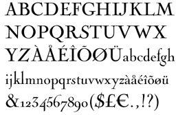 Parisian copperplate engraver, b. Paris, 1715, d. Paris, 1790. His work influenced the letter shapes of Baskerville, Didot and Bodoni. His engraved tall-ascendered letters have been preserved in many fonts bearing the Cochin name. One of the best revivals is by Georges Peignot in 1913. The irregularities of the metal are well preserved in the digital typeface Nicolas Cochin (+Italic) (P22/Lanston). Monotype made a Cochin Open face.
 In 1977, Matthew Carter expanded Peignot's revival into the three style family Cochin---the digital versions are sold, e.g., by Linotype. Another family by Linotype is Nicolas Cochin LT (2004)---it is a variation that is taller, rounder, and less archaic than Cochin. Finally, we find a digital version by URW simply called Nicolas Cochin. For an Arabic extension, see Badr (1970, Osman Husseini, Linotype). Cochin is now one of the standard Apple fonts---it is in the basic font set on the iPad and elsewhere on Apple computers. View and compare various digital typefaces related to Cochin. [Google]
[MyFonts]
[More] ⦿
|
Charles Paillasson
|
 French engraver, penman and calligrapher, 1718-1789. Author of Notice historique sur les hommes célèbres de toutes les nations de l'Europe, qui depuis la renaissance des sciences et des arts, se sont distingués dans la configuration des caractères qui composent les diverses Ecritures, which appeared in J. H. P. Pouget, Dictionnaire des chiffres et de lettres ornées à l'usage de tous les artistes (Paris, 1767).
 In 1796, Charles Paillasson wrote L'arte di scrivere: tratta dal Dizionario d'arti e mestieri dell' Enciclopedia metodica (Padova, Appresso Niccolo Bettinelli). The date, 1796, is a bit puzzling, but The Getty Research Institute writes: The text is a separate publication of the section on handwriting from an Italian edition of the Encyclopédie méthodique, originally published in Geneva by C.J. Panckoucke, 1783-1790. The 15 leaves are copies of those first published in: Encyclopédie, ou, Dictionnaire raisonné des sciences, des arts et des métiers. Recueil des planches, v. 2. Paris, Chez Briasson, David, Le Breton, Durand, 1763. The engraved leaves consist of 2 leaves showing position of the hand and writing posture, and 13 writing samples, engraved by Pasquali. Local download. [Google]
[More] ⦿
|
Chauncey H. Griffith

|
 Kentucky-based type designer and printer, 1879-1956. He was a Linotype salesman who directed the growth of the Linotype library from 1915 to 1948, and improved the look of the world's newspapers. He worked to establish Linotype as the composing machine of choice in America. He continued as a consultant to Linotype well into his retirement.
 Claus Eggers Sorensen writes: In 1922 Chauncey H. Griffith was promoted to Vice President of Typographic Development at Mergenthaler Linotype. He immediately started the development of new typefaces to replace the prevailing modern style typefaces. The issue troubling the moderns was their high contrast design. Especially the hairline parts of the cast lines could break of while printing, and counters could clog with ink and pulp. Faster printing meant transferring the cast lines with the stereotype process to a letterpress cylinder for high-speed rotary printing on endless rolls of paper stock. C. H. Griffith's new approach was to engineer new typefaces to the printing method. That meant drawing inspiration from the Egyptienne style as seen in the Clarendon typeface, with its very sturdy lower contrast design, and Theodore Low De Vinne and Linn Boyd Benton's Century Roman, which possessed elegance and legibility. The first product of these efforts was Ionic No. 5. It was an instant success, within eighteen months it was used by more than 3000 newspapers all over the world. C. H. Griffith and Mergenthaler Linotype continued to refine the design in subsequent iterations: Excelsior (1931), Paragon (1935), Opticon (1935), Corona (1941). These became known as the Legibility group. Ionic No. 5, Excelsior and Paragon form the Linotype Legibility Group. He designed or co-designed the following fonts, all at Mergenthaler: - Baskerville (1939, Linotype).
- Bell Gothic (1937-1938). Now available at Bitstream. Font Bureau has its own version, Griffith Gothic (1997-2000, by Tobias Frere-Jones): Of all his work, Chauncey Griffith claimed one type, Bell Gothic, as his own design. Griffith Gothic is a revival of the 1937 Mergenthaler original, redrawn as the house sans for Fast Company. Tobias Frere-Jones drew a six weight series from light and bold, removing linecaster adjustments and retaining the pre-emptive thinning of joints as a salient feature. Mac McGrew: Bell Gothic was developed in 1937 by C. H. Griffith of Mergenthaler Linotype, primarily for use in the New York City telephone directory, but quickly became standard for telephone books nationwide. The aim was to eliminate roman types with objectionably thin serifs and hairlines. Furlong and Market Gothic were specialized adaptations of this typeface for newspaper work, the former with special figures and other characters for setting racetrack results, the latter in 1941 with other special characters for stock market details. The basic Bell Gothic was also cut by Intertype in 1939. Compare No. 11 and No. 12, shown under Numbered Faces, previously used for directory work. Imitations include OPTI Benet (Castcraft). Poster by Jaime Schweitzer. View digital versions of Bell Gothic.
- Bookman (1936, after the 1960 original by Alexander Phemister at Kingsley ATF).
- Corona (1941), a narrow newspaper typeface with large x-height. Corona was designed to meet the rigorous requirements of high-speed printing, and is still the chosen type of many American daily newspapers. Mac McGrew: Corona was drawn and cut by Linotype under the direction of C. H. Griffith in 1941. It is a member of the "Legibility Group" of faces designed for easy reading under newspaper conditions of stereotyping and high-speed printing with inks that could be trapped in close quarters. Royal on Intertype is a 1960 copy of Corona. Digital revivals include C795 Roman (Softmaker), News 705 BT (Bitstream).
- Elegant Garamond (Bitstream). This Granjon design was made by Chauncey H. Griffith based on models by George William Jones, and before that, Robert Granjon.
- The didone-style newspaper typeface Excelsior (1931, Linotype). At Bitstream, this is News 702. URW calls it Excius, and SoftMaker's version is Exemplary. Mac McGrew: Excelsior was cut for Linotype in 1931 under the direction of C. H. Griffith. It is a plain type, but designed for the utmost readability, with only slight variation from thick to thin, and careful fitting that makes the characters flow into easily recognizable words. Long or short descenders are available in certain sizes. Like a number of Linotype typeface intended primarily for newspaper work, Excelsior is available in closely graded sizes, including odd and some half-point multiples.
- Granjon (1928-1930, with George William Jones at Linotype). MyFonts: Claude Garamond's late Texte (16 point) roman was the model used by George W. Jones when he designed this typeface for Linotype&Machinery in 1928. To avoid confusion with the Garamond romans based on Jannon's seventeenth century work, L&M called the typeface Granjon, after the designer of the italic used as a model, thus creating confusion with the typefaces based on Granjon's romans, Plantin and Galliard. Granjon is a little less crisp in cut than either Sabon, Stempel Gararmond or Berthold Garamond, but makes a magnificent and most readable text face, as shown in Reader's Digest since its founding. Mac McGrew: Granjon was designed for Linotype in 1928 by George W. Jones, distinguished English printer, to meet his own exacting requirements for fine book and publication work. It is derived from classic Garamond sources, but with refinements made possible by modern methods of punch cutting. In fact, one critic has called it "the purest form of Garamond." It is named for Robert Granjon, mid-sixteenth-century punch cutter noted in particular for his italics, from which the present Granjon Italic was derived. Granjon Bold, by C. H. Griffith, was added in 1931. Lanston Monotype acquired reproduction rights to the typeface from Mergenthaler.
- Ionic No. 5 (Linotype, 1925). Mac McGrew: Ionic is a general name for a style of typeface which is closely related to the Clarendons (q.v.). Plain, sturdy designs with strong serifs and little contrast, the Ionics were popular in the latter part of the nineteenth century. Although many founders offered them, they were generally gone by early in this century. A few received a new lease on life when they were copied by Monotype, Linotype, or Intertype. Two new Ionics appeared in this century. Ionic No.5 was designed by C. H. Griffith in 1926 for Linotype, as a newspaper text face. It features a large lowercase with short ascenders and descenders, with no fine lines or serifs to break down in stereotyping, and no small openings to fill up with ink. This is one of a few typefaces made in many closely graded sizes: 5-, 51/2-, 6-, 61/2-, 63/4-, 7-, 71/2-, 8-, 9-, 10-, and 12-point. Intertype's Windsor, developed in 1959, is comparable. Ionic Condensed was designed by Griffith in 1927, also for Linotype. It is a refinement of traditional designs, intended for newspaper head- ings, and has most of the general characteristics of the text face. Ionic Extra Condensed is essentially the same, a little narrower and without lowercase, also for newspaper headlines.
- Janson (1932). Mac McGrew: Janson is adapted from types often attributed to Anton Janson, seventeenth-century Dutch letter founder, although researchers have shown that the originals were cut by Nicolas Kis, a Hungarian punchcutter and printer. The Linotype version was done in 1932 under the direction of C. H. Griffith, based on the 14-point size of about 1660. The Monotype version was adapted by Sol Hess in 1936, in collaboration with Bruce Rogers. Both versions are sharp and clear cut, and rather compact. They bear some resemblance to the types of William Caslon, which were based on later, similar Dutch types.
- Memphis (1929): the prototypical Egyptian of Rudolf Wolf. Mac McGrew: Memphis is the Linotype copy of the popular German square-serif typeface known as Memphis or Girder, designed by Rudolf Weiss about 1929, which did much to revive interest in this old style. Memphis Light and Bold were introduced by Linotype in 1933, Italics and Unique Caps in 1934, Medium in 1935, and other variations up to 1938. The Extra Bold versions were designed by C. H. Griffith. Alternate characters are available in some versions to more nearly approximate the appearance of Stymie or Beton (q.v.). The Lining versions are comparable to small caps in the regular versions, being propor- tionately wider and heavier than caps, and have no lowercase; there are several sizes each in 6- and 12-point, permitting various cap-and-small-cap combinations, in the manner of Copperplate Gothic. Also see Ward; compare Cairo, Karnak. Digital versions are everywhere. The Bitstream version is Geometric Slabserif 703.
- Linotype Monticello was designed by Griffith in 1946. Its design is based on James Ronaldson's Roman No.1 and Oxford Typefaces from American Type Founders and was revised by Matthew Carter while he was working at Linotype between 1965-1981. Mac McGrew: Monticello is a Linotype recreation of America's first great typeface, Binny&Ronaldson's Roman No.1, cut about 1796 by Archibald Binny in Philadelphia. His was the first permanent American type foundry. After about 30 years, the Binny typeface fell into disuse. The matrices survived, though, and a few fonts were cast about 1892 and the typeface was renamed Oxford (q. v.). In 1943 Princeton University Press announced plans for publishing a 52-volume edition of The Papers of Thomas Jefferson. As President, Jefferson had personally written to friends in France, introducing a Binny&Ronald- son representative who was seeking a source of antimony to replenish the shortage which threatened the young typefounding industry in this country. Jefferson also referred in this letter to the importance of type to civilization and freedom. In addition, the popularity of this typeface coincided with the most prominent years of Jefferson's life. Therefore Linotype suggested that a recutting of the typeface would be most appropriate for the Jefferson books, and the publisher heartily agreed. C. H. Griffith, Linotype typographic consultant, made a detailed study of Binny's type and redrew it in 1946 for the requirements of Linotype composition and modern printing conditions. It is a vigorous transitional face, somewhat similar to Baskerville but slightly heavier and a little crisper.
- Opticon (1935, Linotype). Mac McGrew: Opticon was designed in 1935 by C. H. Griffith for Linotype. It is a member of what that supplier calls its Legibility Group of typefaces designed primarily for newspaper use. It is essentially the same as Excelsior, but with stems and thick lines weighted slightly, for printing on hard-surfaced paper.
- Paragon (1935, Linotype). Mac McGrew: Paragon was designed by C. H. Griffith for Linotype in 1935. It is a member of that company's Legibility Group of typefaces, planned primarily for sharp and clean printing under the difficult inking and printing conditions of newspaper production, but also useful and popular for other periodical work. This typeface is lighter and airier than most such typefaces; otherwise it is much the same style. Compare Excelsior, Ionic, Opticon, Textype.
- Poster Bodoni (1920). Digital versions of Poster Bodoni or a textured ornamental version of it include Poster Bodoni (Bitstream), Modern 721 (Bitstream), OPTI Poster Bodoni Compressed (Castcraft), Bodoni Poster (Softmaker), Bodnoff (Corel), Poster Bodoni (Tilde), Poster Bodoni WGL4 (Bitstream), Saphir (Linotype), Bodoni Poster (Linotype), Bodoni poster (Adobe; same as the Linotype version), and Bodoni Ornamental (FontMesa).
- Ryerson Condensed was designed by C. H. Griffith in 1940 for Linotype, as a modernization of Globe Gothic Condensed.
- Textype (1929, Linotype). Mac McGrew: Textype was designed in 1929 by C. H. Griffith for Linotype. Although intended as a newspaper face, Textype with its smaller x-height and longer ascenders than most newspaper typefaces also became popular for magazines and other publications, as well as for a certain amount of advertising and general printing. There is an 18-point size in roman with italic, also a bold and bold italic. The 18-point size and the bold italic are both rare in newspaper typefaces. Compare Excelsior, Ionic, Rex, etc.
- Non-Latin typefaces: Porson and Metro Greek; thirteen Arabic designs adaptable for use throughout the Moslem world; Hebrews; the Indian scripts devanagari, Gujarati, and Bengali; Sinhalese for use in Ceylon, Tamil, and Syriac.
Klingspor link. Linotype link. FontShop link. Font Bureau link. Pic. [Google]
[MyFonts]
[More] ⦿
|
Chikako Larabie

|
 Spouse of Ray Larabie in Nagoya, Japan. Chikako Larabie is a font design assistant for Typodermic Fonts, specializing in kerning, and languages. With Ray, she created From The Stars (2010, a consumer electronics / techno sans family), Hackensack (2010), Naked Power (2010, a geometric/industrial sans-serif font family in the style of the art deco typeface Novel Gothic (1929, ATF, Morris Fuller Benton and Charles H. Becker)), Moon Cresta (2010, modeled after Goudy Sans), Voivode (2010, headline face), Honfleur (2010, art deco all caps face), Hachimitsu (2010, Asian look face), Kadeworth (2010, rounded retro look sans), Gnuolane Jump (2010), Nagomi (2010, oriental simulation face), Biondi Sans (2010, a copperplate gothic without serifs in the style of AT Sackers), Board of Directors (2010, a Bank Gothic style family), and Wee Bairn (2010). [Google]
[MyFonts]
[More] ⦿
|
Christina Torre

|
 Co-designer with Richard Kegler of several fonts at P22 type foundry, which she joined in 2000. She graduated from the State University of New York at Buffalo with a BA in Communication Design. She worked at the Pushpin Group in NYC and at Dog Eat Dog Advertising, Inc. in Buffalo, NY. Her typefaces:
 - P22 Art Nouveau Bistro, P22 Art Nouveau Cafe, P22 Art Nouveau Extras (ornaments), all made in 2001-2002.
- P22 Dearest Script, P22 Dearest Swash: calligraphic in the style of medieval scribes, and a winner of an award at the TDC2 Type Directors Club's Type Design Competition 2002.
- P22 FLW Exhibition and P22 FLW Terracotta, both done in 2000: these are based on alphabets by Frank Lloyd Wright published in 1931 and in 1896-1897 (in his book The House Beautiful), respectively.
- Gothic Gothic (2001): a blackletter done with James Grieshaber.
- P22 Mucha (2001): an art nouveau font inspired by Alfons Mucha, ca. 1900.
- P22 Pan Am (1999, with Richard Kegler). Created for the centennial of the Pan-American exposition of 1901, held in Buffalo, NY.
- P22 Salon (2001): more art nouveau.
- P22 Victorian Gothic (2000, with Richard Kegler and Amy Greenan). Based on a type style called Atlanta, similar to Copperplate.
[Google]
[MyFonts]
[More] ⦿
|
Christopher Hammerschmidt
|
 Graphic designer in Curitiba, Brazil, who created the book type Capitolina in 2015 (under the guidance of Marconi Lima of the Typefolio foundry). He also did some noteworthy calligraphic work, including copperplate calligraphy.
 Capitolina won an award at Tipos Latinos 2016. [Google]
[More] ⦿
|
Chung-Deh Tien
|
 American designer in Jackson Heights, NY (b. 1965), associated with the Cherokee Nation. He created the graffiti font Chase Zen Jackulator (2015), Chase Zen Jingletruck Karachi (2015), the tattoo font Chase Zen Holy Monkey (2015), the art nouveau typeface Chase Zen Paris (2014), Chase Zen Sprawl (2014), Chase Zen Blight (2014), Chase Zen Punjabi (2014), Chase Zen Basmati (2014), and Chase Zen Bangladesh (2014).
 Designer in 2011-2012 of the following free Latin / Cherokee fonts: Nikwasi, Tsiquilisda, Danisvdanvsgv, Alewisdodi, Gola Unole, Nvdaasdawadidohi, Atuyasdodi, Tsi yu gunsini (a copperplate design for Unicode Cherokee, named after a Cherokee chief called Dragging Canoe), Wilma Mankiller Old (2012, also for Cherokee), Gadaquali (flared face), Gageda (Cherokee font). Further typefaces: Grendel (2011), the tattoo fonts Maelstrom (2011) and Reign Sample (2010), the mechanical typeface Dans Hardware (2010), the graffiti typeface Stone Angel (2010), the Western typeface Mary's Cherry&Co (2010), the squarish typeface Dashboard Jesus (2010), the fat wood style typeface John Brown (2010), Dantone (2010), the fat roundish typeface Creamy (2010), Thermobaric (2011, Star trek face). Chung-deh Tien created a few Cherokee fonts including Nikwasi San (2012), Sequoya Bold (2012), Oconosota (2012), Kanagota (2012), and Tsalagi Ameliga (2010). Dafont link. Flickr link. Fontspace link. Another Fontspace link. [Google]
[More] ⦿
|
Cindy Kinash
[Cultivated Mind]

|
 [MyFonts]
[More] ⦿
|
Clarence C. Marder

|
Typefounder. Designer of Copperplate Gothic (5 styles now exist at Bitstream). He ran the Chicago-based foundry Marder, Luse and Company, which existed from 1863-1892, and which was also called Scofield, Marder, Toepfer&Co., Scofield, Marder&Co., and the Chicago Type Foundry. [Google]
[MyFonts]
[More] ⦿
|
Claude Pelletier
|
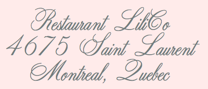 Quebec-based typographer and type designer (aka Diogene) who specializes mainly in revivals of obscure or old typefaces.
 Dafont link. Yet another URL. Abfonts carries many of his fonts. Fontspace link. His typefaces: - Aerolite C Pone (2013). A calligraphic connected copperplate script.
- Angelica CP (2011). After a Fotostar font, Angelica, ca. 1960.
- Banner Star (2012). An American flag-themed display typeface.
- Barrio CP (2011). An inline face based on a Neufville original.
- BeansCP (2010, after a font found on page 10 of Art Deco Display Alphabets: 100 Complete Fonts by Dan X. Solo).
- Bienetresocial (2003), BienetresocialBold (2003).
- Bizarre and Bizarrerie (2010; based on Edwards and Inland, both designed in 1895 by Nicholas J. Werner at the Inland Type Foundry; renamed in 1925 by BBS)
- Bloque Demo (2011). Experimental.
- Bold (2008)
- Bolina (2015). A copperplate calligraphic script after Dan X. Solo's alphabet shown on page 12 of Dan X Solo. Script and Cursive Alphabets (1987, Dover).
- Bonte Divine (2017).
- Carre (2009, athletic numerals).
- Caslon CP (2012, based on Caslon 223 Bold).
- Champignon (1999-2009, a formal calligraphic script)
- Chartrand (2010, Victorian)
- Chomage (2009)
- Chopin Script (1999-2010, calligraphic; after Polonaise by Phil Martin)
- Constanze Initials (2010). After Constanze Initials by Joachim Romann (1956).
- Crayonnette (2000-2001). Same as his earlier font Derniere (1999).
- DeClaude (2010, patterned and named after DeVinne)
- Dojo CP (2011)
- Dynamic CP (2010, based on page 48 of The Solotype Catalog of 4,147 Display Typefaces as Dynamic Deco)
- Ebony (2011). Based on a Marder&Luse design from 1890. Ebony is on page 38 of 100 Ornamental Alphabets by Dan X. Solo and also on page 43 of The Solotype Catalog of 4,147 Display Typefaces.
- Embrionic 85 (2012, +Swash Caps) and Embrionic 55 Swash (2012): an ink trap sans display family modeled after Robert Trogman's Embrionic in the FotoStar collection.
- Essai (2003)
- Euclid CP (2011): based on an 1880 typeface at Central Type Foundry.
- Fancy Text (2004, blackletter)
- Fantaisie1 (1999)
- Gourmandise (2013), an exquisite Normandian-style didone display typeface.
- Grandee CP (2014). Claude says that it is based on T.H. Grandee, but that is too cryptic for me...
- Haricot (2010, a fat modular typeface based on Beans in the Dan Solo catalog)
- Humeur (2001-2002, funny smilies)
- IEC5000 (2011). A symbol font with electrical and other icons.
- Initiales Medium (2011).
- Jeux Cache (2016). A boxed letter font.
- JohnHancockCP-Medium (2010, bold didone)
- Landi Echo (2011). A remake of Landi Echo by Alessandro Butti (1939-1943).
- La Tribune (2011). A newspaper type.
- Le Golf or Le Trou (2010, art nouveau typeface by Antoine Szczebanski, digitized by Claude Pelletier; also on page 71 of the Solotype catalog)
- Les Etoiles (2013): an inline typeface
- Les Tuyaux (2018). A great slinky font.
- Lionel CP (2010, a multiline typeface inspired by Letraset's 1973 typeface Stripes)
- Louisa CP (2015). A free calligraphic copperplate script. Louisa CP is Louisa on page 56 of Script and Cursive Alphabets: 100 Complete Fonts by Dan X. Solo.
- Malvern (1999)
- Manquis CP (2012). A roman typeface.
- Maratre (2013). A delicious connected copperplate calligraphic script that revives (or is almost identical to) François Boltana's Aurore (1993).
- Monterey Wide (2011). A Tuscan ornamental face, based on a showing on page 22 of The Solotype Catalog of 4,147 Display Typefaces.
- Motscroises (1997)
- Niaisage (2012). A lachrymal caps only typeface.
- Oxford CP (2010, a multiline face, based on the 1960s typeface by Christine Lord)
- Pasdecourbe (2003)
- Pasdenom (2001, no punctuation)
- Peak CP (2020). A revival of VGC's photo font Peak.
- Pepinot (2012), an art nouveau typeface based on Coral Inline on page 190 of The Solotype Catalog of 4,147 Display Typefaces.
- Pistilli Roman (2011, after the original by Pistilli)
- Postface (2012). A bold signage script face.
- Rita Smith (2012). After Primavera by Rita Major.
- Rogers, Rogers2 (1997). He says that it is not his font---that he just rearranged the glyphs. According to Claude, can be found in the book Treasury of Authentic Art Nouveau Alphabets, ed. Petzendorfer, Plate 23. It was made in 1902 by A.V. Haight for Inland Type foundry.
- Salamandre (2012). A tall 19-th century style slab typeface based on Iguana, a design of Sally-Ann Grover.
- Simplement (2011) is Cut-in Medium on page 163 of The Solotype Catalog of 4,147 Display Typefaces.
- Stylie Stymus (2012).
- Threshold (2014).
- TriangleETcircleShadow, TriangleETcircleShadowed (2010, 3d iron work style face)
- UptightC (2010, multiline face).
- Whitin Condensed Black (015). Whitin Condensed Black is Whitin Black Condensed on page 151 of The Solotype Catalog of 4,147 Display Typefaces.
- YagiUHFNo2 (2012).
- Zenith CP (2016). A free connected calligraphic (wedding) script typeface.
[Google]
[More] ⦿
|
Coen Hofmann

|
 Born in Amsterdam in 1939, Hofmann started out as a typesetter, and then morphed into a calligrapher and an author on calligraphy, and finally into a type designer.
 Designer at URW++/Fontforum of - Admira (2019). A revival of the striped all caps money font Admira (1940, Schriftguss).
- Altrincham (2003).
- Caxtonian Black (2012). A blackletter.
- Globus Cursive (2015, +Cyrillic). This cursive font is a revival of a font by Friedrich Hermann Wobst (1932, D. Stempel AG).
- Gothic Initials (2015). After an original from 1821 by Firmin Didot's foundry.
- Holland Gothic (2012). A blackletter.
- Jason Uncial (2012). A unicase uncial design.
- Perugia Cursive (2003). A gorgeous calligraphic script based on the 19th century "Scrittura Rotonda Francese" and "Scrittura Italiana" developed by Italian calligrapher Cesare Silvestrini.
- Pinel Pro (2014). A revival of a didone from 1899 by Joseph Pinel called French 10pt No. 2. URW++ writes: Coen Hofmann digitized the font from a batch of very incomplete, damaged and musty drawings, which he dug up in Altrincham. He redrew all characters, bringing up the hairstrokes somewhat in the process.
- Ramona (2004). A shaded typeface.
- Revis (2011). A formal script based on Daphne, a typeface that was originally designed by German type designer Georg Salden. For some reason, that typeface was withdrawn from the URW++ library some time later.
- Romeo (2004). A 3d beveled shadow face.
- Sax (2008). A didone typeface family.
- Seizieme Pro (2013). Based on the 1905 font Série 16 by Peignot, which was mainly used for scientific publications.
- Signpainters Script (2013). A connected copperplate script.
- Silvestrini (2003). A gorgeous Gando-style ronde. Based on the 19th century "Scrittura Rotonda Francese" and "Scrittura Italiana" developed by Italian calligrapher Cesare Silvestrini.
- Sirius and Sirius Caps (2003). A garalde family developed together with British type designer Neville Brown.
- Technotype (2011). A revival of Herbert Thannhaeuser's 1952 slab serif family Technotyp.
- Thomas Schrift and Thomas Versalien (2015). Based on Friedel Thomas's Thomas Schrift and Thomas Versalien from 1956-1958.
- URW Akropolis (2016, URW++). A revival of the cigar box open typeface Acropolis designed by the Ludwig Wagner foundry in Leipzig in 1940.
- Pergamon (2016, URW++). A wonderful 10-style didone typeface family that revives, extends and modernizes Pergamon Antiqua first designed in 1937 at Ludwig Wagner in Leipzig by Alfons Scheider.
- Marli (2016). A revival of the cursive typeface Korso by F. Schweimanns (1913).
- Moewe (2017). An open typeface in the blackboard bold genre that revives Möwe (1929, Heinz Beck for Genzsch & Heyse).
- Golf (2017). Golf was originally designed by Henry Reinhard Möller in 1935 for Schriftguss KG. Coen Hofmann redrew the capitals and then added lower case letter and Cyrillic alphabets.
Klingspor link. View Coen Hofmann's typefaces. [Google]
[MyFonts]
[More] ⦿
|
Conrad Garner
[Good Gravy Type]

|
 [MyFonts]
[More] ⦿
|
Copperplate Gothic
[Frederic W. Goudy]
|
 A typeface made by Frederic Goudy in 1903. Mac McGrew: Copperplate Gothic Heavy was designed in 1903 by Frederic W. Goudy, who is much better known for his classic roman typefaces. Other weights and widths were drawn shortly thereafter by Clarence C. Marder of ATF, except the Shaded, designed by Morris F. Benton in 1912. A rather wide, monotone, conventional gothic with the added feature of minute serifs, Copperplate Gothic is imitative of the work of engravers, as suggested by the name. It became ATF's all-time best seller, being used extensively for stationery and form work, especially in the small neighborhood printshops of the letterpress era. It is the typical lining gothic face, featuring four sizes each on 6- and 12-point bodies, and two sizes each of 18- and 24-point in foundry (composing-machine sizes differ somewhat), so that a wide variety of cap-and-small-cap combinations can readily be set. Before Monotype developed its "Plate Gothic arrangement" (see under "Design Limitations" in Introduction) in 1919, permitting the keyboarding of all four sizes of 6- or 12-point at once, that company had made the Copper plate Gothics simply as cap-and-small-cap combinations, typically in 5-, 6-. 8-,10-, and 12-point plus display sizes. Hence most of these gothics have two different series numbers on Monotype, the lower number for display sizes and the obsolete cap-and-small-cap combinations, the other for the four-size combination. Several versions of Steelplate Gothic (q.v.) from BB&S were near duplicates of Copperplate Gothic, although a few characters differed slightly and the extended versions were not quite as wide. Hansen had Engravers Gothic in several versions, differing apparently only in the R as shown in the specimen. Compare Plate Gothic, Whittier; also see Bank Gothic, Blair, Boxhead Gothics. D.J.R. Bruckner lists the date as 1905 and writes: Goudy's recollection was that this hodgepodge was done for American Type Founders. It was made for Marder, Luse and Company and then taken on by ATF and can still be found in old ATF specimen books and their old fonts..
 Digital versions: Copperplate Gothic (Linotype), Copperplate Gothic (Adobe), Copperplate Gothic (Bitstream), Copperplate Gothic Hand (Wiescher Design), Opti Copperplate (Castcraft), Copperplate Gothic, Copperplate New (2019, Martin Cincar), Copperplate CC (2020, Owen Earl). [Google]
[More] ⦿
|
Copperplate Gothic
|
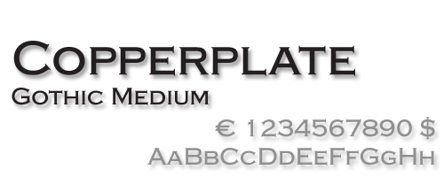 An ATF all-caps face made from 1901 until 1904 by Frederic W. Goudy and Clarence C. Marder. Digital descendants include Copperplate New<./a> (2019, Martin Cincar), Copperplate Gothic (Bitstream), Griffon (Flat-it), Copperplate Gothic (Linotype), Copperplate Gothic (Adobe), Copperplate Gothic (Tilde), Copperplate Gothic Hand (Wiescher Design), Quimby (Match + Kerosene), Copper Penny (The Fontry), Copperplate Script (CastleType), CopperPot (Corel), Copperplate Gothic (Softmaker), Copperplate 001 (Bitstream), Spartan (Monotype), Copperplate EF (Elsner&Flake), Copperplate (URW++), Copperplate Deco (Gert Wiescher), Copperplate SH (Scangraphic), Copperplate SB (Scangraphic), Copperplate Classic (Gert Wiescher), Biondi (Typodermic). Infinitype has a number of styles called Copperplate Gothic or Copperplate-Cd. American Gothic (URW) is Copperplate Gothic with an added lowercase. [Google]
[More] ⦿
|
Copperplate Gothic
|
Lookalike/copycat fonts of the Copperplate Gothic variety, according to David Thometz: [Google]
[More] ⦿
|
Copperplate Script Fonts
|
A page with some copperplate script fonts, as defined by Encyclopaedia Britannica: "formally English round hand, in calligraphy, dominant style among 18th-century writing masters, whose copybooks were splendidly printed from models engraved on copper. The alphabet was fundamentally uncomplicated, but the basic strokes were often concealed in luxuriant flourishing". [Google]
[More] ⦿
|
Copperplate typefaces from ITC
|
Hans Presto showcases and discusses his favorite Copperplate scripts (defined by Encyclopaedia Britannica: formally English round hand, in calligraphy, dominant style among 18th-century writing masters, whose copybooks were splendidly printed from models engraved on copper. The alphabet was fundamentally uncomplicated, but the basic strokes were often concealed in luxuriant flourishing). - Gravura (Phill Grimshaw).
- Balmoral (Martin Wait).
- ITC Edwardian Script Regular (Ed Benguiat).
- ITC Edwardian Script Bold (Ed Benguiat).
- Young Baroque (Doyald Young).
[Google]
[More] ⦿
|
Copperplate&Spencerian--Yahoo
|
Online Yahoo group on Copperplate&Spencerian. [Google]
[More] ⦿
|
Corradine Fonts
[Manuel Eduardo Corradine]

|
 Manuel Eduardo Corradine Mora was born in Bogotá in 1973. He graduated from the School of Graphic Design of the National University of Colombia in 1996, and became a graphic designer. He started by custom-designing fonts and by making typefaces for his own company, Casa Papelera El Cedro (The Cedar Papermaking House), for printing invitation cards. With other designers like Carlos Fabián Camargo, John Vargas and César Puertas he formed Tipográfico in 2007 to strengthen the type discipline in Colombia. Corradine Fonts is Manuel Corradine's own foundry in Bogotá, Colombia, founded in 2006. Today, he is one of Colombia's principal type designers. He also teaches at Universidad Piloto de Colombia in Bogota.
 Fonts from 2007: Kidwriting (a family which includes Kidwriting Dingbats 1 and 2), Garabata (a fantastic handwriting face), Garabata Dingbats, Hexagona Digital, Quadrat (grunge), Quadrat Old (grunge), Quadrat Dirty (grunge), Quadrat Broken, Quadrat Ugly, Neogot (experimental, 8 styles). Fonts from 2008: Mucura (handwriting), Prissa (handwriting), Salpicon (a script), Cuento Serif (a bouncy hand-printed family), Memoria (brush script), Charco, Happy Day (comic book family with Happy Day Dingbats), Espectro (a swinging script with swashes and a Dingbats style), Furia (handwriting), Candelaria (based on house signs in the La Candelaria neighborhood of Bogotá), Old Village (1600's style), Old Village Ornaments, Rapidda (a successful simulation of quick handwriting), Hueca (an outline children's script), Antigua (an old swashbuckler family), Colegial (a great-looking hand script), Pincel (a fantastic paint brush family with accompanying splatter dingbats), Trazo (Corradine's handwriting), Arcos (a techno family), Caveman (a primitive stone-look type family), Rumba (two styles; an elegant flowing brush script), Parche (graffiti family), Elegance Monoline (a greeting card script typeface that won an award at Tipos Latinos 2008), Abuelito (script). Fonts from 2009: Helga (flowing script), Mussica (+Swash, +Antiqued: a delicate Victorian typeface; followed in 2017 by Mussica Italic), Guarapo (hand-printed), Toxic (futuristic stencil), Emotion (comic book face), Bloque 3D, Rock and Cola, Betco's Hand, Telefante (comic book family), Nancy's Hand (more comic book hand-printing), Alambre (multiline/paperclip), Sensual (calligraphic hand), Zape (in the style of Tekton), Antrax Tech (grunge), Masato (handwriting), Hu Kou (oriental simulation). Fonts fgrom 2010: Miel (a curly script), Oferta (a signage script), Corradine Handwriting (and Corradine Handwriting Italic, 2015), Alberto (connected hand), Changua (hand-printed). Fonts from 2011: Plebeya (2011, connected hand), Mimi's Hand Connected, Legendaria (an extensive connected calligraphic family). Fonts from 2012: Tecna (a techno family co-designed with Sergio Ramirez), Neuron (a fantastic 16-style rounded elliptical sans family created together with Sergio Ramirez), Bucanera Soft (blackletter), Bucanera Antiqued (grungy blackletter), Official (a simple monoline sans family), Almibar (a connected calligraphic Spencerian script), Eterea (a roman all-caps family), Eterea LC (the lower case set), Canciller (an italic roman, done with Sergio Ramirez), Quarzo (2012, a formal copperplate script done with Sergio Ramirez). Typefaces from 2013: Neuron Angled (still with Sergio Ramirez), Alianza Slab (a great-looking slab family), Alianza Italic and Alianza Script (a packaging font), all made jointly by Manuel Eduardo Corradine and Sergio Ramirez. Typefaces from 2014: Whisky (a large blackletter family with inlines and fills for layering co-designed with Sergio Ramirez; related to German expressionism, it won an award at Tipos Latinos 2016), Whisky Italics, Beauty Script (with Juan Sebastian Rincon), Emblema and Emblema Headline (tall-legged art deco sans family by Duvan Cardenas), Wild Pen (a 1200-glyph set of typefaces that can be used to simulate handwriting thanks to smart replacements in Opentype), Sinffonia (a thin informal typeface with oodles of choices for swashes). Typefaces from 2015: Be Creative (a vintage display typeface), Typnic (a varied handcrafted layered and script typeface family; rhymes with picnic), Typnic Headline Slab. Typefaces from 2016: Naugles (thick display face based on the Naugles logo), Scrans (a modern signage script), Bloque (heavy slab family), Bloque Italic. Typefaces from 2017: Cristal (layered, triangulated and beveled font family, including exquisite Cristal Dingbats and Cristal Frames), Almibar Pro (connected calligraphic script). Typefaces from 2018: Tierra Script, Pueblito (rustic style). Typefaces from 2019: Austera Text (a comfortable workhorse serif). Typefaces from 2020: Kidwriting Pro. Klingspor link. Behance link. Creative Market link. MyFonts link. Fontspring link. Font Squirrel link. View Corradine's typefaces. [Google]
[MyFonts]
[More] ⦿
|
Craft Supply
[Nazzar Saputra]

|
 Kediri, Indonesia-based designer of the monoline script and sans typeface Quetty (2017), the rhythmic script font Quitman (2017), the geometric sans typeface Francy (2017), the signage script font Danilla (2017), the all caps sans typeface family Stockport (2017), Stockport Rounded (2017) and the great creamy super-heavy signage script typeface Kidding Script (2017).
 Typefaces from 2018: Rustelyn (script), Sweet Buttermilk (Script, Sans), Lucylane (a monoline script), Blusty Script, Riffle (a skyline typeface), Melvis, Deluce (a luxury serif), Dutchy, Aguero (a luxury serif font), Finland, Finland Rounded (rounded monoline sans), Coldiac (an all caps luxury serif), Tigreal (a vintage slab serif), Road Race, Road Race Extra, Logam (sans), Houston Sports (spurred), Studly (a layered font), Morning Gold, Houston Italic, Comodo (sans), Rainly (brush SVG), Offlander (condensed sans), Offlander Rough (free), Salvalyn, Bafora (dry brush SVG font), the sans typeface Bondie Condensed, Bondie Extrude, Troye Serif (display didone), Troye Sans, Troye Script, Boardley Script (layerable retro signage font), Rotterin (a free signage script), Giveny (caps only fashion serif), CS Mulan (Victorian), Pastelyn, Belgium (a distinguished all caps sans), Finland (sans), Rickies (brush), Bravely, Houston (a semi-octagonal font by Wahyu Hadi Yuana), Pommel (a free script by Wahyu Hadi Yuana), Prestage (condensed all caps sans), Prestage Outline, Lovelyn (display serif), Espoir (a Peignotian font by Wahyu Hadi Yuana and Nazzar Saputra), Espoir Serif, CS Juicy (a color font), Retrocycles (monoline display sans), Fadelyn (script and sans), CS Gordon, CS Harley (sans), CS Maria, CS Nancy (sketched), CS Rocky, CS Roger, CS Rosalia, CS Sandreas. Typefaces from 2019: Giroud (a free copperplate font), Cattus, Rovey, Vendeur, Colbiac, Angelic Bonques Script, Angelic Bonques Sans (a formal sans), Railly (dry brush), Gold Coast (vintage, all caps), Gold Coast Rough, Souther (brush script), Passtyn (Script, Sans), Larissa, Duskey (a weathered vintage typeface by Wahyu Hadi Yuana and Trio Nazzar Saputra), Rolves, Kitten Days, Jadyn Maria (signature script), Betty Rose, Fenord (a heavy sans), Adelya, Groce, Qualey, CS Nancy Inline, Manyland, Marques (wedge serif), Jocker (a vintage layered spurred typeface family), Nordin (sans), Masitha (script), Croco (Peignotian sans). Typefaces from 2020: Marques Vintage, Monocole (all caps sans), Mondeur, Espano (all caps, serif), Celine Peach (Sans, Script), Marlyn. Typefaces from 2022: Funkley (funky and psychedelic). [Google]
[MyFonts]
[More] ⦿
|
Creative Toucan (was: Leo Supply Co)
[Leonard Posavec]

|
 Cakovec, Croatia and Washington Park, WA-based designer (b. 1995) of preponderantly grunge typefaces. In 2013, he created Funny Classic, Lion Pro, Lover, War is in the Air (military stencil), Aussen (squarish), Ensione (outlined), Rangle, Gaon, Momgers, Escapea (athletic lettering), Campus A (athletic lettering), Zebraliner, The Alistaren, Goteros, Collegerion (athletic lettering face), Prestinia Pro (grungy serif face), Fast Ostrich, Funny Trip, Boro, Electric (grungy face), On The Left, Power Balloon, Heavy Bomb (grungy), Kid From Hell, Army Stamp (rough army stencil), Jump Party, Comic Type, Commy, Faster, Fati, Funny me, Hypnotize, Half Half, My Day, Totally Outline, First Day, Funny Kid, Waterline, Piranha, Fish (grunge face), Modern Sketch, Beboline (dymo label grunge), Metalic (sic), Moter (grungy outline face), Privjet, ShadowM (shaded typeface), Old Movie, Strong Boy, Russian Line, Long Leg, Cool Day, Jungle Tree, Funny Teca, End of Era, DeLeo, Buble Muble, Morris, Funky Monkey, Leonards (a scratchy typeface), Dead John (grunge), Square Baby (grunge), Handwriter, Outline Storm, Mejiko (grungy Western font), Bird Fly, Died, Close To (grungy dymo label font).
 Typefaces from 2014: Dabre, Handeer, Bad Land, Thron, 806 Typography (wood style didone), Rypote. Typefaces from 2015: Debeli Bridge (faded, grungy and gorgeous), Rustal, Madalen, Stiquez, Vallyns (grungy, stamped typeface), Falsthan (brush face), Areson, Summeron (brush script), Surpal Lovely (Victorian kitsch), Summer 2, Megeon (+Grunge), Dabre Grunge (textured caps). Typefaces from 2016: Taramda, Endless Script, Riot Ton, Dabre (grungy stamped style), La Tequila (Western font), Originals (painted letters), Originals is out, Avenue Drift, Amoky (sketched), Bastielle Script, Ipsum Script, Baroquey Script, Pomah Type (brush script), Vrown Fox (dry brush), Time Machino (dry brush), The Gohe Go, My Boquet Script, The Sellen, Baley Sun, Brushed Traveler, Salone Strand, Aple Time (brush), Bert Loch (brush), Brushed Car, Last and Chaos (brush), Thin Zeus (brush), Top Light (fat brush typeface), Summer Soul Script, Summter (connected script), Summdraw, Planine Script, Samtak Script, Astel Script, Rostek Old, Megiline, Sally Script, Rolley, Naila Script, Amoky (textured letterpress emulation typeface family), Reeld (dry brush typeface), Stamped Navy (textured). Typefaces from 2017: Musterion (brush script), Wolvos (rough brush), Xenos, Descolorido, Mushroom (an angulara children's book font), California Jackpot, Zondas, Codiac (rough brush), Gullias (signage script), California or California Jackpot (brush font), Rhinos Rocks (brushy), Quick Toy (inky brush script), Italiano (dry brush), Gode (thick brush), Ananas Lips, Kiwano Apple, Cup of Sea, Fly N Walk, Sign 45 (vintage grungy poster style), Jaoy, Gas Rock, Acids. Typefaces from 2018: Storehouse (a vintage all caps copperplate family with small wedge serifs; by Nicolas Massi and Leonard Posavec; it includes a stencil style), San Francisco, Quick Pick (brush), Mick's, Jumper, Alask (brush), Royal Twins, Clas (brush script), Yolloy, Scolarship (sketched). Typefaces from 2019: Planina, Athletica (letterpress style), Costa La Vista (font duo), Springs, Originals 2 (dry brush), Astana. Typefaces from 2020: Myla (a display typeface). Typefaces from 2021: Surfbars (a dry brush font for outdoors usage; also supports Cyrillic). Fontspace link. Creative Market link. Old URL. Another Creative Market link. Dafont link. Fontplanet link. [Google]
[MyFonts]
[More] ⦿
|
Crystal Kluge
[Tart Workshop]

|
 [MyFonts]
[More] ⦿
|
Cultivated Mind
[Cindy Kinash]

|
 Cindy Kinash is an apparel graphic designer from Canada. She started the Cultivated Mind foundry in 2012, and made a reputation as a script font designer. She published the hand-printed poster typefaces Amour (2012), Happy Cloud (2012), Have a nice day (2012, +Ornaments), Gionni (2012), Dreamy Hand (2012), Taluhla (2012) and Hello I Like You (2012). Requiem (2012) is grungy.
 Cocobella (2012) is a delightful Treefrog-style connected brush script. Luella (2012) is a vintage poster font family. It includes several typefaces with ornaments. Typefaces from 2013: Pacific Northwest (hand-drawn poster typeface), Mimbie (+Kitschy Ornaments, +Spooky Ornaments, +Social Media Icons), Maisy. Typefaces from 2014: Westcoast Letters, the curly typeface Veronia (2014, with Callie Hegstrom), Local Market (with Charles Gibbons), True North (with Charles Gibbons: a set of letterpress emulation and poster typefaces in all caps; +Extras), Ciao Bella (with Charles Gibbons: a hand-drawn copperplate script emulation with four lovely hand-drawn sets of floral ornaments), La Chic (sic) (a poster font family on a didone body, with several sets of frilly frames), Pacific Northwest Letters, Pacifc Northwest Labels, Azaelia (hand-painted; comes with a dingbat font that has handmade frames, page dividers, ribbons and fancy flourishes). Typefaces from 2015: Mulberry Script, Glamour Brush, True North Textures (letterpress emulation; with Charles Gibbons), Wanderlust (watercolor brush script), Wanderlust Collection (including Wanderlust Letters Pro, Decorative, Boho, Chic, Shine, Gold, Caps, and Ornaments). Typefaces from 2016: Viva Beautiful, Garden Grown (brush script; +US B, +US C Caps), Local Brewery (vintage script). Local Brewery evolved in 2020 into Local Brewery Collection, and includes Icons, Extras, a monoline script and a tall all caps monolinear sans. Typefaces from 2017: Northwoods (handcrafted sans). Typefaces from 2018: Beauty Club (a script and a didone text family), City Streetwear, Beauty Style, Bushcraft (a geometric monoline script). Typefaces from 2019: Garden Collection, Viva Beautiful Collection, Northwoods Rough, Eastville Square (signage script). Creative Market link. YWFT link. [Google]
[MyFonts]
[More] ⦿
|
Cyrus Highsmith
[Occupant Fonts]

|
 [MyFonts]
[More] ⦿
|
Dafne Martinez
|
 Letterer and designer in Mexico City. In 2017, she designed the text typeface Tessitura especially for small print sizes. Co-founder of the Tipas Type type foundry in Mexico City together with Monica Munguia (who by 2020 has left the studio), and Sandra Garcia. Dafne Martinez studied graphic design at Facultad de Artes y Diseño, UNAM, and has a Masters in typography from Centro de Estudios Gestalt. She specializes in calligraphy and lettering. In 2019, Dafne Martinez, Monica Munguia, and Sandra Garcia co-designed the roundish informal children's book typeface Xantolo and the wood type / slab serif typeface Xihtli. In 2019, Dafne Martinez and Sandra Garcia designed the copperplate calligraphic typeface Especial for a common Mexican beer brand
 Member of the Sic Typus Creatus Est team (Dafne Martinez, Jorge George, Leonardo Delgado, Iordan Evair and Federico Biagioli) that designed Calmadita in 2020 for the Torneo tipografico competition. Calmadita is an angular slab serif meant for Ipads and Kindles. In 2021, Dafne Martinez and Sandra Garcia published Achtli (Book, Didactic), a rounded sans typeface for early readers. [Google]
[More] ⦿
|
Dan Bow
|
In 2017, Dan Bow (Sheffield, UK) designed the copperplate style roman alphabet Praetura (2017), which haselements of Futura. [Google]
[More] ⦿
|
Dan Cassaro
[Young Jerks]
|
[More] ⦿
|
Darío Manuel Muhafara
[Tipo]

|
 [MyFonts]
[More] ⦿
|
David Harris

|
 British lettering artist based in Exeter who specializes in the medieval versal cadel (or cadeau) letter. He created these typefaces:
 - Alexei Copperplate (1982, Letraset). A copperplate calligraphic script.
- Chromium One (1983, Letraset, and later ITC). A decorative neon-light all caps typeface.
- Becka Script (1985, ITC).
- Julia Script (1983, psychedelic).
Author of The Art of Calligraphy (Dorling Kindersley), Calligraphy: Inspiration, Innovation, Communication (Anaya), and The Calligrapher's Bible (A&C Black). FontShop link. Klingspor link. Linotype link. Behance link. [Google]
[MyFonts]
[More] ⦿
|
Dear Alison
[Alison Argento]

|
 Travel writer based in Cherry Hill, NJ. Designer (b. Augusta, ME, 1977) of the children's scribble font Urly Lurnin (2008), and of Smiley (2008, comic book face), and of the informal handwriting fonts Pickled Sans (2008), Slim Pickens (2008), Smokehouse (2008) and Gladly Mailed (2008).
 Bender Script (2008) is a brush script developed from an incomplete script drawn by Charles Chas Bluemlein. Barnstormer Script (2010) is a sign painter typeface. Gonte (2013) is a sketchbook script typeface. Saskya (2015) is a rough chancery script. Glade (2015) is a formal calligraphic copperplate script in five widths. In 2016, she designed the architectural lettering typeface Robard, the brush script typeface Beckford Script and the ballpoint pen script Generous Hospitality. Typefaces from 2020: Postale (a monoline gas pipe sans). [Google]
[MyFonts]
[More] ⦿
|
Decade Type foundry
[Agung Maskund]

|
 Decade Type foundry (Bandung, Indonesia, est. 2008) is run by Agung Maskund (Agung Gumilang Sugih), b. 1987, Bandung. It specializes in Victorian and vintage type. Creator of Authentic Labels (2013), New Black (2012, a metal band typeface) and Chicano Brush (2012, graffiti face). Note: It is possible that Chicano Brush was made by Gilang Purnama.
 In 2013, they published Reckless (by Gilang Purnama: a retro car font), Fabulous Drop Cap (with a free demo font), Los Santos (graffiti style), Logotype Frenzy (brushy signage face), Insurance Maps (inspired by the Sanborn Map Company's 1909 insurance map catalog), Basingstoke (a spurred display typeface by Gilang Purnama Jaya), Hustlers Rough (Western Tuscan signage font), Lakester (another Tuscan signage font with layering), and Griba (alchemic typeface). Another great typeface project is the National Currency Font (2013), which features spurs and an engraved look. Stay Gold Script (2013) is a vintage signage typeface. Aesthetique (2013) is a Victorian ornamental Tuscan design. Typefaces from 2014: Stanwood (Victorian), Herschel. Typefaces from 2015: Tervia (spurred vintage typeface), Edmond (vintage typeface), Pretty Script. Typefaces from 2018: Versica (by Irma Asharini and Agung Gumilang Sugih). Typefaces from 2020: Voska (a bold display serif family), Breland (a titling typeface, and decorative borders and ornaments by Agung Gumilang Sugih and Irma Asharini). Cofounder of Image Type with Ihsan K. Lazuardi and Gilang Purnama. Behance link. Creative Market link. Fontspace link. Behance link for Agung Maskund. Another Creative Market link. [Google]
[MyFonts]
[More] ⦿
|
Dennis Ortiz-Lopez

|
 Prolific NY-based designer (born in East Los Angeles) who specializes in faithful revivals of old masters and logotype, in Latin and Hebrew. He made over 500 fonts including. He is also a translator and illuminator of Biblical period Hebrew and Aramaic. His clients include The Vatican (Pope John Paul II's Holocaust commemerative CD) and Hadassah, the Women's Zionist Organization of America. His specialties are translations worded in the language and style of the period in which the Biblical text was composed. His translation and enumeration of kabbalistic writings, otherwise known as Hebrew Mysticism and numerology, demonstrate the mathematical base of Biblical miracles.
 MyFonts wrote this analysis of his work: Dennis Ortiz-Lopez is a hugely talented New York type designer. lettering artist&typographer, with around 600 typefaces to his credit. Typographic quality in the magazine market doesn't get much better than Rolling Stone magazine---well, guess who was their typographer (as well as InStyle, Sports Illustrated, People, etc.). Dennis made a successful transition to the digital era around 1989, keeping up his prodigious output. Dennis is also known by his Hebrew name, Siynn bar-Diyonn. Dennis follows the footsteps of great American type designers such as Morris Fuller Benton and Herb Lubalin. And he likes contrasts, too: his typefaces are very narrow or very wide, very thin or very fat. If you love Franklin Gothic but always felt like it's not fat and wide enough. try [Google]
[MyFonts]
[More] ⦿
|
Dennis Pasternak
[Galapagos Design Group]
|
[More] ⦿
|
Derek Munn
|
 Brooklyn, NY-based graphic designer, who also claims Norfolk, VA, as his home. He deconstructed a hairdryer---its pieces made up the glyphs of Split Ends (2011). About Silverback (2011), he says: Using the economical downturn of 2008 as a point of inspiration, I created a font that captured historical monetary references and personal feelings toward Wall Street. I studied old stock certificates and began to simplify the forms. Keeping the design cold and intimidating, I included nods to razor blades and the illuminati.
 He made the copperplate-look typeface Thick Block (2012) for the upstart Brooklyn restaurant The Brooklyn Sandwich Society. Still in 2012, he combined the copperplate and Western signage styles in his Applewine typeface. In 2013, he created the Venetian typeface Stonewall Roman. He will extend this elegant and promising typeface to a full-fledged family in 2014. Ragehaus is the web presence of Derek and his wife Kim. Behance link. [Google]
[More] ⦿
|
Diana Ovezea
[Acute Studio]

|
 [MyFonts]
[More] ⦿
|
Dmitrii Mikitenko
[Blessed Print]

|
 [MyFonts]
[More] ⦿
|
Dominik Junker
|
Designer from Sankt Gallen, Switzerland, who created the copperplate typeface Arial Serif and the custom typeface Grill (based on Gill Bold) in 2013. Behance link. [Google]
[More] ⦿
|
DooType
[Eduilson Wessler Coán]

|
 Curitiba-based Brazilian digital type foundry, est. in 2008 by the successful and talented type designer Eduilson Wessler Coan (b. 1983, Curutiba). Myfonts link. Coan joined Fabio Haag Type. Their fonts:
 - Estado Serif (2006), co-designed with Ericson Straub (Straub Design) and Fabio Augusto for use in the Jornal O Estado do Paraná.
- DooSans (2006): custom design for the magazine abcDesign.
- Ninfa (2006-2008), an organic serif face. He calls it a modern semi-serif. Whatever. Ninfa won an award at Tipos Latinos 2008 in the non-text typeface category. Ninfa Serif followed in 2012. Ninfa Serif won an award in the typeface family category at Tipos Latinos 2012.
- Encorpada Black (2011) is a fat didone display face. It was extended to Encorpada Pro in 2012. Encorpada Classic was published in 2013. Encorpada Classic and Encorpada Pro won awards at Tipos Latinos 2014. In 2014, he published Encorpada Essential. In 2015, Eduilson added Encorpada Classic Compressed and Encorpada Classic Condensed.
- Fluence (2012) is a calligraphic typeface family. Fluence won an award at Tipos Latinos 2012.
- Tres Tres Chic (2012) is a very thin geometric fashion mag headline face.
- Maestra (2012) is a calligraphic copperplate script. Gorgeous, mouthwatering, heavenly, just about the perfect font. Future brides and grooms need look no further than this for wedding invitations.
- Niks Sans (2012).
- dT Delicatta (2012, revised in 2017) is a formal connected calligraphic script face, destined to win many awards.
- Unimed Sans, Unimed Slab and Unime Serif (2013) is a bespoke typeface family done for a Brazilian health insurance company, Unimed.
- Typefaces from 2014: Bommer Slab and Bommer Slab Rounded. Bommer Slab won an award at Tipos Latinos 2014. Accura (2014, a sans typeface created together with Thiago Bellotti).
- In 2015, he designed the techno sans family Sica (+Expanded, +Condensed) with Volnei Antonio Matrté Coan at DooType. Sica won an award at Tipos Latinos 2016.
- Bommer Sans (2016). A Latinized (i.e., curvy) humanist sans.
- dT Jakob (2017). This typeface started out in 2007 as a revival by Gustavo Soares in Paul van der Laan's class at KABK of Jakob Erbar's grotesk from 1927. It was refined and completed in 2017 at dooType with the help of Eduilson Wessler Coan. In 2018, Gustavo Soares and Eduilson Coan developed the variable inline and shadow font dT Jakob Variable Concept.
- dT Ampla (2018). A sans with some warmth.
- Salva (2021, Fabio Haag Type). A versatile workhorse sans family: Eduilson Coan was the lead designer. He was assisted by the Fabio Haag Type team of Henrique Beier, Ana Laydner and Fabio Haag himself.
- Seiva (2021, by Henrique Beier, Eduilson Coan and Fabio Haag). A distant relative of Didot, this exotic sans family is partitioned into Text, Display and Poster subfamilies, and welcomes variable font technology.
Klingspor link. Creative Market link. Behance link. MyFonts interview. [Google]
[MyFonts]
[More] ⦿
|
Douglas Moura
|
Sao Paulo, Brazil-based designer of a copperplate typeface in 2016. [Google]
[More] ⦿
|
Doyald Young
[Doyald Young: Logotypes and Letterforms]

|
 [MyFonts]
[More] ⦿
|
Doyald Young: Logotypes and Letterforms
[Doyald Young]

|
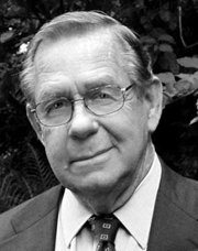 Graphic designer, typographer, type designer, author, teacher and lecturer, born in 1926 in Holliday, TX. He died on February 28, 2011 due to complications following a heart operation. He attended Los Angeles City College, Los Angeles Trade Technical Jr. College, and Art Center College of Design where he has taught for 27 years and holds the honorary title Inaugural Master of the School. Doyald drew characters, often of a calligraphic or handlettered nature. He was deeply influenced by his mentor, Hermann Zapf.
 Steve Heller writes: When digital programs like Fontographer made it easy for anyone with a computer to create typefaces, many of them purposefully inelegant, he advocated a high level of craftsmanship that he believed had been lost. In so doing, Mr. Young challenged a new generation to reject so-called grunge design in favor of precision. When the American Institute of Graphic Arts awarded Young its 2009 Medal for Lifetime Achievement, Marian Bantjes wrote Taste. Practicality. Formality. Understated prestige. The combination of those qualities forms as perfect a descriptor of Young's work as any you are likely to find, both in the process and the result. Although he is widely known for his elegant curves and scripts, he has never been a showy designer---there is not a trace of ego in his work. The range of letterforms able to flow at any time from his hand is great, and there is no way to particularly define Young's mark unless you have seen the hand-drawn comp. That is where his work is unmistakable: perfect letterforms drawn in pencil at a surprisingly small size without so much as a mark of hesitation or awkwardness. The style varies but the fluidity and perfection do not. Links and media: Scott Erickson's movie on Doyald Young. FontShop link. Klingspor link. Short obituary and video. Longer video about his life. Steven Heller's obituary in the New York Times. Obituary by Marian Bantjes for AIGA. He was adored and respected for his craft and gentleness. Portrait. Another portrait (credit: Louise Sandhaus). Author of several influential texts: - Logotypes and Letterforms (1993, Delphi Press). Review. It includes the corporate typefaces and original and revised logotypes he created for General Electric, Sony, Hilton International, John Deere and other businesses. Steve Heller: It was well received by designers for its defiance of fashionable trends.
- Fonts&Logos (1999, Delphi Press, and 2000, Sherman Oaks). A book of examples, it includes many logos designed by him for the cosmetic, fashion and entertainment industries. Review. Bette Midler logo (2002). Grammy Awards logo (1988). Prince, The Hits Collecton, cover (2000). Sinatra, The Man and his Music TV Special (1981). Logo for Apex Engraving (1974).
- The Art of the Letter (2003, Smart Papers, Hamilton, Ontario).
- Dangerous Curves Mastering Logotype Design (2008, Delphi Press). Delphi Press was his own company.
His typefaces include the extra bold condensed sports scripts fonts Home Run Sanscript (1999) and Home Run Script (1999, a connected bold retro signage script), Young Gallant (2010, a formal calligraphic script based on the alphabets his teacher, Leach, trained him on), ITC Eclat (1985, 1992, fat script face, which was used for titles by Comedy Central and the Queen Latifah movie Beauty Shop), Young Finesse (2003, an Optima-inspired thin headline typeface used in his book, Fonts&Logos), Young Finesse Italic (2006), Guts (1976, VGC), and Young Baroque (1984, 1992, Letraset; calligraphic Spencerian copperplate script; this is copied by Castcraft as OPTI Yen Script). [Google]
[MyFonts]
[More] ⦿
|
Drako Mallafoglia
|
 During his studies in Bologna, Italy, Drako Mallafoglia designed the foliate typeface Leafont (2014), the art deco typeface Security (2016), Dots (2016), and the upright ornamental copperplate-inspired didone typeface Cupcake (2016). [Google]
[More] ⦿
|
Drew Melton
[Carmel Type (or: Just Lucky)]

|
 [MyFonts]
[More] ⦿
|
DTP Types Limited
[Malcolm Wooden]

|
 DTP Types Ltd was launched in 1989 by Malcolm Wooden (b. London, 1956) from Crawley, West Sussex, England. Wooden worked at Monotype for over 20 years just before that. Malcolm Wooden joined Dalton Maag early 2008 to work on font engineering and production. DTP Types does/did custom font work, and sells hundreds of retail fonts.
 In the Headline Font Collection (50 fonts), we find reworked and extended designs (Apollo, New Bodoni (1996-2002), Camile, Engravers, and so forth), as well as fresh typefaces (Hellene handwriting, Finalia Condensed, Birac, Delargo Black, Delargo DT Rounded (comic book family), Dawn Calligraphy). In the Elite Typeface Library, there are type 1 and truetype typefaces for Western and East-European languages. For example, Elisar DT (1996, see also Elisar DT Infant) is a humanist sans family made by Malcolm and Lisa Wooden. Fuller Sans DT (1996) is a grotesk family by Malcolm Wooden. Greek and Cyrillic included. Other typefaces: Garamond 96, Pen Tip (Tekton-like). Fonts distributed by ITF and MyFonts.com: Berstrom DT, Beverley Sans DT (2007, comic book style face), Birac DT, Century Schoolbook DT, Convex DT, Delargo DTInformal, Delargo DT Infant, Engravers DT (1990), Finalia DT Condensed, Garamond DT, Garamond Nine Six DT, Goudy Old Style DT, Graphicus DT (1992, a 24-style geometric sans family), Kabel DTCondensed, Leiden DT (1992: after Dick Dooijes's Lectura), Macarena DT, Modus DT (2007), New Bodoni DT (1992), Newhouse DT (1992, a large neo-grotesque family), Office Script DT (1994, copperplate script), Pelham DT (1992), Pen Tip DT, Pen Tip DT Infant, Pretorian DT (a revival of an old Edwardian font by P.M. Shanks done by Ron Carpenter and Malcolm Wooden in 1992; for a free version, see Vivian by Dieter Steffman), Solaire DT, Triest DT, Vigor DT (2000---a slab serif family). Discussion: Something I don't get is that Vecta DT (2006) is based on Vecta (2005, Wilton Foundry)---same name, same sans family, what gives? Duet DT (2006, a calligraphic script) is by Robbie de Villiers of Wilton, based on his own Duet (2004). MyFonts page. The typophiles reserve harsh judgment: I recognize these designs by their original names. Slightly manipulating Times Roman, Optima, Icone, Franklin Gothic, Sabon, Tekton, does not make them new or original. Many of the designs are identical to the originals they're derived from (Carl Crossgrove), The DTP Types outfit sells the usual rip-off fonts under new and old names (e.g. Century Schoolbook DT, Engravers DT, Goudy Old Style DT, Kabel DT, etc.) (Uli Stiehl). Typefaces from 2007: Rustikalis DT (after a phototype by VGC from the 1960s), Appeal DT (a revival of the Victorian typeface Apollo designed ca. 1900 by Aktiengesellschaft für Schriftgiesserei und Maschinenbau), Fatbrush DT, Kardanal DT, Pamela DT (semi-blackletter). In 2008, DTP announced a new newspaper and magazine text family, Arbesco DT (PDF), based on a 1980s photolettering family (see also here), and a simple 24-style architectural sans family called Sentico Sans DT (elliptical). They also published the marker family Pen Tip DT Lefty in 2008. In 2009, the calligraphic Trissino DT was published: it was named after Gian Giorgio Trissino (1478-1550) the Italian Renaissance humanist, poet, dramatist, diplomat and grammarian who was the first to explicitly distinguish I and J as seperate letter sounds. In 2020, he released Hastrico DT (a 13-style grotesque family), Hastrico DT Condensed. View the DTP Types typeface library. [Google]
[MyFonts]
[More] ⦿
|
Élodie Mandray
[Acmé-Paris]
|
 [More] ⦿
|
Eduilson Wessler Coán
[DooType]

|
 [MyFonts]
[More] ⦿
|
Edward Detyna
[Electronic Font Foundry]
|
[More] ⦿
|
Electronic Font Foundry
[Edward Detyna]
|
The Electronic Font Foundry (EFF) in Ascot, Berkshire, UK, sold most classical fonts at about 15 dollars per weight, and made custom fonts. Established in 1984, the foundry had 1300 fonts by 2012. The font designer and owner was Edward Detyna, who died in March 2014. People are reporting to me that the fonts are in limbo, and that Detyna's family is not replying to requests for information. On July 4, 2002, Apostrophe wrote this: I'm currently having a difficult time trying to predict the past of EFF LondonA, EFF Liz, EFF Eric and EFF Formal, to name a few. I have a feeling that these folks just happen to be twins with entities that are currently across the Atlantic from them, namely Adobe Garamond, Cooper Black, Gill Sans and Copperplate Gothic. A friend of Detyna's writes this: When I met him at least twenty years ago, Edward and his associates had a font design studio based in Ascot, near London. He is a mathematician/statistician turned typographer, and was really on top of type design at the time. There are academic articles published on mathematical subjects on the internet. He's an old man now, but still a very smart guy. When he started, with fonts for Acorn RISC-OS (now defunct, but leading-edge British computer of mid-eighties to -nineties), he had very advanced and sophisticated algorithms for anti-aliasing and hinting, and his hand-hinting is still better than almost any other fonts I have used for screen work. He still sells fonts and adapts to user requirements promptly. I recently asked him to adjust the hinting on a font and he turns it around in a day. Jason Koxvold wrote to me in 2017: I knew Edward back in 1990 or so, when I was 13, and he mentored me to a great degree. For a while I worked an internship of sorts at EFF, and then one day, my mother came to see what I was up to---he gave her the job of office manager. He was a tremendously helpful and meaningful person to me then as a very young man with a passion for typography. Closed captioning fonts for TV, made according to the EIA 708-B specifications, include EFF Sans Serif CC, EFF Serif CC, EFF Sans Serif Mono CC, EFF Serif Mono CC, EFF Casual CC, EFF Script CC, EFF Small Caps CC. EFF also has fonts for Vietnamese, Greek, Hebrew, and Cyrillic. EFF Primary is a large family of educational fonts. EFF Utamaru is an oriental simulation font. [Google]
[More] ⦿
|
Eliza Gwendalyn
[Studioways]

|
 [MyFonts]
[More] ⦿
|
Elyas Beria

|
American illustrator, typographer, painter and potter. In 2020, he designed the display typefaces Varet Gothic (in copperplate gothic style), Monde Libre and Lilette, the rounded monoline sans typeface Luwest Rounded and the nautical-themed condensed typeface Oceantide Display. [Google]
[MyFonts]
[More] ⦿
|
Emil Karl Bertell
[Fenotype]

|
 [MyFonts]
[More] ⦿
|
Engravers
|
 Engravers is a particularly elegant family at Agfa/Monotype, consisting of Burin Sans (wide and almost monoline) and Burin Serif, Solid Antique Roman, Artisan Roman, Burin Roman, Light Classic Roman, Classic Roman (stone cut look), Handle Oldstyle, Light Roman, and Medium Roman. The Engravers series is related to the Sackers series. [Google]
[More] ⦿
|
E-phemera (was: HPLHS Prop Fonts, and earlier: Prop Fonts)
[Andrew H. Leman]

|
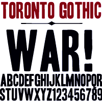 Andrew Leman is a prop designer in Hollywood, CA. The type foundry HPLHS Prop Fonts (was: Ephemera, Prop Fonts) was started by Hollywood's Andrew Leman, and is now located in Pasadena, CA. Some fonts are free, most are commercial.
 Dafont link. Klingspor link. Andrew Leman's fonts: - Cablegram (2001, old typewriter face, T-26).
- Leviathan.
- Garamold (2007, 2 styles).
- Journalistic (2007, a blackletter inspired by the nameplate of a New England newspaper from the 1920s).
- Blackburn (2006, distressed).
- RTemporal (2006, blackletter).
- Fonts in the HPLHS series, dated 2002: HeadlineTwoHPLHS, OldStyle1HPLHS, OldstyleItalicHPLHS, OldstyleSmallCapsHPLHS, Rogo, SlabSerifHPLHS, TelegramHPLHS, WW2BlackletterHPLHS, WW2BlackltrAltHPLHS, HPLHS-Lovecraft Cursive and Block (replica of H. P. Lovecraft's own handwriting), HPLHS-Autograph Lanier (replica of the 1875 handwriting of Sidney Lanier, a 19th century American poet), HPLHS-TextSerif (really Linotype Antique No. 1), HPLHS-TypoScript, HPLHS-TextSerif Oblique, HPLHS-Bulfinch, HPLHS-Colwell, HPLHS-Colwell Italic, HPLHS-Cromwell, HPLHS-National Oldstyle (after Goudy's font by that name), HPLHS-Post Monotone, HPLHS-Atlas Italic, HPLHS-Italic, HPLHS-Victoria (from the 1923 ATF book), HPLHS-Manuscript Caps, HPLHS-Tome Pi, HPLHS-TypoGothic, HPLHS-Copperplate Roman, HPLHS-Gothic520, HPLHS-Times Gothic, HPLHS-Persnickety, HPLHS-Roman Engraved, HPLHS-Mercantile, HPLHS-Mercantile Oblique, HPLHS-Mercantile Card, HPLHS-Headline Modified, HPLHS-ExtraExtra, HPLHS-Extra (wood type), HPLHS-Forsythe, HPLHS-MetroThin, HPLHS-MetroLight, HPLHS-MetroMedium, HPLHS-MetroMedium Italic, HPLHS-MetroBlack, HPLHS-Policy Gothic, HPLHS-Black Gothic, HPLHS-Gothic Compressed, HPLHS-Black Condensed, HPLHS-Black Oblique, HPLHS-Electro Gothic, HPLHS-Blackletter (an irregular hand-drawn textura font based on the lettering of French heraldic engraver Charles Demengeot).
- The E-phemera Font Collection, available from MyFonts, which includes these fonts, with a majority being retro or script typefaces: Policy Gothic (2012, an eroded caps face), Mooseheart (2012), Operapolitan (2012), Fishwrapper (2012), Fred (2007, inspired by a 1930s typeface by Fred G. Cooper), Schreibweise (2007, a pirate-flavored font inspired by a hand-lettered manuscript dating from 1492), Cablegram-Regular, Golden Ticket (2003: Base, Fill, Highlight; a digitization of hand-drawn poster lettering by Otto Heim from 1925), Cablegram-Urgent, Cablegram-Madras, Cablegram-Ottoman, Julius Klinger (2003, based on 1925 fabric lettering by Julius Klinger), Cablegram-Zagreb, DMV Printer, Landry Gothic, Telegrafo, Toronto Gothic (2003: worn wood type or letterpress emulation, close to Condensed Titling Gothic #11), Vogue (pencil-lettered caps), Penitentiary Gothic (+Fill, +Lolite, +Hilite, +Shadow), Chicago House, Compliments (+Upright), Satisfaction (script based on 1930s cigarette ads), Vandal Broke Extra Juicy, Lanier (2004), Impersonal. The Cablegram and DMV series are typewriter fonts. Heck Italic (2010) is based on captions, labels and legends appearing on 19th-century maps and natural history engravings by Johann Georg Heck. Dai Vernon (2010) is based on the handwriting of card magician Dai Vernon.
View Andrew Leman's typefaces. View the E-phemera typeface collection. [Google]
[MyFonts]
[More] ⦿
|
Eric Kurniawan
[Burntilldead]

|
 [MyFonts]
[More] ⦿
|
Estudio Calderon
[Felipe Calderón]

|
 Felipe Calderón Arteaga is a graduate of the Academy of Professional Drawing in Cali, Colombia, who runs Calderon Design and Calderon Estudio Type Foundry. As an illustrator, calligrapher and graphic designer based in Cali, he won an award in the display type category at Tipos Latinos 2012 for Letrista Script (a signage script).
 In 2013, he designed the signage script typeface Tulipan, which comes with Broken Caps (+pro in 2014) and several sets of ornaments. Typefaces from 2014: Risotto Script (a calligraphic signage script with slightly rough edges), Planet Express. Typefaces from 2015: Trendy (a brush script) and Hollie Script Pro, which won an award in the TDC 2015 Type Design competition. Trendy Script won an award at Tipos Latinos 2016. Typefaces from 2016: Pistacho (a handcrafted font family for coffee shops), Ruth Script (a retro brush style signage script family influenced by signs in bars, billiard halls, motels and night clubs). Typefaces from 2017: Melts Script (based on Colin Brignall's Harlow Solid; followed in 2018 by Melts Script Rough), Saltbush Rough, Saltbush (handcrafted script/sans pair). Typefaces from 2018: Bordonaro Script, Bordonaro Spur (influenced by old beer labels and includes some serifs based on Frederic W. Goudy's Copperplate), Bordonaro Script Rounded, Bordonaro Spur Rounded, Fregata Sans (a playful solid and inline sans) and Fregata Script Inline (a rope font). Typefaces from 2019: Vallejo Serif (a flared titling typeface inspired by the Stephen King's book covers), Vallejo Serif Rounded, Sussan (a handlettered typeface family, +Sussan Extras by Jhony Velasco). In 2020, Felipe Calderon and Jhony Velasco co-designed the compressed typeface Compilation Grotesk. With Ritmo Estudio he designed the inscribed lapidary typeface RT Singular (2020). Typefaces from 2021: Sweep Poster (a 7-style sharp serif), Blunch (a vintage all caps typeface with flared terminals), Masantina (a meaty decorative sans, designed by Ritmo Estudio), RT Austin Plain (a retro beer label script). Typefaces from 2022: Prody (a warm serif family in three styles inspired by Cheltenham, Belwe and Souvenir). Blogspot link. Behance link. [Google]
[MyFonts]
[More] ⦿
|
Eurotypo
[Olcar Alcaide]

|
 Institute in Benalmadena, Spain (was: Santa Severa), where one can take 4-week courses at 1450 Euros a shot on the Etruscan alphabet, Trajan, Cuadrata and Rustic Roman Capital letters, and related subjects. They also organize lettering tours in Italy and guided tours in various musea. The teachers are Alberto Di Santo (Professor of the visual communication, Tor Vergata University, Rome; Professor of Graphic Design, Istituto Europeo di design, Rome; Professor of editorial design, La Sapienza University, Rome; Professor of Typography, C.F.P. Sinalunga, Siena) and Olcar Alcaide (b. 1952, Argentina, Professor of Graphic and Typography Design, University of Buenos Aires; Professor of Typography, University of Lanús, and Professor of Graphic Design, Marbella Design School, Spain). Type link jump page.
 Eurotypo is also the foundry of Olcar Alcaide. Catalog of Olcar Alcaide's typefaces. In 2010, he published the text family Antium and the warm signage typefaces Mijas Ultra and Lila Pro Heavy. Typefaces from 2011 include Lila pro, Atenea (a humanist sans family), Agerola Script (a fat flowing signage face), Teja (signage face), Zalea (yet another signage face), and Nabu Pro (a connected signage script). Equalis (2011M, with Juan Lavalle) is a monoline slab typeface with a huge x-height and wide open counters. It was followed by Equalis Stencil (2011). Ravel (2011) is a fat signage script face. Atenea Egyptian (2011) is a solid slab serif family. Berta (2011) is a signage brush typeface with connected and unconnected versions. Optic Art (2011) is an ornamental typeface with building blocks that can be used for overlays. Creator of Eurotypo Bodoni Bold (2011). Typefaces from 2012: Cubus (dingbats), Saxo Deco (art deco), Moliere (2012, an elegant didone family with outspoken ball terminals), Melon Script (a fat curvy signage script family), Riky (comic book family), Chipa (a signage and package design script), Heket (an expressive curly script), Lenga (a slab serif typeface family), Mikal (brush script). Duktus is a 1940s style script in the style of Donatello (1935, Wagner & Schmidt), Troubadour (1927, Wagner & Schmidt), Liberty Script (1927, Willard T. Sniffin), Trafton Script (1933, Howard Allen Trafton), and Coronet (1937, R.H. Middleton). Picture. Typefaces from 2013: Dignus (influenced by Bank Gothic and Eurostile), Bague (old Dutch style with little contrast, in the style of Jan Van Krimpen), Lugo (a heavy signage or advertising script), Brittes (copperplate script), Talis (contrast-rich sans family), Fiesole (display family with an awkward back-curled lower case d), C Duflos (after a bâtarde coulée by Claude Duflos, a French engraver who was acitve around 1690). Typefaces from 2014: Talks (creamy signage script), Fiume (calligraphic script), Predy, Daevon (copperplate script), Beily (letterpress style), Ritts (a heavy script-like display family), Ritts Cursive (in the style of the brush signage scripts descending from Robert E. Smith's Brush Script for ATF in 1942). Typefaces from 2015: Valentia (a semi-copperplate calligraphic script followed by Valentia Condensed in 2016), Stabia, Digatte Quill (connected script), Digatte (connected monoline cursive script). Typefaces from 2016: Duero (signage script), Turia (calligraphic script), RRollie (a lapidary typeface based on the roman inscriptions), Valentia Nit (a copperplate typeface enriched with swashes and extensions). Typefaces from 2017: Citix (a great calligraphic / penmanship script), Citix Two Condensed, Alfabetica (humanist sans), Merick. Typefaces from 2018: Fortezza (a stiifened didone), Portoluce, Hotdogger (a cursive brush font family), Hotdogger Extras (dingbats), Favarotta, Vikive (a grotesque family), Aretino (a renaissance text typeface), Mirabella, Lectio. Typefaces from 2019: Palio (a condensed tall didone), Fractus (blackletter), Blackduck (blackletter), Sgraffio (copperplate script). Typefaces from 2020: Eolia A (a 12-style low contrast grotesque typeface), Breda (a 12-style geometric sans), Breda Two (six additional condensed styles), Marcus Traianus (in the Trajan style, with lowercase included as well), Eurotypo Sans, Eurotypo SII, Eurotypo BKL (a Baskerville-inspired family), Cannoli (a retro brush lettered signage script). Typefaces from 2021: Zornale (a 7-style text family inpsired by the Zornale, an original manuscript that contains a daily record of the books acquired by the Venetian bookseller Francesco de Madiis, between 1481 and 1488), Alacant (a 14-style slab serif with elliptical shoulders), Tre Giorni (a carefully designed script in solid and outline styles), Due Giorni (a rhythmic calligraphic script), Sagasti (a text typeface with straight serifs), Calcis (a 10-style sans), Rufolo (an 8-style lapidary typeface influenced by Robert Hunter Middleton's Stellar (1929), William A. Dwiggins' Albertus (1932) and Hermann Zapf's Optima (1952)). Typefaces from 2022: Zornale Title. Creative Market link. Klingspor link. [Google]
[MyFonts]
[More] ⦿
|
Ezza Adhreza Brahma
[Ezzazabra]

|
[MyFonts]
[More] ⦿
|
Ezzazabra
[Ezza Adhreza Brahma]

|
 Based in Bandung, Indonesia, Adhreza Brahma (b. 1987) is a typographer and illustrator. At Dafont, one can download Barbarossa (2013), Libre (2013, bilined typeface), Variol (2013), Attic (2009) and Vol (2009). The last two are (incomplete) techno fonts. Bite of Crab (2010) is a monoline octagonal shell. Angled (2013) is a futuristic typeface inspired by traditional letters from Makassar, Indonesia called Lontara. Bite of Crab (2013) is a modular octagonal typeface. Wallflower (2013, free) is a headline sans typeface. Nocte (2013) is a free gothic condensed sans typeface.
 Typefaces from 2014: December, Kandel (a great layered typeface in Regular, Bevel and Inline versions), Jingga, Expatriate (a compass-and-ruler typeface), Father (vintage signage face, with 3D and Distort styles). In 2015, he designed Puna (copperplate), Nawaitu (signage typeface), Tresno (a curly brush script), Mementomori (a modern blackletter), Gulana Slab Serif, the piano key typeface Zaun, and the 7-style vintage typeface family Sonten, which comes in 3D, Bevel, Contour, Deboss, Outline, and Shadow forms. Typefaces from 2016: Hujan (a fun calligraphic printed typeface), Canda, Canda Script, Ririwa (evil ghost: a wonderful scary ink splatter font). Typefaces from 2017: Oun (a vernacular blackletter typeface inspired by the Khmer alphabet). Aka Ezza Zebra. Behance link. Creative Market link. [Google]
[MyFonts]
[More] ⦿
|
Fahrizal Tawakkal
[Fontdation (was: Twicolabs Design)]

|
 [MyFonts]
[More] ⦿
|
Fanny Luor
|
Visual communication design student at the University of Washington in Seattle. During a workshop with J.-F. Porchez, Fanny Luor designed the copperplate typeface Caswell (2012). [Google]
[More] ⦿
|
Felipe Calderón
[Estudio Calderon]

|
 [MyFonts]
[More] ⦿
|
Fenotype
[Emil Karl Bertell]

|
 Fenotype, a Finnish type foundry, has the original (often techno) designs of Emil Bertell (b. 1983, Helsinki) and his brother Erik Bertell and wife Kea Bertell. Emil has been studying graphic design at University of Art&Industrial Design in Helsinki since 2004. He designed most of his typefaces during 2001-2004, and works as a freelance illustrator. Behance link.
 Typefaces made in 2002: Disco (prismatic), Lakmus, Valimo, FUTU, Test1, Foton Torpedo, Cheaptype, Personal Computer, Copycut, Unicode 0024, HKI Metro, HKI NightLife, Digital Kauno, Fenotravels (dingbats), Tivoli, Kosmonaut, 10124, JouluFonttiFenotype, Testi, 1laitos, 1120, 0629 (2002, a kitchen tile font), 0927, 0210, FTdingsprevi, Fenotypedings#lego3, Genotype, NeoPangaia, NeoPangaia 2, Nipponblocks, Pectopah, Personalcomputer, Pouttu, Samarin (2002, athletic lettering), Unicode0024, URALphat, URALthin, URAL, URAL3d (all Latin/Cyrillic fonts with incomplete punctuation though), Automania (multiline), Copycut, Halo, 222_2003, Tantor, Letters, Rikos, Lastu, ThreeTheHardWay, Bukkake, Halo. Emil's brother Erik designed Neon (paperclip face), Mama and Mama Round (paperclip typefaces). In private email, he calls himself Carl. The foundry evolved from 2theleft. Fonts made in 2003: Military Dingbats, 08 02 03 Fenotype, Projectsfenotype, Rock-it. Fonts made in 2004: Scandinavian Titan white, Scandinavian Titan, Acid Test 2, Acid Test (texture typefaces), 080203, Letters11, Linja, Projects, Rock it, Simpletype. Commercial typefaces: Sapluuna, Shortcut, Transeuro-Express, Omega-Uros, Fenotype Dings, Military Dingbats, Nippon Noodle. Typefaces made in 2004: Kolari, Kolari Light, FTfaces, Twisted Ontogenesis. Alternate URL. In 2005: RoundAbout, Nihilist Philosophy, Boogie Monster, Chunky Hunk (Western), Diy Typeface (kitchen tile style), Futuretro (stencil-like), 3TheHardWayOverrun, Pedant Dilettante, FT Rosecube, FT Blockbuster, 3TheHardWayRMX, Adios Gringo (Western face), Helsingfurt (3d oil glow face), Cream Soda (liquid), Thashed Paper Bag, Big Medium. In 2006: Rock It Deluxe (grunge), Cassette (dingbats), Kings Garden (Japanese trees as dingbats). MyFonts link, opened in 2009, where one can buy 080203, 3 The Hard Way Overrun, 3 The Hard Way RMX, Adios Gringo, Depth Charge, FT Helsingfurt, FT Roundabout, FT Scandinavian Titan, FT Twisted Ontogenesis, Ice Cream Soda, Kings Garden, Kolari, Nihilist Philosophy, Old Note, Rock It, November Script, and Majestic Mishmash (ransom note caps), Digital Kauno (2002, upright script), 10.12, EB Vintage Future, Fenotype Dingbats, FT Forest, FT Funghis, FT Military Dingbats, FT Weapon of Choice, Motel Xenia, URAL, Valima. Additions in 2010: Linguine (connected script), FT Telegraph (slab serif), FT Brush, FT Industry Machine, FT Giorgio, Killer Elephant (signage), FT Supervisor (ultra-condensed), FT Dead Mans Diary (scribbly), FT Grandpa Script (grunge calligraphy), FT Stamper (angular lettering), FT Tantor (fat, rounded), FT Bronson (fat display typeface with mustache dings thrown in), FT Master of Poster (bi-level display typeface with many ligatures and interlocking letters), FT Hidden Forest (tree dingbats), FT Mammoth (grotesque headline face), Rikos (futuristic), Squarendon Extra Bold (2010, a Clarendon), FT Moonshine Script (a Treefrog style face), Billboard (a hand-printed rounded caps family), EB Bellissimo Display (rounded monoline sans), Malamondo (an all caps display typeface with a large number of interlocking ligatures), Linja (2002 and 2010, a rounded ultra condensed family), Punavuori (2002 and 2010: a monoline sans family), Signor (2010, a rounded all caps family), Mrs. Lolita (connected script), Funghi Mania (mushroom dingbats), Funghi Mania Script, Darlington (very open upright connected script family), Archipelago (+Caps: an upright connected script), Tower (pieces that enable one to modularly construct towers when stacked; created as a school assignment at the University of Industrial Art&Design Helsinki in 2006), Monster (just as Tower but for monsters), Verna (informal face with ball terminals), Verner (2010, a connected script version of Verna), Verner (2010, a connected script version of Verna). Typefaces from 2011: Pepita Script (an upright connected script with small lachrymal terminals), Pepito (its nonconnected version), Barber (upright script family), Banzai Bros (a fat caps-only signage face), Mishka (an upright connected script with tear drop terminals). In 2012, he created Salamander Script, Taiga (connected upright script), Mercury Script (a set of upright connected script typefaces), Slim Tony (a bubblegum retro signage face) and Mercury Ornaments. Typefaces from 2013: No. Seven (a successful brushy signage or baseball script), Alek and Alek Ornaments (an upright signage script), Voyage (a vintage script), Barracuda Script (brushy signage face), Bonbon (signage script), Bonbon Ornaments, Scaramouche (a playful connected script). Typefaces from 2014: Larry (sturdy connected script), Silver (upright connected script), Powder Script, Peaches And Cream (creamy signage or baseball script), In and Out (a connected retro signage script), The Carpenter (a script family in the style of Mercury Script). Typefaces from 2015: HMS Gilbert (a collection of 14 hand-crfated vintage types), Lager (a signage script family with adaptable swashes and other opentype goodies), Vanilla Shot, Journey (a smooth and elegant vintage script family of four weights and a matching ornament set, packed with alternate characters, and, in Bertell's style, perfect connections between glyphs), Tea Biscuit (signage script), Skipper, Skipper (connected script), Frost (a signage typeface that is just right, a sure award winner), Monday (sign apinting typeface). Typefaces from 2016: Jazz Script, Fragola (sign painting font), Syrup (sign painting font), Cosmopolitan (monoline connected script), Bluebell (copperplate calligraphic script), Inkston (vernacular brush script together with the standard handcrafted sans and text styles), Beaujolais (brush script), Black Script (a heavy signage script), Beaujolais (an organic brush script), Cold Brew (signage script), Inkheart (tattoo style). Typefaces from 2017: Camper (monoline script, accompanied by Camper Print), Aether Rain (thin script), Thang, Big Fish, Bolton (Bolton Script and Bolton Script, and the degraded Bolton Print pack), Vodka (Slab, Sans, Pen and Brush), Poster Brush, Fresh Press (signage style), Praktika (grotesk), Praktika Rounded, Blossoms, Kitchen (sign painting brush), Letterpress Studio, Takeaway, Aether Rain, Pitcher (baseball script), Karu (a workhorse sans), Bluebell (calligraphic), Roster (signage script), Dog Days, Catsy, Alfons (in Script, Display, Sans, Serif, Tiki, Extras and Ornaments subfamilies), Cosmopolitan (monoline script and sans pair), Snooker (retro signage script), Salty (a creamy brushed signage typeface). Typefaces from 2018: Aster Script, Audrey (a monoline script and sans duo), Galatea (a 48-style sans family by Erik and Emil Bertell), Double Porter (an 18-style font collection with scripts, sans, and grunge faces thrown in the mix), Matchstick, Fruitos, Corner Deli (a layerable set of fonts in script and sans styles), Bayamo (a brush script done for Monotype), Sidecar (a connected monoline neon sign script, and a matching sans), Ginger John, Brush Marker, Shirataki (monoline soft pen script), Ash (a crayon font), Breakfast Script, Dallas Print Shop (a display family by Teo Tuominen and Emil Karl Bertell), Capital (a sans and serif family by Teo Tuominen, Erik Jarl Bertell and Emil Karl Bertell). Elixir, Maestri (a classical connected scrupt by Teo Tuominen and Emil Karl Bertell), Popcorn (brush script), Cherry (signage script), Goodwater, Signature Script, Kingfisher (a beer botle signage script), Sonder (brush script). Typefaces from 2019: Taurus (an all caps logotype family by Emil Bertell, Erik Bertell and Teo Tuominen), Ex Libris (a high contrast flared serif titling font), Riley (a retro sign painting script), Allison Script, Milky (a sign-painting brush script), Portland (a reverse contrast typeface by Emil Bertell, Erik Bertell and Teo Tuominen), Zeit (a transitional text typeface by Emil Bertell, Erik Bertell and Teo Tuominen), Boardwalk Avenue Rough (a monoline script and a weathered all caps sans), Avion (a sans family by Emil Bertell, Erik Bertell and Teo Tuominen), Yes Script, Gainsborough (script), Florian (a roman typeface with crisp edges and some contrast), Vogue Sans (a haute couture all caps contrast sans), Fabrica (a decorative frilly didone by Emil Bertell, Erik Bertell and Teo Tuominen), Chai (an expressive sans / serif hybrid), Rainmaker Script (monoline), Aequitas (a stylish sharp-edged roman typeface family), Tapas (by Emil Bertell, Erik Bertell and Teo Tuominen: a Serif, Sans, Deco and Script collection), Lawrence (a stylish roman typeface), Kallio Brush (a signage brush script), Morison (a great 32-style wedge serif typeface by Erik and Emil Bertell and Teo Tuominen), Felicity Serif (a juicy bold high-contrast serif), Las Palmas (Brush, Pen, Slab, Condensed), Honey Drops, Explorer, Boardwalk Avenue (a sans/script font duo), Skye (a heavy decorative didone), Leftfield (a retro baseball script), Steak And Cheese, Agile Sans (a humanist sans by Emil Karl Bertell, Erik Jarl Bertell, and Teo Tuominen), Punk Rocker, Silverline, Perfume (Pen, Brush and Sans), Hops And Barley, Allison. Typefaces from 2020: Laurel (by Teo Tuominen, Emil Bertell and Erik Bertell: a 4 style sans with amnay wedge elements), Omnipop (Sans, Brush, Script), Paper Tiger (a Victorian Script accompanied by a condensed flared serif in two weights and a chunky sans serif), Resolve Sans (by Teo Tuominen, Emil Bertell and Erik Bertell: an extensive grotesk super family of 124 fonts: from compressed to extended, thin to black), Gambler (a 14-style display type collection), Rockford Sans (2020: an 8-style geometric sans with large x-height and slightly rounded corners; Emil Bertell, Erik Bertell and Teo Tuominen), Slacker (a brush script), Grand Atlantic (a vintage display package), Magnolia (Brush, Serif), Walden (a heavy rustic serif typeface by Emil Bertell, Erik Bertell and Teo Tuominen), Klik (a geometric sans family with Bauhaus influences, by the dynamic trio of Emil Bertell, Erik Bertell and Teo Tuominen), Rose Garden Deluxe (a font duo), Felicity (a heavyweight display sans). Typefaces from 2021: Alonzo (a 24-style Peignotian sans by Emil Bertell, Erik Bertell and Teo Tuominen), Imagist (a 12-style sharp-edged serif by Emil Bertell, Erik Bertell and Teo Tuominen), Maine (a 12-style modernized book antiqua by Emil Bertell, Erik Bertell and Teo Tuominen), Briston (a bold creamy serif in the Windsor genre), Lagom (a 16-style slab serif with some Clarendon charm; by Emil Bertell, Erik Bertell and Teo Tuominen), Skillet (a chubby Cooper Black-genre typeface full of hedonism and joie de vivre), Kings Valley (a decorative serif), Shaker Script (monolinear), Wonder (a 12-style rounded serif in the style of Windsor; by Emil Bertell, Erik Bertell and Teo Tuominen), Ellie Script (a signature script), Dirty Sundae (a casual font), Grand Cru (a refined serif family with 36 styles; by Emil Bertell, Erik Bertell and Teo Tuominen), Kiosk (a 4-style vintage headline typeface family in Script and Sans versions). Typefaces from 2022: Blood Orange (in the Cooper Black / Windsor / Souvenir genre), Tomato Ketchup (supermarket kitsch in the fat rounded Windsor genre). Dafont link. Behance link. Creative Market link. MyFonts interview. View the Fenotype typeface library. View Emil Bertell's typefaces. [Google]
[MyFonts]
[More] ⦿
|
Ferdian Syah
[Ijemrockart]

|
 [MyFonts]
[More] ⦿
|
Fidel Lopez
[Lettering Shop]
|
[More] ⦿
|
Flat-It
[Ryoichi Tsunekawa]

|
 Japanese foundry in Nagoya that offers free and commercial Latin fonts made by Ryoichi Tsunekawa, who also runs Bagel & Co, Dharma Type, HolidayType and Prop-A-Ganda. Most of his work was done at Flat-It. His typefaces:
 - 2021: Best Choice (a monospaced sans), Short Films (an art deco sans in twelve styles), Golden Decades (a 16-style sans that borrows from several sans genres).
- 2019: Mid Century Sans, Tamba Sans, Rama Gothic Rounded, Bio Sans Soft.
- 2018: Fairweather (clean sans), Kaneda Gothic (a basic severe condensed gothic), Vincente (a tall condensed display didone family).
- 2017: Calling Code (monospaced programming font), Commuters Sans (elegant wide sans), Mighty Slab, Rigid Square (octagonal), Taro.
- 2016: Bio Sans, Gomme Sans, Quiet Sans, Siro (sans).
- 2014: Pero (condensed rounded organic sans), Kiro (minimalist organic sans), Graphie (modern geometric sans), Compasse (semi-condensed sans), Como (rounded sans).
- 2013: Spoon (organic, rounded, monoline sans family), Antoinette Monogrammes (based on early 1900s embroideries by Janon Co; with frames), Clonoid (a sci-fi family that pays tribute to arcade game logos in 80s and 90s), All Round Gothic Demi (a sans based on perfect circles), Griffon (copperplate titling face), Antique Spenserian (based on Spencerian Script by Mackellar, Smiths and Jordan).
- 2012: Geom Graphic (a retro sci-fi family that can be considered as a squarish version of Eurostile), Sheepman (modular), House of Cards, Space Colony (a lovely monoline futuristic techno family), Rama Slab (an antiqued wood-style slab serif), Rama Gothic. An antiqued sans serif family that recalls the wood type era), Diamond Ring (an art deco typeface inspired by Japanese cosmetics-packaging designs and posters from the late 19th and early 20th centuries), Controller (techno meets organic in this rounded squaris sans family), Revolution Gothic (an extended version of PAG Revolucion), 2008, which was inspired by retro propaganda posters and wallpainting in Cuba from the 60s to 80s; Revolution Gothic P followed in 2014), Diamond Ring (art deco).
- 2011: Yummo (monoline organic sans), Sheepman (based on the wood type No. 506 of William Page), Onick (2011, an art deco neojaponist fat display face done for Wordshape), Shiva (2011, hairline sans), Mocha Mattari (2011, grunge), Dharma Slab (2011, inspired by 1800s-style wood type), Dharma Gothic (2011, +P), Rama Gothic (2011, also inspired by 1800s-style wood type), Dimensions (2011, squarish), Design System (2011, a large family based on 70s style techno typefaces), Speedometer (2011, condensed piano key face).
- 2010: Stereo Gothic (2010: an extended all caps slightly techno sans family), Behrensmeyer Vigesimals (2010, a pixel format connected script), Civilite Vigesimals (2010, pixelized Civilite), Flat10 Arts and Crafts (2010), Flat20 Hippies, Flat10 Segments (2010), Flat10 Antique (2010), Flat20 Gothic (2010), Flat20 Streamer (2009, pixelized ribbon font), Flat10 Fraktur, Flat10 holy, Flat10 Holly, Flat10 Stencil, Flat20 Headline, Flat10 Artdeco, Word From Radio (2008-2010). Cigarette (2007, Bauhaus/Peignot-style).
- 2009: African Elephant Trunk (2009), Concrete Script, Concrete Stencil (2009, a stencil calligraphic script), Perfect Magic (2009), HT Maison (2009, signage face), HT Farmacia (2009, connected school script), HT Espresso (2008, upright script), HT Cartoleria (2008, connected script), HT Cafe (2009), Sneaker Script (2009).
- 2007-2008: Bistro Mono (2007, an awkward monoline face), Thousands (2007), Balaghat (2008), Garash Script (2008, a Halloween face), Woodstamp (2008), Banana (2008, brush script), Rebel Train Goes (2007, a piano key font), Rouge (2007, an elegant lipstick-on-the-bathroom-mirror pair of typefaces), Yasashii (2007, a great geometric art deco Broadway-style family, famous for being used in Damien Chazelle's La La Land, the 2017 blockbuster movie), Lily Wang (calligraphic script), Nothing (2007), Garash (2007, Arabic simulation), Moon Star Soul (2007, Western saloon font), Grandes Vacances (+ Une, Deux) (2007), Pansy Bo (calligraphic), Dremie (2007, an art deco headline typeface with Open and Fill weights), Grandes Vacances (2007, based on 19th century billboard letters), Xesy (2007, a fantastic "ronde" high-contrast upright connected script), Deluta Black (2007, a soft blackletter), Cotoris (2007, a 4-style family that takes inspiration from Koch Antiqua and the art nouveau movement).
- 2006: Daisy Lau (calligraphic), Agedage Luxeuil (based on a monasteric script from the 8th century), Agedage Cancellaresca, Agedage Beneventan, Agedage Simple Versal (2006, Lombardic caps simplified), Amsterdam Modern (art nouveau influences), Flat10 [Holly, Holy, Stencil, Fraktur] (a set of pixel typefaces), Machiarge (a heavy connected brushed signage script), Chic Hand (connected script), Double Dagger (geometric stencil family), Fault (an art deco striped lettering face), Killernuts (headline serif typeface with brush stroke endings), Underconstructionism! (a rectangular look family with associated dingbats), Machia (decorative script), Kiwi (geometric hairline), Bagel (roundish comic book face), Jaguarundi (distressed), Boycott (distressed), Tokyotrail (futuristic techno family), Coconut (noisy outline face), Coconut Split, Fresh Tomato (LED simulation), El Piedra (letterpress emulation), Dried Tomato (LED simulation), Dutch Style, Mocha Harrar (great stencil face), 103 (experimental, Bank Gothic style), Airhead, ArealBlack, Awkward, BagelNew, BagelOld, Banbino, Bebas (2005, industrial sans), Bebas Kai (2014: free!), Bebas Neue (2010: free!), Bebas Neue Bold, Berlin89, Blackout (redesigned in 2011 as the ulta-narrow Dimensions), Boycott (grunge), Built-1970, Bunyan, Busted, Camera (2007), Canstop, Chiangmai (Thai simulation face), DBLline, Dijkstra, Dutchstyle, Fling, Graphite, Harcomaso, Hiexplosive, Hitech, Honeycomb, Junkmix, Kanatypo, KemikalHi, Machia (a calligraphic family), Meegoreng, Mikrob, Natsupopy, Overwork, Palsu, Plamo, Plasitico, REC001, REC002, REC003, Resistance, SQRT, STdigi (LED font), Shandy, Superstar, Tembaga, Tenaga, Tomodachi, Tragedia, Trucker, VRdigital, VRembroidery, Welcome2M, Workaholic, Zeebraa, plot-A, plot-K, Appendix 3, Gesso (grunge), Pusab (ultra round; one free weight), Sushitaro, Typewrong, Celtics Modern (a Celtic family of fonts). At T-26, he published CRZ (2006), Guppy, Ohana (octagonal), Picnica (2006), and Wearetrippin.
MyFonts link. Fontsquirrel link for their free fonts such as Bebas (2005, industrial sans), Boycott, Gesso, and Pusab. Typefaces from 2022: Senpai Coder, Madromit (a layerable futuristic font inspired by the early computer fonts), Tokyo Olive (art deco), Poipoi (a layerable 3d or bubblegum font). YWFT link. Bagel & Co. link. Klingspor link. Dafont link. Dafont link. Interview. View Ryoichi Tsunekawa's typefaces. Kernest link. Adobe link. [Google]
[MyFonts]
[More] ⦿
|
Font Bundles
|
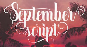 London-based font vendor who started in 2015 or 2016, and carries mostly brush script typefaces. They are mainly pushing their own work.
 Typefaces from 2017: Treasure Script, Hastter Sontial script, Dealina (calligraphic script), Red Mist, Queen, Wishing Well, Highlights, Handy Man, Hey Betty, Polar Bear, Realtech, Golly Gosh, Magic Man, Ardina Script (by Ari Fadli), Rusty Bucket (dry brush), Dolly Script (calligraphic wedding script), Handstyles, Bouncy Hunter (spurred), Django (Western), Olivia Script, Questioned, Renegade, One Dance (calligraphic), Mammoth (script), Honey Bee, September Script (calligraphic), Amanda (calligraphic), Sandy Pro, Lilly Mae. Typefaces from 2018: Squishy, Squishy Extras (sea life dingbats), Billie Harley, Origami, Arkinay, Moscow (a Cyrillic emulation typeface), Bindi, Felt Tip, Christina, Park Ranger, Rembulan, Catchy Script, Champagne (brush and ink splatter), Azalea, Loft Yian (script), Love Candy, Wisdom Script, Montage (signage script), Bristol, Stephanie Jane (brush pen font), Glamorous Silhouette (font duo), Sun City (sans), Crackers, Sliders Script, Jaquilane (upright script), Gladis (formal calligraphic script), Wheatbread (monoline sans), Monstera (a stylish serif typeface), Sailor (tattoo font), Comic Boom (cartoon font), Kely Rose, Radical, Granger (brush font), New Type (prismatic), Sugar Script, Aloha Big Man, Magical Unicorn, Chocolove, Gentle, Roseland, Queensland (copperplate calligraphy), Pink Grapefruit, Jingle Boo, Old Press, Michigan (outline slab serif), Boulder Holder, Angelica (a creamy signage script), Anchor, Freshca (upright connected script), Zimbra (zebra-striped, by Alex Etewut), Adele, AlyshiaScript, BackStitch, BirthdayScript, Brat, BringHearte, CherryBlossom, Eastland, ElhammerBrush, Enyssala, Florva, GloomyDay, HappyBirthday, Heavenfield, Herbie, Junitha, Kayleigh, Mirantie, Mountiane, Nattalia, Quance, QuickBrush, Rafifi, Reebiolla, Rockets, SandyBeaches, Springer, Strangelove, TheCharlotte, Valentino, VictorianMonogram, WinterTime, Zebra. Typefaces from 2019: Radicals (signage script), Lovebird, Ridgeway, Lindale, Moscow, Anthem, Blackstar (blackletter), Maskoolin, Tatima, Hands Down, Monday Blues, September Script, Restuner, Mammoth, Hey Betty, Ciscopic, Hatterline, Jaiho Script, Diamonds, Indah Script, Amanda (calligraphic), Molyna, Mellow Line, Sandy, Renegade, Loveya Script, Angelina Script, Heilig, Dealicha, Allana. Typefaces from 2020: Sleeplesson, Nostalgia Script, Fb Super Fun, Fb Lawnmower, Fb Lovehearts, Fb Leonardo, Fb Fancycorgi, Fb Bananasandwich, Fb Doodled, Fb Mighty Spiky, Quirkle, Toasted Cinnamon, Loveya Doodle, Neon Light (a marquee font), Cliche, Zipper, Fb Mainland, Fb Strawberry, Fb Many Mondays, Fb CountryGirls, Fb Caramelong, Sausages (a chunky script). [Google]
[More] ⦿
|
Fontdation (was: Twicolabs Design)
[Fahrizal Tawakkal]

|
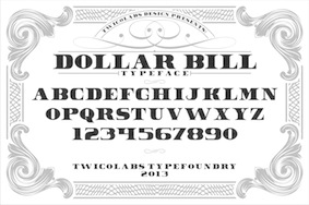 Fahrizal Tawakkal (Twicolabs Design, Malang, Indonesia, b. 1986) markets his fonts via Twicolabs Design and Fontdation.
 In 2013, he created Colin, Dollar Bill, Coleen (Victorian signage face), Nurjan (free sans titling face), Trigger (Victorian typeface), Athenry (heavy block vintage typeface), Sly (Victorian typeface), Gauntlet (spurred typeface), Rooters (a spurred tattoo typeface), Incognito (spurred tattoo font), Incognite (like Incognito), Chuck Noon (a copperplate signage font available from Creative Market), Debute and Black Velvet (a Victorian advertizing typeface, followed by Black Velvet 2 in 2014). Typefaces from 2014: Facile Pro (geometric sans), Deadhead Rough, Armament, Black Velvet, Facile Sans (free), Lifer (spurred, Victorian), Dublin (spurred), Dollar Bill 2, Carlingford (a spurred beer bottle typeface), Akura Popo (copperplate; free), TM Stanley (a spurred beer label font), Deadhead Script (signage script). Typefaces from 2015: Greenore, Armament Stencil, Avondale (handcrafted all caps typeface), Deadhead Classic, Deadhead Brush, Patronia Script. Typefaces from 2016: Westmeath (free art deco style), Kite Script, Armament, Premier Sans, Premier Script. Typefaces from 2017: Haarlem Serif, Haarlem Sans (Dutch deco), Haarlem Deco (Dutch deco), Signatra (signage script), Chuck Noon 2 (copperplate caps). Typefaces from 2018: Lansdowne (vintage all caps, copperplate), Lifer (spurred), Neue Stanley (spurred), Rebute, Pittsbrook Sans (octagonal), Pittsbrook Serif (octagonal, with small wedge serifs), Highwind, Nufced, Jalisco (monoline script), Linoleo Script, Slainte Script (monoline). Typefaces from 2019: TF Handwriting, Tequila Sunrise, Chuck Noon Script (for signage), Tawakkal Sans (for headlines), Obsypac (Victorian), Baisteach, Pioggia (a text typeface with several didone elements such as ball terminals), Ferghaus Sans, Vallely, Cairlinn. Typefaces from 2020: Mullingar (a sharp-edged display typeface), Killarney (a flared display font), Kinsale Display. Typefaces from 2021: Athlone. Fontspace link. Creative Market link, where one can buy the fonts. Hellofont link. [Google]
[MyFonts]
[More] ⦿
|
Fontherapy
|
 Type foundry specializing in display type, with a weakness for textured fonts. Publisher of these typefaces as of 2019: Ampera, Analyst, Antic, Akasia (textured), Alasans, Aloha (rounded sans), Alusans, Amblas, Ambyar, Apache, Arsiran, Asolola, Black Forest, Bound, Bisix, Bitink, Black Boxes, Britania, Brocolli, Bubble, Canthink, Clorofiil, Coblosans, Cooland, Calista, Checker, Comixs, Coobra, Coretz, Cotton Candy, Cumils, Darling, Darling Lovable, Diestya, Direction, Drops, Drought, Dymbrud, Exclude, FastaR, Fillet, Flowrish, Focus, Force, Fragile, Gedung, Gigs (layered, octagonal), Gopoh, GresiX, Gubeng v.1, Gubeng v.2, Gazebo, Gelish, Greysia (floral), Hiking (spurred), Ion Plus, Ink Scribble, Intens, Kaleng, Laron, Lotus, Lucky Line (multiline), Mandalika, Moca, Madrosah, Morse (copperplate style), Mosaic (textured), Nona, Oldiest, Pleaster, Pashion, Pentol, Pieces, Pinky (rounded sans), Plank, Playon, Prabu, Pring, Queens, Quicker, Robeck, Roman, Rubber, Racheto, Reactive, Red Blood, Risole, Rooti, Salmoon, Sealand, Squad, Squash, Squash EffecT, Super FanS, Safira, Serifah, Silo, Starled, Susans, Susteria, Threemore (sketched), Tooth, Trailer, Tuman, Tevos, Tornado, Trobost, Velove, Villa, Wave, WinteR, Wood (textured), Wooden, Xania, Zebra. [Google]
[More] ⦿
|
FontSite
[Sean Cavanaugh]

|
Online font site run by Sean Cavanaugh (b. Cape May, NJ, 1962) out of Camano Island, WA. This used to be called Title Wave Studios. Since 1996, Sean Cavanaugh is the head of FontSite. In the archives, one can/could find essays on writing style, rules of typography, and a comparison by Thomas Phinney (program manager of Latin Fonts at Adobe) of T1 and TTF. The Fontsite 500 CD (30 USD) offers 500 classical fonts with the original names, plus a few names I have not seen before, such as Bergamo (=Bembo by Francesco Griffo), Chantilly (=Gill Sans), Gareth (=Galliard), Noveo sans (=Neuzeit Grotesk), Palladio (=Palatino), Savoy (=Sabon), URWLatino, Unitus, Toxica, Publicity, Plakette, Pericles, Opus (=Optima), Melville, Function, Flanders, Cori Sans, Binner. Uli Stiehl provides proof that many of the fonts at FontSite are rip-offs (identical to) of fonts in Martin Kotulla's (SoftMaker) collection. This is perhaps best explained that Sean Cavanaugh's last real job was director of typography for SoftMaker, Inc., where he oversaw the development and release of SoftMaker's definiType typeface library and associated products [blurb taken from Digital Type Design Guide: The Page Designer's Guide to Working With Type, published in 1995 by Hayden Books]. Free fonts: Bergamo, CartoGothic (1996-2009), CombiNumerals. At MyFonts, the CombiNumerals Pro and CombiSymbols dingbat families are available since 2010. The site has a number of fonts with the acronym FS in the name, so I guess these are relatively original (but I won't swear on it): Allegro FS, Beton FS, Bodoni Display FS (+ Bold, Demibold), Bodoni No 2 FS (+ Ultra, Bodoni Recut FS (+Bold, Demibold), and so forth. His 500 Font CD has these fonts: - Garalde, Venetian: Bergamo, Bergamo Expert, Bergamo SC&OsF, Caslon, Caslon Expert, Gareth, Garamond, Garamond Expert, Garamond SC&OsF, Garamond Condensed, Garamond Modern, URW Palladio, URW Palladio Expert, Savoy, Savoy Expert, Savoy Small Caps&OsF, Vendôme.
- Slab Serif: Clarendon, Glytus, Typewriter, Typewriter Condensed.
- Script: Commercial Script, Deanna Script, Deanna Swash Caps, Hudson, Legend, Mistral, Park Avenue, Phyllis, Phyllis Swash Caps, Vivaldi.
- Uncial: American Uncial, Rosslaire.
- Blackletter: Fette Fraktur, Fette Gotisch, Olde English.
- Borders and symbols: Celtic Borders, Deanna Borders, Deanna Flowers, Picto, Sean's Symbols.
- Transitional: URW Antiqua, Baskerville, Baskerville Expert, New Baskerville.
- Didone, modern: Bodoni, Bodoni Expert, Bodoni Small Caps&OsF, Modern 216, Walbaum.
- Sans serif: Chantilly, Franklin Gothic, Franklin Gothic Condensed, Franklin Gothic Cnd. SC&OsF, Function, Function Small Caps&OsF, Function Condensed, Goudy Sans, Opus, Opus Small Caps&OsF, Syntax, Letter Gothic.
- Decorative: Ad Lib, Algerian, Arnold Boecklin, Binner, Caslon Antique, Chromatic, Copperplate Gothic, Davida, Delphian Open Titling, Function Display, Glaser Stencil, Goudy Handtooled, Handel Gothic, Hobo, Honeymoon, Horndon, Mercedes, Mona Lisa, OCR-A&OCR-B, Plakette, Reflex, Salut, Stop, Toxica, VAG Rounded.
Some more fonts: Alperton, Anaconda, Arizona, Bamboo, Bellhop, Bellows Book, Bernhard Modern FS (2011), Boehland (a revival of Johannes Boehland's Balzac, 1951), Le Havre. MyFonts link. Fontspace link. His art deco fonts, as always without "source" and confusing Victorian, art nouveau, and psychedelica with art deco, include Rimini, Arnold Boecklin, Eldamar, Erbar Deco, Rangpur, Pinocchio, Azucar Gothic, Boyle, Busorama FS, Winona, Abbott Old Style, Almeria (after Richard Isbell's Americana) and Adria Deco, Bernhard Modern FS (2011). FontSpring link. [Google]
[MyFonts]
[More] ⦿
|
François Boltana
|
 French type designer based in Toulouse, b. 1950, d. 1999. He was an early graduate of Scriptorium de Toulouse (1972). In his lifetime, Boltana achieved a great deal of success, including the Morisawa Prize in 1990. From 1975 until 1997 he was also a freelance graphic designer. Brief CV. Read his article in Cahiers GUTenberg, Ligatures&calligraphie assistée par ordinateur (1995). Fontshop link. Frank Adebiaye wrote François Boltana et la naissance de la typographie numérique together with Suzanne Cardinal in 2012.
 His fonts: - Aurore (1993): a calligraphic copperplate script typeface. For a free revival, see Claude Pelletier's Maratre (2013).
- The typewriter font Capitole (1974).
- Champion (1989): a wonderful copperplate calligraphic font inspired by the models of Joseph Champion (1754-1759).
- Frédéric.
- Geneviève (1969, Hollenstein Phototypo).
- Girus.
- Lineameca (1970, Hollenstein Phototypo).
- Messager (1991); in two styles, Romain and Tradition.
- Oscar.
- Prosper.
- Rabelais (1997): for this effort, he obtained the Meilleur Ouvrier de France en 1997 award.
- Toscan.
- Toulouse.
- Stilla (1973): a modern psychedelic high-contrast ornamental didone display typeface with many ball terminals. In 1990, Elsner&Flake published Stilla EF. It is also in the Scangraphic collection as Stilla SH. Linotype too has a version of Stilla. Softmaker's version is called Salmon Pro. Stilla is often incorrectly credited to Middleton.
[Google]
[More] ⦿
|
Francesca Farrisi
|
Francesca Farrisi (Phillipsburg, NJ) created a custom copperplate typeface in 2012. Behance link. [Google]
[More] ⦿
|
Francesca Schioppo
|
Bari, Italy-based graphic designer. In a type design class of Gio Fuga, she created the copperplate typeface Singer (2012). [Google]
[More] ⦿
|
Franciszek Otto

|
 Polish type designer who teaches graphic design at the Secondary Art School in Bydgoszcz. Second prize at the 3rd International Digital Type Design Contest by Linotype Library for the handwriting fonts Linotype Notec (1998) and JP2 (2008, based on the (shaky) handwriting of Pope John Paul II). Brda (2003, Linotype) is a fat display typeface that won an award at Linotype's Fourth International Type Design Contest---it was originally designed for the Powiat weekly. Waza (2008, Linotype) is a copperplate script revived from an etching by Wilhelm Hondius (Hondt), the Dutch court engraver for the Polish king, Ladislaus IV.
 FontShop link. Linotype link. Klingspor link. [Google]
[MyFonts]
[More] ⦿
|
Frederic W. Goudy
[Copperplate Gothic]
|
[More] ⦿
|
Frederic William Goudy

|
 One of the great type designers of the twentieth century, 1865-1947. Born in Bloomington, IL, he made over 125 typefaces. He founded the Village Press with Will H. Ransom at Park Ridge, IL, in 1903. From 1904 until 1906, it was in Hingham, MA, and from 1906-1913 at 225 Fourth Avenue, New York City, where a fire destroyed everything except the matrices on January 10, 1908. From 1913 until 1923, it was located in Forest Hill Gardens, Long Island, and from 1923 until his death in 1947 at Deepdene, in Marlborough-on-Hudson, NY. He was an art consultant for Lanston Monotype from 1920-1940.
 His life's work and his ideas on typography can be found in his great book, Typologia, Studies in Type Design \& Type Making (1940, University of California Press, Berkeley), but his views are already present in Elements of Lettering (1922, The Village Press, Forest Hill Gardens, New York). His own work is summarized, shown and explained in his last book, A Half-Century of Type Design and Typography 1895-1945, Volume One (1946, The Typophiles, New York). See also Frederic Goudy by D.J.R. Bruckner for Harry N. Abrams Publishers, New York. In 1936, Frederic Goudy received a certificate of excellence that was handlettered in blackletter and immediately stated, Anyone who would letterspace blackletter would steal sheep. He also wrote: All the old fellows stole our best ideas, and Someday I'll design a typeface without a K in it, and then let's see the bastards misspell my name. His 116 fonts include - Camelot (1896, Dickinson Type Foundry). He sold another design in 1897 to that foundry, but it was never published. McGrew writes: Camelot or Camelot Oldstyle was the first typeface designed by Frederic W. Goudy. He offered it to Dickinson Type Foundry (part of ATF) in Boston, which accepted it and sent him $10, twice what he had modestly asked for it. This was in 1896; it was apparently cut and released the following year as drawn, without lowercase. In February 1900 a design patent was issued in the names of Goudy and Joseph W. Phinney, and assigned to ATF. Phinney was a well-known designer for Dickinson-ATF, and apparently it was he who added the lowercase alphabet. Its success encouraged Goudy to make a distinguished career of type designing, and this typeface was included in ATF specimen books as late as 1941. Compare Canterbury.
- De Vinne Roman (1898)
- Copperplate (1901): See Copperplate Gothic Hand (2009, Gerd Wiescher), Copperplate URW, or Copperplate EF (Elsner&Flake).
- Pabst Roman (1902)
- Village (1902). Some say 1903. Village was originally designed by Frederic Goudy in 1903 for Kuppenheimer & Company for advertising use, but it was decided it would be too expensive to cast. It was later adopted as the house face for Goudy's and Will Ransom's Village Press. The matrices were cut and the type cast by Wiebking. The design was influenced by William Morris's Golden Type. This Venetian typeface was digitized by David Berlow (1994, FontBureau), by Paul D. Hunt (2005), and by Steve Matteson (2018), who simply called his revival Village. Hunt's version was eventually released in 2016 by P22 as LTC Village. Ivan Louette (Belgium) is working on a fine version of Village as well.
- Bertham (1936), his 100th typeface, named for his wife, Bertha.
- Copperplate Gothic (ATF, 1905): The Bitstream version was done by Clarence Marder.
- Goudy Old Style (ATF, 1914-1915): A 15% heavier weight was made by Morris Fuller Benton in 1919. Bitstream and URW++ sell that as Goudy Catalogue. See also Goudy Catalogue EF (Elsner&Flake), Bitstream's Goudy Old Style, Scangraphic's Goudy Old Style SB (2004), Infinitype's Goudy Old Style, Bitstream's Venetian 522, and Softmaker's G790.
- ATF Cloister Initials (1917-1918). This was revived digitally by several foundries: Alter Littera did Initials ATF Cloister (2012). Group Type created Cloister Initials (2006).
- Goudy Handtooled (1916): A decorative font. Elsner&Flake and Bitstream have a digital version. The Bitstream version used to be called Venetian 523.
- Goudy Modern (Lanston, 1918): Goudy Modern MT is the Agfa-Monotype version. Adobe's version is confusingly called Monotype Goudy Modern.
- Hadriano (1918): Agfa-Monotype has a digital version, as does Adobe.
- Goudy Heavyface (ATF, 1925-1932): Created as a possible competitor of Cooper Black. Bitstream has a digital version.
- Goudy Newstyle (1921): additional letterforms are provided to distinguish different pronunciations. This legible semi-Venetian typeface was cut by Wiebking and recut in 1935. It was sold to Monotype in 1942. Revival by Steve Matteson in 2018 as Newstyle.
- Italian Oldtyle (+Italic) (ca. 1925): made after Dove, Monotype's president, prompted Goudy to make a Venetian typeface to compete with ATF's Cloister Old Style.
- Venezia Italic (1925), to accompany Venezia. George W. Jones of the English Linotype company had it made by Linotype.
- Aries (1925-1926): a kind of blackletter typeface in the style of Subiaco done for Spencer Kellogg for his new private press (he never used it).
- Goudy Dutch: based on handwriting on an envelope from Holland. Goudy lost the drawings.
- Companion Old Style and Italic
- Deepdene (1927). See D690 Roman on the SoftMaker MegaFont XXL CD, 2002. Deepdene became a Berthold font, and at Berthold it was digitized and refreshed by G.G. Lange from 1982-1983. URW also has a Deepdene family. But above all, one could pick up a free two-style revival by Barry Schwartz, Linden Hill (2010, OFL). View various Deepdene implementations.
- Goudy Text (1928). Based on the textura blackletter types of by Johann Gutenberg in the fifteenth century, Goudy Text has a narrow, ordinary lowercase. It can be used in display advertising and on certificates and invitations. Goudy Text is a "blackletter" type first used in 1928 by Goudy in a Christmas card from type cast at his own foundry. Among the digital versions, see LTC Goudy Text (P22 and Lanston; by Paul D. Hunt; this family includes LTC Goudy Text Lombardic Caps) and Goudy Text CT (Jason Castle).
- Kaatskill (1929, Lanston Monotype): a beautiful old style figures font originally done for an edition of Rip van Winkle. Mac McGrew: Kaatskill is a private typeface designed and cut by Frederic W. Goudy for use in an edition of Rip Van Winkle which he made for The Limited Editions Club, in 1929. Goudy says that what he had in mind was merely to design a type "as simple, legible, vigorous, clear, and effective in detail as could, and which would at the same time show no note of strangeness in the mass. ...I feel that Kaatskill owes nothing in its design to any existing face. and the type therefore is as truly an American type as anything so hidebound by tradition as type can be." It is named for the Catskill mountains, which were the locale of Goudy's home and workshop as well as of the story. See Trajan Title.
- Remington Typewriter (1929)
- Kennerley (1930) (see his book A Novel Type Foundery for specimens). The Berthold foundry, where the types can now be bought in digital form, mentions the dates 1911-1924.
- Ornate Titling (1931). See LTC Goudy Ornate (Lanston) and Goudy Ornate (2002, Ascender).
- Kennerley Bold and Bold Italic, and Kennerley Open Caps, to accompany Kennerley Old Style.
- Goudy Heavy Face (+Italic), made to please Harvey Best, the successor of Dove at Lanston Monotype.
- Marlborough (1930s): a typeface whose design was sold in 1942 to Monotype, but nothing came of it.
- Tory Text (1935). A blackletter typeface inspired by the lettre batarde used by Geoffroy Tory in his Champs Fleury.
- University (of California) Old Style (1938). Also called Californian (1938). A commercial version of this is ITC Berkeley Oldstyle by Tony Stan (1983). Font Bureau published FB Californian (1994, Carol Twombly, David Berlow, Jane Patterson).
- Bulmer (1939)
- Goudy Sans: ITC Goudy Sans (1986), LTC Goudy Sans (2006, Colin Kahn), Goudy Elegant (SoftMaker), Moon Cresta (Ray and Chikako Larabie, 2010) and Goudy Sans EF (now gone?) are digital revivals of Goudy's Goudy Sans family from 1929. GoudySorts MT, an Agfa Monotype font consisting of beautiful ornaments.
- Goudy Thirty. Mac McGrew: When Monotype suggested that Goudy design a type that that company might bring out after his death, to be called Goudy Thirty (from the newspaper term for the end of a story), he thought of a design he had started for a western college. That commission had fallen through, so the design was unfinished. Then, as Goudy relates, "This design struck me as particularly adapted to the purpose. As I worked on it I had determined to make it, as far as I was able, my last word in type design, a type in which would give my imagination full rein, and a type by which as a designer would be willing to stand or fall." Completed in 1942, it was kept under cover by Monotype and not released until 1953-long after his death in 1947. But he designed several types after this one, so it was not the last one from his hands. Goudy Thirty is a fine recreation of a fifteenth-century round gothic, excellent for period pieces. For digital versions, see LTC Goudy Thirty (Lanston, now P22 Lanston) and Goudy Thirty (a free font by Dieter Steffmann).
- Nabisco (1921).
- Garamont (1921).
- Goudy Initials. These are floriated caps.
- New Village Text (1938). A hybrid consisting of the capitals of Tory Text and the lower case of Deepdene.
Several foundries specialize in Goudy's types. These include P22/Lanston, which has an almost complete digital collection, Ascender Monotype, and Castle Type, which offers Goudy Trajan (2003), Goudy Text, Goudy Stout and Goudy Lombardy. WTC Goudy was digitized ca. 1986 by WTC. Links: Bio by Nicolas Fabian. Alternate URL. Andrew R. Boone's article on Goudy in Popular Science, 1942. Goudy's typefaces listed by Paulo W. Obituary, May 13, 1947, New York Times, Time Magazine, November 6. 1933, Amy Duncan's thesis at BSU entitled "Howdy Goudy: Frederic W. Goudy and the Private Press in the Midwest", A 2009 lecture on Goudy by Steve Matteson (TypeCon 2009, Atlanta), Melbert B. Cary Jr. collection of Goudyana. Wikipedia: List of typefaces designed by Frederic Goudy. Linotype link. FontShop link. [Google]
[MyFonts]
[More] ⦿
|
Frederic William Goudy
[Goudy's typefaces]
|
[More] ⦿
|
Fresh Pressed Fonts
[Ryan Welch]
|
 Fresh Pressed Fonts is the foundry of Ryan Welch, who graduated from RIT in 2013. Based in New York City, he created the blackboard bold multi-textured font family Octomorf (2013), the free athletic lettering typeface Matchup (2013), Hickory (2013, a copperplate typeface in which all lowrcase characters are of the same size), Corduroy Slab (2013, free), Matchup Light (2013, free), Parliament (2013, spurred typeface), Grip2X (2013) and Brassie (2013, free regular weight).
 In 2014, he published the rounded techno sans typeface Calvaux, Seaside Script, the vintage display typeface Privateer, Sourdough (a creamy script), the wood simulation typeface Fair Trade, the poster typeface Landscaper, and the octagonal typeface Cracker Jack. In 2015, he published the display sans typeface family Animus and the octagonal typeface Mylodon. Typefaces from 2016: Machinist (weathered industrial style), Halberd (semi-blackletter), Rematch (slab serif), Life Is Gouda (cheese-themed vector format font). Typefaces from 2017: Promises, Clout (octagonal and industrial). Behance link. Creative Market link (for buying his fonts). A newer creative Market link. [Google]
[More] ⦿
|
Galapagos Design Group
[Dennis Pasternak]
|
 Foundry headed by Larry Oppenberg (President) and Mark Batty (Director). It was founded in 1994, and is based in Littleton, Massachusetts. Its main designers are Alex Kaczun, Michael Leary, Dennis Pasternak, George Ryan and Steve Zefarana.
 Makers of ITC Fontoon (1995), ITC Fontoonies (1995), ITC Gargoonies (1995), and ITC Backyard Beasties (1995). The web page of this foundry is simply superb. Web-O-Mints dingbats are free [see also here]. Other font families: AquaMintsGD, BackyardBeastiesITC, BaltraGD (lower case for a condensed style of Copperplate Gothic), BigClydeGD, FontoonITC-Regular, Fontoonies2, FontooniesITC, GargooniesITC, KennedyCusGD-Book, KennedyGD, KristenITC-Normal, KristenNotSoITC-Normal, MaiandraGD, MohawcsNoteGD, NikkiNewRomanGD-Normal, SafeFontGD, SpleenyDecafGD, StylusITC, TangientGD, TangientSerifGD, WakefieldGD-Regular. View Dennis Pasternak's typefaces. View typefaces designed by Galapagos. [Google]
[More] ⦿
|
Gearwright
[Yusof Mining]
|
 Yusof Mining (Gearwright) specializes in old American typefaces and letterpress. His typefaces:
 - Shrimpse (2016). A grungy descendant of Cheltenham.
- Steelplate Script (2015): A revival of William Jackson's copperplate style script typeface Steelplate script (1888, Central Type Foundry).
- In 2015, he revived Morris Fuller Benton's Gothic as Newston, and added Newston Inked.
- Similarly, Caston (2015) and Caston Inked (2015) revive Card Litho (1917, Morris Fuller Benton, ATF), itself a modification of Litho Roman (1907, Inland).
- Enigton (2015): a revival monogram typeface based on virkotype combination monograms issued by the American Type Founders in 1920's.
- Standard Issue (2015). An octagonal sans that emulates weathered inky prints. He added Standard Issue Clean a bit later in 2015.
- Arpegio Brush Script (2015).
Creative Market link. [Google]
[More] ⦿
|
Gebr. Klingspor: Schriftkartei
|
 In 1950, Gebr. Klingspor published a nice small booklet simply called Schriftkartei. The images below are from that book. [Google]
[More] ⦿
|
George Bickham

|
 UK engraver and penman, 1684-1769, who wrote the manual The Universal Penman (published in parts from 1733 to 1741, reprinted in its entirety in 1743). The full title is The Universal Penman Or the Art of Writing Made Useful To the Gentleman and Scholar, as well As the Man of Business . . . Written With the friendly Assistance of several of the most Eminent Masters And Engraved by Geo. Bickham. That book also contains work by Bickham's collaborators, such as Joseph Champion, Wellington Clark, Nathaniel Dove, Gabriel Brooks, and William Leckey. Book cover. Other books by Bickham include Penmanship in its utmost Beauty and Extent (Overton & Hoole, London, 1731).
 A free interpretation of the copperplate script styles of The Universal Penman can be seen in the monumental font Penabico (2010, Intellecta Design). Images: From The Universal Penman, Roundhand Script (ca. 1740), Greek Writing (1743). Digital typefaces based on Bickham's scripts include 1739 Bickham (2010) and 1741 Bickham (2013) by Klaus-Peter Schäffel, Bickham Script (1997, Richard Lipton), Bickham Script 3 (2014, Richard Lipton), Penabico (Intellecta Design), and loose interpretations such as Poem Script (Sudtipos). [Google]
[MyFonts]
[More] ⦿
|
George Bruce

|
 Type-founder (b. Edinburgh, Scotland, 1781, d. New York City, 1866). He and his brother David emigrated to the United States, where they started the Bruce Type Foundry in New York City in 1813. David was precoccupied with a new printing process, stereotyping, while George was the type-founder who created many beautiful and refined designs. Together, they invented a useful type-casting machine. In 1865, George Bruce published An abridged specimen of fonts of type. In 1848, they published Specimens of printing types / cast by Geo. Bruce&Co. Samples of typefaces: Bruce Script and Bruce Copperplate Script (1842 and 1858), Bruce Copperplate Script No. 2003 (1857), Bruce Italian Swash Script No. 2007 (1858), Victoria Textura (1865).
 Quoting From Appleton's Cyclopedia of American Biography, edited by James Grant Wilson and John Fiske. 6 vols. New York: D. Appleton and Company, 1887-1889.: Bruce, George, type-founder (proprietor of the Bruce foundry), born in Edinburgh, Scotland, 5 July, 1781: died in New York City, 6 July, 1866. He immigrated to the United States, where his brother David had preceded him in July, 1795, and at first attempted to learn the bookbinder's trade, but, his master being tyrannical and exacting, he left him, and by his brother's persuasion apprenticed himself to Thomas Dobson, printer in Philadelphia. In 1798 the destruction of Dobson's office by fire, and the prevalence of yellow fever, led the brothers to leave the city. George had yellow fever at Amboy, but recovered through his brother's care. The two went to Albany and obtained employment there, but after a few months returned to New York. In 1803 young Bruce was foreman and a contributor to the Daily Advertiser, and in November of that year printer and publisher of the paper for the proprietor. In 1806 the two brothers opened a book printing office at the corner of Pearl street and Coffeehouse slip. The same year they brought out an edition of Lavoisier's Chemistry, doing all the work with their own hands. Their industry and personal attention to business soon brought them abundant employment, and in 1809, removing to Sloat lane, near Hanover square, they had nine presses in operation, and published occasionally on their own account. In 1812 David went to England, and brought back with him the secret of stereotyping. The brothers attempted to introduce the process, but encountered many difficulties, which it required all their ingenuity to surmount. The type of that day was cast with so low a beveled shoulder that it was not suitable for stereotyping, as it interfered with the molding and weakened the plate. They found it necessary, therefore, to cast their own type. They invented a planing-machine for smoothing the backs of the plates and reducing them to a uniform thickness, and the mahogany shifting-blocks to bring the plates to the same height as type. Their first stereotype works were school editions of the New Testament in bourgeois, and the Bible in nonpareil (1814 and 1815). They subsequently stereotyped the earlier issues of the American Bible society, and a series of Latin classics. In 1816 they sold out the printing business, and bought a building in Eldridge street for their foundry. Here, and subsequently in 1818, when they erected the foundry still occupied by their successors in Chambers Street, George gave his attention to the enlargement and development of the type-founding business, while David confined his labors to stereotyping. In 1822 David's health failed, and the partnership was dissolved. George soon relinquished stereotyping, and gave his whole attention to type-founding, and introduced valuable improvements into the business, cutting his own punches, making constantly new and tasteful designs, and graduating the size of the body of the type so as to give it a proper relative proportion to the size of the letter. In connection with his nephew, David Bruce, Jr., he invented the only typecasting machine That has stood the test of experience, and is now in general use. His scripts became famous among printers as early as 1832, and retained their pre-eminence for a generation. The last set of punches he cut was for a great primer script. He was at the time in his seventy-eighth year, but for beauty of design and neatness of finish, the type in question has rarely been excelled. Mr. Bruce was a man of large benevolence, of unflinching integrity, and great decision of character. He was president for many years of the Mechanics' Institute, and of the type-founders' association, and an active member of and contributor to, the historical society, St. Andrew's society, the typographical society, and the general society of mechanics and tradesmen. [Google]
[MyFonts]
[More] ⦿
|
George Bruce
[Bruce Type Foundry]

|
[MyFonts]
[More] ⦿
|
George Shelley

|
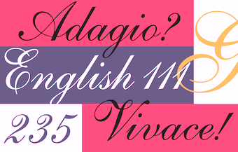 English writing master, 1666 (?)-1736 (?).
 Author/editor of The Penmans Magazine. Author of Natural Writing in all the Hands, with Variety of Ornament (1709) and Alphabets in All the Hands (1715). In 1730, he wrote several pages for Bickham's Universal Penman. English writing masters including George Bickham, George Shelley and George Snell helped to propagate Round Hand's popularity, so that by the mid-18th century the Round Hand style had spread across Europe and crossed the Atlantic to North America. The typefaces Snell Roundhand and Kuenstler Script are based on this style of handwriting. The famous Shelley Script is named after him. Linotype's version, also called Shelley Script, was implemented by Matthew Carter in 1972 at Letraset and was split into Allegro, Andante and Volante styles. The Bitstream "copy" is called English 111. Sample of a copperplate alphabet done in London in 1709. [Google]
[MyFonts]
[More] ⦿
|
Georgi Jivkov
|
Bulgarian type designer who made the copperplate font Mu Online (2012). Aka Bacardi. [Google]
[More] ⦿
|
Gerhard Schwekendiek

|
South African designer of Greyton Script (1991, Letraset), an inline calligraphic (engraved) typeface. At Berthold in 1972, he published Gesh Export 233 (stencil), Gesh Introduction and Gesh Ortega Roman 275. For revivals of Gesh Export, see OPTI Gilpin 5 (by Castcraft) and the free font Stencil Expert (1993, Allen R. Walden). Klingspor link. [Google]
[MyFonts]
[More] ⦿
|
Gert Wiescher
[Autographis]

|
 [MyFonts]
[More] ⦿
|
Gert Wiescher
[Wiescher Design]

|
 [MyFonts]
[More] ⦿
|
Gilang Purnama Jaya
[Spencer & Sons]

|
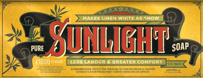 [MyFonts]
[More] ⦿
|
Gilles Le Corre
[GLC --- Gilles Le Corre]

|
 [MyFonts]
[More] ⦿
|
Giuseppe Salerno
[Resistenza]

|
 [MyFonts]
[More] ⦿
|
GLC --- Gilles Le Corre
[Gilles Le Corre]

|
 French painter born in Nantes in 1950, who lives in Talmont St Hilaire. His fonts include 2010 Cancellaresca Recens (inspired by a chancery type of Francisco Lucas from the late 16th century), 2009 Handymade (comic book style), 2009 Lollipop (chancery style), 2009 GLC Plantin, 2009 Primitive (2009, a rough-edged roman script), 2008 Script 2 (2008), GLC Ornaments One (2008) and 2008 Xmas Fantasy (2008: blackletter). In 2008, he started GLC -- Gilles Le Corre and became commercial. Creative Market link. He is best known for his historic revivals:
 - 161 Vergilius (2010)
- 750 Latin Uncial (2010): inspired by the Latin script used in European monasteries from circa 5th to 8th, before the Carolingian style took over. The uppercases were mainly inspired by a 700's manuscript from Fécamp's abbey in France.
- 799 Insular (2010): inspired by the so-called insular style of Latin script that was used in Celtic monasteries from about 600 until 820.
- 825 Karolus (2009), and 825 Lettrines Karolus (2009).
- 1066 Hastings (2009).
- 1350 Primitive Russian (2012) was inspired by a Russian Cyrillic hand of Russkaja Pravda. It has rough-edged Latin charaters and many old Russian glyphs.
- 1420 Gothic Script (2008).
- 1431 Humane Niccoli (2010), after writings of Florence-based calligrapher Niccolo Niccoli (1364-1437).
- 1456 Gutenberg (2008, based on a scan of an old text). Followed by 1456 Gutenberg B42 Pro, which was based on the so called B42 character set used for the two Gutenberg Latin Bibles (42 and 36 lines).
- 1462 Bamberg (2008).
- 1467 Pannartz Latin (2009): inspired by the edition De Civitate Dei (by Sanctus Augustinus) printed in 1467 in Subiaco by Konrad Sweynheym and Arnold Pannartz, who was the punchcutter.
- 1470 Sorbonne (2010) was inspired by the first French cast font, for the Sorbonne University printing shop. The characters were drawn by Jean Heynlin, rector of the university based on examples by Pannartz. It is likely that the cutter was Adolf Rusch.
- 1470 Jenson-SemiBold (2008).
- 1475 BastardeManual (2008, inspired by the type called Bastarde Flamande, a book entitled Histoire Romaine (by Titus Livius), translated in French by Pierre Bersuire ca. 1475, was the main source for drawing the lower case characters).
- 1479 Caxton Initials (2009): inspired by the two blackletter fonts used by the famous William Caxton in Westminster (UK) in the late 1400s.
- 1483 Rotunda Lyon (2010): inspired by a Venetian rotunda found in a 1483 book called Eneide printed in Lyon by Barthélémy Buatier (from Lyon) and Guillaume Le Roy (from Liège, Belgium).
- 1484 Bastarda Loudeac (2008).
- 1470 Jenson Latin (2009), inspired by the pure Jenson set of fonts used in Venice to print De preparatio evangelica in 1470.
- 1491 Cancellarasca Normal and Formata (2009): inspired by the very well known humanist script called Cancellaresca. This variant, Formata, was used by many calligraphers in the late 1400s, especially by Tagliente, whose work was mainly used for this font.
- 1492 Quadrata (2008).
- 1495 Lombardes (2008): a redrawn set of Lombardic types, which were used in Lyon by printers such as Mathias Huss, Martin Havard or Jean Real, from the end of 14OOs to the middle of 1500s.
- 1495 Bastarde Lyon (2008, based on the font used in the "Conte de Griseldis" by Petrarque).
- 1499 Alde Manuce Pro (2010): inspired by the roman font used by Aldus Manutius in Venice (1499) to print Hypnerotomachia Poliphili, the well-known book attributed to Francesco Colonna. Francesco Griffo was the punchcutter. The Italic style, carved by Francesco Colonna, illustrates the so-called Aldine style.
- 1509 Leyden (2008; a Lombardic typeface inspired by the type used in Leyden by Jan Seversz to print Breviores elegantioresque epistolae).
- 1510 Nancy (2008, decorated initial letters was inspired by those used in 1510 in Nancy (France, Lorraine) for printing of Recueil ou croniques des hystoires des royaulmes d'Austrasie ou France orientale[...] by Symphorien Champion; unknown printer).
- 1512 Initials.
- 1514 Paris Verand (based on initial caps that Barthélémy Verand employed for the printing of Triumphus translatez de langage Tuscan en François.
- 1522 Vicentino (2011). Based on Ludovico Vicentino Arrighi's 1522 typeface published in La Operina.
- GLC 1523 Holbein (2010, after Hans Holbein's Alphabet of Death.
- GLC 1525 Durer Initials (2010). Sample R.
- 1529 Champ Fleury Pro and 1529 Champ Fleury Initials (2010): based on Geofroy Tory's original drawings and text face.
- 1532 Bastarde Lyon (2008, based on work by an anonymous printer in Lyon (France) to print the French popular novel Les Grandes et inestimables Chroniques du grand et enorme geant Gargantua).
- 1533 GLC Augereau Pro: inspired by one of Antoine Augereau's three roman typefaces: the Gros Romain size, used in 1533 to print Le miroir de l'&aciorc;me..., a poetic compilation by Marguerite de Navarre, sister of the French king François I.
- 1534 Fraktur (2009; inspired by the early Fraktur style font used circa 1530 by Jacob Otther, printer in Strasbourg (Alsace-France) for German language printed books).
- 1536 Civilité manual (2011). Based on a handwritten copy of Brief story of the second journey in Canada (1535) by French explorer Jacques Cartier.
- 1538 Schwabacher (2008, based on a font used by Georg Rhan in Wittemberg (Germany) to print Des Babsts Hercules [...], a German pamphlet against roman catholicism written by Johannes Kymeus).
- 1540 Mercator Script was inspired by an alphabet of Gerardus Mercator, who is known for his maps as well as his Literarum Latinarum, quas Italicas cursoriasque vocant, scribendarum ratio (1540).
- 1543 Humane Petreius (2012) was inspired by the typeface used in Nuremberg by Johannes Petreius for De Revolutionibus Orbium Coelestium, the well-known mathematical and astronomical essay by Nicolas Copernicus.
- 1543 German Deluxe (2009): a Schwabacher inspired by the sets of fonts used in 1543 by Michael Isengrin, printer in Basel, to print New Kreüterbuch, which is a book with numerous nice pictures, the masterpiece of Leonhart Fuchs, father of the modern botany.
- 1543 HumaneJenson-Bold (2008, after the typeface used in Vesalius' 1543 book De humani corporis fabrica).
- 1543 HumaneJenson-Normal (2008, same source).
- 1545 Faucheur (2011) is a rough garalde typeface that was inspired by the set of fonts used in Paris by Ponce Rosset, aka Faucheur, to print the story of the second travel to Canada by Jacques Cartier, first edition, printed in 1545.
- 1546 Poliphile (2009), inspired by the French edition of Hypnerotomachie de Poliphile ("The Strife of Love in a Dream") attributed to Francesco Colonna, 1467, and printed in 1546 in Paris by Jacques Kerver.
- 1550 Arabesques (2008, caps).
- 1557 Civilité Granjon (2010).
- 1557 Italique (2008, based on Italic type used by Jean de Tournes in Lyon to print La métamorphose d'Ovide figurée).
- 1565 Renaissance (2010), inspired by French renaissance decorated letters.
- 1565 Venetian Normal (2008, initial decorated letters that are entirely original, but were inspired by Italian renaissance engraver Vespasiano Amphiareo's patterns published in Venice ca. 1568).
- 1584 Rinceau (2008, a set of initial letters is an entirely original creation, inspired by French renaissance patterns used by Bordeaux printers circa 1580-1590).
- 1584 Pragmatica Lima (2011). Based on fonts used in 1584 by Antonio Ricardo to produce the first publication ever printed in Southern America.
- 1585 Flowery (2009): inspired by French renaissance decorated letters.
- 1589 Humane Bordeaux (2008, inspired by the Garamond fonts used by S. Millanges (imprimeur ordinaire du Roy) in Bordeaux ca. 1580-1590. The alphabets were used to reprint L'instruction des curés by Jean Gerson).
- 1590 Humane Warszawa is a rough-edged garalde typeface inspired by a font carved circa 1590 for a Polish editor.
- 1592 GLC Garamond (2008, inspired by the pure Garamond set of fonts used by Egenolff and Berner, German printers in Frankfurt, at the end of sixteen century. Considered the best and most complete set at the time. The italic style is Granjon's).
- 1610 Cancellaresca (2008, inspired by the Cancellaresca moderna type of 1610 by Francesco Periccioli who published it in Sienna).
- 1613 Basilius (2012) was based on the hand-drawn types used by Basilius Besler (Germany) for the carved plates of his botanical manual Hortus eystettensis.
- GLC 1619 Expédiée (2015). A grungy Civilté.
- 1621 GLC Pilgrims (2010).
- 1634 René Descartes (2009), based upon his handwriting in a letter to Mersenne.
- 1638 Civilité Manual (2010). Inspired by a French solicitor's document dated 1638.
- GLC 1648 Chancellerie (2011). Inspired by the hand-written 1648 Munster peace treaty signed by roi Louis XIV and Kaiser Ferdinand II.
- 1651 Alchemy (2010): a compilation created from a Garamond set in use in Paris circa 1651.
- GLC 1669 Elzevir (2011) was inspired by the font typefaces used in Amsterdam by Daniel Elzevir to print Tractatus de corde, the study of earth anatomy by Richard Lower, in 1669. The punchcutter was Kristoffel Van Dijk.
- GLC 1672 Isaac Newton (2012) is based on the hand of Isaac Newton.
- GLC Morden Map (2011). Based on an engraved typeface used on a pack of playing cards published by Sir Robert Morden in 1676.
- 1682 Writhed Hand: very irregular handwriting.
- 1689 GLC Garamond Pro (2010): inspired by Garamond fonts used in an edition of Remarques critiques sur les oeuvres d'Horace by DAEP, published in Paris by Deny Thierry and seprately by Claude Barbin.
- 1689 Almanach (2009): inspired by the eroded and tired fonts used by printers from the sixteenth century to the early years of twentieth for cheap or fleeting works, like almanacs, adverts, gazettes or popular novels.
- 1695 Captain Flynt.
- 16th Arabesques (2008, an exquisite ornamental caps scanfont).
- 1715 Jonathan Swift (2011). An example of the hand of Irish poet and novelist Jonathan Swift (1667-1745). It is a typical exemple of the British quill pen handwriting from about 1650-1720.
- GLC 1726 Real Espanola (2012). Based on the set of typefaces used by Francisco Del Hierro to print the first Spanish language Dictionary from the Spanish Royal Academy (Real Academia Española, Dictionario de Autoridades) in 1726. These transitional styles are said to have been the first set of official typefaces in Spain.
- 1741 Financiere (2009): inspired by the Fournier's font Financière. While it appears handwritten, it was in fact carved in 1741 by Pierre Simon Fournier le jeune and published in his Manuel Typographique in Paris (1764-1766).
- 1742 Frenchcivilite (2008).
- 1751 GLC Copperplate (2009), a 6-style family about which Gilles says: This family was inspired by an engraved plate from Diderot&Dalembert's Encyclopedia (1751), illustrating the chapter devoted to letter engraving techniques. The plate bears two engravers names: "Aubin" (may be one of the four St Aubin brothers?) and "Benard" (whose name is present below all plates of the Encyclopedia printed in Geneva). It seems to be a transitional type, but different from Fournier or Grandjean.
- 1756 Dutch (2011).
- 1776 Independence (inspired mainly from the font used by John Dunlap in the night of 1776 July 4th in Philadelphia to print the first 200 sheets of the Congress' Declaration of Independence establishing the United States of America).
- 1781 La Fayette (2010): a formal bâtarde coulée script with caitals inspired by Fournier (1781).
- 1785 GLC Baskerville (2011). Le Corre explains: The Baskerville's full collection was bought by the French editor and author Pierre-Augustin Caron de Beaumarchais who used it to print---in Switzerland---for the first time the complete work of Voltaire (best known as the Kehl edition, by the "Imprimerie de la société littéraire typographique"). We have used this edition, with exemplaries from 1785, to reconstruct this genuine historical two styles.
- 1786 GLC Fournier (2010), based on several books printed in Paris just before the Didot era set in. The Titling characters are based on hymns printed by Nicolas Chapart.
- 1790 Royal Printing (2009): inspired by various variants of Romain du Roy.
- 1791 Constitution (2011).
- 1792 La Marseillaise (2011). Based on the original manuscript of the French revolutionary song La Marseillaise which later became the French national hymn---it was composed in one night (April 25, 1792) by captain Rouget de Lisle.
- 1805 Austerlitz Script Light: a typical French handwriting style from that period, named after one of the few battles that Napoleon actually won.
- 1805 Jaeck Map (2011). Inspired by the engraved characters of a German map, edited in Berlin at the end of 1700s. The engraver was Carl Jaeck or Jaek (1763-1808).
- 1809 Homer (2011), a grungy typeface named after the "homer" message pigeons.
- 1815 Waterloo (2008): a handwriting typeface originating in Napoleon's government. Why do I feel that GLC is nostalgic for the era of Napoleon? Their own present dwarf-version of Napoleon is not exactly a huge success.
- 1820 Modern (2009) was inspired by a didone font used in Rennes by Cousin-Danelle, printers, for a Brittany travel guide.
- 1822 GLC Caslon (2010): inspired by a Caslon set used by an unknown Flemish printer from Bruges, in the beginning of 1800s, a little before the revival of the Caslon style in the 1840s.
- 1845 Mistress (2009): calligraphic script.
- 1848 Barricades Italic, a quill pen italic.
- 1859 Solferino (2009).
- 1863 Gettysburg (2008; inspired by a lot of autographs, notes and drafts, written by President Abraham Lincoln, mainly the Gettysburg address).
- 1864 GLC Monogram Initials (2011) was inspired by a French portfolio containing about two hundred examples of Chiffres---deux lettres, created for engravers and jewelers in Paris in 1864, and drawn by French engraver C. Demengeot.
- 1871 Victor Hugo (2011). Based on manuscripts from the final part of the life of Victor Hugo (1802-1885).
- 1871 Whitman Script (2008) and 1871 Dreamer Script (2008): inspired by manuscripts by American poet Walt Whitman. See also 1871 Dreamer 2 Pro (2012).
- 1880 Kurrentschrift (2010): German handwriting, based on late medieval cursive. It is also known as "Alte Deutsche schrift" ("Old German script"). This was taught in German schools until 1941.
- 1883 Fraktur (2009): inspired by fonts used by J. H. Geiger, printer in Lahr, Germany.
- 1885 Germinal: based on notes and drafts written by Émile Zola (1840-1902).
- GLC 1886 Romantic Initials (2012).
- 1890 Registers Script (2008): inspired by the French "ronde".
- 1890 Notice (2009): a fat didone family.
- 1902 Loïe Fuller (art nouveau face).
- 1906 Fantasio (2010): inspired by the hatched one used for the inner title and many headlines by the popular French satirical magazine Fantasio (1906-1948).
- 1906 French News: a weathered Clarendon-like family based on the fonts used by Le Petit Journal, a French newspaper that ran from 1863 until 1937.
- 1906 Fantasio Auriol (2010), inspired by the set of well known Auriol fonts used by the French popular satirical magazine Fantasio (1906-1948).
- 1906 Titrage (2009): a didone headline typeface from the same newspaper.
- Underwood 1913 (2007, an old typewriter font, whose commercial version is Typewriter 1913), and 1913 Typewriter Carbon (2008).
- 1920 French Script Pro (2010).
- 1920 My Toy Print Set, 1925 My Toy Print Deluxe Pro (2010): inspired by rubbert stamp toy print boxes called Le petoit imprimeur.
- 1968 GLC Graffiti (2009).
- 1917 Stencil (2009; with rough outlines).
- 2010 Dance of Death (2010): based on Hans Holbein's Alphabet of Death.
- 2009 Primitive (2016).
- 2009 GLC Plantin Pro (2016).
- 2010 Pipo Classic: a grungy typewriter slab serif family.
- 2010 Cancellaresca Recens (2016).
- 2011 Slimtype (2011, +Italic) and 2011 Slimtype Sans (2011): an old typewriter typeface.
Creative Market link. Fontspring link. [Google]
[MyFonts]
[More] ⦿
|
Gloow Studio
[Muhammad Iqram]

|
Gloow Studio was founded in 2020 by Muhammad Iqram, who is based in Indonesia. Creator of Gentamas (a formal script that emulates copperplate) (2021), Anton Charlote (a retro signage script) (2021), Anthela (a retro signage script) (2021) and the retro script font Rigular Script (a retro signage script) (2021). Typefaces from 2022: Antafeda (a retro signage script), Shaletta (a creamy upright script). [Google]
[MyFonts]
[More] ⦿
|
Gluk Fonts
[Grzegorz Luksza]

|
 Aka Grzegorz Luk and just Gluk, Grzegorz Luksza is a Polish type designer (b. 1973) who specializes in ultra-decorative and experimental typefaces.
 Creator of the free artsy font Wanta (2008), of Resagnicto (2010), of Rawengulk (2010), of Rawengulk Sans (2011), of Reswysokr (2011), of the bold slab serif typeface Zantroke (2011), and of the free calligraphic typefaces Odstemplik (2009), promocyja (2008) and Konstytucyja (2008). He published the elegant serif family Foglihten (2010), which includes the inline typefaces Foglihten No. 1 (2011), Foglihten Fr02 (2011), Foglihten No. 3 (2011) and Foglihten No. 4 (2012). The latter is inspired by the Polish Constitution of May 3, 1791. Foglihten Petite Caps Black (2012) and Foglihten Black PCS (2012) are high-contrast fat didone typefaces, minus the ball terminals. The series continues with Foglihten No. 6 (2012) and Foglihten No. 7 (2013). Qumpellka No 12 (2011) is a flowing italic. Opattfram01 (2011) is a dingbat typeface with onamental patterns. The Okolaks family (2008) has a bit of an art deco feel. It covers East-European languages as well as Cyrillic. Sportrop (2008) is a neat multiline face. Gputeks (2008) is a delicate decorative face. Szlichta07 (2008) on the other hand is an experimental typeface based on tilting the horizontal edges about ten degrees up. Kawoszeh (2008) is a curly Victorian pre-art nouveau face. Spinwerad (2009) and Itsadzoke S01 (2010) and Itsadzoke S02 are display didones. Znikomit (2011) is an impressive lachrymal hairline slab face. See also Znikomit No. 25 (2012) and Znikomit No. 24 (2012; image by Benjamin Frazzetto). Creations from 2012: Charakterny, Garineldo, Mikodacs (an Impact-like black display sans), Yokawerad (a didone headline face), Resagokr, Nikodecs, Garineldo SC. Typefaces from 2013: Etharnig, Namskin, Namskout (a layered heavy display face), Prida 65 (spurred antique face), Ketosag, Prida 61, Gatometrix, Glametrix, Gallberik. Typefaces from 2014: VECfont FogV4, EtharnigV (a bi-colored font), Risaltyp, Wabroye, Kleymissky, Sortefax (an outline font with engraved versions as on dollar bills), Dragerotypos (blackboard bold), Resamitz. Typefaces from 2015: Prida 36, Sudegnak No. 3 (script), Vecfont Sudegnak (cartoonish), PridaEn (a vector font for color), Prida S4, Prida01, Prida02 Calt. Typefaces from 2016: BroshN, Tofimpelik (+Candy), Prosh3, Digitalt, Agreloy (a lovely curly Victorian typeface), Gluk Mixer (ransom note font), Fogtwo No 5. Typefaces from 2017: Prosh 4B (a variable color font), BroshK2 (an origami style color font, in OpenType SVG format), Fuetargio (a multiline bejeweled typeface). Typefaces from 2018: BroshK, Rostef (all caps titling typeface), Fogthree. Typefaces from 2019: ResotE, ResotE-Pastels (a color font), ResotYc (a decorative unicase font), Resot Yg, Liserif (a kinetic SVG font). Typefaces from 2020: Digico M (a color font), Resotho (a wide all caps geometric sans). Dafont link. Digart link. Fontspace link. Dafont link. Open Font Library link. Scribus Stuff link. Fontspace link. Kernest link. Abstract Fonts link. Behance link. Font Squirrel link. Klingspor link. Creative Market link. [Google]
[MyFonts]
[More] ⦿
|
Godelief Tielens
[Kalligarfie 't Veertje]
|
[More] ⦿
|
Good Craft Supply Co
[Jared Shofner]
|
Art director in Anderson, IN, involved in branding and lettering. As Good Craft Supply, he designed the vintage display sans typeface Copper Etched (2016) and the letterpress emulation typeface Historical Press (2016). Creative Market link. [Google]
[More] ⦿
|
Good Gravy Type
[Conrad Garner]

|
 BFA Graphic Design, Boise State University, ID, 2011. Now located in Tampa, FL, Conrad Garner created of the free heavy copperplate sans typeface Idaho (2012) and the copperplate display typeface family Port City (2017, Font Bros; in Press, Sans and Serif sub-styles).
 In 2018, he designed the signage typeface Koozie Script (+Icons), the condensed grotesque Dabronx, and the squarish all caps sans typeface family Cold Cuts (the latter with Dathen Boardman). Typefaces from 2019: Da Bronx Sans (a 12-style condensed grotesque family by Dathan Boardman and Conrad Garner). Home page of Good Gravy Co (not secure). [Google]
[MyFonts]
[More] ⦿
|
Gothic: Mac McGrew
|
Mac McGrew's discussion on Gothic starts with an important remark: Gothic, the purists say, is Blackletter or what we more often call Old English. But the name is so firmly established in American usage as meaning a plain block letter without serifs or hairlines, that we must accept that meaning. Also, it is part of many type names. But we prefer to go further, and reserve the term gothic for the traditional forms, and sans serif for the modified forms originating in Germany with the Bauhaus movement of the 1920s. Our preferred general term is serifless. In this book, gothics having distinctive family names are listed alphabetically throughout---see Alternate Gothic, Franklin Gothic, Modern Gothic, News Gothic, etc. Those with merely descriptive names are included in this section under the following headings: Numbered Gothics, Condensed Gothics, Inclined or Italic Gothics, and Miscellaneous Gothics. The term "Lining," added to many names when they were realigned to new standards around the turn of the century, has generally been ignored in this book, as it was later dropped in nearly all cases. Nineteenth-century gothics are not included except for a few representative ones or those that have been substantially used subsequently. "Title" gothics---all-cap versions usually occupying almost the entire body---are shown as secondary listings to the cap-and-lowercase versions where both exist. Offset Gothics were cut in reverse for a process of transferring proofs of type to lithographic stones, or more recently to electronic parts. Also see Record Gothic Offset. He the discusses gothic typefaces in detail. - Numbered Gothics. Most such typefaces, except as cross-referenced below, are nineteenth-century designs; a few are shown because they were copied by Monotype or Linotype or otherwise survived for extensive use in this century. For ATF typefaces numbered in the 500s, the initial 5 generally indicates that the typeface has been adjusted to standard alignment from an older typeface with the same number otherwise; that is, Gothic No. 544 was formerly Gothic No. 44 to old standards.
- Gothic No.6, an 1895 Inland face, is important only because Monotype adapted it as a practical and widely used utility typeface before the advent of sans serifs.
- Gothic No. 13 is included under Condensed Gothics.
- Gothic No.1 and 3: see Franklin Gothic (also see below).
- Gothic No. 14. See Chamfer Gothic.
- Gothic No. 16. See Franklin Gothic.
- Gothic Nos. 17 to 20. See Trade Gothic.
- Gothic No. 25, 38, and 520 to 526. See Gothic No. 545.
- Gothic Nos. 29 to 35. See Copperplate Gothic.
- Gothic, Mono 481, 496, 508. See Helvetica.
- Gothic Nos. 39 to 45. See Metrolite.
- Gothic Nos. 544 and 545 are typical plain nineteenth-century gothics, both shown by MacKellar in 1889 or earlier, but both have been copied extensively by other sources, and shown by ATF as late as 1979. Hansen's New York Gothic was equivalent to Gothic No. 545. There was also a comparable but lighter Gothic No. 543, which was not as long lasting. Combination Gothic and Interchangeable Gothic were similar to Gothic No. 545, but as title versions, with several sizes of caps on each of several bodies. Also see Octic Gothic.
- Gothic No. 578 was shown as Gothic No.8 by Inland in 1898 as "the latest candidate for the printer's favor; a popular old typeface entirely recut." It was shown until 1941. It is a bold weight, and is quite similar to Standard Bold which as an import from Germany was very popular in this country in the 1950s. It is also similar to Comstock, but without the added outline. Keystone called it Standard Gothic, although it is not identical to the German face. As a nineteenth-century gothic, the cap G had no crossbar. Paragon Gothic is the same design, without lowercase, cast as a title face.
- The small Laclede Type Foundry in St. Louis originated a pair of attractive gothics which apparently were scrapped when the foundry was taken over by BB&S. Gothic No.1 was similar to Franklin Gothic, and Gothic No.3 was similar to Square Gothic, but both had many small differences, the most noticeable being round dots on i, j, and punctuation marks. Another Gothic No.3 is made by Monotype, Linotype, and Intertype, probably from a nineteenth-century foundry source. It is similar to Gothic No. 544.
- Some other numbered gothics appear under Numbered Faces.
- Condensed Gothics.
- Inland Type Foundry introduced its Gothic Condensed No. 10 in 1904 as "an entirely new face, from which has been eliminated all of the inconsistencies and objectionable features so noticeable in similar series." Its companion Gothic Condensed Title No. 11, introduced in 1905, was shown by ATF as late as 1969; Monotype's New Gothic Condensed and Gothic Condensed Title are very similar; all are still handsome typefaces.
- Another Inland typeface of about the same age, Extra Condensed Gothic No.1, survived almost as long in its all-cap version of Extra Condensed Title Gothic No. 12. BB&S had a very similar face, Gothic Extra Condensed No.6 and Title No.6.
- Gothic No. 13 is a traditional heavy condensed gothic in small sizes; from 24-point up it is basically the same as Modern Gothic Condensed,. Unique Caps were added in 1937.
- Gothic Condensed No. 523 was Keystone's Universal Gothic, introduced about 1906. Gothic No. 47 of BB&S is somewhat similar. Gothic Condensed No. 529 is a nineteenth-century design, and is similar to the later and more refined Alternate Gothic, but it remained in the ATF specimen books at least to 1979; most sources had comparable typefaces. Also see Vertical Gothic.
- Monotype has several utility gothics, including Gothic Caps Condensed. No. 48, designed to occupy roman small cap positions in the standard arrangement; and Gothic Condensed, No. 49, a medium weight conventional sort of gothic. A Monotype specimen sheet, issued in 1917, says of Condensed Gothic, No. 515, "This was formerly our 18-point No. 51. We found that it did not match the balance of the series, so we have given it a new number." See Gothic Condensed No. 529.
- Gothic No.1 Condensed. See Franklin Gothic Extra Condensed.
- Gothic Condensed No. 2. See Gothic Condensed No. 529, also Alternate Gothic No. 3.
- Gothic Condensed No.3. See Headline Gothic, Ludlow.
- Gothic Condensed No. 521. Also see Vertical Gothic.
- Gothic Condensed Outline. See Contour No.6.
- Condensed Gothic Outline. See under Alternate Gothic.
- Gothic Bold Condensed Title. See Railroad Gothic. Medium Gothic No.7. See Mid-Gothic, also Boston Gothic.
- Medium Condensed Gothic, Ludlow, is a refinement of typical nineteenth-century, straight-sided gothics. It has been popular in newspaper work. Deluxe Variants are an additional feature of about 1939, when similar characters were designed for a number of gothics. Compare Mid-Gothic; Modern Gothic Condensed.
- Ludlow also has two typefaces named Gothic Extra Condensed, 6-EC. The newer one, in 24to 84-point sizes, is very similar to Aurora Condensed from Germany, also known as Inserat Grotesk or Enge Wotan, with extremely short ascenders and descenders and lengthened white areas in the angular letters. The older Ludlow face, made only in 144-point, is similar to Extra Condensed Title Gothic No. 12, and has no lowercase. In this size, letters are cast individually on Ludlow, the long way of the slug, and used primarily for newspaper headlines.
- Inclined or Italic Gothics.
- Gothic Italic No. 512, ATF, was advertised by Marder, Luse in 1893 or earlier as Gothic Italic No.3. BB&S had matching GothicItalic, formerly Degree Gothic No. 1.
- The BB&S Gothic Italic Light was formerly Degree Gothic No.2. Several foundries had comparable typefaces; Inland called its comparable Gothic Italic "original."
- Gothic Inclined, BB&S, was shown at least as early as 1889 as Inclined Lining Gothic, later known as Inclined Gothic No. 120. Inland advertised the same typeface as Title Slope Gothic, "improved." ATF and Monotype had a similar Inclined Gothic, and other founders had comparable typefaces.
- Gothic Inclined Light of BB&S was formerly Slope Gothic No. 50 from 1879.
- Bold Inclined Gothic. See Modern Gothic Italic.
- Also see Doric Italic, Draftsman Gothic, Boston Gothic.
- Miscellaneous Gothics.
- Monotype has several typefaces designated simply "Lining Gothic." Those not cross-referenced were undoubtedly copied or adapted from undetermined foundry typefaces. Lining Gothic No. 106 is very light, similar to Lightline Gothic but less refined; it has caps and lowercase. No. 112 is a little heavier, with caps and small caps only in each size. No. 176---see Mid-Gothic. No. 66 and 349---see Gothic No. 545. No. 350 is similar to No. 112 but has four sizes of caps in each of 6and 12-point, in the manner of Copperplate Gothic.
- Gothic Modern. See Modern Gothic series.
- BB&S's Gothic Novelty Title was formerly Tasso, 1890 or earlier. Other founders had the same design as Gothic, ATF; Gotham, Farmer Little; Gothic No. 205, Bruce; Ancient Gothic. Dickinson.
- Gothic Novelty, the same typeface with lowercase, was formerly Tasso No.2.
- Gothic Novelty Condensed was formerly Archer, about the same age but unlike the other typefaces in this group.
- Hansen's Extended Lining Gothic was a copy of Philadelphia Lining Gothic.
- Gothic Shade became Jim Crow.
- Gothic Double Shade became Marble Heart (q.v.).
- Gothic Outline Title No. 61, formerly Outline Gothic No. 61, dates to 1890 or earlier, but was still shown by ATF in 1979. Compare Contour Nos. 1 and 6, Franklin Gothic Condensed Outline, Whedons Gothic Outline.
[Google]
[More] ⦿
|
Goudy's typefaces
[Frederic William Goudy]
|
 List of Goudy's typefaces, with dates, compiled by Paulo W.
 - 1896 Camelot.
- 1897 Unnamed, A Display Roman.
- 1898 DeVinne Roman.
- 1902 Pabst Roman.
- 1903 Pabst Italic, Powell, Village.
- 1904 Cushing Italic, Boston News Letter, Engravers Roman.
- 1905 Copperplate Gothics, Caxton Initials, Globe Gothic Bold, Caslon Revised.
- 1908 Monotype No. 38-e, Monotype No. 38-e Italic.
- 1910 Norman Capitals.
- 1911 Kennerley Old Style, Kennerley Open Caps, Forum Title.
- 1912 Sherman, Goudy Lanston.
- 1914 Goudy Roman.
- 1915 Klaxon, Goudy Old Style, Goudy Old Style Italic.
- 1916 Goudy Cursive, Booklet Old Style, National Old Style (often used in silent movies), Goudy Type.
- 1917 Advertisers Roman, An Unnamed Design.
- 1918 Kennerly Italic, Cloister Initials, Hadriano Title, Goudy Open, Goudy Modern.
- 1919 Collier Old Style, Goudy Modern Italic, Goudy Open Italic, Goudy Antique.
- 1921 Nabisco, Lining Gothic, Garamont, Garamont Italic, Goudy Newstyle. Mac McGrew: National Oldstyle was designed by Frederic W. Goudy for ATF in 1916. It is based on lettering he had done about fifteen years earlier for National Biscuit Company, hence the name. It was moderately popular for a while for publication and advertising display work, and for titles for silent motion pictures. Compare Nabisco.
- 1924 Goudy Italic, Italian Old Style, Italian Old Style Italic, Kennerly Bold, Kennerley Bold Italic.
- 1925 Goudy Heavy Face, Goudy Heavy Face Italic, Marlborough, Venezia Italic.
- 1926 Aries [image by Nikolas Matses].
- 1927 Goudy Dutch, Companion Old Style, Companion Old Style Italic, Deepdene, Record Title, Goudy Uncials.
- 1928 Deepdene Italic, Goudy Text.
- 1929 Strathmore Title, Lombardic Capitals, Sans Serif Heavy, Kaatskill, Remington Typewritter.
- 1930 Inscription Greek, Trajan Title, Sans Serif Light, Mediaeval, Hadriano Lower-case, Advertisers Modern, Goudy Stout, Truesdell.
- 1931 Truesdell Italic, Deepdene Open Text, Deepdene Text, Ornate Title, Sans Serif Light Italic, Deepdene Medium.
- 1932 Goethe, Franciscan, Deepdene Bold, Mostert, Village No. 2, Quinan Old Style, Goudy Bold Face, Goudy Book.
- 1933 Goudy Hudson, Goethe Italic, Deepdene Bold Italic.
- 1934 Saks Goudy, Saks Goudy Italic, Saks Goudy Bold, Hadriano Stone Cut, Village Italic, Hasbrouck.
- 1935 Tory Text, Atlantis, Millvale.
- 1936 Bertham, Pax, Mercury, Sketches Unnamed, Sketches Unnamed.
- 1937 Friar.
- 1938 University of California O.S., University of California Italic, New Village Text, Murchison.
- 1939 Bulmer.
- 1941 Scripps College Old Style.
- 1942 Goudy Thirty.
- 1943 Spencer Old Style, Spencer Old Style Italic.
- 1944 Hebrew, Scripps College Italic, Marlborough Text.
[Google]
[More] ⦿
|
Graphic Out
[Bilal Ahmed]
|
 Lahore, Pakistan and/or London, UK-based designer of Contour (a titling sans), Chubby (2019), the free display sans Linicircle (2017), the free rounded sans typeface Roudge or Wasey E (2019), the modular typeface Bract (2019), the copperplate serif Billag (2019), the color font Taster (2019), Zonta (2019), the techno or architectural lettering font Italichno (2018), the geometric shape fonts Shape (2019) and Shape Out (2019), and the semi-stencil typeface CoolCut (2019). Behance link for Graphic Out. [Google]
[More] ⦿
|
Great Studio
[Mulkan Nazir]

|
 Aceh, Indonesia-based designer (b. 1992) of these calligraphic script typefaces in 2017: Bronetto, Restful, Burnington Script, Symphony Script, Blessing Script.
 In 2018, Great Studio designed Greenlight Script, Sagitarius Signature Font, Blinkstar, Bondan Regular (condensed sans), Angel Heart, Authemart (calligraphic), Kasandra Script, Molandika Script, Solidaritha Script, Saphira Script, Blussafir (script), Bestrong, Elise Dafisa Script, Staylisha (brush script), and Kingstoner Signature. In 2019, he published Central Point, Riverstyle (a dry brush font), Winter Flowers, Anitasha, Restgold, American Favorite Script (Script+Serif), Espander (a dry brush typeface), Sundaris Script, Black Seashore (a retro signage script), the great copperplate calligraphic typeface Bettrisia Script, Hello Blushberry Script, and Kingstoner Font. Typefaces from 2020: Le More Collection (a font duo), Kalista (a font duo), Blinkstar (calligraphic), Boston Angel (a decorative serif), Magister Script (a brush script), South Belgian (a soft vintage serif fnt), Solistaria Script (a hybrid copperplate calligraphic font). Typefaces from 2021: Blacklist (a sharp-edged text family with 18 static and two variable styles), Bread Light (stylish caps), Contage (a 12-style display sans serif), Kelsy Fantastic, Bigola Display (a display serif), Mollie Glaston (a decorative ligature-rich serif), Colgent (a decorative serif). Creative Fabrica link. Typefaces from 2022: Veronika Luxurious (a fashion mag sans). [Google]
[MyFonts]
[More] ⦿
|
Grzegorz Luksza
[Gluk Fonts]

|
 [MyFonts]
[More] ⦿
|
Guguh Gumantoro
[Letter Stock (was: Gumacreative)]

|
 [MyFonts]
[More] ⦿
|
Guillermo Vizzari
[Yaniguille]

|
 [MyFonts]
[More] ⦿
|
Gunnlaugur S.E. Briem
[The Icelandic Method]
|
[More] ⦿
|
Hallmark

|
 The Hallmark Cards company was founded by J.C. Hall. Fonts with the letters HMK in their names are produced by Hallmark, the well-known postcard company in Kansas City, MO. These include early fonts such as Hog-Bold---HMK, Hog-Book---HMK, Jot-Medium---HMK, Marita-Medium---HMK, Marita-Script---HMK, Trots-Light---HMK, Trots-Medium---HMK and later (1997-1999) fonts such as BaaBookHmk, BernhardFashionHmk, BethsCuteHmk, BixAntiqueScriptHmk, BoogieWoogieHmk, ChrisHmk, CluffHmk, DesertDogHmk, FrancineHmk, FultoonHmk (by Nancy Fulton), GeeohHmk, HavixHmk (by Doug Havach), JanieHmk, Jewels, LamboHmk, McBooHmk (by Megan Walsh), NotnorvalHmk, OkrienHmk, OttumHmk (1997, downloadable here, PegsannaHMK (by Peg CarlsonHoffman), SandyTextHmk, SlashHmk, SplintHmk, StarbabeHmk (by Lisa Rogers), SuccotashHmk, SuccotashHmkBlack, TwizotHmk (by Bud Braman and John Dawbarn), WallowHmk.
 In 2008, careful hackers found these fonts in the flash files of Hallmark and posted them on alt.binaries.fonts: AngelinaHMK, AnnouncementRomanHMK, CoronaSansHMK, CrownRomanHMK, DuneHMK (2008), InkberryCondensedBoldHMK, KarasHMK, KingsHatBoldHMK, MizquitoHMK, PatriciaHMK, PoobyrdHMK, ZincHMK-Regular. One hacker points out that AnnouncementRomanHMK is a rework of Castcraft's AnnouncementRoman, adding the Euro, so Hallmark seems to have its hands in the cookie jar, unless there is an intestinal link to Castcraft (but I am not aware of any). In 2010, some people extracted fonts from Hallmark e-cards with these names: BetaCrownRomanBFA, BetaMars, BluesOnePKA, DoverA1, EdPS-Script, EvereadyOnePKA, GriegoOnePKA, InkberryCondensedBoldA1, KingsHatSansTextBoldPKA-Regular, KingsHatSansTextBoldPKA, KreamyPKA, Minion-HMK, PSOneBoldPKA, PahtooieOneSolidPKA, PahtooieTwoSolidPKA, PeanutsA1-Regular, QubitTwoBoldPKA, SlashKA, StoryBookPKA. In 2010, Ascender started selling the Hallmark fonts. The first set includes Bix Antique Script HMK, Cluff HMK, Forget Me Not HMK, Fultoon HMK, Geeoh HMK, Hasty HMK, Havix HMK, Jewels HMK, Kat Tail HMK, McBoo HMK, Okrien HMK, Ottum HMK, Starbabe HMK, Succotash HMK and Wallow HMK. The second set, published in 2011, has BoogieWoogie HMK, Calcium HMK (2010, skeletal font), Gweet HMK, Karrot HMK, Pan HMK, Slash HMK, Splint HMK, Tuf Medium HMK (2011), Twizot HMK (1999). But then Ascender was gobbled up by Monotype, so who knows what will happen? In 2012, we find a file with 107 free fonts on the Hallmark site as a support file for Hallmark Card Studio 2012. That collection: AliceFrancesHmk, BaaBookHmk, BaaBookHmkBold, BernhardFasD, BernhardFashionHmk, BernhardMordern, BethsCuteHmk, BethsCuteHmkBold, BixAntiqueScriptHmk (2009, a copperplate script), BixAntiqueScriptHmkBold, BoogieWoogieHmk, BoogieWoogieHmkBold, CallieHmk, CandyBuzzBTN, CandyBuzzBTNBold, CapriHMK, CarmineTango, CaslonAntT, CaslonNo540SwaD-Ital, ChrisHmk, ChrisHmkBold, CluffHmk, CluffHmkBold, CopperplateT-Bold, CopperplateT-Ligh, CopperplateT-Medi, DesertDogHmk (2008), DomCasualBT-Regular, DomCasualD-Regu, ForgetMeNotHMK, FrancineHmk, FrancineHmkBold, FultoonHmk (2010, a great painter's script), FuturaBT-Medium, Garamond, GaramondBold, GaramondBoldItalic, GaramondItalic, GeeohHmk (2009), GeeohHmkBold, GilliesGotD-Ligh, GrilledCheeseBTNCn, GweetHmk, GweetHmkBold, HankBT-Roman, HastyHMK (2006), HavixHmk (1998, calligraphic), HavixHmkBold, Humanist531BT-RomanA, JanieHmk (2008), JanieHmkBold, JewelsHmk (2008), KatTailBoldHMK, KatTailHMK (2009), LamboHmk, LamboHmkBold, LiorahBT-Regular, MaritaTextBookHMK, MaritaTextMediumHMK, McBooHmk (2009), MelanieBT-Roman, MissyBT-Roman, NimbusRomD-Regu, NimbusRomdBold, NimbusRomdItalic, NimbusSanT-Regu, NimbusSanT-ReguCond, NimbusSanTConBold, NokieBrushBoldHMK, NokieBrushHMK (2009), NotnorvalHmk, NotnorvalHmkBold, OkrienHmk (1999, camp site script), OkrienHmkBold, OttumHmk (2010, formal connected script), OttumHmkBold, PamHMK (2009), ParkAveD, PegsannaHMK, RegisterSansBTN, RegisterSansBTNBold, RyanBT-Heavy, SandyTextHmk (1997, formal script), SandyTextHmkBold, Shannon-Book, ShannonExtraBold, SlashHmk, SlashHmkBold, SplintHmk (2008), SplintHmkBold, StarbabeHmk (2009), StarbabeHmkBold, SuccotashHmk (1999, technical memo script), SuccotashHmkBlack, SuccotashHmkBold, Symphony, SymphonyBlack, TwizotHmk (1999), URWAlcuinT-Regu, URWImperialT-Regu, WackyActionBTN, WackyActionBTNBold, WallowHmk (1999), WallowHmkBold, WritetyperHmk, YearbookSolid. Hallmark's SMC animations font download site has the free fonts Hmk Handjive, Handshake, Handlebar, Handstand, Handspring, Handsome, all made in 2010. Additional fonts not mentioned above include Butch HMK (2008), Amberger Sans One, Angelina, Announcement Roman HMK, Constanze Mono One Med, Corona Sans, Crocka Doodle One, Crown Roman (regular, italic), Drummer Man, Dune, Inkberry Cond Bold, Karas, Kings Hat (bold, italic), Mizdemeanor One, Mizfit, Mizquito, Patricia Medium, Poobyrd, Zinc. As of the early 2010's, Hallmark had two full-time font designers in its department, Terry Lee and Josh Scruggs, and could still count on Myron McVay, who officially retired from Hallmark a few years ago and died in 2013. The type department was headed by Rick Cusick. More recently, Hallmark started to work exclusively on proprietary font designs, including fonts for various Hallmark subsidiaries. By 2016, Rick Cusick and Terry Lee also retired, leaving Hallmark with just two full-time designers: Josh Scruggs and Lila Symons. To read about type design at Hallmark, consult What Our Lettering Needs The Contribution of Hermann Zapf to Calligraphy & Type Design at Hallmark Cards by Rick Cusick. [Google]
[MyFonts]
[More] ⦿
|
HamburgerFonts Type Foundry
[Stuart Brown]

|
 Type foundry in London, est. 2004 by Stuart Brown (b. 1976) from Halifax, Yorkshire, England. He works for Dalton Maag. He also did some work for The Australian Type Foundry. His typefaces include:
 - In 2017, Stuart Brown and the Dalton Maag team developed the new in-house typeface for the BBC, BBC Reith.
- Baksheesh (2005, HamburgerFonts).
- Bressay. In 2016, he led the design and did the engineering for Bressay (design by Tom Foley, Selma Losch, and Spike Spondike, at Dalton Maag, London), which won an award at TDC 2016.
- Brown Sans (2009). Humanist sans.
- Intel Clear Cyrillic. Dalton Maag (Tom Foley, Mary Faber, Stuart Brown and Hanna Donker) won a Granshan 2014 award for Intel Clear Cyrillic.
- Neutraliser Alternate (HamburgerFonts).
- Neutraliser Caps (HamburgerFonts). Almost copperplate.
- Neutraliser Sans (2004, HamburgerFonts). A 24-style geometric family.
- Neutraliser Serif (HamburgerFonts).
- Tooting Sans (2009, HamburgerFonts).
MyFonts link. HypeForType link. [Google]
[MyFonts]
[More] ⦿
|
Handwriting Models
[Benedikt Gröndal]
|
Handwriting Models An Icelandic Manual, 1883 [fre download] was written by Benedikt Gröndal (1826-1907), an Icelandic poet, painter, draftsman, calligrapher and library historian. After a master's degree in Scandinavian Studies from the University of Copenhagen in 1863, he taught, wrote, and published a periodical, Gefn. In 2007, a foreword and useful introduction to handwriting models was added by Gunnlaugur Briem, and he placed all on his web site for free download. I quote: In 1875, Denmark changed handwriting models, replacing blackletter cursive by copperplate. This extended to its Icelandic dominion, where copybooks and model sheets in the new style were in short supply. Eight years later, a much needed handwriting manual by Benedikt Gröndal was published. The old style and the new are similar in appearance but have different letterforms. This picture shows the old blackletter cursive (top) and the new copperplate (bottom)---it was taken from Almanak Hins íslenzka þjóðvinafélags, Copenhagen (1877). Gröndal's copperplate and Gröndal's ronde. The foreword by Briem also shows a Danish ronde that appeared in Rundskrifts-Bogen; til Skolebrug og Hjemmeøvelse, ca. 1880. He also grabs the opportunity to showcase the most handsome of all Icelandic copperplate models done by Jón Þórarinsson in Skrifbók með forskriftum, 1. hefti (Reykjavík, ca. 1896). The American Palmer method, more open but less gracious, is illustrated in this alphabet from 1922 by Steingrímur Arason (from Litla skrifbókin, Reykjavík. Variants of this are shown in the alphabets of Guðmundur I. Guðjónsson, published between 1939 and 1953. Briem concludes: Handwriting based on copperplate was largely abandoned in Icelandic schools in 1984. It was replaced by italic, a modern monoline version of renaissance handwriting that owes much to Ludovico Arrighi's approach. A large selection of model sheets in this style is available for free download from the internet. He also shows Italiuskrift05, his own suggestion for schools. [Google]
[More] ⦿
|
Hanken Studio
[Alfredo Marco Pradil]

|
 Graduate of the College of Architecture and Fine Arts, Batangas State University, The Philippines, who has been working as a graphic designer since 2005. He is currently located in Dubai, UAE and is a prolific type designer. His typefaces:
 - Neue Einstellung (2021). A nine style geometric sans that exudes rigidity and mechanical precision.
- Ouido (2021). A condensed old style serif family with twelve cuts.
- Pianono (2021). A curly typeface named after a Filipino dessert.
- Nuova Volte (2021). A carefully designed sans family.
- Compound Sans (2021). In 45 styles, plus a variable font.
- Trinkle Sans (2020).
- HK Requisite (a 9-style low contrast sans) (2020).
- Terminal Guise (2020). An 8-style monolinear geometric sans with open counters (except on the lower case o).
- Luckybones (2020).
- Action Sans (2020). A free almost monolinear sans.
- Open Sauce Sans, Open Sauce One and Open Sauce Two (2020). He writes about these three large free sans families: Open Sauce is a font superfamily that I developed for Creative Sauce's internal type system. It is a compact typeface that is optimised for better viewing small text on screen and print. Open Sauce (Sans, One and Two) is under the SIL Open Font License and is going to be actively developed, improved and tested. One small modification is Cristiano Sobral's Criativa Sans (2020).
- Yelena (2020). A brush script.
- Keiner (2020). A rigid monolinear sans typeface family.
- Cosmic Octo (2020). A blocky display/poster typeface for an experimental ice cream recipe venture.
- Snah (2020). A playful free all caps typeface.
- Belina Script (2020).
- Itzkarl (2020). An all caps typeface with flared terminals.
- Anahaw (2020). A foliate typeface modeled after palm leaves.
- Batangas (2020). Free.
- Lumi Sans (2019).
- Device (2019). A sans that supports orange-dyed fascists, oil industry buffoons and climate change deniers.
- Stenzel (2019). a stencil typeface.
- Nourd (2019).
- Suprapower SE (a display sans) (2019). Heavy and wide, for posters, packaging, headline and titles.
- Sauce Grotesk (2019). Sauce Grotesk is a sans serif typeface that James Birch and Alfredo Marco Pradil developed for Creative Sauce's internal type system.
- TEG (2019).
- Enreal (2019).
- Arca Sentora (2019). A geometric sans.
- Serif 420 (2019).
- Guise (2019). A Swiss style sans family.
- Grantipo (2019), A sans family inspired by Cerebri Sans, Helvetica and Akzidenz Grotesk. .
- HK Sentiments (2018). A neutral / geometric sans.
- Natrix Sans (2018). A free grotesque family without italics.
- Reminisce (2018). A Peignotian sans typeface family.
- Aeon Hexa (2018). Alfredo explains that he tried to amalgamate the features of Helvetica and Cerebri Sans.
- Acari Sans (2018). A free typeface by Alfredo Marco Pradil (Latin part) and Stefan Peev (Cyrillic portion). Based on HK Grotesk (2015).
- HK Kontrast (2018). An angular wedge serif typeface.
- HK Yavimayan (2018). A text typeface with flaring.
- HK Focus (2017).
- HK Gothic (2017). Twelve styles.
- HK Compression (2017). A bold compressed all caps sans.
- HK Carta (2017). A text typeface with didone elements.
- HK Spec (2017).
- HK Zercon (2017). A free sans.
- HK Concentrate (2017). A sans typeface family.
- Arlene (2017). A didone typeface family.
- Barter Exchange (2017).
- HK Blocker (2017), a heavy rounded sans.
- Zwizz (2017). A Swiss typeface family.
- Cerebri Sans (2017). Free download.
- HK Nova (2017). A geometric sans family inspired by Century Gothic and Futura. The Medium weight is tweetware. See also HK Nova Narrow and HK Nova Rounded.
- Illuma (2017). A free headline sans typeface.
- Number 23 (2017). A text typeface family.
- HK Caslon (2017).
- Polarity (2017).
- Placid Amor (2016). Copperplate style.
- Ludema (2016). An informal sans typeface, made by Joao Symington..
- Alienware (2016). A custom typeface for Dell's Alienware computers.
- Extremis Compakt (2016). A custom typeface for Extremis.
- Number 23 (2016). A Caslon-style text family.
- El Enra Rounded (2016). A condensed headline sans.
- Faldore (2015-2016). A simple sans typeface family.
- Hans Grotesque (2016). A sans designed for long texts.
- Decalotype (2016). A free sans typeface.
- HK Compakt (2016). Inspired by Akzindenz Grotesk.
- HK Serif (2016).
- Jellee (2016). A very soft heavy rounded sans typeface. Download.
- El Enra (2016). A free bold condensed sans.
- Type 36 (2016). A clean geometric sans.
- Arco Perpetuo (2016). A free subtly rounded sans family.
- Industri (2016). A tweetware sans.
- Okomito (2016). A sans with large open counters. Okomito Medium is free. Okomito Next was released in 2020.
- Comprehension Semibold (2016).
- Radnika (2016). Announced as a workhorse sans. Followed in 2017 by Neue Radnika Schriftart, or Radnika Next.
- Hanken Sans (2016).
- ADA Hybrid Display (2016).
- The free geometric sans typeface Orkney (2016, with Samuel Oakes).
- Caslon OS (2015, Open Font Library).
- The basic sans typefaces Now (2015, Open Font Library: geometric), Now Alt (2015), Einstellung Schrift (2015, geometric sans), Neue Einstellung (2015), Elenar (2015; and the free Elenar Love), Amicale (2015), HK Explorer (2015), HK Explorer Soft (2015), HK Explorer Sharp (2015), HK Grotesk (2015: free; extended to HK Grotesk Pro in 2016, and HK Grotesk Light in 2017, HK Grotesk Wide in 2020, and Uacari Legacy by Cristobal Sobral in 2020), Industri (2015, caps only headline face), Monoist (2015, monospaced), Glacial Indifference (2015, Bauhaus-inspired), Malakas (2015), Genome (2015) and Gen Light (2014, OFL).
- Arca Majora (2014) and Arca Majora 2 (2016). A free heavy geometric sans face.
- SAG Block (2014).
- Ahamono and Ahamono Monospaced (2012-2015). Originally, this was a free rounded monospace typeface with typewriter features.
- Neue Hans (2014), Hanken Round (2014, a free rounded sans), Neutrage (2014, a neutral signage sans).
- Hard Edge (2014). An octagonal typeface.
- Teknik (2014). A technical sans typeface.
- Bullet (2014).
- The grotesk typefaces Primary Hans (2014) and Hans Kendrick (2014) and Neue Hans Kendrick (2016). Both have elements of Avenir and Futura, and are characterized by a relatively small x-height. Followed by the art deco sans-inspired Neo Hans in 2019.
OFL link. Hellofont link (for purchasing his fonts). Behance link. Facebook link. He operates as Hanken Studio. [Google]
[MyFonts]
[More] ⦿
|
Hannes von Döhren
[HVD Fonts]

|
 [MyFonts]
[More] ⦿
|
Hans Bohn

|
 German type designer, b. Oberlahnstein, 1891, d. Frankfurt am Main, 1980. He worked mostly for Ludwig&Mayer. Creator of these typefaces:
 Klingspor link. FontShop link. View Hans Bohn's typefaces. [Google]
[MyFonts]
[More] ⦿
|
Harald Brödel

|
 Type designer associated with VEB Typoart in the phototypesetting era. His creations at Typoart include Fleischmann (a serif based on Fleischmann's historical face. An original cursive by Harald Brödel was added to the Typoart collection), Molli (a comic book face), Nidor (a slab serif), and Hogarth Script (a formal copperplate script).
 Digital versions of Hogarth Script include Gillray Pro (2015, Ralp M. Unger), OPTI Historic Script (by Castcraft), Hogarth Script EF, Hogarth Script URW, Hobson (Softmaker), Hogarth Script (2005, a Cyrillic extension by Alexandra Gophmann), and Hogarth Script (Linotype). MyFonts link. [Google]
[MyFonts]
[More] ⦿
|
Hattori Supply Co (was: Corgi Astronaut)
[Sergio Haruo]
|
 Jundiai, Sao Paulo-based designer of Joliet Serif (2017), Millenia (2017), Filena (2017, a sans family), Boxing (2017, a mini-spurred slab serif), Gotcha (2017), Sprout (2017, thin condensed sans), Clutch (2017), Longway (2017, copperplate style), Destrukt (2017), Bridal (2017, a condensed family with some free weights), Alyssum (sans), Space Cowboy (2017), Cookit (2017, a free wood emulation font), Glubby (2017, a plump typeface), Rearden Steel (2017), the fat rounded typeface Hit And Run (2017), and the free all caps sans typeface Thruster (2017).
 Typefaces from 2018: Palash. Typefaces from 2019: Okana (a 16-style condensed sans), Lucita (rounded sans), Camilie (thin sans). Typefaces from 2020: Perugia (a decorative didone). [Google]
[More] ⦿
|
Hendry Juanda
[Letterhend Studio (or: Magang Letterhend)]

|
 [MyFonts]
[More] ⦿
|
Henry Dean
|
American calligrapher, 1788-1849. He wrote Dean's Analytical Guide. Containing A Variety of Plates in which are exhibited A Complete System of Practical Penmanship (1805, second edition 1808), a calligraphic primer containing many alphabets. In 2007, Jane Rodgers Siegel writes in APHA, vol. 163: The 1805 first edition of Henry Dean's Analytical Guide is the first ambitious American handwriting manual, a handsome quarto of 56 pages and 18 engraved plates. It may be of interest that Dean, as Nash tells us, not only was a writing master, teacher, and bookkeeper (writing and arithmetic, the two skills needed for com- merce, went hand in hand for centuries), but also had run a copperplate printing business in Salem, Mass. [Google]
[More] ⦿
|
Hermann Ihlenburg

|
 German-American type designer (b. 1843, Berlin) who apprenticed at the Trowitzsch & Son type foundry in Berlin, and then worked as a punchcutter in Dresden and at the G. Haase & Sons foundry in Prague. After positions at the Flinsch foundry in Frankfurt, the Battenburg foundry in Paris, and the Fonderie Haas in Basel, Ihlenburg moved to the United States in 1866 to work for the L. Johnson & Company foundry in Philadelphia, which became MacKellar, Smiths & Jordan some time later. Specializing in ornamental (Victorian) fonts and borders, he designed over eighty typefaces for that Mackellar and a few more for American Type Founders after it purchased MacKellar, Smiths & Jordan in 1901. Ihlenburg became an American citizen in 1874, and died in Philadelphia in 1905. He will be remembered as the prototypical Victorian type designer.
 His typefaces at MacKellar: - American (1876), Angular Text (1884, a Victorian blackletter at MacKellar, Smiths & Jordan; digitally interpreted by Toto in his free font K22 Angular Text (2012) and by Alan Jay Prescott as Angolan Text (2017)), Arboret (1884), Arboret No. 2 (1885), Archaic (1888), Artistic (1886), Attic (1879). Artistic was revived by Alan Jay Prescott in 2017 as Beltane Roman. He wrote: this letterform started out in 1886 as drawn by the great Herman Ihlenburg as Artistic and assigned to MacKellar Smiths & Jordan. Dan Solo called this face Belmont but only showed caps and was suspect anyway. I was able to find specimens elsewhere and a motherlode of other interesting things in the Inland Printer. I developed my first full-featured OTF using this typeface and designed Greek and Cyrillic glyphs as well. I also fitted it out with a set of small caps to make a font that now has 4,000 glyphs for nearly every non-Asian language. To top it off, Robert Donona revived the decorative caps for this typeface, an excruciating task that I once considered for myself but was lucky enough to have this other crazy person take up. The number of hours dedicated between Robert and myself in reviving this complete series digitally is probably unprecedented.
- Bijou (1883: digital copies include Bangle (1990-1991, FontBank), Riccio Display Script by Southern Software (1994, SSi, SSK), Grebe (1994, by an anonymous designer) and Mexacali by Swfte), Black Ornamented (1873), Broadgauge Ornate (1868: a spurred Western typeface at MacKellar Smiths & Jordan; revived by Michael Hagemann), Byzantine (1868).
- Centennial Script (1874, a spectacular high-contrast script digitized in 2007 by Canada Type and in 2011 as a free font called Mortem Stylus by Stylus, and by Intellecta Design as Centennial Script), Chaucer (1883), Childs (1892, revived by R. Beatty, and by Ingo Preuss as Daring), Circular Black (1883), Columbian (1891), Columbus (1890: for metal recuts, see Victor Hugo by Nebiolo and Columbia (1909) by Urania); for digital revivals, see Cristoforo by Thomas Phinney, 2012, Cristoforo (2012) by SoftMaker, F37 Drago (2021, Rick Banks) and Colombo by Ingo Preuss), Columbus No.2, Columbus Outline (1892), Copperplate (1877), Crayon (1886), Culdee (1885).
- Dado (1882), Drapery Border (1876), Dynamo (1891).
- Elliptical Border (1878), Eureka Text (1870, blackletter), Eureka Shaded (1870).
- Ferdinand (1892, now at Dover), Filigree (1878), Fillet (1890), Flourish Ornaments (1884).
- Glyptic, Glyptic No. 2 and Glyptic Shaded (1878), Gothic Ornate (?), Greenback (1871), Grolier (1887), Gutenberg (1888).
- Houghton (ca. 1880). Same as Edison. Revived by Jim Spiece as Edison Swirl SG.
- Illuminated and Illuminated No. 2 (1876), Isabella (1892, a bastarda face; digital version at Agfa, Adobe, and Linotype, 2001), Italic Copperplate (1878).
- Japanesque and Japanesque No. 2 (1877, oriental simulation typefaces), Johnson (1892).
- Lady Text (1884, blackletter), Lippincott (before 1895).
- MediaevalText and Mediaeval Text Ornate (1870, blackletter), Minaret (1868), Minster (1878), Mortised and Mortised No. 2 (1884).
- Newfangle (1892, revived in 2015 by Nick Curtis as Newfangle NF), Nymphic (1889 [Ruffa says 1884], revived by Barmee in Secesja Pro (2013), and by Paul D. Hunt (2004), who published it as Kilkenny (2005, P22)).
- Obelisk (1881), Oxonian (1881). Digital revival of Obelisk in 2014 by Robert Donona.
- Pencraft (1885; digital revival in 2013 by Robert Donona), Pencraft No.2, Phidian (1870, redone by Dan X. Solo), Philadelphian (1867; digital revival by Michael Hagemann as Philadelphian in 2020), Pynson (1887).
- Quenn Bess Script (1882).
- Radiant (1876), Radiant Antique (1876: a money font), Radiated (1871), Relievo (1878), Relievo No. 2 (1879), Rimpled (1895), Ringlet (1882, the prototypical Victorian typeface; Dan X. Solo and George Williams made different digital versions in 1998 which are both also called Ringlet), Romanesque (1874).
- Sansom Script (1888), School Text (1876), Spiral (1890, revived by R. Beatty), Stipple (1890), Stylus and Stylus No. 2 (1883).
- Tendril (1878), Tilted (1886), Treasury (1874), Treasury Open (1875).
- Unique (1874), Unique No. 2 (1875).
- Zinco (1891, revived by Jim Spiece in 2002 as Zinc Italian SG).
At ATF: Taylor Gothic (1894), Schoeffer Old Style (1897: revived and extended by Alfonso Garcia in 2020 as Spirits), Roundhand Series (1902), Post Oldstyle Roman No. 2 (1901---possibly made by E.J. Kitson and/or Guernsey Moore), Post Oldstyle Italic (1901), Ihlenburg Series (1900?), Bradley Series (1895-1897, now at Dover), American Italic (1902). Ludlow offers a digital version of Hannibal. Comments on some typefaces by Mac McGrew: - American Italic is a heavy, novel design by Herman Ihlenburg introduced by ATF in 1902, as a companion to Columbus, which had been designed for ATF's MacKellar Smiths&Jordan branch in 1892. The italic survived its roman mate, being shown by itself in 1906, but was gone by 1912. It is essentially a nineteenth-century design.
- Bradley (or Bradley Text) was designed by Herman Ihlenburg-some sources credit it to Joseph W. Phinney--from lettering by Will H. Bradley for the Christmas cover of an Inland Printer magazine. It was produced by ATF in 1895, with Italic, Extended, and Outline versions appearing about three years later. It is a very heavy form of black-letter, based on ancient manuscripts, but with novel forms of many letters. Bradley and Bradley Outline, which were cut to register for two-color work, have the peculiarity of lower alignment for the caps than for the lowercase and figures, as may be seen in the specimens; Italic and Extended align normally. The same typeface with the addition of German characters (some of which are shown in the specimen of Bradley Extended) was sold as Ihlenburg, regular and Extended. Similar types, based on the same source and issued about the same time, were St. John by Inland Type Foundry, and Abbey Text by A. D. Farmer&Son. They were not as enduring as Bradley, which was resurrected for a while in 1954 by ATF. Also compare Washington Text.
- Round Hand was designed for ATF about 1900, and has been ascribed to Herman Ihlenburg. It has the appearance of handwriting with a broad pen, but letters are not quite connected.
- Schoeffer Old Style [No.2] was designed by Herman Ihlenburg for ATF in 1897. It is typical of a number of typefaces of the day-a plainly lettered roman with small, blunt serifs. Some references list Schoeffer Condensed, cut in 1902; this is probably the typeface shown a little later as Adver Condensed (q.v.). On Linotype, Schaeffer Oldstyle was called Elzevir No.2.
In 2021, Noah Bryant set out to revive many of Ihlenburg's Victorian typefaces. Ihlenburg at the Rochester Institute of Technology's Cary Graphic Arts Collection. [Google]
[MyFonts]
[More] ⦿
|
HVD Fonts
[Hannes von Döhren]

|
 Hannes von Döhren (b. 1979, Berlin) is a Berlin-based designer (b. 1979). His foundry is HVD Fonts. He started out with free handwriting and grunge fonts such as HVD Comic Serif Pro (2009, an alternative to Comic Sans, according to HVD), The Subway Types (2009, a graffiti family: Shik (New York), Deon (Paris) and Etan (Berlin) came together to show the typical tag styles of their respective metropolitan areas. The fonts were digitized, spaced, kerned and programmed by Hannes von Döhren).
 Later he went commercial, first at T-26, and then under his own label, HVD Fonts. His typefaces: Shelton (2008, T-26), HVD Peace (2008, an army stencil font), HVD Comic Serif (2007, a serifed spoof on Comic Sans), HVD Rowdy (2007), HVDSpencils-Block (2007, stencil), HVDSpencils (2007, stencil), HVD Steinzeit (2005), HVD Edding 780, HVD Rawcut (2005), HVD Age 11 (2006), HVD Shelton (2008, T-26: wood type grunge), HVD Bodedo (2009, potato-Bodoni lettering), Quench Pro (2008, Linotype), HVD Peace (2008), and HVD Poster (2006, grunge). Typefaces made in 2009: Grandma (great hand-printed style---move over, Comic Sans), Christmas Dingbats, ITC Chino (a soft-edged signage and sans family, done with Livius Dietzel), Klint (sans family, +Rounded), Brevia (a soft sans in seven styles), Cowboyslang (a Western slab serif family), Embryo (superblack), Embryo Open, and Opal, a classy old style text family with tall ascenders. Bumper (2009) is an ultra-black sans family in a style related to Impact. Typefaces from 2010: FF Basic Gothic (a grotesk family done with Livius Dietzel), Reklame Script, Shelton (grunge), Blow Up is a fat balloon font. His masterpiece of 2010 and perhaps of his career thus far is the Brandon Grotesque family that relives the 20s and 30s. [A year after I wrote the previous sentence, Brandon Grotesque won an award at TDC2 2011, and all during 2011, it was the most sold typeface at MyFonts. It was followed in 2018 by Brandon Grotesque Condensed.] Livory (2010, with Livius Dietzel) is a rounded serif type family of four fonts influenced by the French Renaissance Antiquas from the 16th century. Production in 2011: Brix Slab (2011, with Livius Dietzel), Brix Slab Condensed (2011, with Livius Dietzel:(24 styles in all), Pluto (16-style semi-scriptish sans family, +Italics), Cheap Pine (a wood type caps family), Supria Sans (free web font family; +Black). Together with Supria Sans Condensed, this 36-style family is a basic sans workhorse. It won an award at TDC2 2011. Typefaces from 2012: Shelton Slab (eroded wood type or dirty letterpress look), Diamonds (geometric caps only family), Pluto Sans, Love Potion No. 10. Typefaces from 2013: Embryo Tiny, Niveau Serif (an engravers / copperplate style typeface), Niveau Grotesk, Mikado (signage family for games, food and advertising with a lot of genetic material from Brandon Grotesque: Mikado Bold Demo is free), Brandon Text (similar to, but with a higher x-height and more rounded corners than Brandon Grotesque, it is more appropriate for long texts and small print), FF Mark (together with Christoph Koeberlin and the FontFont team: this font is marketed as Ze new Germanetric sans; one weight is free). Typefaces from 2014: Brix Sans (2014, created using precisely engineered glyphs for corporate or information design; with Livius Dietzel), Brandon Printed (a caps-only letterpress version of Brandon Grotesque). Typefaces from 2015: Brandon Grotesque Office (screen-optimized; specially designed for Microsoft Office applications, it has 4 styles), Brandon Text Office (also made for Microsoft Office applications), Goodlife (a hand-lettered collection, consisting of Brush, Sans, Script, and Serif styles), Americane Condensed and Americane (based on American wood types). In 2016, Christian Koeberlin designed Fabrikat, which had creative input of Hannes von Döhren. This simple geometric sans serif family is based on the DIN style used in the 20th century by German engineers. It has a plain and precise appearance, and is a textbook example of a compass-and-ruler typeface. The monospaced almost-typewriter version Fabrikat Mono followed in 2017. Typefaces from 2018: Giulia (a creamy cutesy baby shampoo font family). Typefaces from 2020: Brandon Text Condensed (in 12 styles), Bouba Round (a round sans family for small devices and wayfinding), Fabrikat Normal. Typefaces from 2021: Palast (Text, Display, Poster; with Bernd Volmer). Abstract Fonts link. Another URL. Font Squirrel link. I Love Typography link. Fontsy link. View Hannes von Döhren's typefaces. [Google]
[MyFonts]
[More] ⦿
|
Iampeth
|
Free copies in PDF format of many rare books on calligraphy and penmanship, typically from the 19th century: | Ames' Guide to Self-Instruction in Practical and Artistic Penmanship, Daniel T. Ames, Author and Publisher, 1884 | | Ames - The Daniel T. Ames Notebook, A wonderful collection of penmanship from the early 1860s from one of America's preeminent penmen and teachers | | Arm Movement Method of Rapid Writing, The, Charles Paxton Zaner, 1904 | | Art of Penmanship, Eleazer Huntington, 1821 | | Art of Writing, The, John Jenkins, 1813 | | Bible Pearls of Promise, Real Pen-Work Publishing, 1867 | | The Blue Book, Compiled by L.E. Stacy, 1907 Text-converted PDF | | C.C. Canan Collection of Penmanship - The Canan Book, Canan/Zanerian College, 1921, Copyright by Zaner-Bloser, Inc. | | Champion Method of Practical Business Writing, Mary L. Champion | | Clinton Clark Scrapbook, Clinton H. Clark: Part One, Part Two, Part Three. | | Compendium of Spencerian or Semi-Angular Penmanship, Platt Rogers Spencer, Sr., 1866 | | Complete Compendium of Plain Practical Penmanship, Lloyd M. Kelchner, 1901 | | Francis B. Courtney Scrapbook, F.B. Courtney, courtesy of Bob Hurford | | Gaskell's Compendium of Forms (the section on writing), G.A. Gaskell, 1883 | | Gems of Flourishing, Charles Paxton Zaner, 1888 | | Gems of Penmanship, John S. Duncun, 1858 | | Gems of Penmanship, J.D. Williams and S.S. Packard, 1867 | | How To Become A Good Penman, An advertising packet by F.W. Tamblyn | | IAMPETH Scrapbooks, A remarkable collection of Golden Age penmanship: Scrapbook 1, Scrapbook 2. | | L'écriture Américaine par D'Avignon - "American Writing" by D'Avignon, circa 1840 | | Lessons in Advanced Engraver's Script, penned by Louis Madarasz, published by C.W. Jones | | Lessons in Engraver's Script, C.W. Jones, editor, 1914 | | Lessons in Ornamental Penmanship, C.P. Zaner, 1920 | | Lessons in Ornamental Penmanship, P.Z. Bloser (Copies by E.A. Lupfer), 1948 | | Lessons in Practical Penmanship , H.P. Behrensmeyer | | Madarasz Book, - The Secret of the Skill of Madarasz, Madarasz/Zanerian College, 1911, Copyright � by Zaner-Bloser, Inc. | | Metodo Palmer de Caligrafia Comercial, A.N. Palmer Company, 1949. Donated by Mauricio Aguilar. Please visit his website www.VintagePen.net | | Modern Business Penmanship, Edward C. Mills, 1903 | | Muster Alphabete, circa 1885 | | New Spencerian Compendium, Spencerian Authors, 1879 | | New Standard Practical Penmanship, Spencer Brothers, 1881 | | New Zanerian Alphabets, C.P. Zaner, 1900 | | Ninety-five Lessons in Ornamental Penmanship, C.W. Jones, editor, 1914 | | Noyes's Penmanship, Enoch Noyes, 1839 | | Oberlin Business College - Compendium of Penmanship, C.A. Barnett, J.T. Henderson and J.N. Yocom, 1901 | | Palmer Method of Business Writing, A.N. Palmer Company, 1935 | | Palmer's Penmanship Budget, A.N. Palmer, 1919 | | Penmanship Made Easy, George Comer & Oliver Linton, 1864. See also here. | | Penman's Leisure Hour, McDonald Business Academy, penwork by F.F. Wildish, 1894 | | Portfolio of Ornate Penmanship, The A.N. Palmer Company | | Practical Penmanship Being A Development of the Carstairian System, Benjamin Franklin Foster, 1830 | | Real Pen Work - Self Instructor in Penmanship, Knowles and Maxim, publisher, 1881 | | Real Pen Work Compendium of Penmanship, Ivison, Blakeman, Taylor and Co., publisher, 1880 | | Recueil Méthodique de Principes d' Ecriture "A Methodical Collection of Principles of Writing", P. Meyrat, circa 1920's | | Spencerian Script and Ornamental Penmanship, Volume I, Chapters 1,2 and 8, Michael R. Sull, 1989. . | | Steel Pen Trade 1930-1980, A.A.S. Charles, 1983. . | | Studies in Pen Art, W.E. Dennis, 1914 | | Sykes's Manual of Penmanship, Sykes, circa 1885 | | Theory of Spencerian Penmanship, Spencer Authors, 1874 | | 19th Century Swedish Copybook, dated December 9, 1858 and penned by Carl Damm, a tutor, this copybook contains 12 pages of handwritten forms of Copperplate/Engraver's Script. Contributed by Evan Lindquist. | [Google]
[More] ⦿
|
IBM Composer
|
The type styles of the IBM Selectric Composer, which worked with typewriter balls: - Bembo (imitated by Aldine Roman)
- Baskerville
- Bodoni
- Century Expanded (called Century here)
- News Gothic (sort of imitated by Classified News)
- Copperplate Gothic
- Kis's Janson (imitated by Journal Roman)
- Times Roman (imitated by Press Roman). Includes Press Roman Symbol (Greek, Mathematical, Technical).
- Memphis (imitated by Pyramid)
- Optima (imitated by Theme)
- Univers
- Ruling Font
Interestingly, but not surprisingly in view of today's corporate ethics, IBM "forgets" to mention that Theme is Optima, that Pyramid is Memphis, and so forth. [Google]
[More] ⦿
|
Icelar
|
 Spanish art student (in 2013). FontStructor who created these typefaces in 2013: Beauvoir, Lancaster, Figaro, Abel, Cawdor (octagonal), Dilior (a didone), Harmond (blackletter), Antelopes, Godiva (blackletter), Autumn, Sasanida, Help I Need Somebody (circle-based geometric sans), Goodbye Fontstruct, Fairy Tale Vanishing, Slanton, Kyrie, Eat Me, De Stijl, Chiara, Hecate, Stancyl (piano key), Ionica, Winty's Gothica, Vintage America, El Greco, Fairy Tale, Ozawa, Donibo Display, Decade (blackletter), Donibo, Weirdy Moves (+Party), Bliss (crayon font), Ibsen (a dark copperplate style inspired by an Ikea logo), Avenzo, Avenzo Mad Serif, The Code of Honour (constructivist), Yago, Vienna Cafe Big (art nouveau), Castillian (Textura, +SmallCaps), Lumpy, Origami (3d face), Baldur2 (a lava lamp typeface), Trinity (Victorian), Patterns For Everyone, Evangelion, Scriptura, Maverick, Giralda, Freak Fraktur, Vienna Cafe (art nouveau), Sportiva (Small Caps, Deco1, Deco2 [blackboard bold], Sans, Alternates 1, Alternates 2, Alternates 3, Regular), Carmina, Hieronimus (a pixelish typeface inspired by Bauhaus: +Slab, +Stencil).
 Typefaces from 2014: Bronzino, Hagia, Decodrops, Kobe Slab, Enoe (blackletter), Adagio, Nemesis (thin avant garde sans), Shalott (geometric sans), Origami, Kobe Regular, Kobe Stencil, Giovanni (textura blackletter), Decan, Thoreau (blackboard bold), Blue Requiem, Funky Business, Red Requiem, Dreamcatcher, Drastic, Retropix, Vanity Strong, Dotchild, Reya (blackletter). Typefaces from 2015: Stanwyck (stencil), Tiberian (roman caps), Dresde Sans, Fraktur in the Forest, Dingbat Tribe, Action (in the style of Impact), Hibiscus (sans), Oranienbaum (a stylish serif), Amphora (sans), Lazzaro (squarish), Pineapple Juice, Sheldon. Typefaces from 2016: Watercolor (an art deco sans inspired by Carlos Winkow's Grotesca Radio), Hipster, Lakme Mondrianesque, Humanist Sans. Typefaces from 2017: Dublin, Dresde Serif. [Google]
[More] ⦿
|
Ijemrockart
[Ferdian Syah]

|
 Aceh Besar, Indonesia-based designer, b. 1991. His typefaces from 2015 include of the connected script typefaces Marthana Script, Alleana Script and Love Moment. He also made the handcrafted Kanover (also called Rockmasta?), Berrybold, the spurred typeface Jackland, the squarish typeface Flying Landing, Big Round (a clean brushed sans family that includes Outline, Normal and Black), Six Only, Difer, Kuasque (brush font), Parakota, Ring Town, Brushers Hands, Dhiezar, Moon Fighter (slab serif), Koala Script, SnowBad, Tree Shoots, Rahmah, Malaka Brush, Always Pro (squarish), Brush Rock 17, Caribold, Funny, Longers (tall condensed sans), Ubet City (brush face), Srikhaya (handcrafted), Queeny (condensed sans), OnFrends (brush), Hamboe (handcrafted).
 Typefaces from 2016: Sameri (brush script), Dentra, Salita Script, Salita Sketch, Parakota (Halloween typeface), Rustic Script, Badegan Calligraphy, Sinyak Script, Badegan Script, Contento Script, Behind Script (calligraphic), Rumble, Elpida Thin (blackboard bold), Elpida Lean, Elpida Outline, Elpida Vintage, Elpida Light, Marisa Script, Husty Brush, Gradies Brush, Sunset Script, Insects, Insect Slab Serif, Little Stars Brush, Zackers, Rock Mella, Jackland Two (spurred), Turning & Curling (curly script), Drast Bold Script, Friends Da Vinci (copperplate calligraphic script), Dreams Liem, Sugar Vanila, Caribold, Arizona (+Shadow, +Outline). Typefaces from 2017: Rushtard Brush, Silver Made (free), Charlion Script, Raymod Colin Family, Big Blue Script (a signage font), Jackson Script, Scarlett Script (calligraphic), Scarlett Sans, Raquella (brush script), Madelon Script (connected script). Typefaces from 2018: Showbad, Birabella Script, Harpert Script, Roxinate, Dreams Liem, Evertone, Magarella Script (calligraphic), Bitlamero Script, Bestilla Script, Charlion Slant Script, Kristale, Barosaki Script, Ballqis, Marquella, Bishella, Hostens Signature, Latasha, Bontella, Vellesa Script, Peque, Marchy, Gasterye, Big Bone (a free script), Woulien Script, Criselda Script. Typefaces from 2019: Willford Brush, Lottekas Brush, Brodekist Brush, The Razels (brush script), Big Blue Rough, Elvira, Typefaces from 2020: Kliptones Brush (a dry brush script), Milmay Brush, Adestya Signature, Madrutype Signature (a thin monoline script), Sellotia Signature, Diversal Brush, Shirleya Script, Dalgonis Brush, Highway Signature, Barthley Script, Wonderting Script, Fillmade Signature, Slighty Script, Hilluxos Script, Dextor Script (a signage script), Ackerley Script (a retro signage script), Ferdian Signature. Typefaces from 2021: Hugehito Brush (a dry brush script), Dublishines Signature. Typefaces from 2022: Kanisty (a plump retro display serif). Aka Ijem Skupp Pen and IJ Letterplay. Creative Market link. Another Creative Market link. Dafont link. Behance link. Graphicriver link. Creative Fabrica link. [Google]
[MyFonts]
[More] ⦿
|
Ilyas Yunusov
[Kulturrrno]

|
[MyFonts]
[More] ⦿
|
imagex
|
 Frenchman (b. 1957) who started making fonts in 2010, after a career in illustration, comics, and video games. In 2010, he created the free fonts BabyJo (pixel face), Bayday, Chrom (beveled face), LaPresse (grunge), Muffaroo, Poppy, Poppydot, Spacecard, Strokewith, Strokeless, ToonLand (comic book lettering), ToonLandBlack, ToonLandShad, TrashToys (grunge), WorldColors (3d face).
 In 2011, he published Francobelge (comic book face), Freepress (grunge), Gamix (Western titling face), Inmyroom (dingbats), Majestrick (calligraphic), Onomatopaf (comic book dings), Outerzone, OuterzoneB, Starz (dingbats), Stenstreet (grunge), Tram, Tramix (texture face), TrashToys02, War-Lettersn, Mixagex, Massive Dynamite (grunge), Not Well (grunge), Actu, Blck, Gling (texture face), HeRioz (silhouettes), Brightoon (cartoonish brush face), Muzo (ink spill face), Sharpy, Space Shop (dingbats), Pulp Dance (hand-printed), Essef (art deco), Retro Sign (grunge), Labo (grunge), Exhausted, Komikoz, Puzzled, Toonimals (dings), Penstriped (sketch face), Cashier (grungy), Dan Hand, Hardwell (grungy caps), Colleged (athletic lettering), Goodjean (jeans texture face), Seaside Things (dingbats), Real Tek (techno), Zou (3d hand-printed caps), Painter, Border Line (grunge), Handout (grunge), Tract (grunge), Pulpatone (grunge), Logos I Love, Pal Antic (chancery hand), Twent (fat rounded display face), DoodFlow (dingbats), Afro Add (texture face), Crump (grunge), Big White, Dark Room (grunge), Manifesto (grunge), Tacketil (a FontStruct font), Otto Land (sketch face), Over (outline face), Under (brush dings), Baskertown (grunge), Nursery Tale, Panic (texture face), BlackNDot (ink spill face), Beyond (striped display face), Advert, Car Crash (grunge), Heartz, Starsteel, Smart Faces, Blackflag (a brushed blackletter), Dock 51 (grungy stencil), Lead (3d face). In November 2011, he created a number of texture typefaces: Hotöcop, Pal Mod, Speedy (sketch face), Thirties Gold, Sunset GP. Further 2011 typefaces: Poptivi, Shadow Mole, Super Modern Black. Faces from 2012: Remanence, Winter Days (dingbats), Nowharehouse (grunge), Snuff (grunge), Cup of Tea (3d shadow face), Talk of the wall. Typefaces from 2012: Egirlz (dingbats), Art Post (white on black poster lettering), Volutes (copperplate calligraphic script), From me 2 you (curly script), PS I Love You, Kolossal (caps only), Kraash, Alexandre (3d engraved headline face), Monstres de poche (dingbats), Alternate (grunge), Warning, Dreams (brush face), Headline Crack, Bump Pad (textured typeface), Carton (grungy white-on-black stencil face), Maybe maybe Not, Frames n Riboons (sic), Blackboard (sketched face), Logotronik (a 3d techno face), Big Bad Dogs (dingbats), Libre Expression (engraved copperplate typeface), Mecagothix (textured blackletter face), Destroy, Destroy Helpers, Buy More, Things we said (curly face), Lost Saloon (Tuscan), Salon de Coiffure (beveled), Brighton Pier (grunge), Motel Vacancy (grunge), Bates Shower (dripping blood typeface), Venus Furs (texture typeface), Showmen, True Men Tattoos (dingbats), Quicker (sketch font), Romanum Est (grungy Trajan face), Also (scratchy letters), Lazy Day (3d font), Pusher, Hard Dumb, The Idiot, Overflowing (grunge), Fast Foont (sketched), Melange (grunge), Jumbo Parade (circus font), Happy Monsters, Zozox (experimental), Magic Sound (packaging typeface), Arena Mascaras (dingbats), Top View (3d face), Flagadoum, Last King Quest, Rhythm n Blacks (textured face), Troll Sketched, Superpoz (a 3d painted typeface of exceptional beauty), HalloCuties (Halloween font), Gothik Steel (circus font), Silvestre Relief (3d titling face), Just Like That (comic book face), Numero 10 (athletic lettering), Tet de Mor (skulls), Facelook, Xmas Dad, Instant Marker, Ragtimer, Punk Dots (textured face), Onomato Vlam (comic book balloons), 8th Cargo (textured mechanical octagonal face), Zu Kabarett (creepy curly German expressionist face), Unusual Day One, Happy New One (party font), Xmas Doods, Xmas Doods 2, Higher, Usual Day One, Team 401 (athletic lettering), Doonga (comic strip letters), Killer's Move. Typefaces from 2013: Them (fat brush), Ghost Code, Tiny Heroes (figurines), Over There (sci-fi), Higher than High, Abandon (sketched face), Broken Hearts, True Stories, A wolf at the door (wood style poster face), Elo Hand, Bots n Droids (dingbats), Toonimals 2 (dingbats), Halftoned Backup (textured face), Novlang (textured poster face), Come With Us, Ptits Pirates (pirate figurines), Board Dudes (skateboard dingbats), Big Bro's Watch (grungy), Doonga Slash (comic book face), Round About, Signz, Lethal League (grungy athletic lettering), Dark Times, Dandy Hat Trick, tardots (textured typeface), Dinoz (dinosaur dingbats), Big Surprise (fat script), Comix Loud, Arlequin, Fanzine Title, Scotch Taped, Phoenix (dingbats), Rock's Death (grunge), Tuamotu (textured), Trees Friends (dingbats), King Arthur Legend (blackletter), Fairy Strange, Flame On, Mystery, Money Go Round (ransom note font), Seven of One, Captain's Talk, Peaches en Regalia (sketch font), Wrong Board (textured or crayon typeface), Subito (comic book face), Extra Sales (signage face), Gimme Danger (grunge stencil), Alphabet City (graffiti font), Raleigh Rock, Rysky Lines, Splash, Good Vibers (comic book figurines), Tequilla Sunrise (3d shadow face), Graphers Blog, Star Waves, Splash, Action Comics, Wild Trails (wood plank typeface), Tiki Club (dingbats), Bad Striped (sketched face), Come With Me (paint drip face), Famous Oldies (textured face), Girly Toons (dingbats), Eshop Advert, Full Pack 2025, Dickson's Tale (a great grungy caps face), Hand Typewriter, Campus Relief (athletic lettering), ZalienZ (dingbats), Manga Style (oriental brush), Journal du Soir (letterpress emulation), Royal Delight (3d sketched face), Gothix Fate, Lettrisme (a letterpress ransom note font), NYC Zone 123 (graffiti face), Tedz (teddy bear dingbats), Merry Xmas, Last Day On Earth (textured typeface). Typefaces from 2014: Dite Alla Giovine (flared cursive script), Heavy Gothik (textured blackletter), Comix Bubbles, King of Scotland (textured), Lazy Sketch, Arabica Export (coffee bag texture), Scream Again, Season of the Witch, Soul Festival, Back Ride 342, Cheap-Potatoes, Nine-Feet-Under (grunge), Remingtoned-Type, Search'n-Destroy, Starz-2, Vanished, On The Roof (or: On The Tops), Mad Groove Blast, Another Brick (textured face), Destination Future, Perversionist, Dex's Jobs (Treefrog-style typeface), Ptit Coeur d'Amour, Mickey's School (athletic lettering), One Way or Another (a hand-drawn poster typeface), Californian Cars (license plates), Building State Empire, Back on Lime (shadow face), Next Ups (graffiti face), PatchFun (textured face), Railway to Hells, Shut'em Down, Misunderstanding, Another Brick (textureface), Perversionist (grunge), Destination Future, Linographer, Polish Posterisation, For Girls Only, Half Price 4 You (sketched typeface), Secret Agency (bad ink grunge), Player One (a grungy baseball Script), Raw Notice, Home Mad Popsters, No Silly Walk There, Bad Coma (lovely grunge), Dark Net Warrior (grunge), Cowboy Movie (Western font), Palm Beach (textured typeface), Search n Destroy (textured), Carnaval de mai, Variations (textured), Black Jeans (weathered font), City of Light, Santa's Air Mail (snow-capped letters), Cheap-Potatoes, Nine-Feet-Under, Remingtoned-Type, Search'n-Destroy, Starz-2, Vanished. Typefaces from 2015: Snake Jacket, Big Campus (athletic lettering), Penball Wizard, When The Eagles Dare, Urban Brush Zone (graffiti font), Wild West Pixel, World Black Shadow, Next Custom, Irresponsible Direction (grunge), Doodle Gum (textured), Posthuman (textured), Red Zone (glaz krak face), Smasher 312 (graffiti font), Columbine (dripping blood font), Tarentula's Web, Just Like This (retro funk), Eastern Brush (oriental brush typeface), Pulp Headlines (grungy typeface), War is Over (letterpress emulation), Thirties Relief, Flowers Power (sic) (floral caps), Direct du Gauche (inky brush), Jackpot (3d, sketched), Numero 10 Clean (athletic lettering), Lace Dreams (textured), Right Chalk (chalky crayon font), Lazy Sketch Black, Golden Age (shaded pixel font), Swamp Death (textured), Astounding News, Heavy Metal Rocking, Fifties Movies, Grunge Strokes 01, Cosmik Orchestra, Paysley Sports (sandy athletic lettering), No Safety Zone (grungy stencil), Quicksands (textured), Break It Down (glaz krak font), Naughty Cartoons, Mad Groove Clean (athletic lettering), Outlaw Stars (grungy Western face), Space Comics, Dirty Bowl 86 (athletic lettering), Cheap Potatoes Black (imitating pototo printing?), ExtraBlur (textured), Backside Air, Megalopolis, Curse of the Zombie, After the Goldrush, Avantgardiste 1934, Easy Fashion (textured), Free Thinking's Murder (textured), Phantom Zone (zombie texture), Snake In The Boot, Checkpoint Charlie (grungy stencil), For Girls Only Bold, Playing In The Mood (piano key face), Intergalactik Airlines, Les Mystères de Paris, Season of the Witch Black (blackletter), Resistance Is Futile (a great textured mechanical typeface), On The Tops Lights (matinee signage), Strawberry Fields, Serif of Nottingham, OnomatoBom (cartoon smaks). Typefaces from 2016: Dynamix (a shaded comic book typeface), Black Santa (snowy letters), Astral Delight, Mr. Headlines (titling sans), Sister Spray, Shaka Pow (cartoon font), Jack in the Box, Glitter Campus (athletic lettering), Ghost Crazy (heavy brush), Prezident, Flowers Kingdom (psychedelic), Galaxy Corps (octagonal stencil), Stitchn School, Brown Shoes, Armagedon (dry brush), Smasher 312 (graffiti style), Bad Stories, Master Droid, Heavy Metal Box (grungy letterpress), Outerspace Shoping (sic), Extros Backstage (squarish), Jelly Crazies (jellybean font), Black and White Banners, Ballad of Dwight Frye (grungy), Crazy Sixties, SciFi Movies, Maximum Strength (athletic lettering), Evanescente (sketched typeface), Urban Ghost, Vif Argent (watercolor brush script), Demolition Crack (textured), How to Disappear, Public Market, Pyjama Party, Magician Rings (modular sans), Pale Blue Eyes (brush script), All The Mad men (sketched), Dixociative (white-on-black), White Flame (octagonal typeface), Asian Delight (oriental brush emulation), Candy Shop, Barb Wire Club, Super Weird, My Socks Line. Typefaces from 2017: Scoubidou Rap, Good Morning (cartoon font), Graphik Arts (textured), Danger Zone Warning, Love The One You're With, Are You Hung Up (textured), Keys of Paradise, Mr Headlines Fancy, Game of Brush, Powerful, Ghost Shadow, Quick Menu Boards, Urban Fresh Air, Cheer Lace Leader (textured), Cracked Code (grunge), Very Simple Chalk, Fluo Gums, Very Popular, Personal Service, Blind Signature (crayon font), Blood n Guts, Quarterback Fight (octagonal athletic lettering), Supersonic Rocketship, Reboot Crush, Strange Path (dry brush font), Heroes Legend, Cache-Tampon, Championship (a great horizontally striped typeface), Silver Age Queens, Strange Tales. Typefaces from 2018: Play With Fire, Scrunched, Megalomaniac Headliners, Craps of Paper (white on black), All Things Must Pass (textured), Presque Normal, Interfearence, Pop of the Tops, Universal Knowledge, Digital College, Cold Turkey (a handcrafted horror font), Strange Magic, Grandissimo, Best Prices (sketched), Magician's Daughter, Children's Theater (textured), Magnifico, Lethal Slime, Pop of the Pops, Slow Death, Folk Festival, Strange Marvel, Strong Impact (octagonal), Heavy Metal Blight, Mango Slice, Are You Jimmy Carl Black, Strange Clowns, Mechanical Animals, Fast Forward, Spanish Castles, Vintage Warehouse, Swamp Black, Pixelmania, Enigma key, Vlump (wooden plank font), Guns n Flash Comix, Black Streamer, East Border (military stencil), Bot Craftshop, Super Quick, Don't You Know?, Return of the Flash, Only The Strong (weathered athletics font), Hands Up, Strange Shadow, White on Black, Ed Wood Movies. Typefaces from 2019: Inner Mounting Flame, Playtimes, Game Commands (white on black), Magic Spots (with a spotted texture), Vanishing (with a halftone effect), State Secret (squarish), All My Stitches (a hospital font), Lightyear Design, Ancient Ad, African Style (textured with African patterns), Secret Planet (sci-fi), Universal Ignorance, Give Peace a Chance, Hard Punk Gothic, Vraoum (speed emulation font), Galaxy Travels, Megapoliscape, Red Signal, Perfect Mystery (dry brush), Many Years Ago (mechanical, octagonal), Vintage Display (textured caps), Space Sport (textured, octagonal), Dancing Days, Steam Punk, Splatch (comic book font), Rear Defender (octagonal, stencil), Ghost Factory, Kids Magazine. Typefaces from 2020: Bright Star (sci-fi), Fiesta Rumba (a matinee font), Sergeant Rock (a stencil typeface), Tricky Hearts (a vampire font), Organic Brand, Campus Riot (grungy), Crazy Love Song, Shiny Signature, Evil Highway, Slightly Eroded, Lightyear Shadow, City Player (graffiti), Night of the Deads (a horror font), Ka Blam (an all caps cartoon font), Unforgettable, Corrupted File (grungy, pixelish), Urban Heroes (a dripping paint font), Victorian Art Magic Remains, Kid Games, Restricted Area (a dripping paint stencil), Dark Poestry, Platinum Sign, Tacos de Tijuana (a Mexican party font), Retro Shine, Lower East Side (a graffiti font), Holidays Homework (a chalk font), Deep Shadow, Finger Printed, Crushed (a glaz krak typeface), Bing Bam Boum, Stars Fighters (a Star Trek font). Typefaces from 2021: Baby Party, Shadow Of The Deads, Big Bad Bugs, Boldfinger (bold caps), Paperback Writer (sketched), Comics Tricks, Charming Sixties, Squarely, Mad King Games, Back to School (a varsity font), Youtube Star (an oily typeface), Silver Medal (beveled), Cosmic Blaster. [Google]
[More] ⦿
|
Incools Design Studio (or: Aol Scrachtzo)
[Aulia Al Farabi]
|
 Banda Aceh, Indonesia-based designer, b. 1988. Creator of the handcrafted typefaces Archipelago (2015, a connected swashy script), Shintya (2015), Sambay (2015: a brush script), Silvia (2015), Matauro (2015, a watercolor brush), Almarhum (2015), Chocolava (2015, a fun creamy handcrafted typeface), Itaki (2015, a rough brush font), Egocentric (2014), and the curly connected script typeface Esmeralda (2015). He also designed the copperplate calligraphic script typeface Cimochi (2015).
 Typefaces from 2016: Jenny Simol (a signature typeface), Ipanema, Esse (brush script), Shaggie (script), Inkotsi (a rough sans serif). Typefaces from 2018: Vladiviqo, Apple Peach, Sanango (script), Bamboo, Original Sin, Manchuria (wavy prismatic caps). [Google]
[More] ⦿
|
Indestructible Type
[Owen Earl]
|
 Owen Earl (Indestructible Type, Seattle, WA) takes a new look at old classics. He reinvents them from scratch, and redesigns each glyph very carefully. Some of his work is completely free, and other typefaces are commercial. His fonts:
 - Besley (2017). A redesign of Robert Besley's Clarendon. For modern times, the x-height has been increased, and a totally new italic has been added. Buy it at FontSpring. A Fatface weight was added in 2020, and the font family is now entirely free.
- The free sans typeface Geo (2013).
- The free sans typeface Quizzical (2015).
- Renner (2017). A revival, from scratch, of Paul Renner's Futura. Totally free! Github link. FontSpring link. Open Font Library link. A major update, Renner 3.0, followed in 2018---it includes a variable font, a blacker Black and the thinnest Hairline ever. And due to a trademark dispute Renner became Jost in August 2018. In 2019, Cyrillic characters were added to Jost. Google Fonts link. See also the derived family Venryn Sans (2020).
- Bodoni (2015). With Bodoni 6 and Bodoni 12 subfamilies. Includes a delicious Bodoni 6 Fatface. Extended in 2020 to amny optical sizes (6, 11, 16, 24, 36, 48, 72, 96), and a variable font. Github link. Google Fonts link for Bodoni Moda (2020; 64 styles). Bodoni Moda has optical choices in the static fonts, and is accompanied by a 2-axis (weight, italic) variable font. Github link.
- Jones (2016).
- Miedinger (2015). A clone of Helvetica. Only two weights were ever finished. Github link.
- Umbra (2017). A variable Opentype font with two sliders---distance of the shadow, and time of the day.
- Gnomon (2017). A free variable font: Gnomon is the first font ever to respond to the user's actual time. The shadow of Gnomon changes location throughout the day in relation to the time.
- Copperplate CC (2020, at the Cowboy Collective).
- Railroad Gothic CC (2020, at the Cowboy Collective).
- Engraving CC (2020, at the Cowboy Collective).
- Tiffany Gothic CC (2020, at the Cowboy Collective).
- Drafting Mono (2021). A typewriter-like font but in which slabs are added not just to the lower case i and l as was the practice in the past. In eight styles.
Aka Ewon Rael. Github link. Another Github link. FontSpring link. Facebook page. Fontsquirrel link. [Google]
[More] ⦿
|
Infinitype
|
 German company that sells 9999 fonts on a CD for 229 USD. In 2017, Infinitype 4 has 7444 fonts for 299 USD. One can download 20 fonts for free, as a teaser. The company is run by Martin Kotulla, owner of Softmaker, who also made the MegaFont CD. Many (most?) fonts are licensed from URW and come with a performance guarantee. Font catalog. Most fonts cover all European languages. Font catalog. Direct download of that catalog. Font name equivalences. The list: Aargau, Abott Old Style, Accent, Accolade, Adelon (lapidary), AdLib, Advertisers Gothic, Aldebaran, Alfredo, Allstar, Alternate Gothic, Alte Schwabacher, American Text, Ancona, Ancona Condensed, Ancona Extended, Ancona Narrow, Antigone, Antigone Compact, Antigone Nord, Antigone Condensed, Antiqua, Artistic, Avignon, Avignon Condensed, Avignon PS, Ballad Script, Ballantines (a broad-nib script), Balloon, Barbedor, Barbedor Osf, Baskerville, Baskerville Nova, Baskerville Old Face, Bay Script, Belfast Serial (a remake of Forsberg's Berling), Belfort, Bellboy, Benjamin [based on ITC Benguiat; identical to Softmaker's B693 Roman], Benjamin Condensed, Benjamin Gothic [free here; this comic book style typeface is based on ITC Benguiat Sans (1979-1980) and is similar to B691 Sans from Softmaker)], Benson, Bergamo, Bergamo Osf, Bernhard Condensed, Bernhard Fashion, Bestseller, Bilbao, Birmingham, Bluff, Boa Script, Bodoni, Bodoni Display, Bodoni No. 2, Bodoni Recut, Bodoni Recut Condensed, Bodoni Standard, Bonita, Book PS, Boston, Boulder, Bravo, Bristol, Broadway, Broadway Engraved, Brush Script, Bryce, Calgary, Calgary Osf, Cambridge, Cambridge Serial, Canossa, Canyon, Carlisle, Casablanca, Casad, Caslon, Caslon Antique, Caslon Osf, Caslon Elegant, Casual, Cathedral Open, Centrum, Century Old Style, Century Expanded, Century PS, Century Schoolbook, Chandler, Chantilly, Chantilly Condensed, Chantilly Extra Condensed, Chantilly Display, Chantilly Serial, Chatelaine, Cheltenham, Cheltenham Condensed, Cheltenham Old Style, Cheltenham Extra Condensed, Cimarron, Clarendon, Clarendon Serial, Clearface, Clearface Serial, Cleargothic, ClearGothic Serial, Colonel, Comix, Commercial Script, Compressed, Computer, Concept, Concept Condensed, Congress, Cooper Black, Copperplate Gothic, Copperplate Condensed, Cornered, Courier PS, Curacao, Curzon, Deco B691, Deco Black, Deco C720, Deco C790, Deco F761, Delano, Delaware, Denver, Derringer, Diamante, Digital, Durango, Disciple, Egyptian Wide, Egyptienne Standard, Elegant Script (revival of the 1972 Berthold formal calligraphic typeface Englische Schreibschrift), Elmore, Ennis, Entebbe, Estelle, Ewok, Expressa, Falcon, Farnham, Fette Engschrift, Fette Mittelschrift, Flagstaff, Flipper, Florence Script, Fraktur, Franklin Gothic, Franklin Gothic Condensed, Franklin Gothic Condensed Osf, Franklin Original, Frascati, Fremont, Front Page, Fuego, Function, Function Condensed, Function Display, Function Script, Gainsborough, Gandalf, SoftMaker Garamond, SoftMaker Garamond Condensed, SoftMaker Garamond No. 7, Garamond Elegant [based on Letraset Garamond], Garamond Nova, Garamond Nova Condensed, Garamond Original, Garamond Standard, German Garamond"> [based on TypoArt Garamond], Giulio, Glasgow Serial [based on Georg Salden's Polo, 1972-1976], Glendale Stencil, Gotisch, Goudita, Goudy Catalogue, Goudy Handtooled, Goudy Old Style, Goudy Heavyface, Granada, Grenoble, Grotesk, Handmade Script, Harlem Nights, Helium, Henderson, Hobo, Hoboken, Hobson, Honeymoon, Horsham, Hudson, Huntington, Iceberg, Illinois, Imperial Standard, Inverserif, Isonorm, Istria, Italian Garamond [based on Simoncini Garamond], Japanette, Jessica, Joseph Brush, Jugendstil, Kaleidoscope, Karin, Kingston, Koblenz, Kremlin Script, Leamington, Letter Gothic, Lingwood, Litera, Livorno, Lyon, Macao, Madeira, Malaga, Marriage, Marseille, Marseille Serial, Maurice, Medoc, Melbourne, Melville, Mercedes, Metaphor, Mexico, Micro, MicroSquare, MicroStencil, Moab, Mobil Graphics, Montreal, Napoli, Neutral Grotesk, Nevada, Newcastle, Nicolas [after Lanstpn's Nicolas Cochin], OCR-A, OCR-B, Oklahoma, Old Blackletter, OnStage, Opus, Organ Grinder, Orkney, Ornitons, Osborne, Otis, Palazzo, Palladio, Palmer, Pamplona, Park Avenue, Pasadena, Pedro, Pelota, Peoria, Persistent, Persistent Condensed, Persistent Osf, Philadelphia, Pizzicato [based on Letraset's Plaza], Plakette, Pollock, Prescott, Prestige, Quadrat, Raleigh, Roman PS, Salmon, Sans, Sans Condensed, Sans Diagonal, Sans Extended, Sans Outline, Sans PS, Sans PS Condensed, Savoy, Savoy Osf, Saxony, Scott, Seagull, Sebastian [based on ITC Serif Gothic], Sigvar [based on ATF's Baker Signet], Soledad, Square Serif, Stafford" [based on Rockwell MT], Stafford Serial, Sterling, Stratford, Stymie, Sunset [a version of ITC Souvenir], Sunset Serial, Sydney Serial, Tabasco, Tampa, Tampico, Tioga Script, Toledo [based on Trooper VGC], Typewriter, Typewriter Osf, Typewriter Condensed, Unic, VAG Rounded, Velo, Veracruz, Verona, Violin Script, Winona, Worcester. [Google]
[More] ⦿
|
Ingrimayne Type (was: The Bovine Rebellion)
[Robert Schenk]

|
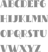 Ingrimayne Type was established in 1988 by Robert Schenk to sell his fonts via the web and via CDs such as the No-Hype Type CD (2500 typefaces in trueType and PostScript, with mostly original typefaces). Robert Schenk (b. 1946, Minnesota) lives in Rensselaer, IN. Before Ingrimayne, Schenk's type was distributed by Wayzata Technology. Free fonts at his site included Red Letter, Zirkle, Sallonext, Zarrow, Serpent.
 Specimen book. Alternate URL. Dingbat fonts: XPhyngern (1990, pointing fingers), XPointedDesert and XSimpleHands (1994, more fists), Schneeflaken (two snow fonts, now available as XSchneeFlaken), ComputerBugz (nice butterflies, now available as XCompuTerBuggz), Galaxies (around the theme of the sun and stars), GlitzyFlash (1990), Grandecort (1994), LeakOrLeach (1995), Baumfuss (1990), LeafMeAlone (leaves), StarsAndStripes, StarPieces, Fingers, SimpleHands, PointedDesert, IngyDing (1996, 3 dingbat fonts in the style of Zapf Dingbats; in 2010 overhauled into one 1400-ornament monster face, Ingy Ding MCD, containing smilies, arrows, Zapfian ornaments, dice, chess pieces, fists, weather dingbats, and so forth), IngyDingLeftovers. A list of fonts: - A: Aabced-Bold-Italic, Aabced-Bold, Aabced-Italic, Aabced-Regular, Aabced, AabcedBold, AabcedBoldItalic, AabcedExtraBold, AabcedItalic, AabcedRoman, AabcedXBold-Bold, AabcedXBold, Abagail-Regular, AbagailJackson, AccruedInterest, AcornSwash-Regular, AcornSwash, AcornSwashAltern-Regular, AcornSwashAltern, AcornSwashRoman, Accrued Interest, Albert Betenbuch (blackletter), AlbertBetenbuchExtrude, AllSmiles, AmericanMorseCodeIT, AnarckWarp, Anarckhie, AnarckhieBold, AnarckhieBoldItalic, AnarckhieDecayed, AnarckhieItalic, AnarckhieJiggled, AnarckhieRagged, AnarckhieShadow, AndrewAndreasBold, AndrewAndreasPlain, AndrewAndreasXBold, Andrew Andy College (athletic lettering), AndrewAndyStencil, AndrewAndyStencilBold, AndyEight, AntsyPantsy, ArgentBobSquish, Argenta, ArgentaBobbWig, ArgentaBobbed, ArgentaBold, ArgentabObbed, Asterx-Regular, Asterx, Auldroon-Regular, Auldroon (blackletter), AndrewAndyKactus, AntsyPantsy.
- B: Baker Half (2004, an experimental hexagonally designed family), Balboat-Regular, BalboatBold, BalboatPlain, Bannetters (2021: letters for tilted banners), Barefoot, BaumSquiggle, Baumfuss-Regular, Baumfuss, BaumfussTwo-Regular, BaumfussTwo, Bear Anark (2021: a 10-style slab serif), BearButteTBold, BearButteTBoldItalic, BearButteTItalic, BearButteTPlain, BearButteTSpecial, BeastlyFont, Bene, BeneCryptExtrude, BeneCryptine-Regular, BeneCryptine (blackletter), BeneCryptineDistorted, BeneScriptine-Regular, BeneScriptine (blackletter), BetterEuroika, BetterEuroikaBold, BetterEuroikaBoldItalic, BetterEuroikaHybrid, BetterEuroikaHybridBold, BetterEuroikaItalic, BetterIngriana, BetterIngrianaBold, BetterIngrianaBoldItalic, BetterIngrianaHybrid, BetterIngrianaHybridBold, BetterIngrianaItalic, BetterKamp, BetterKampBold, BetterKampBoldItalic, BetterKampItalic, BetterTypeRightBold, BetterTypeRightBoldItalic, BetterTypeRightItalic, BetterTypeRightMedium, BetterTypeRightPlain, BetterTypeRightThin, BetterTypeRightThinItalic, BetterTypeRiteSpec, BetterTypeRiteSpecBold, Big-Regular, BigBottom, Big Stripes Mono (2021), Bigtop-Regular, Bigtop, Bilevel, Billowed (2022), BiteOfApple, Bizaro, BizaroRES, Blockboys, Bluster Left, BobsExtraPictures, BobsStandardChess, Bouncer (2019), Bowling, Bright Ideas (2020: lightbulb alphadings), BringInTheFrowns, Brrrrr-Regular, Brrrrr, BuggyFont, BumberShoot.
- C: Caltic (2020), CemeteryWalk (2018), Cennerik-Bold, Cennerik-Regular, Cennerik, CennerikBold, CennerikEBold, CennerikExtraBold, CennerikPlain, CennerikSpiked, CennerikXBold-Bold, ChainLetterOne, ChainLetterTwo, CheckMateRES, ChessNut, ChessNutTwo, Chessterton, ChesstertonTwo, Circlet, Ckornoments (2020), Close Together (2020), CoffeeMug, Coffinated (2020: letters boxed into coffins), CompassOne, CompuTerBuggz, ConcavWarp, ConcavexCaps, ConcavexCapsWave, ConcavexStepper, CoughingNails, Court-Regular, CourtGesture, CourtJesterFrizzy, CrippledFont, CuthbMangle, CuthbeNick, Cuthbert.
- D: DavidBurry, DavidFarewell, DavidFarewellBold, David Farewell Stencil, Dear John, Demotte-Bold, Demotte-Regular, Demotte, DemotteBold, DemotteWarp, Dinner-Regular, Dinner, DinoTracks (2021), Dottie, DrivEddie, Dschoyphul.
- E: EdsDream, EdwardEdwinBold, EdwardEdwinPlain (1994, copperplate script), Eggad (2020), Eldroon, Erkball, ErkballBold, Euroika-Bold-Italic, Euroika-Bold, Euroika-Italic, Euroika-Regular, EuroikaBold, EuroikaBoldItalic, EuroikaItalic, EuroikaKamp, EuroikaKampBold, EuroikaKampBoldItalic, EuroikaKampItalic, EuroikaRoman, Euroika, Eyebel, EyebelBold, EyebelRuff.
- F: FabFours (2015, patterned typeface), Fangs ALot (2022), FansiPensle (1990, connected signage script), FansiPensleBold, FansiPenslePlain, FansiPensleTwo, FansiPensleTwoBold (1990), FansiPensleTwoPlain, Febdrei, FebdreiBold, Federhozen-Bold-Italic, Federhozen-Italic, Federhozen-Regular, Federhozen, FederhozenBold, FederhozenBoldItalic, FederhozenItalic, FederhozenPlain, FeggoliteDancing, FeggoliteDancingItalic, FeggoliteHatched, FeggoliteKeyed, FeggoliteMonoBold, FeggoliteMonoPlain, FeggoliteRuffled, Fezdaz, Fishhook, FiveOhOne, FiveOhTwo, FlagDayFour, FlagDayOne, FlagDayThree, FlagDayTwo, Fly High, FlyHighBold, FlyHighBoldItalic, FlyHighItalic, ForTheBirds, FourJuly, FourJulyG, FourJulyH, Framo-Regular.
- G: GLitzy, GLitzyBarbed, GLitzyPlain-Regular, GLitzyStripe, GLitzyVStriped, Galexica-Bold-Italic, Galexica-Bold, Galexica-Italic, Galexica-Regular, Galexica, GalexicaBold, GalexicaBoldItalic, GalexicaExtraBold, GalexicaItalic, GalexicaMono-Bold, GalexicaMono-Regular, GalexicaMono, GalexicaMonoBold, GalexicaMonoPlain, GalexicaPlain, GalexicaXBold-Bold, GlitzyCurl-Regular, GlitzyCurl, GlitzyFlash-Regular, GlitzyFlash, GlitzyJewel-Regular, GlitzyJewel, Gothamburg (blackletter), GothamburgBold, GothamburgShadowed, GothicHorror, GothicRock, GranCanaries, GrancMitSripes, GrandecortBold, GrandecortHoly, GrandecortMedium, GrandecortShadow, GretchenHelloBold, GretchenHelloPlain, Grundee.
- H: Hammered, HandanaBold, HandanaPlain, HandmadeFont, HeartMatrixed, Hermainita, HermainitaBold, HermainitaPlain, Hexonu (2020: hexagonal), HeyPumkin, HippityDippityBold, HippityDippityInline, HippityDippityPlain.
- I: IanSegoe, IggoliteMono, IngBurried, IngDingLeftover, Ingone, IngoneSaw, IngoneShadow, IngrianEuroikHybrid, IngrianEuroikHybridBold, IngrianEuroikaH, IngrianEuroikaHBold, IngrianEuroikaHBoldItalic, IngrianEuroikaHItalic, Ingriana, IngrianaBold, IngrianaBoldItalic, IngrianaCasual, IngrianaCasualBold, IngrianaCasualBoldItalic, IngrianaCasualItalic, IngrianaCasualPlain, IngrianaExtraBold, IngrianaItalic, IngrianaPlain, IngyArrows, IngyArrowsTwo, IngyDingThree, IngyDings, Ingy Star Tilings (2019), InsideLetters, InternationalMorseCodeIT, IrritationOne, IrritationTwo.
- J: JabcedHy, JabcedHyBold, JabcedHyBoldItalic, JabcedHyItalic, JasperSqueeze, JasperSqueezeBold, JasperSqueezeBoldItalic, JasperSqueezeEB, JasperSqueezeEBItalic, JasperSqueezeItalic, JenneriCurved, Jennerik, JennerikBold, JennerikExtraBold, JennerikInfml-Bold, JennerikInfml, JennerikInfmlBold, JennerikInfmlExtraBold, JennerikInfmlPlain, JennerikInfmlXBold, JennerikRoman, Jester, JesterRES (Tuscan), JesterTwo (Tuscan), Jestres, JetJanBoldItalicGray, the Jet Jane family [JetJaneButton, JetJaneMonoBold, JetJaneMonoBoldItalic, JetJaneMonoCapsBold, JetJaneMonoCapsPlain, JetJaneMonoCapsThin, JetJaneMonoItalic, JetJaneMonoPlain, JetJaneMonoThinBook, JetJaneMonoThinItalic].
- K: KampFriendshipBold, KampFriendshipBoldItalic, KampFriendshipItalic, KampFriendshipPlain, KampIngrianaH, KampIngrianaHBold, KampIngrianaHBoldItalic, KampIngrianaHItalic, KampIngrianaHybrid, KampIngrianaHybridBold, KampRipple, Karlisbad, KiddyChessFont, KlipJoint, Knaudens-Regular, Knaudens, Kneebls, KneeblsBold, KneeblsExtruded, KneeblsPlain, KneeblsRuffled, KneeblsThin, KnewFont, KnewFontBold, KnewFontJagged, KnewFontPlain, KnewFontWaisted, KnewFontWaistedBold, KnightMares, KolSpotted, KolStriped, KolkFizzy, Kolkman-Bold, KolkmanDimly, KolkmanGray, KolkmanShatter, KolkmanStriped, Kwalett (2020), Kwersity, KwersityBold, KwersityWider, KwersityWiderBold, Kwodsity, KyhotaBarbed, KyhotaOne, KyhotaTwo.
- L: LaserTrain, LaserTrainBold, LastBigFling, LastBigFlingBold, LastMinuteChess, Laudens, LeakorLeach, LeakorLeachLeft, LeefMeAlone, LeefMeAloneHoles, LeekorLeech, Lentzers (2020), Letrinth, LetterTrain-Regular, LetterTrain, LetterTrainBold, LetterTrainBoldItalic, LetterTrainItalic, LetterTrainPlain, Lettergical (1994, blackletter with Lombardic capitals), LettergicalWave, LetunicalBold, LetunicalInline, LetunicalNormal, LetunicalShadow, LetunicalWarp, Library-Italic, Library-Regular, Life After College (2008, athletic lettering family), LineDrive, LineDriveBold, LineDriveOutlined, LineDrivePlain, LineDriveShadow, Lopsickles (a Hobo-style top-heavy font) (2021).
- M: MITuscan, MMCheckered, MMDrawings, MMPattern, Mangaled, Masheen (1990, octagonal font), MasheenBold, MasheenConvicted, MasheenFlag, MasheenIIID, MasheenOutlined, MatthewTwo, MattsFastFont, MedicineShelf, MedievalGunslinger, MedievalGunslingerShadow, Metavoria (2021: playful), Minimalist-Regular, Minimalist, Minniesoda, MinniesodaBold, Modsten-Bold, Modsten-Regular, Modsten (stencil, 1990), ModstenBold, ModstenRoman, MoreTexture, MousyFont, MushmellowBold, MushmellowCactus, MushmellowOutline, MushmellowPlain, MuskitosCaps, MuskitosCapsShadDown, Myhota, MyhotaBarbed, MyhotaBold, MyhotaHatched, MyhotaHatchedBold, MyhotaPlain, MyhotaWithSpikes.
- N: NailsNStaples, NairobiNormal, NeedALilly, NerdishHex, NerdishHexBold, Neu Altisch (blackletter), NeuAltischBold, NeuAltischGray, NeuAltischPlain, NeuAltischShadLeft, NeuAltischShadow, NeuAltischWormEaten, NeuropolMedium, NewLaudens, NewLibrary, NewLibraryItalic, NewNerdShadowed, NewNerdishBold, NewNerdishPlain, NewNerdishThin, NoPainRight, NoPainRightBold, NopainLeft, NopainLeftBold.
- O: OakParkAve, OakParkAvePlain, OakParkBlvdPlain, OakParkExtruded, OakParkSpeckled, OakParkSquaRe, OakParkZiggy, OakParksTripped, Old Harold Ree (1992, a modification of PhederFract, which was a calligraphic fraktur typeface also by Schenk), OldHaroldReeBold, OldHaroldReePlain, Onyon (1997).
- P: PastedWarp, PattyDay, PawnShop, Pedestrian, PencilFat, PencilIn, PencilOut, PensleCaligraf-Bold, PensleCaligraf-Regular, PensleCaligraf, PensleCaligrafBold, PensleCaligrafPlain, PeterPierreBold, PeterPierreCondensed, PeterPierrePlain, PeterPierreXBold, Pheder Frack (blackletter), PhederFrackBold, PhederFrackDtsh, PhederFrackDtshBold, PhederFrackDtshThin, PhederFrackPlain, PhederFrackShadowed, PhederFrackThin, PhrackCack, PhrackSle, PhrackSleBold, PhrackSlePlain, Phraxtured (blackletter), PhraxturedDeutsch, PhraxturedPlain, PhraxturedShadowed, Phyngern, Pigknot, PigknotBold, PlainPensle, PlainPensleBold, PlainPensleBoldItalic, PlainPensleItalic, PlainPenslePlain, PlainPensleXBold, PlainPensleXBoldItalic, Porker, PorkerGrey, Poultry Sign (2020), PutMyFootDown, Pzytupid.
- Q: Qualettee, QualetteeBold, QualetteeMedium, Quatsity (2020), Quidic, QuidicHatched, QuidicHoley, QuidicItalic, QuidicRoman, QuidicShotUp, Quirtly, Qwatick (1992), QwatickBold, QwatickPlacard.
- R: Ranger (1996, octagonal), RangerWider, Rankensteen, Rataczak-Regular, RataczakBold, RataczakBoldItalic, RataczakCandied, RataczakCondItalic, RataczakCondPlain, RataczakExtraBold, RataczakItalic, RataczakRoman, RataczakSwash, Rauchens, Razephu, Red-Regular, RedLetter, Renslaer, RoomingHouse, Rosary, RosaryBold, RoundUp, RoundUpBold, RoundUpShadow, RoundWhy (2019: Western), RoundWhyBold, RummageSaleOne, Rumpled, RundigPencilBold, RundigPencilMedium, RundigPencilNormal, Rundigsburg (1994), RundigsburgBold, RundigsburgMedium, RundigsburgPlain, RundigsburgShadowLeft, RundigsburgShadowRight.
- S: SafetyPinned, Salloon, SalloonAStripe, SalloonCracked, SalloonHStripe, SalloonStripeBottom, SalloonStripeEnds, SalloonStripeMiddle, SalloonStriped, Saloon-Regular, SaloonExt, SaloonFrilled, Samsheriff (2020), Sansduski Mono (2022), Sansduski (squarish) (2022), Sansville, SansvilleBold, SarahfSlob, SarahfSlobItalic, SchneeFlaken, SchneeFlakenTwo, Screwged, Sdrawkcab-Regular, Sdrawkcab, Seasick, SeasickBold, SeasickMirror, SeasickMirrorBold, SeasonsGreetings, SeederChess, SeederChessSmall, Sergury, Serpent-Regular, ShadyCharacters, Sihmittree (2019), ShirlyUJest, SimpleChessFont, Sirpent, SJURecord (2019: blackletter), Skagwae, SkagwaeMono, Skigway, SkwareDots, SlimpiSquares, Slippery Fishes (2022), SmokeHausShadow, SmokeHaus (1998), SmokeHouseRough, SmokeHouseShatter, SmokeHouseWave, Snuggels (2020; hexagonal), Spicandspan, SquiggleRES, SquiggleRESBold, Stamper, Substance, SusiScript, SusiScriptBold, SusiScriptPlain, Swanville-Regular, Swanville, Swirlity, SwirlityBold, SwirlityScript, SwirlityText.
- T: Tape Up (2022: a tape font), Tescellations (2012), Tessie Letters (2019), Tessie Some More (2020), Tessie Dingies (2012), TOCinRings, TRGrunge, Tacky (2005), Talloween, TapedUp, Teapot (1999), Teethee, TessieSpinners, TessieMiscellaneous (2018), TessieMoreStuff (2018), TessieXtraBirds (2018), TessieMoreBirds, TessieAnimals, TessieBugs (2019), TessieOddsNends (2019), TessieStandingBirds (2018), TessieFlyingBirds (2018), TessiePuzzlePieces (2018), TexturesOne, TiedUp, Tieroh, TierohBold, TierohSans, TierohSansBold, Tinkerer, TiredOfCourier (1992, + Bold, +BoldItalic, +Italic, +Plain, +Thin, +ThinItalic), ToothBrush, TootsieBold, TuskcandyBold, TuskcandyInline, TuskcandyPlain, Twigglee-Regular, Twigglee (1990, inspired by the hand lettering on the plates in a 19th century book on ornaments by Owen Jones), TwiggleeBold, TwiggleePlain, TwiggleeWarped, TwoTonedStoned.
- U: UUeirdieBold, UUeirdieRoman, UUeirdieWarp, Undulate (a wavy typeface) (2021), Undulated (2021), Unikled, UnikledBold, UnikledPlain, UnikledSpotted, UnivoxAtomLight, UpsideDown, UrbanScrawl.
- V: ValManGal, Valenteena, ValenteenaBroken, ValentinaContour, Valentine-Regular, Valgal, ValgalBold, Vglee, Vinetters (2020), VunderScriptBold, VunderScriptPlain.
- W: WalcomeOne, WalcomeOneBold, Watchmaker, WatchmakerBold, WaterCloset, WaterWorksCaps (1992), WaterWorksCaps-Bold, WaterWorksCaps-Regular, WaterWorksCapsBold, WaterWorksCapsPlain, Weaving (2022), WeirdChessFont, Wetetque (1991, an all caps multiline family), WetetqueBold, WetetquePlain (1991), Whichit, WhichitBold, WhichitTwo, WhichitTwoBold, Woven (2022), WrenchedLetters, WurstCactus, WurstHassen, WurstchenDotted, WurstchenOutlined, WurstchenSplatted, WyomingMacroni, WyomingMacroniPegged, WyomingMacroniShadRight, WyomingMacroniShadowed, Wyoming Pastad (1994, Western slab face), WyomingPastadShadLeft, WyomingPastadShadowed, WyomingSpaghettiBold, WyomingSpaghettiPlain, Wyoming Strudel (Far West type).
- X: XBobsExtraPictures, XBobsStandardChess, XChessNut, XChessNutTwo, XChesstertonTwo, XCompuTerBuggz, XGalaxies, XGalaxyOne, XIngDingLeftover, XIngyArrows, XIngyArrowsBetween, XIngyArrowsTwo, XIngyDingIII, XIngyDingTwo, XIngyDings, XInterntnlMorseCodeIT, XKiddyChessFont, XKnightMares, XLaserTrainBold, XLaserTrainPlain, XLastMinuteChess, XLeef Me Alone (leaf dingbats), XMMCheckered, XMMDrawings, XMMPattern, XMattsAnimalsOne, XMoreTexture, XPatColumRow, XPatCzeckerz, XPawnShop, XPhyngern (fists), XPointedDesert, XRoomingHouse, XSchneeFlaken (1995), XSchneeFlaken, XSchneeFlakenTwo, XSeederChess, XSeederChessSmall, XSimpleHands, XStarPieces, XStarsAndStripesOne, XStarsAndStripesTwo, XStellaStern, XStellaSternBright, XSternStellaNight, XTexturesOne, Xahosch, Xaltid, XaltidBold, XaltidPlain. The X fonts are predominantly dingbats.
- Y: YahoschBold, YahoschMedium, YahoschPlain, YahoschWormy, Yassitf (2019: a sans), YngreEBStripe, Yngreena, YngreenaBold, YngreenaBoldItalic, YngreenaExtraBold, YngreenaItalic, YngreenaPlain, Youbee, YoubeeBold, YoubeeBoldItalic, YoubeeItalic, YoubeeShadow.
- Z: Zarrow-Regular, Zarrow, ZcriptBold, ZcriptPlain, Zebraw, ZebrawOS, Zigzaggy (2021), ZimpleBlack, Zimric (2020), ZirkStressed, ZirkleOne-Bold, ZirkleOne-Regular, ZirkleOne, ZirkleOneBold, ZirkleOneRoman, ZumbelsburgBold, Zumbelsburg (blackletter, 1996).
Klingspor link. Dafont link. Abstract Fonts link. View Robert Schenk's typefaces. View Ingrimayne's typeface library. [Google]
[MyFonts]
[More] ⦿
|
Inland Type Foundry
[A.V. Haight]

|
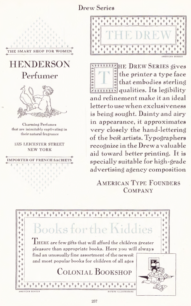 The Inland Type Foundry in Saint Louis was established in 1892 by the three sons of Carl Schraubstadter (1827-1897), William A. Schraubstadter (1864-1957), Oswald Schraubstadter (1868-1955) and Carl Schraubs Jr. (1862-1947). Carl had run the Central Type Foundry in Saint Louis and sold it to ATF (American Type Founders) in 1892, and the sons reacted by setting up Inland. Until 1911, Inland was one of the most successful foundries in the United States. In 1911 Inland was purchased by ATF and its equipment divided between that foundry and Barnhart Brothers and Spindler (BBS). A.V. Haight (Poughkeepsie) designed Rogers (art nouveau) at Inland Type foundry in 1902. He also designed Haight. Nicholas J. Werner, who used to work for Central, also created many designs at Inland. Look for "Specimen book and catalog, a price list of printers' supplies, showing types and rules in which are embodied all the latest styles ... among which ... may be especially mentioned the casting of types on standard line and unit sets." (1902, 464 pages), Specimen Book and Catalog. A Price List of Printers Supplies, Showing Types and Rules in which Are Embodied all the Latest Ideas that Enable the Printer to Produce Superior Work in a most Economical Manner Among which Betterments May Be Especially Mentioned the Casting of Types on Standard Line and Unit Sets (St. Louis, 1897) (a free copy is here and here) and Specimen Book and Catalog. A Price List of Printers Supplies, Type, Rules and Accessories of the Very Latest Designs which Facilitate the Economical Production of Superior Printing. A Notable Improvement Is the Casting of All Type on Standard Line&Unit Sets (St. Louis, 1907). MyFonts page.
 Scans of some typefaces: Becker (art nouveau), Blanchard Italic [Blanchard was revived in 2013 by Paulo W as Blanchard Inland], Commercial Script, Edwards (art nouveau), Inland, Lightface Blanchard, Matthews (1902: revived in 2019 by Chuck Mountain as Cotrell CF), Extended Studley (revived by Chuck Mountain in 2019 as Dukas CF, and by Jeff Levine in 2008 as Bayview JNL), Rogers (art nouveau), Poster French Oldstyle (1897 catalog), Poster Ionic (1897 catalog), Poster Latin Antique (1897 catalog), Pacific Bikes (ornaments, 1897 catalog), Recut Caslon (1907, as taken from the 1923 ATF catalog), Drew (1910, from the 1923 ATF catalog: a digital version called Droobie NF was created by Nick Curtis in 2014), Title Shaded Litho (1911), Litho Roman (1907), Gothic No.578 (1898), Pen Print (1911), Blair (1900; Condensed Blair was revived in 2022 by Jeff Levine as Generic Sans JNL), Mitchell (1906, a bold version of the all caps grotesque face Blair; digitally revived by Nick Curtis in 2015 as Mitchell NF), Comstock (1902), Inland Copperplate (1901), Shaw Text (1907). Commentaries by Mac McGrew on some of the typefaces: - Gothic No. 578: Gothic No. 578 was shown as Gothic No.8 by Inland in 1898 as "the latest candidate for the printer's favor; a popular old typeface entirely recut." It was shown until 1941. It is a bold weight, and is quite similar to Standard Bold which as an import from Germany was very popular in this country in the 1950s. It is also similar to Comstock, but without the added outline. Keystone called it Standard Gothic, although it is not identical to the German face. As a nineteenth-century gothic, the cap G had no crossbar. Paragon Gothic is the same design, without lowercase, cast as a title face.
- Pen Print: Pen Print and Pen Print Bold were introduced by Inland Type Foundry in 1911, with the latter thought to have been the last typeface cut by that foundry before its sale to ATF. Pen Print Open was designed for ATF in 1921 by Morris Benton, and includes open versions of all the characters shown for the bold. The series has more the appearance of rather crude brush lettering than pen "printing," but the inclusion of an open version is contrary to the conception; perhaps it was intended for two-color printing. The letters have a slight backslant. The bold was also cut by Intertype, in 1927. Compare Dom Casual.
- Blair: Blair was advertised in 1900 by Inland Type Foundry as new and original, calling it "an exact imitation of the small gothic letter now so popular with engravers for stylish stationery." Its production was continued by ATF until the 1950s. It is similar to Copperplate Gothic Light, but without the tiny serifs of that face. Litho Gothic is the same design but with lowercase. Mitchell (1906) is the same design but slightly heavier. The condensed version was produced in 1903 or earlier. Hansen copied Blair as Card Gothic No.2. Compare Lightline Gothic.
- Comstock: Comstock was advertised by Inland Type Foundry in 1902 as "a striking novelty, our brand new face." It was revived by ATF in 1957. It is a medium weight conventional gothic, distinguished by a hairline surrounding each letter. The G lacks a crossbar, typical of many nineteenth-century gothics. The design was sponsored by A. H. Comstock of Omaha, according to a review at the time of its introduction. Condensed Comstock was introduced by Inland in 1905, but patented in the name of William A. Schraubstadter in 1908. It has no lowercase, but the design is more contemporary. Monotype has copied both typefaces, but Monotype Comstock Condensed is in 18-point only, without figures. In both foundry typefaces, there are several sizes on 12-point body; No.1 is the largest in regular, but No.1 is the smallest in Condensed. In 1911, a copy of Comstock was issued by Bauer in Germany under the name Astoria, revived in 1957.
- Inland Copperplate: Inland Copperplate is a shaded Old English typeface, first shown by Inland Type Foundry in November 1901. It is similar to Typo Text (q.v.). although the specimen here, reproduced from an over-inked showing, doesn't reveal the shading.
- Mac McGrew writes: Matthews is a very heavy, thick-and-thin, serifless type introduced by Inland Type Foundry in 1901. It is somewhat similar to the later Globe Gothic (Bold-in fact it is more carefully designed and seems to agree better with the lighter Globe Gothics than the latter typeface does. ATF cast both typefaces for a while after acquiring Inland in 1912, as well as Condensed Matthews, which Inland had introduced in 1903 as "a new gothic letter." The specimen of Matthews shown here is from a font showing considerable wear, with rounded corners. Compare Radiant Heavy. For a digital revival, see Merchant Trade JNL (2020, Jeff Levine).
- Shaw Text: Shaw Text was introduced by Inland Type Foundry in 1907 as its "latest novelty," although it is a rather conventional Old English face, a little heavier than Wedding Text, and a little lighter and fancier than Engravers Old English. After Inland merged with ATF, Shaw Text continued to be shown until 1954. Compare Plate Text.
- Litho Antique (1910). Mac McGrew: Rockwell Antique was a reissue of Litho Antique, cut by William Schraubstadter for Inland Type Foundry and introduced in January 1910 when it was advertised as the "newest typeface; one of our best; closely imitating steelplate and lithography." In the late 1920s similar typefaces became popular in Europe, and some were imported into the United States. Morris Benton of ATF added several characters to the old Inland face, matrices of which were then in ATF's vaults, and it was reissued in 1931 as Rockwell Antique. But Benton saw that something more was needed, and redrew it as Stymie Bold (q.v.) in the same year. The alternate characters which were added to Rockwell are the same ones now shown with Stymie Bold. Monotype copied Rockwell but erroneously called it Stymie Bold in some literature, and there has been confusion between the two typefaces ever since; the latter name is often applied to fonts of Rockwell cast on Monotype machines by secondary suppliers. Indicative of this confusion, Stymie Bold Italic on Mono is series 1891, corresponding to Rockwell series 189, while Stymie Bold is 790. English Monotype has several weights of Rockwell, a square serif family which differs from this typeface and should not be confused with it; see Imports in Appendix. Antique Shaded (q. v.) is sometimes called Rockwell Antique Shaded.
- Herald Extra Condensed (1909). An octagonal typeface.
- Extra Condensed Title Gothic No.12.
[Google]
[MyFonts]
[More] ⦿
|
Insigne Type Design Studio (was: Dooley Type)
[Jeremy Dooley]

|
 Insigne Type Design Studio (est. 2006) is run by Jeremy Dooley, b. Columbia, SC, 1981, who received a masters in graphic design at Savannah College of Art and Design in 2005. He lived in Atlanta, GA, and is now in Knoxville, TN. From 2004 until 2006, he ran Dooley Type in Greenville, SC. Behance link. Klingspor link. Font squirrel link. Creative Market link. MyFonts interview. His fonts:
 - 44th President (2009, based on Obama's handwriting).
- Aberlyth (2006). An informal script face.
- Ainslie (2014), Ainslie Slab (2014), Ainslie Sans (2014) and Ainslie Contrast (2020: a 42-style sans).
- Antigen (2007) is futuristic.
- Arendahl (2007) is a connected but irregular handwriting font.
- Ashemore (2012). Production assistance for Ashemore was provided by Lucas Azevedo and Marcelo Magalhaes. Followed by Ashemore Softened (2012).
- Avaloc (2006) is an expanded sans.
- The Aviano superfamily. Aviano Wedge (2012), Aviano Slab (2007), Aviano Serif (2008), 2009 Aviano Didone (2009), Aviano Flare (2010), Aviano Sans (2010), Aviano Future (2011), Aviano Contrast (2012), Aviano Gothic (2013), Aviano Sans Layers (2013), Aviano Copper (2018), Aviano Didone (2019). Aviano Titling (2007) is inspired by Trajan. Aviano Silk (2015) is a bilined decorative titling typeface. Aviano Royale followed in 2016.
- Barcis (2013). An organic sans family.
- Beastias (2006). An informal script face.
- Belda (2017). An elegant serif family of fonts that grew from the ancient roman capital. Followed by the 54-style Belda Didone (2020). A 54-style didone family without ball terminals.
- Biortec (2004).
- Biscuit Boodle (2008) is a fun and crazy script from Portland Studios illustrator Justin Gerard. Biscuit Boodle Ornaments (2009, dingbats).
- Blue Goblet (2005) is a Treefrog-style script developed for the pending illustrated childrens book from Portland Studios, The Blue Goblet. It was co-designed by Cory Godbey of Portland Studios and Jeremy Dooley. In 2011, Cory Godbey added Blue Goblet Christmas Ornaments.
- Boncaire Titling (2012) was iInspired by the type elements of 17th century map of Curacao made by Dutch cartographer Gerard Van Keulen.
- Brigette (2007) is an ink-splattered calligraphic script.
- Cabrito (2013). A typeface for children's books. Followed by Cabrito Inverto (2014) for reversed stroke stress---some of its heavier styles have a Western appearance. In 2014, Cabrito Sans was added to the set. Cabrito Semi followed in 2015, the playful Cabrito Didone in 2016, Cabrito Contrast in 2018, and Cabrito Flare and Cabrito Serif in 2019.
- Caridade.
- Carta Marina is a family of medieval map text typefaces and dingbats (2007).
- Cartes (2020). A charming 54-style family with chancery ascenders, and a roaring twenties handcrafted appeal.
- Cavole Slab (2011).
- Celari Titling (2014).
- Chatype is a geometric slab serif typeface family designed in 2012 for the city of Chattanooga, TN, by Robbie de Villiers and Jeremy Dooley.
- Chennai and Chennai Rounded (2007) are playful display sans typefaces. Chennai Slab (2009).
- Chypre (2017). A techno sans family.
- Civane (2017). A flared inscriptional typeface family.
- Coegit (2012). A sans family that offers Compressed, Compact and Condensed subsets.
- Cohort (2010, elliptical sans).
- Coupe (2003).
- Dever (2015) is a 107-style family of rough and weathered letterpress typefaces with industrial octagonal skeletons.
- Dienstag (2008, 8 styles).
- Daito (2018). A welcoming soft slab serif typeface family.
- Donnerstag (2010, extended slab serif).
- Dulcian (2017). A bright open sans family.
- Eigerdals (2010, rounded sans family).
- Enocenta (2013). A penmanship typeface family done with Cecilia Marina Pezoa.
- Enzia (2009, an elegant sans family).
- Evalfey (2021). Formal calligraphic.
- Fizgiger (2006). An informal script face.
- Florencia (2007) is a vintage script.
- Foverdis (2010, a calligraphic family that includes a hairline).
- Gineso (2016). A set of 48 slightly condensded and squarish headline typefaces. Followed by Gineso Titling (2016) and Gineso Soft (2018).
- Grayfel (2015). A 42-style sans typeface family characterized by flush horizontal or vertical terminal endings.
- Grenale (2013). A flashy in-your-face didone family from Thin to Heavy. Grenale #2 (2013) is a curvy sans that is almost a monoline. In 2015, Dooley launched Grenale Slab.
- Haboro (2016). A 54-font strong didone family with wedge serifs replacing the standard rectangular ones. It has no ball terminals. Followed by Haboro Slab (2016), Haboro Soft (2016), Haboro Serif (2016), Haboro Sans (2016), Haboro Contrast (2017), and Haboro Slab Soft (2020).
- Honeydrop (2017). A brush script.
- Insigne Abstractions (2007) and Insigne Fleurons (2008) are dingbats.
- Jon Cary (2004, the handwriting of John Kerry).
- Kairengu (2007) is a comic book family.
- Kasuga (2008) and Kasuga Brush (2009) are fresh new scripts with oriental undertones.
- Kidela (2007) is a sassy scrapbook family. Kidela Sketch (2009).
- Kochi (2015). A 54-font rounded organic sans typeface family.
- Le Havre (2008) is a gorgeous 8-style geometric art deco sans with tall ascenders. In 2010, the Le Havre Sketch family was added. We also have Le Havre Rough (2014, a bit of letterpress feel thrown in), Le Havre Rounded (2009), Le Havre Titling (2012), Le Havre Layers, Le Havre Hand (2015) and Le Havre Width (2017).
- Look (2015). In Sans, Script, and Serif subfamilies, this super-collection blends a bit of vernacular signage with weathered letterpress.
- Lorelei (2007, Insigne) is a bouncy script family.
- Lourdes (2007) is an informal script.
- Madeleine (2007) is a basic handwriting face.
- Madurai (2012). A simple monoline sans superfamily. Madurai Slab (2013) has 54 styles.
- Mahalia (2008) is a retro script.
- Majidah and Majidah Potens (2006) are medieval scripts.
- Mandrel (2017). A typeface with sharp serifs. Followed by Mandrel Didone (2021: a 54-style didone).
- Marintas (2012).
- Maris (2015). A curly script.
- Massif (2008) is an aggressive sans family.
- Metairie (2018). A connected high-contrast script.
- Mirantz (2019). A 54-style text typeface family.
- Mittwoch (2009, organic serif).
- Montag (2007) is a casual rounded sans family in six styles.
- Mr Darcy (2015). A Tuscan all-caps typeface.
- Mynaruse Flare (2018). An update of Mynaruse (2010), which is a roman inscriptional titling family---it is characterized by skinny flared serifs.
- Nanumunga (2007) is a comic book style face.
- Natalya (2007) is a connected calligraphic script. Natalya Monoline (2007). Natalya Swashes (2009, calligraphic).
- Newcomen (2008) is a 4-style roman titling face.
- Obline (2004, sans).
- Oita (2014). An octagonal typeface family.
- Olidia (2008) is calligraphic.
- Orewelia (2004, grunge face).
- Pauline Didone (2011, a curly didone family). Pauline Script (2008) is a monolinear retro script.
- Pershal (2021). A 54-style family, described as an oddball sans.
- Plathorn (2014). Inspired by the Wild West, this generous typeface family uses flaring in a thousand ways to recreate the feel of that era.
- Promethian (2005, futuristic).
- Quarca (2013). A 36-font sans family with a sturdy rounded square look.
- Quatie (2013). A curvaceous family: Quatie draws much of its inspiration from the industrial brawn of the railroad and the unique characteristics of Cherokee letterforms, giving it an atypical form not usually found in an industrial slab (accring to Dooley).
- Questal (2007) is a unicase serif face.
- Qurillian (2006, legible sans).
- Radona (2021). A 54-style geometric sans described as the typeface version of Synthwave.
- Ranelte (2016). A condensed sans series with techno or DIN appeal. The textured versions are collected in Ranelte Deco (2017).
- RendtPhysic (2006).
- Ript Cure (2005).
- Sabler Titling (2016). An all caps typeface family with tapered flared strokes.
- Sancoale (2011, an organic sans family, from Thin to Black). Sancoale Narrow (2011). Sancoale Softened (2012). Sancoale Slab (2012). Sancoale Slab Soft (2013), Sancoale Gothic (2022: 48 styles; a subdued and calming version of Sancoale, with quiet futurism).
- Sangli (2015). A 54-style rounded organic sans typeface family.
- Savigny (2011). Images: Savigny Black Extened, Savigny Regular Condensed.
- Savory Paste (2007). Grunge.
- Schorel (2019). A 54-style Scotch roman.
- Senlot (2018). A 54-strong sans family. In 2019, Senlot Sans and Senlot Serif (2019) were added. Senlot Didone followed in 2021.
- Serofina (2010, a calligraphic face).
- Shrike2003 (2003).
- Sildetas (2010, a high-contrast script typeface with tear drop terminals).
- Sociato (2022). A 54-style baroque text family with didone roots. The typeface was inspired by a declaration published during the French Revolution that extolled the development of a new religion, the cult of the Supreme Being.
- Solitas (2015). A rounded 42-style geometric sans family. Followed by Solitas Slab (2015), Solitas Serif (2017) and Solitas Contrast (2021; a 42-style display sans family described as sensual by Jeremy Dooley).
- The sans family Sommet (2008; see also Sommet Rounded (2008), Sommet Slab, 2010, and Sommet Serif (2011, a wedge serif family)) is futuristic. Sommet Slab Rounded (2011).
- Sophima (2021). A weathered script family.
- Soprani (2020). A 54-font set with considerable flaring and thorny serifs, based on a vintage plaque from the 1920s.
- Sovba (2009, upright italic).
- Steagal (2013). A geometric sans with a 1930s American feel.
- Steam Court (2015). A combination of steam punk and blackletter.
- Stefania (2007) has two calligraphic/chancery styles. Its aged version is called Stefania Antique (2008).
- Stratham (2007) is a medium to black family of legible sans typefaces.
- Terfens (2007) is an informal and quite rounded sans serif with inspiration from chancery scripts like Stefania. Terfens Contrast (2021) is an 48-style sans with calligraphic traits.
- Torcao (2013). An elliptical anthroposophic typeface family.
- Ultine (2016), an utilitarian sans family.
- Valeson (2020). A vintage display typeface with a kneeling art nouveau lower case n.
- Valfieris (2006). Valfieris Aged (2007) imitates medieval printing.
- Varidox (2019). A variable font with a roundish slab serif design.
- Verao (2018) and Verao Ornaments. A calligraphic script.
- Vergils (2021). A 54-style sans that tries to instill the spirit of the eighties and electronic music genres like Synthview.
- Waialua (2019). A script typeface with a variable font option.
- Waimea (2019). A variable script font produced with the help of Lucas Azevedo.
- Winsel (2019). A flared typeface influenced by British nostalgia, vintage signage and typographic ancestors like Edward Johnston and Eric Gill. Perfect for typesetting speeches by Winston Churchill.
- Wreath (2016). A script typeface family.
- Xalapa (2008) is a grunge family.
- Yevida and Yevida Potens (2006, scripts).
- Yorkten (2015): 54-style monoline sans family. See also Yorkten Slab (2017).
- Youngblood (2008, +Youngblood Antique, 2010) is non-connected.
Catalog of their typefaces. View Jeremy Dooley's font library. View Jeremy Dooley's typefaces. Adobe link. [Google]
[MyFonts]
[More] ⦿
|
Intellecta Design (or: Monocracy Types)
[Paulo W]

|
 Intellecta Design is a design company in Brazil run by Paulo W (b. 1970) from Recife. In 2020, he also set up Monocracy Types. Paulo W is a gaúcho (Brazilian southerner), with interests in multiple areas, including poetry (he has published the digital opus Magical Book), graphic design and, most recently, type design.
 Dafont link. MyFonts. MyFonts link. Abstract Fonts link. YWFT link. Behance link. Blog. Home page. Fonthaus. Monotype. Eshops. Facebook. Flickr. Klingspor link. Wordpress. Devian tart. T26. Linkedin. Identifont. Linotype. ITC. Faces.co. His typefaces: - Free fonts: Inductive Resonance (2014: connected script), Retrodings (+Two, 2014), Living In The Past (outlined Tuscan face), Rough Ornaments Free (2014), CornPop Three (borders), Too Good To Be True (2013, retro script), Blanchard Inland (2013), Living Together (2013), Arresto (2013, brush script), Hertziano (2013, non-connected fat script), Japanese Tourist (2013), Nouveau Never Dies Free (2013), The Beat Goes On (2012, fifties script), Stencix (2012), Figgins Brute Trash (grunge), Fontaniolo Beveled (2011, ornamental caps), Czech Gotika (2011), Random Dingbats (2011), Victorian Free Ornaments (2011), Rustic (2011), Armorial (2011), Woman Silhouettes (2011), The Nile Song (2010, hieroglyphics), Smith Typewriter (2009), Sign Flags (2010, semaphore dingbats), Senectus Morbus (2010), MesoAmerica (2010, Indian symbols), ClassicSketches (2010, dingbats), Columns (2010, dingbats of Greek and Roman columns), EasyCuneiform (2010), EasyLombardicTwo (2010), EasyOpenFace (2010, blackboard bold style), Egidia (2010), Significante (2010, dingbats with, e.g., gender symbols), WhiteDominoes (2010, domino pieces), Easy Heraldics (2010), Intellecta Heraldics (2010), Heraldic Devices (2011), KidingsFree (2010, dingbats), RoughTuscan (2010), The French (2009, Fleur de Lys dings), AprendizCaligrafico (2010), Volitiva (2006, Trajan caps and chancery lower case, all based on work by Ludovico Vicentino Arrighi), Gaivota (2006), KurrentKupferstichThin (2006), PaulKlein (2010), PaulKleinTwo (2010), PortuguesArcaicoLectura (2005), ReproxScript (2009, based on Jerry Mullen's Repro Script from 1953-1954), RickGearyHomage (2007, scanbats), WestBalaio (2006, ornamental caps), Corto Maltese (2006, scanbats), Renaissance Coiffure (2006), Renaissance Ornaments (2007), Renaissance Shoes (2012, free), TTF Tattoef (2006, tattoo-inspired dingbats), ExperiTypo5 (2006), Lower Metal (2006), Geometric Serif PW (2006), Geometric (2006), Geometric Petras PW (2006), War II Warplanes (2005), Carbono (2005), Times New Vespasian (2005), BoldBold (2005), Vengeance (2005), Doppleganger (2005), Chancelaresca (2005), Cursivo Saxonio (2005), Gotische Minuskel 1269 (2005: a Kanzlei Schrift after Dekan Hermann zu Soest, 1269) and Guto Lacaz (2005, dingbats).
- Richard Gans revival project: Gans Tipo Adorno, Gans Lath Modern, Gans Titular Adornada (2006), Gans Ibarra (2006, after Carlos Winkow's Elzeviriano Ibarra), Gans Antigua (2006), Gans Antigua Manuscrito (2006), Gans Radio Lumina (2006), Gans Fulgor (2006), Gans Carmem Adornada (2006), Gans Italiana (2006, extensive Italian-style slab serif family), Gans Titania (2007), Gans Titania Adornada (2007), Gans Titular (2007), Gans Gotico Globo (2007: 9 styles by Iza W), Gans Royality (2007: 3 styles by Iza W), Gans Headpieces (2008), Gans Rasgos Escritura (2010: filets---followed in 2011 by Rasgos Escritura Nuevos), Gan Esquinazos (2010, frames), Gans Blasones (2010, shields), Gans Neoclassic Fleurons (2008), Gans Classical Fleurons, Gans Ding.
- Wood-inspired typefaces: Dead Wood Rustic (2007), Taranatiritza (5 wood type styles, after William Hamilton Page), Majestade (2007, by Iza W---two Tuscan style typefaces), Decorative Tuscanian (2007), Concave Tuscan (2010, wood type), Palermo (2007, by Iza W---Tuscan style family), Teatro (2009, Tuscan), Bruce Double Pica (2009, Tuscan; the Beveled weight is free), Antique Extended (2010, slab serif wood type), Dark Wood (2009, gothic), Dark Wood Beveled (2011).
- Charles Bluemlein's script revivals: Bluelmin Kisaburo (2013), Bluelmin Ralph (2012), Bluelmin Ronald (2012), Bluelmin Sandsfort (2012) and Bluelmin Benedict (2012). (2012).
- Blackletter: Salterio (2012, +Trash, +Three, +Gradient, +Shadow, +Shadow Two), Leothric (2011, bastarda), Bruce 532 Blackletter (2011, after George Bruce), Schneider Buch Deutsch (2007, +Trash, +Shadow, +Shadow Two), Schneidler halb fette Deutsch (2009, +Beveled), Schneidler Zierbuchstaben, Hostetler Fette Ultfraktur Ornamental (2007, blackletter caps), Gothic 16 CG (2007), Gothic 16 CG Decorative (2007, blackletter caps), Schneidler Grobe Gotisch (2008, Iza W, T-26), Allerlei Zierat (2008, ornament fonts based on a 1902 catalog of Schelter & Giesecke), Allerlei Zierat Capitals (2007), Psalter Gotisch (2009, a blackletter after the Benjamin Krebs blackletter face by the same name, ca. 1890), Münster-Gotische (2009, a blackletter family after a 1896 typeface by the same created by Schelter&Giesecke), Koberger N24 Schwabacher (2007), Student's Alphabet (2007, blackletter), Like Gutemberg Caps (2007), Nürnberg Schwabacher, Gotische Frame (2007: four framed blackletter styles by Iza W), Gotische (2007: ten ornate blackletter styles by Iza W), Gothic Garbage, Gothic Shadow, Gothic Trashed, Gothic Flourish (2009), Gotica Moderna (octagonal, blackletter), AltDeutsch (2007, four severe blackletter fonts by Iza W), Fin Fraktur, Gotische Bouffard, Heimat RGS, Gothic Handtooled Bastarda (2006), HostetlerFetteUltfrakturOrnamental (2007, blackletter caps), Gothic Handtooled Bastarda (2006).
- Historical revivals: Pantographia (2010: a digitization, as is, of several alphabets from Edmund Fry's Pantographia, 1799), Caslon2000, Caslon B, Delamotte Large Relief (2010), Figgins Brute (2007: 8 heavy Egyptian styles by Iza W based on Figgins' 1817 specimen book), Erased Figgins Brute (2007), Gras Vibert (2007, a didone family; followed by Gras Vibert Two in 2009).
- Erotic or human alphabets: American Way of Life (2011), Roman Silhouettes (2011), Silvestre Weygel (2007, named after Martin Weygel'a erotic alphabet from 1560, which in turn was based on Peter Flötner's 1534 alphabet), Gravure (caps typeface made of human silhouettes), Innocence (2007, dingbats of girls).
- Medieval chancery hand: Portugues Arcaico (2005, three medieval handwriting styles), Kurrent Kupfertisch (2006, a medieval hand done with Fernanda Salmona), Dovtrina Christam 1622 (authentic old manuscript face), Catania (2007, exquisite medieval caps in 3 styles by Iza W).
- Typewriter typefaces: Remix Typewriter (2012), Smith Trash (2012), Neo Bulletin (2010, +Trash), Remington PW (old typewriter face), Olivetti Linea (old typewriter face), Erased Typewriter 2 (2007: 4 styles by Paulo W), RIP Typewriter (2009), Shadow Typewriter (2007), Underwood Typewriter (by Iza W).
- Calligraphic: Broken Kiss (2015), Derniere Script (2015), Bradstone Parker Script (after Zaner's penmanship), Jan van den Velde Script (2011, based on the penmanship of Jan van den Velde as illustrated in vna den Velde's 1605 book Spieghel der schrijfkonste; developed jointly by Paulo and Iza W), Penabico (2010, with Iza W); Penabico is a free interpretation of the copperplate script styles to be found in the Universal Penman, London, 1741, by George Bickham---it contains over 1500 calligraphic glyphs and 250 ornaments. Samples of Penabico: i, ii, iii, iv, v, vi, vii, viii, ix), Easy Calig, Intellecta Mixed Script (2008), Spencerian Constancia (2008), Calligraphia Latina Soft4 (2010, quilled ornaments), Intellecta Script commercial (2009), Spencerian By Product (2009), Spencerian Palmer Penmanship Pro (2010), Indenture English Penman (2010), Calligraphia Latina (2008-2010, in weights called Soft2, Dense, 3, Soft4, Mixed, Square Edition).
- Victorian, Edwardian: Engel (2007, by Iza W in 15 styles that have a 1870s look), Compendium (Victorian), Costado (2009, a Victorian / Western face).
- Ornamental caps: Campi (2009), Doppel Mittel Lapidar Azure (2012), Musirte Antiqua (2012), The House of Usher (2012), Peterlon (2012), Dolphus Mieg Alphabet (2011, +Two), Dolphus Mieg Monograms (2011), Human Nature (2011), English Arabesque Revival 1900 (2011), Imprenta Royal Nonpareil (2011), XVI Century Shaw Woodcuts (2011), Ichweis Caps (2011), Cherubim Caps (2011), Rara Beleza (2011), Gothic 1880 Revival (2011), Angelicaps (2010), Unnamed Caps Two (2010), VertiCaps (2010) Rebimboca Caps (2010), Rebimboca Beveled (2012, free), Rebimboca Gradient (2012, free), Rebimboca Trash (2012, free), Rebimboca Outlined (2012, free), Republica Presente (2010), Speedball Metropolitan Caps (2010, after a design by Ross F. George), Nice Initials (2010), Morphelic (2010), DurerGotischCapitals (2010), Egmontian (2007, ornamental caps family), Saducismus Triumphatus (ornamental caps), Vogus (Victorian caps), Victorian Ornamental Capitals (2009) and Frompac 1889 Arabesque (2007) [both are classical arabesques published in Ludwig Petzendorfer's Schriften-Atlas. Eine Sammlung der wichtigsten Schreib- und Druckschriften aus alter und neuer Zeit nebst Initialen, Monogrammen, Mappen, Landeskarten und heraldischen Motiven fur die praktischen Zwecke des Kunstgewerbes, 1889], Lettrines Petin (+Ornée), Numa Initials (2006), Gradl Initialen, Vampirevich (2009, ornamental caps), Paulus Franck 1602 (2006, ornate caps), Geodec (2006, baroque caps), HostetlerFetteUltfrakturOrnamental (2007, blackletter caps), Cadels (2007, ornate caps by Iza W), Manuscript XIV Century (2007, by Iza W--four Lombardic caps), Merona (2007, by Iza W--ten Lombardic caps fonts), Selena (2007, by Iza W---ornate Victorian caps), Leyenda (great Victorian era ornamental caps), Mixed Capital Style (2007, caps), Lenda (2008, capitals), Kidnaped at Old Times (2008, ornamental caps, ransom note style), Mortised Capitals, Is Not ABrazilian Font (hand-printed blackboard bold caps), Robur The Conqueror (2009, ornamental caps), Georgia Capitals (2009), Decadence avec Elegance (exaggerated ornamental caps).
- The American Advertise series: American Advertise No. 9 (2008), American Advertise No. 17 (2007, 19th century caps), American Advertise 018 and 019 (2008), American Advertise Square Series (2007), American Advertise 003 (2012), American Advertise 004 (2010), American Advertise 005 (2010), American Advertise 006 (2010, alphadings), American Advertise 007 (2010, ornamental caps).
- Ornaments, fleurons: Transportation Dings *2015), Cornucopia of Dingbats Eight (2015), Animals Old Cuts Two (2015), Unpublished Ornaments Two (2013), Classix (2012), Cornucopia of Dingbats (2012-2014, +Two, +Three, +Four, +Five, +Six, +Seven), Cornucopia of Ornaments (2013; +Two, +Three, +Four, +Five, +Six, 2014), Cornucopia Caligrafica (2012), Vintage Hands (2012), Human Silhouettes (2012; +Free, 2013; +Two, 2013; +Human Silhouettes Three, 2013; +Four, 2013; +Five, 2014; +Six, 2014; +Seven, 2014; +Eight, 2014; +Nine, 2015), Easy Fleurons (2012), Floreale Two (2012), Neoclassic Fleurons Free (2011), Calligraphic Frames Soft (2011, +Two), Jugendstil Flowers Free (2011), Easy Ornaments (2011), Blasons (2011), Blasons Free (2012), Armorial (2011), Monograms Soft (2010, with Iza W), Easy Tiles (2010), Free Tiles (2010), Rough Fleurons Two (2010), Vegetable Breathe (2010), Corn Pop Plus (2010), Mortised Fleurons (2010), Mortised Ornaments (2011), Mortised Ornaments Free Two (2013), Golden Times (2010), Stahlhelme und Kronen (2010), Rough Fleurons (2006), Nouveau Never Dies (2009, ornaments), GeodecBruceOrnamented6 (2006, after a sample from the Bruce Type Foundry), Grave Ornamental (2006), BlackOrnaments (2008), Hera Hedelix (2009, ornamental tiles), Mortised Ornaments (2009), Soft Fleurons (2007), Half Flower (2007), Frames 1 (2007, by Iza W), Flower Essences, Micro Fleurons (2009), Naturella (2009, leaf and grape dingbats by Iza W), Black Fleurons (2010), Easy Fleurons Two (2011), Intellecta Borders (2008, by Iza W), Intellecta Style (2007, borders).
- Fonts made before 2007: Brute Aldine (2007, Western family), Bad Situation (2007, after a design by Freeman Delamotte from 1864), Benjamin Franklin (2007), Geodec Petras Enhanced (2006), Deutsche Poster (2006), FatFontGrotesk (2006), Orchis (2006, an art deco family by Iza W), Fantis (2006), Frompac (2006, with Iza W), Geodec Fog (2006), Intellecta Modern (2006), Intellecta Modern 2 (2006), Intellecta Romana Humanistica (2006), Advantage (2006, together with Iza W), Biza (2006, together with Iza W), Elegancy (2006, together with Iza W), Estiliza (2006, a sans family together with Iza W), Experitypo 4, Stairway to Heaven, Copperplate PW, Dings PW, Roger Dean, Gliphs PW, Luxeuil, Watchtower Bible 1965, Gabinete Portugues (11 fonts), Elara (2009), Xilografuras (dingbats), Beta, Alta, Paleolitica Nacional, Shakespeare Studs, Copperplate collection (5 fonts), Wine, Ampersamp, James Poem, Leal Conselheiro, Haeckel Enygma, Iza B, Of, Lementa (2006, ornate family), Pirates (dingbats), Wire Clip (2009), Divina Proportione (2009, dingbats), Tharagaverung (2007), Correo (2009, a nice manly bold face), Titivilus (2007, Roman lettering), Pirates De Luxe (2007, dingbats), Geodec Minuskel (2006), Geodec Spyral (2006), Copperplate Decorative (2006), Feosa (2006), Francesco Decorative (2006, Iza W), Geodec Petras Enhanced (2006), Ibarra Flourished (2006), Intellecta Decorative 017 (2006), Intellecta Decorative 018 (2006), Intellecta Slab Bold (2006), Kansas Decorative (2006), Pingente (2006), Sixties Living (2006), Caractere Doublet (2007), DeutschePosterSteinschrift (2007; by Iza W), Bailarina (2007), GP Casual Script (2007), Colonia Portuguesa (2007), Contouration (2007), Deco Experiment 3 (2007), Floresco (2007), Flower Jars (2007, by Iza W---a very nice idea), Frutisis (2007), Intellecta Monograms (2007: 19 monogram fonts by Paulo W), Intellecta Monograms Random Sample (2012-2013: several typefaces), Peloponeso (2007, by Iza W), Porcupine (2007, by Iza W), Southern Flight (2007, by Iza W---condensed), TTF TTTOEF 4 (2007, by Iza W---dingbats), GeodecBruceFlourished, HostetlerNormande, Victorian Ultra Parphernalia (2007), Angels (2007), Angels Free (2013), Mondrongo (2007), Oorlog (2007).
- Fonts in 2008: Das Riese (3d engraved caps, +Shadow), Economica (sans, T26), Antiqua Double 12, Bad Baltimore (+Beveled, +Typewriter), Calligraphia Latina (2008-2009, in weights called Soft2, Dense, 3, Mixed, Square Edition, Free), Fry's Alphabet, Grissom (bug dingbats, by Iza W), Latinish (by Iza W), Lettering Deco (by Iza W), Litho Romana Inland, Quadratta Serif (a slab serif by Fernando Diaz), TTF TATTOEF 7 (by Iza W).
- Fonts made in 2009: Eingraviert (engraved; scans: i, ii, iii), Eingraviert Beveled (2011), Greko Roman Oldstyle, Ortodoxa do oriente, Sans Square, Speedball (by Iza W, Victorian style), Speedball Western Letters (after Ross F. George's lettering), Elara (2009), Intellecta Roman Tall, Force Brute & Ignorance, Sunamy Caps, Starret, The Pilgrim (alphadings), Renaisperian (alphadings), Real Caps Two, Mateus Bold (4 bold styles), Intellecta Crafts (arts and crafts family), Bruce 1490, Bradley Dingies (five dingbat typefaces, after William H. Bradley), Allerlei Zierat Renaissance, Grave Plus, the grungy Monkey series (Victorian Monkey, Monkey Poesy, Monkey Messed Gutenberg Caps, Monkey Was Here, Monkey Insinuation, Monkey In The Middle Ages), Montezuma (dingbats), Grotesque and Arabesque, Calhambeque (old car dingbats), Eiger (2009, a 3d sketched headline face).
- Faces made in 2010: Polen, Pencraft (capitals were inspired in Swagger Capitals, an original design from Carl Stephen Junge, at Barnhart Brothers & Spindler; lowercase based Pencraft Specials, an ornamental variation of the Pencraft Oldstyle series, as displayed in the BBS catalog from 1922), Salamemingoe (children's hand), BarberPoles, Beware the neighbors (scary), BlackInitialText, CaligrafiaDivina, CornPop, CowboyHippie Pro, Grotesca3-D, Nardis, Senzacuore, Speedball Metropolitan Poster (2010, after a design by Ross F. George), TagWood, Tosca, TypographyTribute, Zooland, Bubbleboddy-Fat, bubbleboddylight-Light, Pretoria Gross (a Victorian family done with Iza W), Wood Font Five (wood plank font), Wood Font Four, Herr Foch (art nouveau), Rebimboca, Octagon French (a 3d beveled typeface due to George Nesbitt, 1838), Picuxuxo (retro futuristic, comic book style), Large Old English Riband, Ornamental Riband, Kidings (Dutch dingbats), Hostil (originally done in 2007: a headline family; followed by Hostil Shadow Two (free, 2012) and Hostil Gradient (free, 2012)), Grotesca, Heptagon French, Antiquariaat (condensed), Cortinado, Sanoxio (3d headline face), Violentia (grunge), Swirlies (spiral dings).
- Faces from 2011: Dia de los Muertos (fantastic skeletal masks), Inland Becker, Rasgos Escritura Nuevos, Jaggard (2007, a renaissance penmanship caps typeface modeled after Joachim Romann's Queen (1954-1956, Stempel)), Jaggard Two, Naive Ornaments Black, Augustus (+Beveled: roman letters), Sayonara (oriental simulation face; the Beveled style is free), Trash Barusa (inline ornamental face), Free Ribbons, Black Ornaments Three, Calligraphia Latina Soft 5, Heraldic Devices Premium, Ornate Blackboards, Benjamin Franklin Beveled, Baltimore Typewriter Beveled, Bernardo Beveled, Van den Velde Script (a free interpretation of the work of the famous master penman Jan van den Velde, found in the Spieghel der schrijfkonste, in den welcken ghesien worden veelderhande gheschrifften met hare fondementen ende onderrichtinghe (Haarlen, 1605)), Indenture English Penmanship, Penmanship Birds and Ornaments (2012), Beware The Neighboors Shadow (texture face), White Free (shadow face), Delamotte Large Relief Beveled.
- Typefaces made in 2012: Porosa, Presto, Derradeira (signage script), About Sweet Memories (brush script), Intellecta Ribbons, Irrelevante (beveled caps), Laus Sus Chris (Christian dingbats), Unpublished Ornaments, Heavy Squared Writing (brush face), Mezcla Titan, Sweet About (retro script), Publicité, Hard to read monograms, Free Medieval, Doctor Polidori (initial caps), Mixed Silhouettes (One through Five), Glosilla Castellana Cursiva (inline type family), Sayonax (a textured version of the oriental simulation typeface Sayonara), Wood Stevens (free), Rockabilly (fifties script), Interdite Script (heavy calligraphic face), Prismatica (free), Cristalid (free prismatic face), Zed Leppelin (free), Neo Bulletin Outline (free), Neo Bulletin College (2012), Victorian Free Ornaments (+Two), Spanish Army Shields (+Two), Varius Multiplex, Stephens Heavy Titling.
- Typefaces from 2013: Face of Yesterday (calligraphic script), Ribbon in the sky, Dreamer (a flowing upright semi-connected script), Vorname (blackletter), Barocque Capitals, Close To You (a rabbit-eared script), Wappen (heraldic shields), Eletroz (hand-printed), Morcrepito (blackletter), Metropolitan Poster Black, Animal Silhouettes, Intellecta Pointers and Hands, The Loyalist (script), Vonnegut (a left-leaning script), Perhaps Love (left-leaning script), So Lonely (script), Exposition (upright script), Plaster of Paris (connected script), Volstead (connected script), Versitia (connected script), Porongo (heavy brush script), Fat Fantasy, Das Krieg (soldier dingbats), Corn Pop Two (ornamental corners), Corn Pop Four, Corn Pop Five, Astrodings, Vulnavia Sans (comic book face), Capitular Heraldica, Mirella Initials Ornamntals (a swashy calligraphic script; with Iza W), Carpete (retro script), Free Writer, Round Hand, Exclusivite (fifties script), Hertz Oscillations (fat retro script), Heavy Rock (fifties script), Raindrops (retro script), Ralph Walker (ronde), Exiles (retro signage script), Mr. Richmond Caps (art nouveau alphadings), Berengard Caps Two.
- Typefaces from 2014: Prester John, Animals Old Cuts, Take a Pebble, Corn Pop Five (borders), Kidnapped at German Lands (ransom note font), Kidnapped at German Lands 2, Kidnapped at German Lands 3, Kidnapped at German Lands 4 (finished in 2016).
- Typefaces from 2015: Rogeer (script), Chart Moss, Eliensee, Speedball Ragged, State Bridge, Derniere Script, Grissom Four (dingbats of critters), Das Modern, Zona Pro (a sans family).
- Typefaces from 2016: Ares Modernos, Soldier William Holmes (vintage handwriting), Doctor Russel (script), Hollandisch Closed (blackletter), Rough Flowers (floral ornaments), Equis (crosses), Mattaaus (a counterless poster font), Holland Morleau (a Kanzlei style blackletter font), Rough Vignettes, Rechnung (a bejeweled didone), Alphabet Fantasie (decorative caps), Phantasinian (blackletter), Loosing Memory (blackletter), Laandbrau (blackletter), Lord Radcliff.
- Typefaces from 2019: Penmanship Feather.
- Typefaces from 2020: Victorian Alphabets (a weathered engraved money font; despite its name, this is just one alphabet), Mortised Vignettes, Mortised Caps, Monocracy Cuts And Clips, Sincelo Ornaments, Augusta Torino Ornaments (based on art nouveau ornaments from Societa Augusta Torino), Renouveau (art nouveau).
Typefaces from 2021: Gotteslob (blackletter), Cotton Mather (a medieval blackletter), Josef Wein Moderne Blackletter (after an alphabet by Josef Heim from the 1900 book Moderne Schriften / herausgegeben und verlegt von Josef Heim, Supernouveau (art nouveau ornaments). Showcase of Intellecta Design's fonts, numbering 554 as of early 2017. [Google]
[MyFonts]
[More] ⦿
|
IRF Lab Studio (was: Miss Type)
[M. Irfan Syouqi S.]

|
 Indonesian designer of formal and semi-formal calligraphic scripts. In 2020, he/she made Adeylina, Alangte, Alove Hoolena, Arveraghen, Asengel Atigelan, Bebimelista, Braghan, Dear Mother, Fanedai, Garelgina, Hellomelanti, Hellomelodi, Holiedarling, Lenastanela, Love Derlina, Love Henila, Lovelyhome, Lovethebook, Neviliyenti, Seherlan Salene, The Harlana, Wathelmina (a rhythmic calligraphic script), Yonghate (swashy).
 Typefaces from 2021: Manthan (a decorative fashion font family in four styles), Burger Honren (a retro family of supermarket typefaces), Angelin Girald (a bold and swashy script), Hello Melodi (a condensed calligraphic script), Family Holiday (a heavy swirly script), Faikinlan (a tattoo script), Benalline Signature (a condensed formal calligraphic font), Mahegrena (a loopy monoline script), Garelgina (swashy, calligraphic), Amanda Manopo (a formal copperplate calligraphic typeface). [Google]
[MyFonts]
[More] ⦿
|
Isaac Tobin
|
 Tobin is based in Chicago, and studied graphic design at the Rhode Island School of Design (2002). He is a senior designer at the University of Chicago Press.
 Designer of Ferdinand (Egyptian, a cross between Futura and Clarendon according to Tobin), Verne Jules (copperplate font), Ostia (a sans all caps typeface with Trajan proportions), Faina, Attleboro (sans), Strata (text typeface), Field (octagonal) and Rivadavia (octagonal and mechanical). Klingspor link. Typecache link. [Google]
[More] ⦿
|
Jacob King

|
UK-based designer (b. 1991, Cuckfield) of the monoline almost modular typefaces Abode (2009), Altera (2011, hairline sans--caps only), and Tenga (2009), which were free at Dafont. MyFonts link. In 2011, he extended Michael Tanner's counterless fat copperplate design Peep and called it MT Peep. His commercial typefaces: JK Abode, JK Altera, JK Define, JK Prestige, JK Polar (2012). Abstract Fonts link. [Google]
[MyFonts]
[More] ⦿
|
Jacob Type
[Brian Jacob]

|
 Brian Jacob (Houston, TX, and before that, Detroit, MI) set up Jacob Type in 2012. He designed these typefaces:
 - The illustrative alphabet Fox Type (2012), for which he used Futura as a basis.
- Cellar Barrel (2012). A humanist slab typeface.
- Boulevard Nights (2012). A heavy squarish typeface with copperplate terminals.
- Various sets of numerals for a school project at College for Creative Studies called Zeitgeist Numerals (2012).
- In 2013, he published the modular squarish typeface Wavering Nights.
- The semi-condensed sans typeface Perfect Fall (2013).
- Four Foxes (2013). A quartet of typefaces derived from wood, glass, metal, and paper.
- The free font Glass Wing (2014).
- The stencil art deco typeface Acoustic Beach (2015).
- Kotori Rose (2018). A free sans.
- Nyctophilia (2018).
- Astro Lounge (2018).
Behance link. [Google]
[MyFonts]
[More] ⦿
|
Jared Shofner
[Good Craft Supply Co]
|
[More] ⦿
|
Jason Anthony Walcott
[Jukebox Collection]

|
 [MyFonts]
[More] ⦿
|
Jason Castle
[Castle Type]

|
 [MyFonts]
[More] ⦿
|
Jay Rutherford
[Typoart GmbH (or: VEB Typoart)]

|
 [MyFonts]
[More] ⦿
|
Jérémie Hornus

|
 Frenchman Jérémie Hornus studied typography at Le Scriptorium de Toulouse, France and the University of Reading, where he graduated in 2006. He worked at Dalton Maag, where he designed Tornac (which became a retail typeface in 2013 at Dalton Maag), a connected script face, and was involved in brand identity for clients such as Burberry, Toyota, HP, Nokia, Danish Industries, Dubai Metro, Manchester Metrolink, and the city of Southampton.
 Currently located in Paris, he set up his own commercial foundry in 2013. He also started publishing some of his typefaces at the French type coop Fontyou in 2013. His typefaces: - Kefa (2006), a Latin/Ethiopic family with slab serif origins and a futuristic twist. Kefa is an Apple system font. In 2013, he published Kefa II Pro and in 2020 Kefa III (at Black Foundry).
- Schoiffer Sans. A soft slightly flared sans inspired by Enschedé's Roman No6, also known as the Scheffers or Quentell types.
- Together, Jérémie Hornus and Franck Montfermé designed the feminine italic typeface Maryleen FY (2013, Fontyou).
- The connected script typeface Tornac (retail typeface from 2013 at Dalton Maag).
- Beaurencourt FY (2013). A vintage 19th century connected secretary's hand script codfesigned with Gia Tran.
- Booster FY (2013, with Alisa Nowak and Luis Gomes). Luis Gomes, Jérémie Hornus and Alisa Nowak co-designed the rounded sans typeface family Booster Next FY in 2014.
- Gauthier FY (2013, with Alisa Nowak). A transitional typeface family. In 2014, Jeremie Hornus and Julien Priez co-designed the hairline typeface Gauthier Display FY.
- Lean-O FY (2013, with Alisa Nowak and Benjamin Lieb). A slab serif with leaning asymmetrical brackets. Has a hairline weight. See also LeanO Sans in 2014.
- Marianina FY (2013, with Alisa Nowak). A contemporary condensed 24-style headline sans family with simple strokes. Characterized by kinks in the ascenders.
- The slender display typeface Sérafine FY (2013) was co-designed by Jason Vandenberg, Jérémie Hornus and Alisa Nowak.
- Gregori Vincens, Gia Tran, J&eacxute;rémie Hornus and Alisa Nowak co-designed the humanist sans typeface Klaus FY (2013).
- At the end of 2013, Jason Vandenberg and Jérémie Hornus co-designed the groovy poster typeface Jack FY.
- In 2013, he collaborated with Alisa Nowak and Fabien Gailleul at FontYou on the design of the astrological simulation typeface Astral FY. The same group of three collaborated in 2014 on Naive Gothic FY.
- In 2014, Adrien Midzic, Jason Vandenberg, Jérémie Hornus, Julien Priez and Alisa Nowak co-designed the creamy script Vanilla FY. With Midzic and Nowak, Hornus co-designed the very humanist sans typeface family Saya FY (2013) and Saya Semisans FY.
- Joao Costa co-designed the thin lachrymal typeface Zitrone FY in 2014 at FontYou with Jérémie Hornus and Alisa Nowak.
- In 2014, Monica Munguia, Alisa Nowak and Jérémie Hornus co-designed the blackletter typeface Blackmoon FY.
- In 2014, Matthieu Meyer, Alisa Nowak and Jérémie Hornus co-designed the wedge serif typeface Ennio FY at FontYou.
- The punchy poster typeface Kraaken FY (2014) was designed by the FontYou team of Bertrand Reguron, Alice Resseguier, Valentine Proust, Julien Priez, Gia Tran, Jérémie Hornus, and Alisa Nowak.
- In 2014, Joachim Vu, Jérémie Hornus and Alisa Nowak co-designed the classical copperplate script typeface Vicomte FY.
- Wes FY (2014). A sans family modeled after Futura.
- Hansom FY (2014) and Hansom Slab FY (2014, Gia Tran, Jeremie Hornus and Alisa Nowak). An organic sans and slab with very large bowls.
- In 2014, Julien Priez, Hugo Dumont, Jérémie Hornus and Alisa Nowak co-designed Rowton Sans FY, a sans family patterned after Gill Sans in six weights, from Hairline to Bold---named after Arthur Eric Rowton Gill, it has the Gillian lower case g but italic lowercase is a bit too far afield for my own taste, especially the squeezed g.
- In 2015, Jérémie Hornus, Clara Jullien and Alisa Nowak co-designed the spurless / organic slightly inflated sans typeface family Diodrum at Indian Type Foundry.
- In 2015, Jérémie Hornus and Clara Jullien co-designed Eurosoft (Indian Type Foundry). Eurosoft is an elliptical monoline techno sans typeface family that is especially attractive in the heavier weights.
- Volkart (2015, Indian Type Foundry). An 18-style neo-grotesk.
- At Indian Type Foundry, Jérémie Hornus and Julie Soudanne co-designed the Spencerian calligraphic copperplate style script typeface Spencerio (2016).
- Tabular (2016): a monospaced programming font by Jérémie Hornus and Julie Soudanne for Indian Type Foundry.
- Intercom (2016). A bare bones sans with tapered terminals and very short ascenders and descenders.
- In 2016, as Black Foundry, Jeremie Hornus, Gregori Vincens, Yoann Minet, and Roxane Gataud (and possibly Riccardo Olocco) designed the free Google web font Atma for Latin (in comic book style) and Bengali.
- Switzer (2015-2021, Fontshare). A free 18-style neo-grotesk, named Switzer for its Swiss style roots. The terminals are slightly rounded and the appearance is timeless. This seems to Hornus's take on Helvetica.
- In 2016, Google Fonts published the free Latin / Bengali signage font Galada (2015). It is based on Pablo Impallari's Lobster (for Latin). The Bengali was developed as a studio collaboration by Jeremie Hornus, Yoann Minet, and Juan Bruce at Black Foundry in France.
- In 2016, he designed the connected calligraphic script typeface Rosaline (free version at Fontshare) and the heavy slab serif poster typefaces Thug and Thug Rough for Indian Type Foundry. Github link.
- In 2016, Julie Soudanne and Jérémie Hornus designed the condensed movie title and credit typeface Title.
- Alpinist (2016) is a humanist sans with a small x-height optimized for magazine design and other editorial applications. The edges are slightly rounded for easy reading. Designed by Jeremie Hornus and Alisa Nowak. Somehow, it evolved into Alpino at Fontshare.
- In 2016, Gaetan Baehr and Jeremie Hornus co-designed Hate at Indian Type Foundry. This is the best Halloween and horror movie font ever made, period. The font has 510 glyphs, and each letter has three variants. Letters have spooky-looking hairs or roots sprouting from their zombie outlines.
- Supreme (2016-2021, by Jérémie Hornus and Ilya Naumoff at Fontshare). A 14-style engineering sans with straight-sided almost monolinear letters.
- In 2017, Jérémie Hornus, Théo Guillard, Morgane Pambrun, Alisa Nowak and Joachim Vu co-designed Bespoke Sans, Bespoke Serif and Bespoke Slab at Fontstore / Fontshare. In 2020, Bespoke Stencil was added.
- In 2017, Jérémie Hornus, Julie Soudanne and Alisa Nowak designed the attractive titling didone typeface Zesta.
- Associate Sans (2019, Jérémie Hornus and Alisa Nowak). A sans family with an American gothic look. Matching font families include Associate Slab, Associate Sans Stencil, Associate Slab Stencil, and Associate Sans Mono.
- Diodrum Rounded (2020, by Manushi Parikh, Jérémie Hornus, Clara Jullien and Alisa Nowak). A spurless organic sans family.
- Zodiak (2021, Jérémie Hornus, Gaetan Baehr, Jean-Baptiste Morizot, Alisa Nowak, and Théo Guillard at Fontshare). A free 24-style text family with Century-like newspaper roots and sturdy bracketed slab serifs that was originally named Claire (2020).
Klingspor link. Old URL. Behance link. [Google]
[MyFonts]
[More] ⦿
|
Jean-Baptiste Werdet
|
Or Werdet ainé, le père Werdet, Joseph Werdet, or Joseph Verdet. French penman, b. ca. 1770, d. 1854. As a writing master, penman, school script developer and calligraphy expert, he wrote several writing manuals: - Innovation: leçons d'écriture simplifi. Paris, Werdet aîné, 1841.
- Cahier complet d'écriture, contenant en soixante-douze modèles la bâtarde, la coulée, la ronde, la gothique et la cursive, avec l'explication raisonnée des principes particuliers à chaque genre et de la taille de la plume. Paris, L. Hachette, 1852, and Paris, L. Hachette, 1858.
- Manuel d'écriture cursive française à l'usage des écoles primaires. Paris, Clément, 1833.
- Méthode rationnelle pour l'enseignement de l'écriture, contenant les préceptes et les modàles des cinq genres: cursive, bâtarde, coulée, ronde et gothique. Paris, L. Hachette, 1840.
- Modèles de Lettres.
- Nouveau cahier d'écriture, composé de cent vingt modèles... avec l'exposé des principes. Paris, L. Hachette, 1847. and Paris, L. Hachette, 1858.
Werdet taught penmanship at the Kycée de Bordeaux in 1809. In 1812, he became professor at Ecole Normale Suoérieue in Paris. One of his bâtarde copperplate calligraphic alphabets inspired Josep Patau's Werdet Script in 2017. [Google]
[More] ⦿
|
Jean-François Porchez
[Typofonderie (was: Porchez Typofonderie)]

|
 [MyFonts]
[More] ⦿
|
Jeremy Dooley
[Insigne Type Design Studio (was: Dooley Type)]

|
 [MyFonts]
[More] ⦿
|
Jessica Gordon
|
Graduate of the University of Washington, class of 2013. Seattle-based creator of the didone typeface Violet (2014). At the Seattle Typeface Workshop in 2012, Alison Atwell, Ryan Byarlay, Jessica Gordon and Fanny Luor created Caswell, a copperplate face. Behance link. [Google]
[More] ⦿
|
Joachim Julius Siercke
|
Post-war German type designer (b. 1914) with the Bauersche Giesserei, who made fonts such as the connected script typeface Privat (1966) and Cantate (1958), one of the boldest fonts in the formal copperplate tradition, according to R.S. Hutchings. Cantate has lots of color variations, almost like a script version of Didot. Privat was revived in 2005 by Canada Type as Quiller. [Google]
[More] ⦿
|
Joachim Vu

|
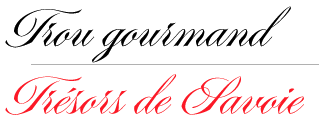 Type designer who contributed to FontYou. In 2014, Joachim Vu, Jérémie Hornus and Alisa Nowak co-designed the classical copperplate script typeface Vicomte FY.
 Janko FY (2014, FontYou) is an informal calligraphic typeface. In 2017, Jérémie Hornus, Théo Guillard, Morgane Pambrun, Alisa Nowak and Joachim Vu co-designed Bespoke Sans, Bespoke Serif and Bespoke Slab at Fontstore / Fontshare. In 2020, Bespoke Stencil was added. [Google]
[MyFonts]
[More] ⦿
|
Joel Maker

|
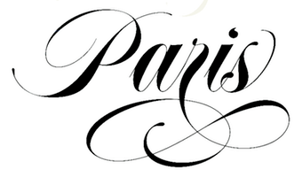 Banda Aceh, Indonesia-based designer. He created these calligraphic script typefaces in 2015: Still Shine, Mighty Heart, Azurra Script, Amigirl (script and sans), Monkuta Script and Bruselo. Still in 2015, he designed the swashy script typefaces Story Dream, Mastura, Hefalo (brush style), Edelweis Script, Brigent Script, Cherryla, Amellia Script, Bella Script, and Novelia.
 Typefaces from 2016: Chalisto Script, Harista Brush Script, Andara Script, Ocean Twelve, Johns Steward Script, Mustache (consisting of Mustache Rounded and Mustache Brush Script), Flourish Script, Virmigo (calligraphic script), Maestro (brush script), Mustica Script, Shinthia (calligraphic script), Be Smart Script. Typefaces from 2017: Medley, Still Shine, Worthwhile (calligraphic script), Castilla Script, Daughter (formal calligraphy). Typefaces from 2018: Mansions Brush Script (brush script), Malika, Barracuda Script (copperplate calligraphy), Mighty Heart, Novelia Pro (a curly serif typeface), Zenith Script. Typefaces from 2019: Hefalo Script, Abella Script (copperplate calligraphic). Typefaces from 2020: Nostalgic Script, Harista, Edelweis Script (wild, calligraphic), Basyirah Script, Almere Script, Meritta Serif (a decorative serif), Married Typefaces. Typefaces from 2021: Rogelio Script (a wonderful inky script). Typefaces from 2022: Krong (a 19-style geometric sans), Brody Script (a signage script). [Google]
[MyFonts]
[More] ⦿
|
John Bell
[British Letter Foundry]

|
[MyFonts]
[More] ⦿
|
John Hansen Budalsplads
|
John Hansen Budalsplads (1798-1874), a craftsman from Budalen, a remote mountain valley in central Norway, is well known for his production of ornamented, wooden boxes. He also had a great interest and ability in cutting letters in wood. He produced whole alphabets in blackletter and Latin (copperplate) style. On some plates the letters are cut into the wood, but he also cut letters which stand out of the wood (as punches). The latter ones were then printed on paper, to be hung up on walls on the farms. They were both educational and decorative, as the letters are well executed. The article discusses how Budalsplads can have got them printed. Torjorn Eng regards him as the first representative of Norwegian typeface design. A sample from 1820 until 1831. A sample from 1826. Another link. [Google]
[More] ⦿
|
John Stephenson
[Stephenson Blake]

|
 [MyFonts]
[More] ⦿
|
Jordan Jelev
[The Fontmaker]

|
 [MyFonts]
[More] ⦿
|
José Antonio Garrido Izquierdo
[Noem9 Studio]

|
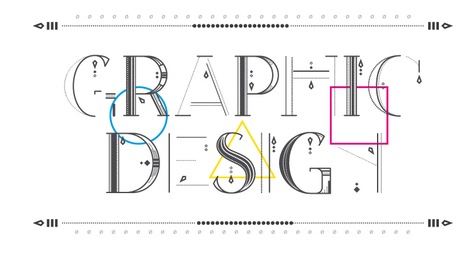 [MyFonts]
[More] ⦿
|
Josep Pep Patau i Bellart
[Tipo Pepel (was: Antaviana Typeface Division, or: Astramat)]

|
 [MyFonts]
[More] ⦿
|
Joseph Champion
|
 Joseph Champion (b. Chatham, 1709, d. 1765) was a British calligrapher and penman. Champion contributed many plates to Bickham's Universal Penman. His most important work, The Parallel or Comparative Penmanship Exemplified, was published in 1750. It consists of reproductions of the work of foreign masters like Materot, Barbedor, Van den Velde, Perlingh and Maria Strick, with corresponding plates by Champion. Following these plates come some alphabets by Champion. His last published work was The Penman's Employment (1762).
 The first known attempt to digitally implement Champion's alphabets, was in 1989 by French type designer François Boltana, who in Ligatures&calligraphie assistée par ordinateur (1995) proposed three copperplate calligraphic alphabets based on Champion. These did not result in a commercial font however. PF Champion Script Pro (Panos Vassiliou, 2004-2008; a winner at Paratype K2009) on the other hand has 4280 glyphs in each of its two styles, and it supports Latin, Greek and Cyrillic. One of Champion's alphabets, dated 1733-1741. Samples of his penmanship from The Universal Penman (1730): i, ii. [Google]
[More] ⦿
|
Joseph Gillé

|
 Among French type-founders at the end of the eighteenth century, the two Gillé's, père et fils, held a prominent place. The elder Gillé, Joseph, was a distinguished Parisian type-founder. He died in 1789. His work can be found in Epreuves des caractères de la fonderie Joseph Gillél; (1773), and in Caractères de la fonderie de J. Gillé, graveur et fondeur du roi pour les caractères de l'imprimerie de la loterie royale de France,&autres (Paris, Rue&petit marché Saint-Jacques, 1778). The latter book still shows mainly transitional typefaces, with slight hints of the start of the geometric trend in typography. Gillé seems to be mostly remembered for being the author of the ornamental typeface called Madame.
 Joseph Gillé was succeeded about 1790 by Joseph Gaspard Gillé fils. He was one of the promoters of the newer styles of ornament, and offered typographic decoration to the printers of France. His Recueil des divers caractères, vignettes et ornements (1808) also showcases copperplate engraving including copperplate calligraphic alphabets: one part of the book is entitled Trente-huit Caractères d'Écriture Financières, Anglaise et Civilité, depuis le Cicéro jusqu'aux Grosses de Fonte. Later, he published Recueil des divers caractères, vignettes et ornemens de la fonderie et imprimerie de J.G. Gillé, rue Saint-Jean-de-Beauvais, division du Panthéon, Paris (1826) [Local download]. Gillé fils was influenced by Didot in the design of his lush vignettes, borders and rules. His house specialized in ornaments, fancy letters and script letters. In September 1827 it was bought by Honoré de Balzac. On digitizations. In 2011, Jose Jimenez of Celebrity Fontz created Parisian Ornamentals after a design by Gillé. Home Style (2003, Michael Hagemann, Font Mesa) is an exquisitely detailed family based on work by Joseph Gillé, and implemented elsewhere under the names Circus, Roma and Madame. See also Gillé Classic (2004, Michael Hagemann). I think that this is a renaming of Home Style. Initiales ombrées (2007, Ari Rafaeli, ARTypes) is based on Gillé's original all caps typeface (from 1828, it is claimed). [Google]
[MyFonts]
[More] ⦿
|
Joss Type
[Teuku Zulfikar]

|
Banda Aceh, Indonesia-based type designer designer who uses the names Joel Popon and Teuku Zulfikar. Creator of the brush script typefaces Halyting Script (2016) and Thahira (2016). Typefaces from 2017: Romarya, Hampten, Abbie Script, Whenesday, Emainell Script, Marioline (a copperplate calligraphic script), Odelina (formal calligraphy), Bringtong (brush script), Mallica, Amethyst, Chettos Script (calligraphic). Typefaces from 2018: Shedaytia, Agency Script, Lindage Script (wild calligraphy), Over The Sunday, Berlind, Venezuela, Balithya. Typefaces from 2020: The Geantdum (a creamy upright script), Amealnia (a formal calligraphic script). Typefaces from 2022: Over the Sunday Slant (a thin script), Goodnight Thahira (script). [Google]
[MyFonts]
[More] ⦿
|
Jukebox Collection
[Jason Anthony Walcott]

|
 This is the new foundry of Hollywood, CA-based Jason Walcott, who formerly ran JAW Fonts, Jukebox Type, and Counterpoint Type Studio. JAW Fonts ceased operation in 2003 and Jason reintroduced his collection of fonts in a revised form under the new name of Jukebox Type. Established in 2015, Jukebox Collection started out with these typefaces, which are mainly remastered and recycled typefaces from JAW Fonts and Jukebox Type with original designs going back to the period 2001-2007, roughly spaeking:
 View the Jukebox Collection typeface library. [Google]
[MyFonts]
[More] ⦿
|
Juliana Nogueira
|
During her studies in Sao Paulo, Juliana Nogueira created the copperplate typeface Nogs Bold (2013). [Google]
[More] ⦿
|
Julie Soudanne

|
 French type designer. Her typefaces include:
 Behance link. [Google]
[MyFonts]
[More] ⦿
|
Julius Wiescher
[Authentic]

|
[MyFonts]
[More] ⦿
|
Kalligarfie 't Veertje
[Godelief Tielens]
|
Fantastic Belgian site on the history, teaching and understanfing of calligraphy. Run by Godelief Tielens in Halen. Three subpages worth visiting include Humanist Cursive, Anglaise/Copperplate, and Uncial. The pages are in Flemish. [Google]
[More] ⦿
|
Karandash
[Vassil Nikolaev Kateliev]

|
 Karandash is a type and graphic foundry in Varna, Bulgaria, established in 2010 by designer Vassil Kateliev (b. 1980, Varna). The Fontmaker series is a collaborative project with Jordan Jelev, a well known Bulgarian calligrapher and cult wine label designer. The type designs are done on paper, using traditional calligraphic and artistic methods and then digitally recreated.
 Typefaces: Myriad Pro Bulgarian and Cyrillic (2011), Rotis Semi Serif Bulgarian Cut (2011), and FM Clog (2011, with Jordan Jelev, done at The Fontmaker: has Openface, Shadowed and Engraved styles). Callista is a fat cursive typeface that was inspired by the work of François Boltana in the early 1970s and of Milka Peykova in late 1970s. Gaytan (which means braid in Bulgarian) is a sans and serif family created in 2012. It was inspired by Old Church Slavonic Cyrillic, Bulgarian Ustav and the Russian Vyaz stiles, as well as the avant-garde works of Bulgarian typedesigners in late 1970s. But the result is definitely Victorian. He closes 2012 with Estimo, an organic typeface family for Latin and Cyrillic that has no diagonal strokes. FM Bolyar (2012) is a copperplate typeface jointly designed by Jordan Jelev and Vassil Kateliev at The Fontmaker. See also the spurred version FM Bolyar Ornate Pro ansd the weathered family FM Bolyar Typecarft. In 2019, after a full year of development, they published the 63-style all caps sans family FM Bolyar Sans Pro. In 2013, Vassil Kateliev and Jordan Jelev codesigmned the lively script typeface FM Ephire, which comes with a useful caps companion, FM Ephire Frames. In 2014, Kateliev designed a Valentine-inspired set of calligraphic ornaments, LoveHearts, Love Christmas (Christmas ornaments, done with Stella Ivanova Katelieva), and the humanist slab serif typeface Basil (the Regular weight is free). Basil won an award at Granshan 2014. Typefaces from 2015: Sybilla (humanist slab serif, extended to Sybilla Pro in 2016, and the 294-style Sybilla Multiverse in 2017). Sybilla Shade Pro is free. Typefaces from 2017: Versatile Bold (a Latin / Greek / Cyrillic font family for layering with plenty of hatched, shadow, rust and 3d options; by Charles Borges de Oliveira and Vassil Kateliev). In 2018, he designed Kometa together with Kiril Zlatkov. The 21-style Kometa (Latin and Cyrillic) is a modern sans serif font family with a geometric skeleton and a humanist soul. It has a unicase option and many alternates. Typefaces from 2019: Achates (a humanist sans workhorse), Future Tense (a sci-fi typeface by Charles Borges de Oliveira and Vassil Kateliev). MyFonts link. Creative Market link. Behance link. Klingspor link. [Google]
[MyFonts]
[More] ⦿
|
Karl Krauß
|
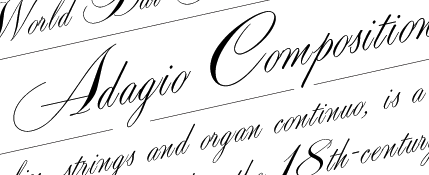 German designer at profonts of Adagio Pro (2006), a connected calligraphic copperplate script. [Google]
[More] ⦿
|
KC Fonts
[Kevin Christopher]

|
 Canadian creator (b. Regina, SK) of the free typefaces Subway Novella (2011, grunge), Death From Above (2011, grunge), My Girl is Retro (2011, grunge), Eclipse (2011, shadow face), Chemical Reaction (2011, grunge), Shotgun Wedding (2011, grunge), Smoke in the Woods (2011, grunge), Indie Press (2011, texture face), Fat Cat (2011), Bluprint (2011), Square Flo (2011), Serial Publication (2011, grunge), Criminology (2011, textured face), Yoghurt (2011, curly script), Crashed Out (2011, textured face), Scribble Box (2011, sketched), Demento (2011), Verbal Diarrhea (2011), Ol' Cowboy (2011, grunge), Urban Jungle (2011, grungy caps-only face), Overcast Skies (2011, grunge), Good Morning Afternoon (2011) and Seedy Motel (2011). He also made the hand-printed Western Swagger (2011), the grungy mural typeface family Media Blackout (2011), the white on black typeface All Ages (2011), In The Garden (2011), Past Due (2011, didone grunge), and the drippy Rainy Day Vandal (2011).
 Commercial typefaces: Pewter (2012), Varsity Playbook (2012, sketched), Subway Novella (2012). Typefaces made in 2012: This Line-Up (grungy), None Shall Pass (grungy stencil), Black Asylum (horror movie grunge), Jonze (rubber stamp grunge), Main Event (grunge), Pewter, Black Asylum (grunge), Transit Diplay (noisy), Muddy Tractor, Load up on guns (grunge), Tragic Vision (grunge), Closure, Rocky Shore (grunge), Kraft Nine, Hooverville (copperplate/engraved typeface), Misery Loves Company, All Ages (grunge), By The Throat (scribbly, fat), Faded Memory, Varsity Playbook, Headliner No. 45 (a heavy poster face), Dro (another poster face), The Biz (grunge), Scorched Earth, Gunslinger (grungy wood type), Friday Night Lights (athletic lettering), Noises in the Attic (grunge), Jonze and Jonzing (grungy poster typeface in the style of Veneer). Typefaces made in 2013: Misdemeanor (grungy stencil), Intaglio (grunge), Outliner No 45. Typefaces from 2017: Type Xero (grungy and texrtured). Dafont link. Home page. Fontspace link. [Google]
[MyFonts]
[More] ⦿
|
Keith Bates
[K-Type]

|
 [MyFonts]
[More] ⦿
|
Kelly Media
|
Crooked font vendor in Germany who has a few cheap CDs with renamed commercial fonts. Run by Hans Fremuth, who founded Kelly Data GmbH in 1994 (since 1999 Kelly Data AG). Kelly Data AG went bankrupt in 2002. Ulrich Stiehl has evidence that Fremuth is based in München. On the Kelly Media or Kelly Data web sites, one can find cheap font CDs under names such as Profi-Schriften Business Schriften (679 truetype fonts), Firle Fonts, and Profi-TYPO (2000 fonts). Stiehl discovered a connection between Hans Fremuth and Charles Biddle, who set up Bay Animation, an Annapolis, MD, outfit of equal questionable taste. Font names used by both Kelly Data and Bay Animation include Alps (Hevetica), Amaretto (Bitstream Amerigo), Amethyst (Garamond No. 3), Antiqua 101 (Antique Olive), Attila (ITC Avant Garde), Bangla (ITC Benguiat), Bid Roman (Melior), Bliss (Janson), Block (ITC Machine), Centime (Century Old Style), Chelsey (ITC Cheltenham), Chisel (Copperplate Gothic), Clayton (Caxton), Clean (Orator), Congo (Trump Medieval), Cupid (Cooper Black), Schroeder (Schneidler), Tech (Arquitectura), and Vogel (VAG Rounded). Stiehl's PDF file shows without a shadow of a doubt that Biddle copied several fonts, giving examples of Bid Roman (a copy of Zapf Elliptical). Owner info: Hetzner Online AG, Stuttgarter Strasse 1, 91710, Gunzenhausen, DE, +49 9831610061, +49 9831610062, info@hetzner.de. [Google]
[More] ⦿
|
Kenji Enos
|
 West Sacramento, CA-based designer of the rounded sans Simplex (2012), the tall-legged Twiggy Display (2012), the sans family Locksmith Display (2012, an experiment on inline), the arched shadow headline typeface Architype (2012), the bicolored geometric typeface El Grito (2012), Squirrel Display (2012), the geometric layered typeface Chunky Display (2012), and the Western slab typeface Slabtastic Display (2012).
 Typefaces from 2013 include Samuel Display (+Clean, +Ruff), Industry Display (+Raised, +Inline, +Lined: an octagonal typeface family), Winter Display (a spurred typeface), Delilah Display, Wellington Display. The Condensed weight of this family is tweetware. Rockefeller Display has mini-slabs characteristic of copperplate. Barker Display is a condensed straight-edged typeface. Elizabeth Display has so many different crazy terminals that it must be classified as high-Victorian. Typefaces from 2014: Euclid Display (octagonal, free), Cornelius Display (weathered slab serif), Quentin Display. Typefaces from 2015: Magnolia Display (free), Bear Display (a heavy octagonal typeface), Mable Display (spurred vintage typeface). Typefaces from 2016: Bear (modular and squarish), Rosemary Display (a great slab serif family), Magnolia Display, Quentin Display v.2, Ember Display (a high-contrast didone), Elder Display (a free transitional style typeface). Typefaces from 2018: Kenjiboy Village Plus (reverse stress psychedelia). Behance link. Creative Market link. [Google]
[More] ⦿
|
Kevin Christopher
[KC Fonts]

|
[MyFonts]
[More] ⦿
|
Khiam Mincey
|
Newark, NJ-based creator (b. 1998) of the free font Universal Serif (2015), which is based on Copperplate Gothic. Dafont link. [Google]
[More] ⦿
|
Kimmy Design
[Kimmy Kirkwood]

|
 Kimmy Kirkwood (b. 1988, Seattle, WA) (Kimmy Design) studied at Chapman University, and lives in Santa Monica, Orange County. He graduated in 2018 from the University of Reading's MATD program.
 Kimmy created a gracious curly calligraphic script face, Madeleine (2010), which is based on a logo she designed for Hotel Le Sirenuse. At Dafont, one can download Kuppel (a hairline display sans) and Hammer Head, both done in 2010 as well. Phase two of Kimmy's career started late in 2010 as Kimmy Design, where one now has to pay for Madeleine (2010) and Katelyn (2011). Addison (2011) is a wood type Western circus poster font in two styles, West and Circus. In 2012, Kimmy created the counterless art deco typeface Chelsnuts, the worn wood type typeface Cpl Kirkwood, Elizabeth Script, and Paper Cutout Pro. In 2013, Kimmy published Lunchbox Slab, the grungy Appareo, the condensed minimalist sans family Maxwell Sans, its companion Maxwell Slab, the scriptish typeface Lunch Box, and the bold headline family Station (inspired by old train station typography). Typefaces from 2014: Catalina (hand-drawn typeface family with sub-styles called Anacapa, Avalon, Clemente Script, Typewriter and Extras, ideal for hand-drawn menus, table cards, chalkboards, and wall quotes), Amorie (a skinny hand-drawn family, with styles called Modella, Nova, SC and Extras). Typefaces from 2015: Avaline Script, Baker Street (vintage hand-drawn typeface family), Burford (a 16-style vintage layered family), Burford Rustic (layered font family). Typefaces from 2016: Bourton (a layered font for vintage yacht club or whiskey bar logos; it is the sans version of Burford; sufamilies include Drop, Lines and Outlines), Rainier (handcrafted). Typefaces from 2017: Evanston Alehouse (octagonal, beer bottle style, slightly copperplate), Bourton Hand. Typefaces from 2018: Clifton (his MATD graduation typeface): Clifton is a modern type family with many weights and contrast styles. It supports Latin scripts as well as Greek, Cyrillic and Arabic. Originally intended as a book typeface, it was designed so that all the weights and styles would work together as a cohesive family. Typefaces from 2019: Refinery (an 85-style octagonal family based in early 20th century signage), Evanston Tavern (Evanston Tavern is a square typeface and the sans-serif version to Evanston Alehouse. Inspired by the years that prefaced the ratification of the American Prohibition, this typeface mimics the signage commonly seen outside of saloons, taverns and alehouses during that time.), Winslow Book (a playful modern Scotch). Typefaces from 2020: Roadhouse (a layering typeface family that is part of the greater Evanston type collection, which is inspired by American typefaces commonly used at the turn of the century leading up to prohibition), Winslow Title (a decorative didone family), Winslow Title Script (monoline), Hawkes (Sans, Script, Variable Width Sans). Typefaces from 2021: Madley (a 12-style soft slab serif). Typefaces from 2022: Bourton Text (an elliptical sans in 42 styles). [Google]
[MyFonts]
[More] ⦿
|
Kimmy Kirkwood
[Kimmy Design]

|
 [MyFonts]
[More] ⦿
|
Klaus-Peter Schaeffel
[KPS Fonts]
|
 [More] ⦿
|
Kleber Lopes
|
Graduate of Centro Universitario Tiradentes (UNIT) in Sao Paulo, Brazil. During his studies at Miami Ad School in Sao Paulo, he designed the copperplate font Pepper (2017) and the soccer shirt typeface family Canarinho (2018). [Google]
[More] ⦿
|
Konstantine Studio

|
 Commercial typeface foundry in Jakarta, Indonesia, run by "Ian" and "Abdilah". Its first typeface is Muffler (2014), which is inspired by retro brush signage for car races. Lacydes (2014) is a spurred advertizing typeface. Upjohn (2014) is a horror movie poster typeface. Curely (2014) is a free hand-drawn curly typeface, expanded to Curely Pro in 2017. Hemera (2014) is based on vintage matchbox packages.
 Typefaces from 2015: Marthas, Risoless Script, Elska (a thick warm watercolor brush script), The Chalker (crayon font), The Bride, The Groom (brush script), Wanderlove (brush script), Rumbell (handcrafted poster typeface). Typefaces from 2016: Easy Lullabye (Swash, Sans), Wiggle (brush script). Typefaces from 2017: Fathers (a vintage packaging script), Ride Slow (a handcrafted set of motorcycle culture fonts), Delight, Kehlin (retro poster style), Butter Love (dry brush), Fathers Script (vintage), Fili & Kyla (thin script), Husky Giggle (casual hand stroked brush font), Ruffle (dashing brush script), Dollyn Script, Halloween Rock, Love Hurts (ballpoint pen font), Moneyroll, Trakster, Trakster Serif, Noswatt, Noswatt Serif (copperplate style), Notstar, Rodenda, Hammet, Hastagirl (watercolor brush), Arzeti Script (informal monoline wedding script), Sicero (vintage display typeface by Abdilah), Sign Panthers Brush Script, Magle Sans, Magle Script. Typefaces from 2018: Millerstone (connected calligraphic script), Bad Taste, Conserta (Victorian), Grestal Script, Beclave, Double Aunofa (Script and Serif), Summer Classico, Ahoy Amigo (font duo), Aunofa Serif, Aunofa Script, Delphin Spring, Delight Lettering Script, Tropical Asian, Vedacity (calligraphic), Rothe (vintage), Bigger Love (script), First Choice (calligraphic), Love Hurts, Hall Of Fun, Casual Font Bundle (which includes Easy Monoline Script, Subber Sans, Sintix, Rebel Four, and Grotes Sans), Hemera II (a vintage Victorian matchbox typeface), Asian Skyline, Queen Waffle, Rosse, Harvest Barn (script), Oh Samantha, Simple Monologue (calligraphic), Sweet Getaway (handwriting). Typefaces from 2019: Vango (a sci-fi or speed font), Aghony (script), Conserta Royal (Victorian), Roast Serif, Mister Quenos (a fast food store signage font), Calisatt (an SVG brush font), Redstock Script, Suspiria Vampira (a Halloween font set), Hoffers (a children's book font), Closer (a Swiss sans), Hoffers (a marker pen font), Mackle (Script, Serif), Blante (Sans + Script), Millerstone, Kimball, Henave (flared sans), Valsday (Sans, Script). Typefaces from 2020: Destrokes, Kremato (+Script, +Short, +Tall), Krasher (a painted brush SVG font), Rebelton (a 12-style all caps sans), Koutura (a fashion mag font), Kalleco (a free hand-printed typeface), Citypop (1990s Japanese retro pop style, with subfamilies Main Display, Neon, Screen, Digital and Automotive), Urban Shock (ultra-condensed), Renin (a Western super-heavy slab serif), Jaksel (a bold squarish sans typeface), Alkaria (a retro display typeface). Typefaces from 2021: Kingsad (a 5-style wide flared display family), Ahoy Amigo (a type duo), Harvest Barn (script), Simple Monologue (a calligraphic script), Magle (a script typeface), The Sign Painters, Makalo (an African tribal font), Discopia (neo-futurist), Daguin (a fashionable display typeface inspired by the Middle Ages), Tropical Asian (a painted font), Fosty Blue, Kofje (a daring decorative serif). Typefaces from 2022: Vogatron (sci-fi), Hwaiting Handwriting (emulating Korean), Hwaiting Serif, Hwaiting Sans (an experimental Korean vibe font), Walanor (a pop art font). Tumblr link. Graphicriver link. Fontspace link. [Google]
[MyFonts]
[More] ⦿
|
KPS Fonts
[Klaus-Peter Schaeffel]
|
 Swiss calligrapher in Basel who made and sells various medieval and historically important script fonts. Dedicated page. These included the paleographic (PAL) series and the KPS series. He lives in Ühlingen--Birkendorf, Germany. His fonts are uniformly of high quality and are usefl for illustrating historical alphabets.
 His early commercial collection: KPS Anglaise (calligraphic script), KPS Antiqua (+Kapitälchen), KPS Capitalis (classic Trajan caps), KPS Cicero, KPS Epona (calligraphic), KPS Fein (hand-printed), KPS Hand (calligraphic), KPS Horaz (calligraphic), KPS Iris (calligraphic), KPS Petit (calligraphic), KPS Plinius, KPS Spitzfelder, KPS Vitruv (calligraphy), PAL Bastarda, PAL Cancellaresca, PAL Carolina, PAL Gotisch, PAL Humanistica, PAL Lombarden, PAL Quadrata, PAL Rotunda, PAL Rustica, PAL Textura, PAL Uncialis, PAL Uncialis Roemisch, Weissranken Initialen, Ranken Initialen (Celtic capitals). Since September 2013, all of his fonts are free. They were renamed and have conveniently the date of original creation in the font name. The fonts dated in the 1990s and 2000s are new typefaces or creative revivals by Klaus-Peter. The list of revivals: 0100DeBellisMacedonicis [Pre-uncial letters from the fragment "de bellis macedonicis", ca. 1st century], 0300Petros [Greek hand from the oldest surviving copies of St. Peter's epistles, dated 3th / 4th century], 0362Vitalis [Roman Minuscule Cursive from the so called Vitalis letter, written before 362 on papyrus (Strasburg)], 0480VergiliusRomanus [Capitalis Rustica from the Vergilius Romanus written in Rome, ca. 480], 0500VergiliusSangallensis [Capitalis Quadrata from the Vergil fragments in Stiftsbibliothek St.Gallen], 0512Dioskurides [Greek Uncials from the Vienna Dioskurides (about 512)], 0746Beda [from Beda Venerabilis: Historia ecclesiastica gentis Anglorum, Northumbria, dated 746], 0800Kells [Half Uncials from the Book of Kells], 0800Remedius [So called "Lombardic-Raetic Minuscule" from Codex 348 of the Stiftsbibliothek St. Gallen], 0800 Theophanes [Greek Hand after a 9th century Theophanes manuscript], 0850CarolinaTours [Carolingian Minuscule], 0850Carolinaundulata [Carolingian Minuscule from the Scriptorium of Tours], 0864Folchart [St. Gall Carolingian from the Folachart Psalter], 1012Otto [Late Carolingian Minuscule from the Perikopes of Heinrich II, written at the Reichenau, donated to the dome of Bamberg in 1012], 1258FridericusII [Gothic Rotunda from the falcon book of Emperor Friedrich II, Southern Italy 1258-1266], 1400Wenzel [Bohemian Textura from Vienna], 1450Sebastos [Humanistic Greek hand from Homer, Ilias, Vatican Library], 1455GutenbergB42 [Gothic Textura types from the 42 line Gutenberg Bible], 1458GutenbergB36 [Gothic Textura types from the 36 line Gutenberg Bible], 1470Jenson [an antiqua by Nicolas Jenson], 1475HumanisticaCursiva [Humanistic Cursive of the kind Bartolomeo Sanvito of Padua wrote, after Cod. Pal. Lat. 1508], 1480Humanistica [Humanistic Book Hand from Valerius Maximus: Facta et dicta memorabilia, ca. 1480-1485. The calligraphy is attributed to Antonio Sinibaldi from Florence and the titling capitals to Bartolomeo Sanvito from Padua], 1483Koberger [Incunabula type from the Koberger Bible, printed in Nuremberg in 1483], 1485Grueninger [Incunabula type from the Grueninger Bible, printed in Strasburg in 148], 1493SchedelRotunda [Incunabula type from the Latin edition of Hartmann Schedel's World Chronicles, printed by Koberger at Nuremberg in 1493], 1501Manutius [First printed Italic Antiqua by Aldus Manutius (Venice 1501)], 1513Gebetbuch [Fraktur from Emperor Maximilian's Prayer Book, printed in Augsburg in 1513], 1517Gilgengart [Fraktur type from Emperor Maximilian's 1517 private print "Gilgengart"], 1517Teuerdank [Fraktur type from Emperor Maximilian's "Teuerdank", printed at Augsburg in 1517], 1519NeudoerfferFraktur [Fraktur alphabet from a woodblock model in Johann Neudoerffer the Elder's Calligraphy book "Fundament", Nuremberg 1519], 1739Bickham [Copperplate or running hand after models from "The Universal Penman" by George Bickham, printed in London 1743], 1741Bickham [Bickham's round hand from Universal Penman], 1782Thurneysen [Baroque Antiqua Type of J. Jacques Thourneysen fils, Basel 1782]. Original versions by Schaeffel, with date of design in the font name: 1999Anglaise1, 1999Anglaise2, 1999Cancellaresca, 1999Carolina (Carolingian minuscule), 1999Livius, 1999LiviusBold, 1999LiviusItalic, 1999LiviusSmC, 1999LiviusTitel, 1999Ovidius, 1999Stylus, 1999Textualis, 2000Bastarda, 2000Cicero, 2000Humanistica, 2000Plinius, 2000PliniusItalic, 2000Seneca-Italic, 2000Seneca, 2000TextualisFormata, 2000Uncialis, 2001RotundaFormata, 2002Cato, 2002Horatius, 2002Vitruvius, 2003Epona, 2003Lombarden, 2004CapitalisQuadrata, 2004CapitalisRustica, 2004Iris, 2004UncialisQuadrata, 2004UncialisRomana, 2008-Noeuds-1 [for making Celtic knots], 2008-Noeuds-2, 2008-Noeuds-3, 2009Xenophon, 2010Filigrane, 2010Gouttes, 2010Labyrinthe [squarish], 2010Pointu [a calligraphic blackletter], 2010Vergilius [a great calligraphic face]. Old URL. [Google]
[More] ⦿
|
Kreuk Type Studio
[Rendra Diardjo]

|
 Rendra Diardjo set up Kreuk Type Studio in Baturetno and Belkasi, Solo, Indonesia in 2013. By 2021, Kreuk had three type designers, Rendra Diardjo, Iswahyudi and Ivan Pratama. Rendra Diardjo designed the free techno typeface Off (2013). In 2018, he designed the sans headline typefaces Midfield (a chamfered varsity font) and Midfield Pressed (weathered).
 In 2021, Kreuk released Midfield Stencil (a military stencil), KS Foo (a straight-edged techno typeface influenced by the skateboarding subculture), Nakara (an all caps copperplate emulation font) and KS Roam (a brush font). Fontspace link. You Work For Them link. [Google]
[MyFonts]
[More] ⦿
|
K-Type
[Keith Bates]

|
 K-Type is Keith Bates' (b. 1951, Liverpool) foundry in Manchester, UK, est. 2003. Keith works as an Art&Design teacher at a Salford High School. They custom design type, and sell some of their own creations.
 Commercial typefaces: - Adequate (2012). A basic geometric monoline sans family.
- Adventuring (2010, comic book style)
- Alan Hand (2005, based on some blobby lettering, handwritten by printer and mail artist, Alan Brignall)
- Alex (2002-2004)
- Alright (2004, cursive script)
- Anna (2002-2007).
- Argot (2019). Characterized by square counters, this typeface family exhales brutalism and industrialism. See also Argot Machine (2019).
- Artist Hand (2019).
- Axis
- Bank of England (2012, blackletter): Bank of England is loosely based on blackletter lettering from the Series F English twenty pound banknote introduced in 2007. The font also takes inspiration from German Kanzlei (Chancery) typefaces and the 17th century London calligrapher, John Ayres.
- Banks & Miles (2018). Inspired by the geometric monoline lettering created for the British Post Office in 1970 by London design company Banks & Miles, a project initiated and supervised by partner John Miles, which included Double Line and Single Line alphabets. The new digital typeface is a reworking and extension of both alphabets.
- Barbica (2015). A glyphic typeface.
- Bricola (2020).
- Brush Hand New (2013): Brush Hand New is a full font based on a copy of Flash Bold called Brush Hand marketed by WSI in the 1990s and more recently distributed through free font sites. Brush Hand was an anonymous redrawing of Flash which simplified, slightly lightened, smoothed out ragged edges, and improved the legibility of the original classic created by Edwin W. Shaar in 1939.
- Building&Loan (2007, engaved face)
- Bigfoot (2005, a Western font based on the slab capitals used by Victor Moscoso in his 1960s psychedelic rock posters)
- Bolshy (2009)
- Bolton750 (2003, a mechanical typeface done with John Washington).
- Chancery Lane (2021). An italic text typeface that is based on chancery scripts.
- Charles Wright (2016). A set of fonts based on the UK license plate fonts.
- Chock (2009)
- Circa (geometric sans)
- Cloudbuster (2019). Inspired by Imre Reiner's Corvinus Skyline of 1934.
- Club.
- Coinage Caps (2017). Coinage Caps is a trilogy of small caps fonts based on the roman lettering used for the designs of British coinage. Coinage Caps Eric Gill is a regular weight, spur serif style drawn by Eric Gill for silver coin designs in the 1920s which were rejected by the Royal Mint. Coinage Caps Humphrey Paget is a medium weight serif based on the lettering of Thomas Humphrey Paget, designer of the Golden Hind Halfpenny first struck in 1937. This font simulates the soft, slightly rounded corners of the minted letterforms. Coinage Caps Kruger Gray is a glyphic, flare serif font typical of the bold style engraved by George Kruger Gray for numerous British and Commonwealth coins during the 1920s and 30s. This font also simulates the slightly rounded corners of the minted letterforms.
- Collegiate (2009)
- Component (2012). A font for lost civilizations and dungeon rituals.
- Context (experimental)
- Credit Card (2010, font for simulating bank cards)
- Curwen Sans (2018). A monoline sans from the early 1900s originally created for in-house use at the Curwen Press in London.
- Cyberscript (2006, connected squarish face)
- Deansgate (2015). Deansgate and Deansgate Condensed are based on the clearest and most distinctive of the sans-serif letterforms used on Manchester street nameplates, and easily identified by a pointy Z and pointed middle vertices on M and W.
- Designer
- Digitalis
- English
- Enamela (2013). Keith writes: Enamela (rhymes with Pamela) is based on condensed sans serif lettering found on vitreous enamel signage dating from the Victorian era and widely used in Britain for road signs, Post Office signs, the plates on James Ludlow wall postboxes, railway signs, direction signs and circular Automobile Association wayfinding plaques throughout the first half of the twentieth century. The original model goes back to Victorian times, ca. 1880.
- Engravia (2018). Engravia is a didone display typeface supplied in three varieties of engraving---Inline, Shaded and Sawtooth---plus a plain basic font.
- Example (2017). A workhorse neo-grtesque typeface family.
- Excite
- Flip (2011), a western grotesk billboard face.
- Flyer (2009, techno)
- Frank Bellamy (2009, an all-capitals family based on the hand lettering of English artist Frank Bellamy, who is most famous for his comic art for Eagle and TV21, and his Dr Who illustrations for Radio Times)
- Future Imperfect
- Gill New Antique (2003)
- Greetings
- Helvetiquette
- Hapshash (2010): an all capitals font inspired by the 1960s psychedelic posters of British designers Hapshash and the Coloured Coat (Michael English and Nigel Waymouth), in particular their 1968 poster for the First International Pop Festival in Rome. A dripping paint font.
- Irish Penny (2016). An uncial typeface based on the lettering from Percy Metcalfe's influential pre-decimal coinage of Ireland, the Barnyard Collection.
- Ivan Zemtsov (2009)
- Kato (2007, oriental simulation face)
- Keep Calm (2015). A geometric sans inspired by a British war poster from 1939.
- Keith's Hand
- Klee Print (2010, Klee Print is based on the handwriting of American artist Emma Klee)
- Latinate (2013). A vintage wedge serif wood style typeface, and a rough version.
- Lexie (an improved or "adult" version of Comic Sans) and Lexie Readable (2006, modified in 2015). Keith writes: Lexie Readable (formerly Lexia Readable) was designed with accessibility and legibility in mind, an attempt to capture the strength and clarity of Comic Sans without the comic book associations. Features like the non-symmetrical b and d, and the handwritten forms of a and g may help dyslexic readers.
- Licencia (2016). A blocky typeface inspired by the tall, soft-cornered lettering on vehicle licence and registration plates world-wide.
- Londinia (2016).
- Matchbox
- Max
- Ming
- Modernist Stencil (2009).
- Monterey Pop (2020). A psychedelic / popart typeface based on Tom Wilkes's poster lettering for the Monterey International Pop Festival in June 1967.
- Mythica (2012). A slightly condensed lapidary roman with copperplate serifs.
- Modulario (2010): a contemporary sans.
- New Old English (2010, blackletter)
- Norton (2006)
- Nowa (2004, a play on Futura)
- NYC (octagonal)
- Openline (2008, an art deco pair)
- Oriel Chambers Liverpool: A Lombardic small caps font based on the masonry lettering on Peter Ellis's 1864 building, Oriel Chambers, on Water Street in Liverpool.
- Pentangle (2008, based on album lettering from 1967)
- Pixel
- PixL (2002-2004)
- Plasterboard (2004-2005)
- Pop Cubism (2010) is a set of four texture fonts, combining elements of cubism and pop art.
- Poster Sans (2006). A wood type family based on Ludlow 6 EC. See also Poster Sans Outline.
- Rick Griffin (2006, more psychedelic fonts inspired by a 1960s Californian artist)
- Rima (2020). A stencil typeface with heavy slabs.
- Roundel (2009, white on black)
- Runestone (2010, runic).
- Sans Culottes (2008, grunge)
- Serifina
- Solid State (2008, art deco blocks)
- Solus (2004, a revival of Eric Gill's 1929 typeface Solus which has never been digitized; read about it here)
- Stockscript (2008, down-to-earth script based on the pen lettering of the writer, Christopher Stocks)
- Susanna (2004)
- Ticketing (2011): pixelish.
- Total and Total Eclipse (2004, squarish display typefaces based on the four characters of Jaroslav Supek's title lettering for his 1980s mailart magazine, Total)
- Transport New (2009: a redrawing of the typeface designed for British road signs. In addition to the familiar Heavy and Medium weights, Transport New extrapolates and adds a previously unreleased Light weight font originally planned for back-lit signage but never actually applied. Originally designed by Jock Kinneir and Margaret Calvert beginning in 1957, the original Transport font has subtle eccentricities which add to its distinctiveness, and drawing the New version has involved walking a tightrope between impertinently eliminating awkwardness and maintaining idiosyncrasy.)
- Union Jack (octagonal)
- Victor Moscoso (2008, psychedelic)
- Wanda (2007, art nouveau)
- Waverly
- Wes Wilson (2007, psychedelic, inspired by 1960s psychedelic poster artist Wes Wilson).
- 3x5
- Zabars (2001): a Western face.
His free fonts: - Blue Plaque (2006: a distressed font based on English heritage plaques)
- Blundell Sans (2009)
- Celtica (2007) has Celtic influences
- Dalek (2005, stone/chisel face: Dalek is a full font based on the lettering used in the Dalek Book of 1964 and in the Dalek's strip in the TV21 comic, spin-offs from the UK science fiction TV show, Doctor Who. The font has overtones of Phoenician, Greek and Runic alphabets). See also Dalek Pinpoint (2018).
- Designer Block (2006)
- Flat Pack (2006)
- Future Imperfect (2006, grunge)
- Gommogravure (2005)
- Greetings (2006), Greetings Bold (2006)
- Insecurity (2005, experimental) won an award at the 2005 FUSE type competition.
- International Times (2006, inspired by the masthead of the International Times underground newspaper of the 1960s and 1970s)
- Keep Calm (2011). Related to London Underground.
- Kindersley Sans (2017). A modernized version of David Kindersley's 1950s type used for many street name plates in Britain, about which Bates writes: Kindersley Sans is a humanist sans-serif that conserves the Gill-inspired character and some of the calligraphic qualities of Kindersley's lettering, it retains the Roman proportions and its Britishness, but traditional prettiness and intricacy are discarded in favour of a clean modernity.
- Klee Capscript (2005: based on the handwriting and capitals drawn by artist Emma Klee (USA) for her Color Museum Mail Art invitation. The upper case is based on Emma's capitals and the lower case is freely adapted from her script)
- Lexia and Lexia Bold (2004)
- MAGraphics (2004)
- Magical Mystery Tour (2005, outlined shadow face), Magical Mystery Tour Outline Shadow (2005), Magica (2015, a serifed titling typeface family).
- Mailart (2004), Mailart Rubberstamp (2004), Mailart Rubberstamp Sans (2018).
- Mandatory (2004, a UK number plate font based on the Charles Wright typeface used in UK vehicle registration plates).
- McKnight Kauffer (2021). A retro poster font in the style of poster artist Edward McKnight Kauffer.
- Motorway (2015), a companion typeface to Transport, the British road sign lettering. This is an extension of an original design by Jock Kinneir and Margaret Calvert: The Motorway alphabet was created for the route numbers on motorway signage, and is taller and narrower than the accompanying place names and distances which are printed in Transport. However, for Motorway Jock Kinneir and Margaret Calvert created only the numbers 0 to 9, the capitals A, B, E, M, N, S and W, ampersand, slash, parentheses and a comma. So, although the lettering made its first appearance on the Preston bypass in 1958, K-Type Motorway is the first complete typeface and contains all upper and lower case letters, plus a full complement of punctuation, symbols and Latin Extended-A accented characters. As with the Transport alphabet the starting point was Akzidenz Grotesk, Motorway taking inspiration from condensed versions. Changes were mainly driven by a quest for legibility, resulting in some reduced contrast between horizontal and vertical strokes, and Gill-esque straight diagonal limbs on the 6 and 9, and high vertex for the M.
- Penny Lane (2014). A a sans serif derived from twentieth-century cast-iron signs displaying Liverpool street names.
- Possible (2020). A 10-style mini-serif typeface.
- Provincial (2014). A Victorian set of outline fonts.
- Ray Johnson (2006-2008)
- Roadway (2005, based on New York roadside lettering).
- Romanica (2017). A humanist sans.
- Sam Suliman (2020). A condensed squarish typeface which was inspired by lowercase lettering on a Sarah Vaughan album cover designed by Sam Suliman in 1962. Suliman was born in Manchester, England in 1927. After working for McCann Erikson in London, he moved to New York where he took on freelance work designing album covers, particularly celebrated are his striking minimalist designs for jazz records. He moved back to England in the early 1960s, designing many book jackets, film titles and fabrics, also working in Spain and India before settling in Oxford in the 1980s.
- Savor (2011). An art nouveau family.
- Sgt Peppers Lonely Hearts Club (2014).
- Sinkin Sans (2014, free) and Sinkin Sans Narrow (2015, commercial). Open Font Library link.
- Soft Sans (2010)
- Subway Ticker (2005)
- Taxicab (2016). A squarish style.
- This Corrosion (2005).
- Toppler (2018). A modern and full range top-heavy cartoon font family that includes a Popdots style. Bates was striving to improe on 1990s clasics such as Baby Kruffy (Ben Balvanz), Comix Heavy (WSI) and Startling (Dave Bastian).
- Wildcat (2016). An athletics typeface family.
- Zinc (2018). A monoline sans with diagonal nubs.
- Colnage Caps Kruger Gray (2018). Coinage Caps is a trilogy of lapidary small caps fonts based on the Roman lettering used for the designs of British coinage.
- Dalek Pinpoint (2018). Based on Dalek comic book lettering from the 1960s.
- Icky Ticket Mono (2018). IckyTicket Mono is a monospaced font based on the coarsely printed numbering from 1960s bus tickets.
- Sexbomb (2018). A psychedelic typeface family.
- Mancunium (2019). A monoline sans family.
- Straight Line (2020). An outlined font with chamfered corners and straight edges, possibly useful as a blackboard bold type.
- We The People (a blackletter font based on the peamble of the American constitution).
- Bowdon (2021). A six-style warm, Bodoni-inspired English Modern, influenced by the 1930s lettering of designer Barnett Freedman.
- Oxford Street (2021). A condensed grotesque with horizontal and vertical stem terminals; it is a street a signage font that began as a redrawing of the capital letters used for street nameplates in the borough of Westminster, which in turn were designed in 1967 by the Design Research Unit using custom lettering based on Adrian Frutiger's Univers 69 Bold Ultra Condensed.
Custom / corporate typefaces: With Liverpool-based art director Liz Harry, Bates created a personalized font, loosely based on Coco Sumner's handwritten capitals, for the band I Blame Coco. Medium and Semibold weights of Gill New Antique were commissioned by LPK Design Agency. Stepping Hill Hospital and Bates created Dials, a pictorial font to help hospital managers input data about improvements. A custom font was designed for Bolton Strategic Economic Partnership. Abstract Fonts link. View Keith Bates's typefaces. Dafont link. Yet another URL. Fontspace link. Fontsy link. Behance link. [Google]
[MyFonts]
[More] ⦿
|
Kulturrrno
[Ilyas Yunusov]

|
 Taganrog, Russia-based designer of Mash-up (2017), the copperplate emulation typeface Highbridge (2017), the elegant caps only sans typeface Leaner (2017: an all caps monolinear geometric sans, followed in 2018 by Leaner Extended) and the art deco typeface Noirside (2017).
 In 2018, he designed the condensed sans typeface Chromota, and Parallone. Typefaces from 2019: Cultrz (a geometric sans), Sayin On (a grungy caps typeface). Typefaces from 2020: Nullomis (29 styles; an all caps Soviet era font), Domek (a condensed layered sans). Typefaces from 2021: Parallone (a 12-style sans, updating his earlier typeface from 2018). [Google]
[MyFonts]
[More] ⦿
|
KVC Design
[Kyle Van Cleave]
|
Kyle Van Cleave (KVC Design, The Dalles, OR) designed the athletic lettering fonts Bucktooth Block (2017), USC (2017) and Oregon State (2017), the octagonal typeface Brute (2017), the sturdy copperplate font Midgard (2017), the national park font Woodsman (2017: Slab, Pillar, Spike), the weathered typeface Brawler (2017), and the squarish typeface Asgard Block (2017). Creative Market link. Behance link. [Google]
[More] ⦿
|
Kyle Van Cleave
[KVC Design]
|
[More] ⦿
|
Kylie Radick
|
American designer of the copperplate genre typeface Radickal Slab (2018). [Google]
[More] ⦿
|
Laura Worthington
[Laura Worthington Design]

|
 [MyFonts]
[More] ⦿
|
Laura Worthington Design
[Laura Worthington]

|
 Laura Worthington of Bonney Lakes, WA, is a letterer, illustrator and graphic designer. Her script typefaces became quite popular in recent years. In 2010, she set up shop at MyFonts. Catalog. In 2021, she started licensing her typefaces via The Type Founders".
 Her typefaces: - Adorn (2014), Adorn Smooth (2015), Adorn Garland Smooth (2016, with Dai Foldes). Adorn is a hand-drawn poster font family larger than Charcuterie. It contains subfonts called Pomander, Coronet, Garland, Bouquet, Solo (monograms), Duo (monograms), Catchwords, Banners, Frames, Ornaments, Roman, Condensed Sans, Expanded Sans, Slab Serif, Serif, Copperplate, Engraved.
- Al Fresco (2013). A breezy exuberant script loaded with opentype features.
- Alana (2011, +Ornaments). A connected script.See also Alana Smooth (2017).
- Alisha (2017).
- Azalea Rough, Azalea Smooth
- Beloved (2015)
- Bianca (2010). A flowing calligraphic typeface.
- Blithe (2017).
- Boucherie (2014). In the "collection of vintage fonts" mould of Charcuterie, Boucherie captures the lively essence of 19th-century French advertising typography with a collection of original designs, rather than strict historical revivals.
- Buckley (2012).
- Caprizant (2016).
- Charcuterie (2013). A large set of hand-drawn typefaces for vintage signage.
- Congenial (2015). A legible soft unpretentious sans family originally designed for her own web site.
- Ed's Market (2015). A grocery store and sign painting font family.
- Elaina (2018). Script and Semi-Serif. Laura claims that Elaina Script is closest to her own handwriting.
- Elicit Script (2018, by Laura Worthington and Jim Wasco). A hybrid (casual and formal) scrpt typeface based on pointed pen Spencerian Script handwriting.
- Fairwater (2016). Designed together with Dai Foldes, this typeface family has Script, Sans, and Serif subfamilies, as well as several sets of ornaments. The Serif subfamily conjures up tattoo lettering, but also mathematical blackboard bold style and art deco.
- Funkydori (2012). A fat retro signage script.
- Ganache (2014). A packaging and logo script.
- Gioviale (2012). A calligraphic script.
- Greeting Cards (2010).
- GrindelGrove (2009). A vampire font.
- Harlean (2013). A rough-edged, powerful, and slightly sinful script face---originally named Harlowe.
- HoneyBee (2012). An all caps pirate ship font.
- Hummingbird (2012). A penmanship font.
- Juicy (2015). A plump and yummy candy store font.
- Ladybird (2010). A curly script.
- Liam (2011). Bouncy and curly script.
- Mandevilla (2013). Pure Americana, useful for signage.
- Milkshake (a creamy retro script).
- Modish (2016). A smooth brush script font.
- Nelson (2011). A notched eroded family, almost for Mexican simulation.
- Number Five.
- Origins (2010). An antiqued typeface hand-lettered with a crow quill pen. Followed by Origins Smooth (2016).
- Recherché (2010). A delicate script typeface.
- Regina (2010). A delicate script typeface.
- Renata (2016). A connected calligraphic script co-designed with Dai Foldes.
- Rosarian (2011). A pointed brush connected script typeface.
- Samantha (2011): 2700 flourished glyphs in the classical ronde upright script style and in an italic style; +Swash.
- Sepian (2010). A pointy Textura font.
- Sheila (2010). A connected calligraphic script.
- Shelby (2011). A monoline, semi-connected script typeface based on hand lettering created with a Speedball B metal nib.
- Spumante (2015).
- Tangelo (2017).
- Tiva (2010). A handcrafted and almost connected script.
- Voltage (2014). A retro fat signage script.
- Wallflowers (2011), Wallflowers II, Wallflowers III, Winter Wallflowers (2012).
- Winsome (2016). A casual script.
- Yana (2010). A spurred serif typeface.
Interview by MyFonts in 2010. I Love Typography link. FontBros link. Creative Market link. Klingspor link. Behance link. Fontspring link. Picture. View Laura Worthington's typefaces. Images of her typefaces. [Google]
[MyFonts]
[More] ⦿
|
LCT (or: Atelier La Casse)
[Quentin J. Stavinsky]

|
 LCT stands for La Casse Typographique, a graphic and type design studio in Nantes, France, started in 2013. One of its partners, Quentin J. Stavinsky, created the didone caps typeface LCT Palissade (a titling didone with bracketed serifs). Other typeface by La Casse include LCT Baladur (a legible text typeface), LCT Pims (signage script).
 In 2015, he published LCT Sbire (a stylish take on the humanist / renaissance tradition, with ample flaring of the strokes). Typefaces from 2016: LCT Ragnarok PE (a copperplate display typeface for Latin, Greek, and Cyrillic). Typefaces from 2018: LCT Picon. [Google]
[MyFonts]
[More] ⦿
|
Leonard Posavec
[Creative Toucan (was: Leo Supply Co)]

|
[MyFonts]
[More] ⦿
|
Letter Stock (was: Gumacreative)
[Guguh Gumantoro]

|
 Bandung, Indonesia-based designer (b. 1982) of Masura (2016, brush style), Space Cake (2016, sci-fi style), Caroline Script (2016), Morning Fever (2016), Binzo (2016), Morning Cloud (2016, handcrafted), Rancha (2016: grungy style), Alkhali (2016), Gath Is A Robot (2015) and Scarlet (2015, textured typeface).
 Typefaces from 2018: Vanhala (Tuscan), Orchard, Solitaire, Founder (a thin script), Elanor, Callous (signature script), Keith (script), Subsky (script), Hamburger (artsy script), Smith (monoline rounded sans). Typefaces from 2019: Steven Mattew, Romansa (script), Pianicas, Infamous, Voltras, Faddox, Slayer Creeper (a dripping blood blackletter font), Hellioum (a balloon font), Grootten Beast (a wooden plank font), Lazarrous (beatnik), Salmounth (a clean script), Damaskush (a blackletter), Neurotic (spurred, blackletter), Maclucash, Neowave, Throoper, Maldivine, Morrisette (signage script), Descrendent (sans), Athlenstan, Hole Script, Cardigan, Lenox, Aero Space, Esentrik (over-decorated), Lethal (sans), Markwell (script), Hallmark, Fymous (signature script), Brighford (spurred), Bulb (a bubblegum font), Wavecraft. Typefaces from 2020: Flinch (a stone cut Flintstone font), Jack Miller (a signature script), Jaguar Jugglers (squarish, constructivist), Lazarrous (beatnik style), Jane Frediction, Grindmore (a calligraphic blackletter typeface), Descendent (a monolinear rounded coffee shop sans), Oliver Queen (a fat brush script), Orangutan, Chadwick (a Halloween font), Oakleaf, Buckles, Hackwell, Susan Brooks, Jacqueline, Alistair Morrison, Gibson Walsh, Slapstick, Monkey Werch, Rooselyn, Northway (lettering for outdoor or nature trail signage), Ghotana, Apija, Rawkin Pickles, Lockdown, Linger (a curly delight), Nuttyclash (a dry brush typeface), Ghosie, Kuro (a brush script). Typefaces from 2021: Bellamind (a decorative serif), Bingana (a playful typeface with oriental influences; appropriate for toys), Cheshire (sketched, textured), Creepycall, Croftler (a grungy athletic shirt font), Goldenwick (a vintage decorative serif), Karlburns (an ultra-decorative font by Vic Carless), Shorelly (an arts and crafts all caps serif), Walkingblue (a round vernacular slab serif), Garlicha (a great formal copperplate calligraphic font that unfortunately features a lower case r that can be confused with a lower case n), Hamingduck (copperplate calligraphy), Antucious (an ornamental serif), Monkeymod (a textured reverse srtress display font), Eightbit (a retro pixel font), Maloney West (art nouveau), Adamovick (a spurred Halloween font), Grindleaf (organic), Cronicalypse (a reverse stress elephant foot display font), Houston Palace (a monolinear retro script), Raceryouth (a weathered stencil font), Lyonade (a monolinear script based on retro motorbike posters), Alleysondust (a calligraphic script), Carlosberg (a spurred Victorian typeface), Clubeight (a trilined neon typeface that is reminiscent of Wyman's designs for the 1968 Olympics in Mexico), Slacksluger (a decorative inline typeface with medieval terminals), Beckmarine (a rough typeface inspired by retro cartoon and retro motorbike posters), Bullmars (a heavy font), Sinofluck (a stylish brush script inspired by a samurai poster), Scandlers (a dry brush script), Melvines (a thick paint brush font), Rockapolis (stencil), Lexaviers (a rune simulation font), Mylo (a dry brush typeface), Meckatler, Machiates (a vintage signage font), Fluxion (a dry brush script), Black Marilyn (blackletter), Palermosh, New Kids on the Font, Psychonaut (a reverse contrast, or even a Western, font), Black Valentine (a decorative blackletter), Buckles (a dry brush font), Smegh Mouth (a dry brush font), Armthadore, Brookland (a dry brush script), Khian Shantang (a decorative blackletter), Laekar (a hand-drawn blocky poster font), Schoutler (an ornamental fantasy font), Sonoxa (a heavy and creamy dry brush typeface), Classicloud (a decorative and festive blackletter). Typefaces from 2022: Gavin Zoo (a vintage decorative serif), Sallam (Arabic emulation), Sururim Maudunah (emulating Arabic), Ar Rayyan (Arabic emulation), Hollybucks (a round handprinted typeface), Mack Dutch (a weathered elephant foot serif), Obidel (a squarish vernacular typeface), Pinkerton (a playful cartoonish font), Sloopy Joe (a condensed sans with some curly terminals), Xylo Macloud (a decorative serif), Hickenwitch (a decorative serif), Parkwilson (a decorative serif), Buckedtalk (an inline blackletter typeface), Buckedtalk (an inline blackletter typeface). Creative Fabrica Script. [Google]
[MyFonts]
[More] ⦿
|
Letterhend Studio (or: Magang Letterhend)
[Hendry Juanda]

|
 Hendry Juanda runs Letterhend Studio in Yogyakarta, Indonesia. He designed the signage script typefaces Redoura (2016) and Kadisoka (2016), and the accompanying Redoura Serif (2016) and Kadisoka Monoline (2016). Hendry also designed the handcrafted typefaces Signerella Script (2016, +Sans), Motherline (2016), Motherline Sans (2016), Mukadua (2016: a beatnik serif and a script), Sakra (2016) and Sakra Script (2016).
 Typefaces from 2017: Kaylar Script (formal calligraphy), Keylar Serif, Legion, Hipsterious (signage script), Megattor, Dear Jane (a signature script), Wonder Stark (a rhythmic script), Kingbirds (monoline script), Mandatory (Sans+Script), Modesta Script, Romzul Sans (a fat finger font by Muhammad Romzul Khoir), Kanuda (by Galih Prasetyo), Aamonoline (by Ageng Jatmiko), Fad Script, Ageng Sans (by Ageng Jatmiko), Anisa Sans, Morsel, The Lentigo, Quinible, Storytella, Rose Colored, Swiftone, Antone (letterpress family), Retrology (monoline script), Claytonia, Pipetton (brush Script and Sans), Marttabuck (retro), Gloriant Signature Script, Jouska, Brooklyn (dry brush), Holiday, Take Easy (dry brush), Larizo (brush script), Vanillate (monoline retro script). Typefaces from 2018: Sabatons, Autogate (font duo), Sharon Baker, Blue Phantom Script, Dologan, Bolica, Jaceline, Youther (brush script), The Goldies, Carllosta (curly), Black Space (brush style), Anjani Script, Melania Monoline, Calasans (retro layered), Arlington (spurred, Tuscan), Pastelle (SVG brush font), Diana Webber, Caligor (a vintage headline typeface), Greatly, Belymon Script (a great signage script), Majestika Script (signage script), Nagoya (monoline script), Charlotta Script, Stronger (vintage style), Vanillate (connected monoline script), Pipetton (script), Roseville (calligraphic: by Hendry Juanda and Sarid Ezra), Rupture, Gustolle (a great watercolor brush font in OpenType SVG format), Riverside (monoline script), Bulgaria Script, The Majority (calligraphic script), Blacklite (signage script), Athalia Script, West Hood (Western), Fort Collins (font duo, by Sarid Ezra at Letterhend), Flanders Script (a signage script), Thirdlone (a monoline script), Bigstorm, Melania Script (named after the first golddigger), Motherline, Harsey (a 16-font toolbox of signage scripts and dingbats), Dearday Script, Dearday Sans, Blodders, Callonsky Script, Kulon, Quicken, Reklase, Skizzle, Storytella, Brighter. Typefaces from 2019: Shockbar (a Halloween font), Chanide Script, Girly Moods, Padlock (a great retro script), The Rouged (monoline script), Karatone, Kingdrops, William Letter Signature, Billskates, Dorothy Clark, Chord Brights (a Victorian typeface), Sequents, LS Olive 01 Script, Bargitta (an SVG brush script font by Hendry Juanda and Sarid Ezra), Hellone Script, Sharon Baker (by Hendry Juanda and Sarid Ezra), Daniella Evans (a display serif by Hendry Juanda and Sarid Ezra), Leafstar, Righton (a signage script by Hendry Juanda and Sarid Ezra), Lotustail (by Henry Juanda and Sarid Ezra), Radicals, Seriously (a display sans), Rupture, North Avellion, Majestika Script, Palmbell (a signature font by Hendry Juanda and Sarid Ezra), Fokers (Victorian), Frankest (Script, Serif; with a Victorian feel), Danielle Harris, Callonsky Script, Murphy Script, Lanoline Script, Bittergrace Script (by Hendry Juanda and Sarid Ezra), Bordemile (a copperplate calligraphic script by Henry Juanda and Sarid Ezra), Daybird Script, Amerta Misty, Wonderstory, Kingbirds Rough (monoline), Rupture Stamp (for signage), Gorgone (a one-style didone by Henry Juanda and Sarid Ezra), Stomper, Caligor, Asterone (a wide all caps sans), Venettica Script (a signature script), Hougbon Script, Philomena Script, Cephalonia, Birmingham Script (calligraphic), Hillstown (Sans and Script). Typefaces from 2020: Billrocks (a condensed all caps sans), Greybridge (a fine retro script), Lava Cookies, Just Because, Moraline Script (a baseball signage script), Lemonade Peach, Mayburn (a retro signage script), Fillerglad (a signature script), Breadfast, Della Brian (script), Sailritme (wild, calligraphic), Stacylia, Stacylia, Salty Unicorn (a monolinear marker pen font), Super Giants, Gingerly, Creeplens, Donthank (a fat finger font), The Viperion, Blantika, Maritosca (wild, calligraphic), Thirtylane Script, Winland (a brush script), Ballmarks (wild, calligraphic), Mellodate, Braleno (a shaky font), Siregar, Camie (a wedge serif), Hugiller (a high contrast ball terminal fashion mag serif), Mildistance (a tall calligraphic script), Midgeto (a casual all caps typeface), Crimson Black (a brush typeface), Duke Charming (a decorative serif), Lucky Spark, Blue Jones, Sunshine Valley, Hello Christine (a rough-edged script), Revalina (a wild calligraphic script), Ranshell (a chalky script), Malliandra Script (a wild calligraphic script), Vistaria Notes (a wide flowing calligraphic script), Achiever, Bullgine (blackletter), Billion Reach (a signature script), The Randi (a monoline script), Yorkson (a signage script), Laverty Castaroza (all caps, art nouveau), Kandani (a creamy signage script), Fragtude (a creamy script), Quick Counters, Kaeliwritten, Heaven Wanders (a lively vintage hand-printed typeface), Chillday Script, Redberries, Foretelling Script, The Stegris (a decorative serif), Bayland (a signage script), Darthon, Caligonia, Deluge (a heavy script), Laterlocks (a display typeface), Baille Simpson (a dry brush script), Kanote (an all caps cartoon font), Black Ground, Franceur, The Wanters, Alburgone (an all caps quaint shop front lettering typeface), Annette Bradford, Winstreak (a brush font), Madegra (a decorative serif), Samrose (a dry brush font), Dehors (a Tuscan circus font), Compania (a wild script), Neography (a formal script), Shakuro Brush (oriental brush), Rascals, Wednesdom, Chirpy, Altia (Script, Sans, Slab Serif, Signature, Hand, Brush, Dingbats), Stargation, Buttoni, Radgrows, Linkgray, Monday Bay, Brown Chunkers (a vintage label font), Squiborn (a hand-drawn athletics font), Brilliantly, Holystone, Detroit (a handcrafted slab serif), Spring Note, Bigtown (a heavy hand-lettered slab serif), Naville (a 6-style all caps sans family), The Proactive (script), Wardrum Pro (a wide sans) and Wardrum, Kinderline Script (monoline), Kingdrops, The Kogles Script (retro), Conseration (a condensed sans). Hopkins Angela, Blue Phantom, Gladiolus Script, Calvous (spurred and weatheed), Fort Smith (penmanship calligraphy), Ramdone (a creamy signage script), Devilion (a signage script), Cortair (a vintage typeface), Kingbirds (a monoline script), Purefell Script, Rangkings (serif), The Holloway (Victorian), Roquen (a rustic typeface), Gloriant. Typefaces from 2021: The Riskeys (a tall stylish serif), Brandice (blackletter), Carllosta (a Victorian font), Dountyland (a monoline script), Garten House (Victoriana), Hello Sierra Sans (a child's hand), Marla Griselda (a formal script), Nachinta (script), Winter Rosetta (a curly script), Distoniare (a thin calligraphic script), The Moon Milter (a vintage all caps display font), Asper Crown (a nature park display font), Delgian (script), Astropicks (a marker bpen font), Cerlistine (a fat finger script), Fintbar (a fat all caps display font with an oversized chin), Madre Rose (a stylish unicase typeface), Norvin (vintage caps), Roundkind, Sentra (a wide hand-crafted display font), Stone Masher (script), Beast Party (a Halloween font), Hollow House (a Halloween font), Blowsters (a dry brush mural font), Rumble Born (a bean font), Stano Sans (rounded), Amillia Rochete (a delicate signature script), Shopie Minclair (a fine pencil script), Sign Paintoh (a sign painter's font), Wednesday Island (script), Sinister Mind (a horror font), Divine Stone (a brush font), Pinsmalle (a signage script), Radnick (a plumpish retro font), Wackets, The Royal Chambers (decorative caps, with a hint of art nouveau), Shopie Minclair (a refined script), The Morshine (Victorian), Beauty Culture (an angled calligraphic script), Allarmante (a horror font), Billanta (a retro signage script), Galpike (a 9-style sans with modulated stems), Magnitude (a stylish display sans with large x-height), Romans Story (stylish caps), Stay Strong (a dry brush script), Cardila (a monoline retro signage script), Explore Magic (hand-printed), Kingslayer (a graffiti font), Marina Bullock (a flowing rabbit ear script), Dustland (a retro signage script), Haystack (script), Sakura Town (Japanese brush emulation), Boldistrike (a retro signage script), Maleryan (a delicate formal calligraphic script), Sellina Word (a calligraphic script with irregular line thickness), Servegin (a display serif), Shelbie Roger (Victorian), Stumble (a signage script), Foresight (a vintage script), Cordoba Sans (vintage caps), Badgear (a monoline script), Edellyn Script (tall and elegant), Glorify Sans (an 8-style decorative sans), Wellytonia Package (a scrapbook script), Turesco (a creamy caps typeface), Black Space (a horror brush SVG font), Slime Yogurt (a fat finger font), Black Hymned Script, Pompano (a lively almost vernacular headline sans), California Quotes (brush script), Rosterine (a vintage condensded display font), Between Days (a display serif), Crescent Slim (a stylish display serif), Captivate (script), Flumbery White (a thin tilted script), Modern Prestige, Olive Vine (a lively brush script), Graystera (an elegant script), Morning Glints (a marker pen font), Native Roast (a vintage layered typeface), Menleader (script), Neophyte (a flared vintage typeface), Dankfield (condensed, squarish), Sogate (a bold script), Hollow Sky (a thin script), Boosley (a condensed supermarket script), Killviners (blackletter), Chenile Deluxe (a vernacular supermarket font) Silvestern (a vintage display font), Arnette Script (a calligraphic script), Margoline (an elegant formal calligraphic script), Pinmold (a geometric stencil font), Eligated (all caps, vintage), Garmouth Display (a Victorian era advertizing font), Bugheds (blackletter), Candleton, Riotous, Baverley Astone (script), Belmistate (a fine rhythmic brush script), Hulberk (an all caps slab serif), Mogaster (a monolinear script), Black Rockets (a dry brush script), Glady Script (a bold signage script), Yesternight (a bottom heavy script), Welroseltone (a stylish calligraphic font), Bold Garage (an inky unusually elegant typefacre), Bright Clones (hand-printed) Grand Wilson (a font duo), Merodine (calligraphic), Appears (a decorative serif), Mounties (tall caps with flared terminals), Quatro, Ground Castle (a display serif), Linestay (a signage script), Alessia Harvey (a signature font), Caramel Chestnut, Londers (an upright bold script), Hubstone (a brush font), Oversouth (vintage, hand-drawn), Bright Gesture (a lachrymal font), Center Voyage (an all caps display typeface), Asteria Royalty, Georude (hand-printed), Raksana (a bold upright script), Aesthetic Notes, Broadley (a vintage font duo), Chopader (a vintage font duo), Wimp Stars (a beatnik font), Brown Holmes, Mortina (a vintage font duo), Dustown (a rounded handcrafted sans), Holymore, Lamberds (a rhythmic script), North Mountain (a decorative flared typeface), Butter Slices, Portalica (an all caps italic font with plenty of ball terminals), Evening River (an optimistic and playful script), La Graziela (formal copperplate calligraphy), Metro Capitals, Davenvale, Earthgate (a vintage penmanship font), Vindale (a retro reverse stress script), Better Hobby (a layerable cutout font), Bouldster (a bottom-heavy psychedelic script), Melorist (a display sans), Benorante, Millgrove (a condensed spurred typeface), Asterluck (a fat finger font), Boinger (wide, octagonal), Rimeland (calligraphic), Ansylia, Mantaray. Typefaces from 2022: Arturico (a frivolous art deco font), Calmine Font Duo (a bold vintage script), Foresight, Penster Bross, Mayhome (script), Rivervale (flared hand-crafted caps), Rontage (a late 19th century-style display typeface), Bert Watson (a tall thin upright script), Honnie (Greek emulation), Livemono (6 styles), Caldeisa (a creamy script), Coral Candy Regular Slant (a blocky plump unicase typeface), Hanstone (script), Hintown Slant (arts and crafts era caps), Liviatica (a wavy display serif), Rosie Brown (a font duo), Growline (an all caps display sans), Lion Parade (a vintage apothecary script), Praysire (a sharp-edged display serif), Bashiton (a monolinear script), Crainzel (notched caps), Garetra (a stylish serif), Moon Slayer (a scrapbook brush font), Growlies (a fat finger script), Ridge Cliff (a massive slab srif), The Bristers Sans (a font duo), Augify (a hipsterish display serif), Dustyland (a monoline script), Primore Castle (hand-crafted), Merry Brook (script), Monstroux (a brush font), Blue Carousel (an informal brush script), Bastinson (a thin monoline script), Happy Sparkle (an inky treefrog script), Arinkoln, Backdown (script), Krostenia (a monoline script), The Bardian (script), Black Rocket (hand-printed), Kaglia (script), Cyberion (sci-fi), Groovy Friends (hand-printed), Calfine (a bold condensed poster typeface with small wedge serifs), Fountencil (a blackletter stencil), Logirent (a minimalist logo font), Logirent, Hermush (art nouveau caps). Aka Magang Letterhend. Behance link. Dafont link. Graphicriver link. Dafont link. Creative Market link. Fontesk link. [Google]
[MyFonts]
[More] ⦿
|
Lettering Shop
[Fidel Lopez]
|
 Lettering Shop is Fidel Lopez's lettering and type design studio located in Valencia, Spain. He created Newgeo (2013, a free geometric font family). La Maña (2013) is a shaded arched typeface. New Dennis Script (2012) is an extravagant copperplate script.
 Behance link. [Google]
[More] ⦿
|
L.H.D. Smits
|
Dutch designer of the copperplate style formal script typeface Amazone (Amsterdam Foundry, 1958-1959) [see here for a Bitstream version; Amaze is a clone found on many free font web sites]. [Google]
[More] ⦿
|
Limit Type
|
Free fonts made in Japan: Lt-alphaDot (pixel face), Lt-angular, Lt-etudy-alpha, Lt-etudy-katakana, Lt-failsafe-alpha, Lt-failsafe-hiragana, Lt-failsafe-katakana, Lt-handy (hand and finger dingbat face), Lt-hexen, Lt-Hatukari-Alpha, Lt-Hatukari-Kana, Lt-kanaDot, Lt-precautor, Lt-regulator, Sans-Copperplate-Gothic, Lt-strings-alpha, Lt-trisos. Alternate URL. [Google]
[More] ⦿
|
Linnea Lundquist
[Sweet Fonts Collection]

|
[MyFonts]
[More] ⦿
|
Lucian Bernhard

|
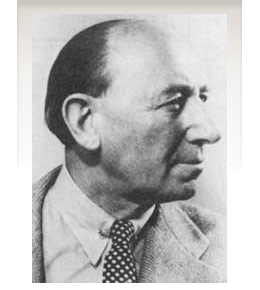 Vienna-born type designer who lived from 1883-1972, and whose real name was Emil Kahn. He died in New York, where he lived most of his life. He studied at the Munich Academy, which became a center of poster design. In 1910 he co-founded the magazine Das Plakat. During WWI he designed posters for the German War effort. In 1920 he was appointed as the first professor of poster design at The Akedemie der Kunst, Berlin. He moved to New York in 1923 and continued his poster work. He also continued his teaching at the Art Students League and at New York University. Short biography of Lucian Bernhard. Biography. MyFonts link. His typefaces:
 - Bernhard and especially Bernhard Modern (1937) are gorgeous high-legged typefaces. Bernhard Modern is used in classy magazines for ads, and adds a touch of style to many documents or presentations.
- Aigrette (1939).
- Lucian (1925, Bauersche Giesserei). I have also seen the date 1932. See also the digital version by Tilde, 1990. Lucian is very close in spirit to Bernhard Modern. As far as digital versions go, one can check out the Font Bureau contribution from 1990 by Kelly Ehrgott Milligan and David Berlow called Belucian, which comes in several weights, including Demi and Ultra. There are many other ones as well, such as Bernhard Modern FS (2011, Sean Cavanaugh).
- Lilith [or Lilli] (1930, Bauersche Giesserei).
- Bernhard Antiqua (1912, Flinsch). This is the titling typeface on my own web site! For a handcrafted revival in 2016 by Pintassilgo Prints, see Botanique.
- Bernhard Brush Script (Bauersche Giesserei, 1926).
- Madonna Ronde (1925: this is the Stephenson Blake name, after it acquired this typeface from Bauersche Giesserei).
- Bernhard Cursive (Bauersche Giesserei, 1925). Didgeree Doodle NF (2006, Nick Curtis) is a curly cursive originally released as Bernhard Heavy Antique Cursive by the Bauersche Giesserei.
- Bernhard Fraktur (+Extrafette; +Initialen) (1912, Flinsch; 1922, Bauersche Giesserei). The sublist of typefaces and dates: Bernhard Fraktur schmalfett, Bernhard Fraktur fett, Bernhard Fraktur extrafett (1921), Bernhard Kursiv extrafett (1927), Bernhard Antiqua extrafett (1924), Bernhard Antiqua zart (1925), Bernhard Antiqua Kursiv zart, Bernhard Handschrift (1928), Bernhard Schönschrift (1925), Bernhard Schönschrift kräftig (1928). Extrafette Bernhard Fraktur was revived in 2013 by Christoph Schwedhelm and in 2016 by Ralph M. Unger as Bernhard Blackletter.
- Bernhard Privat (also called Flinsch-Privat, 1919; Flinsch, Bauersche Giesserei).
- The Reklameschrift Bernhard Block.
- Bernhard Schönschrift (1925; see EF Bernhard Schonschrift). A free interpretation is Reliant (2010, Iza W and Dmitrij Greshnev).
- Bernhard Fashion (1929). This has been digitized by many, including SoftMaker (as Bernhard Fashion, in 2010), Peter Wiegel (as the free font family Bernardo Moda (2014)), by Infinitype, and by Bitstream (as Bernhard Fashion BT in 1990). It has been extended and played with, like for example, in Nick Curtis's Quoi Chou NF (2006) and in Peter Wiegel's Bernardo Moda Contrast (2014). Poster by Merle Perle.
- Bernhard Gothic (1929, ATF; see Bernhard Gothic SG by Spiece Graphics, Bernhard Gothic Medium (2017, Jordan Davies), or Samosata NF by Nick Curtis in 2009). Mac McGrew writes: Bernhard Gothic was one of the first contemporary American sans-serifs, designed in 1929-30 by Lucian Bernhard for ATF to counter the importation of the new European designs such as Futura and Kabel. It features long ascenders and a number of unusual design details, which perhaps prevented it from achieving the popularity of other such typefaces. Capitals are low-waisted, with the crossbars or arms of E, F, and H being below center. M is widely splayed in some weights. Lowercase a is roman in design, and the cross-stroke of t is wide and below the mean line. All but the Title versions have a number of alternate characters, later discontinued. The comma, semicolon and apostrophe, usually comparable, have three different forms. Bernhard Gothic was made only by ATF, but some weights could be simulated with special characters of Monotype Sans-Serif and Ludlow Tempo. The Title versions, several sizes of caps on each body in the manner of Copperplate Gothics, were added in 1936, and copied by Intertype as Greeting Gothic. Around 1938 Bernhard Gothic Medium Condensed was added.
- Bernhard Tango (1933, ATF). Bernhard Tango was imitated by Corel (Ballroom Tango), SSi (Petticoat), Greenstreet (Felicita) and Agfa (Carmine Tango).
- He also did a Magnetype font series that has been left untouched. Jonahfonts is the first to start reviving this series. In 2010, Bernhard's Community Low and Community Condensed started their digital life as Harpsichord (Jonah Fonts).
- According to Font Bureau, Bernhard also did an art deco display sans series in the 1930s, which David Berlow and Jonathan Corum at Font Bureau revived as Eagle from 1989-1994.
- Lucian lettered a concert program in the 1920, which was used by Jim Spiece in 2002 to create the elegant rounded sans display typeface Concerto Rounded.
- Lucian Bernhard's award-winning poster, Priester (1906), had angular lettering. Jonahfonts did LB Priester in 2009 based on it. In 2018, Ivan Moreno published anotherr extension, Presta.
- In the Bitstream collection, we find Bernhard Bold, with unknown origins. However, I have this rare 2002 public statement by John Warnock, Adobe's founder, in reaction to a question by M. Johansson (What happened to the Lo-Type font in Adobe Font Folio? It was included with Font Folio 8 but it's not in Font Folio 9. In Font Folio 9 there's Bernhard Bold Condensed, which is a reasonable replacement. I'm just wondering if anyone knows why Lo-Type was dropped; I prefer it myself.): Cuz LoType is a Berthold Type font and Adobe and Berthold had a lovers quarrel. A ton of Bertie's in FF8, no Bertie typefaces at all on FF9. Bye-bye Bertie. Love, J. Warnock.
- Lucian's small two-tiered logo with the letters BERN HARD led John Nahmias to extend it to Bernhard Signature (2019).
Posters by Bernhard: An advertising exhibition in 1929 (with Fritz Rosen), Manoli Cigarettes (1912). Linotype link. FontShop link. Klingspor link. View Lucian Bernhard's typefaces. Showcasing the digital legacy of Lucian Bernhard. [Google]
[MyFonts]
[More] ⦿
|
Ludlow Typefaces
|
 A type specimen book of the Ludlow Typograph Company (2032 Clybourn Avenue, Chicago), published between 1940 and 1958. The list of typefaces shown: Artcraft, Bodoni (Bold, Black), Bodoni Campanile, Bodoni Modern, Bookman, Cameo, Caslon, Caslon Old Face Heavy, Caslon Heavy Italic, Century, Chamfer Gothic, Cheltenham Oldstyle, Cheltenham Cursive, Cheltenham Wide, Commerce Gothic, Condensed Gothic, Coronet, Clearface Bold, Cushing Antique, Delphian Open Title, Eden, Eleven, Engravers Bold, Eusebius, Extra Condensed, Franklin Gothic, Fraktur No. 16, Garamond, Gothic Bold Condensed Title, Gothic Extra Condensed, Greenwich, Hauser Script, Headline Gothic, Hebrew Modern, Karnak, Lafayette Extra Condensed, Laureate, Lining Litho, Lining Plate Gothic, Ludlow Black, Mandate, Mayfair Cursive, Medium Condensed Gothic, Number 11, Old English, Plantin, Powell, Radiant, Record Gothic, Samson, Square Gothic, Stellar, Stencil, Stygian Black, Tempo, True-Cut Caslon, Ultra-Modern, Umbra, Underwood Bold, Victoria Italic. [Google]
[More] ⦿
|
Lukasz Dziedzic
[tyPoland]

|
 [MyFonts]
[More] ⦿
|
M. Fairuzulhaq
|
 Designer and illustrator from Semarang, Indonesia, b. 1987. Creator of the modular typeface VE-VastagurlyDisplay (2011) and the pixelish typeface Homigos (2012).
 In 2014, he made Candlescript (connected copperplate style calligraphic script), Abovea (brush signage font), Nudely (modular font family), the display typeface Vailsnick Italic (see also here) and Eveagita Luxury. Behance link. Creative Market link. Aka Rapsick and as Vast. [Google]
[More] ⦿
|
M. Irfan Syouqi S.
[IRF Lab Studio (was: Miss Type)]

|
 [MyFonts]
[More] ⦿
|
Malcolm Wooden
[DTP Types Limited]

|
[MyFonts]
[More] ⦿
|
Manuel Eduardo Corradine
[Corradine Fonts]

|
 [MyFonts]
[More] ⦿
|
Marcelo Quiroz Duarte

|
 Chilean type designer, who contributes to Latinotype. Revista (2015, Paula Nazal Selaive, Marcelo Quiroz and Daniel Hernandez) is a typographic system that brings together all the features to undertake any fashion magazine-oriented project. It has Revista Script (connected style), Revista Stencil, Revista Dingbats, Revista Inline and the didone Revista all caps set of typefaces. Revista won an award at Tipos Latinos 2016.
 In 2017, he designed Diplome Script (a copperplate calligraphic script published by Latinotype). In 2020, he released the 18-style semi-calligraphic semi-Trajan typeface family Emperator at Latinotype. [Google]
[MyFonts]
[More] ⦿
|
Marginal Type
[Vincent Lacombe]
|
Graduate of Atelier National de Recherche Typographique in Nancy, France, class of 2020. His graduation thesis was entitled Les caract®rave;res gothiques russes [Cyrillic blackletter typefaces]. During earlier graphic design studies at ECV Bordeaux (2012-2017), he created the display typeface Astek (2015) and the circle-based experimental typeface Ecotype (2016). Now located in the Bordeaux area, he is doing some corporate graphic and type design for the local wine industry. In the context of his ANRT thesis, he designed a Latin / Cyrillic blackletter, Tamara Gothic (2018-2020) and a Latin / Cyrillic copperplate script, Sokolov 1821 (2018-2020). In 2020, he also designed the Scotch Roman typeface Album, and revived a Cyrillic didone by Moscow's S. Selivanovsky foundry (done between 1826 and 1834) as a font simply called Selivanovski (2020). [Google]
[More] ⦿
|
Maria Eugenia Prato
|
 Spanish art director based in Madrid. She created an exquisite copperplate-style calligraphic script typeface called Dhana Script (2011). [Google]
[More] ⦿
|
Måns Grebäck
[Aring Typeface]

|
 [MyFonts]
[More] ⦿
|
Marko Milin
|
Tough-looking graphic designer from Belgrade. In 2010, he created the equally macho copperplate typefaces PastCoast and Type No 6. He used a grid design when he made the Globe Ship typeface in 2012 for Latin and Cyrillic. Type No2 (2014) was inspired by art nouveau. Type No 3 (2014) is an elegant inline typeface. Tye No 12 (2014) is a spurred Tuscan typeface. Behance link. Blogspot link. [Google]
[More] ⦿
|
Martin Cincar
[Caron Twice]

|
[MyFonts]
[More] ⦿
|
Mary Faber
|
 Mary Faber (b. 1987) from Hamilton, New Zealand, writes about Mainline, a copperplate creation in 2011: Mainline's style was formed through an amalgamation of two historical typefaces titled Copperplate and Glyptic; research proved these the most popular metal display typefaces in New Zealand letterpress printing during the period of 1880 to 1900. Despite the lack of typeface designers in New Zealand in the late 1800s, this hybrid typeface design could be considered a national reflection of historic typefaces seen in New Zealand during that time. It should be noted that the selected parent typefaces were both Victorian typefaces by Hermann Ihlenburg.
 She also created Marino (2011): Marino is a contemporary typeface design influenced by a period of New Zealand's typographic history. Its letterforms were created based on research into typeface trends within newspaper advertising from 1920 until 1940, reflecting the increasing popularity of geometric modernity, and the peak of typographic Art Deco in 1930. In particular, Marino is based on an ad for Mencken from ca. 1930. Speaker at AtypI 2012 in Hong Kong: New Zealand Type on Display. In this talk, she introduced her typefaces. Dalton Maag, Tom Foley, Mary Faber, Stuart Brown and Hanna Donker won a Granshan 2014 award for Intel Clear Cyrillic. [Google]
[More] ⦿
|
Match&Kerosene
[Alex Sheldon]

|
 Match&Kerosene is Alex Sheldon's Detroit-based graphic design and typographic illustration company, est. 2008.
 Klingspor link. Behance link. Typefaces designed by Sheldon (b. Michigan, 1984) include Slab Sheriff (2009), Western, Kerosene Boxley (2009, a multiline art deco revival of a Solotype font; some say that it is based on a pair of 1972 alphabets by Marcia Loeb called Zig Zag and Rainbow), Kerosene Woodtype (2009), Kerosene Retroface, Kerosene Stereo (2009, revival of an Italian typeface from 1869), Kerosene Killowatt, White Wolf (2009, condensed horror movie face). Typefaces designed in 2011: Quimby (Copperplate Gothic style titling face), Black Bear (2011, straight-edged display family), Swifty (2011), Grizzly Bear (a set of 12 constructivist titling typefaces), Detroit (a modular family for superpositions), Prismatic (another superimposable multi-purpose family), Duotone (2011, Duotone is a layered font system that allows one to title two-tone headlines), Volcano Gothic (+Inline), Volcano Island (jungle look family), Lightyears. [Google]
[MyFonts]
[More] ⦿
|
Matevz Medja
[Archive Type]

|
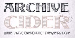 [MyFonts]
[More] ⦿
|
Matra Creative
[May Adifarzan Muis]

|
 Indonesian designer (b. 1979) of Aishanaziha (2019: a script), Claudia Betta (2019: formal calligraphy), Umbrellia (2019: a calligraphic script), Firstland (2019), Aurisha Script (2018: script), Kattelyna (2018: calligraphic script), Medharetta (2018: a script) and Janetha Script (2018).
 In 2020, he published the formal copperplat calligraphic script typeface Bellisa Script (+Ornaments). Typefaces from 2021: Keista Heather (a scrapbook script), Sentingo (a retro script). [Google]
[MyFonts]
[More] ⦿
|
Matt Cole Wilson
|
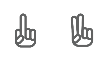 Kansas City, MO-based designer of the free monoline rounded sans typeface family Podriq (2016), and a free set of vector format icons and dingbats.
 Typefaces from 2017: Anvyl (free; the Cyrillic characters were designed by Dmitry Sivukhin), Baywulf (a minimalist beer label blackletter typeface), Deimos (a free monospaced programming font). Typefaces from 2018: Geizer (a free all caps copperplate. Typefaces from 2019: Sorta (modular sans). [Google]
[More] ⦿
|
Matthew Butterick
[MB Type]

|
[MyFonts]
[More] ⦿
|
Mauricio Astete Brito

|
 Or Mauro Andres. Concepcion, Chile-based designer at Latinotype of the upright copperplate script and accompanying lapidary sans typeface family Antonietta (2016, Script and Caps), which is inspired by the eccentricity of the rococo style and Queen Marie Antoinette's wild personality. Winner at Tipos Latinos 2018 of a type design award for Antonietta.
 In 2020, Mauro Andres published Universo (+Stencil) at Peggo Fonts. This display font family includes a nice hairline weight. Universo was initially made for Caos Sagrados and was inspired by Aldo Novarese's style (Microgramma, Eurostile) and other retro-futuristic fonts and poster designs of the 1950s. The work was started in 2018. Typefaces from 2022: Hardbop (in eight ultra-condensed styles: Hardbop is a typographic system inspired by hardbop jazz. It is also inspired by the prolific graphic work of Reid Miles for the covers of Blue Notes Records in the '50s, Japanese jazz album covers of the '70s and condensed and grotesque hand painted signs). [Google]
[MyFonts]
[More] ⦿
|
Max Privalov
[Prive Studios (was: Government Studios, or: GVMNT)]

|
 [MyFonts]
[More] ⦿
|
Max.co Studio
[Teuku Rinaldi Novianda]

|
Aceh, Indonesia-based designer of the baseball signage script font Shailent Script (2018), Rhapson Script (2019: retro signage), the retro signage script typeface England Script (2019), the brush script Sparrowhawk Script (2019) and the calligraphic typefaces Brainly Script (2019), Maldini Script (2019) and Athan Script (2019). Typefaces from 2020: The Moritza (formal calligraphy, with elaborate swashes and elements of copperplate; accompanied by penmanship style ornaments). [Google]
[MyFonts]
[More] ⦿
|
Maximiliano Sproviero
[Sproviero Type (was: Lián Types)]

|
 [MyFonts]
[More] ⦿
|
May Adifarzan Muis
[Matra Creative]

|
[MyFonts]
[More] ⦿
|
MB Type
[Matthew Butterick]

|
 Matthew Butterick (b. 1970, Michigan) grew up in New Hampshire. He got his B.A. degree from Harvard University in visual&environmental studies, also studying mathematics and letterpress printing. His work is in the permanent collection of the Houghton Library at Harvard. Butterick started his design career at the Font Bureau as a typeface designer and engineer. At the beginning of the Internet era, he moved to San Francisco and founded website design and engineering company Atomic Vision. Atomic Vision was later acquired by open-source software developer Red Hat. More recently, Butterick got a law degree from UCLA and has been practicing civil litigation in Los Angeles, Butterick Law Corporation. He operates a web site called Typography for Lawyers and another one called Butterick's Practical Typography.
 In 2010, he published Typography for Lawyers. MyFonts link. FontShop link. Klingspor link. Font Bureau link. He has some great one-liners, such as The only good Copperplate is a dead Copperplate. Matthew Butterick's creations: - Agitprop: in the FUSE 12 collection.
- Wessex (1993): A family published at Font Bureau in 1993. Font Bureau writes: Initially conceived by Matthew Butterick as a Bulmer revival, Wessex took on characteristics of Baskerville&Caledonia as design proceeded. In 1938, W.A. Dwiggins had taken the hard necessities of the non-kerning line-caster italic duplexed onto the same widths as roman, and turned them into design virtues. Inspired by the surprising beauty of his wide-bodied Caledonia italic, Butterick used it as a model for Wessex.
- Hermes (1995, 2010, Font Bureau). Blurb at Font Bureau: Schriftguss and Wollmer called it Hermes; Berthold called it Block. Hermann Hoffmann's 1908 design inspired FB Hermes, which evokes the German grotesks that were workhorses of factory printing 100 years ago. Blunt corners suggest the wear and tear of rough presswork. Matthew Butterick created the original styles in 1995. In 2010, he added more weights, italics, and alternate glyphs to expand the family's versatility. Currently, the family contains Hermes Classic and Hermes Maia.
- Triplicate. A large family of typewriter fonts that feature both monospacing and proportional spacing.
- HeraldGothic (1993, Font Bureau). A condensed typeface with bevelled, or octagonal, corners.
- Chunk.
- Alix FB (2011, Font Bureau). A monospaced family based on two IBM selectric typewriter face, Prestige Elite and Light Italic.
- Equity (2011) is a readable text family, based on Ehrhardt.
- Berlin Sans (1994). Font Bureau: Berlin Sans is based on a brilliant alphabet from the late twenties, originally released by Bauer with the name Negro, the very first sans that Lucian Bernhard ever designed. Assisted by Matthew Butterick, David Berlow expanded this single font into a series of four weights.
- Advocate and Advocate Slab (2015-2017). A large sans and slab family. Caps only.
- Concourse (2013-2017). A large sans family.
- Valkyrie (2018).
- Century Supra (2018). A modern typeface.
[Google]
[MyFonts]
[More] ⦿
|
Mecanorma

|
 French graphics lettering company initially involved in instant lettering (made by Trip Productions), and some original typeface designs. From 1989 until 1994, Mecanorma worked with another Dutch company Visualogik to create digital versions of their typefaces, all having MN in their names. Monotype licensed and digitized some of Mecanorma's typefaces. In 1995, Mecanorma got out of graphics and stepped into home decoration. In 1999, Trip Productions, a Dutch Company located in Lisse, purchased the Mecanorma brand and what was left of the company. In 2004, International TypeFounders from Cedars, PA, licensed the typefaces from Trip Productions and released them as the Mecanorma Collection. Since 2021, there also is a Mecanorma Collection at The Type Founders.
 Their collection includes some great fonts: Access, Artdeco, Artworld, BalloonMN, Brio, BusoramaMN, Campus, CardCamio, Carplate, CaslonAntiqueVL, ChocMN, CircusMN, ComicStripMN, DynamoMN, Galba, Globe-Gothic-Outline, Glowworm, Jackson, LibraMN, MtPlacard, Ortem, Renault, RoslynMN, Sayer, SayerScriptMN, SquashMN, Sully-Jonquieres, Watch-Outline. You can also buy through Atomic Type. Projected new URL, which I am afraid will never be activated because in 1999, the company was bough by the Dutch company Trip Productions. MyFonts sells these typefaces: Access, American Uncial, Anatol, Arnold Bocklin (art nouveau), Artdeco, Artworld (an embossed font), Aster, Balloon (brush font), Blippo Black, Brio, British Inserat, Brush, Bulletin Typewriter, Caligra (blackletter), Campus (athletic lettering), Cardcamio, Carplate, Caslon Antique, Celtic (in the style of University Roman), Chicago (dot matrix / marquee typeface), Chinon, Choc (brush script), Circus (Western font), Classic Script (a copperplate calligraphic script), Comic Strip, Commercial Script, Contest, Cooper Black, Dubbeldik, Dynamo, Egyptienne, Estro (Western font), Eurostile, Forelle, Fumo Dropshadow MN, Galba (Trajan typeface), Globe Gothic, Glowworm (a bubblegum font), Gothique (blackletter), Hansson Stencil, Hillman, Hotel (multilined art deco), Isonorm, Jackson, Jubilee Lines (an engraved money font), Latina, Leopard, Libra (uncial), Michelina (anthroposophic), Milton, Mistral, Normalise Din, Old Style, Olive, Orator, Organda, Ortem, Polka (a brush typeface), Renault, Rondo (retro script), Roslyn, Sayer Interview (old typewriter font), Sayer Script, Sayer Spiritual, Squash, Stencil, Stop (stencil typeface), Studio, Swaak Centennial (pure art nouveau), Tzigane, Viant, Vivaldi, Voel Beat (beveled), Watch Outline (LED font), Windsor, Zambesi (African look font). Designers include Albert Boton, J.H. Crook, Jan van Dijk, J. Dresscher, Roger Excoffon, U. Fenocchio, L. Fumarolo, William Gillies, N. Glason, Lennart Hansson, B. Jaquet, K. Kochnowicz, J. Larcher, C. Mediavilla, José Mendoza y Almeida, L. Meuffels, Aldo Novarese, Georges Renevey, F. Robert, Manfred Sayer, M. Schmidt, J.P. Thaulez, J. Werner and Bogdan Zochowski. The Western slabby font Figaro MT (2004) is ascribed to Mecanorma. A list culled from the web: AccessMN-Bold, AccessMN-Medium, AmericanUncialMN, AnatolMN, ArnoldBocklinMN, ArtdecoMN, ArtworldMN, AsterMN-Demi, AsterMN-Roman, BalloonMN-Bold, BalloonMN-ExtraBold, BlippoBlackMN, BrioMN, BritishInseratMN, BritishInseratMNCondensed, BrushMN, Bulletin-Typewriter, BusoramaMN-Bold, CaligraMN, CampusMN, CardcamioMN, CarplateMN, CaslonAntiqueVL, CelticMN-Bold, CelticMN-Italic, CelticMN, CenturyMNCondensed-BoldItalic, CenturyMNCondensed-Bold, CheltenhamMN-Book, CheltenhamMN-BookItalic, CheltenhamMN-Ultra, ChicagoMN, ChinonMN, ChocMN, CircusMN, ClassicScriptMN, ComicStripMN-Italic, ComicStripMN, CommercialScriptMN, ContestMN, Cooper-Black-Italic, Cooper-Black-Outline, CooperBlackMN, CushingMN-Book, CushingMN-Heavy, CushingMN-HeavyItalic, CushingMN-Medium, DubbeldikMN, DynamoMN-Bold, DynamoMN-Medium, DynamoMN-Shadow, EgyptienneMNCondensed-Bold, ElanMN-Extended, ElanMN-Light, ElanMN-Medium, EnrouteVL, ErasMN-Book, ErasMN-Demibold, ErasMN-Ultra, ErasMN, EstroMN, EurostileMN-Extended, EurostileMN-ExtendedBold, EurostileMN-Medium, FidelioMN, FolioMN-Bold, FolioMN-Extrabold, ForelleMN, FranklinGothicMN-Book, FranklinGothicMN-BookItalic, FranklinGothicMN-Heavy, FrizQuadrataMN-Bold, FrizQuadrataMN, Fumo-DropshadowMN, FuturaBlackMN, GalbaMN, Gillies-Gothic-Bold, Gillies-Gothic-Light, Gillies-Gothic-Ultra-Shadow, Gillies-Gothic-Ultra, GlobeGothicMN-Bold, GlobeGothicMNCondensed-Bold, GlobeGothicMNOutline, GlowwormMN, GlowwormMNCompressed, GorillaVL-Bold, GothiqueMN, HanssonStencilMN-Bold, HanssonStencilMN, HillmanMN, HillmanMNCondensed, HotelMN, IrishUncialVL, IsonormMN, Italia-Bold, Italia-Book, Italia-Medium, JacksonMN, JubileeLinesMN, LatinaMN, LeopardMN, LibraMN, MRunic-Condensed, MSwingBold, MachineMN-Bold, MachineMN, MichelinaMN, MiltonMN-Demibold, MistralVL, MtPlacard-Condensed, NormaliseDinMN, OklahomaState, OliveCompactMN, OliveMNBold, OliveNordMN, OratorMN, OrgandaMN-Bold, OrgandaMN, OrtemMN, PascalMN, PolkaMN-Bold, PolkaMN, PopplExquisitMN, PopplExquisitMN-Alternative, RenaultMN, RenaultMNBold, RondoMN, RoslynMN-Bold, RoslynMN-Bold, RoslynMN-Outline, RoslynMNMedium, SaphireMN, SayerMN-Interview, SayerScriptMN-Black, SayerScriptMN-Bold, SayerScriptMN-Light, SayerSpiritualMN-Italic, SayerSpiritualMN, SloganMN, SquashMN-Outline, SquashMN, StencilAntiqueMN, StencilAntiqueVL, StencilMN, StencilMNOutline, StopMN, StudioMN, SullyJonquieresMN-Bold, SullyJonquieresMN, SwaakCentennialMN, Syntax-Bold, Syntax-Roman, ToucheVL, TziganeMN, ViantMN-Bold, VivaldiMN, VoelBeatMN, WashSymbolVL-Light, WatchMN-Outline, WindsorMN, WindsorMNElongated, ZambesiMN. MyFonts link. View Mecanorma's typefaces. [Google]
[MyFonts]
[More] ⦿
|
Michael Gene Adkins
[The Fontry]

|
 [MyFonts]
[More] ⦿
|
Michael Krottmair
|
Austrian designer, b. 1996, of the copperplate typeface Louda SC (2014). [Google]
[More] ⦿
|
Miguel Angel Padriñán Alba
[Mr. Black Fonts]

|
 [MyFonts]
[More] ⦿
|
Mockup Zone
[Mucahit Gayiran]
|
 Istanbul-based designer of Biplo (2015, brush script) and Bedesten Script (2015, copperplate script in the style of Snell Roundhand but made by hand).
 Creative Market link. Personal web site Behance link. Strangely enough, we find Bedesten and Biplo also listed under the name Efe Gürsoy. [Google]
[More] ⦿
|
Monotype's type classification system
|
Type classification system in 32 groups proposed by Monotype in 1970: - Antique
- Blackletter
- Brush Script
- Clarendon
- Copperplate Script
- Didones
- Egyptian
- Fat Face
- Garaldes
- Geometric Sans Serif
- Glyphic
- Gothic
- Grotesque
- Humanist
- Informal Script
- Inline Face
- Ionic
- Italic
- Latin
- Lineale
- Monoline
- Modern Face
- Oldface
- Oldstyle
- Outline
- Sans Serif
- Script
- Shadow
- Stencil Letter
- Titling
- Transitional
- Venetian
[Google]
[More] ⦿
|
Morris Fuller Benton

|
 Prolific American type designer (b. 1872, Milwaukee, d. 1948, Morristown, NJ), who published over 200 alphabets at ATF. He managed the ATF type design program from 1892 until 1937. Son of Linn Boyd Benton. MyFonts page on him. Nicholas Fabian's page. Linotype's page. Klingspor page. Unos tipos duros page. His fonts include:
 - 1897: Cloister Old Style (ATF). [Stephenson Blake purchased this from ATF and called it Kensington Old Style, 1919] [Cloister (2005, P22/Lanston) is based on Jim Rimmer's digitization of Benton's Cloister.]
- 1898: Roycroft. Mac McGrew on Roycroft: Roycroft was one of the most popular of a number of rugged typefaces used around the turn of the century, when printing with an antique appearance was in vogue. It was inspired by lettering used by the Saturday Evening Post. then a popular weekly magazine, and has been credited to Lewis Buddy, a former Post artist and letterer, but ATF says it was designed "partly" by Morris Benton, about 1898. Gerry Powell, director of typographic design for ATF in the 1940s, says, "Roycroft was first known as Buddy, changed when it was adopted by Elbert Hubbard for the Roycroft Press." Henry L. Bullen, ATF librarian and historian, says, "The first font of type to be made from matrices directly engraved on the Benton machine was 24-point Roycroft. October 4, 1900." While the machine was originally designed in 1884 to cut punches rather than matrices, it is doubtful that no fonts of mats were cut before 1900. Roycroft is also said to be the first typeface for which the large size of 120-point was engraved in type metal, with matrices made by electrotyping. Many typefaces of the day had a number of alternate characters. For this face. ATF gave specific instructions for their intended use: "M with the short vertex, in words the letters of which are open; R with the long tail, as a final letter in all-cap words; the wide h, m, and n, as a final letter only; t with the swash tail, as a final letter but not too frequently; u with the descending stroke, in words having no descending letters; ct ligature, wherever possible; the long s and its combinations, in antique work." Roycroft Open was cut in 1902, probably from the same patterns as the parent face. Roycroft Tinted is a very unusual face, in which the typeface is engraved with the equivalent of a halftone screen of about 25 percent tone value, with a black shadow on the right side; this typeface was cut by the Dickinson Type Foundry branch of ATF in Boston, and includes the same special characters as Roycroft. Compare Post Oldstyle.
- 1900: Century Expanded (1900: poster by Heather Leonhardt). This was a complete redraw of Century Roman which was designed in 1894 by his father, Linn Boyd Benton, for Theodore Low DeVinne, the publisher of Century Magazine. Digitizations by Elsner&Flake, Bitstream and URW.
- 1901: Linotext (aka WedddingText).
- 1901-1910: Engravers.
- 1901: Wedding Text (some put this in 1907), Old English Text, Engravers' Old English (a blackletter font remade by Bitstream). Wedding Text has been copied so often it is sickening: Wedding Regular and Headline (HiH, 2007), Dan X. Solo's version, Comtesse, Elite Kanzlei (1905, Stempel), Meta, Lipsia, QHS Nadejda (QHS Soft), Blackletter 681, Marriage (Softmaker), Wedding Text TL (by Tomas Liubinas).
- 1902: Typoscript.
- 1902-1912: Franklin Gothic. Digital versions exist by Bitstream, Elsner&Flake (in a version called ATF Franklin Gothic), Red Rooster (called Franklin Gothic Pro, 2011), Linotype, and ITC (ITC Franklin Gothic). Discussion by Harvey Spears. Mac McGrew: Franklin Gothic might well be called the patriarch of modern American gothics. Designed in 1902 by Morris Fuller Benton, it was one of the first important modernizations of traditional nineteenth-century typefaces by that designer, after he was assigned the task of unifying and improving the varied assortment of designs inherited by ATF from its twenty-three predecessor companies. Franklin Gothic (named for Benjamin Franklin) not only became a family in its own right, but also lent its characteristics to Lightline Gothic. Monotone Gothic, and News Gothic (q.v.). All of these typefaces bear more resem- blance to each other than do the typefaces within some other single families. Franklin Gothic is characterized by a slight degree of thick-and-thin contrast; by the double-loop g which has become a typically American design in gothic typefaces; by the diagonal ends of curved strokes (except in Extra Condensed); and by the oddity of the upper end of C and c being heavier than the lower end. The principal specimen here is Monotype, but the basic font is virtually an exact copy of the ATF typeface in display sizes, except that Monotype has added f- ligatures and diphthongs. Franklin Gothic Condensed and Extra Condensed were also designed by Benton, in 1906; Italic by the same designer in 1910; and Condensed Shaded in 1912 as part of the "gray typography" series. Although Benton started a wide version along with the others, it was abandoned; the present Franklin Gothic Wide was drawn by Bud (John L.) Renshaw about 1952. Franklin Gothic Condensed Italic was added by Whedon Davis in 1967. Monotype composition sizes of Franklin Gothic have been greatly modi- fied to fit a standard arrangement; 12-point is shown in the specimen-notice the narrow figures and certain other poorly reproportioned characters. The 4- and 5-point sizes have a single-loop g. Gothic No. 16 on Linotype and Inter- type is essentially the same as Franklin Gothic up to 14-point; in larger sizes it is modified and more nearly like Franklin Gothic Condensed. However. some fonts of this typeface on Lino have Gagtu redrawn similar to Spartan Black. with the usual characters available as alternates; 14-point is shown. Western Type Foundry and later BB&S used the name Gothic No.1 for their copy of Franklin Gothic, while Laclede had another similar Gothic No. 1 (q.v.). On Ludlow, this design was originally known as Square Gothic Heavy with a distinctive R and t as shown separately after the Monotype diphthongs; when the name was changed to Franklin Gothic in 1928, it was redrawn, closer to Franklin Gothic but still a bit top-heavy; the unique R was retained in standard fonts but an alternate version like that of ATF was made available separately; also a U with equal arms, a single-loop g, and a figure 1 without foot serifs. Ludlow Franklin Gothic Italic, partially shown on the third line of the specimen, is slanted much more than other versions, to fit the standard 17 -degree italic matrices of that machine. Modern Gothic Condensed and Italic (q.v.) are often though not properly called Franklin Gothic Condensed and Italic, especially by Monotype users. Also see Streamline Block.
- 1903: Alternate Gothic (ATF). See Alternate Gothic Pro Antique (Elsner&Flake), Alternate Gothic No2 (Bitstream), Alpin Gothic (by Team77), League Gothic (2009-2011, The League of Movable Type), and Alternate Gothic No1, No2 and No3 (see the URW version). Mac McGrew: Alternate Gothic was designed in 1903 by Morris F. Benton for ATF with the thought of providing several alternate widths of one design to fit various layout problems. Otherwise it is a plain, basic American gothic with no unusual features, but represents a more careful drawing of its nineteenth-century predecessors. The Monotype copies in display sizes are essentially the same as the foundry originals, with the addition of f-ligatures. The thirteen alternate round capitals shown in the first line of Alternate Gothic No.1 were designed by Sol Hess in 1927 for Monotype, hence the "Modernized" name; with these letters the design is sometimes referred to as Excelsior Gothic. Monotype keyboard sizes, as adapted by Hess about 1911, are considera- bly modified to fit a standard arrangement; caps are not as condensed as in the original foundry design. In 6-point, series 51 and 77 are both the same width, character for character, but some letters differ a bit in design. Note that these two narrower widths are simply called Alternate Gothic on Monotype, while the wider version is Alternate Gothic Condensed! Alternate Gothic Italic, drawn about 1946 by Sol Hess for Monotype matches No.2, but may be used with other widths as well. Condensed Gothic on Ludlow, is essentially a match for Alternate Gothic No.1, but has a somewhat different set of variant characters, as shown in the third line. There is also Condensed Gothic Outline on Ludlow, introduced about 1953, essentially an outline version of Alternate Gothic No.2. On Linotype and Intertype there is Gothic Condensed No.2 which is very similar to Alternate Gothic No. 1 in the largest sizes only, but with even narrower lowercase and figures. Also compare Trade Gothic Bold and Trade Gothic Bold Condensed. For a free version of Alternate Gothic No. 1, see League Gothic (2009-2011, The League of Movable Type).
- 1904: Bold Antique, Whitin Black [see OPTI Bold Antique for a modern digitization], Cheltenham (digitizations by Bitstream and Font Bureau, 1992), Cloister Black (blackletter font, see the Bitstream version: it is possible that the typeface as designed by Joseph W. Phinney).
- 1905: Linoscript (1905). Originally at ATF it was named "Typo Upright". Clearface, about which McGrew writes: Clearface was designed by Morris Benton with his father, Linn Boyd Benton, as advisor. The bold was designed first, in 1905, and cut the following year. The other weights and italics were produced through 1911. As the name implies, the series was intended to show unusual legibility, which it certainly achieved. The precision of cutting and casting for which ATF is noted produced a very neat and handsome series, which had considerable popularity. Clearface Heavy Italic has less inclination than the lighter weights, and is non-kerning, a detail which helped make it popular for newspaper use; the specimen shown here is from a very worn font. Some of the typefaces have been copied by the matrix makers. But the typeface Monotype calls Clearface and Italic is the weight called Bold by other sources. Monotype also includes Clearface Italic No. 289, a copy of the lighter weight. Revival and expansion by Victor Caruso for ITC called ITC Clearface, 1978. Also, American Extra Condensed, an octagonal mechanical typeface revived in 2011 by Nick Curtis as Uncle Sam Slim NF.
- 1906: Commercial Script (versions exist at Linotype, URW, Bitstream (called English 144), SoftMaker (2012), and Elsner&Flake), Miele Gothic, Norwood Roman.
- 1907: Lincoln Gotisch, named after Abraham Lincoln. This found found its way from ATF to Schriftguss, Trennert und Sohn, and Ludwig Wagner. Digital revivals include Delbanco's DS Lincoln-Gotisch. Compare with Comtesses, Lipsia, Elite Kanzlei, Lithographia and Wedding Text.
- 1908: News Gothic, Century Oldstyle (digital versions by Bitstream, Elsner&Flake, and URW), Clearface Gothic (1907-1910: digital revivals include Clear Gothic Serial (ca. 1994, SoftMaker) and Cleargothic Pro (2012, SoftMaker). McGrew: Clearface Gothic was designed by Morris Benton for ATF in 1908, and cut in 1910. It is a neat, clean gothic, somewhat thick and thin, which incorporates some of the mannerisms of the Clearface (roman) series. However, it can hardly be considered a part of that family. There is only one weight, and fonts contain only the minimum number of characters.
- 1909-1911: Rugged Roman. McGrew: Rugged Roman was designed for ATF by Morris F. Benton in 1909-11. It was patented in 1915, but the earliest showing seems to have appeared in 1917. It is a rugged face, as the name says, of the sort that was popular early in the century, but appears to have no relation to other typefaces having the name "Rugged." It somewhat resembles Roycroft, but is lighter. But to add to the uncertainty, fonts contained a number of ligatures of the kind which were more common in the early 1900s, in addition to the usual f-ligatures.
- 1910: Cloister Open Face, Hobo (1910, strongly influenced by the Art Nouveau movement; Hobo Light followed in 1915), ATF Bodoni (Bitstream's version is just called Bodoni, and Adobe's version is called Bodoni Book or Bodoni Poster or Bodoni Bold Condensed, while Elsner&Flake call theirs Bodoni No Two EF Ultra; Font Bureau's version has just two weights called BodoniFB-Bold Condensed and Compressed). McGrew writes about Hobo: Hobo is unusual in two respects---it is drawn with virtually no straight lines, and it has no descenders and thus is very large for the point size. It was designed by Morris F. Benton and issued by ATF in 1910. One story says that it was drawn in the early 1900s and sent to the foundry without a name, which was not unusual, but that further work on it was continually pushed aside, until it became known as "that old hobo" because it hung around so long without results. More time elapsed before it was patented in 1915. The working name was Adface. Hobo was also cut by Intertype in three sizes. Light Hobo was also drawn by Benton, and released by ATF in 1915. It is included in one list of Monotype typefaces, but its series number is shown elsewhere for another Monotype face, and no other evidence has been found that Monotype actually issued it.
- 1911-1913: Venetian, Cromwell. Mac McGrew: Cromwell is a rather playful typeface, designed by Morris Benton in 1913 but not released by ATF until three years later. It uses the same capitals as Cloister (q.v.) and has the same small x-height with long ascenders and descenders, but otherwise is quite different, with much less formality. Notice the alternate characters and the double letters including overhanging f's.. Cromwell was digitized by Nick Curtis in 2010 as Cromwell NF. Mac McGrew on Venetian: Venetian and Italic were designed by Morris F. Benton for ATF about 1911, with Venetian Bold following about two years later. They are rather reserved transitional typefaces, almost modern, instead of classic designs of Venetian origin as the name implies. The result is closer to Bodoni than to Cloister. The working title was Cheltenham No.2, but the relationship to that family is not apparent. It is carefully and neatly done, but never achieved widespread use. Compare Benton, a later typeface by the same designer, which has similar characteristics but more grace and charm.
- 1914: Adscript, Souvenir, Garamond (with T.M. Cleveland).
- 1916: Announcement, Light Old Style, Goudy Bold. Mac McGrew writes: Announcement Roman and Announcement Italic were designed by Morris F. Benton in 1916, adapted from steel or copperplate engravings, but not completed and released until 1918. These delicate typefaces have had some popularity for announcements, social stationery, and a limited amount of advertising work, but are a little too fancy for extensive use. Oddly, some of the plain caps shown in the specimens, both roman and italic, do not seem to appear in any ATF specimens. Foundry records show that a 48-point size of the roman was cut in 1927, but no other listing or showing of it has been found. In fact, sizes over 24-point were discontinued after a few years, and all sizes were discontinued in 1954.. Digitizations: Announcement Roman was revived by Nick Curtis in 2009 and called Society Page NF. Rebecca Alaccari at Canada Type revived it as Odette in 2004. See also Castcraft's OPTI Announcement Roman.
- 1916-1917: Invitation. For a digital revival, see Sil Vous Plait (2009, Nick Curtis).
- 1917: Freehand.
- 1917-1919: Sterling. Digitizations include Howard (2006, Paul D. Hunt), Argentina NF (2009, Nick Curtis), and Argentina Cursive NF.
- 1918: Century Schoolbook (1918-1921). (See ITC Century (Tony Stan, 1975-1979), or the Century FB-Bold Condensed weight by Greg Thompson at Font Bureau, 1992. For Century Schoolbook specifically, there are versions by Elsner&Flake, Bitstream and URW. Bitstream has a monospaced version.) URW Century Schoolbook L is free, and its major extension, TeXGyre Schola (2007) is also free.
- 1920: Canterbury. Mac McGrew: Canterbury is a novelty typeface designed by Morris F. Benton for ATF in 1920, when trials were cut, but not completed for production until 1926. It features a very small x-height, with long ascenders and descenders; monotone weight with minute serifs; and a number of swash capitals. It is primarily suitable for personal stationery and announcements. Compare Camelot Oldstyle. Digital versions were done by Nick Curtis in his Londonderry Air NF (2002-2004), and Red Rooster in the series Canterbury, Canterbury OldStyle, and Canterbury Sans.
- 1922: Civilité. Mac McGrew on the ATF Civilité: Civilite in its modern adaptation was designed by Morris Benton in 1922 and cut by ATF in 1923-24. The original version was cut by Robert Granjon in 1557 to imitate the semi-formal writing then in vogue, and is believed to be the first cursive design cut in type. It became popular for the printing of poetry and for books of instruction for children, where the type itself could serve as a perfect model of handwriting. The first of these books was titled La Civilite puerile, printed at Antwerp in 1559. The books were so popular that the design came to be known as "civility" type. Other interpretations of the letter have been made, including Cursive Script, cut in the nineteenth century in 18-point only from French sources by ATF predecessors and by Hansen, but Benton's seems more attractive and legible to modern eyes. The French pronunciation of ci-vil'i-tay is indicated by the accented e, which was used only in ATF's earliest showings. The many alternate characters were included in fonts as originally sold; later they were sold separately and finally discontinued, although the basic font was still listed in recent ATF literature. Also see ZapfCivilite. Compare Freehand, Motto, Verona.
- 1924: Schoolbook Oldstyle.
- 1926-1927: Typo Roman.
- 1927: Chic (American Typefounders; doubly shaded capitals and figures), Gravure, Greeting Monotone, Goudy Extra Bold. The art deco typeface Chic was revived by Nick Curtis as Odalisque NF (2008) and Odalisque Stencil NF (2010).
- 1928: Parisian, Bulmer (revival of William Martin's typeface from 1792 for the printer William Bulmer; digital forms by Monotype, Adobe, Linotype, and Bitstream), Broadway (1928-1929, see two styles offered by Elsner&Flake, Linotype, Bitstream, and 11 weights by URW), Goudy Catalogue, Modernique, Novel Gothic (ATF, designed with Charles H. Becker), Dynamic. Novel Gothic has seen many digital revivals, most notably Telenovela NF (2011, Nick Curtis), Naked Power (Chikako Larabie) and Novel Gothic SG (Jim Spiece). Images of Bulmer: i, ii, iii, iv, v, vi, vii, viii, ix, x, xi, xii.
- 1929: Louvaine. McGrew: Louvaine series was designed by Morris F. Benton for ATF in 1928. It is an adaptation of Bodoni (the working title was Modern Bodoni), and many of the characters are identical. Only g and y are basically different; otherwise the distinction is in the more abrupt transition from thick to thin strokes in this series. In this respect, Ultra Bodoni has more affinity to Louvaine than to the other Bodoni weights. The three weights of Louvaine correspond to Bodoni Book, Regular, and Bold. This series did not last long enough to appear in the 1934 ATF specimen book, the next complete one after its introduction. Compare Tippecanoe.
- 1930: Benton, Engravers Text, Bank Gothic (see Bitstream's version), Garamond-3 (with Thomas Maitland Cleland), Paramount (some have this as being from 1928: see Eva Paramount SG by Jim Spiece). McGrew: Paramount was designed by Morris Benton in 1930 for ATF. It is basically a heavier companion to Rivoli (q. v.), which in turn is based on Eve, an importation from Germany, but is heavier than Eve Bold. It is an informal typeface with a crisp, pen-drawn appearance. Lowercase is small, with long ascenders and short descenders. Vertical strokes taper, being wider at the top. It was popular for a time as an advertising and announcement type.
- 1931: Thermotype, Stymie (with Sol Hess and Gerry Powell). Stymie Obelisk is a condensed Egyptian headline face---the latter was revived by Nick Curtis as Kenotaph NF (2011).
- 1932: Raleigh Gothic Condensed (the digital version by Nick Curtis is Highpoint Gothic NF (2011)), American Text (blackletter). Mac McGrew: Raleigh Gothic Condensed was designed by Morris F. Benton for ATF in 1932. It is a prim, narrow, medium weight gothic face, with normally round characters being squared except for short arcs on the outside of corners. The alternate characters AKMNS give an even greater vertical appearance than usual. At first, this typeface was promoted with Raleigh Cursive as a stylish companion face, although there is no apparent relationship other than the name. Compare Phenix, Alternate Gothic, Agency Gothic.
- 1933: American Backslant, Ultra Bodoni (a great Bodoni headline face; see Bodoni FB (1992, Font Bureau's Richard Lipton). About Agency Gothic, McGrath writes: Agency Gothic is a squarish, narrow, monotone gothic without lower- case, designed by Morris F. Benton in 1932. It has an alternate A and M which further emphasize the vertical lines. Sizes under 36-point were added in 1935. Agency Gothic Open was drawn by Benton in 1932 and introduced in 1934; it follows the same style in outline with shadow, and probably has been more popular than its solid companion. Triangle Type Foundry, a Chicago concern that manufactured matrices, copied this typeface as Slim Open, adding some smaller sizes. ATF's working titles for these typefaces, before release, were Tempo, later Utility Gothic and Utility Open. Compare Raleigh Gothic Condensed, Poster Gothic, Bank Gothic. Digital versions include Warp Three NF (2008, Nick Curtis), which borrows its lowercase from Square Gothic (1888, James Conner's Sons), FB Agency (1995, David Berlow at FontBureau), Agency Gothic (by Dan Solo) and OPTI Agency Gothic (by Castcraft).
- 1934: Shadow, Tower (heavy geometric slab serif), Whitehall. Font Bureau's Elizabeth Cory Holzman made the Constructa family in 1994 based on Tower. Digital versions include Warp Three NF (2008, Nick Curtis), which borrows its lowercase from Square Gothic (1888, James Conner's Sons), FB Agency Gothic (1995, David Berlow at FontBureau) and Agency Gothic by Castle Type. Eagle Bold followed in 1934. McGrew: Eagle Bold is a by-product of the depression of the 1930s. The National Recovery Administration of 1933 had as its emblem a blue eagle with the prominent initials NRA, lettered in a distinctive gothic style. Morris Benton took these letters as the basis for a font of type, released later that year by ATF, to tie in with the emblem, which businesses throughout the country displayed prominently in advertising, stationery, and signs; naturally it was named for the eagle. Compare Novel Gothic. USA Resolute NF (2009, Nick Curtis) is based on Eagle Bold.
- 1935: Phenix. This condensed artsy sans was revived in 2011 at Red Rooster by Steve Jackaman and Ashley Muir as Phoenix Pro.
- 1936: Headline Gothic. For a digital version, see ATF Headline Gothic (2015, Mark van Bronkhorst, Igino Marini, & Ben Kiel at American Type Founders Collection).
- 1937: Empire. This ultra-condensed all caps skyline typeface was digitally remade and modernized by Santiago Orozco as Dorsa (2011). Jeff Levine reinterpreted it in 2017 as Front Row JNL. Bitstream also has a digital revival.
Linotype link. FontShop link. Picture. Typefaces alphabetic order: - Adscript
- Agency Gothic (+Open
- Alternate Gothic No.1 (+No.2, +No.3)
- American Backslant
- American Caslon&Italic
- American Text
- Announcement Roman&Italic (1916). For digital revivals or influences, see Friendly (2012, Neil Summerour), Odette (2004, Canada Type) and Society Page NF (2009, Nick Curtis).
- Antique Shaded
- Bank Gothic Light (+Medium, +Bold, +Light Condensed, +Medium Condensed, +Bold Condensed). For digital versions, see Bank Gothic AS Regular and Condensed (2008, Michael Doret).
- Baskerville Italic
- Benton (Whitehall)&Italic
- Bodoni&Italic (+Book&Italic, +Bold&Italic, +Bold Shaded, +Bold Open)
- Bold Antique (+Condensed)
- Broadway (+Condensed). The prototyical art deco typeface (1928-1929).
- Bulfinch Oldstyle (1903).
- Bulmer&Italic
- Canterbury
- Card Bodoni (+Bold). 1912-1916.
- Card Litho (+Light Litho)
- Card Mercantile
- Card Roman
- Century Expanded&Italic
- Century Bold&Italic (+Bold Condensed, +Bold Extended)
- Century Oldstyle&Italic (+Bold&Italic, +Bold Condensed)
- Century Catalogue&Italic
- Century Schoolbook&Italic (+Bold)
- Cheltenham Oldstyle&Italic (+Condensed, +Wide)
- Cheltenham Medium&Italic (+Medium Condensed, +Medium Expanded, +Bold&Italic, +Bold Condensed&Italic, +Bold Extra Condensed&Title, +Bold Extended, +Extrabold, +Bold Outline, +Bold Shaded&Italic, +Extrabold Shaded, +Inline, +Inline Extra Condensed, +Inline Extended)
- Chic
- Civilite
- Clearface&Italic (1907, +Bold&Italic, +Heavy&Italic)
- Clearface Gothic: a flared version of Clearface.
- Cloister Black
- Cloister Oldstyle&Italic (+Lightface&Italic, +Bold&Italic, +Bold Condensed, +Cursive, +Cursive Handtooled, +Title&Bold Title)
- Commercial Script
- Copperplate Gothic Shaded
- Cromwell.
- Cushing Antique (1902).
- Della Robbia Light
- Dynamic Medium
- Eagle Bold
- Empire (1937). A skyline typeface.
- Engravers Bodoni
- Engravers Old English (+Bold)
- Engravers Bold
- Engravers Shaded
- Engravers Text
- Franklin Gothic&Italic (+Condensed, +Extra Condensed, +Condensed Shaded)
- Freehand (1917). Mac McGrew: Freehand, a typeface based on pen-lettering, was designed for ATF by Morris Benton in 1917. The working title before release was Quill. Derived from Old English, it is an interesting novelty, and has had quite a bit of use. Compare Civilite, Motto, Verona.
- Garamond&Italic (+Bold&Italic, +Open)
- Globe Gothic (+Condensed, +Extra Condensed, +Extended, +Bold&Italic)
- Goudy Bold&Italic (+Catalogue&Italic, +Extrabold&Italic, +Handtooled&Italic, +Title)
- Gravure
- Greeting Monotone
- Headline Gothic
- Hobo&Light Hobo (1910). For digital versions, see Informal 707 (Bitstream), Hobbit (SF), Homeward Bound (Corel), Hobo No2 (2012, SoftMaker), Bogo (2016, Harold Lohner), and Hobo (Bitstream).
- Invitation (+Shaded)
- Light Oldstyle
- Lightline Gothic&Title (1908). For a revival, see Benton Gothic Thin NF (2014, Nick Curtis).
- Lithograph Shaded (1914, with W.F. Capitain).
- Louvaine Light&Italic (+Medium&Italic, +Bold&Italic)
- Miehle Extra Condensed&Title
- Modernique
- Monotone Gothic&Title
- Motto (1915). Mac McGrew: Motto is a calligraphic typeface designed by Morris F. Benton for ATF in 1915. It is similar to the same designer's Freehand, drawn a couple of years later, but has plainer capitals, heavier thin strokes, and shorter descenders. But letters combine into legible words with a pleasant, hand-lettered appearance. Also compare Humanistic, Verona. For a digital version, see Motto by Juan Kafka.
- News Gothic (+Condensed, +Extra Condensed&Title)
- Norwood Roman
- Novel Gothic
- Othello
- Packard (+Bold)
- Paramount
- Parisian
- Pen Print Open
- Phenix
- Piranesi Italic (+Italic Plain Caps, +Bold&Italic, +Bold Italic Plain Caps)
- Poster Gothic (1934).
- Raleigh Gothic Condensed (1934).
- Rockwell Antique
- Roycroft
- Rugged Roman
- Schoolbook Oldstyle
- Shadow
- Souvenir (1914). Revived in 1977 by Ed Benguiat as ITC Souvenir, but a total failure as a type design. Simon Garfield: Souvenir was the Comic Sans of its era, which was the 1970s before punk. It was the typeface of friendly advertising, and it did indeed appear on Bee Gees albums, not to mention the pages of Farrah Fawcett-era Playboy. Mark Batty from International Typeface Corporation (ITC) on one of his best-selling fonts: A terrible typeface. A sort of Saturday Night Fever typeface wearing tight white flared pants. Garfield also retrieved this quote by type scholar Frank Romano in the early 1990s: Real men don't set Souvenir. Digital revivals also include Sunset Serial by Softmaker, and ITC Souvenir Mono by Ned Bunnel.
- Sterling&Cursive
- Stymie Light&Italic (+Medium&Italic, +Bold&Italic, +Black&Italic)
- Thermotypes
- Tower Condensed (1934). Revived by Photo-Lettering Inc as PL Tower.
- Typo Roman&Shaded
- Typo Script and Typo Script&Extended (1902)
- Typo Shaded
- Typo Slope
- Typo Upright&Bold
- Ultra Bodoni&Italic (+Condensed, +Extra Condensed)
- Venetian&Italic (+Bold)
- Wedding Text&Shaded
View Morris Fuller Benton's typefaces. A longer list. A listing of various digital versions of News Gothic. More News Gothic-like typefaces. Even more News Gothic-like typefaces. [Google]
[MyFonts]
[More] ⦿
|
Mr. Black Fonts
[Miguel Angel Padriñán Alba]

|
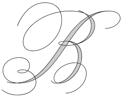 Iztapalapa, Mexico City-based graphic designer. Creator of Pixa Square (2014: a dot matrix typeface family that includes some arcade game dingbats as well), Domino (2014: digitization of a typeface by Sabino Gainza), Norma Script (2014, avant-garde sans), Norma Cursiva (2014), Macmillan (2014, sans), El Corondel (2014, signage script), Taller (2014, done with Manuel Flores), Mr. Pascal (2014: LED or kitchen style typeface for numbers on watches), Britannia Capital (2014: a calligraphic copperplate typeface), Alfaomega (2014, avant-garde sans), Alfaomega Cursiva (2014, school script font), Espiral (2013, a Victorian school project font at Escuela Nacional de Artes Plásticas UNA).
 In 2016, Ayi Studio (Mexico City) published the constructivist typeface family Alek Rodchenko, which was jointly designed by Miguel Angel Padrinan Alba and Victor Manuel Flores Lopez. One must assume that they run Ayi Studio. Behance link. Newer Behance link. Old Wordpress link. Newest MyFonts link. [Google]
[MyFonts]
[More] ⦿
|
Mucahit Gayiran
[Mockup Zone]
|
 [More] ⦿
|
Muhammad Iqram
[Gloow Studio]

|
[MyFonts]
[More] ⦿
|
Muhammad Rayyan
[Slex Studio]

|
[MyFonts]
[More] ⦿
|
Mulkan Nazir
[Great Studio]

|
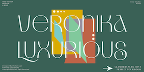 [MyFonts]
[More] ⦿
|
MyFonts: Copperplate
|
MyFonts hit list for copperplate scripts. [Google]
[More] ⦿
|
MyFonts: Copperplate scripts
|
A collection of commercial copperplate scripts. [Google]
[More] ⦿
|
MyFonts: Copperplate URW
|
Most relevant typefaces at MyFonts related to Copperplate URW, which is based on Goudy's original Copperplate Gothic. [Google]
[More] ⦿
|
MyFonts: Engraved fonts
|
Typefaces at MyFonts related to the engraving process. Another link. See also here and here. [Google]
[More] ⦿
|
MyFonts: Romantic typefaces
|
Romantic typefaces culled from the MyFonts library. Some of these are calligraphic or copperplate script fonts, but there are also a number of cursive typefaces. Some call this style wedding scripts. [Google]
[More] ⦿
|
My-Lan Thuong
|
 Thuong attended ESAD Amiens for Graphic Design and later pursued a career in type design. In 2018, she received an MFA in Type Design from the Ecole Estienne in Paris. She collaborated with type foundries Coppers and Brasses and Type Network prior to joining New York City-based Sharp Type as a type designer in 2019. Her typefaces:
 - Maple Leafs (2017). Co-designed with Etienne Aubert-Bonn at Coppers and Brasses in Montreal, Maple Leafs is a fast and aggressive typeface commissioned for the Toronto Maple Leafs as a display face to use along with their existing typefaces.
- Mammouth (2017). Done together with Etienne Aubert-Bonn at Coppers and Brasses, Mammouth is a commissioned typeface family for a gala on Tele Quebec where teenagers can vote for the people, events, and causes that influenced them the most during the year. Mammouth contains a heavy and an ultra-fat style.
- In 2018, she released the shaky outline typeface Royal at E162.
- She assisted Justin Sloana at Sharp Type with Simula (2019).
- In 2020, Etienne Aubert Bonn and My-Lan Thuong co-designed Baryton at Coppers and Brasses, a revival of Frank Bartuska's playful photo era didone typeface Century Bartuska.
- Carta Nueva (2020). A copperplate penmanship font released at Sharp Type.
- In 2021, Lucas Sharp and My-Lan Thuong, assisted by Wei Huang and Marc Rouault, designed Salter. Salter Roman is based on calligraphic book jackets by Georg(e) Salter from 1941, and Salter Italic is inspired by two of Oscar Ogg's book jacket alphabets from 1942.
[Google]
[More] ⦿
|
Natalia Nichols
|
Natalia Nichols (Studio Kasumi, Edmond, OK) designed the free copperplate typeface Sovngarde in 2017. Behance link. [Google]
[More] ⦿
|
Nazzar Saputra
[Craft Supply]

|
 [MyFonts]
[More] ⦿
|
Nicolas Massi

|
Graphic designer in Buenos Aires who is also involved in Tomo Fonts. His typefaces, dated 2009, include Tesca (a condensed-modern grotesque typeface. Three styles: Flaca, Normal&Gorda), and Arco (a fat face with some geometrical tweaks grabbing fresh and ideal for fashion editorial headlines). With Rodrigo Fuenzalida, he created the textura typeface Pirata+One (2012, Google Web Fonts). He is working on Tesca Specimen, San Francisco, Quick Pick (brush), Mick's, Jumper, Alask (brush), Royal Twins, Clas (brush script). In 2018, Nicolas Massi and Leonard Posavec co-designed Storehouse, a vintage all caps copperplate family with small wedge serifs. It includes a stencil style, San Francisco, Quick Pick (brush), Mick's, Jumper, Alask (brush), Royal Twins, Clas (brush script). Free typefaces by Massi include Braulio (2020; based on Futura Maxi Demi and a post by Braulio Amado), and Sato Sans (2020). MyFonts link. Behance link. Typedia link. Github link for Nicolas Massi. Nico Works link. [Google]
[MyFonts]
[More] ⦿
|
Nikola Kovanovic
|
Cyrillic font designer based in Serbia. His typefaces include Cirilica Pisana Nova D (2005: copperplate calligraphy), Nicoletta Script (2005: calligraphic), Jagodina (2004: an informal typeface), Azbuka03_D (2005: copperplate calligraphy), Brock Script_D (2005: swashy calligraphic), and Inspiration (2005: calligraphic script). Some of these fonts can be downloaded at Localfonts.eu. [Google]
[More] ⦿
|
Noem9 Studio
[José Antonio Garrido Izquierdo]

|
 Noem9 Studio is an online studio created by Jose A. Garrido, a graphic designer who was born in Alcañiz, Teruel, Spain, in 1987, and lived in Zaragoza. Noem9 is currently based in London.
 He created Avanth (2012), a modular experimental typeface that is very useful for logos and titles. Typefaces from 2012 include Ballege (a partially free slab serif family that uses details often seen in college sports and that was inspired by the film MoneyBall by Bennet Miller). Typefaces from 2013: Chronic (a free alchemic / hipster font inspired by native American legends), Essay (a copperplate headline sans published by Avondale). In 2016, he made the custom prismatic typeface Happy Ending, and 36 days of Type (decorative caps). They also published the layered multiline retail typeface family eNeon (2016). Typefaces from 2017: Kick Off (based on sports graphics from the 1970s). Typefaces from 2029: Inndam (modular). Typefaces from 2020: Locker Numerals, Creattica link. Creative Market link. Behance link. Dafont link. Graphicriver link. [Google]
[MyFonts]
[More] ⦿
|
Novi Ananda
[Novi Souldado]

|
 [MyFonts]
[More] ⦿
|
Novi Souldado
[Novi Ananda]

|
 Yogyakarta, Indonesia-based designer (b. 1989) of the copperplate calligraphic typeface NS Champtone (2019), the spurred Victorian Americana typeface NS Emhericans Vintage (2019).
 Typefaces from 2020: NS Bullsmith (a Victorian typeface), NS Mudolf (a script/sans/serif vintage type package). Typefaces from 2021: NS Gibswing (a spurred Victorian extravaganza, with a dingbat font that contains Victorian panels and flowers), NS Blackbooks Victorian, NS Lasttown (a penmanship script, and vintage capital and serif styles). Typefaces from 2022: NS Deckpress (a layerable Victorian label font). [Google]
[MyFonts]
[More] ⦿
|
Oban Design Studios
[Oban Jones]
|
Chester, England and Toronto, Canada-based designer of the free copperplate sans typeface High Life (2017), the hand-crated typeface Simpler Times (2017), the German expressionist typeface Bedtime Story (2017), and the free beatnik font Lost Childhood (2017). In 2018, he published McJinnon Brush (a dry brush typeface). Typefaces from 2019: Popcorn Time (free). [Google]
[More] ⦿
|
Oban Jones
[Oban Design Studios]
|
[More] ⦿
|
Occupant Fonts
[Cyrus Highsmith]

|
 Senior designer at Font Bureau since 1997, after graduating that year from the Rhode Island School of Design. Born in Milwaukee, WI, he now is a faculty member at RISD, where he teaches typography in the department of Graphic Design. He regularly offers a summer course on Digital Type Design, Summer Institute of Graphic Design, Rhode Island School of Design. His sketchbooks are now on line. In 2016, he set up Occupant Fonts as part of the Type Network.
 In September 2017, Morisawa announced the establishment of "Morisawa Providence Drawing Office" in Providence, RI, as its new base for developing Latin fonts. Cyrus Highsmith, who had served as a designer for Font Bureau for many years, and who started Occupant Fonts in 2015, has been appointed as its creative director. By this move, Morisawa acquired Occupant Fonts. Author of Inside Paragraphs, written for a foundational typography course. Matthew Carter writes: Cyrus Highsmith takes the lid off a paragraph of type and shows its inner workings. There is nothing you need to understand about using type that's not in this book. Cyrus explains the correct terms for the typographic components of form and space that make a letter, a word, a line, a paragraph, and he does it with clear drawings, simple language, and a legible typeface for the text. Interview at MyFonts. Cyrus created wonderful typefaces such as Loupot (1997, with Laurie Rosenwald, based on the lettering on Charles Loupot's St. Raphael poster from 1948), Eggwhite (2000-2018, for comics), Relay (2002, a somewhat art deco sans serif family that will be in vogue for years to come!), Benton Sans (1995-2003, with Tobias Frere-Jones, a revival of Benton's 1903 family, News Gothic; see also Benton Sans Wide, 2013), Occupant Gothic (2000-2018, angular), Prensa (2003, a simple 24-style serif family), Prensa Display (2012), Dispatch (1999-2000), Halo (2003), the 12-weight Stainless family (2001), and Daleys Gothic (1998). The Wall Street Journal uses his D4ScotchD4Scotch family (2001). He made a modified Palatino for the newspaper El Mercurio, and designed Zocalo or El Universal for the newspaper El Universal. He won Bukvaraz 2001 awards for Prensa and Relay. His Amira (Font Bureau) and (Spanish-feeling) Zocalo (Font Bureau) won awards at TDC2 2004. At ATypI 2004 in Prague, he spoke about the wealth of typefaces. In 2006, Escrow (Font Bureau) was published, an out-of-this-world 44-style subdued Scotch family that is used by The Wall Street Journal. In 2007, still at Font Bureau, he created Antenna, a 56-style sans family, as well as Biscotti, a delicate connected (wedding) script commissioned in 2004 by Gretchen Smelter and Donna Agajanian for Brides magazine. His calligraphic copperplate script Novia (2007, Font Bureau) was commissioned to grace the pages of Martha Stewart Weddings. Still in 2007, he won an award for his newspaper type family Quiosco (Font Bureau). Font Bureau writes: With Quiosco, Cyrus Highsmith continues an examination of themes and possibilities which he first explored in Prensa, inspired by the work of W. A. Dwiggins---specifically a dynamic tension between inner and outer contours. However, the crackling, electrical energy of Prensa here gives way to a more fluid, mercurial muscularity in Quiosco. See also Quiosco Display. In 2006, he designed Scout for Geraldine Hessler's redesign of Entertainment Weekly, under the influence of DIN, Venus and Cairoli. Scout is a utilitarian sans serif series that was followed in 2013 with Scout RE---four styles optimized for screen text and small sizes in print. In 2016, he added Scout Text. In 2010, at Font Bureau, he published the extensive families Ibis Text and Ibis Display, which he says were influenced by Walbaum (1919) and Melior (1952). The Webtype version IbisRE is poorly kerned / displayed in my browser though. From 2007 until 2010, he developed Salvo Sans and Salvo Serif (Font Bureau), which were originally called Boomer Sans and Serif. They were released in 2011. In 2012, he published Serge (an angular script family in three styles: a frisky, acrobatic typeface that dashes off decorative blurbs, signs, and headlines with a lively, angular zest), Heron Sans and Heron Serif at Font Bureau, which writes: Heron Serif and Sans are born of hard iron and steel, but galvanized with Cyrus Highsmith's warmth and energy. In 2013, he published Icebox at Font Bureau---a font that is based on a set of magnetic letters found at a variety store. Typefaces from 2014: Tick and Tock, two stencil styles. Typefaces from 2015: Antenna Serif. Typefaces from 2016: Gasket, Gasket Unicase, Gasket Uncial. Typefaces from 2017: Allium. Typefaces from 2018: Allium Text. Speaker at ATypI 2013 in Amsterdam: Don't design web fonts Its theme is: The successful type series of the future will be the ones that can move between media. He says that new typefaces should be smarter than the devices that use them. In 2015, he received the coveted Gerrit Noordzij Prijs. His illustrations were the subject of an exhibition and a book, both called Products Of A Thinking Hand (Typotheque / KABK, 2018). View Cyrus Highsmith's typefaces. Klingspor link. FontShop link. MyFonts interview. Old Font Bureau link. [Google]
[MyFonts]
[More] ⦿
|
Oddsorts
[Charles Gibbons]

|
 Charles Gibbons (b. 1967, Lynn, MA) received an MFA in graphic design from the Rhode Island School of Design. Gibbons spent much of the nineties as a designer for the University of Minnesota in Minneapolis and later as assistant professor of Graphic Design at the University of Wisconsin / Stout where he taught typography and publication design. In 2001, he joined the Library of Congress as the chief designer for the United States Copyright Office. Chuck has partnered with various typefoundries such as Bitstream, Filmotype, Sideshow, Tart Workshop, Device, and Cultivated Mind. The Ciao Bella ornaments he designed with Cultivated Mind's Cindy Kinash represent the first commercially available auto-chromatic fonts: each font can be set in two colors. Working with Stuart Sandler and Crystal Kluge at Tart Workshop, he developed the method by which their Aya Script delivers its characteristic curlicue ribbons. His types grace book covers, greeting cards, film titles, museum façades, and the seal of the United States Copyright Office. At present, he teaches typography and type design at Tufts University in Boston. In 2015, he set up Oddsorts. His typefaces, in more or less chronological order:
 - Aphasia BT (2000, Bitstream). He writes: A meeting of Byzantine and Art Deco forms, Aphasia began as a series of handwritten captions to accompany drawings in the early 1990s.
- At Oddsorts, he published Bradley Wayside and Bradley Chicopee in 2015: Begun in 2000 as a wedding gift for the designer's wife and used privately for years, they're finally available to the public. The fonts were inspired by the masterful art nouveau lettering of Will H. Bradley, whose posters for Ault & Wiborg printing inks and Victor Bicycles continue to draw collectors after more than a century. Wayside and Chicopee expand the twenty-odd characters Bradley drew into a comprehensive multiscript system that includes modern Greek and extended Cyrillic alphabets, ordinals, automatic fractions, and ornaments.
- In 2014, Charles Gibbons and Cindy Kinash co-designed Ciao Bella (first published at Cultivated Mind, and in 2016 at Oddsorts). It features a handcrafted copperplate script style, and several flower ornaments about which they write: The Ciao Bella ornaments he designed with Cultivated Mind's Cindy Kinash represent the first commercially available auto-chromatic fonts: each font can be set in two colors. What's truly innovative about Ciao Bella's ornaments is that most of the characters come in pairs that can be set in multiple colors without any stacking, layering, or aligning. They work in any application that supports kerning---even most word processors.
- Full Moon Suite (2001, Bitstream). Co-designed with Mary Trafton. Includes FM Black Cherry Moon, Alternate, Ligature, and Doubles. FullMoon BT won an award at the TDC2 2003 competition.
- Fleischmann BT Pro (2002). A family heralded by the typophiles as outperforming the DTL Fleischmann.
- Various Filmotype fonts for Stuart Sandler's Filmotype project. In 201, he designed the identical lively freestyle typefaces Filmotype Nemo (original from 1953), Filmotype Niro, and Filmotype Nero. The renaming was done under various scenarios of pressure. In 2011, he also made the signage typeface Filmotype Atlas. In 2012, he created the art deco fat didone typeface Filmotype Rose, and the fine brush letter signage typeface Filmotype Havana. Filmotype Adonis (2012) is a clean hand-drawn typeface. Filmotype Royal (2012) is a transitional typeface family. Typefaces from 2013: Filmotype Orlando (cartoonish), Filmotype Parade (cartoonish), Filmotype Zeal (a formal almost-copperplate script). In 2014, he added Filmotype Western (an italian, or reversed stress, typeface based on a Filmotype design from 1955), and in 2015 Filmotype Wand. Filmotype Maxwell (2019) is a revival of an interlocking Filmotype font from the 1960s.
- Greenleaf (2019).
- Local Market (2014). With Cindy Kinash. A hand-drawn collection of typefaces.
- True North (+Extras, +Textures: a vintage letterpress emulation set of fonts designed for posters and banners), 2014-2015. Done together with Cindy Kinash.
- Winooski (2015) is a fun cartoon typeface.
FontShop link. Oddsorts link. [Google]
[MyFonts]
[More] ⦿
|
Olcar Alcaide
[Eurotypo]

|
 [MyFonts]
[More] ⦿
|
OSX fonts
|
 A list of the basic Latin fonts in a standard OS X installation, anno 2004. See also here: #Gungseouche.dfont, #HeadlineA.dfont, #PCmyoungjo.dfont, #Pilgiche.dfont, AlBayan.ttf, AlBayanBold.ttf, AmericanTypewriter.dfont, Apple Chancery.dfont, Apple LiSung Light.dfont, Apple Symbols.ttf, AppleMyungjo.dfont, Arial, Arial Black, Arial Narrow, Arial Rounded Bold, ArialHB.ttf, ArialHBBold.ttf, Ayuthaya.ttf, Baghdad.ttf, Baskerville.dfont, BiauKai.dfont, BigCaslon.dfont, Brush Script, Chalkboard.ttf, CharcoalCY.dfont, Cochin.dfont, Comic Sans MS, Copperplate.dfont, Corsiva.ttf, CorsivaBold.ttf, Courier New, DecoTypeNaskh.ttf, DevanagariMT.ttf, DevanagariMTBold.ttf, Didot.dfont, EuphemiaCASBold.ttf, EuphemiaCASItalic.ttf, EuphemiaCASRegular.ttf, Fang Song.dfont, Futura.dfont, GenevaCY.dfont, Georgia, GillSans.dfont, GujaratiMT.ttf, GujaratiMTBold.ttf, Gurmukhi.ttf, HelveticaCY.dfont, HelveticaNeue.dfont, Herculanum.dfont, Hoefler Text.dfont, Kai.dfont, Krungthep.ttf, KufiStandarGK.ttf, MarkerFelt.dfont, MonacoCY.dfont, MshtakanBold.ttf, MshtakanBoldOblique.ttf, MshtakanOblique.ttf, MshtakanRegular.ttf, Nadeem.ttf, NewPeninimMT.ttf, NewPeninimMTBold.ttf, NewPeninimMTBoldInclined.ttf, NewPeninimMTInclined.ttf, NISC18030.ttf, Optima.dfont, Papyrus.dfont, PlantagenetCherokee.ttf, Raanana.ttf, RaananaBold.ttf, Sathu.ttf, Silom.ttf, Skia.dfont, Song.dfont, Thonburi.ttf, Times New Roman, TimesCY.dfont, Trebuchet MS, Verdana, Webdings, Zapfino.dfont. [Google]
[More] ⦿
|
Otto Arpke

|
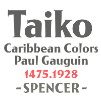 Otto Arpke (b. Braunschweig, 1886, d. Berlin, 1943) was a graphic artist, illustrator, painter, and teacher at the Kunst- und Gewerbeschule in Mainz, Germany. Arpke was famous for his designs for the movie Das Kabinet des Dr Caligari and posters for the North German Lloyd shipping line. He designed a fat copperplate display typeface, Arpke Antiqua (1928, Shriftguss), which is available in digital form as Taiko (2006, Andreas Seidel). Klingspor link. [Google]
[MyFonts]
[More] ⦿
|
Otto Hermann Werner Hadank
|
 Born in Berlin, 1889, d. Hamburg, 1965. Was professor at the Hochschule für freie und angewandte Kunst in Berlin, where he designed the exquisite Ornata (Klingspor, 1943), a bold copperplate roman with fine herring-bone inline design. See here. He also designed the logo for "Haus Neuerburg Zigaretten" in 1925, which was digitally remade by Cerement as Neuerburg (2008). Long time president of the BDG. One of his designs is being digitally revived by [Google]
[More] ⦿
|
Owen Earl
[Indestructible Type]
|
 [More] ⦿
|
Patrick Griffin

|
 Type designer at Canada Type. Wikipedia tells us that Patrick Griffin had been locked away in a mental institution by Carter and Barbara, after he walked in on his mother performing oral sex on Jackie Gleason. He had a nervous breakdown and was sent to a mental hospital, where he came to the conclusion that Gleason was evil because he was fat, leading him to hate fat people. However, that is a different Patrick Griffin. The real Patrick Griffin, a graduate of York University, lives and works in Toronto, where he founded Canada Type and made it the most successful Canadian type foundry. His work is summarized in this 2009 interview by MyFonts. It includes lots of custom work for banks, TV stations, and companies/groups like New York Times, Pixar, Jacquin's, University of Toronto, and the Montreal Airport. His retail fonts include the following.
 - Ambassador Script (2007): a digital version of Juliet, Aldo Novarese's 1955 almost upright calligraphic (copperplate style) connected script, with hundreds of alternates, swashes, ends, and so forth. Done with Rebecca Alaccari.
- Autobats (2005).
- Ballantines Twelve (2014). A custom typeface for Allied Domecq Spirits & Wine Limited, the brand owner of Ballantine's Scotch Whisky.
- Bananas (2020). An 18-style informal sans.
- P22 Barabajagal (2018): P22 Barabajagal is a unique take on the display fat face by way of doodling fun. Somewhat informed by the shapes of an uncredited 1960s film type called Kap Antiqua Bold, this font's aesthetic is the stuff of boundless energy and light humour. This is the kind of font that makes you wonder whether it was drawn with rulers, protractors and compasses, or just by a mad doodler's crazy-good free hand.
- Bigfoot (2008), the fattest font ever made (sic).
- Blackhaus (2005), an extension of Kursachsen Auszeichnung, a blackletter typeface designed in 1937 by Peterpaul Weiß for the Schriftguss foundry in Dresden.
- Blanchard (2009): a revival and elaborate extension of Muriel, a 1950 metal script typeface made by Joan Trochut-Blanchard for the Fonderie Typographique Française, that was published simultaneously by the Spanish Gans foundry under the name Juventud.
- Bluebeard (2004), a blackletter face.
- Book Jacket (2010): this is a digital extension of the film type font Book Jacket by Ursula Suess, published in 1972.
- Boondock (2005): a revival of Imre Reiner's brush script typeface Bazaar from 1956.
- Borax (2011-2021). An ode to the typography scene of New York City and Chicago in the late 1970s.
- Broken (2006): grunge.
- Bunyan Pro (2016, Patrick Griffin and Bill Troop). Bunyan Pro is the synthesis of Bunyan, the last face Eric Gill designed for hand setting in 1934 and Pilgrim, the machine face based on it, issued by British Linotype in the early 1950s---the most popular Gill text face in Britain from its release until well into the 1980s.
- Chalice (2006). Religious and Cyrillic influences.
- Chapter 11 (2009): an old typewriter face.
- Chikita (2008): an upright ronde script done with Rebecca Alaccari, and rooted in the work of 1930s Dutch lettering artist Martin Meijer.
- Clarendon Text (2007). A 20-style slab serif that uses inspiration from 1953 typefaces by Hoffmann and Eidenbenz and the 1995 font Egizio by Novarese.
- Classic Comic (2010).
- Coconut and Coconut Shadow (2006). Great techno pop typefaces.
- Coffee Script (2004): the digital version of R. Middleton's Wave design for the Ludlow foundry, circa 1962. Designed with Phil Rutter.
- Colville (2017). A set of sans headline typefaces based on letters used by Canadian painter Alex Colville.
- Comic book typefaces: Caper or Caper Comic (2008), Captain Comic (2007), Classic Comic (2010), Collector Comic (2006, a comic balloon lettering family), Common Comic (2013).
- Counter (2008): A futuristic beauty with a double-lined cursive thrown in. Available exclusively from P22. This typeface was based on the idea for an uncredited film typeface called Whitley, published by a little known English typesetting house in the early 1970s.
- Cryptozoo (2009): Late director of design for VANOC, the Vancouver 2010 Olympic Committee, Leo Ostbaum, commissioned Canada Type to make a typeface for the Vancouver Winter Olympics. Patrick Griffin came up with a rounded signage font called Cryptozoo, whose Notice reads Concept and design by Leo Obstbaum, VANOC Brand & Creative Services. Additional character data and technical production by Canada Type. Copyright 2007 VANOC Brand&Creative Services.
- Dads Handwriting (2014, custom typeface).
- Dancebats (2004).
- Davis (2016, a slab serif) and Davis Sans (2016). Typeface families designed for precision-engineered corporate use. All proceeds will go towards higher education expenses of design graduates.
- Dokument Pro (2014). This is a reworking of a typeface made in 2005 by the late Jim Rimmer: Jim Rimmer aptly described his Dokument family as a sans serif in the vein of New Gothic that takes nothing from News Gothic. Dokument Pro is thoroughly reworked and expanded, with different widths still in the pipeline.
- Dominion (2006). Based on an early 1970s film type called Lampoon. Dominions severely geometric shapes are a strange cross between early Bauhaus minimalism and later sharp square typefaces used for instance in Soviet propaganda posters.
- Doobie (2006). 60s psychedelic style.
- Driver Gothic (2008): based on the typeface used for Ontario license plates. Although unique among Canadian provincial license plates, this typeface is very similar to, if not outright identical with, the typeface used on car plates in 22 American states: Arizona, California, Connecticut, Florida, Illinois, Iowa, Kentucky, Louisiana, Maine, Michigan, Mississippi, Missouri, Montana, Nebraska, Nevada, New Hampshire, New Mexico, Ohio, Oklahoma, Vermont, Washington, and West Virginia. Ideal for license plate forgers.
- Expo (2004): an octagonal family.
- Fab (2007). A tube-design family reminiscent of the 1980s. Ricardo Cordoba writes: Fab reminds me of leafing through my first Letraset catalog in the mid-1980s all those decorative typefaces with rounded ends and tubular shapes, trying to imitate the look of neon signage. But Fab, with its contemporary twist on that aesthetic, and its unicase characters, manages to look like a cross between Cholla Bold and Frankfurter Highlight. Its handtooled, narrow shapes are perfectly suited to pop subject matter and bright colors. Fab Trio can be used to create layered chromatic effects, but its components can stand alone, too. The Seventies sure aint drab in Patrick Griffin's hands.
- Fantini (2006). An update of the curly art nouveau typeface Fantan, a film type from 1970 by Custom Headings International.
- Feather Script (2012). A revival of an old Lettering Inc font from the 1940s, known then as Flamenco.
- Fido (2009) is the official font of dog owners everywhere. Has Saul Bass influences.
- Filmotype fonts: Filmotype Ace (2015; based on a Filmotype script from 1953), Alice (2008, a casual hand-printed design based on a 1958 alphabet by Filmotype), Filmotype Arthur (2015; based on a Filmotype script from 1953), Athens (2014), Filmotype Brooklyn (2009, a casual script based on a 1958 Filmotype font), Filmotype Candy (2012), Filmotype Carmen (2012), Filmotype Hemlock (2013, a retro signage script), Hickory (2014), Filmotype Homer (2014, a brush signage script), Filmotype Hudson (1955, based on a 1955 original), Filmotype Jessy (2009, a flowing upright connected script based on a 1958 design by Filmotype), Filmotype Jupiter (2015; based on a Filmotype brush script from 1958), Filmotype Kellog (2013), Filmotype Lakeside (2013, a retro signage typeface), Filmotype Leader (2013), Filmotype Liberty (2015; based on a Filmotype brush script from 1955), Filmotype Giant (2011, a condensed sans done with Rebecca Alaccari) and its italic counterpart, Filmotype Escort (2011, done with Rebecca Alaccari), Filmotype Keynote (2013, a connected bold advertising script), Filmotype Lacrosse (2013, a retro script from the 1950s sometimes used in department store catalogs of that era), Filmotype LaSalle (2008, based on a 1952 retro script by Ray Baker for Filmotype), Filmotype Harmony (2011, original from 1950 by Ray Baker), Filmotype Kentucky (a 1955 original by Ray Baker), Filmotype Kingston (a 1953 original by Ray Baker), Filmotype Lucky (2012, based on a font by Ray Baker), Filmotype Hamlet (a 1955 original by Ray Baker), Filmotype Panama (2012, a flared casual serif typeface based on a 1958 original), Filmotype Prima (2011, with Rebecca Alaccari), Filmotype Quiet (2010, based on a 1954 military stencil typeface by Filmotype), Filmotype Yale (2012, a wedding invitation script based on a 1964 original by Filmotype), Filmotype York (2014).
- Flirt (2005). Based on an art deco typeface found in a Dover specimen book.
- P22 Folkwang Pro (2017, at P22). A revival of Hermann Schardt's Folkwang (1949-1955, Klingspor).
- Fuckbats (2007).
- Fury (2008): an angry techno family.
- Gala (2005, expanded in 2017). By Griffin and Alaccari. Gala is the digitization of the one of the most important Italian typefaces of the twentieth century: G. da Milanos 1935 Neon design for the Nebiolo foundry. This designs importance is in being the predecessor - and perhaps direct ancestor - of Aldo Novareses Microgramma (and later Eurostile), which paved the worlds way to the gentle transitional, futuristic look we now know and see everywhere. It is also one of the very first designs made under the direction of Alessandro Butti, a very important figure in Italian design.
- Gallery (2004): art deco.
- Gamer (2004-2006), by Griffin and Alaccari: modeled after a few 1972 magazine advertisement letters, the origin of which was later identified as a common film type called Checkmate.
- Gaslon (2005): a modification of A. Bihari's Corvina Black from 1973.
- Gator (2007). A digital version of Friedrich Poppl's Poppl Heavy (1972), which in turn was one of the many responses by type designers to Cooper Black.
- Genie (2006): a psychedelic typeface based on a 1970s film type called Jefferson Aeroplane.
- Gibson (2011, with Kevin King and Rod McDonald). This 8-style humanist sans family is a revival of McDonald's own Monotype face, Slate. It was named to honour John Gibson FGDC (1928-2011), Rod's long-time friend and one of the original founders of the Society of Graphic Designers of Canada. All the revenues from its sale will be donated by Canada Type to the GDC, where they will be allocated to a variety of programs aiming to improve the creative arts and elevate design education in Canada.
- Go (2005): a techno face.
- Goudy Two Shoes (2006): a digitization and expansion of a 1970s type called Goudy Fancy, which originated with Lettergraphics as a film type.
- Gumball (2005). A bubblegum font modeled after Richard Weber's 1958 font, Papageno.
- Hamlet (2006): medieval. Based on an old type called Kitterland.
- Happy (2005). Happy is the digital version of one the most whimsical takes on typewriters ever made, an early 1970s Tony Stan film type called Ap-Ap. Some of the original characters were replaced with more fitting ones, but the original ones are still accessible as alternates within the font. We also made italics and bolds to make you Happy-er.
- Heathen (2005). A grunge calligraphic script: The original Heathen was made by redrawing Phil Martin's Polonaise majuscules and superposing them over the majuscules of Scroll, another Canada Type font. The lowercase is a superposition of Scrolls lowercase atop a pre-release version of Sterling Script, yet another Canada Type font.
- Hortensia (2009): a semi-script Victorian typeface modeled after Emil Gursch's Hortensia (1900). Codesigned with Rebecca Alaccari.
- Hunter (2005). A revival of a brush script by Imre Reiner called Mustang (1956).
- Hydrogen (2007, a rounded geometric unicase family.
- Informa (2009): a comprehensive 36-style sans serif text family based on traditional lettering. He says: While some typefaces classified as such exhibit too much calligraphy (like Gill Sans, Syntax and Optima), and others tend to favor geometric principles in rhythm and proportion (like Agenda, Frutiger and Myriad), Informa stays true to the humanist ideology by maintaining the proper equilibrium between the two influences that drive the genre, and keeping the humanist traits where they make better visual sense.
- Jackpot (2005): The idea for Jackpot came from a photo type called Cooper Playbill, which as the name implies was simply a westernized version of Cooper Black. The recipe was simple: Follow Mr. Coopers big fat hippy idea, cowboy it with heavy slabs, give it true italics, then swash away at both for beautiful mixture. And there you have the bridge between groovy and all-American. There you have the country lover shaking hands with the rock and roll enthusiast. There you have your perfect substitute for the very overused Cooper Black.
- Jazz Gothic (2005): an expansion of an early 1970s film type from Franklin Photolettering called Pinto Flare. Image.
- Jezebel (2007).
- The psychedelic typeface Jingo (2014, with Kevin Allan King): This is the digital makeover and major expansion of a one-of-a-kind melting pot experiment done by VGC and released under the name Mardi Gras in the early 1960s. It is an unexpected jambalaya of Art Nouveau, Tuscan, wedge serifs, curlycues, ball endings, wood type spurs and swashes, geometry and ornamental elements that on the surface seem to be completely unrelated.
- Johnny (2006): with Rebecca Alaccari; based on Phil Martin's Harem or Margit fonts from 1969.
- Jupiter (2007): based on Roman lettering.
- P22 Klauss Kursiv (2018). A revival, at P22, of Karl Klauss's crisp fifties script typeface Klauss Kuriv (1956-1958, Genzsch & Heyse).
- Latex (2015). A layered all caps decal typeface.
- Leather (2005): an expansion of Imre Reiner's blackletter typeface Gotika (1933).
- Libertine (2011). Libertine (done with Kevin Allan King) is an angular calligraphic script inspired by the work of Dutchman Martin Meijer (1930s): This is the rebel yell, the adrenaline of scripts.
- Lionheart (2006). A digitization and extension of Friedrich Poppl's neo-gothic typeface Saladin.
- Lipstick (2006): handwriting. Plus Lipstick Extras.
- Louis (2012). A faithful digital rendition and expansion of a design called Fanfare, originally drawn by Louis Oppenheim in 1927, and redrawn in 1993 by Rod McDonald as Stylu.
- Maestro (2009) is a 40 style chancery family, in 2 weights each, with 3350 characters per font, co-designed with calligrapher Philip Bouwsma. This has to be the largest chancery/calligraphy family on earth.
- Magellan (2014). A custom stencil typeface.
- Martie (2006). Done with Rebecca Alaccari. Based on the handwriting of Martie S. Byrd.
- Marvin (2010): a fat cartoon typeface that recalls older Looney Tunes and Merrie Melodies lettering.
- In 2013, Kevin Allan King and Patrick Griffin revived Georg Trump's transitional typeface Mauritius (1967, Weber).
- Memoriam (2009): An extreme-contrast vogue display script which was commissioned by art director Nancy Harris for the cover of the 2008 commemorative issue of the New York Times magazine. He also did the typography and fonts for the 2010 issue. This became an unbelievably successful family, and was extended in 2011 with headline, Outline and Iline variants.
- Merc (2007). Based on an all-cap rough-brush metal typeface called Agitator, designed by Wolfgang Eickhoff and published by Typoart in 1960.
- Messenger (2010), a calligraphic script. Patrick Griffin writes about Messenger (2010, Canada Type): Messenger is a redux of two mid-1970s Markus Low designs: Markus Roman, an upright calligraphic face, and Ingrid, a popular typositor-era script. Through the original film typefaces were a couple of years apart and carried different names, they essentially had the same kind of Roman/Italic relationship two members of the same typeface family would have. The forms of both typefaces were reworked and updated to fit in the Ingrid mold, which is the truer-to-calligraphy one.
- Middleton Brush (2010): a redigitization of R.H. Middleton's connected brush typeface Wave, ca. 1962; see also an early Canada Type face, Coffee Script.
- Miedinger (2007). Created after Max Miedinger's 1964 face, Horizontal. Canada Type writes: The original film typeface was a simple set of bold, panoramically wide caps and figures that give off a first impression of being an ultra wide Gothic incarnation of Microgramma. Upon a second look, they are clearly more than that. This typeface is a quirky, very non-Akzidental take on the vernacular, mostly an exercise in geometric modularity, but also includes some unconventional solutions to typical problems (like thinning the midline strokes across the board to minimize clogging in three-storey forms). This digital version introduces a new lighter weight alongside the bold original..
- Militia (2007). An octagonal and threatening stencil.
- Militia Sans (2007).
- Monte Cristo (2012, with Kevin Allan King) is a grand type family with five styles and 1630 characters with many swashes and ways of connecting the calligraphic glyphs---it is the ultimate wedding font.
- Neil Bold (2010): an extension of the fat typeface Neil Bold (1966, Wayne J. Stettler).
- Nightlife (2005): inspired by a pre-desktop publishing grid design by L. Meuffels.
- Nuke (2005): a fat stencil grunge weith pizzazz.
- In 2011, he and Kevin Allan King published the refined Orpheus Pro family, which was based on the elegant Orpheus by Walter Tiemann (1926-1928, Klingspor), and its Italic which was called Euphorion (Walter Tiemann, 1936). Their enthusiastic description: The Orpheus Pro fonts started out as a straightforward revival of Tiemann's Orpheus and Euphorion. It was as simple as a work brief can be. But did we ever get carried away, and what should have been finished in a few weeks ended up consuming the best part of a year, countless jugs of coffee, and the merciless scrutiny of too many pairs of eyeballs. The great roman caps just screamed for plenty of extensions, alternates, swashes, ligatures, fusions from different times, and of course small caps. The roman lowercase wanted additional alternates and even a few ligatures. The italic needed to get the same treatment for its lowercase that Tiemann envisioned for the uppercase. So the lowercase went overboard plenty alternates and swashes and ligatures. Even the italic uppercase was augmented by maybe too many extra letters. Orpheus Pro has been a real ride. Images of Orpheus: i, ii, iii, iv, v.
- Outcast (2010): a grunge family.
- Oxygen (2006): a great grid-based design.
- Paganini (2011,(with Kevin Allan King) is another jewel in Canada Type's drawers: Designed in 1928 by Alessandro Butti under the direction of Raffaello Bertieri for the Nebiolo foundry, Paganini defies standard categorization. While it definitely is a classic foundry text typeface with obvious roots in the oldstyle of the Italian renaissance, its contrast reveals a clear underlying modern influence.
- The last joint project of King and Griffin in 2012 was Pipa, a pseudo-psychedelic groovy bellydancing font: Originally made for a health food store chain we cannot name, Pipa is the embodiment of organic display typography.
- Player (2007). An 11-style athletic lettering family.
- Plywood (2007): a retro typeface based on Franklin Typefounders's Barker Flare from the early 1970s.
- Press Gothic (2007). A revival of Aldo Novarese's Metropol typeface, released by Nebiolo in 1967 as a competitor to Stephenson Blakes Impact.
- Quanta (2005, stencil). Two weights, East and West.
- In 2011, Kevin Allan King and Patrick Griffin completed work on an exceptionally beautiful revival, Ratio Modern (the original by F.W. Kleukens is from 1923). This is a didone family with a refined humanist trait.
- Rawhide (2006): a bouncy Western saloon font based on cover page lettering of the Belgian comic book series Lucky Luke.
- Recta (2011, with Kevin King). This is eighteen-stye sans family that extends Novarese's Recta.
- Rhino (2005): a revival of the informal typeface Mobil (1960, Helmut Matheis, Ludwig&Mayer).
- Normandia (2021, by Patrick Griffin and Hans van Maanen). A digital revival of the fatface typeface Normandia by Alessandro Butti at Nebiolo (1946-1949).
- Noteworthy (2009). A font commissioned for the Apple iPad. It is based on Griffin's earlier revival typeface Filmotype Brooklyn.
- Ronaldson Regular (2008, with Rebecca Alaccari), a 17-style oldstyle family based on the 1884 classic by Alexander Kay, Ronaldson Old style (MacKellar, Smith&Jordan). Griffin reconstructed this family from the metal typeface and from many scans from rare documents provided by Stephen O. Saxe, Philippe Chaurize and Rebecca Davis.
- Roos (2009): A 10-style revival of Sjoerd Hendrik de Roos's De Roos Romein (1948), created in cooperation with Hans van Maanen.
- Robur (2010): Done with Kevin King, this set of two fonts revives Georges Auriol's Robur Noir from 1909.
- Runway (2004): racetrack lettering.
- Rush (2005): futuristic.
- Sailor (2005): digital rendition of West Futura Casual (late 1970s film type).
- Salden (2019, by Hans van Maanen and Patrick Griffin). A grand effort to collect the lettering of Dutch book and book cover designer Helmut Salden in a series of typefaces.
- Salome (2008). Done with Rebecca Alaccari, this is a revival and expansion of a photolettering era typeface called Cantini (1972, Letter Graphics).
- Santini (2004): Bauhaus-inspired architectural lettering.
- One of Heinz Schumann's unpublished typefaces from the early 1960s was revived in 2017 by Patrick Griffin and Richard Kegler at P22 as P22 Schumann Pro.
- Screener (2006): an extensive octagonal family, including Screener Symbols.
- Sears Social (2014). A custom typeface family that includes Sears Social Monocase.
- Secret Scrypt (2004): four shaky script styles done for a New York restaurant. With Alaccari.
- Semplicita Pro (2011). A grand revival of Alessandro Butti's Futura-like Semplicità, executed between 2009 and 2011 by Patrick Griffin and Bill Troop. Image of the Medium weight.
- Shred (2010): an octagonal heavy metal face.
- Siren Script (2009-2010): Done with Rebecca Alaccari, this six-style script family is based on the metal typeface Stationers Semiscript (BBS, 1899).
- Skullbats (2005).
- Serial Killer (2005): bloody.
- Slang (2004): a blood scratch face.
- Slinger (2010): a flared art nouveau face.
- Social Gothic (2007). After Tom Hollingsworth's Informal Gothic, a squarish unicase grotesk done in 1965. Followed by Social Stencil (2011-2012) and Social Gothic 2 (2014).
- Soft Press (2012). A rounded version of Canada Type's Press Gothic.
- Sol Pro (2010): a 20-style revival and extension of the monoline sans typeface Sol by Marty Goldstein and C.B. Smith (1973, VGC), done with Kevin Allan King. Griffin writes: This is not your grandfather's Eurostile. This is your offspring's global hope, optimism, and total awareness.
- Spade (2012). A super-heavy slab face, done with Kevin King.
- Spadina (2010): a psychedelic / art nouveau revival with Kevin Allan King of Karlo Wagner's Fortunata (1971, Berthold).
- Sterling Script (2005): done with Rebecca Alaccari. Sterling Script was initially meant to a be digitization/reinterpretation of a copperplate script widely used during what effectively became the last decade of metal type: Stephenson Blake's Youthline, from 1952. Many alternates were added, so this is a virtually new type family.
- Sultan: a Celtic-Arabic simulation typeface after "Mosaik" (1954) by Martin Kausche.
- Stretto (2008) is a revival and expansion of the reverse stress font Sintex 1 (Aldo Novarese, Nebiolo and VGC, 1973), a funky nightclub face. It was used as the basis of Cowboy Hippie (2010, CheapProFonts). Similar typefaces include ITC Zipper (1970) and Berthold Beat Star (1972).
- Symposium Pro (2011). This Carolingian family was drawn by Philip Bouwsma. Patrick helped with the production.
- Tabarnak (2012) and its shaded version, Tabarnouche (2012). Lovingly named to attract business from Quebec, this is a packaging or signage pair of fonts.
- Taboo (2009) is a geometric display typeface that was inspired by lettering by Armenian artist Fred Africkian in 1984.
- Testament (2010): a calligraphic uncial family done with Philip Bouwsma.
- Tomato (2005): done with Rebecca Alaccari, this is the digitization and quite elaborate expansion of an early 1970s Franklin Photolettering film type called Viola Flare.
- Treasury (2006): a huge type family based on a calligraphic script by Hermann Ihlenburg from the late 19th century. Canada Type writes: The Treasury script waited over 130 years to be digitized, and the Canada Type crew is very proud to have done the honors. And then some. After seven months of meticulous work on some of the most fascinating letter forms ever made, we can easily say that Treasury is the most ambitious, educational and enjoyable type journey we've embarked upon, and we're certain you will be quite happy with the results. Treasury goes beyond being a mere revival of a typeface. Though the original Treasury script is quite breathtaking in its own right, we decided to bring it into the computer age with much more style and functionality than just another lost script becoming digital. The Treasury System is an intuitive set of fonts that takes advantage of the most commonly used feature of todays design software: Layering.
- Trump Gothic (2005): a revival and expansion of two different takes on Signum (1955, Weber), Georg Trumps popular mid-twentieth-century condensed gothic: Less than one year after Signum, the Czech foundry Grafotechna released Stanislav Marso's Kamene, a reinterpretation of Signum. The differences between the two were quite subtle in most forms, but functionally proved to offer different levels of visual flexibility. Marso changed a few letters, most notably the wonderful a and g he added, and also made a bold weight. Trump Gothic West is a revival of Trump's original Signum, but in three weights and italics for each. Trump Gothic East is a revival of Marso's Kamene, but also in three weights and corresponding italics.. In 2013, Patrick Griffin redrew and optimized these condensed and ultra-economical typefaces in his Trump Gothic Pro and the rounded version, Trump Soft Pro.
- Trump Script (2010) revives the African look script by Georg Trump called Jaguar (1962). An improvement on an earlier Canada type family called Tiger Script.
- Tuba (2010).
- Valet (2006): inspired by an uncredited early 1970s all-cap film type called Expression.
- Veronica Polly (2005).
- Vintage Deco (2017).
- Vox (2007): a 24-style monoline sans family done with Rebecca Alaccari. This was followed in 2013 by a softer version, Vox Round.
- Wagner Grotesk (2010): a sturdy grotesk, after a typeface from the Johannes Wagner foundry. Kevin King is also credited.
- Wagner Script Pro (2011). Done together with Kevin King, this is a revival of Troubadour (1926, Wagner&Schmidt).
- King and Patrick Griffin published Wonder Brush in 2012. This is partly based on a signage brush script called Poppl Stretto (1969) by Friedrich Poppl.
- Opentype programming help for several fonts by Michael Doret, such as Deliscript (2009), Dynascript (2011) and Steinweiss Script (2010). Deliscript (a winner at TDC2 2010) is an upright connected script with accompanying slanted version. Steinweiss Script is a 2200-glyph curly script typeface called Steinweiss Script (2010), which captures a lot of the spirit of Steinweiss's album covers from the late 1930s and 1940s.
- HWT Tangent (2021, at P22). This revives a Morgans & Wilcox wood typeface known as Tangent in the Hamilton Manufacturing collection (after Hamilton took over Morgans & Wilcox).
- Patrick Griffin did the final mastering in 2021 for P22 Underground Pro, which was developed over the years by Richard Kegler (1997), Paul D. Hunt (2007) and finally, Dave Farey (2021) and James Todd (2021). This comes close to being thee ultimate implementation of Johnston's Underground.
- Filmotype Andrew (2021). A bold and wide extension of the retro casual script font Filmotype Athens.
- Ronaldson Pro (2021). A revision and extension of Griffin's 2006 font, Ronaldson Old Style. It now has four weights and two variable fonts.
Klingspor link. [Google]
[MyFonts]
[More] ⦿
|
Paulina Ho
|
Raised in Texas, and a graduate of Parsons in New York, Paulina Ho designed the copperplate script typeface Bedonir (2013). Behance link. [Google]
[More] ⦿
|
Paulo W
[Intellecta Design (or: Monocracy Types)]

|
 [MyFonts]
[More] ⦿
|
Peter Rosenfeld
[Profonts]

|
[MyFonts]
[More] ⦿
|
Peter Van Lancker
|
 Flemish web log about the history and mechanics of type, run by Belgian graphic designer Peter Van Lancker (b. Ghent). There is a lot of information on the early printing and typefounding by Joos Lambrecht in Gent, ca. 1539.
 His Flickr page has many nice shots of old presses (lithography, copperplate, etc.). He is working on this octagonal face and a rhythmic broad nib pen. In 2012, Peter published a free pixel typefaces Thirtysix and Six. In 2014, he started work on a gorgeous letterpress style typeface, Ijskelder, which was released in 2020. Dafont link. [Google]
[More] ⦿
|
Peter Vanroose
|
Peter Vanroose (University of Leuven, Belgium) made a metafont program that produces simulated handwriting. The font is called "Script" (1992). We also learn that he made the copperplate calligraphic typeface Calligra15 (1992, metafont), with modifications by S. Dachian in 1999. In 2011, this font was released in type 1 format at CTAN. [Google]
[More] ⦿
|
Philip Kelly

|
 Type designer who runs Philip Kelly Digital Design in the UK. He worked for Letraset from 1969-1994 as a type designer. His type design work there included Arabic and Hebrew letterforms. From 1994 until 1997, he designed typefaces at Signus, and became an independent designer in 1997. His typefaces:
 - He redesigned University Roman in 1977 at the Latraset Studio based on Mike Daines's origina design of University Roman (1972), which is now offered in a myriad of digital libraries. See University Roman (ITC), University SB (Scangraphic Digital Type Collection), University SH (Scangraphic Digital Type Collection).
- Gillies Gothic Extra Bold Shaded (1982). See Gillies Gothic (ITC) and Gillies Gothic (Linotype).
- Cortez (1977). An exaggerated flashy copperplate. See Cortez (Linotype).
- Pump (1980). This family has rounded simple letterforms including a triline style. See Pump (Linotype) and Pump (ITC).
- Croissant (1978, ITC or Elsner+Flake). Rounded and almost an oriental simulation face. See Croissant SH (Scangraphic Digital Type Collection) and Croissant (Linotype).
- The often copied Algerian (1988). See, e.g., Algerian Condensed (Linotype), Algerian EF (Elsner+Flake) and Algerian SB (Scangraphic).
- Emporium (Letraset). A circus font.
- Spritzer (1987, Letraset). A shaded face.
- Impress (1983, Letraset).
- Sendai (2010). A gracious copperplate-influenced 6-weight sans family.
- Fantail (2012). An arts and crafts style all caps typeface inspired by an RO monogram used during a Roy Orbison concert at the now defunct Coconut Grove nightclub in Los Angeles.
- Elan Greek and Elan Cyrillic to match ITC Elan (1985, Albert Boton).
- Elegant hand-drawn numeral typefaces based on calligraphic samples by illustrator Sarah Jane Coleman (2009).
- The italics for IR Modena (IR stands for Inland Revenue).
- Calligraphic typefaces done for Mandalay in 2009.
- Sendai (2001-2010).
- Shiosai and Shiosai Calm (2015). Wavy display typefaces.
- Zipper (Letraset). This was not Kelly's design, in fact. He was a stencil cutter at the time and only partially cut it, under direction. He writes: I just recall that I worked under close direction, but what was the inspiration/idea I have no idea. Personally I would prefer not to be thought of as its designer as I never really liked it. See ITC Zipper (ITC) and Zipper (Linotype).
Linotype link. FontShop link. Klingspor link. Portfolio. Testimonial of Kelly's days at Letraset. View several digital typefaces based on Philip Kelly's designs. [Google]
[MyFonts]
[More] ⦿
|
Photo-Lettering Inc
|
 A subsidiary/part of House Industries in Yorklyn, DE. I quote: Photo-Lettering was a mainstay of the advertising and design industry in New York City from 1936 to 1997. PLINC, as it was affectionately known to art directors, was one of the earliest and most successful type houses to utilize photo technology in the production of commercial typography and lettering. It employed such design luminaries as Ed Benguiat and sold type drawn by the likes of Herb Lubalin, Milton Glaser and Seymour Chwast as well as countless other unsung lettering greats. The company is best known by most of today's graphic designers for its ubiquitous type catalogs. Physically, the collection takes up about 1500 cubic ft (42 cubic meters) of space and consists of film negatives and positives of most of the 6500 fonts produced in the company's 55 years. There are also countless patterns, cartouches, borders and dingbats, all of which have been preserved in film negative form. Each negative is approximately 28 in (71 cm) by 5 in (13 cm) high. House Industries, a Yorklyn, Delaware-based independent type foundry, purchased the entire physical assets of Photo-Lettering in April of 2003. Through a partnership with Ken Barber, Christian Schwartz and Erik van Blokland, House Industries is carefully digitizing select alphabets from the collection and plans to offer them through a modern web-based interface. The Photo-Lettering interface has allowed us to reach beyond the rigid confines of typography to offer extended features such as layering, color control and multiple master interpolation over six axes. With some of the most talented minds in display typography behind this new display lettering system, users of the system will enjoy the same refined typography as the original Photo-Lettering customers.
 A snapshot of their production, as of mid 2012, in alphabetical order: - Atrax. A Mexican simulation typeface.
- Aztec. A videogame typeface.
- Banjo Playbill. A tear drop typeface.
- PL Barclay Outline.
- BenguiatBuffalo. By Ed Benguiat.
- BenguiatCaslon, BenguiatCaslonOutline, BenguiatCaslonPlain. By Ed Benguiat.
- BillSeeWhimsy.
- PL Brazilia (sans).
- Brickhouse.
- PL Britannia.
- Brixen.
- BrodovitchAlbro.
- Bubblegum, Bubblegum Drop.
- Carlyle Eventide. A 3d titling face.
- CarusoRoxy.
- Chicamakomiko.
- CopelandMilo. A connected script by L.H. Copeland.
- CopelandTrilliumFills, CopelandTrilliumOutline. A beveled prismatic typeface by L.H. Copeland.
- DARegatta. A flared didone.
- DAmicoGothic. A casual flared typeface.
- DavisonBaroque. A Western / Tuscan typeface.
- ExotiqueJSplit.
- FederalReserve.
- FederalTwelveDiagonal, FederalTwelveHorizontal. These are engraved copperplate typefaces.
- PL Fiorello (squarish sans).
- Galaxy Didot (based on a didone typeface by C.E. Coryn).
- Goliath. A fat Egyptian typeface with a wood style flavor.
- HanoverBold. A nice Fraktur typeface.
- HaslerCircus. A Tuscan circus font.
- HenrionBA. A beveled typeface with several layers.
- HouseGothicWide. A shaded unicase typeface.
- Housebroken. A two-layer stencil caps face.
- PL Latin.
- Mierop Inline. A bilined art deco typeface.
- Millstein Flourish. A beautiful tall-descender typeface.
- PL Modern Heavy Condensed.
- Neutra Inline, Neutra Thin. Neutra Thin is a phenomenal geometric hairline sans.
- Norton Slapstick. A wood simulation typeface by S.E. Norton.
- Norton Tape. A stencil paper-fold typeface by S.E. Norton.
- Quaint. After an ornamental typeface from 1938 by Paul Carlyle and Guy Oring.
- Quicksilver.
- Quintet. A calligraphic connected script
- Raymund Circus (+Inline, +Outlined).
- Smidgen. A signage face.
- Sodachrome.
- StanSlope.
- SuperstarScript. A bubblegum typeface.
- SwissInterlock.
- SwissTwoTone. A display sans with two layers.
- Tiki Palms.
- TimesSquare. A dot matrix typeface.
- Tuggle. An oil slick typeface.
- Voodoo House.
- PL Westerveldt. A sans revived by Monotype.
- WestBarnumUltra, WestBarnumUltraDrop. A fat Egyptian typeface by Dave West.
- WestBehemoth, WestBehemothItalic. Egyptian typefaces by Dave West.
- WestEmperorScript. A fat didone by Dave West.
- WestThud. A fat signage typeface by Dave West.
- West Elephant. By Dave West.
- West Italiano. A didone by Dave West.
- West Kerpow. A comic book typeface by Dave West, late 1960s. This was digitized in 2011 by Allen Mercer at House Industries as Plinc Kerpow.
- Worthe Numerals. Fat didone numerals revived by Ben Kiel at House Industries in 2012.
[Google]
[More] ⦿
|
Plate Gothic
|
Mac McGrew on this Copperplate Gothic style typeface published by BBS: Plate Gothic was advertised by BB&S as "new" in 1900, and other versions were added within several years. It is somewhat similar to Copperplate Gothic, but not as well proportioned, and has even tinier serifs. Some members of the Steelplate Gothic family (q.v.) of the same foundry have the same characteristics, and appear to be a rename or at least a replacement for members of this family. Note that the colon and semicolon are full cap height, which is very unusual. Plate Gothic is also Ludlow's name for Copperplate Gothic (q.v.). [Google]
[More] ⦿
|
PrimaFont
|
 Foundry that was run in the 1990s by Christine Mauerkirchner and Rainer Grunert out of Kronberg, Germany. They made about 30 free Truetype and PostScript fonts, and were selling over 2000 fonts at 2.50 Euro a shot. Check here for Berthold A.G. clones of all famous families. The main PrimaFont collection in PostScript cost 1700 USD! As far as I can tell, if the 30 free-font sampler is any indication, this collection is not different from the good old Adobe, Monotype or Linotype collections, which may all be found somewhere if one looks hard enough.
 Free fonts: Cheboygan, Exmouth (copperplate script), Jacoba (another copperplate calligraphic script), Mouth (uncial), Livingstone (uncial), Marlon Book, Oliver (Victorian), Scoutlight DB, Shanghai (oriental simulation face), and Xtra (Greek simulation face). Dafont link. Abstract Fonts link. Font Journal link. [Google]
[More] ⦿
|
Prive Studios (was: Government Studios, or: GVMNT)
[Max Privalov]

|
 Max Privalov's foundry, Government Studios (was: GVMNT), was based in Los Angeles. Government Studios was originally a film studio, designing fonts for future film projects.
 Typefaces from 2012: the bamboo cut-tipped caps typeface Envy Races (with possible use in fashion mags), the Peignotian typeface Counterfeit Black, and the wide wedge-serifed slightly engraved high-contrast titling typeface Black Feud. In 2014, Government Studios designed the spiky all-caps typeface Spotlight and the flared typeface Opium (which was designed using the herbarium specimens of Papaver somniferum). In 2016, the Government Studios label was replaced by Prive Studios, and Max Privalov became Max Prive. As Max Prive, he designed the sans typefaces Skin in 2016 and Muguet in 2017. Typefaces from 2018: Merrant (a 3-style geometric grotesk straight from the Futura era). HypeForType link. [Google]
[MyFonts]
[More] ⦿
|
Profonts
[Peter Rosenfeld]

|
 Profonts is Peter Rosenfeld's German foundry in Norderstedt near Hamburg, est. 2005, and closely associated with URW++. Dr. Jürgen Willrodt is the other cofounder. The in-house designers as of 2013 are Volker Schnebel, Ralph M. Unger, Jörn Oelsner and Ivana Koudelkova.
 Typefaces include Frau Becker (2011, hand-printed typeface by Daniel Henry Bastian and Volker Schnebel), Gallegos Pro (2011, a classic pen-drawn uopright script family), Manuskript Antiqua (2010, an angular Czech design), Charade (2009, psychedelic era style family), Balladeer (2009, formal script with imperfect connections), HH Sonora (2005, comic book or signpainting style script) and HH Valentine (2005, formal script). Link at MyFonts, where one can buy these script fonts: Adagio Pro (2006, a copperplate wedding script by Karl Krauß), Sonora (2005), Eurobrush Pro (2007, by Ralph M. Unger), Euroscript Pro (2006, a school script by by Ralph M. Unger), Civilite (2008), Ballerina Pro (2006), Laredo Pro (2010), Arabella Pro (2006, a calligraphic script typeface sold at URW; Arabella was originally designed by Arnold Drescher around 1936/1939 for Johannes Wagner), Chaweng (2006, an oriental simulation typeface by Ralph M. Unger) and Laramie Pro (2006, a free form script family). In 2007, the Montauk Pro family of casual (comic book style) scripts was added, despite the fact that there already exists a similarly named script font since 1992 made by Sylvester A. Cypress. It can be had from URW. Other 2007 designs: Iova Nova (based on Jowa Script by J. Wagner, 1967), Concerto and Sonata Pro (calligraphic scripts, co-designed with Jürgen Willrodt), Symphony Pro (calligraphic with lots of alternates; for a knock-off, see Opti Sybaris, Castcraft, 1990-1991), and Veltro Pro (based on a 1931 Nebiolo design by that name). Designs from 2008: the signage family Santa Fe, the connected monoline script typeface Energia Pro (by Ralph Unger), and the blackletter typeface Peter Schlemihl (by Ralph Unger). Designs from 2011: Northport (a casual upright non-connecting script face). About Rosenfeld, taken from his CV: Peter Rosenfeld started, after finishing his business studies in 1980, his first position in the font production department at Dr. Hell in Kiel, a once well-known company in the area of CRT/laser composing and scanning systems. It was there where he first got in touch with digital type, (still in bitmap form at that time). Peter joined URW in Hamburg in 1982 and a little later he became the manager of the URW font studio. He says, 'All I am in this small font business, and all I know about font technology, I owe to Peter Karow. I had the luck to work very closely for and with this visioneer and pioneer of our industry for more than a decade.' Roughly ten years later Peter became Managing Director of URW++ and the company has established itself in the graphic design industry by continually developing and marketing innovative font and software products. URW++ is particularly successful in the area of corporate type development and production, as well as a supplier of so-called world or global fonts for OEM customers. Speaker at ATypI 2011 in Reykjavik. Behance link. Showcase of the most popular Profonts typefaces. View all Profonts typefaces. [Google]
[MyFonts]
[More] ⦿
|
Qaila Sa
[Atatamita]
|
[More] ⦿
|
Q-BO
[Carlos Matteoli]

|
 Q-BO is the foundry of Carlos Daniel Matteoli, a type designer from Santiago del Estero, Argentina, b. 1980.
 Old URL. His typefaces, both free and commercial, often have a sci-fi or industrial component: - Djs Symbols (2011). A scanbat font of famous disc jockeys.
- Q-Bo (2011) is a fat typeface in which each glyph occupies a perfect square.
- 2Lines (2011) is a squarish bilined caps face.
- Equ (2011).
- Ovnis (2011, a flying saucer dingbat face).
- Voker (2011, +Rounded: a techno family) and Basica (2011; +Basica 2.0, 2012; +Basica Cartoon, 2014), Teio (2011), Sistema (2011), Ameba (2011) and Abix (2011) are techno typefaces.
- Bim (2011) is an outlined techno face. It was followed in 2012 by Bim Eroded.
- Hexa (2011) is an experimental hexagonal face.
- Cable (2011) is an experimental face.
- Crakos (2011) is slightly grungy.
- Kram (2011, +Espaciada) is a rounded techno / sci-fi / stencil face.
- Spac3 (2011, a sci-fi all caps face), Spac3 Selenium (2014), Spac3 Halftone (2012), Spac3 Destroyed (2011), Spac3 Neon (2011), and Spac3 Tech (2011, a tech stencil face), Spac3 Slim (2017).
- Digital (2011), Digital Cognitive (2011) and Digital Tech (2011): semi-pixelized.
- Bim (2011).
- Djs Symbols (2012). A scanbat of disc jockeys.
- Plig (2012) and Plig Nova (2012). An avant garde family.
- Capital (2012). A squarish all caps typeface.
- Zuber (2012), Zuber Stone (2012, a heavy chiseled textured typeface), Zuber Tech (2015), and Zuber Future (2012, a fat counterless octagonal typeface).
- Orena (2012-2016). A squarish caps-only futuristic typeface.
- Complex (2012). A block-serifed all caps typeface.
- Plig Nova (2012).
- Amirox (2012). A fat counterless typeface.
- Basica Industrial (2012). An industrial grunge face.
- Zian (2012). A fat rounded sans.
- Complex Bruja (2012).
- Voker Baxer (2012).
- Oxin (2012), Oxin Army (2013, stencil), Oxin War (2013), Oxin Brush (2013).
- Moiser (2013), Moiser Techno (2013, counterless), and Heavy Moiser (2013). A purely geometric sans.
- Argentina (2013). A copperplate style caps face, possibly created after a national soccer team lettering style. Followed in 2014 by the grungy Argentina Austral.
- Rixon (2013). A mechanical octagonal typeface.
- Gtek (2013). A sci-fi face. Followed by Gtek Broken (2014), Gtek Technology (2014), Gtek Nova (2014), Gtek Cavern (2015), and Gtek Minimal.
- Xenik (2014).
- Fiker (2014, squarish sci-fi face) and Fiker Futura (2014).
- Oki (2014). A blocky outlined typeface.
- Cerena (2015).
- Zian V15 (2015). A rounded techno sans.
- Begok (2015) and Begok v15 (2016). A techno sans.
- Kiwik (2017). A heavy display sans.
- Basica Cicionica (2017). A squarish techno typeface.
- Ertek (2017). A trekkie font.
- Abser 391 (2017). Straight-edged.
- Spac3 Slim and Spac3 Tech v17 (2019).
- Esba (2019).
- Basica (2020).
- Tauler (2020). A floriated typeface.
Creative Market link. Graphicriver link. [Google]
[MyFonts]
[More] ⦿
|
Quentin J. Stavinsky
[LCT (or: Atelier La Casse)]

|
 [MyFonts]
[More] ⦿
|
Rachel Childers
|
New York City-based designer of the connected copperplate calligraphic script typeface Scalino (2014). Behance link. [Google]
[More] ⦿
|
Ralph Michael Unger
[RMU (Ralph Michael Unger Typedesign)]

|
 [MyFonts]
[More] ⦿
|
Ralph Smith
[RSFS - Ralph Smith's Formal Script Symbol Fonts]
|
[More] ⦿
|
Ray Baker

|
 Designer who worked for VGC in the phototypesetting era. He created ITC Quorum in 1977, a font halfway between serif and sans, and the wide copperplate sansserif font ITC Newtext in 1974. Digital versions of the latter exist at Elsner&Flake and Softmaker [Q853 Flare and Quagga on the SoftMaker MegaFont XXL CD, 2002].
 At Filmotype, he made the brush script typeface LaSalle (1950s), which was digitized in 2008 by Stuart Sandler at Font Bros in 2008 as Filmotype LaSalle. In 2010, MyFonts credits Patrick Griffin and Rebecca Alaccari with the digitization though. Other Filmotype typefaces digitized in 2011 include Filmotype Harmony (original from 1950), Filmotype Kentucky (a 1955 original), Filmotype Kingston (a 1953 original), Filmotype Hamlet (a 1955 original), all in the connected signage type category, and all done by Patrick Griffin and Rebecca Alaccari. The latter two also digitized Filmotype Lucky (2012), a signage typeface from 1953. Bio at Linotype. FontShop link. Klingspor link. [Google]
[MyFonts]
[More] ⦿
|
Ray Larabie
[Typodermic]

|
 [MyFonts]
[More] ⦿
|
Rebecca Alaccari
[Canada Type]

|
 [MyFonts]
[More] ⦿
|
Red Rooster Collection (was: Red Rooster Type Foundry)
[Steve Jackaman]

|
 Red Rooster is a Cedars, PA-based foundry run by Steve Jackaman (b. 1954, Greenwich, London). Steve started out at London's Face Photosetting. Red Rooster was founded in Philadelphia in 1990 and has about 500 fonts, mostly complete text families in the classical mould, revivals of Ludlow and other foundries, and revivals of fonts by Canadian designer Les Usherwood from the phototypesetting era.
 Families of fonts: - Alexon (1993, by Les Usherwood), Alghera Pro (1996, Pat Hickson), Alphabet Soup (2007, a delicatessen signage typeface based on an 80s font he did while at Typographic House in Boston), Alys (calligraphic), Appleyard (1992, A. Pat Hickson), Aquarius (2007, based on a VGC font by that name), Argus (1992, Les Usherwood and Paul Hickson)
- Badger, Bannock Brae Gothic, Banque Gothique, Barnsley Gothic (2017, a copperplate relate to Steelplate Gothic), Bassuto, Beckenham (1992, Les Usherwood and Paul Hickson), Bellini (an Egyptian family), BlockGothic (1996, Steve Jackaman at the Rabbit Reproductions Type foundry), Bodoni Black Condensed (after R.H. Middleton, 1930), Bodoni Campanile Pro (1998 and 2017, after R.H. Middleton, 1930), Byron
- Cameo, Canterbury, Canterbury Old Style (1992, by Ray Vatter and Steve Jackaman after a 1920 original by Morris Fuller Benton at ATF), Canterbury Old Style Pro (2017, a remastering by Steve Jackaman), Canterbury Sans (a tall-ascender sans family based on the 1920-1926 design by Morris Fuller Benton for ATF), Casablanca (1997, avant-garde typeface based on Carlos Winkow's Electra), Caslon Extra Condensed (based on a Ludlow face), TCCentury (1996, Les Usherwood and Steve Jackaman at the Rabbit Reproductions Type foundry), Century New Style, Chamfer Gothic (after a condensed Ludlow typeface, ca. 1898), Chase, Chelsea (1993, Les Usherwood and Steve Jackaman), Claremont, Coliseum (1992, by A. Pat Hickson and Julie Hopwood for ITF). Steve Jackaman completely redesigned, redrew, and improved the Coliseum family in 2017 and called it Coliseum Pro. That redesign also produced the sister typefaces Clydesdale and Torpedo), Commander (1994, Steve Jackaman), Consort (1994, Steve Jackaman), ConranScript, Creighton (2009, a sans family), Coronet (after a 1937 typeface by R.H. Middleton).
- Dominus, Dundee (1993, A. Pat Hickson), Dungeon (based loosely on a VGC design by Dick Jensen, Serpentine, 1972).
- El Paso (2011, a Western/Mexican simulaton typeface based on El Paso from the Face Photosetting collection), Elston, Equestrienne, Erasmus, EuropaGrotesque, Extension
- Faust (1993: based on a 1958 typeface by Albert Kapr), Flexion Pro (2007, by Hal Taylor and John Langdon), Florentine Cursive (after a 1956 script by R.H. Middleton), ForumTitling, Franklin Gothic Pro (2011, with Ashley Muir), French Fries (2017, handcrafted), Frenchy.
- Garamond RR Light (after a 1929 typeface by R.H. Middleton), Gargoyle RR (Based on an Adrian Williams design, circa 1976 and Brook Type in 1903 designed by Lucien Pissarro for his private press, Eragny Press), GilmoreFahrenheit, GilmoreSansExtBolExtCondTitl, Gothic Extension, Gothic Medium Condensed (after a 1939 Ludlow typeface), GoudyY38, Grand Canyon (2002, a condensed slab serif family based on wood type). GroveScript
- Hancock Pro (2017), Hauser Script (after a 1934 Ludlow font by Georg Hauser), Helium (1994, a mini slab serif face), Hess Old Style (1993, a revival of the garalde typeface Hess Old Style by Sol Hess for Lanston, 1920-1923), Honduras
- Inverness, Iron Maiden RR
- Jardine, Javelin, Jolly Roger (2003, a digitization of a 1970 font by Phil Martin), Jubilee
- Keyboard, Kingsley, Kingsrow
- Leighton, Lesmore, Los Alamos (2007, a condensed sans companion of Grand Canyon), Lodestone Pro (2017; based on Marvin (1970) by Face Photosetting).
- Madrid (based on Nacional, a 1941 typeface by Carlos Winkow), Maximo, Mechanic Gothic DST, Megaphone, Motorcross (2008, after an art deco font from 1930 by Ludwig&Mayer)
- NewJohnston
- PallMall, Phoenix Pro (2011: after Morris Fuller Benton's condensed typeface Phenix American, 1935), Phosphate (based on Phosphor by J. Erbar, 1922-1930; contains a nice Inline; Phosphate Pro Solid and Inline was done with Ashley Muir in 2010), Pipeline, Poor Richard, Portobello (loosely based on Aldo Novarese's Pontecorvo)
- Quest
- Radiant RR (after a 1938 typeface by R.H. Middleton), Railroad Gothic Pro (2017: an American caps-only grotesque based on a Ludlow original, ca. 1900), Raleigh, RRRaleighGothic, Razor Bill (based on the original typeface from Face, London, circa 1972), Ribbit, RivoliInitials
- Rocklidge Pro (2011, with Ashley Muir). Based on Jana (Richard D. Juenger, VGC, 1965).
- Roman Tyres (1997).
- SaintLouis, Salzburg, Schiller Antiqua (based on Nacional's Hispalis), Sandbox (2017, after a typeface from the Robert D. DeLittle Foundry, ca. 1888), Schindler, Secret Service Typewriter (2002, based on a 1905 proof of an early Remington typewriter font from the Keystone Type Foundry), Shinn, Shortwave Gothic, Silverado, Sinclair, Sphinx (1992, Steve Jackaman, based on a 1925 design by Deberny&Peignot), Stanhope, Steelplate Gothic Pro (1993 and 2017: a copperplate gothic based on Robert Wiebking's original, ca. 1918), Stirling, Superba Pro (1992 and 2017, after Hass's Superba, 1928-1930), Sycamore
- TCAdminister (1994, Les Usherwood and Steve Jackaman), Tempo, Thingbat, TitanicCondensed, Triple Condensed Gothic (a movie credit font)
- Ultraduck, Ultra Modern RR (after a 1928 art deco typeface by Douglas McMurtrie).
- Venezuela (2000, Mexican simulation face, based on Albert Auspurg's Vesta from 1926, created by Pat Hickson), Veronese
- Waverly, Willard Sniffin Script (2007, based on Willard Sniffin's 1930s ATF brush script called Keynote)
- Yeoman Gothic
- Xctasy Sans (2002, an avant-garde family influenced by the 1960s typeface Design Fineline)
FontShop link. MyFonts link. Text listing of their typefaces. Alphabetic catalog of the Red Rooster typeface library [large web page warning]. [Google]
[MyFonts]
[More] ⦿
|
Rendra Diardjo
[Kreuk Type Studio]

|
[MyFonts]
[More] ⦿
|
Resistenza
[Giuseppe Salerno]

|
 Giuseppe Salerno (aka Resistenza.es) is an Italian graphic designer, specializing in web design. He lived in Torino, Amsterdam, Madrid, and Valencia, and currently works in Valencia, Berlin and Turin. Studio Resistenza was cofounded by Giuseppe Salerno and Paco Gonzales.
 In 2010, he made the circular multiline face Afrobeat (+Light), the fat counterless typeface Vito Sans (2010), Wonderwall (2010, like a skeletal construction), the high-contrast art deco typeface Zaza (2010), and the pure Italian vintage art deco face Luxx (futurism). Other work: an art deco poster. Direct links to his fonts: Zaza, Afrobeat, Vito Sans, Luxx, Wonder Wall, Afrobeat Light. Creations from 2011: Ratatan, Bodoni At Home (a handpainted Bodoni), Arcanotype (2011, delicate caps, individually drawn using Chinese ink on Japanese calligraphy paper), Babushka (2011), Dolce Caffe (2011), Adelaida (hand-printed poster face), Monella (octagonal). Production in 2012: Ampersanders (a font with many ampersands), BLAQ (an ornamental blackletter caps typeface inspired by Henry W. Troy), The Bay (hand-printed all caps poster face), Bratislove (an artsy hand-drawn typeface), Modernissimo (decorative modern art-inspired caps), Clementina (hand-printed caps), Afrobeat Gothic (angular multiline face). Typefaces from 2013: Glob (bubblegum face), Archivio (slab serif family with very open counters), Mina (connected script), Monster Hand (brush script), Berliner Fraktur (a flat brush fraktur inspired by Rudolf Koch), The Luxx (a redesign of the 2010 art deco sans typeface Luxx---a comparable typeface is Mostra Nuova by Mark Simonson), Starburst (calligraphic gestural light script), Caramello Script, Copperlove (copperplate script), Yma Italic (retro script), Sonica Brush. Typefaces from 2014: Stencil Creek, Elastica (handcrafted typeface family), Elastica (hand-drawn poster family), Nautica (copperplate script, extended in 2018 to Nautica Sottile and the monoline version Nautica Line), Ingles (copperplate script), Peperoncino Sans (a decorative sans serif font system designed with a marker), Attica RSZ (inspired by Caslon Italian and Novarese's Estro), Montana (poster family, +Icona), Superb (a yummy creamy script, co-designed with Paco Gonzalez), Dolce Caffe 3D, Coming Home (a hairline curly script based on a childish handwriting), Rachele (a monoline connected script with a large x-height), The Crashed Fonts (a glaz krak family), Newland (inspired by Rudolf Koch's Neuland), Two Fingers (a funky hand-drawn family that includes, e.g., Two Fingers Bodoni, Two Fingers Courier, Two Fingers Poster [blackboard bold] and Two Fingers Script). Typefaces from 2015: Modern Love (brush script), Mela (a gorgeous pointed brush / walnut ink typeface), Turquoise (a calligraphic serif type influenced by capitalis romana; not to be confused with Ahmet Altun's Turquoise typeface from 2011; co-designed with Paco Gonzalez, it was extended in 2019 in Turquoise Inline, and a new version was added in 2021, Turquoise Tuscan), Mina Chic (a wide connected calligraphic fashion mag script), Natura (connected fountain pen script, with accompanying Notebook, Icons and Stamps (initial caps) styles), Stencil Creek (inspired by Akzidenz Grotesk and influenced by street signs of the North West Pacific), Quaderno (monoline upright signage script). Typefaces from 2016: Xmas Wishes, Gianduja (2016, a chocolate box script typeface family co-designed with Andrea Tardivo and Paco Gonzalez). Apero (a handcrafted emulation of sans and slab styles; the sans serif was inspired by vintage local liquor labels), Respect (a brush script sign painting typeface), Mentha (a calligraphic connected script typeface). Typefaces from 2017: Peperoncino Vintage, Shabby Chic (wide signature script), Merendina (rounded sans family), Adore You (dry brush script), Quaderno Slanted (monolinear connected script), Love Wins (a collection of signage type phrases), Beach Please (watercolor brush), Timberline (dry brush script), Orbita (stencil shadow), Modern Love Slanted (brush style), Gessetto (a chalk lettering family). Typefaces from 2018: Pesto Fresco (a wonderful 28-font layerable font family for use in hand-lettered posters), Instamood (a casual script), Auster (an unconventional flared and reverse contrast sans; followed in 2019 by Auster Rounded by Paco Gonzalez and Giuseppe Salerno, and in 2020 by Auster Variable), Smoothy (brush script), Voguing (a multiline typeface inspired by the movement and glamour of the 80�s and New York ballrooms scene), Beach Please Vintage, La Bodeguita (calligraphic), Contigo (with Paco Gonzalez; see also Contigo Vintage ), Story Tales (folklore style, with many choices of textures and possibility of layering), DreamTeam (multilined). Typefaces from 2019 co-designed by Paco Gonzalez and Giuseppe Salerno: the brush typefaces Pando Script and Parkour, the Tuscan family Royale, the chalk font Dolce Caffe Chalk, the brush script Batticuore, the bry brush script typeface Blue Jeans, the layered handcrafted sans typeface Dolcissimo, and the font duo Sunday Morning. Typefaces from 2019 by Giuseppe Salerno: SmoothyPro (with Paco Gonzalez), Auster Slab (a reverse stress slab). Typefaces from 2020: Vermouth (a layerable font based on Italian signs from the 1960s), Big Mamma (a hand-printed slab serif by Giuseppe Salerno and Paco Gonzalez), Suerte (a reverse contrast display type, inspired by Aldo Novarese's Estro; with Paco Gonzalez), Norman (a fashion mag typeface by Paco Gonzalez and Giuseppe Salerno), Royale Italic (Tuscan; with Paco Gonzalez), Groupie (a psychedelic delight), Hello Fresh (with Paco Gonzalez), Nostalgia and Nostalgia Flowers (with Paco Gonzalez), Tresor (a romantic flared sans; with Paco Gonzalez), Pesto Fresco Italic (with Paco Gonzalez). Typefaces from 2021: Industria Serif (54 styles; by Giuseppe Salerno and Paco Gonzalez), Guess What (hand-printed), Little Boxes (a fat finger font), Notes (a notebook script family), Annuario (an 48-style sans initially created for a calendar), Norman Stencil, Norman Variable, Videomusic (script), Norman Fat (a decorative high-contrast razor-sharp serif). Typefaces from 2022: Oddity (a stylish calligraphic script). His type blog is called It's Not My Type. Behance link. Creative Market link. Klingspor link. Creattica link. [Google]
[MyFonts]
[More] ⦿
|
Reza Design (or: Silverstein Design)
[Akhmad Reza Fauzi]

|
Jakarta, Indonesia-based designer. Typefaces from 2021: Atsuka Montreal (serif and script). In 2020, he designed Shania Quinton, Peter Quincy (a dry brush script / sans duo), In 2019, he published these script typefaces: Paula Matilda, Natalie Caydence, Mike Samiya, Death Squire (a horror font), Camilla Ahoy, Audrey Tatum, Olivade, Diane Amorta, Kasper Lullaby, Sharica, Brushella, Rawinda, Olismore, Shikatta (script), Peter Quincy (Sans, Script), Olime, Daisuke (monoline signature script), Ottmar, Hontary (brush script), Barthez (Victorian), Rodetta, Ganetha (an outstanding creamy script), Solvetta (a wild calligraphic script), Silver King (signage script), Barletta (a spurred vintage typeface). He also released the rounded sans typeface Minahils, the copperplate font Jakobenz, the spurred vintage / sans / serif/ monoline script typeface family Geovano, and the weathered vintage typeface Punizione in 2019. Typefaces made in 2018: Wensfort (script), Omelette Script (a creamy retro signage font), Hallory, Bellington. Creative Fabrica link. [Google]
[MyFonts]
[More] ⦿
|
Rinjani Bagaz
[Bagas Zhafran]
|
During his studies in Bandung, Indonesia, Bagas Zhafran designed the all caps copperplate sans typeface family Haythem (2018). Creative Fabrica link. [Google]
[More] ⦿
|
RM WD
[Antonio Vignali]

|
 Graphic designer designer, b. 1959, Parma, Italy. He studied at the Art Institute in Parma. After graduation in 1983 from the Urbino ISIA Academy, Antonio spent 20 years working as Senior Art Director and Creative Director for various international advertizing agencies in Milan (Pirella Lowe, Armando Testa, Young & Rubicam).
 In 2016, he designed the calligraphic typeface Gerolinda. This OpenType-feature-laden typeface family, at 1900 glyphs per weight for six weights, leaves all other calligraphic typefaces from the past decade in the dust. It is as if the Italian penmen from the renaissance period are being reborn through Antonio's hand. In fact, he intended something very specific---the recreation of an Italian gentlewoman's hand (his own words). One of his projects was inspired by the Italian Futurismo artists in the early 1900s whose style is close to Italian art deco. Typefaces in the project include Italiano Doc (2018), Italiano Fushion Color (2021: the color version of Italiano Fushion) and Italiano Fushion New (2021: all caps). Typefaces from 2018: Ziletti Pop (a layerable pre-psychedelic font influenced by Girolamo Ziletti (1552-1583) in Venice) and Eletric Lady (a light copperplate calligraphic script). In 2020, he published Parmesan Revolution (a didone with mirrored letters, perhaps in the hope of emulating Cyrillic), Venice Revolution, Jannson Map (a wonderful 18th century map font about which Antonio writes: This font is inspired by Johannes Janssonius, well known as Jan Janszoon or Jan Janssonius (b. Arnhem, 1588, d. Amsterdam, 1664), a Dutch cartographer, publisher and engraver who was married to Hondius's daughter. He authored many masterpieces of cartography just like Willem Blaeu and Hondius). [Google]
[MyFonts]
[More] ⦿
|
RMU (Ralph Michael Unger Typedesign)
[Ralph Michael Unger]

|
 Ralph M. Unger (b. 1953, Thuringia, East Germany) says this about himself at MyFonts: Typesetter from the composing stick via Linotype setting machines to the Mac. Jobs in various Thuringian printeries. Barred further education by Communist authorities due to political reasons. Imprisoned in East Germany. Since 1988 in the state of Baden-Wuerttemberg, former West Germany. Jobs in several newspaper printing houses as advertisement compositor. Own office since 1995, in Aalen, Baden-Wuerttemberg. He lives in Schwaebisch Gmuend, and was a freelance type designer for Profonts and URW++, where he contributed frequently to their libraries between 2002 and 2009. In 2009, he founded RMU. MyFonts link. I split his contributions into two groups, the URW / Profonts group, and the RMU group. The prefix FontForum refers to a subseries of URW++ fonts. Unless specifically mentioned, all the following fonts are at URW++ and/or Profonts:
 - FontForum Admiral Script (2005): revival of Middleton's Admiral script from 1953.
- Amitié (2009): a garalde family.
- Arabella Pro (2006): after the script by Arnold Drescher from 1936, published at Joh. Wagner.
- Fontforum Atrament (2006): architectural lettering. Do not confuse with a Suitcase Type Foundry font from 2003 by the same name.
- Atze (2010): a comic book family.
- Behrensschrift D (2007): after the jugendstil typeface Behrens Schrift, 1902, by Peter Behrens.
- FontForum Bernhard Script (2005): after Bernhard Script from the 1920s.
- Bradley (2005): blackletter, after the original by William H. Bradley.
- Breite Kanzlei (2007).
- Breitkopf Fraktur (2003): after the original by Johann Gottlob Immanuel Breitkopf, done in 1793.
- Brocken (2011) is a signage typeface inspired by a design of Volker Küster (1960s).
- Profonts Bureau (2010, Profonts): a minimalist rounded sans family.
- FontForum Calypso (2005): a revival of Roger Excoffon's Calypso (1958).
- Card Pro (2006): a decorative display based on Ella Cursief (1916, Sjoerd Hendrik de Roos, Lettergieterij Amsterdam).
- Chaweng (2006, Profonts): an oriental all caps simulation face.
- Civilite URW (2005).
- Compliment (2004, casual script). Based on a 1965 script by Helmu Matheis for Ludwig & Mayer.
- Cranach (2007): a blackletter typeface modeled after Kuenstler Gotisch from the Krebs Foundry.
- Dominante (2007): a serif family based on Johannes Schweitzer's font by that name, 1959.
- Dominique (2010, profonts): an informal typeface.
- FontForum URW Ecsetiras (2005): revival of Ecsetirás (Zoltan Nagy, 1967, a brush face).
- Edda Pro (2008). An art nouveau typeface that revives a Heinrich Heinz Keune typeface from 1900.
- Energia Pro (2008, Profonts): connected monowidth script, based on Arno Drescher's Energos from 1932.
- Estro (2003, Western lettering). Seems close to Nebiolo's Estro from the 60s.
- Eurobrush Pro (2007, Profonts): handwriting.
- EuroSans (2008).
- Euroscript Pro (2006, Profonts): school script typeface based on his own handwriting.
- Flashes (2007): a revival of Crous-Vidal's Flash, 1953.
- Fox (2007): a brush script based on W. Rebhuhn's original from the 1950s.
- Gamundia (2010): a calligraphic copperplate script inspired by Excoffon's Diane.
- Ganz Grobe Gotisch (2006): a fat blackletter modeled after the original by F.H.E. Schneidler.
- Gmuender Elan Pro (2011) is a 1950s style script face.
- Gradl Nr 1 (2008): based on hand-drawn art nouveau upper case characters by M. J. Gradl, ca. 1900.
- Graphique Pro (2008): shaded caps face, based on Graphique, which was originally created by Swiss designer Hermann Eidenbenz in 1945, and issued as hot metal font by Haas'sche Schriftgießerei. See also New Graphique Pro (2011).
- Handel Slab (2009): a 6-style extension of Trogram's 1980 typeface Handel Gothic.
- Hanseat (2010): a grotesque family done at Profonts. It was heavily inspired by Germany's official DIN 1451 Engschrift.
- Iova Nova (2007): based on Jowa Script, designed by J. Wagner in 1967.
- Profonts>Impression (2008): art deco.
- Jessen Schrift (2004): after the Rudolf Koch blackletter typeface by that name.
- FontForum URW Konzept Pro (2005): revival of Konzept (1968, Martin Wilke's handprinting face).
- Legende (2002): a script typeface based on the original typeface of Friedrich Hermann Ernst Schneidler (1937).
- Leipziger Antiqua. The original Leipziger Antiqua by Alfred Kapr at Typoart dates from 1971 until 1973. The digital version of Leipziger Antiqua was developed by Ralph M. Unger in 2005.
- Manuskript Antiqua (2005): after Oldrich Meinhart's Manuskript Antiqua.
- The Maszynysta family of heavy industrial sans typefaces (2010) have a textured style (Struktura), a Shadow, and a plain Roman.
- Maxim (2003, Profonts): The heavy brush typeface Maxim was originally designed by Peter Schneidler in 1956 for the Bauer foundry.
- New Bayreuth (2008): after Friedrich Hermann Ernst Schneidler's Bayreuth from 1932.
- Old Borders and Lines (2010). A free font.
- Ornella (2008): Jugendstil.
- Peter Schlemihl (2008, Profonts): a revival of a blackletter by Walter Tiemann.
- Pedell (2009): a casual script.
- Polo (2002): a brush face modeled after Carl Rudolph Pohl's Polo (1960).
- In 2012, Ivana Koudelkova co-designed the grungy headline typeface Retroactive Pro with Ralph M. Unger at Profonts.
- Fontforum Rhapsody (2006): a revival of Ilse Schüle's rotunda face.
- Roberta (2003): art nouveau typeface after obert Trogman's typeface for FotoStar.
- FontForum Signs and Symbols (2006).
- Splendor (2009): a revival of a brush script typeface by Wilhelm Berg, Schriftguss, 1930. See also Splendor Pro (2014).
- Sportowy (2009): an outline face.
- Stanford (2011). A sports lettering face.
- Stiletto (2006): a medieval script.
- Fontforum Stripes (2007): a multistripe op art display typeface based on a Letraset font from 1973 by the same name.
- Fontforum Thalia (2006): retro font.
- Tintoretto (2006): shadow display face based on an origonal by Schelter & Giesecke.
- Tip Top Pro (2008): a Julius Klinkhardt art nouveau typeface revival.
- FontForum Unciala (2005): a revival of Oldrich Menhart's typeface Unciala (1953, Grafotechna).
- Unger Chancery (2005).
- Unger Script (2003): based on H. Matheis' Slogan typeface designed for Ludwig&Mayer in 1957.
- Veltro (2007): after a 1931 original by G. da Milano at Nebiolo.
- Profonts Woodpecker (2008).
The list of RMU fonts: - Affiche (2017). A revival of Helios Reklameschrift of the Klinkhardt foundry.
- Aldo Manuzio (2017). After a house typeface from 1897 by Schelter&Giesecke.
- Amati Pro (2010): after Georg Trump's condensed didone face, Amati, 1951.
- Antiqua Florenz (2021). A revival and extension of Paul Zimmermann's Antiqua Florenz (1960, Ludwig & Mayer), which is based on Venetian romans.
- Avus Pro (2012). A sans family that extends Gert Wunderlich's Maxima (1970).
- Baroque Pearl (2016). A pearly typeface that revives Peter A. Demeter's Fournier Geperlt (1922, Schriftguss).
- Behrens Kursiv (2013). After a 1906 original by Peter Behrens.
- RMU Belvedere (2020). A revival of Heinrich Wieynck's art nouveau / fin-de-siècle typeface Belvedere (1906, Bauer).
- RMU Bison (2020). A revival of Julius Kirn's brush script Bison (1935-1938, C.E. Weber).
- Bernhard Blackletter (2016). After Lucian Bernhard's extrafette Bernhard Fraktur (1921).
- Bernhard Cursive Extra Bold (2010).
- Borghese (2015). An art nouveau font after a Schelter & Giesecke original from 1904.
- Borgis Pro (2012). A Clarendon-style text family.
- Boulette (2015, a fat creamy script).
- RMU Bowery (2019) A revival of Old Bowery (1933, ATF)).
- Bravura Pro (2013). After G.G. Lange's Publica.
- Bricklayers (2012). An original fat slab display face.
- Brillant (2009): art nouveau and ultra heavy.
- Butti (2011). A script family paterned after Fluidum (1951, Alessandro Butti, Nebiolo).
- Cable Condensed (2014). Based on Koch's Kabel.
- Caesar Pro (2011). A flared sans typeface after Caesar Schrift (1913, Georg Schiller, C.F. Rühl).
- Capitol Pro (2012). An art deco typeface based on Capitol (Karl Hermann Schaefer for Schriftguss, 1931).
- Carina Pro (2017). A calligraphic script typeface based on Rautendelein (1929, Schriftguss).
- Carla Pro (2013). A broad-nibbed script modeled after Ballantines Script (Elsner & Flake, 1974; see also Ballantines Serial by SoftMaker).
- Carlsbad (2018). A couple of art nouveau typefaces based on originals from 1895 by H. Berhold called Regina Cursiv and Hansa Cursiv.
- Caslon Gotisch (2009): after the original by William Caslon from 1763.
- Celebration (2009): blackletter.
- Circensis (2016). A Western circus font based on a concept of Fritz Richter.
- Claudius (2010): after a 1937 blackletter font at Klingspor.
- Constanze Pro (2012). A light cursive typeface based on Constanze (1954, Joachim Romann, Klingspor).
- Contact Pro (2010): after Contact, a 1963 font by Helmut Matheis.
- Dante Alighieri (2018). Based on a Schelter & Giesecke original.
- Daphnis (2016). A revival of Daphnis (1929, Walter Tiemann).
- Deutschmeister (2017). A textura blackletter typeface after Deutschmeister by Berthold Wolpe for Ludwig Wagner in 1934. (Some dispute that Wolpe made this font.)
- Diamant Pro (2012). A transitional serif face.
- Emilia (2016). Based on Weiss Antiqua (1928) by Emil Rudolf Weiss.
- Neue Echo (2016). Based on Echo for Schriftguss.
- Elbflorenz (2020). A revival of Albert Auspurg's display typeface Miami (1934, Schriftguss).
- Emilia Gotisch (2016). After Weiss Gotisch (1936) by Emil Rudolf Weiss.
- Emilia Fraktur (2021). A revival of Emil Rudolf Weiss's Weiss Fraktur (1913).
- Erler Titling (2015). After Erler Versalien (1953, Herbert Thannhaeuser for Typoart).
- Eurotech Pro (2011): a slabby techno family.
- Faulkner Pro (2011): a connected heavy signage script based on Alan Meeks's Kestrel.
- Fette Kanzlei (2019).
- Fette Unger Fraktur (2010).
- Fichte Fraktur (2020). After Walter Tiemann's Fichte Fraktur (1934).
- Fontanesi RMU. An ornamental caps typeface that revives Aldo Novarese's Fontanesi (2018).
- Forelle Pro (2010): after the original Forelle script typeface by Erich Mollowitz, 1936.
- Frankenberg Pro (2012). An antique script face.
- Gabor Pro (2014). A connected copperplate script.
- Gaby Pro (2017). A revival of Hans Möhring's script typeface Gabriele (1938 or 1947, C.E. Weber).
- Garamond Antiqua Pro (2015).
- RMU Gilgengart (2020). A revival of Hermann Zapf's Fraktur font Gilgengart (1938).
- Gillray Pro (2015). A copperplate script after Hogarth Script (by Harald Bröder for Typoart).
- RMU Gloria (2019). After Gloria (1898, Emil Gursch).
- RMU Gong (2020). Based on Arno Drescher's Super Grotesk Schmalfett first released in 1933 at Schriftguss.
- Gmuender Gravur (2011). A 3d shadow face. Gmuender Antiqua Pro (2015) is influenced by the metal font Imprimatur (1952-1955, Konrad F. Bauer and Walter Baum). Gmuender Kanzlei (2018) is a blackletter typeface.
- Goethe Fraktur (2022). A revival of a blackletter typeface by Wilhelm Woellmer (1905).
- Gravira (2021). A revival of Herbert Thannhaeuser's Gravira, released by Schelter & Giesecke in 1935 .
- Haenel Antiqua (2020, based on a 19th century antiqua by Eduard Haenel) and Haenel Fraktur (2011, after Haenel Fraktur, ca. 1840).
- Hanse Textura (2020). A revival of a textura by Hermann Zapf.
- RMU Helion (2020). A revival of the 3d titling typeface Helion (1935, Arno Drescher for Schriftguss Dresden).
- RMU Herkules (2019). After a late 19th century font by Bauer and Berthold called Reklameschrift Herkules.
- Hoelderlin (2018). After Eugen Weiss's Hoelderlin blackletter font (1937).
- Hoyer Script (2017). After Hanns Thaddeus Hoyer's Hoyer Schoenschrift (1939, Stempel).
- Hupp Fraktur (2016). After Otto Hupp, 1911.
- Impuls (2010): a brushy typeface based on Paul Zimmermann's Impuls (1945).
- Initials RMU One (2012) consists of revivals of Rudhardsche Initialen (Otto Eckmann, ca. 1900) and Walthari Initials (ca. 1900, Rudhardsche Giesserei). Initials RMU Two (2012) consists of revivals of Jubilaeumsinitialen (by Bauersche) and Augsburger Initialen (by Peter Schnorr, 1901).
- Jean Paul Fraktur (2021). A revival of Breitkopf's Fraktur font Jean-Paul-Schrift (1798).
- Jobs Gravure (2011). It had to happen---a few days after Steve Jobs' death, Unger released the beveled engraved typeface Jobs Gravure, which is an extension of Trump Gravur (1954, Weber).
- Jolly Polly (2012): a curly non-connected script face.
- Kis Antiqua Pro (2018). A revival of Hildegard Korger's Kis Antiqua at Typoart.
- Kleist Fraktur (2010): after Walter Tiemann's original.
- Kompress Pro (2013). Two compressed sans typefaces.
- RMU Kontrast (2021). An art deco typeface that revives Kontrast (1930, F.H.E. Schneidler at Weber).
- Koralle RMU (2018). A revival of Schelter and Giesecke's Koralle (1915).
- Korpus Pro (2014). A text typeface family. Followed later in 2014 by Korpus Sans Pro.
- Korpus Serif Pro (2021). A revival and extension of Timeless (Typoart) that covers Greek, Latin and Cyrillic.
- Leibniz Fraktur (2012) is modeled after the famous Genzsch & Heyse blackletter font.
- Lenbach (2021). Inspired by a German font from the Victorian era.
- Liliom Pro (2012). A beautiful fat didone typeface based on an original from the Fonderie Française.
- Lipsia Pro (2011). An angular serif family.
- Literatura Pro Book (2012).
- Litfass (2021). A revival of an art nouveau font by Flisch.
- Lutetia Nova (2014). A fresh two-style take on Jan van Krimpen's Lutetia (1924).
- RMU Luchs (2021). A redesign of Jakob Erbar's inline all caps art deco font Lux (Ludwig & Mayer, 1929).
- Luxor Pro (2010): a Victorian/Western display face.
- Lyrica (2014). A revival of the informal blackletter typeface Lyrisch (1907, Georg Schiller).
- RMU Magnet (2021). A redesign and revival of Magnet (1951, Arthur Murawski at Ludwig & Mayer).
- RMU Manolo (2019). Based on the art nouveau typeface Manolo (Ludwig & Mayer).
- Manutius Pro (2012).
- Meister Antiqua (2011, +Bold, +Book). A Typoart original from 1951 in the tall flared ascender serif genre, revived and extended.
- Mitropaschrift (2016). An octagonal original.
- Mobil Pro (2011). A semi-script typeface in the fifties style of Matheis.
- Monument (2010): a 3d shadow roman caps face created after Oldrich Menhart's Monument.
- Narziss (2018). A revival of Walter Tiemann's Narziss from 1921.
- RMU Neptun (2021). A revival and extension of the art nouveau typeface Neptun by Aktiengesellschaft fuer Schriftgiesserei und Maschinenbau, Offenbach.
- Neue Kurier (2011). Typoart's popular signage script font in a new, completely remastered version.
- Neue Muenchner Fraktur (2010).
- Neue Schwabacher (2021). After Albert Anklam's Neue Schwabacher (Genzsch & Heyse, 1876).
- Neue Thannhaeuser (2011).
- Old Towne Pro (2010): a Western font.
- RMU Omega (2020). After Omega, an art deco typeface by Friedrich Kleukens at Stempel in 1926.
- Orbis Pro (2016). A revival of Walter Brudi's shadow typeface Orbis (1953, Stempel).
- Orplid Pro (2019). a layerable typeface that revives and extends Hans Bohn's all caps Bauhaus era typeface Orplid (1929).
- Parcival Antiqua (2016). A revival of Parcival Antiqua (1926, Herbert Thannhaeuser).
- Parfum (2013). A low x-height script that was inspired by Howard Allen Trafton's Quick (1933, bauer).
- Parler Fraktur (2018). A revival of Friedrich Poppl's Poppl Fraktur.
- Parler Gotisch (2011). A blackletter face.
- RMU Pittoreske (2019). A decorative Victorian typeface.
- Plastica Pro (2015, a chiseled typeface inspired by a J. Lehmann design).
- RMU Pergola (2021). A vintage shadow typeface inspired by a late-19th century font of Georg Giesecke.
- Post Fraktur (2014) and Postillon (2014). After Herbert Post, 1933-1937.
- Primana Pro (2012). A seductive geometric grotesk family.
- Prinzess Gravur (2010): a blackletter typeface modeled after Prinzeß Kupferstichschrift (1905, Berthold).
- Prisma Pro (2011). Revival and extension of Rudolf Koch's multiline typeface Prisma (1931).
- Reklame Fraktur (2016). After Reklame Fraktur by Albert Christoph Auspurg, 1914.
- Reflex Pro (2018). All caps, with an inline style.
- Reznicek Pro (2011) is a post-Victorian pre-art nouveau typeface named after Ferdinand von Reznicek (1868-1909), one of the leading artists and illustrators of those times.
- Rekord Antiqua (2020). A revival of the art nouveau era text typeface Rekord Antiqua (1911, Wagner & Schmidt).
- Rhythmus Pro (2016). After a Schriftguss AG and Schelter&Giesecke original grotesk, and extended to cover Cyrillic.
- Ridinger Std (2012). Based on Riedingerschrift (Franz Riedinger, 1906, for Benjamin Krebs Succ.).
- Ronde Pro (2011): roundhand script.
- Royal Grotesque (2021). A revival of Wotan by Wagner & Schmidt, 1914. Did this typeface become RMU Royal Sans (2022)?
- Salzmann Fraktur (2019). A revival of Max Salzmann's blackletter font released by Schelter & Giesecke in 1912.
- Saskia Pro (2016). Revival of Jan Tschichold's Saskia (1931, Schelter & Giesecke).
- Schmale Anzeigenfraktur (2009): based on Koch's Schmale Deutsche Anzeigenschrift, 1923, Klingspor.
- Schmale Mediaeval (2020). Based on Schelter & Giesecke's Schmale Mediäval (1840).
- Schmuckinitialen (2009): an ornamental caps typeface in the art nouveau style based on Walthari Initials [Walthari (1899, Heinz König for the Rudhard'sche Giesserei) in the upper case and Eckmann Initials (ca. 1900, by Otto Eckmann, Germany's chief art nouveau type designer) in the lower case].
- Schreibmeister (2021). Ralph's interpretation of Arno Drescher's formal cursive typeface for Ludwig Wagner (1958, Leipzig).
- Schwabacher Book (2013).
- Sebaldus (2019). A heavy blackletter typeface, after Sebaldus Gotisch (1926, H. Berthold).
- Senatsfraktur (2020). After Friedrich Bauer's Senats Fraktur done in 1907 for Genzsch & Heyse.
- Concordia (2020). A revival of Sensation Schmalfett (1914, Heinrich Hoffmeister).
- Siegfried Pro (2017). A revival of the art nouveau typeface Siegfried (1900, Wilhelm Woellmer).
- RMU Skizze (2021). This revives Walter Höhnisch's script typeface Skizze (1935, Ludwig&Mayer).
- Staxx Pro (2013). A prismatic typeface.
- Staufer Gotisch (2015). An engraved blackletter typeface modeled after Herbert Thannhaeuser's Hermann Gotisch (Schriftguss, 1934).
- Steinschrift Pro (2015). A single style condensed sans serif.
- Sylphe Pro (2019). A vintage script font that revives Schelter & Giesecke's Isabel (not Sylphide, as claimed by him).
- Tablica (2017). After Karl-Heinz Lange's DDR telephone directory font Minima (1984).
- Thannhaeuser Fraktur (2013) is a redesign of Typoart's Thannhaeuser Fraktur.
- Thomasschrift (2014). A rustic typeface that revives and extends Thomas-Schrift by Friedel Thomas (1957-1958, Typoart).
- Titanschrift (2011). A yummy soft and fat display face.
- Tombola (2018). After an alphabet from the 1920s by Otto Heim.
- RMU Trianon, renamed RMU Trifels (2020). After Heinrich Wieynck's Trianon (1905, Bauersche Giesserei).
- Trocadero Pro (2010): an extension and revival of Trocadero Kursiv, 1927, Albert Auspurg, Trennert.
- Troubadour Pro (2010): In Medium and Engraved styles.
- Trump Deutsch (2011): a blackletter face, after the 1935 original by Georg Trump.
- Trybuna (2013). Based on Herbert Thannhaeuser's Liberta Antiqua (1958), but completely redrawn.
- Turnier (2019). A revival of G.G. Lange's derby (1952-1953).
- Tyton Pro (2013). A brush script after Heinz Schumann's famous 1964 Stentor.
- Typoskript Pro (2010): a revival of Hildegard Korger's Typoskript, first done at TypoArt in 1968.
- Unger Fraktur (2010): after a 1793 design by Johann Friedrich Unger; includes fett and mager.
- Walbaum Antiqua Pro (2013). A revival of Justs Erich Walbaum's didone classic.
- RMU Wallau (2019). After Rudolf Koch's rotunda typeface Wallau (1926-1934).
- Werbedeutsch (2021). A revival of the blackletter typeface Buchdeutsch (Ernst Schneidler, 1926).
- Wieynck Fraktur (2019). after Heinrich Wieynck's Wieynck Fraktur (1912).
- Wieynck Gotisch (2018). After Wieynck Gotisch (1926, Heinrich Wieynck).
- Zentenar Fraktur (2010): mager and halbfett; after the 1937 workhorse by Ernst Schneidler at Bauer.
- Zierfraktur (2010): after Deutsche Zierschrift, an engraved blackletter font that was cut by Rudolf Koch between 1919 and 1921 for Klingspor.
Ralph made some typefaces outside URW/Profonts and RMU, such as Stripes (2014, a prismatic typeface puvlished by Thinkdust). Klingspor link. View Ralph M. Unger's typefaces. [Google]
[MyFonts]
[More] ⦿
|
Robbie Smith
[Smith Hands]

|
[MyFonts]
[More] ⦿
|
Robert G. Oster
[Australian Faces]

|
[MyFonts]
[More] ⦿
|
Robert Harling

|
 Born in Highbury, North London in 1910, Robert was brought up by an aunt after the early deaths of his parents, and went to school in Brighton and London. He lived in Godstore, Surrey, and died in 2008. He studied at the Central School of Arts and Crafts, London. He first worked as a designer for the Daily Mail and was simultaneously an adviser on typography for London Transport and for the Sheffield-based foundry Stephenson Blake&Co, designing their literature and three popular display typefaces:
 - Playbill (1938) is a Western saloon face. Digital versions exist at Softmaker (as Prescott), URW++ (as Playbill), Elsner&Flake, and Bitstream (as Circus 721).
- Chisel (1939) is an engravers typeface done at Stephenson Blake. Compare Bavo (Enschede). Digital versions exist at URW++, Elsner&Flake, and SoftMaker (where it is called Carlisle).
- Tea Chest (1939, Stephenson Blake) is an elegant stencil typeface. Digital revivals: Tea Chest (1999, Sigred Claessens and Günther Flake, Apply Interactive), East India Company NF (2011, Nick Curtis), Pekoe JNL (2020, Jeff Levine).
While still in his twenties, Robert co-founded and became editor of Typography, a journal of contemporary lettering and print, published by his friend and ally James Shand at the Shenval Press. When it first appeared in 1936, the journal broke new ground in its coverage of the European avant garde---including the first serious article on Jan Tschichold's work to be published in Britain. In 1951, he designed Keyboard (at Stephenson&Blake; Schnelle mentions 1949). Typographic adviser to London Transport, and director of one of London's leading advertising agencies. With James Shand, he was the founder of the Shenval Press in Hertford. He published the quarterly magazine Typography. After WWII, he published Alphabet&Image. He was also the typographic adviser and architecture correspondent for the Sunday Times. He was a during their service with naval intelligence in the second world war. Author of Ian Fleming (2015), a book about Fleming published seven years after his death. Linotype link. FontShop link. Obituary by Fiona MacCarthy in The Guardian. [Google]
[MyFonts]
[More] ⦿
|
Robert Schenk
[Ingrimayne Type (was: The Bovine Rebellion)]

|
 [MyFonts]
[More] ⦿
|
Robert Wiebking
[Steelplate Gothic]
|
[More] ⦿
|
Robert Wiebking

|
 Born in Schwelm, Germany, 1870, Robert Wiebking emigrated to the United States in 1881 with his father Hermann Wiebking, and became an apprentice engraver in Chicago. After another apprenticeship in 1884, with C.H. Hanson in Chicago, he became an independent professional matrix engraver in 1892 in that city for several American and English founders and for Ludlow, who cut many of Goudy's types, as well as types for Bruce Rogers and Robert H. Middleton. In 1894 Robert Wiebking and Henry H. Hardinge (also from Chicago) built the first successful machine for engraving type matrices. In 1896, they became partners and set up Wiebking, Hardinge & Co in 1901, manufacturing matrices for type foundries. This led them to set up the Advance Type Foundry in Chicago. He died in 1927 in Chicago.
 Designer of these typefaces: - Advertiser's Gothic (Regular and Condensed, Outline, Condensed Outline) (1917, Western Type foundry). This was interpreted as an art deco typeface by Nick Curtis in his Bellagio NF (2006). It was revived by HiH as Advertisers Gothic (2008). HiH's blurb: Advertisers Gothic is bold and brash, like the city it comes from, Chicago. It was designed by the accomplished German-American matrix engraver, Robert Wiebking, for the Western Type Foundry in 1917. As its name suggests, it was designed for commercial headliner work, much as Publicity Gothic by Sidney Gaunt for BB&S 1916. See our Publicity Headline. In 2010, SoftMaker did its own revival, called Advertisers Gothic. Personally, I find this Wiebking typeface ugly and useless.
- Artcraft&Bold&Italic (display typefaces originally designed for Barnhart Bros&Spindler (1911-1913; Jaspert lists Artcraft as a 1930 publication at Ludlow, and Klingspor as western Type Foundry typefaces from 1911-1913). Mac McGrew: Artcraft was designed in 1912 by Robert Wiebking and featured under the name of Craftsman in the first ad for his short-lived Advance Type Foundry, operated by Wiebking, Hardinge&Company, in Chicago. A short time later, the typeface was advertised as Art-Craft, and later as one word---Artcraft. Advance was soon taken over by Western Type Foundry, for whom Wiebking designed Artcraft Italic and Artcraft Bold a year or two later. Western in turn was taken over by Barnhart Brothers&Spindler in 1918. BB&S was already owned by ATF but operated separately until 1929; in the meantime, though, Artcraft and a number of other typefaces were shown in ATF specimens as well as those of BB&S. Artcraft has an unusual roundness in some of its serifs and line endings and a line of it produces a rolling feeling; some characters have curlicues, such as the long curl at the top of the a and and the exaggerated ear on the g. A number of auxiliary characters were made for roman and italic fonts; as these were sold separately, they were overlooked by many printers and typographers. The boldface has fewer eccentricities. Artcraft was a popular typeface for a number of years; the roman was copied by Monotype in 1929 without the fancy characters, and all three typefaces were copied by Ludlow. Adaptation in 1924 of Artcraft Italic to the standard 17-degree slant of Ludlow italic matrices was the second assignment of Robert H. Middleton (after Eusebius, q.v.) at that company. Hansen called it Graphic Arts. One source attributes the Artcraft family to Edmund C. Fischer, otherwise unidentified, but the details stated here are more generally accepted and seem to fit known facts better. For digital versions, see OPTI Artcraft (by Castcraft), Artcraft Pro (Jim Ford at Ascender), Artcraft URW (2001), Heirloom Artcraft (2013, Nathan Williams) or Federlyn NF (2011, Nick Curtis).
- Bodoni Light&Italic (Ludlow), Bodoni Bold&Italic.
- Caslon Clearface&Italic (1913, BB&S).
- Caslon Catalog (1925, BB&S), Caslon Light Italic.
- Collier Old Style.
- Engraver's Litho Bold&Condensed (1914, BB&S), Engraver's Roman&Bold (available as Engravers EF Roman), Engravers Litho Bold, Engravers Litho Bold-Condensed.
- Invitation Text (1914, Western Type Foundry).
- Laclede Old Style (1920, Laclede Type Foundry). The Laclede Type Foundry was absorbed by BB&S, and the typeface was renamed Munder Venezian.
- Modern Text (1913, Advance Type Foundry).
- Munder Venezian&Italic (1924-1927, BB&S, aka Laclede Oldstyle).
- Square Gothic.
- Steelplate Gothic (1907) and Steelplate Gothic Shaded (1918), both at Western Type Foundry. A Copperplate Gothic style typeface. Digital revival by Steve Jackaman as Steelplate Gothic Pro (2017).
- True-Cut Bodoni&Italic.
- World Gothic&Italic (both also with Condensed).
- Venus Bold Extended (1924). The Venus typeface was at Bauersche Giesserei from 1907 until 1927. Digital descendants (mostly not copies) include Venusian Ultra NF (1924, Nick Curtis), Venus (URW++), Venus SB (Scangraphic Digital Type Collection), Venus (Linotype), Eurydome (2010, by Stephen Boss at Emboss), Akazan (2007, Typodermic), Scout (2008, Cyrus Highsmith for Font Bureau).
Bio at No Bodoni. FontShop link. Linotype link. Klingspor link. [Google]
[MyFonts]
[More] ⦿
|
Roiyani Teungku
[Artisan Studio (or: Artisans)]

|
[MyFonts]
[More] ⦿
|
Romi Rahmadi
[Romie Creative (or: Sikem Studio)]

|
[MyFonts]
[More] ⦿
|
Romie Creative (or: Sikem Studio)
[Romi Rahmadi]

|
 Sigli, Indonesia-based designer (b. 1995) of mostly formal calligraphic typefaces. These include (in 2020): Bethany Script, Brittalia Script, Galisha, Helena Bonham, Malisa, Milania, Sandira Script, Southam, The Sunshine, Mollandia (a bold calligraphic script), Billy Betty, Nathalia (formal copperplate calligraphy), Methalia (formal calligraphy), Haileyna (a formal script), Grethania Script, Merriday, Migelia, Gebisha Script, Hello Heart, Josephani Script, Brigland Script, Standey Script (2019), Hello Crystal Script, Helena Luis and Yosyita Script.
 Typefaces from 2021: Bertha Script (a swashy script), Granding Script (an upright script), Classic Girl Regular (script), Jully Julia (a romantic upright script), Gladian (an upright script), Rastalia (an upright script), Blossom Lovely (a hairline monolinear script), Justin Honey (a Valentine's Day script), Best Valentina (an upright script), Montela (a calligraphic script), Bleeding Heart (a modern script), Hello Sunshine (a soft calligraphic font), Winterday (calligraphic). Typefaces from 2022: Beulagak Script (a scrapbook script), Merry Bright (a bold upright rabbit ear script), The Heather (a swashy formal calligraphic script), Antonia Retro (a creamy retro upright signage script). [Google]
[MyFonts]
[More] ⦿
|
Rosemary Hall
[Rosemary Hall Calligraphy]

|
 [MyFonts]
[More] ⦿
|
Rosemary Hall Calligraphy
[Rosemary Hall]

|
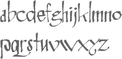 Rosemary Hall (Oak Park, IL) mae exquisite calligraphic fonts such as Rosemary Modern, Rosemary Copperplate, Rosemary Italic, Rosemary Modified Italic, Rosemary Script, and Rosemary Roman (a stunning font; a free version was done by Dieter Steffmann in 2001 called Rosemary Roman). Check also the fantastic Rosemary Celtic, 50 USD. Mike Yanega claims that the designer is actually Brian Hall (Chicago, IL). [Google]
[MyFonts]
[More] ⦿
|
Rosemary Sassoon
[Sassoon Williams]

|
[MyFonts]
[More] ⦿
|
RSFS - Ralph Smith's Formal Script Symbol Fonts
[Ralph Smith]
|
In 1999, UCSD's Ralph Smith developed METAFONT sources for fonts of uppercase script letters for use as symbols in scientific and mathematical typesetting. His glyphs are based on the so-called Spencerian or Copperplate hand lettering which prevailed in the eighteenth century. Type 1 sources now available as well. A follow-up package with integration into TeX was developed by Michael Sharpe in 2021, simply caleed rsfso. [Google]
[More] ⦿
|
Ryan Bowles
|
Gold Coast, Australia-based designer of the marker pen typefaces Sunday Morning (2016) and Angeles (2015) and of the copperplate gothic typeface Copper Bowles (2016). Typefaces from 2017: Hell Or Highwater. Creative Market link. [Google]
[More] ⦿
|
Ryan Prasetya
[Thirteen Studio (or: Lost Volt Type foundry)]
|
 [More] ⦿
|
Ryan Welch
[Fresh Pressed Fonts]
|
 [More] ⦿
|
Ryoichi Tsunekawa
[Flat-It]

|
 [MyFonts]
[More] ⦿
|
Sabina Aliyarova

|
 Moldovan designer of the feature-laden copperplate calligraphic script typeface BP BlackWhite (2019, with Dmitrii Mikitenko). [Google]
[MyFonts]
[More] ⦿
|
Sabrina Mariela Lopez
[Typesenses]

|
 [MyFonts]
[More] ⦿
|
Safri Fajar
[Sapre Studio]

|
[MyFonts]
[More] ⦿
|
Sandra Garcia

|
 Sandra Garcia (b. Bogota, Colombia) first studied at the Universidad del Area Andina, Bogota and then obtained a Masters in typography from Centro de Estudios Gestalt in Veracruz, Mexico. Freelance designer and teacher at Universidad de la Comunicacion, in Mexico City.
 Sandra created the wayfinding sans typeface Colectiva in 2017 together with Tipas Type, a type foundry she co-founded. Colectiva was originally designed for Mexico City's subway system. In 2019, she published Emperatriz at Latinotype. She collaborated on the design of the typographic family Woun Iek for the native Wounaan Colombian language. In 2017, she received the Clap international award for the project Xantolo, a font for children's publications. Xantolo was part of Tipas Type, a space created by women to promote female work in the typographic field. For a Mexican beer brand, Sandra Garcia and Tipas Type designed the splendid blackletter typeface Corona (2018) and the copperplate calligraphic typeface Especial (2019). In 2019, Dafne Martinez, Monica Munguia, and Sandra Garcia finally released the roundish informal children's book typeface Xantolo and the wood type / slab serif typeface Xihtli. In 2019, Dafne Martinez and Sandra Garcia designed the copperplate calligraphic typeface Especial for a common Mexican beer brand In 2021, Dafne Martinez and Sandra Garcia published Achtli (Book, Didactic), a rounded sans typeface for early readers. In 2022, Sandra Garcia released the ultra-condensed reverse stress Western typefaces Extra C and Extra C Variable at Tipastype. Speaker at ATypI 2019 in Tokyo. Co-author of the book Elementype, a practical guide to typographic use. [Google]
[MyFonts]
[More] ⦿
|
Sapre Studio
[Safri Fajar]

|
 Indonesian designer of the copperplate calligraphic script typeface Geshane (2019) and the connected script fonts Ballesha Script (2019), Bunglon (2019), Sunkist, Singles (2019) and Dethalia (2019).
 Typefaces from 2020: Gravitafont (a retro script), Standerfont (a smooth script font), Anastasiya (a swashy penmanship-style calligraphic script). Typefaces from 2021: Sehatie (calligraphic, with an uneven baseline), The Shooter (a dry brush script). [Google]
[MyFonts]
[More] ⦿
|
Sardiez
[Sergio Ramírez Llamas]

|
 Sardiez is a foundry located in Medellín, Colombia, and is run by Sergio Ramírez (b. 1988). He created the ornamental stencil typeface Sra stencil (2008), which was inspired by Colombian colonial times. His typeface Sister won an award at Tipos Latinos 2008 in the non-text typeface category. Trochera (2009) is a Tuscan face. Systopie (2010) is a techno family.
 Codesigner with Manuel Ernesto Corradine of Canciller (2012), an italic roman script. At Tipos Latinos 2012, Sergio Ramírez won awards for the following typefaces: Papermov (in the text category) and Panclasta (in the display category: co-designed with Carlos Fabian Guerrero). Neuron (2012) is a fantastic 16-style rounded elliptical sans family created together with Manuel Eduardo Corradine over at Corradine Fonts. Tecna (2012) is an 8-style techno sans family also done with Manuel Eduardo Corradine over at Corradine Fonts. Quarzo (2012, with Corradine as well) is a formal copperplate script. In 2013, together with Manuel Eduardo Corradine at Corradine Fonts, he created Neuron Angled, Alianza Script (a packaging script), Alianza Italic and Alianza Slab (a good-looking slab family). Mayonez (2013, Sergio Ramirez) is a friendly elliptical text typeface for Latin and Cyrillic. Whisky (2015) is a large blackletter family with inlines and fills for layering co-designed with Manuel Corradine. Related to German expressionism, it won an award at Tipos Latinos 2016. Typefaces from 2019: Brutman (inspired by brutalist architecture, he explains that he wanted to create a typeface that reimagined the incise style for the 21st century). Overview of his work and interview. Behance link. Klingspor link. Fontspring link. Creative Market link. [Google]
[MyFonts]
[More] ⦿
|
Sassoon Williams
[Rosemary Sassoon]

|
Born in 1931, Rosemary Sassoon is a British handwriting and script expert who has worked a lot on didactic scripts for children. She obtained a PhD from the University of Reading for her work on how models and teaching methods affect children's handwriting. She is the author of these texts: - The Practical Guide to Calligraphy. London: Thames and Hudson, 1982.
- The Practical Guide to Lettering & Applied Calligraphy. New York: Thames & Hudson, 1985.
- Handwriting: A New Perspective. Cheltenham, England: Stanley Thornes Ltd., 1990.
- Handwriting: The Way to Teach It. Cheltenham, England: Stanley Thornes, Ltd., 1990.
- Better Handwriting with G.S.E. Briem. Teach Yourself Series, 1994.
- Handwriting of the Twentieth Century: from Copperplate to Computer. Routledge, 1999.
She is best known for her Sassoon Primary font family (primary school writing; see the 2000 typeface Sassoon Infant). Her fonts were developed by Adrian Williams of Club Type. At MyFonts, they operate as Sassoon-Wiliams. The list: FontShop link. Klingspor link. [Google]
[MyFonts]
[More] ⦿
|
Sean Cavanaugh
[FontSite]

|
[MyFonts]
[More] ⦿
|
Sebastian Nagel

|
 Graduate of Fachhochschule Vorarlberg in 2004, where his Diplomarbeit was entitled Rialto eine humanistische Antiqua.
 Vorarlberg, Austria-based designer of Terra Nova (2005), a gorgeous treasure map typeface based on lettering found on a map of the Americas from 1562 by Diego Gutierrez and the Dutch copperplate engraver Hieronymus Cock. In 2005, he also made Sofa (2005), a slab serif. In 2006, he added , the modular dingbat typeface Sofa and Sofa Italic. Renamed canapé serif some time later. Other typefaces by Nagel include Canapé (a roman, slab serif and sans serif family), Scriptum (a text face), Grass Script (brush based on the hand of Mario Lorenz), Classicismo (a futuristic didone), Space, and Iwan Reschniev (2008, a Bauhaus style geometric typeface after lettering by Jan Tschichold, 1930). In 2010, he revisited Tierra Nueva and published it at FDI. This true pirate ship font was found on a map of America, created by Spanish cartographer Diego Gutiérrez and Dutch engraver Hieronymus Cock in 1562. In 2012, Ralf Herrmann and Sebastian Nagel co-designed the Wayfinding Sans Pro family. This useful typeface was published at FDI. Canapé Serif (2013, FDI) has four styles. Microsite. MyFonts link. Flickr page. Klingspor link. [Google]
[MyFonts]
[More] ⦿
|
Sergio Haruo
[Hattori Supply Co (was: Corgi Astronaut)]
|
 [More] ⦿
|
Sergio Ramírez Llamas
[Sardiez]

|
 [MyFonts]
[More] ⦿
|
Slex Studio
[Muhammad Rayyan]

|
Indonesian designer of (mostly) calligraphic scripts. In 2020, Slex Studio released Thalita (a formal calligraphic script), Amsterduma (a thin wild calligraphic script), Zhivilia (a wild high contrast calligraphic script), Bethanny Script (an upright calligraphic script), Geryline, Paradisa (a wild calligraphic script), Amsterdam, and Brigland. The deco typeface Twentyone (2020) was co-designed by Gajana Aslanjan, Gumilang Anggara Ruslan, Slava Antipov, and Fidan Aslanova. Typefaces from 2021: Octagon Calligraphy (a copperplate calligraphic font), Coda Loop (a 5-style sans), Gangfield (a tall upright rabbit ear script), Savarella (a calligraphic script; +Savarella Ornament), Valentina (an almost upright rabbit ear calligraphic script), Valentina (an almost upright rabbit ear calligraphic script). Typefaces from 2022: Zimbara (formal calligraphy), Bulgari (wild calligraphy). [Google]
[MyFonts]
[More] ⦿
|
Smith Hands
[Robbie Smith]

|
Smith Hands (was: Smiths Hands Collection) is the foundry of type designer Robbie Smith in London. I cite that source: Robbie Smith is a graduate of Reigate School of Art&Design (under calligrapher Gaynor Goffe and sign-writer John Gibbs) and went on to work in Richard Kindersley's letter carving studio in London. Now a freelance type designer in London trading under the moniker of Smith Hands, Robbie is focusing on incorporating the pattern and drive of calligraphy into modern styles of lettering that will fit beautifully into the modern corporate world. Robbie Smith designed these typefaces: - Brushed Sans (2018). Inspired by sign-writing.
- English Engravers Roman (2010). A lapidary / chiseled text typeface---inspired by the beauty and eccentric detailing of British stone carved lettering.
- Hoplight (2010).
- Snag (2013). A copperplate sans--he calls it a typeface with embryo serifs.
[Google]
[MyFonts]
[More] ⦿
|
Sofia Mohr

|
 Sofia Mohr (b. 1978, São Leopoldo, Rio Grande do Sul, Brazil) studied architecture at UFRGS, Brazil, and type design at Universidad Católica de Chile. She works as graphic, web and type designer in her own studio (called Sofia Mohr) in Santiago, Chile.
 In 2013, she created Café Brasil, a plump typeface inspired by the shape of coffee beans. Café Brasil won an award at Tipos Latinos 2014. Nido / Nido Dingbats (2014, Sofia Mohr, Latinotype) is a fun typeface family for use in children's books. Sabores Script (2015, also at Latinotype) is a beautiful calligraphic coffee shop script family, complete with dingbats. In 2016, Sofia published the upright unconnected script family Culinary at Latinotype. Culinary Script is the connected version, and Culinary Borders is a delightful addition. Furniture design inspired Sofia to design Hogar (2016, Latinotype), which comes in Sans, Script and Dingbat subfamilies. See also Hogar Slab (2016). Typefaces from 2017: Aromatica (retro connected monoline script and accompanying sans, Latinotype), Estampa Script (a high contrast formal connected script typeface that inherits elements from copperplate and didone; at Latinotype). Typefaces from 2018: Mohr Rounded ( a rounded humanist sans published by Latinotype), Blauth (a rounded small x-height sans family), Amazonia Script (MyFonts link for Amazonia), Mohr (a large sans family published by Latinotype). Typefaces from 2019: Moranga (a warm heavy sans; she writes that its design is a mixture between Café Brasil's flowing, organic shapes and elements from popular fonts from the seventies such as Cooper and Souvenir), Cookery (a useful brush pen script, released at Los Andes). Typefaces from 2020: Anguita Sans (a 16-style condensed sans), Aguila (a sharp-edged Peignotian family of 9 fonts), Mangueira (a geometric sans with wide welcoming counters). Typefaces from 2021: Singolare (a five-style geometric sans supplemented with a gaggle of stencil fonts and some layerable styles), Amarela Stencil. [Google]
[MyFonts]
[More] ⦿
|
Spencer & Sons
[Gilang Purnama Jaya]

|
 Spencer & Sons was set up in 2016 by Gilang Purnama Jaya (Bandung, Indonesia) and Cahya Sofyan. Gilang Purnama has been designing type since 2010 at his earlier companies, including Decade Type foundry, GP Type foundry and Imagi Type.
 Typefaces from 2017: S+S Amberosa (decorative Victorian), S&S Nickson (a 15-style copperplate display typeface). Typefaces from 2018: SS American Brewery, SS Greyhood (blackletter, tattoo font), SS Metroviation (retro style). Typefaces from 2019: S+S Baldwins (Vicorian, by Gilang Purnama), SS National Currency. Typefaces from 2021: Ephemera Nickson Pro One (a condensed headline typeface). [Google]
[MyFonts]
[More] ⦿
|
Spencerian Script typeface
|
A calligraphic copperplate typeface by Mackellar, Smiths and Jordan. For a digital revival, see Opti Swallow (Castcraft, 1990-1991). [Google]
[More] ⦿
|
Sproviero Type (was: Lián Types)
[Maximiliano Sproviero]

|
 Argentinian foundry located in Buenos Aires, est. in 2008 by Maximiliano Sproviero (b. 1987, Buenos Aires) as Lian Types (old link), mainly specializing in gothic, uncial, script and handwriting typefaces. Rennamed Sproviero Type, his typefaces can be licensed since 2021 via The Type Founders.
 Sproviero graduated from FADU, University of Buenos Aires in 2008 with a script thesis typeface called Colofon. His fonts from 2008 include Devil Kalligraphy, Pumba (great futuristic rounded look), Tobogan (retro), Kiwi Sans Serif, School Rainbow, Suave Calligraphy, Tonika (handwriting), Goddess (handwriting), Cursivessca (calligraphic; 4 styles), Friendship (6 styles), Chechelo Lawyer (modern italic condensed), Quijote Italic (calligraphic with tall ascenders and descenders), Miscelanea (arabesques), Lunga (a condensed hairline family consisting of Real Ligada, Exacta, Versalita and Extras), Mabela (a rounded fat display font), Red Wagon (ultra-condensed), Valeria Script (swashy), Kalligrand (2008, a tall calligraphic face), Intima Script One, Two and Three (described by him as a sensual calligraphic script family), and Paradise Script (96 styles, all calligraphic). Creations from 2009: Kaligrafia, Galana, Mon Amour Script (hyper-calligraphic), Oh Lara (also hyper-calligraphic), and Quijot sauvage (a 7-style calligraphic feat). In 2010 he made these typefaces: Parfait Script (a high-contrast calligraphic script), Kanikama, Breathe Pro (calligraphic with didone serifs), Boston Script. Creations from 2011: Reina (a curvaceous didone family, +Engraved). He updated this in 2021 to the 45-style Reina Neue. At Tipos Latinos 2012, Maximiliano Sproviero won awards in the display type category for Aire (2012, a thin curly didone family), Breathe Pro, and Reina. At TDC 2013, he won an award for the copperplate script Erotica. Erotica also won an award at Tipos Latinos 2014. Typefaces from 2013: String (a hairline Spencerian script), Brand (a signage script family), Agile Pro (a hairline swashy calligraphic family), Bird Script (which an award at Tipos Latinos 2014), Live Pro. Typefaces from 2014: Selfie (connected monoline signage script), Heroe (a script that takes Lubalin and Caslon to the extreme), Dream Script (a chancery script that won an award at Tipos Latinos 2016), Dream Caps (Trajan capitals), Beatle (a Spencerian script with psychedelic touches). Typefaces from 2015: Seventies (a funkadelic typeface), Indie (a signage script family that won an award at Tipos Latinos 2016), Model (a hairline fashion mag calligraphic script family). Typefaces from 2016: Lubaline (decorative caps inspired by Herb Lubalin), Skill (signage type: winner at Tipos Latinos 2018 of a type design award). Typefaces from 2017: Posh (a fat didone), Fluire and Fluire Caps (a greeting card font pair), Preta (almost psychedelic script), Vinyle (a remarkable monoline decal script). Winner at Tipos Latinos 2018 of a type design award for Lubaline, Posh and Preta. Typefaces from 2018: Burger (a fast food slab serif bonanza), Fleur (inspired by some lettering in Palais Garnier in Paris---Sproviero calls this the Napoleonic style), Pantera (a lively pointed brush calligraphic typeface family), Girasol (based on sketches by Susana Maurette), Rafaella (all caps---described by Sproviero as coquette). Typefaces from 2019: Hot Script (monoline), Elipses (a Peignotian sans family in 7 styles), Fabulous Script, Breathe Neue. Typefaces from 2021: Selfie Neue Rounded (40 styles), Selfie Neue Sharp (39 styles), Ballet VF (Maximiliano Sproviero: a variable Spencerian penmanship font with optical sizing from 16pt to 72pt---a technical feat accomplished with the help of Eduardo Tunni and the Omnibus team; free at Google fonts; Github link), Klingspor link. Behance link. Interview by MyFonts in 2014. [Google]
[MyFonts]
[More] ⦿
|
Steelplate Gothic
[Robert Wiebking]
|
This is the name of an engraving face. McGrew writes: Steelplate Gothic is the BB&S equivalent of Copperplate Gothic. Most of the series came from Western Type Foundry when BB&S acquired that concern in 1918. Steelplate Gothic Light Extended was originally Western's Farley, advertised in 1907, while Steelplate Gothic Heavy Extended was Western's Perry, these typefaces are not quite as wide as the extended Copperplate Gothics (q.v.), and differ in minor details. Other light and heavy versions are very nearly duplicates of Copperplate Gothic. All were cut by Robert Wiebking. Steelplate Gothic Shaded was drawn by Wiebking in 1918; it is uncertain whether he did this for Western just before the takeover, or for BB&S. It has an added fine line to the right and bottom of strokes, and lacks the tiny serifs of the other typefaces; it was recast by ATF in 1954. Steelplate Gothic Italic, which was Western's Perry Italic, is nearly like Copperplate, but the G lacks a crossbar. Steelplate Gothic Bold comes from the old BB&S Plate Gothic series (q. v.), while the extralight version has the same characteristics. All these typefaces moved on to ATF when BB&S merged with it in 1929. When the Copperplate Gothics went through a brief period of revived popularity for advertising use in the 1950s, ATF reinstated the two largest sizes of Steelplate Gothic Bold. rather than cutting additional sizes for Copperplate. Digital versions include Tin Plate (Softmaker) and Steelplate Gothic Pro (1993 and 2017, Steve Jackaman, Red Rooster). [Google]
[More] ⦿
|
Stella Roberts
[Stella Roberts Foundry]

|
[MyFonts]
[More] ⦿
|
Stella Roberts Foundry
[Stella Roberts]

|
 Type designer in Sunrise, FL, who created a coop style foundry for a charity that pays for the medical bills of her siblings. Some typefaces are made by guest designers such as Jeff Levine, Ray Larabie, Matt Yow, and Brad O. Nelson. The list of typefaces:
 - Ali SRF (2012). By Ray Larabie.
- Austrual SRF (2012). By Jeff Levine: star dingbats.
- Big Jim Roberts SRF (2012). Named after Stella's father, this is a seventies retro face.
- Cardholder Dispute SRF (2012). By Ray Larabie, based on his own old freeware font Cardholder Dispute SRF.
- Consonant SRF (2012). By Jeff Levine based on an old Ray Larabie font.
- Dastardly Deeds SRF (2012). A stick font by Ray Larabie and Jeff Levine.
- Devama SRF (2012). A mini-stenciled typeface by Ray Larabie.
- Dirty Money SRF (2012). A dollar bill font designed by Brad O. Nelson.
- Femi SRF (2012): a black monoline grotesk caps face.
- Fenimore SRF (2012). An art deco typeface by Jeff Levine, related to hius own Theater District JNL.
- Fitz Sans SRF (2012). By Matt Yow.
- Hem and Haw SRF (2012). A stitching font by Ray Larabie based on his earlier typeface Stitchen.
- Infantry SRF (2012). By Jeff Levine, an update of his old freeware dingbat font Infantry (1999).
- Mancave SRF (2012). A stone age typeface by Jeff Levine.
- Marginal Notes SRF (2012). A hand-printed typeface by Ray Larabie.
- Mevada SRF (2012). By Ray Larabie.
- Ovala SRF (2012). By Ray Larabie.
- Playya SRF (2012). A graffiti tag font by Ray Larabie.
- Ranger Rays Rocketeers SRF (2012). By Jeff Levine, based on an old freeware space-age dingbat font.
- Seminar SRF (2012). Jeff Levine overhauled a Peignotian / Optima-style typeface by Ray Larabie.
- Transaction SRF (2012). A dot matrix font by Ray Larabie.
- Wesley SRF (2012). A Ray Larabie original.
- Wrenchworks SRF (2012). Ray Larabie and Jeff Levine cooperated to bring this mechanical octagonal outline face.
View the typefaces at Stella Roberts Foundry. [Google]
[MyFonts]
[More] ⦿
|
Stephan Castro
|
Scottsdale, AZ-based print designer, who created the copperplate font Copper Crown (2007). Behance link. [Google]
[More] ⦿
|
Stephenson Blake
[John Stephenson]

|
 Founded in 1819 in Sheffield by toolmaker John Stephenson (died in 1864), silversmith William Garnett and financier James Blake, initially largely based on the purchase of the foundry of William Caslon III and IV in 1819. In 1829 Garnett left to become a farmer. The company was renamed Blake&Stephenson in 1830, but Blake died soon after. It became Stephenson, Blake&Co. in 1841. John Stephenson died in 1864, the year after he handed control to his son Henry. The company grew by acquiring most British typefoundries: Fann Street Foundry (1906); Fry's Type Street Letter Foundry; H.W. Caslon&Sons (1937); Miller&Richard (1952). The matrices and other old typographic equipment to Monotype and can be seen in the Type Museum of London. MyFonts provides this update: Members of both the Stephenson and Blake families still sit on the board of the present company. In 2001, according to managing director Tom Blake, the foundry was still producing some type in zinc, but by 2005 the company was wound up. There are plans to turn the former premises into an apartment complex.
 In 1996, all remaining materials (punches, matrices, specimen books) were sold to Justin Howes' Type Museum. The information in The Ancestry of British Typefounding and the complete list of the Stephenson-Blake typefaces comes from Roy Millington's Stephenson Blake The Last of the Old English Typefounders, The British Library, London, 2002. Today, Stephenson Blake continues in manufacturing only. Partial typeface list: Algerian (URW), Brittanic (Linotype), Baskerville Old Face (URW), Blackfriars (1920; a reversed-contrast Victorian typeface; digitally revied as a variable font by Roberto de Vicq de Cumptich at Delve Fonts as Tuppence), Carlton (1910s, digitized by Letraset in 1983; some say the original is F.H. Ehmcke's Ehmcke Antiqua, 1909), Chisel (an engravers typeface done in 1939 by Robert Harling; digital version at URW), Consort [the Stephenson Blake version of Clarendon], Doric Bold (Adobe), Elongated Roman (1937: a revival of the Victorian condensed and elongated fat faces, in the genre of Slimback), Fry's Ornamented No. 2 (many digitizations exist, e.g., Beffle (1991, David Rakowski)), Grotesque No 9 (URW), Impact (Linotype, Adobe), Kingston (with almost square counters and eyes), Klang (by Will Carter), Latin (URW), Latin Wide (1940), Latin Antique (1880s; a woodish typeface revived by Nick Curtis in 2011 as Indubitably NF; Monotype also had a metal version of this), Old Town No 536 (Western face, see Linotype), Playbill (a 1939 western saloon typeface by Robert Harling; digital versions at Bitstream, Linotype, and URW), Sans Serif Shaded (revived by Dieter Steffmann in 2002), Tea Chest (1939, an all-caps stencil typeface revived in 2011 by Nick Curtis as East India Company NF; Sigrid Claessens and Günther Flake revived Tea Chest Stencil in 1999 for Apply Interactive), Thorowgood, Verona (1923), Vivaldi (now at Linotype), Windsor (Bitstream, URW, Linotype, after a 1903 original by Sir William Kirkwood at Stephenson Blake), Wood Indexes (fists), Marina Script (1936, a copperplate script), Parisian Ronde (acquired from the Inland Type Foundry in 1905), Imperial Script (late 1800s formal script not unlike Firmin Didot's Anglaise, 1809), Bologna (script face, 1946), Glenmoy (script face, 1932, digitized and expanded in 2005 by Alejandro Paul as Mousse Script (Sudtipos) and in 2007 by Nick Curtis as Glengary NF, and in 2012 by Vernon Adams as Norican at Google Web Fonts), Francesca Ronde (1948), Granby (1930, a humanist sans family based on Edward Johston's types; revivals include one by Steve Jackaman and Ashley Muir called Granby Elephant (2011), and the main digital revival, from 2011, by Elsner and Flake called Granby EF), Recherché (revived by Nick Curtis as Plus de Vagues NF (2006)), Youthline Script (1952, a copperplate script for the banking and insurance industry, digitized and extended into a 7-weight family in 2005 by Rebecca Alaccari and Patrick Griffin as Sterling Script (2005)). Some type specimen, and a discussion of some typefaces, by yours truly. Scans of some old typefaces: Britannic Italic (1906), Flemish (for a digital semi-revival, see Dan Solo's Brussels), Freehand Script, Olympian. A few scans from Henry Taylor Wyse's book of 1911, showing types owned jointly by Stephenson Blake and Sir Charles Reed of Sheffield: AntiqueRoman, Athenian, Baskerville, Black No. 3, DeVinne, DeVinne Italic, Hallamshire Old Italic, Italian Old Style, Italian Old Style, Italian Old Style Italic, Lining Modern No. 20, Lining Old Style No. 5, Lining Westminster Old Style, Winchester Bold, Winchester Old Style, Winchester Old Style Italic. View digital typefaces that descend from the Stephenson Blake collection. [Google]
[MyFonts]
[More] ⦿
|
Steve Jackaman
[Red Rooster Collection (was: Red Rooster Type Foundry)]

|
 [MyFonts]
[More] ⦿
|
Struggle Studio
[Andri Kurniawan]

|
 Indonesian designer of Mulan Cute (2020), Helena Girl (2020: wild calligraphy), Angel Boos (2020: a dry brush script), Megan Nice (2020: a calligraphic script), Justin Hailey (2020), Santaria Script (2020: a needle-and-thread script), Honey Batter (2020: a nearly upright script), the 19-style display sans typeface family Mantul Pro (2020), the casual calligraphic typeface Galista (2020), the copperplate calligraphic typeface Thamron (2020), the monoline script typeface Motherday (2019) and the script typefaces Pastela (wild calligraphy) (2020), History Love (2020), Fresh Hansler (2020), Safella (2020), Billie Endria (2020), Santaria (2020), Timeline (2020), Ghoppters (2020: a dry brush) and Nasty Life (2020).
 Typefaces from 2021: Quare Zombie (a Victorian font), Candy Hollyn (script), History Jasmin . Typefaces from 2022: Diana Custin (a scrapbook script). [Google]
[MyFonts]
[More] ⦿
|
Stuart Brown
[HamburgerFonts Type Foundry]

|
[MyFonts]
[More] ⦿
|
Studio Sun (or: Sun Brand Co)
[Cahya Sofyan]

|
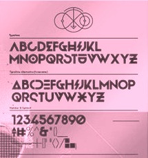 During her studies in Bandung, Indonesia, Bali-based Cahya Sogyan (b. 1994) created the free rounded sans typeface Synthesia (2014), the free sans typeface New Dawn (2015), and the free techno / futuristic typeface Cosmonaut (2015), with accompanying drop caps.
 In 2016, she co-founded Spencer and Sons with Gilang Purnama Jaya. In 2017, she started Studio Sun in Denpasar, Bali. In 2016, Cahyan published June of Fortune, the free hipster typeface family Soda Popp and writes: The new typeface called Soda Popp is inspired by pop-culture, vaporwave music, and seapunk that emerged in the early 2010s among Internet communities. It is characterized by a nostalgic fascination with retro cultural aesthetics, typically of the 1980s, 1990s, and early-mid 2000s. Typefaces from 2017 at Spencer and Sons: S&S Nickson (a copperplate display font including eight font styles and seven dingbat fonts). In 2018, she published the retro auto racing font Intensa, the extended sans typeface Matrice, and the free flared poster typeface Florent. Typefaces from 2019: Alathena (a decorative Victorian and Arts & Crafts typeface family), Rustob Club (a variable font), Tropiline, Matahari Sans (a large family that includes Matahari Sans Mono). Typefaces from 2020: Rachee (a 6-style renaissance text font), Klose Slab (an ultra-fat variable font), Gulfs Display (a 6-width ultra bold cartoon font family), Gliker (an extraordinary comic book font family; a new take on the Hobo typeface), Radiate Sans (40 styles), Balgin (a large display family that celebrates the 1990s), Brice Pop (a sixties display style; with Syarif Hafidh). Typefaces from 2021: Bethari (a 6-style art deco typeface, including a blackboard bold outline style). Typefaces from 2022: Fragmatika (a 9-style a geometric sans serif typeface with support for Latin, Cyrillic, Greek, Arabic, Armenian, Georgian, Hebrew and Thai). [Google]
[MyFonts]
[More] ⦿
|
Studioways
[Eliza Gwendalyn]

|
 Calligrapher in New York City. In 2016, she published the copperplate calligraphic script typeface Petunia (Great Lakes Lettering).
 In 2017, she teamed up with Boston-based type designer Jim Lyles to form the Studioways Studio, which specializes in calligraphic typefaces. Studioways features Eliza's own lettering as well as that of other popular calligraphers. Typefaces from 2017: Madison Street (a Spencerian set of fonts by Elaina DeBoard, Eliza Gwendalyn, and Jim Lyles, accompanied by a few styles that are based on the handwriting of Elaina DeBoard), Hart (by Virginia Lucas Hart, Eliza Gwendalyn and Jim Lyles), Boronia, Lady Slippers. Typefaces from 2018: Petunia Monogram (with Jim Lyles). Typefaces from 2019: Little Sprout (script; with Jim Lyles). Typefaces from 2020: Nerine (a brush-lettered script). Creative Market link for Studioways. Another Creative Market link for Studioways. [Google]
[MyFonts]
[More] ⦿
|
Sukjana Almunandar
[Alcode]

|
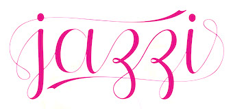 [MyFonts]
[More] ⦿
|
Sweet Fonts Collection
[Linnea Lundquist]

|
 From Myfonts: The Sweet Fonts Collection represents an effort to locate and revive obscure, engraved lettering styles that are at risk of fading away, as well as to re-interpret familiar designs for broader application. Sweet Fonts is located in San Francisco, and is a spin-off/side show of Mark van Bronkhorst (MvB). Their fonts: Sweet Upright Script (2008, MvB and Linnea Lundquist), Sweet Gothic, Sweet Gothic Serif (2009: both in the style of Copperplate Gothic), Sweet Titling No. 11 (2009, art deco), Sweet Titling No. 22 (2010: multilined), Sweet Square Pro, Sweet Sans On Air, Sweet Sans Pro. [Google]
[MyFonts]
[More] ⦿
|
Syahrul Iwan
|
Designer of the connected brush script poster typefaces Veronica (2015) and Roselly (2015). In 2016, he designed the copperplate calligraphic script Triana and the script typeface Nidewoof. [Google]
[More] ⦿
|
Tart Workshop
[Crystal Kluge]

|
 Minneapolis, MN-based illustrator and lettering artist. Designer who sells her script fonts through Font Bros, where she receives digitization support from Stuart Sandler. Her work is also sold via Tart Workshop. Alternate URL. Another URL. MyFonts link.
 In 2007, she made Silverstein and Seasoned Hostess. In 2008, she added Henparty Sans and Serif (casual curly scripts), and Darling Monograms. The calligraphic Nelly Script (copperplate script) and Nelly Script Flourish followed in 2009. Carrotflower (2009, hand-printed) comes with Carrotflower Christmas Icons, Carrotflower Invitation Icons, and Carrotflower Celebration Icons. Her designs in 2010 include Barocca (a monogram font, done with Stuart Sandler) and Nelly Frames. In 2011, she published the quaint teahouse typefaces Bookeyed Jack and Bookeyed Suzanne. At Google Web Fonts, we find Chelsea Market (2012), Butterfly Kids (2012, a curly script) and Princess Sofia (2012, a tipsy script). Crystal Kluge and Stuart Sandler made the children's party font Crafty Girls Pro (2010, with Stuart Sandler at Neapolitan). Typefaces from 2012: Emily's Candy (a curlified didone: free at Google Web Fonts), Madelinette (connected script). Codystar (a dot matrix face) is free at Google Web Fonts. Sugarplum (with Stuart Sandler) is a cheerful casual typeface. Aya Script (with Stuart Sandler) is a script with adjustable ribbons at front and rear of the letters. San Rafael is an upbeat curly script. Bookeyed Nelson is a tall caps only poster typeface. The teenage script typefaces Princess Sofia Royale Pro, Butterfly Kids Pro and Emily's Candy Pro and the bohemian typefaces Chelsea Marketplace Pro and Chelsea Market Open Pro were published by Crystal Kluge and Stuart Sandler at Neapolitan. Typefaces from 2013: Bookeyed Sadie (a quaint curly ball terminal typeface). Typefaces from 2014: Amoretta (a curly font family, co-designed with Stuart Sandler), Bookeyed Martin (another vintage curly script, with Stuart Sandler). Typefaces from 2016: Cherripops (by Crystal Kluge and Stuart Sandler). Typefaces from 2019: Madelinette Grande (by Stuart Sandler and Crystal Kluge: created by hand with traditional pointed pen, it includes calligraphic penmanship and rustic styles), Bella Monograms. Typefaces from 2021: Bon Marche (a curly vernaculat script by Stuart Sandler and Crystal Kluge), Los Angelino (a script by Stuart Sandler and Crystal Kluge), La Bohemienne deLuxe (a calligraphic script by Stuart Sandler and Crystal Kluge), Epicursive Pro (a script by Stuart Sandler and Crystal Kluge), Hey Eloise (hand-crafted). Klingspor link. View Crystal kluge's typefaces. Google Plus link. Creative Market link. [Google]
[MyFonts]
[More] ⦿
|
Terry Kunysz
[Casady&Greene (Fluentlaserfonts)]
|
 [More] ⦿
|
Teuku Fahruddin
[Typehill]

|
[MyFonts]
[More] ⦿
|
Teuku Rinaldi Novianda
[Max.co Studio]

|
[MyFonts]
[More] ⦿
|
Teuku Zulfikar
[Joss Type]

|
[MyFonts]
[More] ⦿
|
The Fontmaker
[Jordan Jelev]

|
 Jordan Jelev (The Fontmaker) is the Varna, Bulgaria-based graphic and logo designer (b. 1975, Varna) who specializes in wine label design. He set up The Fontmaker in 2011. Their typefaces:
 - The calligraphic Cyrillic alphabet Kaloyan (2008).
- The double-lined Grant (2009, with Svetoslav Simov, Fontfabric).
- FM Clog (2011, with Vassil Kateliev, done at The Fontmaker). This font has Openface, Shadowed and Engraved styles.
- FM Bolyar (2012) is a copperplate typeface jointly designed by Jordan Jelev and Vassil Kateliev at The Fontmaker. See also the spurred version FM Bolyar Ornate Pro ansd the weathered family FM Bolyar Typecarft. In 2019, after a full year of development, they published the 63-style all caps sans family FM Bolyar Sans Pro.
- FM Valentines Pro (2012). For Valentine's Day messages.
- FM Christmas 2.0 (26 hand-lettered Christmas greetings), done in 2012.
- FM Ephire (2013). A lively script family, done with Vassil Kateliev. It comes with a useful caps companion, FM Ephire Frames.
- FM Easter Pro (2013). For Easter wishes.
- FM Thank You (2014). Thank you hand lettering.
- FM Birthday 1.0 (2015) consists of 26 birthday-related words and phrases.
- The enormous typeface family FMBolyar TypeCraft (2016) Jordan Jelev and Vassil Kateliev. This family has Engraved, Shadow, Rust, Rough and Woodcut subfamilies. Many styles are spurred. Caps only, though.
Behance link. MyFonts link. Klingspor link. Recent Behance link. [Google]
[MyFonts]
[More] ⦿
|
The Fontry
[Michael Gene Adkins]

|
 The Fontry is a Watts, OK, based outfit, est. 1992 by Michael Gene Adkins (b. 1965, OK) and James L. Stirling (b. 1964, OK): Digital type for computer-aided signmaking, with fonts designed for signmakers by signmakers.
 Since 2009, they have been producing various digitizations of alphabets designed by Alf R. Becker in the 1930s and 1940s. Gene Adkins designed ARB-187 Moderne Caps AUG-47 (2013, didone), ARB 85 Modern Poster JAN-39 (2011, after Modern Poster Script, 1939), ARB-70 (1995), ARB-67 (1998), ARB-66 Neon (2010, +Block, +Line), ARB-44 (1995), ARB-96 Jitter Display DEC-39 (1999), SCRIPT1 ARB-85 Poster Script Normal (2000), ARB-66 Neonline Block, ARB114 Hillbilly Roman JUN-41 Normal (1999), ARB-187 Moderne Caps AUG-47 CAS family (2009, a beautiful didone display face), the ARB 08 Extreme Roman AUG-32 CAS family (2009), ARB-218 Big Blunt (2010), ARB-218 Neon Blunt. Another product is the Wild Bunch Pak #3: Danthr Skal, Kastaka, Gas Bumps, Skrawl 613, Sharrpe Gothik, Levo Fraz, Kommerce, Stellar Spice, Infected Hurt. Wild Bunch Pak #2 (50 USD) has Marbles&Strings, Keetoowah, Peppermint, Ghixm (2008: a retrospective of the horror comics and movie posters of the 1960s and the 1970s), Klash, all outline fonts. In Wild Bunch Pak #1, look for Toxia. Race Pak #1 contains 5 chiseled fonts, including ARB67, Brannt Chiseled, Excursions, JLS Ultra, and Race Checkers. 50 USD. There are also Greek Pak #1 (12 Greek fonts for 25 USD, including GRK Orbit, GRK Universe City, GRK Albert, and GREK Bodnaut) and Signfaces Narrow Pak #1. At Garagefonts, Wild Larra, Wild Ruts, Wild Toxia, Wild Nobody families (1999), Jackport (2014, athletic lettering and Western typeface family). Adkins also designed the commercial font First Vision at GarageFonts in 1998. Review at &Type. List of the fonts on his CD. MyFonts sells FTY Garishing Worse (2011---there is a free version at Dafont), SCRIPT1 Team (2010), SCRIPT1 Toon (2010), SCRIPT1 Voodoo Script (1999-2009, signage script), What Sound Pounds (2009), WILD3InfectedHurtNormal (2010), WILD1 Firstvision (1997), WILD1 Larra (1997, grunge), WILD1 Nobod (1997, grunge), WILD1 Ruts (1997), WILD1 Toxia (1997) and the blackletter typefaces Ironhorse and Ironrider (2007), revivals of classic wood type typefaces. FontShop link. Some fonts are inspired by sign painter Frank H. Atkinson. These include the Broken Poster series done in 2010, FHA Modernized Ideal Classic (2011), and FHA Nicholson French (1999-2014: art nouveau). In 2008, The Fontry published the Greek Font Set, Copper Penny DTP (after Copperplate Gothic, but with lower case included), Droeming (an eerie family) and Earth A.D. (more eerie stuff, metallic, and with sharp serifs). It then generated a break-away subfoundry that carries fonts solely designed by James Stirling, Fontry West. Fontry West is located in Tulsa, OK. At MyFonts, these Fontry West fonts can be bought: Iron, WILD1 Firstvision, WILD1 Larra, WILD1 Nobody, WILD1 Ruts, WILD1 Toxia, WILD2 Ghixm, Greek Font Sets 1 and 2 (not Greek, only Geek-ish, made for fraternity use), and a large Comic Fanboy set which includes glyphs painted with stars and stripes (CFB1 American Patriot, CFB1 Captain Narrow, CFB1 Shielded Avenger, all made by Adkins). The CFB1AmericanPatriot family (2009), and the SCRIPT1 Rager Hevvy family (2009) are free here. JLS Overkill (2009, Bloque, Stencil, Grunge, Champion [athletic lettering], Hammer) is a sturdy family covering everything from SUV-strength stencils to grunge stencils and macho slab serif headline typefaces. After Disaster (2008), FHA Eccentric French Normal (2008, wood type after an alphabet created by Frank H. Atkinson in 1908), WHATSOUNDPOUNDS?Normal (2009) are free at Dafont. Sinder (2010) is a grunge face. FTY Konkrete (2010) is constructivist, and has a beveled weight. FTY Strategycide (2010-2018) is a similar severe headline sans family. Sinder (2010) and Demon Sker (2011) are free grunge typefaces. American Purpose (2011) is a grotesk family. American Purpose Casual and American Purpose Stripe (2011) are follow-ups. Garishing Worse (2011) is a casual bold face. Sharpe Gothik (2011) is hand-drawn. American Captain (2011, a manly retro squarish propaganda headline face; see also American Captain Patrius 02 FRE). Deathe Maach (2012) is a sturdy 6-style display family. Avengeance (2012) is a techno typeface. FHA Condensed French (2012, by Michael Gene Adkins and James L. Stirling) and FHA Nicholson French (1999-2014, art nouveau) are based on Frank H. Atkinson's examples. Typefaces from 2013: FHA Broken Gothic (a layered chiseled family done with James Stirling, based on Broken Poster by Frank H. Atkinson), FTY SKRADJHUWN (a flared family), Iron Man of War (with layering effects, +001Rivet), Iron Man of War 2 NCV, RACE1 Brannt (prismatic, beveled, art deco), FTY Skorzhen (mini-spurred), FTY Speedy Casual, FTY Skradjhuwn NCV (comic book family). Typefaces from 2014: FHA Tuscan Roman (2014, Michael Gene Adkins, James L Stirling), FTY Varoge Saro Noest. Typefaces from 2015: FHA Sign DeVinne (after a popular sign painting design by Frank H. Atkinson named after DeVinne). Typefaces from 2016: FTY Delirium (+Neon), Delirium NCV. Typefaces from 2017: FTY Galactic VanGuardian. Typefaces from 2021: Fty Old Sport (a slab serif athletic lettering font family, one of the best in this genre). Typefaces made by Fontry West. Typefaces by Mike Adkins. Fontspace link. Klingspor link. Dafont link. Abstract Fonts link. Creative Market link. [Google]
[MyFonts]
[More] ⦿
|
The Golden Black
|
 Commercial display type foundry in Saint Petersburg, Florida, est. 2009. Their selection includes Orthodox (2011, a spiked display face), Golden Blackletter, Catalyst Black (Lined, Solid; by Hydro74), Iron King (2011, inspired by cigar box labels), Chief (monoline octagonal face), Fearless Script (2011, tattoo script), Inked Script (copperplate calligraphic (tattoo) script), Muerte Black (by Hydro74), Black Mamba (by Hydro74), Viper Black (by Hydro74), West Coast Soul (by Hydro74), Bushido Ink, Iron Fist, Blackmail Sect, Golden Age, Tyranny Gothic. Infamous (2011, +Shaded) is a custom display font based on typography by the Sanborn Company designs issued in the 1800s. Perfecta (2011) and Fantasma (2011, spurred, all caps) are art nouveau fonts.
 Golden Bones (2011) is free. Typefaces from 2013: GB Shinto (oriental simulation), Berzerk (angular and spurred). Behance link. Dafont link. Another Behance link. [Google]
[More] ⦿
|
The Icelandic Method
[Gunnlaugur S.E. Briem]
|
A free instruction booklet by Gunnlaugur S.E. Briem written in 1985, and concerned with handwriting education for Icelandic children. Nan Jay Barchowsky, who published it in her series called Cursive Italic News says: The Ministry of Education in Iceland is introducing italic handwriting in schools. That is the result of pressure from teachers who were dissatisfied with the style they had, a copperplate-based business hand. A group of Icelandic teachers who are interested in experimental teaching of italic formed a working party last year, They were interested in the method and asked Briem to put together instructions that could be used with children by teachers who had little or no experience with italic. The members of the working party initially paid for the printing out of their own pockets. Dr. Gunnlaugur S.E. Briem donated his work. The scheme has been very well received. Letters of support have come in from handwriting experts in many parts of the world, Education authorities in other countries have suggested collaboration. The PDF showcases three font families by Briem himself, Italiuskrift05 (his casual handwriting for instructions, dated 1985), BriemAnvil06 (serif family) and BriemAnvilSans07 (sans family). [Google]
[More] ⦿
|
Thirteen Studio (or: Lost Volt Type foundry)
[Ryan Prasetya]
|
 Ryan Prasetya (Republik Digital and Lost Volt Type foundry, Tangerang, Indonesia) created the spurred Victorian signage typefaces Arsemith (2015) and Stonebangs (2014), the tattoo typeface family Maroline (2015), and the art deco typeface Herline (2014).
 In 2015, he created Beautiful Friday (a calligraphic script and about 20 related handcrafted typefaces), Mutiara Vintage (letterpress emulation), the connected Vanessa, the connected script The Flanela, Mutiara (brush script), Nadhin Script (cursive), Nadhin Sans, Lussira Brushscript, Castrina Typescript and Syaquilla, as well as the spurred Victorian typeface Evolution. Typefaces from 2016: Agistha (logotype and script), Novitha Script, Kali Angke (layering typeface), Shella Hera (sans and script), the striped shadow typeface Vhiena and the copperplate typeface Renassance (sic). Typefaces from 2017: Moon & Chips, Vhiena 2.0 (layered), Vayentha Script, Vayentha Sans, The Braggest. Typefaces from 2018: Madeleine (a free signature font), Lineton (sans). Typefaces from 2019: Maryatha (an SVG script font), Panhitra Slab. Typefaces from 2020: Ariston (a comic book font), Retrica (a rounded hand-printed all caps font), Free Love Script. Graphicriver link. Creative Market link. Dafont lnk. Graphicriver link. [Google]
[More] ⦿
|
Thomas Cottrell
|
British typefounder Cottrell was a former employee of the original William Caslon, which had been founded in 1757 when Cottrell and Joseph Jackson were fired in a wage dispute. He introduced the sloped scripts in the copperplate tradition of the Italian hand writing in 1774 [these were later developed in France, where they became known as "anglaise" typefaces]. Thomas Cottrell is also known for introducing some fat capitals (see his 1774 Specimen of Printing Types) to fill the need of event and product advertizers in London. One of his employees was Robert Thorne. In 1794 Robert Thorne purchased the foundry of Thomas Cottrell after Cottrell's death. By 1798 Thorne had replaced all of Cottrell's types with his own designs and in 1774 was the first type founders to begin showing the so-called fat typefaces. Other typefounders joined in later, such as Caslon in the late 1770s, Edmund Fry in 1787, S&C Stephenson in 1796, Caslon & Catherwood in 1805, Vincent Figgins in 1815, and Thorowgood in 1821. [Google]
[More] ⦿
|
Thomas Jockin

|
 Type designer in Brooklyn and/or Holbrook, NY, b. 1986, who studied at the Parsons School of Design and the inaugural Type@Cooper program. He lived in Portland, OR.
 In 2012, he designed the large award-quality copperplate family called Garçon Grotesque. Typefaces from 2013: Ductus (a five-style broad-nibbed calligraphic / medieval family). In 2015, he published Azote (a multilined typeface family inspired by the 1968 Olympic Games in Mexico City). In 2019, he released the free seven font family Lexend at Google Fonts, together with Bonnie Shaver-Troup. Github link. Dedicated site. Lexend now comes in subfamilies called Deca, Exa, Giga, Mega, Peta, Tera and Zetta. He writes that Lexend is empirically shown to significantly improve reading-proficiency. As prescription eyeglasses achieve proficiency for persons with short-sightedness, Lexend's families were developed using Shaver-Troup Formulations. We will eventually release all seven families as a single variable font featuring its own custom axis. Lexend is thus an implementation of Bonnie Shaver-Troup's 2000 study, in which she theorized that reading performance would improve through the use of (1) hyper expansion of character spacing [which creates a greater lag time and reduces potential crowding and masking effects], (2) expanded scaling, and (3) a sans-serif font [to reduce noise]. Lexend is indeed hyper-widely spaced. Lexend also received support from Santiago Orozco and Hector Gomez. Additional links: CTAN link with TeX support. Github link by Brain Stone (Yannick Schinko). [Google]
[MyFonts]
[More] ⦿
|
Tipas Type
|
 Type foundry in Mexico City run by Dafne Martinez, Monica Munguia (until 2020), and Sandra Garcia. Together, they designed the wayfinding sans typeface Colectiva in 2017. This typeface was originally designed for Mexico City's subway system. For a Mexican beer brand, Sandra Garcia and Tipas Type designed the splendid blackletter typeface Corona (2018) and the copperplate calligraphic typeface Especial (2019).
 In 2019, the three founders finally released the roundish informal children's book typeface Xantolo and the wood type / slab serif typeface Xihtli. [Google]
[More] ⦿
|
Tipo
[Darío Manuel Muhafara]

|
 Argentinian foundry, est. 2006 by Darío Manuel Muhafara and Eduardo Rodriguez Tunni, located in Buenos Aires. Muhafara gave two presentations at ATypI 2009 in Mexico City. Back in Buenos Aires, he runs two restaurants, and one wonders how he has the time for anything.
 Klingspor link. Linotype link. FontShop link. MyFonts link. Behance link. Text types: Botija (Juan Montoreano, 2006: a 7-style sans family), Goudald (Aldus de Losa, 2006), Lineare Serif (9 styles serif typeface by Eduardo Tunni, 2006), Malena (a slab serif family by Felix Lentino and Darío M. Muhafara, 2006), Prima Sans (a sans typeface by Ariel Katena and Alejandro Lazos, 2006), Priscilla (Felix Lentino, 2000: a serif family), Overlock (2008, a rounded sans by Muhafara), Rosario (2000: a clean sans family by Pocho Gatti), Loreto (2009, by Eduardo Tunni and Pablo Cosgaya). Display/headline type: Overlock (Darío M. Muhafara, 2006, a sans family), Titulata (a fat typeface by Eduardo Tunni, 2006), Chaco (Ruben Fontana, 2008). Basile (a great chancery family, extended to a full OTF family with Swash and XSwash, and beginning and end glyphs in 2011), Average, Chaco and Think won awards at Tipos Latinos 2008. FF Jackie (2003-2009) is a connected upright signage script. Lassi Display (done with Eduardo Tunni) won an award at Tipos Latinos 2010. Balthazar (2011, Google Web Fonts) is a contemporary Copperplate Gothic serif typeface inspired by the kind of typefaces used by many bistros and cafes in New York City and Paris. Creations in 2012: Port Lligat Slab (2012, Google Web Fonts), Port Lligat Sans (2012, Google Web Fonts: a flared microserifed display sans). In 2013, they designed a custom font for the Faena Art Center in Buenos Aires. His typeface Argentina won an award at TDC 2014 and at Tipos Latinos 2014. View Dario Muhafara's typefaces. [Google]
[MyFonts]
[More] ⦿
|
Tipo de Fabrica (was: Vero Type)
[Zulfan Iskandar]
|
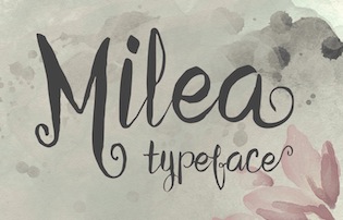 Known first as Ivan Vani and then as Zulfan Iskandar. Jakarta, Indonesia-based designer of the vampire script typeface Milea (2015), the calligraphic typeface Calista (2015), the connected Panda Tired (2016), Panda Tired Caps (2016), Sheilova Script (2015), and the curly romantic script Weloe (2015).
 Typefaces from 2016: Blank Monkey, Fabulous Script (calligraphic), Sidolly Script, Lisbon (copperplate calligraphic script). Typefaces from 2017: Madhouz (script and sans). Typefaces from 2018: Ciellda (script), Blackout. Typefaces from 2019: Relion (script), Lolly & Choco (a creamy fat script), Avocado Cream. [Google]
[More] ⦿
|
Tipo Pepel (was: Antaviana Typeface Division, or: Astramat)
[Josep Pep Patau i Bellart]

|
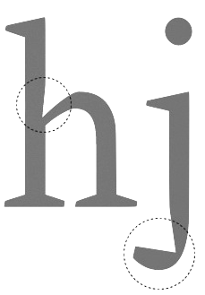 Antaviana Typeface Division is a Catalan foundry, est. ca. 2002. It went also under the name Astramat and was also known as ANTAVIANA SERVEIS INTERACTIUS, SCCL. Located in Lleida, it is run by Josep Patau i Bellart (b. 1971, Les Borges Blanques, Lleida). Patau i Bellart offered free fonts, as well as commercial fonts. He has emerged as one of the most talented contemporary Spanish type designers. In 2011, he started Tipo Pepel [MyFonts link] in Les Borges Blanques. Josep Patau's typefaces:
 - Free typefaces: Lletraferida (2011, a didone), Negrona (2011, a revival of Lucian Bernhard's Bernhard Negro, 1930), Perolet, Lango, Gimenells, Arbeka, Rosango, Antaviana, FoxScript (1996, old typewriter), Unregistered, and FistroRatted (grunge).
- At Astramat, one could download these fonts: Anmari (2002), Antaviana (1996), Arbeka (2002), FAXADA (2001, by Cel Tico Petit), FoxScriptNormal (1996, old typewriter), Gastada (2001, another grunge font by Cel Tico Petit), Gimenells (2001, pixel font), Gorchs (2007, script font), Klander (1999, pixel font), Lang (2001, pixel font family), Masterfly (2007, T-26), Omellons (2001, pixel font family), Perolet (2001, Bauhaus style), Pixelade (2001, pixel font), Rosango (1996), Tiquet (2001, grunge font by Cel Tico Petit), Ultrafat (2007, T-26), Fistro Ratted. Fontspace link for Astramat.
- T-26 fonts: the screen typeface PixScript (2004), the screen icon dingbat font Pixelade Icons (2003), the art nouveau headline font Gisele (2003, angular art deco titling face), Masterfly (2007), Gopal (2004), Gourmet (2004, based on a type from the 1923 ATF catalog), Confetti (2006, connected fifties style face based on a 1930 type called Escritura Maravilla and Escritura Energica by the José Iranzo foundry in Barcelona), the pixel family Bit Kit (2003), Houdini Icons (20 pixel web icon dingbat typefaces, 2004).
- At ATypI 2009 in Mexico City, he explained the typographic work of the goldsmith Manuel Peleguer: The aim of this paper is to give an account of the project Peleguer, the recovering and digitialization of the work of the goldsmiths Manuel Peleguer, both father and son, who cut some printing characters between 1780 and 1784 in response to an order of the "Real Sociedad Económica Valenciana de Amigos del Pais". The result was a modern transitional typeface, with good legibility and neoclasical forms, equal in quality to those made by the Real Press (Imprenta Real) in Madrid by Pradell, Espinosa or Gerónimo Gil. Peleguer founded a press and a font foundry in 1784. Patau Bellart created a type family based on Peleguer's work called Peleguer (2009, + Ornaments).
- Anduaga, a calligraphic typeface from the 18th century, won the Laus Prize (said to be the Spanish equivalent of the type Oscars). Anduaga is the interpretation of the script that Joseph of Anduaga proposed for teaching the first letters in the 1780 book Arte de escribir por reglas y sin Muestras ...
- Valliciergo (2011) is a 100+-glyph calligraphic / copperplate script font that is inspired by samples from Caligrafía inglesa published in Madrid in the late nineteenth century by Spanish calligrapher Vicente Fernández Valliciergo.
- Dafont page, where one can download Ventura Edding (2008, hand-printed).
- Kids Script (2011). An upright connected school script.
- Trajana Sans (2011) is a sans-serif typeface family based on the shapes and proportions of the characters on the Trajan Column in Rome.
- Farrerons Serif (2011) is a very readable family with angular and humanist underpinnings.
- Chupada (2012) is an ultra-condensed font family noted for their exaggerated x-height, which consists of five different weights.
- Chopped Black (2012) was inspired by the font Pabst Heavy, designed by Chauncey Hawley Griffith in 1928 for Linotype. It was Linotype's version of ATF's popular Cooper Black.
- Paralex (2012) is a 12-style geometric slab typeface family.
- Boxed (2013) is an 18-weight squarish sans family. Followed in 2017 by Boxed Round.
- Cinta (2013). A large humanist sans family with a full range of weights starting with hairline. It also has Cyrillic.
- Bridone (2013), for British didone. A didone family that inherits some features from Victorian era British slab serif typefaces. Fashionable, beautiful, and useful.
- Sisco (2014) is an 18-style elliptical techno family with large x-height.
- Book Cover (2014) is a fat headline typeface.
- Tiquet (2014). A dot matrix typeface.
- Milio (2014). A ten-style wedge-serif transitional typeface family for newsprint and magazines.
- Naste (2014). A sixteen-style geometric sans family that adds details and character to the classical geometric sans typefaces such as Futura. It is a bit wider than usual and covers Cyrillic.
- Pobla (2015). A text serif with angular, almost fractured.
- Dupla. A large multilingual sans family.
- Trepa (2015). A stencil family with various choices of textures, which was inspired by commercial signs and the 1960s French art movement Graphie Latine.
- Itaca (2016). A 48-style sans family with very open counters.
- Mario (2017). A typeface family for arcade games and children.
- Werdet Script (2017). A calligraphic penmanship script which is named after calligrapher Jean-Baptiste Werdet who was a penman in Bordeaux in 1809 and later a professor at Ecole Normale Superieure in Paris.
- Geo Deco (2019). A geometric art deco sans family.
- Frontis (2019). A transitionl roman typeface family inspired by the roman lettershapes that Asensio y Mejorada drew in 1780.
- Kongress (2019). An elliptical sans family for corporate identities.
- Labernia (2019). A large didone family based on the font used in Diccionari de la Llengua Catalana (1864, by Pere Labernia, Barcelona): Labernia and Labernia Titling are characterized by ball terminals that are turned inwards.
- Indecise (2020). A nostalgic 50-style sans family that reminds us of type designs by Enric Crous-Vidal and José Mendoza y Almeida.
- Frenchute (2020). A great 36-style garalde family inspired by the type used in the 1727 text Le Chemin Royal de la Croix.
- Gina (2020). A great readable 16-style humanist sans family. Sixteen styles including a hairline.
- Samplex (2020). Bellart's take on the neutral Swiss sans genre.
- Bauen (2020). A Bauhaus-inspired geometric sans typeface family.
- Bazinga (2020). A display typeface family characterized by square counters. Perhaps a children's book font.
- Romulo (2020). A 12-style transitional roman typeface.
- Kheops (2020). A 14-style slab serif.
Additional links: Dafont. MyFonts page. Alternate URL. Fontspace link. Fontfreak page. Patau Bellart is also involved in the type information site Unos Tipos Duros. Klingspor link. Abstract Fonts link. Interview by Unostiposduros. Fontspring link. [Google]
[MyFonts]
[More] ⦿
|
Tipografia Leone sas
|
Letterpress and type foundry located in Firenze, Italy, est. 1950. At Dafont, and on their home page, they offer the free font Typography Times (2013), which is like Times, but with sharper edges and corners---the dagger and harpoon look. The same harpoon theme returns in the free sans typeface Leo Arrow (2013). Urban Elegance (2013), Typography Ties (2013) and America Faster (2013) are display typefaces. Romanesque Serif (2013) is a copperplate typeface. Carved Rock (2013) is a serifed typeface. Wind Sans Serif (2013) has angled cut terminals. Typefaces from 2014: Downtown Elegance, Paris in Love, Signoria (sans family), Clocker, Christmas Sounds, Dream Love Valentine, Dalmata Dream. They also set up a parallel free font foundry, Jambo Fonts. Dafont link. Fontspace link. Open Font Library link. [Google]
[More] ⦿
|
Tom Kennedy

|
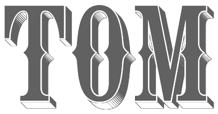 Thomas Kennedy started working for Baldwin Designs, a wood sign company in Concord, Massachusetts, in 1989, where he grew up. He specialized in signage and lettering, and hooked up with Letterhead Fonts in 2011. He now lives in Sweden. Designer at Letterhead of the Pilsner formal script font family (2002) (the lower case is now called Ballpark Script), Egyptian (2006: this is a gothic, not an Egyptian), Pilsner Swashes, CigarShop Corona, CigarShop Maduro (2002, caps), the Western billboard font Tonic (2002), LHF Thick and Thin (2002, sign painting caps in serif and sans styles), Ephemera and Ephemera Swashes (2002, calligraphic), Old Tom, Engravers Ornaments (a great set of filets), Cameo (copperplate), Confection Deco Caps (+Essentials), Corner Specimens, Colonial Roman (2003), Rawson&Evans (Victorian), Royal Script (2003), Cosmic Cursive (2004-2011, a drop dead gorgeous thick upright script), LHF Bootcut (2010, Victorian), LHF Billhead (2004, art nouveau / Victorian), Firehouse (2004, a Tuscan face) and Thick and Thin (2003, sans and serif).
 Letterhead Fonts link. Klingspor link. [Google]
[MyFonts]
[More] ⦿
|
Trevor Loane

|
 Designer of the all caps copperplate shadow font Citation (Letraset, 1990). FontShop link. [Google]
[MyFonts]
[More] ⦿
|
Type Colony
[Aliv Pandu]

|
Yogyakarta, Indonesia-based designer of Heatslide Script (2017) and Subletter (2017, for signage). Typefaces from 2018: Sveglia (a dry brush script by Aliv Pandu and Hamam Jauhari), Liquidior (copperplate), Break Dawn (dry brush). Typefaces from 2019: Marlton (Sans, Serif, Block, Script, Stencil). Behance link for Aliv Pandu. Typefaces from 2020: Floopy Chart (a baseball script by Aliv Pandu and Hamam Jauhari, with a Sans to complete a font duo). [Google]
[MyFonts]
[More] ⦿
|
Type Innovations
[Alex O. Kaczun]

|
 Alex Kaczun is a type designer and type expert based in Northport, NY. At MyFonts he wrote: Much of Alex's career was spent at the premier type foundry, Linotype-Hell, where he was the principal type designer and worked on many font projects aimed at modernizing the Linotype Library. Alex managed the development of The Adobe PostScript Font Library and created multiple master fonts for Apple Computer's QuickDraw technology. In 1980, he joined a small group of entrepreneurs and pioneered the development of the world's first digital font library at Bitstream, then located in Cambridge, Massachusetts. Afterwards, Alex took a position at Bozell-Worldwide, a large international advertising company, where he was type director and managed the front desk at the CPS Group. The company is well known for their successful "Got Milk" ad campaign. At Bozell, Alex honed his skills in graphic design, desktop publishing, prepress print production and the web.
 His early typefaces include Axion (2012, a futuristic, techno-looking type family; +RND, +SSF, +SER, +RX14, +STN (a stencil version)), BottleKaps (1992) at Linotype. Also at Linotype, he worked on the Fairfield family, designed in 1939 by Rudolf Ruzicka, completing the job in 1991. He also made outlines for Bell Centennial based on Matthew Carter's bitmaps. He runs Type Innovations. He designed the following fonts at Galapagos: Beatnik (1997), Android (2010, beveled techno family), Big Boy (2010, a heavy wood type), CaltexNovaSans (Galapagos), Contax (1997, Galapagos: Alex says about this family: Contax is the new Univers for the 21st century), Contax Sans (2011---this typeface is Peignotian in its light weights, and has subtle and not-so-subtle stem variations), Eclipse (1997, shadow beveled face), Extreme SDans (1997), Innovage (1997, a new Helvetica for the 21st century, in his own words), New Renaissance (1997, a true roman face), Shockwave (1997), Golum (1997), Swordtail (Galapagos, 1997, a hip hand-printed font), New Age (Galapagos, 2002), Extreme Sans (Galapagos, 2002). Other typefcaes: Kaczun Oldstyle Bold (2010), Doc Holliday (2010, a Western face), Hippyfreak (2010), Mister Twiggs and Misses Twiggs (2010), Geomatrix (2010, geometric stencil face), Oronteus Finaeus (2010, like lettering from a map dated 1531), Piccadilly Circus (2010, a Western face), Switched On and Off (Galapagos, 1997), Racetrack (2010: an octagonal multiline display face), Mandelia (2010: a wedge-serif display face). Typefaces from 2011: New Age Gothic (a kind of 21st century copperplate), Scion (wide techno logo family), Dexter (2011, an artsy grotesque), Metalica (2011, a pointy cult type family). Typefaces from 2012: Edgar No. 9 (heavy baroque slab serif in the style of 19th century wood type), Langston (outlined and octagonal), Ekeras V2 (inline face), Mecanica, Mariamne (a spurred typeface based on Contax), Axion SER (a triangle-serifed typeface), Beatnik Barbie (a beatnik font influenced by Jack Kerouac), Nadia (a modern stencil interpretation of Granjon Oldstyle). Typefaces from 2013: Directors Cut Pro (this geometric antique font was a second prize winner at the Canberra Typeface Competition), Ambriel (a curly didone that mixes in Victorian frillies), Sansational (or Sensational sans: an ultra-condensed sans family), My Darling (a bastardized didone fashion mag face), Envisage (grotesk). Typefaces from 2014: Renovatio Deco (a spurred stencil), Crypton (sci-fi face). Typefaces from 2015: Nadia (a stencil version of Granjon Oldstyle). Typefaces from 2017: Gothica (stencil), Decrypt H1, Decrypt He2 (hipster style), Decrypt 02, Decrypt 01 (this geometric sans with hipster capitals evolved from Contax Pro in 1997 and was finally published in 2017). Typefaces from 2018: Grande Sans (stylized caps with sharp triangular corners). Showcase of Alex Kaczun's typefaces. [Google]
[MyFonts]
[More] ⦿
|
Typedia: Typeface classification
|
The classification from the Typedia community: - Blackletter
- Fraktur: A German form of Blackletter with broken strokes. Classic example: Fraktur.
- Old English: The English blackletter style. Classic example: Cloister Black.
- Rotunda: A Blackletter style featuring wider lowercase with more rounded strokes.
- Schwabacher: A German form of Blackletter with simplified, rounded strokes.
- Textura: A Blackletter style featuring tall, narrow lowercase made mostly of straight strokes.
- Calligraphic
- Chancery: A script style of calligraphy made with a broad-point pen with slightly sloping, narrow letters that are the basis for italics in serif typefaces. Capitals may or may not have flourishes. Originated during the Renaissance. Classic example: Zapf Chancery.
- Etruscan: An early Roman form of calligraphy drawn with a flat brush held at a steep angle. Caps only, as lowercase had not been invented yet. Classic example: Adobe Pompeii.
- Uncial: A Celtic style of calligraphic script with forms created by a broad-nibbed pen at an almost horizontal angle, but sometimes more tilted in later variants. Roman lowercase is derived from Uncial forms. There is only one case in pure Uncial designs. Used during the middle ages. Classic example: American Uncial.
- Inscriptional---Roman Inscriptional: Stone-cut serif style from the late Roman Empire. The basis of modern roman capitals. Classic example: Trajan.
- Non-alphanumeric
- Dingbats
- Ornaments
- Pictorial
- Ornamented, Novelty
- Art Deco: A geometric display typeface style popular in the 1920s and 1930s. Classic example: Broadway.
- Art Nouveau: Display typefaces with a flowing, organic style popular in the early 20th Century. Classic example: Arnold Bocklin.
- Comic Strip Lettering: A style meant to look like the hand-drawn letters associated with comics or cartoons. This style is usually san serif, often having a loose, informal structure and is sometimes based on brush lettering. Classic example: Balloon.
- Dot Matrix: A style whose characters are composed of a pattern of dots used mainly for low-resolution impact printers, or to simulate the look of the output of such printers. Classic example: FF Dot Matrix.
- Futuristic: A style meant to suggest a futuristic theme. Often cold, brutal and geometric with a machine aesthetic and simplified construction. Classic example: Stop.
- Machine Readable: A style designed to be read by machine. These fonts are usually san serif and often feature unusual character shapes to make them more distinguishable from one another. Classic example: OCR-B.
- Pixel: A style whose characters are composed of pixels (usually represented as squares) used mainly for low-resolution computer display. Outline fonts are sometimes made to look like Pixel Fonts. Classic example: Silkscreen.
- Pseudo Foreign Script: A style intended to mimic non-Western letters. For example, a font that looks like Chinese, but is actually composed of Latin characters. Faux Chinese/Arabic/Hebrew. Classic example: Bruce Makita.
- Victorian: A whimsical, eclectic display style popular in the late 19th Century. Classic example: Skjald.
- Sans Serif
- Gothic: A sans serif style with moderate stroke contrast and modern proportions particular to the U.S. Usually features a two-story lowercase g, angled strokes on C and S, and a sloped, non-cursive italic. Classic example: Franklin Gothic.
- Grotesque: A sans serif style with moderate stroke contrast and modern proportions particular to the U.K. Usually features a two-story lowercase g, closed strokes (usually curving in slightly) on C and S, and a sloped, non-cursive italic. Classic example: Bureau Grot.
- Geometric Sans: A sans serif style made with rigidly geometric forms and little to no stroke contrast. Classic example: Futura.
- Grotesk: A sans serif style with low stroke contrast and modern proportions. Usually features a one-story lowercase g, closed or angled strokes on C and S, and a sloped, non-cursive italic. Classic examples: Akzidenz Grotesk, Helvetica.
- Humanist Sans: A sans serif style with proportions modeled on old-style typefaces. Characterized by open strokes on characters like C and S. Italics of this style often are more cursive in appearance, rather than a simple slanted version of the roman. Often has more slightly stroke contrast than other sans serifs. Classic examples: Gill Sans, Frutiger.
- Square Gothic: A sans serif style composed mainly of straight or nearly straight lines and (often) curved corners. Stroke contrast is usually low. Classic example: Bank Gothic.
- Swiss Gothic: A sans serif style with noticeable stroke contrast, straight sides on round characters, modern proportions, and large x-height. Usually features a one-story lowercase g and closed strokes on C and S. Classic example: Jay Gothic.
- Script
- Brush Script: Typefaces modeled after lettering made with a brush. Strongly associated with advertising in the mid-20th Century on. Classic example: Brush Script.
- Casual Script: Typefaces based on a style of lettering characterized by informal appearance, somewhat like handwriting, but more refined. Similar to Brush Script or Sans Serif. Classic example: Murray Hill.
- English Roundhand: A connecting-script style of calligraphy made with a flexible tipped pen. The characters are usually steeply sloped and capitals are often very elaborate. Popular in the 18th and 19th Century. Sometimes called Copperplate Script. Classic example: Bickham Script.
- French Roundhand: A connected-script style of calligraphy, sometimes with upright characters, a high stroke contrast and decorative capitals. Used in France in the 17th through 19th Century. Also called Civilité. Classic example: Typo Upright.
- Handwriting: A script style based on ordinary handwriting. Characters may or may not be connected. Classic example: Felt Tip Roman.
- Rationalized Script: A script style with sans serif qualities, low stroke contrast, and a formal appearance. Characters may or may not connect. Associated with 20th Century commercial design. Classic example: Gillies Gothic.
- Serif
- Grecian: A typically heavy display typeface with octagonal shapes where curves are normally used. Also known as Chamfered or Beveled. Popular in the 19th Century for wood types. Classic example: Acropolis.
- Latin: A serif style with large triangular or wedge-shaped serifs. Stroke contrast is medium to low. Popular in the 19th Century for wood types. Classic example: Latin.
- Modern: A serif style with high stroke contrast and vertical stress. Classic example: Modern No. 20.
- Didone: A serif style with high stroke contrast and vertical stress. Serifs are usually unbracketed. Classic examples: Bodoni (Italian), Didot (French).
- Scotch Modern: A serif style with medium to high stroke contrast and vertical stress, known for large serifs and tiny aperture. Serifs are usually bracketed. Classic examples: Modern No. 20, Scotch Modern.
- Old Style: A serif typeface with relatively low stroke contrast, angled stress, angled serifs. Classic example: Bembo.
- Antique: A serif style with moderate stroke contrast, bracketed serifs and usually vertical stress. Serifs are angled as in Old Style. Popular in the 19th Century. Classic example: Bookman.
- Dutch Old Style: A serif style with somewhat angled stress, bracketed serifs, and medium to high stroke contrast. Characteristic of Dutch and English types of the 18th Century. Classic examples: Caslon, Plantin, Times Roman.
- French Old Style: A serif style with angled stress on rounds; usually features a small eye on the lowercase e; soft, bracketed serifs and moderate stroke contrast. Classic example: Garamond.
- Spanish Old Style: A serif style with soft, bracketed serifs, medium to high stroke contrast, and often highly angled stress. Classic example: Rongel.
- Venetian Old Style: A serif style with angled stress on rounds; usually a tilted crossbar on the lowercase e; usually has somewhat low stroke contrast. Serifs are sometimes unbracketed. This style is associated with very early printing (Incunabula) in the West. Classic example: Jenson.
- Slab Serif: A serif style with serifs equal to or nearly the same thickness of the main strokes. Main strokes usually have low contrast. Classic example: Rockwell.
- Clarendon: A slab serif style with heavy, bracketed serifs, modern proportions and construction, low stroke contrast. Classic example: Clarendon.
- Egyptian: A serif style with heavy, unbracketed serifs, modern proportions, low stroke contrast. Basic construction is similar to Modern, but with low stroke contrast. Sometimes called Antique. Classic example: Egiziano.
- French Clarendon: A serif style with reverse stress (horizontal strokes thicker than vertical strokes) and slab serifs, sometimes bracketed, usually condensed. Popular in the 19th Century. Classic example: Playbill.
- Geometric Serif: A serif style made with rigidly geometric forms. Usually features slab serifs. Classic example: Stymie.
- Spur Serif: A serif style with very small serifs. Usually similar in design to san serif typefaces, except for the serifs. Usually very little stroke contrast. Classic example: Copperplate.
- Transitional: A serif style which, historically, bridges the gap between Old Style and Modern. Stroke contrast is stronger than old style, but less than modern. Bracketed serifs. Stress is mainly vertical. Characteristic mainly of English types around 1800. Classic example: Baskerville.
- Scotch Roman: A serif style with medium contrast and vertical stress, medium-sized bracketed serifs. Classic examples: Miller, Caledonia.
- Tuscan: A serif style with splayed or ornate serifs. Classic example: Thunderbird.
[Google]
[More] ⦿
|
Typehill
[Teuku Fahruddin]

|
 Indonesian designer of these connected brush script typefaces in 2017: Stephanie, Austin Script, Navisha. In 2018, Typehill designed Typehill (dry brush script), Intybus Script, Sunlight Script (copperplate calligraphy), Bougenvil (formal calligraphy), Ephorbia (calligraphic), Angelina and Natural.
 Typefaces from 2019: Fantasia Script, Austin Script, The Fraga Script (a semi-curly retro signage script), Forestry Script, One Day, Graphitel (a formal calligraphic script), Marysha Script, Lemons, Floural Script, Warrior Script. Typefaces from 2020: Straight Script (a calligraphic font duo, with penmanship ornaments), Malaka Script. Typefaces from 2021: Lovey Dovey (an upright script), Sweet Love Script. [Google]
[MyFonts]
[More] ⦿
|
Typesenses
[Sabrina Mariela Lopez]

|
 Typesenses was founded in 2009 by Sabrina Lopez in Ramos Mejìa, near Buenos Aires. Since 2021, its fonts can be licensed via The Type Founders. Sabrina Lopez (b. 1987) graduated from FADU, University of Buenos Aires. Her typefaces include:
 - Lady Elizabeth Grant (2008). Developed during her studies at FADU / UBA.
- With Maximiliano Sproviero, she created Aphrodite Pro (2009, +Slim), a calligraphic family in the style of Alejandro Paul's famous Affair.
- From 2009 until 2011, she worked on the fancy copperplate calligraphic script family Parfumerie Script. This typeface won an award at Tipos Latinos 2012.
- In 2012, she joined the Google Web Font craze, and published the free copperplate script face Rouge Script.
- In 2013, she published Wishes Script (2013), a connected ligature-rich typeface with adapted ornaments and borders for use in greeting cards and wedding invitations. It comes with a Trajan-inspired style called Wishes Script Caps. Winner of an award at Tipos Latinos 2014.
- Euphoria Script (2013). A free Google Web font.
- Fantasy and Fantasy Caps (2014) is an elegant set of medieval fonts that includes two styles of Lombardic caps. It could also be used for wedding scripts and monograms.
- Blend (2015). A large handcrafted type system, layered and with dingbats. Blend won an award at Tipos Latinos 2016.
- Limon (2017). This fresh hand-made font collection was hand-drawn by Sabrina Lopez, with the collaboration of Sol Suarez (who illustrated the dingbats) and Guido Ferreyra (who made the font production and programming of the script font). It took 18 months to complete. Winner at Tipos Latinos 2018 of a type design award for Limon.
- Dress (2018). A layered Victorian Tuscan circus style typeface family.
- The signage script Christmas Time 2019 (2019).
- Chonky (2020). A bold retro signage script in Regular and Poster styles.
[Google]
[MyFonts]
[More] ⦿
|
Typoart GmbH (or: VEB Typoart)
[Jay Rutherford]

|
 Dresden (East Germany)-based font studio that evolved from the former East German centralized press, VEB Typoart. VEB Typoart operated from 1948 until 1989, when it was renamed Typoart GmbH. Typoart GmbH dissolved mysteriously in 1995, perhaps due to bankrupcy.
 MyFonts catalog of digitizations. Timeline as provided by Typoart-Freunde, a project of Jay Rutherford at the Bauhaus University in Weimar (and published in 2007 in a book by the same title, Heinz Wohlers Verlag, Harrlach): - 1945: Schriftguß KG (before that, Gebr. Butter) produces type again.
- 1946: Schelter&Giesecke in Leipzig becomes VEB Druckmaschinenwerk Leipzig.
- 1948: Schriftguß KG becomes VEB Schriftguß Dresden. This is the true start of Typoart.
- 1951: the foundry section of VEB Druckmaschinenwerk Leipzig is absorbed by the VEB Schriftguß Dresden. Herbert Thannhaeuser becomes art director. We see the name Typoart.
- 1952: Herbert Thannhaeuser publishes Papier und Druck, and creates Meister-Antiqua and Technotype.
- 1957: Typoart is in full production now. An eyecatcher is Albert Kapr's Leipziger Antiqua.
- 1958: Thannhaeuser publishes his Liberta Antiqua and Garamond Antiqua. The Party decides that all private industrial property now belongs to the state.
- 1961: Typoart absorbs Ludwig Wagner KG in Leipzig and Norddeutsche Schriftgießerei Berlin. The Berlin wall is built.
- 1962: There is some negative press about Typoart's domination by Thannhaeuser's designs. VEB Typoart is absorbed by Vereinigung Volkseigener Betrieb (VVB) Polygrafische Industrie.
- 1963: Thannhaeuser dies. Albert Kapr becomes art director.
- 1965: The annual production reaches 4,5 million matrices. Purchase of the Digiset machine, built by Firma hell in Kiel, which is the first machine for electronic typesetting.
- 1967: Sabon Antiqua appears.
- 1970: Typoart is now owned by SED. In the DDR, all phototype printing is now done in Berlin, Leipzig and Dresden.
- 1971: Typoart is now producing its own phototype for the Linotron 505. Their prime productions include Maxima (by Karl-Heinz Lange; based on Gert Wunderlich's Linear-Antiqua) and Prillwitz-Antiqua (Albert Kapr).
- 1973: Albert Kapr publishes Typoart-Typenkunst, in which 19 typefaces are showcased.
- 1976: Phototype fonts are developed for Diatype, Diacomp (such as Maxima, Liberta, Garamond-Antiqua, Tschörtner-Antiqua, Leipziger-Antiqua), and 2NFA (Russian). Detlef Schäfer becomes head of research and development.
- 1977: To help with the digital transition, Norbert du Vinage joins Typoart.
- 1980: New types include Kleopatra, Biga, Zyklop, Quadro and Molli.
- 1987: Albert Kapr hands the art directorship to Norbert du Vinage. Publication of the first phototype catalog by Typoart.
- 1989: Publication of Fotosatzschriften, Typoart's typeface program. Typoart folds.
- 1990: VEB Typoart is changed into a GmbH with 230 employees.
- 1991: Eckehart Schumacher Gebler acquires all of Typoart's matrices. This collection is kept in the Werkstätten und Museum für Druckkunst Leipzig GmbH. Typoart GmbH and HL Computer (Karl Holzer's company) are joined.
- 1995: Typoart GmbH still has 100 employees. It offers typefaces in truetype and postscript formats. Albert Kapr dies in Leipzig. The demise of Typoart is mysterious, and not much is known about who owes what to whom. The copyright status of its typefaces remained uncertain. This page mentions the present situation. Andreas Seidel explains that Typoart has digitized lots of its type typefaces using Ikarus, and that the rights are held by Mr. Holzer, who may be in some financial trouble. He says that no living Typoart designers have received any royalties or public recognition.
Typoart Freunde and Typowiki have partial lists of typefaces. Here is my own: - Agitator (1960). By Wolfgang Eickhoff. This rough-brush typeface was digitally revived in 2007 by Patrick Griffin at Canada Type as Merc.
- Alte Schwabacher: blackletter by Herbert Lemme.
- Antiqua (fett, kursiv fett and schmalfett) by Barbara Cain. A didone family.
- Baskerville (1982) by Volker Küster and Peter Greinke.
- Bembo: Typoart's version is by Erhard Kaiser.
- Biga: a shaded headline typeface made by Fritz Richter in 1985.
- Caslon-Gotisch: a blackletter typeface originally created by William Caslon in 1760, it was brought to Leipzig from England in 1904 by Carl Ernst Pöschel.
- Eckmann: a soft blackletter, dating from 1900.
- Egyptienne. By Hans-Peter Greinke.
- Erler Versalien (1953, Herbert Thannhaeuser). Digital versions: Erler Titling (2015, Ralph M. Unger), Missale Incana (2004, Andreas Seidel).
- Garamond (1955): the metal Typoart version is by Herbert Thannhaeuser. The digital version is Garamond No.5 at Elsner&Flake. See also here. URW published a different digital version, Garamond No. 4. And Infinitype / SoftMaker says that its German Garamond is based on TypoArt's.
- Fleischmann: a serif based on Fleischmann's historical face. An original cursive by Harald Brödel was added.
- Halbfette Baskerville: an interpretation of Baskerville by Volker Küster.
- Hogarth Script: an elegant script based on 18th century copperplate originals by William Hogarth. Font by Harald Brödel. Digital versions at URW, Softmaker (as Hobson), Alexandra Gophmann (Cyrillic version, 2005), Ralph M. Unger (as Gillray Pro, 2015), Castcraft (as OPTI Historic Script), Linotype and Elsner&Flake. Incredibly, Linotype owns the Hogarth Script trademark.
- Kis Antiqua: Hildegard Korger's interpretation of this classic Dutch Antiqua by Nikolaus Kis. For a digital revival, see Ralph Unger's Kis Antiqua Pro (2018).
- Kleopatra: a double-line decorative typeface by Erhard Kaiser (1985), digitized in 1989.
- Leipziger Antiqua: a very legible Antiqua designed by Albert Kapr in 1959, developed for phototypesetting by Hans-Peter Greinke, and further developed in digital form by Tim Ahrens in 2002 as Lapture.
- Liberta Antiqua and Kursiv: a robust house typeface from 1958 made by Herbert Thannhaeuser. Klingspor gives the date 1956.
- Lotto (1955). By Herbert Thannhaeuser.
- Luthersche Fraktur: a blackletter by Volker Küster and Herbert Lemme, digitized in 1989.
- Magna: a DDR magazine text typeface from 1968, by Herbert Thannhaeuser. In 1975, Albert Kapr added Cyrillic letters. Karl-Heinz Lange developed the phototype. URW, Linotype and Elsner&Flake (who owns the trademark) have a digital version.
- Maxima: a sans family by Gert Wunderlich (1970). Elsner&Flake (who owns the trademark), Linotype and URW have a digital version.
- Minima: Karl-Heinz Lange's narrow sans designed for the DDR's telephone directory in 1984. Revived by Ralph M. Unger in 2017 as Tablica.
- Molli: a comic book typeface by Harald Brödel.
- Neutra (1968): A variant of Clarendon, rendered more legible by Albert Kapr. Used in the DDR for advertising.
- Nidor: a slab serif by Harald Brödel.
- Norma-Steinschrift: a house sans.
- Prillwitz (1971-1987): a didone by Albert Kapr and Werner Schulze based on the original from 1790 by Johann Carl Ludwig Prillwitz. Elsner&Flake have a digital version. See also the 2015 revival by Ingo Preuss called Prillwitz Pro.
- Polo by Carl Pohl. URW++ has a digital version.
- Primus: a 1962 workhorse family (with Magna and Timeless) for the magazines in the DDR. Conceived in 1962, it was later adapted in Phototype by Karl-Heinz Lange. However, the Berthold Phototypes book of 1982 and Klingspor Museum put the date of creation at 1950.
- Publika: a sans typeface developed between 1981 and 1983 by Karl-Heinz Lange. Sometimes spelled Publica.
- Quadro: a four-line showstopper typeface by Erhard Kaiser.
- Roesner Versalien (1960). By Wolfgang Roesner.
- Schwabacher T09, T20 and T48. By Herbert Lemme.
- Sinkwitz Gotisch and Versalien (1950). By Paul Sinkwitz.
- Stentor: a brush script by Heinz Schumann (1964). Digital versions by Scangraphic, Ralph M. Unger (2013, as Tyton Pro), Elsner&Flake and URW. Rosalia (2004, Ingo Preuss) is based on Stentor.
- Super Grotesk: a legible sans by Arno Drescher (1930, Schriftguss). Super Grotesk Buchtype (kursiv and halbfett) are placed in 1951. For a digital version, see FF Super Grotesk (1999, Svend Smital).
- Technotyp (1951). By Herbert Thannhaeuser.
- Thomas Schrift (1956). By F. Thomas.
- Timeless (1982). See also Elsner&Flake and URW. In 2021, Ralph Unger revived and extended Timeless, calling it Korpus Serif Pro.
- Tschörtner Antiqua and Kursiv (1955). By Helmut Tschörtner.
- Typo Skript (1968). By Hildegrad Korger.
- Typoart Didot (antiqua, kursiv and halbfett). Added in 1958 by Herbert Thannhaeuser.
- Typoart Garamond (1955). By Herbert Thannhaeuser.
- Walbaum (1984): a didone by Hans-Peter Greinke based on Walbaum's originals.
- Zyklop: an art nouveau/Jugendstil face by Fritz Kossack.
References on Typoart: - Walter Begner: 25 Jahre Typoart Dresden In: Papier und Druck, Leipzig 6/1973.
- Walter Begner: Entwurf und Herstellung von Schrifttypen in Ostdeutschland. In: Leipziger Jahrbuch zur Buchgeschichte. Jahrgang 6 (1996), pages 405-436.
- Albert Kapr and Hans Fischer: Typoart Typenkunst. Leipzig, 1973.
- Albert Kapr and Detlef Schäfer: Fotosatzschriften, Itzehoe, 1989.
- Detlef Schäfer: Fotosatzschriften Type-Design+Schrifthersteller, VEB Fachbuchverlag Leipzig, 1989.
- Norbert du Vinage (as artistic director of Typoart): 40 Jahre Typoart---vier Jahrzehnte intensives Bemühen um niveauvolle Schriften. In: Papier und Druck, Leipzig 11/1988.
Personal home page of Jay Rutherford. MyFonts link. View Typoart's typefaces. [Google]
[MyFonts]
[More] ⦿
|
Typodermic
[Ray Larabie]

|
 Ray Larabie (b. 1970, Ottawa, Canada) ran Typodermic in Mississauga, ON, which opened in the Fall of 2001. In 2006, it moved to Vancouver, BC, and in 2009 it moved on to Nagoya, Japan. Dafont page. Ray Larabie has been making fonts since 1996, but those early fonts were freeware. His pre 2001 fonts are grouped under the label Larabie Fonts. In 2001, he set up Typodermic. Latest additions.
 The Typodermic fonts: - 2022: Biphoton (a monospaced sans with the same proporions as Letter Gothic 12), Valve (an industrial muffler shop font), Deception (a sub-pixel typeface with ten captivating effects---Deception Array (wide blocks), Deception Bars (text viewed through lenticular glass), Deception Blocks (as in heavy JPEG degradation), Deception Diamonds, Deception Lines (for a grayscale effect), Deception Particles, Deception Plusses, Deception Process (simulates grayscale LCD text or a thermal printer on the fritz), Deception Scanline (television picture tube text rendering), Deception System (1-bit dithering gone haywire)), Monofonto (a monospaced sans), Encercle Draft (permitting users to create numbers in borders), Encercle Sans, Heavy Heap (a groovy psychedelic typeface with a scorching look, reminiscent of 1960s hot-rod culture and die-cast toy vehicles), Ggx89 (a 48-style tightly spaced Swiss style sans family).
- 2021: Quadrillion (a 12-style rounded monoline sci-fi family), Mochon (a wall writing or chalk font based on the lettering of Donald Mochon, dean of the RPI School of Architecture until 1966; the Mochon samples were provided by an ex-student of Mochon, Karl A. Petersen), Steelfish Hammer (a subtly rustic version of Larabie's most popular typeface, Steelfish), Wavetable (sci-fi), Xyzai (an LED emulation font, described by Ray Larabie as a hardcore, Y2K-style techno typeface), Geoparody (a 12-style squarish typeface inspired by a late 1960s font called Anonymous), Typewriter Spool (122 fonts, modeled after the Underwood No. 5 typewriter font).
- 2020: Gravtrac (a 56-style condensed to crushed slab serif family inspired by mid-twentieth century classics like Univers 59 Ultra-Condensed, Helvetica Inserat and Compacta; +Greek, +Cyrillic), Vinque Antique (a rustic handcrafted blackletter in eight styles).
- 2019: Dealerplate (17 license plate styles for various states and provinces in the USA and Canada, current as of 2019; included are California, New York, New Jersey, Ohio, Illinois, Pennsylvania, Florida, Maryland, Michigan, Wisconsin, Massachusetts, Missouri, Washington, North Carolina, Virginia, Quebec, and Ontario), Kenyan Coffee Stencil, Good Timing, Steelfish Rounded, Bitcrusher (a consumer electronics / techno font), Galderglynn 1884 (a nineteenth-century style sans-serif typeface that exp[ands his Galderglynn Esquire).
- 2018: Cybermontage, Crack Man (a pac man font), Propaniac (a 1980s-style postmodern typeface inspired by a Pointer Sisters record sleeve which was designed by Shoot That Tiger Creative Services), Zelega Zenega, Spectrashell.
- 2017: Minicomputer (MICR style), Squirty, PCTL9600, PCTL4800 (retro techno), Ultraproxi (semi-monospaced and influenced by the high speed computer printers from the 1950s to 1970s), Toxigenesis (techno sans), Venus Rising, Vanchrome (a compact sans-serif headliner with chromatic layers), Krait (a layered geometric typeface designed for architectural display), Xylito (a layered font for chromatic or 3d effects).
- 2016: Refuel (octagonal, based on military aircraft markings), Expressway Soft (a sans-serif font family inspired by the U.S. Department of Transportation's FHWA Series of Standard Alphabets, also known as Highway Gothic), Conthrax (squarish, techno), Cornpile (cartoonish), Electric, Evensong (art deco), Fledgling (a very tall typeface), Gymkhana (sans), Remissis (sans), Sunday Evening (a reverse contrast typeface), Meloche (Meloche is a unique grotesque sans-serif typeface influenced by hand-painted French signs of the late nineteenth century. It's available in 7 weights and obliques).
- 2015: Canada 150 (a custom font for the Canadian government; see here, here, this coverage regarding the Inuktitut part of the font, and this reaction by the curmudgeons in Toronto who complain that Ray did this work for free), Autoradiographic (sans family), Built Titling (for compact headlines), Chickweed Titling (cartoon titling font), Cardigan Titling (flared headline face), Bench Grinder Titling, Kleptocracy Titling, Palamecia Titling (rounded black comic book typeface), Quasix Titling, Galderglynn Titling (all caps sans family from hairline to black), Mixolydian Titling, Stormfaze (a sci-fi font started in 1996 and finished in 2015), NK57 Monospace (a 60-style programmer typeface), Gargle, Athabasca (a sans family designed for the rugged Canadian oil patch).
- 2014: Mesmerize (a large free sans family), Kingsbridge (a large slab serif family with sharp points on the A, M, N, V and W), Manbow (a layered geometric art deco display font which includes solid, clear, stripe, polka-dot and screen patterns), Breamcatcher (an all caps art deco font inspired by the piano sheet music for With Every Breath I Take which was featured in the Bing Crosby/Kitty Carlisle musical comedy film, Here is my Heart), Kilsonburg (Dutch deco based on an old Vogue magazine cover), Uchiyama (poster typeface), Goldsaber (art deco design), Vexler Slip (unicase), Rakesly, Dacquoise, Pretender, Rimouski (a rounded geometric font family), Nulshock (techno), Recharge (techno/industrial font), Interrogator Stencil, Strange Alphabets (arts and cratfs font), Angerpoise Lampshade (free).
- 2013: Numbers With Rings, Shookup (funky cartoon font), Pastrami on Rye (cutout comic book style), Chickweed, Built (a condensed headline sans), Fluctuation (a softly rounded elliptical sans family), Astrochemistry (sci-fi, techno with rounded edges), Snasm (sci-fi).
- 2012: Engebrechtre (2000-2012), Die Nasty (1999-2012: free), Strasua (1999-2012), Planet Benson (1997-2012), Husky Stash (1998-2012), Barbatrick (1999-2012: a speed emulation font), Zero Hour (1997-2012), Urkelian (1998-2012: very condensed), Zolasixx (inspired by the video game Zaxxon), Ampacity (neon font), Chromakey (a space deco headline font inspired by box art classic video games including Matrix Marauders and Magical Chase), Disassembler (1980s style bitmap font), Zerbydoo (a dot matrix family), Superego (a geometric-techno font inspired by the cabinet graphics for the 1981 Stargate arcade game), Rukyltronic (a set of dot matrix typefaces), Nerdropol (pixel family), Gulkave (rounded pixel font), Cyclopentane, Palamecia (a fat finger poster face), Gameness (a 1990 retro industrial deco font), Camulogen (headline face), Color Basic (a pixel typeface inspired the by TRS-80 Color Computer), Triac Seventy One (a funky face), Acroyear (retro all-caps headline font), Troll Bait, Strenuous (unicase), Permanence (a retro=futuristic font based on Alvin Toffler's cover of Future Shok, 1970), Clockpunk (octagonal and quaint), Battlemaze (trekkie face), Mixolydian (industrial sans).
- 2011: Ugocranis (a brutalist typeface), Clipwave, Wheaton (MICR-inspired), Mango Scribble, TRS Million (dot matrix face), Ugogranis (constructivist), Gomoku (paper cut face), From The Internet.
- 2010: Cranberry Gin (2010, octagonal), Restore (all caps, geometric sans), From The Stars (an elliptical techno family done with Chikako Larabie), Thrusters (space age face), Dream Orphanage, Dream Orphans (2000-2012), Kengwin (rounded slab serif), Gleaming The Cube (Greek simulation face), Vectipede (a slab serif family), Great Escape (an elliptical sans family), Subrocs (connected script), Hackensack (with Chikako Larabie), Polarband (bilined stackable headline face), Naked Power, Special Forces (a great macho slab serif headline face---watch for awards to roll in), Warugaki (handpainted), Warmer, Honfleur (art deco; with Chikako Larabi), Voivode (a headline typeface done with Chikako Larabie), Hachimitsu (Asian look face, done with Chikako Larabie), Kadeworth (rounded retro look sans, done with Chikako Larabie), Gnuolane Jump (2010, with Chikako Larabie), Markerfield (brush), Board of Directors (Bank Gothic style family, done with Chikako Larabie), GGX88 (a Swiss sans family), Body Goat, Reversal, Gord (techno), Computechnodigitronic (LED, LCD geek-look font), Bench Grinder, Inklea (a bubbly face), Skygirls (retro brush script), Gloss (a paint brush typeface based on Champion, 1957, G.G. Lange), Galderglynn Esquire.
- 2009: Maqui (an industrial headline sans family), Zingende (art deco family: caps only), Misadventures, Gaz (large retro sans family), Acrylic Brush, Enamel Brush (a digitization of Catalina, 1955, Emil J. Klumpp), DDT (neutral sans), Thump (fat, casual), Desperate Glamour, Pricedown (an update of his free 1990s font, patterned after the lettering on The Price Is Right show), Mitigate (monoline and slabbed; has some typewriter styles), Catwing, Walken (slab serif stencil), Silicone (soft rounded sans family), Movatif (sans), Gunplay (a stencil family inspired by the poster for the 1972 Steve McQueen/Ali MacGraw film The Getaway), Fragile Bombers (octagonal), Forgotten Futurist (techno sans, 19 styles), Bullpen (slab serif), Coolvetica (35 styles), Duality, Good Times, Strenuous, Shlop (paint-drip style), Dirty Baker's Dozen (stencil), Junequil (VAG Rounded style), Owned (graffiti), Domyouji, Threefourtysixbvarrel (stencil), Enacti, Uniwars (futuristic, 16 styles).
- 2008: Madawaska (a rugged slab serif), Ebenezer (grunge), Gnuolane Stencil, Raincoat, Report School (avant garde sans), Jesaya, Carouselambra (art nouveau), Debusen (rounded), Barge (military font), Renju (2008, potato or rubber stamp print face), Otoboke (handlettered), Hit (informal hand), R6 D8 (futuristic sans family), Rexlia (an octagonal machinistic family), Hybrea (a display sans with TV screen rounding), Sweater School, Tussilago (2008, a neutral sans family), Presicav (extended sans), Hover Unit, Addlethorpe (grunge), Scheme (rounded sans), Usurp (bouncy poster lettering), Negotiate (technical sans family), Divulge, Sewn, Gnoulane (condensed sans), Moja, Teeshirt (old typewriter face), Pound (art deco marries grunge), Graveblade (heavy metal font), Synthemesc (psychedelic anti-Starbucks font), Chysotile (white on black grunge), Cardigan (sans), Gurkner (balloon style), Reagan (grunge).
- 2007: Tight (a copy of Dean Morris's 1976 Letraset chrome font Quicksilver), Headlight, Meloche (a 3-style grotesk), Octin Spraypaint (grunge stencil), Octin Vintage (grunge), Bouffant (script), Octin Prison (stencil), Octin Sports (octagonal), Octin College (octagonal, for sports jerseys), Octin Stencil (free octagonal font family), Burnaby Stencil (stencil), Superclarendon, Conceal, Ohitashi, Stud (grunge), Bristles (grunge), Skirt, Cotton (grunge), Kelvingrove (a bit of copperplate gothic, rounded and shaved), Augustine, Containment, Snowa, Veriox, Scrubby, Transmute, Sheaff, Injekuta (techno), Rinse (grunge), Polyflec, Domyouji (square sans), Winthorpe (old style), Cutiful (script), Flyswim (grunge), Dirtstorm (spray-painted stencil), Shnixgun (grunge), Neuzon (grunge), Oxeran (old typewriter), PRINTF (grunge all caps monospaced), Akazan (sans), Nyxali (a metal tag face), Nesobrite (25 styles of Bank Gothic lookalikes), Meloriac (a heavy headline sans inspired by Futura), Walnut (graffiti face), Gnuolane (a narrow superelliptical sans), Edifact (a damaged computer font), Darkheart, Stampoo (squarish), Raymond (rough script), Hayate (oriental look), Telephoto. The entire Octin series is free at DaFont.
- 2006: Octynaz (grunge), Paltime (ornamented), Jolie Ecriture Desard (children's hand), Mango (comic book face), Desard (child's hand), Bulltoad, Lerku (eroded serif), Charbroiled (also eroded), Ceroxa (eroded stencil), Nagomi (a chiseled-look Asian font based on calligraphy of Chikako Suzuki from Nagoya), Whiterock, Yellande, Chilopod (a futuristic typeface inspired by the logo from the 1980s videogame, Atari Centipede), Order, Goldburg (based on a typeface by George Bowditch, 1957), Laserjerks (2006, brutalist), Milibus (futuristic), Bonobo (serifed), Ohitashi, Sarasori (TV-tube shaped typeface in the style of Oban), Structia (an octagonal family), Betaphid (octagonal), Gendouki (futuristic stencil), Slugger (athletic lettering), Marianas (a gorgeous art deco face), Lineavec (octagonal), Corzinair (serif family), Buxotic (a great caps face), Cinecav X (for closed caption TV and DVD), Salsbury (comic book face), Lonsdale (loosely based on a font called Parkway Script, which was designed by Emil Hirt in 1964), Alepholon (futuristic), Kwokwi, Mikadan (a tribute to Stephenson Blake's Verona from 1948, which was in turn based on William Dana Orcutt's Humanistic from 1904), Marion (2012: a beautiful transitional family adopted as a standard Mac OS X font), Quasix (hookish), Skraype (grunge stencil), Bleeker (casual lettering), Linefeed (monospaced line printer font), Draculon (a casual typeface inspired by the letterforms of William Orcutt's humanist font from 1904 which was in turn based on an Italian manuscript from 1485), Mahavishnu (a mix between 1970s psychedelics and art nouveau), Doradani (a corporate identity sans family), Korotaki (futuristic).
- 2005: Beat My Guest, Kadonk (a Halloween face), Report (a VAG-Rounded style face), Croteau (a poster face), Heroid (ook face), Barrista (informal script), Wyvern (sans serif), Wubble (like puddles of water), Caryn (casual script), Folder (a rigid sans family), Venacti (a futuristic family), Xenara (a keyboard lettering family), Emory (a destructionist sans family), Ligurino (neat sans&serif family), Biondi (update of Copperplate Gothic; followed in 2010 by Biondi Sans; these copperplate style typefaces are in the style of AT Sackers), Byington (Trajan column lettering), Sayso Chic, Expressway (28 weights, a highway signage family), Algol (pixel type), Meposa (fat display face), Tandelle (condensed), Vigo, Maychurch, Mecheria, Vactic (dot matrix), Zosma, Topstitch, Windpower, Llandru, Soap (a creative extension of Cooper Black, with dingbats), Kleptocracy (1999-2005), Owned, Rimouski (sans), Burnstown Dam (2005, a wooden plank font), Sinzano (sans with opentype ligatures galore; compare, e.g., House Ed Interlock), Zamora.
- 2004: Affluent, Threefortysixbarrel (stencil face), Tank, Telidon (dot matrix face), Funboy, Neuropol X, Neuropol Nova, Mufferaw (comic book face), Larabiefont, Zekton (techno), Strenuous 3D, Silentina (advertised as "a silent movie font"), Amienne (brush script), Fenwick Outline (free), Betsy Flanagan (1998, a keyboard face), Boopee (children's handwriting), Pirulen (in the general Bank Gothic style), Zalderdash.
- 2003: Zupiter, Blue Highway.
- Before 2002: the dot matrix family Telidon, Telidon Ink, Butter Belly, Almonte (1999), the architectural font Jillican (octagonal), Snowgoose, Bomr, Pakenham, Neuropol, Nasalization, Fenwick, Kleptocracy DLX, Sui Generis, Dirty Bakers Dozen (faded stencil), Minya Nouvelle, Asterisp, Chinese Rocks, Jillsville (great artsy Courier), Ulian, Wevli (including Wevli Dingbats), Sappy Mugs (funny mugshots), Sofachrome (1999, inspired by Pontiac car emblems), Eden Mills (1999).
MyFonts interview. Fontspace link. Fontspring link. Catalog of the typefaces in the Larabie Fonts collection. Klingspor link. Catalog of the Typodermic library in decreasing order of popularity. Extensive (large page warning) Typodermic catalog. Font Squirrel link. Creative Fabrica link. Fontsquirrel link. Fontdaily link. [Google]
[MyFonts]
[More] ⦿
|
Typofonderie (was: Porchez Typofonderie)
[Jean-François Porchez]

|
 Jean-François Porchez (b. 1964) lived in Malakoff near Paris until 2006, when he moved to Sèvres, and from there to Clamart in 2008. He studied at the Atelier Nationale de Recherche Typographique (or ANRT), and caught the world's attention when he created a new type family for Le Monde in 1994. His fonts Angie and Apolline were prize-winning entries at the Morisawa Typeface competition. He received the Charles Peignot award in 1998, and many awards at Bukvaraz in 2001 for fonts such as Ambroise and Anisette. He runs an increasingly important foundry, Porchez Typofonderie, and is the main typographical driving force in France today. He set up ZeCraft. Until 2004, he taught typography at ENSAD in Paris, and teaches occasionally at Reading. From 2004 until 2007, he was President of ATypI. His fonts:
 - Airco Std (2020). An italic at 27 degrees to evoke speed.
- Allumi PTF (2009---Eurostile meets Frutiger). Allumi comes in 27 styles. In 2021, Allumi Inline was added. Allumi Dingbats (2009) is free: it has several fists and arrows.
- Alpha Poste (2005). A sans family for the group La Poste.
- Ambroise, Ambroise Firmin (condensed) and Ambroise François (extra condensed) (2001, 30 fonts in all). Inspired by late style (1830s) Didot's, and with g, y and k as in the types of Vibert, the Didot family punchcutter as per the specimen books of the Fonderie Générale. This family was updated and extended with a new italic in 2016 as Ambroise Pro.
- Angie (1995, FontFont). A flared humanist sans in six styles.
- Anisette (1997, Font Bureau), Anisette Petite (2001-2008). Anisette is an art deco / avant garde family. The Petite is trending towards a more standard geometric sans. Anisette Pro Petite appeared in 2013.
- The Typelab fonts Antwerpen (1993) and Antarée (1993).
- Apolline (1995-1998, Porchez Typofonderie).
- Arcane (1997, Ogilvy-Quérac).
- Ardoise (2010). An extension of the Charente typeface (1999), which Porchez designed for the daily La Charente Libre, following the simple style of Franklin Gothic. The typeface extension to normal widths was developed from 2006 by Porchez and was used in 2010 in the redesign of the magazine Pelerin. Porchez: Ardoise PTF and its 45 series could be considered as an homage to Antique Olive. [...] It is virtually immune to distortion.
- Audace Std (2020). A curvy sans.
- Bienvenue (1999-2000, for France Telecom), Francetelecom-Demi (1999-2000, also for France Telecom).
- Charente (2000).
- AW Conqueror (2010). Jean-François Porchez was approached at the end of 2009 by Reflex Image to create a set of typefaces to relaunch the Conqueror papers collection. AW Conqueror is a family of free fonts available at the slow, chaotic and dysfunctional Conqueror.com / Arjo Wiggins web site. Styles include AW Conqueror Sans, AW Conqueror Slab, AW Conqueror Inline, AW Conqueror Didot and AW Conqueror Carved (with horizontal stripes as in money fonts). Not to be confused with the 2005 family called Conqueror by Yuri Gordon.
- Courrier (1997).
- Deréon (2005). Custom design for Beyoncé Knowles, remotely related to Dwiggins' Caledonia.
- Disney Channel (1997).
- Henderson Serif & Sans [2006). A Baskerville-meets-Arial family conceived by J.-F. Porchez, but extended and perfected by J.-B. Levée.
- La Terre (1994-2000). Circulated on abf under the names BAAAAALaTerre-Regular in 2002.
- Le Monde Journal (1997), Le Monde Sans (1997), Le Monde Livre and Le Monde Livre Classic (1997), Le Monde Journal Ipa (2003, a phonetic family), Le Monde Costa (Costa Crociere), Le Monde Courrier (2002).
- Linotype Sabon (2002). An interpretation of Tschichold's Sabon. This project was conceived at Type Sexy Night in Leipzig with a thoroughly drunk Bruno Steinert.;
- Lion (1998, Peugeot automobiles).
- Pyrénée (1996, Albert Boton, Carré Noir).
- Mencken (2005). For the Baltimore Sun, dubbed a contemporary Didot by JFP himself. Mencken replaces Retina for the stock tables and small print---Retina was originally created by typographer Tobias Frere-Jones of Hoefler&Frere-Jones for use in The Wall Street Journal, but seems harder to read than Mencken). In 2017, it was developed into a 163-style family, consisting the low contrast transitional Mencken Text, and the Scotch didone Mencken Head. It was also used near the end of presidential campaign of Emmanuel Macron. It is named after American journalist and satirist Henry Louis Mencken (1880-1956). For a retail version, see Mencken (2020, Typofonderie).
- Parisine (1996). Read about the history here. Parisine Office was done in 2005 for the RATP. Other weights include Parisine Clair, Parisine Sombre, Parisine Plus.
- Renault Identité (2004). Designed for Renault, and based on lettering by Eric de Berranger.
- Retiro (2006-2009). A Didot headline suitably ibericized for the magazine Madriz. Winner at TDC2 2010.
- Singulier (2012) is a geometric sans typeface created for Yves Saint Laurent Parfums. It was inspired by the monogram and logotype called Yves Saint Laurent that was created by Cassandre in the early 1960s.
- Sitaline (a corporate type for SITA, 1998).
- Vuitton Persona (2007). An all-capital two-color custom font designed for Louis Vuitton Malletier. Retail since 2008.
- Ysans was conceived in 2010 and published in 2017. Influenced by Cassandre's lettering, this geometric sans is aimed at the fashion industry. Its beveled multiline version is Ysans Mondrian.
- In 2020, he designed Arteria, a compressed display typeface family inspired by Italian shop signs and wood types.
- In 2021, Porchez developed the wonderful copperplate calligraphic typeface family Altesse, which is a typographic adaptation of the scripts engraved by the French copperplate masters from the 19th and 20th centuries. Altesse comes in many optical sizes. It won the grand prize in the 2022 Tokyo TDC competition.
- In late 2021, he released Astronef Super, a retro-futuristic typeface family with seven weights pushed to the extreme on both ends.
FontFont write-up. Adobe write-up. Bio. At ATypI 2004 in Prague, he spoke about Parisine and legibility. In 2014, Adverbum published the French/English book Jean François Porchez L'excellence typographique---The haute couture of typeface design, which has pieces by Karen Cheng, Aaron Levin, Muriel Paris and Sumner Stone. Linotype link. Behance link. Another Behance link. FontShop link. MyFonts link. MyFonts interview in 2009. Behance link. Speaker at ATypI 2010 in Dublin. View the typefaces made by Typofonderie Porchez. Adobe link. [Google]
[MyFonts]
[More] ⦿
|
tyPoland
[Lukasz Dziedzic]

|
 Typoland is the Warsaw-based foundry of Lukasz Dziedzic (b. 1967, Warsaw), est. 2014. Before that commercial venture, he was mostly creating free typefaces or commercial typefaces through FontShop / FontFont. Quoting Adam Twardoch: Rather than to finish high school, he worked as a sound technician and occasionally actor at a children's theatre group, spent a year working as a carpenter helper rebuilding 13th-century churches, he lent his voice and bass guitar skills to the band Dunski Jazz, and worked as a software developer at the Polish patent office. During the first free Polish elections of 1989, he briefly worked as a newsboy for Gazeta Wyborcza, the newly-launched, first independent daily newspaper in the country. A year later, he joined the design department of Gazeta Wyborcza and spent seven years there, co-creating the layouts of the main newspaper and its weekly companion magazine, for which he drew his first typeface. He later worked for several other publishing houses in Warsaw (since 2003 at Axel Springer Polska), designing newspapers and magazines. In the same time, Lukasz drew over a dozen typeface families ranging from large Latin and Cyrillic text families to single display styles. Many of these fonts were originally created for a particular newspaper or magazine layout. Some of them went into regular use or were used occasionally (in Poland: Gazeta Wyborcza, Vita, Przyjacióka, Fakt, Lub Czasopismo, Go Niedzielny, Telewiat, Komputer wiat, in Russia: OK!, in Germany: OK! and PAGE), others were never utilized.
 In 2007, Lukasz created a three-style Latin and Cyrillic corporate family for empik, one of Poland's largest press and music retail store networks. At the same time, FontShop International released two of Lukasz Dziedzic's families (FF Clan and FF Good). Work on FF Clan had started in 2006. In 2008, FontFont released FF Clan Italic and FF Pitu. FF Clan is a sans family in seven weights and six widths. FF Good (60 styles in all) is used in the Polish-language tech magazine Komputer Swiat. FF Good Headline followed in 2010. In 2014, FF Good and FF Good Headline were extended for a total of 196 styles. FF Clan Web has 168 styles. But most praise went to the elegant FF Pitu, about which Adam Twardoch writes FF Pitu started off in 2002 as a set of swashy capitals accompanied by lowercase that sits somewhere between a didone italic and a Copperplate script. Its most characteristic features are probably the pronounced stroke modulation and blade-shaped sharp stroke endings, which are slightly softened by generous calligraphic loops with foxtail terminals. Tiffany Wardle drools This is gorgeous. Provocative even. The stems which mimick a sharp nib pen ... well it certainly doesnt shy away from anything. This is what people should think of when they want something that looks opulent, lavish and exclusive. This is a font for a private club with high bench seat and private alcoves with velvet curtains. Typefaces from 2009: Achimov, Champaigne, Circa, Helga, KeyToDoor, LA4 (constructivist), FF Mach (constructivist), Magano, Nihil, Pendot, QBad (hand-printed, rough outline), Receter, Sentext, Tolkien, WeekEnd (sans family). Lato is a sanserif typeface family designed in the summer of 2010 by Lukasz Dziedzic In December 2010 the Lato family was published under the open source Open Font License by his foundry tyPoland, with support from Google. In 2013-2014, the family was greatly extended to cover 3000+ glyphs per style with the help of Adam Twardoch and Botio Nikoltchev. The Lato 2.010 family now supports 100+ Latin-based languages, 50+ Cyrillic-based languages as well as Greek and IPA phonetics. In the process, the metrics and kerning of the family have been revised and four additional weights were created. A further update in 2019 is renamed Verano Sans. Microsite. Open Font Library link. At OFL, the help of Adam Twardoch and Botio Nikoltchev is acknowledged. CTAN link. In 2013, Lato TR (for Turkish) was published by Fatih Günes: free download. tyPoland is the foundry he started in 2010. In 2011, FontShop published the text family FF More. In 2014, he published the sans family Ringo (Typoland) and the free typeface family Carlito (a sans family adopted by Google for ChromeOS as a font-metric compatible replacement for Calibri---it would be interesting to understand the motivation for Google's decision to do that). Download Carlito here. In 2015, he published the perky script typeface family FF Eggo (FontFont). Klingspor link. FontShop link. Google Code link. Google Plus link. [Google]
[MyFonts]
[More] ⦿
|
Typotabular Gothics
|
From Mac McGrew, about this metal type family by ATF, 1915: Typotabular Gothics are a group of typefaces on 6-point body specially cast to a minimum number of set widths, from two to four widths per font. Introduced by ATF in 1915. Designs include two sizes of Lightline Gothic with lowercase for one of them, one size of Monotone Gothic, and several other plain gothics, as follows: - No. 1-6-pt. Gothic No. 44
- No. 2-6-pt. Lining Gothic No. 528
- No. 3 Unidentified
- No. 4-6-4 Lightline Gothic
- No. 5-6-2 Lightline Title Gothic
- No. 6-6-4 Monotone Title Gothic
- No. 7-6-72 Copperplate Gothic Extended
- No. 8-6-pt. Alternate Gothic No.1
The foundry explains: "These Gothic letters have been selected as representing the typefaces used on card index and blank form work, and are cast on em body, en body, and 2/3-em body, with a few exceptions. As will be appreciated by every printer, it is not possible to obtain first-class typographical results with letters cast on a uniform set, but the saving in time is so great that in many cases-and especially on low-priced blanks-it is price and not typographical excellence that secures the order." The result in most cases was a spotty appearance, as though the word or line had been irregularly letterspaced, but it served a purpose. (The specimen is simulated by careful spacing of Lightline Gothic.) Compare Quick-Set Roman. [Google]
[More] ⦿
|
V. Sarela
[Yautja]
|
 [More] ⦿
|
Vassil Nikolaev Kateliev
[Karandash]

|
 [MyFonts]
[More] ⦿
|
Vates Design
[Alex Ivanov]
|
 Moscow-based illustrator specializing in vintage style, calligraphy, ornate crests and emblems. In 2014, Vates Design created the commercial copperplate script typeface Bodega Script and the engraved currency font Bold Price. In 2015, Vates added the copperplate gothic typeface Barracuda Display and the curly Austen Display. In 2016, they published the calligraphic chancery style November Script. Fonts from 2017 include Achievement (a brush script) and Black Spot (vintage style).
 In 2018, he designed the beautiful Spencerian penmanship font Jamaica Script, which was inspired by Louis Madarasz. In 2019, he released Rough Antiqua and Viking Caps (a rune and rune emulation typeface). Typefaces from 2020: Lodbrok (Celtic). Typefaces from 2021: Marquise (a calligraphic script). Link to a business that makes vintage coat-of-arms logos. [Google]
[More] ⦿
|
Vincent Lacombe
[Marginal Type]
|
[More] ⦿
|
Virginie Rosseel
|
Brugge, Belgium-based designer of the copperplate-inspired typeface Manteau (2017). [Google]
[More] ⦿
|
Vladimir Andrich

|
Main type designer (b. 1915) at AlphaType in Niles, IL. Bitstream states: AlphaType Corporation, a family-owned company, was founded by Al and Beatrice Friedman in the mid-1960s to make high quality but inexpensive phototypesetters for advertising typographers. In 1981 Berthold acquired AlphaType. His typefaces: - Allan (1978, Alphatype).
- American Gothic (Alphatype). A copperplate gothic based on Frederic Goudy's Copperplate Gothic from 1904. For a digital version, see URW's American Gothic.
- Andrich Minerva (1965, VGC). This typeface won Second Prize in the 1965 VGC National Type Face Design Competition.
- Beatrice Script (Alphatype).
- Claro (Alphatype). A Helvetica-style typeface.
- Contemp (Alphatype).
- Cremona in 1982 for Alphatype, now available at Berthold. A macho text typeface. Cremona is C820 in the Softmaker library.
- Magna Carta (1974, Alphatype).
- Vladimir Script (1966, Alphatype), a calligraphic script. Digital versions at URW++, Elsner & Flake and Linotype. Vladimir Script is called Violin Script in the Softmaker collection.
MyFonts and Linotype refer to this designer as Vladimir Andrevich. Klingspor link. [Google]
[MyFonts]
[More] ⦿
|
Weknow
[Wino Sutarmin Kadir]

|
 Weknow is the foundry of Indonesian type designer Wino Sutarmin Kadir (b. 1979), who is based in Bogor, Jakarta. Weknow produced a large collection of free fonts from 2009 until 2012. He started making commercial fonts in 2012.
 Creator of the unicase sans typeface Weknow (2009) and the roundish MisstyPoland (2009). From 2010: Helenfont (2010), Dennis Vallera (2010), Kasumichan, Karitza, Mozzie, Wings, Sharon, Noakatz, dearladysandra, arachnidlove, Alexandra, Monica (2010), Natalie, Wayner 8088, Anime Queen (2010, pixelized), Nano (2010, pixel face), Glover (2010, circular face), Frozen Pandaman (geometric), Joenine (circular), Fun Record (geometric), Gembira (circular), Gabrielle, Solgas (circular), lifeforfun (2010), znowwhite (2010), Snowmask (2010), Nine (2010), Znowwhite (2010), Cecile (2010, experiment with triangles), Coreldraw (2010, geometric, monoline), DennisVallera (2010, inspired by the vector art of Canadian Dennis Vallera), Helenfont (2010). Designs from 2011: Michelle (circle-based), Emmilia (circle-based), Raynaliz, Polysoup, Seba, Selfregion (concentric glyphs), Wings of the dragons (octagonal), Spider, The Training Artist, Chewed Kandi, Sandra, Saintfighteraqua (geometric), Alexey (circle-based), Kristina (circle-based), Graphic Dream, Crystalcore (techno), Dominique (fat rounded), Formalart, Henderson (circle-based), Intanputripratiwi (circle-based), Kioshima (geometric), Gitchgitch (geometric), Justta, Dismecha, Self Region (labyrinthine), Alberto (monoline geometric), Abstrasctik (rounded and experimental), Nicole, Robotoc, Laggastic, Masterpanda, Mohr, Maruciel, Gabrielle, Carlos (a circle-based face), Life For Fun (geometric monoline sans), Lois Cesarano (hexagonal), Heather Thomas (circles and lines), Picaee (modular and leafy), Owaikeo (a circle and arc face), Celeste, The World, Future, Lanitta, Earthearth, Basic, Beautiful, Internationalist (monoline rounded sans caps face), Midnight Show, Plastic, Victory, Perfect, Superpower, Katarzyna, Invasion, Block, Wonderfull, Sweetest, Direction, Funrecord, Eternal Flame, Coreldarw, James Glover (circle-based), Superstar, Inside, Parallel, Million, Ocean, Never Ending Maze, Silverbend, Dragon Fly, Whatever You Want, Swinging Swan, Funatic, Soulmate, Superhero, Zetland, Letting The Cable Sleep, Weknow World, Universalisme, Ocean, Smiley Turtle, Family&Friend, Flower in the window, You&Me&Everyone Else, Astonishing, Grass Hopper, Merpati Putih, Extra Hot, Trees of Happiness, Blowing Bubble, Brain Storm, Good Morning, Flower Lover, Honestly, Jaguar, Modern Aristocrat, Pure and Simple Everytime, Ride the lightning, Proffesional (sic), Flight Stewardess, Antique Retro, Natural Technologies, Ethereal Sky, Conversation, Earth Heart. Free typefaces from 2012: Serta Kayu (multiline script), Emerald, Sweater (texture face), Fish Bone, Delicious Ketchup. The Dark Knight, String and Wire, Little Ant, Xtrapower, Standard International, Nice dream come true, Bavaria, Queen of the modern age, Science Fiction, Greatest View, Queen of the Modern Age, Made in earth, Arabian Knight, Emperor of Japan, Bill Gates Windows, Maximum Kilometer, Mineral Oil Resources, Motorcycle (curly caps), Eskimo and Polar Bear, Gladiator Sport, Aero Dynamic, Optical Fiber, High Logic, Generation (a nice all-caps shadow face), My Heart, Play Ground (multiline face), Cartoon Character, Windows in Japan, Quantum Leap (dymo label face), Computer Love, Electric City, and Copper, Valentine In Love, Weknow Windows, Punk, Graphic Design, Billy Jean Style, LMAO (rounded bold sans face), Take and Give, Indonesia Tanah Air, Swimmer Browser, Diamonds are forever (hexagonal and rounded), Tortoise, My Dear, Get Ready, Export Import, Miracle, Digital Ninja, Funtastic Million Moment, Funny and Cute, Samurai in UK, Bookmark, Once Upon A Time, Bird Feather, Respect, Aruna Aira Jasmine, Extra Cheese, Beauty and the beast, Kung Fu Master (oriental simulation typeface), Game Player (art deco), Modern Building, Trade and Mark, Grovy (sic) Kind of Life, King of Font and Typography, ABC (comic book face), Metro City (extended monoline typeface), The Art, Sprout and the bean, Scooter experiment, Sundown Sunrise (a rounded monoline sans), Art Heart, WindowsObject, Authentic Love, Dolphin Ocean Wave, British Pop Music, Master (sci-fi), Sneak Peeks, Like This, Crumble, Zebra Cross, Star Constellation, Water and Gasoline, Autumn, Aviator, So Cute, Crow Chief (bow and arrow font), Beard Rider, Skateboard, Panel, Swallow Sky Night, Hotel Motel (fat finger face), Techno Various, Zooming Track, Robo Cop, Dance Fever, West Java, Ivory Culture, Push The Button (art deco), Highway Patrol (blocked black typeface), Sausage, Little Atom, Mick Jagged, Life Is Final (copperplate), Total Hammer, Cybertooth, Modern Craft, Riding The World, Boarder (counterless), Essential Arrangement, Sensation, Helmet, Smile, Little Think Big Impact, Airplane, Young and Free, The Futurist, Creative Mind, House Builder, Falling in love, My Font (a rounded monoline oblique sans), Proffesional (sic) Edition, Young Forever, Brown Fox, We Know, Prehistoric, Frankenstein Monster, Great Adventure, You Makes Me Happy, The One and Only Me, Wireframe (3d face), Ceramic (3d face), Winner, The Amazing Me, Cycle, Asia Pacific, Written on the hand, Love is blind, Luxurious Sexy, Robotic, Nano (dot matrix face), King Of The World, Roller Blade, Antelope Run, Elemental, Champion Coffee Cup, Bandit, Arcade, Zetland, The Training Artist, Technique, Neon Glow, Fruit Vegetable, Archieve, Experiment Butterfly, French Fries, Remember Memory, Rocksteady, Electro Static Rain, Science Channel (stencil face), Surfing and Play, Umbrella, The Wizard, Great Leader, Bare Knuckle Fight, The Wizard of One Click, Extra Large, Stabilo Spidol, Onion Rings, Strawberry, Lets Do It Again, Modern Script, Amazing Symphony, Psychedelic, Jump Street, The Earth (modular), Brigade Army, Extraordinary, Cobra on Coconut Tree, Natural Beauty, Anything Mean Everything, Smoke on the water, Write A Letter, Everybody, Together, Planting And Seeding, Savior Light Our Way, All Around The World, Think More For Solution, Yesterday, Techno Tech, Prudent, Metamorphosys, Keep quite and simple (sic), India Hair Style, Catalyst, Bamboo Shoot, Global Capitalism, Water Drop, Thunder Jagger, The Science Archaeologist, The Happy Face Smile, Pyramid Inverted, Jailbreak, Game of Life, Fun Raiser, Athletic, Android Robot (sci-fi), Croissant Sandwich, Ocean Free, Thursday, Crochet Pattern, Firework, Futuristic, Pocket (rounded bold sans), Entertainment, Technology (bubblegum face), So This Is It (inline caps face), Everything (circle-based font), Auto Mobile, Futurism, Rhinoceros Break, Enormous (angulat headline face), The Quick (octagonal), Over The Mountain (wavy face), Frame Work, Interplanetary, Antariksa (rounded sans), Airwaves, Strong in the Heart, Pure And Simple Everytime (rounded organic sans), Gitchgitch (rounded organic sans), Monica, The Lazy Dog (grunge), True Self Reliant, Think Techno, Street, Symbol (constructivist), Post Rock, Moon Light (plump and round), Jumping Running, Green Avocado, Bunga Melati Putih, Bizzare, World Word, Little Rainy Day (dot matrix), Animaline (animal dingbats), Smart Watch, At Most Sphere, Sweet Lollipop (curly), Painting The Light, Flattered, Earth Aircraft Universe, Daydreamer, Earth Aircraft Universe, Flattered, Welcome to Planet Earth, People Quark, Friendly Robot, Biological, Splashing, Freezer, Ragatnia Clara (a nice script), The Happy Face Return. Typefaces from 2013: Cat Eyes, Stay True, Where Wolf, The Sound, Royal Jelly, Grumpy Cat, Aku Cinta Kamu, Yellow, Innovation, Invisible Man, Archieve, Electro Magnet, Bamboo Chopsticks, Valentine's Day, True Love, Club Golf, Your Smile, Guitar On Stage, Karate (oriental simulation), Recognition, Sleeping Beauty (plump lettering), Gelombang Radio, Frozen Ice, Sport Center, Reflection, Enjoy The Time, Fillet O Fish (brushed caps), Artistic, Flower Generation (psychedelia), Heart Shaped, Adore You, Jelang (textured typeface), Stargazer, Army Of Me, Xtreme Bike, Atomic, Fancy Curly, Mastermind, Scientist, Brother, Bahasa Indonesia (sans), Cyber, Photography, Super Creative, Black Stallion (script), Cartoon, Exposure (shadow face), The Ticket, Mercury (retro-futuristic), Agriculture (lava lamp typeface), Electronic, Transformation, The Night (gothic typeface), King Cobra, Bionic Heart, Goddess of Fortune, Guitar Acoustic, Magenta Flower, Java Island (lava lamp typeface), Ready Steady Go, Cute Monster, High Speed, Machine Gun, Random Face 1 (dingbats), Dear Diary, Shinobi Ninja, Stranger (octagonal), Discovery, Translation, Japan (oriental simulation), Digital Gothic, Techno, Butterfly (lava lamp typeface), Candlelight (eax drip face), Maverick, Movie Script Ending, Monochrome, Japan, Chunky Bar, The Greatest High (blackboard bold), Featured, Random Thing 1 (cartoon dingbats), Straw Hat, Where Are You, Plant On Lawn, The Innocent Face, Beat of Drum, ASDFA, Creamy Butter, Monster Rock, Plumbing, Mexicano Chili Sauce, Air Show (bubblegum face), This Is True, Fresh Mint, Laser Gun, My Game, Black Mamba, Drako Heart, Children Stories, Play The Game (with a McDonald's M), Let it be, Everlasting Song, Logotype, Blessing Son, Wino Sutarmin Kadir, Bad Boy, Bold and Blue, Quantum (sci-fi face), Oceanography, Elementary, Sailorman, Heart And Love, High Thin Light, Vintage Postcard (spurred), The Bartender (spurred), Inside The Boxes (rhombic type), Herbalism, Happy Home (lava lamp typeface), Wave Zone, Market Leader, The Monkey, Engine Power, Gamer, Story Telling (lava lamp typeface), High Flagship, Back to Nature, The Quick Motorcross (bilined, caps only, with a McDonalds M), Fisherman (lava lamp typeface), Step Forward, King of Pirate (art nouveau caps), Heritage, High in Love, Thin Decorative (spurred typeface), Little Cowboy, What The Fun, Aha Experience, Glitch (pixel face), Portable. Typefaces from 2014: Enjoy The Show (bubblegum font), Right Power, Xerxes, Selamat Hari Raya, Sincere Heart, Thermometer, My Angle (fat script), Restaurant, Life is font, Material Science, Wave Zone, Everything is a test, The kind of feeling, The President, Blue Ocean, Heavy Metal Gaze, Air-Planet, FOREST-THING (a black poster font), Here-Comes-The-Sun, VICE-VERSA, Wajah-mu-Malaikat, The Miracle, Over The Sky, Eternal Love, Under Stand, Lets Get It On, Salute, Please Forgive Me, Forest Jump. Dayak Shield, Golden Bar (piano key stencil face), Life To Find, Make Peace, Rocket Brothers, Space Truckin, Silver Knight, Zeppelin, Banana Split, Funny Sport, Material Science, Cinta Adalah Perhatian, Love is Attention, Philosophy, Swampthing, Something, Great Job, I Love You, Baby Metal, Millenium 3, White Sock, Liberate, Life Is Font, Chasing Tail, Listening, Sghining Pearl, Hall of Fame, The Good Life, Funky Claw, Pretty Clever, Breath, Continue, Eyes Believer, Samurai Sword, About, God is Watching us, Smile at face, Guitar Rumble, Si Cantik, She is Beautiful, Joker Shoes, Welcome to the jungle (brush face), Maximum High Tension, First Love, Great Heart, Computer Robot, Question of Science, Book Shelves, Billy The Kid (Western font), Times New Romance, Techno Capture, Chemistry, City Shine, Samurai and Blade, Hexagonal. Typefaces from 2015: Brigade of Love, Creative Culture, Axe For Warrior (dingbats), Bogor, Teleport Machine, Construction, Architecture, Underground (octagonal), King will be king, Knight of Light (medieval), Barbarian, Every Day, Thumbs Up, Defragmented (pixel face), Garden of Rose, House Music, Giant Universe, Element (a connect-the-dots typeface), Kingdom of Heart, Smart Talk, Take On Me, Symbolism, The Happiness, Dark Empire, Space of Time, Game Robot, Made in Indonesia, Morning Sunshine (art deco), Gravity Relationships, All About Love, City of Rock, Dear Baby, My Pleasure, Dear Lovely, Drea Reality, Charming Prince, Warehouse Project (geometric solids), Stone Rock, Script Machine, Pray Boy, Copy Paste, Baby Cuttie, Treasure Island, Impulse of Heart (fat rounded stencil), Extraordinary Craft, Brand New Colony (connected script), Digital Handmade, Learning, Aero Glass, Rainbow In Love, Catatan Harian, Sky Liner, A Lot of Love, Take Me Home, Shake It Off, Everything More, Qualified Good, We are the Word, Tshirt, Valuable, Weknow, Metal Kingdom, Phytoplankton, Kissing The Rain, Sunset Beach, Jazz Music, Dear Lovely, Dream Reality, My Pleasure, Boarder, Entertaintment-Show, Guardian, Indonesia, This-is-internet, Picture-of-you. Typefaces from 2016: Big Burger, Blues Melody, Kangaroo Punch, Dark, Amazing Day Everyday, Delicious Choice (lava lamp script), Panda Robot, Wijaya Fresh, Megapolitan Jakarta, Chalk Board, Mother Father, Knowledge Power, Singing Bird, Extra Machine (stencil), Airwave (rounded sans), Human Alter Ego (octagonal), Grand Prix, Serat Kayu, Daniel, Greatest Map, Jazz Sound, Amazing Sound, Algorithm (techno), Brother Army (upright connected script), Cannon Ball, Senorita Spain, Billionaire, Most Famous, The Innocent Army, Guitar Electric, Bracelet, Batman, Phenomenon, Arabian Prince, Taring Serigala, Happy Everydays Day, Coffee Time, Revolver (Western style), Space Object, Black Arrow, Candle-Light, Evergreen, Green Tea (foliate typeface), Harley Queen, Masquerade. Typefaces from 2017: Red Light Special, The Brain, Entrance, Auto Bots, Alive in Science Fiction, Harmonic Vibration, Hydraulics System, Mountain Dew, Flying Bird, Next Century (outlined), Read Book (trilined), Just Do Good, Purpose, Kasih Dan Sayang, Tobacco (scratchy typeface), Baby Superhero, Life in Digital Age, Black Star, Start Revolution, Artistic, Army of Me, Anything Mean Everything, Antariksa, Animaline Dingbats, Android Robot, Amazing Symphony, A Lot of Love, All Around The World, All About Love, The Ugly Font, Switch System, Across The Night, I Am A Robot, Polygon Star, The Creation, Amazing Day Everyday, A Lot of Love, Western Eastern (Far West font), Gangsters, Armored, All Around The World, Great Britain, Chintya Awuy, King and Queen, City of Rain, Sub Urban City, Spicy Paprika, King of Everything, Pondok Ratu Intan, Celestial Love, After Party, Underground 2. Typefaces from 2018: Age of Science and Technology, Autopilot, Age of Awakening. Typefaces from 2019: Primitive Heart. Typefaces from 2020: Thefotosintesis. Alternate URL. Behance link. Dafont link. Fontspace link. Klingspor link. Fontm link. Creative Market link. [Google]
[MyFonts]
[More] ⦿
|
Whittier
|
A (metal) Copperplate Gothic style face. Mac McGrew: Whittier is a wide, lightface gothic, similar to Copperplate Gothic Light but with even tinier serifs. It was introduced by Keystone Type Foundry in 1903. Whittier Bold was originated by the same foundry in 1910, and is comparable to Copperplate Gothic Heavy. Neither typeface is as well known as the Copperplates, though. Condensed and extrabold versions followed, but were quickly lost in Keystone's merger with ATF. Also compare Steelplate Gothic. [Google]
[More] ⦿
|
Wiescher Design
[Gert Wiescher]

|
 Gert Wiescher was born in Braunsbach am Kocher, Germany, in 1944. Based in München, Gerd Wiescher designed many classy and classic Bodoni families, as well as New Yorker Type (1985). All of his typefaces are carefully fine-tuned and balanced. Wiescher founded first Munich Type and then Wiescher Design and Autographis. He is known as a hard, fast and prolific worker. His exquisite typefaces can be bought at MyFonts. Catalog of his bestselling typefaces. Interview in 2008. Wikipedia page. Creative Market link. List of typefaces:
 - Scripts: Prima Script (2017: for menus and cookbooks), Marmelade (2015, +Fruits, a set of dingbats), Triana (2014, a thin monoline penmanship script named after a Spanish sailor on the Pinta who in 1492 was the first to see America---in this case the Bahamas), Floral Script (2014, copperplate style script), Sherlock Script (2014: this comes with Sherlock Stuff (fingerprints) and Sherlock Stuff Dots (ink stains)), Felicita (2013, a swashy copperplate script), Vividangelo (2013, after the handwriting of a real person), Dreamline (2013, connected monoline cursive wedding scripts in A, B and C styles), Fiorentina (2012, a renaissance style script with 650 characters), Excelsia Pro (2012), Delicia Pro (2012, a fat brushy signage script), Nono (2011, formal swashy calligraphic family), Dyane (2011), Penn (2011), Lettera (2011, hand-drawn formal face), Tosca (2010, a high-contrast calligraphic typeface with 730 glyphs), Grandcafe (2010), Loulou (2010, curly and of extreme contrast), Schoolblock (2010, hand-printed school font), Grandezza (2010, calligraphic family; +Xtra), Sixtra (2010, a curly didone script), English Script (2010, classic Spencerian calligraphic script), Savage Initials (2009), Morning News (2009), Revolte (2009, a brush script for demonstration signs), Estelle (2009), Scriptofino (2008, 4 calligraphic styles to give Zapfino a run for its money), Exprima (2008), Daiquiri (2008), Lisa Bella, Lisa Fiore and Lisa Piu (2008, connected and calligraphic), Tati (2008), Movie Script (2007), Cake Script (2007), Eddy (2007, grungy calligraphy), Pointino (2007), Bohemio (2007, a great oriental-brush script), Artegio (2007, two calligraphic scripts), Xylo (2006, in the tradition of the 18th-century English calligrapher George Bickham and the 19th-century American calligrapher Platt Rogers Spencer), Tamara (2005, art-deco script based on some initials for Semplicita made in the 1930s by the Nebiolo foundry), Tecon, Ellida (2005, inspired by the elaborate scripts of 18th-century English calligrapher George Bickham, with additional influences from 19th-century American calligrapher Platt Rogers Spencer), Eloise (2009, a high-contrast version of Ellida), Nadine Script (2005, an elegant script inspired by a set of initials the French designer and artist Bernard Naudin drew for Deberny&Peignot in the 1920s), Royal Classic (2005, unbelievable script based on a design that has initially been comissioned by King Ludwig I of Bavaria for in-house-use), DesignerScript, Filzer Script (1995, handwriting), Futuramano-Condensed-Bold, Futuramano-Condensed, Futuramano-Plain, Futuramano-Thin, Giambattista, Scriptissimo-Plain, Scriptissimo-Forte, Scriptissimo-Swirls, Squickt (1989), Konstantin A, B and C (2005), Konstantin Forte (2005), MyScript, GrocersScript, Swanson (2006). Scriptissimo (2004) has versions named Start, Middle and End, tweaked for their position in the word, and there are plenty of ligatures. Check also Bodoni Classic Chancery (2007) and Bodonian Script (2012).
- Sans: Brute Sans (2018), Xpress (2018), Xpress Rounded (2019), Classic Sans (2017, a revival of Theinhardt Grotesk), Classic Sans Rounded (2017), Maxi (2017), Nic (2017), Azur (a large almost geometric sans famly with 1950s Roger Excoffon-style French flavours, called a Medterranean grotesk by Wiescher himself), Royal Sans (2017, after Theinhardt's Royal Grotesk---the forerunner of Akzidenz Grotesk--- from 1880), Docu (2016, a workhorse elliptical sans family), Viata (inspired by Bauhaus), Noticia (2016, in the Bauhaus tradition, with very pointy v and w, and a bipartite k; not to be confused with the 2011 Google Web Font Noticia Text by José Solé; followed in 2019 by Noticia Rounded), Avea (2015), Aramis, Nota Bene (2015: squarish, narrow, technical), Nota (2015, technical and cold: the rounded version, Nota Rounded, followed in 2019), Dylan Condensed (2014), Dylan Copperplate (2014), Supra (2013, grotesk: Supra Thin is free. See also Supra Condensed (2013), Supra Mezzo (2013, between regular and condensed), Supra Extended (2013), Supra Rounded (2015), Supra Classic (2014), and Supra Demiserif (2013, slab serif derived from Supra)), Dylan (geometric sans), Franklin Gothic Raw (2013, like Franklin Gothic but with raw, not rough, outlines, only visible at very large sizes), Blitz (2012, a flared family), Blitz Condensed (2012), Contra Sans (2011, which led to Contra Slab, Contra Condensed and Contra Flare), Vedo (2011, a Bauhaus style family that include a hairline weight), Germania (2011, a useful and beautiful monoline sans family), Geometa (2011, +Rounded, +Rounded Deco, +Deco: all based initially on Renner's Futura), Geometra Rounded (2011, a rounded family based on Futura and "much less boring than DIN"), Bombelli (2010, ultra-wide architect's hand), Bluenote Demi (2010, a grungy Franklin Gothic Condensed), Perfect Sketch (2010, sketched grotesque), Unita (2009), Antea (2009), Eterna (2009, sans with a swing), Pura (2008, an uncomplicated grotesk family), Purissima (2010, a decorated extension of Pura; +Bold), Copperplate Gothic Hand (2009, after a 1901 design by Goudy), Copperplate Alt (2011), Copperplate Wide (2011), FranklinGothicHandDemi (+Shadow), Franklin GothicHandCond (2009), Franklin Gothic Condensed Shadow Hand (2010), and Franklin Gothic Hand Light (2009, a hand-drawn version of Franklin Gothic), Papas (2005, sturdy, slightly curly), Julienne (2005, a condensed sans family; see the new versions Moanin and Julienne Piu, 2017), Cassandra (1996, an art deco style after Adolphe Mouron Cassandre), Futura Classic (2006), Cassandra Plus (2012), Ela Sans (2005, a large family), Mondial-Bold (2004), Mondial-Demi, Mondial-Light, Mondial-Medium, Mondial-Normal, Mondial-XBold, Monem-Bold, Monem-Medium, Monem-Normal, Monem-Roman.
 Serif: Imperia (2011, a Trajan column caps face), Monogramma (2012, a Trajan family for monograms), Imperium (2005, a precursor of Imperia with a Relief shadow style included), Hard Times (2011), Fat Times (2011, retraced Times), Elegia (2011, slightly Victorian family), Breathless (2010, a spiky family, inspired by nouvelle vague movie posters), Bodoni Classic 1, Bodoni Classic 2, Bodoni Classic 3, BodoniClassic-Condensed, BodoniClassic-Handdrawn, BodoniClassic-Swashes, BodoniClassic-Text, Bodoni Classic Deco, Bodoni Classic Swirls (2009), Bodoni Classic Pro (2011), Bodoni Classic Inline (2012), Bodoni Classic Fleurs (2014, ornamental caps), Bodoni Comedia (2010, one of my favorites: a funny "live one day at a time" curly Bodoni cocktail), Bodoni Classic Swing (2010), Bodoni Classic Free Style (2010, curly), Bodoni Classic Ultra (2010), La Bodoni Plain (+Italic, 2008), Take Five (2005, a jazzy take on Bodoni Classic), DonnaBodoniAa, DonnaBodoniBe, and DonnaBodoniCe (three scripts named after Bodoni's wife, Margharita dell'Aglio, who published his complete works, the Manuale Tipografico, in 1818, five years after his death), Edito, Robusta. A great series, some of which were originally published at Fontshop, see, e.g., FFBodoniClassic (1994). MyFonts: When the first of Wiescher’s Bodoni Classic fonts came out in the 1993, there was nothing like it. Up to then, virtually all Bodoni revivals had been given clear-cut forms and square serifs. But Bodoni’s originals from the late 1800s were never as straight and simplistic as is often assumed: they had rounded serifs and slightly concave feet. Wiescher digitized a wide range of Bodoni letterforms, including a wonderful script-like family called Chancery and a nice series of Initials. Having accomplished his mission twelve years later, he began making personal additions to the family, such as the more decorative Bodoni Classic Swashes. Recently a useful little family was added to the clan: LaBodoni is sturdier and less optically delicate than most Bodonis, and therefore more usable as a text face. Wiescher made Metra Serif (2009), Principe (2008) and Paillas (2009). Prince (2009) is a curlified didone. Serif: Imperia (2011, a Trajan column caps face), Monogramma (2012, a Trajan family for monograms), Imperium (2005, a precursor of Imperia with a Relief shadow style included), Hard Times (2011), Fat Times (2011, retraced Times), Elegia (2011, slightly Victorian family), Breathless (2010, a spiky family, inspired by nouvelle vague movie posters), Bodoni Classic 1, Bodoni Classic 2, Bodoni Classic 3, BodoniClassic-Condensed, BodoniClassic-Handdrawn, BodoniClassic-Swashes, BodoniClassic-Text, Bodoni Classic Deco, Bodoni Classic Swirls (2009), Bodoni Classic Pro (2011), Bodoni Classic Inline (2012), Bodoni Classic Fleurs (2014, ornamental caps), Bodoni Comedia (2010, one of my favorites: a funny "live one day at a time" curly Bodoni cocktail), Bodoni Classic Swing (2010), Bodoni Classic Free Style (2010, curly), Bodoni Classic Ultra (2010), La Bodoni Plain (+Italic, 2008), Take Five (2005, a jazzy take on Bodoni Classic), DonnaBodoniAa, DonnaBodoniBe, and DonnaBodoniCe (three scripts named after Bodoni's wife, Margharita dell'Aglio, who published his complete works, the Manuale Tipografico, in 1818, five years after his death), Edito, Robusta. A great series, some of which were originally published at Fontshop, see, e.g., FFBodoniClassic (1994). MyFonts: When the first of Wiescher’s Bodoni Classic fonts came out in the 1993, there was nothing like it. Up to then, virtually all Bodoni revivals had been given clear-cut forms and square serifs. But Bodoni’s originals from the late 1800s were never as straight and simplistic as is often assumed: they had rounded serifs and slightly concave feet. Wiescher digitized a wide range of Bodoni letterforms, including a wonderful script-like family called Chancery and a nice series of Initials. Having accomplished his mission twelve years later, he began making personal additions to the family, such as the more decorative Bodoni Classic Swashes. Recently a useful little family was added to the clan: LaBodoni is sturdier and less optically delicate than most Bodonis, and therefore more usable as a text face. Wiescher made Metra Serif (2009), Principe (2008) and Paillas (2009). Prince (2009) is a curlified didone. - Romain du roi: In 2008, Wiescher designed the two-style Royal Romain, which is based on the Romain du Roi of Philippe Grandjean, which was completed in 1745 after Grandjean's death by Grandjean's successor Jean Alexandre and Louis Luce. Wiescher: The Romain du Roi was for the exclusive use of the Louis XIV. It was never sold or given to any other king or government. The king of Sweden tried to scrounge a set, but the king refused. This font is the basic design for such famous fonts as the Fournier and Bodoni. Just so the Romain du Roi doesn't get lost in the digital turmoil I set out to redesign it in 2004 and finished now in early 2008. I did a lot of research in France's National Library. A good excuse to visit Paris is always welcome!!!
- Engravers: Dylan Copperplate (2014), Cavaliere (2010), Guilloche A (2009), Guilloche B (2013, op-art borders), CopperplateClassic-Plain, CopperplateClassic-Round, CopperplateClassic-Sans, Copperplate Classic Light Floral (2009), Cimiez-Bold, Cimiez-Roman (2004), Ela-Demiserif, Ela-Sans (2004), Eleganza (2008).
- Blackletter/Fraktur: Renais (2011, renaissance initials), Flipflop (2011), Fraktura and Fraktura Plus (2008), Royal Bavarian (2004, based on a typeface commissioned by King Ludwig 1st of Bavaria about 1834), Royal Blossom (2009), Royal Bavarian Fancy (2004), Bold Bavarian (2010, a heavy version of Royal Bavarian), Monkeytails (2008), Fat Fritz (2006, rounded endings), Ayres Royal (2005, blackletter typeface based on drawings of London's calligrapher John Ayres, ca. 1700; to be used with RoyalBavarian; followed in 2010 by BoldAyres).
- Slab serif: Slam Normal (2017), Slam Rounded (2017), Suez (2017: with extra tall ascenders and descenders), Egyptia (2010), Egyptia Rounded (2010).
- Typewriter: Lettera (2014), Lectra (2011), QuickType-Bold, QuickType-Plain, QuickType-Sans.
- Decorative: Tric (2017, art deco), Franklin Gothic Raw Semi Serif (2015), Frank Woods (2013, letterpress simulation based on Franklin Gothic Heavy), Ohio Bold (2012, a rough headline type in the tradition of Louis Oppenheim's Lo-Type from 1913), Viking Initials (2012), Cannonball (2012, a psychedelic typeface derived from a jazz record-sleeve for Cannonball Adderley), Byblos (2011, derived from the logo of St. Tropez's famous Hotel Byblos), Blockprint (2013, early 1900 German expressionist grunge face, renamed Bannertype after 24 hours), Ferrus (2010, inspired by Cassandre's Acier Noir, 1936), Petite Fleur (2009, flowery embellishments and the capitals of his redesigned Royal Romain, which in turn is based on the famous romain du roi), Glass Light (2012, a decoirative art nouveau type family based on Glass Light by Franz Paul Glass, 1912), Penstroxx (2009, 5 fonts that are based on the powerful, expressive Traits de plume (penstrokes) designed in Paris around 1930 by Alfred Latour), Liquoia A, B and C (2008, decorative scripts), Modernista (2008, an art nouveau headline face, based on an 1898 sample by Peter Schnorr), Ornata A, B, C, D, E, F and G (2008-2009: ornaments), Fleuraloha (2008), Floralissimo (2008: flowery ornaments), Frank Flowers (2011), Scrolls A (2010, penman's dingbats), Bacterio (2007), Alpha Bravo, Alpha Charlie, Alpha Echo (2006), Barracuda, Cacao (2005, fifties style), Cassandre Initials (2004, Elsner&Flake, after the 1927 original by Adolphe Mouron Cassandre), Contype, Fleurie (2005), Fleurons Two (2006), Fleurons Three (2006), Fleurons Four (2006), Fleurons Initials (2007), Fleurons Six (2008), Fleuron Labels (2008), HebrewLatino, Julius, Lunix (2006), MyHands, NewYorkerType (1985; extended in 2011 to NewYorker Plus, and in 2020 to New Yorker Type Classic and New Yorker Type Pro; after Rea Irvin's well-known typeface for The NewYorker), Venice Initials (2006, after a 15th century find, but Wiescher added about half of the caps), Ventoux, Vivian (2005), Woody.
- Pixel and/or futuristic: Nexstar (2013: this octagonal typeface is also useful or athletic lettering), Alpha Fox (2007), Alpha Juliet (2010), Alpha Papa (2010), Alpha Square (2010), Alpha Jazz (2010), Alpha Papa (2010, LED meets stencil).
- Stencil typefaces: Dripps (2010, handpainted, perhaps brutalist), Red Tape Plus (2014).
- Comic book fonts or brush fonts: Breezy (2015), Caboom (2014).
- Dingbats: Wayside Ornaments (2012), XX Century Ornaments (2012), Thistle Borders (2012), Greenaway Mignonettes (2012, after Kate Greenaway (1846-1901), author and illustrator of childrens books), Collins Florets (2012), Flourishes A (2010), Jingle Doodles (2010).
- Art deco: Trix (2017), Zelda (2017, named after F. Scott Fitzgerald's wife).
- Commissioned and special typefaces include a version of the logotype for the Munich's newspaper Abendzeitung, Maxi (variable width sans), NIC Grotesk, Tric (art deco), a Cyrillic version of Bodoni Classic for Vogue Moscow, a special Bodoni Classic for Ringier Publishers in Zurich, and Red Tape, a typeface that is on permanent exhibition at the German National Library in Leipzig.
- Typefaces from 2019: Elita (a condensed sqaurish typeface), Artis Sans, Sigma Condensed and Sigma (simplified readable sans families), Cosma (an elegant high-contrast text family with tapered upstrokes and crossbars, but otherwise didone roots), Quincy (a bebop typeface that started from some letterutouts), Phoebe (an elliptical techno family), Phoebe Rounded, Polygon A, Polygon I, Polygon X.
- Typefaces from 2020: Bullets Bannertype, Alpha One (a counterless experiment), Exec (a 14-style sans family), Exec Corners, Exec Demiserif, Penta (a grotesque family with large counters that make the ExtraLight style quite striking), Penta Rounded.
Author of many books, including Zeitschriften & Broschüren (Systhema-Verlag, München, 1990), Schriftdesign (Systhema-Verlag, München, 1991), and Blitzkurs Typografie (Systhema-Verlag, München, 1992). The following text was excerpted from his wikipedia page: At 14 years of age, Wiescher went to Paris to study fine art. He financed his stay by doing portraits on the Place du Tertre on Montmartre. In the sixties Wiescher studied graphic design at the Berlin Academy of Fine Arts. (Since November 2001, Berlin University of the Arts.) He financed his studies by sidewalk painting and drawing portraits. While doing sidewalk paintings, he met the typeface designer Erik Spiekermann, who inspired his love of this branch of design. After two years he quit his studies, and went to Barcelona where he worked at the offices of Harnden & Bombelli, for whom he designed the OECD-Pavilion of the 1970 Osaka World Expo. In 1972 he moved on to Johannesburg working as an art director at Grey and Young advertising . In 1975, he returned to Germany, working first for DFS+R-Dorland, and then for the "Herrwerth & Partner" ad agency. At Herrworth, he was involved in introducing IKEA into the German market. In 1977 he became a creative partner in the Lauenstein & Partner ad agency, creating mainly campaigns for large German retail chains. In 1982 he started his own design office, creating work for editors (Markt & Technik, Systhema and Langen-Müller-Herbig), computer companies (House of Computers, FileNet) and he worked for Apple Computers designing their publications (Apple-Age and Apple-LIVE). View Gert Wiescher's typefaces. Wikipedia link. [Google]
[MyFonts]
[More] ⦿
|
Wino Sutarmin Kadir
[Weknow]

|
 [MyFonts]
[More] ⦿
|
Yaniguille
[Guillermo Vizzari]

|
 Guille Vizzari is the Argentinian designer of the gorgeous experimental pixel-script typeface Beautiful Pixel (2006). He also created the equally gorgeous connected copperplate script typeface Ragazza Script (2012, Latinotype). His graduation work in 2012 at FADU-UBA (University of Buenos Aires) is the Trajan / roman caps typeface Esmeralda.
 In 2013, he published the lapidary flared serif typeface Esmeralda Pro at Sudtipos. Esmeralda Pro won an award at Tipos Latinos 2014. In 2014, Yani Arabena and Guille Vizzari published Abelina Pro at Sudtipos. It is based on Yanina's thesis project in 2011-2012 at FADU/UBA simply called Abelina, which was mentored by Ale Paul and Ana Sanfelippo. Abelina won an award at Tipos Latinos 2016. For the 3rd edition of Masticar (2014), an Argentine Gourmet fair, an exclusive hand-drawn poster typeface was developed by Yani Arabena and Guille Vizzari for use in the identity of the fair. In 2015, Alejandro Paul, Yani Arabena and Guille Vizzari combined forces in the signage script typeface Quotes (Script+Caps) (2015, Sudtipos). Envelove (2017) is a script typeface family consisting of Script, Icons, and Caps, designed at Sudtipos by Yani Arabena, Guille Vizzari, and Alejandro Paul. Winner at Tipos Latinos 2018 of a type design award for Envelove. Still in 2017, Guille Vizzari designed the great Moleskine notebook-inspired typeface family Proprietor at Sudtipos. Proprietor comes in Script, Icon, Deco, Wide, Open and Roman styles. Co-designed with Alejandro Paul, it won an award at Tipos Latinos 2018. In 2018, Yani Arabena and Guille Vizzari published the lively vernacular signage typeface family No Molestar, which won an award at the Type Directors Club's Type Design Competition 2019. Typefaces from 2019 include Buddies, a retro brush lettering font released by Sudtipos. Designer of the vintage handcrafted typeface Espiritu (2021, Sudtipos), together with Agus Pizarro Maire. Typefaces from 2022 by Yaniguille: Maison Maioli Text (a custom typeface for a floral boutique in London). Old URL. Facebook page. Behance link (joint page with Yani Arabena). Joint web page with Yani Arabena. [Google]
[MyFonts]
[More] ⦿
|
Yautja
[V. Sarela]
|
 This is one of the most talented FontStructors, but also an active musician. On Behance, he/she is listed as Van Saarland from Hameenlinna, Finland, and on FontStruct since 2014 as V. Sarela, from Oulu, Finland.
 Typefaces from 2011: Teotihuacan (inspired by a Mexican poster), Micra (a monospaced OCR-A font), Fast Driving, Rendez-Vous (a condensed serif font inspired by the cover of "The Essential Jean Michel Jarre"), Carat Condensed, Carat, Wolfen (a copperplate style condensed face), Futuroid (sci-fi), Instrumenta (after Neville Brody's Industria), Modern Vision (based on the opening credits from The Terminator and The Running Man), Future Earth (futuristic: based on a typeface used in The Terminator logo which is also the base for the font "Earth"), Phatprogy (+Extra Phat). Typefaces from 2012: Modus Operandi, Ikonomi (squarish sans), Genera, Hexathrone, Liquid Crystal Serif, Wulthraesk (constructivist), Electionale, Major (a high contrast didone), Commandant (2012, like Futura Stencil), Comfutur (a beautiful stencil typeface with a bit of Futura Black), Qode (a retro-futuristic LED style typeface), Graphyto (a heavy slab face), Heavy Royale, Thiage (Thai simuation face), Bravis, Cirquetry, Solidis, Velocifero (bilined), Heavy Royale, Jet Set Groove, Reactor A1 (futuristic stencil), Polymoda (an abstract font), Lino II, Sequencer (+Condensed), Hertzace (square retro-futurist), Cifira (art deco), Saturation (monoline sans), Katana (+Bold, +Condensed), Countura (abstract and minimalist), Stripelane (horizontally striped), Vortexa (in the style of Data 70), In Nomine Matrix, Afterburner, Afterburner Phase II, High Rise (Western typeface), Sulaco, Polaroid, Tech Noir (a dot matrix typeface based on the nightclub sign from The Terminator), Slabbers II, Windician (art deco), Cryptocube, DMC 12, Ken Jp (oriental simulation typeface), PxlSQ, Scorpione, Monotronic, Advancer (dot matrix face), Avico, Discolyde, Film Sequence, Modern Vision (based on an unknown typeface which was used in the opening credits of The Terminator, The Running Man, Class of 1999, and also used on Robert A. Heinlein's book covers (there's a font called Heinlein which is similar)), Cromagnon, Gace, Midora Sans, Squarium (constructivist), Cheque Matte (octagonal; athletic lettering), Plusminus, Advancer Lite, Magnetofunk (retro-futuristic), Integrafia (piano key stencil face), Network9, Cechida, Rendez-Vous (condensed square slab face), Rendez-Vous II, Equantum, Karelian Stencil, Cryptocube, Neolexia, Ambiente, Stencilae (stencil), Linearis (horizontally striped), Contrafacia A and B (horizontally striped typefaces), Stereovision, Hypetron (based on the TRON logo), Degré (hexagonal), Typorabilis, Wunderkind (kitchen tile face), Kiova Captura, Biomehanika. Typefaces from 2013: Starast Maxi, Starast Next, Lugar, Siquid (dot matrix face), Devico (constructivist), Meco (based on Meco's logo), Confiant A, Confiant B, Zerusta, Carat, Combonaut, Jet Set Groove, Cifira, Gace, Condensbit, Synditon, Abciria, Vulthraesk, Rendez-Vous (+II), Instrumenta (based on Neville Brody's Industria), Saturation, RndEX, Rewinder, Power Electronics (an octagonal typeface based on the Captain Power logo), Obsidian Deco (a gorgeous fat piano key typeface), Electrone, Plusminus, Connector Module, Scorpione, Perficio, XOX Design, Da Capo (bold slab serif), Gradiator, Phatprogy, Genexus, Finica Sharp Script, Power Electronics (based on the Captain power logo), Aftertouch (a wide sans), Telecharger, Vicenti, Modicea, Submachine (based on Stanley Davis's Amelia), Genera Deux (a computer font), Genexe, Network 9 (connect-the-dots), Square Earth, Future Earth (trekkie font based on an old Terminator logo), Cechida, Supernature, Siberiada (a great Russian simulation typeface with a medieval touch), Defigma (bilined), Carat, Back to the future (based on the movie logo; called Rewinder on FontStruct), Vibrion (techno face), Connector Module, Wunderkind (a tiled typeface), Yaguar, Pacific Serif (slab serif), Aerogenes (wide techno font), Windician, Commandant (a wide art deco stencil face). Typefaces from 2014: Brigadier, Freelight (rounded stencil), Stencilae, Protocol Sans, Vicenti, Submachine, Dalecarian, Equantum, Twiphex, Waremann, Wolfen, Waltraud, Carat, Teotihuacan, Rendez-Vous (+II), Major (didone), Ambiente, Kiova Captura (based on the font used in Kiev camera manuals), Glissando, Vibrixean (sci-fi), Licoricette, Protagon (Greek simulation), Rewinder, Ardeus (futuristic, LED simulation), Techsyna (sci-fi), Rezonans (piano key style), Modern Vision, Trideko Display (multilined typeface), Xeometro (octagonal), Verbica, Megalith (a great black slab), Calibro. Typefaces from 2015: Coffee,-Juice,-Food-2, Electric-Blue, Karakteristika (blackletter tattoo font), Memogo (horizontally-lined font), Proximitro, Stratus, Super-Eurobeat, Verdisquo, HI-NRG, Modern Vision (based on a font used in the opening credits of The Terminator, The Running Man, Class of 1999), Workflow (stencil), Blackwing. Abstract Fonts link. Behance link. Dafont link. [Google]
[More] ⦿
|
Young Jerks
[Dan Cassaro]
|
Young Jerks is Dan Cassaro's studio in Brooklyn, NY. Dan designed a copperplate style typeface Highway (2012) about which he writes: Highway is an attempt to capture the charm of hand-done early to mid-century Futura clones, the kind of beautiful lettering that happens when a human hand tries to recreate something mechanical. His blog. [Google]
[More] ⦿
|
Youssef Habchi
|
 Strasbourg and now Metz, France-based creator of Ormont Light (2013), a free geometric sans titling typeface.
 Marbre Sans (2014) is a free Peignotian fashion mag typeface. Still in 2014, Youssef designed the free sans family Kirvy and the free calligraphic connected script typeface Brotherhood Script, which on January 18, 2015, was by almost a factor of two the most downloaded font at Dafont. In 2015, he published the thin calligraphic typeface Distant Stroke, the athletic lettering font Sablon Up (College, College Alt), the textured typeface Sablon Washed and the calligraphic Darleston. Steamster and Beastform are rhythmic pen scripts. Indelible is a dry marker script, while Milton One and Two are copperplate calligraphic scripts. Typefaces from 2016: Tasty Birds (a handcrafted tall all caps didone family), Highjack, Road Rage (angry brush script), Blacksword (a flowing script). Typefaces from 2017: Quinzey (monoline pen font), Crabmeal, Javacom (signature script), Antro Vectra (handwriting), Infinite Stroke (connected script). Typefaces from 2018: Mafakanev, Stingray, Hughs (script), Dulcelin (script). Typefaces from 2019: Reglisse (an oily font), North Wave (a tilted script), Deuxieme Rang (a ronde), Fishes Friends (a fat finger or marker pen font), Spring Romance (wreaths), Retwisted, 62 Dragz (a speed track font), Midnight Drive, Buvard, Sand Dunes (a dry brush script). Typefaces from 2020: Eternate (monoline script), Gavabon (sketched), Superficious. Behance link. Dafont link. Fontspace link. Graphicriver link. [Google]
[More] ⦿
|
Yusof Mining
[Gearwright]
|
 [More] ⦿
|
Zulfan Iskandar
[Tipo de Fabrica (was: Vero Type)]
|
[More] ⦿
|


 German FontShop-sponsored site listing the hundred best fonts of all times, compiled by a jury in 2007. There is a lot of good information about each of the fonts mentioned.
 Acmé-Paris is a design studio in Paris run by Élodie Mandray and Caroline Aufort. Creators of New Gothic Textura (2009), Canevas (2010-2012, stitching font), Acme (2013), Tropique (2011, experimental), Minuscule (2012), Tribute (2012, children's hand), Juicy (2010), Eclipse, Thésard, the music-inspired Swing (2010), the heavy monoline sans typeface
  Born close to the Black Sea coast in Romania, Diana moved to Austria as a child, where she attended the American International School. After graduating from the New Design University in St. Pölten, she worked as a graphic designer, mainly on book and corporate design projects. In 2013, she graduated from the
  Aga Silva (aka Mme. Ping) is an ex-architect/urban designer, who now lives in Krakow, Poland. Creator of the
  The Sackers family (Monotype, and before that Agfa) is a vintage typeface family. Its members:
  Banda Aceh, Indonesia-based designer (b. 1993) who specializes and excels in formal calligraphic typefaces. Creator of the thin calligraphic typefaces Yesterday (2017: upright) and Jazzi Script (2017), and the swashy formal calligraphic typefaces Peaches (2017), and Sinday College (2017).
  Italian designer, 1920-1995, who designed most of his typefaces at Nebiolo in Turin. Until 1975, he made about 30 families at Nebiolo, and after 1975, he produced about 70 further families of fonts. With weights included, he created about 300 fonts.
  Designer who lives in Buenos Aires and who teaches graphic design and typography at the Universidad de Buenos Aires. He has worked as an art director in prestigious Argentina-based studios, handling high-profile corporate brands such as Arcor, Marta Harff, Morph, SC Johnson, Danone, and Movicom. He runs
  [
[ [
[ [
[ [
[ French type designer who studied at Fachhochschule Düsseldorf (2009) and at the
  [
[ [
[ [
[ [
[ Andy Clymer grew up in Irvine, CA and studied at San Diego State University in 1998. At that time, he was working on
  [
[ Slovenian foundry which specializes in old typefaces found in old prints, books and samples. Typefaces are reproduced as they appeared in print. In order to preserve the original feel of typefaces, no additional characters were added to originals therefore most of fonts consist just of basic character set. Upper case letters, lower case letters, numerals and basic punctuation. It was set up in 2000 by Matevz Medja. Engraving style typefaces: Kludsky (2006), Garfield (2005), Copperplate Head (2005), Western Iron (2005), Cider (2005), French Shaded (2005), Tilt (2005). The blackletter typefaces: School Text (2005), Harlem Title (2005), Copperplate Text (2005), Black Title (2005), Chased Black (2005), Tinted (2005), Steeler (2005), Blackcap (2005). Calligraphic typefaces: Petite Script (2005), Autograph Script (2005), French Script (2005), Penman Script (2005), Magnolia Script (2005), Roundface Script (2005), Roundhand Script (2005). Other typefaces: American Shadow (2005), Lightface Extended (2005), Grotesque Shaded (2005), Gothic Ornate (2005), Antique Extra Condensed (2005), Antique Extended (2005), Ironlace (2005),
  Falmouth, UK-based designer of
  Måns Grebäck (Aring Typeface, Örebro, Sweden) is a prolific Swedish designer (b. Lindesberg, Sweden, 1990), who lives in Borlänge, Sweden. Måns Grebäck has a bachelor's degree in graphic design from the University of Dalarna (2012). In 2010, he went commercial, and started selling fonts through
  Banda Aceh, Indonesia-based studio associated with Nava Abel and/or Roiyani Teungku and/or Teungku Dibale. Designer of these typefaces in 2015: the calligraphic signage typeface Antero, the calligraphic typefaces Elastic, Braveheart, Midnight and Lettuce, and the creamy brush script typefaces
  Astype.de is a German foundry started in 2003 by illustrator and type designer Andreas Seidel (b. 1975, bad saarow, near Berlin, Germany). He lives in Cottbus, Germany. In 1998, he obtained a Masters degree in business administration. In 2007, he and Ingo Preuss set up
  Various pages from the 1923 ATF catalog with Copperplate Gothic. Most of these typefaces are due to Frederic Goudy. [
 [
[ München-based foundry, est. 2008 by Gert Wiescher, whose main font foundry is Wiescher Design.
  [
[ [
[ Blake Young (from Tupelo, MS) has a Bachelor of Fine Arts from the University of Mississippi in Studio Art and Graphic Design, class of 2005. He continued his studies at the Savannah College of Art and Design and received a Master of Fine Arts in Graphic Design in 2008. He currently lives in New Orleans where he works as an art director.
  Nengtak, Bangunjiwo, Kasian, Bantul, Semarang and Yogyakarta, Indonesia-based designer (b. 1991) of Marchell (2017: copperplate calligraphic script), Bluesky (2017), Kallisa Script (2017: brush), the signage typeface
  Blast Foundry (The Netherlands and Poland) was set up in 2021 by Barbara Bigosinska, Rafa Buchner and Diana Ovezea.
  Dmitrii Mikitenko (Blessed Print, Chisinau, Moldova) created the connected brush script typefaces BetterFly (2015) and Miletta, and the calligraphic (wedding) scripts TheSecret and Flamingo in 2015. Other early typefaces include Draft Cheese, Graficx, Holiday, Kiss Me, Linella, Masterink, Modern Script, Patteson, Rotundio, Shrifton, Sunse Fun, TheSecret, Trajan, and Zippy.
  [
[ John Bell (1746-1831) was a London-based publisher of several periodicals and newspapers. He founded the British Letter Foundry in 1788, with Richard Austin as punchcutter. The foundry closed in 1798.
  Eric Kurniawan (or Burntilldead, b. 1986) is located in Bali, Indonesia. He created the vintage script typeface The Goldsmith Vintage (2015).
  [
[ For her final project at EASD Valencia in Spain, Cami Alama created the Dutch Krulletter typeface Krullcoplate Script (2014). [
 Foundry in Canada, est. 2004 by Rebecca Alaccari in Toronto, and run by her and Patrick Griffin.
  Carine de Wandeleer was born in Argentina to a French-Belgian immigrant family. She studied fine arts and graphic design at University of Buenos Aires, but lives and works in Spain.
  Brighton, UK-based creator of the copperplate caps typefaces
  [
[ Drew Melton (Carmel Type and
  Martin Cincar (Prague, Czechia) designed these typefaces:
  Casady&Greene, Inc. started out as two separate little companies, CasadyWare and Greene, Inc. CasadyWare, which was founded by Robin Casady in August 1984, began producing Fluent Fonts, which were bitmapped typefaces for the Macintosh. The 1984 set of fonts have copyright lines that mention Richard A. Ware. As soon as PostScript fonts appeared, CasadyWare got hold of the first version of Fontographer and produced the first downloadable PostScript fonts, even beating Adobe, the originators of PostScript, to the punch. These were marketed as Fluent Laser Fonts (FLF) out of Carmel, CA.
  Designs by
  [
[ Parisian copperplate engraver, b. Paris, 1715, d. Paris, 1790. His work influenced the letter shapes of Baskerville, Didot and Bodoni. His engraved tall-ascendered letters have been preserved in many fonts bearing the Cochin name. One of the best revivals is by Georges Peignot in 1913. The irregularities of the metal are well preserved in the digital typeface
  French engraver, penman and calligrapher, 1718-1789. Author of Notice historique sur les hommes célèbres de toutes les nations de l'Europe, qui depuis la renaissance des sciences et des arts, se sont distingués dans la configuration des caractères qui composent les diverses Ecritures, which appeared in J. H. P. Pouget, Dictionnaire des chiffres et de lettres ornées à l'usage de tous les artistes (Paris, 1767).
  Kentucky-based type designer and printer, 1879-1956. He was a Linotype salesman who directed the growth of the Linotype library from 1915 to 1948, and improved the look of the world's newspapers. He worked to establish Linotype as the composing machine of choice in America. He continued as a consultant to Linotype well into his retirement.
  Spouse of Ray Larabie in Nagoya, Japan. Chikako Larabie is a font design assistant for Typodermic Fonts, specializing in kerning, and languages. With Ray, she created
  Co-designer with Richard Kegler of several fonts at P22 type foundry, which she joined in 2000. She graduated from the State University of New York at Buffalo with a BA in Communication Design. She worked at the Pushpin Group in NYC and at Dog Eat Dog Advertising, Inc. in Buffalo, NY. Her typefaces:
  Graphic designer in Curitiba, Brazil, who created the book type
  American designer in Jackson Heights, NY (b. 1965), associated with the Cherokee Nation. He created the graffiti font Chase Zen Jackulator (2015), Chase Zen Jingletruck Karachi (2015), the tattoo font Chase Zen Holy Monkey (2015), the art nouveau typeface Chase Zen Paris (2014), Chase Zen Sprawl (2014), Chase Zen Blight (2014), Chase Zen Punjabi (2014), Chase Zen Basmati (2014), and Chase Zen Bangladesh (2014).
  [
[ Quebec-based typographer and type designer (aka Diogene) who specializes mainly in revivals of obscure or old typefaces.
  Born in Amsterdam in 1939, Hofmann started out as a typesetter, and then morphed into a calligrapher and an author on calligraphy, and finally into a type designer.
  [
[ An
An  Manuel Eduardo Corradine Mora was born in Bogotá in 1973. He graduated from the School of Graphic Design of the National University of Colombia in 1996, and became a graphic designer. He started by custom-designing fonts and by making typefaces for his own company, Casa Papelera El Cedro (The Cedar Papermaking House), for printing invitation cards. With other designers like Carlos Fabián Camargo, John Vargas and César Puertas he formed Tipográfico in 2007 to strengthen the type discipline in Colombia.
  Kediri, Indonesia-based designer of the monoline script and sans typeface Quetty (2017), the rhythmic script font Quitman (2017), the geometric sans typeface Francy (2017), the signage script font Danilla (2017), the all caps sans typeface family Stockport (2017), Stockport Rounded (2017) and the great creamy super-heavy signage script typeface Kidding Script (2017).
  Cakovec, Croatia and Washington Park, WA-based designer (b. 1995) of preponderantly grunge typefaces. In 2013, he created Funny Classic, Lion Pro, Lover, War is in the Air (military stencil), Aussen (squarish), Ensione (outlined), Rangle, Gaon, Momgers, Escapea (athletic lettering),
  [
[ Cindy Kinash is an apparel graphic designer from Canada. She started the Cultivated Mind foundry in 2012, and made a reputation as a script font designer. She published the hand-printed poster typefaces
  [
[ Letterer and designer in Mexico City. In 2017, she designed the text typeface Tessitura especially for small print sizes. Co-founder of the
  [
[ British lettering artist based in Exeter who specializes in the medieval versal cadel (or cadeau) letter. He created these typefaces:
  Travel writer based in Cherry Hill, NJ.
  Decade Type foundry (Bandung, Indonesia, est. 2008) is run by Agung Maskund (Agung Gumilang Sugih), b. 1987, Bandung. It specializes in Victorian and vintage type. Creator of
  Prolific NY-based designer (born in East Los Angeles) who specializes in faithful revivals of old masters and logotype, in Latin and Hebrew. He made over 500 fonts including. He is also a translator and illuminator of Biblical period Hebrew and Aramaic. His clients include The Vatican (Pope John Paul II's Holocaust commemerative CD) and Hadassah, the Women's Zionist Organization of America. His specialties are translations worded in the language and style of the period in which the Biblical text was composed. His translation and enumeration of kabbalistic writings, otherwise known as Hebrew Mysticism and numerology, demonstrate the mathematical base of Biblical miracles.
  Brooklyn, NY-based graphic designer, who also claims Norfolk, VA, as his home. He deconstructed a hairdryer---its pieces made up the glyphs of
  [
[ [
[ Curitiba-based Brazilian digital type foundry, est. in 2008 by the successful and talented type designer
  [
[ Graphic designer, typographer, type designer, author, teacher and lecturer, born in 1926 in Holliday, TX. He died on February 28, 2011 due to complications following a heart operation. He attended Los Angeles City College, Los Angeles Trade Technical Jr. College, and Art Center College of Design where he has taught for 27 years and holds the honorary title Inaugural Master of the School. Doyald drew characters, often of a
  During his studies in Bologna, Italy, Drako Mallafoglia designed the foliate typeface Leafont (2014), the art deco typeface Security (2016), Dots (2016), and the upright ornamental copperplate-inspired didone typeface Cupcake (2016). [
 [
[
 [
[ [
[ [
[ [
[ Engravers is a particularly elegant family at Agfa/Monotype, consisting of
  Andrew Leman is a prop designer in Hollywood, CA. The type foundry
  [
[ Felipe Calderón Arteaga is a graduate of the Academy of Professional Drawing in Cali, Colombia, who runs Calderon Design and Calderon Estudio Type Foundry. As an illustrator, calligrapher and graphic designer based in Cali, he won an award in the display type category at
  Institute in Benalmadena, Spain (was: Santa Severa), where one can take 4-week courses at 1450 Euros a shot on the Etruscan alphabet, Trajan, Cuadrata and Rustic Roman Capital letters, and related subjects. They also organize lettering tours in Italy and guided tours in various musea. The teachers are Alberto Di Santo (Professor of the visual communication, Tor Vergata University, Rome; Professor of Graphic Design, Istituto Europeo di design, Rome; Professor of editorial design, La Sapienza University, Rome; Professor of Typography, C.F.P. Sinalunga, Siena) and
  Based in Bandung, Indonesia, Adhreza Brahma (b. 1987) is a typographer and illustrator. At
  [
[ [
[
 [
[ Japanese foundry in Nagoya that offers free and commercial Latin fonts made by
  London-based font vendor who started in 2015 or 2016, and carries mostly brush script typefaces. They are mainly pushing their own work.
  Fahrizal Tawakkal (Twicolabs Design, Malang, Indonesia, b. 1986) markets his fonts via
  Type foundry specializing in display type, with a weakness for textured fonts. Publisher of these typefaces as of 2019: Ampera, Analyst, Antic, Akasia (textured), Alasans, Aloha (rounded sans), Alusans, Amblas, Ambyar, Apache, Arsiran, Asolola, Black Forest, Bound, Bisix, Bitink, Black Boxes, Britania, Brocolli, Bubble, Canthink, Clorofiil, Coblosans, Cooland, Calista, Checker, Comixs, Coobra, Coretz, Cotton Candy, Cumils, Darling, Darling Lovable, Diestya, Direction, Drops, Drought, Dymbrud, Exclude, FastaR, Fillet, Flowrish, Focus, Force, Fragile, Gedung, Gigs (layered, octagonal), Gopoh, GresiX, Gubeng v.1, Gubeng v.2, Gazebo, Gelish, Greysia (floral), Hiking (spurred), Ion Plus, Ink Scribble, Intens, Kaleng, Laron, Lotus, Lucky Line (multiline), Mandalika, Moca, Madrosah, Morse (copperplate style), Mosaic (textured), Nona, Oldiest, Pleaster, Pashion, Pentol, Pieces, Pinky (rounded sans), Plank, Playon, Prabu, Pring, Queens, Quicker, Robeck, Roman, Rubber, Racheto, Reactive, Red Blood, Risole, Rooti, Salmoon, Sealand, Squad, Squash, Squash EffecT, Super FanS, Safira, Serifah, Silo, Starled, Susans, Susteria, Threemore (sketched), Tooth, Trailer, Tuman, Tevos, Tornado, Trobost, Velove, Villa, Wave, WinteR, Wood (textured), Wooden, Xania, Zebra. [
 French type designer based in Toulouse, b. 1950, d. 1999. He was an early graduate of Scriptorium de Toulouse (1972). In his lifetime, Boltana achieved a great deal of success, including the Morisawa Prize in 1990. From 1975 until 1997 he was also a freelance graphic designer.
  Polish type designer who teaches graphic design at the Secondary Art School in Bydgoszcz. Second prize at the 3rd International Digital Type Design Contest by Linotype Library for the handwriting fonts
  One of the great type designers of the twentieth century, 1865-1947. Born in Bloomington, IL, he made over 125 typefaces. He founded the Village Press with Will H. Ransom at Park Ridge, IL, in 1903. From 1904 until 1906, it was in Hingham, MA, and from 1906-1913 at 225 Fourth Avenue, New York City, where a fire destroyed everything except the matrices on January 10, 1908. From 1913 until 1923, it was located in Forest Hill Gardens, Long Island, and from 1923 until his death in 1947 at Deepdene, in Marlborough-on-Hudson, NY. He was an art consultant for Lanston Monotype from 1920-1940.
  Fresh Pressed Fonts is the foundry of Ryan Welch, who graduated from RIT in 2013. Based in New York City, he created the blackboard bold multi-textured font family
  Foundry headed by Larry Oppenberg (President) and Mark Batty (Director). It was founded in 1994, and is based in Littleton, Massachusetts. Its main designers are Alex Kaczun, Michael Leary, Dennis Pasternak, George Ryan and Steve Zefarana.
  Yusof Mining (Gearwright) specializes in old American typefaces and letterpress. His typefaces:
  In 1950, Gebr. Klingspor published a nice small booklet simply called Schriftkartei. The images below are from that book. [
 UK engraver and penman, 1684-1769, who wrote the manual
  Type-founder (b. Edinburgh, Scotland, 1781, d. New York City, 1866). He and his brother David emigrated to the United States, where they started the Bruce Type Foundry in New York City in 1813. David was precoccupied with a new printing process, stereotyping, while George was the type-founder who created many beautiful and refined designs. Together, they invented a useful type-casting machine. In 1865, George Bruce published
  English writing master, 1666 (?)-1736 (?).
  [
[ [
[ [
[ [
[ [
[
 Aka Grzegorz Luk and just Gluk, Grzegorz Luksza is a Polish type designer (b. 1973) who specializes in ultra-decorative and experimental typefaces.
  BFA Graphic Design, Boise State University, ID, 2011. Now located in Tampa, FL, Conrad Garner created of the free heavy copperplate sans typeface
  List of Goudy's typefaces, with dates, compiled by Paulo W.
  Lahore, Pakistan and/or London, UK-based designer of Contour (a titling sans), Chubby (2019), the free display sans Linicircle (2017), the free rounded sans typeface Roudge or Wasey E (2019), the modular typeface Bract (2019), the copperplate serif Billag (2019), the color font Taster (2019), Zonta (2019), the techno or architectural lettering font Italichno (2018), the geometric shape fonts Shape (2019) and Shape Out (2019), and the semi-stencil typeface CoolCut (2019).
  Aceh, Indonesia-based designer (b. 1992) of these calligraphic script typefaces in 2017: Bronetto, Restful, Burnington Script, Symphony Script, Blessing Script.
  [
[ [
[ [
[ The Hallmark Cards company was founded by J.C. Hall. Fonts with the letters HMK in their names are produced by Hallmark, the well-known postcard company in Kansas City, MO. These include early fonts such as Hog-Bold---HMK, Hog-Book---HMK, Jot-Medium---HMK, Marita-Medium---HMK, Marita-Script---HMK, Trots-Light---HMK, Trots-Medium---HMK and later (1997-1999) fonts such as BaaBookHmk, BernhardFashionHmk, BethsCuteHmk, BixAntiqueScriptHmk, BoogieWoogieHmk, ChrisHmk, CluffHmk, DesertDogHmk, FrancineHmk, FultoonHmk (by Nancy Fulton), GeeohHmk, HavixHmk (by Doug Havach), JanieHmk, Jewels, LamboHmk, McBooHmk (by Megan Walsh), NotnorvalHmk, OkrienHmk,
  Type foundry in London, est. 2004 by
  Graduate of the College of Architecture and Fine Arts, Batangas State University, The Philippines, who has been working as a graphic designer since 2005. He is currently located in Dubai, UAE and is a prolific type designer. His typefaces:
  [
[ German type designer, b. Oberlahnstein, 1891, d. Frankfurt am Main, 1980. He worked mostly for Ludwig&Mayer. Creator of these typefaces:
  Type designer associated with VEB Typoart in the phototypesetting era. His creations at Typoart include Fleischmann (a serif based on Fleischmann's historical face. An original cursive by Harald Brödel was added to the Typoart collection), Molli (a comic book face), Nidor (a slab serif), and Hogarth Script (a formal copperplate script).
  Jundiai, Sao Paulo-based designer of Joliet Serif (2017), Millenia (2017), Filena (2017, a sans family), Boxing (2017, a mini-spurred slab serif), Gotcha (2017), Sprout (2017, thin condensed sans), Clutch (2017), Longway (2017, copperplate style), Destrukt (2017), Bridal (2017, a condensed family with some free weights), Alyssum (sans), Space Cowboy (2017), Cookit (2017, a
  [
[ German-American type designer (b. 1843, Berlin) who apprenticed at the Trowitzsch & Son type foundry in Berlin, and then worked as a punchcutter in Dresden and at the G. Haase & Sons foundry in Prague. After positions at the Flinsch foundry in Frankfurt, the Battenburg foundry in Paris, and the Fonderie Haas in Basel, Ihlenburg moved to the United States in 1866 to work for the L. Johnson & Company foundry in Philadelphia, which became MacKellar, Smiths & Jordan some time later. Specializing in ornamental (Victorian) fonts and borders, he designed over eighty typefaces for that Mackellar and a few more for American Type Founders after it purchased MacKellar, Smiths & Jordan in 1901. Ihlenburg became an American citizen in 1874, and died in Philadelphia in 1905. He will be remembered as the prototypical Victorian type designer.
 Spanish art student (in 2013). FontStructor who created these typefaces in 2013: Beauvoir, Lancaster, Figaro, Abel, Cawdor (octagonal), Dilior (a didone), Harmond (blackletter), Antelopes, Godiva (blackletter), Autumn, Sasanida, Help I Need Somebody (circle-based geometric sans), Goodbye Fontstruct, Fairy Tale Vanishing, Slanton, Kyrie, Eat Me, De Stijl, Chiara, Hecate, Stancyl (piano key), Ionica, Winty's Gothica, Vintage America, El Greco, Fairy Tale, Ozawa, Donibo Display, Decade (blackletter), Donibo, Weirdy Moves (+Party), Bliss (crayon font),
  Aceh Besar, Indonesia-based designer, b. 1991. His typefaces from 2015 include of the connected script typefaces Marthana Script, Alleana Script and Love Moment. He also made the handcrafted Kanover (also called Rockmasta?), Berrybold, the spurred typeface Jackland, the squarish typeface Flying Landing, Big Round (a clean brushed sans family that includes Outline, Normal and Black), Six Only, Difer, Kuasque (brush font), Parakota, Ring Town, Brushers Hands, Dhiezar, Moon Fighter (slab serif), Koala Script, SnowBad, Tree Shoots, Rahmah, Malaka Brush, Always Pro (squarish), Brush Rock 17, Caribold, Funny, Longers (tall condensed sans), Ubet City (brush face), Srikhaya (handcrafted), Queeny (condensed sans), OnFrends (brush), Hamboe (handcrafted).
  Frenchman (b. 1957) who started making fonts in 2010, after a career in illustration, comics, and video games. In 2010, he created the free fonts BabyJo (pixel face), Bayday, Chrom (beveled face), LaPresse (grunge),
  Banda Aceh, Indonesia-based designer, b. 1988. Creator of the handcrafted typefaces Archipelago (2015, a connected swashy script), Shintya (2015), Sambay (2015: a brush script), Silvia (2015), Matauro (2015, a watercolor brush), Almarhum (2015), Chocolava (2015, a fun creamy handcrafted typeface), Itaki (2015, a rough brush font), Egocentric (2014), and the curly connected script typeface Esmeralda (2015). He also designed the copperplate calligraphic script typeface Cimochi (2015).
  Owen Earl (Indestructible Type, Seattle, WA) takes a new look at old classics. He reinvents them from scratch, and redesigns each glyph very carefully. Some of his work is completely free, and other typefaces are commercial. His fonts:
  German company that sells 9999 fonts on a CD for 229 USD. In 2017, Infinitype 4 has 7444 fonts for 299 USD. One can download 20 fonts for free, as a teaser. The company is run by Martin Kotulla, owner of Softmaker, who also made the MegaFont CD. Many (most?) fonts are licensed from URW and come with a performance guarantee.
 The Inland Type Foundry in Saint Louis was established in 1892 by the three sons of Carl Schraubstadter (1827-1897), William A. Schraubstadter (1864-1957), Oswald Schraubstadter (1868-1955) and Carl Schraubs Jr. (1862-1947). Carl had run the Central Type Foundry in Saint Louis and sold it to ATF (American Type Founders) in 1892, and the sons reacted by setting up Inland. Until 1911, Inland was one of the most successful foundries in the United States. In 1911 Inland was purchased by ATF and its equipment divided between that foundry and Barnhart Brothers and Spindler (BBS). A.V. Haight (Poughkeepsie) designed
  Insigne Type Design Studio (est. 2006) is run by
  Intellecta Design is a design company in Brazil run by
  Indonesian designer of formal and semi-formal calligraphic scripts. In 2020, he/she made Adeylina, Alangte, Alove Hoolena, Arveraghen, Asengel Atigelan, Bebimelista, Braghan, Dear Mother, Fanedai, Garelgina, Hellomelanti, Hellomelodi, Holiedarling, Lenastanela, Love Derlina, Love Henila, Lovelyhome, Lovethebook, Neviliyenti, Seherlan Salene, The Harlana,
  Tobin is based in Chicago, and studied graphic design at the Rhode Island School of Design (2002). He is a senior designer at the University of Chicago Press.
  Brian Jacob (Houston, TX, and before that, Detroit, MI) set up Jacob Type in 2012. He designed these typefaces:
  [
[ [
[ [
[ Frenchman Jérémie Hornus studied typography at Le Scriptorium de Toulouse, France and the University of Reading, where he graduated in 2006. He worked at Dalton Maag, where he designed
  [
[ [
[ Type designer who contributed to FontYou. In 2014, Joachim Vu, Jérémie Hornus and Alisa Nowak co-designed the classical copperplate script typeface
  Banda Aceh, Indonesia-based designer. He created these calligraphic script typefaces in 2015: Still Shine, Mighty Heart, Azurra Script, Amigirl (script and sans), Monkuta Script and Bruselo. Still in 2015, he designed the swashy script typefaces Story Dream, Mastura, Hefalo (brush style), Edelweis Script, Brigent Script, Cherryla, Amellia Script, Bella Script, and Novelia.
  [
[ [
[ [
[ [
[ Joseph Champion (b. Chatham, 1709, d. 1765) was a British calligrapher and penman. Champion contributed many plates to Bickham's Universal Penman. His most important work, The Parallel or Comparative Penmanship Exemplified, was published in 1750. It consists of reproductions of the work of foreign masters like Materot, Barbedor, Van den Velde, Perlingh and Maria Strick, with corresponding plates by Champion. Following these plates come some alphabets by Champion. His last published work was The Penman's Employment (1762).
  Among French type-founders at the end of the eighteenth century, the two Gillé's, père et fils, held a prominent place. The elder Gillé, Joseph, was a distinguished Parisian type-founder. He died in 1789. His work can be found in Epreuves des caractères de la fonderie Joseph Gillél; (1773), and in Caractères de la fonderie de J. Gillé, graveur et fondeur du roi pour les caractères de l'imprimerie de la loterie royale de France,&autres (Paris, Rue&petit marché Saint-Jacques, 1778). The latter book still shows mainly transitional typefaces, with slight hints of the start of the geometric trend in typography. Gillé seems to be mostly remembered for being the author of the ornamental typeface called Madame.
  This is the new foundry of Hollywood, CA-based Jason Walcott, who formerly ran
  French type designer. Her typefaces include:
  Karandash is a type and graphic foundry in Varna, Bulgaria, established in 2010 by designer
  German designer at profonts of
  Canadian creator (b. Regina, SK) of the free typefaces Subway Novella (2011, grunge), Death From Above (2011, grunge), My Girl is Retro (2011, grunge),
  [
[ West Sacramento, CA-based designer of the rounded sans
  Kimmy Kirkwood (b. 1988, Seattle, WA) (Kimmy Design) studied at Chapman University, and lives in Santa Monica, Orange County. He graduated in 2018 from
  [
[ [
[ Commercial typeface foundry in Jakarta, Indonesia, run by "Ian" and "Abdilah". Its first typeface is Muffler (2014), which is inspired by retro brush signage for car races. Lacydes (2014) is a spurred advertizing typeface. Upjohn (2014) is a horror movie poster typeface. Curely (2014) is a
  Swiss calligrapher in Basel who made and sells various medieval and historically important script fonts.
  Rendra Diardjo set up Kreuk Type Studio in Baturetno and Belkasi, Solo, Indonesia in 2013. By 2021, Kreuk had three type designers, Rendra Diardjo, Iswahyudi and Ivan Pratama. Rendra Diardjo designed the free techno typeface
 Taganrog, Russia-based designer of Mash-up (2017), the copperplate emulation typeface Highbridge (2017), the elegant caps only sans typeface
  [
[
 LCT stands for La Casse Typographique, a graphic and type design studio in Nantes, France, started in 2013. One of its partners, Quentin J. Stavinsky, created the didone caps typeface
  Bandung, Indonesia-based designer (b. 1982) of Masura (2016, brush style), Space Cake (2016, sci-fi style), Caroline Script (2016), Morning Fever (2016), Binzo (2016), Morning Cloud (2016, handcrafted), Rancha (2016: grungy style), Alkhali (2016), Gath Is A Robot (2015) and Scarlet (2015, textured typeface).
  Hendry Juanda runs Letterhend Studio in Yogyakarta, Indonesia. He designed the signage script typefaces
  Lettering Shop is
  Vienna-born type designer who lived from 1883-1972, and whose real name was Emil Kahn. He died in New York, where he lived most of his life. He studied at the Munich Academy, which became a center of poster design. In 1910 he co-founded the magazine Das Plakat. During WWI he designed posters for the German War effort. In 1920 he was appointed as the first professor of poster design at The Akedemie der Kunst, Berlin. He moved to New York in 1923 and continued his poster work. He also continued his teaching at the Art Students League and at New York University.
  A type specimen book of the Ludlow Typograph Company (2032 Clybourn Avenue, Chicago), published between 1940 and 1958. The list of typefaces shown:
  [
[ Designer and
  [
[ [
[ Chilean type designer, who contributes to Latinotype.
  Spanish art director based in Madrid. She created an exquisite copperplate-style calligraphic script typeface called
  [
[ Mary Faber (b. 1987) from Hamilton, New Zealand, writes about
 [
[ Indonesian designer (b. 1979) of
  Or Mauro Andres. Concepcion, Chile-based designer at Latinotype of the upright copperplate script and accompanying lapidary sans typeface family
  [
[ [
[
 French graphics lettering company initially involved in instant lettering (made by Trip Productions), and some original typeface designs. From 1989 until 1994, Mecanorma worked with another Dutch company
  [
[ [
[ Istanbul-based designer of Biplo (2015, brush script) and Bedesten Script (2015, copperplate script in the style of Snell Roundhand but made by hand).
  Prolific American type designer (b. 1872, Milwaukee, d. 1948, Morristown, NJ), who published over 200 alphabets at ATF. He managed the ATF type design program from 1892 until 1937. Son of Linn Boyd Benton.
  Iztapalapa, Mexico City-based graphic designer. Creator of Pixa Square (2014: a dot matrix typeface family that includes some arcade game dingbats as well), Domino (2014: digitization of a typeface by Sabino Gainza), Norma Script (2014, avant-garde sans), Norma Cursiva (2014), Macmillan (2014, sans), El Corondel (2014, signage script), Taller (2014, done with Manuel Flores), Mr. Pascal (2014: LED or kitchen style typeface for numbers on watches), Britannia Capital (2014: a calligraphic copperplate typeface), Alfaomega (2014, avant-garde sans), Alfaomega Cursiva (2014, school script font), Espiral (2013, a Victorian school project font at Escuela Nacional de Artes Plásticas UNA).
  [
[ [
[ Thuong attended ESAD Amiens for Graphic Design and later pursued a career in type design. In 2018, she received an MFA in Type Design from the Ecole Estienne in Paris. She collaborated with type foundries Coppers and Brasses and Type Network prior to joining New York City-based
  [
[ Noem9 Studio is an online studio created by Jose A. Garrido, a graphic designer who was born in Alcañiz, Teruel, Spain, in 1987, and lived in Zaragoza. Noem9 is currently based in London.
  [
[ Yogyakarta, Indonesia-based designer (b. 1989) of the copperplate calligraphic typeface
  Senior designer at Font Bureau since 1997, after graduating that year from the Rhode Island School of Design. Born in Milwaukee, WI, he now is a faculty member at RISD, where he teaches typography in the department of Graphic Design. He regularly offers a summer course on Digital Type Design, Summer Institute of Graphic Design, Rhode Island School of Design.
 [
[ A list of the basic Latin fonts in a standard OS X installation, anno 2004. See also
  Otto Arpke (b. Braunschweig, 1886, d. Berlin, 1943) was a graphic artist, illustrator, painter, and teacher at the Kunst- und Gewerbeschule in Mainz, Germany. Arpke was famous for his designs for the movie Das Kabinet des Dr Caligari and posters for the North German Lloyd shipping line. He designed a fat copperplate display typeface, Arpke Antiqua (1928, Shriftguss), which is available in digital form as
  Born in Berlin, 1889, d. Hamburg, 1965. Was professor at the Hochschule für freie und angewandte Kunst in Berlin, where he designed the exquisite Ornata (Klingspor, 1943), a bold copperplate roman with fine herring-bone inline design. See
  [
[ Type designer at Canada Type.
  [
[ Flemish web log about the history and mechanics of type, run by Belgian graphic designer Peter Van Lancker (b. Ghent). There is a lot of information on the early printing and typefounding by
  Type designer who runs Philip Kelly Digital Design in the UK. He worked for Letraset from 1969-1994 as a type designer. His type design work there included Arabic and Hebrew letterforms. From 1994 until 1997, he designed typefaces at Signus, and became an independent designer in 1997. His typefaces:
  A subsidiary/part of House Industries in Yorklyn, DE. I quote: Photo-Lettering was a mainstay of the advertising and design industry in New York City from 1936 to 1997. PLINC, as it was affectionately known to art directors, was one of the earliest and most successful type houses to utilize photo technology in the production of commercial typography and lettering. It employed such design luminaries as Ed Benguiat and sold type drawn by the likes of Herb Lubalin, Milton Glaser and Seymour Chwast as well as countless other unsung lettering greats. The company is best known by most of today's graphic designers for its ubiquitous type catalogs. Physically, the collection takes up about 1500 cubic ft (42 cubic meters) of space and consists of film negatives and positives of most of the 6500 fonts produced in the company's 55 years. There are also countless patterns, cartouches, borders and dingbats, all of which have been preserved in film negative form. Each negative is approximately 28 in (71 cm) by 5 in (13 cm) high. House Industries, a Yorklyn, Delaware-based independent type foundry, purchased the entire physical assets of Photo-Lettering in April of 2003. Through a partnership with Ken Barber, Christian Schwartz and Erik van Blokland, House Industries is carefully digitizing select alphabets from the collection and plans to offer them through a modern web-based interface. The Photo-Lettering interface has allowed us to reach beyond the rigid confines of typography to offer extended features such as layering, color control and multiple master interpolation over six axes. With some of the most talented minds in display typography behind this new display lettering system, users of the system will enjoy the same refined typography as the original Photo-Lettering customers.
  Foundry that was run in the 1990s by Christine Mauerkirchner and Rainer Grunert out of Kronberg, Germany. They made about 30 free Truetype and PostScript fonts, and were selling over 2000 fonts at 2.50 Euro a shot. Check
  Max Privalov's foundry, Government Studios (was: GVMNT), was based in Los Angeles. Government Studios was originally a film studio, designing fonts for future film projects.
  Profonts is Peter Rosenfeld's German foundry in Norderstedt near Hamburg, est. 2005, and closely associated with URW++. Dr. Jürgen Willrodt is the other cofounder. The in-house designers as of 2013 are Volker Schnebel, Ralph M. Unger, Jörn Oelsner and Ivana Koudelkova.
  Q-BO is the foundry of
  [
[ [
[ Designer who worked for VGC in the phototypesetting era. He created
  [
[ [
[ Red Rooster is a Cedars, PA-based foundry run by
  Giuseppe Salerno (aka
  Graphic designer designer, b. 1959, Parma, Italy. He studied at the Art Institute in Parma. After graduation in 1983 from the Urbino ISIA Academy, Antonio spent 20 years working as Senior Art Director and Creative Director for various international advertizing agencies in Milan (Pirella Lowe, Armando Testa, Young & Rubicam).
  Ralph M. Unger (b. 1953, Thuringia, East Germany) says this about himself at
  Born in Highbury, North London in 1910, Robert was brought up by an aunt after the early deaths of his parents, and went to school in Brighton and London. He lived in Godstore, Surrey, and died in 2008. He studied at the Central School of Arts and Crafts, London. He first worked as a designer for the Daily Mail and was simultaneously an adviser on typography for London Transport and for the Sheffield-based foundry Stephenson Blake&Co, designing their literature and three popular display typefaces:
  [
[ Born in Schwelm, Germany, 1870, Robert Wiebking emigrated to the United States in 1881 with his father Hermann Wiebking, and became an apprentice engraver in Chicago. After another apprenticeship in 1884, with C.H. Hanson in Chicago, he became an independent professional matrix engraver in 1892 in that city for several American and English founders and for Ludlow, who cut many of Goudy's types, as well as types for Bruce Rogers and Robert H. Middleton. In 1894 Robert Wiebking and Henry H. Hardinge (also from Chicago) built the first successful machine for engraving type matrices. In 1896, they became partners and set up Wiebking, Hardinge & Co in 1901, manufacturing matrices for type foundries. This led them to set up the Advance Type Foundry in Chicago. He died in 1927 in Chicago.
  Sigli, Indonesia-based designer (b. 1995) of mostly formal calligraphic typefaces. These include (in 2020): Bethany Script, Brittalia Script, Galisha, Helena Bonham, Malisa, Milania, Sandira Script, Southam, The Sunshine,
  [
[ Rosemary Hall (Oak Park, IL) mae exquisite calligraphic fonts such as
  [
[ [
[ [
[ Moldovan designer of the feature-laden copperplate calligraphic script typeface
  [
[ Sandra Garcia (b. Bogota, Colombia) first studied at the Universidad del Area Andina, Bogota and then obtained a Masters in typography from Centro de Estudios Gestalt in Veracruz, Mexico. Freelance designer and teacher at Universidad de la Comunicacion, in Mexico City.
  Indonesian designer of the copperplate calligraphic script typeface
  Sardiez is a foundry located in Medellín, Colombia, and is run by
  Graduate of Fachhochschule Vorarlberg in 2004, where his Diplomarbeit was entitled
  [
[ [
[ Sofia Mohr (b. 1978, São Leopoldo, Rio Grande do Sul, Brazil) studied architecture at UFRGS, Brazil, and type design at Universidad Católica de Chile. She works as graphic, web and type designer in her own studio (called Sofia Mohr) in Santiago, Chile.
  Argentinian foundry located in Buenos Aires, est. in 2008 by
  Type designer in Sunrise, FL, who created a coop style foundry for a charity that pays for the medical bills of her siblings. Some typefaces are made by guest designers such as Jeff Levine, Ray Larabie, Matt Yow, and Brad O. Nelson. The list of typefaces:
  Founded in 1819 in Sheffield by toolmaker
  [
[ Indonesian designer of
  During her studies in Bandung, Indonesia, Bali-based Cahya Sogyan (b. 1994) created the
  Calligrapher in New York City. In 2016, she published the copperplate calligraphic script typeface
  [
[ From
From  Minneapolis, MN-based illustrator and lettering artist. Designer who sells her script fonts through
  [
[ Jordan Jelev (The Fontmaker) is the Varna, Bulgaria-based graphic and logo designer (b. 1975, Varna) who specializes in wine label design. He set up The Fontmaker in 2011. Their typefaces:
  The Fontry is a Watts, OK, based outfit, est. 1992 by
  Commercial display type foundry in Saint Petersburg, Florida, est. 2009. Their selection includes
  Ryan Prasetya (Republik Digital and Lost Volt Type foundry, Tangerang, Indonesia) created the spurred Victorian signage typefaces Arsemith (2015) and Stonebangs (2014), the tattoo typeface family Maroline (2015), and the art deco typeface Herline (2014).
  Type designer in Brooklyn and/or Holbrook, NY, b. 1986, who studied at the Parsons School of Design and the inaugural Type@Cooper program. He lived in Portland, OR.
  Argentinian foundry, est. 2006 by Darío Manuel Muhafara and Eduardo Rodriguez Tunni, located in Buenos Aires. Muhafara gave two presentations at ATypI 2009 in Mexico City. Back in Buenos Aires, he runs two restaurants, and one wonders how he has the time for anything.
  Known first as Ivan Vani and then as Zulfan Iskandar. Jakarta, Indonesia-based designer of the vampire script typeface Milea (2015), the calligraphic typeface Calista (2015), the connected Panda Tired (2016), Panda Tired Caps (2016), Sheilova Script (2015), and the curly romantic script Weloe (2015).

 Designer of the all caps copperplate shadow font
 Indonesian designer of these connected brush script typefaces in 2017: Stephanie,
  Typesenses was founded in 2009 by Sabrina Lopez in Ramos Mejìa, near Buenos Aires. Since 2021, its fonts can be licensed via
  Dresden (East Germany)-based font studio that evolved from the former East German centralized press, VEB Typoart.
  Ray Larabie (b. 1970, Ottawa, Canada) ran Typodermic in Mississauga, ON, which opened in the Fall of 2001. In 2006, it moved to Vancouver, BC, and in 2009 it moved on to Nagoya, Japan.
 Typoland is the Warsaw-based foundry of Lukasz Dziedzic (b. 1967, Warsaw), est. 2014. Before that commercial venture, he was mostly creating free typefaces or commercial typefaces through FontShop / FontFont. Quoting
  [
[ Moscow-based illustrator specializing in vintage style, calligraphy, ornate crests and emblems. In 2014, Vates Design created the commercial copperplate script typeface Bodega Script and the engraved currency font Bold Price. In 2015, Vates added the copperplate gothic typeface Barracuda Display and the curly Austen Display. In 2016, they published the calligraphic chancery style November Script. Fonts from 2017 include Achievement (a brush script) and Black Spot (vintage style).
  Weknow is the foundry of Indonesian type designer Wino Sutarmin Kadir (b. 1979), who is based in Bogor, Jakarta. Weknow produced a large collection of free fonts from 2009 until 2012. He started making commercial fonts in 2012.
  Gert Wiescher was born in Braunsbach am Kocher, Germany, in 1944. Based in München,
  Serif:
  [
[ Guille Vizzari is the Argentinian designer of the gorgeous experimental pixel-script typeface Beautiful Pixel (2006). He also created the equally gorgeous connected copperplate script typeface
  This is one of the most talented FontStructors, but also an active musician. On
  Strasbourg and now Metz, France-based creator of
  [
[