| | |
29 Letters
[Pascal Naji Zoghbi]
|
 Madrid (and before that, Lebanon)-based Arabic type designer who runs the Arab type news and blog site called Arabic Typography. KHTT link. An ex-student of the KABK in 2006, he currently is a part time instructor of design and typography at Notre Dame University, Louaize, Lebanon, as well as a part time instructor of typography at the American University of Beirut (AUB), both since 2007. His Arabic type foundry is called 29letters.
 At ATypI 2008 in St. Petersburg, he ran a workshop on the Arabic Kufi script. Speaker at ATypI 2010 in Dublin on the topic of political resistance and expression through graffiti in Lebanon and Palestine. His contributions to type design: - Massira. He has embarked on a project with Martin Majoor to design some Arabic fonts that fit Majoor's designs. He writes: Massira is my graduation typeface at Type&Media postgraduate course at The Royal Academy of Arts [KABK] in The Hague. Huda AbiFares contacted me while I was finalizing Massira and presented the opportunity to collaborate with the Dutch type designer Martin Majoor to design an Arabic typeface, which is part of the Typographic Matchmaking 01 project organized by Khatt Foundation. At first I was a bit worried due to the fact that it would be my first professional type design work and that the due date was too close. However, after taking a closer look at Martins type FFSeria and analyzing its characteristics, I noticed that the treatment of the stroke and the structure of the letters shared similarities with Massira. In both fonts the use of sharp broken curves and crispy feel is present. Consequently, I grew confident in project and decided to use Massira as a starting point for the new Arabic companion of FFSeria. Echo, which is Sada in Arabic, is the repetition of a sound caused by the reflection of sound waves from a surface. Accordingly, Sada is the echo of FFSeria. The modifications on Massira consisted of making Sada perform like FFSeria. It had to have the same point size, line space, color, contrast and feel as FFSeria. Concerning the details of Sada and the inclined angle of the vertical strokes, it was derived from the FFSeria Italic. So Sada has the same feel as the Roman but is inspired from the Italic. More on the Sada project. In 2009, Sada was renamed FF Seria and published by FontFont.
- Another project of Zoghbi involves a type family being developed for newspaper headlines.
- In 2007, he created a 3-style Phoenician type family called Fniqiya.
- Alef Pixel Caps Type for Alef Magazine (2008). Done with Huda AbiFares. This is a Latin ornamental type family.
- Al Rouiya Arabic Type for the Al Rouiah Newspaper in Kuwait, 2008.
- Bukra display type for Ibn Battuta Mall in Dubai, 2008. This Futura-like typeface saw a variable part added in 2020. Adrien Midzic and Swiss Typefaces aided with the Latin.
- A corporate font under the heading, Arabic for Univers (2008). Zoghbi: An Arabic corporate typeface for a global shipping and transport company. The Arabic is intended to work with the Latin type Univers. Unfortunately, I can't mention the name of the company nor the design firm I did this Arabic type work for. I was the Arabic type consultant/specialist and associate type designer alongside Leah Hoffmitz. The font will used in all Arabic publications, ads and packaging for the company.
- Baseet (2009) is a hybrid Neo-Naskh / Modern Kufi geometric typeface. It is a mixture of straight vertical, horizontal and diagonal pen stokes incorporated in-between curved corners and edges. In 2020, Pascal Zoghbi (29LT) and Ben Wittner released the monospaced Arabic / Latin typefaces 29 LT Baseet Variable and 28 LT Zawi Variable.
- At FontStruct, he made Arapix (2009).
- UAE Embassy Corporate Type (2010). This is a commissioned Latin typeface based on the same concept as of an Arabic font. Each of the 26 Latin letters has Caps, Initial, Medial and Final shape enabling the letters to connect as in the Arabic script. The drawing of the letters was all done using the Arabic calligraphic bamboo stick and based on the Naskh Calligraphic Style. Opentype help from Erik van Blokland.
- The Mathaf Corporate Arabic-Latin Font (2011). Mathaf Arab Museum of Modern Art opened its doors to contemporary Arab art lovers in December 2010 in Doha, Qatar.
- Nada Debs (2010): a contemporary geometric Kufi type commissionewd by Nada Debs.
- For Ascender, he did Droid Arabic Naskh (see OFL), Droid Persian Naskh, and Droid Arabic Kufi (2010, OFL).
- 29LT Azer, done with Ian Party and Wael Morcos: Azer in Arabic means friendly, ready to assist and lend a hand. This multilingual typeface combines simple lines with careful detailing to create a serious but approachable look. The Arabic is a Naskh / Kufi hybrid and retains a balance between calligraphic angular cuts and unadorned construction. The Latin is a humanist sans-serif with crisp cuts based on the broad nip pen calligraphic structure and contemporary outlines. The fonts include Arabic, Farsi, Urdu and Latin variants. Azer won an award at TDC 2014.
- Pascal Zoghbi revived the 1950s font system by Nasri Khattar called Unified Arabic as UA Neo B and UA Neo B.
- LT Makina. An old typewriter font.
- LT Kaff.
- LT Zarid (+Sans, +Stencil, +Slab, +Serif). Pascal Zoghbi designed all Arabic components. 29LT Zarid Display won an award at 23TDC in 2020. The whole family has variable styles since 2020. Jan Fromm designed the Latin for Slab, Sans and Stencil. Regarding the Latin parts: Zarid Serif Display and Text Upright were designed by Ramiro Espinoza; Serif Upright was designed by Ramiro Espinoza and Khajag Apelian; Serif Slanted and Text Slanted were designed by Jan Fromm. The Cyrillic and Greek extensions were designed by Krista Radoeva and released in July 2020. Finally, 20 LT Zarid Sans features a variable style with a single (weight) axis.
- LT Zeyn. A great high-contrast fashion mag style typeface.
- Other custom types include Expo 2020 Dubai, Swatch, Noor, MIA, Noto Naskh, Shawati, Hamsa, Fdx, Emirates Headlines, AlWatan Headlines.
Speaker at ATypI 2011 in Reykjavik. Speaker at ATypI 2013 in Amsterdam. Klingspor link. [Google]
[More] ⦿
|
38 Lineart Studio (or: Grayscale, or: Fontsources)
[Muhammad Ridha Agusni]

|
 Architect and designer in Banda Aceh, Indonesia, b. 1980, who set up Grayscale, then 38 Lineart, and finally Fontsources.
 In 2018, he released the hexagonally-patterned color font Space, the nervous monoline display typeface Barcelona, the monoline script Brandy, the tattoo and metal band blackletter font Amstha, Twinkle (hexagonal texture), Premium Quality, Hightide (signage script), Ashley Pages, Bold Grunge (a wood style Western font), Rabbit House, Strongbold (brush style), Onthel (a rhythmic signage script), Cafeine, Seulanga (calligraphic), Sweet Bubble, Downhill, Architecture (technical writing font), Wisethink (rough brush), Emerald, Ghotic, Oakland (signage script), Parthenon (signage script), Strawberry Night (script), the formal calligraphic font Beauty Athena, the inline font Epicentrum, and the signature font Attitude in 2018. Typefaces from 2019: Ghoust (a marker font done at Cititype), Diamant Handwriting (a signature font), Utrecht (with Siti Saribanon Nurjannah), Exhibitionist (a fine rhythmic script), Holimount, Prague Metronome (a thin signature script), Allegroost (a brush typeface), Anisha (script), Kyoto Northern, ChiQuel (a Victorian display typeface that can be layered), Hillstone (a dry brush script), Malique, Ginchiest (a retro signage script), Kid Knowledge, Haghia, Khatija Calligraphy, Bernound, Graffity, Brandy Script (monoline), Downhill, Concept (sketched, blueprint font), Konya (signature script), Blacksmith, Curve Calibration (condensed sans). Typefaces from 2020: The Pallace (a great natural inky signature script by Muhammad Ridha Agusni and Siti Saribanon Nurjannah), Chipen (inline, all caps), Jakarta (a flowing inky script by Muhammad Ridha Agusni and Siti Saribanon Nurjannah), Rhode White (a great signature script by Muhammad Ridha Agusni and Siti Saribanon Nurjannah), Bailamore (a creamy signage script), Vogie (a sporty / techno sans family of 72 fonts, plus a variable font), Rollingtime (a brush script jointly designed by Muhammad Ridha Agusni and Siti Saribanon Nurjannah), Piedmont (a heavy connected handwriting script advertized as a masculine signature font), Whiplash (an all caps dry brush font), Aceh (a 36-style geometric sans), Youthink, Sacred Letter (a vintage weathered script), Serif Sketch (by Muhammad Ridha Agusni and Siti Saribanon Nurjannah), Corinthiago, Smart Chameleon (a handcrafted typewriter font by Muhammad Ridha Agusni and Siti Saribanon Nurjannah), Hiroshima Gyoshi (a brush font inspired by Japanese calligraphy), Roughmarker (dry marker font), Brotherhood, Blugie (a fat finger font), Rome Ionic (an all caps roman typeface), Black Orchestra (a great horror or black metal font), Black Orchestra (a horror font). Typefaces from 2021: Magreb (an 8-style renaissance serif typeface), Toxide (calligraphic; Celtic; uncial), Redtone (a 14-style geometric sans), Moula (an 18-style geometric sans for Latin, Greek and Cyrillic), Zouk (blackletter), Zagreb (an inky signature script by Muhammad Ridha Agusni and Siti Saribanon Nurjannah), Alsace (Victorian), Backbone (a black metal blackletter typeface), Roundkey (a 24-style condensed, but not round, sans), Wordwalker (a marker pen font by Muhammad Ridha Agusni and Siti Saribanon Nurjannah for Cititype), Sweet Bubble (a bubblicious font), Souljah (an elegant inky calligraphic script). Creative Fabrica link. Another Fontbundles link. [Google]
[MyFonts]
[More] ⦿
|
60 Kilos (or: Sesenta Kilos)
|
Spanish designer of the hipsterish display typeface Belle de Mai (2020), a variable display typeface inspired in the cultural shock between high cost zones and the lowest suburbs near big metropolitans cities like Paris, and in the French culture, especially in the hood of La Belle de Mai, where it takes the name from. Typefaces from 2021: Galipo or Galipos (a Latin / Cyrillic display typeface inspired by Andalusian society and culture). [Google]
[More] ⦿
|
Aaron Bell
[Saja TypeWorks]

|
 [MyFonts]
[More] ⦿
|
Abe Zeinali
[Xuveki]

|
[MyFonts]
[More] ⦿
|
Abyss Type Company
[Mirko Velimirovic]
|
Or Mirko Velimirovic Iverson. Font engineer located in the greater New York City area, who has a BFA from Columbia College Chicago (class of 2013) and a type design diploma from The Cooper Union (class of 2017). From 2019 until 2021, he was the New York City chapter lead for Type thursday. In 2019, he set up Abyss Type Company. His typefaces: - In 2020, Mirko Velimirovic converted Spartan MB to a variable font downloadable at Google Fonts. Spartan is Matt Bailey's open-source typeface based on early 20th century American geometric sans serifs.
- In 2021, Eben Sorkin (Sorkin Type) and Mirko Velimirovic designed the 5-style (+variable) Spline Sans (free at Google Fonts). They write: Spline Sans is a grotesque sans serif typeface family, purpose-built for UI interfaces, checkout processes, and paragraphs of text. Space efficiency is accomplished by condensing traditional grotesque proportions. This typeface oroginated from Spline Design. Github link.
Linkedin link. Home page. [Google]
[More] ⦿
|
Achaz Reuss

|
 In house type designer at Elsner&Flake. He designed an elegant high-contrast art deco display typeface Miami EF in 1994, the broken black lettering typeface EF Splitter, the horizon lettering typeface EF Eastside in 1995, and Nivea in 2000 (for Beiersdorf).
 Designer of the Bank Gothic style gaspipe sans family FF QType (2004, FontFont) in Condensed, Compressed, Extended, SemiExtended and Square versions. In 2007, he created Bodoni Stencil (URW++). Other URW creations include Latin, Nimbus Roman Modern Compress, URW Compress and URW Oklahoma (art deco). In 2022, FontFont released FF DIN Stencil (by Albert-Jan Pool, Achaz Reuss and Antonia Cornelius) and its variable sidekick, FF DIN Stencil Variable. FontShop link. Klingspor link. Linotype link. Catalog of his typefaces. [Google]
[MyFonts]
[More] ⦿
|
Adam Csider
|
During his studies at the Visual Arts Institute, of Eszterhazy Karoly University in Eger, Hungary, Adam Csider designed Sad Samurai (2019: free) and Signum (2019, an experimental variable font). [Google]
[More] ⦿
|
Adam Fathony
[AF Studio]

|
 [MyFonts]
[More] ⦿
|
Adam Gorzsony
|
Eger, Hungary-based designer of Kann17 (2020) and Heming (2021: a free variable sans). [Google]
[More] ⦿
|
Adam Greasley
[Wearecolt]

|
[MyFonts]
[More] ⦿
|
Adam Jagosz

|
 Aka Iorveth Aen Seidhe. Katowice, Poland-based designer of Slowglass (2017: a stocky 30-style geometric semi-serif sans family with vast language coverage that includes Cyrillic, Greek and Vietnamese), the rune simulation font Pertho (2016) and the penis font Semi (2016). He also made several interesting calligraphic pieces.
 In 2019, he designed the 62-style sci-fi typeface family Ares (+Ares VF), the condensed Latin / Greek / Cyrillic sans Rywalka, the creamy stencil typeface Aromatron and the leafy Aromatron Ornaments. Typefaces from 2020: AJ Quadrata (a revival of Textura Qadrata). Aka Quadratype. Devian Tart link. Creative Fabrica link. [Google]
[MyFonts]
[More] ⦿
|
Adaptype
[Beatriz Diogo]
|
For her Master's degree in Design and Multimedia at the University of Coimbra, Portugal, Beatriz Diogo created a script---Adaptype--- that allows any font's width to respond to the window size and the development of a website. Github link. [Google]
[More] ⦿
|
Adobe Variable Font Prototype
|
[More] ⦿
|
Adrian Frutiger

|
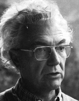 Famous type designer born in 1928 in Unterseen, Switzerland, who died in September 2015. He closely cooperated with Linotype-Hell AG, after having been artistic director at Deberny-Peignot in Paris since 1952. He established his own studio in 1962 with André Gürtler and Bruno Pfaftli. Art director for Editions Hermann, Paris 1957 to 1967. Frutiger lived near Bern, Switzerland, and was very interested in woodcuts. In 2009, Heidrun Osterer and Philipp Stamm coedited Adrian Frutiger Typefaces The Complete Works (Birkhäuser Verlag), a 460-page opus based on conversations with Frutiger himself and on extensive research in France, England, Germany, and Switzerland. Quote: Helvetica is the jeans, and Univers the dinner jacket. Helvetica is here to stay. He designed over 100 fonts. Here is a partial list:
 - Président (Deberny&Peignot, 1954). Digitized by Linotype in 2003.
- Delta.
- Phoebus (Deberny&Peignot, 1953).
- Element-Grotesk.
- Federduktus.
- Ondine (Deberny&Peignot, 1953-1954). The Bitstream version of this font is Formal Script 421. Adobe, Linotype and URW++ each have digital versions called Ondine. Bitstream's Calligraphic 421 is slightly different.
- Méridien (Deberny&Peignot, 1955-1957). Digitized by Adobe/Linotype in 1989.
- Caractères Lumitype.
- Univers (Deberny&Peignot, 1957). About the name, Frutiger wrote I liked the name Monde because of the simplicity of the sequence of letters. The name Europe was also discussed; but Charles Peignot had international sales plans for the typeface and had to consider the effect of the name in other languages. Monde was unsuitable for German, in which der Mond means "the moon". I suggested "Universal", whereupon Peignot decided, in all modesty, that "Univers" was the most all-embracing name!. Univers IBM Composer followed. In 2010, Linotype published Univers Next, which includes 59 Linotype Univers weights and 4 monospaced Linotype Univers Typewriter weights, and can be rented for a mere 2675 Euros. In 2018, Linotype added Univers Next Typewriter. In 2020, Linotype's Akira Kobayashi dusted off Univers Next Cyrillic and Univers Next Paneuropean.
- Egyptienne F (1955, Fonderie Deberny&Peignot; 1960, for the Photon/Lumitype machine).
- Opéra (1959-1961, Sofratype).
- Alphabet Orly (1959, Aéroport d'Orly).
- Apollo (1962-1964, Monotype): the first type designed for the new Monotype photosetting equipment.
- Alphabet Entreprise Francis Bouygues.
- Concorde (1959, Sofratype, with André Gürtler).
- Serifen-Grotesk/Gespannte Grotesk.
- Alphabet Algol.
- Astra Frutiger. A typeface variant of Frutiger licensed under Linotype. It is the font used on the highways in Switzerland.
- Serifa (1967-1968, Bauersche Giesserei). URW++ lists the serif family in its 2008 on-line catalog. Other names include OPTI Silver (Castcraft), Ares Serif 94, and Sierra. Bitstream published the digital typeface Serifa BT. But it is also sold by Adobe, Tilde, Linotype, URW++, Scangraphic, and Elsner & Flake. The slab serif is robust and is based on the letterforms of Univers.
- OCR-B (1966-1968, European Computer Manufacturers Association).
- Alphabet EDF-GDF (1959, Électricité de France, Gaz de France).
- Katalog.
- Devanagari (1967) and Tamil (1970), both done for Monotype Corporation.
- Alpha BP (1965, British Petroleum&Co.).
- Dokumenta (1969, Journal National Zeitung Suisse).
- Alphabet Facom (1971).
- Alphabet Roissy (1970, Aéroport de Roissy Charles de Gaulle).
- Alphabet Brancher (1972, Brancher).
- Iridium (1972, Stempel). A didone with slight flaring.
- Alphabet Métro (1973, RATP): for the subway in Paris.
- Alphabet Centre Georges Pompidou. The CGP typeface (first called Beaubourg) used in the Centre Georges Pompidou from 1976-1994 is by Hans-Jörg Hunziker and Adrian Frutiger, and was developed as part of the visual identity program of Jean Widmer. It is said that André Baldinger digitized it in 1997.
- Frutiger (1975-1976, Stempel, with Hans-Jörg Hunziker). In 1999, Frutiger Next was published by Linotype. In 2009, that was followed by Neue Frutiger (a cooperation between Frutiger and Linotype's Akira Kobayashi). In fact, Frutiger, the typeface was made for the Charles De Gaulle Airport in 1968 for signage---it was originally called Roissy, and had to be similar to Univers. It was released publically as Frutiger in 1976. The modern Bitstream version is called Humanist 777. Frutiger Next Greek (with Eva Masoura) won an award at TDC 2006. Other digital implementations of Frutiger: M690 (SoftMaker), Quebec Serial (SoftMaker), Frutus (URW), Provencale (Autologic), Frontiere (Compugraphic), Freeborn (Scangraphic), Siegfried (Varityper). In 2018, under the aegis of Akira Kobayashi, the Monotype Design studio published the 150-language superfamily Neue Frutiger World (including coverage for Latin, Greek, Cyrillic, Georgian, Armenian, Hebrew, Arabic, Thai and Vietnamese).
- Glypha (1979, Stempel). See Gentleman in the Scangraphic collection).
- Icône (1980-1982, Stempel, Linotype). Digitized by Linotype in 2003.
- Breughel (1982, Stempel; 1988, Linotype).
- Dolmen.
- Tiemann.
- Versailles (1983, Stempel).
- Linotype Centennial (1986). Based on Morris Fuller Benton's Clarendon typeface Century, Linotype Centennial was designed for Linotype's 100th birthday.
- Avenir (1988, Linotype). In 2004, Linotype Avenir Next was published, under the supervision of Akira Kobayashi, and with the help of a few others. In 2021, the Monotype team released Avenir Next Paneuropean (56 styles, by Akira Kobayashi). Avenir Next World, released by Linotype in 2021, is an expansive family of fonts that offers support for more than 150 languages and scripts. The subfamilies include Avenir Next Hebrew, Avenir Next Thai, Avenir Next Cyrillic, Avenir Next Arabic and Avenir Next Georgian. Avenir Next World contains 10 weights, from UltraLight to Heavy.
Contributors besides Adrian Frutiger and Akira Kobayashi: Anuthin Wongsunkakon (Thai), Yanek Iontef (Hebrew), Akaki Razmadze (Georgian), Nadine Chahine (Arabic), Toshi Omagari (Arabic) and Elena Papassissa (Greek, Armenian). Lovely poster by Ines Vital (2011). - Westside.
- Vectora (1991, Linotype).
- Linotype Didot (1991). See also Linotype Didot eText Pro (2013), which was optimized by Linotype for use on screens and small devices.
- Herculanum (1989, Linotype): a stone age font.
- Shiseido (1992).
- Frutiger Capitalis (2006, Linotype): a further exploration in the style of Herculanum, Pompeijana and Rusticana. Linotype trademarked that name even though at least five fonts by the name Capitalis already exist.
- Pompeijana (1993, Linotype).
- Rusticana (1993, Linotype).
- Frutiger Stones (1998, Linotype) and Frutiger Symbols.
- Frutiger Neonscript.
- Courier New, based on Howard Kettler's Courier, was one of Frutiger's projects he was involved in ca. 2000.
- AstraFrutiger (2002): a new signage typeface for the Swiss roads. Erich Alb comments: With a Frutiger condensed Type and illuminated signs during night it is mutch better readable.
- Nami (2008) is a chiseled-stone sans family, made with the help of Linotype's Akira Kobayashi.
- Neue Frutiger (2009, with Akira Kobayashi) has twice as many weights as the original Frutiger family.
- In 2019, the Linotype team released variable fonts for Frutiger's main typeface families, Avenir Next Variable, Neue Frutiger Variable, and Univers Next Variable.
Bio by Nicholas Fabian. Erich Alb wrote a book about his work: Adrian Frutiger Formen und Gegenformen/Forms and Counterforms (Cham, 1998). Winner of the Gutenberg Prize in 1986 and the 006 Typography Award from The Society for Typographic Aficionados (SOTA). Famous quote (from a conversation in 1990 between Frutiger and Maxim Zhukov about Hermann Zapf's URW Grotesk): Hermann ist nicht ein Groteskermann. A quote from his keynote speech at ATypI1990: If you remember the shape of your spoon at lunch, it has to be the wrong shape. The spoon and the letter are tools; one to take food from the bowl, the other to take information off the page... When it is a good design, the reader has to feel comfortable because the letter is both banal and beautiful. Frutiger's books include Type Sign Symbol and Signs and Symbols. Their Design and Meaning (1989, with Andrew Bluhm, published by Studio Editions, London; Amazon link). Linotype link. FontShop link. Adrian Frutiger, sa carrière française (2008) is Adèle Houssin's graduation thesis at Estienne. Klingspor link. Wikipedia link. View Adrian Frutiger's typefaces. View some digital versions of Avenir. Vimeo movie on Frutiger by Christine Kopp and Christoph Frutiger entitled "Der Mann von Schwarz und weiss: Adrian Frutiger". More Vimeo movies. [Google]
[MyFonts]
[More] ⦿
|
Adrian Kimball
[WTF (or: Workhorse Type Foundry)]
|
 [More] ⦿
|
Adriana Perez Conesa
|
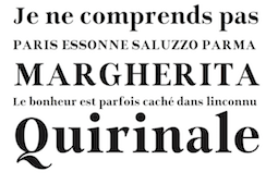 Adriana Perez Conesa is a Spanish graphic and typeface designer, currently based in Barcelona. She studied art and graphic design at the University of the Basque Country. Graduate of the MATD program at the University of Reading, class of 2020. Her typefaces:
 - Subs and Stuff (2020). These are her graduation typefaces at Reading. Subs n Stuff. Subs uses squarish letterforms with low contrast, large x-height, generous apertures, pixel-traps and clear shapes, all to help reduce the chances of misrecognition and increase legibility. Subs contains two different styles: Micro, intended for low-resolution screen and small sizes, and Text, for high-resolution screens and bigger sizes. Text is also variable in the weight axis. Stuff is a variable subfamily that covers weight and optical size axes. Both typeface families are accompanied by an italic style and support Latin and Arabic scripts.
- A revival of Augereau Gros Romain (2020).
- Rockera (2018-2019). Rockera was designed during a four month Typography Design post-graduate course at EINA (University School of Design and Art of Barcelona).
- Essone (2018). A didone.
- Aurum Sans (2018). Her graduation project at the University of the Basque Country. Aurum Sans is a geometric typeface in which she combined rationality with humanism.
[Google]
[More] ⦿
|
Adrien Midzic

|
 Fatnobrain was Adrien Midzic's design studio in Paris. Born in 1982, he co-founded Pizza Typefaces with Luc Borho in 2018. Midzic designed these typefaces or type families: Fine (lineal), Blokus (free pixel font, 2009), Cimen (strong sans, designed for Smacl Entraide), Mesquine (lineal), Blitz, Cucha, Stencil Reverse, Huit (2009, a gorgeous didone headline face), Stenha (stencil).
 Fonts made in 2010: The ETH family (art deco sans). Custom typefaces by Midzic: Aquitaine (2013, for Région Aquitaine), Nilka (2013, for his personal identity), No End (2013, a fat didone), Ethon Serif (2013, a perked up serif typeface for Penguin Books), Kasai Est (2011, for the Congo-based Kasai Est Magazine), Festival De Film Documentaire (2011), Nevenka (2011, condensed sans). In 2014, Adrien Midzic, Jason Vandenberg, Jérémie Hornus, Julien Priez and Alisa Nowak co-designed the creamy script Vanilla FY. It was renamed Vanille FY after a few days. Still in 2014, Adrien Midzic, Jérémie Hornus and Alisa Nowak co-designed the very humanist sans family Saya FY and Saya Semisans FY. Adrien Midzic and Joana Correia co-designed Saya Serif FY (2015). At the free font cooperative Velvetyne, he published the sans typeface Lack (2014). In 2015, he made the 3-style sans typeface Suber for an art fair in Paris. The roman transitional typeface Bota Serif (2015), which was inspired by Cochin (designed by Charles Peignot in 1912) is a custom font designed for Hotel des ventes de Poitiers. In 2017, it was finally released for retail. In 2016, Adrien designed the bold titling typeface Debeo and the modern condensed Latin/Arabic typeface 29LT Adir (with Naji El Mir; at 29 Letters). In 2017, he published the piano key typeface Mixal, which became a large experiment on variable fonts and is free for everyone. Typefaces from 2018: Kern, Kern Office (a sans with some Futura features), Forno (sans), VTF Lack (a free single weight monoline geometric sans for Latin, Greek and Cyrillic, published by Velvetyne), Metal (an all caps multi-width variable font originally designed for marché Dauphine), Orelo (a 120-style high-contrast fashion mag font family; +Orelo Hangul, 2020). Typefaces from 2019: Ultra Solar (experimental), 1871 Mane (a custom sans typeface), Wasa (a tense sans in seven styles), Shrill, Gangster Grotesk (free), Stupid (a hacker / hipster font), Kern (geometric sans). Typefaces from 2020: Shreck Issue (very tall and ultra-condensed), Metal (brutalist), Version ACT (a two-axis variable font), Debeo (a heavy sans), Dozza (a hybrid family named after ITC Mendoza by Jose Mendoza Almeida), XMX (experimental). Typefaces from 2021: Campingo (a roundish informal typeface inspired by camping and outdoor life), Bota (with Ines Davodeau: first designed for Boissnot&Tailliez, Bota is a modern interpretation of Georges Peignot's Cochin (2012)), Pleasure (hipsterism pushed to the fringe of addiction), Model Standard (ModelStandard Mono, ModelStandard SemiMono, ModelStandard Sans). Dafont link. Klingspor link. Behance link. Another Behance link. Hellofont link. Velvetyne link. [Google]
[MyFonts]
[More] ⦿
|
Adtypo
[Andrej Dienes]

|
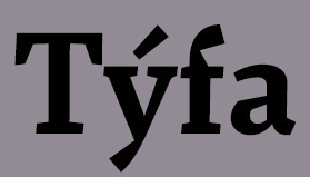 Andrej Dienes is a type designer in Bratislava, Slovakia. He set up the commercial type foundry Adtypo in 2013. Creator of these typefaces:
 - Akceler (2012). Advertised as a type system for sports. The text that accompanies this large typeface family: Elasticity of glyphs reflected adrenalinous shapes of latest bikeframes, skies or sportcars. Maximum open arches guaranteed good readability in very small sizes and prevented interchanges of glyphs "o, c, e" per poor reading conditions. Softness of minuscules is at capitals balanced in bottom arches, that are subtly kicked-up. Numerals are important component of sport communication, so here have expressive design, different from numerals of book typefaces. Every font have 10 kinds of numerals. Character case contains between 1000 glaphs sport icons and othes signs creating sport feeling.
- Densit (2012). An ultra-black display family that includes a Sans and a Serif. It was designed for Reco, Senica.
- Fazeta (2015). An angular traditional Czech typeface family in which each font has an impressive 1140 glyphs, and the family is divided into Display, Text and Caption subfamilies. He calls it a text typeface without sentiment. It was followed a bit later in 2015 by the companion font Fazeta Sans.
- Resonay (2021, at Typemates), an award winner at 25 TDC in 2022. Resonay is a layerable display typeface family that combines elegant details from stone carving with the flow of calligraphy, a sharp attitude with exuberant Bézier curves.
- Cosan (2021). A variable sans-serif typeface with a broad range of weights and adjustable contrast.
[Google]
[MyFonts]
[More] ⦿
|
AF Studio
[Adam Fathony]

|
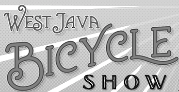 Adam Fathony (or Adam Fathoni Haris; AF Studio, Bandung, Indonesia) created the vintage typeface Grandesa (2014), the signage typeface Magnifika (2014) and the Victorian typeface Marema (2014).
 In 2015, he published the connected swashy script typeface Octavia Script, the brush scripts Carbonera and Shallom, the hand-lettered Vanilla Daisy Script and Mightype, the watercolor script Hollycakes, and the connected Brayden Script (and Sans). Typefaces from 2016: Drustic Daily, Karlberg Script, Ecosmith Script, Halosense Script (calligraphic), Lunar Cone (connected layered script), Clarkson Script, Salvador Script, Salvador Serif, Salvador Condensed, La Venice Script (retro signage lettering). Typefaces from 2017: Clarkson Script (brush lettering), Bignord Vintage (with Fauzan Rafhy), Douglas Collection (12 fonts: Aaronade Script, Ancaster Script, Burlington, Calgury, Montreal Rounded, Morphic 60s, Norwood Old, Ogdensburgh, Palmeira, Rutland Extended, Wolves Sans, Wolves Serif), Almost Lover, Rhythmic Dances (rough script), Sevastian (layered font set), Rustling Trees (dry brush), Little Karla Script. Typefaces from 2018: Figuera Variable (a late Victorian, early art nouveau typeface family; variable font format), Brignola (a calligraphic penmanship script), Eastside Brush (a brush signage script done with Angga Kristiandri), Marshfield (a retro cursive typeface by Adam Fathoni Haris and Renov Olivian), C'est La Vie (font duo), Chivels (a vintage typeface done with Angga Kristiandri at Abbassy Studio), Sevastian (a layered font family), Drustic Dialy (weathered; with Angga Kristiandri), Elli Bellie (calligraphic). Typefaces from 2019: Scottsdale Serif (at Typeverything), Scottsdale Desert (an opentype feature-laden display serif), Norfolk (Narrow, serif), Tiverton (Sans, Serif, Script: by Adam Fathony Haris and Angga Kristiandri), Havard (a layerable athletic lettering set of 12 fonts), Gorga Grotesque. Typefaces from 2020: Auvelle (a hairline sans), Windsore (a font trio), Howli (layerable, rounded; sans, serif and script), Genty (a creamy retro signage script typeface by Ilham Herry and Adam Fathoni Haris), Burnest (a vintage typeface by Adam Fathoni Haris and Renov Olivian), Glaw (a psychedelic font by Ilham Herry and Adam Fathoni Haris), Oliviar Sans (28 styles and a variable font), Budge (a layerable retro signage script by Ilham Herry and Adam Fathoni Haris), Stanlow, Muray House (a bold swashy bathroom towel typeface by Ilham Herry and Adam Fathoni Haris), Esteric (a playful tapered font by Ilham Herry and Adam Fathony). Typefaces from 2021: Alstera (an oblique serif), Monvar (a layerable Cooper Black style typeface by Ilham Herry and Adam Fathoni Haris), Rische (a 6-style display serif with huge counters and an enormous x-height; by Ilham Herry and Adam Fathoni Haris), Ottenthic (script and serif), Mionic (a reverse contrast slab serif by Adam Fathoni Haris and Angga Kristiandri), Matchbox Font Collections (a set of vintage fonts based on lettering on matchboxes; it includes substyles called Linea, Lettre, Deco, Scriptura, Ornato, and Graso). Typefaces from 2022: Balide (a 70s style display typeface), Norsy (a 21-style and variable flared font family). [Google]
[MyFonts]
[More] ⦿
|
Agyei Archer
|
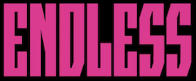 Graphic designer in Trinidad, who co-founded Unqueue, a mobile app designed to improve retail experiences in the Caribbean. Past clients include Google, RISD, the Government of Trinidad and Tobago, and the Caribbean Mental Health Foundation. He designed a few, mostly custom, typefaces. These include Crispy (2020: an angular design started in 2017 that has mushroomed into an 8-axis variable font, built based on David Berlow's proposal for parametric variations, combining axes such as X-Transparency, X-Opacity, and Y-Opacity to generate masters for styles such as widths, weights, grades, and optical sizes; it is planned as a Google Font), and Ephemeral (2018: a layered color font based on the lettering style of Bruce Cayonne). [Google]
[More] ⦿
|
Aim Type
[Saurabh Sharma]

|
Saurabh Sharma (b. 1982) is a graphic and web designer in Udaipur, Rajasthan, India. He created the nice rounded organic sans typeface Lead (2010). Designer of the free geometric asans Google font family Kumbh Sans (2020). Typefaces from 2021: Cause, Cause Variable (a variable weight monolinear rounded sans font with a comic book appeal). Github link. [Google]
[MyFonts]
[More] ⦿
|
Aimur Takk
|
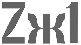 Tallinn, Estonia-based designer of IDA Display (2018, a variable font that reacts to music) and Sveta Bold Condensed Display (2018, for Latin and Cyrillic), which was developed for the branding of Tallinn Music Week 2018. [Google]
[More] ⦿
|
Akimbo Type Foundry (or: Pen and Lens Design)
[Kaleb Dean]

|
Akimbo is the experimental type foundry of American designer Kaleb Dean. As of 2020, his typefaces included Blaque, Harveaux (Modern and Grotesk) and Caeli (a six style sans). Most of the fonts have variable versions. [Google]
[MyFonts]
[More] ⦿
|
Akira Kobayashi

|
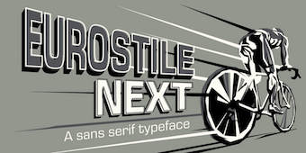 Born in 1960 in Niigata, Japan. Studied at the Musashino Art University in Tokyo. He also studied calligraphy at the London College of Printing. He became a freelance designer in 1997. Akira Kobayashi, who was based in Tokyo prior to his move to the Franfurt area, is an accomplished type designer who has created numerous typefaces for Sha-Ken, Dainippon Screen (where he made the kanji font Hiragino Mincho), TypeBank (from 1993-1997), ITC and Linotype, where he is Type Director since 2001. Interview. His numerous awards include the Type Directors Club awards in 1998 (ITC Woodland), 1999 (the art deco styled ITC Silvermoon, and ITC Japanese Garden), and 2000 (FF Clifford), the 1999 Kyrillitsa award for ITC Japanese Garden, the 3rd International Digital Type Design Contest by Linotype Library (for the informal and quirky 4-style Linotype Conrad (1999): Linotype states that Kobayashi took his inspiration from a print typeface of the 15th century created by two German printers named Konrad Sweynheim and Arnold Pannartz), and the 5th Morisawa International Typeface Competition (in which he received an Honourable Mention for his typeface Socia Oldstyle). CV at bukvaraz. Interview in 2006. His typefaces:
 - Helvetica Neue eText Pro (2013).
- Dainippon Screen: the kanji font Hiragino Mincho.
- ITC: ITC Scarborough (1998), ITC Luna, ITC Silvermoon, ITC Japanese Garden, ITC Seven Treasures (1998), ITC Magnifico Daytime and Nighttime (1999), ITC Vineyard (1999), ITC Woodland Demi (1997).
- Adobe: Calcite Pro (sans-serif italic at Adobe, in OpenType format).
- Linotype: Akko Sans and Akko Rounded (2011; Akko Rounded is situated between DIN, Isonorm and Cooper Black, while Akko Sans is an elliptical organic sans related to both DIN and Neue Helvetica), Akko Condensed (2015), Akko Pro Condensed (2015), Akko Pan-European (2015), Eurostile Next (2008, after Aldo Novarese's original), Eurostile Candy and Eurostile Unicase, Cosmiqua (2007, a lively didone serif family based on 19th century English advertising types, and in particular Miller&Richard's Caledonian Italic), Metro Office (2006, a severe sans after a family of Dwiggins from the 20s), Neuzeit Office (2006, modeled after the original sans serif family Neuzeit S, which was produced by D. Stempel AG and the Linotypes design studio in 1966. Neuzeit S itself was a redesign of D. Stempel AG's DIN Neuzeit, created by Wilhelm Pischner between 1928 and 1939), DIN Next (2009, based on the classic DIN 1451), Times Europa Office (2006, modeled after the original serif family produced by Walter Tracy and the Linotypes design studio in 1974. A redesign of the classic Times New Roman typeface, Times Europa was created as its replacement for the Times of London newspaper. In contrast to Times New Roman, Times Europa has sturdier characters and more open counter spaces, which help maintain readability in rougher printing conditions. Times Europa drastically improved on the legibility of the bold and italic styles of Times New Roman.), Trump Mediaeval Office (2006), Linotype Conrad (1999), Optima Nova (2002, a new version of Optima that includes 40 weights, half of them italic), Linotype Avenir Next (2003, 48 weights developed with its original creator, Adrian Frutiger, and to be used also by the city of Amsterdam from 2003 onwards), Avenir Next Rounded (2012, in conjunction with Sandra Winter), Avenir Next Paneuropean (2021: 56 styles), Zapfino Extra, Palatino Sans and Palation Sans Informal (2006, with Hermann Zapf; won an award at TDC2 2007). Frutiger Serif (2008) is based on Frutiger's Meridien and the Frutiger (sans) family. Diotima Classic (2008, with Gudrun Zapf von Hesse) revives Gudrun's Diotima from 1951. In 2008-2009, Akira Kobayashi and Tom Grace unified and extended Trade Gothic to Trade Gothic Next (17 styles). Neue Frutiger (2009, with Adrian Frutiger) has twice as many weights as the orifinal Frutiger family. Later in 2009, the extensive DIN Next Pro, co-designed with Sandra Winter, saw the light. I assume that this was mainly done so as to meet the competition of FontShop's FF DIN (by Albert-Jan Pool).
- Fontshop: Acanthus (2000, large Fontfont family), FF Clifford (gorgeous text face!). In 2009, he and Hermann Zapf cooperated on Virtuosa Classic, a calligraphic script that updates and revives Zapf's own 1952-1953 creation, Virtuosa.
- Typebox: TX Lithium (2001, The Typebox).
- Oddities: Skid Row (1990), Socia Oldstyle.
- Suntory corporate types (2003-2005), developed with the help of Matthew Carter and Linotype from Linotype originals: Suntory Syntax, Suntory Sabon, Suntory Gothic, Suntory Mincho.
- In 2014, Akira Kobayashi, Sandra Winter and Tom Grace joined forces to publish DIN Next Slab at Linotype.
- Alexey Chekulaev and Akira Kobayashi (Monotype) won a Granshan 2014 award for the Cyrillic typeface SST.
- In 2016, Akira Kobayashi and Sandra Winter co-designed Applied Sans (32 styles) at Monotype. It is in the tradition of vintage sans typeface such as Venus and Ideal Grotesk and competes with Rod McDonald's splendid Classic Grotesque (2011-2016)..
- Member of a type design team at Monotype that created the Tazugane Gothic typeface in 2017. Designed by Akira Kobayashi, Kazuhiro Yamada and Ryota Doi of the Monotype Studio, the Tazugane Gothic typeface offers ten weights and was developed to complement Neue Frutiger. It is the first original Japanese typeface in Monotype's history. Followed in 2018 by the more restrained Tazugane Info. Variable fonts published in 2022: Tazugane Gothic Variable, Tazugane Info Variable.
- SST (2017). A set of fonts for Latin, Cyrillic, Thai, Vietnamese, Arabic and Japanese.
- DIN Next Stencil (2017). Developed together with Sabina Chipara.
- DIN Next Decorative (mostly textured styles such as Rust, Slab Rust, Stencil Rust and Shadow).
- Univers Next Cyrillic and Univers Next Paneuropean, both released in 2020, extending Adrian Frutiger's Univers.
- Shorai Sans (2022) and Shorai Sans Variable (2022). A 10-style Latin / Japanese sans by Akira Kobayashi, Monotype Studio and Ryota Doi, designed as a companion typeface to Avenir Next.
At ATypI 2008 in St. Petersburg, he ran a Linotype student type design workshop. Speaker at ATypI 2012 in Hong Kong: Rounded sans in Japan. View Akiro Kobayashi's typefaces. Klingspor link. FontShop link. Eurostile Next review. Linotype link. Monotype link. MyFonts interview in 2017. [Google]
[MyFonts]
[More] ⦿
|
Akira Kobayashi
[Neue Frutiger]
|
[More] ⦿
|
Alejandro Freitez

|
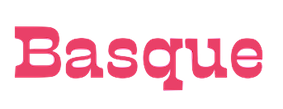 Originally from Maracay, Venezuela, Alejandro Freitez is now based in Buenos Aires, Argentina, where he releases his fonts mostly through Sudtipos. His typefaces:
 - The squarish inline typeface Rectil (2013).
- The free text font Calicanto (2015), which was published by Sudtipos in 2019.
- The multistyle wood type look / Western / Victorian / reverse stress / hyper-decorative Presley Slab (2019). By Alejandro Freitez and Claire Menager, under the art directoship of Alejandro Paul.
- Ansage (2020, at Sudtipos). Ansage is a 61-style sans family (and a variable font with weight, width and italic axes) that revisits the early sans types from the 19th century, rough, raw and unsophisticated.
[Google]
[MyFonts]
[More] ⦿
|
Alejandro Paul

|
 Designer who lives in Buenos Aires and who teaches graphic design and typography at the Universidad de Buenos Aires. He has worked as an art director in prestigious Argentina-based studios, handling high-profile corporate brands such as Arcor, Marta Harff, Morph, SC Johnson, Danone, and Movicom. He runs Estudio Paul. Professor at Facultad de Arquitectura, Universidad de Buenos Aires. Co-creator, with Apostrophe at Apostrophic Laboratory, of Usenet (2000), FontCop I through IV (2000) and the pixel font family Cayetano. Published the dot matrix font Stardust with T-26 in 2000. Designed the gorgeous font Elektora in 2000. He developed with Michael Lynch a 17-font Tennis set of grid-based pixel fonts. At Typeworx, he published Reflex (2002), a commercial 6-style unicase font family. Another web site by Alejandro. Cofounder of DAS, a design studio in Buenos Aires.
 Cofounder of Sudtipos (2003), where he does custom work and creates new typefaces. His work there includes Tierra (a titling face), Latinaires (2003-2018: originally called Latina Sans), Reflex, Downtempo (2003), Stardust and Mosaico (1999, pixel face). Still at Sudtipos, he digitized the beautiful handwriting/calligraphic typefaces by Angel Koziupa called Alma (2005), Murga, Habano and Tiza, which together with his script typeface Argenta (2004), Oxida (2005), the medieval script typeface Mama Script (2004, designed with Alfredo Graziani), Divina (2004, with Alfredo Graziani), and the sans family Kautiva (2004) can be bought via Umbrella Type. For children's orthography, he developed Estrada Hand, on commission for Editorial Estrada. He was working on the serif family Libertina (2004). Herencia (2004, a handwriting typeface done with Diego Giaccone), Grover (2004, slab serif), Milk Script (2004, with Alfredo Graziani), Mama Script (2004, with Alfredo Graziani), Politica (2004, a techno typeface with a very thin Thin weight) are at Sudtipos. The Bluemlein Scripts (2004-2005, Umbrella and Veer) are based on the calligraphic renderings of Charles Bluemlein, shown in a 1943 ink catalog: Miss Le Gatees, Mr Rafkin, Mr Keningbeck, Mr Lackboughs, Lady Dawn, Mrs Von Eckley, Mr Sheppards, Mr Dafoe, Mr Canfields, Mr Stalwart, Mr Sandsfort, Mr Leopolde, Mr DeHaviland, Mr Blaketon, Miss Stanfort, Miss Packgope, Miss Fajardose, Mrs Saint-Delafield, Mrs Blackfort, Mr Sopkin, Mr Sheffield, Miss Lankfort, Herr Von Muellerhoff, Dr Sugiyama, Dr Carbfred. (Note: Soft Horizon's Lainie Day (1993) is an earlier free font in the style of Lady Dawn and Mr Lackboughs). In 2011, that series was made available at Google Web Fonts. Sudestada (2005, Sudtipos) is a handwriting script developed with Diego Giaccone. Cuisine (2005, Umbrella Type) is an informal bold script. Mousse Script (2005, Sudtipos) is based on Glenmoy, a 1932 Stephenson Blake typeface. Suave Script (2005) is a 4am jazz bar script. Ministry (2005) is related in style but less funky, Chocolate (2005) is for sales ads, and Cenizas (2005, with Angel Koziupa) is straight from an old manuscript. Whomp (2006, Umbrella) was based on a partial sign-painting font by Alf Becker (1930s), and so was Buffet Script (2006, Sudtipos). Affair (2006, Umbrella) is swashy and calligraphic, while Candy Script (2007) and its italic version Sugar Pie (2011) are based on Argentina's market lettering. Galgo Script (2007) is a brush calligraphic font based on a design of Angel Koziupa. Burgues Script (2007) is an ornate calligraphic script based on the lettering of calligraphy teacher Louis Madarasz (1859-1910) (award at TDC2 2008). Burgues Script, Adios Script (2008: it won an award at TDC2 2009), Feel Script and Sugar Pie all won awards at Tipos Latinos 2008. Sinfonieta (2006) and Buffet Script are fifties style connected scripts. Feel Script (2007) is based on lettering that calligrapher and logo designer Rand Holub created in 1950 and that was subsequently captured in Intertype's typeface Monterey (1958). Some letterforms were redrawn from vintage American magazine ads (some by Holub himself), Cuisine (2008, food advertising script), Pronto (2008, comic book style, by Alejandro Paul and Angel Koziupa), Grover (2004, rounded sans family), Grover Slab (2004). Burgues Script, Adios Script, Feel Script and Sugar Pie all won awards at Tipos Latinos 2008. Calgary Script (2008, Umbrella) is a pure signpainting job. Accolades from all typophiles for his calligraphic wunderkind, Compendium (2008). The 2009 haul: Sugar Pie (signage font), Bravissima Script, Theorem (upright semi-script). Speaker at ATypI 2009 in Mexico City. The year 2010 starts off with a bang, five awards at Tipos Latinos 2010: a grand prize for Brownstone Sans, and four standard awards, for Semilla, Kewl Script (for food packaging and store windows), Calgary Script, and for Business Penmanship. Typefaces from 2010 include the baseball lettering typeface Fan Script and the tattoo script face Piel Script (piel=skin), which was influenced by Burgues Script and more remotely by showcard lettering by B. Boley (1930s, Sign of the Times Magazine). Piel Script won an award at Tipos Latinos 2012. In 2011, he and Koziupa made the fat signage typeface Aventura and Viento (a grunge version of their earlier 2004 face, Brisa). He added one retro connected signage font to the Filmotype collection in 2012, called Filmotype Kitten (original from 1955). Filmotype Zephyr (2012) is an italic roman formal script. Filmotype Yukon (2012) is inspired by the classic Palmer style of penmanship. Storefront (2012) is a swashy signage typeface based on an incomplete alphabet by Alf Becker. His signage script typeface Hipster Script won an award in the TDC 2012 competition and at Tipos Latinos 2012. Typefaces from 2013: Rolling Pen (a connected script that recalls the business penmanship genre), Bellissima Script (based on a copperplate calligraphic alphabet from Bellezas de la Caligrafía by Ramón Stirling, 1844). In 2014, he helped Panco Sassano, a lettering artist and illustrator from Mar del Plata, who designed the wide connected semi-calligraphic handwriting typeface Horizontes Script (Horizontes subsequently won an award at Tipos Latinos 2016). Still in 2014, he published the fat packaging or signage script Bowling Script, which is based on Freely Drawn Italic, a non-font alphabet by Ernst Bentele (1953). In 2015, Alejandro Paul, Yani Arabena and Guille Vizzari combined forces in the signage script typeface Quotes (Script+Caps) (2015, Sudtipos). Merengue Script (2015, with Panco Sassone) is a fun creamy script, ideal for pastry shops, tea rooms or supermarkets. Steak (2016) is a connected vintage signage script based on an Alf Becker design. Envelove (2017) is a script typeface family consisting of Script, Icons, and Caps, designed at Sudtipos by Yani Arabena, Guille Vizzari, and Alejandro Paul. Winner at Tipos Latinos 2018 of a type design award for Envelove. Still in 2017, Guille Vizzari and Alejandro Paul co-designed the great Moleskine notebook-inspired typeface family Proprietor. Proprietor comes in Script, Icon, Deco, Wide, Open and Roman styles. It won an award at Tipos Latinos 2018. Rigatoni (2017): A skyline didone based on mid-20th century example by Eugen Nerdinger. Bibliophile Script (2017). A pair of copperplate calligraphic typefaces. Fixture (2018: a 72-font grotesk family published by Sudtipos). Newbery Sans Pro (2018). A simple workhorse sans typeface family that is inspired by German industrial design and the lettering of Eugen Nerdinger. Winner at Tipos Latinos 2018 of a type design award for Tennis Set, Bibliophile Script, French Bulldog, Envelove, La Taqueria, and Speakeasy Set (a collection of (copperplate) script, sans, modern, flare and gothic substyles). From 2019: Hot Salsa (a retro brush script; with Ximena Jimenez), Old Letterhand, Clockmaker (arts and crafts style), Steak Script (inspired by an old alphabet by Alf Becker), Address Sans Pro (a sans family inspired by Butti and Novarese). In 2019, Alejandro Freitez and Claire Menager, under the art directoship of Alejandro Paul, designed the multistyle wood type look / Western / Victorian / reverse stress / hyper-decorative Presley Slab. Typefaces from 2020: Apothicaire (a wonderful quaint serif family in the frivolous didone genre; three variable fonts, 16 styles in all), Inglesa (a penmanship script), Dilemma, Dilemma Serif (Dilemma is a sans/serif type system with 42 styles; it is inspired by the anonymous Polyphème, Cyclopéen and Extra Condensé designs from the early 1900s at the Peignot Fonderie; two variable fonts are included), Sporty Pro (a large sports / athletics font family). Typefaces from 2021: Plethora (an 18-style family and two variable fonts that build on Julius Herriet's Old Style Ornamented for Bruce Type Foundry; Alejandro added various frills, ligatures, weights, exaggerating in true Victorian spirit), Magari (a fat face or Normande; Alejandro likens it to Italian classics of the 19th century though), Regional (27 styles, plus variable styles). Typefaces from 2022: Wienerin (a revival and expansion of Olympia (1929) by Carl Otto Czeschka, one of the members of The Wiener Werkstätte). [Google]
[MyFonts]
[More] ⦿
|
Alessio Laiso

|
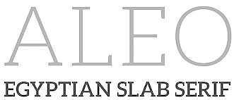 Graphic designer in Lisbon, Portugal (was: Dublin, Ireland), who studied at ISIA Roma in 2013. Creator of the free 6-style slab serif typeface Aleo (2013): Aleo is a contemporary typeface designed as the slab serif companion to the Lato font by Lukasz Dziedzic. Aleo has semi-rounded details and a sleek structure, giving it a strong personality while still keeping readability high. It is also available from Open Font Library and Google Fonts (in 2018). Google Fonts mentions Kevin Conroy as co-designer. Posters by Bush Mthembu (Durban, South Africa).
 In 2017, he designed the commercial typefaces Lagu Sans and Lagu Serif, which feature large x-heights and open counterforms. Typefaces from 2020: Pani Sans (which takes inspiration from Italian rationalist and art deco genres, and includes variable types). Open Font Library link. Fontspring link. Fontown link. [Google]
[MyFonts]
[More] ⦿
|
Alex Tomlinson
[Ursa Minor]
|
 [More] ⦿
|
Alexander Lubovenko

|
 Talented Russian graphic and type designer who works for ParaType in Moscow. His typefaces:
 - In 2015, he and Alexandra Korolkova co-designed Circe Rounded, which is an extension of the Circe typeface (2011), both published by Paratype. Circe is named for the circular nature of many of its glyphs.
- In 2015, Alexandra Korolkova and Alexander Lubovenko published Aphrosine at Paratype, a typeface based on pointed pen script and situated somewhere between handwriting and calligraphy. Many alternatives and smart OpenType features help Aphrosine look like real handwriting.
- Carol Gothic (2015, Alexandra Korolkova and Alexander Lubovenko, Paratype) is a traditional blackletter face closest to Linotype's Old English.
- Liberteen (2015) is a playful tongue-in-cheek take on 19th century slab serifs, including Clarendons. For Latin and Cyrillic, from Thin to Black. Dessert Script (2015, Paratype). A smooth-outlined advertising script for Latin and Cyrillic.
- In 2016, Alexander Lubovenko and Manvel Shmavonyan co-designed the 30-style Latin / Cyrillic workhorse sans typeface family Mediator which was followed in 2017 by Mediator Serif. Later in 2016, Alexander Lubovenko designed the heavy slab serif family Bombarda.
- Hypocrite (2017, Paratype).
- He created some additional styles for Zakhar Yaschin's Mojito script font.
- in 2018, he designed Clincher at Paratype, a set of monospaced and duospaced fonts that were specifically developed for program coding and user interface design.
- Wak (2018). By Aleksander Lubovenko and Viktor Fitzner.
- Journal Sans New (2018).
- Six Hands (2018). This is a collection of six handcrafted typefaces: Black, Brush, Chalk, Marker, Condensed and Rough, by Alexandra Korolkova, Alexander Lubovenko, and the Paratype team.
- Stapel (2020, Paratype). A 57-style Latin / Cyrillic sans family with a sci-fi look and thin stroke joints.
- Vast (2021, Paratype). A 56-style sans family, and three variable fonts, by Manvel Shmavonyan and Alexander Lubovenko. Choices are from thin to black and regular to extra wide.
- In 2021, Paratype designers Isabella Chaeva, Vasily Biryukov and Alexander Lubovenko created DIN 2014 Rounded, an extension of the industrial sans serif DIN 2014. The six-style typeface supports all European languages based on Latin, Cyrillic, and Asian Cyrillic (Tatar, Kazakh and Kyrgyz) and has a variable version.
Paratype link. [Google]
[MyFonts]
[More] ⦿
|
Alexander Nedelev
[Typedepot]

|
 [MyFonts]
[More] ⦿
|
Alexander Slobzheninov
|
 Designer from Siberia who graduated from Ladislav Sutnar Faculty of Design and Art, University of West Bohemia and is now based in Prague, Czechia. Type, graphic and motion graphics designer who created these typefaces:
 - Octarine (2017). A geometric sans typeface family with two free weights).
- Fivo Sans (2017, free) and Fivo Sans Modern (2017, free).
- Wacom (2017). This is a simplified techno sans concept font not actually used by Wacom.
- Objective and Subjective, two mischievous typeface families published in 2018. Objective was slightly altered and merged with Chris Simpson's Metropolis (2015) in 2020 by Cristiano Sobral in Metropolitano.
- The 42-font sans family Agrandir (2018). Available from Pangram Pangram.
- The 7-weight Swiss neo-grotesk Gestalte (2018) that is characterized by mathematically precise horizontal and vertical strokes and terminals.
- The Baskerville grandchild AS Grafier (2018). A corporate typeface for the identity of Other Poets Society. There is a free beta version, and comes with a variable font option. Published by Pangram Pangram in 2019. The variable font Grafier can also be purchased from Type Tomorrow.
- The Latin / Cyrillic Object Sans (2018), which is in the Swiss sans style. For the Cyrillic, he was helped by Sonya Yasenkova. Available from Pangram Pangram.
- The cyrillization of Jeremy Landes's Le Murmure in 2019.
- Relaate (2019-2020). A multi-genre typeface in which the lower case t and e try to reach for the sky.
- Right Grotesk (2020, Pangram Pangram). Neutral, functional, slightly hipsterish. First in 51 styles, and then extended to 130 styles, and some variable fonts as well.
- In 2021, he set out to design one typeface per day for 36 consecutive days. The typefaces explore various ideas and cover almost every imaginable type style: Casual Digital Goose, Chill Out, Damn Low Tech, Flying, Gravity Itself, Ligatureless, Ploite Green Finger, Pretty Dumb Idea, Rembrandt, Those Games, Weird, What A Feature.
- Typefaces from 2022: Right Sans, Right Gothic (a 98-style variable type family), Weird Serif (a didone for vampires).
Future Fonts link. Type Tomorrow link. [Google]
[More] ⦿
|
Alexey Popovtsev
[Aronetiv]

|
 [MyFonts]
[More] ⦿
|
Alexis Boscariol
|
 Alexis Boscariol is a Paris-based freelance graphic and type designer. He completed his Masters in graphic design at ESAD Valence, before entering the Type Media program at KABK in Den Haag, The Netherlands, class of 2019. His KABK graduation typeface is Picardy, a variable font designed for the web. The display version also has a variable outline axis, enabling more interactivity and animations.
 In 2020, he published the rounded display typeface Caspar Condensed at Future Fonts. Caspar Github link. Future Fonts link. [Google]
[More] ⦿
|
Alfredo Marco Pradil
[Hanken Studio]

|
 [MyFonts]
[More] ⦿
|
Alja Herlah

|
 Slovenian type designer, who co-founded Type Salon together with Krista Likar in Ljubljana in 2020. Alja's typefaces:
 - Praz Slab and Praz Italic (2014). Developed during the 2014 Tipobrda workshop mentored by Domen Fras and Lucija Bratus.
- Alica (2015). A cursive slab serif heavily inktrapped typeface designed at TipoBrda 2015.
- Univerza Sans (2020, Type Salon). Univerza is not a take on Frutiger---it is Slovenian for "university". Alja writes: Univerza Sans was developed to mark the hundredth anniversery of University of Ljubljana. The style is influenced by the combination of Slovenian avant-garde with some recognizable forms that are known for Slovenian typography.
- Palsam Pro (2020, Abjad). This rounded sans typeface covers Latin and Arabic and was co-designed by Ali Almasri and Alja Herlah. Regarding the Arabic part, they write: The main highlight for Palsam was the cursive companion. For the first time, the calligraphic Ijaza style was used as a model for designing the Arabic cursive. The Ijaza is a hyper combination of Naskh and Thuluth, which makes it perfect to be a companion for the upright Naskh.
- Spektra (2020, Type salon). A black condensed sans by Krista Likar and Alja Herlah that combines five scripts: Latin, Arabic, Cyrillic, Greek and Hebrew. It also has a variable type with an italic axis.
- In 2021, Krista Likar and Alja Herlah published Plecnik, which is named after Slovenian architect Joze Plecnik. Plecnik is defined by classical elements and shapes, classic proportions, humanist stroke endings and low contast. It has a capital A with an overhang. Plecnik Display is quite different as it features flaring in every stroke.
- In 2021, Alja released Gizela (a dagger-edged all caps typeface), and wrote: Gizela shows her personality with a feminine, sensual, seductive and art deco vibes.
[Google]
[MyFonts]
[More] ⦿
|
Ally Owun
|
Graphic designer in Payakumbuh, Indonesia, who published these display typefaces in 2021: AO Myhawk, AO Maverix, AO Mireille, Dx Sitrus (a variable font at Dirtyline Studio). [Google]
[More] ⦿
|
Alvaro Franca
[Naipe Foundry]

|
 [MyFonts]
[More] ⦿
|
Amélie Dumont
[Polymorph]
|
[More] ⦿
|
Amir Subqi Setiaji
[Blank Sub (or: Subqi; or: Blankids; was: Bombas Type)]

|
 [MyFonts]
[More] ⦿
|
Andrea Tartarelli

|
 Andrea Tartarelli studied at the Academy of Fine Arts of Carrara and worked as a marble sculptor before turning to graphic and type design. He continued his studies at the Plantin Institute at Antwerp, and now teaches type design at IED Florence. He designed Tarif (selected by Fontspring.com among the Best fonts of 2019), Malik (shortlisted for the Communication Arts Typography awards 2021) and has been co-designer on dozens of typefaces at Zetafonts including the award winning Blacker (selected by Myfonts as one of the best new families of 2019), Monterchi (CA typography award 2020, Myfonts hidden gem 2019) and Stinger (CA typography award 2021). He works and lives in Pietrasanta (Tuscany, Italy). His graphic design outfit is called Surface Studio. Tartarelli's typefaces:
 |
Andree Nguyen
[Nguyen Type]
|
[More] ⦿
|
Andrei Robu
[Typeverything]

|
 [MyFonts]
[More] ⦿
|
Andrej Dienes
[Adtypo]

|
 [MyFonts]
[More] ⦿
|
Andres Ramirez
[Vastago Studio]

|
 [MyFonts]
[More] ⦿
|
Andrew Bellamy
[Otherwhere Collective (or: Ilott Type, Bellamy Studio)]

|
 [MyFonts]
[More] ⦿
|
Andrew Footit
[Arkitype (was: Virtue Creative)]

|
 [MyFonts]
[More] ⦿
|
Andriy Dykun
[NREY]

|
 [MyFonts]
[More] ⦿
|
Andriy Konstantynov
[Mint Type (was: PDesign 6.0)]

|
 [MyFonts]
[More] ⦿
|
Andy Clymer
|
 Andy Clymer grew up in Irvine, CA and studied at San Diego State University in 1998. At that time, he was working on Stencil Fraktur (2002). In 2004-2005, he studied type design in the Masters program of the KABK in Den Haag. He joined the typeface development department of Hoefler&Frere-Jones in New York in 2005. He has been an instructor in the Type@Cooper program in New York since 2011.
 From 2005 until 2018, Andy worked at the Hoefler&Co. type foundry, where he contributed to the typefaces Vitesse, Forza, Ideal Sans, Archer, Surveyor, and spearheaded the design of Operator and Obsidian (2015: a decorative copperplate engraved emulation typeface---various kinds of 3d illumination in Obsidian were obtained by an algorithmic process. In 2019, he co-developed Mingei Mono for the Mingei International Museum along with Yomar Augusto. In 2020, he released Tilt. Tilt is a family of (variable) typefaces inspired by three dimensional lettering found in storefront signage. Subfamilies: Tilt Neon (mimics the construction of neon tube lettering), Tilt Prism (based on prismatic lettering, cast or cut in a material), Tilt Warp (resembles peeling vinyl stickers). The variable fonts have two axes, horizontal rotation and vertical rotation. Github link. [Google]
[More] ⦿
|
Anicons
|
Anicons (2019) is the first animated color variable icon font. Made by Wenting Zhang and Hua Shu, it combines variable font and color font technologies. Their Github page explains how to proceed in html. Anicons is free. [Google]
[More] ⦿
|
Anita Jürgeleit
[Type This Studio]

|
 [MyFonts]
[More] ⦿
|
Anna Khorash
|
 Member of the Contrast Type Foundry in Moscow.
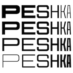
 In 2019, Maria Doreuli and Anna Khorash released the variable font CoFo Peshka at Future Fonts. Inspired by the industrial and military lettering in the Soviet era, it is named after the Pe-2 aircraft also called the Peshka. CoFo Peshka features weight and width axes. Future Fonts link. [Google]
[More] ⦿
|
Anna Safitri
[Runsell Type (or: Runsell Studio, Studio Runsell)]

|
[MyFonts]
[More] ⦿
|
Antonia Cornelius

|
 German type and communication designer, lecturer and researcher with a special interest in legibility and readability (b. 1989). She obtained a Bachelor's in communication design with Jovica Veljovic at Hamburg University of Applied Science, where her thesis was entitled The Letters in my Head. What Creatives should know about reading processes in order to design joyful reading experiences. She also did a Master's with Veljovic, which led to her Legilux typeface family (a transitional serif with optical sizes as well as a sans serif) and further research on legibility. She graduated in 2017. Antonia joined Dutch Design in 2017 and extended the FF DIN family to FF DIN Slab. Furthermore, she re-engineered the whole FF DIN family itself to make variable fonts; she also added Bulgarian Cyrillic and other characters; finally, she also made FF DIN Stencil into a functional three axis variable font. Since 2018, she teaches type design at Muthesius University of Fine Arts and Design in Kiel.
 Her typefaces: - Legilux (2016). A transitional serif with optical sizes as well as a sans serif developed during her Masters studies at Hamburg University of Applied Science.
- FF DIN Slab (2022). With Albert-Jan Pool.
- FF DIN Slab Variable (2022). With Albert-Jan Pool.
- FF DIN Stencil (2022). With Albert-Jan Pool and Achaz Reuss.
- FF DIN Stencil Variable (2022). With Albert-Jan Pool and Achaz Reuss.
- FF DIN Paneuropean (2022). With Albert-Jan Pool, Achaz Reuss, Aleksei Chekulaev and Panos Haratzopoulos. See also and FF DIN Paneuropean Variable (with Achaz Reuss, Aleksei Chekulaev, Albert-Jan Pool and Panos Haratzopoulos).
Antonia Cornelius won the People's Choice award for Legilux in 2016 at the Morisawa Type Design Competition 2016. Speaker at ATypI 2018 in Antwerp on the topic of legibility: Typeface designers Antonia Cornelius and Björn Schumacher conducted a preliminary study for their final master's projects. They set up a reading-speed test by reverting to well-tried test material, which they set in their new typefaces Legilux and Text Type as well as the common Walbaum Standard. Focusing on the effect of the optical scaling method, the typefaces were tested in two sizes: 1.5 mm and 1 mm x-height. The results tend to show a positive effect for optical adjustments in type designs. [Google]
[MyFonts]
[More] ⦿
|
Antonin Bonnet
|
 In 2020, at The Type Department, Paul Coumoul, Clothilde Bouan and Antonin Bonnet published the display typeface Octane. It is a variable font with two axes, weight and width. Octane is a free font consisting of a total of 18 weights, but the free version consists in fact only of one variable font and it has no numbers. They explain that Octane was initially created to fit with any car designed by Pininfarina. [Google]
[More] ⦿
|
Antonina Zhulkova

|
 Saint Petersburg, Russia-based designer of Celestina (2017, Piñata), a brush script typeface, Disruptors Script (2018) and Gentlemens Script (2018).
 Typefaces from 2020: TT Octosquares (an octagonal superfamily by Antonina Zhulkova, Yulia Gonina and Kseniya Karataeva; TT Octosquares comes with a 3-axis variable type option), TT Runs (a 20-style sports sans by the TypeType team in cooperation with Vika Usmanova, Antonina Zhulkova and Philipp Nurullin). In 2020, she co-designed TT Lakes Neue, a 91-style sans family by Vika Usmanova, Antonina Zhulkova and Kseniya Karataeva at TypeType. Tt is a functional sans-serif that draws inspiration from Finnish signs of the functionalism era. TT Lakes Neue is an almost monolinear sans, with ovals in the form of rounded rectangles, reminiscent of Nebiolo's Microgramma. It comprises a useful variable font. In 2021, Antonina Zhulkova and Yulia Gonina designed TT Autonomous, a 25-style wide brutal technological sans family that includes a monospaced subfamily and a trio of variable fonts. Later in 2021, Antonina Zhulkova, Pavel Emelyanov and Yulia Gonina (aided by Radik Tukhvatullin and Marina Khodak) co-designed the 32-style geometric sans TT Fors which comes in standard, display and variable versions. In 2021, Zhulkova designed TT Ricordi Allegria (a sleek and elegant flared all caps yet contemporary Florentine sans for Latin and Cyrillic that was inspired by the half-erased lettering in Basilica di Santa Croce, Florence) and TT Globs (+Variable), a 3-style Latin-only typewriter-style slab serif. Typefaces from 2022: TT Fellows (a monolinear sans with 18 static fonts and one variable font; by Antonina Zhulkova, Yulia Gonina and the TypeType team). [Google]
[MyFonts]
[More] ⦿
|
Anupap Jaichumnan
[Jipatype]

|
[MyFonts]
[More] ⦿
|
Apple Watch Font (or: the San Francisco Font)
|
 In September 2014, Apple announced the imminent arrival of the Apple Watch, which came with a new neo-grotesque sans-serif typeface developed in house. It has a legible, open DIN-like look, but the name of its designer was not released. The 35 fonts are grouped into subfamilies San Francisco Text and San Francisco Display, and are available to designers of Apple Watch applications here.
 The reaction of the curmudgeon society, aka The Typophiles, is quite predictably negative, with opinions including Susan Kare's original San Francisco (also done for Apple) was better [note: Kare's was a ransom note font]. I really wonder why the typophiles bother---it's not their magazine or their web page---companies are free to use anything they like, including "not wasting a lot of effort on new typefaces". Some San Francisco fonts are free from Apple's web site. These come in four groups, SF Pro Text, SF Pro Display, SF Compact Text, and SF Compact Display. Developed between 2015 and 2017, these fonts have become the Apple System fonts for basically all Apple machines. San Francisco has gradually replaced most of Apple's other typefaces on their software and hardware products and for overall branding. It was the original system typeface of watchOS and tvOS and has replaced Helvetica Neue and Lucida Grande as the system typeface of macOS and iOS since OS X El Capitan and iOS 9. Apple uses it on its website and for its product wordmarks, where it replaced Myriad Pro. It is also used on the keyboard of the 2015 MacBook and on the 2016 MacBook Pro, replacing VAG Rounded. It is also used as Apple's corporate typeface. Apple restricts the usage of the typeface by others. It is licensed to registered third-party developers only for the design and development of applications for Apple's platforms. The San Francisco typeface has four variants: "SF" (or "SF UI") for macOS, iOS, and tvOS; "SF Compact" for watchOS; "SF Mono" (based on SF Compact) for the Xcode application; and "SF Serif" for Apple Books. The main difference is that the sides of letters with round shapes, such as o, e, and s, are round in SF, whereas they are flat in SF Compact. The flat sides allow the letters to have more space between them, thereby making the text more legible at small sizes, which is particularly important for the Apple Watch. Both SF and SF Compact each have two optical sizes: "display" for large and "text" for small text. Compared to display, the letters in text have larger apertures and more generous letter-spacing. The operating system automatically chooses the display optical size for sizes of at least 20 points, and the text optical size otherwise. Additionally, included in macOS Sierra and iOS 10 is a new variant named "SF Compact Rounded". It is used in the new contact placeholder icons introduced in the OSes. The "SF Serif" variant was showcased in June 2018 when the all-new Apple Books app was introduced. This variant is exclusive to Apple Books in iOS 12 and macOS Mojave, is not mentioned in Apple's Typography design guidelines, and is not publicly downloadable like other variants of the San Francisco typeface. Open Font Library link where one can download the SF UI Text family (2015). Postscript: The 2014 San Francisco font should not be confused with Susan Kare's ransom note bitmap font San Francisco which was created in 1984 for Apple. An official TrueType version was never made, and Kare's San Francisco was rendered obsolete with the arrival of Apple's System 7. Wikipedia link. Apple font download site where one can find San Francisco Compact (this sans-serif typeface is the system font for watchOS, and includes a rounded variant), San Francisco Pro (this sans-serif typeface is the system font for iOS, macOS, and tvOS, and includes a rounded variant), and New York (a large transitional typeface family with optical and width sizing; 2017-2018, that won an award at the Type Directors Club's Type Design Competition 2019). Also included is the variable font San Francisco Rounded, which includes a weight axis and a grade axis for adjusting the stroke weight without changing glyph widths. [Google]
[More] ⦿
|
Aring Typeface
[Måns Grebäck]

|
 Måns Grebäck (Aring Typeface, Örebro, Sweden) is a prolific Swedish designer (b. Lindesberg, Sweden, 1990), who lives in Borlänge, Sweden. Måns Grebäck has a bachelor's degree in graphic design from the University of Dalarna (2012). In 2010, he went commercial, and started selling fonts through MyFonts. In 2011 he started Mawns Design. In 2013, that was renamed to Aring Typeface. In 2011 he already had over seven million downloads of his fonts, which were featured at websites such as Dafont and Myfonts. He also does custom type work. His typefaces, both free and commercial:
 - Acryle Script (2014).
- Actonia (2016). A monoline script.
- Adielle (2018).
- Aerofoil (2017). A vintage bottom-heavy script.
- Airways (2016). A signage script.
- Akayla Script (2018). Calligraphic.
- Aliey (2021). A 4-style Victorian copperplate serif.
- Aliment (2018). A sharp geometric sans.
- Amertha (2020). a fat finger font.
- Amplify (2013). A signage script.
- Angars Runes (2019: medieval, with gothic cathedral curves).
- Angilla Tattoo (2013). A connected spurred tattoo typeface. Followed by Angilla Script (2020).
- Antlers (2012). A calligraphic script.
- Aquate Script (2019).
- Arachnids (2011, graffiti face)
- Artely Inks (2016).
- Artisual Deco (2021). Pure art deco.
- Artographie (2020). An all caps art deco typeface family.
- Atelas (2015). Signage type, baseball script.
- Atures (2018). Futuristic and monoline.
- Autograf (2015) and Autografia (2021). Signature typefaces.
- Ave (2016) in styles called Ave Utan, Ave Betwan and Ave Fedan. A family of baseball scripts.
- Avelana. A connected script.
- Backpack (2014). A thick signage script typeface.
- Backyard (2016). A blackletter typeface.
- Barkants (2011, elegantly hand-printed family).
- Barley Script (2017). A signage script.
- Baystar Script (2021).
- Beautiful Trouble (2012). A rabbit-eared upright connected script.
- Beaked Tyrant (2014). A copperplate calligraphic script.
- Beckasin (2011, signage face)
- Before The Rain (2011, calligraphic) Before The Rain Arabic (2016).
- Belladio (2021). An urban script.
- Bellino (2018).
- Bezar (2020). A script.
- Billion Dreams (2020, by Mans Grebäck and Rangga Subekti). A heavy signage script.
- Billion Stars (2013). A tattoo script font.
- Bira (2012). A retro connected brush / signage script.
- Blaak (2019).
- Black Fox (2014). A sirupy brush face.
- Black Signature (2021). A bold signature font.
- Black Larch (2016) and Dark Larch (2016).
- Bloc Boy (2016). Like handwriting.
- Blockography (2011). A sketched typeface.)
- Block Talk (2011, with Zaydek Michels-Gualtieri)
- Blods (2011, a great blotty brush face)
- Blueberry Script (2017; with Noah Kinard).
- Botanink (2011)
- Bouncy (a cartoon font).
- Bourdos2022). A script typeface.
- Brannboll (2011, baseball signage face), Brannboll NY (2013), Brannboll Connect (2020), Brannboll Stencil (a baseball script) (2020).
- Bready (2011). A retro signage script with art nouveau aroma.
- Brev Script (2014). A connected secretary hand from the 19th century.
- Bronze Script (2014).
- Brother Tattoo (2012).
- Bumblebees (2012). A plump curvy script.
- Bunya (2016). A geometric slightly deco sans typeface family.
- Calendary Hands (2012).
- Caligraf (2020).
- Canela Bark (2015, co-designed with Luis Miguel).
- Caneletter Sans and Script (2013). Upright unconnected and connected scripts.
- Cantona Script (2019).
- Canyon (2021). A wide elliptical sans in 18 styles, featuring a coathanger lower case f.
- Capoon (2018). A ten-style sans family.
- Caprica Sans (2014) and Caprica Script. A plump script.
- Caravela (2020). A pirate map script.
- Casat Cap (2017). An all caps brush typeface family.
- Caster (2019). A heavy poster script.
- Castro Script (2012).
- Catchland (2021). A retro baseball script.
- Celebrater (sic) (2012). An oily font.
- Cellos Script (2013).
- Centeria Script (2012).
- Channel (2011, connected upright script)
- Chapel Script (216). For signage.
- Characteristic (2011).
- Chavenir (2011).
- Chinal (2018).
- Choko (2011, released in 2016). Chocolate and cream-themed decorative typeface.
- Christmas Miracle (2018), Christmas Reign (Tuscan, all caps) (2020), and Christmas Sparkle (2018).
- Chrysante (2020). A monoline flowing pen script.
- Clear Line (2012). A fat finger / signage typeface.
- Clipper Script (2011).
- Clothe (2017).
- Coneria Script (2012). A connected script.
- Conture Script (2018). Elegant, classical, and with exaggerated capitals.
- Crackin (2011).
- Crunchy (2016). An upright connected script.
- Cruz Quaste (2020). A handcrafted blackletter typeface.
- Cubest (2021). A squarish monospaced techno family.
- CutScript (2011, connected script).
- Danbury (2022). A speed-emulating sans.
- Dark Crow (2020). a dry brush script.
- Dollie Script (2013).
- Ebbing (2018).
- Echinos Park Script (2012).
- Ederson (2018). A vintage signage script.
- Ekologie Hand (2012).
- Ekorre 2021). Aa vintage decorative serif.
- Elaya Script (2019). A creamy signage script.
- Electronics (2017). A retro signage script.
- Elevate (2016).
- Emiral Script (2017). A baseball script.
- Encina Script (2016). A thin calligraphic typeface.
- Enlighten (2011)
- Delinquente (2012).
- Denigan (2011, hairline)
- Equal Sans (2012).
- Espesor Olas (2011, fine hand-printed calligraphic family)
- Esplanade Script (2015, by Mario Arturo).
- Ethernal (2017). A connected script.
- Europe Underground (2010, geometric sans with a hairline weight).
- Fabulous (2017) and Fabulous Gold (2017). Signage script.
- Falkin Sans (2016), Falkin Script (2016), Falkin Serif (2016).
- Faltura (2011, constructivist), Faltura Alien (grunge), Faltura Guerra (grunge)
- Faltura Animals (2011)
- Feathergraphy Decoration (2011, calligraphic).
- Duera (2016). A variable width sans typeface family.
- Fargo (2021). A cursive script.
- Fat Wandals (2018). A graffiti font.
- Feathergraphy Clean (2011).
- Fibography (2013). A caps typeface composed of fibers.
- Filbert Brush (2012), Filbert Color (2013, a soft brush font).
- Finition (2017). A connected brush script.
- Fireplace (2020). A connected script.
- Firstly (2020). A flowing calligraphic signature script.
- First Lyrics (2011).
- First Reign (2022). A medieval typeface. Second Reign (2022), Third Reign (2022) and Fourth Reign (2022) are further medieval typefaces.
- Flighter (2018). A retro airplane font.
- Fondy Script (2018).
- Frankentype (2013). An all-caps brush typeface for signage.
- From Skyler (2016).
- Funkygraphy (2011, fat and counterless).
- Gecko (2015, a fine creamy signage script).
- Geza Script (2017). A great angular almost Arabic-looking script.
- Ghang (2011, graffiti family).
- Gingo (2020). A script.
- Goatskin Brush (2015). A great brush typeface.
- Golden Hopes (2021). A signature script.
- Gonzi (an 31-style sans). Published in 2021.
- Graced Script (2016). A wide calligraphic connected brush script.
- Grandi (2016). A ten-style display sans.
- Gready (2021). A fat signage script.
- Greback Grotesque (2012). The Thin is very very thin.
- Gretoon (2011, cartoon family)
- Griphite (2018). A rough brush typeface.
- Guld Script (2015).
- Habanero (2016). A fat signage typeface.
- Handtalk (2010, silhouettes)
- Harbell (2013).
- Hard Block (2011, Western slab face).
- Hastafi (2022). An 8-style sharp-edged display serif.
- Haydon Brush (2016).
- Heavy Rain (2021). Decorative initials, and an all caps wedge serif.
- Hemicube (a wide squarish all caps sans) (2020).
- Hemmet (2013). A signage script.
- Hierograf (2016). A layered textured handcrafted poster typeface family.
- Hitalica (2011).
- Honeymoon (2017). A connected script.
- Housegrind (2013, connected script).
- House of the Dragon (blackletter). Published in 2021.
- Hoyle (2020). A slab serif.
- Hundred Miracles (a signage script). Published in 2021.
- Impregnable (2013). A connected script.
- Indiana Script (2017). A baseball script.
- Inked Bones (2019). a hand-painted blackletter font.
- Intrique Script (2013). A baseball script.
- Isle Body (2019), Isle Headline (2019).
- Jacked Eleven (2011), Jacked Eleven Highlight (2011), Jack Pirate (2020: a tattoo blackletter typeface), January Script (2013).
- Jaymont (2018). A sharp-edged wedge serif typeface family.
- Jengotan (2021). A dry brush script.
- Jumper (2021). A 13-style sans. Free download for personal use only.
- Kandira (2018). A sleek sans family.
- Kanvas (2020). A script typeface.
- Kerater (2011, sans)
- Lace 2.0 (2012). A thin connected script co-designed with Matteo Milazzo.
- Lacosta (2020). A signage script.
- Kompar (2018).
- Krinkes (2015, baseball script). A connected swashy signage script.
- Kurri Island (2020).
- Lakesight (2014). A connected script.
- Larch (2016). A crisp script typeface.
- Largelake (2021). A signage script.
- Las Enter (2013). A neon light script.
- Leaders (2020). A blackletter font.
- Ledare (2021). A 14-style bold and expressive sans.
- Letric (2021).
- Let Me Ride (2011)
- Levitee (2011, a lively connected script).
- Lighthouse (2013). A bold high-contrast script face.
- Lina Script (2012). A tattoo script done with Vicky Mardian.
- Lourino (2018).
- Low Casat (2017) and Low Casat Fat (2017).
- Lyrics Movement (2011, tall-ascendered hand).
- Lyster (2020).
- Mandoul Script (2021) and Mandoul Black (2021: a brush script).
- Mainland (2018). A sans family.
- Mainstream (2017). Graffiti style.
- Manofik (a 4-style warm retro serif with a coathanger lower case f; for Latin, Cyrillic and Arabic). Published in 2021.
- Martyric (2014, brush script),
- Masteries (2013). A connected formal script.
- Mastoc (2014).
- Mauritz Caps (brushed) and Mauritz (a great wild script family), both published in 2021. Followed by Mauritz Sans (a brush script with a strong personality and a cartoon vibe) in 2022.
- Mean Casat (2018).
- Medish Script (2018). A great calligraphic handwriting typeface.
- Together with Noah Kinard, he designed the calligraphic typeface Melay Script (2016).
- Middle Ages (2019). A Lomardic blackletter in Regular and Deco styles.
- Milasian Circa (2015) and Milasian. A connected script.
- Merry Christmas (2015). A retro script in Flake and Star styles. Followed in 2017 by the color script font Merry Christmas Color.
- Milkyway Hotel (art deco sans).
- Miraikato Hand (2022) and Miraikato Script (a rustic script) (2022).
- Mistuki (2015). An oriental brush simulation font.
- Mochary (2016). A signage or tattoo script.
- Molly Sans (2019). Caps only.
- Monsta Tag (2013): a graffiti font.
- Motion Picture (2013). A heavy connected retro script.
- Mount (2012).
- MAWNS Graffiti (2010) and MAWNS Serif (2010)
- MAWNS Handwriting (2010).
- Made With B (2011, sketched face).
- Mardian (2012). A calligraphic tattoo script done with Vicky Mardian.
- Markera (2011, marker pen family)
- Many Weatz (2011)
- Mawns Rock (2011)
- Monoment (2011). A fat upright connected script.
- Moneymachine (2022).
- Monosphere (2012-2016). A futuristic monospaced typeface.
- Murality (2022). A readable graffiti or mural typeface.
- Myteri Tattoo (2021) and Myteri Script (2021: a calligraphic script).
- Nacinth (2020). A script.
- Nino Script (2018). A tattoo font.
- Nobella (2021). A retro baseball script.
- Normale (2014). A set of distressed typewriter fonts.
- Notera (2014). A connected handwriting font. Followed by Notera 2 in 2018.
- Odenburgh (2020). A medieval calligraphic typeface.
- Optien (2011, techno face)
- Ordinatum (2011, a severe sans).
- Original Black (2021). A fat blackletter typeface.
- Ornamental Versals (2011, ornamental caps)
- Painter (2016). A sign painting script.
- Patched (2021).
- Pennybridge 1563 (2010, blackletter)
- Pharmount (2014). A calligraphic connected script.
- Phraell (2013). A great italic formal calligraphic script with optional swashes.
- Pigeon (2016).
- Pineapple (2012).
- Plates Napery (2015).
- Plicata (2016).
- Pligo (2016). A balloon or cartoon font.
- Preside (2017).
- Prime Script (2012).
- Prognostic (2011)
- Qaskin (2015). A semi-formal connected script typeface with Black and White (outlined) styles.
- Qhuman (2021). A 6-style Victorian serif.
- Qraxy (2016). Quache Variable (2020) and Quache (2020). A 28-style flexible sans family.
- Quanton (2022). An 8-style angular serif.
- Querino Sans (2019). A very bold sans. Followed by Querino Script (2019).
- Quickier Pro (2012). A swashy calligraphic script face.
- Quincho Script (2016).
- Quintal Script (2021). A retro signage font.
- R-2014 (2011, LED face).
- Rabento (2021). A 6-style condensed display slab serif.
- Race Fever Pro (2015, in Brush and Pen versions) and Race Fever Brush (2015).
- Radio 187.5 (2010, techno family)
- Rakoon (2014). A creamy ultra-fat upright script. Followed by Rough Rakoon in 2016.
- Rangly (2017-2018). A paint roll font.
- Raspberry Script (2017).
- Recorda Script (2013). A formal calligraphic script.
- Reditum (2014). A decorative script.
- Reeler (2014, with Noah Kinard).
- Remachine Script (2013). Retro signage script. In 2020, Mans added Remachine Script Arabic.
- Respective (2011, calligraphic script, +Swashes).
- Respondent (2021). A script.
- Rider (2011, a 30-style "versal" sans family)
- Ringer (circle and arc-based sans)
- Ristella (2017). A baseball script.
- Rivera 2022). A narrow sans in 10 styles.
- Rodrigues (2021). A script typeface.
- Roona Sans (2018: modernist and organic curves).
- Ropest (2018). A rope font.
- Roskrift (2011, calligraphic; + Roskrift Clean).
- Rougant (2021). An organic display font.
- Roughen (2020).
- Rurable (2015).
- Ruthless Wreckin (graffiti typefaces), Ruthless Drippin' (dripping paint family)
- Safir Script (2016). A fat baseball script.
- Saker Sans (2017).
- San Andre (2021) and San Andreas (2021), the free version. A baseball script.
- Santa Claus (2019). A blackletter typeface, accompanied by Santa Claus Deco, a snow crystal font.
- Scantype (2016).
- Sculptor's Hand (2011, connected chancery hand).
- Second Lesson (2022). A wide script.
- Second Lyrics (2011, Treefrog-style handwriting)
- Sequal (2020). Graffiti style.
- Sicret (2020) and Sicret Mono (2020). An all caps family.
- Servin' for Salute (2011)
- Shaded Larch (2016).
- Sharpe (2019). A sharp-edged high-contrast serif typeface family. See also Sharpe Variable (2020).
- Shenandoah (flowing signage script).
- Shimes (2015).
- Shipped Goods (2011). A copperplate calligraphic script.
- Shortbrush (2011)
- Signerica (2011, connected flowing hand)
- Sketchica (2011, sketchy face)
- Skyzhi (2016). An advertising headline typeface.
- Society Editor (2013, connected script).
- Snacker Comic (2013).
- Snowstreet (2013, an octagonal typeface) and Snowy (2013).
- Some Weatz (2011, calligraphic, copperplate; +Swashes)
- Sonika (2018).
- South African (2014). A movie poster brush typeface.
- Southern Aire (2013, connected script face).
- Specify (2016). A 40-style sans family. Download, free for personal use.
- Spoken (2019). A graffiti font.
- Sponger (2021). In the VAG Round genre.
- Square Worm (2011)
- Stackyard (2015). A script.
- Stainy (2013). A signage script.
- Starella Script (2019) and Starella Tattoo (2019).
- Starge (2019).
- Starkey (2020).
- Stormland (2021). A wide monoplinear sans.
- Stormline (2021). All caps, wide and outlined.
- Strawberry Script (2017).
- String Lines (2018).
- Stroke Dimension (2011). A 3d typeface.
- Struck Base (2021). A baseball script.
- Suecos Locos (2011---yummy!).
- Sultan Cafe (2014). An interlocking poster typeface.
- Sunny Sam (2020). A script typeface.
- Sverige Script (2012). Calligraphic wedding font.
- Tall Casat (2018).
- Tamoro Script (2014).
- Taylor Hand (2020). A signature script.
- Tevegraphy (2011, elliptical)
- The Hills (2017).
- The World is Yours (2011, quaint)
- Throwupz (2011)
- Toley Hand (2019).
- Tipbrush Script (2011).
- Tomino (2016).
- Top Comic (2013). A very fat cartoon bubble face.
- Treehouse (2011, upright connected script; +Snowhouse for a snow-covered version)
- Tusch Touch 1 (2011)
- Two and Three (2011: a tattoo parlor blackletter family)
- Typographic Onedalism (2011, graffiti simulation face).
- Undergone (2014). Decorative and calligraphic.
- Unthrift (2015). A pen script.
- Vacer Sans and Vacer Serif (2016). The latter is a slab serif.
- Validity Script (2020, with Misti Hammers).
- Ventography (2013). A bold signage script.
- Vinho De Amora (2021). A vintage all caps wedge serif and a stencil version.
- Waiter (2017).
- Walk Da Walk One
- Wandals (2018). A graffiti font.
- Wankstaberg Battles (2010, a tall fat script)
- White Dream (2021). A retro script.
- White Larch (2016). A connected script typeface.
- Wholecar (2021). An unerground train graffiti typeface family.
- Wild Growth (2011).
- Wildline (2021).
- Winfield Script (2019).
- World Series (2021). A baseball script.
- Xtreem (2012) and Xtreem2 (2014).
- Yanty, Yanty Big, Yanty Script, and Yanty Script Big (2012).
- Yaquote Script (2014).
- Yaty (2019).
- Yoghurt (2011).
- Zoney (2021).
View Mans Grebäck's typefaces. Abstract Fonts link. Fontspace link. MyFonts link. Another URL. Dafont link. Klingspor link. Buy fonts directly from Måns Grebäck. Old URL. [Google]
[MyFonts]
[More] ⦿
|
Arkitype (was: Virtue Creative)
[Andrew Footit]

|
 Andrew Footit (b. 1984) runs his own type foundry in Johannesburg, South Africa. He is also known as Arkitype. Until 2014, his type studio was called Virtue Creative and before that, Virtue84. In 2017, he set up Arkitype. His typefaces:
 - The very simple monoline rounded geometric typeface Modulus (2011). Updated to Modulus Pro in 2019.
- The stunning art deco typeface Vindeco (2011).
- Gigafont (2011): a free bubblegum font.
- FunFair (2012): hand-printed.
- Virtus Sans (2012): a clean 4-style sans family.
- the Western family Westro (2012, +Inline).
- The free rounded sans drafting font Struct (2013).
- The four-style vintage poster typeface The Woods (2013).
- The spurred letterpress typeface family Roper (2014). Roper evolved into the octagonal typeface family Hudson NY (2015) and Hudson NY Pro (2020). Hudson NY Regular, Serif and Slab are athletic lettering / octagonal typeface families.
- Bosk Hand.
- Roves (2016). A camping style set of fonts, including several stencil typefaces.
- Anchor Script (2016). Inspired by classic cursive connected handwriting.
- Navigator (2016). Inspired by the early explorers.
- Bowline Script (2016). A vintage monoline cursive script typeface.
- Saveur Sans (2017) and Saveur Sans Round (2017). A lovely sans typeface family that is inspired by art deco and French cafes.
- Comply Slab (2017). All caps and octagonal, with possible applications in athletic lettering.
- 3 Stripe Type (2017) and Adidas Nemeziz (2017). Prismatic typefaces.
- Technol (2018).
- Statewide (2018). An all caps squarish techno display sans family.
- ESPN Next (2018). An octagonal inline custom typeface. ESPN Heroes (2019) is a six-lined prismatic typeface.
- Poster Compressed (2019). A piano key typeface.
- Neumatic Compressed (2019), Neumatic Gothic Round (2020) and Neumatic Gothic (2019).
- Protrakt Variable (2019). Nine variable width all caps fonts, of different thicknesses.
- Coastal (2020). A twelve-style all caps sans.
- Compose. An 18-style minimalist sans with elliptical curves and quite open counters.
- Storica (2021). A 9-style all caps vintage serif.
Behance link. Creative Market link. Home page. View Andrew Footit's typefaces. Home page. [Google]
[MyFonts]
[More] ⦿
|
Aronetiv
[Alexey Popovtsev]

|
 Or Aleksey Popovtsev. Graphic designer in Kiev, Ukraine, who made the Latin / Cyrillic sans typefaces Nachalnaya (2016) and Rothko (2018: a sans).
 Typefaces from 2019: Jheronimus (a neo-humanistic grotesque variable font), Jheronimus Contrast, Ezlo Sans. Typefaces from 2020: Genau (a 9-style geometric sans influenced by the constructivist schools of Vkhutemas and Bauhaus; contains a variable font), Nomenclatur (2020: a sans family for information design and engineering, inspired by DIN). Typefaces from 2021: Wolfgang (a six-style bare-bones text typeface influenced by renaissance types such as Garamond, Bembo and Jenson). Typefaces from 2022: Rottko (a ten-style static grotesque). [Google]
[MyFonts]
[More] ⦿
|
Arrow Type (or: Typefloundry, or: Recursive Design)
[Stephen Nixon]
|
 Stephen Nixon (b. South Dakota) was an undergraduate student at the University of Minnesota in the Twin Cities. After that, he moved to New York City to work as a product designer at IBM. There, he focused on visual design & UX for software products, then moved into brand experience design within IBM Watson. Stephen lives in Brooklyn, NY, where he operates Arrow Type, taking on freelance type design & development work. In 2018, he graduated from the TypeMedia program at KABK in Den Haag. He runs Arrow Type. Since 2021, Stephen Nixon is font engineer at The Type Founders in New York. His typefaces:
 - The free angular text typeface Killam (2012).
- His KABK graduation typeface, Recursive (Mono, Sans), released in 2018. He explains its multiple uses: Recursive Mono & Sans is a variable type family inspired by casual script signpainting and designed for better code & UI. In programming, recursion is when a function calls itself, using its own output as an input. Recursive Mono was used as a tool to help build itself: it was used to write Python scripts to automate work and generate specimen images, and it was used in the HTML, CSS, and JS to create web-based proofs & prototypes. Through this active usage, Recursive Mono was refined to be not just warm, but also deeply useful for all-day work. Recursive Sans borrows characters from its parent mono but adjusts many key glyphs for comfortable readability in text. Its metrics are superplexed---glyphs take up the same horizontal space across all styles. As a 3-axis variable font, this allows for fluid transitions between weight, slant, and expression (casual to strict letterforms), all without text or layout reflow. In turn, this enables new interactive possibilities in UI and makes for a uniquely fun typesetting experience. This typeface was followed by Recurso Sans (2019; free at OFL). Github page where we learn that contributors besides Stephen Nixon include Katja Schimmel, Lisa Huang and Rafal Buchner. In 2019, these authors published Recursive as a variable font with five axes---mono, casual, weight, slant and italics. Dedicated page. Google Fonts link.
- He contributed a variable font version to Nikita Prolopov's Fira Code.
- Name Sans V2 was published by Future Fonts in 2020. Name Sans is a modern interpretation of the tile mosaic name tablets of the New York City subway.
- Lang Syne (2021). A semi-slab family derived from grave carvings in the Green-Wood Cemetery of Brooklyn, NY.
Fontsquirrel link. [Google]
[More] ⦿
|
Art Grootfontein

|
 Paris-based designer and illustrator, b. 1975 in Paris. He created Lemon Twist (2009), a filled-bowl, black geometric face. On his home page, one can find free fonts such as Grootfont1 (2009, pixel face).
 In 2020, he released Balter Serif (a handcrafted layerable font inspired by sign painting, 1960s movie posters and jazz album lettering) and the all caps hand-printed typeface Jazzy Croquette. In 2021, he released Bangel (a fat display typeface) and Flexible (a sans headline typeface in 18 styles, with a variable font thrown in; the typeface was created for animations and allow its user to play with width and height). [Google]
[MyFonts]
[More] ⦿
|
Arthur Reinders Folmer
[Typearture Type Foundry]

|
[MyFonts]
[More] ⦿
|
ATypI: OpenType 1.8 announcement
|
The original announcement of OpenType 1.8 that covers for the first time variable or multiple-axis fonts. [Google]
[More] ⦿
|
Aulia Rahman
[ShowUp Type Foundry]

|
[MyFonts]
[More] ⦿
|
Axis Praxis
|
Laurence Penney's test site for variable fonts. Requires Mac OS Sierra or later, or Webkit Nightly. He writes: Axis-Praxis relies on the font-variation-settings property in the draft CSS4 specification, implemented in WebKit. On the server, it uses TTX to extract the variations information from the font. Once it has this data and has delivered the font back to the browser as a @font-face webfont, the server has no further use for the font so it is deleted immediately. In the browser, the CSS font-variation-settings property of the textboxes is changed using JavaScript when you adjust the sliders or click the named instances. [Google]
[More] ⦿
|
Ayca Atalay

|
 Istanbul, Turkey-based type designer. She releassed her first typeface, Newcraft Serif in 2016, and published Benedicte Script and Rawbrush later that year.
 Typefaces from 2017: The handcrafted typefaces Aardwork, Jackrabbit, Goodwill Script, and the supermarket signage typeface Signface. Typefaces from 2018: Toote Sweet, Paperboy (a playful hand-drawn serif), Madfish. Typefaces from 2019: Message in a Bottle, Destined (a brushed font and a signature script), Diamonds & Pearls (a signature script), Cake & Cutie, Think Cosmic (script), Polytones, Qliché (a thick monoline script), Modern Society (a monolinear rounded display sans), Bisquit, Ever After, Bellissimi (script). Typefaces from 2020: Metaphysica (a futuristic typeface with purposeful glitches), Coquillette, Radian (an information design sans), Ink Tonic (an SVG brush font), Easy Notes (a fat finger font), The Twenties, Wildcard. Typefaces from 2021: Hydrella (a sans with sharp terminals; includes a variable font), Verstyle (a 6-style sans), Verstyle (a 6-style sans). Typefaces from 2022: Prose Sans (an 8-style wide display sans and variable font family), Gardo Grotesk (a grotesk display typeface with serious ink traps). [Google]
[MyFonts]
[More] ⦿
|
Azza Alameddine
|
 Azza Alameddine has worked as a graphic designer in Lebanon, the Netherlands and London since 2009, and is now based in Barcelona. She holds a BA in visual communication from Créapole, Paris. A graduate of the Masters in Typeface Design program of the University of Reading, she specializes in Arabic script. Her talk at ATypI 2014 in Barcelona was entitled The art of typographic matchmaking. In 2016, Azza joined TypeTogether as a type engineer and type designer.
 The Latin / Arabic version of Dalton Maag's Effra was co-designed by Azza Alameddine and Alex Blattmann. It won an award at Granshan 2016. In 2017, she finished Adelle Sans Arabic at Type Together. In 2019, Type Together released Catalpa (Veronkia Burian, Jose Scaglione, Azza Alameddine) and wrote: Primed for headlines, Catalpa is designed to give words bulk and width and gravity itself. The Catalpa font family is José Scaglione and Veronika Burian's wood type inspired design for an overwhelming headline presence. Catalpa was followed in 2021 by Belarius, a three-axis variable family that shifts from sans to slab serif, from condensed to expanded widths, and includes every possibility in between. Published by Type Together in 2021, it was developed under the guidance of Veronika Burian and José Scaglione, with type design by Azza Alameddine and Pooja Saxena, and additional kerning and engineering help from Radek Sidun, Joancarles Casasin and Irene Vlachou. At the end of 2021, she finished Bree Arabic as part of Type Together enormous Bree multiscript typeface family. [Google]
[More] ⦿
|
Balazs Szemmelroth
|
During his studies in Szeged, Hungary, Balazs Szemmelroth designed the multistyle geometric sans typeface family Balage (2016) and the free typeface family Sometimes (2018). In 2018, he created the 4-axis variable font Fluido at Visual Arts Institute Egere. [Google]
[More] ⦿
|
Balibilly Design
[I Wayan Bill Natih]

|
In 2010, Bali-based Bill Natih founded Balibilly Design. Creator of script or handcrafted typefaces. In 2020, he published Moro Baby (an all caps children's book font), Siganture Photopedia (a signature script), Qene G (an artsy font duo that evokes a belle epoque atmosphere), Kage (a fashion mag serif family), Kitahara (script and brush), Native Miles, Patahola and Risalove. Typefaces from 2021: BD Megatoya (a slightly boxy simplified sans family in 40 styles; plus a variable font), Onamura (an 11-style Victorian typeface family with roots in medieval blackletters), Gegor (14 styles; a decorativbe serif), BD Megalona (a 26-style serif that attempts to improve Times New Roman). Typefaces from 2022: Kage Pro (a 24-style (+variable) condensed luxury serif). Creative Fabrica link. Type Department link. [Google]
[MyFonts]
[More] ⦿
|
Barbara Bigosinska

|
 Barbara Bigosinska received her master degree in Graphic Design at the Academy of Fine Arts in Katowice, Poland. In 2013, she graduated from the Type & Media program at the KABK in Den Haag. At KABK, Barbara Bigosinska designed the angular text typefaces Barbear and Sambukka in 2013. Since 2014, she runs her own studio in The Hague, offering type design and typography services to international clients.
 For her type revival project at KABK, she picked Lutetia (2013) and writes: Lutetia was designed as a commission from Enschedé by Jan van Krimpen. The drawings of the typeface were ready in the middle of 1924 and first cut and cast in 16 point size in the Enschedé Type Foundry. For the first time the typeface was used in the book dedicated to the exhibition that took place in Paris in 1925. Therefore the name Lutetia reffers to the Roman name of Paris. Her KABK graduation typeface family was Mala (2013). Loaded with opentype features and choices of widths, Mala was created for cartographic purposes. It was published by Bold Monday in 2016. In 2016 she published Abelard at Indian Type Foundry and wrote: Abelard is a modern (or neoclassical) family with 10 font styles. It is a contemporary take on classic types like Baskerville, Bulmer, and Scotch Roman that has been optimised for text embedding on eReaders. The design features elements ensuring even text color, including case-sensitive forms, prominent punctuation marks, ligatures, and four sets of figures. Each font also contains ornaments resembling pen nibs, bullet points, and arrows. In 2017, she published the didone fashion mag typeface family Rion and the text typeface Neco at Fontstore. Rion was republished in 2018 at Indian Type Foundry. Typefaces from 2018: Bonny (a decorative serif font family published by Indian Type Foundry; see also Bonny at Fontshare). In 2019, Noopur Choksi and Barbara Bigosinska published the sturdy wedge serif text typeface family Sapien at Indian Type Foundry. Still in 2019, Manushi Parikh and Barbara Bigosinska released the octagonal athletics font Fielder at Indian Type Foundry. Somehow this octagonal typeface seems to have been evolved into the 5-style free typeface Nippo at Fontshare. In 2021, Barbara Bigosinska released the 12-style didone family (+two variable fonts) Boska at Fontshare. Boska has quite extreme contrast and some calligraphic hooks in the c, f, k, r, s, x and z glyphs that make it perhaps less suitable for text but more in line with fashionable displays. Bevellier (2019-2021; by Arya Purohit and Barbara Bigosinska) is a 16-style (+variable) rounded condensed organic sans family. In 2021, Barbara Bigosinska, Rafa Buchner and Diana Ovezea set up Blast Foundry. At Blast Foundry, she designed the wonderfully expressive sharp-edged display typeface Sharf. Boska was published as a free font at Fontshare. Behance link. Bold Monday link. [Google]
[MyFonts]
[More] ⦿
|
Baron von Fonthausen
[Jacques Le Bailly]

|
 Jacques Le Bailly (b. Thionville, France, 1975) is the "Baron von Fonthausen", located in Den Haag, and the self-proclaimed German-French specialist in the fields of both beer and type design. From 1999 to 2003, Le Bailly lived in Berlin, working at Moniteurs graphic design studio and as an independent graphic designer. Having returned to the Netherlands in 2003, Jacques did type production work for The Enschedé Font Foundry. He is now a typographic designer at Bau Winkel's studio in The Hague. He worked for type foundries like Lineto, Monotype, House Industries, and Bold Monday, as well as on custom projects for several brand design agencies. He has been teaching at the WdKA art academy in Rotterdam and Sint Joost in Den Bosch.
 He was working on commercial fonts such as TyPress, Ballpoint and B-Day. Sardines (2008, Vette Letters) is described by Jan Middendorp as an amusing parade of heavyweight characters crammed into squares. In 2010, that monospaced family was expanded to VLNL Neue Sardines (42 styles). Designer of the pixel font Mekka. Macula (2010) is a trompe l'oeuil typeface that is available from Bold Monday. It was inspired by Oscar Reutersvärd's impossible perspectives and M.C. Escher's optical illusions. In 2016, Jacques Le Bailly extended Vernon Adams's Nunito (2011) to a full set of weights, and an accompanying regular non-rounded terminal version, Nunito Sans, which is free at Google Fonts and Open Font Library. In 2018, he designed the free family Crimson Pro (a major update of Sebastian Kosch's Crimson from 2011) and VLNL Thueringer (at Vette Letters), and wrote: Jacques got inspired by Albrecht Düer's 15th century Fraktur (blackletter) alphabet, and decided to design a contemporary rounded version of it. It's a modern techno-style blackletter with a (beer)truckload of interesting design details. In 2019, he released the free font Livvic. Livvic is a 16-style custom corporate sans typeface designed by Jacques Le Bailly for LV (Liverpool Victoria Friendly Society Limited), an insurance company based in the UK. The typeface is part of a brand redesign. In 2020, Jacques Le Bailly, Cereal and Vernon Adams (posthumously) released the sans typeface family Mulish at Google Fonts. Mulish is a minimalist sans, designed for both display and text typography. It was initially drawn in 2011 by Vernon Adams and then refined until 2014. In 2017 the family was updated by Jacques Le Bailly to complete the work started by Vernon after he passed away, in collaboration with his wife Allison, an artist who holds the trademark on the typeface family name. In August 2019, it was updated with a variable font weight axis. Behance link. Bold Monday link. %Z Liebe Petra, Die Site ist jetzt erstmal dafür gemacht, um Leuten zu zeigen was ich gerade mache. Leider sind die meisten der gezeigten Fonts noch nicht ganz fertig und werden deshalb noch nicht angeboten. neben Schriftgestaltung, mache ich auch noch Grafik-Design. Im Moment arbeite an der Font TyPress, die bei der 1. Ausgabe folgende Schnitte enthalten wird: Roman, Italic, Bold, Bold-Italic, Caps-Roman and Caps-Bold. Unsicher ist noch wo, oder von wem sie vertrieben werden. Der Font B-Day wird 1 Schnitt haben und wenn alles gut geht, wird sie ab Februar 2002 von Lineto (www.lineto.de) verkauft. Wenn Sie interessiert sind an meinen Entwürfen, oder z.B. an Custom-Type, fragen Sie bitte nach. Oder, wenn Sie gerne sehen möchten, wie meine Schriften im Druck aussehen, kann ich Ihnen ein PDF schicken. Freundlichen Grüsse, Greetings, Baron von Fonthausen, auch Jacques Le Bailly [Google]
[MyFonts]
[More] ⦿
|
Baugasm
[Vasjen Katro]
|
 Visual designer in Tirana, Albania, who specializes in technologically-inspired designs. In 2019, together with Mathieu Desjardins, he created the wonderful typeface Neue Machina, which features deep ink traps in a technical / monospaced / geometric body. Neue Machina is destined to win many major type design awards. [Google]
[More] ⦿
|
Beatrice Caciotti
|
 Beatrice Caciotti is an art director based in Rome, Italy. In 2021, she published the intestinal typeface Bumpy at Type Department. She explains: Bumpy is a variable display font to explore the relationship between gender stereotypes and typefaces. It uses letters as a metaphor for individuals within a complex system, and variability as a means to tackle binary thinking. These ideas translate into a condensed typeface, embodying the sense of external pressure often experienced by individuals. Two masters represent two opposite ways of engaging with the world. Rigid adapts and conforms [...] whereas as Fluid is filled with unexpected, non-conventional, fluid shapes. From the interpolation of these two extremes, a series of stunning variables are born. [Google]
[More] ⦿
|
Beatrice D'Agostino

|
Italian designer of Iki Mono (2020, at CAST) Iki Mono is a multifaceted monospaced typeface designed for publishing and coding. It has two variable styles. [Google]
[MyFonts]
[More] ⦿
|
Beatriz Diogo
[Adaptype]
|
[More] ⦿
|
Beatriz Lozano
|
Brooklyn-based Michigander, currently exploring custom type, coding, and motion design. Her typefaces include Ancho (2020), which includes a variable cut. Ancho is a wide-stanced sans with forms inspired by the Teotihuacan pyramids in Mexico. At Type Cooper 2020, she developed the vernacular display typeface Aguas, an experimental variable font that shifts in width and curvature and is inspired by hand-painted signs in Mexican food markets. [Google]
[More] ⦿
|
Belarius
|
 Belarius is a three-axis variable family that shifts from sans to slab serif, from condensed to expanded widths, and includes every possibility in between. Published by Type Together in 2021, it was developed under the guidance of Veronika Burian and José Scaglione, with type design by Azza Alameddine and Pooja Saxena, and additional kerning and engineering help from Radek Sidun, Joancarles Casasin and Irene Vlachou.
 Two days after the last dictator on earth, Alexander Lukashenko of Belarus, ordered the hijacking of a RyanAir flight in May 2021 to arrest journalist Roman Protasevich, TypeTogether celebrated this event by offering a serious discount on Belarius. [Google]
[More] ⦿
|
Ben Hoepner
|
Designer of the variable modular typeface Stoplight (2019). [Google]
[More] ⦿
|
Ben Wittner
|
 In 2018, Ben Wittner, Sascha Thoma and Timm Hartmann edited Bi-Scriptual: Typography and Graphic Design with Multiple Script Systems (Niggli). Each chapter covers a different language and is written by a graphic designer who is a native speaker of that language. The languages covered are Arabic by Lara Captan & Kristian Sarkis, Cyrillic by Eugene Yukechev, Devanagari by Vaibhav Singh, Greek by Gerry Leonaidas, Hangul (Korean) by Jeongmin Kwon, Hanzi by Keith Tam, Hebrew by Lirion Levi Turkenich & Adi Stern and Kanji/Hiragana/Katakana (Chinese and Japanese) by Mariko Takagi.
 Talib (2004) is a type project of eps51, a Berlin-based graphic design studio founded in 2004 by Sascha Thoma and Ben Wittner. They developed these faux Arabic fonts: Talib Old Style (calligraphic), Talib Kulkufi, and Talib Mohandes. In 2020, Pascal Zoghbi (29LT) and Ben Wittner released the monospaced Arabic / Latin typefaces 29 LT Baseet Variable and 28 LT Zawi Variable. [Google]
[More] ⦿
|
BenBenWorld (or: BB Bureau)
[Benoît Bodhuin]

|
 Benoît Bodhuin (aka Ben Ben) lived in Tournai, Belgium, and after a brief spell in "chti" country, i.e., in Villeneuve d'Ascq, France, he relocated to Nantes in France. He studied mathematics and graphic design. Freelance graphic designer since 2004. In 2011, he set up Benben World at MyFonts.
 Designer of the pixel fonts Logotix (2004), Latham and 5x7 Negatie Moyenne. In 2010, he made the paperclip typeface Pipo (first published in 2011 by Die Gestalten, and in 2017 by bb-bureau). He created the commercial angular sans typeface S-L (2006) which was originally made for the University of Arts Saint-Luc in Tournai. It was published by Volcano. Commercial typefaces include S-L Bold (2012, a hexagonal typeface based on his design at St. Luc in 2006), Zigzag (2012, Volcano Type; a font originally made for the Vivat theater), and Marianne (2012, BenBenWorld: an inline and modular typeface family). In 2013, he published the stencil / fractured typeface Mineral. In 2014, he designed the experimental triangle-based Bauhaus-inspired Side A typeface. In 2016, Bodhuin designed the expressive Italian typeface family BB Book A and bb-book Contrasted. He added the wedge serif BB Book B, BB Book Mono and BB Book Text to that series in 2018. Typefaces from 2017: Brutal, Elastik. Typefaces from 2019: Grotesk Remix (extended to Grotesk Remix Monospace and Grotesk Remix Variable in 2020), Tme (experimental: an update of Sl drawn in 2006 for the University of Arts Saint-Luc de Tournai), Standard-bb, Pickle Standard (extravagant and thought-provoking). Typefaces from 2020: Gikit (in Text and Title version, for a perfect gridnik feel), Ballpill (designed for printing at very small sizes). Typefaces from 2021: Bilibot (an experiment with overlapping strokes), Pimpit (rounded, condensed and with reverse stress), Volcano Type link. View Bodhuin's commercial typefaces. [Google]
[MyFonts]
[More] ⦿
|
Benjamin Blaess
|
 Benjamin Blaess (Blah, Strasbourg, France) is a graphic designer and letterer. During a summer course called Type@Paris (2015), under the guidance of Jean Fran&ccdil;ois Porchez, Malou Verlomme and Mathieu Réguer, Benjamin Blaess created Brambly, a text typeface with calligraphic tension.
 In 2019, Ilya Naumoff and Benjamin Blaess co-designed the variable font Grtsk at Black Foundry. Its three axes, weight, width and slant, combine for 126 styles, that are all captured in one variable font. Mini-site. [Google]
[More] ⦿
|
Benoît Bodhuin
[BenBenWorld (or: BB Bureau)]

|
 [MyFonts]
[More] ⦿
|
Bernd Volmer
|
 Bernd Volmer is a graphic and type designer from Germany. Before attending type and media, he graduated with a BA in 2011 from the ArtEZ in Arnhem. During this time he also did an internship at Atelier Carvalho Bernau and developed his knowledge and interest in type design and typography. After graduation he started as a freelancer.
 In 2013, he graduated from the Type & Media program at KABK, Den Haag. His graduation typeface, Curtis, is based on broad nib calligraphy, and manages in its palette of styles to cover the broad ground between powerful German expressionist display types and very readable text types. In my view, it is the best of the twelve typefaces of the graduation class. In 2010, Bernd Volmer and Ateleir Carvalho Bernau published the free typeface Jean-Luc, which is named after Jean-Luc Godard. Carvalho / Bernau write: We didn't find out who originally made the lettering for these two movies. Some speculate it could have been Godard himself---Godard's interest in graphic design and typography is clear, with many of his other films employing such strong typography-only titles and intertitles. They are almost a self-sufficient entity, another character in the movie, another comment. This style of lettering is so interesting to us because it is such a clear renunciation of the pretty, classical title screens that were common in that time more conservative films. It has a more vernacular and brutishly low-brow character; this lettering comes from the street. We can not prove this at all, but we think it may be derived from the stencil letters of the Plaque Découpée Universelle (or PDU), a lettering device invented in the 1870s by a certain Joseph A. David, and first seen in France at the 1878 Exposition Universelle, where it found broad appeal and rapid adoption. We think this style of lettering was absorbed into the public domain vernacular of French lettering, and that the 2 ou 3 choses titles are derived from these quotidien lettering style, as it would seem to fit Godard's obsession with vernacular typography. In 2019, he published the two-axis (weight and serifs) variable font Seraphs. Co-designer wit Hannes von Doehren of Palast (Text, Display, Poster; in 2021: 36 styles). Future Fonts link. [Google]
[More] ⦿
|
Black Foundry
[Jérémie Hornus]

|
 Type foundry in Paris, est. 2016 by Jérémie Hornus, who is the design lead. Type designers associated with Black Foundry include Alisa Nowak and Ilya Naumoff. They initially bought the font collection of FontYou. Typefaces not included in the original FontYou collection:
 - Angus (2018). A multiplexed rounded sans typeface family by Elliott Amblard that includes a variable font.
- In 2018, Elliott Amblard and Jérémie Hornus co-designed the information design humanist sans typeface family Drive. It is accompanied by the more typewriter-styles families Drive Mono and Drive Prop, and published by Black Foundry. The fiorms in Drive Mono and Prop are great, but all fonts in Drive are too widely spaced (as are several other fonts in the Black Foundry collection).
- Clother (Jeremie Hornus, Julie Soudanne, Ilya Naumoff, 2017). This geometric sans workhorse covers also Cyrillic, Hebrew and Arabic.
- Vesterbro (Jeremie Hornus, Alisa Nowak, Ilya Naumoff, 2017). High-contrast Latin / Cyrillic typeface with a Viking feel that won an award at Granshan 2017.
- Jeremie Hornus, Gregori Vincens, Yoann Minet, and Roxane Gataud (and possibly Riccardo Olocco) designed the free Google web font Atma for Latin (in comic book style) and Bengali. Github link.
- In 2016, Google Fonts published the free Latin / Bengali signage font Galada (2015). It is based on Pablo Impallari's Lobster (for Latin). The Bengali was developed as a studio collaboration by Jeremie Hornus, Yoann Minet, and Juan Bruce at Black Foundry.
- In 2016, Franck Jalleau designed the monospace sans typeface family Aubusson. Initially designed as a custom typeface by Franck Jalleau for the Cité internationale de la tapisserie d'Aubusson, the monowidth proportions are linked to pattern and tiles arrangements used in tapestry. The retail version of Aubusson offers four weights with matching italics. It was published by Black Foundry.
- Drive (2016). A corporate sans serif family.
- Dragon (2016). A clean sans typeface.
- Galien (2019). By the Black Foundry team, a mix with didone elements in the roman and garalde features in the italic. There is also a variable font with a weight axis.
- A custom sans font family for DS Automobiles (2019).
- Finder is a multiscript typeface developed in 2020 at Black Foundry by Jérémie Hornus, Gaëtan Baehr, Changchun Ye and Zhang Miao. This neutral sans is intended for interface design, and covers Arabic, Cyrillic, Greek, Hangul, Hebrew, Japanese, Latin, Simplified Chinese, Thai and Traditional Chinese.
- Screen Sans (2020). A 14-style sans by Jérémie Hornus and Ilya Naumoff published by Indian Type Foundry.
- Alpine Script: a variable font with four axes including boldness, humanity, and irregularity, made for the identity of the French (Renault) Alpine sports cars.
- Maif (2020). A sans family for the corporate identity of the Mutuelle d'Assurance Automobile des Instituteurs de France.
- In 2017, Jérémie Hornus, Théo Guillard, Morgane Pambrun, Alisa Nowak and Joachim Vu co-designed Bespoke Sans, Bespoke Serif and Bespoke Slab at Fontstore / Fontshare. In 2020, Bespoke Stencil was added.
- Egitto (2020). A huge Egyptian (slab serif) family together with a handy variable font. By Jérémie Hornus and Solenn Bordeau.
- Rowton (2021) is a humanist sans in black, regular and hairline weights, named after Arthur Eric Rowton Gill. It is accompanied by two stencil styles.
- NouvelR (2021). A corporate geometric sans typeface for Renault covering Latin, Greek, Cyrillic, Hebrew, Arabic and Korean. Characterized by a totally square lower case r. All terminal angles are 28 degrees, to align with the angle in Renault's logo.
- Enedis (2022). A commissioned sans.
Creative Market link for Black Foundry. [Google]
[MyFonts]
[More] ⦿
|
Blank Sub (or: Subqi; or: Blankids; was: Bombas Type)
[Amir Subqi Setiaji]

|
 Yogyakarta, Indonesia-based type foundry set up in 2017 by two independent foundries, Blankids (Bangkit Setiadi) and Subqi (Amir Subqi Setiaji). Yogyakarta, Indonesia-based designer of the Victorian typefaces Sacred Bridge (2017: co-designed by Bangkit Tri Setiadi and Amir Subqi Setiaji) and Barakah (2017), the script typeface Alyssum Blossom (2017), and the signage typeface Mattoa (2017, co-designed by Bangkit Tri Setiadi and Amir Subqi Setiaji).
 In 2018, he designed Headster (signage type), Hondurhas and Black Drama (a free Victorian typeface, with Bangkit Setiadi). Typefaces from 2019: Sholaria (luxurious calligraphy), Hophus Roghus (a Victorian typeface by Bangkit Tri Setiadi and Amir Subqi Setiaji), Crumble, Hondurhas (a vintage typeface family by Bangkit Tri Setiadi and Amir Subqi Setiaji), Hungry Beast (a Victorian typeface by Bangkit Tri Setiadi and Amir Subqi Setiaji). Typefaces from 2020: Alstoria (a decorative serif by Bangkit Tri Setiadi and Amir Subqi Setiaji). Typefaces from 2021: Royal Grande (an old English blackletter with a variable font option), Rotten Banquet (a 19th century / Victorian display typeface), Kovanov (a 14-style serif), Bilgosia (a display serif family), Rosvard (a layerable vintage all caps font by Amir Subqi Setiaji and Bangkit Tri Setiadi). Creative Market link. Graphicriver link. [Google]
[MyFonts]
[More] ⦿
|
Blaze Type Foundry (was: Adèle Type Foundry)
[Matthieu Salvaggio]
|
 Lyon, France-based designer founded first Adèle Type Foundry and in 2018 renamed it Blaze Type Foundry. Creator of these typefaces:
 - In 2021, Tim Vanhille, Léon Hugues and Matthieu Salvaggio co-designed the blackletter font Emeritus at Blaze Type.
- Area (2020). Area is a variable typeface family of 88 grotesque fonts. Interestingly, all styles have an inktrapped version.
- Inferi (2019). Inspired by garaldes.
- Oroban (2018). A high-contrast text typeface in six styles, Oroban Masuria & Italic, Oroban Hermonthica & Italic and Oroban Elegans & Italic. The name is unrelated to Hungary's despot, Orban.
- AT Apoc (2017-2018), short for AT Apocalypse. A text typeface that exhibits angst in the face of a bellicose American crackpot. In 2020, varialble and Cyrillic options were added.
- AT Surt (2017). A 54-style Scandinavian sans typeface family, expanded in 2018. In Normal, Expanded and Extended widths.
- Scriptures Memoriam (2017). A didone.
- Scriptures Keops (2017). A didone with angular modifications inspired by blackletter type.
- Arges (2017). A very condensed American headline sans, updated in 2019.
- Osmose (2017). A "neoclassical grotesk". He writes that all of his licenses have been sold. Huh?
- AT Global (2017). A sans.
- Vuit Grotesk (2016). Not part of the Adele collection.
- S1 (2013). A sans typeface designed during his studies at L'École européenne supérieure d'art de Bretagne (2012-2014). Not part of the Adele collection.
- AT Inexpugnable. A free font that was promised for 2017.
- AT Goliath. A free font that was promised for 2017.
Behance link. I Love Typography link. Cargocollective link. Type Network link. [Google]
[More] ⦿
|
Bonnie Shaver-Troup
[The Lexend Project]
|
[More] ⦿
|
Boris Korablev

|
 Borislav Korablev is a former journalist and now a layout and type designer. He runs a foundry under his own name based in St. Petersburg, Russia. In 2022, he released BK Claymore (an ultra-condensed variable display typeface). [Google]
[MyFonts]
[More] ⦿
|
Borutta (or: Duce Type)
[Mateusz Machalski]

|
 Borutta (or Duce Type) is the creative studio of über-talented Warsaw-based designer Mateusz Machalski (b. 1989), a graduate of Wydziale Grafiki ASP in 2014, and of Warsaw Academy of Fine Arts. His oeuvre is simply irresistible, charming and a worthy representative of the Polish poster style---witness Alergia (2016), Magiel Pro (2017) and Madiso (2017).
 He is the creator of the blackletter-inspired typeface Raus (2012), which also could pass for a Cyrillic simulation font. It was possibly made with Pawel Wypych. He also made Kebab (2012, a fat caps face), Duce (2012, art deco: withdrawn from MyFonts after Charles Borges complained that it was a rip-off of his own Gloria), Fikus (2012), Woodie (2012, a condensed rough wood type face), Polon (2012), Aurora (2012, a German expressionist poster face), Musli (monoline connected script), HWDP (2012, poster font), Wieczorek Script (2012, hand-printed), Hamlet (2012, a sword and dagger typeface, renamed to Prince), Caryca (2012, Cyrillic simulation, done with Pawel Wypych), Bezerro (2012, poster face), Bitmach (2012, pixel face), Meat Script (2012, a caps only market signage brush script), Krac (2012, a tall poster font), Hermes (2012: Ten Dollar Fonts), Berg (2012, a roughened blackletter face), Buldog (2012), Dudu (2012, tall condensed face). In 2012, Polish designer Wojciech Freudenreich and Mateusz Machalski combined forces to design the techno typeface SYN, which is based on an earlier De Stijl-genre alphabet by Freudenreich. In 2020, they released the free typeface family SYN Nova, which includes additional styles and a variable font. Machalski likes old wood types, which inspired him in 2012 to publish a wood type collection of weathered display typefaces: Condom, Hype, Whore, Banger, Buka. Elo (2012) and Duce (2012) are fat weathered wood types. Typefaces made in 2013: Wood Type Collection 2 (which includes Brie, Kaszti, Mader, Modi, Rena, Roast, Ursus), Zigfrid (headline face), Salute (letterpress style), Benito (a letterpress or geometric wood typeface), Bojo (heavy wood style poster face), Picadilly (heavily inktrapped open counter sans family), GIT (a manly headline sans), Lito (an eroded poster typeface), Haine (vernacular caps), Aneba (an organic sans family, renewed in 2016 as Aneba Neue), Vitali (sans), Korpo Serif (slab serif), Korpo Sans (elliptical family; +Greek, +Cyrillic). Typefaces from 2014: Adagio Slab, Adagio Serif, Adagio Sans (a superfamily not to be confused with the 2006 typeface Adagio Pro by Profonts), Adagio Sans Script, Adagio Serif Script, Adagio Slab Script, Tupperware Pro. Tupper Pro (42 styles) was designed by Mateus Machalski and the RR Donnelley team. Typefaces from 2015: Tupper Serif (again with RR Donnelley: a custom superfamily for pairing Latin, Cyrillic, Hebrew an Greek; for Tupperware), Vitali Neue, Legato Serif, Corpo Serif, Corpo Sans, Zigfrid, Picadilly (a great ink-trapped sans typeface family with an erect g). Typefaces from 2016: Nocturne (just like Magiel, this free typeface was designed as part of the Warsaw Types project: this wedge serif text typeface is inspired by the lettering on stone tablets commemorating the victims of World War II, and prewar Jewish shop signage), Favela (an experimental, geometric sans, for headline and fashion magazine use), Gangrena (a weathered typeface system co-designed with Ania Wielunska), Migrena Grotesque (earlier named Enigma Grotesque but probably in view of a clash with the name Enigma used by Jeremy Tankard changed to the appropriately named Migrena Grotesque), Alergia Grotesk (a take on the classical geometric grotesque style, in 60 weights, for Latin, Greek and Cyrillic), Alergia Remix (a hipster / hacker / Futura take on Alergia Grotesque). Typefaces from 2017: Nocturne Serif, Massimo (copperplate semi-serif influenced by New York; originally called Madison, they were frced to change the name to Massimo), Magiel Pro (a geometric display family influenced by Polish banners from the Russian occupatuon era, 1945-1989; it has a charming Black and a hairline, and covers Cyrillic too). A particularly intriguing project in 2017 was Bona, which set out to revive and extend Andrzej Heidrich's old typeface Bona. Mateusz Machalski contacted him for advice on the revival project. The resulting typeface families were published by and are available from Capitalics. The centerpiece is the warm and wonderful text typeface Bona Nova. It is supplemented by the extreme contrast typeface family Bona Title and the inline typeface family Bona Sforza. Participants in the project also include Leszek Bielski, Ania Wielunska and Michal Jarocinski. Google Fonts link for Bona Nova. Github link for Bona Nova. Typefaces from 2018: Bilbao (an innovative blend of sans, slab and mono genres in 18 styles), Cukier (a logo font family inspired by the vernacular typography from Zanzibar). In 2018, Mateusz Machalski, Borys Kosmynka and Przemek Hoffer co-designed the six-style antiqua typeface family Brygada 1918, which is based on a font designed by Adam Poltawski in 1918. Free download from the Polish president's site. The digitization was made possible after Janusz Tryzno acquired the fonts from Poltawski's estate. The official presentation of the font took place in the Polish Presidential Palace, in presence of the (right wing, ultra-conservative, nationalist, law and order) President of Poland, Andrzej Duda. Calling it a national typeface, the president assured the designers that he would use Brygada 1918 in his office. It will be used for diplomas and various other official forms. In 2021, with Anna Wielunska added to the list of authors, it was added as a variable font covering Latin, Greek and Cyrillic to Google Fonts. Github link. Typefaces from 2019: Gaultier (a sans family that is based on the styles of Claude Garamond, Robert Granjon and Eric Gill---a serifless Garamond and Gill Sans hybrid; includes a fine hairline weight), Aioli (a commissioned type system), Promo (a rounded sans family), Sigmund (the main style is inspired by the Polish road signage typeface designed in 1975 by Marek Sigmund: With the increase of weight, Sigmund turns into a geometric display in the spirit of vernacular typography from the signs of Polish streets; followed in 2022 by Sigmund Pro (15 styles)), Podium Sharp (based on Dudu, this 234-style family is a hybrid between different old Polish modular and geometric woodtypes such as Rex, Blok and Bacarat; note that 234=2x9x13, so fonts are numbered in Univers style from 1,1 (ultra-compressed hairline) to 9,13 (ultra expanded heavy)), Harpagan (an experiment in reverse and unusual stresses). Typefaces from 2020: Tyskie (a custom sans for Tyskie Magazine), Habibi Display (an ultra-fat display typeface inspired by bold Arabic headline typefaces), Podium Soft, Afronaut (an experimental Africa-themed font). In 2020, the team at Capitalics in Warsaw, namely Mateusz Machalski, Borys Kosmynka and Ania Wielunska, revived Adam Poltawski's Antykwa Poltawskiego (1928-1931) as Poltawski Nowy. Typefaces from 2021: Alfabet (a 20-style Swiss-inspired sans with narrow connectors, with support for Latin (+Vietnamese), Greek and Cyrillic scripts, including Ukrainian, Bulgarian and Serbian forms), Change Serif (a 10-style Robert Granjon-genre garalde designed as a part of Mateusz Machalski's PhD project, carried out in 2015-2021; the main goal was to create a typeface allowing for the typesetting of complex humanistic texts, containing many historical letterforms; each font contains 4000 glyphs and covers Latin, Cyrillic and Greek), Engram (a soft geometric sans family in 22 styles; close to his own earlier font, Enigma, 2016). Typefaces from 2022: Yalla (inspired by Arabic headline type). Home page. Behance link. Personal Behance link. Behance link for Duce Type. Another link. Fontsquirrel link. [Google]
[MyFonts]
[More] ⦿
|
Borys Kosmynka
|
 Freelance graphic and type designer in Lodz, Poland. He cooperates with the Book Art Museum (which stores the legacy of Polish typography) to revive the spirit of letterpress printing and digitize old type. Speaker at ATypI 2017 in Montreal.
 In 2018, Mateusz Machalski, Borys Kosmynka and Przemek Hoffer co-designed the six-style antiqua typeface family Brygada 1918, which is based on a font designed by Adam Poltawski in 1918. Free download from the Polish president's site. The digitization was made possible after Janusz Tryzno acquired the fonts from Poltawski's estate. The official presentation of the font took place in the Polish Presidential Palace, in presence of the (right wing, ultra-conservative, nationalist, law and order) President of Poland, Andrzej Duda. Calling it a national typeface, the president assured the designers that he would use Brygada 1918 in his office. It will be used for diplomas and various other official forms. In 2021, with Anna Wielunska added to the list of authors, it was added as a variable font covering Latin, Greek and Cyrillic to Google Fonts. Github link. Graduate of the MATD program at the University of Reading, class of 2019. His graduation typeface, Pactio, is a multi-script typeface family, intended for printing long text passages. It was created with small to medium size printing in mind. The Pactio family consists of six weights each for Latin, Cyrillic, and Arabic. In 2020, the team at Capitalics in Warsaw, namely Mateusz Machalski, Borys Kosmynka and Ania Wielunska, revived Adam Poltawski's Antykwa Poltawskiego (1928-1931) as Poltawski Nowy (2020). [Google]
[More] ⦿
|
Box Tube Labs
[Tobias Alexandersson]

|
 Stockholm, Sweden-based designer of the spurred typeface Empera (2017), the weathered octagonal / mechanical typeface family Areno (2017), the athletic lettering font Fanatix (2017), the spurred Godou Grande (2017), the octagonal Campione (2017: an octagonal typeface), Dahmer Slab (2017) and Bouldy (2017).
 In 2018, he designed Kensmark (athletic lettering in 45 styles), Jawbreak (Sans, Serif and Slab), Infield (an athletic lettering font), Hitch Route (a sports typeface family), and Backcheck. In 2019, he released North Block (an octagonal sports font), Campione Neue (an octagonal sports font, with two variable font styles), Le Bronn (a condensed movie credit sans), and Mavericks (an industrial strength octagonal typeface). Typefaces from 2020: Playmaker (a varsity font), Areno (an octagonal sports font), QB One (an octagonal sports font family with square counters; 28 styles), Kensmark (octagonal), Outlast (a sports shirt font). [Google]
[MyFonts]
[More] ⦿
|
Briefcase Type
|
 Briefcase (Prague, Czechia) offers original Czech typefaces by designers, who may not wish to set up their own type foundry. Operating as a coop, it complements Brousil's Suitcase Type, which offers more traditional typefaces. Their participants include Tomas Brousil himself, as well as Marek Pistora, Filip Kraus, Jakub Samek, Vojtech Riha, Jan Novak, Ales Najbrt, Petra Docekalova, Radek Sidun, Jana Horackova, and Petr Babak. As of 2015, they published these typeface: BC Alphapipe, BC Dres, BC Falster Grotesk, BC Kakao, BC Liguria (2014, Jan Novak), BC Merkur, BC Mikser, BC Motel Sans, BC Motel Slab, BC Pramen Sans, BC Pramen Slab, BC Prkno, BC Rebecca, BC Reflex, BC Reformulate, BC Rezan, BC Steiner, BC Sijan, BC Thomas & Ruhller, BC Trhan, BC Vafle.
 More recent fonts: BC Minim, BC Baseliner (a variable font by Simon Matejka), BC 3018 (2018: dingbats), BC Brief (2017, Matyas Machat), BC Novatica (2016, Tomas Brousil and Marek Pistora), BC Sklonar (2016, Marek Pistora and Martin Vacha). [Google]
[More] ⦿
|
Bruno Maag
[Dalton Maag]

|
 [MyFonts]
[More] ⦿
|
BuffaloGals
|
Buffalo Gals is one of the first variable fonts, originally made in 1992 for an Apple TrueType GX developer CD. [Google]
[More] ⦿
|
Bumbum Type

|
Taipei, Taiwan-based designer of Albra (2019), Albra Sans (2020), Albra Text (2020: a low-contrast serif), Albra Display (2020), Gaba (2019: a geometric sans; by Yang Lu) and Rae Low (2019, by Yang Lu and Raimei Lu). Most of their fonts have variable opentype styles. [Google]
[MyFonts]
[More] ⦿
|
burodestruct (or: Typedifferent.com)
[Lorenz Lopetz Gianfreda]

|
 Lorenz Lopetz Gianfreda's foundry in Bern, Switzerland, est. 1994, called Burodestruct and Typedifferent.com.
 Free fonts include(d) the gorgeous GalaQuadra (by Angela Pestalozzi, 1999), Eject Katakana (1998), Dippex (1995, grunge font), Ticket (1995), Rocket 70 (1996), Ratterbit (1995, pixel font), Plakatbau (1995), Lodel Fizler (1996), Flossy (1995), Faxer (1995), Console Remix (1998), Cravt (1998, by "Katrin"), Stereotype (1998, by M. Brunner), Brockelmann (1995, free), Kristallo (1997, very original display face) and Billiet (1996). Other fonts: Acidboyz (1998), Alustar (1999), BD Asciimax (1999, ascii art font), BD Billding, Bdr_mono (1999), Brick (1996, like Kalendar), Cluster (1996), Console (1997), Doomed (1998), Eject (1998), Electrobazar (1995), Elside (1995), Globus (1996), Fazer (1996), Lofi (1997), Medled (1995), Paccer (1995), Solaris (1998), Spicyfruits_brush_rmx (1998, a nice high-contrast face), Spicyfruits_rmx, Wurst (free, by Heiwid, 2000), Relaunch (2000), Relaunch Katakana (2000, free), Rainbow (2000), DeLaFrance (2000, free, by Heiwid), Electronic Plastic (2000), Colonius (2001), Cash (2001), Cashbox (2001), Bilding (2001), Meter (2001), Mustang (2001), Bankwell (2001), BD Alm (2001), Balduin (2001), Tatami (2001, oriental look font), Hexades (2001, free), Nippori (2002, techno), Jura (2002), Bonbon (2002, free), Band (2002, free), Navyseals (2002, kitchen tile font), Ritmic (2002), BDR Mono (1999, OCR-like font), Mann (2003, ultra fat stencil), Aroma (2003), Zenith (2003), Nebraska (2003), BD Equipment (2004), BD El Autobus (2004), BD Unexpected (2004), BD Wakarimasu (2004, free kana face), BD Bernebeats (2004, futuristic), BD Deckard (2004), BD Spinner (2004), BD Victoria (2004), BD Designer (2004), BD Kalinka (2005, a curly ultra-fat display face), BD Equipment (2004), BD El Autobus (2004), BD Unexpected (2004), BD Varicolor (2005, stencil), BD Chantilly (2005), BD Memory (2005), BD Emerald (2005, beveled), BD Kalinka (2005, Cyrillic simulation), BD Extrwurst (2005), BD Aquatico (2005), BD Mandarin (2005), BD Polo (2005), BD Beans (2005), BD Tiny (2005, pixel face), BD Times New Digital (2006), BD Panzer (2006), BD Jupiter, BD Jupiter Stencil (2006), BD Pipe (2006), BDR Mono 2006 (2006), BD Fimo Outline (2007, free, by Nathalie Birkle), BD Bermuda (2007, experimental and geometric), BD Smoker (2007, psychedelic), BD Radiogram (2007), BD Mother (2007, exaggerated black Egyptian), BD Fimo Regular (2007, free), BD Demon (2007), BD Reithalle (2007, free), BD Halfpipe (2007, free), BD Broadband (2008, free; not to be confused with the much older fonts BroadbandICG or FLOP Design's Broadband), BD Viewmaster and BD Viewmaster Neon (2008), BD Electrobazaar (2008), BD Motra (2008, stencil), BD Virtual (2008), BD Spacy 125 (2008), BD AsciiMax, BD ElAutobus (2004), BD Equipment (2004), BD Ramen (2003), BD Retrocentric (2009), BDR A3MIK (2009, virile Latin and Cyrillic slab), BD HitBit (2009), BD Unicorse (2010, unicase and techno), BD Telegraph (2011), BD Schablone (2012, stencil face), BD Pankow (2013, stencil), BD Algebra (2014), BD Hiragana Kuro (2014), BD Qualle (2014, a fat poster typeface), BD Tribler (2015, a tribal font). Alphabetical listing of their pre-2015 free typefaces: Algebra, Alm, Apotheke, AsciiMax, Baldrian, Band, Bankwell, Bardust, Beans, Billding, Billiet, Bonbon, Brockelmann, Burner, Cash, Cashbox, Chantilly, Circo, Console, Console Remix, Cravt, Delafrance, Designer, Destination, Dippex, Eject Katakana, ElAutobus, Elmax, Elside, Equipment, Faxer, Fazer, Fimo, Flossy, Fluke, Galaquadra, Geminis, Halfpipe, Hexades, Hiragana Kuro, Jayn Fonta, Kristallo, Lodelfizler, Lofi, Medled, Meter, Mustang, Outline, Paccer, Pipe, Plakatbau, Plankton, Polo, Ragout, Ramen, Ratterbit, Reithalle, Relaunch, Relaunch Ktna, Rocket70, Sirca, Sirca Rmx, Solaris, Spacy125, Spicyfruits, Spinner, Stella, Stencler, Stereotype, Ticket, Times New Digital, TinyFont, Tribler, Unfold, Wakarimasu. Alphabetical listing of their pre-2015 commercial typefaces: A3mik, Acidboyz, Alustar, Aquatico, Aroma, Balduin, BDR Mono 2006, Bermuda, Bernebeats, Breakbeat, Brick, Broadband, Calamares, Central, Cluster (Corporate), Colonius, Deckard, Demon, Discount, Doomed, Edding850, Eject, Electrobazar 2008, Electronicplastic, Elk, Emerald, Endless, Extrawurst, Fontabello, Globus, Good Wood, Hell, Hitbit, Jupiter, Jura, Kalinka, Kameron, Kinski, Las Palmas, Mandarin, Mann, Memory, Mother, Motra, Naranino (2012: a children;s script), Navyseals, Nebraska, Nippori, Nokio, Orlando, Pankow, Panzer, Qualle, Radiogram, Rainbow, Retrocentric, Ritmic, Robotron, Schablone, Showlong, Smoker, St.Moritz, Stalker, Stonehenge, Sweethome, Tatami, Telegraph, Unexpected, Unicorse, Varicolor, Victoria, Viewmaster, Virtual, Wotka, Wurst, Wurst Directors Cut, Zenith. In 2015, Gianfreda designed BD Barbeaux (a condensed typeface with the fashionable chic of the French art nouveau or film noir). Typefaces from 2016: BD Kickrom Mono (LED emulation type). Typefaces from 2018: BD Westwork. Typefaces from 2020: BD Aubergin (an experimental poster font with Bauhaus elements), BD Microna (a pixelish variable font), BD Micron Robots (dingbats). Typefaces from 2021: BD Supper (a food packaging sans), BD Roylac (a stylish poster font that evokes modern furniture), BDRmono 2021 (hipster style techno). Alternate URL. Dafont link. Behance link. View the Typedifferent typeface library. [Google]
[MyFonts]
[More] ⦿
|
Bustami Harun
[Genesis Lab]

|
[MyFonts]
[More] ⦿
|
Bustanul Arifin

|
Indonesia-based designer of the soft serif typeface Aligarh (2020: by Nur Syamsi and Bustanul Arifin), Aligarh Arabic (2020: by Nur Syamsi and Bustanul Arifin), the comic book typeface Tufuli Arabic (2020, by Nur Syamsi and Bustanul Arifin) and the fat finger font families Childos and Childos Arabic (2020, by Nur Syamsi and Bustanul Arifin). In 2021, Nur Syamsi and Bustanul Arifin designed Kidzhood Arabic (a children's book font), Mahameru (a 20-style display typeface), Mahameru Arabic, Meila (a plump almost-bubblegum font family in seven styles), Meila Arabic, Kidzhood (a children's book font family), Naveid (an 18-style mini-serif typeface; and two variable fonts), Naveid Arabic (a ten-style Arabic typeface), and Gestura (an upright connected typeface in 14 styles, and two variable fonts). [Google]
[MyFonts]
[More] ⦿
|
Bülent Yüksel
[Bülent Yüksel (was: World of the Fonts)]

|
[MyFonts]
[More] ⦿
|
Bülent Yüksel (was: World of the Fonts)
[Bülent Yüksel]

|
 Bülent Yüksel (b. 1973 or 1974, Istanbul) is a graphic designer, illustrator and painter, who graduated from Anadolu University, and started working in 1996 as art director at Sabah Newspaper. His first font was Formetic (2013). In 2014, he created the wavy typeface Cansum Hand, the modular techno typeface Formetic, and the slab serif typeface Finalist Round Slab (which was followed by Finalist Round Slab Variable in 2022).
 In 2015, he published the connected script typeface Yasemin. Typefaces from 2016: Full Neue, Full Sans, Full Slab, Full Tools, Ata Rounded, Ata. Typefaces from 2017: Sympathetic Font (textured typeface family in 48 styles). Typefaces from 2018: Bosphorus (a sans family; see also here). Followed in 2022 by Bosphorus Variable. Typefaces from 2019: Murat Grotesque (inspired by Impact), Sympathetic, Bodrum Sans, Bodrum Style, Bodrum Stencil, Bodrum Sweet (organic sans), Bodrum Slab, Bodrum Soft. Typefaces from 2020: Istanbul Type (a decorative high-contrast sans family), Trakya Rounded, Trakya Sans, Trakya Slab, Cryptocurrency (a dingbat font with the logos of over 200 block chain / bitcoin logos), Perspective Sans (a layerable 3d typeface family). Typefaces from 2021: European Soft Pro (an organic sans in 73 styles), Logopedia Next Rounded, Logopedia Now Rounded, Logopedia Next (a 6-style hexagonal logo typeface), Logopedia Now (a 6-style rounded hexagonal logo typeface that plays the game of convex and concave). Typefaces from 2022: European Sans Pro Variable. Home page. [Google]
[MyFonts]
[More] ⦿
|
Cahya Sofyan
[Studio Sun (or: Sun Brand Co)]

|
 [MyFonts]
[More] ⦿
|
Canada Type
[Rebecca Alaccari]

|
 Foundry in Canada, est. 2004 by Rebecca Alaccari in Toronto, and run by her and Patrick Griffin. Interview with Rebecca. Her typefaces can be bought via MyFonts: Storyville (2015, a curly script), Centennial Script (2007, a revival of an 1874-1876 high-contrast calligraphic script by Hermann Ihlenburg), Valet (2006, superb art deco face), Freco (2006, an art deco typeface loosely based on designs and letters of Fré Cohen), Silk Script (2006, based on 1956 Helmut Matheis script called Primadonna), Dominion (2006, based on an early 1970s film type called Lampoon), Johnny (2006, an art nouveau poster typeface that revives the Harem/Margit typeface by Phil Martin, 1969), Guillotine (2007), Mayfair (2006, a calligraphic typeface based on Mayfair Cursive by Middleton, 1932), Happy Birthday (2006, script), Geronimo (2005, brush style poster font), Rostrum (2005, a revival and expansion of a type called Oleander, designed in 1938 by Julius Kirn for the Genzsch&Heyse foundry in Hamburg), Apricot (2005; based on A.R. Bosco's Romany for ATF, 1934, but a major extension with many ligatures), Heathen (2005), Cougar (2004, a digital version of Martin Wilke's 1968 handwriting typeface Konzept), Puma (2004, brush typeface based on Herbert Thannhaeuser's 1954 Kurier), Big Brush (brush), Diva (connected script), Odette (a high ascender display typeface after the Morris Fuller Benton 1918 American classic, Announcement Roman), Crucifix (2004, a severe octagonal face), Fore (2004, a bullethole face), Formula, Gamer (2004), Formula (2004), Kofi, Platoon (2004, a stencil face), Verso (2004), Secret Scrypt (2004, a handwriting face), Bluebeard (2004, blackletter by Patrick Griffin), Bolero (2004), Janice (2004, psychedelic), Jimi (2004, also psychedelic), Scroll (2004), Dominique (2004, upright script), Moxie (2004, a fat display family which includes a stencil), StockA (2004), StockB (2004, a fat stencil face), Stalker (2004, a destructionist face), Scroll (2004), Jonah (2005, a hippie typeface based on an early 1970s film type from Franklin Photolettering called Urban). MyFonts page. Phil Rutter and Patrick Griffin made Coffee Script (2004), the digital version of R. Middleton's Wave design for the Ludlow foundry, circa 1962. Phil Rutter and Rebecca Alaccari designed Almanac (2004), a script typeface based on Imre Reiner's London Script (1957) (and Rebecca did a subsequent redigitization in 2007 that led to Reiner Hand), Tiger Script (2004, based on Georg Trump's wild brush script Jaguar done in 1967 for C. E. Weber), and Ali Baba (2004), an Arabic simulation typeface originally designed by Georg Trump as Palomba (1955, C.E. Weber foundry). Patrick Griffin made Leather (2005, after Imre Reiner's 1933 blackletter face), Secret Scrypt (2005), Skullbats (2005), Slang (2004, a blood scratch face), Bluebeard (2004), Expo (2004, an octagonal family), and Dancebats (2004). Simone Wilkie designed Boyscout (2004) after the handwriting of her son. Helmut Matheis' Contact (1963, flowing script/brush) was digitized by Rebecca in 2004 as Bruschetta. Rebecca also made Steiner Special (2007, a revival of Swing, a film type by Peter Steiner, 1974), Genesis (2007, a digitization and extension of Grayda, a 1939 calligraphic script of Frank H. Riley at ATF), Evolver (2006, futuristic family), Redwood (2007, a calligraphic script based on Willard T. Sniffin's Raleigh Cursive (1929, ATF)), Orotund (2005, after the 1970s typeface Eight Ball; this was extended again in 2006 in her art nouveau typeface Huckleberry, which is a revival of the 1973 typeface of Gustav Jaeger called Mark Twain), Pendulum (2005, a fantastic flowing script based on Nebiolo's Americana, 1945), Jojo (2005, a flower child typeface after Spring, by Bernard Jacquet), Mascara (2004), Gala (2004, after Neon (1935, Giulio da Milano at Nebiolo)) and Bella Donna (2004, after a script made by Alessandro Butti in 1948, called Rondine).
 Typefaces made in 2005: Jazz Gothic (Patrick Griffin), Showboat, Hunter (a revival of Imre Reiner's brush script Mustang, 1956), Quanta (stencil), Quiller (a script typeface based on J.J. Sierke's 1964 typeface Privat), Rhino (revival of Mobil, a 1960 typeface by Helmut Matheis for Ludwig&Mayer), Dominique (donated to FontAid), Secret Scrypt (donated to FontAid), Jackpot (2005, Western typeface remotely based on Cooper Playbill which in turn is related to Cooper Black, but it also has hippy 1968 influences), Sincerely (handwriting typeface based on Karlgeorg Hoefer's 1968 Elegance), Fontella (a digitization of Novarese's calligraphic script Elite), Boondock (digitization of Imre Reiner's Bazaar from 1956), Gumball (digitization of Papageno, a 1958 bubblegum font by Richard Weber for Bauer), Runway, Gamer, Dominique (OpenType handwriting face), Sterling Script (2005, by Alaccari and Griffin: a 7-weight digitization and extension of Stephenson Blake's 1952 clean copperplate script Youthline Script), Vox (2007, a 24-style monoline sans family done with Patrick Griffin), Vox Round (2013, a softer version), Swan Song (2006: a calligraphic typeface based on the hand of Alexander Nesbitt. A later document states that it is based on work by British artist Rachel Yallop from 1986), Evolver (2006, a 9-style futuristic family), Ambassador Script (2007, an Alaccari-Griffin revival of the angle-reduced calligraphic script Juliet by Nebiolo, 1955). In 2005, Philip Bouwsma joined Canada Type, and designed a great calligraphic blackletter-inspired family, Torquemada. He designed many other typefaces for Canada Type in subsequent years. VIP (2007, Rebeca Alaccari) is a humanist sans serif uppercase (and figures) combined with a freshly redrawn revival of the classic VGC Constanze initials originally designed by Harry Brodjian in 1970, and even further back, the Constanze Initials by Joachim Romann (1954-1956, Stempel). Chopper (2007, by Rebecca Alaccari) is a revival of Venture (a 1972 typeface for VGC by Harry Villhardt). Walter (2007, Rebecca Alaccari) is a digitization of Heritage (1952, ATF, a calligraphic script by Walter H. McKay). Celebrity (2007, Rebecca Alaccari) revives and extends the retro/techno typeface Latus (Willy Wirtz, 1971). Sympathique (2008, Alaccari) is an ultra-thin and ultra-tall typeface in the mold of Bernhard Fashion and other era poster or film typefaces (they say that it is rooted in the film typefaces Hairstreak and Mossman). Mullen Hand (2008) is a revival of Repro Script (1953, Jerry Mullen, ATF). Filmotype Giant (2011, a condensed sans) and its italic counterpart, Filmotype Escort (2011) were both co-designed with Patrick Griffin. In 2020, they released the variable informal sans typeface Bananas: Bananas was sourced from multiple American film era faces, all from 1950s and 1960s, when the casual sans genre was at its popular peak. Headliners' Catalina and its very similar cousin, Letter Graphics' Carmel, served as initial study points. Catalog of its typefaces. Klingspor link. [Google]
[MyFonts]
[More] ⦿
|
Cannibal Fonts
[Panos Haratzopoulos]

|
 Greek commercial foundry specializing in Greek fonts, founded in 1995 by Yiannis Kouroudis (b. 1962) and Panagiotes (Panos) Haratzopoulos (b. 1967). Regulars include Y. Kouroudis, T. Katsoulidis, D. Arvanitis, H. Charalambous and A. Bakas. Some fonts are Greek extensions of the major Western fonts (such as the fonts from Emigre, Berthold Types, FontShop, Commercial Type, Font Bureau, House Industries).
 Original fonts include CF2 Allegro, CF2 Ancient Symposium, CF2 Anteus, CF2 Baby, CF2 Bac, CF2 Bar, CF2 Big, CF2 Bizzare, CF2 BlastGothic, CF2 Bloco, CF2 Compacta Greek, CF2 Criton, CF2 Daphne, CF2 Darkroom, CF2 Deconstruction, CF2 Demo, CF2 Derrida, CF2 DiscoVolante, CF2 DogEatDog, CF Dromon (2014-2015: a revival of the Greek traffic signage font that in turn was initially designed and adopted by the Ministry of Public Works in 1974 based on an adaptation of the British model designed by Jock Kinneir and Margaret Calvert in the 1960s), CF2 Eteocles, CF2 Fat, CF2 Garamond Greek, CF2 Holly, CF2 HotMetal, CF2 Initials, CF Klak (designed by Vassilis Georgiou, Yiannis Karlopoulos and Panos Haratzopoulos, based on Greek movie posters from the 40s, 50s and 60s), CF2 KouroudisGraffiti, CF2 KouroudisSelect, CF2 Leda, CF2 Leftism, CF2 Liar, CF2 Marker, CF2 Matrix, CF2 Milk, CF2 Nervoso, CF2 Newspaper, CF2 Note, CF2 Painter, CF2 Poster, CF Salamis (designed by Vassilis Georgiou, Yiannis Karlopoulos and Panos Haratzopoulos), CF2 Sans, CF2 Semplice, CF2 Smooth, CF2 Sophia, CF2 Stamp, CF2 Stencil, CF2 Stonepen, CF2 Suprematica, CF2 Twins, CF2 Type, CF2 Undo, CF2 Urania, CF2 Venus, CF2 Vivace, CF2 X-Ray, Rotis Semi, Perpetua Hellenic, Serif Hellenic, Bolt Hellenic, Conduit Hellenic, Franklin Gothic Hellenic, Gill Sans Hellenic, Goudy Hellenic, Kabel Hellenic, Legacy Sans Hellenic, Meta FF Greek, Officina Hellenic, Perpetua Hellenic, Rotis Hellenic and Stone Sans Hellenic. The designers include Demetres Arbanites (b. 1948), Yiannis Karlopoulos (b. 1967), Takis Katsoulides (designer of the Byzantian typeface Genesis Polytonic), Yiannis Kouroudis (b. 1962), Paris Koutsikos (b. 1967), Aggelos Mitakas (b. 1954), Vladimir Radibratovic (b. 1962, educated in Belgrade), Konstantinos Spaliaras (b. 1971), Blases Foteinos (b. 1968), Ektor Haralamitous (b. 1945), Panagiotes (Panos) Haratzopoulos (b. 1967). Haratzopoulos and Bilak (Typotheque) made Fedra Serif Greek (2003). Their news page is handy. New releases in 2005: Autokratorika, DIN Greek, Fedra Sans, Fedra Serif A Greek, Fedra Serif B Greek, Joanna Hellenic, Meta FF Greek, Perpetua Hellenic, Rotis Sans Hellenic, Rotis Serif/SemiSerif Hellenic, Zine FF Sans Display Greek, Zine FF Serif Display Greek. Panos Haratzopoulos is the main contributor to Cannibal. Designer of Greek versions of FontFont fonts (e.g., Instant Types Greek, Isonorm Greek, and Meta 1 Greek), House Industries (Chalet Greek and Neutraface Condensed Greek in 2010, Neutra in 2007), Garagefonts (Freight Display and Big, in 2007), Typetrust (Kari in 2007), Monotype (Davison American Greek in 2007-2008), Commercial Type (2011, Stag Greek and Stag Sans Greek), Lineto (2011, Gravur Condensed), Font Bureau (Sloop Greek in 2008, Heroun Sans in 2007 [for Men's Health Magazine], Griffith Gothic (in 2005), Berthold Types (in 2005-2006: Block, Bodoni Old Face, Akzidenz-Grotesk, Formata and Imago), Typotheque (in 2003: Fedra Serif Greek, done with Peter Bilak), Emigre (Template Gothic, 2003, Keedy (2003), Cholla (2003), Arbitrary (2003) and Mason (2003)). Custom fonts include Dimokratia (2010, for the Dimokratia daily), Wunderman Pencil (2011, for Wunderman AE), FF Unit Slab Greek (2009, by Panos for the Metro newspaper), Le Corbusier Greek (2009, based on a Nico Schweizer font, for Homme Magazine), Farnham Greek (by Panos for Eleftheros Typos based on FB Farnham by Christian Schwarz). Panos made three versions of Gotham Greek between 2004 and 2007 for different newspapers, Macedonia, Eleftheros and Domino. Panos and Yiannis Karlopoulos did custom work for Maxim Magazine in 2005, producing Proteus Project (originally a HFJ font) and Griffith Gothic Greek. Irene Vlachou and Panos created Amplitude and Franklin Antiqua Greek for AutoBild in 2007, and Esquire and Crank Greek for Esquire in 2004. Corporate fonts include a Greek version of Neoritmo (Claudio Piccinini) for the titles of the Benaki Museum's new website, Yamaha Hellas (a Greek version of Yamaha Koolhoven, 2001), Ballisage Greek (2007, Irene Vlachou, for Leroy Merlin), Tartine Script Greek (2005, by panos for Uphill/Nestea), Urania Sato (2007, based on CF Urania), FNAC Greek (2008, based on the FNAC chain font by Olivier Nineuil originally done in 2005). The font Gill Sans Hellenic (2000) was chosen for the corporate identity of the Olympic Games of Athens in 2004. The Greek version was designed by Hector Charalambous and was art directed by Panayiotis Haratzopoulos after permission for hellenization was given by Monotype. The font is available from Greek Digital Types. In 2013, John Karlopoulos, Vassilis Georgiou, and Panos Haratzopoulos co-designed the signage typeface CF Majestic (2013). In 2014, Cannibal published Genesis. In 2015, they added the Greek script font Red Script. In 2016, Vassilis Georgiou, Yiannis Karlopoulos and Panos Haratzopoulos co-designed the calligraphic script typeface CF Ariston and the connected script typeface CF Astir. In 2017, Vassilis Georgiou, Yiannis Karlopoulos and Panos Haratzopoulos co-designed the Greek brush script typeface CF Splendid (with two substyles, Serano and Special). In 2021, Haratzopoulos released CF Modern Grotesk at Fonts.Gr. This almost monolinear sans attempts to be neutral in the Helvetica and Univers genre. It include variable fonts. Alternate URL. FontShop link. Klingspor link. Behance link. [Google]
[MyFonts]
[More] ⦿
|
Carlos Campos
[Cuchi qué tipo]

|
[MyFonts]
[More] ⦿
|
Caroline Herr

|
German designer who studied communication design in 2013. In 2020, she released Lina Serif, a five-style hybrid of antiqua and didone (and a variable font). [Google]
[MyFonts]
[More] ⦿
|
Caron Twice
[Martin Cincar]

|
 Martin Cincar (Prague, Czechia) designed these typefaces:
 - The sans typeface Atwic (2019).
- The large typeface family Copperplate New (2019), which is modeled after Frederic Goudy's Copperplate Gothic (1901-1904).
- The 4-style sans typeface Susie (2021). This was inspired by Susan Kare's 1984 Apple system font Chicago.
- Calligraphic Afera Beauty (2021). A sharp display serif; the name calligraphic refers perhaps to some terminals. Two variable fonts are available as well.
- Little Micro Sans (2021). A sans with contrast).
- Pixel Grid (2021). A dot matrix superfamily with 220 styles.
- Sans Atwic Modern (2021). A 19-style sans.
- Wild Title Sans (2021). An experimental sans in 11 styles.
[Google]
[MyFonts]
[More] ⦿
|
Céline Odermatt
|
Graduate of the Type Media program at KABK in Den Haag, The Netherlands, class of 2019. Her graduation typeface, Coat, is a fashionable distinguished sans with subtle flaring. The Roman and Italic live in tetrahedron design spaces, each with four masters spanning three axes (weight, contrast and angle). The result is a variable font that offers a wide range of styles. Before Type and Media, she completed her BA in Graphic Design in Luzern. She works as a graphic designer in Switzerland, where she designs typefaces (independently, and for Lineto), magazines and identities. [Google]
[More] ⦿
|
Christian Gruber

|
 Graphic designer who studied and now works in Münchberg, Germany. His typefaces:
 - The sans typeface family Tabularasa (2019). Followed by Tabularasa Neue (2019) and enhanced by a variable font.
- Baghira (2021). An 8-style text typeface with square tittles and angry serifs, with sharp teeth, by Christian Gruber and Moritz Kleinsorge. Baghira at I Love Typography.
- Karlsbader Grotesk (2021). Inspired by the Swiss/International style.
- Autre Display (2022). A two-axis variable typeface that offers full control over its serifs and oblique angle.
Type Department link. [Google]
[MyFonts]
[More] ⦿
|
Christian Jansky
[Kometa]
|
[More] ⦿
|
Christoph Koeberlin
[Sportsfonts]

|
[MyFonts]
[More] ⦿
|
Cinketype
[Tibor Szikora]
|
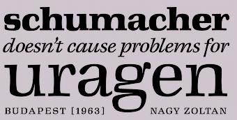 Tibor Szikora is a Budapest, Hungary-based type designer specializing in custom typefaces and lettering. He runs Cinketype. His typefaces:
 - Kass (2021). An informal typeface that was based on the handwriting and etchings of Hungarian illustrator Janos Kass.
- Crow Script (2021). A display typeface with calligraphic Dr. Caligari-style roots.
- Margaret Neue (2021). Inspired by Zoltán Nagy's Margaret from 1963.
- Szikora Sans (2021). A humanist sans.
- Luttor Variable (2020): This type family was inspired by the prim, but quirky, familiar, but often surprising letterforms of Ignac Luttor's writing system, the so-called Zsinoriras', from the late 1930's Hungary. The main source of inspiration was the first figure in the booklet "A Luttor-fele uj irasmod" [1936], where he compares the three levels of his writing system, from an unconnected, printed style to a connected, cursive hand.
- Cinke Sans (2021). A workhorse sans used on his own web site.
Future Fonts link. [Google]
[More] ⦿
|
C.J. Dunn
[CJ Type]
|
[More] ⦿
|
CJ Type
[C.J. Dunn]
|
 C.J. Dunn has a background in graphic design and typeface design, and studied under Ed Benguiat at The School of Visual Arts in New York. He worked on typefaces for Font Bureau, and continued his relationship with the Berlows at Type Network. He is a graduate of Type@Cooper, a postgraduate certificate program in typeface design, where he also assisted Sumner Stone & Sara Solskone in teaching typeface design. He started TypeNY.com to keep track of type related events in New York City. In 2016, he launched CJ Type. Some time later, CJ Type started selling their typefaces via Type Network.
 In 2017, he released the stunning 2-axis variable font Dunbar and writes: Dunbar is an exuberant geometric sans with a unique structure, including Tall and Low display versions for large sizes and a Text version for smaller sizes. Inspired by Jakob Erbar's Erbar-Grotesk, it is not a strict revival but interprets the design for contemporary applications, rediscovering some of Erbar's innovative ideas of alternate letterforms and proportions. Dunbar comes in large and small x-heights, Dunbar Tall and Dunbar Low. His other major typeface is Louvette (2017), a typeface with four optical sizes (Banner, Display, Text, Deck) and five weights. He explains: Louvette is a sharp, stylish, modern serif including a range of optical sizes from Banner to Text. The design of Louvette is optimized to maintain thin, elegant hairlines at a wide range of sizes. Ideal for publications and cultural institutions, exhibitions and fashion. The design process for Louvette started during Type at Cooper in 2010, under the guidance of Jesse Ragan, with an interest in reviving ATF Louvaine by Morris Fuller Benton for contemporary usage. After some helpful feedback from Christian Schwartz, the project soon evolved away from the source material to include a large optical size version with ultra thin hairlines, and to expand the weight into the fatface range of designs such as Ultra Bodoni, also by M. F. Benton. Further research into the italics led to sources such as Doppel Tertia Cursiv from J. F. Unger, Berlin, and the small heavy sizes drew inspiration from Compacte Romain by Enschedé, Haarlem. Typefaces from 2021: Pennypacker (a contemporary take on the Neue Moderne Grotesk lineage of early grotesks). Speaker at ATypI 2016 in Warsaw on A Proposal for a Common EULA. [Google]
[More] ⦿
|
Cláudio Rocha

|
 Cofounder of Now Type, Cláudio Rocha is an Italian Brazilian illustrator and designer (b. 1957) who was first based in sao Paulo, then in Treviso, Italy, and currently in The Netherlands. Now Type is jointly run with his son Lucas Franco (b. 2001). He edited Tupigrafia, a magazine dedicated to typography and calligraphy in Brazil. Partner of Oficina Tipografica Sao Paulo. His typefaces include:
 - ITC Gema (1998: a felt tip pen font) and ITC Underscript (1997, a grungy fat script).
- Cashew (2000-2020). Cashew is a rounded squarish sans serif font, originally created as a logotype for Tupigrafia magazine (2000). In its 2020 iteration, done together with Lucas Franco, it is a variable font with one axis, from Regular to Extended.
- Tenia.
- Viela Regular (Claudio Rocha & Lucas Franco, 2008-2019). A great thick-and-thin typeface.
- Unidin (sans display face).
- Rock Regular (slab face). Rock Titling (1998-2019).
- Old Future (a brush version of Futura).
- Chacal Pixel.
- Persplextiva (2001-2002, a bouncy hand-drawn 3d face done in the lettering style of Brazilian cartoonist Millor Fernandes).
- Liquid Stencil (1998-2000). A brush stencil.
- Feijoada Light.
- Akrylicz Grotesk (2002, brush/paint face).
- Sampa (1999-2019). An informal brush script.
- Genova (2008-2020). A reinterpretation of Paganini typeface, lauched by Nebiolo type foundry in 1928 for hand composition and developed by Alessandro Butti under the supervision of Raffaello Bertieri.
- Stampface (2006-2018, by Claudio Rocha and Lucas Franco). Based on a Headline Gothic metal type sample found in a reference book, which was designed by Morris Fuller Benton in 1936 for American Type Founders.
- Pieces Stencil (2016). Think piano key or Futura Stencil.
- Antonio Maria (2017): Antonio Maria, a font by Claudio Rocha and Lucas Franco, takes its shapes from the lettering found in the cover of Afixação Proibida (Display Prohibited), a book by the Portuguese poet Antonio Maria de Lisboa (1928-1953). In fact, Antonio Maria was the leader-writer of Afixação Proibida, a collective manifesto from 1949, that initiated the surrealist movement in Portugal. It is an inverted-contrast typeface with 150 ligatures and a large character set.
- Rudolf Antiqua and Rudolf Initials (2018). A faithful revival of Rudolf Koch's Koch Antiqua (1922). Followed by Rudolf Text (2017-2020, Lucas Franco and Claudio Rocha).
- Mefistofele. A revival in 2018 by Claudio Rocha and Lucas Franco of the modular stencil typeface Mefistofele (1930, Reggiani foundry).
- Rudolf Titling (Lucas Franco and Claudio Rocha), a typeface that won an award at Tipos Latinos 2018.
- Agora Titling Extra Light (2018).
- Pieces Stencil (2016-2019). Pieces is a piano key typeface built on a modular system with emphasis on diagonal endings.
- Moreira Serif (2019). A slab serif version of Morris Fuller Benton's art deco typeface Broadway (1927). In the 1930s, the Portuguese graphic artist Antonio Moreira Junior added serifs to Broadway's letterforms and marketed it under a new name. Moreira Serif revives that typeface.
- Scarpa Titling (2019, Claudio Rocha and Lucas Franco). An all caps typeface based on a nameplate found on the front door of a shoemaker in Treviso, Northern Italy.
- Anton (2020, by Claudio Rocha and Lucas Franco). An art deco typeface modeled after a Dutch deco type seen on the Anton Antonius Kurvers's cover of Wendingen in 1927.
- Esperanca Sans (2019). A Peignotian sans by Claudio Rocha & Lucas Franco.
- Jaguaribe (2020). In Unicase and Serif versions, by Claudio Rocha. A squarish sans and serif pair based on the of letterforms drawn by Brazilian artist Gil Duarte.
- Spinface (2020). An experimental turned letter font by Claudio Rocha and Lucas Franco.
- Werner (2020-2021). A revival of A.D. Werner's famous deco inline typeface Dubbeldik (1972).
- Densa (2020). Emulating 19th century wood types. Densa typeface was based on the Fantastic Voyage movie title in the 1966 poster
- Tegel (2020-2021). Tegel is a layer font that emulates the ceramic tile letters found on a school façade in Delft.
- Etna Futurist (2020, Claudio Rocha & Lucas Franco). Digital interpretation of Etna, a wood type produced by the Italian type foundry Xilografia Meneghello & Belluzzo, in the 1920s.
- Cassiano (2020). A super-fat octagonal typeface based on letters found on a book cover by the Brazilian artist Belmonte (1896-1947).
- Fortunato (2020). A digital interpretation of the lettering work done by the Italian Futurist genius Fortunato Depero (1892-1960) for advertising and editorial design. A pure Italian art deco typeface. The lowercases were developed from scratch.
- Jurriaan (2021). A square block typeface.
- Hendrik (2021, by Claudio Rocha & Lucas Franco). A revival of Simplex (Sjoerd Hendrik de Roos, 1937).
- Martin (Swing, Straight) (2020). A beatnik typeface based on the letters found in the jazz record albuns designed by David Stone Martin (1913-1992).
- Tesoura (2020). A paper-cut typeface.
He published the books "Projet Tipográfico" (Ed. Rosari), "Trajan e Franklin Gothic" (Ed. Rosari), and "Tipografia Comparada" (Ed. Rosari). Claudio now lives in Treviso, Italy, from where he launched the type magazine Tipoitalia in 2009. FontShop link. Klingspor link. [Google]
[MyFonts]
[More] ⦿
|
Clothilde Bouan
|
 In 2020, at The Type Department, Paul Coumoul, Clothilde Bouan and Antonin Bonnet published the display typeface Octane. It is a variable font with two axes, weight and width. Octane is a free font consisting of a total of 18 weights, but the free version consists in fact only of one variable font and it has no numbers. They explain that Octane was initially created to fit with any car designed by Pininfarina. [Google]
[More] ⦿
|
Coji Morishita
[M+ Fonts]
|
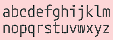 [More] ⦿
|
Corey Hu
|
 Machine learning engineer who studied at UC Berkeley.
 Github link. Google Fonts link. In 2021, he published the sans family Urbanist at Google Fonts. Urbanist is a low-contrast, geometric sans-serif inspired by modernist typography and design. The project was launched by Corey Hu in 2020 with nine weights and accompanying italics. It also includes two variable fonts. [Google]
[More] ⦿
|
Cosimo Lorenzo Pancini

|
 Born in Firenze in 1969. Cofounder with Francesco Canovaro and Debora Manetti of the Italian design firm in Firenze called Studio Kmzero. He co-designed some typefaces there such as Arsenale White (2009). In 2002, Pancini developed Targa, TargaMS and TargaMSHand (for comic books?), basing his design on the peculiar sans serif monospace typeface with slightly rounded corners and a geometric, condensed skeleton that Italy had been using for its license plates. In 2022, Francesco Canovaro redesigned this font into a versatile multi-weight typeface, Targa Pro, which includes Targa Pro Mono (which keeps the original monospace widths), Targa Pro Roman (with proportional widths), both in five weights plus italics, the handmade version Targa Hand, and Targa Pro Stencil.
 The handwriting of Lord Byron led Pancini to develop the brush script typeface Byron (2013, Zetafonts). MyFonts credits him with the rounded avant garde sans family Antipasto (2007), but elswhere we read that this typeface is made by Matteo di Iorio, so there is some confusion. It was extended in 2017 by Pancini as Antipasto Pro. In 2014, Cosimo Lorenzo Pancini and Francesco Canovaro co-designed Amazing Grotesk (+Ultra). He also designed the calm bold geometric rounded sans typeface Cocogoose (2014; replaced by Cocogoose Pro in 2017) and the stylish deco font Offensive Behaviour. Cocogoose Letterpress is free. Cocogoose is part of the Coco Gothic family, a collection of twelve typefaces each inspired by the fashion mood of every decade of last century, named after fashion icon Coco Chanel. Cocogoose is Coco Gothic for the 1940s. See also Coco Gothic Pro (2021). In 2015, Pancini published the grand family Coco Gothic. This Latin / Greek / Cyrillic typeface family features a small x-height and sligghtly rounded corners to make the avant garde and geometric sans typefaces in vogue in the 1970s come alive again, ready for 21st century fashion magazines. It comes with substyles that recreate many moods, including art nouveau and arts and crafts (Cocotte), Italian propaganda style and Italian deco (Cocosignum), hipster style (CocoBikeR), or Bauhaus (Cocomat). Coco Gothic was initially developed as a corporate font for Lucca Comics & Games Festival 2013. The rounded geometric sans family Cocomat (by Cosimo Lorenzo Pancini, Deborah Manetti and Francesco Canovaro) was inspired by the style of the twenties and the visions of Italian futurists like Fortunato Depero, Giacomo Balla and Antonio Sant'Elia. Updated in 2019 as Cocomat Pro. Still in 2015, Cosimo and Zetafonts published the connected creamy baseball script Bulletto, the grungy handvetica Neue, and the calligraphic wedding typeface Hello Script. In 2015, at Zetafonts, Cosimo Lorenzo Pancini designed CocoBikeR (2015) to celebrate the hipster and bike cultures. CocoBikeR (for Latin, Greek and Cyrillic) is part of the successful Coco Gothic typeface family. In 2017, Pancini designed the 1930s Italian art deco typeface families Cocosignum Maiuscoletto and Cocosignum Corsivo Italico. In 2021, he published the 48-style (+variable) font family Coco Gothic Pro. This is a redrawn and expanded set of fonts: Inspired by a biography of Coco Chanel and trying to capture the quintessential mood of classical fashion elegance, Cosimo Lorenzo Pancini designed Coco Gothic looking for the effect that the first geometric sans typefaces (like Futura, Kabel or the italian eponyms like Semplicita) had when printed on paper. The crisp modernist shapes acquired in printing charme and warmth through a slight rounding of the corners that is translated digitally in the design of Coco Gothic. [...] A distinguishing feature of Coco Gothic Pro is the inclusion of ten alternate historical sets that allow you to use the typeface as a true typographic time machine, selecting period letterforms that range from art deco and nouveau, to modernism and to eighties' minimalism. Equipped with such an array of historical variants, Coco Gothic Pro becomes an encyclopedia of styles from the last century. There is also attention to Darkmode and there is coverage of Cyrillic and Greek. Typefaces from 2016: Adlery (a curly brush script), Kitten (Fat, Swash, Swash Monoline, Slant, Bold: signage script family), Adlibitum (a blackletter typeface by Cosimo Lorenzo Pancini and Francesco Canovaro), Morbodoni (a display didone by Cosimo Lorenzo Pancini and Francesco Canovaro). In 2016, Cosimo Lorenzo Pancini, Andrea Tartarelli, Giulia Ursenna Dorati and Andrea Gaspari co-designed the 1940s vintage brush script typeface Banana Yeti, which is based on an example by Ross George shown in George's Speedball 1947 Textbook Manual. The Zetafonts team extended the original design to six styles and multilingual coverage. The ExtraBold is free. Still in 2016, Pancini designed Calligraphunk, an experimental typeface that mimicks polyrythmic calligraphy, by alternating two sets of lowercase letters to emulate handwriting. In 2016, Cosimo Lorenzo Pancini, Matteo Chiti, Luca Chiti and Andrea Tartarelli co-designed the retro connected brush script font family Advertising Script, which is based on an example from Ross George's Speedball 1947 Textbook Manual. Beatrix Antiqua (2016, by Francesco Canovaro, Cosimo Lorenzo Pancini and Andrea Tartarelli). This humanist sans-serif typeface is part of the Beatrix family (Beatrix Nova, etc.) that takes its inspiration from the classic Roman monumental capital model. Its capitals are directly derived from the stone carvings in Florence's Santa Croce Cathedral. Beatrix keeps a subtle lapidary swelling at the terminals suggesting a glyphic serif, similar to Hermann Zapf's treatment in Optima. Amazing Grotesk (2016) is based on a logo designed by Francesco Canovaro. Studio Gothic (2017, by Francesco Canovaro, Cosimo Lorenzo Pancini and Andrea Tartarelli) is an 8-style geometric sans family based on Alessandro Butti's geometric sans classic, Semplicita. Hello Script and Hello Sans can be used for layering and coloring. The Christmas-themed version is Hello Christmas. Pancini designed the 64-strong typeface family Body Grotesque and Body Text in 2017-2018, together with Andrea Tartarelli. It was conceived as a contemporary alternative to modernist super-families like Univers or Helvetica. In 2017, Cosimo Lorenzo Pancini and Andrea Tartarelli co-designed the sans typeface family Kabrio, which gives users four different corner treatment options. Anaphora (2018). Anaphora is a contemporary serif typeface designed by Francesco Canovaro (roman), Cosimo Lorenzo Pancini (italic) and Andrea Tartarelli. It features a wedge serif design with nine weights from thin to heavy. Its wide counters and low x-height make it pleasant and readable at text sizes while the uncommon shapes make it strong and recognizable when used in display size. Anaphora covers Latin, Greek and Cyrillic. Canovaro's Arista served as a basis for the 29-style monolinear rounded sans typeface family Aristotelica (2018) by Cosimo Lorenzo Pancini and Andrea Tartarelli. See also Aristotelica Pro (2020). In 2018, he designed the italics for Cosimo Lorenzo Pancini's Domotika typeface family. Between 2018 and 2021, Cosimo Lorenzo Pancini and Andrea Tartarelli developed the 8-weight humanist sans typeface Domotika for Latin, Cyrillic and Greek, further into the 18-style Domotika Pro (2021). In 2018, he published Radcliffe, with Andrea Tartarelli, a Clarendon revival with Text and Casual subfamilies. Radcliffe (a Clarendon revival by Cosimo Lorenzo Pancini and Andrea Tartarelli), and added the layerable condensed Cocogoose Narrows to the Cocogoose family. Codec (2018) by Cosimo Lorenzo Pancini, Francesco Canovaro and Andrea Tartarelli is a geometric sans typeface family in which all terminal cuts are horiontal or vertical. See also Codec Pro (2019). His Double Bass (2018) is a jazzy 4-style typeface family that pays tribute to Saul Bass's iconic hand lettering for Otto Preminger's The Man with the Golden Arm film title sequence and other movies, Bass's vibrating, almost brutal cut-out aestethics, and the cartoonish lettering and jazzy graphics of the fifties. In 2018, he published the sharp wedge serif typeface Blacker to pay homage to the 1970s. In 2019, that was followed by Blacker Pro (Cosimo Lorenzo Pancini and Andrea Tartarelli, who write: Blacker Pro is the revised and extended version of the original wedge serif type family designed by Cosimo Lorenzo Pancini and Andrea Tartarelli in 2017. Blacker was developed as a take on the style that Jeremiah Shoaf has defined as the "evil serif" genre: typefaces with high contrast, oldstyle or modern serif proportions and sharp, blade-like triangular serifs). Still in 2018, he designed the swooping polyrhythmic calligraphic typeface Calligraphunk. In 2018, Cosimo Lorenzo Pancini and Andrea Tartarelli designed Holden, a very Latin cursive sans typeface with pointed brush aesthetics and fluid rhythmic lines. In 2019, Cosimo Lorenzo Pancini, Francesco Canovaro and Andrea Tartarelli published the monolinear geometric rounded corner amputated "e" sans typeface family Cocogoose Classic, the sans family Aquawax Pro, and the condensed rounded monoline techno sans typeface family Iconic. In 2019, Cosimo Lorenzo Pancini, Andrea Tartarelli and Maria Chiara Fantini at Zetafonts published a slightly calligraphic Elzevir typeface, Lovelace. In 2019, the lapidary typeface family Beatrix Antiqua (Francesco Canovaro) was reworked by Cosimo Lorenzo Pancini together with Andrea Tartarelli and Maria Chiara Fantini into a 50-style type system called Monterchi that includes Text, Serif and Sans subfamilies. Monterchi is a custom font for an identity project for a famous fresco in Monterchi, developed under the art directorship of Riccardo Falcinelli. Tarif (2019) is a typeface family inspired by the multicultural utopia of convivencia---the peaceful coexistence of Muslims, Christians and Jews in tenth century Andalusia that played an important role in bringing to Europe the classics of Greek philosophy, together with Muslim culture and aesthetics. It is a slab serif typeface with a humanist skeleton and inverted contrast, subtly mixing Latin zest, calligraphic details, extreme inktraps, and postmodern unorthodox reinvention of traditional grotesque letter shapes. The exuberant design, perfect for titling, logo and display use, is complemented by a wide range of seven weights allowing for solid editorial use and great readability in body text. Matching italics have been designed with the help of Maria Chiara Fantini and Cosimo Lorenzo Pancini, while Rania Azmi has collaborated on the design of the arabic version of Tarif, where the humanist shapes and inverted contrast of the Latin letters find a natural connection with modern arabic letterforms. Late in 2019, Cosimo Lorenzo Pancini released the fun typeface family Hagrid at Zetafonts, which writes: Crypto-typography---the passion for unknown, weird and unusual character shapes---is a disease commonly affecting type designers. Cosimo Lorenzo Pancini has celebrated it in this typeface family, aptly named Hagrid after the half-blood giant with a passion for cryptozoology described by R. K. Rowling in her Harry Potter books. Extreme optical corrections, calligraphic counter-spaces, inverted contrast, over-the-top overshoots: all the inventions that abound in vernacular and experimental typography have been lovingly collected in this mongrel sans serif family, carefully balancing quirky solutions and solid grotesque design. In 2020, Pancini released Stinger (2020, a 42-style reverse contrast family by Francesco Canovaro, Cosimo Pancini, Andrea Tartarelli and Maria Chiara Fantini) and Boring Sans (a typeface family designed along two variable axis: weight and weirdness). As part of the free font set Quarantype (2020), Cosimo Lorenzo Pancini designed Quarantype Embrace, Quarantype Hangout, Quarantype Hopscotch, Quarantype Joyride, Quarantype Sackrace, and Quarantype Uplift (with Maria Chiara Fantini). In 2020, Cosimo Lorenzo Pancini and Mario De Libero revived Nebiolo's Carioli (1928) as Cairoli Classic and Cairoli Now at Italian Type / Zetafonts. They extended the original weight and width range and developing both a faithful Classic version and a Now variant. The Cairoli Classic family keeps the original low x-height range, very display-oriented, and normalizes the design while emphasizing the original peculiarities like the hook cuts in curved letters, the high-waisted uppercase R and the squared ovals of the letterforms. Cairoli Now is developed with an higher x-height, more suited for text and digital use, and adds to the original design deeper inktraps and round punctuation, while slightly correcting the curves for a more contemporary look. Cairoli Variable has a weight and width axis. In 2020, Cosimo Lorenzo Pancini and Mariachiara Fantini---with the help of Solenn Bordeau---released Erotique at Zetafonts. Erotique evolved from Lovelace, an earlier Zetafonts typeface. Zetafonts describe this evil serif as follows: it challenges its romantic curves with the glitchy and fluid aestethic of transmodern neo-brutalist typography. Late in 2020, they added Erotique Sans, the sans version of Erotique, also designed by Cosimo Pancini and Maria Chiara Fantini. Late in 2020, he co-designed the 46-style font family Eastman Grotesque together with Francesco Canovaro and Andrea Tartarelli. This monolinear sans with a tall x-height comprises an interesting Eastman Grotesque Alternate subfamily with daring and in-your-face glyphs. The typeface evolved from Zetafonts' earlier Bauhaus-inspired typeface Eastman (2020). Later fonts in this family include Eastman Condensed (2021, by Francesco Canovaro, Cosimo Pancini and Andrea Tartarelli). In 2020, Cosimo Pancini, Andrea Tartarelli and Mario De Libero drew the 60-style Cocogoose Pro Narrows family, which features many compressed typefaces as well as grungy letterpress versions. Sunshine Pro (2020, Zetafonts) was designed by Cosimo Lorenzo Pancini and Solenn Bordeau expanding the original Sunshine design by Francesco Canovaro, part of the Quarantype collection (2020), which in turn was designed as a typeface for good vibes against Covid-19. Sunshine Pro is an experimental Clarendon-style font with variable contrast along the weight axis---contrast is reversed in light weight, minimized in the regular weight and peaks in the bold and heavy weights. Coco Sharp (2021) is a 62-style sans feast, with two variable fonts with variable x-height, by Francesco Canovaro, Cosimo Pancini and Andrea Tartarelli. Co-designer of Heading Now (2021), a 160-strong titling font (+2 variable fonts) by Francesco Canovaro, Cosimo Pancini, Andrea Tartarelli and Mario De Libero that provides an enormous range of widths. Keratine (2021, Cosimo Pancini, Andrea Tartarelli and Mario De Libero). A German expressionist typeface that exists in a space between these two traditions, mixing the proportions of humanistic typefaces with the strong slabs and fractured handwriting of blackletter calligraphy. Pancini, its main designer, writes that it explores the impossible territory between antiqua and blackletter. Geppetto (2021) is a frivolous Tuscan font that started out as a revival of a condensed Tuscan wood type family appearing in the 1903 Tubbs Wood Type catalog and which was probably derived from an 1859 typeface by William Hamilton Page. Pancini built a variable font on top of it and calls it a font for fake news. In 2021, Pancini added Coco Tardis as a variable font with a time travel slider to the Coco Gothic family. Millard Grotesque (2021) is a true "grot" in the Akzidenz Grotesque sense of the word. This typeface family was designed by Cosimo Lorenzo Pancini and Andrea Tartarelli. Pancini's Descript (2021) is a variable script font with two axes, slant and speed of writing. Milligram (2021) is a very tightly set grot by Cosimo Pancini and Andrea Tartarelli. [Google]
[MyFonts]
[More] ⦿
|
CoType Foundry
|
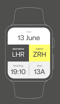 CoType is the London-based type foundry of Mark Bloom and Joe Leadbeater, est. 2019. Their typefaces include
 - Aeonik and Aeonik Pro (2018). A 14-weight sans typeface family by Joe Leadbeater and Mark Bloom. Aeonik supports Latin, Greek and Cyrillic, and is accompanied by a variable font. Followed in 2022 by Aeonik Mono and Aeonik Fono.
- Altform (2021). A low contrast sans family by Mark Bloom. Designed by mixing geometric and grotesque elements, it has many weights and is accompanied by a two-axis (weight, italic tilt) variable font.
- Ambit (2019). A sans by Mark Bloom: Ambit is an eccentric and unique sans serif font inspired by early grotesques, but adapted for the 21st century. It is characterized by the misbehaving curly lower case f and r glyphs.
- Coanda (2019). A techno typeface by Mark Bloom, who writes: Coanda: an ideology of the future, crafted from the past. Coanda honours the ambitious outlook of 20th century designers Wim Crouwel and Mimmo Castellano, and pays respect to the meticulous detail crafted by The Designers Republic.
- Orbikular (2020). A 5-weight modern typeface by Mark Bloom.
- RM Neue (2019). A sans by Mark Bloom. The first iteration of RM was released in 2011, followed by RM Pro in 2016. RM Neue is a completely redrawn and redesigned adaptation of RM Pro, previously available in only three weights. Bloom writes: Inspired by utilitarian neo-grotesques, RM Neue aims to be a timeless addition to each designer's font repertoire and has been designed to be clean and legible at all sizes.
- Betatron (2021). Sci-fi.
- Scandium (2021). a 14-style sans: Scandium is a contemporary sans with open shapes and a technical vibe inspired by the needs of the automotive industry---openness, performance, and style. With its modestly squared curves, high x-height, and vertical terminals, Scandium marries performance with purpose. It includes many icons and some emojis.
[Google]
[More] ⦿
|
Craceltype
[Joao Cracel]

|
 Type design studio in Lisbon, Portugal, founded in 2018 by type designer Joao Cracel. In 2019, Craceltype published the 18-style humanist sans typeface families Jano Sans Pro and Jano Sans Std. In 2020, they added Jano Round.
 Typefaces from 2021: Lydia Sans (a 24-style Latin / Greek / Cyrillic geometric sans in the Futura orbit; with two variable fonts). Amika (2020) is a 22-style low contrast tectonic sans typeface family. [Google]
[MyFonts]
[More] ⦿
|
Craig Eliason
[Teeline Fonts]

|
 [MyFonts]
[More] ⦿
|
Creative Media Lab
[Kadek Adi Mahardika]

|
 Bali, Indonesia-based designer (b. 1983) of Baruna (2018: vintage decorative font), Brotherley (2018), the hilarious Chef Characters Icons (2018), the sans typeface Drupadi (2018), the ball terminal typeface Cameo Sweet Gothic (2018), the handcrafted typefaces Miyake Signature (2018), Kiddo Handwriting (2018), Puralova Script (2018) and Children Alien (2018).
 Typefaces from 2019: Jollin, Jollin Family, Popstick (an ultra-smooth popart style rounded sans), Yellost (blackletter), Chalk and Pamor, Little Pea, Tropiello (Tuscan, Victorian), Pink Shark, Molga, Othelie (swashy and medieval), Brume, Little Pea, Kuashe (monoline), Lordish (blackletter), Blue Angel, Black Cameo (spurred), Puralova, Milova (a great calligraphic typeface). Typefaces from 2020: Zolina (a decorative sans, with a variable font added), Black Mango (a chic 10-style display sans with some flared stems; +a variable font), Mesdag, Prettywise (a decorative serif), Loubag (an elegant short-ascender vintage display typeface in ten styles), Kooka (a variable width stylish exaggerated wedge serif family), Belle Story (a high contrast display serif), Losta Masta (a decorative serif), Matterdi (a fashion mag family with an extremely large x-height), Popstone (psychedelic, with a variable font), Carpellon (a tattoo font), Dorris (a swirly psychedelic font), Losta Masta, Mavera (a modular display font), Rajjah Famillia (a blackletter), Allaina (a Victorian serif), Kaoly (a stylish bold serif), Cattedrale (blackletter). Typefaces from 2021: Losta Bonita (psychedelic), Black Mango (Kadek Mahardika) (display sans), Naskle (psychedelic), Reggy (psychedelic), Losta Frida (a curvy display serif), Parka (a decorative saber-edged stencil typeface in nine styles), Missy Voya (a decorative serif), Greyst (a fashion mag display typeface), Skinny Joe (revisiting the bell bottom 1980s in a wonderful wide display family), Morgy (intestinal), Magrit (an ultra-fat high-contrast display typeface), Pretty Boy (a decorative serif family), Catavalo (a 6-style fashion mag typeface), Voire (a swirly lachrymal serif family consisting of 18 fonts), Viva Kaiva (an intestinal and perhaps psychedelic typeface), Pink Crestelle (a ten style display typeface, and a variable font), Benoa (a 7-style decorative serif). Typefaces from 2022: Losta Nova (11 styles), Mango Style (10 styles; a stylish wide display sans with straight terminal endings: +a variable font), Cobya (a variable fashion mag family in 28 styles, influenced by ocean waves and liquids), Missy Voya (a stylish display serif), Losta Nova. [Google]
[MyFonts]
[More] ⦿
|
Cristi Bordeianu

|
 Iasi, Romania-based designer of the great mischievous retro sans typeface family Brightwell (2018), co-designed with Tudor Munteanu, with whom she runs Namogo. In 2018, Tudor Munteanu and Cristi Bordeianu co-designed the all-caps sans typeface Jaques. In 2018, Cris published the grotesque sans family Kentledge.
 In 2021, Cristi Bordeianu and Andrei Robu co-designed Champ, a starkly incised display typeface family ranging from fashionable ultra-heavy to a flared thin. It includes a variable font as well. [Google]
[MyFonts]
[More] ⦿
|
Cristóbal Henestrosa
[Estudio CH]

|
 [MyFonts]
[More] ⦿
|
CSS Tricks
|
A great article by Ollie Williams that explains how we should use variable Opentype fonts on web sites. [Google]
[More] ⦿
|
Cuchi qué tipo
[Carlos Campos]

|
Graphic and type designer based in Jaén, Andalusia. Carlos investigates street signs and traditional lettersigns in his city for a university project called Rótulos chuléricos de Jaén. His web site, Cuchi qué tipo, is both a blog on type design (in Spanish) and a showcase for his own typefaces. His type designs: - Berganza (2021). A text typeface that tries to revive the humanist and renaissance types in use during Spain's siglo de oro (Golden Age) from roughly 1492 until 1681.
- Guau (2020). A 20-style angular wedge serif text typeface and a variable font with three axes (italic, weight and width).
- Chavea (2020). A school script typeface.
- Perra and Despeñaperra (2019). Borrowing from the fat face genre.
- Gajorra (2019). Glyphs shaped like the gajorros dessert from Cabra.
- Escuela (2021). A 30-style grotesk.
[Google]
[MyFonts]
[More] ⦿
|
Dalton Maag
[Bruno Maag]

|
 Swiss designer Bruno Maag (b. Zürich) founded Dalton Maag in 1991, and set up shop in Brixton, South London. He serves the corporate market with innovative type designs, but also has a retail font line. Ex-Monotype designer Ron Carpenter designs type for the foundry. In the past, type designers Veronika Burian worked for Dalton Maag. A graduate of the Basel School of Design, who worked at Stempel and was invitedd by Rene Kerfante to Join Monotype to start up a custom type department. After that, he set up Dalton Maag with his wife Liz Dalton. He has built the company into a 40-employee enterprise with offices in London, Boston, Brazil (where the main type designer is Fabio Luiz Haag), Vienna and Hong Kong.
 The Dalton Maag team designed these commercial fonts: - Airbnb Cereal (2018). A sans typeface commissioned by Airbnb. Dalton Maag describes it as playful, open and simple.
- Aktiv Grotesk (2010). Published as an alternative to Helvetica, a typeface Bruno hates with a passion. It also covers Chinese, Japanese and Korean. In 2020, it became a 3-axis (weight, width, italic) variable font.
- Aller Typo.
- Almaq.
- Blenny (2014). A fat face didone by Spike Spondike.
- Bligh (2015). A three-weight sans family.
- Co (2007): a rounded monoline minimalist sans co-designed by Bruno Maag and Ron Carpenter.
- Cordale: a text family.
- Dedica (2007): a didone face.
- Effra and Effra Italic (2007-2009): sans family by Jonas Schudel and Fabio Luiz Haag. Followed in 2013 by Effra Corp.
- Elevon (2012). By Bruno Maag and Marconi Lima.
- Fargo (2004): a humanist sans in 6 weights.
- Foco. A sans family.
- Grueber (2008): a slab serif.
- InterFace (2007): an extensive sans family; one weight is free (2001). See also InterFace Corporate (2007).
- Kings Caslon (2007). By Marc Weymann and Ron Carpenter.
- Lexia (1999, Ron Carpenter and Dalton Maag): a slab serif family (Dalton Maag mentions the date as 2007). In 2019, Dalton Maag added Lexia Mono.
- Magpie (2008). A serifed family by Vincent Connare for Dalton Maag.
- Objektiv.
- Oscine (2014, by Bruno Maag, Ron Carpenter, Fernando Caro and Rafael Saraiva). A rounded organic sans typeface.
- Pan (1996). A text family at 1500 US dollars per style.
- Plume (2004): a display typeface inspired by calligraphy, co-designed with Ron Carpenter.
- Prometo. An organic stressed sans.
- Royalty (1999, +Royalty Obese, 2007): a stunning art deco display family.
- Scope One (2015). A free Google Font. It has a single light weight, whose slab serifs make it useful for headlines.
- Setimo (2015). By Fernando Caro. A distinguished sans.
- Soleto (2014, a simple sans by Bruno Mello, Fabio Haag, Fernando Caro, Rafael Saraiva and Ron Carpenter). Soleto won an award at Tipos Latinos 2014.
- Southampton.
- Sparkasse Serif (2003-2005). A custom typeface.
- Stroudley (2007): a sturdy large counter condensed sans by Bruno Maag, Ron Carpenter and Veronika Burian.
- Tephra (2008): a collaboration with Hamish Muir. This is an experimental multi-layered LED-inspired family.
- Tondo (2007, at Dalton Maag): a rounded information design sans family designed by Veronika Burian for Dalton Maag.
- Tornac (2013). A casual script.
- Ubuntu (2010): this is a team effort---a set of four styles of a free font called Ubuntu. This font supports the Indian rupee symbol. Some work for the Ubuntu Font Family was done by Rodrigo Rivas Costa in 2010. Download via Fontspace.
- Verveine (2009). A casual script by Luce Averous.
- Viato. A simple sans family co-designed by Bruno Maag and Ron Carpenter in 2007. This tapered terminal sans family includes Viato Corp (2007) and Viato Hebrew (2013).
Fonts sold at Fontworks, and through the Bitstream Type Odyssey CD (2001). At the ATypI in 2001 in Copenhagen, he stunned the audience by announcing that he would never again make fonts for the general public. From now on, he would just do custom fonts out of his office in London. And then he delighted us with the world premiere of two custom font families, one for BMW (BMWType, 2000, a softer version of Helvetica, with a more virile "a"; some fonts are called BMWHelvetica), and one for the BMW Mini in 2001 (called MINIType: this family comprises MINITypeRegular-Bold, MINITypeHeadline-Regular, MINITypeHeadline-Bold, MINITypeRegular-Regular). Other custom typefaces: Tottenham Hotspur (2006), Teletext Signature (by Basten Greenhill Andrews and Dalton Maag), Skoda (Skoda Sans CE by Dalton Maag is based on Skoda Formata by Bernd Möllenstädt and MetaDesign London), UPC Digital, BT (for British Telecommunications), Coop Switzerland (for Coop Schweiz), eircom, Lambeth Council, Tesco (2002), PPP Healthcare, ThyssenKrup (Dalton Maag sold his soul to these notorious arms dealers; TK Type is the name of the house font), Co Headline (2006), Co Text (2006, now a commercial font), Telewest Broadband, Toyota Text and Display (2008), TUIType, HPSans (for Hewlett-Packard, 1997). His custom Vodafone family (sans) (2005) is based on InterFace. In 2011, Dalton Maag created Nokia Pure for Nokia's identity and cellphones, to replace Erik Spiekermann's Nokia Sans (2002). The Nokia Pure typeface has rounder letters, and is simultaneously more legible and more rhythmic. In 2010, the Dalton Maag team consisted of Bruno Maag and David Marshall as managing and operations directors, and Vincent Connare as production manager. The type designers are Amélie Bonet, Ron Carpenter, Fabio Haag, Lukas Paltram and Malcolm Wooden. In 2015, Kindle picked the custom serif font Bookerly by Dalton Maag for their typeface. Still in 2015, Dalton Maag custom designed the sans typeface family Amazon Ember for Amazon for use in its Kindle Oasis. Free download of both Amazon Ember and Bookerly. Dalton Maag created the custom typeface family Facebook Sans in 2017. Bressay (2016). Stuart Brown led the design and did the engineering for Bressay (design by Tom Foley, Selma Losch, and Spike Spondike, at Dalton Maag, London), which won an award at TDC 2016. Later additions include Bressay Arabic [designers not identified by Adobe] and Bressay Devanagari [designers not mentioned by Adobe]. ATT Aleck is a large custom typeface family designed in 2016. Netflix Sans (2018): Netflix replaced Gotham to combat spiraling licensing costs and commissioned its own bespoke typeface: Netflix Sans under design lead Noah Nathan. Free download. The family include Netflix Sans Icon (2017). Comments by designers at The Daily Orange. In 2018, Dalton Maag designed the custom typefaces Itau Display and Itau Text for Itau Unibanco, a large Brazilian bank. In 2019, Dalton Maag produced a corporate typeface for Air Arabia. Venn (2019, Bruno Maag). A 5 weight 5 width corporate branding sans typeface, with an option to get Venn Variable. Typefaces from 2020: Dark Mode VF (a humanist sans designed specifically for digital user interfaces, offering subtle grade adjustments to counteract the effects of setting light type on a dark background, as is common with many dark mode digital reading environments; it has two axis in its variable type format---weight and dark mode), Highgate VF (a variable humanist sans inspired by traditional British stone carving), Goldman Sans (a free clean sans family that includes three variable fonts; Goldman Sachs lets you use it except to criticize the company or any other capitalist pigs). Interview in 2012 in which he stresses that typefaces should above all be functional. View the Dalton Maag typeface library. Speaker at ATypI 2016 in Warsaw and at ATypi 2015 in Sao Paulo, where he gave an electrifying talk on type design for dyslexics (with Alessia Nicotra). Speaker at ATypI 2016 in Warsaw. Speaker at ATypI 2017 Montreal and at ATypI 2018 in Antwerp. Adobe link. [Google]
[MyFonts]
[More] ⦿
|
Daniel Jones
[Type Union]

|
 [MyFonts]
[More] ⦿
|
Daniel Perraudin

|
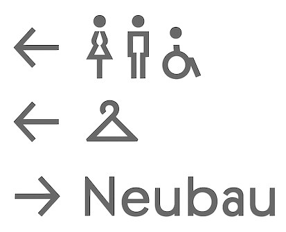 Daniel Perraudin (b. 1982) has worked with Uebele in Stuttgart, as a freelancer in Berlin, and since 2008 at the KMS team in München. Before that, he studied Information Design at Stuttgart Media University (Germany) and FH Joanneum Graz (Austria), where he graduated with distinction in 2007. He lives in Munich, Germany, and works as a designer in the areas of corporate design and typography. Founder and partner of Capitale Berlin/Vienna---a studio for branding, wayfinding systems and editorial design.
 His first release, the extensive Parka family of sans typefaces, started as part of his graduation project and benefited from the support of type designers Günter Gerhard Lange and Georg Salden. The Parka family was extended to 12 styles in 2008 and 2009, and was published by Font Bureau in 2010. Bergamo (2012) is a comprehensive angular book typeface. He studied in the Typemedia program at KABK Den Haag, class of 2012. His graduation project there is a typeface called Dato (Sans, Serif). Dato Serif is slightly angular and reads well at small sizes. In 2021, Fontwerk published his 18-style (+a variable font with weight and slope axes) family West, produced with the help of Andreas Frohloff and Christoph Koeberlin. Perraudin started development of the geometric sans West in 2013, and used it in the wayfinding system developed by Studio Gourdin and Capitale for Dresden's Gemäldegalerie Alte Meister. [Google]
[MyFonts]
[More] ⦿
|
Daniel Quisek
[NC Type (or: Netvarec Typefaces)]
|
[More] ⦿
|
Daniel Stuhlpfarrer
|
Berlin-based art director at Nulleins. Designer of the free squarish typeface Wean (2017). In 2019, he published the variable width display typefaces Innschbruck (sic) and Tschick, the experimental variable font Wabla, and the variable sans typeface Melange. At Type Departent, he published the all caps sans family Kritik (2020). The first design of Kritik was specially made for an architecture magazine and developed further over time. Type Department link. [Google]
[More] ⦿
|
Danijel Poldrugac
[Milatype]

|
[MyFonts]
[More] ⦿
|
Daria Zorkina
|
Daria Zorkina is a calligrapher and graphic and type designer based in Moscow. She graduated from British Higher School of Art and Design in 2009 and took a type design course from Ilya Ruderman. In 2017-18 was an intern at CSTM fonts type foundry. A talented calligrapher, she published the wavy Latin / Cyrillic variable typeface Flicker in 2020 at Tomorrow Type. Flicker is ideal for advertizing diarrhea medication. At the other end of the variable font spectrum, we find a tall bold condensed movie credit sans. In 2021, CSTM Fonts and Type Today released the 42-style sans family Loos (Latin, Cyrillic, Georgian), a typeface designed by Yury Ostromentsky, Ilya Ruderman, and Daria Zorkina. Advisers on Georgian included Alexander Sukiasov and Lasha Giorgadze. [Google]
[More] ⦿
|
Darkmode
|
 Darkmode refers to white type on black background. It is generally understood that for white type on dark printed matter should be bolder (than its black on white counterpart), while white text on a black screen should be thinner as the screen spews white in the reader's direction. Dalton Maag, in its presentation of its Darkmode typeface family writes: There are well-known optical and psychological effects in design which result in text presented white-on-black being perceived as larger and bolder than the same text presented black-on-white. This presents a challenge for consistent visual hierarchy on different backgrounds, especially when designing for emissive displays.
 Dalton Maag's Darkmode (2020-2021) is an adaptation of an earlier font by them, Stroudley, which was created for physical signage and wayfinding: Our [Dalton Maag's] aim for Darkmode was to translate Stroudley's fundamental characteristics of accessibility, readability, and legibility to on-screen reading, digital navigation, and electronic signage. Darkmode's open counters, tall x-height, humanist proportions, and clear and distinguishable characters all contribute to a comfortable reading experience, even at low resolutions or small sizes. The Darkmode family consists of eight static weights, ranging from Thin to Black, plus a variable font (VF) file, with both weight and darkmode [on/off] axes. Additional references include - A discussion of Darkmode by Nikolay Petroussenko, type designer at Fontfabric.
- A discussion of white-on-black typography at Typedrawers (2021). Some typophiles find the darkmode issue overrated (including Jasper de Waard and Scott-Martin Kosofsky), while others point to tools that may be readily available to automatically embolden or lighten weights (such as the Offset Curve filter in Glyphs (for designers), and CSS code snippets (for users and web site designers)). Peter Constable observes however that the weight axis does not do the exact same thing as Dalton Maag's "Darkmode" axis: weight affects advance widths; "Darkmode" does not. "Darkmode" is like what is often referred to as "grade": small adjustments in stroke weights to compensate for medium or context conditions that affect apparent weight without affecting advance widths.
[Google]
[More] ⦿
|
David Berlow

|
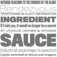 David Berlow (b. Boston, 1955) entered the type industry in 1978 as a letter designer for the Mergenthaler, Linotype, Stempel, and Haas typefoundries. He joined the newly formed digital type supplier, Bitstream, Inc. in 1982. After Berlow left Bitstream in 1989, he founded The Font Bureau, Inc. with Roger Black. Font Bureau has developed more than 300 new and revised type designs for The Chicago Tribune, The Wall Street Journal, Entertainment Weekly, Newsweek, Esquire, Rolling Stone, Hewlett Packard and others, with OEM work for Apple Computer Inc. and Microsoft Corporation. The Font Bureau Retail Library consists mostly of original designs and now includes over 1,000 typefaces. In a video made for Mike Parker's TDC medal in 2011, Mike Parker says that David Berlow is the most talented type designer he ever met. David lives in Martha's Vineyard.
 At ATypI 2004 in Prague, David spoke about Daily types. At ATypI 2009 in Mexico City, he spoke on The heart of my letter, (and the online version). Since that time he has been very active and vocal on the issue of high quality web fonts. Speaker at ATypI 2011 in Reykjavik and at ATypI 2014 in Barcelona. David Berlow Type Specimens (free pdf). Another type specimen booklet. Interview by A List Apart in 2009. Speaker at ATypI 2010 in Dublin. FontShop link. www.typovideo.de/david-berlow. David Berlow on web fonts. Interview by The Boston Globe. His typefaces: - Agency FB (1995). After Morris Fuller Benton's squarish typeface from 1932-1933 for American Typefounders.
- Amstelvar (2017). A variable (or parametric) font at Font Bureau. Contributors include David Berlow, Santiago Orozco, Alexandre Saumier Demers, and David Jonathan Ross. Open Font Library link, where one can download the font. Github link.
- Apres (2008, a sans with 40 styles). David Berlow and staff drew Apres as part of a series designed originally for the Palm Pre smart phone, for use both on the device and in print marketing. Simple, open letterforms and generous proportions provide a clear, comfortable, and inviting experience for navigation and readability.
- Belizio (1987-1988), a beautiful Clarendon-style slab serif modeled after the 1958 original slab serif by Aldo Novarese called Egizio Corsiva Nero. Claudio Piccinini would have liked Font Bureau to acknowledge Aldo Novarese's Egizio as the source of this family.
- Belucian (1990, by David Berlow and Kelly Ehrgott Milligan. Several weights exist, including Demi and Ultra.
- Berlin Sans (1997).
- Bureau Grotesque (1989). This 27-style family is now called Bureau Grot. Font Bureau's blurb: The current family was first developed by David Berlow in 1989 from original specimens of the grotesques released by Stephenson Blake in Sheffield. These met with immediate success at the Tribune Companies and Newsweek, who had commissioned custom versions at the behest of Roger Black. Further weights were designed by Berlow for the launches of Entertainment Weekly and the Madrid daily El Sol, bringing the total to twelve styles by 1993. Jill Pichotta, Christian Schwartz, and Richard Lipton expanded the styles further, at which point the family name was shortened to Bureau Grot.. Note: there is a custom version called M&C Saatchi Grotesque with truetype data created by dtpTypes in 1998.
- CalifornianFB.
- CheltenhamFB.
- Custer RE (2014), a typeface for small on screen use. The Font Bureau blurb: In 2009, a book from 1897 in the library of the University of Wisconsin caught David Berlow’s attention. It was set in a clear text face---a predecessor of Bookman---cast by the Western Type Foundry who called it Custer. Upon noting how well the typeface worked in point sizes of 6 and 7 points, Berlow developed it into a member of the Reading Edge series specifically designed for small text onscreen. Custer RE is a broad and approachable typeface drawn large on the body with a tall x-height to maximize its apparent size when set very small. The minimal stroke contrast and the hefty serifs let it stay exceptionally clear down to a font-size of 9px. Font Bureau.
- Decovar (2017). A variable font. Github link, where one can freely download the font family. See also Open Font Library.
- Desdemona (1992). An art nouveau face.
- Eagle (1889-1994). This art deco typeface Font Bureau Eagle was started in 1989 for Publish. David Berlow designed a lowercase, finished the character set, and in 1990 added Eagle Book for setting text. In 1994, Jonathan Corum added Eagle Light and Eagle Black to form a full series.
- Eldorado.
- Empire.
- Esperanto (1995).
- ITC Franklin Gothic (1991). In 2008, David Berlow added Condensed, Compressed and Extra Compressed widths to Vic Caruso's 1979 ITC Franklin interpretation (which had Light, Medium, Bold and Black), and Font Bureau sells a complete ITC Franklin now. In 2010, Berlow completed his definitive revision of ITC Franklin, a single new series of six weights in four widths for a total of 48 styles. Typeface review at Typographica.
- Giza (an Egyptian family.
- Hitech (1995).
- Juliana Text (2009), a rebirth of Sem Hartz's Juliana (1958, Linotype), a popular narrow legible paperback text face.
- Kis FB (2007): a revival of old style types by Nicholas Kis from ca. 1700.
- Letras Oldtsyle (1998). Letras Oldstyle was commissioned by Letras Libres, the reigning literary magazine published by Enrique Krauze in Mexico City. This garalde series was inspired by the earliest typefaces cut in the Americas in the early 1600s by printer Henrico Martinez. Proofs survive in the Biblioteca Nacional. Letras Oldstyle stands as the first typeface ever cut in the Americas, the root of American type design.
- Meyer Two (1994). Based on a 1926 type by L.B. Meyer.
- Millenium BT Bold Extended (1989, Bitstream). Also known by insiders as Starfleet Bold Extended, this font was used on federation starship hull markings until episode ten. MyFonts link.
- Moderno FB (1995): an exhibitionist didone in 32 styles, for Esquire Gentleman. In 1996 Berlow cut new styles with Richard Lipton for El Norte. In 1997, Roger Black ordered new weights for Tages Anzeiger. It grew further when the Baltimore Sun, with FB Ionic as text, was redesigned. The whole series was then revised for Louise Vincent, Montreal Gazette, with further styles added in 2005 for La Stampa. [It is my favorite type family at Font Bureau.]
- Momentum (2018). An in house variable font family for use on the Type Network web site.
- Nature (1995).
- Numskill (1990).
- Old Modern.
- Online Gothic (1995).
- Ornaments.
- Phaistos (1990-1991). A flared angular design done with Just van Rossum, and inspired by Rudolf Koch's Locarno.
- Poynter Agate.
- Reforma: Based on Giza.
- Rhode (1997).
- Roboto Flex (2017). A large free variable typeface family by David Berlow on commission for Google; based on Christian Robertson's original Roboto. Google Fonts link. Github link. Google redits Font Bureau, David Berlow, Santiago Orozco, Irene Vlachou, Ilya Ruderman, Yury Ostromentsky and Mikhail Strukov.
- Romeo.
- Scotch Roman (1993).
- Skia (1993, Apple). A Greek simulation sans, in the style of Twombly's Lithos, co-designed with Matthew Carter for Apple's QuickDraw GX project.
- Skyline.
- Titling Gothic FB (2005): Berlow spent 10 years developing FB Titling Gothic in seven weights of seven widths each for use as display and headline romans. It was inspired by the popular ATF Railroad Gothic and grew out of Berlow's own Rhode.
- Throhand: a classic family based on metal type found at the Plantin Moretus Museum in Antwerp.
- Truth FB (1995).
- Village.
- Vonness (2007): a newspaper sans family. Font Bureau: Vonness was designed by David Berlow working closely with Neville Brody on corporate redesign for Jim Von Ehre at Macromedia. Core weights are loosely based on Bauersche Giesserei's Venus, 1907-1910. Berlow expanded the ideas behind the series to 56 fonts.
- Yurnacular (1992, part of FUSE 4).
- Zenobia (1995).
View David Berlow's typefaces. Another catalog of David Berlow's fonts. Speaker at ATypI 2018 in Antwerp. [Google]
[MyFonts]
[More] ⦿
|
David Brezina

|
 Czech designer (b. Brno) who graduated with a Masters in Informatics at the Masaryk University in Brno in 2005, spent a term at the Denmark's Designskole in Copenhagen in 2004 and graduated with distinction from the MA in Typeface Design at the University of Reading in 2007, where he wrote a thesis on his typefaces called Skolar and Surat. Skolar won an award at Paratype K2009. It was designed with scholarly and multilingual publications in mind. See, e.g., Skolar Devanagari. Later David founded Rosetta Type.
 From 2004 to 2007, he ran his own design studio DAVI, with projects in graphic, web and interface design. Back in Brno, he worked with Tiro Typeworks (Canada) as an associate designer. At ATypI 2008 in St. Petersburg, he spoke about multi-script typography. His typefaces include - CODAN (2005): a typeface inspired by the city of Copenhagen.
- Yunnan (2004): oriental simulation face. Discussion on typophile.
- Skolar and Surat (2008). Skolar was designed for multilingual scientific publications and is a serifed typeface in the Menhart tradition. It was published in 2009 by Type Together, and it is also listed by Rosetta Type. Skolar Basic (2009, Type Together) is the official name of this 6-style text family. Surat is an accompanying Gujarati family. Related to that, he wrote The evolution of the Gujarati typographic script (2007, University of Reading). Rosetta writes: Skolar was originally designed for academic publications: its vast character set caters for 90+ Latin-script languages, and its Greek and Cyrillic extensions together with Latin transliterations add support for another 70+ languages. All scripts are available with small caps, superior and inferior letters, five sets of numerals and alternate character forms (see note about the versions below). A comprehensive set of arrows (easily accessed via OpenType) and bullets round off the character set to meet the needs of even the most complex editorial and academic text settings. The light and extrabold styles (upright and italics) were designed with help from Anna Giedrys and Elena Schneider. Skolar's Cyrillic harmonises well with the Latin in its careful balance of distinctive styling and solid performance. Designed in consultation with Alexandra Korolkova, it supports most Slavic languages as well as many others like Kazakh and Mongolian. Additionally, Skolar includes language-specific forms for Serbian and Bulgarian. The Greek is a modern interpretation of the classic styles found in academic works, and is characterised by lively, fluid forms and varying stress. It includes both monotonic and polytonic Greek, and was designed in consultation with Irene Vlachou and Gerry Leonidas. Complete Skolar family also supports Indic scripts Devanagari (codesigned with Vaibhav Singh) and Gujarati distributed separately. Skolar has received international praise at the 2008 ED Awards, and was also shortlisted as one of the best typefaces that year by I LOVE TYPOGRAPHY. In 2009, the Cyrillic was awarded a Special Diploma at the international type design competition Modern Cyrillic, and won the first prize in Granshan's Cyrillic text type category. In 2015, the 72-font family Skolar Sans (see also, Skolar Sans PE, 2016), codeveloped by David Brezina and Slava Jevcinova at Rosetta Type Foundry, won a silver medal at the European Design awards. Skolar PE was added in 2020.
- Yrsa and Rasa (2015, open-source type families published by Rosetta with financial support from Google). The fonts support over 92 languages in Latin script and 2 languages in Gujarati script (Gujarati and Kachchi). The design and production are by Anna Giedrys and David Brezina. Yrsa is the name of the Latin-only type family. Rasa is the name of the Gujarati type family. They explain: Both type families are intended for continuous reading on the web (longer articles in online news, magazines, blogs). In Yrsa, a special consideration was given to Central and East European languages and proper shaping of their accents. Rasa supports a wide array of basic and compound syllables used in Gujarati. In terms of glyphs included Rasa is a superset of Yrsa, it includes the complete Latin. What makes Yrsa & Rasa project different is the design approach. It is a deliberate experiment in remixing existing typefaces to produce a new one. The Latin part is based on Merriweather by Eben Sorkin. The Gujarati is based on David Brezina's Skolar Gujarati.
- Adobe Gujarati (2012).
- In 2019, at Rosetta Type, together with Slava Jevcinova and William Montrose, he released the variable font Adapter (with three axes, for latin, Greek and Cyrillic).
- In 2020, he released Handjet (started in 2018, at Rosetta Type), which is built on the principle of a dot matrix printer or handjet printer. Glyphs are made up of collections of individual modules that take 23 elemental shapes. The Handjet family covers Armenian, Arabic, Cyrillic, Greek, Hebrew and Latin. Github download link.
- Gridlite (2020, Rosetta Type) is a modular pixel typeface with adjustable foreground and background patterning. It also has a variable type format with three axes, Weight, Background, and Element Shape.
Blog. Myfonts link. Klingspor link. Speaker at ATypI 2013 in Amsterdam on the topic of multilingual type design. [Google]
[MyFonts]
[More] ⦿
|
David Jonathan Ross
[DJR Type]

|
 [MyFonts]
[More] ⦿
|
David Suid

|
 Type designer from Santiago, Chile, who created the neo-humanist sans typeface family Hartwell (2017, W Foundry). Hartwell comes in 18 weights from thin to heavy and features matching italics.
 In 2018, he designed Armin Grotesk (W Foundry: it pays homage to Armin Hoffmann, one of the prominent designers in the Swiss genre). In 2019, he released Friends at W Foundry, a 14-style modern sans characterized by a gaspipe lower case f. Typefaces from 2020: Moncler (+Variable; a 22-style all caps modernist font family), Armin Soft. Typefaces from 2021: Cassius (a 10 style garalde family with two additional variable fonts; it is characterized by the lower case a and s which appear to be vomiting). Typefaces from 2022: Neue Magnus (an 11-style neo-grotesk at Without Foundry). [Google]
[MyFonts]
[More] ⦿
|
D.B. Latner: Critique on Variable Fonts
|
D.B. Latner writes: I am glad Multiple Master fonts was mentioned, as this is remarkably similar to that technology from the mid-90s. But I am worried that many of the same reasons that MM failed (as well as the Panose numbering system) will play out again in this century, including: - Too much choice can cause more frustration rather than less.
- Hard to create consistency throughout a publication.
- Very difficult to spec the type ("no, I told you to use Helvetica 105cba7, not Helvetica 105a9e!")
- Hard to create a good UI, so only the hard-core font geeks get around to using it.
- Hard to convince software companies to include a technology that only font-lovers see the value of (look how long it has taken for even some basic OpenType formatting to catch on).
- Hard to design these fonts, so there end up not being very many of them.
I am very excited to read about this reintroduction of what is essentially MM fonts, because I LOVED that technology. But it's hard to think about without feeling a little sting of remembered pain from MM's death two decades ago. [Google]
[More] ⦿
|
Delve Fonts (was: Delve Media Arts)
[Delve Withrington]

|
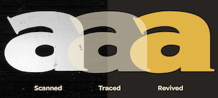 Delve Withrington (Alameda, CA; b. 1970, Asheville, NC) studied at Savannah College of Art and Design, designed signage, print projects and web pages in addition to designing custom typefaces, worked for Fontshop, and in 2004, joined the type team at Agfa Monotype, which morphed into Monotype Imaging, Redwood City, CA. From Asheville, NC, he moved around and ended up in San Francisco. In 1996, he founded Delve Fonts in Berkeley, CA (in fact, Delve Media Arts, and later renamed Delve Fonts). He has collected a virtually complete list of books on typography. Author index. MyFonts link. Designer of these typefaces:
 - Beleren (2015). A custom typeface for the trading card game Magic: The Gathering (Hasbro).
- Blasphemy Initials: a free (and also commercial...) spooky font.
- Blot Test (1999): a dingbat font inspired by the work of noted German psychologist Hermann Rorschach [1885-1922].
- Cody (1999): an informal comic book face.
- Continuo (1996): an all caps bilined outline face.
- Cortina (2011). A futuristic family by Joachim Müller-Lancé.
- Delve Hand (1996-2003).
- Eucalyptus Regular.
- Eulipia (1997-2003): organic.
- Helfa (2011). Delve writes: Readability is baked in with a generous x-height, fine proportions that have a medium height to width ratio, and reasonable contrast in stroke weight variation.
- Filmotype Washington (for Font Diner). Designer unidentified.
- Muskeg. A combination of German expressionism and brush styles.
- Oktal Mono (2012, a rounded octagonal modular typeface by Joachim Müller-Lancé and Erik Adigard of MAD studio in Sausalito).
- Peso (1999): an octagonal family inspired by a parking sign discovered in Guanajuato, Mexico.
- Quara (2009): a techno sans.
- Smith & Nephew (2003) and Smith & Nephew Cyrillic (2015), rounded sans typefaces in the style of VAG Rounded.
- Tilden Sans (2004-2009): low contrast, large x-height.
- Tome Sans (2020). A 10-weight sans superfamily, with a variable font option.
- Uppercut Angle (2011). A signage typeface by Joachim Müller-Lancé. It was originally developed for the Krav Maga training center of San Francisco.
- Ysobel (2009; winner of an award at TDC2 2010). Delve co-designed the newspaper type family Ysobel (Monotype) with type designers Robin Nicholas, head of type design at Monotype, and Alice Savoie (Frenchtype, Monotype). The sales pitch: According to Nicholas, the idea for the Ysobel typefaces started when he was asked to create a custom, updated version of the classic Century Schoolbook typeface, which was designed to be an extremely readable typeface - one that made its appearance in school textbooks beginning in the early 1900s. See also Ysobel eText Pro (2013).
His Art work often involves type. Bitstream's Type Odyssey 2 (2002) has Continuo, Blot Test, Peso, Peso Negative. In 2009, Steven Skaggs designed Rieven Uncial and Rieven Italic at Delve Fonts. Pic. Adobe link. [Google]
[MyFonts]
[More] ⦿
|
Delve Withrington
[Delve Fonts (was: Delve Media Arts)]

|
[MyFonts]
[More] ⦿
|
Deni Anggara
[Formatype Foundry]

|
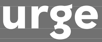 [MyFonts]
[More] ⦿
|
Denis Serebryakov
[Serebryakov Type Foundry (or: Serebryakov TF, S TF; was Onetypethree Foundry, or: Dzianis Serabrakou)]

|
[MyFonts]
[More] ⦿
|
Diego Aravena Silo
[Without Foundry (or W Foundry; was: Diego Aravena)]

|
 [MyFonts]
[More] ⦿
|
Diego Maldonado
[Notdef Type]

|
 [MyFonts]
[More] ⦿
|
Dino dos Santos
[dstype]

|
 [MyFonts]
[More] ⦿
|
Dirtyline Studio
[Hendra Maulia]

|
 Banda Aceh, Indonesia-based designer of the script typefaces Humblle Rought (sic) (2015), Nirmana (2015, brush type), Cecilia Script (2015), Stay High (2015, graffiti influence), Gracias Script (2015), Bowlist (2015), Miguella Script (2015), Islander Brush (2015), Zailla Script (2015), Funkiess (2015), Scarlet (2015), Amanda (2015, calligraphic), Natasya (2015, a creamy signage font), Violla Script (2015), Seulanga (2015), Cornish (2015), Butller (2015), Twice (2015), Evelyn (2015), Steelmond (2015), Humble (2015; also spelled Humblle with two l's), Swirlesque (2015) and Jeumpa (2015). Aka Dirty Line Type.
 Typefaces from 2016: The script typefaces Tendencia, Bull Stander (+Slab), Black Pearl Sans, Befolk, Wild Heart, Kick Hornet (brush style), The Beard, Drama Queen Script, Valiente Brush, Beautiful Dreams, Tropical (2016, in Brush Script, Brush, Brush Caps, Sans and Monoline styles), Rising Script, Rising Brush, Be Grateful, Sweetline, Lightening Sript, Zailla Script, Adorabelle Script, The Luxury, Harbour (brush type). In addition: Mortuguais, Black Heat (Victorian), Sweetline and Neptern (a Saul Bass style font). Typefaces from 2017: Significent, Lindsey Smith Script (signature font), Axewell, Matchstic (retro signage), The Booster (baseball script), Cursive Script, Kindness Typeface (signage brush), Conquer (dry brush), Significant, The Boundaries (signage script), Blinded (fat brush script), Maldives Script, Mind Blowing (brush), Skywalker (brush script), Reshuffle Script. Typefaces from 2018: Specta Retro Script (2018, a signage script by Hendra Maulia and Aulia Rahman), Hype Beast (brush font), Shockwave (SVG brush font), Humblle Rought (sic), Brewery (SVG font), Shanders (brush script), Hoodson (signage script), Emberblaze (brush font). Typefaces from 2019: Blackink (a tattoo font), Hatch (brush script), Matao Serif (a decorative didone typeface done with Aulia Rahman), Black Theory (brushed), Magnison Script (signage script), Hoodson Script, Hyperflow, Baby Boomer, Hereditary, Stereohead (dry brush), Metafora, Metafora Sans (free). Typefaces from 2020: Dx Sitrus (a 12-style display family), DX Rigraf (a 55-font sans, with a variable typeface on the side; the i and f are slab serif glyphs though), Hedgehock (a signage script), Hatch Brush (a dry brush script), Skywalker (a brush script), Matriver (a dry brush script), Adolle Bright (a quill pen script), Emerat (a heavy script), Nagaiya (a 15-style display sans (+a variable cut) characterized by sharp spurs; by Aulia Rahman and Hendra Maulia), Balecimo (a wild script), Scalter (a 42-style sign lettering typeface with Serif, Sans, Script and Variable options), Hazzard (script), Casta (a display serif in 55 styles; with a variable font), Cynthia Blooms (a signature script), Baby Boomer, Significent, Aliva Brush Script, Reshuffle Sans, Ancient Zurich, Rustler Barter (a display font done with Aulia Rahman), Neue Metana (a wide display sans by Aulia Rahman and Hendra Maulia), Mabrick Serif, Mabrick Signature. Typefaces from 2021: Wagon (an 18-style sharp-serifed typeface family with a dancing baseline), Dx Gaster (a 15-style display or headline serif, with two variable fonts tossed in the mix), Magtis (a 10-style retro fashion mag serif by Aulia Rahman and Hendra Maulia), Scalter, Harmond (a 47-style display serif family with art nouveau charm), Cigra (a decorative serif by Aulia Rahman and Hendra Maulia). Type department link. Typefaces from 2022: Garcia (a Picasso-esque display typeface by Aulia Rahman and Hendra Maulia), Consta (an 8-style display serif by Aulia Rahman and Hendra Maulia). [Google]
[MyFonts]
[More] ⦿
|
Displaay
[Martin Vacha]
|
 Displaay is Martin Vacha's type foundry in Prague set up in 2014. Martin Vacha studied at the Academy of Arts, Architecture and Design in Prague. His early fonts were designed during his studies at UMPRUM in Prague. His typefaces:
 - Greed (2020). A narrow sans (+variable font with a weight axis) originally commissioned by Anymade Studio for Polansky Gallery.
- Ofform (2019). A modular folded paper font by Marek Suchanek, Kristina Jandova and Martin Vacha that started out as a custom typeface for the fashion brand Ofform 3D.
- Dazzed (2019).
- Gellix BMM.
- Matter (2016-2017). A sans inspired by Akzidenz-Grotesk (1896, Berthold Type Foundry), Theinhardt (2009, François Rappo), Classic Grotesque (1926, Frank Hinman Pierpont), Neuzeit Grotesk (1928, Wilhelm Pischner), Helvetica (1957, Max Miedinger and Eduard Hoffmann), Unica (Team '77, Lineto), Plain (2013, François Rappo), Futura (1927, Paul Renner) and Avenir (1988, Adrian Frutiger). Matter Mono was added in 2021. Haffer (2021) is a cold version of Matter with strict horizontal or vertical terminals.
- Hellix (2011). A geometric sans with hipster elements. By 2020, he completed Fellix, Gellix, Hellix and Yellix.
- Natron (2012). A sans and its display companion, Natron Alt.
- Reckless (2012-2017). A text typeface inspired by Plantin and Times New Roman.
- Wallop (2013). A sans.
- Documan (2013). A rounded typeface that is part sans, part slab serif.
- In 2016, Marek Pistora and Martin Vacha published the technical, almost typewriter, sans typeface BC Sklonar at Briefcase Type: The Sklonar typeface was originally designed exclusively for Zdenek Sklenar's S Gallery's corporate identity, conceived by Studio Najbrt in 2011. Two years later however, the gallery, including several works of art, was destroyed in a gas explosion. During the time of its use, the typeface appeared in promotional materials, in exhibitions, and also in artistic publications. But first and foremost, it excellently complemented the clean gallery space created by architect Josef Pleskot.
- Roobert (2017). A bespoke typeface for Moogfest 2017 designed together with Anymade Studio. Roobert PX is a pixel font.
- Teodor (2019-2020). Martin writes: In Teodor you can find certain similarities with Romana (1892 Gustav F. Schroeder), Caslon 224 (1725 William Caslon and Edward Benguiat), Grouch (1970 Tom Carnase and Ronne Bonder) and Perpetua (1925 Eric Gill). It has a variable type option.
- Tobias (2019-2020), a transitional typeface with elements of Times, Times New Roman and Baskerville. Plus a variable font with a weight axis.
- Github link.
- Avantt (2021).
[Google]
[More] ⦿
|
DJR Type
[David Jonathan Ross]

|
 DJR Type (Conway, MA, and before that, Deerfield, MA, and before that Los Angeles, CA, and before that, Lowell, MA) stands for David Jonathan Ross Type. Originally from Los Angeles, he was a student at Hampshire College in Amherst, MA, where he studied information design and typographic tradition. In 2007, he joined Font Bureau as a junior designer and was assisting with custom projects and expanding Font Bureau's retail library. Soon after that, het set up DJR Type. In 2016, DJR Type joined Type Network and pulled all his typefaces from MyFonts. He also runs Font of the Month Club.
 In 2018, he was the tenth winner of the Charles Peignot Prize. His typefaces: - Manicotti (2010). An ultra reversed-stress Western saloon style typeface that won an award at Modern Cyrillic 2014. DJR Manicotti won an award at TDC2 2007. For a free lookalike, see Plagiacotti (2009, Saberrider).
- Lavinia.
- Climax Text (2006) is a text and display series that was designed for Hampshire's student newspaper.
- Trilby (2009, Font Bureau). Trilby is based on a 19th century French Clarendon of wood type fame.
- Condor (2010, Font Bureau). This is a 60-style art deco family. By 2020, it had a 3-axis (weight, width, italic) variable version.
- Turnip (2012) is an angular and manly text face, also published at Font Bureau.
- In 2013, Ross and Roger Blcak revived Nebiolo's Forma for the redesign of Hong Kong Tatler, a fashion mag, supervised and commissioned by Roger Black, who was then based in Hong Kong. Read about the whole process in this piece by Indra Kupferschmid. Page specially dedicated to DJR Forma. In 2021, Belgian national broadcaster VRT picked DJR Forma for all its entire range of media.
- Bungee (2013, Google Fonts) won an award at TDC 2014. This homeless typeface, which comes in Regular, Hairline, Inline, Outline and Shade versions, is free: Bungee is a font family that celebrates urban signage. It wrangles the Latin alphabet to work vertically as well as horizontally.
- In 2014, David Jonathan Ross created the formidable 168-style programming font family Input (Font Bureau). Input is free for private use. It won an award at Modern Cyrillic 2014 and in the TDC 2015 Type Design competition. See also the proportionally spaced typewriter family Input Sans.
- Gimlet (2016). A 112-style Opentype family loosely based on Georg Trump's 1938 typeface, Schadow, and advertized as funky and functional. Ross writes: Gimlet is half Schadow, half imagination, and nothing else. And like its namesake beverage, Gimlet is a little tart, a little sweet, and can really pack a punch. Gimlet Variable Bold Condensed followed in 2019. Gimlet XRay (2020) is an An experimental colorized version of Gimlet that exposes what goes on under the hood of a variable font, visualizing control points, bounding boxes, kerning, etc. Amazingly, this variable color font has six axes, weight, width, oncurve point size, offcurve point size, glyph utline weight and point outline weight.
- Fern and Fern Micro (2014, Font Bureau). A Venetian typeface designed for screen.
- Output Sans.
- Fit (2017, by David Jonathan Ross and Maria Doreuli). A tall black display family that runs from ultra-compressed to very wide. It screams Use me for the Oscars! Fit was first developed as a variable font. It won an award at Granshan 2017.
- DJR Lab, or Lab Variable (2017), is a free pixelish variable font.
- Under miscellaneous, we find an untitled French Clarendon and an untitled semi-serif.
- Font of the Month Club fonts from 2017: Nickel, Roslindale (Roslindale is a text and display serif that takes its inspiration from De Vinne, a Victorian oldstyle typeface named for the nineteenth century printer and attributed to Gustav Schroeder and Nicholas Werner of the Central Type Foundry), Zenith (blackboard bold), Crayonette (a revival of Henry Brehmer's scriptish Crayonette, 1890), Bild (a compressed headline font based on the American gothic type styles from the 20th century; a variable font followed in 2019), Pappardelle Party (spaghetti Western style), Roslindale Text, Klooster (followed in 2021 by Klooster Thin).
- Font of the Month Club fonts from 2018: Bradley DJR (a revival of the blackletter typeface Bradley, 1895, William H. Bradley), Extraordinaire, Rhody (slab serif), Map Roman (an all caps vintage mapmaker font), Output Sans Hairlines, Rumpus Extended, Roslindale Light, Merit Badge (a variable color font).
- A tech type virtuoso, he charmed me with his art deco variable font Extraordinaire (2018) that was influenced by the diamond-shaped forms found in the center of the city of Sao Paulo, Brazil.
- Typefaces from 2019: Heckendon Hairline, a condensed Clarendon.
- Typefaces from 2020: Dattilo (a variable style revival of Aldo Novarese's slab serif Dattilo (1974)), Pomfret.
- Typefaces from 2021: Rustique (rustic capitals), Megazoid (a chunky geometric sans), Job Clarendon (with Bethany Heck, who wrote: Job Clarendon is an homage to job printing---display-heavy designs made for posters and flyers in the heyday of letterpress printing. This style of Clarendons was wildly popular in this genre of work, and I've always been interested in how adaptable they were. The style was fattened, squished and stretched to accommodate lines of text both short and long and type foundries across the globe each found their own unique features to contribute to the Clarendon stew. Ross pulled the design to both extremes but had his work cut out as he explained: The chasm between Hairline and Black was far too wide to interpolate across effectively, so I incorporated new drawings in the Extra Light, Regular, and Bold weights to act as additional tentposts to support the design).
Speaker at ATypI 2016 in Warsaw and at ATypI 2017 in Montreal. Klingspor link. Home page. Adobe link. [Google]
[MyFonts]
[More] ⦿
|
Dmitrij Greshnev
[Green Type]

|
 [MyFonts]
[More] ⦿
|
Dmitry Rastvortsev

|
 Ukrainian type designer (b. 1977, Buryn) who graduated from Sumy State University in 1999. Since 2002, he creates digital fonts. He also works at Dancor advertising in Sumy, Ukraine, since 1997. Very prolific, his work includes a substantial number of commissioned typefaces for magazines and companies.
 He received a TypeArt 05 award for the display family DR Galushki (and DR Galushki Hole, 2011), which was designed for children's books. Other creations: LQ Wow and LQ Anisett (2010, for women's magazine LQ), LQ Didot (2011, also for LQ), Dekapot (grunge), Gomorrah (2013), Usquaebach (2013), Kinescope (2013), Goshen (2013), Rhode Black (2014), UT Magazine (2014), Madmix (2014, for Esquire), Variety Square (2015, for the nmagazine Variety), DR Agu (comic book face), DR Agu Sans (2013), DR Agu Script (2016), DR Trafaret (army stencil face), DR Vixi, DR UkrGotika Sans, DR UkrGotika Serif, Tsar Peter, Pelican (for Esquire magazine), Fugue. In 2014, Gayaneh Bagdasaryan and Dmitry Rastvortsev created the Latin / Cyrillic sans typeface family Brutal Type (Brownfox) that is genetically linked to DIN. His funny DR Krokodila won an award at Paratype K2009. In 2014, Dmitry Rastvortsev, Lukyan Turetsky, and Henadij Zarechnjuk cooperated on the design of the free Latin / Cyrillic handwriting typeface Kobzar KS, which is based on the handwriting of Taras Shnvchenko, a famous Ukrainian poet, artist and philosopher. In 2016, he designed the op-art typeface family DR Lineart. In 2017, he published the military stencil font DR Zhek. In 2018, he designed DR Ukrainka, which is inspired by the lettering works of these Ukrainian artists of the 1920s: Vasyl Yermilov, Vasyl Krychevscky, Heorhiy Narbut. He also designed Sumy for the branding type for the city of Sumy, Ukraine. Rastvortsev won an award in the kanji category at the 22nd Morisawa Type Design competition in 2019 for DR Kruk Single. In 2019, on commission for Banda for the National Art Museum of Ukraine, Dmitry Rastvortsev designed the Cyrillic (and Latin) family Namu, which has substyles according to various eras, from 1400 until today. On commission for Vinnytsia, he designed the free typeface family Vinnytsia ((a lapidary) Serif, Sans, City). He finished 2019 with the free sans-serif-display superfamily Kyiv Type, which consists of KyivType Variable, KyivType Sans, KyivType Serif, and KyivType Titling. Typefaces from 2020: DR Krapka Rhombus, DR Krapka Round, DR Krapka Square (a set of dot matrix typefaces). Behance link. Klingspor link. [Google]
[MyFonts]
[More] ⦿
|
Dohee Lee
|
Dohee Lee received a BA in visual communication design from Seoul National University. Her first Korean typeface, 134340, won a New Wave award from the Korea Font Association. Since joining Sandoll---the oldest and best known type foundry in Korea---in 2016, she has developed custom typefaces for major global brands along with retail fonts. She studied in the interdisciplinary Art Science program at the Royal Academy of Art (KABK) in The Hague. Speaker at ATypI 2019 in Tokyo on the topic of Building Hangul like an Architect: Utilizing Variable Fonts: In order to handle 11,172 glyphs of Hangul, designers often take an architect-like approach: they carefully devise a system to maintain consistency across all glyphs. This can't be done without sophisticated technology. Focusing on Smart Components and extensions in Glyphs 2, this presentation discusses how to categorize characters and how to create a Hangul development system. IBM Plex Sans KR (2019; by Mike Abbink, Paul van der Laan, Pieter van Rosmalen, Wujin Sim, Chorong Kim and Dohee Lee) is a free multilingual typeface at Google Fonts. [Google]
[More] ⦿
|
Dominic Huber
|
 Partner in Moiré (Zürich) who designs typefaces at Grilli Type in Switzerland. His typefaces:
 In 2012-2013, Grilli Type published Moiré's typeface family GT Pressura (with monospaced and proportional versions), which was inspired by type stamped on shipping boxes. GT Pressura was co-designed with Dominik Huber. - In 2014, Dominic Huber, Marc Kappeler and Noel Leu published the extensive text family GT Sectra (Grilli Type), which, in view if its breadth and angular design will prove to be one the world's major releases of 2014. Their blurb: GT Sectra was originally designed for the German-language magazine Reportagen, a bi-monthly publication specializing in literary reporting. Its long-form stories require a type- typeface that works well in text, but not at the expense of character. GT Sectra strikes that balance. GT Sectra won first prize in the TDC 2015 Type Design competition.
- In 2020, Dominic Huber and Marc Kappeler co-designed the 112-style GT Flexa at Grilli Type. Flexa is also a variable type with width, slant and thickness axes, and has a monospaced subfamily. GT Flexa is characterized by simple shapes and penetrating ink traps.
[Google]
[More] ⦿
|
Donald Tarallo
[Tarallo Design]

|
 [MyFonts]
[More] ⦿
|
Doni Sukma
[Letter Omega]

|
 [MyFonts]
[More] ⦿
|
DooType
[Eduilson Wessler Coán]

|
 Curitiba-based Brazilian digital type foundry, est. in 2008 by the successful and talented type designer Eduilson Wessler Coan (b. 1983, Curutiba). Myfonts link. Coan joined Fabio Haag Type. Their fonts:
 - Estado Serif (2006), co-designed with Ericson Straub (Straub Design) and Fabio Augusto for use in the Jornal O Estado do Paraná.
- DooSans (2006): custom design for the magazine abcDesign.
- Ninfa (2006-2008), an organic serif face. He calls it a modern semi-serif. Whatever. Ninfa won an award at Tipos Latinos 2008 in the non-text typeface category. Ninfa Serif followed in 2012. Ninfa Serif won an award in the typeface family category at Tipos Latinos 2012.
- Encorpada Black (2011) is a fat didone display face. It was extended to Encorpada Pro in 2012. Encorpada Classic was published in 2013. Encorpada Classic and Encorpada Pro won awards at Tipos Latinos 2014. In 2014, he published Encorpada Essential. In 2015, Eduilson added Encorpada Classic Compressed and Encorpada Classic Condensed.
- Fluence (2012) is a calligraphic typeface family. Fluence won an award at Tipos Latinos 2012.
- Tres Tres Chic (2012) is a very thin geometric fashion mag headline face.
- Maestra (2012) is a calligraphic copperplate script. Gorgeous, mouthwatering, heavenly, just about the perfect font. Future brides and grooms need look no further than this for wedding invitations.
- Niks Sans (2012).
- dT Delicatta (2012, revised in 2017) is a formal connected calligraphic script face, destined to win many awards.
- Unimed Sans, Unimed Slab and Unime Serif (2013) is a bespoke typeface family done for a Brazilian health insurance company, Unimed.
- Typefaces from 2014: Bommer Slab and Bommer Slab Rounded. Bommer Slab won an award at Tipos Latinos 2014. Accura (2014, a sans typeface created together with Thiago Bellotti).
- In 2015, he designed the techno sans family Sica (+Expanded, +Condensed) with Volnei Antonio Matrté Coan at DooType. Sica won an award at Tipos Latinos 2016.
- Bommer Sans (2016). A Latinized (i.e., curvy) humanist sans.
- dT Jakob (2017). This typeface started out in 2007 as a revival by Gustavo Soares in Paul van der Laan's class at KABK of Jakob Erbar's grotesk from 1927. It was refined and completed in 2017 at dooType with the help of Eduilson Wessler Coan. In 2018, Gustavo Soares and Eduilson Coan developed the variable inline and shadow font dT Jakob Variable Concept.
- dT Ampla (2018). A sans with some warmth.
- Salva (2021, Fabio Haag Type). A versatile workhorse sans family: Eduilson Coan was the lead designer. He was assisted by the Fabio Haag Type team of Henrique Beier, Ana Laydner and Fabio Haag himself.
- Seiva (2021, by Henrique Beier, Eduilson Coan and Fabio Haag). A distant relative of Didot, this exotic sans family is partitioned into Text, Display and Poster subfamilies, and welcomes variable font technology.
Klingspor link. Creative Market link. Behance link. MyFonts interview. [Google]
[MyFonts]
[More] ⦿
|
dstype
[Dino dos Santos]

|
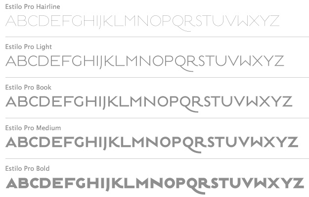 Established in 1994, dstype used to offer free fonts but has gone commercial now. It is run by Dino dos Santos (b. 1971, Oporto) from Oporto, Portugal. He graduated in Graphic Design at ESAD, Matosinhos. He received a Masters degree in Multimedia Arts at FBAUP, Porto. MyFonts place. In 2006 he won the Creative Review Type Design Competition in the Revival/Extension Family. At ATypI 2006 in Lisbon, he spoke about Portuguese lettering since 1700. Interview in 2007. Klingspor link. Author of A Letra Portuguesa, a book about Portuguese calligraphy. Dino created these typefaces:
 - Access (1997).
- Acta, Acta Display and Acta Poster (2011, +Poster swashes). A didone fashion mag family. First designed for Chilean newspaper La Tercera in 2010, DSType's Acta family is a clean information design type system. It includes Acta Symbols, an extensive dingbat family. Acta Var (2020) has two axes, weight and optical size.
- Acto (2012). Acto is a type system designed as the sans serif counterpart of the previous released Acta. Both type families were designed in 2010 for the redesign of the Chilean newspaper La Tercera.
- Andrade Pro (a modern) and Andrade Script Pro: based on the calligraphy of Andrade de Figueiredo, ca. 1722.
- Anubis (2003): a unicase face.
- Aparo (2013). A plumpish elegant high-contrast script face.
- Apice (2022). A highly structured calligraphic typeface with five optical sizes.
- Apud and Apud Display (2010): a high-contrast serif family.
- Aquila (2004).
- Ardina (2016). Done with Pedro Leal, this text typeface family has three optical sizes.
- Boldina (2004). A fat informal poster family with 18 weights and styles.
- Braga (2011, Dino dos Santos and Pedro Leal). This is a layered font design family. Dino writes: Braga is an exuberant baroque typeface, named after a portuguese city, also known as the baroque capital of Portugal. Our latest typographic extravaganza comes with a multitude of fonts designed to work like layers, allowing to insert color, lines, gradients, patterns, baroque, floral swashes, and many other graphic elements. Starting with Braga Base, you can add any of the twenty-three available styles, to create colourful typographic designs.
- A type system from 2014: Breve News, Breve Display, Breve Slab Title, Breve Sans Title, Breve Title, Breve Slab Text, Breve Sans Text, Breve Text. The Breve system includes modern design elements in the skeleton and ball terminals, transional elements, almost wedge-serifs in the serifed styles. As with most of dos Santos's typefaces, even the sans and slab styles exhibit Latin warmth and exuberance.
- Capsa (2008): a family that was inspired by, but is not a revival of the Claude Lamesle types Gros Romain Ordinaire and Saint Augustin Gros Oeil.
- Ception (2001): a futuristic sans family.
- Cimo (2017). A distinguished condensed sans.
- Cultura, and its improved version Cultura New (2013), a text book typeface family.
- Decline (1996).
- Denso (2019). By Dino dos Santos and Pedro Leal: a great condensed variable font with weight, serif and optical size axes.
- Digno (2022). A fuzzy text typeface family.
- Dione (2003): a sans; redone in 2009 as Dobra at TypeTrust. See also Dobra Slab (2009).
- Enorme (2020). Ultra massive and modular 3000-glyph mastodont of a constructivist font, by Pedro Leal and Dino dos Santos.
- Esta (2004-2005): extensive (transitional) text and newsprint family.
- Estilo (2005): a gorgeous and simple art deco-ish geometric headline face. This was accompanied by Estilo Script (2006), Estilo Text (2007, a 6-style rounded sans family), and later, Estilo Pro (2010, +Hairline).
- Ezzo: a sans family.
- Factor (1997).
- Finura (2009): this typeface has hints of University Roman.
- Firme (2014). A geometric sans for corporate use.
- Fragma (2003): squarish techno family.
- Girga (+Italic, +Engraved, +Banner, +Stencil) is a strong black Egyptian family designed in 2012 together with Pedro Leal at DS Type.
- Glosa (2008): Glosa is a meaty multi-style didone family. Glosa Text and Glosa Headline all followed a bit later in 2008, and Glosa Display in 2009.
- Hades (2012). A yummy and free blackletter typeface.
- Hypergrid (2002): octagonal.
- Ines (2015). A classic 7-style text typeface.
- Isento and Isento Slab (2017). Both are loosely based on ATF's Times Gothic.
- Lucius (Sans, Serif) (2022). The Lucius type family began as an attempt to reproduce the Principios Methodicos para as Letras Aldina e Roman---Typo Portuguez, but went went way beyond that in its multi-faceted execution.
- The Quase family (2017): Quase is a very free interpretation of the types found in the Specimen of Printing Types by William Caslon from 1785. We wanted to start with Caslon and then transform it into an editorial typeface, hence the increase of the x-height and the radical reduction of the ascenders and descenders. Subfamilies: Quase Headline (12 styles), Quase Poster, Quase Display, Quase Text.
- Idem and idem Display (2021).
- Dino dos Santos and Pedro Leal published Jules in the summer of 2015---a fat fashion mag didone 45-style family inspired by several plates from Portuguese calligrapher Antonio Jacintho de Araujo; it comes in Big, Colossal and Epic. They followed up in 2017 with Jules Text.
- Kartago (2005): based on Roman inscriptions from Cartago.
- Keiss (2017) and Keiss Text (2021). A Scotch roman with a lot of contrast. Keiss Text comes in twelve styles and features short descenders and ascenders, along with three very distinct optical sizes. It was designed with contemporary newspapers in mind. In 2021, he added Keiss Title, Keiss Condensed, Keiss Big (14 styles) and Keiss Condensed Big.
- Large (1999) and Large Pro (2006).
- In 2020, Dino dos Santos and Pedro Leal designed Larga, which was inspired by the typefaces shown in the specimens of the Fundiçãao Typographica Portuense from 1874. Larga is a wide all caps family and comes with a variable opentype format.
- Leitura, Leitura Headline, Leitura News, Leitura Sans, Leitura Symbols, Leitura Display (2007): the 31 styles were all made in 2007.
- Logica (2016). A classical text typeface.
- Maga (2012). A text family.
- Methodo (2005): calligraphic penman typefaces.
- Missiva (2004).
- Monox and Monox Serif (1998-2000): a monospaced family.
- Ni Sans, Ni Slab, Ni Serif (2018).
- Musee (2006): a transitional family with ornaments and borders.
- Nerva (2004). A subdued Trajan typeface with flaring.
- Nitida (2017). A 114-font family with five optical sizes.
- Nyte (2012). A serifed text family.
- Otite (1995).
- Outside (1996): grunge.
- Parco (2021). A compact headline typeface with large x-height.
- Plexes (2003). See also Plexes Pro (2006).
- Pluma (2005): a series of three exquisite calligraphic flowing scripts called PlumaPrimeyra, PlumaSegunda and PlumaTerceyra). Inspired by the typographic work of Manuel de Andrade de Figueiredo that was published in 1722: "Nova Escola para Aprender a Ler, Escrever e Contar, offerecida a Augusta Magestade do Senhor Dom Jao V, Rey de Portugal".
- Poesis (1999).
- Pratico UI and Pratico Slab UI (2022).
- Prelo (2008): A sans family for magazines, it has styles that include Hairline, Hairline Italic, Extra Light, Extra Light Italic, Light, Light Italic, Book, Book Italic, Medium, Medium Italic, Semi Bold, Semi Bold Italic, Bold, Bold Italic, Extra Bold, Extra Bold Italic, Black, Black Italic, Slab and Prelo Condensed.
- Priva Pro (2006): a sans family that includes Greek and Cyrillic).
- Prumo (2011-2012). A 92-font family originally created for the redesign of the Argentinian newspaper La Nacion. Released to the public in 2013, it covers low and high contrasts, and has slab serif styles as well as Scotch Roman styles. So, it is more a type system or type collection than one single typeface: Prumo Banner, Prumo Deck, Prumo Display, Prumo Poster, Prumo Slab, Prumo Text.
- Quadricula (1998).
- Quaestor and Quaestor Sans (2004). Roman inscriptional typefaces.
- Recita (2019). A sturdy oldstyle text typeface family.
- Resea (2004) and Resea Consensed: Bank Gothic style typefaces.
- Solido (2012) is a versatile type system with five widths: Solido, Solido Constricted, Solido Condensed, Solido Compressed and Solido Compact. In total there are 35 fonts. In 2020, a variable font was added to Solido. Codesigned with Pedro Leal.
- Synuosa (1999): an experimental typeface showing only the top half of the characters.
- Tecla (2018). After Printype, a typeface developed in the early twentieth century for the Oliver Typewriter.
- Terminal (1996).
- Titan and Titan Text (2003).
- User (2012), User Upright (2012), and User Stencil (2012). Monospace type families.
- Velino (2010): an extensive family including Velino Text, Velino, Velino Condensed, Velino Compressed, Velino Poster, Velino Sans, Velino Sans Condensed, Velino Display (+Compressed Display, +Condensed Display). This didone superfamily is sure to win a ton of awards.
- Ventura (2007): based on the calligraphy of Portuguese calligrapher Joaquim José Ventura da Silva, ca. 1802, who wrote Regras methodicas para se aprender a escrever os caracteres das letras Ingleza, Portugueza, Aldina, Romana, Gotica-Italica e Gotica-Germanica in 1820. It had a "Portuguese Script". Do not confuse Ventura with Dieter Steffmann's font by the same name made many years earlier. Ventura won an award at TDC2 2008).
- Viska (2015, by Dino dos Santos and Pedro Leal) is designed for small print.
- Volupia (2005): a connected advertising face.
DS Type also has typefaces by other type designers, such as Pedro Leal. They worked with leading companies, world scale events and well-known design agencies including: Appetite, Banco CTT, Banco Economico, BBDO, CondéNast, CTT Correios de Portugal, Electronic Arts, Errea Communicacion, Erste Bank, ESPN, Expo 2020 Dubai, Fifa World Cup 2018 Russia (the Ducha typeface), Garcia Media, Gatorade, Gruner + Jahr, Hearst, Innovation, King Games, McCann-Erickson, Meredith, Palmer Watson, Pentagram, Sagres, Starbucks, The New York Times (the Nyre typeface), Vox Media and Wolff Olins. View Dino dos Santos's typefaces. DS Type's typeface library. [Google]
[MyFonts]
[More] ⦿
|
Dusan Jelesijevic

|
 Serbian graphic designer located in Gornji Milanovac, Serbia. Cofounder in 2009 with Slobodan Jelesijevic, his father, of the Serbian foundry Tour de Force. Creator of these typefaces:
 - Dusan Script (2009, Ascender: a monoline informal hand-printed script).
- Artvod (2009, slabby and octagonal at the same time).
- Qiltray (2009, handwriting for long texts).
- Punkerro Crust (2009, delicious scratchy type).
- Rough the Type (2009, blackboard style).
- Shuma (2009, handwriting).
- Dolina Script (2010).
- Econs (2010, ecology dingbats).
- Sensor (2010, an ink-trap monoline face).
- Enforcer (2010, an elliptical headline sans).
- Epruveta (2009).
- Passage (2010, a great art deco family, including Initials and Borders).
- Amanet (2011). A flared display face.
- Osmacka azbukovica (2011). A Cyrillic font made by his kids in school.
- The clean-cut semi-humanist sans family Centim (2011).
- The Egyptian typefaces Saxophone Soprano and Saxophone Baritone.
- Debelly (2011), one of the best typefaces to come out of Tour de Force. They say about this elegant fat poster face: Debelly is catchy fat typeface, with lovely geometric shapes. Inspired with contrast strokes, with square joins, Debelly gives an impression of retro style combined with contemporary trends. It is designed specially for packaging, posters, logotypes or headlines, even it can be pretty handfull in smaller sizes. Contains 375 glyphs.
- Epitet (2011). A simple monoline family built around elegant elliptical shapes.
- Refren (2012): A monoline script face.
- Equator (2012): An avant-garde caps headline family.
- Brisko Sans (2013). A straightforward sans family. Extended to Brisko Display (2012).
- A day before Serbia was crushed by the Belgian soccer team, Dusan published the organic sans typeface Publio (2013).
- Kamenica (2013). A display sans. Followed in 2017 by the gorgeous Kamenica Texture typeface family.
- Nervatica (2013). A children's book font.
- Lasta (2013) is an informal serif typeface advertized as poetic.
- Selektor (2013). A geometrical almost techno sans family. This was followed by Selektor Slab (2013).
- Bartender (2013). A copperplate typeface.
- Lumier (2013). An all caps geometric sans family inspired by art deco posters from the interwar period. Followed by Lumier Texture and Lumier Rounded (2018).
- Scholle (2014). A bouncy two-style inline family with cartoonish elements.
- Hedon and Hedon Display (2014). A hedonistic sans that exhibits the sort of contrast one finds in inscriptional types.
- Lumberjack (2014). A bouncy fat cartoon typeface. Not to be confused with Thiago Bellotti's Lumberjack (2013, Mushroom Type), it was renamed 24 hours after its first appearance to Lumberjacky.
- Trampoline (2014). A funky typeface.
- Dondolare (2014). A primitive hand-drawn typeface.
- Balcon (2014) and Balcon Round (2014, a condensed rounded sans).
- Scripton (2015). An urban wall brush type.
- Manzello (2015: a workhorse text typeface).
- Pleyo (2015). Hand-crafted, perhaps for children's books.
- Dusan Script (2015).
- Fartitudo (2015). Just for the name alone, this typeface deserves a medal. Fartitudo is a 3-style handcrafted all caps poster family in a genre that was kickstarted by Pintassilgo in Brazil.
- Avram Sans (2016).
- Dambera (2016) and Dambera Retro (2016). A connected script, perhaps suitable for children's books. Crazymond (2016). Hand-crafted semi-connected script.
- Lunatino (2016). A poster script.
- Plonker (2016). An all caps hand-printed typeface.
- Fine New Bonbons (2016). A quaint candy store script.
- Napolitanka (2016). A delicate high-fashion hifgh-contrast didone.
- Businessland (2016). A rough handcrafted poster typeface.
- Escondida. A high-contrast connected script.
- Alonga (2017). A serif family with considerable contrast characterized by sharp triangular serifs.
- Nula (2017). A 22-style humanist sans typeface family.
- Mymoon (2017: a geometric sans in 22 styles), Mymoon Stencil, Mymoon Stencil Texture.
- Landsick (2018). An intense script.
- Blond (2018). A sans family that tends towards the humanist side.
- Penfriend (2018). A script typeface.
- Modny (2018). A fashion mag Peignotian sans family with a gorgeous inline style.
- Stropha (2018). A compact slab serif family.
- Hlad (2018). A distinguished 5-weight incised / lapidary typeface family.
- Masny (2019). A no-nonsense modern sans family in 22 styles.
- Connectica (2019). A retro connected script.
- Dietal (2019). A condensed squarish military parade slab serif. Accompanied by Dietal Sans (2019).
- Mondish (2019). A stylish sans family, perhaps best suited for fashionable environments.
- Edicia (2019). A charming serifed typeface family.
- Plaisir (2020). A serifed text family that oozes style.
- Roanne (2020). a 44-style sans family characterized by a yawning lower case a.
- Prego (2020). A 23-style Peignotian sans.
- Prelom (2020). A retro wedge serif family in 15 styles.
- Hartia (2020). A 10-style serif.
- Silqa (2020). An art deco typeface on Novichok.
- Finoteca (2020). A beatnik font.
- Kondes (2020). A 20-style condensed squarish sans with variable styles.
- Lupio (2021). In 20 styles: a variable and static geometric sans family.
- OK Moral (2021). A Western font.
- Ragazzi (2021). A 21-style with a didone skeleton but dwarfed serifs and sharper terminals.
- Metropola (2021). A Victorian era sans accompanied by a variable font.
- Stray (2021). An 18-style geometric sans for Latin and Cyrillic, with pinched connections.
- Ancress (2021). A wide geometric sans in 14 styles.
- Klaud (2021). A 14-style slab serif of Clarendon pedigree.
- Fabular (2021). A twelve-style display serif.
- Cat Fight (2021).
- Bottled Moon (2021). A Victorian serif.
- Povetarac (2021) and the superfamily consisting of Povetarac Didone, Povetarac Display, Povetarac Sans (2022). Each subfamily has 6 or 12 styles and contains a variable font.
- Poruka (2022). A monolinear script.
- King of August (2022). A retro signage script.
Behance link. MyFonts link. His most popular typefaces showcased. Fontspring link. Klingspor link. View Dusan Jelesijevic's typefaces. [Google]
[MyFonts]
[More] ⦿
|
Dyaharum Pungki Revitasari
[Jolicia Type]

|
 [MyFonts]
[More] ⦿
|
Eaver Studio (or: Wahyu & Sani Co)
[Wahyu S. Adi Wibowo]

|
 Wahyu & Sani Co is the duo of Sani Sanjaya and Wahyu Wibowo in Magelang, Indonesia. In 2021, Wahyu Wibowo set up Eaver Studio. Designers of the display typeface Bouncy Hunter (2016), the dry brush typeface Little Antelope (2016), the script typeface The Signals (2017, Serif, Script), and the signage brush typeface Handstyles (2016).
 In 2019, they designed Genera (a 44-style almost monoline sans family; by Wahyu Wibowo), Kiyana Display (a high-contrast display sans), the 18-style sans typeface Creo, the stylish typeface Regatto, the connected script Lambo, the techno typeface Tenika, the flared typeface Pocus Primera, the fashion mag typeface Kiyana, the flared serif typeface Serat, the font duo Melanic Black, the script typeface Heinsler, the display typeface Borui and the 20-style geometric sans typeface Guerrer (by Wahyu Wibowo). Typefaces from 2020: Frock (a swashy 16-style sans), Algera (a 20-style spurless, almost organic, sans), Berka (a 14-style mixed genre sans), Regave (a 24-style (+variable) typeface inspired by Danish lettering of Knud Valdemar Engelhardt (1882-1931) who designed the street signs for the Copenhagen suburb of Gentofte. Engelhardt's design was loosely based on the lettering of two Danish architects of the time: Thorvald Bindesbøll (designer of the Carlsberg logo) and Anton Rosen. The signs were so successful that they are still in use today; Regave features the cut-off Danish g), Neufreit (an 18-style sans), Morn (an interesting geometric sans in 20 styles: all counters, e's excepted, are perfect circles), Scatio (an information design sans family), Goldbill (a 56-style geometric sans with short (Goldbill XL), regular or tall (Goldbill XS) ascenders and thus inversely proportional x-heights; + two variable styles). Typefaces from 2021 at Wahyu & Sani: Serat Ultra, Revaux (a decorative didone; 14 styles), Geliat (a sans in 44 styles). Typefaces from 2021 at Eaver Studio: Biryllo (script), Tenar Black (a display serif influenced by Souvenir and Cooper Black). Typefaces from 2022: Genera Grotesk (22 styles, plus a variable font). MyFonts link for Sani Sanjaya. [Google]
[MyFonts]
[More] ⦿
|
Edgar Walthert
|
 Type and graphic design pages by Edgar Walthert, b. Sursee, Switzerland. In 2007, he graduated from the TypeMedia program at KABK in Den Haag. Since then he is free-lancing. He completed TazIII in 2008 for Lucas de Groot in Berlin. In 2008, he moved to Amsterdam to work as an independent graphic and type-designer. In Amsterdam, he hosts Letterspace Amsterdam, a monthly series of lectures about experimentation, innovation and research in type. In 2021, he set up Font Spectrum together with Daniel Maarleveld.
 His typefaces include Agile (2007, a sans family done at KABK), Grosse Pläne, Instant Schrift (2000: Redesign of Isonorm 3098 matching the radical restrictions of the Instant design-manual), and Sonic Waves (an experimental typeface that was created for dublab, a radio station based in Los Angeles, and was drawn using sound waves that can actually be played as an audio file). Agile was further developed in 2011 with weights ranging from hairline to fat, and appeared in 2013 as a retail typeface at Incubator / Village. He published the constructed sans typeface family Logical in 2018 at Bold Monday / Type Network. His typefaces at FontSpectrum: - Purple Haze (2021-2022). Purple Haze is an experimental variable typeface with a readable regular weight and decorative dot matrix-themed extremes. The font works best when being animated or interacted with.
His corporate typefaces: - Toneelmakerij typeface by Edgar Walthert in collaboration with Esther de Boer for the identity of the Dutch theater company De Toneelmakerij. Contains many icons.
- Alpen Display and Text (2018), custom typefaces for Bühne Burgäschi by Edgar Walthert. Inspired by classic Swiss tourism posters from the 1930s and '40s. Alpen Display and Alpen Text is currently being further developed and will be released as Arosa Display, Arosa Text and Arosa Script.
- De Patronenmaker typeface. For a website designed by Johannes Verwoerd, Walthert created a variable font based on the open source typeface Publica by Gustavo Ferreira, by pushing its extremes to 0 and 11. The website uses the same 26kb font file for all animations, menu and body text.
- This Is Africa typeface for Ghetto Radio in Nairobi by Edgar Walthert, with Esther de Boer.
[Google]
[More] ⦿
|
Eduardo Omar Rodríguez Tunni

|
Buenos Aires-based graphic designer and prolific type designer who runs Graphic Design Firm. Since 2005, he has been teaching typography together with Marcela Romero and Pablo Cosgaya at the Centro Cultural Ricardo Rojas. Behance link. Klingspor link. Fontspace link. Google Plus link. Interview by MyFonts. His typefaces, haphazardly organized: - Average (2005, Google Web Fonts). A text face. The sister family is Average Sans (2012, Google Web Fonts). Average won an award at Tipos Latinos 2008 in the extensive family category.
- Linear Book Serif (2003). A humanist font.
- Colona (2004). A serif family.
- Lineare. A six weight sans family. See also LineareA3Versalita (2004). Lineare Serif (Tipo) is characterized by heavy serifs.
- The roundish titling face Titulata (Tipo). See also here. Accompanied by Titulata Italic (2007).
- The classic text family Gilda Roman.
- Alexa. A sans family.
- With Pablo Cosgaya, he designed Loreto (2004). This family was inspired by the types printed in the Manuale ad Usum (1721). The family appeared in 2009 at Tipo.
- He is (was?) working on Average Italic (2006, serif), Astor (2007, sans) and Yeca Serif (2006).
- Think (Tipo). This typeface won an award at Tipos Latinos 2008 in the non-text category.
- Club Universo (2008, with Mariana Pariani). This typeface won an award at Tipos Latinos 2010.
- Changa (2009). This rounded black poster typeface won an award at Tipos Latinos 2010. See also Changa Italic. Google Font Directory link. The Arabic was also drawn by Eduardo Tunni, in Buenos Aires, in collaboration with M. Gaber in Cairo.
- Lassi Display (2009, with Dario Muhafara). This typeface won an award at Tipos Latinos 2010.
- Merienda One (2011, a brush script). Free at Google Web Fonts.
- This experimental face (2004).
- Mate (2011). A free readable text typeface at Google Font Directory.
- Arapey (2011, Google Font Directory) is a didone family named after a Uruguayan town.
- Lemon (2011). A free signage typeface at Google Web Fonts.
- Unlock (2011). A free quadraplegic typeface at Google Web Fonts.
- Diplomata (2012, +SC) is a free openface typeface publihed at Google Web Fonts).
- Glegoo (2012, Google Web Fonts) is a modern slab serif.
- Imprima (2012, Google Web Fonts) is a very readable humanist sans with large counters and a large x-height.
- Graduate (2012, Google Web Fonts) is an athletic lettering font. The 12-axis variable version followed in 2019. Github link.
- Belleza (2012, Google Web Fonts) is a humanist sans typeface with moderate to high stroke contrast.
- Orienta (2012) is a free sans typeface at Google Web Fonts.
- Warnes (2012). A fifties diner connected script that is free at Google Web Fonts.
- Orienta (2012, Google Web Fonts) is a large x-height wide-eyed sans.
- Combo (2012, Google Web Fonts) is an eggheaded headline face.
- Paprika (2012) is an expressive informal typeface. Free at Google Web Fonts.
- Unica (2012) is a unicase sans, also at Google Web Fonts.
- Strait (2012) is a cold sans. Google Web Fonts link.
- Faster (2012, Google Web Fonts) is a retro typeface that gives the illusion of speed.
- Kite One (2012, Google Web Fonts) is a rounded monoline humanist sans.
- Offside (2012, Google Web Fonts) is a monoline stroke font.
- Joti One (2012, Google Web Fonts. A retro futuristic typeface.
- Croissant (2012, Google Web Font). A non-connected formal upright script.
- Gilda Display (2012, Google Web Fonts) is a serifed typeface with high stroke contrast.
- Sintony (2013, Google Web Fonts).
- Gabriela (2013, Google Web Fonts). From Gabriela, he derived the Latin / Cyrillic / Devanagari typeface Kurale in 2015. It too is free at Google Web Fonts.
- Pathway Gothic One (2013). See also Pathway Extreme (2019), and its fork, Kamillo Grotesk (2019).
- Fauna One (2013).
- Amita (2015, Google Web Fonts) is a Latin and Devanagari typeface derived from Redressed and Modular Infotech Devanagari 2310 and 1228. The Latin is a script type designed by Brian Bonislawsky which blends script and italic letterforms together in an upright non-connecting style. Github link.
- Arya (2015) is a Devanagari and Latin sans typeface that is based on Modular InfoTech's 1201. Github link. Google Web Fonts link.
- In 2015, Pablo Cosgaya, Eduardo Tunni and the crew of Omnibus Type published the text typeface Manuale. Google Fonts link.
- Changa (2018, Tipo). A layerable typeface family.
[Google]
[MyFonts]
[More] ⦿
|
Eduilson Wessler Coán
[DooType]

|
 [MyFonts]
[More] ⦿
|
Edwina Lee
|
Edwina Lee works for the Taiwanese foundry Arphic Technologies. Speaker at ATypI 2013 in Amsterdam How to find or develop matched Chinese typefaces for existing Latin typefaces. She also spoke at ATypI 2017 in Montreal and at ATypI 2018 in Antwerp, where together with Jeff Wu of Arphic she pointed out the challenges of designing variable Chinese fonts. Speaker at ATypI 2019 in Tokyo. [Google]
[More] ⦿
|
EK Type
[Sarang Kulkarni]
|
 Type design collective in Mumbai, India, est. 2013, managed by Mumbai-based Sarang Kulkarni (b. 1980). Sarang studied at the Sir J J Institute of Applied Art in Mumbai, class of 2002. He worked with R.K. Joshi at the National Centre for Software Technology and Design Temple in 2002. In that same year, he assisted R.K. Joshi with the design of the Jana Gurmukhi typeface. In 2008 and 2009, he created 11 Indic typefaces for Vodafone India. In 2009-2010, he created an additional eight typefaces for Virgin Mobile India. Kulkarni also runs White Crow Designs.
 Typefaces at Ek Type from 2011 by Hanif Kureshi include Painter Umesh, Painter Kafeel, and Painter Suhail. In 2013, Girish Dalvi and Yashodeep Gholap co-designed Ek Devanagari at Ek Type for Hindi, Marathi, Sanskrit, Konkani and Nepali. It is a contemporary, humanist, monolinear typeface available in seven weights. Its companion, also designed by them, is the humanist sans typeface family Ek Latin (2013). Designer of Modak (2013, Ek Type), a Latin / Devanagari bubblegum typeface that was published in the Google Web Font collection in 2015. Modak Devanagari was designed by Sarang Kulkarni and Maithili Shingre and Modak Latin by Noopur Datye with support from Girish Dalvi and Pradnya Naik. Github link. Another Github link for Modak. In 2012, he designed Star Jalsha, a Bengali television screen font for Star India Pvt Ltd. In 2016, Ek Type designed the free Latin / Devanagari / Gujarati font Mukta Vaani. More precisely, it was designed by Noopur Datye and Pallavi Karambelkar with support from Sarang Kulkarni and Maithili Shingre. Google Fonts link. Github link. In 2017, EK Type released Jaini and Jaini Purva designed by Girish Dalvi and Maithili Shingre: Jaini is a devaagari typeface based on the calligraphic style of the Jain Kalpasutra manuscripts. The design of this font is based on the 1503 Kalpasutra manuscript. In 2020, EK Type published the devanagari typeface Gotu at Google Fonts. Niranjan collected these EK fonts: - Mukta (Girish Dalvi, Yashodeep Gholap)
- Baloo (Sarang Kulkarni)
- Modak (Sarang Kulkarni, Maithili Shingre)
- Jaini (Girish Dalvi, Maithili Shingre)
In 2022, Ek Type released a multi-script (variable) Indic typeface family that includes Anek Telugu, Anek Malayalam, Anek Latin, Anek Kannada, Anek Gurmukhi, Anek Tamil, Anek Odia, Anek Gujarati, Anek Devanagari, and Anek Bangla. Contributors of this project are: Maithili Shingre (Anek Malayalam, Anek Kannada), Yesha Goshar (Anek Latin, Anek Odia), Kailash Malviya (Anek Devanagari), Aadarsh Rajan (Anek Tamil), Sulekha Rajkumar (Anek Bangla), Vaishnavi Murthy (Anek Kannada), Omkar Bhoir (Anek Telugu), Mrunmayee Ghaisas (Anek Gujarati), Mahesh Sahu (Anek Odia), and Sarang Kulkarni (Anek Gurmukhi). Project management and design assistance by Noopur Datye, and Font engineering and design assistance by Girish Dalvi. Ek Type won an award at 25 TDC in 2022 for Anek. The designers mentioned in the TDC press release are Girish Dalvi, Noopur Datye, Sarang Kulkarni, Aadarsh Rajan, Kailash Malviya, Mahesh Sahu, Maithili Shingre, Mrunmayee Ghaisas, Omkar Bhoir, Sulekha Rajkumar, Vaishanvi Murthy, and Yesha Goshar. Github link for Anek. Behance link. White Crow Designs link [White Crow was established in 2005 in Mumbai by Sarang Kulkarni]. Typophile link. Behance link. White Crow Designs. Fontsquirrel link. Github link. Fontsquirrel link. [Google]
[More] ⦿
|
Eko Bimantara
[Type Dish]

|
 [MyFonts]
[More] ⦿
|
Elena Schneider

|
Graphic designer from Dortmund, Germany, who lives in Husavik, Iceland. Her design company is called Elefont. After studying visual communication in the university of applied sciences in Dortmund, she co-founded the design studio Radau. Graduate of the University of Reading in 2011. Elena designs logos, retail and custom fonts. She is a visiting lecturer at HBK Saar and LHI Reykjavík, and a mentor at Alphabettes, a network to support and promote women in the type industry. Creator of these typefaces: Eskorte (2011, her graduation project), Eskorte Persian (2011), Klebo (2011, mechanical / octagonal), Eskorte Armenian (2011), Paroli (2011, a bold rounded signage face, Die Gestalten), and Biec (2012). In 2013, Eskorte was published by Rosetta Type. Eskorte supports Arabic, Farsi, Urdu, and over ninety languages using the Latin script. Titus Nemeth was consulted for the Arabic portion. Cargo Collective link. In 2016, Elena Schneider and Miles Newlyn co-designed the almost reverse contrast typeface family New Herman. In 2019, she published the experimental techno typefaces Halunke and Konsole at Future Fonts. She writes about Konsole: Konsole is a clean sans serif typeface with a touch of technology. Inspired by audio equipment, it gives off robotic energy. A variable font was added in 2019. Still in 2019, she released the German expressionist typeface Birra Bruin at Darden Studio. At Tomorrow Type, she released the Cyrillic version of Halunke (2020). Future Fonts link. [Google]
[MyFonts]
[More] ⦿
|
Eli Heuer
|
Font engineer and open source software advocate located in Seattle, WA. Before that, he studied mathematics at CUNY in New York. His typefaces: - Epistle. An old-style typeface.
- Toren Mono, Toren Proportional, Toren Rotalic. Use Modify link for Toren.
- Contributed to Titillium Web VF.
- Contributed to Orbitron VF.
- Contributed to Staatliches (a Google font).
- Micro Grotesk (2021). He writes: A classic sans-serif typeface as a 256-UPM variable font, designed to have a small file size.
- GTL Naskh (2020), is a contemporary Naskh typeface for the Perso-Arabic script.
- Isotherma (2015). A free blackletter font.
- Rena (2021).
- Gnu Grotesk.
Interview. Use Modify link. Github link. [Google]
[More] ⦿
|
Elias Hanzer
[Hanzer Liccini]
|
 [More] ⦿
|
Ellen Luff
[Ellen Luff Type Foundry (was: Miss)]

|
 [MyFonts]
[More] ⦿
|
Ellen Luff
[Peregrin Studio]

|
[MyFonts]
[More] ⦿
|
Ellen Luff Type Foundry (was: Miss)
[Ellen Luff]

|
 London, UK-based Ellen Luff (b. 1992) is a type designer with a background in advertizing and a passion for beautiful design. Her fonts are used worldwide, with clients from Apple and NBC, to Russian nuts and remote bars in the Atacama Desert. In 2021, Ellen Luff Type Foundry joined The Type Founders. Her typefaces:
 - The partially free condensed sans typeface family August (2017).
- The free bilined titling typeface Leyron (2017).
- Lucy Rose (2017). Co-designed by Tom Anders Watkins and Ellen Luff.
- Kiona (2017). A stylish 4-family all caps fashion sans typeface. Free regular weight.
- Bison (2018). A sans family by Tom Anders Watkins and Ellen Luff. Bison Bold is free.
- The Peignotian fashion mag typeface Athena (2018), which was published in 2019 as Athens. Athena Regular is free.
- Kiona (2019). A modern all caps family by Ellen Luff and Tom Anders Watkins.
- The paint emulation font Hackney SVG (2019).
- The geometric sans family Aventa (2020), which comes with a variable style.
- The condensed sans typeface August (2020).
- Ardela Edge (2020). A 66-font all caps family with a tech feel. It includes two variable fonts.
- Larken (2020). A flared sharp-edged display serif family.
- Jeko (2020). A 20-style (+variable) geometric sans with a large x-height.
- Brixton SVG (2020). A letterpress emulation font.
- Denton (2021). A 14-style expressive sans, with two variable fonts.
- Peckham Press (2021). A letterpress emulation font.
- Sherman Display (2021). A soft-edged wood type all caps font by Ellen Luff and Tom Watkins.
Type Department link. Link to Peregrin Studio, which Ellen Luff and Tom Watkins co-founded in 2021. [Google]
[MyFonts]
[More] ⦿
|
Elliott Amblard

|
 Elliott graduated in graphic design at EPSAA (Ecole Professionnelle Supérieure d'Arts Graphiques et d'Architecture de la ville de Paris, France) in 2012.
 Together, Elliott Amblard (France) and Gia Tran created the bold signage / retro baseball script typeface Paname FY at FontYou in 2014. At Long Type, he created Oradour: Inspired by french vernacular lettering, it is also a very contemporary re-interpretation of Eurostile typeface (Aldo Novarese) by stripping it from this dated aesthetic. FontYou link. In the TypeMedia program at KABK in Den Haag, he designed Emil for his graduation in 2015. Emil is situated between a text typeface and a slab serif typeface. It is characterized by convex stems and low contrast and includes a Hairline weight. In 2016, he published Yuzu at Indian Type Foundry. It is a simple yet effective straight rounded sans typeface family. Guide (2016), also published by Indian Type Foundry, is a wayfinding and traffic sign sans typeface family. In 2017, Elliott Amblard and Théo Guillard designed Read Greek Condensed, which won an award at TDC Typeface Design 2018. In 2018, Elliott Amblard and Jérémie Hornus co-designed the information design humanist sans typeface family Drive. It is accompanied by the more typewriter-styles families Drive Mono and Drive Prop, and published by Black Foundry. Angus (2018) is a multiplexed rounded sans typeface family by Elliott Amblard that includes a variable font. [Google]
[MyFonts]
[More] ⦿
|
Emma Marichal
[Minitype]
|
[More] ⦿
|
Erhan Kaplan
|
At Mimar Sinan Fine Arts University in Istanbul, erhan Kaplan designed these typefaces: Zek (2019: a variable graffiti font) and Perihan No. 29 (2019: a variable Peignotian typeface). [Google]
[More] ⦿
|
Eric Olson
[Process Type Foundry]

|
 [MyFonts]
[More] ⦿
|
Erik Van Blokland
[Skateboard for RoboFont]
|
[More] ⦿
|
Erik van Blokland
[LettError]

|
 [MyFonts]
[More] ⦿
|
Erwin Denissen
[Font Creator / High Logic]
|
[More] ⦿
|
Estudio CH
[Cristóbal Henestrosa]

|
 Cristóbal Henestrosa (Estudio CH, Tlalpan, Mexico) is the Mexican designer (b. 1979, Mexico City) who co-founded Círculo de Tipógrafos in Mexico. He is professor at four universities in Mexico and an award-winning type designer [read on for details]. Henestrosa has a bachelor's degree in graphic communications from the National School of Plastic Arts (ENAP) of the National Autonomous University of Mexico (UNAM), where his student project in 2003 was Espinosa, and a Master's degree in typographic design from the Center for Gestalt Studies, Veracruz, August 2009, where his thesis was entitled Fondo. La familia del Fondo de Cultura Económica. He is professor of typography and type design at UNAM. He has also taught at the National Fine Arts Institute's School of Design. In 2012, Cristobal Henestrosa, Laura Meseguer and José Scaglione coauthored Como Crear Tipografias (Brizzolis S.A., Madrid, Spain). He lives in Heroes de Padierna, Mexico.
 Designer of Espinosa, mentioned here. Author of Espinosa. Rescate de una tipografía novohispana (México, Designio, 2005), a book about Antonio de Espinosa, a 16th century Mexican typographer, who in all likelihood cut the Espinosa type. The commissioned text family Fondo (2007) won an award in the TDC2 2008 competition and at Tipos Latinos 2008 (for extensive type family). Creator of the angry hand-printed typeface Prejidenjia (2008, with Luis Novoa). Speaker at ATypI 2009 in Mexico City, where he introduced the work of 16th century printer Antonio de Espinosa to the world. Espinosa Nova (2009) won an award at TDC2 2010 and a grand prize at Tipos Latinos 2010. Guaca Rock (2009) is a stone chisel typeface based on the logotype of the rock band Botellita de Jerez. Gandhi (jointly designed with Raul Plancarte) won an award at Tipos Latinos 2012. Soberana Sans (Raúl Plancarte and Cristóbal Henestrosa), made for the Mexican Government in 2012-2013, won an award at Tipos Latinos 2014. Ayotzinapa (2015, by Raul Plancarte and Cristobal Henestrosa) won an award at Tipos Latinos 2016. His titling typeface Royal Charter won an award at Tipos Latinos 2018. This is a digital revival by Cristobal Henestrosa based on an experimental typeface named Charter, designed yet never fully finished by William Addison Dwiggins. It is an upright italic, unconnected script typeface, whose main features are a pronounced contrast, condensed forms and exaggerated ascenders. While Dwiggins worked on this project from 1937 to 1955, he only completed the lowercase and a few other characters. However, it was used to set a specimen in 1942 and a short novel in 1946. The sources that Cristobal used for Royal Charter (and later, Mon Nicolette) were the original sketches by WAD as well as printing trails kept at the Boston Public Library, and a copy of the 1946 edition of The Song-Story of Aucassin and Nicolette. This gorgeous typeface can be used successfully in headlines, subheads and short passages of text from 12 points onwards. It was published in 2020 as Mon Nicolette at Sudtipos, where the help of Oscar Yanez was acknowledged. Fontsy link. Mon Nicolette also comes in a variable format with weight and optical size axes. Dafont link. Klingspor link. [Google]
[MyFonts]
[More] ⦿
|
ETC Type
[Mateo Broillet]
|
 Geneva, Switzerland-based graphic and type designer, b. 1990, who studied at ECAL in Lausanne. Designer of the Trajan column-inspired display serif typeface Nero Alto (2019, published by Typeverything).
 Mateo also designed the free fonts Seymaz (2020; a variable condensed octagonal sans family inspired by the Grecian wood type style from the 19th century) and Sabir Mono (2018; a monospaced programming font with support for Latin, Greek, Cyrillic and Hebrew developed as a student project). Fontesk link to his free typefaces. Github link for ETC Type, where one can also download some of his typefaces. [Google]
[More] ⦿
|
Etcetera Type Company (or: ETC; was: Finck Font Co)
[Tyler Finck]

|
 Graphic designer and musician (b. 1982) at the New York studio AWP who grew up in Maine and is currently based in Ithaca, NY. In 2018, he founded Etcetera Type Company, which is based in Spencer, NY.
 His typefaces: - The fat counterless caps typefaces Blackout and Blackout Midnight (2008). Blackout Sunrise (2013) is an outlined face and Blackout 2am is a reversed font. Blackout Noon followed in 2014. Free download of Blackout at the League of Movable Type.
- Ostrich Sans (2011). This typeface comes in many weights, including a beautiful Ostrich Sans Inline and a hairline. In 2016, this was followed by the layered monoline sans typeface family Ostrich Proper (+Inline).
- Knewave (2011, Google Web Fonts). A brush signage face. League of Movable Type link.
- Porter Sans (2013). A large wide headline type family. It has a free inline outline weight. Later additions include Porter Sans Ink (2014) and Porter Rough (2016). Porter FT, which includes new rounded styles, was added in 2017.
- Elm (2013). Hand-printed.
- Lickety Split (2013). A crayon or brush face.
- Almost (2013). A poster typeface.
- Guilder (2011-2013). A free typeface family with an inline thrown in.
- Ithaca Sans (2013).
- Fartlek Sans (2014). A handcrafted poster typeface.
- Katahdin (2014). A free font.
- Upstater (2014). A a classical American gothic with shaded and layered styles.
- Grandstander (2014). A comic book face. Grandstander Classic (2017). In 2020, Grandstander became a free Google font---and a two-axis variable font was added for the occasion.
- Boo City (2014). A pixel face.
- Didactic Display (2014). A grungy typeface.
- Upstater Ink (2014). A grungy typeface.
- Finck32A (2014).
- Saturnight (2014). A heavy brush typeface.
- Typocopia (2014). A letterpress emulation typeface.
- Taurus Mono (2014). An outline font.
- Southpaw (2014). A nice informal hand.
- Chawp (2014). A crayon face.
- Mr. Brunch (2014). A brush face.
- Gluten FT (2014).
- Flabbergast (2015). A didone.
- Korsque (2015). A layered typeface.
- Bico (2015). A rounded condensed organic typeface.
- Ichabod (2016). An antiqued serif typeface.
- Altitude Condensed (2016).
- Imbue (2016). A condensed didone poster typeface (also called a skyline typeface) at Google Fonts. See also Imbue FT (2017). ETC Imbue (2019) is a variable font version of Imbue with a variation in optical size from Text to Display.
- Retrograde (2016). A monoline and monospaced organic sans.
- Plainview (2016). A squarish and fat typeface.
- Nonesuch (2016). A condensed sans.
- Juju (2016). An octagonal layered typeface family.
- Atiga (2017).
- Mr Brunch FT (2017). A children's book font.
- League Mono (2017). A free font.
- ETC Gluten (2018). An organic font family.
- ETC Epilogue (2018). A variable sans font. Github link. Google Fonts link. Prologue (2020) is a reworking of ETC Epilogue.
- ETC Anybody (2018-2020). A 72-style variable font with weight, width and slant axes. Free at Google Fonts. He writes: Anybody is a big family that combines an affinity for Eurostile plus a heavy dose of 90s inspiration. It's flexible enough to adapt to a variety of situations. From UltraCondensed to ExtraExpanded, type set in Anybody can take up a tiny amount of horizontal space or so much space that you'll need several lines. Its high x-height and low cap height help exaggerate extreme widths and weights. Github link.
- Furrow (2018). A grungy sans.
- Cease (2018). A squarish techno typeface.
- ETC Trispace (2019). A variable font with weight and width axes, based on League Mono.
- ETC Tourney (2019). A variable octagonal font, playing on the theme of outline versus inline. Free Google Fonts download (2020-2021). Github link.
- Struthio (2019). A rounded sans.
- Birdo (2020). An inline typeface.
- Gluten (2021). A free script font family at Google Fonts.
Alternate URL, called The League of Movable Type. Typedia link. Kernest link. League of Movable Type link. Creative Market link, Klingspor link. Dafont link. Home page. Creative Market link. Abstract Fonts link. Google Plus link. YWFT link. Old home page. Behance link. Github link. [Google]
[MyFonts]
[More] ⦿
|
Eugenio Pancaldi
|
During his studied, Bologna, Italy-based Eugenio Pancaldi designed Pelerin (2020), a revival of a dadaist sans typeface found inside of the French church's Almanach du Pélerin (1955). In 2019, he published Hot Tiles, which is a variable font designed at a workshop with ABCDinamo Studio at ISIA Urbino. [Google]
[More] ⦿
|
Fabian Harb
|
 Dinamo is a Swiss type foundry established by Johannes Breyer and Fabian Harb after graduation from schools in Zurich, Basel and Amsterdam. Johannes and Fabian are visiting teachers at the Estonian Academy of the Arts, Tallinn and regularly teach at UDK Berlin and University of Applied Sciences, St. Gallen. Their typefaces:
 - Favorit (2014). A basic sans family by Johannes Breyer and Fabian Harb. It was extended to Favorit Hangul by Mingoo Yoon in 2019.
- Grow (2013). An experimental collaborative font family. Many of the members are multilined and even prismatic.
- The heavy sans typeface Heureka (2009-2013).
- Pareto (2016). Western style typefaces.
- In 2019, Johannes Breyer, Fabian Harb and Erkin Karamemet released Whyte and Whyte Inktrap at Dinamo.
- ABC Maxi (2020, Dinamo). An experimental hipster-inspired gemetric sans family designed by Dinamo (Johannes Breyer and Fabian Harb) and Andree Paat).
- In 2020, Fabian Harb and Seb McLauchlan co-designed the extensive grotesque family Marfa at Dinamo. Marfa contains a monospaced subfamily, and comes with two variable fonts.
- Custom typefaces for Kunsthalle Zurich (CH), Warp Records (UK), Elton John (US), Yale Architecture (US), Manifesta 11 (CH), Harvard Graduate School of Design (US), Universal Music (GER), IBA Thüringen (GER), Festival B:om (KR), Gagosian Gallery (US), Planet Mu/Knives (GER/UK), LayTheme (GER) or the German, Estonian and Cyprus Pavillions at the 55th and 56th Venice Biennale.
- ABC Social done with the Dinamo team in 2021 as a retail version of a custom typeface designed by Fabian Harb and Tina Gabriel for the Australian periodical The Monthly in 2017. Harb writes: Dinamo's co-founder Fabian Harb himself first penned ABC Social as the custom display font for The Monthly, Australia's left leaning independent periodical covering politics, society, and culture. Over many years and many time zones, our super team has now extended it in all directions and for widespread release: Malte Bentzen worked on the very light styles, Fabiola Mejía on its monospaced family, Wei Huang on the regular and bold styles, Erkin Karamemet on Italics, with Rob Janes completing the mastering and production work.
Johannes Breyer. Fabian Harb. [Google]
[More] ⦿
|
Fabio Haag Type (was: ByType, and: Foco Design)
[Fabio Luiz Haag]

|
 Fabio Haag Type is Fabio Haag's type foundry in Brazil. Earlier, he ran ByType, the type subdivision of Foco Design, and worke for Dalton Maag's Brazilian division. Fabio Luiz Haag (b. 1981, Taquara, Rio Grande do Sul) is located in Sapiranga, Rio Grande do Sul.
 Fabio Haag designed FH After (2006, futuristic display typeface to which After Text and After Headline were added in 2007), FH Foco (2003) (a large x-height sans), this futuristic typeface (2003), and Minas Headline, a custom family made for the government of Minas Gerais. He was working on this display font (2005). In 2006, Foco became a Dalton Maag Ltd font family, and Fabio Haag became the new Creative Director of the Brazilian wing of Dalton Maag in 2008. MyFonts sells Foco and Foco Corp (2007). Designer (with Jonas Schudel) of a grotesque sans at Dalton Maag, 2007-2009, called Effra, which was inspired by a 1816 design from the Caslon font foundry. Discussion at Typophile. Followed in 2013 by Effra Corp (Dalton Maag) which also supports Greek and Cyrillic. In 2007, he created the organic sans typeface IronThree. Cordale (2008) is a workhorse serif typeface jointly done with Lukas Paltram at Dalton Maag. Cordale Corp, the corporate edition, includes Latin Extended A, Greek and Cyrillic characters sets. Cordale Arabic was published in 2013. In 2009, Foco Italics was published. At ATypI 2009 in Mexico City, he spoke about Dalton Maag and about the elements necessary to make it in the type business today. In 2012, the Dalton Maag Brazil team designed the font for the Rio 2016 Olympic Games The 5448-character connected script font Rio2016 was developed by Dalton Maag Brazil, and involved a team that includes Fabio Haag, Fernando Caro and Gustavo Soares. Beth Lula is the Branding Director of the Rio 2016 Olympic and Paralympic Games Organising Committee. Passages of the press release: Each letter expresses a characteristic of Rio 2016 Games, its people and city. The letters are written with a single continuous linework, with a fast and fluid movement, suggesting the movements of the athletes in action. The variety of curves in the letters has a unique informality, inspired by the joyfulness of the Brazilian people. Fabio Haag: As a Brazilian typophile, designing the Rio 2016 font was a dream job. This is a milestone for the design scene in Brazil---it's a great example of how type designers can collaborate with graphic designers, sharing their expertise to strengthen an identity. In 2013, Fabio designed Almaq, a pair of sans display typefaces in cuts called Refined and Rough. Codesigner with Bruno Mello, Fernando Caro, Rafael Saraiva and Ron Carpenter of Soleto (2014, Dalton Maag), a sans typeface that won an award at Tipos Latinos 2014. Setimo (2015) was co-designed by Fernando Caro, Ken Gitschier, Fabio Haag and Lukas Paltram at Dalton Maag, and won an award at Tipos Latinos 2016. In 2016, Fabio Haag published Lembra (a sans that was created specifically for branding, characterized by tapered terminals) at his new type foundry, Fabio Haag Type, set up after he left Dalton Maag after eight years. Fabio Haag Type grew in 2020 to a team of four, now also including Ana Laydner, Henrique Beier and Eduilson Coan. In 2019, a variable font option was added top Lembra. In 2017, he designed the 28-unit legible humanist sans variable font family Margem (Fabio Haag Type), which includes a yummy Rounded subfamily. Still in 2017, he developed the sans typeface Sua, which as a variable option. In 2018, he published pictograms for SporTV, a forceful constructivist font for the World Cup 2018 also for SporTV and Furacão (for Atletico Paranaense). Typefaces from 2019: Suzano Sans (a commissioned rounded branding typeface done for Suzano). Typefaces from 2020: Margem (a fine 7-style rounded sans family by Henrique Beier, Ana Laydner and Eduilson Coan). Typefaces from 2021: Seiva (by Henrique Beier, Eduilson Coan and Fabio Haag: a distant relative of Didot, this exotic sans family is partitioned into Text, Display and Poster subfamilies, and welcomes variable font technology), Salva (2021, Fabio Haag Type). A versatile workhorse sans family: Eduilson Coan was the lead designer. He was assisted by the Fabio Haag Type team of Henrique Beier, Ana Laydner and Fabio Haag himself. View Fabio Haag's typefaces. Fabio Haag Type. [Google]
[MyFonts]
[More] ⦿
|
Fabio Luiz Haag
[Fabio Haag Type (was: ByType, and: Foco Design)]

|
 [MyFonts]
[More] ⦿
|
Fabrizio Schiavi
[Fabrizio Schiavi Design (or: FSD)]

|
 [MyFonts]
[More] ⦿
|
Fabrizio Schiavi Design (or: FSD)
[Fabrizio Schiavi]

|
 Fabrizio Schiavi was born in Ponte dell'Olio in the Piacenza province in 1971. FSD Fabrizio Schiavi Design in Piacenza was opened in 1998. With Alessio Leonardi, he co-founded Fontology. He also co-launched the experimental graphics magazine Climax in 1994.
 Bio at FontFont where he made FF Mode 01, FF 0069, FF GeabOil, FF9600, FF Trade 01, FF Steel Mix, FF Steel Ring, FF Steel Jones. [T-26] designer of D44 (1994), Lithium (1994, dingbats), Moore895 (1994), Moore899 (1994), Sidewalker (1994), Exit (1988). Many of his typefaces are grungy such as Washed (1994). Some are minimalist, such as Monica Due (1999), Monica (1999), and Eco (2001, developed from a logo in the 70s for Ageco). The latter three fonts are very geometric in nature. Other fonts: Washed (1994), Parakalein, Aurora Nintendo (1995), Aurora CW (1995), Mode01 (1995), GeabOil (1995), 9600/0069 (1995), Fontology (1995), CP Company (2000: a corporate sans), FSDItems (2001), FSDforMantraVibes (2001), Pragmata (2001, monospace, designed for programs), PragmataFlash (2002, a pixel font), Pragmata Pro (2011, still monospaced), Sys (2002), SysFlash (2002, a pixel font), Sys 2.0 (2012, a condensed sans designed for very small print), Virna (2003, a multiline typeface for Italian MTV, discussed here). The Pragmata and Sys series were optimized for screen usage. In addition, Sys has many ink traps, so it prints well at small sizes, and is more legible than Verdana. He does some custom typeface design, such as the innovative sans serif family called CP Company (2000). Other clients include Al Hamra Complex Kuwait, Nike, MTV, YU, Beretta, Abitare magazine, Ferrari and Philip Morris. In 2007, he produced a stencil and signage font, Siruca (see also here), for the Al Hamra Complex, one of highest skyscrapers in the world, located in Kuwait. Siruca Pictograms (2008) is free. In 2015, he followed that up by a non-stencil rounded sans called Sirucanorm: Designed using golden ratio formulas, it's inspired to DIN and Isonorm typeface. In 2013, he published Sys Falso, Abitare Sans (30 weights, originally commissioned by the group Rizzoli Corriere della Sera. Abitare is an Italian magazine). Typefaces from 2014: Nove (a German expressionist typeface inspired by B movie typography: Nove freshly reworks exploitation film era movie poster lettering, refitting the genre to a contemporary audience. The expressive typeface was done for a Nike Italy spoof campaign featuring 1970s cult film director Enzo Castellari and a recently found film reel from his archives, featuring several current Italian athletes and American basketball star Kobe Bryant). The rounded sans typeface Widiba Bank (2015) was co-designed with Jekyll & Hyde in 2015 for the brand identity of the new bank of Gruppo Monte dei Paschi di Siena. In 2016, he designed the custom corporate typeface R&M in art nouveau style. In 2020, he released the (variable) retail version of CP Company called oook. In 2021, he released Nure (a 54-style sans font family that includes a three-axis (weight, optical, width) variable font). At ATypI in Rome in 2002, he spoke about the need for more fonts. Hellofont link. FontShop link. Font Squirrel link. Showcase of Fabrizio Schiavi's typefaces. [Google]
[MyFonts]
[More] ⦿
|
Familjen Sthlm
[Isabelle Rudström-Österlund]
|
Advertising and design-bureau located in Stockholm, Sweden, est. 2011. As part of their business, they design principally custom and corporate typefaces. These include Vasakronan Serif (2019: design lead Isabelle Rudström-Österlund), AIK Display (2021, with a vintage feel), Karnov Display (2021, an angular lapidary typeface for Norstedts Juridik), Northvolt Grit (+Italic) (2021, for the Swedish battery maker), Ica Rubrik Black (2021), Vattenfall Bold (2021). Designers of the free sans font family Familjen Grotesk (2022, a multi-style inktrapped variable font family by Anders Wikstroem, Jonas Baeckman, Matilda Gysing and Kristian Moeller; Google Fonts). Github link for Familjen Grotesk. [Google]
[More] ⦿
|
Feliciano Type Foundry
[Mário Feliciano]

|
 Feliciano Type was established in 2001 by Mario Feliciano. The foundry's main design studio in Lisbon, Portugal, with two additional offices, in Povoa de Varzim, Portugal, and in The Hague, Netherlands. Mário Feliciano (b. 1969, Caldas da Rainha, Portugal). Feliciano studied graphic design at IADE, Lisbon, and began working as a graphic designer at Surf Portugal magazine in 1993, where he stayed as art director until 2000. In 1994 he founded the design studio Secretonix in Lisbon. He has been heavily involved in type design since. In 2005, he joined the type coop Village. John Berry reviews Mario's oeuvre. His gorgeous creations include the following:
 - Escrita ([T-26], a great calligraphic font), Gazz (1997, in Regular, Paint and Stencil styles), MexSans (1997, [T-26]), Aurea Ultra (1997, [T-26]), Bronz (1997, [T-26]), Cepo, Tpac family (1996, [T-26], under the name Mariachi Fontexperience), Strumpf (1994, comic book font family at Adobe), Caligrafia Debula (1997, PsyOps).
- Geronimo (2010, Enschedé; not to be confused with an earlier 2005 font at Canada Type called Geronimo) was started in 1997. He says: Geronimo is a historical revival, a digital interpretation of the types cut by Geronimo Gil in Spain in the eighteenth century. In fact it is not only the first digital version, but as far as I can tell it is also the first typeface family ever designed using Gil's types as a model. Working in Madrid, Geronimo Gil produced an enormous collection of very interesting and idiosyncratic types that can be found in Muestras de los Nuevos Punzones y Matrices para la Letra de Imprenta executados por Orden de S.M. y de su Caudal destinado a la Dotacion de su Real Biblioteca, a specimen from 1787. It shows titling and text typefaces both in italic and roman styles. His typefaces are not only very Spanish but they are also very sophisticated when compared to the ones of contemporaries such as Eudald Pradell and Antonio Espinosa. Geronimo's typefaces have a sense of modernism but they are not modern in a Bodoni or Didot kind of way. Yet they are actually very old style---particularly the lowercase letters--but with reduced contrast and a generous x-height. Even in the bigger cuts, ascenders and descenders are not long but appear to be even shorter than in text sizes. This creates a kind of rolling effect while reading.
- He is working on Espinosa, and Eudaldo (a typeface in the style of and apparently predating the successful Pradell by Andreu Balius Planelles).
- MyFonts sells BsLandscope, BsMonofaked (octagonal), BsKombat (1998), BsLooper (stencil), BsArchae, BsRetchnov (constructivist), BsMandrax (octagonal).
- Stella (2001, a humanist sans family with 26 weights). FTF Stella 2 is a 2005 upgrade of this family.
- The 14-weight Rongel serif family (1998-2004, updated in 2005 as FTF Rongel V2) is his best work. Feliciano states: an interpretation of the types showed in eighteenth century's Spanish catalogue: "Muestras de los Punzones y Matrices de Letra que se funde en el Obrador de la Imprenta Real, Madrid, Ano de 1799", and titled with the name Rongel, whom I suppose, cut them. Another example of these types can be found in "Las Eroticas, y Traduccion de Boecio" by Villegas and printed by António de Sancha in Madrid, 1774.
- Atanasia. Based on a 1771 example by Antinio Espinosa. That same semi-calligraphic example was also used by Carlos Winkow in his famous Elzeviriano Ibarra at Richard Gans's foundry.
- Salustiana. Based on a 1772 type by Antonio Espinosa. Ibarra used that typeface to print Salustio in 1772.
- Monteros (1998-). Based on a 1799 type at Imprenta Real in Madrid.
- In 2003, he won an award for the extensive FTF Morgan family at the TDC2 2003 competition (subfamilies have suffixes Avec, Sans, Sans Condensed, Big, Poster, Poster Avec and Tower). Morgan Sans was originally developed in 2001 with 44 weights. Each version of Morgan has multiple weights as well---for example, Morgan Big (2001) is a 12-weight titling family. Avec denotes Slab Serif.
- FTF Grotzec Headline Condensed (1998, created for Surf Portugal magazine), Grotzec More.
- FTF Merlo (1998-2009): an interpretation of the 18th century Spanish types cut by Ismal Merlo.
- FTF Flama (2002, a neutral sans in 50 styles). Flama is used, along with Greta Text and Sunday Times Modern, by the Sunday Times.
- FTF Garda Titling (1998-2005): an exceptional caps only family with both serifed and sans inscriptional (Trajan) letters.
- Eudald News (1998-2009, Vllg).
- Sueca (2009): a new typeface for the Swedish newspaper Svenska Dagbladet, which writes: Sueca is a family of serif, slab, sans serif, text typeface and typeface for listing. The idea behind Sueca is to be able to talk with the same clear voice but be able to change the tone of voice in different section. During the work with developing Sueca, SvD had help from the design consultants Palmer Watson from Edinburgh, Scotland as the second opinion.
- Villeneuve (2010-2017).
- Marcin Antique and Marcin Typewriter (2017, Vllg). A slightly modulated contrasted, almost Peignotian, pair of typefaces, based on types shown in Gustave Mayeurs's 1894 and 1912 catalogs.
- Mazagan (2019, Vllg). Mazagan gets its inspiration from Marocaines, a novelty type reproduced in the Fonderie Mayeur Type Specimen (Paris, 1912). The face is also featured in other specimen books of the same period, including the FTF (Fonderie Typographique Française) specimens that show a narrower version.
- Crisol (2019). An art deco stencil influenced by Futura Black (1929) and Braggadocio (1930).
- Parnaso (2019), classified as neo-Elzevir.
- Optional (2020-2021). A contemporary elliptical high contrast sans serif available in five weights.
- Hiper Sans (2021). A wide sans in four styles.
- Korrodi (2020). A monolinear version of Otto Weisert's art nouveau typeface Arnold Böcklin (1904), named after Portuguese (Swiss-born) architect Ernesto Korrodi (1870-1944).
- Miletus Grotesk (2021). A contemporary grotesque inspired by Standard Gothic (Keystone Foundry, circa 1906).
- Parafina (2021). An art deco sans remotely inspired by a hand-lettered display-sized alphabet dating back to the mid-20th century by Spanish letterer Miguel Pedraza.
- Penina (2021). A single weight elegant and delicate serifed typeface that is based on some of the work of William Hugh Gordon (1860s-1920). Penina comes in three contrast grades: Small, Medium and High Contrast, plus a variable font.
- Rotep (2020; in Alvor and Bornes versions). A ten-style collection of all-caps typefaces inspired by the lettering used through the ROTEP (Roteiro Turistico e Economico de Portugal) map collection, a mid-century Portuguese map collection of almost 300 maps published for almost two decades.
- Grosa and Grosa Mono (2020-2021). A 12-style modernist sans serif designed originally as the main typeface for Feliciano's website.
- Sebenta (2020-2021). A take on bthe Clarendon genre.
Feliciano designed custom typefaces for the Portuguese weekly newspaper Expresso [a font called Expresso], for the Swedish newspaper Svenska Dagbladet [a font called Sueca], for the Spanish newspaper El Pais [a font called Majrit] and for Banco Espirito Santo [a font called BesSans]. Klingspor link. FontShop link. MyFonts interview. View Mario Feliciano's typefaces. [Google]
[MyFonts]
[More] ⦿
|
Felipe Casaprima

|
 Brazilian graphic and type designer, who co-founded Naipe Foundry with Alvaro Franca in Rio de Janeiro in 2018. A graduate of ESDI Cartapaccio, Felipe has interned at Coppers & Brasses in Montreal. He is also associated with Rodrigo Saiani's type foundry Plau. In 2021, he was located in Perth, Australia.
 In 2020, Naipe released Pacaembu. Advertized as a tropical art deco sans, this seven-style sans serif typeface by Alvaro Franca and Felipe Casaprima finds its roots in Brazilian soccer. In particular, it took inspiration from the stone lettering found in the 1940 art deco style Sao Paulo Municipal Stadium, also known as Estadio Pacaembu. A variable style is included. Carlos Mignot and Felipe Casaprima designed the corporate family iN Serif and iN Sans (+Mono) for iN Consultoria de Marcas in 2021. Naipe published Discordia in 2021. Discordia is an experimental type family with various styles of contrast; by Felipe Casaprima and Alvaro Franca; and a Hebrew extension thanks to Ben Nathan. Future Fonts link. [Google]
[MyFonts]
[More] ⦿
|
Fernando Haro

|
 Las Palmas de Gran Canaria, Ampuero and Laredo, Spain-based designer (b. 1971) who set up deFharo. Creator of the monoline sans typeface Depez (2011), Fabada (2011), and the free monoline geometric sans typeface La Chata (2011). La chatte, in French? Maybe not.
 In 2011, he made the monoline organic sans typeface Lerótica (free at OFL). In 2012, he created Nabatea (stone chisel typeface), V de Vacia (a grungy outline face), Sabática (organic), the straight-edged data style typeface Gabardina, the grotesk typeface A Bebedera, the shadow typeface B de Bonita, D Puntillas, and the deconstructed Qebrada. In 2013, he designed Yacarena Ultra, H.H. Agallas, Nacimiento (a dymo label font), J Airplane Swash (a psychedelic typeface named after Jefferson Airplane), CA Garrutas (grunge), CA Gatintas (grunge), I Am Telefono (the largest phone dingbat and scanbat typeface on earth), Wach Op-Art (kaleidoscopic icons), K.O. Activista, I Am Hueca, X Template (stencil), H.H.Samuel (rounded sans), U2 Metalona (a beautiful white-on-black display face), M F Plexus Italic, J.M. Nexus Grotesque (an "thin inline" fat grotesque), Wachinanga, Tabaquera, Pabellona (grunge), El Pececito (video game font), the poster typeface Hobby of Night (OFL), H2O Shadow (outline version of Fabada), Zabatana Poster (a didone-inspired poster font), Oaxaquena Tall, Yacimiento (wood style wedge serif), and Rabanera. Typefaces from 2014: Babalusa Cut, A Cuchillada, Sabandija (a plump round display typeface), F2 Tecnocratica, F1 Secuencia Quad (pixel face), La Pejina FFP (bilined), Tabaiba Wild, Gabachita (ultra-condensed rounded sans). Typefaces from 2015: Tabarra Pro (Swiss style sans family for Latin, Cyrillic and Greek), A Sogra Ruth (ultra-condensed art deco), Gaban (an outline version of Tabardo), Tabardo (a heavy blocky font), Wacamoler Caps (a Tuscan typeface inspired opening credits of the Western movie Winchester '73 directed by Anthony Mann in 1950), Ubicada (condensed geometric sans), Rabiosa (neurotic font), Zacatecas (condensed shaded sans), F3 Secuencia Round, La Babaca (a powerful black condensed sans in the style of Impact), Obcecada Sans + Serif (condensed with almost disappearing descenders), Eacologica Round Slab (a nice commercial font with an incomplete set of numerals), Palim Script (curly), Vacaciones (signage face), de La Cruz. Typefaces from 2016: Yugoslavia (calligraphic), Love Box (stencil), Cienfuegos (connected retro script named after the Cuban her Camilo Cienfuegos), Gaitera Ball (round fat script), The Black Box (a retro banner font), Durum Kebab (shadow sans), Jolgoria In Town (script), Yerbaluisa (signage script), Escobeta One (brush script), Posteratus Rex, Bastardilla (a cursive font), Rotulona Hand, The Juke Box (retro juke box lettering), Angelique Rose (connected monoline script), Promenades, Bucanera (a swashbuckle font), Lucemita, Panama Road (a casual calligraphic font), Deslucida, Disoluta, Sucesion Slab, Tabarra Pro Round, Qebab Pro Shadow, Monserga (white on black), Indulta SemiSerif. Typefaces from 2017: Partizano Serif (a retro poster font; free demo), Jack Stanislav (a great condensed movie poster font), Fontanero (rounded fat sans), Yonky (fat slab serif), Zigzageo, Libertatus (manual serif fonts based on a Czech poster from 1935), Libertatus Duas (slab serif), Flamante Sans, Flamante Serif, Flamante (Round, SemiSlab, Stencil, Seca, Cairo, Roma), Seisdedos Dead (rough stencil fonts), Neo Latina (stencil), Carta Magna (blackletter), La Sonnambula (signature script), Bola Ocho (an eightball font), Clandestina (textured, layered), Acratica (signage script), Penitencia Inline, Autarquica (outlined vernacular style), Caminata One (shaded signage typeface), Sin Razon (wedge serif), Glotona Black and White (a layered tattoo style font duo), Glotona Dots (the textured versions of Glotona), 6th Aniversario, Tribal Box (squarish sans, with tattoo ornaments and a great environment for borders), Candy Pop (bubblegum font), Sargento Gorila (army stencil font), Libertinas + co (a curly calligraphic script; the free version has no numerals). Typefaces from 2018: Gudariak (a free color SVG font: Vicente Ballester Marco (Valencia 1887-1980) was a graphic designer and Valencian poster artist affiliated with the CNT (Confederacion Nacional del Trabajo) who created political propaganda posters of clear modernist and post-cubist influence during the Spanish Civil War. The Gudariak typeface is inspired mainly by one of the posters he made for the Government of Euskadi and also in others where the author continues to explore this particular typographic style. ), Farisea Fraktur, Octuple Max (techno), Ordeal Eroded, Panfleta Stencil, Secuela (free), Fragua Pro (condensed sans family), Getho (a geometric semi-sans), Cowboya Tuscan (a curly Tuscan circus font), Txuleta Deco (a striped art deco typeface), Coltan Gea (slab serif), Getho Semi Sans, Cowboys (a Tuscan typeface), Drystick Geo Grotesk, Diezma, Grifa Slab, Coltan Gea (slab serif family), Paloseco (geometric and grotesk), Stoica (a color SVG font), Letrera Caps (a rounded square style layered and color font that pays homage to the sans serif inline genre), Enagol Math (a condensed rounded slab serif based on carefully applied mathematical ratios), Heptal, Velocista, Octagen Condensed, Octagen Black, Sextan Serif, Sextan Cyrillic, Quickat (signage script), Octagen (condensed sand with short descenders), Wolframia Script (flowing handwriting), Pentay Slab, Pentay Sans, Pentay Book, Cuatra, Judera (Flat and Ring: monospaced, unicase and totally sqaurish), Quotus (slab serif), Tripleta Grotesk (a 16-style geometric sans family). Typefaces from 2019: Pervitina Dex (sci-fi), Megalito Slab, Obesum Caps, Jane Roe (sans), Icons Opentype, Felona (stencil: a variable font), Neo Fobia, Bocartes Fritos (food icons), Red Thinker (a squarish monoline sans), Pena Caldaria (blackletter). Typefaces from 2020: Anoxic (a squarish monoline sans). Typefaces from 2021: Humato (a sturdy font for weightlifters), Probeta (a squarish techno sans family in 42 styles), Speeday (a speed emulation sans). Creative Market link. OFL link. Behance link. Dafont link. Devian tart link. Abstract Fonts link. Fontspace link. [Google]
[MyFonts]
[More] ⦿
|
Flavia Zimbardi
[Zimbardi (was: Zimbardi Calomino)]
|
[More] ⦿
|
Flavia Zimbardi

|
 Flavia Zimbardi is a type designer and visual artist from Rio de Janeiro, based in Berlin. From 2005 to 2013 she worked for some of the leading magazines in Brazil. Flavia is a graduate of the Type@Cooper Extended Program at the Cooper Union, class of 2017. In 2018, she started Zimbardi Calomino together with Caetano Calomino, and in 2020 she co-founded Undercase Type with Phaedra Charles in Brooklyn, NY. Her typefaces:
 - Her graduation project, Lygia. It was awarded by the Type Directors Club and at Tipos Latinos 2018. Released in 2019 by Future Fonts, she writes: Lygia explores the duality of sharp and round forms with stylish cues and historical references from 16th-century masterpieces by Robert Granjon to the geometric approach of W.A. Dwiggins. An homage to Brazilian neo-concrete artist Lygia Clark, originally designed in 2017 as Flavia Zimbardi's degree project for the Type@Cooper extended program in New York. Lygia is a variable font with a weight axis. After Type@Cooper, Flavia settled in Berlin, Germany. In 2021, she released the companion typeface family Lygia Sans.
- The piano key typeface Joschmi (2018). An Adobe Originals font designed as part of an effort to revive Bauhaus treasures, and named after Joost Schmidt.
- In 2018, using a speed stroke technique, Caetano Calomino developed the signpainter font ZC Casual together with Flavia. It was re-released at Undercase in 2020.
- In 2020, Phaedra Charles and Flavia Zimbardi co-designed the free decorative text typeface Fraunces at Undercase Type. Google Fonts link for Fraunces.
- At Lost Type and Undercase Type, Phaedra Charles, Kelly Thorn, and Flavia Zimbardi published the chunky art nouveau typeface Regina Black (2020).
Future Fonts link. Older Future Fonts link. Note: MyFonts incorrectly calls her Flavia Zambardi. [Google]
[MyFonts]
[More] ⦿
|
Florian Karsten
|
 Florian Karsten Studio (Brno, Czech Republic) focuses on graphic design, type design and programming. They create websites, books, programmes, typefaces and functional systems. They are excited about open-source and peer2peer networks. Designer of exclusive high quality typefaces:
 - Space Text or Space Grotesk (2016), based on Colophon's space Mono. A free variable font at Google Fonts in 2020. Github link.
- FK Roman VF (2019). A variable font with a weight and optical size axis.
- The retail typefaces FK Display, FK Grotesk (2019), FK Raster Grotesk, FK Screamer (2018: a condensed sans), and FK Roman (2019).
- Montagu Slab (2021, Google Fonts). Based on 19th century models. Five optical sizes and many weights. Includes a variable font. Github link.
Open Font Library link. Fontsquirrel link. Github link. [Google]
[More] ⦿
|
Floris
[Lucas de Groot]
|
In 1999 Lucas de Groot was commissioned to design a new headline face for the French daily Le Monde. In 2001, this typeface won an award in ATypI's worldwide Bukvah:Raz! type design competition. de Groot explains: The Le Monde typeface was further developed, resulting in Floris LM, a rather narrow display face in six weights with pronounced vertical stress. Its condensed structure and expressive shapes allow for economic yet attention-grabbing headline setting. In 2007, Floris was redrawn as part of a drastic redesign of the German weekly Jungle World. Floris JW is a headline family in weights, from ExtraLight to Black. The Jungle World project also resulted in Floris Text, a new typeface for publications, which is still under development.. The Floris font has been developed along fours axes, with sixteen masters in all. Retail styles include Floris SP and Floris Text. [Google]
[More] ⦿
|
Font Creator / High Logic
[Erwin Denissen]
|
At High Logic in the Netherlands, Erwin Denissen (who is based in Bilthoven near Utrecht) has developed a font editor called Font Creator. No type 1 support. Windows only. At some point, Font Creator switched from shareware to payware. It also added Scanahand, a Windows tool for making handwriting into a font. Erwin Denissen started his career as an employee at ICT Automatisering, mainly working with Delphi. About two years later he switched to Bolesian were he made a move to Java software development. When Bolesian was eaten by it's big sister Capgemini in 2001, Erwin Denissen continued to work with Java. After several successful projects, and moving from software engineer to software designer to project leader, he decided to quit his job and fully focus on his own company High-Logic, he started back in 1997 as a graduate project (at Fontys University in Eindhoven). He wrote: As an independent software vendor, Erwin Denissen strives to continue developing new and innovative products for the world-wide typography market. Right now High-Logic has three products, a font editor, a font manager and a font generator. In March 2008 Erwin Denissen acquired MyTools.com, including 8 products. In July 2008 yourfonts.com was launched as an online font generation service. In 2021, he added: The upcoming FontCreator 14 will fully support variable fonts, as Erwin strongly believes they will soon become mainstream. [Google]
[More] ⦿
|
Font Kitchen
[Matt Bailey]

|
 Bay City, MI-based designer of Spartan MB (2017), a free seven-style font family that extends the single-weight League Spartan (2014, The League of Movable Type). An open-source typeface based on early 20th century American geometric sans serifs. Built out of necessity. Originally designed by Matt Bailey. In 2020, Mirko Velimirovic converted Spartan MB to a variable font. See Google Fonts and Github. In 2020, we find two derived fonts, Corey Sans, and Lucymar Sans (by Cristiano Sobral) on Open Font Library.
 In 2019, he released the rounded geometric sans typeface Pastrami. Typefaces from 2020: Latte (a vintage serif family in 16 styles and a variable font). Fontsquirrel link. Open Font Library link. [Google]
[MyFonts]
[More] ⦿
|
Font Spectrum
|
Type foundry set up by Daniel Maarleveld and Edgar Walthert in Amsterdam in 2021. Future Fonts link. The typefaces at FontSpectrum: - Purple Haze (2021-2022). Purple Haze is an experimental variable typeface with a readable regular weight and decorative dot matrix-themed extremes. The font works best when being animated or interacted with.
[Google]
[More] ⦿
|
Fontfabric
[Svetoslav Simov]

|
 Fontfabric is the foundry of Svetoslav Simov, a visual designer who is located in Sofia, Bulgaria, b. 1984. They design highly innovative typefaces that have lots of style and flair. Most fonts cover both Latin and Cyrillic. Until 2022, their fonts were sold through MyFonts, but gradually they switched to their own independent shop.
 - Typefaces from 2008: Cubic (3d face), Clou (cloud-like letters), Colo (double-lined and geometric), Snail, Blou (very thick and counterless letters).
- Typefaces from 2009: Uni Sans (first called United Sans), Kare (psychedelic), File (fat face), Zag (7-style monoline sans with tear drop terminals; it include Zag Drps and Zag Deco), Clou (cloudy letters), Facet (Black and Ultra: paper fold typefaces), Noveu (psychedelic, art nouveau), Pastel (brush face), Rolka (round ultra-fat and curly lettering), Val (rounded fat), Kvant (severe and octagonal), Duplex (fat techno), Avatar (ultra fat black), Dovde (bubbly, co-designed by Maria Karkova), LOT (fat art deco), MOD (ultra-fat), Oval (rounded sans), Quad (octagonal outline), Portal Strips and Portal Black (hyper-experimental geometric typefaces), Prisma (more ultra-fat experimentation) and Wigan (Wigan Thin and Bold of this paperclip typeface appeared in 2014).
- Creations in 2010: Hero (free sans family), Null (ultra fat, free), Aston (a modern high-contrast rounded display face), DAN (free piano key font; Dan Pro is not free though), Solomon (headline sans family) [Images of Solomon: i, ii, iii, iv, v, vi, vii, viii], Dox (ultra fat geometric poster face), Sudoku (a geometric display family with several biline and triline styles, done with Fontan2), VAL Stencil (a stencil in which repeating letters makes them tilt the other way; free), Code (2010, a fantastic monoline sans family; images: i, ii, iii, iv, v), Dekar (techno), Clipdings Web, Clipdings Travel, Clipdings Graphic Arts, Babydings, Artdings, Reader (Light, Bold: avant garde sans), SAF2010 (comic book/signage: well, Jan Erasms, the designer in 2006 of Menyaka for FIFA WC 2010 is not happy, calling SAF a blatant imitation), Age Free (free fat organic face), GOTA (a free fat finger sans face).
- Typefaces from 2011: Gabriel Sans (grotesk family), La Boheme (signage face), Qero Mite (an organic monoline sans), Code Pro (caps only clean sans headline family), Solomon Sans (a headline monoline sans family).
- Typefaces made in 2012: Nexa (a geometric sans in 16 styles), Nexa, Rex (free octagonal family for Latin and Cyrillic), Hagin (free), Intro (26-style superfamily in the Futura style) and Intro Inline (free Futura-style family for Latin and Cyrillic). Intro Condensed was created in 2014.
- Typefaces from 2013: Nexa Slab, Nexa Slab XBold, Nexa Slab Bold, Nexa Slab Book, Nexa Slab Light. [Recognize the typeface by the a and the g (an 8 with a small piece missing).
- Typefaces from 2014: Nexa Rust (a weathered letterpress emulation family of 83 typefaces by Radomir Tinkov, Ani Petrova, Svetoslav Simov and Vasil Stanev).
- Typefaces from 2015: Bronn Rust, Bronn Script and Bronn Rust Extras is a handcrafted collection of 22 typefaces created on the coat tails of the hugely popular Nexa Rust and other typefaces in the grungy worn letterpress and layering vogue. The roundish tightly set broad-ranged sans typeface family Panton is sure to make waves for years to come---it is the typeface for mobile devices. Sensa (2015, Radomir Tinkov and Svetoslav Simov) is a handcrafted 21-style family divided into the subfamilies Sensa Brush, Sensa Pen, Sensa Wild, Sensa Sans, Sensa Serif and Sensa Goodies.
View Fontfabric's typefaces. In 2015, Ani Petrova, Svetoslav Simov and Radomir Tinkov co-designed the 214-style mammoth font system Intro Rust, a rough version of Fontfabric's Intro. The fonts are partitioned over Intro Rust, Intro Script, Intro Head and Intro Goodies. Still in 2015, we find Nexa Script. In 2017, Plamen Motev and Svetoslav Simov co-designed Uni Neue, a total remake of Fontfabric's earler typeface Uni Sans (2009). Svetoslav Simov, Plamen Motev and the Fontfabric team (Vladislav Jordanov, Stan Partalev, Mirela Belova, Jacklina Jekova, Nikolay Petroussenko) produced Zing Rust, Zing Sans Rust and Zing Script Rust in the same year: it consists of 521 handmade typefaces. In 2018, Mirela Belova and Svetoslav Simov co-designed the 20-style geometric sans typeface family Mont. Svet Simov and Svetlin Balezdrov co-designed the humanist sans family Squad, and Simov published the free all caps flared terminal font Colus in 2018. Gilam was designed in 2018 by Ivan Petrov, Plamen Motev and Svetoslav Simov---it is based on DIN, but is more geometric and has obliquely cut terminals. In 2019, Svet Simov, Radomir Tinkov and Stan Partalev designed the 72-strong Noah family of geometric sans typefaces, which is partitioned into four groups by x-height from small (Noah Grotesque) to medium (Noah and Noah Text) to large (Noah Head). Codesigner of Mozer (2019, by Svetoslav Simov, Ani Petrova, Mirela Belova and Nikolay Petrousenko: a condensed headline sans family that covers Latin, Greek and Cyrillic; Mozer SemiBold is free). In 2021, Svetoslav Simov and Vika Usmanova dusted off the 18-style update of Mont called Mont Blanc. It has very short descenders and medium-sized ascenders, two variable styles, and some redesigned glyphs. Its biggest problem will be the name---surely, the famous Swiss pen maker Mont Blanc will complain sooner or later about its trademark. I am puzzled about MyFonts, which did not catch this problem when they announced the typeface. In 2021, Simov also co-designed Code Next (a 20-style geometric sans by Svetoslav Simov, Mirela Belova and Stan Partalev; it includes two variable fonts). Fontsquirrel link. [Google]
[MyFonts]
[More] ⦿
|
FontLab
|
A major font editor originally marketed by Pyrus, which also published TypeTool, BitFonter, AsiaFont Studio, TransType, FONmaker, ScanFont, FontFlasher, SigMaker, and CompoCompiler. It acquired Fontographer. This popular commercial font editor can be used for designing and editing glyps, drawing type, kerning, spacing, and hinting. FontLab VI was released in December 2017. It covers multi-color and variable fonts on both Mac and Windows. [Google]
[More] ⦿
|
Fontpeople
[Jason Harcombe]

|
 Graduate of the TDi program in 2018 at the University of Reading. In 2017, he was appointed UK Sales Director by URW. After URW was absorbed by Monotype, he set up Fontpeople, a foundry that sells typefaces designed by John Beltran, Jason Harcombe, Max Saille, Jörn Oelsner and Iachawr Telyncombe (undoubtedly an alias for Jason Harcombe). Jason's typefaces, often rooted in URW designs:
 - In 2020, Jason Harcombe and Max Saille published the 18-style variable sans font family Mazin and the 20-style geometric sans typeface family Cadiz at Fontpeople. Over at MyFonts, credit for Mazin and Cadiz only goes to Jason Harcombe.
- One of the custom fonts shown on their website is Ryman Eco, which was designed by Dan Rhatigan and Gunnar Vilhjalmsson.
- In 2020, Harcombe released FP Typewriter (a copy of URW Typewriter), the 20-style soft corner geometric sans typeface Zabal and the 12-style humanist sans Billie.
- Cooper Black (2021). A serif and stencil font family that revives Cooper Black.
- Chewie (2021). A plump serif in the style of Cooper Black and Windsor. Unknown designer at Fontpeople.
- Leyendo (2021). A 20-style text family by Jason Harcombe and Max Saille.
- Plentyn. A copy of VAG Rounded (Linotype).
- Suiza. A copy of URW Nimbus Sans.
- Taran. A copy of URW Egyptienne.
- Testun (2022). A copy of Mayonez (2013, Sergio Ramirez). Sergio was quite upset about this.
There is a discussion on Typedrawers (old link) egarding the legality and morality of Fontpeople's relicensing practices. On June 23, 2022, Jason asked me to remove this article from your website. Joyce Ketterer and TypeDrawers are in receipt of legal documentation pertaining to material loss due to libel on this website and your publishing and sharing of this article will be included in any material losses we have suffered as a result. I did remoive a link for a few months but reinstated it after the November 20, 2022 discussion on Typedrawers. [Google]
[MyFonts]
[More] ⦿
|
Fontsmith
[Jason Smith]

|
 Jason Smith is the British corporate typeface designer who founded Fontsmith in 1997, where he retailed his own designs from his office in London. He has created a typographic identity for the Post Office in the UK. Phil Garnham was one of the in-house type designers. In January 2020, Fontsmith was acquired by Monotype.
 Smith's custom typefaces include Casey, Seat, Tractebel, PPP Healthcare, Powergen, Allied Irish Bank, UUnet, Channel 4, and Saudi Aramco, Champions (2009: for the UEAFA Champions League), Colgate Ready (2014: for Colgate, covering Latin, Cyrillic, Eastern European, Devanagari and Thai), More4 (2005, for the Channel 4 Adult Entertainment channel), ITV (2006, for the ITV network), BBC ONE (2006, for the BBC), Post Office Sans (2003), Severstal (2009), and Moto GP (2020: a custom techno / sports font). Vernon Adams and Fontsmith got into a quarrel about Vernon's Mako, which was submitted and rejected by Fontsmith, which published its own similar typeface Lurpak a few weeks later. Most of Jason Smith's typefaces are now at MyFonts, after Monotype's take-over in 2020: - FS Albert (2002). A soft-edged sans family by Jason Smith, Mitja Miklavcic and Phil Garnham. Followed by Emanuela Conidi's FS Albert Arabic. In 2007, Jason Smith designed the custom typeface Xerox Sans (+Condensed) as a modification of his FS Albert, to which Greek and Cyrillic alphabets were added as well.
- FS Aldrin (2016). A rounded sans by Phil Garnham.
- FS Alvar (2007, Jason Smith and Phil Garnham). A modernist utilitarian headline font family inspired by the work of Alvar Aalto.
- FS Benjamin (2018). A flared sans serif by Stuart De Rozario.
- FS Blake (Emanuela Conidi). A sans with some inherent tension.
- FS Brabo (2015, Fernando Mello). Named after Brabo in Antwerp, FS Brabo was inspired by the Plantin Moretus museum and the garalde styles (Bembo, Garamond, Plantin). FS Brabo won an award at Tipos Latinos 2016.
- FS Clerkenwell (2004, Jason Smith and Phil Garnham). A slab serif.
- FS Conrad (2009). A multiline display face by Phil Garnham.
- FS Dillon. Influenced by the Bauhaus quest for simplicity.
- FS Elliot (2012). By Nick Job.
- FS Emeric (2013, Phil Garnham). A large humanist slightly angular sans family. Dedicated web site.
- FS Hackney. An assertive sans typeface family by Nick Job.
- FS Industrie (2018). A 70-style techno / mechanical sans family by Fernando Mello and Phil Garnham.
- FS Ingrid. A humanist sans family by Jason Smith.
- FS Irwin (2017). An incised typeface inspired by New York, FS Irwin is a sans serif with calligraphic roots.
- FS Jack (2009, Jason Smith and Fernando Mello). A confident sans family that was awarded at Tipos Latinos 2010.
- FS Joey (2009, Jason Smith and Fernando Mello). An organic sans typeface family.
- FS Kim (2018). A joyful display typeface family by Krista Radoeva.
- FS Kitty (2007, Jason Smith and Phil Garnham). In the Japanese kawaii style.
- FS Koopman (2018). A sans family designed by Andy Lethbridge and Stuart De Rozario. A hybrid sans workhorse that takes inspiration from Swiss grotesks, American gothics and early British grotesques
- FS Lola (2006). Originally designed for Wechsler Ross&Portet by Phil Garnham, it is advertised by Fontsmith as a transgender type.
- Lost + Foundry (2018, Pedro Arilla and Stuart de Rozario). The Lost & Foundry family of seven fonts includes FS Berwick, FS Cattle, FS Century, FS Charity, FS Marlborough, FS Portland and FS St James. The campaign was developed by Fontsmith, M&C Saatchi London and Line Form Colour. The crumbling typefaces of Soho were recovered to be sold online as a collection of display fonts, to fund the House of St Barnabas's work with London's homeless. Fontsmith's designers Stuart de Rozario and Pedro Arilla worked with M&C Saatchi London to develop the fonts.
- FS Lucas (2016). A geometric sans by Stuart de Rozario.
- FS Maja. A curvy display typeface.
- FS Matthew. A sans family.
- FS Me. Mencap, a British company that works with people with a learning disability, asked Smith to design a font, FS Mencap (also known as FS Me), for the learning disabled---easy to read, yet elegant. Codesigned by Jason Smith, Mitja Miklavcic and Phil Garnham.
- FS Meridian (by Kristina Jandova). A rhythmic geometric sans family with circular forms.
- FS Millbank (2015). A wayfinding typeface family by Stuart de Rozario.
- FS Neruda (2018, by Pedro Arilla). A transitional storytelling text family named after Chilean poet Pablo Neruda.
- FS Olivia (2012). An angular poetic text typeface family by Eleni Beveratou.
- FS Ostro (2018, Alessia Mazzarella). A modern typeface family in text and display versions. It brings warmth and fresh air to the cold Italian didones. Its more subdued and less contrasted text version was influenced by Scotch romans. There are also genetic elements of Spanish display types.
- FS Pele (2007). An ultra fat typeface by Jason Smith and Phil Garnham.
- FS Pimlico (2011, Fernando Mello). A humanist display sans.
- FS Rigsby (2005). A sans.
- FS Rome (Mitja Miklavcic and Emanuela Conidi). An all caps Trajan typeface.
- FS Rufus (2009). A slab serif by Mitja Miklavcic, Jason Smith and Emanuela Conidi. Described by them as benevolent, quirky, peculiar, offbeat, jelly beans and ice cream, a retro eco warrior.
- FS Sally (Jason Smith and Phil Garnham). FS Sally Pro won an award at Granshan 2016.
- FS Sammy (Satwinder Sehmi, Jason Smith). A script typeface.
- FS Shepton (2015). A calligraphic brush script by Andy Lethbridge.
- FS Siena (2016). A luxurious fashion mag typeface given a new life in 2016 by Krista Radoeva. Jason Smith had started drawing Siena 25 years earlier. It is delicate, oozes style, and shows touches of Peignot in its contrast.
- FS Silas Sans (2008, Jason Smith, Bela Frank, Fernando Mello and Phil Garnham).
- FS Silas Slab (2015, Bela Frank).
- FS Sinclair (2007-2008). A rounded octagonal typeface by Jason Smith and Phil Garnham.
- FS Sophie (2004). A feminine sans typeface.
- FS Split Sans and FS Split Serif (2019, Jason Smith and Fernando Mello). Has a variable type option.
- FS Truman (2012, Jason Smith and Fernando Mello). A sans family.
- FS Untitled (2016, Jason Smith and Fernando Mello). Developed for screens.
[Google]
[MyFonts]
[More] ⦿
|
Fontwerk.com
[Ivo Gabrowitsch]
|
Berlin-based Ivo Gabrowitsch's type blog (in German). Ivo was Marketing Director at FontShop International. He was born in Wippra. He became Marketing Director at Monotype after FontShop was sold to Monotype. Their typefaces, all of which have variable versions: - Case (Erik Spiekermann, Anja Meiners, Ralph du Carrois). A sans superfamily.
- Ika Superfamily (Jörg Hemker).
- McQueen Superfamily (Loris Olivier, Noheul Lee, Katja Schimmel).
- NIce (Jan Fromm). A baroque-inspired superfamily consisting of 56 styles.
- Nikolai (Franziska Weitgruber).
- Pangea Superfamily and Pangea frikan Superfamily (Christoph Koeberlin).
- Romaine (Aad van Dommelen).
- Supermarker (Ulrike Rausch).
- Turbine (Felix Braden).
- West (Daniel Perraudin).
[Google]
[More] ⦿
|
Fontype
[Viktor Pesotsky]

|
 During his studies in Saint Petersburg, Russia, Viktor Pesotsky designed the free modular typeface Eskos Display (2019), the free sans typeface Drab (2019), the free razor-sharp barbed wire font Gusset (2019: for Latin and Cyrillic), the free artsy Latin / Cyrillic variable opentype typeface Brozas (2019) and the free font Koysan (2019).
 Typefaces from 2020: Oskal (a wedge serif in the pointy sendse of the word), Engin (a futuristic font for Latin and Cyrillic), Dulya (an experimental and delightfully irrational font), Krays (a hairline display typeface), Eskos, Drab, Koysan, Fluse (a thin squarish display sans; + Cyrillic). Typefaces from 2021: Quasar, Azest (a display sans). Type Department link. [Google]
[MyFonts]
[More] ⦿
|
Formatpunktotf (or: Format.otf; was: t-1, type-eins)
[Maximilian Müsgens]
|
 Formatpunktotf, and before that t-1 (type eins), is Maximilian Müsgens's type foundry, est. 2019. It is part of the design studio Format.tif, which is based in Aachen, Germany. Its fonts were free for students. Typefaces include Bandeins Sans and Bandeins Strange, both designed as variable fonts in 2019. The latter has two axes, width and "strange width". Strangeness somehow relates to Renner's hookish experiments.
 In 2020, Müsgens released the hipster typeface family Garconne Display. [Google]
[More] ⦿
|
Formatype Foundry
[Deni Anggara]

|
 Berlin, Germany and/or Medan, Indonesia and/or Bandung, Indonesia, and/or New Zealand-based designer who set uo first Degarism Studio and, in 2017, Formatype Foundry. At Formatype Foundry, he published these typefaces:
 - The 11-style sans family Epillox (2020), which, by virtue of its sloped terminlas and hipster features is characterized by the designer as emotional. Epillox has a variable style as well.
- Biofolio Ultimate (2020). A 22-style geometric grotesk.
- Afical (2021). A 35-style sans with sub-families Afical Std, Afical Neue and Afical Stencil.
- Fixga (2021). A 17-style rounded monolinear geometric sans family.
- Satoshi (2017-2021). A free 10-style mostly grotesk sans typeface at Fontshare.
[Google]
[MyFonts]
[More] ⦿
|
Forme Type
[Jeremy Johnson]

|
 London-based graphic and type designer (b. 1975) who studied at The Royal College of Art, The University of Brighton, and was taught at the Royal College of Art by Margaret Calvert, Malcolm Kennard and Alan Kitching. Creator of the sans typeface family Forme One (2014) and the related typefaces Forme Signage (2015, for wayfinding), Forme Furniture (2015, pixelized), Forme Type Block (2015), Forme Type Ornaments and Geometric Patterns (2015), Forme Pixel Type (2015) and Forme Stencil (2015), a layered typeface family that was carefully crafted based on compass and ruler. Jeremy writes: This typeface derived from a three dimensional stencil with two characters, made from wood manually rotated to create letter shapes.
 In 2017, he designed the 3d pixel font Furniture Type. In 2018, he created TextFace Type. Graduate of the MATD program at the University of Reading, class of 2020. His graduation typeface was called Forme Grotesque. It comes with a three-axis variable font (weight, slant, optical size). It explores the richness of the 19th century British Grotesque genre, performs remarkably well both on screen and in print, and shines at very small sizes. It also covers Arabic, Cyrillic and Greek. Forme Grotesque was published by Colophon in 2022. [Google]
[MyFonts]
[More] ⦿
|
Fragtype
[Rodrigo Fuenzalida]

|
 Graphic and type designer from Caracas, Venezuela, b. 1981, who moved first to Buenos Aires and then to Santiago in Chile. While mainly a type designer, he also practices calligraphy. He was involved in and set up multiple type foundries, including Fragtype. Fuenzalida designed these typefaces:
 - The art deco faces Erre.
- The experimental typefaces Tructura, Tangram, Sicodelica (multiline), SuperC (2009, tall condensed) and Pixid (2010, pixel face).
- Concrete Stencil (2010). Stencil meets calligraphic script.
- Fux (2010). A rounded monoline sans.
- 7Tees.
- Aushaus: letters like music notes. This is also called Aubhaus.
- Gerd (2009). An artsy stylish piano key font that used to be free.
- LINE_A and K5 (multiline).
- Cubo (aka Khubo, 2009, Die Gestalten). This 3d geometric family was a grand prize winner in the experimental typeface category at Tipos Latinos 2010.
- Factur (2011) is an angular typeface.
- Isosibilia. A 3d face. This typeface won an award winner in the experimental typeface category at Tipos Latinos 2010.
- The connected upright script face Nedo.
- The grunge typeface Belt.
- The stencil Bodoni typefaces Giambo Stencil (2009, Die Gestalten) and Giambattista.
- Titan (2011). A fat rounded poster face, downloadable from Google Web Fonts.
- Fux (2010). A basic monoline sans family.
- Poetsen One (2012) is a rounded signage sans typeface co-designed with Pablo Impallari.
- Racing Sans (2012). A techno typeface that conjures up speed. Codesigned with Pablo Impallari, it is free at Google Web Fonts.
- With Nicola Massi, he created the textura typeface Pirata+One (2012, Google Web Fonts).
- Hermeneus One (2013, with Pablo Impallari) is a slab serif.
- Tweegi (2013) is an elegant super-condensed serif typeface family.
- Kardia (2014) is a rounded slightly elliptical warm-hearted sans family.
- Libre Baskerville (2012, Google Web Fonts, Open Font Library, Github, and CTAN) was developed together with Pablo Impallari. It is based on 1941 ATF specimens, but it has a taller x height, wider counters and minor contrast that allows it to work on small sizes in any screen.
- Libre Caslon (2012-2014). A free typeface family co-designed with Pablo Impallari.
- Raleway (2010-2013). This popular free sans typeface family was started by Matt McInerney in 2010 and completed by Pablo Impallari and Rodrigo Fuenzalida in 2013. In 2017, it was extended to Rawline.
- Libre Bodoni (2014) was developed by Pablo Impallari and Rodrigo Fuenzalida based on Morris Fuller Benton's Bodoni types---they optimized the glyphs for use on the web. Github link. Google Fonts link.
- Latina (2015) is a humanist sans typeface family developed with the Latinotype team. It won an award at Tipos Latinos 2016. Its headline styles have exaggerated humanist features, while its text styles are more subdued.
- In 2016, Latinotype published the 32-style Corporative Sans Round Condensed, which was developed by Elizabeth Hernandez and Rodrigo Fuenzalida, under the supervision of Luciano Vergara and Daniel Hernandez.
- Libre Franklin (Pablo Impallari and Rodrigo Fuenzalida) is a revival of Morris Fuller Benton's 1912 classic, Franklin Gothic. Created in 2015, it was only published in 2016 at Google Fonts. Github link.
- Taberna (2016). A vintage copperplate style family based on design trends in bar signage, liquor packaging and street wear. Codesigned by Jorge Cisterna at Latinotype.
- Letteria Script (2017, Latinotype). A signage script family.
- Winner at Tipos Latinos 2018 of a type design award for Mixta (Joya Type Foundry).
- In 2018, Daniel Hernandez and Rodrigo Fuenzalida enlarged the fat all caps slab serif Latinotype typeface Rita that was originally started in 2010.
- Market (2018, Latinotype) is inspired by hand-painted grocery store signs.
- In 2019, Latinotype published the great super-slab typeface Breton which was designed by Daniel Hernandez and Rodrigo Fuenzalida.
- In 2018, he published Multiple at Latinotype. Partly geometric and partly humanist, it has Sans and Slab subfamilies.
In 2019, Alfonso Garcia and Rodrigo Fuenzalida released Utily Sans at Latinotype. Utily Sans is a slightly humanist take on Futura. In 2019, Fuenzalida released Atenas through Los Andes. It emerged as a mixture of science fiction and calligraphy, with notable influences of Eurostile and Microgramma. There is a fully stocked stencil subfamily, Atenas Stencil. - Mixta (2020, Latinotype). A total of 54 typefaces with these subfamilies: Mixta Sharp, Mixta Pro, Mixta Didone. Includes weights from Hair to Heavy.
- Spock (2020). A 48-style demi-sans and demi-slab family by Luciano Vergara, Cesar Araya and Rodrigo Fuenzalida.
- In 2020, he co-designed Ragtag (a ragtag of capitals) with Alexander Wright for In-House International.
- Mixta Essential (or: Mixta Ess) (2020, Latino Type). A 12-style hybrid of a didone-inspired rectangle-shaped serif and a sharp wedge serif.
- In 2020, Rodrigo Fuenzalida, Alexander Wright and Michelle Benaim Steiner co-designed the exaggerated reverse stress (or: Italian) typeface Pata Slab at In-House International. All uppercase characters were built to fit precisely inside a square, so they are all the same width and height.
- Mumford (2021). An 18-style display sans.
- Outfit (2021, Google Fonts). Github link. This geometric font family was originally designed for the brand company Outfitio and On Brand Investments Pty Ltd. It includes a variable font.
- In 2022, Rodrigo Fuenzalida and Alexander Wright published the decorative angular typeface family Broker at In-House International.
Klingspor link. Abstract Fonts link. Behance link. Kernest link. YWFT link. Creative Market link. MyFonts link. Dafont link. Another Behance link. Google Fonts link. [Google]
[MyFonts]
[More] ⦿
|
Francesco Mistico Canovaro
[Zetafonts (or: Studio Kmzero, or: ZeroFont)]

|
 [MyFonts]
[More] ⦿
|
Franziska Weitgruber

|
 Based in Vienna, Austria, and/or Latsch, Italy, Franziska Weitgruber received her Bachelor's Degree in Graphic Design with a focus on type from the New Design University (NDU) Sankt Pölten, Austria in 2014. She also studied in the Typemedia program at KABK in The Hague, class of 2016. She publishes her work mostly via Future Fonts and Fontwerk.
 Franziska created the text typeface Porta Serif and the science journal text typeface Sphera in 2014. Her graduation typeface at KABK in 2016 is the expressionist Kaligari. It comes in six styles---in its genre, it is the best digital German expressionist typeface published to date. In 2018, Michael Hochleitner, Christoph Schütz, Simon Liesinger and Franziska Weitgruber co-designed Gretel Script at Typejockeys. This optically sized three-style typeface is based on the hand of calligrapher Natascha Safarik. Still in 2018, she published Gig at Future Fonts. Gig is monolinear retro felt pen script in the style of Roger Excoffon's Banco. Typefaces from 2019: Antonia (a crisp variable headline text typeface by Franziska Weitgruber and Michael Hochleitner at Typejockeys; a 64-style font family with optical sizing from headline H1, H2, and H3 to Text, with a variable font added to the mix), Roba (a typeface family in which Franziska experiments with stress and counter-stress, form and counter-form), Nikolai (an elegant display family released at Fontwerk). Nikolai started out as a revival of Nebiolo's Jenson but became a sharp-edged hyper-modernized version of that Venetian type. Future Fonts link. [Google]
[MyFonts]
[More] ⦿
|
Fredrick R. Brennan
[How to create a variable OpenType font using only open-source tools]
|
[More] ⦿
|
Frida Medrano
|
 During her studies in Monterrey, Mexico, Nueva Leon-based Frida Medrano created the creamy didone display typeface Kalnia (2014). In 2017, she designed the free "variable font" Fraktur typeface Jabin.
 Recipient of The Society of Typographic Aficionados Catalyst Award in 2018. She now cooperates in type design projects at TypeMade. [Google]
[More] ⦿
|
Friedrich Althausen

|
 Potsdam, Germany-based designer (b. 1981) who studied Media Systems (Informatics) and Visual Communication at the Bauhaus University Weimar and is working as a freelance designer since 2008. Creator of the free fonts Vollkorn-Brotschrift (2006, text face), Elise Meincke logotype (didone), and Halbstark (2006, a fancy display face). Vollkorn microsite for the most recent downloads. Vollkorn supports many scripts, including Latin and Cyrillic. In 2014, Vollkorn 3.0 was published. Open Font Library link. Site dedicated to Vollkorn.
 In 2014, he published the thin but striking fashion mag and all caps titling typeface Uberschrift at FDI. In 2020, he released the variable font CoronaFaceImpact, which has three axes, Effects from wearing a face mask, Change of look due to closed hairdressers, and Results of home schooling. Behance link. Kernest link. Old URL. Interview with Friedrich Althausen. Google Plus link. Github link. [Google]
[MyFonts]
[More] ⦿
|
Frostype
[Harrison Marshall]
|
Graduate of UCA Farnham. Leicester, UK-based designer who specializes in producing visual identities through branding, editorial and art direction. Creator of the modular multiline typeface Luminous (2015). During his studies at UCA in 2016, he created the sans typefaces Typic, Deep and Camber. In 2017, he designed Wolfgang Sans and Passo (a custom sans for the new Italian restaurant Passo). In 2018, Harrison founded Frostype. His typefaces at Frostype: FT Switch (2018), FT Polar (2018: sans), North (2018: sans), Frigid (2018, a variable font). In 2019, he released FT Base (a sans family) and FT Made (a transitional typeface). Home page. [Google]
[More] ⦿
|
Gabriel Richter
[Nice to Type]

|
[MyFonts]
[More] ⦿
|
Geen Bitter
[Thom Janssen]
|
 Geen Bitter (Den Haag, The Netherlands) consists of Thom Janssen (b. 1984, Maastricht), Jorn Henkes and Rogier van der Sluis. All three are graduates of the Graphic Design course at the Royal Academy of Art in The Hague, The Netherlands. Thom Janssen is a graduate of the TypeMedia program at the KABK in The Hague in 2017. The work of Geen Bitter has a strong typographical influence and covers designing typefaces, books, websites and identities, all with a typographic approach. Late in 2014, Geen Bitter disbanded. Thom currently works as a freelance type designer and as a researcher at PXL, Hasselt University, Belgium.
 In 2013, they published Gewone letters Gerrit's early models. The blurb: A couple of years back, while cleaning the letterpress workshop at the KABK in The Hague, we had an amazing find. A package that hasn't been opened for some time. We opened it and found eighteen printing plates in mint condition. The printing plates, we soon found out, were made by Gerrit Noordzij and date back to the late 1960s. They contain a brief lesson about writing with the broad nib and, once familiar with this basis, writing and drawing some different techniques. Since it seemed the plates are never published before, we decided to do so and made a book containing prints from the plates. Next to the plates we asked former students if they still had old work and sketches with comments by Gerrit Noordzij. The result is a collection of sketches and material, together with five writings about the plates, Gerrit Noordzij and his contribution to the field of type and typography. The text has contributions by Albert-Jan Pool, Frank E. Blokland, Aad van Dommelen, Huug Schipper, and Petr van Blokland. It was published in 2013 by Uitgeverij De Buitenkant, Amsterdam. Thom's graduation typeface in 2017 at KABK was Rikhard. He wrote: A variable font project with letter shapes inspired by English letter forms from around the 1780s, mainly Richard Austin, hence the name. With a weight axis for hierarchy in texts and an optical size axis in order to make small and larger text sizes look good. This project is an exploration in variable fonts. The goal was to learn about it, build workflow solutions, and have fun. This project is meant for typography on the screen. Browsers can take advantage of variable fonts, optical size can be automated and with CSS and JavaScript all the styles of the variable font can be accessed. One font, many styles: the future. Their commercial typefaces: - Bex (2013). This sans typeface family is based on Thom Janssen's graduation project.
- Cramp (2012). A casual hand-printed typeface by Rogier van der Sluis.
- Herman (2013, Rogier van der Sluis). An elliptical monospaced signage typeface family with possibilities of layering and shadow effects. It is quite attractive and one of the finest typefaces in its genre.
[Google]
[More] ⦿
|
Gen Ramirez
[Tapatipo]
|
 [More] ⦿
|
Genesis Lab
[Bustami Harun]

|
 Banda Aceh, Indonesia-based creator of the cursive retro script typeface Archimedes (2015) and the calligraphic typefaces Dealova Script (2015), Austtria Script (sic) (2015), Paullina (2015), Wonder She (2015), Bebby Script (2015), Bebby Washington (2015), Bonterra (2015), Wallpalace Script (2015), Cherry Blossom (2015) and Cattleya Script (2015). They also made Kansas Brush (2015).
 Typefaces from 2016: Jonitha, Salmela Script (free brush script), Micheline, Damita, Holliston, Bostone (rough brush script), Salma (script), Karmela (a vintage font family that includes the money font Karmela Layer), Sparkle Brush, Charlotte (calligraphic script), Camica (a brush script), Nobita Script, Magenta Script, Latosha Script, Callove Script, Malisia Script, Sarinah, Salamanta (a great calligraphic script), Lovelia Script, Leontin (connected script), Fanatic, Madona (connected calligraphic script), Armstrong. Typefaces from 2017: Planton Script, Bambia (calligraphic), Madinah, Maylad, Marline, Micheline, Malibu Script, Cabelita Script, Sahara Script. Typefaces from 2020: Binggo Wood Display (a decorative serif). Typefaces from 2021: Black Starsdust (a bold stylish display serif), Pradock Sans (an 18-style geometric sans, with a variable font). [Google]
[MyFonts]
[More] ⦿
|
Gestu
[Thiago Bellotti]

|
 Brazilian type foundry, est. 2016 by Thiago Bellotti. The first typeface by Bellotti at Gestu is the calligraphic pointed brush script Acerola (2016).
 In 2020, he released Closeby (ultra-condensed, rounded, italic) and Tocco (which is based on chunks of wood type; it includes a variable style) at Papanapa. Thiago also created the custom typeface Bib Sans (2021) at Papanapa. [Google]
[MyFonts]
[More] ⦿
|
Gilang Senzana
[Senzana (was: Inksun Aksara, or: Inksun Mildertype)]

|
 [MyFonts]
[More] ⦿
|
Giuseppe Salerno
[Resistenza]

|
 [MyFonts]
[More] ⦿
|
Glenn Goluska
|
 Glenn Goluska (b. 1947, Chicago; d. 2011, Montreal) was a Canadian book designer and typographer. He came to Canada as a student at the University of Toronto. After graduating he worked for some time in the United States before returning to Canada to work at Coach House Press. He left Coach House Press to focus on letterpress printing first in Toronto and later in the Saint Henri neighborhood of Montreal under the labels Imprimerie Dromadaire and Nightshade Press. Goluska was awarded the Robert R. Reid Award for lifetime achievement or extraordinary contributions to the book arts in Canada by the Alcuin Society in 2011.
 Goluska had a book typeface designed in his honour by Nova Scotia-based type designer Rod MacDonald. The typeface, simply called Goluska, was published in 2021 at Canada Type, where Patrick Griffin oversaw the production and the addition of some variable fonts. Goluska admired Dwiggins, so Goluska, the typeface, was influenced by the puppeteer's work, especially the Scotch roman typeface Caledonia. Obituary by Brigitte Schuster. [Google]
[More] ⦿
|
Gluk Fonts
[Grzegorz Luksza]

|
 Aka Grzegorz Luk and just Gluk, Grzegorz Luksza is a Polish type designer (b. 1973) who specializes in ultra-decorative and experimental typefaces.
 Creator of the free artsy font Wanta (2008), of Resagnicto (2010), of Rawengulk (2010), of Rawengulk Sans (2011), of Reswysokr (2011), of the bold slab serif typeface Zantroke (2011), and of the free calligraphic typefaces Odstemplik (2009), promocyja (2008) and Konstytucyja (2008). He published the elegant serif family Foglihten (2010), which includes the inline typefaces Foglihten No. 1 (2011), Foglihten Fr02 (2011), Foglihten No. 3 (2011) and Foglihten No. 4 (2012). The latter is inspired by the Polish Constitution of May 3, 1791. Foglihten Petite Caps Black (2012) and Foglihten Black PCS (2012) are high-contrast fat didone typefaces, minus the ball terminals. The series continues with Foglihten No. 6 (2012) and Foglihten No. 7 (2013). Qumpellka No 12 (2011) is a flowing italic. Opattfram01 (2011) is a dingbat typeface with onamental patterns. The Okolaks family (2008) has a bit of an art deco feel. It covers East-European languages as well as Cyrillic. Sportrop (2008) is a neat multiline face. Gputeks (2008) is a delicate decorative face. Szlichta07 (2008) on the other hand is an experimental typeface based on tilting the horizontal edges about ten degrees up. Kawoszeh (2008) is a curly Victorian pre-art nouveau face. Spinwerad (2009) and Itsadzoke S01 (2010) and Itsadzoke S02 are display didones. Znikomit (2011) is an impressive lachrymal hairline slab face. See also Znikomit No. 25 (2012) and Znikomit No. 24 (2012; image by Benjamin Frazzetto). Creations from 2012: Charakterny, Garineldo, Mikodacs (an Impact-like black display sans), Yokawerad (a didone headline face), Resagokr, Nikodecs, Garineldo SC. Typefaces from 2013: Etharnig, Namskin, Namskout (a layered heavy display face), Prida 65 (spurred antique face), Ketosag, Prida 61, Gatometrix, Glametrix, Gallberik. Typefaces from 2014: VECfont FogV4, EtharnigV (a bi-colored font), Risaltyp, Wabroye, Kleymissky, Sortefax (an outline font with engraved versions as on dollar bills), Dragerotypos (blackboard bold), Resamitz. Typefaces from 2015: Prida 36, Sudegnak No. 3 (script), Vecfont Sudegnak (cartoonish), PridaEn (a vector font for color), Prida S4, Prida01, Prida02 Calt. Typefaces from 2016: BroshN, Tofimpelik (+Candy), Prosh3, Digitalt, Agreloy (a lovely curly Victorian typeface), Gluk Mixer (ransom note font), Fogtwo No 5. Typefaces from 2017: Prosh 4B (a variable color font), BroshK2 (an origami style color font, in OpenType SVG format), Fuetargio (a multiline bejeweled typeface). Typefaces from 2018: BroshK, Rostef (all caps titling typeface), Fogthree. Typefaces from 2019: ResotE, ResotE-Pastels (a color font), ResotYc (a decorative unicase font), Resot Yg, Liserif (a kinetic SVG font). Typefaces from 2020: Digico M (a color font), Resotho (a wide all caps geometric sans). Dafont link. Digart link. Fontspace link. Dafont link. Open Font Library link. Scribus Stuff link. Fontspace link. Kernest link. Abstract Fonts link. Behance link. Font Squirrel link. Klingspor link. Creative Market link. [Google]
[MyFonts]
[More] ⦿
|
Green Type
[Dmitrij Greshnev]

|
 Green Type is the foundry of creative Russian type designer Dmitrij Greshnev (b. 1975, Lengingrad). Still based in Leningrad, Dmitrij received a TypeArt 05 award for the display family Multicross (2003-2004), which can be bought at ParaType. He will win many more awards.
 His typefaces include Stopwatch (2010, LED face), Sokol (Old Slavonic Latin simulation face), Slavica (2010), Reliant (2010, with Iza W at Intellecta Design), Reliant Beveled (2012, free), Logistica (2010, army stencil), Danger (2010, another army stencil), Dusk Thin (2010), and Multicross (2003-2004, stitching font). Typefaces from 2011: Zoo300 (techno sans; +Shadow, +yrillic). Behance link. In 2012, he created Patriciana (a Peignotian typeface for Latin and Cyrillic) and Directo. Typefaces from 2013: Finch, Hypermarket (dirty typewriter). Typefaces from 2014-2015: Trali-Vali (a children's book or party font family), Moveo Sans (with Condensed and Extended subfamilies, 80 fonts in all covering Latin, Greek and Cyrillic), Artica Pro (a flared all-caps typeface family for Latin, Greek, and Cyrillic that is based on classical roman (Trajan) letterforms) and Artica Rough Pro (2015). Typefaces from 2016: Festa (a brush typeface for Latin, Greek and Cyrillic). Typefaces from 2017: Festa Classica (a happy all caps hand0crafted typeface family), Normative Pro (a neutral techno sans with glyphs tending towards the rectangular), Normative Lt. Typefaces from 2018: Streetline. Typefaces from 2019: Hubba (a modular squarish typeface family; has a variable font). Typefaces from 2020: Danger Neue (a military stencil). Typefaces from 2021: Fason (a flared fashion mag typeface family). Typefaces from 2022: Esquina Rounded (an octagonal typeface), Esquina College (an octagonal varsity typeface), Esquina Outline, Esquina Stencil (12 styles). Behance link. Creative Market link. Hellofont link. MyFonts link. Klingspor link. View Dmitry Greshnev's typefaces. [Google]
[MyFonts]
[More] ⦿
|
Greg Gazdowicz

|
 Born in 1988 in Gaithersburg, MD, Greg Gazdowicz studied at the Maryland Institute College of Art. He completed the Type@Cooper Extended program in 2014. After graduation, he joined Commercial Type.
 Codesigner with Lucas Sharp of the bubblegum and bubble bath typeface Doughboy Pro (2013, published by Pagan & Sharp). In 2016, he published Robinson at Commercial Type, which writes: Inspired by calligraphic sans serifs like Warren Chappell's Lydian and R. Hunter Middleton's Samson, Greg Gazdowicz aimed to make a contemporary sans that used the hallmarks of calligraphic construction to add visual interest without being explicitly calligraphic. The result is a crisp, refreshing sans with a kinetic personality. Robinson is evocative of American book cover lettering from the middle of the 20th century while feeling cleanly contemporary. He drew the italics of Publico Text Mono (Christian Schwartz and Paul Barnes) in 2014. Le Jeune (2016, Greg Gazdowicz, Christian Schwartz and Paul Barnes) is a crisp high-contrast fashion mag didone typeface family in Poster, Deck, Text and Hairline sub-styles, with stencils drawn by Gazdowicz. This large typeface family comes in four optical sizes, and was originally developed for Chris Dixon's refresh of Vanity Fair. In 2019, Commercial Type released Caslon Ionic by Paul Barnes and Greg Gazdowicz. They write: Bolder and more robust than the modern, yet lighter and more refined than the Egyptian, the Ionic with its bracketed serif was another innovation of the nineteenth century. Lesser known than Thorowgood's Clarendon, Caslon's Ionic No. 2 is a superb example of the form and greatly influenced the newspaper fonts of the next century. With additional weights and a matching Egyptian companion, Antique No. 6, it is a masterpiece of type designed to be robust and legible. Antique No. 6 was designed by Paul Barnes in 2019. In 2019, Commercial Type released the Thorowgood Grotesque collection by Paul Barnes and Greg Gazdowicz. It is accompanied by the subfamilies Thorowgood Grotesque Dimensional (beveled) and Thorowgood Grotesue Open, and the related Thorowgood Egyptian. In 2022, Commercial Type and Greg Gazdowicz released Roboto Serif at Google Fonts and wrote: Roboto Serif is a variable typeface family designed to create a comfortable and frictionless reading experience. Minimal and highly functional, it is useful anywhere (even for app interfaces) due to the extensive set of weights and widths across a broad range of optical sizes. [Google]
[MyFonts]
[More] ⦿
|
Grzegorz Luksza
[Gluk Fonts]

|
 [MyFonts]
[More] ⦿
|
Guillermo Lizarzuay
[Nois (was: Makenois)]

|
[MyFonts]
[More] ⦿
|
Gumpita Rahayu
[Toko Type (was: Formika Labs, or: Studio Formika, or: Absolut Foundry)]

|
 [MyFonts]
[More] ⦿
|
Gustavo Soares

|
 Graduate of the KABK in Den Haag in 2008 (Masters in Type and Media), and from the University of Reading in 2007 (Masters in Information Design). He joined dooType in 2016. Originally from Sao Paulo but now based in Rio de Janeiro, he created these typefaces:
 - The text family Pocket (2008). His graduation project at KABK.
- In 2012, the Dalton Maag Brazil team designed the font for the Rio 2016 Olympic Games. The 5448-character connected script font Rio2016 was developed by Dalton Maag Brazil, and involved a team that includes Fabio Haag, Fernando Caro and Gustavo Soares. Beth Lula is the Branding Director of the Rio 2016 Olympic and Paralympic Games Organising Committee. Passages of the press release: Each letter expresses a characteristic of Rio 2016 Games, its people and city. The letters are written with a single continuous linework, with a fast and fluid movement, suggesting the movements of the athletes in action. The variety of curves in the letters has a unique informality, inspired by the joyfulness of the Brazilian people. Fabio Haag, Creative Director at Dalton Maag: As a Brazilian typophile, designing the Rio 2016 font was a dream job. This is a milestone for the design scene in Brazil---it's a great example of how type designers can collaborate with graphic designers, sharing their expertise to strengthen an identity.
- Veja Serif (2013). This is the new typeface for Veja, Brazil's leading weekly news magazine. This project originated from a specific demand to improve the publication's reading experience on screen, while keeping the type visually close to Times Roman. The team consisted of Gustavo Soares (creative direction), Eduilson Coan (type design), Fernando Mello (consultant) and Paratype (hinting). Veja Serif replaces VJ Times.
- dT Jakob (2017). This typeface started out in 2007 as a revival of Jakob Erbar's grotesk from 1927 in Paul van der Laan's class at KABK. It was refined and completed in 2017 at dooType with the help of Eduilson Wessler Coan. In 2018, Gustavo Soares and Eduilson Coan developed the variable inline and shadow font dT Jakob Variable Concept.
Alternate URL. Behance link. Old URL. [Google]
[MyFonts]
[More] ⦿
|
Hanken Studio
[Alfredo Marco Pradil]

|
 Graduate of the College of Architecture and Fine Arts, Batangas State University, The Philippines, who has been working as a graphic designer since 2005. He is currently located in Dubai, UAE and is a prolific type designer. His typefaces:
 - Neue Einstellung (2021). A nine style geometric sans that exudes rigidity and mechanical precision.
- Ouido (2021). A condensed old style serif family with twelve cuts.
- Pianono (2021). A curly typeface named after a Filipino dessert.
- Nuova Volte (2021). A carefully designed sans family.
- Compound Sans (2021). In 45 styles, plus a variable font.
- Trinkle Sans (2020).
- HK Requisite (a 9-style low contrast sans) (2020).
- Terminal Guise (2020). An 8-style monolinear geometric sans with open counters (except on the lower case o).
- Luckybones (2020).
- Action Sans (2020). A free almost monolinear sans.
- Open Sauce Sans, Open Sauce One and Open Sauce Two (2020). He writes about these three large free sans families: Open Sauce is a font superfamily that I developed for Creative Sauce's internal type system. It is a compact typeface that is optimised for better viewing small text on screen and print. Open Sauce (Sans, One and Two) is under the SIL Open Font License and is going to be actively developed, improved and tested. One small modification is Cristiano Sobral's Criativa Sans (2020).
- Yelena (2020). A brush script.
- Keiner (2020). A rigid monolinear sans typeface family.
- Cosmic Octo (2020). A blocky display/poster typeface for an experimental ice cream recipe venture.
- Snah (2020). A playful free all caps typeface.
- Belina Script (2020).
- Itzkarl (2020). An all caps typeface with flared terminals.
- Anahaw (2020). A foliate typeface modeled after palm leaves.
- Batangas (2020). Free.
- Lumi Sans (2019).
- Device (2019). A sans that supports orange-dyed fascists, oil industry buffoons and climate change deniers.
- Stenzel (2019). a stencil typeface.
- Nourd (2019).
- Suprapower SE (a display sans) (2019). Heavy and wide, for posters, packaging, headline and titles.
- Sauce Grotesk (2019). Sauce Grotesk is a sans serif typeface that James Birch and Alfredo Marco Pradil developed for Creative Sauce's internal type system.
- TEG (2019).
- Enreal (2019).
- Arca Sentora (2019). A geometric sans.
- Serif 420 (2019).
- Guise (2019). A Swiss style sans family.
- Grantipo (2019), A sans family inspired by Cerebri Sans, Helvetica and Akzidenz Grotesk. .
- HK Sentiments (2018). A neutral / geometric sans.
- Natrix Sans (2018). A free grotesque family without italics.
- Reminisce (2018). A Peignotian sans typeface family.
- Aeon Hexa (2018). Alfredo explains that he tried to amalgamate the features of Helvetica and Cerebri Sans.
- Acari Sans (2018). A free typeface by Alfredo Marco Pradil (Latin part) and Stefan Peev (Cyrillic portion). Based on HK Grotesk (2015).
- HK Kontrast (2018). An angular wedge serif typeface.
- HK Yavimayan (2018). A text typeface with flaring.
- HK Focus (2017).
- HK Gothic (2017). Twelve styles.
- HK Compression (2017). A bold compressed all caps sans.
- HK Carta (2017). A text typeface with didone elements.
- HK Spec (2017).
- HK Zercon (2017). A free sans.
- HK Concentrate (2017). A sans typeface family.
- Arlene (2017). A didone typeface family.
- Barter Exchange (2017).
- HK Blocker (2017), a heavy rounded sans.
- Zwizz (2017). A Swiss typeface family.
- Cerebri Sans (2017). Free download.
- HK Nova (2017). A geometric sans family inspired by Century Gothic and Futura. The Medium weight is tweetware. See also HK Nova Narrow and HK Nova Rounded.
- Illuma (2017). A free headline sans typeface.
- Number 23 (2017). A text typeface family.
- HK Caslon (2017).
- Polarity (2017).
- Placid Amor (2016). Copperplate style.
- Ludema (2016). An informal sans typeface, made by Joao Symington..
- Alienware (2016). A custom typeface for Dell's Alienware computers.
- Extremis Compakt (2016). A custom typeface for Extremis.
- Number 23 (2016). A Caslon-style text family.
- El Enra Rounded (2016). A condensed headline sans.
- Faldore (2015-2016). A simple sans typeface family.
- Hans Grotesque (2016). A sans designed for long texts.
- Decalotype (2016). A free sans typeface.
- HK Compakt (2016). Inspired by Akzindenz Grotesk.
- HK Serif (2016).
- Jellee (2016). A very soft heavy rounded sans typeface. Download.
- El Enra (2016). A free bold condensed sans.
- Type 36 (2016). A clean geometric sans.
- Arco Perpetuo (2016). A free subtly rounded sans family.
- Industri (2016). A tweetware sans.
- Okomito (2016). A sans with large open counters. Okomito Medium is free. Okomito Next was released in 2020.
- Comprehension Semibold (2016).
- Radnika (2016). Announced as a workhorse sans. Followed in 2017 by Neue Radnika Schriftart, or Radnika Next.
- Hanken Sans (2016).
- ADA Hybrid Display (2016).
- The free geometric sans typeface Orkney (2016, with Samuel Oakes).
- Caslon OS (2015, Open Font Library).
- The basic sans typefaces Now (2015, Open Font Library: geometric), Now Alt (2015), Einstellung Schrift (2015, geometric sans), Neue Einstellung (2015), Elenar (2015; and the free Elenar Love), Amicale (2015), HK Explorer (2015), HK Explorer Soft (2015), HK Explorer Sharp (2015), HK Grotesk (2015: free; extended to HK Grotesk Pro in 2016, and HK Grotesk Light in 2017, HK Grotesk Wide in 2020, and Uacari Legacy by Cristobal Sobral in 2020), Industri (2015, caps only headline face), Monoist (2015, monospaced), Glacial Indifference (2015, Bauhaus-inspired), Malakas (2015), Genome (2015) and Gen Light (2014, OFL).
- Arca Majora (2014) and Arca Majora 2 (2016). A free heavy geometric sans face.
- SAG Block (2014).
- Ahamono and Ahamono Monospaced (2012-2015). Originally, this was a free rounded monospace typeface with typewriter features.
- Neue Hans (2014), Hanken Round (2014, a free rounded sans), Neutrage (2014, a neutral signage sans).
- Hard Edge (2014). An octagonal typeface.
- Teknik (2014). A technical sans typeface.
- Bullet (2014).
- The grotesk typefaces Primary Hans (2014) and Hans Kendrick (2014) and Neue Hans Kendrick (2016). Both have elements of Avenir and Futura, and are characterized by a relatively small x-height. Followed by the art deco sans-inspired Neo Hans in 2019.
OFL link. Hellofont link (for purchasing his fonts). Behance link. Facebook link. He operates as Hanken Studio. [Google]
[MyFonts]
[More] ⦿
|
Hansje van Halem
|
Dutch graphic designer, b. 1978. Graduate of the Gerrit Rietveld Academy, who started her own studio in Amsterdam in 2003. She creates alphabets, textures and patterns, both digitally and manually, that she applies to designs for posters, illustrations and public space art works such as gates and floors. In 2017, she developed an experimental typeface called Wind at Typotheque. Technically produced by Peter Bilak, there is variable font version by Thom Janssen. [Google]
[More] ⦿
|
Hanzer Liccini
[Elias Hanzer]
|
 Elias Hanzer is the Berlin, Germany-based designer of the sans typefaces EH Eins A (2018?), EH Normal (2017) and Eh Gut (2015). He also created typefaces Phase Phase. Together with book designer Lucas Liccini he founded Hanzer Liccini in 2018 in Berlin, which released these typefaces:
 - Arizona Oldstyle. In 2020, Elias Hanzer released the Arizona superfamily at Dinamo in 2020 and 2021. This includes sans, text, mix, flare and serif subfamilies and contains variable forms as well.
- Colant (2020). Based on Columbia Antiqua, a Scotch/Modern-style serif typeface, featuring distinct angular details and produced by the Bauersche Giesserei (Frankfurt am Main) on the occasion of the 1893 World Exposition in Chicago.
- Fake.
- Matex (2019). A 7-style geometric sans inspired by both schoolbook/textbook grotesques and Bauhaus, including Herbert Bayer's mid-1920's lowercase Universal.
- Moment.
- Orbital.
- Primago.
- Timezone (2021). A transitional typeface close to Times Roman. The G has a protruding chin.
- Vincent (2019). An experimental script by Elias Hanzer and Lucas Liccini. The letter forms are inspired by a script font designed by naval scientist Dr. Allen Vincent Hershey. The Hershey fonts were a collection of early vector fonts released in Hershey's report Calligraphy for Computers (1967).
Liccini is also involved in Studio Manuel Raeder. [Google]
[More] ⦿
|
Harbor Type
[Henrique Beier]

|
 Henrique Beier (Harbor Type, Porto Alegre, Brazil) is the designer of the excellent angular semi-calligraphic text typeface Garibaldi Regular, which won an award at Tipos Latinos 2014. In 2015 it was extended to a great 7-style typeface family. He writes: Garibaldi is a text typeface based on humanist calligraphy. It started with a desire to learn more about the origin of the strokes on humanist typefaces. It features a 20 degree axis, medium contrast based on translation and expansion, asymmetric serifs, and terminals related to the broad nib stroke.
 In 2014, he created the free font Densia Sans, which is condensed and has a tall x-height and some contrast. Graviola (2014) is a soft sans family, with possible applications in information design and wayfinding. It won an award at Tipos Latinos 2016. In 2016, he published Graviola Soft, an even softer version. He also published the fresh corporate sans typeface family Malva, which can be recognized by the typically Latin American curvy tail on the lower case a and l. Malva was a winner at Tipos Latinos 2018. A variable font option was added in 2019. In 2017, Henrique Beier published Rocher, a wonderful layered stone emulation font, Flintstone style. It won an award at Tipos Latinos 2018. He has a free variable color version with bevel and shadow axes, Rocher Color (2018). In 2019, Henrique Beier and Ana Leydner, assisted by Luisa Leitenperger, co-designed Kiperman at Harbor Type. This sturdy 4-style text typeface family pays homage to Brazil's publishing icon Henrique Leao Kiperman (d. 2017). Harbor Type also released the branding and packaging sans typeface family Dona in 2019. In 2020, Henrique Beier joined Fabio Haag Type, where he promptly published the circular sans family Igual. In 2021, he assisted with the engineering and design of Salva (Fabio Haag Type), a versatile workhorse sans family: Eduilson Coan was the lead designer. He was supported by the Fabio Haag Type team of Henrique Beier, Ana Laydner and Fabio Haag himself. Seiva (2021). Designed by Henrique Beier, Eduilson Coan and Fabio Haag, this distant relative of Didot is an exotic sans family. Partitioned into Text, Display and Poster subfamilies, it also welcomes variable font technology. [Google]
[MyFonts]
[More] ⦿
|
Harrison Marshall
[Frostype]
|
[More] ⦿
|
Héctor Gatti
[Omnibus Type]
|
 [More] ⦿
|
Hendra Maulia
[Dirtyline Studio]

|
 [MyFonts]
[More] ⦿
|
Henrique Beier
[Harbor Type]

|
 [MyFonts]
[More] ⦿
|
Herzberg Design
[Matthijs Herzberg]
|
 Aka BaronHerzberg. Illustrator, letterer and type designer, who was born in the Netherlands, moved to New Orleans in 2013, and set up Herzberg Design, a commercial type foundry, in 2019. His typefaces include:
 - Libido (2021). A funky unicase psychedelic typeface based upon Wes Wilson's style. It has a traditional smooth or curvy style, and a ragged style with only straight edges, and is designed in variable format with a width axis and an optical size axis.
- Bonkus (2020). A six-style geometric sans-serif typeface with a funky touch that was inspired by similar wide open organic typefaces from the 1970s such as Blippo and Ronda.
- Wanchy (2020). A psychedelic typeface.
- Yardbird (2020). A stencil typeface.
- Cloisterfuch (2019). A blocky modern blackletter.
- Psychblock (2020). A variable art nouveau font with two axes (width and optical size), inspired by the psychedelia of Wes Wilson. For Latin and Cyrillic.
[Google]
[More] ⦿
|
Hot Type
[Marko Hrastovec]
|
 Ex-student of Nikola Djurek at the School of design in Zagreb, class of 2014. At Typonine, Nikola Djurek and Marko Hrastovec co-designed the several-hundred-style rich Audree type system in 2013. They write: Applying different parameters to same basic shapes isn't new, but Typonine.com's online application allows you to access each possible permutation and create your own version of Audree. The value isn't only aesthetic, but also didactic---by experimenting with serifs, construction and contrasts, one can learn how these variables affect the shape of the letter. Audree's many different, striking combinations make it a perfect fit for display purposes such as magazine headlines, logotypes or entire visual identity systems. One can choose along many axes: 145 serif styles, expansion or not, two choices of contrast, and for styles (normal, inline, stencil, stencil-inline). Discussion by the typophiles.
 In 2016, he designed Zico and Zico Display at Rosetta Type. Earlier, in the TypeMedia program at KABK in Den Haag, he designed Bolid Slab for his graduation in 2015. That typeface was at the basis of Zico. Zico won an award at TDC 2016TDC 2016. His Punta Display (a sharply sculpted serif family with typographic features that look like they could be carved in stone) won an award at the Type Directors Club's Type Design Competition 2019. In 2021, he set up Hot Type and designed the playful serif typeface Nyck, a fun display family inspired by the equally playful work of Josef Tyfa (Tyfove Antikva) and William Addison Dwiggins. Nyck features two variable fonts as well. Other fonts from 2021 include Stroy Grotesk (a narrow grotesk newspaper sans in 12 styles billed as a contemporary interpretation of nostalgia) and Stroy Mono. Tumblr link. Twitter link. Future Fonts link. Personal home page. [Google]
[More] ⦿
|
How to create a variable OpenType font using only open-source tools
[Fredrick R. Brennan]
|
A Youtube tutorial by Fredrick R. Brennan, who shows how to make a variable font using FontForge, AFDKO and fontmake. [Google]
[More] ⦿
|
Hugues Gentile
|
 Graduate of ESAD in Amiens, France. His graduation typeface there is the Latin / Bengali typeface Kumar (2016). He writes: Kumar is a multi-script (Latin & Bengali) typeface family, especially crafted for editorial work. It has a classical feeling without being too historical. Kumar Book is a sober yet generous "bookish" typeface. Its design is inspired by various references: the steady structure is borrowed from late 20th century Dutch type design while the proportions are reminiscent of early William Caslon work. Baroque influences nourished the design with subtle features that give Kumar Book its personality and avoid arid shapes. Its bold version is a useful addition for documents with a more complex hierarchy.
 Kumar Bengali is driven by the same principles as the Latin, seeking for a coherent combination between the two scripts to optimize legibility. Significant early references have been used such as the Figgins Bengali from 1826 for its fluidity, yet updated with contemporary proportions. Kumar Book italic originates from an interpretation of several italics of Robert Granjon, adapted to work with the roman weight. Marcel (2016) is based on lettering drawn by Marcel Jacno for Caractère in 1949. During his studies in Paris, Hugues Gentile created Ignacius (2014: an angular calligraphic typeface) and drew a blackletter alphabet (2014). In 2019, a senior type designer Production Type, he designed the custom typeface Ormaie for a new Parisian perfume brand founded by Marie-Lise Jonak. In 2020, Hugues Gentile, under the art direction of Jean-Baptiste Levée, designed the extensive text family Newsreader, which is primarily intended for continuous on-screen reading in content-rich environments. It features various optical sizes and comes with variable typefaces. Github link. Google Fonts link (for free download). [Google]
[More] ⦿
|
Hurufatfont Type Foundry
[Oguzhan Cengiz]

|
 Istanbul-based art director. Designer of Elen Sans (2002-2020: started in 2002 as a student, and finally finished in 2020, this 18-style display sans was influenced by Friz Quadrata and Eras) and the Latin / Cyrillic text typeface Milas (2018). In 2019, he published Kontras (a fashionable typeface), Apron (a 42-font sans family with the vertical roundness of airplane windows), ApronSoft, and Grosen (a 14-style grotesk).
 Typefaces from 2020: Masifa (a neutral condensed grotesque in 90 styles), Masifa Rounded (another 90 styles), Masif (dead link; a neutral sans with little contrast; 90 styles; renamed Masifa most likely after a complaint from Monotype which markets a Steve Matteson font called Massif), Kanyon (a 54-style low contrast geometric sans), Salda (a 40-style sans family), Gevher (a 48-style grotesque family with deep ink traps), Tonus (an 84-style superfamily with Sans, Slab, Text, Display and Contrast subfamilies), Salin (a 20-style semi-geometric sans), Nema (sans), Kaunos (by Mustafa Eren). Typefaces from 2021: Rapor (a 20-style grotesk), Mazot (a 19-style sans with almost no contrast, and vertical or horizontal terminal endings; includes a variable font), Berina (a 6-style display family), Mersin (a 20 style sans and a two-axis variable font), Bahar (an 18-style sans inspired by Souvenir and Cooper Black), Stadiona (a heavy condensed organic sans that was inspired by Bauhaus), Ancyra (a 48-style sharp-edged and thorny-serifed serif family), Salda Soft (a 20-style rounded sans family). Typefaces from 2022: Multipa (a 22-style condensed rather formal sans). [Google]
[MyFonts]
[More] ⦿
|
Huy Fonts
[Juan José Lopez]

|
 Huy Fonts is a foundry in Madrid run by Juan José Lopez. In 2016, he designed the great poster typeface Black Pack, which is inspired by the odd bold plastic shops signs from the 60s and 70s.
 With Inés Atienza, Juanjo designed the multilayered and/or chromatic circus font family Show (2014). Influenced by chromatic letterpress types, it is based on a type family called Concave, a Victorian type launched in 1884 by the foundry Marder, Luse & Co. Inés Atienza and Juanjo López are members of the Familia Plomez association, a small printshop based in Madrid that devote their efforts to promote everything about letterpress printing, calligraphy, and lettering. Lopez made Choriza and Choriza Sans (2013: sausage-inspired type), Adoquin (2013), the informal sketchified family Bodoniez (2011), Chiripa (2011, hand-printed), Hands Up (2011, various hands, including "thumbs up", "a OK", "the finger", and fists), Paquita Pro (2011, informal lettering; this children's book font was remodeled in 2016 as Paquita Next), Ultramarina (2011, a quaint face based on wood type headline examples), and Pichi (2011). Designer of the Scotch modern typeface Schotis Text (2017), the cartoon font family Xunga (2017) and the angular text typeface family Pliego. Earlier, Lopez was a T-shirt designer, who also used the name Juanjo Lopez. Old page of Juanjez Nikis. At Dafont, one could download the headline handwriting font Paquita (2006), a predecessor of Paquita Pro. See alo Fontstore / Fontshare's Paquito (2017). In 2021, he released the 70-strong thick-and-thin poster sans typeface Rotulo, which was inspired by Jano's Spanish movie posters. Later in 2021, he designed Graveur (he writes: Graveur is a Renaissance style text face based in the work of the French punchcutter Robert Granjon (1513-1589). Working on original artifacts kept in Museum Plantin-Moretus in Antwerp, observation of his punches, matrices and printed materials resulted in a extense type family that tries to capture the overall style of Granjon rather than simply being a slavish copy of a particular source. Started as my project at Expert Class in Type Design in Antwerp, Graveur has grown to become a typeface with four optical sizes and seven weights, plus italics and an ornaments font. It also has variable font). Klingspor link. Home page. I Love Typography link. Behance link. View Juanjo Lopez's typefaces. [Google]
[MyFonts]
[More] ⦿
|
Hyber Type
[Pascal Huber]

|
Graduate of Hochschule Trier (Germany), class of 2019. During his Masters studies at Hochschule Trier, Germany, Pascal Huber designed the variable font family Ludwig (2020), a typeface inspired by Ludwig Sütterlin's script and American gothic fonts. This typeface was released in 2020 as Ludwig Sans. [Google]
[MyFonts]
[More] ⦿
|
I Can Variable Font
|
Tips for making variable fonts. [Google]
[More] ⦿
|
I Wayan Bill Natih
[Balibilly Design]

|
[MyFonts]
[More] ⦿
|
Ian Party
[Newglyph]
|
 [More] ⦿
|
IBM Plex
[Mike Abbink]
|
 A large free font family created by Mike Abbink and Bold Monday (Paul van der Laan and Pieter van Rosmalen) for IBM's new corporate identity in 2017. It includes the IBM Plex Sans, IBM Plex Serif, IBM Plex Sans Variable, and IBM Plex Mono subfamilies. Aneliza (2018) is a fork that has a single storey g in the italics.
 A later modification / fork is Perplexed by Peter Hull in 2018. Github link. IBM link. Direct download at Github. CTAN link. Local download. IBM Plex Mono at Google Fonts. IBM Plex Sans at Google Fonts. IBM Plex Sans Condensed at Google Fonts. IBM Plex Serif at Google Fonts. CTAN link for TeX support. IBM Plex won an award at TDC Typeface Design 2018. In 2021, Google Fonts added various multilingual versions of IBM PLex: IBM Plex Sans Devanagari (by Mike Abbink, Paul van der Laan, Pieter van Rosmalen, Erin McLaughlin), IBM Plex Sans Arabic (by Mike Abbink, Paul van der Laan, Pieter van Rosmalen, Wael Morcos, Khajak Apelian), IBM Plex Sans Hebrew (by Mike Abbink, Paul van der Laan, Pieter van Rosmalen, Yanek Iontef), IBM Plex Sans KR (by Mike Abbink; Paul van der Laan; Pieter van Rosmalen; Wujin Sim; Chorong Kim; Dohee Lee), IBM Plex Sans Thai (by Mike Abbink, Paul van der Laan, Pieter van Rosmalen, Ben Mitchell, Mark Frömberg), IBM Plex Sans Thai Looped (by Mike Abbink, Paul van der Laan, Pieter van Rosmalen, Ben Mitchell, Mark Frömberg). Google Fonts link. [Google]
[More] ⦿
|
Identitype

|
Typefoundery, est. 2016 located in Aceh, Indonesia. Publisher of the signage typeface Specta Retro Script (2018, by Hendra Maulia and Aulia Rahman). In 2019, they released the decorative didone typeface Matao Serif, which was designed by Aulia Rahman and Hendra Maulia. Typefaces from 2020: Nagaiya (a 15-style display sans (+a variable cut) characterized by sharp spurs; by Aulia Rahman and Hendra Maulia). Typefaces from 2021: Magtis (a 10-style retro fashion mag serif by Aulia Rahman and Hendra Maulia), Cigra (a decorative serif by Aulia Rahman and Hendra Maulia). Typefaces from 2022: Garcia (a Picasso-esque display typeface by Aulia Rahman and Hendra Maulia), Consta (an 8-style display serif by Aulia Rahman and Hendra Maulia). [Google]
[MyFonts]
[More] ⦿
|
Ilya Bazhanov
|
 Artist and type and graphic designer. His fascination with street art has led him to typography and visual arts. Ilya received a diploma in graphic design from the Russian-British Institute of Management (Chelyabinsk, Russia). He graduated from the Faculty of Arts and Design at UJEP (Usti nad Labem, Czechia). He also studied at the HSD University of Applied Sciences in Düsseldorf, Germany, and at the Graduate School of Applied Arts in Prague, UMPRUM. His typefaces cover Latin and Cyrillic:
 - Thaw. Awarded by Modern Cyrillic 2019.
- At Type Tomorrow, he published the variable dot matrix typeface Dusseldot (2020) together with Maks Barbulovic.
- FUD Grotesk (2020, Type Tomorrow). Described as Closed (sometimes completely closed) narrow brutalist sans serif with wild ligatures.
[Google]
[More] ⦿
|
Ilya Naumoff

|
 Also Ilya Naumov, b. Russia. Paris-based graphic and type designer, whose typefaces are fabulous. His typefaces:
 - During a summer course called Type@Paris (2015), Ilya Naumov designed a contemporary redesign of Caslon called Belka (+Stencil,+Italic).
- Kawai is a modern serif typeface started by Ilya at the University of Reading in 2014 under the supervision of Gerry Leonidas and Gerard Unger.
- Vesterbro (Jeremie Hornus, Alisa Nowak, Ilya Naumoff, Black Foundry, 2017) is a high-contrast Latin / Cyrillic typeface with a Viking feel that won an award at Granshan 2017.
- Troy (2017), Troy Sans (2017). A pair of inscriptional all caps roman typefaces published in 2019 by Indian Type Foundry.
- Clother (Jeremie Hornus, Julie Soudanne, Ilya Naumoff, 2017, at Black Foundry). This geometric sans workhorse covers also Cyrillic, Hebrew and Arabic.
- Ekster (2018). A geometric sans typeface family.
- Ulm Grotesk (2018, Indian Type Foundry). A simplified almost futuristic geometric sans typeface family. Ilya explains the name Ulm: In the 1950s and 1960s, The Ulm School of Design was hailed as a successor to the Bauhaus, and it set important impulses for international graphic and product design. These Ulm aftershocks were felt for the next several decades.
- In 2019, Ilya Naumoff and Benjamin Blaess co-designed the variable font Grtsk at Black Foundry. Its three axes, weight, width and slant, combine for 126 styles, that are all captured in one variable font. Mini-site.
- Screen Sans (2020). A 14-style sans by Jérémie Hornus and Ilya Naumoff published by Indian Type Foundry.
- Stravinsky (2020). This is an experiment in fashionable contrast. Ilya writes: The typeface fuses the 18th century Didot vertical contrast and squarish counters with the contemporary sans-serif Grotesk form.
- Factor A (2020). A variable geometric sans typeface at Type Tomorrow.
- Supreme (2016-2021, by Jérémie Hornus and Ilya Naumoff at Fontshare). A 14-style engineering sans with straight-sided almost monolinear letters.
Type Tomorrow link. [Google]
[MyFonts]
[More] ⦿
|
Indestructible Type
[Owen Earl]
|
 Owen Earl (Indestructible Type, Seattle, WA) takes a new look at old classics. He reinvents them from scratch, and redesigns each glyph very carefully. Some of his work is completely free, and other typefaces are commercial. His fonts:
 - Besley (2017). A redesign of Robert Besley's Clarendon. For modern times, the x-height has been increased, and a totally new italic has been added. Buy it at FontSpring. A Fatface weight was added in 2020, and the font family is now entirely free.
- The free sans typeface Geo (2013).
- The free sans typeface Quizzical (2015).
- Renner (2017). A revival, from scratch, of Paul Renner's Futura. Totally free! Github link. FontSpring link. Open Font Library link. A major update, Renner 3.0, followed in 2018---it includes a variable font, a blacker Black and the thinnest Hairline ever. And due to a trademark dispute Renner became Jost in August 2018. In 2019, Cyrillic characters were added to Jost. Google Fonts link. See also the derived family Venryn Sans (2020).
- Bodoni (2015). With Bodoni 6 and Bodoni 12 subfamilies. Includes a delicious Bodoni 6 Fatface. Extended in 2020 to amny optical sizes (6, 11, 16, 24, 36, 48, 72, 96), and a variable font. Github link. Google Fonts link for Bodoni Moda (2020; 64 styles). Bodoni Moda has optical choices in the static fonts, and is accompanied by a 2-axis (weight, italic) variable font. Github link.
- Jones (2016).
- Miedinger (2015). A clone of Helvetica. Only two weights were ever finished. Github link.
- Umbra (2017). A variable Opentype font with two sliders---distance of the shadow, and time of the day.
- Gnomon (2017). A free variable font: Gnomon is the first font ever to respond to the user's actual time. The shadow of Gnomon changes location throughout the day in relation to the time.
- Copperplate CC (2020, at the Cowboy Collective).
- Railroad Gothic CC (2020, at the Cowboy Collective).
- Engraving CC (2020, at the Cowboy Collective).
- Tiffany Gothic CC (2020, at the Cowboy Collective).
- Drafting Mono (2021). A typewriter-like font but in which slabs are added not just to the lower case i and l as was the practice in the past. In eight styles.
Aka Ewon Rael. Github link. Another Github link. FontSpring link. Facebook page. Fontsquirrel link. [Google]
[More] ⦿
|
Insigne Type Design Studio (was: Dooley Type)
[Jeremy Dooley]

|
 Insigne Type Design Studio (est. 2006) is run by Jeremy Dooley, b. Columbia, SC, 1981, who received a masters in graphic design at Savannah College of Art and Design in 2005. He lived in Atlanta, GA, and is now in Knoxville, TN. From 2004 until 2006, he ran Dooley Type in Greenville, SC. Behance link. Klingspor link. Font squirrel link. Creative Market link. MyFonts interview. His fonts:
 - 44th President (2009, based on Obama's handwriting).
- Aberlyth (2006). An informal script face.
- Ainslie (2014), Ainslie Slab (2014), Ainslie Sans (2014) and Ainslie Contrast (2020: a 42-style sans).
- Antigen (2007) is futuristic.
- Arendahl (2007) is a connected but irregular handwriting font.
- Ashemore (2012). Production assistance for Ashemore was provided by Lucas Azevedo and Marcelo Magalhaes. Followed by Ashemore Softened (2012).
- Avaloc (2006) is an expanded sans.
- The Aviano superfamily. Aviano Wedge (2012), Aviano Slab (2007), Aviano Serif (2008), 2009 Aviano Didone (2009), Aviano Flare (2010), Aviano Sans (2010), Aviano Future (2011), Aviano Contrast (2012), Aviano Gothic (2013), Aviano Sans Layers (2013), Aviano Copper (2018), Aviano Didone (2019). Aviano Titling (2007) is inspired by Trajan. Aviano Silk (2015) is a bilined decorative titling typeface. Aviano Royale followed in 2016.
- Barcis (2013). An organic sans family.
- Beastias (2006). An informal script face.
- Belda (2017). An elegant serif family of fonts that grew from the ancient roman capital. Followed by the 54-style Belda Didone (2020). A 54-style didone family without ball terminals.
- Biortec (2004).
- Biscuit Boodle (2008) is a fun and crazy script from Portland Studios illustrator Justin Gerard. Biscuit Boodle Ornaments (2009, dingbats).
- Blue Goblet (2005) is a Treefrog-style script developed for the pending illustrated childrens book from Portland Studios, The Blue Goblet. It was co-designed by Cory Godbey of Portland Studios and Jeremy Dooley. In 2011, Cory Godbey added Blue Goblet Christmas Ornaments.
- Boncaire Titling (2012) was iInspired by the type elements of 17th century map of Curacao made by Dutch cartographer Gerard Van Keulen.
- Brigette (2007) is an ink-splattered calligraphic script.
- Cabrito (2013). A typeface for children's books. Followed by Cabrito Inverto (2014) for reversed stroke stress---some of its heavier styles have a Western appearance. In 2014, Cabrito Sans was added to the set. Cabrito Semi followed in 2015, the playful Cabrito Didone in 2016, Cabrito Contrast in 2018, and Cabrito Flare and Cabrito Serif in 2019.
- Caridade.
- Carta Marina is a family of medieval map text typefaces and dingbats (2007).
- Cartes (2020). A charming 54-style family with chancery ascenders, and a roaring twenties handcrafted appeal.
- Cavole Slab (2011).
- Celari Titling (2014).
- Chatype is a geometric slab serif typeface family designed in 2012 for the city of Chattanooga, TN, by Robbie de Villiers and Jeremy Dooley.
- Chennai and Chennai Rounded (2007) are playful display sans typefaces. Chennai Slab (2009).
- Chypre (2017). A techno sans family.
- Civane (2017). A flared inscriptional typeface family.
- Coegit (2012). A sans family that offers Compressed, Compact and Condensed subsets.
- Cohort (2010, elliptical sans).
- Coupe (2003).
- Dever (2015) is a 107-style family of rough and weathered letterpress typefaces with industrial octagonal skeletons.
- Dienstag (2008, 8 styles).
- Daito (2018). A welcoming soft slab serif typeface family.
- Donnerstag (2010, extended slab serif).
- Dulcian (2017). A bright open sans family.
- Eigerdals (2010, rounded sans family).
- Enocenta (2013). A penmanship typeface family done with Cecilia Marina Pezoa.
- Enzia (2009, an elegant sans family).
- Evalfey (2021). Formal calligraphic.
- Fizgiger (2006). An informal script face.
- Florencia (2007) is a vintage script.
- Foverdis (2010, a calligraphic family that includes a hairline).
- Gineso (2016). A set of 48 slightly condensded and squarish headline typefaces. Followed by Gineso Titling (2016) and Gineso Soft (2018).
- Grayfel (2015). A 42-style sans typeface family characterized by flush horizontal or vertical terminal endings.
- Grenale (2013). A flashy in-your-face didone family from Thin to Heavy. Grenale #2 (2013) is a curvy sans that is almost a monoline. In 2015, Dooley launched Grenale Slab.
- Haboro (2016). A 54-font strong didone family with wedge serifs replacing the standard rectangular ones. It has no ball terminals. Followed by Haboro Slab (2016), Haboro Soft (2016), Haboro Serif (2016), Haboro Sans (2016), Haboro Contrast (2017), and Haboro Slab Soft (2020).
- Honeydrop (2017). A brush script.
- Insigne Abstractions (2007) and Insigne Fleurons (2008) are dingbats.
- Jon Cary (2004, the handwriting of John Kerry).
- Kairengu (2007) is a comic book family.
- Kasuga (2008) and Kasuga Brush (2009) are fresh new scripts with oriental undertones.
- Kidela (2007) is a sassy scrapbook family. Kidela Sketch (2009).
- Kochi (2015). A 54-font rounded organic sans typeface family.
- Le Havre (2008) is a gorgeous 8-style geometric art deco sans with tall ascenders. In 2010, the Le Havre Sketch family was added. We also have Le Havre Rough (2014, a bit of letterpress feel thrown in), Le Havre Rounded (2009), Le Havre Titling (2012), Le Havre Layers, Le Havre Hand (2015) and Le Havre Width (2017).
- Look (2015). In Sans, Script, and Serif subfamilies, this super-collection blends a bit of vernacular signage with weathered letterpress.
- Lorelei (2007, Insigne) is a bouncy script family.
- Lourdes (2007) is an informal script.
- Madeleine (2007) is a basic handwriting face.
- Madurai (2012). A simple monoline sans superfamily. Madurai Slab (2013) has 54 styles.
- Mahalia (2008) is a retro script.
- Majidah and Majidah Potens (2006) are medieval scripts.
- Mandrel (2017). A typeface with sharp serifs. Followed by Mandrel Didone (2021: a 54-style didone).
- Marintas (2012).
- Maris (2015). A curly script.
- Massif (2008) is an aggressive sans family.
- Metairie (2018). A connected high-contrast script.
- Mirantz (2019). A 54-style text typeface family.
- Mittwoch (2009, organic serif).
- Montag (2007) is a casual rounded sans family in six styles.
- Mr Darcy (2015). A Tuscan all-caps typeface.
- Mynaruse Flare (2018). An update of Mynaruse (2010), which is a roman inscriptional titling family---it is characterized by skinny flared serifs.
- Nanumunga (2007) is a comic book style face.
- Natalya (2007) is a connected calligraphic script. Natalya Monoline (2007). Natalya Swashes (2009, calligraphic).
- Newcomen (2008) is a 4-style roman titling face.
- Obline (2004, sans).
- Oita (2014). An octagonal typeface family.
- Olidia (2008) is calligraphic.
- Orewelia (2004, grunge face).
- Pauline Didone (2011, a curly didone family). Pauline Script (2008) is a monolinear retro script.
- Pershal (2021). A 54-style family, described as an oddball sans.
- Plathorn (2014). Inspired by the Wild West, this generous typeface family uses flaring in a thousand ways to recreate the feel of that era.
- Promethian (2005, futuristic).
- Quarca (2013). A 36-font sans family with a sturdy rounded square look.
- Quatie (2013). A curvaceous family: Quatie draws much of its inspiration from the industrial brawn of the railroad and the unique characteristics of Cherokee letterforms, giving it an atypical form not usually found in an industrial slab (accring to Dooley).
- Questal (2007) is a unicase serif face.
- Qurillian (2006, legible sans).
- Radona (2021). A 54-style geometric sans described as the typeface version of Synthwave.
- Ranelte (2016). A condensed sans series with techno or DIN appeal. The textured versions are collected in Ranelte Deco (2017).
- RendtPhysic (2006).
- Ript Cure (2005).
- Sabler Titling (2016). An all caps typeface family with tapered flared strokes.
- Sancoale (2011, an organic sans family, from Thin to Black). Sancoale Narrow (2011). Sancoale Softened (2012). Sancoale Slab (2012). Sancoale Slab Soft (2013), Sancoale Gothic (2022: 48 styles; a subdued and calming version of Sancoale, with quiet futurism).
- Sangli (2015). A 54-style rounded organic sans typeface family.
- Savigny (2011). Images: Savigny Black Extened, Savigny Regular Condensed.
- Savory Paste (2007). Grunge.
- Schorel (2019). A 54-style Scotch roman.
- Senlot (2018). A 54-strong sans family. In 2019, Senlot Sans and Senlot Serif (2019) were added. Senlot Didone followed in 2021.
- Serofina (2010, a calligraphic face).
- Shrike2003 (2003).
- Sildetas (2010, a high-contrast script typeface with tear drop terminals).
- Sociato (2022). A 54-style baroque text family with didone roots. The typeface was inspired by a declaration published during the French Revolution that extolled the development of a new religion, the cult of the Supreme Being.
- Solitas (2015). A rounded 42-style geometric sans family. Followed by Solitas Slab (2015), Solitas Serif (2017) and Solitas Contrast (2021; a 42-style display sans family described as sensual by Jeremy Dooley).
- The sans family Sommet (2008; see also Sommet Rounded (2008), Sommet Slab, 2010, and Sommet Serif (2011, a wedge serif family)) is futuristic. Sommet Slab Rounded (2011).
- Sophima (2021). A weathered script family.
- Soprani (2020). A 54-font set with considerable flaring and thorny serifs, based on a vintage plaque from the 1920s.
- Sovba (2009, upright italic).
- Steagal (2013). A geometric sans with a 1930s American feel.
- Steam Court (2015). A combination of steam punk and blackletter.
- Stefania (2007) has two calligraphic/chancery styles. Its aged version is called Stefania Antique (2008).
- Stratham (2007) is a medium to black family of legible sans typefaces.
- Terfens (2007) is an informal and quite rounded sans serif with inspiration from chancery scripts like Stefania. Terfens Contrast (2021) is an 48-style sans with calligraphic traits.
- Torcao (2013). An elliptical anthroposophic typeface family.
- Ultine (2016), an utilitarian sans family.
- Valeson (2020). A vintage display typeface with a kneeling art nouveau lower case n.
- Valfieris (2006). Valfieris Aged (2007) imitates medieval printing.
- Varidox (2019). A variable font with a roundish slab serif design.
- Verao (2018) and Verao Ornaments. A calligraphic script.
- Vergils (2021). A 54-style sans that tries to instill the spirit of the eighties and electronic music genres like Synthview.
- Waialua (2019). A script typeface with a variable font option.
- Waimea (2019). A variable script font produced with the help of Lucas Azevedo.
- Winsel (2019). A flared typeface influenced by British nostalgia, vintage signage and typographic ancestors like Edward Johnston and Eric Gill. Perfect for typesetting speeches by Winston Churchill.
- Wreath (2016). A script typeface family.
- Xalapa (2008) is a grunge family.
- Yevida and Yevida Potens (2006, scripts).
- Yorkten (2015): 54-style monoline sans family. See also Yorkten Slab (2017).
- Youngblood (2008, +Youngblood Antique, 2010) is non-connected.
Catalog of their typefaces. View Jeremy Dooley's font library. View Jeremy Dooley's typefaces. Adobe link. [Google]
[MyFonts]
[More] ⦿
|
InstaVar
|
A plug-in for Glyphs that allows you to add variable font axes to glyphs or points. [Google]
[More] ⦿
|
Intelligent Design (was: Intelligent Foundry)
[Kostas Bartsokas]

|
 Kostas Barstokas is a designer and illustrator in Thessaloniki, Greece, and in Leeds, UK. He set up Intelligent Foundry and later Intelligent Design in Leeds. He graduated from the MATD program in Type Design at the University of Reading in 2016. He worked as a senior typeface designer at URW in Hamburg and offered consultation in Greek script design for other foundries too. In 2021, Kostas Bartsokas, Mohamad Dakak and Pria Ravichandran set up Foundry 5 Limited.
 In 2011, he used FontStruct to make the counterless typeface UglyKost. In 2012, he created Kafalan Serif, a square-serifed typeface, and the accompanying Kafalan Sans, which are both available from Ten Dollar Fonts. Typefaces from 2013: Zona Black (a Latin-Greek geometric sans-serif black display typeface that was inspired by posters from the late 1920s), Zona Black Slab. In 2014, still in the same style, we find Zona Pro in weights from Hairline to Black. Ridewell (2014) is a wood type inspired 1800-glyph typeface with many opentype features including foremost interlocking pairs of characters. It comes with Ridewell Print, which emulates the degradation of letterpress. In 2015, he designed the geometric sans typeface family Averta and Averta Standard. Averta CY won an award at Granshan 2017 in the Cyrillic category. He writes about his University of Reading graduation typeface, Eqil (2016): Eqil is a multiscript type family for extensive texts. It is conceived as a typographic system wise enough to respond to complex publishing challenges. It consists of a range of styles and its quiet personality transforms and gets louder as the intended sizes increase. Eqil identifies as an elegant contemporary take on transitional types. It does not intend to be a showstopper, instead it aspires to be the lever that silently elevates the content. The combination of straights and curves creates a dynamic yet fluid character and the relatively low contrast gives it a slightly dark and warm texture on the page. The four scripts, Latin, Arabic, Cyrillic, and Greek, were designed to work harmoniously together without compromising each scripts historical and individual characteristics. Eqil won an award at Granshan 2016 in the Latin / Cyrillic category. His super-fat free typeface Oi (2017) is described as a Clarendonesque on steroids. Commercial version of Oi!. Oi won an award at TDC Typeface Design 2018. In 2021, it became a free Google font. Github link. His big project in 2019 is the free 4-axis (weight, slant, flair, volume) variable font Commissioner. Google Fonts link. He writes: Commissioner is a low-contrast humanist sans-serif with almost classical proportions, conceived as a variable family. The family consists of three voices. The default style is a grotesque with straight stems. As the flair axis grows the straight grotesque terminals develop a swelling and become almost glyphic serifs and the joints become more idiosyncratic. The volume axis transforms the glyphic serifs to wedge-like ones. It supports Latin, Greek and Cyrillic. For an extension, see Heraclito (2020). Co-designer of Peridot Latin (2022: a 121-strong sans superfamily by Kostas Bartsokas and Pria Ravichandran) and Peridot PE (2022: a 121-style sans superfamily by Kostas Bartsokas and Pria Ravichandran designed for branding, display, corporate use, editorial and advertising; it covers Latin, Greek and Cyrillic). Buy at Ten Dollar Fonts, Hellofont, Creative Market, or MyFonts. Behance link. The Designers Foundry link. Github link. [Google]
[MyFonts]
[More] ⦿
|
Irene Vlachou
[Irene Vlachou Type]
|
[More] ⦿
|
Irene Vlachou Type
[Irene Vlachou]
|
 Or Eirini Vlachou, b. 1981, who works between Athens and Bristol, UK. Graduate of of Vakalo School of Art & Design in Athens and the University of Reading, where she earned the nickname Miss Fontlab before graduating there with a Masters in 2004. Type designer who used to be at POPtype in Athens. From 2013 to 2019 she was senior designer and variable font expert at Type-Together. From January 2020 she is back to full time freelancing Greek and variable fonts. In June 2019, together with Laurence Penney, she initiated the experimental project FauxFoundry, a webfont service offering fallback fonts, such that multiple scripts can be presented with reasonable fidelity to the web designer's intent, even when the primary font does not support those scripts. Currently working for Greek, thus providing Greek fallback fonts for fonts that do not contain Greek. The system takes measurements from Latin fonts that correspond with the set of parametric axes developed by Type Network. Her typefaces:
 - Prisma (2004). A typeface that covers both Latin and Greek.
- Colvert Greek (2012, Typographies.fr). Colvert is a joint effort of Irene Vlachou, Jonathan Fabreguettes (Perez), Kristyan Sarkis and Natalia Chuvatin.
- At Cannibal Fonts, she created the corporate typeface Ballisage Greek (2007), a Hellenization of Ballisage. With Panos Haratzopoulos of Cannibal, she also made the corporate typefaces Esquire Greek and Crank Greek (2004, for Esquire), and Amplitude and Franklin Antiqua Greek (2007, for Autobild).
- Designer of Parmigiano Greek (2012-2014), as part of the larger Parmigiano Typographic System of Riccardo Olocco and Jonathan Pierini.
- In 2017, in collaboration with Laurenz Brunner, she worked on the Greek counterpart of the Documentata exhibition identity font, Bradford Greek.
- Since 2017 she has been participating in the Google Summer of Code on behalf of the Greek Open Source Community, as a mentor on the Greek expansion of the libre fonts Arima Madurai, Cantarell and Eczar.
- In 2018, she published Stratos Greek at Production Type to complement Yoann Minet's Stratos from 2016.
- In 2018 together with Emilios Theofanous and Frank Grießhammer she reworked the Greek set of Source Serif Pro.
- At Type-Together she has engineered three variable fonts: Protipo Variable, Portada Variable and Bree Variable. Her other type projects at Type Together include Adelle Mono, Adelle Greek, Adelle Sans Greek, Alverata Greek, Athelas Greek, and Literata Greek.
- In early 2019, her Unica77 Greek was released by Lineto, a design in progress for almost two years in collaboration with Christian Mengelt from Team'77, Unica's original designers.
Speaker at ATypI 2019 in Tokyo on the topic of Parametric Fallback Fonts for the Web. Klingspor link. Cannibal Fonts link. Github link. [Google]
[More] ⦿
|
Irin Kim
|
Graduate of the TDi program in 2018 at the University of Reading. Kim Irin is a visual designer in the Google Fonts team, based in New York City. She has focused on developing design systems and visual identities, and has contributed to UX/UI projects such as the Material Design guidelines, the SPAN design and technology conference, and surfacing variable fonts in Google Fonts. She recently led a project to add more Korean fonts to the Google Fonts library. Speaker at ATypI 2019 in Tokyo, on the topic of variable fonts in Google Fonts. [Google]
[More] ⦿
|
Irpan Maulana
[Sabrtype (or: Sabr Creative)]

|
 [MyFonts]
[More] ⦿
|
Isabella Chaeva

|
 Russian type designer called Olga Chaeva at MyFonts. She graduated from Moscow Academy of Print (former Moscow Printing Institute, now Moscow State University of Printing).
 Staff type designer of ParaType, where she worked on Pragmatica. Paratype writes: The typeface was designed at ParaType (ParaGraph) in 1989-2004 by Vladimir Yefimov and Olga Chaeva. A spin-off from Encyclopedia-4 type family of the Polygraphmash type design bureau (1987, Vladimir Yefimov and Isay Slutsker). Inspired by Helvetica (Neue Haas Grotesk) of Haas type foundry, 1957 by Eduard Hoffman and Max Miedinger. Based on the 19th century Grotesque designs, Helvetica brought a new level of mathematical accuracy to the sans serif category. Widely used for many applications, from magazines and books to advertising and headlines. Four basic styles of Pragmatica were developed in 1989 by Vladimir Yefimov. Eight additional styles were developed in 2003 by Olga Chaeva. Condensed styles were developed in 1993-2004 by Vladimir Yefimov, Alexander Tarbeev and Manvel Shmavonyan, with participation of Dmitry Kirsanov. Extended styles were developed in 2004 by Olga Chaeva and Manvel Shmavonyan. She made the Cyrillic version of Licko's Quartet (2003). She also created Engravers Gothic, an extended grotesque family (Paratype) based on the Bitstream original. In 2003, Isabella Chaeva added a Bold version. Other cyrillizations include FF Meta, ITC Officina Sans and Serif, and Bell Gothic (1999; after Bell Gothic, 1938, Chauncey H. Griffith). About Pragmatica, Paratype writes: The typeface was designed at ParaType (ParaGraph) in 1989-2004 by Vladimir Yefimov and Olga Chaeva. A spin-off from Encyclopedia-4 type family of the Polygraphmash type design bureau (1987, Vladimir Yefimov and Isay Slutsker). Inspired by Helvetica (Neue Haas Grotesk) of Haas type foundry, 1957 by Eduard Hoffman and Max Miedinger. Based on the 19th century Grotesque designs, Helvetica brought a new level of mathematical accuracy to the sans serif category. Widely used for many applications, from magazines and books to advertising and headlines. 4 basic styles of Pragmatica were developed in 1989 by Vladimir Yefimov. Eight additional styles were developed in 2003 by Olga Chaeva. Condensed styles were developed in 1993-2004 by Vladimir Yefimov, Alexander Tarbeev and Manvel Shmavonyan, with participation of Dmitry Kirsanov. Extended styles were developed in 2004 by Olga Chaeva and Manvel Shmavonyan. In 2006, she created the jagged script Jaggy (Paratype). In 2007, she added Vermicello (Paratype). Textbook New (2008, Paratype) is based on Bukvarnaya (TextBook) photocomposing version designed in 1987 by Emma Zakharova. The initial Bukvarnaya for metal composition was created at Polygraphmash in 1958 by Elena Tsaregorodtseva. It was developed for primers and the first level school textbooks. An early sans serif (Grotesque) with half-closed static letterforms. Kuenstler 165 (2008, Paratype) was extended by Isabella Chaeva: Two weights of Cyrillic version including alternative lc characters were developed by Isabella Chaeva and released in 2008 by ParaType. In 2010, Vladimir Yefimov and Isabella Chaeva extended and cyrillicized Kuenstler 480 (Bitstream) at Paratype, which in turn was the digital version of Trump Mediaeval (Georg Trump, 1954-1960). In 2011, she created the lovely curly swashy script typeface Rosabella (ParaType). Together with Isabella Chaeva, she made PT Mono (2012, Google Web Fonts). In 2013, Isabella Chaeva and Vladimir Yefimov created a Cyrillic version of Roundhand BT (1966, Matthew Carter) for ParaType. In 2014, she co-designed Stem, a geometric large x-height Latin / Cyrillic sans serif with optical sizing, with Alexandra Korolkova and Maria Selezeneva at Paratype. This was followed in 2015 by Stem Text. Codesigner of Kudryashev Display (2015, Isabella Chaeva, Alexandra Korolkova and Olga Umpeleva). Kudryashev Display is a set of light and high-contrast typefaces based on Kudryashev text typeface. In addition to Kudryashev Display and Kudryashev Headline typefaces, the type family includes also two Peignotian sans-serif typefaces of the same weight and contrast, with some alternates. The serif styles were designed by Olga Umpeleva in 2011, the sans styles were created by Isabella Chaeva in 2015 with the participation of Alexandra Korolkova. In 2020, she released the chancery-style humanist italic typeface Reed and Titul (a titling font family that includes an engraved money font, and solid and blackboard bold styles) at Paratype. In 2021, Paratype designers Isabella Chaeva, Vasily Biryukov and Alexander Lubovenko created DIN 2014 Rounded, an extension of the industrial sans serif DIN 2014. The six-style typeface supports all European languages based on Latin, Cyrillic, and Asian Cyrillic (Tatar, Kazakh and Kyrgyz) and has a variable version. FontShop link. Klingspor link. [Google]
[MyFonts]
[More] ⦿
|
Isabelle Rudström-Österlund
[Familjen Sthlm]
|
[More] ⦿
|
Ivan Castro
|
 Codesigner with Jordi Embodas of Bubble Witch Saga (2013), a font that is used in some Android video games. It can be downloaded here.
 In 2019, Ivan Castro and the Omnibus team designed the interlocking vernacular sans typeface family Truculenta. Truculenta Dirty comes with 40 original pictograms drawn by Eva Sanz. Github link. In 2021, Truculenta was added to Google Fonts as a variable font with optical size, weight and width axes. [Google]
[More] ⦿
|
Ivo Gabrowitsch
[Fontwerk.com]
|
[More] ⦿
|
J Foundry (was: Greyscale Type)
[Jason Vandenberg]

|
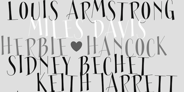 Jason Vandenberg (Greyscale Type and later J Foundry, Toronto) licenses his fonts independently and through The Type Founders.
 He designed the 8-style Grey Sans family in 2013. Gia Tran and Jason Vandenberg created the decorative typeface Ella FY (2013, Fontyou). The slender display typeface Sérafine FY (2013) was co-designed by Jason Vandenberg, Jérémie Hornus and Alisa Nowak. At the end of 2013, Jason Vandenberg and Jérémie Hornus co-designed the groovy poster typeface Jack FY. In 2014, Adrien Midzic, Jason Vandenberg, Jérémie Hornus, Julien Priez and Alisa Nowak co-designed the creamy script Vanilla FY. It was renamed Vanille FY after a few days. Minuit FY (2014, by Jason Vandenberg and Gia Tran) is a beautiful angular angry calligraphic display typeface. Still in 2014, he published the Peignotian fashion mag typeface families Bodoni Sans, Bodoni Sans Display, and Bodoni Sans Text. Typefaces from 2015: Abrade (a 12-style geometric sans with medium x-height and perfect rhythm covering Hairline to Ultra). Typefaces from 2016: Fourth (a baseball or roundhand script family), Town (a 124-style all caps art deco and lettering typeface family with enormous potential). Town includes subfamilies for Display, Inline, Outline, Lines (prismatic), 3 Dimensional, Shadow, Text, Emboss, Stencil, Chic and Contrast, and can be used for layering. Typefaces from 2017: Colby (a workhorse hand-drawn sans family). Typefaces from 2018: Stash (signage script). Typefaces from 2019: Marsden (114 styles: a bold, no-nonsense Grotesque. It was designed for display, branding, advertising, packaging or anywhere a strong voice is needed. Marsden is built on a geometric foundation, with just enough warmth to keep the style confident and lively). Typefaces from 2020: Mello (an informal grotesque). Typefaces from 2021: Cutmark (a 60-style octagonal industrial typeface family that features common 45 degree chamfered corners, flattened ink traps and wide apex forms; Cutmark Variable contains the full family of styles in a single file with width, weight and slant axes). Typefaces from 2022: Sundry (44 styles; J Foundry's take on the early 20th century grotesque). Fontspring link. Behance link. Monotype link. [Google]
[MyFonts]
[More] ⦿
|
Jack Halten Fahnestock
|
American designer currently (i.e., 2019) studying at the Rhode Island School of Design. Creator of the free variable font Tiny (2019, Velvetyne), a monospaced dot-matrix typeface based on the smallest type size of five dots on the HandJet EBS-250 hand-held printer. The sizes of the dots make up the variable axis. He writes: The TINY font family was originally created at over the summer of 2018 as the visual identity for an experimental retail pop-up shop in Chinatown, New York City called Today in New York, or TINY for short. The shop was the result of an intern project at Verdes, a creative agency, between Jack Halten Fahnestock and Theia Flynn. There they sold T-shirts and tote bags customized on the spot with a fancy (and stupid expensive) handheld inkjet printer called a HandJet EBS-250. Personal web site. [Google]
[More] ⦿
|
Jacques Le Bailly
[Baron von Fonthausen]

|
 [MyFonts]
[More] ⦿
|
James T. Edmondson
[Oh No Type]
|
 [More] ⦿
|
Jan Burchiellaro Falinski
|
Senior brand designer in Milan, Italy. His typefaces: - Ygro Sans (2021). A free grotesque typeface with inktraps.
- A logotype for the city of Istanbul (2020).
- An experimental variable font with two axes, geometry and tone of voice (2019).
- An icon font for the real estate company Dovevivo (2018).
[Google]
[More] ⦿
|
Jan Estrada-Osmycki

|
 Jan Estrada-Osmycki is a Polish-Mexican designer, visual artist and musician, and member of the Zbiorowy art group. He composes and produces music under the Bass Jan Other moniker.
 Warsaw-based creator of the high-contrast bespoke typeface Edit2010 (2010). At Three Dots Type, he designed Sudety (2018). In 2019, he published Telecom, a fiercefully avant garde experimental space age typeface. At The Designers Foundry, he published the text typeface family Wulkan Display (2019). Halisa (2021, The Designers Foundry) is a 60-style collection of semi-constructed grotesque typefaces with an industrial origin and mechanical character. Featuring super-elliptical curves, its designer is not identified on the web site. Halisa also features some variable format typefaces. [Google]
[MyFonts]
[More] ⦿
|
Jan Falinski
|
Milan-based designer of a variable typeface in 2019 with geometric and tone of voice axes. [Google]
[More] ⦿
|
Jan Fromm

|
 Jan Fromm (b. 1976, Berlin) is a freelance graphic designer who has studied graphic design at the University of Applied Science in Potsdam. He works in the fields of illustration, web, corporate and type design for several firms in Berlin. Since 2004 he has worked for Luc(as) de Groot at FontFabrik.
 He created the legible and very simple sans family Camingo (2006: 7 weights, 56 styles in all; read comments), Camingo Dos (2008, 28 styles, elliptic roundings), CamingoDos Condensed and SemiCondensed (each with a further 28 styles), Camingo Dos Office (2011), Camingo Code (2013, a free family for programming), Camingo Mono (2013) and Camingo Slab (2017). Rooney (2010) is a warm rounded serif family. Rooney Sans (2012) is a rounded humanist sans. In 2015, he published the 16-style sturdy subtly stressed sans family Komet (and Komet Pro). In 2019, he released Capito at Future Fonts: Capito originates from experimenting with different angles of the broad nib pen, in order to find the right form for a sturdy and readable serif typeface. As a result, Capito has a slightly reversed contrast that emphasizes the horizontal flow, while preserving the character and readability of classical serif letters. In 2022, Jan Fromm released the versatile (variable) type system Nice at Fontwerk. Nice transports the baroque aesthetic to 2022, and includes four optical sizes and 56 styles in total. Proof&Co writes that Nice is a real masterclass in serif design. FontHaus link. . Behance link. Future Fonts link. View Jan Fromm's typefaces. [Google]
[MyFonts]
[More] ⦿
|
Jan Sindler
|
While living in Karlovy Vary, Czechia, Jan Sindler designed Rodak (2014, a rounded sans typeface) and Maturia (2014, an ink-trapped school project typeface family that was influenced by Rathousky's Metron). Recently, he joined Lucasfonts in Berlin. At Futurefonts, he published Rotor (2019), a monospaced typeface with an axis for rotating glyphs on the X axis, as if in three-dimensional space. Graduate of the TypeMedia program at the Royal Academy of Art (KABK) in Den Haag, The Netherlands, class of 2020. His graduation typeface there was Gabion, a text and display family. Between 2018 and 2020, he developed the script typeface Afrikola. Typefaces from 2021: Rotor (experimental; static and variable). Future Fonts link. [Google]
[More] ⦿
|
Jan Weidemüller
[Ultra Kühl]
|
 [More] ⦿
|
Jason Harcombe
[Fontpeople]

|
[MyFonts]
[More] ⦿
|
Jason Pamental
|
Jason Pamental (Rumford, RI) is Senior Director of Design and Technical Strategy at Isovera, where he heads the design and development team, leads workshops, and works with clients establishing their digital strategy. Jason specializes in typography for the web. Author of Responsive Typography (O'Reilly). [Google]
[More] ⦿
|
Jason Smith
[Fontsmith]

|
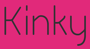 [MyFonts]
[More] ⦿
|
Jason Tselentis
[Monotype on The History and Future of Variable Fonts]
|
[More] ⦿
|
Jason Vandenberg
[J Foundry (was: Greyscale Type)]

|
 [MyFonts]
[More] ⦿
|
Jayanth Nune
[Pastelle Pyrex]
|
[More] ⦿
|
Jayanth Nune
[Pastelle Pyrex]
|
[More] ⦿
|
Jérémie Hornus
[Black Foundry]

|
 [MyFonts]
[More] ⦿
|
Jérémy Landes
[Studio Triple]
|
[More] ⦿
|
Jean Wojciechowski
[Massimo Studio]
|
[More] ⦿
|
Jean-Baptiste Morizot
[Phantom Foundry]

|
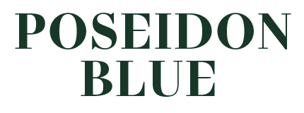 [MyFonts]
[More] ⦿
|
Jeff Wu
|
Jeff Wu is the General Manager of Arphic Technology. He has led Arphic R&D Division for more than 20 years. His specialties are development of font technology and products. Also, he is familiar with font design and application in versatile devices. He worked as a Software Engineer and Manager of Software department in Mitac Internationl Corp. before Arphic. He received his B.S and M.S degrees in computer science from National Chiao-Tung University of Taiwan. Speaker at ATypI 2018 in Antwerp on Chinese font design: There are about twenty-eight thousand Chinese characters that need to be designed. The average number of strokes in a Chinese character is 12. In Arphic JingXi Hei, for example, the average number of control points for each stroke is about 100. Therefore, there are about 33,600,000 control points to deal with when developing a Chinese typeface. When creating a Variable Font, the control points of every pole of every axis need to correspond, so it is a huge work to design, test the transfer to a Variable Font, and fix the design and control points. In this talk Jeff Wu shares the problems he met in developing Chinese Variable Fonts and how he overcame them: 1) The traps that must be avoided when designing strokes. 2) How many axes are proper for Chinese typefaces? 3) When transfering to Variable Fonts, how to set up the parameters of each table. 4) How to avoid different results when setting up the same parameter on different platforms (OS, browser, applications).. [Google]
[More] ⦿
|
Jen Wagner

|
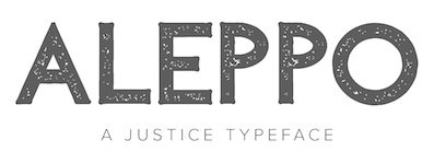 Jennifer Wagner (Nashville, TN; was: Denver, CO) designed these typefaces:
 - In 2022: Essential Sans (16 styles and one variable font), California Coast (a bold display serif), Casa Sol.
- In 2021: Avanti (script), Mezcal (a thin display serif), Runaways, Levitate (an experimental sans and serif combination), Barnaby (a 2-style text typeface), Montmartre (a display serif), Kyrie (a display serif), Bonne Nuit (script).
- In 2020: Violet, Ostuni (script), Larkspur (a fat finger font), Amora, Bastia (a transitional typeface), Oliver Label, Palmer Lake.
- In 2019: Rylan, Margo, Palmer, Tangerine Skies (font duo), Halifax, Capri (Sans, Serif), Lyon (Sans, Script), Paris (Sans, Script), Noelle (a wedge serif), Rylan, Norfolk.
- In 2018: Sorrento, Folsom (sans), Modena, Versailles, Albany, Osaka, Phoenix (a geometric sans family), Amaro (script), Sucre (condensed sans), Paris (SVG font duo), Laguna Beach (font duo), San Clemente (script), London (luxurious style), Rome (sans), Dallas (vintage sans), Calgary, Wink Wink (font duo), Nashville, Adelaide, Bordeaux (script), Oxford (sans).
- In 2017: Milan (vintage sans), Prague, Sydney (font duo), Manhattan (high contrast city chic), San Diego (informal sans), Newport (brush script), Joshua Tree, Charleston (signature script), Knoxville, Malibu, Bronx (blackboard bold), Stockholm (sans), Ontario (four-layer sans), Tokyo (sans), Rochester (handcrafted), Brisbane (script), Florence (script), Montauk (all caps), Brooklyn (sans).
- In 2016: Aleppo, Edinburgh (a didone), Paris (a heavy brush typeface), Christmas Town (handcrafted), Glasgow, Austin, North Pole, Chicago (handcrafted), Oceanside (a great romantic brush script), Louisville, Los Angeles (avant garde sans), Kingsland (a vintage sans), Baton Rouge, Venice (fashion mag style), Nashville (handcrafted), Manhattan (an all caps didone), Anchorage (sans), Athens (minimalist sans), Santa Barbara, Orlando, Jackson Script, Denver, the avant garde typeface Sacramento, the brush typeface Atlanta, the sans typefaces Pasadena, Vancouver and Portland, Portland Serif, the stencil typeface Faroe and the handcrafted typefaces Seattle, Dana Point and Honolulu.
[Google]
[MyFonts]
[More] ⦿
|
Jenny Fox
|
 Brisbane, Australia-based student-designer (at Griffith University) of the fun (loud, reverse contrast) display typeface Bakko (2019), which comes in variable opentype format. In 2017, she published the free ghouly dry brush font Mr. Grieves. [Google]
[More] ⦿
|
Jens Kutilek

|
 Jens Kutilek studied Communication Design in Braunschweig. After graduating he founded the web design agency Netzallee. He works at the font technology department at the Berlin office of FSI (FontShop International) since 2007. Jens Kutilek had a small typology page proving that Arial is not Helvetica, Courier is not Courier New, and Times-Roman is not Times-New Roman. That page disappeared. His typefaces:
 - Azuro (2011). Designed by Georg Seifert and fine-tuned by Jens Kutilek, and published by FontShop.
- Bulette Bold (2008). A fat octagonal / mechanical design.
- The free font Comic Jens (2007-2009), a free alternative to Comic Sans: see here. See also the update Comic Jens UI (2014).
- Conta: A coding font. Monospaced and proportional variants, italics.
- The sturdy 6-style typeface family FF Hertz (2015) that was influenced by German cartographic alphabets.
- FF Uberhand. An 11 style marker pen font family---casual and informal---that could serve as a replacement and improvement of Comic Sans.
- Grotesk 812: A condensed grotesque typeface.
- Helvers (2011). A blend of Univers and Helvetica.
- Homecomputer (2019). Two-axis variable interpretations of monospaced pixel fonts for the Commodore 64 and Amiga home computer systems from the 1980s, with adjustable effects to simulate artifacts of old CRT displays. Github link for the open source fonts. Particular fonts include Workbench and Sixtyfour.
- Malerblock: A signpainter's typeface.
- Mergenthaler Antiqua (2012). A digitization of a forgotten typeface by Hermann Zapf.
- Pathos: A monumental sans-serif with classical proportions.
- Selectric Century: A digitization of the Century typeface from IBM's Selectric Composer.
- Soccer Sans: A constructivist sans with extra low legibility. Ideal for soccer kits.
- Stecker: A typeface made of round elements.
- Sudo (2009-2013). A programming font family developed from Experimental 710.
- Topography: A version of the classic German cartography typeface.
Github page with many of his unfnished typefaces. Github page with free programming and system fonts such as Arimo, Clear, Cousine, Droid, Fira, Material Icons, Noto, Open, Roboto, Source, Special Elite, Tinos, and WinJS Symbols. [Google]
[MyFonts]
[More] ⦿
|
Jeremy Dooley
[Insigne Type Design Studio (was: Dooley Type)]

|
 [MyFonts]
[More] ⦿
|
Jeremy Johnson
[Forme Type]

|
[MyFonts]
[More] ⦿
|
Jeremy Mickel
[MCKL (was: Mickel Design)]
|
 [More] ⦿
|
Jeruel Aaron Amar
|
Designer from Quezon City, The Philippines, b. 1993, who used FontStruct in 2009 to make Pointers and Pointersoft (pixel arrow fonts), Eleaves, AcidSpeed, Parallelofont (octagonal), Missing Block, Acid Square, The First Font, Danubee (organic), Thorns, ReilyBill Richkid, Tabloid, StillAliveForNow, StillAlive, and The Curve. In 2009, he added Unbranded, Nokia 6000, Quickening, Bump it up, Corte (3d shadow face), Unbranded, Piloton (techno; +Piloton G, 2012), Tahoma (pixel family), Raft, Paper Company (octagonal), Afro Style, Arko, 7th Service (stencil), Thorns, and Afro Superstar. In 2012, he created Afro Superstar, Malibata Neue, a modernized and simplified Baybayin/Alibata (ancient Filipino writing), Gumball. In 2014, he designed the free gravestone typeface Furgatorio and an ancient Filipino script font, Malibata (2014, FontStruct). In 2015, he added XOX, the futuristic Babayin typeface Maria Stellar, and the techno sans typefaces Dozer One and Dozer Two. In 2016, he designed the marker pen font Jeboy and the coffin font Furgatorio Sans. Typefaces from 2017: Alta (a fashion design sans). Typefaces from 2018: Matatas One (a free Baybayin typeface), Cubao (free; inspired by the signboards hanged on Jeepneys, SUVs, buses and other transport vehicles within and outside the Metro; in 2022, a variable font was added), Quiapo (handcrafted all caps sans), Alta Kratos (alchemic; with Jean Pierre Cruz). He explains the genesis of Quiapo which is based on signs hanging in jeepneys: Quiapo Free is a brush typeface dedicated to the Filipino sign makers, Jeepney drivers, and the daily commuters in the streets of Metro Manila and anywhere in the Philippines. Typefaces from 2019: Maria Stellar X (a futuristic font for Latin and Baybayin). Typefaces from 2020: Hayskul, Kawit (a brushed lava lamp font), Dangwa (brush script), HPB (a stylish all caps sans created for the Christian Fellowship Church founded in Plaridel, Bulacan, Philippines), and the Baybayin fonts Malibata Redux (prismatic), Titulo Tagalog, MKBYN Clara (cursive, pixelized), Malamaya. Typefaces from 2021: Goth Gothic (a free blackletter / tattoo font), Copula (a retro inline typeface). [Google]
[More] ⦿
|
Jesse M. Ragan

|
 Originally from North Carolina (b. 1979), Jesse Ragan studied type design at Rhode Island School of Design. After college, Jesse designed typefaces at Hoefler&Frere-Jones, where he had a hand in Gotham, Archer, and several other families. Since 2005, he has worked independently in Brooklyn, developing typefaces and lettering for a variety of clients. His work can be found at Font Bureau, House Industries, and Darden Studio. He also teaches typeface design at Pratt Institute and Cooper Union. He won an award at Bukvaraz 2001 for Gotham, co-designed with Jonathan Hoefler and Tobias Frere-Jones. In 2017, he set up XYZ Type with Ben Kiel, who is based in Saint Louis, MO. XYZ Type is part of Type Network since 2018.
 His typefaces: - Afri Sans (2011). A custom typeface for the Museum for African Art in Manhattan.
- Athenian Extended (2011). By Matteo Bologna and Jesse Ragan. This "playfully peculiar face" (their words) was custom designed for Typography 32, the annual of the Type Directors Club. A revival of the 19th century classic Athenian.
- Cedar. An angular typeface designed during his studies at RISD. It was later published at XYZ Type.
- Epiphany (2001). A hookish face.
- Export (2012). A vernacular typeface based on signage seen in New York's Chinatown. This all caps typeface features square counters and comes with a stencil version.
- Hoefler & Frere-Jones, 2001-2005. Assistance with the production of several typefaces at HFJ: As a full-time typeface designer for Hoefler & Frere-Jones from 2001 to 2005, I designed a full type family for Smirnoff Vodka (art directed by J. Walter Thompson and H&FJ). Working closely with Tobias Frere-Jones and Jonathan Hoefler on a number of other typefaces, I designed bits and pieces such as hairline weights, Italics, and news grades. These include Mercury, Chronicle, Hoefler Titling, Sentinel, Surveyor (2014)), Gotham, and Archer (a type family done for Martha Stewart Living and designed with Hoefler and Frere-Jones).
- Omnes (2006). A monowidth rounded sans designed by Joshua Darden. Ragan assisted in the production and design process.
- Ruzicka Collection (2012). Digital versions of the alphabets shown in Rudolf Ruzicka's 1968 portfolio Studies in Type Design. This collection led in 2018 to the robust 12-style typeface family Study at XYZ and in 2020 at MyFonts.
- Showcard Stunt (2008). Lower case of a comic book/signage typeface originally drawn by Ken Barber, House Industries. Inspiration from Dom Casual (1950s, Peter Dombrezian).
- Smirnoff (2003). A custom typeface commissioned by J. Walter Thompson for Smirnoff.
- The Bruins (2006). An athletic lettering typeface commissioned by Reebok for The Boston Bruins in 2007-2008.
- USA Today Condensed (2012). He writes: I designed this headline typeface for the dramatic relaunch of USA TODAY, which was overseen by Wolff Olins. The condensed style complements the paper's proprietary version of Futura, but without resorting to the familiar elliptical shapes of Futura Condensed.
- V Magazine (2011). A condensed high-contrast fashion mag headline typeface done for V Magazine.
- Carlstedt Script (2013, with Ben Kiel: a custom signage typeface for Aldo Shoes based on the handwriting of Swedish illustrator Cecilia Carlstedt). Cortado Script (2014) was designed by Jesse Ragan and Ben Kiel. It too was inspired by Cecilia Carlstedt's hand-painted lettering and is quite close to Carlstedt Script.
- In 2017, Jesse Ragan published Aglet Slab and Export at XYZ Type. In 2019, he added Aglet Sans, and in 2020 Aglet Mono. The three Aglet families explore roundness. Aglet Mono, in particular is quite striking, and could be useful for programmers.
- Escalator and Elevator (2021). Two multipurpose geometric sans families following in the footsteps of Block and Futura. Ragan writes: Escalator & Elevator grew from a client commission to replicate existing signage for the renovation of a landmark New York City skyscraper. They take inspiration from prefabricated letterforms of the 1950s, which manufacturers offered in so-called Block and Futura styles, by swapping in a few different shapes. Our interpretation increases the distinction between the two styles, pulling from surplus glyphs created for customizations of the design for other clients. No one really needs another geometric sans, but Escalator & Elevator claim their own aesthetic territories in an abundant genre. Both families are delivered as variable fonts, providing full access to a wide weight range. The optical size axis addresses the specific needs of different type sizes with adjustments to the structure, tapering, and spacing. From small text to the appropriately-named Huge, these typefaces evoke architectural lettering and the era of phototypesetting.
- Polymode Sans (2021, by Jesse Ragan and Ben Kiel). A variable font with a realness axis.
Interview. Behance link. Interview by Lovers Magazine. [Google]
[MyFonts]
[More] ⦿
|
Jessica Wonomihardjo
|
Designer of the psychedelic typeface Fillmore during a workshop at Type Paris 2019. Fillmore is a variable serif font with eight different weights. The original brief she had was to create a font for Kitsunél Musique, a French electronic/indie pop rock music record label. For Fillmore, she drew inspiration for the psychedelic 1970s. [Google]
[More] ⦿
|
Jetsmax (was: Riljs, or: Typograph Pro)
[Khairil Anwar Husain]

|
Khairil Anwar Hussein (or Ril Anwar, b. 1996) is the Makassar, Indonesia-based founder of Jetsmax in 2018. Designer of these typefaces in 2020: - Carefour (2020). A signature script.
- Celebes Signature (2020).
- Desolator (2020). A free variable sans typeface.
- The upright script Fillpattern (2020).
- Halgonak (2020). A handcrafted typeface by Novia Lorenza.
- The handcrafted typefaces Halo Emak (2020) and Qawber Pro (2020).
- Hiromaru Script (2020).
- Hundred Wars (2020). An octagonal stencil cybertech typeface.
- Huntsville (2020).
- The display sans Massedi (2020).
- The squarish Meja Block (2020).
- Nekofie (2020). A 2-style sans.
- Ryujin Attack (2021). A dry brush typeface.
- Sirukota (2020). A free rounded sans typeface.
- The stretchable futuristic typeface Stretch Pro (2020).
Typefaces as of 2021: Alternative Rock, Amulman, Balmonde Script, Carefour Signature, Cinematica, City Series, Coojertown, Craftsman Work, Creative Designer, Delmano Morelli, Erangel Field, Gellato, Halgonak, Hundred Wars, Hunian, Huntsville, Hynole, Javanesia (psychedelic), Just Bubble (a bubblegum typeface), Jx Tabe (a chamfered techno font in 54 styles), Kaidomaru, Kingdom Storia, Lagosi (a 15-style lava lamp typeface), Lylac, Malino Candy, Marcondensed, Markisa, Melt Fuji, My Leaf, Nimora, Nordille, Obstacle, Pixelated Display, Priska, Ryujin Attack, Sirukota, Stretch Pro, Studio Grotesk (a 5-style techno font), Summer Vacation, Taki, Veztro, Wanderism, Wedding Song. Creative Fabrica link. Jetsmax home. Fontsquirrel link. [Google]
[MyFonts]
[More] ⦿
|
Jiayu Liu
[Tensen Type]
|
[More] ⦿
|
Jipatype
[Anupap Jaichumnan]

|
 Bangkok, Thailand-based designer (b. 1996) of the free Latin / Thai italic text typeface ADC Somros (2017). In 2019, he designed the sans typefaces Ananatason, Boriboon, Serithai and Jipatha (for Latin and Thai), the variable typeface Adirek, the elliptical sans Petchlamoon, the techno typeface Pattanakarn, the rounded sans typefaces Opun Mai, Longdoosi and Monkhang, the slab serif Kulachat and its companion Kulachat Serif, the squarish typefaces Gamlangdee and Honor, the contrast-rich text typeface Priyati (for Latin and Thai), and the roundish typeface Thanmon, the informal typeface Laedoomai and the chancery script Chanceri.
 Typefacesfrom 2020: Asangha (90 styles), Luktao (rounded and elliptical, for Latin and Thai). Uturna Round, Banburi (a creamy display typeface), Namasakarn (a soft serif), Monradok (a rounded sans for Latin and Thai), Dumondi (a rounded casual sans), Prachason (a Latin/Thai sans family), Prachamati. Typefaces from 2021: Dimsum (oriental emulation), Prachason Neue, Athachantr (a Latin/Thai didone family), Kitchakan (a condensed sans), Mommi (a soft bold sans), Yodnam (a teardrop-themed font), Cakerolli, Jella (a supermarket font), Biski (a rounded supermarket sans). Typefaces from 2022: Anachak (an 18-style squarish sans), Santiphap (a slab serif), Jaturat (octagonal), Pcast (an 18-style squarish sans), Opkrop (an 18-style packaging sans), Phongphrai. [Google]
[MyFonts]
[More] ⦿
|
Joao Cracel
[Craceltype]

|
[MyFonts]
[More] ⦿
|
Joe Leadbeater
|
 Londoner who studied in Leeds, UK. Designer of the text typeface Madison (2014) and the vintage typeface Clothworker (2015).
 In 2018, Joe Leadbeater and Mark Bloom co-designed the 14-weight sans typeface family Aeonik, which supports Latin, Greek and Cyrillic, and is accompanied by a variable font. Followed in 2022 by Aeonik Mono. At some point before 2019, Joe Leadbeater and Mark Bloom founded CoType Foundry. In 2021, he became part of Socio Type in London. At Socio Type, he designed these typefaces: - Gestura (2021). A serif with three optical sizes, Text, Headline and Display.
- Rework (2021). A sans with four optical sizes, Micro, Text, Headline and Display.
[Google]
[More] ⦿
|
John Hudson: Introducing OpenType Variable Fonts
|
John Hudson's informative introduction to OpenType variable fonts. [Google]
[More] ⦿
|
John Misael Villanueva

|
Trece Martires, Philippines-based lettering artist and type designer, known for the official typeface of the American industrial tools maker Stanley Black & Decker. In 2019, he designed these typefaces: the colorful decorative caps typefaces Pinas, Habi and Habi Pinas, Florida, Military Industrial, the free vernacular typeface BBT Martires, the script typeface Cute Bouncy, the modular typeface Arturo, the corporate font Stanley Black&Decker and the variable sans typeface Dinamika. Typefaces from 2020: Nilad Pro (a display serif inspired by the flourishing bud of the yamstick mangrove or nilad), Leandro (inspired by the brutalist architecture of Filipino architect Leandro Locsin). [Google]
[MyFonts]
[More] ⦿
|
John Roshell
[Swell Type]

|
[MyFonts]
[More] ⦿
|
John Roshell

|
 Designer (b. 1970, Mountain View, CA) of many (most) fonts at Comicraft, a comic book font outfit in Los Angeles, CA, a company he cofounded with Richard Starkings in 1992.
 Some fonts: Altogether OOky, Addams-AltogetherOoky, Addams-Capitals, Addams-Regular, CCBithead-Bark, CCBithead-Byte, CC Bryan Talbot (2008, created for Bryan Talbot's Alice in Sunderland), CCHooky-Open, CCHooky-Solid, CCAlchemite, CCChills, CCDigitalDelivery, CCDivineRight-Regular, CCDoubleBack-Future, CCDoubleBack-Past, CCElsewhere-Regular, CCFlameOn, CCFrostbite, CCGrimlyFiendish-Regular, CCJimLee, CCJoeMadInt, CCLosVampiros, CCMeanwhile, CCMeltdown, CCMonsterMash, CCSpills, CCSplashdown, CCStormtrooper (1997), CCTheStorySoFar-Regular, CCThrills, CCToBeContinued, WildAndCrazySFX. With Richard Starkings, he designed Achtung Baby (2001), Adamantium and DoubleBack in 2001 for Agfa/Monotype. Other designs: Dave Gibbons (2006), UpUpAndAway (2005), Forked Tongue (2005), Paranoid Android (2005), Snowmany Snowmen (2005), Gibbous (2006), Astronauts in Trouble, Chatterbox, Red Star, Tough Talk, Sean Phillips, Atomic Wedgie, Pass The Port, Divine Right, Shoutout, Battle Scarred, Danger Girl, Primal Scream, PhaseSonStun, Yeah Baby, Nuff Said (2005), Trick Or Treat, MonsterMash, CarryOnScreaming, Chills, Goosebumps, CreepyCrawly, GrimlyFiendish, IncyWincySpider, Spookytooth, Meltdown and TrickOrTreat dingbats, BiffBamBoom, Spellcaster, Cheese And Crackers, FaceFont, Hedge, Meanwhile, Wildwords International, Comicrazy, Storyline (2006), Happy Holidays (2007), Foom (2007). MyFonts sells these fonts by him: Adamantium, Alchemite, Altogether Ooky (vampire script), Area51, Aztech, Battle Cry, Bithead, Chills, Dave Gibbons, Dead Mans, Destroyer, Digital Delivery, Divine Right, Drop Case, Elsewhere, Euphoria, CC Fairy Tale (2007), Face Front, Fighting Words, Flame On, Foom, Frostbite, Gibbons Gazette (2009, Gobbledygook, Golem (2002), Grimly Fiendish, Happy Holidays, Hellshock, Hip Flask, Holier Than Thou, Hooky, Hyperdrive, Joe Kubert, Meanwhile, CCMild Mannered (2007), Monologous, Near Myth, Overbyte, Phat Boi, PhilYeh, Rough Tongue, Sanctum Sanctorum, Scott McCloud, Smash, Speeding Bullet, Spills, Splashdown, Spookytooth, Stonehenge Runes, Stormtrooper, Storyline, Thats All Folks, The Story So Far, Thingamajig, Thrills, Tim Sale, Tim Sale Brush, Timelord, Treacherous, Treasure Trove (2007), Up Up And Away, Wild And Crazy, Zzzap, Deadline (2007), Kickback (2007, with David Lloyd), Sticky Fingers (2007, scary). Typefaces made in 2008: Ratatatat (2008), CC Mad Scientist (2008), HammerHorror (2008), EnemyLines (2008, based on WWII lettering used by the nazis), Cutthroat Lower (2008), Philyeh (2008), Doohickey Lower (2008), CC Sign Language (2008, fruit vendor lettering). Typefaces made in 2009: SpillProof (2009), Slaphappy (2009), Hooky (2009, spraycan style), Long Underwear (2009), Digital Delivery (2009), Grande Guignol (2003, art nouveau), Bronto Burger (2009), Elsewhere (2009, art nouveau), Exterminate (2009, stone carving face), You Blockhead (2009), CC Rugged Rock (2009), Creations in 2010: Wild Words Lower (2010), Back Beat (2010), Rick Veitch (2010, based on the lettering of comic book artist Rick Veitch), Credit Extension (2010), Shiver (2010, with Richard Starkings), Shake (2010, with Richard Starkings), Elephantmen (2008-2010, squarish family). Contributions from 2011: Knobbly Knees, Ed McGuinness (comic book script family), Big Top, Clean Cut Kid, Dash Decent (a very round almost-bubblegum family), Fancy Pants (connected script), Goth Chic (blackletter). Fonts from 2012: Lunar Modular, Lunar Orbiter, Lunar Rover, Geek Speak, Ancient Astronaut, Totally Awesome (comic book caps face). Fonts from 2013: Samaritan and Samaritan Tall (with Richard Starkings), Ghost Town (a family of seven gold rush era typefaces), Colleen Doran (a comic book family: A Distant Soil is a classic bold and beautiful science fiction/fantasy comic book series by creator, writer, artist and letterer Colleen Doran. A Distant Soil is being remastered and re-released by those awfully nice chaps at Image Comics and Colleen commissioned Comicraft to create the definitive bold and beautiful Colleen Doran font, based on her original pen lettering), Mega City (an elliptical in-your-face advertising signage typeface family), Soliloquous (fat rounded hand-printed comic book family), Excalibur Stone, Excalibur Sword, Legendary Legerdemain (+Leggy), Cool Beans (beatnik font). Fonts from 2014: Shaky Kane (based on the comic books by that name), Resistance Is Lowered (techno), Hero Sandwich Ingedients, Hero Sandwich Combos (a layered set of informal typefaces combined in many ways), Monstrosity (a ghoulish typeface), HighJinks, Onomatopedia, Killzone, Killswitch, Killjoy. Fonts from 2014: Mike Kunkel (based on the hand of comic book artist Mike Kunkel). In 2015, John Roshell (Comicraft) created the comic book typeface family The Sculptor based on Scott McCloud's lettering. Other fonts from 2015 include AB Flock Poster, Hypnotique, Samaritan Lower (by Richard Starkings and John Roshell), Graveyard Smash, Maladroit, Extra Extra (pen-lettered newspaper headline font family), Merry Melody, Temporal Shift and Temporal Gap (computer emulation typeface), Temporal Shift and Temporal Gap Expanded, Temporal Shift and Temporal Gap Compressed, Danger Girl Hex (with Jeffery Scott Campbell), J. Scott Campbell Lower (with Jeffery Scott Campbell). Typefaces from 2016: Victory Speech Lower, Man Of Tomorrow, Thrills, Holy Grail, A Likely Story, Victory Speech, Questionable Things (with Richard Starkings), The Story Begins + Ends, Pixel Arcade (video game font), Schadenfreude (octagonal style), Vengeance Is Mine. Typefaces from 2017: Right In The Kisser, Music To My Eyes">, True Believer. Typefaces from 2018: Metcon (+a stencil version, Metcon Rx), Summer Fling, Samaritan Tall Lower (by Starkings and Roshell), Blah Blah Upper (by John Roshell and Richard Starkings), Ultimatum, Wuxtry Wuxtry (art nouveau), Single Bound (a sans), Evil Doings (by Richard Starkings and John Roshell), Prince of Darkness (a gothic layered font family), Empire State Gothic, Empire State Deco. Typefaces from 2019 by John Roshell: Whatchamacallit (a variable cartoon sans with weight, width and italic axes), Ask For Mercy, Excelsius, Space Race, When Suddenly. Typefaces from 2020: FX Machina (squarish, octagonal), Origin Story, Cybervox, CCQuigglesmith (a beatnik font), Ripped Bam Boom, Dynamic Duo, If This Be Doomsday, Elektrakution (a Greek simulation font family by Richard Starkings and John Roshell), Whatchamacallit, CCMighty Mouth, This Man This Monster (by John Roshell and Richard Starkings), Simply Marvelous, Meanwhile Uncial, Transylvanian (a jungle font), Shark Snack, Letterhack Sans, Letterhack Serif. Typefaces from 2021: Ultimatum MFV (a 21-style chamfered military typeface family including several stencil fonts), Grim N Gritty, Richard Starkings Brush (a comic book typeface by Richard Starkings and John Roshell), Scoundrel (a comic book face by Richard Starkings and John Roshell), Tall Tales (a fat finger font). Typefaces from 2022: Beyond Belief. Klingspor link. FontShop link. View John Roshjell's typefaces. [Google]
[MyFonts]
[More] ⦿
|
Jolicia Type
[Dyaharum Pungki Revitasari]

|
 Yogyakarta, Indonesia-based designer (b. 1992) of the all caps display typeface family Jello Chlour (2020) and the script typeface Butterfly (2020).
 In 2021, she released JT Olifer (a 40-style sans family with exaggerated ink traps; by Laire Banyu and Dyaharum Pungki Revitasari), Thamepalms (a dashing rabbit ear script), Molex Shoora (a 14-style decorative typeface with elephant feet), Gretha (a 14-style hipster serif accompanied by a variable font; by Laire Banyu and Dyaharum Pungki Revitasari), Louis Felligri (a 15-style display typeface, with variable font support, by Laire Banyu and Dyaharum Pungki Revitasari), Le Baffec (an 18-style decorative serif by Laire Banyu and Dyaharum Pungki Revitasari), Le Buffec (similar to Le Baffec), Colibre Bristole Pro (a stylish serif typeface family in nine styles by Laire Banyu and Dyaharum Pungki Revitasari), Floe (a compressed font for hardliners), and an attractive museum style serif typeface, Algeron. Type Department link. [Google]
[MyFonts]
[More] ⦿
|
Jonas Pelzer
|
Jonas Pelzer holds a Bachelor's degree in Communication Design from Düsseldorf University of Applied Sciences. He currently works as a designer in Berlin. Creator of the octagonal typeface Scope (2020), a variable, monolinear typeface designed to enable typographic interactions. [Google]
[More] ⦿
|
Joona Louhi
|
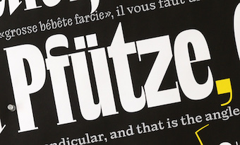 Joona Louhi is a freelance type designer currently based in Helsinki. Graduate of the Type Media program at KABK in Den Haag, The Netherlands, class of 2019. His graduation typeface, Maneuver, is a joyful and masterful experiment in display type, a genre made fashionable by David Jonathan Ross that characterizes the second decade of the 21st century. Maneuver is a three-axis variable font. Before Type and Media, he earned a bachelor's degree in Packaging and Brand Design from Lahti Institute of Design and worked for several years as a graphic designer with a focus in branding. At Future Fonts, he showcases an outgrowth of his Type Media project, now renamed Louche.
 Typefaces from 2021: Dolph (a faux monospaced monolinear rounded sans). Future Fonts link. [Google]
[More] ⦿
|
Jorge Gutierrez Marco
|
As a student at ESNE in Madrid, Spain, Jorge Gutierrez Marco designed the free monoline variable sans typeface Devanesa (2020), with a "1" that looks like a "J". [Google]
[More] ⦿
|
José Scaglione

|
 José Scaglione (b. Rosario, Argentina, 1974) is a graduate of the MA program of the University of Reading, 2005. He was co-founder and art director of Vision Media Design Studio in Argentina and Multiplicity Advertising in USA; and he was a part-time lecturer for four years at the Visual Comunications Institute of Rosario, teaching design for the internet. He lectured on typography at post-graduate level at the National University of Rosario and presently teaches at the at the University of Buenos Aires. He runs his own design studio, specializing in editorial design and branding. In 2006, he started Type Together with Veronika Burian. In 2013, he became President of ATypI.
 His books include Cómo crear tipografías. Del boceto a la pantalla, and Introducción al estudio de la tipografía (in collaboration with Jorge de Buen Unna). His fonts: - Abril (2010) is a didone font family engineered mainly for newspapers and magazines that features friendly and elegant styles for headlines and robust and economic styles for text. It won an award at Tipos Latinos 2012. Abril Fatface is free at Google Font Directory. Abril Titling was published in 2013.
- Fabula (2005), about which he writes: Based on a series of drawings by Sue Walker and originally digitized by Vinnie Connaire, Fabula is the new display typeface for the cover of Collins Children Dictionaries. Its basic monolinear structure and stroke economy are the foundation for this typeface.
- OUP Math&Pi: This Math and Pi font was designed to match the typefaces used by Paul Luna and Nadja Guggi in the new design of the Oxford University Press Dictionaries: Argo and Swift, designed by Gerard Unger.
- With Veronika Burian, he designed the text typeface TT Carmina (2006). This morphed into Karmina Serif (2007), a complete text family, and later Karmina Sans (released in 2009, 12 styles). Karmina was selected in the text typography category at the Letras Latinas exhibition 2006 and won a merit in the European-wide ED-Awards competition 2007, and at Tipos Latinos 2010. Karmina, Bree and Ronnia were selected as part of the travelling exhibition Tipos Latinos 2008.
- Athelas (2006), an outgrowth of his studies at Reading. It now ships with Apple's Mavericks OS.
- Ronnia (2007), designed with Veronika Burian at Type Together: a humanist sans family.
- Bree (2008, with Veronika Burian): a 5-style display sans with a cursive a and e.
- Adelle (2009, with Veronika Burian): a 12-style slab serif engineered for intensive editorial use. Adelle Mono was added in 2020.
- The Google web font Jockey One (2011, with Veronika Burian).
- Tablet Gothic (2012). A joint design of Veronika Burian and José Scaglione, it is a grotesque meant for titling.
- In 2015, Veronika Burian and José Scaglione finally published the 18-style editorial sans typeface family Ebony.
- In 2016, Veronika Burian and José Scaglione co-designed Portada, a sturdy serif typeface family for use on screen and small devices. It comes with an extensive free set of icons. Winner at Tipos Latinos 2018 of a type design award for Portdada.
- Protipo (2018) is a large information design sans family designed by Veronika Burian and José Scaglione.
- In 2019, Type Together released Catalpa (Veronkia Burian, Jose Scaglione, Azza Alameddine) and wrote: Primed for headlines, Catalpa is designed to give words bulk and width and gravity itself. The Catalpa font family is José Scaglione and Veronika Burian's wood type inspired design for an overwhelming headline presence.
- In 2021, Veronika Burian and José Scaglione designed Belarius, a three-axis variable family that shifts from sans to slab serif, from condensed to expanded widths, and includes every possibility in between. Published by Type Together in 2021, it was developed under the guidance of Veronika Burian and José Scaglione, with type design by Azza Alameddine and Pooja Saxena, and additional kerning and engineering help from Radek Sidun, Joancarles Casasin and Irene Vlachou.
Karmina, Bree and Ronnia, all co-designed with Veronika Burian, won awards for extensive text families at Tipos Latinos 2008. Karmina won an ED Award in 2007 and Athelas won a first prize in the Gransham competition 2008. Bree won a bronze award in the 2009 edition of the ED Awards competition. Bree Serif (2009) won an award at Tipos Latinos 2014. Abril wan gold at the ED Awards. Coauthor of these books: Speaker at ATypi 2006 in Lisbon, the Third International Conference on Typography and Graphic Communication in Thessaloniki 2007, 3CIT in Valencia, and ATypI 2008 in St. Petersburg, where his talk was entitled From laser printer to offset press. Speaker at ATypI 2009 in Mexico City, where his talk (with Andreu Balius) is entitled A sign to convey sound. Speaker at ATypI 2017 Montreal. Klingspor link. [Google]
[MyFonts]
[More] ⦿
|
Jovana Jocic
|
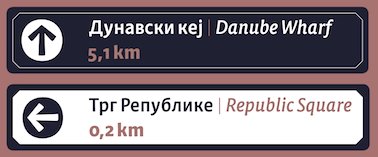 Jovana Jocic is a type and graphic designer from Belgrade, Serbia. After obtaining both a BA and MA in Graphic Design at the University of Applied Arts in Belgrade, Jovana joined TypeMedia program at the Royal Academy of Art (KABK) in Den Haag, The Netherlands, class of 2020. For her graduation project, she designed the Cyrillic / Latin wayfinding font Petria: Petria is a signage typeface inspired by old Art Nouveu signs and overall art movement present ion the Balkans in the early 20th century. Its Roman and Italic were born out of the idea of designing a type family that would be used for street signage and way-finding for the city of Belgrade, Serbia.
 In 2020, Jovana joined Neil Summerour's Positype Flourish. In 2021, Jovana Jocic drew Forma DJR Cyrillic, adapting David Jonathan Ross's and Roger Black's Forma, which in turn was a revival of Nebiolo's famous sans typeface, Forma. Forma DJR Cyrillic is currently available in Extra Light, Light, Regular, Medium, and Bold weights, including all size-specific variants as well as variable fonts. [Google]
[More] ⦿
|
jpFonts
|
German type foundry and type engineering company founded in Hamburg in 2021 by Peter Rosenfeld, Volker Schnebel and Juergen Willrodt, after their former employer, URW, was absorbed by Monotype. Their typefaces: - Bartosh (2021, Volker Schnebel). An organic sans.
- DIN Vario (2021, Volker Schnebel). A 3-axis variable version of DIN.
- Vernacular Clarendon, Vernacular Serif, and Vernacular Sans (2021, H.-J. Hunziker and Volker Schnebel).
- Hanyi. A full collection of Chinese fonts: HY Bai Qi Jian, HY Bai Qing Jian, HY Cai Die Jian, HY Cai Yun Jian, HY Chang Mei Hei Jian, HY Chang Yi Jian, HY Chen Pin Jian, HY Da Li Shu Jian, HY Dai Yu Jian, HY Deng Xian, HY Die Yu Jian, HY Du Du Jian, HY Fang Die Jian, HY Fang Li Jian, HY Fang Song, HY Gan Lan Jian, HY Ha Ha Jian, HY Hai Yun Jian, HY Hei, HY Hei Mi Jian, HY Hei Qi Jian, HY Hu Po Jian, HY Hua Die Jian, HY Huo Chai Jian, HY Jia Shu Jian, HY Kai Ti, HY Li Hei Jian, HY Ling Bo Jian, HY Ling Xin Jian, HY Luo Bo Jian, HY Man Bu Jian, HY Mi Mi Jian, HY Nan Gong Jian, HY Qing Yun Jian, HY Shen Gong Jian, HY Shou Jin Shu Jian, HY Shu Hun Jian, HY Shu Tong Jian, HY Shuang Xian Jian, HY Shui Bo Jian, HY Shui Di Jian, HY Song, HY Tai Ji Jian, HY Wa Wa Zhuan Jian, HY Wei Bei Jian, HY Xiao Li Shu Jian, HY Xing Kai, HY Xing Shi Jian, HY Xiu Ying Jian, HY Xue Feng Jian, HY Xue Jun Jian, HY Ya Ya Jian, HY Yan Ling Jian, HY Yuan, HY Yuan Die Jian, HY Zhong Li Shu Jian, HY Zhu Jie Jian, HY Zong Yi Jian.
- Tensen Type. A full collection of Chinese fonts from the Beijing-based company, Tensen Type: TX Cao Shu, TX ChaoHei, TX ChaoYuan, TX FanKai, TX GangBi, TX Hei, TX Hei VF, TX JianDu, TX JinZhuanHei, TX KaTong, TX LingHei, TX MaiHei, TX MingKe, TX Qian, TX RuiHei, TX ShiTou, TX Shu Song, TX SongTi VF, TX TieKai, TX XianBo, TX XingKai, TX YingLi, TX YouEr, TX Yuan, TX ZhiHei, TX ZhiLi.
[Google]
[More] ⦿
|
Juan José Lopez
[Huy Fonts]

|
 [MyFonts]
[More] ⦿
|
Julien Fincker

|
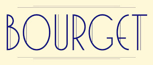 Julien Fincker is a French designer in Stuttgart, Germany, where he is art director at Sieber & Wolf. In 2018, he designed the great art deco typeface Bourget.
 In 2019, he published the soft geometric sans typeface Finador and the accompanying Finador Slab. In 2020, he published the 20-style text typeface Spitzkant and Spitzkant Variable, which are characterized by pointed sharp serifs and considerable contrast. Typefaces from 2021: Garino (a 20-style hipster sans, complete with coathanger lower case f), Ardena (a 20-style grotesk with vertical terminals), Ardena Variable. [Google]
[MyFonts]
[More] ⦿
|
Just in Type (was: Tipomovel)
[Tony de Marco]

|
 Just in Type (ex-Tipomovel) is a Brazilian foundry run by Tony de Marco (b. 1963) and his brother Caio de Marco in Sao Paulo since 2005. They were joined later by Diego Maldonado. Tony de Marco was an illustrator for Folha de S. Paulo, 1987-1994. He co-edits Tupigrafia with Claudio Rocha Franco.
 As a type designer, he created over 50 typefaces for the newspaper Noticias Populares, for America Online, and the magazines Moderna, Saraiva, FTD and Atica. Free fonts at the Tipomovel site included Ariana, Beabá, Bloco, CyberComix, Cyber Rounded, Cyber-Zinha, Digital Typewriter, Egly (my favorite--a Bodoni with curly serifs), Futura Vítima, Futura Vítima Bold, Futura Vítima Extra Bold, Games, Genoveva, Helvetica Backlight, Illinoise, Macmania Bold, Neurastenic, Notícias Populares, Oficina Bold, Pin ups, Pixel, Pravda, Sequestro, Simbolo, Splash, Stalin, Sumô, Super Braille (created for the Dorina Nowill Foundation), Times Change, Tipografia, Toxic Bodoni, Web Power, Zine. Samba LT (2003, Linotype, designed with Carlo de Marco; this art deco typeface was inspired by the lettering art of J. Carlos, a Brazilian illustrator during the early 20th century) won an award at the Linotype International Type Design Contest 2003. Just in Type typefaces include HallowHell Dingbats (2006, Halloween dingbats), Drop It (2005, dot matrix), Illinoise (2005, techno-grunge, by Tony and Caio de Marco), Kindergarten (a school font), Pixel Zoo (2008, dingbats), Inferno Dingbats (2008), Brazil Pixo Retro (2007, rune simulation), Fractal (2010), Concreta (2011, a stencil typeface in the style of Josef Albers, done with Niko Fernandez). In 2012, Tony de Marco and Diego Maldonado co-designed Garoa (a black rounded sans). Influenced by Herb Lubalin, it was derived from the free font Garoa Hacker Clube (done with Diego Maldonado). In 2014, Bernardo Faria and Tony de Marco created the masculine typeface family Terrorista, and wrote this blurb: Terrorista is a homage to everyone who fought against the Millitary Regime in Brazil from 1964 to 1985. The Terrorista Marighella features generous inktraps, fits perfect for small sizes. Terrorista Dilma has the same design as the Marighella, but without inktraps, made for display. The last typeface from the package is Terrorista Lamarca, stencil version. This is the font for the political propaganda machine. Completely in line with Tony's exuberant and delightfully mischievous views, he published Represent (2017), a typeface with sexual orientation symbols that can be compared with Luc Devroye's own Sekushii font from 2002. In 2019, Tony de Marco and Monica Rizzolli released the free octagonal typeface family Tomorrow at Just in Type. Github link. Open Font Library link. Typefaces from 2020: Letrix1 (a programmed experimental variable font). Typefaces from 2021: Just Pixo (a seven-weight pixacao font by Tony de Marco and Monica Rizzolli designed for monumental type sizes and vertical alignments, and released by Latinotype; +a variable font). Fontspace link. MyFonts link. Dafont link. Klingspor link. [Google]
[MyFonts]
[More] ⦿
|
Jürgen Huber
[Supertype]
|
 [More] ⦿
|
Kadek Adi Mahardika
[Creative Media Lab]

|
 [MyFonts]
[More] ⦿
|
Kaleb Dean
[Akimbo Type Foundry (or: Pen and Lens Design)]

|
[MyFonts]
[More] ⦿
|
Katja Schimmel
|
Type designer (b. 1992) based in Essen (and before that, Berlin), Germany. Graduate of Bauhaus University Weimar, and later the TypeMedia program at KABK, class of 2018. Her graduation typeface, Tweak, was released by Future Fonts in 2018. Tweak comes in two groups of styles, Tweak Text and Tweak Display. After graduation, she became a font engineer at Alphabet-Type in Berlin, and wrked briefly with Grilli Type. Contributor in 2019 to the variable programming font Recursive Sans+Mono, the brainchild of Stephen Nixon. Github page where we learn that contributors besides Stephen Nixon include Katja Schimmel, Lisa Huang and Rafal Buchner. In 2019, these authors published Recursive as a variable font with five axes: mono, casual, weight, slant and italics. Dedicated page. It will be added to Google Fonts at some point. Co-designer with Loris Olivier and Noheul Lee of McQueen Superfamily (2020, at Fontwerk), a 20-style sans family. Fontwerk link. [Google]
[More] ⦿
|
Ken Lunde
|
Dr. Ken Lunde is Manager of CJKV Type Development at Adobe Systems Incorporated, San Jose, CA. He holds a Ph.D. (1994) in Linguistics from The University of Wisconsin-Madison. He wrote Understanding Japanese Information Processing (O'Reilly&Associates, 1993), and CJKV Information Processing (O'Reilly&Associates, 1999). He also wrote CJKV Information Processing: Chinese, Japanese, Korean&Vietnamese Computing (O'Reilly). In 2010, Adobe will release the first genuinely proportional Japanese font, Kazuraki (by Japanese type designer Ryoko Nishizuka), which was developed at Adobe in 2009 under his management. Ken managed the Source Han Sans project---these are open source fonts released in 2014 by Adobe and Google for Japanese, Chinese and Korean. He also headed the development of Source Han Serif. In 2018, Ken Lunde and Masataka Hattori co-designed Soukou Mincho (free at Fontsquirrel). In 2019, he created the experimental variable font Width at Adobe. Github link. Speaker at ATypI 2019 in Tokyo on the topic of The History of Japan's Era Name Square Ligatures, and in particular, the two-kanji square ligatures for the five most recent eras, Reiwa (2019), Heisei (1989), Shouwa, Taishou and Meiji. [Google]
[More] ⦿
|
Keya Vadgama
|
Keya Vadgama (Pickering, Ontario) is a British born Gujarati-Canadian UX designer turned typeface designer. She previously attended Type@Cooper and has taught type and design at Sheridan College in Toronto. Keya is currently freelancing as a type designer at Black Foundry. Graduate of the MATD program at the University of Reading, class of 2020. Her typefaces: - The child-friendly Gujarati font Ojara Sans (2014).
- Mango (2020). Her graduation typeface at Reading. Mango is a multi-script variable type family intended for short and long passages of text, ideal for documents employing interrupted and/or continuous reading using the Latin and Gujarati scripts.
[Google]
[More] ⦿
|
Khairil Anwar Husain
[Jetsmax (was: Riljs, or: Typograph Pro)]

|
[MyFonts]
[More] ⦿
|
Kia Tasbihgou
[Op. Cit. Ibid. (or: OCI)]
|
[More] ⦿
|
Kimya Gandhi
|
 Kimya Gandhi from Mumbai, India, holds a Bachelors degree in Communication Design from National Institute of Fashion Technology, Bombay (NIFT). She further went on to pursue specialization in the form of a post-graduate degree in Visual Communication at the Industrial Design Centre (IDC), IIT Bombay. Kimya interned with Linotype GmbH, Germany, in their font design department in 2010. Over the next several years she worked as a freelance designer for numerous type foundries catering to their multi-script requirements. She graduated from the TDi program at the University of Reading in 2012. Since 2015 she is a partner at Mota Italic in Berlin focusing on Indic and Latin designs for retail and custom corporate projects. Kimya teaches typography and type design at design institutes like Symbiosis Institute of Design and NIFT, and is currently designing and researching Indian script typefaces.
 In 2014, Kimya Gandhi and Rob Keller published the free Latin / Devanagari font family Vesper Devanagari Libre. An extension of Rob Keller's Vesper (2006), the Vesper Devanagari character set was completed in 2014. Vesper Devanagari Libre is a special web version that has been optimized for online use. Tiny details have been simplified and the character set is reduced for the perfect balance of beautiful web typography with fast page loading.is a special web version that has been optimized for online use. Tiny details have been simplified and the character set is reduced for the perfect balance of beautiful web typography with fast page loading. In 2015, she designed the Devanagari handwriting font Sharad 75, which was subsequently published in 2016 by Mota Italic. She writes: Rugwed Deshpande, of Setu Advertising wanted to commission the design of a typeface based on the handwriting of his father, Mr. Sharad Deshpande who has been a prolific copywriter for 50 years years and has been an intrinsic part of Setu. Rugwed explained how handwriting has been an important aspect of his copy-writing career. Her own handwriting was turned into a font in 2017, Maku. In 2019, she released the Devanagari / Gurmukhi / Latin stone-cut variable typeface Chikki at Mota Italic. [Google]
[More] ⦿
|
Kobuzan
[Maksym Kobuzan]

|
 Or Max Kobuzan. Kyiv, Ukraine-based designer of these typefaces:
 - The tall condensed typeface family Segment B Type (2021), which is inspired by the first condensed European grotesques of the 19th-century. See also Segment A Type (2021; a technical extra-condensed sans family).
- The 15-style humanistic sans typeface family Prostir Sans for Latin and Cyrillic.
- Varp (2021). Varp is a rather narrow 2-axis variable geometric typeface with slight reverse contrast inspired by utilitarian and technical design. The letterforms are based in part on the shapes of DIN fonts, with the deliberate addition of contrasting connections, sharp spurs and massive ink traps for sharpness. The variable axes control width and slant (forward and backward).
- Vistr (2022). A reverse-contrast display typeface inspired by western movies and infused with the tension of classic horror films. Vistr covers Latin and Cyrillic.
- Klaster Sans (2022). A 15-style geometric Bauhaus-inspired sans; +Cyrillic.
[Google]
[MyFonts]
[More] ⦿
|
Kometa
[Christian Jansky]
|
Kometa is Christian Jansky's type foundry located in Brno, Czechia. His typefaces: Attila Sans (a contemporary sans with an attitude, 2019), Labil Grotesk and Stabil Grotesk (2018, based on his Masters thesis), Victor Serif (2019, a transitional typeface famiy named after Victor Lardent who designed Times New Roman; it has a variable option with a weight axis). Home page. [Google]
[More] ⦿
|
Koray Özbey
[Koray Özbey]

|
 Turkish designer of Mezitha (2019: an alchemic or Aztec font, +Ornaments), Spaco Stencil SC (2019: a futuristic stencil typeface) and the 36-style Sadi (or Sadi Slab) (2019), which has enough sturdiness to make it shine in small print. In 2020, he added Sadi Sans (+Variable) to that family.
 In 2020, he published the squarish typefaces Ankara and Ankara Texture. [Google]
[MyFonts]
[More] ⦿
|
Koray Özbey
[Koray Özbey]

|
[MyFonts]
[More] ⦿
|
Kostas Bartsokas
[Intelligent Design (was: Intelligent Foundry)]

|
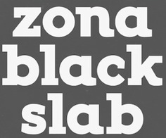 [MyFonts]
[More] ⦿
|
Kousuke Nagai
|
Aka Kyosuke Nagai. Japanese designer of the free Japanese hand-printed Mincho style Google font New Tegomin (2021) and the free (variable) Latin penmanship font Kapakana (2020). [Google]
[More] ⦿
|
Krista Likar

|
 During her studies, Ljubljana, Slovenia-based Krista Likar created the exaggerated serif typeface Serifnik (2015) and the gorgeous sans display typeface Kros (2015).
 In 2016, she designed the slab serif typeface Josephine. In 2020, she released Sopran through Type Salon, an independent type design studio based in Ljubljana, Slovenia, founded by Alja Herlah and Krista Likar. Sopran is an attractive didone display style in which the traditional ball terminals have been replaced by vertical hairline serifs. Co-designer with Alja Herlah of Spektra (2020, Type salon), a black condensed sans that combines five scripts: Latin, Arabic, Cyrillic, Greek and Hebrew. It also has a variable typeface with an italic axis. In 2021, Krista Likar and Alja Herlah published Plecnik, which is named after Slovenian architect Joze Plecnik. Plecnik is defined by classical elements and shapes, classic proportions, humanist stroke endings and low contast. It has a capital A with an overhang. Plecnik Display is quite different as it features flaring in every stroke. [Google]
[MyFonts]
[More] ⦿
|
Kristof Van Proeyen
[Punch]

|
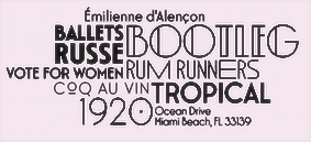 [MyFonts]
[More] ⦿
|
Ksenia Churilova

|
 Illustrator, graphic and type designer, b. 1997 in Moscow. She graduated from MGHPA (Faculty of Graphic Design of the Stroganov Academy) in 2018.
 In 2022, Matthew Grouss, Ksenia Churilova and Pavel Nevsky released the 16-weight constructivist typeface Nowar, a variable typeface that features Latin, Cyrillic and Hebrew scripts. [Google]
[MyFonts]
[More] ⦿
|
Kseniya Karataeva

|
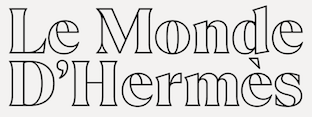 Russian type designer associated with TypeType in Saint Petersburg, Russia. She is originally from Rostov-on-Don. In 2020, Antonina Zhulkova, Yulia Gonina and Kseniya Karataeva co-designed the octagonal typeface superfamily TT Octosquares at TypeType. TT Octosquares comes with a 3-axis variable type option.
 Author of the monospace subfamily and the icon research for TypeType's superfamily TT Interphases (2019). In 2020, she co-designed TT Lakes Neue, a 91-style sans family by Vika Usmanova, Antonina Zhulkova and Kseniya Karataeva at TypeTypType. Tt is a functional sans-serif that draws inspiration from Finnish signs of the functionalism era. TT Lakes Neue is an almost monolinear sans, with ovals in the form of rounded rectangles, reminiscent of Nebiolo's Microgramma. It comprises a useful variable font. In 2020, she was part of the Type Type team that designed TT Ramillas, a 20-style high contrast transitional serif by Pavel Emelyanov, Marina Khodak, Yulia Gonina and Kseniya Karataeva. TT Ramillas also contains variable styles. In 2021, Kseniya Karataeva and the TypeType team released the 21-style TT Travels Next, which is intended as a trendy and radical counterpart of TypeType's earlier font, TT Travels (2017). Still in 2021, she designed TT Ricordi Greto, a non-contrasting Florentine caps-only sans-serif with dynamic proportions and a hint on what would be serifs, that was inspired by a floor plaque dating from 1423 found in the Basilica di Santa Croce in Florence. TT Ricordi Greto also has a variable format. [Google]
[MyFonts]
[More] ⦿
|
Kyle Wayne Benson
[Very Cool Studio]

|
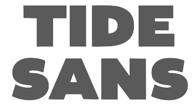 [MyFonts]
[More] ⦿
|
Laire Banyu
[The Ocean Studio]

|
[MyFonts]
[More] ⦿
|
Laurence Penney

|
Laurence Penney (born Isleworth, London, 1969, based in Bristol, UK) is a digital type specialist and dynamic (or variable) font technology expert, who has his own blog. His work has had a major impact on the type technology world we know today. At university (B.Sc. Computer Science) he created a prototype parametric font system, and wrote that it was a weird and unusable font production system, proving to himself that over-automation of type design is a Bad Thing. He was involved in Type Chimerique: Type Chimirique (formerly Kendrick Digital Typography) is a small organization dedicated to digital fontology. In other words, we specialize in everything to do with digital type. We design, hint and customize type to your requirements---avoiding automatic systems whenever there's a suspicion of inferior quality, writing our own tools where existing ones aren't enough. We're particularly into TrueType, and take commissions for writing custom TrueType (and OpenType) editing tools---for glyph outlines and other parts of the font file. We also design, adapt and hint and Type 1 fonts. From 1993 onwards, he went freelance and (in his own words) divined the black art of TrueType hinting, tweaking fonts for Microsoft, Linotype and indie designers. In 1999 he was hired as a founder member of MyFonts, at the time only an idea within Bitstream (Cambridge, MA). He enlarged the team and helped the company to become market leader by a wide margin. In particular, he helped create the site's unique balance between newbie appeal and an extensive typographic resource. He developed MyFonts.com's in-house software, contributed editorial content, and co-managed the distributor's contacts with foundries and designers. At ATypI 2004 in Prague, Penney spoke about EULAs. From 2016 he has been a consultant in variable fonts. He presents aspects of the technology at conferences and universities, and wrote the open source Fit-to-Width library. His Axis-Praxis website (2016-present) is the first place that anyone can play with variable fonts. Laurence also lectures on font technology at typographic conferences and is visiting lecturer at Reading University. Speaker at ATypI 2019 in Tokyo on the topic of Parametric Fallback Fonts for the Web. Related to that talk, he set up FauxFoundry with Irene Vlachou in 2019. FauxFoundry provides tools for providing Greek fonts that match a Latin counterpart. [Google]
[MyFonts]
[More] ⦿
|
Leo Philp

|
 MyFonts lists him as Leo Philip, but it should be Leo Philp, without an i. Scottish student-designer at the University of Reading of Makar (2014), a Latin / Gurmukhi / Cyrillic / Greek typeface family whose angular forms confirm Philp's description of Makar---an opinionated typeface for opinionated texts.
 In 2020, he released the (variable) text typeface Fulmar at CAST, and wrote: Named after a practical seabird, Fulmar is a modern Scotch intended for extended reading. More European than American, it draws on a range of influences from around the North Sea, from Fife's Alexander Wilson to 17th-century French experiments in modulation and 18th-century Belgian flash, and combines them with contemporary structure and proportions.. [Google]
[MyFonts]
[More] ⦿
|
Letter Omega
[Doni Sukma]

|
 Jakarta, Indonesia-based type foundry that surfaced in 2016. Its typefaces include Neufile Grotesk (2018, a neo-grotesk by Doni Sukma) and Gelion (2018, by Doni Sukma: inspired by Avenir and Avant Garde).
 Typefaces from 2019: Upton (a condensed grotesk with hipster features (such as the vertical-eared g) that was inspired by Bauhaus and Wim Crouwel's Hiroshima), Poligon (a geometric sans family inspired by Avant Garde and Futura), Rifton (an all caps truck stop headline sans). Typefaces from 2020: Bauziet (a 25-style grotesk with exaggerated inktraps: +a variable font), Gimbo (a fun super-fat poster or logo typeface family), Mono Spec (an all caps monospaced family with regular and stencil styles and a variable OTF option). Typefaces from 2021: Rioma (an 48-style sans font that is a descendant of Antique Olive; it includes a variable font and stretches from wide to very wide), Grafical (a 20-style geometric sans). You Work For Them link. [Google]
[MyFonts]
[More] ⦿
|
LettError
[Erik van Blokland]

|
 LettError is a foundry in Den Haag, founded by the interesting duo, Just Van Rossum (b. 1966) and Erik van Blokland (b. Gouda, 1967). Many of their fonts can be found in the FontFont library.
 Erik van Blokland is a graduate of the Royal Academy of Art in The Hague (KABK), class of 1989. He develops niche tools for type design and font production and has been involved with Tal Leming in the development of the UFO (for font sources) and WOFF (for font binaries) formats. Since 1999, he is a senior lecturer at the TypeMedia master at the Royal Academy of Arts in Den Haag. Erik developed many type software tools such as the acclaimed type interpolation tools MutatorMath and Superpolator, and the teaching tool TypeCooker. Their typefaces: - At FUSE 11, Erik designed FF Beowolf (1989-1990, a randomized font, sometimes still called Beowulf; with Just van Rossum), FF Erikrighthand, FF Kosmik (1993), FF Trixie (based on an old typewriter: Trixie was taken from a typed sample from a typewriter owned by a friend in Berlin, Beatrix Günther, or Trixie for short.) and FF Zapata. Trixie was at FontShop until it was bought by Monotype. In 2023, it was withdrawn from the Monotype library.
- Erik created LTR ThePrintedWord and LTR TheWrittenWord (2001), both free fonts designed to be unreadable.
- LTR Salmiak (2001).
- Critter (2001) and New Critter.
- Bodoni Bleifrei.
- LTR BitPull.
- Federal: great dollar bill lettering font family, which earned him an award at the TDC2 Type Directors Club's Type Design Competition 2002.
- What You See/What You Get (with Just Van Rossum).
- At FUSE 2, Erik published Niwida.
- FFAdvert.
- Schulschrift.
- FFHands.
- FFBrokenscript.
- LTR Monsta.
- In 2005, Erik and his brother Petr made the Künstlerbrüder-Schriftfamilie of 30 fonts (10 widths, 3 weights) based on 3 width masters for each of two weights. It is a quirky and refreshing family made for banners for the Münchener Haus der Kunst in 2005.
- Jointly with Erik Spiekermann and Ralph du Carrois, Erik developed Axel (2009), a legible system font.
- His masterpiece, in my view, is the 2009 family Eames Century Modern, finished at House Industries, a take on Clarendon. It won an award at TDC2 2011. A special extra award was given at that competition for Eames Poster Numerals. For another complete modern Clarendon family, see Canada Type's Clarendon Text.
- Plinc Hasler Circus (2011, House Industries) is a digitizztion of a photo era font, Circus, done by Hasler for Photo-Lettering, Inc. in the 1950s. This circus font was digitized by Erik van Blokland in 2011 at House Industries, with a helping hand from Ken Barber.
- In 2016, he published Action Condensed at Commercial Type. Action Condensed was designed for the screen. Each of the family's four weights has three grades of the same width, allowing text to change weight on rollover without disrupting the layout. In 2020, he added Action Text in 16 styles, with Bright and Dark options. And variable styles.
Erik speaks often about his work. At ATypI 2004 in Prague, LettEror spoke about education in type design, and the RoboFab toolkit. Speaker at ATypI 2013 in Amsterdam and at ATypI 2014 in Barcelona [on interpolations with Superpolator3]. Klingspor link. FontShop link. Wired interview. Shop. FontFont link. [Google]
[MyFonts]
[More] ⦿
|
Lewis McGuffie

|
 British graphic designer and sign painter who was at some point in Tallinn, Estonia. Graduate of the MATD program at the University of Reading, class of 2019.
 Old German Baltic maps gave him the inspiration for the signage family Livo Display (2014). Other typefaces, all done in 2015: Imperija Roman (2015, an impressive Trajan typeface for posters and editorial use; Lewis explains: The original letters were drawn from a memorial engraving in Ljubljana, Slovenia), Trout Beer (display type), Andra Roman (a humanist sans based on a letter sample dated around 1920 found in the Estonian History Museum), Cream (an Italian western type based on an original wood type), Gauss (a pointy stencil type), Heath Egyptian (based on Caslon's Two-Line Egyptian: a custom type for London-based craftsman Daniel Heath), Poison, Titanik Tuleva, Hebden (a grotesque and incised pair inspired by the original signs at Hebden Bridge train station in Yorkshire). Typefaces from 2016: Fleischer Display, Bobik (a sans / slab / wedge serif triplet of fonts initially developed based on basic principles described in Jean Alessandrini's Codex 80), Cindie Mono (four monospaced fonts of widely varying widths), Cenotaph Titling (a free engraved titling typeface influenced by Eric Gill's inscriptions). Typefaces from 2017: Osselian Demi (lapidary), Borough Grotesk (free; updated to Pro in 2018), Tusker Grotesk (a headline grotesk in the tradition of Haettenschweiler, Impact and Helvetica Inserat; influences include Inland Type's Title Gothic No.8 and Stephenson Blake Elongated Sans No.1), Gardner Sans. Typefaces from 2018: Chicken Shop Gothic (a condensed grotesk published by Typeverything: partly inspired by Benguiat's 1968 sample book Psychedelitype and part-nod to the stretched tacky stick-on-vinyl lettering on the windows of late-night takeaways, Chicken Shop is a variable font with a super-size height axis), Zierde Grotesk (a take on early advertising, small-copy grotesks of the late 19th/early 20th century, and is largely inspired by Miller & Richard's own range of grotesques. The ornaments were inspired by J.G Schelter & Giesecke's 1913 type specimen book Die Zierde). Sortie Super (Italian stress Western font). During his studies at Ecole Estienne (Paris), Manuel de Lignières (Montpellier, France) published Waba (2018) with Lewis McGuffie. Inspired by woodblock types and art nouveau, Waba is a bit of love letter to Estonia, the Baltics and the visual history of Eastern Europe. The free variable font Waba Border (2018) was added by Lewis McGuffie. Find Waba at Typeverything. Typefaces from 2019: Cham (heavy, octagonal, based on fascia lettering from 1875 in Liverpool; released by Typeverything), Chicken Shop Gothic (a condensed poster sans, with a variable type option), Columba (a variable font done for his graduation at MATDi with Latin, Greek, Cyrillic & Hebrew coverage and optical size and weight axes; Grand Prize winner at Granshan 2019). Typefaces from 2020: Salford Sans (an 8-weight headline sans family; a collaboration between Lewis McGuffie (Latin, Greek, Cyrillic), Dave Williams of Manchester Type (Latin, Arabic) and Elsa Baussier (symbols)), Jooks Script (in the style of Kurrent and Sütterlin; reviving Walter Höhnisch's Werbeschrift), Auroc (a flared incised petite-serif), Cindie 2 (an extension of Cindie Mono, this family has 26 monospaced widths). Typefaces from 2021: Tekst (a Latin / Greek / Cyrillic font family based on Literaturnaya---a book type popular in the Soviet Union; it comprises ekst A (Analog for print), Tekst D (Digital for screen) and Tekst M (M for Mono)). Typefaces from 2022: Mushy (a soft-edged joining script display type with four substyles, Cheese, Butter, Yoghurt and Cream), Rulik (unicase, uncial), Narwa (a wonderful all caps poster typeface). Future Fonts link. Type Department link. [Google]
[MyFonts]
[More] ⦿
|
Liebermann Kiepe Reddemann
|
Hamburg-based studio, est. 2014 by David Liebermann and Maximilian Kiepe. Jana Reddemann joined in 2019. They released two free fonts: - Times New Arial (Elias Hanzer, 2019). A variable font which interpolates between Times and Arial. It has two axes: Times/Arial and Left/Right slant. Inspection of the font file indicates that the Arial master's outlines are copied directly from the Microsoft system font.
- Cursor or Cursor Apple (2020). This is an OpenType color SVG font which is designed to look like the Mac OS cursor set.
[Google]
[More] ⦿
|
Lillan Team
[Oscar Cobo]

|
 During his studies in Barcelona, Oscar Cobo created the modular Tuscan typeface family Batto (2015, free) and Atzur (2015, free). In 2016, he published the commercial version, Atzur Pro.
 In 2017, he designed the free modular display typeface Golem. Typefaces from 2018: Haki (a free squarish variable font), Carbono (an octagonal family in 42 styles, and a 3-axis variable font), UT Morph (with Wete; a piano key variable opentype font that was inspired by Wim Crouwel's Nagasaki poster). Typefaces from 2019: Concasse (a sans typeface family, +a variable font). [Google]
[MyFonts]
[More] ⦿
|
Limo Studio
[Vitaliy Tsygankov]

|
Russian codesigner, with Jovanny Lemonad, of the free rounded sans typeface Matias (2016, TypeType). In 2019, he designed the rounded sans typeface Koryaka and the sans family TS Maka. In 2020, he released TS Kirt (with a variable style; a condensed sans family). Typefaces from 2022: TS Remarker (a marker pen font). [Google]
[MyFonts]
[More] ⦿
|
Lisa Huang
[Polyform]
|
[More] ⦿
|
Literata
|
 Literata is a typeface designed in 2014 and 2015 by Type Together for use in Google Play Books on many different kinds of devices. As of 2015, it replaces Droid Serif (2006-2007, Steve Matteson). The project was headed by Veronika Burian and José Scaglione. The final Literata family featured two weights and matching italics including more than 1100 characters per font with Pan-European language support. It coversedPolytonic Greek (designed by Irene Vlachou, advised by Gerry Leonidas) and Cyrillic (designed by Vera Evstafieva, advised by Kiril Zlatkov).
 In 2020, Literata 3, entirely free and a totally new re-design, was released. This 48-style family comes with a variable style. The designers in 2020 were Veronika Burian (Latin), José Scaglione (Latin), Vera Evstafieva (Cyrillic), Elena Novoselova (Cyrillic) and Irene Vlachou (Greek). Github link. [Google]
[More] ⦿
|
Lizy Gershenzon
[Vectro Type Foundry (was: Scribble Tone)]
|
 [More] ⦿
|
Lorenz Lopetz Gianfreda
[burodestruct (or: Typedifferent.com)]

|
 [MyFonts]
[More] ⦿
|
Lucas de Groot
[Floris]
|
[More] ⦿
|
Lucas Gini
|
 Type and graphic designer in Sao Paulo. His typefaces include Arcadum (2018: pixel-based) and Ficus (2017), a typeface family whose shapes are like those of the Figueira Mata-Pau tree in the Brazilian Pantanal.
 In 2020, he co-designed the vernacular script typeface Cada Dia Sadia with Crystian Cruz for a refrigerated food company in Brazil. Other typefaces from 2020 include the vernacular Chef Aprendiz and the free variable rectangular cutout typeface Unbox. [Google]
[More] ⦿
|
Luis R.H. Rapp
|
Luis Richtiger Horst Rapp is the Stuttgart, Germany-based designer of the free display typeface Inter Norse (2020), the free painted typeface Crooked (2020), the free variable squarish techno family Faber (2020), the free font Ikarus (2020), the free variable techno family Obarne X (2020), the free pixel typeface Invader (2020), the free grunge typefaces Brutalism (2020: dry brush style) and Riot (2020), the free tuxedoed typeface Grotesque (2020). Typefaces from 2021: Karpaten (a free squarish blcky display type). [Google]
[More] ⦿
|
Lukas Ulonska
|
Recklinghausen, Germany-based student-designer of these typefaces in 2019: Polymorph (Sans, Serif, Mono: a multi-axis variable font with seven variable design axes ranging from sans, serif, mono and an abstract pattern font to weight, width, contrast and slant.), Opuls (a modular typeface based on architectural elements of the faculty of design of the Fachhochschule Dortmund is located on the Max Ophüls Platz). [Google]
[More] ⦿
|
Luke Lee
|
Graphic designer in Beijing. Creator of the free twisted and glitch variable font family LL Detechno (2021). [Google]
[More] ⦿
|
M+ Fonts
[Coji Morishita]
|
 Free font producer in Japan that started out as a bitmap font specilaist. The M+ Fonts Project is jointly run by Coji Morishita, Hiroki Kanou, Imazu Kazuyuki and Taro Muraoka.
 All fonts are totally free: Unlimited permission is granted to use, copy, and distribute them, with or without modification, either commercially or noncommercially. . Download page. Free monospaced and variable width outline fonts containing kana, kanji (97% coverage of jinmeiyo), Chinese (81% coverage of traditional Chinese), Korean, Cyrillic, Greek, Hebrew, and Latin (sans), all made between 2006 and 2016 and still being developed: mplus-1p-black, mplus-1p-bold, mplus-1p-heavy, mplus-1p-light, mplus-1p-medium, mplus-1p-regular, mplus-1p-thin, mplus-2p-black, mplus-2p-bold, mplus-2p-heavy, mplus-2p-light, mplus-2p-medium, mplus-2p-regular, mplus-2p-thin. In 2018, they published MPlusRounded1c at Google Fonts. Additions in 2021: M Plus Code Latin, M Plus 1 Code. Mplus 1 Code is a sans serif programming font with seven weights from Thin to Bold, supporting 5,700+ kanjis for Japanese with GF Latin Plus. iM Plus Code Latin is a multi-weight programming font for Latin only. Both have variable fonts as well. Open Font Library link. Local download of the M+ family. Google Fonts link. Github link. [Google]
[More] ⦿
|
M XiangHe Hei
|
 M XiangHe Hei Simplified Chinese (2018, Monotype) merges traditional brush strokes with modern letterforms to carefully balance traditional calligraphy with humanist design. Named for the smooth movements of a flying crane, the M XiangHe Hei typeface is designed to glide across the page, and features strokes that are partly derived from the Kaishu calligraphic style---an everyday script which dates back hundreds of years. The traditional Chinese counterpart is M XiangHe Hei TC.
 Both M XiangHe Hei SC and M XiangHe Hei TC feature Neue Frutiger for its Latin glyphs, and works harmoniously with Neue Frutiger World and Monotype's CJK typefaces: Tazugane Gothic (Japanese) and Seol Sans (Korean). The M XiangHe Hei project by the Monotype Design Team was managed by Akira Kobayashi. Variable fonts published in 2022: M XiangHe Hei SC Pro Variable, M XiangHe Hei SC Std Variable, M XiangHe Hei TC Variable, Seol Sans Variable, Tazugane Gothic Variable, Tazugane Info Variable. [Google]
[More] ⦿
|
Mário Feliciano
[Feliciano Type Foundry]

|
[MyFonts]
[More] ⦿
|
Maddy Angstreich
|
During her studies at Washington University in St. Louis, MO, Maddy Angstreich designed the text typeface Galileo (2019: a didone with altered angular terminals) and the free variable typeface Jailbird (2019), in which the size of dominos changes.. She also designed the pixel typeface Dot Dot Dot (2019). [Google]
[More] ⦿
|
Mage Type
[Setiadi Karya Pertiwi]

|
Indonesian designer of these typefaces: [Google]
[MyFonts]
[More] ⦿
|
Making variable color fonts
|
References for making variable color fonts: [Google]
[More] ⦿
|
Maks Barbulovic
|
Maks Barbulovic studied communication design at the Hochschule Düsseldorf (Germany), and participated in an internship program at Ecole Nationale Supérieure d'Art et de Design in Nancy (France). At Type Tomorrow, he published the dot matrix typeface Dusseldot (2020) together with Ilya Bazhanov. [Google]
[More] ⦿
|
Maksym Kobuzan
[Kobuzan]

|
[MyFonts]
[More] ⦿
|
Malou Verlomme
|
 French type designer who graduated from l'Ecole Duperré in Paris and the University of Reading (2005). He cofounded the type foundry LongType in 2012. Since 2016 he works for Monotype UK. His typeface Ficus (2005) won an award in the Creative Review Type Competition 2005.
 He wrote Technological Shifts in Type Design and Production (2006). His typefaces: Respublika (2013, a humanist sans done with Gregori Vincens, Fontyou), Camille (2010-2011, for Camille Muller), ECAM (2009-2010, for the ECAM theater), Dijon (2011, for the identity of Dijon's Opera house), Arbre (2010, for the identity of the coffee brand L'Arbre de Cafe), Totem, Ficus (2005-2006), Syneas (2009, for Syneas), Digitaline (2007, a Futura-like family done for Agence Digitaline), Vingt-huit (2007), Sabasi (2008), Gem (2007, art nouveau), Oops (2006). Marion Andrews, Malou Verlomme and Laurence Bedoin collaborated on the school fonts Écriture A and Écriture B which are presented in Modèles d'écriture scolaire (2013), a document issued by the French Ministry of Education. These fonts are available from Eduscol. Verlomme set up Long Type in 2012 with Mathieu Chévara, Mathieu Reguer and Thomas L'Excellent. In 2016, for Monotype, on commission for the Transport For London company, he redesigned / tweaked New Johnston, called Johnston100. It will be used in TfL's trains and station signage including for London's new Crossrail Elizabeth line that is scheduled to open in 2018. In 2018, he published the geometric sans typeface family Madera and the revival typeface Placard Next (based on an old Monotype condensed poster typeface) at Monotype. In 2019, he released the 12-style high-contrast Ariata (Text, Display, Stencil) at Monotype. In 2020, he published the superfamily Macklin (Sans, Display, Text, Slab) at Monotype. Influenced by early 19th century designs in Europe, and especially by the work of Vincent Figgins, it is intended for use in headlines and short blocks of text. Variable fonts are also available. Co-designer, with Clement Charbonnier Bouet, of Ionic No 5 (2021), a ten-style Clarendon that revives and refreshes a classic Linotype Clarendon-style serif for Monotype. Noteworthy is that the designers replaced Clarendon's ball terminals by 21st century serifs, even including the hipsterish coathanger f. The ball terminals are relegated to the "alternates". In 2021, he took part in the development of Helvetica Now Variable (Monotype). Helvetica Now Variable was designed by Max Miedinger, Charles Nix, Monotype Studio, Friedrich Althausen, Malou Verlomme, Jan Hendrik Weber and Emilios Theofanous and published by Monotype. Monotype writes: Helvetica Now Variable gives you over a million new Helvetica styles in one state-of-the-art font file (over two-and-a-half million with italics!). Use it as an extension of the Helvetica Now family or make custom-blends from its weights (Hairline to ExtraBlack), optical sizes (four point to infinity), and new Compressed and Condensed widths. It contains 144 static styles. In 2022, he released Boucan (a variable all caps font that can be animated to react to sounds and music). Typecache link. Speaker at ATypI 2017 Montreal. [Google]
[More] ⦿
|
Manushi Parikh

|
 Indian type designer associated with the Indian Type Foundry. Manushi's typefaces:
 - Torrent (2015). An angular wedge serif text typeface with large x-height.
- Director (2015). A modular Latin techno typeface family.
- Begum (2015; a text typeface related to Caslon, Fleischmann or Times). It supports Latin, Devanagari and Tamil. In 2020, he added Begum Sans, a tapered lapidary high-contrast sans inspired by Florentine inscriptional lettering during the Renaissance; developed together with Heidi Rand Sørensen.
- Teko (2014: Google Fonts). Teko is an Open Source typeface that currently supports the Devanagari and Latin scripts. This font family has been created for use in headlines and other display-sized text on screen. Five font styles make up the initial release. Codesigned with Jonny Pinhorn.
- Hind (2014: Google Fonts). Hind is an Open Source typeface supporting the Devanagari and Latin scripts. Developed explicitly for use in User Interface design, the Hind font family includes five humanist sans styles. Each font in the Hind family has 1146 glyphs, which include hundreds of unique Devanagari conjuncts. These ensure full support for the major languages written with the Devanagari script. Codesigned with Satya Rajpurohit.
- Sarpanch (2014, Indian Type Foundry is an Open Source squarish typeface supporting the Devanagari and Latin scripts. The Medium to Black weights of the Sarpanch family were design by Manushi Parikh at ITF in 2014. Jyotish Sonowal designed the Regular weight. Download at Google Web Fonts.
- Mute (2015, Indian Type Foundry). A humanist sans family in the spirit of Jim Lyles's Prima Sans.
- Hind Guntur (2015) is a free Google Font designed by Manushi Parikh and Hitesh Malaviya at Indian Type Foundry for use in Telugu. Github link.
- At Type@Paris 2016, Manushi Parikh designed the contemporary slab serif typeface Format.
- Manushi Parikh and Barbara Bigosinska released the octagonal athletics font Fielder at Indian Type Foundry in 2019. Somehow this octagonal typeface seems to have been evolved into the 5-style free typeface Nippo at Fontshare.
- Chillax (2019-2021) is a free 6-style monolinear minimalist geometric Bauhaus sans family that comes with a variable font on the side.
- Diodrum Rounded (2020, by Manushi Parikh, Jérémie Hornus, Clara Jullien and Alisa Nowak). A spurless organic sans family.
- Syphon (2020: a neo-grotesk).
- Pencerio (2021). A hairline monolinear Spencerian script.
[Google]
[MyFonts]
[More] ⦿
|
Manvel Shmavonyan

|
 Moscow-based Armenian type designer (b. 1960, Artashat, Armenia) and graphic artist. In 1984 graduated from the Moscow Poligraphic Institute, department of Polygraphic Product Design. He worked for the Type Department of Committee of Print in Yerevan, and for the publishing houses Ayastan, Luys and Sovetakan Grokh. At Microsoft's request, in 1999, he was consulted for the Armenian section of the Sylfaen project.
 Creator of PT Margarit Armenian and Asmik (1997, Armenian, based on PT Petersburg, 1992, by Vladimir Yefimov), available from ParaType, where he is an active type designer. These fonts won awards from the Type Directors Club in 1999. At ParaType, he also published Propisi Cyrillic + western (1997, a school script family), PT Henman Pictograms (2001, based on Armenian ornaments revived by Henrik Mnatsakanyan), Cooper BT (2000, a Cyrillic version of the Bistream family by the same name), Henman Western, Karolla Western (2002, art nouveau face, based on an alphabet of Lucian Bernhard, 1912), Zagolovochnaya Western (2002, based on a Caslon model from 1725), Haverj Western (2004, flared mini-serifed typeface with an f and a j ready for the paralympics), PT Margarit (1997, based on PT Bodoni by A. Tarbeev), Bardi (2004, Paratype, an extra compressed decorative stenciled typeface based on the lettering created in 1970s by the Armenian type designer Henrik Mnatsakanyan (1923-2001)), Haverj (2004, Paratype, also based on Mnatsakanyan's work), and PT Noah (1997, to accompany Tagir Safayev's PT FreeSet, 1992). Asmik, and Humanist 531 Cyrillic (the latter co-designed with Isay Slutsker) won awards at Bukvaraz 2001. In 2007, he designed the text and display family Susan (Paratype; award winner at Paratype K2009), which was named after his wife. Award winner at Granshan 2008. In 2010, he designed the Ripe Apricot humanist sans family (ParaType). Narevik (2011, Paratype) is a dynamic low contrast design with slightly rounded triangle serifs. In 2011, he created the free Google Web Font Marmelad, meant for headlines. Jacques Francois and Jacques Francois Shadow (2012, Cyreal) were co-designed with Alexei Vanyashin. They are revivals of the Enschedé no. 811 type specimen (ca. 1760) by Jacques François Rosart (1714-1774), made for Enschedé Printing House. Free at Google Web Fonts. Typefaces from 2013: Vaccine (a slab serif family, ParaType). This was followed in 2014 by the humanist Vaccine Sans (2014, with the help of Alexandra Korolkova and Gayaneh Bagdasaryan). In 2015, he made Levnam (ParaType), a sans with wide proportions for small text. In 2016, Alexander Lubovenko and Manvel Shmavonyan co-designed the 30-style Latin / Cyrillic workhorse sans typeface family Mediator, which was followed in 2017 by Mediator Serif. In 2018, Alexandra Korolkova and Manvel Shmavonyan designed Fact at Paratype. Fact is based on Frutiger. The fact type system contains 48 upright styles with variations in width and weight and eight italics of normal width. Vast (2021, Paratype) is a 56-style sans family, with three variable fonts, by Manvel Shmavonyan and Alexander Lubovenko. Choices are from thin to black and regular to extra wide. FontShop link. Catalog. MyFonts link. Klingspor link. [Google]
[MyFonts]
[More] ⦿
|
Marc Kappeler
[Moiré]
|
 [More] ⦿
|
Maria Ramos Silva
[Marsi Desino]

|
 [MyFonts]
[More] ⦿
|
Marina Khodak

|
 As a student at TypeType Education, Marina Khodak designed the rounded slab serif typeface Splash (2016-2017). She joined TypeType after these studies. In 2018, Ivan Gladkikh, Alexander Kirillov, Philipp Nurullin, Vika Usmanova, Marina Khodak, and Nadyr Rakhimov published TT Severs. Still in 2018, Nadezhda Polomoshnova and Marina Khodak co-designed the forceful display typeface TT Phobos, which features striling stencil and inline styles. Continuing in 2018, Sergey Kotelnikov, Philipp Nurullin, Nadezhda Polomoshnova, Marina Khodak and the TypeType Team designed the not-quite-geometric 18-style typeface family TT Smalls, which is characterized by a small x-height and modulated joins. Co-designer of TT Barrels (2018: a Scotch modern typeface by Inessa Mitrozor, Vika Usmanova, Marina Khodak, Nadezhda Polomoshnova and the TypeType Team). At the end of 2018, TypeType published TT Supermolot Neue (Roman Ershov, Marina Khodak, Nadezhda Polomoshnova, Ivan Gladkikh and the TypeType Team).
 In 2019, TypeType published TT Tsars, a 20-style font family with five subfamilies. It is a collection of serif display titling fonts that are stylized to resemble the fonts of the beginning, the middle and the end of the XVIII century and seen on book title pages in Russia. A reference for the development was Abram Shchitsgal's book Russian Civil Type. The fonts were designed by Marina Khodak, Inessa Mitrozor, Nadezhda Polomoshnova and the TypeType Team. In 2020, Marina Khodak and Anna Tikhonova co-designed TT Marxiana (TypeType). It is an attempt to reconstruct a set of pre-revolutionary fonts that were used in the layout of the Niva magazine, published by the St. Petersburg publishing house A.F. Marx, and includes antiqua, grotesque and elzevir styles. In 2020, she was part of the Type Type team that designed TT Ramillas, a 20-style high contrast transitional serif by Pavel Emelyanov, Marina Khodak, Yulia Gonina and Kseniya Karataeva. TT Ramillas also contains variable styles. In 2021, she designed the thin roman capital lettering typeface TT Ricordi Fulmini which was inspired by an inscription on the altar in the National Gallery of Umbria in Perugia. Still in 2021, she co-designed TT Commons Classic (a 24-style geometric sans by Ivan Gladkikh, the TypeType Team, Pavel Emelyanov and Marina Khodak; it includes two variable fonts). Near the end of 2021, she published TT Rationalist (a 22-style slab serif with accompanying variable fonts). [Google]
[MyFonts]
[More] ⦿
|
Måns Grebäck
[Aring Typeface]

|
 [MyFonts]
[More] ⦿
|
Mario de Libero

|
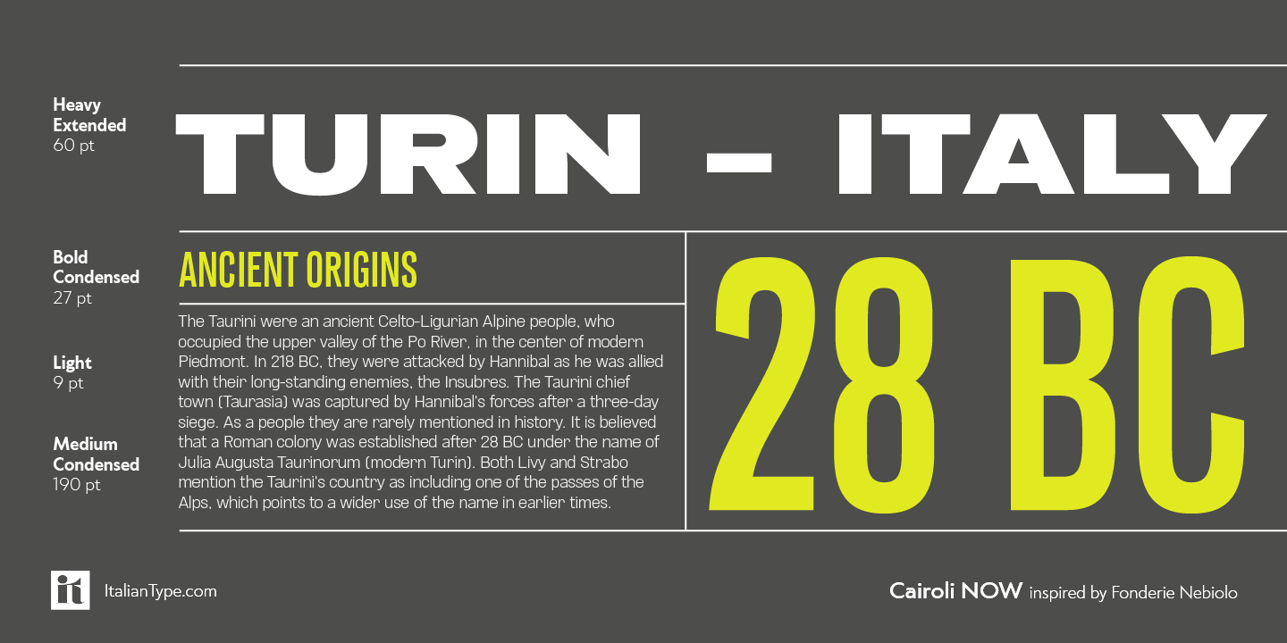 Italian type designer whose typefaces include:
 - Cairoli Classic and Cairoli Now (2020, Italian Type). Cairoli was originally cast by Italian foundry Nebiolo in 1928, as a license of a design by Wagner & Schmidt, known as Neue Moderne Grotesk. Its solid grotesque design (later developed as Aurora by Weber and Akzidenz-Grotesk by Haas) was extremely successful---it anticipated the versatility of sans serif superfamilies thanks to its range of weights and widths, while still retaining some eccentricities from end-of the century lead and wood type. In 2020 the Italian Type team directed by Cosimo Lorenzo Pancini and Mario De Libero produced a revival of Cairoli, extending the original weight and width range and developing both a faithful Classic version and a Now variant. The Cairoli Classic family keeps the original low x-height range, very display-oriented, and normalizes the design while emphasizing the original peculiarities like the hook cuts in curved letters, the high-waisted uppercase R and the squared ovals of the letterforms. Cairoli Now is developed with an higher x-height, more suited for text and digital use, and adds to the original design deeper inktraps and round punctuation, while slightly correcting the curves for a more contemporary look. Cairoli Variable has a weight and width axis.
- Etrusco Now (2020, Italian Type, with Cosimo Lorenzo Pancini). Etrusco Now is the revival of the lead typeface Etrusco originally cast by Nebiolo in the early 1920s. Heavily inspired by the design of the medium weight of Schelter & Giesecke's Grotesk, Nebiolo's Etrusco was an early precursor of the modernist grotesque superfamilies: a solid, multi-purpose workhorse typeface family that could solve a wide range of design problems with its range of widths and weights. When designing the new incarnation of Nebiolo's Etrusco, Cosimo Lorenzo Pancini and Mario de Libero decided to extend the original weight and width range. Etrusco Now has 42 styles; the original weights of the typeface have been collected in the Etrusco Classic subfamily. The lighter weights of the normal width have been heavily influenced by the modernist look of Recta, while the heavy condensed and compressed widths refer to the black vertical texture of Aldo Novarese's Metropol.
- In 2020, Cosimo Pancini, Andrea Tartarelli and Mario De Libero drew the 60-style Cocogoose Pro Narrows family, which features many compressed typefaces as well as grungy letterpress versions.
- Amazing Slab (2021). A 20-style typeface family designed by Francesco Canovaro, Mario de Libero (who did the inline versions), Sofia Bandini and Andrea Tartarelli, developed from the Amazing Grotesk family designed by Cosimo Lorenzo Pancini. Characterized by outward-pointing top serifs, this typeface is designed for use in athletic lettering, logos and titling. Zetafonts writes: Mixing an Egyptian serif, low contrast approach with the curved endings and open shapes of humanist sans grotesques, it was developed to embody the energetic and friendly nature of the startup scene---a feeling of innovation, information and energy, with a desire for simplicity and straightforward communication. The basic design shapes for the font come from the strong personality of the extrabold letterforms drawn by Francesco Canovaro for his StartupItalia logo, that informed the display design of the four darkest weights (from medium to black).
- Heading Now (2021). A 160-strong titling font (+2 variable fonts) by Francesco Canovaro, Cosimo Pancini, Andrea Tartarelli and Mario De Libero that provides an enormous range of widths.
- Asgard (2021). A 72-strong experimental display sans superfamily with a 3-axis (weight, width, slant) variable font, designed by Francesco Canovaro, Andrea Tartarelli ans Mario De Libero.
- Swanstone (2021). Influenced by Theophile Beaudoire's Romana (1860), Miller & Richard's Modernised Old Style, and especially Raffaello Bertieri's Raffaello, that De Libero used as the starting point of his research in a contemporary retelling of these exuberant and sexily unsettling letterforms [quote by Zetafonts]. Zetafonts refers to the evil beauty of sharp serifs.
- Keratine (2021, Cosimo Pancini, Andrea Tartarelli and Mario De Libero) is a German expressionist typeface that exists in a space between these two traditions, mixing the proportions of humanistic typefaces with the strong slabs and fractured handwriting of blackletter calligraphy.
[Google]
[MyFonts]
[More] ⦿
|
Mark Bloom
[Mash Creative]
|
 [More] ⦿
|
Mark Simonson
[Mark Simonson Studio]

|
 [MyFonts]
[More] ⦿
|
Mark Simonson Studio
[Mark Simonson]

|
 Mark Simonson Studio is located in StPaul, MN. Mark founded Mark Simonson Studio around 2000, and describes himself as a freelance graphic designer and type designer. From his CV: Early in my career I worked mainly as an art director on a number of magazines and other publications including Metropolis (a Minneapolis weekly, 1977), TWA Ambassador (an inflight magazine, 1979-81), Machete (a Minneapolis broadsheet, 1978-80), Minnesota Monthly (Minnesota Public Radio's regional magazine, 1979-85), and the Utne Reader (1984-88). I was head designer and art director for Minnesota Public Radio (1981-85) and an art director for its sister company, Rivertown Trading Company (1992-2000). During that time, I designed over 200 audio packages, including most of Garrison Keillor's, along with several hundred products (t-shirts, mugs, rugs, watches, etc.) for the Wireless, Signals, and other mail order catalogs. I have frequently done lettering as part of design projects I'm working on. This has always been my favorite part, so in 2000 I opened my own shop specializing in lettering, typography and identity design. I've also been interested in type design since my college days. I started licensing fonts to FontHaus in 1992, and since starting my new business, stepped up my efforts in developing original typefaces. I now have more than 70 fonts on the market with many more to come. This is increasingly becoming the focus of my activities. In 2021, he joined The Type Founders.
 His fonts: - Coquette (2001). He says: Coquette could be the result of a happy marriage of Kabel and French Script.
- Anonymice Powerline (2009-2010). This is probably a hack by some people based on Anonymous. It is available in some Github directories.
- Kandal: a 1994 wedge serif, now also at MyFonts).
- Proxima Sans (1994, a geometric sans, rereleased in 2004), followed in 2005 by his massively successful Proxima Nova in 42 styles/weights. Followed by Proxima Nova Soft (2011). The rounded version of Proxima Nova is Proxima Soft (2017). For a variable font that captures all styles, see Proxima Vara (2021). In 2022, he added Proxima Sera (an 18-style workhorse serif that combines old style forms with contemporary and modern typefaces).
- Mostra (2001): based on a style of lettering often seen on Italian Art Deco posters and advertising of the 1930s. Look at the Light and Black versions, and drool...... The 2009 update is called Mostra Nuova. Selected styles: Mostra Nuovo Bold, Mostra One Light, Mostra Three Bold, Mostra Two Heavy.
- In 2001, he made the Mac font Anonymous. Its updated version is Anonymous Pro (2009-2010), a TrueType version of Anonymous 9, which was a freeware bitmap font developed in the mid-90s by Susan Lesch and David Lamkins. It was designed as a more legible alternative to Monaco, the mono-spaced Macintosh system font.
- In 1998 and 2001, he produced the (free) 3-style Atari Classic family.
- In 2003, he released Blakely Bold and Heavy (an art deco font first done for the Signals mail order catalog). The original Blakely is from 2000.
- Goldenbook Light, Regular, and Heavy, based on the logotype of the 1920s literary mag called "The Golden Book Magazine".
- Metallophile Sp 8 Light and Light Italic (2008): a "faithful facsimile of an 8-point sans as set on a 1940s-vintage hot metal typesetting machine".
- Refrigerator Light and Heavy, Refrigerator and its extension Refrigerator Deluxe (2009) (geometric sans).
- Changeling Light, Regular, Bold, Stencil, and Inline (2003): a redesign and expansion of China, a VGC photo-typositor typeface from 1975 by M. Mitchell, which includes unicase typefaces; see also Changeling Neo, 2009.
- Sanctuary Regular and Bold: a computerish typeface based on lettering in the 1976 movie Logan's run--later withdrawn from the market.
- Sharktooth (+Bold, +Heavy).
- Felt Tip Roman, Woman and Senior (based on his own handwriting). Felt Tip Senior (2000) is based on the hand of Mark's father. Felt Tip Woman Regular and Bold are based on the handwriting of designer Patricia Thompson.
- Filmotype Gay (2011).
- Filmotype Honey (2010): fifties brush lettering face. For a free alternative, see Honey Script (2000) by Dieter Steffmann.
- Raster Gothic Condensed Regular and Bold (12 fonts total), and Raster Bank (a pixelized version of Bank Gothic).
- Other free bitmap fonts for the Mac [the PC version was made by CybaPee]. MyFonts page.
- He digitized Phil Martin's family, Grad (2004, inspired by Century Schoolbook, and originally done by Martin in 1990).
- His 2006 production includes three script typefaces: Kinescope is a connected script based on title lettering in Fleischer Studios' animated Superman films from the 1940s. Snicker is a cartoony block letter type. Both were published at Font Bros. And Launderette is a connected very slanted script based closely on lettering used in the titles of the 1944 Otto Preminger film, Laura.
- In 2007, he revived and extended Filmotype Glenlake (2007, sold at Font Bros).
- Lakeside (2008) is a flowing 1940s-style brush script. It was inspired by hand-lettered titles in the classic 1944 film noir movie Laura.
- In 2008, he revived Filmotype Zanzibar, about which he writes: That Zanzibar is nearly an anagram of bizarre seems fitting. The surviving people from Filmotype (later Alphatype) have not been able to tell us who designed this gem, so we have no record of the designers intentions. Released in the early 1950s, it seems somewhat inspired by the work of Lucian Bernhard (Bernhard Tango, 1934) and Imre Reiner (Stradivarius, 1945). At first, it appears to be a formal script, but there are no connecting strokes. It would be better described as a stylized italic, similar to Bodoni Condensed Italic or Onyx Italic, with swash capitals.
- Filmotype Vanity (2008) is an outline typeface based on a 1955 design by Filmotype. It was derived from Filmotype Ginger.
- Filmotype Alice (2008) is casual handwriting. However, MyFonts now credits Patrick Griffin with the digitization.
- Filmotype MacBeth (2008) is a freestyle face.
- Filmotype Ginger (2008) is a heavy display typeface with an aftertaste of Futura.
- Boxy2 (2008) and Boxy1 (2008) are severely octagonal typefaces made to test out FontStruct. See also bubblewrap.
- In 2008, Mark Solsburg and Mark Simonson cooperated on the digital revival of the calligraphic Diane Script, originally designed in 1956 by Roger Excoffon.
- In 2009, Mark worked on SketchFlow Print, a font for Microsoft. It will be bundled with the next version of Christian Schormann's Expression Blend, part of Microsoft's Expression Studio suite. The fonts, based upon the handwriting of architect Michaela Mahady of SALA Architects, Inc., give that well-known architectural printing look (like Tekton).
- Filmotype Gem (2011). A sans headline typeface that was first drawn by Filmotype in the 1950s.
- Bookmania (2011) is a revival of Bookman Oldstyle (1901) and the Bookmans of the 1960s, but with all the features you would expect in a modern digital font family. Especially, Simonson's Bookmania story is worth reading.
- In 2018, he published the 25-style Acme Gothic at Fontspring. He explains: Acme Gothic (2018) is based on the thick and thin gothic lettering style popular in the U.S. in the first half of the twentieth century. There have been typefaces in this genre before, but they were either too quirky (Globe Gothic), too English (Britannic), too Art Deco (Koloss), too modern (Radiant), or too Art Nouveau (Panache). None captures the plain, workman-like style of Acme Gothic.
- Parkside (2018) is a script typeface inspired by typefaces and lettering of the 1930s and 1940s. Parkside uses OpenType magic to automatically select letter variations that seamlessly connect to the letters coming before and after.
- In 2018, he emulated wood type in his HWT Konop at P22. Named for Don Konop, a retired Hamilton Manufacturing employee, who worked from 1959 to 2003, this typeface is monospaced in both x and y directions so that letters can be stacked vertically and horizontally. All proceeds go to the Hamilton Wood Type and Printing Museum.
- Etna (2020). A 30-style text and display family that started out from William H. Page's Victorian wood type Aetna (1874), and was remolded by Simonson into a useful typeface family though still distinctly linked to its ancestor. Etna includes three different condensed widths in all six weights (intended for display use), four different figure styles, alternate characters, true small caps, and a selection of dingbats, including arrows, stars, asterisks, and manicules.
Links to his typefaces, in decreasing order of popularity: Proxima Nova, Bookmania, Mostra Nuova, Proxima Nova Soft, Coquette, Refrigerator Deluxe, Felt Tip Roman, Grad, Changeling Neo, Goldenbook, Lakeside, Kinescope, Metallophile Sp8, Blakely, Felt Tip Woman, Snicker, Felt Tip Senior, Kandal, Sharktooth, Anonymous, Raster Bank, Raster Gothic. FontShop link. Fontspace link. MyFonts interview. View all typefaces designed by Mark Simonson. Fontspring link. Google Plus link. Klingspor link. Abstract Fonts link. Kernest link. I Love Typography link. Font Squirrel link. Old link to hos site. [Google]
[MyFonts]
[More] ⦿
|
Marko Hrastovec
[Hot Type]
|
 [More] ⦿
|
Markus Fetz

|
Markus Fetz is an Austrian illustrator, graphic and type designer based in Lech. After studying in Vienna, he worked in the advertising industry for two years before starting his own business as a graphic designer and illustrator in 2013. In 2020 he moved back to his hometown where he set up his studio. Markus Fetz created his one-man foundry in 2019. His typefaces: - the caps-only typeface Greissler (2019). He writes: Greissler is a retro display font inspired by old letterings on store fronts and building facades in Vienna. "Greißer" is a term used in the east of Austria and means small grocer. In Vienna, you can still see some of the letterings "Lebensmittel", "Feinkost", etc. on the storefronts of mostly abandoned shops. Similar letters can be found on "Gemeindebauten" (council housing) from the 1920s.
- Zuers (2022). A ten-style geometric sans, and two variable fonts. Zuers is based on a hand-drawn advertizing poster entitled Zürs Arlberg Austria (1935, Alexander Wagner).
[Google]
[MyFonts]
[More] ⦿
|
Marlene Arnold
|
Marlene Arnold's Masters Thesis entitled Dir Rolle der Typografie im Internet der Dinge (HS Mainz, 2017) covers variable fonts. [Google]
[More] ⦿
|
Marsi Desino
[Maria Ramos Silva]

|
 Spanish designer Maria Ramos Silva (Marsi Desino, Santiago de Compostela) was born in Santa Comba (A Coruña) in 1982. She created Fifont (2010) and Caracol (2010, a wedge-serifed hand-printed face).
 Designer of Calada (2013), a workhorse sans serif typeface developed during Typeclinic 6 and Typeclinic 7 in 2013. In 2015, she graduated from the MATD program at the University of Reading. Her graduation typeface, Sastre, is curved, angular, stressed, ink-trapped, and angry. It covers Latin, Greek and Hebrew, and can be used for stitching patterns. In 2016, she finished the fantastic slab serif typeface Knile at Atipo. Two of the sixteen weights are free. In 2018, Noel Pretorius and Maria Ramos set up NM Type. Together, they designed the custom typeface Meister for Jägermeister. Still in 2018, Maria Ramos and Jordi Embodas co-designed Nomada Didone. In 2019, Noel Pretorius and Maria Ramos co-designed Movement, a free experimental variable font inspired by dance movements. In 2021, they created Trisco, a custom font for Centro Galego de Arte Contemporánea. Speaker at ATypI 2018 in Antwerp on the topic of typewriter type. [Google]
[MyFonts]
[More] ⦿
|
Martin Cincar
[Caron Twice]

|
[MyFonts]
[More] ⦿
|
Martin Lorenz
[TwoPoints.net]

|
[MyFonts]
[More] ⦿
|
Martin Vacha
[Displaay]
|
[More] ⦿
|
Martype Co (was: Tyfrography)
[Umar Farouq]

|
Umar Farouq or Umar Al-Farouq or Mohammed Bendoel Kazar. Yogyakarta or Sleman, Indonesia-based designer (b. 1998) of these typefaces: - In 2021: Pop Krinks (a 7-style text family that includes a variable font and a coathanger lower case f), Bropella (a meaty display typeface with with a coathanger lower case f), Callgest (a sharp-edged display serif with a trendy coathanger lower case f), Thick Thinks (a plump display typeface), Huntsville (a monoline script), Moftein Sough (+Dingbats; a tall condensed serif with hipster traits such as a coathanger lower case f), Glofters (a German expressionist blackletter typeface), Behover (octagonal), Robuck (a condensed all caps sans), Gafiton (a reverse contrast display sans), Wonkids (a chunky retro font with a bit of psychedelia), Garyford (a vintage serif typeface with a Basque capital A).
- In 2020: Stanley (a signage script), Grandmaid, Micaroline (all caps, art deco), Parginer, Labroses, Melburch, Sondote.
- In 2019: Brewisten.
- In 2018: Houstoner Script (a formal monoline script), Bearbone Sans, Chillvornia (font duo), Fresh Meat (vernacular), Courager, Calderock, Stanley (signage script), Routen Lightning and Routen Inky (monoline script) and Barthon.
- In 2017: Montharo (sans), The Dodger and Blockers.
[Google]
[MyFonts]
[More] ⦿
|
Mash Creative
[Mark Bloom]
|
 Mash Creative is the East London / Exxex-based design studio of Mark Bloom, who graduated from Middlesex University in 1998. Its first typeface is the basic sans RM Regular (2011). RM Regular was updated in 2016 to RM Pro (which can be bought at The Designers Foundry).
 At some point before 2019, Joe Leadbeater and Mark Bloom founded CoType Foundry. Bloom released these typefaces at CoType: - Aeonik and Aeonik Pro (2018). A 14-weight sans typeface family by Joe Leadbeater and Mark Bloom. Aeonik supports Latin, Greek and Cyrillic, and is accompanied by a variable font. Followed in 2022 by Aeonik Mono.
- Altform (2021). A low contrast sans family by Mark Bloom. Designed by mixing geometric and grotesque elements, it has many weights and is accompanied by a two-axis (weight, italic tilt) variable font.
- Ambit (2019). A sans by Mark Bloom: Ambit is an eccentric and unique sans serif font inspired by early grotesques, but adapted for the 21st century. It is characterized by the misbehaving curly lower case f and r glyphs.
- Coanda (2019). A techno typeface by Mark Bloom, who writes: Coanda: an ideology of the future, crafted from the past. Coanda honours the ambitious outlook of 20th century designers Wim Crouwel and Mimmo Castellano, and pays respect to the meticulous detail crafted by The Designers Republic.
- Orbikular (2020). A 5-weight modern typeface by Mark Bloom.
- RM Neue (2019). A sans by Mark Bloom. The first iteration of RM was released in 2011, followed by RM Pro in 2016. RM Neue is a completely redrawn and redesigned adaptation of RM Pro, previously available in only three weights. Bloom writes: Inspired by utilitarian neo-grotesques, RM Neue aims to be a timeless addition to each designer's font repertoire and has been designed to be clean and legible at all sizes.
[Google]
[More] ⦿
|
Massimo Studio
[Jean Wojciechowski]
|
 Studio in Curitiba, Brazil. In 2018, it designed the bespoke wide sans typeface family Massimo. It is unclear who designed this great typeface---Behance associates it with Jean Wojciechowski, Marcelo de Costa, and Erick Donate. Still in 2018, Jean Wojciechowski designed the free variable font typeface Soulcraft. [Google]
[More] ⦿
|
Mateo Broillet
[ETC Type]
|
 [More] ⦿
|
Mateusz Machalski
[Borutta (or: Duce Type)]

|
 [MyFonts]
[More] ⦿
|
Mathieu Desjardins
[Pangram Pangram Foundry]
|
 [More] ⦿
|
Matt Bailey
[Font Kitchen]

|
[MyFonts]
[More] ⦿
|
Matthew Grouss

|
 Director, graphic, motion and type designer, b. 1995 in Moscow. He graduated from MGHPA (Faculty of Graphic Design of the Stroganov Academy) in 2018.
 In 2022, Matthew Grouss, Ksenia Churilova and Pavel Nevsky released the 16-weight constructivist typeface Nowar, a variable typeface that features Latin, Cyrillic and Hebrew scripts. [Google]
[MyFonts]
[More] ⦿
|
Matthew Messiha

|
Canadian designer who is part of the cooperative type foundry Type Juice, est. 2019. In 2021, he released Unison Pro (an 8-style all caps superelliptical sans), the 32-style wide display sans Joyride and designed Merchanto (an 8-style all caps display sans) and Presta (a 12-style variable width family). [Google]
[MyFonts]
[More] ⦿
|
Matthieu Cortat
[Nonpareille (was: Chastellun.net)]

|
 [MyFonts]
[More] ⦿
|
Matthieu Salvaggio
[Blaze Type Foundry (was: Adèle Type Foundry)]
|
 [More] ⦿
|
Matthijs Herzberg
[Herzberg Design]
|
 [More] ⦿
|
Matyas Barton

|
 Graduate of the Type Design and Typography program at UMPRUM, Prague, Czechia. Designer of the high-contrast tuxedoed sans typeface Ponzastura (2018). He explains: Ponzastura typeface was inspired by Aldo Novarese's Eurostile, but in this case, monolinear strokes took on contrast and stress. The classical appearance of Ponzastura, whose name is inspired by the Italian city Pontestura where Novarese was born, is more of a reaction and interplay.
 In 2019, he published the variable font BC Minim Variable at Brieface Type Foundry. It was designed for extreme small size print, and offers weight and ink trap axes. [Google]
[MyFonts]
[More] ⦿
|
Max Saille
|
Max is a Dutch graphic and type designer, now based in New York. His first commercial release, Fran (2016), is sold exclusively by The Designers Foundry. In 2020, Jason Harcombe and Max Saille published the 18-style variable sans font family Mazin the sans typeface family at Fontpeople. In 2021, Jason Harcombe and Max Saille released the 20-style text family Leyendo at Fontpeople. [Google]
[More] ⦿
|
Maximilian Müsgens
[Formatpunktotf (or: Format.otf; was: t-1, type-eins)]
|
[More] ⦿
|
Maximiliano Sproviero
[Sproviero Type (was: Lián Types)]

|
 [MyFonts]
[More] ⦿
|
MCKL (was: Mickel Design)
[Jeremy Mickel]
|
 Jeremy Mickel runs a design studio in Los Ange;les, where he moved to from Minneapolis in 2015. Before that, he was located in Brooklyn, New York and Providence, RI. Originally called Mickel Design, the studio and foundry was renamed MCKL in 2012. Mickel has taught at RISD and the Minneapolis College of Art and Design.
 He is working on this VAR-Rounded sans serif style face (2007) that was based on plastic cut letters seen in New York's subway. See also here and here. Mickel's typefaces: - Router (2008, Jeremy Mickel): a rounded sans family.
- Baro (2010, Chester Jenkins and Jeremy Mickel): Baro is inspired by memories of Antique Olive Nord, Roger Excoffon's landmark design originally commissioned for Air France in 1956. Nord, the heaviest weight of Antique Olive, was the starting point, but Baro shares DNA with other Village designs, including Apex New and Mavis.
- Eventide (2009, Jeremy Mickel): octagonal and 3d family based on ideas by Paul Carlyle in the early 1940s. That Carlyle typeface had also made it into the PhotoLettering collection in 1971. Eventide was developed into a family at House Industries under the art direction of Ken Barber and Christian Schwartz, and won an award at TDC2 2011.
- Superior (2010, Jeremy Mickel): a high-contrast transitional "nearly didone" face. Superior Title (2013) is described as a high-contrast missing link between Times and Bodoni. It was designed for fashion publications.
- Shift (2010, Jeremy Mickel): a slab serif family that won an award at TDC2 2011.
- Gonesh (2009, Jeremy Mickel): a great new sans family.
- Aero (2010, Village Type) was developed in cooperation with Chester Jenkins. This poster family, inspired by Excoffon's Antique Olive, was awarded at TDC2 2011.
- Letterboxes (2008). A stencil typeface that was part of a collaborative project with John Caserta at the Design Office.
- Plinc Flourish (a 2011 digitization by Jeremy Mickel for House Industries). Based on William Millstein's Millstein Flourish, an upright script first designed for PhotoLettering Inc in the early 1940s.
- Union (2011). A basic sans family, ideal for corporate design.
- Jeremy Mickel created a digital version L.Harl Copeland's (prismatic, beveled, roman caps) Trillium typeface [originally done at Photolettering] in 2011 at the new digital Photolettering / House Industries.
- Fort is a sans family published in 2012 by Village.
- Playoff Sans and Playoff Serif (2015).
- Adidas has partnered with MCKL to create an innovative suite of variable fonts. These fonts are being used across a wide spectrum of applications, including Creative Direction, Product Design, Graphics, Communications, Digital Experiences, and the brand campaign for the upcoming World Cup. In 2015, Mickel expansed the Adineue Pro family. In 2017 they started the first Adidas Variable Font, Adineue CHOP Variable, an octagonal athletic sans in a wide range of weights from hairline to black, and widths from extra-condensed to extra-wide. In 2018, Mickel embarked on Adineue Pro Variable.
- Rosa Sans (2019: by Jeremy Mickel and Pentagram). A free geometric grotesk (in their own words) sans family.
- Trust (2020). A flared typeface first used for the identity of the Commission on Presidential Debates (Trump versus Biden).
- Logic Monospace and Logic Monoscript (2020). Mickel writes: Logic Monospace takes inspiration from midcentury typewriter fonts, including IBM Selectric's Advocate and the ubiquitous Courier, with additional references in slab serifs like Stephenson Blake's Scarab. While there are many great script typewriter fonts, including Olympia and Aristocrat, Logic Monoscript is a novel creation, with few examples of true connecting monospace scripts in existence.
- Uber (2020). A custom job for Uber.
- Owners (2021). iJeremy explains: Owners is an expressive family of fonts that takes inspiration from the dynamic energy of handmade signage as seen around Los Angeles.
- RedHat Display, Text and Mono subfamilies. The open source fonts were originally commissioned by Paula Scher / Pentagram and designed by Jeremy Mickel / MCKL for the new Red Hat identity. Mickel writes: Red Hat is a fresh take on the geometric sans genre, taking inspiration from a range of American sans serifs including Tempo and Highway Gothic. The Display styles, made for headlines and big statements, are low contrast and spaced tightly, with a large x-height and open counters. The Text styles have a slightly smaller x-height and narrower width for better legibility, are spaced more generously, and have thinned joins for better performance at small sizes. In 2021 we added Light and Light Italic styles, and a Monospace family. Variable fonts with a weight axis are available. RedHat's official site.
Klingspor link. Village link. Speaker at ATypI 2018 in Antwerp. [Google]
[More] ⦿
|
Meat Studio
[Stew Deane]

|
 Stew Deane's type foundry in London is called Meat Studio. In 2014, Stew designed the semi-serif typeface Bardot, which has a hairline style. In 2014, he added the monoline poster typeface Organico.
 Typefaces from 2015: Fortima (octagonal typeface), Nevo (a modern sans family in 14 styles--simple, organic and slightly techno). In 2018, he designed Rigrok, which he advertizes as oh so bold, brash and ballsy. Typefaces from 2020: Cantilever (a 26-style variable techno font). [Google]
[MyFonts]
[More] ⦿
|
Micah Rich
|
Brooklyn, NY-based contributor and administrator of The League of Moveable Type. Home page. In 2020, League Spartan Variable was released, thanks to Micah Rich and Tyler Finck. League Spartan was an early free font of The League of Moveable Type. Github link. Google Fonts link. [Google]
[More] ⦿
|
Michael Cina
[You Work For Them (or YWFT; formerly Cinahaus or TrueIsTrue)]

|
 [MyFonts]
[More] ⦿
|
Michael Gent
[Michael Sharanda]
|
[More] ⦿
|
Michael Hochleitner
[Typejockeys]

|
 [MyFonts]
[More] ⦿
|
Michael Rafailyk

|
Michael Rafailyk is a brand designer, illustrator, type designer and composer from Sumy, Ukraine. In 2003 he earned a Bachelors in music composition and conductor of orchestra at Bortnianski Art & Music College. In 2007 he earned a Bachelors degree in graphic design at the Open International University of Human Development. Until 2021 worked in a branding agency as an illustrator and graphic designer. Designer of these typefaces: - Sumy. For the brand of the city of Sumy.
- Sidore. A typeface for the brand of Ukrainian alcoholic drinks Sidorenko.
- The counterless fat handcrafted typeface Spilled Ink (2021), which was designed to complement illustrations.
- Sealt (2021). An angular, almost Hitchcockian, display sans; six styles and a variable version.
- Forestory (2021). A 5-style national park font that evokes trees and forests. It includes a variable style.
- Wild Loops (2021). A very tall monolinear script.
- Piacere (2021) and Piacere Text (2021). Two 4-style 19th century text typefaces with long nails. Piacere was briefly called Prose before it was renamed.
[Google]
[MyFonts]
[More] ⦿
|
Michael Sharanda
[Michael Gent]
|
Design director at Huawei in Shenzhen, China. Creator of the free semi-condensed Latin / Cyrillic semi-condensed sans serif typeface Vladivostok (2017) and the free Latin / Cyrillic sans typeface Manrope (2018; +a variable font). Cristiano Sobral altered Manrope in his free font Russisch Sans (2020). Home page. Fontsquirrel link. [Google]
[More] ⦿
|
Mike Abbink
[IBM Plex]
|
[More] ⦿
|
Milatype
[Danijel Poldrugac]

|
 Zagreb, Croatia-based designer, b. 1982, Zagreb. Graduate of The School of Applied Arts and Design in Zagreb, class of 2000. In 2021, he designed Myna (a geometric sans typeface family with 54 static styles and one variable font). [Google]
[MyFonts]
[More] ⦿
|
Milena Brandao
|
Sao Paulo-based creator of a logotype for a CD cover for Florence and the Machine (2012). Designer of the fat rounded monoline typeface Fredoka One (2011, Hafontia), which is free at Google Fonts, where it was published in 2012. See also here. Fredoka is accompanied by Fredoka Dingbats. A variable font with weight and width axes was added in 2022. Typefaces from 2017: Quitanda (brush script), Jazzling (script and sans), Zenith (monoline script), Fruit Salad (brush script). 1001 Fonts link. Behance link. Creative Market link. [Google]
[More] ⦿
|
Minitype
[Emma Marichal]
|
 Emma Marichal (Lyon, France) is one of four designers at the French foundry Minitype (est. 2020). Her fonts can be bought at Type Department. These include the thorny serif typeface Gallique Light (2020), which was designed while she was still a student at ESAD Amiens. Gallique Cyrillic was added in 2022. https://type-department.com/collections/serif-fonts/products/__trashed-4/
 Graduate of the postgraduate type design program at ESAD Amiens, France, class of 2021. Her graduation typeface there was Ploquine, whixh was designed under the supervision of Sebastien Morlighem. Ploquine is a typographic family inspired by wooden typefaces and is intended for editorial use. The family consists of a variable display and 5 styles for text. The drawings for the text are directly inspired by the French specimens of E. Ploquin or the French Typographic Foundry. She writes: With generous serifs and mechanical shapes, this contrasting but solid typeface is perfectly adapted for long texts in exhibition catalogs. Instagram link. Type Department link. [Google]
[More] ⦿
|
Mint Type (was: PDesign 6.0)
[Andriy Konstantynov]

|
 Ukrainian Andrey Konstantinov (b. 1981, Moscow, lives in Kiev) graduated from the National Technical University of Ukraine in 2002. He lived for some time in Tallinn, Estonia. He ran PDesign 6.0, and later established the commercial foundry Mint Type.
 His typefaces generally cover Latin and Cyrillic: Tecco (techno), Radix, Aera Sans, Aera Serif, Careless Hand Script (2005), Guarda Sans (2012), Vitra Sans (2005), Terra Sans (2005), Terra Semi Slab (2005), Terra Slab (2005), Radix (2004), Cyntho Pro (2012, a geometric sans), Cytia Pro (2012, a geometric sans with built-in contrast), Cytia Slab Pro (2013), Lytiga Pro (2012, a 48-font techy sans family, starting with hairline weights). Typefaces from 2013: Pancetta Pro (elliptical sans), Pancetta Serif Pro, Clinica Pro (a clean non-geometric sans), Cyntho Slab Pro, Cytia Slab Pro, Espuma Pro (a soft humanist sans family with lots of curviness), Ristretto Pro (a narrow display sans), Ristretto Slab Pro. During the riots and revolution in Ukraine in 2014, Andrey designed Anglecia Pro, a text typeface in Text, Display and Title subfamilies. Just before the 2014 elections in Ukraine, he designed the geometric partially humanist sans typeface Proba Pro, which has wide spacing and small x-height---the regular and italic styles are free. Synerga Pro (2014) is a humanist slab serif with rounded terminals. In 2015, he published the newspaper typeface Diaria Pro, which started out during a course at EINA in Barcelona. Diaria Sans Pro and Quiza Pro (a geometric display sans) were published in 2016. In 2016, Oleh Lishchuk and Andriy Konstantynov co-designed the rounded scientific or technical paper font Midpoint Pro. Typefaces from 2017: Skema Pro (a 84-style serif text family with Livro, Text, Omni, News, Title and Display subfamilies), Excentra Pro (a sans family with stroke variation and inclined axis), Opinion Pro (by Oleh Lishchuk), Orchidea Pro. Typefaces from 2019: Ponzu (a stencil-style display sans), Greenwich (a modern-looking humanized sans-serif typeface with open aperture inspired by Gill and Johnson; +Cyrillic), Closer Text (a sans with overclosed apertures), Cyntho Next Slab, Cyntho Next (advertized as Swiss and Dutch). Typefaces from 2020: Ki (a monospaced display typeface inspired by older VCR / camcorder OSD (on-screen display) fonts), Fiorina (a 72-style didone family in four optical sizes). Typefaces from 2021: Accia Forte (a 16-style serif with large x-height), Accia Variable, Accia Moderato (a 16-style serif with large x-height), Accia Piano (a 16-style serif with large x-height), Accia Sans (a 16-style humanist sans), Accia Flare (also in 16 styles), Extatica (a 16-style eclectic (or: hipster) sans), Inerta (an 18-style geometric/neo-grotesk hybrid for Latin and Cyrillic). Klingspor link. View Mint Type's typefaces. Hellofont link. Behance link. Old URL. [Google]
[MyFonts]
[More] ⦿
|
Miquel Cendros
|
Graduate of CIC Elisava. Barcelona-based designer of a variable font in 2019. Still in 2019, he drew Gothic Alphabet. [Google]
[More] ⦿
|
Mirela Belova

|
 Type designer in Sofia, Bulgaria, who first studied mathematics and then graphic design (at New Bulgarian University). During her studies, Mirela Belova created the Latin / Cyrillic blackboard bold typeface Cheque (2017), which is free at Fontfabric. She was part of the Fontfabric team that designed the 521-font family Zing Rust, Zing Sans Rust and Zing Script Rust in 2017.
 In 2018, Mirela Belova and Svetoslav Simov co-designed the 20-style geometric sans typeface family Mont. Codesigner of Mozer (2019, by Svetoslav Simov, Ani Petrova, Mirela Belova and Nikolay Petrousenko: a condensed headline sans family that covers Latin, Greek and Cyrillic; Mozer SemiBold is free). In 2020, Stan Partalev and Mirela Belova set up Spacetype. In 2020, Mirela Belova and Stan Partalev co-designed the 22-style (+variable) geometric sans family Gogh at Spacetype. Typefaces from 2021: Steam (a 13-style layerable Western family that emulates wood type; with Stan Partalev), Code Next (a 20-style geometric sans by Svetoslav Simov, Mirela Belova and Stan Partalev; it includes two variable fonts). Garet (2021) is a 22-style (+variable) geometric sans family by Mirela Belova and Stan Partalev. Dedicated page. [Google]
[MyFonts]
[More] ⦿
|
Miriam Suranyi

|
 Miriam Suranyi graduated from the Graphische in Vienna with emphasis on typography. She works as a type producer at Schriftlabor and is part of the Glyphs-Team. Her typefaces:
 - At Schriftlabor, she was involved in the Traction project (2017). Traction was originally conceived and designed by Swiss astronomer Christian Thalmann. Chiara Mattersdorfer and Miriam Suranyi expanded, completed and produced the font family. This typeface sports signature serifs, soft edges and a fluid, organic design.
- Lawabo (2017). The original Lawabo was started several years earlier by Rainer Scheichelbauer. Its minimalistic and rounded shapes are reminiscent of bathroom ceramics, hence the name. Schriftlabor designer Miriam Suranyi added bold and italic shapes, and produced the family in 2017.
- Austrian cartoonist Wolfgang Ammer lent his handwriting to Ammer Handwriting (2018), which was produced by Miriam Suranyi and Rainer Erich Scheichelbauer at Schriftlabor. Rich in contextual alternates, Ammer contains about 1800 glyphs. Each character has multiple alternates.
- Margit and Margit Variable (2021, at Schriftlabor). A multistyle (variable) condensed display typeface that includes Latin and Cyrillic scripts, supporting over 200 languages. Margit's letterforms have a contemporary style with pointy edges and friendly curves inspired by old wood-type specimens. Award winner at 25 TDC in 2022.
Fontown link. [Google]
[MyFonts]
[More] ⦿
|
Mirko Velimirovic
[Abyss Type Company]
|
[More] ⦿
|
MIUI Design
|
 The Dynamic Font System of Beijing-based MIUI---the operating system that powers Xiaomi's mobile phones---enables the users to finely adjust the weight and size of the system fonts to the most suitable state. Their variable MIUI 11 Dynamic Font, Mi Lan Pro (2016-2019) for Latin and Chinese, was developed by a team that includes Flynn Lee (China), Jonathan Lu (Beijing, China) and Gary Chen (Beijing, China). [Google]
[More] ⦿
|
Mohamad Ridwan
[Prestigetype Studio]

|
[MyFonts]
[More] ⦿
|
Moiré
[Marc Kappeler]
|
 Zurich-based graphic design studio that often work for art and architecture clients. It is run by Marc Kappeler, Markus Reichenbach and Ruth Amstutz. Font subpage. Regina (2008) is a custom rounded typeface in Latin and Cyrillic for Regina Gallery in London and Moscow. Balkankaravan (2008) is a layered typeface custom-designed for Balkankaravan. In 2010, they made an ornamental caps typeface consisting of building demolitions.
 In 2012-2013, Grilli Type published their typeface family GT Pressura (with monospaced and proportional versions), which was inspired by type stamped on shipping boxes. GT Pressura was co-designed by Ruth Amstutz and Dominik Huber. In 2014, Dominic Huber, Marc Kappeler and Noel Leu published the extensive text family GT Sectra (Grilli Type), which, in view if its breadth and angular design will prove to be one the world's major releases of 2014. GT Sectra won first prize in the TDC 2015 Type Design competition. Their blurb: GT Sectra was originally designed for the German-language magazine Reportagen, a bi-monthly publication specializing in literary reporting. Its long-form stories require a typeface that works well in text, but not at the expense of character. GT Sectra strikes that balance. In 2020, Dominic Huber and Marc Kappeler co-designed the 112-style GT Flexa at Grilli Type. Flexa is also a variable type with width, slant and thickness axes, and has a monospaced subfamily. GT Flexa is characterized by simple shapes and penetrating ink traps. [Google]
[More] ⦿
|
Monica Rizzolli

|
Brazilian artist located in Sao Paulo. In 2019, Monica Rizzolli and Tony de Marco (Just in Type) published the octagonal typeface family Tomorrow, which can be downloaded from Google Fonts. Github link. In 2019, Tony de Marco and Monica Rizzolli released Tomorrow at Just in Type. Github link. Open Font Library link. Typefaces from 2021: Just Pixo (a seven-weight pixacao font by Tony de Marco and Monica Rizzolli designed for monumental type sizes and vertical alignments, and released by Latinotype; +a variable font). [Google]
[MyFonts]
[More] ⦿
|
Monotype on The History and Future of Variable Fonts
[Jason Tselentis]
|
An article written in 2017 by Jason Tselentis, a designer, writer, and educator based in North Carolina. As Associate Professor at Winthrop University, he teaches visual communication design, brand strategy and development, web design, and typography. [Google]
[More] ⦿
|
Monotype on The History and Future of Variable Fonts
|
An article by Jason Tselentis in February 2017 on variable fonts through the eyes of Monotype's Tom Rickner. [Google]
[More] ⦿
|
Monotype Variable Font Demo
|
[More] ⦿
|
Morula Type (or: Type01 Foundry, or: T1 Foundry)
[Valerio Monopoli]
|
 Barcelona-based designer of these typefaces:
 - Gatwick or MRL Gatwick (2019, Pangram Pangram). He writes: Gatwick is a wide incise sans that grows in funkiness as it gains weight. Vaguely vintage and fiercely syncopated, it is the perfect choice when it comes to displaying names of kung fu movie stars, pretentious yachts and sci-fi convention speakers.
- MRL Curata.
- MRL Giro (2019). A seriously ink-trapped typeface with some tapering of the stems.
- Skeleton.
- MRL Migra (2019). A sharp-serifed text typeface. Published at Pangram Pamgram as Migra Serif (2020), now a 16-style spiky serif typeface inspired by the features in migratory birds.
- Plotwist Serif (2019). A transitional (Times-Roman-like) typeface.
- Arcuata.
- Pillow (2019). A geometric sans.
- Quasar Grotesk (2019).
- T1 Korium (2021). A soft condensed (variable) display typeface and sharp, even angry, counters. And variable fonts.
- Pangram Sans V2 (2021). With Mathieu Desjardins of Pangram Pangram. This font has 144 styles, and a 3-axis variable font version. Followed by Pangram Sans Rounded (2021).
- Gil Modern (2022, CAST). Gil Modern is a distinctive low-contrast display typeface featuring Lombardic / Basque capitals and rounded lowercase letters also suitable for small-size typesetting. Inspiration came from a medieval parody developed within the context of the Catalan Art Nouveau movement. Gil Modern is named after Pau Gil i Serra, the patron of the Hospital de la Santa Creu i de Sant Pau in Barcelona, a masterpiece of the Catalan art nouveau movement in the late part of the 19th century.
- PP Rader (2021, free at Pangram Pangram). An experimental typeface that mixes art nouveau with DIN with a stunning result.
Type department link. [Google]
[More] ⦿
|
Muhammad Iqbal Firdaus
[Tegami Type]

|
 [MyFonts]
[More] ⦿
|
Muhammad Ridha Agusni
[38 Lineart Studio (or: Grayscale, or: Fontsources)]

|
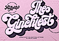 [MyFonts]
[More] ⦿
|
Muhittin Günes

|
 Istanbul, Turkey-based designer of the free stencil typeface family Temiz (2017) and the free monospaced regular and stencil typeface pair Muar Mono (2018).
 In 2018, Fatih Hardal and Muhittin Gunes set up Bold Type Istanbul. Both graduated from Marmara University Faculty of Fine Arts. They co-designed the sans typeface families Bold Type Modern (2018) and Bold Type Grotesk (2018). In 2019, Muhittin Günes released the ink-trapped variable font Ranua, the fashion mag typeface Zermatt, the art deco sans typeface MT Maeve Deco, and the 14-style Muana Grotesque. Typefaces from 2021: Olten (a didone-based display serif), Gronland (a sans serif typeface designed in 2018-2021 and inspired by Swiss public transport signage, NYC wayfinding systems and Greenland), Tofua (a hybrid between a didone and a gothic cathedral). [Google]
[MyFonts]
[More] ⦿
|
Myles Maxfield: Variable Fonts on the Web
|
Myles Maxfield explains variable fonts. [Google]
[More] ⦿
|
MyType Foundry
|
 Digital type foundry based in Manchester, UK. Designer at Type Department of the sans typefaces Quench Variable (2020: ultra-compressed), Labour Grotesk (2020) and Metrik (2020), and the decorative stencil serif typeface Celine (2020).
 Typefaces from 2021: Merchant (a 4 weight sans serif that goesback to the 20th century British typefaces, particularly those by Eric Gill, Edward Johnston, and Margaret Calvert). Home page. [Google]
[More] ⦿
|
Naipe Foundry
[Alvaro Franca]

|
 Naipe Foundry is the type design, lettering & font production company set up in 2018 by Alvaro Franca and Felipe Casaprima (and before that, Leandro Assis as well). Alvaro Franca is a graphic designer from Rio de Janeiro who studied at ESDI in Rio and EINA in Barcelona. He teaches at Domestika and ELISAVA in Barcelona. He created Aladdin Sans (2011) when he was studying at ESDI in Rio. Other early typefaces by him include the wedge serif text typeface Selsdon (2015) and the didone numerals typeface Baleia Heavy (2015), which was influenced by Herb Lubalin's style.
 In 2016, he created the 9-width titling or poster typeface family Bonde and wrote: It is the result of a year long research project on the hand painted lettering used in Rio de Janeiro tramways between 1868 and 1966. The carioca engineers who lettered the original signs used compression and expansion of letters so that station names of all sizes would occupy the same horizontal space. Because they didn't have lettering training or a model to follow, they had to come up with their own unique solutions for the problem of width variation in letterforms. Bonde applies these quirky and ingenious designs to a multi width type family, but adapts letterforms for contemporary use in their original function: signage and wayfinding. In 2016, he designed the informal typeface Noturna. In 2017-2018, he participated in the Type Expert program at the Plantin-Moretus Institute in Antwerp. He won an award at Tipos Latinos 2018 for Discordia (Naipe Foundry and Future Fonts): Developed originally for use in magazines, the goal was to create a concise text family that blurred the lines of type classification, mixing things that normally don't go together but which could be persuaded to play nice this one time. In 2020, Hebrew support was added thanks to Ben Nathan. In 2021, MyFonts published Discordia and credited Felipe Casaprima and Alvaro Franca. In 2020, Naipe released Pacaembu. Advertized as a tropical art deco sans, this seven-style sans serif typeface by Alvaro Franca and Felipe Casaprima finds its roots in Brazilian soccer. In particular, it took inspiration from the stone lettering found in the 1940 art deco style Sao Paulo Municipal Stadium, also known as Estadio Pacaembu. A variable style is included. Future Fonts link. https://fonts.ilovetypography.com/fonts/naipe-foundry">I Love Typography link. [Google]
[MyFonts]
[More] ⦿
|
Namela (or: Syamsi Namela)
[Nur Syamsi]

|
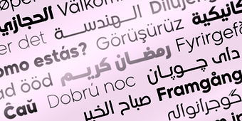 Magelang, Indonesia-based designer of Resalatyn(an inky script), Balise (a rounded display sans; +a variable font; by Nur Syamsi and Panca Ahmadi Hasan), Manche (2020: a 56-style geometric sans by Nur Syamsi and Panca Ahmadi Hasan), the soft serif typeface Aligarh (2020: by Nur Syamsi and Bustanul Arifin), Aligarh Arabic (2020: by Nur Syamsi and Bustanul Arifin), the fat finger font families Childos Arabic and Childos (2020, by Nur Syamsi and Bustanul Arifin), the modular sans typeface Gumela (2019, by Nur Symasi and Panca Ahmadi Hasan), Tasmik (2020: for Arabic), Khayma (2020: for Arabic), Tufuli (2020), Tufuli Arabic (2020, by Nur Syamsi and Bustanul Arifin), Counte (2020, a slab serif typeface family by Nur Syamsi and Bustanul Arifin), the 20-style geometric sans family Madani (2020, by Nur Symasi and Panca Ahmadi Hasan), Madani Arabic (2020: a geometric sans / kufi in ten styles; includes a variable font), and Gumela Arabic (2020, by Nur Symasi and Panca Ahmadi Hasan).
 Typefaces from 2021: Kidzhood Arabic (a children's book font by Nur Syamsi and Bustanul Arifin), Mahameru (a 20-style display typeface by Nur Syamsi and Bustanul Arifin), Mahameru Arabic, Meila (a plump almost-bubblegum font family in seven styles; by Nur Syamsi and Bustanul Arifin), Meila Arabic, Bandy (a 16-style slab serif by Panca Hasan and Nur Syamsi), Kidzhood (a children's book font family by Nur Syamsi and Bustanul Arifin), Gestura (an upright connected typeface in 14 styles, and two variable fonts; by Nur Syamsi and Bustanul Arifin), Naveid (an 18-style mini-serif typeface; and two variable fonts; by Nur Syamsi and Bustanul Arifin), Naveid Arabic (a ten-style Arabic typeface by Nur Syamsi and Bustanul Arifin), Resalaty Arabic (a handwriting style by Nur Syamsi). Typefaces from 2022: Khadash (a dry brush script). [Google]
[MyFonts]
[More] ⦿
|
Nathanael Dorange
[Par Défaut]

|
[MyFonts]
[More] ⦿
|
Naum Type
[Pyotr Bushuev]

|
 Peter or Pyotr Bushuev is the Pskov, Russia-based designer of the geometric typeface families Umbero (2016, retro deco) and Kontora (2016, for Latin and Cyrillic). He also designed the brush typeface Burelom (2015).
 Typefaces from 2017: Juxta (Sans, Sans Mono, Script), Juxta Sans Mono, Ravensara Antiqua Stencil, Ravensara Sans, Ravensara Serif (a high contrast fashion mag font derived from didones; in Sans and Serif styles). Typefaces from 2019: Base + Bloom (experimental). Typefaces from 2020: Strikt (a viariable pixelish font on a 3x3 grid with two axes, weight and animation), Cascadeur (Pyotr writes: Cascadeur is a variable modular sans with 3 axes, a modernistic hommage to space-age typography). Type Department link. [Google]
[MyFonts]
[More] ⦿
|
Nav Raw
[Rajesh Rajput]
|
 Rajesh Rajput (since 2014 with Cognizant Technologies, Gurgaon / Delhi, India) designed the free 5-style stencil typeface family Break in 2015. Interestingly, a guy called Steven Han calls it his font in 2016. He worked for four months on an elaborate decorative set of 26 capitals under the project name Type Soul (2015).
 With Raina Agarwal, Rajesh Rajput designed the free scratchy font Chemin in 2015. From his home base in New Delhi, he created Hagna (2017; although inside the font we find another name, Webvilla), the free variable condensed sans display family Thunder (2017) and Gorgeous (2017, a free tall fashion mag typeface family). Typefaces from 2018: Morganite (a free condensed movie credit sans in 18 styles), Typefaces from 2019: Emberly (a free 54-style didone, with a variable option). Typefaces from 2021: Mango Grotesque (a free 18-style+variable condensed elongated sans font family), Moniqa (a free 162-style (+variable font) family of art deco typefaces for Latin and Cyrillic). Typefaces from 2022: Meshed Display (a free display serif family with a fashion mag didone vibe). Behance link. Behance link for Nav Raw. [Google]
[More] ⦿
|
NC Type (or: Netvarec Typefaces)
[Daniel Quisek]
|
Prague-based type foundry offering typefaces by Daniel Quisek and Lukass Chladek, who gained their experience type during their MA studies in The Netherlands. Their fonts include NC Burrata (2020: a geometric sans; +a variable style), NC Fontina (2020: a grotesk sans that celebrates Mille Miglia, a Thousand Miles open-road race established in 1927 in Italy.) and NC Kobyla (2020: a workhorse text typeface family; +a variable font). Daniel Quisek is the co-designer with Martin Vacha of the free Google Fonts typeface Github link. [Google]
[More] ⦿
|
Neue Frutiger
[Akira Kobayashi]
|
 Neue Frutiger was developed by Akira Kobayashi and the Monotype (ex-Linotype) Design Team, in 2018. An outgrowth of Adrian Frutiger's successful Frutiger font, this wayfinding family was split by Monotype into several packages:
 - Neue Frutiger World. Neue Frutiger World supports more than 150 languages and scripts including Latin, Greek, Cyrillic, Georgian, Armenian, Hebrew, Arabic, Thai and Vietnamese. The Neue Frutiger World fonts can be paired with Monotype's CJK fonts: M XiangHe Hei TC (Chinese), Tazugane Gothic (Japanese) and Seol Sans (Korean). Variable fonts published in 2022: M XiangHe Hei SC Pro Variable, M XiangHe Hei SC Std Variable, M XiangHe Hei TC Variable, Seol Sans Variable, Tazugane Gothic Variable, Tazugane Info Variable.
- Neue Frutiger Tamil. Neue Frutiger Tamil was created by Pria Ravichandran and a team of designers and font engineers from the Monotype Studio, under the direction of Monotype type director Akira Kobayashi.
- Neue Frutiger Georgian. Neue Frutiger Georgian was created by Akaki Razmadze and a team of designers and font engineers from the Monotype Studio, under the direction of Monotype type director Akira Kobayashi.
- Neue Frutiger Arabic. Neue Frutiger Arabic was created by Nadine Chahine and a team of designers and font engineers from the Monotype Studio, under the direction of Monotype type director Akira Kobayashi.
- Neue Frutiger Vietnamese.
- Neue Frutiger Hebrew. Neue Frutiger Hebrew was created by Yanek Iontev and a team of designers and font engineers from the Monotype Studio, under the direction of Monotype type director Akira Kobayashi.
In 2019, the Linotype team developed and released the single variable font Neue Frutiger Variable. [Google]
[More] ⦿
|
Neutype Foundry
[Samuel Powell]
|
Graduate of the University of Gloucestershire, class of 2018. In 2018, Samuel Powell set up Neutype Foundry, and designed the geo-grotesque monolinear sans Kontur, and the monolinear sans New Highway. Designer in 2019 of Arbeit, a simple sans with a two axes (weight, italic) variable font option. You Work for Them link. [Google]
[More] ⦿
|
Newglyph
[Ian Party]
|
 Swiss type foundry set up by Ian Party in Lausanne in 2020, with a focus on variable font technology. All newglyph typefaces are variable fonts with three axes of variation: weight, width and contrast. Their initial typefaces in 2020:
 - Atacama. A 90-style garalde.
- Antarctica. A 132-style neo-grotesque. In 2021, 132 italics were added.
- Amazonia. A 90-style neo-classic didone.
- Alaska. A 110-style geometric sans. In 2021, 110 italics were added.
- Alpaga. A variable sans font family with two axes, boldness and width.
- Aloha
- Africa
- Armada. A display sans.
- Azaka
Additions in 2021: - Azteca. A didone-inspired typeface with graffiti influences.
- Angela. An ultra-condensed display font to be used for large lettering.
- Baikal. A grotesk Swiss sans serif with italics, 132 fonts in total.
The team: - Ian Party (founder, CEO, design director).
- Daniela Retana (founder, custom fonts director).
- Dennis Moya Razafimandimby (founder, creative director).
- David Massara (graphic and type designer).
[Google]
[More] ⦿
|
Nguyen Type
[Andree Nguyen]
|
 Nguyen Type is a small type foundry founded by Andree Nguyen in Ho Chi Minh City, Vietnam. In 2019, Andree released the display typeface family Iconique Sans, the cross-cultural Latin typeface House of Nguyen (2019) and the fantastic decorated caps typeface Khong Gian Am (2019: inspired by negative things and sins). In 2020, Andree designed Iconique Serif and the experimental typefaces Froot Mono and Seed Mono. [Google]
[More] ⦿
|
Nice to Type
[Gabriel Richter]

|
Gabriel Richter studied communication design at Düsseldorf University of Applied Sciences from 2010 till 2015, and attended a workshop by Jakob Runge and Max Kostopoulos. After working on experimental type projects, Richter did an internship at FontShop International in 2013. His Bachelor's project was the grotesque Richter Grotesk (now called FF Infra, published by FontFont). In 2017, he became independent and founded Übertype with Andreas Uebele. Richter teaches type design at Düsseldorf University of Applied Sciences. Übertype later morphed into Nice To Type. His typefaces: - FF Infra (2019, FontFont, and by inclusion, Monotype). A sturdy sans typeface family.
- Massimo Grafia (2017, by Gabriel Richter and Andreas Uebele). Massimo Grafia is a vast experimental linear-grotesque typeface in four weights, with an option for more kink.
- Crack Grotesk (2018, Gabriel Richter). A geometric sans. With a variable style added in.
- Blow, and Krasz, two typefaces announced on the Nice to Type site, but not available for study or purchase.
Interview. [Google]
[MyFonts]
[More] ⦿
|
Nicholas Auler
|
In 2018, Ion Neto, Lara Benedet and Nicholas Auler, all students at Universidade Federal de Santa Catarina in Florianopolis, Brazil, co-designed the free brutalist typeface BoBardi. In 2019, he designed the free informal typeface family Spurce Sans. In 2021, Auler released Esquinera (a variable font for wayfinding applications). [Google]
[More] ⦿
|
Nicholas Losacco
|
Or Nick Losacco. Montreal-based designer of the free typeface Miter (2018), a titling typeface inspired by industrial machinery and the playfulness derived from perfect circles. In 2019, at Pangram Pangram, he published the sharp-serifed Cirka and the grotesk typeface Telegraf which is characterized by superelliptical counters. In 2019, he set up Rip Type together with Brooklyn-based Ciaran Brandin. Designer of the blackletter typeface Generator (2021, Rip Type), a 9-style utilitarian workhorse that includes a variable font. [Google]
[More] ⦿
|
Nick Job

|
 Macclesfield, UK-based type designer who has a degree in graphic design from Nottingham Trent University. David Brezina introduces Nick as follows: Nick Job saw my baby steps as a type designer on the Typophile forum and kindly offered advice and new sources of inspiration. That's how I learned about his enthusiasm for British Rail and modernist design in general. He is a sans-serif specialist by heart, exploring mechanical influences (FS Hackney) as well as Englishness in design (FS Elliot).
 His typefaces: - Energy (2007). A sans family.
- The extensive sans family Camphor (2010, Monotype).
- FS Elliot (2012, Fontsmith).
- The custom font FS Webb Ellis Cup, which was done for the 2019 Rugby World Cup.
- The assertive sans typeface family FS Hackney (2020, Fontsmith).
- Adelphi (2019, Rosetta Type Foundry). Adelphi is an extensive Bauhaus-inspired geometric typeface family (with variable styles) that covers Latin, Greek and Cyrillic. One of the variable axes explores terminal angles.
[Google]
[MyFonts]
[More] ⦿
|
Nick Sherman
[v-fonts]
|
[More] ⦿
|
Nick Sherman: Variable Fonts for Responsive Design
|
Nick Sherman writes about variable fonts. [Google]
[More] ⦿
|
Nicolas Massi
[Tomo Fonts (was: We Are Tomo)]

|
 [MyFonts]
[More] ⦿
|
Nikhil Ranganathan

|
 Indian type designer. In 2015, Nikhil designed the medium x-height text and headline typeface Ennore (Indian Type Foundry). At Fontshare, he released the free font Erode (2015: a free ten style text family with two variable versions; Indian Type Foundry). [Google]
[MyFonts]
[More] ⦿
|
NM Type
|
 Type foundry set up by Noel Pretorius and Maria Ramos in 2017, jointly in Sweden and Spain. Their typefaces:
 - Kinetic (2017). Kinetic is a typeface family created by Noel Pretorius and Maria Ramos. One of the main sources of inspiration for the design was the art of Alexander Calder, who started working with moving sculptures in Paris in the 1930s. The light, playful and soft appearance of Calder's mobiles was something Pretorius and Ramos wanted to translate into type forms. Kinetic won an award won an award at TDC Typeface Design 2018.
- Meister (2018). A custom typeface for Jägermeister.
- Movement (2019). A free experimental variable font inspired by dance movements.
- Trisco (2021). A custom font for Centro Galego de Arte Contemporánea.
[Google]
[More] ⦿
|
Noel Pretorius
|
 Swedish graphic and type designer whose company is called Made By Noel. He graduated from the MATD program at the University of Reading in 2015. His graduation project was Frances (2015). This flexible type system includes roman, script and sans styles, and covers Latin, Arabic, Greek and Cyrillic. He also made the custom children's script font Friends (2016), a set of numerals for Rolleiflex (2016), and a slightly modified Futura for a custom project called Folkoperan (2016).
 In 2016, Noel joined TypeTogether as a type designer. In 2018, Noel Pretorius and Maria Ramos set up NM Type. Together, they designed the custom typeface Meister for Jägermeister. In 2019, Noel Pretorius and Maria Ramos co-designed Movement, a free experimental variable font inspired by dance movements. In 2021, they created Trisco, a custom font for Centro Galego de Arte Contemporánea. [Google]
[More] ⦿
|
Noël Leu
|
 Noël Leu is one of the cofounders of Grilli in Bern (while studying at the University of the Arts Bern in Visual Communication and Literature Writing). Leu designed these typefaces:
 - GT Walsheim (2009). The typeface GT Walsheim is based on the lettering of Swiss poster designer Otto Baumberger (1889-1961). Working for the printing company Wolfensberger he worked for a variety of clients, amongst them the brewery Walsheim. Baumberger also created tourism posters, and some posters with racist and sexist visuals that are deeply offensive such as the Walsheim Neger poster Otto Baumberger (1889-1961). It is a stunning geometric grotesk with a bouquet of art deco. Thierry Blancpain dedicated a page to Baumberger and GT Walsheim, and points out that for the Cyrillic portion, Noël Leu was assisted by Mirco Schiavone.
- In 2014, Dominic Huber, Marc Kappeler and Noël Leu published the extensive text family GT Sectra (Grilli Type), which, in view if its breadth and angular design will prove to be one the world's major releases of 2014. GT Sectra, which comes in Text, Fine and Display subfamilies, won first prize in the TDC 2015 Type Design competition. Their blurb: GT Sectra was originally designed for the German-language magazine Reportagen, a bi-monthly publication specializing in literary reporting. Its long-form stories require a typeface that works well in text, but not at the expense of character. GT Sectra strikes that balance.
- In 2016, Seb McLauchlan and Noel Leu co-designed GT America at Grilli Type. They write: GT America builds a bridge between the American Gothic and European Grotesque typeface genres. It combines design features from both traditions and unites them in a contemporary family. The versatile system consists of eighty-four styles across six widths and seven weights. It has tapered stems and subtly angled spurs, and a very useful monospaced GT America Mono subfamily. GT America International, a multi-script extension, was published in 2024 with the help of various collaborators.
- In 2018, Leu published GT Super (Text and Display), a typeface family steeped in the exaggerations and formal contrasts of the 1980s. He was helped by Mirco Schiavone and Reto Moser in this endeavour.
- In 2021, Noël Leu released GT Ultra, a variable font that features both a generic sans and a generic (sharp) serif typeface family. It has three axes---weight, italic angle, and contrast---and was published by Grille Type.
Grilli Type link. Klingspor link. [Google]
[More] ⦿
|
Nois (was: Makenois)
[Guillermo Lizarzuay]

|
Barcolona-based designer who set up Makenois and then Nois, a studio engaged in branding, web design and digital campaigns. Creator of Mirtha Display (2020), Britti Sans (2020: a 14-style brutalist sans), Lalo Grotesk (2020) and Beni (2020: a condensed headline sans). Typefaces from 2021: Krooner (a tall sophisticated display serif), Jessi Neue (a soft serif in four styles, and a variable font). [Google]
[MyFonts]
[More] ⦿
|
Nonpareille (was: Chastellun.net)
[Matthieu Cortat]

|
 Matthieu Cortat was born in Délémont (Switzerland) in 1982, and became a French citizen later. After a degree in graphic design in 2005, at the University of Art&Design Lausanne (Ecal), he obtained a Masters at the Atelier National de Recherche Typographie in Nancy (France). Cortat heads the Master Type design program at the École d'art de Lausanne (ECAL). He lives in Lyon where he is advisor to the collections of the museum of Printing and Graphic communication. He created the French typographical corpus, which brings together the typefaces in France between 1850 and today. He set up Nonpareille. Most of his typefaces can be bought at 205 Corp.
 His typefaces: - Bentham (transitional).
- Bonesana (2009, Gestalten, an elegant text family straight out of the 18th century).
- Brett (2004). A rounded pixel face.
- Chastelmail (a modification of ITC Officina).
- Goupil (2008, by Regis Tosetti).
- Ecstrat (2009, ornamental 18th century type in the style of Fournier or Rosart).
- Fairplay (transitional newspaper face).
- Glovis (2007, a monospaced typewriter typeface with ball terminals; with Régis Tosetti).
- Liberté.
- Tartan.
- Monolith.
- Stockmar (2007, Optimo: a 12-style baroque family inspired by by Johann Rudolf Genath II (1679-1740)).
- Stuart Pro and Stuart Standard (Nonpareille, 2008). These almost Venetian low-contrast text type families come in 18 styles each, and have three optical choices for the ranges below 8pt, 8-12 pt and above 12pt.
- Ecstrat.
- Glovis.
- Louize (2013). This is a contemporary revival of the Augustaux designed by Louis Perrin between 1846 and 1855. It mixes roman square capitals with a set of transitional / old style / incised lower case. In 2021, he added Louize Display Condensed. He explians: In 1846, Lyonnese printer, Louis Perrin commissioned founder Francisque Rey to cut a series of capitals inspired by monumental roman inscriptions. They have been used to compose "Les Inscriptions antiques de Lyon", a book by Alphonse de Boissieu. In 1855, the typeface was completed by a series of lowercase, some coming from the printshop of Rey, others designed by Perrin himself. His Augustaux, one of the first revivals in the history of typography, became rapidly successful, launching the Renouveau Elzévirien" movement. With the Louize Family, Matthieu Cortat provides a contemporary reinterpretation of the Augustaux. It retains a wise and serene tone, a clear grey of text, the soft roundness of the curves. Louize is discreet, calm, harmonious.
- Chrysaora (2013). An all caps art deco typeface family based on the engraved letters on the Palais de la Porte Dorée in Paris.
- Ebnor (2013). A digital version of the Écriture Bâton Normalisée (standardized sans serif) presented by M. Brun in a self-published booklet of 1959. The shape of letters respects the standard E-04-105 of the French Association for Standardization (AFNOR) which sets norms for industry, engineering and architecture. All letters are monolined and warmly rounded.
- Svafa (2013). This is a rune simulation typeface that revives lettering designed by Eugène Grasset in 1893, on a poster for Richard Wagner's opera, Valkyrie.
- Petit Serif (2013): Petit Serif is a caps typeface with copperplate endings, described as an interpretation (with Latin, Greek and Cyrillic versions) based on the lettering done at 55 Broadway, S.W.1, London, by Percy J. Delf Smith. It is a sans serif presenting the classic proportions of the Roman Square Capitals, yet it does show tiny serifs due to the use of a brush.
- Mecano Sans and Mecano Serif (2013). A revival of a condensed geometric Nebiolo family.
- Henry (2013). They write: Henry is a personal reinterpretation of the Garamond cut for the Deberny & Peignot type foundry between 1914 and 1926 by Henri Parmentier, under the management of Georges Peignot, who owned the foundry. Their purpose was to recreate the gracefulness of Claude Garamont's type typeface while allowing for the development of modern paper making, with its wood pulp paper, as opposed to 16th century rag paper. This elegant and smooth text family has its own mind: Henry is based on the text sizes (9 to 14) of the Garamond Peignot. It is a light and fluid Garald, rather skinny and narrow, with a slender grace. There is an art nouveau spirit in its z leaning on the left, its serpentine a and J, the roundish lower bowl of its t, the wide tail of its Q.
- Hans (2013). A dark Koch-style textura blackletter.
- Battling (2013). This is quite an interesting sans family, in the geometric style of 1930s Europe. The original rough model was a typeface family called Universelles by the Dutreix foundry in Limoges, first produced in the 1930s. The heavier weights are characterized by small cactus spurs. Apparently, Universelles is a renamed version of Hans Moehring's Elegant Grotesk (1928-1929).
- Anacharsis (2012). An experimental geometric sans family.
- Basetica Pro (2013). Even though only offered in two styles, the announcement says that Basetica aims to be the Helvetica for 2013.
- Helvetius (2016). A reinterpretation of a Fournier-style font used in a 1178 edition of De L'Homme by French philosopher Claude-Adrien Helvetius.
- Cosimo (2017, Bureau 205). A humanist sans.
- Yorick (2018). Yorick is based on a monospace typewriter font (model 3402U) found in the Campionario caratteri e fregi tipografici of the Nebiolo type foundry, dated 1920, but the font might probably be older. The source is a slab serif form very common in typewriter fonts (Pica, according to Olivetti naming system) with a little touch of classical flavour from the Imperial style (i.e. with thick and thin contrasts).
- Molitor (2019, 205TF). A great art deco-inspired sans typeface that looks great even for text on a screen.
- Muoto (2021), a variable sans serif font designed by Matthieu Cortat, Anthony Franklin and Sander Vermeulen (Base Design). They write: Muoto is the synthesis of a sensitive and human approach to modernist design. This font combines full curves and solid stems, showing that functionalism can actually be warm and softly effective. With its robust structure and subdued proportions, it evokes organic forms dear to Finnish architect Alvar Aalto, who in 1957 wrote: "We should work for simple, good, undecorated things, but things which are in harmony with the human being and organically suited to the little man in the street".
Speaker at ATypI 2017 Montreal. Klingspor link. View Matthieu Cortat's typefaces. View Nonpareille's font library. [Google]
[MyFonts]
[More] ⦿
|
Notdef Type
[Diego Maldonado]

|
 A disciple of Tony de Marco, this Sao Paulo, Brazil-based designer has worked on digital magazines in Brazil such as Elle (fashion), Audi Magazine (lifestyle) and Trip (lifestyle). He set up Just in Type with Tony de Marco. Later he started his own foundry, Notdef Type. His typefaces:
 - The rounded avant garde typeface Garoa (2011, Just in Type). Codesigned with Tony de Marco.
- The free font Garoa Hacker Clube Bold was published at OFL in 2013. They write: Inspired by the 70s design, specially on Herb Lubalin's work, the typeface Garoa is a rounded mechanical display font without optical compensations, ideal for large bodies.
- In 2013, he created the informal children's book typeface Sapeca, a script full of ligatures and alternates.
- The connected spaghetti-inspired script typeface Pasta Script (2015, Just in Type).
- Sorvettero (2015). Designed with Tony de Marco, Sorvettero is a sans, layered and unicase typeface inspired by some wood signs in Descansapolis, a neighborhood of Campos do Jordao. It won an award at Tipos Latinos 2016.
- Befter Sans (2016). A humanist sans typeface family with flared strokes.
- Suit Sans (2016, Just in Type), Suit Sans STD (2017, Just in Type).
- Tupa (2017, a squarish techno titling sans with interlocking ligatures).
- Couturier (2018, Latinotype). A didone typeface family with several surprises (f and y, for example) and possible applications in fashion mags. Followed in 2019 by Couturier Poster.
- Railroad Text (2018). A custom sans for Eisenbahn beer.
- ND Type One (2019). A sans family.
- Wright (2020). A 48-style art deco sans family with small x-height and wide letters for headline or display use.
- Galadali (2021). A confident flared-terminal serif in six styles.
- Nd Harquied (2021). A 7-style hipster sans with deep ink traps meant as a Halloween font.
- Nd Tupa Nova (2021). An 11-style (+variable) squarish font family with support for both Latin and Cyrillic. In this slightly constructivist genre, one of the best fonts around.
Behance link. Old URL. Creative Market link for Just in Type. [Google]
[MyFonts]
[More] ⦿
|
NREY
[Andriy Dykun]

|
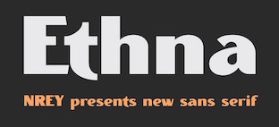 Makeevka, Donetsk, Ukraine-based designer of these typefaces in 2017: Vector Waves, Quasimodo (a free spurred and curvy decorative display typeface), Courtney (monoline script), Lumberjack (blackletter; see also Lumberjack Zombie in 2019), Marvin (a 10-font Marvin Heemeyer-inspired bulldozer and wrench font family with a free heavy slab serif), Awakening (signage script), Bang Bang, Round Compound, Rot Shield (blackletter), Rust (spurred), Furious, Dry Brush, Balalaika (Cyrillic emulation typeface), Moustache, Barbara (script), Arigato, The Pontifice (blackletter), Amsterdam, Megapolis (inline), Megapolis Black Bold (free, for Latin and Cyrillic), Phoenix Gothic, Brush Pen, Nround (rounded sans), DieCunst (free connected script).
 Typefaces from 2018: Fontuna (+stencil), Sansterdam (a geometric condensed grotesk with a few deco styles), Ethna (a fashion mag sans typeface family), Voguer Sans (a free Latin / Cyrillic display typeface with fashion applications in mind), Ravenholm (an expressionist blackletter), Jorick (vintage, Latin and Cyrillic), Ultravog and Ultravog Glitch Black (extreme contrast stencil styles: free), Walpurgis Night, Voguer (a high-contrast fashion mag font), Voguer II (didone-inspired, accompanied by a script typeface). Typefaces from 2019: Anicon Sans, Anicon Slab, Thephir (a variable cursive typeface), Oblique Rain (monoline script), Skiff (a quaint almost painted sans), Cadency (a monoline script), Waymar (Serif and Script font duo; include the textured caps typeface Waymar Ornate and the blackboard bold style Waymar Outline), Phagoth (blackletter), Gunhill (a vintage font family that includes blackboard bold styles), Heartland (Script & Sans), Marvin Slab. Typefaces from 2020: Calmius, Calmius Sans. Calmius Sans has Oppo (reverse contrast), Low and High (Peignotian) subfamilies, all experiments on contrast. Typefaces from 2021: Quartell Round (a squarish typeface), Asterlight (a steampunk font), Barosa (inspired by the slavonic style, all glyphs in this typeface have the same height). Graphicriver link. Behance link. Newest Behance link. Dafont link. [Google]
[MyFonts]
[More] ⦿
|
Nur Syamsi
[Namela (or: Syamsi Namela)]

|
[MyFonts]
[More] ⦿
|
Official Designs
|
Designer of the monolinear square-spaced neon light font family Night Variable Display (2020). [Google]
[More] ⦿
|
OGJ Type Design
[Oliver Jeschke]

|
 Aka OGJ Type, Oliver Jeschke is based in Berlin. In November 2022, The Type Founders acquired the OGJ Type Collection. Since then, Oliver has worked under an exclusive type design contract through November 2025. Starting in December 2025, he plans to release new typefaces---including Version 1 International---through a new, truly independent type foundry, free from private equity and corporate ownership.
 With Oliver Mayer (Tatin, Basel), he created the avant garde linear grotesk typeface family Version 1 International (2013). The typeface family, characterized by upward diagonal strokes in the f, h, m, n and u, was published by Volcano. Volcano writes: The Version 1 font family is a mannered geometric linear-grotesque, hand-drawn and developed by Oliver Jeschke and Oliver Mayer at Tatin Design Enterprises in Basel, Switzerland and Berlin, Germany. It was created in a three-month training and was further developed in the later stages as OpenType font. In 2015, influenced by the work of Swiss master designer Max Bill, Oliver Jeschke created the Greek simulation typeface family Bill Display, the sans typeface Bill Corporate, and Bill Corporate Narrow. See aso Bill Corporate Mx (2016) and Bill Display Lowercase. Spectators Headline (2016) is a breezy semi-informal notebook sans family. Typefaces from 2017 include Sequel Sans and Sequel Rounded. Calling it a "post-Max Bill design", Sequel Sans was developed in collaboration with the Max Bill Georges Vantongerloo Foundation. In 2018, Sequel 100 Wide and Sequel 100 Black were added to that collection. Typefaces from 2018: Shapiro (a 32-style grotesk in which horizontal and vertical strokes are nearly identical in width), Temper Wide (slab serif). Typefaces from 2019: Shapiro Pro (138 styles), Shapiro Base (sans), Darbee Legend (a sans family with cuts named after famous racehorses). Typefaces from 2020: Sequel Sans VF (the variable font version of Sequel Sans), JT Energy (a great addition to the geometric sans genre featuring optically consistent line thickness; it comes with two condensed styles called JT Energy Placard, and with JT Energy Variable). Typefaces from 2021: JT Collect (a 14-style grotesk used by Nike). Typefaces from 2022: Sequel Geo (an 82-style Swiss sans family).. [Google]
[MyFonts]
[More] ⦿
|
Oguzhan Cengiz
[Hurufatfont Type Foundry]

|
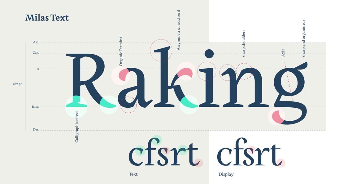 [MyFonts]
[More] ⦿
|
Oh No Type
[James T. Edmondson]
|
 Oakland, CA-based designer, whose company is called Oh No Type. In 2011, he was a student at California College of the Arts in San Francisco. Graduate of the Type & Media program at KABK in Den Haag in 2014. Before that, he was based in Leeds, UK. James teaches Type at Cooper West. In 2018, James co-founded Future Fonts, a platform for distributing fonts in-progress. Typefaces:
 - 2008: at FontStruct of the blackletter typeface Eclyptico and of Mopper.
- 2010: Edmondson, Dode (script).
- 2011: Edmond Serif (in progress) is being designed in Rod Cavasos Type Design class at CCA. Edmond Sans (2011) is a headline all caps sans face. Duke (Lost Type) is a beveled typeface based on the signage for the Cup and Saucer Luncheonette in New York. Wisdom Script (Lost Type) was originally designed for Woods of Wisdom, a 50 part poster series on bad advice. Working on a roman caps version in Ed Interlock style. Lavanderia (2011, free at Lost Type) is a signage script family inspired by fancy laundromat lettering in San Francisco's Mission District.
- 2012: Edmond Sans (Lost Type).
- Mission Script (2012) is a connected signage script, also inspired by lettering in San Francisco's Mission District.
- 2013: Mission Gothic. Influenced by wood types, this sans was co-designed with Trevor Baum.
- 2014: Covik, his graduation typeface at KABK. He writes: Covik was designed with the goal of creating a small text family with complimentary display typefaces which work together to create a rich typographic palette. How divergent could a style be while remaining kindred? In what ways could weight, width, proportion, and construction be played with in order to create a varied family? See also Covik Sans Mono.
- 2015: Hobeaux (a take on Morris Fuller Benton's art nouveau typeface Hobo), Viktor Script (a retro script done with Erik Marinovich). Accompanied by Hobeaux Rococeaux (2016).
- 2016: Vulf Mono (Vulf Mono is the official typeface of Vulfpeck, a funky four-piece rhythm section from Ann Arbor, Michigan. The typeface draws main inspiration from 12 point Light Italic, a font for the IBM Selectric typewriter.)
- Year unknown: Bordeaux Script.
- 2018: Obviously, Eckmann Psych (a psychedelic take on Otto Eckmann's art nouveau type), Ohno Blazeface, Cheee (a variable font).
- 2019: Nonplus (counterless script), Primarily Script (a children's book font), Coniferous (based on signage at American National Forests).
- 2020: Degular (sans, variable with three axes), Compadre (an all caps sans typeface), Ohno Fatface (in the true didone fat face tradition, with delicious conniving outlines; and a 2-axis variable font along width and optical size), Swear (an experimental serif with rotated pen angle; +a variable style).
- 2021: Irregardless (experimental; with plenty of effects and container shapes).
Author of Some Tips on Drawing Type (2021). Klingspor link. Behance link. Dribble link. Old home page. Future Fonts link. Adobe link. [Google]
[More] ⦿
|
Oliver Jeschke
[OGJ Type Design]

|
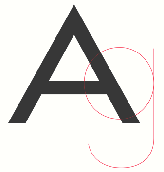 [MyFonts]
[More] ⦿
|
Olli Meier

|
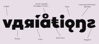 German designer of Vary (2021, Monotype). Vary is an 10-style geometric sans serif typeface (+a variable font) inspired by Bulgarian Cyrillic. Its weights range from Hairline to ExtraBlack. [Google]
[MyFonts]
[More] ⦿
|
Omnibus Type
[Héctor Gatti]
|
 Hector Gatti, aka Pocho Gatt, is an Argentinian who runs Gatti Studio and Omnibus Type, and who co-designed the sans typeface Patagonia (1994) with Pablo Cosgaya. Omnibus (est. 2011) is a coop that focuses on web typography and high quality web fonts. All typefaces can be found at the Google Font Directory. All designers are from Argentina and Mexico. Their typeface library:
 Another URL. Google Plus link. Fontspace link. Fontsquirrel link. Behance link. Klingspor link. Open Font Library link. Catalog of typefaces. [Google]
[More] ⦿
|
Op. Cit. Ibid. (or: OCI)
[Kia Tasbihgou]
|
 London-based type designer. Creator of these retail typefaces:
 - Beatrice (2018). A sans, with Lucas Sharp and Connor Davenport, for Sharp Type.
- OCI Taper (2016).
- Jeder Grotesque (2016-2018). Originally done for Vanity Fair.
- Propos (2018). A variable font influenced by Roger Excoffon's Antique Olive.
- Peace (2016). A sans.
She also does custom design, including a titling typeface for Christie's Magazine, commissioned by B.A.M. in 2018. Home page. [Google]
[More] ⦿
|
Opentype Font Variations: David Berlow
|
David Berlow explains OpenType Font Variations. [Google]
[More] ⦿
|
Oscar Cobo
[Lillan Team]

|
 [MyFonts]
[More] ⦿
|
Oscar Fernando Guerrero Cañizares
[Sumotype Foundry]

|
 [MyFonts]
[More] ⦿
|
Oscar Yáñez
|
 Oscar Yáñez (b. Mexico City) has a Bachelor's degree in Graphic Communication Design from the Universidad Autónoma Metropolitana (UAM) and a Master's degree in Typographic Design from the Centro de Estudios Gestalt. He studied Project Management in the Instituto Tecnológico Autónomo de México and a Masters degree in Type Design at Centro de Estudios Gestalt. He was involved and leading designs and redesigns in more than fifty magazines, newspapers and websites like Time Inc Expansion, Editorial Televisa, Reforma, El Universal and Khaleej Times newspapers. Nowadays he is Group Design Director for Harper's Bazaar Arabia and is based in Dubai.
 Designer of Fabrica Texto (Italica, Versalita, Bold, 2008) and Lucrecia Texto (Itálica, Versalita, Bold), both winners in the Tipos Latinos 2008 competition for best text family. Grand prize winner at Tipos Latinos 2010 for his titling type family Carlota. Other typefaces by him include Aion, Moneda, and Condesa. Viga (2011, free at Google Web Fonts) is a heavy angry macho sans. In 2012, he created Amate, a type that was designed for a newspaper in Cuernavaca. Calavera (2012, Cocijotype) is an ornamental display typeface that is based on the Mexican Tuscan letter style and on the work by Mexican engraver Manuel Manilla. It won an award at Tipos Latinos 2014. Dorotea (2012) is a Latin / Greek / Cyrillic typeface family created for text in books and periodicals. The name is in honor to Dorothy Abbe, typographer, puppeter and close friend of William Addison Dwiggins. At ATypI 2009 in Mexico City, he spoke eloquently about Boudewijn Ietswaart and the development of the Balduino typeface (by the Círculo de Tipógrafos). In 2014, he created the curly ronde script typeface Bistro for Gastronomie Magazine. He lives in Mexico City and is Design Editor at GEE. Founding member of Círculo de Tipógrafos in Mexico. In 2010, Cristobal Henestrosa strated work on Charter, which is based on an experimental typeface named Charter, designed yet never fully finished by William Addison Dwiggins. It is an upright italic, unconnected script typeface, whose main features are a pronounced contrast, condensed forms and exaggerated ascenders. While Dwiggins worked on this project from 1937 to 1955, he only completed the lowercase and a few other characters. However, it was used to set a specimen in 1942 and a short novel in 1946. The sources that Cristobal used for Royal Charter (and later, Mon Nicolette) were the original sketches by WAD as well as printing trails kept at the Boston Public Library, and a copy of the 1946 edition of The Song-Story of Aucassin and Nicolette. This gorgeous typeface can be used successfully in headlines, subheads and short passages of text from 12 points onwards. It was published in 2020 as Mon Nicolette at Sudtipos, where the help of Oscar Yanez was acknowledged. Mon Nicolette also comes in a variable format with weight and optical size axes. [Google]
[More] ⦿
|
OSTYPE
[Yury Ostromentsky]

|
 Yuri Ostromentsky is a type and graphic designer. He is a graduate of the Moscow State University of the Printing Arts (2002), where his graduation project was done under the supervision of Alexander Tarbeev. He has worked as a designer and art director for publishers and design studios. From 2004 to 2012, he served as art director of the magazine Bolshoi Gorod (Big City), for which he created several display typefaces as well as several original typefaces and Cyrillic versions of Latin fonts in collaboration with Ilya Ruderman. His typefaces were honored at the Contemporary Cyrillic 2009 and 2014 competitions. In 2004 he and Ruderman, Dmitri Yakovlev and Darya Yarzhambek created DailyType, a website.
 Yuri ran OSTYPE as part of KunstGroup.ru. His typefaces include PrinsenGracht [Text (+Caps, +Italic), Display (+Caps, +Italic)], Poza, SSN Antique, Pilar, and Gegangen. His type system Best Life Serif (codesigned with Ilya Ruderman) won an award at Paratype K2009. He became associated with Custom Fonts, and designed RIA in 2013. RIA won an award at Modern Cyrillic 2014. In 2014, Ilya Ruderman and Yury Ostromentsky founded CSTM. In 2015, Ilya and Yury published Kazimir, a didone typeface family for Latin and Cyrillic, taking as a model the typeface used in The History of Russian Philology by P. N. Polevoy (1900, A. F. Marx Publishing House). Typefaces from 2017: Stratos Cyrillic (at Production Type, with Ilya Ruderman; a Cyrillic version of Yoann Minet's 2016 geometric grotesque typeface Stratos: it received a Type Directors Club New York Certificate of Excellence 2017), Pseudo Russian. Co-designer with Nikita Kanarev and Ilya Ruderman at CSTM Fonts of the 18-style exprimental typeface family Lurk (2020). It is based on an earlier version that was specially designed for the Russian youtuber Yury Dud. Typefaces from 2021: CSTM Xprmnntl 03 (in uncial Cyrillic, gothic blackletter and inbetween styles). In 2021, CSTM Fonts released the 42-style sans family Loos (Latin, Cyrillic, Georgian), a typeface designed by Yury Ostromentsky, Ilya Ruderman, and Daria Zorkina. Advisers on Georgian included Alexander Sukiasov and Lasha Giorgadze. At the end of 2021, Ostromentsky designed and published the 20-style (+variable font) Elzevir-inspired Maregraphe at CSTM / Type Today wth the help of Mikhail Strukov and Ilya Ruderman. Typefaces from 2022: Zhivov (an experimental Latin / Cyrillic typeface based on early Cyrillic graphics). [Google]
[MyFonts]
[More] ⦿
|
Otherwhere Collective (or: Ilott Type, Bellamy Studio)
[Andrew Bellamy]

|
 British born designer Andrew Bellamy worked for agencies in London, Oslo, and Miami, and is currently developing various global brands as Design Director at JKR in New York City. He started Ilott Type and then Otherwhere Collective.
 Andrew Bellamy designed 64-SRC (2017), a rare condensed monospace font inspired by IBM's Selectric type from the 1960s. His 57 Nao (2016) is a revival of a Japanese typewriter font from the 1950s called Messenjaa. They explain: Designed in 1950s Japan by Okanao & Kushiro, the perfect partnership until artistic temperaments drove them apart. The duo spent years crafting the font with the working title Messenjaa, Okanao bringing technical expertise to craft letterforms, while Kushiro made it his life, obsessively working late into the night to check pages for errors. For him the project was never about making money, it was an artistic endeavor to reprint the great Western works of literature. When he found out Okanao had secretly sold the rights of the font for use as a logo for a major Japanese manufacturer, Kushiro burned all evidence of the designs in a fit of passionate fury. The two reportedly never spoke again. Messenjaa was thought lost forever until a type specimen was discovered in a vintage typewriter box bought on eBay. Now redrawn and available as 57-nao, a faithful and beautifully crafted monospace characterized by what is considered Okanao's defining moment, the angular loop on the lowercase a. 52-Kfx (2017) is an extra tall sans typeface. 35-FTR (2017) was custom drawn specifically for the book Analogue Photography which required the timeless elegance of Futura and the compact utilitarian typesetting of Helvetica. In 2018, he designed the fashion mag typefaces 19Pra and Coutura Sans. In 2019, Bellamy published OC Bartok (a wedge serif), OC Pajaro (a sans family between Futura and Akzidenz Grotesk), OC Format Sans (a geometric grotesk sans serif that fuses the style of Futura with the rhythm and proportions of Akzidenz), OC Rey. Typefaces from 2020: OC Format Stencil (a variable font design inspired by the work of Bruno Munari, Paul Rand, and Max Huber), OC Format Collage, OC Format Shards. A special mention for the masking tape font OC Revolt, a variable display font made for the protest graphics of the NYC-based Trump Brexit era Non-Complicit project who initially made guerrilla type with masking tape applied directly in situ or to silk screens. Typefaces frm 2021: OC Highway Var (a free variable font based on Highway Gothic). It builds on Ash Pikachu's free Highway Gothic font. [Google]
[MyFonts]
[More] ⦿
|
Owen Earl
[Indestructible Type]
|
 [More] ⦿
|
Pablo Gámez Navarro
|
 Graduate of the TypeMedia program at the KABK in The Hague in 2017, who first worked at some design studios in Spain and now develops typefaces at Bold Monday. His typefaces include:
 - Driver (2017), his graduation work at KABK. This is a variable font, Driver Small, and a fashionable typeface family, Driver Big. Pablo explains: Inspired by the world of motorsports and hypercars, Driver is a modern interpretation of the squarish styles from the sixties and the aesthetics of car races. The smaller version is a four axis variable font that adapts to a responsive interface, enabling the designer to link visual parameters of the typeface to conditions like luminosity, size and background color. The bigger version is a typeface intended for branding and editorial environments, inspired by racing banners. It includes six sets of decorated figures.
- Trump Mediaeval: an etched typeface revival.
- Mango. A text typeface.
- Modena.
[Google]
[More] ⦿
|
Paco Gonzalez

|
 Codesigner with Giuseppe Salerno of Superb (2014, Resistenza: a creamy signage script) and the calligraphic brush script Modern Love (2015).
 Codesigner, with Giuseppe Salerno and Andrea Tardivo, of the chocolate box script typeface family Gianduja (2016, Resistenza). In 2018, he co-designed Contigo and Contigo Vintage with Giuseppe Salerno. In 2019, Paco Gonzalez and Giuseppe Salerno co-designed the brush typefaces SmoothyPro, Pando Script and Parkour, Auster Rounded, the Tuscan family Royale, the chalk font Dolce Caffe Chalk, the layered handcrafted sans typeface Dolcissimo, the dry brush script typeface Blue Jeans, the brush script Batticuore and Turquoise Inline. Typefaces from 2020, all with Giuseppe Salerno: Big Mamma (a hand-printed slab serif), Suerte (a reverse contrast display type, inspired by Aldo Novarese's Estro), Norman (a fashion mag typeface), Royale Italic (Tuscan), Auster Variable, Hello Fresh, Nostalgia and Nostalgia Flowers, Tresor (a romantic flared sans), Pesto Fresco Italic. Typefaces from 2021: Industria Serif (54 styles; by Giuseppe Salerno and Paco Gonzalez). Typefaces from 2022: Industria Sans. [Google]
[MyFonts]
[More] ⦿
|
Panca Ahmadi Hasan

|
Magelang, Indonesia-based designer of the modular sans typeface Gumela (2019, by Nur Syamsi and Panca Ahmadi Hasan) and Gumela Arabic (2020, by Nur Syamsi and Panca Ahmadi Hasan). In 2020, Nur Syamsi and Panca Ahmadi Hasan co-designed Balise (a rounded display sans; +a variable font), the slab serif typeface family Counte, the 20-style geometric sans family Madani and Manche (2020, a 56-style geometric sans). Typefaces from 2021: Bandy (a 16-style slab serif by Panca Hasan and Nur Syamsi). [Google]
[MyFonts]
[More] ⦿
|
Pangram Pangram Foundry
[Mathieu Desjardins]
|
 Mathieu Desjardins (Pangrampangram) is a senior art director in Montreal, who created the free geometric sans typefaces Charlevoix Bold, and Pier Sans (2015), and the condensed sans typeface Stellar in 2015. However, at Graphicriver, we learn that he is selling Charlevoix Bold (2015), Stellar (2015) and Pier Sans (2015).
 In 2016, he designed Supply Mono (which could be used for programming), the (free for personal use) 7-weight geometric sans font family Pangram and the (free for personal use) Fuji Sans. In 2017, he published Chronos Serif, which is also free for personal use. In 2018, he designed the grotesque typefaces Formula Condensed, Neue Montreal (together with Sebastien Tremblay; advertized as a great replacement of Helvetica) and Radio Grotesk, the warm and fluid text typeface Woodland, the wide display sans Monument Extended (version 2 appearing in 2020), Casa Stencil and Gosha Sans (influenced by Futura and Russian constructivism; contains Cyrillic as well). Typefaces from 2019: Hatton (a collaboration with London-based design studio Two Times Elliott, Hatton is a homage to the history of the London diamond trade district, Hatton Garden), Editorial New (a partly free editorial text font family), Neue Machina (inspired by the aesthetics of robotics and machines, this powerful variable opentype typeface family is characterized by monospace/geometric features and deep ink traps; designed by Mathieu Desjardins and Vasjen Katro / Baugasm). It is inspired by the aesthetics of robotics and machines). Typefaces from 2020: Neue World (an 48-style and variable cut modern serif with roots in vintage display type). Typefaces from 2021: Pangram Sans V2 (with Valerio Monopoli: 144 styles, and a 3-axis variable font; Pangram Sans was originally published in 2015; followed by Pangram Sans Rounded (2021)), Editorial New Version 2.0. Graphicriver link. Personal home page. [Google]
[More] ⦿
|
Panos Haratzopoulos
[Cannibal Fonts]

|
 [MyFonts]
[More] ⦿
|
Panos Vassiliou
[Parachute]

|
 [MyFonts]
[More] ⦿
|
Par Défaut
[Nathanael Dorange]

|
 French designer of these typefaces:
 - New Odyssey (2020). An 14-style informal sans.
- Basique Black (2020). A heavy geometric sans typeface for Latin, Greek and Cyrillic.
- Basique Pro (2020). A 5-style geometric sans typeface for Latin, Greek and Cyrillic.
- Block S (2021). A squarish blocky family in 98 styles.
- Stallman (2021). A squarish font family with 100 styles, +a variable font. Stallman Round (98 styles) followed layter in 2021. It is unknown whether these typefaces are named after the Free Software guru Richard Stallman.
- Decart (2021). A retro display font.
- Rouge Gorge (2021). A warm and fuzzy serif family in 42 styles, with two variable fonts.
- Rollman (2021). A squarish typeface family.
- Lonie (2021). An 11-style monolinear rounded for Latin, Greek and Cyrillic. It includes a variable font. Followed by Lonie Soft (2021).
- Codeworld Mono (2021). An 11-style geometric monolinear sans family.
- Maincode Mono (2022). In seven weights, seven widths, +oblique, and a variable font. Followed by Maincode (2022), which also has 98 styles.
[Google]
[MyFonts]
[More] ⦿
|
Parachute
[Panos Vassiliou]

|
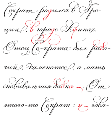 London, UK, and Athens and Kifissia, Greece-based type foundry started in 2001 by Panos Vassiliou. It specializes in fine multilingual (usually Latin, Greek and Cyrillic) typeface families. He is a graduate of the University of Toronto, Canada with a major in Applied Science and Engineering. Following his University of Toronto graduation, he studied Graphic Communications at Ryerson University. Panos Vassiliou has conducted numerous seminars for Canadian companies such as Bank of Nova Scotia, Royal Bank and Sony Canada. He graduated from the University of Toronto/Canada, where he studied Applied Science and Engineering. He has been Creative Director for the Canadian design firm AdHaus, former Publisher of the monthly magazine DNA (Greece) and Secretary-General for the Hellenic Canadian Congress (Ontario, Canada). He has been designing typefaces since 1993, including commercial fonts as well as commissions from Vodafone, Nestlé, Ikea and National Geographic. He started Parachute in 2001 setting the base for a typeface library that reflected the works of some of the best contemporary Greek designers, as well as creatives around the world obsessed with type. Apart from its commercial line of typefaces, Parachute offers bespoke branding services for corporate typefaces and lettering. Customers include Bank of America, the European Commission, UEFA, Samsung, IKEA, Interbrand, National Geographic, Financial Times, National Bank of Greece, Alpha Bank and many others.
 Myfonts link. Behance link. Other type designers at Parachute include Kanella Arapoglou, Alexandros Papalexis, Dimitris Foussekis, Aggeliki Skandalelli, Helen Gabara, Babis Touglis, Vangelis Karageorgos, George Toumbalis, Eva Karapidaki, Charis Tsevis, Pavlos Levendellis, Panos Vassiliou, and George Lygas. At Granshan 2010, Vassiliou won Second Prize in the Greek text typeface category for PF Encore Sans POro, and First and Second Prizes in the display typeface category for PF Regal Pro and PF Champion Script Pro, respectively. Typefaces: - Adamant
- PFAgora Pro: Agora Sans, AgoraSerif, AgoraSlab.
- Amateur
- PF Archive Pro (2004). He received a design award for his typeface Archive at the E AWARDS 2004. It has special typographic features and multilingual support for all European languages including Greek and Cyrillic.
- Armonia
- Astrobats
- Bague Universal and Bague Sans (2014). A geometric grotesk that dares to be different. Accompanied by Bague Slab Pro (2014), PF Bague Inline Pro (2014), and PF Bague Round Pro (2014).
- Baseline
- Beatnick
- Beau Sans (2011). Inspired by Bernhard Gothic.
- A custom didone font for Greece's Benaki Museum (2020-2021).
- PF Benchmark Pro (2014).
- Bodoni Script (2009).
- PF Brummell (2016). A sans characterized by sharp angled terminals and a diamond dot on the i.
- Bulletin Sans (2000-2005)
- Centro (Centro Sans, Centro Serif, Centro Slab) a typeface originally developed for the redesign of the Financial Times Deutschland. PF Centro Pro family (Sans, Serif, Slab, a trillion styles) won an European Design Award in May 2008 in Stockholm and at Paratype K2009. It was completed by PF Centro Serif Compressed, PF Centro Sans Condensed and PF Centro Sans Compressed in 2015. In 2016, he published PF Centro Slab Press.
- PFChampion Script Pro (2004-2008). A much lauded connected calligraphic script that is based on a calligraphic script by Joseph Champion, 1709-1765. Winner at Paratype K2009 and Granshan 2010. Images: i, ii iii, iv, v. The 4245-glyph family comprises Cyrillic, Latin and Greek subfamilies.
- Cosmonut (sic) (2002). A retro futuristoc typeface made by Dimitris Foussekis.
- PF Das Grotesk Pro (2014). Panos writes: Das Grotesk was inspired by earlier nineteenth-century grotesques, but it is much more related to American gothic designs such as those by M.F. Benton.
- DaVinciScript (2001-2006). A Treefrog-style script typeface by Vassiliou and Dimitris Foussekis.
- PF Dekka (2014). This solid elliptical sans family was influenced by Monaco's outline version called MPW. It includes PF Dekka Mono.
- PF DIN (2010): PF DIN Display (2002-2005), PF DIN Mono, PF DIN Serif (2016; this great serif version of DIN---a first---contains a wealth of goodies: just look at the great weather icons; it won an award at Granshan 2016), PF DIN Stencil Pro (2010), PF DIN Stencil, PF DIN Stencil B (2016), PF DIN Text Pro, PF DIN Text Condensed, PF DIN Text Compressed, PF DIN Text Arabic, and PF DIN Text Universal. With Latin, Cyrillic and Greek coverage, each font has about 1300 glyphs. The designs go back to the lettering of the Prussian railways around 1900. In 2013, PF Din Text Pro was published. In 2021, the three-axis (weight, width, italic) variable type system PF DIN Max saw the light.
- Eco Park. A 3d outline face.
- PF Encore Sans (2009). A rich and versatile sans family supporting Greek, Latin and Cyrillic.
- PF Fuel Pro
- PF Fusion Sans (1996-2006)
- PF Garamond Classic.
- PF Goudy Intials and PF Goudy Ornaments. A winner at Paratype K2009.
- PF Grand Gothik (2019). A large grotesque typeface family with three subfamilies and a variable font option. He writes: Grand Gothik is a postmodern, multiscript, multifaceted and variable type system which shines at its heavier extended versions with its hip, expressive, almost brutal energy. Grand Gothik's design space includes 3 axes for weight, width and one for italics. It is available as a variable font or as five separate opentype families---compressed, condensed, normal, wide and extended. Each family comes with 9 weights spanning from Extra Thin to Black plus italics.
- PF Handbook (2005-2007, sans family)
- HausSquare
- HellenicaSerif. Chiseled look, Greek simulation face.
- PF Highway Sans (2001-2015). Highway Sans Pro is based on the standard typefaces used for highway signs and other byways open to public travel in the United States. These standards were established by the US Federal Highway Administration in 1966 following several studies which were conducted at the California Department of Transportation in the 1940s. It covers Latin, Greek and Cyrillic.
- House Square. A Bank Gothic lookalike.
- PF Isotext (2005). Meant for technical documentation, it is modeled after Isonorm.
- Kids, KidsStuff
- Libera
- Lindemann and PF Lindemann Sans (2012).
- PF Marlet (2019). A sharp-edged humanist sans family fit for fashion mags: Marlet Titling, Marlet Finesse, Marlet Swash, Marlet Display, Marlet Text. PF Marlet, collected three awards one after the other, a year after appearing on Luc's best-of-2019 list. First, the coveted TDC Certificate of Typographic Excellence 2020 (at 23RDC), followed by another one from European Design Awards, a third distinction from Tokyo TDC and a fourth crown, Red Dot Award 2020, all in 2020.
- Mechanica A and B, 2002-2006. Octagonal families.
- PF Mellon (2019). A modernist variable grotesque influenced by nineteenth and early twentieth century condensed sans serif typefaces such as Stephenson Blake's Grotesque No.77 and ATF's Alternate Gothic.
- PF Monumenta (2002-2006). A majestic lapidary roman family.
- Muse
- Online (One, Two and Three). Pixelish family.
- PF Ornamental Treasures (2008). Byzantine ornaments and borders.
- PF Pixelscript
- Playskool
- Psychedelia (2003, Dimitris Foussekis). A psychedelic typeface.
- Regal Pro and Regal Finesse Pro: Award-winning high fashion display didone families, 2010-2012, originally designed for the Grazia magazine. Awards include Red Dot Awrd 2012, Communication Arts Annual Competition 2012, Creative Review Type Annual 2011, European Design awards 2011, EBGE awards 2011, Granshan Awards 2010. See also PF Regal Swash and PF Regal Stencil.
- PF Reminder Pro (2003). A hand-printed typeface.
- Scandal
- PF Spekk (2020). A simple versatile geometric sans for Latin, Greek and Cyrillic.
- PF Square Sans Pro, PF Square Sans Condensed Pro (2013).
- PF Stamps (2002-2006). A grungy stencil typeface by Panos Vassiliou and George Lygas.
- PF Synch Pro (2006). An industrial strength slab-serif typeface.
- PF UEFA Super Cup (2013).
- PF Uniform
- PF Venue (2017). Semi art deco, and free-spirited, a great poster typeface family.
- VideoText
- PF Wonderbats (2003). Funky and strange animals.
- Wonderland (2006). By Dimitris Foussekis.
Their type blog is called Upscale typography. Catalog. View all typefaces designed by Parachute. Klingspor link. MyFonts interview. [Google]
[MyFonts]
[More] ⦿
|
Pascal Huber
[Hyber Type]

|
[MyFonts]
[More] ⦿
|
Pascal Naji Zoghbi
[29 Letters]
|
 [More] ⦿
|
Pastelle Pyrex
[Jayanth Nune]
|
Khammam, India-based designer of the free variable condensed sans typeface Kamino, which seems to be intended for soccer shirts. [Google]
[More] ⦿
|
Pastelle Pyrex
[Jayanth Nune]
|
Khammam, India-based designer of the free hyper-condensed variable sans typeface Kamino (2021), which could be used for some sports shirts. [Google]
[More] ⦿
|
Patrick Griffin

|
 Type designer at Canada Type. Wikipedia tells us that Patrick Griffin had been locked away in a mental institution by Carter and Barbara, after he walked in on his mother performing oral sex on Jackie Gleason. He had a nervous breakdown and was sent to a mental hospital, where he came to the conclusion that Gleason was evil because he was fat, leading him to hate fat people. However, that is a different Patrick Griffin. The real Patrick Griffin, a graduate of York University, lives and works in Toronto, where he founded Canada Type and made it the most successful Canadian type foundry. His work is summarized in this 2009 interview by MyFonts. It includes lots of custom work for banks, TV stations, and companies/groups like New York Times, Pixar, Jacquin's, University of Toronto, and the Montreal Airport. His retail fonts include the following.
 - Ambassador Script (2007): a digital version of Juliet, Aldo Novarese's 1955 almost upright calligraphic (copperplate style) connected script, with hundreds of alternates, swashes, ends, and so forth. Done with Rebecca Alaccari.
- Autobats (2005).
- Ballantines Twelve (2014). A custom typeface for Allied Domecq Spirits & Wine Limited, the brand owner of Ballantine's Scotch Whisky.
- Bananas (2020). An 18-style informal sans.
- P22 Barabajagal (2018): P22 Barabajagal is a unique take on the display fat face by way of doodling fun. Somewhat informed by the shapes of an uncredited 1960s film type called Kap Antiqua Bold, this font's aesthetic is the stuff of boundless energy and light humour. This is the kind of font that makes you wonder whether it was drawn with rulers, protractors and compasses, or just by a mad doodler's crazy-good free hand.
- Bigfoot (2008), the fattest font ever made (sic).
- Blackhaus (2005), an extension of Kursachsen Auszeichnung, a blackletter typeface designed in 1937 by Peterpaul Weiß for the Schriftguss foundry in Dresden.
- Blanchard (2009): a revival and elaborate extension of Muriel, a 1950 metal script typeface made by Joan Trochut-Blanchard for the Fonderie Typographique Française, that was published simultaneously by the Spanish Gans foundry under the name Juventud.
- Bluebeard (2004), a blackletter face.
- Book Jacket (2010): this is a digital extension of the film type font Book Jacket by Ursula Suess, published in 1972.
- Boondock (2005): a revival of Imre Reiner's brush script typeface Bazaar from 1956.
- Borax (2011-2021). An ode to the typography scene of New York City and Chicago in the late 1970s.
- Broken (2006): grunge.
- Bunyan Pro (2016, Patrick Griffin and Bill Troop). Bunyan Pro is the synthesis of Bunyan, the last face Eric Gill designed for hand setting in 1934 and Pilgrim, the machine face based on it, issued by British Linotype in the early 1950s---the most popular Gill text face in Britain from its release until well into the 1980s.
- Chalice (2006). Religious and Cyrillic influences.
- Chapter 11 (2009): an old typewriter face.
- Chikita (2008): an upright ronde script done with Rebecca Alaccari, and rooted in the work of 1930s Dutch lettering artist Martin Meijer.
- Clarendon Text (2007). A 20-style slab serif that uses inspiration from 1953 typefaces by Hoffmann and Eidenbenz and the 1995 font Egizio by Novarese.
- Classic Comic (2010).
- Coconut and Coconut Shadow (2006). Great techno pop typefaces.
- Coffee Script (2004): the digital version of R. Middleton's Wave design for the Ludlow foundry, circa 1962. Designed with Phil Rutter.
- Colville (2017). A set of sans headline typefaces based on letters used by Canadian painter Alex Colville.
- Comic book typefaces: Caper or Caper Comic (2008), Captain Comic (2007), Classic Comic (2010), Collector Comic (2006, a comic balloon lettering family), Common Comic (2013).
- Counter (2008): A futuristic beauty with a double-lined cursive thrown in. Available exclusively from P22. This typeface was based on the idea for an uncredited film typeface called Whitley, published by a little known English typesetting house in the early 1970s.
- Cryptozoo (2009): Late director of design for VANOC, the Vancouver 2010 Olympic Committee, Leo Ostbaum, commissioned Canada Type to make a typeface for the Vancouver Winter Olympics. Patrick Griffin came up with a rounded signage font called Cryptozoo, whose Notice reads Concept and design by Leo Obstbaum, VANOC Brand & Creative Services. Additional character data and technical production by Canada Type. Copyright 2007 VANOC Brand&Creative Services.
- Dads Handwriting (2014, custom typeface).
- Dancebats (2004).
- Davis (2016, a slab serif) and Davis Sans (2016). Typeface families designed for precision-engineered corporate use. All proceeds will go towards higher education expenses of design graduates.
- Dokument Pro (2014). This is a reworking of a typeface made in 2005 by the late Jim Rimmer: Jim Rimmer aptly described his Dokument family as a sans serif in the vein of New Gothic that takes nothing from News Gothic. Dokument Pro is thoroughly reworked and expanded, with different widths still in the pipeline.
- Dominion (2006). Based on an early 1970s film type called Lampoon. Dominions severely geometric shapes are a strange cross between early Bauhaus minimalism and later sharp square typefaces used for instance in Soviet propaganda posters.
- Doobie (2006). 60s psychedelic style.
- Driver Gothic (2008): based on the typeface used for Ontario license plates. Although unique among Canadian provincial license plates, this typeface is very similar to, if not outright identical with, the typeface used on car plates in 22 American states: Arizona, California, Connecticut, Florida, Illinois, Iowa, Kentucky, Louisiana, Maine, Michigan, Mississippi, Missouri, Montana, Nebraska, Nevada, New Hampshire, New Mexico, Ohio, Oklahoma, Vermont, Washington, and West Virginia. Ideal for license plate forgers.
- Expo (2004): an octagonal family.
- Fab (2007). A tube-design family reminiscent of the 1980s. Ricardo Cordoba writes: Fab reminds me of leafing through my first Letraset catalog in the mid-1980s all those decorative typefaces with rounded ends and tubular shapes, trying to imitate the look of neon signage. But Fab, with its contemporary twist on that aesthetic, and its unicase characters, manages to look like a cross between Cholla Bold and Frankfurter Highlight. Its handtooled, narrow shapes are perfectly suited to pop subject matter and bright colors. Fab Trio can be used to create layered chromatic effects, but its components can stand alone, too. The Seventies sure aint drab in Patrick Griffin's hands.
- Fantini (2006). An update of the curly art nouveau typeface Fantan, a film type from 1970 by Custom Headings International.
- Feather Script (2012). A revival of an old Lettering Inc font from the 1940s, known then as Flamenco.
- Fido (2009) is the official font of dog owners everywhere. Has Saul Bass influences.
- Filmotype fonts: Filmotype Ace (2015; based on a Filmotype script from 1953), Alice (2008, a casual hand-printed design based on a 1958 alphabet by Filmotype), Filmotype Arthur (2015; based on a Filmotype script from 1953), Athens (2014), Filmotype Brooklyn (2009, a casual script based on a 1958 Filmotype font), Filmotype Candy (2012), Filmotype Carmen (2012), Filmotype Hemlock (2013, a retro signage script), Hickory (2014), Filmotype Homer (2014, a brush signage script), Filmotype Hudson (1955, based on a 1955 original), Filmotype Jessy (2009, a flowing upright connected script based on a 1958 design by Filmotype), Filmotype Jupiter (2015; based on a Filmotype brush script from 1958), Filmotype Kellog (2013), Filmotype Lakeside (2013, a retro signage typeface), Filmotype Leader (2013), Filmotype Liberty (2015; based on a Filmotype brush script from 1955), Filmotype Giant (2011, a condensed sans done with Rebecca Alaccari) and its italic counterpart, Filmotype Escort (2011, done with Rebecca Alaccari), Filmotype Keynote (2013, a connected bold advertising script), Filmotype Lacrosse (2013, a retro script from the 1950s sometimes used in department store catalogs of that era), Filmotype LaSalle (2008, based on a 1952 retro script by Ray Baker for Filmotype), Filmotype Harmony (2011, original from 1950 by Ray Baker), Filmotype Kentucky (a 1955 original by Ray Baker), Filmotype Kingston (a 1953 original by Ray Baker), Filmotype Lucky (2012, based on a font by Ray Baker), Filmotype Hamlet (a 1955 original by Ray Baker), Filmotype Panama (2012, a flared casual serif typeface based on a 1958 original), Filmotype Prima (2011, with Rebecca Alaccari), Filmotype Quiet (2010, based on a 1954 military stencil typeface by Filmotype), Filmotype Yale (2012, a wedding invitation script based on a 1964 original by Filmotype), Filmotype York (2014).
- Flirt (2005). Based on an art deco typeface found in a Dover specimen book.
- P22 Folkwang Pro (2017, at P22). A revival of Hermann Schardt's Folkwang (1949-1955, Klingspor).
- Fuckbats (2007).
- Fury (2008): an angry techno family.
- Gala (2005, expanded in 2017). By Griffin and Alaccari. Gala is the digitization of the one of the most important Italian typefaces of the twentieth century: G. da Milanos 1935 Neon design for the Nebiolo foundry. This designs importance is in being the predecessor - and perhaps direct ancestor - of Aldo Novareses Microgramma (and later Eurostile), which paved the worlds way to the gentle transitional, futuristic look we now know and see everywhere. It is also one of the very first designs made under the direction of Alessandro Butti, a very important figure in Italian design.
- Gallery (2004): art deco.
- Gamer (2004-2006), by Griffin and Alaccari: modeled after a few 1972 magazine advertisement letters, the origin of which was later identified as a common film type called Checkmate.
- Gaslon (2005): a modification of A. Bihari's Corvina Black from 1973.
- Gator (2007). A digital version of Friedrich Poppl's Poppl Heavy (1972), which in turn was one of the many responses by type designers to Cooper Black.
- Genie (2006): a psychedelic typeface based on a 1970s film type called Jefferson Aeroplane.
- Gibson (2011, with Kevin King and Rod McDonald). This 8-style humanist sans family is a revival of McDonald's own Monotype face, Slate. It was named to honour John Gibson FGDC (1928-2011), Rod's long-time friend and one of the original founders of the Society of Graphic Designers of Canada. All the revenues from its sale will be donated by Canada Type to the GDC, where they will be allocated to a variety of programs aiming to improve the creative arts and elevate design education in Canada.
- Go (2005): a techno face.
- Goudy Two Shoes (2006): a digitization and expansion of a 1970s type called Goudy Fancy, which originated with Lettergraphics as a film type.
- Gumball (2005). A bubblegum font modeled after Richard Weber's 1958 font, Papageno.
- Hamlet (2006): medieval. Based on an old type called Kitterland.
- Happy (2005). Happy is the digital version of one the most whimsical takes on typewriters ever made, an early 1970s Tony Stan film type called Ap-Ap. Some of the original characters were replaced with more fitting ones, but the original ones are still accessible as alternates within the font. We also made italics and bolds to make you Happy-er.
- Heathen (2005). A grunge calligraphic script: The original Heathen was made by redrawing Phil Martin's Polonaise majuscules and superposing them over the majuscules of Scroll, another Canada Type font. The lowercase is a superposition of Scrolls lowercase atop a pre-release version of Sterling Script, yet another Canada Type font.
- Hortensia (2009): a semi-script Victorian typeface modeled after Emil Gursch's Hortensia (1900). Codesigned with Rebecca Alaccari.
- Hunter (2005). A revival of a brush script by Imre Reiner called Mustang (1956).
- Hydrogen (2007, a rounded geometric unicase family.
- Informa (2009): a comprehensive 36-style sans serif text family based on traditional lettering. He says: While some typefaces classified as such exhibit too much calligraphy (like Gill Sans, Syntax and Optima), and others tend to favor geometric principles in rhythm and proportion (like Agenda, Frutiger and Myriad), Informa stays true to the humanist ideology by maintaining the proper equilibrium between the two influences that drive the genre, and keeping the humanist traits where they make better visual sense.
- Jackpot (2005): The idea for Jackpot came from a photo type called Cooper Playbill, which as the name implies was simply a westernized version of Cooper Black. The recipe was simple: Follow Mr. Coopers big fat hippy idea, cowboy it with heavy slabs, give it true italics, then swash away at both for beautiful mixture. And there you have the bridge between groovy and all-American. There you have the country lover shaking hands with the rock and roll enthusiast. There you have your perfect substitute for the very overused Cooper Black.
- Jazz Gothic (2005): an expansion of an early 1970s film type from Franklin Photolettering called Pinto Flare. Image.
- Jezebel (2007).
- The psychedelic typeface Jingo (2014, with Kevin Allan King): This is the digital makeover and major expansion of a one-of-a-kind melting pot experiment done by VGC and released under the name Mardi Gras in the early 1960s. It is an unexpected jambalaya of Art Nouveau, Tuscan, wedge serifs, curlycues, ball endings, wood type spurs and swashes, geometry and ornamental elements that on the surface seem to be completely unrelated.
- Johnny (2006): with Rebecca Alaccari; based on Phil Martin's Harem or Margit fonts from 1969.
- Jupiter (2007): based on Roman lettering.
- P22 Klauss Kursiv (2018). A revival, at P22, of Karl Klauss's crisp fifties script typeface Klauss Kuriv (1956-1958, Genzsch & Heyse).
- Latex (2015). A layered all caps decal typeface.
- Leather (2005): an expansion of Imre Reiner's blackletter typeface Gotika (1933).
- Libertine (2011). Libertine (done with Kevin Allan King) is an angular calligraphic script inspired by the work of Dutchman Martin Meijer (1930s): This is the rebel yell, the adrenaline of scripts.
- Lionheart (2006). A digitization and extension of Friedrich Poppl's neo-gothic typeface Saladin.
- Lipstick (2006): handwriting. Plus Lipstick Extras.
- Louis (2012). A faithful digital rendition and expansion of a design called Fanfare, originally drawn by Louis Oppenheim in 1927, and redrawn in 1993 by Rod McDonald as Stylu.
- Maestro (2009) is a 40 style chancery family, in 2 weights each, with 3350 characters per font, co-designed with calligrapher Philip Bouwsma. This has to be the largest chancery/calligraphy family on earth.
- Magellan (2014). A custom stencil typeface.
- Martie (2006). Done with Rebecca Alaccari. Based on the handwriting of Martie S. Byrd.
- Marvin (2010): a fat cartoon typeface that recalls older Looney Tunes and Merrie Melodies lettering.
- In 2013, Kevin Allan King and Patrick Griffin revived Georg Trump's transitional typeface Mauritius (1967, Weber).
- Memoriam (2009): An extreme-contrast vogue display script which was commissioned by art director Nancy Harris for the cover of the 2008 commemorative issue of the New York Times magazine. He also did the typography and fonts for the 2010 issue. This became an unbelievably successful family, and was extended in 2011 with headline, Outline and Iline variants.
- Merc (2007). Based on an all-cap rough-brush metal typeface called Agitator, designed by Wolfgang Eickhoff and published by Typoart in 1960.
- Messenger (2010), a calligraphic script. Patrick Griffin writes about Messenger (2010, Canada Type): Messenger is a redux of two mid-1970s Markus Low designs: Markus Roman, an upright calligraphic face, and Ingrid, a popular typositor-era script. Through the original film typefaces were a couple of years apart and carried different names, they essentially had the same kind of Roman/Italic relationship two members of the same typeface family would have. The forms of both typefaces were reworked and updated to fit in the Ingrid mold, which is the truer-to-calligraphy one.
- Middleton Brush (2010): a redigitization of R.H. Middleton's connected brush typeface Wave, ca. 1962; see also an early Canada Type face, Coffee Script.
- Miedinger (2007). Created after Max Miedinger's 1964 face, Horizontal. Canada Type writes: The original film typeface was a simple set of bold, panoramically wide caps and figures that give off a first impression of being an ultra wide Gothic incarnation of Microgramma. Upon a second look, they are clearly more than that. This typeface is a quirky, very non-Akzidental take on the vernacular, mostly an exercise in geometric modularity, but also includes some unconventional solutions to typical problems (like thinning the midline strokes across the board to minimize clogging in three-storey forms). This digital version introduces a new lighter weight alongside the bold original..
- Militia (2007). An octagonal and threatening stencil.
- Militia Sans (2007).
- Monte Cristo (2012, with Kevin Allan King) is a grand type family with five styles and 1630 characters with many swashes and ways of connecting the calligraphic glyphs---it is the ultimate wedding font.
- Neil Bold (2010): an extension of the fat typeface Neil Bold (1966, Wayne J. Stettler).
- Nightlife (2005): inspired by a pre-desktop publishing grid design by L. Meuffels.
- Nuke (2005): a fat stencil grunge weith pizzazz.
- In 2011, he and Kevin Allan King published the refined Orpheus Pro family, which was based on the elegant Orpheus by Walter Tiemann (1926-1928, Klingspor), and its Italic which was called Euphorion (Walter Tiemann, 1936). Their enthusiastic description: The Orpheus Pro fonts started out as a straightforward revival of Tiemann's Orpheus and Euphorion. It was as simple as a work brief can be. But did we ever get carried away, and what should have been finished in a few weeks ended up consuming the best part of a year, countless jugs of coffee, and the merciless scrutiny of too many pairs of eyeballs. The great roman caps just screamed for plenty of extensions, alternates, swashes, ligatures, fusions from different times, and of course small caps. The roman lowercase wanted additional alternates and even a few ligatures. The italic needed to get the same treatment for its lowercase that Tiemann envisioned for the uppercase. So the lowercase went overboard plenty alternates and swashes and ligatures. Even the italic uppercase was augmented by maybe too many extra letters. Orpheus Pro has been a real ride. Images of Orpheus: i, ii, iii, iv, v.
- Outcast (2010): a grunge family.
- Oxygen (2006): a great grid-based design.
- Paganini (2011,(with Kevin Allan King) is another jewel in Canada Type's drawers: Designed in 1928 by Alessandro Butti under the direction of Raffaello Bertieri for the Nebiolo foundry, Paganini defies standard categorization. While it definitely is a classic foundry text typeface with obvious roots in the oldstyle of the Italian renaissance, its contrast reveals a clear underlying modern influence.
- The last joint project of King and Griffin in 2012 was Pipa, a pseudo-psychedelic groovy bellydancing font: Originally made for a health food store chain we cannot name, Pipa is the embodiment of organic display typography.
- Player (2007). An 11-style athletic lettering family.
- Plywood (2007): a retro typeface based on Franklin Typefounders's Barker Flare from the early 1970s.
- Press Gothic (2007). A revival of Aldo Novarese's Metropol typeface, released by Nebiolo in 1967 as a competitor to Stephenson Blakes Impact.
- Quanta (2005, stencil). Two weights, East and West.
- In 2011, Kevin Allan King and Patrick Griffin completed work on an exceptionally beautiful revival, Ratio Modern (the original by F.W. Kleukens is from 1923). This is a didone family with a refined humanist trait.
- Rawhide (2006): a bouncy Western saloon font based on cover page lettering of the Belgian comic book series Lucky Luke.
- Recta (2011, with Kevin King). This is eighteen-stye sans family that extends Novarese's Recta.
- Rhino (2005): a revival of the informal typeface Mobil (1960, Helmut Matheis, Ludwig&Mayer).
- Normandia (2021, by Patrick Griffin and Hans van Maanen). A digital revival of the fatface typeface Normandia by Alessandro Butti at Nebiolo (1946-1949).
- Noteworthy (2009). A font commissioned for the Apple iPad. It is based on Griffin's earlier revival typeface Filmotype Brooklyn.
- Ronaldson Regular (2008, with Rebecca Alaccari), a 17-style oldstyle family based on the 1884 classic by Alexander Kay, Ronaldson Old style (MacKellar, Smith&Jordan). Griffin reconstructed this family from the metal typeface and from many scans from rare documents provided by Stephen O. Saxe, Philippe Chaurize and Rebecca Davis.
- Roos (2009): A 10-style revival of Sjoerd Hendrik de Roos's De Roos Romein (1948), created in cooperation with Hans van Maanen.
- Robur (2010): Done with Kevin King, this set of two fonts revives Georges Auriol's Robur Noir from 1909.
- Runway (2004): racetrack lettering.
- Rush (2005): futuristic.
- Sailor (2005): digital rendition of West Futura Casual (late 1970s film type).
- Salden (2019, by Hans van Maanen and Patrick Griffin). A grand effort to collect the lettering of Dutch book and book cover designer Helmut Salden in a series of typefaces.
- Salome (2008). Done with Rebecca Alaccari, this is a revival and expansion of a photolettering era typeface called Cantini (1972, Letter Graphics).
- Santini (2004): Bauhaus-inspired architectural lettering.
- One of Heinz Schumann's unpublished typefaces from the early 1960s was revived in 2017 by Patrick Griffin and Richard Kegler at P22 as P22 Schumann Pro.
- Screener (2006): an extensive octagonal family, including Screener Symbols.
- Sears Social (2014). A custom typeface family that includes Sears Social Monocase.
- Secret Scrypt (2004): four shaky script styles done for a New York restaurant. With Alaccari.
- Semplicita Pro (2011). A grand revival of Alessandro Butti's Futura-like Semplicità, executed between 2009 and 2011 by Patrick Griffin and Bill Troop. Image of the Medium weight.
- Shred (2010): an octagonal heavy metal face.
- Siren Script (2009-2010): Done with Rebecca Alaccari, this six-style script family is based on the metal typeface Stationers Semiscript (BBS, 1899).
- Skullbats (2005).
- Serial Killer (2005): bloody.
- Slang (2004): a blood scratch face.
- Slinger (2010): a flared art nouveau face.
- Social Gothic (2007). After Tom Hollingsworth's Informal Gothic, a squarish unicase grotesk done in 1965. Followed by Social Stencil (2011-2012) and Social Gothic 2 (2014).
- Soft Press (2012). A rounded version of Canada Type's Press Gothic.
- Sol Pro (2010): a 20-style revival and extension of the monoline sans typeface Sol by Marty Goldstein and C.B. Smith (1973, VGC), done with Kevin Allan King. Griffin writes: This is not your grandfather's Eurostile. This is your offspring's global hope, optimism, and total awareness.
- Spade (2012). A super-heavy slab face, done with Kevin King.
- Spadina (2010): a psychedelic / art nouveau revival with Kevin Allan King of Karlo Wagner's Fortunata (1971, Berthold).
- Sterling Script (2005): done with Rebecca Alaccari. Sterling Script was initially meant to a be digitization/reinterpretation of a copperplate script widely used during what effectively became the last decade of metal type: Stephenson Blake's Youthline, from 1952. Many alternates were added, so this is a virtually new type family.
- Sultan: a Celtic-Arabic simulation typeface after "Mosaik" (1954) by Martin Kausche.
- Stretto (2008) is a revival and expansion of the reverse stress font Sintex 1 (Aldo Novarese, Nebiolo and VGC, 1973), a funky nightclub face. It was used as the basis of Cowboy Hippie (2010, CheapProFonts). Similar typefaces include ITC Zipper (1970) and Berthold Beat Star (1972).
- Symposium Pro (2011). This Carolingian family was drawn by Philip Bouwsma. Patrick helped with the production.
- Tabarnak (2012) and its shaded version, Tabarnouche (2012). Lovingly named to attract business from Quebec, this is a packaging or signage pair of fonts.
- Taboo (2009) is a geometric display typeface that was inspired by lettering by Armenian artist Fred Africkian in 1984.
- Testament (2010): a calligraphic uncial family done with Philip Bouwsma.
- Tomato (2005): done with Rebecca Alaccari, this is the digitization and quite elaborate expansion of an early 1970s Franklin Photolettering film type called Viola Flare.
- Treasury (2006): a huge type family based on a calligraphic script by Hermann Ihlenburg from the late 19th century. Canada Type writes: The Treasury script waited over 130 years to be digitized, and the Canada Type crew is very proud to have done the honors. And then some. After seven months of meticulous work on some of the most fascinating letter forms ever made, we can easily say that Treasury is the most ambitious, educational and enjoyable type journey we've embarked upon, and we're certain you will be quite happy with the results. Treasury goes beyond being a mere revival of a typeface. Though the original Treasury script is quite breathtaking in its own right, we decided to bring it into the computer age with much more style and functionality than just another lost script becoming digital. The Treasury System is an intuitive set of fonts that takes advantage of the most commonly used feature of todays design software: Layering.
- Trump Gothic (2005): a revival and expansion of two different takes on Signum (1955, Weber), Georg Trumps popular mid-twentieth-century condensed gothic: Less than one year after Signum, the Czech foundry Grafotechna released Stanislav Marso's Kamene, a reinterpretation of Signum. The differences between the two were quite subtle in most forms, but functionally proved to offer different levels of visual flexibility. Marso changed a few letters, most notably the wonderful a and g he added, and also made a bold weight. Trump Gothic West is a revival of Trump's original Signum, but in three weights and italics for each. Trump Gothic East is a revival of Marso's Kamene, but also in three weights and corresponding italics.. In 2013, Patrick Griffin redrew and optimized these condensed and ultra-economical typefaces in his Trump Gothic Pro and the rounded version, Trump Soft Pro.
- Trump Script (2010) revives the African look script by Georg Trump called Jaguar (1962). An improvement on an earlier Canada type family called Tiger Script.
- Tuba (2010).
- Valet (2006): inspired by an uncredited early 1970s all-cap film type called Expression.
- Veronica Polly (2005).
- Vintage Deco (2017).
- Vox (2007): a 24-style monoline sans family done with Rebecca Alaccari. This was followed in 2013 by a softer version, Vox Round.
- Wagner Grotesk (2010): a sturdy grotesk, after a typeface from the Johannes Wagner foundry. Kevin King is also credited.
- Wagner Script Pro (2011). Done together with Kevin King, this is a revival of Troubadour (1926, Wagner&Schmidt).
- King and Patrick Griffin published Wonder Brush in 2012. This is partly based on a signage brush script called Poppl Stretto (1969) by Friedrich Poppl.
- Opentype programming help for several fonts by Michael Doret, such as Deliscript (2009), Dynascript (2011) and Steinweiss Script (2010). Deliscript (a winner at TDC2 2010) is an upright connected script with accompanying slanted version. Steinweiss Script is a 2200-glyph curly script typeface called Steinweiss Script (2010), which captures a lot of the spirit of Steinweiss's album covers from the late 1930s and 1940s.
- HWT Tangent (2021, at P22). This revives a Morgans & Wilcox wood typeface known as Tangent in the Hamilton Manufacturing collection (after Hamilton took over Morgans & Wilcox).
- Patrick Griffin did the final mastering in 2021 for P22 Underground Pro, which was developed over the years by Richard Kegler (1997), Paul D. Hunt (2007) and finally, Dave Farey (2021) and James Todd (2021). This comes close to being thee ultimate implementation of Johnston's Underground.
- Filmotype Andrew (2021). A bold and wide extension of the retro casual script font Filmotype Athens.
- Ronaldson Pro (2021). A revision and extension of Griffin's 2006 font, Ronaldson Old Style. It now has four weights and two variable fonts.
Klingspor link. [Google]
[MyFonts]
[More] ⦿
|
Patrick Griffin on variable fonts and the future of type
|
Reflecting on the future of type in 2021, straight from Patrick Griffin's desk: The Future Of Fonts (Maybe). ...whereby the (Maybe) in the highfaluting title being the necessary contextual hand-washing, since what we're really talking about here is a tech slugger's third at-bat, and the count is 0-2. Of course the grand allusion here is to variable fonts (or variation fonts, or font variations), a technology that has been around in one form or another for almost three decades. [...] Font interpolation. The condensed version of digital font interpolation history is this: In the early 1990s, both Apple and Adobe introduced their own interpolative font technologies, respectively called GX Variations and Multiple Master. Quite a few fonts were made in both formats in the 90s, but for various reasons they never really took off with layout artists. So type designers stopped releasing interpolative fonts, though they kept using the technology in the background to build large font families. Most individual fonts in large families in use now come from some kind of interpolation under the hood. In the fall of 2016, the Open Type specification added support for variations, and since then that has been the go-to subject of presentations in pretty much every type design conference out there. Support for the stuff was duly added to both major font-building apps, and here were are now, entertain us. The 0-2 count. GX Variations failed mostly because Apple insisted the technology would only work on the Mac, which turned off the major layout design software manufacturers (Adobe, Corel, Quark) who were heavily vested in Windows at the time. The Multiple Master tech failed mostly because most layout artists were confused by it, and whatever application support was there for it proved to be spotty at best. So attempts at using interpolative fonts in the mainstream pretty much altogether stopped in the late 90s. Some, perhaps even most, font makers held on to the Multiple Master technology as an internal process to produce families, because it helped speed things up, allowed for extreme precision and more impressive output and, well, nerds like us just like to play with such tools. The third at-bat. The GX and MM technologies failed during an ancient time, when the only beast roaming the planet was the Printosaur---a time when everything was judged by its potential for print, long before the interwebs was a thing. About a dozen years after the public burial of both technologies, people got their ducks in a row about using fonts on the web. At some point a few years later, a few young webheads thought, Hey, what if web fonts can be interpolated!? And that is how you make a snowball and roll it down a hill. With this latest at-bat now, the major difference is that we are almost positive that web-driven technologies (as opposed to print-driven ones) have a much better shot at survival, even better odds at flourishing and going mainstream. Case in point: Variable fonts can now be used in Adobe Illustrator CC, and Adobe Photoshop CC. And they work quite well, within an impressively simple and efficient interface implementation. [...] So here's to the future of fonts. Maybe. [Google]
[More] ⦿
|
Paul Christ
|
During his studies in München, Germany, Paul Christ designed the angular typeface Oh No (2017) and the wavy typeface Crooked (2017). In 2018, he designed the variable font typeface Herbivore. [Google]
[More] ⦿
|
Paul Coumoul
|
 In 2020, at The Type Department, Paul Coumoul, Clothilde Bouan and Antonin Bonnet published the display typeface Octane. It is a variable font with two axes, weight and width. Octane is a free font consisting of a total of 18 weights, but the free version consists in fact only of one variable font and it has no numbers. They explain that Octane was initially created to fit with any car designed by Pininfarina. [Google]
[More] ⦿
|
Paulo Goode

|
 English designer in West Cork, Ireland. In 2014, he designed the classical roman caps typeface Carrig---not Trajan, but still influenced by stone carving. He also created the similar typefaces Carrig Roman (2015), Carrig Italic (2015), Carrig Refined (2015), Carrig Rough (2016), Carrigeen (2014), and Carrig Pro (2017). Woodford Bourne (2015, 8 weights for 16 fonts in all, from Hairline to Black) is a 19th century grotesque typeface that pays homage to the historic stone cast type in the building façades of the former Woodford, Bourne & Co. in Cork City, Ireland. It was imprioved and extended in 2016 as Woodford Bourne Pro. Arundel (2015) is a beveled medieval typeface.
 Typefaces from 2016: Didonesque (didone headline typeface characterized by a large x-height and slightly curved v, w and y), Fnord (a serif family designed with a mischievous streak), Fnord Display (in Engraved, Inline and Woodcut styles), Eponymous (an experiment with chunky serifs), Pseudonym (a subtly falred sans with interlocking and unicase features). Typefaces from 2017: Didonesque Ghost (a stylish very contrasted didone typeface family), Banjax (humanist sans, followed in 2018 by Banjax Notched), Faded Grandeur (inspired by stone engravings that have withered and decayed over time), Torus (a rounded monoline organic sans; see also Torus Variations (2018): Torus Notched, Torus Inline, Torus Outline and Torus Biline), Meccanica (an intoxicating nuts and bolts-style engineering typeface). Typefaces from 2018: Eurocine (this is in the wide elliptical sans genre: This typeface attempts to capture the mood of movie credits from European Cinema in the 1970s, with a focus on Giallo films in particular. In terms of style, Eurocine sits somewhere between Walter Baum and Konrad Friedrich Bauer's Folio, and Aldo Novarese's Eurostile), Polyphonic (a 60-font slab serif family), Majesty (flared, incised), Verbatim (a 60-font sans family that was inspired by the best (and worst) of 1970s science fiction TV shows and movies, and aims to extract the essence of futuristic type from that era). Typefaces from 2019: Didonesque Script, Modica (an 18-style geometric sans that came from Technica), Technica (a more conservative rounded geometric sans / techno family than his earlier Meccanica), Rhetoric (a semi-cursive typeface), Quorthon (blackletter, in Black, Dark and Grey substyles), Yolk (a sans family based on the shape of an egg yolk), Transcend (an all caps titling typeface), Ergonomique (a humanist sans in 18 styles), Eloquence (a renaissance font family), Didonesque Stencil. Typefaces from 2020: Rodia (an 18-style oddball (sic) geometric typeface inspired by the iconic RADIO signage that was once in place at 5041, Pico Boulevard, Los Angeles in 1985), Arise (an 18-style text typeface family characterized by hooked terminals), Slabber (a slab serif inspired by 19th century wood type), Audacious (a 20-style decorative serif), Cream (a warm text family, with the heavier weights leaning towards Cooper Black), Sqwared, Logik (sci-fi). Typefaces from 2021: Evoque (a 36-style contrast-rich text typeface; followed in 2022 by the 16-style family Evoque Text which includes two variable fonts), Sienna (14 styles and two variable fonts; a warm soft serif with some angular design elements that make it a great choice as a text typeface), Torus Pro, Harmonique (a 32-style incised serif). Creative Market link. MyFonts link. Fontsquirrel link. [Google]
[MyFonts]
[More] ⦿
|
Pavel Emelyanov

|
 Pavel Emelyanov (b. 1982, Kandalaksha, Russia) is a graphic designer, art director and web designer based in Murmansk. He is part of Ivan Gladkikh's typeType team.
 With Ivan Gladkikh, he designed the free font Prosto (2012), which covers Latin, Cyrillic and all East-European languages [see also Google Web Fonts]. In 2018, Ivan Gladkikh and Pavel Emelyanov, with the technical assistance of Marina Khodak, Vika Usmanova and Nadyr Rakhimov, designed TT Commons. TT Commons is a universal sans family originally created for the branding and in-house use of TypeType, but it was finally released due to many requests. Pavel also helped with the design of TT Norms in 2018. In 2019, Pavel Emelyanov and Ivan Gladkikh released the 20-style geometric sans typeface TT Hoves, which is intended for use in architecture, design, industry, science, astronomy, drawing, high tech, research, space and statistics. Co-designer of TT Norms Std Condensed (2020: an 18-font family by Pavel Emelyanov, Yulia Gonina and the TypeType Team). In 2020, he was part of the Type Type team that designed TT Ramillas, a 20-style high contrast transitional serif by Pavel Emelyanov, Marina Khodak, Yulia Gonina and Kseniya Karataeva. TT Ramillas also contains variable styles. In 2021, Antonina Zhulkova, Pavel Emelyanov and Yulia Gonina (aided by Radik Tukhvatullin and Marina Khodak) co-designed the 32-style geometric sans TT Fors which comes in standard, display and variable versions. Still in 2021, she co-designed TT Commons Classic (a 24-style geometric sans by Ivan Gladkikh, the TypeType Team, Pavel Emelyanov and Marina Khodak; it includes two variable fonts). [Google]
[MyFonts]
[More] ⦿
|
Pavel Nevsky

|
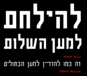 Illustrator, graphic and type designer, and 3d modeler, b. 2001 in Moscow. He graduated from MGHPA (Faculty of Graphic Design of the Stroganov Academy) in 2018.
 In 2022, Matthew Grouss, Ksenia Churilova and Pavel Nevsky released the 16-weight constructivist typeface Nowar, a variable typeface that features Latin, Cyrillic and Hebrew scripts. [Google]
[MyFonts]
[More] ⦿
|
Pedro Alexandre Teixeira
[Pedro Teixeira Foundry]

|
[MyFonts]
[More] ⦿
|
Pedro Leal

|
 Pedro Leal graduated in graphic design and advertising from the ESEIG-Escola Superior de Estudos Industriais e de Engenharia in Vila do Conde, Portugal, and lives in Porto. In 2010 he obtained a degree in type design at ESAD (Escola Superior de Artes e Design, Matosinhos) and started working at DSType. MyFonts link. Behance link.
 He used FontStruct in 2008 to create the pixel typeface Minimal 8pt (514 glyphs!). In 2010, he created the text family Mafra at DSType. This was followed a bit later by Mafra Display (2010; +Medium, +Black). Apud and Apud Display (2010, DSType) are high-contrast typefaces. Penna (2011) is a calligraphic type system. Braga (2011, Dino dos Santos and Pedro Leal, DS Type) is a layered font design family. Dino writes: Braga is an exuberant baroque typeface, named after a Portuguese city, also known as the baroque capital of Portugal. Our latest typographic extravaganza comes with a multitude of fonts designed to work like layers, allowing to insert color, lines, gradients, patterns, baroque, floral swashes, and many other graphic elements. Starting with Braga Base, you can add any of the twenty-three available styles, to create colourful typographic designs. In 2012, he designed User, User Stencil and User Upright>/a>, a monospaced type family with 30 styles, from Hairline to Bold. This too will many awards. Girga (+Italic, +Engraved, +Banner, +Stencil) is a strong black Egyptian family designed together with Dino dos Santos at DS Type. Solido (2012, with Dino dos Santos, DS Type) is a versatile type system with five widths: Solido, Solido Constricted, Solido Condensed, Solido Compressed and Solido Compact. In total there are 35 fonts. In 2020, a variable font was added to Solido. In 2012, he created the sans family Global, with its own dedicated web site, The Global Font. In 2013, he followed that up with the Global Stencil typeface family. In 2013, Dino dos Santos and Pedro Leal published Diversa, a set of nine very different fonts that are jointly kerned so that letters can be swapped out and replaced at will. Diversa Std (2014) extends this to include Stencil, Inline and other decorative styles. Pedro Leal's main typeface of 2013 is Aparo, a script that is calligraphic, yet keeps the characteristics of penmanship scripts, and the pizzazz of a good fashion font. In 2014, he published Ocre and Ocre Poster in sans and slab serif substyles inspired by W.A. Dwiggins, Torio, a penmanship script based on a style used in Arte de Escribir por Reglas y con Muestras (1798, by Spanish penman Torcuato Torío de la Riva y Herrer). Torio received the Communication Arts Type Award of Excellence in 2014. In 2015, he created the large Rudo and Rude Slab typeface families that exhibit many humanist traits: Rude ExtraWide, Rude Icons, Rude SemiCondensed, Rude SemiWide, Rude Wide, Rude, Rude Condensed, Rude ExtraCondensed, Rude Slab, Rude Slab Condensed, Rude Slab ExtraCondensed, Rude Slab ExtraWide, Rude Slab SemiCondensed, Rude Slab SemiWide, Rude Slab Wide, Rude Slab, Rude Slab Condensed, Rude Slab ExtraCondensed, Rude Slab ExtraWide, Rude Slab SemiCondensed, Rude Slab SemiWide, Rude Slab Wide. Early in 2015, he also did a custom typeface family for the Jornal de Notícias, including sans, serif and micro sub-styles. Dino dos Santos and Pedro Leal published Jules and Jules Text in the summer of 2015---a fat fashion mag didone 45-style family inspired by several plates from Portuguese calligrapher Antonio Jacintho de Araujo; it comes in Big, Colossal and Epic. Ecra is a workhorse slab serif, also done in 2015. Viska (2015, by Dino dos Santos and Pedro Leal) is designed for small print. Finally, TCF Zellige (2015, TypeCult) is a modular typeface inspired by the tiles that can be found in Southern Europe and North Africa. Typefaces from 2016: Oposta (Italian, Western style pushed to the esthetic extreme; received the Communication Arts Type Award of Excellence in 2017), Ardina (with Dino dos Santos: a text typeface family with three optical sizes). Typefaces from 2017: Scrittore (a heavy dark Italian bastarda influenced by the connected hand of Giovanniantonio Tagliente and Robert Granjon's Civilité; at DS Type), Zart (a voluptuous ebullient black didone, or fat face; +Script). Fusta (a gorgeous wood-type inspired poster typeface), Ordem (a low-contrast contemporary Capitalis Monumentalis). Typefaces from 2018: Glitched (an experimental variable spacing font), Striver (a crisp contrasted curvy display typeface), Certo Slab and Certo Sans, Foreday (a forward-looking typeface family with associated variable font, covering sans, serif, semi-sans and semi-serif), Perfil (an inline and swashy high end script). Typefaces from 2019: Akut (a purely angular typeface with some rounded corners), Denso (by Dino dos Santos and Pedro Leal: a great condensed variable font with weight, serif and optical size axes), Jornada (a multistyle family with a Fraktur, a chancery, a bookish style called Libro, a news text serif, a clean sans, a slab serif, a monospace, and a penmanship script, all in one family dubbed hygienic post-punk by Leal). In 2020, Dino dos Santos and Pedro Leal designed Larga, which was inspired by the typefaces shown in the specimens of the Fundiçãao Typographica Portuense from 1874. Larga is a wide all caps family and comes with a variable opentype format. Pedro also designed Effigy (a text typeface with slightly ballooning stems), Haste (a typeface that flirts with reverse contrast), Mescla and Enorme (an ultra massive and modular 3000-glyph mastodont of a font, together with Dino dos Santos; based on constructivist principles) in 2020. Typefaces from 2021: Orla (a straightforward interpretation of the Skeleton Antique No2 from the Stephenson, Blake & Co. foundry; for the sans, the serifs were removed), Elaine (+Ombre, +Fleurer; a complete baroque / Elzevir family influenced by Jacques-François Rosart in its ornamental styles). [Google]
[MyFonts]
[More] ⦿
|
Pedro Medina-Leansry
[Pedroglifos]

|
[MyFonts]
[More] ⦿
|
Pedro Pereira
|
During his Masters studies, Braga, Portugal-based Pedro Pereira, together with Rafael Pereira and Francisco Pires (Braga; b. 1996), designed the free squarish variable typeface Pure (2021), which was inspired by New York City. [Google]
[More] ⦿
|
Pedro Teixeira Foundry
[Pedro Alexandre Teixeira]

|
 Pedro Alexandre Vilas Boas Teixeira is a Porto, Portugal-based type designer. Creator of the monoline gemetric organic sans typeface Constantine (2012). In 2016, he designed the comic book typeface Crazy Cartoon, the brush script Forever Brush Script, the sans typeface Rabelo, Westkreep (a wide wood type typeface), the tall cigarette typeface Long Tall Palito and the rounded sans typeface Sogu.
 Typefaces from 2017: Signaturistar, Toxic Marker (dry brush), Scratched Brush Script, Serene Textured (script), Feris Script, Boemia, Savage Adventure (brush script), Casual Mark Script, Rough Beauty Script, Cartoon US Presidents. Typefaces from 2018: Constancia Script (a thin refined calligraphic script), Bow Tie (script), Black Fox (upright script). Typefaces from 2019: Aleante Sans (+a variable font option, Lets Get Crazy (script+sans), Stylish Marker. Typefaces from 2020: Ungap Blocks Variable, Cursive Signa Script Variable (a signature script), Zinekiss. Typefaces from 2021: Ayaha (a signage script), Xanas Wedding (a thin calligraphic signature font in 22 styles), Haeock (an 8-style slab serif). Typefaces from 2022: Spaxel (a pixelated video game font). Creative Market link. Another Creative Market link. [Google]
[MyFonts]
[More] ⦿
|
Pedroglifos
[Pedro Medina-Leansry]

|
San Juan, Puerto Rico-based designer of these typefaces in 2022: Deliria (what letters look like after a Delirium Tremens), Fusil (a 5-style display typeface that crosses genres), Matria (a curvy stencil typeface), Nimba (a 6-style paintbrush family), Quiron (an 8-font + variable squarish sans), Zafrada (a 13-style lapidary rustic family for which the designer took inspiration from sugar cane). [Google]
[MyFonts]
[More] ⦿
|
Peregrin Studio
[Ellen Luff]

|
Peregrin Studio was started by creative duo Tom Watkins & Ellen Luff in 2021. It explores new font technology such as SVG and variable fonts. Based in London, UK but working worldwide, their clients included Apple, NASA, Sony and Netflix. In 2021, Ellen Luff published Denton, a 14-style expressive sans, with two variable fonts. Behance link for Peregrin Studio. [Google]
[MyFonts]
[More] ⦿
|
Peter Baker's old English page at the University of Virginia
[Peter S. Baker]
|
 Peter S. Baker, an English professor at the University of Virginia, offers free TrueType and PostScript fonts. these include:
 - Anglo-Saxon Caps.
- Beowulf-1 (1995, a pseudo-Gaelic face; BeowulfOT dates from 2018).
- Bury Caps (2014, free at OFL). This decorative typeface was inspired by the display capitals in the 12th-century Bury Bible.
- The elegant Carolingian typeface Eadui (2010), a reproduction of English Caroline Minuscule as written by Eadui Basan, a scribe at eleventh-century Christ Church, Canterbury.
- Elstob (2018-2019). A variable font for for medievalists. He writes: The Elstob font, named for Elizabeth Elstob (1683-1756), a celebrated early scholar of Old English language and literature, is based on the Double Pica commissioned by Bishop John Fell (1625-1686) for the use of the Oxford University Press. Wherever possible, it is modeled on a specimen book printed in 1925 with type cast in the 1890s from the seventeenth-century matrices; digital images from the 1693 and 1706 Fell specimen books served as backup, and also an early eighteenth-century folio in which a lengthy dedication was printed in Fell's Double Pica. The type doesn't have a great reputation: the typographer Stanley Morison thought it amateurish in comparison with the excellent Fell English. However, its angular character (especially its flat or flattish serifs with minimal or no brackets) makes it well suited to adaptation as a variable font.
- Interlace Set (2015). A dingbat font for making Hiberno-Saxon interlace patterns.
- The important and well-designed Junius family (1996, modern hybrid Gaelic). This led to Junicode, the working name of a Unicode font for medievalists. The fonts in the latter project are Junicode-Bold, JunicodeItalic, Junicode (2002), and are by Peter S. Baker and Briery Creek Software. André G. Isaak writes: Junicode isn't the only free font for mediaevalists out there, but it's certainly one of the two most well-designed ones (the other being Andron Scriptor). I used to teach courses on the history of English and I used Junius (the predecessor of Junicode) for many of my handouts because I preferred it to all of the commercial fonts which I had looked at. In 2020, Junicode was rebuilt into JuniusX or Junicode New.
Alternate URL. Dafont link. Open Font Library link, where he is known as psb6m. Fontspace link. Link to his foundry, Thornbec Staefwyrhtan. Github link. [Google]
[More] ⦿
|
Peter Bilak
[Typotheque]

|
 [MyFonts]
[More] ⦿
|
Peter S. Baker
[Peter Baker's old English page at the University of Virginia]
|
 [More] ⦿
|
Phaedra Charles
[Undercase Type]
|
 [More] ⦿
|
Phantom Foundry
[Jean-Baptiste Morizot]

|
 Type designer at the open source type foundry Velvetyne in Paris. His creations there include Trickster (2017: blackletter), Bluu Next (2014, a free wedge serif typeface) and Steps Mono (with Raphael Bastide).
 In 2015, he switched to the commmercial camp, and cooperated with the Fontyou team in the production of the didone typeface family Télémaque FY, which brings Didot in its most rigid and tuxedoed manner, for the black-and-white fashion mags showing James Bond with a black bowtie and spotless high-contrast shirt. In 2016, Alisa Nowak, Julie Soudanne and Jean-Baptiste Morizot co-designed Graphico (Indian Type Foundry): Its letterforms are industrial and square-sided. The typeface looks like the product of precision mechanics: it should be featured together with tech---either old tech like appliances or watches, or new tech like apps and laptop stands. Still for Indian Type Foundry in 2016, he designed the hipster sans typeface family Bobo---perhaps one of the greatest hipster typefaces of all times. Bobo stands for bourgeois Bohemian---I am not sure it is identical to gauche caviar, but that is the societal class the author of this typographic encyclopedia belongs to. In 2016, Morizot designed the high contrast wedge serif newspaper typeface families Editor and Editor Condensed, the 6-style techno font Technor (free at Fontshare; squarish with inflated horizontal strokes), and the car license plate font License at Indian Type Foundry. In 2017, as part of the new Black Foundry, he extended his free font Bluu and even added a variable font to the set, as well as a collection of emojis. The new name is Bluusuuperstar: Bluu Suuperstar is a brutalist serif typeface featuring very prominent triangular-wedges for serifs and terminals. Bluu Suuperstar's letters have a tall x-height, and the diamond dots are a chief characteristic of the design. Notches like these [diamonds] are found in several blackletter designs; but most-famously in the romain du roi created for Louis XIV. Nothing in Bluu Suuperstar is soft or cuddly; this is a sharp typeface, and you could cut yourself on its letters. The separate emoji font, designed by Gaëtan Baehr, is wittily named Bluumoji, and it includes 73 glyphs. In 2018, Morizot set up Phantom Foundry, where he published Super Fat Bob (2018) and Phantom Sans (2018: trying to bring some warmth to the geometric sans genre, and now also a variable typeface). Typefaces from 2019: Cosmetic (Indian Type Foundry: a high-contrast fashion mag sans family), TXT25 (an unconventional extreme-axis (variable) text typeface). Typefaces from 2020: Karrik (a free britalist font designed with Lucas Le Bihan), Token (at Future Fonts---on purpose, Morizot mixes discordant styles to create a Frankenstein monster of a typeface; he added Token Bebop in 2021), Kola (a molecular rounded stencil typeface published at Indian Type Foundry; free at Fontshare) Typefaces from 2021: Pally (at Fontshare; a 3-style asymmetric rounded sans with a playful children's book or comic strip rhythm), Zodiak (2021, Jérémie Hornus, Gaetan Baehr, Jean-Baptiste Morizot, Alisa Nowak, and Théo Guillard at Fontshare; a free 24-style text family with Century-like newspaper roots and sturdy bracketed slab serifs that was originally named Claire (2020)), NaN Tragedy (an 8-style serif with display and Text subfamilies, and a variable font option; Tragedy is classical and sturdy, yet mischievous and unconventional). Fontshop link. Future Fonts link. Home page. Fontsquirrel link. Jean-Baptiste Morizot at Velvetyne. [Google]
[MyFonts]
[More] ⦿
|
Philip Lammert
[Vibrant Types (was: Calligrafiction)]

|
 [MyFonts]
[More] ⦿
|
Philip Trautmann
[Shaped Fonts (was: Phitra Design)]
|
[More] ⦿
|
Pilcrow
[Simon Cozens]
|
Free software by Simon Cozens first published in 2020. Pilcrow allows you to build variable fonts using a graphical interface. It requires, among other things, python and fonttools. [Google]
[More] ⦿
|
Pizza Typefaces
|
Type foundry set up in 2018 in Paris by French type designers Adrien Midzic and Luc Borho. Their fonts are also available on other sites. The initial offering includes many fonts by Midzic (Orelo, Kern, Metal, Bota, Forno) and one by Borho (Fadoli). They intend to offer many variable type fonts. [Google]
[More] ⦿
|
Polyform
[Lisa Huang]
|
 Lisa Huang was born and grew up in France, and is currently based in Paris. Lisa studied mostly in Paris in graphic design before going further in type and typography with Type@Cooper Condensed program in 2015 in New York City and a couple of years in design companies such as BETC Design and type foundry Black[Foundry] both in Paris. In 2018, she graduated from TypeMedia at the KABK in The Hague.
 Lisa's specializes in multi-cultural projects, especially mixing Latin / French and Chinese cultures. In 2019, she founded a graphic and type design studio with her partner Thomas Kim called Polyform Studio (Paris). At Type@Paris 2016, Lisa Huang designed the warm text/sans typeface pair Julie et Julien. Her graduation typeface at KABK was Model Sans and Display (2018). She writes: I paid my attention to the balance between conventional structures of sans serif typefaces, optical corrections for legibility, and details from hand drawn shapes to give it personality. Contributor in 2019 to the variable programming font Recursive Sans+Mono, the brainchild of Stephen Nixon. Github page where we learn that contributors besides Stephen Nixon include Katja Schimmel, Lisa Huang and Rafal Buchner. In 2019, these authors published Recursive as a variable font with five axes, Mono, casual, weight, slant and italics. Dedicated page. It will be added to Google Fonts at some point. [Google]
[More] ⦿
|
Polymorph
[Amélie Dumont]
|
Polymorph is a Brussels-based outfit that groups designers who use free programming tools for artistic expression. It is run by Amélie Dumont and François Zajega. Dumont designed some fonts through programming with Metapost, Javascript, FreeCad and other tools. By 2021, she finished Chemins (2021: polygonal), Ductus (2020: +Mono), Fablab (2020: made with freeCad), MetaAccanthis (2020), Fraktur Meta (2019), Metatextura Linear (2018) and Metafraktur Linear (2018). Gitlab link. [Google]
[More] ⦿
|
Pooja Saxena
|
 Indian graduate of New Delhi's National Institute of Fashion Technology and the MATD program at the University of Reading in 2012 who was born in New Delhi, lived in Bangalore and Hyderabad, and is now back in New Delhi.
 Pooja's graduation typeface is Cawnpore (2012), a Latin / Devanagari multi-script family designed for readability in small print. Fontstructor who made these typefaces in 2011: Picadilly Circus (dot matrix), Rise of the Cellphone (cellphone dings), Depot (dot matrix), Depot Devanagari, Type in Transit I (dot matrix), Electricals Ltd, Giovanni Ostaus, Nip And Tuck, Delhi Metro Sans II (dot matrix face), and Delhi Metro Serif. Pooja added many dot matrix style stitching fonts in 2011: Sajou I, II and III, Lettering For Stitchers I through X. These are digitizations of embroidery patterns from Elsie Svennas' book A Handbook of Lettering for Stitchers. Chaukor (2009) is an experimental Devanagari face. In 2014, she developed Cambay (Google Web Fonts; see also GitHub and Open Font Library). Cambay is a libre Devanagari sans typeface family designed to match the Latin font Cantarell (Dave Crossland, 2009). Still in 2014, she created the Gujarati / Latin typeface Farsan (free at Google Fonts; Github link). In 2017, Pooja joined Type Together. Type Together interview, where we learn that she regrets not having studied mathematics. It's never too late, Pooja! In 2021, she was part of the development of Belarius, a three-axis variable family that shifts from sans to slab serif, from condensed to expanded widths, and includes every possibility in between. Published by Type Together in 2021, it was developed under the guidance of Veronika Burian and José Scaglione, with type design by Azza Alameddine and Pooja Saxena, and additional kerning and engineering help from Radek Sidun, Joancarles Casasin and Irene Vlachou. Still in 2021 at Type Together, she started work on Bree Devanagari. [Google]
[More] ⦿
|
Prestigetype Studio
[Mohamad Ridwan]

|
Bandung, Indonesia-based designer of Maira (2020), Eloque (2020), Hanney (2020), Mondany (2020: a monoline script), Luxery (2020: a dry brush script), Raluxe Script (2020) and Raluxe (2020: all caps, stylish). Typefaces from 2021: Bracy (an artistic font), Maslen (a signature script), Galey (a 38-style geometric sans in sharp and rounded versions), Maves (an all caps art deco stencil typeface). Typefaces from 2022: Asparocus (an all caps sans and script font duo; includes a variable font). [Google]
[MyFonts]
[More] ⦿
|
Process Type Foundry
[Eric Olson]

|
 Located in Minneapolis and/or Golden Valley, MN, Process Type Foundry is Eric Olson's foundry created in 2002. Its team grew withe additions of Alice Savoie, Nicole Dotin and Doug WilsonIts fonts:
 - Anchor.
- Bryant (2002, sans serif with simple forms). Bryant 2.0 (2005, Standard&Pro), Bryant Compressed, Bryant Condensed (all three form a neat geometric sans family), Bryant Pro.
- Chrono (2012). Olson writes: Chrono: The nearly geometric sans serif. Chrono is a refined oval sans serif of 20th century origins and 21st century sensibilities. Influences ranging from the gruff Aurora Grotesk series to the elegant Neuzeit are paired with a subtle geometry and typographic utility to inform this family of sans serifs. Chrono was renamed Colfax later in 2012.
- Colfax (2012). The blurb: Colfax is a refined oval sans serif of 20th century origins and 21st century sensibilities. Influences ranging from the gruff Aurora Grotesk series to the elegant Neuzeit are paired with a subtle geometry and typographic utility to inform this family of sans serifs. It was formerly called Chrono. A complaint from another foundry with a similarly named font led to the name change. The only one I can think of is Cronos (Robert Slimbach, Adobe).
- Coordinates (2018). A monospaced almost typewriter typeface.
- Elderkin (2005). Eric Olson; A few of my typefaces were made for very specific projects (Process Grotesque + Elderkin) and really have no contribution to make beyond that. Sure they look fine, but who cares? I'm not thrilled with them and plan on removing them this spring.
- Entovo (2006, rectangular).
- FIG-Sans, FIG-Script, FIG-Serif (2002, as in needlepoint lettering, in imitation of the figlet ascii-to-letter program).
- FindReplace (2004).
- A free monospaced font, Indivisible (2002). This became a variable font in 2019.
- Kettler (2002). A Courier-like font named after Courier's designer, Howard Kettler.
- Klavika (2004, an extensive sans family). Followed in 2005 by Klavika Condensed, in 2008 by Klavika Basic and in 2012 by Klavika Display. Klavika poster by Mary Stratton and Michele Wong Kung Fong.
- Lingua (2003, an octagonal typeface with about 200 ligatures).
- Locator (2003), Locator Display: an information design sans family.
- Maple (2005, a grotesque family that includes a beautiful Black).
- Moniker (2017, Process Type Foundry). A large rounded sans typeface family.
- Process Grotesque (or: Process Grot).
- Recent Grotesk (2020, in six weights). He writes: Recent Grotesk is a contemporary family of typefaces with influences that start in the 19th century and travel through into present day. It's a nod to the improvised weight and width strategies of wood type, the high x-heights of 20th century phototype and the puffed out Antique Olive Nord of Roger Excoffon.
- Recipient (2022). A monospaced typewriter font family that descends from the IBM Selectric and Olivetti typewriter faces.
- Scandia Line (2015). Drawn without curves, this four style+stencil variant is purely polygonal, for a special Neanderthal computer effect. Scandia (2015) on the other hand is a classic geometric sans.
- Sculpin (2021). A sharp-edged sans typeface inspired by the finishing details of square-edged tools like the chisel and brush.
- Seravek (2007, a linear and simple sans created for information design).
- Stratum 1 and 2 (2004, contemporary geometric typefaces genetically linked to Bank Gothic).
Before Process Type Foundry, Eric used to run Information Repair, where he did "typeface design and print design for clients within the cultural sector including the Walker Art Center, Minneapolis College of Art and Design (MCAD), Intermedia Arts and the Design Institute at the University of Minnesota" and made the fonts Novo Grotesk, Necrophones, Fibo001. Fonts sold by MyFonts. Behance link. View the Process Type Foundry typeface library. View Eric Olson's typefaces. [Google]
[MyFonts]
[More] ⦿
|
Promphan Suksumek
|
Boom Promphan Suksumek is a type designer at Cadson Demak, a type foundry based in Bangkok, Thailand. She also currently teaches courses at local universities on typography and the fundamentals of type design. Suksumek studied type design while doing a master's in communication design at the Basel School of Design in Switzerland. She wrote a master's thesis on variable fonts (emotionaltype.org). Speaker at ATypI 2019 in Tokyo on the topic of The Evolution of Thai Loopless Script. She writes: Thai script is divided into the looped and the loopless. Loopless Thai is generally considered to be the modern form of Thai script. However, loopless Thai has its own history. This presentation examines the evolution of the Thai loopless form and attempts to map its development. Originating with the Thai Naris typeface in 1863, the Thai loopless form was initially constructed using a broad-nib pen. Later on, it was adopted and transformed by the locals. It initially appeared mainly in headlines; it was also used in books, newspapers, and local consumer products to make a bold statement. In the 1940s, it began to be embraced by local calligraphers and sign painters. The dry-transfer era saw even more experimentation with the loopless form---it showed up on the posters of the 1976 student-activist uprising in Thailand, for example. It is currently part of daily life there. Cultural influence has simplified the loopless form over time. Loopless Thai raises many questions about what we consider modern versus what we deem outdated. She has been working on custom Thai typeface projects for local and international brands such as Singha Estate, Grab, and Mercedes Benz. [Google]
[More] ⦿
|
Przemyslaw Hoffer
|
 Przemec Hoffer is the Lodz, Poland-based creator of the hairline titling sans typeface Basicl (2012) and of Basic Title Font (2012, hairline caps).
 In 2013, he designed Madame Klara, Madame Deloblat and Madame Mary, a trio of thin slab serif typefaces for glamour magazines. In 2014, he made the octagonal typeface Mechanik. In 2016, he started work on Laktoza. In 2018, Mateusz Machalski, Borys Kosmynka and Przemek Hoffer co-designed the six-style antiqua typeface family Brygada 1918, which is based on a font designed by Adam Poltawski in 1918. Free download from the Polish president's site. The digitization was made possible after Janusz Tryzno acquired the fonts from Poltawski's estate. The official presentation of the font took place in the Polish Presidential Palace, in presence of the (right wing, ultra-conservative, nationalist, law and order) President of Poland, Andrzej Duda. Calling it a national typeface, the president assured the designers that he would use Brygada 1918 in his office. It will be used for diplomas and various other official forms. In 2021, with Anna Wielunska added to the list of authors, it was added as a variable font covering Latin, Greek and Cyrillic to Google Fonts. Github link. [Google]
[More] ⦿
|
Punch
[Kristof Van Proeyen]

|
 Punch was founded by Kristof Van Proeyen, an independent creative based in Antwerp, Belgium. In 2020, he designed the 14-style display serif typeface Petroles.
 In 2021, he published Interbellum (a 9-style art deco sans) and the 10-style (+variable) italic font family Levino. [Google]
[MyFonts]
[More] ⦿
|
Pyotr Bushuev
[Naum Type]

|
 [MyFonts]
[More] ⦿
|
Radek Lukasiewicz

|
 Radek Lukasiewicz studied printmaking at Nicolaus Copernicus University in Poland. He worked as a graphic designer and type designer in London. In 2019 he moved to Reading to study for an MA in Typeface Design, and graduated there in 2020. His graduation typeface was Squeak and Roger. He writes: Roger is a text family that eludes the categorisatioon of serif or sans. It is taking characteristics from both models to achieve optimal reading. The letter shapes have been developed with consideration for all scripts supported: Latin, Cyrillic, Greek and Arabic. Squeak is a sans serif typeface, tailored for captions, side notes, and short paragraphs that sets aptly in small sizes. After Reading, he started working for CAST and Three Dots Type.
 Other typefaces: - The text typeface family Calisia (2014, at T-26).
- Chorda (Gestalten).
- four typeface families at FontFont, published in 2020: FF Kaytek Rounded, FF Kaytek Headline, FF Kaytek Slab, FF Kaytek Sans.
- Szymborska (2014). In 2014, he won the Type Szymborska competition in Poland with a typeface specifically designed for the poetry of Wislawa Szymborska.
- Radius (2021, at Three Dots Type). A polygonal (and variable) typeface family.
- Mora (2019). A sans and serif supertype family for Latin, Greek and Cyrillic.
- Jantar Flow (2019-2021, CAST) and Jantar Sharp (2019-2021, CAST). Jantar Flow is a humanist sans typeface tailored for continuous reading for both printing and screen. With its large x-height and low contrast it also performs very well in captions, side notes, and short paragraphs set in small sizes. Jantar Sharp is a lapidary text family with flared terminals that eludes the categories of serif or sans.
[Google]
[MyFonts]
[More] ⦿
|
Rafael Saraiva

|
 Rafael Saraiva is a Brazilian / Portuguese type designer located in Rio de Janeiro who works for Dalton Maag as font developer. Graduate of Escola de Belas Artes at UFRJ, and the MATD program at the University of Reading in 2012. His graduation typeface at Reading wass the Latin / Sinhala multi-script Serendip (2012). Serendip subsequently won an award at Tipos Latinos 2014.
 Codesigner with Bruno Mello, Fabio Haag, Fernando Caro and Ron Carpenter of Soleto (2014, Dalton Maag), a sans typeface that won an award at Tipos Latinos 2014. In 2014, Bruno Maag, Ron Carpenter, Fernando Caro and Rafael Saraiva co-designed the rounded organic sans typeface Oscine (Dalton Maag). In 2021, he designed the solid and inline (variable) sports font family Shader. [Google]
[MyFonts]
[More] ⦿
|
Rafal Jozef Buchner

|
 Graduate of Warsaw Academy of Fine Arts. Type designer for Tygodnik Powszechny weekly magazine, History Meeting House and others. In 2016, as part of Warsaw Types, he designed the thick poster typeface Aprobal and writes: In the old Warsaw urban slang, Apropal means a small time crook. This font is inspired by the Czytelnik bookstore, the information signs from Warsaw's Zoo, and designs found in the Lettering Techniques book manual, by Jan Wojenski.
 In 2018, he graduated from the TypeMedia program at KABK in Den Haag. His graduation typeface is called Gamer. He writes: Gamer is a typeface which originates from nostalgia for the games, films, and technology I grew up with. The main aim of the project is to make letterforms that work well both on low and high-resolution screens. To accomplish this, the core shapes of the typeface are drawn on top of pixelated letters. The wider-than-usual proportions are informed by the logos of technology companies. The squarish letterforms are inspired by fonts that commonly appear in sci-fi movies. Contributor in 2019 to the variable programming font Recursive Sans+Mono, the brainchild of Stephen Nixon. Github page where we learn that contributors besides Stephen Nixon include Katja Schimmel, Lisa Huang and Rafal Buchner. In 2019, these authors published Recursive as a variable font with five axes, mono, casual, weight, slant and italics. Dedicated page. It will be added to Google Fonts at some point. In 2021, Buchner released the free 10-style rounded monolinear inktrapped slab serif family (+a variable font) Chubbo at Fontshare. In 2021, Barbara Bigosinska, Rafa Buchner and Diana Ovezea set up Blast Foundry. At Blast foundry, he released the variable typeface Ehrie with one axis that makes letters disappear. Typefaces from 2022: Duplet (a 14-style geometric sans with a techno vibe; by Diana Ovezea and Rafal Buchner at Indian type Foundry), Duplet Rounded (also 14 styles), Duplet Open (the 14-style companion of Duplet). [Google]
[MyFonts]
[More] ⦿
|
Rajesh Rajput
[Nav Raw]
|
 [More] ⦿
|
Rasmus Andersson
|
 Swedish software expert who lives in San Francisco and who has worked for Dropbox, Facebook, Spotify, Lear Corporation and Spray. His own company is called Notion. His typefaces:
 - The Open Source screen typeface family Interface (2017), which builds on Christian Robertson's Roboto. It covers Latin, Greek and Cyrillic. It seems that this family was renamed Inter UI in 2019. Inter is now downloadable at Google Fonts. Github link, where one can find a variable font version. CTAN link.
- Manix Sans (2019). A minor update of Inter UI.
- Linik Sans (2019), a further update of Inter and Manix Sans.
Open Font Library link. Github link. Linkedin link. Aka rsms. [Google]
[More] ⦿
|
Rebecca Alaccari
[Canada Type]

|
 [MyFonts]
[More] ⦿
|
Resistenza
[Giuseppe Salerno]

|
 Giuseppe Salerno (aka Resistenza.es) is an Italian graphic designer, specializing in web design. He lived in Torino, Amsterdam, Madrid, and Valencia, and currently works in Valencia, Berlin and Turin. Studio Resistenza was cofounded by Giuseppe Salerno and Paco Gonzales.
 In 2010, he made the circular multiline face Afrobeat (+Light), the fat counterless typeface Vito Sans (2010), Wonderwall (2010, like a skeletal construction), the high-contrast art deco typeface Zaza (2010), and the pure Italian vintage art deco face Luxx (futurism). Other work: an art deco poster. Direct links to his fonts: Zaza, Afrobeat, Vito Sans, Luxx, Wonder Wall, Afrobeat Light. Creations from 2011: Ratatan, Bodoni At Home (a handpainted Bodoni), Arcanotype (2011, delicate caps, individually drawn using Chinese ink on Japanese calligraphy paper), Babushka (2011), Dolce Caffe (2011), Adelaida (hand-printed poster face), Monella (octagonal). Production in 2012: Ampersanders (a font with many ampersands), BLAQ (an ornamental blackletter caps typeface inspired by Henry W. Troy), The Bay (hand-printed all caps poster face), Bratislove (an artsy hand-drawn typeface), Modernissimo (decorative modern art-inspired caps), Clementina (hand-printed caps), Afrobeat Gothic (angular multiline face). Typefaces from 2013: Glob (bubblegum face), Archivio (slab serif family with very open counters), Mina (connected script), Monster Hand (brush script), Berliner Fraktur (a flat brush fraktur inspired by Rudolf Koch), The Luxx (a redesign of the 2010 art deco sans typeface Luxx---a comparable typeface is Mostra Nuova by Mark Simonson), Starburst (calligraphic gestural light script), Caramello Script, Copperlove (copperplate script), Yma Italic (retro script), Sonica Brush. Typefaces from 2014: Stencil Creek, Elastica (handcrafted typeface family), Elastica (hand-drawn poster family), Nautica (copperplate script, extended in 2018 to Nautica Sottile and the monoline version Nautica Line), Ingles (copperplate script), Peperoncino Sans (a decorative sans serif font system designed with a marker), Attica RSZ (inspired by Caslon Italian and Novarese's Estro), Montana (poster family, +Icona), Superb (a yummy creamy script, co-designed with Paco Gonzalez), Dolce Caffe 3D, Coming Home (a hairline curly script based on a childish handwriting), Rachele (a monoline connected script with a large x-height), The Crashed Fonts (a glaz krak family), Newland (inspired by Rudolf Koch's Neuland), Two Fingers (a funky hand-drawn family that includes, e.g., Two Fingers Bodoni, Two Fingers Courier, Two Fingers Poster [blackboard bold] and Two Fingers Script). Typefaces from 2015: Modern Love (brush script), Mela (a gorgeous pointed brush / walnut ink typeface), Turquoise (a calligraphic serif type influenced by capitalis romana; not to be confused with Ahmet Altun's Turquoise typeface from 2011; co-designed with Paco Gonzalez, it was extended in 2019 in Turquoise Inline, and a new version was added in 2021, Turquoise Tuscan), Mina Chic (a wide connected calligraphic fashion mag script), Natura (connected fountain pen script, with accompanying Notebook, Icons and Stamps (initial caps) styles), Stencil Creek (inspired by Akzidenz Grotesk and influenced by street signs of the North West Pacific), Quaderno (monoline upright signage script). Typefaces from 2016: Xmas Wishes, Gianduja (2016, a chocolate box script typeface family co-designed with Andrea Tardivo and Paco Gonzalez). Apero (a handcrafted emulation of sans and slab styles; the sans serif was inspired by vintage local liquor labels), Respect (a brush script sign painting typeface), Mentha (a calligraphic connected script typeface). Typefaces from 2017: Peperoncino Vintage, Shabby Chic (wide signature script), Merendina (rounded sans family), Adore You (dry brush script), Quaderno Slanted (monolinear connected script), Love Wins (a collection of signage type phrases), Beach Please (watercolor brush), Timberline (dry brush script), Orbita (stencil shadow), Modern Love Slanted (brush style), Gessetto (a chalk lettering family). Typefaces from 2018: Pesto Fresco (a wonderful 28-font layerable font family for use in hand-lettered posters), Instamood (a casual script), Auster (an unconventional flared and reverse contrast sans; followed in 2019 by Auster Rounded by Paco Gonzalez and Giuseppe Salerno, and in 2020 by Auster Variable), Smoothy (brush script), Voguing (a multiline typeface inspired by the movement and glamour of the 80�s and New York ballrooms scene), Beach Please Vintage, La Bodeguita (calligraphic), Contigo (with Paco Gonzalez; see also Contigo Vintage ), Story Tales (folklore style, with many choices of textures and possibility of layering), DreamTeam (multilined). Typefaces from 2019 co-designed by Paco Gonzalez and Giuseppe Salerno: the brush typefaces Pando Script and Parkour, the Tuscan family Royale, the chalk font Dolce Caffe Chalk, the brush script Batticuore, the bry brush script typeface Blue Jeans, the layered handcrafted sans typeface Dolcissimo, and the font duo Sunday Morning. Typefaces from 2019 by Giuseppe Salerno: SmoothyPro (with Paco Gonzalez), Auster Slab (a reverse stress slab). Typefaces from 2020: Vermouth (a layerable font based on Italian signs from the 1960s), Big Mamma (a hand-printed slab serif by Giuseppe Salerno and Paco Gonzalez), Suerte (a reverse contrast display type, inspired by Aldo Novarese's Estro; with Paco Gonzalez), Norman (a fashion mag typeface by Paco Gonzalez and Giuseppe Salerno), Royale Italic (Tuscan; with Paco Gonzalez), Groupie (a psychedelic delight), Hello Fresh (with Paco Gonzalez), Nostalgia and Nostalgia Flowers (with Paco Gonzalez), Tresor (a romantic flared sans; with Paco Gonzalez), Pesto Fresco Italic (with Paco Gonzalez). Typefaces from 2021: Industria Serif (54 styles; by Giuseppe Salerno and Paco Gonzalez), Guess What (hand-printed), Little Boxes (a fat finger font), Notes (a notebook script family), Annuario (an 48-style sans initially created for a calendar), Norman Stencil, Norman Variable, Videomusic (script), Norman Fat (a decorative high-contrast razor-sharp serif). Typefaces from 2022: Oddity (a stylish calligraphic script). His type blog is called It's Not My Type. Behance link. Creative Market link. Klingspor link. Creattica link. [Google]
[MyFonts]
[More] ⦿
|
Reto Moser
|
 Designer at Folch Studio (Barcelona) of FS Ugly Italic (2008, with Miquel Polidano).
 Grotesk cc is Tobias Rechsteiner, Reto Moser, and Simon Renfer in Bern, Switzerland. The former two designed GT Haptik (2009), which is a grotesk typeface in which the letters are optimized to be read blindfolded and by touching them. GT Haptik was published at Grilli Type. In 2015-2016, Reto Moser designed the sans typeface family GT Eesti at Grillitype. GT Eesti has Soviet roots: It is a free-spirited interpretation of the Soviet geometric sans serif Zhurnalnaya Roublennaya, first released in 1947 and designed by Anatoly Shchukin. Another URL. In 2020, Reto Moser finally released the 70-style workhorse serif family GT Alpina at Grillitype. GT Alpina a three-axis variable font (weight, width, display). [Google]
[More] ⦿
|
Riccardo De Franceschi
|
 Italian graduate from the type design program at the University of Reading in 2010, who lives and works in Piedmont and Lombardy in Northern Italy, and publishes typefaces at Sorkin Type. His typefaces:
 - His graduation project included the design of Ginnasio: The Ginnasio family is designed to set bilingual vocabularies, namely polytonic Greek English and Latin English. These dictionaries are used in secondary schools to translate texts from classical Greece and Rome into the student's own language. A Thai font is added, intended to set bilingual vocabularies as well. Ginnasio won First Prize at Granshan 2010 for Greek types.
- Gravitas One (2011, Sorkin Type, and Google Font Directory). He writes: Gravitas One is modeled on the "UK fat face" which is a kind of very heavy advertising type created during the industrial revolution in England. The letter forms are characterized by an attention getting and strong contrast between the very heavy vertical shapes and the thin horizontal ones. The contrast of the design means that it will be most useful when set from medium to large sizes.
- Still at Sorkin Type, he created the wedge-serif black typeface Goblin One (2011): Goblin One was inspired by a hand painted sign above a pub in the town of Reading (UK). Goblin One is a somewhat wide medium contrast design with a large x-height.
- Asset One (2011, Sorkin Type) was inspired by the engraved letters found on United States dollar bills.
- Contrail One (2011, Sorkin Type; free at Google Font Directory), it is based on handmade sans letters seen on UK posters.
- Wellfleet (2012, Google Web Fonts and Sorkin Type) is a versatile low-contrast slab serif text typeface with a a bouncy and upbeat feeling. It was inspired by German poster lettering.
- Emblema One (2012, Google Web Fonts). An oblique fat trendy stencil typeface for posters.
- Sonsie One (2012, Google Web Fonts). Sonsie One is a large x-height signage face.
- Vampiro One (2012, Google Web Fonts) is a near-monoline fat angular script typeface .
- Valnera (2010-2019, CAST). iValnera is a low-contrast humanist serif typeface of a distinctly angular design. Its headline style is called Valnera Monster, and there is also a Random style with randomly rotated glyphs. Riccardo writes: Valnera evokes the calligraphic appeal of Oldrich Menhart's typefaces. It also expresses in a very contemporary way that kind of 1970s photocomposition feeling typical of two iconic faces, Cartier (1967) and ITC Mendoza (1991).
- Monte Stella (2020, at Dalton Maag): a celebration of Milan's informal aesthetics and accidental design of the 1950s to 1970s. Has a variable font option.
Google Plus link. [Google]
[More] ⦿
|
Richard Rutter on variable fonts
|
Richard Rutter explains how to use variable fonts in web pages. [Google]
[More] ⦿
|
Ringo R. Seeber
|
Founder of Glyph Co in Brooklyn, NY, and Arlington, VA. Designer of the free slightly flared text typeface family Petrona (2019), which has a variable style. Google Fonts link for Petrona. [Google]
[More] ⦿
|
Rip Type
|
 Rip Type was set up in 2019 by Nick Losacco (who is based in Montreal) and Ciaran Brandin (Brooklyn, NY). Their typefaces:
 - Generator (2021, Nick Losacco). A 9-style utilitarian workhorse. Includes a variable font.
- Klostro (2020-2022, Ciaran Brandin). A blackletter typeface.
[Google]
[More] ⦿
|
Robert E. Leuschke
[TypeSETit]

|
 [MyFonts]
[More] ⦿
|
Robert Janes
|
 Graduate of Monash University (Australia), class of 2016. Now based in Berlin, he is a type engineer at Dinamo. Type designer who created these typefaces:
 - ABC Viafont (2021). An unreleased typeface for Dinamo based on Viafont, an alphabet created for an OCR device in 1970.
- Simon Mono (2018-2019; by Robert Janes and J.P. Haynie). A monospaced typewriter-style slab serif family published by Dinamo.
- ABC Gravity (2021). A grotesque family with a variable font option that covers all widths from ultra-compressed to very wide. Published by Dinamo.
Linkedin link. [Google]
[More] ⦿
|
Roberto de Vicq de Cumptich
|
 Brazilian graphic and type designer, who teaches at Type Cooper West (in San Francisco) and is a renowned restaurant branding designer. Bembo's Zoo is Roberto de Vicq de Cumptich's children's book with all drawings integrated with glyphs from Bembo. He also published Men of Letters and People of Substance (David R. Godine, 2007). The promotional blurb states: de Vicq takes the designs of type and ornaments (known affectionately in the trade as "dingbats") and common linecuts to form the typefaces of his literary heroes. In the second part he combines type ornaments and icons to suggest a typeface with singular attributes: pride, fear, fanaticism, and surprise. But these are not drawings; they are images arranged from the combination of specific and discrete graphic forms. They are created on a computer and not in a composing stick. Designer at Muccatypo of Bastardo, Wet and Genealogy.
 He wrote Words at Play (with Matteo Bologna, Adobe, 2004), about which he says: This book showcases type portraits of well-known writers in a playful homage to the power of words and the beauty of typography. In 2010, he designed a PDF brochure for TDC in New York entitled How To Make Love To Your Type [and the typophiles as a group are a cranky bunch without any sense of humor]. In 2021, he released Tuppence at Delve Fonts. Tuppence is a contemporary interpretation (including a variable font) of Blackfriars, a reversed-contrast Victorian typeface released in 1910 by London foundry Stephenson Blake. Typographic picture by TDC, 2009. Another URL. Klingspor link. Adobe link. [Google]
[More] ⦿
|
Robin Abreu
|
French designer of the geometric / mechanical (variable) font Tosh (2022, Black Foundry), which covers Arabic, Latin and Cyrillic. [Google]
[More] ⦿
|
Roch Modrzejewski
[ROHH]

|
 [MyFonts]
[More] ⦿
|
Rodrigo Fuenzalida
[Fragtype]

|
 [MyFonts]
[More] ⦿
|
ROHH
[Roch Modrzejewski]

|
 Roch Modrzejewski (ROHH, Krakow, Poland) established ROHH in 2015. That same year, he published the organic script typeface Rumi, the 22-font sans workhorse typeface Xyngia, the squarish typeface Bietka and the creamy italic titling typeface Aloe, which was inspired by headlines from 1930s newspapers.
 In 2016, he published the 27-style vintage condensed sans typeface family Ganges (sans), the 27-style Ganges Slab, the script typeface Rumi (based on handwriting discovered at Jagiellonian University Library in Krakow), the curvy sans serif family Kasia, Pusia (a rounded organic sans family) and the clean geometrc sans typeface family Tosia. Typefaces from 2017: Akwe Pro (a 164-style grotesk typeface characterized by a tapered italic f, large x-height and stroke endings cut at a 10 degree angle), Paneuropa Nova (a minimalist geometric sans that revives Paneuropa (1931, Idzikowski Foundry), itself a take on Futura), Paneuropa Retro (closer to the original than Nova). Typefaces from 2018: Karibu (a 100-strong sans family), Bozon (a minimalist geometric grotesk), Qualion (a 30-style modern geometric grotesk), and Qualion Text. Qualion Round was added in 2020. Typefaces from 2019: Montreux Grotesk (132 fonts: advertized as a universal sans, it is a slightly more geometric approach to Helvetica and Swiss design in general), Amfibia, Eckhart (a 74-font family of modernized didones in Poster, Text, Display, Headline and Color subfamilies). Typefaces from 2020: Conthey (a unicase sans), Teramo (56 fonts in for optical sizes, and two variable fonts; an angular serif with design proportions of 15th and 16th century masters such as Francesco Griffo or Claude Garamond). Typefaces from 2021: Conthey Inline (42 styles, a layerable retro look; includes three variable fonts), Rothorn (a 20-style geometric sans; includes a variable font), Kefir (an eight-style typeface with the plumpness of Cooper Black and Windsor; +a variable font). Typefaces from 2022: Paneuropa 1931 (an 18-style revival of Paneuropa, a Polish Futura relative made by Idzikowski Foundry in 1931). [Google]
[MyFonts]
[More] ⦿
|
Roland Hüse
[Runes & Fonts (or: My Handwritings)]

|
 [MyFonts]
[More] ⦿
|
Ross Hammond

|
Lincoln and/or London, UK-based graphic designer who studied first at the University of London and then at the University of Lincoln. Creator of the sans typeface family June (2014), which was inspired by Adrian Frutiger's style. Five years later, we re-discover June (2019) at Schriftlabor (by Lisa Schultz and Ross Hammond). It has evolved into a 16-style low contrast sans family with humongous counters and a small x-height. Two variable fonts are offered as well. June Pro is a 20-style extension and update in 2021. [Google]
[MyFonts]
[More] ⦿
|
Rui Nogueira

|
Braga, Portugal-based multidisciplinary graphic and web designer, who set up his own type foundry in 2020. In 2020, he released the squarish variable width font Monbloc. [Google]
[MyFonts]
[More] ⦿
|
Runes & Fonts (or: My Handwritings)
[Roland Hüse]

|
 Kazincbarcika, Hungary-based type designer Roland Hüse (b. 1980) sells his fonts through My Handwritings (Kazincbarcika, Hungary), which was renamed Runes&Fonts. His first font is Zuider Postduif (2012, an informal type family). Florida Shark (2012) is a free Death Metal or tattoo version of one of his commercial fonts. Tamiami (2012) is a headline typeface. Granny's Handwriting (2012), Script Demolition (2012), Sharon Lipschutz's Handwriting (2012), Isa Por Es Homou (2012) and Kinga's Handwriting (2012) are hand-printed typefaces. Napping Cat (2012) and Cubic Sub (2012) are angularly designed, while Mgla (2012) is round and plump. Greek Stone (2012) is a squarish Greek simulation face. On The Road (2012) is a textured typeface. Whirly Wood (2012), Hargita (2012, inspired by ancient Hungarian runes), Dreamcatcher (2012) and Bee Ridge Vantage (2012: see also Bee Ridge) are grunge typefaces. Individigital (2012, +Black, +Thin) is a techno set of typefaces.
 Typefaces from 2013: November Sky (art deco sans), Windy Wood, Cool Weekdays, Yellow Peas Light (clean thin monoline sans; free), Back To The Future 4, Yellow Peas Demo (hairline sans), Yellow Peas Bold, Pagan Winter (bilined), Beer Money (brush face), Poor Weekdays (+Serif), Hun Legion (inspired by ancient Hungarian runes), Freehand Roman, Esthajnal (inspired by ancient Hungarian runes), Buffalo Chicken (a connected script), Telihold. Typefaces from 2014: Sunny Winter (thin script), Sunny Merry Christmas (dingbats), Fox in the snow (connected hand), Dersu Uzala Brush (Asian brush), Good Karma (connected script), Stitch Warrior, Chickpeas, Jaspers Handwriting, Margarita in August, Wheatland, Slim Extreme (a gorgeous geometric hairline sans), Sparkler (a clean geometric sans), Factory Worker, Brushido (Japanese simulation font), Mojito in June, Mesa Grande, Altering The Future, Black Olives (thin calligraphic script), Hangyaboly (comic book font), Fecske (Peignotian sans), Windy Rain, Rainy Wind (calligraphic script), Comic Roman, Wizard of the Moon, Urban Stone (grunge version of Urban Tour), Urban Tour (avant garde sans), Wacky Sushi (hiragana emulation), Constrocktion (multilined typeface). Typefaces from 2015: She Always Walk Alone (handcrafted), Transatlantic Cruise (an outline script), Csemege (upright connected script), Milano Traffic (sketched typeface), Undergrunge Tornado (a great brush font, +Cyrillic, +Hiragana, +Katakana), Dirt Road, Kikelet, Kikelet Brush, Have A Great Day (rough brush script), Sorsod Borsod, City Birds (script), Loonaria, Texas Grunge (brush script), Solaria (minimalist techno), Biloxi Script, Chicken Fried Steak, Texas Grunge (brush face), Sharky Spot, Autumn Chant (connected script). Typefaces from 2016: Tribal Case (decorative caps), Shopping Script, Biloxi Calligraphy, Tribal Case (tattoo font), Ting Tang, Alaska Script, Take It Easy (fat finger font), Mi Amor (wide monoline handwriting), Spring Script, Fox in the Snow (connected school script), Kazincbarcika Script (a gorgeous calligraphic script). Typefaces from 2017: Interconnected, Bar Hoppers, Ciao Baby (retro signage script), De Rotterdam, Abigail Script. Typefaces from 2018: Christmas Wish Calligraphy, Christmas Wish Monoline, Chicago Moonshine (art deco), Poker in October (a layered color typeface), Personalitype (connected monoline script), Yellow Peas (sans), The Laughing Wolf (script), Italian Breakfast, Saturday Champagne, Teach (by Moataz Ahmed), Long Night (signature script), Relapse (rough brush script), Just Be (brush script), Air in Space (stencil), Beach Script, Interconnected, Beaumaris (slab serif). Typefaces from 2019: Christmas Wish (calligraphic script), Brachetto (a formal calligraphic typeface developed together with lettering artist Leah Chong), Mulled Wine Season, Colder Weather (spurred), Unlocking Your Dreams (brush script), Gold Under The Mud (a fine scratchy brush script), The Mumbai Sticker (script). Typefaces from 2020: Delugional, Roberts Script, Alone Together Script (a swashy tattoo script), Shopping Script (a signature font), Shape Variable Script (a variable script font that can be programmedi to react to music), Jam Session (blackboard bold), Un Jour Merveilleux (a script), Stars + Love. Typefaces from 2021: Long Story Short (a monolinear signature script), The Racoon Quest (a condensed all caps typeface), Delugional (Greek emulation), Neon Love (a monolinear neon sign script font released at Schriftlabor). Fontspace link. Dafont link. Creative Market link, Old URL. Home page. Another Fontspace link. Creative Fabrica link. [Google]
[MyFonts]
[More] ⦿
|
Runsell Type (or: Runsell Studio, Studio Runsell)
[Anna Safitri]

|
Magelang and/or Temanggung, Indonesia-based designer of Stayhend (2016, brush script), Shanthans (2016, brush script), Menulis (2016), Revalina (2016, grunge), Asbak, Rollingline (2016, brush script), the creamy script typeface Qisah (2016), the display typefaces Mishall (2016) and Stangbunder (2016), and the handcrafted display typefaces Smanca (2016), Beliung (2016), Sathas (2016) and Rolade (2016). Typefaces from 2017: Homeland, Standley, Seact, Hollybear, Vertica, Robusta. Typefaces from 2018: Royal Stamford, Fairyland, Lancaste, Britania Letter (a signature font), Northam Thorne, Throttles, Amanda Santiago, Red Brick, Rusted Orlando, Lightstone, Echomotors (+Script), Jumping Frog, Soulgates, Qatar Capital, Arthurdale, Jessy Odelya, Robusta, Robusta Sans, Tosca Beauty, Pacific Coast, Eudora, Housemate, Shilkmen Sans, Morristone Script, Macrone, Belle Hamilton, Justlyne, Hockley, Natalia Roseline, Woodystone, Artista, Arucard, Adelline, Brush Wayne. Typefaces from 2019: Windgard, Historical, Robusta II (Sans, Script), Lancaste Sans, Lancaste Serif, Hemispheres (Sans, Bold Sans, Script), Eudora, Salveation (vintage script, serif and slab serif family), Glorial (font duo), Schramberg (script + sans), Josephine (script). Typefaces from 2020: Burma (a vintage label font), Historical (calligraphic), Goldenside (script), Regint (a display serif), Wildstreet (a dry brush script), Retroica (a vintage display sans by Fitriyawan), Greatwall (dry brush), Romance Story (Sans, Script), Sweet Rosetia (an informal wedding script), Batrider (a vintage bottom-heavy signage script), Retrorelic (Script, Serif, Slab Serif), Neville (a vintage label script). Typefaces from 2021: Naira (a smooth display typeface with many ink traps). We have both Fitriyawan Runsell and Anna Safitri associated with Studio Runsell---maybe they are aliases of the same person? [Google]
[MyFonts]
[More] ⦿
|
Ryan Lau
|
 Graphic and type designer in Shanghai. At the Shanghai, China-based type foundry 3type, he released Ryan Serif in 2017. He also experimented with Coriand in 2018, a variable Hanzi typeface. [Google]
[More] ⦿
|
Ryan Rivaldo Vierra
|
Bogor, Indonesia-based designer (b. 1998) of the handcrafted typefaces Juanita (2020), the marker pebn font Jump Quickly (2020) and the display serif Erliana (2020). Typefaces from 2021: Cipsta (script), Pelatine (a monoline signature font), Carmilla, The Prison, Kinetic (a display sans; +a variable font), Open Script, Link Start (an octagonal sports font), Capellen, Nesia Sans, Engine, Regus Brown (a decorative serif), Harper (a bold sans), Wanita Cantik (a monoline script), Erika Richardo (a monoline script). Typefaces from 2022: Underrated (a wide display sans). [Google]
[More] ⦿
|
Ryoko Nishizuka
|
 Senior designer at Adobe Systems in Tokyo, b. 1972, Fukushima, who graduated from Musashino Art University in 1995, and began working as a graphic designer at a design studio. In 1997, Ryoko joined Adobe. She was involved in the development of the Kozuka Mincho and Kozuka Gothic typefaces designed by Masahiko Kozuka.
 Kazuraki is an Opentype kanji font developed in 2009-2010 by Adobe for script applications. The Kazuraki design is inspired by the calligraphy of 12th century artist and writer Fujiwara-no-Teika, who is considered one of the greatest poets in Japan's history. It features vertical ligatures. Designed by Ryoko Nishizuka (Tokyo), it was produced by Masataka Hattori (Adobe Systems, Tokyo) and Ken Lunde (Adobe, San Jose, CA) under the management of Taro Yamamoto (Tokyo) and David Lemon (San Jose, CA). Kazuraki won an award at the TDC2 2010 type competition. In 2002, Ryoko Nishizuka won the Morisawa Award for type design for Teika, a precursor of the 2009 Adobe font. Morisawa commented at the time: Turning superb calligraphy into a typeface requires surmounting many obstacles, not least of which is getting characters of differing size to line up correctly. The designer here controls the direction of the brush strokes in order to give the typeface a stability in horizontal typesetting, and in that coherence one can find the traces of her struggle. The ligature in vertical typesetting has also been given full attention, and the result is a generally excellent work. Specimen. Ryoko Nishizuka, who designed the Ryo typeface families in Gothic, Text and Display styles. Adobe writes this about her: Ryoko Nishizuka graduated from Musashino Art University in 1995, and began working at Morisawa&Company, a leading type foundry and manufacturer of digital typesetting systems in Japan. Next, she decided to work as graphic designer at a design studio. But her main interest was always in typeface design. In 1997, Ryoko joined Adobe. She has been involved in the development of the Kozuka Mincho and Gothic typefaces designed by Masahiko Kozuka. In 1999, Ryoko received an honorable mention for her typeface "Branch Letter" at the Morisawa Awards International Typeface Design Competition. In 2002, her calligraphic typeface "Teika" won the Silver Prize at the same Morisawa competition, which was later expanded and refined to become Kazuraki, which is being heralded as the first fully- proportional OpenType Japanese font. In 2003, Ryoko created the Ryo Text and Ryo Display "kana" typeface families. The Ryo Text and Display families are composed of nine sub-set Japanese "kana" OpenType fonts for eight different weights. The brightness emitted from the Ryo typeface is based on her original interpretation of traditional styles of "kana" calligraphy and type design. Kazuraki then consumed much of Ryoko's design effort, and was subsequently released in 2009. She designed and created ideographs (kanjis) for the Source Han Sans fonts released in 2014 by Adobe and Google for Japanese, Chinese and Korean. She led the design of the glyphs for ideographs, Japanese kana, and other Japanese characters in Source Han Serif (2017). Designer of Ten Mincho (2017), a Japanese typeface design from Adobe Originals. Ten Mincho also features a full set of Latin glyphs, collectively known as Ten Oldstyle and designed by Robert Slimbach. Prominent in Ten Mincho are the dynamic characteristics of hand-written characters, as well as a stroke formation style that is typically seen in the Kawaraban printed newspapers from the mid to late Edo period (1603–1863) in Japan. Designer of White On Black VF (2019), a variable font with just one kanji glyph demonstrating an issue related to the non-zero winding rule used for rendering fonts. The issue is especially problematic when negative glyphs are reversed out of a positive background shape. The weight axis shows how the technique for avoiding the problem with static fonts by removing overlaps is not a good solution for variable fonts because the topology of overlapping shapes may change across variations. The antisymmetric font, Black On White VF, is made with the same shapes but with an additional circular path, showing how the issue is not present with positive-on-negative glyphs. The fonts were produced by Ken Lunde using a glyph designed by Ryoko Nishizuka. Behance link. Typekit interview. Speaker at ATypI 2014 in Barcelona and at ATypI 2019 in Tokyo. [Google]
[More] ⦿
|
Ryota Doi

|
 Ryota Doi received his BA in design from Tokyo University of the Arts in 2013. In 2014, he graduated from the MATD program at the University of Reading. Upon earning his master's degree in 2014, he returned to Japan and began working as a type designer at Monotype Japan.
 Ryota's graduation typeface was Raylaw, which was specifically created for multilingula travel magazines. Raylaw has five Latin weights, and covers Greek, Cyrillic and Japanese (kanji, hiragana and katakana) as well. As a map font, it is particularly well executed, combining original elegance with legibility at small sizes. He was a member of the type design team at Monotype that created the Tazugane Gothic typeface in 2017. Designed by Akira Kobayashi, Kazuhiro Yamada and Ryota Doi of the Monotype Studio, the Tazugane Gothic typeface offers ten weights and was developed to complement Neue Frutiger. It is the first original Japanese typeface in Monotype's history. Speaker at ATypI 2019 in Tokyo on the topic of A Paradigm Shift: How Y. Nakamura's Na-ru and Go-na Influenced the Japanese Type Design Industry in the 1970s. Variable fionts published in 2022: Shorai Sans (a 10-style Latin / Japanese sans by Akira Kobayashi, Monotype Studio and Ryota Doi, designed as a companion typeface to Avenir Next), Shorai Sans Variable, Tazugane Gothic Variable, Tazugane Info Variable. [Google]
[MyFonts]
[More] ⦿
|
Sabrtype (or: Sabr Creative)
[Irpan Maulana]

|
 Sukabumi, Indonesia-based designer who created the display sans typefaces Wingko and Bivoac (layerable), the monoline script typefaces Rigoletto, Andalusia and Galliyani, the free weathered font Abraham Stamp, the upright script Andina, the script typefaces Asyast Krizalid, Rosalin, Halana, Raliangi, Walkway (monoline, +Bonus: a leafy dingbatfont) and Kalliandra, and the brush script typefaces Valeriana and Andallan in 2018.
 Typefaces from 2019: Rosis (an all caps sans), Ballroom (script), Allagia (a great upright script), Hai Brush, Bonaro (a vintage font family), MixBox, Aldivaro, Bardon (a 10-style all caps sans with weathered and textured options), Bradlay (upright script), Bivouac (retro layered sans), Dalillah (free), Jattestor (calligraphic), Anderella, Dollie (script). Typefaces from 2020: Andaga, Natalisa (modular), Sallas, Sinttesy, Black Bass, Risotto, Hi Morgane, Kalyubi, Agathe Ledden (an inky Treefrog script), Blackbill, Berthusen, Bubble Love (a shadow font), Wonderblend, Mandan (a compressed all caps sans), Daltana, Andhibath, Cooker Cake, The Stamshons, Little Angel, Billbest, Hillstate, Navada (dark caps), Brasham (a stylish display sans), High Performance, The Kallman (brushed), Kastangel. Typefaces from 2021: Nura (a 10-style geometric all caps sans intended for logos; the N is an upside down U, for example; contains a variable font). Creative Fabrica link. Fontdaily link. [Google]
[MyFonts]
[More] ⦿
|
Sai Poel

|
Indonesian designer of the script typefaces Malvina (2019: formal calligraphy), Standly (2019), Muthya (2016), Marceline (2019) and Wolfsbane (2019). Typefaces from 2020: Quintavy (a signage script), Heirley Script, Hunting Object. Typefaces from 2021: Carrington (a 6-style decorative sans), Marston (a plump serif family), Dickson (an eight-style condensed variable geometric sans). [Google]
[MyFonts]
[More] ⦿
|
Saja TypeWorks
[Aaron Bell]

|
 Aaron earned a Bachelor's degree in Asian Studies, with a minor in Japanese, at Whitman College in Walla Walla, WA. Aaron is a graduate of the University of Reading in 2011, where he earned an MA in typeface design. His graduation typeface was Saja (2011), which covered Latin and Korean. In the Fall of 2011, he joined the Microsoft Typography team.
 In 2015, at Microsoft, he designed the free sans typeface Selawik, which is metrically compatible with the infamous Segoe UI. Selawik now also exists as a variable font. In 2016, het up his own type foundry in Seattle, Saja TypeWorks. At Saja TypeWorks, he published the sans-serif typeface Salish, which is inspired by the art of the Salishan tribes in the Northwest Americas: It draws heavily on the concept of the ovoid, a wide ovular shape that is flat on the bottom and top heavy, that is central to the art style known as Formline. Language support includes some 200 Latin-based languages as well as the necessary orthographies for all Salishan languages, including: Comox, Sliammon, Klahoose, Pentlach, Sechelt, Squamish, Halkomelem, Nooksack, Straights Salish (Saanich), Lushootseed, S'Klallam, Quinault, Upper Chehalis, Lower Chehalis, Cowlitz, Bella Coola, Ditidaht, Tseshaht, Nuu-chah-nulth, Ehattesaht-Nuchatlaht, Kwak'wala, Shuswap, Lillooet, Thompson River Salish, Coeur d'Alene, Columbia-Moses, Colville, Okanagan, and Montana Salish. Haida (a non-Salishan language) is also supported. At FontStruct, he designed Syzygy. In 2017, he published HWT Aetna at P22. Aetna is a sturdy roman wood type first see in William H. Page's 1870 specimens. Aaron Bell digitized the free logo font Air America in 2018. He writes: This font was produced for William G. Sherman who recreated this alphabet from samples of the logo and other sources from the airline company Air America. In 2018, he published the free DIN-based sans typeface Bahnschrift for Microsoft at Open Type Library. The font posted at Open Font Library is flawed (look at the capital A), so I wonder if that post was done by an impostor. Bahnschrift was the basis of his 2021 typeface, Grandview, which could be tipped by Microsoft to replace Calibri---in use since 2007--in its Microsoft 365 apps and Office products. Typefaces from 2019: Industrial Spill (with Dave Savage), Tipsy Waitress (beatnik, cartoonish; with Dave Savage), Super Chill MC (with Dave Savage). For Microsoft's Windows 10, he designed the open source monospaced font Cascadia Code. The plan is to add support for Greek, Cyrillic, Vietnamese, Arabic and Hebrew during 2020. TeX support for Cascadia Code. Speaker at ATypI 2012 in Hong Kong: Seeking the Korean true italic. Speaker at ATypI 2013 in Amsterdam: Directionality in Korean type design. Fontsquirrel link. [Google]
[MyFonts]
[More] ⦿
|
Salvador Rodriguez Lagos
[Soda]

|
 [MyFonts]
[More] ⦿
|
Samuel Oakes
[Studio Oakes]
|
[More] ⦿
|
Samuel Powell
[Neutype Foundry]
|
[More] ⦿
|
Sarah Riedlinger
|
During her studies at Kent State University, Sarah Riedlinger (Columbus, OH) designed Bobbins (2018), a variable neo-grotesque typeface that was inspied by embroidery. [Google]
[More] ⦿
|
Sarang Kulkarni
[EK Type]
|
 [More] ⦿
|
Satia Hayu Prabowo

|
 Indonesian designer of the heavy script typeface Arucard (2017) and the script typefaces Standley (2017) and Homeland (2017). In 2021, he published Bloery (a 14-style+2 variable font neo-grotesque family with wide glyphs), the 18-style semi-didone family Madone (for Latin and Cyrillic) and the 18--style (+2 variable fonts) condensed sans typeface family Kolage at Runsell Type.
 In 2022, he released the 14-style geometric sans typeface Grotica at Runsell Type. [Google]
[MyFonts]
[More] ⦿
|
Saurabh Sharma
[Aim Type]

|
[MyFonts]
[More] ⦿
|
Scott Kellum
[Typetura]
|
[More] ⦿
|
Seb McLauchlan
[Sebastian McLauchlan]
|
 Type designer in Wellington, New Zealand, who created these typefaces in or just before 2015: Colchis (sharp-edged display type), Edme (a wedge serif named after French sculptor Edme Bouchardon, as if the letters are meant for stone-cutting), Basis (sans), Central.
 In 2016, Seb McLauchlan and Noel Leu co-designed GT America at Grilli Type. They write: GT America builds a bridge between the American Gothic and European Grotesque typeface genres. It combines design features from both traditions and unites them in a contemporary family. The versatile system consists of eighty-four styles across six widths and seven weights. It has tapered stems and subtly angled spurs, and a very useful monospaced GT America Mono subfamily. In 2018, he published the sans typeface Ginto Nord and Ginto Normal at Dinamo. In 2020, Fabian Harb and Seb McLauchlan co-designed the extensive grotesque family Marfa at Dinamo. Marfa contains a monospaced subfamily, and comes with two variable fonts. Blog. [Google]
[More] ⦿
|
Sebastian McLauchlan
[Seb McLauchlan]
|
 [More] ⦿
|
Seniors Studio

|
 The Seniors Studio in Banda Aceh, Indonesia, designed Sherika (a 16-style grotesk), Aaron Script (2021), Daniela Script (2021), Florabella Script (2021), Isabella Script (calligraphic) (2021), Adelicia Script (wild, calligraphic) (2021), Annalena Script (2021), Brenda Script (formal calligraphy) (2021), Switnesa Script (2020), Hendbras (a dry brush script) (2020), Migha (2020: a free variable font), Stigsa Display (2020: a 35-style 1194-glyphs-per-style high-contrast transitional typeface family with serifs that will cause severe bleeding), Arthura (2018: a sans with subtle reverse stress), Elisabetta Script (2018: exquisite calligraphy), Keneisha (calligraphic) (2017: calligraphic script), Brunella Script (calligraphic) (2017), Be Bright (2016), Hello Sweets Script (a scrapbook script) (2016), Black And White Font Duo (2016), The Sweetest Thing (2016, brush script), Molly Script (an almost upright script) (2016, calligraphic and connected), Belastoria Script (a friendly calligraphic typeface) (2016), Auther (2015), Sweetness Script (2015), Blingtastic Script (2015), Daniela Script (2015), Shania Script (2015), Brenda Script (2015, calligraphic swashy wedding script), Delabasto (2015, handcrafted unconnected script), Adelicia (2015, connected script), Florabella (2015, curly script), Carolinea (2015), Roselina Script (2015), Kathya Script (2015), Cresilda Script (calligraphic) (2015), Isabella Script (2014), Andalusia Script (2014), Aaron Script (2014), Shepia Script (monolinear) (2014), Shintia Script (2014, for signage), Everglow Script (2014, retro signage script), the caps only compressed sans titling typeface Grounday (2014), the free signage script typeface Blenda Script (2014) and the free connected script typeface Nickainley.
 The only thing we know about the designer is his birth year, 1986. [Google]
[MyFonts]
[More] ⦿
|
Senzana (was: Inksun Aksara, or: Inksun Mildertype)
[Gilang Senzana]

|
 Inksun Aksara (est. 2014) and Inksun Mildertype are aliases of Indonesian designer Gilang Senzana. As Inksun Aksara, he sells Victorian signage typefaces such as Brington (2014), Death Cross (2014), Zimat (2014), Amora (2014), Sang Jawara (2014) and Ophelos (2014). He also designed the tattoo script Tirtayani (2014) and the hand-lettered signage typeface Goodbye November (2014).
 In 2015, he created Anemone Script, Marbelia Evolutions (baseball script), Good Luck My Way, Archer (spurred, Victorian), Crishper, The Brodze (vintage, lettered), Narson (signage script), Holland (connected script), Marbelia (connected signage script), The Beauties Melody, Black Oval, Dream Sketcher, Sribaduga (a blackletter) and Jhonny (a script typeface). Typefaces from 2016: Archemy, Almost Hardcore (Victorian), Feuille Rosemary, Marbella Evolutions (signage script), Almost Hardcore (tattoo font), Queen (Victorian style), New Brington (Victorian), Blackbird (blackletter), Thoorma (Victorian), Winterfall (brush script). Typefaces from 2017: Brighter, Shinta Brush, Harvest, Laventy Script. Typefaces from 2018: Death Crow (heavy metal style), Goldenrisk (Victorian), Stay High. Typefaces from 2019: Hastline Script, Murghen Script, Northern Freedom (signage script). Typefaces from 2020: Lettown Hills (a decorative didone), Walford (script), Little Birds Script, Rightion (script), Goldbless (Victorian, spurred), Classical Authentic (display serif). Typefaces from 2021: Stone Orgonite, Glift (a ligature-rich display serif), The Last Reaverock (a spurred tattoo font). Creative Market link. Fontspace link. Dafont link. Behance link. Creative Market link for Inksun Mildertype. [Google]
[MyFonts]
[More] ⦿
|
Serebryakov Type Foundry (or: Serebryakov TF, S TF; was Onetypethree Foundry, or: Dzianis Serabrakou)
[Denis Serebryakov]

|
Denis Serebryakov's Design studio in Minsk, Belarus creates logotypes and identity based on original lettering and own production fonts. Appetite (2011) is a black upright script family. It was followed by Appetite Contrast (2012) and the italic version, Appetite New (2012), the sketched version, Appetite Sketch (2013), and Appetite Rounded (2014). In 2016, it was updated to Appetite Pro. In 2017, it was extended to Appetite Pro Rounded. Myster (2012) is a random font in which each glyph has three alternatives. General (2012) is an elegant casual sans family. Germes (2012) is a grotesk family with some contrast and with some reverse serifs added sparingly. Germes Sans (2012) is the sans version. Statut (2012) is an elegant thin typeface that is based on calligraphic work by Belarusian artist Pavel Semchenko. Oldsman No. 1 (2012) is a fashion mag typeface. Displace (2013, +Displace Cut, +Displace 2.0 in 2019, +Displace Serif in 2019) is a sans typeface drawn with a tilted nib. Ultratype (2013) is an angular typeface designed for Ultralab. Typefaces from 2014: Bouquet (a fat brushy script, with Cyrillic). Typefaces from 2015: Ultratype Beta. Typefaces from 2016: Nature Product. Typefaces from 2017: Canapa (humanistic sans), Rozza (a curvy decorative stencil typeface). Typefaces from 2018: Epos. Typefaces from 2019: AMDG (a sans commissioned by Artox Media design Group). Typefaces from 2020: Nekst (a 7-style geometric sans with a reference to bent metal tubing; +a variable style). Typefaces from 2021: Taler (a 7-style avant-garde slab serif featuring plastic stiffness). Type Tomorrow link. [Google]
[MyFonts]
[More] ⦿
|
Sergio Martins
|
 At University of Aveiro in Portugal, Sergio Martins designed the display typeface Tirana (2017). In 2018, he graduated from the University of Reading's MATD program. His graduation typeface, Argota, is a (variable) typeface family designed for complex multi-script environments. It is divided into two styles, a narrow serif with tall x-height for use in texts and lexicons, and a very contrasting italic. It covers Latin and Arabic. [Google]
[More] ⦿
|
Seryozha Rasskazov
[Zeh Foundry]
|
[More] ⦿
|
Setiadi Karya Pertiwi
[Mage Type]

|
[MyFonts]
[More] ⦿
|
Shaped Fonts (was: Phitra Design)
[Philip Trautmann]
|
 Philip Trautmann (Phitra Design, b. 1996) is the Düsseldorf, Germany-based founder of Phitra Design in 2016. He renamed the foundry Shaped Fonts and was joined by Christoph Dörre and Nora Bruckhoff.
 Creator of the free handcrafted fonts PhitraDesign Handwritten (2013), Cookies+Milk (2016), Inkina (2016), Georgina (2016, a rounded stencil typeface), PhitraDesign Ink (2016), Skybird (2016), Skybird Rough (2016, free), and the sans typefaces Aquino (2016) and Sequel (2016: free). In 2016, Trautmann designed the letterpress emulation typeface Prequel, the informal monoline typeface Kanada and the experimental typeface Artypa. Typefaces from 2017: Grape, Coffee & Tea, Fish & Chips. Typefaces from 2018: Shelta Hand (comic book font). Typefaces from 2019: Snow Hut. Typefaces from 2020: Argio (a rounded all caps sans; +Rough, +Shadow), Honey & Jam. Typefaces from 2021: Magic Owl, Prequel Shadow, Patron (a variable rounded sans font with almost architectural letters), IceBear (art deco caps), Sunshine (script), Fresh Tea (a tall hand-printed font), Lifestyle (a monolinear signature font), Equil (roman caps, plus a stencil set). Typefaces from 2022: Mind The Caps. Behance link for Phitra Design. [Google]
[More] ⦿
|
Shiva Nallaperumal

|
 Graphic designer from Chennai, who created the octagonal typeface Adian Grid (2012) as a student at DJ Academy of Design, Coimbatore, India. He also made Struktur (2012), a typeface based on Herbert Bayer's Universal Alphabet.
 After graduating from DJ Academy of Design in Coimbatore, India, he started studying graphic design (MFA) at the Maryland Institute College of Art (MICA). One of his school projects there was the angular fat stencil typeface Enemy (2014, available at Lost Type). Shiva has worked as an intern with J. Abbott Miller's team at Pentagram and Grandmother Design in Mumbai, India. At the Indian Type Foundry, Shiva helped with Rozha One (2014, free Google web font). This is a heavy didone typeface with large x-height, high contrast, and a harmonious balance between its Devanagari (designed by Tim Donaldson and Jyotish Sonowal) and Latin (designed by Shiva Nallaperumal). Github link. The Indian Type Foundry published several typefaces at Google Web Fonts in 2014, including Rajdhani. Rajdhani is an Open Source typeface supporting both the Devanagari and the Latin scripts. The font family was developed for use in headlines and other display-sized text on screen. Its initial release includes five fonts. Satya Rajpurohit and Jyotish Sonowal developed the Devanagari component in the Rajdhani fonts together, while the Latin was designed by Shiva Nallaperumal. Orwellian (2014) is a reversed-stress typeface designed for display use. It was inspired by the concepts explored by George Orwell in his monumental work Nineteen Eighty Four and follows Henry Caslon's Italian model. Buy it at Lost Type. Orwellian was hand hinted by Tom Grace of Virgo Type and mastered by Psy Ops in San Fransisco. In 2015, Shiva published the informal comic book typeface Pancho (Indian Type Foundry) and the six-weight modulated sans family Khang (Indian Type Foundry). In 2015, Namrata Goyal designed the Gurmukhi part of the free geometric sans font Roundo at Indian Type Foundry. Shiva Nallaperumal designed its Latin. In 2016, Shiva designed the Trench superfamily, which consists of the heavily ink-trapped typeface families Trench Sans, Trench Rounded, and Trench Slab. Trench Rounded was inspired by Wim Crouwel's exhibition poster for the sculptor Claes Oldenburg. Trench Slab also appears at Fontshare. Also in 2016, Ramakrishna Saiteja and Shiva Nallaperumal published the free Kannada / Latin typeface family Kolar. Each font's character set includes 925 glyphs. This massive range supports hundreds of unique Kannada-script conjuncts. Kolar's Latin script characters are all modified from Pablo Impallari's Libre Baskerville series. Github link. Calcula is a display typeface that uses smart OpenType features to explore the space between lettering and typeface design, creating maze-like spaces between letters. Inspired by the geometric Kufic style of traditional Arabic calligraphy, Calcula is a functional OpenType typeface, with design principles that are rooted in lettering, in that each letter reacts to neighbouring letters, adapting to its context. Calcula (2017, Typotheque) was designed by Shiva Nallaperumal, with the help of Tal Leming, who programmed the GSUB features and wrote scripts that generate the ligatures, and Frederik Berlaen who created the custom scripts that made the new decorative styles possible. Designer of Cabinet Grotesk (2017-2021) in eight styles, with two variable fonts. Originally called Cabinet Grotesque. Faction (2018). A very black typeface in which white space loses against black space. Oli Grotesk (2019, Typotheque). Shiva Nallaperumal plans to support all the writing scripts of India (Devanagari, Bangla, Gujarati, Gurmukhi, Urdu, Oriya, Tamil, Malayalam, Telugu and Kannada) in the same wide range of weights as its Latin fonts. The Indic versions of Oli are designed by Arya Purohit. In 2019, Bild Monday released his heavy stencil typeface family Ma href="https://www.boldmonday.com/typefaces/rekall/">Rekall. In 2015, Shiva won the SOTA Catalyst Award. Home page. Behance link. Note: MyFonts writes the designer's name with an e instead of an a: Shiva Nalleperumal. [Google]
[MyFonts]
[More] ⦿
|
ShowUp Type Foundry
[Aulia Rahman]

|
Or Aulya Rahman. Banda Aceh, Indonesia-based designer of the signage script typefaces Mekar Script (2016) and Nelda Script (2015). In 2016, he made the connected monoline script font Sakura, the logotype script The Angel (removed after a few days, but then reinstated), the script package Beauty Sunset, the handcrafted typeface Oliver, the poster typeface Lumberjack, the brush font Strength Script, and the connected signage typeface Florance Script. In 2017, he designed Bagman (connected monoline script), The Moon (a free brush script), Alaska (a fat brush script), Maveric (a dry brush script) and Signature Script. Typefaces from 2018: Margents (signage script), Specta Retro Script (2018, with Hendra Maulia). Typefaces from 2019: Lumberjack, Oliver, Matao Serif (a decorative didone typeface done with Hendra Maulia), The Night (curly script). Typefaces from 2020: Monesta (an 18-style sharp-edged display serif; +a variable style), Nagaiya (a 15-style display sans (+a variable cut) characterized by sharp spurs; by Aulia Rahman and Hendra Maulia), Rustler Barter (a display font done with Hendra Maulia), Neue Metana (a wide display sans by Aulia Rahman and Hendra Maulia), Masculine Script. Typefaces from 2021: Markisa (an 18-style humanist sans and a variable font), Magtis (a 10-style retro fashion mag serif by Aulia Rahman and Hendra Maulia), Magis (a 21-style display sans), Cigra (a decorative serif by Aulia Rahman and Hendra Maulia). Typefaces from 2022: Garcia (a Picasso-esque display typeface by Aulia Rahman and Hendra Maulia), Consta (an 8-style display serif by Aulia Rahman and Hendra Maulia). [Google]
[MyFonts]
[More] ⦿
|
Simon Cozens
[Pilcrow]
|
[More] ⦿
|
Simon Cozens: How OpenType Works: OpenType Font Variations
|
Simon Cozens explains variable fonts. [Google]
[More] ⦿
|
Simon Matejka
|
 Graduate of the UMPRUM Academy in Prague. In 2017, he designed the variable width font baseliner, which was publically released in 2019 by Briefcase Type as BC Baseliner. [Google]
[More] ⦿
|
Skateboard for RoboFont
[Erik Van Blokland]
|
A variable font tool associated with RoboFont, and developed by Erik Van Blokland starting in 2019. [Google]
[More] ⦿
|
So Type
|
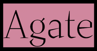 Stockholm-based type foundry closely related to design studio Söderhavet. Their typefaces:
 - Agate. By Baptiste Guesnon. It was originally designed to be used as a display font for Strates, an architecture magazine edited by Baptiste Gerbelot Barillon who took part in the early days of the project.
- Elroy. By Oscar Bauer. Leroy is based on a technical drawing found in a 60s model car magazine. The type was drawn with a lettering set, a system used around that time to letter maps and other precision drawings. It was presumably similar to Keuffel & Esser's Leroy set, hence the name.
- So Ray (2017-2018). By the Söderhavet design team: Stefan Hattenbach, Tobias Eriksson, Jesper Robinell, Oscar Bauer. This grotesque family includes a variable type.
- So Sargo (2017-2018). By Stefan Hattenbach and Jesper Robinell. They write: A typeface inspired by the eastern german typefaces. A quite brutal sans serif---a flirt with the late 1950s and 1960s and the sans serif typefaces that went very popular due to the release of Helvetica, Neue Haas Grotesk, Univers, Norma and others. So Sargo have a feel of being slightly condensed compared to Helvetica. It's a bit less geometric and carry some organic flavour in the details. Other sources of inspiration comes from the typeface Maxima (designed by Gert Wunderlich in 1963 an distributed by Typoart, Dresden). So Sargo shows good readability and can therefor be used for both text- and headline purposes.
- So Wrasse (2017-2018). By Stefan Hattenbach and Jesper Robinell. A playful modern geometric sans.
[Google]
[More] ⦿
|
Soda
[Salvador Rodriguez Lagos]

|
 Mexican type designer who sert up Soda (in London, UK). He created the rounded sans typeface family Gardenia (2015-2016, Without Foundry). The name Gardenia may create confusion as there are at least five other typefaces with the same name.
 In 2016, Salvador Rodriguez and Diego Aravena Silo co-designed the geometric sans typeface family Fuse and Fuse V.2, which are characterized by a large x-height and some humanist elements. Salvador Rodriguez and Julia Martines Diana added Fuse V.2 Printed in 2018. Still in 2016, Salvador Rodriguez published Urbani at Without Foundry. This narrow tightly set sans family was inspired by Frutiger and Renner but mixes in Latin curves. Eren and Eren Condensed (2016) is a 32-style slab serif family with a humanistic touch and rounded corners---it was designed by Salvador Rodriguez and programmed by Diego Aravena. Typefaces from 2017: Sonny Gothic (a geometric sans in 36 styles, W Foundry: an homage to Herb Lubalin; followed in 2018 by Sonny Gothic Vol.2, which was co-designed with Gaspar Muñoz), Nutmeg (geometric sans, W Foundry), Kappa (a modern sans serif with humanistic and geometric features, co-designed by Salvador Rodriguez and Diego Aravena), Kappa Vol 2 (the slab serif version of Kappa), Ulises (with Diego Aravena Silo: an eclectic slab serif with some grotesque features). Typefaces from 2018: In 2018, he designed Helios Antique and Helios Stencil together with Felipe Sanzana at W Foundry. Hermann (2018, Salvador Rodriguez and Diego Aravena) is a wonderful readable garalde book typeface family. Typefaces from 2019: Campora (a revival and extension of K. Sommer's awkwardly serifed Dynamo, 1930, and Avant Garde from the 1980s; +inline). Typefaces from 2020: Supera Gothic (2020: an 18-style geometric sans by Diego Aravena Silo and Salvador Rodriguez; plus variable fonts), Gallos (2020: a 20-style mix of architype (based on Paul Renner's Architype), geometric, gaelic, unicase and uncial, by Diego Aravena Silo and Salvador Rodriguez; containing variable styles as well). Typefaces from 2021: Samy (a warm rounded geometric serif in 36 styles). [Google]
[MyFonts]
[More] ⦿
|
Solenn Bordeau
|
 Graduate of Ecole Estienne in Paris, class of 2019. She quickly turned into one of the world's top designers. Her typefaces:
 - During her studies at Ecole Estienne in Paris, Solenn Bordeau designed the display typeface Jules Verne (2019).
- At Zetafonts, she helped with the design and production of Eastman (2020, by Francesco Canovaro and Andrea Tartarelli). Eastman is a 178-font geometric sans workhorse family with Bauhaus genes developed for maximum versatility both in display and text use, with a wide weight range and a solid monolinear design featuring a tall x-height. It comes with a two axis variable font (weight, italic angle).
- In 2020, Cosimo Lorenzo Pancini and Mariachiara Fantini---with the help of Solenn Bordeau---released Erotique at Zetafonts. Erotique evolved from Lovelace, an earlier Zetafonts typeface. Zetafonts describe this evil serif as follows: it challenges its romantic curves with the glitchy and fluid aestethic of transmodern neo-brutalist typography.
- co-designer with Jérémie Hornus of Egitto (2020, Black Foundry), a huge Egyptian (slab serif) family that is accompanied by a handy variable font.
- In 2020, Francesco Canovaro and Solenn Bordeau released their hip exaggerated-inktrap font family Sunshine at Zetafonts.
- Sunshine Pro (2020, Zetafonts) was designed by Cosimo Lorenzo Pancini and Solenn Bordeau expanding the original Sunshine design by Francesco Canovaro, part of the Quarantype collection (2020), which in turn was designed as a typeface for good vibes against Covid-19. Sunshine Pro is an experimental Clarendon-style font with variable contrast along the weight axis---contrast is reversed in light weight, minimized in the regular weight and peaks in the bold and heavy weights.
[Google]
[More] ⦿
|
Spacemotion

|
 Eilat and Tel Aviv, Israel-based type foundry that consists of a creative team that was formed at the Faculty of Graphic Design of the Stroganov Academy in 2018. This team includes Matthew Grouss, Ksenia Churilova and Pavel Nevsky.
 In 2022, Matthew Grouss, Ksenia Churilova and Pavel Nevsky released the 16-weight constructivist typeface Nowar, a variable typeface that features Latin, Cyrillic and Hebrew scripts. [Google]
[MyFonts]
[More] ⦿
|
Spacetype

|
 Bulgarian type foundry, set up in 2020 by Stan Partalev and Mirela Belova. Their typefaces:
 - Gogh (2020). A 22-style (+variable) geometric sans family by Mirela Belova and Stan Partalev.
- Garet (2021). Dedicated page. A 22-style (+variable) geometric sans family by Mirela Belova and Stan Partalev.
- Steam (2021). A 13-style layerable Western family that emulates wood type; by Mirela Belova and Stan Partalev.
[Google]
[MyFonts]
[More] ⦿
|
Spartan
|
 A famous geometric sans style started at ATF in 1936, now know as Linotype's answer to Futura. Mac McGrew writes: Spartan as produced by Linotype and ATF is equivalent to Futura (q.v.). Although it is claimed to have been derived from several similar European typefaces, the differences between it and Futura are so slight that for most practical purposes they are almost interchangeable. Linotype announced Sanserif 52 and Italic early in 1939; later in the same year these typefaces were offered as Spartan Black, along with light, medium, and heavy weights, all with italics. In 1941 ATF cut some of these typefaces; by arrangement with Mergenthaler the small sizes were cut to match. Over the following dozen years or more, additional weights and widths were drawn by Bud Renshaw and Gerry Powell for ATF, and by Linotype staff designers. Renshaw's Spartan Medium Condensed, drawn in 1953, is wider than the corresponding typefaces in other families. In 1955 Linotype announced Spartan Bold, "the latest member of the Spartan family; slightly larger on the body than Spartan Heavy and more compactly fitted." Spartan Extra Black is heavier than the comparable typefaces from other sources. ATF made supplementary Advertising Figures, Decimal Figures, and Fractions for several weights of Spartan. Spartan Circuit and Spartan Circuit Heavy are 1964 adaptations of the design by Linotype for Teletypesetter use, requiring modification of character widths. Compare Erbar Bold. Also see Classified Display, Tempo Alternate, Twentieth Century.
 Digital descendants abound: - League Spartan (2014). Only in one weight, Bold, this is free and well executed. It was extended to seven weights in 2017 by Matt Bailey as Spartan MB. In 2020, League Spartan Variable was released, thanks to Micah Rich and Tyler Finck.
- Spartan Book Classified and Spartan Heavy Classified by Linotype. The original date of the metal version is 1951. Linotype admits to the origin of this face: This typeface is Mergenthaler Linotype's unlicensed version of Futura, copied weight by weight from Bauer. It was produced in 1939 when Metro failed to gain a significant share of the market, and was later adopted by ATF. The small sizes of Book and Heavy cut for classified are original.
- Adobe's Spartan Classified pair of typefaces mimicks the Linotype set. If in doubt, use Futura instead of Spartan for applications.
[Google]
[More] ⦿
|
Sportsfonts
[Christoph Koeberlin]

|
 German type foundry, est. 2016 by Christoph Koeberlin, whose passion for FC Kaiserslautern in the Bundesliga led to the creation of Sportsfonts. Koeberlin previously designed retail typefaces such as Fabrikat and FF Mark (the latter with Hannes von Döhren and the FontFont Type Department).
 His first typeface at Sportsfonts is the 24,000-glyph 49-font athletic lettering superfamily, Winner (2016), and its follow-up fonts, Winner Numerals and Winner Sans (2019, designed with Sven Fuchs). In 2016, he created the free variable font typeface Gingham. [Google]
[MyFonts]
[More] ⦿
|
Sproviero Type (was: Lián Types)
[Maximiliano Sproviero]

|
 Argentinian foundry located in Buenos Aires, est. in 2008 by Maximiliano Sproviero (b. 1987, Buenos Aires) as Lian Types (old link), mainly specializing in gothic, uncial, script and handwriting typefaces. Rennamed Sproviero Type, his typefaces can be licensed since 2021 via The Type Founders.
 Sproviero graduated from FADU, University of Buenos Aires in 2008 with a script thesis typeface called Colofon. His fonts from 2008 include Devil Kalligraphy, Pumba (great futuristic rounded look), Tobogan (retro), Kiwi Sans Serif, School Rainbow, Suave Calligraphy, Tonika (handwriting), Goddess (handwriting), Cursivessca (calligraphic; 4 styles), Friendship (6 styles), Chechelo Lawyer (modern italic condensed), Quijote Italic (calligraphic with tall ascenders and descenders), Miscelanea (arabesques), Lunga (a condensed hairline family consisting of Real Ligada, Exacta, Versalita and Extras), Mabela (a rounded fat display font), Red Wagon (ultra-condensed), Valeria Script (swashy), Kalligrand (2008, a tall calligraphic face), Intima Script One, Two and Three (described by him as a sensual calligraphic script family), and Paradise Script (96 styles, all calligraphic). Creations from 2009: Kaligrafia, Galana, Mon Amour Script (hyper-calligraphic), Oh Lara (also hyper-calligraphic), and Quijot sauvage (a 7-style calligraphic feat). In 2010 he made these typefaces: Parfait Script (a high-contrast calligraphic script), Kanikama, Breathe Pro (calligraphic with didone serifs), Boston Script. Creations from 2011: Reina (a curvaceous didone family, +Engraved). He updated this in 2021 to the 45-style Reina Neue. At Tipos Latinos 2012, Maximiliano Sproviero won awards in the display type category for Aire (2012, a thin curly didone family), Breathe Pro, and Reina. At TDC 2013, he won an award for the copperplate script Erotica. Erotica also won an award at Tipos Latinos 2014. Typefaces from 2013: String (a hairline Spencerian script), Brand (a signage script family), Agile Pro (a hairline swashy calligraphic family), Bird Script (which an award at Tipos Latinos 2014), Live Pro. Typefaces from 2014: Selfie (connected monoline signage script), Heroe (a script that takes Lubalin and Caslon to the extreme), Dream Script (a chancery script that won an award at Tipos Latinos 2016), Dream Caps (Trajan capitals), Beatle (a Spencerian script with psychedelic touches). Typefaces from 2015: Seventies (a funkadelic typeface), Indie (a signage script family that won an award at Tipos Latinos 2016), Model (a hairline fashion mag calligraphic script family). Typefaces from 2016: Lubaline (decorative caps inspired by Herb Lubalin), Skill (signage type: winner at Tipos Latinos 2018 of a type design award). Typefaces from 2017: Posh (a fat didone), Fluire and Fluire Caps (a greeting card font pair), Preta (almost psychedelic script), Vinyle (a remarkable monoline decal script). Winner at Tipos Latinos 2018 of a type design award for Lubaline, Posh and Preta. Typefaces from 2018: Burger (a fast food slab serif bonanza), Fleur (inspired by some lettering in Palais Garnier in Paris---Sproviero calls this the Napoleonic style), Pantera (a lively pointed brush calligraphic typeface family), Girasol (based on sketches by Susana Maurette), Rafaella (all caps---described by Sproviero as coquette). Typefaces from 2019: Hot Script (monoline), Elipses (a Peignotian sans family in 7 styles), Fabulous Script, Breathe Neue. Typefaces from 2021: Selfie Neue Rounded (40 styles), Selfie Neue Sharp (39 styles), Ballet VF (Maximiliano Sproviero: a variable Spencerian penmanship font with optical sizing from 16pt to 72pt---a technical feat accomplished with the help of Eduardo Tunni and the Omnibus team; free at Google fonts; Github link), Klingspor link. Behance link. Interview by MyFonts in 2014. [Google]
[MyFonts]
[More] ⦿
|
Stan Partalev

|
 Type designer at Fontfabric in Sofia, Bulgaria, who writes about himself: Starting as a graffiti artist, I have been interested in visual arts and design since I can remember. That led me to the National Academy of Art, Sofia, where I graduated in Poster and Visual Communication BA, and Poster MA. I then joined a renowned type foundry, where I was able to develop and improve my understanding of typography and type design skills. In 2020 I became a part of the newly created foundry Spacetype..
 He was part of the Fontfabric team that designed the 521-font family Zing Rust, Zing Sans Rust and Zing Script Rust in 2017. In 2018, he published the free all caps lapidary typeface Colus at Fontfabric. In 2019, Svet Simov, Radomir Tinkov and Stan Partalev designed the 72-strong Noah family of geometric sans typefaces, which is partitioned into four groups by x-height from small (Noah Grotesque) to medium (Noah and Noah Text) to large (Noah Head). With Plamen Motev and Ventsislav Djokov, he co-designed Panton Rust and Panton Rust Script in 2019. In 2020, Mirela Belova and Stan Partalev co-designed the 22-style (+variable) geometric sans family Gogh at Spacetype. Typefaces from 2021: Code Next (a 20-style geometric sans by Svetoslav Simov, Mirela Belova and Stan Partalev; it includes two variable fonts). Garet (2021) is a 22-style (+variable) geometric sans family by Mirela Belova and Stan Partalev. Dedicated page. Co-designer with Mirela Belova of Steam (2021), a 13-style layerable Western family that emulates wood type. [Google]
[MyFonts]
[More] ⦿
|
Stawix
[Stawix Ruecha]

|
 In 2012, Stawix was established in Bangkok by Stawix Ruecha (b. 1986, Bangkok). At Stawix, Ruecha published these typefaces:
 - Seravee (2012). A didone family.
- Soin Sans (2012). A beautiful geometric sans family. Followed by Soin Sans Pro (2013) and Soin Sans Neue (2016), an almost perfectly crafted modern geometric typeface family.
- Letra Pro Headline (2012). A manicured and permed didone.
- Chercher (2014). A slab serif.
- Rleud (2014). A neutral sans family which has 160 fonts in four widths, 10 weights, small caps and italics---the works. There are four free demo fonts. This is a useful sans family that is more elliptical in its curvature. Ruecha says that he intended to create the industrial design mood of DIN while importing the humanism of Dax.
- Dalle (2014). A daring and gutsy display sans with very open counters and surprising straight elements in all letters of the word harkman.
- Crique Grotesk (2014). A neohumanist sans.
- Amsi Pro (2015). Inspired by Block Berthold, this rounded sans typeface has extremely short descenders, but works very well in the Narrow and Ultra styles. See also the 48-style Latin / Thai update, Amsi Pro AKS (2020). In 2021, this was followed by Amsi Grotesk (54 styles).
- Sans Beam (2016).
- Goudar HL (2017). A rounded semi-techno sans typeface.
- Brock Pro (2017). I fun 10-style sans family that celebrates Block Berthold and other 19th century wooden letterpress types. Its terminals are consistently vertical or horizontal for a clean uncluttered feel.
- Merlod (2017). Based on Latin American sign painting in substyles called Norme, Autre and Queue.
- Sarun Pro (2018).
- Infoma (2018). An almost organic grotesk family by Stawix Ruecha and Kawisara Vacharaprucks.
- Cobe (2020). An organic monolinear rounded elliptical sans family in 18 styles. Stawix Ruecha calls it an aerodynamic font.
- The 18-style geometric slab serif Chom (2021, at Wundertype).
- Eastlane (2021). An 18-style humanist sans. It includes a variable font.
You Work For Them link. [Google]
[MyFonts]
[More] ⦿
|
Stawix Ruecha
[Stawix]

|
 [MyFonts]
[More] ⦿
|
Stefania Malmsten

|
Stefania Malmsten is a Swedish art director and a graphic designer with clients mainly in the fields of art, fashion and film. She was one of the founders of Pop and Bibel magazines in Sweden and is a former art director at Vogue Hommes International in Paris. In 2006, Stefania Malmsten received The Berling Prize, Sweden's most prestigious graphic design-prize. In 2013, Stefania founded the design studio Malmsten Hellberg together with designer Ulrika Hellberg. Stefania is currently the Creative Director at Rodeo Magazine in Sweden. She co-designed the thin display typeface Line in 2013 with Göran Söderström (Letters from Sweden). The typeface was originally designed for Swedish fashion and culture magazine Rodeo in 2012 before it was released for commercial use at the end of 2013. Line comes in 5 super thin styles. The thinnest is possibly the thinnest typeface commercially available anywhere. During the work with Rodeo magazine, Stefania got the idea for a typeface that would be the exact opposite of Line---a heavy face where the counter spaces in the characters would correspond to the differents widths in Line. The idea was shelved at the time but was used as a custom face for the documentary Maj 68. Inline is available since 2021 from Letters from Sweden in three widths, with seven optical variants in each width. Included is also a variable font. [Google]
[MyFonts]
[More] ⦿
|
Stephen Nixon
[Arrow Type (or: Typefloundry, or: Recursive Design)]
|
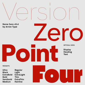 [More] ⦿
|
Stew Deane
[Meat Studio]

|
[MyFonts]
[More] ⦿
|
Studio Feixen
|
 Swiss type design studio based in Luzern. In 2019, they published the superfamilies Studio Feixen Sans and Serif, which include variable fonts, a hipster style, Sans Edgy, and a typewriter style, Sans Writer.
 In 2021, Robin Eberwein and Felix Pfäffli co-designed Noi Grotesk, a very Swiss typeface that fell pray to the hipster trend in glyphs such as the lower case f and t. [Google]
[More] ⦿
|
Studio Oakes
[Samuel Oakes]
|
Cheltenham, UK-based designer of the free geometric sans typeface Orkney (2016, with Alfredo Marco Pradil). Orkney progressed into the 12-style sans typeface family Oakes TF (2016) and the more corporate Oakes Grotesk (2017). It was further extended to Cello Sans, which is free at Open Font Library. In 2017, he published the sans typefaces Metro Sans and Granary. In 2019, he released Arbeit, a variable neo grotesque typeface family with twelve predefined styles. You Work For Them link. [Google]
[More] ⦿
|
Studio Sun (or: Sun Brand Co)
[Cahya Sofyan]

|
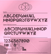 During her studies in Bandung, Indonesia, Bali-based Cahya Sogyan (b. 1994) created the free rounded sans typeface Synthesia (2014), the free sans typeface New Dawn (2015), and the free techno / futuristic typeface Cosmonaut (2015), with accompanying drop caps.
 In 2016, she co-founded Spencer and Sons with Gilang Purnama Jaya. In 2017, she started Studio Sun in Denpasar, Bali. In 2016, Cahyan published June of Fortune, the free hipster typeface family Soda Popp and writes: The new typeface called Soda Popp is inspired by pop-culture, vaporwave music, and seapunk that emerged in the early 2010s among Internet communities. It is characterized by a nostalgic fascination with retro cultural aesthetics, typically of the 1980s, 1990s, and early-mid 2000s. Typefaces from 2017 at Spencer and Sons: S&S Nickson (a copperplate display font including eight font styles and seven dingbat fonts). In 2018, she published the retro auto racing font Intensa, the extended sans typeface Matrice, and the free flared poster typeface Florent. Typefaces from 2019: Alathena (a decorative Victorian and Arts & Crafts typeface family), Rustob Club (a variable font), Tropiline, Matahari Sans (a large family that includes Matahari Sans Mono). Typefaces from 2020: Rachee (a 6-style renaissance text font), Klose Slab (an ultra-fat variable font), Gulfs Display (a 6-width ultra bold cartoon font family), Gliker (an extraordinary comic book font family; a new take on the Hobo typeface), Radiate Sans (40 styles), Balgin (a large display family that celebrates the 1990s), Brice Pop (a sixties display style; with Syarif Hafidh). Typefaces from 2021: Bethari (a 6-style art deco typeface, including a blackboard bold outline style). Typefaces from 2022: Fragmatika (a 9-style a geometric sans serif typeface with support for Latin, Cyrillic, Greek, Arabic, Armenian, Georgian, Hebrew and Thai). [Google]
[MyFonts]
[More] ⦿
|
Studio Triple
[Jérémy Landes]
|
Founder of the graphic design agency Studio Triple. Since 2012, he is active in the Velvetyne type foundry. French designer of the elegant monoline sans typeface family Millimètre (2016), which is free at Open Font Library. He joined Velvetyne Type Foundry, where he designed Hyper Script (2017, a custom design for the Hyper Chapelle exhibition by AAAAA Atelier) and Solide Mirage (2017). In 2018, Landes, under the art direction of Julien Alirol and Paul Ressencourt of Murmure, published the great display sans typeface Le Murmure, which won an award at the Type Directors Club's Type Design Competition 2019. Free download at Velvetyne. Open Font Library link. At Future Fonts, he published the intestinal and accidental art nouveau typeface Digestive (2018, +a variable font): Digestive borrows shapes from the submarine universe (mainly seaweeds) and from anatomic parts, organs and guts. P>In 2019, Anton Moglia and Jérémy Landes co-designed Pilowlava, a free font that was originally a custom font for the last issue of Cercle Magazine. In 2020, Studio Triple released Jaune Grande and Jaune Petite at Future Fonts: Jaune Grande makes everything that can touch, touch. Like an overcooked cheese gratin, Jaune is sticky and really fat and we like it that way. NaN Jaune (2021) features hipster elements and has three optical sizes, Maxi, Mini and Midi. It also has a variable font option. Mayenne Sans used to be a free font but was withdrawn. Landes explains: Mayenne Sans is a custom typeface designed with an art direction by Atelier Julian Legendre for the department of the Mayenne, in the northwest France. To renew the brand image of the department, Atelier Julian Legendre asked Jérémy Landes to draw a display font with his existing font Jaune Grande as a starting point. To distinguish this new font from Jaune and make it more legible, it has been chosen to have big apertures and rounder curves. The resulting typeface is way friendlier and conveys the messages of the territory. Like its source, Mayenne Sans as a tremendous x-height with super short ascenders and descenders, allowing tight leading and making it useful for compact heading paragraphs. [Google]
[More] ⦿
|
Suitcase Type Foundry
[Tomás Brousil]

|
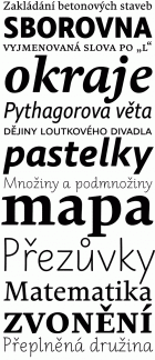 Suitcase Type is a Czech foundry, est. 2003 by Tomas Brousil (b. 1975), who lives in Prague. He graduated from the Prague Academy of Arts, Architecture and Design (Type Design and Typography, MgA. 2009) where his graduation project was the 96-family Tabac typeface system, published in 2010. He teaches in the Type Design and Typography department of the Prague Academy of Arts, Architecture and Design.
 The Tabac family started with Tabac Sans in 2010. It was augmented in 2012 with Tabac Slab and Tabac Mono, which have a full range of weights from Hairline to Black. Tabac Glam, a fashionable Peignotian high contrast sans, was added in 2016, and Tabac Micro in 2018. In 2019, he published Tabac Big Glam, Tabac Big Sans, Tabac Big Slab and Tabac Big. Other typefaces from 2008-2010 include Monopol (a six-weight condensed sans that includes a hairline weight), Idealista (2010, organic, a mix of styles), Nudista (2009, a multistyle take on DIN with a superb fashion mag hairline, Nudista Thin), Kulturista (2009, a part slab part serif extension of Nudista), Comenia Sans (2008, a 12-style complementary family to Storm's Comenia Serif for school textbooks), Metalista (2008, unicase octagonal metallic face). 2007 was a successful year. Brousil created Bistro Script (2007, fifties diner style script), Corpulent (2007), and Gloriola (2007, a sans in 14 styles, including a hairline. The last typeface family won an award at TDC2 2008 and at Typographica's Best of 2007. Stephen Coles likes its position between the cool sterility of de Groot's monolinears and the warmth of Latin designers: With a broad range of weights, a complete Western character set, and a sack of ligatures and alternates, Gloriola has the depth required for complex identity systems and publication design. This shrewd response to the fashions of today is going to be useful for many years to come.). The year 2007 also saw Purista (a 10-style cousin of Eurostile), which includes hairline weights. Ellen Lupton says this about Purista: I've been feeling hungry for a stylish, edgy sans who enjoys evenings out on the town and long mornings of crisp conversation. In other words, I've been craving a font who likes to party but who can also help out with the dishes. Production in 2005-2006: Teimer's Antiqua (2006: a didone family based onn unpublished 1967 design by Pavel Teimer), Rokoko (2006, an octagonal custom typeface for the Rokoko Theatre in Prague), Sandwich (2006, a lively display caps set), Vafle (2006: based on an original concept by Marek Pistora from 1997, with minor adaptations and 11 new weights), Dederon Sans and Serif (2005, the sans version being inspired by TypoArt's Liberta; see also here for a comparison with Underware's Dolly), Dederon Serif. Typefaces from 2004 or earlier include Fishmonger (2004, a sans family), RePublic (a 2004 revival, done with Radek Sidun, of Public by Stanislav Marso, 1955. Note that Public was used to set the text of a Czechoslovak Communist party newspaper, Rudé Právo), Botanika (2005, a sans family including many typewriter styles and several mono weights), Atrament (2003, a narrowed grotesque inspired by the lettering used on the title of the almanac "Devetsil - Revolucni slovnik" (1922) edited by Karel Teige, in 30 styles!), Magion (2004, a simple geometric font), Fishmonger (2004, a broad 50-weight futuristic family), Katarine (2004, a warm sans family with appropriate dingbats added in), and Orgovan (2004-2005, a punk/brush family). Typefaces from 2013 include the roundish sans family Ladislav: The Ladislav font revitalises Sutnar's legacy, while not explicitly copying any of his original fonts. It however keeps true to their technicist character and initial principles of character creation - a simple modular system of combined geometrical segments. This approach affects all round shapes of capital and lowercase letters, as well as the shapes of the majority of numbers. The g consists of two disjoint circles. Typefaces from 2014: Urban Grotesk (a very airy, open grotesque typeface with large x-height and uniform grayness). Typefaces from 2015: Pacifista (stencil). Typefaces from 2016: BC Novatica (by Tomas Brousil and Marek Pistora (Briefcase Type): Novatica was created based on a commission from the Czech commercial television station Nova in 2007. Marek Pistora worked with Tomas Brousil to create an alternative to a readable, simply designed sans. They naturally called the typeface Novatica. In 2014 TV Nova decided to abandon Novatica for good, and in so doing it released the exclusive licence it had been using. Novatica thus became a new typeface offered by Briefcase Type Foundry. Typefaces from 2017: Jaroslav (monolinear sans, named after Jaroslav Benda, followed in 2020 by Benda), Pepi and Rudi (a sans and slab pair based on basic shapes such as circles, rectangles and triangles). Typefaces from 2020: Atyp BL (+variable), Atyp (+variable). A 25-style sans family remotely influenced by Bauhaus. Typefaces from 2021: Crabath (a 72-style transitional typeface family based on the 1761 specimen book of Czech typefounder Vaclav Jan Krabat; this family covers several optical ranges, from Subhead to Display to Text, and features wonderful initial caps). Typefaces from 2022: Atyp Kido (a 6-weight and variable rounded sans family for Latin, Greek and Cyrillic). Brousil made many corporate or identity fonts. Examples include Brzda (a custom font for Czech artist Pavel Brazda), Budovatel (a custom font for the Bohemian National Hall in New York), and Union (custom webfonts for the Czech graphic design union). MyFonts page. Behance link. Klingspor link. MyFonts interview. View Tomas Brousil's typefaces. [Google]
[MyFonts]
[More] ⦿
|
Sultan Fonts
[Sultan Mohammed Saeed]

|
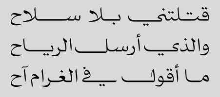 Aden, Yemen-based designer of several typeface at Sultan Fonts (est. 2003 by Sultan Mohammed Saeed), which is run by Sultan Maqtari [I do not know the relationship between Sultan M. Saeed and Sultan Maqtari though]. Sultan Mohammed Saeed Noman was born in Aden in 1962. He was the first to computerize Musnad (Old South Arabian Writing System) in Unicode (at the Linguistic Department of the University of California 2007). He developed more than 90 Arabic font between 2000 and 2017. Author of the book Sultan's Fonts (2009). He developed a Naskh typeface that simulates Quran publishing. In addition, he taught graphics at several institutes, such as CISCO, New Horizons, Balfaqih.
 Typefaces from 2013 until 2014: Nizar (a Latin/Arabic script typeface), Sahareeg, Pumice, SF Change (2012; a cursive typeface for Latin, Arabic, Urdu, and Farsi; an award winner at The 2014 Horouf Type Design Competition; see also SF Change Pro (2020)), Hussein. Typefaces from 2016 include SF Mada. Typefaces from 2017: SF Tobba, SF Old South Arabian, SF Yazan (inspired by oriental kufi and Qairawani kufi), SF Sultan. Typefaces from 2018: Sultan Ruqah (for Arabic, Persian, Urdu, Uthmani, and Kurdish), SF Marwa, SF Droob7 (original from 2014, covering Arabic, Persian, Urdu and Latin), SF Mabsut (an Arabic typeface in the style of Maghribi (Moroccan Mabsut)), SF Saggar (SF Saggar is a Naskh style Arabic typeface that is inspired by an alphabet written by the calligrapher and artist Mohamed Said Al-Saggar in the 1970s to simplify Arabic printing), SF Nizar (2014-2018: a Latin / Arabic Ruqah style typeface based on the handwriting of poet Nizar Qabbani; followed in 2020 by Sultan Nizar Pro), SF Handwriting (a set of school fonts for Latin and Arabic). Typefaces from 2019: SF Abyan (for Arabic, Persian, and Urdu), SF Khaled. Typefaces from 2020: SF Manchit, SF Pumice. Typefaces from 2021: Plain (an 18-style variable Arabic font by Sultan Maqtari), SF News, SF Article (Arabic and Latin). Typefaces from 2022: SF Hussein (a Flintstone font), SF Liberty VF (the variable font versions of SF Liberty), SF Liberty (a workhorse organic sans in 18 static styles). [Google]
[MyFonts]
[More] ⦿
|
Sultan Mohammed Saeed
[Sultan Fonts]

|
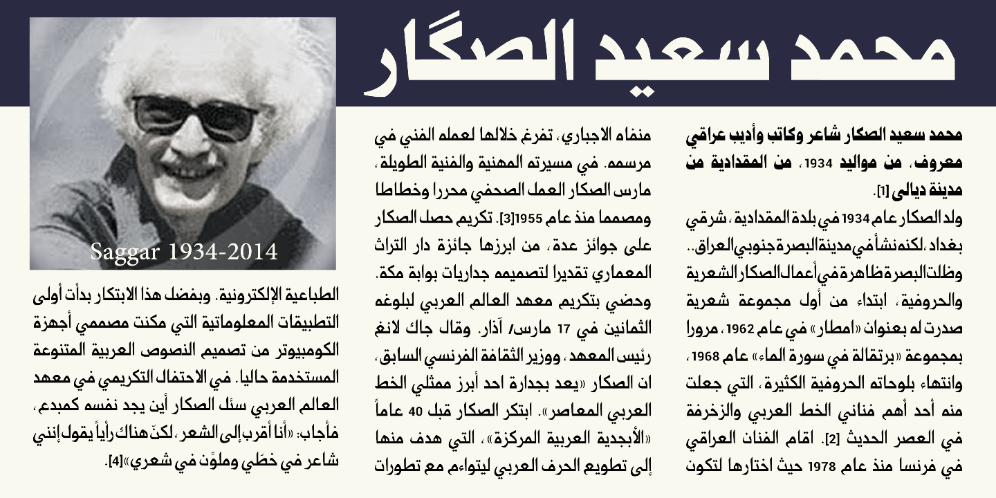 [MyFonts]
[More] ⦿
|
Sumotype Foundry
[Oscar Fernando Guerrero Cañizares]

|
 Born in 1981 in Colombia, Oscar Guerrero lives in Pasto, Narino, in the southwest of Colombia. His graduation work in 2012 at FADU UBA (University of Buenos Aires) is the Venetian text typeface Epica. Epica was first released in 2014 at Sumotype and later, in 2020, by Sudtipos as Epica Pro.
 In 2014, he set up Sumotype Foundry in Bogota, Colombia. The Sumotype fonts include Proyecta (2014: a great wedge-serifed ultra-fat stencil typeface), Septima (2014, sans family for urban signage), Epica (2014 release: this typeface won an award at Tipos Latinos 2014), Farma (2014, a roundish headline sans), Republica del Diseño (2014, stencil), Moira (2014). Typefaces from 2015: Babar (an inspiring heavy poster typeface also headed for stardom). Typefaces from 2016: Pacha (free square-shaped tribal typeface with plenty of ligatures). In 2018, he published the creamy fashion mag italic headline font Vala (Monotype). In 2019, he added the retro script typeface Playland (Monotype). Typefaces from 2021: June (a variable font by Fer Cozzi and Oscar Guerrero), Fuga (an experimental hybrid sans). Typefaces from 2022: Gregor (a hybrid sans serif typeface family with two variants, Upright and Slanted; the design is inspired by some advertising graphic designs used in the United States during the 60's and 70's; published at Bastardatype), The Irish Pub (identity and custom typeface in a Celtic / beer bottle / German expressionist style). Typeface developer at Omnibus Type. Future Fonts link. [Google]
[MyFonts]
[More] ⦿
|
Supernulla Creative Studio
|
Supernulla is the creative studio of Marcello Raffo, Nicolo Tromben and Marco Venturi, based in Italy. Their typefaces include - Rotonto (2021). Rotonto is a variable typeface that underline the contrast between the rigid, square-shaped counters of the letters and the round-shaped outline.
- The extended hipster sans typeface Sandro Grottesco (2020) by Nicolo Tromben.
- The pixel font Pexel Grotesk (2020) by Marcello Raffo.
[Google]
[More] ⦿
|
Supertype
[Jürgen Huber]
|
 A Berlin-based foundry started by Jürgen Huber and Martin Wenzel. In 2010, Jürgen Huber (Berlin, b. 1967) and Malte Herok had started The Type Department. They are also part of Type Network. In 2020, their typeface library contained
 - Realist, Realist Narrow and Realist Wide (2011-2019) by Martin Wenzel.
- Cy (2018). A geometric hipster sans by Juergen Huber.
- Duper. Evolved from FF Duper (2009). By Martin Wenzel.
- Hothouse. TD Hothouse---that font was started in 2001 as a corporate typeface for the Glasgow School of Art, and took inspiration in the arts and crafts lettering of Charles R. Mackintosh. Bukvaraz 2001 award.
- Lemon Serif, Lemon Sans, Lemon Sans Condensed, Lemon Sans Rounded, and Lemon Sans Rounded Condensed (2014-2015). See also Lemon Sans Next (2021, 24 styles).
- Ode (2010). A German expressionist typeface by Martin Wenzel.
- Profile Pro. A humanist sans family by Martin Wenzel that won an Excellence award at The Type Directors Club, which evolved from FF Profile (1999), a flared sans known for its little contrast. This evolved in a semi-hand-printed casual teenager, FF Duper (2009), mentioned above.
- Scarlet, Scarlet Script and Scarlet Wood (2016). By Juergen Huber.
- Blinker (2019). A free Google font family by Juergen Huber who writes: Blinker is a low contrast sans serif typeface with a squircle as its basic shape, think squarish curves, or Eurostile's flamboyant cousin. Github link.
- Adapt (2021). A no-nonsense legible sans family that consists of 80 standard fonts and two variable fonts.
[Google]
[More] ⦿
|
Svetoslav Simov
[Fontfabric]

|
 [MyFonts]
[More] ⦿
|
Swell Type
[John Roshell]

|
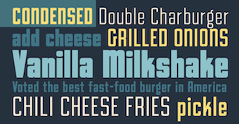 Type foundry set up in 2020 by Comicraft's John Roshell, who is based in California. In 2020, he released the squarish all caps family Silver Streak (+variable font), the futuristic typeface Hyperspace Race and the 25-style (variable) display family Paradise Point.
 Typefaces from 2021: Beardstown (a gritty hardworking retro all caps font), Goodland (49 styles; inspired by painted signs on industrial buildings in the town of Goleta, California; +a variable font with width, weight and slant axes). Typefaces from 2022: Beachwood (an 81-style (+variable) chamfered font based on vintage street signs in Los Angeles, and named for Beachwood Drive which leads to the famous Hollywood sign), Beachwood (an 81-style (+variable) chamfered font based on vintage street signs in Los Angeles, and named for Beachwood Drive which leads to the famous Hollywood sign). Custom fonts, many of them done for Rovio: Angry Birds, AB Flock, AB Stella, Avatar, Bad Piggies, Clash Royale, Fairy Tale Twist, Looney Tunes Dash, Marvel Strike Force, Rovio Game. [Google]
[MyFonts]
[More] ⦿
|
Tall Chai

|
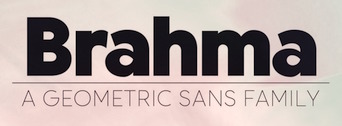 Canadian type foundry, est. 2020. In 2020, Tall Chai (not his/her real name) released Brahma (a 9-style geometric sans).
 Typefaces from 2021: Saffron (a display sans), Endorphin (a 9-style oblique sans). Typefaces from 2022: Akshar (a variable display sans-serif font family that supports Latin and Devanagari and is free at Google Fonts). Github link. [Google]
[MyFonts]
[More] ⦿
|
Tapatipo
[Gen Ramirez]
|
 Designer and lettering artist in Guadalajara, Mexico (and/or Split, Croatia?), who created the Mexican diner signage script typeface Tejuino (2015) and the informal sans typefaces Taqueta, Rabar and Festa, all made in 2015. Astro Regular (or Astro MX) (2015) by Gen Ramirez, Manuel Lopez (with assistance of Rodrigo Heredia and Rodrigo Nuñez) won an award at Tipos Latinos 2016: Astro Mx was a result of Elí Castellano's Type Design Workshop, carried out at the Multimedia Center of CENART in Mexico City in 2015. Astro Mx is a typeface designed for the Mexican Space Agency (AEM). Its purpose lies in its application in the manuals of emergency procedures. In this sense, one of its main characteristics is to facilitate rapid reading in extraordinary conditions. It has a generous x-height, its ascenders and descenders are short to economize lines in the text boxes.
 Rabar Ultra Black (2015) also won an award at Tipos Latinos 2016. Winner at Tipos Latinos 2018 of a type design award for Victus (2016), which is a Venetian typeface with all the warmth and calligraphic DNA from the renaissance era. In 2018, he graduated from the TypeMedia program at KABK in Den Haag with a sans typeface called Entorno Sans. It includes a variable font intended for signage systems in urban and virtual spaces, and comes with a stencil style and many wayfinding icons. That same year, he published Elba. Gen runs the type and graphic design studio Dual Type with Zrinka Buljubasic. [Google]
[More] ⦿
|
Tarallo Design
[Donald Tarallo]

|
 Donald Tarallo obtained a BA in Studio Arts and Graphic Design from Clark University, and an MFA in Graphic Design from Rhode Island School of Design (RISD). He also studied with André Gürtler and Wolfgang Weingart in the Weiterbildungsklasse at the Basel School of Design in Switzerland. Since 1998, Don has maintained a freelance practice working on projects in identity, publication, and web design. He has taught at Clark University, Guangzhou Academy of Fine Art, Rhode Island School of Design, Samsung Art and Design Institute, Siena Art Institute, and Bridgewater State University. Don currently teaches at Fitchburg State University in Fitchburg, MA.
 In 2017, he published the geometric sans serif typeface Binario. Donald writes: The design was inspired by elements of Italian Art Deco, early 1900s advertising, and shop signage. Binario pays homage to early modernism's optimism, modularity, and efficiency. Binario was followed in 2019 by Binario Soft. He also designed the geometric solid dingbat font FormPattern (+FormPattern Color, 2018; by Donald and Alex Tarallo) and the dingbat fonts Poeta and Poeta Color in 2017. In 2018, he designed the 8-weight sans family Scanno. In 2019, he released the zodiac sign font Starsigns, the art deco typeface Varese and FormPattern Color Three (2019: a typeface for creating borders and frames; with Alex Tarallo). In 2020, he released FormPattern Color Six (done with Alex Tarallo) and the plump bubblegum art deco typeface Varese Soft. Typefaces from 2021: East (a condensed sans in six weights; includes a variable font). [Google]
[MyFonts]
[More] ⦿
|
Tarek Samir Al-Sawwa
[TS Fonts (or: Fonttat)]
|
 [More] ⦿
|
Teddy Derkert

|
 Swedish designer based in Stockholm. His typefaces:
 - Egosans (2012).
- The slightly curved display sans serif Aprikos (2016).
- Nando (2016). Slab serif.
- At TypeParis 2017, he designed the angular text typeface Kiosque. It is in the garalde family but features ballerina shoe terminals.
- Rise Sans (2017). Fat, bloated, rounded and gorgeous.
- Seger No. 12 (2017). All caps sans. Inspired by painted stall signs in Östermalms Saluhall in Stockholm dating back to 1888.
- Derk Grotesk (2017).
- Doughy (2018). Doughy (2018) is a soft and friendly display typeface with deep inktraps, tight spacing, round corners and descenders boldly forced above the baseline. Buy it here.
- Firelli (2020). A 14-style (+ variable) Clarendon-inspired slab serif text typeface published by Typejockeys.
CargoCollective link. [Google]
[MyFonts]
[More] ⦿
|
Teeline Fonts
[Craig Eliason]

|
 Teeline Fonts is a digital type foundry launched by Craig Eliason (b. 1969, Houston, TX) in 2010. A professor of modern art and design history in the Department of Art History at the University of St. Thomas in Saint Paul, MN, Craig researches the history of type design, and particularly the history of its classification and vocabulary. He began designing his own fonts in 2008. Craig obtained a Ph.D. from Rutgers in 2002. Read, for example, Face the Nation: National Identity and Modern Type Design 1900-1960.
 His typefaces: - Ambicase Modern (2010), a unicase font, and Ambicase Fatface (2011).
- Flipper (2013), later renamed Backflip. Flipper won an award at the Morisawa Type Design Competition 2014.
- Cuttlefish (2021). A five-headed sans (+variable) superfamily with very different substyles called Neutral, Pragmatic, Optimistic, Luxe and Modern. He writes: Cuttlefish Pragmatic is a friendly sans in the mode of early-20th-century American Gothics. The Optimistic style is inspired by 20th-century ‘serifless romans’ that themselves took inspiration from Renaissance letters. The Modern styles are patterned after 18th-century high-contrast types, but excised of most serifs. Cuttlefish Luxe is a light and sophisticated contrasted sans. The Neutral styles are straightforward grotesques with even stroke weights.
- Plenaire (2021). A pebbled and speckled optical effect font family.
- Feneon (2021). An elegant multiline font family with possible uses as a neon font.
[Google]
[MyFonts]
[More] ⦿
|
Tegami Type
[Muhammad Iqbal Firdaus]

|
 Kota Bekasi and/or Jakarta, Indonesia-based desiger of TG Aqsa Grotesque Pro (2017-2018), the free display sans typeface Rasuk (2017), the sans typeface TG Hagia (2017), and the stencil typeface Cetta (2017).
 In 2018, he published the low contrast geometric sans typeface family TG Neuramatica. Typefaces from 2019: TG Praktikal (with a variable type option), TG Axima (a neo-humanist sans). Typefaces from 2020: TG Glifko (a quirky 14-style sans with overcurled terminals of the c, f, r, and other letters), TG Haido Grotesk, TG Frekuent Mono. Typefaces from 2021: TG Reglic (an 8-style grotesk), TG Minagi Sans (a 14-style sans with pointy terminals). Behance link. Type Department link. [Google]
[MyFonts]
[More] ⦿
|
Tensen Type
[Jiayu Liu]
|
Chinese foundry was established in 2012 by Jiayu Liu, an experienced type designer from Beijing. Besides high-quality classic text typefaces like the calligraphic Song styles and the modern-looking Hei designs, Tensentype focuses on the development of original, contemporary fonts. The foundry has worked with Nokia, Dalton Maag and URW++. It collaborates with German company jpFonts on the development of variable fonts for the Chinese script. Tensen Type fonts that can be bought at jpFonts. A partial list of their fonts as of 2021: TX Cao Shu, TX ChaoHei, TX ChaoYuan, TX FanKai, TX GangBi, TX Hei, TX Hei VF, TX JianDu, TX JinZhuanHei, TX KaTong, TX LingHei, TX MaiHei, TX MingKe, TX Qian, TX RuiHei, TX ShiTou, TX Shu Song, TX SongTi VF, TX TieKai, TX XianBo, TX XingKai, TX YingLi, TX YouEr, TX Yuan, TX ZhiHei, TX ZhiLi. En Fontke link. Designers at Tensen Type include Liu Jiayu, Gao Zhiqian, Kong Miao, Shu Hua, Fan Xiaoge, and Ba Dang. [Google]
[More] ⦿
|
Terrance Weinzierl

|
 Grand Rapids, MI-based graphic designer trained in Chicago. Terrance worked as a graphic designer for the university book store while earning a bachelor of fine arts degree with an emphasis in graphic design from Grand Valley State University in 2008. After graduation, he joined Ascender Corporation where he worked closely with Steve Matteson. After Ascender folded, he became an in-house type designer at Monotype where most of his time is dedicated to custom fonts.
 His early typefaces include TW Geo Slab (2007), Dux (2007, ornamental Victorian type), Wingman (2006, handwriting) and Weinzierl Slab (2006, see also here). He joined Ascender and created there the stencil blackletter typeface Stenblak (2010), informal script typeface Rebus Script (2009, with Steve Matteson) and Romany (2009), a non-connecting script which was originally designed by A.R. Bosco and released by American Type Founders in 1934. In 2012, he created Feldman Engraver and JMC Engraver. Fonts from 2015: Kairos (Monotype: an octagonal typeface based on 19th century Grecian wood type). In 2015, Monotype set out to remaster, expand and revitalize Eric Gill's body of work, with more weights, more characters and more languages to meet a wide range of design requirements. As part of that project, Terrance Weinzierl designed Joanna Sans Nova (2015: sixteen fonts, loosely based on Gill's slab serif, Joanna, so technically, this is not a Gill revival, but a Gill extension. A well-balanced family with a medium-to-large x-height. But the italic g is disturbing). Fonts from 2016: Terry Junior Basic (free), Kairos Sans (which accompanies his 2015 typeface Kairos; both cover Latin and Greek). The octagonal typeface Kairos Sans became Monotype's first variable font---it is free at GitHub. Also in 2016, he added some Greek, Cyrillic, weights and widths to Kobayashi's Eurostile Next, for a grand total of 50 styles in this popular Linotype font family. Pizza Press (2013) won an award at TDC 2014. In 2017, Jeong-Sook Lee, John Pompa, Terrance Weinzierl and the Monotype team won a Red Dot award for the 72-style typeface family 72 designed for SAP Fiori. Fonts from 2018: Terry Junior (Monotype; a brush script perhaps with uses for children's books). Typefaces from 2019: Monarda (Monotype), Terrance Weinzierl's take on the loud and splashy brush scripts of the 1950s. Typefaces from 2020: Futura Now (a 107-style family by Steve Matteson, Terrance Weinzierl, Monotype Studio and Juan Villanueva, that includes variable fonts as well as subfamilies called Text, Display, Headline, Inline, Outline, Shadow and Script). Typefaces from 2021: Tellumo (a 12-style humanist geometric sans with a tidy look and large x-height) and Tellumo Variable. Klingspor link. Linotype link. [Google]
[MyFonts]
[More] ⦿
|
Thanos Poulakidas
|
Developer of Geom (2022), a free 7-weight contemporary geometric sans serif typeface intended for display purposes. It covers Latin and Greek, and includes a variable font. [Google]
[More] ⦿
|
The Designers Foundry
|
 Type cooperative in Christchurch, New Zealand. As of the summer of 2015, it grouped 34 type designers and 58 font families. Typefaces include Super (2019: futuristic type by an unidentified designer), Gordita (2016, by Thomas Gillett) and Morion (2017, by David Einwaller).
 Halisa, added in 2021 by Jan Estrada-Osmycki, is a 60-style collection of semi-constructed grotesque typefaces with an industrial origin and mechanical character. Featuring super-elliptical curves, its designer is not identified on the web site. Halisa also features some variable format typefaces. [Google]
[More] ⦿
|
The Lexend Project
[Bonnie Shaver-Troup]
|
 Bonnie Shaver-Troup, EdD, the creator of the Lexend project (which is based in Irvine, CA), is focused on making reading easier for everyone. As an educational therapist, Bonnie created the first Lexend typeface in early 2001 aiming to reduce visual stress and to improve reading performance for those with dyslexia and other struggling readers. Today, Bonnie's goal is to make the Lexend fonts accessible to a larger spectrum of users.
 Bonnie writes: Lexend is a variable typeface designed by Bonnie Shaver-Troup and Thomas Jockin in 2018. Applying the Shaver-Troup Individually Optimal Text Formation Factors, studies have found readers instantaneously improve their reading fluency. Lexend was expanded to Arabic in January 2020. The Shaver-Troup Formulation was applied to Arabic with advise from Arabic typeface designer, Nadine Chahine. Lexend is based on the Quicksand project from Andrew Paglinawan, initiated in 2008. Quicksand was improved in 2016 by Thomas Jockin for Google Fonts. Thomas modified Quicksand for the specialized task of improving reading fluency in low-proficiency readers (including those with dyslexia. In 2019, Thomas Jockin released the free seven font family Lexend (Deca, Exa, Giga, Mega, Peta, Tera and Zetta) at Google Fonts, together with Bonnie Shaver-Troup. Github link. Dedicated site. Thomas Jockin writes that Lexend is empirically shown to significantly improve reading-proficiency. As prescription eyeglasses achieve proficiency for persons with short-sightedness, Lexend's families were developed using Shaver-Troup Formulations. We will eventually release all seven families as a single variable font featuring its own custom axis. Lexend is thus an implementation of Bonnie Shaver-Troup's 2000 study, in which she theorized that reading performance would improve through the use of (1) hyper expansion of character spacing [which creates a greater lag time and reduces potential crowding and masking effects], (2) expanded scaling, and (3) a sans-serif font [to reduce noise]. Lexend is indeed hyper-widely spaced. [Google]
[More] ⦿
|
The Ocean Studio
[Laire Banyu]

|
 Or Laire Banyu Sandi Pawenang. Yogyakarta, Indonesian-based designer who founded The Ocean Studio in 2019. Designer of the script typefaces The Abrown Monte (2020), Lumierre Bear (a fat finger font) (2020), Finest (2020), South Rose (2020), Pretty Rose (2020), Ther Ottodidact (2020), Austina (2020), Qualified (2020), South East (2020), Loraqory (2020), Simple Happiness (2020), Brushy (2020), Wolussy Beauty (2020), Just Write (2020) and Smoothness (2020), the vintage typeface Catherine Wills (2020), and the font duos Loveolline (2020), Lovin Summer (2020) and La Lune (2020).
 Typefaces from 2021: Laire Sans (a 40-style sans with one variable font; +Cyrillic), JT Olifer (a 40-style hipster sans, complete with deep ink traps and a coathanger lower case f; by Laire Banyu and Dyaharum Pungki Revitasari), Gretha (a 14-style hipster serif accompanied by a variable font; by Laire Banyu and Dyaharum Pungki Revitasari), Louis Felligri (a 15-style display typeface, with variable font support, by Laire Banyu and Dyaharum Pungki Revitasari), Le Baffec (an 18-style decorative serif by Laire Banyu and Dyaharum Pungki Revitasari), Le Buffec (similar to Le Baffec), La Fausto (a wild script), Colibre Bristole Pro (a stylish serif typeface family in nine styles by Laire Banyu and Dyaharum Pungki Revitasari), Holy Type (a wild rabbit ear script), Little Brownie. [Google]
[MyFonts]
[More] ⦿
|
Thiago Bellotti
[Gestu]

|
 [MyFonts]
[More] ⦿
|
Thom Janssen
[Geen Bitter]
|
 [More] ⦿
|
Thomas A. Rickner

|
 American type designer, born in Rochester in 1966, who has worked for various foundries including Monotype. He graduated from the Rochester Institute of Technology. He lives in Madison, WI, and is currently employed by Monotype, after a short period at Ascender. He co-designed a revival of W.A. Dwiggins' beautiful Eldorado family, Amanda (1996), Hamilton, the Western font Buffalo Gal (1992-1994, TTGX variations font done while he was at Apple). He worked at Monotype from 1994 onwards, where he hinted Carter's Georgia, Tahoma, Nina and Verdana fonts, for example, commissioned by Microsoft. While employed by Apple Computer, Tom oversaw the development of the first TrueType fonts to ship with Apples System 7. He worked on a freelance basis for Font Bureau for the last 12 years. He has worked on custom font solutions for companies such as Adobe Systems, Apple Computer, Hewlett-Packard, IBM, Lexmark, Lotus, Microsoft and Nokia. His custom fonts include a revival of Bodoni to serve Lexmark as their new corporate typeface. His experience with non-Latin scripts is broad, having designed fonts for the Greek, Cyrillic, Hebrew, Thai, Thaana and Cherokee scripts. Tom also played a key role in the development of fonts for Agfa Monotype's proprietary stroke font format. In his own words, However I did the bulk of the drawing for Siegel's Graphite, and I did about 1/2 of the Tekton MultipleMaster (with Jill Pichotta and Tobias Frere-Jones on the other half of the masters) while in Palo Alto. In 2004, he co-founded Ascender Corporation, where he published
 - Arial Mono (Ascender).
- Buffalo Gals (1992 and 2016): Buffalo Gals is one of the very first variable fonts, originally made in 1992 for an Apple TrueType GX developer CD. It was intended to push the boundaries on the number of stylistic axes in a font, with 6 axes in total, none of them being weight or width. Based upon wood type of the late 1800s, Buffalo Gals enables control over features with names like Cookies, Fringe, Hooves, Concavity and Bracketing. It offers 144 distinct combinations of these attributes, and seemingly infinite intermediate interpolations as well. Free download here.
- Circus Poster Shadow (2005): based an 1890s Tuscan style wood type.
- Goudy Borders (2009) and Goudy Forum Pro (2009), a revival and expansion Frederic W. Goudy's "Forum Title" (1911, inspired by Roman inscriptions on the Trajan's column monument).
- Hamilton (Ascender). A wood type face.
- Rebekah Pro (2006): a revival of ATF's Piranesi family, the regular being designed by Willard Sniffin, and the remaining weights designed by Morris Fuller Benton. Tom Rickner first revived Benton's Italic for use in his wedding invitations for his marriage to Rebekah Zapf in 2006. He completed the character set in 2009.
Will-Harris interview. Agfa bio. Ascender Corporation bio. FontShop link. MyFonts link. Klingspor's PDF. [Google]
[MyFonts]
[More] ⦿
|
Thomas Bouville
|
 French type designer at 205TF, who graduated in 2013 from ESAD in Amiens, and regularly teaches typography at the ESAD in Reims. Creator of Alterate (sic) Gothic (2012, with Sarah Kremer), based on Morris Fuller Benton's Alternate Gothic (1903). His ESAD graduation typeface was Kelvin (2013) in Avec (serif) and Sans styles. Kelvin was created for academic and scientific texts.
 In 2020, he designed Dédale at 205TF. Dédale is a hybrid (sans to slab serif) type family inspired by stone-carved inscriptions in the catacombs of Paris. It has a variable style as well. [Google]
[More] ⦿
|
Thomas Foley

|
 Or Tom Foley. Graphic and type designer in London. Foley obtained an MA in Communication Design Central from Saint Martins in 2009. Visiting lecturer on The MA Communication Design course at Central Saint Martins and the BA Visual Communications Course at Bristol University of Art&Design. In 2018, he became Creative Type Director at Monotype.
 His typefaces: - The transitional text typeface Nib (2010). Developed under the guidance of Freda Sack.
- The sans family Hewitt (2010).
- Intel Clear Cyrillic, for which Dalton Maag, Tom Foley, Mary Faber, Stuart Brown and Hanna Donker won a Granshan 2014 award.
- Bressay (2015). A Scotch roman designed by Stuart Brown and the Dalton Maag team (including Tom Foley, Selma Losch, and Spike Spondike). Bressay won an award at TDC 2016.
- Tom Foley and Selma Losch published the rounded slab serif typeface family Gelo at Dalton Maag in November 2017.
- Cotford and Cotford Variable (2021, Monotype). A 16-style text and display serif family, accompanied by a variable font. Monotype writes: Cotford is a languid serif that ranges from delicate thins, bending and reaching like flower stems, to bold heavy weights that command the page and screen with confidence and vintage charm.
Speaker at ATypI 2010 in Dublin, where he discussed the history of Irish type and the roots of his book family, Nib. [Google]
[MyFonts]
[More] ⦿
|
Thomas Phinney

|
Font technology expert who runs his own type tech blog. Thomas Phinney (Portland, OR) has MS in printing from the Rochester (NY) Institute of Technology, and an MBA from UC Berkeley. He is freelance type consultant, font detective and type designer. Thomas Phinney was in Adobe's type group from 1997 until December 2008, mostly as Product Manager for Fonts&Global Typography, based in Seattle. At Adobe, he was involved in the technical, design, historical and business aspects of type, and worked closely with other font developers and customers. In 2008, he joined Extensis, where he was senior product manager for font solutions. In 2014, he joined the FontLab team, where he became Vice President and then CEO. In 2019, he left FontLab to become a full-time font detective. Phinney created Geode (2004, Adobe) and Hypatia Sans (2005-2007, Adobe, an elegant geometric sans family, complete with coverage of East European languages, Greek and Cyrillic). Hypatia Sans Pro (2009) is a more complete family that was finished with the help of Paul Hunt. In 2012, he started work on Cristoforo, a revival of Hermann Ihlenburg's Victorian typeface Columbus (1890, ATF) and its accompanying American Italic, also by Ihlenburg. Kickstarter project. Phinney notes that it is known as the typeface of Call of Cthulhu, the H.P. Lovecraft roleplaying game, and as the original logo for Cracker Jack. In 2013, Cristoforo Italic, a cooperation with Andrea Leksen, was shown at Leksen Design. In 2019, he worked on Science Gothic , a revival and mega-extension of Bank Gothic. He writes: Science Gothic is a variable font, designed for Google Fonts. Thomas Phinney based the regular master on Morris Fuller Benton's Bank Gothic (1930-1934), created for American Type Founders. Science Gothic builds on and extends Benton's design by adding a lowercase, dramatic variation in weight and width, and a contrast (YOPQ) axis, somewhat reminiscent of Benton's Broadway (1927) and other period designs such as R. Hunter Middleton's Radiant (circa 1938-1940) for Ludlow. The design was created by a team of designers: Thomas Phinney, Vassil Kateliev and Brandon Buerkle, with a little help from Igor Freiberger early on. See also Merom Sans (2019-2020) at OFL. At ATypI 2004 in Prague, he spoke about the demise of multiple masters, and the future of OpenType and type 1. At ATypI 2005 in Helsinki, he announced the phasing out of type 1 at Adobe. He has spoken at nearly all of the TypeTech parts of the annual ATypI meetings, and has been on the ATypI board since 2006. At ATypI 2008 in St. Petersburg, he spoke about web fonts and on OpenType. Speaker at ATypI 2010 in Dublin. His talk at ATypI 2011 in Reykjavik was entitled TSI: Type Scene Investigations. The title of his talk at ATypI 2013 in Amsterdam was Free Fonts: Threat, or Menace? Speaker at ATypI 2016 in Warsaw. Klingspor link. [Google]
[MyFonts]
[More] ⦿
|
Tibor Szikora
[Cinketype]
|
[More] ⦿
|
Tobias Alexandersson
[Box Tube Labs]

|
 [MyFonts]
[More] ⦿
|
Toko Type (was: Formika Labs, or: Studio Formika, or: Absolut Foundry)
[Gumpita Rahayu]

|
 Gugum Gumpita Rahayu (b. Bandung) is a graphic designer based in Bandung and Jakarta, Indonesia, b. 1991. In 2013, he set up Absolut Foundry. In 2015, he started Gumpita Rahayu (Foundry) and Toko Type. In 2016, he founded Studio Formika, which became Formika Labs in 2017.
 Creator of the rounded sans typeface Tracks Type (2013, free at Fontfabric). Yuma is a free tweetware alchemic typeface. It is based on navajo patterns. Kurve (2013) is a sans headline typeface. Biere (2013) is a modular display typeface. Mojave (2013) is an all caps sans typeface. In 2013, he created Rocca, which is modeled after spurred wood type display styles from the Victorian era. Warenhuis de Vries is inspired by the signage on a 19th century colonial Dutch heritage building---the De Vries building, which today houses the OCBC NISP Bank---in Bandung, Indonesia. This font was renamed Oud Warenhuis (2013). Dutch colonial tropical architecture in Bandung led to the West Indian art deco typeface Bandoengsche (2013). Companion League (2013) is an octagonal Latin / Cyrillic signage typeface. Driekleur (2013) is pure Dutch colonial deco based on signage in a 1930s building (called De Driekleur) in Bandung built by Dutch architect A.F. Aalbers. March (2013) is a display family that includes beveled and inline styles. Free typefaces from 2013 include Swarha (in Neue and Rounded styles; an art deco sans named after the Swarha Islamic Building in Bandung made by Dutch architect Wolff Schoemaker between 1930 and 1935), Mohave (all caps sans, expanded in 2018 to a free typeface) and Flagship Slab Rounded. Typefaces made in 2014: Metrisch (a wide tall x-height geometric sans family; the Behance page attributes it jointly to Gugum Gumpita Rahayu and Deni Anggara), Luzern (a neutral industrial Swiss sans family---two free weights), Dealers. Typefaces from 2015: Catesque (grotesque). Typefaces from 2017: Celaras (flared, lapidary; renamed Celaraz), Monier (wayfinding sans), Eksikal (sans), Makro XM, Nomina (a 16-style + variable font grotesk family trying to emulate Venus and Akzidenz Grotesk; done in 2021, it is very different from his 2017 typeface called Nomina, which was an angular wedge serif---I can't explain the discrepancy), Gramatika (sans), Median Layer (layered colorable typeface family). Typefaces from 2020: Frasa (a 10-style transitional typeface influenced by Caslon), Stroma (a sharp-edged transitional typeface family). Typefaces from 2022: Plus Jakarta Sans (a free (variable) geometric sans family n the Neuzeit Grotesk and Futura mould; the fonts were originally commissioned by 6616 Studio for Jakarta Provincial Government program's +Jakarta City of Collaboration identity in 2020) Dafont link. Behance link. Creative Market link. Old URL. Studio Formika link. Fontsquirrel link. Google Fonts link. Github link. [Google]
[MyFonts]
[More] ⦿
|
Tom Rickner on Variable Fonts
|
Monotype's technical font guru, Tom Rickner, discusses the 25 year history behind the events which led to the OpenType 1.8 variations announcement. Follow-up article from December 2016. [Google]
[More] ⦿
|
Tomás Brousil
[Suitcase Type Foundry]

|
 [MyFonts]
[More] ⦿
|
Tomo Fonts (was: We Are Tomo)
[Nicolas Massi]

|
 Argentinian digital type cooperative foundry run by Nicolas Massi. The fonts published by Tomo Fonts were made by a variety of people. Tomo Fonts created the handcrafted poster typefaces Tomo Claire (2015), Tomo Joseph (a slab serif), Tomo Ernest (a white on black dadaist ransom note font), and Tomo Zomba Pro (2015, described as retro horror).
 Typefaces from 2018: Tomo Acuario. Typefaces from 2019: Tomo Bossa (a cartoon font for Latin and Cyrillic), Tomo Haraka, Tomo Fango (a comic book font). Typefaces from 2020: TOMO Ziguret (a fat finger font), TOMO Sponge, Tomo Pillo (an expressive blocky typeface), Tomo Trompa Pro (a retro poster font), Tomo Catcher (tall, handcrafted), Tomo Tosca (a stone age font), Tomo Dora Sans (tall, handcrafted), Maryhoid (a casual all caps sans), Mindwalk (a casual hand-printed font), Unione (a geometric sans in 24 styles), Unione GX (a variable font version of Unione). Typefaces from 2021: Tomo Nara (a cartoon font). Github link for Nicolas Massi. [Google]
[MyFonts]
[More] ⦿
|
Tony de Marco
[Just in Type (was: Tipomovel)]

|
 [MyFonts]
[More] ⦿
|
Travis Kochel: I Can Variable Font
|
Travis Kochel explains variable fonts. [Google]
[More] ⦿
|
Tribby Type
|
 Jeremy Tribby is a multi-disciplinary designer from California. He studied art and art history at UC Berkeley and is a graduate of Type West in San Francisco, class of 2020. Tribby Type (San Francisco) is a custom typography, design, and engineering shop run by Jeremy Tribby. He has worked with large brands like Google and NBC, non-profits like EFF and Edupath, agencies like Instrument and Character, and startups like Chefs Feed and Shift. Github link. His typefaces:
 - The free variable font Barlow (2017, Google Fonts). He writes: Barlow is a slightly rounded, low-contrast, grotesk type family designed by Jeremy Tribby. Drawing from the visual style of the California public, Barlow shares qualities with the state's car plates, highway signs, busses, and trains. The family includes 54 manually-hinted styles in three widths and nine weights, as well as obliques, suitable for large and small digital and print use. Customizable weights and widths are available via the included variable font (GX) file. Barlow is named after internet pioneer, EFF co-founder, songwriter, and activist John Perry Barlow, in tribute to his lasting impact on the information superhighway. The original motivation was to replace the DIN Engschrift font currently used by the Eletronic Frontier Foundation by an open source font that does not look too different. Github link for Barlow. Google Font links for Barlow, Barlow Condensed and Barlow Semi Condensed. Additional free download. Typedrawers link. His Arthouse family of typefaces for NBC, which was based on Barlow.
- Tribby Grotesk.
- Galiano.
- Kinzig (2020). A blackletter developed during his studies at Type West.
[Google]
[More] ⦿
|
TS Fonts (or: Fonttat)
[Tarek Samir Al-Sawwa]
|
 Or Tarek Alsawwa, founder of TS Fonts and of the type shop Fonttat which specializes in Arabic type. Istanbul, Turkey-based designer (b. Syria?) of the free plump children's book typeface TS Split Black (2020) for Latin and Arabic. Most of his typefaces cover both Latin and Arabic. A partial list: Anamil (2020: handcrafted), Arabic Bebas Neue Pro (2020: an Arabic family added to Ryoichi Tsunekawa's successful Bebas Neue), Ateq (2021: a modernization of the Fatimid Kufic letters and the old Quran Kufic that is taken from the book of Yusuf Zinun), Damas (2020: sans and slab), Deniz (2021), Fonttat (2021: a free Latin / Cyrillic ?arabic stencil typeface), GTA Al-Muarabis (2020: an Arabic kufi-style font to accompany the Latin font used in the GTA game Pricedown), Hakwaty (2021), Hiba (2020), Kaak Arabic (2020: an arabification of Philip Trautmann's scrapbook font Cookies & Milk, Kairouan (2021: a rounded Latin / Arabic typeface rooted in Moroccan calligraphy), TS Karagoz (2022: a fun Latin/Cyrillic/Arabic cartoon or children's book family), Kufidia (2020), Lineat (2020: blackboard bold), Morabaat, Nas (2021: an 8-style Naskh-based typeface family by Tarek Al-Sawwa and Haider Mami), Pixopedia (2020: a free Arabic video game pixel typeface), Qamus (2020: a geometric sans), Rotger-Arabic (2020: an Arabification of Central Type Company's Rodger by Tarek Al-Sawwa and Mohamed Gallah), Safaa (2020: monolinear, geometric), Shareb Pro Arabic, (2022; an improvement of the Latin / Arabic typeface Shareb; by Abdelrahman Farahat and Tarek Alsawwa), Tarek (2020: 18 styles and a variable font), Zinun (2021: a Fatimid Kufic font for Arabic and Latin whose letters are inspired by the book of Yusuf Zinun).
 Icon sets: Syrian & Turkish Sweets Icons (2020), Cafe Essentials (2020). Behance link for TS Fonts. [Google]
[More] ⦿
|
TT Interphases (was: TT Interfaces)
|
 A major project in 2019 by the TypeType team in Saint Petersburg, Russia, meant to provide a sans typeface family that can be broadly used in modern media. There are four monospaced styles, and 20 other styles, with the goal of providing competition, in their own words, to Arial, Roboto, and San Francisco Text. While this bar is quite low, the Type Type team of nine members, listed below, did an extraordinary technical job in terms of hinting and opentype features. The initial brief:
 It should have the best proportions in the category, as well as a wide palette of styles, characters and OpenType features. The typeface should fit well in the layout when replacing the old interface font with our new typeface. [...] For programmers, we decided to make a monospaced version of the typeface with four styles. This typeface should become a universal and convenient tool for designers who actively use interface fonts in their projects. [...] The typeface should be beautiful, elegant and at the same time invisible and neutral. From the technical point of view, this typeface should be perfect, have the most modern hinting, as well as a variable version for those who are well versed in the subject. The team members: - Ivan Gladkikh (head of the project).
- Irina Tatarskaya (manager).
- Pavel Emelyanov (art director, author of the study and the basic font).
- Marina Khodak (senior font designer, technical project manager).
- Ksenia Karataeva (font designer, author of the monospace subfamily and the icon research).
- Nadezhda Polomoshnova (font designer, author of the icons).
- Victor Rubenko (technical engineer, programmer, hinting specialist).
- Nadyr Rakhimov (font designer, technical engineer).
- Yuri Nakonechny (technical engineer, debugger).
[Google]
[More] ⦿
|
Twitter: Variable Fonts
|
Twitter news on variable fonts. Edited by Nick Sherman. [Google]
[More] ⦿
|
TwoPoints.net
[Martin Lorenz]

|
 Design bureau in Barcelona, Hamburg and Berlin, est. 2007, with fonts that are mainly due to German type designer Martin Lorenz. The list of typefaces:
 - TpFloral (2006) is a modular typeface inspired by Kombinationsschrift (1926, Josef Albers). It is based upon two basic elements, a quarter circle and a square.
- TpStretch (2002).
- TpKurier Sans and Serif (2006). A redesign of Courier. Followed by TpKurier-Contrast (2008), TpKurier-Filled (2009) and TpKurier-Calligraphic (2010). In 2013, Vette Letters published VLNL Tp Kurier (2013, a monospaced typewriter face; + Serif, + Callig Regular).
- TpMartini (2008) is a didone family that was used for the identity of Bambi Mint. It was published in 2013 by Vette Letters as VLNL Tp Martini.
- TpLlum (2008) is a typeface that was designed for the festival Montjuïc de Nit. It was published in 2012 by Vette Letters.
- TpDuro (2010) is a blackletter typeface.
- In 2017, TwoPoints was commissioned to design a typeface for ESPN The Magazine's NBA Preview issue.
- At Vette Letters, he published VLNL TpDuro (2019: a blackletter inspired by an Albrecht Dürer design from 1525; with Juanra Pastor).
- VLNL Tp Bar Paco (2014, inspired by the vernacular type found in traditional Spanish bars in Barcelona).
- Tp Rawkost (2019), Tp Marte (2019), Tp Luna (2019).
- In 2019, they were commissioned by ESPN to make a special display font, ESPN Next. In 2018, they designed the arc-and-circle typeface Gold Rush for an ESPN Magazine issue about the female athletes participating in the Winter Olympics in Pyeong Yang.
In 2019, TwoPoints published On The Road To Variable (Victionary). [Google]
[MyFonts]
[More] ⦿
|
Tyler Finck
[Etcetera Type Company (or: ETC; was: Finck Font Co)]

|
 [MyFonts]
[More] ⦿
|
Type Dish
[Eko Bimantara]

|
 Jakarta, Indonesia-based designer of the free typeface Kalem Light (2016) and the free headline sans typeface Saff (2016).
 In 2017 he published the calligraphic typeface Anther, the clean legible sans typeface family Syabil, which features a free weight, Syabil Book. Kecap (2017) is a creamy upright script. Musk (a modulated sans) and Musk Script (a signature font) followed at the end of 2017. Typefaces from 2018: Urbax (a signage script), Anakoala (serif), Mulka (sans), Fexa (rounded hexagonal). Typefaces from 2019: Hornbill (a supermarket serif family), Rossanova (a 36-style semi-serif family with some flared strokes), Clab (a slab serif family), Mollen (an information design sans with 48 styles), Anko (text or newspaper type), Malvie (free demo), the free font Remove, Dear Pony (a great text typeface which Eko describes as sweet, warm, kinky, classy), Ageo (a 16-style geometric sans family). Typefaces from 2020: Blogh (a heavy inktrapped display typeface), Dunley (a creamy script), Amio (a mix between script and sans; in six styles), EB Mensch (a 32-style family consisting of sturdy legible humanist sans and slab serif sets; features include large x height, low caps, spacious counters and apertures, and diagonal and sunken stroke ends), Florania (a decorative serif), Stannum, Bovino (an 18-style display serif), Modeco (a fashion-friendly 18-style geometric art deco sans characterized by an earring lower case g), EB Corp (a simple 18-style corporate sans family), Slippery (an oldstyle text typeface family), Hando (neo-grotesk). Typefaces from 2021: Manju (a soft supermarket typeface in ten styles with two additional variable fonts), Shallot (a well-balanced 10-style serif with pointy terminals), Kutai (an ethnic typeface family), Capuche (a gorgeous eccentric bloated display font), Kimaus (a reverse contrast music note emulation font), Sandor (a striking blackletter / medieval typeface), Bizmo (an 18-style headline sans family; includes two variable fonts), Homade (a 12-style display sans), Svelte (a condensed serif), Altone (an 18-style geometric sans), Highman (a tall bold condensed all caps titling sans), Vanio (a 12-style wedge serif family). [Google]
[MyFonts]
[More] ⦿
|
Type This Studio
[Anita Jürgeleit]

|
 Graduate of the University of Applied Sciences, Hamburg, Germany, who was initially associated with URW++ in that city. She first set up her own foundry under her last name, but in 2021 started using Type This Studio.
 Co-designer with Michael Hoffmann of the stamped font URW Urban (2013). She also made the strong-willed handwriting typeface Quendel (2013, URW++; extended in 2015 to include the textured Quendel Wood and the eroded Quendel Crayon) and Hangulatin (2014, URW++). Hangulatin applies the principles of Hangul to make letter combinations in Latin. See also Hangulatin EN (2016). In 2015 she created the slim vintage / steampunk typeface Nitaah One (URW++) and the handsome super-tall 1970s cocktail lounge sans Allioideae (URW++, Latin and Cyrillic). In 2018, she set up her own type foundry, and published Umba Sans, a 30-style family that exudes joy and is useful for display applications. It is accompanied by Umba Soft (2018) and Umba Slab (2019). Typefaces from 2019: Cosima (a low contrast workhorse sans), Captura (a simplified geometric sans), Famosa (+the pearl-studded Famosa Diara), Diara (a colorable wedding font package including ornaments), Crossfit (an elliptical sans family), Hyper (a wonderful packaging font). Typefaces from 2020: Orangina (a creamy supermarket typeface), Mireille (a decorative serif) , Marilka (a snappy 4-style modern text typeface characterized by the vertical terminals atop a, c, f, s and z), Lovebeat (a Valentine's Day font). Typefaces from 2021: Every Core (an 8-style serif), Headlines (a 12-style + 2 variable font headline sans), Every (a 24-style serif). Typefaces from 2022: Crossfit Core (a 5-style rounded technical sans), Horizona (a 9-style harlequin typeface), Cosima Core Edition (an 8-style sans), Famosa Core Edition (a fashion mag family with hints of Victoriana), [Google]
[MyFonts]
[More] ⦿
|
Type Together
[Veronika Burian]

|
 Foundry est. in 2005 by Veronika Burian (Czechia) and José Scaglione (Argentina). TypeTogether's library of retail fonts includes
 - Karmina (Veronika Burian / José Scaglione, a text typeface for newspapers, winner of the ED Awards) and Karmina Sans (12 styles). Award winner at Tipos Latinos 2010. Karmina, Bree and Ronnia were selected as part of the travelling exhibition Tipos Latinos 2008.
- Athelas (José Scaglione / Veronika Burian, 2008, a calm and balanced 4-style book type family, winner of the first prize at the Granshan 2008 competetion).
- Ronnia (Veronika Burian / José Scaglione, a flexible sans serif for editorial use with 28 styles).
- Maiola (an award-winning calligraphic serif family by Burian).
- Crete (Veronika Burian, 2007, inspired by lettering in a chapel in Crete, winner of the Gransham 2008 competition; ideal for posters). Followed by Crete Round (2011).
- Bree (Veronika Burian / José Scaglione, 2008). A 10-style upright italic with a matchting oblique for display usage. In the years that followed, Bree was substantially expanded: Bree is available in Greek (by Irene Vlachou), Cyrillic (by by Veronika Burian, with expert support by Vera Evstafieva), Arabic (by Azza Alameddine) and Thai (by Cadson Demak's Panuwat Usakulwattana). Bree Latin now supports Pinyin and features improved Vietnamese diacritics (with the help of Donny Truong). Bree Devanagari (by Pooja Saxena) is in the works.
- Adelle Sans. A 12-style slab serif family made in 2009. Award winner at Tipos Latinos 2010. Adelle Condensed followed in 2013. With the help of Erin McLaughlin and Vaibhav Singh, Adelle Sans Devanagari was finished in 2017. Adelle Mono was added in 2020.
- Abril (2010) is a didone font family engineered mainly for newspapers and magazines that features friendly and elegant styles for headlines and robust and economic styles for text. It won an award at Tipos Latinos 2012. Abril Fatface is free at Google Font Directory. Abril Titling was published in 2013-2014.
- Jockey One (2011) is a free sans typeface at Google Font Directory.
- Birdy (2011). A free angular inline typeface by Veronika Burian.
- Fonts by third party designers: Cora (by Bart Blubaugh), Alizé (2009, by Tom Grace) and Givry (by Tom Grace: a bastarda typeface), Iskra (2012, by Tom Grace; not to be confused with Iskra by Edgar Reyes, 2009), Gitter (a modular type with letters built up of triangles).
- Tablet Gothic (2012). A joint design of Veronika Burian and José Scaglione, it is a grotesque meant for titling. Tablet Gothic won an award at Tipos Latinos 2014.
- Alverata (2013). A lapidary flared typeface with a huge x-height influenced by roman ("romanesque") lettering from the XIth and XIIth centuries. Alverata consists of three different fonts: Alverata, Alverata Irregular and Alverata Informal. For the development of the Greek letterforms, Unger collaborated with Gerry Leonidas (University of Reading) and Irene Vlachou (Athens). He cooperated with Tom Grace for the Cyrillic letterforms. Alverata was published by Type Together in 2014 and 2015. It appears to have Vesta's skeleton and dimensions. PDF file.
- In 2015, Veronika Burian and José Scaglione finally published the 18-style editorial sans typeface family Ebony, which won an award at Tipos Latinos 2016.
- TypeTogether and Design Sessions Studio collaborated in the development of a logotype and an associated type family for the government-owned TV channel and Radio station of Puerto Rico, WIPR Unicase.
- Protipo (2018) is a 52-font information design sans family designed by Veronika Burian and José Scaglione. This was a major team effort. Irene Vlachou will soon finish the variable font production. The information icons were designed by Luciana Sottini. Kerning by Radek Sidun and engineering by Joancarles Casasin.
- In 2019, Type Together released Catalpa (Veronkia Burian, Jose Scaglione, Azza Alameddine) and wrote: Primed for headlines, Catalpa is designed to give words bulk and width and gravity itself. The Catalpa font family is José Scaglione and Veronika Burian's wood type inspired design for an overwhelming headline presence.
- Postea (2021). A geometric sans with some eccentric details and variable font support. Noemi Stauffer writes: Postea comes with a collection of Bauhaus-inspired geometric patterns and ornaments and a suite of icons that can be called up simply by enclosing their names between a pair of colons, and choosing the correct stylistic set. Now that is typographic magic!
- Type Together made many custom typefaces. These include Abril Almeria(for Spanish newspaper La Voz de Almeria), Athelas Apple Books (for Apple iBooks), Bodoni Stencil (for Levi's---based on ParaType Bodoni), Clarín Titulos(for Argentine newspaper Clarin), Karmina Cyrillic (for Bible Society in Russia), Spore (for Electronic Arts), Twinkl Cursive (for Twinkl educational materials), Twinkl Sans, WIPR (for Puerto Rican broadcaster WIPR), NRK Etica Super and Slab, Bree Peru, Literata Book, Qlikview Sans.
- In 2021, Veronika Burian and José Scaglione designed Belarius, a three-axis variable family that shifts from sans to slab serif, from condensed to expanded widths, and includes every possibility in between. Published by Type Together in 2021, it was developed under the guidance of Veronika Burian and José Scaglione, with type design by Azza Alameddine and Pooja Saxena, and additional kerning and engineering help from Radek Sidun, Joancarles Casasin and Irene Vlachou.
Speaker at ATypI 2017 Montreal. MyFonts link. Klingspor link. Type Together occasionally published educational books as well. In 2022, they released Building Ligatures The Power of Type. MyFonts interview. Catalog of the Type Together typeface library. Adobe link. [Google]
[MyFonts]
[More] ⦿
|
Type Trends
[Vika Usmanova]

|
 Russian type designer who was part of the TypeType team in Saint Petersburg. As a student in the TypeType education program, she designed the modern text antiqua Guillaume (2016-2017). In 2019, she founded Type Trends.
 In 2017, Vika Usmanova released the octagonal Latin / Cyrillic typeface TT Mussels which includes a stencil subfamily. She also was part of TT Travels in 2017, a wide dense modern grotesque. In 2017, Vika Usmanova, Philipp Nurullin, and the TypeType Team designed the condensed modular geometric grotesk typeface TT Tunnels. In 2018, I believe---but am not sure---that Nadezhda Polomoshnova, Phill Nurullin, Vika Usmanova, Nadyr Rakhimov and the TypeType Team co-designed TT Jenevers. In 2018, Sofia Yasenkova, Philipp Nurullin, and Vika Usmanova designed the modern serif TT Tricks at TypeType. TT Tricks has many stencil styles. In 2018, Ivan Gladkikh, Alexander Kirillov, Philipp Nurullin, Vika Usmanova, Marina Khodak, and Nadyr Rakhimov published TT Severs. That same year, Vika Usmanova published the display sans ans script pair TT Nooks which took inspiration from the Empire State Building. Co-designer of TT Barrels (2018: a Scotch modern typeface by Inessa Mitrozor, Vika Usmanova, Marina Khodak, Nadezhda Polomoshnova and the TypeType Team). In 2019, Vika Usmanova and the TypeType Team designed TT Trailers, a modern narrow humanist grotesque, that is accompanied by a variable font version. TT Trailers is based on the concept of preserving the amount of white: when changing from thin to bold. In 2019, Vika published the free font Trappist, which started out as a custom type for a Belgian cafe in St. Petersburg. At TypeTrends, she released TT Alientz (Variable, serif, Grotesque) and TT Frantz, also in 2019. The latter ultra-condensed monospaced sans typeface has matching upper and lower case heights and comes as a variable type with a waistline axis. Typefaces from 2020: TT Geekette (2020; with the TypeType Team), TT Runs (a 20-style sports sans by the TypeType team in cooperation with Vika Usmanova, Antonina Zhulkova and Philipp Nurullin). In 2020, she co-designed TT Lakes Neue, a 91-style sans family by Vika Usmanova, Antonina Zhulkova and Kseniya Karataeva at TypeTypType. Tt is a functional sans-serif that draws inspiration from Finnish signs of the functionalism era. TT Lakes Neue is an almost monolinear sans, with ovals in the form of rounded rectangles, reminiscent of Nebiolo's Microgramma. It comprises a useful variable font. In 2021, Svetoslav Simov and Vika Usmanova dusted off the 18-style update of Fontfabric's geometric sans family Mont called Mont Blanc. It has very short descenders and medium-sized ascenders, two variable styles, and some redesigned glyphs. Its biggest problem will be the name---surely, the famous Swiss pen maker Mont Blanc will complain sooner or later about its trademark. I am puzzled about MyFonts, which did not catch this problem when they announced the typeface. In 2022, Vika Usmanova and Plamen Motev co-designed the wayfinding sans family Ways at Fontfabric. [Google]
[MyFonts]
[More] ⦿
|
Type Union
[Daniel Jones]

|
 Established in 2013 by Dan Jones, TypeUnion is a collaborative digital type foundry based in North London specializing in sans serif type design. Their first typeface, from 2013, is the very elegant minimalist rounded monoline sans typeface family Nokio. The bare geometry of the design is ideal for mobile devices---A+ across the board for Nokio, the lower case s excepted. It was followed in 2017 by Nokio Sans and Nokio Slab.
 In 2014, they published the fluid sans typeface Silo and its companion Silo Slab. In 2015, they added Silo Soft top this superb collection. The harmonious sans family Karlsen was published in late 2014. In 2015, they released Karlsen Round. In 2017, they published the slab serif typeface families Arbour and Arbour Soft, the simple geometric sans Project Sans, and the fluid sans typefaces Chopsee Softee and Chopsee. Typefaces from 2018: Neometric (a strong geometric sans with outstanding capital M and N), Hoodie, the 80-style elliptical blue collar rounded sans typeface family Manual, the 18-style Dillan, the 66-style large x-height cinematic geometric sans family Nominee, the rounded sans typefaces Yoshida Soft, Yoshida Sans and Project Soft. Typefaces in 2019: Ponder (a sans typeface family). Typefaces from 2020: Biotic (18 styles and two variable fonts; a sturdy and simple not-quite-geometric techy sans family), Palo (a 72 style utility type system built around 4 widths and 9 weights plus matching italics). Typefaces from 2021: Palo Slab (108 styles of a tightly spaced slab family). [Google]
[MyFonts]
[More] ⦿
|
Typearture Type Foundry
[Arthur Reinders Folmer]

|
 Arthur Reinders Folmer (or Arthus) is from Haarlem, The Netherlands. Future Fonts link. He created the free ornamental all-caps typeface Magical Unicorn (2011), Elerium (2012, an upright italic), and the tringaulated Crystalline (2012). It has been a long wait, but finally someone had the courage to create a typeface with the name Obesitas: Obesitas Sans (2012), advertised as the mother of all fat typefaces. Pylon (2012) was inspired by electricity pylons.
 In 2013, he designed Angellocks, a semi-blackletter typeface. In 2016, he designed Utopia Initials and the ABC of Bad Events. Typefaces from 2017: The Disclosure Dingbats, Fabel, Pegacorn Initials. Typefaces from 2019: Schijn Variable (a gemstone-styled variable font, with layering and outlines). Schijn won an award at 23TDC. Typefaces from 2020: Gimme (experimental color fonts including Constructo and Battleships; +a variable font). Typefaces from 2021: Sugarshop. Future Fonts link. [Google]
[MyFonts]
[More] ⦿
|
Typedepot
[Alexander Nedelev]

|
 Typedepot is a small type foundry currently based in Sofia, Bulgaria, founded by Alexander Nedelev (a graphic designer from Sofia, Bulgaria, b. 1984 (Dimitrovgrad)) and Veronika Slavova in 2009.
 Nedelev created the display typefaces Glide (2009, done with Veronika Slavova), Glide Sketch (outline version), and Slide (2009, ultra-condensed). With Veronika Slavova, he designed the multiline (prismatic) family Pista (2010) and the organic Oxo family (2010), which includes a stencil, Corki (2011, a condensed slab serif), and Oxo College Barrister Sans (2010) covers Latin, Greek, Eastern European languages, Cyrillic, Turkish and Baltic. Parallel (2010) is an ultra-condensed typeface for anorexics. Piron (2010, by Nedelev and Slavova) and Matilde (2010, by Nedelev and Slavova) are free. Banda (2011) is a 16-style semi-serif type family characterized by a tall x-height and rounded semi-serifs [one free weight]. Centrale Sans (2011, Slavova and Nedelev) is a modern sans family. Centrale Sans Condensed followed in 2012, and Centrale Sans Rounded in 2013. See also Centrale Sans Condensed Pro, Centrale Sans Inline, Centrale Sans Pro, all updated in 2016. Typefaces from 2017: Moreno (a large informal semi-serif typeface family with Rust and Rough subfamilies), Cormac (humanist sans). Typefaces from 2018: Lexis and Lexis Alt (a 36-strong humanist and geometric sans pair of typeface families). Typefaces from 2019: Corsa Grotesk (inspired by Avenir; includes great hairline weights). Typefaces from 2019: Plovdiv (a free font based on the handwriting of Plovdiv's citizens; most weights are by Alexander Nedelev; some were co-designed with Pavel Pavlov of Punkt; the Pictograms were designed by Georgi Vasilev together with Nedelev and Pavlov). Typefaces from 2021: Banda Nova (a 14-style rounded sans with large x-height and a supermarket vibe). Typefaces from 2022: Lens Grotesk (a neutral Swiss sans with low contrast covering Latin and Cyrillic; 16 styles and one variable font). Behance link. MyFonts link. Old URL. [Google]
[MyFonts]
[More] ⦿
|
TypeDrawers: Variable Fonts
|
Discussion on Typedrawers of Variable Fonts. [Google]
[More] ⦿
|
Typejockeys
[Michael Hochleitner]

|
 Typejockeys is a graphic and type design company based in Vienna, Austria, established in 2008 by Anna Fahrmaier, Thomas Gabriel and Michael Hochleitner. Stephan Kirsch and Franziska weitgruber joined the team later. They do posters, editorial and book design, web and screen design, corporate design and signage, and custom type and lettering. Michael Hochleitner obtained an MA in typeface design from the University of Reading in 2008.
 His graduation typeface was Ingeborg, a readable didone text family created specifically for periodicals and books. I predict that Ingeborg will win many awards. [Note: Well, a year after my prediction, Ivo Grabowitsch declared it to be the best typeface of 2009, and TDC2 2010 awarded it as well] Other typefaces include Drunk Type (2008) and Tender (2008). Premiera (2009) is a type family made for small print. Henriette (2012) is a beautiful slab serif revival family motivated and developed as follows: In the 1920s the Viennese government decided to standardize the street signs across the city. A typeface was especially constructed for the purpose. It was available in a Heavy and a Bold Condensed version, to support short street names as well as longer ones. As the years went by, the typeface was adopted and redrawn by several enamel factories. These adaptations lead to variations on the design, and to the fact that there isn't a Viennese street sign font but 16 different versions. Henriette is not a digitization of any of those versions; rather, it is influenced by all of them. The italic versions are completely original and designed to accompany the Roman. Typefaces from 2014: Carabelle (roundish upright script based on Nebiolo's Calipso), Sauber Script (a warm signage script; for Cyrillic, see here), Freude (roundish script). Typefaces by Typejockeys in 2015: Vito (60 style sans family by Thomas Gabriel described by them as follows: Masculine and sporty for adrenaline junkies, reliable and elegant for serious typographers, but with a touch of bling for high snobiety). In 2018, Michael Hochleitner, Christoph Schütz, Simon Liesinger and Franziska Weitgruber co-designed Gretel Script at Typejockeys. This optically sized three-style typeface is based on the hand of calligrapher Natascha Safarik. Typefaces from 2019: Antonia (a crisp variable headline text typeface by Franziska Weitgruber and Michael Hochleitner at Typejockeys; a 64-style font family with optical sizing from headline H1, H2, and H3 to Text, with a variable font added to the mix), Post Sans (for Austrian Post; by Michael Hochleitner, Anna Fahrmaier and Stephan Kirsch). Corporate typefaces besides those mentioned above: Mautner Script (for Mautner Markhof), The Bank Script, Johannes Trapl (typographic development), Cafe Am Hof (lettering), Piatnik (lettering), Drei Script (a variable font for Three Hutchison), OMV Highlight (an inline font for Latin and Cyrillic). Typefaces from 2021: Win2Day (a lotto jackpot font). MyFonts interview in 2014. Flickr page. [Google]
[MyFonts]
[More] ⦿
|
TypeKit Blog: Variable fonts, a new kind of font for flexible design
|
TypeKit (Adobe) reports on variable fonts. [Google]
[More] ⦿
|
TypeSETit
[Robert E. Leuschke]

|
 Rob Leuschke was born in and lives in St. Charles, MO. A former lettering artist at Hallmark Cards (1983-1987), Rob Leuschke had his own design businesses, Alphabytes, and set up TypeSETit in 2004. He earned a BFA in graphic design at the University of Missouri at Columbia, and started freelancing in 1987. Rob has created over 250 custom typefaces. In addition, he made tens of calligraphic and other script typefaces, and has to be considered as one of America's most prominent and talented script typeface artists.
 Ambiance BT (Bitstream) was Rob's first typeface. Also, early on, he created the free emoticon font AairChat (1995). An incomplete list of his creations: AlexBrush, Cherish, Ephesis, Inspiration, Jackie-O, Licorice, Kolker Brush (2004, Western version of Japanese calligraphy), Love, Neanderthaw, Ruge Boogie (2004), Saliere, Updock, Whisper, TheNautiGal (2006, connected script), Water Brush, Love Light, Passions Conflict (2004), Mea Culpa, Beau Rivage (2004: calligraphic; Github link), Good Vibrations (the commercial version of his free font Great Vibes), Lovers Quarrel, Grechen Fuemen (2003-2021), Moon Dance (2004), MsMadi (a monolinear script), Bonheur Royale (2005), Fuzzy Bubbles, LA Heat (2005), Qwigley ROB (2005), Vujah Day, he added Kings Honor (2006), Kings Quest (2006), Kings Dominion (2006), RUSerius (2007, curly handwriting), QwitcherBychen (2007, calligraphic), Arizonia (2007, calligraphic, based on lettering seen on a truck), Road Rage ROB (2008, grunge), Grey Qo (2008, calligraphic), FleurDeLeah (2008, flowery calligraphic), My Soul (2008), MooLahLah (2008, cow-spotted letters). MyFonts sells Alex Brush, Allison (an inky script that is free at Google Fonts), Ambiance BT, ITC Arid (1997), Arizonia, Babylonica (2008, a great connected brushy script), Bilbo, Bilbo Swash Caps (2011, Google Web Fonts), Bonheur Royale, Caramel (Crunch, Candy, Nuggets), Carattere, Cherish, ITC Chivalry, Corinthia (calligraphic but with slope errors on some connections such as between "o" and "r"), Ephesis, FleurDeLeah, Fuzzy Bubbles (free at Google Fonts), Good Vibrations (2003), Grapenuts, Great Vibes (2012, Google Web Fonts), Gwendolyn (free at Google Fonts), Holiday Font, Hurricane (brush script), Imperial Script (2008), (2018-2022, Google Fonts), Inspiration (2004), Jackie O, Kings (script), Kolker Brush (2004), LA Heat, (2018-2022, Google Fonts), Licorice (2004), Love Light (2003), Lovers Quarrel (since 2012 at Google Web Fonts), Mea Culpa (2003-2021), MooLahLah (2003-2021), Moon Dance (2004), Ms Madi, MySoulOne, Neonderthaw, Oh Ley, Ole (2008), Oooh Baby (2004-2021), Passions Conflict, Petemoss, Puppies Play (2009-2021: a curly script), Qwigley, QwitcherBychen, Qwitcher Grypen (2007-2021), RoadRage, Roelandt BT (2002), RUSerius, Ruthie (2003), Saliere, SassyFrass ROB (2008-2021: calligraphic), (2018, Google Fonts), Shalimar (a great calligraphic script, 2004-2021), Square Peg, Tapestry, TheNautiGal (2013-2021), Twinkle Star (2003), Updock (classical calligraphy), VujahDay (2003), Water Brush, Waterfall (2011) and Whisper. Fonts released in 2009 at P22: Babylonica, RobsPickles, RoadRage, QwitcherBychen, the Caramel family (including Crunch, Candy, Nuggets). In 2009, he also published Italianno ROB. Typefaces made in 2010: Allura (see Google Web Fonts), Estonia Nouveau (based on calligraphy by Villu Toots), Estonia Regular, Estonia Swash, Island Moments, Neon Derthaw (neon light face). Typefaces from 2011: Robs Pickles, Waterfall, Monte Carlo (a free formal calligraphic script at Google Fonts), Genos (anthroposophic; includes Cherokee; in 2021, a variable font pair was added), Bilbo (free at Google Web Fonts), Playball (free connected signage or baseball script face at Google Web Fonts). Designs from 2012: Fuggles, Explora (a delicate calligraphic script face). Typefaces from 2013: Style Script (an upright retro script; free at Google Fonts). Typefaces from 2014: Praise Pro (signage script), Ise Sport (flared font). Typefaces from 2015: Festive, Luxurious (free at Google Fonts), Luxury script, Comforter, Comforter Brush, WindSong (a connected script, not to be confused with the famous calligraphic script Windsong (1998, Bright Ideas); also at Google Fonts), Alumni Sans (an organic sans family with large x-height; +Collegiate, +Inline; free at Google Fonts). Typefaces from 2016: Glory (an organic sans family, free at Google Fonts, and a pay font at MyFonts), Hurricane (connected script family). Typefaces from 2017: Splash (ink splatter script), American Calligraphic, Smooch (a brush scriptthat is free at Google Fonts), Smooch Sans. Typefaces from 2018: Angeletta (at Monotype), Meow Script. In August 2018, he published his Smorgasbord series: Grape Nuts, (Google Fonts), (2022, Google Fonts), Kings Honor, Kings Quest, Kings Dominion, Moon Dance One, Moon Dance Two, Ms Madi, My Soul, Pickles, RUSerius, (2018, Google Fonts), Vujahday Plain, Vujahday Script, Vujahday Flourish. Typefaces from 2019: Birthstone. Typefaces from 2021 (including updates of earlier fonts), all published by Google Fonts: Are You Serious, Birthstone, Birthstone Bounce, Bonheur Royale, Caramel, Carattere, Cherish, Ephesis, Explora, Fleur De Leah, Gideon Roman, Fuggles (script), Festive (a free curly script). [Google]
[MyFonts]
[More] ⦿
|
Typetura
[Scott Kellum]
|
Scott Kellum is the Los Angeles-based founder of Typetura, a typography as a service company offering both bespoke and ready-made typographic solutions which can enable easy variable font usage online. Type Network interview in 2022. [Google]
[More] ⦿
|
Typeverything
[Andrei Robu]

|
 Andrei Robu is a super-artist, award-winning photographer, art director, illustrator, type designer and rising star based in Barcelona. Andrei started freelancing ca. 2002 shortly landing clients like Sprite and Coca-Cola. In 2006 he became Chief Graphic Designer at Leo Burnett, Bucharest, Romania. In 2008 he joined Acme as a managing partner and design director. After three and a half years he left Acme and started his own practice. In 2014 he relocated to Barcelona where he works together with his partner Andreea Robescu. During his career he founded a few platforms for promoting other talents: Designers Go To Heaven (2009-2017), Calligraphica (2012-2017), Typeverything (2011).
 Andrei creates key visuals for branding, packaging, events and artist collections. He has worked with clients such as Adobe, Apple, Bloomberg, Nike, Jordan Brand, Stella Artois, Dailies, Fenwick London, Mastercard, Vodafone, VISA Epos, Coca-Cola, ESPN Magazine, Billboard, Wired, The Golden Globes, Exxon, Toyota, Hiscox. In 2011, he set up Typeverything in Barcelona. Typeverything features Andrei Robu's typefaces as well as those of other type designers such as Cahya Sofyan, Felipe Calderon, Natanael Gama, Adam Fathony, Matteo Broillet, Simon Walker, Drew Melton, Jason Carne, Lewis McGuffie, and Fer Cozzi. In his early type designs, we find extraordinary colored geometric experimental typefaces made in 2007 such as Idea, Trick Fun, Trick Squared, Trick (wow!). In 2009, he made Bs, Merci, Metropolis, Origami, and Think. In 2011, this was followed by Funky. These early typefaces are not featured in his foundry, Typeverything. His commercial typefaces: - Berry (2022). A seven-style+variable font family that oozes mischief and flexes its muscles.
- Boldoni (2021). A fat face family.
- Bourbon St (2020). A flashy experimental Marilyn-Monroe-just-walked-into-the-room kinda typeface.
- Brule (2020). A throwback to the larger-is-better 1970s.
- Champ (2021, by Cristi Bordeianu and Andrei Robu). A starkly incised display typeface family ranging from fashionable ultra-heavy to a flared thin. It includes a variable font as well.
- Choco or Robu Choco Script (2017). An upright signage script.
- Cottonhouse (2019). A Victorian typeface Cottonhouse by Andrei Robu, Kevin Cantrell and Arlo Vance.
- Deia (2021). Advertized as a 7-weights bracketed serif that will do wonders on packaging projects.
- Faroe (2022). A 7-style+variable font: a contemporary take on the art-nouveau period.
- Fat Stencil Numerals (2016).
- Fitzroy Display (2014). This art deco typeface was co-designed with Kevin Cantrell for the Fitzroy Condos in New York.
- Flako Stencil.
- Friseur. A supermarket script based on the 18th-century English roundhand.
- Graf (2021). A very bold display and poster typeface that livens up the show with strategic ink traps.
- Kitsune (2015). A thin connected script typeface published at The Designers Foundry. Re-released in 2019 by Typeverything.
- Loggia (2020). A fashion mag typeface.
- Loto Sans (2021). A geometric sans family.
- Marques (2020). A luxurious display font.
- Misfits (2018). A blackletter typeface.
- Mochi (2021). An 8-style display sans with pointy terminals.
- Motorino (2016). A connected retro script typeface.
- Mr. Banks (2019) and Mr. Banks Serif (2020). Mr Banks is a stencil font.
- Palace (2022). Based on vintage luggage labels from The Belle Époque (1890-1910).
- Raval. A blackletter.
- Roa Display. An angular and angry wedge serif.
- Robu Bold. A retro signage script typeface originally created in 2010. Released in 2015 at The Designers Foundry. Re-released in 2019 at Typeverything.
- Robu Grotesk (2017).
- Robu Display (2017). In the fat didone genre.
- Robu Stencil (2017).
- Sharpie Pro (2020). A vernacular marker pen font.
- Sports Numerals or Robu Sports Numerals (2017).
- Vance Serif (2018). With Kevin Cantrell. They write: Vance Serif began as a proprietary typeface for Clayton Vance Architecture. Inspired by classical Roman architecture and proportions, Vance burgeoned from geometric angles and slants to decorative swashes and serifs to give life and nuance; architecture vivified by the human persona.
- Writer (2022). A graffiti font.
- Zufo (2017). A great children's book or comic strip typeface family.
Subpage with more experimental type. Flickr page. Behance link. Behance link for Typeverything. Old web site. Typeverything link. [Google]
[MyFonts]
[More] ⦿
|
Typotheque
[Peter Bilak]

|
 Typotheque is an initiative of Peter Bilak and ui42 out of Bratislava (Slovakia), and later, The Netherlands: Typotheque is an Internet-based independent type foundry. It offers quality fonts for PC and Macintosh platforms in standard European character set and in CE (central european) character set. All fonts have full (european) character sets, are thoroughly tested and manually kerned.
 Typotheque also offers its own type utilities: AccentKernMaker and FontAgent. In 2000, with Stuart Bailey, Peter Bilak co-founded art and design journal Dot Dot Dot. Along with Andrej Kratky he co-founded Fontstand.com, a font rental platform. Peter is teaching at the Type & Media postgraduate course at the Royal Academy of Arts, The Hague. Free fonts: Remix Typotheque and RaumSüd. Commercial fonts: Fedra Sans (2001, 30 weights), Holy Cow (2000), Champollion (2000), Eureka (2000), Eureka Phonetik (2000), Eureka Arrows (2000), Eureka Glyphs (2000), Jigsaw (Light and Stencil, 2000, by Johanna Balusikova), Fedra Mono (2002), Fedra Bitmaps (2002), Fedra Serif (2003, 48 weights, with a characteristic shy female A, toes pointing inwards), Fedra Serif Display (2006) and Fedra Arabic (2006) . Greta (2006-2007, Greta Text and Greta Display) is a newspaper type family designed initially for the main Slovak newspaper, SME. Greta Text won an award at TDC2 2007. It is also being used by the Sunday Times (along with Sunday Times Modern by Emtype and Flama by M. Feliciano). Greta Symbol (2012) is a 10-style 1200-glyphs-per-style superfamily of symbols commonly used in newspapers, magazines and online publications. Finally, Greta Mono (by Peter Bilak and Nikola Djurek) saw the light in 2015. Codesigner with Daniel Berkovitz of Greta Sans Hebrew (2015), which won an award at TDC 2016 and was released in 2017. Greta Sans supports Latin, Greek, Cyrillic, Armenian, Arabic, Hebrew, Devanagari, Thai and Hangul. Greta Sans was designed by Peter Bilak, produced together with Nikola Djurek. Irina Smirnova designed the Cyrillic version. The Latin part has been published in 2012, the Cyrillic and Greek in 2015. In 2015, Greta Sans was recognised by the Tokyo TDC. The Arabic version was designed by Kristyan Sarkis and published in 2015. Greta Sans Devanagari was published in 2017, designed by Hitesh Malaviya at ITF under the supervision of Satya Rajpurohit. The Thai version was designed by Smich Smanloh from Cadson Demak, and published in 2019. This Hangul version was designed by Sandoll designers Yejin We and Jinhee Kim, and directed by Chorong Kim. In 2005, Collins Fedra Sans and Serif were published for use in the Collins dictionaries. A slightly modified version of Fedra Sans is used by the Czech Railways. In 2008, Peter Bilak, Eike Dingler, Ondrej Jób, and Ashfaq Niazi created the 21-style family History at Typotheque: Based on a skeleton of Roman inscriptional capitals, History includes 21 layers inspired by the evolution of typography. These 21 independent typefaces share widths and other metric information so that they can be recombined. Thus History has the potential to generate thousands of different unique styles. History 1, e.g., is a hairline sans; History 2 is Peignotian; History 14 is a multiline face; History 15 is a stapler face, and so forth. In 2009, Bilak published the extensive Irma (Sans, Slab) family, which includes a hairline. Typotheque's other designer is Johanna Balusikova. Collection of over 90 articles on type design by by Stuart Bailey, Michael Bierut, Peter Bilak, Andrew Blauvelt, Erik van Blokland, Max Bruinsma, David Casacuberta, Andy Crewdson, Paul Elliman, Peter Hall, Jessica Helfand, Steven Heller, Roxane Jubert, Emily King, Robin Kinross, Rosa Llop, Ellen Lupton, Martin Majoor, Rick Poynor, Michael Rock, Stefan Sagmeister, and Dmitri Siegel. In 2011, he created Julien, a playful geometric display typeface loosely inspired by the early 20th century avant-garde. It is based on elementary shapes and includes multiple variants of each letter. It feels like a mix of Futura, Bauhaus, and geometric modular design. Julien (2012) is a playful geometric display typeface loosely inspired by the early 20th century avant-garde. Karloff (2012, Typotheque: Positive, Negative, Neutral) is a didone family explained this way: Karloff explores the idea how two extremes could be combined into a coherent whole. Karloff connects the high contrast Modern type of Bodoni and Didot with the monstrous Italians. The difference between the attractive and repulsive forms lies in a single design parameter, the contrast between the thick and the thin. Neutral, the offspring, looks like a slab face. They were made by Peter Bilak, Nikola Djurek and Peter van Rosmalen. Lumin (2013) is a family that includes slab-serif, sans serif, condensed and display typefaces, and no attept is made to make them uniform in style. Lava (2013) is a magazine typeface originally designed for Works That Work magazine. It was extended to a multilingual workhose typeface family. It as extended in 2021 to Lava 2.0, at which time they added a variable version of Lava that does this size-specific tracking optimization automatically---Typotheque calls it optical spacing. By 2021, Lava covered Latin, Greek, Cyrillic, Devanagari, Telugu and Kannada. Typotheque collaborated with type designers Parimal Parmar, who drew the Devanagari; and Ramakrishna Saiteja, who drew Kannada and Telugu companions for Lava Latin, designed by Peter Bilak. For Musée des Confluences in Lyon, France, Typotheuqe designed the custom sans typeface Confluence (2014). For Buccellati Jewellery and Watches in Milan, Typotheque made the classy sans typeface Buccellati in 2013. In 2016, Peter Bilak, Nikola Djurek and Hrvoje Zivcic published the Uni Grotesk typeface family at Typotheque. It is based on Grafotechna's 1951 typeface Universal Grotesk, which in turn is based on 1934 design by Vladimir Balthasar. Noteworthy also is the prismatic style Uni Grotesk Display. In 2016, Peter Bilak designed the wayfinding sans typeface family November for Latin, Greek, Cyrillic and Hebrew. Its rounded version is October. November, co-designed by Peter Bilak, Irina Smirnova and Kristyan Sarkis, won two awards at Granshan 2017. November Stencil was published in 2018. The Q Project was conceived in 2016 by Peter Bilak, and published in June 2020. Nikola Djurek produced the Q Shape 01, loosely based on the Edward Catich's basic brush strokes from his book The Origin of the Serif: Brush Writing and Roman Letters. Bilak explains: The Q Project is a game-like [modular] type system that enables users to create a nearly infinite number of variations. Inspired by toys like Lego or Meccano, Q invites you to explore its vast creative space and discover not only new solutions, but also new problems. Q consists of ix uppercase Base fonts and 35 attachments that can be added as individual layers (Q Base and Serifs). It also comes with a variable font with a motion axis (Q Mechanic), as well as three levels of basic shapes that can be combined into new forms (Q Shapes). In 2021-2022, Typotheque custom-designed the humanist sans typeface NRK Sans for the Norwegian broadcaster, NRK. History won an award at ProtoType in 2016. Behance link. Typedia link. [Google]
[MyFonts]
[More] ⦿
|
Ultra Kühl
[Jan Weidemüller]
|
 Designer in Berlin, Germany, who created these typefaces:
 - The octagonal / blackletter typeface Blak (2016-2017, The Designers Foundry).
- The ornamental didone family typeface Koor (2017).
- The fun reverse stress display typeface family Guzi Warp (2018, at Ultra Kühl). Has a variable font version.
- The crisp typeface family Para Supreme (at Ultra Kühl and The Designers Foundry). Has a variable font version.
- The sans typeface family Siaga (2019). Siaga was initially designed in 2015 as part of the Studio Weidemüler identity.
- Gram (2019). This typeface family fuses the functionality of classic mid-twenties century German sans-serif typefaces with the precise qualities of Swiss typefaces.
[Google]
[More] ⦿
|
Umar Farouq
[Martype Co (was: Tyfrography)]

|
[MyFonts]
[More] ⦿
|
UMPRUM Academy 2017: Variable Fonts
|
Many variable fonts were designed by the students in the Type Design and Typography studio at the UMPRUM Academy in Prague during the Winter term of 2017. These include: - Jan Buble: Softhard.
- Josefina Karlikova: Krabat.
- Matej Vojtus: Kultivar.
- Stefan Osciatka: Hares.
- Simon Matejka: Baseliner, published in 2019 by Briefacse Type.
- Premysl Zajicek: Reda.
- Viktor Janousek: Retroduktor.
- Jakub Hojgr: In the Pines.
- David Rericha: Flextura.
- Matyas Machat: Heroica.
- Matyas Barto: Minim.
- Zuzana Uhlova: Divotvor.
[Google]
[More] ⦿
|
Undercase Type
[Phaedra Charles]
|
 Undercase Type is based in Boulder, CO (and before that, in Brooklyn, NY). It is the independent type foundry of Phaedra Charles and Flavia Zimbardi, who met while attending the Type@Cooper Extended Program at the Cooper Union. Phaedra Charles is a Brooklyn-based typeface designer and lettering artist. From 2011-2014, she was Senior Designer at Louise Fili Ltd, and was a partner at Charles&Thorn, a boutique typographic and illustration studio. She has taught at the School of Visual Arts in New York City, is a graduate of the Type@Cooper Extended Program at the Cooper Union. Flavia Zimbardi is a typeface designer and visual artist. Native from Rio de Janeiro, she is currently based in New York and has collaborated with foundries such as Frere-Jones, Commercial Type, and Adobe Fonts. Flavia was the first Brazilian woman to have a typeface awarded by the Type Directors Club in 2018.
 In 2020, Phaedra Charles and Flavia Zimbardi co-designed the free decorative text typeface Fraunces at Undercase Type. Commissioned by Google Fonts, Fraunces is huge--it has over one hundred styles and covers four design axes: optical size (9pt to 144pt), weight, softness, and wonk. Fraunces is a display "Old Style" soft-serif typeface inspired by the mannerisms of early 20th century typefaces such as Windsor, Souvenir, and the Cooper Series. Google Fonts link for Fraunces. At Lost Type and Undercase Type, Phaedra Charles, Kelly Thorn, and Flavia Zimbardi published the chunky art nouveau typeface Regina Black (2020; +a variable font). In 2018, Charles&Thorn published Phaedra Charles's (variable) back-slanted Mollydooker at Future Fonts. It was republished in 2020 at Undercase. In 2022, Phaedra Charles released the monumental flared serif typeface Mausoleum, which updates her earlier design, Whittington (2013), which as inspired by a plaque in Boston College. Future Fonts link. Fontsquirrel link. [Google]
[More] ⦿
|
Ursa Minor
[Alex Tomlinson]
|
 Alex Tomlinson is an illustrator and graphic designer in Portsmouth, UK, b. 1992, who studied at Kingston University, and set up the Ursa Minor type foundry. In 2010 he designed the experimental fonts Drugs, Obesity and Prodigium OS. In 2020, he published Whirly Birdie (a variable font a display typeface inspired by American advertising of the 50s). In 2021, he designed the postage stamp style Bird Lore Capitals. It is accompanied by Grinnell (2021), a display typeface that was inspired by the nameplate lettering of the "Bird Lore" (now Audubon) magazine of the 1940s.
 Home page. Cargo Collective link. Another home page. [Google]
[More] ⦿
|
Vaibhav Singh

|
 Graduate of the University of Reading in 2011. His typeface project there led to the development of Eczar, a type family for Latin and Devanagari (2011). It has a stencil weight. He explains: Eczar was designed with an intent to bring liveliness and vigour to academic books (of a literary and philosophical bent). With a focus on multi-script typography, the design intends to provide a wide-ranging type-family, for texts that deal with translation, transliteration and transcription between Latin and Devanagari. Eczar is a work in progress and more weights, a more expanded character set and features are presently under development. Eczar was published in 2015 at Google Web Fonts by Rosetta Type Foundry. Github link, where Irene Vlachou added Greek support for Eczar in 2017. CTAN link with TeX support.
 In 2014, he codeveloped Skolar Sanskrit and Skolar Devanagari with David Brezina at Rosetta Type. Myriad Devanagari, designed by Vaibhav Singh, won an award at Granshan 2016. In 2017, Adobe Type released Myriad Devanagari and Myriad Bengali. Designed by Vaibhav Singh and Neelakash Kshetrimayum, respectively, these typefaces translate the design of Adobe's popular Myriad family (by Carol Twombly and Robert Slimbach) to the most-used writing systems of India. Earlier, in 2012, Vaibhav Singh and Paul D. Hunt published Adobe Gurmukhi. Typefaces from 2020: Marble (with Alessia Mazzarella, at URW: Marble is part of Asterisk Type Collection by URW Type Foundry. Marble is a modern sans serif with a distinct character and comes in 108 styles plus variable fonts). At ATypI 2011 in Reykjavik, he spoke on Devanagari letterforms in multi-script typography through the twentieth century. [Google]
[MyFonts]
[More] ⦿
|
Valerio Monopoli
[Morula Type (or: Type01 Foundry, or: T1 Foundry)]
|
 [More] ⦿
|
Variable Fonts: Adobe Typekit Blog
|
Tim Brown (Head of Typography for Adobe Typekit & Adobe Type) takes us in September 2016 on a tour of the new proposal for Variable Fonts. This new format in which one font file represents multiple fonts, is jointly developed by Apple, Google, Microsoft, and Adobe. He argues that at this point in time, we need (1) fonts, (2) rendering engines for the fonts, (3) browsers to support the rendering engines, (4) tools for designing the fonts. [Google]
[More] ⦿
|
Variable Fonts: Genesis
|
The text below is quoted from "Introducing OpenType Variable Fonts" by John Hudson. Version 1.8 of the OpenType font format specification introduces an extensive new technology, affecting almost every area of the format. An OpenType variable font is one in which the equivalent of multiple individual fonts can be compactly packaged within a single font file. This is done by defining variations within the font, which constitute a single- or multi-axis design space within which many font instances can be interpolated. A variable font is a single font file that behaves like multiple fonts. There are numerous benefits to this technology. A variable font is a single binary with greatly-reduced comparable file size and, hence, smaller disc footprint and webfont bandwidth. This means more efficient packaging of embedded fonts, and faster delivery and loading of webfonts. The potential for dynamic selection of custom instances within the variations design space---or design-variations space, to use its technical name---opens exciting prospects for fine tuning the typographic palette, and for new kinds of responsive typography that can adapt to best present dynamic content to a reader's device, screen orientation, or even reading distance. The technology behind variable fonts is officially called OpenType Font Variations. It has been jointly developed by Microsoft, Google, Apple, and Adobe, in an unprecedented collaborative effort also involving technical experts from font foundries and font tool developers. In addition to specifying the font format additions and revisions, the working group has also committed to the goal of interoperable implementation, defining expected behaviours and test suites for software displaying variable fonts. This should be welcome news to font developers and users, who have often struggled with incompatible implementations of earlier aspects of OpenType that were left to the interpretation of individual software companies. [Google]
[More] ⦿
|
Variable fonts in Google Fonts
|
In November 2021, out of the 1,321 families served on Google Fonts, 197 included variable fonts. Search for them using https://fonts.google.com/?vfonly=true. [Google]
[More] ⦿
|
Variable Fonts: John Hudson's introduction
|
John Hudson introduces OpenType Variable Fonts on Septemer 14, 2016. [Google]
[More] ⦿
|
Variable Fonts: Video announcements
|
A Youtube video of the announcement of Variable Fonts at ATypI 2016 in warsaw. [Google]
[More] ⦿
|
variableFont.js
|
Handles variable fonts through OpenType.js [Google]
[More] ⦿
|
Vasjen Katro
[Baugasm]
|
[More] ⦿
|
Vastago Studio
[Andres Ramirez]

|
 Or Andres Felipe Ramirez Ortiz. Santander de Quilichao / Cali, Colombia-based designer of the useful signage brush script typeface Chepina Script (2017), Noelia Script Pro (2018, a retro signage script), and Toffee Display (2017, for food packaging). Winner at Tipos Latinos 2018 of a type design award for Chepina Script.
 In 2018, he designed Nacho Script Pro (a retro script), Louisette and Charlotte Script. Typefaces from 2019: Vivian Script (a delectable bold lettering typeface), Bloomberg Script (heavy). In 2021, Ramirez released Vastago Grotesk at Sudtipos. Vastago Grotesk is a nine-weight ink-trapped sans serif font family, inspired by the traditional grotesque designs of the 20th century. It includes a variable font. In mid 2021, Vastago published the glamourous flared display family Milanesa Serif at Sudtipos, which comes with a variable style. Andres Ramirez's 5-style Manchester Condensed rekindles the record sleeve charms of the sixties. Typefaces from 2022: Savior Sans (with Sudtipos: a 9-weight 3-width sans family for web design, packaging or branding). [Google]
[MyFonts]
[More] ⦿
|
Vectro Type Foundry (was: Scribble Tone)
[Lizy Gershenzon]
|
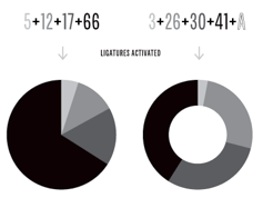 Vectro Type Foundry is a Portland, OR-based type foundry with a curiosity for experimentation and technology. It is the type design branch of Scribble Tone (Portland, OR), which in turn was founded by Lizy Gershenzon and Travis Kochel. Lizy leads marketing and product strategy for Vectro. She is also a founder and owner of Future Fonts. During the last 10 years she has been a partner at Scribble Tone focusing on digital product design and strategy. She also contracts as a digital ux and product designer. Travis leads type design and direction for Vectro. He is also a founder and owner of Future Fonts. During the last 10 years he has been a partner at Scribble Tone focusing on type design and development.
 Warning: When I am on the Vectro site, my computer goes in overdrive and heats up, as if Vectro is an agent for bitcoin mining. I hope that this technical problem can be fixed. Their typefaces at Scribble Tone, Future Fonts and Vectro Type: - Skyward Sans (a free Hylian alphabet featured in Zelda's Skyward Sword).
- Kicker (2012-2018). A layerable neon light font.
- Iso (2018: a monospaced almost typewriter font). They write: It was inspired by old cameras, specifically Leicas and Nikons, which have really warm, slightly goofy, and tactile engraved text all over. Iso was renamed Vctr Mono in 2021.
- The experimental prismatic variable font Whoa (2019).
- Analog (2013, Travis Kochel). iA new take on wide industrial sans serifs.
- Kablammo (2022).
- Wildberry (2021, Travis Kochel). Based on the brushy lettering found on U.S. National Wilderness signage and trailhead signposts.
- Chartwell (2011, Travis Kochel).
[Google]
[More] ⦿
|
Ventislav Dzhokov

|
 Sofia, Bulgaria-based type designer associated with Fontfabric, aka Djo Venci, Ventsislav Dzhokov and Ventsislav Djokov. His typefaces:
 - Intro Script (2019, FontFabric). A monoline school script font family.
- Silverstone (Display, Text) (2021). A custom type system for the Silverstone raceway and British Motorsports by Plamen Motev and Ventislav Dzhokov at Fontfabric.
- He was a member of the Fontfabric team that designed and later updated the 26-font type system Nexa in 2020. That team consisted of Svetoslav Simov, Plamen Motev, Mirela Belova, Stan Partalev, Nikolay Petroussenko, and Ventislav Dzhokov.
- Member of the Fontfabric team (Plamen Motev, Stan Partalev and Ventislav Dzhokov) that designed the 72-font Panton Rust and Panton Rust Script in 2019. This weathered typeface family accompanies Fontfabric's popular Panton family.
- Fester (2022, Fontfabric). A semi-condensed 16-style (+variable) semi-futuristic grotesque typeface developed under the direction of Plamen Motev.
[Google]
[MyFonts]
[More] ⦿
|
Veronika Burian
[Type Together]

|
 [MyFonts]
[More] ⦿
|
Very Cool Studio
[Kyle Wayne Benson]

|
 Kyle Wayne Benson (b. 1988, Texas) describes himself as an affable graphic and type designer. He has his own commercial foundry, also called Kyle Wayne Benson, which specializes in signage type. Very Cool Studio was located in Orem, UT, and more recently in Oakland, CA. Future Fonts link.
 Creator in 2013 of Benson Script (with three contrast levels, from didone to monoline), the octagonal angular typefaces Millie and Truth, and of Clayton, Red Benny, Tide's In, Tide Sans (the surf-inspired humanist with a humorous selection of weight names ranging from Lil Bunny, to Dudette, Bunny, Mondo, Kahuna and Dude), Tide Sans Condensed, and Farmer's Co-Op (a vernacular sans with wood type influences). Typefaces from 2014: Jeames (a high-contrast decorative typeface with vintage serifs), Maritime Champion, Maritime Champion Stencil, Good News Sans (a set of 18 display sans typefaces, mostly for titling or short pieces), Kansas Casual (a sign painting font), Maritime Champion (inline typeface), National Champion (octagonal athletic lettering family). Typefaces from 2015: Qualtrics. Typefaces from 2018: Gooper (a take on Cooper Black; at Future Fonts). Typefaces from 2019: Bruphy (a variable font modeled after hand-painted brush lettering and released at Future Fonts). Typefaces from 2020: Gooper Text, Bruphy Text. Typefaces from 2021: Nudge (a condensed gothic sans based on a dog defecation sign composed of letters hand cut out of vinyl at Silver Lake Reservoir in LA), Gooper Deck. Typefaces from 2022: Henrietta (a revival of a 1980s font that ripped off Souvenir; I would like to have a good definition of the difference between revival and ripoff). [Google]
[MyFonts]
[More] ⦿
|
v-fonts
[Nick Sherman]
|
A list of variable fonts, maintained and regularly updated by Nick Sherman. [Google]
[More] ⦿
|
Vibrant Types (was: Calligrafiction)
[Philip Lammert]

|
 Calligrafiction was a German type foundry that was founded in 2014 by Philip Lammert, who is based in Hamburg. Lammert studied communication design in Düsseldorf, Germany, and Guatemala City. In 2017, he embarked on a Masters program at the HAW Hamburg under the supervision of Jovica Veljovic. Philip's typeface Peter (2014) is a neo-grotesque sans. Very basic, it shows humanist touches in the heavier weights.
 In 2018, he published DIN Neue Roman, a serif experiment based on DIN 1451. DIN Neue Roman is part of his 2015 Masters Thesis at HAW Hamburg. In 2020, he changed the name of his foundry to Vibrant Types. In that same year, Lammert released the dynamic chiseled typeface family Slandic. Slandic includes a variable font. Typefaces from 2021: Adelbrook (a ten-style humanist text typeface with tapered asymmetric serifs, and an unclosed counter in the lower case b; the italics appear almost brushed; Adelbrook includes two variable fonts). [Google]
[MyFonts]
[More] ⦿
|
Victoria Rushton
|
 After attending high school in Singapore, Victoria Rushton (New York City) studied at RISD (the Rhode Island School of Design) and graduated in 2013 with a degree in Illustration. In 2014 she joined Font Bureau and later Type Network as a staff designer, and lived in Boston. Under the guidance of Cyrus Highsmith at RISD, she created the text typeface Sylvia in 2012 for the poems of Sylvia Plath who committed suicide in 1963.
 In 2015, she designed the Font Bureau font Marcia, a didone with many quirks and curvy surprises. In 2016, she designed Embury Text. Victoria explains: Contrasting characteristics like soft round curves, sharp end strokes, exaggerated oval counters, punched in slab-like serifs, and swelling swashes play subtly off of each other, offering an unexpectedly immersive experience to the reader. In 2017, she designed the connected script typeface Gautreaux, which is inspired by a lettering style from Tommy Thompson's The Script Letter called "free style lettering." In 2021, Victoria, together with Type Network and Kerns&Cairns, designed the corporate typeface Peacock Sans for NBC. At Future Fonts in 2021, she released the Spencerian script typeface Kadabra, which was started by (her late partner) Dai Foldes, who in turn was inspired by the work of calligrapher Jean Larcher. Lovegrove (2021) is a display typeface designed by Dai Foldes and Victoria Rushton for their wedding invitations. It was inspired by the calligraphy of Raymond DaBoll and has been expanded into a variable font with a swash axis. Interview in 2015 by Type Thursday. Font Bureau link. Type Network link. Future Fonts link. [Google]
[More] ⦿
|
Vika Usmanova
[Type Trends]

|
 [MyFonts]
[More] ⦿
|
Viktor Pesotsky
[Fontype]

|
[MyFonts]
[More] ⦿
|
Viktor Zumegen
|
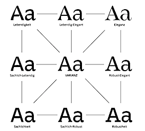 In 2020, German designer Viktor Zumegen designed a versatile variable font, Varianz. He writes: Varianz is a variable font that contains four standalone fonts with different characters and five intermediate instances as a basis. With the four font characters, Sachlichkeit, Lebendigkeit, Eleganz and Robustheit, a two-dimensional space is opened up, in which users can move around freely. By using the two sliders of this variable superfamily, it is possible to merge the four font characters smoothly and individually. Designers can thus decide exactly how much character of Sachlichkeit, Lebendigkeit, Eleganz and Robustheit should be contained in the design language of Varianz. [Google]
[More] ⦿
|
Vitaliy Tsygankov
[Limo Studio]

|
[MyFonts]
[More] ⦿
|
Wahyu S. Adi Wibowo
[Eaver Studio (or: Wahyu & Sani Co)]

|
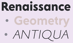 [MyFonts]
[More] ⦿
|
Wearecolt
[Adam Greasley]

|
Adam Greasley (Colt Creative Design, or Wearecolt, Bradford, UK) made Bessington (2012, a hand-printed blackboard bold typeface), Giddelham (2012, a flowing italic family), Quickrest (2012, a tall poster face), Iamblock (2012, fat counterless octagonal typeface), Adams Hand (2010), the hand-drawn condensed typeface Craft Sign, and Quick Death (2012, a hand-drawn poster family). In 2013, he published the classic curvy roman display typeface Curvesta and the hand-drawn slab serif Bowler Hand. In 2014, Adam published the 4-style clean-shaven sans family Adget Sans. Typefaces from 2015: Oxblood No1 (a handcrafted tattoo font). Typefaces from 2016: Dead Meat (all caps, handcrafted). Typefaces from 2018: Beloid Gothic (blackletter), Titch (a brush font), Pronk Clean, Deft Brush. Typefaces from 2019: Kinship Sans (a grotesk), Stroom Script. Typefaces from 2020: Pronk (in Clean, Rough and Outline styles). Typefaces from 2021: Kin Grotesque, Gather Serif (a delicate serif), Codo Mono (a 12-style wide monospaced programming font, and two variable fonts), Take Note, Take Note, Something New (a sharp and edgy display serif). [Google]
[MyFonts]
[More] ⦿
|
William Montrose
|
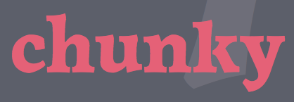 German / American type designer who graduated from the MATD program of the University of Reading in 2013. His graduation typeface family is called Natan (2013), named after the Russian mathematician Sergey Natanovich Bernstein.
 Natan covers Latin and Hebrew in styles that range from regular to chunky. William adjusted both scripts back and forth in function of each other in a process he calls script juggling. He writes: Natan is a punch cutting fantasy turned into Bézier curves. A tribute to craftsmanship sans nostalgia. Chunky elegant curves deriving from a broad scuffed nib, worked into metal with gravers and files. Angular calligraphic strokes, cast in typographic solutions for modern day text setting. In 2019, at Rosetta Type, together with Slava Jevcinova and David Brezina, he released the variable font Adapter (with three axes, for latin, Greek and Cyrillic). At Kilotype, he released Old School Grotesk (2019). In 2021, he added an all-new and extended Oldschool Grotesk 2.0---a 40-font type system in Compressed, Condensed, Compact, and Classic widths, and a weight range from Hair to Heavy. Available individually or in a single variable font file. Engineered by Selma Losch and published at Kilotype. [Google]
[More] ⦿
|
Wired: Tech Giants Team Up to Fix Typography's Biggest Problem
|
Wired magazine reports on variable fonts. [Google]
[More] ⦿
|
Without Foundry (or W Foundry; was: Diego Aravena)
[Diego Aravena Silo]

|
 Diego Aravena Silo set up Without Foundry with Felipe Sanzana 2012. In 2016, Diego Aravena joined forces with fellow type designers Patricio Truenos and Bana Arasanz. In 2022, he embarked on studies at the University of Reading. Diego's typefaces:
 - The funky flared typeface family Pirata (2013). Pirata has some interlocking characters.
- D Sari (2014, Latinotype). This typeface won an award at Tipos Latinos 2014. Diego calls this 22-style rounded sans family neohumanist.
- Zennat Pro (2014, Latinotype).
- D Hanna (2014) is a 22-font neohumanist sans typeface family. Followed in 2015 by D Hanna soft. D Hanna is instantly recognizable by its amputated e.
- Huboost (2014): a tall titling face.
- Dsert (2014, Latinotype): a 39-weight display sans family that is inspired by the 1970s politically colored design movement, afichismo. Many glyphs are slightly flared.
- Barranco (2015). Barranco is a 3d layered font family with shadows and inline effect layers.
- Without Sans (2015, by Felipe Sanzana and Diego Aravena). This large sans family is characterized by a large x-height and rhombic dots.
- D Blues (2015). A neo-humanist typeface family in 20 styles.
- Bronto (2015). A rounded sans family with reversed contrast.
- Biblioteca (2015) by Roberto Osses, Cesar Araya, Patricio Gonzalez and Diego Aravena won an award at Tipos Latinos 2016.
- Gardenia (2016): a rounded sans typeface family by Salvador Rodriguez Lagos.
- In 2016, Salvador Rodriguez and Diego Aravena Silo co-designed the geometric sans typeface family Fuse and Fuse V.2, which are characterized by a large x-height and some humanist elements. Salvador Rodriguez and Julia Martines Diana added Fuse V.2 Printed in 2018.
- Eren and Eren Condensed (2016) is a 32-style slab serif family with a humanistic touch and rounded corners---it was designed by Salvador Rodriguez and programmed by Diego Aravena.
- Ulises (2017). Designed with Salvador Rodriguez: an eclectic slab serif with some grotesque features.
- Kappa (2017): A modern sans serif with humanistic and geometric features, co-designed by Salvador Rodriguez and Diego Aravena. Followed in 2017 by the slab version Kappa Vol2 (designed by Salvador Rodriguez).
- Salvatore (2018). A neogrotesque.
- Notorious (2018). A brush script.
- Hermann (2018). By Salvador Rodriguez and Diego Aravena. This wonderful readable garalde will be great for novels.
- Ryman Gothic (2019, by Diego Aravena Silo and Franco Jonas at W Foundry) is inspired by Edwin Allen's wood types and Morris Fuller Benton's gothics.
- Gallos (2020, by Diego Aravena Silo and Salvador Rodriguez). A 20-style mix of architype, geometric, gaelic, unicase and uncial. It contains variable styles as well.
- Supera Gothic (2020). An 18-style geometric sans by Diego Aravena Silo and Salvador Rodriguez. Plus variable fonts.
- Saes Grotesk (2021). An 18-style grotesk sans by Diego Aravena that comes with two variable fonts. It is based on early 19th century gothics.
Creative Market link. Behance link. Another Creative Market link. Old foundry link at MyFonts. Behance link for Without Foundry. Yet another Creative Market link. [Google]
[MyFonts]
[More] ⦿
|
WTF (or: Workhorse Type Foundry)
[Adrian Kimball]
|
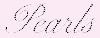 Self-described as a small type foundry from Utah with a stencil fetish. The typefaces, most of which have variable font versions:
 - Workhorse Script Dot (2022). A fantastic pearlized script.
- Workhorse Script Stencil (2020).
- Workhorse Script (2020). A formal calligraphic typeface family.
- WTF Didot (2020). A straightened didone with squarish terminals and a French flag feel.
- WTF Geometric Polka (2018).
- WTF Geometric Inline (2018).
- WTF Geometric (2020).
- WTF Geometric Stencil (2018).
[Google]
[More] ⦿
|
Xuveki
[Abe Zeinali]

|
US-based designer of XKans SQ (a cyberpunk font with a variable style), XKanz (2021: a cyberpunk font, with a variable font option) and Super Puff MX (a modular techno typeface) (2021). [Google]
[MyFonts]
[More] ⦿
|
You Work For Them (or YWFT; formerly Cinahaus or TrueIsTrue)
[Michael Cina]

|
 Michael Cina (Minneapolis) is the cofounder of WeWorkForThem and YouWorkForThem (in 2002), also known as YWFT. Before that, he ran TrueIsTrue, and before that was partner in Test Pilot Collective (which he left in 2001), and before that he ran Cinahaus. YWFT is located in Knoxville, TN and/or Baltimore, MD. The creative director is Michael Paul Young.
 Cina's fonts include the pixel fonts YWFT Caliper (1998), YWFT Bit (1998), 6x7oct (1998) and BlackGold; the handwriting font Cinahand; Blessed (1999, techno), YWFT Cam (1998, a slab serif based on industrial lettering), CommunityService, Crossover (1998, dot matrix with stars instead of dots), Composite (1998, octagonal), Formation (1999, a big octagonal family), Jute (2004, a masculine, military, sans-serif), YWFT Maetl (1999, octagonal, angular family), YWFT Moteur (a technical, retro, machine-like design; it briefly went under the name Alloy---in the early 2000s it was heavily used in the video gaming magazine Playstation), YWFT Novum (2002: a heavy block font that draws inspiration from a typeface originally used by the Swiss graphic designer Siegfried Odermatt), Pakt, Reversion (1997, squarish), Selector, Selek (1998, pixelish), YWFT Blackgold (2000, pixelish), Service (2001-2002, an octagonal family), YWFT Signature (1998), Trisect (1999, three-lined family), Unisect (1999, organic monoline sans), YWFT Ultramagnetic (1996, a popular rounded gothic typeface family), Ultramagnetic2 (1999), YWFT Ultramagnetic Expanded (2011), YWFT Ultramagnetic Rough (1996-2017), Unfinished. Bastard (1998), Kcap6 (with Matt Desmond), Cheese (1998), Novum (2002), Overcross (2002, unfocused letters), Stem (1998), Testacon (with Kral and Desmond, 1999), Praun (2002, pixel typefaces), OneCross (2002, pixelish stitching family), Estenceler (2004, a great stencil family a bit related to Milton Glaser's Glaser Stencil), Graphium (2004, octagonal Western style family), Expos (2004, graffiti or poster face), YWFT Pixacao (2007, after the Brazilian graffiti style), Vox (2007, monoline sans), Militia Sans (2007, like a Russian constructivist stencil), Jupiter (roman), Militia (2007, heavier stencil), Merc (2007, grunge), Guild (2007), Clarendon Text (2007, a complete revival), Jezebel (2007, script), Ambassador Script (2007, a digital revival of Novarese's typeface by that name), Enam (2002, influenced by Crouwel), Enigmatic Hand (2007), Dusty (2007, a Tuscan-eared Western font), YWFT Poplock (2007, experimental), YWFT Pakt (2004, geometric sans), Sudsy (2007), Black Sabbath (2008, ultra black slab serif, by Stefan Kjartansson), YWFT Belle (2008), YWFT Agostina (2008), YWFT Bitwood (2007-2017, pixelish Western typeface), YWFT Mullino (2009, letterpress emulation), Trithart (2008, grunge by Emma Trithart), YWFT Tapscott (2008-2017, informal and nostalgic all caps family, in the style of Rennie Mackintosh), Habano (2008, script), Amorinda (signage script), Retron (2008, connected script), MD01 (medical-themed dingbats), Adelaide (script), Centennial Script (calligraphic), Alexia (calligraphic), Ultramagnetic (experimental), Nash (1997, grunge), Amber (kitchen tile), Fab (3d), 6x7 Oct (1998, pixels and dots), Wool (2009, stencil), YWFT Matter (2009, a wide bold grotesque), YWFT Merriam (2009, a Clarendon-styled slab serif), Agostina Alternate (2011, with Michael Paul Young and Taechit Jiropaskosol), Ramsey (2012), YWFT Dessau (2013, schizograms and capitals like Bauhaus on drugs), YWFT League (2014, inspired by college football jerseys), YWFT Yoke (poster typeface done with Pintassilgo), YWFT Illuminati (2015, abstract capitals). Blog. His lovely g poster (2010). House fonts at YWFT by unknown designers: YWFT Knit (2010: knitting patterns), YWFT Motif (2015), Ramsey Condensed (2015), YWFT Roamer (2016), YWFT Whisky (alchemic), YWFT Psychosis, YWFT Processing (2001-2010: YWFT Processing was developed in 2001 for Casey Reas, the co-creator of the Processing programming language. We created this display face to be sharp, tall, unique and interesting...much like Mr. Reas himself. The font was derived from an original logo that already existed, and we continued the idea into a fully working six-weight font family. YWFT Processing was converted to Opentype format in 2010), YWFT Filbert (2012), YWFT Nim (2012, combining the hipster style with overlays for bevel and shadow effects), Dogma (2012, alchemic), Attic (spooky poster face, in EPS format), YWFT Yoke (textured all-caps), Riblah (2003, dot matrix), YWFT Fraktur (tattoo face), YWFT Burls (2013, fat poster typeface), YWFT Coltrane (2011, handdrawn poster typeface), YWFT Symplify (2013: haute couture snowflakes), YWFT Smoothie, YWFT Chance (2016), YWFT Skipper (2016), YWFT Wheatgrass (2016), YWFT Estee (2002-2017), YWFT Watermelon (2017), YWFT Ink (2017, originally designed in 2008), YWFT QUE, YWFT Burtonian (2017, named after Tim Burton), YWFT Crew (handcrafted), YWFT Maudlin (2017), YWFT Liana (2017; perhaps plumbing dingbats, who knows?), YWFT Victoria (2010: a bonbonnerie type), YWFT Valley (2017: a Memphis movement type), YWFT Wellsworth (2017), YWFT Harmony (2008-2017, a curly calligraphic script), YWFT Edger (2017), YWFT Chateau, YWFT Gummy (2002-2018), YWFT Blender (2018), YWFT Fluctuant (2018: a variable font), YWFT Gavin (a ransom note font) (2021), Ramsey (2021: a 54-style rounded squarish typeface), YWFT Hugo (2021: a child's hand). View Michael Cina's typefaces. Alternate URL. Behance link. Interview. [Google]
[MyFonts]
[More] ⦿
|
Yulia Gonina

|
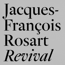 Graphic and type designer (b. Moscow) in Saint Petersburg, Russia, who started studying at UNIC in Moscow in 2015. In 2018, she published a book, Jacques-François Rosart Revival that documents not only Rosart's life but also some of her revivals of Rosart's typefaces. Hers are called Rosart Text and Display and include italics. After graduation, she joined the TypeType team.
 In 2020, Antonina Zhulkova, Yulia Gonina and Kseniya Karataeva co-designed the octagonal typeface family TT Octosquares at TypeType. TT Octosquares comes with a 3-axis variable type option. Co-designer of TT Norms Std Condensed (2020: an 18-font family by Pavel Emelyanov, Yulia Gonina and the TypeType Team). In 2020, she was part of the Type Type team that designed TT Ramillas, a 20-style high contrast transitional serif by Pavel Emelyanov, Marina Khodak, Yulia Gonina and Kseniya Karataeva. TT Ramillas also contains variable styles. In 2021, Antonina Zhulkova and Yulia Gonina designed TT Autonomous, a 25-style wide brutalist technological sans family that includes a monospaced subfamily and a trio of variable fonts. In 2021, she designed the thin roman capital lettering typeface TT Ricordi Todi which was inspired by plaques with engraved street names from the small Italian town of Todi. Later in 2021, Antonina Zhulkova, Pavel Emelyanov and Yulia Gonina (aided by Radik Tukhvatullin and Marina Khodak) co-designed the 32-style geometric sans TT Fors which comes in standard, display and variable versions. Typefaces from 2022: TT Arlen (six fonts and a variable typeface; TT Arlen is an expressive bold haedline grot by Yulia Gonina, Eugene Tantsurin and the TypeType team), TT Fellows (a monolinear sans with 18 static fonts and one variable font; by Antonina Zhulkova, Yulia Gonina and the TypeType team). [Google]
[MyFonts]
[More] ⦿
|
Yury Ostromentsky
[OSTYPE]

|
[MyFonts]
[More] ⦿
|
Yuwsuke Kieda
|
Developer and maintainer of Variable LM (2017), a package for scaling the Latin Modern fonts. [Google]
[More] ⦿
|
Zeh Foundry
[Seryozha Rasskazov]
|
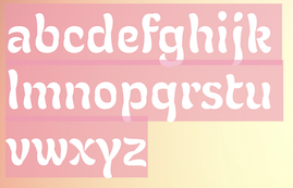 Seryozha Rasskazov is a graphic and type designer, lettering artist, and sign painter from St. Petersburg, Russia, who studied at ECAL's Master in Type Design program in Lausanne, 2020-2022. Under the supervision of Kai Bernau, he designed the optically optimized variable didone stencil typeface Didonist (2021).
 We believe that he created the art nouveau typeface Flory (2021) at Zeh Foundry. He may also have been involved in the development of the Latin / Cyrillic hipster family Russian Tourist Brand (2021). [Google]
[More] ⦿
|
Zetafonts (or: Studio Kmzero, or: ZeroFont)
[Francesco Mistico Canovaro]

|
 Italian design firm in Firenze consisting of three graphic designers, Francesco Canovaro, Debora Manetti, and Cosimo Lorenzo Pancini. It has evolved into Italy's premier and most prolific type foundry. Canovaro's Behance link. Also called ZeroFont and Zetafonts, this type foundry exhales joy---in every design and presentation, the passion of the designers bubbles to the surface. Blending a delicious sense of humour and a great aesthetic taste, Zetafonts is a typographic delight. Their typefaces:
 - Adlibitum (2018). A textura blackletter typeface family.
- Anaphora (2018). Anaphora is a contemporary serif typeface designed by Francesco Canovaro (roman), Cosimo Lorenzo Pancini (italic) and Andrea Tartarelli. It features a wedge serif design with nine weights from thin to heavy. Its wide counters and low x-height make it pleasant and readable at text sizes while the uncommon shapes make it strong and recognizable when used in display size. Anaphora covers Latin, Greek and Cyrillic.
- Aliens and Cows (2016). An ultra-condensed all aps sans family by Canovaro.
- Arturo (2018), by Francesco Canovaro.
- Atlantica (2017). A signage script family.
- Lightstrike (2016). A thin (and free) brush font by Canovaro.
- Byom (2016). A tweetware organic sans typeface family by Francesco Canovaro.
- Adlery (2016, +Cyrillic). A brush script by Cosimo Lorenzo Pancini.
- Adlibitum (2016). A blackletter typeface by Cosimo Lorenzo Pancini and Francesco Canovaro.
- Morbodoni (2016). A display didone by Cosimo Lorenzo Pancini and Francesco Canovaro.
- Altair (2016). A display sans by by Francesco Canovaro based on Digitalino.
- Aquawax (2015). A sans family by Canovaro and the Zetafonts team. Extended in 2019 to Aquawax Pro by Francesco Canovaro, Cosimo Lorenzo Pancini and Andrea Tartarelli.
- Armonioso (2014). A creamy connected signage script.
- A Day Without Sun (2014, by Cosimo Lorenzo Pancini).
- Another Shabby (2014, a primitive script by Francesco Canovaro).
- Antipasto (2007, by Matteo Di Iorio). A clean elegant sans by Canovaro.
- Arista (2007) and Arista 2.0 (2010). A simple rounded bold sans typeface designed by Francesco Canovaro and Adolfo Monti. In 2017, Francesco Canovaro updated these to Arista Pro.
- Arsenale White and Arsenale Blue (2009). Children's hands, done by Cosimo Lorenzo Pancini, Francesco Canovaro, Andrea Mi, Debora Manetti, Katiuscia Mari, and Jonathan Calugi.
- Beatrix Antiqua (2016, by Francesco Canovaro, Cosimo Lorenzo Pancini and Andrea Tartarelli). This humanist sans-serif typeface is part of the Beatrix family (Beatrix Nova, etc.) that takes its inspiration from the classic Roman monumental capital model. Its capitals are directly derived from the stone carvings in Florence's Santa Croce Cathedral. Beatrix keeps a subtle lapidary swelling at the terminals suggesting a glyphic serif, similar to Hermann Zapf's treatment in Optima. Some weights are free.
- Bimbo >(2018). A child emulation handwriting font developed as an extension and redesign of the original Arsenale White typeface created with italian illustrator Jonathan Calugi.
- Bistecca (2005). A bellissima extra-condensed serif font created for ego[n] 5 and for the cover of ego[n] 4.
- Braciola (2006). Monospaced and octagonal, with stencil styles added.
- Brushstrike (2015). By Canovaro.
- Byron (2006). Handwriting.
- In 2010, Canovaro designed the plumpish bubblegum typefaces Bubblebody Fat and Bubbleboddy Extra Light. These fonts were discontinued in 2016 and replaced by Bubbleboddy Neue.
- Bulletto (2015). A retro baseball script.
- Cibreo. A basic sans typeface by Canovaro and Monti.
- Cinematografica (2017). An ultra condensed small caps movie typeface used in the advertising campaign for Lucca Comics 2017 Festival. This film noir family features eight weights from thin to heavy with open type alternate glyphs and some full word ligatures.
- The rounded geometric sans family Cocomat (2015, Zetafonts, by Cosimo Lorenzo Pancini, Debora Manetti and Francesco Canovaro) was inspired by the style of the twenties and the visions of Italian futurists like Fortunato Depero, Giacomo Balla and Antonio Sant'Elia. Updated in 2019 as Cocomat Pro.
- Cocosignum (2017). Cocosignum Corsivo Italico and Cocosignum Maiuscoletto are both based on Italian art deco styles.
- Codec (2018) by Cosimo Lorenzo Pancini, Francesco Canovaro and Andrea Tartarelli is a geometric sans typeface family in which all terminal cuts are horiontal or vertical. See also Codec Pro (2019).
- Delizioso (2008). Art deco.
- Digitalino (2013).
- Docporn (comic book style).
- Duepuntozero Pro (2006-2008). A condensed rounded sans famly by Adolfo Monti and Francesco Canovaro. The Pro version was released in 2019.
- Filetto (2009). A sans modeled after DIN 1451 done by Canovaro, Debora Manetti and Katiuscia Mari.
- Florentia (2017). An 18-style lapidary typeface family influenced by the renaissance and luxury.
- In 2018, Debora Manetti and Francesco Canovaro designed the brush handwriting font Freehand Brush.
- Handvetica (2005). Arched.
- Happy Frush Zero (2014). A random note font.
- Happy Funghetto (2015). Fifties style lettering.
- Heading Pro (2017). A condensed sans typeface by Francesco Canovaro. Followed in 2018 by Heading Pro Ultra Compressed, Heading Pro Extended, and Heading Pro Text.
- Hello Script (2015). Curly and calligraphic.
- Modulo3 (2008). An artsy beauty.
- New Romantic (curly grunge).
- Panforte (2013) and Panforte Serif (2013): hand-drawn typefaces. Panforte Pro followed in 2017.
- Prozak. Consists of zProzak-Bold, zProzak and zProzakLight (2006). A basic sans typeface by Canovaro and Monti.
- Sala de Fiestas (2005-2006). Free download at OFL.
- Square80 (2009).
- Studio Gothic (2017, by Francesco Canovaro, Cosimo Lorenzo Pancini and Andrea Tartarelli) is an 8-style geometric sans family based on Alessandro Butti's geometric sans classic, Semplicita.
- Sugo (2007). By Canovaro and Monti.
- Taller (2009, ultra-condensed), Taller Evolution (2009), Tallest (2009, ultra-condensed).
- Targa Monospace. Inspired by license plate lettering.
- Targa (2002), TargaMS (2002), TargaMSHand (2002). Cosimo Lorenzo Pancini, who developed Targa in 2002, based his design on the peculiar sans serif monospace typeface with slightly rounded corners and a geometric, condensed skeleton that Italy had been using for its license plates. In 2022, Francesco Canovaro redesigned this font into a versatile multi-weight typeface, Targa Pro, which includes Targa Pro Mono (which keeps the original monospace widths), Targa Pro Roman (with proportional widths), both in five weights plus italics, the handmade version Targa Hand, and Targa Pro Stencil.
- Tutor (2006). Rectangular, pixelish---what I call a piano key font.
- Zerocalcare is a typeface family created for the branding of Lucca Comics & Games Festival 2016. It is based on the digitised handwriting of italian comic artist Zerocalcare, and it uses open type substitutions to mimick the flow of real handwriting. Free at Dafont.
- Double Bass (2018): A jazzy 4-style typeface family that pays tribute to Saul Bass's iconic hand lettering for Otto Preminger's The Man with the Golden Arm film title sequence and other movies, Bass's vibrating, almost brutal cut-out aestethics, and the cartoonish lettering and jazzy graphics of the fifties.
- Another Shabby (2018) is a brush script typeface family designed by Francesco Canovaro for Zetafonts with Cyrillic letters designed by Alina Golovan.
- Sugo Pro (2018, Francesco Canovaro, Andrea Tartarelli). It was designed in 2006 by Francesco Canovaro in two weights (regular and extralight) and later used by Cosimo Lorenzo Pancini as base inspiration for the design of the successful Zetafonts' Cocogoose Pro typeface. In 2018 the family was completely redesigned by Andrea Tartarelli, expanding the original glyph set to include Cyrillic and Greek and adding three extra weights and italics. The restored and revamped version is named Sugo Pro Classic. In 2020, Cosimo Pancini, Andrea Tartarelli and Mario De Libero drew the 60-style Cocogoose Pro Narrows family, which features many compressed typefaces as well as grungy letterpress versions.
- Extenda (2018) is a thin-to-wide grotesque advertising or movie credit family with some of the DNA of Impact or Compacta. By Francesco Canovaro and Andrea Tartarelli.
- In 2019, Blacker Sans (Francesco Canovaro, Andrea Tartarelli) and Blacker Pro (Cosimo Lorenzo Pancini and Andrea Tartarelli) were released. The 63-strong fashion mag powerhouse Blacker Sans Pro (Francesco Canovaro, Andrea Tartarelli) followed in 2020. Zetafonts writes: Blacker Pro is the revised and extended version of the original wedge serif type family designed by Cosimo Lorenzo Pancini and Andrea Tartarelli in 2017. Blacker was developed as a take on the style that Jeremiah Shoaf has defined as the "evil serif" genre: typefaces with high contrast, oldstyle or modern serif proportions and sharp, blade-like triangular serifs.
- The extreme wedge serif and reverse stress typeface family Blackest (2018, Andrea Tartarelli and Francesco Canovaro).
- In 2019, Cosimo Lorenzo Pancini, Francesco Canovaro and Andrea Tartarelli published the monolinear geometric rounded corner amputated "e" sans typeface family Cocogoose Classic and the condensed rounded monoline techno sans typeface family Iconic.
- Klein (2019) is (in their words) Zetafonts' love letter to the grandmother of all geometric sans typefaces, Futura. Starting from a dialogue with Paul Renner's iconic letterforms and proportions, Francesco Canovaro and Andrea Tartarelli decided to depart from its distinctive modernist shapes with slight humanist touches and grotesque solutions---with some design choices evoking the softness of humanist sans serifs like Gill Sans. The end result is a workhorse superfamily of 54 fonts with full coverage of Latin, Cyrillic and Greek. The original display-oriented family, developed in nine weights with matching italics (from the hairline thin to the sturdy black), has been paired with a text version (with slightly higher x-height, better readability and maximum legibility at small point size) and with a condensed version, to be used for space-saving display solutions in editorial and advertising formats. With a name that is both a nod to its humble functionality and an homage to French nouveau realiste artist Yves Klein, this typeface aims to become your next trusted companion in all your adventures in print, digital and motion design.
- Kitsch (2019, Francesco Canovaro, Andrea Tartarelli and Maria Chiara Fantini) mixes angular medieval elements and old style letterforms. Thicker (2020, by Francesco Canovaro and Andrea Tartarelli). They write: A geometric sans typeface on steroids, it was first designed in the muscular extrablack weight with the aesthetics of high-power dynamic typefaces used in sports communication, and then developed in the lighter weights where the shapes show some vintage-inspired proportions and the slightly squared look that nods to Novarese famous Eurostile, eponymous with retro-futurism..
- Stinger (2020, a 42-style reverse contrast family by Francesco Canovaro, Cosimo Pancini, Andrea Tartarelli and Maria Chiara Fantini).
- As part of the free font set Quarantype (2020), Francesco Canovaro designed Quarantype Chillout and Quarantype Sunshine. Sunshine Pro (2020, Zetafonts) was designed by Cosimo Lorenzo Pancini and Solenn Bordeau expanding the original Quarantype Sunshine design by Francesco Canovaro, which in turn was designed as a typeface for good vibes against Covid-19. Sunshine Pro is an experimental Clarendon-style font with variable contrast along the weight axis---contrast is reversed in light weight, minimized in the regular weight and peaks in the bold and heavy weights.
- Eastman (2020, by Francesco Canovaro and Andrea Tartarelli with help from Solenn Bordeau) is a 178-font geometric sans workhorse family with Bauhaus genes developed for maximum versatility both in display and text use, with a wide weight range and a solid monolinear design featuring a tall x-height. It comes with a two axis variable font (weight, italic angle). It was followed by the 46-style font Eastman Grotesque (2020, by Francesco Canovaro, Cosimo Pancini and Andrea Tartarelli), which comprises an interesting Eastman Grotesque Alternate subfamily with daring and in-your-face glyphs, and the 88-style Eastman Condensed (2021, by Francesco Canovaro, Cosimo Pancini and Andrea Tartarelli).
- Garbata (2020). A round typeface loosely based on Windsor and Cooper Black, having a variable type option that offers many weights. Between sans and serif.
- Bogart (2020, Francesco Canovaro and Andrea Tartarelli). An homage to the low-contrast oldstyle fat faces, like Cooper Black (Oswald Bruce Cooper, 1922), Windsor and Goudy Heavy Face (Frederic W. Goudy and Sol Hess, 1925-1932), and more recently, Bookman.
- Stadio Now (2020). A revival by the Zetafonts team of Aldo Novarese's Stadio (1974), a reverse contrast sans that was published only as a rub-on transfer typeface. It comes with a multi-axis variable font that greatly enlarges the design space.
- Amazing Slab (2021). A 20-style typeface family designed by Francesco Canovaro, Mario de Libero (who did the inline versions), Sofia Bandini and Andrea Tartarelli, developed from the Amazing Grotesk family designed by Cosimo Lorenzo Pancini. Characterized by outward-pointing top serifs, this typeface is designed for use in athletic lettering, logos and titling. Zetafonts writes: Mixing an Egyptian serif, low contrast approach with the curved endings and open shapes of humanist sans grotesques, it was developed to embody the energetic and friendly nature of the startup scene---a feeling of innovation, information and energy, with a desire for simplicity and straightforward communication. The basic design shapes for the font come from the strong personality of the extrabold letterforms drawn by Francesco Canovaro for his StartupItalia logo, that informed the display design of the four darkest weights (from medium to black).
- Coco Sharp (2021). A 62-style sans feast, and two variable fonts with variable x-height, by Francesco Canovaro, Cosimo Pancini and Andrea Tartarelli.
- Arsenica (2021). A 43-style decorative serif by Francesco Canovaro for Zetafonts, and developed by a design team that included Mario De Libero, Andrea Tartarelli and Cosimo Lorenzo Pancini. It comprises two variable fonts and subfamilies Display, Text, Alternate and Antiqua.
- Asgard (2021). A 72-strong experimental display sans superfamily with a 3-axis (weight, width, slant) variable font, designed by Francesco Canovaro, Andrea Tartarelli ans Mario De Libero.
- Heading Now (2021). A 160-strong titling font (+2 variable fonts) by Francesco Canovaro, Cosimo Pancini, Andrea Tartarelli and Mario De Libero that provides an enormous range of widths.
- Salad and Salad Interlock (2021-2022). These typefacea are based on vernacular signpainting, extending Debora Manetti's Sala de Fiestas.
- Bakemono (2021). Canovaro writes: the design space of fixed vs. proportional width, mixing the lessons of mechanical typewriter technology with the intuitions of eastern brush calligraphy. The name of the typeface comes from the Japanese shape-shifter monsters that could change their form freely between human and animal, and aptly describes the metamorphic nature of this wide superfamily coming in proportional, monospace and intermediate subfamilies. bakemono supports Latin, Cyrillic, Aarabic and kana, and comes with a variable font option.
Corporate typefaces were designed for Lucca Comics and Games, Digitalic Magazine, Kair, Unicoop, and Istituto Europeo di Design. Behance link. Zetafonts home page. View the Zetafonts library. Abstract Fonts link. I Love Typography link. MyFonts link. Type Department link. [Google]
[MyFonts]
[More] ⦿
|
Zimbardi (was: Zimbardi Calomino)
[Flavia Zimbardi]
|
The Brazilian duo of Flavia Zimbardi (b. Rio de Janeiro) and Caetano Calomino, a signpainter and lettering artist in Brooklyn, NY, formed Zimbardi Calomino. In 2018, using a speed stroke technique, Caetano developed the signpainter font ZC Casual together with Flavia. In 2019, Flavia Zimbardi released Lygia at Future Fonts: Lygia explores the duality of sharp and round forms with stylish cues and historical references from 16th-century masterpieces by Robert Granjon to the geometric approach of W.A. Dwiggins. An homage to Brazilian neo-concrete artist Lygia Clark, originally designed in 2017 as Flavia Zimbardi's degree project for the Type@Cooper extended program in New York. Lygia is a variable font with a weight axis. After Type@Cooper, Flavia settled in Berlin, Germany. In 2021, she released the companion typeface family Lygia Sans, with a further update in 2022. Future Fonts link. Older Future Fonts link. [Google]
[More] ⦿
|

 Madrid (and before that, Lebanon)-based Arabic type designer who runs the Arab type news and blog site called Arabic Typography.
 Architect and designer in Banda Aceh, Indonesia, b. 1980, who set up Grayscale, then 38 Lineart, and finally
  [
[ In house type designer at Elsner&Flake. He designed an elegant high-contrast art deco display typeface
  [
[ Aka Iorveth Aen Seidhe. Katowice, Poland-based designer of
  Famous type designer born in 1928 in Unterseen, Switzerland, who died in September 2015. He closely cooperated with Linotype-Hell AG, after having been artistic director at Deberny-Peignot in Paris since 1952. He established his own studio in 1962 with André Gürtler and Bruno Pfaftli. Art director for Editions Hermann, Paris 1957 to 1967. Frutiger lived near Bern, Switzerland, and was very interested in woodcuts. In 2009, Heidrun Osterer and Philipp Stamm coedited
  [
[ Adriana Perez Conesa is a Spanish graphic and typeface designer, currently based in Barcelona. She studied art and graphic design at the University of the Basque Country. Graduate of
  Fatnobrain was Adrien Midzic's design studio in Paris. Born in 1982, he co-founded
  Andrej Dienes is a type designer in Bratislava, Slovakia. He set up the commercial type foundry Adtypo in 2013. Creator of these typefaces:
  Adam Fathony (or Adam Fathoni Haris; AF Studio, Bandung, Indonesia) created the vintage typeface Grandesa (2014), the signage typeface Magnifika (2014) and the Victorian typeface Marema (2014).
  Graphic designer in Trinidad, who co-founded Unqueue, a mobile app designed to improve retail experiences in the Caribbean. Past clients include Google, RISD, the Government of Trinidad and Tobago, and the Caribbean Mental Health Foundation. He designed a few, mostly custom, typefaces. These include Crispy (2020: an angular design started in 2017 that has mushroomed into an 8-axis variable font, built based on David Berlow's proposal for parametric variations, combining axes such as X-Transparency, X-Opacity, and Y-Opacity to generate masters for styles such as widths, weights, grades, and optical sizes; it is planned as a Google Font), and Ephemeral (2018: a layered color font based on the lettering style of Bruce Cayonne). [
 Tallinn, Estonia-based designer of IDA Display (2018, a variable font that reacts to music) and Sveta Bold Condensed Display (2018, for Latin and Cyrillic), which was developed for the branding of Tallinn Music Week 2018. [
 Born in 1960 in Niigata, Japan. Studied at the Musashino Art University in Tokyo. He also studied calligraphy at the London College of Printing. He became a freelance designer in 1997. Akira Kobayashi, who was based in Tokyo prior to his move to the Franfurt area, is an accomplished type designer who has created numerous typefaces for Sha-Ken, Dainippon Screen (where he made the kanji font Hiragino Mincho), TypeBank (from 1993-1997), ITC and Linotype, where he is Type Director since 2001.
  Originally from Maracay, Venezuela, Alejandro Freitez is now based in Buenos Aires, Argentina, where he releases his fonts mostly through Sudtipos. His typefaces:
  Designer who lives in Buenos Aires and who teaches graphic design and typography at the Universidad de Buenos Aires. He has worked as an art director in prestigious Argentina-based studios, handling high-profile corporate brands such as Arcor, Marta Harff, Morph, SC Johnson, Danone, and Movicom. He runs
  Graphic designer in Lisbon, Portugal (was: Dublin, Ireland), who studied at ISIA Roma in 2013. Creator of the
  [
[ Talented Russian graphic and type designer who works for ParaType in Moscow. His typefaces:
  [
[ Designer from Siberia who graduated from Ladislav Sutnar Faculty of Design and Art, University of West Bohemia and is now based in Prague, Czechia. Type, graphic and motion graphics designer who created these typefaces:
  [
[ Alexis Boscariol is a Paris-based freelance graphic and type designer. He completed his Masters in graphic design at ESAD Valence, before entering the
  [
[ Slovenian type designer, who co-founded
  [
[ [
[ Andrea Tartarelli studied at the Academy of Fine Arts of Carrara and worked as a marble sculptor before turning to graphic and type design. He continued his studies at the Plantin Institute at Antwerp, and now teaches type design at IED Florence. He designed Tarif (selected by Fontspring.com among the Best fonts of 2019), Malik (shortlisted for the Communication Arts Typography awards 2021) and has been co-designer on dozens of typefaces at Zetafonts including the award winning Blacker (selected by Myfonts as one of the best new families of 2019), Monterchi (CA typography award 2020, Myfonts hidden gem 2019) and Stinger (CA typography award 2021). He works and lives in Pietrasanta (Tuscany, Italy). His graphic design outfit is called Surface Studio. Tartarelli's typefaces:
  [
[ [
[ [
[ [
[ [
[ [
[ Andy Clymer grew up in Irvine, CA and studied at San Diego State University in 1998. At that time, he was working on
  [
[ Member of the Contrast Type Foundry in Moscow.
  German type and communication designer, lecturer and researcher with a special interest in legibility and readability (b. 1989). She obtained a Bachelor's in communication design with Jovica Veljovic at Hamburg University of Applied Science, where her thesis was entitled The Letters in my Head. What Creatives should know about reading processes in order to design joyful reading experiences. She also did a Master's with Veljovic, which led to her Legilux typeface family (a transitional serif with optical sizes as well as a sans serif) and further research on legibility. She graduated in 2017. Antonia joined Dutch Design in 2017 and extended the FF DIN family to FF DIN Slab. Furthermore, she re-engineered the whole FF DIN family itself to make variable fonts; she also added Bulgarian Cyrillic and other characters; finally, she also made FF DIN Stencil into a functional three axis variable font. Since 2018, she teaches type design at Muthesius University of Fine Arts and Design in Kiel.
  In 2020, at The Type Department, Paul Coumoul, Clothilde Bouan and Antonin Bonnet published the display typeface Octane. It is a variable font with two axes, weight and width. Octane is a free font consisting of a total of 18 weights, but the free version consists in fact only of one variable font and it has no numbers. They explain that Octane was initially created to fit with any car designed by Pininfarina. [
 Saint Petersburg, Russia-based designer of
  In September 2014, Apple announced the imminent arrival of the Apple Watch, which came with a new neo-grotesque sans-serif typeface developed in house. It has a legible, open DIN-like look, but the name of its designer was not released. The 35 fonts are grouped into subfamilies San Francisco Text and San Francisco Display, and are available to designers of Apple Watch applications
  Måns Grebäck (Aring Typeface, Örebro, Sweden) is a prolific Swedish designer (b. Lindesberg, Sweden, 1990), who lives in Borlänge, Sweden. Måns Grebäck has a bachelor's degree in graphic design from the University of Dalarna (2012). In 2010, he went commercial, and started selling fonts through
  Andrew Footit (b. 1984) runs his own type foundry in Johannesburg, South Africa. He is also known as Arkitype. Until 2014, his type studio was called Virtue Creative and before that, Virtue84. In 2017, he set up
  Or Aleksey Popovtsev. Graphic designer in Kiev, Ukraine, who made the Latin / Cyrillic sans typefaces Nachalnaya (2016) and Rothko (2018: a sans).
  Stephen Nixon (b. South Dakota) was an undergraduate student at the University of Minnesota in the Twin Cities. After that, he moved to New York City to work as a product designer at IBM. There, he focused on visual design & UX for software products, then moved into brand experience design within IBM Watson. Stephen lives in Brooklyn, NY, where he operates Arrow Type, taking on freelance type design & development work. In 2018, he graduated from the
  Paris-based designer and illustrator,
  Istanbul, Turkey-based type designer. She releassed her first typeface, Newcraft Serif in 2016, and published Benedicte Script and Rawbrush later that year.
  Azza Alameddine has worked as a graphic designer in Lebanon, the Netherlands and London since 2009, and is now based in Barcelona. She holds a BA in visual communication from Créapole, Paris. A graduate of the Masters in Typeface Design program of the University of Reading, she specializes in Arabic script. Her talk at
  Barbara Bigosinska received her master degree in Graphic Design at the Academy of Fine Arts in Katowice, Poland. In 2013, she graduated from the
  Jacques Le Bailly (b. Thionville, France, 1975) is the "Baron von Fonthausen", located in Den Haag, and the self-proclaimed German-French specialist in the fields of both beer and type design. From 1999 to 2003, Le Bailly lived in Berlin, working at Moniteurs graphic design studio and as an independent graphic designer. Having returned to the Netherlands in 2003, Jacques did type production work for The Enschedé Font Foundry. He is now a typographic designer at Bau Winkel's studio in The Hague. He worked for type foundries like Lineto, Monotype, House Industries, and Bold Monday, as well as on custom projects for several brand design agencies. He has been teaching at the WdKA art academy in Rotterdam and Sint Joost in Den Bosch.
  Visual designer in Tirana, Albania, who specializes in technologically-inspired designs. In 2019, together with Mathieu Desjardins, he created the wonderful typeface
  Beatrice Caciotti is an art director based in Rome, Italy. In 2021, she published the intestinal typeface Bumpy at
  Belarius is a three-axis variable family that shifts from sans to slab serif, from condensed to expanded widths, and includes every possibility in between. Published by Type Together in 2021, it was developed under the guidance of Veronika Burian and José Scaglione, with type design by Azza Alameddine and Pooja Saxena, and additional kerning and engineering help from Radek Sidun, Joancarles Casasin and Irene Vlachou.
  In 2018, Ben Wittner, Sascha Thoma and Timm Hartmann edited
 Benjamin Blaess (Blah, Strasbourg, France) is a graphic designer and letterer. During a summer course called
  [
[ Bernd Volmer is a graphic and type designer from Germany. Before attending type and media, he graduated with a BA in 2011 from the ArtEZ in Arnhem. During this time he also did an internship at Atelier
  Type foundry in Paris, est. 2016 by Jérémie Hornus, who is the design lead. Type designers associated with Black Foundry include Alisa Nowak and Ilya Naumoff. They initially bought the font collection of FontYou. Typefaces not included in the original FontYou collection:
  Yogyakarta, Indonesia-based type foundry set up in 2017 by two independent foundries, Blankids (Bangkit Setiadi) and Subqi (Amir Subqi Setiaji). Yogyakarta, Indonesia-based designer of the Victorian typefaces
  Lyon, France-based designer founded first Adèle Type Foundry and in 2018 renamed it Blaze Type Foundry. Creator of these typefaces:
  Borislav Korablev is a former journalist and now a layout and type designer. He runs a foundry under his own name based in St. Petersburg, Russia. In 2022, he released
  Borutta (or Duce Type) is the creative studio of über-talented Warsaw-based designer Mateusz Machalski (b. 1989), a graduate of Wydziale Grafiki ASP in 2014, and of Warsaw Academy of Fine Arts. His oeuvre is simply irresistible, charming and a worthy representative of the Polish poster style---witness Alergia (2016), Magiel Pro (2017) and Madiso (2017).
  Freelance graphic and type designer in Lodz, Poland. He cooperates with the Book Art Museum (which stores the legacy of Polish typography) to revive the spirit of letterpress printing and digitize old type. Speaker at ATypI 2017 in Montreal.
  Stockholm, Sweden-based designer of the spurred typeface
  Briefcase (Prague, Czechia) offers original Czech typefaces by designers, who may not wish to set up their own type foundry. Operating as a coop, it complements Brousil's Suitcase Type, which offers more traditional typefaces. Their participants include Tomas Brousil himself, as well as Marek Pistora, Filip Kraus, Jakub Samek, Vojtech Riha, Jan Novak, Ales Najbrt, Petra Docekalova, Radek Sidun, Jana Horackova, and Petr Babak. As of 2015, they published these typeface: BC Alphapipe, BC Dres, BC Falster Grotesk, BC Kakao, BC Liguria (2014, Jan Novak), BC Merkur, BC Mikser, BC Motel Sans, BC Motel Slab, BC Pramen Sans, BC Pramen Slab, BC Prkno, BC Rebecca, BC Reflex, BC Reformulate, BC Rezan, BC Steiner, BC Sijan, BC Thomas & Ruhller, BC Trhan, BC Vafle.
  [
[
 Bülent Yüksel (b. 1973 or 1974, Istanbul) is a graphic designer, illustrator and painter, who graduated from Anadolu University, and started working in 1996 as art director at Sabah Newspaper. His first font was Formetic (2013). In 2014, he created the wavy typeface
  [
[ Foundry in Canada, est. 2004 by Rebecca Alaccari in Toronto, and run by her and Patrick Griffin.
  Greek commercial foundry specializing in Greek fonts, founded in 1995 by Yiannis Kouroudis (b. 1962) and Panagiotes (Panos) Haratzopoulos (b. 1967). Regulars include Y. Kouroudis, T. Katsoulidis, D. Arvanitis, H. Charalambous and A. Bakas. Some fonts are Greek extensions of the major Western fonts (such as the fonts from Emigre, Berthold Types, FontShop, Commercial Type, Font Bureau, House Industries).
  Martin Cincar (Prague, Czechia) designed these typefaces:
  Graphic designer who studied and now works in Münchberg, Germany. His typefaces:
  Tibor Szikora is a Budapest, Hungary-based type designer specializing in custom typefaces and lettering. He runs Cinketype. His typefaces:
  C.J. Dunn has a background in graphic design and typeface design, and studied under Ed Benguiat at The School of Visual Arts in New York. He worked on typefaces for Font Bureau, and continued his relationship with the Berlows at Type Network. He is a graduate of Type@Cooper, a postgraduate certificate program in typeface design, where he also assisted Sumner Stone & Sara Solskone in teaching typeface design. He started
  Cofounder of Now Type,
  [
[ Machine learning engineer who studied at UC Berkeley.
  Born in Firenze in 1969. Cofounder with Francesco Canovaro and Debora Manetti of the Italian design firm in Firenze called Studio Kmzero. He co-designed some typefaces there such as
  CoType is the London-based type foundry of Mark Bloom and Joe Leadbeater, est. 2019. Their typefaces include
  Type design studio in Lisbon, Portugal, founded in 2018 by type designer Joao Cracel. In 2019, Craceltype published the 18-style humanist sans typeface families
  [
[ Bali, Indonesia-based designer (b. 1983) of Baruna (2018: vintage decorative font), Brotherley (2018), the hilarious Chef Characters Icons (2018), the sans typeface Drupadi (2018), the ball terminal typeface Cameo Sweet Gothic (2018), the handcrafted typefaces Miyake Signature (2018), Kiddo Handwriting (2018), Puralova Script (2018) and Children Alien (2018).
  Iasi, Romania-based designer of the great mischievous retro sans typeface family Brightwell (2018), co-designed with
  [
[ Swiss designer Bruno Maag (b. Zürich) founded Dalton Maag in 1991, and set up shop in Brixton, South London. He serves the corporate market with innovative type designs, but also has a retail font line. Ex-Monotype designer Ron Carpenter designs type for the foundry. In the past, type designers Veronika Burian worked for Dalton Maag. A graduate of the Basel School of Design, who worked at Stempel and was invitedd by Rene Kerfante to Join Monotype to start up a custom type department. After that, he set up Dalton Maag with his wife Liz Dalton. He has built the company into a 40-employee enterprise with offices in London, Boston, Brazil (where the main type designer is Fabio Luiz Haag), Vienna and Hong Kong.
  [
[
 Darkmode refers to white type on black background. It is generally understood that for white type on dark printed matter should be bolder (than its black on white counterpart), while white text on a black screen should be thinner as the screen spews white in the reader's direction.
 Czech designer (b. Brno) who graduated with a Masters in Informatics at the Masaryk University in Brno in 2005, spent a term at the Denmark's Designskole in Copenhagen in 2004 and graduated with distinction from the MA in Typeface Design at the
  [
[ Type designer from Santiago, Chile, who created the neo-humanist sans typeface family
 [
[ [
[ [
[ [
[ Banda Aceh, Indonesia-based designer of the script typefaces Humblle Rought (sic) (2015), Nirmana (2015, brush type), Cecilia Script (2015), Stay High (2015, graffiti influence), Gracias Script (2015), Bowlist (2015), Miguella Script (2015), Islander Brush (2015), Zailla Script (2015), Funkiess (2015), Scarlet (2015), Amanda (2015, calligraphic), Natasya (2015, a creamy signage font), Violla Script (2015), Seulanga (2015), Cornish (2015), Butller (2015), Twice (2015), Evelyn (2015), Steelmond (2015), Humble (2015; also spelled Humblle with two l's), Swirlesque (2015) and Jeumpa (2015). Aka Dirty Line Type.
  Displaay is Martin Vacha's type foundry in Prague set up in 2014. Martin Vacha studied at the Academy of Arts, Architecture and Design in Prague. His early fonts were designed during his studies at UMPRUM in Prague. His typefaces:
 [
[ Ukrainian type designer (b. 1977, Buryn) who graduated from Sumy State University in 1999. Since 2002, he creates digital fonts. He also works at Dancor advertising in Sumy, Ukraine, since 1997. Very prolific, his work includes a substantial number of commissioned typefaces for magazines and companies.
  Partner in Moiré (Zürich) who designs typefaces at Grilli Type in Switzerland. His typefaces:
  [
[ [
[ Curitiba-based Brazilian digital type foundry, est. in 2008 by the successful and talented type designer
  Established in 1994, dstype used to offer free fonts but has gone commercial now. It is run by
  Serbian graphic designer located in Gornji Milanovac, Serbia. Cofounder in 2009 with
  [
[
 Type and graphic design pages by Edgar Walthert, b. Sursee, Switzerland. In 2007, he graduated from the TypeMedia program at KABK in Den Haag. Since then he is free-lancing. He completed TazIII in 2008 for Lucas de Groot in Berlin. In 2008, he moved to Amsterdam to work as an independent graphic and type-designer. In Amsterdam, he hosts
  [
[ Type design collective in Mumbai, India, est. 2013, managed by Mumbai-based Sarang Kulkarni (b. 1980). Sarang studied at the Sir J J Institute of Applied Art in Mumbai, class of 2002. He worked with R.K. Joshi at the National Centre for Software Technology and Design Temple in 2002. In that same year, he assisted R.K. Joshi with the design of the Jana Gurmukhi typeface. In 2008 and 2009, he created 11 Indic typefaces for Vodafone India. In 2009-2010, he created an additional eight typefaces for Virgin Mobile India. Kulkarni also runs
  [
[ [
[ [
[ London, UK-based Ellen Luff (b. 1992) is a type designer with a background in advertizing and a passion for beautiful design. Her fonts are used worldwide, with clients from Apple and NBC, to Russian nuts and remote bars in the Atacama Desert. In 2021, Ellen Luff Type Foundry joined
  Elliott graduated in graphic design at EPSAA (Ecole Professionnelle Supérieure d'Arts Graphiques et d'Architecture de la ville de Paris, France) in 2012.
  [
[ [
[
 Geneva, Switzerland-based graphic and type designer, b. 1990, who studied at ECAL in Lausanne. Designer of the Trajan column-inspired display serif typeface
  Graphic designer and musician (b. 1982) at the New York studio AWP who grew up in Maine and is currently based in Ithaca, NY. In 2018, he founded Etcetera Type Company, which is based in Spencer, NY.
  Dinamo is a Swiss type foundry established by Johannes Breyer and Fabian Harb after graduation from schools in Zurich, Basel and Amsterdam. Johannes and Fabian are visiting teachers at the Estonian Academy of the Arts, Tallinn and regularly teach at UDK Berlin and University of Applied Sciences, St. Gallen. Their typefaces:
  Fabio Haag Type is Fabio Haag's type foundry in Brazil. Earlier, he ran
  [
[ [
[ Fabrizio Schiavi was born in Ponte dell'Olio in the Piacenza province in 1971. FSD Fabrizio Schiavi Design in Piacenza was opened in 1998. With Alessio Leonardi, he co-founded Fontology. He also co-launched the experimental graphics magazine Climax in 1994.
  Feliciano Type was established in 2001 by Mario Feliciano. The foundry's main design studio in Lisbon, Portugal, with two additional offices, in Povoa de Varzim, Portugal, and in The Hague, Netherlands. Mário Feliciano (b. 1969, Caldas da Rainha, Portugal). Feliciano studied graphic design at IADE, Lisbon, and began working as a graphic designer at Surf Portugal magazine in 1993, where he stayed as art director until 2000. In 1994 he founded the design studio Secretonix in Lisbon. He has been heavily involved in type design since. In 2005, he joined the type coop
  Brazilian graphic and type designer, who co-founded Naipe Foundry with Alvaro Franca in Rio de Janeiro in 2018. A graduate of ESDI Cartapaccio, Felipe has interned at Coppers & Brasses in Montreal. He is also associated with Rodrigo Saiani's type foundry
  Las Palmas de Gran Canaria, Ampuero and Laredo, Spain-based designer (b. 1971) who set up deFharo. Creator of the monoline sans typeface
  Flavia Zimbardi is a type designer and visual artist from Rio de Janeiro, based in Berlin. From 2005 to 2013 she worked for some of the leading magazines in Brazil. Flavia is a graduate of the Type@Cooper Extended Program at the Cooper Union, class of 2017. In 2018, she started
  Florian Karsten Studio (Brno, Czech Republic) focuses on graphic design, type design and programming. They create websites, books, programmes, typefaces and functional systems. They are excited about open-source and peer2peer networks. Designer of exclusive high quality typefaces:
  Bay City, MI-based designer of Spartan MB (2017), a
 Graduate of the
  Jason Smith is the British corporate typeface designer who founded Fontsmith in 1997, where he retailed his own designs from his office in London. He has created a typographic identity for the Post Office in the UK. Phil Garnham was one of the in-house type designers. In January 2020, Fontsmith was acquired by Monotype.
  During his studies in Saint Petersburg, Russia, Viktor Pesotsky designed the
  Formatpunktotf, and before that t-1 (type eins), is Maximilian Müsgens's type foundry, est. 2019. It is part of the design studio Format.tif, which is based in Aachen, Germany. Its fonts were free for students. Typefaces include Bandeins Sans and Bandeins Strange, both designed as variable fonts in 2019. The latter has two axes, width and "strange width". Strangeness somehow relates to Renner's hookish experiments.
  Berlin, Germany and/or Medan, Indonesia and/or Bandung, Indonesia, and/or New Zealand-based designer who set uo first
  London-based graphic and type designer (b. 1975) who studied at The Royal College of Art, The University of Brighton, and was taught at the Royal College of Art by Margaret Calvert, Malcolm Kennard and Alan Kitching. Creator of the sans typeface family Forme One (2014) and the related typefaces Forme Signage (2015, for wayfinding), Forme Furniture (2015, pixelized), Forme Type Block (2015), Forme Type Ornaments and Geometric Patterns (2015), Forme Pixel Type (2015) and Forme Stencil (2015), a layered typeface family that was carefully crafted based on compass and ruler. Jeremy writes: This typeface derived from a three dimensional stencil with two characters, made from wood manually rotated to create letter shapes.
  Graphic and type designer from Caracas, Venezuela, b. 1981, who moved first to Buenos Aires and then to Santiago in Chile. While mainly a type designer, he also practices
  [
[ Based in Vienna, Austria, and/or Latsch, Italy, Franziska Weitgruber received her Bachelor's Degree in Graphic Design with a focus on type from the New Design University (NDU) Sankt Pölten, Austria in 2014. She also studied in the
  During her studies in Monterrey, Mexico, Nueva Leon-based Frida Medrano created the creamy didone display typeface Kalnia (2014). In 2017, she designed the
  Potsdam, Germany-based designer (b. 1981) who studied Media Systems (Informatics) and Visual Communication at the Bauhaus University Weimar and is working as a freelance designer since 2008. Creator of the free fonts
  Geen Bitter (Den Haag, The Netherlands) consists of Thom Janssen (b. 1984, Maastricht),
  [
[ Banda Aceh, Indonesia-based creator of the cursive retro script typeface Archimedes (2015) and the calligraphic typefaces Dealova Script (2015), Austtria Script (sic) (2015), Paullina (2015), Wonder She (2015), Bebby Script (2015), Bebby Washington (2015), Bonterra (2015), Wallpalace Script (2015), Cherry Blossom (2015) and Cattleya Script (2015). They also made Kansas Brush (2015).
  Brazilian type foundry, est. 2016 by Thiago Bellotti. The first typeface by Bellotti at Gestu is the calligraphic pointed brush script
  [
[ [
[ Glenn Goluska (b. 1947, Chicago; d. 2011, Montreal) was a Canadian book designer and typographer. He came to Canada as a student at the University of Toronto. After graduating he worked for some time in the United States before returning to Canada to work at Coach House Press. He left Coach House Press to focus on letterpress printing first in Toronto and later in the Saint Henri neighborhood of Montreal under the labels Imprimerie Dromadaire and Nightshade Press. Goluska was awarded the Robert R. Reid Award for lifetime achievement or extraordinary contributions to the book arts in Canada by the Alcuin Society in 2011.
  Aka Grzegorz Luk and just Gluk, Grzegorz Luksza is a Polish type designer (b. 1973) who specializes in ultra-decorative and experimental typefaces.
 Born in 1988 in Gaithersburg, MD, Greg Gazdowicz studied at the Maryland Institute College of Art. He completed the Type@Cooper Extended program in 2014. After graduation, he joined Commercial Type.
  [
[ [
[ Graduate of the
  Graduate of the College of Architecture and Fine Arts, Batangas State University, The Philippines, who has been working as a graphic designer since 2005. He is currently located in Dubai, UAE and is a prolific type designer. His typefaces:
  Elias Hanzer is the Berlin, Germany-based designer of the sans typefaces EH Eins A (2018?), EH Normal (2017) and Eh Gut (2015). He also created typefaces Phase
  Henrique Beier (Harbor Type, Porto Alegre, Brazil) is the designer of the excellent angular semi-calligraphic text typeface
  [
[ [
[ [
[ Aka BaronHerzberg. Illustrator, letterer and type designer, who was born in the Netherlands, moved to New Orleans in 2013, and set up Herzberg Design, a commercial type foundry, in 2019. His typefaces include:
  Ex-student of Nikola Djurek at the School of design in Zagreb, class of 2014. At
  Graduate of ESAD in Amiens, France. His graduation typeface there is the Latin / Bengali typeface
  Istanbul-based art director. Designer of
  Huy Fonts is a foundry in Madrid run by
  [
[ A large free font family created by Mike Abbink and Bold Monday (Paul van der Laan and Pieter van Rosmalen) for IBM's new corporate identity in 2017. It includes the IBM Plex Sans, IBM Plex Serif, IBM Plex Sans Variable, and IBM Plex Mono subfamilies.
  Artist and type and graphic designer. His fascination with street art has led him to typography and visual arts. Ilya received a diploma in graphic design from the Russian-British Institute of Management (Chelyabinsk, Russia). He graduated from the Faculty of Arts and Design at UJEP (Usti nad Labem, Czechia). He also studied at the HSD University of Applied Sciences in Düsseldorf, Germany, and at the Graduate School of Applied Arts in Prague, UMPRUM. His typefaces cover Latin and Cyrillic:
  Also Ilya Naumov, b. Russia. Paris-based graphic and type designer, whose typefaces are fabulous. His typefaces:
  Owen Earl (Indestructible Type, Seattle, WA) takes a new look at old classics. He reinvents them from scratch, and redesigns each glyph very carefully. Some of his work is completely free, and other typefaces are commercial. His fonts:
  Insigne Type Design Studio (est. 2006) is run by
  Kostas Barstokas is a designer and illustrator in Thessaloniki, Greece, and in Leeds, UK. He set up Intelligent Foundry and later Intelligent Design in Leeds. He graduated from the
  Or Eirini Vlachou, b. 1981, who works between Athens and Bristol, UK. Graduate of of Vakalo School of Art & Design in Athens and the University of Reading, where she earned the nickname Miss Fontlab before graduating there with a Masters in 2004. Type designer who used to be at
  [
[ Russian type designer called Olga Chaeva at
  Codesigner with Jordi Embodas of Bubble Witch Saga (2013), a font that is used in some Android video games. It can be downloaded
  Jason Vandenberg (Greyscale Type and later J Foundry, Toronto) licenses his fonts independently and through
  [
[ [
[ Jan Estrada-Osmycki is a Polish-Mexican designer, visual artist and musician, and member of the Zbiorowy art group. He composes and produces music under the Bass Jan Other moniker.
 [
[ [
[ [
[ [
[ [
[ Jennifer Wagner (Nashville, TN; was: Denver, CO) designed these typefaces:
  Brisbane, Australia-based student-designer (at Griffith University) of the fun (loud, reverse contrast) display typeface Bakko (2019), which comes in variable opentype format. In 2017, she published the
  Jens Kutilek studied Communication Design in Braunschweig. After graduating he founded the web design agency
  [
[ [
[ Originally from North Carolina (b. 1979), Jesse Ragan studied type design at Rhode Island School of Design. After college, Jesse designed typefaces at Hoefler&Frere-Jones, where he had a hand in Gotham, Archer, and several other families. Since 2005, he has worked independently in Brooklyn, developing typefaces and lettering for a variety of clients. His work can be found at Font Bureau, House Industries, and Darden Studio. He also teaches typeface design at Pratt Institute and Cooper Union. He won an award at
  Bangkok, Thailand-based designer (b. 1996) of the
 Yogyakarta, Indonesia-based designer (b. 1992) of the all caps display typeface family
  Joona Louhi is a freelance type designer currently based in Helsinki. Graduate of the
 Jovana Jocic is a type and graphic designer from Belgrade, Serbia. After obtaining both a BA and MA in Graphic Design at the University of Applied Arts in Belgrade, Jovana joined
  [
[ Julien Fincker is a French designer in Stuttgart, Germany, where he is art director at Sieber & Wolf. In 2018, he designed the great art deco typeface
 [
[ [
[ Kimya Gandhi from Mumbai, India, holds a Bachelors degree in Communication Design from National Institute of Fashion Technology, Bombay (NIFT). She further went on to pursue specialization in the form of a post-graduate degree in Visual Communication at the Industrial Design Centre (IDC), IIT Bombay. Kimya interned with Linotype GmbH, Germany, in their font design department in 2010. Over the next several years she worked as a freelance designer for numerous type foundries catering to their multi-script requirements. She graduated from the TDi program at the University of Reading in 2012. Since 2015 she is a partner at Mota Italic in Berlin focusing on Indic and Latin designs for retail and custom corporate projects. Kimya teaches typography and type design at design institutes like Symbiosis Institute of Design and NIFT, and is currently designing and researching Indian script typefaces.
  Or Max Kobuzan. Kyiv, Ukraine-based designer of these typefaces:
  Turkish designer of
  [
[ During her studies, Ljubljana, Slovenia-based Krista Likar created the exaggerated serif typeface Serifnik (2015) and the gorgeous sans display typeface Kros (2015).
  [
[ Illustrator, graphic and type designer, b. 1997 in Moscow. She graduated from MGHPA (Faculty of Graphic Design of the Stroganov Academy) in 2018.
  Russian type designer associated with TypeType in Saint Petersburg, Russia. She is originally from Rostov-on-Don. In 2020, Antonina Zhulkova, Yulia Gonina and Kseniya Karataeva co-designed the octagonal typeface superfamily
  [
[ MyFonts lists him as Leo Philip, but it should be Leo Philp, without an i. Scottish student-designer at the University of Reading of Makar (2014), a Latin / Gurmukhi / Cyrillic / Greek typeface family whose angular forms confirm Philp's description of
  Jakarta, Indonesia-based type foundry that surfaced in 2016. Its typefaces include
  LettError is a foundry in Den Haag, founded by the interesting duo, Just Van Rossum (b. 1966) and Erik van Blokland (b. Gouda, 1967). Many of their fonts can be found in the FontFont library.
  British graphic designer and sign painter who was at some point in Tallinn, Estonia. Graduate of
  During his studies in Barcelona, Oscar Cobo created the modular Tuscan typeface family Batto (2015,
  Literata is a typeface designed in 2014 and 2015 by Type Together for use in
  [
[ [
[ Type and graphic designer in Sao Paulo. His typefaces include Arcadum (2018: pixel-based) and Ficus (2017), a typeface family whose shapes are like those of the Figueira Mata-Pau tree in the Brazilian Pantanal.
  Free font producer in Japan that started out as a bitmap font specilaist. The M+ Fonts Project is jointly run by Coji Morishita, Hiroki Kanou, Imazu Kazuyuki and Taro Muraoka.
 French type designer who graduated from l'Ecole Duperré in Paris and the
  Indian type designer associated with the
  Moscow-based Armenian type designer (b. 1960, Artashat, Armenia) and graphic artist. In 1984 graduated from the Moscow Poligraphic Institute, department of Polygraphic Product Design. He worked for the Type Department of Committee of Print in Yerevan, and for the publishing houses Ayastan, Luys and Sovetakan Grokh. At Microsoft's request, in 1999, he was consulted for the Armenian section of the Sylfaen project.
  [
[ [
[ As a student at
  [
[ Italian type designer whose typefaces include:
  [
[ Mark Simonson Studio is located in StPaul, MN. Mark founded Mark Simonson Studio around 2000, and describes himself as a freelance graphic designer and type designer. From
  [
[ Spanish designer Maria Ramos Silva (
 Mash Creative is the East London / Exxex-based design studio of Mark Bloom, who graduated from Middlesex University in 1998. Its first typeface is the basic sans
  Studio in Curitiba, Brazil. In 2018, it designed the bespoke wide sans typeface family Massimo. It is unclear who designed this great typeface---Behance associates it with
  [
[ [
[ [
[ [
[ [
[ [
[ Graduate of the Type Design and Typography program at UMPRUM, Prague, Czechia. Designer of the high-contrast tuxedoed sans typeface
  [
[
 Stew Deane's type foundry in London is called Meat Studio. In 2014, Stew designed the semi-serif typeface
  [
[ [
[ Zagreb, Croatia-based designer, b. 1982, Zagreb. Graduate of The School of Applied Arts and Design in Zagreb, class of 2000. In 2021, he designed
  Emma Marichal (Lyon, France) is one of four designers at the French foundry
  Ukrainian Andrey Konstantinov (b. 1981, Moscow, lives in Kiev) graduated from the National Technical University of Ukraine in 2002. He lived for some time in Tallinn, Estonia. He ran
  Type designer in Sofia, Bulgaria, who first studied mathematics and then graphic design (at New Bulgarian University). During her studies, Mirela Belova created the Latin / Cyrillic blackboard bold typeface Cheque (2017), which is
  Miriam Suranyi graduated from the Graphische in Vienna with emphasis on typography. She works as a type producer at Schriftlabor and is part of the Glyphs-Team. Her typefaces:
  The Dynamic Font System of Beijing-based MIUI---the operating system that powers Xiaomi's mobile phones---enables the users to finely adjust the weight and size of the system fonts to the most suitable state. Their variable MIUI 11 Dynamic Font, Mi Lan Pro (2016-2019) for Latin and Chinese, was developed by a team that includes
  Zurich-based graphic design studio that often work for art and architecture clients. It is run by Marc Kappeler, Markus Reichenbach and Ruth Amstutz.
  Barcelona-based designer of these typefaces:
  [
[ [
[ Istanbul, Turkey-based designer of the
  Digital type foundry based in Manchester, UK. Designer at Type Department of the sans typefaces Quench Variable (2020: ultra-compressed), Labour Grotesk (2020) and Metrik (2020), and the decorative stencil serif typeface Celine (2020).
  Naipe Foundry is the type design, lettering & font production company set up in 2018 by
  Magelang, Indonesia-based designer of
  Peter or Pyotr Bushuev is the Pskov, Russia-based designer of the geometric typeface families
  Rajesh Rajput (since 2014 with Cognizant Technologies, Gurgaon / Delhi, India) designed the
  Neue Frutiger was developed by Akira Kobayashi and the Monotype (ex-Linotype) Design Team, in 2018. An outgrowth of Adrian Frutiger's successful Frutiger font, this wayfinding family was split by Monotype into several packages:
  Swiss type foundry set up by Ian Party in Lausanne in 2020, with a focus on variable font technology. All newglyph typefaces are variable fonts with three axes of variation: weight, width and contrast. Their initial typefaces in 2020:
  Nguyen Type is a small type foundry founded by Andree Nguyen in Ho Chi Minh City, Vietnam. In 2019, Andree released the display typeface family Iconique Sans, the cross-cultural Latin typeface House of Nguyen (2019) and the fantastic decorated caps typeface Khong Gian Am (2019: inspired by negative things and sins). In 2020, Andree designed Iconique Serif and the experimental typefaces Froot Mono and Seed Mono. [
 Macclesfield, UK-based type designer who has a degree in graphic design from Nottingham Trent University. David Brezina introduces Nick as follows: Nick Job saw my baby steps as a type designer on the Typophile forum and kindly offered advice and new sources of inspiration. That's how I learned about his enthusiasm for British Rail and modernist design in general. He is a sans-serif specialist by heart, exploring mechanical influences (FS Hackney) as well as Englishness in design (FS Elliot).
  [
[ Indian type designer. In 2015, Nikhil designed the medium x-height text and headline typeface
  Type foundry set up by Noel Pretorius and Maria Ramos in 2017, jointly in Sweden and Spain. Their typefaces:
  Noël Leu is one of the cofounders of Grilli in Bern (while studying at the University of the Arts Bern in Visual Communication and Literature Writing). Leu designed these typefaces:
 A disciple of Tony de Marco, this Sao Paulo, Brazil-based designer has worked on digital magazines in Brazil such as Elle (fashion), Audi Magazine (lifestyle) and Trip (lifestyle). He set up
  Makeevka, Donetsk, Ukraine-based designer of these typefaces in 2017: Vector Waves, Quasimodo (a
  Aka OGJ Type, Oliver Jeschke is based in Berlin. In November 2022,
  [
[ Oakland, CA-based designer, whose company is called
  [
[ German designer of
  Hector Gatti, aka Pocho Gatt, is an Argentinian who runs Gatti Studio and Omnibus Type, and who co-designed the sans typeface
  London-based type designer. Creator of these retail typefaces:
  [
[ [
[ Oscar Yáñez (b. Mexico City) has a Bachelor's degree in Graphic Communication Design from the Universidad Autónoma Metropolitana (UAM) and a Master's degree in Typographic Design from the Centro de Estudios Gestalt. He studied Project Management in the Instituto Tecnológico Autónomo de México and a Masters degree in Type Design at Centro de Estudios Gestalt. He was involved and leading designs and redesigns in more than fifty magazines, newspapers and websites like Time Inc Expansion, Editorial Televisa, Reforma, El Universal and Khaleej Times newspapers. Nowadays he is Group Design Director for Harper's Bazaar Arabia and is based in Dubai.
  Yuri Ostromentsky is a type and graphic designer. He is a graduate of the Moscow State University of the Printing Arts (2002), where his graduation project was done under the supervision of Alexander Tarbeev. He has worked as a designer and art director for publishers and design studios. From 2004 to 2012, he served as art director of the magazine Bolshoi Gorod (Big City), for which he created several display typefaces as well as several original typefaces and Cyrillic versions of Latin fonts in collaboration with Ilya Ruderman. His typefaces were honored at the Contemporary Cyrillic 2009 and 2014 competitions. In 2004 he and Ruderman, Dmitri Yakovlev and Darya Yarzhambek created DailyType, a website.
  British born designer Andrew Bellamy worked for agencies in London, Oslo, and Miami, and is currently developing various global brands as Design Director at JKR in New York City. He started Ilott Type and then
  [
[ Graduate of the
  Codesigner with Giuseppe Salerno of
  Mathieu Desjardins (Pangrampangram) is a senior art director in Montreal, who created the
  [
[ [
[ French designer of these typefaces:
  London, UK, and Athens and Kifissia, Greece-based type foundry started in 2001 by
  [
[ Type designer at Canada Type.
  English designer in West Cork, Ireland. In 2014, he designed the classical roman caps typeface
  Pavel Emelyanov (b. 1982, Kandalaksha, Russia) is a graphic designer, art director and web designer based in Murmansk. He is part of Ivan Gladkikh's typeType team.
  Illustrator, graphic and type designer, and 3d modeler, b. 2001 in Moscow. He graduated from MGHPA (Faculty of Graphic Design of the Stroganov Academy) in 2018.
 Pedro Alexandre Vilas Boas Teixeira is a Porto, Portugal-based type designer. Creator of the monoline gemetric organic sans typeface
  Peter S. Baker, an English professor at the University of Virginia, offers free TrueType and PostScript fonts. these include:
  [
[ [
[ [
[ Type designer at the open source type foundry
  [
[ Lisa Huang was born and grew up in France, and is currently based in Paris. Lisa studied mostly in Paris in graphic design before going further in type and typography with Type@Cooper Condensed program in 2015 in New York City and a couple of years in design companies such as BETC Design and type foundry Black[Foundry] both in Paris. In 2018, she graduated from
  Located in Minneapolis and/or Golden Valley, MN, Process Type Foundry is
  Punch was founded by Kristof Van Proeyen, an independent creative based in Antwerp, Belgium. In 2020, he designed the 14-style display serif typeface
  [
[ Radek Lukasiewicz studied printmaking at Nicolaus Copernicus University in Poland. He worked as a graphic designer and type designer in London. In 2019 he moved to Reading to study for an MA in Typeface Design, and graduated there
  Rafael Saraiva is a Brazilian / Portuguese type designer located in Rio de Janeiro who works for Dalton Maag as font developer. Graduate of Escola de Belas Artes at UFRJ, and the
  Graduate of Warsaw Academy of Fine Arts. Type designer for Tygodnik Powszechny weekly magazine, History Meeting House and others. In 2016, as part of
  [
[ Swedish software expert who lives in San Francisco and who has worked for Dropbox, Facebook, Spotify, Lear Corporation and Spray. His own company is called Notion. His typefaces:
  [
[ Giuseppe Salerno (aka
  Designer at
  Italian graduate from the type design program at the
  Rip Type was set up in 2019 by Nick Losacco (who is based in Montreal) and Ciaran Brandin (Brooklyn, NY). Their typefaces:
  [
[ Graduate of Monash University (Australia), class of 2016. Now based in Berlin, he is a type engineer at Dinamo. Type designer who created these typefaces:
  Brazilian graphic and type designer, who teaches at Type Cooper West (in San Francisco) and is a renowned restaurant branding designer. Bembo's Zoo is Roberto de Vicq de Cumptich's children's book with all drawings integrated with glyphs from Bembo. He also published
  [
[ [
[ Roch Modrzejewski (ROHH, Krakow, Poland) established ROHH in 2015. That same year, he published the organic script typeface
  [
[ Kazincbarcika, Hungary-based type designer Roland Hüse (b. 1980) sells his fonts through My Handwritings (Kazincbarcika, Hungary), which was renamed Runes&Fonts. His first font is
  Graphic and type designer in Shanghai. At the Shanghai, China-based type foundry 3type, he released
  Senior designer at Adobe Systems in Tokyo, b. 1972, Fukushima, who graduated from Musashino Art University in 1995, and began working as a graphic designer at a design studio. In 1997, Ryoko joined Adobe. She was involved in the development of the Kozuka Mincho and Kozuka Gothic typefaces designed by Masahiko Kozuka.
  Ryota Doi received his BA in design from Tokyo University of the Arts in 2013. In 2014, he graduated from the MATD program at the University of Reading. Upon earning his master's degree in 2014, he returned to Japan and began working as a type designer at Monotype Japan.
  Sukabumi, Indonesia-based designer who created the display sans typefaces Wingko and Bivoac (layerable), the monoline script typefaces Rigoletto, Andalusia and Galliyani, the
  Aaron earned a Bachelor's degree in Asian Studies, with a minor in Japanese, at Whitman College in Walla Walla, WA. Aaron is a
  [
[ [
[ Indonesian designer of the heavy script typeface Arucard (2017) and the script typefaces Standley (2017) and Homeland (2017). In 2021, he published
  Type designer in Wellington, New Zealand, who created these typefaces in or just before 2015: Colchis (sharp-edged display type), Edme (a wedge serif named after French sculptor Edme Bouchardon, as if the letters are meant for stone-cutting), Basis (sans), Central.
  [
[ The Seniors Studio in Banda Aceh, Indonesia, designed
  Inksun Aksara (est. 2014) and Inksun Mildertype are aliases of Indonesian designer Gilang Senzana. As Inksun Aksara, he sells Victorian signage typefaces such as Brington (2014), Death Cross (2014), Zimat (2014), Amora (2014), Sang Jawara (2014) and Ophelos (2014). He also designed the tattoo script Tirtayani (2014) and the hand-lettered signage typeface Goodbye November (2014).
  At University of Aveiro in Portugal, Sergio Martins designed the display typeface Tirana (2017). In 2018, he graduated from
  Philip Trautmann (Phitra Design, b. 1996) is the Düsseldorf, Germany-based founder of Phitra Design in 2016. He renamed the foundry Shaped Fonts and was joined by Christoph Dörre and Nora Bruckhoff.
  Graphic designer from Chennai, who created the octagonal typeface
  Graduate of the UMPRUM Academy in Prague. In 2017, he designed the variable width font baseliner, which was publically released in 2019 by Briefcase Type as
  Stockholm-based type foundry closely related to design studio Söderhavet. Their typefaces:
  Mexican type designer who sert up
  Graduate of Ecole Estienne in Paris, class of 2019. She quickly turned into one of the world's top designers. Her typefaces:
  Bulgarian type foundry, set up in 2020 by Stan Partalev and Mirela Belova. Their typefaces:
  A famous geometric sans style started at ATF in 1936, now know as Linotype's answer to Futura. Mac McGrew writes: Spartan as produced by Linotype and ATF is equivalent to Futura (q.v.). Although it is claimed to have been derived from several similar European typefaces, the differences between it and Futura are so slight that for most practical purposes they are almost interchangeable. Linotype announced Sanserif 52 and Italic early in 1939; later in the same year these typefaces were offered as Spartan Black, along with light, medium, and heavy weights, all with italics. In 1941 ATF cut some of these typefaces; by arrangement with Mergenthaler the small sizes were cut to match. Over the following dozen years or more, additional weights and widths were drawn by Bud Renshaw and Gerry Powell for ATF, and by Linotype staff designers. Renshaw's Spartan Medium Condensed, drawn in 1953, is wider than the corresponding typefaces in other families. In 1955 Linotype announced Spartan Bold, "the latest member of the Spartan family; slightly larger on the body than Spartan Heavy and more compactly fitted." Spartan Extra Black is heavier than the comparable typefaces from other sources. ATF made supplementary Advertising Figures, Decimal Figures, and Fractions for several weights of Spartan. Spartan Circuit and Spartan Circuit Heavy are 1964 adaptations of the design by Linotype for Teletypesetter use, requiring modification of character widths. Compare Erbar Bold. Also see Classified Display, Tempo Alternate, Twentieth Century.
  German type foundry, est. 2016 by Christoph Koeberlin, whose passion for FC Kaiserslautern in the Bundesliga led to the creation of Sportsfonts. Koeberlin previously designed retail typefaces such as
  Argentinian foundry located in Buenos Aires, est. in 2008 by
  Type designer at Fontfabric in Sofia, Bulgaria, who writes about himself: Starting as a graffiti artist, I have been interested in visual arts and design since I can remember. That led me to the National Academy of Art, Sofia, where I graduated in Poster and Visual Communication BA, and Poster MA. I then joined a renowned type foundry, where I was able to develop and improve my understanding of typography and type design skills. In 2020 I became a part of the newly created foundry Spacetype..
  In 2012,
  [
[ [
[ Swiss type design studio based in Luzern. In 2019, they published the superfamilies Studio Feixen Sans and Serif, which include variable fonts, a hipster style, Sans Edgy, and a typewriter style, Sans Writer.
  During her studies in Bandung, Indonesia, Bali-based Cahya Sogyan (b. 1994) created the
  Suitcase Type is a Czech foundry, est. 2003 by
  Aden, Yemen-based designer of several typeface at Sultan Fonts (est. 2003 by Sultan Mohammed Saeed), which is run by Sultan Maqtari [I do not know the relationship between Sultan M. Saeed and Sultan Maqtari though]. Sultan Mohammed Saeed Noman was born in Aden in 1962. He was the first to computerize Musnad (Old South Arabian Writing System) in Unicode (at the Linguistic Department of the University of California 2007). He developed more than 90 Arabic font between 2000 and 2017. Author of the book Sultan's Fonts (2009). He developed a Naskh typeface that simulates Quran publishing. In addition, he taught graphics at several institutes, such as CISCO, New Horizons, Balfaqih.
  [
[ Born in 1981 in Colombia, Oscar Guerrero lives in Pasto, Narino, in the southwest of Colombia. His graduation work in 2012 at
  A Berlin-based foundry started by Jürgen Huber and Martin Wenzel. In 2010, Jürgen Huber (Berlin, b. 1967) and Malte Herok had started The Type Department. They are also part of
  [
[ Type foundry set up in 2020 by Comicraft's John Roshell, who is based in California. In 2020, he released the squarish all caps family
  Canadian type foundry, est. 2020. In 2020, Tall Chai (not his/her real name) released
  Designer and lettering artist in Guadalajara, Mexico (and/or Split, Croatia?), who created the Mexican diner signage script typeface Tejuino (2015) and the informal sans typefaces Taqueta, Rabar and Festa, all made in 2015. Astro Regular (or Astro MX) (2015) by Gen Ramirez, Manuel Lopez (with assistance of Rodrigo Heredia and Rodrigo Nuñez) won an award at
  Donald Tarallo obtained a BA in Studio Arts and Graphic Design from Clark University, and an MFA in Graphic Design from Rhode Island School of Design (RISD). He also studied with André Gürtler and Wolfgang Weingart in the Weiterbildungsklasse at the Basel School of Design in Switzerland. Since 1998, Don has maintained a freelance practice working on projects in identity, publication, and web design. He has taught at Clark University, Guangzhou Academy of Fine Art, Rhode Island School of Design, Samsung Art and Design Institute, Siena Art Institute, and Bridgewater State University. Don currently teaches at Fitchburg State University in Fitchburg, MA.
  [
[ Swedish designer based in Stockholm. His typefaces:
 Kota Bekasi and/or Jakarta, Indonesia-based desiger of
  Grand Rapids, MI-based graphic designer trained in Chicago. Terrance worked as a graphic designer for the university book store while earning a bachelor of fine arts degree with an emphasis in graphic design from Grand Valley State University in 2008. After graduation, he joined Ascender Corporation where he worked closely with Steve Matteson. After Ascender folded, he became an in-house type designer at Monotype where most of his time is dedicated to custom fonts.
  Type cooperative in Christchurch, New Zealand. As of the summer of 2015, it grouped 34 type designers and 58 font families. Typefaces include Super (2019: futuristic type by an unidentified designer), Gordita (2016, by Thomas Gillett) and Morion (2017, by David Einwaller).
  Bonnie Shaver-Troup, EdD, the creator of the Lexend project (which is based in Irvine, CA), is focused on making reading easier for everyone. As an educational therapist, Bonnie created the first Lexend typeface in early 2001 aiming to reduce visual stress and to improve reading performance for those with dyslexia and other struggling readers. Today, Bonnie's goal is to make the Lexend fonts accessible to a larger spectrum of users.
  [
[ [
[ American type designer, born in Rochester in 1966, who has worked for various foundries including Monotype. He graduated from the Rochester Institute of Technology. He lives in Madison, WI, and is currently employed by Monotype, after a short period at Ascender. He co-designed a revival of W.A. Dwiggins' beautiful
  French type designer at
  Or Tom Foley. Graphic and type designer in London. Foley obtained an MA in Communication Design Central from Saint Martins in 2009. Visiting lecturer on The MA Communication Design course at Central Saint Martins and the BA Visual Communications Course at Bristol University of Art&Design. In 2018, he became Creative Type Director at Monotype.
  [
[ Gugum Gumpita Rahayu (b. Bandung) is a graphic designer based in Bandung and Jakarta, Indonesia, b. 1991. In 2013, he set up Absolut Foundry. In 2015, he started
  [
[ Argentinian digital type cooperative foundry run by Nicolas Massi. The fonts published by Tomo Fonts were made by a variety of people. Tomo Fonts created the handcrafted poster typefaces
  [
[ Jeremy Tribby is a multi-disciplinary designer from California. He studied art and art history at UC Berkeley and is a graduate of
  Or Tarek Alsawwa, founder of TS Fonts and of the type shop
  A major project in 2019 by the TypeType team in Saint Petersburg, Russia, meant to provide a sans typeface family that can be broadly used in modern media. There are four monospaced styles, and 20 other styles, with the goal of providing competition, in their own words, to Arial, Roboto, and San Francisco Text. While this bar is quite low, the Type Type team of nine members, listed below, did an extraordinary technical job in terms of hinting and opentype features. The initial brief:
  Design bureau in Barcelona, Hamburg and Berlin, est. 2007, with fonts that are mainly due to German type designer Martin Lorenz. The list of typefaces:
  [
[ Jakarta, Indonesia-based designer of the
  Graduate of the University of Applied Sciences, Hamburg, Germany, who was initially associated with
  Foundry est. in 2005 by
  Russian type designer who was part of the
  Established in 2013 by Dan Jones, TypeUnion is a collaborative digital type foundry based in North London specializing in sans serif type design. Their first typeface, from 2013, is the very elegant minimalist rounded monoline sans typeface family
  Arthur Reinders Folmer (or Arthus) is from Haarlem, The Netherlands.
  Typedepot is a small type foundry currently based in Sofia, Bulgaria, founded by
  Typejockeys is a graphic and type design company based in Vienna, Austria, established in 2008 by

 Typotheque is an initiative of Peter Bilak and ui42 out of Bratislava (Slovakia), and later, The Netherlands: Typotheque is an Internet-based independent type foundry. It offers quality fonts for PC and Macintosh platforms in standard European character set and in CE (central european) character set. All fonts have full (european) character sets, are thoroughly tested and manually kerned.
  Designer in Berlin, Germany, who created these typefaces:
  Alex Tomlinson is an illustrator and graphic designer in Portsmouth, UK, b. 1992, who studied at Kingston University, and set up the Ursa Minor type foundry. In 2010 he designed the experimental fonts
 [
[ Or Andres Felipe Ramirez Ortiz. Santander de Quilichao / Cali, Colombia-based designer of the useful signage brush script typeface
 Kyle Wayne Benson (b. 1988, Texas) describes himself as an affable graphic and type designer. He has his own commercial foundry, also called Kyle Wayne Benson, which specializes in signage type. Very Cool Studio was located in Orem, UT, and more recently in Oakland, CA.
  Calligrafiction was a German type foundry that was founded in 2014 by Philip Lammert, who is based in Hamburg. Lammert studied communication design in Düsseldorf, Germany, and Guatemala City. In 2017, he embarked on a Masters program at the HAW Hamburg under the supervision of Jovica Veljovic. Philip's typeface
  After attending high school in Singapore, Victoria Rushton (New York City) studied at RISD (the Rhode Island School of Design) and graduated in 2013 with a degree in Illustration. In 2014 she joined Font Bureau and later Type Network as a staff designer, and lived in Boston. Under the guidance of Cyrus Highsmith at RISD, she created the text typeface
  [
[ In 2020, German designer Viktor Zumegen designed a versatile variable font, Varianz. He writes: Varianz is a variable font that contains four standalone fonts with different characters and five intermediate instances as a basis. With the four font characters, Sachlichkeit, Lebendigkeit, Eleganz and Robustheit, a two-dimensional space is opened up, in which users can move around freely. By using the two sliders of this variable superfamily, it is possible to merge the four font characters smoothly and individually. Designers can thus decide exactly how much character of Sachlichkeit, Lebendigkeit, Eleganz and Robustheit should be contained in the design language of Varianz. [
 [
[ German / American type designer who graduated from the
  Diego Aravena Silo set up
  Self-described as a small type foundry from Utah with a stencil fetish. The typefaces, most of which have variable font versions:
  Michael Cina (Minneapolis) is the cofounder of WeWorkForThem and
  Graphic and type designer (b. Moscow) in Saint Petersburg, Russia, who started studying at UNIC in Moscow in 2015. In 2018, she published a book, Jacques-François Rosart Revival that documents not only Rosart's life but also some of her revivals of Rosart's typefaces. Hers are called Rosart Text and Display and include italics. After graduation, she joined the TypeType team.
  Seryozha Rasskazov is a graphic and type designer, lettering artist, and sign painter from St. Petersburg, Russia, who studied at ECAL's Master in Type Design program in Lausanne, 2020-2022. Under the supervision of Kai Bernau, he designed the optically optimized variable didone stencil typeface Didonist (2021).
  Italian design firm in Firenze consisting of three graphic designers,