TYPE DESIGN INFORMATION PAGE last updated on Sun Dec 7 19:18:35 EST 2025
FONT RECOGNITION VIA FONT MOOSE
|
|
|
|
|
Comic/cartoon fonts | ||
|
|
|
|
SWITCH TO INDEX FILE
160 Studio
| Omar Ichigo, aka Supar Wanto, operates as 160 Studio out of Cirebon, Indonesia, since 2011. In 2017, he designed the ball terminal typeface Andalas and in 2018 the decorative Victorian typeface Kodia, the brush font Modaro, and the script typefaces Santigold, Rochefort (a signature script and accompanying sans), Anastasiya (a signature script), Browzko, The Smithey, Sartono and OgyiGo. Typefaces from 2019: Baltore (a heavy display sans), Chardy (Script, Sans), Fun Story (a fat finger font), Berson (a vintage font), Fischel (a decorative organic sans), Dead Slime (a Halloween font), Madjoe (a brush script), Darkflow (a horror font), Zolda (a rounded sans), Zolda Script, Anger Bae (a horror brush font), Deadclub (a monster font), Cemanley, Swaylea. Typefaces from 2020: Medona, Baxoe, Bakrie, Bilage. Typefaces from 2021: Agola Sans (a soft rounded sans), Anger Bae (an angry brush font), Bageo (a geometric sans), Blont (a wide monolinear circle-based sans), Leandro (Sans and Script), Mallesi (a wide monolinear sans), Promus (an all caps headline sans), Rakote (a cartoon font), Rastey (a wide monolinear sans). [Google] [MyFonts] [More] ⦿ |
4 Freedoms Plaza
| Sean Kleefeld designed FantastiFont, a comics book font. Fontspace link. [Google] [More] ⦿ |
538Fonts
| Or Daniel Lyons. American founder of Story Choice 102. Creator of the series The Rodfellows and Tequila and Cider, and the three family movies Greeny Phatom ABC's, The Rodfellows Marathon Movie, and Tequila and Cider 20-Episode Marathon. As a type designer active at FontStruct between 2014 and 2021. His typefaces there include DLEFS Lowblock (a squarish family), DLEFS Boulder, DLEFS Boxing (stencil), DLEFS Three Dee, DLEFS Initials (+Solid), DLEFS Mobile Gap (mosaic), DLEFS Shine, Corefont (Solid, Outlined) and Font (a kitchen tile font). At Fontspace, he showed 280 free fonts at the end of 2021, most of whgich were made around 2016: 4Music, 5-Text-Uppercase, 538EurofanEurovision, 538LyonsFont, 538LyonsLogoText, 538LyonsRounded, 6061, AFLD, AcerSupplement, AdigianaExtreme, AdigianaToybox, AdigianaUltra, AfricanCulture, Akalai, Anodyne, Armegoe, ArtificialBox, AutoToyfont, AverageCustomLevel2, AverageCustom, Azbuka-Lowers-538Lyons, Azbuka, BRFCaps, BSBTextClassic, BTTelecom, Backflash, Backstreet, BeachResort, BigOrangeCyrillic, Bloq, Blurry, Bubblewump, Burger-Queen, Busch-Three, CCColon, Cheese, Chevelure, Chicken-Butt, ChildsSans, Chompy, Circle-Outline, Cloud-World, Comial4448, ComialUnicode, Comial, ComicStrip, Condension-Pro, ConstructiveBuddy, Coolwonder, CountandSpell, Crayawn, CustomHandwriting#1, DLEDigital, DLE-Futuristic, DLEGeometWeb, DLEGeomet, Dan'sDisneyUI, DansDisney, Daniel'sHandwriting-BoldItalic, Daniel'sHandwriting-Bold, Daniel'sHandwriting-Italic, Daniel'sHandwriting, DanielDeluxe, DeejayDisco, DennorLight, Dennor, Dinamight, DobotoBlackItalic, DobotoBlack, DobotoBoldItalic, DobotoBold, DobotoItalic, DobotoLightItalic, DobotoLight, DobotoThinItalic, DobotoThin, Doboto, DokiLowercase, Doki, DooperWhooper, DressedlessProRegular, DressedlessRegular, Dressedless-Three, DuoCircle, E4ASCII, E4Craze, E4-Digital-(Lowercases), E4-Digital-Arcade-V2, E4DigitalCondensed, E4DigitalExtended, e4digitalv2, e4digitalv2, E4DigitalV2Hollow-Italic, e4digitalv2hollow, E4DigitalV2-Italic, E4-Digital-V2-Light-Italic, e4digitalv2light, e4digitalv2, EMEN-Text, EOne, EarlyHalloweenAdventures, EasterABCEggTwo, EatFreshLowercase, EatFresh, EgNew-Thick2, EgNew-Thick, EggsFor3Yrs, EgmontText-BoldItalic, EgmontText-Bold, EgmontText-Italic, EgmontTextLight, EgmontText, ElPerroYElGatoWords, ElPerroYElGatoWords, Election2016, E4DigitalFinal, Eurotype2016, EurovisionChoir2017, EurovisionSongContest2015V2, EurovisionVienna2015, Every-Movie-Every-Night, FS-Serif-Condensed, Familex, Fintaro, FlashingLights, Florid, Florid, FontCreatorProgram4-1, FreebrushScript, Fridays, Funhana (a wide sans from 2016), FunZone3Pro, FunZoneThree, FunZoneTwoAlternates, FunZone-Two-Bold-Italic, FunZoneTwo, FunZoneTwoCondensed, FunZoneTwoEPYEG, FunZoneTwoHelv, FunZoneTwo-Italic, FunZoneTwoLight, FunZoneTwo, FunZoneTwoProCondensed, FunZoneTwoProExtended, FunZoneTwoProRegular, FunZoneTwoSerifBold, FunZoneTwoSerifCondensed, FunZoneTwoSerifWide, FunZoneTwoSerif, FunZoneTwoWide, FunZoneTwo, Garde, Garinty, GarintySkew, HBOFamily, HalloweenTime, Handpower, Hargroty, Hearts, Hemico-Greek, High-Five-Techno, Highstruct, Hisel, History-Lowercase, Homestile, Hopscotch, Hotpepper, InsideOutLowercase, InsideOut, Into-the-Future, Irresistible-Hollywood, JonesCombo, JonesOutline, Jones, Kazuke, KidZonePro, KidZone, KidsClub, Kon-System, LateNite, Lecid, LegibSqueeze, Legibility, LifeIsARightTime, LifelogoEasy, LifelogoHard, Light-Your-Fire, Littoral, LivedMasNEW!WithNumbers, LyonsPrint, 629Supplement-V2, LyonsSecondaryBold, LyonsSecondaryLight, LyonsSecondaryRegular, LyonsSerifBlack, LyonsSerifBold, LyonsSerif-Italic, LyonsSerif, Lyons, MTVLowercase1, MTVLowercase2, Made-with-Paint, MandarianFood, Meerken, MemoriesAngular, MemoriesRoundBold, MemoriesRoundExtraBold, MemoriesRoundLight, MemoriesRound, Memories, Mentabrush, MicEdge, Mickorama, Mixmatch, MockLatin, More4-Logo, MoreFour-v2, MotivotaCombo, Motivota, MovieBill, Mraz, Musieer, MyShapes, NES-Lowercase, NES2, NeonFeel, NewFlourinaFontfor2014, New-LiteBulb, New-Walt-Disney-Font, NewWaltDisneyUI, Nine-Network-logo-font, Nine-Network-logo-font-v2, NiseBuschGardens2, NiseBuschGardens, NoUndo, Oilpainter, OrderPizza, OutofCn'R, POEFoo, POEGalaxy, POEHeadlineBold, POEHeadline-Italic, POEHeadlineOutline, POEHeadline, POEMonospace, POENewUnicaseMedium, POERedcoatNewBold, POERedcoatNew, POESansDemo, POESansDemo, POESansNewBlackItalic, POESansNewBlack, POESansNew-BoldItalic, POESansNew, POESansNew-Italic, POESansNew, POESansPro-BoldItalic, POE-Sans-Pro-Bold, POE-Sans-Pro-Condensed-Bold-Italic, POE-Sans-Pro-Condensed-Bold, POESansProCondensedItalic, POESansProCondensed, POE-Sans-Pro-ExpandedBoldItalic, POE-Sans-Pro-ExpandedBold, POESansProExpanded-Heavy-Italic, POESansProExpanded-Heavy, POESansProExpandedItalic, POESansProExpanded, POESansPro-Extra-Light-Italic, POESansProExtraLight, POESansPro-HeavyItalic, POESansProHeavy, POESansPro-Italic, POESansPro-Light-Italic, POESansProLight, POESansPro-MediumItalic, POESansPro-Medium, POESansPro-Semi-boldItalic, POESansPro-Semi-bold, POESansPro-ThinItalic, POESansPro-Thin, POE-Sans-Pro-Ultra-Condensed-Bold-Italic, POE-Sans-Pro-Ultra-Condensed-Bold, POESansProUltra-Condensed-Italic, POESansProUltra-Condensed, POESansPro, POEText, POEUnicaseCondensed, POEUnicaseToo, POEUnicase, POEVeticaMonospaceBold, POEVeticaMonospace, POEVeticaNewReincarnatedBoldItalic, POEVeticaNewReincarnatedBold, POEVeticaNewReincarnatedCondensedBold, POEVeticaNewCondensed, POEVeticaNew-Italic, POEVeticaNew-LightItalic, POEVeticaNewLightReincarnated, POEVeticaNewMediumItalicReincarnated, POEVeticaNewMediumReincarnated, POEVeticaNewMono, POEVeticaNewThinItalicReincarnated, POEVeticaNewThinReincarnated, POEVeticaNewReincarnated, POEVeticaUI, Paintbrush, Paramountain, Paris-France, Paul, Pelham, PennyPinch, PersonalFontMix, PlayoffsSerif, Playoffs, PoorLittlePeppina, PowerhouseSansBold, Powerhouse-Sans, PresarioText, Presario, Proudance, Radeon, RaiText1983Lowercase, RaiLowercaseRegular, Remedy, Retrahaus, RodfellowsWacky, RodscriptTwo, Rodscript, RollerCoaster, RollyOlly, RollySqueeze, RoundFitLowercaseExtended, Roundling, SM-Grid-Text-Rounded, ScriptME3, ScriptMENew-Bold, ScriptMENew, Scroller, Seez, Serioucity-3, Serioucity, Seuss, Sigg, SillyDilly, Simplicity, Simplicity, Smear, SomethingRandom, Spikes, Splotch, Starzy3, StarzyDarzylowercaseletters, StarzyDarzy, StoryChoiceSansSerif-BoldItalic, StoryChoiceSansSerif-Bold, StoryChoiceSansSerifHeavy-Italic, StoryChoiceSansSerifHeavy, StoryChoiceSansSerif-Italic, StoryChoiceSansSerifLight-Italic, StoryChoiceSansSerifLight, StoryChoiceSansSerif, StoryStrip, SuperMario286, TUBAn, TWOHeadline, TY, Technomite, Teereks, TeknoBeat, TeletoonLowercaseV2, TeletoonLowercase, TertiaryWriting, Thanksgiving2016, TheCheddarCakeFactory, TheRealWoman, TickleToesInfanity, TightMan, Tootall, ToySans, Trans-AtlanticFilm, Triangleshape, Tricrown, Turbo, Turkishye, Ursula, VertaboyAmore, Vertaboy, Weaselic, Wilde, Wood, WoodyDLE, Work-of-Fortress, World'sHeaviestFontEver, YG-Lowercase, YTV2000, YTVPresent, ZiricIsComing, dvcc, E4DigitalFinal, Vivendi-caps. [Google] [More] ⦿ |
7N Types
|
Typefaces from 2013: Hurufo+Numero (sans family), Yaahowu (a rounded sans family), Gobold, Bryana Aningsih Shara (upright script), Gpkn (circle-based monoline sans). Typefaces from 2014: Smoolthan (monoline organic sans), Remponk (multilined), Playsir (comic book typeface), Defonarts, Tulisan Tangan 74, Fortheenas_01, Evogria (bold and mechanical), Anysome, Blackplotan, Dotcirful (dot matrix typeface), Handgley, Brokeren (techno sans), Headsome&Modif. Typefaces from 2015: Manophiser (sans), Theodista Decally (upright connected script), Upbolters (a macho sans caps typeface). Typefaces from 2016: Cutrims (a polygonal typeface), Xacose. Typefaces from 2017: Blessing in Disguise, Chirota (handcrafted), Hastoler, Merysha-Italic, Merysha (serif), SHAOutline, ShareHappinessAround (rounded sans), SomethingLooksNatural, Tentram-Italic, Tentram, Reitam (sans), Myfrida, Ribeat (smooth brush), Etchas, Goeslim, JulySeventh, Justtellmewhat, Offerings, Prohandy, Reprineato, Steagisler, Stea, Miss Nealy, Hastro, Dialoegue, Kisah Ceritra, Chesan, Boxise, Creword, Breetty, Anydore (calligraphic), Brushaff, Budiyaya (brush), Brotherina (connected script), Chosence (sans family), Handycheera, Aulyars (calligraphic script), Molleat. Typefaces from 2018: Freshness, Christed, Xyling, Youthing October Fourteen, Kayskew October Eleven, Hoty, Friday October Twelve, Codian October Nine (art deco), Caboge, Stripe October Seven, Nesdate October Ten, Codian October Eight, Odian October Nine, Stripe Shadow October Seven, Clambake October Six, Lovina October Five, Grande October Four, Grande October Three, The October Two, The October One, Favoner One, Homade McRacken, Besta Baru, Srows, Sanson, Bestar, Kathen, Byby, Charilla, CuteBeSpecial, FriendlySchoolmates-Italic, FriendlySchoolmates, GirlsMarks, HeartWarming, HeartWarmingExtra, Kaylonick, LearnShareColaborate-Bold, Mergic, MOGrhythm, OpenMinded, OpenMindedInside, PassiontoAction, PassiontoActionSlant, TeamWork-Italic, TeamWork, Yessy, Feltarigo, Motira, Adelio Darmanto, Troche, Nicolera, Mantul, Yukikato, Gebrina, Veni, Onadio, Aliena, Gabelisa, Still Loving, Shink, Sottee, Milyone, Kelidya, Yuliya, Hestina, Masbro, Goday, Milgun, Togetha, Thisay, Dhitha, Charline, Briany, Candire, Arinda, Anglena, Abilya, Story of Super Boys, Richela Kids, Seelyn, Pulen, Podo Moro, Sri Muliyo, Neigfriste, Hardino (monoline script), Purple River, Yoshephin, Theola Kids, All Season, All Season Ornaments, Hello Teman, Attracted Monday, Cirquesa, Hopeitissed (signage script), Hettas, Certhas, Fattana, Qeiza, Having Fun, Flotta, Soe, Misses, Siry, Mommy's Kitchen, Thany, Mother's Touches, Create Something Today, Well Bred, Cheria, Beatific Margella, Hidea, Gobold Blocky, Riztteen, Stika, Bintar, Ginta, Menscho, Hilona, Dehasta Momentos, Mungkin, Shartoll Light, Robaga Rounded, Ingat, Ascota, Klapjo. Typefaces from 2019: Homazing, Pre (script), Millythea, Rough Rough, The Friday Stroke (brush script), Anu, Dearly Loved One, Khalifa, Vesetia, Blending Attraction, Lova Valove, Quotable, The Simple One, Matchinger, Touch Over Next, Waiting For, Being Love, Lova Valove Serif, Clawster, Hopia, Sanson, Being Love Sans, Back To Ancient Time, Protector, Mystag, Oreta, Dearly Loved Slab One, Yep, Nuaz (a stitching font), Bronice, Nesdate October Ten. Typefaces from 2020: Sheroo (beatnik style), Thank You So Much, Styla, Racy Mango, Josy Wine (spurred), Lonely Melody, Alegra, Alenor, Conformable, Sweet Hansan, River Script, Kevin Aprilio, Jorby, Maines, Say Yes, Fish Grill, Flash on Saturday Night, Literally Natural, Lady Nature, Joyful Story, Brush Hours, Daily Walker, Free Monday, Mila Bright, Marchone, Githo Love, Fondacy, Jumat, Brastagi, Christiany, Feltarigo, Gabelisa, Gibran, Baligle, Do It With Love (a Valentine's Day font), Vecoly, Delightious, Ataro, Anticed, Cherrythea, Merrycle, Twolank, Atozimple (a monoline sans), Bikito (a curly script), Tyfanie, Hilya, Lonnie. Dafont link. Web site. Creative Market link. Creative Fabrica link. Another Creative Fabrica link. And another Creative Fabrica link. [Google] [More] ⦿ |
| |
Graphic designer in Gargaon, India, who created the outlined My Comic Font in 2013 and the comic book typeface Oddball in 2017. [Google] [More] ⦿ | |
Typefaces from 2017: Time Exactly (just type in the four numbers of any time from 0000 to 2359 and it will give you that clock face, in one of 60 styles of your choice), Rebista, Magg (a corroded condensed sans typeface family), Sanstone. Typefaces from 2018: Hypersans (12 weights), Martian Tiles, Dominoes (a domino tile font). Typefaces from 2020: Yafferbuddle (a cartoon font). View the Aah Yes typeface library. [Google] [MyFonts] [More] ⦿ | |
Aaron Bogle
| |
Aaron Design
|
|
Aaron Shepherd
| |
Aaron Smith
| |
Aatype
|
In 2010, he created Dopamin (a high-contrast display sans), Square Comic, and Nilish (monoline geometric display sans). In 2011, Ahmet created the art deco chic family Turquoise, the techno sans family Altuna Sans, the semi-hand-printed Shirin, and the organic and elliptical monoline sans family Deria Sans. Sterk (2011) is a legible and open masculine sans family. Glode (2011) is a masculine geometric sans family. Calligra (2011) is an elegant almost calligraphic flared sans. Ephesus (+Shadow) is a caps-only titling sans family. Tillom (2011) is an elegant decorative face. Ondule (2011) is a horizontally-striped texture face. Brounde (2011) is a rounded monoline slab family. Eggy (2011) is a monoline sans display typeface with slightly shaky outlines. Uno (2011) is an organic display face. The display sans Veberk (2011) has contrast and style. Typefaces made in 2012: Halis Grotesque, Uneven (a bold poster typeface family), Ferforje (curly all caps face), Daphne (a hand-drawn all caps poster family), Mancho (a stylish caps only sans family), Cillop (elliptical sans), Typonil (elliptical sans), Omar (squarish poster font), Gulyesa Script (a beautiful informally hand-printed poster typeface), Smyrna (hand-printed poster face). Typefaces from 2013: Minik (a great hand-drawn typeface with tall ascenders and descenders), Festivo Letters (a popular hand-made layered font system with 19 fonts numbered No1 through No19; see also Festivo LC, 2014, which has new sketches, shadows and ornaments), Halis Rounded, Troia (a flexible sans family). Typefaces from 2014: Harman (a 7-style hand-drawn collection of retro poster fonts), Akon (hand-drawn poster family), Minimo (a geometric organic minimalist sans family in four weights). Typefaces from 2015: Racon (weathered type, perhaps letterpress emulation), Masif (heavy brush script renamed Pitos after 24 hours, most likely after a complaint from Monotype which markets a Steve Matteson font called Massif---Ahmet should have ignored that request as Monotype itself ignored Jean Joveneaux, who created another font called Massif in 1957, decades before Matteson's font), Deepika (swashy script), Tropen. Typefaces from 2017: Buket (an 18-font collection including Marquee, Roman Shiny, Fat Sketch, Script, Decorative Shiny, Basic Retro, and Prismatic). Typefaces from 2018: Narin. A geometric sans family with rounded corners. Typefaces from 2019: Revello (hand-painted and layered), Festivo Clean, Salve (a monoline script), Urfa (an 18-style sans family). Typefaces from 2020: Izmir (a 44-style geometric sans family), Grand Sword (a decorative all caps typeface). Typefaces from 2021: Urfa Rounded (an 18-style rounded elliptical sans). Typefaces from 2022: Sarmal (a great handlettered interlocking poster typeface), Punkto (an 18-style geometric sans). |
Abdurrahman Hanif
| |
Abo Daniel Studio (or: Abodnyl Studio)
|
In 2019, he released Cuties Magenta, Marlita, Lemons Bright, La Storia (a monoline script), Fruitz (a cartoon font and accompanying doodles), Little Clusters (a layered marker pen font for comic books or children's texts), Brushlie (a dry brush font), Fathir Script, Mrs. Santhi, Kashima Brush (a great oriental brush typeface), Blackcode, Onelove and the wonderful calligraphic script Romantically. Typefaces from 2020: Sketchy in Snow, Sweet doughnut, Winter Pen (a signature script), Curious Monkey (a quirky inline font), Humble Boys, Lovely Purple, Under Summer (a wild script), Cuteness Persimmon, Adventuros (an all caps dry brush font), Greatest Holiday (a crayon font), Sadio (an extended signature script), Chester Network (a cartoon font), Joyce Kitchen, Milky Rainbow (a fat finger font), Doodlez Forever, Bravo Charlie, Joyce Kitchen, Krusty Craft, Cupcake Pastry, Dienilla, Sweet Garlic (a heavy monoline script), Muthiara (script), Sibertha (script), Modern Leave (a beatnik font), Pictagram, My Status, Sibertha Serif, Chelistine Script (dry brush), Vintages Matches, Caristha, Romantic Stories, Antariksa (a wild script), Shintaku, Letterink, Hey Milenia (brush script). Typefaces from 2021: Snowember (a starry Christmas script), Lemonade Fabrica (script), Portsmooth (a monoline script), Krusty Craft (a scrapbook font), Crafty Beach (a scrapbook font), Maestic B, Mango Juicy, Gesya Crafty, Dancing Moon Slab, Dancing Moon Script, Jelly July Shiny (a bubblegum font), Cheerful Girl, Soredona, Adinda Sayang, Rhosela, Gesya Monogram, Dienilla (a signature script), Bravo Charlie Script, Muthiara, Hotel Lorint, Fostella. [Google] [MyFonts] [More] ⦿ |
Creator of Musicos Variant Comics (2012, hand-printed, intended for comics) and Achille Nzoda (2012, hand-printed). Handwriting font service. [Google] [More] ⦿ | |
Major Japanese free font foundry with techno, katakana, hiragana, comic book Latin, techno and game fonts. List: NiseAirTrix, NiseAlienFront, NiseAstroCity, NiseChuChu, NiseColumns, NiseEnduroRacer, NiseEswat, NiseGalaxyForce, NiseGameGear, NiseGenesis, NiseGreatestNine02, NiseGunstarHeroes, NiseHangOn, NiseHornet1994, NiseHornet1997, NiseIchidantRK, NiseIsao, NiseJSRF, NiseJoypolis, NiseKidChameleon, NiseKnuckles, NiseMarkIII, NiseMegaDriveEU, NiseMegaDriveK, NiseOverWorks, NisePico, NiseR360, NiseRoboPitcherK, NiseSG1000, NiseSGGG, NiseSega, NiseSegaK, NiseSegaKara, NiseSegaKn, NiseSegaNet, NiseSegaRosso, NiseSegaSaturn, NiseSegaSports, NiseSegaSports2k, NiseSegaSports2k1, NiseSegaSports2k2, NiseSegaSports2k3, NiseShiningD, NiseShinobi1987, NiseSonic, NiseSonicBattle, NiseSonicIcon, NiseSonicK, NiseSonicKb, NiseSonicShuffle, NiseSpaceHarrier, NiseSuperHangOn, NiseTantRK, NiseTera, NiseTheDead, NiseThunderBlade, NiseUfoCatcher, NiseVFkids, NiseWonderMega, NiseZaxxon, NiseZillion, NiseHotRod, NiseMajorLeague, NiseMegaDriveBR, NiseSegaSonic. [Google] [More] ⦿ | |
Active Images (or: Comic Book Fonts, or: Comicraft)
| Rita Simpson and Richard Starkings' company which specialized in comic book fonts. The newest Tekton-lookalike font, Hellshock, was designed by Dave Lanphear. Some typefaces: Achtung Baby (1997), Adamantium, Chills, DivineRight, DoubleBack, DutchCourage Elsewhere, IncyWincySpider, RunningWithScissors, Spills StandBy4Action, Stormtrooper, TheStorySoFar, Thrills, ToBeContinued, Alchemite, Astro City, Bithead, Bronto Burger, CarryonScreaming, ClobberInTime, Comicrazy, Flameon, Frostbite, GrimlyFiendish, JimLee, JoeMad, Meltdown, MonsterMash, PhasesOnStun, PulpFictioon, ResistanceIs, SezWho/SezYou, SpookyTooth, Splashdown, TimSale, Wildwords (129 USD!), YuleTideLog, Zoinks. Most fonts by John Roshell. [Google] [More] ⦿ |
Adam B. Ford is an author, snowboard instructor, and zipline guide living with his dog Bulo in Vermont. He has published seven children's books and works on a variety of photo, video, and design projects. His first font was designed in 1990 but it was not until 2021 that he started retailing his typefaces. In 2021, he released Hulpy (an informal comic book font), Pleroid (an elliptical stylized sci-fi font), Bezura (a monolinear sans that tries to minimize the number of Bezier points) and Bylum (hand-drawn). [Google] [MyFonts] [More] ⦿ | |
British designer of the free cartoon font Nathaniel Covid19 (2020). [Google] [More] ⦿ | |
Adam Nerland
| |
AdamAnt VectorWorx (was: Toniofonts)
| Antonio Bucu [AdamAnt VectorWorx, or AdamAnt Designs, The Philippines] designed EQUINOX, GraphicAttitudeMono (1999, white on black lettering), INDIOSBRAVOSTITLING (great thick lettering), MachaCow (1999, fat display face), Maharlika (1998, elegant art deco display type), Smokey, Tonio (comic book font), TONIO2, WaChaKa (1999), WASTED (hand-printed). Working on Jetstream, Multo, Buchikick, Renaissance (an OCR font). Fontspace link. Dafont link. [Google] [More] ⦿ |
New York-based designer of the fat comic book font The Dood (2019). It was designed to accompany his pen drawings. [Google] [More] ⦿ | |
Adiraphabet
|
|
Aditiyo Dwi Putranto
| |
Spanish designer. Creator of the fat finger typeface Modular Sans (2011), which was based on the popular sans-serif Comic Sans. Behance link. [Google] [More] ⦿ | |
Adriana Esteve Hernandez
| |
Adrien Zammit
| |
Adriprints
|
Her fonts include Kicks (2012, a fun hand-printed typeface for children's books), Stitching Kit (2010, dings), Fiddleshticks (2009, linocut), Sorbet and Sorbet Wide (2009, like architectural letters), Fancypants (2010, curly lettering), Stitchin Crochet (2009, dingbats), Trellis (2009, hand-printed), and Draft Punk (2009, comic book style). Font Squirrel link. Klingspor link. [Google] [MyFonts] [More] ⦿ |
Designer of the comic book font Polsyh (2018), which is based on Neil Hyslop's lettering of the English editions of the Tintin comic series. I was forced by Hyslop's estate to remove any images of Polsyh. For such images, please go to the Dafont site. It is interesting that the Hyslop mafia did not manage to remove Polsyh from that site. [Google] [More] ⦿ | |
Adult Human Male
|
The commercial Alex created the grunge stencil typeface Butterworth (2011), the hand-drawn Teksi (2011), the monoline squarish family Ebdus (2011), Valis (2011, futuristic), and the thin avant garde monoline typeface New Slang (2011). Gordito (2011) is a graffiti style bubble font that says Smurf. In 2012, Alex published the poster caps typeface Areaman, Stink Lines (multilined typeface) and Penang (art deco signage typeface seen on Penang by the creator). Straights Light is a beautiful pair of bilined all caps typefaces. Dale Kids is a children's book typeface. Hokkien (2012) is an art deco typeface with Chinese influences. Mister Mustard is a chubby rounded art deco typeface. Barkley (2012) is a textured caps typeface with a chalk board feel. Liner Notes (2012) is a bilined hand-drawn typeface. Bartleby (2012) is a hand-drawn all caps display font. The free font foundry Squack has the hand-printed typefaces Barker Allcaps (2012), Scrapist (2012, sketched), Billy Boy (2011, 3d), Quito Chicken (2011, 3d), Fred Wild West (2011, a grungy western face), Coolock Black (2011), Zapftig (2011), Ringworm (2011), Suicide Draft (2011), National Granite (2011, a 3d stone chisel face), Whiskey Fingers (2010), Wank Hands (2010) and Middle Man (2010), and the irregular typefaces Zapftig (2011), Shock Corridor, Pollo Asado, Middle Woman, Ghost Words, Late Puberty, Parrannoyed (2010, ransom note face), the hairline typeface Rexic (2011), Black Grapes (2012), Chump (2012, hand-printed capitals), Areman OT (2012), and the grungy Skidmarks (2012). Typefaces from 2013: Salas (a chunky cartoon face), Rabid (a crayon font), Strokin (a great brush face---part charcoal part paint strokes), Bevel Hands, Bunk (a layered beveled type system absed on a monoline fat rounded sans, Bunk Base 2), Spengler (inline face), Vastra (Bauhaus style, organic), Swingers (curly and cartoonish), Chump Change, Treves Sans (crayon face), Quincey (2017). We read that the fonts are designed by EircomTest. Aka Squack, MiddleMan and Alex H. Dafont link. Creative Market link. Twitter link. Behance link. [Google] [MyFonts] [More] ⦿ |
Afkari Studio (or: Kanatype, or: Musthafanet)
| Banda Aceh, Indonesia-based designer (b. 1985) in 2020 of Atakana Script, Bandar (a 5-style rounded monoline sans), Brullos (a free brush script), Gasing, Hollgati Sans, Klenik Slab, Majanan, Richest Sans, Vemina (a monoline script). Several of these fonts can also be found at Jarnawi Saja's Grontype foundry. Typefaces from 2021: By Note (a notebook script), The Prada (a tuxedoed sans with stiff cufflinks), Vemina (a scrapbook script), The Lingke (a tall condensed vintage display typeface), A Note (a notebook / marker pen font), Hokaplay (unicase, playful), Godan (a 10-style wide slab serif with a slightly futuristic twist), Nalom (an 8-style elliptical sans), Kalela Slab (a slab serif family with a silent movie feel), Beuna Line (multilinear), Alehna (a 5-style comic book sans), Grah (a marker font), Medan Slab. Typefaces from 2022: Sagobi (hand-crafted, for children's books), Amiline (script), Fungka City (a tall condensed sans). [Google] [MyFonts] [More] ⦿ |
Ahmad Fashihullisan
| |
Ahmad Ramzi Fahruddin
| |
Ahmad Zulfikar Ali
| |
Young Turkish creator of Square Comic (2010). [Google] [More] ⦿ | |
Ahmet Altun
| |
Aim Type
| Saurabh Sharma (b. 1982) is a graphic and web designer in Udaipur, Rajasthan, India. He created the nice rounded organic sans typeface Lead (2010). Designer of the free geometric asans Google font family Kumbh Sans (2020). Typefaces from 2021: Cause, Cause Variable (a variable weight monolinear rounded sans font with a comic book appeal). Github link. [Google] [MyFonts] [More] ⦿ |
Aiyari
|
Typefaces from 2016: Holiday (17-script family), Dreadful (a layered Halloween typeface family, with dingbats), Casual Brush, Lucidity (signage script), Euphoria (Victorian), The Painter, Minority (very condensed hand-lettered typeface), Thunderstorm. Typefaces from 2017: Tjikapoendoeng Script (formal calligraphic script by Ricky Rinaldi and Juru Aksara), Lovadelic (psychedelic), Neptunian (dry brush), The Moonlight (comic book script), Savath (a horror font), MacLaurent (tattoo font). Typefaces from 2018: Lucidity (an expansion of his 2016 version, including Psych, Expand, Extras: psychedelic / art nouveau trio), Winter Is Coming (a beatnik font), The Beardy, Dreadful (a layered horror movie font), Saturday Night (a great retro disco poster typeface family with a particularly striking interlocking style). Typefaces from 2019: Spooktacular (a Halloween font), Spooky Sans. Typefaces from 2020: Tropika Island (a great tiki font), Swettiest, Laguna Vintage. Typefaces from 2021: Ayr Blufy (a puffy supermarket signage script). Typefaces from 2022: Ayr Thrope (a weightlifter's font). Dafont link. Behance link. Graphicriver link. [Google] [MyFonts] [More] ⦿ |
A.J. Garces
| |
Talented graphic designer from Providence, RI, who made these free fonts: Sarabelle (2012, irregular hand), Iron Sans (2011), Wicked Grit (2011, grungy), Anchor Jack (2011, art deco display face), Beagle Brigade (2010), Providence (2010, slab face), Amperzand (2010), Ackbar (2010, a great heavy sans display face), Alley Oop (2010, mechanical style), Wicked Scary Movie (2010, comic book style), Excelsior Sans (2009, ink trap exercise), Amity Jack (2009, black headline sans), Aldo The Apache (2009, black octagonal), Arm Wrestler (2009, slightly flared display sans; for 95% based on OliJo by Manfred Klein, 2002), Wicked Woman (2009, based on or a copy of Rutaban by Jason Pagura, 2001), Mighty Mighty Friars (2009, based on or a copy of Plumber's Gothic by Harold Lohner, 2007), Vive La Revoluzione (2009, based on or a copy of Headline One HPLHS by Andrew Leman, 2002). Dafont link. Font Squirrel link. Kernest link. [Google] [More] ⦿ | |
akaType
|
1001fonts link. Another URL. Fontspace link. Dafont link. Abstract Fonts link. [Google] [More] ⦿ |
Aceh, Indonesia-based designer, b. 1995, of Kungu Cartoon (2019). [Google] [More] ⦿ | |
Ake Thanantreesak
| |
Lhokseumawe, Indonesia-based designer of the spurred Victorian (and perhaps tattoo) font Nebenk (2019), the script typeface Seulanga (2019), the 12-style sans typeface Baver Avalone (2019), the vernacular typefaces Choco Peanut (2019) and Kungfu Cartoon (2019), and the modular typeface Pro Legacy (2019). Typefaces from 2020: Aceh Island (Victorian), Casbelov, Eco Power (a round poster sans), Hening, House of Kanoe, Onix, Risol Script (curly), Sweet Boy. [Google] [More] ⦿ | |
Original fonts for Mac and PC, mostly Latin letters, but also a few kana typefaces: AKAkubit12H, AKElephant3, AKMyPrince (2004), AKOsaruH, AKOsaruR, AK-Keroyon (2003, alphadings), Akubin (handwriting), AKAppriqueBlack, AKANGEL, AKAppliqueWhite, AKUNCIAL, AKCalligraphy, 09Keroyon (2004), AK Jelly Beans (2004), AK-Piyoko (2004, egg dingbats), AK woopaa, AK Roopaa, AK-Halloween (2004, dings), AK Sweet Prison (2004, Fraktur), AK-BlackCastle (blackletter, 2004), AK-WinterYawns (2004, winter dings). AK-Shanghai 1930 (2005), AK-Japonesque (2005), AK-My Baby (2005, child dingbats), KS Lovers (2007, handwritten Latin and kana). In 2008, they stopped offering free fonts. [Google] [More] ⦿ | |
| |
Albatross (or: Font Deals)
|
Typefaces from 2008 include the informal outline typeface Tire Shop, the informal 3d shadow typeface Blox (2008), the 3-d wood typeface Baja California, the stunning four-style family called BB Petie Boy (which includes an ornamental caps style, a grunge style, a blackboard style and a sketch style), Fusty Saddle, 23rd Street (a graffiti font) and Whiteboard Modern. In 2009, he followed up with Oil Change (3d, hand-drawn). In 2011, he created the futuristic family Naughty Astronaut (+Cowboy), the Western typeface ABTS Gunsmoke, the connected retro script typeface ABTS Milk, ABTS Feather Pen, ABTS Oklahoma (retro deco), ABTS Aviator (2011, art deco caps face), and ABTS Day of the Dead (ornamental skulls, Mexican style), ABTS Crestwing (an inline caps face), Helios Pro. Typefaces from 2013 include Boom (a comic book typeface family, with hand-drawn Boom Symbols). Typefaces from 2014: Signyard (a retro overlay font family that evokes motel signage), Microbrew (letterpress emulation in many increasingly grungy styles, accompanied by Ornaments and Banners), Sparhawk (a 3d layered display font), Castor One (wood and letterpress style), Altus (a hand-drawn elliptical sans, +Altus Extras: ornaments). Typefaces from 2015: Corinth Ornaments, Auburn (brush script), Microbrew Unicase, Corinth (hand-drawn geometric sans with letterpress influences). Typefaces from 2016: Moraine (a weathered letterpress emulation typeface family), Microbrew Soft. Typefaces from 2019: Blakstone (a letterpress emulation family), Hanscum (vintage, handcrafted and letterpress-inspired). Creative Market link. Dafont link. Creative Market link. In 2011, he started Font Deals. [Google] [MyFonts] [More] ⦿ |
Type designer for PhotoLettering Inc in the photo type era. His type designs include Akimbo 2, Akimbo 3, Brush Bold, Brush Animated Condensed, Brush Expanded 7, Brush Upright 9, Brush Upright Condensed 8, Brush Upright X Condensed 8, Brush Upright X Condensed 10, Caslon Schoolbook, Caslon Schoolbook 7, Caslon Schoolbook Italic 4, Cartoon Medium, Classic Script, Flamingo 2, Flamingo 5, Flight, Frolic Bodoni, Frolic Medium, Knockout, Marionette, Nolan Roman, Rodeo, Rodeo Script, Rumba 7. Vagabond Condensed. [Google] [More] ⦿ | |
Alec Julien
| |
Aleks Melnik (Linework Stock, Ukraine) designed the EOS-format cartoon typeface Sound Effects (2016). Creative Market link. [Google] [More] ⦿ | |
Shtip, Macedonia-based designer (b. 1984) of the comic book fonts Nikad Robom (2015) and Botin (2015, based on the lettering of "Vojdan" by cartoonist Dime Ivanov Dimano). He also designed the grungy typewriter typeface Corona 3 Typewriter (2015). Typefaces from 2016: SCM Zephyr Deluxe (old typewriter font), Gorski (rough comic book font), Canon Typestar 210 (typewriter font), Corona 4 Typewriter, Olivetti Valentine (old typewriter font), SCM Galaxie XII (old typewriter font), Kokan (handcrafted), Smith-Corona EC1100 (old typewriter font family). In 2017, he created the handcrafted Topuz, the starry and moon phase dingbat font Astronomy, and the old typewriter typeface Radio. Typefaces frm 2019: Selectric Orator, Selectric Pica, Selectric Script, Selectric Manifold. [Google] [More] ⦿ | |
During her studies at Universidade Federal do Rio de Janeiro, Alessandra Duruy created the comic book typeface Postypo (2015). Behance link. [Google] [More] ⦿ | |
At the Academy of Fine Art of Urbino, Italy, Alessandro Dattola (Reggio di Calabria, Italy) created the modular comic book titling typeface Cinecomics (2015, with Laura Arcangeli). Behance link. [Google] [More] ⦿ | |
Alex André
| |
Designer of the handcrafted typeface Alex Bold (2015), which was used in the British comic series Viz. [Google] [More] ⦿ | |
Australian designer, aka Busalonium, of Thor's Thunderfont (2010, hand-printed), which was created for his web comic, Thor's Thundershack. [Google] [More] ⦿ | |
Alex Hy
| |
Typefaces from 2020: Chibold, Clarkson, Lupines, Hey Kiddo (children's lettering), Malibu (a fat finger font), Juggler, Cedric (a piano key typeface), Bad Boy Inc (a paper cutout typeface), Phataya, Hot Grill, El Piratos, Hidalgo, Spotnik (a rounded sans), Starblaster (sci-fi), Sophia, Teknikaler (a modular typeface), Crestone (a heavy monoline script), Bronson, BoldenVan (a rounded handcrafted sans), Terbaang (a wide monoline sans), Jagatraya (an ultra condensed sans), Awkward Billy, Babelgamee (a bubblegum font), Blendstripe, Blokee, Brazie, Critrace, Dale Adventure, Dilo World (a cartoon font), Djadoel (Saul Bass style lettering), Feeling Good, Fruitloose, Going Smooth, Green Tea, Hakuno, Happy Feet, Hey June, Jimmy Boyz, Lets Play, Mauikea, Memphise, Pamparay, Pitchfork, Pogo, Popkorn, Shred, Skrapbook, Skreeble, Spicy Tuna, Spookybones, Suburbia (cutout Saul Bass style), Tampool, The Jersey, Tingee Intergalactic (a modular sans), Trampoline, Travelnesia, Trexos, Vendendo, Woodpecker. [Google] [More] ⦿ | |
Alexander Bobrov
| |
Russian designer of the free all caps sans typefaces Next Art Bold (2017) and Next Art Thin (2017) for Latin and Cyrillic. In 2018, he published the extensive free all caps sans typeface family Songer. In 2019, he released the hybrid typeface Comic Helvetic. [Google] [More] ⦿ | |
Alexander Shimanov
| |
Artist and illustrator in Kazakhstan. Specializing in decorative caps typefaces, he created Isometric (2015, 3d caps), Funny Cartoon (2015), Mechanical (2015), Headline Serif (2015), Funny Summer (2015), Cartoon Robot (2015), Cartoon Colorful Robot (2015), and Headline Bold Serif (2015). In 2016, he designed the vector format typeface Aweseome Script. [Google] [More] ⦿ | |
Alexandre Venancio
| |
Alexey Popov
| |
FontStructor who made the brushy caps family Kelly Rio (2009). [Google] [More] ⦿ | |
Alisa Katrevich
| |
Alison Argento
| |
All Star Krew
| All Star Productions is a cartoon website run by Noir Amador out of Elk Grove, CA. If you click on Misc, you will find some original free fonts: Drewtype (1999, handscribbling, by Andrew Bargeron), U.F.P.O.L.T. or Uniforms for People of limited Taste (2001, comic book lettering by Phillip Cavette, inspired by the lettering of Dan Piraro), Gimetzcobats (2001, some letters made up from bricks, and some dingbats, by Andrew Bargeron, founder of Gimetzco.com, showing artwork from 1996-2001), NOIR (2001, handlettering), 4990810 (1999, Phillip Cavette, a grunge font), AIRBORNE (1999, Phillip Cavette, a grunge font), Ce208 (1999, Phillip Cavette, a primitive handwriting font), FOXYMORONV2 (2002, handlettering by Travis Fox), OneReceipt (1999, Phillip Cavette), RedCometFivetoMars (1999, Phillip Cavette), TwoReceipt (1999, Phillip Cavette). [Google] [More] ⦿ |
Allouse Studio
| Allouse is a three-man design studio in Kebumen, Indonesia. In 2022, one of its designers, Fachrizal Yusuf, released Elfeylasting (thin, monolinear, hand-crafted), Mariangelica (a scrapbook script), Musegrallty 9a bold script), Shallifronthe (a tall signature script), Aokahori (a Japanese brush emulation font), Hometheater, Magnolin Deliciousy (a scrapbook script), Ninetys Starfox (hand-crafted), Pathway Artistry (a brush script), Queensouthy (script), Leroyce (an urban / mural font), Originthink, Amrinnatica (a monoline script), Silentclaire (monoline, hand-crafted), Malpicamoln (a monoline script), Urban Fest (an urban street font), Comickes (a 4-style comic book family), Skeptisgraph (script), Wadezix (a cartoon font), Minescript (a scrapbook script), Trilogi Materialism (a bold upright signature script), Sophia Honey (a scrapbook script), Bittle Almond (hand-crafted), Fachristar (a scrapbook font), Transcript (a scrapbook script), Ghouline (a monoline script), Skeptisgraph (a free script), The Old Falcons (a crayon font), Galih Ratna (a scrapbook script), Quimil (a scrapbook script), Myth Smiley (an inline hand-printed font), Marlrock (a creamy all caps supermarket font), Placepage (a thin monolinear script). Typefaces from 2021: Jaqartall (script), Luckymoon (a scrapbook font), Midspicy (a tall hand-printed font), Smelly Peach (counterless), Social Melinda (a fat finger script), Soulyouth (a fat finger script), Hidebeast (bold letters, perhaps emulating graffiti), Hokia (for graffiti), Rumini Namamu (hand-crafted, counterless), Timegoing (graffiti), Throostle (a Saul Bass style typeface), Cinemair (a dry brush font), Eastlovely (a scrapbook script), Shibalady (an upright monilinear script), Qarllottey (script) Miqueltan (a scrapbook script), Highfilm (an unconnected dry brush script), Moviecal (a brush font), Creamy Garden (a fat finger font), Jolystmas (a scrapbook script), Val Edeline (script), Greathy (an unconnected script), Maestrography (a calligraphic script), Morpline (script), Manly Signature, Chicola Smoothy, Eiffel Story (script), Sprinkle Magical (a textured scrapbook font), Renitha (script), Christmas Scriptty (a scrapbook script), Gecko Moria (a Halloween font), Guardian Snowing (a scrapbook script), Mealky Winter (a scrapbook font), Spooky Whisper, Joynoted, Kreasi Literasi (a scrapbook font), Quichflour (a fat finger script), Apricotsy (script), Gloomy Mummy, Haypearl (script), Steally Grace (a fat finger script), Bleakfall (a horror font), Grindline (script), Ottama (an inline script), Christnolan (script), Magnolia Sparkling (a free upright monolinear script), Wildwick (a graffiti font), Blue Season (a dry brush script), Chunky Hulrey, Oyscake (script), Hummer Miller (a semi-formal script), Spicy Garlic (a scrapbook script), Sticky Buttercup, Honey Waffles (a scrapbook font duo), Summer Lightning (script), Goodness Cakes (a scrapbook script), Bigsby Hills (a brush script), Welluxx (a dry brush font), Happiness Machine (a dry brush script), Millions Journey (a fat finger script), Orleymore (a dry brush script), Alafyou Swirly (script), Neug Asia (a decorative serif), Grimnotes (a marker pen font), Meowtalk (a counterless hand-printed typeface), Ganghoods (a motorcycle gang blackletter), Moonlily (a fat finger font), Mandy William (a monolinear signature font), Raya Feast (a monolinear script), Uhudscript (a monolinear script), Bankai (a typeface emulating the Japanese brush style), Melly Honney, Star Whisper (a scrapbook font), Sunny Bunny (a scrapbook font), Deardorf (a graffiti font), Jimmy Collins (a graffiti font), Soul Doubt (graffiti), Yel Yeah (a scrapbook font), Adelaide + Georgie (a scrapbook font), Little Comet (a scrapbook font), Golden Motion (emulating handwriting), Antiokhia (a quirky watercolor typeface), Youth Richfield (a grungy marker pen script), Already Broken (a scratchy font), Mykilove, Omniface (an upright brush script), Quarts Pachino (a vernacular script), Realitta (a monoline script), South Paris (a signature script), Alesantria Mane (a creamy script), The Wild Chaos, Twist Jelly (a scrapbook font), Alesantria Mane (a creamy script), The Wild Chaos, Twist Jelly (a scrapbook font), Asher Punk, Greater Delight, Han Le Tours (a dry brush script), Petter Secret, Burnfolk (a brush font), Bluehonest, Kikyo (a fat finger font), Mayrisand, Owbeirak and Mandalaz Sensei. Typefaces from 2020: Itadakimase (a dry brush script), Quesited, Mythical Christmas (a script), Tokyosign (a script), Cologics, Elfira (a monolinear script), Bennington Glow (a monoline script), Jee Wish (a wide signature script), Standard Jeglek (script), Onigashima (an oriental emulation brush font), Good Sunset, Butter Tropical, Diola Gonel (a monolinear script), Kagomechan (a monolinear hand-printed typeface), Rayleigh, Sydney Tears (a fat finger font), Ancukaseyo (a wide upright signature script), Aprillia Wijaya, Catarina Devon (a handcrafted blackboard bold font), Cosmos Logic, Democrasweet, Fake Nice, Jannatta, Qunka, Emerald Cole, Hapsary, Kutilang, Manadis Deadly, Sing Buneng Bae, Naofumi (a dry brush script), Orion Chalk, Signaday, The August (a fat finger font), Thinna Bell (a fat finger font), Goodbye Anjing, Morning Glow, Nurani and the graffiti font Amperas. Free fonts include Jannatta (a signature font), The August, Signaday, Thinna Bell, Heartcraft (script), Hildaquin (an upright script), The Goblick (a wide signature script), Byemalkan (an upright monolinear cursive font), Catastrophist (a traditional tattoo typeface), Catastrophist (a traditional tattoo typeface), Elvishwild (a tattoo font), Her Song (a tattoo font), Cayed (uncial), Xwisth (calligraphic), Oceanic Cocktail (script), Brandy Coffee, Hogback (Japanese brush), Masmuseh (emulating Japanese), Herojuana (a brush font), La Maison Brush (a dry brush font), Batistar (script), Ocean Sunshine, Quiet Sickless (script). [Google] [MyFonts] [More] ⦿ |
Alma Type
| Mariusz Zajac graduated in 1995 from a printing school in Warsaw. In 2007, he designed the comic book typeface Shift Comic, which was eventually released in 2020 when he set up Alma Type. In 2020, he also released the single weight transitional text typeface Alma Serif [Google] [MyFonts] [More] ⦿ |
Alphabet Agency Font Foundry
| Aka Alphabet Agency and Alphabet Agent. Jon (or Jonathan) Swinn is based in Preston, UK. He designed these typefaces in 2014: Hellfire, Halberdier, Norseman, Order of Calatrava, Lancaster Castle, Santa Rosa (ornamental caps), Arcade, Captain Regular, Captain Shipwreck, Strobe Stencil, Gunslinger (spurred Western font), Street Stencil (+Overspray, +Grime), Abandoned Saloon Font (Western typeface). In 2015, he made the free speed-themed sports font Top Speed, the baseball logo font Benchmark, the tattoo font Hellfire Club and the decorative caps typeface Santa Rosa. Typefaces from 2016: Rangers (spurred), Four Potato Farm, Peacemaker (spurred family), Potato Farm, Hammer & Anvil, Mughals (Victorian), Mughals Distressed, Zero 2 Sixty (speed emulation techno font), Neodigital (free; inside the font we find the date 2012 though). Typefaces from 2017: College Champions (a varsity font), Toronto Display (chamfered), Homeplate Font Duo, Megapowerz (all caps, cartoon or comic book style typeface), Physico (techno), Gamerica (beveled techno typeface), Monster Truck, Shift (a technical speed emulation font), Urban Tribe (grungy stencil). Typefaces from 2018: Ice Champs, Baseball Champs, Pro Hockey Champs. Typefaces from 2019: Cicero, Sports Headline (an octagonal sports font), Outline 99. Typefaces from 2020: Iron Lake (a Tuscan pioneer font), Iron Lake Rough, They Live (a paint brush font), Gamebred, Glitch Esports, Doomsday, Nextgen Athletic, Nextgen Solid. Typefaces from 2021: Cicero Series (a mechanical typeface in the style of old wood types), Benchmark2 (vintage, spurred), Pro League 2000 (a 6-style sports font), Captain Tall Ship (a Victorian typeface with concave outlines), Nexgen SLD (a 6-style mechanical industrial octagonal font family), Block Brush (a sketched SVG font), Hallowevil (a Halloween font), Preds, Resiliency (18 styles), VSB, Old Jersey (a sports font). Hellofont link. [Google] [MyFonts] [More] ⦿ |
Alphabet Design
|
Other creations: Pixelina, Borek, Duckling, Fat Trace, Kloi (now Kloi BT (2004)), Tabita BT (2005, an informal font), and the great patterns of the Symbols font, JechoTecho. From the web site: He started working with digital fonts back in the days of bitmap fonts, sometime in 1988. At that time the studio operated in Zagreb, (former) Yugoslavia, which later became the capital of independent Croatia, under the name PixelPrint. The name changed to Abeceda Dizajn in 1992 while establishing itself as a successful typographic studio that specialized in font localization and type consulting. Abeceda Dizajn studio was the official distributor and manufacturer for Bitstream Inc. for Croatia and Slovenia from 1995 until 1997, when it relocated to Canada. Today, Alphabet Design is again a Bitstream re-seller. In 2005, Bitstream published Kloi, Borhand Tabitha, Duckling, as well as JechoTecho1 (the latter typeface was made by Evzen Jecho). Alphabet Design is donating all its proceeds of January 2005 to tsunami aid. In 2005, cartoonist Branimir Zlamalik created Smiles (dingbats) and Ulixa (comic book family). [Google] [MyFonts] [More] ⦿ |
Alphabet Soup (or: Michael Doret)
|
Fonts sold by MyFonts. Behance link. FontShop link. His typefaces:
Creative Market link. View Michael Doret's typefaces. The typeface libray at Alphabet Soup. [Google] [MyFonts] [More] ⦿ |
Alphabet&Type
|
He also has an interest in Startrekkery because he designed the typefaces Transformers Movie (2009) and Star Trek Future (2009). All these typefaces are free at Dafont and/or Fontspace. Alternate URL. In 2010, he did the free brush typeface Fronte del Porto, which is based on the Elia Kazan movie with Marlon Brando entitled On The Waterfront. There is also a commercial side of Alphabet&Type: In 2010, they published the angular family Antares, the bold organic typeface Minardi (+Collage), and the curly family Vannucci Antico. Metropolis (2010) is an angular typeface based on the titling of Fritz Lang's movie Capolavoro. Sabrina (2010) is taken directly from the Best movie by Billy Wilder, with Audrey Hepburn and Humphrey Bogart. An American in Paris (2010, or: UnAmericanoAParigi) is based on the font used in the movie by Vincente Minnelly, with Gene Kelly and Leslie Caron. Cleopatra (2011) is a chisel font with a Greek look, based on Cleopatra, the movie by Joseph L. Mankiewkz, starring Liz Taylor and Richard Burton. Il Grinta (2011) is the wedge serif titling font of True Grit, Henry Hathaway's movie starring John Wayne. The beautiful inline typeface Singapore (2011) after the titling in John Brahm's movie featuring Ava Gardner. Strade di Fuoco (2011) is based on the movie Streets of Fire by Walter Hill, with Diane Lane. Flash Gordon (2011) is based on the famous movie by Mike Hodges, starring Max Von Sydow. Amazing Spider Man (2011) is based on the Spiderman movie by Marc Web which featured Andrew Garfield. Captain America (2011) is based on the movie by Joe Johnston, with Chris Evans. Twilight New Moon (2009) is based on the Twilight movie. Electric Dreams (2011) is based on steve Barron's movie. Tintin (2011) is a comic book typeface based on Steven Spielberg's 2011 movie. Fantastic Four (2011) is a StarTrek style family that is based on the Tim Story movie. Faelorehn (2011) is a vampire script. Creations from 2012: Sherlock Holmes, Watson (based on Guy Ritchie's movie), Lucky Luke (after the successful Western comic book series by Morris and Goscinny), Danger Diabolik, Ghost Rider (based on the movie by Mark Steven Johnson, starring Nicolas Cage), Notorious (a brush font based on Notorious, a movie by Hitchcock starring Cary Grant and Ingrid Bergman), Cullen, Flower Header, Dorian Gray (from the movie by Oliver Parker starring Ben Barnes), Snow White (from Rupert Sanders's movie Snow White and The Huntsman). Typefaces made in 2013: Beastly (based on the David Barnz movie featuring Vanessa Hudgens), Top Gun (an octagonal typeface based on the movie with Tom Cruise), Manhattan (from Woody Allen's movie), Assassin (based on a Ubisoft video game). Typefaces from 2014: Dylan Dog (based on Kevin Munroe's movie starring Brandon Routh). [Google] [MyFonts] [More] ⦿ |
Amanda Ariel
| |
Amazingmax
| Maxim Avdeev (aka Amazingmax) is the Kazan, Russia-based creator (b. 1997) of some futuristic/game fonts in 2009: AmazXakep, AmazDooMLeft, AmazDooMLeft2, AmazDooMLeftOutline, AmazDooMRight, AmazDooMRight2, AmazDooMRightOutline, AmazS.T.A.L.K.E.R.Italic, AmazS.T.A.L.K.E.R.v.2.0. In 2010, he made the AmazGoda family of comic book typefaces. In 2011, he added AmazHand_First, AmazHand_First_Alt, AmazHand_First_Alt_X, AmazHand_First_Hard, AmazHand_First_Smooth. Fonts from 2012: Amaz Mega Grunge. [Google] [More] ⦿ |
Designer of the cartoon face fonts Cartoonabha (2019) and Expressions (2019). [Google] [More] ⦿ | |
Amrullah Medan
| |
Amry Al Mursalaat
| |
At Atlantic Fonts, she designed the hand-printed typefaces Kinglet (2012, curly), Honey Bee (2011), Once (2010) and Clue (2010). In 2013, Amy published the playful poster typefaces Trail Map (2013) and Merci. Farmstand (2013) is a hand-printed typeface that is accompanied by the dingbat font Farmstand Goodies. Wheat (2013) is a stylish rough-edged script face. Eeeek (2013) is a Halloween dingbat typeface. Solstice (2013) is hand-printed. Typefaces from 2014: Shoebox, Reading (bouncy typeface), Lion (an African-themed typeface), Suntea (a children's book script), Fini (cartoon font), Fini Things (girly dingbats), Catbird (whimsical). Typefaces from 2015: Goby (a great children's book font with fun sea life dingbats called Goby Graphic), Laughing Gull (a fun cartoonish font), Digby (Atlantic Fonts). Typefaces from 2016: Sanderling(children's script), Dinghy (beatnik style) and Dinghybats, Storyboard (a primitve painter's font), Quince (a handcrafted typeface), Kiwi (a juice bar font accompanied by the dingbat font Kiwi Fruits). Typefaces from 2017: Meow (a children's script), Answer (handcrafted, unicase), Peapod (a textured patterned all caps typeface). Typefaces from 2018: Junglegym, Turmeric. Typefaces from 2019: Pattycake (a children's book font), Espadrille (a mixed case monoline display sans), Galavant (a cartoon font with interlocking letters), Seaglass. Typefaces from 2020: Darcy (a wonderful beatnik typeface), Parula (hand-drawn with lots of oomph due to its energetic line variations). Typefaces from 2021: MollyO (a scrapbook script), Rabbet (a fat finger font). Old URL under the name Amy Dietrich Russell. [Google] [MyFonts] [More] ⦿ | |
| |
Anang Fibriyanto
| |
Anastasia Averina
| |
Argos, Greece-based designer of the Comic Sans style Latin and Greek typeface SX Handy (2016) and the monoline script SX Write II (2018). [Google] [More] ⦿ | |
Andeh Pinkard
| |
Andez
|
|
Andi Aw Masry
| |
Andi Ibrahim
| |
Andi Winarno
| |
Designer of the simplified comic book font Lemoneign (2019). [Google] [More] ⦿ | |
Andinistas
|
Among their typefaces: Nikona, Magola (2008, puffy script), Angelita, Pepelepu, Zerotipo, Skuke, Retro, Radio Bemba, Pumarosa, Pr1, Oficia, Nativa, Mongol (free), Lirrot, Leroy (1999-2008, computer screen stripes), Leroy Dingbats (1998-2008), Hiroformica, Hibrida, Guerilla, Guerilla Outline, Gruada, Gancho Petare, Escuedra, Esbelta, DSNett, dia-D, Download, Denego, Cristal, Codiga, Codiga Icon, Codiga Destroy, Codiga Codec, Chacao Petare, Cazon Gothic, Boa, Biol, Ave-cedario, Anaira. Cazon (2007, Camargo Guerrero) is a family of calligraphic origin consisting of 7 styles: Gris, Negra, Uno, Dos, Tres, Dingbats A and B and is based on the paintbrush letters found in the popular markets of La Guaira, Caracas. This family won an award in the experimental typeface category at Tipos Latinos 2008. Lirrot (2007) is a 6-style grunge handwriting typeface bordering on the psychotic, and comes with Lirrot Dingbats. It too won an award at Tipos Latinos 2008. PP Lepu (1998-2008) is pixel grunge. Josefina (+Dingbats1) is a curly script also made in 2008. Navaja (2008) and Diad are collections of grunge fonts with grungy dingbats. Lucrecia 1 through 3 (2008) is a fat connected script family ranging from clean to splattered. Telesforo (2008) radiates anger from its brushy grungy limbs. Telesforo Black won an award at Tiupos Latinos 2012. Ninja 1 and Ninja 2 (2008) are script fonts, and are accompanied by Ninja Dingbats (2008). Dsnet (2008) is a 6-style bare-bones rounded squarish family. Flaminia and Flaminia Dingbats (2008) are useful for food-related signage. Modelia (2008) is thick, informal, and looks like it was brushdrawn. Modelia won an award at Tipos Latinos 2010. Filomena (2008) is a brush family with a goth theme and an accompanying goth dingbats. Obdulia (2008) and Floro (2008) are extreme mural grunge fonts. Marimonda (2009) is grunge calligraphy. Typefaces from 2012: Demetria (a hellish script), Ciclope (army stencil), Meteora (a sturdy weathered family), Kamuy (a grunge typeface, with dingbats, that links to Asian comic style lettering, and Japan in the Pacific War), Naturalia (an informal sans family). In 2013, he made Gluten (a poster typeface family), Bengala Script (a distant relative of Mistral), Chef Script (a large signage script influenced by Ross F. George's Speedball lettering manual (1957)), Chef Script Dingbats (hilarious restaurant dings and fists), Sumergible Script. Typefaces from 2014: Citronela (cartoon or Caribbean hotel signage font family), Bemol (a set of script fonts in craftsman style), Nemocon (creamy script), Acustica (a calligraphic Acustica Script, with didone Acustica Caps, and a decorative Acustica Dingbats), Cereal (+ Script (a vampire script), Skin and Dingbats). Typefaces from 2015: Draw (which includes a gorgeous calligraphic Draw Script), Coffee Break (signage script family, +dingbats), Solar (a set of seven handcrafted styles). Typefaces from 2016: Enjoy (Script, Caps). Typefaces from 2017: Warhol (irregular scripts), Makeup (a crayon font by Carlos Guerrero and Carolina Suarez). Typefaces from 2018: Bechamel (a delicious curly brush script), Bechamel Roman (based on the unicase letterings of the movie Willy Wonka and the chocolate factory), Stevia (script). Typefaces from 2019: Bleak (an experimental layerable font inspired by wood type, Piet Zwart, Lissitzky and van Doesburg), Nutcake CatchWords. Sonora won an award at Tipos Latinos 2014. Combine Script and Combine Caps (layerable colorable fonts), and Nemocon, won awards at Tipos Latinos 2016. Winner at Tipos Latinos 2018 for Clothing, a titling typeface published at Andinistas by Camilo Zamora and Carlos Fabian Camargo. Typefaces from 2020: Cherrypie (a food packaging script), Rapsodia (a decorative all-caps family with curl, spurs, Victorian details, and decadent frills). Typefaces from 2021: Visible (an inky script family), Caribe (Script, Caps, Shields). View the typefaces designed by Andinistas. Klingspor link. Dafont link. Behance link. [Google] [MyFonts] [More] ⦿ |
Chilean designer who created the comic book style typeface Roux (2009, Tipos de Cartagua) while studying type design at the University of Chile. [Google] [More] ⦿ | |
Illustrator in Seattle. At Dafont one can download the comic book family TF2 (2009). Her logo. [Google] [More] ⦿ | |
André Kuzniarek
| |
André Kuzniarek
| |
Andreas Gustavsson
| |
Andreas Höfeld
| |
Andrew Bargeron
| |
His own fonts include Gothickella (2017, blackletter), Sailorette Tattoo (2015), Elkwood (2014, sans), Snowinter (2014, sans), Rebel Pixy (2014, tattoo script), Pride of the Young (2014, hipster style), Scribblet (2014), Tall & Slim (2014, a great tall-legged poster typeface), Tribal Threat (2014), Boldenstein (2014), Fireflies (2014), Rio Frescata (2014, curly), Alpaca Scarlett (2014), Alpaca Solidify (2014), Vanity Script (2014: a vampire script), SC Gretchin and Timmy (2013), Fun In The Jungle (2013), Pixelic War (2013), A Glitch In Time (2013), Giraffe And Co (2013, an African-themed typeface), Chameleon Dreams (2013: a fantastic wacky party typeface), Angelic Serif (2012), Angelic Peace (2012), Pyrite Script (2012), Pyrite Crypt (2012), Body Piercing And Chains (2012), Love til Killed (2012), Hollywood Capital (2012), Donaldo Regrecka (2012), Deadly Black Chain (2012), Dirt2 Copperbolt (2012, grungy copperplate), Truskey (2011, grunge), Sick Capital Kingston (2011), Full Moon On (2011), Grafitik Riot (2011, graffiti face), Electric Panda (2011), Last Draft (2011, grunge typewriter), CaliforniabyDirt2 (2010), JusticebyDirt2 (2010), SC Gum Kids (2010), SC Tinas Baby Shower (2010), Little Ryan (2010, handwriting), Sick Capital Vice (2010), Star Avenue (2009), Cute Tattoo (2009), DuerTWO (2009), Dirt2Stickler (2009), Ithornët (2009, grungy blackletter), NoXWay (2009, graffiti grunge), Skulls and Splatters (2009), Hacjiuza (2009, hand-drawn blackletter; +Dirty), Popstar Autograph (2009, comic book style script), The Quickest Shift (2009, curly script), DuerTwoo (2009, bloody horror font), Malgecito (2009, grunge), Ithornët (2009, grungy medieval pirate font), Little Bliss (2009), Loyal Fame (2009, curly script), Angelic War (2009, grunge), Soulstalker (2009, grungy blackletter), Kings of Pacifica (2009, ransom note font), GanixApec (2009), GoodPeace (2009), KatyBerry (2009), OffTheDrugs (2009), ThinFranq (2009), WILDAFRICA (2009, African-theme multiline face), St. Andrew (2009, a spray type font), Hawaii Lover (2009, grunge calligraphic script), Aristotle Punk (2009, grunge), Juicy Hunt (2009, grunge), Dead Hardy (2009, Victorian), Kate Perry (2009, fifties script), Kate Berry (2009, fifties script), Vloderstone (2009, hairline slab serif), Good Peace, Off The Drugs, Thin Franq (2009, hairline), Ganix Apec (2009, sans), Jailbox1 (2009, grunge), Blast Beat (2008), Ghosttown-BC (2008, Western style), Dead Secretary (2008, grunge), DIRT2-DEATH (2008, grunge), Robot Head (2008), Alpaca 54 (2007, grunge), Hawaii Killer (2007, Coca Cola grunge), Splinter2 (2007, grunge based on Franklin Gothic), Everyday Ghost (2007, grunge), Plague Death (2006, grunge), SEXtalk69 (2007), Screamz1 (2007). [Google] [More] ⦿ | |
Moscow-based motion graphics designer. He created the comic book style typeface Fence Font (2009). Home page. Another URL. [Google] [More] ⦿ | |
London-based and Australia-born designer of Doodlebug (Letraset, a nice scratchy handwriting face), Jokerman (1995, Esselte), Retro Bold (1992, a slab serif done with Colin Brignall), Scratch (1995), Smudger (1994), Chiller (1995, Esselte), the frivolous curly font Laughin (FontHaus, since 2006 also at Group Type: sample, another sample, and another one), Doubler Script (FontHaus), Chipper (1995), and Faxsimile (at 2Rebels, 1998). Creator of Barbed Wire AS (1998). Goo Goo Gjoob (Letraset Fontek) was inspired by the hand-writing and drawings of John Lennon (see also John Lennon (2008, a free font by Analia Wainer). Potato Cut (Fontek) is a comic book face. Klingspor link. FontShop link. View Andrew P. Smith's typefaces. [Google] [MyFonts] [More] ⦿ | |
Web professional with six years of commercial experience. Polhill graduated from Brunel University with a degree in Product Design BSc, and lives in London. Creator of the free font Comic Andy (2009). Dafont link. Alternate URL. [Google] [More] ⦿ | |
British cartoonist in Manchester who used FontStruct to make the squarish typefaces Barcelona (2011) and Barca Thick (2011). In 2017, he designed the comic book font Drewdles. Behance link. Newer Behance link. [Google] [More] ⦿ | |
Andrey Kudryavtsev
| |
Andrey Kudryavtsev Type Foundry (or: AKTF)
|
Andrey Kudryavtsev designed Spacexplorer (2012), Necromant (2012), Flexy Sans (2011), Otrada (2011, signage script), Micronica (2008), a font shaped like old TV screens, Karlson (2009), Imperator (2010, a Trajan face), Alter (2010), Sommelier (2011), Alebarda (2009), Rubicon (2009) and Flexy Sans (2009). Typefaces made in 2012 include the macho slightly flared Antey (Latin and Cyrillic) and the strong display sans typeface Tambov. In 2013, AKTF published Softipen Script. In 2014, he created Qwincey FY (a high-contrast slightly flared almost Peignotian sans family, published by FontYou), Warren Narrow and Achille II Cyr FY (together with the Fontyou team of Alisa Nowak and Gregori Vincens). Typefaces from 2015: Smile Pro (a fat multi-style handcrafted poster family of exceptional beauty; together with Rodrigo Araya), Ardilla Small (a rounded small x-height sans done together with Rodrigo Araya; inspired by the children's show Peppa Pig), Plumps, Antey, Crisper. Typefaces from 2016: Pequena Pro Cyrillic (Rodrigo Typo), Robest (unicase). Typefaces from 2017: AK Sans, Hatter Cyrillic Display (a Halloween font), La Pica (by Rodrigo Araya and Andrey Kudryavtsev), Fairystory (curly typeface), Kreker (a rounded poster sans), Stickout (comic book style). Typefaces from 2018: Czarevitch (a Cyrillic and Cyrillic simulation pair), Skaz (a psychedelic type inspired by the Victorian typeface Ringlet), Sitari, Dozer, Squick (a comic book / children's font family by Franco Jonas, Andrey Kudryavtsev and Rodrigo Araya), Freept (a free marker font), Nightelf, Ingot (a condensed rounded blackletter), Insolenta. Ding (2018) is a great fattish cartoon font that was co-designed by Rodrigo Araya Salas, Andrey Kudryavtsev and Franco Jonas. See also its extensions, Ding Pro (2019) and Ding Extra (2019). Typefaces from 2019: Clarence Alt (a an almost bubblegum children's book sans by Franco Jonas, Rodrigo Araya Salas and Andrey Kudryavtsev). Typefaces from 2020: La Pica Bonus (a vernacular or supermarket style font and dingbat family by Andrey Kudryavtsev and Rodrigo Araya Salas), Ancoa Slanted (an angular display family in 15 styles; by Andrey Kudryavtsev, Rodrigo Araya Salas and Franco Jonas Hernandez), Skippie (a comic book family by Andrey Kudryavtsev, Rodrigo Araya Salas, Bruno Jara Ahumada and Franco Jonas, and four sets of dingbats including Skippie Monster Lucha Libre and Skippie Monster Halloween), Ancoa (an angular 19-style layerable typeface by Andrey Kudryavtsev, Rodrigo Araya Salas and Franco Jonas Hernandez). Typefaces from 2022: Chessnota (a chess font). Behance link. Creative Market link. Myfonts link. Klingspor link. View the typefaces made by AKTF. Patreon link. [Google] [MyFonts] [More] ⦿ |
Andrzej Koston
| |
Designer (b. 1989, Chile), who created the beautiful angular comic book typeface Buffonta, (Tipos de Cartagua, ca. 2009) while studying type design at the University of Chile. [Google] [More] ⦿ | |
Koziupa designed a number of alphabets in cooperation with Alejandro Paul of Sudtipos, who created digital typefaces out of them. His typefaces include Jugo Script (2014), Avellana Pro (2012), Bayoneta Pro (2012, an angular typeface), Machete Pro (2012, related to Bayoneta Pro), Aventura (2011), Coche (2011, a signage face), Aguafina Script (2009, free at Google Web Fonts and at OFL), Primavera (2008, a signage face), Angelus (2008), Felipe (2009), Amarinda (2004, Sudtipos), Argenta (2004), Biographer (2009, an upright almost connected script), Bravissima Script (2009), Bubblegum Sans Pro (2011), Cenizas (2008), Chocolate (2008, a market sign family in weights called Amargo, Caliente and Dulce), Condiment (free at Google Web Fonts), Cupcake (2010, a food signage face), Murga (2003), Tiza (2003), Galgo Script (2007, rough-edged calligraphic script), Kilo (2010, signage face), Koziupack (2008), Kozmetica Script (2011, a delicate wedding script or make-up brand script), HabanoST (2003), Argenta (2003), Malbeck (2003), Alma (2005), MobleySans (2003), Malambo, Oxida (2005), Inoxida (2009), Piedra (2010, grunge; free at Google Web Fonts), Pinguino (2005, condensed brush face), Platinus Script Pro (2012, a wedding font), Ricotta Script (2011, a true signage face), Romy (2007, graffiti script), Voyeur (2011), Almond Script (2007), Candombe (2007, a brushy script with an African theme---the Pro version is from 2013), Amorinda (2007), Cafelatte (2006, signage face), Matogrosso Script (2009), Uplink (2009, upright connected script), Aladin (2009, an art nouveau-meets-Arabic face; free at Google Web Fonts and at OFL), Delight Script (2011: a 1950s signage face, which won an award at Tipos Latinos 2012), Diplomatic (2009) and MobleySerif (2003) were created by Alejandro Paul based on his letters. They can be purchased at Umbrella Type. Also at Umbrella, Paul and Koziupa made the casual script typeface Brisa (2004; its grungified version is Viento, 2011), and the script typefaces Chocolate Caliente, Amargo and Dulce (2005), Felipe (2005), Cooked (2006, rough-edged), Chicle ST (2007, bubble gum wrapper type, free at Google Web Fonts), Lombriz (2005), Bakery Script (2006, for signs in stores), and the frizzy Cenizas (2005). Bilined deco scripts such as Festival Script Pro (2013: a winner at Tipos Latinos 2014), Tanguera (2007), Aranjuez (2012), Bellas Artes (2007, doubly-lined script), Heraldica Script (2013), and Evergreen (2014, a leafy script). Klingspor link. [Google] [MyFonts] [More] ⦿ | |
Designers in West Midlands, UK, of comics fonts such as BritComicsNormal, BurningRubberBlack, BananaSundaeBold, LithoComixItalic, PoopedEyesExtraBold, ChunkyComixSemiBold, LithoComixItalic, Chalkpat, Cheesey-Nibble, Fatkid, Irtusk-BoldItalic, Jellybean, Jilted-Medium, Leafmold-Leafmold, Squish, Swink, Uptight, ChunkyComixStretchItalicsItalic, ClassikComikNormal. Shareware and freeware PC truetype fonts. Dafont link. [Google] [More] ⦿ | |
Moscovite who created a brush / comic book style Cyrillic typeface in 2012. [Google] [More] ⦿ | |
Annas Alam Yahya
| |
Paris-based designer of Iris de Moüy (2011), a typeface that is based on the handwriting of illustrator Iris de Moüy. Behance link. [Google] [More] ⦿ | |
Hamburg, Germany-based designer of the roundish comic book typeface Picas Proper Hand (2016). Behance link. Dafont link. [Google] [More] ⦿ | |
Anthony Bowe
| |
In 2010, he added the non-FontStruct typefaces Chromium (a great special effect face), Clawripper, Dirty Play, HairyMonster, HairyMonsterSolid, Punched, and Slasha, mostly inspired by blood, guts, and murders. Static Buzz (2010) is a texture face. Newcastle (2010) is a castle-themed alphabet. Blinger (2010) is a star-studded outline face. New York Punk (2010) is grungy. Dinosaurs (2011) is a dingbat face. NUFC Shield (2011) is a shield face. Zombified (2011) and Sound Sample (2012) are grunge typefaces. Rollerball 1975 (2012) is the font used in the Rollerball movie. Western Show Caps (2012) is a Western circus font. Stoned (2012) evokes letters carved in stone. In 2013, Robinson published the textured athletic lettering font Robbie Rocketpants, Airlock, Cargo Bay (a great army stencil, with a negative letter option), Dogma (a grungy Lombardic face), and the grungy blackletter typeface Flesh Wound. MDMA (2013) is a halftone simulation texture face. Barbarian (2013) is an alphading typeface on the theme of swords. Camouflage (2013) is a textured typeface. Atheist (2013) is an outline typeface. Power (2013) is inspired by lettering on pwer buttons. Witching Hour (2013) is a halloween font. Dystopian Future (2013) is a grungy typeface. Olde Stencil (2013) is a stenciled blackletter typeface. Anonbats (2013) has scanbats and dingbats related to the famous hacker group Anonymous. Creature Feature (2013) is a slimy typeface. Ka Blamo (2013) is a comic book font. Beer Goggles (2013), Supercreep (2013), KaBoing (2013), Gloop (2013, an oil slick face), Voodoo Vampire (2013) and Ye Olde Oak (2013) are textured typefaces. Anti Everything (2013) is a blood drip typeface. PCB (2013) is a printed circuit board font. Dickensian Christmas (2013) is a decorative Christmas font. Typefaces from 2014: Spondulix (hacker type), War Wound, Lasso of Truth, Counter Dial. Typefaces from 2015: English Football Club Badges, Fuzzy Cops, Kick to the Face (oriental simulation). Typefaces from 2016: Squeal Piggy. Typefaces from 2019: Footy Scarf. Dafont link. Aka Anfa. Home page. Another URL. FontStruct link. [Google] [More] ⦿ | |
Designer of these typeface of these sixties-style comic book typefaces at Photolettering: Allegretto, Sonic. [Google] [More] ⦿ | |
Anton Scholtz
| |
Antonio Bucu
| |
Spanish cartoonist de Santiago (who is based in Cartagena) used to run Dir Dam Foundry, where he sold his comic book fonts Comic Pro (1998), Comic Ignatz, and Comic Camelot. Comic Pro is also at Jack Yan (1999) and at Type Quarry. [Google] [MyFonts] [More] ⦿ | |
Chilean designer who created the rounded signage typeface Panadería in 2009 at Tipos de Cartagua while studying at the University of Chile. [Google] [More] ⦿ | |
Anwar Patihan
| |
Apache is a comic book typeface published by URW++. It is unclear who designed it. [Google] [More] ⦿ | |
Apollo 26
| B.J. Harvey is the Californian designer at Chank's Store of the free "bj's Halloween Fontpak " (4 fonts, 2001). He is working on a ton of other fonts, like Apollo Sans, Motorpsycho, Geek Gothic (a comic book face), Apollo46, Zimmer, Nu Cairo, Sotoflame (2002), Japanasonic, Japanacea, Japanorama, Eurmama (oriental simulation font), Jawa (oriental simulation), SD Police (stencil, not for sale), Rigby, Neopolitik, Metis, Motorpsycho. Opened Apollo26 in July 2002, where you can buy Flame N Skull, DEFCON 1 through 5 (or: Billabong, Special effects, X-Games 23, Von Zipper and Machine). APOLLO26SumoX (2002) is free. [Google] [More] ⦿ |
Apostrophic Laboratory
|
|
Comic book face, Apple's answer to Comic Sans: Apple Casual (2001). [Google] [More] ⦿ | |
April Carter Grant
| |
New Jersey-based designer (b. 1990) of the scratchy handwriting font Ionkno (2007) and of Jaggy Fries (2007, outline French frie-shaped glyphs). Dafont link. [Google] [More] ⦿ | |
Ardyana Putra
| |
Ardyana Types
| Bali-based designer (b. 1989) of Neon Absolute (2018: Sans, Script), Brusthy (2018: a brush script), Rafttel Script (2018), Tiffany Script (2018), Tiffany Sans (2018), First Script (2017), Jovanka (2018) and Hamilton (2018, a signature script). Typefaces from 2019: Kallimata Script, Himsomnia, Hollows (a dripping paint horror font), Doogle (a fat finger font), Moonline or Moonllime (a heavy monoline script), Sweet Candy (a monoline script), Domillion Brush, Rosewell Font Collection (script, black, standard, mono), Rapha Talia, Hamillton Two, Just Do It, Bosthon Brush, Fontania (brush), The Brown Wall (cursive script). Typefaces from 2020: Fomtage Script, Holla Monday (a marker pen font), Paper Works (an all caps cartoon font), Lover Bunny, Bana Chiips, Cathrine, The Domillion, Hello Bunny, Mount Hotham, Lovely, Molitha, Naughty Monster, Romello. Typefaces from 2021: Fontanio (a 7-style psychedelic font family with reverse stress), Ropers (a warm bold serif in the Windsor genre), Eleganto Sans (a 6-style fashion mag sans), Pumpkin Island (a Halloween font), Classical Romance (a 12-style decorative serif with many swashy alternate glyphs), The Sunmora (a decorative serif with elephant feet; 12 styles), Arabilla Signature, Boldoy (a bold decorative typeface), Moontok (a vernacular script), Breadley Serif, Breadley Sans (a Peignotian sans), Balivia (a 13-style display serif), Kintamani Script (formal calligraphy), Rolling Bold. Typefaces from 2022: Negaroa (an 8-style slightly wavy display serif), Crabs (a 9-style chunky sans), Austen Aesthetic (an 8-style decorative serif with flared terminals), Ottine Slab. [Google] [MyFonts] [More] ⦿ |
Arendx Studio
| Bandung, Indonesia-based designer (b. 1996). Mostly specializing in script typefaces, he designed these typefaces in 2021: Summer Glasses (a scrapbook font), Georgia Estate (a fat serif), Matsuyama (a bold brush script), Attentively (a scrapbook script), Beautiful Blossoms (a scrapbook script), Brockroom (script), Heroism Theory (a scrapbook font), Maidstone (a script), Vellyc (a fun all caps sans for supermarkets, cartoons or children's books), Ferocious (an all caps brush font), Lightness (script), Starter (a cartoon font), Bastille Members (a brush font), Creditor (a monoline script), Hypeblox (a loud blocky cartoon typeface), Hairage, Araside (a bold woodsy typeface), Birthright (script), Homeroom (a brush script), Mistook (a graffiti font), Orthodoxy (a fat brsh script), Shohibul (a fat brush script), Shootout (a street typeface), Workfares, Doorbell (script), Blessing (an inky script), Jitterbug (an irregular script), Obsessive (script), Southbound (a wild script), Bergdool (a script for lumberjacks), Bonding (script), Broomstick (script), Southland (brush script), Assuming (a signature script), Reflection, Assuming (a signature script), Loveless (an inky script), Motherhood, Conspiracy, Qualiga (a heavy script), Housewife, Outhouse (a marker font), Searchlight (a brush script), Conspirator (an urban brush font), The Overcook (a graffiti font), Hearthstone. Typefaces from 2020: Sobriquet (an inky script), Confidence (a brush script), Brookelyn (a brush script with some contrast), Soubrette (a dry brush script), Goodness (a dry brush script), Hardness (a dry brush script), Amersfoort, Honorable (a fat script), Weatherglass, Plottage, Hurstville (an inky script), Subjective, Jackart, Oregon Street, Walftower (bold, hand-printed), Cherkessk, Skidproof (an inky script), Onitsha, Loathing (a heavy brush font), Quitong Hillary Dream, Stuckeez, Murottal, Lambreta (an urban script), Contraban (brush script), Enstars, Battle Ground, Zlatoust Chaos (a fat finger font), Henares Street, Hunter Rising (a brush script), Counter Attack (gory and slimy), Quride (a playful serif), Child Witch (a Halloween font), Lockdoor (a Halloween dingbat font), Horrified Tonight (a Halloween font), Beagris (a rounded display typeface), Short Message (a fat finger font), Hofisem, Sundarta, Shockfest (a Halloween font), Rasonic (spurred, psychopathic), Shearshank (gothic), Seattle Weather (a tall handwriting script), Fukushima, Barefood Sign, Hipsterism, Shestopal, Alejandra, Thornton, Street Art (a graffiti font) Roderick (a monoline script), Bakersfield, Street Power (a graffiti font), Sunday Gang, The Urbanists (a graffiti font), Henretta Signature, Hollister, Bandung Signature, Safina Bralyn, Righteous (a dry brush script), Sulaiman, Sandiaga, Calligrapher, Bandoong, Anthropology, Hudzaifah, Followers (dry brush script), Whisper Nature (dry brush script), Bountiful Signature, Indobrush (dry brush), Raeburn (dry brush), Birdsong. Typefaces from 2019: Shifters, Winter Winds (brush script), Beautification, Hakodate (dry brush), Borderline, Panopticon, Contributor, Garlando, Sweetness, Quotes, Abdullah, Dignity, Refresh Screen, Squidrock (dry brush), Rendering, Distressered, Hah Sem, Brilliant Signature, Qibtiyah (dry brush), Matthias (a dry brush script), Bilal (a dry brush script), Klasted (dry brush script), Ranormal, Untitled Artwork, Baekrajan, Activity, North Little, Daimaru, Rellive, Beringin, Intervensi, Billfold, Navigate, Sabella, Silverstone, Orchest, Maristella, Danilla, Quetzalli, Baginda, Dear Nathan (a signature font), Dinalee (a monoline script), Decafe, Sleeping Wild, Nirwana (an inline brush script), La Vie en Rose, Hustle Faster (a monoline script), Hypotermia, Violitta, Ravioli, Tristyn, Whitley, Wolfpack, Whistle (a signature font), Naylah (a crayon font), Es Campur Enak, Galileo (a fat monoline script), Histeria, Donatella, Thalib, Retreat (a signature font), Bennedik, La Vie En Flower, Shourtcut (vintage, spurred), Destiny, Komentator, Hamasa, Sinestesia (apparently made by Haris MM), Channels (a vintage typeface), Dudeludel, Es Campur Enak (2019; a monoline handcrafted typeface), Flora, Sangkala, Vermillion, Rosalinda, Rolade, Hypothesis (spurred; was called Hipotesis), Epidemik (brush script), Taifun Script, Himalaya (a fat finger font), Sri Kandi (a fat finger font) and Biotech (2019: a rough brush font). Creative Fabrica link. [Google] [MyFonts] [More] ⦿ |
Ari Sandi
| |
Arie Hadianto
| |
Aring Typeface
|
View Mans Grebäck's typefaces. Abstract Fonts link. Fontspace link. MyFonts link. Another URL. Dafont link. Klingspor link. Buy fonts directly from Måns Grebäck. Old URL. [Google] [MyFonts] [More] ⦿ |
Wellington, New Zealand-based designer of the Comic Sans-style typeface Foxglove (2014). [Google] [More] ⦿ | |
Art City
|
In 2018, he published Baobab. Typefaces from 2022: Handcraft (a scrapbook script). Dafont link. Creative Market link. Behance link. [Google] [MyFonts] [More] ⦿ |
Aceh, Indonesia-based designer of these handcrafted typefaces in 2018: Komikanew (comic book face), Kayee Brush, Logo Mirror, Teraja, Asai, Teubai, Tulesan, Pinraya. Graphicriver link. [Google] [More] ⦿ | |
Art with Words
| American designer of the hand-printed and perhaps comic book typeface Starlight Avenue (2020). [Google] [MyFonts] [More] ⦿ |
Artcoast Design (was: Mankoff)
|
Since 2016, he operates as Art Coast Studio. His free bilined hipster typeface Brokes (2016) outhipsters even the coolest hipsters. He also created the letterpress emulation typeface Jameson (2016), the appealing (regular and rough) poster typeface Weisshorn (2016), the grungy letterpress font Ovsyanka (2016), and the handcrafted typeface Norquay (2016). Typefaces from 2017: Santens Script (dry brush). Typefaces from 2020: Tipio. Typefaces from 2021: Regolith (an all caps display sans with or without a stripe texture), Roadside Motel (a poster font), Planet Jupiter (a great all caps cartoon font), SA Tampico (mimicking writing on wooden crates), Tampico Symbols, Howard (an ultra-condensed titling font). Typefaces from 2022: SA Woodland Hills (an all caps monolinear rounded sans for Latin and Cyrillic). |
Arterfak Project
|
Typefaces from 2016: Anehena (a beveled ornamental typeface), Bongoknian (spurred), Sebasengan (sketched, arched, stitched, textured, eroded and embossed substyles), Sekatoon (Victorian), Bekelakar (Victorian), Sambeltigo, Wayawaya (free bilined art deco), Geroboktuo, Bedengkang, Ringam, Cindo Kato (spurred Victorian typeface), Ngopi Doken (a layered handcrafted typeface family), Bedesau (Victorian), Temenyut (spurred Victorian style), Sirugino (a spurred tattoo / blackletter type), Buyanbengak (spurred), Geradakan (dry brush type). Typefaces from 2017: Martinez (Tuscan), Hughoney, Rockrace, Monabelia (Victorian), Philosophiya, Love Quake, Childwood, Circulat Decorative Frames, Dakmodal, Yasaman, Bsakoja, Meringam, Besigetz (Victorian), Bedempank, Ngamboel (a modern inline), Jemahok (an inline typeface), Sirunian (decorative blackletter), Belinjangan (brush style), Cerudikan, Kanjian (Victorian deco). Typefaces from 2018: Mirandah (monoline, vintage), Subversia (Victorian), Bertha (a free display family that includes Shadow Line, Sans and Spurred substyles), Quickers, Marchelle (art deco), Lourena, Mellynda, Leophard (octagonal), Wishteria, Slashback, Katheryna, Febiolla, Tropicane, Maretha (a monoline script). Typefaces from 2019: Requeiro (a spurred inline vintage font), Mourich (an all caps display typeface), Newston (a tall condensed news headline typeface family), The Black Sugare (blackletter-inspired), Magnies (an elegant stencil), Hermona (a spurred vintage label font), Bronzier (a sports font), Mayhena (a monoline script), Amnestia (a vintage all caps typeface), Highrush (font duo), Humeira (for children's books), Montheim (retro signage font), Hodgeson (a slab serif family), Delaroca, (a spurred black metal band font) Banda Niera, Bargers Distressed (spurred, Victorian), The Realita, Newston (a compressed skyline-style font), Ariestha Script, The Black Square, Requiem (Victorian or rococo inline caps), Invasible, Ferguson (an almost monoline slab serif family), Mirenath (a rounded vintage monoline typeface), Afolkalips (a tribal painted font inspired by the Papuan culture), Mellandry, Masterson (a slab serif western font), Marsheila (art deco), Kanjian, Belinjangan, Sirunian (a decorative spurred typeface), Quickers, Marcheile (slightly art nouveau), Marcheile, Monabelia, Nourishe (a fashion mag sans). Typefaces from 2020: Trashbone, Burgery (a monolinear all caps children's book font), The Brande and Lotaline (a decorative serif), Rimba Andalas (a tribal font), Bronela (a decorative serif), Wonder Night (a beatnik font), Malinsha (a signage script), Marones (spurred, vintage, all caps), Katenila (a fat finger font), Meliana Script (a brush script), Romelio (sans / script pair), Bondrians (a vintage label font), Black Ravens (a dry brush font), Shinkoya (vernacular lettering), Brothership, Novante (stylish caps), Almatine Script (a flat pen calligraphic script, with perhaps a touch of Arabic script emulation), Almatine Sans, Wargate (a military stencil font family), Bragley (a cartoon font), Varino (a rounded unicase sans family), Ranille (a bold display serif), Neilvard (a vintage label font family), Nagietha, Khodijah (an Arabic emulation font), Sometimes Rough, Savaneta (a vintage all caps typeface), Valmera (a Peignotian sans), Hargalia (classic calligraphy), Cherione (a unicase font), Revans (a display sans). Typefaces from 2021: Larantuka (an informal font with a dancing baseline), Bolandes (a weathered monoline sans), Delauney (a formal art deco typeface), Chieezy Burger (grungy, vernacular), Ranmor (a vintage slab serif), Andalia (a signage script), Insiders (a dry brush script), Granesta (a dry brush font), Abigral (a Peignotian serif), Suzanstein (a dripping blood font), Broken Console (a retro video game pixel font), Naluka (a tiki or nature park font), Lovatine (a scrapbook script), Rushen (vintage caps in curvy, regular, distressed, stencil and shadow versions), Siegra (futuristic), Komersie (a bold supermarket font), Borensa (a reverse stress font), Rashavine (a dry brush font), Blankone (a brush font), Montagna (a monolinear script), Hadnich (a heavy signage script), Sallomae (a scrapbook font), Vankours (a dry brush font), Wonderful Melanesia (a decorative serif), Albertson (a Tuscan font), Rantika (a bold brush script), Rusthack (a stylish brush typeface), Mustopha (an upright typeface in arabesque style), Marviona (a marker pen font), Marviona (a marker pen font), Niquitta Mirzani (script), Shikamaru (emulating a Japanese brush), Mortend (a 5-style expanded all caps sans), Barlock (an all caps and spurred varsity font), Northash (stencil), Motteka (a beatnik font), Sharely (a brush font), Rompies (a condensed titling sans), Beardsons (a vintage label font), Broken Crush (dry brush). Typefaces from 2022: Bradrock (a vintage semi-Tuscan Western font), Market Written (a fat finger font), Almalik (Arabic emulation), Vanitha (a brush script), Rambors (prismatic caps with four parallel lines), The Last Shuriken (emulating Japanese), Warzone (an all caps echno / sci-fi font), Kalidony (calligraphic with heart-themed tittles), Lemands (a stocky condensed display typeface). Dafont link. Creative Market link. Behance link. Graphicriver link. Creative Fabrica link. [Google] [MyFonts] [More] ⦿ |
British designer whose typefaces were published by Letterhead Fonts. They include Stratford (2002), Hindlewood (2002: a fraktur family, in Sans, Soft, and Hard; and Regular or Groteque), Opening Night (2002: for sgnage), Red Sable Script (2006, photolettering age script), Senatus, Flash Script (signage), LHF Chesham Sans (2002-2012), Wade Grotesque (2003), Wade Dynamic (2008, bold sans), Cincinnati Poster (2003, signage), Tallington (2003, a great gas-pipe lettering font), Stevens Percepta (2003, inspired by showcard writer/designer Mike Stevens), Speedstyle (2004, comic book face), LHF Tideway Script (2004, connected fifties script), Essendine (roman), Stevens Percepta (flared headline sans), and American Sans. Klingspor link. [Google] [More] ⦿ | |
ArtistMike (real name unknown) designed Komica Halftone, Shaded Art Brush, Animal Letters, Gargoyle 11, YellowSub&Dings, Mickey Letters, Mickey Dings, Mickey Mouse Dings&Letters 3.0, Rooster Font, Scary Clowns, School Dings, PinUps, Scrolls Dings, MC Borders, MC Pinup, SandDaisy, ScaryClowns, Donald&Dings, ArtistMike.Orniments12, Sun Dingbats. Get the fonts by email. Logo to font and signature to font conversion service. [Google] [More] ⦿ | |
ArtOne CreativeWorks (was: Locomotype)
| ArtOne Digital (formerly Locomotype) is the type foundry of Arwan Sutanto, a graphic designer in Yogyakarta, Indonesia, who also owns ArtOne Creativeworks. Arwan created the elliptical sans face Fonquero (2014), the free brush typeface Belepotan (2014, +Italic), Fonesia (2014), Fonesh (2014), Fonia (2014), and the free outline typeface Fonarto XT (2014; updated in 2019 to Fonarto v2). Fondian (2014) is a commercial rounded Comic Sans style typeface. Fonago (2014) is a vintage font. Tinta Script (2014) is an upright script. Typefaces from 2015: Fonesia, Cemara (brush script typeface), Garris (monoline script), Fonstyle, Fonari, Fonderful, Fonjava (a rhythmic script), Fonjazz, Fonino (brush script). Typefaces from 2016: Om Telolet Om (free), Sumptuous (sans), Sumptuous Light, Boldero Brush (inspired by graffiti art), Hotline (a monoline connected signage script), Jogjakartype, Jogjakartype Logos. Typefaces from 2017: Endeavora, Bahagia (signature script), Windtalker, Asalasik, Fonalux, Fonquero Sedo, Wolesbro, Morning Dew, Eufoniem (upright connected script), Delicy, Matahati (script). Typefaces from 2018: Hokyaa, Jankador, Dephion (font duo), Bakso Sapi, Lemoo. Typefaces from 2019: Crimstone (a weathered octagonal typeface), Noiry (script), Bonega (an all caps inscriptional sans), Pantura (a playful casual font), Kaftice, Redsniper (Victorian), True Happiness, Harmona (Script, Sans), Pestapora, Lendiga (a monoline script), Zoelander, Wkwk, Romantick, Sweet Pancake (calligraphic script). Typefaces from 2020: Reffort (a fourteen-style sans showing emotion in its counters), Sandega (a stencil font), Halokia (a condensed monoline connected sans), Shelda, Nilakandi (an upright script), Bakso Sapi, Komikula, Antario (a stylish sans), Giga Sans (an 18-style geometric sans), Toska (squarish). Typefaces from 2021: Gunterz (a macho all caps hardware store techno typeface), Filarion (a polygonal typeface in the style of Ben Shahn), Kanzaki (a 10-style playful script). Typefaces from 2022: Bradia (a condensed Victorian typeface). |
Arwan Sutanto
| |
Asep Rendi
| |
Askar Fadhilah
| |
From B&P Graphics, the fonts used in the Asterix comic strips: Leasterix-Regular, Leobelix-Regular (1993). See also here. [Google] [More] ⦿ | |
Here you can pick up Comic Strip MN (Mecanorma, 1994). [Google] [More] ⦿ | |
Astigmatic One Eye
|
Fontsquirrel link. Dafont link. Fontspace link. A partial list of the AOE fonts made in 2011: Engagement (2011, a free brush script at Google Web Fonts), Fascinate (2011, an art deco typeface at Google Web Fonts; +Inline), Original Surfer (2011, a free Google Web Font inspired by a vintage advertisement for the "California Cliffs Caravan Park"), Smokum (2011, a Western / Italian face), Yellowtail (2011, signage face), Redressed (2011), Special Elite (2010, a free old typewriter face), Aclonica (2011). Typefaces from 2008 or before: Horseplay AOE (2008, Western style), Cake and Sodomy AOE (2008), Good Eatin AOE (2008), Paradiso AOE (2008, inspired by logotype of the Paris Resort and Casino in Las Vegas), Montelago AOE (2007, a script inspired by the logotype of the Mirage Resort and Casino in Las Vegas), Jack Chain AOE (2007), Henhouse (2007), Schnitzle (2007), Luxurian AOE (2007, inspired by the logo of the Luxor Hotel&Casino in Las Vegas), Digital Disco AOE (2007), Mighty Tuxedo AOE (2007), Makeshift AOE (2007), Clarity AOE (2007, slab serif headline; + grungy version), Red Pigtails AOE (2007), Run Tron 1983 (2002), Eyeliner AOE (2006, Tekton-like), Mother Hen (2007), Gloversville (2007, comic book style), Mighty Tuxedo AOE (2007, condensed sans), Quick Handle AOE (2007), Surfing Bird (2007), Hydrogen (2004), Hardliner (2004, fifties diner style), Big Ruckus (2004), SS Antique No. 5 (2004), Europa Twin (2003), EuroMachina (2003, techno), Lord Rat (2003: papercut sans), Love Anxiety (2003), BuzzSaw (2003), Skullbearer (2003, skull dingbats), Beatnick Blue (2002), Geisha Boy (2002), Mardi Party (2002), Midcrime (2002), Ocovilla (2002), Ruthless (2002), Saltie Doggie (2002), Whiskers (2002), Royal Gothic, Family, Eggit, Jericho, Wild Monkeys (2002), 5FingeredGothSW, AlienArgonautAOE, AlphaMackAOE, AmphibiPrint, AngiomaAOE, AntiChristSuperstar, AntiChristSuperstarSW, AstigmaSolid, BigLimboAOE, BigLimbodOutAOE, BoneRollAOE, BoneRollAOEBold, BoundAOE, BrailleAOE, BulletBallsAOE, ButterflyChromosome, ButterflyChromosomeAOE, ButtonButton, ButtonButtonAOE, CType, CTypeAOE, CelticLionAOE-Bold, CelticLionAOE-BoldItalic, CelticLionAOE-Italic, CelticLionAOE, CharailleAOE, ChickenScratch, ChickenScratchAOE, ClunkerAOE, ClunkerAOE-Bold, CropBats, CropBatsAOE, CropBatsIIAOE, DarkNightAOE, DeadGrit, DeliveryMatrixAOE, DetourAOE, DigitalDiscoAOE, DigitalDiscoAOEOblique, DingleBerries, DoggyPrintAOE, DraxLumaAOE, DungeonKeeperII, DungeonKeeperIIBold, DungeonKeeperIIItalic, EggItAOE, EggitAOE-Italic, EggitOutlineAOE, ElectricHermes, ElectricHermesAOE, ElectricHermesAOECharge, FearAOE, FilthAOE, FishyPrintAOEOne, FishyPrintOneAOE, FishyPrintTwoAOE, FutharkAOE, FutharkAOEInline, FutharkAOEInline, GateKeeperAOE, Ghoulish Fright AOE (2006), GlagoliticAOE (1999, grungy glagolitic), GorgonCocoonAOE, Gotik, GreyAlienSW, HAL9000AOE, HAL9000AOEBold, HAL9000AOEBoldItalic, HAL9000AOEItalic, HandageAOE, HandageAOEBold, HauntAOE, HybridLCDAOE, IDSupernovaSW, IslanderAOE, JokerWildAOE, KillMeCraig, KillMeCraigAOE, Kinderfeld, KittyPrint, KittyPrintAOE, Kornucopia, KornucopiaAOE, LinusFace, LinusFaceAOE, LinusPlayAOE, LinusPlaySW, Lochen, LovesickAOE, Manson, MasterPlan, Mervale Script Pro (2012: a brushy script based on the 1940's Fawcett Publications Mary Marvel comic), Microbe, MooCowSW, MotherlodeLoadedAOE-Italic, MotherlodeLoadedAOE, MotherlodeStrippedAOE-Italic, MotherlodeStrippedAOE, MysterioSWTrial, NightmareAOE, OrnaMental, Pantera, PapaManoAOE, PenicillinAOE (described as a bacterial stencil typeface), PixelGantryAOE, PixelGantryAOEBold, PixelGantryAOEBoldItalic, PixelGantryAOEHeavy, PixelGantryAOEHeavyItalic, PixelGantryAOEItalic, PixelGantryHiliteAOE, PixelGantryHiliteAOEItalic, PoppyAOE, PoseidonAOE, Prick, QuiltedAOE, QuiltedAOEBlack, QuiltedTrial, RippleCrumb, RippleCrumbUltraCon, ROCKY, ROCKYAOE, RustedMachineSW, SSExpAntiqueAOE, Schizm, Schrill, SchrillAOE, SchrillAOEOblique, Scrawn, ScrawnAOE, ScrawnCyrAOE, ScrawnKOI8AOE, ScrewedAOE, ScrewedAOEOblique, ScrewedSW, SeaweedFireAOE, SenthAOE, ShampooSW, ShottyTransferTrial, SkinnerAOE, SlurCrumb, SpatCrumb, SpikeCrumbGeiger, SpikeCrumbSwizzle, SpikeCrumbSwollen, SteelcapRubbingTrial, StruckSW, StrutterAOE, SunspotsAOE, SurferComicTrial, TRANSHUMANALPHABET10, TRANSHUMANKATAKANA20, TannarinAOE, TannarinAOEOblique, TibetanBeefgardenAOE, TibetanBeefgardenAOE, TouristTrapAOE, TransponderAOE, TransponderGridAOE, UglyStickAOE, VanguardIIIAOE-Bold, VanguardIIIAOE-BoldOblique, VanguardIIIAOE-Oblique, VanguardIIIAOE, Ventilate, VentilateAOE, Y2KPopMuzikAOE, Y2KPopMuzikOutlineAOE, YoungItchAOE, ZeichensSW, ZenoPotionAOE, Zombie, BeatnikBlueAOE, BeatnikBlueFillAOE, GeishaBoyAOE, MardiPartyAOE, MindCrimeAOE, OcovillaAOE, PolynesianTouristAOE, RuthlessAOE, SaltyDoggieAOE, SpruceAOE, WhiskersAOE-Oblique, WhiskersAOE, WhiskersAltCapsAOE-Oblique, WhiskersAltCapsAOE (2002), Habitual, Automatic (techno), Bitrux, Filth (an eerie brush script), Cake&Sodomy, Gulag, Bad Comp, Detour, Alien Argonaut, Dark Night, GateKeeper (Halloween font), Gargamel Smurf, Invocation, Neuntotter, Geisha Boy, Saratoga Slim, Gobe, Stingwire, Lavatype, Tapehead, Islander, Clunker, Digelectric, Gargamel, Krulo-Tag, Krelesanta, SurferComic, Bound, Culture Vulture, Intruder, Cavalier, Anoxia, Synchrounous (IBM logo style lettering), Luna, Data Error, Lunokhod, Jericho. There are many techno and gothic fonts. Kill Me Craig is the first 26 death scene dingbat font (scenes by Craig Dowsett). KittyPrint takes the LinusFace font concept to more realistic cat head dingbats. Krelesanta (not free) is a funky font inspired by the band Kreamy Electric Santa. The free ButtonButton is useful for making buttons. Lovesick AOE is a scrawly, lovelorn typeface, i's dotted with hearts. Strutter AOE is based on the KISS logo. Senth AOR is a runic font. Charaille is one of the many dot matrix fonts. Cavalero is inspired by the logotype of the Chevy Cavalier. At Bitstream in 2001, AOE published Cavalero, Stingwire and Tannarin. And in 2002, he published the comic book font Big Limbo, Euro Machina BT and Islander there. Bio at Bitstream. In 2005, Bonislawsky and Sandler realeased 500 fonts, via Bitstream and MyFonts, under the label Breaking The Norm. In 2006, Astigmatic published their typewriter collection, which includes Military Document, Bank Statement, State Evidence Small Caps, State Evidence, Urgent telegram, Library Report, Overdrawn Account, Customs Paperwork, Incoming Fax and Office Memorandum. From the bio and various pieces of information, one is led to believe that Brian was born in Poland, and now lives in Miami, but that may be wrong. In 2010, he placed a free font at the Google Directory, Syncopate. Along the same lines, we find the derived square serif typeface Stint Ultra Condensed (2011, Google Web Fonts) and Stint Ultra Expanded (2012). In 2011, several other typefaces followed there, like Ultra (fat didone), Maiden Orange, Special Elite (2010, a free old typewriter face), Just Another Hand, Crushed, Luckiest Guy (comic book face), Aclonica, Redressed, Montezuma (a curly connected upright script), Devonshire (brush script), Fondamento (calligraphic lettering), Yellowatil (connected retro script), Righteous (free at Google Web Fonts: inspired by the all capitals letterforms from the deco posters of Hungarian artist Robert Berény for Modiano), Ribeye and Ribeye Marrow> (cartoon and/or tattoo style lettering---free at Google Web Fonts), Spicy Rice (2011, free festive display typeface at Google Web Fonts). Contributions in 2012: Marcellus (2012, Trajan, flared roman, at Google Fonts and CTAN), Eagle Lake (a free calligraphic font at Google Web Fonts), Uncial Antiqua, Jim Nightshade (2012, free at Google web fonts), Dynalight (2012, a retro script inspired by a vintage luggage tag for the Southern Pacific 4449 Daylight steam locomotive), Yesteryear (a retro script loosely based on the title screen from the 1942 film The Palm Beach Story), Parisienne (Google Web Fonts: casual connected script based on a 1960s ad for bras), Shojumaru (Google Web Fonts: an oriental simulation typeface inspired by a poster for the Marlon Brando movie Sayonara), Berkshire Swash (Google Web Fonts), Audiowide (Google Web Fonts), Romanesco (Google Web Fonts: a narrow calligraphic style), Galindo (Google Web Fonts), Oregano (Google Web Fonts: based on cartoon style lettering of calligrapher and logo designer Rand Holub. This style of hand lettering adorned many retro brochures and advertisements of the late 40's through the 1960's), Peralta (Google Web Fonts: an Egyptian comic book face), Eagle Lake (Google Web Fonts: calligraphic), McLaren (Google Web Fonts: comic book style alphabet), Freckle Face, Hanalei Fill, Hanalei [Polynesian bamboo or tiki lettering], Purple Purse, Margarine, Risque, Clicker Script [image], Stalemate [a gracious script, by Jim Lyles for AOE], Mouse Memoirs, Quintessential [Google Web Fonts: chancery hand], Bigelow Rules, Englebert [Google Web Fonts: from the title screen of the 1930's film titled Der blue Engel, starring Marlene Dietrich], Sacramento [Google Web Fonts: connected script]. Typefaces from 2013: Freckle Face (grunge), Grand Hotel, Purple Purse (Purple Purse draws its inspiration from a vintage Ivory Soap ad from the 1950's. Somewhat of a cross between Bodoni and Pixie, this font finds that it never truly takes itself seriously). Stiggy & Sands is the American type foundry of Brian Bonislawsky and Jim Lyles, est. 2013. Their first commercial typefaces, all jointly designed, are Luckiest Guy Pro (a fat comic book font based on vintage 1950s ads) and Marcellus Pro (a flared roman inscriptional typeface with both upper and lower case, originally published in 2012 by Astigmatic). Typefaces from 2014: Franken Jr AOE Pro (inspired by the title screen from the 1966 Hanna Barbera cartoon Frankenstein Jr), Good Eatin Pro AOE (inspired by the title screen from the 1942 Warner Bros. cartoon Dog Tired), Ghostkid AOE Pro (comic letter style). Typefaces from 2015: Shanks Antique 5 AOE (after the newspaper typeface Memorial (1865, Stevens, Shanks & Sons)), Reliquaire AOE (a somber blackletter typeface inspired by Memorial (1881, Boston Type Foundry)). Typefaces from 2016: Mailuna Pro AOE (a gothic sans), Kentish AOE Pro (art deco). Reardon AOE (a digitization of a film typeface called Joyce Black by LetterGraphics), Berkmire AOE (1970s style robot-inspired techno font), Blackheath Pro AOE (this typeface started as a digitization of a film typeface called Roberts Square by LetterGraphics), Delaware Pro AOE (art deco), Rutland AOE (a futuristic font that is a digitization of a film typeface called Maccaro by LetterGraphics). In 2016, Brian J. Bonislawasky and Jim Lyles published the rugged octagonal mega typeface family Tradesman at Grype. In 2017, they added the art deco typeface Cowling Sans AOE (which is based on alphabet from "Lettering for Commercial Purposes" by Wm. Hugh Gordon). In 2018, they published the letterpress emulation typeface Prison Pro, Pink Sangria (50s style movie font), Manic Tambourine, Motenacity (a Martian cartoon font), the old typewriter font Office Memorandum Pro, and the Flintstone font Strongman. Typefaces from 2021: Klutz AOE Pro (a condensed all caps beatnik font), Data Error AOE Pro (based on early dot matrix printers), Customs Paperwork AOE Pro (based on the NuMode Type No. 61 vintage typewriter), Rinzler AOE Pro (a great stencil font that revives LetterGraphics' Caren), Restraining Order AOE Pro (an old typewriter font), Brazarri AOE Pro (an Aztec emulation font based on MacKeller, Smiths and Jordan's Bizarre from 1884). View Astigmatic's typeface library. View the typefaces made by Brian Bonislawsky. Fontsquirrel link. Dafont link. Fontspace link. Creative Market link. [Google] [MyFonts] [More] ⦿ |
Astrolux
| Commercial foundry in Oak View, CA, est. 2011, by Glenn Parsons (b. New York City). Creator of UXB Stencil and its companion UXB Spray in 2011, rough stencil typefaces. He also designed the tattoo typeface Dragon Fang (2011), Sugarbang (2012, comic book style), and the octagonal wedge typeface Spacepod (2012). In 2013, Glenn created the comic book style typefaces Rocket Pop, Rocket Pop Outline and Koo Koo Puff. Signal 1885 (2013) is a vintage cursive script. In 2014, he published Hexxes (a hexagonal typeface family), the retro futuristic mutant typography typeface Redrail Superfast. Typefaces frrom 2015: Barn Owl (layered eroded wood style). Typefaces from 2016: Bonewire, Tin Sign (vintage weathered style). Typefaces from 2017: Digideco (retro-futuristic). Typefaces from 2018: Fabbabi (a retro headline type), Surfoid, Smilodon (crayon font). Typefaces from 2021: Fluffenhaus (a display typeface about which Glenn writes: The glyphs are soft serve ice cream, sorta Cooper Black after too much party. A fun playful look that suggests the 1960s and 1970s). Typefaces from 2022: Monoicono (encircled icons related to environmental, health, weather, emergency, quality control, and synergy). [Google] [MyFonts] [More] ⦿ |
Atjcloth Studio (or: Nimbalagi Studio)
| Banda Aceh, Indonesia-based designer (b. 1986) of Classical (2016, connected script), Boldpress (2016), Real Tech (2016), Sencillo (2016), Certainly Style (2016, connected monoline script), Adfonture (2016), Jasridar (2015), Ellys (2016: handcrafted), Maxwox (2016: display), Scrap Brush (2016), Simple Tech (2016), Sangkalaen (2016), Duntget (2016) and Limpoke (2016). Typefaces from 2017: Junkies (brush), Manksa, Hello Tropical (brush script), Manttes, Andecha (a dry brush script), Missaki, Xelo, Xelo Outline, Xelo Shadow, Hunter (brush script), Firdaus (brush script), Hello Cute. Typefaces from 2018: Emilly Stories, My Notes, Master Brush, Follback, Sencillo Handdrawn, Longhair, Brush Stroke, Mister Fast (brush type), Comic Type. Typefaces from 2019: Anteiku, All Caps, Emilly Stories Swash (brush swashes), Swirly Kids, Magnetto, Random Brush, Enforce Justice. Typefaces from 2020: Break Types, Love Beti, Modis, Mustango, Random Brush, Mister Fast, Sandria, The Amstrong, Twist Star. Graphicriver link. Creative Market link for Nimbalagi Studio. At Dafont, he is also known as Miswar Miswar. [Google] [More] ⦿ |
Atlantic Fonts
|
Typefaces from 2013: Rowboat, Judlebug (a children's book script). Typefaces from 2014: Atlantic Doodles, Began (elliptical futuristic wide sans), Steamboat (semi-calligraphic ribbon style script). Typefaces from 2015: Hightide (hand-lettered script). Klingspor link. [Google] [MyFonts] [More] ⦿ |
Authentic
| German foundry, est. 2009 by Julius Wiescher (b. 1991), who is the youngest son of famous type designer Gert Wiescher. His font Thin Pen (2009) is based on an ancestor of the German DIN-Schrift. The font was traced with a plastic template on transparent paper, scanned and worked over carefully to keep the handmade, authentic touch. Other fonts by him: DonJulio and Donna Julia (2008, Autographis, calligraphic script fonts made with Gert), Flatpen (2008, Autographis, with Gert), Norm Pen (2011, based on an ancestor of DIN Schrift), Bold Pen (2011, bold version of Norm Pen), Groucho (2011, a high-contrast flowing script), Authentic (2011, a connected copperplate script), Oldhand (2011, shaky handwriting), Holz Caps (2011, an irregular wood type simulation face), Poing (2011, a flowing calligraphic script), Cri Cri (2011, slab serif comic book face). Klingspor link. [Google] [MyFonts] [More] ⦿ |
Autographis
|
|
Sukabumi, Indonesia-based designer of these script typefaces in 2019: Alisa, Fall in Love, Bestia, Caligar, Credible, Sajad, Basket Culture, The Barber, Australia. Typefaces from 2020: Mianty (calligraphic script), Casking Cream, Buttey Honey (script), Dark Light, Bellany, Chiesty. Typefaces from 2021: Rasida, Rebeca, Pasile, Jakarta Signature, Green Hostel, Metta Dahlia, Baleno Handi, Pinky Budy, Elegant, Lemon Spark, Lovely, Super Boom (a cartoon font), Kitchen Home, Dessert Sugar. Bifonts link. [Google] [More] ⦿ | |
Ave
| Saint Petersburg, Russia-based designer of Sigillium (2022: a 4-style flared, beveled, embossed and carved serif typeface), New Comer Sans (imitating Comic Sans) (2022). [Google] [MyFonts] [More] ⦿ |
| |
Azka Ryzki
| |
Indonesian designer in Bandung (b. 1991) who created the Indonesian-themed ornamental typefaces Seselendangan (2010) and Loveleaves (2010). In 2012, he added Absurd Sans, a typeface with missing pieces. In 2014, he designed the spurred Western typeface Texas Troupe. Autumn Rats (an all-caps cartoon / poster typeface), Newside FP, Zigzagzug, Raw District, Lugina FP (rounded sans), Crissco (a dot matrix typeface) and Pocket Thrilled followed in 2015. In 2016, he made Kelpotico (textured). Home page. Another URL. Behance link. Dafont link. Tumblr link. Old home page. Another Tumblr link. Society6 link. Another Behance link. Yet another Behance link. Aka Ask me and as Carrot Rope. [Google] [More] ⦿ | |
BA Graphics
|
John Bomparte wrote this obituary: Throughout his career at the legendary Photo-Lettering, Inc. (one that spanned four decades), Bob created original typefaces and tailored type by modifying, revising and filling out families, fashioning pieces of type for hand-lettered jobs, as well as being involved with the updating of a number of well-known logotypes. Bob was blessed with natural teaching abilities; and those in social and professional circles who had the good fortune to know him considered him not just a type designer but a mentor and a friend. As one such person close to him put it, he was a graphic technician [...] back when computers were not even in site for graphic arts, he would take on any intricate&complex graphic project that others would shy away from and come up with a solution that achieved a masterpiece. I'll always remember someone saying "this can't be done" and Bob saying let me see it and a short time later, there it was---done&perfect. I would like to think that attitude rubbed off on me. Along with this gift for teaching and explaining the complex, Bob exhibited a level of professionalism that was unsurpassed. A number of years ago when the need came to make the transition from the traditional to digital way of creating fonts, he rose to the challenge admirably. Towards the last few years of Photo-Lettering, Bob played a vital role in the conversion to digital, of many of the typefaces within the collection, notably those fonts that carry the prefix PL. More recently, Bob Alonso released several fonts through ITC, Adobe and his independent foundry, BA Graphics. Bob was on the cutting edge of his best work, and in the circumstance of his untimely passing, left a measure of unfinished designs. However, the spirit of his typographic talents and his fine sense of humor lives on through the many much-loved, and popular fonts he has left us: fonts such as Cookie Dough, Equate, Elephant Bells and Pink Mouse, to name a few. Alonso created these typefaces:
FontShop link. Klingspor link. View Bob Alonso's typefaces. View the BA Graphics typeface collection. An alphabetic listing of Alonso's typefaces. [Google] [MyFonts] [More] ⦿ |
Hungarian designer in Budapest, b. 1987. Home page. Designer of the display typeface Paris je t'aime (2010, a heavy comic book face) and the contrast typeface Blessed (2011), renamed Fortunata (a font without closed counters) and Fortunatus a few days after its first publication. Desereted (2012) is a thin geometric sans face. Unzip Me (2012) is an alphading typeface. [Google] [More] ⦿ | |
Bangkit Tri Setiadi
| |
Baron WNM
|
Typefaces from 2021: Aront (mixing art deco with the rounded sans genre), Jabirah, Redmarch (a hairline signature script), Mane (a techno / speed font), Channe (a fashion mag font), Engrave (an upright calligraphic script), Whitegone, Good Monday (script), Culpa (a fat finger font), Kutaraja (a great upright inky script), Vorticella (an inky script). [Google] [MyFonts] [More] ⦿ |
Type designer, letterer and calligrapher located in Willoughby Hills, OH. Ex-student at the University of Reading (2003) who designed Owyhee (2003). In 2008, he created Cora, a 6-style corporate-look sans with a large x-height. In 2011, he did Katie's Font. MyFonts link. Behance link. Klingspor link. [Google] [MyFonts] [More] ⦿ | |
| |
Bartek Nowak
| |
Bastien Sozeau
| |
Typefaces from 2016: Luducudu (a layered typeface inspired by television cartoons), Amira Beauty, Oldstar (beatnik style), Sweetea (script), Supata (letterpress, in 17 styles), The Breaks, Horror Joys (horror movie brush font), Aswatama Rough (ligature-laden letterpress emulation typeface), Boldoa Mat, The Bridges (a modular sans poster typeface family, +Shadow, +Rough), Broken Wings (fat brush font). Typefaces from 2017: The Breaks (monoline script), Aswatama (rounded monoline script). Typefaces from 2018: Bdstrd Floid (a package of 1980s retro fonts). [Google] [More] ⦿ | |
Bejeletter
| Indonesian architect, b. 1989. Designer of Grookey Shawn (2020), the curly script Neo Osaka (2020), Syakaila Script (2020) and the kawaii script font Baby Nasha (2020). Typefaces from 2021: Rolling Story (a rhythmic script), Roxy Vp (stencil), Comicartoon (a cartoon font), Comicartoon (a cartoon font), De Gozaru (a swirly calligraphic script), Gv Time (a creamy signage script). Typefaces from 2022: Secret Mango (18 styles), Archipad Pro (a 36-style sans and slab serif family). [Google] [MyFonts] [More] ⦿ |
BeJota
|
In 2016, Bruno Jara Ahumada, Alfonso Garcia, Luciano Vergara, Daniel Hernandez and the Latinotype Team designed the roman square capital headline typeface family Assemblage. With Luciano Vergara, he designed the angular Jurassic park style typeface Los Lana Niu (2016). In 2018, inspired by Herb Lubalin's ITC Serif Gothic, Jorge Cisterna and Bruno Jara co-designed the layerable font family Lumiere at Latinotype. Typefaces from 2019: Galeria (Latinotype: a monoline slab serif typeface inspired by modern art gallery buildings, museums and cultural centers where organic forms and straight lines predominate). In 2019, Jorge Cisterna and Bruno Jara developed the vintage layerable typeface Blackberry (Los Andes). Blackberry is inspired by vintage packaging and old fashion ads. It has woodtype characteristics such as angular serifs, and light and diagonal curves. Typefaces from 2020: Diablito One (a two-font and four dingbat-font package by Rodrigo Araya Salas and Bruno Jara Ahumada), Galpon Pro (a great vernacular signage and/or comic book typeface for Latin, Greek and Cyrillic; with Rodrigo Araya Salas), Skippie (a comic book family by Andrey Kudryavtsev, Rodrigo Araya Salas, Bruno Jara Ahumada and Franco Jonas, and four sets of dingbats including Skippie Monster Lucha Libre and Skippie Monster Halloween). Typefaces from 2021: Rhein (an 18-strong rounded monoline sans family with a gorgeous inline style), Loyola Next (a 14-style sans by Rodrigo Araya Salas and Bruno Jara Ahumada), Showcase Sans (as part of a custom job for Vino Licensioso; this project includes sexy icons), Konstanz (an 8-style Bauhaus-inspired sans family), Picaflor (a titling or children's book typeface by Rodrigo Araya Salas and Bruno Jara Ahumada), Picaflor Soft (a fine national park or children's book family of organic sans fonts by Rodrigo Araya Salas and Bruno Jara Ahumada). Typefaces from 2022: Garvo and Garvo Poster (6 styles each; based on old Hollywood movie posters, vintage film credit designs; Garvo pays homage to Herb Lubalin's Serif Gothic font and is named after Greta Garbo). Linkedin link. [Google] [MyFonts] [More] ⦿ |
Ben Balvanz
| |
Ben Bartels
| |
| |
Illustrator in Colorado Springs, CO. In 2017, he designed the counterless comic book typeface Bing. In 2018, he designed the vernacular typeface Maguana and Dead Pizza Society. [Google] [More] ⦿ | |
Ben Palmer
| |
Graphic designer in Grosse Pointe, MI. Creator of these unfonted alphabets: Buttery Noodles (2010, comic book style), Fun With Paper (2010). Home page. [Google] [More] ⦿ | |
Designer of the comic book headline typeface TheAquabats (2007). [Google] [More] ⦿ | |
Bethlehem, PA-based designer of the lively hand-printed font Birwin Pro (2016). Behance link. [Google] [More] ⦿ | |
Benny Blunder
| Ben Bartels (aka Benny Blunder, London, UK) is a graphic designer and illustrator. He created a number of typefaces in 2014 that are related to comic books and illustrations. These include Bones, Creepin (Halloween font), Bruiser, and Foundry (a spurred heavy octagonal typeface). [Google] [More] ⦿ |
Beraka Fonts
| Chilean designer (b. 1985) who lives in Tamuco. His typefaces:
About Me page. Devian tart link. Gumroad link. [Google] [More] ⦿ |
Lecturer at Siebel Center for Design at University of Illinois Urbana-Champaign. Graduate of Type West in San Francisco, class of 2020. He also holds a Master's degree from the University of Washington, class of 2017, and a BA from the University of Illinois Urbana-Champaign, class of 2016. At TypeWest, he designed the comic book typeface Marbles (2020). [Google] [More] ⦿ | |
Designer of the comic book font Badaga (2020), the brush caps Brushia (2020) and the dot matrix font Dott Preschool (2020: for tracing letters). [Google] [More] ⦿ | |
Bill Bogusky
| |
A font designed by the creator of Calvin&Hobbes: HobbesFriend. See also here. [Google] [More] ⦿ | |
Fonts from 2019: Talk Sing, New Garden Two (a circle-based sans), Hearts Garden, Garden Black, Adalgisa, Mellissa, Mattisse, Universal Sans, Universal Script, The Light, Campesina, Babeface, Soulstice, Movements, Love Empure, No Stress (grungy sans), Flowers (script), Magical Day, North Shore (a weathered slab serif), Theodora, Amandita, Brilhant, Alamoana, Palomita, Superworld, Black Rose, Mistical, Rocks (grungy), Marvelous, Dinasty, Magic Touch, Hot Jacket (brush script), Simplicity (beatnik face), Ibiza Crystal, Mystical Eyes, Allicia, Misterios del Amor, Sugar Kisses, Gonna Getha (weathered sans), Valentine Day, Secretss, Honey Lips, Got to be real, Afternoon in Stereo, Hotel Costes, Wall Paper, Fonts from 2018: Children's Party, Music Magic, Awesome Season, Lavelle, Wonderful Night, Chapter One, Atmospherica, Lost Sunset, Claudina, Run To The Hills, Placid Pool, New Balance, Euphoria, Claudia, Barbecue, Salsa Parrilla, Pilsen Extra, Morphine, Love is the Law, United Forces, Smell a Daisy, Allegratta, Hamburguer, Gingerale, Anette, Marshmallow, Bunch of Flowers, Cinderela, Antonine, Sepetiba, Anastasia Script, Alliance, Mustard, Superstar, Makeup, Flowers of Summer, Honeybe, Mirella, Fantastic (signage script), Inked Skin, Girls Got Rhythm, Dirty Queen, Ipanema, Antidote, Galaxie, Moving Star, Miraflor, Beredith, Allessa, Worldwide, Andorra, Single case, Carpenters, Monster Party (eerie font), Dontchastop, Love Strong, The Hills, Romantica, Attraction, Burning Heart (monoline script), Local Motion, Summer Daisy, Pumpkins, Space Jam, Sweet Movements, California Sun, Body & Soul, Choppers, Magical Waste, Over The Seas, Vegan Yummy, Glamour Girls, Flower Power, Quick Kiss, Star Light, Costa Rica, Nuclear Boots, Amore Mio, Lovely Summer, Roses Everywhere, Love Is The Antidote, Wisdom Words, Limousines, Mysteries of Passion, Moving Pictures, Blackberry Jam, Movie Poster, Beauty Mountains, Bunch Blossoms, Flora, Inked Angels (tattoo font), Loveland, Beautiful Lovers, Belle et Belle, Cherry Blossom, Let It Be, Casual Chance, Caranda, Aromabar, Capable of Loving, Miss Daisy, Mardi Gras, Last Frontier, Nouvelle Vague, Travel Light, Mind Rescue, Bella Fashion, Amarula, Sweet Easy, Indian Strength, Everlast, Megan, Hello Beauty, Vegan Style, Andaluzia, Ambar Pearl, New Era, Candice, Hometown, Sunrise Place, Lemon Jelly, Nature Beauty, Natural Beauty, Black Pearl, Tan Pumpkins, Acid Label II, Thrasher, Inked Babes, Ribbons in the wind, Calligraphy (inky), Amsterdam, Sweet Sixteen, Sunset Beach, Star King, Countryside, Crazy Love, Little Sister, Creature, House Queen, Dr Phibes (beatnik style), Moskitoes, Nirvana (script), Iceland, The Cure, Mr. Fink (beatnik style), Sea Balance, Hot Dog, Blow Up, Blow Me (crayon font), Sunrise, Joes Burguer, Splatted, Moonbeam, Tomatoes, Beautiful People, Hamsters, Vacations in Paradise, Lover Artefacts, School Days, Traffic, Campus (weathered athletics font), Universidad (weathered athletics font), Sundance, Siberian, Rich The Barber, Aurora, Dove of Peace, Clipper, The Quick Fox, Daisy Days, Dieselpower (grungy texture), Progress, Loud and Clear, Generator, Wannabees, Ripmonsters, Shity Chats, Death Before Chocolate, Karmacoma, Clever Couple, Astrovegan, Clarification, Breakfast on the beach, Graceland (signage script), Beauty Bright, Atlantida (letterpress grunge), Cassandra, Gene Loves Jezabel (brush), Great Cities, Crackerdown, Lost Ages, Bite Chocolate (script), Sunflowers (script), Mon Cherry (script), Lovely Day (heart font), Miracle Place, Ebony Eyes, Skywalker, Zabritzkyes, Black (grungy octagonal slab serif). Fonts from 2017: Waiting a Silver Moon, Master of Comics, Millenia, Fantastic Reason (signage script), Varukers (dry brush), Awakening (grunge), Majestic (signage script, Emotional Rescue, Misstral, Elements, Alouette, Cure of Pain (ink splash type), Farenheight (octagonal), Peacemaker (upright retro script), Altavista (creamy script), Ananda (script), Alexandra (script), Paper Rib (script with paper rib outlines), Honeymoon (script), Gotcha (heavy headline type), Christmas Day (signage script), Clarice, Orange (signage script), Indiana (baseball script), Magnificent (blackletter), Sketching Summer (signage), September Five, Cross Town (weathered), Saturday Nights (signage script), Blessed (baseball script), Blobbers (baseball script), Jam Sessions, Moon Walker (dry brush), Drawing Nature, Sketching Stars, Lone Wolf, Cubika Script, Bonneville Co, Walk (wide wood type), Rio Black (counterless), Secret Agent, Trouble (blackletter), Trouble II (blackletter), Living Colours, Crystal, Sepia (letterpress poster font), Rainbow Bridge, Black Diamonds (signage script), Candy Shop, Enthrall (sharp-edged retro signage script), Movie Makers (script), Sunshine Boulevard, Black Napkins (grungy), Brush Stroke, Carolina Mountains, South Gardens, Calling Angels, Cherry Kisses (candy script), Messenger Pigeons (script), Shine, Carolina Hills, Shave The Whales (tattoo script), Diamonde (baseball script), Yananeska, Black Ball, Miss Hanna (signage script). Fonts from 2016: Sweet Sensations, Breeze (brush script), Christmas Time (script), Propaganda Sight, Modern Stencil, Eyes Wide Open, Bella Donna, Safira Shine, Heaven Matters, Electricity (fifties script), Maccrap Asphalt (textured), Blockhead Dude (beatnik style), Weekend Flower Hunters, Sunset Clouds (tattoo script), Bikinis, Chedelparedon (scartchy font), Dattermatter (connected script), Granada-Blues (connected script), Mistery-Curse (connected script), Walking-Stones (calligraphic), Moderata, Spring Time (calligraphic), Desert Queen, Marriage Moment (wedding script), Angel Tears Neue, Germanika (blackletter), Great Day, Sunday Morning, Texas Tango (weathered Western font), Stenciled, Casablanca Noir, Brasileirinha, Carioca, Asphaltic Grain, Asphaltic Scratch, Nova Stamp (grungy), Bananas (brush script), Enjoy, Reminiscent Drive, Bananas (signage script), Mandela Script, Altamonte (baseball script), Landscape, Landscape Land, Old Type, Sedex, Good News, IA Type, Satisfaction (heavy creamy signage script), Sebastiana (baseball script), Urgh Type (grunge), Texas Tango (spurred Western font), Factory (textured), Rio Glamour (sans), Like (Italian style Western font), Heaven Gate (connected script), Colt (Western font). Fonts from 2014: BackStab (metal band blackletter font), Strongbox (concave Western font), Goiabada, Bonesoup, Blanc Chateau (tattoo script), Botas Sujas (grungy letterpress font), Bigbobs (cartoon face), Yukathin N Conte Smile, Sambahollyc, Cherry Jam, Cacha (grunge), Rubber Stamp, Yukafont (hand-printed), Cabriolet (brush script), Sweet Correction Roth (tattoo script). Fonts from 2011: Tabu, Caribbean Tool (roman caps face), Pijamas (hand-printed 3d outline face), Nova Solid (Nova Regular and Bold are from 2014), Chocolate Dealer, Happy Family (dingbats), Save The Mini, Tosca Zero (grunge), Epidemia (grunge), Skt and Destroy (grunge), High on fire, Manabu, Masterplan, Thrashline (multiline), Triumph Rewind, The Dreamer, Why, Uranium Mafia, Blessed Day, Caribbean Tool (floral caps face), Lost Winner, Dove Love (curly valentine's Day font), Safe Iodine (texture face), Easy Trouble, ArgelFont, BUTECO (sketch font), DIAMONDDUST, Dropping, Ink In The Meat (tattoo font), NORMAL, Popcorn (a great grunge hand-drawn Futura Black), POPCORNSKETCHSKETCH (a sketched face), ROCKETAIR, ShitHappens-Cursive. Panhead (grunge Western face). Fonts made in 2010: Thrashline, Dotled (a fuzzy texture face), Refurbished, PUNKBABE, CANDYINC, GreenPillow, DIRTYBAGBOLDTRIAL, LEDLIGHT, MAJORGUILTY, Network Vampires, NEWESTTRIAL (Western face), VATOS, Billy Argel Font (calligraphic), ACIDLABEL, BeyondSky-trial, HURTMOLD, TOSCAZERO, TABU (grunge), EASY TROUBLE, BOMBFONT (puffy letters), BILLYARGELFONT (calligraphic), Soap Store (grunge), ANGELTEARS (calligraphic), BUTOXQUEEN-trial, ELECTRICHANDS (cursive hand), FLOWERFLOW-trial, HAPPYFAMILY-TRIAL, HEARTQUAKE (grunge), MSKITOKILLA (grunge), NIGHTSTALKER-TRIAL (grunge), RAINFOREST (handwriting with rough edges), ROADMOVIE, ROSE TATTOO (an outlined hand-printed beauty), TWINPINES (brush), WANNABEME (sketched), WEDDINGNIGHTMAREStrial (calligraphic), BEERNOTE, GREENMIND (grunge), PORNFASHION, MASTERPLAN (grunge), SNIPERSHOT. Fonts from 2009: COOLECTOR, BODYHUNTER-Bold (grunge), CLUBHAUS-Bold (ultra black, mechanical/octagonal), MAKEMEALPHA (grunge), NewGardenLight, TRIUMPHREWIND (grunge), Nachos and TV, Oxidisaster, Helloween, Lemon Day Semibold (a sketch font), Tosca Zero, Outlaw (Western face), Gangland (scratchy brushy face), B Side (vertical stencil). Fonts from 2008: Plastic Pill (fat art deco face), Bedspread Assassin, A Bite (grunge), Dirty and Classic (grunge calligraphy), Gas Mask (grunge stencil), PANHEAD (grungy Western billboard font), My Turtle, Cubiculo Gallery (created for the Cubiculo Gallery in Sao Paulo), Ginga (grunge calligraphic--think award-winning grunge!!!), Wallrider, TOY_SOLDIERS-Bold (grunge), Abite (grunge), ACIDLABEL, Bulldozer, Cheap Stealer, DONOTEXIST, HANGUP (3-d bouncy letters), HYERBA (Far West font), LAZYDAY (hand-printed outline caps face), LEDLIGHT, Mon Bijoux (ornamental), MANABU (futuristic), PEIXEFRITO, Positiv-A, Killed DJ (multiline grunge), Sniper (grunge), Black Oak (smudged face), ShAnKed, Fonts from 2007: Olho de Boi (a great scratchy handwriting font inspired by the first Brazilian postage stamp which was released on August 1, 1843), Skull TS2 (skull dingbats), REBOARD, Hurtmold (rounded octagonal face), PDRPT (grunge), the Soma family (modern stencil), Caatinga (2006, artsy display face), Santos Dumont (handwriting: free at DaFont). Klingspor link. Dafont link. Abstract Fonts link. [Google] [More] ⦿ | |
Billy O. James
| |
Atlanta, GA-based creator (b. 1992) of Futura Handwritten (2013), designed for use in web comics. Other fonts from 2013 include the hand-drawn typefaces Libby Hand and HelvetiHand. In 2015, he made Drunken Serif. Dafont link. [Google] [More] ⦿ | |
Biroakakarati
| Milan, Italy-based designer of Marins Perdus (2019, inspired by graffiti in Marseilles) and Casper Marker (2019). Typefaces from 2020: Horror Graffiti Cholo (based on Los Angeles' cholo lettering from the 1970s as represented by Charles "Chaz" Bojorquez). Typefaces from 2021: Dynamic Block (a stencil typeface), Dynamic Block (a stencil font), Bulaa (a comic book font). [Google] [MyFonts] [More] ⦿ |
Bisou
| Graphic designer and self-declared hyperartist based in La Chaux-de-Fonds in Switzerland. Creator of these typefaces in 2020: Hyper Brush, Hyper Flufy (sic), Mathias (a modular sans in regular and shadow versions) and Hyper Cool (a comic book typeface in Bold and 3D versions). Typefaces from 2021: Mathias (a squarish logo font), Hypercreepos (hand-crafted) (a creepy hyper-bold font inspired by the horror comic books of the 60s), Hyper Turfu (a bold mechanical titling font). Typefaces from 2022: Hyper Top (a supermarket typeface). [Google] [MyFonts] [More] ⦿ |
A sad comment: In 2014, the Blake font was claimed by a certain Rebecka Danielle and posted on Fontspace. [Google] [More] ⦿ | |
Black Mantis Operations
| Jim Kalogiratos (Black Mantis Operations) is the Australian designer of the comic book fonts THWACK!!! and THWACK!!!2 in 1998. Download site. [Google] [More] ⦿ |
Blambot!
|
Dafont link. Klingspor link. Fontspace link. View the Blambot typeface liubrary. [Google] [MyFonts] [More] ⦿ |
Blankids Studio
|
Typefaces from 2018: Flanella, Clarissa, Kallisa (dry brush), Funkies (signage script), Monthelo (a retro signage script), Chomolatte, Anthemis (a heavy signage script), Northead (a vintage display typeface), Quiska, Fresty, Old Finlander (Victorian), Black Drama (a free Victorian typeface), Blackjack (sign painter font). Typefaces from 2019: Sagesta, Hayline, Old Finlander (a blackletter vampire font), Streamzy (a great graffiti font), Questario, Heatting, Bubble Boom (defined by graffiti and comic books), Brigherdz, Black Night (a horror font), Sporter (octagonal), Orlande (brush script), Dayland (formal calligraphy), Birallina, Stonekids (a layerable signage script for children's books), Beautiful Roses (a swashy calligraphic font duo), Butchery, Heykido, Queenline (monoline, swashy), Letter Marker, Frenda (a monoline retro signage script), Rockadelic (signage script), Bresley (a signature font), Brayles (a brush signage script), Hondurhas (a vintage typeface family by Bangkit Tri Setiadi and Amir Subqi Setiaji), Hungry Beast (a Victorian typeface by Bangkit Tri Setiadi and Amir Subqi Setiaji). Typefaces from 2020: Anelise, Andrea Belarosa, Signatria, Happy People, Deckled, Beatney, Blezer, Bomber Squad, Lodstay (a graffiti font), Right Strongline, Westerion (spurred), Tuberosa, Lodstay (a graffiti font), Restown, Black Squad (an ominous slab serif), Graffiti Rebel, Rastelay (a brush script), Bros Rover, Hardsign, Street Hipster, Cripsy, Madelia, Paisley Cupcake, Miracle Day, Hello Valentica, Romantic Crafty, Strabela Moisty, Stay Girly, South Beast, Monstora (a playful scrapbook font), Alstoria (a decorative serif by Bangkit Tri Setiadi and Amir Subqi Setiaji), Belyard (a signage script), Barlen, Brendy-Berly, Cincha (a cartoon font), Everline (a bilined script), Feelista, Femina (a calligraphic signature script), Lemon-Squash, Lovely-Creamy, Milko-Denilo, Pretty-Yellow, Romie-Shine, Samberia, Belsmont, Bembies, Baby Monkey, Amdoly Cokie, Craptons, Danilena, Benchey, Cuty Tubby, Beirnite, Bilber Bread, Sweety Cats (a cartoon font), Andrea Bilarosa, Balgeris, Aperly, Adora Chalie, Beauty Angel. Typefaces from 2021: Broly (a creamy blocky font that looks at first like a Hebrew emulation font), Blood Blaster (a cartoon font), Brenza (an urban mural brush font), Aloha Dance (a tiki font), Gresta (a chunky supermarket script font), Black Blast (a super-fat cartoon font), Star Blast (a fat cartoon font), Stone Ocean (beatnik vernacular lettering), Berlion, Vampire Zone (a horror font), Brockers (a graffiti font), Bomber Throw (a bubblegum font), Helsky (a playful font), Scream Zombie, Ageoline (a sign painting script), Airneo (a graffiti font), Cristone (a tattoo blackletter font), Square Spray (ultra-fat), Street Lord (inspired by murals), Rosvard (a layerable vintage all caps font by Amir Subqi Setiaji and Bangkit Tri Setiadi), Loving Kitten (a scrapbook font), Urban Rebel (a plump graffiti font), Bolgen (a sketched font), Mondeline (a signature script), Bomber Squad (a graffiti font), Algeline (a wild script), Hello Almeida (a fat finger font), Northead, Belgetha (handwritten), Hello Valentica, Romantic Heart, Street Urban (a plump graffiti font), Bondy Quirky (a scrapbook font), Slenderline (a signature script), Diamonda (handwriting), Biber Beard (an all caps children's book font), Morthena (a copperplate script), Deliosa, Almeida Script, Hello Nightmare, Rough Letterline, Wildcats (a signage script). Typefaces from 2022: Smack Boom (a cartoon font). |
Commercial cartoon fonts: BLComic, BLSFX font, DigitalCartoon, SacredBlue, and many balloons. Based in Florence, KY. [Google] [More] ⦿ | |
Blue Vinyl
|
The early typefaces (before 2003): Grumble (1999, grunge), Hot Fudge (2003), Dia De Los Muertos BV (2003, Halloween-style dingbats), Delorita BV (2003), Dance Craze (2002), Redford (2002, black display font), CharmsBV (2002, dingbats), LearningCurve BV (for children), HornyDevils, Princess (girls stuff dings), TurnTable (2001), Vinyl Smooth (2001), StereoLab, 60sChic, Airwave, Cafe Noire, Lucky Charms, Punk Rock, Chains, Slasher, Blue Melody, Sugar Coma (1999, junk food dingbats), Metal on Metal, Hearts, Crushed Out Girl, Nuwave, Deco Cafe, Screen, Rock Star (dingbats), Gothic Ultra Trendy, Film Star, Mary Jane, Turning Japanese, Lushus, Rockabilly, (my favorite thick display letters) Moma Grape, Modular 2000, Cyber Phonic, Comic Zine (3d), Grrlz Stuff, Retro Bats, Terrible Nervz, Pop Up, Moonbow, Tropicana (Luau dingbats), Tiki Tooka, That 70's Ding, Karaoke Superstar, Pippi, Pocket Calculator, Kool Ding, Kool Ding 2, LittleTroubleGirl, Grumble, SeeingStars, AllStarBV, Awesome80sBV, HellcatsBV, HotRodGangBV, Stereolab, SweetHeartsBV, BumbleBeeBV, CandyStoreBV, CHAINSColorFill, ComicZine, CHAINS, EeronautsBV, Charms, Film-Star, JimmyDoodles, LooseCruseBold, LooseCruse, MODULAR, MonkeyWrench, OneTrickPony, PubertyStrike, PUNKROCKColorFill, PUNKROCK, Plexifont (see-through letters), SeeingStars, SooperDooper, TerribleNerves, Pandamonium BV, TrickorTreatBV, WebstarBV, Sonic Reverb (2003), Jacks (2003), Rodeo Girl BV (2003, handwriting), Jacks BV (2003, free), Majorette, Albedo, Retroclassics (two dingbat fonts), Westmore BV, KnockOut, Spellbound (2000), Speedway, Chocolate Mint Surprise, Pinky, Sparky, Glamorous, Bohemian Garden Party (1999), Fashionista (brush), Pink Martini, ValentinesBV, Macrame BV One (2002, single, double and triple-lined commercial font), Macrame Super Triline (2002), Redford BV (2002), Charms, Wedding Wishes (2002, dingbats), Bric A Brac BV (2002), Meringue BV (2002, handprinting), Retro Classics 3BV (2002, dingbats), Roller Baby BV (2003). 2004: Swan Song (calligraphic), Shimmer (connected cursive handwriting), Spin Cycle, Rock Star 2.0 (dings), Gros Marqueur (marker pen typeface). 2005: MyScars, My Bleeding Scars, Azuki (Japanese brush simulation), Taroca, Taroca Extras. 2006: BV Sans (2006), PrintClearly (2006, children's orthographics). 2007: Save Her (ecological dingbats), Confection (fancy script), Parsley Script, Pointed Brush. 2008: Synthetique (dot matrix), Lavender Script (calligraphic), Giant Head (ultra fat signage face), Synthetique (thin dot matrix), Print Clearly, Dashed and Bold (simple sans), Disko (comic book style). 2010: Darlena (a swashy didone), Italian Hand (a connected script), Love Romance (Valentine's day dingbats), Patchouli Display (2009-2010), Secret Admirer (connected script). 2011: Fancier Script (signage face), Garden Brush (a flowing brush script). 2013: Blue Vinyl (signage script). Barmbrack (a decorative, almost sign-painted typeface). 2014-2015: Felt That (connected marker script). 2016: Relation (connected retro brush script). 2017: Head Turn (handwriting), Said In Script (handwritten cursive script). 2018: Enticing Script. 2020: Fudge Sauce. Fontspace link. Font Squirrel link. Dafont link. Klingspor link. View the typefaces made by Blue Vinyl. [Google] [MyFonts] [More] ⦿ |
bluetoaster
| Bobby Nenadovic is the designer at bluetoaster of the free handwriting/comic book fonts Redhorse (2000) and Fuse (2000). [Google] [More] ⦿ |
Bluetype (or: Ardana Creative)
|
Typefaces from 2021: Whisper Script (a brush script), Geofanny (a monoline layered script font), Briquete Signature, Callifornia Script, Mollusca Font Trio (a doodle font trio), Husein Script (a brush script), Bazinga Comic (a ten-style cartoon font; called Buzinga over at FontBundles), Schrodingers Signature (a nice font, but not based Schrödinger's hand), Singo Sans (condensed, caps only), Midway Retro (a gorgeous retro signage script). [Google] [MyFonts] [More] ⦿ |
BluHead Studio LLC
|
BluHead Studio LLC was founded in 2005 by a group of type designers, including Steve Zafarana, who founded Tail Spin Studio in 1999, also in Norwood, MA. Steve Zafarana was senior type designer at Bitstream from 2006-2012 and at Monotype from 2012 onwards. BluHead Studio was filling out the character sets and digitizing the font designs of New Zealand designer Joseph Churchward. These include the psychedelic Ta Tiki CW (2006) and Conserif CW, Design CW (2006, geometric). Creations by Tallulah Bluhead include Soylent Blu BH (2006: a bouncy cartoony wedge serif)) and Conference Call BH (2006). Roy Preston published the Prenton RP humanist sans family in 2006 and the comic book style families Comixed RP and Roy Hand RP in 2007. Between 2006 and 2008, several hand-printed typefaces were published. These include Barbara Script BH (2007, after the hand of Barbara Bemiss), Ciof Script BH (2008, a felt tip pen font after Susan Ciofolo Antico), Sally Script BH (2006, after Sally Muspratt), and Joanne Script BH (2007, by Joanne Paul). Sparkle Bluff BH (2007) is a ball and stick font for children. Notebook BH (2008) is a block letter face. In 2007, BluHead started publishing fonts by Joseph Churchward: Churchward Asia, Churchward Brush, Churchward Chinatype, Churchward Heading, Churchward Lorina (2014---the original by Churchward goes back to 1996), Churchward Maori, Churchward Maricia, Churchward Ta Tiki, Churchward Conserif, Churchward Design Lines, Churchward Freedom, Churchward Isabella (2015, a sans), Churchward Marianna (bubblegum face), Churchward Montezuma (2012, based on an Aztec-inspired design), Churchward Newstype (2008), Churchward Samoa, Churchward Supascript, Churchward Typestyle (2022; a 12-style sans). FontShop link. Creative Market link. Klingspor link. View the BluHead typeface library. [Google] [MyFonts] [More] ⦿ |
Designer at SignDNA who made the comic and signpainting typefaces ChicagoStyle, NewCity, SantaFe, KedzieLite, Heading Script, Pravda Casual, Pulaski Script, Archer, Harlem. Behounek's bio states: Bob Behounek is a journeyman sign artist from Chicago, Illinois, plying his trade for 35 years. He has been a contributing editor for SignCraft Magazine since 1982. "I created these alphabets basically as a foundation to intermix, stretch, enlarge or do just about anything a signpainter would use to handletter the most fun-action words with readability as a priority! Do not limit yourself to what you see... but what you can create." Sign DNA link. Klingspor link. [Google] [More] ⦿ | |
Bob Wertz
| |
Bobby Nenadovic
| |
Bobby Satria
| |
Bogusky2
| Bill Bogusky runs the design studio Bogusky 2 in Miami, together with his brother. He created Gonzo Bruno, Gonzo Monza and Gonzo Grosso (2007), Sundial (2006, Trajan lettering), Condo (2006, condensed), Ar Deco 1, 2, 3 and Deep (2006), Technia 1 and 2 (2006, athletic lettering or MICR applications), Sport (2006, dingbats), Macarena (2005: art deco), Zanzibar (2006: decorative), 42nd Street (2005: Broadway style lettering), Boffo (2005), Bronco Rose (2005, Wild West style), Decora (2005), Switchback (2005, a computerish face), Capzule (2005, a condensed black face), Tulip (2005, a decorated stencil face), Kondor (2005), Mah Jongg (2005, with many ornaments), Metro (2005, LCD face), Squircle (2005), Zeke (2005, artsy display font), Baby Blox (2005), Kurly (2005), Pipeline (2005), Dealer's Choice (2005), Stencille (2005), Terra, GogoBig and GogoSquat (were free at FontFreak site), Nouville (2006, art deco sans), Back Fence (2005, comic book face), Gogo Latin (2005, condensed), Zandakas (2006), Ameche Pisa (2005), Gogo Serif (2005), Bolo (2005), Hyline (2005), Compado (2005), Ameche Padua (2005), Tera (2005), Xtera (2005), Tudor New (2005), Boffo (2005), Byline (2005), Quazar (2005), Grafo Graffiti (2005), Acid Bath (2005), Benz (2005), Hulk (2005). These fonts are now commercial and can be obtained at MyFonts.com. A graduate of the School of Industrial Arts in New York City, he worked as an industrial designer in New York before moving to Miami, FL, where he opened Studio Bogusky 2. Dixie Bogusky designed Esquimaux Graphics (2006). [Google] [MyFonts] [More] ⦿ |
BOLT Graphics
| Martijn Rijven (BOLT Graphics) is a Den Haag-based Dutch type designer who started out at Kombinat Typefounders. His fonts include Kwadra (octagonal), Berlina (a take on blackletter), Bastard (based on type used in "Bastard", a Thai manga comic book), Frigidaire (fifties display face), Bitscream, and "Dense Dumb and Dirty". [Google] [More] ⦿ |
Bomparte's Fonts
|
John designed the art deco sans typeface Hamptons BF, and another art deco headline face, Take Two BF. In 2006, he published the 12-style family Blackletter Sans and the exquisite poster semi-Greek simulation art deco typeface Abstrak BF (modeled after a 1931 ATF font by Robert Foster called Abstract). In 2007, he surprises with the 1920s poster font Michelle BF, the hand-printed Brandy BF, its follow-up Johnny Script BF (2008), the quirky Freaky Frog BF, the dot matrix halftone effect font Subliminal BF, the frizzy Glow Gothic BF (2007), and the gorgeous swashy 3-style blackletter family Black Swan BF (2007). His 2008 typefaces: Jacky Sue BF (based on the hand of Jackie Geerlings), SoHo Nights BF, Hamburger Font BF (a rounded fat face), and the art deco sans serif typefaces Sidewalk Cafe BF (2008) and Hamptons BF (2 weights). Emerge BF (2009) is a flare serif inspired by Admiral, c.1900, from the Keystone Type Foundry. Freedom Writer BF (2009) is a connected handwriting script face. Danielle BF (2010) is hand-printed, based on the hand of Danielle Paradis. Factor BF (2010) is an electronic / futuristic / techno face. FingerSpeller BF (1994) is an American sign language typeface. Retroscript BF (2010) and Capistrano BF (2010) are beautiful connected scripts. In 2011, he added the fat felt tip pen typeface Sherbet BF and the funky rounded display typeface Dragonfly BF. In that same year, he published the stunted black wood type typeface Squat (BA Graphics, based on earlier work of or with Bob Alonso). Typefaces from 2012: Rockport BF (a gaspipe font inspired by 19th century wood types), Wilmington Script BF (an upright loopy connected script). In 2014, Seagrass BF, a connected script, and My Write Hand BF were published. Footloose (2015, BA Graphics) is a dynamic script typeface that was unfinished when Bob Alonso died. John Bomparte finished it. Typefaces from 2016: Shandy BF (a playful connected script). Typefaces from 2018: Petals BF. A flourished curvaceous ornamental didone. Typefaces from 2021: Between The Lines BF (a display typeface with some Super Veloz vibe). Klingspor link. Catalog of some of his commercial fonts. [Google] [MyFonts] [More] ⦿ |
Borges Lettering (was: CBdO Fonts Foundry)
|
He also sells through Font Bros and Letterhead. Klingspor link. View the typeface library of Charles Borges. Fontspring link. Interview in 2013. View Charles Borges's typefaces. Adobe link. [Google] [MyFonts] [More] ⦿ |
Boris Mahovac
| |
| |
Bosil Unique Fonts
| American designer Michael Bosen or Michael Bolen (Bosil Unique Fonts) made these fonts in 2003: Mikie's Christmas List (hand-printed), Bosil Unique Regular (comic book face), Bosil Marker, BU DeBoned, BU Boned, Uniquely Sprayed (grunge), Slightly Dinged, Bu Handy Dings (hands, including fists), and "the finger"), Bu Marker SC. In 2012, he added BU Gothic Hybrid (a hybrid of grunge calligraphy and blackletter). Typefaces from 2013: BU Dingbats Sans Purpose (scanbats), BU Wicked, BU Richard The Second (textura), Bu 1757 Bordelish (frilly ball terminal caps), Bu Darn Cupids Again (Valentine Day's font), BU Penfield Deco (loosely based on a font by Edward Penfield at the turn of the 20th century), BU Bernhard Pen (loosely based on a style by Bernhard Pankok from the turn of the 20th century), BU Scarecrow (gothic font based on the hand of Walter Crane), BU Glenda, BU Oscar Diggs. [Google] [More] ⦿ |
Dallas, TX-based author of the web comic Giant's Teeth, who created the hand-printed typeface Giant's Teeth (2013). [Google] [More] ⦿ | |
Creator of these typefaces:
Dafont link. Another URL. Creative market link. [Google] [More] ⦿ | |
Codesigner with Nate Piekos of the comic book style typeface Fold and Staple (2007, Blambot). [Google] [More] ⦿ | |
Cartoonist in Canada who created Smiles (2005, smiling typefaces) and Ulixa (2005, a comic book face) at Alphabet Design. Klingspor link. [Google] [More] ⦿ | |
| |
Indianapolis-based graphic designer. Creator of the grunge typefaces Mego (1996), Unicronica (1996), Personnage (1996), Treat Type (1995), and Mega (1995) at American Type Corp. Home page. Other typefaces include Bubba (1995, rounded comic book style), Holocausthaton (grunge), Orphan (grunge), Urchin (1996, monoline geometric sans), Message Board, Soy (grunge) and Thrift. Maboroshi (2010) is a hand-drawn typeface. Jumble Jumble was done in 2009. Pictorial catalog. [Google] [More] ⦿ | |
Brian J. Bonislawsky
| |
Brian Jaramillo Harvey
| |
Her typefaces: Ambition + Ink (a hand-printed font), Aerwyna (2021: a fairytale font), Shirebourn (2021), Crickhollow (2021), Farmhouse Rooster (2020), Airbender (2020), The Old Forest (sketched, eerie) (2020), Lingonberry Marmalade (2020), Little Miracles (2020), Brandybuck (2020), Poundcake (2020), Haunted Woods (2019: +Corroded, +Inline), Moonbright (2019, +Inline), Wildemount (2019), Farm to Market (2019, +Fancy), Hodgepodgery 3D (2019), Love Monster ketched (2019), Love Monster Skinny (2019), Heartwrecked (2019: brush font), Bang Whack Pow Outline (2019: cartoon font), Fishfingers Outline, Cuddlebugs Outline (2019), Hodgepodgery Outline (2019), Aberforth Outline (2019), Melisande Sharp (2019), Wildemount Rough (2019), Perfectly Scrathy (sic) (2019: a sketched font), Dusty Velvet (2019), Aberforth (2019: unicase), Aberforth Tiles (2019: white on black), Aberforth Rough (2019), Sugar + Spice (2018, +HandSans), Beautiful Things (2018), Christmas Sprouts (2018), Hodgepodgery (2018), The Road Ahead (2018), Submarine Beach (2018), The Brooklyn Smooth (2018), Skydancer (2018), Wildemount (2018), Just Alice (2018), Uptown Market (2018), Raspberry Moonshine (2018), Avacado & Lime (2018), Ambition & Ink (2017), The Brooklyn (2017, sans), Shorthalt (2017), Alphabetized Cassette Tapes (2017), Geektastic (2017), Letters for Learners (2017), Asparagus Sprouts (2017), Lovegood (2017), Georgina (2017, script), Meatloaf (2017, 3d), Honeyquick (2017), Market Fresh (2016), Beautiful Mess (2016), Another Birdhouse (2016), Velvet Heart (2016), Unrulyness (2016), Meadowbrook (2016), Simple Joys (2016), Yellow Umbrella (2016, beatnik style), Charbroil (2016), Perfectly Amicable (2016: a sans), Hickory Jack (2016: a connected script), Small Town Skyline (2016), Brilliant (2015), Morningtype (2015, sans), September Mornings (2015), Sassy Molassy (2015), Peas & Carrots (2015), Notepaper Airplanes (2015), Gingersnaps (2015: a curly font), Retrofitted (2015), When It Rains (2015), Love Monster (2015), Cashew Apple Ale (2015, +Bold), Tinue Road (2015), Generally Speaking (2015, hand-printed), Wedding Chardonnay (2015, a ronde), Huffleclaw (2015), Sandbox Melodrama (2015, children's hand), Faerytale Woods (2015), Dandelion (2015), Hazelnut Water (anthroposophic), McKenna (2015), Whatever It Takes (2015), Something Blue (2015), Blueberry Oatmeal (2015), Always Forever (2014), Where Stars Shine the Brightest (2014), A Song For Jennifer (2014, sketched typeface), Cuddlebugs (2014), Sweetly Broken (2014), Hazel Grace (2014, a wonderful curly script), Hazelnut Water (2014, +Lite), Jasmine Reminiscentse (sic) (2014: a connected script), Virginia Sky (2014), Something Blue (2014), Cheddar Jack (2014), Sandbox Melodrama (2014), Ingrained (2013, textured typeface), Garden Fresh Tomatoes (2013), Something In Your Eyes (2013), Faerytale Woods (2013), Dark Roast (2013, a connected script), Jennifer Lynne (2013), Retrofitted (2013), Whiz Bang (2013), Fish Fingers (2013), Something in your eyes (2013), Enough For Me (2013), Organic Fridays (2013, funky; +Lined, +Italic), Orange Juice (2013, hand-printed shadow face), Apple Cider Daydreams (2012), McKenna (2012, hand-printed), Just Kidding (2012, outlined and hand-printed), My Grandpa's Farm (2012), Café And Brewery (2012, thin sans), Whatever It takes (2012, hand-printed), Albatross (2012, grungy), Deus Etched Machina (2012: a sketched typeface), Gingersnaps (2012, curlified text), Kyne Morgan (2012), A song for Jennifer (2011), Night of the fireflies (2011), Cinnamon Cake (2011), One Starry Night (2011, curly letters), Dandelion in the Spring (2011), Simply Glamorous (2011, script), Second Breakfast (2011, hand-printed), Skinny Jeans (2011), Sweet Home Oklahoma (2011), Sweetly Broken (2011), Light Up The World (2011), Of Wildflowers and Wings (2011), Joy Like Sunshine Through My Windowpane (2011), When It Rains (2011, grunge), Peyton Jennifer (2011, an informal hand-printed sans), Appleberry (2011, sketch font), Irish Spaghetti (2011, hand-printed), Alphabetized Cassette Tapes (2011), The Beautiful Ones (2011, grungy), Contempo Jungle Minuet (2011), The Unseen (2011), Sophomore Yearbook (2011, hand-printed), Jelly Bean Sandwich (2010), English Essay (2010), Jazz Essay (2010, connected hand), A Sensible Armadillo (2010), Double Scratch (2009, Fontcapture), Writing Stuff (2009, Fontcapture) and Just Act Casual (2009, Fontcapture), Yesterday Again (2011), Illuminate (2011, a sketch font), Vanilla Twilight (2011), Where Stars Shine The Brightest (2011), Attack of the Cucumbers (2010), Awakening (2010). Fontspace link. Dafont link. Creative Market link. Abstract Fonts link. [Google] [MyFonts] [More] ⦿ | |
Britton Walters
| |
Brothergrounds Studio (or: Kikotype)
| Or Kiko Kurniawan. Makassar, Indonesia-based designer (b. 1985) of the beatnik or cartoon font Moochio (2021) and Luxurist Vintage (a curlified font) (2021). Typefaces from 2022: Moochie (a scrapobok font). [Google] [MyFonts] [More] ⦿ |
Bruce McCorkindale
| |
Bruno Jara Ahumada
| |
Bryan Talbot is a comic book artist, graphic novelist in Lancashire, UK. Comicraft's John Roshell created a typeface based on his lettering, Bryan Talbot, for Bryan's Alice in Sunderland. [Google] [MyFonts] [More] ⦿ | |
Indonesia-based designer of the soft serif typeface Aligarh (2020: by Nur Syamsi and Bustanul Arifin), Aligarh Arabic (2020: by Nur Syamsi and Bustanul Arifin), the comic book typeface Tufuli Arabic (2020, by Nur Syamsi and Bustanul Arifin) and the fat finger font families Childos and Childos Arabic (2020, by Nur Syamsi and Bustanul Arifin). In 2021, Nur Syamsi and Bustanul Arifin designed Kidzhood Arabic (a children's book font), Mahameru (a 20-style display typeface), Mahameru Arabic, Meila (a plump almost-bubblegum font family in seven styles), Meila Arabic, Kidzhood (a children's book font family), Naveid (an 18-style mini-serif typeface; and two variable fonts), Naveid Arabic (a ten-style Arabic typeface), and Gestura (an upright connected typeface in 14 styles, and two variable fonts). [Google] [MyFonts] [More] ⦿ | |
A Comic Sans style font that ships with the Sketchflow program (Christian Schormann, Electric Beach). Not sure who designed it. That software also contains Segoe Marker. [Google] [More] ⦿ | |
Cabarga type (was: Flashfonts)
|
Abstract Fonts link. [Google] [MyFonts] [More] ⦿ |
These included Pok Pong (2008, crazy animals---a great typeface), Planto (2008, plants), PawPack (2007, animals), POBox (2002), Gun Smith (2007, guns), Sun Burst (2007, kaleidoscopic), Arronts (2008, arrows), Cake Walk (2008, food dings), PalPack (2008), RetroTraveler (2008), Speak-Up (2008, text ropes), Road Show (2007, road sign outlines). Fonts sold through T26 and MyFonts. Home page. In 2009, Latin fonts were added, such as Option Sans (Anuthin Wongsunkakon: a reworking of his Coupe), Carbon Plus (Anuthin Wongsunkakon: a reworking of his Carbon of 2003 at T26), and Bangkokean (Anuthin Wongsunkakon) and Knight Sans (by Ekaluck Peanpanawate). Cadson Demak himself designed Bangkokean (2009, serif family), Carbon Plus (2009, rounded octagonal), Gun Smith (gun dingbats), Symbloc (dingbats), and Sun Burst (caleidoscope style dingbats) at T-26. In 2008, he created Robo (T-26, robot dingbats). In 2009 he made Bolder (a shadow face). Due (2011) is a clean humanist sans family. New Son Gothic No1 through No 7 (2012) is a widely spaced gothic sans family. In 2015, Cadson Demak published the free Thai / Latin loopless Thai and Latin sans typeface family Kanit (2015, Google Fonts), the free sans family Dizhitl, the free Thai / Latin didone display typeface Chonburi (Google Fonts link; Github link), the free Thai / Latin typeface Sriracha (deverloped with Pablo Inpallari), and the free informal Latin / Thai script typeface Itim (Google Fonts link. Github link). Typefaces from 2016 include Trirong (Google fonts), Taviraj (Google Fonts), Google Font Athiti (Thai and Latin: Github link), the Google Font Maitree, the sans typeface Mitr (Google Fonts), Prompt (Google Fonts), Pridi (Google Fonts, and the Google Font Pattaya (a Thai extension of pablo Impallari's Lobster: Github link). Typefaces from 2018: Texpi Sans (Latin only), Srisakdi, Niramit, Mali (handcrafted), Krub (sans), KoHo (sans), Kodchasan (monoline rounded sans), K2D, Fahkwang (Peignotian, inspired by old Thai newspapers), Charmonman (inspired by Zapfino), Chakra Petch (octagonal), Bai Jamjuree. Github link. [Google] [MyFonts] [More] ⦿ | |
Cahya Sofyan
| |
Cale Burr
| |
Chilean designer of Frititas (2008, a fat comic book and/or signage face; Tipos de Cartagua) who studied type design at the University of Chile. [Google] [More] ⦿ | |
Designer of The Bibble Letters (2010), Bubblii (2007), Spiiikey (2007), Striiikerr (2007). The fonts also have the copyright "Ursuline". [Google] [More] ⦿ | |
He defines free software in this manner: You can use without restrictions. You can copy and distribute freely (as in freedom), and therefore often for free (gratis). You can study by reading its source code, its recipe. You can change to improve. In addition to the philosophical choice, there are three reasons behind my choice of free software, despite my initial training on the Adobe suite and 3ds Max. (1) Software and updates at no cost, even if I donate to projects. (2) Sustainability of my data, thanks to open formats. In 20 years, I will have access to my files, so my creations, without having to seek permission from Adobe! (3)Technical stability of Linux and theses softwares in general, which is a real working comfort. | |
Campotype
| Campotype is an Indonesian foundry run by Andi Aw Masry (b. 1970, Makassar), a civil engineer and type designer from Makassar (b. 1970) who lives in Jakarta. Masry made the connected script typeface FmiringCampotypeOne (2008), the Lontara Bugis script typeface OgieCappo Campotype (2008) and the angry typefaces Rambat Campotype (2008) and Creator Campotype Smcp (2008). In 2011, he went commercial at MyFonts. His first commercial font was the angular italic typeface Slantblaze Pro (2011). This was followed by the fat finger typeface Geegantic Black (2011) and the tattoo font Creator Campotype (2011). In 2012, he made Coomeec (advertised as a calligraphic comic book face) and Garuda (angular). In 2013, he designed Timesquare (based on Helvetica signage on a subway escalator in Time Square), Fruitygreen (Linotype) and Column Sans. Abstract Fonts link. Dafont link. Fontsy link. Klingspor link. [Google] [MyFonts] [More] ⦿ |
Caoca Studio (or: Heroglyphs)
|
Typefaces from 2021: Jingle Cookies, Halloween Time, Alpaca Rain, Dingo Nursery, Cheese Sandwich, Charming Winter, Dashing Christmas, Magic Blooms, Dear Love. Typefaces from 2020: Prune Blossom, Author Junior, Party Festival, Thankful Cookies Font, Christmas Valley, Warm Noodles, Your Summer, Happy House, Back To School, Pink Unicorn Font, Pink Beach, Rolling Film, Chill Time, Holiday Season, The Merry Holiday, Winter Holidays, Chocolate Cheese, Holly Jolly, Some Time. Typefaces from 2019: The Rudolf Sleigh, Christmas Glee, Pumpkin Halloween, Automono (a rounded monolinear monospaced sans family), Summer Break, Milky Unicorn, Merry Bright, Brain Wash. Typefaces from 2018: Altocumulus, Great Heart, Jolly Christmas, Winter Story, Romantica Script, Orange Juice, Black Shadows, Baby Seal, Adabame, Ericlaire, Uniquely, Sunday Hawaii, Summer Seas, Pool Party (monoline), The Lettering Font, The Great Circus, Brain Wash, Parents Greet, Monday Lovers (athletic lettering), Moms Note (handcrafted), Meidy, Maldisa, Historia, Laborations (sans stencil), Magic Trick, Kajika, Little Edelweiss, Hello Alpha, Hairmusk (brush), Gallerina, Father and Son (sans), Summer Peach, The Patriot (all caps sans), Vaganza (spurred), The Harison, Twigs (brush script), Valery (vintage), Torberta (spurred), Sants (squarish sans), Out Hill, Super Slayers, Sun Street, Summery, Summer Nude, Retros, Keripik (fat marker font), LaVonn (sans), Happy Valentine's Day (dingbats), Valentine's Edition Dingbats, Irish Green, The Stoothgart, Tying The Knot, San Barley (horizontally hatched), Easton (monoline sans), Pop Fist (condensed sans), Oracles (all caps sans), Pandoura, Popera, Loverstruck. Typefaces from 2017: Right Brush, Spooky Tricks (halloween font), Treasure Script, Summer Joy, Brave Hearted (outline font), Father And Son, Super Slayers, Earth and Sky, Almondia, Hello People (comic book script), Northern, Looking, Parents Greet, Baker Sweet, Avocados. Typefaces from 2016: Ineffable (regular and grunge), Saqanone, Salmonberry, Huckleberries, Mongli (a sharp-edged sans), Retros (inline), Andrade (brush style), Amecas (squarish), Queenata (signage script), Ranania (script), Paradise (calligraphic), Valery, The Mastiff, Little Edelweiss (curly informal typeface), Loverstruck, Calamandria, Pulsate (stencil), Peanut, Sedalia (brush script), Delaboean, Rhapsody (blackletter), Chiqarine (connected script), Berretti (a Broadway style art deco typeface), Cupello Sons (a geometric serif), Quella (brush script), Hello Alpha, Historia, Desmosedici. In 2014, during her studies in Bandung, Indonesia, Olivia Theresa created the frilly ornamental caps typeface Sambasa (2014), which was designed on a Georgia skeleton. Creative Market link. Behance link. Behance link for Olivia Theresa. Creative Market link for Heroglyphs. [Google] [More] ⦿ |
Kycka (2011) is a hand-printed slab serif family designed for children's books. Karty (2011, Eurotypo) is a blackboard bold pair of typefaces inspired by Baskerville. Marilyn (2011, Eurotypo) is an informal bouncy heavy sans face. Natalie (2011) is a condensed slab serif face. In 2012, she published the connected script family Gilda, the informal cursive typefaces Zanya, Miss Seshat (Eurotypo) and Belha, the script typeface Lirio (Eurotypo), the hand-printed Pimpin, and the fat finger family Souffle. Typefaces from 2013: Aleka (a vampire script in the style of Bombshell Pro), Mots (a light feminine script), Vernaccia, Eydis (connected script), Bonna (a successful calligraphic family), Rocha (funky cartoon style), Mussa (a curly children's book font), Onna (multiline script), Blondy (curly signage script), Gemma (connected script), Gemmadonati (another connected script), Lavinia (signage script), Ameglia (seductive upright flourished vernacular script). Typefaces from 2014: Juliette, Urbis (curly script), Tansy (a charming connected script), Flamenca (connected script), Mde Sade (flowing wedding script), Nubila, Gardeny (script), Eroli (connected calligraphic script), Andria (script), Kumma (script), Tout, Tout Web Icons, Tout Restaurant Icons. Typefaces from 2015: Parisi (calligraphic script), Scintillae Script, Santa Rita (signage script), Kira (brushy font), Amorino, Aprilis (signage script), Redbird (brush script), Muscari (connected script), Ambar (connected script with a roman caps set called Ambar Serif). Typefaces from 2016: Lyllo, Redmoon Basic, Sond (brush script), Nuit (an informal typeface based on hand-printing), Wildly (brush type), Bloem (Script and Sans), Brun (brush typeface), Joias, Scriptum (brush script). Typefaces from 2017: Halley, Brighten (brush script), Decize (an ornamental didone), Tapa (a sharp-serifed text family), Serenus, Pasteque, Galia, Mikha, Mikha Sans, Junius. Typefaces from 2018: Anemos (a powerful retro signage script), Bernyck (retro script), Mathylda Script (a calligraphic signature font), Cinefile, Stanffords (a brush script paired with Stanffords Sans), Clauques Script and Sans (a signature script), Jacine (Sans+Script), Pial, Mont Rose (based on examples published in Script Lettering (1957, M. Meijer)), Barcares, MyBella (a casual calligraphic script), Skyr Pro (handcrafted), Gageac (a decorative didone), Atmosfera (a glamour sans based on didone contrast), Waylom (script). Typefaces from 2019: Novata, Violant (a medieval script), Manises (inspired by a text written on a 16th century tile), Mostaza (a signage script), Trauville (calligraphic), Magie, Magie Slim, Beauville Script (a retro script), Bovary (a calligraphic script). Typefaces from 2020: Turer (all caps, in the Tekton or Koch Antiqua genre), Indalo (a casual script), Rhodes (a calligraphic typeface), Calinda, Aulas (a decorative serif), Raspail (copperplate calligraphy), Calagio (a casual script), Clichy (a casual sans), Colomby (copperplate round English handwriting), Rembord (an inclined script), Montigny (emulating an 18th century roundhand script). Typefaces from 2021: Verbum (a casual bold script), Grao (a casual script), Tarnese (a calligraphic script), Real Blues (script), Brabon (a heavy signage script), Escaut (a wide inky script). Typefaces from 2022: Cockcrow (a connected sans), Castagna (a calligraphic script). [Google] [MyFonts] [More] ⦿ | |
| |
Carlos Fabián Camargo Guerrero
| |
Venezuelan graphic and type designer (b. San Cristóbal, Estado Táchira, Venezuela, 1977). He studied Graphic Design between 1995 and 1998 in the Instituto Universitario de Tecnología Antonio José de Sucre (IUTAJS) Extensión Mérida, Venezuela. He runs the design studio Andinistas in Bogotá, Colombia, which he set up in 1998 with a few others. Creator of the beautiful typeface Cazon (1999-2007, a grunge script in 7 styles that includes Gris, Negra, Uno, Dos, Tres, Dingbats A and B) and of Escuadra (2003), Biologia (2003), Denedo (2003; the discussion by typophiles centers around how interesting this 3d font is experimentally---a bit like the type version of M.C. Escher's drawings, full of impossibilities), Modelia (2006), Nikona and Nikona Dual (2006, octagonal, with Rafael Rincón), Avecedario, Btamax (1999-2008, comic book style and grunge), Día D, Nativa, Codiga Icons (dingbats), Codiga (1999-2007, an 8-style octagonal family including Codiga Stencil and Codiga Dingbats), Codiga Pura (octagonal face), Pepelepu, Gancho petare, Guerrilla, and Hirofórmica (grunge). His calligraphic script family Panamericana (2007) comes in many grungy and experimental flavors: Blanca, Gris, Negra, Uno, Dos, Tres, Cuatro, Cinco, Seis and Dingbats. With María Angélica Estrada Cano, he designed the hand-drawn font families Makika (2007) and Lita (2007; in five styles---Gris, Negra, Humo, Molis, and Dingbats). His blog. In the area of combat-ready explosion-inspired letters and dingbats, check his eight-weight family Hiroformica (2007, Andinistas; for a free version, see DaFont). In 2007, he created the calligraphic grunge family Rosadelia, and the grunge lettering and crow dingbats family Gancho Petare. In 2008, he published Heleodora (beautiful scratchy hand), Magola (Negra, Supra Negra and Stencil), Navaja 1 through 4 (a collection of grunge fonts with grungy dingbats), Lucrecia 1 through 3 (a fat connected script family ranging from clean to splattered), Pomarosa (irregular hand) and Pomarosa Dingbats, Bochalema (+Dingbats, a comic book family), and Alcira 1 through 3 (nice scribbly grunge scripts). In 2020, he designed Man Ray (a wild and weathered calligraphic font, and a pirate era weathered caps typeface). [Google] [MyFonts] [More] ⦿ | |
Carmen Garriga Rios
| |
| |
Freelance lettering designer from Sussex, UK, b. 1965 Rustington, Sussex. In 1987, she graduated in typography and hand lettering at the Exeter College of Art and Design. Since 1987, Carol has worked as a freelance lettering designer, producing hand-drawn and digital lettering, calligraphy and type designs for hundreds of companies worldwide. She created these fonts:
Linotype link. FontShop link. Klingspor link. [Google] [MyFonts] [More] ⦿ | |
Carolina Laudon
| |
50-font archive. Mainly WSI fonts such as Comix Heavy. [Google] [More] ⦿ | |
Cartoon Link
|
Klingspor link. T [Google] [MyFonts] [More] ⦿ |
| |
Designer of Squa Tront and Spa Fon, both comic book style fonts made in 2001 that are based on the Leroy lettering used in the EC Comics of the 1950s. Fontspace link. [Google] [More] ⦿ | |
UK-based designer of Bravo Sans (2017), a display typeface designed to accompany the cartoon character of Johnny Bravo. [Google] [More] ⦿ | |
French comic book illustrator who created various comic book or hand-drawn typefaces in 2010: Gribouille, Corbeau, RIFFC8310, Zinzozo. Prefelectique (2014) is a modular techno typeface. In 2016, she designed Cailloux. Dafont link. [Google] [More] ⦿ | |
Cerebral Art Lab
| Cale Burr (b. 1970, Longview, WA) is a graphic artist from Bellingham, WA, who runs Cerebral Art Lab there since 1994. Ten dollars a shot for mostly handwriting fonts. Stevesto is a free Mac font. Other fonts: Beloved Anne, Blackie Stan, Devin Strap, Fresh Retread, Initial Expression, Prosser Dot Com, Rough Night, Steve's World, Foam Protection, Stress Related, Zoink (comic book face). [Google] [More] ⦿ |
Mexican designer of the comic book typeface Chismógrafo, the kafkesque Primero Be, and the hairy Puas, mentioned here. [Google] [More] ⦿ | |
Chago Toro
| |
Chaidir Gata
| |
Chank Fonts (or: Chank Store, or: Chank Diesel))
|
Chank became a popular and colorful figure who said this about himself: I like to drink a lot, and would like to think I'm known for it. Several of my fonts were inspired by booze, and I like to encourage other people to drink more, too. My best font is called Liquorstore. A partial list of his typefaces:
At Ascender: the mostly hand-printed typefaces Birthday Girl, Bleacher, Bobby Zee, Chauncy Decaf, Churros, Collateral Damage, Couchlover, Easterbuns, Loopy Fiesta, Mister Marker, Mister Twiggy, Prickly, Snowballs, Space Toaster, Tipsy, Twigdancer, Younger Than Me (2009, grunge). Chank also has a bunch of free fonts such as Yellabelly (handwriting), Fridley, Airboy, SundayLuck, Shadowboxer, Portastat, Fridayluck, Twenty Six Snake Rumba, and Blinkers. Dafont link. I Love Typography link. Behance link. Klingspor link. |
Charles Borges de Oliveira
| |
Charles Gibbons
| |
Charles R. Anderson
| |
Typefaces from 2017: Old Maple, Jelani (free African motif font), Keril Devil (rounded fat comic book style), Tino Script, Fun Bang, Alsynya (fat finger font), Miss Lavanda, Demetriss, Sacral Town (alchemic), Mr. Lonely, Malanya, Retano Script, Black Shepherd (a skeletal bones font), Summerrine, The Nordlike, Bekabuga Display, Basnow Grunge, Inversus (grungy slab serif), Raisia Script, Disquise Brush. Typefaces from 2018: Forgotten November, Thirty One, Immensely, Spring Feel, Cracky (glaz krak), Jelani Display (tribal), Frisky Wind (brush), Lovely Valentine, Blue April (scratchy), New Years Story. Typefaces from 2019: Coffee Bear (a dry brush font). Typefaces from 2020: Mister Burn, Jack Simple, Fragile Bones. Typefaces from 2021: Lonely Angels (brush script). [Google] [More] ⦿ | |
Chicken
| British outfit located in London. MyFonts sells the double-stroked and African-themed comic book style family Picklepie (2008), the curly Galerie Simpson (2011), the playful Message of the Birds (2009), Lemon Flower (2010), No Liming (2009), Out Back (2009) and Pigeonpie (2009), made jointly by Tim Barnes (b. 1967, London) and his six-year old daughter Lydia Barnes (b. 2001, London). In 2013, Tim Barnes published the hand-printed caps family Pegasus, Lobo (an interlocking letter typeface), Barb (angular poster face), Ply, and the crazy mixed-glyph typeface Coo Coo I Coo Coo For You Too. [Google] [MyFonts] [More] ⦿ |
Chiho Aoshima's fonts are sold through Font Pavilion: Kodomo-Manju (Marshmallow) would make a nice Japanese comics book font. [Google] [More] ⦿ | |
Choz Cunningham
| |
Chris Brown
| |
Chris Chapman made a nice comic book style font with Fontifier, called CLC SmallCaps V5 (2004). [Google] [More] ⦿ | |
In 2008 he designed Flag Semaphore (+Smooth, Peace), Articulate, Font from NATO (military slab serif), Glockenwerk (pixel clock font), Glockenwerk Uhrzeit, Flags-and-NATO (dingbats), Font from NATO alpha, Tall, Flying-Circus (Western showtime typeface to imitate the Monty Python titling font), LCD-display, Simple (stencil font with 700 glyphs), TMNT, Tetris, sharp-pixels, Raster, Quad (nice stencil face), Inverted, Propaganda (Cyrillic font simulation), Empty Monospace, Pride, Stadium, Rounded, Dear God (script pixel face), Celtic Style. In 2009, he added 7x12 Pixel Mono, @bcde, Abstract Letter Patterns, Music, Texture, Diagonal, Gothic, Illusio, Unispace (typewriter type), Narrow Serif, Delta, Alien Double (great!), Donut, Flags-and-NATO, Simple-Fraktur-Initial, Simple-Fraktur, Texture, Friendly Serif, (+Soft), Invisible, Sharp, Heavy Diacritics, Concentrium, Continuous Digital Display, Elves, Pixies, Space Movie (+Ligatures), Flag Semaphore (+Smooth, +Peace), Articulate, BBT Biline Twist, Biline Twist, Empty Monospace, Unfix, Infix, Pride, Tyre Stencil (like tire threads---nifty...), and Overlap. FontStructions from 2010: Even (gridded), Brilliance, Slalom Vision, Quirky Serif, 7x12PixelMono, Ball Terminator, Gearbox, Prefix, Upside Down, Way Too Small (a minimalist pixel face), Butterfly, Ribbon Gymnastics, 2D Barcode, Horizon Stencil, Biline Twist, Blocktur, Symmetricus (alien writing?). FontStructions in 2011: 12 dice, Monotwist (tall, monospaced), Squarific (fat octagonal), Swirl (curly), Sweet (Victorian), Easter Eggs, 50 Fifty (experimental, geometric), Squarific (+Stencilious), Spiralix (spiral-themed for Latin and Cyrillic), Bloccus, Feet (monospaced). Creations from 2012: Düpbøl (German expressionist face), Slice, Blocktur, Alien Double, 7:12 serif (pixel face), Blick, Dry Heat (Isolates and Initials, Medials, Finals: an Arabic simulation family), FF9 Coin Slots, FF8 Untalic, FF7 w1de, FF6 Lean Mean, FF5 Bamana, FF4 Circulation, FF3 3times7, FF3 Runization, FF1 Glitchy, Squared, Puzzlish, Steep, Digitalis (octagonal), 50 Fifty (artsy and geometric), Monotwist, Infix. FF stands for Forgotten Fonts. Typefaces made in 2013: Ribbons And Banners, Digital Rome (pixel face), Censorship, Interlock, Bouma, Glaedelig Script, Hand XL Smooth, Vascomat, Spitzschtruct (emulation of Suetterlin), Neonic, Fish Scales, 7:12 Serif, Analogly, Squarific Fraktastic, Metro Sans (pixelish). Typefaces from 2014: Word Games, Shadows, Yuuroppuna pixel, Spines, Numbers, Tal Dansk, Zahlen Deutsch, Insular Typewriter, Nudge Nudge (dot matrix), 7:12 Serif (monospaced pixel font), Jovian, Squarafic Fraktastic, Computer Says No, Runic, Fluorescent (neon tube typeface). Typefaces from 2015: Hexagonia, Kapow (a comic book font), Fauxreign (a Thai emulation font). Typefaces from 2016: Ziplock (art deco), Vexillum (maritime signal flags). Typefaces from 2019: Drop Cap (Lombardic), Fun with Cubes (3d). [Google] [More] ⦿ | |
Christine Fleming
| |
Illustrator and writer working out of Atlanta, where she runs Might Could Studios. Her typefaces include Might Could Marker (2017), Might Could Pen (2016), Might Could Pencil (2016), Might Could Sans (2016, handcrafted) and Might Could Script (2016, a monoline script, perhaps for children's books). Creative Market link. [Google] [More] ⦿ | |
Christoph Scheiblhofer
| |
Christophe Badani
| |
Christopher King
| |
New York-based designer of fonts at Garagefonts, including Train Wreck (1997, with Simon Grennan). He designed Rant in 1996 at [T-26]. | |
Christos Chiotis
| |
Designer of Gadzoox (with Mary Robinson, in 1996). Alternate URL. Fontspace link. [Google] [More] ⦿ | |
Chuck Davis
| |
Designer of the comic book typeface Comic Chuck (2018). [Google] [More] ⦿ | |
Churchward Type
|
His early type designs were released as photolettering through Berthold. In 2000, in partnership with Chank, his fonts are finally being converted to the standard electronic formats. In 1984, he won a Silver Prize at the Morisawa Awards competition. In 2009, he was made a life member of The New Zealand Designers Institute DINZ. MyFonts writes: Churchward Type started in 1962 as Joseph Churchward's freelance lettering service. Within six months he had generated enough work to move from his job as Senior Artist into setting up Churchward International Typefaces, which became one of the largest typesetting companies in New Zealand. In 1969 Joseph was asked to submit alphabet designs to Berthold Fototypes and saw immediate success. He later went on to sign distribution agreements with D.Stempel AG, Dr Böger Photosatz GmbH/Linotype, Mecanorma-Polyvroom B.V and Zipatone. He self-published a handful of original fonts in 1978 becoming the first and only company in New Zealand to publish original photo-lettering. Churchward International Typefaces was forced to close in June 1988 but Churchward Type lives on with a fresh set of independent releases. David Buck has taken on the role of digitisation. Joseph continues to draw alphabets and now has a stockpile of over 300 unique alphabets to his name. Catalog of Joseph Churchward's typefaces:
View Joseph Churchward's typefaces. [Google] [MyFonts] [More] ⦿ |
Indonesian designer of the clean hand-printed typeface Cindyyo (2012) and of A Swirl Velvet (2012), Sponge Meets Vanilla (2012), Miss Disorder (2012), Elic Loves Biscuit (2012, children's hand), La Elique (2012, children's scrawl), Moms Hand (2012), Grundlegende (2012), Doppia Linea (2012), Einfach (2012), We Love Cute Things (2012) and Hands of Mumu (2012). [Google] [More] ⦿ | |
Cinketype
|
Future Fonts link. [Google] [More] ⦿ |
Illustrator and designer in London. Creator of the Ciomic Sans-style typeface Chat Up (2014). Behance link. [Google] [More] ⦿ | |
Illustrator in Valencia, Spain. In 2015, Elisabeth Cerdá, Claudia Torán, Paula Sangenaro and Lidia Peris co-designed the all caps typeface Flintstone at the Universidad Politécnica De Valencia. [Google] [More] ⦿ | |
Clay Butler (the sidewalk bubblegum guy) created a free font family called Sidewalk Bubblegum Comic Strip (2011). [Google] [More] ⦿ | |
The zip file is an archive of comic book fonts by Nate Piekos: AndroidNation, AndroidNationBold, AndroidNationItalic, AnimeAce, AnimeAceBold, AnimeAceItalic, ArmorPiercing, ArmorPiercingItalic, BattleLines, BettyNoir, Bottix, ChroniclesofaHero, ChroniclesofaHeroBold, DamnNoisyKids, GorillaMilkshake, GorillaMilkshakeItalic, Irezumi, IrezumiItalic, MarsPolice, MarsPoliceItalic, MightyZeo, MightyZeoBold, MightyZeoCaps, MightyZeoCapsBold, MightyZeoCapsItalic, MightyZeoItalic, Miskatonic, Monkeyboy, Mothership, OrangeFizz, OrangeFizzItalic, Pythia, RadioactiveGranny, RoswellWreckage, SergeantSixPack, Space-Pontiff, SpiritMedium, Twelve-Ton-Goldfish, TwelveTonFishstick, TwelveTonSushi, Umberto, Vampiress, Winter-in-Gotham, WizardSpeak, WizardSpeakWorn, Yoshitoshi, YoshitoshiBold, YoshitoshiItalic. [Google] [More] ⦿ | |
Creator (b. 1975) in Dresden, Germany, of Splatter (2011, ink splatter dings), Kristall (2011), Sketchcore (2011, dingbats of cartoon characters), UpstairsCVJMgraff (2010, comic book style), stencilddtown (2010, scanbats) and 3dfatsche (2010, 3d face, caps only). In 2012, he made Codygraff, the black rounded typeface Donner, Three Tentakel (2012, octopus-shaped glyphs), and the dingbat typefaces Human Chain and Electricsphere. In 2013, he designed Hip Hop Barbie. Home page. Dafont link. [Google] [More] ⦿ | |
Coert De Decker
| |
CoinToss Productions
| Designer of the comic book typeface Arnold 2.1 (1995). [Google] [More] ⦿ |
Illustrator from Poughkeepsie, NY, aka Zenand Groove. He made the free comic book font Strange Worlds (2009). [Google] [More] ⦿ | |
| |
Colllab Studio
| Makassar, Indonesia-based designer of script or handcrafted typefaces. One of its two designers is Muhammed Aswar, who also publishes fonts at Azetype. These include, as of 2020: Alyssa Calligraphy, Azzura Lineweight, Baby Mollusca, Baby Tarzant, Betsy Bailey, Boogie Shaggy, Gilligan Shine, Glibwood Anthem, Green Splash!, Hai California, Halloween Party, Hello Juliette, Highest the Southy, Jaccuzy Signature, Julia Eberline, Last Zombie, Merry Holly, Moderna Script, Monarchy Signature, Morning Glory, Morning Silhouette, Old Stringrays, Racutens, Roses Bloomer, Sandroe, Santtoria Mood, Shiny Hearts, Shymptany, Silent the Woods, Snoopii Losee, Sophie Robinson, Spooky Fingers, Stoneyard, Summer Stylish, Sundaymorph, Sunrise Lover, The Astrokiddos, The Claws, The Florist Handwriting, The Longlight (formal calligraphy), The Machinatos, The Shutterain, Valeerie Morrie, Valentina Walker, Wallabys Junior, Winter Lova, Wood Trap. Typefaces from 2021: Relost Brush, Rogtrilla (a comic book font), Raigatta Script, Weigela, Weekend Mood (a plump handcrafted typeface), Blessing and Struggle, Just Moving (a fat finger font), Street Anthem (a graffiti font), Valley of Winter (script), Hustle Authorion (a wild script), Million Boomer (a fat finger font), Brave Spirit (a bold set of caps), Kaizen (emulating an oriental brush). [Google] [MyFonts] [More] ⦿ |
"Fonts / typefaces ideal for lettering comic strips, comics, superhero books and graphic storytelling." Download free comic book fonts Chunkycomix, Britcomics (with Italics), Classic Comix. [Google] [More] ⦿ | |
Monotype markets a 6-font Comic Strip volume at 226 USD: Comic Strip Regular, Comic Strip Italic, Comic Strip Classic Regular, Comic Strip Classic Italic, Comic Strip Poster, Comic Strip Exclaim Regular. Their Andy volume also has comic book fonts. [Google] [More] ⦿ | |
Comicraft (was: Active Images)
|
In 2014, John Roshell published the school font Dash To School. Typefaces from 2015: Samaritan Lower (by Richard Starkings and John Roshell), Dusk Till Dawn Buried (expressionist). Typefaces from 2016: Questionable Things (with John Roshell: a question mark font). Typefaces from 2017: Evil Schemes (by Richard Starkings and John Roshell), Regeneration, Obey Obey Obey (by Starkings and Roshell). Typefaces from 2018: Samaritan Tall Lower (by Starkings and Roshell), Blah Blah Upper (by John Roshell and Richard Starkings), Evil Doings (by Richard Starkings and John Roshell). Typefaces from 2020: Elektrakution (a Greek simulation font family by Richard Starkings and John Roshell), This Man This Monster (by John Roshell and Richard Starkings). Typefaces from 2021: Richard Starkings Brush (2021; a comic book typeface by Richard Starkings and John Roshell), Scoundrel (a comic book face by Richard Starkings and John Roshell). Creative Market link. View Comicraft's typefaces. Fontsquirrel link. [Google] [MyFonts] [More] ⦿ |
Free comic strip font ComicStrip (truetype). Mac and PC. [Google] [More] ⦿ | |
Original Mac fonts: CPD-Orgel (screen font), Lego (dingbats), Tokyo-1 byte (pixel font), Comic, Invader, Illum (pixel font). [Google] [More] ⦿ | |
Corey Godbey
| |
Corien Bennink
| |
Corien's Handwritingfonts
| Corien Bennink (Corien's Handwritingfonts) is a Dutch portrait photographer and pencil artist, b. 1980. She lives in Diever. Corien has been making custom handwriting fonts since 2005. Creator of the comic book / chalk board font Whiteboard (2007). She is the designer of Heroes Font (2006, hand-printed, made based on screenshots of the Heroes TV series; see also here) and House Whiteboard Font (2006). Commercial fonts include Spidery Elegance (2008), Dausby (2012, based on a secretary's hand from the 1850s), Ashby (2015, a Spencerian script), Concinnitas (2015, a neat upright handcrafted typeface), Deveren (2017, based on goosefeather writings from the late 1600s), Notetaker (2019) and Yarker (2019, a business hand of the late 19th century). She also offers a commercial handwriting font service (40 USD), and has some free handwriting demo fonts from 2005 and 2006: Angela, Bob-H., Escribiente, Heroes-font, Kendall-j, Krusoe, Nongtung, R.-Bruce, Whiteboard, richie. Alternate URL. Yet another URL. [Google] [MyFonts] [More] ⦿ |
Cornertype Studio (or: Gassstype)
|
Other typefaces from 2020: Acrylic Brush, Alexaniri 2.0, Alien Spaceship, Anti Toxic, Bazinga, Berbahaya, Brush in Space, Chromogene, Crush Berries, Davy Jones, Dotoria, Gorilla Warriors, Green Berry, Haberdines, Head Unit, Horror Brush, Johny the Kids, Kasar, Koolkids, Kopi Arabica, Kopi Robusta, Microfiber, Milkshake Mango, Milky Berry, Mix Berries, Raisha. Typefaces from 2021 published by Gassstype but made by Abdul Malik Wisnu: Revoluta (a vernacular font for demonstrations), Brush In Space (a blocky dry brush script), Fearless Queen (dry brush), Kiddiess (a scrapbook brush script), Kotes (a fat finger font), Rolla Cossta (dry brush), Scramble Storm (a horror brush font), Stand Alone (a dry brush script), Winter Soda (a fat finger font), Fast Lane (hand-printed), Lost In South (a brush font), Bad Poser (an all caps dry brush font), Modern Cowboys (Western), Something Straight (hand-drawn caps), Asphalt Crack (textured), Average Issues, Dotoria Slant (a blocky brush typeface), Offstages (a brush font), Respawn (a rough brush font), Skylarr Scott (a dry brush font), Sweet Antihero (spurred, all caps), Unblessed (dry brush, eerie), Webcomic (a cartoon font), Alexaniri (a bold brush font), Amicable (a rough brush font), Breaking The Comic (a glaz krak comic book font), Bullhead (a textured brush font), Butter Press (a marker pen font), Careless Carry (a bold brush typeface), Downstairs (a marker pen font), Good Looking Karma (a rough brush font), Kostantera, Little Kisses, Lonesome (a straight brush font), Relocation, Soap Opera (a bold brush font), Steelhead (a bold cartoonish font), Travelista (a brush font), Freewill (a rough brush font), Irrational (a brush font), Fragmented (a grungy inline font), Sanstuy (handcrafted), Squabslab (a hand-crafted slab serif), Teaberry Essence (a brush script), Klisse (script), Lemonade Soda (brush), Real Enemy (brush), Teaberry Essence (brush), Worker Class (brush), Business Matter (a heavy script), Easysans (all caps, hand-crafted), Errorism (a brush font), Agression (a heavy brush font), Crossbar (a brush font), Good Explorer (glaz krak font), Kopi Arabica (a hand-crafted slab serif), Trust Issue (a handmade font for barn signage), Wakeup Today (a brushed slab serif), Ruthless (a heavy dry brush font), Timeless Nature (script), Unranked (a rough mural font). Typefaces released in 2022: a href="https://www.myfonts.com/fonts/gassstype/bigbox/">Bigbox (cracked capitals), Recess Brush (a dry brush font), Aalama (a bold supermarket typeface), Break Parquet (cracked caps), Chratos (a black metal font), Deanicked (an all caps brush font), Revoluta (a wall paint font for starting revolutions), Anthony Writters (a scrapbook script), Murray Corn (a weathered all caps typeface), Rages, (a vernacular brush font) Residual (a bold condensed hand-crafted typeface), Timeless Notes (a fat finger script), Unfollow (a marker pen font), Alltoz (a condensed vernacular typeface), Kostaness (a graffiti font), Lazy Coffee (a bold quirky heavy slab serif), Minomisse (a bold brush script), Lonesome Zombies (a horror font with dripping blood), Quick Sketching (a scrapbook font), Raittens (a scrapbook script), Salomonstera (a scrapbook brush script), Speechless (a scrapbook font), Tenuity (a brush typeface), Bitter Kiss (a fat finger font), Havana Choice (a fat finger script), Playvictim (a brush font), Bitter Kiss (a fat finger script), Chocolate Breads (a fat finger font), Fried Cassava (a fat finger font), Stoopid Markers (a bold marker font), Stuffy (a fat finger script), Unofficial (script), Urban Pollution (graffiti), Sanes (a hand-crafted sans), Across The Street (brush font), Smooky (with a rough outline), Berani (grunge), Random Notes (a weathered vernacular font), Alokary (a Peignotian fashion sans), Rugpull (a rough brush typeface), Backstabber (a brush font), Flossy (a brush font), Hipeless Brush, Monsterian (a Halloween font), Bad Brush, Something Real (a dry brush script), Honey Mushroom (brushed caps), Resistant (a brush font), Silent Forest, Antodits (hand-drawn), Ressolles (a dry brush typeface), Sleepless (a horror font), Study Hard (a fat finger script), Beethink (dry brush), Better at Class (script), Calathos (a brush font), Haberdines (a tape font), Kartun (a cartoon font), Nutshell (dry brush), On Progress (a brush font), Sabarian. [Google] [MyFonts] [More] ⦿ |
Corradine Fonts
|
Fonts from 2007: Kidwriting (a family which includes Kidwriting Dingbats 1 and 2), Garabata (a fantastic handwriting face), Garabata Dingbats, Hexagona Digital, Quadrat (grunge), Quadrat Old (grunge), Quadrat Dirty (grunge), Quadrat Broken, Quadrat Ugly, Neogot (experimental, 8 styles). Fonts from 2008: Mucura (handwriting), Prissa (handwriting), Salpicon (a script), Cuento Serif (a bouncy hand-printed family), Memoria (brush script), Charco, Happy Day (comic book family with Happy Day Dingbats), Espectro (a swinging script with swashes and a Dingbats style), Furia (handwriting), Candelaria (based on house signs in the La Candelaria neighborhood of Bogotá), Old Village (1600's style), Old Village Ornaments, Rapidda (a successful simulation of quick handwriting), Hueca (an outline children's script), Antigua (an old swashbuckler family), Colegial (a great-looking hand script), Pincel (a fantastic paint brush family with accompanying splatter dingbats), Trazo (Corradine's handwriting), Arcos (a techno family), Caveman (a primitive stone-look type family), Rumba (two styles; an elegant flowing brush script), Parche (graffiti family), Elegance Monoline (a greeting card script typeface that won an award at Tipos Latinos 2008), Abuelito (script). Fonts from 2009: Helga (flowing script), Mussica (+Swash, +Antiqued: a delicate Victorian typeface; followed in 2017 by Mussica Italic), Guarapo (hand-printed), Toxic (futuristic stencil), Emotion (comic book face), Bloque 3D, Rock and Cola, Betco's Hand, Telefante (comic book family), Nancy's Hand (more comic book hand-printing), Alambre (multiline/paperclip), Sensual (calligraphic hand), Zape (in the style of Tekton), Antrax Tech (grunge), Masato (handwriting), Hu Kou (oriental simulation). Fonts fgrom 2010: Miel (a curly script), Oferta (a signage script), Corradine Handwriting (and Corradine Handwriting Italic, 2015), Alberto (connected hand), Changua (hand-printed). Fonts from 2011: Plebeya (2011, connected hand), Mimi's Hand Connected, Legendaria (an extensive connected calligraphic family). Fonts from 2012: Tecna (a techno family co-designed with Sergio Ramirez), Neuron (a fantastic 16-style rounded elliptical sans family created together with Sergio Ramirez), Bucanera Soft (blackletter), Bucanera Antiqued (grungy blackletter), Official (a simple monoline sans family), Almibar (a connected calligraphic Spencerian script), Eterea (a roman all-caps family), Eterea LC (the lower case set), Canciller (an italic roman, done with Sergio Ramirez), Quarzo (2012, a formal copperplate script done with Sergio Ramirez). Typefaces from 2013: Neuron Angled (still with Sergio Ramirez), Alianza Slab (a great-looking slab family), Alianza Italic and Alianza Script (a packaging font), all made jointly by Manuel Eduardo Corradine and Sergio Ramirez. Typefaces from 2014: Whisky (a large blackletter family with inlines and fills for layering co-designed with Sergio Ramirez; related to German expressionism, it won an award at Tipos Latinos 2016), Whisky Italics, Beauty Script (with Juan Sebastian Rincon), Emblema and Emblema Headline (tall-legged art deco sans family by Duvan Cardenas), Wild Pen (a 1200-glyph set of typefaces that can be used to simulate handwriting thanks to smart replacements in Opentype), Sinffonia (a thin informal typeface with oodles of choices for swashes). Typefaces from 2015: Be Creative (a vintage display typeface), Typnic (a varied handcrafted layered and script typeface family; rhymes with picnic), Typnic Headline Slab. Typefaces from 2016: Naugles (thick display face based on the Naugles logo), Scrans (a modern signage script), Bloque (heavy slab family), Bloque Italic. Typefaces from 2017: Cristal (layered, triangulated and beveled font family, including exquisite Cristal Dingbats and Cristal Frames), Almibar Pro (connected calligraphic script). Typefaces from 2018: Tierra Script, Pueblito (rustic style). Typefaces from 2019: Austera Text (a comfortable workhorse serif). Typefaces from 2020: Kidwriting Pro. Klingspor link. Behance link. Creative Market link. MyFonts link. Fontspring link. Font Squirrel link. View Corradine's typefaces. [Google] [MyFonts] [More] ⦿ |
The handwriting of Lord Byron led Pancini to develop the brush script typeface Byron (2013, Zetafonts). MyFonts credits him with the rounded avant garde sans family Antipasto (2007), but elswhere we read that this typeface is made by Matteo di Iorio, so there is some confusion. It was extended in 2017 by Pancini as Antipasto Pro. In 2014, Cosimo Lorenzo Pancini and Francesco Canovaro co-designed Amazing Grotesk (+Ultra). He also designed the calm bold geometric rounded sans typeface Cocogoose (2014; replaced by Cocogoose Pro in 2017) and the stylish deco font Offensive Behaviour. Cocogoose Letterpress is free. Cocogoose is part of the Coco Gothic family, a collection of twelve typefaces each inspired by the fashion mood of every decade of last century, named after fashion icon Coco Chanel. Cocogoose is Coco Gothic for the 1940s. See also Coco Gothic Pro (2021). In 2015, Pancini published the grand family Coco Gothic. This Latin / Greek / Cyrillic typeface family features a small x-height and sligghtly rounded corners to make the avant garde and geometric sans typefaces in vogue in the 1970s come alive again, ready for 21st century fashion magazines. It comes with substyles that recreate many moods, including art nouveau and arts and crafts (Cocotte), Italian propaganda style and Italian deco (Cocosignum), hipster style (CocoBikeR), or Bauhaus (Cocomat). Coco Gothic was initially developed as a corporate font for Lucca Comics & Games Festival 2013. The rounded geometric sans family Cocomat (by Cosimo Lorenzo Pancini, Deborah Manetti and Francesco Canovaro) was inspired by the style of the twenties and the visions of Italian futurists like Fortunato Depero, Giacomo Balla and Antonio Sant'Elia. Updated in 2019 as Cocomat Pro. Still in 2015, Cosimo and Zetafonts published the connected creamy baseball script Bulletto, the grungy handvetica Neue, and the calligraphic wedding typeface Hello Script. In 2015, at Zetafonts, Cosimo Lorenzo Pancini designed CocoBikeR (2015) to celebrate the hipster and bike cultures. CocoBikeR (for Latin, Greek and Cyrillic) is part of the successful Coco Gothic typeface family. In 2017, Pancini designed the 1930s Italian art deco typeface families Cocosignum Maiuscoletto and Cocosignum Corsivo Italico. In 2021, he published the 48-style (+variable) font family Coco Gothic Pro. This is a redrawn and expanded set of fonts: Inspired by a biography of Coco Chanel and trying to capture the quintessential mood of classical fashion elegance, Cosimo Lorenzo Pancini designed Coco Gothic looking for the effect that the first geometric sans typefaces (like Futura, Kabel or the italian eponyms like Semplicita) had when printed on paper. The crisp modernist shapes acquired in printing charme and warmth through a slight rounding of the corners that is translated digitally in the design of Coco Gothic. [...] A distinguishing feature of Coco Gothic Pro is the inclusion of ten alternate historical sets that allow you to use the typeface as a true typographic time machine, selecting period letterforms that range from art deco and nouveau, to modernism and to eighties' minimalism. Equipped with such an array of historical variants, Coco Gothic Pro becomes an encyclopedia of styles from the last century. There is also attention to Darkmode and there is coverage of Cyrillic and Greek. Typefaces from 2016: Adlery (a curly brush script), Kitten (Fat, Swash, Swash Monoline, Slant, Bold: signage script family), Adlibitum (a blackletter typeface by Cosimo Lorenzo Pancini and Francesco Canovaro), Morbodoni (a display didone by Cosimo Lorenzo Pancini and Francesco Canovaro). In 2016, Cosimo Lorenzo Pancini, Andrea Tartarelli, Giulia Ursenna Dorati and Andrea Gaspari co-designed the 1940s vintage brush script typeface Banana Yeti, which is based on an example by Ross George shown in George's Speedball 1947 Textbook Manual. The Zetafonts team extended the original design to six styles and multilingual coverage. The ExtraBold is free. Still in 2016, Pancini designed Calligraphunk, an experimental typeface that mimicks polyrythmic calligraphy, by alternating two sets of lowercase letters to emulate handwriting. In 2016, Cosimo Lorenzo Pancini, Matteo Chiti, Luca Chiti and Andrea Tartarelli co-designed the retro connected brush script font family Advertising Script, which is based on an example from Ross George's Speedball 1947 Textbook Manual. Beatrix Antiqua (2016, by Francesco Canovaro, Cosimo Lorenzo Pancini and Andrea Tartarelli). This humanist sans-serif typeface is part of the Beatrix family (Beatrix Nova, etc.) that takes its inspiration from the classic Roman monumental capital model. Its capitals are directly derived from the stone carvings in Florence's Santa Croce Cathedral. Beatrix keeps a subtle lapidary swelling at the terminals suggesting a glyphic serif, similar to Hermann Zapf's treatment in Optima. Amazing Grotesk (2016) is based on a logo designed by Francesco Canovaro. Studio Gothic (2017, by Francesco Canovaro, Cosimo Lorenzo Pancini and Andrea Tartarelli) is an 8-style geometric sans family based on Alessandro Butti's geometric sans classic, Semplicita. Hello Script and Hello Sans can be used for layering and coloring. The Christmas-themed version is Hello Christmas. Pancini designed the 64-strong typeface family Body Grotesque and Body Text in 2017-2018, together with Andrea Tartarelli. It was conceived as a contemporary alternative to modernist super-families like Univers or Helvetica. In 2017, Cosimo Lorenzo Pancini and Andrea Tartarelli co-designed the sans typeface family Kabrio, which gives users four different corner treatment options. Anaphora (2018). Anaphora is a contemporary serif typeface designed by Francesco Canovaro (roman), Cosimo Lorenzo Pancini (italic) and Andrea Tartarelli. It features a wedge serif design with nine weights from thin to heavy. Its wide counters and low x-height make it pleasant and readable at text sizes while the uncommon shapes make it strong and recognizable when used in display size. Anaphora covers Latin, Greek and Cyrillic. Canovaro's Arista served as a basis for the 29-style monolinear rounded sans typeface family Aristotelica (2018) by Cosimo Lorenzo Pancini and Andrea Tartarelli. See also Aristotelica Pro (2020). In 2018, he designed the italics for Cosimo Lorenzo Pancini's Domotika typeface family. Between 2018 and 2021, Cosimo Lorenzo Pancini and Andrea Tartarelli developed the 8-weight humanist sans typeface Domotika for Latin, Cyrillic and Greek, further into the 18-style Domotika Pro (2021). In 2018, he published Radcliffe, with Andrea Tartarelli, a Clarendon revival with Text and Casual subfamilies. Radcliffe (a Clarendon revival by Cosimo Lorenzo Pancini and Andrea Tartarelli), and added the layerable condensed Cocogoose Narrows to the Cocogoose family. Codec (2018) by Cosimo Lorenzo Pancini, Francesco Canovaro and Andrea Tartarelli is a geometric sans typeface family in which all terminal cuts are horiontal or vertical. See also Codec Pro (2019). His Double Bass (2018) is a jazzy 4-style typeface family that pays tribute to Saul Bass's iconic hand lettering for Otto Preminger's The Man with the Golden Arm film title sequence and other movies, Bass's vibrating, almost brutal cut-out aestethics, and the cartoonish lettering and jazzy graphics of the fifties. In 2018, he published the sharp wedge serif typeface Blacker to pay homage to the 1970s. In 2019, that was followed by Blacker Pro (Cosimo Lorenzo Pancini and Andrea Tartarelli, who write: Blacker Pro is the revised and extended version of the original wedge serif type family designed by Cosimo Lorenzo Pancini and Andrea Tartarelli in 2017. Blacker was developed as a take on the style that Jeremiah Shoaf has defined as the "evil serif" genre: typefaces with high contrast, oldstyle or modern serif proportions and sharp, blade-like triangular serifs). Still in 2018, he designed the swooping polyrhythmic calligraphic typeface Calligraphunk. In 2018, Cosimo Lorenzo Pancini and Andrea Tartarelli designed Holden, a very Latin cursive sans typeface with pointed brush aesthetics and fluid rhythmic lines. In 2019, Cosimo Lorenzo Pancini, Francesco Canovaro and Andrea Tartarelli published the monolinear geometric rounded corner amputated "e" sans typeface family Cocogoose Classic, the sans family Aquawax Pro, and the condensed rounded monoline techno sans typeface family Iconic. In 2019, Cosimo Lorenzo Pancini, Andrea Tartarelli and Maria Chiara Fantini at Zetafonts published a slightly calligraphic Elzevir typeface, Lovelace. In 2019, the lapidary typeface family Beatrix Antiqua (Francesco Canovaro) was reworked by Cosimo Lorenzo Pancini together with Andrea Tartarelli and Maria Chiara Fantini into a 50-style type system called Monterchi that includes Text, Serif and Sans subfamilies. Monterchi is a custom font for an identity project for a famous fresco in Monterchi, developed under the art directorship of Riccardo Falcinelli. Tarif (2019) is a typeface family inspired by the multicultural utopia of convivencia---the peaceful coexistence of Muslims, Christians and Jews in tenth century Andalusia that played an important role in bringing to Europe the classics of Greek philosophy, together with Muslim culture and aesthetics. It is a slab serif typeface with a humanist skeleton and inverted contrast, subtly mixing Latin zest, calligraphic details, extreme inktraps, and postmodern unorthodox reinvention of traditional grotesque letter shapes. The exuberant design, perfect for titling, logo and display use, is complemented by a wide range of seven weights allowing for solid editorial use and great readability in body text. Matching italics have been designed with the help of Maria Chiara Fantini and Cosimo Lorenzo Pancini, while Rania Azmi has collaborated on the design of the arabic version of Tarif, where the humanist shapes and inverted contrast of the Latin letters find a natural connection with modern arabic letterforms. Late in 2019, Cosimo Lorenzo Pancini released the fun typeface family Hagrid at Zetafonts, which writes: Crypto-typography---the passion for unknown, weird and unusual character shapes---is a disease commonly affecting type designers. Cosimo Lorenzo Pancini has celebrated it in this typeface family, aptly named Hagrid after the half-blood giant with a passion for cryptozoology described by R. K. Rowling in her Harry Potter books. Extreme optical corrections, calligraphic counter-spaces, inverted contrast, over-the-top overshoots: all the inventions that abound in vernacular and experimental typography have been lovingly collected in this mongrel sans serif family, carefully balancing quirky solutions and solid grotesque design. In 2020, Pancini released Stinger (2020, a 42-style reverse contrast family by Francesco Canovaro, Cosimo Pancini, Andrea Tartarelli and Maria Chiara Fantini) and Boring Sans (a typeface family designed along two variable axis: weight and weirdness). As part of the free font set Quarantype (2020), Cosimo Lorenzo Pancini designed Quarantype Embrace, Quarantype Hangout, Quarantype Hopscotch, Quarantype Joyride, Quarantype Sackrace, and Quarantype Uplift (with Maria Chiara Fantini). In 2020, Cosimo Lorenzo Pancini and Mario De Libero revived Nebiolo's Carioli (1928) as Cairoli Classic and Cairoli Now at Italian Type / Zetafonts. They extended the original weight and width range and developing both a faithful Classic version and a Now variant. The Cairoli Classic family keeps the original low x-height range, very display-oriented, and normalizes the design while emphasizing the original peculiarities like the hook cuts in curved letters, the high-waisted uppercase R and the squared ovals of the letterforms. Cairoli Now is developed with an higher x-height, more suited for text and digital use, and adds to the original design deeper inktraps and round punctuation, while slightly correcting the curves for a more contemporary look. Cairoli Variable has a weight and width axis. In 2020, Cosimo Lorenzo Pancini and Mariachiara Fantini---with the help of Solenn Bordeau---released Erotique at Zetafonts. Erotique evolved from Lovelace, an earlier Zetafonts typeface. Zetafonts describe this evil serif as follows: it challenges its romantic curves with the glitchy and fluid aestethic of transmodern neo-brutalist typography. Late in 2020, they added Erotique Sans, the sans version of Erotique, also designed by Cosimo Pancini and Maria Chiara Fantini. Late in 2020, he co-designed the 46-style font family Eastman Grotesque together with Francesco Canovaro and Andrea Tartarelli. This monolinear sans with a tall x-height comprises an interesting Eastman Grotesque Alternate subfamily with daring and in-your-face glyphs. The typeface evolved from Zetafonts' earlier Bauhaus-inspired typeface Eastman (2020). Later fonts in this family include Eastman Condensed (2021, by Francesco Canovaro, Cosimo Pancini and Andrea Tartarelli). In 2020, Cosimo Pancini, Andrea Tartarelli and Mario De Libero drew the 60-style Cocogoose Pro Narrows family, which features many compressed typefaces as well as grungy letterpress versions. Sunshine Pro (2020, Zetafonts) was designed by Cosimo Lorenzo Pancini and Solenn Bordeau expanding the original Sunshine design by Francesco Canovaro, part of the Quarantype collection (2020), which in turn was designed as a typeface for good vibes against Covid-19. Sunshine Pro is an experimental Clarendon-style font with variable contrast along the weight axis---contrast is reversed in light weight, minimized in the regular weight and peaks in the bold and heavy weights. Coco Sharp (2021) is a 62-style sans feast, with two variable fonts with variable x-height, by Francesco Canovaro, Cosimo Pancini and Andrea Tartarelli. Co-designer of Heading Now (2021), a 160-strong titling font (+2 variable fonts) by Francesco Canovaro, Cosimo Pancini, Andrea Tartarelli and Mario De Libero that provides an enormous range of widths. Keratine (2021, Cosimo Pancini, Andrea Tartarelli and Mario De Libero). A German expressionist typeface that exists in a space between these two traditions, mixing the proportions of humanistic typefaces with the strong slabs and fractured handwriting of blackletter calligraphy. Pancini, its main designer, writes that it explores the impossible territory between antiqua and blackletter. Geppetto (2021) is a frivolous Tuscan font that started out as a revival of a condensed Tuscan wood type family appearing in the 1903 Tubbs Wood Type catalog and which was probably derived from an 1859 typeface by William Hamilton Page. Pancini built a variable font on top of it and calls it a font for fake news. In 2021, Pancini added Coco Tardis as a variable font with a time travel slider to the Coco Gothic family. Millard Grotesque (2021) is a true "grot" in the Akzidenz Grotesque sense of the word. This typeface family was designed by Cosimo Lorenzo Pancini and Andrea Tartarelli. Pancini's Descript (2021) is a variable script font with two axes, slant and speed of writing. Milligram (2021) is a very tightly set grot by Cosimo Pancini and Andrea Tartarelli. [Google] [MyFonts] [More] ⦿ | |
Cotbada Studio
|
Typefaces from 2018: Sofiebestin, Gallisia Design Script, Jodie Badiston Script (a signature font), Crolinesy Daggaes Script, Chalifor Dalsatic (an SVG script), Mottingham Script, Mathanifo Script, Dhanikans Signature, Sophier Rotties. Typefaces from 2019: Julie Brious, Rollgates (monoline sans), Rollgates Luxury, Rollgates Victoria, Rollgates Fabulous, Bernitha, Angelica Berkeley (script), Cartines Script, Betharia Script, Mark Rasford (a signature font), Young Love, Sanger, Proper Lady, Mexabetto, Happy Monday, Genjutsu (a comic book font), Gasttula, Funbold, Deep Feeling, De Califortia, Blongoc Script, Kaget Botalies Script, Romans Rexamples (font duo), The Blagious Bold Script, The Bextrias Script, Alessa Beilaire (a calligraphic signature font). Typefaces from 2020: Gabrielly (Regular, Script: for fashion mag applications). Typefaces from 2021: Streamline Moderne (a vintage display typeface), Yipes (a display sans). [Google] [MyFonts] [More] ⦿ |
Courtney Rhodes
| |
Courtney Rhodes Design
| Courtney Rhodes Design is the foundry of Courtney Rhodes, who grew up in San Antonio, TX, graduated from Texas State University (class of 2013) and is now based in Dallas, TX. In 2010, she designed the display typeface Blacketor. In 2011, she created the round tip brush typeface Darby Display, and the comic book typeface Blunder Display (2011). Defunct Dafont link. Archive of most of the CAC fonts. Klingspor link. [Google] [MyFonts] [More] ⦿ |
Cowan Design Associates
| In the early nineties, Gene Cowan at Cowan Design Associates created some interesting fonts, such as the "Simpson's" font Groening (1991) based on the handwriting of Matt Groening, as well as CableDingbats, Crillee (1998), and Krupper (within that font, we read Trek TNG Credits---it seems identical to Crillee). Well, the true original font for The Simpsons was done by Mark Heliger and Paul Feldman in 1990, so Groening is a derived font. Akbar (1996-2000) is a later adaptation by Jon Bernhardt of Groening (1991). Cowan is also credited with Cable Dingbats. No fonts on Gene's web page, but Google will locate them for you. [Google] [More] ⦿ |
Cozy Fonts Foundry
|
Creator of the Arabic simulation typeface Aladdin (2012), Skratchbook (2012), Toms Finger (2013, hand-printed cartoon typeface, +Toms Pinky, +Toms Thumb), Noodlerz (2013), Posterface (2014, +Sans; modular poster font family), Speener (hand-printed), Victory Script (2015), Archiva (2016: a useful rounded yet squarish condensed typeface family, +Stencil, +Dropline), Slenderz (2016: a handcrafted sans family), and Ds Hand (2016, based on the hand of Danielle Nikosey). Typefaces from 2017: Civic Sans (a 13-style sans family for billboards). Typefaces from 2018: Irongate. Typefaces from 2019: Flintlock. Typefaces from 2020: Planetype (futuristic, modular), Slatz (an ultra-condensed sans and serif family). Typefaces from 2021: CF Cozyscript (a monolinear retro school script), CF Nixt (a seven-style simple monolinear geometric sans in the mid-century American and Swiss traditions, perhaps leaning closest to Avenir). Typefaces from 2022: Neuliner (a 7-style metro-retro font). [Google] [MyFonts] [More] ⦿ |
American designer with David Buck at Sparky Type of the comic book font Tarnation (2000). [Google] [MyFonts] [More] ⦿ | |
| |
Creaditive Design
| Indonesian designer who released the script typefaces Sparkling Winter (a scrapbook script), Black Manta Brush, Dopetta (a wide calligraphic script), Heavier (a bold marker pen font), Mommy and Baby (for scrapbooks), Gabriel Auste (an inky script), Ladies, Easter Bunnytail (a scrapbook script), Ladylove (a Valentine's Day script), Berthalia and Still Love in 2021. He released Cute Bubble (a playful font), Cartoon Town, Blood Scratch (a dry brush horror script), Chistmas Joyful (alphadings), Kallisty (an inky and wild calligraphic script), Spooky Flames, Spooky Halloween (a horror font), Realtime Gamer (an all caps font for video games), the script typeface Aqille and the floral typeface Aqille Monogram in 2021. [Google] [MyFonts] [More] ⦿ |
Indonesia-based designer in 2020 of the script typefaces Natusha Bayor, Melanie Roselyn, Nadine Sheila, Camila Audrey, Choco Splash and Berkyn Romance, Landy Notes, Almond Cream, Winter Kingdom, and the all caps cartoon typeface Tulena Lamoore. [Google] [More] ⦿ | |
Creating Comics
| Dave A. Law's links on comics fonts. The page includes a free Mac comic font by James Kochalka. [Google] [More] ⦿ |
Creative Toucan (was: Leo Supply Co)
|
Typefaces from 2014: Dabre, Handeer, Bad Land, Thron, 806 Typography (wood style didone), Rypote. Typefaces from 2015: Debeli Bridge (faded, grungy and gorgeous), Rustal, Madalen, Stiquez, Vallyns (grungy, stamped typeface), Falsthan (brush face), Areson, Summeron (brush script), Surpal Lovely (Victorian kitsch), Summer 2, Megeon (+Grunge), Dabre Grunge (textured caps). Typefaces from 2016: Taramda, Endless Script, Riot Ton, Dabre (grungy stamped style), La Tequila (Western font), Originals (painted letters), Originals is out, Avenue Drift, Amoky (sketched), Bastielle Script, Ipsum Script, Baroquey Script, Pomah Type (brush script), Vrown Fox (dry brush), Time Machino (dry brush), The Gohe Go, My Boquet Script, The Sellen, Baley Sun, Brushed Traveler, Salone Strand, Aple Time (brush), Bert Loch (brush), Brushed Car, Last and Chaos (brush), Thin Zeus (brush), Top Light (fat brush typeface), Summer Soul Script, Summter (connected script), Summdraw, Planine Script, Samtak Script, Astel Script, Rostek Old, Megiline, Sally Script, Rolley, Naila Script, Amoky (textured letterpress emulation typeface family), Reeld (dry brush typeface), Stamped Navy (textured). Typefaces from 2017: Musterion (brush script), Wolvos (rough brush), Xenos, Descolorido, Mushroom (an angulara children's book font), California Jackpot, Zondas, Codiac (rough brush), Gullias (signage script), California or California Jackpot (brush font), Rhinos Rocks (brushy), Quick Toy (inky brush script), Italiano (dry brush), Gode (thick brush), Ananas Lips, Kiwano Apple, Cup of Sea, Fly N Walk, Sign 45 (vintage grungy poster style), Jaoy, Gas Rock, Acids. Typefaces from 2018: Storehouse (a vintage all caps copperplate family with small wedge serifs; by Nicolas Massi and Leonard Posavec; it includes a stencil style), San Francisco, Quick Pick (brush), Mick's, Jumper, Alask (brush), Royal Twins, Clas (brush script), Yolloy, Scolarship (sketched). Typefaces from 2019: Planina, Athletica (letterpress style), Costa La Vista (font duo), Springs, Originals 2 (dry brush), Astana. Typefaces from 2020: Myla (a display typeface). Typefaces from 2021: Surfbars (a dry brush font for outdoors usage; also supports Cyrillic). Fontspace link. Creative Market link. Old URL. Another Creative Market link. Dafont link. Fontplanet link. [Google] [MyFonts] [More] ⦿ |
Creativework Studio (was: Creativework69 Studio)
|
Typefaces from 2019: Playground, Bellaviesta (script). Typefaces from 2020: Cheese Roll (a layerable comic book typeface), Freezone, Crunchy Croissant, Spooky Monster, Caramel Candy, Sketcher, The Centurion (a decorative blackletter), The King Of Romance (a rabbit ear script), Chicken Sticks (a fat finger font), Caramel Candy, Brigitte Eigner (a signature script), Black Eagle (a dry brush script), Chicken Soup, Homelike (an oily bubble or balloon font), Khalifah (Arabic emulation), Blackboard, Grandes (a fat script), Enchantee, Alessandra, Mellodious (a monoline script), Monkey+Banana, Mister Clown, Maheswari (a wild script) Blessing (script), Deathblood (brush). Typefaces from 2021: Blacksign (a dry brush script), Black Eagle (a dry brush script), Brigitte Eigner (a signature script), Caramel Candy (a creamy scrapbook script), Chicken Sticks, The Centurion (a frivolous decorative blackletter), The King Of Romance (a rabbit ear script), Grandes (a heavy retro signage script), Mister Clown (a children's book font), Enchantee. Creative Fabrica link. [Google] [MyFonts] [More] ⦿ |
Creatype Studio (or: Taro Creatype, Crella Marketplace, Rahardi Creatype)
| Depok and/or Bangka Belitung, Indonesia-based designer (b. 1979) of these script typefaces in 2018: Guthenberg (signage script), Rampage Monoline, Chicago Script (baseball script), Entreaty (signage script), Striped King, Rathyland, Banshee (brush script), Aksana (brush script), Just Signature, Granite (brush), Wakanda, Halimun (signature font), Jacklyn (signature font), Winchester (signature font), Jelytta, Bulgatti, Southampton, Little Jack. Typefaces from 2019: Barcetto, Butterly, Huttely, Qrownly, Questa White (a monoline script), Oklahoma, Guthenberg Bold, Estylle Madison, Thankfully, Mistrully, Sophia Christie, Attemptyon, Maghody, White Angelica, Gilligan Shutter (monoline script), Ballystic, After Sunset, Barcelony, Brittany Signature, Cervanttis, Clattering, Estrela, Endestry, Guttenbay, Hello Santtiny, Herdrock (brush style), Hey Lucky, Kasting Script, Billystuck, Porcelain, The Gwathmey. Typefaces from 2020: Death Rock (dry brush), Gwyneth, Kamilya, Kids Now, Lemony, Mandaly, Mossley, Ondyne, Wildrock, Hello Sunny, Hurtley, Magnolia, Myrwala, Priscyla, Rockys, Skulrock, Summer Beach, Yearbook, Montrelo (a rounded interlocking sans), Kingstyle, Starshy, Kastyle, Scarletty, Thransty, Quinttor, Breaker The Brush, Jattayu, Lazy Jumps (dry brush), Besties Matthew, Gesthyla, Ganttlets (dry brush), Estelly, Oklahoma, Blastyes, Stadella, Twister, Gistesy, Broadway (art deco), Brittanya Goldenite, Monttrela, Estrela (a rabbit ear script), Alesandra, Eleanor, Evangeline, Masticusy, Sydhartta, Jumps Steady, Bandage Kroasty, Hanastly, Retylle Solyta, Rampage Monoline, Estylle Madison, Halmahera, Hypebeast (spurred, caps), Whisholder (spurred, caps), Cristabella, Mallorie, Baquette, Crocky, Gadroons, Halymoon, Magdalyn, Raysha. Typefaces from 2021: Agatha Christy, Anastasya (a monoline script), Antipathy Stamp, Anttelope, Aquawave, Attena (calligraphic), Aurelye, Babyque, Ballantik, Barcelona, Barthony, Bedtime Story, Bellagio Chic, Black Diamond, Brandon Matthews, Brittany, Broadway, Brokllyng, Broster (a weathered vintage slab serif), Brotherhood Brush, Brownies, Bryan Kimberly, Bucherry, Cherly Blossom, Connecticut, Coutline (stencil), Creamy, Cristabella, Dellyssion, Doodleland, Dorothy, Edward, Elisabeth, Endless Loveness, Enternal, Enternity, Essperanza, Eugellyca, Fioretta, Franchisca, Fruiti Juicy (a cut-out typeface), Gading Retro (a retro signage script), Garry Shelby, Gaston & Jacklyn, Gebrush, Ghostily Spooky, Gisella Anistasy, Goldisyle, Gorock, Graffity, Hamston, Hancoke Adventure, Hardbeat, Hattrick, Hello Sunny, Helloo Gladiattor, Heredittary, Hurtley, Jabottabeck, Jealousy, Jordan Dunk (script), Judthing, Juliette, Junkies, Kalemanja (Greek emulation), Kalistra (a bold monoline sans), Kallisoka (a display serif), Karllina, Kattalyna, Kidos Park, Kidstation, Kingstyle, Klassik Style (a retro signage script), Komika (a cartoon font), Komsiyochi (a signature script), Kulldesak, Lamorry, Layttona, Lazzy Dog, Little Queen, Lord of Scotland, Mackyloo, Magnifyco, Magnolia, Mallorie, Manchester Signature, Marleigh (a chunky display serif in the Windsor genre), Megaloman, Misrelly, Moanster, Modest (stencil), Monstera, Montrelo, Moonview, Myrwala, Peachy, Priscilla, Priscyla, Quickly Sustain, Quinlliyk, Rattiar, Rontrelan, Rowytta, Rustty, Sabertooth (a dry brush font), Sachssy, Sacramento, Samanthy, Scratchy, Shutterland, Skulrock, Sophiaticha Handwritten, Southwell, Sticky, Sugena Rawuh (a monoline script)m Summer Beach, The Brands Quest, The Brown Fox Stylish Marker, The Quest, The Rocky, Therhog, Tropikana, Vegawanty, Vinttadge, Western Wildler, Westlynn, When Modern Meet Vintage, Wintter, Wyaletta, Wyattiky, Wyattruly (calligraphic script), Gwyneth, Death Rock (a dry brush font), Yearbook, Rockys, Ondyne, Mossley, Lemony, Kids Now, Wildrock, Mandaly, Kamilya, Hanessy, Crocky, Raysha, Magdalyn, Halymoon, Gadroons, Baquette, Searghy, Marlyne, Grunge!, Bryshty, Jacklyn Blands, Sunquish. Typefaces from 2022: Brittany Signature. [Google] [MyFonts] [More] ⦿ |
Cumberland Fontworks
|
Fontspace link. Dafont link. Klingspor link. Abstract Fonts link. Wikipedia link. [Google] [More] ⦿ |
Cuttlefish Fonts
| Cuttlefish Fonts offers free original fonts by Cupertino, CA-based graphic designer Jason Pagura, such as Rutaban (2001), Bernur (1996, sans), Gemelli (handwriting), Gohan (fat finger comic book lettering, updated into ShinGohanSix in 2007), Bolonewt (2003), Antherton Cloister (2003, based on insect antennae. Discussed here) and Rutager (2001). He was working on Palormak (2006, futuristic). Between 2006 and 2010, he published Agamemnon, a large and warm transitional slab serif typeface with wood type influences that covers Latin, Cherokee, Cyrillic and Greek. Later typefaces include Cartmeign and Posterony (2007, anthroposophic). Dafont link. 1001fonts link. [Google] [More] ⦿ |
Cyberian Khatru
| Cyberian Khatru is a studio specializing in logos and fonts inspired by fantasy, science fiction, and comic books. Its founder is Filipno type designer Ronnie Cruz, b. 1966, Asinaan, Panaasinan. Cyberian Khatru is located in Hayward, CA. His fonts include techno and gothic typefaces such as Bone Voyage (2010), Iron Warrior (2010, octagonal), and Jupiter Squadron (futuristic). Shanghai Babe (2010) is an oriental simulation face. Blue Thunderbird (2011) is based on native American symbolism. Brush With Death (2011) is a brush face. Byrning Bridgez (2011) is a trekkie font. [Google] [MyFonts] [More] ⦿ |
Cyrus Highsmith
| |
Designer (also called D-Ko, b. 1974) in Miami, FL. She created the Squeako Comic Book Font (2004). [Google] [More] ⦿ | |
Daddi Daryawan
| |
In 2013, Hyun-Seung Lee, Dae-Hoon Hahm and Min-Joo Ham jointly designed the layered type system Core Circus---as a reaction to the hugely successful Trend typeface by Latinotype, I guess. The slab version is Core Magic (2014). See also Core Circus Rough (2014) and Core Magic Rough (2014), both jointly designed by Hyun-Seung Lee, Dae-Hoon Hahm and Dong-Kwan Kim. Core Slab M (2013) is a 31-style companion of Core Sans M---it is a soft rounded slab with some seriffy tails mixed in with standard slab terminals. Core Mellow (2013) is a condensed organic rounded sans family that comes in 21 weights. In 2014, Hyun-Seung Lee, Dae-Hoon Hahm and Min-Joo Ham co-designed Core Sans D, Core Sans A, Core Rhino, Core Narae Pro (a Comic Sans alternative) and Core Deco (a 14-style art deco family). Core Escher (A and B) (2014) is a typeface family with impossible optical illusions, created by Hyun-Seung Lee and Dae-Hoon Hahm. Core Paint (2014) is a grungy paint-splatter typeface family by Dong-Kwan Kim, Hyun-Seung Lee and Dae-Hoon Hahm. In 2015, Hyun-Seung Lee, Dae-Hoon Hahm and Dong-Kwan Kim co-designed the grotesque typeface family Core Sans E and added the soft and rounded Core Sans R to the S-Core Sans series, as well as Core Sans B. In 2016, they added the rounded small x-height family Core Sans BR and the geometric sans family Core Sans C. The rounded version of Core Sans A, called Core Sans AR was designed in 2016 by Hyun-Seung Lee and Dae-Hoon Hahm. The rounded version of Care Sans C, called Core Sans CR, was designed in 2016 by Hyun-Seung Lee, Dae-Hoon Hahm, and Dong-Kwan Kim. The neutral Core Serif N was added in 2016 by Hyun-Seung Lee, Dae-Hoon Hahm and Dong-Kwan Kim. [Google] [MyFonts] [More] ⦿ | |
Dafont
| Useful French archive with nice categories such as Cartoons, Horror, Tech, Fantasy, Script, Symbols, Famous fonts, pixel fonts, typewriter, Gothic. It has grown to be the number one site in the world for publishing new free fonts. All designers are clearly identified, and all font information is easily accessible. Links. About 10000 fonts now, with monthly additions. Newest stuff. Links to all designers. All pre-October 2009 fonts in one 660MB download file. Run by Rodolphe Milan (France, b. 1972). [Google] [More] ⦿ |
Dale Harris
| |
London, UK-based designer of the free Comic Sans-style typeface family Coffee Shop (2016). Behance link. [Google] [More] ⦿ | |
Dan Bailey
| |
In 2017, he created the brush script typeface Shavano (+Rough). Behance link. Creative Market link. [Google] [MyFonts] [More] ⦿ | |
Dan M. Zadorozny
| |
Dan P. Lyons
| |
Famous comics artist in the United States. John Roshell describes Panosian as follows: Artist. Author. Lover of fine women, drinker of fine scotch, drawer of fine pictures. Dan has worked on Captain America, Spawn, The Flash, Spiderman, X-The X-Men and Green Lantern, as well as the movie Harry Potter and the Sorcerer's Stone and games like Duke Nukem. His comic books style led John Roshell to design the typeface Dan Panosian (2013). Codesigner with John Roshell of Urban Barbarian (2013). [Google] [MyFonts] [More] ⦿ | |
Comic book lettering artist. At the All Star Productions is a cartoon website (click on Artwerk and then on Misc), you will find an original free fonts U.F.P.O.L.T. or Uniforms for People of limited Taste (2001) made by Phillip Cavette, which was inspired by the lettering of Dan Piraro. [Google] [More] ⦿ | |
Designer of the Tintin truetype font. Well, it's a bit unclear who the designer really is. [Google] [More] ⦿ | |
Designer of the comic book typefaces Wild Boyz Skateboardz, LHF Quick Draw (2007) and LHF Spaz (2006: a beatnik typeface co-designed with Charles Borges), all digitized by Letterhead Fonts. [Google] [More] ⦿ | |
Co-designer (from Milwaukee, WI?) with Stu Sandler of the comic book / beatnik typeface Taylors (1998, Font Diner), who describes this typeface as follows: Meet like-minded hipsters for martinis and chit-chat to a rhumba beat!. [Google] [MyFonts] [More] ⦿ | |
Dan X. Solo
| |
Miami, Fl-based programmer who designed the comic book typeface DFeeko Comic regular (2005). [Google] [More] ⦿ | |
Daniel Bak
| |
Ramat, Israel-based type designer. Cocreator at Concept with Ben Nathan of the Hebrew sans serif font Stormtrooper (2002). At Masterfont, he designed Advonit MF (2011), Bicycle MF (2010), Blomfield MF (2010), Ketamine One, Ketamine Two, Metapsim MF (2010), Passport MF (2010), Potentiali MF (2005), Yearot MF (2010, fat round Hebrew comic book face), Nachshon MF (2003), Agamim MF (2003), Liana MF, Requiem MF, Rockstar MF (2010). Alternate URL. Commercial fonts by Daniel Levy include Potentiali, Agamim, Liana, Nachshon. Free fonts at his site: Guznik, Modeler, Painter, Apollo, Spotnik, Kipur, Conquer, Inflation, Bicycle, Normador, Bilbi, Adva, Fontboy. Klingspor link. [Google] [MyFonts] [More] ⦿ | |
Daniel Lyons
| |
In 2012, they added Mr. Brown, Mr. Dog Dog (hilarious animal silhouette typeface), Mr. Robot (an octagonal overlay family that can have shadows), Mr. Tiger (eroded woodsy caps), and Mr. Orange (hand-printed). Typefaces from 2013: Mr. Dodo, Mrs. Lollipop (a hand-drawn layered type system), Mr Lucky (sketched layered family), Mr. Alex, Mr. Happy (hand-drawn), Mr. Cyrk (checkered letters as seen on clowns and in a circus), Mr. Anteater, Mrs. Ant (comic book text typefaces). Typefaces from 2016: Mr Dum Dum. Behance link. Klingspor link. [Google] [MyFonts] [More] ⦿ | |
Daniel Poeira was Daniel Leal Werneck. Researcher at midia@rte - Multimedia Lab at the School of Fine Arts / UFMG (Brazil). Visual artist who lives in Belo Horizonte, b. 1979. Designer of the handwriting typefaces Dwerneck (2005) and Alex Toth (2010), of Papercuts (2007), of Sonic Comics (2009, comic book face), of Monteiro Lobato (2007, grunge), of Metropolitan Regular (2010, grunge), of Glagolitsa (2008, runic), of Brecht (2008, squarish), and of Psicopatologia de la Vida Cotidiana (2005). Alternate URL. Alternate URL. Alternate URL. FADU-UBA link. [Google] [More] ⦿ | |
London-based illustrator and graphic designer. Creator of Fred Fredburger (2011), the Cartoon Network type family, which covers Latin, Greek, Cyrillic, Arabic and Hebrew. [Google] [More] ⦿ | |
Graphic designer and illustrator in Genoa, Italy, who created the comic book / marker pen typefaces Primo (2018) and Boldone (2018). [Google] [More] ⦿ | |
Dansdesign
| Yogyakarta, Indonesia-based graphic designer and lettering artist who founded Dansdesign in 2018. Creator of principally decorative Victorian and blackletter typefaces. These include the curly Victorian typeface Stalber (2019), Black Fellas (2021), Famous Flames (2021), Morgan Tattoo (2021), Tattoo Beast (2021), Gematype Blackletter (2020) Sauronking (2020), Carless Panther Blackletter (2020), Stunegart (2020: a blackletter), Green Bull (2020), and Sinners (2020: blackletter). Other fonts: Calathea (2020), Graffiti Fat (2020), Grav Boom (2020: a cartoon font), Dirtydroop Graffiti (2020), Revenol (brush) (2020), Crack (2020) and Overloot (2020). Typefaces from 2021: Bugenvil (a festive blackletter) (with Agni Yugisworo). [Google] [MyFonts] [More] ⦿ |
Danton was born and raised Charleston, SC. During his graphic design studies at Winthrop University (Rock Hill, SC), Danton used the eight letters of "Haagen Dazs" on a hand-painted sign found outside a Haagen Dazs ice cream shop in Charleston, SC, to make a comic book style typeface called Playground (2013, Lost Type). | |
Danu Setyaji Nugroho
| |
| |
Darko Kuzmanovic
| |
Designer in 2009 of the comic book style typefaces Arrow-Head-Italic, Arrow-Head, Arrow-Head-Bold, Buy-or-Sale, Buy-or-Sale-Lower-Int.-Regular, John-Doe-Bold-Bold, John-Doe-Bold-Italic, John-Doe-Italic, John-Doe-Regular, Spooky-Boogey-Bold, Spooky-Boogey-Bold-Italic, Spooky-Boogey-Italic, Spooky-Boogey-Regular, The-Mighty-Thor, Ultimate-Marvel, 25-Cent-Comics. [Google] [More] ⦿ | |
In 2014, he made Creepy Scrawly, Balloon Floats (alphadings), King Dubstepikz. Magic Marbles, Smooth Circular (a circle-based sans), Vampire Raves (fat art deco sans), GoGo Poster Punch (heavy sans caps), Sophisticated Slims, Happy Potatoes, Freaky Paper Cutouts, Absolute Zero (FontStruct), Big Bad Blocks (FontStruct), CheerioOldChap, CrazyInkSplats, Dadiomouse, Da Mad Rave (FontStruct), ExtinctionEvent (FontStruct), FriendlyFeltTips, NeonNanoborg (a neon emulation font made with FontStruct), NightmareInk, NinjaRush (FontStruct), Oilslick, Sandscrape, StretchedElectrons (FontStruct), SyntheticSharps (2014, FontStruct), TowerBlock, Ghostly Prints, Kurly Kyoots. Typefaces from 2016: Paint Blobs, Chalk Dash, Go Faster Brush, Splay Brush, Cartoon Marker, 3D Hand Drawns, Serial Killers, Thick Marker Talls, Alphabet-Souplings, Barbed-Wires, Cartoon-Inkstrokes, Dot-Stick-Doodles, Jelly-Wobblers, Kiddy-Paints, Taped-Up-Tight, Angular-Anarchy, Balloon-Friends, Bead-Necklace, ChunkyFunks, Circular-Abstracts, Fat-Brush, Inky-Scrawls, Long-Loving-Letters, Prehistoric-Caveman, Volcanic-Dungeon (glaz krak style), Roundy Rainbows, Digital Dreamers, Scifi Adventure, Space Superstars, Slim Thin Pixelettes, Scrapbook Scribblers, Dark Scroll Scripts. Typefaces from 2017: Marshmallows, Swirltastic, Sweetpaint, Shockers, Cyborg City, Baubles, Funny & Cute, Splatink, Snowblobs, Dear Santa, Paint Brush, Noise Machine (sci-fi), Curvy Thins, Skinny Things, Chublings (fat cartoon font), Snowy Skies, Zombiebites, Skinny Sunbeams, Japanese 3017 (oriental simulation), Robot Crush (squarish), Virtual Rave, Outliners, Christmas Curls, Vector Waves, Signboard, Signup, Signoff, Horrorshow, Mad Meka, Gameshow, Cute Notes, Perfect Princess, Bankjob, Paintling, Spooky Light, Playtime, Stringz, Comictastic, Loveables, Technotot (octagonal), Boss Fight (rough brush), Adorable, Tokyo 2097 (sci-fi), Awesome (beatnik), Knick Knack, Ninja Strike, Fairies (uncial), Wowsers, Funhouse, Sourdough, Love and Romance, Kissy, Ultrathins, Skin and Bones, Skinnymalink, Board Marker, Rockbiter (Flintstone font), Hackattack, Rosegarden, Grungelings, Splatlings, Rush, Sketchalot, Trashtalk, Blobtastics, Madjumbles, Daydreamer, Moonlight, Inkbleeds, MooMoo, Maximum Impact, Boxy Brush, Wibble, Exquisite, Dragonlands, Cut It Out, Inkling (inky font), Shiny Darks, Quirky Thins, Off Kilter, Coarse Fuzz, Scraggly, Flowing Flowers, Zebra Blobs, Shiver, Bare-Bones, Fats Are Good, Fighting Force, Inked-Out, Kid-Marker, Love-Me, Neon Adventure, Quiet Streets, Slice, Scribble Lines, Square Chunks, Da Serif Kid, Squidgy, Crazy Guy, Madhouse, Alien Beasts, Cogs and Bolts (octagonal), Spatial Anomaly, Fun Smiles, Balloonish, Chunky Cheese, Pirate Plunder, Squiggler, Scribble Wire, Quicky Brush, Scratchies, Nerdy Norms, Cartoonlings, Neat Chalk, Spidery (crayon style), Speeding Brush, Super Sketch, Patchwork Stitchings, Skinny Marker, Blob-Toon-Shadows, Brisk-Bristle-Brush, BurntFirewood, Childlike-Blobs, Comical-Cartoon, Drunk-Handwriting, Mad-Stick-Brush, Pipecleaners, Roundish-Toons, Scribbletastic-Brush, Sick-Sketchlings, Sloppy-Paint, Almost-Outlines, Archaic-Asian-Inks (oriental brush font), Brisk-Bristle-Brush, Chunky-Boulder-Outlines, Expressive-Inks, Fast-Flat-Brush, Fat-Wobble-Outlines, Rapid-Inks, Rough-Comic-Outlines, Single-Stroke-Inks, Square-Brush, Swirly-Curly-Inks, Thin Toon Outlines. Typefaces from 2018: Superfats, Toon Balloon, Comic Queens, Big Black Bear, Mad Hacker (a glitch font), Space Quest, Aliens Among Us, Neon Overdrive, Tech Headlines, Megalopolis X, Neon Vortex (octagonal), Son of a Glitch, Space cadets, House on Mars, Robotronics, Alien Cyborg, Dreamlands, This is the Future, Alien Robot, Zen Os, Speed Freaks, Martian Sunrise, GoGo Hack, Squaresharps, Quirky Robot, Android Assassin, Positrons, Virtual Realm, Robot Reavers, Dark Dimension, Alien Wars, Whimsical Lovelies, Superchunky, Bunny Ears, Sunshiny, Lovehearts, Only Organic, Mars Mission, Alien Android, Angry Android, Baby Blues, Cryogenix, Robot Renegades, Invasion, Reavers, Haunting, Ghastly, Ghost House, Extra Fruity, Blueberry, Gingerbread, Iced Cookies, Turnaround, Chunky Chalk, Chalk About, Raptors, Calamitech, Robot Radicals, Juice Monster, Silky Smooth, Slender Scratch, Super Scratchy, Wide Scratch, Megabomb, Pink Rocket, Nebulari, Solaria, Sunspire, Slimbots, Jumping, Sleeping, Walking, Lovelings, Xenosphere, Lovebuzz, Shadowkingz, Western Wonderment, Sudden Desires, Cookies, Starborn, Slimlines, Solid Grooves, Delicious, Martian Wars (constructivist), Ironworks, Newsflash, Space Madness, Neon Machine, Kings Feast (great fat caps), Casual Caps, Crazy Dots, Splatter Kings, Squidgy Slimes, Ghostz, Android, Casual Friday, Quickly, Quioet Meows, Lovely Serifs, Penelope, Chubby, Fireworks Kid, Fat Cat, Dreamwalks, Cartoons 23, Rise & Shine, Bright & Early, Alien Mushrooms, Monsterz, Digital Dare, Kinda 3D, Flower Powers, Simply Be, Balloon Pops, Heart to Heart, Boardgamers, Cloudheads, Game Over Dude, Roundish, Snake Chan, Cactus Cuties, Veggie Seedlings (monoline handcrafted typeface), Martian Signpost, Forever After, Curved Square, Happy Bomb, Machinations, Super Turnips, Summer Love, Kawaii Stitch, Cutesy Kisses, Toon Cats, Comic Kings, Mushy Love (beatnik style), Patchy Robots, Robot Blocks, Robotica, Kids Stuff, Aine, Begorra, Malarky, Shenanigans, Spring in My Step, Never Surrender, Juicy Fruity, Gorgeous Girls, Knife Princess, Massive Bassline, Jelly Kids, Magic Moons, Fairies Are Real, Super Sweet, Unconditionally, Love The Fonts, Forever, Jelly Donuts, Cute Stitch, Ninja Note, Comic Panels, Love You Angel, Shine With Me, Express Yourself, Superstar, Rave King, I Am Awake, Android 101, Robot Children, Machine Madness, Kissy Hugs, Natural Sugars, Fresh Cream, Planetoid, Asteroid 7337, Zombie Apocalypse, Russian Dollmaker (constructivist), Sunshine Smiles, Sushi Roll, Snowy Sparkles (textured), Lovely Madness (beatnik style), Hello Angel, Dubstep Heroes, Space Crusader, Pixelopolis 9000, Dungeons, Stroketastic, Brushalot, Delicious Doom, Skinny Dipping, Sparkly Hearts, Swirlstory, Circuitboard, Yours Truly, Scawlamajig. Fonts from 2019: Chinatown Champs (oriental simulation), Modern Machine, Hyper Helix, Alien Mine, Robot World, Future Worlds, Pumpkin King, Vampire Wars, Halloween Treats, Zombie Night, Deadly Cute, School Play, Love The Trees, Moonbase Omega, Japanese Robot, To Japan, Moonlighting, Cyberjunkies (sci-fi), Spotsticks, Chalktastic, Megabot Five, Xen Galaxy (trekkie font), Gorgeous Grafix, Comic Marker Deluxe, Speedy Marker, Maxi Marker, Love Marker, Natural Marker, Juice It Up, Oldschool Tag, Marker, Cutout City, Renegade Moons, Marker Notes, Angelic Child, Natural Toons, Miss Chalkboard, Quirky Cat, Delicious Scrawl, Super Tasty, Patchwork Stitchlings, Neptune Lander, Saturn 3, Supernova, Moonbase Delta (a heavy octagonal typeface), Daydreamers (marker pen font), Marker Notes (marker pen font), Martian Robotiocs (mechanical), Super Sunrise (marker pen font), Space squadron (squarish), Robotronica, Retronoid, Mechacubes, Beyond The Stars, Neon Vampire, Magical Markers, Lovely Notes, Super Toons. Typefaces from 2020: Cartoon Fun, Robot Z, Scary Horrors, Pumpkin Soup, Halloween Hex, Ultraquick, Killer Bassline, Blackmoon Quest, Toy Box, Alien-Realities, Cyberpunks, GoGo-Poster-2020, Japanese-2020 (oriental emulation), Monster-Mech, Stitchy-Missy, ToyBox. Typefaces from 2021: Ninja Attack, Squaremaze, Gen Z, Big 500, Drum N Bass, Deadly Advance, Deadman, From Beyond, Alien Skyline, Never Better, Flourish, Dubai Dubstep, Zef Rave. Creative Fabrica link. [Google] [More] ⦿ | |
Type designer from the UK. Darren Raven and John Critchley designed the FF Bokka dingbat cum comic book letters family. FontShop link. FontShop link. [Google] [MyFonts] [More] ⦿ | |
Darwin Huayan Harahap
| |
Dave Adamson
| |
| |
Dave Lanphear
| |
Dave Rowland
| |
Dave Rowland Type (was: Eclectotype, Schizotype)
|
He created these fonts in 2009: Quesadilla (signage type, Mexican simulation face), Quesadilla Shadow, Schizotype Scrolls, Quiff, Toothpaste, Astroboy (connected script), Decolletage (art deco), Kazumi Sans, Acid Haus, Dr. Black, Dr. Eric, Soyo Gogo, BMX radical (brush), Team, Miami Hopper, and Tubularis (multiline face), Sickle, Klique (futuristic display face), Uncle Eric (a cartoon face), Praline Smooth (connected script in the style of Mistral), Kwaktur, (blackletter typeface based on the logo of Belgium's Kwak beer), Blackball (another blackletter) and Modulogue (a modular display family). Additions in 2010: Christmas Tuscan (a modular Tuscan), Masonic Lodge, Mook (a retro, unicase, bubble font), Toothpaste 2, Gaden Sans (organic monoline typeface that includes a hairline weight), Sizemore (all caps slab headline face), Quickscript (signage face), New Wave. Fonts designed in 2011: Brag Pro (like Brag, a Cooper Black alternative), Brag Stencil Pro, Chestnut (curly, hand-printed), Brag (a fat round face in Cooper Black style), Gelato Script (a connected signage face), Brag Stencil (2011), Streetscript (2011, brushy signage face). In 2011, he created a quaint text family, Vulpa, with quirky foxtail terminals. Typefaces from 2012: Margot (a rounded slab serif described as a lovechild of American Typewriter and Cooper Black), Range Serif (an angular typeface), Pastiche Brush (a brushy connected script inspired by the titles of the 1959 movie Imitation of Life (Wayne Fitzgerald)), Quayside (a bulbous baseball or signage script). Typefaces from 2013: Alight Slab (hairline slab), Anultra Slab (a heavy bold slab serif), Ollie (a connected baseball or signage script), Urge Text (an extensive modern text family with ample language support and plenty of mathematical symbols, and large ball terminals). Typefaces from 2014: Range Sans (a grotesque sans family with the quirky angular cutouts inherited from Range Serif), Samui Script (upright connected script), Streetscript Redux (signage script), Price Didone (created for setting elegant price tags). Typefaces from 2015: Oldskool Script (a connected signage script; one of many quite different commercial fonts with the same name), Hazel Script (a great flowing calligraphic script designed around the time of the birth of his first child, Hazel; the name may create confusion as there is a famous BB&S metal font with the same name), Mastadoni (a fat didone for headlines and fashion mags), Kake (a great creamy sign-painting font), Bali Script (creamy signage script), Flat Sans. Typefaces from 2016: Cinema Script (retro movie script), Chill Script (a retro non-brush signage script), Blanket (a soft cursive font, ideal for children's books), Schizotype Grotesk (a very original angry geometric grotesk, with bucketloads of pizzazz), Astrid Grotesk, Asterisk Sans Pro (a versatile humanist sans family for Latin, Greek, and Cyrillic), Strelka Ultra (a retro space age typeface), Revla Serif (beatnik style, emulating randomly positioned handlettering). Typefaces from 2017: Duckie (a bubblegum or creamy signage script), Tusque (a layered decorative Tuscan typeface), Ekamai (a tight non-connected creamy signage script), Quinella (seventies script), Delfino Script (retro signage script), Tchig Mono (a special, almost hipster monospace typeface family), Revla Sans (beatnik style), Revla Sans Text, Eroika Slab (a robust wedge serif family). Typefaces from 2018: Aziga (descrived by Dave as a high (occasionally reversed) contrast, postmodern, deconstructed-reconstructed, serifless (mostly), fashion didone), Revla Slab (bouncy, beatnik), Galix (subdue futuristic sans family), Gelato Luxe (an update of his earlier Gelato Script), Engria (an angular brush-inspired text typeface). Typefaces from 2019: Gelato Fresco (a warm flowing script), Amica Pro (a stocky part humanist part geometric workhorse sans), Galix Mono, Backstroke, Gigantic (an exercise in ultra-fatness). Typefaces from 2020: Gelica (a 14-style retro soft serif family influenced by Cooper Black, Goudy Heavyface and Ludlow Black), Capsule (a reverse-stress high-contrast rounded sans-serif), Sausage (a friendly fat rounded typeface that is is unapologetically bold and bulbous. Influenced by magnetic fridge letters, hot dogs and 70s phototype fonts, it is retro, but not cloyingly so). Typefaces from 2021: Revla Round (a child-friendly version of Revla Sans), Megumi (a formal hairline fashion mag script), Yink (a bulbous psychedelic experiment). Showcase of Schizotype's typefaces at MyFonts. Fontspring link. MyFonts interview. [Google] [MyFonts] [More] ⦿ |
Savage Monsters Industries is Dave Savage, a one man studio specializing in fun graphics for web and print. Products and services include illustration, graphic design, original fonts, hand lettering, and animation, Dave Savage's work has shown in gallery shows in New York, Los Angeles, Kansas City, DC, Atlanta, Durham, Cleveland, and Seattle. The Savage Monsters Secret Lair is currently located in the Pacific Northwest, but was oroginally in Los Angeles. He has been creating fonts since 1994. These are mainly grungy, scary and comic book typefaces. Typefaces in alphabetic order: BackwaterSaint, BlockoEmpty, BlockoSolid, BlockoSupremo, Bloodsnot, Burnout, CheapFantasy, Cluck, Comic, Creepy, Enchilada, FancyTrashBag, FancyTrashDiamond, FancyTrashJewel, FancyTrashNeon, Fiendish, FonziesErawaxEmporium, Gladwell, GladwellDisintegrated, GoonheadDeluxe, GrafIcks, GreekFreak, IndustrialSpill, IronSpleen, KookyKarakturs, LardoDeluxe, MidnightCoffee, NuggetBoy, Pirate, PortlyShoplifter, SavageBlock, SavageMonsters, Scratch, SlimShoplifter, SpikedPunch, SuggestionBox, UphillBattle, WiggleVision, Zombie. In 2018, Aaron Bell and Dave Sac=vage co-designed Industrial Spill, Tipsy Waitress (beatnik, cartoonish) and Super Chill MC. [Google] [MyFonts] [More] ⦿ | |
Dave Simpson
| |
Dave Wells
| |
| |
Designer at Drexel University who created the comic book typeface Daves Goiter (2001). [Google] [More] ⦿ | |
David Bergsland
| |
David Buck
| |
In 2010, as Wisconsin-based Sideshow, he placed a number of free fonts at the Google Directory, all mostly hand-drawn typefaces: Walter Turncoat, Unkempt, Sunshiney, Slackey, Kranky (blackboard bold), Irish Growler (comic book style), Irish Grover, Chewy (bubblegum face), Rock Salt. Faces from 2011 at Sideshow: Rancho Deluxe (with Stuart Sandler), Creepster Pro (with Stuart Sandler), Permanent Marker Pro, Rochester (a Victorian upright connected script). In 2012, David Cohen and Stuart Sandler published these typefaces at Neapolitan: Irish Grover Pro (2010, a bouncy face), Satisfy Pro (2011, a connected retro script face), and Slackey Pro (2010, a paper cut out style face). Typefaces made in 2012: Mystery Quest (a curly Victorian and/or psychedelic typeface that is free at Google Web Fonts), Seaweed Script (Google Web Fonts), Griffy (spooky face, Google Web Fonts), Skranji (Google Web Fonts). Typefaces made in 2013: Impala Script (retro script; with Stuart Sandler), Fuzzbox (a funky typeface; with Stuart Sandler), Ramparts (funky font, with Stuart Sandler), Seaweed Script Pro, Griffy Pro, Blinky (chalky, hand-drawn). Typefaces from 2014: Tradewinds Pro (with Stuart Sandler), Flavors Pro (with Stuart Sandler), Flavors Pro Spicy (with Stuart Sandler), Oyster Shore, Rumpus Room Filled (with Stuart Sandler), Rumpus Room (with Stuart Sandler). Typefaces from 2015: Mystery Quest Pro (wacky, wobbly, funky, offbeat and groovy), Frijoles (with Stuart Sandler, at Neapolitan), Snackbar (an 18-style fifties diner script family by David Cohen and Stuart Sandler). Typefaces from 2019: Grannys Greenhouse (a beatnik font by David Cohen and Dathan Boardman). Klingspor link. Fontspace link for some free fonts. [Google] [MyFonts] [More] ⦿ | |
Utrecht, The Netherlands-based designer of Go Baaa Handwritten Comic (2017), a hand-crafed comic book typeface intended for use in his own cartoons and comic strips. [Google] [More] ⦿ | |
David Engelby
| |
David Engelby Foundry
|
In 2013, he set up the commercial David Engelby Foundry. The first typeface there was the text family Ingleby II. This was followed by OnO Display Pro (2013, a calligraphic typeface) and Onward (2013). Ruth Pro (2014) is a magazine typeface family inspired by ITC Mendoza and Stone Serif. In 2015, Engelby published the free three-style Copenhagen Grotesk, which was influenced by the rich history of German grotesques. It was followed in 2019 by Copenhagen Grotesk Nova. Typefaces from 2016: Leducation (a didone family combined with a touch of European decadence). Typefaces from 2017: Verger (inspired by William Morris's Golden Type), Verger Sans. Typefaces from 2018: Space Show (an atractive rounded sans for clear and big display typography including wayfinding, infographics and posters), Comic Tantrum (free demo), Verger Book, Kiks, Gothic Tantrum, Jutlandia Slab (which was redesigned in 2020 as Jutlandia Pro). Typefaces from 2019: College Tantrum (an octagonal athletic shirt font). [Google] [MyFonts] [More] ⦿ |
David Fleming Nalle
| |
| |
Illustrator ad typographer in London. Behance link. Creator of a few typefaces for a comic strip called Lars The Last Viking. [Google] [More] ⦿ | |
David Hyatt
| |
David Kerkhoff
| |
Co-designer with John Roshell at Comicraft of Kickback (2007). David is a comics artist best known as the illustrator of the graphic novel V FOR VENDETTA. Klingspor link. [Google] [MyFonts] [More] ⦿ | |
David Martin
| |
Typefaces from 2018, all free: Typochok, Louizede, Absortile, LodisZit, Guasmally, Feedjique, Matea 3, Valiere 4, Wattafont Gras, Smartryck (grunge), Destruck (grunge), Schuwmatik (a fun take on Excoffon's style from the 1950s), Surprise (grunge), Thao Sao (retro comic book script; with Hung Lan Nguyen). In 2020, he released Plastik (a handcrafted typeface), Plastik Deco, Umberto (a fat brush face), Vefirdix, and the grungy typeface Destruck V1. Home page. Open Font Library link. [Google] [More] ⦿ | |
David Pustansky (was: 24hourbauer.co.uk)
|
Creator of the picture-derived typefaces Eye Spy (2006), Batman The Dark Knight (2006, scanbats), Simpsons Mmmm...Font (2006), Pokemon Pixels (2006), Silent Hill Nightmares (2006), Mario and Luigi (2006), Final Fantasy Elements (2006), Lara Croft Tombraider (2006), Superman Last Son of Krypton (2005), The Ultimate Lance Hoyt font (2005), Harry Potter and the Dingbats (2005), TNA Bound for Glory (2005), tna wrestling (2005), Doctor Who 2006 (2005), Futurama Dingbats (2005), Red Dwarf Characters (2005), Evil Characters (2005), and 24hourbauer (2005, scanbats), Simpsons Treehouse of Horror (2007), Split Splat Splodge (2006, ink slpatter), Splish Splash Splosh (commercial), TNA Lockdown (2007), Splis (2007), Donkey Kong World (2006), SonicMegaFont (2006), Doodlebears (2006), Tetris Blocks (2006), twentyfour, WWE, residentevilcharacters, wrestlinglogos. In 2014, he created Garfield Hates Mondays Loves Fonts (scanbats), the retro typeface Shakespeare First Folio (after the lettering in the 1623 collection of Shakespeare's plays), Brush Stroke of Genius, Wilson (after the baseball in the movie), Eye Am Confused Optical Illusions, Game Logos, Retro Hasbro WWF Figures, Doom and Gloom, Nato Phonetic Alphabet, Shakespeare To Be Or Not To Be (ornamental caps), Super Street Fighter Hyper Fonting (scanbats)m), An Apple A Day Fruit Font, Secret Diary (hand-printed), Balls Balls and more Balls (scanbats), Legend of Zelda TriFont (scanbats), Crushed Candy (scanbats), A Work of Art (scanbats), Console Wars Console Yourself, Futurama All Hail the Hypnotoad, Family Guy Giggity (cartoon character font), and American Dad Good Morning USA (cartoon dingbats). In 2018, he designed the shaky handcrafted Jack The Ripper Dear Boss (inspired by the original "Dear Boss" letter sent to the police at Scotland Yard by Jack the Ripper). In 2019, he added the caricature font Guess Who at the scanbat typeface Metal Gear Solid The Phantom Font. Abstract Fonts link. Home page of David Pustansky. Fontspace link. [Google] [More] ⦿ |
David Rodes
| |
DCO (or: dcoxy medina, or: Atelier Oxydes)
|
Typefaces from 2013: Felicity (ornaments), Gross Brush (grunge), Dark Forest, Follow The Arrow, Snow for Santa, Eat My Cookie, Cooking Set (dingbats), Florality, Big Bang Comix, Babydoll (geometric monoline sans, with a shadow style), Dirty Macadam, Elegance Two (frames), My Sweet Sunshine, Lucie Mandragore, Pimp My Christmas (dingbats), Magic Kiss, Women and Shoes, Halloween Bell, Dust Scratches, Elegance (ribbon ornaments), Dumbass Town, Meaning of Life, Life Style Memory, Tribal Tattoo Addict, Ornaments Soul, Lost Area, Funny Toys, Space Dude, Sick Crew, Teubé 5, Teubé 3, Teubé Hat, Teubé Bot, Plastic Pets, Girl Power, Alien Dude, Formes 2, Alien DCO2, Teubé2. Typefaces from 2014: Gants de Soie, Anne Exilum, Kaboom & Bang, Dcoxy Stamp (a baby-themed dingbat font), Rooster Serif, King Rooster (constructivist), Speak Easy, Skater Girls Rock, TheCinthia Edito, Bad Spirit, Birdy Game (creamy typeface), Shell Gate (tattoo font), Mandala Home, Macaroni&Cheese, Holy Moly (rounded comic book sans), Delphine et Mathias Script (tattoo font), Limonade de Camomille (signage script), Indians Lives (signagecscript), Ether Cute Poison (signage script), Tartare de Violettes (vampire or tattoo script), Karl Wright Script, Bubble & Soap, Break The Silence, Spooky Night, Right Balance, Peanut Butter Cookies, Rabbit Hole (brush script), Smile Parade, Radio Trust, Oakland Sista, Dust & Blast, Psycho (weathered shadow typeface), Bowling Shoes (connected script), Ornament Mix (dingbats), Shuriken Dance Like A Tiger (script), Arthus Hightone (tattoo script), Dark is the Night, City of Angel, From Brush to Caps, Donovan Quidaw (a ronde), Not A Drope (brush face), Karl Wright, Kerala Quest, Rock and Roll Street, Ray Morgan Style, Wind of Change, Mama Love, Mama Punch (athletic lettering), Queen Luna, Kelly Brush The World, Shadow Boxing (an upright connected script), Header Ornament, Sweet Dreamz, Zombie Morning (brush typeface), Dragonfly on my Nose, Estella Cello, Djah Beat, Roses Kingdom (uopright connected script), Buddha Moon, War Brush, Icarus Kharma, Cheese Cake, Badiane (upright loopy script), Meny Please, Young Shark (spurred typeface), Keep It Up (heads), Purple Shadow (Victorian decorative typeface), Tears of Joy (flourishes), Hilarious, Teubé Tribute. Typefaces from 2015: Radical Beat (tattoo script), Raisin des Sables (script), Bandits (tattoo script), Vinegar Stroke, Mad Rats, Sliced by Hand, Ready to Ride, Chardons, Mr Sunshine, Chardons Brush, Gueules de Loup, Atlantic Mail (rhythmic script), Daily Quantum, La Maison de Papier, Friday Night (supermarket signage style), Butter Kings (tattoo script), Lady Bohemia (tattoo script), Kilowatts, Akodia (a lava lamp typeface), Moustache Club, Brioche au Potiron (avant garde sans), Bisous (signage script), Deadly Inked (tattoo script), Spider Monkey (poster font), Qualité Deluxe Platinium (signage script), Distillated, Blood Shade, Ribambelle (thin script), Burning Man, Amandes Salées (tattoo script), Bring Me That Glyph (alchemic), Mad Potato Bill, Authentic Ratatouille, Fugu + Maki (a great set of thin-veined poster fonts), Une Sale Histoire de Yak (script), Pamela Wants to Ride, Sani Andrew des Kiwis, Grilled Chicken, Ancestral Katana Sword, Magic Bean Salade, Alice And The Wicked Monster, Rhum Banane, Honey Moon (borders and filets), Rookies Showtimes (signage font), Digging The Grave. Typefaces from 2016: Watch Out (brushed typeface), America Stars, Grown Localy (sic), Winter in Alaska (glaz krak style), Dusty Muffin, Gillie & Hilda, Chatelain des Radis, Manhattan Avenue (heavy script), Seasider, Suburban Pledge, Baldaquin, Original Woody, Your Fear (vampire script), Drone Nation, Big Car Short Gun, Cameltoe Kalypse, Doctor Cosmicucumber, La Cithare (connected script), Agatha Needs Flesh (script), Bostella (script), Jonquilles, La Cité des Mille Reines, Shotgun, Thunder Strike, Atelier Omega, Aldebaran, Bichette, Bulldozer (brush font), La Citadelle des Papillons. Typefaces from 2017: Polibrush (monoline sans), Endless Wall, Chicken Socks, Barry Kades, Sansaul Petronika, Stubborn Shark, Sharky & Meduza, Oblivion (script), Brainfish Rush, Summer Fever, Bethanie Snake, Last Shade (weathered), Raku (heavy brush), Lily of the Valley, The Bully (grungy signage script), Stick & Kick, Sketch (brush script), Joly Death (blood drip type), Bambino, Gatalike, Lucia (connected monoline script), Gatalike, Island of Dreams, Snow Riders, Amtrash, Stardust (signage script). Typefaces from 2018: Mustardy, Wawie Patch, Anathematise, Delich (an SVG dry brush font), Sweet Spot (doodles), Detrimental, Shitzu & Porko (a comic book font family), Detective Bildo, Daylight & Moonlight (brush script), Deadline Countdown, Rotten Pumkin (sic), Rhapsodize, Chunks (heavy script), Shenanigans (dry brush), Cassandre, Ridiculous, Slam, Lithium Hill (dry brush), Litchis Island (a painted script), Snowballs City, Litchis on Velvet, Brainfish, Burglar, Action Protocol, Snowballs Season, Shania & Heinz (brush script), Slamers, Madera studio, Chaude Sourie, Barber Street. Typefaces from 2020: Pickle Juice, Klaxon Gaston, Mezalia Sumatra (hatched), Bozos (squarish), Niktalope, Livie (a fat finger script), Ornamentis, Artisanalerie, Marbles Trick, Komou, Black Swan, Historic Seattle, Iconic Poopies (yes, poop-shaped icons!), Thurdy Sticks, House Marker, Zorgho, Blue Mist, Dreambats (dingbats), Strike Block (dingbats), Esteban+Solina, Rusty+Gosh. Typefaces from 2021: Shelter (script), Seekers, Game On (sketched, 3d), Green Room (a marquee font), Madame Viviane (script), Lemon Sangria (inline), Chicken Pot Pie (arched), Wombats (squarish), Chico Rocket (inline), Red Bee (a half-black typeface). Dafont link. Old URL. [Google] [More] ⦿ |
Dear Alison
|
Bender Script (2008) is a brush script developed from an incomplete script drawn by Charles Chas Bluemlein. Barnstormer Script (2010) is a sign painter typeface. Gonte (2013) is a sketchbook script typeface. Saskya (2015) is a rough chancery script. Glade (2015) is a formal calligraphic copperplate script in five widths. In 2016, she designed the architectural lettering typeface Robard, the brush script typeface Beckford Script and the ballpoint pen script Generous Hospitality. Typefaces from 2020: Postale (a monoline gas pipe sans). [Google] [MyFonts] [More] ⦿ |
During her graphic design studies in Recife, Brazil, Debora Escudeiro created a great vernacular typeface (2015), the dot matrix typeface Night (2015). [Google] [More] ⦿ | |
Deduk Suandana
| |
Deedeetype
|
Typefaces from 2020: Unboxing, Staykingston, Butter Mellon, Brancho, Sweet Buddy, Baylock, Paper Sticker, Black Chocolate, Corzie, Nero Baruno, Lovely Moments, Grandstown Script, Pink Horn Unicorn, Lovely Paws, Blankboard, Honey & Raspberries, Bigger Lemons, Summer Flowers, After Sunday, Dutch Croquettes, Pedro Marker, Raisin Bread, Potato Pancakes, Blonkie, Blonkster (beatnik style), Zucchero (a fat squarish stencil), Monday Phobia, Karikature, Jamaican Crow, Lyonetta Handwriting, Ginger Galaxy. The commercial typefaces available via Creative Fabrica in 2020: After Saturday, Amsterdam Street, Banana Island, Bandrek, Barroomba, Bigger Lemons, Bitterbeans, Black Chocolate, Blank Board, Blonkster, Bourney Jacker, Brancho, Broken Brakes, Butter Mellon, Cactus Story, Chef De Partie, Cherry Cupcake, Coconut Cookies, Corzie, Crusterous, Dave Gridder, Dutch Croquettes, Fugia, Garvey, Ginger Soda, Grandstown Script, Holiday Planner, Honey Mango, Honey and Raspberries, Jack Sketcher, Jamaican Crow, Johnie Blackerson, Jovita, Karenina Handwriting, Karikature, Klappertaart, Lovely Moments, Lovely Paws, Lyonetta Handwriting, Markisa, Monday Phobia, Moody Bunny, Nabilla, Nero Baruno, Paper Sticker, Parsley Brush, Pedro Marker, Pepper Sauce, Pink Horn Unicorn, Quotesy, Raisin Bread, Rankerton, Red Gradient, Rollenzo, Rosemary Handwriting, Squad 62, Staykingston, Summer Flowers, Sweet Buddy, Thankful Hearts, Unboxing, Vanily, Zecko Sans, Zucchero Stencil. [Google] [More] ⦿ |
Saudi designer in Jeddah who obtained an MA in typeface design from The University of Reading (2009), based on her monoline comic book script typeface Squiggly. It was designed in several styles for children's story books. | |
Deepak Singh Dogra
| |
deFaced fonts (was Synergistic Designs)
|
|
Degi Kurniawan
| |
Web design company in Argentina. Designers of the comic book / scary typeface Zombified (2014). [Google] [More] ⦿ | |
Delve Fonts (was: Delve Media Arts)
|
Adobe link. [Google] [MyFonts] [More] ⦿ |
Delve Withrington
| |
Denenchofu Design
| Original kana and Latin fonts by Shuichi Ono, often of the comic book type. Fonts: Paranoia (2003), DD PARANOiA-MAX (2003, kana), November, DDDynamiteRave-N (2001), Poppers, Miracle Moon, Allnight, PetitCapsule, Dynamite Rave, Boys, DDboomboomkana, DDboomboom, DDbwonderland, DDheroBold, DDheroItalic, DDheroNormal, DDMiracleHiragana, DDMiracleNormal, DDwonderful, DDwWonderland, DDmerrowBold, DDmerrow, DDboomboomkadakana, DDMiracleKadakana, SacchiHiragana, Paranoia, Brilliant2U (circled letters), Lucky Love (pixel font), PetitLove (pixel font for kana), Kaorin (irregular handprinting). The latter fonts are not free. [Google] [More] ⦿ |
Dennis Ludlow
| |
Derek Vogelpohl
| |
DeShoff Art
| Ukrainian designer of the handcrafted Crooked Font (2016) and the cartoon fonts Eggs (2017) and Eyes (2017). [Google] [More] ⦿ |
San Jose, CA-based designer of the comic book typefaces Dojo Toon (2018) and Dojo Pen Master (2018), and the modular display typeface Dojo Kick (2018) [Google] [More] ⦿ | |
Patras, Greece-based designer of the free Latin and Greek comic book typeface Odessa (2018) and the free Latin / Greek display typeface Vavoura (2018). [Google] [More] ⦿ | |
Weleri, Indonesia-based designer of the squarish typeface Whylarry (2019), the handcrafted typeface Zelene (2019), and the cartoon font Funny Rabbit (2019). [Google] [More] ⦿ | |
Device Fonts
|
FontShop link. Klingspor link. [Google] [MyFonts] [More] ⦿ |
Dhendi Poseidon
| Dhendiawan Dwiatma (Dhendi Poseidon) is a Solo-based Indonesian designer, b. 1991. Creator of Say Something (2009, counterless hand-printed display face), Cat Basah Kental (2009, paint drip font), zigzagzeg (2009, angular, as in an angry comic book style), Lines Of Life (2009), Balok-Balok (2009, 3d face), the paper cutout font Antidotes (2008) and the splashy Mad Bubbles (2008). His fonts Mad Bubbles, Cat Basah Kental (paint drip face) and Lines Of Life were made with the help of FontStruct. Another URL. [Google] [More] ⦿ |
Dhendiawan Dwiatma
| |
Travelling artist who drew a comic sans lookalike family called Dinkle (2006). Chank digitized it. Klingspor link. [Google] [More] ⦿ | |
Dianne J. Hook
| |
Dicky Syafaat
| Magelang, Indonesia-based designer of the comic book typefaces Kapow (2019), Hot Dog (2019), Shadow (2019) and The Bomb (2019: beatnik style). Typefaces from 2020: Los Banditos (Sans, Serif: Western style lettering), Baltimore (art deco), Introvert (a fat finger font), Petrichor (a signature script), Conversation, Mbak Endang, Mbak Endang Love, Muffin, Victoriya Handwriting, Today's Special. [Google] [MyFonts] [More] ⦿ |
Dicky Syafaat Fuadi
| |
Dicubit
| Malang, Indonesia-based designer (b. 1986) of Reaf Singer (a fat finger script) (2021), Regon (an unkerned 18-style sans) (2021), Happy Single (a comic book font) (2021), Brogllin (a monolinear script) (2021), Meigtan (a lava lamp font) (2021), Chiyaw (a fat finger font) (2021), Hellobye (2021), the square-shaped video game typeface Battlefly (2021) and the foliated sans typeface Qailbert (2021). Typefaces from 2022: Minthy Stones (a scrapbook script). [Google] [MyFonts] [More] ⦿ |
Diederik Corvers
| |
| |
Dieter Schumacher
| |
Digital Dog Graphics
| Billy O. James made Thwack (1996), a comic book font, and Karloff (1991), a blood-dripping font. [Google] [More] ⦿ |
Digital Empires
| Original display fonts by Orlando-based ex-Montrealer and ex-McGiller Stephen Tune: Men In Blue (1998), IronCladBolted (1997), IronClad (1997), Odishi (oriental simulation) (1997), Fantique Four (1997), Seafaring (1997), Spawned (1997) and Draft Gothic (1997). Type based on the logos of popular comic books and movies. Free demo samples only. Dead link. The web site closed its doors in 2003. |
Digital Typeface Studio (was: Evas Unique Fonts)
|
In 2016, she designed Kristaly (connected script), Rubican (connected script), FlypFlop (thin connected script), Dingfleur (floral dingbats), Dingsprinkle (ornaments), Lacy (textured), Coalpen, Digi Stamps One (flowery ornaments), the textured typefaces Leaffy (decorative caps) and Hyppolit, the ornamental typeface Zending, Karykas, the curly script Pyktor, Symca, Dood Leafs, Pypats, the textured typeface Zensyrom, Doodlowers, Doodletters, Woodys, the stylish display typeface Lynzer, the curvy Roucorns, the sans typeface Dyane, the pendant typeface Proxanys, the display typeface Chowes, the bubble-themed Amydor, the textured typefaces Sanzen and Bubbles, the sketched typeface Stone Story, the handcrafted Clarissa, Cally Script and Sanlabello, the mask dingbat font MaskbyEBO, the curly decorative all caps typefaces Zsylett and Zsynor, Rythmus and Popcorn. Typefaces from 2017: Maudlyn (script), Hakyt (script), Atyla (script), Welga, Bynda (script), Kylets (script), Martyn (script), Balton (handcrafted), Zengo (ornamental caps), Chyga (Victorian, curly), Geryta, Leafyction, Edyra (textured caps), Simpla (textured caps), Digidon (textured caps), Trefay (calligraphic script), Fonix (textured caps), Haloven (Halloween font), Sylabus, Icing Cookies, Clarissa, Floryan (floriated caps), Flory Anna, Nebulo, Storyteller (floriated didone), Mandings, Zenyth, Beadwork, Eszty (calligraphic), Divat, Kahir (exquisite decorative caps), Zen3, Moaren (sketched), Moare (fingerprint texture), Stone Story (textured), Stampy, Wyllam, Dyane (sans), Manuell (a heavy display didone), Labrint (textured), Zenone (textured decorative initial caps), Zensyrom (textured caps), Marmelad, Filigran (a textured didone), Chamylle (leafy font), Balloony (comic book style), Bemydor (textured caps), Eggshell Mosaic (textured caps), Portabell (textured caps), Stampy Light (outlined shadow typeface), Tendrils (textured caps), Retrograph (textured caps), Digizen (textured all caps typeface). Typefaces from 2018: Lamor (heart-themed textured caps), Zentyp (decorative textured initials), Square Frames, Seamless Patterns, Tiptak, Adetar, Seryfan, Blysher, Katalyn, Agrifan, Bokretan, Hebydia (calligraphic), Westyler (script), Pepitas, Sthencyl (script), Bykars (curly), Hegran (Victorian, with curls), Monogram Framer, Grafyk, Orhydea (upright script), Denka (textured caps), Dathyn, Agrish, Olyber, Sayes Script, Layers (with snowy TV screen texture), Dafodyl, Rubynt, Ofaly, Gudlak, Natyl, Vytorla Mix (curly script), Gaby, Kiraly, Meybi (heart script), Sofye, Emryt, Vytorla, Sybelia, Alyfe, Bigdey, Amagh. Typefaces from 2019: Gitar, Feba, Arthegos (script), Quilty (script), Trinyta, Lyra (textured caps), Astoria, Judyth, Artopyl, Stokyt, Janzen (tribal texture caps). Typefaces from 2020: Storyk (script), Pegro Stencil, Framed Monograms, Beprity Stencil (a script), Direkt Stencil, Dings, Sati, Hapyster, Stager, Lathyn, Welga, Agrifan, Atyla, Hegran (curly Victorian), Orhydea (a rabbit ear script), Dyobar (a stencil font), Cytar, Valtin (decorative caps for Valentine's day). Creative Market link. Creative Fabrica link. [Google] [More] ⦿ |
Designers of the comic book font Happy Tree Friends (2008). [Google] [More] ⦿ | |
Dilbert
| Scott Adams, of Dilbert fame, created a font for his lettering, which is not generally distributed. However, the free font Filbert (2004) does a good job imitating the lettering in Dilbert. And so does Dilbert Font (2010, freefontfan). [Google] [More] ⦿ |
Graphic designer in Ankara, Turkey, b. 1989. She graduated from TED Ankara College in 2006, and obtained a BFA degree in Graphic Design from Bilkent University in 2010. Currently she works for Kraf & Co. In 2015, she designed the (commercial) rounded comic book sans typeface Sugar Yes Please. In 2014, she created the thin hand-printed poster font Dilem (free download), the bilined sketched Blaze & Radley, and the poster typeface Skip Leg Day. Dafont link. Behance link. [Google] [More] ⦿ | |
| |
Dilworth Typographics Inc
|
He co-designed Iskola (2002, T-26) with Amondó Szegi. In 2005, he set up Dilworth Typographics Inc, where his own creations include Bridge (his version of Bank Gothic), Cooter, Dilworth (a sans family), Everafter, Lump, Midinote (futuristic), Oberon (heavy Bank Gothic-style typeface with great body), Soren, Trauen, Vandermark and Yesterday. His collaborative typefaces are Diego, Fatty (stencil/headline family, designed together with Chris May), Rickety (outline face, done with Chris May), Alphaben (comic book style), Elidel, Majestos Wide, and Sansarah (commissioned handwriting for Columbia College Chicago, based on the hand of Sarah Faust). At The Type Trust, which he helped set up in 2005 with Neil Summerour, we find Diego, Fatty, Cooter, Cooter Deuce (stylish art deco pair of typefaces, Regular and Plugged), Cooter Slim (like the other Cooters, this makes me think of Pacman), Facebuster (2008, fat slab serif, typeTrust), Vandermark, Everafter, Reservation Wide (2006), Lump, and Rickety. In 2007, he added Breuer Text, Condensed and Breuer Headline (corporate geometric sans families) to The Type Trust. This was followed in 2008 by the 16-weight sans family Heroic Condensed. MyFonts catalog. [Google] [MyFonts] [More] ⦿ |
Dimas Prasetyo
| |
Dina Andriani
| |
Upstart designer of the dingbat font BeestingsBats, posted on abf on June 27, 2002. He also made Mushybees Cartoon (2005). Dafont link. [Google] [More] ⦿ | |
Dismantle Destroy
|
Creator of Arrivals and Departures (2011, sans display face), Ask My Flashlight (2011, a bold and bouncy comic book style face), Quiet the Thief (2011, spurred face), Raila Skies (2011, a hand-printed typeface done with Ralia Staggs), Hello Arson (2011, grunge), and Badcap (2011, grunge). Typefaces from 2012: Monster Monster. Typefaces from 2013: Meet The Submarine, Coin Operated (sketch font), I know a ghost, Weathervanes, As You Wish (hand-printed), Hoods and Capers (piano key face), Everglow, Brave Mountains (hand-drawn 3d poster face), Biloxi, Savage Kids (Treefrog-like script), Sleeping Forest, Right as Rain, That's Just Gross, Silent Seas. Dafont link. The free typefaces at Dafont included the grunge typeface Devotion and Desire (2005), and Something Dangerous, and the hand-printed typeface Meet The Submarine (2011). Many more were added to the free list in 2013. In 2014, he made Hashi, Daruma (chubby poster typeface), Amely, Crybaby, Handguns, Real Friends, Solid Ground, Skag, Kazoku, Piano Fingers, Vagabond, Wolves at Night (brush font), Write This Down, Polar Bread, Hiroba (sci-fi), Hungry Hobo, Wakari, Suncrusher, Captain Chunk, Tegami (based on the handwriting of Kaori Onoda), Surfaced. [Google] [MyFonts] [More] ⦿ |
Designer of Sweet Creamy, Against (dry brush), Black Hole, Thorn Blade, Gloria, Stickman (tall, vintage), Dunkelheit (cartoon font), Kido Project, Gainstone (squarish), Mattilda 2 (handcrafted), Golden Day (wide, decorative), Recipety, Bristle Creek. [Google] [More] ⦿ | |
DJ Inkers (or Fontastic!)
| Not to be confused with another Fontastic site, this is a vendor of original fonts created by Dianne J. Hook, or Diane J. Hook-Willis. It has scrapbook, comic book and balloon fonts. Part of DJ Inkers Software. The fonts made between 1996 and 2000 include DJ 4 Skin, DJ Angels, DJ Applique, DJ Awesome, DJ Baby Stuff, DJ Balloons, DJ Bang, DJ Bassoon, DJ Big Dot, DJ Big Stick, DJ Birthday, DJ Blocks, DJ Bowtie, DJ Bud, DJ Bumple, DJ Butterfly, DJ Cabin, DJ Calli, DJ Cancun, DJ Candy Cane, DJ Candy Heart, DJ Cheer, DJ Chunky, DJ Classic, DJ Cloud, DJ Confetti, DJ Cool, DJ Corners, DJ Country Bold, DJ Countrytime, DJ Cozy, DJ Crayon, DJ Crazed, DJ Cross Stitch, DJ Curl, DJ Daze, DJ Dark Daze, DJ Dash, DJ Delight, DJ Desert, DJ Dingle, DJ Doozie, DJ Double Tick, DJ Dream, DJ Drop, DJ Dude, DJ Easter, DJ Easter Egg, DJ Eight Ball, DJ Fancy DJ Fat Chat, DJ Fiddle Sticks, DJ Fiddle Sticks Bold, DJ Finch Ditto, DJ Finch Knobs, DJ Finch Stick, DJ Finch Stocky, DJ Flowers, DJ Football, DJ Framed, DJ Frilly, DJ Funky, DJ Garden, DJ Golf, DJ Goo, DJ Graduation, DJ Groovey, DJ Hardball, DJ Heart, DJ Heart ART, DJ Hearty, DJ Helium, DJ Hip, DJ Holly Days, DJ Home Made, DJ Jenn Pen, DJ Jumble, DJ Keepsake, DJ Kettle, DJ Kink, DJ Knobbish, DJ Kool Skool, DJ Ladybug, DJ Leaf, DJ Lex, DJ Light, DJ Lights, DJ Love, DJ Luck, DJ Mix Up, DJ Moo, DJ Moose, DJ Moose Dark, DJ Moose Plaid, DJ Morse Code, DJ Music, DJ Needles, DJ O Lucky, DJ Oldstitch, DJ Outline, DJ Parade, DJ Patch, DJ Pencil Point, DJ Pencils, DJ Picket, DJ Pillowcase, DJ Plank, DJ Polka Dot, DJ Popstick, DJ Poster, DJ Puffy, DJ Punkin, DJ Quilt Squares, DJ Ribbon, DJ Roman Funk, DJ Rugged Stone, DJ Salsa, DJ Scrap Wood, DJ Scraps, DJ Script, DJ Script Bold, DJ Serif, DJ Shamrock, DJ Showtime, DJ Signpost, DJ Sketched, DJ Snow, DJ Snow Plop, DJ Soccer, DJ Spaz, DJ Speckle, DJ Spiffy, DJ Squared, DJ Squiggle, DJ Squirrelly, DJ Star, DJ Stars n Stripes, DJ Stars, DJ Stick, DJ Stitch, DJ Stressed Out, DJ Stroke, DJ Stumble, DJ Sunny, DJ Sweet, DJ Teddy, DJ Tee Time, DJ Thread, DJ Tracks, DJ Tweek, DJ Twirl, DJ Web, DJ Wedgie, DJ Whimsey, DJ Wiggle, DJ Wind, DJ Wink, DJ Wood Heart. Klingspor link. [Google] [More] ⦿ |
D&K Project
|
Typefaces from 2019: Sketch Time (dry brush), Gudvayne (a spiky text typeface), Sweet Escape, Toast and Honey, Gudnite (brush), Mikadoby, Hello Dear, Hanomali, Rushink (dry brush), Rabsy Clean (brush), Brushield (dry brush), Holiday Sun, All Pony, Sexy Beachy, Juice Day, Holy Rock (brush), Rampage Kid (brush), Kinder Boy (brush), Whiskey Coke, Kid Rough, Mybread (dry brush), Parkway Lush (brush script), Theygi (a great angular wood-carved display typeface), JakAs (script), Chelsea Queen (script). Typefaces from 2020: Beat Word (a cartoon font). [Google] [MyFonts] [More] ⦿ |
DM Studio (or: DM Letter)
|
Typefaces from 2019: Cooless, Hear Memory, Ramstay Script, Simplicity, Cllarin, Spring Whisper, Lemon Torte, Ronallatie, Swally, Mistletoes, Parfait (brush script), Blocky, Bang Bang (signature script), Sparkling Bright, Spooky Webbie, Janethville, Omarta, Rawhill, Dead Skull, Gratefully, Bubble Mint, Ruthyne, Brightside, Sugar Bomb (a cartoon font), Cutie Monster, The Witch (a vampire font), Skellington Hollow (a Halloween font), Melted Monsters, Sethidy, St. Genoa, The Nightmare, Menzanine (speckled texture), SkitCut (scissor-cut letters), The Salvator (flared caps), Road Shot (Tuscan caps), Lodeh (blackletter), Stranger, Bloem Garden, Panacota, Ramtul (a signature font), Beauty Signature, Stone Age, Estella, Hellena, Katalia, Bigbang, Dream Unicorn, Hariston, Unicorn Magic, Bonjour, Madeleine, Fleur Bleue, Hikaru, Hippie Unicorn, Honey Lemon, Sour Crunch (comic book or supermarket sale style), Alamode, Puppy, Angry Monsta, Cutie Bunnie, Melvick (sans), Rosemary, Gothix (dry brush script), Amavos, Serenita, Graveyard Dingbats, Jelly Berry, Slubby Slurpy, Primrose, Spring, Saxophone, Beauty, St. Genoa, Bambang, Romanttica, Sanggria, Honey Beezy, Unicorn Magic, Sugar Bomb (beatnik style), Queeny, Bavalor (a weathered sans), Snow Deer, UnConnect, Tokyo Bay, Cupid Love, Hunny Bummy. Typefaces from 2020: Sushi Moshi (a cartoon font), Joyfull Summer, Happy Loves, Almond Caramel, Wild Hazelnut, Sugar Dream, Night Glow, 1000 Wishes Origami, Sophisticated Signature, Heart Memory, Omarta, Love Monday, Roasted Coconut, Spring Whisper, Sethidy, School Mania (3d, handcrafted), Sweet Bless, Aloha March, Blocky, Parfait, Secret Love, Heart Love, Delighted, Mistletoes, Hey Charlie, Mango Sticky, Sweet Lollipop, Brightside, Corgy Puppy, Monas, Hachiko, Spring Garden, Eighties, Modesty Script, Summer Llama, Wedges (a rounded handcrafted sans), Secret Love, Heart Love. Typefaces from 2021: Sparkling Bright, Shade Blue, Silky Smoke, Wonderful Magic, Winter Wishes, Best Jolly, Amigos, Spooky Webbie, Dead Skull, Scary Zombie, The Nightmare, Bubble Pink (textured), South Pond, Secret Nature, Pear Leaves, Snowy Night, Thanks Autumn, Hello Catto, Sunshine Wishes, Sunset Story, Scary House, La Rosie, Party Story, Lovely, Love Dream, Lost Island, Little Foxie, Rusty Lemon, Matcha Latte, Mister Rocky, Maple Honey, Meow Paw, Sakura Blossom, Jolly Dream, Gobbie Gobble, Flying Home, Dear Emily, Messy Berry, Gold Shine, Ruthyne, Purple Hope, Playful Delight, Sunday Beach, Cutie Shark, Crispy Corn, Chunky Bear, Jelly Party, Cookie Crisp, Chill Blood, El Cabestor (Tuscan, inline), Rosa (Peignotian), Gracias, Ronallatie, Wild Romance, Light Shade, Lemon Sorbet, Lemon Crush, Autumn Sunset, Blush Lovely, Artsy, Block Note, Sachlette Signature, Bambang Signature, Rock Boy (beatnik), Happy Pumpkins (alphadings), Gobbie Dingbats, Autumn Dingbats, Holland Dingbats, Carletone. Creative Fabrica link. [Google] [MyFonts] [More] ⦿ |
Dmitry Arakelov
| |
Dmitry Mankoff
| |
He received a TypeArt 05 award for the display family DR Galushki (and DR Galushki Hole, 2011), which was designed for children's books. Other creations: LQ Wow and LQ Anisett (2010, for women's magazine LQ), LQ Didot (2011, also for LQ), Dekapot (grunge), Gomorrah (2013), Usquaebach (2013), Kinescope (2013), Goshen (2013), Rhode Black (2014), UT Magazine (2014), Madmix (2014, for Esquire), Variety Square (2015, for the nmagazine Variety), DR Agu (comic book face), DR Agu Sans (2013), DR Agu Script (2016), DR Trafaret (army stencil face), DR Vixi, DR UkrGotika Sans, DR UkrGotika Serif, Tsar Peter, Pelican (for Esquire magazine), Fugue. In 2014, Gayaneh Bagdasaryan and Dmitry Rastvortsev created the Latin / Cyrillic sans typeface family Brutal Type (Brownfox) that is genetically linked to DIN. His funny DR Krokodila won an award at Paratype K2009. In 2014, Dmitry Rastvortsev, Lukyan Turetsky, and Henadij Zarechnjuk cooperated on the design of the free Latin / Cyrillic handwriting typeface Kobzar KS, which is based on the handwriting of Taras Shnvchenko, a famous Ukrainian poet, artist and philosopher. In 2016, he designed the op-art typeface family DR Lineart. In 2017, he published the military stencil font DR Zhek. In 2018, he designed DR Ukrainka, which is inspired by the lettering works of these Ukrainian artists of the 1920s: Vasyl Yermilov, Vasyl Krychevscky, Heorhiy Narbut. He also designed Sumy for the branding type for the city of Sumy, Ukraine. Rastvortsev won an award in the kanji category at the 22nd Morisawa Type Design competition in 2019 for DR Kruk Single. In 2019, on commission for Banda for the National Art Museum of Ukraine, Dmitry Rastvortsev designed the Cyrillic (and Latin) family Namu, which has substyles according to various eras, from 1400 until today. On commission for Vinnytsia, he designed the free typeface family Vinnytsia ((a lapidary) Serif, Sans, City). He finished 2019 with the free sans-serif-display superfamily Kyiv Type, which consists of KyivType Variable, KyivType Sans, KyivType Serif, and KyivType Titling. Typefaces from 2020: DR Krapka Rhombus, DR Krapka Round, DR Krapka Square (a set of dot matrix typefaces). Behance link. Klingspor link. [Google] [MyFonts] [More] ⦿ | |
Docallisme HAS
|
Typefaces from 2016: Ry-Tha (alphadings), Good Time, One Piece, Blangkon, Syrial Mursa (script), Chopperrr (cartoon font), Dilove, Ceria Cinta (handcrafted), Move On, Enjoy Boy, Melankolia, I Will Wait. Typefaces from 2017: Broken Home, Bogor, Rainbow, Going Merry (cartoon font), Bromo, Gatot Kaca, Sweet Revenge, Mars Mellow (cartoon font), Glory United (comic book font), A Voice of Liberty (scratchy brush font), Jak Arta (graffiti font), Home Sweet Home, Dragon Ball, Sweety Tea, Hero Killer, Fish&Bear, Baduy, Coffe&Milk, Bansky, Goblins (brush style), Hoobie. Typefaces from 2018: Queen Mataram, Browny Bear, Sea Salt, Bood Street, Lord of the Ring (brush), Sweety Cheese, Rocket to Mars (3d, sketched), Sweety Baez, Dutsky Time, Moqa Float, Banda Neira (shadow font), Zara Thustra (a fat finger font), The Jacatra (outlined cartoon typeface). Typefaces from 2019: Read and Read (grungy), Happy Little Soul, Hell Raiser (a brush font), Killing The Moon (a dry brush font), Avocado, Nias Bird, Jakarta Legal Aid Institute, Redhead Snake, Ubud Fest, Tigeryen. Typefaces from 2020: Joe Rabbit (a cartoon font), My Dutsky Art, Calm Down, Sugar Poof, Ciao Adios, Hooman (Love, Stitch, World), Dark Sky, Dafont link. Another home page. Yet another home page. [Google] [More] ⦿ |
DogStar Fonts
| DogStar (Gavin Lawson, UK) offers shareware handwritten and comic book fonts in 1998-1999: Chinacat, ChinacatThin, Dupree, DupreeLight, Fennario, FennarioLight, Hooteroll, HooterollJam, HooterollLight, Mcgannahan. |
French creator (b. 1981) of Naive (2013, hand-printed) and Comic Neue Sans ID (2013, a parody of Comic Sans, done with iFontMakerM). Dafont link. [Google] [More] ⦿ | |
Don Marciano
|
Typefaces from 2019: Bloody Scary (a Halloween font), Invader (a Halloween font), Kabuto (an oriental simulation font based on katakana and hiragana), Bend (bilined), E-Muse (a sports font), Slugger Monogram, Amore, Slugger (signage script), Alvaro. Typefaces from 2020: Edge, Play Heavy, Natalia (a vintage script), Mystico, Castillo (blackletter), Marquez (a vintage serif), Poster, Torque, Ernesto, Frida, Don Graffiti (graffiti font), Recluta Stencil (a military stencil), Carmela (a bold script), Andrea Script, Freelancer Display, Junior (a casual script), Hugo Slab, Vaglio (an all caps sans), Alambre Lowrider Thin (squarish), John West (a spurred Western font), Santa Monica. Typefaces from 2021: Farrah (art deco), Noticia (a news headline font), Turmeric, Comico (a cartoon font), Soria (a bold caps font), Buggy (a lumpy font), Zorro (a Western font), Puerto (a vintage titling sans), Only You (an upright script), Pupusa. [Google] [More] ⦿ |
Doni Purwoko
| |
Donna M. Stewart
| |
Typefaces from 2020: VTKS Beleza Pura (calligraphic script), Classical Hit, Lovecure, VTKS Smile (modular), VTKS Blocketo (a pixel font). Typefaces from 2019: VTKS Dracena (a dirty brush script), VTKS HyperBoldi (all caps, grungy), VTKS Amplexus (dancing letters), VTKS Dynamic (grunge), VTKS Unamour. Typefaces from 2018: Vtks Rockino v2, Vtks Bela Vista (a treefrog script), Vtks Core Reason, Vtks Hand Made, Vtks Blacqui Letter (a decorative inline blackletter), Vtks La Prensitcha, Vtks Brilhante, Vtks Beautizinea, Vtks The Dark, Vtks Lettering, Vtks Urbanizart, Vtks Textones, Vtks Autorized, Vtks BoldCool, Vtks Sportage, Vtks Relpius, Vtks Escape, Vtks Demolition (grunge), Vtks Challenge (weathered), Vtks Propriedade, Vtks Cafezito (coffee klatsch font), Vtks Propaganda (grunge), Vtks Lightness, Vtks Success. Typefaces from 2017: Carbo 753 (grunge), RokiyoSan, BlowUp (splashy brush), Madalena, Mural, Heavy Duty (grunge), Krueza, Azeitona, Mindfulness, Carruagem, VTKS Sal Grosso, VTKS Realm (grunge), Mercado, Dreamland 223, Dreamland 777. Typefaces from 2016: Vtks Colored Soul, Vtks Lombriga, Vtks Karmapolis, Vtks Katiassa, Peacemakers (art nouveau), Vtks Gran Moda (brush), Vtks Obscena (curly font), Vtks Zamioyn (childen's script), Vtks Long Time (painted letters), Vtks Solaris (hand-drawn), Vtks Zuadinha, Vtks Peace and Love, VTKS Shine (brush script), VTKS Kacilds (children's script), VTKS Friaka, VTKS MockUp, VTKS Amarelli, VTKS Perereca, VTKS Raladeira, VTKS Rough Col, VTKS Integral, VTKS Voluntario (brush script), Vtks Burning (curly and bewitched), Vtks Simplex Beauty (ornamental caps), Vtks Raladeira, VTKS Black Hair (a fun irregular brush script), VTKS Felicidade (script). Typefaces from 2015: VTKS Love U, VTKS Mockup, VTKS Academy, Family, Poster (grunge caps), Hunt, VTKS Articles (Treefrog-style script), VTKS Sonho (Treefrog), Lounge Set, Vacancy, Red Line, Old Mobile, Raining, Happiness Always, Good Day, Nicely, Desgaste (spurred), Basic Lines, Water Lily. Typefaces from 2014: VTKS Painel (brush), VTKS Motor (handcrafted), VTKS Super Funny, VTKS Tender Love (vampire script), Limpeza (signage script), Delicious, VTKS Hotel, Propolis (brushy script), VTKS Rash (irregular hand), Pedra Azul (vampire script), MRD 67 VTKS (grunge), VTKS Samanbaia (Treefrog-style script), VTKS Channels, VTKS Dreamer, VTKS Money, VTKS Belinha (inky script), VTKS University (striped typeface), VTKS Classicuda, VTKS Authentic, VTKS Burning, VTKS Modern Look, VTKS Beta, VTKS Bandoleones, VTKS Pedra Bruta (rough brush script), VTKS Recover MB 1, VTKS Simplex Beauty, VTKS Dirty Letters. Typefaces made in 2013: VTKS Rust, VTKS Easy Work, VTKS New One, VTKS Old Tee, VTKS Free Soul (Victorian), VTKS Have A Nice Day (grunge), VTKS University, VTKS Piscina, VTKS Divertida, VTKS Modern, VTKS Lovely, VTKS Back To Basics, VTKS Sujinha, VTKS Inked, VTKS Grungy, VTKS Thanks You, VTKS Love Is Everything (curly font), VTKS Dura 3D (showboat Western), VTKS Youth Spirit, VTKS Lightness, VTKS Premium, VTKS Authentic (a calligraphic brush script), VTKS Rafia, VTKS Have A Nice Day, VTKS Classical Hit, VTKS Lumina, VTKS Dirty 2, VTKS Good Day (Treefrog-style hand), VTKS Boutique, VTKS Storm 2 (grunge). Typefaces made in 2012: VTKS Street Vision (graffiti font), VTKS Show, VTKS Lounge Set, VTKS Total Flux Disturbed, VTKS Total Flex Clean, VTKS Love Love, VTKS Ballerina, VTKS Contrast, VTKS Friendly, VTKS Orbital, VTKS Exame (dirty stencil face), VTKS Future (stencil face), VTKS Fresh, VTKS Laundry, VTKS Curumin, VTKS Citrino (a spurred inline face), Vtks Squizita (grunge), Vtks Blank, VTKS Broadband, VTKS Logic (grungy texture typeface), VTKS Expert (grunge), VTKS Worker, VTKS Chalk 79 (chalk font), VTKS Vinte e Cinco, Good Vibration, VTKS Bagacao, VTKS Message, VTKS Keystorm (texture face), VTKS Scratch, VTKS Minus, VTKS Fail, VTKS Busseta (dymo label font), VTKS Assign, VTKS Carrier (grunge), VTKS Lovers Italic, VTKS Good Vibration 2, VTKS Encounter (grunge), VTKS Natural, VTKS Seven. Typefaces made in 2011: VTKS Message (grunge), VTKS Lovers (frilly), VTKS Carrier (grunge), VTKS Contact (texture typewriter face). Designs from 2010 include VTKSSIGNOFTIMES, VTKSSIGNOFTIMESbold, VTKS Unidade, VTKS Scream, VTKS Personal, VTKS Noise (texture face), VTKS Mint, VTKS Legal (Treefrog-style hand), VTKS Fresh Mint, VTKS Ink, VTKS Study (a sketch face), VTKS Morning Rain (+3D, +Bold), VTKSEMBROIDERY, VTKSLowRider, VTKSLowRiderBox, VTKSREVERSO, VTKSREVERSOOPTIONB, VTKSURBANTIME, VTKSURBANTIME3d, VTKSURBANTIMEbold, VtksBeautifulDreams, VtksVictory, vtksRudeMetalshadow, vtksarmy, vtksarmy3d, vtksshow, vtkssolution, vtkssolution3d, vtkssolutionbold, vtkssuper, vtkswhitepage3d, VTKSCOMIC, VTKSHIGHLIGHT (2010, a sketched face), VTKSHIGHLIGHT2, VTKSHIGHLIGHT3, VTKSXtra, vtkscrazytime, vtksmorningrain, vtksmorningrain3D, vtksmorningrainBOLD, VTKS Trunkset, VTKS Control, VTKSCURVE, VTKSDOWNTOWN (chalk or brush face), VTKSLOVEANDPEACE, VTKSSOLUOCRIATIVA, VTKSSOLUOCRIATIVADOIS. In 2009 he designed vtks Water cristals, vtksControl, vtkskeystorm, vtkstrunkset, VTKS Distress (grunge), VTKS Deja Vu, VTKS Giz, VTKS Sunny Day, VTKS Mercearia, VTKSRASURADA (grunge), VTKSSABONETE (grunge), Vtksespinhuda (grungy), and vtkssbadodechuva (grungy). In 2008, he created VTKSSKULLS, VTKS Focus (curly letters), vtksRascunhoErrado (hand-printed), vtksanimal2 (brush/paint), VTKSFLOWERSINOURSOUL, VtksRelaxingBlaze (double script), Quadrada e Gordinha, VTKS Velhos Tempos (great scratchy script face), Squizita, Mural, VTKS Revolt, VTKS General Use, VTKS Good Luck For You, VTKS-BEAUTY, VTKS-CHIP-SET, VTKS-CHOICE, VTKS-CORE, VTKS-No-Name, VTKS-SKULLZ-ME, VTKS-SummerLAnd, Vtks-Blank, Vtks-FININHA, Vtks-Hardness, Vtks-Noba, vtks-alcalina, vtks-caveirada, vtks-squares, vtks-syndicate, VtksCapsLoco (all caps), VtksEntulho (grunge), VtksSonho (elegant scratchy script), vtksalcalina, vtkscaveirada (grunge), vtkstrutagem (grunge), VTKS Encantar (grunge). In 2007, he designed VtksDesgaste, VtksWineLabel, VtksWineLabelTwo, VTKSBlackLabelNormal, VTKSBlackLabelNormalFilete, VtksBlack, VtksBlackLabel, VTKS Untitled (grunge), VTKS-News-Label, VTKS-ROCK-GARAGE-BAND, VTKS-SCRUBBED, vtks-REPORT-erRoR, VTKS Clean, VTKS Easy Way (informal outline lettering), VTKS Hardness (grunge), VTKS Mural (scratchy script), VTKS Alpes, VTKS No Name (ornamental caps), VTKS Beauty (ornamental caps), VTKS Refused (grunge), VTKS Gore, VTKS Estilosa, VTKS Bandana, VITKS Furious, VITK Colagem, VTKS36, VTKSDearLove (curly lettering), vtks38 (double-lined hand), vtksLemonDrop (comic book face). Fonts made in 2005 include D_OLD_MODERN, D_OLD_MODERN2, Scretch (scratchy face), Busseta, D Old Miner, Assign (handwriting), Fail (grunge) and Minus (scratchy face). Pay fonts include Beautiful Dreams, Black, Black Label, Bronze Age, Desgaste, Design Pencil, Embroidery, Funny Lines, Good Vibrations, Keep Your Mind Clean, Low Rider, Mixed Job, Natural Style, Number Zero, power Age, Sexy Lines, Shadow, Urban art, Victory, VTKS V2, Warrior, Wine Label, Xtra. FADU-UBA link. Fontspace link. Fontsy link. Dafont link. Abstract Fonts link. Old URL. Font Squirrel link. [Google] [More] ⦿ | |
DragonFang Fonts
| Russ Herschler (DragonFang Fonts, Royal Oak, MI; b. 1967) designed Moria Citadel (2002), a grunge font in the style of Stonehenge, an old Formatt Presson font on which it is based. He also made Crom (2007, comic book face). Home page. Dafont link. [Google] [More] ⦿ |
Dreamer Design
| Robin Spehar at Dreamer Design (Topanga Canyon, CA) is the winner of an award at the TDC2 Type Directors Club's Type Design Competition 2002, with Dreamer DD, a comic book font. Their commercial fonts include balloon fonts (Optimus, Roman Star, Prime, Lance a Lot), dead poet fonts (Keats, Whitman, Blake, Thoreau), historical fonts (Pike Hand, Zeus, Plate, Emperor), futuristic fonts (Hal, Omega, Didg), character fonts (It's Evil, Raven, Talon, Visigoth), and comic book fonts (Staccata, Shrapnel, Topple, Quagmire). [Google] [More] ⦿ |
Drunkanigans
| Tim McNeill (Drunkanigans, in Auckland, New Zealand) created the free handcrafted comic book typeface Drunkanigans (2015). Behance link. [Google] [More] ⦿ |
DTP Types Limited
|
In the Headline Font Collection (50 fonts), we find reworked and extended designs (Apollo, New Bodoni (1996-2002), Camile, Engravers, and so forth), as well as fresh typefaces (Hellene handwriting, Finalia Condensed, Birac, Delargo Black, Delargo DT Rounded (comic book family), Dawn Calligraphy). In the Elite Typeface Library, there are type 1 and truetype typefaces for Western and East-European languages. For example, Elisar DT (1996, see also Elisar DT Infant) is a humanist sans family made by Malcolm and Lisa Wooden. Fuller Sans DT (1996) is a grotesk family by Malcolm Wooden. Greek and Cyrillic included. Other typefaces: Garamond 96, Pen Tip (Tekton-like). Fonts distributed by ITF and MyFonts.com: Berstrom DT, Beverley Sans DT (2007, comic book style face), Birac DT, Century Schoolbook DT, Convex DT, Delargo DTInformal, Delargo DT Infant, Engravers DT (1990), Finalia DT Condensed, Garamond DT, Garamond Nine Six DT, Goudy Old Style DT, Graphicus DT (1992, a 24-style geometric sans family), Kabel DTCondensed, Leiden DT (1992: after Dick Dooijes's Lectura), Macarena DT, Modus DT (2007), New Bodoni DT (1992), Newhouse DT (1992, a large neo-grotesque family), Office Script DT (1994, copperplate script), Pelham DT (1992), Pen Tip DT, Pen Tip DT Infant, Pretorian DT (a revival of an old Edwardian font by P.M. Shanks done by Ron Carpenter and Malcolm Wooden in 1992; for a free version, see Vivian by Dieter Steffman), Solaire DT, Triest DT, Vigor DT (2000---a slab serif family). Discussion: Something I don't get is that Vecta DT (2006) is based on Vecta (2005, Wilton Foundry)---same name, same sans family, what gives? Duet DT (2006, a calligraphic script) is by Robbie de Villiers of Wilton, based on his own Duet (2004). MyFonts page. The typophiles reserve harsh judgment: I recognize these designs by their original names. Slightly manipulating Times Roman, Optima, Icone, Franklin Gothic, Sabon, Tekton, does not make them new or original. Many of the designs are identical to the originals they're derived from (Carl Crossgrove), The DTP Types outfit sells the usual rip-off fonts under new and old names (e.g. Century Schoolbook DT, Engravers DT, Goudy Old Style DT, Kabel DT, etc.) (Uli Stiehl). In 2008, DTP announced a new newspaper and magazine text family, Arbesco DT (PDF), based on a 1980s photolettering family (see also here), and a simple 24-style architectural sans family called Sentico Sans DT (elliptical). They also published the marker family Pen Tip DT Lefty in 2008. In 2009, the calligraphic Trissino DT was published: it was named after Gian Giorgio Trissino (1478-1550) the Italian Renaissance humanist, poet, dramatist, diplomat and grammarian who was the first to explicitly distinguish I and J as seperate letter sounds. In 2020, he released Hastrico DT (a 13-style grotesque family), Hastrico DT Condensed. View the DTP Types typeface library. [Google] [MyFonts] [More] ⦿ |
Dumadi Studios
|
Typefaces from 2020: Masquero, Sarttink Signature, Helga Brush (dry brush), Royal Mission (dry brush), Black Archer, B=derby Jookes, Flower Mager, Remover, White Allies, Bogarts Metal, Avaca Davra (a brush font), Brandon Bromley, Magic Broom (an all caps cartoon font; +Monogram), Cooper Jackson, Rofland, The Bambank Script, Ravella, The Mummy (like a glaz krak font), Hormath, Night Hunter, Common Rejection, Qadar (all caps, dry brush), Salty Candy, Uravika Classy (informal, comic book style), Derick Skone (a heavy all caps brush font), Ninja Fighter, Milton-Keynes, Relaxnes, Shatomi (a signature font), King of Monster, The Beauty, Moomy Craft, Lockdown, Baby Balloon, Andry, Kero Kero, Rostyana (a rhythmic signage script), Cracked Stone, Fros Bold (a layerable cartoon font), Boochain, Ghaisan (a signage script), Bimbey (a layerable font with shadow effects), Sikat (constructivist), Love Hunter, Anyfreak, Ruang Jenuh. Typefaces from 2021: Blotchy Bitter Texture (grungy textured caps), Breakiss (a dry brush script), Pastilaris (a monolinear display sans), Block Paper (a paper strip collage typeface), Bogie Bogie (a flat top logo font), Shibori (hand-crafted and preppy), Exercise (a display font with tiki or tribal influences), Untrouble (futuristic), Content Creator (a fat finger font), Homeville (a retro script), Saya Satpol (a bold sketched typeface), Walktimes (a squarish blcky typeface with stencilized glyphs at the lowercase positions), Faxnes (a brush script), Pisangkeju (a monolinear scrapbook font), Regorden (script), Strange Agent (a brush font), Holicya (a heavy retro signage script), Honey Pools (a fat finger font), Tomket Boys, Ambiguous (a brush script), Buco Nero (a dry brush font), Little Sooner, Swishine, Lonely Together, Milton Keynes (a creamy signage script), Shallow Thoughts (a fat finger font). Home page. [Google] [MyFonts] [More] ⦿ |
Dustin Lee
| |
Hamilton, New Zealand-based designer of the handcrafted typefaces Johnny Long (2016), Dylan Comic (2016) and Dylan (2016). In 2019, he added Sigali. [Google] [More] ⦿ | |
Dysa Studio
|
Typefaces from 2021: Summer Paradise (a plump slab serif for soft displays), Ralligant (a fashionable typeface), Claudia Alves (a fashion mag display typeface), Eligade (a stylish serif), Marithin (a ball terminal wedge serif), Playfulion (hand-printed), Renattosa (a monoline script), Pianka Brush (a dry brush script), Laceria (a stylish sans with hipster caps), Quilany (a modern display serif), Monka (a display serif), Belagoya (a thin display serif), Rotally (a stylish serif), Wonderplay (a monolinear comic book or children's book font), Maloya (script), Rallisaguen (a decorative serif), Pantai Bali (a signature script), Gladies (a stylish display serif), Actu (a notched display typeface), Amitha (a calligraphic script), Rawgly, Alems (a sharp-serifed display serif), Quensialy (a wide signature script), Mounlee (script), Luthfya (a fat finger font), Cannu, Gallient (a fashion mag serif), Manky (a decorative serif emulating ink spread). [Google] [MyFonts] [More] ⦿ |
Eben Sorkin
| |
American cartoonist. He teamed up with John Roshell at Comicraft to design the Ed McGuinness comic book style family in 2011. Klingspor link. [Google] [MyFonts] [More] ⦿ | |
Eddy Mahfud
| |
Originally from Mexico City (b. 1983), Edgar seems to be based in Dubai now. He designed the futuristic typeface Neutronium (2009). He created the experimental typefaces Kooler o Normal (2009), Naujoks Love (2009) and Edgarpiramide (2009) and the comic book typeface Jeronimo Cartoon (2009). Abstractfonts link. Additional link. [Google] [More] ⦿ | |
Edgar Tadeo
| |
Edric Studio
|
Typefaces from 2019: Ghost (a high-contrast script), Cully, Trumans Script, Rowland, Nairi Amber (Sans, Script), Qalin, Allorta, Rowland (sans), Flower Adaline, Rowland Caligraphy, Axton, Dezert, Kempton Serif, Kempton Sans Serif, Kempton Handwritting, Stanwick, Fornever, Victorisa, Anamelia, Oldwin Script, Old Excalibur, The Afford, Aldith, Bigboby, Victorisa Script, Aldith Script, Cully, Ethelyne, Allorta (an art deco sans), Atthia, Gladwin (a connect-the-dots font), Gladwin Script, Cyttah, Thiaga (a font duo), Neolion (sci-fi style), Trumans (Shadow, Stencil, Script), Qalin (Sans, Script), Stanwick (+Calligraphy), Holea, Livingston (Sans, Serif, Signature), Haston, Accelerare, Lionello (sans+script), Brian Worth, Kempton (font trio), Amorica (Sans, Script), Northcliff (slab serif, +Stencil, +Shadow, +Outline), Stella Alpina, The Lekker (spurred), Xharp (sci-fi), Joscelynn, The Champ, Mery Qolby, Twopath, Aldora (a monoline sans), Coet (rounded sans), Alfrida, Brian Worth (slab serif), Funny Samurai (oriental simulation font), Rohman, Zorgeous, Alaqua (rounded sans), Sam, Green Aila, Goldin Finance (sans), Saila Nurissalma, Fositif (monoline script), Twopath, Dezert, Louise Ann (script). Typefaces from 2020: Acilla Tristan, Aftermoon (a lively script), Aghnesta Sans, Aghnesta Signature, Aghnesta, Aldira, Alican, Aneetha Sans, Aneetha, Angel Valley, Angemurphy Blackletter, Angemurphy, Anindya Meita, Ariesta Moon, Arsya Edelwiess (sic), Ashelynn Sweet Sans, Aslina Ohio, Ayesha Burns, B Luna Piena, Badass Holliday (+Sans), Barnetta, Because of You, Belagiana Flowers (+Sans), Bhalbino, Birdella, Black Suit, Blind Heart, Bolliver, Breezy Bolton (+Sans), Bufferly Serif, Burning Sun, Calderdale, Callion, Canvashead, Cardolith, Carllis, Catherina, Cattily, Cerys Everett, Chairmate, Chameeta, Charlyn Rushmoor, Cheeks Rosy Script, Cheeks Rosy, Chill Friend, Choerunnisa, Cifans Bell, Claressa, Crush on You, Daisy Facthory, Damiola, Daysave, Dazz Place Display, Delafinka, Denique, Devllin, Dewebeauty, Donellia, Doughnuts, Dreamy Melodies, During Dusk, Eberta Light, Exninja Caligraphy, Exninja, Explore Sky (Greek simulation), Extraordinary U (a signature font), Ezhilan Aliqua, Fangirliya, Feliciana, Flow Perfect, Fly Feather Script, Gamila, Gapbrooth, Garan Fox, Gemintang, Ghaniya Holmy, Ghivton, Ghostlike, Ginger Bread, Ginger Spice, Gladwin (a connect-the-dots font), Gloria Beauty, Gonlotus Fangwell Script, GonlotusFangwell Dry Brush, Goodselves, Goshty Doll, Great Devotion, Greatest Show, Great March, Greentler, Guritno Script, Guritno, Happy Nature, Happy Sweety, Hasita Hillary, Haston, Hatching Love, Hazelnut Smooth Handwriting, Heluzenut, Herist, Hilliard, Himponis (a signature script)Holla Hearth, Jellita, Jenoshark Feiya, Jillfester, Kandis Marsh Script, Kanya, Karllia, Kate Raymond Script, Kathreen Smith, Keira Dreamer (+Sans), Kelana Morris, Kellia Wakeup Script, Kellista, Kelsey Wilson, Kiarina, Lamish Caritta, Lauliya, Leading Role, Leonita, Lighten Up (upright script), Long Knive, Look Down, Lorieta, Lovic, Lovic, Machaela (monoline script), Mallisa, Maxwell Leonard, Meiriona, Meisya Emilia, Mile Green, Mind Notes, Mirinia, Modya Tea, Moody Star, Morachinno, Most Sense, My Illutions, Myron Hector, Naiyana, Naminasae, Neolion, New Gladish Fancy, Nhadiem Elans, Nicollia, Nicolls, Nielsen Owen Script, Night Feel (wild calligraphy), Nikeisha, Ninabell, No Offense (a signature script), North Mount Script, Nothan (stencil), Ogorphy, Ogowey, Only Friend (a signature script), Oppy Sahra, Orla Fiola Script, Orla Fiola, Oscar Wright, Overa, Pancake Batter, Peace Boy Serif, Peace Boy, Pep Talk, Photogenics, Plaza Avenue, Pubarash Lulu, Qailla Gloam, Quinnesha, Rainray Serif, Rainray, Rashean (a rough brush font), Raysha Moonly, Redalle, Reyburn (+Script), Right Attitude Sans, Right Attitude, Rottorant, Rubicela, Saeela Nuary Serif, Saeela Nuary, Sandwell (+Sans), Secret Feeling, Selfies Script, Sellby Ridge, Selvillia Dreamer (+Sans), Semiora, Sendayu, Serameyer (a signature font), Sevastyan, Shaimaa Script, Shamora, Sheinman, Sheira, Shimponia, Sillmy Sans, Sillmy, Simple Harmony, Snoorks, Squirrel Boys, Stay Big, Straight White, Sunaiko Haines, Sunny November, Swag Ghost, Syllia, Tantra (stencil), Tantra Script, Tantra, Telly Humble Sans, Telly Humble, Thalia Hillary Script, Thalia Hillary, The Billie Monlly Sans, The Billie Monlly, The Moyanka, Thiaga Script, Thifa, Think Dreams, Thipany, Timitty Sans, Treated Good, Vanellofa, Velasquis Tamyra Script, Velasquis Tamyra, Vender Rustime Display Grunge, Vender Rustime Script, Veronica Elena, Verwalter (a great modern rounded sans). Vlorens Flower Script, Vlorens Flower, Waringtons (+Script), Washllo, Wavaca, Wednesday Night, White Chunti, White Honey (+Sans), Within Life, Wolf Rubeus, Wolven Shevana, Wooslight, Wubby Kitten, Xabiya, Xander Bruce, Xenia Urshina, Yhasmeera, Yofanka (a brush script), Yoforia, Zainiver, Zakilla, Zeanica, Zephira. Typefaces from 2021: Flower Leaf, Gladiator Arena (grunge), Hang Stick, Happy Rhino, Dalisha (script), Kinasih (a signature script), Cute Lovely, Cool Glasses, Simple Couple, Bright Summer (script), Battles Bridge (a spurred beer bottle font), Grand Estonia (script), Judicious, Brookville (calligraphic), Salisbury (script), Airframe (a monoline sans family by Widiyanti & Suci Anita), Hardenburg, Beechlands (a dry brush font), Racemate (a racecar font), Wedding Dream (calligraphic), Lifebest, Snowbare, Ice Breaking, Botanic, Seychelles (a monoline script), Juicely (script), The Empire, Monice (a rounded organic sans), Cartoonery, Beckley (brush script), Happy Moon, Rayesha Moony (a calligraphic script), Black Sting (a blackletter font), Triumphal, Strong Iron, Brockley, Chubby Toon, Super Shining (a signature script), For Kids, Rashyid, During Dusk, Rubicela, Gloria Beauty, During Dusk, Seaways, Close Distance, Yofanka, Pep Talk Script, Whether Fark, Lighten Up, Crush On You, Fairy Style, Ninabell, Aftermoon, Doughnutz, Great March, Goodselves, Extraordinary U, Dreamy Melodies, Canvashead, Mile Green, Colorful Glazed, Dazz Place Display, Treated Good, Night Feel, Plaza Avenue, Sheinman, Gingar Bread Script, Himponis, Semiora, Naminasae, Within Life, Stay BIG, No Offense, Only Friend, Black Suit, Zeanica, Krisward, Firlands House, Jazz One Script, Infinity Gown, Jazz One, Mighty Duck, Good Smells, Nice Tune, Nebula Starry, Social Trend, Slang Outfit, Leading Role, Eberta, Matchmaking, Lux Rose, Eberta Script, First Heart, Siblings Love, Mad Galaxy Script, Ghostlike, Mad Galaxy, Go Come Sans Serif, Go Come, Pink Tinge, Overall Deep, Pink Sun, Siblings Love Sans, Roxanne Elea, Young Boy, Thahiyat, Eleanor Satnight Script, Bardlove, Nadheva, Manly Dack, Khensin, Brusly Name Signature, Freakouts, Hermony, Blankspot, Stepballoon, Lansbury Goulding, Bevernice, Horror Type, Without Love (script), Crushing (font duo), Breaking Dawn, Sugar Roll, Hanry Potter (sic) (script), Bestnine, Fine Todey (sic), Havelberg (a monolinear script), Lushyana (an inky script), Catch You, Woolymood (calligraphic script), Seaways (a monoline script), April Dance, Hitz Girlz. Typefaces from 2022: Hello Bhessy, Luvi Hollis, George Asher, Curly Planet, City Halle (script), Night Lover (a fashion mag typeface), Ivanka Rachel (a fat finger script), Fire Foxes, Captain Jerry (a cartoon font), Kathleen Tico, Clock Crown, Saturday Moon (font duo), West Houston (script). [Google] [More] ⦿ |
Designers of the thick marker typeface Anja & Eliane (2005). [Google] [More] ⦿ | |
Creator of the free comic book font Edson Comics (2012). [Google] [More] ⦿ | |
Graphic designer and illustrator in Nossa Senhora de Docorro, Brazil. A graduate of Universidade Federal de Sergipe (UFS), he reated the comic book typeface Edson Boom in 2014. [Google] [More] ⦿ | |
Edvin Sandberg
| |
Ed Benguiat taught at SVA in New York for more than fifty years. Ed is a popular keynote speaker at major type meetings, including, e.g., at TypeCon 2011, where he entertained the crowd with quotes such as I do not think of type as something that should be readable. It should be beautiful. Screw readable. His typefaces---those from PhotoLettering excepted:
Links: Linotype, CV by Elisa Halperin. Daylight Fonts link (in Japanese). Catalog by Daylight, part I, part II. Pics harvested from the web: Portrait With Ilene Strivzer at ATypI 1999. One more with Strivzer. With Jill Bell at ATypI 1999. In action. At TypeCon 2011 with Matthew Carter and Alejandro Paul. At the same meeting with Carole Wahler and with Roger Black. FontShop link. Klingspor link. View Ed Benguiat's typefaces. Ed Benguiat's fonts. [Google] [MyFonts] [More] ⦿ | |
Designer in San Salvador of the spilled ink cartoon typeface Cartoon 80 (2011) and of Macbet (2011, primitive hand). [Google] [More] ⦿ | |
Ega Nugraha
| |
Ekke Wolf
| |
Italian graduate of ISIA Urbino, Italy (M.Sc. in Communication and Design for Publishing and a Bachelor's in Graphic Design and Visual Communication). Graduate of the MATD program at the University of Reading in 2012. Her graduation typeface at Reading was the multi-script Dr. Jekyll and Miss Hyde (2012), created for Latin, Greek and Armenian. My first reaction is that the curviness and roundness of the Latin part is due to the desire to harmonize with the two other scripts. All styles are flared out near the top, which gives the result a comic book feel. In fact, Elena mentions that children's books was one of the main motivations. Elena Papassissa (Greek) collaborated with Akira Kobayashi and Monotype Studio on the Greek and Armenian parts of Avenir Next World (2021). She is pursuing a PhD at the University of Reading on the history of Armenian type design under Fiona Ross. At ATypI 2013 in Amsterdam, she discusses the current state of Armenian type design. Speaker at ATypI 2017 Montreal. [Google] [More] ⦿ | |
Eli Shore
| |
Eli Shore Productions
| Creator of the hand-printed typefaces Friday Sunday (2019), Super Bad (2019, perhaps applicable for cartoons) and Leaving Notes (2016), and the brush script typeface Urban Oil (2017). In 2019, he added Northern Parliament (a weathered all caps sans). [Google] [More] ⦿ |
Designer in Valencia, Spain. In 2015, Elisabeth Cerdá, Claudia Torán, Paula Sangenaro and Lidia Peris co-designed the all caps typeface Flintstone at the Universidad Politécnica De Valencia. [Google] [More] ⦿ | |
Editor of The Scope, an alternative magazine in St. John's, Newfoundland, Canada. Creator of Full Dece Sans (2011, comic book style), Scootch over Sans (2011), Middle Cove Beach Rocks (2011, a stone emalation face) and Half Cut Gothic (2011). Typefaces from 2013: Ukulele, Blockhead, Doublespeak (multiline typeface), Arm Fight. Dafont link. Fontspace link. Old URL. [Google] [More] ⦿ | |
Guernsey, UK-based designer of the constructivist typeface Bigntall (2010, iFontMaker). He also made the hand-printed Notebook Scribble (2010) and SoozieQS (2011). Homepage. He also created this font with iFontMaker on the iPad: Elliotts Comic Gill (2010). In 2010, he started the commercial foundry Mariess, where one can now buy Notebook Scribble. That must be the first iFontMaker font that hits the market. [Google] [MyFonts] [More] ⦿ | |
Edinburgh, Scotland-based designer of Elph Chubba (2005, fat comic book face). Dafont link. [Google] [More] ⦿ | |
Visual designer who is studying at FH Vorarlberg in Dornbirn, Austria. Behance link. He created the informal hand-printed typeface Curva (2011---a competitor for Comic sans?) while visiting the University of Monterrey, Mexico. Jochum does not speak Polish. [Google] [More] ⦿ | |
Creator of the chiseled font Patapon (2014). Fontspace link. [Google] [More] ⦿ | |
Graphic design student at the University of Oregon. Creator of a comic book typeface in 2012. [Google] [More] ⦿ | |
Award-winning cartoon artist, b. Istanbul, Turkey, 1956. He graduated from Marmara University Faculty of Fine Arts in 1982. From 1977 onwards, he has worked for comic books and is presently chief editor of Don Quichote and is based in Germany. In 2021, wth Erdogan Karayel, he set up the type foundry Tatbikililer. Jointly, the founders designed the fine unconnected script typeface Karayel Handwritten (2021), which can even see uses in cartoons and comic books. [Google] [MyFonts] [More] ⦿ | |
Creator of Amateur Comic (2012, fat finger face, done with iFontMaker) and Alligator Soap (2012, fat finger face). [Google] [More] ⦿ | |
Codesigner with JG at Comicraft of CCTimelordOutline and CCTimelordSolid (2001). He also made Overbyte (2000, Comicraft). Klingspor link. [Google] [MyFonts] [More] ⦿ | |
Warrensburg, MO-based designer of Schweizer Comic Font (2016), a font based on handwriting of author-artist Chris Schweizer, published in his Crogan series for Oni Press, and his Creeps series for Abrams. He also published Airship Dialogue Comic Font in 2016. Behance link. [Google] [More] ⦿ | |
Typefaces from 2016: Isometric Cartoon Font, Winter Cartoon Alphabet. [Google] [More] ⦿ | |
Typefaces from 2011: Melkslijter (2011, a stylish art deco typeface based on a brochure by Dutch graphic artist Dirk Hart), Polyspring (2011, a Victorian typeface hand-drawn based on Italia Condensed, Keystone, 1906), Berimbau (2011), Populaire (2011, a hand-drawn poster caps typeface that was inspired by the electrifying posters from May 1968 by Atelier Populaire, and loaded with alternates to give a random effect), Manicuore (2011, a hand-drawn typeface inspired by Italian movie posters by the prolific movie poster artist Symeoni, aka Sandro Simeoni), Smashing (2011, a fat hand-printed poster face), Smashing (2011, a fat hand-printed poster face), Chancellor (2011), the eccentric poster face Polygraph (2011, based on lettering of the Polish poster artist Leszek Zebrowski. Images: i, ii, iii, iv, v, vi, vii, viii, ix, x), the vintage serif typeface Organically (2011), Transitore (2011: Transitore is a lively hand-drawn font with loads of alternates and ligatures which, managed by advanced OpenType features, help create a convincing handcrafted look), the poster display typeface Sforzando (2011; +Alto), the signage typeface Jongleur (2011). Typefaces from 2010: the Cuban poster typeface Transmogrifier (2010, based on lettering by Cuban poster artist Eduardo Muñoz Bachs), the ultra-fat art deco typeface Loudine (), Crocante (2010, comic book face), Love Birds Pattern (2010), Swung Note (2010), Amarelinha (2010, hand-printed), Cuadrifonte (2010, a fat hand-printed family including styles called Pics, Sketch (regular), Fill and Line), Xylo Sans (2010, wooden texture face), Ritornelos (2010, a curly all caps hand-printed face), Roadway (2010, based on wood Clarendons), Bandoliers (2010, an informal hand-printed sketched face, with 3D versions such as Beefy, High and Rocky), Changing (2010), Vitrines (2010, hand-printed), Prokaryotic (2010, a "bacterial attack" face), Football World (2010, soccer silhouettes), Singela (2010), Butterfly Effect (2010), Tonal (2010, ultra-fat with mini-counters), Dynatomic (2010, inspired by the hand-drawn lettering of a 1964 polish movie poster designed by Andrzej Krajewski), Lovebirds (2010, bird silhouettes), Somewhat (2010, hand-drawn), Oyster (2010, hand-drawn dingbats), Grante (2009, a lively poster face), Mondiale (2009), Nanquim (2009, sketched letters), Merceria Antique (2009) and Arca (2009, + Dashed). All have an informal and attractive look, and were co-designed with Ricardo Marcin. The prints of Horst Janssen had a characteristic uneven hand-printed lettering that led Erica Jung and Ricardo Marcin to design the multi-featured opentype typeface Horst (2010). Nova Horst followed in 2012. Creative Market link. Klingspor link. [Google] [MyFonts] [More] ⦿ | |
Erik Jacob Jeddere-Fisher (b. 1988) is based in Oslo. He created the free comic book caps-only font Totally Oilsome (2010), and The Efish Hand (2005). Home page. Another home page. Devian Tart link. Dafont link. [Google] [More] ⦿ | |
| |
Ann Arbor, MI-based creator (b. 1985) of the free comic book typeface Erik Sans (2015) and the handcrafted A Tribe of Aclems (2016). Dafont link. [Google] [More] ⦿ | |
Esos tipos de la UTEM
|
|
Essqué Productions
| Stephen Knouse (Essqué Productions) is the Alaskan designer in Wasilla (b. 1976) of several free fonts. These include the display typeface Petal Glyph (2007), Avante Go (2008, avant-garde) and Avante Return (2008, avant-garde). He also created the free comic book fonts Happy Sans (2009, beatnik style) and Happy Serif (2008), Diagano (2012, monoline avant-garde sans), the trekkie typeface Dark Future (2011), and Neon 80s (2010, a rounded sans in the style of VAG Round but more so a faux neon font). Spyced (2012) evokes Arabian nights, lava lamps, and Indian mystery. In 2014, Stephen designed Geo Grid 9 (a kitchen tile font) and Tall & Lean. In 2016, he added the octagonal trekkie font Commander Edge. Typefaces from 2021: Power Talks (a bold tuxedoed art deco sans for Latin, Hebrew, Greek and Cyrillic). Dafont link. Fontspace link. Devian tart link. Creative Market link. Behance link. [Google] [MyFonts] [More] ⦿ |
Etcetera Type Company (or: ETC; was: Finck Font Co)
|
His typefaces:
Alternate URL, called The League of Movable Type. Typedia link. Kernest link. League of Movable Type link. Creative Market link, Klingspor link. Dafont link. Home page. Creative Market link. Abstract Fonts link. Google Plus link. YWFT link. Old home page. Behance link. Github link. [Google] [MyFonts] [More] ⦿ |
Ethan Paul Dunham
| |
In 2020, Eugene released Kellion (a cyberpunk typeface), Hellebore (inspired by the logo and the game Mortal Shel), the dystopian typeface Dredger, the futuristic typeface Akrux, the retro-modern all caps sans typeface Inlow and Esm (a 6-style low contrast Swiss sans for Latin, Greek and Cyrillic). Typefaces from 2021: Interite (a modern typeface with didone elements), Covenante (a display serif), Tp1972 (futuristic), Cradock (a 10-style almost monospaced sans), Razorback (techno), Metal Morphosis (octagonal), Neuromancer (a glitch font), Monumentum (a squarish monumentalist typeface), Dissidia, Arkham (an all caps tattoo font), Transmetropolitan (a piano key typeface), Aurelac (a sharp-edged display font). Typefaces from 2022: Np1972 (a futuristic font that looks like a matrix), Robert Moore (a comic book typeface family). [Google] [MyFonts] [More] ⦿ | |
Castelar, Argentina-based designer of the beatnik / retro cartoon font Moonlight (2020). [Google] [More] ⦿ | |
Eurotypo
|
Eurotypo is also the foundry of Olcar Alcaide. Catalog of Olcar Alcaide's typefaces. In 2010, he published the text family Antium and the warm signage typefaces Mijas Ultra and Lila Pro Heavy. Typefaces from 2011 include Lila pro, Atenea (a humanist sans family), Agerola Script (a fat flowing signage face), Teja (signage face), Zalea (yet another signage face), and Nabu Pro (a connected signage script). Equalis (2011M, with Juan Lavalle) is a monoline slab typeface with a huge x-height and wide open counters. It was followed by Equalis Stencil (2011). Ravel (2011) is a fat signage script face. Atenea Egyptian (2011) is a solid slab serif family. Berta (2011) is a signage brush typeface with connected and unconnected versions. Optic Art (2011) is an ornamental typeface with building blocks that can be used for overlays. Creator of Eurotypo Bodoni Bold (2011). Typefaces from 2012: Cubus (dingbats), Saxo Deco (art deco), Moliere (2012, an elegant didone family with outspoken ball terminals), Melon Script (a fat curvy signage script family), Riky (comic book family), Chipa (a signage and package design script), Heket (an expressive curly script), Lenga (a slab serif typeface family), Mikal (brush script). Duktus is a 1940s style script in the style of Donatello (1935, Wagner & Schmidt), Troubadour (1927, Wagner & Schmidt), Liberty Script (1927, Willard T. Sniffin), Trafton Script (1933, Howard Allen Trafton), and Coronet (1937, R.H. Middleton). Typefaces from 2013: Dignus (influenced by Bank Gothic and Eurostile), Bague (old Dutch style with little contrast, in the style of Jan Van Krimpen), Lugo (a heavy signage or advertising script), Brittes (copperplate script), Talis (contrast-rich sans family), Fiesole (display family with an awkward back-curled lower case d), C Duflos (after a bâtarde coulée by Claude Duflos, a French engraver who was acitve around 1690). Typefaces from 2014: Talks (creamy signage script), Fiume (calligraphic script), Predy, Daevon (copperplate script), Beily (letterpress style), Ritts (a heavy script-like display family), Ritts Cursive (in the style of the brush signage scripts descending from Robert E. Smith's Brush Script for ATF in 1942). Typefaces from 2015: Valentia (a semi-copperplate calligraphic script followed by Valentia Condensed in 2016), Stabia, Digatte Quill (connected script), Digatte (connected monoline cursive script). Typefaces from 2016: Duero (signage script), Turia (calligraphic script), RRollie (a lapidary typeface based on the roman inscriptions), Valentia Nit (a copperplate typeface enriched with swashes and extensions). Typefaces from 2017: Citix (a great calligraphic / penmanship script), Citix Two Condensed, Alfabetica (humanist sans), Merick. Typefaces from 2018: Fortezza (a stiifened didone), Portoluce, Hotdogger (a cursive brush font family), Hotdogger Extras (dingbats), Favarotta, Vikive (a grotesque family), Aretino (a renaissance text typeface), Mirabella, Lectio. Typefaces from 2019: Palio (a condensed tall didone), Fractus (blackletter), Blackduck (blackletter), Sgraffio (copperplate script). Typefaces from 2020: Eolia A (a 12-style low contrast grotesque typeface), Breda (a 12-style geometric sans), Breda Two (six additional condensed styles), Marcus Traianus (in the Trajan style, with lowercase included as well), Eurotypo Sans, Eurotypo SII, Eurotypo BKL (a Baskerville-inspired family), Cannoli (a retro brush lettered signage script). Typefaces from 2021: Zornale (a 7-style text family inpsired by the Zornale, an original manuscript that contains a daily record of the books acquired by the Venetian bookseller Francesco de Madiis, between 1481 and 1488), Alacant (a 14-style slab serif with elliptical shoulders), Tre Giorni (a carefully designed script in solid and outline styles), Due Giorni (a rhythmic calligraphic script), Sagasti (a text typeface with straight serifs), Calcis (a 10-style sans), Rufolo (an 8-style lapidary typeface influenced by Robert Hunter Middleton's Stellar (1929), William A. Dwiggins' Albertus (1932) and Hermann Zapf's Optima (1952)). Typefaces from 2022: Zornale Title. Creative Market link. Klingspor link. [Google] [MyFonts] [More] ⦿ |
Eva Barabasne Olasz
| |
Evgeniy Agasyants
| |
Graphic design student at the British Higher School of Art and Design in Moscow. During her studies, she created the fat comic book style Cyrillic typeface called Dancing (2012). Earlier, in 2009, she created the ornamental Latin caps typeface Masked Ball Font. Behance link. [Google] [More] ⦿ | |
Evgeny Dneprovsky
| |
Exclamachine Type Foundry
| Choz Cunningham (b. 1975, Santa Cruz, CA) is a Las Vegas and more recently, Nashville, TN-based designer and artist, who set up Exclamachine in 2005. Until 2012, exclamachine published free fonts. In 2012, it went commercial via MyFonts. Designer of Whiskey Songs (2007), Crass Roots, Crass Roots Alt (2016), and Crass Roots OFL (2007, stencil), Misqot (2006), The Troubles (2006), Limberjack (2006, an ornate wood titling font), this blackletter-inspired serif face (2006), Futurelic (2006, futuristic), Zugzwang (2006), Sketchy Times Bold (2005, grunge), Sketchy Times (2005, grunge), Basket of Hammers (2005, a nice wallpainting/graffiti font). His company, also called Exclamachine Foundry, where these fonts can be downloaded: The Black Bloc (2006, blackletter-inspired), MISQOT (2006), Kutura Frontalis (2006), PaulMaul (2006), Zugzwang (2006), Sketchy Times (2006), Carlos Caffeinated (2006), Basket of Hammers (2006), Disc Inferno (2006, LED simulation), Rosda Laevigata)2007, handprinting), and this heavy metal band font (2006). In 2012, Choz published the commercial typefaces MISQOT (scratchy) and Paul Maul XT (irregular hand-printed face). Typefaces from 2013: FinFang (comic book style caps), Lestatic Slashed (+Condensed), Lestatic Obsidian Outline (grungy), Lestatic Lashed (Arabic simulation face), Lestatic Celerite, Lestatic Carved, Lestatic CSS, Lestatic Withered Condensed, Lestatic Withered, Lestatic Sliced. Dafont link. Open Font Library link. Home page. Fontspace link. [Google] [MyFonts] [More] ⦿ |
Exclamations (or: The Boutons)
|
Their typefaces: International Symbols (2015, an icon font), Twooth (2015), Greek Diner Inline (2015, based on Carol Twombly's Lithos), BifurOverlay (2015, an overlay font based on Cassandre's Bifur (1929)), Bouton Kursiv (2008), Odissey (2008), Russel Write (2010), Elephants and Bears (dingbats), GreekDiner Inline, GeotypeTT (1997), WebKnobsTT (1997), Beacon (2008, a Schwabacher), BOUTON Nouveau Ornaments II (2009), BifurFoundation (2010), BifurOverlay (2010, after Cassandre's Bifur), Frankfurter Venetian (2008, fat rounded horizontally striped all caps face), Folks (medieval caps), Nouveau Rococo Deco Dings I (2008, art nouveau ornaments), Simulata (2006, geometric deco typeface with Bifur influences), Whimsy (comic book font), SymbolsTT (1998, charityware dingbat font). Exclamations link. Alternate URL. Dafont link. Creative Market link. [Google] [More] ⦿ |
Explogos
|
Typefaces from 2014: Larke Neue (sans family), Explogos (a free organic sans typeface, and a 778-glyph commercial extension that covers, e.g., Greek and Cyrillic besides all Latin-based European languages), Squarea (squarish), Cirqua (circle-based sans), Chapaza (transitional text typeface, +Italic), Plateia (a sans typeface for Latin, Greek and Cyrillic), Coughy Machine, Kalypsa (free sans with 2300 glyphs and coverage of Basic Latin, Latin-1 Supplement, Latin Extended-A, Latin Extended-B, IPA Extensions, Spacing Modifying Letters, Combining Diacritical Marks, Greek & Coptic, Cyrillic, Cyrillic Supplement, Latin Extended Additional, Greek Extended, General Punctuation, Superscripts & Subscripts, Currency Symbols, Letterlike Symbols, Number Forms, Mathematical Operators, Coptic), As Cute as Comic, UFont Sans Medium, Bedric's Worth, Pragma Sans, Bold As Cute As, As Cute As Comic. Typefaces from 2015: Tretton, Baqacents (sic), Reformation Sans. Typefaces from 2016: Tretton Serif, Qaranta Bold. Typefaces from 2018: Calamity Wayne (a reverse-contrast slab serif for Latin, Greek and Cyrillic, inspired by the wild west French Clarendons and Italians of the late-1800s). Typefaces from 2022: Caliventa (a flared angular text typeface). [Google] [MyFonts] [More] ⦿ |
eyecue design (was: Chris Brown's Visual Designs)
| From North Freemantle in Australia, Chris Brown's exquisite shareware fonts: Keyster, Mandalay, Badgery, Changstein (oriental simulation), Vertigirl, Buddy Jim, Monopolybats, Aboriginebats 1 and 2, Neolight, NorthPoint (organic), Splinky, Lite, ToyBox, Tyderium, Pot Roaster, South Point, West Point, Skippy Greeny, Skooz Now, Curved, Cloaked, Warp, SkoozMo, Sea Monkey, Etcetera, Pepto, Plumbob, Dabble, Hypernium, HooperDooper, Hoola Boola, PsyberCircus, Zebbadee, Inkling, Galaxative, RegalBox, SP-Rocket, Doggstar, CurvedAir, Mookie, Psyberdeli, Acidio (1999, grunge), Plastacine, DeVille, Royal Box, Basoda, Blaster, Monarchbats, Muggins, Radbats 1 through 6, Rudebats, Jeet, Jiggaboo, Joopiter, Seringetty, Snooapalooza, Soda Stream, Stickmanbats, Userbats 1 and 2, Webbats 1 and 2, Starbuck, Dynamo. About half the fonts are free. Download site. Acidio Amore. Several of his fonts would do fine in comic strips. You need to request fonts by email. Alternate URL for Radbats. Catalog: I, II, III. Dafont link. [Google] [More] ⦿ |
| |
Creator of Super Mario 256 (2012), a great angular headline font modeled after the Super Mario game. [Google] [More] ⦿ | |
Brazilian designer of the comic book typefaces Comiquita Sans (2008), Three Hours (2008), and of the pixelish typefaces Yapix (2010) and Bugged Bit (2008). She also made the TV dingbat typeface Bonohadavision (2008), Magnus Jockey (2011, display serif), the thin sans Rara Dolor (2011), and the dingbat typeface The Beetles (2009). She runs Megalopolis, a Portuguese language blog. At her other blog, she showed Hard Kiss (2010, FontStruct) Suicida Sans (2010, organic), Reticula (2010, dot matrix face), Blockhead (2010, pixel typeface done at FontStruct), and Hello Joana (2010). FontStruct link. Klingspor link. Dafont link. [Google] [MyFonts] [More] ⦿ | |
Fachran Heit
| Ciamis, Indonesia-based designer (b. 1990) in 2019 of these fonts: Ducko, Koala Namu, Battle Road (inline), Dinotoons, Lion Teen (a cartoon font), Alien Invasion, Black Horse, Lovely Heart, Birdthopia, Zerohate, Gedeboog, Mons Terio. Typefaces from 2020: Great Hustle, Dragon Kids, Ducko, Fachranheit, Good Luck, Koala Namu, Marichan, Pirate Kids, Respection, Station of Race (a speed font), Summer Blaster, Choco Bear (a cartoon font), Baby Monsta (a cartoon font), Hey Alfred (a beatnik font), Love Roulette, The Creepy Hunter (a Halloween font), Quinthero (spurred), Frederico (script). Typefaces from 2021: Virtuality (futuristic), Dino Star, Estephany Script, Breaking Spwn (dry brush, sketched), Meow in Love (a scrapbook font), Chiby Lover, Qadishia, Thunder Black, Scary Dream, Havertize. [Google] [More] ⦿ |
Fachrizal Yusuf
| |
Fachrul Rozi
| |
In 2016, he designed the warm woolly rounded Latin /Arabic typeface Hekaya, the monoline Latin / Arabic script typeface Sacramento Arabic (which extends Brian Bonislawsky's Sacramento to Arabic), the Latin / Arabic script typeface La Belle Aurore, the kufi Arabic typeface FF Khallab (free), and the Latin / Arabic handwriting font Hamish. In 2017, he designed the free Latin / Arabic grunge typeface FF Taweel. In 2018, he designed the comic book typeface Musally for Arabic, the free font FF Dusha Arabic (to accompany Ducha by DS Type Foundry designed for the FIFA World Cup 2018), Mshabbak, and the Latin and the Arabic super-family Shamel. Typefaces from 2019: Wahm (a scribbly Latin / Arabic script), Mufreh (a marker pen font). [Google] [More] ⦿ | |
Fahri Rizal
| |
Fajar Gunawan
| |
Fajrin Ilhamy
| |
Fando Fonts
| Spanish graphic and type designer, and comic book artist. Fernando studied Audiovisual Communication in Valencia, Spain, and Typography at the IED and Unos Tipos Duros in Madrid. Since then, many cartoonists and comic writers have relied upon for personalized typefaces. Designer of a custom logotype called Inter Accesorios (2012), and a comic book font, Fumetto (2019). With Eysner award nominated Albert Monteys, he designed the comic book font Fonteys. He used to offer a free font, Billybong (2013). Creator of an unnamed typeface at Comando Cran. In 2020, he released Marcinelle, a comic book typeface family based on classic French-Belgian comics. In 2021, he released the comic book family Fonteys Pro. Fontown link. [Google] [MyFonts] [More] ⦿ |
Fansytype
| Czech graphic designer and typographer. In 2021, he released the comic / children's book font Cartooner and the rounded bold caps typeface family Chortler. [Google] [MyFonts] [More] ⦿ |
Faqih Sandri
| |
Fargun Studio
| Banda Aceh, Indonesia-based designer of The Overleys (2016, brush script), Ringtown (2016), Janesville Script (2016), Marcellina Script (2016, calligraphic), Granville Script (2016, calligraphic), Black Hawk (2016, connected script), Olivia Script (2016), Alexandria Script (2016), Nazhifa Script (2016) and Shameera Script (2016). Typefaces from 2017: Invictus (a wild brush script), Hellobello (a marker pen or comic book font), Victoria (script), Butterflies Script, Monalisa Script, Heathens Script, Heathens Sans. Typefaces from 2018: Hanthem Script, Batrisyia Script (calligraphic), Monstterday Script, Camelia Script, Summertime Script, Quantum (brush script), Faradisa Script. Typefaces from 2019: Quinton Script, Bridgers (a dry brush font), Angela Love Sans, Angela Love Script, Black Ocean (dry brush script), Invictus (a brush script), Mustafa Script, Scarlette Script, Betterday Script, Liontin, Hello Diandra, The Overleys (a signature script), Bellanaisa (a formal wedding script). Typefaces from 2020: Joseph Sophia (script), Winter Glows, Winterflows (dry brush script), Hokagata Brush (dry brush script), Monotage (a monoline script), Quicken, Kembara Cinta Outline, Kembara Cinta, Summertime, Quantum, Historia Script (a signage script), Bethaney Script. Typefaces from 2021: Sweet Dreams (a scrapbook script), Violette Brush (script), Cautions Brush (a scrapbook script), Rockless (script), Wulkie (a bold hand-crafted typeface), Better Rouge, Squeamish (script), Catchy Bellonia (script), Michel Elisha Script, Lovely Flowers (a signature script). [Google] [MyFonts] [More] ⦿ |
Fatimah Dipi
| |
Indonesia-based designer (b. 1982) of the cartoon font Sunglasses (2020). [Google] [More] ⦿ | |
Designers of the hookish comic book style FLH-Font (2002) and the dingbat typeface Psychopathic Font V2.0 (2002). Dafont link. Additional link. Fontsy link. [Google] [More] ⦿ | |
Febri Creative
|
Typefaces from 2020: Bomanda Signature, Dellycia (script), Gendos (a basic monoline almost architectural sans), Giamatti (an elegant script), Windha (a stretched signature script). [Google] [MyFonts] [More] ⦿ |
Febrianto Yuwono
| |
Feliciano Type Foundry
|
Feliciano designed custom typefaces for the Portuguese weekly newspaper Expresso [a font called Expresso], for the Swedish newspaper Svenska Dagbladet [a font called Sueca], for the Spanish newspaper El Pais [a font called Majrit] and for Banco Espirito Santo [a font called BesSans]. Klingspor link. FontShop link. MyFonts interview. View Mario Feliciano's typefaces. [Google] [MyFonts] [More] ⦿ |
Felipe graduated from Universidad Tecnológica Metropolitana de Santiago de Chile in 2007. For the type design course there, he created an informal display typeface for the sea-sick, Cueca. [Google] [More] ⦿ | |
| |
Chilean designer of Calefont (comic book style, ca. 2009, Tipos de Cartagua) who studied type design at the University of Chile. [Google] [More] ⦿ | |
Brazilian designer from Sorocaba (b. 1987) who created the comic book typeface Imagine in 2006. No downloads though. Behance link. [Google] [More] ⦿ | |
Fernando Fuentes Mendez
| |
Professor at Universidade Salvador in Salvador, Brazil, b. 1981. Creator of the signage / comic book typeface Bonoco (2005) and the vernacular typeface Suburbana (2003, graffiti or market lettering). These fonts were inspired by street lettering in Salvador. Dafont link. [Google] [More] ⦿ | |
Ferry Ardana Putra
| |
Five cartoon/kids fonts for 29USD by Mountain Lake Software. [Google] [More] ⦿ | |
The free comic book outline font ff1, by ff1 (1999). [Google] [More] ⦿ | |
Small comic book font archive and jump page. [Google] [More] ⦿ | |
Figuree Studio
|
Typefaces from 2019: Play Kidz, The Barethos (signage script), Monstorm (a vampire font), Mister Pumpkins Aged, Bratsy Script (a great fat signage script), Azkanio Script (calligraphic), Baby Boo, Ruckshack, Augustha, Nightfall Script, Rushing Nightshade (signage script), Rockidz, Unicorn Pop (a fat market signage font), The Gunslinger Waterdrop (a dripping paint font), Hello Spring, Rabbito (beatnik), Fontastique, Fontastique Carved, Kids Zone (cartoon font), John Austiney (a compact script), Viktoria Serif, Funkie Bunny, Alifia (monoline script), Forever Together (Script, Sans), Under The Snow (a monoline marker pen font). Typefaces from 2020: Moonliona, Morning Sunshine, Black Magnet (hairy), Robo Briant (octagonal), Pluton (sci-fi), Summer Sunshine, Komix Eighties, Midnight Workers, Cocobels (curly), High Beasty, Metro Beardy, Magic Dreams, The Rughton Script, Khaleiyfa, Kiddie Land, Perfect Love Carved, Ignazio (a bold all caps sans), Anarchy Brothers, Qubiko (squarish, yet playful), Gabrietha, Death Markers (a dripping blood font), Glitter Lovers, Headlight, Brotherside Signature. Typefaces from 2021: Midnight Workers (a potent display sans), Winter Dreams (a scrapbook script), Bombardies (a graffiti font), Eatboy (bold rounded supermarket font), Greatboyz (graffiti), Metro Beardy (a bold script), Realistic Theory (a brush script), Astroph (a vintage antiqued rounded slab serif), Rabbito (a children's book or cartoon typeface), Bigroads Script, Hardlighten (a signage script), The Baghtone Script (for signage), High Beasty (a powerful signage script), Ignazio (a bold all caps sans), Death Markers (a sign painting font), The Brother Hoops (a dry brush script), Run Child (a fat finger font). Typefaces from 2022: Magic Dreams (an all caps comic book font). Creative Fabrica link. [Google] [MyFonts] [More] ⦿ |
Fiki Ahmadi
| |
Fikri Rahman
| |
Filipe Aryel
| |
Filippo Campana (b. 1984) created the thick brush signage typeface Lo Snello in 2014. [Google] [More] ⦿ | |
Behance link. [Google] [More] ⦿ | |
Firman Syah
| |
Free font academic project organized by Prodessor Chico Neto at the Federal University of Ceara, Brazil for his course Fundamentals of Visual Communication. Several display typefaces by students can be downloaded for free. The typefaces from 2014: 3D Font (Mateus Lotif), Ultra Pixcel (Leonardo Barbosa), A Casa (Jorge Vidal), Lady Letter (Laura Angeli), A culpa e das estrelas (Brenna de Alencar), Pin Up (Lucineide Fonseca), Classuda (Thalis Gonçalves), Squarcle (Diego Moura), Clock Carf (Carlos Almi da Rocha), AP McChild (Antonio Placido), Colegial (Jessyca Alcantara: hand-printed), Geo Modern (Mariana Marques), Grenade Rock Star (Fernando Santos), Comics Scaroman (Alan Castro), Jolie (Joana Pereira), Clown (Samara Rocha), Juno (Iury Sales), Cicledown (Pedro Lucas Bezerra: a bicycle font), Naive Wall (Smaley Cavalcante), Wall Bricks (Thais Evangelista, or Thais Franco), Skate off the streets (Bruno Nascimento), Allan o Santo (Rafaela Caminha), Starwave (Alynne Albuquerque), Rupestrus Peace (Rosana Batista), Zebra Print (Gabriel de Oliveira), Fake Impact (Ravi Yuji Couto). [Google] [More] ⦿ | |
Fisher Studio
| Free fonts by Molly Fisher: the fun bouncy font Conti Street (1998), and the more serious comic book font MollySquare. Alternate site for Conti Street. [Google] [More] ⦿ |
Flatface (was: Shoulder Studio)
|
|
Flat-It
|
MyFonts link. Fontsquirrel link for their free fonts such as Bebas (2005, industrial sans), Boycott, Gesso, and Pusab. Typefaces from 2022: Senpai Coder, Madromit (a layerable futuristic font inspired by the early computer fonts), Tokyo Olive (art deco), Poipoi (a layerable 3d or bubblegum font). YWFT link. Bagel & Co. link. Klingspor link. Dafont link. Dafont link. View Ryoichi Tsunekawa's typefaces. Kernest link. Adobe link. [Google] [MyFonts] [More] ⦿ |
Flava Fonts (was Flava Fontz)
| Fonts by Leigh Taylor (UK), who wrote on his (now defunct) web site: My Creations, Blurmix, Hoodlum, The Sauce, Thompson, House of Fun and Fingerpop find their real home, along with numerous other creations including Isomer, Hawk, Frostbitten Again and all my future creations (10 currently on the Drawing Board!). Watch out for Alfred E. Neuman, Ren&Stimpy and Manga Dingbats coming your way! Also a Tribute to Don Martin Dingbat!. Spy vs Spy is a gorgeous dingbat font. House of Fun is a bouncy comic book typeface. Dafont link. Fontspace link. [Google] [More] ⦿ |
FontShop link. Klingspor link. Type-o-tones link. [Google] [MyFonts] [More] ⦿ | |
Japanese outfit. Designed the commercial katakana comic book font Comic. [Google] [More] ⦿ | |
Flavourfont
| London-based visual artist and cartoonist. DsgnHaus / FontHaus designer of fonts like BoldAloha, CroAloha (1996), Curly Luly, Doublecross (2001), Fleche-Heavy, Fleche-Thin, Fleche (1996), FrankGorshin (1996), Leticea Bumstead, PhoenixChunky-Italic, Phoenix Chunky, Wooders, WoodersCAPS. His Phoenix Chunky was designed to prevent him from having to handletter the Sumo Family newspaper strip every week. Once it was licensed to Fonthaus, it became a very popular typeface for children's books and toy packaging. It was the official face of the Norwegian National Lottery for several years. [Google] [MyFonts] [More] ⦿ |
Flop Design
|
In 1999, he published the AMI screen pixel font series in Digitalogue's DPI72 package. Other commercial fonts: Pine Apple, the WM family, Cutie Girl, Astratic, PictPlasma, Minivan, Frontbit 7, Ginza, Zoological. Free fonts as of 2007: Aiko, a 4-weight rounded sans with support for Latin and kana (see also here). Fonts made in 2007-2008: MobileDisco, AbbeyRoad-Alternative, HighwayStar, Kompakt, AbbeyRoad, Prefuse, Readymade (didone inspired by Corvinus and Giorgio). Additions in 2009: Kanna W4, Sweet Doughnuts (rounded sans). Fonts made between 1998 and 2008: 321, AirExpress, AirTickt, AMAYADORI, AMIFONT, APPLE, ASTRA, AYANO, BeHappy, bitneon, BORDER7, BREAKFONT, BroadBand, BUNNY, CALENDER, CheerScript, CinemaTime, CLIQUE, CLOVER, CutieGirl, Departure, DIGIT, ELECTRON, FlyerMix, FolkDance, FOLKDANCE2, FrontBit, FRONTLINE, FRONTLINE01, FUYUCOMI, GINZA, HANKO, HappyEnd, hiFive, HumanBuild, IceCream, ICHIGO, JAPON2, KAKIZOME, KEYMODE, LabLife, LongVacation, LoversMINIMONO, MKCUTTER, MOMOKAN, MooFont, MusicNet, NATSUCOMI, Nenga, Noodele, OnePiece, oneBox, Origami, ParisMatch, Pers, Pickett, PICTdings, PictPlasma, PineApple, PingPong, pokkaman, Polaris, PopStar, Puzzle, Recoya, REGO, ROUND, SAKURA, SAMACAN, Seazons, Shopping, SIDE5, SIDE51byte, SIDE6, SIDE61byte, SIDE7, SPEED, STAMPER, SteelType, SummerBeauty, SummerDrive, SuperCar, Template5, TenTen, Ticket2, UltraComic, WHITEday, Yabako, Yago, Yakitori (handwriting of Mayumi Kakegawa), Yothic, Zoological, Nippondings, Caredings, TraficSignsWLD, TraficSigns, JPN, Kamondings, Kamondings2, Kurashidings, Okonomi, FunnyFace, Hotsuma, Toyokuni, Constellation, SunnyDay, BOXdings, Machinedings, CLICKdings, Berrys, Container Box, Twinkleline, Minivan, Akachan. Dingbats: Kurashidings, IchigoC, TraficsignsWLD, TraficsignJPN, Nenga, Kamondings2, Kamondings, Breakstyle, Pictdings, Zoological, Caredings, Clickdings, Funnyface, seasons, Pictplasma, Humanbuilding, Nippondings, Yago, Boxdings, Toyokuni, Constellation (astrological symbols), Machinedings, Hotsuma, Folkdance, Calender. Japanaese handwriting fonts: Aiko, Haruka, Syuntaro, YUKI, Ryunosuke. Futuristic/ geometric fonts: MobileDisco, AbbeyRoad-Alternative, HighwayStar, Kompakt, AbbeyRoad, Prefuse. "Funny" fonts: IchigoR, Ultracomic, Amayadori, Parismatch, hanko, LongVacation, Cinamatime, Natsucomi, Okonomi, IceCream, Yakitori, Cutiegirl, Monokan Wa, Shopping, Lovers, Fuyucomi, Berrys, Akachan, Bunny, Clover, Pokkaman, Pickett, Electron. Cool fonts: Sunnyday, HiVision AirTicket, Lablife, Flyermix, Popstar, AirExpress, Broadband, Recording, Breakfont, Frontline, Ami, Minivan, Side5, Side6, Summerdrive, Digit, Supercar, Frontline00, BeHappy, Steeltype, Onepiece, Puzzle, Astlatic, Stamper. Download page of their free silhouette dingbat images. In 2014, they created the free art deco typeface Jazzkissa. In 2018, they published the full CJK font Soukou Mincho (by Ken Lunde and Masataka Hattori) at Fontsquirrel for free download. Dafont link. Abstract Fonts link. Fontspace link. Direct access. Alternate URL for free stuff. And another URL. Klingspor link. Fontsquirrel link. [Google] [More] ⦿ |
Chilean designer of La Choly, a signage typeface that won an award at Tipos Latinos 2008 in the non-text typeface category. Her Rakatan Negra (2011) is a comic book typeface that can be had for free at Andez. At Tipos Latinos 2012, Flora Argemí won an award in the display type category for Perejil. [Google] [More] ⦿ | |
FM: FontMaker
| "Free fonts for free people" by Dieter Schumacher. Interesting designs: Darkskin (textured letters), Movieboard, Zacken (in sacks), Storm, Stripesstars, and Triangle. All fonts are in TrueType and PostScript formats for Windows. List of 84 fonts thus far: 309Italic, 309, AnasthesiaItalic, Anasthesia, AtoZ, BALLbold, Baumarkt, BaumarktBoldItalic, BaumarktBold, BaumarktItalic, BIGARIALUltraBold, BIGARIALLEFT, BizarreBlack, Bizarre, Brialpointed, Bulgari, Certified, CertifiedItalic, CIRCLINEcrazyjumpedBold, CIRCLINEHeavy, CIRCLINEItalic, CIRCLINE2Light, CIRCLINE, Coffeebeans, Competent, Danceclub, DarSkin, Datacut, DatacutItalic, DomoAregatoItalic (oriental simulation), DomoAregatoNormal, Energy Dimension (3d face), Eniltuo, FatmarkerItalic, Fatmarker, FontmakersChoiceItalic, FontmakersChoiceThinItalic, FontmakersChoice (octagonal), FontmakerSlash, Fracksausen, Gawain, HOLE, HOLE2cursive, HOLE3cursiveoutline, HOUSEPIPESItalic, HOUSEPIPESNormal, KingArthurSpecialNormal, LateNite, LoveParade, LoveParadeoutlineBold, LoveParadeitalian, LoveParadewidebold, Mage1999 (pixel), Magehunter, Mage, Mayday, MaydayItalic, MovieTimes, Movieboard, OneworldonefutureExtraBold, OneworldonefutureLight, OpenMindItalic, OpenMind, Palms, Parts, Perlenkette, Rave, Serifonwide, SerifonwideItalic, SerifonNormal, Shreddedforyou, SquareUniqueExtraBold, SquareUniqueNormal, SquareUniqueThin, Starbats, StormExtraBold, STRIPESSTARSNormal, TriangleNormal, University (athletic lettering), Whereistherest, WhereistherestItalic, WoodCut, WoodCutItalic, ZackenNormal, ZoltanKiss, Dornen, FM College (athletic lettering), Beach House Stars, Fontovision, 37 Kilobyte, Grave Digger, Nails and remake Of Fabulous, Milkdrops, Platsch (comic book) and Slimania. This site disappeared and was revived by CybaPee at Moorstation. Links: Jami, FontNThings, Fontspace. Dafont link. Abstract Fonts link. |
Font Bud
|
In 2015, he set up his own commercial type foundry. Typefaces from 2018: URLOP (a 14-layer color font, with some SVG styles, and covering many multiline and stencil styles). Typefaces from 2019: Antifa (for anti-fascist---an ironic use of the blackletter style used by neonazi / fascist groups in Poland), Fushar and Fushar Arabic (a Latin / Arabic colorable and layerable comic book font family). Typefaces from 2020: Achtung (an extension of Epilepsja, covering Cyrillic as well). [Google] [MyFonts] [More] ⦿ |
Typefaces from 2017: Treasure Script, Hastter Sontial script, Dealina (calligraphic script), Red Mist, Queen, Wishing Well, Highlights, Handy Man, Hey Betty, Polar Bear, Realtech, Golly Gosh, Magic Man, Ardina Script (by Ari Fadli), Rusty Bucket (dry brush), Dolly Script (calligraphic wedding script), Handstyles, Bouncy Hunter (spurred), Django (Western), Olivia Script, Questioned, Renegade, One Dance (calligraphic), Mammoth (script), Honey Bee, September Script (calligraphic), Amanda (calligraphic), Sandy Pro, Lilly Mae. Typefaces from 2018: Squishy, Squishy Extras (sea life dingbats), Billie Harley, Origami, Arkinay, Moscow (a Cyrillic emulation typeface), Bindi, Felt Tip, Christina, Park Ranger, Rembulan, Catchy Script, Champagne (brush and ink splatter), Azalea, Loft Yian (script), Love Candy, Wisdom Script, Montage (signage script), Bristol, Stephanie Jane (brush pen font), Glamorous Silhouette (font duo), Sun City (sans), Crackers, Sliders Script, Jaquilane (upright script), Gladis (formal calligraphic script), Wheatbread (monoline sans), Monstera (a stylish serif typeface), Sailor (tattoo font), Comic Boom (cartoon font), Kely Rose, Radical, Granger (brush font), New Type (prismatic), Sugar Script, Aloha Big Man, Magical Unicorn, Chocolove, Gentle, Roseland, Queensland (copperplate calligraphy), Pink Grapefruit, Jingle Boo, Old Press, Michigan (outline slab serif), Boulder Holder, Angelica (a creamy signage script), Anchor, Freshca (upright connected script), Zimbra (zebra-striped, by Alex Etewut), Adele, AlyshiaScript, BackStitch, BirthdayScript, Brat, BringHearte, CherryBlossom, Eastland, ElhammerBrush, Enyssala, Florva, GloomyDay, HappyBirthday, Heavenfield, Herbie, Junitha, Kayleigh, Mirantie, Mountiane, Nattalia, Quance, QuickBrush, Rafifi, Reebiolla, Rockets, SandyBeaches, Springer, Strangelove, TheCharlotte, Valentino, VictorianMonogram, WinterTime, Zebra. Typefaces from 2019: Radicals (signage script), Lovebird, Ridgeway, Lindale, Moscow, Anthem, Blackstar (blackletter), Maskoolin, Tatima, Hands Down, Monday Blues, September Script, Restuner, Mammoth, Hey Betty, Ciscopic, Hatterline, Jaiho Script, Diamonds, Indah Script, Amanda (calligraphic), Molyna, Mellow Line, Sandy, Renegade, Loveya Script, Angelina Script, Heilig, Dealicha, Allana. Typefaces from 2020: Sleeplesson, Nostalgia Script, Fb Super Fun, Fb Lawnmower, Fb Lovehearts, Fb Leonardo, Fb Fancycorgi, Fb Bananasandwich, Fb Doodled, Fb Mighty Spiky, Quirkle, Toasted Cinnamon, Loveya Doodle, Neon Light (a marquee font), Cliche, Zipper, Fb Mainland, Fb Strawberry, Fb Many Mondays, Fb CountryGirls, Fb Caramelong, Sausages (a chunky script). [Google] [More] ⦿ | |
Font Diner (or: Stu's Font Diner)
|
Catalog of the best selling Font Diner fonts. Images of Stuart Sandler's best-selling fonts. Free fonts: Rickles (2007, script), AirConditioner (2002, fifties style upright script), BahamaSlim (2004), BlackNight (2002, blackletter), BlackWidow, BubbleMan, ChannelTuning, Corrupter, CreakyFrank, DecayingKuntry, FeaturedItem, FontOnAGrain, FontOnAStick, Fontdinerdotcom (one of the earlist beatnik style digital typefaces), FontdinerdotcomHuggable, FontdinerdotcomLoungy, FontdinerdotcomSparkly, Fontdinerdotcom Jazz Dark, Fontdinerdotcom Jazz Light, Hothead, KeeponTruckinFW, Leftovers (2002), MaverickBE (stencil face), Musicals, PickAx, Rickles (2009; upright script), RocketScript (2002, retro script), Schnookums, SinsofRhonda, Spacearella (2002), StencilGothicBE, ThatsSuper, Turnpike (2009), Witless, XerkerFW. Commercial fonts: Continental Railway (1998, retro connected script), Anastasia, Chatty Cocktails (1998, art deco), El Nino, Guest Check, Hamburger Sandwitch (1998), Jumping Bean (1998, comic book style), Lionel Classic (1998, an art deco all caps face), Milwaukee, Motor Oil, and the greatest of them all, Coffee Shop (1998, exaggerated ascenders), a must! Other typefaces: Permanent Waves (1998, + Expanded: retro connected script), Yarn Sale (curlies), Fat Sam (not bad!), Etiquette, Taylors (1998, another great display font; co-designed with Dan Taylor), Kentucky Fried (1998, comic book / signage style), Beer Wip, Seuss, Jack Bisio and FinerDiner, Shivering, Dry Cleaners (2002), Singlesville Script (2002), Dripping Blood, Bowlorama, Action Is, Automatic, Chicken King (2002), CocktailShaker (2002, at Chank), Concurso Italian and Concurso Moderne (2003), DoggieBagScript, Johnny Lunchpail (2000, comic book style), Kitchenette (connected retro script), Lil Tipsy (2003), Milwaukee Neon (1998), Milwaukee Neon Shadow (1998), Motorcar Atlas (2000), Regulator, Stovetop (2002), Swinger (2002), WARNING (2002, rough stencil), BEBlob, BECROSS, DecayingAlternate, Decaying, EvilBrew, TheBlob, Insane Asylum, Creepy Crawly, Crossover, Fire Baaaad!, Rotten Teeth, Candy Good, EvilOfFrankenstein, HMan, HManPt2, PlasmaRain, Chicken Basket (2004), Chowderhead (2004), Cocktail Script (2004, upright), Country Store (2004, Western style), Dairyland (2004), Emblem Chief (2004, fifties diner script), Motel King (2004), Queen Rosie (2004), Sweet Rosie (2004, blackboard bold), Secret Recipe (2004), Square Meal (+Hearty) (2004), Bahama Slim (2004), Space Immortalizer, Matchbook and BE Streetwalker. Many font have a cool retro/fifties look. The InFlight Meal font set (2001) includes Al's Motor Inn, American Highway, Kiddie Cocktails, Lionel Text, Mosquito Fiesta, New York to Las Vegas, Pink Flamingo, Refreshment Stand, Starlight Hotel, Volcano King. The LasVegas font set: El Ranchero (2002), Hamburger Menu, Hamburger Menu Marquee, Holiday Ranch, International Palms, Lamplighter Marquee, Lamplighter Script, Las Vegas to Rome (stone chisel face), Leisure Script, Leisure Script Marquee, Mirage Bazaar (2002), Mirage Zanzibar (Arabic theme face), Mister Television, StarburstLanes, Starburst Lanes Twinkle, Vegas Caravan. At ITC, he published ITC Kiddie Cocktail (2003), ITC Mosquito Fiesta (2003), ITC Volcano King (2003). In 2006, Font Diner acquired the Filmotype collection and its trademark, Filmotype. Sandler writes: Filmotype initially manufactured a simple manual phototype machine utilizing display typeface designs on 2-inch filmstrips. Additional films were sold to start-up typesetting companies in order to increase their product selection. Font Diner will create new digital versions of the Filmotype collection, recreating it to meet todays graphic design standards. [...] We intend to release the Filmotype library in OpenType format so the original designs can be fully realized with a dynamic feature set including alternate glyph forms and automatic substitutive ligatures. In 2007, Font Diner started publishing digitizations of the collection: Glenlake (condensed Bank Gothic, by Mark Simonson), MacBeth (script), Alice (casual script), Zanzibar (calligraphic), La Salle (brush writing originally by Ray Baker in the 1950s, named after Chicago's LaSalle Street), Ginger (Mark Simonson; masculine headline typeface genetically linked to Futura), Austin (paintbrush), Brooklyn (hand-printed), Honey (handlettered script), Jessy (handwriting), Modern, Vanity, Filmotype Ford. In 2010, Stuart Sandler published a book entitled Filmotype by the Letter, in which he details the company's history. Free fonts on the Google Directory, dated 2010: Fontdiner, Swanky, Cherry Cream Soda, Permanent Marker, Homemade Apple, Schoolbell. In 2012, David Cohen and Stuart Sandler published these typefaces at Neapolitan: Irish Grover Pro (2010, a bouncy face), Satisfy Pro (2011, a connected retro script face), and Slackey Pro (2010, a paper cut out style face). At the same place, he also published Crafty Girls Pro (2010, co-designed with Crystal Kluge). With Crystal Kluge, he also co-designed the flowing connected script typeface Aya Script (2012). At Sideshow, he published the pen-drawn connected script Mister Brown (2013) and the retro signage script typeface Cocktail Sauce (2014). View Stuart Sandler's typefaces. Jolly Lodger (2012, Google Web Fonts) is an informal retro script. Typefaces from 2018: Cherry Soda, Deviliette, Fat Sam, Doggie Bag Script, Cherry Soda, Deviliette, Fat Sam, Doggie Bag Script, Black Night (an eerie blackletter), American Cheese (retro display style). Typefaces from 2019: Madelinette Grande (by Stuart Sandler and Crystal Kluge: created by hand with traditional pointed pen, it includes calligraphic penmanship and rustic styles). Typefaces from 2021: Bon Marche (a curly vernaculat script by Stuart Sandler and Crystal Kluge), Los Angelino (a script by Stuart Sandler and Crystal Kluge), La Bohemienne deLuxe (a calligraphic script by Stuart Sandler and Crystal Kluge), Epicursive Pro (a script by Stuart Sandler and Crystal Kluge). [Google] [MyFonts] [More] ⦿ |
Fontalicious
|
At T-26: Marshmallow (2001, rounded monoline geometric face), Superfly (2002, a Western font), Thursdoo (2002), Pacfont Good (2002), Thug (2002), Dokyo (2002, a free competitor of Futura Extra Black and Folio Extra Bold), Supreme (2002), Fresh (2002, at Chank's place), Juice (2002), Pinball (2002, not free), RunTron1983 (2002), Pixel Pirate (2002), Odysseus (2002). Rascal Miniatures, Wonderkid, Smilage Regular, Milk with Peanut Butter and Barnaby Candy machine are 2009 comic book style creations. Other 2009 fonts include Gringo Enchilada, Brute Strength, Blonk and Sparkle, Cheri Liney, Metroflex, Weltron (techno family), Sanka, Rolloglide (multiline), Pussycat, Poppycock, Pasteris, Moog Schmoog, Moog Synthesizer, Magnum, Krupke, Joinks, Jabbie, Hustle, Hungrumlat, Gravity, Fresh, FineOMite, Dunebug 45mph, Coney Island, Blackjack, Atomic, Air Regular, Shatner, Pixel Pirate, Munkeyshine, Thursdoo, Swinkydad, Surf Safari, Supreme, Stoney Billy, Speed Freaks, Bike Riding Chopper (Tuscan), Popcorn Loaded (ultra fat), Malibu Oceanside, Snafurter (Sinaloa?), Der Weiner Stentzel (stencil), Wordworth Byte, Blingo Diamond and Tiger Roams Jungle (art deco chic). Fonts from 2014: Blonk, Kangaroo, Giant, Jingles, Rascal, Coopman, Sinafurter (Sinaloa meets Frankfurter), Supergum (bubblegum font), Tiger, Popcorn, Der Weiner Stentzel (rounded stencil), Milk, Plague (scary font), Wonder (popart), Globitron (art deco), Death Squad (brush face), Spring Break, Tigra (stencil),Tigra (stencil), Fantastic, Parker (signage script) and the vector sets Mid Century Patterns, Banners (01, 02, 03, 05), Campus (01, 02, 03, 04: athletic lettering), Chickabiddles, Holiday 03, Jewelry, Lip Service 03, Optical Illusions, Seals, On The Radio, Viva, Hipster, Geometric Patters (+02). Interview. Alternate URL. Dafont link. Yet another URL. And another one. Many fonts sold since 2007 by Font Bros (see here for the announcement). URL from 2005-2007. Behance link. [Google] [MyFonts] [More] ⦿ |
Typefaces from 2017: Black Cloud (brush script), Roaster Brush (brushed typeface family), Handson, Palmerston, Black Nero, Smith. [Google] [More] ⦿ | |
Fontazilla (was: Psychographers)
| Fontazilla (was: Psychographers) is a Japanese foundry that offers free and commercial comic book fonts made by Kou Nakamura. Free fonts: Bradlies (2006, athletic lettering), Garbage (2002), GIANtX (2001, octagonal athletic letters), GORG (2001, comic book face), KICKS (2001, comic book style), Losers (2007, comic book style), Monomen (2007), QUICKONE (2004), Saucerama (2004), Sparkle (2007), Wheels (2007). Commercial fonts: Saucerama2 (2004, athletic lettering), Laserboy, Birdish (2002, FRONTLINE01), A-Bop (Frontline 02). [Google] [More] ⦿ |
FontaZY
|
He created the blockish font Quasimode at Studio Dezygn. At Art Lebedev, he made ALS Ekibastuz (2006-2007, a sans family), Zwoelf (2008, with Oleg Pashchenko and Irina Smirnova), ALS Tongyin (2006, an oriental simulation face) and ALS Story (2008, together with Taisiya Lushenko). He also made the Latin/Cyrillic sans family SansSay (2007) and MainStormZ, Harry Plotter New (Paratype), the angular Guenter (2001-2009, ParaType: inspired by East German calligrapher Guenter Gnauck), the script typefaces Rondo Script, Treasure (as in signatures), the hand-printed typefaces Art Brush, Art Pencil, Auktyon Z (2001, ParaType, hand-printed), Auktyon Dot Z, Kapelka (2005, ParaType, connected brush lettering), KvadratZ (2001, ParaType: fun sharp-edged typeface; includes dingbats), KvadratWoodZ, KvadratPictZ, the futuristic typefaces Astra, Avangard, the display typefaces MainStormZ, Harry Plotter (2003, ParaType), Elektro_Mech, Elektro_DC, Elektro_AC, the slab typeface Egypt, the comic book typeface Comicz, and the delicate sans typeface Solovets (2008). In 2014, Zakhar created the fat paper cutout typeface New Year Poster, Korobok Soft, and Korobok Edgy. In 2015, he made the creamy signage script typeface Kapelka New (Paratype). Typefaces from 2016: Barberry (script for Latin and Cyrillic). Typefaces from 2017: Armavir (a full suite of grunge fonts), Mojito (a vibrant bold script; some additional styles were created by Alexander Lubovenko). Typefaces from 2018: Lorna (an upright connected script). Typefaces from 2020: Allamare (vbrush script). Alternate URL. Behance link. Home page. Art Lebedev link. [Google] [MyFonts] [More] ⦿ |
Fontgrube AH
|
Dafont link. Abstract Fonts link. Klingspor link. Fontspace link. [Google] [More] ⦿ |
Fonthead Design
|
Fonts created in 1999: AppleSeed, Caterpillar, Chinchilla, ChinchillaBlack, ChinchillaDots, CrowBeak, CrowBeakLight, CyberMonkey, DanceParty, DingleHopper, FourScore, FourScoreTitling, Hopscotch, HopscotchPlain, Ladybug, Leaflet-Regular, LeafletBold, LeafletLight, ReadOut, ReadOutSuper, Smoothie, Swizzle, TwoByFour, VeryMerry. Made in 2001: ButterFinger, ButterFingerSerif, CatScratch, Catnip, FighterPilot, FrenchRoast, Handheld, HandheldItalic, HandheldRaised, HandheldRaisedItalic, HandheldRound, HandheldRoundItalic, Kingdom, OldGlory, Quadric, QuadricSlant. MyFonts page. In 2006, several dingbats fonts were added, such as the ClickBits Arrow series and the ClickBits Icon series. In 2008, he created InfoBits Things and InfoBits Symbols, Abigail, Assembler, Click Clack, Drawzing (children's font, crayon or chalk style), El Franco (grunge), Good Dog New (hand-printed), Helion (futuristic), Lead Paint (brush), Schema (architectural lettering), Skizzors (paper cut font), Tachyon (2008, techno, futuristic). Free font download. This place has Allise, Americratika, AppleSeed, AsimovSans, Asterix-Blink-Italic, Asterix-Blink, Asterix-Italic, Asterix-Light-Italic, Asterix-Light, Asterix, BadDog, BattleStation, Beckett, Bessie, BlackBeard, Blearex, BlueMoon, Bonkers, BraveWorld, Brolga, BrownCow, Carnation, CatScratch, Caterpillar, Chinchilla, ChinchillaBlack, ChinchillaDots, CircusDog, CornDog (2004), Croissant, CrowBeak, CrowBeakLight, CyberMonkey, DanceParty, Dandelion, Dannette-Outline, Dannette, DayDream, Democratika, Diesel, DingleHopper, DoomsDay, DraftHand, Flowerpot, Font-Heads, FourScore, FourScoreTitling, FunkyWestern, Goliath, GoodDog-Bones, GoodDog-Cool, GoodKitty, Greyhound, Grimmy, Gritzpop, GritzpopGrunge, Gurnsey20, HandskriptOne, Holstein-Bold, Holstein, HolyCow, Hopscotch, HopscotchPlain, HotCoffeeFont, HotTamale, Isepik, JohnDoe, JollyJack, Keener, Klondike-Bold, Klondike, Ladybug, Leaflet-Regular, LeafletBold, LeafletLight, LillaFunk, Log Jam (+Inline), MargoGothic, MarvelScript, MatrixDot-Condensed, MatrixDot, Mekanek, Merlin, Millennia, Mondo-Loose, MotherGoose, Navel, Network, Noel, NoelBlack, Oatmeal, Orion, Pesto, Randisious, ReadOut, ReadOutSuper, RedFive, Rochester, Samurai, Scarecrow, Scrawl, ShoeString, ShoeStringRound, SlackScript, SloppyJoe, SmithPremier, Smock, Smoothie, SororityHack, SpaceCowboy, SpillMilk, Sputnikk, StanLee-Bold, StanLee-BoldItalic, StanLee-Regular, Stiltskin, Submarine, Swizzle, TekStencil, Teknobe, Torcho, ToucanGrunge, TwoByFour, Tycho, Typewriter2, TypewriterOldstyle, VeryMerry, Vladimir, WashMe, Watertown-Alternate, Watertown-Black, Watertown-Bold, Watertown, ZipSonik-Italic, ZipSonik, ZipSonikSketch-Italic, ZipSonikSketch. Font Squirrel carries ElliotSix (simple handwriting), GoodDog (children's hand) and Millennia (squarish). In fact, in 2009-2010, Ethan Dunham became a very active web font persona, offering a commercial web font service, Fontspring, and a free font service, Fontsquirrel. Klingspor link. Creative Market link. [Google] [MyFonts] [More] ⦿ |
Fontico
|
|
Fontmovie
|
Blogspot link. Fontspace link. Behance link. Old URL. [Google] [More] ⦿ |
Fontmunkások
|
Dafont link. FontShop link. [Google] [More] ⦿ |
Fontological Foundry
| Graham Meade's outfit, which designed MetaSynthal (2003), Riptof Dredd (1998) and Where U @ (2002, a comic book style font). [Google] [More] ⦿ |
Fontop
|
In 2017, at YWFT, he published YWFT Sugar. He also designed Constructor (a layered, beveled typeface), Presto Script, Synopsist and Paramaribo (a delicate upright hand-lettered typeface) that year. Typefaces from 2018: Cutcut (a party time paper cutout typeface), Bon Ami, Good Day (a delicate handcrafted coffeeshop typeface), Turkuaz (a comic book family), Episode (an ultra-condensed tall poster typeface), Skyscraper (a tallcondensed hexagonal typeface). Typefaces from 2019: QSansPro (a workhorse sans), Legatum (a classical roman font inspired by the old inscriptions in Rome). Typefaces from 2020: Avayo (a 9-style modern sans), Sansmatica (38 condensed techno fonts), Formatica, Ascent Pro (a geometric sans), Factum (a didone hybrid with high contrast styles culminating in some stencil types). Typefaces from 2021: Uplift (a 6-style font characterized by mechanical notches and a certain blue collar appeal), Hygge Sans (a 34-style simple sans). [Google] [MyFonts] [More] ⦿ |
Fontosaurus
| Fontosaurus (est. 1996) has about 75 original giftware fonts by Dan Bailey (b. Minnesota, 1972) from Eagan, MN and now Coon Rapids, MN: Blowfish (2001), Negotiated (2006), GhettoBooty (2003), Laika (2003), Amerinese, Heptathalon, Riffic (2002), XMR (2002), Amerikatakana (2002), Experimenta (2002), Tapdance (2002, a great ultra-high contrast Broadway face), Casual Roman (2002, not free), Casual Roman Capitals (2002, not free), Heater (2001), Crank (2001), Halloweenies (2001), GaramOrbital (2001), Microbial (2001, pixelized), Inception (20USD), Fallen Thyme (a hacker font: letters are overlayed in Chank Diesel's Thymesans), Candycorn Overdose (2001), Statebats (2001), Whackbats (2001), 5by (bitmap font for the Mac), Deadwrong (2001), Alien Artifact (2001), Hoodoo Two (2001), Noonan (2001), YChrome (2001), Martini (2001), DresdenFirestorm (2001), Backlash, Brainwave, Whiplash, BlockheadInsecure, Blockhead, BlockheadSpeedy, CancunSiesta, CitizenDick (double writing), CSDAnorexic, CSDMegabold, CSDNormal, CSDPhattie, Danwriting, Eagan, Ebola Jones (2001), FallenDirty, Fallen, KaffeinePsychosisHeavy, KaffeinePsychosis, LucidityNormal, LuciditySlasher, MankatoHalfwit (outlines), MarsColony, MyFriendPoopa, OralExpulsive, Preternatural, Psychoactives (great!), RadiationBurn, Soviet2002, Starvetica, 989MaxProtect, Ablative (2001), Crackaddict, Harleysville, Juggernaut, LoveBot (a mashed Times Condensed), Packer, Sexypants (reworking of Calligraphic 421), Shadowboxer, Skylab (2000), Arduous, Bewbz, BungholioSurprise, Crotchrot, Numatrix, Oddziab, RonnieRaygun, Rusch (2006), Runningback, 1978NYC, Erg, Exclaim, Gigaton, Grackle, Kiloton, MashedPotatoes, Megaton, Moonbase, Mullet, Pornstar, PornStarAcademy, Scumbucket, SnowCrash (hacker face), Speeddealer, SpringBreak, Statebats. Gumbo (2001) and Tirade (2001) are commercial. Does also custom work. At some point, it was part of the Chank Army, where Fontosaurus had the commercial pixel font Noonan (2002). Creator of Jantze (2003), a comic book font based on the cartoon The Norm by Michael Jantze, and whose profits will go to the Lance Armstrong Foundation. Dafont link. MyFonts link. [Google] [MyFonts] [More] ⦿ |
Fontry West
|
In 2009, James Stirling started a serious digitization program of the art deco fonts of Alf R. Becker (based mostly on his Signs of the Times series), and made ARB 70 Modern Poster, ARB 93 Steel Moderne, ARB 44 Chicago Modern, ARB08ExtremeRomanAUG-32CASNormal (2009; the original is from 1932), and ARB 67 Modern Roman. The grunge typeface JLS OverKill Grunge (2009) is free. JLS Smiles (2010) is a family of typefaces consisting of smilies / emoticons. FHA Modernized Ideal Classic (2011, with Michael Gene Adkins) is based on a demonstraton alphabet from Frank H. Atkinson's Atkinson Sign Painting (1908). Typefaces from 2012 include FHA Condensed French (with Michael Gene Adkins), JLS Space X1C (LED style), JLS Space X2C, JLS Space Gothic, JLS Data Gothic. Typefaces from 2014: FHA Tuscan Roman (2014, Michael Gene Adkins, James L Stirling). In 2015, Stirling designed JLS Main Square Frames (corners, rules and frames for vintage ads and monograms). Typefaces from 2018: FTY Overkill Condensed. Dafont link. FontShop link. Fontspring link. View James Stirling's typefaces. [Google] [MyFonts] [More] ⦿ |
Typefaces from 2016: Forever 7eventy (textured disco typeface), Daily, Matildas Grade School Hand (children's script), Dream American Diner (retro script), Gasoline (grungy), Nice Love The Simple Font, Manual (a grungy dymo label font), Charming Normal (script). Typefaces from 2017: Merry Christmas (dingbats), Freaky Halloween (dingbats), Carpe Diem Mark (an inline typeface), carpe Diem Middle. Typefaces from 2018: Carpe Diem Luxury (textured), Happy Valentine's Day, Happy Easter. Typefaces from 2019: Matildas Back to School, Nice Picture (dingbats). Typefaces from 2020: Comic Boom (Bubble, Elements). [Google] [More] ⦿ | |
Fontschmiede
|
Some of Baranowski' fonts are released under the label Transkrypt. Open Font Library link. [Google] [MyFonts] [More] ⦿ |
Hans Presto's site about Lettering, Comics, Handwriting, Vintage Steel pen nibs and Calligraphy. Based in Stockholm. It has a subpage about stencil fonts, and includes a small stencil font archive. [Google] [More] ⦿ | |
FontYou
|
Based in Viroflay, Gregori designed the text fonts Albia (1997) and Firenzia (1998). He won a judge's award at the Sixth Morisawa type competition in 1999. In 2002, he received a nomination for "Lipton Ice Tea", a corporate identity font, at the Trophées d'Or du salon Intergraphic de Paris. In 2003, he set up 4-Paris, a graphic and typographic design company. In 2013, he started Fontyou, where he is CEO of a commercial font coop. At Fontyou, he published a few remarkable typefaces, including
Klingspor link. Black Foundry link. [Google] [MyFonts] [More] ⦿ |
Formes Vives
| Adrien Zammit is one of three politically active and utopian graphic designers that collectively form Formes Vives. The others are Nicolas Filloque and Geoffroy Pilon (Nantes). It is located between Brest, Nantes and Marseille. Their typefaces, all designed between 2009 and 2013, include: 2RuedArcueil (2009), 36QuaiDesOrfevres (2011, muscular titling sans), 40RueBarbes (2009, a hipster font by Nicolas Filloque), 44RueDesGravilliers (2011, an art deco beauty based on the font used on the posters of Spanish anarchists in the Civil War), 86PalatineRoad (2011, hipster), Brest (2011, hipster style), Dalby (2013, handcrafted), Estaque, Fontblanche (2012), Gahard (2012, a grotesque family), Keredern (2011, a squarish sans), Metropolis (2010), Montilla (2011, based on the calligraphic work of Leonor Canales), PetiteSiouville (2012), PlaceLazareGoujon, PlaceVoltaire, Plogoff (2012, handcrafted), QuatreMoulins (2013, handcrafted by Nicolas Filloque), QuatreChemins, RueBruat (2012, a titling sans), RueErnestRenan (2012, handcrafted), RueFranciscoFerrer (2012, by Geoffroy Pilon), RueJacquesCoeur (2012, by Geoffroy Pilon), RueLatouche (2011, handcrafted), RueVauban (2011: a grotesque), RuedelaBaclerie (2012, a Comic Sans lookalike), RuedelaManutention (2012, hand-drawn font by Geoffroy Pilon), SaintRenan (2009, absed on the hand of Nicolas Filloque), SainteBaume (2011, art deco), Totnes (a condensed monospace). [Google] [More] ⦿ |
Fractal Font Factory
| Chita, Russia-based designer of the Latin typefaces Halloween (2016, vector format), Angular (2016) and Linear Style (2015). Typefaces from 2017: Virgil (a Latin/Cyrillic label font), Fractal (a minimalist sans). In addition, he drew several vector format vintage alphabets. In 2019, he published the vintage typeface family Vitage. Typefaces from 2020: Bakeryhouse (a vintage layerable font), Black Crow (an 8-style geometric sans family). Typefaces from 2021: Angry Monkey (a vintage layered font), Black Beer (a beer bottle blackletter font), Tomahawk (a tattoo font?), Yummy Delivery (a font for food pacakging), Yo ho ho (a pirate font), Yummy Delivery (a cartoon font), Flame Rider (a spiky tattoo or motorcycle gang font), Old Bikers (a multilayer vintage blackletter or tattoo typeface), Scarytale (a spurred typeface), Pirates Rum (a spurred typeface), Fire Needle (a layerable tattoo font). [Google] [MyFonts] [More] ⦿ |
Fragtype
|
Typefaces from 2022: Budare (a geometric display sans in 16 styles that marries Bauhaus with hipsterism; Albornoz: its design is based on the shape of the wrought iron plate used in Venezuela and other countries to make arepas and other food). [Google] [MyFonts] [More] ⦿ |
Francesco Mistico Canovaro
| |
Francesco Paolo Lo Galbo
| |
Franco Alejo Fernández
| |
Franco Jonas
| |
Frank Baranowski
| |
Frank Baranowski
| |
During his computer science studies at the University of Hamburg, Frank Bruder, a supporter of open source code software, designed several typefaces. Creator of the Open Font Library fonts Tomson Talks (2008, comic lettering), Block Stencil (2008), Far Side (2008, sci-fi) and Futhaark hnias (2008, runes), Tomson Talks (2010, hand-printed). Aka Skotan. Dark End is a hand-coded SVG font---check the source code to see what can be done with so little! Devian tart link. [Google] [More] ⦿ | |
Frank Grießhammer
| |
Manchester, UK-based designer of a a comic book face (2004). [Google] [More] ⦿ | |
Typefaces inspired by his work include Fred (2007, Andrew Leman), and Mrs Bathhurst (Nick Curtis, 2001), which was based on a 1916 alphabet by Cooper. MyFonts link. [Google] [MyFonts] [More] ⦿ | |
Frederik Jackson
| |
Fredrick M. Nader
| |
In 2010, freefontfan created Dilbert, a free font modeled after the comic by Scott Adams. The font seems to suggest that this is a PDF extract. Dafont link. [Google] [More] ⦿ | |
Frere Jones Type
|
At FontFont, he designed the children's fonts FF Dolores (1991) and FF Dolores Cyrillic. At FUSE 15, he designed Microphone (1996). At FUSE 10, he published Fibonacci, a font consisting just of lines. His custom work includes WorthGothic (1996), WorthLogo1996 (1995), WorthText (1995), GQGothic (1995), Halifax, Commonwealth (1995), Belizio-TwentySix (Font Bureau), HermanMillerLogo (1999, Font Bureau). Cassandra, Vitriol (1993), Quandry (1992-1994) and Chainletter (1993). Retina Agate (2001, specially made for small-print stock listings at the Wall Street Journal) netted him a Bukvaraz 2001 award and an AIGA 2003 Design Award. From 1999 until 2014, he designed for the Hoefler Type Foundry, which he joined as an equal partner (and the new company became Hoefler & Frere-Jones (in 2004), or H&FJ). He claims that he brought with him to H&FJ a lot of typefaces including Whitney, Whitney Titling, Elzevir, Welo Script, Archipelago (Shell Sans), Type 0, Saugerties, Greasemonkey, Vive, Apiana, and Esprit Clockface. It is not expicitly stated at the H&FJ site which typefaces he had a hand in, but one can safely assume that it must have been nearly every typeface made since he entered into the partnership. In 2014, Tobias sued Jonathan for half of the company in a 20-to-80 million dollar lawsuit since he claims that Hoefler reneged on his promise to give him his half. The typefaces at H&FJ he had a hand in include:
Interview. Interviewed by Dmitri Siegel. He created Estupido Espezial for fun, but it actually made it into an issue of Rollingstone. Catalog of his typefaces at Font Bureau. Keynote speaker at Typecon 2014. View typefaces designed by Tobias frere-Jones. Another page with typefaces created by Tobias Frere-Jones. [Google] [MyFonts] [More] ⦿ |
Fresk Tire
|
|
Frncojonastype
|
In 2017, he and Rodrigo Araya Salas (Rodrigo Typo) co-designed the meaty sans display typeface Loyola Pro and the comic book typeface Pintanina. At W Foundry, he published Platz Grotesk (2017). Typefaces from 2018: Squick (a comic book / children's font family by Franco Jonas, Andrey Kudryavtsev and Rodrigo Araya), Glatt, Tobi Pro (with Rodrigo Araya Salas and Andrey Kudryavtsev at Rodrigo Typo), Loyola Round Pro (by Rodrigo Araya Salas and Franco Jonas), Nuby (with Rodrigo Araya Salas and Andrey Kudryavtsev at Rodrigo Typo). His text typeface Ticerz won an award at Tipos Latinos 2018. In 2018, together with Ale Navaro and Raul Israel, he set up The Compania Tipografica de Chile, where he promptly published Passiflora (2018), a unicase rounded brush font inspired by facade inscriptions co-developed with Valentina Pino. Ding (2018) is a great fattish cartoon font that was co-designed by Rodrigo Araya Salas, Andrey Kudryavtsev and Franco Jonas. See also its extension, Ding Extra (2019). Typefaces from 2019: Fonty (a creamy script), Clarence Alt (a an almost bubblegum children's book sans by Franco Jonas, Rodrigo Araya Salas and Andrey Kudryavtsev), Nacho (a Mexican party font by Rodrigo Araya and Franco Jonas), Ryman Gothic (2019, by Diego Aravena Silo and Franco Jonas at W Foundry: inspired by Edwin Allen's wood types and Morris Fuller Benton's gothics). Typefaces from 2020: Clarence Inline (a plump informal typeface family by Rodrigo Araya Salas and Franco Jonas Hernandez), Ancoa Slanted (an angular display family in 15 styles; by Andrey Kudryavtsev, Rodrigo Araya Salas and Franco Jonas Hernandez), Skippie (a comic book family by Andrey Kudryavtsev, Rodrigo Araya Salas, Bruno Jara Ahumada and Franco Jonas, and four sets of dingbats including Skippie Monster Lucha Libre and Skippie Monster Halloween), Ancoa (an angular 19-style layerable typeface by Andrey Kudryavtsev, Rodrigo Araya Salas and Franco Jonas Hernandez). Typefaces published at Frncojonastype:
|
FUKU-SUKE
| FUKU-SUKE's designer, Shusuke Fukuzaki made Fukidash-Air (balloons and Japanese comics typefaces), sold at Font Pavilion. [Google] [More] ⦿ |
Funny Garbage
| New York City foundry, making mostly grungy or cartoony typefaces and dingbats. Partners Peter Girardi and Chris Capuozzo designed current fonts: 291, Alvin, Bild, Diary..., DirtDevil (1995, a T-26 font), Infidel, and KennelDistrict (1995). Cartoon fonts by Gary Panter to be added. [Google] [MyFonts] [More] ⦿ |
Banda aceh, Indonesia-based designer of the handcrafted poster typefaces Abracadabra (2016), The Roxers (2016) and Boller (2016), and the beatnik typeface Simsalabim (2016). Typefaces from 2017: Magicland. Typefaces in 2018: Blue Sea, Kid Bull, Roney (comic book style), Happy Time. Graphicriver link. Creative Fabrica link. [Google] [More] ⦿ | |
Fype Co
|
Typefaces from 2020: King and Queen (a 23-style lachrymal serif family), Saodah, Rei Biensa, Lemenso, Hiluan Sea, Beard Canye, Pier Georad (a supermarket signage script), London Bridge (a wide geometric sans with a short-armed lowercase r and a spectacular ri ligature), Glover, Prestigious (a fashion mag typeface), Dioxide (an all caps wedge serif titling typeface), Relaunch, Bollent (fashionable, all caps), Cargiona (a stylish plumpish sans), Moilgo (a curvy display typeface), Kickers (a rounded vintage display serif family). Typefaces from 2021: Mister Frogs (a funky font with a cartoon feel), Bloena, Boedimant (a weathered stencil typeface), Dogiesland (scrapbook font), Gostend, Kamaboko (a delightfully loony children's book font). Creative Fabrica link. [Google] [MyFonts] [More] ⦿ |
Type designer from Los Angeles. His creations include Funny Book Sans (2010, comic book face) and Orange Whip (2005, a multiline comic book face). [Google] [MyFonts] [More] ⦿ | |
Gábor Kóthay
| |
Gábor Kóthay
| |
| |
Born in 1974, this Brazilian designer created GFAM Comic (2012) and ImeoKoOl (2012). Dafont link. [Google] [More] ⦿ | |
During his studies at the University of Campinas, Brazil, Gabriel Monteiro created the vernacular / comic book typeface Jabuticaba (2014). [Google] [More] ⦿ | |
Chilean designer who created the comic book style typeface Ovoido in 2009 at Tipos de Cartagua while studying at the University of Chile. [Google] [More] ⦿ | |
Gabriele Bellanca
| |
Creator of the experimental Almost Sanskrit (2009), Zodiac Nice (2009, astrological symbols), Xilo in Zodiac (2009), Xilo-Cordel-Literature (2009, dingbats), Cordel Circo Mambembe (2010), Inside Issue (2009), Stretched Signature Flex (2009), Action of the time (2009, grunge), the dingbat typeface Ugly Cars (2010), the grunge typeface Capitão Galdino (2008), the grunge typeface Saltpeter-N-Fungus (2010), Texture Road (2010, more grunge), BSB DF 50 (2010, grunge), Fine Serif (2009), and the nice dingbat typeface Ochent Silibrina (2009). Fonts made in 2010: Sport 4 Ever (dingbats for Olympic Games), 60sPop (multiline face), DotSpot (dot matrix), IRON H METAL (tattoo, gothic), IngaStoneSigns (stone age glyphs), Ode2PasteUp (hand-printed), WideSquare (pixelish), ActionoftheTimeNewUL, BSBDF50, Haus-Sweet-Haus, INSIGHT-ISSUE-NEW, Movie Filmstrip, SquareChalk, Action Of The Time New (grunge), CordelValentine (dingbats), IngaStoneSigns (petroglyphs), SustainableAmazon, VeryDamaged (grunge), ParkTechCG (letters as in wired circuits), kidSWritten, Iron H MetallLight, LaceNice (knitted look), Ode2PasteUp, TextureRoad (grunge). Fonts from 2011: Booklet Cordel (sketched), Cordel Encarnado, Nuclear Accident (texture face), Noncircular (techno), Old Press (grunge), Old Typography (grunge). Fonts made in 2012: New Press (condensed sans family, +Eroded), Sketch Wall, Comic Gibi, Own Written, Comica BD (comic book shadow font), Cartoon Relief (a 3d cartoon typeface), Riscada Doodle (scratchy hand), Sketch Nice, Needlework Good (a stitching font), Biscuit Made, Just Skinny, Crazy Style, After Cheret (hand-drawn 3d shaded outline face), Spots in the mirror, TNT Xplosion, Escrita Toska (curly script), Cordel Movies (moviemaking dingbats), Fine N Tall, Cordel Groteska, From Street Art (free graffiti font), Sketch College (sketched athletic shirt font), Thin Press (grungy vernacular type), Sketch Serif, Relief BD, Maxxi Serif (very heavily slabbed serif face), Semi Cursive Gut, Sketch Coursive (sketch face), Salt Pet Non Eroded, Advanced Architecture, Very Fine Serif (a monoline Egyptian), Sketch Nothing, Freehand Nothing, Shark Attack (curly), Do Doodle, Maybe Pollock (dust texture face), Xilo Prosa (grunge), Thin Design, Amazon Palafita (hand-drawn 3d outline face), Snow Times, Snow Traces, USSR Army (rough army stencil with a Russian feel), Needlework US (stitch font), Old Scribe (Greek lapidary face), Nickel Bumpy, Soviet Style (stencil face), Top Modern (heavy slab serif), Lettering Set New, Carton East, Not Tuned TV (sketch font), Scar Bleed (scary font), Maxxi Dots (texture face, +Shadows), Dots Land Gotika (grungy blackletter), Stefanie Dots (textured letters), Karamuruh (textured caps), Broken Type (grunge: a glaz krak font), Touppeka (a Kafkaesque, tribal or painter's font), Old Dreams (grungy), Bad King (sketched typeface), False 3D (hand-printed 3d outline typeface), True2D, I Wrote All, Resistance Until The End. Typefaces from 2013: Serifa Comica (comic book slab), Press Style Serif (letterpress style), Press Style Large, Triatlhon In (sic: a Greek simulation face), Go 2 Old Western (grungy wood type), Old Serif Gut, Press Style (letterpress style typeface), Dust Serif, Thing Press, Thin Grotesk Serif, Before Collapse (glaz krak face), Stencil Style New (a military stencil), Damaged Serif, Press Serif Cool, Press Feeling, Sketch Toska, Link Parties, Almost Cartoon, Cartoon Toy, Toy Toy Toon, Fine Style (didone caps), Fine Sans (Peignotian), Beyond Blackboard, Forgotten Junk (grunge). Typefaces from 2014: Simply Rounded, Cartoon 2 Packages, Pain N Bleed, Yummy Lollipop, Hippie Movement, Rotunda Geo, Old Figaro Cursive, Cute Cartoon, Sketch Gothic School (sketched blackletter), Fine College (hatched athletic lettering face), Press Felling Eroded (letterpress emulation), School Book New (sketched), Stencil Cargo Army (military stencil), Fine Eroded, Grunge Poster, Education Is A Way, Cartoon Blocks, Cartoon Bones, Cursive Option, Odd Press (letterpress emulation), Cartoon Tunes, From Cartoon Blocks (3d), Hippie Movement, Yummy Lollipop, Needlework Perfect, Press Gutenberg (blackletter), Unic Calligraphy, Roundfed Eroded, Children's Book (outlined), Neon 2 News, Good Choice (shaded letterpress emulation), Cartoon 2 Us, O 10 Type, Dust West (grungy Western style), Comic Balloon, Caligraf 1435 (pirate era script), No Name Sans, Top Secret Stamp (grungy stencil), Fine Blackboard (blackboard bold, inline), Press Style Extra L (letterpress), Sounds Good (geometric sans), Sounds Eroded (shaded letterpress font), Cartoon Blocks Christmas, Street 2 Art (graffiti font). Typefaces from 2015: Snaps Taste (a grocery store or comic book font), Snaps Taste Christmas, Calligraphy Hand Made, Silly Aliens (dingbats), Sketch Match (3d, sketched), Cartoon 4 Sports (dingbats), Kids Book, Almost Japanese (oriental simulation font, +Comic, +Cartoon), Inga Stone Redesigned, Money Money Plus (engraved money font emulation), Thin Cool, Old N New Media (dingbats), Thinkers World (scanbats of famous intellectuals), Magical Cord, Quick Writing, Eroded 2 Much, Stencil Army WW I (military stencil), Stencil WW II (military stencil), D-Day Stencil (military stencil), Western Bang Bang (weathered Western font), Modern Serif, Modern Serif Eroded, Money Money (handcrafted engraved currency font), Almost Japanese Smooth (oriental simulation typeface), Write Righ, Ease Christmas (dingbats), Sketch Script Cool, Ficticcia College. Typefaces from 2016: Doodle Cafe Scents (dingbats), Christmas Cookies, Coffee Written, Soft Marshmallow, Niagra Faults, Sketch Toronto, Sketch Fine Serif, Sketch Handwriting, Typewriter Press, Typewriter Style, Sketch 3D, Maple 3 Cartoon (snow-covered letters). Typefaces from 2017: Crazy Krabs, Old Barbwire, Gregory Packaging, Ghost Army Stencil, Old Wise Sketch (sketched blackletter), Packaging Funny, Blackboard Restaurant, Kavernosa (bony typeface), Little Kid. Typefaces from 2018: 1927 Epoque, Cartoon Toy Turbo, Old Wise Lord (blackletter), Handmade Memories, Silly Cartoon, Old Press Original, Pet Shop, Cute Script, Dust West College (hatched), New Comic BD. Typefaces from 2019: Eco Bamboo (Cartoon, Fun), Karamuruh Turbo (all caps with a quilted texture), Cordel Junina, Cordel de Mangai (240 dingbats), Cordel Rustika. | |
Garon Rossignol (aka DarkAngelX) (b. 1985) is the MA-based designer of the Final Fantasy Script collection (2005), Triforce (2005), Arwing (2004), Kirby Classic (2004), Super Plumber Bros (Super Mario logo font made in 2004), Diskun (2004), Humanoid Typhoon (2003), the game typeface Pretendo (2004), and the comic book typeface Pocket Monsters (2004). In 2005 he created the Pokemon Script Collection (pixel fonts): PokemonFRLG, PokemonPinballGBPartB, PokemonPinballRSPartA, PokemonPinballRSPartB, PokemonPinballRSPartC, PokemonPinballGBPartA, PokemonPuzzleChallengePartB, PokemonPuzzleChallengePartA, PokemonRSPartB, PokemonGB, PokemonRS, PokemonTCGGBPartB, PokemonTCGGBPartA, PokemonUnownGB. [Google] [More] ⦿ | |
Gartype Studio
|
Typefaces from 2019: Riangriung (a fun layered cartoon font family), Luxuria (an all caps sans), Meltland (a wide all caps sans family), Marthabak, Selamat Lebaran (Arabic simulation), Waltskul, Uyghur Retro, Nuevo, Henshin Sans, Thunderbold (retro sci-fi), Malin Kundang, Real Violet. Typefaces from 2020: Twentyone (a deco typeface by Gajana Aslanjan, Gumilang Anggara Ruslan, Slava Antipov, and Fidan Aslanova), Chunky Rosie, Malkuns (hand-drawn), New Victoria (a modern blackletter), Prosa GT (all caps, tall and condensed), Barokah Ramadhan (Arabic emulation), Tentang Nanti (a fat finger font), Minimalisty (monoline script). Typefaces from 2021: Jackal Nest GT, Playbus Bays GT, Aloha Obelic GT (a bulbous children's book script), Gangstown GT (graffiti), Waxedtown GT (a graffiti tag font), Jingle Balons GT (a scrapbook balloon font), Nesora GT, Nighty Tales GT, Windy Monday GT, Bigwogs GT (graffiti), History Walker GT (a fat finger font), Saturday Party GT, Story Maker GT (a marker pen font), Allissona GT, Rosallia GT, Syltica GT. [Google] [MyFonts] [More] ⦿ |
Gary David Bouton
| |
Artist and illustrator in Cleveland, OH. Designer of the blueprint /comic book all caps typeface Vranic Hand (2013). Dafont link. [Google] [More] ⦿ | |
Gasoligne Typofonderie
| (Dead link.) Foundry est. 2008 in Brest, France, by two brothers, one of them being Yves Patinec (Roubaix). Their fonts: Urqinoa (2008, sans), Roundabats (2008), Neborg Sans (2008, organic and techno), Oxea (2008, organic), Abalys (organic sans family), Korsen (techno), Consortium (Roman all caps titling family), Veeko, Veeko Wide (informal and organic), Bellila (mini-serifed) and Luvtoner (sales sign script). Barobats and Practicitymap were in the works. MyFonts link. Very soon after the start, we read this allegation of cloning: Urqinoa is identical to Logotypia Pro (by Ralf Herrmann), and Korsen seems like a clone of Aura (by E-lan Ronen, T26, 1998). About a week after the typophiles discussed the cloning case, Gasoligne disappared from the radar. [Google] [MyFonts] [More] ⦿ |
Gatype (or: Chairul Art)
|
Typefaces from 2020: Baby Angelonia, Fairy Tail (rounded, handdrawn), Andy Bear (a fat finger font), Melinda Script (wild calligraphy), Shafira (calligraphic), Gidget, Sakamoto (a comic book script), Braylen (calligraphic), Black Panther (a dry brush script), Anatomi (a fat finger font), Shadow (script), Andesia, Logika (a formal script), Whitney, Haydena (script), Irendy (script), Cristabel (a calligraphic script), Armorel Script (an upright script), Stepira (script), Dea Githa (a creamy script), Antemowa (script), Rachel (script). Typefaces from 2021: Chicago Darling Serif (a curly condensed display serif), Gataline (script), Kurato (a creamy comic book font), Milk And Honey (a Windsor style bold serif), Steel Leg (a heavy dry brush script), Arkusi (script), Best Street (an unconstrained calligraphic script), Mordane (a wild calligraphic script), Love Rose (calligraphic), Hey Jintan (a rhythmic brush script), Bosterina (calligraphic), Hamidha Script, Love Moment (a wild script), Gentury (a wild calligraphic script), Ameston (script), Sugako (a smooth script), Sweden Love (a hybrid between calligraphic and signage scripts), Akira Rosty (a high-contrast rabbit ear script), Babylonia, Kadupul Flowers (wild calligraphy), Ratgohe (an informal calligraphic typeface). Typefaces from 2022: Fadhillah Signature, Super Blaster (a rounded decorative hand-crafted typeface), Maliska Script (calligraphic), Miabella (script). [Google] [MyFonts] [More] ⦿ |
GautFonts
|
Interview. Fontspace link. Dafont link. Klingspor link. [Google] [More] ⦿ |
Gavin Lawson
| |
FontShop link. Klingspor link. Alternate link. View Gérard Mariscalchi's typefaces. [Google] [MyFonts] [More] ⦿ | |
La Seu d'Urgell, Catalunya-based designer (b. 1976) of the counterless typeface Comic Bold (2017). Dafont link. [Google] [More] ⦿ | |
Gene Cowan
| |
Gens Creatif Store
|
Typefaces from 2020: Unicorns Monster (a great fat handcrafted caps typeface), Adelwish, Romusha, Scratch, Attachment, Bigfoot (a creamy script), Cheeseburger, Culture, Sweet, Rythem, Sugar Rush, Zero. [Google] [More] ⦿ |
Geoff Anderson
| |
French designer of these fonts (no downloads): NSBC (stencil), Opening (octagonal), 2/3 (experimental), Didi, Chatsworth Road (comic book face). [Google] [More] ⦿ | |
Köln, Germany-based comic book artist and illustrator who designed the comic book typefaces Georg Comic, Georg Gel Pen, and Georg Storybook in 2017. These fonts are inspired by the hand lettering style of Bill Watterson, Charles M. Schulz and Franco-Belgian comic artists. Creative Market link. [Google] [More] ⦿ | |
George Edward Purdy
| |
| |
Georges Close
| |
German Donaldist Society (D.O.N.A.L.D.)
| The free Carl Barks Script (1998), an all caps bold comic book font that covers Greek as well, was originally made by the German Donaldist Society. In 1998, it was extended by Thomas Pryds Lauritsen of the Danish Donaldist Society. [Google] [More] ⦿ |
Geronimo Fonts (or: Paradox Fontworks, or: Typewire Studios)
|
In 2014, Anthony designed these typefaces: The Ambrosia Society, The American (stencil), Clockwork (rounded and octagonal), Basico 1983, Crash Test, Christmas Sweater (textured, knitted), Dysfunctinal, Winter Sans, Tazorblade, Origami, Kingsbury, Mike, Secret Stencil, Braillefont, Encrypted, Spacecraft, Retro Serif, Something Blue, Lakeside, Amelia Pond, Kindergarten, Superpowers, Homeboys, Dispensations, Neutron (sans), Chrome, Mandarin, Battlecry (stencil), Spacebar, Starlight, Square Deal, Timeline, Simpetico, Guardians (octagonal), Pixel Rocks, Snakeway, The Spaceman, Paint Brush, Series Slab, Simple Life, Warehouse, Flappy Birdy, Brushmark, Hammers and Strings, I Do Not Trust You, My Dad Drives Me Crazy, Scriptfont, Widehand, Bastille, Destruction, Remember, Handlebars, Marksman, Animated, Chubby Gothic, Highlight, Lighthead, Random Type, Readable, Archibald, Stenciles, Andersans, Gondola (monoline geometric sans), Sundance Neue, Jangotype, Limousine, Crayon Kids, Packing Tape, Cartoon Adventures, Telescope, Little Shrimp, Destiny (FontStruct), Al Dente, Copper Four (piano key font), Digit LCD, Dimension (horizontally striped), Highway Block Sans, Integration, Overload (LED font), Scoreboard LED, The Distance LCD, Ace Gaffigan, Grean, The Distance (FontStruct), Reason to Believe, Quincy Egbert, Oklahoma, Anonymous, Amaretto, Espionage (horizontally striped), Waffleboy, Angular, Equalizer, Spangled, Freewind, Ancient Grease, Black Pine Trees, Etra Preview, Fun Fragment, Multilingual hand, Red Velvet, The Fragile Wind, Lightweight Serif, Instant Access, Black Pixel, Rapid Mental Thursday, Blue Chucks, Hand Power, Royalty Waffles, Anger Management, Pocket, Effective, Florida, Pencil Sharp, Silence Will Fall (a prison say counter font), Chuck, Caged, Diamond, Uncle Salsa, Zebru, Sun, Stafona, Questions, Fancy, Sunwave, Doodle Digit, Einstein Grand, Lollipop, Lemon Rose, Gentleman, Jukebox, Fuzzy, Monster Taxi, Popsicle, Ripleys, Fragment, Crashy, Ravioli, Little Picnic, Strobelight, Cool, Cheddar (hand-printed) and Comic Fade (a dot matrix font done at FontStruct), Schnoodle, Ice Cubed (pixel face), GF Albert, Garfield, Black Friday, National Industry, Warlox, Moneto, Troublemaers, Sundrop, Magnitude, Break The Chain, Black Fire, Ralph, Hexoto, Flubber, Crazy Smile, Angel, Cheapskate, Flatboard, Stitcher, Black Shadow (20143, a dripping blood font), Probably Yes, True Love, Charlie, George, Alpine Script, Aztec Kingdom, Megafont, LCD Expanded, Generation, Arcadia, Cosmo, Jokerface, Deco Future (a blackboard bold typeface, +Inline). Many of the typefaces were made with FontStruct. Typefaces from 2016: Inklings (textured), Scorpion (squarish), Vincentio (text typeface), University (varsity font), Gameplay, Barbershop (squarish blackboard bold style), Elevation (sans), Revolution Script, New Chinese (oriental simulation), Underground, The Neverlanders. Typefaces from 2017: Snowball, War of 1930, Superguns, High School, Destructive (octagonal stencil font), American Grunge, French Fries (shaded). Typefaces from 2018: Oldies Cartoon, Showtunes, Topline (squarish sans), Grunge Band, The Friendly Indians. Typefaces from 2019: Land+Mine (spurred), Jersey Slim. Typefaces from 2020: Meatloaf (pixelish), Space Galaxy, Ouitfield Pro (heavy sans caps), Alkine (circled letters), Flower Girl (alphadings), Lightzone (a dot matrix font), Gameplay 1987 (a pixel font). [Google] [More] ⦿ |
Gert Wiescher
| |
Gert Wiescher
| |
Giemons
|
In 2016, he designed Spacethink, the grungy letterpress typeface Black Mask, the sketched typeface Baddest, the eroded marker typeface Lonsdale, the excellent poster typeface Brother, and the brush scripts Artur Script, Mars Attack, Flawless, Sekut, Bright Sight, Spacethink, Mighty, Blowing, Faithful and Damn Right, as well as the vintage handcrafted Antebellum. Typefaces from 2017: Burnout, The Elders, Alora, Sisterfields Script, Badger, Brashed, Organic, Martabak, Brownies, Mighty, Beauty Script (watercolor brush), Society Script (monoline script), Feminim Script, Attack Attack (comic book lettering), Nobbler (vintage lettered typeface). Typefaces from 2018: Estoria Script (SVG font), Butter Sweet (a horror brush font), Postcard Script, Silence Good (font duo), Hellprint, Brought, Shining Bright, Boxer (an effective handcrafted fat slab), Southeast, MilkAndShake, Hangover Script (calligraphic), Awakening Script, Macbeth (a free opentype SVG dry brush font). Typefaces from 2019: Be Bold, Paragon SVG, Dextone, Stars & Rabit Script, Fabrique SVG, Toast Bread Coffee. Typefaces from 2020: Rice Bowl (oriental enmulation font), Buster (a chiseled or papercut typeface), Jack Reacher (eerie), Path Black, Hooked. [Google] [More] ⦿ |
Giftype
| Spanish designer of Gyftype Bones (2019: a skeletal font). In 2020, she released Arabesco Basic, Makenn Palos, Cap, Scribble Knot, Comic Basic (a comic book font), Tilma, Makenn00, Makenn01, Makenn23 and Makenn264 (an old typewriter font). Typefaces from 2021: Comicbasic (intended for comic books for children). [Google] [MyFonts] [More] ⦿ |
Gigant Downloads
| Gigant is a comic strip. The Gigant Logos font was created in 2000 by Edvin Sandberg. [Google] [More] ⦿ |
Gilles Le Corre
| |
Italian graphic designer, b. 1969, whose comic book company is called Giorgio Espen Fumetti. In 20-20, he released the free handcrafted typefaces Espen Halloween and Espen Comics. [Google] [More] ⦿ | |
Girinesia (or: Outline Studio)
| Gresik, Indonesia-based designer, b. 1967, of Dragon Fire (2020), Gladys (2020: a wide monoline connected script), Southeast (2020: script), Snow Blue (2020), Freya (2020), Herittage (2020), Krisstyna (2020), Super Girls (2020), Gillingham (2020), Fearless (2020), Gisella (2020), Fellycia (2020), Hamburg (2020), Black Friday (2020: a comic book font), Hai Butterfly (2020), Christmas (2020), Jingle Bells (2020), Threefonte (2020), Kayla (2020), Valentina (2020), Edellyn (2020) and Sweetheart (2020). [Google] [MyFonts] [More] ⦿ |
GLC --- Gilles Le Corre
|
|
In 2016, he designed Far Kingdoms (Victorian), Brass Heart (steampunk / Victorian), Big City Light (a vintage movie theater typeface), Lostamp (a weathered vintage rough stencil script), Kexman (calligraphic script), Loftype (creamy brush script), Shoelaces (monoline script), Tobacco Box (Victorian), Humblest, Whiskey Label (a great vintage Victorian headline font), Insane Fear (spurred), Falchion Edge (Victorian display typeface), Inside The Box (techno), Amber Taste (a layered Victorian beer label font; see also Amber Taste Pro (2020)), One Thin Line (a paperclip font), Bald Eagle (Victorian), Autumn Feel (brush script), Dirty Cartoon, Magic Curls, Winery, Bite Hard (beveled caps), Lovebus (psychedelic style), Column (layered Victorian), Golden Brush, Marine Fairytale (Victorian), and Old Story (handcrafted). Typefaces from 2017: Goodwine, Daub (EPS format brush alphabet), Rusted Bevel, Dirty Cartoon (a layerable cartoon font), Bald Eagle (vintage), La Belman (Victorian; see also La Belman Pro in 2020), Bright (creamy calligraphic), Winery, Magic Curls, Black Queen (Victorian style), Little Mess (dry brush), Lovebus (psychedelic), Bite Hard, Fiver (prismatic style), Sweet Rum (vintage), The Freaky Circus (Western circus font), Biker New (spurred), Flex Wire, Agress (graffiti style), Old Story, Rusted Brushpen (dry brush), Mosaic Pool, Ranch (vintage style with layered textures), Golden Dust, Letter Head, Limber (dry brush script), Patina, Craft Beer (a layered beer label font), Droptune (Victorian), Chimera Tail, Hardwatt (dry brush), Megawatt (signage script), Jamish (a handcrafted blackboard bold typeface), Oak Lumber, Odd Times (blackletter), Gunshot (an art nouveau display typeface), Bootleggers (a vintage label typeface), Brandy Label (vintage layered font), Smoking Typeface (vintage Western style, with layering). Typefaces from 2018: Shining Night (a marquee font), Scratches, Candy Shop (a multiline titling typeface), Nataly Temper (a crayon font), Anise Seeds, Lostamp (a great stamp font), Hicksons (retro signage script), Loftype (creamy script), Far Kingdoms (spurred vintage typeface), Predators Cuspid, Sweet & Fresh, Frantic (a vintage car typeface), Affair (Victorian), Falchion Edge (spurred vintage style), Lost in Space, Traveler (an interlocking vintage Tuscan display typeface), True Black, Late Frost, Inside The Box (an interesting double-width font), Magic Garden (curly style), Skater Girl (retro script). Typefaces from 2019: True Black (Tuscan), Nature Force, Sweettooth (script: 2018-2019), Rusted Bevel, Rusted Bevel, Fishermans Knot (a vintage label font started in 2018), Skater Girl (a heavy upright script), Cidrella, Western Shooter, Little Mess (a dry brush calligraphic script), Spirit Board (pure Victoriana), Ranch Vintage (shadowed, textured, vintage), Forged Fence (an ironwork font), Long Ride (an octagonal license plate font), Chimera Tail Rough, Patina. Typefaces from 2020: Sweet Ponch, Natural Heap (letters in laurels), Street Rush, Cally (a decorative Tuscan typeface), Sunny Bay, Harietta (a retro monoline script), Cheer Inside (a vintage font), Frizzy (a vintage label font), Asia Impact (simulating an oriental brush calligraphy), Exa Metline (an inline font), Hallie (a curly display typeface), No Rules, Parallax, Golden Treasure (a vintage ironwork font), Squidink, Bushman (an organic sans), Florry (a display sans), Propeller, Spirit Board (a layered circus font family), Lord Grayson (Victorian), Grayson (a tall gloomy monoline sans), Grayson Rough, Kaipara (a patterned all caps font), Classic Heritage (a Victorian or steampunk signage typeface), Anise Seeds (vintage softly spurred Tuscan caps), Candy Shop (vintage trilined caps), Plop, Practish (an experimental slab serif family), Everleigh (a stylish thin typeface), Everleigh Duo, Love Affair (vintage, perhaps art nouveau), Lost in Space (sci-fi), Sweet and Fresh. Typefaces from 2021: Dusky Rough (a Western or saloon font), Dusky Pub (a Western typeface with Tuscan features), Dusky Slab (a reverse stress Western font), Humblest Pro (an all caps display sans), Giftbox (a vintage label font). Typefaces from 2022: Simply Royal (layerable vintage caps with an engraved money look), Go Pop (pop art). [Google] [MyFonts] [More] ⦿ | |
Glenn Parsons
| |
Pencil artist from Norman, OK (b. 1984) who designed the curly typeface GloriaNumberOne (2004), the hand-printed typeface March Nouveau (2006), Descenders (2006, art nouveau face), April Nouveau (2006), Jaws of Life (2006, artsy billboard face), Konnectors (2006), Rebubbled (2006), Eggheadz (2006), Untitled Comic Font (2006, contains Cyrillic characters), Hexangular (2006), Gloriental (2006, oriental simulation), ApplePear (2009) and Gloria's Hand 1 (2005). Alternate URL. [Google] [More] ⦿ | |
Gluk Fonts
|
Creator of the free artsy font Wanta (2008), of Resagnicto (2010), of Rawengulk (2010), of Rawengulk Sans (2011), of Reswysokr (2011), of the bold slab serif typeface Zantroke (2011), and of the free calligraphic typefaces Odstemplik (2009), promocyja (2008) and Konstytucyja (2008). He published the elegant serif family Foglihten (2010), which includes the inline typefaces Foglihten No. 1 (2011), Foglihten Fr02 (2011), Foglihten No. 3 (2011) and Foglihten No. 4 (2012). The latter is inspired by the Polish Constitution of May 3, 1791. Foglihten Petite Caps Black (2012) and Foglihten Black PCS (2012) are high-contrast fat didone typefaces, minus the ball terminals. The series continues with Foglihten No. 6 (2012) and Foglihten No. 7 (2013). Qumpellka No 12 (2011) is a flowing italic. Opattfram01 (2011) is a dingbat typeface with onamental patterns. The Okolaks family (2008) has a bit of an art deco feel. It covers East-European languages as well as Cyrillic. Sportrop (2008) is a neat multiline face. Gputeks (2008) is a delicate decorative face. Szlichta07 (2008) on the other hand is an experimental typeface based on tilting the horizontal edges about ten degrees up. Kawoszeh (2008) is a curly Victorian pre-art nouveau face. Spinwerad (2009) and Itsadzoke S01 (2010) and Itsadzoke S02 are display didones. Znikomit (2011) is an impressive lachrymal hairline slab face. See also Znikomit No. 25 (2012) and Znikomit No. 24 (2012; image by Benjamin Frazzetto). Creations from 2012: Charakterny, Garineldo, Mikodacs (an Impact-like black display sans), Yokawerad (a didone headline face), Resagokr, Nikodecs, Garineldo SC. Typefaces from 2013: Etharnig, Namskin, Namskout (a layered heavy display face), Prida 65 (spurred antique face), Ketosag, Prida 61, Gatometrix, Glametrix, Gallberik. Typefaces from 2014: VECfont FogV4, EtharnigV (a bi-colored font), Risaltyp, Wabroye, Kleymissky, Sortefax (an outline font with engraved versions as on dollar bills), Dragerotypos (blackboard bold), Resamitz. Typefaces from 2015: Prida 36, Sudegnak No. 3 (script), Vecfont Sudegnak (cartoonish), PridaEn (a vector font for color), Prida S4, Prida01, Prida02 Calt. Typefaces from 2016: BroshN, Tofimpelik (+Candy), Prosh3, Digitalt, Agreloy (a lovely curly Victorian typeface), Gluk Mixer (ransom note font), Fogtwo No 5. Typefaces from 2017: Prosh 4B (a variable color font), BroshK2 (an origami style color font, in OpenType SVG format), Fuetargio (a multiline bejeweled typeface). Typefaces from 2018: BroshK, Rostef (all caps titling typeface), Fogthree. Typefaces from 2019: ResotE, ResotE-Pastels (a color font), ResotYc (a decorative unicase font), Resot Yg, Liserif (a kinetic SVG font). Typefaces from 2020: Digico M (a color font), Resotho (a wide all caps geometric sans). Dafont link. Digart link. Fontspace link. Dafont link. Open Font Library link. Scribus Stuff link. Fontspace link. Kernest link. Abstract Fonts link. Behance link. Font Squirrel link. Klingspor link. Creative Market link. [Google] [MyFonts] [More] ⦿ |
Indonesian designer, b. 1994, of the script typefaces Hello August (script), Hello August (2021), Childfolk (a children's book font consisting of all caps only) (2021), Hello Wishes (2021), Fatz (2021: a bold children's book display font), December Holidays (2020), Hello Mono One (2020), Hello Rough (2020), Hello Rainy (2020), Winter Sweety (2020), Wishless (2020), October Quirky (2020), Dalychious (2020: a monolinear script), Wendling (2020), Emerthon (2020: an inky script), Pencilla (2020: a fat finger font), Pretty September (2020), Aliceson (2020), Bestari (2020), Naturale (2020), Hello Brownie (2020), Hello Highly (2020), Hello Winter (2020), Hello Hiltown (2020), Hello Melky (2020: a fat finger font), Melindya (2020: a fat finger font), Good Romance (2020: a fat finger font), Candy Lovely (2020), Hello Girly (2020), Winalissa (2020), Hello Mommy (2020), Naughty Brush (2020), Dutchly (2020), Sweetgrace (2020), Adelyne (2020), Newtoon, Cuttie Beary (2020), Docherty (2020), Auttentic (2020), My Homely (2020), Conelly (2020), Catchme (2020), Reeline (2020), Sharpless (2020), Yullietta (2020), Cherry Bell (2020: a children's book font), Dulce Chico (2020: for cartoons), Welinside (2019), Signtype (2019), Hollie Mally (2019), Ressica (2019), Dreamelly (2019), Cattalina (2019), Hearthline (2019: monoline), Phillips (2019), Thick (2019: a layerable cartoon font), Buttercake (2019), Betterlove (2019), My Homely, Beyond (2019), Intensity (2019), Ragnarock (2019), Free Identity (2019), Hi Virginia (2019) and My Autumn (2019), the graffiti typeface Graffitasi (2019), Sigwald (2019), the marker font typeface Javatages (2019), the script typefaces Gloryouss (2019), Boss Signature (2019), Bestvibes (2019), Love Angellina (2019), My Lovely (2019), Sherly Shane (2019), Jennifer (2019), Letter Kids (2019), Volder (2019), Olivia (2019), Valentiny (2019), Athenic (2019), Samantha (2019), Slowly One (2018) and Simanice (2018), the bubblegum typeface Stella (2019), the textured blackletter typeface Valldemar (2019), the rounded sans typeface Rushmore (2019), and the brush typefaces Kidsglow (2019), Aerobrush (2019), Annamellia (2019), Ice Valley (2019), Good Brush (2019: free) and Slowly Two (2018). [Google] [MyFonts] [More] ⦿ | |
Gorae Font
| Korean type foundry, est. 2017, by "Onsoo", an illustrator and character designer. In 2017, he published the comic book or children's book typeface GR Onsoo Script. [Google] [MyFonts] [More] ⦿ |
Göran Söderström
| |
Grafito Design
|
He created the Mexican-look poster font Talacha (2007), Square Kids (2011, white on black), Chamaco (2011, facial dingbats), Buen Chico (2011, funny dingbats), Chango Marango (2011, curly), Fayuca (comic book face), Andrea Karime (2010, a bouncy comic book style face), Appo Paint (2009), Dibujosenlinea (2007, dingbats), Aracnoide (2009, scary handwriting), Maropawi Club (2002, groovy), LCD, LCD Phone (2006, dot matrix), Overload (2011, poster font), Spider Gotic (2004), Fenix Header (2002), Corporea (2005). Typefaces from 2012 include Efitype Reversed, Biosolid, Bioliquid and Aria Solid and Bioliquid. In 2013, he created Papel Picado (textured typeface), Felt Pen. In 2018, he published the squarish typeface Galaxia. Fontspace link. [Google] [More] ⦿ |
Prolific Australian type designer who originally created many freeware/shareware typefaces, but has recently begun asking money for some of his fonts. He lives in Clayton, South Melbourne. He has been associated with all of these labels:
Klingspor link. Fontspace link. Dafont link. Abstract Fonts link. | |
Graham Meade
| |
Graham Meade
| |
Designer of free grunge, signpainting or comic book style typefaces: Grantcookyfont, Granterodedfont, Grantmessyfont, Grantscrapfont, grant_solidsober. All fonts were made in 2008. Grant is from Tongue in the north of Scotland, but moved to Innsbruck, Austria. [Google] [More] ⦿ | |
Graphite Foundry
|
Typefaces from 2016: Renogare and Renogare Soft (free sans), Argone LC (a handcrafted organic typeface family), Bumpo (ultra plump family). Typefaces from 2017: Agenor (an all caps sans display, not to be confused with Jean-Renaud Cuaz's Agenor from 1998 at Typorium), Gretaros (sans), Geometos Neue, Metrosant, Bumpo Soft. Typefaces from 2018: Renos Rough (distressed), Geometos Soft. Typefaces from 2019: Heavitas Neue (a typeface that mixes lowercase and uppercase in several ways), Aventra (a rounded sans), Aftika (a clean geometric sans typeface family), Joyto Soft (a cartoon font). Typefaces from 2020: Aftika Soft. Typefaces from 2021: Agenor Neue (seven styles), Agenor Neue (a rounded geometric sans seven styles), Gurdano (a great rounded sans family showing warmth and optimism). [Google] [MyFonts] [More] ⦿ |
Graticle
|
Typefaces from 2016: TwentyFive Hill, Dustin Acres (handcrafted), Ford City (cartoon font), Folsom Prison (comic book font), Nation (heavy octagonal propaganda typeface), Cousin Bob (hand-printed). Typefaces from 2017: Fear Nothing (dry brush). Creative Market link. [Google] [More] ⦿ |
Gray Graphics
| Free Latin fonts: Nationalyze-ALP, Snow Dream, Lumine Sign, Pollyanna, Quick Express and Milky Well, designed by Kotaro Hatano. Find also the katakana fonts Orange Ade, Happy Frame, Panda Chang Bold, Technopolish, Fancy Balloons, CandyStore, LivingToys, Nekoyanagi, Commercial Break, Citrus Fruits, Nationalyze, NatsuMikan, and Lovely Capsules. Font Pavilion also sells his Fancy Balloons (romaji, katakana for comics). Klingspor link. Fontspace link. Dafont link. [Google] [More] ⦿ |
Greater Albion Typefounders (or: GATF)
|
Edwardian creations from 2008-2010: Ark Wright (traditional shop signage), Adantine, Goldbarre, Brosse, Crewekerne, Crewekerne Magna and Crewekerne Magister (arts and crafts face), Larchmont, Brissard, Brossard (slab serif), Bonavia, Bonavia Blanc, Clementhorpe, Veneribe, Chiara Script, Howlett, Svengali Roman, Bonning and Bonnington (1920's style families with ideas from University Roman), Absinette (2009, art nouveau), Bamberforth, Tumbletype, Vertrina, Bromwich, Great Bromwich, Fleete, Helenium. Chipping emulates the Edwardian 1920s. In 2012, he added the Bolton Commercial family (late Edwardian, early art nouveau). Art deco typefaces: Oakland (2011, multiline typeface gleaned from a 1930s French car ad), Zenia (2010, trilined), Plebe (Plebia, 2008: a grotesk emulating the 1930s), Whitehaven (2008, an extensive art deco family with several shadow weights), Merry Fleurons (2008, Christmas ornament dingbats), Braxia (2008), Keynsia (fifties style art deco family with Peignot influences). Other typefaces: Haymer is a large sans family made in 2010. Clunic (2008) is a blackletter face. Tectura (2008) is a handwriting font. Eldridge is a slab serif family. Aliqua (2009), Chipperly (2009) and Syondola (2008, Tuscan) are Wild West families. Terazza Tilings (2009) and Valentine's Fleurons (2009) are dingbat typefaces. Additions in 2009 include Lowndes (soft blackletter), Christmas Fleurons, Merry Snowmen, Cherritt (described as a Victorian era Courier), DoodleBirds, Halloween Fleurons, ButtonFaces, Sabio (neither slab nor sans), Daub (brush graffiti font), Sabinard (a modern swash face), Cullions (futuristic blackletter), Coronard (blackletter / roman hybrid), Easter Fleurons, Chapter Initials, Paveline (19th century calligraphic script), Mellin Sans and Open, Gildersleeve (evoking the 1920s Arts and Crafts movement), Stannard (a 1920's advertising inspired small caps face), Slattery (a horizontally shaded fun face), Slatterine (2009, more retro futurism), Spillsbury (2010, Victorian family), Cirflex (2010, geometric display typeface based on arcs of circles), Oxonia (2010, a classic roman family) and Vectis (classic Roman elegance, another small caps face). Creations in 2010: Windevere, Albion's White Christmas, Paragon (a great didone display family with a wood type feel), Compton (slab serif family), Mexborough, Morover (Schwabacher family), Anavio (a classical roman family), Corvone (3d-effect font), Granville (Victorian), Corton (Victorian), Wellingborough (Victorian), Worthing (Victorian), Ark Wright (traditional shop signage), Bonaventure (art nouveau), Federal Streamliner (1950s feel techno face), Deva (classical roman), Crucis Ornaments (crosses), Bronzino (a roman with Arts and Crafts roots), Bertoni (2010, a didone family), Pardon Me Boy (train dingbats), Woodruff (Open Face fonts with a wood type look), Jonquin (based on a WWI poster; +Incised), Luscombe (1920s display family; +Parva), Movella (futuristic from the 1950s), Magdalena Sans (2010: a clear monoline sans), Endymion (2010: Tuscan), Paget (a Tuscan experimental all caps face), Portello (Victorian). Typefaces made in 2011: Admiral (art nouveau), Tuscaloosa (Tuscan face), Eccles (bombastic Victorian), Wolverhampton (pre-Victorian), Doncaster (Victorian family), Metropole (art nouveau family), Corsham (stone engraved lettering family), Leibix (casual), Albia Nova (an elegant futuristic organic face), Flapper (art nouveau face), Bertolessi (curly Victorian), Tulk's Victorian Banner (all caps banner face), Fitzgerald (Victorian all caps face), Cleveden (Victorian headline family), Spargo (an extensive set of early 20th century-look engraved typefaces for official documents and securities), Bettendorf (2011, based on a 1900s masthead typeface), Wolvercote (2011, similar to Bettendorf), Pittsburgh (2011, a Western-style engraved face), Chubbly (2011), Portmeirion No. 6 (2011, a Victorian / circus design), Bronzetti (2011; images: i, ii, iii, iv, v, vi), Sophie J (hanprinted), Dem Bones (2011, glyphs made from bones), Stout (2011), Birmingham New Street (a Victorian family inspired by the hand lettered title on a 19th century railway map), Beckinslade (ornamental blackletter). Production in 2012: Alfere Sans Stripes, Albion's Americana (Western stars and stripes face), Tudor Perpendicular (blackletter), Amici (rounded headline face), Amie (rounded sans), Wolverton Text (Edwardian family), Vinea (10-style display family), Par Avion (retro futuristic), AstroBats (retro sci-fi dingbats), Beeching (+Shadowed), Gondolieri (didone meets Tuscan), Penrose Slabserif (an Escher-like trompe l'oeuil 3d face), Haldane (art nouveau, Arabic look), Solidarius (chubby, fat felt-tip pen font), Bluebottle (angular display face), Merrivale (Victorian), Future Runes (runic simulation), Coliseo, Alfrere Sans (inspired by a 1950s television caption style), Tectura II (Lloyd's answer to Comic Sans), Secombe (Edwardian caps family), Milligan, London Court (Tudor-era caps family). Typefaces from 2013: Speedblur, Belhampton (Edwardian), Merry Baubles (Christmas tree dings), Merry Bauble Letters (Christmas alphadings), Wroxeter (blackletter), Thurbrooke (+Banner, +Initials, +Black, +Reverso, all based on 19th century banner headings and engraved lettering), Bourne (a rounded type system), Henrician (a set of eight Tudor style display typefaces), Belle Jardin (art deco marquee face), Lavery (Edwardian), Baldione (a stylized didone), Chequers (a vintage poster face), Turvy Topsy (fat finger face), Merrivaux (faux medieval), Blout (German expressionist typeface), Easter Egg Letters, Isometrica (a banner typeface family), Valentine's Letters, Imperial Granum (roman titling face), Brollo (chunky display face). Typefaces from 2014: Albions Very Old Masthead, Albions Engraved Black, Albions Old Masthead, Albions Incised Masthead, Albions Black Holly, Zanderley (pure Victoriana, +Initials), Landsdowne Commercial, Friendly Shaded Sans, Trivette, Wellmere Sans, Uncia Black, Henry VII, Greene and Rollins (layered Victorian typeface), Barollo, Alfrine, Alfrere Banner (+Incised), Lugano, Lanvier (1930s-style caps typeface family), Bonlivet (a hyper-decorative capitals alphabet from the late Victoian or early art nouveau era), Ames Text (a didone family with rounded brackets), Ames Roman (related to didones but with wedge serifs), Ames Weathered, Ames Shadow, Ames Shaded, Amersham (vintage signage family, 2013-2014). Typefaces from 2015: Netherland Perpendicular (Victorian blackletter), Ledbury (Victorian), Ambergate (Edwardian poster face), Empyrean (futuristic, yet curvy), Flinscher (1920s script), Signwriter Standard, Display Hatched, Albions Marker No.1 (a charming outlined marker pen typeface inspired by Bembo and Caslon), Joyvrie, Kinver (Victorian), Nationale (Victorian), Doges Banner, Doges Darker (Victorian), Doges Delight (Victorian), Doges Venezia (Victorian). Typefaces from 2016: Buntisland, Elmcourt, Allorette, Albion Sharp Italic, Deco Metro (art deco), SpeedSwash (blackletterish), Stridere (blackletterish), SpeedSketch. Typefaces from 2017: Shervington, Cantebriggia 1207 (a weathered blackletter), Algreve, Alambart, Duquesne Dark Woodcut, Courtold Shadow, Athabasca (Wild West Tuscan), Fargo Tuscan, Millerstown (Western), Millerstown Races, Old Millerstown, Sasparillo (Tuscan), Sasparillo Fizz, Wylgate, Herald Banner. Typefaces from 2018: Garstang Engraved, Halliwell Casual, Portculliard, Rotham Industria, Sombrieul (Edwardian), Shervington Engraved (a shaded typeface that appears hand-engraved on copper-plate). Typefaces from 2019: Dewhirst Display, Rakia (retro futuristic), Eurobia (art nouveau style). Typefaces from 2020: Draughtsman Engraved, Draughtsman Label Hand (Victorian), Civic Triline. Typefaces from 2021: Albion Seventies, Portculliard Engraved (an engraved ultra-decorative blackletter). Type announcements. Behance link. Klingspor link. Abstract Fonts link. Font Squirrel link. Kernest link. Abstract Fonts link. Hellofont link. View all typefaces by Paul Lloyd. Images of Paul Lloyd's best-selling typefaces. Greater Albion Typefounders: typeface collection. View Paul Lloyd's Victorian typefaces. [Google] [MyFonts] [More] ⦿ |
UK-based designer of the (free) distorted comic book style sans typeface Distorty (2013). [Google] [More] ⦿ | |
Greg Médina
| |
Gregori Vincens
| |
Grewfont Studio
| Indonesia-based type design studio. Their fonts from 2020: Cracks (a comic book font), The Talkshow (a signage script), Darkfather (script). Esporta, Crackers, Sketchen, Bassetta Pollina, Angkoh (a monoline script), Streetwall (rebellious, graffiti-style), Teargas (same as Streetwall), Signaturia, Quivera (sci-fi style). [Google] [MyFonts] [More] ⦿ |
Grey Albornoz
| |
GRIN3
|
Aka Leitmotif. Dafont link. Klingspor link. Fontspace link. GRIN3 link. Old free font URL. Creative Market link. Home page. Showcase of Bartek Nowak's commercial fonts. [Google] [MyFonts] [More] ⦿ |
Grzegorz Luksza
| |
Madrid, Spain-based designer of the free typeface Comic Serif (2019), which is clearly modeled after Vincent Connare's Comic Sans. [Google] [More] ⦿ | |
Gumilang Anggara Ruslan
| |
Gustav & Brun (was: Jagjavi)
|
Creator of the simple hand-printed typeface Kohicle 25 (2009). See also his waxy letter studies from 2010. At his commercial foundry, he published Pushups (2012, hand-printed 3d face), Itchy Handwriting (2012), Docklan (2012, textured face), Herbarium (2012, plants dingbats) and Old Earthy (2012, a hand-drawn font inspired by the mid 19th-century art movement with William Morris and the Pre-Raphaelite Brotherhood). Typefaces from 2013: Sweeper, Paper Cuts, Nanu and Nanu Simple Ornaments (hand-drawn poster font), Macro (fat headline or poster face), Macro Print (the eroded version of Macro), Karl and Karl Black (blackboard bold typeface family). Typefaces from 2014: Caitiff (a fun poster typeface), Albus (comic book font), Expedition One (bichromatic geometric solid typeface), Sweeper Slanted (brush typeface). Home page. Behance link. Another home page. Fontspace link. Dafont link. View all their typefaces. [Google] [MyFonts] [More] ⦿ |
Gustav Dipre contributed Gorditas (2011) to Google Web Fonts in 2012. Gorditas is a fun and funky comic book style slab serif typeface family. In 2011, he and Brenda Gallo published the informal sans typeface Bubbler One at Google Web Fonts. Finally, he designed the informal sans typeface Happy Monkey (2011). 1001 Fonts link. [Google] [More] ⦿ | |
| |
Haäfe&Haph
|
Typefaces from 2012 include Kaufie (a sans) and Chunks (an angular typeface). In 2015, he made Another Brush Pen Font, and Milkman (a great comic book font). In 2016, he designed the wonderfully refreshing Digerati Mono. In 2018, Jones published the cartoon font family Gribley. Creative Market link. Alternate URL. Older URL. Behance link. [Google] [More] ⦿ |
Hackberry Font Foundry (Was: NuevoDeco Typography, or: Bergsland Design)
|
|
Banda Aceh, Indonesia-based designer of the commercial typefaces Rampage (2016, blackletter) and Gura (2016, condensed handcrafted comic book type). In 2017, he designed Manttiss Marker, Wonder Whisper Script and the brush font Southern Raptor. [Google] [More] ⦿ | |
Born in 1980 in Saarbrücken, and a recent graduate at HBK Saar. Working as a designer for the town of Saarbrücken. Somehow associated with Kiosk Type in Berlin, where she created these typefaces: Drückerei (2008, grunge), Rex Mundi (2008), Ghana Signpainters Divine Healer (2008), Wüste Fraktale (2008, a pixel blackletter), Ghana Signpainters Safari (2008), Ghana Signpainters Cocktail (2008, comic book and ad style), Black Frituur (2008, blackletter), Steelcut (2008, slab serif based on Woodcut). [Google] [More] ⦿ | |
Haiku Monkey
|
Free fonts: Lavoisier (2009, sans), Skritch (2008, handwriting), Geekium (2008, a math symbols font based on Gentium), 36 Dots (dot matrix face), Teacher Sez (2007, blackboard script). Devian Tart carries these free fonts/demos: Skritch, Rany, Teacher Sez, Steel Jalopy (2008, based on Steel Sedan), Insolent (2009), I Am A Bird (2009, slab serif family), Myrna (2009). Lavoisier (2009) is a free monoline font, later cyrillicized by Sergey Tkachenko. Working on Modus (2009). Additions in 2010: Lockwood (a strong all-caps sans display face), m7 (a slab serif typewriter face), Blues Vity (condensed display face), m13 (fat slab serif), Mineola, Hunk (fat all-caps display face). Creations from 2011: Zurdo (hand-printed). Typefaces from 2012: Shockproof (a tall display face). Typefaces from 2013: Arcation (techno). In 2014, Alec Julien published the skyline typeface family Lexave. Typefaces from 2015: Gilmour (a sturdy slab serif, +Cyrillic). Typefaces from 2016: Gama (octagonally cut Star Trek font). Typefaces from 2018: Syd, Sid. Interview by Seven Days. Fontsquirrel link. Klingspor link. Kernest link. |
Designer of the handwriting/comic book fonts Bandelero, Fright, Letterer. Also did Haile Dredd. [Google] [More] ⦿ | |
Haley Fiege
| |
Selangor, Malaysia-based cartoonist (b. 1997). Designer of Sushibrush (2021). [Google] [More] ⦿ | |
Hanif Syahputra
| |
Hannes Siengalewicz
| |
Hannes von Döhren
| |
Hanoded
|
In 2011, he went partially commercial via MyFonts. His typefaces became more diversified and are quite stunning at times:
|
Comic book font links by Stockholm's Hans Presto. Has many other useful links too. [Google] [More] ⦿ | |
His typefaces from 2010: Ciseaux Matisse (a counterless hand-printed all-caps typeface which is based on paper cut-outs), Zebramatic (a striped caps face), Sevigny (an experimental face based on threads), Speech Bubbles, and the fun poster typeface Whimsical Musical. Fonts made in 2011 include Cute Letters (curly, hand-printed Valentine's Day pair of typefaces: Hearted and Heartless), Prince Charming, Princess Charming (doodly Valentine's Day face), Conversation Hearts (alphading face), Capital Love (an alphading typeface with hearts), and Unchain My Heart (Valentine's Day alphading typeface). In 2012, he created the calligraphic connected script typeface Conspired Lovers and the seven-font set Light Hearted (which was inspired by a recording of Jean Baudrillard entitled Die Macht der Verführung (2006). His largest type project in 2013 was Sigmund Freud Typeface, which was developed with the help of PDF file. That font was published in 2017 as Albert Einstein. Still in 2017, he published Electric Cable (together with Julieta Ulanovsky) and had a Kickstarter project called Martin Luther. In 2018, he teamed up with Sumbo Pinheiro to develop the fun typeface Excited Alphabets, which is based on Sumbo's illustrations. Home page. Behance link. MyFonts link. Klingspor link. [Google] [MyFonts] [More] ⦿ | |
Harin Namgung
| |
Harold Lohner
| |
Harold's Fonts
|
|
| |
Hatf Type
| Indonesian designer of the script typefaces Jakarta Night, Matsuyama (2020: brush style), Summer Vacation (2020), Senopathi (2020: wild calligraphy), Safetread (2020). Typefaces from 2021: Fast Drift (a cartoon font), Night Action (bold informal caps), Ohayou Christmas (a comic book font), Nosy Ghost (bouncy caps), Santa On Duty (bouncy caps), Christmas Candy (textured), Classic Christmas (a bean font), Family Prosperity (script), Christmas Dream (textured for Christmas), Furious Night (a horror font), Loli Pop (bouncy capital letters), Santa Day (beatnik caps0, Xmas Bells. Typefaces from 2022: Ghost Place (a Halloween font), Valentine Street (a Valentine's day graffiti font), Hell Plants (a hellish typeface), Arts Glory (a graffiti font), Happy Sunshine (groovy, psychedelic), Missing Soul (a grungy font), Monster Inside (eerie), Parkour King (a graffiti font), Heart Memory (with heart-themed texture), Blank Idea (dancing caps), Funky Hype (a graffiti or Flintstone font), Love Live (a display typeface with heart-themed texture), New Year Page (dancing letters). [Google] [MyFonts] [More] ⦿ |
Havana Street
| Original 1940's style clipart and fonts by A.J. Garces and Emery Wang. The In the Mood Font Pack contains Freeze, Eerie, Ooze, Stubby, Toon, Woody. [Google] [More] ⦿ |
British designer at Aah Yes of the 180-style sans typeface family Rolphie (2020) and the cartoon font Yafferbuddle (2020). [Google] [MyFonts] [More] ⦿ | |
Head:Line Typedesign
|
150 UK pound custom font making service. In 2005, he reorganized things, and his catalog is as follows. Freeware fonts include Blotto, Incised, Chunk, JustFiveMins, all destructionist typefaces. Shareware typefaces: Shrivel, Shrapnel, Mello (stencil), Rabid. Commercial typefaces:
FontShop link. Klingspor link. [Google] [MyFonts] [More] ⦿ |
Herotype (or: Kang 1993)
|
Typefaces from 2018: Avoid Dislikes, Proper Lady, Mezabetto (upright script), Spring Holiday, Avocados (a fat finger font), Daily Milk, Funbold, Deep Feeling, Happy Ending (free fat finger font), Happy Monday, Ruslanovic, Comica, Young Love. Graphicriver link. Creative Market link. Creative Fabrica link. [Google] [More] ⦿ |
HevnGrafix
| Bandung, Indonesia-based designer (b. 1986) of the free curvy comic book / oriental simulation typeface Outsider (2016) and the rounded angular typeface Godsmith (2016). He also made several sets of commercial icons. Behance link. Creative Market link. Dafont link. [Google] [More] ⦿ |
Designer of the free font Comic Dragon Runes (2014): The equivalent of MC Comic Sans for the Dragon Tongue of TES V: Skyrim. In 2015, hiith made Torsha, Simple Dragon Runes and Calligraphy Dragon Runes. [Google] [More] ⦿ | |
| |
Honey Design
| Rina Miele (Honey Design, Sleepy Hollow, NY) is a web designer and art director. She created Pug (2010, free here), Razor Blade (2010, futuristic), Untitled Fat Font (2010), Honey Hand (2010), and Honeyfit 250 (2010, octagonal). She also made the iFontmaker font Cloud Doodle (2010). She sells through I am a design whore. [Google] [More] ⦿ |
Anton Scholtz's Pacific Script (2011) is also inspired by one of Trafton's alphabets. Klingspor link. [Google] [More] ⦿ | |
Howard Cruse designed the comic book font family Loose Cruse at Blue Vinyl. [Google] [More] ⦿ | |
View Hubert Jocham's typefaces. Another view. Klingspor link. MyFonts interview. Volcano Type link. [Google] [MyFonts] [More] ⦿ | |
Hung Lan Art Design
|
At the end of 2004, I found these downloadable typefaces: HLButlatre, HLButlong, HLBrush1BK, HLBrush2BK, HLBrush3BK, HLComicBoom, HLComic2, HLFantasy1, HLFantasy2, HLFantasy3, HLFreewrite, HLGiotmuc, HLHoamy, HLNhenhang, HLSlapstickComic, HLDongian, HLThanhcao, HLThuphap1BK, HLThuphap2BK, HLThuphap3BK, HLThuphap4BK, HLVungchac. Many are extensions and Vietnamizations of existing typefaces. His fonts are for dual use in Latin and Vietnamese. Type connoisseurs on a private forum wrote: The 3 Brushes are Ruach, Smudger and Spring. MyFonts (WhatTheFont) didn't give me any match for the other scripts (Butlater, Butlong, Netbutlong and Netco). Nhenhang is Pristina and Thanhcao is Fontdinerdotcom. I didn't find matches for Dongian, Giotmuc and Vungchac. [...] Even Scriptina is in there. In 2018, Hung Lan Nguyen and David Masson Allaire co-designed the free comic book script font Thao Sao. Dafont link. [Google] [More] ⦿ |
Hung Lan Nguyen
| |
Huy Fonts
|
With Inés Atienza, Juanjo designed the multilayered and/or chromatic circus font family Show (2014). Influenced by chromatic letterpress types, it is based on a type family called Concave, a Victorian type launched in 1884 by the foundry Marder, Luse & Co. Inés Atienza and Juanjo López are members of the Familia Plomez association, a small printshop based in Madrid that devote their efforts to promote everything about letterpress printing, calligraphy, and lettering. Lopez made Choriza and Choriza Sans (2013: sausage-inspired type), Adoquin (2013), the informal sketchified family Bodoniez (2011), Chiripa (2011, hand-printed), Hands Up (2011, various hands, including "thumbs up", "a OK", "the finger", and fists), Paquita Pro (2011, informal lettering; this children's book font was remodeled in 2016 as Paquita Next), Ultramarina (2011, a quaint face based on wood type headline examples), and Pichi (2011). Designer of the Scotch modern typeface Schotis Text (2017), the cartoon font family Xunga (2017) and the angular text typeface family Pliego. Earlier, Lopez was a T-shirt designer, who also used the name Juanjo Lopez. Old page of Juanjez Nikis. At Dafont, one could download the headline handwriting font Paquita (2006), a predecessor of Paquita Pro. See alo Fontstore / Fontshare's Paquito (2017). In 2021, he released the 70-strong thick-and-thin poster sans typeface Rotulo, which was inspired by Jano's Spanish movie posters. Later in 2021, he designed Graveur (he writes: Graveur is a Renaissance style text face based in the work of the French punchcutter Robert Granjon (1513-1589). Working on original artifacts kept in Museum Plantin-Moretus in Antwerp, observation of his punches, matrices and printed materials resulted in a extense type family that tries to capture the overall style of Granjon rather than simply being a slavish copy of a particular source. Started as my project at Expert Class in Type Design in Antwerp, Graveur has grown to become a typeface with four optical sizes and seven weights, plus italics and an ornaments font. It also has variable font). Klingspor link. Home page. I Love Typography link. Behance link. |
HVD Fonts
|
Later he went commercial, first at T-26, and then under his own label, HVD Fonts. His typefaces: Shelton (2008, T-26), HVD Peace (2008, an army stencil font), HVD Comic Serif (2007, a serifed spoof on Comic Sans), HVD Rowdy (2007), HVDSpencils-Block (2007, stencil), HVDSpencils (2007, stencil), HVD Steinzeit (2005), HVD Edding 780, HVD Rawcut (2005), HVD Age 11 (2006), HVD Shelton (2008, T-26: wood type grunge), HVD Bodedo (2009, potato-Bodoni lettering), Quench Pro (2008, Linotype), HVD Peace (2008), and HVD Poster (2006, grunge). Typefaces made in 2009: Grandma (great hand-printed style---move over, Comic Sans), Christmas Dingbats, ITC Chino (a soft-edged signage and sans family, done with Livius Dietzel), Klint (sans family, +Rounded), Brevia (a soft sans in seven styles), Cowboyslang (a Western slab serif family), Embryo (superblack), Embryo Open, and Opal, a classy old style text family with tall ascenders. Bumper (2009) is an ultra-black sans family in a style related to Impact. Typefaces from 2010: FF Basic Gothic (a grotesk family done with Livius Dietzel), Reklame Script, Shelton (grunge), Blow Up is a fat balloon font. His masterpiece of 2010 and perhaps of his career thus far is the Brandon Grotesque family that relives the 20s and 30s. [A year after I wrote the previous sentence, Brandon Grotesque won an award at TDC2 2011, and all during 2011, it was the most sold typeface at MyFonts. It was followed in 2018 by Brandon Grotesque Condensed.] Livory (2010, with Livius Dietzel) is a rounded serif type family of four fonts influenced by the French Renaissance Antiquas from the 16th century. Production in 2011: Brix Slab (2011, with Livius Dietzel), Brix Slab Condensed (2011, with Livius Dietzel:(24 styles in all), Pluto (16-style semi-scriptish sans family, +Italics), Cheap Pine (a wood type caps family), Supria Sans (free web font family; +Black). Together with Supria Sans Condensed, this 36-style family is a basic sans workhorse. It won an award at TDC2 2011. Typefaces from 2012: Shelton Slab (eroded wood type or dirty letterpress look), Diamonds (geometric caps only family), Pluto Sans, Love Potion No. 10. Typefaces from 2013: Embryo Tiny, Niveau Serif (an engravers / copperplate style typeface), Niveau Grotesk, Mikado (signage family for games, food and advertising with a lot of genetic material from Brandon Grotesque: Mikado Bold Demo is free), Brandon Text (similar to, but with a higher x-height and more rounded corners than Brandon Grotesque, it is more appropriate for long texts and small print), FF Mark (together with Christoph Koeberlin and the FontFont team: this font is marketed as Ze new Germanetric sans; one weight is free). Typefaces from 2014: Brix Sans (2014, created using precisely engineered glyphs for corporate or information design; with Livius Dietzel), Brandon Printed (a caps-only letterpress version of Brandon Grotesque). Typefaces from 2015: Brandon Grotesque Office (screen-optimized; specially designed for Microsoft Office applications, it has 4 styles), Brandon Text Office (also made for Microsoft Office applications), Goodlife (a hand-lettered collection, consisting of Brush, Sans, Script, and Serif styles), Americane Condensed and Americane (based on American wood types). In 2016, Christian Koeberlin designed Fabrikat, which had creative input of Hannes von Döhren. This simple geometric sans serif family is based on the DIN style used in the 20th century by German engineers. It has a plain and precise appearance, and is a textbook example of a compass-and-ruler typeface. The monospaced almost-typewriter version Fabrikat Mono followed in 2017. Typefaces from 2018: Giulia (a creamy cutesy baby shampoo font family). Typefaces from 2020: Brandon Text Condensed (in 12 styles), Bouba Round (a round sans family for small devices and wayfinding), Fabrikat Normal. Typefaces from 2021: Palast (Text, Display, Poster; with Bernd Volmer). Abstract Fonts link. Another URL. Font Squirrel link. I Love Typography link. Fontsy link. View Hannes von Döhren's typefaces. [Google] [MyFonts] [More] ⦿ |
Hyatt Art
| Free comic book fonts HyattArtDotCom10 and SpawnFont, created by David Hyatt. PC and Mac, type 1 and truetype. Free to mailing list members: Darkspawn, RebirthMania, Eazy Comix, Klomics, KungFuComic (2001), Backarackattack, SpangledMast (2001, patriotic font), Nanu-Nanu (2002). [Google] [More] ⦿ |
Hypersick (or: Holydie Studio)
| Kebumen, Indonesia-based designer (b. 1996) of the script typefaces Dark Saturday (2019: a signature script), Jakarta Vise (2019), Caroline Bellish (2019: a monoline script), Holistya Snow (2019), Ballita Script (2019), Hellosty Blast (2019), Rutthers Goals (2019), Hello Avelline (2019), Ferishley Sunshine (2019), Harilly Aleya (2019), Honestly Brigtea (2019), Crelay (2019), Riverswell (2019) and Bellynice (2019). Other typefaces: Hungry Hunters (2019: a Halloween font), Hellia Agera (2019), Hoops (2019: a comic book font), The Arthaya (2019: display type), Deadly Killers (2019: rough brush type). Typefaces from 2020: Reactive Anchor, Break Stalker, Breakline (sans), Riotic School (a brush typeface), Greater Guardians, Billyer, Sweety Rasty, Cattyla, Hellia Agera Alternate. Creative Fabrica link. [Google] [More] ⦿ |
In 2013, Hyun-Seung Lee, Dae-Hoon Hahm and Min-Joo Ham jointly designed the layered type system Core Circus---as a reaction to the hugely successful Trend typeface by Latinotype, I guess. The slab version is Core Magic (2014). Core Slab M (2013) is a 31-style companion of Core Sans M---it is a soft rounded slab with some seriffy tails mixed in with standard slab terminals. Core Mellow (2013) is a condensed organic rounded sans family that comes in 21 weights. In 2014, Hyun-Seung Lee, Dae-Hoon Hahm and Min-Joo Ham co-designed Core Sans D, Core Sans A, Core Rhino, Core Narae Pro (a Comic Sans alternative) and Core Deco (a 14-style art deco family). Core Escher (A and B) (2014) is a typeface family with impossible optical illusions, created by Hyun-Seung Lee and Dae-Hoon Hahm. Core Paint (2014) is a grungy paint-splatter typeface family by Dong-Kwan Kim, Hyun-Seung Lee and Dae-Hoon Hahm. In 2015, Hyun-Seung Lee, Dae-Hoon Hahm and Dong-Kwan Kim co-designed the grotesque typeface family Core Sans E. The rounded versions of the Core Sans E, D and G families were designed in 2015 by Hyun-Seung Lee, Dae-Hoon Hahm and Dong-Kwan Kim under the names Core Sans ES, Core Sans DS, and Core Sans GS. Still in 2015, Hyun-Seung Lee, Dae-Hoon Hahm and Dong-Kwan Kim added the soft and rounded Core Sans R and Core Sans B to the S-Core Sans series. In 2016, they added the rounded small x-height family Core Sans BR and the geometric sans family Core Sans C. The rounded version of Core Sans A, called Core Sans AR was designed in 2016 by Hyun-Seung Lee and Dae-Hoon Hahm. The rounded version of Care Sans C, called Core Sans CR, was designed in 2016 by Hyun-Seung Lee, Dae-Hoon Hahm, and Dong-Kwan Kim. The neutral Core Serif N was added in 2016 by Hyun-Seung Lee, Dae-Hoon Hahm and Dong-Kwan Kim. In 2017, Hyun-Seung Lee published the Hangul / Latin font Core Gothic D, the great 9-weight sans workhorse family Core Gothic E, the 72-style modern sans serif typeface family Artico, Artico Soft, Behance link. Typefaces from 2017: Core Gothic N (a large Korean / Latin workhorse sans), Crepes (25 fonts for layering and textures), Geon Soft, Geon (an organic sans family with 54 fonts), Segaon, Segaon Soft, Caros (a clean geometric sans), Caros Soft, Coben (futuristic, rounded). Typefaces from 2018: Jiho (an organic monoline sans), Jiho Soft. Typefaces from 2020: At Rojotype, Hyunseung Lee released William Sans, an eight-weight sans serif family. | |
Archive with three Simpson's fonts, Akbar, Cartoonist Simple, Groening Plain. [Google] [More] ⦿ | |
A hand-printed face made in 2011 with iFontMaker by an unknown designer. [Google] [More] ⦿ | |
Original fonts, mostly katakana and hiragana, but also some Latin alphabets. Some pixel and manga fonts, but overwhelmingly, this collection is techno. The font names: ArabiaConsole (2002), ArtificialSatellite, AstroN, AstroT, BiscuitBank, Cocoon, ComBattler, CyborgClassic, DanceMixN, DanceMixR, Discotic, DragonBird, EosE, EosK, FatManLite, FirstGundam, FuwafuwaFururuHS, FuwafuwaFururuHW, FuwafuwaFururuKS, FuwafuwaFururuKW, GalaxyI, GalaxyN (2002, pixel font), HappyChicken, Hearts (parts one and two), HyperLalabellEI, HyperLalabellEN, HyperLalabellJI, HyperLalabellJN, Ideon, JointBump, Jojomix, KoukakuE (2002, pixel font), KoukakuJ, MacrossE (2002, pixel font), MacrossJ, MechaPlate, MobileSuit, Potted, PrePrePretty, Raideen, Robodatch, ShortPart, SpaceResortLite, Sunplaza, SuperLovelyI, SuperLovelyN, TechBonR, TechBonS, TechnoBrush, Thoroughbred, TrigunMaximumE, TrigunMaximumJ, TumblinDiceE (dice: note that there are errors in the dice!), TumblinDiceJ, Vifam, VitaminTabletE, VitaminTabletJ, Xanadu (2000, pixel font), Zambot J Lite. [Google] [More] ⦿ | |
Ian Stone
| |
Icep Anwar Fadhil
| |
Iconian Fonts
|
|
Ideal Fonts
|
Dafont link. Abstract Fonts link. Fontspace link. [Google] [More] ⦿ |
idfont (was: Inoue Design)
| Inoue Design (idfont) is Inoue Masaru's Japanese foundry: there are about 30 original kana fonts, often of the comic book style. They are named Kaiseki (2003), Kaifu2 (2003) and Kaifu3 (2003). Other fonts: Kairyu (full kanji font), Kai (kanji font), Kaiseki (kanji font). Kairyua and the kanji fonts have a good representation of Latin, Cyrillic and other characters. The full list of font names: Kaifu2 (2003, thin Latin letters), Kaifu3 (2003, thin Latin letters), kairyu1 (2003, thick roman letters, full kana and kanji set), kairyu3 (2003, thick roman letters, full kana and kanji set), kaiseki, kana001, kana001p, kana002, kana002p, kana003, kana003p, kana004, kana004p, kana005, kana005p, kana006, kana006p, kana007, kana007p, kana008, kana008p, kana009, kana009p, kana010, kana010p, kana011, kana011p, kana012, kana012p, kana013, kana013p, kana014, kana014p, kana015, kana015p, kana016, kana016p, kana017, kana018, kana018p, kana019, kana019p, kana020, kana020p, kana021, kana021p, kana022, kana022p, kana023, kana023p, kana024, kana024p, kana025, kana025p, kana026, kana026p, kana027, kana027p, kana028, kana028p, kana029, kana029P. Alternate URL. People are saying good things about his hairline sans id-Kaze2OT-Light. [Google] [More] ⦿ |
Israeli designer (b. 1986) of Kitbiya Amerikaya (2006), an organic grunge jungle typeface created for the Sterna 2395 comic book series, and Chronicles of Arkmar (2008) and Hebrew Chronicles (2008). Alternate URL. In 2010, he made the Groovy Cursive Hebrew font. [Google] [More] ⦿ | |
| |
Melitopol, Ukraine-based designer of the EPS format font Comics (2015). [Google] [More] ⦿ | |
Designer in the UK, b. 1974. He created the outline typeface Cartoonia 3D (2009) and the black all caps sans typeface Anonim Round (2009). Fontsy link. [Google] [More] ⦿ | |
Miskolc, Hungary-based designer of the handcrafted typefaces Szu Serif (2019) and Borsod (2019) and the comic book typeface Vampira (2019). [Google] [More] ⦿ | |
IlhamSyah Vutra
| |
In 2011, he published Francobelge (comic book face), Freepress (grunge), Gamix (Western titling face), Inmyroom (dingbats), Majestrick (calligraphic), Onomatopaf (comic book dings), Outerzone, OuterzoneB, Starz (dingbats), Stenstreet (grunge), Tram, Tramix (texture face), TrashToys02, War-Lettersn, Mixagex, Massive Dynamite (grunge), Not Well (grunge), Actu, Blck, Gling (texture face), HeRioz (silhouettes), Brightoon (cartoonish brush face), Muzo (ink spill face), Sharpy, Space Shop (dingbats), Pulp Dance (hand-printed), Essef (art deco), Retro Sign (grunge), Labo (grunge), Exhausted, Komikoz, Puzzled, Toonimals (dings), Penstriped (sketch face), Cashier (grungy), Dan Hand, Hardwell (grungy caps), Colleged (athletic lettering), Goodjean (jeans texture face), Seaside Things (dingbats), Real Tek (techno), Zou (3d hand-printed caps), Painter, Border Line (grunge), Handout (grunge), Tract (grunge), Pulpatone (grunge), Logos I Love, Pal Antic (chancery hand), Twent (fat rounded display face), DoodFlow (dingbats), Afro Add (texture face), Crump (grunge), Big White, Dark Room (grunge), Manifesto (grunge), Tacketil (a FontStruct font), Otto Land (sketch face), Over (outline face), Under (brush dings), Baskertown (grunge), Nursery Tale, Panic (texture face), BlackNDot (ink spill face), Beyond (striped display face), Advert, Car Crash (grunge), Heartz, Starsteel, Smart Faces, Blackflag (a brushed blackletter), Dock 51 (grungy stencil), Lead (3d face). In November 2011, he created a number of texture typefaces: Hotöcop, Pal Mod, Speedy (sketch face), Thirties Gold, Sunset GP. Further 2011 typefaces: Poptivi, Shadow Mole, Super Modern Black. Faces from 2012: Remanence, Winter Days (dingbats), Nowharehouse (grunge), Snuff (grunge), Cup of Tea (3d shadow face), Talk of the wall. Typefaces from 2012: Egirlz (dingbats), Art Post (white on black poster lettering), Volutes (copperplate calligraphic script), From me 2 you (curly script), PS I Love You, Kolossal (caps only), Kraash, Alexandre (3d engraved headline face), Monstres de poche (dingbats), Alternate (grunge), Warning, Dreams (brush face), Headline Crack, Bump Pad (textured typeface), Carton (grungy white-on-black stencil face), Maybe maybe Not, Frames n Riboons (sic), Blackboard (sketched face), Logotronik (a 3d techno face), Big Bad Dogs (dingbats), Libre Expression (engraved copperplate typeface), Mecagothix (textured blackletter face), Destroy, Destroy Helpers, Buy More, Things we said (curly face), Lost Saloon (Tuscan), Salon de Coiffure (beveled), Brighton Pier (grunge), Motel Vacancy (grunge), Bates Shower (dripping blood typeface), Venus Furs (texture typeface), Showmen, True Men Tattoos (dingbats), Quicker (sketch font), Romanum Est (grungy Trajan face), Also (scratchy letters), Lazy Day (3d font), Pusher, Hard Dumb, The Idiot, Overflowing (grunge), Fast Foont (sketched), Melange (grunge), Jumbo Parade (circus font), Happy Monsters, Zozox (experimental), Magic Sound (packaging typeface), Arena Mascaras (dingbats), Top View (3d face), Flagadoum, Last King Quest, Rhythm n Blacks (textured face), Troll Sketched, Superpoz (a 3d painted typeface of exceptional beauty), HalloCuties (Halloween font), Gothik Steel (circus font), Silvestre Relief (3d titling face), Just Like That (comic book face), Numero 10 (athletic lettering), Tet de Mor (skulls), Facelook, Xmas Dad, Instant Marker, Ragtimer, Punk Dots (textured face), Onomato Vlam (comic book balloons), 8th Cargo (textured mechanical octagonal face), Zu Kabarett (creepy curly German expressionist face), Unusual Day One, Happy New One (party font), Xmas Doods, Xmas Doods 2, Higher, Usual Day One, Team 401 (athletic lettering), Doonga (comic strip letters), Killer's Move. Typefaces from 2013: Them (fat brush), Ghost Code, Tiny Heroes (figurines), Over There (sci-fi), Higher than High, Abandon (sketched face), Broken Hearts, True Stories, A wolf at the door (wood style poster face), Elo Hand, Bots n Droids (dingbats), Toonimals 2 (dingbats), Halftoned Backup (textured face), Novlang (textured poster face), Come With Us, Ptits Pirates (pirate figurines), Board Dudes (skateboard dingbats), Big Bro's Watch (grungy), Doonga Slash (comic book face), Round About, Signz, Lethal League (grungy athletic lettering), Dark Times, Dandy Hat Trick, tardots (textured typeface), Dinoz (dinosaur dingbats), Big Surprise (fat script), Comix Loud, Arlequin, Fanzine Title, Scotch Taped, Phoenix (dingbats), Rock's Death (grunge), Tuamotu (textured), Trees Friends (dingbats), King Arthur Legend (blackletter), Fairy Strange, Flame On, Mystery, Money Go Round (ransom note font), Seven of One, Captain's Talk, Peaches en Regalia (sketch font), Wrong Board (textured or crayon typeface), Subito (comic book face), Extra Sales (signage face), Gimme Danger (grunge stencil), Alphabet City (graffiti font), Raleigh Rock, Rysky Lines, Splash, Good Vibers (comic book figurines), Tequilla Sunrise (3d shadow face), Graphers Blog, Star Waves, Splash, Action Comics, Wild Trails (wood plank typeface), Tiki Club (dingbats), Bad Striped (sketched face), Come With Me (paint drip face), Famous Oldies (textured face), Girly Toons (dingbats), Eshop Advert, Full Pack 2025, Dickson's Tale (a great grungy caps face), Hand Typewriter, Campus Relief (athletic lettering), ZalienZ (dingbats), Manga Style (oriental brush), Journal du Soir (letterpress emulation), Royal Delight (3d sketched face), Gothix Fate, Lettrisme (a letterpress ransom note font), NYC Zone 123 (graffiti face), Tedz (teddy bear dingbats), Merry Xmas, Last Day On Earth (textured typeface). Typefaces from 2014: Dite Alla Giovine (flared cursive script), Heavy Gothik (textured blackletter), Comix Bubbles, King of Scotland (textured), Lazy Sketch, Arabica Export (coffee bag texture), Scream Again, Season of the Witch, Soul Festival, Back Ride 342, Cheap-Potatoes, Nine-Feet-Under (grunge), Remingtoned-Type, Search'n-Destroy, Starz-2, Vanished, On The Roof (or: On The Tops), Mad Groove Blast, Another Brick (textured face), Destination Future, Perversionist, Dex's Jobs (Treefrog-style typeface), Ptit Coeur d'Amour, Mickey's School (athletic lettering), One Way or Another (a hand-drawn poster typeface), Californian Cars (license plates), Building State Empire, Back on Lime (shadow face), Next Ups (graffiti face), PatchFun (textured face), Railway to Hells, Shut'em Down, Misunderstanding, Another Brick (textureface), Perversionist (grunge), Destination Future, Linographer, Polish Posterisation, For Girls Only, Half Price 4 You (sketched typeface), Secret Agency (bad ink grunge), Player One (a grungy baseball Script), Raw Notice, Home Mad Popsters, No Silly Walk There, Bad Coma (lovely grunge), Dark Net Warrior (grunge), Cowboy Movie (Western font), Palm Beach (textured typeface), Search n Destroy (textured), Carnaval de mai, Variations (textured), Black Jeans (weathered font), City of Light, Santa's Air Mail (snow-capped letters), Cheap-Potatoes, Nine-Feet-Under, Remingtoned-Type, Search'n-Destroy, Starz-2, Vanished. Typefaces from 2015: Snake Jacket, Big Campus (athletic lettering), Penball Wizard, When The Eagles Dare, Urban Brush Zone (graffiti font), Wild West Pixel, World Black Shadow, Next Custom, Irresponsible Direction (grunge), Doodle Gum (textured), Posthuman (textured), Red Zone (glaz krak face), Smasher 312 (graffiti font), Columbine (dripping blood font), Tarentula's Web, Just Like This (retro funk), Eastern Brush (oriental brush typeface), Pulp Headlines (grungy typeface), War is Over (letterpress emulation), Thirties Relief, Flowers Power (sic) (floral caps), Direct du Gauche (inky brush), Jackpot (3d, sketched), Numero 10 Clean (athletic lettering), Lace Dreams (textured), Right Chalk (chalky crayon font), Lazy Sketch Black, Golden Age (shaded pixel font), Swamp Death (textured), Astounding News, Heavy Metal Rocking, Fifties Movies, Grunge Strokes 01, Cosmik Orchestra, Paysley Sports (sandy athletic lettering), No Safety Zone (grungy stencil), Quicksands (textured), Break It Down (glaz krak font), Naughty Cartoons, Mad Groove Clean (athletic lettering), Outlaw Stars (grungy Western face), Space Comics, Dirty Bowl 86 (athletic lettering), Cheap Potatoes Black (imitating pototo printing?), ExtraBlur (textured), Backside Air, Megalopolis, Curse of the Zombie, After the Goldrush, Avantgardiste 1934, Easy Fashion (textured), Free Thinking's Murder (textured), Phantom Zone (zombie texture), Snake In The Boot, Checkpoint Charlie (grungy stencil), For Girls Only Bold, Playing In The Mood (piano key face), Intergalactik Airlines, Les Mystères de Paris, Season of the Witch Black (blackletter), Resistance Is Futile (a great textured mechanical typeface), On The Tops Lights (matinee signage), Strawberry Fields, Serif of Nottingham, OnomatoBom (cartoon smaks). Typefaces from 2016: Dynamix (a shaded comic book typeface), Black Santa (snowy letters), Astral Delight, Mr. Headlines (titling sans), Sister Spray, Shaka Pow (cartoon font), Jack in the Box, Glitter Campus (athletic lettering), Ghost Crazy (heavy brush), Prezident, Flowers Kingdom (psychedelic), Galaxy Corps (octagonal stencil), Stitchn School, Brown Shoes, Armagedon (dry brush), Smasher 312 (graffiti style), Bad Stories, Master Droid, Heavy Metal Box (grungy letterpress), Outerspace Shoping (sic), Extros Backstage (squarish), Jelly Crazies (jellybean font), Black and White Banners, Ballad of Dwight Frye (grungy), Crazy Sixties, SciFi Movies, Maximum Strength (athletic lettering), Evanescente (sketched typeface), Urban Ghost, Vif Argent (watercolor brush script), Demolition Crack (textured), How to Disappear, Public Market, Pyjama Party, Magician Rings (modular sans), Pale Blue Eyes (brush script), All The Mad men (sketched), Dixociative (white-on-black), White Flame (octagonal typeface), Asian Delight (oriental brush emulation), Candy Shop, Barb Wire Club, Super Weird, My Socks Line. Typefaces from 2017: Scoubidou Rap, Good Morning (cartoon font), Graphik Arts (textured), Danger Zone Warning, Love The One You're With, Are You Hung Up (textured), Keys of Paradise, Mr Headlines Fancy, Game of Brush, Powerful, Ghost Shadow, Quick Menu Boards, Urban Fresh Air, Cheer Lace Leader (textured), Cracked Code (grunge), Very Simple Chalk, Fluo Gums, Very Popular, Personal Service, Blind Signature (crayon font), Blood n Guts, Quarterback Fight (octagonal athletic lettering), Supersonic Rocketship, Reboot Crush, Strange Path (dry brush font), Heroes Legend, Cache-Tampon, Championship (a great horizontally striped typeface), Silver Age Queens, Strange Tales. Typefaces from 2018: Play With Fire, Scrunched, Megalomaniac Headliners, Craps of Paper (white on black), All Things Must Pass (textured), Presque Normal, Interfearence, Pop of the Tops, Universal Knowledge, Digital College, Cold Turkey (a handcrafted horror font), Strange Magic, Grandissimo, Best Prices (sketched), Magician's Daughter, Children's Theater (textured), Magnifico, Lethal Slime, Pop of the Pops, Slow Death, Folk Festival, Strange Marvel, Strong Impact (octagonal), Heavy Metal Blight, Mango Slice, Are You Jimmy Carl Black, Strange Clowns, Mechanical Animals, Fast Forward, Spanish Castles, Vintage Warehouse, Swamp Black, Pixelmania, Enigma key, Vlump (wooden plank font), Guns n Flash Comix, Black Streamer, East Border (military stencil), Bot Craftshop, Super Quick, Don't You Know?, Return of the Flash, Only The Strong (weathered athletics font), Hands Up, Strange Shadow, White on Black, Ed Wood Movies. Typefaces from 2019: Inner Mounting Flame, Playtimes, Game Commands (white on black), Magic Spots (with a spotted texture), Vanishing (with a halftone effect), State Secret (squarish), All My Stitches (a hospital font), Lightyear Design, Ancient Ad, African Style (textured with African patterns), Secret Planet (sci-fi), Universal Ignorance, Give Peace a Chance, Hard Punk Gothic, Vraoum (speed emulation font), Galaxy Travels, Megapoliscape, Red Signal, Perfect Mystery (dry brush), Many Years Ago (mechanical, octagonal), Vintage Display (textured caps), Space Sport (textured, octagonal), Dancing Days, Steam Punk, Splatch (comic book font), Rear Defender (octagonal, stencil), Ghost Factory, Kids Magazine. Typefaces from 2020: Bright Star (sci-fi), Fiesta Rumba (a matinee font), Sergeant Rock (a stencil typeface), Tricky Hearts (a vampire font), Organic Brand, Campus Riot (grungy), Crazy Love Song, Shiny Signature, Evil Highway, Slightly Eroded, Lightyear Shadow, City Player (graffiti), Night of the Deads (a horror font), Ka Blam (an all caps cartoon font), Unforgettable, Corrupted File (grungy, pixelish), Urban Heroes (a dripping paint font), Victorian Art Magic Remains, Kid Games, Restricted Area (a dripping paint stencil), Dark Poestry, Platinum Sign, Tacos de Tijuana (a Mexican party font), Retro Shine, Lower East Side (a graffiti font), Holidays Homework (a chalk font), Deep Shadow, Finger Printed, Crushed (a glaz krak typeface), Bing Bam Boum, Stars Fighters (a Star Trek font). Typefaces from 2021: Baby Party, Shadow Of The Deads, Big Bad Bugs, Boldfinger (bold caps), Paperback Writer (sketched), Comics Tricks, Charming Sixties, Squarely, Mad King Games, Back to School (a varsity font), Youtube Star (an oily typeface), Silver Medal (beveled), Cosmic Blaster. [Google] [More] ⦿ | |
Indian Summer Studio
|
Typefaces from 2016: Historical Stencil Font USSR 1980 (2016), Geometric Sans Serif, Tanuki, Curly Cyrillic Sans, Historical Geometrical Art Nouveau Study, Indian Stylized Cyrillic, Historical USSR (constructivist), IBM Selectric Typewriter, 1966 Olympia SF DeLuxe Cursive (typewriter font), Moscow Metro, Cynzel (cyrillization). Typefaces from 2019: Funny Toons (a rounded cartoon family by Ekke Wolf and Alexander Bobrov), Selectric Century (a Scotch Modern / Schoolbook typeface modeled after the famous IBM Selectric golfball font), Aldo New Roman (a modern version of the typeface cut by Francesco Griffo for Venetian printer Aldus Manutius around 1490AD). Typefaces from 2020: Air Force 30 Stencil (the official US military fonts/lettering used in U.S. Air Force, U.S. Army, U.S. Navy, U.S. Marine Corps, based on their technical specifications), Oriental Kaishu (all caps, oriental simulation), Selectric Melt, Air Force (the official US military fonts/lettering used by US Air Force, US Army, US Navy and US Marine Corps, designed based on the Military Standards and Technical Manual; covers Latin, Cyrillic and Greek), Stone Age (a neolithic font), Selectric Pyramid (a typefwriter font based on Rudolf Wolf's Memphis from 1929), Selectric (a 1315-glyph (!) revival of IBM's famous golfball typeface, Selectric), Dymond (a dymo label font). Typefaces from 2021: Science Fiction (rounded, squarish), USSR (a squarish Russian cold war propaganda font; Latin and Cyrillic), Age (squarish and rounded; for Latin and Cyrillic). [Google] [MyFonts] [More] ⦿ |
| |
Ingo Krepinsky
| |
Inkstypia (or: Kursi Merah Studio, or: Inkstype)
| Kota Bekasi, Indonesia-based designer of the display text typeface Enigmalium (2017), the drying paint typeface Roff (2017), and the monoline sci-fi sans typeface Dialogica (2017). Typefaces from 2018: Rexmone, Amro Sans (a retro display font), Oraret, Truko, Rumoura. Typefaces from 2019: Lieur (a 10-style display sans family), Oretans (outline script). Typefaces from 2020: Tesson Black Serif, Satrio (a 20-style sans), Stovia (a 12-style geometric sans), Rexo (vintage caps), Urusans (a comic book typeface). Graphicriver link. Graphicriver link for Inkstype. Creative Fabrica link. [Google] [MyFonts] [More] ⦿ |
Inky Type (or: Inky Otter Design; was: Rokus Media)
| Creator of the free handwriting typeface Nini Font (2007-2008), the handcrafted SnapHand (2015) and the cartoon typeface Riffic (2015). Fontspring link. [Google] [More] ⦿ |
Inoue Masaru
| |
Insanitytype!
| Adam Nerland made the free fonts BradyBunch (1998, comic book typeface named after the TV series), Brady Bunch Remastered (1998, a cartoon font), ShoeStore (2001), Kool Beans, InterNut, InterNutRound, Infinite Justice, and Insaniburger (heavy rounded sans). Fontspace link. Dafont link. [Google] [More] ⦿ |
Insigne Type Design Studio (was: Dooley Type)
|
Catalog of their typefaces. View Jeremy Dooley's font library. View Jeremy Dooley's typefaces. Adobe link. [Google] [MyFonts] [More] ⦿ |
Inspira Type (or: Collabro Studio, or: Inspira Sign)
| We find the names Septian Fauzi and IlhamSyah Vutra associated with Inspira Type. Jakarta, Indonesia-based designer of script and brush script typefaces, who also runs Aktab Studio. Fonts from 2019: Greenland, Jaeggers, Vancouver (script), Freya (a free script), Beneth (brush script), Gisella (script), Fearless, Anggada (a vintage script), Delia (a text typeface), Baratyuda, Stanford (or Standford: a vintage label font), Itikaf (a religious serif), Maldins, Riverside (signage script), Stucker, Rottordam, Cartoon, Cartoon Fancy, Magna, Hollaboi (a brush font), Bratarini, Nanda Script, Qiba Serif, Gula (a cartoon font), Qiba, Alvaro (a fat monoline script), Fresh Berries Script, Eastchaft, Fillia Script, Alistair Signature, Abhyaksa, Etherion (wedge serif), Adhe Sans, Herey (dry brush), Backhill (signage script), Cecillia (inky script), Never Ending (dry brush), Abhinaya (Victorian), Debtos Script, Dohong (vintage style), Dohong Kaliba, Bessita Handwriting, Cendolita Script, Dingbod Script (monoline), Aussiente, Pure Tintri. Fonts from 2020: Abimo, Baliosa (a signature script), Balkous, Bangga, Baswara Catra, Belly, Borude (sketched), Brigita, Bustracks, Candle, Cerita Senja, Confinental, Daniza Claretta, Dethars, Earthan, Eighties, Facibian, Fialiga (an octagonal sports font), Ghost Walker (dry brush), Gnaw, Goldstep, Halcyon, Hantari, Howkins (stencil), Intuitive, Itikaf, Jello, Khanaya (calligraphic), Kosmik, Kuffie, Lutuna, Malbourne, Mayasi, Mechanical (squarish), Mhoko, Nagista, Oblady, Our Story Begins, Panorama, Raimond, Rebellion, Sagittaria, Sanoraya (a tall inky script)Serpents, Shockwave (brush script), Sintya, Speedtrap (a speed emulation sans), Suballie, Sweetboys, The Bovalo, The Loccosta (dry brush), The Rolides, Throne (a wide all caps sans), Townsquare, Volare, Wildeoo, Wonderful Jungle. [Google] [MyFonts] [More] ⦿ |
Creator of the spiky spurred tattoo typeface Inumocca (2012), Longhorn (2014), the spurred vintage typefaces Gedung State Art Deco (2014, a spurred Victorian typeface inspired by the Gedung building in Bandung), Lemonade (2014, signage script), Iorek Byrnison (2014, based on the movie The Golden Compass) and Empire Wars (2013), Morning Glory (2013, spurred Tuscan Victorian typeface), England (2013, spurred 19th century style), InuTattoo (2013), and InuMocca Belut Listrik (2013). Typefaces from 2015: Kathleen (handcrafted), Akiko (sans), Kiota (spurred sans), Day After End (pure Victoriana), Summers (handcrafted), Carters (spurred, steampunk style), House of Glory (a hand-lettered family with substyles called Kiota and Akiko), Oldiez, Yellow Orange, Flamboyan (vintage signage type). Typefaces from 2016: Bhejeuct Gash (sci-fi), Early Morning (signage script). Typefaces from 2017: Pumpkin's Brush, Urban Case (a glitch font), Rock Sands (decorative blackletter), Bouquet (signage script). Typefaces from 2019: Brother Wood, Bobber Bold, Ceuretas (an origami font), Crunchy Burn (handcrafted), Bertha Neckline (vintage blackletter), Landdeuh (layered), Iron Horse (Victorian), The Boiseries (Victorian). Typefaces from 2020: Paddingtoons (a comic book font), High Rise (a blackletter), Industrial Sans, Cuba Script (monolinear), Morning Sunshine, Sanekala, Oat Crackers (brush script), Rootking (blackletter), Bronco Speedway (a layered vintage serif), Work Space, Stronghold (brush), Morning Beach. Typefaces from 2021: Patinas Stencil (a pearl-studded, but not a stencil, typeface), Rullen (an all caps display font), Patinas Pointed (spurred), Howl Castel, Arunika Lavanaa (a script), Marry Gold, Mollucas Clove (a modern day Tuscan font), Cabo Blancco (a tiki font), Morning Sunshine (a display serif with monumental top slabs), Folkloric (a retro poster typeface), The Buckarooz (a reverse stress Western font), Adenium (a decorative serif), Cendrawasih (a tall rhythmic script), Gold Giggers (all caps, very Victorian), San Louis (a swashy decorative serif). Typefaces from 2022: Lusto (a display typeface with concave outlines borrowed from wood type), Showra (a very bold and wide display typeface), Urban Case (a font with glitches), Fatdudes (a hybrid between Western and Hebrew emulation styles). Behance link. Creative Market link. Dafont link. Graphicriver link. [Google] [MyFonts] [More] ⦿ | |
Iordanis Passas
| |
IP Art
|
In 2015, Iordanis Passas and Anastasia Dimitriadi created the gorgeous Finos, which was inspired by Greek retro cinema (buy it here and check the free demo). Typefaces from 2016: Repens (a free poster font), Sanek (a free handcrafted titling font; cyrillization in 2019 by Denis Kukushkin), April Ten. Typefaces from 2017: David Carson (a free grunge ransom font to pay homage to David Carson), Figno (free rounded sans). Typefaces from 2018: Meganek (free), Lulu Monospace (a free squarish font; with Stelios Ypsilantis), Depravo Stencil (which is advertized as free to anyone except police; covers Latin and Greek). Dafont link. Fontspace link. Blogspot link. Behance link. Download many of his fonts at Free Typography. [Google] [More] ⦿ |
Ipanema Gráfica
|
Rubén Prol created the sans face Carme (2011), which is free at Google Font Directory. Ancient Galician stone inscriptions led Prol to design Uralita (2012, +Bold, 2013), which is also free. In 2016, he designed the soccer shirt lettering typeface Hibernia, and the multilined Starman. In 2014, he designed the custom soccer shirt typeface RCD Carme Condensed for the new (2014-2015) RC Deportivo kits. Typefaces from 2017: Chuca Mono, Lordela (an angular German expressionist typeface), Abisinia (a unicase poster font). Dafont link. Behance link. Old URL. Behance link for Ruben Prol. [Google] [MyFonts] [More] ⦿ |
Iqbal Habibi
| |
Graduate of the Masters program in type design at KABK, 2010. Before that, she studied type design at the Moscow State University of Printing Arts and graduated in 2001. She worked as free-lance designer for ParaType Inc under Tagir Safayev. During 2002-2006 she taught courses on type design and lettering at the Institute of Modern Art in Moscow. She was also affiliated with the British Higher School of Design (2008-2011) in Moscow. Irina worked as type designer at Laterica and Art Lebedev Studio (until 2008). Currently she is a freelance designer in Moscow, whee she teaches calligraphy. She created Inder (2011), which can be downloaded at Google Web Fonts and Fontsquirrel, where it was published by Sorkin Type. Her fonts at Art Lebedev Studio include Zwoelf (2008, with Oleg Pashchenko and Zakhar Yaschin), ALS Kraft (2008, an octagonal face) and ALS Klinkopis (2008, calligraphic). The latter fdont was named after Yana Klink (an illustrator at Art Lebedev Studio). Designer of Museo Sans Cyrillic (2012), a Cyrillic extension of Jos Buivenga's Museo Sans. She also made Cyrillic extensions of Museo and Museo Slab. Free fonts in 2012 at Google Web Fonts: Denk One [Download link], Fjalla One [Download link]. Designer of Parmigiano Cyrillic (2012-2014), as part of the larger Parmigiano Typographic System of Riccardo Olocco and Jonathan Pierini. Klingspor link. Google Plus link. [Google] [MyFonts] [More] ⦿ | |
Isis Fonts (or: Shrine of Isis)
| Egyptian hieroglyphics and related fonts, all original designs by Australian John Cosgriff: Adelita, Alcoholica, Biabia Layout, Brunnhilde One, Creature, Crusades, Dekald, Magician, LuciferPensionRoman, BlazingItalic, Bones2, CreationItalic, Darkenstone, Deities, Eyesis, Garfield, IsisDings, Jetson, KingdomCome, LostWorld, Raven, Spaceracer, Stargate, Tecnojap, TokyoSoft, Wizardry, ZetaGrey. The original fonts Tokyo Soft and TecnoJap simulate Japanese. Fontspace link. Font Squirrel link. Dafont link. [Google] [More] ⦿ |
Ivan Perez (Cali, Colombia, b. 1994) designed the sketched comic book font Sketchy Comic (2014). [Google] [More] ⦿ | |
Designer of the comic book font Comic Strip at Mecanorma. [Google] [MyFonts] [More] ⦿ | |
| |
His bio states: Jack Wills has been involved in the sign trade since 1956, starting as an apprentice and moving on to journeyman signpainter. Jack is also an inventor and has worked as a toolmaker for RCA Home Instruments/ Boeing Airplane Experimental Department. He created "Rapid Tac" for our trade, and is a well-known pinstriper. Jack has been a design consultant for many west coast shops and businesses and finds adventure in bringing some of his favorite letterstyles to us. He says there is more in his bag of tricks for the future. He also admits to still being "CRAZY" after all these lead paint years. Designer at SignDNA who made Brougham, Kreem, Buzz, Daffy Script, Hot Rod, Matilda, Jules Shado, Jules, Brave Heart (2000), Monterey Script, Mr. Charles, Newmann, Nitro, Woah. These are mainly comic book/ shopping center sign typefaces. Klingspor link. Sign DNA link. [Google] [More] ⦿ | |
Jake Luedecke
| |
Jakob Fischer
| |
James D. Milligan
| |
| |
James Grieshaber
| |
Doylestown, PA-based comic artist. Creator of the comic book typeface Comic James (2011). Dafont link. [Google] [More] ⦿ | |
Designer of the grunge family Aurora (at T26), Anagram Caps, the 2-font family Comix, Skeletons (letters made from people), Magic Squares (pixel font), Spankie, and the graffiti font Stresdt. Only Magic Squares is downloadable (Mac only). [Google] [More] ⦿ | |
James Kochalka
| |
James L. Stirling
| |
American designer in Glendale, AZ, of the hand-printed Southpawcomic (2009, FontCapture). [Google] [More] ⦿ | |
James T. Edmondson
| |
Jan Maack
| |
Dutch designer of Demian (1984 at ITC, like Tekton) and Van Dijk (1982, hand-printed). Full list of his typefaces:
Jan van Dijk's typefaces. [Google] [MyFonts] [More] ⦿ | |
Jan Willem Wennekes
| |
Jan-Christian Bruun
| |
Jason Anthony Walcott
| |
Jason Anthony Walcott
| |
Jason Hogrefe
| |
Jason L. Arthur
| |
Jason Pagura
| |
Barwon Heads, Victoria (Australia)-based designer of a bubblicious font called Hail Bubble (2006). It was pointed out that Gusto (Device Type) is an alternative typeface in this style. He also made Hail Grotesque (2006). [Google] [More] ⦿ | |
JAW Fonts (Jukebox Type)
|
The original list of typefaces includes Acroterion JF (2002, formal script), Adage Script JF (2002, formal script), Alpengeist, Andantino (2003), AnnabelleJF (2002, a formal script), Baileywick Curly, Baileywick Festive, Baileywick Gothic, Baileywick Happy Grams (star dingbats), Baroque Text JF (2003, a great Fraktur font based on a hand-lettered alphabet drawn by Ross George), Boxer Script, Bronson Gothic, Buena Park (2001, Victorian vintage type influenced by Clarendon), Cathexis (2010, a heavy poster font), Cavetto, CharadeJF (2001, informal script), Debonair, Fairy Tale, Fanfare (2004, a bouncy serif family), Fenway Park, Friki Tiki, Geometric Soul (2004, an art deco all caps face), Gypsy Switch, Holiday Times, Hucklebuck (2003, upright connected signage face), Jeffriana, John Andrew JF, KonTiki (a family published in 2002 containing Aloha, Enchantment, Hula, Kona, Lanai, Lounge and Trader), Lady Fair, Luxury Royale (2003), Manual Script JF (2002), Martini (2004, a brush script), Mary Helen, Opulence JF (2002, formal script font), Peregroy, Periwinkle (2006), Cabernet (2006, frilly didone), Polynesian (2004, Hawaiian-look typeface that could also pass for an oriental simulation face), Primrose JF (2002, formal script), Rambler Script, Randolph, Retro Repro (2002, based on a script by Jerry Mullen from 1953), Saharan, Scriptorama (Hostess, Markdown and Tradeshow), Shirley Script JF (2003), Southland, Spaulding Sans, Stanzie, Stella Ann (2005), Stephanie Marie JF (2003), Tamarillo (2005), TwisterJF (2003), Valentina Joy, Varsity Script, Viceroy, Walcott Gothic (Fountain, Hollywood and Sunset), Groovin (2005, Umbrella Type), Wonderboy. The fonts of this West Hollywood, CA-based foundry can be bought at MyFonts.com. In 2003, he started Jukebox Type and started offering his fonts at Veer. In October 2003, Veer acquired Jukebox Type outright. In 2005, they added Rootin Tootin (Western style), Dulcimer (soft script), Block Party, Dandelion, Marmalade (idyllic script). In 2006, he created Jukebox Bookman, a 6-weight family, and the brush script typeface Stephanie Marie. In 2007, he added Hellenic Wide (after a 19th century ATF font), GiggleScript JF, Savoir Faire (after a handlettered slogan in 1940 for Chesterfield cigarettes), Lollipop. 2008 additions: Hogwash (paintbrush face), Antiquities Technobaby. 2009 additions: Cynthia June (calligraphic). Typefaces from 2010: Eloquent (a didone in the style of Pistilli). Counterpoint Type Studio was established by Walcott in 2013. In 2013, Jason designed the psychedelic typeface Califunkia and the calligraphic script typeface Profiterole. Domani CP (2013, CounterPoint)) is a faithful digital revival of an old photo-typositing typeface called ITC Didi. Originally designed by Herb Lubalin and Tom Carnese, Domani brings to life a font that has been somewhat neglected by the digital era until now. This is the list of fonts sold by MyFonts in 2015. It is just a subset of the fonts made by Walcott:
Klingspor link. View the Jukebox Type typeface library. View the JAW Fonts typeface library. [Google] [MyFonts] [More] ⦿ |
Mexican designer of the free comic book typeface Laffayette Comic Pro (2006). There is something fishy about this font, as reported by Antonio G. de Santiago: Laffayette Comic Pro is Antonio G. de Santiago's Comic Pro, edited, name changed, slightly manipulated and pirated by a hacker from Mexico. Dead Dafont link. Font Squirrel link. Abstract Fonts link. [Google] [More] ⦿ | |
Jay Hilgert
| |
Dafont link. Old URL. [Google] [More] ⦿ | |
Jayvee D. Enaguas
| Jayvee lives in Al-Khobar, Saudi Arabia, and was born in 1996. Known as Grand Chaos, he also calls himself Nippon Central Fontmaster, NipCen Hacks Incorporated, and SMWCNC, and uses the abbreviation NC in some of his fonts. Recently, he started posting as Moad Jameel from Jeddah, Saudi Arabia. Home page. Dafont link. Devian tart link. Another Devian Tart link. And yet another Devian Tart link. FontStruct link. In 2009, he made Reality Pursuit NC and Pixel Operator (2009-2018). In 2010, he created the hand-printed typefaces Retrieve NC, NipCen's Print, NipCen's Handwriting, CartoonicMassive, CartoonicMassive3D, CartoonicMassiveCollage, CartoonicMassiveWacky, Cartonsix NC, and Basic Comical (a take on Comic Sans). Other 2010 typefaces include Retroville NC (pixel), Matthan Sans (mechanical sans), Monkirta Pursuit NC (squarish face), AeromaticsSmallCapsNC (techno), DynoNC (octagonal, techno), MatrixComplex3DNC (dot matrix face), MatrixComplexNC, MatrixComplexWaveNC, SpotlightTypewriterNC, SuplexmentaryComicNC, Coyotris (hand-printed), SMWTextNC (pixel family), and AeromaticsNC (angular face). In 2011, he made Neon Teocho NC (a techno face), Burbin Casual (2011, a casual sans face), Curse Casual (2011), Squaren Daren NC (2011, constructivisit), Hauracherell NC (2011, a movie lettering font based on "Senorella and the Haurache", 1961), Burvetica (2011, grungy), Allegre Sans (2011), 8bitoperator JVE (2011, pixel typeface done at FontStruct), The 2K12 (2011, dot matrix face, FontStruct), and Big Bimbo (2011, hand-printed). Typefaces from 2012: Minercraftory, New Era Casual (based on Dom Casual, 1951), Splendid Plan 9 (headline all-caps sans face), Aeromatics (inspired by Plan 9 from Outer Space), Destroyed Aero, Aeromatics Stencil, That's Font Folks (after the famous That's All Folks of Looney Tunes fame, 1930s), Dyno Sans, Stanberry (hand-printed), Pixisma (techno), Ander Hedge (octagonal), Jengle Jungallery, Freedom, Freeroad, Receiptional Receipt (dot matrix), Dimbo, Capital Daren, Tepeno Sans, Kemco Smooth, Kemco Pixel, Slabby Pices (an Egyptian), Mattelit (pixel typeface based on a Mattel game font from 1979), Barthowheel (comic book font), Minecraftory (pixel face). Typefaces from 2013: Moder DOS 437 (pixel face), Telespania (pixel face: Telespania is a monospaced pixel font, based from Teletext 1.5 for TVE (Television Espanola) in Spain or other services in Austria, Germany and Portugal), Sanidana (squarish), Santitechtro (a sans), Sanitrixie, Soniano Sans (octagonal), Magzetician, Grand9K Pixel (pixel face), Deluxe16 (pixel face), Polentical Neon (octagonal), Nechao Sharp (octagonal face), Magzetician (alien writing simulation), Saniretro. Typefaces from 2014: Reality Hyper (octagonal). Typefaces from 2017: Strow (free). Typefaces from 2018: Generic Mobole System (a pixel font). Typefaces from 2019: Half Eighties (a pixel font), Aire Exterior (a geometric sans serif typeface based on the title screen of the 1959 film Plan 9 from Outer Space). [Google] [More] ⦿ |
JC Design Studio
|
Behance link. Creative Market link. Hellofont link. [Google] [MyFonts] [More] ⦿ |
JC Fonts
|
He created the minimal sans serif family Estate (2009, T-26). In 2011, he created the fattish comic book style typeface Bango and the monoline geometric sans family Ando. In 2013, he published the simple condensed sans typeface Hand Gothic and the rounded sans family Korb. Typefaces from 2014: Bango Pro (a heavyweight poster font with a strong cartoon feel), Troika (a free German expressionist or dadaist papercut typeface), Reso (an experimental geometric typeface), Linotte (a rounded sans that can see applications in techno advertising but also children's products and food posters; it is in the round bubblegum style of Sofia Soft and Nokia), Norse (free rune simulation font). Typefaces from 2016: Doblo (blackboard bold family for layering, with choice of textures). Typefaces from 2018: Calima (a humanist sans), Kernel (squarish). Typefaces from 2019: Rikon (a flat top organic sans family). Typefaces from 2020: Bari Sans (an 18-style grotesk). Typefaces from 2021: Surimi (an organic sans). Typefaces from 2022: Galica (a 6-style sans with Celtic roots). Klingspor link. Behance link. Creative Market link. Dafont link. Fontsquirrel link. [Google] [MyFonts] [More] ⦿ |
Currently located in Paris, he set up his own commercial foundry in 2013. He also started publishing some of his typefaces at the French type coop Fontyou in 2013. His typefaces:
Klingspor link. Old URL. Behance link. [Google] [MyFonts] [More] ⦿ | |
Jean-Baptiste Morizot
| |
Comic strip artist who designed a character in the September 11 charity font done for FontAid II. [Google] [More] ⦿ | |
| |
An interview. Alternate URL. Yet another URL with his early free fonts. My pages on him. Dafont link. Abstract Fonts link. MyFonts link. Klingspor link. [Google] [MyFonts] [More] ⦿ | |
Jeff Levine
| |
Jeff Levine
| |
Jeff Levine
| |
Jeff Levine
| |
Jeff Levine: Alf R. Becker fonts
| Jeff Levine created a number of typefaces that were based on alphabets created by the late Alf R. Becker for Signs of the Times Magazine during the period of the 1930s through the 1950s. These incude Casual Signage JNL (2018), Film Noir JNL (2010, counterless geometric art deco style), Hexide JNL (2011, a fat hexagonal design), Kanona JNL (2010), Karaoke JNL (2010), Mocombo JNL (2010, African look), Modern English JNL (2018), Nightspot JNL (2011, an art deco headline face), Patriotica JNL (2011, a stars and stripes face), Police JNL (2010, caps only 3d shadow typeface after a design by Alf R. Becker), Roadblock JNL (2011), Show Card Casual JNL (2018: based on a single stroke brush alphabet by Alf Becker), Tradewinds JNL (2010, African look), Udsed Cars (2010, comic book style caps). [Google] [MyFonts] [More] ⦿ |
Jeff Levine: Comic book and cartoon typefaces
| Comic book or cartoon letters by Jeff Levine: Afterthought JNL (2013), Art Department JNL (2011, after a Speedball book; very similar to Spumoni LP (1990, LetterPerfect)), Beat Poet JNL (2011), Cartoonist JNL (2012), Cartoon Nouveau JNL (2020), Cartoon Panel JNL (2015), Costumed Hero JNL (2018, vintage comic book style), Coupon Clipper JNL (2010), Doowop JNL (2006), Greatest Hits JNL (2008), Hayride JNL (2014), Jacaranda JNL (2009), Miss Rhythm (2013, funky typeface), Nobody Home JNL (2011), Nouveau Cartoon JNL (2020: based on an alphabet by Samuel Welo seen in Studio Handbook ?~@~S Letter and Design for Artists and Advertisers), Now Appearing JNL (2010), Opportoonity JNL (2009), Personal Message JNL (2015, inspired by the calligraphic / cartoon poster art of Santa Fe's Randall Hasson), Pratfall (2019), Prankster JNL (2012), Playful JNL (2014), Sign Work JNL (2018), Sock Hop (2009), Stand Up JNL (2013), Toon In JNL (2009), Tooned Out JNL (2009), Treasure House JNL (2018: inspired by the hand-lettered title on the cover of a mid-1950s comic book that in turn was based on the popular children's TV host Captain Kangaroo), Vintage Comics JNL (2021). [Google] [MyFonts] [More] ⦿ |
Jeff Levine: Signage
| Signage typography has also attracted the attention of Jeff Levine. Here are some typefaces in that category: Brushmark JNL, Dollar Days JNL (2015, based on the National Show Card Writer sign making set), Cleveland Neon JNL (2016, based on the art deco neon sign for the iconic Clevelander Hotel located in the Art Deco district of Miami Beach), Dubois JNL (2007: DuBois JNL is based on hand lettering designed by Albert DuBois of New York City, and originally titled Round Block, which was found in an old sign painting design book from the early 1900s and has been translated to digital form by Jeff Levine), Eckhardt Brushletter JNL (2011), Eckhardt Casual JNL (2011), Haute Couture JNL (2009; see Signboard JNL for similar lettering), Koehler Sans (2006, a grotesk inspired by a set of cardboard sign kit letters made by the Koehler Sign Company of Missouri in the late 1940 or early 1950s), Laughter JNL (2011), Lettering Project JNL (2015, based on one of the many sign making kit templates made by the Wood-Regan Instrument Company also known as Wrico), Merchandising JNL (2014, brush signage script), Moving Headlines JNL (2015: a marquee lightbulb font inspired by the news ticker at Times square and the 1933 Warner Bothers film Picture Snatcher starring James Cagney), Night Sign JNL (2011, neon sign font), Sheldrake JNL (2006, condensed; the outline version is Sign Decal JNL, 2009), Sign Artist (2006), Sign Crafter JNL (2009, and its reworking, Sign Trade JNL), Sign Crafters JNL (2011), Sign Display Casual JNL (2014), Sign Engraver JNL (2011, a rounded sans), Sign Kit (2006, based on the Webway Font Cabinet sign lettering system), Sign Letters JNL (2016, based on the decals manufactured by the Duro Decal Company of Chicago), Sign Maker JNL (2009), Sign Project JNL (2011, based on decals by the Meyercord Decal Company of Chicago), Sign Sans JNL (2016), Signboard JNL (2008, based on die-cut cardboard display lettering once made by the Duro Decal Company (now Duro Art Industries) of Chicago), Signed JNL (2005), Sign Letterer JNL (2010), Sign Merchant JNL (2013), Sign Painter JNL (2010, based on a sales catalog sheet from the American Decalcomania Company, ca. 1950), Signed Production JNL (2009), Sign Shop JNL (2010, retro), Sign Card JNL (2011, mad by adding slabs to Sign Shop JNL), Sign Designer JNL (2012), Sign Man JNL (2010, hairline face), Sign Writer JNL (2012), Stock Signs JNL (2011), Market JNL (2009), Waite Park JNL (2010, also based on the Webway Font Cabinet sign lettering system), Fountain Service JNL (2010). [Google] [MyFonts] [More] ⦿ |
Jeff Levine: The Eckhardt Series
|
|
Jeff Marshall
| |
Jeff Rubow is an American graphic designer, illustrator and type enthusiast. At Lindstrom Design in Glendora, CA, he published Sticks (a comic book face) and Mr Jenkins (comic book style) in 2010. [Google] [MyFonts] [More] ⦿ | |
Jefferson Cortinove
| |
Home page. At Devian Tart, his motto is I like drawing girls. [Google] [MyFonts] [More] ⦿ | |
Jehoo Creative
|
|
Jelly (b. 1984) lives in New South Wales, Australia. At Devian Tart, he designed the toon font Rough House (2001). [Google] [More] ⦿ | |
Designer of Montgomery (2003), a free comic book face. [Google] [More] ⦿ | |
Github page with many of his unfnished typefaces. Github page with free programming and system fonts such as Arimo, Clear, Cousine, Droid, Fira, Material Icons, Noto, Open, Roboto, Source, Special Elite, Tinos, and WinJS Symbols. [Google] [MyFonts] [More] ⦿ | |
Jeremy Dooley
| |
Jeremy Mickel
| |
His typographic posters are quite original, and pack lots of humour. See, e.g., Brixx Bar and Grill (2011) and Four-Fingered Fisherman (2011). In 2015, he created Augustus (2015), a rounded textured typeface inspired by his dachshund Augustus, and Luis, a counterless display face inspired by his chihuahua, Luis. Yus (2015) is a rough handcrafted typeface, Uncle Jer (2015) is hand-printed and designed to compete with Comic Sans, while Mia (2015) and Zord (2015) are tall thin titling fonts. Typefaces from 2016: Westerish (Tuscan style). Behance link. Old URL. Creative Market link. [Google] [More] ⦿ | |
| |
Jess Latham
| |
His typefaces:
Interview. Behance link. Interview by Lovers Magazine. [Google] [MyFonts] [More] ⦿ | |
Filipino creator (b. 1985) of Smile Comix (2007, hand-printed comic book face). [Google] [More] ⦿ | |
J.F.Y. Daniel Gauthier
| |
JibbaJabba Fonts
| |
Jim Kalogiratos
| |
At Bitstream, he did in-house work, and had his signature on Candy Bits (1996, an M&M simulation font), Prima Sans (1998), Prima Serif (1998), Prima Sans Monospace (Bitstream, with Sue Zafarana, 1998) and Bitstream Vera (2003). According to Lyles, Bitstream Vera is actually a detuned Bitstream Prima. Gnome asked that we modify some of the characters in the monospace, particularly for coding legibility. We added a center dot to the zero and modified the lcase l to distinquish it from the figure one. Although I designed Vera (Prima), it was actually Sue Zafarana who adapted it to a mono version, at times a very challenging task. The Vera fonts are also here. Vera Sans is at the basis of Menlo (2009), a Snow Leopard system font, about which Apple writes: Apple's Menlo is based upon the Open Source font Bitstream Vera and the public domain font Deja Vu. He revived some Filmotype fonts from the 1950s: Filmotype Jade (2012, based on an original connected script typeface from 1955), Filmotype Reef (2011), Filmotype MacBeth (2007), and Filmotype Austin (2009, brush face). In 2012, he created a gracious upright script face, Stalemate, which can be downloaded from Google Web Fonts. The upright connected script Grand Hotel (2012, Google Web Fonts, with Brian Bonislawsky for Astigmatic) finds its inspiration from the title screen of the 1937 film "Cafe Metropole" starring Tyrone Power. The free Rum Raisin was published at Astigmatic One Eye. Stiggy & Sands is the American type foundry of Brian Bonislawsky and Jim Lyles, est. 2013. Their first commercial typefaces, all jointly designed, are Luckiest Guy Pro (a fat comic book font based on vintage 1950s ads) and Marcellus Pro (a flared roman inscriptional typeface with both upper and lower case, originally published in 2012 by Astigmatic; CTAN link). At Hamilton Wood Type, he designed HWT Roman Extended Fatface (2014), which is based on 19th century didone wood styles. In 2016, Brian J. Bonislawasky and Jim Lyles published the rugged octagonal mega typeface family Tradesman and the techno typeface Offroad at Grype. In 2018, he published the connected script typeface Michiana Pro at BluHead Studio. Another MyFonts link. Klingspor link. P22 link. [Google] [MyFonts] [More] ⦿ | |
Jim Lyles
| |
Jim Spiece
| |
Jimmy Kalman
| |
| |
| |
Typefaces from 2013: Vengeance (calligraphic), Calligraserif, Heavy Equipment (sans caps), ViaFont (art deco sans based on the Viacom logo), Bromine (a typeface that started out in iFontmaker), Topeka, Printed Circuit Board (based on the Hewlett-Packard logo), Fondue, Northampton, World Tour (ransom note font), Aquifer (an antiqued Garamond), Floppy Disk. Typefaces from 2014: Scratched Letters, Airbrush, Broken Glass (glaz krak font), Byzantine Empire, Office Junk (ransom note font). Dafont link. Old Fontspace link. Blogspot link. Google Plus link. Fontspace link. [Google] [More] ⦿ | |
In 2013, Joan Barjau published the cartoonish typeface family Sniff, which he first created in 1995. He writes: Joan Barjau used the pseudonym Sniff while working as a cartoonist for the Spanish satirical magazine El Papus, and Sniff is also the typeface based on the style of lettering he used for the balloons. FontShop link. MyFonts link. Klingspor link. [Google] [MyFonts] [More] ⦿ | |
Joan Marti Mas
| |
Joaquim Massana
| |
Designer of the comic book style font Lafuente at T-26 in 2001. He designs fonts for Tipos Reunidos. [Google] [MyFonts] [More] ⦿ | |
Job Art Studio
| Job Art Studio in Szeged (Hungary) is Gábor Kóthay's foundry. Site under construction. For now, we find these fonts: Cats (free dingbats), Disasters (dingbats), Bubble (comic book font), 103 kék. Specimen sheet (PDF showing other fonts: Alphabet2 (with dingbats), Ambient, Axis, Bacchus (medieval writing), Betabet, Cappuccino, Pastry, Lemonade, Tobacco, Poster (the latter five all formal script or print typefaces), Linea, Loop, Incognito, Terra Incognita (world dingbats), Marker Pack1, Marker Pack2, Totem One, Totem Two, Totem Three, Archetype Tyrnavia, Surf No.1 (dingbats), Incognito (Regular, Italic, Small Caps, Occidens, Oriens, Meridies, Septentrio, Regular Ligatures, Italic Ligatures). [Google] [More] ⦿ |
North-London based creator (b. 1994) of the comic book fonts ComickBookCaps (2009) and ComickBookSimple (2009). Home page. Fontsy link. [Google] [More] ⦿ | |
Indonesia-based designer of these hand-printed typefaces in 2020: Coconut House, Comic Shark (for comic books), Onion Rocks, Rocket Mission (a cartoon font), Tooth Picks. Typefaces from 2021: Blueberry Cupcake, Tuesday Story, Cherry Cocktail, Kopenhagen, Messy Letters, Dummy Brush, Random Boys, Friendly Comics, Raspberry Cake. [Google] [More] ⦿ | |
Joe vanderHam
| |
Joebob Graphics
|
Fonts added in 2007: Curly Joe, Sinister Sam (calligraphic), VincHand (handwriting of Vincent Haenen), DearJoe5, Moan Hand, FancyPens (a calligraphic pen). Fonts added in 2006: FlutSaus (hand-printed; done with Hilde Rikken), Amorrisline, Hilde Caps (based on the handwriting of 9-year old Hilde Rikken), C rial, Hildinia Donut, BrunoBook, BuffaloStance, Stam Pete (grunge), CrosswordBill, DearJoe 1, JoeHand 2, Kali Graff, Bearer Fond. His oldest fonts: BillieBarred (multiple-lined handwriting), BillieBob (a great poster typeface), BillieBoldHand, BillieKid (nice stencil font), BobTag, CalamityJoe, CrappyJoe, DearJoeItalic, DearJoe II, DearJoe IV (antique handwriting, 2005), DoctorBob, FruscianteHand, FuturexBob, JoeBobstraight, JoeHand, MarkerMoeII, MoanLisa (2001, linocut style), Onepunch Jim Outline, Detour Dork (2002). His fonts are available from MyFonts. Fontspace link. Font Squirrel link. Fontsy link. Alternate URL. Dafont link. Typoasis link. Abstract Fonts link. Klingspor link. Another Fontspace link. View Joe Vander Ham's typefaces. Abstract Fonts link. [Google] [MyFonts] [More] ⦿ |
French designer of the free fat finger typeface Cigogneau (2013), which was meant for use in comic strips. Other fonts by Joel include Helvetica Grosse Bit (pixelish) and Foie Canape (hand-printed). Dafont link. [Google] [More] ⦿ | |
Creator of the iFontMaker font family Comiczeichner (2010, a hand-printed face, +Bold, +Plain). [Google] [More] ⦿ | |
Joël Carrouché
| |
Johan Widegren
| |
John Bomparte
| |
John Buttino
| |
John Cosgriff
| |
After graduating from Manchester Polytechnic in 1990, Critchley joined Neville Brody's "Research Studios". He was recently appointed Art Director of MTV Networks Europe. He used to design fonts such as FF Bokka (a comic book font done with Darren Raven), FF Bull and FF Child's Play (1993). In FUSE 12, he made Populist (Control, Exclaim, Noise, Shout), and Ollie (Guilty, Not Guilty, The Evidence). In FUSE 10, he published Mutoid (limbs). [Google] [MyFonts] [More] ⦿ | |
John Galt-Fansy
| |
Designer of the Peanuts font, 1999, which is based on the friendly handwriting of Charles "Sparky" Schulz. Fontspace link. [Google] [More] ⦿ | |
His typefaces Gordis (a fattish comic book family) and Tepuy won awards at Tipos Latinos 2008 in the non-text and experimental typeface categories, respectively. At Tipos Latinos 2010, he won twice in the display category, for Victorina and Radio Time. His typefaces: (New) Maracay (2013, a large layered Victorian signage family), Fine Art OT (2013, brushy typeface), Roadline Italic (2013, a retro script), JMTF Robin (2013, a layered post-modernist display family), Virgin Script (2013), Radio Time (2013, fat retro signage script), Radio Time Icons (2013), Palaima (2013, an aboriginal style face), Factor (2012, a layered geometric font), Onda (2012, a wavy psychedelic face), Blockee (2012), Aliykit Open (2012, a multiline typeface), VE Inconexa (2006, outline architectural face), VE Makiritare (2006, a double labyrinthine script that is based on symbolisms used by the Makiritare or Yecuana, river people who live in the village of Santa Maria de Erebato in the Venezuelan jungle on the border with Brazil), VE Moho (2006; or simply Moho in 2014), VE Palaima (2006, futuristic, Amazonian), Radio Time (fifties style script, with Alejandro Paul at Sudtipos), Fruta (stencil, influenced by Glaser?), Glaser Stencil Round, Gothike (sharp-edges), Aqua (ultra round), Club, Caracas (sans; +Caracas Pro, 2015; see also Caracas Stencil Pro, 2015), Factor (hookish), Space Lab (futuristic family), Robin (headline), Victorina (multiline Victorian poster typeface which won an award at Tipos Latinos 2010), Victorina Black Shadow (2011), Waterman (2010, a flowing undulating script family), Spacelab (2010, futuristic) and RobinBienalII (2005). Sudtipos sells these fonts of his via MyFonts: Makiritare (bilined, based on woven baskets), Palaima (experimental, runic), Precolombino (petroglyphs), Tepuy (rounded version of Makiritare), Roadline (2009, fifties diner font), Sacred Geo (2011, a geometric dingbat font that won an award at Tipos Latinos 2012), DeCoro (2011, art deco family), Sacred Geo Tiling (2011), Primate (2012, an African look typeface family), Morenita (2012, a connected fifties or school script), Takox (2012), Petroglifos (2012), Xtencil (2012, a rounded stencil influenced by Milton Glaser; followed by Xtencil LC and UC in 2013 and Xtencil Pro in 2015). Typefaces from 2014: Moho Sport Pro (layered athletic lettering typeface family), Scripta Pro and Gothic (40s-style lettering typeface inspired by the style of L.H. Copeland), InkArt Labels, Moho (named after Laszlo Moholy-Nagy), MohoBis Pro (a multilined version of Moho), Moho Condensed, Moho Script, Duvall (named after Edward J. Duvall, who published Modern Sign Painting in the late 1940s; Duvall won an award at Tipos Latinos 2014). In 2015, the Moho series continued with Moho Style. He also made Arthaus (2015, a fantastic Bauhaus font family inspired by Herbert Bayer's universal alphabet), MyCard (a techno type), NeoScript Pro and Hierra (after a font by Dan Solo) in 2015. In 2016, he designed Artime (a sci-fi font), Virtual. Typefaces from 2017: FunFont (cartoon style). | |
John Nahmias
| |
Some fonts: Altogether OOky, Addams-AltogetherOoky, Addams-Capitals, Addams-Regular, CCBithead-Bark, CCBithead-Byte, CC Bryan Talbot (2008, created for Bryan Talbot's Alice in Sunderland), CCHooky-Open, CCHooky-Solid, CCAlchemite, CCChills, CCDigitalDelivery, CCDivineRight-Regular, CCDoubleBack-Future, CCDoubleBack-Past, CCElsewhere-Regular, CCFlameOn, CCFrostbite, CCGrimlyFiendish-Regular, CCJimLee, CCJoeMadInt, CCLosVampiros, CCMeanwhile, CCMeltdown, CCMonsterMash, CCSpills, CCSplashdown, CCStormtrooper (1997), CCTheStorySoFar-Regular, CCThrills, CCToBeContinued, WildAndCrazySFX. With Richard Starkings, he designed Achtung Baby (2001), Adamantium and DoubleBack in 2001 for Agfa/Monotype. Other designs: Dave Gibbons (2006), UpUpAndAway (2005), Forked Tongue (2005), Paranoid Android (2005), Snowmany Snowmen (2005), Gibbous (2006), Astronauts in Trouble, Chatterbox, Red Star, Tough Talk, Sean Phillips, Atomic Wedgie, Pass The Port, Divine Right, Shoutout, Battle Scarred, Danger Girl, Primal Scream, PhaseSonStun, Yeah Baby, Nuff Said (2005), Trick Or Treat, MonsterMash, CarryOnScreaming, Chills, Goosebumps, CreepyCrawly, GrimlyFiendish, IncyWincySpider, Spookytooth, Meltdown and TrickOrTreat dingbats, BiffBamBoom, Spellcaster, Cheese And Crackers, FaceFont, Hedge, Meanwhile, Wildwords International, Comicrazy, Storyline (2006), Happy Holidays (2007), Foom (2007). MyFonts sells these fonts by him: Adamantium, Alchemite, Altogether Ooky (vampire script), Area51, Aztech, Battle Cry, Bithead, Chills, Dave Gibbons, Dead Mans, Destroyer, Digital Delivery, Divine Right, Drop Case, Elsewhere, Euphoria, CC Fairy Tale (2007), Face Front, Fighting Words, Flame On, Foom, Frostbite, Gibbons Gazette (2009, Gobbledygook, Golem (2002), Grimly Fiendish, Happy Holidays, Hellshock, Hip Flask, Holier Than Thou, Hooky, Hyperdrive, Joe Kubert, Meanwhile, CCMild Mannered (2007), Monologous, Near Myth, Overbyte, Phat Boi, PhilYeh, Rough Tongue, Sanctum Sanctorum, Scott McCloud, Smash, Speeding Bullet, Spills, Splashdown, Spookytooth, Stonehenge Runes, Stormtrooper, Storyline, Thats All Folks, The Story So Far, Thingamajig, Thrills, Tim Sale, Tim Sale Brush, Timelord, Treacherous, Treasure Trove (2007), Up Up And Away, Wild And Crazy, Zzzap, Deadline (2007), Kickback (2007, with David Lloyd), Sticky Fingers (2007, scary). Typefaces made in 2008: Ratatatat (2008), CC Mad Scientist (2008), HammerHorror (2008), EnemyLines (2008, based on WWII lettering used by the nazis), Cutthroat Lower (2008), Philyeh (2008), Doohickey Lower (2008), CC Sign Language (2008, fruit vendor lettering). Typefaces made in 2009: SpillProof (2009), Slaphappy (2009), Hooky (2009, spraycan style), Long Underwear (2009), Digital Delivery (2009), Grande Guignol (2003, art nouveau), Bronto Burger (2009), Elsewhere (2009, art nouveau), Exterminate (2009, stone carving face), You Blockhead (2009), CC Rugged Rock (2009), Creations in 2010: Wild Words Lower (2010), Back Beat (2010), Rick Veitch (2010, based on the lettering of comic book artist Rick Veitch), Credit Extension (2010), Shiver (2010, with Richard Starkings), Shake (2010, with Richard Starkings), Elephantmen (2008-2010, squarish family). Contributions from 2011: Knobbly Knees, Ed McGuinness (comic book script family), Big Top, Clean Cut Kid, Dash Decent (a very round almost-bubblegum family), Fancy Pants (connected script), Goth Chic (blackletter). Fonts from 2012: Lunar Modular, Lunar Orbiter, Lunar Rover, Geek Speak, Ancient Astronaut, Totally Awesome (comic book caps face). Fonts from 2013: Samaritan and Samaritan Tall (with Richard Starkings), Ghost Town (a family of seven gold rush era typefaces), Colleen Doran (a comic book family: A Distant Soil is a classic bold and beautiful science fiction/fantasy comic book series by creator, writer, artist and letterer Colleen Doran. A Distant Soil is being remastered and re-released by those awfully nice chaps at Image Comics and Colleen commissioned Comicraft to create the definitive bold and beautiful Colleen Doran font, based on her original pen lettering), Mega City (an elliptical in-your-face advertising signage typeface family), Soliloquous (fat rounded hand-printed comic book family), Excalibur Stone, Excalibur Sword, Legendary Legerdemain (+Leggy), Cool Beans (beatnik font). Fonts from 2014: Shaky Kane (based on the comic books by that name), Resistance Is Lowered (techno), Hero Sandwich Ingedients, Hero Sandwich Combos (a layered set of informal typefaces combined in many ways), Monstrosity (a ghoulish typeface), HighJinks, Onomatopedia, Killzone, Killswitch, Killjoy. Fonts from 2014: Mike Kunkel (based on the hand of comic book artist Mike Kunkel). In 2015, John Roshell (Comicraft) created the comic book typeface family The Sculptor based on Scott McCloud's lettering. Other fonts from 2015 include AB Flock Poster, Hypnotique, Samaritan Lower (by Richard Starkings and John Roshell), Graveyard Smash, Maladroit, Extra Extra (pen-lettered newspaper headline font family), Merry Melody, Temporal Shift and Temporal Gap (computer emulation typeface), Temporal Shift and Temporal Gap Expanded, Temporal Shift and Temporal Gap Compressed, Danger Girl Hex (with Jeffery Scott Campbell), J. Scott Campbell Lower (with Jeffery Scott Campbell). Typefaces from 2016: Victory Speech Lower, Man Of Tomorrow, Thrills, Holy Grail, A Likely Story, Victory Speech, Questionable Things (with Richard Starkings), The Story Begins + Ends, Pixel Arcade (video game font), Schadenfreude (octagonal style), Vengeance Is Mine. Typefaces from 2017: Right In The Kisser, Music To My Eyes">, True Believer. Typefaces from 2018: Metcon (+a stencil version, Metcon Rx), Summer Fling, Samaritan Tall Lower (by Starkings and Roshell), Blah Blah Upper (by John Roshell and Richard Starkings), Ultimatum, Wuxtry Wuxtry (art nouveau), Single Bound (a sans), Evil Doings (by Richard Starkings and John Roshell), Prince of Darkness (a gothic layered font family), Empire State Gothic, Empire State Deco. Typefaces from 2019 by John Roshell: Whatchamacallit (a variable cartoon sans with weight, width and italic axes), Ask For Mercy, Excelsius, Space Race, When Suddenly. Typefaces from 2020: FX Machina (squarish, octagonal), Origin Story, Cybervox, CCQuigglesmith (a beatnik font), Ripped Bam Boom, Dynamic Duo, If This Be Doomsday, Elektrakution (a Greek simulation font family by Richard Starkings and John Roshell), Whatchamacallit, CCMighty Mouth, This Man This Monster (by John Roshell and Richard Starkings), Simply Marvelous, Meanwhile Uncial, Transylvanian (a jungle font), Shark Snack, Letterhack Sans, Letterhack Serif. Typefaces from 2021: Ultimatum MFV (a 21-style chamfered military typeface family including several stencil fonts), Grim N Gritty, Richard Starkings Brush (a comic book typeface by Richard Starkings and John Roshell), Scoundrel (a comic book face by Richard Starkings and John Roshell), Tall Tales (a fat finger font). Typefaces from 2022: Beyond Belief. | |
John Roshell
| |
| |
Designer of the minimalist rounded display typeface Conectiva (1998), the informal signage script Salsa (2011, inspired by the old LP album covers from the 1970s), the retro comic book typeface Boogaloo (2010, free at Google Web Fonts), and the early 20th century-look face Cambalache (2008-2011). Creator with Nicolás Silva Schwarzenberg of the free upright italic sans typeface Convergence (2011, Google Web Fonts). In 2012, Macondo---which was started in 1997---was published at Google Web Fonts, together with Macondo Swash Caps. John writes about this art nouveau pair: The forms are inspired by some illustrations created for a tarot card game, itself inspired by the work of Colombian literature Nobel prize winning author, Gabriel García Márquez, Cien Años de Soledad. Macondo won an award in the display type category at Tipos Latinos 2012. Still in 2012, he published Germania One at Google Web Fonts---an angular typeface that is a hybrid between blackletter and sans serif, and looks like the signage on many German pubs. Cygnus (2012) is a futuristic typeface. Dulcinea Serif (2012) is an uncial typeface. Cabriolet (2012) is the standard Detroit car emblem type used on cars in the 1950s and 1960s. In 2013, John Vargas Beltran created the fifties automobile or diner script Cabriolet V8. In 2014, he returned to African themes, perhaps jarred by the death of Nelson Mandela. His first typeface of the year is Kalimba (named after an African percussion instrument), which comes in several textured styles called Masai, Kingombo and Nenyanga. Guadalupana (2014) is based on bronze ecclesiastical letters found in the Virgin Guadalupe basilica in Mexico, designed in 1976 by Pedro Ramirez Vazquez. Tequendama is a squarish inline typeface that is rooted in pre-Columbian pre-hispanic Muisca tribal art. Typefaces from 2015: Muisca (a typeface family influenced by pre-Columbian pre-hispanic Muisca tribal art), Caminito (a layered steamboat family of typefaces based on the Fileteado Porteño art style in Argentina, as practiced today, e.g., by Alfredo Genovese). Typefaces from 2016: Lucky Lady (retro signage script going back to the WWII era), Cumbanchera (based on retro cover art on Latin albums), Biscayne (a Miami art deco typeface family), Lucky Lady Script (a signage script family inspired by the old, classic art and craft of brush script lettering usually applied in ads of the WWII era and 1940s), Expreso (a layered typeface family based on squarish retro urban lettering). Typefaces from 2017: Clair de Lune (script, for the exclusive use of Clara Dahler Design). Typfaces from 2018: Amaretto. Typefaces from 2020: Baggy (Cooper Black-inspired; he writes that if your uncle's moustache from 1974 was a font, this would be it). MyFonts link. MyFonts foundry link. Behance link. Klingspor link. Creative Market link. Google Plus link. [Google] [MyFonts] [More] ⦿ | |
Cali, Colombia-based designer of a comic book style typeface, Florida (2015), which was custom-made for an illustrated book by Inez Coomanz (Antwerpen, Belgium). [Google] [More] ⦿ | |
Author of Font Design (2018, Huis van het Beeld, Brussels). Johnny Bekaert designed these fonts: Oneline (1971), Urbas (1976), Scrittostyle (1985), Fridabrush (1986), Plowboys (1988), Hibblesibble (1990, deco style), Xorkaz (1991), Thingydingy (1992), Bruxell (1996, a redesign of a font by Jacques Richez, 1957), Zuzulma (1997, angular and expressionist), Razor Dina (1998, dada style), Cakewalk (1999), Theo & Phil (2000), Gasbangers (2002), Blind Liddy (2003), Archie Teck (2003), Fridadida (2005), Bettsie-X (2008), Tweedledum (2010), Roswellian (2013, a UFO font), Struktura (2013-2014), Blacknoir (2014), Blackblanc (2014), Enozeno (2015, a compass-and-ruler typeface), Kublar (2015), Zapristie (2014-2015), Delphis (1993), Quodic (2015), Oscura (2016). [Google] [More] ⦿ | |
Johnny Ropple (SloganWantedGraphicSupply, Ohio) designed the handcrafted advertizing / comic book typeface Scooter in 2016. Creative Market link. [Google] [More] ⦿ | |
| |
Joko Setiono
| |
From the author, Jon Bernhardt: Springbats Deluxe combines Springbats with Mugshots along with my own Binky, Akbar&Jeffs. His Akbar font is a 1996-2000 adaptation of the 1991 font by Cowan Design Associates, which in turn was based on the famous handwriting of Matt Groening, the creator of The Simpsons and the comic Life in Hell. In 1996, he created SimpsonFont (from The Simpsons). | |
Jonah Fonts
|
|
Jonathan Hill
| |
Jonathan Stephen Harris
| |
Jonathan Swinn
| |
Born in the Philippines in 1975, Jonathan Wu created the comic book typefaces Wurper Regular (2012), Wurper Comics (2012), WurmicsBravura (2012), Wurmics Bravado (2012), and Wurmics Bravo (2011). Fontspace link. [Google] [More] ⦿ | |
| |
Dutch poster and comic book lettering artist, b. 1947, Heemstede, The Netherlands. Comic series and characters by Swarte include Katoen en Pinbal, Jopo de Pojo, Anton Makassar, Dr Ben Cine and Niet Zo, Maar Zo- Passi, Messa. Wikipedia link. Typefaces inspired by his lettering:
| |
Tarragona-based Catalan designer of the typewriter font called Let32,2, and of the comic book font Love Gun. He also made Escher Desigual and FoschWords 1. In 2000, he created the poster stencil typeface called Cartolina (2000). In 2001, he designed the grunge typeface Surface (Garcia Fonts), the Kafkaesque all-caps typeface Jroña (Garcia Fonts) and the all-caps kids typeface Funny (Garcia Fonts). [Google] [More] ⦿ | |
Jordi Manero Pascual
| |
Jorge Alberto Martinez
| |
Chilean designer, who created the comic book style typeface Ofertón in 2009 while studying at the University of Chile. [Google] [More] ⦿ | |
Spanish designer of these free fonts in 2017: JMH Alfabeto Petiso, JMH Moreneta Dingbats, JMH Cajita, JMH Elixir, JMH Mariana Blanca (fun children cartoon font), JMH Paz, JMH Strigoi II, JMH Carrera, Vortice, JMH Crypt, JMH Tales, JMH Linart Caps II, JMH Bamboo Caps (oriental simulation font), JMH Lee West, JMH Mejana, Tuscan Caps, JMH Katan (based on the titling in the Katan comics), JMH Noreneta (Lombardic), JMH Ado, JMH Eeerie Dingbat, JMH Eeerie Out, JMH Eeerie, JMH Horror, JMH Harry Dickson Subs, JMH Memorias Dingbats, JMH Memorias SH One, JMH Select Terror, JMH Harry Dickson One, JMH Harry Dickson Two, Monsters Among Us Dingbats. Typefaces from 2018: JMH PR (a cartoon font family), JMH Halloween 2017, JMH Pulp Paperback (comic book font), JMH Typewriter (+Mono, +Dry Bold, +Thin), JMH Jezail, JMH Wolfa (dry brush), JMH Beda, JMH Sindbad, JMH Euryale, Julidoodles 3yrs (doodles by his 3-year old daughter), JMH Holy Bible, JMH Celaeno, JMH Extra Wide, JMH Arkham, JMH Moreneta Divine (heavy blackletter), JMH Cthulumbus, JMH Mummy, JMH Belicosa, JMH Canasta, JMH Saloon, JMH Extra, JMH Super Science, JMH Shadow. Typefaces from 2019: JMH Poudre, JMH Rodeo Caps 3, JMH Rodeo Cies Caps II, JMH Comics, JMH Espinosa (+Ornaments), JMH Typewriter Sans, JMH Ava, JMH Sherlock Dingbats, JMH Espinosa Ornaments, JMH Espinosa Bold, JMH Pets Caps, JMH Robotus, JMH Alien Sound, JMH Elixir Shadow, JMH Abedesa, JMH Moreneta Caps II (Lombardic). Typefaces from 2020: JMH Korak (a stone age font). It appears that some fonts (now removed from my list) were rip-offs. These included JMH Psychedelic Caps, which is a blatant copy of Keith Bates's Wes Wilson. [Google] [More] ⦿ | |
Jose A. Calvo
| |
Jose Roses
| |
José Alberto Big Beraka Lobos
| |
Klingspor link. FontShop link. [Google] [MyFonts] [More] ⦿ | |
Czech illustrator, painter, newspaper caricaturist and writer, b. Hrusice, 1887, d. Prague, 1957. Lada produced nearly 600 cartoons of the Svejk characters, depicting Austria-Hungarian officers and civil servants as incompetent, abusive and often drunk [Svejk is the main character in Jaroslav Hasek's World War One novel The Good Soldier Svejk]. In 2015, Jitka Janeckova did a digital interpretation of the comic book style letters drawn by Josef Lada in her typeface Lada. [Google] [More] ⦿ | |
Joseph Churchward
| |
Santiponce, Sevilla, Spain-based designer, b. 1976, of Kids Club House (2019), Super Marker (2019), Angel Eyes (2019), Robotron (2019), Love Craft (2019), Comfy Chrisymas (2019), Cartoon Comic (2019), Love Nature (2019), Critical Role Play (2019), Holiday Chocolate (2019: outlined), Merry Christmas (2019), Mr. Machine (2019: an elliptical display sans), Happy Markers (2019), Playtime (2019), the balloon font Balloons (2019), the zombie font Scarify (2019), the stone age typeface Stompy (2019) and the handcrafted typefaces Certainly (2019), Stripes & Ribbons (2019), and Rum and Bones (2019). Typefaces from 2020: Mummy Halloween, Robot Go, Cute Notes, Remembers, Magic Hat, Hand Crafted, Cute Notes, Film Noir, Battle Star, Sound Wave, Day Display, Eye Spy, Cute 'n' Cuddly, Donut Quest, Sticks and Stones, Love Cats, Cabaret Display, Cartoon Comic, Balloon Craft, Sunshine Smile, Kids Play, Digital Squiggle, Space Adventure. Typefaces from 2021: Balloons, Happy Marker. Creative Fabrica link. [Google] [More] ⦿ | |
Owensville and/or Vincennes, IN-based art student (b. 1985) and designer of the Courier-like Shavian font Shaw Mono (2004), ChordBoxes (2010, to create chord diagrams), Bee Skep (2004, for Deseret), Box Puzzle Font (2010), Litterae Ignotae (2010: A Lingua Ignota (Latin for unknown language) was described by the 12th century abbess of Rupertsberg, Hildegard of Bingen, who apparently used it for mystical purposes. To write it, she used an alphabet of 23 letters, the litterae ignotae), Seftos Nandor (2004, for an artificial language called Lower Geldorian), Sëftos Parathenia (2005, also in the Seftos script), this decorative serif (2006, experimental), Alberne Handlung (2007, a narrow all-caps Latin and Cyrillic face), Swartsbok (2007, a nice gothic font), Lumaro (2007, in the style of Times-Roman), Duck Hunt (2004, fat display face, based on the lettering of the title of the game), Anquietas (2004, "the Ancient alphabet from Stargate"), Gothic Book (2005), and Dadh Ath (2004, containing the Ath characters used to write Baronh created by Morioka Hiroyuki and used in Sekai no Monshou). Spicer now lives in Terre Haute, IN. Another web page. [Google] [More] ⦿ | |
Josh Bingham (b. 1982) lives in California. At Devian Tart, he designed Point Blank and Featherweight in 1999. I am confused, because what is in the font does not correspond to the web page, which says that he is Arthur Shotwell. Other fonts by him: Rollover (2007), 20th Century Woodcut (2004), the postal series (2004, consists of Parcel Post, Media Mail, First Class, and Air Mail), Halftone (2004), Unprofessional, Tron, Scrawl, Platform Shoe, Maps, Kaboom, Federal Reserve, Faces, Curvature, Bitmap, Bellbottom, Ballpoint, Quill, No Smoking, Perfectly Cromulent, Chronicle (2004, modeled after the lettering in the San Francisco Chronicle), 20th Century Woodcut (2004). Dafont link. [Google] [More] ⦿ | |
| |
Josie Makes Stuff
| UK-based designer of Juicy Toon Font (2022). [Google] [MyFonts] [More] ⦿ |
Josie Wood
| |
JS Studio (was: Arttype7)
| Demak, Indonesia-based designer (b. 1989) of the spurred typeface Fozmi (2019) and the script typeface Mosttie (2019). In 2020, he released the formal script typeface Cathena, the Arabic emulation typeface At Tupats, the eerie typeface Stooha Mainstream, the display typeface Astone Royal, the script typefaces Cinchin, Green Afocado, Christmas Deer and Bawnee, the oriental emulation typeface Yoben, Vallenia, Vallenia Love, Crufty Craf, the soft bulky script Syarom Gladies and the script typefaces Brother Siam and Wandita. Typefaces from 2021: Sunia Rabica (Arabic emulation), Emoli (a 10-style rounded display sans), Original Taste (a signage script), Esdoria Journey (a swashy formal calligraphic script), Force Battle (a speed or sports font), Morning Miow (a cartoon font). [Google] [MyFonts] [More] ⦿ |
Designer (b. Los Angeles, 1968, aka "Dibujado") of KLONP (2003), ProdottoInCina (2005), Lethality (2003), Cullit (2003), Cmon Near (2003), Smite (2003), Ciao (2003), WOH (2003), Yeh (2003), Unocide (2003), Pizarron (2003), Peels (2003), daBoss (2003), TheShaker (2003), Nusaliver (2003), Arbust (2003), RobustA (2003), Mousey (2001), Faces Plain (2003), OilBats-Basic (2003), 5x5-Basic (2003, pixel font), Peacechild (2003), PeaceNow-Basic (2003), blunt (2003), PineLintGerm Mousey 2.0 (2003), ClubDia (2003, grunge font), ARashNaziBlurb 1.0 (2003, grunge font), Blunter (2003, handwriting). Alternate URL. Yet another URL. [Google] [More] ⦿ | |
Juan José Lopez
| |
Juan Miguel Castillo
| |
Juan Pablo de Gregorio
| |
Jujun Junaedi
| |
Jukebox Collection
|
View the Jukebox Collection typeface library. [Google] [MyFonts] [More] ⦿ |
Julia
|
|
| |
Behance link. [Google] [More] ⦿ | |
Julius Wiescher
| |
Pic. Myfonts link. Creative Market link. Klingspor link. Fontspring link. Behance link. Showcase of Juraj Chrastina's typefaces at MyFonts. Behance link. View Juraj Chrastina's typefaces. Showcase of Juraj Chrastina's typefaces at MyFonts. [Google] [MyFonts] [More] ⦿ | |
Designer of the free comic book typeface Nibby (2010, Open Font Library). Abstract Fonts link. [Google] [More] ⦿ | |
Just Another Foundry (or: JAF34)
|
At ATypI 2008 in St. Petersburg, he spoke about Font Remix Tools and on Optical Sizes. In 2010, he started a web font service. In 2011, I found his name listed as an employee of the web font service Typekit. Author of Size-specific Adjustments to Type Designs: An Investigation of the Principles Guiding the Design of Optical Sizes (2008, Mark Batty Publisher). Technical image from that book. Abstract Fonts link. MyFonts page. FontShop link. Linotype page. Home page. Creative Market link. Klingspor link. View Tim Ahrens's typefaces. [Google] [MyFonts] [More] ⦿ |
Just in Type (was: Tipomovel)
|
As a type designer, he created over 50 typefaces for the newspaper Noticias Populares, for America Online, and the magazines Moderna, Saraiva, FTD and Atica. Free fonts at the Tipomovel site included Ariana, Beabá, Bloco, CyberComix, Cyber Rounded, Cyber-Zinha, Digital Typewriter, Egly (my favorite--a Bodoni with curly serifs), Futura Vítima, Futura Vítima Bold, Futura Vítima Extra Bold, Games, Genoveva, Helvetica Backlight, Illinoise, Macmania Bold, Neurastenic, Notícias Populares, Oficina Bold, Pin ups, Pixel, Pravda, Sequestro, Simbolo, Splash, Stalin, Sumô, Super Braille (created for the Dorina Nowill Foundation), Times Change, Tipografia, Toxic Bodoni, Web Power, Zine. Samba LT (2003, Linotype, designed with Carlo de Marco; this art deco typeface was inspired by the lettering art of J. Carlos, a Brazilian illustrator during the early 20th century) won an award at the Linotype International Type Design Contest 2003. Just in Type typefaces include HallowHell Dingbats (2006, Halloween dingbats), Drop It (2005, dot matrix), Illinoise (2005, techno-grunge, by Tony and Caio de Marco), Kindergarten (a school font), Pixel Zoo (2008, dingbats), Inferno Dingbats (2008), Brazil Pixo Retro (2007, rune simulation), Fractal (2010), Concreta (2011, a stencil typeface in the style of Josef Albers, done with Niko Fernandez). In 2012, Tony de Marco and Diego Maldonado co-designed Garoa (a black rounded sans). Influenced by Herb Lubalin, it was derived from the free font Garoa Hacker Clube (done with Diego Maldonado). In 2014, Bernardo Faria and Tony de Marco created the masculine typeface family Terrorista, and wrote this blurb: Terrorista is a homage to everyone who fought against the Millitary Regime in Brazil from 1964 to 1985. The Terrorista Marighella features generous inktraps, fits perfect for small sizes. Terrorista Dilma has the same design as the Marighella, but without inktraps, made for display. The last typeface from the package is Terrorista Lamarca, stencil version. This is the font for the political propaganda machine. Completely in line with Tony's exuberant and delightfully mischievous views, he published Represent (2017), a typeface with sexual orientation symbols that can be compared with Luc Devroye's own Sekushii font from 2002. In 2019, Tony de Marco and Monica Rizzolli released the free octagonal typeface family Tomorrow at Just in Type. Github link. Open Font Library link. Typefaces from 2020: Letrix1 (a programmed experimental variable font). Typefaces from 2021: Just Pixo (a seven-weight pixacao font by Tony de Marco and Monica Rizzolli designed for monumental type sizes and vertical alignments, and released by Latinotype; +a variable font). Fontspace link. MyFonts link. Dafont link. Klingspor link. [Google] [MyFonts] [More] ⦿ |
JW Type
| Johan Widegren (JW Type) is the designer of the comic book typefaces MR FUGLESANG REMIX, MR FUGLESANG CLEAN and MR FUGLESANG OUTLINE (2006). He also made the handwriting typefaces aaaiight (2006) and aaaiight fat (2006). [Google] [More] ⦿ |
K Design
| Graphic designer and illustrator in Manila, The Philippines. In 2017, he created the handcrafted Goblin, Hairy Potato and Random Luck, the comic book font Yehey, the adventure game font Braveheart, the free triangular sci-fi typeface Modern Tribe, the sci-fi typeface Kryxx, the free prismatic typeface Hello Earth. Typefaces from 2018: Cyborg, Gladiator, Twilight (brush script). [Google] [More] ⦿ |
KA Designs
| KA Designs is Kaitlynn Albani's shop on the web. She created these handcrafted typefaces in 2018: Earthy, Beautiful Awakening, Gingerbread Cookies, Mink Beach (SVG font), Grateful, Chic, Jellyfish, Haunted House, Cozy, Harvest, Winter Wonderland, Literally, Jingle Bells, Iced Coffee, November, Animal Crackers, All the Thangs, Country Market, Scarecrow, Hayride, Superstitious, Sweet Dreams, Pinecone, Autumn Sky, Cake Batter, Birthday Cake, Sprinkled Donut, Handwritten Monogram, lackout, Mimosa, Safari, Frosting, Timeless, Creep it Real, Sloth Life, Halloween, Fragments, Sky, Starfish, Blueberry Lemonade, Snicker, Mademoiselle, Effortless, Seashore, Beach Shop, apple Cider, You Gon Learn, Apple Pie, Pumpkin Season, Winter Wishes, Little Bird, Sunshine, Oatmeal, Kandi, North Pole (a doodle font), Bamk (a cartoon font), Fall Fun, Sassy, Country Farmhouse, Skipjack, Sidewalk, Boardwalk (textured, almost tattoo style), Chalkboard, Maryland, Mishap, Kashing, Adventure (doodles), Pink Flamingos, Charming, Skeleton, Cloudy, Kiwi Smoothie, Whaley Fun, Lemondrop, Ghost Tales, Karrilee, Ladybug, Saturday, Honeydew, Floaties, Dream (floral caps), Cookie Monster, Nora, Sailboat, Bearly, Fall Breeze, Ocean, BlueberryShake, Calm, Wishful, Summertime, Fairytale, Dotty, Spring, The Park, Farm House, Going Camping, Bright Lights, Vanilla Cupcake, The Bakery, Cheesecake, Kate Johnson (signature script), Foxtrot, Dotty, Dairytale, Wishful, Bonfire, Calm, Cats+Dogs, Spring Sunshine, Mason, Water Park, Lumineuse (a nice art deco typeface), Raspberry, Forest Friends, Alpine Forest, Everlasting, One Teaspoon, Bonfire, Blushed, Farmhouse, Twigs, Summer Break, Fanactus (cacti), Sophisticated Outfit, Koalifications, Whimsy, Cookie Jar, Unicorn Wishes, Lots of Love, Believe, Tropical (dingbats), Alpaca My Lunch, Very Berry Smoothie, Valentine (dingbats), Tuesday, Spring Fling (doodle font), Gingerbread, Calm, Baked Goods, Park, Bearly Awake, Moonwake, Grateful, Blooming, Friday, Lakehouse, Beautiful Awakening, Sophisticated, SaltWater, Serendipity, All the Things (doodles), Monday Blues, Sunday Morning (fat finger font), Silence, Pink Lemonade, Lemonade, Hoptrot, Blueberry Shake, Lynchburg, Alpenglow, Darlington Park, The Lighthouse, Extraordinary, In Lust. Typefaces from 2019: Absolutely, Amsterdam, Arrows, Asteroid, Beautiful Disaster, Believe, Birthday Cake, Black Kitten, Bloomy, Builder, Bunny Ears, Butterflies, Cinnamon, Cloud Nine, Dandy Dandelions, Day Dreamer, Fairytales, Fancactus, Friendship (comic book font), Grapefruit, Guilty, Guilty, Handwritten Font Bundle Harvie, Hey Style, Hi Valentine, Island Tea, Joy & Hugs, La Vie (dry brush), La Vie, Little Bear, Little Kitty, Little Reindeer, Logan Ann, Lovebirds, Lucky Charm, Marvelous, Melon, Merry and Bright, Mintsy, Molly & Elroy, One Wish, Pink Polka, Pink, Sassy, Saturday, Sky, Snickerdoodle, Starburst, Sugar Cupcake, Sugar and Nutmeg, Sweet Dreamer, Sweetheart, The Scarlett, The Shaker, Things (dingbats), Ultimately, Unlikely Friends, Valencia Font, Valentine's Day Font, Walking on Mars, Washington, Wildflowers, Wink (cartoon font), Wonderful (cartoon font). Typefaces from 2020: Silverway. Typefaces from 2021: Harlots (a thin monoline script and sans font duo), Magic Charm. Typefaces from 2022: The California (decorative serif), Like Totally (psychedelic), Limited Edition (psychedelic), Moonstone Style (script), Alysar (calligraphic), Barley (a scrapbook script), Moonshire (a scrapbook script), Wild Mango (a modern display serif). [Google] [More] ⦿ |
Kaare Andrews is the designer of the comics font Gnatfont. Alternate URL. Dafont link. [Google] [More] ⦿ | |
Kabayan (2011) is the name of a free Indonesian comic book face. Unknown designer. [Google] [More] ⦿ | |
Kaboom Creative
| Amanda Ariel (Kaboom Kreaticve) is the Australian creator of the hand-printed typeface Peak (2012) and the comic book typeface Quickstyle (2012). [Google] [More] ⦿ |
Kaitlynn Albani
| |
Kajika
| Japanese art site run by Donna M. Stewart ("Kajika") (b. 1985), who lives in Scotland. Alternate URL. She created Urbain and his pigs organ (2005, comic book script) and Perry's Magic Hat (2005). [Google] [More] ⦿ |
Springfield, IL-based student-designer of the comic book typeface Comikara (2017). [Google] [More] ⦿ | |
| |
Graphic artist in Bogota, Colombia, sopecilaizing in big brash in-yoour-face typefaces, mostly in some vector format. These include Very Cool (2019), Comic Font (2019), Big Sale (2019: 3d), My Hero (2019: a color font), and Next (2019: techno, chrome style). [Google] [More] ⦿ | |
Australian designer of the free comic book style handcrafted typeface Claphappy (2015), Claphapy Light (2015), Fudgie (2015) and Postage (2015). Dafont link. [Google] [More] ⦿ | |
Kato Masashi
| |
Designer of the shadow fonts Kimmonoro Horror (2020) and Mobile Sports (2020), and Cartoon Academy (2020). [Google] [More] ⦿ | |
Typographer in Berlin, who made the rounded comic book style typeface Alberta (2010). [Google] [More] ⦿ | |
Gansevoort, NY-based designer of the comic book typeface Pow (2016). [Google] [More] ⦿ | |
Designer of the free handcrafted typefaces K26 Loremipsum (2016), K26 Speech Bubble (2016, comic book style), KB3 Candy Stripes (2016), K26 Toy Blocks 123 (2016), K26 Sidewalk Chalk (2016), K26 Lavendula Gray (2016), K26 Swashbuckle (2016), K26 Robot Rumble (2016), K26 Clippity Snippity (beatnik style), K26 Scribble Scrawl (2016), K26 Chicory Bean, K26 Alpha Casual, K26 Primrose Peach (2016), KB3 Zebra Patch, KB3 Etchings in Zinc (2016), K26 Argento (2016), K26 Dewdrop Daisies (2016), KB3 We Have Your Chocolate (2016, ransom note font), KB3 Spider Path (2016, textured), K26 Casual Comic (2016), K26 Lilac Mist (2016), and Sugarplum Swirls (2016). Typefaces from 2017: Rambunctious. Home page. Typefaces from 2018: K26 Comic Kats, K26 Castle Rose, K26 Bon Voyage. [Google] [More] ⦿ | |
Keira McGovern
| |
Keith Bates
| |
Graphic designer in Bogota, Colombia, who created the Comic Sans lookalike typeface Comic Con Colombia (2016) and the deco titling typeface Reo (2016). [Google] [More] ⦿ | |
During her studies at Robert Morris University in Pittsburgh, PA, Kelsey Pledger created the cartoonish typeface Down With The Thickness (2014), which is inspired by the Dr. Seuss books. [Google] [More] ⦿ | |
Kelvin Ma
| |
Kemie Guaida
| |
American designer who made the bouncy comic book typeface Ravie in 1994 at Font Bureau. Downloadable here and here. FontShop link. Klingspor link. [Google] [MyFonts] [More] ⦿ | |
Ken Russell
| |
Yogyakarta, Indonesia-based designer of the monoline script fonts Nayla Signattures (2020) and Signathy (2020), the fat finger fonts Kingtom (2020) and Gellosia (2020), the rounded handcrafted children's book font Molly Jack (2019), the cartoon font Bocah (2020), the signature scripts Irnafia (2020) and Handletters (2020), and the brush scripts Cozybrush (2020), Machow (2020), Muttero (2020) and Bajigur (2020). [Google] [More] ⦿ | |
Keussel Studio
|
|
Graphic designer in Dublin, Ireland, who graduated from Institute of Technology Blanchardstown. In 2017, he designed the comic book or children's book typeface family A Little Odd Font. [Google] [More] ⦿ | |
San Jose, CA-based designer of the cartoon fonts Dojo Toon (2017), Dojo Wave (2017) and Ann Telnaes (2017: based on the handwriting of political cartoonist Ann Telnaes). Other fonts: Dojo Block (2017), Ronin (2018: brush style). Behance link. [Google] [More] ⦿ | |
American designer (b. 1975) of the handwriting fonts Righter (2009), Rudiment (2009), Otto (2009), Little Boxes (2009), Scrawler (2009), Jean Sun Ho (2008), khand (2008), Charlie (2008), Toony (2008, comic book style), Like Cockatoos (2008, curly shaky hand, straight from an Agatha Christie murder novel), Absinthe (2010), Sematary (2010, grotesk), Negative Space (2008), Oh My Goth (2008), Sable (2008), Skinny Drip (2008), Spitter (2008), which can be found at Acidfonts. Fontspace link, where one can download BrownBagLunch, Charlie, Daubmark, Diskontented, JeanSunHo, JeanSunHoBold, LikeCockatoos, LikeCockatoosBold, LikeCockatoosCondensed, LikeCockatoosItalic, Mostly Mono, NegativeSpace, OhMyGoth, RattyTatty, Righter, RobGraves, Sable, Scrawler, Snake, Spitter, Toony, TypeO, ZippitteyBold, ZippitteyItalic, ZippitteyRegular, khand. Typefaces made in 2010: Highlight (a sketched face), Absinthe, Sematary (grotesk), West England (pixel), Dotty, Peterbuilt (script). Another URL. Another URL. Fontsy link. [Google] [More] ⦿ | |
During his graphic design studies in Chicago, Kevin Synaoga created the connected retro script Cab Script (2014). [Google] [More] ⦿ | |
American comic artist, b. 1986. Based in New York, she made the comic book typeface Kez (2009). [Google] [More] ⦿ | |
Khurasan
|
Typefaces from 2017: Felix, Vinyl Script, Millenials (sic), Happy Party, Licht Monoline Script, Qasmi Script, Hitam, Red Merah, Gloomy Night (Halloween font), Gloomy Line, Declara (script), Loveya (calligraphic), Rishtee Signature, Legenda, Indah Script, Exco (sans), Brat Brush, Hatake Brush, Otella Signature, Jaiho Script, Manda Script, Sanies Script, Wolca, Thesla Script, Thory (hipster style), Matta, Sanies Script, Beukah, Miliki, Starmix, Arlisa Script, Raport, Cebo, Tanda Signature, Nelvita Script, Aldine (script), Lexlox, Vallen, Aeron (brush font). Typefaces from 2018: Welcome 2019 (brush script), Memory of 2018, Big Snow (free), Cute Thing (font duo), Brotha Script (angular), Young Sprime (a glitch font and two Tokyo techno fonts), Get Happy, Pauline & Fairy, Christy & Snow, The Fables Knight, Rogeu (free), Gabuek Script, Foxlite (free dry brush script), Merova, Tempe (brush script), Hi Summer, The Timmy Script, Salah, Summer Back, Coffee and Cookie, Yehaa, Hello Guys, Sweet Bread, Angers Script, Scripto, Sebastrian, Razan Script (free), Viksi Script (free), Arrival, Qsans (layered), Allexis (signature font), Ariel (signature font), Esteh, Tahu (a free script typeface), Cakra Script, Orange Squash Script, Fresh Grapes, Levo Sans (layered), Reman (a free script font), Apalu (a free brush script), Asans (a sketched layered font), Klasic Script, Happy Party, Slavina Script, Abuget (free). Typefaces from 2019: Pinky Cat (script), Potato Chips (a painted font), Low Batt (a tape font), Hey Fun (a monoline marker pen font), Maquire (a brush face), Breaking Wild, The Brat, Expain, Snow Fairy, Beloved Daughter, Shelva, Henniver, Cold Climate, Friend White, Vixen Deer, Le Petit, Blue Fonts Sans, West Fighter (a dry brush script), Royal Fighter (brush), Smoke Attack (dry brush script), Blue Fonte, Cupid Deer, Blitzen Deer, Hey Comic, Prancer Deer, Comet Deer, Green Fonts, The Baby Monster (a stone cut font), Youth Power, Hey October (dry brush script), Stefont, Halloween Secret, Cute Maple (a great inline comic book font), Cute Jellyfish (a fine children's book font), Greywall, Hey August (dry brush script), Greywall, Great Fighter (brush), Angers Script, Nikolas+Pine, Sheppaloe, Youth Power (a dry brush font), Love Mint, Real Young (squarish caps), This July, Vontens (dry brush), Beloved Teacher, School Times, Tuckers (brush), Pig Year (+Sans, +Display), School Story, Wellfont (dry brush), Happy School (a fat marker font), Are You OK (dry brush), Sand Beach, Oh Now, Sheenaz (a signature font), Real Miami, Mother Day, Ranget, Lovea, Ohio (a high-contrast smooth brush script), Manda, Oh Now (brush style), Evident, Recoba (roman caps), Ariel Script, Sandiago (brush), Cavatelo (brush), Dream Meadow, Virale, Just Kelly Justine, Tempe, Galea (a floriated script), White Pinky, Fair Prosper, Real Ohio, Jatayu, Young Robust, Saitama, Rastazm (dry brush), Fontblitz (dry brush), Young Vigor (dry brush), Fonters (brush), Fontgrab (brush), Metal Pen, Tosca Pen, Blue Pen, Takota (a free brush font), Fontrust (dry brush), Goo Easter, Fontjek (a free thick brush script), Silver Pen, Coral Pen, Striverx (brush), Saltino (fat brush), Under Type (a heavy painted look), White Pen, Fake Serif (brush script). Typefaces from 2020: Ontel, Fresh Mango, Fresh Lychee, Vuldo (a condensed sans), Gila (a bold titling sans), Mini Story, Anjhay, Fresh Guava, Fresh Coconut (a cartoon font), Fresh Olive, Free License (a dry brush font), Avture, Marqez (dry brush), Gathan (dry brush script), Marie Clara, Clusive, Rehat, Angello, Shaumy (Arabic emulation), Baby Eliot, Baby Pilot, Wash Your Hand, Fontix (a dry brush script), Salazur, (a dry brush script) Alert Covid (grungy), Black Hold (brush), Arthure (brush script), Black Wipe, Asia Tiger, Enjoy Writing, Schagen, Antam, Alansky, Fontrue, Sentury, Rithem, Flashing, Great Sejagad. Typefaces from 2021: No Virus, Juliagar, Forturn, Masker Area, Hiatus (dry brush), Alphakind (a comic book typefacs). Home Page. Creative Fabrica link. Behance link. Dafont link. Creative Market link. Graphic River link. Newest Behance link. Fontspace link. Aka Matfine on Fontbundles. [Google] [MyFonts] [More] ⦿ |
At iFontMaker, Kidwoofwoof designed several handcrafted typefaces including TN Architect (2016) and the comic book typeface family Elephantin (2016). [Google] [More] ⦿ | |
Liverpool, UK-based designer of a rounded comic book typeface in 2017. [Google] [More] ⦿ | |
Kika Fonts
| Chinese designer of the Latin typeface Comic Book (2017). [Google] [MyFonts] [More] ⦿ |
Designer of the dingbat font KimsToons (Omega Font Labs, 1998) and the handwriting font Kims Handwriting (Omega Font Labs, 1998). [Google] [More] ⦿ | |
| |
| |
Kingdom of Awesome
|
Old URL for Kingdom of awesome. Photos of her designs at Flickr. Behance link. Fontspace link. Fontsy link. Web Font Directory link. Klingspor link. Dafont link. Google Plus link. Newest Dafont link. [Google] [MyFonts] [More] ⦿ |
Kiosk Fonts
|
His alphabets from 2008: Fleischwurst Fett (blackletter), Drückerei (grunge by Haiko Günther), Sommerfest, Rex Mundi (by Haiko Günther), PX Barok (a stitching and needle typeface), Ghana Signpainters Divine Healer (by Haiko Günther), Pappe (randomized cut-out face), Wüste Fraktale (a pixel blackletter by Haiko Günther), A4, Ghana Signpainters Safari (by Haiko Günther), Ghana Signpainters Cocktail (comic book and ad style by Haiko Günther), Format, Black Frituur (blackletter by Haiko Günther), Monaural (geometric), Steelcut (based on Woodcut; by Haiko Günther), Coswig, Roundenau (very rounded). In 2009, he did revivals of Memphis (original by Rudolf Wolf, 1929) and Stempel Elan (original by Hans Möhring, 1936). The latter typeface was published by Linotype. In 2013, he made HWT Tuscan Extended (Hamilton Wood Type). Hamilton Wood Type explains: It is based on the 1872 William Page & Co. version, while also bearing a very close resemblance to the Morgans & Wilcox Tuscan Extended and No. 2106 from Tubbs Manufacturing Co. It is similar to the Heber Wells Tuscan Extended. All four manufacturers were eventually acquired by Hamilton. The Hamilton designation for this design was simply No. 303. The National Printers' Material Co. of New York also offered a similar Tuscan Extended. FontShop published his school project font Quixo as FF Quixo in 2013. Quixo won an award at TDC 2014. In 2014, Frank designed the free Source Serif typeface family at Adobe, to accompany Paul Hunt's Source Sans Pro (2012). It is a transitional family influenced by Perre Simon Fournier's styles from 1742. Google Web Fonts download link. CTAN download. He designed the Latin, Greek, and Cyrillic glyphs that are included with Source Han Serif (2017). In 2021, Frank Griesshammer updated Source Serif. This new version of Source Serif supports six weights and five optical sizes, both in static and variable formats. Design changes were made from the original Source Serif Pro. At Adobe, he participated in Adobe Handwriting (based on the handwriting of Frank Grießhammer, Ernest March and Tiffany de Sousa Wardle). Speaker at ATypI 2011 in Reykjavik. Speaker at ATypI 2013 in Amsterdam where he spoke on a renewed effort at Adobe with respect to kerning. In 2019, Colophon and Frank Griesshammer released DM Serif Display and DM Serif Text at Google Fonts. Based on Adobe Serif Pro (by Frank Griesshammer), it is a high-contrast transitional typeface with only one weight. Github link. Klingspor link. Old URL. Old home page. [Google] [MyFonts] [More] ⦿ |
Khabarovsk, Russia-based designer of the Comic Sans lookalike Laffayette Comic Pro Cyr (2015), the sharp-edged display typeface Kicker Bold (2015), and the connected calligraphic Latin / Cyrillic typeface Restaurants World (2015). In 2016, he created Cyrillic versions (I think) of DarkII, Minimal, Add ULC and Crash Landing BB. Behance link. [Google] [More] ⦿ | |
Kisla
|
|
Klefont
| Designer of the clean notepad typeface Note Paper (2021). [Google] [More] ⦿ |
Kokiri Studio
| Designer of the free comic book typeface Chamomile Tea (2016). [Google] [More] ⦿ |
Kong Font (or: Gemes Font)
|
Typefaces from 2020: Abiyu Chan, Alloystan, Amatemora, Archimate (squarish), Baby Lovely, Battle Andy, Beckhand, Better Tomorrow, Blossom, Blue Julieta, Boogie Worth (an oily font), Brasblus, Butter Cookies, Byorg (all caps, blocky), Caitlin Angelica (wild, calligraphic), Carrie Gallerie, Chambers (a logotype), Confused, Dobbystar, Falencia, Faster Bottom, First Time, Forsegi, Hotte Brush (a dry brush script), Humingson, Nattalya, Pather Times, Petter Story, Pinkerston, Raspberry, Raynoss, Reflisatta, Sambara, Sebbastian, Snooky, Spicy, Stay High, The Texterius (a decorative serif), Varenthin, Walterson, Winne Vinne, Better Jack, Billie Bonnie, Greenleaf, Gumy Monster, Hello Olivia, Insurgence, Livermore (a speckled brush font), Lunar (a monolinear sans), Malcolm (a decorative serif), Manggala, Margo, North Coast, Red Steel, Shaeila Maker (a fat finger font), Simply Sugary, Smith Mouth, (a speckled brush font) Westie Ametta, White Systemattic Duo, White Systemattic, Zepplines (blackletter), Riverflows (a titling serif), Birawa (monoline script), Bintari (script), The Lord Night (script), La Lemonti (a display serif), Amerggedon, The Purple Love (an upright rabbit ear script), Monsterize, Wolfraid (a brush horror font), Hellowin (a display serif), Agnostic, Arcades, Armstrong, Babyface, Baimbo, Baliday, Beam Box, Blackmore (stencil), Blasteran, Bleach, Chucky buck, Classic Rock Band, Comfortune, Deathmatch (blackletter), Dolphin, Eniceplay, Fatayah Irhami (YonTypeStudio), Greatwriten, Humingson, Juicy Luicy, Lovamarte, Mustbrow, Passifille, Playbrush, Rackles, Ravenborg, Reflected, Samhock, Sevarozi, Spicy, Thenacious, Threarer, Wallrous, Wamatto, Wish Good, California Sun (blackletter), Brutals, Cartoon Cookies (a comic book font), Chalisa, Chucky-buck, Deallisa, Forgotten, Gient, Hiluck, Jacob-and-son, Mahoney, Dunford Moore, Buon Umore, Bongus, Samble Tracie, Retrow Mentho, Gilmoore, England Signature, Fleepavlop, Runcrow, Jacksilver, Backstranger, Heroes (spurred), Eastwood (Tuscan), Jellyo, Wilson Hawk (all caps, headline), Stilere, Charles, Beastic (script), Quanto (script), Benzo (modular caps), Wynfors (octagonal, inline), Masicha (script), Gottam (script), Marthinoul (a signature script), Cointa (script), Japan Rementen (oriental emulation), Tallo Stick, Cempe West (modular), Guard, Dumie, Fishtail, Horroh (a barbed wire font), Cosiris Cure, Borju, Fortman, DeBamboo, Donaldson, Winchester, Alison Finch, Kind Monster, Dr. Ziemboz, Mr. Draculle, Khilifah, Lobots, Song of Coronos (calligraphic blackletter), Aline Signature, Hooded, Limonea, Articha, The Rambler, Blackbird (grocery store script), Cooldown, Legend (spurred), Gentleman (Victorian), Mechane (octagonal), Darker, Bestbrust, Kenarock (blackletter), Spidol (script), Yellosun (script), Skelbourne, Stixuits. Typefaces from 2021: Orange Signature, Lovelystory, Double Signature, Sunny Rommansa, Mas Karebet, Brillian, Hi Jack, Wonderfull, Ventus, Wellside, Keffie Austina, Broom, Minnio, Addison Affson, Adellicia, Adriana, Alberteen, Amongh Sein, Antoinete, Aurella, Aurely Lovely, Baby Coffee, Baby Doll, Babydoo, Bagstore, Battalion Commander, Beattrice, Black Pearl, Bobbey, Bobbi Jeffina, Boostone, Bricktown (roman capitals), Buckingham (spurred), Bunny Honey, Candywell, Charlotte Bella, Charlotte (a monoline script), Christaline, Christmas Bells, Christmas Glooves, Clutter Street, Cute Cartoon, Dakiens, Dakota Artha, Decembery, Demon Blade, Divalia, Ellanor, Envellope, Eternal Amsterdam, Extendo, Freakland, Frozzy Mosther, Gladiolus Display, Gladiolus Script, Glory Sunshine (a decorative serif), Hellilove, Hello Beloved, Heywolf, High Jersey, Hopkinson, Hoppe Dizzie, Iron Shark, Jackdean, Javassoul, Jeniffer, Jessica Mariolline, Katherinna, Katterine Rose, Kayonna, Kenthir, Kiss Boom, La Fleur, Leviathan, Lillian May, Lokey, Loving Gabriella, Luimp, Mackline, Margarett (a signature script), Margharita, Mecha (sci-fi), Miles Hunt (inline), Minigame, Mintmolly, Miss Amalia, Moonday, Morthwicks, Moulin, Mozzana, Mozzarella, Mutchin, My Happy, Nevla, Northwest Signature, Obsurd, Ocean Aubrey, Odessa, One January, Palesik (eerie), Peenguin, Pollutant, Queency, Rayanne, Ressoven, Road Light, Road Sunshine, Rodano, Rosaffina, Rosanna, Rosemary Jasmine, Rubeckia, Sabrina, Schofield, Shaffari, Sharlene, Shean Holmes, Skylark (squarish), South Forest, Stable, Sunnday, Taylorsit, The Blester, Timeline, Victoria, Wimter White, Wishleman, Youth Wright, Zanden. Creative Fabrica link. [Google] [More] ⦿ |
Designer of the all caps cartoon / beatnik font Nino (2019). [Google] [More] ⦿ | |
Konrad Bednarski
| |
Art director in Istanbul, Turkey. Creator of Tinymenz on My Roof (2014), a free comic book font. Behance link. [Google] [More] ⦿ | |
Kosal Sen
| |
Koston Type Design
| Painter-artist-type designer Andrzej Koston offered a collection of free (mostly) grungy fonts, starting in 1999: Block (shadow typeface), Brandy, Cartoon, Caligari, NussCrips, Gully, Chroma (3D effect), Kundrum (grunge), Kamil (handwriting), Gongo Pongo, Petersilie, Takatuka, and Hot.Pot (scanbats). In June 2001, these fonts were published: Crumb (old typewriter), Furma, Glass, Harmless, Papua, Poppy, Quarry (ransom note font), Reaktor-B (rough stencil), Reaktor-C, Robinson, Splinter, Taboo. Page disappeared. [Google] [More] ⦿ |
Kosuke Yamada
| |
Kotaro Hatano
| |
Kou Nakamura
| |
Latvian designer of the free comic book font Explorer (2019). It was inspired by hand-painted signs found off the beaten track. [Google] [More] ⦿ | |
Kristian Koh
| |
California-based designer, illustrator and programmer. Creator of the free comic book fonts Big Sky (2004) and Fast Action (2004). Dafont link. [Google] [More] ⦿ | |
Kristians Sics
| |
| |
Polish designer of the free comic book font Addex (2017). Open Font Library link. [Google] [More] ⦿ | |
K-Type
|
Commercial typefaces:
His free fonts:
Custom / corporate typefaces: With Liverpool-based art director Liz Harry, Bates created a personalized font, loosely based on Coco Sumner's handwritten capitals, for the band I Blame Coco. Medium and Semibold weights of Gill New Antique were commissioned by LPK Design Agency. Stepping Hill Hospital and Bates created Dials, a pictorial font to help hospital managers input data about improvements. A custom font was designed for Bolton Strategic Economic Partnership. Abstract Fonts link. View Keith Bates's typefaces. Dafont link. Yet another URL. Fontspace link. Fontsy link. Behance link. [Google] [MyFonts] [More] ⦿ |
Kurnia Setyadi
| |
A democrat from Baltimore, MD, Kurt Tesnau created the tattoo typeface Baltimore Goth (2011) and the hand-printed typeface Baltimore Comic (2012). Twitter link. [Google] [More] ⦿ | |
Kustomtype
|
Coert started his career as an assistant type cutter and stone carver in 1983, and founded the Kustomtype foundry in 2011. In 2013, he published the frame family Label Pro XL, the stencil typeface family Bomber TV and the stencil typeface Crate Pro. The Far West poster style and circus font styles are recalled in the 19th century wood type revivals Wood Factory, Buffalo Western and Buffalo Circus. Typefaces from 2014: Atlantic Cruise (avant garde), Copperhead (a titling all-caps typeface influenced by Goudy's Copperplate), Biscuit Pro (monoline sans), Medoc (a didone titling face). Typefaces from 2015: Starbounder (stencil), Integra Chic, Chic Chalk, Romantico, Annexxus, Beatboy. Typefaces from 2018: Fontwax (inspired by 1960s sign painting), Luckystrikes (a heavy comic book style typeface that was inspired by 1950-style advertising of these well-known American cigarettes), America Line (based on posters from the 1930s for the Holland-America Line made by Dutch graphic designer Wim ten Broe), New York Line (based on the Holland America Line inscription at Hotel New York in Rotterdam), Comicblast (based on the style of several Belgian comic book artists), Steampunk (a slab serif inspired on sixties hand-lettered French movie poster of Charles Bronson). Typefaces from 2019: Newbeats (based on a poster of the film A Hard Day's Night starring the Beatles), Burlesk (Regular and Inline; based on the paper cutout letters in a 1950s Bollywood movie poster), Soundboy (a beatnik typeface that pays homage to Elvis Presley: it was drawn by hand from a number of images from Elvis's Blue Hawaii film), Poppin (a beatnik family), Sunbeam (a branding sans), Stonetype (an all caps for stonemasons, by an ex-stonemason), Initials BB (a hand-printed typefaces; BB stands for Brigitte Bardot). Typefaces from 2020: Doggybag, Strak (a squarish typeface family that celebrates the tight, precise lines in the work of Belgian comic strip artist Eddy Vermeulen), Deaffont (an experimental font specially designed for a music video and album concept by the metal band Deafcon), Mars Model (futuristic, sci-fi). [Google] [MyFonts] [More] ⦿ |
Kyle Jones
| |
Kyri Kyprianou
| |
La Lettre de Luxe
| Los Angeles-based designer of these handcrafted typefaces in 2017: Emmerin (emulation of chalk writing), Bull Run, Gingha (curly font), Abbazzo Comic, Basic Bits (a casual monoline sans typeface), Fairelyn Fantasy, Lipstick on the Mirror, Murderino, Murderino2. Creative Market link. Creative Market link for Design Tyrant. [Google] [More] ⦿ |
French designer (b. 1993) of Gilles' Comic Handwriting (2008) and Garfield (2008). Home page. [Google] [More] ⦿ | |
| |
Lamatas un Slazdi
|
Klingspor link. [Google] [MyFonts] [More] ⦿ |
Larabie Fonts
|
Ray Larabie's fonts were originally free. The site was discontinued in the summer of 2001. Ray Larabie started a second life in his new commercial foundry, Typodermic, which opened in the Autumn of 2001. The following fonts are free: Blue Highway (1996-2011, based on American road signs, +Linocut), Strenuous, Shlop (2001, blood drip font), Tofu, Electoral Blue, Embargo, Lunaurora, MarqueeMoon, President Gas (nice stencil font), Motorcade, Overload, Baltar (2010), Dignity of Labour (1999), DirtyBakersDozen (1998, military stencil), Mufferaw (2000), Kimberley (2002), Typodermic, Mexcellent (2000, a great triline and 3D face), Minya (old typewriter font), PulseState, Quinquefoliate, Yadou, Para-Aminobenzoic, Hydrogen Whiskey, Metal Lord (an Iron Maiden font made in 1996), Golden Girdle, DazzleShips, Kredit, Minisystem, Boron, RiotAct, GlazKrak (1996), SoRunDown (1997; visions of Detroit in 2010), YellowPills, Fake Receipt, Tinsnips, Lucky Ape, Bailey's Car, Icicle Country, Home Sweet Home, Let's Eat, Giant Tigers, RoboKoz, Snidely, Xtra-Flexi-Disc, Fluoride Beings, Field Day Filter, Bramalea Beauty (1998), Braeside Lumberboy (stencil font), Oliver's Barney, Rothwell, Fragile Bombers, Yawnovision, Superheterodyne, Massive Retaliation, Instant Tunes, Neurochrome, Xenowort, Balcony Angels, Neuropol Deluxe, Quadaptor, Deftone Stylus, Lady Starlight, LetterSet, Map of You, First Blind, Larabiefont (monospaced, 1999), Monofonto (monospaced, 1999), Orange kid, Thiamine (1999), Green Fuzz, Gunplay (stencil font), Mail Ray Stuff, Walshes Outline, Mississauga, Union city blue, Carbon Phyber (1999-2009), Carbon Block (1999), Plain Cred, First Blind, Walshes, Credit river, Dendritic Voltage, Neuropolitical, Poke, Port Credit, Lesser Concern, Kustom Kar, Mold Papa, Kleptocracy, Blue Highway D, Hots, Coolvetica, Holy Smokes, Chinese Rocks, sudbury Basin, Lilliput steps, Hurontario, Participants, Adriator (1999-2014), Airmole (2000), Airmole Antique (2000), Ethnocentric, Biting My Nails, Biting Outline, Dyspepsia, Vanilla Whale, Libel Suit, Effloresce, DreamOrphans, EffloresceAntique, EnnobledPet, Euphorigenic, EyeRhyme, GotNoHeart, Hamma Mamma Jamma (1998), Octoville, PlainCred1978, Plasmatic, RadiosinMotionHard, Densmore (a modern stencil font), RadiosinMotion (a morse font), Sexsmith, ShouldveKnown, ShouldveKnownShaded, 20thCenturyFontItalic, Counterscraps, Cretino, Crystal Radio Kit, Duality, Echelon (1999, + Italic), Effloresce, Fabian, KenyanCoffee, MinyaNouvelle, OliversBarney, Oil Crisis (2002, car dingbats), SybilGreen (2000), Tork (2000), Degrassi (2001-2014: graffiti fonts), Vibrocentric, Rafika (stencil font), Berylium, Pakenham, Steelfish (see also here and here; Steelfish Rounded followed in 2019), Bullpen, Almonte Woodgrain, Sandoval, Sappy Mugs (2002, mugshots), Colourbars, Unispace, Urkelian (1998), Subpear, Stasmic, StreetCred (1998), Zekton Dots, Vademecum, Vectroid (2000), Zeroes One (1999). The early commercial fonts at Typodermic included Amienne (2004, brush script), Asterisp (named Aplha through Iota, asterisks, 2000), Bomr (2002), Jillican, Tank (2004, an octagonal face), Telidon Ink and Wyvern. Rare Larabie fonts. Mass download. Direct access to some fonts. Noteworthy is that Neuropol is the font in the official logo of the 2006 Olympic Winter Games. Roxio's new Easy Media Creator 7 includes 36 updated Ray Larabie freeware fonts with expanded character sets, kerning, Euro symbol and installable embedding: Arnprior, Baveuse, Berylium, Berylium Bold Italic, Blue Highway (based on the US highway series E font), Blue Highway Condensed, Blue Highway D Type, Blue Highway Bold, Blue Highway Linocut, Burnstown Dam, Carbon Block, Credit Valley (+ B, I,&BI), Earwig Factory, Hurry Up, Kredit, Krystoid, Minya Nouvelle (+ B, I,&BI), Neuropol, Planet Benson 2, Pupcat (unicase), Stereofidelic, Sybil Green (2000, girlish font), Teen (+ B, I, BI, Light, and Light Italic)), Velvenda Cooler, Velvenda MegablackWaker. Fonts made in 2004-2005: Stentiga (free), Boopee, Zalderdash, First Blind 2, Fenwick Outline, Amienne, Induction, Huxtable, Good Times, Euphorigenic, Neuropolitical, Effloresce, Squealer, Axaxax, Coolvetica, Cretino, Heroid (comic book). Catalog of the typefaces in the Larabie Fonts collection. Klingspor link. [Google] [MyFonts] [More] ⦿ |
Larin Type Co
|
Typefaces from 2018: Jumbo, Winter Miracle, Planet Earth (signage script), Tiny Love, Cambridge, Shaimus, Darling Romance, Paeonia, Merchant, Kurtis, Road Crew (a monoline script), Lucky Fortune (a beatnik font), Aeriform, Christmas Mystery, Shanky, Cashmere, Seaward, Christmas Story, Inside, Sheraton, Beverly Hills, Vanilla Cream, Blue Moon, Bambino (children's script), Fun Play Day, Belorian, Malibu, Peach Blush, Royal Voyage, Crystal, Jackson, Highest, Stephany, Macbarel, Magnatec, Forestage, Honied, Arrivals, Fantasy, Modern Talking, Playful, Gulliver, Hadron (monoline script), Loituma (script), Rhonely (signature script), Sophia (smooth brush script), Chik Pik (a monoline children's script), Candy Land, Smashing (signature font), Garkleriny, Habital, Sambina, Space Jam Script, Taste of Desires, Rusarian Script, Lemon Blast, Skyline Script, Daintily Script, Fairytale Script, Jalsony, Balwest, Dandelion (calligraphic), Solar (brush script), Selrany, Joyful, Amplifier, Hantery (signature script), Richard, Buldery, Laperla, Largus Script, Juliet (watercolor brush), Dilation, Sun Island Script (brush script), Relang, Mirages Script, White Nights, Simple Game, Miracle Roved, Marylowe, Bird House, Selvia Script, Showing, Hendricks, Rosemary, Paradise, Adrenaline (a free signage script), Old Broadway, Virginal Script, Famous (script). Typefaces from 2019: Winter Day, Blauer, Captain Nelson (vintage), Winter Miracle, Loredana (script), The Pincher Brothers, Romanson (a serif typeface), Lost Wind, Prima Donna, Palatine (a soft-edged script), Firm (a black sans with some oomph), Bunny Hop (cartoon type), Evelyn (brush script), Milady, Wild Nebraska (a monolinear font duo), The Old Navy (stencil), Kataleya, Spinach, Palestra (a black titling sans, followed in 2021 by Palestra Moderna), Foucher, Sanremo, Selatine (a streaked brush script), Beauty Flowers, Rush Hour, Avenger (a vintage monoline display sans), Anderson, Santa Monica, Pointer, Pattaya (script), Brisbane, Avangard, Armstead and Armstrong (two calligraphic wedding scripts), Violeta (script), Futurino (a great chldren's book font family), Avignon (script), Bombastic (cartoon font), Velvet Line, Beyond, Bright Cofetti (font duo), Fort Yukon (spurred), Briosh (signature script), Marisha, Black Star (monoline), Sensation (inky script), Bonavista, Pina Colada, Milardo, Bondy Mondy, Ostende, Pasternak, Secret Room, Pointer, The Old Navy (stencil), Lush Garden, Blonde, Way to the Heart, Youth Wind, Mulled Wine, Helardy, Ramson, Marine, Silona, Horse White, Hello Sakura, Mirabella . Typefaces from 2020: Selna (a fashion mag typeface), Vianor (a decorative Victorian serif), Hughes (a retro signage script), Sugar Cake, Clarins (Script and Serif), Knopa (a beatnik font), Adventure Island (a monoline script), Morando (a decorative serif), Pina Colada, Norando (a decorative serif), Comilfo, Simaro, Malmont (script), Todes, Chaser (a military stencil), Mulled Wine (an inky Treefrog script), Bosca, Costa Mala (pure art deco), Sensal (formal art deco), Blaine (square-serifed), Leronda (a wedge serif typeface for display), Gron (bilined caps), Parnas (a stylish Peignotian sans), Landre (a retro script), Mansory (a Peignotian sans family), The Buchen (a rounded serif font), Platinor (a decorative serif), Grovana (soft all-caps sans), Ametis (an all caps fashion mag serif), Capella (brush script), Enigma (a stylish all-caps serif). Typefaces from 2021: Cicada (a 10-style modulated sans), Legend Of Christmas (six styles: a font trio), Etero, Black River (a vintage outdoors font), Miamo (a script / sans pair), Portaso (a vintage grunge family), Brewery Factory (a 16-style collection of vintage beer label fonts), Butcher's Daughter (a vintage family ideal for pubs and beer bottles), Baren (a 9 style wide sans), Rolan (a 6-style art deco sans), Casual Style (sans, script), Delores (delicate roman caps), Above Ground (a dry brush script), Thawed (a melting ink font), Poum Boum (a children's book font), Giordano Gold (a stylish font duo), Lerum (a stencil serif typeface), Dress Code (a 12-style all caps headline or poster sans), Melgard (script), Chroman (a decorative serif first named Chroma), Chopard (a 12-style fashion serif), Hermitage (a 6-style decorative serif), Fremont (an inky Treefrog script) (a Treefrog script), Mansory (a formal display sans), Senar (20 styles; a slab and sans serif family), Opera Signature (a stylish serif), Faberge, (a decorative serif), Berkut (a take-no-prisoners octagonal military font with sold and stencil versions), Poligon (a military stencil family), Marmaris (a soft serif), Lestina (an inky script), Milonga (a Treefrog script). Typefaces from 2022: Ramenson (a 15-style weathered vintage font collection including Sans, Serif and Script), Laro (an 18-style geometric sans). Creative Fabrica link. [Google] [MyFonts] [More] ⦿ |
Larry E. Yerkes
| |
Larry Young
| |
Doetinchem, NL-based graphic designer designer (b. 1988, Hengelo) of Johanneke (2010, counterless and outlined family), Sammies Sans (2010, grunge), Chinese-troops-waiting-at-the-border (2009, graffiti), KingjolA (2009, grungy blackletter), Efontlution (2009), sleeperzzzz (2009, grunge), Jersey Stories (2009, script), Unchanged Thoughts (2009), Hey Mom Hey Dad (2009), Shutdown (2009, 3d comic book style face), Hey Boy Hey Girl (2009), Jo wrote a love song (2009, scratchy hand), False Advertising (2009, grunge), Old English Hearts (2009, grunge blackletter), Stone Era Pixels (2009), Waste of Paint (2009, grunge), Baby Eskimo Kisses (2009, outline), Opa Puk (2009, brushy), Bedtime Stories (2009, flowing script), Manenschijn 02 (2009), Create a cartoon (2009), Release Me (2009). Fonts made in 2012: Holland Blocks (counterless fat squared glyphs). IN 2015, he made the handcrafted typeface Retro Bagels. Home page. Alternate URL. Fontsy link. Klingspor link. Dafont link. Abstract Fonts link. [Google] [More] ⦿ | |
Minsk, Belarus-based illustrator who created the handcrafted Halloween typeface Wonderland Night (2015), the handcrafted Wild Blueberry (2017), and drew a roundish Cartoon Alphabet (2015). Creative Market link. [Google] [More] ⦿ | |
Lasko Dzurovski
| |
Laudon Type
|
Her work includes some of the most used corporate typefaces in Sweden, like Monopol (for Systembolaget, the booze monopoly in Sweden), and DN Bodoni and DN Grotesk (2000-2002, together with Örjan Nordling, Pangea Design, for the Swedish daily morning paper Dagens Nyheter). Other clients include Volvo AB, Arla, White Architects, Insurance company If and design agency F&B Happy and Identity Works as well as ad agency F&B. Her other typefaces include Endure (grungy sans), LTD Vichy (octagonal face), Laudon Stockholm Sans (unfinished), LTD Pamskrift (Victorian), LTD Handskrift (2001, a script font for the Scandinavian insurance company Försäkringsbolaget IF), LTD Shake, LTD Sthlm Sans, LTD Cartoon, White Dark (a shaded typeface for White Architects (2002)), LTD Cut (a 3d face), John Rounded (a fat marker font), Derome Sans, Gamlestadsstencil, and Länsförsäkringar Rubik. Graduate of the TDi program at the University of Reading, UK, 2017. In 2020, Carolina became president of ATypI. Her term lasts until 2022. [Google] [More] ⦿ |
Interview by MyFonts. Speaker at ATypI 2016 in Warsaw on A Typographic Maghribi Trialogue. In this talk, he explains, together with Juan Luis Blanco and Krystian Sarkis, the Typographic Matchmaking in the Maghrib project of the Khatt Foundation, which tries to facilitate a cultural trialogue as well as shed a typographic spotlight on the largely ignored region of the Maghreb in terms of writing and design traditions. The specific goal of the collaboration is the research and development of tri-script font families (for Latin, Arabic and Tifinagh) that can communicate harmoniously. | |
Lauren Ashpole
| |
Frenchman from Strasbourg, b. 1964. He created the comic book typeface Hirn Bold (2009). [Google] [More] ⦿ | |
Lauritta Ivanova
| |
Le Canard Déchainé
| |
Léon Hulst
| |
Indian designer of the cartoon font 90sVibe (2017). [Google] [More] ⦿ | |
Uruguayan creator of the comic book typeface Manga Espanol (2010). [Google] [More] ⦿ | |
Dutch designer (b. 1966) of these typefaces:
Font Squirrel link, where Blokletters is free. [Google] [More] ⦿ | |
Leigh Taylor
| |
New York City-based designer (b. 1994) of the free cartoon font Powerhouse Era (2015), which is based on The Powerhouse Era lettering shown on the Cartoon Network and originally made by Primal Screen. [Google] [More] ⦿ | |
In 2016, during his studies at ESAD Amiens, he designed the creamy black italic typeface Makaar, which is inspired by Arabic and Hindi writing systems. [Google] [More] ⦿ | |
Leonard Posavec
| |
LePine Studios
| Illustration and font creation studio. Commercial fonts by them include Sweety Pie (2010, curly), Rapière (sharp-edged comic book face), Métropole (condensed), Fökker, Gothique (grotesque), Phillip LePine is located in Williamsville, NY. [Google] [MyFonts] [More] ⦿ |
Les Kokiri
| |
Leslie Cabarga
| |
Leslie Willmers
| |
Letritas
|
Letritas home page. Creative Market link. Dafont link. Klingspor link. Kernest link. Behance link. [Google] [MyFonts] [More] ⦿ |
Indonesian designer of these typefaces in 2020: Night House (spooky), Spooky Nightmare, Hey Kidstoon (a children's book or cartoon font), Koofinee (a rabbit ear script), Pottoray (a signature font), Passquina (script), Skybrush, Allysia (a monoline script). [Google] [More] ⦿ | |
Letteralle
| Yogyakarta, Indonesia-based designer, b. 1996, of the script typefaces Indigo Forest (2019), Golden Royale (2019), Brother Home (2019: brush style), Betterworks (2019: dry brush), Carlinet (2019: dry brush), Sophia Martini (2019), Ottawa (2019), Wonder Bay (2019), Aerobrush (2019), Heisenberg (2019), Denmark (2019), Wonder Bay (2019), Barrington (2019) and Strude (2019). Typefaces from 2020: La Monte (a breezy calligraphic script), Hello America, Breakout (a signage script), Caliway (script), Marquette (a dry brush script), Carneys Gallery (Sans, Script). Typefaces from 2021: Caseopia (stylized roman capitals), Cramble (a display serif with elephant feet), Margarette (a calligraphic script), Pride Signature (a wild signature script), Avocado Cake (a fat finger font), Bingbong (vernacular), Acardia (a wet-ink upright signature font), Alander (script), Autographer (a signature script), Comica Brush (a brush font for comic books), Signatural (an inky signature script), Briche (a beautiful all caps dry brush font), Balmind (a fat finger script), Little Moment (a fat finger script), Bakari (an all caps supermarket font), Rocket Chicken (handcrafted), Storia (a smooth script font), Frinkle Brush (a dry brush script), Imagine Forest (a dry brush script). Typefaces from 2022: Cheva Display (a bold condensed display serif with didone roots), Avegra (a display serif), Diaspora (a stylish sans with flaring), Trovas (Peignotian / art deco caps), Diaspora (a display sans), Valery (a decorative serif). [Google] [MyFonts] [More] ⦿ |
Letterara Studio
|
Typefaces from 2021: Hello Easteria (a playfil scrapbook font), Blacker Valentine (an inky and wild calligraphic script), Allisabeth (a thick-and-thin script), Christmas Rockstar (a dry brush script), Dreamy Summer (script), Berries (a bold informal signage script), Miss Christine (a brush script), First Love FD (a font duo), Gardening, Chilli Peppers, Black Spartan (a dry brush script), Nijikon Japan (a plump supermarket or food packaging font), Summer Flower (a bold script), Mother Love (script), Earth Days (a textured typeface for ecologists), Good Friday (a heavy script), Natural Handwritten (script), Captain Kangaroo, Leaf Spring (a wild script), Merijola (script), Seruput Kopi (a fat finger font), Black Gladiator (a dry brush font), Baby Girl (a rabbit ear script), Heartberry (a scrapbook script), Princess Kimberli (an inky script), Wedding Dress (wild calligraphy), Harriella (an inky script), Pretty Butterfly (a wild playful script), Dear Darling (a wild script), Spring Sunshine, Still Valentine, Still Valentine. Typefaces from 2020: Bellissa, Declaration Of Love, Endless Love, Bobby Anderson (a dry brush script), Thunder Ragnarok, Our Valentine (an inky script), Shepherd, Snowbound, Romeo Juliet, Sheepfold, Christmas Wonderland (a brush script), Holi Christmas Eve (an upright wild script), Christmas Journey, Mabelle (wild calligraphy), Barbiel (a wild calligraphic script), Michaello (a brush script), Sabastian (a wild inky script), Christmas Lights (a wild script), Merlyn, Snowball Bush, Christmas Magic (a creamy script), Cheerful Day (a wild script), Snowland (an inky Treefrog style script), Rolling Beat (a dry brush script), Batik Worldwide (a great textured font), Creepy Witch (a Halloween font), Angelynn Monogram, Angelynn, Mattera, Sweet Husky, Father Christmas, Hadriel, Alleffra, Olliffia (a great wild calligraphic script), Aguellera (a wild script), Angellolga (a signature script), Higher Jump (a dry brush font), Love Lovely, American Bulldog, Heal The World, Alaskan Malamute, Fergitta, Millena, Love Miracle, Cleanliness Power (a bold script, with our without shadows), Rayya (script), Matthew Woolsen, Heaster, Honnitta, Bluettelli, Good Thinking, Fressia , Easter Sunday, Well Done (swashy), Kobryan, Mileadila, Rutter, Jacksonville, Rockybilly (a brush script), Angelin Love (wild calligraphy), Backstreet, Roberto, Honey Bear (a heavy cartoon font), Horror Metal. Typefaces from 2019: Anderson Silvai (a monoline display typeface), Maithe, The Army of God (a rough brush font), Puppy Love Brush, Beautiful Kisses, Black Note (a cartoon font), Kristabelle, Ramovia (wild calligraphy), Brenda Valentine, Margareta, Fabregas, Darkness of the Night (a brush font), Black Fighter (a dry brush script), Brother Tom (a dry brush script), Antika (a calligraphic script), Gamos, Airora (or Aurora), Keraton, Djoker State, Angel Maleficent, Harleyquin, Boomboyah (dry brush), Seronita, Untitled Artwork (in the "wild calligraphy" genre), Hertina, Reindeer, Right Now (a monoline script), Assinatura (a signature font), Snowby (snow-capped letters), Rosse, Snowky Brush (snowy letters), Black Area, Mariagata, Cubby Brush, Mariosa , Princess Berlianty, Gennie, Bestowens, Haruka, Kanaggawa, katherine, Halloween Story, Only One, Kutharock, Happy Halloween, Art Maria, Knighthood (dry brush script), California Street (script), After Zero (brush), Hong Kong (dry brush script), Alleluya (script), Handpick (a creamy brush script), Yolanda Love Script, Summer Cherry, Black Pink Summer, Johnson Rock, Hobenshaw (a free bold signage script), Eiffel in Love, Galgadot, Andora, Heanffe, Santeria Signature, Jason Statan (free), Brigitta, Peach Queen, Black Pink Signature, Garbera, Flaming Carrot, Seoul Script, Ferrero Rocker (marker pen font), Ferrero Rocher, Stefani, Adventure Dreamer, and Witherscollin. Typefaces from 2021: Amsterdam Kindom (a fat finger script), Ordillon Handwriting (a fat finger script), Vallenta, Bittersoni (an inky script), Christmas Worship, Brigitta Signature (a dry brush script), Limit Breaking (letterpress emulation), Bellarosa (a dynamic inky script), Monster Scratch (a dripping blood font), Spooky Grave (a dripping blood font), Hallo Skull (a skull-and-bones font), Halloween Island, Billys Rock, Zombie Mummy (a textured mummy emulation font), Queenlery (a display serif), Ultimate Battle (dry brush script), Fastest (a speed font), Asgardian (a bold stencil font), Brillianissa (a stylish script), Hello Beach (a heavy script), Summering (a scrapbook font), Aishiteru (oriental emulation), Chilli Peppers, Gardening, Thanks Summer, Clarissa. Fontdaily link. [Google] [MyFonts] [More] ⦿ |
Letterhead Fonts
|
Free fonts "Letterhead Tuscan" (handlettering), Quadrex (2006, 3d effect font), and Wal-Mart People (dingbats). Early display fonts include Esoteric (1999), Wall Dog, Double Gild, Convecta, Smalts, Splash, Lisa. His Atkinson collection has a few nice lettering alphabets: Heavy Sign Script, Eccentric French, Fancy Roman and Modern 1908 Classic (now called Cafe Nouveau). Mike Stowe designed Old Blackletter in 2001. Ken McTague made the hand-lettered style typeface Boston Truckstyle. Designed by Brian Kniceley in 2000: LHF Henderson Church, LHF Ohnimus Florid, LHF Ohnimus Spiked, LHF Strong Tea House, Strong Caliope, Strong Nouveau. Fonts made around 2000 by Chuck Davis: LHFActionMovie LHF Bulletin Plug, LHF Classic Block, LHF Condensed French, LHF Convecta (2005, beveled face), LHF Cool Blue, LHF Crouching Tiger, LHF Def Artist, LHF Def Writer, LHF Double Gild, LHF Eccentric French Lt, LHF Esoteric, LHF Heavy French Roman, LHF Heavy Sign Script, LHF Jami (2000), LHF Letterhead Tuscan, LHF Lisa, LHF Modern 1908 Classic, LHF Quantum (2001, techno family), LHF Smalts, LHF Splash, LHF Tuscan Full Block (Western style), LHF Wall Dog, LHF Letterhead Tuscan. Fonts made in 2001 by Chuck Davis: LHF Advertisers Plug ATK, LHF Argentine Solid, LHF Boston Truckstyle, LHF Esoteric New, LHF Grants Antique, LHF Mister Kooky, LHF Mister Spooky, LHF Scriptana (2003, angular calligraphic script). The following are all by Chuck Davis: Kung Faux (2021: oriental simulation), LHF Antique Shop, LHF Fat Cat (2011, a round informal typeface influenced by Alf Becker's rounded block letterstyle), LHF Bank Note (2007), Quadrex (2005), Menace (2004, comic book style), Michelle (2004, calligraphic script), LHF Ambrosia (2004, free), Sofia Script (2003), Stanford Script (2003), Sarah Script (2003), Fancy Full Round (2003, a Western typeface inspired by Al Imelli, ca. 1900), Matthews Thin (2003, tall caps face), New Modern Classic (2003), LHF Birgitta (2003, roman style typeface, inspired by an E.C. Matthews book), LHF Happy Fun Ball (2003, comic book style), CD Esoteric, OldSignFont, Robin, LHFDefWriter, LHFDefArtist, LHF Amarillo (2001, a spurred serif), LHFBeckerMonogramEnglish, LHFBeckerPosterScript, LHFBeckerRoundedBlock, LHFConclaveFLATreg, Cool Blue (2003), LHFConclaveFLATwide, LHFConclaveROUNDreg, LHFConclaveROUNDwide, LHFConclaveSHARPreg, LHFConclaveSHARPwide, LHFCrouchingTiger, LHFCrouchingTigerCONVEX, LHFEquinox, LHF Esoteric3 (2004), LHFMirageBOLD, LHFMirageITALIC, LHFMirageREG, LHFMonogram, LHFQuantumCONVEX, LHFQuantumREG, LHFRomanaClassico, LHFScriptana (great lettering font), LHFTimberlodge, Village, Kelly Ann, Outlaw, Hensler (2002, a cigar box face), Antique Half Block (2002, wood type), Spurred Egyptian, Wolverine, Ortlieb, Super Thick&Thin, Denise, Hensler, Charlotte, Antique Half Block (2002), Supabad (2003), Brianna (2003, techno), Happy Fun Ball (2003, comic book family), Naylorville (2004), LHF Grant's Antique (2004, caps only Victorian face), Michelle (2004), Cafe Corina (2006, a decorative 19th century style free font by Chuck Davis), LHF Ambrosia (2004, a purely Victorian free font by Chuck Davis), Lincoln (2006), No Fishin (2006), LHF Bell Boy (2004, a free art deco font, Chuck Davis), LHF Full Block (2003; free slab serif athletic number typeface by Davis), Mike's Block (free slab serif by Davis), Old Block (free athletic numbering typeface by Davis), LHF Old Stock (2007), (2007, lettering from old stock market certificates), Hick Sticks (2007, letters made from sticks), LHF Fast Slant (2007, comic book style), LHF Cartoon Cowboy (2009), LHF Big Daddy (2012, fat signage family), LHF Comic Caps 2 (2014), LHF Advertisers Square (2014, after a signage alphabet by Al Imelli, 1922), LHF Asylum (2015, scratchy brush), LHF Black Rose Script (2016), LHF Mastercraft (2017). Typeface categories: 3D, 30's and 40's, 50's and 60's, Art Deco, Art Nouveau, Bold, Calligraphic, Cartoon, Casual, Circus, Condensed, Convex, Corners, Decorative, Distressed, Early 1900's, Extended, Fire Truck, Formal, Gothic, Graffiti, Inline, Late 1800's, Layered, Light, Modern, Old English, Ornaments, Panels, Prismatic, Racing, Railroad, Ribbons, Roman, Sanborn Map Co., Sans Serif, Scripts, Scrollwork, Shadow, Stock Certificate, Swashes, Victorian, Western, Word Art. Designers: Arthur Vanson, Brad King, Bruce Bowers, Charles Borges, Chuck Davis, Dan Sawatzky, Dave Correll, Dave Smith, David Parr, Denise Bayers, Duncan Wilkie, Francis Lestingi, Jeff Marshall, John Davis, John Studden, Kaitlin Sims, Ken McTague, Mark Searfoss, Mike Erickson, Mike Jackson, Patrick Kalange, Rob Cooper, Steve Contreras, Tom Kennedy. At one point, Chuck Davis was running Blu Creative Media, where he published BLU Esoteric (1999). Interview at MyFonts. Letterhead link. Behance link. [Google] [MyFonts] [More] ⦿ |
LetterMaker
|
From 2010 until 2012, Paul D. Hunt (Adobe) and Teo Tuominen developed the monospaced programmimg font family Hasklig. Creator of the round signage / cartoon typeface Winnie the Hoop (2012, inspired by Winnie the Pooh). In 2013, he graduated from the Type & Media program in Den Haag, with a typeface family called Binky that was inspired by wood type. Before that, he graduated from the Pekka Halonen Academy in 2009 and the Lahti Institute of Design in 2012. He also designed Tartufe (2013), and drew the italics of Source Code Pro for Adobe in 2014. In 2015, Emil Karl Bertell and Teo Tuominen joined forces at Fenotype when they designed the retro connected signage script typeface Tea Biscuit. Typefaces from 2016: HK 1917 (originally drawn as custom lettering for the label of a gin called Helsingin. HK 1917 is based on the headline font used in the set of statutes from 1917 that started the prohibition in Finland), Paradise Sans (a custom typeface family designed for Paradise City Beverage Company; it includes a stunning stencil style), Warrior Sans (a custom typeface for specialty coffee company Warrior Coffee). Typefaces from 2017: Wolby (brush-lettered), Trevor (a kind slab serif), Floki (condensed sans), Wolt Display (for the food delivery service Wolt), Walter (Type Together; Teo writes that Walter originally began as a revival of an unidentified typeface used in a Dutch version of the play Tartuffe by Molière), Kaarna, Winnie The Hoop (signage script), Airo (a monospaced slab serif with reversed contrast). Typefaces from 2018: Geria (a hand-drawn sans), Papillon Script (a monoline script; with Emil Karl Bertell, at Fenotype), Calton and Calton Stencil (a utilitarian workhorse sans serif family), Quida (a flared display duo with sans and script, +Quida Rough), Vieno, Banto (wedge serif), Dallas Print Shop (a display family by Teo Tuominen and Emil Karl Bertell), Capital (a sans and serif family by Teo Tuominen, Erik Jarl Bertell and Emil Karl Bertell), Maestri (a classical connected scrupt by Teo Tuominen and Emil Karl Bertell). At Future Fonts, he published the wedge serif typeface Banto (2018) and the experimental typeface Chippo (2018). Typefaces from 2019: Portland (a reverse contrast typeface by Emil Bertell, Erik Bertell and Teo Tuominen), Taurus (an all caps logotype family by Emil Bertell, Erik Bertell and Teo Tuominen), Zeit (a transitional text typeface by Emil Bertell, Erik Bertell and Teo Tuominen), Avion (a sans family by Emil Bertell, Erik Bertell and Teo Tuominen), Fabrica (a decorative frilly didone by Emil Bertell, Erik Bertell and Teo Tuominen), Tapas (2019, by Emil Bertell, Erik Bertell and Teo Tuominen: a Serif, Sans, Deco and Script collection), Morison (a great 32-style wedge serif typeface by Erik and Emil Bertell and Teo Tuominen), Saiga (Future Fonts). In 2019, he released Luna at Future Fonts. Luna features high contrast and dashing details. Typefaces from 2020: Laurel (by Teo Tuominen, Emil Bertell and Erik Bertell: a 4 style sans with amnay wedge elements), Resolve Sans (by Teo Tuominen, Emil Bertell and Erik Bertell: an extensive grotesk super family of 124 fonts: from compressed to extended, thin to black), Rockford Sans (2020: an 8-style geometric sans with large x-height and slightly rounded corners; Emil Bertell, Erik Bertell and Teo Tuominen), Ompu (Future Fonts: a heavy condensed sans serif), Walden (a heavy rustic serif typeface by Emil Bertell, Erik Bertell and Teo Tuominen), Klik (a geometric sans family with Bauhaus influences, by the dynamic trio of Emil Bertell, Erik Bertell and Teo Tuominen). Typefaces from 2021: Imagist (a 12-style sharp-edged serif by Emil Bertell, Erik Bertell and Teo Tuominen), Alonzo (a 24-style Peignotian sans by Emil Bertell, Erik Bertell and Teo Tuominen), Maine (a 12-style modernized book antiqua by Emil Bertell, Erik Bertell and Teo Tuominen), Lagom (a 16-style slab serif with some Clarendon charm; by Emil Bertell, Erik Bertell and Teo Tuominen), Wonder (a 12-style rounded serif in the style of Windsor; by Emil Bertell, Erik Bertell and Teo Tuominen), Grand Cru (a refined serif family with 36 styles; by Emil Bertell, Erik Bertell and Teo Tuominen). Future Fonts link. [Google] [MyFonts] [More] ⦿ |
Letterpunch
|
Typefaces from 2013: Liberty Sans, Maritime Tropical Neue (monoline informal script). Typefaces from 2014: Free Monogram, Rainbow Mansion, Sugarcubes. Typefaces from 2015: In Screaming Color (script face). Behance link. Dafont link. [Google] [More] ⦿ |
Letters from Sweden
|
Letters from Sweden is an agency whose sole focus is type design. Göran Söderström was previously instrumental in Familjen Pangea's type design department and is a well-known commissioned type designer who has drawn typefaces for C&A, Zeta, ICA, Posten Frimärken, Expressen, ATG, SEB, WyWallet, Ulf Rollof and collaborated with Stockholm Design Lab, Stefania Malmsten, Pompe Hedengren, Hummingbirds, Designkontoret Silver, The Kitchen and Bold Stockholm. His retail typefaces listed above have been used by Red Bull, SVT, Expressen, The New Republic, Pitchfork Music Festival, Helsingborgs Dagblad, Lassila & Tikanoja, Rodeo Magazine and others. View the typeface collection of Letters From Sweden. [Google] [MyFonts] [More] ⦿ |
Lettersams
| Sigli, Indonesia-based designer (b. 1994) of Mishora Script (2019), Garlandia Script (2019: a retro signage script), Kimberia Script (2019: a calligraphic script), Bedfore Script (2019), Ganesha Script (2019) and the calligraphic wedding script fonts Maughan Script (2019) and Marihouse Script (2019). Typefaces from 2020: Hometona Script (calligraphic), Fresh Orange (a cartoon font), Bilgate Script (formal calligraphy), History Agnes, Epidson (a dry brush script). Typefaces from 2021: Alpha Kosty (a decorative serif), The Romantic Absolute Duo (font duo), Brigesta (a display serif), Spring Hills Script. [Google] [MyFonts] [More] ⦿ |
Bandung, Indonesia-based designer (b. 1997) of these handcrafted typefaces in 2021: Leuthikline (a monoline script), Nonplussed, Evergarden, Innocent (a monoline script), Kid Boys (a rounded sans for children's books or cartoons), Grawust Brush, Jhenyta Signature Script, Brittish State Script, Awkward Handwriting Typeface, Delions. In 2021, Pradipta also designed the display typefaces Suika, Braga Serif (a semi-stencil typeface), Geyster, Milestone, Belgia and Afteris Moghu. [Google] [More] ⦿ | |
Linafis Studio
| Indonesian designer, b. 1982, of Wow Emezing (2018: cartoon font), Singapoleng (2018), Larispol Handwritten (2018), the dry brush typefaces The Myth of River Solo (2018) and No Scary (2018), the textured typeface Fracture5758 (2018), the grungy Ojovanic (2018), and the wavy font Men in Pink (2018). Typefaces from 2019: Full Injection (squarish), Three Steps From Hell (a glaz krak font), Vehicle Breaks Down (a glaz krak font), Cracker State (a cartoon font), Crack Wall. [Google] [More] ⦿ |
ComixRegular, ComixHeavy, ComixHighlight, all by WSI, and PartiesMT. [Google] [More] ⦿ | |
Lindstrom Design
| Nils Lindstrom is a Glendora, CA-based logotype and type designer. He is the creator of the elegant script typeface Elfin (2007, a fanciful reinterpretation of the elvish type found inside the ring in J. R. Tolkien's Lord of the Rings), and the heavyweight upright signage script Beppo (2011). Jeff Rubow designed Sticks (comic book face) and Mr Jenkins (comic book style) at Lindstrom in 2010. In 2017, he designed Athellia (an upright condensed formal script). In 2022, he released Smart Deco (a tall and pure deco typeface). MyFonts link. [Google] [MyFonts] [More] ⦿ |
Codesigner, with Apostrophe at Apostrophic Laboratory, of Severina, Poultrygeist, Komikandy, Extrano, Librium and Libritabs. Born and bred in Stockholm. [Google] [More] ⦿ | |
Swedish creator of the bold marker typeface Wishlist 2009 Bold (2009). [Google] [More] ⦿ | |
Little Type Factory
|
Typefaces from 2020: Cartoon Kid, Rawbone, Billy Witch (a vampire script), My Star, Wham (a cartoon font), Decors (a decorative serif), Pobble, Monsta Rocka, Bombleberry, Whoosh (a cartoon font), Splatt (a cartoon font), Honey Hoops, Roller, Hoola Hoopa, Cobnut, Windmills (a lava lamp font), Squire (Master, Servant), Paper Phil, Wisper, Peejay (+Stripes), Rainbow Ryder. Typefaces from 2021: Fun Bone (a skulls and bones font), Jolly Jigsaw, Kid Cursive (a monolinear school script font). Behance links: Neil Cattermole, More Neil Cattermole, Little Type Factory. [Google] [More] ⦿ |
In 2018, he co-founded Lit Design Studio with Tom Hossfeld. Together, at their new studio, they designed these typefaces:
| |
Lizard Sharkragon
|
Brazilian designer (b. 1988) of Crash-a-Like (2010), SharkFormalFunnyness (2010), Shark Party (2010, comic book face), SharkMadeInJapan (2010, hand-printed), Shark Army (2010, stencil), SharkHandWrittenABC (2010), Shark Random Funnyness 2 (2009), Shark Claw Damage (2009), Shark Trouble (2009), Shark Claw Damage (2009, hand-printed), Super Mario Bros Alphabet (2009), Shark Got Your Hand (2009), Shark Soft Bites (2009), SharkCrash (2009, comic book style), FOP Title Style (2009, comic book face), Onomato Shark (2009, comic book style), FOP Title Style (2009, comic book face), Shark Super Hand (2009), FairlyOddFont (2008, comic book style), Shark Supah FX (2008, comic book style), Shark Heavy ABC (2008), Shark Hands (2008, comic book outline face), SharkRandomFunnyness (2008, comic book style) and the pixel typefaces SMWHudNameFont (2008) and SMWTextFont (2008), used in the Super Mario games. He also made Shark Scratching (2008). FairlyOddFont (2008) is based on a font shown in the cartoon Fairly Oddparents, by Butch Hartman. |
Lloyd Springer
| |
American scientist who created Carl Barks Comic (2007). [Google] [More] ⦿ | |
Quimper, France-based designer of the heavy comic book or signage typeface Fatbuddy (2017). Behance link. [Google] [More] ⦿ | |
An archive with very complicated shopping cart downloads. Will take you a while to download, say, 500 fonts. Cookies galore, and a time sink. Cartoon fonts. [Google] [More] ⦿ | |
Lucas Franco
| |
Curitiba, Brazil-based designer of the comic book font Zelda (2016). [Google] [More] ⦿ | |
Ludere Studios
| Bogor, Jawa Barat, Indonesia-based designer (b. 1997) of LD Funbites (2020: a comic or children's book typeface) and LD Happy Saurus (2020). [Google] [More] ⦿ |
Luedecke Design Font Co (was: LDF Fonts)
|
Fontspace link. Dafont link. Old URL. Behance link. Old URL. Creative Market link. Another Fontspace link. [Google] [More] ⦿ |
Luis Alberto Vargas Zuñiga
| |
Lux Font
|
Typefaces from 2019: Bonita (inky script), Aquatype (a watercolor brush font), Boldini (an art deco sans accompanied by a color SVG font that plays with transparency), Klark (an all caps art deco typeface). Typefaces from 2020: Retroline (an 8-style color sans family), Pacardo (a 6-style geometric sans), Minimaly (a 6-style minimalist sans), Echowarp (warped and colored), Longtype (a tall 6-style sans), Dewave (a wavy font family in 12 styles), Culoare (a color hologram font with glitch effects: eleven SVG styles; this font is identical to Cosmos), Anaglyph (a glitch font), Cosmos (eleven space-bright colored hologram and technical glitch fonts: the font was renamed Culoare because of trademark issues), Doodly, Bumbon, Charmini (a soft text typeface family). Typefaces from 2021: Blureo (a blurry font), Culoare v.2 (neon type), Miluero (a colored sans), Multilinear (an experimental color font with identical glyphs stacked vertically), Neotype (a semi-colored font based on Boldini), Pationi (hand-printed), Retrotype (flared weathered caps), Baluno (a multicolor cartoon font), Retrio (a huge family of echo fonts, with some color options; Retrio is not retro, but nevertheless evokes electro music and discos), Colarino (an 31-style multicolored all caps family based on Pacardo). [Google] [MyFonts] [More] ⦿ |
Canadian designer of the hand-printed block letter font Sunday Morning Garage Sale (2008), the comic book typeface Mumbley Joe (2008), the signpainter typeface The Bubbler (2008) and the brush typeface Underpaid Sign Painter (2008). Creator of Best Kind (2014), a hand-drawn poster typeface. In 2016, she added the handcrafted typefaces Mayor Town, I Don't Want To Grow Up, Can You Dig It, Dirty Joe, Dear Diary, Birthday Party, Outlined, Roll Up (curly letters). Devian Tart link. [Google] [More] ⦿ | |
Lyle Zapato
| |
Lyons Type
| American type designer, b. 2000, who created the multi-style basic sans typeface family LT Reponse, the calligraphic blackletter typeface Blacklet, and the sans typeface family Avancement 2020 in 2020. The latter typeface supports Latin, Greek and Cyrillic. Typefaces from 2021: Shortcake, Queen, Fillet, Carpet, Vehicle, Drink, Leap, Coffee, Broadway, Classics, Victoire, Museum, Wave, Notable, Energy, Woodchuck, Asus+Companions (an 8-style geometric sans), Skyscraper, Colored Pencil, Sunrise, Remark, Indoor, Candidate, Journal, Amber, Expo, LT Marathon (a humanist and modulated sans family), LT Emphasis (modeled after Eurostile), LT Bulletin (sans), LT Feelgood (script), LT Crafted (a cartoon font), LT Internet. [Google] [More] ⦿ |
Mário Feliciano
| |
Designer of Cartoon (1993, a comic book face). Fontspace link. [Google] [More] ⦿ | |
Maciej Wloczewski
| |
Made Deduk
|
Typefaces from 2017: Die Hard (inspired by graffiti), Hamer, Harley (script), Pink Gladiolus, Madeleine (ultra-wide sans), Draconian (grungy caps), Amandella (calligraphic), Strong Bold (ink splash script), Jet Pilot (squarish), Bright Beauty (creamy connected script), In Blossom (watercolor brush script), Triumph Wheels, Budhayanti, Moonchrome (a monoline script), Claiborne, Geovana (a monoline script), Wild River, Sugar Candy (free signature font), Bilody Rainan (brush), Amandella (calligraphic), The Dark Titan (a textured typeface family). Typefaces from 2018: Donatello (signage script), Justify (spurred), Nightype, Violaceous, Pierce, Thrones, Homerun (signage script), Skytree (brush script). Typefaces from 2019: Merthy Script, The Dark Titan, Sugar candy (monoline script), Reingttoon (dry brush), Justify (a spurred tattoo font family), Bonthing (calligraphic), Chameron, Raegan (a brush script), Triumph Wheels (spurred, vintage), Inner Beauty, Reff Devil, Shergine (formal calligraphy), Sweet Yellow, Daniels Signature, Maddison Signature, Sophia Bella, Concetta Kalvani (a signature script / serif font duo), Chronicle (a layerable Victorian typeface), Nakone (a black fashion mag typeface), Gisbon (brush script), Marchello, Keshya (a dry brush script) (script), The Delicate, Sophia Bella (signature script), Munrolane (an extended techno or car grill typeface), Bethsy, Breath Karma (free), Bilody Rainan (free), Allison Tessa (script), The Phamelo (brush script), Majestic Romance (a monoline script). Typefaces from 2020: Mollie Rocky (a decorative art nouveau font), Hacky (an 18-style condensed display serif with a slight art nouveau feel), Wild River (a grungy and sturdy display typeface), Catellos (a display serif), Marlyn (with 73 styles, the largest floriated luxury serif typeface family to date), El Katana (a luxury serif), Delvon (a condensed organic sans), Sugar Candy, Pink Gladiolus , Primatama (a luxury serif), Black Elliot (a dry brush script), Sweet Harley Script, Challista (a signature script), Roman Morrissey (a dry brush script). Typefaces from 2021: Victory History (a single-height decorative typeface), Raque (an all caps display serif), Nirma (an expressive deco typeface), Heavy (a bold flared display font), Mothra (a semi-psychedelic display typeface), Kittenish (a playful retro cartoon font), The Strattos (a great interlocking cartoon font; perhaps a bit too complex to be used in children's books), Dino Moose (for children's books), Graves (a 9-style display family), Singa (a 53-style squarish display typeface), Marga (a decorative typeface), Pacho (a powerful angular display typeface), Nicla (a signage script). Graphicriver link. Creative Market link. Creative Fabrica link. [Google] [MyFonts] [More] ⦿ |
As a student in Simpsonville, SC, Madinalley designed the custom handcrafted comic book typeface Combat (2016) for RWBY. Behance link. [Google] [More] ⦿ | |
Magicmouse.Net
| Three fonts, made in 1999, probably by Sondra Gazin: Cartoony, Sitcom, Unfocus. [Google] [More] ⦿ |
French outfit which produced a fun comic book font, "caricature" (2001). [Google] [More] ⦿ | |
Magnus Rakeng
| |
Norwegian graphic designer, born in Lillehammer in 1967, who works in Oslo. His fonts are distributed by Thirstype. He now runs Millimeter Design. He is also involved in the Norwegian design studio Melkeveien designkontor, where all his fonts can be ogled. They include:
| |
During studies at UABC, ECITEC, Valle de las Palmas, Tijuana, Mexico, Maife Cardenas designed the lively comic book typeface Comic Roman (2015). [Google] [More] ⦿ | |
Illustrator and designer in Baranavichy, Belarus. Behance link. Creator of the hand-printed comic book typeface Ridendus Optimus (2011). [Google] [More] ⦿ | |
Malcolm Wooden
| |
Mallinka
| Nizhniy Novgorod, Russia-based designer of the handcrafted typefaces Play With Me (2017, a children's book font family), Teddy Bear (2017, furry-textured) and Fresh Monday (2017). [Google] [More] ⦿ |
Maneka Design
| Indonesia-based designer. Her typefaces from 2021 include Andria, Averil (a vintage caps typeface), Big Mike (a fat finger font), Bloody, Creayon, Cut out Paper, East Java, Horror 666, Kartoon Movie, MilkyWay, Ranting, Real Pen, Root of Life (emulating tree roots), and Walk N Roll. [Google] [More] ⦿ |
Manfred Klein
| |
Manfred Klein's Fonteria
|
|
Maniackers Design (or: MKS)
|
|
Slovakian designer (b. 1978) of the free comic book typefaces Konstructer (2008), AntiHrdina (2008), PetBone (2008), My E Go (2008), Rehotalk (2008), Dessin Immortel (2008) and Mankinoid 2008 (2008). [Google] [More] ⦿ | |
Manuel Eduardo Corradine
| |
Maorachmansyah Rinaldi Chika
| |
Canadian designer of the comic book typeface Ace Attorney Objection (2011). [Google] [More] ⦿ | |
| |
Marcelo Magalhães Pereira
| |
Calgary, Alberta-based designer of the free cartoonish color font Scratch Grotesk (2017). [Google] [More] ⦿ | |
Maria Danilova
| |
Type designer from Bryansk, Russia, b. 1982. Creator of the hand-printed poster typeface Blooming (2012) and accompanying ornamental typeface called Blooming Deco (2012, Gaslight). In 2013, she published Kiddy (a children's book font, Gaslight), the hand-drawn caps typeface Clumsy (Gaslight) and the bouncy Latin / Cyrillic cartoon font Bully Girl (with Valery Zaveryaev, Gaslight), which comes with the dingbat typeface Bully Kids. In 2014, Valery Zaveryaev and Maria Luarvik co-designed the heavy counterless angular typeface Dotee at Gaslight. [Google] [MyFonts] [More] ⦿ | |
María Angélica Estrada Cano
| |
Mariaes
| Bogotá, Colombia-based foundry, est. 2009, by María Angélica Estrada Cano, who is a Colombian design director, b. Bogotá, 1979. She studied architecture between 1998 and 2004 in Javeriana University, Bogotá, Colombia. Her fonts include Bolita 1 and 2 (2009, playful), Bolita Dingbats (2009, mostly ghosts), Margara (2009, rounded hand-printed comic book style) and Makika (2006-2007, a brush handwriting typeface by Maria Angelica Estrada Cano and Fabian Camargo Guerrero that includes Makika Gris, Negra and Super Negra as well as some dingbats). Lita (2006-2009) is another brushy signage typeface co-designed by Maria Angelica Estrada Cano and Fabian Camargo Guerrero. View María Angélica Estrada Cano's typefaces. [Google] [MyFonts] [More] ⦿ |
Born in 1982 in Canada, this illustrator has a BA in Interdisciplinary Studies (English Literature and Visual Arts) from the University of British Columbia. With John Roshell, she created the comic book lettering fonts Marian Churchland and Marian Churchland Journal (2009, Comicraft). FontShop link. [Google] [MyFonts] [More] ⦿ | |
Marina Jurado (Cordoba, Spain) designed the wonderful notebook font Dreamy in 2014 and an untitled 3d typeface in 2013. [Google] [More] ⦿ | |
Marina Panfilova
| |
Creator of the vector format handcrafted font Cartoonish (2014). [Google] [More] ⦿ | |
Aka Popmarleo Shop. Creator of these commercial typefaces: Modern Slim (2015, ultra-condensed sans), Cartoonish Narrow Alphabet (2014; colored and in EPS format). [Google] [More] ⦿ | |
Måns Grebäck
| |
Marius Valdes
| |
Mariusz Zajac
| |
MF Gaussian (2015) is a multiple-master didone named after the mathematical averaging process, since its bold regular weight is the average between a Didot and a Clarendon. MF Ferrans Sans and MF Alizarin were small projects from 2013. Buffalo (2014), mentioned above, is a digitization of Ed Benguiat's Benguiat Buffalo Ornamental. Based on Donald Roos's digitization of Benguiat Buffalo, it was created for Ben Kiel during an internship at Typefounding. This typeface is pending online distribution by House Industries. The luxury brand logo typeface MF Flair (2014) was the precursor of MF Gaussian. In 2016, he became graphic designer at BuzzFeedNews. Just before Election Day in 2016, he used samples of Donald Trump's scribbles to make the free comic book font BF Tiny Hand. Read what BuzzFeedNews's Ben King has to say. Behance link. Twitter link. Fontspace link for BF Tiny hand. [Google] [More] ⦿ | |
Union, MO-based winner in the Chartpak Designer Velvet Touch Transfer Lettering Typeface Competition in 1988 for the ink splah typeface Oops. [Google] [More] ⦿ | |
Mark Simonson
| |
Mark Simonson Studio
|
Links to his typefaces, in decreasing order of popularity: Proxima Nova, Bookmania, Mostra Nuova, Proxima Nova Soft, Coquette, Refrigerator Deluxe, Felt Tip Roman, Grad, Changeling Neo, Goldenbook, Lakeside, Kinescope, Metallophile Sp8, Blakely, Felt Tip Woman, Snicker, Felt Tip Senior, Kandal, Sharktooth, Anonymous, Raster Bank, Raster Gothic. FontShop link. Fontspace link. MyFonts interview. View all typefaces designed by Mark Simonson. Fontspring link. Google Plus link. Klingspor link. Abstract Fonts link. Kernest link. I Love Typography link. Font Squirrel link. Old link to hos site. [Google] [MyFonts] [More] ⦿ |
Comic book artist who published his comic book typeface EPT Kazoo in 2013 at Open Font Library. It was created for lettering his web comic, Electric Puppet Theatre. [Google] [More] ⦿ | |
| |
Marshall Artz
| Born and bred in New Zealand, Jeff entered into the sign craft in 1985 at the age of 16. He moved to Gold Coast, Australia, where he set up Marshall Artz ca. 1990, a creative company active in the sign industry, specializing in commercial and custom signage, logo design, gold leaf work, hand painting, type design and the instruction of traditional signwriting. Jeff Marshall's Jeff Marshall Script and Kiwi Casual were released in 2016 and Dixon Script in 2017 at Letterhead Fonts. In 2022, he started marketing his fonts under his own brand. His fonts include LHF Jeff Marshall Script (2016), Dixon Script (2017; named after Jeff's mentor, Howard Dixon), Aplin Script (2021; named after Jeff's other mentor, Ron Aplin), Jeffs Word Pack (2020), Flick Casual (2021) and LHF Kiwi Casual (2016: a cartoon font). [Google] [MyFonts] [More] ⦿ |
Marsnev
|
Typefaces from 2013: Roadshow IAIC 2013 (hand-printed), Gycentium Popwell (named after the slab typeface Rockwell), and Gycentium Goes Pop (a grunge version of the previous font). In 2014, Ariq designed the hand-printed typefaces Hello Goodbye, Marsneveneksk, Untuk Ibu and A Day In September, as well as the all caps geometric sans typeface Lemon Milk. For an extension, see Lemon Milk Pro (2020). In 2015, Ariq published the octagonal slab serif Mars&Twist, the octagonal High Jakarta, the geometric sans typeface Engcarnation, the sans typeface Aku&Kamu, the comic book typeface Engcomica, the inline typeface Dopest, and the handcrafted Mala's Handwriting. Typefaces from 2017: Festival Budaya 31. Typefaces from 2020: Nyata (a 19-style clean sans family with tall ascenders and long descenders; includes a nice hairline). [Google] [MyFonts] [More] ⦿ |
Art Director at Vatson & Vatson (now Vatson Wunderman) in Estonia. At ATypI 2005 in Helsinki, he spoke about Digitizing the "Estonian national" typefaces. In his own words: His fonts Pagana, Vaderi and others are based on a lettering of such Estonian mid-20th century typographers as Günther Reindorff, Paul Luhtein and Villu Toots. ATypiI reports: Mart Anderson is producing a range of revival typefaces based on the lettering on 20th century Estonian book designers. The character of their (mainly pen-drawn) work is rather like woodcut lettering, with gently curved slab sides. To make them suitable for typesetting, the characters have been slightly tidied up. Typefaces: Sula (2005, flowing and angular), Panin (2006, playful), EiBanner (2006, comic book face), AmaKaas (2005, again that soft angular theme), Isanda, Humala. Sample of his work on posters, 2005-2006. [Google] [More] ⦿ | |
Marta Waniek
| |
Designer of Calvin and Hobbes (1999). See also here. [Google] [More] ⦿ | |
Martijn Rijven
| |
Martin Kotulla
| |
Stockholm-based designer of Kor Till Attack (2004, a VAG Rounded lookalike). [Google] [More] ⦿ | |
Hans van Maanen at Canada Type revived his lettering as digital fonts: Archie (2010) is a square face, and Agent (2010) is pure comic book or signage style. Chikita (2008) by Patrick Griffin and Rebecca Alaccari at Canada Type is an upright ronde script that is also based on Meijer's work. The angular calligraphic type family Libertine (2011, by Patrick Griffin and Kevin Allan King at Canada Type) was also inspired by Meijer. Jeff Levine was also inspired by Meijer's alphabets in his JNL Ornate Deco (2019), Sign Studio JNL (2019) and Maitre d Stencil JNL (2019). [Google] [MyFonts] [More] ⦿ | |
He writes: I am now working on several typefaces including a modern grotesque typeface called Dagon Sans, an antique humanist/grotesque typeface called Crouton Grotesque, a sturdy transitional typeface with oldstyle elements called Icarus (+ Icarus Sans) and a modern serif called Hagel (+ Hagel Slab). In 2011, he created Icarus (text family), Icarus Sans, Triumviraat (+Display, +Sans, a flared family), Kolibrie (humanist sans), Noorderlicht (after Gerrit Noordzij's Ruse), and Noorderlicht Sans (both were discontinued), Crouton Grotesque, Celcius (his most complete font family yet) and Dagon. Typefaces from 2012: Dion Sans, Crouton Grotesque, Scaenarium Unus (free blackletter / metal band / tattoo font), Hagel (serif family), Hagel Slab and Hafnium (angular typeface), Aghari Sans. In 2013, he published the text typefaces Daser and Santi. Typefaces from 2016: Zilver (a letterpress emulation text typeface based on Fleischmann's work). Dafont link. Deviantart link. Ba'al web site [Ba'al is the name Martin uses for projects for Metal bands]. [Google] [More] ⦿ | |
Martin Wait
| |
Martin Wait Typeface and Lettering Company
| Martin Wait (born Forest Gate, UK, 1942) is based in Horndon on the Hill, UK. He went to Lister Technical College where he was taught art. The Martin Wait Typeface and Lettering Company is Martin Wait's outlet for his fonts. Initially he was associated with Letraset. He designed Artiste Freescript Style (1981), Bertram LET Plain (1991, comic book lettering named for the famous Bertram Mills Circus), Cathedral (multiline decorative face, Letraset---this typeface has never been digitized), Emphasis (1989), Forest Shaded (1986), Hadfield (1980), Balmoral (1978, Letraset [see also Ballad Script (SoftMaker), Balmoral ICG, BalmoralD (URW) and Balmoral SH (Scangraphic)]), Informal Roman (1989), Horndon (1984, Western lettering), Banner (1986), Laser (1987), Laser Chrome (1987), Pendry Script (1981), Pritchard (1990), Rapier (1989), Refracta (1988: see also Reflex (2012, SoftMaker)), Challenge Bold (1982), Conference (1978), Forest (1986), Riva (1994), Roquette (1993), Scriba (1992), William Lucas (2010: a free-flowing connected script, ITC), Wild Thing (1995), Masquerade (1977, Letraset: ornamental Victorian caps), Tractor (2001), Julietrose (2006, informal script, Monotype), Company (2012), Spectra New Style (2012, monoline sans). MyFonts.com link. Linotype link. Klingspor link. FontShop link. Typeface catalog. Catalog of fonts at MyFonts. [Google] [MyFonts] [More] ⦿ |
Marty Yawnick
| |
Mary Trafton lives in Montpelier, Vermont, where she creates marketing, promotional, and website graphics for the Hunger Mountain Co-op. She received a BA in Italian at Smith College, an MA in Design and MFA in Drawing at the University of Iowa. She also studied at the Boston Museum School with fellow student, Charles Gibbons. Designer at Bitstream of Full Moon BT (with Charles Gibbons). This hand-printed family won an award at the TDC2 2003 competition. It includes FM Black Cherry Moon, Alternate, Ligature, and Doubles (all with Charles Gibbons). FontShop link. [Google] [MyFonts] [More] ⦿ | |
Font designer at Maniackers, where he made Pico (2009, with Masayuki Sato, a rounded comic book face) and Yakitori-AL, KT, HR / 2Byte (with Mayucco). [Google] [More] ⦿ | |
Masayuki Sato
| |
Mathematica Fonts
| André Kuzniarek is Electronic Documents Manager, Wolfram Research, 100 Trade Center Drive, Champaign IL 61820A, in charge of fonts for Mathematica. He developed PostScript math fonts between 1996 and 1998 for Mathematica: Math1-Bold, Math1, Math1Mono-Bold, Math1Mono, Math2-Bold, Math2, Math2Mono-Bold, Math2Mono, Math3, Math3Bold, Math3Mono-Bold, Math3Mono, Math4-Bold, Math4, Math4Mono-Bold, Math4Mono, Math5, Math5Bold, Math5Mono, Math5MonoBold. Another set of Wolfram fonts is called Mathematica. It ships with the software. Mathematica is a large typeface family designed by Andre Kuzniarek, with Gregg Snyder and Stephen Wolfram (head of Wolfram) between 1996 and 2001. That family has invaded many font archives, such as this one. In his early life, Kuzniarek designed the comic book font Whiz Bang (1995), and his studio at that time was called Studio Daedalus. [Google] [More] ⦿ |
Mathias Antonietti
| |
Digital artist in Canada (b. 1978) who created tam-bd (2004, a comic book face). Alternate URL. [Google] [More] ⦿ | |
Matthew Beattie (Q3 Designs, Spain) created the handwriting typeface Matt Serif (2006) and the hand-drawn fat display typeface Beluga Script (2007). Alternate URL. [Google] [More] ⦿ | |
Matthew Tyndall
| |
Later typefaces: Typewriter BasiX (2011, old typewriter), Take Some Notes (2011, notebook face), Skribblex (2011, scribbly face), Typewriter Revo (2011), Lisa's Hand (2012), Look At Me (2012, +Outline: cartoonish), 19th Century Retro (2012, blackletter), 14 Segment LED Display (2013), Bunny Mambo (2014), Paintbrushdd (2015), Blitzeffekt (octagonal), Scratch That (a sketched 16-style font family), Zombie Apocalypse (2016), Typewriter DirtY. | |
Ingolstadt, Germany-based designer of the comic book font Sachsenfahrt Neue (2012). Darius Gondor and Matthias Tratz co-designed the 3d typeface KIM (2014) and Protest Neue (2014). Behance link. [Google] [More] ⦿ | |
Illustrator in Berlin, b. 1975. Home page. Creator of the free cartoon typeface KK Schnitzler (2009). [Google] [More] ⦿ | |
Mauricio Vico
| |
Max Infeld
| |
Letterer, typographer, McCalls magazine art director. American designer (b. 1904, Philadelphia) of two typefaces at ATF, both boring designs without any vision. Klingspor link. Linotype link. Typedia link. FontShop link. His typefaces:
| |
MaxiGamer
|
|
Maxim Avdeev
| |
Typefaces from 2020: Velin, Trazos, Tiret (a display typeface), Shaana, Sator, Sarim, Rumci, Icones (sans), Graves, Fogli, Encart, Dinter, Delies, Calcos, Bisel, Bayon, Arkens, Abaco. [Google] [More] ⦿ | |
Maxime Maynard
| |
Maxwell Rasche, an art director in Miami, FL, created Komik Sans (2013). Behance link. [Google] [More] ⦿ | |
MCKL (was: Mickel Design)
|
He is working on this VAR-Rounded sans serif style face (2007) that was based on plastic cut letters seen in New York's subway. See also here and here. Mickel's typefaces:
Klingspor link. Village link. Speaker at ATypI 2018 in Antwerp. [Google] [More] ⦿ |
McLetters Hand-Made Type
| Windsor, CT-based student attending Ithaca College for Communication (class of 2019), who created the elegant hand-made display typeface Saranac Hand in 2017. In 2018, he designed the free all caps Latin / Cyrillic font family Labor Union (Labor Union Small): These fonts were made for the student-run group Students for Labor Action at Ithaca College. They fight for the fair treatment of employees at the college and are closely connected to the local county's worker union (Tompkins County Workers Center). This font was made for industrial use as well as for anything pertaining to worker's rights and socialism. His other fonts from 2018 include Heart of the Sea (spurred) and Heart of the Land. In 2018, he published the rounded hand-printed typeface Motherlands that could be used in comic books or on hand-drawn maps. Typefaces from 2019: Pagan Whiskey (Irish type). Typefaces from 2020: MC Grease (an intestinal font), Bungalow, Brooklyn (a stylish mix of art deco and didone), Canoe Trip Sans. Fontsquirrel link. Typefaces from 2021: MC Portland (an all caps typeface with an art nouveau era vibe), MC Malibu (a national park or tiki font), MC Milton, MC Sunshine (a wavy font). |
Their collection includes some great fonts: Access, Artdeco, Artworld, BalloonMN, Brio, BusoramaMN, Campus, CardCamio, Carplate, CaslonAntiqueVL, ChocMN, CircusMN, ComicStripMN, DynamoMN, Galba, Globe-Gothic-Outline, Glowworm, Jackson, LibraMN, MtPlacard, Ortem, Renault, RoslynMN, Sayer, SayerScriptMN, SquashMN, Sully-Jonquieres, Watch-Outline. You can also buy through Atomic Type. Projected new URL, which I am afraid will never be activated because in 1999, the company was bough by the Dutch company Trip Productions. MyFonts sells these typefaces: Access, American Uncial, Anatol, Arnold Bocklin (art nouveau), Artdeco, Artworld (an embossed font), Aster, Balloon (brush font), Blippo Black, Brio, British Inserat, Brush, Bulletin Typewriter, Caligra (blackletter), Campus (athletic lettering), Cardcamio, Carplate, Caslon Antique, Celtic (in the style of University Roman), Chicago (dot matrix / marquee typeface), Chinon, Choc (brush script), Circus (Western font), Classic Script (a copperplate calligraphic script), Comic Strip, Commercial Script, Contest, Cooper Black, Dubbeldik, Dynamo, Egyptienne, Estro (Western font), Eurostile, Forelle, Fumo Dropshadow MN, Galba (Trajan typeface), Globe Gothic, Glowworm (a bubblegum font), Gothique (blackletter), Hansson Stencil, Hillman, Hotel (multilined art deco), Isonorm, Jackson, Jubilee Lines (an engraved money font), Latina, Leopard, Libra (uncial), Michelina (anthroposophic), Milton, Mistral, Normalise Din, Old Style, Olive, Orator, Organda, Ortem, Polka (a brush typeface), Renault, Rondo (retro script), Roslyn, Sayer Interview (old typewriter font), Sayer Script, Sayer Spiritual, Squash, Stencil, Stop (stencil typeface), Studio, Swaak Centennial (pure art nouveau), Tzigane, Viant, Vivaldi, Voel Beat (beveled), Watch Outline (LED font), Windsor, Zambesi (African look font). Designers include Albert Boton, J.H. Crook, Jan van Dijk, J. Dresscher, Roger Excoffon, U. Fenocchio, L. Fumarolo, William Gillies, N. Glason, Lennart Hansson, B. Jaquet, K. Kochnowicz, J. Larcher, C. Mediavilla, José Mendoza y Almeida, L. Meuffels, Aldo Novarese, Georges Renevey, F. Robert, Manfred Sayer, M. Schmidt, J.P. Thaulez, J. Werner and Bogdan Zochowski. The Western slabby font Figaro MT (2004) is ascribed to Mecanorma. A list culled from the web: AccessMN-Bold, AccessMN-Medium, AmericanUncialMN, AnatolMN, ArnoldBocklinMN, ArtdecoMN, ArtworldMN, AsterMN-Demi, AsterMN-Roman, BalloonMN-Bold, BalloonMN-ExtraBold, BlippoBlackMN, BrioMN, BritishInseratMN, BritishInseratMNCondensed, BrushMN, Bulletin-Typewriter, BusoramaMN-Bold, CaligraMN, CampusMN, CardcamioMN, CarplateMN, CaslonAntiqueVL, CelticMN-Bold, CelticMN-Italic, CelticMN, CenturyMNCondensed-BoldItalic, CenturyMNCondensed-Bold, CheltenhamMN-Book, CheltenhamMN-BookItalic, CheltenhamMN-Ultra, ChicagoMN, ChinonMN, ChocMN, CircusMN, ClassicScriptMN, ComicStripMN-Italic, ComicStripMN, CommercialScriptMN, ContestMN, Cooper-Black-Italic, Cooper-Black-Outline, CooperBlackMN, CushingMN-Book, CushingMN-Heavy, CushingMN-HeavyItalic, CushingMN-Medium, DubbeldikMN, DynamoMN-Bold, DynamoMN-Medium, DynamoMN-Shadow, EgyptienneMNCondensed-Bold, ElanMN-Extended, ElanMN-Light, ElanMN-Medium, EnrouteVL, ErasMN-Book, ErasMN-Demibold, ErasMN-Ultra, ErasMN, EstroMN, EurostileMN-Extended, EurostileMN-ExtendedBold, EurostileMN-Medium, FidelioMN, FolioMN-Bold, FolioMN-Extrabold, ForelleMN, FranklinGothicMN-Book, FranklinGothicMN-BookItalic, FranklinGothicMN-Heavy, FrizQuadrataMN-Bold, FrizQuadrataMN, Fumo-DropshadowMN, FuturaBlackMN, GalbaMN, Gillies-Gothic-Bold, Gillies-Gothic-Light, Gillies-Gothic-Ultra-Shadow, Gillies-Gothic-Ultra, GlobeGothicMN-Bold, GlobeGothicMNCondensed-Bold, GlobeGothicMNOutline, GlowwormMN, GlowwormMNCompressed, GorillaVL-Bold, GothiqueMN, HanssonStencilMN-Bold, HanssonStencilMN, HillmanMN, HillmanMNCondensed, HotelMN, IrishUncialVL, IsonormMN, Italia-Bold, Italia-Book, Italia-Medium, JacksonMN, JubileeLinesMN, LatinaMN, LeopardMN, LibraMN, MRunic-Condensed, MSwingBold, MachineMN-Bold, MachineMN, MichelinaMN, MiltonMN-Demibold, MistralVL, MtPlacard-Condensed, NormaliseDinMN, OklahomaState, OliveCompactMN, OliveMNBold, OliveNordMN, OratorMN, OrgandaMN-Bold, OrgandaMN, OrtemMN, PascalMN, PolkaMN-Bold, PolkaMN, PopplExquisitMN, PopplExquisitMN-Alternative, RenaultMN, RenaultMNBold, RondoMN, RoslynMN-Bold, RoslynMN-Bold, RoslynMN-Outline, RoslynMNMedium, SaphireMN, SayerMN-Interview, SayerScriptMN-Black, SayerScriptMN-Bold, SayerScriptMN-Light, SayerSpiritualMN-Italic, SayerSpiritualMN, SloganMN, SquashMN-Outline, SquashMN, StencilAntiqueMN, StencilAntiqueVL, StencilMN, StencilMNOutline, StopMN, StudioMN, SullyJonquieresMN-Bold, SullyJonquieresMN, SwaakCentennialMN, Syntax-Bold, Syntax-Roman, ToucheVL, TziganeMN, ViantMN-Bold, VivaldiMN, VoelBeatMN, WashSymbolVL-Light, WatchMN-Outline, WindsorMN, WindsorMNElongated, ZambesiMN. View Mecanorma's typefaces. [Google] [MyFonts] [More] ⦿ | |
Meg Lewis
| |
Meg Lewis Fun House
| Designer of Wonky (2021) and Comic Sans (2022). [Google] [More] ⦿ |
Megami Studios (or: Incstone design by Megami)
|
At MyFonts, one can buy Voynich, Reaver, Orthotopes, Semiautonomous Subunit Clade (2009, sci-fi), Gauche Display (2010), American Sensation (2010, a techno family), Onigiri (2012), and Shibuya Dancefloor (2009, a techno family), Une Nuit Parisienne (2010, a techno family), Xero (2010, a sans family with irregular stroke widths). Some time in 2009, their fonts went commercial and their address changed to Ashburn, VA. In 2013, Megami Studios published the cartoonish family Pennywhistle, and in 2018 The Happiest Cruise In Anaheim (inspired by signage at Disney World) and Doki Doki Tokimeki (for mangas). Typefaces from 2019: Ferrocarbon (an industrial octagonal design), Shenandoah Clarendon. |
Johannesburg, South Africa-based designer of the free monoline rounded sans typeface Comic Revive (2018). [Google] [More] ⦿ | |
Mehmet Abaci
| |
| |
Melkeveien designkontor
| Norwegian design studio. They made the logotype Generator Group / Canal Digital (2003), the stencil typeface Nasjonale festningsverk (2004), Think (2008, an organic visual identity typeface done with Stian Berger and Melkeveien), Always (2005, a connected 1950's style face, designers Magnus Rakeng and Stian Berger; based on Rakeng's very popular earlier typeface Radio) and the Jugendstil style typeface Ålesund jugendstilsenter (2004, designers Magnus Rakeng and Stian Berger: based on architect H. Schytte Berg's architectural lettering), Eyecon (Magnus Rakeng), Telenor (a family of five for Telenor), some typefaces for Statoil [samples: i, ii, iii], I am Totally Sonja Henie (for Henie Onstad Kunstsenter), Superduper (by Magnus Rakeng, a comic book style typeface sold by Village), Quality (another connected script based on Radio, this time produced by Magnus Rakeng and Chester, from Village Type). An example can be seen here. In 2010, they designed Statoil, a display sans family. Klingspor link. [Google] [More] ⦿ |
Software engineer and type designer based in San Francisco, originally from Bangkok. At Type@Cooper West, Mew Varissara Ophaswongse (who graduated there in 2018) developed the reverse stress typeface family Sandwich (2019), which contains styles called Hoagie (a cartoon font), Lettuce Italic, Lettuce Regular, Sandwich Bold, Sandwich Italic, and Sandwich Regular. Sandwich won an award at the Type Directors Club's Type Design Competition 2019. Still at Type@Cooper West, Mew designed Fraktur Alemannia, a revival of a Ludwig & Mayer typeface from 1910. Designer of Konstrukt (2020), which is based on the geometric solid alphabets of André Vlaanderen (1928). She developed TypeTuner, a browser extension that allows the user to apply a local font to any web page, as well as to configure values for variable font axes. [Google] [More] ⦿ | |
Miao Drawing (or: Gumico Studio)
| Illustrator and graphic designer in Bandung, Indonesia, who created these typefaces: Hazzle (2020), Chimpo (2019), Cuppa Kabra (2019), Genoar (2019), Meisterz (2019), Cutlass (2018: a horror or pirate font), Cutlass Dingbats (2018: pirate dingbats), Hypeskool (2018), Cucciolo (2018, interlocking, Mexican vernacular style), Saint Marche (2017), Venditum (2016), Pine Brick (2016, brush), Past Neuer (2016), La Spacino (2016, brush script), Steamfunk (2015, brush style). |
Creator of the rough hand-drawn typeface Crazy Cartoon (2013) and the angular comic book / video game font New Super Mario Font U (2013). Michael is based in München. [Google] [More] ⦿ | |
Michael Bolen
| |
American illustrator who created a fun comic book typeface in 2017 called Dewey. [Google] [More] ⦿ | |
Michael Coulthard
| |
Michael Doret
| |
Michael Gene Adkins
| |
Michael Hassler (b. 1972, Denton, NC) designed the free spurred biker style typeface Hassified (2017), Comic Ink (2017), Architects Draft (2017) and Architects Pen (2017). Dafont link. [Google] [More] ⦿ | |
American cartoonist who created The Norm. See also here. At Fontosaurus, Dan Bailey created a Jantze comic book font in 2003, whose profits will go to the Lance Armstrong Foundation. [Google] [MyFonts] [More] ⦿ | |
Designer of the free font Family Guy (1999), a comic book typeface with several dingbats built in. He also made South Park (1998, comic book face) and Gurbani Akhar Heavy (Punjabi face). Fontspace link. [Google] [More] ⦿ | |
Michael Parson
| |
Michael Pinto
| |
Michael Tension (b. 1973) run Tension Type in Victoria, BC. He went commercial in 2012. Creator of the grunge typeface Caslame (2008), the old typewriter typeface My Underwood (2008), the handwriting typeface Prophecy Script (2008), the hand-printed 2Dumb (2009), 3Dumb (2009) and Chinese Ruler (2008), and the dymo white on black label typeface Impact Label (2008). In 2009, he made Sans I Am (sans), Fuck Beans (hand-printed; +Bold, +Italic), Key Tab Metal (outline) and the western typeface Heffer. Additions in 2010: Bottle Depot, Leander, Kyboshed (ball terminal face), Sears Tower (old typewriter), Helveticrap, DINK (grunge). Fonts from 2011: J.P. Kasperville (hand-printed). Fonts made in 2012: Deadspace. Fonts from 2015: Overspray (stencil). Fonts from 2017: Neutrina (hexagonal sci-ffont), She Said (comic book style, created for a transmedia project called Amplify Her, a motion picture and graphic novel), Note to Selfie. Typefaces from 2018: Nuetrina (round octagonal). Font Squirrel link. Fontsy link. Fontspace link. Kernest link. Font Squirrel link. Abstract Fonts link. [Google] [MyFonts] [More] ⦿ | |
Creators of a type family in 2007 called DIN Interpretation, which comes with a stencil style. Before that, they created PacBit (2009, pixel font), BlaBla (2003, a script typeface for comic books), Empowered (2009, a comic book family for the series BD Empowered), SamSam (2007, hand-printed), Crush (2006, pixelish), Blake & Mortimer (2008, based on the comic books series by E.P. Jacobs entitled Blake & Mortimer), and Caron (2006, a geometric sans family created for the Croulay vineyard). [Google] [More] ⦿ | |
Michel Lun
| |
French designer (b. 1985) of the lively but incomplete comic book typeface Clovis Cheury (2008) and the hand-printed Alyssa Martinel (2011). His blog. [Google] [More] ⦿ | |
Mick Sylvestre
| |
Might Could Studios
| Christine Fleming, aka Christie Nishiyama runs Might Could Studios in Atlanta, GA. She designed the handcrafted comic book typeface Might Could Sans in 2016. Creative Market link. [Google] [More] ⦿ |
Klingspor link. FontShop link. [Google] [MyFonts] [More] ⦿ | |
| |
Comic book writer and artist (b. 1969, California) known for his work on Billy Batson and the Magic of Shazam! and for his creator-owned Herobear and the Kid. Home page. Comicraft created the typeface Mike Kunkel that captures his handwriting. [Google] [More] ⦿ | |
Author of Mastering Layout: The Art of Eye Appeal and Ninety-Nine Showcards: A Photo Album, and frequent contributor of articles on layout to SignCraft magazine. MyFonts: Few sign artists in recent times have had as much influence on sign layout as Mike Stevens. He not only mastered lettering and layout, but is also credited with starting a renaissance in sign lettering on the West Coast. Nick Curtis also created some typefaces that were inspired by him, such as Mikeys Roman NF (2011), Marky Marker NF (2008, comic book font) and Mikey Likes It Corpulent NF (2008, signage face). . [Google] [MyFonts] [More] ⦿ | |
Mikko Sumulong
| |
Mikolaj Grabowski
| |
Milan Zrnic (b. 1984) is a self-taught graphic designer who now lives in New York. In 2002, Milan created Idyll (2002, commercial sans serif font) while in the Chank Army. In 2003, Milan created and released the free typeface Raedr. [Google] [More] ⦿ | |
In 2001-2002, Claudio Rocha and Millor Fernandes co-designed the free-spirited hand-lettered 3d typeface Persplexitiva (Now Type). [Google] [More] ⦿ | |
Milos Micatek
| |
| |
During her Bachelor's studies, she created the experimental Latin / Hangul typeface Bang. She designed Core Label (2012, S-Core": with Hyun-Seung Lee). Hyun-Seung Lee, Dae-Hoon Hahm and Min-Joo Ham jointly designed the programmers' typeface Eco Coding (2012) and the huge Core Sans, Core Sans G (geometric), Core Sans M and Core Sans N, Core Sans NR, and Core Sans N SC families (supported codepages are MS Windows 1252 Latin1, MS Windows 949 Korean (Hangul) consisting of 11,172 letters and KS Symbols (Korean Symbols)). In 2013, Hyun-Seung Lee, Dae-Hoon Hahm and Min-Joo Ham jointly designed the layered type system Core Circus---as a reaction to the hugely successful Trend typeface by Latinotype, I guess. The slab version is Core Magic (2014). See also Core Circus Rough (2014) and Core Magic Rough (2014), both jointly designed by Hyun-Seung Lee, Dae-Hoon Hahm and Dong-Kwan Kim. Core Slab M (2013) is a 31-style companion of Core Sans M---it is a soft rounded slab with some seriffy tails mixed in with standard slab terminals. Core Mellow (2013) is a condensed organic rounded sans family that comes in 21 weights. In 2014, Hyun-Seung Lee, Dae-Hoon Hahm and Min-Joo Ham co-designed Core Sans D, Core Sans A, Core Rhino, Core Narae Pro (a Comic Sans alternative) and Core Deco (a 14-style art deco family). The rounded versions of the Core Sans E, D and G families were designed in 2015 by Hyun-Seung Lee, Dae-Hoon Hahm and Dong-Kwan Kim under the names Core Sans ES, Core Sans DS, and Core Sans GS. In 2015, Min-Joo Ham designed the Latin / Hangul typeface Koppla (2015) as a graduation project from the TypeMedia program of KABK, Den Haag. Koppla comes in title, bold, book, text and italic styles. In 2017, at Fust & Friends, where she is part of the founding group of designers, she published the layered colorable retro script typeface family Teddy, which is loosely inspired by an alphabet drawn by Ernst Bentele in 2017. The family was awarded at TDC Typeface Design 2018. In 2019, she released Dunkel Sans at Future Fonts and wrote: Dunkel Sans is a buzzing heavy weight display font, perfect to leave a fierce impression on posters and signage applications. Seol Sans (2018) is a full Korean font family developed by Minjoo Ham, Akira Kobayashi and the Monotype Design Team. It features Neue Frutiger (an extension of Adrian Frutiger's Frutiger) for its Latin glyphs, and works harmoniously with Neue Frutiger World and Monotype's CJK typefaces: Tazugane Gothic (Japanese) and M XiangHe Hei (Chinese). Variable fonts published in 2022: M XiangHe Hei SC Pro Variable, M XiangHe Hei SC Std Variable, M XiangHe Hei TC Variable, Seol Sans Variable, Tazugane Gothic Variable, Tazugane Info Variable. In 2020, she released Blazeface Hangeul at Future Fonts. In 2020, Minjoo Ham and Mark Frömberg set up Hypertype in Berlin, a studio that specializes in Latin and Hangul scripts. They promptly designed Neutronic and Neutronic Hangul, which are proportional descendants of Mark Frömberg's earlier monospaced typeface, Gintronic. At Github, Minjoo Ham and Mark Frömberg published the Latin / Hangul typeface family Hahmlet (2020). Hahmlet is inspired by a poster for the Korean Hamlet movie from the 1940s, created by an unknown letterer. Free download at Google Fonts. Adobe link. [Google] [MyFonts] [More] ⦿ | |
Creator of the free comic book style typeface Happy King (2012). [Google] [More] ⦿ | |
| |
Misha Panfilov
| |
Phoenix, AZ-based illustrator, type designer and cat lady, aka Geek Missy. Typefaces from 2021: Sleepy Bear (a scrapbook font). Typefaces from 2020: Witch Hazel, Pickled Limes, Spring Herbs. Typefaces from 2019: Frogurt, Boisterous Fun (a fat finger font), Tropical Punch, Muggsy Sketch, Dear Agatha (a monoline hairline script), Alimentary, Delbert Sketch (free), Piggy Bank, Orchid Key (spurred), Argyle Socks (influenced by Saul Bass's movie posters). Typefaces from 2018: Raisin Rage, Berryfield, Muggsy, Juicy Gossip, Barn Party, Tippy Tappy Type (typewriter font), Breaking Bread, Breakfast Pastry, Allegory (curly script), Boisterous, Loquat (brush script in SVG style), Cheesy Grits, Puckery Tart, Blorp (comic book style). Typefaces made in 2017: Mystical Woods, Uncle Grump, Bloomdings, Kookyheads, Barn Dance, Mr. Stretch, Mr. Stout, Terrapin, Saboteur, Garrulous, Sportsball, Scott Slaughter (a free horror script font), Ankle Biter, Buddy Mac, Taxpayer (hand-printed), Chaotic Neutral, Trillian, Garlic Butter, Benji (monospaced rounded sans), Pickle Biscuit (children's script), United Scripts (all names of states), Succulent, MacGuffin (children's book or comic book typeface family), Limetta (brush script), Gray Skies, Scamper, Lallsey, Meddling Kids, Crispin (marker font), Fatty Cakes, Mossy Rock, Jumbuck, Candlepin (rounded and monospaced), Intruding Cat, Allspice, Skrawk Serif (a free sketched font), Starch Raw (a free sans typeface). Typefaces made in 2016: Starch, Showpony Sans (free), Pinsetter, Quintsy (+Sans, +Deco, +Casual, +SansRounded, +Slab), Virga Script (a wide connected script), Virga Sans, Virga Casual, Undulant (curly marker script), Tallsy, Breezy Beach, Kidlit, Missyhand, Cherry Cordial (brush script), Big Sweetie (a textured handcrafted heart-filled typeface), Big Freeze (snow-filled letters), Big Frost, Morning Sunset (smooth brush script), Rough Puff (fat brush style), Race Coarse (dry brush), Zooky Squash (curly script), Bobbles (a curvy monoline script), Skellyman (a free marker pen Halloween font for Latin and Cyrillic), Tingler, the free brush script typeface King Basil, the free font Gumption, the free hand-drawn Twenty Minutes, the brush script typeface Spiffy McGee, the free beatnik typeface Gallimaufry, free brush script typeface Sprightly Two, the free sketched typeface Skrawk Serif, the free watercolor brush font Brizzush, free brush font Ludicrous, the free marker pen font family HoliDoodles, the free handcrafted Tragic Marker, free brush script font Sprightly, and the free hand-printed typefaces Cavorting, Boldly Missy (comic book style) and Trawll. [Google] [MyFonts] [More] ⦿ | |
Misti Hammers
| |
Misti's Fonts
|
Typefaces from 2021: Vazeelia (script), Bee Dotty (textured), Muirgen (blackboard bold), Blodwen, Magnilda, Be My Glittertine, Cute Little Sheep. Her typefaces from 2020: Dragon Wings, Bright Azure, I Love Glittermas, So Much Glitter, Sizable Quantity, Unicorn Confetti, Vampire Bite, Kind Handwriting, Nyckelpiga, Magier Schrift, Make Summer Fun, Make Anything, Bee Leave, Validity Script (by Mans Greback and Misti Hammers), Better Sweet, Yay Babe, Great Answer (brush script), And This Happened, Texas Twilight (rough script), MF 26 Banners (ribbons), Lipstick Rage (a crayon font), MF Heart Stuff (a Valentine's day font), XOXO Misti (lips). In 2019, she designed Very You, Winter Wunsch, Winter Twilight, Chasing Snowflakes, Qtie Script, Mistis Destruction (calligraphic), Eleganta (with Mans Greback), Familiar Taste of Poison, Self Deception, Never Ever, Magical Night, Dillon the Cat, My Last Breath, Ridin Dirty, MF Star Dings, Lightning Crashes, Misti Nicole, Drop the Game, Pretty Summer, Reality Shift, Wake The Warrior (script), June Calligraphy, Fairies in the Forest, Marienkaefer, Flower Shop, Smol Kitty Boi, My Yellow Car, By Me, Keep The Faith, Rebellious Af, Okay Again, Going Forward, Living Selflessly, Quite Colorful (outlined and shadowed), My Best Shot, The Heart Chakra, Sugar Addiction, Bringing on the Heartbreak, 26 More Kisses, MF Love Dings 2, Pique My Interest, Flame Fetish, So Damn Beautiful (script). In 2018, she designed Warm Winter Kiss, Forgiven Script, Quite Good, Dream Her, Rainbow Colors, My Happy Ending, Quite Magical, Clouds Smile Too, Whale I Tried, Haunted Moon, Fall is Coming, Good Unicorn, Losing Grip, The Haunted Maze, Love Like This, Bad Unicorn, Ready For It, Liebe Finden, I Heart Summer, Lucy The Cat, Queen Xylophia (upright script), Summer's Victory over Spring, I Heart Coloring, Cloud Calligraphy, Let's Bake Muffins, Blak and Bitter Coffee, Springtime in April, Springtime Sunshine, Unicorn Giggles, Make Magic Happen, Spring Is Coming, March Calligraphy, Your Star, Jakob's Handwriting, Color Your World, Supermassive Black Hole, Liar Script, I Found My Valentine, Lovers in February, Kiss Kiss (dingbats of lips), Snowflake Calligraphy, Behind Violet Eyes, Behind Brown Eyes, Chasing Stars, Einhorn Schrift, Unicorn Sparkles, January Handwriting, Simple Signature, and Winter in January. In 2017, she designed December Calligraphy, Summer in December, My December, December Sky, Behind Green Eyes, Unicorn Calligraphy, Everything You Want, Autumn Moon, Haunted Eyes, Spooky Halloween, Midnight in October, October Moon, Vampire Calligraphy, Please Dont Take My Man, You're So Cool, A Perfect Place, I Heart You Always, Behind Blue Eyes, The Illusion of Beauty (monoline connected script), Basically Yes, Give You What You Like, Affectionately Yours, I Miss Your Kiss, Guys My Age, Oh My It's July, Kiss Me Or Not, Color Time, Congrats Calligraphy, Congrats Script, Galaxy Boy, It's Definitely Possible, Waiting For You, Let That Be Enough, If Only, Let That Be Enough (tall, hand-printed), That I Love You, Otterly Adorable (monoline marker script), Love and Sunshine, Youth and Beauty, Unicorns Are Awesome, April Flowers, Sunny Spring Day, Oh Whale, March Into Spring, Lie To Me, Marshmallows & Chocolate, Chasing Hearts, White Chocolate Mint, Winter Calligraphy. In 2016, she designed Bold Stylish Calligraphy, Coffee With Sugar, I Love Christmas, Autumn in November (a connected script font), October Twilight (dancing script), Queen of Heaven, Requited Script, Watermelon Script (free), Better Together, Apples Script (curly calligraphic style), Stylish Calligraphy, Back to Black (signage script), The Heart of Everything (calligraphic), Hugs and Kisses (calligraphic script), Elephant Ears (fat marker font), The Happy Giraffe (thick roundish handcrafted sans), Dutch Tulips (a clean hand-printed typeface), Cupcake Party, Too Freakin Cute, My Epic Selfie, My Big Heart, Vampire Kiss, Lazy Spring Day, Coffee at Midnight, The Heart Maze, Strawberry Muffins, Texas Woman, Pretty Girls Script (connected and curly). In 2015 she made Miss Issippi, Ladybug Love, Mf Sippin on Sunshine (sketched font), Mf Vampire Heart (connected script), Feel My Heart (connected script), July Sky (a textured headline typeface), Mf Kazincbarcika (a comic book style fat finger script), Yellow Butterflies, I Love Glitter, Break The Rules (heavy brush script), Texas Spring, Love Song, Love is Awesome (Valentine;s Day font). Earlier typefaces include Mf Wedding Bells (2014, wedding script), Really Awesome (2014), Air Balloon (2014), Be Yourself (2014, fat finger font), Autumn breze (2014), Mf Summertime (2014), Mf Kings & Queens (2014), Mf Still Kanda Ridiculous, Mf Houston Paris Budapest (2014, calligraphic), Mf Kind & Witty (2014), Delicate Little Flower (2014), I Like It Bold (2014), Mf Queen Leela (2014, connected), Killing Loneliness (2014), Scribble Script (2014), Rusty (2014, comic book font), Young and Beautiful (2014: connected script), Foxes in Love (2014), End of the dream (2014), My Love Dings (2014, mostly hearts), Love & Trust (2014), Quirky & Messy (2014), Hey Pretty Girl (2014), Fill Me With Color (2013), Hug Me Tight (2013), This Is Ridiculous (2013), Hello Heartache (2013), Girls Have many Secrets (2013), Even More Mixed Up (2013), A Little Mixed Up (2013), Are You Freakin Serious (2013), Borders Divide But Hearts Shall Conquer (2013), Just Sayin (2013), For A Pessimist Im Pretty Op (2013), Technically But Not Actually (2013), My Oh My (2013), Simply Complicated (2013), The Lonely Ones (2013), What's My Age Again (2013), MF Dings 3 (2013: dingbats with hearts), Love Is A Many Complicated Thing (2013), Fool For Love (2013), Fine Again (2013), Rebel Chick (2013), I Love You Monkey (2013), Happy Birthday Baby (2013), MF Dings (2013), MF Dings 2 (2013), Honeybee (2013), My Font Addiction (2013), Fight For Our Love (2013) and Ships In The Night (2013). She also designed Sex & Candy (2013), Simply Complicated, Head Versus Heart (2013, outlined typeface), Kill The Lights (2013, sans), Soul Merets Body (2013, sans), MF Dings (2013), Curious Cat (2013) and Bright Like A Diamond (2013). Fontspace link. Dafont link. Old URL. Behance link. [Google] [MyFonts] [More] ⦿ |
Colorado Springs, CO-based designer of the handcrafted typefaces Zee Zee (2016), Crash (2016, a comic book typeface) and Dark Blue Light (2016). His studio is called Lightly Illustrated. Creative Market link. Behance link. [Google] [More] ⦿ | |
Graphic designer from Elk River, MN. Creator of Cape Monkey (2004, cartoonish display face). [Google] [More] ⦿ | |
Mitsutoshi Nobusawa
| |
Mix Fonts
|
Creator of Trippy Tarot (a handcrafted liquid serif font) (2022), Mix Blimp (emulating a painted script) (2021), Mix Label (a fat finger font) (2021), Catchphrase (a hand-crafted text typeface) (2021), Loopy Lola (2021), Mix String Cheese (a fat finger font) (2021), Mix Modern (a 5-style sans) (2021), Sassitude (2020: a fat finger font), Adorkable (2019), Marker (2018), Before (2018), Pinta (2018: hand-painted), Drybrush (2018), Festival (2018), Striped & Solid (2018), Hjarta (2018: doodled and sketched), Upright (2018), Plump (2018), Sueno (2018: a monoline script), Mix Palmer (2018: a fat finger font), Blimp (2018), Mix Doodle (2018), Mix Directions (2018: arrows), Somn (2017), Mix Scribble (2017), Mix Modern (2017), Mix Tumble (2017), Mix Zakka (2017), Mix Old Girl (2017, script), Mix Underground (2017), Mix Sonatina (2016), Mix Sonata (2016), Mix Skye (2016), Mix Giants (2016), Mix Java (2016), Mix Turvy (2016), Mix Grungy (2016), Mix Amie (2016), Mix Motley (2016), Mix Mini Caps (2016), Mix Narrow (2016), Mix Wander (2016), Mix Caravelle (2016, brush script), Mix Abuzz (2016, brush script), Mix Redux (2016), Mix Sonnet (2016), Mix Yonder (2016, brush font), Mix Brush (2016), Mix Ornare (2016), Mix Klunker (2016), Mix Stitch (2013-2016), Mix Rego (2016), Mix Freo (2016), Mix Quixotic (2015), Mix Jib (2015), Mix Fickle (2015), Mix Kitsch (2015), Mix Plump (2015), Mix Punch Out (2015), Mix Lean (2015), Mix Pisa (2015), Mix Duple (2015, bilined), Mix Swift (2015), Mix Bamboo (2015), Mix Brescia (2015, a handcrafted blackboard bold font), Mix CD (2015), Mix Carpathia (2015), Mix Giants (2015), Mix Squiggle (2015), Mixbrush (2015), Mix Connect Dots (2014), Mix Partial (2014), Mix Modern Outline (2014), Mix Spotted (2014), Mix Striped (2014), Mix Outline (2013), Mix Shaded (2013), Mix Cut Outs (2013), a paper cut out typeface, Mix Narrow, and Mix Serif (2013, a weathered typeface). Designer of the free fonts Mix Comic, MixCrosshatch, MixDemiSans, MixNarrowSerif, MixTitanica, all hand-traced designs or sketched typefaces made with iFontmaker in 2014. Dafont link. Creative Market link. [Google] [MyFonts] [More] ⦿ |
MM Font Factory
| Czech comic book font designer. His creations include MM Script Evolution Italic, MMFF Kucetom (Tomas Kucerovsky), Mankinoid v2, Vierkas Handwriting MMFF, Nut Tree, DevCageR SFX, DevJed, Testament, MMTelenko, Telenko SFX, Sebastiano, Prophiety, Pan-Opti-Cum, Murena, BumPraskBang, KlasikoidCaps, Klasikoid, Conaniada 2, Bronzaica, MMFF Murderiada, MMFF WiShiWaShi, Noah Van Sciver, Vhrsti, Pavel "PaTa" Talas (MM Pata), Planeta Dinosauru. [Google] [More] ⦿ |
Moad Jameel
| |
Mocca Letter (or: Fana Studio)
| Or Fahri Denjer, or Fahri Mocca. Jambi, Yogyakarta, Indonesia-based designer, b. 1992, of these typefaces, by category:
Typefaces from 2019: Alisson (script), Georgea, Booming (a comic book font), Etienne (a fat rounded marker font), Florian, Amadore, Goldberg. Typefaces from 2021: Stones (a rough brush font). [Google] [MyFonts] [More] ⦿ |
Mohamad Rian Rahardi
| |
Cairo, Egypt-based designer of the Latin / Arabic comic book typeface family Layn (2017). [Google] [More] ⦿ | |
At Falmouth University in Falmouth, UK, Molly Fenton designed Typeface for Children (2016), a handcrafted type in the casual style of Comic Sans. Molly found that such a style engages children in the 5-11 year age group more than standard fonts such as Arial, Helvetica and Times. [Google] [More] ⦿ | |
Molly Fisher
| |
Monica Comic (or: The Art of Monica)
| Erotic comic book artist in Spain, who offers the free comic book font Monicacomic (2019). [Google] [More] ⦿ |
Designer in Stockholm, aka Kringla Interaktiv Design. Her favorite color in her oeuvre is pink. Creator of the comic book typeface Pettson o Findus (2013). She exlains: While working at Gammafon, the games with the swedish childrens books character Pettson and Findus became widely popular and was translated into other languages. All the text on the boxes of the games were handwritten by Sven Nordqvist himself. To spare him from texting in german, dutch and every other language I created a typefont with his letters. The Pettson font is used today in an international franchise that spans books, magazines, games and movies. It has become an integral part of the Pettson brand character. Behance link. [Google] [More] ⦿ | |
Monocotype Studio (or: Monoco Type, or: Awal Studio)
|
Typefaces from 2019: Batavia and Batavia Sans, Cotana (a signature script), Zula (a monoline display sans), Cotana (a script), Free Cottage Sans, Harith (a connected script), Altobello Script, Sajidah, Rocco, El Dorado (a comic book display type with oomph), Ragnar Brush (a stunning angry brush font), Yumaro, Freeds, Rotters Script, Script & Sans, Cleveland (art deco). Typefaces from 2020: Negara Serif (from a distance, this 20-style family appears to be a sans, but a blow-up reveals tiny wedge serifs), Kidspace (children's book lettering), Antapani (a grotesk family for Latin and Cyrillic). Typefaces from 2021: MO Bayannur (a typeface steeped in Arabic calligraphy according to Chinese tradition; it has Latin, Cyrillic and Arabic components, and pays special attention to Uyghur). [Google] [MyFonts] [More] ⦿ |
Additions in 2020: M Comic 2 HK, M Comic 2 PRC. Showcase of their fonts. [Google] [MyFonts] [More] ⦿ | |
Typefaces from 2022: Mahbook. Typefaces from 2021: Mareh, Tashweeq (a truly spectacular Arabic typeface in which glyph is a piece of modern geometric art), Mithqal, Dardashah (an inline Arabic display typeface), Lakhbatah, Lafet, Hawadeet, Caricaturey (a comical and comic book font), Mopaxel (a pixelish color font), Teraaz, Tashweesh (pixelish), Najmy, Rakan. Typefaces from 2020: Tashkeel (a color font), Talasem, Naghamah (a children's book font), Qafashat, Makana (a fat display typeface), Shakhabeet, Meshkal (Arabic for kaleidoscope: an Arabic display font that is inspired by the kaleidoscopic geometries), Kahraman. Typefaces from 2019: Mostaqbali, Wafir (condensed), Modhesh, Graffitica, Lamhah, Lattouf, Laftah, Kaleel, Mawzoon. Typefaces from 2018: Moltaqa, Khorafi, Mateen, Jadeer, Taiween, Lafeef (rounded), Tamema, Ikseer, Origami (a color font), Fenoon, Dahka, Tajreed, Oajoubi. In 2017, he designed Etlalah, Tashabok, Olfah, Zahey, Alama, Takween (based on the Mashrequi writing style), Loabah, Makeen, Maheeb, Enferad, Paxalah (a pixelish Arabic typeface), Mozarkash (deco style). Earlier typefaces: Fokaha (2016), Khetab (2016, Kufic), Taleeq (2016), Saiihah (2016, an experimental Arabic typeface), Ahaleel (2016), Inseyab (2016, a monoline Arabic typeface), Ostouri (2015, a heavy calligraphic Arabic typeface), Kaleem (2015, Arabic display typeface), Ebhaar (2015), Tarhaal (2015), Jazeel (2014), Hetaf (2014), Bareeq (2014), Tawasul (2014), Wahaj (2013), Bedayah (2013, a geometric Arabic typeface), Atyaaf (2013, a multiline display face), Aqlaam (2012, Arabic), Falak (2012, Arabic typeface), Ahlan (2012, Arabic typeface), the hairline Arabic typeface Khayal (2012), the fat octagonal typeface PolyFont (2012), the corporate typeface Tasreeh (2012), the comics book font Nokta (2012), Ekleel (2012), Friendo (2012), Retro Town (2012, free demo), and the pixel typefaces Kufigraph (2012), Raqami (2012) and Pixelogist (2012). Arabic typefaces made in 2013: Fekrah, Fenoon (square Kufic style). Creative Market link. Dafont link. Behance link. You Work For Them link for Scribo Studio. [Google] [More] ⦿ | |
Muammar Khalid
| |
Muchson Astadziri
| |
Muhammad Ariq Syauqi
| |
Muhammad Hasan
| |
Muhammad Nazarudin
| |
Muhammad Panji
| |
Muhammad Taufiq
| |
Muhammad Zamroni Hamzah
| |
Muhammed Aswar
| |
Creator of phototype typefaces at VGC, such as Accant (1978) and Erwin (a comic book / psychedelic style face). Erwin was digitized by Nick Curtis and extended to Nerwyn NF (2010). At Photo Lettering (New York), he designed Erwin, Joanie, Off Beat (beatnik style), Space Age, Space Age A and Space Age Outline B. [Google] [More] ⦿ | |
Musthafa Kamal Emje
| |
Muthia Fajrijannah
| |
Oddball typefaces are often cartoon fonts. This page displays fifteen commercial typefaces that are tagged as oddball. [Google] [More] ⦿ | |
Japanese creator (b. 1991) of the comic book/hand-printed typeface Raven Text (2008). [Google] [More] ⦿ | |
Moscow-based designer of Turkey Time (2020), Happy Pumpkin (2020), Naturaling (2020: a monolinear rounded organic sans), Best Friends (2019: a children's script), Autumn (2020), Camping Pack (2020), Pixel (2020), Skeleton (2020), Halloween Kid (2020), Cute Halloween (2019), Happy Pumpkin (2019: a cartoon font), Adventure (2019: an informal font, with camping dingbats as a bonus), Brush Font (2019), Summer (2019), School Icons (2019), Feel Time (2019: script), Memphis (2019: in the style of the Memphis Group), Happy Valentine's Day (2019: pixel font), Happy New Year (2018), Bridge (2018), Chalk (2018), the handcrafted Kitty (2018), Fantasm 3D (2018: a vector font), the monoline sans Gravitation (2018), the LED font FIFA (2018) and the monoline sports font Jordan (2018). Her icon sets in 2017 include Space Icons and Ice Cream Icons. [Google] [MyFonts] [More] ⦿ | |
Web designer and digital artist in Sao Paulo. Behance link. HQ Spirit by Will Eisner inspired her to design a light-hearted comic book face in 2010. [Google] [More] ⦿ | |
Namela (or: Syamsi Namela)
|
Typefaces from 2021: Kidzhood Arabic (a children's book font by Nur Syamsi and Bustanul Arifin), Mahameru (a 20-style display typeface by Nur Syamsi and Bustanul Arifin), Mahameru Arabic, Meila (a plump almost-bubblegum font family in seven styles; by Nur Syamsi and Bustanul Arifin), Meila Arabic, Bandy (a 16-style slab serif by Panca Hasan and Nur Syamsi), Kidzhood (a children's book font family by Nur Syamsi and Bustanul Arifin), Gestura (an upright connected typeface in 14 styles, and two variable fonts; by Nur Syamsi and Bustanul Arifin), Naveid (an 18-style mini-serif typeface; and two variable fonts; by Nur Syamsi and Bustanul Arifin), Naveid Arabic (a ten-style Arabic typeface by Nur Syamsi and Bustanul Arifin), Resalaty Arabic (a handwriting style by Nur Syamsi). Typefaces from 2022: Khadash (a dry brush script). [Google] [MyFonts] [More] ⦿ |
Namogo Design
|
In 2017, they designed the sans family Kentledge and the all-caps sans typeface Jaques. You Work For Them link. [Google] [MyFonts] [More] ⦿ |
Nasruni Fajarita
| |
Designer of Delius (2011, free at Google Font Directory) and Delius Unicase (2011). Delius is based on the handwriting that the artist María Delia Lozupone (whose pseudonym is Delius) uses when she letters her own comic books. The same tool that she uses to write (a big round marker) was used to define Delius's stroke and ductus. See also Delius Swash Caps (2011). Delius won an award at Tipos Latinos 2012. Delius was Natalia's graduation typeface at FADU UBA. Dafont link. Klingspor link. Google Plus link. [Google] [More] ⦿ | |
Natasha Maria Fernandez-Fountain
| |
Nate Piekos
| |
Nate Piekos
| |
Nathan Towle (Titan Vex) (b. 1992, USA) created the outlined handcrafted cartoon typeface Lightning (2015), the avant garde sans typeface family Origin (2012; includes a hairline weight), and the hand-ptinted typeface Hashtag (2013). Dafont link. [Google] [More] ⦿ | |
Naufal Paramata
| |
Neale Davidson
| |
Neil Cattermole
| |
Neil S. Hyslop was born in Pancras, London, in 1924, and died in 2015. He was the letterer of the English editions of Hergé's adventures of Tintin, beginning with The Crab with the Golden Claws in 1958, published by Methuen. A cartographer in the civil service, he was found by translators Michael Turner and Leslie Lonsdale-Cooper, and hand-lettered all Tintin's adventures in English up to The Blue Lotus in 1983. Since the publication of Tintin in the Congo in 2005, new editions have been re-lettered using a digital font based on the lettering style used in the French editions. There is a free font based on Hyslop's lettering for Tintin, Polsyh (2018). [Google] [More] ⦿ | |
Neoglyph Studio
| Tom Raaijmakers (b. 1982) is based in Eindhoven, The Netherlands. Creator of the marker fonts Twin Marker (2008) and TJC 82 Marker (2008), and the handwriting fonts Fist Writing (2009), Smudged Alphabet (2009) and Paul PC (2006), and the hand-printed Son of a Snitch (2009). In 2009, he created the dingbat typeface Artefekt. German Beauty (2010) is a comic book face. In 2011, he added Pin Me Needles. In 2021, he designed Batcave (a thorny-edged criminal cyberpunk typeface). Myspace link. Abstract Fonts link. [Google] [MyFonts] [More] ⦿ |
Designer of the free movie cartoon font Slugterra International (2013), which was used in the titling of BajoTerra. [Google] [More] ⦿ | |
Nerfect Type Laboratories
|
MyFonts.com sells some of their fonts: Stinky School Book, Creeps (2002, funny typefaces!), Ailene, Smuggler (2001), Crunk, Kurtzberg, Nerfect&Cola, Go-rilla, Outlaw, Class of 1964 (dingbats), Dingbatio, Mr. Walters-Casual (comic book face), Tricky-Treat (scratchy handwriting), Fiend (2004) and MonsterKit. View Britton Walters's typefaces. Klingspor link. [Google] [MyFonts] [More] ⦿ |
Art director and illustrator in Barcelona. His typefaces include Fecunda (2012, LED style), Tan Sols, Maneira (comic book face), and an unnamed piano key face. Behance link. [Google] [More] ⦿ | |
Graphic designer in Athens, Greece, who created the handcrafted Latin / Greek comic book typeface Inva Sporos in 2016. Behance link. [Google] [More] ⦿ | |
New Typography
|
He developed Mako (2007), a type family for text and image in magazines. Earlier, he created AutoPacHousehold. Nobile (2010) is part of the Google font directory. Through the Open Font Library, one can get the source Fontforge code for this open source sans family. About Mako, he writes that he submitted the font to Fontsmith, which sat on it for a while and rejected it, only to publish a few weeks later Lurpak, which according to Vernon is too similar to his rejected design. Free fonts at Google Code by Vernon, as of the end of 2010 include Coda (a heavy elliptical face), Nobile (mentioned above), Corben (a curvy bold typeface in the style of Cooper Black), and Gruppo (a thin sans). In 2011, he added Coustard (a slab serif family), Damion (connected signage script), Smythe (Victorian), Radley (display face), Oswald (a reworking of the Alternate Gothic style: see this dedicated page; Oswald was updated continually by Vernon Adams until 2014. Vernon added Light and Bold weights, support for more Latin languages, tightened the spacing and kerning and made many glyph refinements throughout the family based on hundreds of users' feedback. In 2016 the family was updated by Kalapi Gajjar and Alexei Vanyashin to complete the work started by Vernon, and support languages that use the Cyrillic script), Candal (sans), Pacifico (connected signage face), Bangers (comic book face), Anton (heavy sans), Bevan (a reworking of Beton, a traditional slab serif display typeface created by Heinrich Jost in the 1930s), Six Caps (a condensed headline face), Meddon (a display font created from the handwritten script of an Eighteenth century legal document), Rokkitt (an Egyptian), Paytone One (headline face), Holtwood One SC (wood block simulation face), Monofett (white on black), Carter One (casual face), Francois One (gothic sans), Sigmar One (think mid twentieth century pulp magazine advertising), Bigshot One, Metrophobic, Mako, Francois One, Nunito (rounded; CTAN link), Shanti, Sigmar, Muli (minimalist sans), Kameron (an Egyptian), Stardos Stencil, Bowlby One, Bowlby One SC (fat poster face), Tienne (serif), Monoton (a multiline face in the style of Koch's Prisma, 1931), Sancreek (emulating an ornamental wood font), Amatic SC (hand-printed poster family), Sancreek (a Tuscan face), Oswald (in the old Alternate Gothic tradition of sans typefaces---a free Google font; CTAN link), Rammetto (based on the Stephenson Blake uppercase display font Basuto, released in 1926), and Michroma (modeled after Microgramma). Typefaces made in 2012 include Bench Nine (Google Web Fonts: based on old Stephenson Blake typefaces), Oxygen (a sans typeface available from Google Web Fonts; forked in 2016 at Open Font Library as Comme and in 2017 as Oxygen Sans, with two new oblique styles), Oxygen Mono (Google Web Fonts), Norican (free script font at Google Web Fonts based in part on Stephenson Blake's Glenmoy from the 1920s), Cutive (free at Google Web Fonts, based on the IBM typewriter typefaces Executive and Smith-Premier), Pontano Sans (Google Web Fonts: a light basic sans), Trocchi (Google Web Fonts: derived from Nebiolo's Egiziano, and Caslon & Co's Antique No.4 and Ionic No.2), Seymour One (Google Web Fonts: derived from Sigma One), Anaheim (sans, Google Web Fonts), Cutive and Cutive Mono (Google Web Fonts: based on the typewriter typefaces of IBM's Executive and the older Smith-Premier). Typefaces from 2013: Mondo (sans), Anton (grotesque). In 2016, Jacques Le Bailly extended Nunito to a full set of weights, and an accompanying regular non-rounded terminal version, Nunito Sans. Another extension of Nunito is Iunito (2019, unknown designer). In 2020, Jacques Le Bailly, Cereal and Vernon Adams (posthumously) released the sans typeface family Mulish at Google Fonts. Mulish is a minimalist sans, designed for both display and text typography. It was initially drawn in 2011 by Vernon Adams under the name Muli and then refined until 2014. In 2017 the family was updated by Jacques Le Bailly to complete the work started by Vernon after he passed away, in collaboration with his wife Allison, an artist who holds the trademark on the typeface family name. In August 2019, it was updated with a variable font weight axis. Donations to Vernon's family. Memorial. Fontspace link. Dafont link. Google Plus link. Fontsquirrel link. Klingspor link. Github link. Fontsquirrel link. [Google] [More] ⦿ |
Nick Curtis (b. Chicago, 1948) lived in Texas from 1952-1997, and lives since 1997 in Gaithersburg, MD and Alexandria, MD. From ca. 1990 onwards, he has been designing fonts, first for free, and then commercially. He had a great reputation as a "revivalist" type designer, with a particular interest in retro fonts and art deco types. In 2003, his site had become too popular and too expensive to maintain, and thus he went commercial as Nick's Fonts. In 2013, he stopped making fonts, and donated his collection of rare books and type material to the University of Virginia. Interview. Complete list of names and other info, maintained by Sander de Voogt. Interview in which we learn about his fondness for Corel Draw as a type design tool. Near the end of 2012, he posted this comment on his web site: Fifteen years ago, I embarked on a wonderful voyage of discovery, when I created my very first font with Fontographer 3.15. My maiden voyages were, frankly, rather clunky and amateurish, but I have been told that they showed promise. Well, sure enough, thanks to the diligent (and patient) efforts of Ilene Strizver, I polished up my craft enough to sell my humble efforts---first as a sideline business and, since 2006, as my full-time job. In total, I have produced over eleven hundred fonts---almost five hundred of them freeware fonts, which I conservatively estimate have been downloaded and enjoyed by over three million people worldwide. Unfortunately, this past year has brought a series of unanticipated setbacks, culminating in the loss of my wife's beautiful mind and soul to the scourge of alcoholism. In an effort to generate extra income to cover the expenses for her long-term care, I have proposed a number of, I believe, innovative ways to revamp the online font business; unfortunately, those efforts have fallen flat, primarily due to the professional font community's abject fear of crossing the $165 million Elephant in the Room. I even offered a special discount rate of 75% off retail price for full-time students of Typohile Forum. To date, there have been zero takers. Hell: even the webfont kit of one of my own fonts which I purchased from myfonts.com turned out to be an empty folder. Talk about a run of bad luck. Which leaves my with you, dear readers. If you or someone you know has had fun or made a buck from my humble efforts throughout the years, please donate whatever you can---even a lousy dollar would help---to help me out. I would greatly appreciate it. Home page. Dafont link. FontShop link. Klingspor link. Abstract Fonts link. View the typefaces designed by Nick Curtis. [Google] [MyFonts] [More] ⦿ | |
Nick Curtis
| |
Nick Curtis
| |
Nick Curtis: comic book or cartoon typefaces
|
|
Nick Curtis: Commercial typefaces
| Nick Curtis (b. Chicago, 1948) lived in Texas from 1952-1997. Since 1997, he is in Gaithersburg, MD and Alexandria, MD. Since the 1990s, he has been designing fonts, first for free, and then commercially. He had a great reputation as a "revivalist" type designer, with a particular interest in retro fonts and art deco types. In 2003, his site had become too popular and too expensive to maintain, and thus he went commercial as Nick's Fonts. Interview. Free downloads at TypOasis. Complete list of names and other info, maintained by Sander de Voogt. Interview in which we learn about his fondness for Corel Draw as a type design tool. Home page. His free fonts are listed elsewhere. On MyFonts, he says this about himself: Nick's Fonts is a modest little foundry dedicated to the preservation of our rich typographic heritage. Most of the foundry's designs are based on authentic historical sources, gleaned from the massive collections of the Library of Congress. If you are looking for a font that captures the essence of the Wild West, the Gay Nineties or the Jazz Age, look here first: if it is not in the catalog, it will be soon. [Google] [MyFonts] [More] ⦿ |
Nick Shinn
| |
Behance link. [Google] [More] ⦿ | |
Nicolas Isfani
| |
Nicolas Massi
| |
Nicollazzi Xiong is a freelance graphic designer living in the Twin Cities, MN. Her typefaces, all done with Chank Diesel:
| |
Nigel Babb
| |
Niko Design Works (was: 643 Double Play Combi)
| Shiroishi Tetsuya is the main type designer at Niko Design Works (which was 643 Double Play Combi): he created these free Latin and kana fonts: Niko Stamp (2008), Doremi, Hokuo, Treering (2006, multiline display face), Peeton, HanaHana (2006, a simple sans), SampleFont, Tenderheart (sans), Loop (2-line sans), Ger (2004, stencil), Tette Bitmap (2004, pixel face), Tomoro (2004), Hankul (2003), Caramel (2005), Oioi (2005), Panda (2005, multiline sans), Orecle DB (2004, techno, not free), Heart (2004), Glasses (2004, scratchy handwriting), Score (2004, pixel face), Sweeeet (2004, liquid), Ipop (2004, simple sans), Tette (2004, Bank Gothic lookalike), Disco (2005, condensed sans display family), Mamichan (2005, children's handwriting), Smile Smile (2005), ShinAkitsu Salon (2005), Zansin (2005), Clover (2005), Miscellaneous Good (2004, clean sans), Spacewalk (2005, futuristic), Air (2005, artsy). This site also has free typefaces by
|
| |
Nils Lindstrom
| |
Nils Thomsen
| |
Nils Types
|
During this time he participated in the redesign of the German daily, the Süddeutsche Zeitung, ca. 2012, contributing to its new corporate typeface, SZ (Serif, Sans, Sans Condensed, Text, 40 fonts in all). Nils writes: In 2011 and 2012 I participated on the corporate typeface for the German daily, "Süddeutsche Zeitung", at the office "Bureau ErlerSkibbeToensmann". Hand in hand with type designer Henning Skibbe and art director Christian Tönsmann the different styles and weights were carefully designed. The technical part was edited by fontshop.com. SZ Text is based on Excelsior (Chauncey H. Griffith, 1931). The new typeface got narrower and the capitals smaler and lighter. To this we added lots of new details, which worked better and made it overall more efficient in tight columns and line spacing. SZ Serif is based on SZ Text and replaced the "Times" (Stanley Morison, 1931). Higher contrast and slightly narrower letter shapes makes it more useful for headline typography. SZ Sans is designed for strong headlines and replaces "Helvetica" (Max Miedinger, 1957). Simple and silent shapes gives the right touch to the neutral character of "Süddeutsche Zeitung". SZ Sans Condensed is made for tables in the sport or economy segment. It replaces FF Unit (Erik Spiekermann & Christian Schwartz, 2003-2011). His typefaces:
|
Nini Prower
| |
Niram Factory
| Niram Factory is run by Tharique Azeez, the London, UK and Sri Lanka-based designer of the commercial (originally, free) hand-drawn outline font Verumai (2014), the hand-drawn Solvanam (2014), the handcrafted Melampus (2014), the hand-drawn slab serif Amutham (2014), Aaram (2014, a monoline circle-based sans family), Rain & Neer (2014), the hand-drawn Ecstatic (2014), Nimiran (2014), Neythal (2014, free), Neythal Tamil (2014, free), Padagu (2014, a poster font), Besty (2014, a display typeface family), and the shaky hand font Rise Star Hand (2014). In 2011-2013, Kosala Senevirathne, Siva Puranthara, Lasantha Premarathna and Tharique Azeez co-designed the free stencil typeface family Post No Bills (Fontsquirrel link). Typefaces from 2015: Chaseera (a display sans with pizzazz), Neythal (free Comic Sans style Latin / Tamil typeface), Marziona (a gorgeous heavy brush font), Silgoumy (connected monoline script), Goldes, Tamil Didot. Typefaces from 2016: Icings (a free handcrafted typeface), Pavanam (a free Google Font for Latin (based on Vernon Adams's Pontano Sans) and Tamil; Github link), Kavinavar (a free Google Font for Latin and Tamil, whose slanted letterforms for Tamil are inspired by a manuscript by Kavivanar M. A. Azeez (1948-2002), a Tamil poet and educator who lived in Sri Lanka). Typefaces from 2017: Sofeeda (a free handcrafted typeface). Typefaces from 2021: Stick No Bills (a Latin / Sinhala font by Kosala Senevirathne, Siva Puranthara, Lasantha Premarathna and Tharique Azeez, Google Fonts, Mooniak). Dafont link. Fontspace link. Creative Market link [for buying his typefaces]. Behance link. Open Font Library link. Home page. Fontsquirrel link. [Google] [More] ⦿ |
Guwahati, India-based designer of the comic book font Archi Sans (2018). Behance link. [Google] [More] ⦿ | |
Niyos Studio (or: Niyyos Studio)
| Indonesian designer (b. 1994) of the handcrafted typeface Funtime (2020), the upright script typeface Hestia (2020), the comic book typeface Icecube (2020), the script typefaces Shamara (2020) and Shannie (2020), and the wild calligraphic typefaces Chayla (2020) and Raisya (2020). Typefaces from 2021: Sanelya (script). [Google] [MyFonts] [More] ⦿ |
Niznaztype (was: Em Nazar)
|
Typefaces from 2019: Catloekeys (brush), Brush Brezz, Zanzibar, Etnico (stone cut), Obey (a signature font), Gundos, Velosia, Ramesgo. Typefaces from 2018: the techno typeface Emporium and the curly script typeface Lacaruna DemiBold. In 2017, he operated as Niznaz at Graphicriver and published these typefaces that year: Azmatt, Icetea, Crazzon (chalk or crayon font), Exriver, Boxtoc, Oretz, Qoubizza, Stereoz. In 2016, he designed Hiroshio (an oriental simulation font) and Nexhope (a modular typeface). [Google] [MyFonts] [More] ⦿ |
No More Faith Fonts
|
|
Indonesia-based designer of these free script or display typefaces in 2021: Rage Soul, Jaillemon, Sharphorn, Killing Oni, Headsound. Their commercial catalog in 2021: Achilleas, Ackworth, Allston, Antropological, Anytime Soon, Arthur Dale, Atlanta Corner, Aussie House, Authoria, Awesome Girl, Back Green, Bandrek, Beauty Sleep, Blushie, Breathany Signature, BrotherGlow, Calliesha Signature, Camphill, Crumpled Letter, Cute Smile, Dillsburg City, Downstream, End Seconds, FreeStop, Game Play, Game Tricks, George Sight, Get Donuts, Getway, Graffiti, Grainold, Gravitation, Hair Comb, Happy Smile, Hareback, Harumi, Head Kick, Headsound, Heliolla, Hello Blushing, Hey you, Injustice, Inkstamp, Insightful, Inspace, Jackstay, Jaillemon Jhamesline, Kent Corner, KillingOni, Kingside Comic, Labella, Lasthour, Leaffuse, Letterman, Little Cartoon, Louis Violette Signature, Machington, Manchester Park, Marksville, Matrix Dots, Mountreal Vintage, Next Time, Nictha Calligraphy, Ordinary Man, Over Thinking, Peanuth, Portland Signature, Radstock, RageSoul, Richard Martha Signature, RollKing, Sandblaster, Saradiz, SharpHorn, She, Shut Down, Single Life, Single One, SkyMid, Somebody Else, Southport Signature, Staroff, Statesville, Sterous, Superstructural, Switch One, Tailstock, Terabite, The Orange, The Western, Thomson, Timothy Sign, Uniontown, Vaulcate, Velatus, Violableness, Waterflowers, Yakuza (a Japanese brush). [Google] [More] ⦿ | |
Nobu Collections (or: Ake)
| Lampang and/or Bangkok, Thailand-based designer (b. 1983) of these fonts in 2021: Beautiful Sunday, Cartoon Family, Christmas Memories, Dad Collections, Delicious, Girl, Happy Halloween, Hello World, Holiday in Paris, Kelly Collections, Mini Sport (athletic lettering), Nobu, Rabbit, Report Block, Supper Dad, Travelling, Tree Stories, Winter Wonderland, Malito Fashion (an original contrast-rich all caps font), Sweet Kids, Summer Party, Kelly Signature, Happy Rainbow, Cocktail. Typefaces from 2022: Christolas Gift (a scrapboook typeface). 1001 Fonts link. [Google] [MyFonts] [More] ⦿ |
Nobufont (was: Honey and Death)
|
|
Nor Eddine Bahha
| |
Thailand-based designer of vector format fonts such as AZ Owl (2017), Lover (2017), and Cartoon Character (2017). [Google] [More] ⦿ | |
NorFonts (was: NorMusic)
|
In 2007, he released the BopMusic font family for Sibelius and Finale. This is a third party set of music symbol fonts which can be used with Sibelius to produce handwritten music in a style similar to that of many jazz charts, including a complete script font for text, chord symbols, and hundreds of symbols for jazz and commercial music. The fonts set includes BopMusic, BopMusic Script, BopMusic Chords, BopMusic Text, BopMusic Special, BopMusic Metronome and BopMusic Time. All the fonts are commercial. BopMusic Script and NorText are two handwritten fonts that are sold separately. NorScript Fonts v2 (2009) contains seven new handwrittren text fonts similar to JazzText with different effects: NorScript Bold Font v2, NorScript Cased Oblique Font v2, NorScript Cased Font v2, NorScript Italic Font v2, NorScript Font v2, NorScript Shadow Font v2 and NorScript Title Font v2. In 2011, he designed RealScore Jazz Font Set for Sibelius and Finale. This is a third party music symbols font which can be used with Sibelius to produce handwritten music in a style similar to that of many jazz charts, including a complete script font for text, chord symbols, and hundreds of symbols for jazz and commercial music. The fonts set includes seven accompanying fonts to help transform the overall appearance of the music and titles. RealScore Sibelius includes these fonts: RealScore, RealScore Script, RealScore Extended, RealScore Oblique, RealScore Chords, RealScore Text, RealScore Special, RealScore Metronome, RealScore Time, RealScore Title. In 2020, he released the architectural lettering font family NorB Architect, NorB Architect CF, NorB Architect Pencil Condensed, NorB Architect Line and NorB Architect Pencil, Jazz Copyist (an informal comic book font), NorB Type Writer Roughen, NorB Croquis, Ricks Cafe, NorB Bop, NorB Cobalt, NorB TypeWriter, NorB Sans, NorB Sans Expanded, NorB Scribe, NorB Casual, NorB Chalk, NorB Pen, NorB Pen Cased, NorB Sketch, NorPen Script, NorB Comic (a comic book font), NorB Note, NorB Felt Tip, NorB Marker, NorB Felt Marker, and LeadSheet Pen. [Google] [MyFonts] [More] ⦿ |
Studio in Metz, France, that designed crate-and-barrel stencil numbers for the wine label Closerie des Moussis (2014). They also designed the typefaces Titine (2014: developed for the comic book writer Yan Lindingre, from his handwriting) and Messine (2013: a serif typeface designed and developed with a group of students under the direction of Alejandro Lo Celso and Jérôme Knebusch for the magazine of the Ecole Supérieure d'Art de Lorraine-Metz: Le Salon). Behance link. [Google] [More] ⦿ | |
Now Type
|
|
Nur Huda
| |
Nur Syamsi
| |
Nyek Pinoy Komik Fonts
| Edgar Tadeo (Nyek Pinoy Komik Fonts) made several free comic book and/or brush fonts from 2005 until 2009: Florante at Laura (slightly blacklettered), Gong, Karatula, Letratista, Lito Lapad, Paete Round, Tagapagsalaysay Caps (Narrator), Yew Basturd, Indie Komiks Sketch (2005), AnuDaw (2005, scratchy brush face). Look also for his work in this comic book font archive, where one could find typefaces made by Tadeo in 1999: Komiks, Cynosure-ARTs-Crack-Comix, Cynosure-ARTs-Comics. Fontsquirrel link. Dafont link. [Google] [More] ⦿ |
Occupant Fonts
|
In September 2017, Morisawa announced the establishment of "Morisawa Providence Drawing Office" in Providence, RI, as its new base for developing Latin fonts. Cyrus Highsmith, who had served as a designer for Font Bureau for many years, and who started Occupant Fonts in 2015, has been appointed as its creative director. By this move, Morisawa acquired Occupant Fonts. Author of Inside Paragraphs, written for a foundational typography course. Matthew Carter writes: Cyrus Highsmith takes the lid off a paragraph of type and shows its inner workings. There is nothing you need to understand about using type that's not in this book. Cyrus explains the correct terms for the typographic components of form and space that make a letter, a word, a line, a paragraph, and he does it with clear drawings, simple language, and a legible typeface for the text. Cyrus created wonderful typefaces such as Loupot (1997, with Laurie Rosenwald, based on the lettering on Charles Loupot's St. Raphael poster from 1948), Eggwhite (2000-2018, for comics), Relay (2002, a somewhat art deco sans serif family that will be in vogue for years to come!), Benton Sans (1995-2003, with Tobias Frere-Jones, a revival of Benton's 1903 family, News Gothic; see also Benton Sans Wide, 2013), Occupant Gothic (2000-2018, angular), Prensa (2003, a simple 24-style serif family), Prensa Display (2012), Dispatch (1999-2000), Halo (2003), the 12-weight Stainless family (2001), and Daleys Gothic (1998). The Wall Street Journal uses his D4ScotchD4Scotch family (2001). He made a modified Palatino for the newspaper El Mercurio, and designed Zocalo or El Universal for the newspaper El Universal. He won Bukvaraz 2001 awards for Prensa and Relay. His Amira (Font Bureau) and (Spanish-feeling) Zocalo (Font Bureau) won awards at TDC2 2004. At ATypI 2004 in Prague, he spoke about the wealth of typefaces. In 2006, Escrow (Font Bureau) was published, an out-of-this-world 44-style subdued Scotch family that is used by The Wall Street Journal. In 2007, still at Font Bureau, he created Antenna, a 56-style sans family, as well as Biscotti, a delicate connected (wedding) script commissioned in 2004 by Gretchen Smelter and Donna Agajanian for Brides magazine. His calligraphic copperplate script Novia (2007, Font Bureau) was commissioned to grace the pages of Martha Stewart Weddings. Still in 2007, he won an award for his newspaper type family Quiosco (Font Bureau). Font Bureau writes: With Quiosco, Cyrus Highsmith continues an examination of themes and possibilities which he first explored in Prensa, inspired by the work of W. A. Dwiggins---specifically a dynamic tension between inner and outer contours. However, the crackling, electrical energy of Prensa here gives way to a more fluid, mercurial muscularity in Quiosco. See also Quiosco Display. In 2006, he designed Scout for Geraldine Hessler's redesign of Entertainment Weekly, under the influence of DIN, Venus and Cairoli. Scout is a utilitarian sans serif series that was followed in 2013 with Scout RE---four styles optimized for screen text and small sizes in print. In 2016, he added Scout Text. In 2010, at Font Bureau, he published the extensive families Ibis Text and Ibis Display, which he says were influenced by Walbaum (1919) and Melior (1952). The Webtype version IbisRE is poorly kerned / displayed in my browser though. From 2007 until 2010, he developed Salvo Sans and Salvo Serif (Font Bureau), which were originally called Boomer Sans and Serif. They were released in 2011. In 2012, he published Serge (an angular script family in three styles: a frisky, acrobatic typeface that dashes off decorative blurbs, signs, and headlines with a lively, angular zest), Heron Sans and Heron Serif at Font Bureau, which writes: Heron Serif and Sans are born of hard iron and steel, but galvanized with Cyrus Highsmith's warmth and energy. In 2013, he published Icebox at Font Bureau---a font that is based on a set of magnetic letters found at a variety store. Typefaces from 2014: Tick and Tock, two stencil styles. Typefaces from 2015: Antenna Serif. Typefaces from 2016: Gasket, Gasket Unicase, Gasket Uncial. Typefaces from 2017: Allium. Typefaces from 2018: Allium Text. Speaker at ATypI 2013 in Amsterdam: Don't design web fonts Its theme is: The successful type series of the future will be the ones that can move between media. He says that new typefaces should be smarter than the devices that use them. In 2015, he received the coveted Gerrit Noordzij Prijs. His illustrations were the subject of an exhibition and a book, both called Products Of A Thinking Hand (Typotheque / KABK, 2018). View Cyrus Highsmith's typefaces. Klingspor link. FontShop link. MyFonts interview. Old Font Bureau link. [Google] [MyFonts] [More] ⦿ |
Oddsorts
|
FontShop link. Oddsorts link. [Google] [MyFonts] [More] ⦿ |
offset media
| Kyri Kyprianou (Offset Media, UK) is the London-based designer of the free hand-printed Kyri Kaps (2009) and and the free sans family Hero (2010). Envy (2010) is a free comic book font. Another URL. Another Dafont link. [Google] [More] ⦿ |
Ogentroost
|
He made these corporate identity typefaces: Thoth, Quattron, 123Interim, Ogentroost (1993-2013, an italic for posters, and an accompyanying humanist sans), Durertype Capital and Digital (1992-2012), Export (2002: a rounded stencil), Together (1997, a script), CrossWord (another stencil), Suomi (2004, an elliptical sans), Suomi Slab (2005). The Suomi Ultra weight is free. Early typefaces include Cross (2003, a stencil type), Landvast (2006), Ogle (2006, a monospaced typeface), Oldskool Black (2007, a fat poster typeface), Paintstripper (2010, a piano key stencil face), Rule (2011, a gothic with humanist traits). Typefaces from 2012: Ancona, Beep Beep (an experimental textured typeface), Novus (2012-2013, a didone based on the logo he made for the Dutch National Television news show Nieuwsuur). In 2014, he published Serious Sans, the grown-up brother Comic Sans never had. The limited character version of this font is free. The full typeface is at MyFonts. MyFonts link. Klingspor link. Behance link. Old MyFonts link. [Google] [MyFonts] [More] ⦿ |
Oghie Novianto
| |
Oh No Type
|
Author of Some Tips on Drawing Type (2021). Klingspor link. Behance link. Dribble link. Old home page. Future Fonts link. Adobe link. [Google] [More] ⦿ |
Olcar Alcaide
| |
Oleg Macujev
| |
Typefaces from 2017: Jeeks (a funky comic book typeface in all caps), Mick (2017, hand-drawn typeface inspired by 1980s graffiti), Fedot (a polyustav emulation font). Typefaces from 2018: Bubbaloon (bubblgum font), Blockbox, Badwulf (a hand-lettered display typeface), Sandy, Pirate Station, NewMarker, Level Up (pixelish), Helgis Black (an expressive display typeface inspired by album covers of progressive and psychedelic rock bands of the 70s). Creative Market link. ?u=mostrecent">Another Creative Market link. Behance link. [Google] [MyFonts] [More] ⦿ | |
Olexs Studio (was: Rabbit Type, Mr. Rabbit, and Olex Studio)
|
Typefaces from 2016: Himdath (script), Fighter (brush script), Mothica Script, Like Bandits Ink Script, Risthi Script, Redlight (dry brush script), Suthejo, Fredly, Flitte Script (connected and calligraphic), Nightgirls Script (brush script), Romero Script, Love Time Script, Seilotta (brush script), Angellight Beauty Script, Amylight, V Agnes, Valentine Agnes, Allita Script, Hello Bethy (brush script). Typefaces from 2017: Monttassic, Madrid Castilla (brush script), Stealing Heart, Mahligai Script (calligraphic), Southside (signage script), Klibeuth Script, Hangtuah Script, Comichate, New Aprillia Script, Bigtedy Script, Raditya, Raditya Comic. Typefaces from 2018: Winter Frost (SVG font), Lisa Angel (a great comic book font), Ray Signature, Light Shutter (SVG brush font), The Magnitude, Outside, Natsuki, Nettizen (dry brush), Beatles Culture. Typefaces from 2019: Keith, Magliette (signage script), Bad Cats (script), Mallica Fairytale (a free beatnik font), Pristyne (a heavy script). Typefaces from 2020: Renda (a warm serif), Stay Home Script, Rastell. Typefaces from 2022: Rodentia (a scrapbook script), Abine (a spurred script (a spurred script), Gastone (a dry pen script), Monest (in the Windsor genre), Montells (a children's book font), Rojallie (a bold monolinear script). [Google] [MyFonts] [More] ⦿ |
Kiev, Ukraine-based illustrator and designer who publishes as Balobolka. Her typefaces include Stripecomic (2015) and Sketchpen (2015). Creative Market link. [Google] [More] ⦿ | |
Lecturer at the University of Birmingham. Creator of the iFontMaker font OLFont1 (2010, comic book style). [Google] [More] ⦿ | |
Olivia Theresa
| |
Mexican designer of the signage typeface El Santo (2007). [Google] [More] ⦿ | |
Colombian designer (b. 1983) of Cartoonero (2015, comic book font), Chum-Chum (2015, fat rounded poster typeface), Rhino (2015, handcrafted), Funnier (2015), Alagunna (2015, connected script), Creepy Circus (2014), Bad Luck (2014, paper cut font), Gonza (2014, fat finger font), Chanda Feliz (2014, caps only comic book typeface), Sin Gracia (2014), Caricaturista (2014, a comic book font), Oh January (2014, hand-printed), Mr Mogollon (2013, hand-drawn) and Digital Kid (2013, dadaist). Dafont link. Twitter link. Link to Alagunna, his cartoon site. [Google] [More] ⦿ | |
Omen Type
| Frederik Jackson (b. Russia, 1987), aka SoJa Design, and operating as Omen Type, created the fun shaky letter typeface Lazy Sans (2011), the comic book typeface Soup of Justice (2011), the grungy Creepshow (2011), and Crash Scene (2011, a glitch font based on Prodigy's logo). [Google] [More] ⦿ |
Omtype
|
Typeface catalog. Behance link. [Google] [MyFonts] [More] ⦿ |
One by Four
|
Font Squirrel link where one can download Matchbook. Dafont link. Natasha Maria Fernandez-Fountain's home page. [Google] [MyFonts] [More] ⦿ |
One Way Out
| Salem, OR-based foundry of Tony Knight which produces mostly display and headline fonts at about 15USD per font. The fonts are also available through T26. List: Alter-Ego, Aspire, AstroBoy, BeatStreet (1998, with Von R. Glitschka), BeatStreetIn-Line, Blitzkrieg, Damage-Light, Damage, Day3 (1996), Dimentia-Medium, Dimentia-Thin, Dimentia-Wide, Doo-Dads, ElNino, ElNinoRapido, Epidemic, Erratic, Erratic3-D, Espresso (1996, with Wanda Vinje), Frazzle (with Von R. Glitschka), Havoc (with John Nissen), HavvaNiceDay, Hoopla, HunkyDory (1998, with Von R. Glitschka), Hybrid (1996, with Dave Adamson), JiveTalk-Bold, JiveTalk, JollyRoger, Knucklehead, KnuckleheadBoxed, Lollygag (1998, with Von R. Glitschka), LostTribe, Lunatic (1996, with Wanda Vinje), Protoplazm (1996, with Dave Adamson), Ragamuffin, Reactor, Scooter, Shameless (1996, with Dave Adamson), Slackhappy, SlackhappyOutline, Slade, Squidly-Bold, Squidly (1998, with Von R. Glitschka), SurfCity, Thud (1996, with Michelle Seefeldt), Toxic, ToxicWaste, Twitch, WhosFrank, WhyKeeKee, Wisecrack, Yoo-Hoo. [Google] [More] ⦿ |
One Way Out (or: Church Art Fonts)
| One Way Out (or: Church Art Fonts) sells about 100 display fonts. Eleven collections of seven fonts at about 95 USD per collection. By Dave Adamson. Some font names: Beat Street, Blitzkrieg, Day Three, El Nino, Erratic, Espresso, Frazzle, JiveTalk, Knucklehead, Lost Tribe, Lunatic, Protoplazm, Ragamuffin, Slackhappy, Squidly, Thud, Twitch, Toxic, Toxic Waste, Astro Boy, HunkyDory, Hybrid, Jolly Roger, Shameless, Surf City, Swanky, Armageddon Medium, Mystery 2, Raw, Neo-Human Outline, Cattitudes (cats), Epidemic, Dimentia, Dimentia Wide, Damage Light, Thus Thin, chronicle, Hoopla, Wisecrack, Dimentia Thin, Yoo-Hoo, Why Kee Kee, AlterEgo, Damage, Havva Nice Day, reactor, Slade, Aspire, Scooter, Squidly Bold, Shogun (oriental simulation), NeroHuman, Euphoria (handwriting), Army Surplus (stencil), Armageddon Bold, Chop Top. Most fonts distributed by T-26 and copyright of "One Way Out". Please will someone explain to me who designed what for whom? Earlier, Adamson designed for FontHaus, see, e.g., Bristol Adornado Regular (1994). [Google] [More] ⦿ |
Onsoo
| |
Oporto Design
| Sao Paulo-based design studio. MyFonts link. Its designer is Alexander Venancio, who graduated in Industrial Design from the Faculdade de Belas Artes de Sao Paulo. Creator of Speaking Corporate (2011, office and business dingbats), Maze (2009, multiline typeface), Landmark (2009), Thaitype (2009, Thai simulation typeface made with Felippe Duque), Ale's Script (2009, comic book script), Capa (2009, hairline art deco typeface done with Felippe Duque and Cristiano Vinciprova), and Oporto (2009). Indice (2009) is another hairline uber-geometric face. Typefaces from 2012: Bolha (counterless ultra-fat face). Biteme (2011, organic and minimal) was co-designed by Guilherme Rizzatti, Makoto Saito and Alexandre Venancio. |
Optical Illusion Type
| Graphic design and experimental typography by South African designer Leslie Willmers. Some classy fonts include Anathema (a GRAND font! Brush with a Japanese feel), Interzone, Saville (aristocratic caps), Anarchy, InsomniaBold, ComicScript, Optics and Teeth. Teachers's Pet comes with thin horizontal orthographic lines. What happened to this place? [Google] [More] ⦿ |
Turkish designer of the (free) Serafettin cartoon font family (2008): SerafettinCartoon-Bold, SerafettinCartoon-BoldItalic, SerafettinCartoon-ExtraLight, SerafettinCartoon-ExtraLightItalic, SerafettinCartoon-Italic, SerafettinCartoon, SerafettinCartoonCondensed-Italic, SerafettinCartoonCondensed. This family is a modified and corrected version of Thukkaram Gopalrao's GPL'd font TSCu_Comic (1999). Old links for Gopalrao include Thinnai, Tamil Linux, and Sourceforge tail Linux. [Google] [More] ⦿ | |
Oui Studio
| Bandung, Indonesia-based husband and wife team that designs display typefaces. Their catalog in 2021 showed these fonts: Coaction (a reverse stress high contrast script), Glitar (a psychedelic font), Quessera (a stylish font), Wickedelic (psychedelic), Aromanis (+Shadow), Blooming Time, Elora, Pottery, Spooky Forest, Tobias (a display font with psychedelic tendencies), Wolfie (a cartoon font family in 30 styles). [Google] [MyFonts] [More] ⦿ |
The names associated with Outline Studio in Gresik, Indonesia, are Bolasz Edogawa and Su Wondo. Designer (b. 1987) of the connected script typefaces Fabullous (sic) (2018), Scott Russell (2018), the brush font Energy of Asia (2018), and Jayakarta (2018: monoline script). Typefaces from 2019: Hamburg (an upright monoline script), Gillingham (a signature font), Herittage (signage script), Fellicya, Black Friday (a cartoon font), Super Girls (a children's book font), Krisstyna (font duo), Middlesbrough (signature script), Reef (brush font), Fortune Cookies, Apple Blossom (script). Typefaces from 2020: South East, Dragon Fire. Creative Fabrica link. [Google] [MyFonts] [More] ⦿ | |
Outside The Line Fonts
|
See also here. Agfa/Monotype sells Architectural Lettering, Cross Stitch, CurlyQ, Doodles, DoodlesTheAlphabet, Food Doodles, Holiday Doodles, Office Doodles, Plz Print, Plz Print Brush, Plz Print Bold Condensed, Plz Script, the hand-printed series (Best Regardz, Dearest John, Yourz Truly and Sincerely Yourz, 2009) and Tall Skinny Condensed (1999). MyFonts link. Font Bros link. MyFonts interview. Klingspor link. Creative Market link. |
Overtype
|
|
OX Lab
|
|
Turkish web writer and philosophy student based in Ankara. He created the sturdy octagonal typeface Okula Hayir in 2012. He also made the fat finger font Elif Sans Herif (2012). In 2013, Okula Hayir Soft followed. In 2016, he designed Pek Komik Sans, a take on Comic Sans. Dafont link. Behance link. [Google] [More] ⦿ | |
3d Artist, b. 1983, Rio Grande, Argentina. Pablo Lizardo Lives in Buenos Aires and works on animated films and other commercial projects. Kirifont (2013) by Pablo Lizardo is a typeface designed for the brand and design elements of the Kiribati Movie. This all caps cartoon typeface was created with Inkscape and Font Forge, it was released by OFL in 2013. [Google] [More] ⦿ | |
Or Suratno. Sragen Jawa Tengah, Indonesia-based designer (b. 1985) of the handcrafted typefaces Roklien (2021: an informal comic book font), Cimonta (2021), Joseta (2021), Galler Rebunk (2021), Bella Years (2021), Kid's Bondes (2021: a chuildren's book font), Frankie Healthy (2021), iRainory (2021), Kid's Monday (2021), Radens Jockie (2021), Jockwatt (2021), Tropical Thunder (2021: a monoline script), Citrunella (2021: script), Hello Melda (2021), Amina Reska (2020), Zolleha (2020), Rockescript (2019: dry brush script), Black Vosten (2019: dry brush), Smart Cherie Script (2019), Smart Cherie Sans (2019), Rocther Script (2019), Sallisa (2019), Butterfly (2018) and Balamoa (2018). Other typefaces include Fidena (2020: a monolinear organic sans) and Black Rovers (2019: an 8-style monolinear rounded sans). [Google] [MyFonts] [More] ⦿ | |
Panggah Laksono
| |
Paolo Vannucci
| |
Paperly Studio
| Seoul, Korea-based designer of Catch Feels (2018), the brush font Share Smile (2019), and the cartoon fonts Honey Apple (2019), Jealous Kitty (2018), Whiskey Bite (2018) and Sparkling Attack (2018). [Google] [More] ⦿ |
Pasha Larin
| |
Designer at Blambot of the comic book font MarsPolice (2001) and of Working Man (2002). [Google] [MyFonts] [More] ⦿ | |
Pat Snyder
| |
Review of Poptics by Fred Showker. Noteworthy is that Poptics became Poptics Delux in 2010, and is now a pay font at MyFonts. Other fonts: Fidelma (at Type Quarry), Samson, Delilah, Benderville, ElegeionScript (2001, formal handwriting), ITC Tickle (2001), ITC Tickle Too, ITC Cinderella (2002), Miss Kitty Deluxe (2009, comic book face), Zarlino (2011, a brand new bastarda blackletter family), Boppa Delux (2011, an elegant bold display family). [Google] [MyFonts] [More] ⦿ | |
French designer of these rounded script fonts at Linotype in 2008: Tendria (upright connected signage type) and Saussa (brush face). Tendria was based on lettering she designed for Tendriade. Saussa was conceived for fruit salad packaging. Klingspor link. FontShop link. [Google] [MyFonts] [More] ⦿ | |
Klingspor link. [Google] [MyFonts] [More] ⦿ | |
British graphic designer. He created the casual fat finger typeface One Stroke Script (1984, Letraset). FontShop link. Linotype link. Klingspor link. [Google] [MyFonts] [More] ⦿ | |
Paul Horn is a comic strip artist (creator of Cool Jerk) who created a comic book font, Hornopolis. [Google] [More] ⦿ | |
Paul James Lloyd
| |
No, this is not the prime minister of Canada. He designs type at SignDNA, where I found this bio: Ever since picking up a brush some 20 years ago, Paul Martin has been fascinated with the nuances of hand-rendered type. He believes that type sets the mood for a sign and its message. Paul often uses scripts and casuals to add personality to his customer's signs. After living in Sacramento, California for the past decade, Paul recently returned to northern Illinois. His work has been featured in SignCraft magazine several times, and has also been on the cover. His typefaces: Caz Fat, El Sid (holiday script), Journeyman, WarBird (great brush typeface with a bit of an oriental touch), Qwikscribble, RaceCarChisel (3d face), FastEddie, Squirt (upright, calligraphic). Klingspor link. Sign DNA link. [Google] [More] ⦿ | |
Illustrator in Valencia, Spain. In 2015, Elisabeth Cerdá, Claudia Torán, Paula Sangenaro and Lidia Peris co-designed the all caps typeface Flintstone at the Universidad Politécnica De Valencia. [Google] [More] ⦿ | |
Brazilian designer of Moloko (2005, hand-printed), Parla (2005), Broken (2005, scratchy), Chinela Brush (2005, oriental brush face) and Freakomix (2005, cereal box face). Dafont link. [Google] [More] ⦿ | |
Peax Web Design
| French creator of mostly (free) hand-printed fonts. Typefaces from 2019: PW Halloween. Typefaces from 2018: PW Christmas Stars, PW Christmas Time, PW Cartoonist (marker pen font for cartoons), PW Stixs, PW Hairz, PW Foodblog (dingbats), PW Haunted, PW Balloon. Typefaces from 2017: PW Skriptt. Typefaces from 2016: PW Xtra Thin, PW Line Font, Sharp Brush, PW Straight, PW June 16, W Feb16. Typefaces from 2015: PW cartoon marker, PW Fine, PW Xmas 2015, PW Beardfont (sketched), PW Strokes, PW June Font, PW Irregular, PW Irregular 2, PW Kool, PW Mambo, PW Stripes, PW Big Blocks, PW 2015, PW Jazzy. Typefaces from 2014: Gingerbread, Dolphins, Christmas Candles, Tinsel Letters, PW Handy Social Icons, PW Christmas Tinsel, PW Alabama, PW Rectangular, PW Odissey, PW Rounded Scratch (iFontmaker), PW Roughs, PW August, PW Barbecue, PW June Script, PW Bella, PW Another Script, PW Curves and Dots, PW Rounded Script, PW April, PW Ghost (brush face), PW Brusheez, PW Fairy Tales, PW Shaded (3d and shaded), PW Perspective, PW Infinity, PW Dotted, PW Scared, PW Tribe, PW Icons, PW Cactus, PW Filament, PW Opened, PW Toonz (cartoon dingbats), PW Rectangle, PW Squared, PW School Script. Typefaces from 2013: PW Smokey, PW Very Scratchy, PW Oblique, PW Foodicons, PW Scratchy, PW Simple Handwriting, PW Curly Regular Script, PW Loops, PW Twirly, PW Hachures, PW Script 09, PW Narrow (clean hand-printed typeface), PW Stretched, PW Noodle Thing, PW Left Hand, PW01 Script, PW New Arrows, PW Manuel Free, PW Brush Me, PW Arrow Font, PW Signature Two, PW Patchworks, PW Bold Script, PW Small Icons, PW Fatscratch, PW 403, PW Scritch, PW Gothic Style, PW Quick Write, PW Chalk (scratchy face), PW Cinderblox (collage font), PW Little Hearts, PW Scriptease, PW Cool Font, PW Peax Valentine Love, PW Tornado, Peax Drawnicons, PW Verticalized, Peax Webdesign Free Icons, PW Bubbles, PW Broderie, PW Schools Out, PW Scolarpaper, PW Back to School (lined school font), PW Groovy, PW Marker, PW Patchy Work, PW Scratched (sketched face), PW Fly Me To The Moon, PW Dolmen, PW Survival, PW Handscript, PW Script, PW Ornaments, PW Freshpaintings. Typefaces designed in 2012: PW Savane, PW Brush Script, PW Whoops, PW Happy New Year (party font), PW Children, PW Simple Script, PW Double Script, PW She's Amazing, PW Happy Christmas, PW Graffiti, PW Comics, PW Christmas Gifts, PW Circle, PW Worlds End 2112, Peax Webdesign Circles, PW Signature, PW Christmas, Five Years Old, PW Signatures, PW Yummy Donuts, PW Chains, PW Lettres Barres, PW Slimy, PW Windy, PW Zigzag, PW Ficelles, PW Trombone (paperclip style), Sketch Icons, Handylined, PW Fluidhand, PW Serif Scratch (sketched face), Simple Rounded (puffy cloud face), Stripped Rounded, Peax Handwriting, Animaletters (alphadings), Peax Webdesign Arrows, UI Mockup, Friday Free Dots, Sunday Script, Gel Stripped, Cheveux d'ange, Mywriting (fat finger font), Xperience Pasta, Decomposition Phase 1. Fontspace link. Dafont link. Peax Web Design link. [Google] [More] ⦿ |
Pedro Alexandre Teixeira
| |
Pedro Moura
| |
Pedro Teixeira Foundry
|
Typefaces from 2017: Signaturistar, Toxic Marker (dry brush), Scratched Brush Script, Serene Textured (script), Feris Script, Boemia, Savage Adventure (brush script), Casual Mark Script, Rough Beauty Script, Cartoon US Presidents. Typefaces from 2018: Constancia Script (a thin refined calligraphic script), Bow Tie (script), Black Fox (upright script). Typefaces from 2019: Aleante Sans (+a variable font option, Lets Get Crazy (script+sans), Stylish Marker. Typefaces from 2020: Ungap Blocks Variable, Cursive Signa Script Variable (a signature script), Zinekiss. Typefaces from 2021: Ayaha (a signage script), Xanas Wedding (a thin calligraphic signature font in 22 styles), Haeock (an 8-style slab serif). Typefaces from 2022: Spaxel (a pixelated video game font). Creative Market link. Another Creative Market link. [Google] [MyFonts] [More] ⦿ |
Pelle Piano
| |
Pelle Piano TrueType Factory
| Free fonts designed by Swedish designer Pelle Piano include DJOnline, Rhythm and Blues, Hip20s, The Worlds Finest, Lines-Bold, Fabulous50s, RetroFuture Online, PP Handwriting (comic book font), World's Finest, and Stereo. Mac only. Some fonts such as Fabulous50s and Lines-Bold are now commercial. [Google] [More] ⦿ |
Swedish designer (b. 1965) of the comic book font Steelhand, and the handwriting font Peba. [Google] [More] ⦿ | |
Peter Cubbin
| |
Also called Peter Dom. American designer (b. 1899) of Polka (1951, Tetterode), Dom Diagonal (1952) and the ugly fat finger brush style signage typeface Dom Casual (1950-1953 at ATF, now available at Bitstream, URW and elsewhere). The latter font was imitated or revived in Dominican (Fontbank), Jargon (SSi), Dom (2012, SoftMaker), Pedro Pro (2016, SoftMaker), Don Casual (Swfte), Dom or Dawn Castle (Corel). See also the photo font Polka (Mecanorma) for a revival of Polka. Jaspert et al surmise that Dom was based on Edwin W. Shaar's Flash, made in 1939 at Lanston Monotype. Mac McGrew: Dom Casual is a very informal, contemporary design with a brush-lettered effect, produced by Pete Dom (Peter Dombrezian) for photolettering, and cut by ATF about 1952 at the instigation of Steve Watts. Its popularity prompted the design of Dom Diagonal, an italicized version, soon after, and Dom Bold in 1953. There are several unusual ligatures, but no f-ligatures except as shown. Compare Flash, Trend, Balloon. Linotype link. FontShop link. Another FontShop link. [Google] [MyFonts] [More] ⦿ | |
American creator of the comic book typeface Donacomix (2011) and the blackletter typeface Donafrak (2011). Formerly known as Pear Pear. [Google] [More] ⦿ | |
Peter Girardi/Chris Capuozzo
| |
Peter Rosenfeld
| |
Graphic designer/illustrator in Hamilton, Ontario. Co-creator of Maddy McGee, P.I. (maddymcgeepi.com) and Perfume & Primer Caps. Designer the commercial comic book typeface family Trinh Type Sans (2012). Behance link. [Google] [More] ⦿ | |
Osasco, Brazil-based designer. For a course given by Priscila Farias, he designed Marvel Comics Dingbats (2016). [Google] [More] ⦿ | |
Petit Boys
| Kosuke Yamada (Petit Boys) is the designer of PB006 URBAN STREETS (2003), PB007 TRANSPORT (2003), PB1103BACKSTREETS (2002, comic book font), PB1101HIGHWAYSTAR (2002), PB5104SEOULSOULOblique, PB5104SEOULSOUL (2002, Hangul simulation font), PB5202Pumpkin Ghosts (commercial), PB009FUNKYHOUSEOblique, PB009FUNKYHOUSE, PB008HIGHWAYSTAR2003, PB010TRANSPORTXBoldOblique, PB010TRANSPORTXBold, PB010TRANSPORTXLightOblique, PB010TRANSPORTXLight, PB010TRANSPORTXOblique, PB010TRANSPORTX, PB1305PETIT3Bold, PB1305PETIT3, PY501FASHIONNOW. [Google] [More] ⦿ |
Phantom Foundry
|
In 2015, he switched to the commmercial camp, and cooperated with the Fontyou team in the production of the didone typeface family Télémaque FY, which brings Didot in its most rigid and tuxedoed manner, for the black-and-white fashion mags showing James Bond with a black bowtie and spotless high-contrast shirt. In 2016, Alisa Nowak, Julie Soudanne and Jean-Baptiste Morizot co-designed Graphico (Indian Type Foundry): Its letterforms are industrial and square-sided. The typeface looks like the product of precision mechanics: it should be featured together with tech---either old tech like appliances or watches, or new tech like apps and laptop stands. Still for Indian Type Foundry in 2016, he designed the hipster sans typeface family Bobo---perhaps one of the greatest hipster typefaces of all times. Bobo stands for bourgeois Bohemian---I am not sure it is identical to gauche caviar, but that is the societal class the author of this typographic encyclopedia belongs to. In 2016, Morizot designed the high contrast wedge serif newspaper typeface families Editor and Editor Condensed, the 6-style techno font Technor (free at Fontshare; squarish with inflated horizontal strokes), and the car license plate font License at Indian Type Foundry. In 2017, as part of the new Black Foundry, he extended his free font Bluu and even added a variable font to the set, as well as a collection of emojis. The new name is Bluusuuperstar: Bluu Suuperstar is a brutalist serif typeface featuring very prominent triangular-wedges for serifs and terminals. Bluu Suuperstar's letters have a tall x-height, and the diamond dots are a chief characteristic of the design. Notches like these [diamonds] are found in several blackletter designs; but most-famously in the romain du roi created for Louis XIV. Nothing in Bluu Suuperstar is soft or cuddly; this is a sharp typeface, and you could cut yourself on its letters. The separate emoji font, designed by Gaëtan Baehr, is wittily named Bluumoji, and it includes 73 glyphs. In 2018, Morizot set up Phantom Foundry, where he published Super Fat Bob (2018) and Phantom Sans (2018: trying to bring some warmth to the geometric sans genre, and now also a variable typeface). Typefaces from 2019: Cosmetic (Indian Type Foundry: a high-contrast fashion mag sans family), TXT25 (an unconventional extreme-axis (variable) text typeface). Typefaces from 2020: Karrik (a free britalist font designed with Lucas Le Bihan), Token (at Future Fonts---on purpose, Morizot mixes discordant styles to create a Frankenstein monster of a typeface; he added Token Bebop in 2021), Kola (a molecular rounded stencil typeface published at Indian Type Foundry; free at Fontshare) Typefaces from 2021: Pally (at Fontshare; a 3-style asymmetric rounded sans with a playful children's book or comic strip rhythm), Zodiak (2021, Jérémie Hornus, Gaetan Baehr, Jean-Baptiste Morizot, Alisa Nowak, and Théo Guillard at Fontshare; a free 24-style text family with Century-like newspaper roots and sturdy bracketed slab serifs that was originally named Claire (2020)), NaN Tragedy (an 8-style serif with display and Text subfamilies, and a variable font option; Tragedy is classical and sturdy, yet mischievous and unconventional). Fontshop link. Future Fonts link. Home page. Fontsquirrel link. Jean-Baptiste Morizot at Velvetyne. [Google] [MyFonts] [More] ⦿ |
Phat Phonts
| Phat Phonts is an Aussie foundry run by Wayne Thompson. Their fonts:
|
Phil Bracco
| |
Phil LePine
| |
At Comicraft, Phil Yeh (b. 1954, Chicago) designed the comic book font CC Phil Yeh (2006) together with Comicraft's John Roshell, who exlains: Since 1985 Cartoonists Across America & The World have been promoting literacy, creativity, the arts, and other positive issues using cartoons and humor. Founder Phil Yeh and his band of artists---including Comicraft President and First (Flying) Tiger, Richard Starkings---create books, paint murals, take part in school assemblies, conventions, conferences and other public events for all ages throughout the world! Cartoonists Across America & The World work in partnership with The Center for The Book in The Library of Congress and other organizations all over the world. They have painted more than 1000 murals in 49 of the United States as well as in Canada, Mexico, Italy, England, France, Germany, Hungary, The Netherlands, China, Taiwan, Singapore, and the Cayman Islands. So we made Phil a font because he is a noble soul. [Google] [MyFonts] [More] ⦿ | |
Philatype
|
Kosal was embroiled in a minor controversy. He claimed that Wilton's commercial font Shallow (2005) was based on Kosal Says Hi. Wilton subsequently removed it from its site. Also called Typophilesal Ko, and Koleslaw. 1001 Fonts link. Klingspor link. Behance link. Dafont link. Behance link. Fontspring link. Alternate URL. Creative Market link. [Google] [MyFonts] [More] ⦿ |
Philip Trautmann
| |
Phillip Cavette
| |
A snapshot of their production, as of mid 2012, in alphabetical order:
| |
Picador
|
Kaboom (2015) is an animal dingbat font. In 2016, he designed the high-contrast poster typeface family Artigua (with Wiktoria Galecka). Praho Pro (2017) is a high-contrast didone-inspired typeface family for headlines that mixes wedge serifs with traditional rectangular didone terminals. Covering both Latin and Cyrillic, it is part of Warsaw Types---a project based on Warsaw's local typographic heritage. The project, presented at the Museum of Praga, is a collaboration of 12 young Polish type designers. In 2018, he published the flared terminal typeface Picador Sans and the art deco typeface Disalina. Typefaces from 2019: Kotto Slab, Jagerlay (a branding font, slightly retro sci-fi, yet strong and angular). Behance link. Newer Behance link. Home page. Behance link for Picador Studio. [Google] [MyFonts] [More] ⦿ |
French designer of a font for the role play game SimulacreS: CasusBats (1999) [see also here]. He also designed a font based on the handwriting of the comic book artist Enki Bilal. It is unknown where this font can be found, but Jef Tombeur assured me that it exists! [Google] [More] ⦿ | |
Pilcrowd
| Designer of the free comic book font Marvelous Rex (2018). [Google] [More] ⦿ |
Designer of fonts for children's books, comic books and cartoons. In 2021, Pinisiart's catalog included Brocil, Biggy Cut, Cougar, Capitan Mura, Cave Stone, Decoera, Fruit Juicer, Funicorn, Gravel Gang, Hog World, Happy Day, Jagged World, Klanktoon, Komikz, Kids Cut, Light Trail, Log Wizard, Pina Colada, Storytime, Tomcat, Torque Master, Teen Poem, and World of Spell. [Google] [More] ⦿ | |
Pink Broccoli
|
In 2012, Bracco published Mister Rii PB. In 2013, Phil Bracco designed Screwby (offbeat retro style that started out as a digitization of the film typeface Surf by Lettergraphics) and Contraption (an octagonal typeface family that started out as a digitization of a film typeface called Intrigue by Lettergraphics). Typefaces from 2014: Wonderbear PB (a cartoon typeface based on the title screens and comic books of the Hair Bear Bunch), Sackem PB (Bracco explains: Sackem started as a digitization of a singular film typeface called Benman Jumbo by Lettergraphics. From there, this mechanical typeface was expanded into a giant family of playful widths and obliques: from the condensed Slim style to the original Jumbo style). Typefaces from 2015: Beaucoup PB (Beaucoup started as a digitization of a film typeface called Bippie by Facsimile Fonts), Luckmeister PB (offbeat, retro and cartoonish, from the vintage record cover, Music from MR. Lucky, composed and conducted by Henry Mancini), Good Grief PB (which started out as a digitization of a film typeface called Carmel by Letter Graphics), MardiKrewe PB (funky psychedelic letters, described by Phil as delightfully insane; it started as a digitization of a film typeface called MardiGras by Lettergraphics). Typefaces from 2016: Cat Burglar PB (inspired by the titling of a 1961 Looney Tunes cartoon called "The Pied Piper of Guadalupe"), Birthday Wish PB (beatnik style), Flawless Flygirl PB (beatnik style), Jus Hangin PB (children's script inspired by the lettering on the cover of the 1999 Counting Crows album "This Desert Life"). Typefaces from 2017: Roadie PB. Typefaces from 2018: Roadie PB, Chilidog PB, Cattleprod PB, Varmint PB (an offbeat flared serif font inspired by the titling of the early 1970s Yosemite Sam & Bugs Bunny comics from Gold Key), Nudity PB (a revivo the film font Ad Shadow by LetterGraphics as a layerable font), Wintermint (a revival and extension of the flared almost psychedelic typeface Lori by LetterGraphics). Nudity PB, Wintermint, Patsy PB (beatnik style). Typefaces from 2019: Ridiculous PB (beatnik), Troubled PB, Blackhole PB (a digitization of a bullethole psycjedelic film typeface known as Circue Solid by LetterGraphics), Stacked Deck PB (a retro font), Mushmouth PB (based on Lettergraphics' cartoon font Albert), Rackem PB (a beatnik font that started as a digitization of a film typeface known as Eightball by LetterGraphics). Typefaces from 2020: Jughead PB (inspired by Cooper Black and Archie Comics). Typefaces from 2021: Uncanny Cat PB (a beatnik font), Goondocks PB (octagonal; a faithful recreation of the titling font from 1985 film, The Goonies), Friday Freak PB (a beatnik all caps typeface inspired by the 1976 Disney movie Freaky Friday), Soulfinger PB (a psychedelic and beatnik hybrid). |
PintassilgoPrints
|
Their typefaces include Petulante (scratchy caps) (2021), Skaligari (eighties punk) (2021), Slotrip (2021), Soapy (foam-textured caps) (2021), Conversa (2021), Tenacious Brush (2021), Clarks (2021: a modular typeface based on the work of Lygia Clark, one of the giants of Brazilian postwar art), Cachalote (a poster typeface) (2021), Search (an all caps dry brush font) (2020), Grok (2020), Pickles (2020), Pain de Mie (2020), Outside (2020), The King (2020), The Spoilers (2020), Altogether (2020: a doodling beauty with eight choices for each glyph), Ars Nova (2019: art nouveau), Pind-O-Rama (2019), Pieches (2019: a linocut font inspired by the powerful political and social posters by Paul Peter Piech), Soundstar, Clafoutis (2019), Pedrita (2018), Transmogrified (2018), Melodia (2018), Minute (2018), Mindset (2018), Salted (2018), Plunct Plact (2017: a children's script), Manihot (2017), Brushtones (2017), Strange Times (2017), Mudstone (2017), Plumcake (2017), Cordelia (2017), Dunkelbunt (2016, inspired by the eccentric artist, architect and designer Friedensreich Hundertwasser), Chronic (2016, influenced by the work of HAP Grieshaber and Willem Sandberg; expanded in 2020 to Anachronic), Unboring (2016), Sunbeat (beatnik style), Hand It (2016, a childish script), Botanique (2016, after Lucian Bernhard's Schmalfette Bernhard Antiqua, 1912), Somehand (2015), Gumdrop, Granz (2015: retro lettering based on a Porgy & Bess album cover by David Stone Martin), Stabile and Stabile Toys (2015, handcrafted), Cluster (2015, a layered letterpress emulation typeface), Stick Around (2014), Marker Aid, Unpack, Felt Noisy (fat brush), Blueshift (2014), Daft Brush (2014, a vernacular brush), Tuesnight (2014, offbeat poster font), Periplus (2013), Marujo (2013: a decorative typeface inspired by paintings of Arthur Bispo do Rosário, a Brazilian artist who lived for 50 years in a psychiatric institution), Brush Up (2013: a rough brush script), Undersong (a stackable script system), Tremendous (2013: a retro poster typeface), Rockinstead (2013), Runcible (2013, +Cleft, its glaz krak version), Mamute (2013: a layered letterpress style type system), Sabotage (2013: squarish poster font inspired by the iconic Vertigo movie poster by Saul Bass), Gentil (2012, an all caps poster font), Card-o-mat (2012, bird dingbats), Kokoschka (2012, based on the lettering on the poster of an expressionist play by Austrian painter, printmaker and writer Oskar Kokoschka in 1909), Sundowners (2012), YWFT Duncan (2012), Rather Jazzy (2012), Rather Loud (2012), Soundtrack (2012), Monstrinhos (2012, dingbats), Monstro (2012, fat poster face), Attic (2012), Melkslijter (2011, a stylish art deco typeface based on a brochure by Dutch graphic artist Dirk Hart), Polyspring (2011, a Victorian typeface hand-drawn based on Italia Condensed, Keystone, 1906), Berimbau (2011), Populaire (2011, a hand-drawn poster caps typeface that was inspired by the electrifying posters from May 1968 by Atelier Populaire, and loaded with alternates to give a random effect), Manicuore (2011, a hand-drawn typeface inspired by Italian movie posters by the prolific movie poster artist Symeoni, aka Sandro Simeoni), Ziclets (2011, a bubblegum typeface), Smashing (2011, a fat hand-printed poster face), Chancellor (2011, a plakatstil style caps face), the eccentric poster face Polygraph (2011, based on lettering of the Polish poster artist Leszek Zebrowski. Images: i, ii, iii, iv, v, vi, vii, viii, ix, x.), the vintage serif typeface Organically (2011), Transitore (2011: Transitore is a lively hand-drawn font with loads of alternates and ligatures which, managed by advanced OpenType features, help create a convincing handcrafted look), the poster display typeface Sforzando (2011; +Alto), the signage typeface Jongleur (2011), the Cuban poster typeface Transmogrifier (2010, based on lettering by Cuban poster artist Eduardo Muñoz Bachs), the ultra-fat art deco typeface Loudine (), Crocante (2010, comic book face), Love Birds Pattern (2010), Swung Note (2010), Amarelinha (2010, hand-printed), Cuadrifonte (2010, a fat hand-printed family including styles called Pics, Sketch (regular), Fill and Line), Xylo Sans (2010, wooden texture face), Ritornelos (2010, a curly all caps hand-printed face), Roadway (2010, based on wood Clarendons), Changing (2010), Vitrines (2010, hand-printed), Prokaryotic (2010, a "bacterial attack" face), Football World (2010, soccer silhouettes), Singela (2010), Bandoliers (2010, an informal hand-printed sketched face, with 3D versions such as Beefy, High and Rocky), Butterfly Effect (2010), Tonal (2010, ultra-fat with mini-counters), Dynatomic (2010, inspired by the hand-drawn lettering of a 1964 polish movie poster designed by Andrzej Krajewski: caps only), Grante (2009, a lively poster face), Somewhat (2010, hand-drawn), Mondiale (2009), Merceria Antique (2009), Nanquim (2009, sketched letters), Lovebirds (2010, bird silhouettes), Oyster (2010, hand-drawn dingbats), and Arca (2009, +Dashed). All have an informal and attractive look, and were co-designed with Erica Jung. Dafont link. He created the grunge typeface Talvezassim (2009) and the fat geometric typefaces Parafuse Ultrablack (2009, +Outline, Shadow) and DeLarge (2009). Monster Boxes (2009) is a dingbat face. Oyster (2010) is hand-printed. The prints of Horst Janssen had a characteristic uneven hand-printed lettering that led Erica Jung and Ricardo Marcin to design the multi-featured opentype typeface Horst (2010). Nova Horst was published in 2012. Alternate URL. Open Font Library link. Fontspace link. YWFT link. Creative Fabrica link. Fontsy link. Klingspor link. Creative Market link. View all of Pintassilgo's typefaces. [Google] [MyFonts] [More] ⦿ |
PiS (was: Polenimschaufenster)
|
In 2008, Polenimschaufenster went commercial and became PiS (sic). The PiS fonts from before 2013 include PiS Lietz Lindham (2008, poster propaganda face, earlier called Lietz Lindau Hamburg (2006)), PiS Neo Print M319 (2008), PiS VinoZupa (2008, Wild West font based on a logo found on an old Slovenian bottle of brandy), PiS Hansch (2008, after graveyard lettering), PIS Coffee and Ghosts (2008, Halloween lettering based on the credit titles from the 1960s Edgar Wallace movie Der grüne Bogenschütze.), PiS Coffins and Ghosts (2008), and PiS Wallride (2008, grunge, brush). Typefaces from 2013: PiS Hans Hand Pro (hand-printed), PiS Lietz Berlham, PiS Lietz Parilon (heavy blackletter), PiS Creatinin Pro, PiS Lietz Germion (a rounded script in the style of Viennese Jugendstil---Hannes writes: Kolo Moser is dancing an absinthe infused poster-polka! You should too!), PiS Lietz Rathoga (a font for space hero comics). Typefaces from 2014: PiS Coalfield (scruffy scribbled typeface inspired by the expressive handwriting on various posters by Sister Corita Kent, an influential pop artist experimenting with serigraphs in the 60s), PiS Malefiz (inspired by the hand-drawn type on the package of the German 1960s version boardgame Malefiz, also known as Barricade or Barricata), PiS Penny Serenade (an all caps high-contrast Peignotian sans), PiS Wanderlust (a condensed sans headline typeface inspired by Die Schriften des Malers (1950), and by vintage hand painted signposts and guides found on hikes on the outskirts of Vienna). Typefaces from 2018: PiS Konzert (a bulky quirky all caps headline sans, inspired by letters found on a hand drawn polish poster from the 1960s), PiS Koernig (PiS Koernig is inspired by handwritten alphabets from Max Körner's book Das Neue Schriftenbuch (1949) which features bold and decorative retro style display type for use in sign painting and advertising. [Google] [MyFonts] [More] ⦿ |
Pixel Sagas (was: Protoform Project, and Fontshack)
|
Neale Davidson's typefaces:
Dafont link. See also here and here, here, and here. Klingspor link. Abstract Fonts link. Devian Tart link. Fontspace link. [Google] [More] ⦿ |
Pixelogical (was: Unicorg)
|
|
Pixilate Designs
|
In 2013, Kemie published an ornamented low-contrast sans typeface called Bellota (based on Gesine Todt's Snippet) and the hand-printed Pocket Px, Pocket Swash, and Pocket Serif Px. Bellota and Bellota Text are now downloadable from Google Fonts and Github. In 2014, Kemie published a warm replacement family for Comic Sans, called Jolly Good Sans. It was expanded in subsequent years and seems especially suited for children's books. Typefaces from 2015: JollyGood Proper, Pocket Swash Px. Typefaces from 2016: Raski, JollyGood Sans Condensed, JollyGood Proper Unicase. Typefaces from 2017: Jolly Good Proper Condensed, Amike (an architectural handwriting font family). Typefaces from 2018: JollyGood Serif. Typefaces from 2019: Bookbag (a rounded sans font family for teaching children to read and write), Skriva (a comic book or blueprint script). Typefaces from 2020: Jolly Good Proper Serif. |
PizzaDude
|
View Jakob Fischer's typefaces. View Pizzadude's typefaces. [Google] [MyFonts] [More] ⦿ |
Planet Lar
| Larry Young (San Francisco) runs Planet Lar and is the designer of LYBinkyFont (1999), a comic book font based on the letterforms of comic book artist John Heebink. Alternate URL. [Google] [More] ⦿ |
Polish Your Art (was: Marta Van Eck Designs)
| Marta Waniek (Marta Van Eck Designs, Poland and Germany) made the free old typewriter typeface SENTA Schreibmaschine (2011), the curly script Midnight Reverie (2012), the spindly script Vintage Marta Van Eck (2012), and Burned Letters (2012, recovered from burnt newspapers). In 2013, she published the grungy typeface Rubber Stamp, the children's hand font Melchior, and the scratchy chalky Chalkboard. Typefaces from 2014: Steampunk (grungy), Mischief Circus, Comic Block (3d, shaded). Typefaces from 2015: Clasica Striped (an etched money font). Typefaces from 2016: Sketched 3D. Fontspace link. Dafont link. Home page. [Google] [More] ⦿ |
Poole Foundry
| Wesley Poole's foundry based in Kaneohe, HI, and established in 2006. Wesley Poole (b. California, 1952) was a sign painter and wine label designer in the Napa Valley (his companies were called Oasis Graphics and then Titus&Poole, and Poole Aert&Design) for almost 25 years before moving to Hawaii in 2002 due to multiple sclerosis. Typefaces:
Klingspor link. [Google] [MyFonts] [More] ⦿ |
Popskraft Lab
|
In 2018, he designed the spurless sans Alterhard and the plump script font AlPuzato. In 2019, he published the wide display sans typeface AlterGlam and Beebzz Rounded. Typefaces from 2020: Cattyfox, Alterglam (a wide and fashionbable geometric sans family, started in 2019), Neonlife (a multiline neon font). Typefaes from 2021: Arbus (a 9-style informal supermarket sans), Revolancer (letters turned ninety degrees; followed in 2022 by the 9-style display sans Revolancer ProBeaverist (a 9-style monolinear vernacular marker pen font), Exelancer (a 10-style futuristic typeface), Alterhard (a 9-style gaspipe sans) (a 9-style condensed spurless sans with large x-height, started in 2018). [Google] [MyFonts] [More] ⦿ |
Portland Studios
|
|
| |
During her studies in Mumbai, Prachi Gajjar created the decorative caps typeface Cartoon (2014). [Google] [More] ⦿ | |
Press Gang Studios (was: Shonenpunk, or: Andeh Fonts, or: Teabeer Studios)
| Press Gang Studios is the latest name of Andeh Pinkard's place on the web, Before that, it was called Shonenpunk, and before that, Andeh Fonts, and before that, Teabeer Studios. Andeh Pinkard (b. 1980) is the Whittier, CA-based comic artist and designer (b. 1979) of these free (and often, comic book) fonts:
Links: Devian Tart link. Dafont link. Another Devian Tart link. At FontStruct, he made pinkee_1. Fontspace link. Another Devian Tart link. 1001 Fonts link. Klingspor link. [Google] [More] ⦿ |
Preston Graphics
|
His Prentis won the gold prize in the 1999 Morisawa Awards International Typeface Design Competition. (Some Dutch are saying that it is too close to DTF Lexicon, but I disagree.) Other typefaces: Prescipio, Preference, Petal, Thorn, Quantum. Roy Preston published the Prenton RP humanist sans family in 2006 and the comic book style families Comixed RPO (2012) and Roy Hand RP (2007) at BluHead Studio. His masterpiece is the angular wedge serif family Krete, published by BluHead in 2012. In 2020, he released the foliate typeface family and the monoline script Samarquand Flowers at BluHead. |
Agency in Strasbourg, France, that with the help of Pierre Roesch has adapted the handwriting of Uderzo and made it into a multi-accented central European font. Contact: Bernard Maufras. [Google] [More] ⦿ | |
Prio Nurokhim Aji
| |
Prioritype
| Kebumen, Indonesia-based designer (b. 1997) of these typefaces in 2020: Arkaedos (a creamy script), Amtera (a fat finger font), Takidos (children's letters), Merilland, Tamword, Terasu Brush (a dry brush script), Chalk Perio (a chalk font), Diltoon (a cartoon font), , Savattera, Pecattes (a very dry brush script), Dhecalovia (a fat finger font), Launsela (a fat finger font), Super Love Christmas, Bevalonia, Butter Spoky, Super Love Christmas, Merilland, The Bonbon, Annila Script, Kagatsun, Frangstton, Sophomore, Reacter, Oliotton, Many Cheeks, Keyrannha (monoline script), Chatalisa, Dhecca House (a monoline script), Ligotra (all caps, Victoriana), Fagetone (a retro signage script), Gangsoka (an angry serif), the script font Meltinghones and the monoline script typefaces Caligendings and Frangstton. Typefaces from 2021: Flower Glory (a counterless kindergarten font), Delichan (a calligraphic script), Smile Darling (a decorative stencil), Fondest (a Peignotian sans with a hipster f), Mintage (a retro serif), Klender (a descendant of Cooper Black), Charming Smile (a plump painted font), Hey Tiny (a fat finger font that emulates a child's hand), Central Display, Street Ruins (a graffiti font), Bruskest (a bold dry brush script), Klemer Display (a flat top display typeface), Nectarine (a plump almost psychedelic font), The Burcey (a casual cutout typeface), Relation De Luxe (a rounded all caps sans characterized by many interlocking pairs), Qochy (a display font with elephant feet serifs), Urban Starblues (a graffiti font duo), Urban Java (a reverse stress Western font), Brugty (a bold display typeface in the Cooper Black / Windsor genre), Organic Peach (a fat finger font), Kosans (all caps), Magilio (in the trendy Windsor / Cooper Black style), Elkoga (an 8-style rounded wedge serif), Onedrips (a dripping paint font), Bilground (script), Dassie (an all caps display font), Sugar Smile, Roti Bakar (a sans with swirls), Dripping Drops (a dripping paint font), Apple Slices (a font duo), Dialog Anila, Goodwin Geraldine, Tropical Blooming (a scrapbook script), Bomb Da Gone (graffiti lettering), Fillings Urban (a plumpish graffiti font), Tratags (graffiti), Johny Palkons (letterpress emulation), Kickcore (a brush font), Lonely Girl (a fat finger font), Malistiona, Bittermoon (a fat finger script), Demilton (a heavy script). Typefaces from 2022: Amila Cuties, Cansetras (a tattoo blackletter), Codigra (a liquid serif), Distant Neighbors, Employed, Favorite Notification (a hipster serif), Getrok, Glemor (font duo), Niblick, Olasthy Script (a loopy script), Peach More, Pink Punk (a death metal font), Red Royale (blackletter), Shining Youth (ornamental caps with flowery texture), Sunday Bloom (a hand-drawn serif), Ditsa Calista (script), Brume Matinale (a sharp-edged display serif). [Google] [MyFonts] [More] ⦿ |
Priscial Farias (b. 1964, Sao Paulo, Brazil) has a doctorate in communication from the Pontifícia Universidade Católica de Sao Paulo and was affiliated with the foundry Tipos do acaso. She is head of the design program at SENAC Sao Paulo, and professor at FAU, USP (University of Sao Paulo's School of Architecture and Urbanism), president of the Brazilian Information Design Society (SBDI), and editor of the book Fontes digitais brasileiras: de 1989 a 2001 (Sao Paulo: ADGBrasil/Rosari). Author of Tipografia digital: o impacto das novas tecnologias (2AB Editora, 1998). At ATypI 2009 in Mexico City, she spoke on Brazilian vernacular type design and digital technologies. Biography. Speaker at ATypI 2010 in Dublin and at ATypI 2015 in Sao Paulo, where she reported on the defunct Brazilian type foundry, Funtimod. Klingspor link. At [T-26] she designed Cryptocomix10, LowTech, Quadrada (1998), Seu Juca (2009, 3-d, hand-printed) and Nova (a text family started in 2002). She also designed Disneybats, Ruraldings and Juca. [Google] [MyFonts] [More] ⦿ | |
Profonts
|
Typefaces include Frau Becker (2011, hand-printed typeface by Daniel Henry Bastian and Volker Schnebel), Gallegos Pro (2011, a classic pen-drawn uopright script family), Manuskript Antiqua (2010, an angular Czech design), Charade (2009, psychedelic era style family), Balladeer (2009, formal script with imperfect connections), HH Sonora (2005, comic book or signpainting style script) and HH Valentine (2005, formal script). Link at MyFonts, where one can buy these script fonts: Adagio Pro (2006, a copperplate wedding script by Karl Krauß), Sonora (2005), Eurobrush Pro (2007, by Ralph M. Unger), Euroscript Pro (2006, a school script by by Ralph M. Unger), Civilite (2008), Ballerina Pro (2006), Laredo Pro (2010), Arabella Pro (2006, a calligraphic script typeface sold at URW; Arabella was originally designed by Arnold Drescher around 1936/1939 for Johannes Wagner), Chaweng (2006, an oriental simulation typeface by Ralph M. Unger) and Laramie Pro (2006, a free form script family). In 2007, the Montauk Pro family of casual (comic book style) scripts was added, despite the fact that there already exists a similarly named script font since 1992 made by Sylvester A. Cypress. It can be had from URW. Other 2007 designs: Iova Nova (based on Jowa Script by J. Wagner, 1967), Concerto and Sonata Pro (calligraphic scripts, co-designed with Jürgen Willrodt), Symphony Pro (calligraphic with lots of alternates; for a knock-off, see Opti Sybaris, Castcraft, 1990-1991), and Veltro Pro (based on a 1931 Nebiolo design by that name). Designs from 2008: the signage family Santa Fe, the connected monoline script typeface Energia Pro (by Ralph Unger), and the blackletter typeface Peter Schlemihl (by Ralph Unger). Designs from 2011: Northport (a casual upright non-connecting script face). About Rosenfeld, taken from his CV: Peter Rosenfeld started, after finishing his business studies in 1980, his first position in the font production department at Dr. Hell in Kiel, a once well-known company in the area of CRT/laser composing and scanning systems. It was there where he first got in touch with digital type, (still in bitmap form at that time). Peter joined URW in Hamburg in 1982 and a little later he became the manager of the URW font studio. He says, 'All I am in this small font business, and all I know about font technology, I owe to Peter Karow. I had the luck to work very closely for and with this visioneer and pioneer of our industry for more than a decade.' Roughly ten years later Peter became Managing Director of URW++ and the company has established itself in the graphic design industry by continually developing and marketing innovative font and software products. URW++ is particularly successful in the area of corporate type development and production, as well as a supplier of so-called world or global fonts for OEM customers. Speaker at ATypI 2011 in Reykjavik. Behance link. Showcase of the most popular Profonts typefaces. View all Profonts typefaces. [Google] [MyFonts] [More] ⦿ |
Providence Type
| From East Providence, RI, Nate Piekos' foundry started near the end of 2002. Nate Piekos (b. 1975, RI) also runs the comic font foundry Blambot. His fonts are being sold at MyFonts.com. These include East Side NDP, Clam Cakes NDP (2003), KennedyPlazaNDP (2003), Number42BusNDP (2003), ThayerStreetNDP (2003), WestminsterNDPItalic (2003), WestminsterNDP (2003), Coffee Milk NDP (2003) and Prov Draftsman NDP. [Google] [MyFonts] [More] ⦿ |
Pugnax
| Bologna, Italy-based cartoonist and graphic designer. Creator of the comic book font Pugnax (2019). [Google] [MyFonts] [More] ⦿ |
Finnish designer of the comic book typeface Ames Pro (2018). [Google] [More] ⦿ | |
In 2011, this American designer created a free comic book lettering typeface called Celestia Medium. Devian Tart link. [Google] [More] ⦿ | |
| |
Quzma Supply Co
|
|
Raditya Putra Pratama
| |
Raditya Type
|
Typefaces from 2020: Betsie Honey, Carmelio, Bonitas, Lord Kiddos, Dark Knight, Highday Script, Holy Dolly, La Mas Bonita, Mangarans, Onette, Cadabra (a vampire script), Carmelio, Sportune (sportsy, techno), Waterlord (a display typeface that experiments with ball terminals). Typefaces from 2021: Duckface (a cartoon font), Monstellar (a wide display serif), Ragfille (a flared display typeface), Adoreline (an inky script), Musthyka (a stylish display sans), Maylane (script), Moonstore (a scrapbook font), Crunchy Orange (a fat finger font), Hermine, Jarkids. Typefaces from 2022: Gazella (semi-psychedelic), Hola Sophia (a tall flared typeface), Lemonilla (a vernacular typeface), Metilda (a retro display serif), Molly Lips (a scrapbook script), Okule (sci-fi, techno), Remish (a bold display serif), Rolish (a bold flared display typeface), Squidy Club (a fun bullethole font), Vintage Waves (a vintage font with some flaring). [Google] [MyFonts] [More] ⦿ |
Rae Kaiser
| |
Barranquilla, Colombia-based designer of the heavy rounded comic book font Arco (2019). [Google] [More] ⦿ | |
Designer (b. 1997) of the handcrafted Redkost Komic (2016). Open Font Library link. [Google] [More] ⦿ | |
Rahmad Mulyadi
| |
Ralph Michael Unger
| |
Ramen Studio
| Sydney, Australia-based designer of the Italian signage font family Pina (2020), the retro car lettering or diner font Rumbler (2020) and the (all caps, vernacular) butcher shop signage font Sidestroke (2020). [Google] [MyFonts] [More] ⦿ |
Randi Ilhamsyah
| |
Randy Szarzynski
| |
Raul Andres Perez Canseco
| |
Barranquilla, Colombia-based creator of an unnmaed comic book typeface in 2013. [Google] [More] ⦿ | |
Ray Larabie
| |
Ray Larabie
| |
Prolific creator at FontStruct in 2009 of the 3d typefaces Alphabox, Alphabox Reverse, Alphabox Lite, Alphabox Lite Complete, Alphabox Shadow and Alphabox Basic. He also made RM Playtime (outlined 3d family), Art DECOrated, Single DECOr, Romantic (+Carved, +Carved Shadow), TripleDECOr, New Romantic, SOFA, Mondrianish, Eye Test, Meltdown (grunge), Ameslan (American Sign Language), DECO Noir, DECOction, DECOserif (+Bold), DECOoction (+Bold Open), DEChrome, DECOpix, DECOr (a pure art deco typeface like Levine's Art Lover JNL), DECOThin (+Medium), Scrapheap, Westward (Far West font), Cheese Fondue, Alphabox Reverse (shadow font), AlphaRune, Spaced, Gothicky, Grand Prix, Entrees (alphadings), Compround, Phatzzo (nice!), DECOr8, Gothicky, Gothicky Grey, RM Ginger, RM Albion (blackletter), and Opening (outline face). RM Squarial (2009) is a hairline sans. Its 3d version is RM Squarial 3D. RM Typewriter (2009, +Medium, +Bold, +Old) is an old typewriter face. RM Serifangle (outline art nouveau face, +3D, +Chrome, +3DChrome) and RM Corrugation (postage stamp, white on black style) are both interesting. RM DECO Serif (2009) is in the RM Typewriter style series. RM Bowie Basic is a futuristic typeface based on the typeface used on Mars in "The Waters of Mars" (2009). RM Playtime Stencil (2009) is a rounded stencil typeface based on RM Playtime Solid. There are more styles such as RM Playtime 3D. Additions in 2010: RM New Albion (blackletter), RM Lined, RM Serifancy (Western face), RM Almanack (+Old), RM Tubeway (+Chrome), RM Thinny, RN White Letter, RM Blacklet, RM Squarial (+Ribbon, +3d), RM Typewriter Old, RM 7even, RM SideSlip, RM Teeny, RM Teeny 1.5, RM Narrowboat (+3D) (athletic lettering). His typefaces at MyFonts include RM Victoriana (2010, caps only Victorian face), RM Whiteletter (2010), RM Signwriter (athletic lettering), RM Deco (pure Broadway art deco), RM True to Type (typewriter face), RM Scrapheap, RM Elegance (condensed, with high ascenders), RM Playtime, Graphite Creations in 2011: RM Celtic, RM Uncialic (+RMWL Uncialic: Carolingian), RM Opensans, RM A Sign of the Times, RM Sans, RM Oliver (bold rounded sans), RM Soft Sans (wonderfully round sans), RM True To Old Type (old typewriter), RM True to Type (new typewriter), RM Middy, RM Phatso (textured), RM Phatso 2.0, RM Phatso 2.0 Solid (texture typefaces). Creations in 2012: RM Luceat (a bullethole typeface), RM Jazz Age, RM Basic Serif (roman face), Alphabox (a 3d family: +Reverse, +Lite, +Reverse Stencil), RM Slab, RM Slabb, RM Tubes (3d typeface), RM Smoothsans (rounded sans), RM Romantic Carved (+Shadow: a beautiful set of beveled typefaces), RM Westward, RM Typerighter, RM Uncorrugated, RM Snowtime, RM Smooth Jazz, RM Smooth Age, RM Nova Albion (blackletter), RM Tubes Chrome, RM Squarial FS10, RM Basic Serif. Typefaces from 2013: RM Bloc, RM Greek, RM Victoriana, All Bricks, RM Deco, RM Random Outline, RM Random 3D, RM Random (cartoon face), RM Celtic Condensed, RM Westus Condensed, RM Westus (Western, spurred), RM Hunky (chunky and modular), RM Thunk (piano key face, thick and chunky), Westward Ho (spurred Western face), RM Hangle (chuunky and elliptical). Typefaces from 2014: RM Firmstone (+Outline, +Condensed, +Outline Condensed), RM Ebdon Outline, RM Imber Outline, RM Moss Outline, RM Imber, RM Art Decorated, RM Celtic Inline. Typefaces from 2015: RM Deco, RM Stoney, RM Mondrianish, RM Stoney Shaded, RM Middy, All Bricks, RM Shepherds. Abstract Fonts link. Dafont link. [Google] [MyFonts] [More] ⦿ | |
Italian site which shows various comic book typefaces for a comic strip called Recreo. The site is managed by Marzia Lorusso and Alessandro Micheli in Bologna. Faces on the page are by Seth, James Sturm, Adrian Tomine, Daniel Clowes, Igor Tuveri, and Max Andersson. Additional typefaces by unknown designers: Norma, Ochs, Recreo, Resistance. [Google] [More] ⦿ | |
Red Studio
| Moscow-based designer of Comics Font (2016) and Military Font (2016, a rough Russian military stencil typeface). All her fonts are in vector or image format. [Google] [More] ⦿ |
Indonesian designer of the script typefaces Croisanct (2020), Hoskyla (2020) and Northon (2020), the paperclip typeface Oleta (2020), the comic book typeface Present Box (2020) and the eerie display typeface Ghefayjro (2020). [Google] [More] ⦿ | |
Reka Safriani
| |
Renard Rouge
| Montpellier, France-based designer of the free oriental simulation font Zero Mojo (2018), and the free bold comic book font Comic Porn (2018). See also here. [Google] [More] ⦿ |
Rendi Rochimah
| |
RetroSupply Co
|
Typefaces from 2016: Night Hawk (art deco), Over Easy (art deco), Leutner (multilined: the text is unclear whether Dustin designed this himself, or whether Aaron Sechrest is the designer), Transistor (super-condensed, retro), Komrade (a layered constructivist font), Firebox (a western typeface co-designed with Scott Fuller). Typefaces from 2017: Blockprint, Machine Shop. Typefaces from 2021: Lovestruck (psychedelic). Behance link. Creative Market link for Dustin Lee. [Google] [More] ⦿ |
Revork Lab (or: Revork Labs; was: Fikri Ar)
| Bandung, Indonesia-based designer of the display typeface Everdite (2015), he groovy Venta Bold (2019), the cartoon typeface Wogiedo (2020), and the great all caps sans family Overgrow (2020), which includes Striped, HalfStriped, Rounded, CutOff, Outline and other styles. [Google] [More] ⦿ |
Bandung Barat, Indonesia-based designer of the retro signage script font Southern California (2015), which is also published by Maghrib Lab, which is also located in Bandung, Indonesia. Same story for the blackletter typeface Siren (2015). In 2016, he designed the rock music-inspired (tattoo?) font Rockstar, and the brush font Firca. Typefaces from 2017: Vianda (brush script), Quila (a monoline marker or comic book font). Behance link. [Google] [More] ⦿ | |
Rian Hughes
| |
| |
Ricardo Gonzalez (b. 1981) lives in Bogota, Colombia. He created the brush / comic book typeface Expresion Social (2014). [Google] [More] ⦿ | |
Ricardo Marcin
| |
Honduras-born graphic designer and illustrator who is based in Miami. He created DMesh (2012), an octagonal or paper-fold typeface, about which he writes: In 2011 I came across a beautiful app called DMesh. The program itself used Delaunay triangles along with a complicated algorithm to turn any image into a beautifully stylish work of art. I got in touch with the creator of the app, Dofl Yun, and told him that I was interested in fleshing out a typeface inspired by D in the DMesh logo. He was excited about the prospect of there being a proper typeface related to his app. Dofl gave me his blessing and the result was the project you see here. In 2013, he published Sans Comedy (or Sans Comic), in which he gave Comic Sans the hipster treatment. Behance link. [Google] [More] ⦿ | |
With iFontmaker, Richard harman created the handcrafted comic book style typeface RH All Caps (2015). [Google] [More] ⦿ | |
Founder of Comicraft in Los Angeles. Designer of comic book fonts. At Agfa in 2001, he published the comic book fonts Achtung Baby, Adamantium and DoubleBack (with John Roshell). He designed a large number of typefaces at Comicraft, including one named after himself, Richard Starkings (2011). FontShop link. Klingspor link. [Google] [MyFonts] [More] ⦿ | |
Richard Starkings
| |
View Richard Yeend's typefaces. Klingspor link. FontShop link. Linotype link. [Google] [MyFonts] [More] ⦿ | |
Check out Rick Montgomery's Toon Town dingbat font. He also designed CrackinUpSmooth, BalloonLettering, Yikes, and Yikes-Comics. Alternate URL. Dafont link. [Google] [More] ⦿ | |
Comic book artist who studied at Joe Kubert School of Cartoon and Graphic Art. His lettering led John Roshell at Comicraft to design a set of comic book fonts called Rick Veitch (2010). [Google] [MyFonts] [More] ⦿ | |
Ricky Hartasni
| |
Ricky Rinaldi
| |
Rik Verlin Livingston
| |
Rina Miele
| |
Rizki Kurniawan
| |
RMU (Ralph Michael Unger Typedesign)
|
Ralph made some typefaces outside URW/Profonts and RMU, such as Stripes (2014, a prismatic typeface puvlished by Thinkdust). View Ralph M. Unger's typefaces. [Google] [MyFonts] [More] ⦿ |
Rob Barba
| |
Robbie de Villiers
| |
Designer at fontmonster.com of the handwriting font Sale. [Google] [More] ⦿ | |
Robby Woodard
| |
Robert Alonso
| |
Designer of the comic book fonts Comicka and The Willies, both free. [Google] [More] ⦿ | |
Moorestown, NJ-based designer of the comic book typeface Saga (2014). [Google] [More] ⦿ | |
Robert Petrick (was: rwpstudio)
|
His creations include Boink (a comic book typeface done at Letraset, 1994, and later ITC), Africana (2011, fat family), Boink Rounded (2012), Boink Dropshadow (2012, a variation on ITC Boink), Boink Scratchy Outline (2013), Gargoyle, Rhino, Streets, Tusk, Tutti Frutti, Blowfish (2012), Blowfish Inline (2013), Facade Caps, Angelica, Mirror (2011, +Mirror Two, 2012). Typefaces from 2012: Pepino (loosely based on the classic font Hobo), Cherry Hill (an art deco era sans typeface), Blurt (hand-printed), Big Country, Bloop (hand-printed), Tagline (based on New York City graffiti). In 2013, he published the display typefaces Invertigo and Candyman. Grendel (2014) is a plumpish food signage typeface. Typefaces from 2017: Meme (squarish). Typefaces from 2018: SweetiePie (a monoline script that he calls casual faux antique). Typefaces from 2021: Petrick Boink (a loony cartoon font based on his own ITC Boink from 1990). FontShop link. Klingspor link. View Robert Petrick's typefaces. [Google] [MyFonts] [More] ⦿ |
Robert W. Petrick
| |
Designer of the fat finger font Carogna (2020), which was originally created for (comic book style) the satirical magazine L'Eco della Carogna. [Google] [More] ⦿ | |
Roberto Osses
| |
Roberto Osses
| |
Roberto Sofi
| |
Designer of the comic book font Luke (2006), patterned after Lucky Luke. [Google] [More] ⦿ | |
Robin was involved in a large number of type design and development projects, including the famous Monotype Hei, Sung and Kai families. Robin's own creations include M Ngai, M Windy, M Comic (1991-2020: M Comic 2 HK, M Comic 2 PRC), M Razor, and M Lady. He is currently the chief design and production manager of Monotype Hong Kong, responsible for a wide variety of type design and technology projects, including compression, hinting and rendering control of typefaces across different platform, on different display environments such as LCD and ePaper. Robin Hui helped to extend M Hei, M Sung and M Ying Hei to cover multiple Asian regions. He is currently representing Monotype in the Chinese Language Interface Consultation Committee of the Hong Kong SAR government. Speaker at ATypI 2012 in Hong Kong: Ideographic type design and production. In this talk, together with Kenneth Kwok, he explains the following claim: Some of the many challenges of designing and producing a CJK ideographic font is to maintain consistency and tranquility. He won an award at Granshan 2016 for the Chinese typeface M Ying Hei. [Google] [More] ⦿ | |
Robin Spehar
| |
Robyn Phillips
| |
Creator of the hand-printed typefaces Sistah Ysse (2016, a wild Treefrog style script), Yen Gee (2016), Chichiz (2014), Rolina (2010), Rodi de Asis (2010), Allan Rooster (2014, brush face), Cecile (2014), Kaeden (2015, a cartoon font) and Romer (2015, a rope font). Aka Kurdz, and operating as VV Bluezz Design. Dafont link. [Google] [More] ⦿ | |
Rodolphe Milan
| |
Rodrigo Araya Salas
| |
Rodrigo Gonzalez
| |
Rodrigo Typo (was: RAS Design)
|
Rodrigo Typo link. RAS Design link. Dafont link. Dafont linkNewer Dafont link. Behance link. Fontspace link. Fontsy link. Abstract Fonts link. Old URL. Creator of many hand-drawn free fonts. His typefaces from 2008 and 2009: Super (2009, for signage), Snow (2009), Mari (2009), El Cubano (2009, dingbats of typefaces), Mental Freak (2009, outline), Freak Animals (2009), Brigada Ramona Parra (2009, dingbats), Happie (2009, dingbats), Santiago Icono (2009), Icono Skate Dingbat (2009), 78 Skate (2009), The Sorden (2009), Estilo Urbano (2009, stencil), Tetris (2009), Techno (2009), Kona (2009, childish hand), Parody Logoskate (2009, dingbats), Fat Love (2009), La Rata Bizarra (2008), Tabla (2008), A Mano Alza (2009), Maribel (2009, handwriting), Stencil (2009), Rayando (2008, chalky writing), Klam, Loco TV, Monos Frekis (2008, funny dingbats), Tabla (2008), Happie (2009, more funny dingbats), Funny Icons (2009), Kiltro (2008, dog dingbats), Pokemona (dingbats), Maniatico (scratchy outlined hand), Bizarro 1 (outline hand), Chile (dingbats), Freaky (2008, dingbats), Esquiso (outlined handwriting), Crazy Ras (outlined and hand-printed), Skatelove (2008, dingbats), Los de Abajo (2008, dingbats), Logoskate (2008), David (2008, flowing ultra fat face), Destruccion (2008, grungy), Skateboarding (2008, ransom note face), Mike Valley (2008, skateboard dingbats), Rodney Mullen King (2009, skateboard dingbats), El Chavo del 8 (2008, scanbats), Grande Maradona (2008, scanbats), Saintfont (2009, hand-printed), New Tetris (2009), September 11 Icon (2009, a powerful set of dingbats), Icono BMX (2009, bike dingbats). Typefaces from 2010: Commando X (2010, a pixel dingbat typeface for computer games), Raya Irregular, Mari+David, Depressive Icon, Esquiso, Ego (2010), El Cubano (dingbats with typefaces), Barras Bravas (almost graffiti face), Globe Face (award winner at Tipos Latinos 2010). Fonts done in 2011: Logo Font, Buen Dia (ransom note face), Drugstore (blackletter), Condorita (dingbats), KingKöng (a nice fat letter comic book face), Rolo (fat letter face), Logo, Comando X (a pixelized dingbat typeface based on video games), Catbox (2011, fat and rounded), Joia (a thin octagonal face), Plop (a "hip hop font"). Typefaces from 2012: Designio (rounded sans family), Nollie, Rocka (triangulated), Mosku (paint or blood drip face), Gigio Italia Bizarre (dingbats), Conny Rocket, Retro Hand Type (stitched), Wood (wood type simulation), Tritona, Nollie, Zdravo Maria (children's hand), Bordados (stitched typeface). Typefaces from 2013: Mexe, Polly, Pintanina (+Pro) (comic book caps face; the Pro version appeared in 2015), Giger Free (inspired by the paintings of H.R. Giger), Rango (fat hand-printed face), Smile (fat signage face), Pequena (a fat finger typeface for children's books; in Latin, Greek and Cyrillic), Children One, Lollapalooza, BRP (dingbats), Koni Black, Cusco, Rorschach, Children One (poster font), Varial Hellflip, Marty (hand-drawn poster font for Latin and Cyrillic), Barricada [not to be confused with the Barricada font by Sudtipos]. Typefaces from 2014: Marty Spring, Munky Negra (a creamy signage typeface by Rodrigo Araya Salas and Raphael Rodriguez), Tobogan (ultra-black poster face), Lilirun, Peral, Zurita (brush face), Ruba, Street Animals (dingbats), NegritaPro (funky), Ruda (brush face), Muro (thick brush type), Cucho (signage typeface), BRC (hand-printed), Konga (a chocolaty creamy signage script originally from 2012), Pony, Guakala, Alboroto, Loyola (a cartoon script started in 2013, which won an award at Tipos Latinos 2018), Froh (an informal fat stencil), Paihuen Pro (Mapuche-inspired letters), Helenita (perhaps useful for children's books; see also Helenita Dos in 2017), Macabro (a great hand-lettered and weathered typeface family), Box10, Ria, Bototo. Typefaces from 2015: Mari+David, Good Friend (a primitive script), Galpon (a great vernacular signage and/or comic book typeface for Latin, Greek and Cyrillic; extended in 2020, with Bruno Jara Ahumada, to Galpon Pro), Smile Pro (a fat multi-style handcrafted poster family of exceptional beauty; together with Andrey Kudryavtsev), Ardilla Small (a rounded organic sans by Rodrigo Araya and Andrey Kudryavtsev), Konga Pro (based on his own creamy script, Konga, from 2012), Mari & David (poster typeface), Forest Puyehue, Skatista (handcrafted script and skateboard dingbats), Ruba Style, Janmeid, Forma (experimental, robotic), Australia Skate (vernacular type), Tobi Black (for comic books and children's books, +Greek, +Cyrillic), Tobi Dirt, Basural (experimental). Typefaces from 2016: Bowl, Aliengo (a fun Martian font family done with Andrey Kudryavtsev), Marty Two (a lovely handcrafted typeface, ideal for children's books), Minnie Play (a children's book typeface by Rodrigo Araya and Andrey Kudryavtsev), Camo (a layered typeface family by Rodrigo Araya and Andrey Kudryavtsev), Camo Dirt, Clarence World (with Andrey Kudryavtsev: a rounded cartoon font inspired by the logo of the Cartoon Network series Clarence; followed in 2017 by Clarence Two), Pequena Pro (+Cyrillic) (with Andrey Kudryavtsev), La Mona Kids, Konga Rock, Movskate (a skateboarding culture font by Rodrigo Araya, Juan Sepulveda and Patricio Gonzalez), La Mona Pro (72 styles: A feast of textures!). Typefaces from 2017: Hatter Display (a Halloween font), Hatter Display Pro (+extensive dingbats), Hatter Cyrillic Display, Macabro Danger (wall paint style), Checkin Script (with four sets of travel dingbats), Caleuche (a bold weathered typeface, with Andrey Kudryavtsev; but that coauthorship was altered in 2021 to Franco Jonas Hernandez), Pequena Neo, Bike Park, Bike Park Two, Kawaii RT, Clarence Two, Portena, Mi Cocina (restaurant icons and dingbats), Big Foot Forest, Clarence Cyrillic (by Rodrigo Araya and Andrey Kudryavtsev), Galpon Spring, Spike Bot (by Rodrigo Araya and Andrey Kudryavtsev), Forest Two. In 2018, Rodrigo Typo published these typefaces: Ding (a great fattish cartoon font, co-designed with Andrey Kudryavtsev and Franco Jonas; see also its extensions, Ding Pro (2019) and Ding Extra (2019)), Squick (a comic book / children's font family by Franco Jonas, Andrey Kudryavtsev and Rodrigo Araya), La Pica Pro (by Rodrigo Araya and Andrey Kudryavtsev), Catshape (dingbats by Rodrigo Araya), Tobi Pro (by Franco Jonas, Rodrigo Araya Salas, and Andrey Kudryavtsev), Spiro (a retro almost psychedelic lettering font based on the series The Boatniks; by Rodrigo Araya Salas and Andrey Kudryavtsev), La KonyBlack (by Rodrigo Araya and Andrey Kudryavtsev), Ruda Two, Nuby (Franco Jonas, Rodrigo Araya Salas and Andrey Kudryavtsev), Garita, Alquitran (based on pixacao), Alquitran Stencil and Alquitran Rust (by Francisco Paez, Rodrigo Araya Salas and Andrey Kudryavtsev), Rague Pro (a stone-cut font by Rodrigo Araya Salas and Andrey Kudryavtsev, which won an award at Tipos Latinos 2018). Typefaces from 2019: Hatter Halloween, Clarence Alt (a an almost bubblegum children's book sans by Franco Jonas, Rodrigo Araya Salas and Andrey Kudryavtsev), Nacho Rough, Naguel, Lolapeluza Two, Nacho (a Mexican party font by Rodrigo Araya and Franco Jonas). Typefaces from 2020: Minado Rough, Toretto, Diablito One (a two-font and four dingbat-font package by Rodrigo Araya Salas and Bruno Jara Ahumada), Clarence Inline (a plump informal typeface family by Rodrigo Araya Salas and Franco Jonas Hernandez), La Pica Bonus (a vernacular or supermarket style font and dingbat family by Andrey Kudryavtsev and Rodrigo Araya Salas), Ancoa Slanted (an angular display family in 15 styles; by Andrey Kudryavtsev, Rodrigo Araya Salas and Franco Jonas Hernandez), Ruina One (rough, distressed), fj Trance (a reverse contrast Egyptian by Rodrigo Araya Salas, Franco Jonas, Valentina Faundes and Jorge Morales Salas), Tunning (an all caps speed font), Skippie (a comic book family by Andrey Kudryavtsev, Rodrigo Araya Salas, Bruno Jara Ahumada and Franco Jonas, and four sets of dingbats including Skippie Monster Lucha Libre and Skippie Monster Halloween), Ancoa (an angular 19-style layerable typeface by Andrey Kudryavtsev, Rodrigo Araya Salas and Franco Jonas Hernandez). Typefaces from 2021: Rinno (a rounded geometric display family by Rodrigo Araya Salas and Franco Jonas Hernandez), Ripster, Elah (a children's book or supermarket font; with Andrey Kudryavtsev), Loyola Next (a 14-style sans by Rodrigo Araya Salas and Bruno Jara Ahumada), Clarence Pro (a vernacular supermarket font by Rodrigo Araya Salas and Franco Jonas Hernandez), Meche Pro (a 12-style ligature-rich poster typeface), Rambi, Willner (a 5-style display sans by Rodrigo Araya and Franco Jonas), Picaflor (a titling or children's book typeface by Rodrigo Araya Salas and Bruno Jara Ahumada), Picaflor Hand (by Rodrigo Araya), Picaflor Soft (a fine national park or children's book family of organic sans fonts by Rodrigo Araya Salas and Bruno Jara Ahumada). Vectorlove won an award at Tipos Latinos 2012. Mona won an award at Tipos Latinos 2014. View Rodrigo Typo's typefaces. [Google] [MyFonts] [More] ⦿ |
Roland Hüse
| |
Romain Despaux
| |
Roman Shchyukin
| |
Rometheme
|
Typefaces from 2019: Robeck, Almahira, Cardust (a cartoon font), Chendolle (children's hand), Velguife Script, Brotherhood (brush). Creative Fabrica link. Typefaces from 2020: Halloweins, Monsterious, Craiyound (a crayon font), Diland, Veronica, Prizertiez, Darkspear (a brush font), Ghostbumps, Kinders (monolinear, circular arc-based, Wood Craft (a playful cartoon font), Zone Brown (a cartoon font massage with a bit of Saul Bass's oil), Andreash (condensed, all caps), Axeon (sci-fi), Brotherhod (an all caps brush font), Lovestrong (a calligraphic script), Night Forest (a vintage typeface), Thequilla (a monoline script), Roley Poley (a cartoon font), Big Dreams (a wild script), Dungeons (a grungy upright connected monolinear typeface), Brendria Signature, Danielle Signature, Blackpine (a dry brush script), Caendr (a dry brush font), Bhamious (a monoline script), Creslina (a dry brush script), Caress (a bold rounded monolinear sans for cartoons and children's books), Violet Watson (a fine wild script), Heart Quarter. [Google] [MyFonts] [More] ⦿ |
Ron Evry
| |
Ronna Penner
| |
Ronnie Cruz
| |
| |
Roy Preston
| |
Royaltype
|
Creative Fabrica link. [Google] [More] ⦿ |
Rozikan Rozikan
| |
Rubén Prol
| |
His typefaces include ArTarumianAnpuit (Rage Italic extension, I guess), ArTarumianBakhum, ArTarumianBarak (really BernhardFashionBT), ArTarumianErevan, ArTarumianGovazdItalic, ArTarumianGrig, ArTarumianHamagumar, ArTarumianKamar, ArTarumianPastar, ArTarumianAfrickian, ArTarumianAnpuit, ArTarumianGrqiNor, ArTarumianGrqiNorBold, ArTarumianGrqiNorBoldItalik, ArTarumianGrqiNorItalic, ArTarumianHeghnar, ArTarumianMHarvats, ArTarumian Ishkhan (for Latin and Cyrillic), ArTarumianMatenagir, ArTarumianMatenagirBold, ArTarumianMatenagirBoldItalic, ArTarumianMatenagirItalic, ArTarumianNorMatenagir. These fonts from 1994-1995 are Armenian generalizations of Latin fonts. Arian was created in 2007. In 2019, he published ArTarumianKhachatur (a fantastic architectural drafting or blueprint font) and ArTarumianVard (a lapidary or stone-carving font). Typefaces from 2020: Ar Tarumian Behrens Initialen (a revival of the art nouveau typeface Behrens Initialen by Peter Behrens; for latin, Cyrillic and Armenian), ArTarumianGrigNor (a comic book font). [Google] [MyFonts] [More] ⦿ | |
Rumors Foundry
|
Typefaces from 2021: Adverb Mono (influenced by OCR-A (1966, American Type Founders) and Frutiger's OCR-B; developed for a masterclass at IED Florence in 2020), Gerucht 2.0 (a 6-style grotesk originally designed in 2019). Typefaces from 2022: Jungler (a comic book font). [Google] [MyFonts] [More] ⦿ |
Runes & Fonts (or: My Handwritings)
|
Typefaces from 2013: November Sky (art deco sans), Windy Wood, Cool Weekdays, Yellow Peas Light (clean thin monoline sans; free), Back To The Future 4, Yellow Peas Demo (hairline sans), Yellow Peas Bold, Pagan Winter (bilined), Beer Money (brush face), Poor Weekdays (+Serif), Hun Legion (inspired by ancient Hungarian runes), Freehand Roman, Esthajnal (inspired by ancient Hungarian runes), Buffalo Chicken (a connected script), Telihold. Typefaces from 2014: Sunny Winter (thin script), Sunny Merry Christmas (dingbats), Fox in the snow (connected hand), Dersu Uzala Brush (Asian brush), Good Karma (connected script), Stitch Warrior, Chickpeas, Jaspers Handwriting, Margarita in August, Wheatland, Slim Extreme (a gorgeous geometric hairline sans), Sparkler (a clean geometric sans), Factory Worker, Brushido (Japanese simulation font), Mojito in June, Mesa Grande, Altering The Future, Black Olives (thin calligraphic script), Hangyaboly (comic book font), Fecske (Peignotian sans), Windy Rain, Rainy Wind (calligraphic script), Comic Roman, Wizard of the Moon, Urban Stone (grunge version of Urban Tour), Urban Tour (avant garde sans), Wacky Sushi (hiragana emulation), Constrocktion (multilined typeface). Typefaces from 2015: She Always Walk Alone (handcrafted), Transatlantic Cruise (an outline script), Csemege (upright connected script), Milano Traffic (sketched typeface), Undergrunge Tornado (a great brush font, +Cyrillic, +Hiragana, +Katakana), Dirt Road, Kikelet, Kikelet Brush, Have A Great Day (rough brush script), Sorsod Borsod, City Birds (script), Loonaria, Texas Grunge (brush script), Solaria (minimalist techno), Biloxi Script, Chicken Fried Steak, Texas Grunge (brush face), Sharky Spot, Autumn Chant (connected script). Typefaces from 2016: Tribal Case (decorative caps), Shopping Script, Biloxi Calligraphy, Tribal Case (tattoo font), Ting Tang, Alaska Script, Take It Easy (fat finger font), Mi Amor (wide monoline handwriting), Spring Script, Fox in the Snow (connected school script), Kazincbarcika Script (a gorgeous calligraphic script). Typefaces from 2017: Interconnected, Bar Hoppers, Ciao Baby (retro signage script), De Rotterdam, Abigail Script. Typefaces from 2018: Christmas Wish Calligraphy, Christmas Wish Monoline, Chicago Moonshine (art deco), Poker in October (a layered color typeface), Personalitype (connected monoline script), Yellow Peas (sans), The Laughing Wolf (script), Italian Breakfast, Saturday Champagne, Teach (by Moataz Ahmed), Long Night (signature script), Relapse (rough brush script), Just Be (brush script), Air in Space (stencil), Beach Script, Interconnected, Beaumaris (slab serif). Typefaces from 2019: Christmas Wish (calligraphic script), Brachetto (a formal calligraphic typeface developed together with lettering artist Leah Chong), Mulled Wine Season, Colder Weather (spurred), Unlocking Your Dreams (brush script), Gold Under The Mud (a fine scratchy brush script), The Mumbai Sticker (script). Typefaces from 2020: Delugional, Roberts Script, Alone Together Script (a swashy tattoo script), Shopping Script (a signature font), Shape Variable Script (a variable script font that can be programmedi to react to music), Jam Session (blackboard bold), Un Jour Merveilleux (a script), Stars + Love. Typefaces from 2021: Long Story Short (a monolinear signature script), The Racoon Quest (a condensed all caps typeface), Delugional (Greek emulation), Neon Love (a monolinear neon sign script font released at Schriftlabor). Fontspace link. Dafont link. Creative Market link, Old URL. Home page. Another Fontspace link. Creative Fabrica link. [Google] [MyFonts] [More] ⦿ |
Russ Herschler
| |
Russell Bean
| |
Russian Fonts
|
In 2016, he designed the Latin / Cyrillic display typeface Ogonyok, the Latin / Cyrillic typeface Gora (+Stencil) and the free constructivist / art nouveau / pre-Petrine Latin / Cyrillic typeface Dobrozrachniy (with Aleksander Moskovskin). Typefaces from 2017: RF Rostin (monospaced, ideal for programming), RF Rufo (condensed sans), Krabuler (a fun free children's book or comic book font; free; by Cyril Mikhailov and Misha Panfilov), RF Barbariska (handcrafted and friendly). Typefaces from 2018: RF Tone (a geometric sans with short descenders), RF Dewi. Typefaces from 2019: RF Takt (a geometric sans). Behance link. Home page. Creative Market link. Behance link for Russian Fonts. [Google] [MyFonts] [More] ⦿ |
Los Angeles-based designer of Pliny (2018), a typeface that is based on the beer label for Pliny the Elder from Russian River Brewing. He also designed the octagonal mechanical typeface Mascot (2018) and the experimental Mash (2018). In 2019, he published East Bay (garffiti-inspired, constructivist), Lightning, Lost Boy, Horror, Roar, Group Therapy, Uncle Fuzz, Feeding The Streets and Old Horror Movie Style Font. [Google] [More] ⦿ | |
Ryan M. Peters
| |
Ryan Peters Fonts (was: starboi)
| Ryan Peters offers his own fonts for free, all in trueType for Windows: Car55 (handwriting), Drone Troxology, Chew Martha, Elektrify, Shungle (cartoonie), Charles Edward Smithsworth (grunge), Cheeseturkey, Credits (irregular grunge), CrossEye, DeLaStar (letters with specks), Elbert Treble (what is this?), High Fructose, IceCreamTruck, Iraq (fat Pacman-like caps), Jelly Donut (handwriting), Jacko Lurker (outline grunge), Low Fructose, Mykal, Nopaliogato (handwriting), Output DR, Phasari3006 (handwriting, but file not found), SpiceGrrl, Splursh, Staplerman, Sunburn Central and ThisOldMan. PC TrueType. Now also Pobo Wicked and M-GarchK. [Google] [More] ⦿ |
Ryan Prasetya
| |
Illustrator and designer in Portland, OR, who created Slasher (2015), a horror movie / comic book brush font. [Google] [More] ⦿ | |
Ryoichi Tsunekawa
| |
Salt and Pepper Designs
|
Typefaces from 2018: Rad Hyphen, Oliver, Young Moon, Charming & Beautiful, Olive Oil (dry brush), Qillow Script, Morning Simba (brush script), The Lied, Cake Pop, Lipstick Brush, Wonder Floral, Oh Monkey, Garden Flower, Soda Lime, Be Mine (heart font), Little Hearts, Disco Queen, Post & Love, Oh Captain. Typefaces from 2019: Patchwork, Love Sucks (inline), The Circus Font, Dustin (sans), Life O'Riley, Holiday Travel, Touchdown (atheletic lettering slab serif), Dino Sauce, Tough Serif, Lovebirds, Metro Uber (superduper geometric poster typeface), Dino Friends, Twilight, Floralist. Safari, Jelly Belly, The Flight, Playtime (for children's books), Lonely Lover, Bravo Sir (a tattoo font), Jungle, Chaming Foxes, Nighflashes, Millionaire, Fiesta, Touble (sans), Simplicity, Great Times, Hello Lijo, Forest Creatures, Air Balloon, Ginidino, Fairytales, Sunshine, Sun & Her Script, Dolly, Indigo, Funfair, Chunky Monkey (a fat rounded sans), With My Love Script, Thoughts Script, Fried Day, Think Music (a free brush font), Millionaire (a free script font), Wild&Folk Serif, Lonely Lover, Quill&Ink (a monoline sans), Tough Serif, Tough Fancy, Colombo Sans (a great fat geometric sans), Lolly Script, Willow Script, Pink Willow, Moderno sans, The Lollapalooza, Yesterday, Gorgeous (serif), Sailor Girl (blackboard bold). Typefaces from 2020: Agendra, Boom Comic, Colores (a curly font), Delicious, Fidencio, Finally Champions, Ice Cream Sundae, Lollypollen Trio, Luscious Lifestyle Duo, Moliton, Night Dreamer, Olivia, Pacific Beach, Sailing South Font Duo, Scroobius, Simone, The USA, Slingshot, Waw Monogram, Monsieur (cartoon style), Tumbled Serif, Easter Silhouette, Pattern Silhouette, Hearts Silhouette, Simply Lovely (script), Sunrise Silencio (font duo), Saxophone, Timberwood, Just Hello Script, Relationship, Amelia, Bilingual Serif, Sailing&Wishes, Sullington Script, Le Royale (an all caps monoline sans), Rastenoba Script, Avocado (a geometric sans), Ultimate Milestone (font duo), Kip&Val Script (monoline), The Love for Money, Forever Freedom, Colores (a refreshing playful font duo). Typefaces from 2021: Agendra Serif, Bilingual Serif, Celebrations, Charlebury Script, Fig & Lemon, Floralista, Flower Power, Forever Freedom, Gorgeous Serif, Hallenger Serif, Handmade Wanderlust, Harrington Layered, Into the Wild, Jungle Friends (a children's book font), London Serif, Lovers in London Serif Duo Luscious Lifestyles, Magnificent, Mambo Italiano, Milkshake, Monday Morning, Montage Serif, Novembra Serif, Oliva Serif, Radical, Romantic Script, Sailing & Wishes Script, Sailing South, Soulmates Script, Sunrise Silencio, Sunshine Tomorrow, The Wedding, Tumbled Serif, Wishlist, Dinosauce, On the Farm, Ocean Silhouette, Space Silhouette, Forest Silhouette, Fairies Silhouette, Unicorn Silhouette, Give Thanks Silhouette, Trick or Treat Silhouette, Tinsel & Glitter Silhouette. [Google] [More] ⦿ |
Fontspace link. Fontsy link. Klingspor link. Dafont link. [Google] [More] ⦿ | |
Sam Parrett
| |
Samsul Kamal
| |
Samuel John Ross
| |
Samuel Park
| |
Son of Wesley Poole, born in California in 1984. Sam lives and works with his father Wesley in Hawaii, and has cooperated with him on these fonts that were published by Poole Foundry:
| |
Parisian designer of Dieselis (2003, techno square sans), Snowslider (futuristic), Saturn (techno sans), Rigolette (2003, bouncy comic book style), Magma, Flembo Text (2001), Flembo Title, Elektra (2006, dot matrix), Fluid Light (2006, grunge typeface), and Normograf (2006, grunge). At 2Rebels in Montreal, he created Faxo and Kaiser. He briefly joined Typotek, where he did Plastik (2002) and Swingo (2002). In 2014, Samy Halim, Antoine Eisensohn and the FontYou team co-designed the haedline typeface Ilya FY, which is characterized by flared stem endings. Since 2003, he is associated with Union Fonts. Behance link. Yet another URL. Dafont link. FontShop link. View Sam Halim's typefaces. Klingspor link. [Google] [MyFonts] [More] ⦿ | |
Sansani Fonts
|
|
Santiago Toro
|
In 2018, he added the Ben Shahn-inspired typeface Quila. [Google] [More] ⦿ |
Designer from Naples, b. 1988, who created the hand-printed typefaces New Comic Age (2012) and Calligrafia Sara (2012). | |
[T-26] designer of Chicken in 1998, a funny cartoonish dingbat font. Other dingbats there include Stalker (1999, dingbats done with Katey Rafanello) and RPM (1999, logo font with Carlos Segura and Brent Riley). Klingspor link. Linotype link. [Google] [MyFonts] [More] ⦿ | |
Sart Studio
| Aceh, Indonesia-based designer (b. 1992) of the cartoon fonts Jungle Zone (2020) and Hello Summer (2020), the circle-based sans Washington (2020), the decorative initial caps typeface Malphyno (2020), the fat finger fonts Fantasy Land (2020), Fresh Onion (2020), Big of Love (2020), Delicious Strawberry (2020), Arjenta (2020) and Bordeaux (2020), the organic sans typeface Blanquotey (a monolinear circle-themed sans) (2020: a circle-based and monolinear sans), Future Techno Italic (2020), and the monolinear circle-based sans Hitamilo (2020). [Google] [MyFonts] [More] ⦿ |
Saurabh Sharma
| |
Collectively, a group of 40 from SCAD designed Pooler (2003, Chank), a free funky comic book style face. [Google] [More] ⦿ | |
Scholtz Fonts
|
Scholtz sells a fine selection of display types that ooze African themes. An alphabetical list:
View the typefaces designed by Anton Scholtz. [Google] [MyFonts] [More] ⦿ |
Scott Adams
| |
Designer of Daddy (2016), a free comic book style typeface that was created for his children's books, Daddy Sat On A Duck and Daddy Said A Word I Never Heard. Available from Pixel Surplus in Montreal. [Google] [More] ⦿ | |
Respected on-line cartoonist and comic book artist. Google called on Scott McCloud to create a lighthearted comic book face. McCloud's trademark lettering was digitized by comic book experts Comicraft and is available as a four font set. This set of fonts is used by Google in 2008 to advertise and explain Google Chrome. In 2015, John Roshell (Comicraft) created the comic book typeface family The Sculptor based on Scott McCloud's lettering. FontShop link. Klingspor link. [Google] [MyFonts] [More] ⦿ | |
Scott Speed Hall
| |
Scriptorium (Ragnarok Press, Fontcraft)
|
A creative and prolific designer, he has made hundreds of beautiful (often historic) fonts. His outfit, Scriptorium (based near Austin, TX, est. 1989), also does custom font and logo design. At some points, Scriptorium was also known as Ragnarok Press and Fontcraft. It specializes in artsy and ancient typefaces. Some subset of the fonts is made by Michael Scarpitti. Free font demos. Images of his best selling fonts. Special subpages:
Fonts from 2013: Doge (a Venetian font based on a J.M. Bergling revival), Original Django (after the titling font in Quentin Tarantino's movie Django Unchained). Fonts from 2014: Highball, Carillon (based on a typeface by Samuel Welo), Edifice (based on lettering by J.M. Bergling). Fonts from 2015: Gods of Mars (an inline sci-fi typeface), Rykov (based on a 1930s Ukrainian constructivist style; Latin and Cyrillic), Vie Moderne (French art deco), Dahlgren, Grand Concours (art deco), Tantalus, Power Tie (art deco), Marquis Greeking. Fonts from 2016: Ekberg Modern (based on lettering samples by Samuel Welo from poster designs of the 1920s), Knuckleduster, Tzaphkiel, Sarandiel, Primrose Initials, Elizabethan Script (chancery style), Zeitschrift (an art nouveau font based on the Ver Sacrum magazine), Wendingen (Dutch deco), Memento Mori (Tuscan), Rounders (art deco). Fonts from 2017: Buzzmill (wooden plank font), Pumpkin Patch Initials, Talinn, Reliquary, Nopalito, Scattershot (script). Typefaces from 2018: Marionettas (a Mexican horror movie poster font), Fascination, Architextura, Santa Sangre, Glyphos. Typefaces from 2019: Cafe Corso (art nouveau), Comic Classix. Fnts released in 2020: Epigramatic (based on lettering by Dard Hunter for the Roycroft Press in the early 1900s), Cryptos (graffiti). Klingspor link. Abstract Fonts link. Dafont link. View David Nalle's typefaces. Scriptorium's library. [Google] [MyFonts] [More] ⦿ |
Sea Types
|
Typefaces from 2014: Nautikka, Metric Navy (a thin monoline architectural lettering font, followed in 2015 by Metric Navcy Pro), Cambirela (a 12-style superelliptical typeface family for Latin and Cyrillic). Typefaces from 2015: Buozzi (a text typeface inspired by sketches and notes by Sao Paulo-based printer Walter Buozzi), Add (circle-based decorative typeface). Typefaces from 2016: Kareemah (humanist sans typeface family), Hercilio (inspired by the architectural forms of the Hercilio Luz Bridge in Florianopolis). Typefaces from 2017: DiGrado (after the book cover lettering in the 1960s by Brazilian designer Vicente Di Grado). Typefaces from 2018: Ballarih (humanist sans), Agake (a comic book or cartoon font), Selma. Behance link. Dafont link. Another Dafont link. Another Behance link. [Google] [MyFonts] [More] ⦿ |
Sean Kleefeld
| |
Sean Thorenson
| |
Creator of the nicely executed (and free) comic book typeface Doctor Soos (2010), which was named after Dr. Seuss. Gabbaland (2012) is a comic book typeface that was inspired by the children's TV show Yo Gabba Gabba. Fontspace link. [Google] [More] ⦿ | |
Sebahattin Kayis is a graduate of the Istanbul School of Applied Fine Arts (Marmara University Faculty of Fine Arts), b. 1961. He set up and ran an advertizing agency. In 2021, wth Erdogan Karayel, he set up the type foundry Tatbikililer. Jointly, the founders designed the fine unconnected script typeface Karayel Handwritten (2021), which can even see uses in cartoons and comic books. [Google] [MyFonts] [More] ⦿ | |
Selotype
| Aka rchdttf, Richard Wibi and Reka Safriani. Indonesian designer of Baby Angel (2020: an upright calligraphic script), Mathilda Script (2020: wild calligraphy), the monoline cartoon script font Creatoon (2018, under the name Richard Wibi) and the stylish but wild calligraphic typeface Silver Lovely (2020, under the name Reka Safriani). [Google] [MyFonts] [More] ⦿ |
Sensatype (was: Sunshine Design)
|
Typefaces from 2020: Vintage (a rounded display serif), John Mayer (a ligature font), Bruney (an elegant titling font with tons of ligatures), Angle (yet another ligature font), Reborn, Richy, Charming, Malibu (almost psychedelic), Diamond, Knockout (a sports sans), Baby School (a rounded sans), Catchy Mager (a decorative serif), Saudagar, Sparkling Moscow Script (a rabbit ear script and a fashionable serif). Typefaces from 2021: Satisfy (a sharp-edged typeface), Ginger (a stylish sans), Regards (a warm display serif), Famous (a stylish feminine sans), Ginkgo (a stylish serif), Runalto (a luxury serif). Typefaces from 2022: Noah (a flared display serif), Santiago (a stylish serif). [Google] [MyFonts] [More] ⦿ |
Seohae Shin
| |
Septo Adi Wicaksono
| |
Behance link. [Google] [More] ⦿ | |
Sergey Bykov
| |
Seruput (or: Barokah, or: Graptail)
|
In 2014, they created Kahitna, Stand By Slab, Laskar (signage script), Aleandra (a flowing script), Gemulay Script (signage script family), Monday (script face), Transmetal and Bringin (a free connected script). Typefaces from 2015: Apashi, Anthem Script (a ronde style connected script), Honeymoon Script, Devious, Dankita Script (brush script), Ringdena (connected calligraphic script), DorayakiScript, Realist, Hillda Script, Angelline Script, Karmela Script, Lemonade. Typefaces from 2016: Pathout Script (for signage), Manisly Script, Kaitlyn Script, Trapline, Regaled Script. Typefaces from 2017: Antigena, Duffish (a heavy upright script), Sarcastic (+Inline; Victorian; published in 2019 as Sarkastic), Pathout Script, Young Coconut Script (signage brush script), Blastrick (Tuscan / Victorian), Smooth Boy, Bringin, Delitha. Typefaces from 2018: Dropslide (Victorian), Laskar Script, Aerohate (Victorian), Jailetter (spurred), Grantmouth, Monday Script, Karmela Script, Apashy, Ropstone (Victorian). Typefaces from 2019: Arastin (Serif+Script), Herina, Grantmouth Vol. 2 (art nouveau), Crotila. Typefaces from 2020: Rodest (a decorative serif), Histories Family (a fairy book display serif), Boheld (a vintage collection with Sans, Serif, Bold, Condensed, and Inline styles), Morthern (a decorative Victorian typeface). Typefaces from 2021: Sarcastic Nova (Victorian caps), Ringift (a decorative serif), Norteam (a 9-style vintage all caps collection), Lorida (a compressed display serif), Sernes (an 18-style condensed all caps display serif), Bunga Pro (a stylish curly romantic serif), Koling (a romantic cursive font), Klipan Black, Rhinegold (a heavy display serif with diamond-shaped tittles). Dafont link. Behance link. Graptail link. Another Creative Market link. Graphicriver link. Type Department link. [Google] [MyFonts] [More] ⦿ |
Set Sail Studios
|
Typefaces from 2016: Bayshore, Tooth + Nail (dry brush), Echo Soul, Northwell (brush script; followed in 2020 by Northwell Clean), Hyper Drive (thick brush type), November Starlight, Blackhawk (brush type), Violetta, Black Diamond, Totally Terrific, Crystal Sky (monoline script), Violent Desire, Uberfriends (free), Lunar Blossom (brush script). Typefaces from 2017: Spirited Script, Golden Youth Font Duo, Avallon (an SVG dry brush font), Super Sabretooth (brush), Silverwood (free), Stay Bold, Backlash, The Wayfaring Font, Hyperwave (marker font), Superfly Brush, Scrumptious, Misguided (brush), Candyhouse, Wild Spirit (brush), Better Times (brush script). Typefaces from 2018: The Amoret Collection (font duo), Starlit Drive, Bird + Thorn, Stay Dreaming SVG, Crush SVG (dry brush), Havana Sunset (an SVG font), Opulent (an SVG OpenType brush font), Ivory Heart (a free SVG OpenType brush font), Distinct Style (font duo), Silver South (script and serif). Typefaces from 2019: La Luxes, Checkpoint, Boston Skyline (a dry brush script), Checkmark (a wild script), Coral Blush (font duo), South Coast (brush), Portfield, Medina Script, Hot Mess (an SVG brush font), Ultra System (Script, Sans), Sebastian Bobby (handwriting). Typefaces from 2020: September Spirit, Two Sugars (a monoline script), Mellow Morning, Glory Culture (an SVG format brush script), Resplendent, Wicked Hearts, Hot Rush, Goldney. Typefaces from 2021: Fallen Angels (a swashy condensed all caps typeface), Rose Avenue (a serif in the Windsor and Cooper Black genre), Lovebright (script), Wild Star (a blackletter font), Primed (a fat finger script), Lacuna, Foxglove (a brush font), Simple Serenity (a decorative all caps serif). Typefaces from 2022: Little Delights (a fat finger script), Neo Retro (a graffiti font), Hot Mess (a brush font), The Acres (a wide railroad car serif and Sans pair). [Google] [MyFonts] [More] ⦿ |
Shaky Kane
|
|
During her studies at AiO, Rhinebeck, NY-based Shannon Ferguson created the quaint curly typeface Love Poems (2015), which was inspired by the poetry of Pablo Neruda. In 2017, she published the handcrafted Coffee Date, and Friends & Aliens. Typefaces from 2018: Hey Fox (comic book style). [Google] [More] ⦿ | |
Shaped Fonts (was: Phitra Design)
|
Creator of the free handcrafted fonts PhitraDesign Handwritten (2013), Cookies+Milk (2016), Inkina (2016), Georgina (2016, a rounded stencil typeface), PhitraDesign Ink (2016), Skybird (2016), Skybird Rough (2016, free), and the sans typefaces Aquino (2016) and Sequel (2016: free). In 2016, Trautmann designed the letterpress emulation typeface Prequel, the informal monoline typeface Kanada and the experimental typeface Artypa. Typefaces from 2017: Grape, Coffee & Tea, Fish & Chips. Typefaces from 2018: Shelta Hand (comic book font). Typefaces from 2019: Snow Hut. Typefaces from 2020: Argio (a rounded all caps sans; +Rough, +Shadow), Honey & Jam. Typefaces from 2021: Magic Owl, Prequel Shadow, Patron (a variable rounded sans font with almost architectural letters), IceBear (art deco caps), Sunshine (script), Fresh Tea (a tall hand-printed font), Lifestyle (a monolinear signature font), Equil (roman caps, plus a stencil set). Typefaces from 2022: Mind The Caps. Behance link for Phitra Design. [Google] [More] ⦿ |
Sharkshock
|
His early typefaces include Hot Pizza (2001), Hawaiian Punk, Royal Acidbath, Little Caesar, Subway, Holiday India, Mobsters, Dallas Cowboys (Western look, 2004), Dark Crystal, Queen of Camelot (2015), Green Eggs and Spam (2015), Ludlow Strong Ale (2015, German beer label font), Space Angel (2014), Electrox, Cowboys, Dolphins, Viking Stencil, Lexust (2002), Padaloma (2002), Fujita Ray (2002), Willy Wonka, Hursheys, Grinched (a Halloween or beatnik font), Honda, Busch Gardenz, Holiday India (2000), Simpsons, Blockbusted, IHOP, Chicken Fool A, Playtoy (2000: like the masthead of Playboy), Cowboys (2001), Dreamscar (2001, has a Cyrillic version), Mr. Goodbaur, Dr. Peppers, Oreos, Air Millhouse, Fruitopia, Raiders, TGI Friday, Jolly-Raunchy, Mouser, Pirate-Keg, Fujita Ray (2015), Modeccio (2015, art deco), Wendyville (2015, Western), Vonique 64 (2015, avant-garde style), Your Royal Majesty (2015, a unique blackletter-inspired vampire script), Hackney Block (2015), Thunder Lord (2015, an outlined variant of Raiderfont), Republica Minor (2015), News of the World (2015: a news headline font), TH3 Machine (2015), Funkrocker (2015, inky, grungy), Tiki Tropic (2015: a tiki font), TypoGraphica (2015, a strong geometric sans), Vonique 92 (2015, circle-based fashion sans), Reisenberg (2015, a black titling sans; v2.0 dates from 2018). There is also a medium-sized categorized archive, with subsections such as cartoon fonts and movie fonts. Typefaces from 2016: Twiddlestix, Konigsberg (rounded sans), Wicked Mouse (looney tunes typeface), Heathergreen (a tall condensed sans), Wonderbar (psychedelic), College Block (athletic lettering), Death Star, Ring of Kerry (uncial style), Blockletter (octagonal), Café Françoise, Cronus (round monoline sans), Suissnord (a wide sans display typeface), Grinched 2.0 (an update of Grinched), Red Seven (futuristic), Enchanted Land (derived from the blackletter genre), Freakshow (ornamental ransom note font), Deutschlander (a condensed sans for movie credits and similar applications). Typefaces from 2017: Lemonade Stand, Dark & Black, Hennigar (a heavy compact sans in the spirit of Impact), Durango Western, Banbury (a heavy display didone), United Kingdom (techno), Goldoni, Kingsmen. Typefaces from 2018: Bloomsburg (a 6-style organic sans; +Cyrillic), Stupid Meeting (an all caps display typeface), Medusa Gothic, Carson (tall grotesque), Collegeblock 2 (an octagonal varsity font), Medusa Gothic, Royal Crescent (sans), Praetoria, Papaya Sunrise, Helmswald Post (blackletter). Typefaces from 2019: Deutschlander 2.0 (an organic monoline sans, with coverage of Cyrillic and Greek), Zanzabar (a genie lamp or Arabic emulation typeface), Vonique 43 (an organic fashion mag sans), Delacorso Outlines (tall decorative caps), Kwixter Sketch (for Latin and Cyrillic). Typefaces from 2020: Stupid Meeting (an all caps sans with a comic book feel, appropriately named to describe most COVID era Zoom work sessions), Toyster (a plumpish typeface), Wonderbar 2 (psychedelic, all caps), Boldstrom (a tightly spaced heavy industrial sans), Reisenberg, Snicker Snack, Crosshatcher (a sketched font), Czesko (a skyline font), Storybook Ending (a mix of uncial and Tuscan), Toyster (a bubblegum font). Typefaces from 2021: Kamryn (a display serif), Mouser (an organic geometric sans in six styles), Dottingham (a Victorian typeface), Tempestua (a sharp bold display sans), Lemonade Stand, Brontoburger (a vernacular typeface). Typefaces from 2022: Jumbalo (a bubblegum font). Abstract Fonts link. Creative Fabrica link. [Google] [MyFonts] [More] ⦿ |
Shawn Hooghkirk
| |
Sheilla Type (or: Luminto Studio)
| Or Moh Taufiq. Pekalongan / Surabaya, Indonesia-based designer (b. 1984) of these typefaces in 2019: Billady Savior, Arthique (a geometric sans), Blackanger, BaltsaroS, Revalinda (brush font). In 2018 he designed Cartboom (a cartoon font family), Lakerstone, Bequind (a boldsans), Nirwana (monoline sans) and Athalita (a signage script), and the tattooish typefaces Armetya, Rockalocca and Sabor Knight. Typefaces from 2020: Armetya, Aurions, Black Roast, Rushland Script (a brush script), Brunela (script), Sheilla (Victorian, spurred), Black Savior (ornamental Victorian), Shavina (display), Rosalina Bridge, Raydenstone (a signature font), Candylove, Rosedina (script), Bellynitha Script. [Google] [More] ⦿ |
Shimanov Types
|
Typefaces from 2022: ST Titan (retro futuristic). He released these Latin / Cyrillic typefaces in 2020 and 2021: Druzhba (a retro bold display font), Komsomol (stylish retro grotesque), Kooperativ (Soviet poster), Petrovica (Russian Emperor), ST-Bubblegum (ultracondensed), ST-Departament (80-90s sci-fi), ST-Druzhba (retro bold display), ST-Gaidar (cartoonish; a Flintstone or chiseled rock font), ST-Nizhegorodsky (Neo Cyrillic), ST-SimpleSquare (simple square), ST-Tokyo (oriental emulation), ST Saturn (retro futuristic), Stengazeta (retro grotesque). In 2019, he designed Meteoritika (a retro science font) and Agitaciya (Soviet propaganda). [Google] [MyFonts] [More] ⦿ |
Shinn Type
|
Shinn Type fonts at MyFonts. Behance link. He is the designer of Fontesque (a wild family of curly glyphs), the monospaced font Monkey Mono, Artefact (1999), Beaufort (a sharply serifed family done in 1999; in 2008, he published a 10-style extension called Beaufort Pro), Bodoni Egyptian (1999), Alphaville (2000, techno typeface with straight mono-width strokes), Brown, Brown Gothic, Duffy Script (2008, in 4 styles: an interpretation of the lettering of contemporary illustrator Amanda Duffy, aka Losergirl), Handsome (1999, cursive handwriting family, since 2005 available in OpenType), Merlin, Oneleigh (1999, masterful!!), Paradigm (1995, updated in 2008, inspired by 15th century letterforms), Shinn, Walburn (1996) [note: Walburn and Brown were originally commissioned for the 2000 redesign of the Globe and Mail. Walburn is an adaptation of a didone typeface by Erich Walbaum, c.1800], Worldwide (1999). In 2001, he designed the Richler font in honour of the memory of Mordecai Richler. The Richler font was only available to the Giller Prize, Random House and the Richler family until its public release in May 2013 at MyFonts, where Richler (+Cyrillic, +Greek) is advertised as a 21st century antiqua book face. In 2002, he published Goodchild (a Jenson revival; see also Goodchild Pro (2017). Goodchild is a Venetian with clean (not antiqued!) outlines and a larger-than-Jensonian x-height. It comes in 4 styles and is targeted at sophisticated academic typography) and the liquid lettering family Morphica, exclusively at Veer. In 2003, he released the absolutely gorgeous "modern" sans Eunoia (which has a unicase weight), and the quirky sans family Preface (2003; Preface Thin is a hairline weight; Preface Light is free at FontShop). In 2003, he also published the mmonowidth unicase family Panoptica (2003), which includes styles called Regular, Sans, Egyptian, Doesburg and Octagonal, to name a few. In 2004, he released Nicholas, a Jensonian serif family, which is the headline version of Goodchild. Additions in 2006 include Softmachine (VAG Rounded/comic book style family). Sexy type from Toronto is an article by Erin Kobayashi about Shinn's work published in the Toronto Star on April 15, 2007. Nick Shinn designed the type for the redesign of The Globe and Mail in April 2007: Globe and Mail Text [look at the f], Globe and Mail Sans (or GM Sans), Globe and Mail News (or GM News). In 2008, these typefaces went retail. One typeface is called Pratt, named after David Pratt, the design director at The Globe and Mail who commissioned the typeface for his redesign of the paper. The companion typeface will be called Pratt Sans. Additions in 2008: Figgins Sans (4 styles), Scotch Modern (a 5 style didone family that revives the typeface used in New York State Cabinet of Natural History), Scotch Micro. Paul Shaw writes: Scotch Roman, beloved by D.B. Updike and W.A. Dwiggins, was a standard in the typographic repertoire of pre-World War II printers but fell out of favor after the war, supplanted by Bodoni. Nick Shinn of Shinntype has made a bid to resurrect this oft-maligned typeface with Scotch Modern. Scotch Modern is not a revival of the familiar Scotch Roman of Linotype and Monotype, but of a more modern design attributed to George Bruce, the great 19th-century New York punchcutter. Shinn used a sample of the typeface from the New York State Cabinet of Natural History's 23rd Annual Report for the Year 1869 (printed in 1873) as a model. He drew it by eye, aided by a sharp loupe: no photographic enlargements, no scans, no tracing. The ends of the strokes are slightly rounded, to capture the effect of metal type being impressed into soft paper. Shinn contends that the 19th-century Scotch types were "eminently readable" and a factor in the rise of modern literacy. His rendition, an OpenType font, aims for readability in all situations with display, regular, and microtype versions. The display roman includes a unicase font-a nod to Bradbury Thompson's Alphabet 26 experiment-and the italic has elegant swash caps. Scotch Roman has never been a typeface for those seeking eternal beauty or anyone desperate for typographic kicks. Dwiggins gave it a 10 for legibility (where 10 was "reasonable human perfection") but only 4 for grace and 0 for novelty. Shinn's Scotch Modern, with its many OpenType extras, scores well on all three counts. It's a typeface for those who prefer a mature single malt: simple at first, but more complex as it is savored. Photograph. At ATypI 2008 in St. Petersburg, his talk was entitled Scotch Modern. Several catalogs have been published by Shinntype. Particularly noteworthy is The Modern Suite (2008, Nick Shinn, Coach House Press, Toronto), which showcases Figgins Sans and Scotch Modern. Sample of some Scotch Modern dingbats. Production in 2010: Sensibility (a humanist sans superfamily), Sense (a modernist sans superfamily), Bodoni Egyptian Pro (a monoline slab Bodoni experiment---the Pro version of a 1999 family by him). In 2011, he created Checker, an all caps 3d black and white-tiled typeface, and Parity (a roman unicase pair). Naiad (2013) is a didone, or neoclassical, typeface with Victorian curlicues thrown in to create a Victorian look. Pratt Nova (2014) is a 17-style large x-height typeface family that attempts to achieve visual and semantic opulence, equipping the typographer with a comprehensive array of harmonized fonts, all rigorously drawn, superbly fitted iterations of a single, profoundly original design. Neology (2014) is a 15-style sans family subdivieded into Deco, Grotesque and plain sans subfamilies. Brown Pro (2016) is a classic grotesque, distinguished by its semi-condensed proportions and slight flaring of the edges and some ink traps. Figgins Standard (2016) is a take on the low-contrast original sans typefaces designed in the 1830s in industrial London. Gambado (2016). This is a collection of shaken typefaces with bouncing letters. Particular fonts include Gambado Sans and Gambado Scotch. Dair (2017) is a revival of Canada's first home-grown typeface, Cartier, which was completed by Carl Dair in 1967 and named after 16th century explorer Jacques Cartier, who mapped the Gulf of St. Lawrence in the 1530s. Dair 67 and Dair 67 Italic are facsimiles of the original fonts. Dair and Dair Italic are fully-featured 21st century fonts. In 2018, Nick Shinn published Phiz, a diverse suite of 27 decorative fonts based on Figgins Sans Extra Bold. Designer of Boxley (2016), a superelliptical sans typeface family. At the end of 2020, he published the 14-style condensed rounded sans typeface family Aptly. o Typefaces from 2021: Buslingthorpe (a tall-necked typeface in which the x-height is only 29% of the ascender height, beating classic tall fonts such as Rudolf Koch's Koch Antiqua, and Lucian Bernhard's Lucian and Bernhard Modern). Speaker at ATypI 2017 Montreal. MyFonts interview. I Love Typography link. FontShop link. Klingspor link. View Nick Shinn's typeface library. [Google] [MyFonts] [More] ⦿ |
Shiroishi Tetsuya
| |
After graduating from DJ Academy of Design in Coimbatore, India, he started studying graphic design (MFA) at the Maryland Institute College of Art (MICA). One of his school projects there was the angular fat stencil typeface Enemy (2014, available at Lost Type). Shiva has worked as an intern with J. Abbott Miller's team at Pentagram and Grandmother Design in Mumbai, India. At the Indian Type Foundry, Shiva helped with Rozha One (2014, free Google web font). This is a heavy didone typeface with large x-height, high contrast, and a harmonious balance between its Devanagari (designed by Tim Donaldson and Jyotish Sonowal) and Latin (designed by Shiva Nallaperumal). Github link. The Indian Type Foundry published several typefaces at Google Web Fonts in 2014, including Rajdhani. Rajdhani is an Open Source typeface supporting both the Devanagari and the Latin scripts. The font family was developed for use in headlines and other display-sized text on screen. Its initial release includes five fonts. Satya Rajpurohit and Jyotish Sonowal developed the Devanagari component in the Rajdhani fonts together, while the Latin was designed by Shiva Nallaperumal. Orwellian (2014) is a reversed-stress typeface designed for display use. It was inspired by the concepts explored by George Orwell in his monumental work Nineteen Eighty Four and follows Henry Caslon's Italian model. Buy it at Lost Type. Orwellian was hand hinted by Tom Grace of Virgo Type and mastered by Psy Ops in San Fransisco. In 2015, Shiva published the informal comic book typeface Pancho (Indian Type Foundry) and the six-weight modulated sans family Khang (Indian Type Foundry). In 2015, Namrata Goyal designed the Gurmukhi part of the free geometric sans font Roundo at Indian Type Foundry. Shiva Nallaperumal designed its Latin. In 2016, Shiva designed the Trench superfamily, which consists of the heavily ink-trapped typeface families Trench Sans, Trench Rounded, and Trench Slab. Trench Rounded was inspired by Wim Crouwel's exhibition poster for the sculptor Claes Oldenburg. Trench Slab also appears at Fontshare. Also in 2016, Ramakrishna Saiteja and Shiva Nallaperumal published the free Kannada / Latin typeface family Kolar. Each font's character set includes 925 glyphs. This massive range supports hundreds of unique Kannada-script conjuncts. Kolar's Latin script characters are all modified from Pablo Impallari's Libre Baskerville series. Github link. Calcula is a display typeface that uses smart OpenType features to explore the space between lettering and typeface design, creating maze-like spaces between letters. Inspired by the geometric Kufic style of traditional Arabic calligraphy, Calcula is a functional OpenType typeface, with design principles that are rooted in lettering, in that each letter reacts to neighbouring letters, adapting to its context. Calcula (2017, Typotheque) was designed by Shiva Nallaperumal, with the help of Tal Leming, who programmed the GSUB features and wrote scripts that generate the ligatures, and Frederik Berlaen who created the custom scripts that made the new decorative styles possible. Designer of Cabinet Grotesk (2017-2021) in eight styles, with two variable fonts. Originally called Cabinet Grotesque. Faction (2018). A very black typeface in which white space loses against black space. Oli Grotesk (2019, Typotheque). Shiva Nallaperumal plans to support all the writing scripts of India (Devanagari, Bangla, Gujarati, Gurmukhi, Urdu, Oriya, Tamil, Malayalam, Telugu and Kannada) in the same wide range of weights as its Latin fonts. The Indic versions of Oli are designed by Arya Purohit. In 2019, Bild Monday released his heavy stencil typeface family Ma href="https://www.boldmonday.com/typefaces/rekall/">Rekall. In 2015, Shiva won the SOTA Catalyst Award. Home page. Behance link. Note: MyFonts writes the designer's name with an e instead of an a: Shiva Nalleperumal. [Google] [MyFonts] [More] ⦿ | |
In 2015, he designed the free squarish spurred hipster typeface Quirko. In 2016, during his studies at MICA (Maryland Institute College of Art) in Baltimore, he designed the free font Minaxi Hairline Text (monoline sans). Additionally, his collaborative typeface design project titled Bird Grotesk, created with Ninad Kale and Potch Auacherdkul, another MICA MFA Graphic Design student, has secured a Gold Award in the Typeface Design category of Graphis. Still at MICA, he designed the cricket shirt typeface family The Wall in 2016 under the supervision of Tal Leming. In 2017, upon graduation from MICA, he published the free custom sans typeface family SG Alternative, which was designed to support his alternative rock band project Mountains and You. [Google] [More] ⦿ | |
Shuichi Ono
| |
Shusuke Fukuzaki
| |
ShyFoundry (was: ShyFonts)
| ShyFoundry (formerly ShyFonts Type Foundry), located in Elkhorn, NE, was founded in 1995 by Derek Vogelpohl (b. Phoenix, AZ, 1971), whose (often techno) fonts used to be free. His original free font site closed down in February 2001. The fonts were thereafter available at CybaPee's site. Fontspace link. Derek briefly joined ApostrophicLabs in March 2001. His first font there is Phosphorus. In 2001, he created the beautiful Plasmatica family, PhosphorusII, Avondale (a great display family), and the large Covington text family, which is also available now for the Tex community. Dafont link. In 2008, he took his operation to MyFonts. Each type family comes in 8 to 12 styles.
|
Sidonie Vidal, aka Saskia, created the comic book typeface Majuscules BD (2012). Dafont link. [Google] [More] ⦿ | |
Sign DNA
|
Note: Nick Curtis: Dave Simpson purchased the rights to [Nick Curtis's] Creampuff for $167, and has been selling it for the past 11 years or so as Waldo. [Google] [More] ⦿ |
Signfonts.com
| Commercial font studio, also called Art&Sign, located in Fort Worth, TX, started in 2001 by Steve Contreras. He writes: Created by Sign Artists, with the look of hand lettering. Casual and script fonts designed specifically for Sign painters and Artist, for use in vinyl cutting and large format printing. Some fonts could also be used for comic book purposes or general display. Their typefaces include: A&S-Christmas-Script, A&S-Graphina-Chisel, A&S-Happy-Jack, A&S-Harliquin, A&S-Motherlode, A&S-Pen-&-Ink-Roman, A&S-Popcorn, A&S-Porkchop-Primitive, A&S-Porkchop, A&S-Puff-Daddy, A&S-Rhino, A&S-Rister, A&S-Shocard-Block, A&S-Sign-Gothic, A&S-Signwriter, A&S-Snapper-Script, A&S-Speedway, A&S-Wizard, Jiggy Roman, Marquee, Marquee Chisel, Graceland, Brushwacker, Omni, Omni Chisel, Omni Chisel Regular, Xtreme Script, Roadhouse, Brushwacker Script, Cricket, Edoras, Black Swan, Blaze, Bone Casual, Cartoon, Wizard Bold. Ace High (2010) and Tuscano Script (2011) are Western Victorian typefaces. [Google] [More] ⦿ |
Silas Dilworth
| |
Creator of the iFontMaker font Comic Thin (2010, a thin brother of Comic Sans?). He/she also did Comic Blurb. [Google] [More] ⦿ | |
Type foundry in Puteaux, France. Creators of the comic book / graffiti font family Cry One (2012). FontM link. [Google] [MyFonts] [More] ⦿ | |
Sipanji (was: Straightwell)
| Known as Si Panji, Muhammad Panji and Panji Ramdhani, b. 1998. Indonesian designer of the handcrafted typefaces Kiddie Love, Roadart Grafiti (2021), Baby Magpies (2020), Street Of Zeus (2020: a graffiti font), Dashtin Brush (2020), Vope Dome (2020: a graffiti font), Giecella Kids (2020), Seventeen Winter (2020), Cute Lime (a bubblegum font) (2020), Ben Kidoz (2020: all caps and rounded, for children's books), Xandercode (2020: an all caps graffiti font), Nightvandals (2020: a graffiti font), Wolvins (2020: an all caps beatnik font), Pumpkinos Horror (2020: a dripping blood horror font), Dirty Lizard (2020: graffiti style), Amazing Grafiti (2020), Dance Kitty (2020), Los Porttal (2020), Cute Lime (2020), SpaceBro (2020), Wigenda, Wofferine (handcrafted), Swadi Marker (2020), Veruzza Hollow (2020), Veruzza Italic (2020), Veruzza (2020), Good Summer (2020), Hayven (2020), Break Flames (2020), Molusca (2020), Digital Space (2020), Wolvins (2019), Rocketboss (2019), Straightwell (2019: a steampunk slab serif typeface) and Zhivanii (2020; for Latin and Cyrillic). Typefaces from 2021: Ashlyn (a brush script), Black Brody (spurred), Notress Graffiti, Dastin Toxic Graffiti, Fallaxe Drip Graffiti, Red Bubble Graffiti, Thick or Melted (a graffiti font), Thick or Melted (a graffiti font), Death Stinger Horror (a dripping blood font), Zigatos Graffiti, Vandalust Graffiti, Street Air (a graffiti font), Hello Velisha, Trick or Bite, Black Magnet (a death metal font), Magnekidz (a death metal font), Night Franklin (a horror font), Beluga Road (a graffiti font), Love Twins Solid (a scrapbook font), Lucky Boy (handcrafted), Tight Hug (a fat finger font), Punch of Love (a scrapbook font), Ruckshack (a dry brush script), Afterlife Party (a genie bottle font?), Nala Junior (a goofy font for children), Kaindra (a brush font), Wushand Graffiti, Jamstreet Graffiti, Gheamarker (a marker pen font), Gracelyn (hand-printed), Nightfate (a graffiti font), Kids Touch, Locked Monster (a graffiti font), Thiny Bunny (a condensed display typeface), Foolish Hand (a fat finger font), Snakehead Graffiti, Spring Butter (a wild calligraphic script), Happy Dinosaur, Sword Art (a dry brush font inspired by the samurai), The Bossman (a graffiti font), Cyberwar (cyberpunk, DeLorean style), Boldist (German expressionist). Typefaces from 2022: Dark Razoor Graffiti, Wild Gang Graffiti, Spiky Frog Graffiti, Street Eagle Graffiti, Crazy Rooster (a graffiti font), Dragon Scribble (illegible graffiti), Java Temple (a lava lamp font), Weely Honey (a retro dancing baseline font, useful for cartoons). [Google] [MyFonts] [More] ⦿ |
Situjuh Nazara
| |
sk89q (his/her site is The Risen Realm) created the comic book/brush style font Ninja Naruto (2004), after the Naruto lettering of Masashi Kishimoto, Shueisha, TV Tokyo. He also made the pixel typeface Mizu (2004). Alternate URL. Fontspace link. [Google] [More] ⦿ | |
Skeldale House Treasures
| This site used to have shareware dingbats by Missi (Robyn Phillips from Cascade, Montana). For a short while, it was a commercial site featuring 246 fonts on one CD for 49USD. And some time after that, it shut down altogether. However, the fonts will forever be floating around in cyberspace. Fontspace link. The font names start with Ryp or ryp, and with that prefix omitted, we have: Abctrain, Animal, Aquatic, Bars 1, Birds 1, Buildings, Butterfly 1+2, Button 1-4, Caps Fonts (60 typefaces !), Cartoon Bugs, Cats 1 + 2, Children 1-3, China Art (11 typefaces), Christmas 1-4, Christmas Bells, Christmas Caps, Deco 1-20, Element 1+2, Evil 1, Facets 1, Fat 1, Fiesta 1+2, Floral 1-11, Frames 1+2, Geometrics, Greek Vases 1+2, Halloween 1, Hats 1+2, Hearts 1, Jewels 1-4, Keys 1+2, Kokopelli Flute, Ladies Hats 1+2, Leaves 1, Lighthouse 1, Nature 1, Nymphic, Old Wood Cuts 1-6, 10-14, Old World Art 1-4, Ornate 1-7, Pipes 1+2, Quilt 1-10, Real Bugs, Ropes 1+2, Santa 1+2, Scarey, Snowflake 1-8 (image of Snowflake 1 and of Snowflake 3), Silhouette 1-20, Thanksgiving, Transportation 1-3, Trees, Victorian 1-3. Dafont link. [Google] [More] ⦿ |
Sketchbook B
|
Powerlane (2012), his first commercial typeface, is an octagonal constructivist typeface family. He writes about himself: Bob Wertz is a graphic designer and art director living in Columbia, SC. In addition to working as designer, Bob has been an adjunct professor at the University of South Carolina. He was a founding member of the AIGA South Carolina board, serving as vice president for two years and then as president for two years. He also made some fonts with iFontMaker in 2010: SketchPad, LilyPad. Fonstructions in 2011 include Dingbots and Monsters XL. In 2013, he co-designed the grungy typeface Valdes Clarendon with Marius Valdes. Typefaces from 2014 include Callsign Narrow (octagonal stencil font), Power Grid 2.0 and Saluda (rounded sans). Typefaces from 2020: SbB Powertrain (101 techno fonts). [Google] [MyFonts] [More] ⦿ |
In 2012, he designed the hand-printed typefaces Scrappy Le Doot, On Kayak, The Low Down, Lunar Oatmeal, Datamost, Retro Supermarket, Konata, Luna Graph, Clark Summit, Real Toyz, Nocturne, The Snails, StPauls, Arking (graffiti style), Conspiracy, Skeluna, Lava Lamp, Summertime Lovin (outlined signage typeface), and Nonsense. Wub Machine and Spikes are playful typefaces. Penn Avenue and The Enemy Gene are fattish poster fonts. Get The Fuck Up and Des Pot) are outlined comic book typefaces, while Nammy Sans is a comic book typeface designed for balloons. Centipede is a squiggly typeface. Mega Sans and Ursa Cape) are outlined shaded typefaces. Ursa Minor is a sci-fi typeface. Retro Gamer is a horizontally-striped geometric typeface. Raditad) is a horizontally-striped sketch face. Iron Furnaces) is ultra-condensed. Nite Owl) is an avant-garde typeface. Red Fish) is a grunge typeface based on napkin writing. Ded End) is a grungy typewriter typeface. In Metro Caves is a grungy textured typeface. Super Rad) is a geometric sans typeface. Further typefaces from 2012 include Red Snapper, Metro Skies, Belle West, The Moon, Fisher, Alisky, Enjoy The Alien, Whisperings, The Real World, Swift Death, Tall Trees, Windsor Hand, Distort Me, Split The Atom, Ursa Drop, Klondike7, Belle West, Nammy Sans, Pixel This, Summertime Lovin (comic book lettering), Spikes, Monday Morning, Where My Keys, Firefly Navigator, Coconut Point, Clarks Summit Panic (blood drip typeface), First Impressions (hand-printed), Ocean City Park (hand-printed), Limit Break, Space Game, Sky Metropolis (hand-printed), California Rad (poster face), Yellowjackets (hand-printed), Organic Fear (scary typeface), Frenzy (ornamental caps), Green Surf, Sky Fanci, Killin It, Fix You (outlined face), Punkin Pie (3d outline font), Alligator Sky (hand-printed), Freaking Strange (grunge), Oh God Why (sketched face), In The Know (condensed and hand-printed), Kamikaze (brush face), Wintered Debts, Overhead (alchemic), Wintermint, Festivala, Freaking Strange, Whale Watching, Everything's Fine, Goodnight Freak, Twilight Ozone, Distort Me, Snow Fox, Bouncing on the walls, Sleeping on a cloud, Sketchbook Nasty, On the edge, Outta Da Box, Bold Universe, Splendid Stencil, First Impressions, Strange Rituals (an avant-garde geometric sans), Regular Font (hand-printed outline and shadow font), Shanty Hand, Strawberry Avalanche, Take Warning (blood drip face), Playtitle, Hairliner, Over Atlantic City (tall hand-drawn poster font), Skyliner (tall poster font), Retroland, Owl Creek (a campground font), Insanity, Lake Script, Lakeshore Drive (poster font), Gorilla Comix, Bamboo Brisk, Scranton Fancy, Ruby Glow, Happy Dreams Med Mono, Lost in the Sound (chalk font), Ice Cream Sandwich, Art Center, Shark Fighter, Minds Alike, Supersonic Love, Brushie Brushie, Rainy Day (thin poster font), Maggie Moo (comic book font), Kinda Messy, Midsummer Circus, Ocean Coastlines, Hillside Vista, Fox Connection, Cheap Frames, Problems, Rustik (grungy), Tribal Type, Songbird, Angry Mob, New Visions, Parachutes, Loud and Clear (scratchy typeface), From The Woods. Typefaces designed in 2013: Brinetext Black (a poster font), The Grand Staircase, Windsor, Spacecraft, Nevermore, Paper Airplanes, Whipped Scream, Paper Airplanes, Sing Out, Bright and Beautiful, Into The Vortex, Embxz, Awkward, Summer Jams (outlined face), Sombody (sic) to Love, Tekno Trance, Spinning Around, Up with the Birds, Campground, Linemaster (outline face). Typefaces from 2014: Supersonik, Whirly Birdie, The Ramble, Lazy Summer, Red Moon Rising (alchemic font), The Perfect Wave, Realistik (upright script), Brinetext Pattern (textured typeface). Typefaces from 2015: Wednesday Lettering Practice, Roundmarker, Dragon Night, Sinister Black (heavy brush), February 11 2015, February 10 2015. Typefaces from 2018: Spindle Refined, Moonrise (a geometric mulilayered hipster font), Clam Shack, Nicholson Gothic, Lake Giles, Anitype Journal (a fat finger font), Anitype Redwood, Wednesday Lettering Practice, Sinister Black, Garden (lapidary vintage caps, aka Lake Giles 26). Creative Market link. Old URL for Skyhaven Fonts. Dafont link. Fontspace link. [Google] [More] ⦿ | |
Smartfont
| Ukrainian designer of the techno typeface family Sfera (2018), which includes Sfera Stencil. Sfera was inspired by titanium bullet resistant combat helmets. Typefaces from 2019: Predictor (a modular piano key typeface), Writer Autograph (a monoline script). Typefaces from 2020: Flogotop (an 8-style titling sans family). Typefaces from 2021: Gorus (a 30-style all caps monolinear sans with industrial strength square counters), Bill Poster (with t he rhythm of a piano key font), Neosim (a cartoon or stone age font), Flogotop Logo Mark. [Google] [MyFonts] [More] ⦿ |
Smile Graphic Design
| Belgian illustration and graphic design outfit run by Georges Close (b. 1978). He created the free sketchbook typeface Kraboudja (2008), inspired by Hergé's Tintin series. [Google] [More] ⦿ |
Snyder Fonts
| Dead link. Fonts made and sold by Coos Bay, Oregon, high school teacher Pat Snyder. Snyder's Mac shareware fonts: MarkerFeltThin, MarkerFeltWide, MarkerFinePoint, SnyderSpeed, ComicsCarToon, BrushStrokeFast, StarsAndStripes, NeedlePointSew, OregonWet, OregonDry, HeavyHeavyFat, ThinThinSlim, Comics. Some fonts were here. Abstract Fonts link. [Google] [More] ⦿ |
SoftMaker Software GmBH (or: freefont.de)
|
In 2008, SoftMaker started selling fonts on MyFonts: fonts there include the 28-style Suetterlin family (2008), based on the handwriting taught in German schools in the first half of the 20th century, Harald Handwriting (2009), Agilo Handwriting (2009), Wally Handwriting (2009), Vittorio Handwriting (2009), Turandot Handwriting (2009), Tommi Handwriting (2009), Veneto Handwriting (2009), Tolomeo Handwriting (2009), Sarx Handwriting (2009), Salew Handwriting (2009), Roxana Handwriting (2009), Renate Handwriting (2009), PizPaz Handwriting (2009, Mexican style), Schneid Handwriting (2009), Pietro Handwriting, Phil Handwriting, Nadine Handwriting, Kuno Handwriting, Larissa Handwriting, Lizzy Handwriting, Juri Handwriting, Jeff Handwriting (2009), Josh Handwriting (2009), Jelena Handwriting (2009), Jaro Handwriting (2009), Jacques Handwriting (2009), Hilly Handwriting (2009), Harico Handwriting (2009), Hakon Handwriting (2009), Stone Handwriting (2009), Federico Handwriting (2009), Fabio Handwriting (2009), Emmi Handwriting (2009), Davio Handwriting (2009), Alec Handwriting (2009), Brian Handwriting (2009), Armand Handwriting (2009), Claude Handwriting (2010), Cathy Handwriting (2010), Clay Handwriting (2010), Danielle Handwriting (2010), Feliks Handwriting (2010), Foster Handwriting (2010), Giorgio Handwriting (2010), Giovanna Handwriting (2010), Guga Handwriting (2010), Giuliano Hanriting (2010), Carlo Handwriting (2009), Brouet Handwriting (2010), Bjarne Handwriting (2009), Fuego (2015: a retro script, after Letraset's Flamenco), Agnieszka Handwriting (2009) and Thery Handwriting (2009).
The typefaces remastered in 2012 include Chandler Pro (this is Rofer Excoffon's 1955 brush typeface Choc; see also Staccato 555 by Bitstream and Chalk by Corel), Cheltenham Pro, Cleargothic Pro (after Morris Fuller Benton's flared version of Clearface, Clearface Gothic, 1907), Cooper Black Pro (+Stencil), Bristol Pro, Tioga Script Pro (after Georg Trump's 1956 script by that name, but aka Time Script). Free download: Huntington-Bold [-> Handel Gothic], Huntington-Light, ImperialStd-Bold [-> URW Imperial] ImperialStd-BoldItalic, ImperialStd-Heavy, ImperialStd-HeavyItalic, ImperialStd-Italic, ImperialStd-Medium, ImperialStd-MediumItalic, ImperialStd-Regular, ImperialStd-Xbold, ImperialStd-XboldItalic, KremlinScript-Bold [-> Kuenstler Script], RaleighSerial-Bold, RaleighSerial-Heavy, RaleighSerial-Regular, Scott [-> Stop], TiogaScript-Bold [-> Time Script], TiogaScript-Light, TiogaScript-Medium. Handwriting fonts shown at MyFonts in 2013: Allan Handwriting, Andrew Handwriting, Eleanor Handwriting, Enrico Handwriting, Estelle Handwriting, Jay Handwriting, Jaz Handwriting, Jesco Handwriting, Justine Handwriting, Kris Handwriting, Laszlo Handwriting, Lennart Handwriting, Luitpold Handwriting, Manolo Handwriting, Marbo Handwriting, Marcello Handwriting, Murielle Handwriting, Pablo Handwriting, Paolo Handwriting, Pascal Handwriting, Picto Handwriting, Rainer Handwriting, Reyno Handwriting, Ronaldo Handwriting, Teje Handwriting, Theo Handwriting, Valerian Handwriting, Vincent Handwriting, Vogel Handwriting, Volker Handwriting, Wilma Handwriting. The blackletter collection published in 2016 by SoftMaker includes these typefaces: Albrecht Duerer Fraktur Pro, Barock 1720, Breitkopf Fraktur Pro, Coburg No1, Coburg No2, Coelnische Current Pro, Diamant Gotisch Pro, Fleischmann Gotisch Pro, Fraktur No2 Pro, Fraktur No3 Pro. Later in 2016, SoftMaker published its revival collection, which includes Alternate Gothic Pro, Amsterdamer Garamont Pro, Antiqua Pro, Balloon Pro (brush), Caslon Antique Pro, Century Old Style Pro, Elmore Pro (architectural hand), Falcon Pro (retro brush), Cheltenham ExtraCondensed Pro Bold, Casual Pro (a copy of Thomas Nevison's Casual Pro from 1935), Garamond Nova Pro, Giulio Pro (a copy of Gillies Gothic), Josephs Brush Pro (a copy of Joseph Churchward's Churchward Brush), Malaga Pro (a copy of Roger Excoffon's Mistral), Melville Pro (after Murray Hill), Pedro Pro (a revival of the brush script Dom Casual by Peter Dombrezian, 1950-1953, at ATF), Salmon Pro (a revival of François Boltana's Stilla from 1973), Soledad Pro (based on Helmut Matheis's Slogan (1959, Ludwig & Mayer)), Somerset Pro (a revival of the Letraset font Shamrock designed in 1978 by Alan Withers), Sterling Pro (based on Stentor, designed in 1964 by Heinz Schumann at Typoart), Violin Script Pro (based on Vladimir Script by Vladimir Andrich, 1978). Typefaces from 2019: American Text (after an original condensed textura by Morris Fuller Benton), Angelo (after a Victorian typeface called Anglo by Barnhart Brothers ans Spindler, ca. 1895), Balloon No2 (just like SoftMaker's Balloon, based on Max Kaufmann's Balloon from 1939 at ATF), Balzac (after Johannes Boehland's Balzac from 1951), Amber (after Amelia by Stanley Davis, 1964), Karin Pro (a revival of OttoWeisert's art nouveau script Kalligraphia), Beale Charming (2019, after an art deco typeface by Collis Clements, ca. 1974), Bernhard Condensed No2, Bluff No2 (2012-2019, after Julius Kirn's brush script Bison, 1938), Boss (2012, after the sci-fi typeface ITC Bolt (1970, Tom Carnase and Ronne Bonder)), Broadway No2 (2012), Cavalier (2012), Century Schoolbook Pro (2019: after Morris Fuller Benton's typeface from 1919), Century PS Pro (2019: after New Century Schoolbook), Commercial Script No2 (2012, after Morris Fuller Benton's Spencerian script), Cristoforo (2012: after Columbus, a Victorian typeface by Hermann Ihlenburg), Dillon No2 (2012, after Jan Van Dijk's Demian), Disco (2012), Dom (2012; after Peter Dombrezian's Dom, 1952), Durango No2 (2012; after K. Sommer's Dynamo, 1930), Egyptian Wide (2012, after walter H. McKay's Egyptienne from 1952), Eller Initials (2012), Entebbe (2012: after F. Scott Garland's Enviro, 1982), Estelle (2012, based on Vince Whitlock's Equinox from 1988), Florentine (2012, after Ludvig S. Ipsen's ATF Florentine Old Style (1896)), Fraktur No2 (2012, after Johann Christian Bauer's Fette Fraktur, 1850), Frenzy (2012), Giulio No2 (2012, after William S. Gillies's Gillies Gothic, 1935), Greyhound (2012), Harlekin (2012, after Colin Brignall's retro script Harlow Solid (1977)), Hobo No2 (2012, after Morris Fuller Benton's Hobo, 1910), Hubert (2012, after Jan van Dijk's Van Dijk from 1982), Hudson (2012, a brush script), Ingrid (2012), Inverserif (2012), Japanette (2012, an oriental simulation face modeled after Barnhart Brothers and Spindler's 1893 font, Wedge Gothic ML, aka Japanet), Kalligraphia (2012, after Otto Weisert's art nouveau script, Kalligraphia, from 1902), Legend Script (2012, after F.H. Ernst Schneidler's faux Arabic simulation font Legende from 1937), Looking Glass (2012, after Phil Martin's Introspect, 1971), Messing (2012, after W. Schwerdtner's Metropolis from 1928), Metallic Sky (2012, after Mekanik, a Letraset typeface from 1988 by David Quay), Mister Big (2012, after Juergen Riebling's Mr. Big from 1972), Openface No2 (2012, after Augustea Open done in 1951 by Alessandro Butti and Aldo Novarese), Organ Grinder (2019, based on Franz Heigemeir's Organda from 1972), Paladin (2012, a blackletter, also called P650 Blackletter and Excalibur), Pergamon (2012, a deco hairline sans modeled after Premier Lightline (1969, Colin Brignall for Letraset)), Pinocchio (2012, based on a psychedelic typeface by Gustav Jaeger from 1973; earlier called P732 Deco by SoftMaker), Pretoria (2012, earlier called P820 deco by SoftMaker; a revival of the Edwardian typeface Pretorian by P.M. Shanks and Sons, ca. 1880s), Publicity Gothic (2012, based on Sidney Gaun's 1916 typeface for BBS), Quartz (2012, after Alan Birch's LCD from 1981), Reflex (2012, based on Refracta, made in 1988 by Martin Wait), Regency Script (2012: was R690 Script), Rosa (2019, after Herb Lubalin's ITC Ronda, 1970), Rough Script (2012, based on Imre Reiner's Reiner Black, 1955), Rovinj (2012, after a font by Phil Martin), Shotgun (2019, based on a film font from 972 by J. Looney for VGC), Siegfried (2012, art nouveau style), Slager (2012, based on Flash by Edwin Shaar, 1937), Sprint (2012, after Aldo Novarese's Sprint from 1974), Station Script (2012, after a 1946 typeface pair, Studio and Flambard, by Adolf Overbeek), Status (2012, after Michael Neugebauer's Squire from 1980-1987), Tico (2019), Unziale (2012), Yorkshire (2019, formal calligraphy), Zanzibar (2019, after a 1950s Filmotype font), Zephyr (2019; after Rofger Excoffon's Mistral, 1953). View the Softmaker library of typefaces. See also here. [Google] [MyFonts] [More] ⦿ |
Solotype
|
Robert Trogman writes: I know Dan X. Solo personally. He ran a typographic studio in Berkeley for over 30 years. He had a large collection of film fonts, including some of my own. He created thousands of fonts and is now retired and is an avocational prestigitator. Copyrights have run out on most of his fonts. He also protected himself by creating pseudonyms on the questionable font names. Stuart Sandler confirms that many of the fonts in Solo's Dover books are in fact from the Filmotype collection, which Stuart is digitizing right now. Gene Gable writes: Dan Solo of Solotype in Berkeley was experimenting with photo type as early as 1945 and started doing optical special effects in the early '60s. And a number of the larger display-type shops developed their own techniques. But in terms of opening up new markets for display type (and giving designers more control over type setting), Visual Graphics and Letraset lead the way. These companies were proud of, and promoted, the fact that that their products could be used by non-typesetters with little training. Bio. He wrote about himself: Dan X. Solo The Solotype Archive was begun in 1942 when I was 14. I was a kid printer for several years before that. At 16, after a quick three months of training, I dropped out of school and went to work full time as a radio actor and announcer in San Francisco. (Easy to get jobs in those days, due to the war-induced manpower shortage.) In 1949 and 1950, I created a magic show which played West Coast theatres with some success. After that, back to broadcasting. By 1962, I was completely burned out on radio, so I decided to see if I could make a living with my collection of antique types, which numbered about a thousand fonts at that time. In 1962, I sent out 4,000 catalogs showing the type to ad agencies all over the U.S. The timing was perfect (no thanks to me) because there was developing at that time a renewed interest in the old types. Business took off immediately. The Solotype collection was one of four commercial collections at the time, but I seemed to have been more aggressive in marketing than the other chaps. (Well, Morgan Press certainly knew how to market.) Two years into the business, I began to collect alphabets on paper for conversion to photo lettering, which was just becoming mainstream in the type business. We closed the shop for a month every year and went on a type hunt, mostly in Europe where there didn't seem to be much competition among collectors. Other typographers couldn't understand how we could do this, but I believe it made people appreciate the resource we offered even more. Over the years, the collection became quite large. When I closed Solotype a couple of years ago, I got rid of about half the archive (because the fonts were dull, or already digitized, or for a variety of other reasons) leaving me with about 6,000 fonts on paper or film. In 1974, I began to supply Dover Publications with mechanicals for books of 100 alphabets on a particular theme. I did 30 of these books over the years, and 30 more of printers' ornaments, borders, and so forth. Sometime in the 1990s, Dover asked me to digitize books of 24 fonts each, to be sold with a disk in the back. I did 12 of these. The Dover relationship came to an end when Hayward Cirker, the owner and my special friend, died and the company was sold to another publisher. Dover felt that they had covered the type field thoroughly. Now in my old age, my wife and I have a mindreading act that is great fun and good for the ego. Even so, when not traveling, I digitize type for relaxation and enjoyment, but have made no effort to sell it. Until now. Solo's wood type/Western/ headline/ Victorian collection includes Acantha, Bindweed, Dime Museum (2004, a French Clarendon revived by ATF in 1933 under the name P.T. Barnum), Egyptian Oldstyle, Excelsis, Extravaganza, Rigney, Assay, Baraboo Banner, Beijing, Brevet (after a Victorian typeface from 1887 by Ernst Lauschke), Brussels, Cathedral, Cleopatra, Cognac, Crossroads, Dainty Lady, Dangerfield, Diablo, Dutch Treat, Grecian, Lord Mayor, Malibu, Minnesota, Moulin Rouge, Penny Arcade (1992, a Victorian face after an 1890 original called Mural by Boston Type Foundry), Trixie, Valerie, Valjean, and Zorro. Alaska is based on an 1890 design of Marder, Luse and co. Arcade imitates an 1888 design of Barnhart Brothers&Spindler. Bamboo (oriental simulation face) is based on a 1889 creation of Barnhart Brothers&Spindler. Behrens Antiqua and Behrens schrift are revival of early 20th century typefaces by Peter Behrens. Eccentric is a digitization of a 1898 arts and crafts typeface by Kingsley/ATF. Hansard is a revival of a display type published in 1887 by MacKellar, Smiths,&Jordan. Pekin is a digitization of a face, first designed by Ernst Lauschke in 1888 and issued by Barnhart Bros.&Spindler foundry in Chicago under the name Dormer, and revived by them in 1923 under the name Pekin. Charles Henry Beeler made a condensed sans serif issued by Mackellar, Smiths&Jordan foundry in 1887: it was digitally revived as Roundhead. Monument is a revival of a 1893 typeface by the Boston Type Foundry, but was also cast at the Central Type Foundry. Vienna Light is a delicate early 1900s type originally created by the German foundry of Schelter&Gieseke. Other designs: Bareback, Campaign (ca. 1970), Cigar Label (1997), Estienne, Farringdon (a western face), Goodfellow (digitization of wood type from 1895 found at Hamilton and probably due to W.H. Page), Harlem Text (blackletter), Houdini (ca. 1992), Memorial, Quadrille 2 (a simplified Tuscan face), Sparticus, Vanities (a Victorian type), Whirligig. In 2005, MyFonts added Seminary (after a Victorian font from 1885 by Bruce Type Foundry), Margie (formal script based on Marggraff Bold Script by the Dresden foundry vormalig Brüder Butter, 1920s), Fancy Dan, Bamberg (2005, after a condensed wood type from ca. 1850), Fat Face No. 20, French Ionic (quite ugly--based on an 1870 Clarendon derivative by the Cincinnati Type Foundry), Hearst Italic (based on a 1904 typeface by Carl Schraubstadter of the Inland Type Foundry), Hearst Roman (based on a typeface from the Inland Type Foundry allegedly stolen from a hand lettering job done by Goudy, acccording to Goudy himself), Tally Text (early photolettering type of the comic book style), Welcome 1 (based on Van Loey-Nouri's art nouveau typeface from 1900). A list of some digitized fonts:
Images of selected typefaces: Agency Gothic, Alpha Midnight, Alpha Twilight, Anita Lightface (1977), Art Deco Display Alphabets, Ashley Crawford, Ashley Inline, Astur, Bamberg, Banco, Beans, Blackline, Bobo Bold, Braggadocio, Broadway Engraved, Busorama Bold, Busorama Light, Bust, Charger, Checkmate, Colonel Hoople, Corral, Dudley P Narrow, Dynamo, Earth (a futuristic / prismatic typeface revived by nick Curtis in 2015 as Terranova NF), Eclipse, Empire, Ewie, Fat Cat, Fatso, Festival, Futura Black, Futura Inline, Gillies Gothic Bold, Greeting Monotone, Grooviest Gothic, Hess Neobold, Hotline, Huxley Vertical, Inkwell Black, Joanna Solotype, Joyce Black, Koloss, Lampoon, Mania, Mania Contour A, Mania Contour B, Margit, Mindy Highlight, Modernistic, Monograms Stencil, Mossman, Neon, Neuland (+Inline), Phosphor, Piccadilly, Pickfair, Polly, Prismania P, Quote, Rhythm Bold, Shady Deal, Sheet Steel, Sinaloa. The Solotype Catalog is a file with information on Dan Solo's typefaces, annotated with remarks about name equivalences and digitizations. The original file was due to Thibaudeau, but typophiles on alt.binaries.fonts have added to it in 2010. PDF version. Excel version. Text version. See also here. View Dan Solo's typefaces. Another page on Solotype. Dan Solo's typefaces listed in decreasing order of popularity. View Dan Solo's typefaces. View Dan Solo's typefaces. [Google] [MyFonts] [More] ⦿ |
Sonar Hubermann
|
|
Sondra Gazin
| |
Sorkin Type (was: Eyebytes)
|
Fontspace link. Fontsquirrel link. FontStruct link. Klingspor link. Dafont link. Eben spent February and March 2011 learning how to carve letters in stone from Lida Cardozo at the Cardozo Kindesley workshop, Cambridge UK, and collaborating with Lida on the typeface Pulle. The photographer photographed (in 2011, by Ralph Herrmann). |
Polish designer (b. 1987) of the angular Flintstone typeface Allegro Cartoon (2015). Dafont link. [Google] [More] ⦿ | |
Designers in 1998 of MangaSoundEffects and TrigunMaximum. [Google] [More] ⦿ | |
Southype
| Chilean designer of the Easter dingbat fonts Easter Eggs ST (2014) and UnTaRot ST (2014). Other free typefaces from 2014 include Shapes St, Stupenda ST, Grafeno (connect-the-dots), Puente Estrecho (hairline), Tipo Capital, Cuadrada (dot matrix style), Apurado Royitto (arched typeface), Brillante, Novation Box, Rudasteria, Presidiario (horizontally striped typeface), Puente Nuevo, Rockmia ST (a glaz krak face), Boceto ST (outlined typeface), Puente Bueno ST, Open 24 Display ST (LED font), Iniciales ST, Floreada ST, Concadenado ST, Phantom ST, Santiago Sans ST, Es La Dura WN ST, Ledsitex ST, Imnova ST, Cinema ST, Cathedral ST, And Run ST (textured caps typeface), Older ST (textured face), Asrelurio ST, Hearts ST, Other Display ST (LED font), Salpicado ST, Adornada ST, Extragna Rara ST, Fichas ST, LED Simple ST (dot matrix font), Dominos ST, News Papers, Our Display ST (LED emulation), Lineal Simples ST, Cuadradex Simple ST (hexagonal face), Edournida ST (a textured typeface), Tripleled ST (dot matrix), Bicolors ST, Absolutamente Rou ST, Flowers ST, Leders (dot matrix), Old Computer ST, Rounded Display ST, Lediz (dot matrix face), Alien Faces ST, Westranga (textured), Rostros y Emociones (smilies), Filligrees and Ornaments ST, Demionatibu and Cube Face ST. Typefaces from 2015: Shapes ST (kaleidoscopic ornaments), Questra Extra ST. Typefaces from 2016: Viexa Barbuda, Justo St, Mala Vida St, Hypnossia St (textured), Boulding Work St (textured), Hand Faces St, Astronomic Signs St, Alien Bats St, Snowflakes St, The Misty South, Discotheque St (trilined), Qualentaro Wallmapu St (textured), New Russia 2108 St (Cyrillic emulation typeface), Comics of South, Puntiyisca (textured), Calendulia (textured), The LED Display dot matrix style), My Older Life St, Xmasbats St, Merry Xmas St (alphadings), The Guns Smoke St, Cubox 3D St, Mr Techly St, Coming Soon St (movie font), Old Burlesque St, The Neckbreaker St, Big Daddy St, Chinese Wok Food St (oriental simulation type), Extra Gro St (3d, outlined), Halloween Scare St, Humongous of Eternity St, La Que Cuelga St, Litle Simple St, Metalo Of South St, Mostera St, My Valentine Now St, Panda Power St, Pumpkin Halloween St (pumpkin alphadings), Shadded of South, Sheriff of South St, The Flaggy St, Big Daddy St, Digital Play Hollow St, Digital Play Italic St (LED font), Digital Play St (LED font), Happy Balloon St (alphadings), Humongous of Eternity St, Notarized Openly Script Oblique, Notarized Openly Script St (comic book style), Panda Power St, Sheriff of South St, Antique Quest St, Blockys St (3d blocks), Comely St, Data Cards St, Don Moise St, Jackdaws Love St, Maxter Board St (dot matrix), Moderna Disco St, Pointed Laid St (dot matrix), Recoleta Sans St, SS Barracuda St (a great grungy style), Score Board St (dot matrix), Second Flowers St, The Drunked Man St, The Flowers St, The Inbox St, The Outbox St, Thempo New St, And Love st, Another Faces St, DhonJako St, DoubLe CoLor St, EasterFont St, Granite Rock St, Monster oF South Hollow St, Monster oF South St Italic, Monster oF South St, Satanyc Demoniac St, Tenebrous St, The South Flag St, UltraLED St, Halloween Party St, The Display St (LED font), Good Idea St (alphadings), Mi Nuevo Display St (dot matric), Otra Mas Stf, Fantasmytas St (alphadings), Urban Tribal STF, Foontastica St, Del Recuerdo St, Cuadritos St, I Love St (Valentine's Day alphadings), Eskimporce VSF (textured). Typefaces from 2017: The Quick Frog St, Shadded South St (shadow font), Consequad St, Warmerous St, The Bad Times St, The Jack Brown St (multilined), Alphin Merytous St, News Board St, Eat at Joe's St (marquee font), Any Meritous St, The Quick South St, Kasquiwane St, Jux Kadabra St, Flowered, It's Scary Now, Cooler South, Icons South, Glass & Bottles (dingbats), Squarex (octagonal). Typefaces from 2018: Scarythin St, New Led Display St, My Display St (LED font), Petroleum St (grunge), Blade Gunner 2049 St. |
Sparklefonts
| Sparklefonts (est. 2005, England) showcases the work of founder Geoff Anderson, who wants to maintain legibility without compromising style. Chocolate (2005) is a flexible, monoline comic book family. Also: Obsidian (2005, bubblegum or oil slick font), Festival (2005, art nouveau), Dialog (2005, liquid, with stencil versions), Groundhog (2005), Tungsten (2005, futuristic). Klingspor link. [Google] [More] ⦿ |
Sparky Type (or: Sparky Malarkey)
| From Wellington, New Zealand, David Buck's creations at SparkyType: Blankey (2002, OpenType, free), Kiwi (2001), Goose, Billy (1998), Charmy (2001), Panhandler (2004, hand-inked look), Pants, Munch Corn, Tarnation (2000, with Craig Duffney), Yakitty, Paste, Sheriff, Rubic (2001), Chicken (2000), ChickenBonus (2000). All fonts have a hand-printed look. Some fonts are sold at Chankstore: Cuba3D, Thri (2001, three-lined glyphs), Rubble, Timberlake, Stacker (2002), Chicken, McKracken (2001), Munter. In addition, Chankstore offered these free fonts by David Buck: Lowery Auto (2001), SpaceToaster, and PolarBear (2001). David worked from 2001-2002 at Chank Fonts in Minneapolis. Since 2003, his typefaces can also be bought at MyFonts: Amoeba (2007, computer look), Antelope (2007, futuristic), Milford (2007, art deco black without holes), Skyler (2007, almost architectural lettering family), Billy, Tarnation, Munter (2001), Rubic, Thri, Chickens, McKracken, Rubble, Lodge, Nisswa (2003, Western slab serif), Nine Thousand (2010), Fancy, Jolene (2003), Farmer (2003), Messcara (2004, handwriting), Ruby (2005, comic book face), Licenz (2006, license plate font), Sudsy (2007, comic book style), Milford (2007, art deco), Sundae (2005, informal script at YouWorkForThem), Billy Serif (2006), David Propane (2005). In 2003, David started DavidBuck.Com. You Work For Them link. Klingspor link. View David Buck's typefaces. [Google] [MyFonts] [More] ⦿ |
Spiece Graphics
|
The typefaces made Jim Spiece: MyFonts link. Klingspor link. View Jim Spiece's typefaces. Listing of Jim Spiece's fonts. [Google]
[MyFonts]
[More] ⦿
|
Finnish designer of the free fat finger font Operation Kapow (2021), which is based on scribbled handwriting found in the Calvin and Hobbes comic. [Google] [More] ⦿ | |
Designers in Santa Maria, CA, of Chevron Dingbats (1994) and McBoing Boing (1994, a comic book face). Dafont link. Fontspace link. Fontfreak link. [Google] [More] ⦿ | |
Squaresville
| Original fonts and dingbats at this outfit in Gainesville, FL: Depot (old typewriter), Reckoning, Moonie, Lucyville (comic book lettering), and Mr. Larry Tate (retro). Dafont link. [Google] [More] ⦿ |
Creator of the paper cutout or cartoon font Enliteleo (2019), free pixel typefaces Canid (2019) and Deltoid Sans (2014), and the dadaist typeface Martilo (2014). [Google] [More] ⦿ | |
Stanislav Hatznik
| |
Stanley Roland Frantz
| |
Cofounder (b. 1975, Bueckeburg) and type designer at Typonauten, a Bremen-based commercial font foundry started in 1998. Creator of SingapurFlash, SingapurHeavy, SingapurHeavyColor, SingapurLight, SingapurLightExpert, SingapurWords in 2003, a collection of dingbats and fun tattoo scripts that evoke Asia. Codesigner in 2005 with Ingo Krepinsky of Toon Town (2005, a comic book face). Creator of the grotesk family Sheffield (2003) and of the Cyrillic simulation font Dimitri (2001). In 2006, he added the Witchfinder family (2006), which has handwritten scripts, and fonts for alchemy, astrology, icons, demons, and necronomicons. In 2007, he co-designed the brush font series BMovie Retro with Ingo Krepinsky and Florian Schick. Creator (with Gunnar Link and Ingo Krepinsky) of Royal Oak Decor (Victorian ornaments), Royal Oak Sans (2009, Edwardian headline sans) and Royal Oak Serif (Western headline face). Klingspor link. [Google] [MyFonts] [More] ⦿ | |
Stella Tezcan
| |
Designer (Brooklyn, NY) who is getting a second degree in Ecological Engineering. He made the comic book typeface Rhsxyn Kqrtwn in 2010 at You Work For Them. He also made the paper fold typeface Packing Tape (2011), Melting Beads (2011), and the feathered typeface Featherhead (2011). Home page. Behance link. [Google] [More] ⦿ | |
| |
Stephen Banham
| |
Stephen M. Knouse
| |
Stephen Tune
| |
| |
Steve Contreras
| |
Designer of Tango (2010), King Luau (2007, oriental brush face), Sunshine State (2011), Reno Casino (2010), Christmas Mouse (2009, dingbats that include snow crystals), Buka Bird (2009, inspired by the characters seen on "Lilo&Stitch" movie and "Stitch's Great Escape" attraction at Walt Disney World), Mouse Tags (2009: inspired by icons seen at Disneyland and Walt Disney World), Haunted Mouse (2009, Halloween font), Space Encounter (2008, inspired by the font seen at WDW Stitch's Great Escape), Space Encounter (2008, inspired by the font seen at WDW Stitch's Great Escape), Spaceship Bullet (2008, inspired by the font seen at WDW Stitch's Great Escape), Kringle Castle (2007), Kringle Castle Night (2007), Empire State Deco (2006), Pieces of Eight (2006, a degraded pirate era font, inspired by the characters on the attraction poster "Pirates of the Caribbean"), Frosty's Winterland (2006), TS Curly (2006), Dharma Initiative Logos (2006), TS Block (2006), Market Deco (2006, sans in the style of Neutraface), Star Trek Annual Magazine (2006), Aero Font One (2006, psychedelic), Mouse Deco (2006, geometric sans), Island of Misfit Toys (2006), Airline Logos Past (2006), Wrestling Logos (2006), AndersonTheMysterons (2006), AndersonTheSecretService (2006), Anderson-Four-Feather-Falls (2006), AndersonSpace1999Dings (2006), AndersonUFO (2006), FederationStarfleetHull23rd (2006), AndersonStingray (2006), AndersonThunderbirdsAreGO! (2006: Western), AndersonTorchyTheBatteryBoy (2006), Anderson Fireball XL5 (2006, brush face), Anderson Supercar (2006, display sans), Anderson Captain Scarlet (2005), Jonny Quest Classic (2005, connected 50s script seen in the Hanna-Barbera cartoons from 1964) and Anderson Dings 1, 2 and 3 (2005-2006). Anderson refers to Gerry Anderson's Supermarionation. The full list of fonts: Aero Font One Swash, Aero Font One, Airline Logos, Anderson Dings 1, Anderson Dings 2 v2, Anderson Dings 3 (v2), Anderson Fireball XL5, Anderson Four Feather Falls, Anderson Space1999 Dings, Anderson Stingray, Anderson Supercar (v3.1), Anderson The Mysterons, Anderson The Secret Service, Anderson Thunderbirds Are GO!, Anderson Torchy The Battery Boy, Anderson UFO Ding, Anderson_Captain_Scarlet, Anderson_Fireball_XL5_Shadow, Buka Bird, Christmas Mouse, Dharma Initiative Logos, Empire State Deco, Federation_Starfleet_Hull_23rd, Haunted Mouse Alt, Haunted Mouse Shadow Alt, Haunted Mouse Shadow, Haunted Mouse, Island of Misfit Toys Alt, Island of Misfit Toys, Jonny_Quest_Classic, King Luau, Kringle Castle Night, Kringle Castle, Market_Deco, Mouse Tags, Mouse_Deco, Pieces of Eight Alt, Pieces of Eight, Pro_Wrestling_Logos, Reno Casino, Space Encounter , Spaceship Bullet, Sunshine State, TS Block Bold, TS Curly, Tango Chips, Tango Regular, Trek Disruptor Blast. Aka Supercarguy. Fontsy link. [Google] [More] ⦿ | |
Steve Gardner
| |
CBC interview in 2012. Fontspace link. FontShop link. At ATypI 2011 in Reykjavik, he spoke on typefaces for Android OS. His typefaces:
Klingspor link. Fontspace link. View Steve Matteson's typefaces. [Google] [MyFonts] [More] ⦿ | |
Steve Zafarana
| |
Steve Zafarana
| |
Designer at Typolis in Antwerpen, Belgium, where he designed the Japanese-inspired font Manga. He lives in Lint. [Google] [More] ⦿ | |
Stiggy & Sands
|
Typefaces from 2014: Purple Purse Pro (an offbeat didone based on a vintage Ivory Soap ad from the fifties). Typefaces from 2015: Shojumaru (an oriental simulation font inspired by a movie poster for the 1957 film titled Sayonara, starring Marlon Brando), Sacramento (connected script), Bazaruto (a decorative set of typefaces inspired by wrought iron, Letters and Lettering by Carlyle and Oring, and didones), Maiden Orange Inline Pro. Typefaces from 2016: Syncopate Pro (unicase), Kapture (a great romantic script), Stint Pro (slab serif spanning condensed to expanded widths), Grand Hotel Pro (upright connected script), Ribeye Pro, Shojumaru Pro (oriental style), Freckle Face Pro. Typefaces from 2017: Dear Sans (rounded sans family), Glorious Song (a display serif typestyle that was inspired by the poster lettering for the 1948 movie Words and Music), Montez Pro. Typefaces from 2018: Croft (a revival of Lewis Buddy III's ATF classic, Roycroft, 1912), Navarone (a Greek simulation font inspired by the titling sequence of the 1962 movie "The Guns of Navarone"), Distressed Telegraph (based on the typewriter font Large Elite Type No. 44), Gimbel Script (a tall monolinear upright vintage script), Bigelow Rules Pro (a beatnik font), Eagle Lake Pro, Husk (a digitization and extension of a film typeface called Maile by LetterGraphics), Boilermaker (a digitization and extension of a film typeface from LetterGraphics dubbed Flair G100), Eagle Lake (calligraphic), Bruno Ace. Typefaces from 2019: Fascinate Pro (a soft-shelled art deco typeface), Artisinal (an art deco typeface that revives John W. Zimmerman's Cubist Bold from 1928). Modulate (a blocky modular typeface), Lorette (based on the film font Laurel from LetterGraphics), Quandor (based on the Lettergraphics film font Impacta), Magnate (a digitization of the film typeface Wilshire from LetterGraphics), Toastie (based on the film font Flair 312 by Lettergraphics), Latitude Sans (a heavy sans based on Lettergraphics' Free). Typefaces from 2020: Bugleboy (this font family revives and expands the film font Wood Grotesk by LetterGraphics), Berkshire Pro (a plump display typeface), Mervale Script Pro (a brush script originally done in 2012 at astigmatic One Eye). Typefaces from 2021: Huerto (a geometric angular sans), Pennyroyal Pro (an elephant feet font with irregular outlines), Pennyroyal (an elephant foot almost cutout font). Typefaces from 2022: Pardner (a hand-painted spaghetti Western font). MyFonts link. [Google] [MyFonts] [More] ⦿ |
String Labs Creative Studio
| Serang, Indonesia-based designer (b. 1993) of handcrafted and script typefaces: Weatpoint (2019), Oaklash (2019), Marelan (2019), Blackway Brush (2019: a dry rough brush), Wreckout (2019: a wooden plank typeface), Charlotte (2019), Hallywood (2019: monoline), Hollywise (2019), Williamson (2019), Hillbear (2019), Northgate (2019), Geovanice (2019), Caramelia (2019), Gabrielle (2019), Karltown (2019), Andovine (2019: brush style), Calledliner (2019: monoline), Russeline (brush script), Blood Bold (2019: a dripping blood Halloween font), Mayestica (2019: font duo), Chellyne (2019: a clean brush script), Flavellya (2019), Southiya (2019), Gotten (2019). Typefaces from 2020: Aerillyo, After Breaking, Agenda King, Agies Fresh (a signage script), Aginoe Sans (a geometric sans), Agise Rujdi (blackletter), Aisbum Slashey, Ajuslly, Allise (a signature script), Alvens, Amazing Kids (a cartoon font), Amellis Path, Amelliz, Anasite Malela, Andy Tusvah, Angel Rhapsody (blackletter), Angelicy, Angeliny, Angelwine, Angel Wish, Angika Jaya, Anhattan (a fat script), Anjelica, Ansagia Metta, Anttariksa, Anythings, Aquilla, Arionna, Austhind, Avenus Type, Awely Shiny, Azingdar, Baby World, Bagus Stanlley, Bahisey, Balhgi Rizetons, Baliung, Ballerina, Banyu Langits, Baster Monky, Basuhed, Beautiful Vibes, Beauty Heart, Belinday, Bellamy Signature, Bethan White, Betty Finty, Binttang Selfianto, Black Ink (a dripping paint font), Black Rose, Brightly Crush, Brightside, Brittany Angella, Brogads, Bulgaria, Butterfly, Calvin Fallen, Cameliya, Candy Qelling, Candy Yefumy, Carmelia, Catthy Wellingten, Chalkboard, Chaybree, Chellyne, Chivel Mind (spurred), Cinthya Einzberg, Comic Boys, Comic Dylans, Daisuky Fancy, Dark Phoenix, Dattge Hurty (a monoline script), Dianora, Dilan Whemsy, Dirly Belly, Dulan Anzelica, Emixvade, Fatin Gengky, Fendysa, Feri Candi, Firsta (dry brush), Fortunate, Frangklin, Freedam Theory (a retro signage script), Funcy Kids, Fun Games, Geng Rimba, Girdens, Gweneth (supermarket script), Haredang, Hey Kidos, Hey Sweety, Holland Gateway, Honuzima (brush script), Hunthers Dwayne, Hysteria (dry brush), I Am Cool, Ingkar Janji, Islamic Romance (Arabic emulation), Jacmax (a horror font), Jacyking (a curly script), Jangkids, Janji Cinta, Janyss Brush, Jarida, Jasmine Daily, Jelly Belty, Jerhiyof, Jodaguz, Justhin, Kangtoni, Karltown, Kinder Boys, Lazyday, Lazy Monday, Livingstone (blackletter), Lovely-Kids, Mady Risaw, Magic Wand, Manthesy, Marelan, Marvelous Photograph, Mashiya, Mathulesy, Megahunt, Melvina Wayne, Mentari, Milky Nice, Miny Fellas, Miya Wayne, Montages (retro script), Mortal Wave, Mystic Darling, Mystique, Osake, Oyange, Pagi Senja, Pejuang-Cinta, Phoenix Squad, Playkidos, Pomthing (a dry brush script), Rachelyne, Rademos, Ratih Hyun (script), Rantliyer, Rantting Tjinta, Rathury (a curly script), Ratih Hyun, Rattnugidari, Rattu Aqilla, Rayhue, Recollect (retro script), Regalhisa, Reinstay, Renitah, Restu Bundah (a retro brush script), Revij Anovik, Rhieknuza (a cartoon or graffiti font), Rindu Alam, Roguedash, Romantika Hidup, Russel Dexter (vintage), Sabina Angellica, Sang Dewi, Sangkury, Santy-Ehisa, Sany Cimahen, Seindah Cinttya, Sellviny, Sellviny Queen, Shanta Creny, Shiny-Aisyah, Sportive (an Escher font), Stilda Script, Sugih Janji, Super Kids, Super Maizen, Taniya Relly (a signature script), The Angellica, The Anthelope, The Antique, The Austin, The Banten, The Bugatten, The Comic Struve, The Frangklin, The Gallery, The Lastring, The Saily (a monoline script), Tukiyem (a fine wild script), Twenty Senja, Vagnotie, Vezthisory, Ving Smith, Vires Gollem, Virgi Ella, Virgiluna, Vivy Aquilla, Vuttaline, Walentiny, Walytime, Weatpoint, Welingtom (bilined), Wenykidos, White Mellow, Wilson Wells (blackletter), Winsthen, Wreckout, Wynter Sandy, Zenghief. Creative Fabrica link. [Google] [More] ⦿ |
Stu Heinecke
| |
Stuart Sandler
| |
Studio 85 Design
| American designer of Skaremoosh (2021: a vampire font) and the vernacular typefaces Calzone and Calzone Caps (2021), a display typeface inspired by the many neighborhood pizza and local eateries with hand painted menus [...] like your favorite comfort food. [Google] [MyFonts] [More] ⦿ |
Studio Daedalus
| André Kuzniarek's comic book font Whiz Bang (1995)! Based in Champaign, IL. 35 USD. [Google] [More] ⦿ |
Studio Sun (or: Sun Brand Co)
|
In 2016, she co-founded Spencer and Sons with Gilang Purnama Jaya. In 2017, she started Studio Sun in Denpasar, Bali. In 2016, Cahyan published June of Fortune, the free hipster typeface family Soda Popp and writes: The new typeface called Soda Popp is inspired by pop-culture, vaporwave music, and seapunk that emerged in the early 2010s among Internet communities. It is characterized by a nostalgic fascination with retro cultural aesthetics, typically of the 1980s, 1990s, and early-mid 2000s. Typefaces from 2017 at Spencer and Sons: S&S Nickson (a copperplate display font including eight font styles and seven dingbat fonts). In 2018, she published the retro auto racing font Intensa, the extended sans typeface Matrice, and the free flared poster typeface Florent. Typefaces from 2019: Alathena (a decorative Victorian and Arts & Crafts typeface family), Rustob Club (a variable font), Tropiline, Matahari Sans (a large family that includes Matahari Sans Mono). Typefaces from 2020: Rachee (a 6-style renaissance text font), Klose Slab (an ultra-fat variable font), Gulfs Display (a 6-width ultra bold cartoon font family), Gliker (an extraordinary comic book font family; a new take on the Hobo typeface), Radiate Sans (40 styles), Balgin (a large display family that celebrates the 1990s), Brice Pop (a sixties display style; with Syarif Hafidh). Typefaces from 2021: Bethari (a 6-style art deco typeface, including a blackboard bold outline style). Typefaces from 2022: Fragmatika (a 9-style a geometric sans serif typeface with support for Latin, Cyrillic, Greek, Arabic, Armenian, Georgian, Hebrew and Thai). [Google] [MyFonts] [More] ⦿ |
Studio Typo
|
Creator of the elegantly plump rounded sans typeface Vinyl Cuts (2013), Samatya (2013, a unicase piano key typeface), Boldie (2013), Laundry Day (2013, alphadings), and the wood log typeface Timbers (2013). Typefaces from 2014: Smush, Slim Fir (athletic lettering), Typonome, Typo Slab, Neons, E-Square (sci-fi typeface), Screamer, Typoline (piano key typeface), Omniblack (flared display face), Papillons (flared caps), Typoster (a great fat geometric slab serif typeface family accompanied by an equally great shaded outline style), Typo Comica (a family drawn to compete with Comic Sans), Tipo Press, Manyeto (calligraphic), Quatroline (prismatic typeface), Wardoom, Cabold Comic, Digiform, Akaju (oily fat typeface with lighting effects), Almira, Bonebastic, Comic White Rabbit, Sinema (a bit of retro movie art deco), Sober, Cali Brush, Tiny Plate, College Player, Smart Kid, Barbed, Wideroy, Angella (+outline: a poster family), Megi Sans. Typefaces from 2015: Bro 4D (outlined 3d capitals), Typo GeoSlab, H&B Sketch (a gorgeous sketched didone), Mixiva (a six-style athletic lettering slab serif family), Typo Sketch (sketched font), Malter Sans, Parole Script, Degaws (a great sketch font), Typo Comics, Gribal, Gribal Shadow, Early Times (a sans family), Quizma (an elegant sans family), Super Seven (shaded), Typo Slab Inline, Type Slab Irregular, Geoma (hairline geometric sans), Double Bubble (bubblegum typeface), Mona Bella, Typo Grotesk, Typo Grotesk Rounded, The Matic, Typografix (avant garde sans), Move X (techno family), Savaro Stencil (in the geometric style that is characteristic of Futura Black), MindBlue (sans), A Space. Typefaces from 2016: Wox Striped (multiline typeface), Wox Modelist (organic sans), Aprikas (sans), Meltix (techno sans family), Widolte (sans family), Mayeka, The Wireframe, Typo College (athletic lettering), Halftone Poster, Chocolate Bar (oily and gleaming), Type Round (circle-based sans typeface family). Typefaces from 2017: Zelta Six (octagnal), Wida Round (round sans), Prestij (geometric sans), Typo Style, Naughty Squirrel (fat poster typeface family that includes hatched and shadow styles), Typo Quik, Ageta (bubblegum style), Rock On (glaz krak typeface), Typo Square, Typo Angular Rounded, Planetium-X (monoline, techno), Big Pixel (octagonal), White Festive, Watchword Hairline. Typefaces from 2018: At the Midday, Typo Hoop (rounded circle-based sans family), Typo Longest (tall condensed sans), Maccos (a multilined font family), Asectica, Magettas (rounded monoline sans), Bluefish, Bluefish Eroded, Bluefish Scratched, Quesat (rounded sans), Quesat Striped. Typefaces from 2019: Manti Slab College, Pesta Stencil, Type Draft (a drafting font), Pages Grotesque (a caps only geometric sans), Typo Cut-Out, Swera, Minalis (futuristic). Typefaces from 2020: Typo Cut-Out Shaky, Typo Oval, Typo Formal (a tall monolinear sans), Typo Ring (circle-based, monolinear), Manti Slab, Manti Sans (+Fixed), Geco Strong (a fat sans), Tually, Slabten (an inline typeface), Minalis Double (an inline typeface). Home page. Fontspace link. [Google] [More] ⦿ |
Studio Works
| Illustrator located in Bismarck, ND. Designer of these typefaces:
|
Branding studio in Mexico City that developed the squarish typeface Mr. Glaubitz (2016). Stundra writes: We work alongside illustrator Charles Glaubitz, who asked us to develop two typefaces intended to be used in his comics, graphic novels and designs. The challenge was to recreate the letters forms with volume that he draws in his artwork. That's why we developed a layered font that can be used in any word processor and Illustrator, where the user can pick the font layers and assign color to each one easily. Behance link. [Google] [More] ⦿ | |
Su Wondo
| |
Suamzu Art
| Suamzu Art is the Medan, North Sumatra-based type and graphic design studio of partners Suherman Tanjung and Amrullah, b. 1986. In 2020, Amrullah created Hetro (a Halloween font), the cursive typeface Khanza Script, the display serif Athoor Style, the art deco typefaces Rafisqi and Line, the comic book font Anfacomic, and the script typefaces Qadisah Script, Sekato (monoline), Naifah Handwriting, Quency Cutenees and Sekato. In 2021, Ably Creative released the retro script typeface Sinami (by Amrullah Medan, Amrullah and Dedi Purwanto) and Kiranna (a brush script by Amrullah Medan, Amrullah and Dedi Purwanto). Typefaces from 2022: Zibryain (a display sans by Amrullah Medan, Amrullah and Dedi Purwanto). [Google] [MyFonts] [More] ⦿ |
Summit Type (or: macware Inc, or: Summitsoft Corporation)
|
Further investigation reveals that this is the old Macxware company about which I have been writing for almost ten years. From another place on my web site, I quote [note that this was written ca. 2004]: A CD with 1000 truetype fonts for Mac OS/X sold for 30USD and advertised by Creative Pro. This PDF file shows that most fonts are by Ray Larabie, Aenigma and other shareware foundries. I wonder if Ray and Aenigma know about this. For an extra 30USD, you can get an additional 750 fonts on the MoreMacFonts CD. That second CD, whose fonts can be viewed here consists of nothing but renamed stuff from elsewhere. The dubious company, called macXware, is run by Ishan Amin out of Omaha, NE. People on Typophile complained that most are freeware/shareware fonts by people such as Ray Larabie, Tom Murphy and Brian Kent (Aenigma). Amin said he obtained permissions. I do not believe that. And a big booh to Creative Pro. On September 4, 2004, 5 months after my original complaint, Creative Pro was still at it advertising this work. Typophile thread. Finally, on September 21, 2004, macXware withdrew its font collections from the market. Well, it seems they have been resurrected as Summit Type and convinced MyFonts to accept their business. The continuing saga in 2011. MacUpdate bundles free fonts with their software---see here and here. The fonts were made by SummitType---this PDF shows all the fonts. The FontPack Pro 2015 edition contains 7640 fonts. See also here, 4000 Fonts (Amazon), here, and here. Again, nothing but renamed fonts---Mistral is Mystic, Vogue is Vogel, and so forth. Compilation of all font names in the Master Pro collection. List of the 1577 names in the Premium Fonts collection of 128bit Technologies. [Google] [MyFonts] [More] ⦿ |
In 2014, Sunny published the scratchy typeface Bristle, the multilined typefaces Echo and Have A Nice Day, Denim, Broken (glaz krak), Creator, Euclidean, Medieval, Revelation, Supreme, Bravado, Origami, Grand Hand, Typeart, Redled, Techfont, Metallic, Because, Elegantia, Author, Rejoice, Mazematics, Serenity, Fruity, Inspired, Inbox, Stonehenge, Intense, the sharp-edged sans typeface Pleasant, the graceful script typeface Sprinter and the flowing script typeface Charcoal. Typefaces from 2015: Brave (futuristic), Increment, New Direction, Devils Hand, Oxygen, Cozy Sans, January, Ascent, Geometric, Fontana. Typefaces from 2016: Regards (connected handwriting font). Typefaces from 2017: Black Road, Select, Concept (connected retro diner script), Dependable (a great hand-printed script), Ready (signature font), Fresh Air, Mark (brush font), Gray River. Typefaces from 2018: Mustang (signature font), Horizontal (a signature or architectural lettering font), Keep On Shining. Purchase his fonts at Graphic River. [Google] [More] ⦿ | |
Supar Wanto
| |
Foundry where one finds these typefaces: Sampler, Mother (comic book style), Fun Fair (merry-go-round lettering), 1971, Construct (two stencil typefaces), Midnite Cowboy, Cheap, Unit Three (T26, kitchen tile lettering), Mundane (rubber stamp lettering), Mindgap, Sit! (squarish lettering), Problematic2000 and Scaffold. The design of their main page is fantastic! Scan of an event poster. [Google] [More] ⦿ | |
Surya Iswandi
| |
SVN Prod
| Dijon, France-based designer (b. 1988) of the handcrafted Monsieur Pomme (2017), Noemie Script (2017) and Feather Script (2017) and Summer Love (2017), and Pat PaCool (2017, a comic book font). In 2018, he designed Tequila Sunset. Home page. [Google] [More] ⦿ |
Swell Type
|
Typefaces from 2021: Beardstown (a gritty hardworking retro all caps font), Goodland (49 styles; inspired by painted signs on industrial buildings in the town of Goleta, California; +a variable font with width, weight and slant axes). Typefaces from 2022: Beachwood (an 81-style (+variable) chamfered font based on vintage street signs in Los Angeles, and named for Beachwood Drive which leads to the famous Hollywood sign), Beachwood (an 81-style (+variable) chamfered font based on vintage street signs in Los Angeles, and named for Beachwood Drive which leads to the famous Hollywood sign). Custom fonts, many of them done for Rovio: Angry Birds, AB Flock, AB Stella, Avatar, Bad Piggies, Clash Royale, Fairy Tale Twist, Looney Tunes Dash, Marvel Strike Force, Rovio Game. [Google] [MyFonts] [More] ⦿ |
Sya'dan Ismail Rosyad
| |
Syaf Rizal
| |
Indonesia-based designer of script and scrapbook fonts. Their catalog in 2021: Ackerley, Adeeva, Ajazil, Alberina, Alefa, Asthon Villa, Autneys, Azzahra, Babby Dolls, Baseball, Beautiful Sky, Berdikari, Black Jacky (a fat finger font), Boba Baby, Bolo Bold, Bubble Gum, Carabika Brownies, Cartoonations (a comic book font), Dhino Phalax, Ethiopia, Fans Serries, Funny Kids, Giuseppe, Keysha Font, Kids Station, Marino Kouya, Marker Letters, Mickout Project, Safytri, Sharp, Single Sketch, Smith Eren, Street Art, Summer Fantasy, Summer Land, Super Kids, Sweet Winter, Unreg. [Google] [More] ⦿ | |
His typefaces: Ostbahnhof (2016, a blackletter-inspired headline font), Paula (2016, based on the hand of comic book artist Paula Bulling), Bikini (2010, fatty poster face), Skizzenfont (2009), Palast Black (2008, ultra fat), Pestorino (2008). He also did a great typographic job in his Foch Flyer (2010) and Mückenschwein logo (2008). Arapix12 (2012) is a Latin-Arabic pixel font with very special capabilities: every Latin and Arabic glyphs are designed within just 12 pixels, which is especially reduced for fitting Arabic extended ascenders and descenders. Retails as 29LT Arapix. At his own tyefoundry, simply called Sylvain Mazas (est. 2018), he published the German expressionist typeface Ostbahnhof (2018). [Google] [MyFonts] [More] ⦿ | |
Sylvestre Studios
|
Additions in 2009: the handwriting typefaces Caramella, Fantillo, Shaelynn, Manta, Seussian, and the LED-meets-art deco font Katzenklo. In 2015, Sylvestre designed the carnival font Rodinia (Latin and Cyrillic) and the curly kitschy typeface Garish. View Mick Sylvestre's typefaces. [Google] [MyFonts] [More] ⦿ |
Szar Design
| Randy Szarzynski (Szar Design) is a type designer from Maple Plain, MN, who was born in 1952 in Beloit, WI. Typefaces: Zar Brush (2011, +GothicM), Zar Bold Serif (2011), Zar Casual (2011), TILT (2011, cartoon face), Zar 2 Script (2011, fat signage script), Zar 2 Casual (2011), Zar Condensed (2012). Images of the typefaces by Szar Design. Klingspor link. [Google] [MyFonts] [More] ⦿ |
| |
Tail Spin Studio
|
Steva Zafarana's type designs include
FontShop link. Klingspor link. [Google] [MyFonts] [More] ⦿ |
15-truetype font archive. Has Fremont and Comix (Brendel Informatik). [Google] [More] ⦿ | |
During his studies in Amiens and at Université Rennes 2 in France, Tanguy Hazart designed a paper cut-out typeface (2015), a modular typeface (2015), the experimental Twist (2016), Deux (2016), Mess (2016, handcrafted), Sherif (2016), Comics (2016), the multilined Cher Wood (2016), and the pixel typeface Coup de Coeur (2016). [Google] [More] ⦿ | |
Tanja Gawish
| |
Tanja Schulz
| |
| |
Tanveeer Qureshi
| |
Tanveer Type
| Pakistan-based designer of Peloric (2019: a sci fi typeface), Camonflet (2019, an extra bold vintage all caps typeface) and Attendance (2019, a cartoon font0. [Google] [MyFonts] [More] ⦿ |
Tarek Samir Al-Sawwa
| |
Tary Meutia
| |
Tatbikililer, in Turkish, refers to students and graduates of The State School of Applied (Tatbiki) Fine Arts. Two of them, Sebahattin Kayis and Erdogan Karayel, set up the typefoundry Tatbikililer. Erdogan Karayel is a cartoon artist. Sebahattin Kayis is a graduate of the Istanbul School of Applied Fine Arts (Marmara University Faculty of Fine Arts). Jointly, the founders designed the fine unconnected script typeface Karayel Handwritten (2021), which can even be used in cartoons and comic books. [Google] [MyFonts] [More] ⦿ | |
Brazilian llustrator, type designer, art director and letterer, who made the comic book typeface Underdog (2011). Larica (2010) may or may not be a typeface. Behance link. Home page. [Google] [More] ⦿ | |
Tattoo Woo (or: JSH Creates, or: Smokewire)
|
In 2011, he created the curly gothic tattoo typefaces Hot Chocolate Latte, League of Ages, Royal Inferno, Tribal Times and Tribal Dragon, and the spiky typeface Quasari (2011). He also made Jelly Swirls (curly), Highway to hell, What a mess (grunge), Pixie Moon, Sword Thrasher, Starship XXXII (Star Trek face), Christmas Snow (art nouveau snowcapped glyphs), and Jazzy Caveman (a stone age face). Typefaces created in 2012: Bright Star Tonight, Harristoon, a crayon series (Crimes Times Six, Colored Crayns, XXX Dirty Jokes XXX, Harris Wear, Black Crayon), Alien Mutations Begin, Vineyard Magazines, Forbidden Land (scratchy face), Way Gardens (flowery script), Pencil Shading, Cartoon Shadow, Heart Shapes, Sassy Stark, Back to School, Black Eye Peas, Silly People, Street Art (a great ink splatter font), Heartbroken, Jen Luves Ben Forever, Heart Broken, Catalina, Anywhere but home, Holly Christmas, Kringley Christmas (dingbats), Seasons Greetings, Cheese Cake, Abraham Heights, Call me maybe (sketch font), Lydia Puente (calligraphic script), Tribal Script, The Daily Bread (a beautiful ronde), Naughty Nights, a set of four Asian brush style typefaces (Japanese Style, All Yoko, Chinese Asian Style, Chinese Takeaway), Hey Cutie, Zing Easy (brush), Kids Play, Keep It Simple (loopy script), Standing Tall (anguished Kafkaesque typeface), The Abandoned Treasure (brushy caps face), The Mocking Bird, Nighty Nights, Road Trip, Been Hanging Around, Divided Nations, Dodger Gear, The Best Night (brush), Stencil Brush (brush), Quite Chocolatey, Round About (stitch font), Physics Teacher, Madman Howling, Love Sequel, Cross Out, My Mistake, Colours of Autumn, Da Streets (graffiti face), Hard Fox (stencil brush), You Are Precious (curly script), The Blue Oasis, Dysfunctional Family (brush face), Lovely Excuse (brush family), No Fear (brush face), Dead End, The Art Show (brush face), Comical Smash, The Quick, The Lost Paintings, Stone Age, Eyeliner Tattoo, Sketch Pad, Art Class (spilled paint face), Ink Studio, Stay Holy Okay, Water Park (bubblegum face), Urban Jungle, Geez Seriously (curly typeface), Crazy Weekend, Slimeball, Real People, A Brush No, Beware of the Hogs (blood drip typeface), Definitely Maybe, Draw Freehand, Bloodthirsty (blood drip font), Zombie Slayer (blood drip font), Your Bloody Choice (blood drip font), Barn Animals, Comic Strip, Scribble Fun (textured face), Boom Shanker, Girly Punk, Pucky, Spray Break, Font Insane, Fairground, Last Breath (2012), Follow Your dreams, Together Again, Drawing Guides, Death Branch, Panda Spots, Fuzzy Bear, Threadz Needle, Homeboy, Hairs Dens Bag, Primitive Alien, Bonney Lass, Cake Nom (3d and shaded), Headshop (psychedelic), Tribal Butterflies (dings), Tribal Dragons Tattoo Designs, Tribal Animals Tattoo Designs, Abstract Alien Symbols, Jewelry Design Shapes, Wander Ball, Love Hue, The Fat Store, Chooka Zoon (bubblegum face), Happy Roxy, Hearts and Stars, Arcade Book, Teaspoon Display (swashy calligraphic face), Ready Black (another swashy calligraphic face), The Lodger Rang (gothic script), Sketch Book, Sketchline, Drafting, Last Breath (tattoo font), Drawing Pad, Child's Play, Design Bubble, A Stitch Plus Nine, Ming in Bling (comic book shadow face), You Are Something (curly script), Hot Pink, How To Do Something (comic book face), I Love What You Do, Get Wet. Typefaces from 2013: Seaside Heights, Falling Rain, Ace Records, Today People, Night Adder, Squicky (curly font), No Messin (scratchy brush), Wrong Tracks, Postcard From Mars, Aluminum Trucks (script), Life Azures, The Waddys, The Angels, Oliver Richards (brush face), Arabic Magic, Messenger, Anxiety Management, Basterds, Beep Beep, Suburban Legends, Street Wild, Abreviater, Snowmania, Yak Shamash, Booday, Everyday Mayhem, Mega Team, Beaty Pagent (sic), Monster Unleashed, Hopeless Place, Alley Cat, The Lovers, Crazy Rascals, Golden Star, Gimme Your Love, Every Freakin Night (a sketched poster face), Big Top, Hopeless Place, The Lovers, Alley Cat, Queenie Beebie, Swirly Shirley (curly script), Dark World (scratchy face), Fun House (sketched face), Ultimate Chaos, Wake Me Up, Find A Way, Fat Tats (signage script), Big Winks, Nothing To Lose (blood drip typeface), Art Brewery (brush font), Holiday Blues (scratchy brush), Punked Out, The Jolly Rancher, Quite Mighty, Smudgie Crayon, Squiggley Brown, Morning Star (brush face), No Talking Allowed, Butter Finger (scratchy typeface), Mad Beef (thin script), Dinosaur, Reed of Love (a textured script face), First Grader, School Holiday (brush script), Spin Head (sketched face), Russian Roulette, Blah (brush face), Eating You Alive (brush face), Christians United (brush face, same as Blah), Beginning of Summer (brush face), Something Strange (blood drip font), Messy Script, Broken Ink, Car Wash, Head Case (a very curly script), Barn Owl, Ruff Ruff, Shadow Jumper, Barn Oil, Phantom Ghost, Tardy Kid, Scrapbooking, Fiesta Time, Science Project, Oh No Not Again, Oh Shit (brushy), Teaser Houses, Eternal Fascination (connected script), Shades of Black, Bingo Bangos (brushy script), Street Fighter, Marker Pen (brush), Home and Away (brush), Spring Cleaning, Scribble Table, Sound Heart, Imagination Station (a heavy brush face), Teddy Bear, Good Day, Easy Rider (retro script), Silent Reaction, Today is the Oldest and Youngest (tall condensed script), Brush Strokes, Texas (brush), Messing About (scratchy hand), Kindergarten (hand-printed), Oh No (dusty typeface), Art Studio, Crazy Horse (great grungy brush), Time Machine, Strings and Things (sketched typeface), Twisted Brother, Big Easy, Egyptian Nights, Demolished, Lazy Girls, Angels Message (pixie dust script), Medieval Queen, Kings and Queens (swashy script), Admiration Pains, Confetti Stream, Hill Billies (signage face), Sweet Heart, Manhunter, Beware of the dog, Kiss Me Quick (Valentine's Day script), Atomic Number (a chalky dusty typeface), Potted Balls, The Boatman (graffiti font), Dead Island (brush face), Age to Age (swashy brush), Sticky Things (brush face), Lasting Love, Beware of the Zombies, Skyscraper, Coffee House, Rough Rider (fat brush face), The Green Life, National Cartoon (sketched 3d face), True Lies (brush face), Heron's Nest (sketched), Freaky Friday, Be There Soon, Praying Angel, Leap of Faith (graffiti brush), Beginning Yoga (brush script), Tims Grocery Store, Biogalaxy, Funga Donga Binge, Sketchbook Challenge, Arsonist, Say No to Drugs, Frizzled Planet, Decayed in Sixty Seconds. Typefaces from 2014: Believer Fever (tattoo script), Millennium (sketched font), Everything Holiday (tattoo script), Angel Warriors, Ghetto Master, Going Rogue (3d, hand-printed), Times Are Hard (brush), Oliver Twist (fat brush), Story Book (brush face), Rockers, Berty Script, Broken Promise (textured all caps typeface), Paranoid Freak (a great scratchy typeface), Nitya HK (or: Drawing Practice: a sketch font), Early Bird, British Quest, Crazy Thoughts (fat brushy script), Teenage Dreams, Renegades (hairy, grungy), The Pits (crayon font), Always Beside You (tattoo script), Greed (fat brush), Sea Reef, Sandy Bay, Fun Crayon, Mother in Law (caryon brush), Asylum Mansion (fat brush), Taking Notice, Basquiat, The Beach, Open Hours, Paranoia (brush typeface), Beast of Avalon, Motives, The Hit, Air Heads, Painted Lady (brush script), Born Wild (fat brush), Rebel Beat, Across the Road (script), Zentaiges (script), Fearing Madness (tattoo font), Rags to Riches (a great brush face). Typefaces from 2015: Merry Christmas Tree, Christmas Trees Celebration, Fun Christmas Trees, Ocean Rotation, Street Sound (thick brush), Without Notice (thick brush font), Slowed Down (brush font), Girlfriend (sketched shaded beauty), The Others Are Here (scary brush font), Government Torment (brush font), Love Rock, Skid (charcoal brush), Redrum (grungy brush), Charcoal, Home School (textured), Mona Shark (textured 3d typeface), Cookie Dough, Minimum Loss, Moonstreet, Friday Lovers, Broken Dreams, Cutie Pie, Freedom Fighters, Cooperation Nest, Magic Pies (rough brush script), Rain Tax. Typefaces from 2016: Loads of Love, Personal Delinquent, The Right Thing, Devastated (scratchy style), Broken Ground, Slimed, Cartoon Madness (sketched), Anything For You, Sketchy Script, Beautiful Vampires (scratchy), Think Nothing, Barn House (paint or blood drip typeface), Thready Bear, Get Richer, Bedrock, Chocolate Smoothie, Running Scared, Truly Yours, Coffee Mocha, Abrahams Wish, Dicey Slices, Forbid Nothing, Cartoon Freak, The Oyster Bar, Nowadays, Rough Script, Messy Artist, Fun Things, Bubble Bash (grungy), Yeti Fety (dry brush script), Kahuna Island (a tropical island font), Dancing on the Beach, Consistency Measures, Dead Wood (dry brush), Regent Way, Last Feast, Steppers, Oily. Typefaces from 2017: Wishing Well, Darkside of the Morning, From Nowhere, Wreak Havoc, Rocky Bottoms, Shock Horror, Signatures, Elyse, Stew Tuesdays (brush script), Majestic Mansion, Chasing Magnolia. Typefaces from 2018: Queens Perfume, Shiny Pimple, Belly Queens, Martian Vacation, School's Out (sketch font), Brush Pains (dry brush), Death Valley (dry brush), Steady Rain (crayon font), Blinkets, Trap Beats, Chicken Fajitas, Knackers, Regal Eagle. Typefaces from 2019: Sketchy Night (a dry brush font), Royal Riot (dry brush), Questionary (a chalk font), Holly Hood, Squiggles, Pirate Scripts, Mutation Patient, Futures Past, Monster Reading (sketched), Metal Head, Ghosting, Wear and Tear, Rain Shower (textured), Ring Master, Yellow Rose, Splat Attack, Crazy Hearts (dingbats), Margarita, Black Brush, Ghost Story, Chalk Stick, Spiritual Ritual (textured), Farty Breath, When in Rome (brush), Crazy Metro, Swirly Tops (curly). Typefaces from 2021: Crimes Times Six (a dry brush font), Sticky Pops. Fontspace link. Dafont link. Abstract Fonts link. Fontspace link for Smokewire. Link to Smokewire. Fontspace link for Jonathan harris. [Google] [MyFonts] [More] ⦿ |
Taznix Creative
| Semarang / Batang, Indonesia-based designer (b. 2000) of these typefaces in 2020: Aditta, Aihana Handwritten Font, Ankormati, Archeria, Avalla, Bastille Vredeburg (Victorian), Bethaine (formal calligraphic), Bubble Balloon, Buonapati (Victorian), Cyrille, Engkrak, Epines (a signage script), Eternal Ego (a spurred dystopian typeface), Fringilla (spurred), Grano, Jazking (a comic book typeface), Lacqua, Lalapis (a cartoon font), Limpung, Planus (an octagonal stencil typeface), Redpine (letterpress emulation), Silver Shield (a monster truck font), The Heritages Palace, Viennero (spurred, Victorian), Waraxe. Typefaces from 2021: Rothest (a layerable Victorian font with applications to tattoos), Degan (a bold children's book typeface), Shampoerna Betoel (a decorative Victorian typeface), Ankormati (Victorian), Magroe (a layerable vintage label font), Aditta (a monoline script), Novusa (a street art font). [Google] [MyFonts] [More] ⦿ |
Tboy's Tea Time
| Ben Palmer tried to recreate a "Dragonball Z" font based on Akira Toriyama's style of lettering. The result is a 3-weight series called Saiyan Sans (2006). Dafont link. Abstract Fonts link. [Google] [More] ⦿ |
| |
Teo Tuominen
| |
| |
Klingspor link. View Terry Wüdenbachs's typefaces. [Google] [MyFonts] [More] ⦿ | |
Teuku Deky Firnanda
| |
Tharique Azeez
| |
The Burning Duck Department
| Nigel Babb at The Burning Duck Department (cartoon specialists) in South Africa. Together with Matt Tapson (?), he created Broken Stick (2005), a free paint brush font. [Google] [More] ⦿ |
The Computer Graphics Site
| Two futuristic fonts by George Edward Purdy, Cyberspace (based on the font used in the 1998 MTV awards) and Robotech (from the TV series by that name), Cartoonist Kookie, as well as Emoticons (2000). Fontspace link. Dafont link. Abstract Fonts link. [Google] [More] ⦿ |
The Fontry
|
Since 2009, they have been producing various digitizations of alphabets designed by Alf R. Becker in the 1930s and 1940s. Gene Adkins designed ARB-187 Moderne Caps AUG-47 (2013, didone), ARB 85 Modern Poster JAN-39 (2011, after Modern Poster Script, 1939), ARB-70 (1995), ARB-67 (1998), ARB-66 Neon (2010, +Block, +Line), ARB-44 (1995), ARB-96 Jitter Display DEC-39 (1999), SCRIPT1 ARB-85 Poster Script Normal (2000), ARB-66 Neonline Block, ARB114 Hillbilly Roman JUN-41 Normal (1999), ARB-187 Moderne Caps AUG-47 CAS family (2009, a beautiful didone display face), the ARB 08 Extreme Roman AUG-32 CAS family (2009), ARB-218 Big Blunt (2010), ARB-218 Neon Blunt. Another product is the Wild Bunch Pak #3: Danthr Skal, Kastaka, Gas Bumps, Skrawl 613, Sharrpe Gothik, Levo Fraz, Kommerce, Stellar Spice, Infected Hurt. Wild Bunch Pak #2 (50 USD) has Marbles&Strings, Keetoowah, Peppermint, Ghixm (2008: a retrospective of the horror comics and movie posters of the 1960s and the 1970s), Klash, all outline fonts. In Wild Bunch Pak #1, look for Toxia. Race Pak #1 contains 5 chiseled fonts, including ARB67, Brannt Chiseled, Excursions, JLS Ultra, and Race Checkers. 50 USD. There are also Greek Pak #1 (12 Greek fonts for 25 USD, including GRK Orbit, GRK Universe City, GRK Albert, and GREK Bodnaut) and Signfaces Narrow Pak #1. At Garagefonts, Wild Larra, Wild Ruts, Wild Toxia, Wild Nobody families (1999), Jackport (2014, athletic lettering and Western typeface family). Adkins also designed the commercial font First Vision at GarageFonts in 1998. Review at &Type. List of the fonts on his CD. MyFonts sells FTY Garishing Worse (2011---there is a free version at Dafont), SCRIPT1 Team (2010), SCRIPT1 Toon (2010), SCRIPT1 Voodoo Script (1999-2009, signage script), What Sound Pounds (2009), WILD3InfectedHurtNormal (2010), WILD1 Firstvision (1997), WILD1 Larra (1997, grunge), WILD1 Nobod (1997, grunge), WILD1 Ruts (1997), WILD1 Toxia (1997) and the blackletter typefaces Ironhorse and Ironrider (2007), revivals of classic wood type typefaces. FontShop link. Some fonts are inspired by sign painter Frank H. Atkinson. These include the Broken Poster series done in 2010, FHA Modernized Ideal Classic (2011), and FHA Nicholson French (1999-2014: art nouveau). In 2008, The Fontry published the Greek Font Set, Copper Penny DTP (after Copperplate Gothic, but with lower case included), Droeming (an eerie family) and Earth A.D. (more eerie stuff, metallic, and with sharp serifs). It then generated a break-away subfoundry that carries fonts solely designed by James Stirling, Fontry West. Fontry West is located in Tulsa, OK. At MyFonts, these Fontry West fonts can be bought: Iron, WILD1 Firstvision, WILD1 Larra, WILD1 Nobody, WILD1 Ruts, WILD1 Toxia, WILD2 Ghixm, Greek Font Sets 1 and 2 (not Greek, only Geek-ish, made for fraternity use), and a large Comic Fanboy set which includes glyphs painted with stars and stripes (CFB1 American Patriot, CFB1 Captain Narrow, CFB1 Shielded Avenger, all made by Adkins). The CFB1AmericanPatriot family (2009), and the SCRIPT1 Rager Hevvy family (2009) are free here. JLS Overkill (2009, Bloque, Stencil, Grunge, Champion [athletic lettering], Hammer) is a sturdy family covering everything from SUV-strength stencils to grunge stencils and macho slab serif headline typefaces. After Disaster (2008), FHA Eccentric French Normal (2008, wood type after an alphabet created by Frank H. Atkinson in 1908), WHATSOUNDPOUNDS?Normal (2009) are free at Dafont. Sinder (2010) is a grunge face. FTY Konkrete (2010) is constructivist, and has a beveled weight. FTY Strategycide (2010-2018) is a similar severe headline sans family. Sinder (2010) and Demon Sker (2011) are free grunge typefaces. American Purpose (2011) is a grotesk family. American Purpose Casual and American Purpose Stripe (2011) are follow-ups. Garishing Worse (2011) is a casual bold face. Sharpe Gothik (2011) is hand-drawn. American Captain (2011, a manly retro squarish propaganda headline face; see also American Captain Patrius 02 FRE). Deathe Maach (2012) is a sturdy 6-style display family. Avengeance (2012) is a techno typeface. FHA Condensed French (2012, by Michael Gene Adkins and James L. Stirling) and FHA Nicholson French (1999-2014, art nouveau) are based on Frank H. Atkinson's examples. Typefaces from 2013: FHA Broken Gothic (a layered chiseled family done with James Stirling, based on Broken Poster by Frank H. Atkinson), FTY SKRADJHUWN (a flared family), Iron Man of War (with layering effects, +001Rivet), Iron Man of War 2 NCV, RACE1 Brannt (prismatic, beveled, art deco), FTY Skorzhen (mini-spurred), FTY Speedy Casual, FTY Skradjhuwn NCV (comic book family). Typefaces from 2014: FHA Tuscan Roman (2014, Michael Gene Adkins, James L Stirling), FTY Varoge Saro Noest. Typefaces from 2015: FHA Sign DeVinne (after a popular sign painting design by Frank H. Atkinson named after DeVinne). Typefaces from 2016: FTY Delirium (+Neon), Delirium NCV. Typefaces from 2017: FTY Galactic VanGuardian. Typefaces from 2021: Fty Old Sport (a slab serif athletic lettering font family, one of the best in this genre). Typefaces made by Fontry West. Typefaces by Mike Adkins. Fontspace link. Klingspor link. Dafont link. Abstract Fonts link. Creative Market link. [Google] [MyFonts] [More] ⦿ |
Archive specializing in comic book fonts. Maintained by S. Wray Smith. [Google] [More] ⦿ | |
The Guy Brush
| Designer of the free cartoon font Lapsus Pro (2017-2018). Fontsquirrel link. [Google] [More] ⦿ |
The inkpot fonts
| The Inkpot is Maria Danilova's Russian foundry. Many Western pages on type are translated here in Russian. Her fonts at D-Studio include Shirley (2003), Intersidereal, Single Girl, Classmate (2003, handwriting). Link site. She also made Goedemorgen (2004, hand-printed), TheQuest (2004), Olivia (2004), Special Labwels (2004, dingbats) and PunchScript (2004, comic book face), Birds (2004, dingbats). Alternate URL. [Google] [More] ⦿ |
The Ivy Foundry
|
At The Ivy Foundry, he published
Creator of these typefaces at FontFont / FontShop:
FontShop link. Klingspor link. Type Network link. [Google] [MyFonts] [More] ⦿ |
The Letterbox
| Australian foundry and design studio, est. 1991, located in Melbourne. Fonts by Stephen Banham, an Australian graphic designer and writer, who was born in Melbourne in 1968. Banham has written and produced fourteen publications on typography, notably the Qwerty series (1991-96), the Ampersand series, Fancy (2004), and the Oblique series (2008). Since 2005 he has run a very successful public forum series on graphic design and typography known as Character. Stephen teaches at RMIT in Melbourne. His typefaces: Bisque (2007, curly monoline connected script), Gingham (1996: a thin artsy sans), Kevlar (inspired by 60s style audiotape logotype), Terital (2003, monoline connected script), Berber (2002, Caps and Regular; Niels Oeltjen is associated with this typeface in 2007, perhaps in an update), Gaberdine (fat sans), Nylon (comic book style), Morice (2005, a collaboration between Morice Kastoun and Stephen Banham at Letterbox). E-store. Wiki. MyFonts link. [Google] [MyFonts] [More] ⦿ |
The Living End
|
In 2011, she went commercial at MyFonts as Lauren Ashpole Foundry, located in Brooklyn, NY. Her fonts there include Starry Night (1998), Sewing Patterns (2010, silhouettes of women), Sewing Patterns 2 (2012), Origami Bats (2010), Horseshoes And Lemonade (1998), Forgotten Playbill (2011), Bikes (2011, dingbats), Paper Hearts (2012, a Valentine's Day font), and Candy Randy (1998). Typefaces from 2014: Hellmuth (2014, based on the Tuscan writing on the Hellmuth Building) . Typefaces from 2015: Herbaceous Border (2015, floral caps). Typefaces from 2016: Bar Book (dingbats), Parallel Lines. Typefaces from 2017: Sewing Patterns 3. Typefaces from 2018: Roundabout (a display type with circus font textures), Mistletoe (a color SVG font). Typefaces from 2019: Thornback (sketched). Typefaces from 2020: Sacremende (a chunky, slightly messy display font inspired by the retro California aesthetic and, in particular, old surf rock posters). Typefaces from 2021: Space Time (a starry stackable shadow font). Abstract Fonts link. [Google] [MyFonts] [More] ⦿ |
The Northern Block (TNB)
|
Another Dafont link. MyFonts link. Hellofont link. Behance link. Klingspor link. Abstract Fonts link. Alternate URL. In 2010, he started FontStructing typefaces. His first was the grungy wooden plank typeface Timber Remnants. Also in this category is Laser Disco (2008, futuristic). Typefaces from 2006 until 2008: Sylar (2008, a techno family in 16 styles), Geta Robo (2008, a mechanical typeface influenced by Japanese animation), Arctic Patrol (angular family), Dokter Bryce (2008, octagonal and severe), Orange Royale (2008, 8 styles of fat techno and stencil fonts), CorTen (2008, octagonal ultra-fat stencil), QueueBrick (2008, LED simulation), Center Forward (2008, futuristic), Platform One (2008, a futuristic family), Line Wire (2008, octagonal, influenced by the work of Dutch designer #Wim Crouwel), StealWerks (2006, LED-inspired stencil face; published at T-26) and Blockout (2007, 5 weights of a futuristic blocky type family). In 2008, these were followed by more computer-related typefaces such as VideoTech (futuristic), JoyRider and AstroNaut (octagonal+futuristic, now at T-26). WerkHaus (2008) is a 5-style family inspired by the minimal sans typefaces of Herbert Bayer and the Bauhaus movement. Typefaces from 2009: Scriber (2009, octagonal techno family), Get A Robo (2009, a 10-weight mechanical family influenced by Japanese animation (Anime)), Ten Gu (2009, paperclip font remastered from the 1970's Letragraphica font Tangui), Orange Royal (2009, rounded stencil), VideoTech (2009, inspired by computer games for the Commodore 64), SkyWing (2009, rounded typeface inspired by Japanese computer console games, such as Captain Tsubasa created by Yoichi Takahashi), VanBerger (2009, an octagonal family influenced by the De Stijl movement), Logan Five (2009, techno family inspired by the 1976 sci-fi film Logan's Run), Zaius (2009, a bold sans family that includes a stencil style, all based on Ed Benguiat's work for the 1968 movie poster for Planet of the Apes), Oric Neo (2009, a free octagonal techno family; +Stencil), VanBerger Stencil (2009, a free geometric sans influenced by Theo Van Doesburg and the De Stijl movement), Aldo (2009, +Open: a bold stylized type typeface re-worked from the original 1970s movie poster The Battle For The Planet Of The Apes), Sylar Stencil. Typefaces from 2010: Intropol (2010; image), Arcle (a monoline organic sans), Hoxton (humanist sans family), Lintel (monoline sans family with a large x-height), Knul (monoline sans), Dohrma (a machismo geometric face; +Inline), Planer (a technical writing family), Otomo (a Japanese techno family that includes a stencil), Yodo (a geometric experimental family in 3 weights), Nu Order (a sans family that includes a very thin weight), PyeMan (2009, a piano key font named after the PacMan game), ProtoFet, DraftWerk (a minimal rounded typeface inspired by architecture and furniture detail drawings), DyeLine (a geometric face with a great hairline weight), Cobol (2010, great octagonal monowidth face), Draftwerk (architectural lettering), Olympik (a gorgeous multiline family based on Letraset's Optex, 1970), Kaine (a slab family inspired by 1960s spaghetti westerns: +Stencil, +Outline, +Italic +Block; Hill says that The grid template is based on Welt Extra Bold from Letraset with detailed changes, additional characters and new style variations.), Brion (a modernization and extension of A. Mailay's rounded sans font Arpad (1971, VGC); Kaine Block, the counterless version, is free at Dafont). Mekon (2010) is a fat sans display typeface with a free horizontally striped style. It revives and extends Peter Steiner's phototype Black Body (1973). MarkusLow (2010) is a revival and extension of Basilea (1965, Markus Low, VGC). Teletex (2010; +Ultra Light, +Light, +Medium) is a typewriter style slab serif whose design was influenced by Rockwell.
Jonathan Hill's most popular typefaces. Type designs done in 2012: Hackman (elliptical sans), Borda (octagonal), Savile (humanist sans), Metrik (a nice geometric---borderline organic---sans family), Metral (rounded octagonal typeface), Uniman, Kobern (a strong sans), Reznik (techno sans). Type designs from 2013 by Jonathan Hill: Nauman (a humanist sans family with attention paid to the triple (1, i, j)), Gunar, Nuber (followed in 2018 by Nuber Next), Eund (a modulated sans), Corbert (Bauhaus-inspired sans), Corbert Condensed. Typefaces from 2014: Byker (geometric sans), Schar (humanist sans), Loew (geometric information design sans; extended in 2018 by him and Donna Wearmouth to Loew Next (for Latin and Cyrillic) and Loew Next Arabic), Bitner (spurless organic sans named after bitcoins), Modum, Modum. Typefaces from 2015: Facto (a simple sans family with large x-height), Halcom (influenced by Futura), Scharf, Itoya. Typefaces from 2016: Syke Mono (a stylish monospaced typeface family), Oyko (an octagonal industrial typeface family), Kylo Sans, Syke (a sans typeface family), Hoxton North (a condensed humanist, very British, sans), Celdum (geometric sans). Typefaces from 2017: Tomarik, Typold. Typefaces from 2018: Paradroid, Sprout (a low-contrast 6-weight sans). Typefaces from 2019: Roag (an industrial geometric sans paying homage to mechanical designs of the 1930s), Syke (14-style sans), Scharf (a sturdy sans family), Mynor (a modern squarish sans inspired by machine-readable typefaces of the 1950s including OCR-A and B). Typefaces from 2020: Corbert Wide, Blom (a humanist sans family). Typefaces from 2021: Waldo (a 4-style bold, stencil-focused display typeface loosely based on a 1973 science fiction movie poster for The Battle For The Planet of The Apes), Nauman Neue (a 60-style humanist sans), Kopik (a comic book typeface with rounded forms; it was inspired by the 1960's architectural handwriting style practised by draftsmen), Duran (a 14-style geometric sans with built-in strength). Creative Fabrica link. View Jonathan Hill's typefaces. Another list of Jonathan Hill's fonts. Interview in 2014. [Google] [MyFonts] [More] ⦿ |
The Printers
| Foundry in Nehalem, OR, run by Aaron Bogle. His Fire Ladder (2011) imitates a vintage sign-writer style used for fire and rescue vehicle lettering. Dinzy Minzy (2011) is a fresh informal typeface in the Comic Sans genre. [Google] [MyFonts] [More] ⦿ |
The Shaft
| Phillip Cavette presents his (free) fonts. His masterpiece is Midnight Junk Yard. Other, mostly handwriting, fonts include BlueCard, Indigo Joker, Cokla, Olopus, Sam is My Name, ChainCrank, ClubFluffy, POS3000, Palimpus and Damned Architect. Unfinished are Pinoy Caps, Doctor Morse Caps and Mr Spontaneous Caps. Beautiful web page. Page has gone dead but the fonts are available at typOasis, thanks to CybaPee. Phillip Cavette has resurfaced at phc (ex: All Star Krew), where he made U.F.P.O.L.T. (2001, a comic book font based on lettering of Dan Piraro). Newest typefaces: Absorbatron (2002), Voltage67, Transient Bus, Tember (2002), Gigante (2002), Severed Mannerism, Tithon, Big Boy, Thank You Happy Holidays (2002), Tember Alternates, Guhfaw (2002), the handwriting fonts Agreda, Vergariana, Girl Throw, Grand Poobah, Uylus, Redcomet, 4990810. Dafont link. [Google] [More] ⦿ |
Thibault Geoffroy
| |
Creative Market link. Behance link. [Google] [MyFonts] [More] ⦿ | |
Thirteen Studio (or: Lost Volt Type foundry)
|
In 2015, he created Beautiful Friday (a calligraphic script and about 20 related handcrafted typefaces), Mutiara Vintage (letterpress emulation), the connected Vanessa, the connected script The Flanela, Mutiara (brush script), Nadhin Script (cursive), Nadhin Sans, Lussira Brushscript, Castrina Typescript and Syaquilla, as well as the spurred Victorian typeface Evolution. Typefaces from 2016: Agistha (logotype and script), Novitha Script, Kali Angke (layering typeface), Shella Hera (sans and script), the striped shadow typeface Vhiena and the copperplate typeface Renassance (sic). Typefaces from 2017: Moon & Chips, Vhiena 2.0 (layered), Vayentha Script, Vayentha Sans, The Braggest. Typefaces from 2018: Madeleine (a free signature font), Lineton (sans). Typefaces from 2019: Maryatha (an SVG script font), Panhitra Slab. Typefaces from 2020: Ariston (a comic book font), Retrica (a rounded hand-printed all caps font), Free Love Script. Graphicriver link. Creative Market link. Dafont lnk. Graphicriver link. [Google] [More] ⦿ |
Thomas Aradea
| |
Aussie designer of a handwriting style comic book font, Tom's Font (2009). [Google] [More] ⦿ | |
Illustrator in the San Francisco area, b. 1970. Dafont link. Creator of the signage typeface Tom Bombadill (2009), Bone Hymie (2009), Tioem Handwriting (2009), Tioem Open (2009), Tioem Black Distressed (2009), Dullard (2010, 3d, sketched), Flim-Flam (2009). He also made the lined didactic font Life Lessons (2009), the multilined scratchy typefaces The Spaz (2010) and Scrum Bucket (2009), the grungy Rock Biter (2009), Truffle Shuffle (2009, Kafkaesque), Metal Up Your Ear (2009), Griswold (2009), Seismacrap (2009), Snarky's Machine (2009, 3d shadow face), and Grog-Binge (2009, hand-printed). Creations in 2010: ChickenButt (textured comic book face), Janky, SailorLarry-ExtraFancy (ornamental caps), SailorLarry-Fade, SailorLarry-Fancy, SailorLarry. [Google] [More] ⦿ | |
Thomas Oldfield
| |
Thomas Pryds Lauritsen
| |
Thomas Schostok
| |
Dutch type designer, b. 1967, Amsterdam, who now works in Dundas Valley, Ontario, Canada, in pre-press and the print trade. He has had wonderous encounters with other type designers. He made 47 digital typefaces. As far as I can tell, no sales, and no downloads. Behance link. A partial list:
| |
THS Design
|
His free fonts are offered via Freaky Fonts [Dafont link. Abstract Fonts link. Fontspace link]. His free fonts include After Midnight Sale Jack (2002), Alternative3 (2002), Texas Funeral (2002), 1st Sortie, and Chucky Mendoza. His commercial typefaces are through THS Design and MyFonts. They include: CA Hail to the King (2010), CA Kink (2007), CA Uruguay (2007, lettering for revolution posters with huge ink traps), CIA (1999) and Zatrulla (1998) are sold by Garagefonts. In October 2002, he co-founded Cape-Arcona with Stefan Claudius. There one can get the free fonts After Midnight Sale Jack (2002), Alternative3 (2002) and Texas Funeral (2002) and the commercial fonts CIA, CA Trasher (dots), CA Kink (counterless face), CA Blitzkrieg Pop, CA Uruguay (2007, inktrap face), CA BND Trash, CA No Dr, CA Spy Royal, CA BND, CA Rebel Party Rebel, CA Pussy Galore, CA Wolkenfluff, CA Cula (2009), CA Cula Superfat (2009), CA 12c13c, CA Cape Rock, Viva Las Vegas Day and Viva Las Vegas Night (2002), CA Recape (2014, Cape Arcona), CA Capoli (2015: a retro connected automobile script), CA Saygon (2019, with Stafan Claudius: a formidable experimental sans that evokes an internal clash between 90-degree angles and smooth arcs), CA El Amor (2020: a back-slanted grungy layered typeface), CA Kometo (2020: an all caps comic book typeface), CA Mystery Girl (2020: an antiqued all caps sans family), CA Smut (2020: in the dirty vernacular style), CA Weird Stories (2020), CA Edwald (a 10-style serif in the Cooper Black and Windsor genre; with Stefan Claudius). Typefaces from 2022: CA Zentrum (a 30-style grotesk). [Google] [MyFonts] [More] ⦿ |
Tibor Szikora
| |
| |
Tim Ahrens
| |
Tim Barnes
| |
Timothy Walter "Tim" Burton (b. 1958) is an American film director, film producer, writer and artist. He is famous for his dark, quirky-themed movies such as Beetlejuice, Edward Scissorhands, The Nightmare Before Christmas, Ed Wood, Sleepy Hollow, Corpse Bride, Sweeney Todd: The Demon Barber of Fleet Street and Dark Shadows, and for blockbusters such as Pee-wee's Big Adventure, Batman, Batman Returns, Planet of the Apes, Charlie and the Chocolate Factory and Alice in Wonderland. Tim Burton's work influenced not just illustrators and cinema, but also type design. Examples of dingbats include Skellingtonbats (2005, Chris Pirillo) and the scribbly typefaces Burtonesque (Christoph Windmueller) and Burton's Nightmare (1993, free at Dafont). [Google] [More] ⦿ | |
Tim McNeill
| |
Born in 1956 in Ithaca, NY, Tim sale studied at the University of washington. At Comicraft, he published the comic book typeface family CC Tim (1999-2004). Subfamilies include Tim Sale Lower (2004), Tim Sale Brush (2004, together with John Roshell) and just plain Tim Sale (1999, with John Roshell). [Google] [MyFonts] [More] ⦿ | |
Tinet Elmgren
| |
Tingnian Liu
| |
Tiny Hand Letter
|
Typefaces from 2021: Bridgeth (script), Terghosting (a fleshy hand-printed Halloween font), Rafellia (an elegant calligraphic script), Sush (a free cartoon font). [Google] [MyFonts] [More] ⦿ |
Tipos de Cartagua
| Free font cooperative in Chile related to the 2009 type design class of Mauricio Vico at the University of Chile in Santiago. Another URL. We find these fonts, classified per designer:
|
Tipos Pereira Type Foundry
|
In 2008, he designed the slightly grungy comic book family Folk (+Outline, Shadow, Sketches, Solid) and the minimalist circular organic sans typefaces Giro Outline (2010) and Giro Light (2009, his graduation work at Faculdade Senac de Comunicação e Artes). Creator of the sans typeface Mono MMM 5 (2009). Initially, his typefaces were free (see Dafont, Abstract Fonts, or FontSquirrel). In 2010, he went commercial as Tipos Pereira. In 2012, he published the Londrina family of poster typefaces in four styles, Solid, Shadow, Outline and Sketches. These fonts are free at Google Web Fonts. Clinton Street (2012) is a titling typeface that was developed while Marcelo was at The Cooper Union in New York. Google Font Coiny (2015, Github link: a rounded yummy vernacular typeface for Latin and Tamil). In 2017, he designed Stubby, an 11-style rude, fat, widish rounded sans family inspired by vernacular type. It was followed in 2019 by Stubby Rough. In 2018, he published the 3d signage color font Pool. Tyepfaces from 2020: East Broadway (a 40-style and variable font family based on vinyl cut letters found in the Lower East Side neighborhood, from the East Broadway subway station to 13th Street and 1st Avenue in New York). Dafont link. Klingspor link. Kernest link. Abstract Fonts link. Google Plus link. Behance link. Fontspace link. Font Squirrel link. [Google] [MyFonts] [More] ⦿ |
Tipos Populares do Brasil
| Brazilian fonts that are inspired by daily life in Brazil in general and in Salvador in particular. Pedro Moura (Niteroi, Brazil) manages the site. Original link. Free downloads:
|
Tipos Reunidos (or: Petit Comite)
| Barcelona-based type and graphic and visual identity designers who published these fonts in 2006 at T-26: Brotxa (2007, fat hand-printed face), Canvas (a stencil experiment), Mequetrefe (2007, T-26, an informal 3-d block letter family), Cuca (an informal printed script family), La Fuente Dingbats, La Fuente (playful script and dingbats for sales signs), Cobalt, Dotdotis, Diario tuc-tuc (2005), Diamant. Petit Comite, the other name for Tipos Reunidos, was established by Quim Massana (the type designer) and Yolanda Martín. Tatiana Vallejo is a Mexican designer who also contributes. The Don family (T-26, 2007) is a fat didone display font with stylistic changes--it includes Don Paco Bold, Don Pancho Bold, Don Pascual Bold and Don Pepito Bold, and Cobalt (2002, T-26) is a 3-weight stencil family. MyFonts link. [Google] [MyFonts] [More] ⦿ |
Aka Hamsah. Pontianak, Indonesia-based designer (b. 2001) of these handcrafted typefaces in 2020: Kidsbro, Helko (a comic book font), Alqis, Aqualo, Melankolis, Pricilial, Cookies Roma, Cute Woman, Pricilial, Secret Message. [Google] [More] ⦿ | |
Tkz Type
| Bandung, Indonesia-based designer of Silent Night (2019: a Halloween font), Corleone (2019: a signature script font), Palmark (2019: script), Yoruka (2019: a Japanese emulation font), Kujiwara (2019), Zombye (2019: a cartoon font) and Palmark (2019: a script). [Google] [More] ⦿ |
Tobias Frere-Jones
| |
Commercial fonts from 2020: Boho Lifestyle, Chuckle Some (a cartoon font), Fifth Grader, Gumdrop, Monstarize, Scary & Spicy, Sharp Shooter (a stencil font), Tricky Jimmy, Sgt John O (a military stencil), Tharwat (Arabic emulation), Rakhisa. Catalog as of 2021: Attack of Monster, Aye Matey, BLACK KNIGHT, BRAZIE, Big Shout Bob, Blobber (a children's book font), Boho Lifestyle, BoldenVan, Bowreghul, Bronson, CEDRIC, CHINGCHAY, CHUCKLESOME, Cartoo, Cartos, Chibold, Child Dream, Chubby and Groovy, Clint Marker, Cocola (a plump children's book font), Cotton Cloud, Crestone, Cute Dolphin, DJADOEL, Dale Adventure, Dankosaurus, EL PIRATOS, ENIGMATIC, ETHNIQUE, El Durango, FUZION, Feeling Good, Fifth Grader, Frisky Puppy, Fun Blob, GAMERIA, Girly Minnie, Green Tea, Gruesome, Gruvilicious (psychedelic), Guava Candy, HOT GRILL, Hakuno, Happy Hints, Hey June, JUGGLER, Jagatraya, Jungle Adventurer, Kartooni (a cartoon font), Kiddy Play, Knuckle Ball, LUPINES, La Pirata, Light and Airy, MALIBU, MAUIKEA, Military Kid (a military stencil for children's books), Miss Nelly, Monstarize, Mummified, Munsteria, Nordic Light, OKASHI, PAMPARAY, POPKORN, Party Kids, Phataya, Pitchfork, Pure Joy, Quirki Scandi, RAMONES, RETRO BADGER, Rakhisa (Arabic emulation), Rebel Nation, River Adventurer, Rock Boulder, Rocky Age (a 3d Flintstone font), SAIKYO, SGT. Jhon O, SHARKBIT, SOPHIA, STARBLASTER, SUNRIZE, Sasha Play, Scary And Spicy, Scary Feet, Scrubland, Sharpshooter, Shockwave, Skreeble, Smithsonian, Snowy Season, Southpaw, Spicy Tuna, Spotnik, Starlight, Street Ruler, Stupendous Jack, TRAVELNESIA, Terbaang, Tharwat, The Bomb Sound, The Flesh, The Hound (a black display typeface), The Outskirts (a double-width font), The Tide, Tingee, Tree D Wannabe, Tricky Jimmy, UNGAI, Vintagio Classico, White Pearl, Wizardry Night (beatnik), Wolfskin, Wooden Log, Woodpecker, Woody Wood, Your Doodle Font, Your Groovy Font, Zombified, Zoombieland. [Google] [More] ⦿ | |
Murfreesboro, TN and/or Anthem, AZ-based illustrator and graphic designer (b. 1978). Creator of Toonish (2008), a cartoon face, which in 2009 became a commercial typeface at T-26. He also made the modular typeface Machinista (2010, T26). Dafont link. MyFonts link. Klingspor link. Behance link. [Google] [MyFonts] [More] ⦿ | |
Tom Censani
| |
Tom J.C. Raaijmakers
| |
Antwerp, Kortrijk and now Oostende, Belgium-based desktop publisher. Designer of the connected upright script and dingbat typeface Candyland (2006), the connected 50s roadster font Coeliakie (2007), the pixel typeface Micropolis (2007), the stencil and comic book typeface Pragmatica Nimbus (2006), this simple wide sans face (2007) and the paperclip and neon sign typeface Shananigan (2006). [Google] [More] ⦿ | |
Tom McAuliffe
| |
Tom Nikosey
| |
Designer of the cartoon typeface Electric Dysentery (2004). Another URL. Fontspace link. [Google] [More] ⦿ | |
Tomasz Dudziak (b. 1982, Poland), aka Thomasso, created the hip comic book typeface Aklatanic TSO (2006). Dafont link. [Google] [More] ⦿ | |
Tomo Fonts (was: We Are Tomo)
|
Typefaces from 2018: Tomo Acuario. Typefaces from 2019: Tomo Bossa (a cartoon font for Latin and Cyrillic), Tomo Haraka, Tomo Fango (a comic book font). Typefaces from 2020: TOMO Ziguret (a fat finger font), TOMO Sponge, Tomo Pillo (an expressive blocky typeface), Tomo Trompa Pro (a retro poster font), Tomo Catcher (tall, handcrafted), Tomo Tosca (a stone age font), Tomo Dora Sans (tall, handcrafted), Maryhoid (a casual all caps sans), Mindwalk (a casual hand-printed font), Unione (a geometric sans in 24 styles), Unione GX (a variable font version of Unione). Typefaces from 2021: Tomo Nara (a cartoon font). |
| |
Toni Dzulham
| |
Tony de Marco
| |
Tony Knight
| |
Toodac Studio
| Seoul, South Korea-based designer of a free vector format Latin comic book typeface in 2016. Behance link. [Google] [More] ⦿ |
Torben Wilhelmsen
| |
Tosca Digital
|
Typefaces from 2017: Precious, Gundala, Semangka (rounded sans), Doffy (rounded sans), Jones, Big Armi (heavy rouned sans), Tempe, Papua (rounded sans), Faldano, Flared, Solar (sans). Typefaces from 2019: Shaped Corner (a cartoon font), My Kids Handwritten, Gomgom, Kidshape (futuristic). Typefaces from 2020: Kurazan, Rolando (a minimalist sans). [Google] [More] ⦿ |
Designers of the comic book font Kablam, NoControl, and MaxwellSmart. The outfit disappeared. Dafont link. [Google] [More] ⦿ | |
Totem Design
|
They are in Skopje, Macedonia and run Totem Design. One of their fonts is TF Bista (2009). They are working on Revolt (2009). The Macedonian Government has licensed (for free download by the general public) Stobi Sans and Stobi Serif, which were created by Lasko Dzurovski in 2009. In 2011, Lasko designed the TF Debel display family, in Solid, Open, Script and Glow styles. Lasco (2013) is a free comic book / cartoon font. Advertized as better than Comic Sans. Skola Sans (2009) is a free 20-style sans family. Mamut (2015)---not to be confused with Francesco Loschiavo's Mamut from 2012) is a headline and logo unicase typeface. Lara Soft is a free typeface that shows infliences of ITC American Typewriter. During Typeclinic 11th International Type Design Workshop, he created the typeface Elegant Sans (2015). At Rosetta Type in 2015: Clone: The lovechild of cyber-culture and genetic font modification takes inspiration from coding, technology and architecture. Typefaces from 2016: Skorid (a multilingual octagonal typeface started in 2013). Typefaces from 2017: Decoral (art deco). Typefaces from 2018: Kino (a free movie font), Decoral Soft. Klingspor link. Behance link. [Google] [MyFonts] [More] ⦿ |
Transkrypt
|
Latest creations: Karoline (2005), New Telegraph (2007, slab serif), Funtype (2009, hand-printed), Monumental (2009, a fat typeface made for stacking), Dodgy Ultra (2009, fat face). He has a page on "Typen mit Schwung". He also designed many elaborate initial caps typefaces, such as Tookatooth Initialen, Schnabel, Alien Initials, Siamesisches Alphabet (Thai simulation face), Banderol Initialen. In 2010, he started Fontschmiede with Michel M, where further fonts, commercial and free, can be found: Mrs Beasley, Sputnik, Superia, Tambourine, Destroya, Alphabutts and Elemenz are free. In 2011, he published New Telegraph Arrows at Fontschmiede. In 2012, he created Journal 74 (Fontschmiede), a retro font family. MyFonts site. Linotype page. View the transkrypt typeface library. [Google] [MyFonts] [More] ⦿ |
Typefaces from 2012: Valley (a ball and stick display face), Basel (Basel is a heavy sans serif font that began as a revival of the metal type Spartan Black, an American copy of Futura developed in 1936, but ultimately took on a character of its own during the process). Behance link. Klingspor link. [Google] [More] ⦿ | |
TS Fonts (or: Fonttat)
|
Icon sets: Syrian & Turkish Sweets Icons (2020), Cafe Essentials (2020). |
Tudor Munteanu
| |
TungusFonts
| Berlin-based outfit of Tinet Elmgren (from Sweden). Designer of the free hand-printed / comic book typeface Tinet (2008). Dafont link. [Google] [More] ⦿ |
Dutch designer from Groningen, b. 1960. At Dafont, one can download his creations: Evil Empire (2019: a semi-constructivist typeface), Curvilingus (2019: a sensual typeface), Zowieyoe (2018), Hokjesgeest (2018: bilined and monospaced, all caps), Hokjesgeest Cube (2018), Kwajong (2018: modular), Brewsky (2011, inline poster face), Alpenkreuzer (2011), Gladifilthefte (2009), Effortless (2009, rounded black face), AaarghNormal (2004, clean sans), BlokHeavy (2004), FETTECKE (2004), FORQUE (2009, strong sans display), Farckenzlabb (2004, Frankenstein style), Gobbledegook (2000), GreenbeansThin (2000, hand-printed), Milkmoustachio (2011, curly handwriting), Quickie (2000, hand-printed outline face), Remarcle (2000, connected diners script), RemarcleLeft, RemarcleRight, Snickles (2009, comic book). I have to hand it to Tup---that is one of the funniest home pages I have ever seen. Alternate URL. Font Squirrel link. Fontspace link. FontM link. [Google] [More] ⦿ | |
Twin Letter (or: Twin Design)
|
Typefaces from 2021: Dezaru Faux (Japanese emulation), Kesora Faux (emulating Japanese), Qatora Faux (emulating Japanese), Tadashi Faux (emulating Japanese), Jinkay Faux (spoof Japanese), Kitetsu Faux (spoof Japanese), Decaf (a graffiti font), Jatiny (a graffiti font), Bukama (emulating Japanese), Gayana Faux (oriental emulation), Jansina (emulating a Japanese brush font), Jumiko Faux (oriental emulation), Qewur (a brush script), Qoroshi (Japanese emulation), Zoysia (for graffiti; also called Reach You Graffiti Font), Ramisa Faux (emulating Japanese), Usagi Faux (emulating Japanese), Bamew (a bean font), Cutney (round and playful, as for children's video games), Hekaz (a stone / chiseled graffiti font), Mareka Japanese Style (emulating Japanese), Menor (a graffiti font), Suxan (graffiti), Bejo (a thick Japanese brush script for Latin), Bomadha (a Japanese emulation font), Hamiba (a Japanese emulation font), Hogata (a Japanese emulation font), Jakosta (a Japanese emulation font), Kogama (a Japanese emulation font), Okasa (a Japanese emulation font), Revoka (a Japanese emulation font), Sukoro (a Japanese emulation font), Caskey (a graffiti font), Payu (a graffiti font), Swath Trees (a bubblegum font), Arogun (a graffiti font), Dark Light (a graffiti font), Esgard (grunge), Gowes (a bold display font inspired by graffiti), Kinger (a graffiti font), Sambar (a graffiti font), Sujoka (emulating Japanese), Angombe (a bold graffiti font), Cagtus (a cactus emulation font), Pethuk (a bamboo-themed font), Backeth (a vernacular park signage font), Danki (a video game font), Geyalu (a scrapbook font), Qindars (a playful font, perhaps to illustrate children's books), Semanko (a hand-crafted 3d font with watermelon texture), Laout Beauty (a bean font), Black Foroth (a bold display font), Dino Jumps (a children's cartoon font), Thertole (a Flintstone font featuring many interlocking pairs), Weroth (a rounded informal sans), Allay (a bold rounded hand-printed typeface), Good Castyll (a chunky hand-crafted font), Siller (a supermarket or cartoon font), Adigussto, Boostnia (a signature script), Bossthy (an upright script), Rydhesti (a thin script), Sethasso (a wild script), Adiystas (a script font), Roothinkyu (a fine script with small x-height and heavy contrast), Soothing (a script), Miguna (a clean sans), Anethysta (a bold upright script), Bosskuy (a brush script), Outedis (script), Radish (script), Shyness (script), Jreng (textured caps), Jukotha (painted caps), Brefa (stamp emulation), Digofa (an organic sans), Feruka (a titling sans), Gadeg (a stocky monolinear mini-serif), Jacbos (a polygonal Jurassic Park font), Jefith (a vintage condensed headline font), Radugo (a stamp emulation font), Goda (a geometric sans with some techno features), Brifa (a bold monolinear serif), Cathra (an experimental interlocking sans), Sajola (a poster sans), Therok (a display sans), Waghu (a casual sign painting sans), Bequest (a display sans), Giroji (hand-printed), Petugas (a bold script), Barbeque (a marker pen font), Gamy (squarish), Gasted (octagonal), Langith (a wide monolinear sans), Stigo (a wide monolinear sans), Telone (a squarish monolinear sans), Thole (a wide monolinear sans), Acmatic (emulating the techno style of the 1980s), Bosan (a monolinear sans), Abesif (an artsy display sans), Amenable (a heavy organic monolinear geometric typeface) Battiest, Ramesty (an upright script), Astringe, Bentto (a bold monolinear sans), Bewitched, Asegunt (a fat finger font), Destain (upright handwriting), Estung (a sturdy sans serif), Gabust (an upright script), Newest (an upright script), Goldest (an upright rabbit ear script), Sovett (script). Typefaces from 2022: Ashety (an 18-style squarish techno sans), Atiku (an 18-strong stylized sans family), Buwah (emulating Arabic), Dovens (a wide soft-cornered sans with 16 weights), Rowit (emulating Arabic), Syakifah (emulating Arabic), Jiwez (emulating Arabic), Fakodi, Kuzimy (emulating Arabic), Rikafu (emulating Arabic), Zekat (emulating Arabic), Ahuta (emulating Arabic), Asyatu (emulating Arabic), Benar (a squarish sans), Kastibu (emulating Arabic), Qojarun (emulating Arabic), Godysun (emulating Arabic), Kebagh (emulating Arabic), Makwus (emulating Arabic), Qobliyah (emulating Arabic), Edangu (emulating Arabic), Keswah (Arabic emulation), Bassun (emulating Arabic), Gavora (a modular bold sans with a sci-fi touch), Sungar (a wide sans), Katuku (emulating Arabic), Kufwan (emulating Arabic), Rosyidun (emulating Arabic), Mageri (a modern display typeface), Puntodewa (a quirky sans), Akuina (a modern sans with 18 styles), Lancar (a display sans), Sharung (an 18-style sans), Gediya (a forceful bold display sans), Mugio (a wide 18-style sans), Asetin (a stressful sans) Madeni (a flared sans), Akute (sans), Dahyu (sans), Fhayu (sans), Metuo (octagonal), Racoti (a 4-weight geometric display sans), Viprox (an informal monolinear sans), Moveri (a sans with blocky miniserifs), Mulane (sans), Agree (an experimental sans), Benah (a plump hand-crafted typeface), Mantrap (a display sans), Remhu (a stylized sans), Sadyan (a bold display sans), Segira (a display font), Sogeh (a rounded squarish sans), Gefuh, Gurinda, Rebog (a rounded monoline sans), Zimeta (a sans), Efrida (a modulated sans), Haigo (a bold rounded monoline sans),Kimora (a medium weight rounded monoline sans), Mondera (sci-fi), Refinu (an 8-style monoline sans), Akisa (Japanese emulation), Badora (Japanese emulation), Eragu (Japanese emulation), Mixiwa Faux (Japanese emulation), Nesuka Faux (Japanese emulation), Onari Faux (Japanese emulation), Samuri (Japanese emulation), Toneri (Japanese emulation). Creative Fabrica link. [Google] [MyFonts] [More] ⦿ |
Tyler Finck
| |
Tymime Fonts
| Ian Stone (Gardena, CA, b. 1989) runs Tyime Fonts. He designed the offbeat 1950s cartoon font Bucktooth (2013), the fun cartoon font Boshi (2015) and the retro typeface Quirkophonic. Earlier, in partnership with Tavish Stone, Ian Stone created the free comic book typeface Wayoshi (2011), which was inspired by the logos of the Wario Land and Yoshi series. Tymime Fonts is a subsidiary of Eyedelon Productions. Old URL. Dafont link. Aka Flaming Eyeball Productions. [Google] [MyFonts] [More] ⦿ |
Typadelic
|
Fonts from 2011: Pink Lemonade (child's hand), Little Sunshine (Open, Solid: slightly Victorian letters), Gaffer, Ruff N Ready, Elisabeth (rough-edged antiqua), Miss Demeanor (based on 1930s script), Wee Todd (2011, kid's hand), Crush (grunge). FontShop link. Fontspace link. Font Squirrel link. Klingspor link. Dafont link. [Google] [MyFonts] [More] ⦿ |
Type A Design
| Free fonts by Marty Yawnick: From here, you can download Mac or Windows demo versions of our original fonts Marty's Dingbits, Toontime, Zionk Fat (comic book face) and Zoink. All Type A demo fonts have a fully usable character set. Dafont link. [Google] [More] ⦿ |
Type Associates
|
In the early seventies, he designed a five-weight Avant-gardish family named Virginia (now also digitized). He then worked for the Los Angeles studio of Lettergraphics International in charge of lettering, logo design and converting type designs to film fonts. It was at this time (1973) that the Washington Family was completed. Upon his return to Australia that year, he teamed up with a long time colleague to form a design and art group in Sydney. Russell has been responsible for the creation of many Australian icons, including the Qantas logo. Russell Bean has served on the executive committees of The Australian Type Directors' Club and Australian Graphic Design Association. Typefaces available from MyFonts include Bougainville (1994-2005, a condensed sans family), Bougainville Neo (2021: 16 styles), Fremantle (1994), Beanwood Script (1997, a calligraphic script co-designed with David Wood), Craigie Halpen, Eumundi Sans [also available in the Agfa Creative Alliance], Eumundi Serif, Linear, Melissa, Rhodamine Blue, Sanguine (2004, handwriting), Semaphone (brush writing), Washington (1973, art deco family--really nice geometric letterforms with at least one hairline weight), and Xaltier. He designed ITC Christoph's Quill (2004), Billabong (2006, 1950s handlettering), Charleston Caps (2007, art deco) and the comic book lettering typeface Rhapsodie (2006). In 2007, he added the Threepoints East, North and West sans typefaces. About the Avant-Garde-style geometric sans family Virginia (2008), Bean writes: she was the most popular headline typeface around, at least in my home town in the year of her release circa 1970. That was the year my five-weight design won the inaugural (and only) Lettergraphics International Alphabet design competition and shut out 5000 competitors. Alas, Lettergraphics ceased to trade from its LA studios after the mid-80s and Virginia's two-inch film fonts were left to collect dust on the cutting room floor. The Koomerang family and Karmel (flare-legged retro display) were added in 2008. In 2009, Bean created Comp Sans 226, Argyle Rough, Empirical (12-style DIN-like sans family), Dotmap (pixel family) and Macquarie Heavy. In 2010, he made the poster signage typeface Hangtime. In 2013, he published the hand-printed typeface famiy Progeny. He is associated with Keith Morris in the type foundry Bean & Morris. In 2015, Russell created Macaroni Sans. In 2017, he added the calligraphic script typeface My Pimp. Typefaces from 2019: Aodaliya (an ultra-condensed typeface family). FontShop link. Klingspor link. [Google] [MyFonts] [More] ⦿ |
Type Combo
|
Typefaces from 2020: Clautya, Rallington (a retro signage script, and a vintage sans and serif pair), Froadmile (a signage script and a sans). Typefaces from 2021: Ampherian (Victorian), Old Maquine. Dafont links: Type Combo, Iqbal Habibi. [Google] [More] ⦿ |
TypeArt Foundry (or: Digiteyes Multimedia TypeArt Foundry)
|
The 2003 collection includes Natalian, Amusement, and Finders. MyFonts link. In 2007, MyFonts started selling his fonts: Amnesia, Bellamie, Bighead, Bossman, Boxcar, Buffalo Joe, Charbonne, Courier Ragged, Dead Zone, Dear John, Deviant Plain, Deviant Strain, DimeOtype, Disorder, Double Hitter, Double Vision, Dream Lover, Eastside, Eucaliptus, Eye Doctor, Falcon Brushscript, Falcon Casual, Frankenstein, Frontline, Golden Age, Golden Days, Horror Show, Junglemania, Keystoned, Label Gun, Letterstitch, Letterstitch Plain, Letterstitch Script, Liteweit, Miracolo, Outlaw, Prints Charming, Reerspeer, Romanstone, Saltzburg, Sidewalker, Silverscreen, Spaced Out, Starship Command, Steelyard, Strangelove, Sundance, Superhero, Tapeworm, Time Machine, Tolstoy, Typochondriac, Venus Envy, Verbal Cues, Writing Machine, Xheighter Condensed. View the TypeArt typeface library. [Google] [MyFonts] [More] ⦿ |
Typeco
|
Klingspor link. Google Plus link. Behance link. Fontsquirrel link. [Google] [MyFonts] [More] ⦿ |
TypeFaith Fonts
|
Commercial fonts: ReadMyHand (1994, brush), Bombin, Fix, Cubi, Berkhout (handwriting), Miguel (sans family), Salamanca Caps, Ponsi Rounded (2011). Free fonts at TypeFaith, his place on the web, all made ca. 2008: AlbaJulia-ExpandedBold (techno), AlbaJulia-ExpandedBoldItalic, AlbaJulia-ExpandedRegular, AlbaJulia-ExpandedRegularItalic, Dilys-Bold (organic), Dilys-BoldItalic, Edding-Italic, Edding (brush), FixFlat-Italic, FixFlat, Flowmotion-Heavy (2010), LowFile-Bold (grunge), LowFile-BoldItalic, LowFile-WidthOblique, Mellow-Italic, Mellow (comic book family), PaloAlto-Italic, PaloAlto (sans), Per4m (dot matrix face), StitchCross. Creations from 2012: Ponsi Rounded Slab (the regular weight is free), Danze Script, Salamanca TF, Moonface Script (an elegant display serif typeface family). Typefaces from 2013: Lev Serif, Lev Black Distressed (2015, free). Typefaces from 2014: Picastro (retro signage script), Desierto, Frye Caps, Birchwood (hand-printed), Fix Fat Black, Seren Script, Planjer (art deco), Planjer Distressed. Typefaces from 2015: Jason Capitals (a revival of a woodblack capitals alphabet), Bakersville (Full, Line: hand-drawn, sketched), Lev Serif Grunge, Blackflower (brush face), Inkredible, Goldpicker (a layered Western typeface), Goldpicker Line (bilined; blackboard bold). Typefaces from 2016: Amilly Script (a heavy nibbed pen script), Rozy Cursive (based on Ella Cursief/Handels-Cursief by Sjoerd de Roos for Lettergieterij Amsterdam in 1915), Jason Distressed, Toxa Ink, Donker Caps (wood type emulation). Typefaces from 2017: Organa (a futuristic typeface family). Typefaces from 2018: Solente (art nouveau-inspired with Victorian decorations). Typefaces from 2019: Chaumin (hand-printed). Typefaces from 2020: Pinkhoff Caps (in Dutch deco style). Typefaces from 2022: Thirty Nine Stencil. Klingspor link. FontShop link. Behance link. Known as Misha at iFontMaker, he drew the outlined hand-printed Miff (2011). [Google] [MyFonts] [More] ⦿ |
TypePhases (was: vigital tipografia)
|
Commercial fonts: Merry Mob (2020), Genteta I, II and III, Absurdies (mad men dingbats), The Joy of Reading (2001), Fontorio (handwriting), Simpa (handwriting), Entestats (2004, dingbats of heads), Incipials 1, Deaf Crab, Racana, Emplomada, Phalopha, Feedback, DaMarka, Bizarries, Brrrush, Threedee, Capsbats 1,2&3 (very original: human heads with things in them), Manualita (handwriting), Ombres 2&3. He (note: Joan is a man's name in Catalonia) also has a sub-page on font creation and typography. [Google] [MyFonts] [More] ⦿ |
Typodermic
|
The Typodermic fonts:
MyFonts interview. Fontspace link. Fontspring link. Catalog of the typefaces in the Larabie Fonts collection. Klingspor link. Catalog of the Typodermic library in decreasing order of popularity. Extensive (large page warning) Typodermic catalog. Font Squirrel link. Creative Fabrica link. Fontsquirrel link. Fontdaily link. [Google] [MyFonts] [More] ⦿ |
Typogama
|
Most of Parson's fonts cover both Latin and Cyrillic. In 2004, he made Clans (T-26, blackletter) and Boulas (T-26). In 2006, he released these at T-26: Boutan (Indic simulation face), Heraldry (dingbats), Palm Icons (dingbats for golf), Wingbat (aircraft dingbats). In 2007, still at T-26: Heraldry, Thunderbolt 73 through 76 (from techno stencil to techno sans). In 2008, at T26: Ealing (geometric sans family, with a hairline), Bauhau (6 weights), Jane (a rounded sans in 12 weights), Quean, Halja (a modular sharp-edged blackletter with illuminated capitals), Faddish (a high-contrast vogue family), Big Boy (11 styles, a slab family from grunge to regular, accompanied by BigSigns, a hand sign font). Fonts from 2010: Tinsel (condensed), Rusty (Latin / Cyrillic constructivist typeface inspired by snowboarding), Vindaloo (+Outline, T26), Kimbo (octagonal slabby family), Cyrus (for Latin, Greek and Cyrillic), Calvin (a monoline sans family, +Hairline), Checkpoint (rounded display sans that won an award at Modern Cyrillic 2014), Fuera (2011: a bilined typeface, T26). In 2013, he published Selecta (an organic rounded sans, T26), Thunderbolt (an octagonal army style typeface family with a military stencil, T-26), Xcetera (2011), Ignorance (an American 19th century style penmanship font), Psalta (an octagonal blackletter typeface), Nadsat (a geometric display sans with some interlocking letters), Cobono (organic sans), Prox (sans face), Zurika (a wonderful crazy script face), Faddish (T26: a fashion mag typeface), Heraldry (T26), Cedi (YWFT: a hand-printed typeface family with huge multi-character ligature set to simulate real handwriting), Tcho (T26: a soft rounded sans family that covers Latin, Thai, Arabic, Greek and other scripts), Dejecta (a striking scratched titling face, T26), Nedo (2011, a bold prismatic display typeface inspired by the work of Nedo Mion Ferrario in Venezuela), Quam (2012, an elliptical sans family), Pictypo (2012, a useful icon typeface). In 2014, he updated the interlocking poster display typeface Tinsel (T26---original from 2010) and published the fantastic cartoon / comic book typeface family Bangbang. Siggy (2014) is a funky typeface. Lale (2014), which won an award in the TDC 2015 Type Design competition, uses the opentype features to set up a font system for flowers. Jane (2014) is a rounded sans typeface family. Vulgat (2014) is a vibrant display typeface based on uncial letterforms. Elsuave is a free rounded piano key typeface. Typefaces from 2015: Chickenz, Framez, Jackazz, Raubam (free), Martinaz (signage script). Typefaces from 2016: Auro (rounded sans), Dejecta (rough and ragged), Apollonius (a swashy didone), Rosengarten (vintage type influenced by Lucian Barnhard), Deleplace (influenced by didones), Furius (Tuscan style). Typefaces from 2017: Kurstiva (an informal sans family), Banja (a plump signage script), Bignoy (Wild West, modernized), Kimbo (octagonal), Mensrea (organic sans with beveled, inline, and various layered and graffiti styles), Nibbles (a food truck-inspired dingbat typeface), Huggy (an art nouveau typeface influenced by the work of Heinrich Heinz). Typefaces from 2018: Brinnan (a wide sans), Zoltana (a floriated, abll terminal-laden fancy titling typeface), Genesa, Kufin (a free Kufic emulation typeface), Madden (an angry dry brush poster typeface). Typefaces from 2019: Ahsing (oriental look font), Convexion (a creamy display typeface), Vidocq (based on 19th century woodcut styles). Typefaces from 2020: Fiducia (inspired by the first Swiss banknotes), Gorgonzo (a creamy bold typeface designed for attention grabbing headlines), Thrifty (a clean minimalist sans family). Typefaces from 2021: Oildale (an oily and creamy display typeface), Conica (a fine extra bold condensed poster typeface). Typefaces from 2022: Xotor (a double-inline or prismatic font with octagonal outlines). Behance link. Klingspor link. Hellofont link. MyFonts link. View Michael Parson's typefaces. [Google] [MyFonts] [More] ⦿ |
Typollery (was: Dri Zy)
|
Typefaces from 2017: Heimdal (futuristic), Alectro (sci-fi style, with elements of Sinaloa), Wakiki (layered typeface), Kauai, Maui Script, Mokoto (a layered TV glitch typeface), Anxiety (multiline font), Nemphis (neo deco), Andimia (a layered Victorian font family), Mr. Trumb (comic book style, what else?), Mr. Trumb Chalk. Typefaces from 2018: Orbit, Solo (a thin all caps avant-garde font), Midnight (horror font), Buick (ethnic, futuristic and bold), Astro, Amoux, Galatee, Love & Life. Typefaces from 2019: Naras, Buick (a tribal pattern font), Aloen, Galatee Script, Zesant (font duo), Syemox (brush), Ayuenda Shadow, Adine, Galatee Script, Aeros (brush script), Tulisan, Bomtur, Forever (a signature script), The Brawn (monoline script), Loka, Brack (rough brush), Orbit, Midnight. |
Typonauten
|
Newsletter (2007) is an extensive no-frills sans family influenced by fonts like OCR-B and DIN. Newsletter Stencil was published at Volcano Type. Creator (with Gunnar Link and Stefan Kroemer) of Royal Oak Decor (Victorian ornaments), Royal Oak Sans (Edwardian headline sans) and Royal Oak Serif (Western headline face). Other commercial fonts: Dimitri (Cyrillic simulation), Flarrow, Grebbelinsky (nice dingbats), Killvetica, Litterae Diaboli, Mosaixxs, Nautilo (pixel font), Navtilo (pixel font), R2D2 (futuristic), Sheffield (sans), Singapur (2002, a gambling dingbat font), Oklahoma (2002, Egyptienne), Transarc, Uxmal (unicase with Mexican ornaments), Weimar (Bauhaus style), Estelec (Cyrillic simulation), Trixel (2002, free pixel font), Sport1, Spacelord (2013, sci fi face). In was waiting for this moment, but in 2015, Typonauten published the free slogan typeface Je Suis Charlie. Other free fonts include the dingbat face BremerSchriftkoffer (2010). View the typefaces made by Typonauten. Klingspor link. Dafont link. View the Die Typonauten typeface library. [Google] [MyFonts] [More] ⦿ |
Typophage
|
Christophe runs Typophage, a type activity center. Interview with Planete Typographie. Some of his fonts are also at Typotek. In 2004, he joined Ultra Pixel Fonts, where he made the pixel typeface Mr. Pixel. His historical pages explain about things such as Quadrata (first century roman lettering). Dafont link. Klingspor link. FontShop link. Linotype link. Badani's personal site. Behance link. Christophe Badani at Velvetyne. [Google] [MyFonts] [More] ⦿ |
Typophil
| Or Phil Barker. Typophil, active ca. 2000, had free original fonts by Christoph Scheiblhofer [TPFAbbetor, TPFBoxofBricks, TPFBoxofBricks1L, TPFBoxofBricks1R, TPF Construct, TPFCreol, TPFDisplay, TPFDisplaySymbol, TPFElephant, TPFFranknvogt, TPFFranknvogtOutline, TPFJaib, TPFJaibBold, TPFJaibBoldItalic, TPFJaibItalic, TPFJanus, TPFLor, TPFPloxx, TPFPraktika, TPFQuackery, TPFRubberDucky, TPFU13] and Samuel Marcius [TPFGaiety, TPFVacuous, TPF Polka Your Eyes Out (dingbat), TPF Senseless Strokes (handwriting), TPF Claudia, TPF Claudia Bold, TPF Claudia Outlined, TPF Gaiety Outlined, TPF Krikkel Krakkel, TPF Ubiquitous, TPF Vacuous Negative, TPF Yolk, TPF Yolk Bold, TPFYolkCondensed, TPFYolkCondensedBold, TPFYolkLight]. Abstract Fonts link. [Google] [More] ⦿ |
Typotheticals (was: F.O.N.Type)
|
For completeness, Graham Meade's fonts at MyFonts: Alum, Aunchanted Elite, Blound, Caluminy, Capitalus Diabolus (2014, a beveled neon-look typeface based on Lucifer No. 10), Carnova, Cordin, Cyne (2004), Czaristane, Dbased Material, Elspeth GM, Etched Fractals, Etho (2013, +Etho Wide), Eutheric, Flute, Frangle (2013, octagonal), Freekenfont, Frogster, FrownTown, Gurnee, Gyant, Houral Etched, Hulbert, Humper, (2005), Ilbit, Italican Oblique, Italican Script (2004), Jains, Jointed (2008), Koster, Kylemott, Laural Hardy (2011, piano key family), Marjoram (2008), Meichic, Modcon, Nacissism (sic) (2013), Neu Phollick Alpha, Nok (2006, with Daniel Athburton), Norlik, Phollick, Physe (an organic display sans in 16 styles) (2020), Quiffed, Quoral (2003), Ramadesh, Reluxed, Rhomus Omnilots (geometric dingbats), Simiate, Stripwriter, Sweetmix, Thyne (2020: a lachrymal serif in 14 styles), Typothetical 1, Tzaristane (2005), V-Hand (2005), Wastrel (2004), Whinter, Whyst (2020: squarish and monolinear in 28 styles---almost a gas pipe font), Wiki, Worstveld Hand, Worstveld Sling (2005, with ), Worstveld Sting. Klingspor link. Fontspace link. Dafont link. View Graham Meade's typefaces.) [Google]
[MyFonts]
[More] ⦿
|
| |
Udulffonts (or: www.wil.dk)
|
|
Bas Jacobs and Akiem Helmling designed Dolly (2001), a 4-font book typeface with flourishes, brushy, sturdy, Dutch. They created Sofa, a precursor of Sauna (2002; +Sauna Mono Pro), which won an award at the TDC2 2003 competition. In 2002, they made Stool for a Finnish printing house, Salpausselän Kirjapaino Ltd. Ulrika is a custom display typeface designed for Proidea Oy (a Finnish film and video production company). Unibody 8 and 10 (2003) is a free OpenType pixel font optimized for FlashMX. In 2004, they created Auto, about which they write: Auto is a sans serif typeface which has three different models of italics, each with its own flavour. The font family consists of 3 x 24 fonts. With its three italics, Auto creates a new typographic palette, allowing the user to drive through unknown typographic and linguistic possibilities. Auto is fully loaded with both full Western and Eastern European character sets. Auto won an award at the TDC2 2005 type competition. Additional material on the web page: a wonderful intro to type basics, and an intro to OpenType. In 2004, they published the comic book / signage family Bello, which won an award at the TDC2 2005 type competition. In 2005, Underware joined the type coop Village. In 2006, they published Fakir, a blackletter family with Hindi inspirations. Fakir won an award at TDC2 2007. Interview in 2008. In 2009, they published the connected script brush typeface Liza (+Text, Display, Caps, Ornaments), which has several versions for each letter. In 2015, Bas Jacobs, Akiem Helmling and Sami Kortemäki published the stencil family Tripper Pro. Zeitung Pro (2016) is a substantial sans family, designed for micro and macro use, with optical sizes, and a Zeitung Flex variable Opentype font to boot. Custom types: Stockmann Sans (2012, with Kokoro & Moi: for the Scandinavian department store), Kone (2012: for the elevator company), Mr. Porter (script with a dozen alternatives for each glyph to better simulate real handwriting; it was awarded at TDC 2012 and at Tokyo TDC 2012), Stool (Headline, Thin, Grand), Sauna Mono (for the Danish Jyske Bank), Fated (fat), Ulrika (rounded and informal, slightly plump: for Proidea Ltd, a Finnish video production company), Suunto (2012; for sports watches, i.e., Suunto's Cobra2, Vyper2 and Elementum). Underware received a prize in the TDC Tokyo Type Directorts Club 2020 awards for Grammato, a contribution in the area of animated and automated typography. Their typeface Y (2020) is an OpenType Variable Display typeface, based on higher order interpolation. It won an award at 23TDC. In 2021, Underware released Plakato Pro, a stencil family that expanded into the neon, outline, inline, video game, grunge, kitchen tile and prismatic versions. MyFonts interview. Type Network link. View Underware's typeface library. Speaker(s) at ATypI 2019 in Tokyo, where they introduce the notion of grammatography: writing with letters that are not prefabricated, but that react to the user and reader---grammatos. [Google] [MyFonts] [More] ⦿ | |
Untung Prasetyo
| |
Uplaod
|
He created the free web font Karma (2010, Open Font Library), a slab serif face. Caledo (2010) is a narrow hand-printed church face. Pixacaos (2009) is based on Brazilian graffiti. Castles (2010) is an interlocked design font. Nemoy (2010) is geometric. Strato (2010-2012) is a connected signage script. Bastien's take on Futura is the free typeface family Futura Renner (2011). It simulates the imperfections of the original Futura lead type. In 2013, he added Lil Grotesk (a sans), Beon (a stencil face), Young Serif and LS (a rounded sans designed for the Libertine Supersport party). In 2013, Bastien Sozeau and Jean Gabriel Franchini set up AmoinsB, a free font foundry. The sans serif typeface family Panamera was published in 2015. Github link. Cargo collective link. Open Font Library link. Fontsquirrel link. [Google] [More] ⦿ |
House script/comic book/signage script typeface family of URW++ / Profonts made in 2005. It can be bought from Profonts. [Google] [More] ⦿ | |
Utku Taykut
| |
Utopiafonts
| Dale Harris (from Bendigo, Victoria, Australia; was: Dale Thorpe) created some fun typefaces at Utopiafonts. The list of his typefaces: 42 (1998), A Blick for All Seasons, A Font for Erin, Avatar, Avatar Drawn, Avatar Serif, Azrael, Babelfish (1998), Bazaronite (1998), Bearpaw (multilined hand-printed), BearpawBats, Beware (2000), Birdman (2002), Chubble (1999 at Chankstore), Crayon, Dael (semi-calligraphic), der Damonschriftkegel (scribbly), Distortia, Empyra (at Chankstore), Everyday Formula, Font in a Red Suit, Frazzle (sketched font), Fred, Freya Neu, Harper, I hate Comic Sans (like Comic Sans, a very funny typeface dingbat font), Instant Soup Mix, Irrep, Korunishi (2002, tech font), Leningrad Disco, Loki Cola (a coca-cola style font; Dale calls himself "loki"), Luxo (neat handwriting), Made in China (oriental simulation font), Mael (vampire font), Nerve Tonic, Netherworld, Ninja Penguin, Octavio, Phoenix Sans (2002), Pigae, Pixel, Plain-o-matic, Playdough, Samba is Dead, Seraphim, Supersoulfighter, The Beautiful People, The Cowboy Font, The Guru Font (scribbly), The Monkies Ate My Soul (sans serif display), The Blick Font, Tolo (outline), TurbulenceRIPIkarus (grunge), Valkyro, Water Torture, Wentelteefje, Whutevur (at T26). Alternate (older) URL. Link at 1001 Fonts. Link at Chankstore. Interview. Some files can be found here and here, but otherwise, Utopia is gone. Dafont link. Old URL. Studio Ink: Based in Bendigo, Victoria with a range of clients locally, nationally and internationally, Studio Ink is a small dedicated team, Directors Leah Hartley and Dale Harris strive to deliver a complete suite of creative, branding and graphic design services and expertise combined with attentive personal service. [Google] [MyFonts] [More] ⦿ |
Vable Studio
| Or Azka Rizki. Solo, Indonesia-based designer, b. 1983, of the curly casual monoline typeface Serasa (2018), the bubblegum / cartoon fonts Candyshop (2018) and Balonku (2018), and the handcrafted typeface Learn To Fly (2018). Typefaces from 2019: Horobi (a puzzling brush typeface), So Young. Typefaces from 2020: Plastic Love (an all caps cartoon font), Matsuri (a textured typeface with tribal patterns), Lukalama (a dripping paint font), Blue Night (heavy cartoon font in all caps). [Google] [More] ⦿ |
Orphaned comic book face (2012) that can be downloaded at Dafont. [Google] [More] ⦿ | |
Aka Vallex. Designer of the fattish comic book typeface Obelix Pro (2011), which covers both Latin and Cyrillic, and seems to be based on the titling typeface of the Asterix and Obelix series. In 2012, he added Obelix Pro Cry and Obelix Pro Broken. [Google] [More] ⦿ | |
During her photography and graphic design studies in San Juan, Puerto Rico in 2015, Valentina Valldejuli created an experimental typeface, a gorgeous art deco set of numbers, and some comic book typefaces. [Google] [More] ⦿ | |
Valerio Di Lucente
| |
Aka The Butterfly, Vanessa Bays specializes in very clean hand-printed typefaces. Texan creator (b. 1982) in 2014 of Sweet and Sassy Serif, Alexis Marie (a very clean hand-drawn sans), Clean Up Your Mess, Our Lil Secret Forever, My Silly Willy Girl, Amber Shaie, Expressions of the Soul, A Little Sunshine, Celia Garcia, and Sorry We're Closed. Typefaces from 2013: Running For A Cause, Give It Your Heart, Please write me a song, Where the lonely ones roam, Chunkster Jamz, Just Gotta Smile, Bubble Bath, Grandma's Garden, Sealed With A Kiss, Macilynn Marie, Love and Laughter, Baby Lexi, Papa Bear, All Things Pink, Sophmore Year, Diamond Girl, Always In My Heart, Georgia Belle, Chocolate Covered Raindrops, Miss Smarty Pants, Flower Power, Just for Giggles, Isabelle Layne, Cutie Patootie, Life's A Beach, VB Dings, Eternal Promise (upright connected script), The Urban Way (comic book font), Anjelika Rose, Jessica Elaine, My First Crush, A Gentle Touch, Penelope Loves Anne, You Make Me Smile, Simple Kind of Girl, Passing Notes, VB Dings, Wednesday, Bubble Letters, Panic Stricken, Yummy Cupcakes, Ribbon of Hope, Vanessa's Valentine, Eternal Script, Scrapoholic, Curly Shirley. Typefaces from 2012 include the free hand-printed typefaces Dazzling Divas, Smell The Roses, Urban Class (coic book style), Spring Rolls, Puppy Bellies, Too Tight, Daddy's Girl, Simplicity, Sloppy Hollow, Vanessa Loves You, Forget Me Not, Scrap It Up, Lilian, Caffeine, Sixteen, Kelli Lynn, By The Butterfly, Live Laugh Love, Little Miss Priss, LoveNess Three, Whisper a dream, Kenzie, Seriously, Hyperness, My Skinny Jeans, Love Me Forever, Sweetness, Workaholic, Connected (connect-the-dots face), Vannessa Marie, Christmas Eve, Lazy Day, Angel Toes, Fat Marker, Amanda Rae, Slopness, So Posh, I Lovers You, Wassup, DashNess, Chunkyness, Thinnyness, Bigness, Christmas Lightness, Lil Guy, Ness, LoveNess Two, Girl Next Door, Skinnyness, This Sux, VaNess, DotNess, LoveNess, Just Playin, Squishy, Cuteness. Dafont link. Fontspace link. [Google] [More] ⦿ | |
Vanguard Media
| Based in New York, Michael Pinto designed a comic book font ComicBook in 1992-1993. Other typefaces, all techno: Freak, Hardcore, Radikal. [Google] [More] ⦿ |
Italian comic book site. Creator of the free comic book caps font Vermi Di Rouge (2012). Dafont link. [Google] [More] ⦿ | |
Designer of the comic book typeface Tovari Sans (2019). [Google] [More] ⦿ | |
Vernon Adams
| |
Vic Fieger
| |
During his studies in Madrid, Victor Sánchez Monedero designed a couple of comic book typefaces (2017). [Google] [More] ⦿ | |
Vigilante Typeface Corporation (was: WolfBainX)
| Over 100 original fonts by the prolific Allentown, East Pennsylvania-based tattoo artist Larry E. Yerkes, aka WolfBainX, b. 1969. His work include many comic book typefaces, a few grunge fonts, several macho fonts, and some smudged typewriter fonts. Many fonts are in a style one could call tattoo fonts. Several fonts come in 4 to 8 weights. His fonts: VTC#9pt1of, VTCAllWashedUp, VTCAnglika, VTCAngoraChik, VTCAntiqueFizz, VTCBadDataTrip, VTCBadDrip, VTCBadHangover, VTCBadLuck, VTCBadNausea, VTCBadPaint, VTCBadPlating, VTCBadVision.ttf VTCBadWhipit, VTCBelialsBlade3d, VTCBoseephus, VTCCoppaKroma, VTCDizplaced, VTCEmbrace, VTCFunkinFrat, VTCFuzzyPunkySlippers, VTCGoblinHand, VTCJezzabelBimbo, VTCJoeleneHand, VTC Komika Headliner, VTCKomixationRegular, VTCKrinkle-Kut, VTCLettererPro, VTCLiquorCrystalDisplay, VTCLo-Down, VTCOldAsCrap, VTCOptika, VTCPizzOff, VTCPunkettePumps, VTCScreamItLoud, VTCSeeJoBend, VTCSeeindubbledointriple, VTCSikleCell, VTCStressedHand, VTCSubwaySlam, VTCSundaykomix, VTCSuperMarketSale, VTCSwitchbladeRomance, VTCTribal, VTCVictorianLint, VTCeltiaKeys, VTCeltiaSpirals, VTVBadJudgement, WBXKomiX, the comic book fonts GrannyT (3 weights, smudged typewriter), Lucidite (grunge family), Nero, Komik, Domin8, the grunge fonts Flack and ListenJenn, VTCNightOfTheDeadCorruptCaps, VTCNightOfTheDrippyBentCaps, VTCNightOfTheDrippyDead, VTCNightOfTheDrippyDeadCaps, VTCNightOfTheDrippyDeadFatCaps, VTCNightOfTheDrippyDeadOuttie, VTCNightOfTheDrippyLowCaps, VTCNightOfTheOozieDeadCaps, VTCNightOfTheStretchedDead, VTCNightOfTheWackedDead, Scar, Tribal, and Scrawl. Windows TrueType. Vigilante has joined forces with Apostrophic Labs to make Tribal (2001) and Komika (2001), a 50-font family for comics. In 2008, he published VTC-OldeSchoolTattoo-One. In 2009, that was followed by VTC-Bad Tattoo Hand One, VTC Nue Tattoo Script (calligraphic), VTCTattooScriptTwo (2013), and VTC-Roughed Up. Creations in 2010: VTC-TribalThreeFree, VTC Bad English, VTC Sumo Slasher, VTC KomikSkans, VTC Freehand Tattoo One, VTC Roughed Up, VTC Bad Tattoo Hand One, VTC-BadEnglischOne, VTC-BadTattooHandOne, VTC-FreehandTattooOne, VTC-KomikSkans-One, VTC-KomikSkans-Two, VTC-KomikaHeadLinerChewdFat, VTC-KomikaHeadLinerChewdUp, VTC-KomikaHeadLinerOne-Bold, VTC-KomikaHeadLinerOne-BoldItalic, VTC-KomikaHeadLinerTwo-Bold, VTC-KomikaHeadLinerTwo-Outline, VTC-KomikaHeadLinerTwo-Shadow, VTC-KomikaHeadLinerTwo-Wide, Komika Krak, VTC-SumiSlasherOne-Italic, VTC-SumiSlasherOne-SmallCaps, VTC-SumiSlasherOne, VTC-SumiSlasherOneSkinned, VTC-SumiSlasherOneSkinnedRaw, VTC-TribalThreeFree. Typefaces from 2013: VTC Garage Sale Axis, VTC Garage Sale (+Outlined), VTC Tattoo Script Three, VTC Karnival Fat (cartoon font). Catalog. Klingspor link. Dafont link. MySpace link. Fontspace link. Abstractfonts link. [Google] [More] ⦿ |
Vince Connare
|
At Connare.com (Seattle), he designed the transitional book text typeface Magpie in 2000. Vincent Connare joined Dalton Maag in the spring of 2001 as production manager. At Dalton Maag he was part of the team that developed Ubuntu and Nokia Pure. His own Magpie typeface was published in 2008 at Dalton Maag as Magpie Typo. Lesser known fonts by Connare include WildStyle (done for the Agfa Creative Alliance), Fabula (a font for children's texts in Basque, Catalan, Dutch, English, French, Frisian, Irish, Spanish and Welsh), Amaze (for mazes), and Vixar ASCII (1995, for Microsoft). Connare also enjoys a reputation as an expert font hinter. There is a movement by Isaac Stanfield to ban Comic Sans, discussed at Typographica and Typophile. Interview by Karen Huang. Piece by Emily Steel. Can Comic Sans look good in design? Check Markku Ylisirniö's Comic Sans poster. At Ampersand in 2011, he concluded "I just wanted to let it go; it just looks ridiculous" explaining why he was not involved with Ascender's Comic Sans Pro. Video: Influencers and Innovation: Comic Sans (2013). [Google] [More] ⦿ |
Vincent Connare
| |
Vincent Rowe
| |
VINSDOJO
| Vincent Rowe's (free) fonts: CalliGravity (2008, graffiti face), Yugly (2004), Gwibble (2004), WutsCookin (2004, dingbats), Mr. Vampire (2004, a wood log look face), Vinsdojo (2004, in comic book style), PaintyPaint (2004, brush face). Alternate URL. Dafont link. [Google] [More] ⦿ |
Violeta Bulajic
| |
Virgiawan Listanto
| |
Ostrava, Czechia-based designer of these free fonts: Gunny Handwriting (2003), Tincushion (2003-2014), Hieroglyphic (2002, paperclip font), Fashionism, Milanotica (2012), Gunny Rewritten (2014), Blrrpix Strict (2014, pixel face), Kvantita (2014, script), Simply City (2014, organic sans). Typefaces from 2015: Jack Brusher (brush font), Gunny Manual, Gomes Strikes Agaian, Octagonal, Fashionism (thin sans), Bublina The Dog (comic book face), Quality of Life. Typefaces from 2016: Residualni (brush calligraphy), Ales&Hegar Raw (outlined party present font; inspired by the book "Mladezi" by Mikolas Ales (1852-1913). Its cover was designed by Milan Hegar who tried to imitate Ales's ornamental upper case letters from the original 1910s magazines). Typefaces froom 2017: Vitkova Pisanka (handwriting type loosely based on what was taught in Czech elementary schools in the 1980s), Ruffiano & Loseri, Eighties Monster (outlined and textured sans). Typefaces from 2018: Bublina The Mongrel (comic book script), Whatacolor (a watercolor brush font), Indiana Jones (his take on the font from the Indiana Jones logo), Pixlashed, Krasomila (hand-drawn letters used in credits of the movie Pysna princezna (The Proud Princess) (1952)). [Google] [More] ⦿ | |
Original fonts made ca. 2015: GF Deathmatch (a super-macho typeface), GF Ram (pixel font), GF Mario (video game font), GF Mario Two, GF Oversize, GF Magnifica, Deadpool, GF Enroll (letterpress emulation), GF Happy Elephant (comic book style), GF Standout (compressed titling sans), Snickers Super (after the logo for Snickers), GF Bitrika (condensed display sans), Skazka (cartoon font), Minnesota (digitized Hamilton wood type), Alumnus (soft blackletter), Terminator Genisys, Comanchero (+Bevel (beveling using four layers)), Viko, Police (octagonal, athletic lettering), Terminator (after the movie), Old Poster font family, Lic Plate RUS, Lic Plate CT, Taurus Gothic, Slant GP (like Zelek), Brick Game (like Tetris), System Message, System Pixel, Digital 16s (LED). Behance link. [Google] [More] ⦿ | |
Vladimir Egoshin
| |
Vova Egoshin
| Vova Egoshin co-founded Typemate in Saint Petersburg, Russia, together with Natalya Yakimenko. In 2019, he set up Vova Egoshin. Typefaces from 2019: Choowee (a Latin / Cyrillic typeface with enough curves and body to be seen on children's book covers and in comics). [Google] [MyFonts] [More] ⦿ |
VZ Type (was: Vasgaz Creative)
| Serang, Banten, Indonesia-based designer (b. 1999) of the eerie scratchy typeface Nightmare (2018), the techno typeface Attack (2018), and the handcrafted typefaces Jouright (2018), Galunggung (2018), Janari (2018), and Carraosh (2018). Typefaces from 2019: Sallvacia (script), Rumasa (blackletter), Kayambang (constructivist), Nozty (all caps sans), Aslina, Hanca (a piano key typeface), Harita (a condensed bold sans), Kulan (dry brush), Saggacity (dry brush), Felicia Signature, The Lovely Script, The Astanna Script, Blodeyn, Sallvacia Script, Allington (an inky script), Latecya. Typefaces from 2020: Katampi Pisan (a wild script), Canterpids (Sans, Signature), Barudaks, Brimington (brush script), Campbell, Bridgeriden, Winear (a funky display type), Singaparna Script, Angeater (a dry brush script), Mencrang (an all caps comic book type), Aderia, Arastela, Gloverley, Rosekind (an SVG dry brush script), Mitchell Signature, Deborah (an inky script), Sacred Love, Shakies (a textured script), Atkinson Signature, Gattegher, Hello Jellita, Alejo (inline), Giovanetta Script, Spring Beauty, Benedela Signature. [Google] [MyFonts] [More] ⦿ |
Two free original comics fonts, Yikes and Balloon Lettering, by W. Allen Montgomery. [Google] [More] ⦿ | |
Wahyu Ichsan Fauzi
| |
Author of Subterranean Worlds: 100,000 Years of Dragons, Dwarfs, the Dead, Lost Races and Ufos from Inside the Earth (Loompanics Unlimited, 1989). [Google] [More] ⦿ | |
German cartographer (b. Berlin, 1894, d. 1972, Berlin) who worked at AEG (Berlin) in the 1920s and then at Adrema Maschinenbaugesellschaft (Berlin) until 1937. He was an independent designer from 1937 onwards. At Berthold AG he designed these typefaces:
Klingspor link. [Google] [MyFonts] [More] ⦿ | |
Seattle, WA-based designer of the outlined comic book typeface 007 (2019). [Google] [More] ⦿ | |
Wannatype (was: Typic)
|
Creator of Atlantic Sans and Atlantic Serif, both legible informal families, done in 2003 at URW++. There is also the grunge typeface Atlantic Sea Washed. Ekke designed the informal hand-drawn sans typeface Barack in 2012 at URW, to pay homage to Barack Obama. In 2017, after Trump's election, Ekke's nostalgia for better times and a decent past president shone through in Barack Pro. In 2013, Wolf designed Liebelei Pro Italic, and wrote: The typeface Liebelei has its roots back in 1932, when Vienna-based painter Rudolf Vogl created the poster for a movie called Liebelei after the popular play by Arthur Schnitzler. Only the title letters existed of that typeface. I loved the letters from first sight and proceeded by adventurously interpreting the missing characters. In 2015, he continued his nostalgic tour of Vienna with Calafati Pro (a connected cursive font named after magician Basilio Calafati (1800-1878) who worked in the Wiener Prater), Runde Wien (a rounded sans typeface family, including unicase styles), and Wien Pro (a vintage sans family withy Oblique, Superoblique and Unicase subfamilies). Typefaces from 2017 include Ermis Pro. Typefaces from 2019: Funny Toons (a rounded cartoon family by Ekke Wolf and Alexander Bobrov), ZAP (an all-caps monospaced and (almost) monolined typeface family). Typefaces from 2021: Convey (by Gabriele Lenz). Typefaces from 2022: Franzi (a 20-style neutral sans with large x-height that covers Latin, Greek, Cyrillic and phonetic IPA). Klingspor link. You Work For Them link. [Google] [MyFonts] [More] ⦿ |
Wayne Thompson
| |
Weknow
|
Creator of the unicase sans typeface Weknow (2009) and the roundish MisstyPoland (2009). From 2010: Helenfont (2010), Dennis Vallera (2010), Kasumichan, Karitza, Mozzie, Wings, Sharon, Noakatz, dearladysandra, arachnidlove, Alexandra, Monica (2010), Natalie, Wayner 8088, Anime Queen (2010, pixelized), Nano (2010, pixel face), Glover (2010, circular face), Frozen Pandaman (geometric), Joenine (circular), Fun Record (geometric), Gembira (circular), Gabrielle, Solgas (circular), lifeforfun (2010), znowwhite (2010), Snowmask (2010), Nine (2010), Znowwhite (2010), Cecile (2010, experiment with triangles), Coreldraw (2010, geometric, monoline), DennisVallera (2010, inspired by the vector art of Canadian Dennis Vallera), Helenfont (2010). Designs from 2011: Michelle (circle-based), Emmilia (circle-based), Raynaliz, Polysoup, Seba, Selfregion (concentric glyphs), Wings of the dragons (octagonal), Spider, The Training Artist, Chewed Kandi, Sandra, Saintfighteraqua (geometric), Alexey (circle-based), Kristina (circle-based), Graphic Dream, Crystalcore (techno), Dominique (fat rounded), Formalart, Henderson (circle-based), Intanputripratiwi (circle-based), Kioshima (geometric), Gitchgitch (geometric), Justta, Dismecha, Self Region (labyrinthine), Alberto (monoline geometric), Abstrasctik (rounded and experimental), Nicole, Robotoc, Laggastic, Masterpanda, Mohr, Maruciel, Gabrielle, Carlos (a circle-based face), Life For Fun (geometric monoline sans), Lois Cesarano (hexagonal), Heather Thomas (circles and lines), Picaee (modular and leafy), Owaikeo (a circle and arc face), Celeste, The World, Future, Lanitta, Earthearth, Basic, Beautiful, Internationalist (monoline rounded sans caps face), Midnight Show, Plastic, Victory, Perfect, Superpower, Katarzyna, Invasion, Block, Wonderfull, Sweetest, Direction, Funrecord, Eternal Flame, Coreldarw, James Glover (circle-based), Superstar, Inside, Parallel, Million, Ocean, Never Ending Maze, Silverbend, Dragon Fly, Whatever You Want, Swinging Swan, Funatic, Soulmate, Superhero, Zetland, Letting The Cable Sleep, Weknow World, Universalisme, Ocean, Smiley Turtle, Family&Friend, Flower in the window, You&Me&Everyone Else, Astonishing, Grass Hopper, Merpati Putih, Extra Hot, Trees of Happiness, Blowing Bubble, Brain Storm, Good Morning, Flower Lover, Honestly, Jaguar, Modern Aristocrat, Pure and Simple Everytime, Ride the lightning, Proffesional (sic), Flight Stewardess, Antique Retro, Natural Technologies, Ethereal Sky, Conversation, Earth Heart. Free typefaces from 2012: Serta Kayu (multiline script), Emerald, Sweater (texture face), Fish Bone, Delicious Ketchup. The Dark Knight, String and Wire, Little Ant, Xtrapower, Standard International, Nice dream come true, Bavaria, Queen of the modern age, Science Fiction, Greatest View, Queen of the Modern Age, Made in earth, Arabian Knight, Emperor of Japan, Bill Gates Windows, Maximum Kilometer, Mineral Oil Resources, Motorcycle (curly caps), Eskimo and Polar Bear, Gladiator Sport, Aero Dynamic, Optical Fiber, High Logic, Generation (a nice all-caps shadow face), My Heart, Play Ground (multiline face), Cartoon Character, Windows in Japan, Quantum Leap (dymo label face), Computer Love, Electric City, and Copper, Valentine In Love, Weknow Windows, Punk, Graphic Design, Billy Jean Style, LMAO (rounded bold sans face), Take and Give, Indonesia Tanah Air, Swimmer Browser, Diamonds are forever (hexagonal and rounded), Tortoise, My Dear, Get Ready, Export Import, Miracle, Digital Ninja, Funtastic Million Moment, Funny and Cute, Samurai in UK, Bookmark, Once Upon A Time, Bird Feather, Respect, Aruna Aira Jasmine, Extra Cheese, Beauty and the beast, Kung Fu Master (oriental simulation typeface), Game Player (art deco), Modern Building, Trade and Mark, Grovy (sic) Kind of Life, King of Font and Typography, ABC (comic book face), Metro City (extended monoline typeface), The Art, Sprout and the bean, Scooter experiment, Sundown Sunrise (a rounded monoline sans), Art Heart, WindowsObject, Authentic Love, Dolphin Ocean Wave, British Pop Music, Master (sci-fi), Sneak Peeks, Like This, Crumble, Zebra Cross, Star Constellation, Water and Gasoline, Autumn, Aviator, So Cute, Crow Chief (bow and arrow font), Beard Rider, Skateboard, Panel, Swallow Sky Night, Hotel Motel (fat finger face), Techno Various, Zooming Track, Robo Cop, Dance Fever, West Java, Ivory Culture, Push The Button (art deco), Highway Patrol (blocked black typeface), Sausage, Little Atom, Mick Jagged, Life Is Final (copperplate), Total Hammer, Cybertooth, Modern Craft, Riding The World, Boarder (counterless), Essential Arrangement, Sensation, Helmet, Smile, Little Think Big Impact, Airplane, Young and Free, The Futurist, Creative Mind, House Builder, Falling in love, My Font (a rounded monoline oblique sans), Proffesional (sic) Edition, Young Forever, Brown Fox, We Know, Prehistoric, Frankenstein Monster, Great Adventure, You Makes Me Happy, The One and Only Me, Wireframe (3d face), Ceramic (3d face), Winner, The Amazing Me, Cycle, Asia Pacific, Written on the hand, Love is blind, Luxurious Sexy, Robotic, Nano (dot matrix face), King Of The World, Roller Blade, Antelope Run, Elemental, Champion Coffee Cup, Bandit, Arcade, Zetland, The Training Artist, Technique, Neon Glow, Fruit Vegetable, Archieve, Experiment Butterfly, French Fries, Remember Memory, Rocksteady, Electro Static Rain, Science Channel (stencil face), Surfing and Play, Umbrella, The Wizard, Great Leader, Bare Knuckle Fight, The Wizard of One Click, Extra Large, Stabilo Spidol, Onion Rings, Strawberry, Lets Do It Again, Modern Script, Amazing Symphony, Psychedelic, Jump Street, The Earth (modular), Brigade Army, Extraordinary, Cobra on Coconut Tree, Natural Beauty, Anything Mean Everything, Smoke on the water, Write A Letter, Everybody, Together, Planting And Seeding, Savior Light Our Way, All Around The World, Think More For Solution, Yesterday, Techno Tech, Prudent, Metamorphosys, Keep quite and simple (sic), India Hair Style, Catalyst, Bamboo Shoot, Global Capitalism, Water Drop, Thunder Jagger, The Science Archaeologist, The Happy Face Smile, Pyramid Inverted, Jailbreak, Game of Life, Fun Raiser, Athletic, Android Robot (sci-fi), Croissant Sandwich, Ocean Free, Thursday, Crochet Pattern, Firework, Futuristic, Pocket (rounded bold sans), Entertainment, Technology (bubblegum face), So This Is It (inline caps face), Everything (circle-based font), Auto Mobile, Futurism, Rhinoceros Break, Enormous (angulat headline face), The Quick (octagonal), Over The Mountain (wavy face), Frame Work, Interplanetary, Antariksa (rounded sans), Airwaves, Strong in the Heart, Pure And Simple Everytime (rounded organic sans), Gitchgitch (rounded organic sans), Monica, The Lazy Dog (grunge), True Self Reliant, Think Techno, Street, Symbol (constructivist), Post Rock, Moon Light (plump and round), Jumping Running, Green Avocado, Bunga Melati Putih, Bizzare, World Word, Little Rainy Day (dot matrix), Animaline (animal dingbats), Smart Watch, At Most Sphere, Sweet Lollipop (curly), Painting The Light, Flattered, Earth Aircraft Universe, Daydreamer, Earth Aircraft Universe, Flattered, Welcome to Planet Earth, People Quark, Friendly Robot, Biological, Splashing, Freezer, Ragatnia Clara (a nice script), The Happy Face Return. Typefaces from 2013: Cat Eyes, Stay True, Where Wolf, The Sound, Royal Jelly, Grumpy Cat, Aku Cinta Kamu, Yellow, Innovation, Invisible Man, Archieve, Electro Magnet, Bamboo Chopsticks, Valentine's Day, True Love, Club Golf, Your Smile, Guitar On Stage, Karate (oriental simulation), Recognition, Sleeping Beauty (plump lettering), Gelombang Radio, Frozen Ice, Sport Center, Reflection, Enjoy The Time, Fillet O Fish (brushed caps), Artistic, Flower Generation (psychedelia), Heart Shaped, Adore You, Jelang (textured typeface), Stargazer, Army Of Me, Xtreme Bike, Atomic, Fancy Curly, Mastermind, Scientist, Brother, Bahasa Indonesia (sans), Cyber, Photography, Super Creative, Black Stallion (script), Cartoon, Exposure (shadow face), The Ticket, Mercury (retro-futuristic), Agriculture (lava lamp typeface), Electronic, Transformation, The Night (gothic typeface), King Cobra, Bionic Heart, Goddess of Fortune, Guitar Acoustic, Magenta Flower, Java Island (lava lamp typeface), Ready Steady Go, Cute Monster, High Speed, Machine Gun, Random Face 1 (dingbats), Dear Diary, Shinobi Ninja, Stranger (octagonal), Discovery, Translation, Japan (oriental simulation), Digital Gothic, Techno, Butterfly (lava lamp typeface), Candlelight (eax drip face), Maverick, Movie Script Ending, Monochrome, Japan, Chunky Bar, The Greatest High (blackboard bold), Featured, Random Thing 1 (cartoon dingbats), Straw Hat, Where Are You, Plant On Lawn, The Innocent Face, Beat of Drum, ASDFA, Creamy Butter, Monster Rock, Plumbing, Mexicano Chili Sauce, Air Show (bubblegum face), This Is True, Fresh Mint, Laser Gun, My Game, Black Mamba, Drako Heart, Children Stories, Play The Game (with a McDonald's M), Let it be, Everlasting Song, Logotype, Blessing Son, Wino Sutarmin Kadir, Bad Boy, Bold and Blue, Quantum (sci-fi face), Oceanography, Elementary, Sailorman, Heart And Love, High Thin Light, Vintage Postcard (spurred), The Bartender (spurred), Inside The Boxes (rhombic type), Herbalism, Happy Home (lava lamp typeface), Wave Zone, Market Leader, The Monkey, Engine Power, Gamer, Story Telling (lava lamp typeface), High Flagship, Back to Nature, The Quick Motorcross (bilined, caps only, with a McDonalds M), Fisherman (lava lamp typeface), Step Forward, King of Pirate (art nouveau caps), Heritage, High in Love, Thin Decorative (spurred typeface), Little Cowboy, What The Fun, Aha Experience, Glitch (pixel face), Portable. Typefaces from 2014: Enjoy The Show (bubblegum font), Right Power, Xerxes, Selamat Hari Raya, Sincere Heart, Thermometer, My Angle (fat script), Restaurant, Life is font, Material Science, Wave Zone, Everything is a test, The kind of feeling, The President, Blue Ocean, Heavy Metal Gaze, Air-Planet, FOREST-THING (a black poster font), Here-Comes-The-Sun, VICE-VERSA, Wajah-mu-Malaikat, The Miracle, Over The Sky, Eternal Love, Under Stand, Lets Get It On, Salute, Please Forgive Me, Forest Jump. Dayak Shield, Golden Bar (piano key stencil face), Life To Find, Make Peace, Rocket Brothers, Space Truckin, Silver Knight, Zeppelin, Banana Split, Funny Sport, Material Science, Cinta Adalah Perhatian, Love is Attention, Philosophy, Swampthing, Something, Great Job, I Love You, Baby Metal, Millenium 3, White Sock, Liberate, Life Is Font, Chasing Tail, Listening, Sghining Pearl, Hall of Fame, The Good Life, Funky Claw, Pretty Clever, Breath, Continue, Eyes Believer, Samurai Sword, About, God is Watching us, Smile at face, Guitar Rumble, Si Cantik, She is Beautiful, Joker Shoes, Welcome to the jungle (brush face), Maximum High Tension, First Love, Great Heart, Computer Robot, Question of Science, Book Shelves, Billy The Kid (Western font), Times New Romance, Techno Capture, Chemistry, City Shine, Samurai and Blade, Hexagonal. Typefaces from 2015: Brigade of Love, Creative Culture, Axe For Warrior (dingbats), Bogor, Teleport Machine, Construction, Architecture, Underground (octagonal), King will be king, Knight of Light (medieval), Barbarian, Every Day, Thumbs Up, Defragmented (pixel face), Garden of Rose, House Music, Giant Universe, Element (a connect-the-dots typeface), Kingdom of Heart, Smart Talk, Take On Me, Symbolism, The Happiness, Dark Empire, Space of Time, Game Robot, Made in Indonesia, Morning Sunshine (art deco), Gravity Relationships, All About Love, City of Rock, Dear Baby, My Pleasure, Dear Lovely, Drea Reality, Charming Prince, Warehouse Project (geometric solids), Stone Rock, Script Machine, Pray Boy, Copy Paste, Baby Cuttie, Treasure Island, Impulse of Heart (fat rounded stencil), Extraordinary Craft, Brand New Colony (connected script), Digital Handmade, Learning, Aero Glass, Rainbow In Love, Catatan Harian, Sky Liner, A Lot of Love, Take Me Home, Shake It Off, Everything More, Qualified Good, We are the Word, Tshirt, Valuable, Weknow, Metal Kingdom, Phytoplankton, Kissing The Rain, Sunset Beach, Jazz Music, Dear Lovely, Dream Reality, My Pleasure, Boarder, Entertaintment-Show, Guardian, Indonesia, This-is-internet, Picture-of-you. Typefaces from 2016: Big Burger, Blues Melody, Kangaroo Punch, Dark, Amazing Day Everyday, Delicious Choice (lava lamp script), Panda Robot, Wijaya Fresh, Megapolitan Jakarta, Chalk Board, Mother Father, Knowledge Power, Singing Bird, Extra Machine (stencil), Airwave (rounded sans), Human Alter Ego (octagonal), Grand Prix, Serat Kayu, Daniel, Greatest Map, Jazz Sound, Amazing Sound, Algorithm (techno), Brother Army (upright connected script), Cannon Ball, Senorita Spain, Billionaire, Most Famous, The Innocent Army, Guitar Electric, Bracelet, Batman, Phenomenon, Arabian Prince, Taring Serigala, Happy Everydays Day, Coffee Time, Revolver (Western style), Space Object, Black Arrow, Candle-Light, Evergreen, Green Tea (foliate typeface), Harley Queen, Masquerade. Typefaces from 2017: Red Light Special, The Brain, Entrance, Auto Bots, Alive in Science Fiction, Harmonic Vibration, Hydraulics System, Mountain Dew, Flying Bird, Next Century (outlined), Read Book (trilined), Just Do Good, Purpose, Kasih Dan Sayang, Tobacco (scratchy typeface), Baby Superhero, Life in Digital Age, Black Star, Start Revolution, Artistic, Army of Me, Anything Mean Everything, Antariksa, Animaline Dingbats, Android Robot, Amazing Symphony, A Lot of Love, All Around The World, All About Love, The Ugly Font, Switch System, Across The Night, I Am A Robot, Polygon Star, The Creation, Amazing Day Everyday, A Lot of Love, Western Eastern (Far West font), Gangsters, Armored, All Around The World, Great Britain, Chintya Awuy, King and Queen, City of Rain, Sub Urban City, Spicy Paprika, King of Everything, Pondok Ratu Intan, Celestial Love, After Party, Underground 2. Typefaces from 2018: Age of Science and Technology, Autopilot, Age of Awakening. Typefaces from 2019: Primitive Heart. Typefaces from 2020: Thefotosintesis. Alternate URL. Behance link. Dafont link. Fontspace link. Klingspor link. Fontm link. Creative Market link. [Google] [MyFonts] [More] ⦿ |
Wesley Poole
| |
Wiescher Design
|
Author of many books, including Zeitschriften & Broschüren (Systhema-Verlag, München, 1990), Schriftdesign (Systhema-Verlag, München, 1991), and Blitzkurs Typografie (Systhema-Verlag, München, 1992). The following text was excerpted from his wikipedia page: At 14 years of age, Wiescher went to Paris to study fine art. He financed his stay by doing portraits on the Place du Tertre on Montmartre. In the sixties Wiescher studied graphic design at the Berlin Academy of Fine Arts. (Since November 2001, Berlin University of the Arts.) He financed his studies by sidewalk painting and drawing portraits. While doing sidewalk paintings, he met the typeface designer Erik Spiekermann, who inspired his love of this branch of design. After two years he quit his studies, and went to Barcelona where he worked at the offices of Harnden & Bombelli, for whom he designed the OECD-Pavilion of the 1970 Osaka World Expo. In 1972 he moved on to Johannesburg working as an art director at Grey and Young advertising . In 1975, he returned to Germany, working first for DFS+R-Dorland, and then for the "Herrwerth & Partner" ad agency. At Herrworth, he was involved in introducing IKEA into the German market. In 1977 he became a creative partner in the Lauenstein & Partner ad agency, creating mainly campaigns for large German retail chains. In 1982 he started his own design office, creating work for editors (Markt & Technik, Systhema and Langen-Müller-Herbig), computer companies (House of Computers, FileNet) and he worked for Apple Computers designing their publications (Apple-Age and Apple-LIVE). View Gert Wiescher's typefaces. Wikipedia link. [Google] [MyFonts] [More] ⦿ |
Will Letter (or: Will Graphic)
| Temanggung, Indonesia-based designer (b. 1985) of the script typefaces The Fighter (2019), The Honorables (2019), Kin Funny (2019), The Tourist (2019), Bottsen Zatte (2019) and Lantting (2019). Other typefaces include Bloody Buzzett (2019: a comic book typeface), Chicken Dinner (2019: an all caps comic book face) and Running (2019: a brushed font). Typefaces from 2020: Street Photography (dry brush script), Blindside (a tape font), Chocolate Valentine, Treno Is Love, Best In Class, Blindspot (dry brush). [Google] [More] ⦿ |
Brand designer William Bailey (b. 1990), alias William Suckling (Bayley Design, Hastings, UK and/or Camberwell, UK, and/or London, UK) studied at Brighton University. Typefaces from 2020: Côte (2020: an elegant all caps geometric sans with various multiline styles). Typefaces from 2019: Block (beveled). Typefaces from 2017: Fixer (a free layered typeface in 3D, Display, Inline, Line, Outline and Regular styles). Typefaces from 2016: Porto, Empire. Typefaces from 2015: Rocket (bold sans), Boxer. Typefaces from 2014 include Figgy (formal monoline connected face), and Mongo. In 2013, he designed Telegram (piano key typeface), Quackers, Drunken Sailor, Victoria (a Victorian titling face), Chomp (comic book style typeface), Albert Sans and Slab (decorative), Iron, Butcher (a free thin stencil face), Liquor (free Victorian typeface), Axe (a free hexagonal typeface). Typefaces from 2012: the free monoline hand-drawn typeface Acorn, Bourbon (a free monoline sans), Tool Kit (dadaist), Obey (a free elliptical sans), Pathway (free), Thrice (a typeface made by using only three shapes), and Perspective (free). In 2011, he created an unnamed geometric typeface. Cargo Collective link. [Google] [MyFonts] [More] ⦿ | |
Bill Krupinski is a designer at SignDNA who made mostly shopping center sign typefaces and comic book typefaces: Bill's Holiday (a children's playground face), Cube a Rama, Toon Copy, Panel Jam, squoil, Snap, Swine, Toon Copy, Med Ved, Toon Block. His bio at SignDNA: Born in Milwaukee, signpainter, artist and cartoonist Bill Kripinski now brings his unique perspective to the outside world from small town-rural Wisconsin. Although he claims his ideas come from "living in my head while going out of my mind," he draws from a deep inner wellspring clarified by his experience as a self-made artist. Early influences were Dr. Seuss, Disney and Mad Magazine and later included Zap Comix author, Edward Abbey and activist, Walt Bresette. "Walt always urged us to put our words into action." And it's those actions that Bill feels make his pictures worth (at least) 1000 words. Sign DNA link. Klingspor link. [Google] [More] ⦿ | |
Or William Medeiros. Designer (b. 1967, based in Joao Pessoa, Brazil) of the handcrafted typeface Komix Con (2016), the grungy Catarata One (2016), and the beatnik typeface Folia Mix (2016). In 2017, he designed Newrotic. In 2019, he added the brush typefaces Decalk and Trincha, and the grungy rustic typeface Calango Revi. [Google] [More] ⦿ | |
Klingspor link. FontShop link. View William McChesney's typefaces. [Google] [MyFonts] [More] ⦿ | |
Wilton Foundry
|
Chatype is a geometric slab serif typeface family designed in 2012 for the city of Chattanooga, TN, by Robbie de Villiers and Jeremy Dooley. Unio (2012) is a rounded slab family designed to be sturdy and legible. In 2017, Wilton Foundry published Yotta, Marcus, Chateau, Pagina, Plato, Beurre, Vecta Serif, Cyan Neue, Buckle, Suzie, Unio, Attic Sans, Blau (hand-chiseled, angular text typeface) and Taglio, a contemporary calligraphic interpretation of incised or inline engraving or carving. Typefaces from 2018: Chartre, EM, Mijne, Brew, De La Croix (a stencil sans inspired by the works of Eugène Delacroix, leader of the Romantic School) , Halla (a light monoline sans). Typefaces from 2019: Kular (monospaced), Zentral (an awesome 2-style sculptural font with the angularity of old Czech masters such as Preissig and Menhart). Typefaces from 2020: Obo Regular (a diamond-studded display typeface), Rito (monospaced). View Robbie de Villiers' typefaces. Home page. [Google] [MyFonts] [More] ⦿ |
Wing's Art Studio
|
Typefaces from 2020: Comic Sidekick (a heavy cartoon font), Nightmare Street (a horror font), Last Dance, Zombie Punks, WA Flat Brush (a handcrafted bold sans), Long Rider (a very compressed tall font, perhaps for credits in Western movies), Night Light (a neon font family), Legal Obligation Sans Serif, Legal Obligation Serif (a movie credit font), Long Rider (an extra tall font). Typefaces from 2021: Them Bones (glyphs made up of bones), Shock Block (a Halloween font), Hot Pursuit (a speed font), Outright Horror, Street Punks (graffiti scripts in Marker and Paint versions), Endless Sunrise (a wild brush script), Endless Sunrise (a wild brush script), ReRun Stencil (a military stencil family), Fast Rewind (a bold script), Phantom Isles (a textured font). Typefaces from 2022: Disco Rendezvous (a neon script font), Rockabilly Romance (a painted script). [Google] [MyFonts] [More] ⦿ |
Wino Sutarmin Kadir
| |
Witzworx
| Free comic book font in Type 1 and TrueType, made by Ron Evry. [Google] [More] ⦿ |
Wolfgang Ammer (b. 1953) is a renowned Austrian political cartoonist. Since 1981, he has worked for the Wiener Zeitung. He has also contributed to Asahi Shimbun, NRC Handelsblad, Die Welt, Frankfurter Allgemeine Zeitung and the International Herald Tribune. Wolfgang had his handwriting scanned and vectorized as Ammer Handwriting in 2018 by Miriam Suranyi and Rainer Erich Scheichelbauer at Schriftlabor. [Google] [MyFonts] [More] ⦿ | |
WonderWords
| Markets typefaces for comic books. Omaha's Bruce McCorkindale's WonderWords comic book typeface (from the series "The Nameless"; in truetype) costs 25 USD, for example. [Google] [More] ⦿ |
WoodardWorks Type Design (was: Robby Woodard Design and Illustration)
|
In 2019, he added extreme weights (from hairline weights to extra black weights) to Joshua Darden's popular Freight series: Freight Big Compressed Pro (2019, a sturdy rational newspaper masthead and book cover typeface by Robby Woodard and Phil's Fonts), Freight Display Compressed Pro (2019), Freight Text Compressed Pro (2019), Freight Sans HPro Hairlines, Freight Sans HCnd Pro Hairlines, Freight Sans HCmp Pro, Freight Sans UPro Ultra Black. Typefaces from 2020: P22 Posies (a six-font system for creating multi-colored floriated initial caps in the spirit of illuminated manuscripts), P22 Bangersfield (P22: a casual monoline comic book font designed to replace or compete with Comic Sans). Typefaces from 2021: Quirkwood (Canada Type: a reverse stress Western font; Canada Type describes it as a spaghetti western with Shazam and Wile E. Coyote cast in prominent starring roles, a bluegrass album of Edith Piaf covers). Typefaces from 2022: ,a href="https://canadatype.com/product/robbins/">Robbins (a soft flared slightly undulating sans). Fontspace link. Klingspor link. Kernest link. View Robby Woodard's commercial typefaces. [Google] [MyFonts] [More] ⦿ |
Woodcutter Manero
|
In 2013, he created Gothic Winter (snow-capped blackletter), Woodcutter Anonymous (ransom note font; +part2, 2014), The Shining (movie scanbats), Woodcutter Optical Army (op-art), Viking Runes Shields, Fresh Blood, Pig Rules, Pole Dance, Music+Party, Asian Food, Deers (sic), Woodcutter Amor de Madre (curly tattoo font), Tattoo Vieja Escuela 1, 2 and 3, Origami (animal dingbats), Vintage Motorcycle Club (scanbats), Vintage Christmas (dingbats), Terry Richardson World (scanbats), Woodcutter Wire Fence, Woodcutter Points (textured face), Made in Spain 4, I Love 80s (dings), Drugs (drug paraphernalia dings), Barber Shop (dingbats), Woodcutter del Reves, Adventure Time, New York New York (1 and 2), Woodcutter Dripping Classic, Woodcutter Tinta China (ink splatter font), Woodcutter Cross, Nightmare on Social Media, Breaking Bad (scanbats), Fight Club (boxing scanbats), Boligrafo (sketched font), Robots, Luxury Brands, Woodcutter Buena Lettra, Barcelona (scanbats), Devoto (religious dingbats), Joker (dingbats), Woodcutter Typewritter (sic), Banksy (scanbats), Made in Spain 1, 2 and 3 (company logos), Animal City (funny dingbats), LSD Junior (a scary alphading font), Woodcutter Army (army stencil), Woodcutter El Día De Todos Los Santos (Mexican dingbats), Woodcutter Summer Shadows, and the monster dingbat typeface Woodcutter El Dia del Juicio. Still in 2013, he designed Woodcutter Black Square, DaPunk, Woodcutter Pollita Alegre (a penis font), Woodcutter Hungry Pig, and Woodcutter Hand Light. Typefaces from 2014: Hospital Icons, Woodcutter Rare Drawings, Headache, Irresistible (rounded sans), Doctor Garcia (textured), Violence, Hipster Icons, Saint Valentine's Day, Mister Manson, Casino (dingbats), Christian Icons, Christmas Icons, Hermes Manero, Beauty (dingbats), Art Icons & Tools, Clouds Mix, Malamadre (grunge), Offset Punk, Manos de Cerdo, Hotel Oriental, Basic Trip, Popeye (scanbats), Viva la Fiesta (flag alphadings), Street Stencil, Supermarket, Ebola Font, Vintage Halloween, Motel Imperial, Clothes, The Second World War (army stencil), Tahs On A Rope, Penis (dingbats), Regular Show (dingbats), Parkinsonism, The 70 Greatest Directors of All Time (scanbats), Smartphone (alphadings), Dripping, Chaos in Wisconsin, Saturno, Gym (dingbats), Angie, Antique Book, Black Rodeo, Gutierrez+, Matias-Font, Viejo-Oeste, Woodcutter-Prison-Tattoo, old+sailor, Italian Revolution, Kid Nightmare, Anderson (rough stencil), Manero (scratchy script), Tecno-Chaos (dot matrix font), Neverland, Martian Font, Radical Block, Woodcutter Delicada, Bon Appetit, Termica, Kandinsky, Hotel Paradiso, Seven Arts, Street Icons, Militaria (dingbats), Undergramo (poster font), Woodcutter Avispa, Fuego Fatuo, Other Space, Electrica Sals, Woodcutter Dramatica, Cocinitas (cooking dingbats), Bad Mother Fucker, Quentin Tarantino (scanbats), El Extraño, Fine Disorder, Woodcutter BCN Style (dripping blood font), Woodcutter Virus, Efectiva, Mogambo (fat brush), Duck Tape, Warriors, Cutre Glam, Woodcutter Sutill Shadow, Woodcutter Future, Rage, Woodcutter Negative, Manolo, Vegetables, Woodcutter Storm (lightning texture), Woodcutter Rare Drawings, Rustic Heavy Metal, Grass, Virgin Mary (scanbats), Laurus Nobilis (wreaths), Mister Bambu, Woodcutter Barcode, Conquest, Multimedia Icons, Preschool, Cursors, Woodcutter Kaos, Woodcutter Lines, Ukraine (constructivist), Meccano, Woodcutter Simple Font, Crux (crucifixes), Dolores (3d), Eyes, MoneyMoneyMoney, Made in Spain 5, Barcelona Mon Amour, New Society (a 3d shadow face), Federico (a hand-printed shadow typeface), Aranea (spider dings), Fifth Avenue (art deco), Beware of Pitbull, Dictators (scanbats), Woodcutter Vintage Cartoon, The American (textured face), Woodcutter Mixed Icons, Apple Japanese Keyboard, Vintage Classics Disney, Carnage College (blood splatter font), Vintage Porn (scanbats), Woodcutter Fontana (textured caps), Woodcutter Mixed Icons, Woodcutter Jet Set, Woodcutter Gothic Drama (blackletter), Woodcutter Relieve, Mixed Icons Vol. 1, Woodcutter Electric, Woodcutter Cloth, Street Style (graffiti font), Gothic Punk, Human Body Parts, Dirty Harry, Woodcutter Fine Sketch, Woodcutter Invisible, Miley Cyrus (scanbats), Old Guard, Circus and Fair, Comic Cover, Woodcutter Gigantismo, Clockwork Orange (scanbats), Dosmilcatorce, The Walking Dead (scanbats). Typefaces from 2015: Rude High School, Imprenta Gonzales (white on black), Estrategia (textured style), Monkey Business, Venganza (dripping blood font), Woodcutter Executive, Left Hand Comic (textured), Dirty News, Gorilla BCN (a great handcrafted athletic lettering typeface), Neo Protein (bio-grunge), Barrio-Santo (graffiti style), Periodic-Table-of-Elements, TerrorToons, Vanilla-Candy, Baseball-Icons, Boots, Fine-Homage, Jesus-Christ (religious icons), Lock, Meredith (texturted typeface), Neo-Victorian, Old-Europe (soft blackletter), White-Army (military stencil), HeadWear, Oil-Icons, Pollito-Peligroso (white-on-black letters), Taxi, The-Dentist, Planeta Zero (white-on-black letters), Cronenberg, Hell Bar, Horror Poster, Big Gipsy Bro, Peccatum (bloo drip font), Tempus Fugit (grunge), Indiana State (a great shaded titling face), DJ Icons, Gentleman Icons, Dope Crisis (textured), Bad Quality, Love and Hate, Smoking (dingbats), Phantom of the Opera (dripping blood font), Video Games (dingbats), Beauty Initials, Knife, Ciudad Capital, System Error (dot matrix font), Rejilla (gridded font), Punk Survival, Watches, Barrio Chino (grungy typeface), Delayed (dot matrix font), Impertinencia, Ecology, Anchor, Comic Sandchez, Beard, Globe Icons, Jalisco Company (handcrafted 3d typeface), Summer Icons, New Art Deco (textured art nouveau typeface), Gordita Alegre, Banned World, Pixel Chaos, Dirty Grunge, Metal Curvy, Jazz Club, One Percent, Profile, Scoreboard, Sentencia, The Octopus (silhouettes of octopi), New Sailor (tattoo script), Cleaner, Bear Icons, Woodcutter Trama, Manolete (wavy font), Skully (alphadings), Big Designer, Vintage Punk (white on black), Streets of Fire (textured), Nordica, Belle Epoque (art deco), Bakery, The Worlds Best Logos, Special Unit (textured typeface), Manifesto, Shooter, Woodcutter Carnage, Black Rain (sketched), Soft Addiction, Digital Camera Symbols, Surf, Tailoring, Palo Santo, Morbida (rounded athletic letters), Fine Shadows, The Woodcutter (dings), Experimento (textured typeface), Seven Sisters, Senior Citizen (dingbats), Hotel California, Woodcutter Hand 2015, Fire Department (scanbats), Dolor de Muelas [toothache], Hamburger, Vintage Mixed Vol 1 and 2, Torremolinos, Ol Torero (bullfight scanbats), Formula 1 (scanbats), Presidents of the United States of America, Furure Blood (dripping blood typeface), Wild West Icons, Maravillosos, Territorio (textured display face), Forced Flowers, Black Hole, The Death, Extra Fat (comic book font), Cristobal, Cirilico, Fuck Off (a very useful raised middle finger font), Mexican Skull (the best Mexican skull font anywhere), Old Nuremberg, Maria Dolores, China, Street College, Rodriguez, Tourism, Community, Oklahoma (varsity font), Smartphone Icons, Science Icons, Horse, Greek Mythology, Persiana (a Venetian blind font), Alcohol, Whatsap Emoticons, Library (possibly the best library icon font today), Candelita, Remember Me, Flamenco, Universidad 2015 (athletic lettering), Sneakers, Fire, Industrial Worker, Europe, Abstemious, Police, School, Paris, Savage Empire, Nautical (dingbats), Crusader (dingbats), Woodcutter MMXV, Rats, Monster Mash, 5th Avenue Stencil, Baby Icons, New Space, City Icons, Diamonds, Punkland, Temblores, Puttana Antique, Human Anatomy (dingbats), Guerra Santa, Winter Icons, Farm, NeoWriter, Russia. Typefaces from 2016: Woodcutter People Faces, Ear, Codociosa (grungy), Viking Hell, Simple Myopia (textured, halftone style), Bulbs, Emblem, Vegan Icons, Fleur de Lis, Pregnancy, Harley Davidson, Window, Owl, Native American Indians, The Toy Castle, Aristogramos Chernow, Mediogramo (monogram font), Yes Darling, Dilema Emocional (white on black), Original 301 (draftsman style), Emperador Oscuro (scribbly), Vespa (scanbats), Fine-Sheriff, Hard-Western, Olivia-Garcia (brush script), Woodcutter-Rude-Press (a great handcrafted poster typeface), Printing, Disabled Icons, Golf Icons, Electric Guitar Icons, Airport-Icons, Prudencia (pixel style), Rude-Basic, Stencil-Guerrilla, Tramita-club, Drone, Garden Icons, Feminine Hygiene, Psycho Dad, Intransigencia (textured), Fat Food Icons, Torrebruno, Home Appliances, La Pecosa (textured), Gyn Toons, Insect Icons, Bomb, Special Forces, Business, Irish, Female Underwear, Zombie Salad, Isometric Love, Dinastia (textured), Fireworks, Happy Birthday, Snake Mix, US Election, Spectrum, Extreme Simple, Drunk Sailor (tattoo font), Mountain (dingbats), Cafe Madrid (white on black), Celebration, Rabbit, Rude College, Words, Wingding Review, Transilvania (blood drip font), Tattoo Museum, El Arropeiro (dry brush font), TV (scanbats), Western Dead, Star Wuarras, File Types, Industrial Poison (grunge), Future War, Masacre Digital, Senor Domingo (grungy), Workout Routine (dingbats), Gipsy Bar, Finegrams (ornamental caps, monogram font), Diving (dingbats), Extupida, Dictadura, Euro Estilazo, Cul de Sac, Lions, Woodcutter Olla Barrejada, Cocaine, Monogramos, Gobierno (rounded sans), Maldita Comebolsas, Macho (spurred style), Eagle (great eagle-themed dingbats for East European coup d'etats ca. 1880), Fuck Love, Woodcutter Rocks (white on black), England (dingbats), Mechanic (garage mechanic dingbats), Rodaja (script), Le Petit Chaos, Old Deutschland (blackletter), Mister George, Cloud Candy, Ceporro, Old School Toons, Big Drama (fat poster style), Serial Font, Hotel Madriz, Lady Fiesta, Punk Army, Enfermo Rules, The Laguna, Casa Camaron, Mister Muerte (dripping blood font). Typefaces from 2017: Sea Life, Sushi Sushi, Destruccion, The Barrio Caps (blackletter for gangs), Prehistoric Paintings, Sumo, Hot Air Balloons, Woodcutter Self-Portraits, Manero Universe (grune), Digital Dark Sister (LED font), New Watch (LED style), Free Biker (spurred tattoo font), The King, Canada, Super Hero, Target Shooting, Smokeland, Rabia Absoluta, Infringement, Gifts Icons, Sprinkled (textured), Miopia Internacional, Chupapollas, Orientalismus (oriental emulation), Technopollas, Doctor Punk (ransom note font), Global Terror, Bananas Social Club, Wedding, Coffee Icons, Archeology, Graffiti Tags, Maquina de Escribir (old typewriter font), Little Candy Shop, Madre Superiora (script), Territorial, Diogenes, Cyber Tittle, Pain Explosion, Panchito Style, Lightning Bolt, Pixeland, Club Seven Espadas, Chandelier, Computer Mouse, Restroom, Wash Care, Hell Circus, Extraterrestre, Pix Punk, Lamp, Pizza, Pirate Style, Vacaciones, Hecatombe, Fuente Manerismo, La Cucaracha (white on black), Plastic Surgery, Mafia Mix, Dirty Classic Machine (old typewriter), Woodcutter Noise, Cokelines, Simple Cream, Vintage Poison, Lighter Icons, Pacific Break, Maldito Gringo, Bazar Costa, Doctor Satan (dripping blood font), Caja Fuerte (textured stencil typeface), Saint Peter (brush script), Bela-Lisboa, Ear, Future-Socialism (constructivist), Poop, Retro-Toons, Tattoo-Pro-Icons, Victorian-Gang, Woodcutter-Justice, Writing, Amusement-Park, Linoleum, Funny Barber (shaded), Decadence, Victorian Gang, Depalma (spurred sans), Bela Lisboa. Typefaces from 2018: La Gilda, Portugal Vintage, Call to Huesi, Wood Xmas, Black Empire (a fancy blackletter), Benedicto (a textured all caps typeface), Pixel Icons, Hysterical, Cadalso 74 (grunge), Gramitos, Negroni Chaos, Carajillo de Anis, Hail Disney, Pen Icons, Neo Spain (a glitch font), Adolfito, Anesthesia, Don Pasquale, The Imperial, Juanita Banana, Sovereignty, Bloody Winter (dripping blood font), Drunk College, Sunset Boulevard (shadow font), Miss Order (3d effect font), Burning Manero, Dirty War (a grungy military stencil), Press Division (a shadow font), Fight Team 18, Time To Dead (grunge), Woodcutter Clasica, La Nueva Vieja Escuela (a paint drip font), Woodcutter Animal Faces, Crochet (a softly spurred typeface), Marshal Manero, Nou Barris Bcn, Bad Things (a dripping blood font), Biker Vamp, Insuperable, Pain Shop, El Monstruo del Raval, Arabesque Ornaments, Fans, Tarraco City, Woodcutter Basic Viking (rune simulation), The Hurraca Company, Broken Press, Carnage 1974 (a dripping blood font), Manicomio Woodcutter (a very funny comic book style dingbat font), Amor (spurred), Rompetechos, Electric Punk, Happy Square, Bad Signal (a glitch font), Funny Death, Fresh Nieve (paint drip font), Rota en mil Pedazos (a glitch font), Perra Gorda, Goma de Mascar (a bubblegum font), Mister Love, La Deco Klan, Glitchland, Hackerchaos, Vicious Stencil, Hippie (dings), Skate (dingbats), Dinosaur Icons, Mastodontus, Alphaletras, Torito Style (a woven font), Problems in Wisconsin, Alarma Social, Rue Mademoiselle, Tree Icons, Go Go Sports, Rage Against Mom, Hell Kitchen, Black Order, Black Trident, Sale, War Times (dingbats), Ice Cream Icons, Bastardo, Titi Yayo Rules, Jailbreak, Britannia (blackletter), Venenosa (grungy letterpress), The Gallery (3d, sketched), El Puto Amo, Finolis, Lovegramos (monogram font), Smartwatch, Interferencias (glitch font), Hostage (ransom note font), Miss Antonia (grungy caps), Bocadilla de Mortelada, Bitcoin, Car Parts, Celtic Knots, Cock (rooster dingbats), Dubious Reputation, Funny Chaos, Garage Imperio (shaded, vintage), Geometriarquia (archeological stone font), Good Morning, Graphic Design (dings), Hard Core, HoldFast (spurred), MacizoCompany, Milk, New Gang (garage dingbats), Ninja and Samurai, PhayaThai (Thai emulation), Robotic Arm, Rotunda, Social Media Circled, Stone Block, Unicorn, Victorious (Victorian), Gypsyland, Modernist Chaos, Rata Negra, MMA Champ, Love Initials, Doctor Glitch, Mad College, E-Commerce (dingbats), Sheriff (dingbats), Outline Mix, Stencil Icons, Fairy Tales (dingbats), Alfabetizacion, Night Fever Again, Jodido & Noble, Woodcutter Oligarquia, Screwdriver, Baroque Explosion, Seville Kid, Huesitos, Hanging Party, Brave Grams, Tower of London (outlined, Tuscan), Quintanar de la Orden, Punk West, El Forastero, The Enemigo (ink splash font), El Camino, Finisterre (thin sans). Typefaces from 2019: Ho Chi Minh City, Retro Team, Brushland, Stamp Empire, The Drama Army (an irregular military stencil), Space Grunge, Disturbed (a glitch font), Dead Corporation, El Tito Adolfo (textured), Dirty Deco, Mister Black, Grunge Manifesto, Dark College, Indian casino (a striped Far West font), Heil West (Tuscan), Bonesitos (a bone font), Bad Santa Company, Felipe Segundo, Vanity Garden, Rough Blacky, Rough City (textured, weathered caps), California, Canarias, Chernobyl (weathered), Beauty Bee (an inky script), Chain Style (a bike chain font), Spaniard Soldier, The Matadero (a slimey font), Lapicero, The Minima, House Icons, La Distinguida, Fuente Jalisco, Cordoba, Extreme Glitch, Simulacro, Dies Irae Saloon, El Hispano (decorative Tuscan capitals), Senorita Esmeralda (Tuscan; white on black), Easy Listening, Cool Chaos, Guarrilla, Big Dealer (a grungy poster typeface), Lord British (decorative caps), Cantina Jalisco (Tuscan), Disco Paradiso (brush font), Dark Metal Institute, Asteroide, Bloody Office (dripping blood font), Los Chapters, Home Entertainment, Witch, Cemetery King (dripping blood font), Steel Soldier (a military stencil), Estreno (a dot matrix font), Cat Faces, Gears Icons, Flower Icons, Hardcore Poster, Northern Army (a military stencil), Casimiro, Pantano Gipsy (sic), Zodiac Mix, Insane Empire, Break Summer, Wood Hell Company, Merluza Company (a grungy typeface), Metalurgia Sexual, Aztec Icons, Cemetery Picnic, Pantano Thing, Falange Punk, Jupiter Team, Breakdance, Origaminator, Gothic Gotera, Friday 14, Wifi Icons, Parque del Buen Retiro, Bato Todo El Rato (a graffiti font), Neo Nacional (a shadow font), Capitan Morgan (a Tuscan pirate font), Habitacion 37, Santa Monica (a shadow font), Casino Bar (shaded font), El Boxeador, Attack the Block, Sister Ant, Hard Tree, Another Round, Charcuteria, Thor Gonzalez, Crappy Town (grungy), European War (eroded military stencil), Rock of Times (3d), Crazy Saigon (shaded), Diamondgrams (monograms), Humanoide 2014 (a dripping blood font), Cheddar Cheese (weathered type), Alberto ha Vuelto, Sweet Cake, Cortocircuito (a glitch font), Potorro Angular, Hijo Puta Peligroso (a 3d shadow font), Constitution, Mastodonte, Street Reich, Hispania Manero, Pureta, Pandora, Spray Letters, Roca de Escama, Fat Mom Rules, Thespian, Stencil Time, Isometria Club (3d), Meteoritox, Cinema Capitol, Barna Break, Scratch Night Team, The Estampada, Afterhours, B-Team, Caballito, Ampersand, Gothic Manus, Espana (spurred, Western), Circus Manerus (Tuscan circus font), Hood Army Stencil, Negative System, Positive System, Pagan Symbols, Andy Capp, American Sign Language, Tiki Idols, Greek Column, Maze, Euro Western, Speed Grams, Tiki Tako, Burgos City (waethered caps), The Company (inline caps), Waste Money (a striped money font), Speedy Retro (a circus font), La Rapidita (a speed emulation font), Chill-out Gang, Resistance (grunge), Normandy Squad (condensed military stencil), Last Round, Tecno Extrema, Madrid Grunge, Escabetxina, Face To Sun, Sailor Gonzalez (a tattoo font), Times Now (a codex font), Sergi Tete, Orgasm Co. Typefaces from 2020: Pocket Change, Basura Humana, Korean Icons, Construction Icons, Cowboy Manero (handcrafted, Western), National College, Big Junkie Joe, New World Order, Le Club Parisien, Hardcore Attitude (grungy), Orchestra Icons, Soccer Icons, Tennis, Billiard, Startup Icons, The Fortune, Imperator, La Ramera de Barcelona, The North Hell, Soccer Team, Traditional Punk (a ransom note font), Seismo Club (a glitch font), Ugly, Pistolas, Thailand Icons, Renderland (beveled), Traditional Tattoo Parlour, Retro Computer (halftone font), Vintage Glitch, Torquemada in da house, Louisiana Biker Shop, Le Casino Royale (vintage caps, almost Tuscan), Property of Thor, Los Angeles MMXX (a dripping blood blackletter), American Dreamer (a circus font), American Signs, Back To The Fantasy, Badass Draws, Ballooning, Barcelona Streets (a dripping paint font), Battle of Gettysburg, Bisturi Night Club (a marquee font), Born To be Strong (grungy), Bourbon Whiskey, Century Manero (blackletter), Crunch Motel, Decorative Stencil, Drunk Company, Fat Enterprise, Fellini Club, Gameboard, Gorilla Team, Grandma Rules (a stitching font), Grindcore Records (a scratchy font), Hygiene Icons, La Cebadita, Laia the Great Blondie, Latino Heart, Mass Hysteria, Neo Metropolis, Old Celtiberian (blackletter), Oscuro Club (a heavy grungy brush font), Pandemic&co, Poster Queen, Retro Killer (splattered blood font), Saint-Tropez, Sangre y Arena, Se Esta Lianado, Skate Brand (grungy), Spanish Nightmare (a glitch font), The Happy Bear, The Poster King (grungy), Trabello, Trapeze Artist, Western Samurai, City of Brussels, Daddy Ink (a dripping blood font), Conflictive, Albacete Team, Ornaments Salad, Strong Brain, Hand Shadows Icons, Hello Kitty, Bunker Lowercase (a blackletter), LSD Glitch, Rounder Dirty Team, Ole Torrero, Doctor Terror, Hello Chilly (a glitch font), Donuts Icons, Candy Icons, Holy Bible, Old Japanese, Gothic Notausgang, Adventure Magazine, Nordic Thunder, Black Metal, Franco Bros, Saigon Hotel, Piratas, English Bulldog, Mount Olympus (stone cut Greek emulation), Recreativos, Coronavirus, Dirty And Elegant (grungy), 18 Army (an army stencil), Dirty Streets (grungy), Dark Citizen (grungy), Wild Spain, Marbella, Woodcutter People Faces Vol2, Hawaiian Icons, Vietnam, Maps of USA, Comandante Glitch, Planets, Documenta (a shadow font), Ghetto Bros, Charnego (a wooden plank font), Westfalia (a blackletter), Oi!oi!oi! Party (a ransom note font), Bad Gringo (Tuscan), La Formalita, Sabandija Asquerosa, Woman Faces, Dark Tales, Model Woman Silhouettes, Super Impacto, Adolfo's Punk Restuarant, Virginia, Henry McCarty (a grungy western font), Neo Euskal Herria (a Basque font), Heartbreaking, Battery Icons, Space Rangers, Terremoto, La Distorsionada (a glitch font), New York Press (textured ultra fat caps). Typefaces from 2021: Retro Grunge West, The Bandido (spurred), Casino Madrid, Rosita's Dinner, Mom's Gang (a grungy slab serif), Las Brigadas (a military stencil), Typewriter Grunge, Fire Safety Icons, Zodiac Killer Code, Hearts Salad, American Offset (a halftone texture font) Schizoid Personality, Happy Ending (a dripping semen font), María Magdalen, Nuevo Orden Nacional, Future Shit, Carnage Movie Poster (brush), Big Holidays (counterless), San Judas Tadeo, The King Of Wall (a ransom note font), Graffiti City, Spanish College (a sports font), Campo De La Bota, History Icons, Gothic War, Rocking Bunny, White Storm, Police Department, Rebel Hero, Graphic Lady, La Casa Del Cementerio, Picapiedra (a 3d stone font), Barcelona Scared (a dripping blood font), Nightmare On Raval Streets, High Moon, The Lord of War, La Isla Tortuga (a pirate font), Carmen Polo Superstar (script), Napolitana, New Dimension (3d), Heavy Steel, Barna Hardcore, Fine Books (Initial caps), Descompensada (a ransom note font), Rifle Casual, Espana Imperial, Big Titles, La Costa Dorada is Spain, Brasil Icons, Indonesian Icons, Los Guripas (a grungy blackletter). [Google] [More] ⦿ |
Woodrow Phoenix
| |
The comic book font Work or Spoon (2002) can be downloaded from AbstractFonts. [Google] [More] ⦿ | |
Xaviera Comics
|
In 2004, he created Airstrip Four, AlphaEcho, Boston Traffic (a freestencil typeface), Breakaway, CarbonType (old typewriter), Corporate HQ, DataControl (nice octagonal face), DataControlUnifon, Delta Echo, Eurocentric, FormerAirline, GangofThree (oriental simulation), Helsinki (comic book font), IonicCharge (LCD simulation), JamPact, KarmaticArcade, KnowYourProduct (stencil), LandSpeedRecord, MajorSnafu (stencil; Major Snafu Pro (2012) is a cooperation with Cheap Pro Fonts), NervousRex, Osaka-SansSerif (techno), PillboxOpaque (dripping blood face), QuickEndJerk, Refrigeration, SiameseKatsong, Tetroserbogia, Umbrage, Virgo01, Whitehall1212, Xenophone (+Pro version in 2011), Yukarimobile, ZonaArmada. In 2005, he designed FrauleinUnifon, Fraulein, Fraulain II, Fraulein Hex, NukuNuku (oriental simulation face), OffshoreBankingBusiness, PlannedObsolescence, TerryScript, Wunderbar, YachtingType, Zero&Zero-Is, Xerography, FrauleinHex, ICBMSS20, ICBMSS25 (stencil typefaces), Hydrogen Type, Gumbercules, Kremlin (Cyrillic letter simulation; followed in 2010 and 2014 by Kremlin Pro and Kremlin II Pro at CheapProFonts), Johnny Homicide, Lilac Malaria, Motorway, Offshore Banking Business, Planned Obsolescence, Nuku Nuku Paradiso (Asian simulation), Quadrophonic, Ruth Script, Shoplifter (ransom note font), Under Influence (scratchy face), Viva Allende, KarmaticRevolution (with Mike "Karma" Alkire), RanmorianStd-B (artificial language script) and Ex (kana). His 2006 additions, still free: Big in America, Maxine Script, Gisele Script, Siamese Katsong (oriental simulation), Pokopen, Grecian Formula (Greek simulation), Edo (brush; this became Edo Pro in 2010), Armalite Rifle (grunge stencil; a Pro version followed in 2010), Ruth Script, Terry Script, Oil Age Heiroglyphs (grunge), Nyamomobile (gorgeous futuristic stencil face), Q-Bert's Funeral, Xtreme Chrome, Fawn Script, Ukiah Caps (a hip all caps face), Banzai (fake Japanese), 106 Beats That, Azudings1, Fawn Script, Freelance Kamchatka, and Daisy Script. Commercial fonts: Sixpak (2008, pixel face), Jaipur (2007, Indic script simulation), Santa Mensch (2006, brush face), Celonius Mark XIX (2006 geometric design), Argon Type (2006, futuristic), India Echo (2007, futuristic), How to Consume Oxygen (2007, grunge), Statue Of Liberty's Underwear (2007, Russian constructivist style), Moon Corps (2007, katakana), Underwood Champion (2008, free distressed typewriter), Heavy Data (2008, a computer simulation face). Perlmutter (2008) is a Hebrew and Yiddish font designed for the purpose of legibility at great distance (included are niqqud, letters with dagesh, punctuation, sheqel sign, and aleph-lamed ligature). In 2009, he created Edifice Wrecks (graffiti), Damon Script (comic book face) and Maritime Flags and Curses (dingbat face). Fonts made in 2010: Single Sleeve. In 2015, he created Extended Play. Fonts at FontStruct in 2009: Newhome (LED simulation). Free fonts made in 2011: Death to Smudgey (grunge), Lino Chisel (2011). Fontsy link. Font Squirrel link. Fontspace link. Kernest link . Devian Tart link. FontM link. Dafont link. Aka Xaviera Comics. [Google] [MyFonts] [More] ⦿ |
Xerographer Fonts
|
Creations in 2012: Perspect (3d face), Nuevo Stencil, Dingus, Dirty Serif, Skinny Serif, Batt Marber, Hollavetica (2012, grunge), Stick Tickle, Carve Your Table (2012), Stripe Fest (2012, 3d, hand-printed), Craycray For You, Feed The Bears, Yummy Nubs, Yum Nub Extended, Sleeping in Lecture (2012, informal 3d face), Zombie Checklist (2012, hand-printed), Lisas First Class (2012, hand-printed), Stick Four, Two Stick, Spacetime, Drunk Tattoo, Bantum Caps (2012, hand-printed stencil face), Funny Zebra, Sick Future (2012, grungy), Fuzzy Handcuffs, Black Spiral, Happy Caps, Come Party, Hellawood, Chronic Gothic, Ice Cream Party, Grassevent (2012, texture face), Electrical (2012, letters cracked by lightning), Rockster, Strungout, Bubbletea (2012, bubblegum font), Yumernub, Nighthour, Pointy, Simplehand, Linerstencil, Stickchop, Tapetype, Rolling Deep (2012, based on arcs of circles), Pony Rides, Bambu, Stolen Script, Secret Sauce, Eighties, Negative, Turds, Identify (2012, a fingerprint font), Another Party, Mighty Roping, Copy Stand, Cloudstorm, Teardrops, Friends Forever, Delicious Applepie (texture face), Crackvetica, Stormtime (grungified face), Therp (2012: 3d face), Spookies, Freeline (3d engraved face), Super Serious, Robot Shadow (2012: 3d face), Great Arrows, Great Shadow (2012: textured face), Alien Fur, Graffical, Bent Out, Splatish, Seamonster, Thirds Hand (2012: 3d outline face), Particle Physics, Poster Script (2012: rough script), Badazzle (2012, texture face), Serifvetica, Make Impact (2012, a 3d headline typeface), Stenciltration, Naughty Pipe, Qrurl, FunHaus, Flame Time, Steller Script, Summer Festival (2012, grungy caps), Major Earthquake (2012, grungy outline text face), Hot Sweat (2012, texture face), Metal Crime (2012, a cracked marble typeface), Summer Blacktop, Great Farmer, an angular typeface, Lucky Scratcher, Future Moon (textured face), Shatter Web (2012, a glaz krak face), Power Play (2012, another glaz krak face), Magic Crystal (2012, yet another glaz krak typeface), Rough Cut, Rock Harder (2012, texture face), Shred Hard, Clock Work, Major Veins, Paint Scratch, Break Away, Quick Comic, Summer Scriptastic, Absolute Money, Brush Sand, Playhouse, Pleasure Wash, Meat Market (dripping blood font), Paper Folder, Scratchingly, Fresh Sticks, FunTrucks, Quick Rodeo, Poster Bold, Open Bars (horizontal stripes), Outline Twelve, Spot Event (grungy outline face), Final Slash (textured typeface), Munchies, Meltasstic, Some Bubbles, French Sugar (very curly script), Cream Cone, Zap Deal, Crack Snacks, High Method, Crack Bars, Wall Fresh, Star Wonder, CurlyQue, Summer Script, Happy Lines, Just Marker, Solid Marker, Straight Hand, Wurm Fun, Rave Time (sketched face), Graff Caps, Erect Angle (outlined and hand-printed), Circle Caps, Story Time, Upper Side, Lower Side, Tech Haus (sketched), Boneyard, Status Update, Eigth Grade (sic), Table Shank, Serial Lover, Freaky Night (blood drip font), Future Girlfriend, Summer Scare, Faster Stronger, Smoking Cracks (texture face), After School, Cutting Edge, Animal Cracker, Sticky Mad, Comic Chub, Right Way, RockLess, CleanFade, Exploded Capital, Size Matters, EightBite, Extra Dimension, Cap Scratched, FanCom, Optic Nerd, Spooky Stencil, Five Dozen, Great Mix, LowCase, Swirl Insertion, Lube Splash, Organic Vines, Fall Greetings, Plant Type, Fast Brush, Hair Bows, Limo Caps, Bold Shake, Path Check, PopCap, Angle Stroke, Scratch Point, China Town (oriental simulation), Gunky Ick, Super Fade (textured), Practical Script, Delicious Outline, Fourth Dimension, College Scribble (sketch font), Dirty Western, Freeky Typewriter, Creature Builder, Bang Time (a rough brush), Fall Harvest (sketch face), EuroParty, Fire Proof, Eye Scare, Empire Caps, Pleasure Castle (a great barbed face), Scribble Time (sketched font), Star Rising (poster font), Dottline, Euro Horror, Metal Show (metal band font), Fantastic Sunset, Toxic Waste, Alien Waffle (textured face), Rewind Forward, Stitchy Times, Snug Bum, Star Fishy, Ghost Clouds, Epic Slash, Childs Persprective, Thin Fine, Metal Event (chiseled face), Tight Box, Saber Husk, Major Scare, Terminal Event, Pirates Bay, Wicked Cockney, Great Splunk, Diamond Cut, Treehause Horror, Indie hand, Sweet Revenge, Chronical Script, Peaceful Violence, Basic Header, Hand Work, Ninja Turtle, AquaColor, Furry Sack, Mad Style, Alien Dot, Dirty Feature, Wine Basement (connected script), Pen War (scratchy script), Angelina, Skate Around, Wide Thin (brush face), Frisky Vampire, SuperBling, Chronic Harvest, Fur Handcuffs, Darth Fader (textured face), House Rave, Snow Frosting, Post News, Straight Baller (white on black poster face), Heavy Weight, Angry Nerds (brush face), Future Style (hand-printed 3d face), Liner34, Tweak Diner, Frosty Holiday, Zap Control, Kids Outline, Shock Treatment, Flesh Digster, Shredding Harder (grungy scratchy typeface), Metal Chakra (barbed wire face), Childs Funtime, Super Cut, Holy Scriptacular, Tangent Print, Chung Flew, Lucky Money, Oven Bread, Soda crack, Quick Dirty, Victory Cut, College Dropout (athletic lettering), Comic Shadow, Mystery Forest (sketched), Code Danger, Slash King, Phat Rave (sketched), Tiger Tails, Major Rules, Cloud Home, Flower Header (floriated caps), Tiny Friends, Tasty Sundae, Leaking Type, Saturday Evening, Agenda Clash, Tripple Dots, Plain Handline, Cutefold, Gift Exchange, Reaganald Script, Broadway Event (marquee face), Gotfaded (textured face), Disco Rush, Some Lines, Inside Flower, Scratch This, Alien Sweater (stitch font), Fantom Bantum, Stripe Fun, Thrift Store, Legit Outline, Country Gold, Chrome Fancy, Barnyard Massacre (Treefrog style), Holiday Event, Art Times, Flesh Shop, Heart Baller, Free Kittenz, CreamPuff, Outline Around, Quivering Noodle, Rocking Lines, Tugboat, Comic Bubble, Hand Shadow, Sans College, Winter Ice, Cutout Poster, Woodblock Cutter, Handy Stencil, Dirty Cursive. The following typefaces were designed by Matt Barber: Gateway Drug (2013), Crankdeal (2012, a hand-printed poster face), Mad Caps, Third Leg (multiline typeface), Late Nights, Sewn Tight (2012, stitch font), Black Widow (2012). The following typefaces were co-designed with Dylan Tellesen in 2012: Dingleberry (+Solid), Threed, Brushingtons, Excellent Stencil, Handrelief, Partyline, Basic Chrome, Spot Lights, Big Spit, Code Bars, Color Blind, Skullvetica, Diamond Plate, Blambu, Hounds, Knity (texture face), Eightballer, Another Line (a basic straight-edged monoline sans), Rocking Poster, Robotic Revolution, Organic Nature, Underground Event, Surf Shack, Greater Shadow, Razor Slice, Big Print (textured face), Scripty Caps. Typefaces made in 2013: Fresh Maker, Lucky Dogs, Quickly Write, Gourmet King (glaz krak font), Austin Lights, Pony Maker, Crystal House (grunge), Secret Event (textured face), Indian Tiger, Great Camp, Cowboy Would, Western Racing, Stripe Attack (textured font), Art Bang (grunge), Quick Scratch, Cold Brew, Fresh Twist, Nine Eight, Going Fast, Mega Riches, Taste Bomb (textured face), Brighten Days, Supergraf (a brushy graffiti face), Last Hand, Spring Ninja (brush face), Circuit City, Global Village, Yard Gnome, Lite Hand, Metal Block (Zero, Two, Three: scanbats), Indie Rock, Ancient Story, Super Drag, Slight Rocking, Over Scribble, Quickly Caps, Crack Deco, Victory Time (faded formal script), Futuristic Outline, Another Student, More Party, Brush Grunge, Zipper Fries, Diamond Lux, Splatter Funtime, Durh Shapes, Frosty Winter, Whole Space, BlockWood, Soda Water, Magic Scribble, Seaming Stitchy, Thrash Party, Line Fever, Great Bush, Right Price, Tight Carve, American Freedom, Jimbos Print, Quick Cut (faded face), Super Cracks (glaz krak face), More Party, Half Faded (textured face), Charcoal Script, Future Lines, Dot Outline, Half Tones, Shady Walk, Quick Slash, School Notes (sketched face), Block Party, Wonderful Party, Heart Stripe, Heart Beat, Heart Hole, Paint Balls, Golden Lights, Spring Party (texture face), Shockvetica (glaz krak face), Safe Paper, Sword Fighting, Camo Wear (textured face), Disco Night (art deco), Reverse Frick, Scratchy Fun (sketched), Fun Origami, Special Exit, Kid Print, an old typewriter collection (Dirty Olympia, Sterling Keys, SuperKeys, Quiet Type, Hermes Rocket, Double Studio, Light Fingers), Designer Pixels, Beauty Salon (Treefrog script), Headshot, Mega Bone, Fantastic Habits, Fridge Letters (textured), Kids Blocks (scanbats), Theater Event (grunge), Circle Pixels, Taste Bomb, Kite High, Run Away (3d) Dirty Coal (brushy), Dot Sticks, Twerk Fifty, Dance Lights (textured), Steam Rose (textured), Donkey Punch, Fold Line (origami), Tiger Nuts (textured), Fun Bear, Standard Header (letterpress, 3d), Marble Wasteland, Bender Lines, Magical Springtime, Open Hatch (hand-printed), Retro Tastic, Space Zombie (hand-printed), Mad Triangle (textured typeface), Sweaty Party (a fun sketched typeface), Freaky Manor (gothic typeface), Special Brand (texture face), Western Clown, Company Problem, Derp Icons, Pixel Hour (textured face), Basic Scratch, Indie Sellout, Next Level (textured face), Third Rail (grunge), Real Trap (athletic lettering), Bang Party, Title Solution (textured face), Special Third (textured face), Deal Maker (textured typeface), Liquor Bank (3d), Electrical Neue, Eighties Locker (grunge), Visual magnets (textured typeface), Final Relief (textured), Comic Tans, Bright Headline (hand-printed), Tiger Bawl, Cut Away (cutout letters), Kings Castle (textured face), Southern Riots (grunge), Slick Wave (textured face), Smash Break (texture face), Thin Simple, Super Rocket, Kids Game, Eighties Shades, Melt Factory, Pirate Zombie (grunge), Doktor Scratch, Mix Tape (textured face), City Tags, Gotcha (3d face), Wild Scratch (textured), Inter Fade (textured), Urban Labels (textured), Hot Tropics, Quantum Pixel (grungy), Minus Plus, Lower Scratch, Flying High, Broken Mustangs (script), Byte Shades (textured), Bolt Light (textured), Just Quick, Hotrocks, Total Event, Racing Flow, Energy Drink (textured), Inside Box (a wonderful metal-look textured typeface), Heat Wave (a wide poster face), Great Miami (arched typeface), Disco Midnight, Clean Scratch, Vegas Nights (textured and smudgy), Pirate Disco, Swift Chops, Zero Hype, Dot Tricks (grungy), Shaken (glaz krak font), Great Points (textured), High Level (textured), Break Time (textured), Circus Party, Crash Site (glaz krak face), Lower Resolution, Fifty Hours (script), For Sale (script), Broken Fixed (script), Hieroglyph Licks, Think Plan, Fancy Shadow, Forwards Backwards, High Sales, Slash Thirty (blood drip face), Universal Freaky, Event Shark, Bone King, Sharking, Magnetic, Paper Shreads, Summer Watermelon, Bubble Yums, Crazy Eyes, Danger Waffles (textured face), Early Scare, Farm Barns, Freckle Jackson, Greater Sales, Indian Summer, Mixed Thirty, Positive Warp, Reasonable Speculation, School Party, Scratching Matters, Lemonade Summer, High Style (textured face), Biology, Aweseome Style, Box Lines, Cloud Ahead, Going Around, Hot Flash, Major Stripe (sketched face), Pixel Draw, Summer Fire, SuperTack, Sure Real (Treefrog style), Totally Straight, Mega Gothic, Basic Hand, Chief Scare, Plain Slice, Sail Away, Gone Away, Chubby Muffin, Crack King, Dirty Jobs, Paris Label, Phone Home, Kids Party, Zombie Stitch, Moden Post, Rock Bait (Treefrog style script), Tent Sale (brush face), Event Maker, Quantum Ants, Cheap Horror, Extra String, Scratch Times, Snorkel Whisp, Dirty Looks, Bould, Window Crash (glaz krak face), California Harvest, Twerking Nasty, College Movie, Easy Horror, Brush Some, Autumn Two, Season Fourteen, Always Never, Fresh Bone, Scare Camp, Twinkle Fingers, Dirty Bandit, Metal Clash, Simple Folks, Sunrise Disco, Danger Zone, Swift Break, Dusty Salmon (textured face), Urban Poster, Tasty Drips (dripping paint font), HardLine (3d font), Technophilia, Zombie State, Come Inside, Popular Invite, Tough Horror, Wonderful Phonograph, Zombie Scratch, Thunder Crack, Fresh Riot, Metal Atlas, Grunge Shack, Gif Wrap, Punk Inside, Disco Break, Quantum Future, Major Black (textured), Stone Bird, Fantastic Party, Quick Money, Fast Time, Hecka Grunge, Electric Night, Tasty Swirl, Helping Stranger, Radical Llamas, Real Gold, Double Shadow, Space Cats, Space Fight, Furious Racing (textured typeface), Snow Flakes, Solid Event, First Place, Total Shock, Hairy Fun, Cats String, Dragons Breath, Stripe Disco, College Bytes, Late Club, Road Skin (textured), City Heights (textured), Easy Bricks, Insert Fun, Grunge Kids (textured), Solid Brand, Winter Decor (snow crystal font), Doctor Meow, Real Fast, Major Sketchy, Easy Romance, Globtastic, Noses, Strike King, Salty Would, First Contact, Extra Zero, Space Bang, First Avenue, Dirty Shocker, Delicious Candy, Drop Inside. Typefaces from 2014: Divide Conquer, Mad Pic Nic (textured), American Lights (dry brush), Chromest, Absolute Invite, Fancy Sauce (simulates an oriental typeface), Fair House, Gansta Walk (graffiti typeface), Spring Away (script), Heavy Load (fat brush), Amazing Sunshine, Club House, Magic Status, Big Party, Ocean Twelve, Lost Type, Spring Harder (textured), Escape Great, Fine Things, Cut Five, House Boat (textured), Splat Matrix, We Spring (gunge), Great Band (textured), Sky Limit, Four Six, Quick Sales (textured), Vegas Neon, Xero Typique, Ink Special, Bad Luck (glaz krak face), Handing Over, Megaphilia, Late Drank, Atlas Grunge, Right Track (textured), Square Deal, Great Party, Next Wave, Doges Walk, Dirty Locals, Boulder Scare, Clean Easy, Come Around, Fresh Holiday, Half Light (a condensed brush face), Light Curls, Lower Case, Magic Beauty, Much Funky, Plain Lines, Ten Fresh, Simply Fresh, Windy Metro, Play Along, East City (textured), Bernal Heights (grunge), Metalblock Delta (textured), French Disco (textured), City Magic (textured), Thunder Head, Lucky Diamonds, Great Storm, Neon Taste (textured), Night Hawk, Trap Music (a sketched typeface), Close Race, Major Label, Fresh Track (an all-caps brush typeface), Jack Trades, Cut Blox, Metal Block Theta (textured), Fired Bread, Angry Beavers (script face), Get Real, Lost Ray, Slot Machine, Animal Planet, Very Rich, Hawt Would, Above Ground, Grave Pain, Heaven Gate, Countrry Diamonds, Master Strike, Great Ending, Dreaming Pandas, Olden Times, String Tyme, Wrecking Ball, Great Nineties (sketch face), Lightning Blaze, Club Night, Certain Times, Clean Bubbles, Disco Party, Stoned Heights (glaz krak font), Can Opener, Metal Block Tango, Disco Fresca, Static Heights, Chronic Deal, Fire Block, Capital State, Burger Hut, Chicken Waffles, Bro Hugs, Indie Hype, Smoking Pistols, Mega Play, Light Break, Fadevetica, Metal Block Serif, Dream Stencil, String Piano (grunge), Binaty Waters (textured), Soth West, Magic Pens (fat finger font), Mega Bits (dot matrix), Zebra Disco, Luxury Import, Rapid Sloths (Treefrog-style handwriting), Spring Rage, Delicious Mocha (textured), Tropic Disco, Sprung Breakers, Urban Trails, Many Times (textured), Spring Headliner (textured), Party Lights (rounded stencil), Slick Ride (grungy), Burn Side (textured), City Stencil (grungy), Love Joy (textured), Neon Disco, Witches Brew (halftone texture), North Beach (textured), Metal Black Naked, Metal Block Ultra, Wet Razors, Cat Meow (sketchy face), Dance Away, Salty Beach (textured typeface), Great Horizons, American Western, Start Menu (halftone texture typeface), Zip Down, World Peace, Super Round, Spring Fruit, Open Lounge, Magic Kids, Fresh Candy, Four Stars, Gold Ring, Fun Time, Dark Box, Major Clue, Alert Notice, Love Riot, High Boat, Real Hard, Canada Mist (textured), Flavor Maker (textured), Spring Daisy, Great Springtime, Danish Crack (glaz krak), High Rating, Awesome Play, Flash Dance, Super Awesome, Paint Night, Pixel Drip, Ready Start, High Flight, House Music, Alternative Nineties, Technologic, Beaver Scratches, Spring Bump, Fancy Animal, Graph Master, Many Lines, Quality Control, Hot Discovery, Disco Trap, Ripe Dusk, Spring Dance, Electrical Storm, Electro House, North Cowboy, BiteTyme, BubLight, ChronicSales, ColdSpring, DeliciousFrosting, FloweringBuds, FrenchDance (white on black), Frequency, GetAround, GiftCards, LargeCrayon, MadSkilz, MetalShred, PeaceFight, ProximaFour, RightPlace, RockingTimes, ShwedyBawls, ThinkLight, WildThang, Make Out (crayon font), Clean Dirty (another crayon font), Digital River, Jaged Edge (sic), Loathing Fear (a great Treefrog style typeface), Metal Spectacular, Quit Work (crayon font), Special Delivery, Big Crump, High Fence (glaz krak face), Delicious would, Neon Tech, Right Brew, After Work, Pit Stop (textured), Strong Void, Love Scratch, Maiden Voyage, News Worthy, Mint Coin, Hipster Bike, Ready Made, Ten Dimensional, New Highs, Banlieue Disco (textured face), Punk Event, Soup Kitchen, Such Money, The Pulse, Thirdly (3d face), Train Station (a great ultra-fat rounded sans), Goldfinger (script), Neurotick, Hawt Comix, Talking Louder, Mind Storm, Astral Projections, AncientSprawl, BeautifulThangs, BoulderRough, ChronicMethodMB, CleanSimpleDT, DropKickMB, EasyDoughDT, FairBanks, FaultLineDT, FiftyShadowsDT, FrenchPirates, FuelControl, FunMeatsDT, GrandCircleDT, GreatFriendsDT, GreatSails, HawtFriend, JuicyCultureDT, JustWriteDT, LearningMachine, LearningMachineItalic, Marijuana, MegaLife, RedPanda, SecretTickleMB, SlickRoadsDT, SmokingParadise, StarDancing, StringTheory, StrongEventDT, ThinkingAcademicDT, ThugLoveDT, California Delights (connected script), Super Freak (textured), Extra Highs, Slime Bawls, Metal Witch, Grape Soda, Little Spooky, Such Frosting, Monster Slash, Burn Time (textured), Quick Fade (textured), Urban Animal, Prison Escape, Super Fear (dripping blood font), Final Days, Racing Numbers, Pirate Spider, Walking Dead, Hatch (textured), Strawberry Longcake (curly), Mad Zombies, More Dimension (3d), Popular Culture, Princess Cake, Wine Tasting (vampire script), Toxic Powers, Zombie Treats (rough brush), Total Eclipse (brush), Whisky Lickers, Brain Washers, CityVetica, Turn Up, Basic Sharpie, Electronic Voyage, Swingers, Heavy Loading, Solid Waste (textured typeface), Swingers, HighLines (sketched typeface), IceCold (textured), ManyGifts, OpenStore, PlaidEvent (textured), RustyNail, SickDream, WantedPirates, BreakingNews, FantasticSeasons, FantasyMachine, FluShots (rough brush), GreatWinter, HeavenlyWings (sketched), KentuckyBourbon, LoveBombs (rough brush), MicroBrew, Slashtacular, XmasLite, Golden Dabs (grunge), Urban Paints, Making Ideas, Just Brains. Typefaces from 2015: Extra Reaper (horror font), DigitalStream, EightyOne (sketched), GrandStencil, GrandZeroes, LightFuze, LiquidMagic, MetalReason, MiamiShades (shadow font), TakenBlack, TakenBlackItalic, TeaParty, WinterCrops, WonderInk (tattoo font), YoungRanger (connected script), Late Noise, Dark Papers (textured), College Thrash (sic), CrispyBones, DrawingMachine, JusticeWanted, KrampsHandso, PolarBears, SolutionFive, Shock Colours, Washer (textured), Dynamatics (textured font), Flowery Death, Pushing Sticks (dry brush font), Righty Marks (marker pen font), Baked Trains (graffiti font), Chronic Delivery (signage script), Intaglio Plains, Modern Reality (dry brush script), Nuevo Trenta, Rastaerize, World Shocker, Grape Blaster, Slate, Stencil Disco, Technocracy, Yarden Tawns, Flaunts (textured), Ringlead (textured), Freshly Thinking (script font), Plutonium (textured), Space (textured), Boulevard, Nuevo Disco, Stamp Ink, Educated, Krusty Signs, Quagent, Dusty Hotels, Cracked (glaz krak face), Amplitudes (techno sans), Frozen Rita, Beast Mode Suite (an avant garde family; +Disco), Epicenter (athletic lettering), Kitchen Cowboy (modular and spurred), Forest Lakes, Northern Montgomery, Biometric (techno family), Modernism, Higher Pixels, Grandious Vengeance (scratchy script), Second Avenue, Just Perforate, Grave Danger, California Designs, Natural Products, Boxing Chocolates, Beyond Space (textured), Asterisk, Katchy Markers (rough dry brush), Black Ties (sketched), Twenty Singles, Great Shake, Monster Energy (textured), Precious Moments (vampire script), Nuevo York (a vampire script), Faux Antique (another vampire script), Zero College, Fun Sized (drop shadow face), Blueberry Waffle, Stale Marker, 12 ounces, Raw Diet, Megadeal, Blklite (textured), Prison Break, More Candy, Fuel Tanks, Hot Bone, Break Point, Fresh Waters, Lower Haight, Carnal Devices, Juicy Boxes (sketched font), Special Case, Urban Life (dingbats), World Beings (dingbats), Twenty Something (textured), Many Fun, Expensive Solutions (brush), Dopeframes, Fun Lines, This Way (handcrafted arrows), Rinse Wash, Trap House (crayon font), Love Marks (dingbats), Viral Fun (scanbats), Grape Dragon (brush script), Juicy Rags, Pleasure Riot. Typefaces from 2016: Reinebow (a color SVG font), DecoRated (art deco), Recreational (3d, outlined), Tiny Shack (3d, outlined), Sugar Cakes, Regime Change, Treasure Hunt, Taco Fiesta (Mexican simulation font), Crystal Breath, Purple Drank, Denominator, Perceptual (art deco), Realismo (futuristic), Banquetier (a monoline deco typeface), Continents, Asperian, Fonderian, DeadTasty, Distinguished, DraftHouse, FreakyTwenties (white on black poster typeface), LuckyTricks, (outlined) MajorChronic, (outlined) Moulden (outlined), OldeBarnsby, (outlined) Marquez (crayon script), Hand Typist, Fauquier, Blockchain (3d style), Zombie Story, Private Fort, Spiral, Spherism, Swaingarm Yori, Solarium (outlined techno typeface), Tracksion, Hail Stormz (grunge), Paper Scraps, BombingStencil (textured), ExtraSprinkles (textured), MagneticFriends, PerfectChisle, PrizedStudy (sketched), RealPrizesItalic (tattoo script), RealPrizesVeryItalic, SketchyBuilder, Tragic Prequel, Twisty Pixel, Movie Nite, Gaslighter, BeautyScript, BlackSmith, Education (grungy athletic lettering), Kickstop (white on black), LemonadeHustler, PrinceCharming, SurfPoint, Wickers, BigTangle (triangulated), FlavoredCrayons, FreshCandies, RedlightDistrict, SingleOrigin, SnakeBite, SpringRaces (children's script), Valencia (dry brush script), BoldDrink (textured), BrandStruck (sketched), CarteBlanche, DarkStars (sketched), FreightCarts, HipsterFactory (sketched), HugeCrunch (textured), LateVaping, Masquerade, Neturality (white on black), Playgrounds, Prescriptivism, RockSolid, SewModern, SimpleLucky, TotalFreak, Transylvania, WasteFactory, WickedSeventies, WindowMarkers, Boards (sketched), BigSmoke, BrightSigns, ClubSport, DatBox (3d, white-on-black), EasyPeople (signage script), GouldenTreatise, Invertage (white-on-black), SpaceTransit, Above Stars, Band Stand, Market Crash (glaz krak typeface), Opiated Values, Stamped Envelopes, Higher Bounties, Gothic Friends (blackletter tattoo font). Typefaces from 2017: Abraxeous, Schwifty (outlined shadow font), Freaks (scary font), Musky Dawn, Tigerian (tiger-striped letters), Banqued (sketched), Basket of Candy, Bouquet (handcrafted blackboard bold), Percolation, Scrapbuckets, Guangzhou (oriental simulation), Budtender (outlined), Cryptographic, Moleculan (connect-the-dots style), Robustly Brewing, Wonder Age, Graphemic, Simulacre (bilined), Squanch (squarish), Wysterium (a hatched display typeface), Value Stamp, Discover Earth, Dreaming Castle, Metal Shard, Warm Showers, Ripe Apricots, Plenty of Metal, Spackler (dry brush), Falconers, Ephemerian, Brackish Pond, Lemon Shower, Delinquence, Couper Blaque, Pelanquier, Karpow, Graphisme, Martienso, Bacon Request, Corpsey, Cloudier (cloud-themed font), Draft Quick (draftsman font), Forgivable Sin, Manufactured Consent, Comedy Show (shaded), AvailableReservation, CandyDelish, ForgeMelt (textured), FreshSteaks, FunSpace (textured), Gouldage, StuckBrayers, Substrate, SunsetBreak (textured). Typefaces from 2018: Infinity Lights, Prescribe, Huge Party, Fun Play (a 3d shadow font), Clown Shoes, Astronmica (hipster style), Bronium, Mastum, Brisquet (bilined), Mega Dose, Space Melons, Retaillistic (stencil), Algorithma (bilined), Basket Fries (crayon font), Elusive, Splasher, Midcentury, Miswak, Parabolic, Xelita. Typefaces from 2019: Brewski, Trash Fort, Rough Path, Uncertainty, Scrizbels, Psychographia, Caustic, Zipties, Light Roast, Liquor Market, Boublies, Monolithic, Brick Roads, Blokqued, Chonkies, Brushings, Fugly Stick, Fresh Bagel, Scratchers, Fentanyl, Crypto Prices, Chonky, Mucho Fiesta, Leather Jackets (grungy), Peroxide (shattered letters), Postructure (sketched), Lubricants (brushed), Train Yard, Shipment (rough stencil), Action (halftone font), Bathing in Acid. Dafont link. Github link. [Google] [More] ⦿ |
Yahdi Kumala
| |
Minsk, Belarus-based designer of Toy Cartoon Font (2017). [Google] [More] ⦿ | |
Turkish creator of the round sans comic book typeface Tahtelbahir Komik (2012). Dafont link. [Google] [More] ⦿ | |
Designer of the all caps comic book typeface Marvel (2019). [Google] [More] ⦿ | |
Yebhu
| Indonesian designer (b. 1998) of the all caps comic book or poster font Hi TV (2019) and the handcrafted typeface Relayfun (2019). [Google] [MyFonts] [More] ⦿ |
Typefaces from 2020: Ekaliptus (an informal condensed backslanted typeface family), Eklekt (a monolinear sans family with comic book DNA), Tel Aviv (a 9-style hipster sans family). Typefaces from 2021: Dizengof (a squarish yet rounded industrial block font). YWFT link. [Google] [MyFonts] [More] ⦿ | |
Interview by Ligature.ch. Personal home page. Behance link. [Google] [MyFonts] [More] ⦿ | |
Yorch Visual
|
In 2020, he released the tall 48-style sans typeface Galeana at Latinotype. [Google] [MyFonts] [More] ⦿ |
Young Type (was: Alpa Studio)
| Aceh, Indonesia-based designer (b. 1996) who specializes in calligraphic and informal script typefaces. He created the connected script typefaces Girlboss (2016), Patarana (2016), Children (2016) and Wonderful (2016). Typefaces from 2017: Vamellia Script, Mochigan, Wastelands, Modestyle (brush), Moonshine (brush), Zahira Script, Schiffen Script, Hoomies Bomhies, Nathain, Adheana, Smithen (brush script), Barbeque Script, Delaney Script, Garden House (watercolor brush), Roes Blues, Wenstroong (brush script), Adolescent Script, Magnificient Script (watercolor brush), Strawberry, Ladyrose, Freedom, The Cuts, Shavia Script. Typefaces from 2018: Dastine Script, Madein Script, Astilone, Eminent Script, Estamilo Script, Shellion Script. Typefaces from 2019: Phoony Script, Amorica Script, Mellona Lovely, Osward Script. Typefaces from 2020: Blusher Script, Marthens (script), Astella Script, Strives Less, Schiffen Script, Lovely Scream Queens (a cartoon font), Eva Rose Script, Shallowent Script. Typefaces from 2021: Kustina (script), Spadoya (an irregular script), Vanny Onesha (script), Miss Moonling (a wild script), Belpast (a brush script), Kamesky History (a rough beatnik font), Mongnai Script, Sprimosk Font (a bold dry brush script). Typefaces from 2022: Joyful Magnolia (a scrapbook font), Billie Olivia (a scrapbook script), Blitanos (a scrapbook script). Creative Fabrica link. [Google] [MyFonts] [More] ⦿ |
Yugo Priyat Moko
| |
Yurii Shoffa
| |
Yusa Creative Studio
| Lampung, Indonesia-based designer of mainly hand-crafted or script typefaces. Typefaces from 2021: Escritura Linda, Fleur Denuit, Hellobean, Kinlove, Kronous (a free cartoon font), Lindgolver (a brush script), Monapella, Sinkronice, Thermidava (sans). [Google] [More] ⦿ |
Yusa Putra
| |
Yusup Saputra
| |
Yves Patinec
| |
Creator of the dadaist typeface Swallow Falls (2012) and the cartoon font Cloudy With A Chance of Love (2014). [Google] [More] ⦿ | |
Zakhar Yaschin
| |
zao4nik
| Krasnodar, Russia-based designer of the brush typefaces Tim (2016), Zao4nik No 3 (2016), and Zao4Nik (2016). In 2017, he created Script August 20 (+Cyrillic), Script August 10, Script August 8, Timofey (brush style), Monoline 01 and 02, Fast Brush, Direct Step 0.1 (squarish), Simple 0.1 (brush), Wednesday X, Evening Type, Panda 0.1 (thick brush script), Evening Rain Script, Summer Morning, Summer Evening, and Bakinskay (a connected signage script; Latin and Cyrillic). In 2018, he published Spring 2018, Cheese (SVG style, 3d), Orange Summer (a comic book font), Svetlanka (script), Svetlana, Range Summer Glitch, Turgeneva, Turgeneva Script and Free Brush. [Google] [More] ⦿ |
Zatari
|
In 2019, Zatari added the outlined My Mobile Choice, Sofie Brush ZT, Avion Serif, the crayon font Cryon, the cartoon font Komiki, and Moboto. Fontspace link. Behance link. Another Behance link. [Google] [More] ⦿ |
Freelance animator and cartoonist in Houston, TX, b. 1952. Creator of the free comic book font Zebtoonz (2012). Dafont link. [Google] [More] ⦿ | |
Zeenesia Studio
| This Purbalingga, Indonesia-based designer (b. 1994) uses the names Abu Rumaisha Doni and Doni Purwoko. His typefaces: Farm Bluster (2020), Hay Billy (2020), Classic Blody (2020), Maron American (a fat finger font) (2020), The Hungry (a supermarket script) (2020), Madista Calligraphy (2020), Kid Candy (2020), Romantica Story (2020: a monolinear script), Adhellia (2020), Fresh Pineapple (2020), Hello Agatha (2020), Catterpillar (a fat finger font) (2020), Jalliestha (a monoline script) (2020), Rumaisha (2020), Beauty Butterfly (2020: a decorative serif), Menthari (2020), Honey Batterfly (2020: a heavy display sans by Abu Rumaisha Doni), and Rebahan (2020: modular caps). Typefaces from 2021: Better Delight (script), Dream to Berich (a bold curvy almost psychedelic display serif in the Cooper Black genre), Magical Signature (a sharp-edged display serif), Boldblaster (a creamy signage script), Bolderist (a bold wedge serif display typeface), Chocoladine (a creamy dessert font), Faither (script), Kalyant (an unpretentious 6-style sans), Neo Alcatraz (sci-fi), Satnight (a dry brush script), Vince (art deco), Willpower (a 10-style slab srif), Willond (a fat finger font), Baskuline (a grungy script), Gatinlose (a dry brush script), Sathiresa (a dry brush script), The Gaston Swisea (a brush script), Bromo Plateau (a stylish script and serif font duo), Hexi (an 18-style serif, seemingly identical to Sign Studio's Hexi), Magic Romance (a plump display serif that features many ball terminals), Beauty Hamida (a thin monoline script), Butter Carney (script), Hello Molarine (a scrapbook script), Simple Pen (art deco), Cherry Blossoms Script, Lemonilla (a fat finger font), Dream Miracless (a scrapbook script), Golden Blast (a fat finger font), Reds Aglonema (an informal monolinear typeface), Marwah Signature, Battle Bingo (a casual font), Choco Candy, Ice Cream Grande (an ice cream store or comic book font), Lovely Forever, Sintyabelinda (a monolinear signature script), Amsterland, Chikybard (an upright display serif), Little Humble (a scrapbook font), Queen Emirates (all caps, copperplate serifs). Typefaces from 2022: Bright Melody (a bouncy bold display typeface), Bulgaria Script (a bold calligraphic upright script), Silkstone, Silkstone (script), Kedira Signature, Amore Dreaming (a font duo). [Google] [MyFonts] [More] ⦿ |
Zeptonn
|
In 2013, he created Black Damon (a plump chunky bubblegum face), Abraham (heavy rounded sans), and Blonk (equally plump, +Shadow). Other typefaces include the jagged rocky typeface Primal (2014) and the fatty rounded sans typeface Gorda (2015). Creative Market link. Klingspor link. [Google] [MyFonts] [More] ⦿ |
Zerotoohero
|
Typefaces from 2011: Bad Script (Google Web Fonts: an informal hand-printed typeface). Typefaces from 2012: Quadratish Serif, Quadratish Solid, Rock Logo (a metal band font co-designed with Valery Zaveryaev), Delgado (an elegant tall and thin fashion mag typeface for Latin and Cyrillic), Teco, Teco Sans (an octagonal military typeface family), Teco Symbol, Teco Sans Stencil, Teco Serif, Wide Display and Wide Display Ribbon (unicase headline typefaces), Actio (a spurred inline typeface), Roz, Wary (a pop art typeface that won an award at Modern Cyrillic 2014), Typefaces from 2013: Delgado Sans, MNSTR Shadow and MNSTR Line (free inline typefaces), Gen (techno), Tesla (+Round). Typefaces from 2014: Sofya (a monoline script font, released by Gaslight). Typefaces from 2015: Aorta (a piano key stencil typeface), MxMy (Peignotian caps). Typefaces from 2016: Fada (all caps sans for titling), Barbecue (a circle-themed deco typeface first called BarBQ), Fada (by Roman Shchyukin), Pleinair, Rawer (sans, +stencil, +outline), Misty (by Valery Zaveryaev), Agio (by Valery Zaveryaev). Typefaces from 2019, done at his own new foundry Zerotoohero Design: Premium (for the Russian channel Premium), Shock Sans (a weathered typeface done for the Russian channel Shoking), Harvest (for the Russian restaurant Urojai), Grotesque (One, Two: for Plates Studio), Comedy (a custom cartoon font for Shandesign Studio). Typefaces at Zerotoohero, not identified with Roman Shchyukin: Lovely (by Shandesign, for the Russian channel Lubimoe), Wolf Sans (created for a Russian IT company). Behance link for Zerotoohero. [Google] [MyFonts] [More] ⦿ |
Zet Design (or: Afredo.fk, or: Seventype)
|
Also, as there are perhaps two Zulfikar Ali's, the Aceh, Indonesia-based designer (b. 1990) of these script typefaces in 2017: Cumtbum (or Camtbum), Vathina Script (calligraphic), Alif Script. In 2018, he designed the signage script typefaces Dealova, Parent, Norty, Alongtime Script, and Alakita, as well as the decorative typeface Singel Parent Serif and the thin script Van Basten. In 2019, he designed the creamy brush scripts Insting, Camping and Wanita, the modular typeface Batavia Glamore, the wooden plank font Woodyssey, the horror brush script Realiztix, and the monoline scripts Daddy Doctor, Batavia Glamore Script and Dirgantara. Typefaces from 2020: Resolve, Khansa (an inky signature script), Hino Nagata, Roster, Estika (a brush script), Queen Mestalla (ornamental, Tuscan), Birthy (a decorative serif), Willgive (a display family), Alterous Display, Alterous Text (a bold, perhaps threatening, vintage typeface), Queenzy, The Brothers (exaggerated decorative), Funboo (a Halloween font), Restrick (a heavy decorative serif), Scratoon (a scratchy font), Pentoon, Doodletoon Pencil (3d, sketched), Aquaboy, Cartoonic (a bold monoline cartoonish font), Justheros (a bold display typeface), Quinlophe (a Valentine's Day font), Goodbees (a retro signage script), Radhistone (a florally decorated serif), Magnitudo (a signage script), Cute Frog, Kachong, Sakalangkong, Madina, Online. Typefaces from 2021: Wedef (a creamy signature script), Broost (a groovy script), Nugetto (a curly magic mushroom font), Quegos (a lava lamp font), Blastand (a techno typeface), Racesky (a speed font), Qoutiens (a signature script), Scratchman (a sketched font), Gerush (a fingerprint font), Grandix (a fat finger font). Typefaces from 2022: Stellafox (a stylish brush font). [Google] [MyFonts] [More] ⦿ |
Zetafonts is a font foundry created by Francesco Canovaro, Cosimo Lorenzo Pancini and Debora Manetti. Almost all of these fonts were created as part of the design process for logos and printed materials. Many were created for the experimental magazine ego[n]. Foundry in Florence, Italy, although the Behance page places them in the United States. [z]fonts is the font development section of Studio Kmzero, a Florence (Italy) based Design and Communication Agency. Studio Kmzero is an Italian design firm in Firenze consisting of three graphic designers, Francesco Canovaro, Debora Manetti, and Cosimo Lorenzo Pancini. Also called ZeroFont. Francesco Canovaro and Adolfo Monti are the designers of the simple bold sans typeface Arista (2007). They also made the basic sans typefaces Cibreo, zProzak-Bold, zProzak and zProzakLight in 2006, and Sugo in 2007. We also find Antipasto (2007, clean elegant sans, by Matteo Di Iorio), Arsenale White and ArsenaleBlue (2009, children's hands, done by Cosimo Lorenzo Pancini, Francesco Canovaro and Jonathan Calugi), Bistecca (2005, a bellissima extra-condensed serif font created for ego[n] 5 and for the cover of ego[n] 4), Braciola (2006; monospaced and octagonal, with stencil styles added), Bubblebody, Byron (2006, handwriting), Delizioso (2008, art deco), Docporn (comic book style), Duepuntozero Pro (2006-2008), Handvetica (2005, arched), Happyfruhzero, Modulo3 (2008, an artsy beauty), New Romantic (curly grunge), Prozak (2006), Sala de Fiestas (2005-2006, by Debora Manetti, free download at OFL), Senzacuore, Square80 (2009), Sugo, Taller Evolution (2009, geometric sans), Taller, Tallest (2009, ultra-condensed), Targa Monospace (inspired by license plate lettering), Targa (2002), TargaMS (2002), TargaMSHand (2002), Tutor (2006, rectangular, pixelish---what I call a piano key font), Toller (2009, ultra-condensed), Filetto (2009, a sans modeled after DIN 1451 done with Francesco Canovaro and Katiuscia Mari). In 2014, Cosimo Lorenzo Pancini and Francesco Canovaro co-designed Amazing Grotesk (+Ultra). The free font Amazing Infographic was published in 2016. View the Zetafonts library. [Google] [MyFonts] [More] ⦿ | |
Zetafonts (or: Studio Kmzero, or: ZeroFont)
|
Corporate typefaces were designed for Lucca Comics and Games, Digitalic Magazine, Kair, Unicoop, and Istituto Europeo di Design. Behance link. Zetafonts home page. View the Zetafonts library. Abstract Fonts link. I Love Typography link. MyFonts link. Type Department link. [Google] [MyFonts] [More] ⦿ |
Comic book typeface foundry located in the United States. Fonts made in 2009: Kirby King. [Google] [MyFonts] [More] ⦿ | |
Zoefonts
| German comic book illustrator, who also is known as ZOE and Zoefonts. In 2007, she made some free comic book typefaces and several finger alphabet typefaces as well: ZOEGraphicRegular, ZOEILYhands1.0, ZOE Deutsches Fingeralphabet (+Graffiti), ZOE Fingerabc (Regular, Graffiti). Fontspace link. [Google] [More] ⦿ |
Zono Fonts
| Wonderful collection of Mac and PC fonts by Rik Verlin Livingston. Direct download. The fonts: Zono (comic book style), ZonoBold (comic book style), ZonoCreatureCaps (2000), Zono Dingbats (2000: a gonzo dingbat face), ZonoPlanetClipArt, ZonoToon, ZonoToonBold, ZonoToonCompressed. Dafont link. Rik Verlin graduated in 1987 from the San Francisco Art Institute. [Google] [More] ⦿ |
Zoo Valdes
| Marius Valdes is an illustrator, designer, and artist currently based in Columbia, South Carolina. He is an Associate Professor in studio art concentrating on design and illustration. He cooperated with Sketchbook B (Bob Wertz) to make the free inky hand-printed typeface Poster Sans (2009) and the grungified Valdes Clarendon (2013). [Google] [More] ⦿ |
Zootype Foundry
| Chilean type foundry offering both free and commercial fonts. It was founded by Rodrigo Araya Salas and Luis Alberto Vargas Zuñiga (Stigma Studio) in Santiago, Chile, in 2013. Rodrigo Araya Salas is also known in the type community as Rodrigo German, the founder of RAS Design. The name Zootype should not to be confused with the trademarked name of Victor Garcia's award-winning font Linotype Zootype (1997). In fact, it is quite surprising that the Linotype lawyers have not caught up on this. Read up on the history of Victor Garcia's typeface.
Dafont link. Behance link. Another Behance link. [Google] [More] ⦿ |
| |
ZPi Fonts (or: Zapato Productions)
| ZPi Fonts (Zapato Productions Intradimensional) publishes the very interesting (often poster style) fonts by Seattle-based Lyle Zapato: DuarteCentenario (2005), DuarteJuramento (2005, based on hand lettering from a 1938 Dominican Republic stamp---a comic book style face), SubmarinesWhale (2005, art deco), Clean Your Neighborhood (based on the main text from a WPA poster issued in 1937 by the NYC Tenement House Dept), Slow Down Girls (based on title text used through most of 1934 in the Lincoln Star's illustrated Sunday Magazine), Greensboro, Enemy Sub (based on the text from a WWII poster), Halloween Roller (based on the title text of a WPA poster for a roller-skating carnival held in NYC's Central Park on Halloween, 1936). Klingspor link. [Google] [More] ⦿ |
|
|
|
|


 Indonesian creator in Jakarta (b. 1985). 7NTypes includes several designers, including Keithzo, but Situjuh Nazara is the founder and main contributor. Creator of
  Britsh designer for ITF, most of whose fonts were mainly published by Red Rooster. After 2017, she started contributing to her husband's foundry, London Type.
 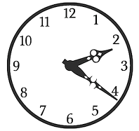 Southampton, UK-based foundry, est. 2006. Font families include Regalese (2008, 8 weights with stylish rounded serifs), Arrow Heaven (2007, 6 styles of fonts with 62 arrows in 40 orientations each), Lydiard (2007, sans cum comic book), Demigrunge (2007), Nidex (2007, caps-only grunge), Rocksolid (2007),
  Elko, MN-based design studio aaron Design is run by
  Turkish type designer in Izmir (b. 1964) who sells through
 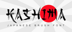 Cilacap, Indonesia-based designer, b. 1992. In 2018, he published the crayon font Crayone, the script fonts Shafeer, Shafeer Descript and Zhafire, the display typeface Alienatore, and the signature font Sundiary Script.
  Mojokerto City, Indonesia-based designer (b. 1993) of the scrapbook font Brambank (2021) and the bold cartoon font Zakids (2021). [
 [
[
 Adult Human Male is the type foundry of Malaysian designer Alex Hy, who is located in Berlin or Ireland. His Twitter account says that he is New York, Paris and Coolock. His Dafont account calls him Irish. Whatever. Alex has two aspects, a commercial one, expressed in his commercial foundry Adult Human Male, and a free one via his Squack site on Dafont.
 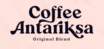 [
[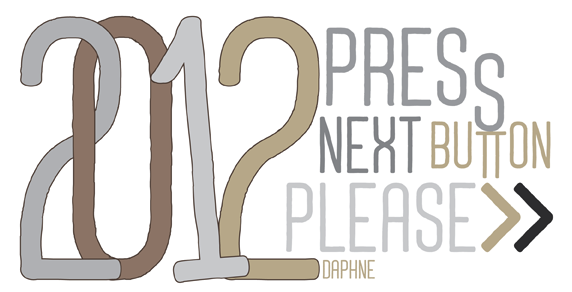 [
[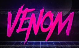 Bandung, Indonesia-based designer (b. 1988) of the modular display typeface
  akaType is James Milligan's outfit. Fonts made by him include akaPosse (2005),
  Paris-based designer of the free comic book typeface ACL (2020) and the commissioned typeface Club Med Pictograms (2017). [
 Albatross is Jay Hilgert's foundry in Oklahoma City, OK, est. 2008. Before Albatross, Jay Hilgert ran
  [
[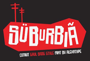 Designer of the cartoon font Skreeble (2019), the brush script Hakuno (2019), the bubblegum font Babel Gamee (2019) and the heavy display typefaces Smithsonian (2019) and Cheese Burga (2019).
  [
[ [
[ [
[ [
[
 Michael Doret is a commercial hand lettering artist in Hollywood, CA, but
  Paolo Vannucci (Alphabet&Type, b. 1969, Punta Marina Terme) created the curly handwritten Halloween typefaces
  American designer, b. 1967, California. Married to Ken Russell, who runs
  Graphic designer in Sao Paulo, Brazil, who created the handcrafted poster typeface Tipoisso in 2015. [
 [
[ Chilean foundry with both free and commercial typefaces. The free typefaces gre mostly out of
  Bogotá-based Colombian graphic design studio and type foundry Andinistas was founded in 1998 by
  [
[ Andrew Hart is a Corona-based American digital photographer (b. 1988), who runs
  [
[
 Argentinian lettering artist who worked for 35 years for McCann Erikson and has produced freelance works for other major agencies like Interbrand, Futurebrand, and others. Veer wrote: The talented Angel Koziupa has been lettering, creating type and designing logos for the past 40 years. His handiwork is behind nearly every important packaging logotype in Argentina. He worked 35 years for McCann Erikson and has produced freelance works for other major agencies like Interbrand, Futurebrand, and others.
  [
[ UK-based creator (b. 1967) at FontStruct in 2008 of Metal Vampire (athletic lettering meets vampire),
  [
[ One of the most dynamic foundries from 2000 until 2003. The "Lab" was run by Apostrophe (Fredrick Nader) and was based in Toronto. The name Apostrophe comes from a Frank Zappa song. It has produced well over 1000 original free fonts, in all formats (type 1, truetype, and opentype, PC and Mac), and nearly all fonts have full character sets. Many have character sets for extended European languages and Cyrillic as well. It was for a few years the only active producer of multiple master fonts.
  [
[ Måns Grebäck (Aring Typeface, Örebro, Sweden) is a prolific Swedish designer (b. Lindesberg, Sweden, 1990), who lives in Borlänge, Sweden. Måns Grebäck has a bachelor's degree in graphic design from the University of Dalarna (2012). In 2010, he went commercial, and started selling fonts through
  Artcity is a digital type foundry and lettering studio based in Legionowa, Poland. Artcity specializes in designing fonts for comic books and books for children. The principal, Daniel Bak, is the Warsaw, Poland-based designer of the free monoline signage typeface Sweet Melody (2012). In 2014, Sweet Melody became a commercial typeface. He also designed the comic book typefaces
  Dmitry Mashkin (or Dmitry Mankoff, or Artcoast Design, located in Sochi and/or Krasnodar and/or Moscow, Russia) created the absolutely wonderful restaurant menu deco typeface Montclar (2015, +food icons), the vintage letterpress emulation typeface family Stampbor (2015), the handcrafted Karmina (2015), the brush typeface Hypsletters Script (2015, with Nadi Spasibenko), the vintage letterpress typeface Marktype (2015), and the sans typefaces Albori Sans (2015, rounded and monoline) and Brentwood Sans (2015).
  Ahmad Ramzi Fahruddin (aka Ramzehhh and as Ramz Fahruddin, b. 1993) established Arterfak Project in 2015. He is the Palembang, Indonesia-based designer of the display typefaces Aidah (2015, spurred), Temenyut (2015, spurred), Basenglah (2015, a geometric solid typeface), Local Genius (2015), Oropitem (2015, blackletter), Cakmacak (2015), Maeninaja (2015), Yagitudeh (2015, a

 München-based foundry, est. 2008 by Gert Wiescher, whose main font foundry is Wiescher Design.
  With iFontmaker, Ayno Mayac designed the handcrafted typeface
 [
[ Banda Aceh, Indonesia-based architect, b. 1987. Designer in 2020 of
  Hungarian creator of the bouncy black comic book typeface Model (2009). He also updated Maurizio Loreti's BrushScriptX and placed the updates
  [
[ [
[ Bandung, Indonesia-based designer of the rough brush fonts Gatsunaga Hand Brushes (2015), Black Rose (2015) and Brother in Crime (2015).
  Santiago, Chile-born type designer who graduated from Universidad de Santiago de Chile in 2015 and 2016. After work at the Museo de Arte Contemporaneo and Museo Nacional de Bellas Artes, he joined the Latinotype foundry in Santiago. He moved to Konstanz, Germany and set up his own type foundry, BeJota in 2021.
  Austin, TX-based designer of Comic Papyrus (2015, a mix of Comic Sans and Papyrus) and
 Bjorn Capens (possibly from Beveren and/or Antwerpen, Belgium) made these typefaces at Fontasia International in the mid 1990s:
 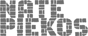 Blambot Comics Fonts was founded in 1999 by graphic designer and illustrator, Nate Piekos, and is located in East Providence, RI.
 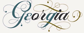 Nengtak, Bangunjiwo, Kasian, Bantul, Semarang and Yogyakarta, Indonesia-based designer (b. 1991) of Marchell (2017: copperplate calligraphic script), Bluesky (2017), Kallisa Script (2017: brush), the signage typeface
 East Java, Indonesia-based designer of script typefaces. In 2020, he released Rhapsody (a retro signage font),
  Type design studio located in Norwood, MA, est. 2005. Fonts can be bought at
  [
[ Bomparte's Fonts is
  The
The  During his studies in Belgrade, Serbia, Boris Miletic designed the elegant handcrafted comic book typeface J Font (2016). [
 Comic book artist born in Butterwick. At Comicraft, John Roshell and Brian Bolland co-designed comic book and script typefaces like Brian Bolland (2009), Brian Bolland Journal (2009) and Mr. Mamoulian (2008, with John Roshell at Comicraft). [
 [
[ Type designer, aka
  [
[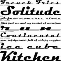
 Thai foundry in Bangkok (ex Cadson Demak pi), est. 2002. It originally published picture fonts designed by several designers including Anuthin Wongsunkakon, Supisa Wattanasansanee, and Pitipa Silapipat.
  [
[ Camille Bissuel, aka Nylnook, is a free spirit, an open source advocate, and French illustrator based in La Roche-des-Arnauds. He introduces himself in this manner: I'm Camille Bissuel and I'm creating free (as in freedom) graphic novels and illustrations about climate change. Sign-up to become one of my readers and receive a free (as in free beer) short comic! His comic strips are free, and even the font he uses, Comili Book (2016), designed by himself, is free. It is also refreshing to see his entire web site bathed in that wonderful nonchalant script.
  Bandung, Indonesia-based type designer specializing in scrapbook fonts.
  Carine de Wandeleer was born in Argentina to a French-Belgian immigrant family. She studied fine arts and graphic design at University of Buenos Aires, but lives and works in Spain.
  Graphic design student from El Salvador currently living in Buenos Aires, Argentina. He created the children's book alphabet
  [
[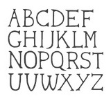 A graduate from Cambridge School of Art, carmen Lam lives in Bury Saint Edmunds, UK. She created a
  [
[ Foundry in Seattle, WA. was Stu Heinecke Creative Systems. Stu Heinecke is a famous cartoonist and direct marketer. The Stu Heinecke handwriting font family is credited to him. In 2011, they published the handwriting and dingbat family
  Stephen Coles points out the jewels in the FontShop store. This is his list of bulbous and animated typefaces derived from comics, packaging, and show card lettering.
  [
[ Born in Edmonton in 1969,
  [
[ [
[ Illustrator based in Ust Sysolsk, Northern Russia, whose first name is Katya. In 2016, she designed the brushy Yoshiko, the connected Neoscopic, Dissentio, the dry brush typeface Sungai, the brushy Elvissa Script, and Arlin Brush.
  Danish designer (b. 1991), aka CMunk, who used
  [
[ [
[ [
[
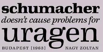 Tibor Szikora is a Budapest, Hungary-based type designer specializing in custom typefaces and lettering. He runs Cinketype. His typefaces:
  [
[ Type designer from Buffalo, NY. His typefaces were mostly developed at P22.
  Comicraft was founded by Richard Starkings and John Roshell in 1992. Located in Santa Monica and Los Angeles, they do lettering and design for the comic book industry and make comic book fonts. At one point they were also called Comic Book Fonts. The current presidents are Rita Simpson and
 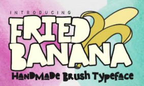 Anang Fibriyanto (Ambarawa - Semarang, Indonesia) first set up Cornertype Studio and then, in 2020, Gassstype. Designer of the handcrafted typefaces Lawan (2020), Tasty Popcorn (2020), Bocah (2020), Fried Banana (2020), Alexaniri (2020) and Slacker Brush (2020), the script typeface Wish You Luck (2019), the gothic font Fear No More (2019), and the pinball or pachinko font Play This Game (2019).
  Manuel Eduardo Corradine Mora was born in Bogotá in 1973. He graduated from the School of Graphic Design of the National University of Colombia in 1996, and became a graphic designer. He started by custom-designing fonts and by making typefaces for his own company, Casa Papelera El Cedro (The Cedar Papermaking House), for printing invitation cards. With other designers like Carlos Fabián Camargo, John Vargas and César Puertas he formed Tipográfico in 2007 to strengthen the type discipline in Colombia.
  Born in Firenze in 1969. Cofounder with Francesco Canovaro and Debora Manetti of the Italian design firm in Firenze called Studio Kmzero. He co-designed some typefaces there such as
  Bireuen, Indonesia-based designer of the swashy script typefaces Restafi Script, Marchelina Script, Malika and Agus, the signage script Aqlima, Angelines, and the curly Ragetti Script in 2017.
 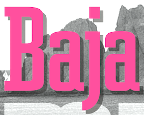 Type designer (b. 1951, New York) in New York City, who studied at Pratt. His type foundry, Cozy Fonts, is located in Bell Canyon, CA.
  Craig Rozynski (Australia and, since 2010, Japan) created the
  Cakovec, Croatia and Washington Park, WA-based designer (b. 1995) of preponderantly grunge typefaces. In 2013, he created Funny Classic, Lion Pro, Lover, War is in the Air (military stencil), Aussen (squarish), Ensione (outlined), Rangle, Gaon, Momgers, Escapea (athletic lettering),
  Bandung, Indonesia-based designer, b. 1969, of Skatter (2018: signage script), Indonesian (2018), The Beach Boy (2018), Bali Paradiso (2018), Betterday Calligraphic (2018) and Hartford (2018).
  Game writer, game designer, graphic artist, and the creator and owner of Cumberland Games & Diversions, b. Cumberland, MD, 1971. He lived in Austin, TX, but is in Denver, CO, since 2014. Typefaces by S. John Ross include Sex Nerd (2021), Guacamole Quickstep (2019), Cynocel Poster (2019), Monesque (2019), Flagstones (2018), Kentucky Fireplace (2016), Bad Guy Black (2015, an engraved currency font), Silvery Tarjay (2015), Iron and Brine (2015), Afton James (2015), Fountain Avenue (2013),
  [
[ Type designer from Seoul, Korea. At S-Core, he co-designed the squarish Latin/Hangul typeface
  Signpainter and letterer who worked for Hallmark in Kansas City, then in Denver, CO, and is now based in Boise, ID. In 2015, he was working on the signage typeface Krapp Jelveeto. In 2016, he published the soft rounded signage typeface
  [
[
 Moscow-based designer of the warm curvy comic book font Baccello (2017) for Latin and Cyrillic. [
 [
[ A graduate of Detroit Lakes Vocational Technical school, Dave has been making signs since 1983. He designs storefronts, dimensional signage, banners and logos at his Faribault, MN-based sign shop. His typefaces at Letterhead Fonts include Anna Banana (2004),
  [
[ Type foundry in Sheffield, UK, first called Schizotype, and in 2021 renamed Eclectotype because this is not a foundry that likes to stick to trends or expectations. Its designer,
  Type designer of the photolettering era (1960s) whose work is slowly but surely being digitally revived by Nick Curtis, and by Photo-Lettering, the House Industries subsidiary that bought the PhotoLettering Inc type collection.
  [
[ Squid (aka Dave Cohen) is a font designer, sculptor, illustrator and musician. He has executed hundreds of prototypes for the toy, ceramics and gift industries, such as tiki mugs. Squid's fonts are published exclusively by Sideshow Foundry. You can see his other musings at
  [
[ Copenhagen-based creator (b. Jutland, Denmark) of the four-style serif typeface
  [
[ British comic book artist. Codesigner with John Roshell at Comicraft of some comic book style typefaces such as Belly Laugh (2001),
  [
[ [
[ Aka Malre and Malre Deszik. Melun Val de Seine, France-based designer (b. 1976) of the free handcrafted typeface Metrique (2014), which is based on China ink lettering done with a Rotring pen. In 2015, he created the grungy typeface Internet and the icon font Webs. In 2017, he published the rungy calligraphic typeface Gyiest Old.
  David Pustansky (b. 1985) is a UK-based type designer who was active in 2005-2006, when he operated as David Martin and his web site was called
  DCO (or: dcoxy medina, or: Atelier Oxydes) is Greg Médina. Atelier Oxydès is located in St Maurice de Cazevieille, France. He specializes in very funny drawings. Creator of these typefaces in 2012: the fun figurine dingbat typefaces called
  Travel writer based in Cherry Hill, NJ.
  [
[ Jogja, Indonesia-based designer of the art deco sans typeface Zietta Sans (2019), the free fat finger fonts Katherine Handwriting (2019) and Haylow Marker (2019), the marker pen fonts Markisa (2019) and Karenina Handwriting (2019), the vampire fonts Foxtails (2019) and Creepy Garden (2019), the comic book typefaces Johnie Blackerson (2019: hand-brushed), Bandrek (2019), Squad 62 (2019), Banana Island (2019), Rollenzo (2019) and Houston Comics (2019), Fugia (2019), Rankerton (2019: octagonal), Jovita (2019), Aliens Learn To Write (2019), Cherry Smoothies (2019), Garvey (2019), Paper Cutz (2019), Coconut Cookies (2019), Cherry Cupcake (2019), Sweet Smoothies (2019), Butter Yellow (2019), and the script typefaces Zietta Script (2019), Nabilla (2019), Hello Darkness (2019) and Mae Nitta (2019).
  [
[ Free and commercial original fonts in all formats by Stanley Roland Frantz from Santa Barbara, CA: Smelted,
  [
[
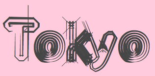 [
[ Rian Hughes studied at the LCP in London before working for an advertising agency, i-D magazine, and a series of record sleeve design companies. Under the name Device he now provides design and illustration for the advertising, entertainment, publishing, and media industries. He works from Richmond, UK, as a comic book artist, letterer and typefounder---his foundry is called
  [
[
 Aka Eva Barabas, and as Digital Studio. Ireland-based designer of Zenfyrkalt (2015, decorative textured caps), Papyrus EBO (2015), and Cirkus (2015, curly font).
  Graphic designer in Caracas, Venezuela, who created the offbeat typeface
 Dismantle Destroy (and before that,
  Bali, Indonesia-based designer and animal photographer, b. 1984. Creator of the high-contrast serif typeface Asmath (2018) and the brush fonts
  Bandung, Indonesia-based designer of script typefaces. These include Bravalor (2018), St. Genoa (2018), Skelie Dancie (2018: a Halloween font), Lovely Puppy (2018), Pretty Pumpkin (2018), Gobbie Gobble (2018), Brioche (2018), The Graveyard (2018: Halloween font), The Royale (2018: an unconnected calligraphic script), Mister Boosty (2018: a children's book font), Swan Tales (2018), Chiko and Owlie (2018: another children's book font), Myrtle (2018), Unconnect (stencil), Arabica Vine (2018: free), Romanttica (2018: brush script), Brunella, Qlinsey, Camellia, Morning Glory, Gallant London, Gotmads, Gallant, Mary Quincy. He also designed the display sans typeface Trevor (2018).
  [
[ [
[ Ukrainian type designer (b. 1977, Buryn) who graduated from Sumy State University in 1999. Since 2002, he creates digital fonts. He also works at Dancor advertising in Sumy, Ukraine, since 1997. Very prolific, his work includes a substantial number of commissioned typefaces for magazines and companies.
  Or A.M. Ryal. Or Docallisme HAS Feat Dusky. Jakarta, Indonesia-based designer, b. 1994, of the free typefaces Love You (2015, letters on blocks), Batavia Kota (2015, shadow typeface), Raditas Cartoon (2015), Soekarno Hatta (2015, octagonal), Bhineka Tunggal Ika (2015), Sweet as Revenge (2015, graffiti font), Pagi Jakarta (2015, comic book style), Desminore (2015), The Minion (2015), Indah Papuaka (2015, outlined shaded typeface), Merdeka (2015, a dripping blood font), Awan Nusantara (2015), Docallisme On Street (2015; shadow graffiti font), Cheerful Party (2015), Super Docallisme Has Pattern (23015, a patterned, textured typeface), Hero Do Call (2015: a shadow font), Party Chocolate and Soda (2015), Cheese Cake (2015), Crayon Social Art (2015), Bali Tolak Reklamasi (2015), Nusantara (2015, decorative caps), A Ryal Black Block (2015), The Super Ryal 2015 (2015), Doraemon Slalala (2015), Grateful Sound (2015), Dadapaw Friends (2015), Cartoon 1994 (2015), Valentine Radita (2015, dot matrix), Sally Ross (2015, dot matrix), Juni 2009 (2015), Dear Raditas (2015, a dada typeface), Docallisme HAS (2015) and Minirus (2015, constructivist).
  San Salvador, El Salvador-based illustrator. Designer of the oriental simulation typeface La Oriental (2018), the casual typeface Cipote (2018), the wide sans typeface Draper (2018), the fat display typeface Hornet (2018), the free athletic lettering font Varsity Team (2018), the free all caps comic book typefaces Benja (2018) and Sivar Regular (2016), the fat rounded sans Yeyey (2016, kawaii-inspired), the rounded sans typeface Lola (2016), the display typeface Contrastes (2016), and the free cartoon font JuanMikes (2016). Typefaces from 2017 and 2018: Castillo (
 Brazilian resident who specializes in original grunge designs. His typefaces are mostly free. Some commercial typefaces are available via
 Known as Toni Dzulham and Dumadi Pangandaran. Pangandaran, Indonesia-based designer, b. 1991, of the casual monoline typeface Dumeng (2018) and the modular typeface Herison (2018). Typefaces from 2019: Marlina (script), Lucky Star (a fat brush script), Bllastt (brush script), Chickybom (a cartoon font), Babell (a heavy all caps sans), Mellows, Sarllett (signage script), Whoody (a cartoon font), Dumadi (a children's book font), Attasiyap, Comic Comoc (a fat comic book font), Hermazz (a comic book font), Multikultural (monoline script), Husaeni (squarish).
  [
[ Indonesian designer of these tyypefaces in 2020:
  Known as Edric Studio, Renata Insan C, M. Nouval, and Ega Nugraha. Bandung, Indonesia-based designer of mainly modular typefaces. He created these typefaces in 2017: Nine Tail, Meatballs (a layered signage script), Rohman, Roundfra (a modular typeface), the preppy handlettered typeface Mirinia, the brush font Hummer, the deco typeface Coet, the script typefaces Ghost (smooth and with high contrast), Ora et Labora, and Lisna, the handcrafted Sild, the marker font Winkdeep, the brush script Oppy Sahra, Cully Mac, Terry Bruce, Gliford, and the art deco sans typeface Allorta.
  Born in New York in 1927, Ed grew up in Brooklyn. He died in 2020. Ed was once a very prominent jazz percussionist playing in several big bands with Stan Kenton and Woody Herman, among others. He has created a large number of typefaces between 1970 and 1995. About his career, he once said: I'm really a musician, a jazz percussionist. One day I went to the musician's union to pay dues and I saw all these old people who were playing bar mitzvahs and Greek weddings. It occurred to me that one day that's going to be me, so I decided to become an illustrator. He designed more than 400 typefaces for PhotoLettering. He played a critical role in establishing The International Typeface Corporation (or ITC) in the late '60s and early '70s. Founded in 1971 by designers Herb Lubalin, Aaron Burns, and Ed Ronthaler, ITC was formed to market type to the industry. Lubalin and Burns contacted Benguiat, whose first ITC project was working on Souvenir. Ed became a partner with Lubalin in the development of U&lc, ITC's famous magazine, and the creation of new typefaces such as Tiffany, Benguiat, Benguiat Gothic, Korinna, Panache, Modern No. 216, Bookman, Caslon No. 225, Barcelona, Avant Garde Condensed, and many more. With Herb Lubalin, Ed eventually became vice-president of ITC until its sale to Esselte Ltd.
  [
[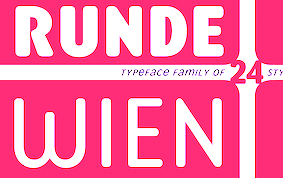 [
[ Eric Nokhsorov (aka Eric The Pirate Art) designed the vector format cartoonish fonts Monsters (2015), Ice Cartoon (2015) and Candy (2015), the connect-the-dots typeface Constellation (2015), the angular yet curly Twirl (2015), the beatnik typeface Cartoon (2015), and the decorative typeface Floral (2015).
  Brazilian printmaker, graphic artist and illustrator, b. 1975. Her fonts are created together with Ricardo Marcin at
  Erik lives in Zwolle, The Netherlands, and was born in 1964. He designed the splendid free handcrafted typefaces Eryx Rennie Macintosh (2015, Scottish arts and crafts typeface),
  Graphic designer and musician (b. 1982) at the New York studio AWP who grew up in Maine and is currently based in Ithaca, NY. In 2018, he founded Etcetera Type Company, which is based in Spencer, NY.
  Graphic designer based in Kyrgyzstan. In 2020, Eugene Bunin and Christine Beginskaya released the futuristic partly stencil typeface family
  Institute in Benalmadena, Spain (was: Santa Severa), where one can take 4-week courses at 1450 Euros a shot on the Etruscan alphabet, Trajan, Cuadrata and Rustic Roman Capital letters, and related subjects. They also organize lettering tours in Italy and guided tours in various musea. The teachers are Alberto Di Santo (Professor of the visual communication, Tor Vergata University, Rome; Professor of Graphic Design, Istituto Europeo di design, Rome; Professor of editorial design, La Sapienza University, Rome; Professor of Typography, C.F.P. Sinalunga, Siena) and
  [
[ Suffolk, UK-based creator of many free typefaces. Designer of the free sans typefaces
  Las Vegas-based designer (
 Computer engineer in Riyadh, Saudi Arabia. Creator of the modern Kufi Arabic typeface
  [
[ Yogyakarta, Indonesia-based designer, b. 1977, of the script typefaces
  Feliciano Type was established in 2001 by Mario Feliciano. The foundry's main design studio in Lisbon, Portugal, with two additional offices, in Povoa de Varzim, Portugal, and in The Hague, Netherlands. Mário Feliciano (b. 1969, Caldas da Rainha, Portugal). Feliciano studied graphic design at IADE, Lisbon, and began working as a graphic designer at Surf Portugal magazine in 1993, where he stayed as art director until 2000. In 1994 he founded the design studio Secretonix in Lisbon. He has been heavily involved in type design since. In 2005, he joined the type coop
  Freelance designer in Madrid. Creator of the funky poster or cartoon typeface Idolatra (2014).
  Ciamis, Indonesia-based designer, b. 1989, of The Refano (2018), the bold sans Boldé (2018), Bolde Rough (2018),
  Venice-born graduate of the San Marco Institute of Graphic Arts and Multimedial Communication in Mestre, Venice. During his studies at IUSVE-STC University (Scienze e Tecniche della Comunicazione Grafica e Multimediale), Mestre, he created the grid-based stonecarving simulation and cartoon typeface
  [
[ Designer of these display typefaces in 2020: Flatface Sours (a psychedelic display font inspired by 70's gig posters), FF Prill (all caps sans), Tired (hand-drawn). In 2019, he designed Embro. [
 Japanese foundry in Nagoya that offers free and commercial Latin fonts made by
  Brazilian illustrator who is based in Barcelona. Designer at type-o-tones (Barcelona) of
  Japanese site with original fonts by Kato Masashi (b. 1973), who lives in Takasaki (Gunma prefecture, Japan): Parismatch (2004), SAKUalp (2000, handwriting), Steeltype, Broadband, Hivision, Cinematime, Ultracomic, Ice Cream, Be Happy, Summer Beauty, Flyermix, Cheerscript, Breakstyle, Breakfont, Round, H-Five, Natsucomi, Long Vacation, Lovers, Breakfont (2003, graffiti style), Pokkaman, BeHappy, Natsucomi, Momolcan, Seasons Dings, Electron, Round, Lovers, FlyerMix (fifties style), CheerScript (comic book style), Hi-Five (pixel font), Summer Beauty, SummerDrive, White Day, Long Vacation, Amayadori (high contrast kana font), Fuyucomi, Icecream, Pickett, 321, Pingpong, Frontline, Ginza, Yago (nice free dings), Polaris, 321eng, 321kana, APPLE, CLIQUE, Clover (kitchen tile font, 1998), DIGI, Eneneng, Enenhira, FDalp, FDwhie, Hnoodle,
  During his studies in Warsaw, Poland, Mikolaj Grabowski designed the interesting stackable typeface family
  London-based font vendor who started in 2015 or 2016, and carries mostly brush script typefaces. They are mainly pushing their own work.
 Original fonts by Ben Balvanz from Cedar Rapids, Iowa (b. Cedar Rapids, 1975), who now lives in South California. His
  Indonesian designer of the calligraphic script typeface families Bahama (2016), Pod Vader (2016), Vermaline (2016), Lovestone (2016), Santos (2016), Santerios (2016), Soulmates (2016) and Lonely Alone (2016). Other typefaces include the antiqued Lockers (2016).
  Russian designer (also spelled
  At Fontgrube AH, Andreas Höfeld, a protestant pastor from Erbach/Odenwald, designed these typefaces:
 Fontico is a foundry est. in 2009 in Wallasey, in the north of England by
  This Cordoba, Argentina-based cinephile is interested in movie posters. Known as FZ over at
 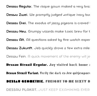 Gábor Kóthay (Fontmunkások) is a Hungarian type designer (b. 1962) who lives in Szeged.
  Russian designer based in Turkey. Creator of these typefaces in 2017:
  Fontry West is located in Tulsa, OK. At MyFonts, these Fontry West fonts can be bought: Iron, Toxcons (2008, skulls), WILD1 Firstvision, WILD1 Larra, WILD1 Nobody, WILD1 Ruts, WILD1 Toxia, WILD2 Ghixm, WILD2 Keetoowah (2008). Its type designer is James L. Stirling, who cofounded the Watts, Oklahoma-based design and lettering studio
  Italian creator of Broken Depth (2015, a shadow font), Fuzzy (2015), Dark Place (2015, scary font), Whispers Calligraphy (2015), Vintage College Dept Worn (2015), Peacock (2015), the free handcrafted typeface Old Sydney (2015) and the vintage typeface Old Bob Junior (2015).
  Obsolete German foundry, est. 2010 by Michel M and
  Grégori Vincens is the CEO of FontYou in Paris, est. 2013. The font collection of Font You was bought by the nascent
  Chilean artist and type designer. In 2021, she released
  [
[ [
[ [
[ American cover artist, cartoonist, and
 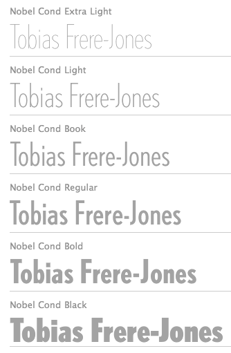 Celebrated type designer, born in 1970 in New York City. Frere-Jones received a BFA in Graphic Design from the Rhode Island School of Design in 1992. He moved to Boston, where he worked at the
  Poznan, Poland-based designer of the energetic cartoon fonts Straightforward (2018) and Fonkey (2018). [
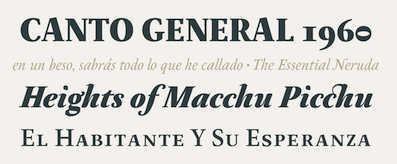 During his studies at the Metropolitan Technological University of the State of Chile, Santiago (2013-2017), Chile-based Franco Jonas Hernandez created the lively text typeface
  Aka Fitiyawan, who seems to have many other identities as well. As "Fype Co" (est. 2019), based in Magelang, Indonesia, he/she designed these script typefaces in 2019: Justoma,
 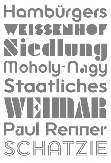 [
[ Illustrator described byJohn Roshell as follows: Comix Gorilla Gabriel Bautista is the artist of John J.G. Roshell's Charley Loves Robots series. His incredible watercolors graced the pages of Elephantmen #50. In some circles he is known as Galvo or Gabo and he has brought his brofu color skills to the pages of The Spirit, All Star Western and also illustrated Jesus Christ, In the Name of the Gun. He is also the creator of comic battling site entervoid.com and indy press pulpopress.com. He loves his girl, his dog Lulu and his font. The font Roshell is referring to is (co?)designed by Roshell himself and Bautista and is called
  Cartoonist from Recife, Brazil, b. 1966, whose sense of humor and artsistic prowess shine in his dingbat fonts.
  Garut, Indonesia-based designer of the marker pen font Andalusya (2018), the upright script Rolanda (2018), Northon (2018), the monolined Henshin Script (2018), the layered poster font Barong (2018), the monoline script Hardolyn (2018), and the brush script typeface Autise (2018).
  [
[ Chaidir or Khaidir is the Indonesian creator of the calligraphic script typefaces Fronds Getturing (2018, a brush font),
  J.F.Y. Daniel Gauthier (GautFonts) was born in Montreal in 1964, and lives in Hamilton, Ontario. His fonts from 2005 and before include BarrelOfMonkeys, ChainFontOpen, ChangChang, ChangChangWoodcut, DirtyDarren, FireStarter, GriffinDucks, Jenna Myles, LollipopLettering, Lymphnodes, PooCorny, PooSmooth, Quake3ArenaBats (scanbats),
  Montrealer who designed
  Pangandaran, Indonesia-based designer (b. 1999) of these display typefaces in 2019: Punch Me (an angular coic book face), Kidzz (super plump letters), Baloon, Robinson, Ester, Halloween (a spooky brush font), Lunatic (a stencil typeface), Barbeque, Better, Metrum, Gens Barbeque, Gens Better Then You, Gens Font, Podol.
  American designer, b. Rockville Centre, NY, 1950. George Ryan held senior positions at Linotype and Bitstream since 1979, where he has been involved in the production of over 2500 fonts. In 2004, Ryan joined Agfa Monotype, and is now a Monotype typeface designer.
  First called Geronimo Fonts, then Paradox Fontworks, and then Typewire Studios, this American studio created these free fonts in 2015: For Sara, Funkytown, Necktie (blackboard bold), Northpoint (strong octagonal varsity font), Kevin Eleven (handcrafted 3d font), Back to School (handcrafted), Musicnet (dot matrix font), Anxiety, Starship One, Astronaut City (comic book style), Internet Friends, Solitude (rounded sans), Kinetic Extreme (+Solid), Crank, Disco Flow, Psychedelic, Lemons, Bokai, Royalty Code, Operation (military octagonal stencil face), Northwest (squarish), Hijack, Establishment, Jamstone, Skinz, The Antenna, Distortion, Los Mesitos, Rock Salmon, Hand Stencil, Crossroads, Upton Funk, Zero Theory, The Million Mile Man (3d outline font), Blueberry Pie, Boraodway Musical, Block Cartoon, Cinematic Language, Kayak, Aerospace, Russian (constructivist), Lines (white on black), Ohio Collegiate, Alkaline.
  [
[ [
[ Or Oghi Novianto. Bandung, Indonesia-based designer of the brush typefaces Mons (2015), Eyepic (2015) and Wild Nature (2015).
  [
[
 Dnipropetrovsk, Ukraine-based designer of these typefaces in 2015: Odd Times (a vintage blackletter typeface), Brandy Label (a layered Victorian signage font), Smoking (a great Western layered poster font), Traveller, Letterhead (steampunk, vintage, Victorian), Age, Nataly Temper, Vintage Auto (a retro chrome automobile font), Golden Dust (a lava lamp font), Rusty Phoenix, Phoenix, the Victorian signage typeface Whiskey, Spirals, Biker (spurred inline font), the oily signage font Pin Up.
  Aka Grzegorz Luk and just Gluk, Grzegorz Luksza is a Polish type designer (b. 1973) who specializes in ultra-decorative and experimental typefaces.
  [
[ Designers of some free fonts.
  [
[ Graphite is an Indian type foundry, est. 2015 by Deepak Singh Dogra in New Delhi. They offer commercial fonts via MyFonts and free fonts through Dafont. Their typefaces include the handcrafted stone age emulation poster typeface
  Shawn Hooghkirk (Graticle, located in Longview, WA) created the handcrafted typefaces Quarterback Keeper (2015), Rough & Ready (2015), Gorilla Girl, Dog Faced Man and Alligator Man in 2015.
 [
[ [
[ A group of independent designers from Poland, heade by Bartek Nowak, and located in Staromiejska. Nowak has been designing typefaces since ca. 2000. Typefaces:
 [
[ Andreas Gustavsson is a Swedish designer, b. 1979, located in Nyköping. At MyFonts, starting in 2013, the name
 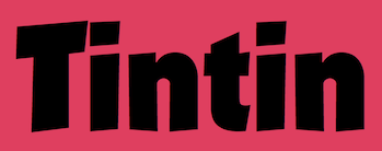 French creator of the great heavy comic book typeface Grobold (2006). Later, he added Cyrillic and Greek versions called Groboldov and Groboldopoulos, respectively. Guy Buhry is currently working on Guy Script. [
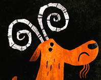 Foundry, est. 2006, by Kyle Jones, a graphic designer and illustrator from Brentwood, TN, who works in Nashville, TN. Their fonts, often geared towards cartoons, comic books and children's texts, include
  In 2009,
  Commercial foundry, est. 2007 in Burlington, VT, by
  [
[ [
[ [
[ Hanoded is the
  German type designer, b. 1980, Frankfurt. He runs a design studio in Frankfurt.
  [
[ Harold Lohner was born in upstate New York in 1958. He received an MFA in printmaking from the University at Albany and is Professor of Visual Arts at Sage College of Albany. He began making fonts in 1997 and starting distributing them the next year through Harold's Fonts. He lives in Albany, NY, with his partner, Al Martino. Originally, most of his typefaces were freeware or shareware, but gradually, he started selling most on his site or via
  Or Kak Alin. Kuala Lumpur, Malaysia-based designer of Anak Anak (2017), Kiddy (2017, a clean hand-printed typeface), Montel (2017, a soft plump typeface), Batik Alin (2017), Technolin (2017), Personality (2017: a scanbat typeface of famous people), Alin Speech Bubbles (2017), Mak Ngah Punya (2017), Senyum Sokmo Deh (2017, comic book font), Cute Animal (2017), Face Alin (2017, dingbats with smilies), Yop Pekabor (2017), Sayang MakAbah (2017), Sorry Sorry (2017), Sempoi (2017) and Alin Kid (2017).
  UK's Tom Oldfield (b. Yorkshire) designed some free fonts and a few commercial ones: Bokken, Creole, Dimbaza, Extrema, Gasoline, Quorn, Litany, Whiplash,
  Banda Aceh, Indonesia-based designer (b. 1993) of the handcrafted Poligon (2017), Young Love (2017), the connected script Buffon (2017), Nutella (2017, brush style), Memorable (2017), the comic book typeface Anatawa (2017), the Halloween font Fonna (2017), the monoline script Shakila (2017), the rounded sans Brayen (2017), the dry brush script Danzo (2017), Ramayana (2017), and the squarish typefaces Syukur (2017) and Boku (2017).
  Designer of these typefaces:
  Trafton (b. New York, 1897, d. 1964 or 1946) spent most of his life in New York as an artist, teacher and designer. At the Bauersche Giesserei, he created typefaces such as:
  German über-type designer (b. 1965, Memmingen) who studied graphic design in Augsburg (Germany) and Preston (England). His degree project dealt with the history of the italic type of the renaissance and the relationship between roman and italic. In 1998 he moved to London to work for Henrion, Ludlow and Schmidt in corporate branding. He worked at one point for Frank Magazine in London. Today
  Free fonts by Vietnamese cartoon artist Hung Lan Nguyen (b. 1956, HoChiMin City) include the brush and handwriting typefaces VNI-Comicbook, VNI-Matisse, VNI-BriquetNormal, VNI-Disney-Normal, VNI-Diudang, VNI-Nhatban, VNI-Baybuom-Normal, VNI-Truck, VNI-Yahoo, VNI-Thanhcao, VNI-Thufap2-Normal, VNI-Thufap3, VNI-Thufapfan-Normal, VNI-Viettay-Normal, VNI-Butlong, VNI-HLThuphap (Treefrog style face), VNI-Netbut, VNI-Thufap1, VNI-Whimsy, VNI-OngDoHL. These typefaces include some real beauties, such as
  Huy Fonts is a foundry in Madrid run by
 Type designer from Seoul, Korea. He started as a participant at the Koren typefoundry S-Core, and set up his own foundry, Cretype, in 2017. At S-Core, he published the Latin / Hangul typefaces
  [
[ Samuel Park's freeware fonts at Ideal Fonts include Bauer, ChiquitaNormal, ChiquitaOutlined, CoverseAllstars, CoverseAllstars,
  Sao-Paulo-based illustrator (b. 1976) who designed Coverface SE (2014, a great rounded sans typeface family),
  Frenchman (b. 1957) who started making fonts in 2010, after a career in illustration, comics, and video games. In 2010, he created the free fonts BabyJo (pixel face), Bayday, Chrom (beveled face), LaPresse (grunge),
  Alexander Bobrov (Indian Summer Studio, or simply Indians, Moscow) designed the vintage didone typeface family
  German company that sells 9999 fonts on a CD for 229 USD. In 2017, Infinitype 4 has 7444 fonts for 299 USD. One can download 20 fonts for free, as a teaser. The company is run by Martin Kotulla, owner of Softmaker, who also made the MegaFont CD. Many (most?) fonts are licensed from URW and come with a performance guarantee.
  Insigne Type Design Studio (est. 2006) is run by
  Indonesian designer.
  [
[ Iordanis Passas (IP Art) is a designer in Athens, b. 1986, who was briefly located in London. He published some free typefaces including the grungy typeface Edirne (2015:
  Ruben Prol is based in A Coruña, Spain. He used to run
  Dutch creator of the plump comic book typeface
  [
[ [
[ Tampa, FL-based creator (b. 1972) of the slab serif typeface Icebreaker (2016), the heavy poster typeface Gordoni (2016, based on an old sketch from William Hugh Gordon), Fungus (2016), the cartoon typeface Murder Block (2016), the ink splatter typeface Ram Rod (2006), the art nouveau typeface Nouveau Uncial Caps (2015), the ultra-fat display and scanbat typeface Tough Guyz (2008, tough guys in Hollywood), and the paint brush script Greenwood RS (2008). [
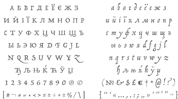 [
[ [
[ [
[ [
[ [
[ [
[ [
[ JAW Fonts (and before that, JAW Arts Fonts, and
  [
[ Buffalo, NY-based creator of the logotype typeface
  Danish graphic designer in Lyngby. He made the following typefaces:
  JC Fonts is the foundry, est. 2009, of
  Frenchman Jérémie Hornus studied typography at Le Scriptorium de Toulouse, France and the University of Reading, where he graduated in 2006. He worked at Dalton Maag, where he designed
  [
[ Aka Loudifier. In 2013, Jeff Davis (Seattle, WA) published the
  Prolific type designer in Florida, b. New York, 1952. His fonts were originally free and consisted largely of dingbats. Around 2005 he went commercial, and now sells his work (over 350 fonts as of 2009) via
  Between 2006 and 2009, Jeff Levine published the Eckhardt Series, named after his friend Albert Eckhardt, Jr. (1929-2005) who had owned Allied Signs in Miami, Florida from 1959 until his passing.
  [
[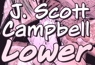 American comic book illustrator and type designer, b. 1973. He specialized in comic book typefaces all designed at Comicraft. These include CC Danger Girl (2000, +Solid, +Open, +Dingbats), and CC Jeff Campbell (2004). In 2015, he added these typefaces, all co-designed by John Roshell of Comicraft:
  Garut, Indonesia-based designer of
 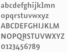 Jens Kutilek studied Communication Design in Braunschweig. After graduating he founded the web design agency
  [
[ [
[ Teacher at the Edmonton Digital Arts College in Edmonton, Alberta, who created the techno family Powers (2011), the squarish monoline family
  Originally from North Carolina (b. 1979), Jesse Ragan studied type design at Rhode Island School of Design. After college, Jesse designed typefaces at Hoefler&Frere-Jones, where he had a hand in Gotham, Archer, and several other families. Since 2005, he has worked independently in Brooklyn, developing typefaces and lettering for a variety of clients. His work can be found at Font Bureau, House Industries, and Darden Studio. He also teaches typeface design at Pratt Institute and Cooper Union. He won an award at
 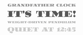 Type designer (b. 1955, Indiana) who lives in Michigan City, IN. While living in NYC, he began working for Mergenthaler Linotype, learning the craft of letter drawing and typeface design. For the next 32 years, Jim worked in the Type group at both Linotype and Bitstream. When Monotype acquired Bitstream early 2011, Jim chose to go solo by founding Stiggy & Sands together with Brian Bonislawsky. He is also a partner at BluHead Studio, where he digitizes old photo fonts by Joseph Churchward. Jim is also active in Stuart Sandler's Filmotype project, where he has resurrected several typefaces, including Filmotype Reef and Filmotype Jade.
  [
[ [
[ Codesigner (in Antwerp, Belgium) with Joke Gossé of Bakelandt (2014). This comic book typeface family with four sets of glyphs was custom-designed for comic book artist Hec Leemans based on the artist's handwriting. Bakelandt is the name of the Flemish comic book series. Huygen also made the rounded sans typeface Cosmonaut (2014), the pixel typeface Scrntype (2014) and the squarish typeface Profunda (2014). [
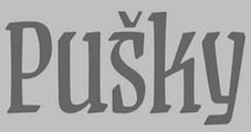 Designer in Opava, Czech Republic, b. 1989. Graduate of the University of Ostrava, Czechia, the Academy of Fine Arts and Design in Bratislava, Slovakia, and the
  JLH Fonts (or: jhnri4) is the American creator of Making a list checking it twice (2012),
 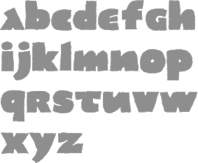 Born in Barcelona in 1950, Joan Barjau is a graphic and type designer, cartoonist, illustrator, painter, and animator who taught at Eina in Barcelona from 1984-1993. Designer at type-o-tones in Barcelona who made Analfabeta Regular (1999, with Flavio Morais), Analfabeta Pics (1999, with Flavio Morais),
  [
[ [
[ Dutchman Jeroen van der Ham ("joebob"), who is based in s'Hertogenbosch, designed mostly handwriting fonts:
  [
[ [
[ Born in 1951,
  [
[
 Describing himself as a
  Colombian type and graphic designer (b. 1974, Bogota), who graduated from Universidad Nacional de Colombia (1997). Co-founder of ADG Colombia (Colombian Association of Graphic Designers). He was studying for a Postgraduate degree in Type Design at UBA (Universidad de Buenos Aries) in Argentina. He currently lives in BuenosAires.
 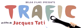 Freelance graphic artist in Gent, Belgium, who won many awards for his design of posters and poster typefaces. He specializes in book cover, poster and cartoon types, and excels in all. Many of
  Born in 1984, Joke Gossé is Professor at Sint Lucas Antwerp and KDG Hogeschool, and is a graduate of type design at Reading, 2007-2008. She has her own type blog, and lives in Antwerp. Her typefaces:
  Type and logotype company in Polanco (and now Mexico City), Mexico, run by
  [
[ [
[ Specializing in graphic design and pre-press, Joonho Sung (Clifton, NJ) created the delightfully funky cartoon typeface Coffee And Bakery in 2015. His illustrations are simultaneously funny and effective. [
 [
[ [
[ Aka Josema Uros. Self-taught programmer in Barcelona, b. 1956, who set up the type foundry Type-O-Tones in 1992. He is also involved in
  Brooklyn, NY-based creator of the comic book style display typeface Ginga Caps (2014), advertized as a typeface designed for the 2014 World Cup in Brazil.
  [
[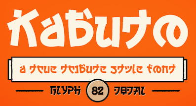 [
[ [
[ This is the new foundry of Hollywood, CA-based Jason Walcott, who formerly ran
 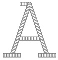 Julia is Valerio Di Lucente (Italy), Erwan Lhuissier (France) and Hugo Timm (Brazil). They met at the Royal College of Art in London having come from different professional backgrounds in editorial design, web and art direction. The studio Julia was founded in 2008 upon their graduation. Together, they work on books, typefaces, posters, websites, identities and exhibition design. They teach as visiting lecturers at Kingston University. Typefaces:
  During her studies at Concordia University in Montreal, Julie Tremblay created
  Montreal-based designer, illustrator and digital artist who created the wonderful
 Just Another Foundry (or: JAF34) was established in 2005 by
 Children's book illustrator in Olathe, KS, b. 1977. Creator of the gorgeous free font
  [
[ [
[ [
[ [
[ French type and graphic designer who joined
  Aka Khurasan and Jalembe. Aceh, Indonesia-based designer of the free typeface Alamak (2014). In 2015, he made Jomblo Ngenes (comic book script) and Si Brot (heavy brush face). Typefaces from 2016 include Lefina (curly serif typeface), Carlita Script, Creaphy (a brushed Halloween font), Reybro, Moyko (Asian brush emulation), Setialah, Jalani Script, Bijak Script and Labuhan (a lava lamp typeface).
  During her studies at Birmingham City University, Kimberley Anne Bishop designed a hand-drawn comic book style typeface (2016). [
 Born in Missouri in 1979, Kimberly moved first to Texas and later (in 2007) to China, and most recently, to Orlando, FL. She made some free fonts (often handwriting styles), and also ran a personal handwriting font service [those fonts have names that start with KGD].
 Slovenian designer of the all caps comic book typeface family
  Surabaya, Indonesia-based designer of these typefaces in 2019: the plump almost bubblegum fonts Cookies Chip, Cookies Bold, Broom, Glowie, Bobba, New Cookies and Chiki, the cartoon fonts Cartoon Cookies, Dolpi, and Boebloe, the squarish (sci-fi) typefaces Klock, Mancha (+ Bold), Maxim, Blades, Kong, Forgotten, Warlock, Hi Jack (techno), Retrolab, Bagfresh and Rubrick, the oriental emulation typeface Japanola, the handcrafted typefaces Worflat Bold, Pramudya, Santuy, Ceetar, Sticky and Honnestly, the script typefaces Casofa, Claudia, Welldone, Baliday, Extendo, Peenguin, Natune, Adinda and Meraphy, the rounded monoline sans typeface Orcef, the horror blackletter font Dark Power, the brush font Must Brow, the monoline script font Chalisa Beauty, the gooey fonts Zumanie, Wildness, Histery, Halloweenkuy and Walktrought, the foliated typeface Leaf, the sports font Ancients Bold, the blackboard bold font Breader, the brush font Must Brow, the kawaii children's fonts Cookies Bold, Nino, Minnio, Kidstation and Bobba, the rounded sans fonts Wudsap Bold, Stikco, Polka, Himenz Bold and Goostt Bold, and the display typefaces Alpawolf Bold, Bagie, Incloud, Manohara and Bublo.
  [
[ [
[ [
[ Kristina Gess (aka Sproot, based in Chelyabinsk, Russia) created the Latin paper-cut typeface
 [
[ Kustomtype is Coert De Decker's type foundry in Otegem, Belgium. Coert (b. 1966) created
  [
[ Creator of the cartoony, chunky, comic book / poster typeface
  Design studio, est. 1999 in Riga, Latvia. They are doing some
  Well over 500 original designs by
  Pasha Larin or Pavel Larin is the Perm, Russia-based designer of these handcrafted typefaces in 2017: Andrea, Alaska (brush script), Phaeton, Modesty, Quarter (brush script), Magdolena, Casamia, Natalia, Kemuri.
  [
[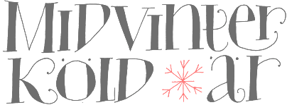 Laudon Type Design is a one woman type studio dedicated to typography, type design and type education. Carolina Laudon is a Swedish typographer and type designer living in Gothenburg, Sweden. After art studies in Stockholm and London she finalized her MA in Graphic Design at the University of Goteborg in 2000. Since then she has worked in her own type studio, focusing on type design and typographic work. For seven years she was responsible for all typographic tutoring at the Konstfack University of Arts in Stockholm. She taught typography at the Forsberg School in Stockholm and Goteborg. She currently teaches at Berghs School of Communication in Stockholm. In 2012, Carolina Laudon received The Berling Prize, Sweden's most prestigious typographic design-prize.
 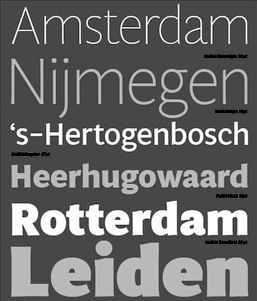 Designer (b. Barcelona, 1968) at
  [
[ [
[ [
[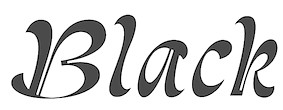 Montreuil, France-based designer of Malesuko (2015, an experimental typeface based on inline railroad station lettering used by Northern Italy's Vigezzina railway), Beluga (2015, a bold blackletter typeface), and Craignos (2015, a collection of comic book style typefaces inspired by the lettering in 1950s monster movie posters).
 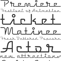 [
[ Juan Pablo De Gregorio Concha lived in Santiago, Chile, where he founded Letritas in 2006. He is presently based in Barcelona. Home page of
  Yogyakarta, Indonesia-based psychology student, b. 1988. He designed these typefaces in 2022:
 Teo Tuominen is a fearless Finnish type designer and letterer based in Helsinki. Teo has a background in graphic design and has a masters degree in type design from the TypeMedia program in Den Haag, The Netherlands, class of 2013. Designer of
 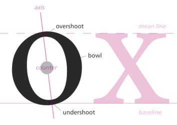 Letterpunch, Kelvin Ma's web site, makes a strong and convincing case for font freedom and open source fonts. At Behance, Kelvin Ma is Kelvin Song from Riverhead, NY. American creator in Long Island of
 Ipswich, UK-based designer of the rugged Flintstone typeface Rocky Ryder (2019), the papercut typeface Papier Couper (2019) and the handcrafted Bloopy (2019).
 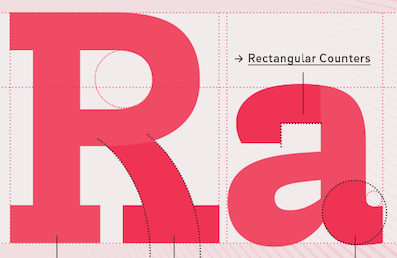 Berlin-based type designer. Co-creator with Hannes von Döhren of ITC Chino,
  [
[ [
[ Jake Luedecke (LDF Fonts, or Luedecke Design Font Co) (b. 1999) is the Dallas, TX-based creator of preponderantly hand-printed and pixel typefaces. These include:
  Odessa (was: Donetsk), Ukraine-based designer of these fonts in 2018: Monte Karlo, Monblank, Manchester, Gabrielle (upright script), California, Casablanca (script and sans duo), Fabiano (rounded sans).
  [
[ Or Deduk Suandanaipande, or Suandana Ipandemade, or Anggun Suandewi, or Suandana I Pande Made, or Pande Made, who publishes his fonts under the labels Made Deduk (est. 2016) and Type Class Heroes (est. 2022). Bali, Indonesia-based designer of the free display typefaces Merthy (2016, calligraphic script), Druchilla (2016), Breathe Karma (2016),
  Frankfurt-based designer (b. 1932, d. 2018) whose creative output is so large that he deserves a
  About 150 free original fonts by Masayuki Sato (from Futaba and/or Takasaki, Japan), over half of them pixel fonts. Maniackers designers started in 1995. For most fonts, he has a Latin alphabet (denoted by AL) and a katakana alphabet (denoted by KT). Some also have a hiragana version (denoted by HR). All fonts were made between 1998 and 2009.
  [
[ Köln, Germany-based creator of these typefaces:
  [
[ [
[ Type designer based in Brooklyn, NY. In 2014, as an intern at Typefounding (St. Louis, MO), he developed a typeface pending distribution by House Industries. In 2015, he joined Font Bureau, where he designed MF Ambulia Text (his graduation project at Type@Cooper in 2015), MF Abagnale (original headline sans from 2014), and MF Gaussian, under the umbrella of Font Bureau's Senior Font Designer, Cyrus Highsmith.
  [
[ Mark Simonson Studio is located in StPaul, MN. Mark founded Mark Simonson Studio around 2000, and describes himself as a freelance graphic designer and type designer. From
  Mark van Leeuwen (or Marco van Luijn), a designer and letterer in Berlin, Germany (and before that, in Milan, Italy), created these typefaces:
  Known as Marsnev, Marsneveneksk, Muhammad Ariq Syauqi and Ariq Sya. London-based Indonesian creator of the free grunge typefaces
  [
[ Dutch alphabetician who was active in the 1930s. In 1949, he published
  Dutch freelance graphic, logo, type and web designer, b. 1989. He operated as MS Designs. In 2010, he made an extensive comic book / fat finger typeface called
  [
[ German designer
  [
[ Maxime Maynard (aka MaxiGamer) is the Quebec-based designer of these free typefaces:
  Russian designer of these typefaces in 2019: Vesievi, Soceri (for sports shirts), Rocari (cartoon style), Playlomer (blackletter), Emporia (monoline script), Driona, Dirjen, Clelia (monoline sans), Botote (dry brush), Aniies (a painted font).
 French graphics lettering company initially involved in instant lettering (made by Trip Productions), and some original typeface designs. From 1989 until 1994, Mecanorma worked with another Dutch company
 [
[ Mehmet Reha Tugcu (Tugcu Design Company, Istanbul, Turkey) designed these typefaces:
  [
[ [
[ [
[ [
[ Graphic designers in Paris.
  Spanish cartoonist and illustrator. With Laura Meseguer at type-o-tones in Barcelona, he made
  Illustrator and cartoonist in Ostrava, Czechia. He does his own lettering.
  Designer and old-timer in the signpainting business in San Jose, CA, who influenced sign layout in a big way. Mike Stevens died of a heart attack in 1989 at the age of 46. At the SignDNA foundry, we find reincarantions of many of his alphabets, such as Magic, Stix (art deco), Happy Script, Master, ArRoyo, Tahoe, Staton, BigSur, DuVall, BigRed, BigMedicine, Tenor, Phoenix, Vasona. His
  [
[ Brazilian cartoonist, b. Rio de Janeiro, 1923, d. Rio de Janeiro, 2012. In an interview in 2002, he explained his style of 3d lettering: I started making letters out of necessity, for the titles in my newspaper column and then I get bored. From there I just started making titles in three dimensions. There, innovation was to draw a letter with the wrong perspective in relation to the other, in the same word. But the great invention was to make the wrong perspective in the letter itself, in all directions. The curious thing is that it ends up getting light, the words seem to float.
  FontStructor who made Greyscale Road (2014), Tealquoise Ultra (2014), Chess of Clans (2014), Try Again (2014, a gaming pixel font), Plumber's Favorite World (2014), FB Initiatis (2014), iFB Kerblampf (2014, cartoon face), FB Semper (2014), FB Mega Maze (2014), Binary00 (2014), Calculetter (2014), fb Floralis (2014, +Cyrillic), Minisular (2014), Parallelle (2014), Monokube (2014, 3d and pixelish), Kerblam (2014), En Ligne (2014), Gribouillé (2014, textured font), Musician (2014), Aerobat Regular (pixelized art deco face), Blackmono New (2014: pixelized blackletter), Coffee (2014), Nonogram Alpha (2014), Typewritten (2014, grungy pixel face), Typura (2014), Blackmono (2013, pixel face), Stripe (2013), Stream (2013), April Fools (2013), Sideview (2013), Defontstructed (2013), Written Hand (2013), Connect (2013), Bullseye (2013, a labyrithine typeface), 2x7 Steelstone (2013), Script O Flip (2013, white on black pixel script), Fontcity (2013, pixelish dingbats), fs Fusilli (2013), fs Spaghetti (2013, a monopixel font),
  Min-Joo Ham (Seoul, South Korea, b. 1985) is a type designer, typographer and a graphic designer who studied graphic design at the Seoul Women's University (2005-2009). After that, she designed typefaces at the Korean type foundry S-Core. In 2015, she graduated from the TypeMedia program in Den Haag, and settled in Berlin.
  Miriam Suranyi graduated from the Graphische in Vienna with emphasis on typography. She works as a type producer at Schriftlabor and is part of the Glyphs-Team. Her typefaces:
  [
[ [
[ Texan creator (b. 1990) of many free mostly hand-printed typefaces. Starting in 2016, she is located in Dresden, Germany.
  [
[ Aka Mikomix, her real name is Michelle Karla Sumulong, b. Anchorage, Alaska. Mikko grew up in Antipolo City in the Philippines, went to college back in Anchorage, Alaska, lived in New York City, took a two-year break in Alaska, and now resides in Manila / BGC in the Philippines.
  The names Abdurrahman Hanif and Hari Santoso are both attached to Monoco Type or Monocotype Studio, and perhaps also Rangga Ilyasa. Jakarta, Indonesia-based designer of
  Monotype Hong Kong Ltd.is a subsidiary of Monotype responsible for the design and development of Simplified Chinese and Traditional Chinese typefaces, and also other Asian languages/scripts. It grew out of the acquisition in 2006 by Monotype of China Type Design Ltd. They write: The Monotype HK typeface collection includes a wide range of high quality designs in popular type styles for text and display setting, in print and screen environments. Today the Monotype team continues to create new Chinese typefaces for the library, as well as custom and bespoke typefaces for global brands and enterprises. The typefaces as of 2018:
  Alexandria, Egypt and Stockholm, Sweden, and Riga, Latvia-based creator of these Arabic typefaces in 2022: Anteeqa.
  [
[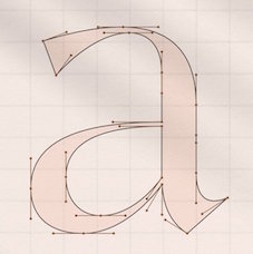 [
[ Magelang, Indonesia-based designer of
  Iasi and Bucharest, Romania-based design studio.
  [
[ [
[ [
[ Nerfect Type Labs in Berwyn, IL, is the foundry of Britton Walters (b. Atlanta, GA, 1973). Free fonts: Desmond (2003), Ausfahrt (dingbats), Bad Weekend (comic book font), Clint (2003), CursedMustache (2003), Clunky, Coffin Nails, Conspiracy (old typewriter font), Crap Magnet family (free at
  Vernon Adams (born England, 1967) was a furniture restorer, woodcarver and typeface designer. On August 24, 2016 Vernon Adams passed away from injuries sustained in a scooter accident in May of 2014.
  Free comic book or cartoon typefaces by Nick Curtis:
  [
[ Nicko Phillips (Melbourne, Australia) created the fun cartoon typeface
  [
[ Bielefeld, Germany-based designer of Canted Comic (2016. comic book typeface), Canted FX (2016, cartoon typeface),
  [
[ Nils Thomsen or Nils Thomsen-Habermann, (Kiel, Germany) is a
  Indonesian type designer, operating as Em Nazar, Muhammad Nazar and Niznaztype. Typefaces from 2020:
  Graduate of the London College of Communication who works in Paris, where he set up No More Faith Fonts. He is presently based in Dubai. His list of typefaces:
  Honey and Death offers free fonts designed by Mitsutoshi Nobusawa: The list: BlackoronAlp (2003), BlackoronKat, BlindfaithB (2003, experimental), BlindfaithBO, BlindfaithL, BlindfaithLO, BlindfaithO, BlindfaithR, BlindfaithRB, BlindfaithRBO, BlindfaithRL, BlindfaithRLO, BlindfaithRO, BlindfaithRR,
  Nor Eddine Bahha (jazz pianist, composer, copyist, researcher and teacher at "The Karawen Music School" in Morocco) designed the NorMusic fonts in 2005. This is a set of jazz music fonts with a handwritten look designed to work with Finale, Sibelius, Overture, Mozart, NoteWorthy Composer and Encore/MusicTime Deluxe. He coauthored
  Brazilian type foundry run by Lucas Franco (Italian Brazilian, b. 2001), his father Claudio Rocha (Italian Brazilian, b. 1957) and his mother, Milena Mainieri (Italian Brazilian, b. 1969), which is currently based in The Netherlands. Their typefaces:
  Senior designer at Font Bureau since 1997, after graduating that year from the Rhode Island School of Design. Born in Milwaukee, WI, he now is a faculty member at RISD, where he teaches typography in the department of Graphic Design. He regularly offers a summer course on Digital Type Design, Summer Institute of Graphic Design, Rhode Island School of Design.
 Ogentroost is the typographic wing of Dutch corporate identity designer
  [
[ Oakland, CA-based designer, whose company is called
  [
[ [
[ Aka Youhhou. Tbilisi, Georgia and now, Moscow-based Russian designer of Splinter (2016),
  Banda Aceh, Indonesia-based designer of Hellvina Hand Script (2015), Samitha Script (2015), Tynabella Script (2015), Silliza (2015), Aprillia (2015), Freenight (2015, watercolor brush), Samuella Script (2015), Seilla (2015, calligraphic), Ricca (2015, calligraphic), Love Sania (2015), Shizuka Brush Script (2015), Nella Script (2015), Beauty Atok Script (2015, connected and calligraphic in the style of a ronde), Allea Script (2015), the bubblegum typeface Monster Jelly (2015), the brush script typefaces Layla (2015, in Painted and Brush styles), Anggie (2015), Jailheart (2015), Sweet Delia Hand (2015), Stella Script (2015), Thunder Script (2015), Rachel (2015), Wendi (2015) and Rat Black Painted (2015). He also made the handcrafted typefaces Kingfont Script (2015), Asraf Kids (2015) and Obama Hand Lettering (2015).
 One by Four is a four-person design studio in South Florida, and later in Brooklyn, NY. The main type designer in the group is South Florida-based Natasha Maria Fernandez-Fountain (b. 1985). The others are Alejandra Abad, Brian Haines and Bruno Torquato. Typefaces by Natasha include Geomancy (2010, +ExtraBold, +Hairline; a
  Outside The Line Fonts was founded by
  Udmurtia, Izhevsk, Russia-based type foundry, est. 2018. Their typefaces are mostly in the comic book or cartoon genre. They include
  During his studies in Miami, FL, Jimmy Kalman (OX Lab) designed the
  [
[ [
[ [
[ From Ashtabula, OH,
  Type designer at Canada Type.
  [
[ Pedro Alexandre Vilas Boas Teixeira is a Porto, Portugal-based type designer. Creator of the monoline gemetric organic sans typeface
  Type designer at the open source type foundry
  [
[
 A subsidiary/part of House Industries in Yorklyn, DE. I quote: Photo-Lettering was a mainstay of the advertising and design industry in New York City from 1936 to 1997. PLINC, as it was affectionately known to art directors, was one of the earliest and most successful type houses to utilize photo technology in the production of commercial typography and lettering. It employed such design luminaries as Ed Benguiat and sold type drawn by the likes of Herb Lubalin, Milton Glaser and Seymour Chwast as well as countless other unsung lettering greats. The company is best known by most of today's graphic designers for its ubiquitous type catalogs. Physically, the collection takes up about 1500 cubic ft (42 cubic meters) of space and consists of film negatives and positives of most of the 6500 fonts produced in the company's 55 years. There are also countless patterns, cartouches, borders and dingbats, all of which have been preserved in film negative form. Each negative is approximately 28 in (71 cm) by 5 in (13 cm) high. House Industries, a Yorklyn, Delaware-based independent type foundry, purchased the entire physical assets of Photo-Lettering in April of 2003. Through a partnership with Ken Barber, Christian Schwartz and Erik van Blokland, House Industries is carefully digitizing select alphabets from the collection and plans to offer them through a modern web-based interface. The Photo-Lettering interface has allowed us to reach beyond the rigid confines of typography to offer extended features such as layering, color control and multiple master interpolation over six axes. With some of the most talented minds in display typography behind this new display lettering system, users of the system will enjoy the same refined typography as the original Photo-Lettering customers.
  Warsaw, Poland-based type designer who studied at Warsaw Academy of Fine Arts. His company is called Picador Studio. Some of his typefaces are also available from the new Polish type foundry
  Foundry located in Westbury, NY, and run by Phil Bracco (b. 1981, Big Horn, MT), a graduate of the Pratt Institute. Creator of the festive signage fonts Charming Charlie PB (2009), Hip Hopper PB (2008, inspired by the lettering on an art poster by Patrick Owsley for the cartoon character Hoppity Hooper),
  Brazilian printmaker, graphic artist and illustrator in Vitoria, b. 1973, Rio de Janeiro. His fonts are created together with Erica Jung at
  Originally, a free font foundry by
  Free original designs, often with a science fiction feel, by Neale Davidson (b. 1971). Does some custom font work.
  Korydallos and Athens, Greece-based designer who ran Unicorg and later Pixelogical. He created the
  Download the following beautiful handwriting and handprinting fonts made by Mexican designer Kemie Guaida, who lives in Helsingborg, Sweden: Balderas (2002), BlackoutSans (2001), BlackoutSerif (2001),
  The Great Dane from Copenhagen,
  Alexey Popov, or Alex Pop for short (Popskraft Lab, Buchardo, Argentina, and now New York City) designed the children's book / cartoon font family
  New foundry, est. 2005.
  Iranian software specialist and founder of the open software support and development group Kary Foundation.
  Roy Preston was born in London, and worked most of his life as an art director and graphic designer. He is a prolific type designer, who created original families such as Paldus and Prentis (great-looking Old Style families), Preston-Roman, and Handroy (handwriting).
  Profonts is Peter Rosenfeld's German foundry in Norderstedt near Hamburg, est. 2005, and closely associated with URW++. Dr. Jürgen Willrodt is the other cofounder. The in-house designers as of 2013 are Volker Schnebel, Ralph M. Unger, Jörn Oelsner and Ivana Koudelkova.
  French illustrator and cartoonist who, together with Gia Tran at FontYou, co-designed the hand-printed typeface
  Belgrade, Serbia-based designer (b. 1986) of Warlow Slab (2016), Warlow Sans (2016), Lockwood (2016, comic book style), Pinon (2016, a nice
  Indonesian designer of Bonitas (2019),
  [
[ [
[ [
[ [
[ [
[ Aka p2pnut, b. Wales, 1943, who started making fonts in 2009 at FontStruct.
  Dustin Lee (RetroSupply Co, Portland, OR, and before that, Palo Alto, CA) sells RetroType, an add-on for Illustrator to make text appear retro. After setting up RetroSupply in 2013, he made the handcrafted poster fonts Roaster (2015) and Wild Fire (2015), the bold octagonal typeface Authority (2015, in standard, rounded and distressed sub-styles; inspired by public transport typefaces from the 1970s; with Scott Fuller), the monoline connected script typeface Palm Canyon Drive (2015: inspired by California in the 1940s and 1950s), the cartoon font Nincompoop (2015; we find this note: Nincompoop was designed by award-winning illustrator, designer, teacher and author Von Glitschka. Until now, this font was part of Von's personal collection of resources. Now you can have this hand crafted typeface for your personal arsenal), the multiline logo font family Solid 70 (2015), and the semi-blackletter typeface Unlucky (2015).
  [
[ Brazilian illustrator and cartoonist in Belo Horizonte. With the help of Paulo W (Intellecta Design), his alphabets became funny digital cartoon-inspired and hand-printed digital fonts in 2007:
 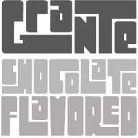 [
[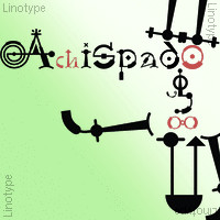 British cartoonist and type designer (b. London, 1945), who lived in Fourqueux, France, and is now based in Uccle, Belgium, since ca. 2000. He redesigned the The Boston Herald American, the International Herald Tribune and Die Welt. In addition, he has been Art Director for The New York Times and the European edition of The Wall Street Journal.
 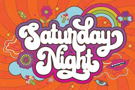 [
[ Ralph M. Unger (b. 1953, Thuringia, East Germany) says this about himself at
  [
[ [
[ [
[
 Robin Hui joined China Type Design / Monotype Hong Kong in 1988 as a type designer. As chief typographer and production manager, Hui managed China Type's type design team and was responsible for a variety of font projects. In 2006, China Type was acquired by Monotype.
  [
[
 [
[ [
[ Known as Yahdi Kumala and Yahdi Romelo. Pekanbaru, Indonesia-based founder of Rometheme in 2018 and
  Type and graphic designer in Paris (b. 1991) who studied at Ecole Estienne in Paris (class of 2010), ESAAB Nevers (class of 2012), and finally at ESAD Amiens (class of 2014), where she was in the postgraduate program on typography and language. She won the
  Aka Darwinoo, and revitalized in 2019 as Royaltype. Medan, Indonesia-based designer of these (mostly calligraphic) typefaces:
  [
[ Ruben Tarumian, aka Ruben Hakobyan (b. 1963, Yerevan), is an Armenian architect and font designer, and son of architect Khachatur Hakobyan. In 1985 he graduated from the Faculty of Architecture and Construction of Yerevan Polytechnical Institute. He started designing typefaces in 1986. In 1989 he created one of the first computer fonts in Armenia, for Xerox Ventura Publishers. Since 2006 he is the chairman of NGO "Association of Type Designers".
  Rumors Foundry was set up in 2020 by Palermo, Sicily-based graphic designer Gabriele Bellanca. In 2020, he released the 5-style sans family
  Kazincbarcika, Hungary-based type designer Roland Hüse (b. 1980) sells his fonts through My Handwritings (Kazincbarcika, Hungary), which was renamed Runes&Fonts. His first font is
  [
[ Misha Panfilov (Russian Fonts, St. Petersburg, Russia) created the
  [
[ [
[ London-based designer of these handcrafted typefaces in 2017: Wild Thorn, Perfect Thoughts (old typewriter), Rough and Tumble (cartoon style), Love Potion, Rogue, White Grotto, Black Glow, Wavepool, Bouncy.
  Designer from Ragalna, Italy, b. 1976. Creator of the comics book font
  [
[ [
[

 Dave Nalle was born in Beirut on March 19, 1959, and died on February 13, 2021 from COVID in his home town of Manor, Texas. From his
 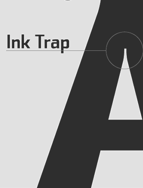 Sea Types is the partly free partly commercial type foundry of Jefferson Cortinove (artist, designer, teacher, sailor and wine maker) and publicist Márcio Duarte in Florianopolis and Marilia, Brazil, est. 2007. Their initial typefaces include
  Indonesian designer who specializes in ligature-laden display serif fonts. Creator of the curvy display typefaces Emirates (2019) and Michael (2019), the cartoon font Wonder Boys (2019), the stylish ligature-rich Abigail (2019) and Giveaway (2019: a classic, almost Trajan, roman caps typeface), and the stylish sans typeface Meganté (2019).
  Moscow-based designer of the comic book Latin typeface
  Indonesian design studio located in Banda Aceh, run by Teuku Deky Firnanda, b. 1989. In 2013 it published the
  Bristol, UK-based creative design agency that consists of Sam Parrett, Steven Prebble, Warren Glass and Alex Bailey. Sam Parrett seems to be the main type designer in this team. In 2014, they published the brushy bold marker typeface Sickamore, Dope Script, and the Halloween font Deathgrin. In 2015, Set Sail created the typefaces Sweet Sucker Punch (comic book font in loud caps), Ghost Type (fat signage script),
 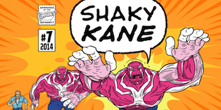 Michael Coulthard is a British writer and psychedelic artist who best known for his work as a comic and graphic artist under the pseudonym Shaky Kane, as well as Shaky 2000. Notabe works include A-Men and The Bulletproof Coffin. Co-designer with John Roshell at Comicraft of the comic book and cartoon fonts
  Philip Trautmann (Phitra Design, b. 1996) is the Düsseldorf, Germany-based founder of Phitra Design in 2016. He renamed the foundry Shaped Fonts and was joined by Christoph Dörre and Nora Bruckhoff.
  Dennis Ludlow (Sharkshock Productions, Raleigh, NC) started making mostly free fonts in 1999. On August 28, 2001, Dennis announced that he would stop producing fonts, forever. To prove himself wrong, he became more prolific trhan ever, and ultimately started designing retail fonts as well.
  [
[ Russian graphic designer, graffiti writer, and lettering artist, b. 1980, USSR.
  Nick Shinn (b. London, 1952) is an art director and type designer. He teaches at York University in Toronto, and is a founding member of the Type Club of Toronto. He writes regularly for Graphic Exchange magazine, and has contributed to Applied Arts, Marketing, Design, and Druk. He founded Shinn Type in 1999, and made fifteen type families.
  Graphic designer from Chennai, who created the octagonal typeface
  New York City (and before that, Mumbai, India)-based designer of the
  SignDNA is run by Dave Simpson (Winters, CA). Commercial sign and display fonts, including many scripts, often by Dave Simpson himself. Other designers:
  [
[ [
[ Free font outfit by Bob Wertz that started production in 2009, mostly based on FontStruct:
  Skyhaven (Alex, b. 1993) is located in New York City. He designed free typefaces between 2012 and 2015, and turned professional after that.
 Their early fonts were renamed and had the attribute Serial in the name. Samples of some of these fonts/families:
  Additions in 2010:
  Dover Press sold Oakland's
  Sonar Hubermann (Medan, Indonesia) is a collaboration studio and publisher. One of its designers is Wahyu Ichsan Fauzi, who graduated from Indonesian Art Institute, where his thesis consisted of designing a typeface for a wayfinding system on his campus. He created the signage script typeface Nadheeya Script (2018) and
  Eben Sorkin obtained an MA in typeface design from
 [
[ Student at the Rhode Island School of Design in Providence, RI, class of 2015. Supervised by Cyrus Highsmith, she designed Pluto (2015), a contemporary serif text face with lumpy, thumb-like serifs which reference the whimsy of Tintin comic books and the newsy formality of National Geographic magazine.
 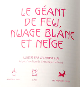 Sterenn Bourgeois (Trait pour trait, France) studied graphic and type design at Ecole Estienne in Paris. She created several typefaces, including Nature (a great children's book typeface created for Mille Ans de Contes, ed. Milan), Québec (same purpose as Nature), Titi (hand-drawn), Super Héros, Ariol (comic book face), Gabri, PLR (license plate sans) and a set of initial caps done for Editions Ex Nihilo in 2011. [
 Rochester Institute of Technology's School of Printing graduate who lived in California and in Holland, MI, and now resides in Louisville, Colorado. He was a disciple of Chuck Bigelow and Kris Holmes.
 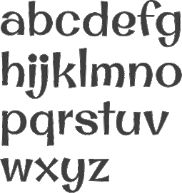 Stiggy & Sands is the Arvada, CO-based type foundry of Brian "Stiggy" Bonislawsky and Jim "Sands" Lyles, est. 2013. Their first commercial typefaces, all jointly designed, are
  [
[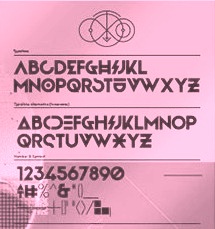 During her studies in Bandung, Indonesia, Bali-based Cahya Sogyan (b. 1994) created the
  Mehmet Abaci (b. 1978) is based in Istanbul. In 2014, he established Studio Typo, where one can buy his typefaces. Limited forms of the fonts can be downloaded fpr free from the Dafont site.
 Dhaka, Bangladesh-based designer, who created the cursive script typeface
 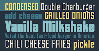 Type foundry set up in 2020 by Comicraft's John Roshell, who is based in California. In 2020, he released the squarish all caps family
 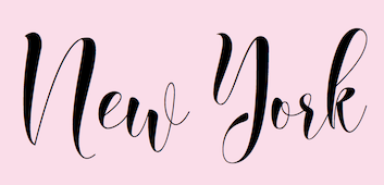 [
[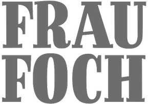 Born in 1980 in Chambéry, France, he studied at the Kunsthochschule Berlin-Weißensee in 2007, and has been working in Berlin since then, first for seven years as a type designer at LucasFonts, where he specialized in Arabic type, and then as a graphic designer at the Mückenschwein Publishing House, and as a freelance graphic designer and illustrator.
  New Westminster, BC-based foundry of
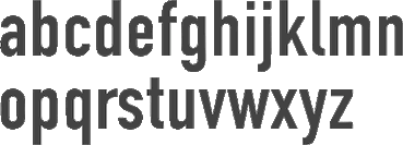
 Slovenian designer of the condensed modern typeface
  [
[ Tattoo Woo (or: Smokewire) is American
  Born in Lincoln, UK, in 1942,
  [
[ Graphic designer and illustrator, type designer, writer and humorist, who studied TV and film at Howard University in Washington, DC, and communications design at the Pratt Institute in New York. He creates comic book style typefaces for his work. These include the layered chiseled 3d typeface family
  Snowboarder from Liechtenstein, who designs typefaces at P22 and its descendant foundries such as HWT. The list:
  [
[ The Fontry is a Watts, OK, based outfit, est. 1992 by
  Aarhus, Denmark-based designer (b. 1968) who worked as an art director and graphic designer since 1990. He started making typefaces in 2006. Ten years later he established The Ivy Foundry and wrote: The Ivy Foundry is committed to helping brands and corporations fine-tuning their visual voice. In 2018, The Ivy Foundry joined
  Free fonts made by Brooklyn, NY-based (and before that, Huntington Beach, CA-based) Lauren Ashpole (b. 1982, Corpus Christi, TX):
  The Northern Block (TNB) is Jonathan Hill's foundry based in Leeds and/or Sheffield and/or Newcastle, UK, est. 2006. The designer and funder is
  Typefaces from 2011:
  French freelance graphic and type designer who started his own commercial type foundry in 2014. Now based in Nantes, Thierry was educated in Nantes and studied Typography & Language at ESAD in Amiens, France, class of 2014. His typefaces:
  Ryan Prasetya (Republik Digital and Lost Volt Type foundry, Tangerang, Indonesia) created the spurred Victorian signage typefaces Arsemith (2015) and Stonebangs (2014), the tattoo typeface family Maroline (2015), and the art deco typeface Herline (2014).
  [
[ [
[
 Belgrade and now Cologne, Germany-based illustrator and graphic designer. In 2011, Tihana created
  [
[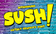 Yogyakarta, Indonesia-based designer (b. 1997) of the free connected script typefaces Stellova (2020), Jocellyne (2020), Snowy Holiday (2020), Abiggail (2020), Calliope (2020), Kallyca (2020), Lovellia (2020), Rettica (2020), Biggbey (2020), Battilla (2020: monoline) and Allodya (2020).
 [
[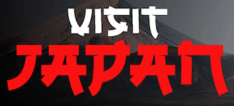 Malang, Indonesia-based designer of these free fonts in 2020: Jungle Adventurer, Fun Blob, Pure Joy, Saikyo (oriental simulation), Okashi (oriental emulation), Chubby and Groovy (psychedelic), Your Groovy Font (psychedelic), Flowerista, Sasha Play (beatnik), Quirky Scandi (beatnik), Happy Hints, Your Doodle Font, The Bomb Sound (octagonal), Black Knight (a horror font), Enigmatic (futuristic), Ethnique (patterned), Gameria (paper cutout), Karl Zone (modular), La Pirata, Monocoque (squarish), Organico, Quincy Jhons (brushed), Sunrize (oriental emulation), Ungai (oriental emulation), White Pearl (spurred), Woody Wood (a plank font).
 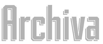 [
[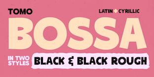 Argentinian digital type cooperative foundry run by Nicolas Massi. The fonts published by Tomo Fonts were made by a variety of people. Tomo Fonts created the handcrafted poster typefaces
  Mexican cartoonist, animator and writer (b. 1973) from Guadalajara. Designer of the free fonts KI Comic (2000, comic book face) and the elegant informal
  [
[ [
[ Indonesian designer (b. 1987) of the hatched typeface Dodol (2016), the bold rounded sans typefaces Neptune (2016), Wincky (2016), Violin (2016), Picanto (2016), Quantum (2016) and Mimi (2016). He also designed the inline typeface Balado (2016), the squarish Pertamax (2016), the sharp-edged sans typeface Martabak (2016) and Outline K (2016).
  Based in Skopje, Lasko and
 Travis Stearns (was:
  Or Tarek Alsawwa, founder of TS Fonts and of the type shop
  Semarang, Indonesia-based designer (b. 1990) of these script typefaces in 2020 (except if explicitly described otherwise): Alaymen, Amazing Qukers, Angles,
  [
[
 Jember, Indonesia-based designer (b. 1995) of the free display typeface Playtoon (2019: comic book or children's cartoon typeface), the signage typeface Golden Hills (2019), the supermarket signage typefaces Stangard (2019), Westhouse (2019) and Woodland (2019), and the display typeface Sochelia (2019).
  TypeArt is the commercial foundry of Lloyd Springer (Vancouver), est. 1992.
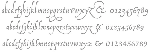
 Leon Hulst (TypeFaith) was born in 1966. Typographer at
  Joan Marti Mas' dingbats and fonts. Joan Mas is a Catalan type designer, illustrator and graphic designer in Palma, who offers free and commercial fonts. His free fonts include Cu-tbo-rough (2004, handwriting), Dalicanya (2004), Pero Jefe (2004), Corbatins (2004), Cartelia (2004), Carusses (heads), Ataques, Scroonge (grunge), Tooman (tribal dingbats), Kinky Boots (2004), Viatge Quimic (2004, psychedelic face), Kool Aid Acid Text (2004), CU-TBO (2004, comic book family), Psychopaths (2002), CapsBats (2002), Plantiya (1999), Illustries (2000),
  Ray Larabie (b. 1970, Ottawa, Canada) ran Typodermic in Mississauga, ON, which opened in the Fall of 2001. In 2006, it moved to Vancouver, BC, and in 2009 it moved on to Nagoya, Japan.
  Typogama is the personal foundry of Swiss designer
  Dri Zy, or Drizy, is Faqih Sandri, aka Faqih Fawaji. Bandung, Indonesia-based designer (b. 1991) of the layered techno typeface Trixie (2016), the brush typefaces Syelma Script (2016) and Syemox (2016), the gothic typeface Dark Widow (2016), the vintage lettering typefaces Overjoyed (2016, Western style) and Beatrixe (2016), the paperclip typeface Kuxu (2016), Dark Widow (2016), Brain Melt (2016: the ultimate Halloween / horror font), Mama Lian (2016), Copper (2016), Dust (2016), the brush script fonts Aeros (2016) and Rostoh (2016, brushy), the children's script typeface Roast (2016), the handcrafted Eastpine (2016), Nyam (2016, layered) and Monstahh (2016), the slimy Halloween typeface Brain Melt (2016), and the poster typeface family Ayuenda (2016).
  Ingo Krepinsky (b. 1976, Eschwege) graduated in 2000 from Fachhochschule Hannover, and in 20903 from Hochschule für Künste Bremen, where he specialized in typography. He is a cofounder and type designer at Typonauten, a Bremen-based commercial font foundry started in 1998 (together with Christoph Hanser and Stefan Krömer).
  Christophe Badani (b. 1969, Marseilles) is a French type designer. He resides in Boulogne-Billancourt, France. His typefaces:
 Uderzo is famous for his
  Danish outfit headed by Danish Typographer Torben Wilhelmsen. Free fonts: ufFeet, ufKartoon. Dollar fonts: ufRegule (a sans made in 2001 that is used by the Danish Dietetic Association), ufTenn, ufUdulf, ufDeconstrotic, ufZapZip, wfont. Coorganizer of ATypI in 2001 in Copenhagen. He tried his hand at iFontMaker and made the hand-printed stencil typeface
  Underware is a (typo)graphic design-studio which is specialized in designing and producing typefaces. These are published for retail sale or are specially tailor-made. The company was founded in 1999 by Akiem Helmling, Bas Jacobs and Sami Kortemäki. Since 2002 Hugo Cavalheiro d'Alte is also part of the studio. They are based in Den Haag, Helsinki and Amsterdam. In 2017, they joined
  Typographer and graphic designer, who studied typography at ENSAV La Cambre in Brussels.
  [
[ [
[ [
[ Vincent Connare (b. 1960, Boston) is an ex-painter turned type designer, who holds an MA in typeface design from the University of Reading in 1999. In the late eighties/early nineties Connare worked in the Ikarus, Intellifont and TrueType teams for Agfa/Compugraphic, and was one of the first type designers to learn TrueType hinting. Then he joined Microsoft, where he designed
  Moscow-based designer of Latin and Cyrillic, or purely Cyrillic, fonts. There is a list of Cyrillizations of existing fonts: Atreyu, LHF Bounce Script, Modeka, Turnpike, PL Barnum, Good Times Regular, Playful JNL (Jeff Levine), Armageda, Showcard Gothic, SF Comic Script, Jolly Good Sans Basic, Enemy (Shaivanalla Perumal), House Slant (House Industries), House Brush (House Industries), Komika Axis (Apostrophic Labs), Snickers (Mark Simonson), Grand Hotel (AOETI), Wisdom Script (Lost Type), Mission Script (Lost Type), Cylburn (Lost Type), House Script (House Industries), House Holiday Gothic (House Industries), LHF Branding Iron (Letterheadfonts), LHF Fancy Full (Letterheadfonts), LHF Firehouse (Letterheadfonts), American West (FontMesa), Champ Ultra (BA Graphics), PL Davison Americana (Monotype), Blenny (Dalton Maag), Bigfish (Floodfonts), Same Same, But Different (Hanoded), Enemy (Lost Type), Special Forces (Typodermic), Serpentine (URW++), Ritts Cursive (Eurotypo), Voga Medium (CD Type), Hermes 1943 (Lukas Krakora), Brand (Lian Types), Tasty (Hubert Jocham), Bullet Regular (House Industries), Filmotype Athens (Filmotype), Signika (Anna Giedrys), Art Department (Jeff Levine), Borg (David Sum, aka titusprod).
  Walter Kafton-Minkel was an active member of the Portland Macintosh Users Group. Designer of the old shareware font Lumparsky (a comic book font available in most archives), Benjamin (1991, based on the wood type Ben Franklin; revived in 2000 by Dieter Steffmann as
  Austrian type designer (b. 1972) who published with URW, but started his own type Vienna-basedfoundry, Ekke Wolf, which became Typic some time later, and most recently, Wannatype.
  Weknow is the foundry of Indonesian type designer Wino Sutarmin Kadir (b. 1979), who is based in Bogor, Jakarta. Weknow produced a large collection of free fonts from 2009 until 2012. He started making commercial fonts in 2012.
  Gert Wiescher was born in Braunsbach am Kocher, Germany, in 1944. Based in München,
  Serif:
  Pennsylvanian designer of fonts at Garagefonts, including the Livery family (2000) and Spring Creek (2002). At
  The Wilton Foundry, which started out in Wilton, CT, but is now in Chattanooga, TN), was founded in 2003 by
  Wells, Somerset, England-based designer of the condensed sans typeface
  [
[ Robby Woodard is the Fresno, CA-based designer of fonts at
  Prolific Barcelona-based type designer. He started out by creating the counterless hand-printed typefaces Woodcutter Dripping Nightmare (2012) and
  American graphic designer (b. 1982) located in Medway, MA, who has created many free fonts, and some low cost commercial fonts. He is also known for his web comic, Dubmarine. Until 2006, all his fonts were free, but starting in 2006, he started selling them via
  Max Infeld (b. 1981, aka Xerographer Fonts) from Chico, CA, makes free fonts and offers a free font-making service. He surged onto the font scene in 2012, and is currently located in Ojai, CA.
  [
[ Israel-based type designer. His typefaces in 2018 include
  Graduate of Ecole Estienne in Paris, who lives in Paris, where is the lead designer at
  Designer in Mexico City. Creator of these typefaces in 2014: Cuatacho (a tweetware signage / cartoon font), Libreto (a warm readable rounded Latin text typeface). He co-designed the elliptical display typeface Maciza in 2016 together with Monica Munguia. For Rara magazine, he created the Greek emulation typeface Rara (2016). Libreto (2014). At Latinotype, he published the cursive typeface family
  [
[ Zatari uses the names Tary Meutia and Zamzami Ramli. Banda Aceh, Indonesia-based designer (b. 1992) of these free handcrafted typefaces in 2017: Armed, Brush Bold, Zatari.
  Zeptonn is the Dutch foundry of cartoonist
  Bryansk, Russia-based cofounder in 2011 with Valery Zaveryaev of the Russian type foundry
  Surabaya, Indonesia-based designer (b. 1988) of the brushed font Carocks (2019), the children's book font
  Italian design firm in Firenze consisting of three graphic designers,
  Brooklyn, NY-based creator of the simple hand-printed font Cometbus (2010), which was based on Aaron Cometbus's handwriting in the Cometbus zine. Blokus (2011) is a gridded face. In 2019, she released the blocky white on black typeface Four Four.